TYPE DESIGN INFORMATION PAGE last updated on Sun Jul 12 21:40:12 EDT 2026
FONT RECOGNITION VIA FONT MOOSE

|
|
|
|
|
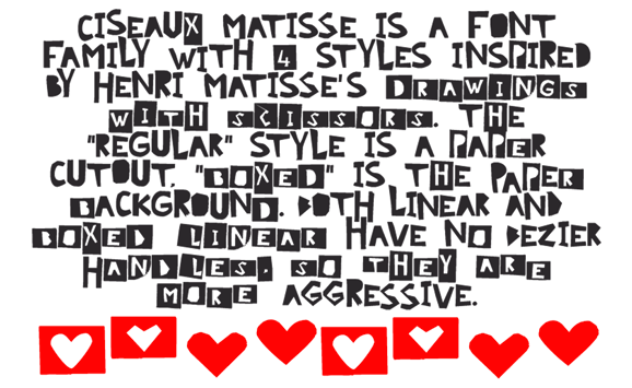
Cutout or paper-cut typefaces | ||
|
|
|
|
SWITCH TO INDEX FILE
A New Machine
|
In 2012, he made Quarry (an outlined hand-drawn shadow font), Holt Sans (a Peignotian family), Unstable Slab, Mitosis (using bubbly dots), Radial (prismatic), and Airwave (techno). Typefaces from 2013: Benthic (decorative geometric caps), Tubbs (a beefy poster face), Dot To Dot (a dotted and lined pair of school fonts), Emjay (sketched blackboard bold typeface). Typefaces from 2014: Art Party (a festive hand-drawn typeface co-designed with with Erin Solomon), Carawan (a rounded sans family), Back and Forth, Fat Nib (splatter brush face), Smoot (whimsical typeface). Typefaces from 2015: El Guapo (a handcrafted typeface co-designed with Erin Solomon), Nervy, Current (thin connected script). Typefaces from 2016: Etymon (Skyline style), Big Trees (Victorian, Western), Igor (a beatnik style font). Typefaces from 2017: Down With The King (a great techno headline typeface). Typefaces from 2018: Thickness (hand-drawn), Chisel Brush, Dot to Dot, Dot To Dot Cursive (dotted line font, perhaps for teaching children in school). Typefaces from 2019: Artie Deco, Marie Jeanne. Klingspor link. [Google] [MyFonts] [More] ⦿ |
Abdul Malik Wisnu
| |
Acute Studio
|
Creator of the hairline face Opium (2010) characterized by teardrop terminals. Creator of Paige (2011), developed at the tipoRenesansa 3rd international type design workshop in Ljubljana, Slovenia. This is an attractive and bouncy papercut display face. Marge (2011) is edgy and highly legible even at very small sizes---it was developed at the tipoRenesansa 2nd international type design workshop. Paige Italic (2012) was done at tipoRenesansa 4 and TypeClinic 5 (2012). Her KABK graduation typeface was Editura (2013), a a type family for serious publications, magazines, as well as non-fiction books. At The 8th International Typeclinic in 2014, she continued work on an untitled text typeface. At Die Gestalten, she published Paiper, an extraordinarily balanced and readable 6-style text family with angular flared glyphs that are genetically related to folded paper strips. In 2014, Diana collaborated on the design of HF Stencil with Bold Monday and Studio Thonik. Made for Holland Festival, HF Stencil is based on Glaser Stencil. In 2016, Diana published Equitan Sans and Equitan Slab at Indian Type Foundry, marrying industrial era rustiness with modern functionality. In 2017, she designed Tiny Sans and Albert Samuels Clock Type. Codesigner in 2017 with Samo Acko and Sabina Chipara of the typefaces Passenger Display (2017) and Passenger Serif (released in 2019: a Clarendon). Passenger Display is a high-contrast didone-style font family. It is intended for use in headlines, signs, or posters. Passenger Display is a high-contrast didone-style font family. It is intended for use in headlines, signs, or posters. In 2019, Diana Ovezea and Samo Acko added Passenger Sans, which is characterized by horizontal and vertical terminal strokes and small apertures, and delivers a relaxing read in long texts. With Sabina Chipara, she co-designed the 8-weight simplified sans family Bega at Indian Type Foundry. Diana Ovezea also published the sharp-edged 14-style Matteo in 2017. At Future Fonts, she published Bizzarrini (together with Sabina Chipara) and Silverspoon, ca. 2018. She writes about the wonderful Bizzarrini: Though the idea originates from a Stefan Schlesinger ad sketch for a Paris couture house, we straightened up this typeface and made it seem engineered and sharp. It gets its name from the Bizzarrini Manta, a wedge-shaped concept car designed in 1968 by Giorgetto Giugiaro. Bizzarrini has extremely long wedge serifs. Following Schlesinger's sketch, it features very tall capitals with an out-of proportion middle-line (very big heads on S, B and R). Silverspoon is a contemporary take on Copperplate Gothic. In 2019, she released the connected monoline sans script Akin (done with Sabina Chipara) and the geometric sans family Matteo at Indian Type Foundry. Typefaces from 2020: Silverknife (a tall and skinny version of Silverspoon), Capra (a headline typeface with a bouncy baseline. This project started as a one-day challenge to recreate a piece of lettering on the Glass Menagerie poster designed by David Klein in 1958). At Fontshare, Diana Ovezea and Sabina Chipara released the free calligraphic script Britney. In 2021, Barbara Bigosinska, Rafa Buchner and Diana Ovezea set up Blast Foundry. At Blast Foundry, she published Granblue, a great experimental typeface family for boxing titles. Typefaces from 2022: Duplet (a 14-style geometric sans with a techno vibe; by Diana Ovezea and Rafal Buchner at Indian type Foundry), Duplet Rounded (also 14 styles), Duplet Open (the 14-style companion of Duplet). Home page. Behance link. Future Fonts link. [Google] [MyFonts] [More] ⦿ |
Behance link. [Google] [More] ⦿ | |
Typefaces from 2010, mostly made with FontStruct: the pixel typeface Benci Malaysia, the hand-printed Nyonya Gendut, the squarish typeface Hutan and the irrgularly sized Madura Regular. He also made the texture / knitting typeface Batik, FoOleD bY GaYUs, Probolinggo (organic), Smasasinema (display face), the texture typeface Serangkaian Pattern, Indo-Malay Confrontation (pixelish), Koruptor and the Bitches (gothic), Qurban Feast, and the curly native pattern typeface Mlungker. In 2011, he made Kabupaten (a sketch font), Social Monster, Buka Pusa Bersama, Ceria Lebaran, Pajarakan Studs, Batik Gangster, Maharani (hand-printed), Lovely Eunike Hans (hand-printed), the texture typeface Kawung Textile, Wildan Izzur Gunarta, Genius Jempolan Royal (scanbats), Pray For Japan, Quantum of Bali, X-Code from East (Javanese script), Hangeul (Korean simulation face), Halidians Blockserif, Moanday Earn Bored, the paper cut typeface Malingsia, Awesome Java, Mesin Hitung (an LCD face), Eenvoudige Batik (stitching face), Antique Paleoindonesia (patterned face), Kebencian (scratchy face), Kemasyuran Jawa (a display face with an Indonesian look), Probolinggo Sans, Londo Chino, Urban (paper cut face), Bikang Struck, Chana Remedy, Indonesian Woman (pixel dings), People Diverse (pixel dings), DBA Muslim (pixel dings), Turk and Nusa (ball terminal face), Jakarta Recycle (paper fold octagonal face), Halida Sans (a swirly version of Ubuntu), Buka Puasa Bersama (Arabic simulation face), Social Monster (grunge), Ceria Lebaran Normal (lava lamp typeface), Dukungan, Dukungan, Sanjaya Epoch, and Jakarta Sunken (angular face). In 2012, he created Halidians Blockserif, Penakut, Agoestoesan, Siti Maesaroh (Arabic simulation face), Turk and Nusa, Rest in Phuket (Thai simulation typeface), Chana Remedy, Bunaken Underwater, New Madura, Moro Seneng, Endutt Normal, Antibalon, Hayyu Kaget, Damai Kpk Polri, Damai Pelajar, Jangan Bersedih (hand-printed), Ikan Besar, Senyum (hand-printed), Catatan Perjalanan (fat finger face), Wizzta, and Quick Argani. Typefaces from 2013: Emilio 19 (athletic lettering font), Bangkit, Faishal Bakeries, Soerjaputera (avant-garde), Soerjaputera Doea (art deco), Sang Fatchurrohmah (lava lamp face), Aceh Darusalam (Arabic simulation face), Revolusi Timur Tengah (Arabic simulation face), Nurkholis (Arabic simulation), Kopleng (alchemic), Menjelajah Halmahera (a ronde font), Jakarta Highends, Smasasinema, Sanjaya Epoch, Mlungker, Dukungan, Thohir Ke Badreah (all caps sans face), Serangkaian Pattern, Endutt (fat finger face), Boutiques of Merauke (a curly typeface), Balinese Family, Zamrud & Khatulistiwa (curly font), Awesome South Korea (great oriental-look font), Freeport Go Away (poster font), Senang Banyol, Don Aquarel, Jawadwipa Adisastra, Si Kancil (fat finger font), Wortellina, Don Butique (hand-printed), Did You See That, Bimasakti. Typefaces from 2014: Rampung, Prabowo, Larasukma (an abstract shape font), Tafakur (Arabic simulation typeface), Syawal Khidmat (Arabic simulation face), Kurnia (curly script), Kota Surabaya (dingbats of buildings), Hutan Lestari, Kobarapi (spurred typeface), Mukadimah (Arabic simulation, based on ae Cortoba by Arabeyes), Huruf Maranti (upright connected script), Emilio 20 (athletic lettering). Typefaces from 2015: Gurindam (Dutch art deco), Upakarti, Tyree Friendly Face (rounded sans), Berantas Korupsi, Kanisah (Hebrew simulation font). Typefaces from 2016: Belacu, Cemong, Bungasai, Semringah, Binarung (masks), Surabanglus (beatnik style). Typefaces from 2019: Kembang (dingbats). Fontspace link. Home page at Fontastic Indonesia. Devian Tart link. Klingspor link. Dafont link. Behance link. [Google] [More] ⦿ | |
Frutiger's books include Type Sign Symbol and Signs and Symbols. Their Design and Meaning (1989, with Andrew Bluhm, published by Studio Editions, London; Amazon link). Linotype link. FontShop link. Adrian Frutiger, sa carrière française (2008) is Adèle Houssin's graduation thesis at Estienne. Klingspor link. Wikipedia link. View Adrian Frutiger's typefaces. View some digital versions of Avenir. Vimeo movie on Frutiger by Christine Kopp and Christoph Frutiger entitled "Der Mann von Schwarz und weiss: Adrian Frutiger". More Vimeo movies. [Google] [MyFonts] [More] ⦿ | |
Spanish designer of the paper cutout typeface Malenka (2020). [Google] [More] ⦿ | |
Afrojet Type Foundry
|
FontStructions in 2008: Playtime (an original stencil family), Playtime Pattern Motifs (dings), Playtime Rounded (+Bold), Playtime Cutouts, Mango Solid (ultra fat, rounded), Mooch (experimental), Mooch Squared, Zombies Are The New Black, Jettison Stencil, Micromoog, hewett, hewett_bold, hewett_extended, Mikey (a Mickey Mouse font). Other creations there include Summer Grillz (about which he writes More gangster than Gill with more gold than Garamond, Summer Grillz is type jewelry for your mouth. All letterforms are diamond-kut using the finest type constructing software on the market today. Customize your grill with different fills., Lovestruc, Konstruct (multiline face), Steeplechase, Sawhorse, Sawhorse Braumarks (dingbats of a brewery), Alfred, Chesterfield, Hydroplane, Jettison-Stencil, Pop-Drops (kitchen tile face), Starstruc, Lovestruc, Chesterfield Prince, Chesterfield King, Chesterfield Queen (piano key font), Brainfreeze (ultra fat). Fontstructions in 2009: the Sans Serious family (a tribute to Dutch Bauhaus designer Jurriaan Schrofer), Factory (stencil), Hunstrüct (blackletter), Slug, Micromoog Remix, Get To The Falcon, Jetstream and Perforate (octagonal, loosely based on several styles of letter and numeral forms observed on various aircrafts at the Evergreen Aviation&Space Museum in McMinnville, Oregon), Get To The Falcon (multiline face), StacheStruct (moustache font), Factory (stencil), Playtime Bolda, Thunderball, Gaga, Gaga Stencil, Pinpression, Sessions (a take on type by Josef Albers; he writes: Having previously played around in Fontstruct with Anni Albers' textile patterns, I thought it time to turn my attention to her husband Josef's work. Josef Albers' constructivist typographic experiments are a perfect match for Fontstruct. Other Fontstructors have done great work with Alber's ideas. Most notably, Saberrider's fontsract and Stewf's Leaflet family. Using Josef Albers' Kombinationsschrift alphabet (1928-1931) as my foundation, I've been having a lot of fun remixing and experimenting with his letters.). Fonts made in 2010: Whoopee (piano key face), Prog. Commercial fonts: Sessions (2009, modular). The commercial fonts by Afrojet type foundry include Sessions, Playtime, Hydroplane, Lovestruc, Dansa, Pinpressions, Micromoog, Widjiwagen, Mooch, Hunstrüct, Slug, and Brutal Exchange. Cargocollective link. Behance link. Home page. Dafont link. [Google] [MyFonts] [More] ⦿ |
Buenos Aires, Argentina-based designer of the cutout typeface Alfabeto (2017, with Yamila Leibson). Behance link. [Google] [More] ⦿ | |
Vadadora, India-based creator of Papercut (2014), a counterless alphabet made by cutting out letters. [Google] [More] ⦿ | |
Lugo, Spain-based creator of the counerless cut-out typeface Straight Font (2013). [Google] [More] ⦿ | |
Alex Denisov
| |
Typefaces from 2020: Chibold, Clarkson, Lupines, Hey Kiddo (children's lettering), Malibu (a fat finger font), Juggler, Cedric (a piano key typeface), Bad Boy Inc (a paper cutout typeface), Phataya, Hot Grill, El Piratos, Hidalgo, Spotnik (a rounded sans), Starblaster (sci-fi), Sophia, Teknikaler (a modular typeface), Crestone (a heavy monoline script), Bronson, BoldenVan (a rounded handcrafted sans), Terbaang (a wide monoline sans), Jagatraya (an ultra condensed sans), Awkward Billy, Babelgamee (a bubblegum font), Blendstripe, Blokee, Brazie, Critrace, Dale Adventure, Dilo World (a cartoon font), Djadoel (Saul Bass style lettering), Feeling Good, Fruitloose, Going Smooth, Green Tea, Hakuno, Happy Feet, Hey June, Jimmy Boyz, Lets Play, Mauikea, Memphise, Pamparay, Pitchfork, Pogo, Popkorn, Shred, Skrapbook, Skreeble, Spicy Tuna, Spookybones, Suburbia (cutout Saul Bass style), Tampool, The Jersey, Tingee Intergalactic (a modular sans), Trampoline, Travelnesia, Trexos, Vendendo, Woodpecker. [Google] [More] ⦿ | |
Budapest-based designer of Lightline (2013, a paperclip font) and Papercut (2014, octagonal), two typefaces that were created during her studies. [Google] [More] ⦿ | |
Palma de Mallorca-based creator of a nice typographic collection of posters entitled Carteles Leo Bassi (2011), which mix the Western circus poster style and art nouveau elements. Typefaces created by er include the paper cut typeface Diplodocus (2011), and the octagonal typeface That Tune (2012). View her Y Modaba poster (2011). [Google] [More] ⦿ | |
Almarkha Type
|
Typefaces from 2020: Banana Juice, Bella Sweety, Bubble Bobble (a bubblegum font), Dear Sunshine, Oatlander (retro baseball script), Sweet Purple, Monieta (an inky and creamy rabbit ear script), Orange Milk (a playful handcrafted typeface), Rockbitz (a children's book font), Seathera, Avocado Creamy, Bolyvina, Charlie Angela (an inky calligraphic script), Lovemy, Chadelova (an enhanced script), Grumbear, The Mezirane, Charlotte Amalie, Crash Soul (a dry brush script), Costiera (a dry brush script), Handestonie (a monoline script), Mentality (a signage script), Technovier (a monolinear squarish sans), Antiquesta (a dry brush script), Belgium Catherine, Cronisse (a display serif), Pronave (an all caps display typeface), Uniser (condensed all caps sans), Westack (a display serif), Avone (a stencil serif), The Roletta (a dry brush script), Waluxe (a fashion mag all caps sans with flared stems), Dear Sunshine, Mikalotta (poster script), Walker Knight (a vintage all caps typeface), Towards (stencil), Cronisse (a decorative serif), Avaneonz (a neon font), The Heista Killer (a dry brush horror font), Someone (a dry brush font), Vicenza (an all caps skyline font), Bristone (a wide sans in six styles; perhaps for car tire ads), Shutterlocks (a dry brush script), Romantics (a creamy script), Revoxa, Yippie Yeah, Wonderful Day (calligraphic), Girly (a girly script), Kamelitta (a wild curvy script), Roadstore (a spurred vintage all caps typeface), Springloved (a paper cutout typeface and a a fine inline poster font), Saturated, Choxr, Blackheat (a super condensed all caps sans), Retrohols, Alibabe, Lordcorps (an octagonal sports or military font; with a stencil style), Headcorps (a sports shirt or military stencil font), Pineforest (with soft spurs), Airborne 86 (a military stencil), Orchide (a dry brush script), Beneficha (wild calligraphy), Radens (a retro bold signage script), Brokenz (a heavy condensed sans), Delninoys (a playful sans), Lorenza (sans), Elcatraz (Mexican simulation font), Hubby Bunny, Rosadetta (script), Swingsnug, Chickens Lovers, Rollinkland, Grumbear, Bubble Bobble (a bubblegum font), Blackheat (a heavy ultra condensed typeface), Brokenz (a muscular display sans), Lorenza (a fashion mag sans), Belgium Catherine (a signature script), Amazed Breath (script), Rockmore (a brush script), Empirez (an octagonal slab serif sports font), Amazed Breath. Typefaces from 2021: Neurock (pure sci-fi), The Cheelaved (spurred, Victorian), Headbears (a sports font), The Antique (a vintage typeface), Vespalogy (a vintage display font), Bestorika (a decorative serif by Abdul Malik Wisnu and Rivo Adriansyah), Quakerhack (a rough brush font), Balietta (a flowing script), Brothery (a retro signage script), Beauticella (a signature script), Glamorez (a luxurious serif), Reloaded (a military stencil font), Austragen (a bold sharp-edged display typeface), Bearetta (script), Keawneta (a display font), Racerz (a speed font), Stangith (a decorative serif co-designed with Rivo Adriansyah), Quick Letter (a wide signature script), Arcinoll (a graffiti font), Charlie Brocklin (a thin signature script), Retrolight (a multiline neon sign typeface), Mokalatte (a wild script), Thugolatz (an all caps typeface with many interlocking ligatures), Author Think (a signature script), Bionetha (calligraphic), Bouncyland (a stylish wild script), Little Knight (a scrapbook typeface), The Brushentica (a beautiful dry brush script), The Soulmate (a dry brush script), Bettawork (a dry brush script), Philips Dutcher (a signature script), Recons (a techno font), Heezpiero (futuristic), Milky Quaker (a playful supermarket font), Rostemary (a fat finger font), Therestone (a Flintstone font), The Checkmate, Chick Chack (a heavy rushed script), Retroman (an Italian Western font), Brown House (a national park font), Emeralde Chamerions (a serif and script duo), Redzein (an octagonal slab serif), Rostera (a bold script), Sketchup (a sketched font), Thealiens (a condensed all caps sans), Williesh (a meaty display serif), Amazing Sweety (a scrapbook font), Heellaaz (an all caps children's book font), Almeira, Americans Classy, The Corps 86 (a military stencil), Brexo (a techno font with solid and stencil versions), Romeline (a scrapbook font), Yippie Yeah (a rounded monolinear marker pen font), Avaneonz (a neon or paperclip font), Sangira (a stylish serif), The Blackheads (a bold script), Kandaline, Marinaga (a creamy brush script), Mochalosta (script), Morning Sweety, Rockmore (a bold script), Deloire (a 4-style all caps sans), Montelova (script), Quinger (a monolinear decorative serif), Wonderella, Wonderful Sunset, Bellachia (a scrapbook script), Choxr (a very condensed all caps sans), Keepsmile (a rounded children's book font), Lovely Sweetie (a scrapbook font), Melanista (a wild script), Rollinkland (a brush font), Bellamona (a monolinear script), Bettanesia (handwriting), Bonalisha (script), Overwave (wavy), Beautimy (a wild script), Melatie (a wild script), Memorita (a wild script), The Handnature (a Treefrog script), Heinch (a 5-style all caps sans), Sweetie Banana (a scrapbook script), Sweetie Moment (a wild calligraphic script), The Dear (a retro script), Winterline (a wild script), Young Evaline (a signature script), Salt + Pepper, Sindenetta (a signature script), Autumnilla, Bella Ciao, Rosadetta (a wild calligraphic script), Saturated (a wild calligraphic script), Wondiletta, Bubblez, Lovely Orange, Milkalotta, Luxoorea (a stylish fashion-model-skinny all caps typeface), Momotako (a paper cutout font), Neonblitz (a neon font), Unione Force (an octagonal sports or military font; with a stencil style), Westman (a Western font), Delamoore (an all caps high-contrast display serif), Delaproza (an all caps display serif), Kinglead (a cartoonish font), Modesfa (an all caps display serif), Hexore (a slab serif), Deluxes (a stylish display sans), Kenzomaru (an oriental brush font), Lumbero (wooden plank font), Pineforest (a Victorian label or sign painting font), Beneficha (a wild calligraphic script), Brokenz (a bold condensed sans), Orchide (a dry brush script), Revoxa (a 4-style sans), Romantics (script), Schein (a sans and slab serif pair), Someone (a dry brush script), Towards (a minimalist stencil font), Averox (a futuristic all caps sans), Chicken Lovers (a playful informal font), Hubby Bunny (a cute display sans), Swingsnug (an informal monolinear sans). As Typotypea">Typotypea, he published the script typeface Manthoels (2020) and the roman all caps typeface Stinker (2020). Typefaces from 2022: Signattimes (a signature script), Thematheka (a constructivist font published on the day Putin invaded Ukraine), Overbillions (a dry brush script), Brolachess (a stylish all caps semi-serif), Suntage (a wide vintage all caps font). Typefaces from 2021 published by Gassstype but made by Abdul Malik Wisnu: Ruthless (a heavy dry brush font), Timeless Nature (script), Unranked (a rough mural font). Creative Fabrica link. [Google] [MyFonts] [More] ⦿ |
Creator of these typefaces in 2019 and 2020: Fun Times, Spaceball, Yellow Pad, Playground (a great outlined sans typeface family), Essential Gothic Condensed, Sketch Slab, Write Sans, Paper Cut. [Google] [More] ⦿ | |
As a student in Zwolle, The Netherlands, Alysia Bonte created a straight-edged papercut typeface (2015). [Google] [More] ⦿ | |
At Falmouth University, Amy Nicole Cox (Falmouth, UK) designed the free display typeface Plum (2015), the free handcrafted typeface Iced Tea (2016), the free hand-printed Blackberries (2016), the free handcrafted typeface Land (2016), and the free brush script typeface Peach Tea (2016). Typefaces from 2017: Paper (a free counterless cut-out typeface). [Google] [More] ⦿ | |
Russian designer of these handcrafted typefaces in 2017: Cute Monsters, Horror Story, Autumn Blessings, Hello Fall, Christmas Fonts, Summer Flowers, Hello Summer Cutout, Stars and Types, Aleksandr (children's hand), Lily Bloom (floriated alphabet). Typefaces from 2018: Star Studded, Raccoon Chubby, Naturia (floriated), The Mermaid Story, Squishy. Typefaces from 2019: Fireworks, Mellow Soldier, This Is Love, Surprise Party. Christmas Mornings. Creative Fabrica link. [Google] [More] ⦿ | |
Anapa, Russia-based designer of a curly connected Latin / Cyrillic script typeface and of the sketched Chalk Cyrillic in 2016. Aka Inky Owl. Typefaces from 2022: Kit Cloudkicker (in a child's hand), Paperboard (a paper cutout font), Pumpkin Magic (a brush font), Sunny Citrus (a bold grungy font), Hocus Pocus (a paper cutout font). [Google] [MyFonts] [More] ⦿ | |
Andreas Brunelius
| |
She created the text typeface Arnie (2011). She writes: Arnie is a text typeface designed for books and poetry. Due to calligraphic origin, rather classical proportions and flat curves, it seems solid and stable. While big counters and varying line weight make it look light and airy in long texts. She also created the signage script face Cookie (2011), which is free at Google Web Fonts. Panna Kotta (2010) is an upright italic. Ladaco (2008) is inspired in Polish folkloric cut-outs. Krotta One (2012, Google Web Fonts) is an italic typeface. It was renamed Kotta a few days later. Behance link. Google Web Fonts link. Fontsquirrel link. [Google] [More] ⦿ | |
Anke van der Meer
| |
Anmark
| Homel, Belarus-based type designer. In 2017, she released the handcrafted typefaces Arumit, Poplava, Jopsy, Spaigo, Sputra, Munigva, Nimbostratus, Millennials, Tatima and Scopanik. Typefaces from 2018: Magic Ivy (a floral font), Queenly (a signature font), Forgotten Melody (script), Autumn Embrace, Le Jardin (floral), Quaint Garden, Gentle Whisper (calligraphic, woith a Floral style), Odour (a calligraphic font with floral caps), Jubilation, Limerence (a free calligraphic typeface with floriated caps), Snip (a paper cutout typeface), Cranberry Jam, Seascape Script, Imperfect, Herbarium, High Spot, Malanko (a geometric color font). Typefaces from 2019: Melancholie (a great handwriting font), Quaint Garden, Magic Ivy (a leafy decorative script), Star Dust, Deja Vu (Clean, Ink), Allure And Grace, Melancholie (a signature script). [Google] [MyFonts] [More] ⦿ |
| |
Karlsruhe, Germany-based creator of the following typeface in or just before 2013: Normal, Papercut, Feltpen, Circus (spurred typeface), Be Mine, Scribble 1 and 2 (sketched typefaces). She works as a junior art director. [Google] [More] ⦿ | |
Anna Markovets
| |
Anna Zakharchenko
| |
Minnesota-based creator of the paper-cut typeface Piquant (2012). [Google] [More] ⦿ | |
Ukrainian illustrator in Kiev. He created a paper cut numerical alphabet in 2009, called Figtype, and a free experimental typeface called Color Lines in 2010. Behance link. Home page. [Google] [More] ⦿ | |
| |
Behance link. [Google] [More] ⦿ | |
Anza Letters
|
Her typefaces from 2020: Orchid (an ornamented sans), Avocado (a stylish display serif), Wanderlust, Snowflake, Warmth (a retro brush font for Latin and Cyrillic), Sunshine, Breaking Rules (a paper cutout typeface), Feel Free, Bravo (a prismatic SVG font for Latin and Cyrillic), Virgo (a serif stencil), Grotesque, Ander, America, Quirky Spring (a playful rounded hand-drawn typeface), Retro Vibes. Typefaces from 2019: Nuova (a modern stencil family), Caramel (an upright script), Daenerys (a script and serif duo), Didone (an over-the-top swashy ball terminal didone), Mood Board (script), One Upon A Time (an octagonal and script font duo), Abstract, Summer in Paris (font duo), Nordic Dream, Organic, Poster (a heavy sans), Throne (a free dry brush SVG font), Primavera (brush script), Emotion Sans, Emotion SVG, Emotions Brush, Mobile (a modular sans), Fleuriste (a decorative duoline font), Lovely (a tall monoline script), School SVG, Aloha SVG (a watercolor script), Sport, Alpha & Omega (a signature script), Rio Love, Delight Grunge, Quirky, Oh My Child (textured). Typefaces from 2018: Protect, Shadow (an all caps fashion mag titling sans family in ten styles), Ultra Violet (sans), Fall in Love Script, White Christmas (a brushed SVG font), Golden Leaves Script, Alesya (script), Rush. [Google] [More] ⦿ |
The Apple Design team won two awards at 25 TDC in 2022, pne for SF Arabic (a contemporary interpretation of the Naskh style with a rational and flexible design; this extension of San Francisco serves as the Arabic system font on Apple platforms. Like San Francisco, SF Arabic features nine weights and variable optical sizes that automatically adjust spacing and contrast based on the point size of text. The typeface features an extensive repertoire that covers numerous vocalization, tone and poetic marks, extended vowel signs, honorifics and Quranic annotations. SF Arabic provides support across the following languages: Arabic, Kashmiri, Kurdish, Sorani, Mazanderani, Northern Luri, Pashto, Persian, Rohingiya, Sindhi, Urdu, and Uyghur) and SF Symbols 3 (over 600 new symbols including representations of devices, game controllers, health, communication, objects, and tools; it prides greater control over how color is applied to symbols, and has a variable font srtyle as well). [Google] [More] ⦿ | |
Artery Design
|
Dafont link. [Google] [More] ⦿ |
Astigmatic One Eye
|
Fontsquirrel link. Dafont link. Fontspace link. A partial list of the AOE fonts made in 2011: Engagement (2011, a free brush script at Google Web Fonts), Fascinate (2011, an art deco typeface at Google Web Fonts; +Inline), Original Surfer (2011, a free Google Web Font inspired by a vintage advertisement for the "California Cliffs Caravan Park"), Smokum (2011, a Western / Italian face), Yellowtail (2011, signage face), Redressed (2011), Special Elite (2010, a free old typewriter face), Aclonica (2011). Typefaces from 2008 or before: Horseplay AOE (2008, Western style), Cake and Sodomy AOE (2008), Good Eatin AOE (2008), Paradiso AOE (2008, inspired by logotype of the Paris Resort and Casino in Las Vegas), Montelago AOE (2007, a script inspired by the logotype of the Mirage Resort and Casino in Las Vegas), Jack Chain AOE (2007), Henhouse (2007), Schnitzle (2007), Luxurian AOE (2007, inspired by the logo of the Luxor Hotel&Casino in Las Vegas), Digital Disco AOE (2007), Mighty Tuxedo AOE (2007), Makeshift AOE (2007), Clarity AOE (2007, slab serif headline; + grungy version), Red Pigtails AOE (2007), Run Tron 1983 (2002), Eyeliner AOE (2006, Tekton-like), Mother Hen (2007), Gloversville (2007, comic book style), Mighty Tuxedo AOE (2007, condensed sans), Quick Handle AOE (2007), Surfing Bird (2007), Hydrogen (2004), Hardliner (2004, fifties diner style), Big Ruckus (2004), SS Antique No. 5 (2004), Europa Twin (2003), EuroMachina (2003, techno), Lord Rat (2003: papercut sans), Love Anxiety (2003), BuzzSaw (2003), Skullbearer (2003, skull dingbats), Beatnick Blue (2002), Geisha Boy (2002), Mardi Party (2002), Midcrime (2002), Ocovilla (2002), Ruthless (2002), Saltie Doggie (2002), Whiskers (2002), Royal Gothic, Family, Eggit, Jericho, Wild Monkeys (2002), 5FingeredGothSW, AlienArgonautAOE, AlphaMackAOE, AmphibiPrint, AngiomaAOE, AntiChristSuperstar, AntiChristSuperstarSW, AstigmaSolid, BigLimboAOE, BigLimbodOutAOE, BoneRollAOE, BoneRollAOEBold, BoundAOE, BrailleAOE, BulletBallsAOE, ButterflyChromosome, ButterflyChromosomeAOE, ButtonButton, ButtonButtonAOE, CType, CTypeAOE, CelticLionAOE-Bold, CelticLionAOE-BoldItalic, CelticLionAOE-Italic, CelticLionAOE, CharailleAOE, ChickenScratch, ChickenScratchAOE, ClunkerAOE, ClunkerAOE-Bold, CropBats, CropBatsAOE, CropBatsIIAOE, DarkNightAOE, DeadGrit, DeliveryMatrixAOE, DetourAOE, DigitalDiscoAOE, DigitalDiscoAOEOblique, DingleBerries, DoggyPrintAOE, DraxLumaAOE, DungeonKeeperII, DungeonKeeperIIBold, DungeonKeeperIIItalic, EggItAOE, EggitAOE-Italic, EggitOutlineAOE, ElectricHermes, ElectricHermesAOE, ElectricHermesAOECharge, FearAOE, FilthAOE, FishyPrintAOEOne, FishyPrintOneAOE, FishyPrintTwoAOE, FutharkAOE, FutharkAOEInline, FutharkAOEInline, GateKeeperAOE, Ghoulish Fright AOE (2006), GlagoliticAOE (1999, grungy glagolitic), GorgonCocoonAOE, Gotik, GreyAlienSW, HAL9000AOE, HAL9000AOEBold, HAL9000AOEBoldItalic, HAL9000AOEItalic, HandageAOE, HandageAOEBold, HauntAOE, HybridLCDAOE, IDSupernovaSW, IslanderAOE, JokerWildAOE, KillMeCraig, KillMeCraigAOE, Kinderfeld, KittyPrint, KittyPrintAOE, Kornucopia, KornucopiaAOE, LinusFace, LinusFaceAOE, LinusPlayAOE, LinusPlaySW, Lochen, LovesickAOE, Manson, MasterPlan, Mervale Script Pro (2012: a brushy script based on the 1940's Fawcett Publications Mary Marvel comic), Microbe, MooCowSW, MotherlodeLoadedAOE-Italic, MotherlodeLoadedAOE, MotherlodeStrippedAOE-Italic, MotherlodeStrippedAOE, MysterioSWTrial, NightmareAOE, OrnaMental, Pantera, PapaManoAOE, PenicillinAOE (described as a bacterial stencil typeface), PixelGantryAOE, PixelGantryAOEBold, PixelGantryAOEBoldItalic, PixelGantryAOEHeavy, PixelGantryAOEHeavyItalic, PixelGantryAOEItalic, PixelGantryHiliteAOE, PixelGantryHiliteAOEItalic, PoppyAOE, PoseidonAOE, Prick, QuiltedAOE, QuiltedAOEBlack, QuiltedTrial, RippleCrumb, RippleCrumbUltraCon, ROCKY, ROCKYAOE, RustedMachineSW, SSExpAntiqueAOE, Schizm, Schrill, SchrillAOE, SchrillAOEOblique, Scrawn, ScrawnAOE, ScrawnCyrAOE, ScrawnKOI8AOE, ScrewedAOE, ScrewedAOEOblique, ScrewedSW, SeaweedFireAOE, SenthAOE, ShampooSW, ShottyTransferTrial, SkinnerAOE, SlurCrumb, SpatCrumb, SpikeCrumbGeiger, SpikeCrumbSwizzle, SpikeCrumbSwollen, SteelcapRubbingTrial, StruckSW, StrutterAOE, SunspotsAOE, SurferComicTrial, TRANSHUMANALPHABET10, TRANSHUMANKATAKANA20, TannarinAOE, TannarinAOEOblique, TibetanBeefgardenAOE, TibetanBeefgardenAOE, TouristTrapAOE, TransponderAOE, TransponderGridAOE, UglyStickAOE, VanguardIIIAOE-Bold, VanguardIIIAOE-BoldOblique, VanguardIIIAOE-Oblique, VanguardIIIAOE, Ventilate, VentilateAOE, Y2KPopMuzikAOE, Y2KPopMuzikOutlineAOE, YoungItchAOE, ZeichensSW, ZenoPotionAOE, Zombie, BeatnikBlueAOE, BeatnikBlueFillAOE, GeishaBoyAOE, MardiPartyAOE, MindCrimeAOE, OcovillaAOE, PolynesianTouristAOE, RuthlessAOE, SaltyDoggieAOE, SpruceAOE, WhiskersAOE-Oblique, WhiskersAOE, WhiskersAltCapsAOE-Oblique, WhiskersAltCapsAOE (2002), Habitual, Automatic (techno), Bitrux, Filth (an eerie brush script), Cake&Sodomy, Gulag, Bad Comp, Detour, Alien Argonaut, Dark Night, GateKeeper (Halloween font), Gargamel Smurf, Invocation, Neuntotter, Geisha Boy, Saratoga Slim, Gobe, Stingwire, Lavatype, Tapehead, Islander, Clunker, Digelectric, Gargamel, Krulo-Tag, Krelesanta, SurferComic, Bound, Culture Vulture, Intruder, Cavalier, Anoxia, Synchrounous (IBM logo style lettering), Luna, Data Error, Lunokhod, Jericho. There are many techno and gothic fonts. Kill Me Craig is the first 26 death scene dingbat font (scenes by Craig Dowsett). KittyPrint takes the LinusFace font concept to more realistic cat head dingbats. Krelesanta (not free) is a funky font inspired by the band Kreamy Electric Santa. The free ButtonButton is useful for making buttons. Lovesick AOE is a scrawly, lovelorn typeface, i's dotted with hearts. Strutter AOE is based on the KISS logo. Senth AOR is a runic font. Charaille is one of the many dot matrix fonts. Cavalero is inspired by the logotype of the Chevy Cavalier. At Bitstream in 2001, AOE published Cavalero, Stingwire and Tannarin. And in 2002, he published the comic book font Big Limbo, Euro Machina BT and Islander there. Bio at Bitstream. In 2005, Bonislawsky and Sandler realeased 500 fonts, via Bitstream and MyFonts, under the label Breaking The Norm. In 2006, Astigmatic published their typewriter collection, which includes Military Document, Bank Statement, State Evidence Small Caps, State Evidence, Urgent telegram, Library Report, Overdrawn Account, Customs Paperwork, Incoming Fax and Office Memorandum. From the bio and various pieces of information, one is led to believe that Brian was born in Poland, and now lives in Miami, but that may be wrong. In 2010, he placed a free font at the Google Directory, Syncopate. Along the same lines, we find the derived square serif typeface Stint Ultra Condensed (2011, Google Web Fonts) and Stint Ultra Expanded (2012). In 2011, several other typefaces followed there, like Ultra (fat didone), Maiden Orange, Special Elite (2010, a free old typewriter face), Just Another Hand, Crushed, Luckiest Guy (comic book face), Aclonica, Redressed, Montezuma (a curly connected upright script), Devonshire (brush script), Fondamento (calligraphic lettering), Yellowatil (connected retro script), Righteous (free at Google Web Fonts: inspired by the all capitals letterforms from the deco posters of Hungarian artist Robert Berény for Modiano), Ribeye and Ribeye Marrow> (cartoon and/or tattoo style lettering---free at Google Web Fonts), Spicy Rice (2011, free festive display typeface at Google Web Fonts). Contributions in 2012: Marcellus (2012, Trajan, flared roman, at Google Fonts and CTAN), Eagle Lake (a free calligraphic font at Google Web Fonts), Uncial Antiqua, Jim Nightshade (2012, free at Google web fonts), Dynalight (2012, a retro script inspired by a vintage luggage tag for the Southern Pacific 4449 Daylight steam locomotive), Yesteryear (a retro script loosely based on the title screen from the 1942 film The Palm Beach Story), Parisienne (Google Web Fonts: casual connected script based on a 1960s ad for bras), Shojumaru (Google Web Fonts: an oriental simulation typeface inspired by a poster for the Marlon Brando movie Sayonara), Berkshire Swash (Google Web Fonts), Audiowide (Google Web Fonts), Romanesco (Google Web Fonts: a narrow calligraphic style), Galindo (Google Web Fonts), Oregano (Google Web Fonts: based on cartoon style lettering of calligrapher and logo designer Rand Holub. This style of hand lettering adorned many retro brochures and advertisements of the late 40's through the 1960's), Peralta (Google Web Fonts: an Egyptian comic book face), Eagle Lake (Google Web Fonts: calligraphic), McLaren (Google Web Fonts: comic book style alphabet), Freckle Face, Hanalei Fill, Hanalei [Polynesian bamboo or tiki lettering], Purple Purse, Margarine, Risque, Clicker Script [image], Stalemate [a gracious script, by Jim Lyles for AOE], Mouse Memoirs, Quintessential [Google Web Fonts: chancery hand], Bigelow Rules, Englebert [Google Web Fonts: from the title screen of the 1930's film titled Der blue Engel, starring Marlene Dietrich], Sacramento [Google Web Fonts: connected script]. Typefaces from 2013: Freckle Face (grunge), Grand Hotel, Purple Purse (Purple Purse draws its inspiration from a vintage Ivory Soap ad from the 1950's. Somewhat of a cross between Bodoni and Pixie, this font finds that it never truly takes itself seriously). Stiggy & Sands is the American type foundry of Brian Bonislawsky and Jim Lyles, est. 2013. Their first commercial typefaces, all jointly designed, are Luckiest Guy Pro (a fat comic book font based on vintage 1950s ads) and Marcellus Pro (a flared roman inscriptional typeface with both upper and lower case, originally published in 2012 by Astigmatic). Typefaces from 2014: Franken Jr AOE Pro (inspired by the title screen from the 1966 Hanna Barbera cartoon Frankenstein Jr), Good Eatin Pro AOE (inspired by the title screen from the 1942 Warner Bros. cartoon Dog Tired), Ghostkid AOE Pro (comic letter style). Typefaces from 2015: Shanks Antique 5 AOE (after the newspaper typeface Memorial (1865, Stevens, Shanks & Sons)), Reliquaire AOE (a somber blackletter typeface inspired by Memorial (1881, Boston Type Foundry)). Typefaces from 2016: Mailuna Pro AOE (a gothic sans), Kentish AOE Pro (art deco). Reardon AOE (a digitization of a film typeface called Joyce Black by LetterGraphics), Berkmire AOE (1970s style robot-inspired techno font), Blackheath Pro AOE (this typeface started as a digitization of a film typeface called Roberts Square by LetterGraphics), Delaware Pro AOE (art deco), Rutland AOE (a futuristic font that is a digitization of a film typeface called Maccaro by LetterGraphics). In 2016, Brian J. Bonislawasky and Jim Lyles published the rugged octagonal mega typeface family Tradesman at Grype. In 2017, they added the art deco typeface Cowling Sans AOE (which is based on alphabet from "Lettering for Commercial Purposes" by Wm. Hugh Gordon). In 2018, they published the letterpress emulation typeface Prison Pro, Pink Sangria (50s style movie font), Manic Tambourine, Motenacity (a Martian cartoon font), the old typewriter font Office Memorandum Pro, and the Flintstone font Strongman. Typefaces from 2021: Klutz AOE Pro (a condensed all caps beatnik font), Data Error AOE Pro (based on early dot matrix printers), Customs Paperwork AOE Pro (based on the NuMode Type No. 61 vintage typewriter), Rinzler AOE Pro (a great stencil font that revives LetterGraphics' Caren), Restraining Order AOE Pro (an old typewriter font), Brazarri AOE Pro (an Aztec emulation font based on MacKeller, Smiths and Jordan's Bizarre from 1884). View Astigmatic's typeface library. View the typefaces made by Brian Bonislawsky. Fontsquirrel link. Dafont link. Fontspace link. Creative Market link. [Google] [MyFonts] [More] ⦿ |
Avi Haltovsky from Givat Shmuel, Israel, designed Papercut, a 3-d on-line font cut from paper, which yields all 26 letters just by turning the paper in the proper manner. [Google] [More] ⦿ | |
Ashford, UK-based creator of the avant garde sans family Alvar Benjamin (2011), and a dada paper cut-out typeface (2012). Behance link. Another Behance link [this one goes to a Londoner, who made the dada face---they are possibly different Ben Greens]. He graduated in 2007 from The University of Kent at Canterbury. [Google] [More] ⦿ | |
Betterfear.us (or: XXII Fonts, Or Doubletwo Studios)
|
Typefaces: XXII Sinoz DSP (2010-2011, elliptical face), XXII Gory Bastard (2011), XXII BLACKMETAL WARRIOR (2010), XXII Menga (2010, a technical sans family), XXIIARMY (2007, stencil), XXIIDECONSTRUCTION-DESTRUCTION-AREA (2007, grunge), XXIIDONT-MESS-WITH-VIKINGS-HARDCORE (2007, octagonal), XXIISTRAIGHT-ARMY, Army Dirty (grunge stencil), XXIIUltimate-Black-Metal (2007, cracked metal look), XXII Scratch (2007, scratchy face), XXII DEVILS-RIGHT-HAND (hand-printed), XXII BLACK-BLOCK (grunge), XXII MISANTHROPIA (2008, a rigid geometric sans family), XXII Arabian Onenightstand (2008: Arabic or Indic simulation face), XXII Urban Cutouts (2009, grunge), and XXII Static (2007, futuristic). His web site has a threatening nazi sort of look, but the fonts are (were) free. Betterfear.us claims to be located in St. Pauli, Hamburg, and is also known on MyFonts, where some of its fonts can be bought, as Doubletwo Studios. These include XXII Yonia (rounded script family loaded with opentype features), XXII Goregrinder, XXII Grober Bleistift (2013, marker font), XXII Centar (a sans family with a free regular style), XXII Totenkult (2012), XXII Blackened Wood (2013), XXII Candylove (heavy signage or packaging script), XXII Centars Sans (2012), XXII Daemon Runes (2012), XXII Total Death (2012), XXII HandTypewriter (2012), XXII Daemon (2012), XXII Marker (2011), XXII BLACK BLOCK SERIFA (2008), XXII Mescaline (2009 Western style), XXII Misanthropia (2010, geometric sans), XXII Marker (2011), XXII Blasphema (2011) and XXII STREITKRAFT (2008, a stencil family with grungy versions added). Older list of fonts: Devils Right Hand (blackboard script), Black Block (grunge), Static (techno), Ultimate Blackmetal, Scratch, Don't Mess With Vikings, Army Dirty (grunge stencil), Army Straight, Black Block Eroded. Typefaces from 2014: XXII YeahScript (signage script). Typefaces from 2015: XXII Geom (a geometric sans typeface family), XXII Awesome Script (for signage). Typefaces from 2016: XXII Neue Norm (techno sans), XXII Cool Script, XXII Geom (a geometric sans typeface family), XXII Grober Pinsel (brush typeface). Typefaces from 2017: XXII Neue Norm Rounded, XXII InAshes (grungy blackletter). Typefaces from 2018: XXII Geom Slab. Klingspor link. Alternate URL. Behance link. Dafont link. Another Behance link. Old URL. Another Dafont link Yet another Behance link. And a final Behance link. [Google] [MyFonts] [More] ⦿ |
Blonde Fonts (was: Siesta)
| Free fonts by Charlotte Iona Dymock with some erotic overtones such as Kinky Valentine (2000: dingbats). Other fonts: AngelLust, Celestial, PaperCutouts, Matrix, ParanoidAndroid, PlasticExplosive, RaindropSplash, ShadyLady, Stamped!, ThunderCats, UnderwaterLove, Weimar, Flaming Fire, Thundercats. Site disappeared. [Google] [More] ⦿ |
Bold Version
| Victor Coreas (Bold Version, Long Island, NY) designed these typefaces: Slim Kid (2015), Wild Pitch (2015: a free handcrafted baseball font), Donuts (2014), Cut Out The Jams (2014: free paper cut typeface), Cut Out Jams 2 (2013), and Version (2013, free hand-drawn poster typeface, Empire One Studios, VCAD), Version Type Pro (2016). Behance link. Creative Market link. Home page. [Google] [More] ⦿ |
Botond Bokor
| |
Brian J. Bonislawsky
| |
Bright Ideas Fonts
|
Typefaces in alphabetical order with a few additional fonts mentioned separately later: Abraham, Accumulation, Adderley, Aerosol, Akimbo, Alexander, Amadeus-Regular, Amadeus, Amadeuz, Anderson, Arkitex, Arthur, Ashley, Asphalt, Asphalt'Wicker', Avante, Aztecan, Backlit, Balcony, Banshee, Barbarian, Barnaby, Barney, Beanbag, Bender, Bicycle, Billie, BlackRose, Blanchard, Blazed, Blossom, Bodkin, Bogsley, Boingo, Bonham, Botica, Bradley, Braxton, Brittany, Brownie, Bubbly, Bullwinkle, Bumper, Bunker, Butterscotch, Cajalco, Camelot, Candles, CandlesChrome, Candy, Canterbury, Cappuccino, Capsule, Carbiner, Carousel, Carrington, Carson, Casanova, Catfish, Cathedral, Catnip, Cecily, Ceremony, Challenge, Chamberlain, Chance, Chantilly, Cheetah, Chilled, Chocolate, Chopstick, Chump, Conniption, Corrigan, Corrosion, Crawford, Cyborg, Daffodil, Dakota, Danferno, DantesInferno, Darcie, Daytona, Delineator, Dementia, Diamondhead, Donika, Donnah, Dribble, Einstein, Elizabeth, Energy, Espresso, EspressoBI, FabreseDemi, Fairytale, Fallbrooke, Fiancee, Fido, Fionah, Fontana, Fonture, Fortress, Framed, Frankie, Frazier, Freddy, Frederick, Frizbee, Funhouse, Futana, Gapetto, Gatsby, Gemini, Gershaw, Gobbledygook, Godfrey, Goliath, Gonzales, Gonzo, Gothica, Graphitti, Grasshopper, Grendel, Griffin, Groovy, Habibe, Hannah, Hansel, Haskel, Havisham, Hawthorne, Henderson, Hendrix, Higgins, Highland, Holmes, Horton, Humphry, Hutchinson, Incense, Independence, IndependencefromBrightIdeas, Interpret, Invisible, Jacinda, Jacoby, Jaddarack, Jagger, Jamboe, Jangazoo, Jeremy, Jigsaw, Jokester, Joplin, Joseph, Joshua, Jubilee, Junior, Kaboom, Kamden, Karissa, Katherine, Kaufman, Kayleigh, Kendra, Kennedy, Khaki, KhakiBold, KhakiBoldOblique, KhakiOblique, Khakiripp, Khakiwrink, Kilcher, Killian, Kincade, Kingdom, Kinison, Klinker, Komodo, Kramer, Kromeon, Kryski, Kurrajong, Kyanna, Labrador, Leallie, Leland, Licorice, Limousine, Lindsy, Liquitek, Lockleer, Lockwood, Londonderry, Loyalty, Machine, Maddox, Madman, Magazine, Magellan, Maggie, Magician, Majesty, Malachite, Malone, Mandolin, Margarita, Marilyn, Marley, Marmalade, Marquardt, Martin, Mascara, Masters, McMahon, Mckinsey, Mechanizm, Meddler, Michelle, Milano, Millenium, Moccasin, Mongrel, Monolyth, Monster, Montey, Montoya, Moonstar, Morgan, Morrison, Morteza, Moteefe, Muskrat, Mustard, Napkin, Neolite, Newlywed, Nirvana, Noodles, Nouveau, OldWood, Oliver, Omicron, Pajama, Palooza, Panache, Paperclip, Papercut, Parbuckle, Parkinson, Paschico, Patches, Patriot, Patton, Payton, Pebbles, Pegasus, Perkins, Phantom, Picante, Picasso, Pickles, Pigeon, Pinhead, Pirouette, Platinum, Poodle, Pugsly, Quantum, Quentin, Radford, Ragetta, Ramirez, Rampart, Ramsey, Rapunzel, Rathskeller, Ravage, Ravish, Razor, Rebecca, Recess, Rediculous, Reefrash, Remeus, Revenge, Rhackoon, Rhodes, Ricksha, Riesling, Rockafella, Rockford, Rockola, Romance, Romulus, Rookie, Rutger, Ruxton, SMCChicago, SMCHollywood, SMCMiami, SMCMonteCarlo, SMCPhoenix, Sabien, Sampson, Samurai, Sangrial, Sapphire, Sapporo, Sawyer, Scarab, Scarlet, Scirocco, Scorpio, Scratch, Scrubblack, Scrubbold, Scrubcle, Scrublight, Sebastian, Seymour, Shakah, Shardee, Sheela, Skatty, Sketcher, Skyline, Skywalker, Snoozie, Snowboard, Squared, Stacker, Starsky, Stencil, Stencilla, Stiltskin, Sublime, Sundance, Surkle, Surrender, Swashed, Swingreg., Tagger, Tamarin, Tamborine, Tanner, Tantrum, Tarzana, Taylor, Teriyaki, Thompson, Thrash, Thrust, Tiddwell, Trapeze, Trident, Trinket, TrujillietXtra, Tuolumne, Twinkle, Tybette, Urbana, Vargas, Ventolin, Ventura, Vitrono, Vulmere, Waynne, Weiland, Whitney, Windsong, Winslow, Winton, Wonton, Wookie, Zargon, Ziggie. Additional fonts not in the list above: Andrew, Boogie, Fracas, Mandrel, Sinclair, Tuxedo, Varsity. Annotations:
|
Bro Luthfi
| |
During her studies at The Art Institute of Washington (DC), Brooke emulated speed in her Velocity font (2014) by carefully placed diagonal cutouts. [Google] [More] ⦿ | |
Captain Ludd represents the children of the Rosa Parks school, and is based in saint Etienne, France. They created some simple fun typefaces such as the paper cutout typeface Frechette (2019), the color font La Platine (2019), and the straight-edged La Rosa (2019). [Google] [More] ⦿ | |
Casady&Greene (Fluentlaserfonts)
|
The FLF series includes Abilene (Western), Alexandria (1986, slab serif family), Black Knight (1991, blackletter), Bodoni FLF (1986), BodoniUltra (1986, a fat didone), Bonnard (art nouveau), ButtonHighlight, ButtonPlain, Calligraphy (1986), Campanile (a great didone face), Checkbox, Chicago FLF (free at OFL), Collegiate (1988, sports lettering), Coventry Script (calligraphic), Cutouts FLF (1992, cargo stencil), Desperado, Dorovar Carolus (1988, Carolingian; see also D790 at Softmaker and Carolingia (1991, William Boyd)), DryGulch, Epoque (art nouveau), FattiPatti, Fletcher Gothic (1992, art nouveau), Galileo (1987, didone), Gazelle (1988, calligraphic script), Gatsby (1986, pure art deco), Giotto, Gregorian (1986, English Gothic style blackletter), Harlequin FLF (1990), Highland Gothic (1992), Jott, Kasse (1992), Kells (modern round Gaelic font, 1988), KeyCaps, La Peruta, Meath (modern round Gaelic font, 1988), Michelle (1992, art deco, marquee face), Micro, MicroExtend FLF (1986, like Microgramma), Monterey (1986, Peignotian), Moulin Rouge (1992, an art nouveau typeface by Richard A. Ware), Nouveau (1990, art nouveau), Paladin (1988, blackletter), Pendragon (1991), Phoenix Script FLF (1990), Prelude (1986, connected script), Regency Script (1986, calligraphic copperplate script), Right Bank (1986, art deco), Ritz (1986, art deco in the style of Broadway), Rocko (1992, rounded like VAG Round), SansSerif FLF (1986, a large geometric sans family), Sedona Script (1990, connected, calligraphic, semi-psychedelic), Slender Gold (1992, script), Vertigo (1992, condensed monoline sans), VertigoPlus, Zephyr Script (1986, brush script). Many fonts were digitized by Richard Ware, and some were designed by Mike Wright. The contact was Terry Kunysz in Salinas, CA. On July 3, 2003, Casady&Greene closed it doors permanently. However, one of its designers, Mike Wright, writes: I believe that all the fonts that were developed by the company are now in the public domain. Robin Casady and I are thinking of putting up a site with free downloads of all of the old C&G public domain fonts--mainly as a way of attracting Mac users to see iData 2. Robin Casady in 2003: I founded Casady Company in 1984 to publish fonts for the new Macintosh. The name changed with incorporation to CasadyWare, Inc. Around this time I met Mike Greene who was looking for a software project to do after SpellsWell. I talked him into doing a program that became QuickDEX. Later CasadyWare, Inc. merged with Greene, Inc. and became Casady & Greene, Inc. Over the years, my role in management reduced as my interests in other areas developed. In the last ten years I have had no official management duties at C&G. About a year ago I removed myself from the Board of Directors. Some fonts could be found at TypOasis [defunct link]. Fontex link. Font Squirrel link. [Google] [More] ⦿ |
Charles S. Kuzmanovic
| |
Charlotte Iona Dymock
| |
During her studies in Paris, Chloé Develle designed the papercut blackletter typeface Gotch (2017) and the wedge serif typeface Baleton (2017). [Google] [More] ⦿ | |
Art director in Berlin who made the rectangular paper cut-out typeface Super Sonic Geisha (2009). [Google] [More] ⦿ | |
He published the books "Projet Tipográfico" (Ed. Rosari), "Trajan e Franklin Gothic" (Ed. Rosari), and "Tipografia Comparada" (Ed. Rosari). Claudio now lives in Treviso, Italy, from where he launched the type magazine Tipoitalia in 2009. FontShop link. Klingspor link. [Google] [MyFonts] [More] ⦿ | |
Coert De Decker
| |
The handwriting of Lord Byron led Pancini to develop the brush script typeface Byron (2013, Zetafonts). MyFonts credits him with the rounded avant garde sans family Antipasto (2007), but elswhere we read that this typeface is made by Matteo di Iorio, so there is some confusion. It was extended in 2017 by Pancini as Antipasto Pro. In 2014, Cosimo Lorenzo Pancini and Francesco Canovaro co-designed Amazing Grotesk (+Ultra). He also designed the calm bold geometric rounded sans typeface Cocogoose (2014; replaced by Cocogoose Pro in 2017) and the stylish deco font Offensive Behaviour. Cocogoose Letterpress is free. Cocogoose is part of the Coco Gothic family, a collection of twelve typefaces each inspired by the fashion mood of every decade of last century, named after fashion icon Coco Chanel. Cocogoose is Coco Gothic for the 1940s. See also Coco Gothic Pro (2021). In 2015, Pancini published the grand family Coco Gothic. This Latin / Greek / Cyrillic typeface family features a small x-height and sligghtly rounded corners to make the avant garde and geometric sans typefaces in vogue in the 1970s come alive again, ready for 21st century fashion magazines. It comes with substyles that recreate many moods, including art nouveau and arts and crafts (Cocotte), Italian propaganda style and Italian deco (Cocosignum), hipster style (CocoBikeR), or Bauhaus (Cocomat). Coco Gothic was initially developed as a corporate font for Lucca Comics & Games Festival 2013. The rounded geometric sans family Cocomat (by Cosimo Lorenzo Pancini, Deborah Manetti and Francesco Canovaro) was inspired by the style of the twenties and the visions of Italian futurists like Fortunato Depero, Giacomo Balla and Antonio Sant'Elia. Updated in 2019 as Cocomat Pro. Still in 2015, Cosimo and Zetafonts published the connected creamy baseball script Bulletto, the grungy handvetica Neue, and the calligraphic wedding typeface Hello Script. In 2015, at Zetafonts, Cosimo Lorenzo Pancini designed CocoBikeR (2015) to celebrate the hipster and bike cultures. CocoBikeR (for Latin, Greek and Cyrillic) is part of the successful Coco Gothic typeface family. In 2017, Pancini designed the 1930s Italian art deco typeface families Cocosignum Maiuscoletto and Cocosignum Corsivo Italico. In 2021, he published the 48-style (+variable) font family Coco Gothic Pro. This is a redrawn and expanded set of fonts: Inspired by a biography of Coco Chanel and trying to capture the quintessential mood of classical fashion elegance, Cosimo Lorenzo Pancini designed Coco Gothic looking for the effect that the first geometric sans typefaces (like Futura, Kabel or the italian eponyms like Semplicita) had when printed on paper. The crisp modernist shapes acquired in printing charme and warmth through a slight rounding of the corners that is translated digitally in the design of Coco Gothic. [...] A distinguishing feature of Coco Gothic Pro is the inclusion of ten alternate historical sets that allow you to use the typeface as a true typographic time machine, selecting period letterforms that range from art deco and nouveau, to modernism and to eighties' minimalism. Equipped with such an array of historical variants, Coco Gothic Pro becomes an encyclopedia of styles from the last century. There is also attention to Darkmode and there is coverage of Cyrillic and Greek. Typefaces from 2016: Adlery (a curly brush script), Kitten (Fat, Swash, Swash Monoline, Slant, Bold: signage script family), Adlibitum (a blackletter typeface by Cosimo Lorenzo Pancini and Francesco Canovaro), Morbodoni (a display didone by Cosimo Lorenzo Pancini and Francesco Canovaro). In 2016, Cosimo Lorenzo Pancini, Andrea Tartarelli, Giulia Ursenna Dorati and Andrea Gaspari co-designed the 1940s vintage brush script typeface Banana Yeti, which is based on an example by Ross George shown in George's Speedball 1947 Textbook Manual. The Zetafonts team extended the original design to six styles and multilingual coverage. The ExtraBold is free. Still in 2016, Pancini designed Calligraphunk, an experimental typeface that mimicks polyrythmic calligraphy, by alternating two sets of lowercase letters to emulate handwriting. In 2016, Cosimo Lorenzo Pancini, Matteo Chiti, Luca Chiti and Andrea Tartarelli co-designed the retro connected brush script font family Advertising Script, which is based on an example from Ross George's Speedball 1947 Textbook Manual. Beatrix Antiqua (2016, by Francesco Canovaro, Cosimo Lorenzo Pancini and Andrea Tartarelli). This humanist sans-serif typeface is part of the Beatrix family (Beatrix Nova, etc.) that takes its inspiration from the classic Roman monumental capital model. Its capitals are directly derived from the stone carvings in Florence's Santa Croce Cathedral. Beatrix keeps a subtle lapidary swelling at the terminals suggesting a glyphic serif, similar to Hermann Zapf's treatment in Optima. Amazing Grotesk (2016) is based on a logo designed by Francesco Canovaro. Studio Gothic (2017, by Francesco Canovaro, Cosimo Lorenzo Pancini and Andrea Tartarelli) is an 8-style geometric sans family based on Alessandro Butti's geometric sans classic, Semplicita. Hello Script and Hello Sans can be used for layering and coloring. The Christmas-themed version is Hello Christmas. Pancini designed the 64-strong typeface family Body Grotesque and Body Text in 2017-2018, together with Andrea Tartarelli. It was conceived as a contemporary alternative to modernist super-families like Univers or Helvetica. In 2017, Cosimo Lorenzo Pancini and Andrea Tartarelli co-designed the sans typeface family Kabrio, which gives users four different corner treatment options. Anaphora (2018). Anaphora is a contemporary serif typeface designed by Francesco Canovaro (roman), Cosimo Lorenzo Pancini (italic) and Andrea Tartarelli. It features a wedge serif design with nine weights from thin to heavy. Its wide counters and low x-height make it pleasant and readable at text sizes while the uncommon shapes make it strong and recognizable when used in display size. Anaphora covers Latin, Greek and Cyrillic. Canovaro's Arista served as a basis for the 29-style monolinear rounded sans typeface family Aristotelica (2018) by Cosimo Lorenzo Pancini and Andrea Tartarelli. See also Aristotelica Pro (2020). In 2018, he designed the italics for Cosimo Lorenzo Pancini's Domotika typeface family. Between 2018 and 2021, Cosimo Lorenzo Pancini and Andrea Tartarelli developed the 8-weight humanist sans typeface Domotika for Latin, Cyrillic and Greek, further into the 18-style Domotika Pro (2021). In 2018, he published Radcliffe, with Andrea Tartarelli, a Clarendon revival with Text and Casual subfamilies. Radcliffe (a Clarendon revival by Cosimo Lorenzo Pancini and Andrea Tartarelli), and added the layerable condensed Cocogoose Narrows to the Cocogoose family. Codec (2018) by Cosimo Lorenzo Pancini, Francesco Canovaro and Andrea Tartarelli is a geometric sans typeface family in which all terminal cuts are horiontal or vertical. See also Codec Pro (2019). His Double Bass (2018) is a jazzy 4-style typeface family that pays tribute to Saul Bass's iconic hand lettering for Otto Preminger's The Man with the Golden Arm film title sequence and other movies, Bass's vibrating, almost brutal cut-out aestethics, and the cartoonish lettering and jazzy graphics of the fifties. In 2018, he published the sharp wedge serif typeface Blacker to pay homage to the 1970s. In 2019, that was followed by Blacker Pro (Cosimo Lorenzo Pancini and Andrea Tartarelli, who write: Blacker Pro is the revised and extended version of the original wedge serif type family designed by Cosimo Lorenzo Pancini and Andrea Tartarelli in 2017. Blacker was developed as a take on the style that Jeremiah Shoaf has defined as the "evil serif" genre: typefaces with high contrast, oldstyle or modern serif proportions and sharp, blade-like triangular serifs). Still in 2018, he designed the swooping polyrhythmic calligraphic typeface Calligraphunk. In 2018, Cosimo Lorenzo Pancini and Andrea Tartarelli designed Holden, a very Latin cursive sans typeface with pointed brush aesthetics and fluid rhythmic lines. In 2019, Cosimo Lorenzo Pancini, Francesco Canovaro and Andrea Tartarelli published the monolinear geometric rounded corner amputated "e" sans typeface family Cocogoose Classic, the sans family Aquawax Pro, and the condensed rounded monoline techno sans typeface family Iconic. In 2019, Cosimo Lorenzo Pancini, Andrea Tartarelli and Maria Chiara Fantini at Zetafonts published a slightly calligraphic Elzevir typeface, Lovelace. In 2019, the lapidary typeface family Beatrix Antiqua (Francesco Canovaro) was reworked by Cosimo Lorenzo Pancini together with Andrea Tartarelli and Maria Chiara Fantini into a 50-style type system called Monterchi that includes Text, Serif and Sans subfamilies. Monterchi is a custom font for an identity project for a famous fresco in Monterchi, developed under the art directorship of Riccardo Falcinelli. Tarif (2019) is a typeface family inspired by the multicultural utopia of convivencia---the peaceful coexistence of Muslims, Christians and Jews in tenth century Andalusia that played an important role in bringing to Europe the classics of Greek philosophy, together with Muslim culture and aesthetics. It is a slab serif typeface with a humanist skeleton and inverted contrast, subtly mixing Latin zest, calligraphic details, extreme inktraps, and postmodern unorthodox reinvention of traditional grotesque letter shapes. The exuberant design, perfect for titling, logo and display use, is complemented by a wide range of seven weights allowing for solid editorial use and great readability in body text. Matching italics have been designed with the help of Maria Chiara Fantini and Cosimo Lorenzo Pancini, while Rania Azmi has collaborated on the design of the arabic version of Tarif, where the humanist shapes and inverted contrast of the Latin letters find a natural connection with modern arabic letterforms. Late in 2019, Cosimo Lorenzo Pancini released the fun typeface family Hagrid at Zetafonts, which writes: Crypto-typography---the passion for unknown, weird and unusual character shapes---is a disease commonly affecting type designers. Cosimo Lorenzo Pancini has celebrated it in this typeface family, aptly named Hagrid after the half-blood giant with a passion for cryptozoology described by R. K. Rowling in her Harry Potter books. Extreme optical corrections, calligraphic counter-spaces, inverted contrast, over-the-top overshoots: all the inventions that abound in vernacular and experimental typography have been lovingly collected in this mongrel sans serif family, carefully balancing quirky solutions and solid grotesque design. In 2020, Pancini released Stinger (2020, a 42-style reverse contrast family by Francesco Canovaro, Cosimo Pancini, Andrea Tartarelli and Maria Chiara Fantini) and Boring Sans (a typeface family designed along two variable axis: weight and weirdness). As part of the free font set Quarantype (2020), Cosimo Lorenzo Pancini designed Quarantype Embrace, Quarantype Hangout, Quarantype Hopscotch, Quarantype Joyride, Quarantype Sackrace, and Quarantype Uplift (with Maria Chiara Fantini). In 2020, Cosimo Lorenzo Pancini and Mario De Libero revived Nebiolo's Carioli (1928) as Cairoli Classic and Cairoli Now at Italian Type / Zetafonts. They extended the original weight and width range and developing both a faithful Classic version and a Now variant. The Cairoli Classic family keeps the original low x-height range, very display-oriented, and normalizes the design while emphasizing the original peculiarities like the hook cuts in curved letters, the high-waisted uppercase R and the squared ovals of the letterforms. Cairoli Now is developed with an higher x-height, more suited for text and digital use, and adds to the original design deeper inktraps and round punctuation, while slightly correcting the curves for a more contemporary look. Cairoli Variable has a weight and width axis. In 2020, Cosimo Lorenzo Pancini and Mariachiara Fantini---with the help of Solenn Bordeau---released Erotique at Zetafonts. Erotique evolved from Lovelace, an earlier Zetafonts typeface. Zetafonts describe this evil serif as follows: it challenges its romantic curves with the glitchy and fluid aestethic of transmodern neo-brutalist typography. Late in 2020, they added Erotique Sans, the sans version of Erotique, also designed by Cosimo Pancini and Maria Chiara Fantini. Late in 2020, he co-designed the 46-style font family Eastman Grotesque together with Francesco Canovaro and Andrea Tartarelli. This monolinear sans with a tall x-height comprises an interesting Eastman Grotesque Alternate subfamily with daring and in-your-face glyphs. The typeface evolved from Zetafonts' earlier Bauhaus-inspired typeface Eastman (2020). Later fonts in this family include Eastman Condensed (2021, by Francesco Canovaro, Cosimo Pancini and Andrea Tartarelli). In 2020, Cosimo Pancini, Andrea Tartarelli and Mario De Libero drew the 60-style Cocogoose Pro Narrows family, which features many compressed typefaces as well as grungy letterpress versions. Sunshine Pro (2020, Zetafonts) was designed by Cosimo Lorenzo Pancini and Solenn Bordeau expanding the original Sunshine design by Francesco Canovaro, part of the Quarantype collection (2020), which in turn was designed as a typeface for good vibes against Covid-19. Sunshine Pro is an experimental Clarendon-style font with variable contrast along the weight axis---contrast is reversed in light weight, minimized in the regular weight and peaks in the bold and heavy weights. Coco Sharp (2021) is a 62-style sans feast, with two variable fonts with variable x-height, by Francesco Canovaro, Cosimo Pancini and Andrea Tartarelli. Co-designer of Heading Now (2021), a 160-strong titling font (+2 variable fonts) by Francesco Canovaro, Cosimo Pancini, Andrea Tartarelli and Mario De Libero that provides an enormous range of widths. Keratine (2021, Cosimo Pancini, Andrea Tartarelli and Mario De Libero). A German expressionist typeface that exists in a space between these two traditions, mixing the proportions of humanistic typefaces with the strong slabs and fractured handwriting of blackletter calligraphy. Pancini, its main designer, writes that it explores the impossible territory between antiqua and blackletter. Geppetto (2021) is a frivolous Tuscan font that started out as a revival of a condensed Tuscan wood type family appearing in the 1903 Tubbs Wood Type catalog and which was probably derived from an 1859 typeface by William Hamilton Page. Pancini built a variable font on top of it and calls it a font for fake news. In 2021, Pancini added Coco Tardis as a variable font with a time travel slider to the Coco Gothic family. Millard Grotesque (2021) is a true "grot" in the Akzidenz Grotesque sense of the word. This typeface family was designed by Cosimo Lorenzo Pancini and Andrea Tartarelli. Pancini's Descript (2021) is a variable script font with two axes, slant and speed of writing. Milligram (2021) is a very tightly set grot by Cosimo Pancini and Andrea Tartarelli. [Google] [MyFonts] [More] ⦿ | |
Craft Graphic (was: Thrift and Thistle)
| British free font foundry located in London run by Matt Hull (or Matt Rowan), a graphic designer, web designer and illustrator based in Surrey, UK. Behance link. Creative Market link, where Matt started selling his fonts. Matt's typefaces:
|
Aceh, Indonesia-based designer (b. 1988) of these script typefaces in 2017: My Heart Script, Majestic. In 2018, he designed the script typefaces Cataleya, Delleya Script, Autines Script, Hillah Script, Manda Script, Natural Script, Beloved (curly and calligraphic), Eaglese Script, Cadosa Script, Hello Sarrah Script, Malinda Script, Hearted Script, Angellie Script, Hiters Script, Cintya Script, Calega (monoline script), Ailand Script, Angelic, Sauvage, Lady Steady, Marsya, Mentally and Vegas Style. Typefaces from 2019: Espresso, Loving, Heart, Leadent Script, Breather, Adeline, Callisa Script, Hunting, Gentleman (textured), Feeling, Cardina, Marvelous, Deliya, Heartbeat, Thunder, Andiney, Sallma, Elizabeth Script, Steady, Alista, Wedding Script, Blessed Script, Adrenaline, Sweety Script, Mylove Script, Adventure Script, Handley, Eaglese Pro, Greatest Script, Shaila Script, Hearty Script, Isabella Script, Marria Script, Marcela Script, Aseline Script, Mellow, Issabeta Script, Leontine Script, Alliana Script, Emeley Script, Aleria Script, Nayla Script, Maisara Script. Typefaces from 2020: Mueband, Bosque (a curly decorative serif), Monkey, Mullia Script, Cuttering (a paper cutout font), Mellow, Adrenaline (a tape font), Alligator (a signage script), Soulties (script). [Google] [More] ⦿ | |
Creative Ultra (was: Creative Whoa, Symufa, or Creative Tacos)
|
Typefaces from 2017: Damean, Candace, Christmas Script, Ulyssa, Hanma, Carla, Abasalom, Amidala, Vanett, Kaayla, Habel, Cabales, Barden, Zayley, Ceica, Maleah Sans, Vannah, Ireene Serif, Jerrick, Perkin, Talissa, Stay Wanderer, Immani, Acacio serif, Charlton, Earwyn Serif, Catheryn, Ailish (free), Adney, Ackley, Lisandro, Janecia Serif (angular style), Hagito Serif, Abiah Sans, Hadwin Serif, Erynn Serif, Ethan (wedge serif), Alodie, Ainsley Sans, Adyson Sans, Jesusa Serif, Jerricca Serif, Chrys Sans, Cartland Serif, Brydon Serif, Orrick Slab Serif, Adenn Sans, Dayleen Sans, Cordaro Sans, Carra Serif, Adriell Sans, Diedra Serif, Cleantha Serif, Cordaro Serif, Carra Serif, Birtle Serif, Axell Serif, Ahijah, Aderes Serif, Achazia Serif, Brycen Serif, Jaavon (fashion mag serif typeface), Cheston Slab Serif, Treyton, Shaaron, Severn Sans, Darrion (slab serif), Naava (slab serif), Tabner, Garvin (slab serif), Jotham, Sumer, Sharis serif, Jerrad, Orrick (slab serif), Ethan (wedge serif), Zack Thin, Abril, Haytham Slab Serif (free), Khwaja, Jennet Brush, Asma (curly script), Jaraad Script, Yessica Sans, Rockley (sans), Cason, Carita (text typeface), Glennda, Starlyn, Hommer (mini-serifed), Adouliss Mag (a great angular design), Wrenn Sans, Medric Serif, Erica Script, Timm Serif (high contrast fashion didone), Veera Serif, Sondra Serif (lapidary, flared), Abira Sans, Montrell Serif, Spark Serif, Jassmine Hand Written, Berton Sans, Beacher (sans), Varina, Mercuric Fancy, Deron Sans, Edina Sans, Adley (sans), Aariel (sans), Hurst (sans), Azel, Aaliyah (fashion font), Barnes Serif, Zimra Serif, Zisel (sans), Bethan (sans), Abner, Abed Serif, Aludra (serif), Myron Serif, Aster Slab Serif, Anaan (sans), Aara Serif, Zack Serif, Alex Sans, Vengeance (sans), Aaron (sans), Aaron Serif, Adon, Alex, Maaz Serif, Thomas Mag (fashion mag family), Zahra, Zack, Aagaz, Barden, Erica, Asbah, Aiden, Anzil, Zahra, Alayna, Aaminah, Atifa Serif, Barkat, Adouliss, Amirah, New Year 2017, Dr. Usama, Yadon (a fashionable Peignotian), Tyra, Abell (an angular typeface family), Akiva. Typefaces from 2018: Saarah Fresh, Pierson, Moisses, Wensley (roman caps), Cammron Serif (roman caps), Enrique Sans, Zevida, Aimen Serif, Aarianna, Farhan, Nasya, Mahlon, Jadrien, Ahsan, Gayora Slab, Haana Slab, New Year 2018 Brush, Carolin, Galvin Slab Serif, Sharoon, Bellinor, Fonzy, Hacca, Abeetha. Typefaces from 2019: Adrina, Solomon, Qanaya, Yarelli, Edingu, Eadita, Daecca, Cansu, Madelin, Caelan, Banquo, Haddie, Aabel, Hyman, Maiah, Walcot, Hyogo, Fabyen, Gerard, Hadasa, Yafeu Sans, Benett, Yahir, Raanan, Geldwine, Karlton, Abrasha, Linnett (a geometric sans), Cador (a fashion mag font), Daaron (sans), Yessica, Ammar, Eadfrid, Boulia, Stay Writer, Soulmarker, Dusty Chalk, Xantheus, Adallyn, Badrick, Paulose, Labor Union Serif. Aka Symufa. Creative Market link. Dafont link. Home page. Aka Creativewhoa. Creative Fabrica link. [Google] [More] ⦿ |
Creatype Studio (or: Taro Creatype, Crella Marketplace, Rahardi Creatype)
| Depok and/or Bangka Belitung, Indonesia-based designer (b. 1979) of these script typefaces in 2018: Guthenberg (signage script), Rampage Monoline, Chicago Script (baseball script), Entreaty (signage script), Striped King, Rathyland, Banshee (brush script), Aksana (brush script), Just Signature, Granite (brush), Wakanda, Halimun (signature font), Jacklyn (signature font), Winchester (signature font), Jelytta, Bulgatti, Southampton, Little Jack. Typefaces from 2019: Barcetto, Butterly, Huttely, Qrownly, Questa White (a monoline script), Oklahoma, Guthenberg Bold, Estylle Madison, Thankfully, Mistrully, Sophia Christie, Attemptyon, Maghody, White Angelica, Gilligan Shutter (monoline script), Ballystic, After Sunset, Barcelony, Brittany Signature, Cervanttis, Clattering, Estrela, Endestry, Guttenbay, Hello Santtiny, Herdrock (brush style), Hey Lucky, Kasting Script, Billystuck, Porcelain, The Gwathmey. Typefaces from 2020: Death Rock (dry brush), Gwyneth, Kamilya, Kids Now, Lemony, Mandaly, Mossley, Ondyne, Wildrock, Hello Sunny, Hurtley, Magnolia, Myrwala, Priscyla, Rockys, Skulrock, Summer Beach, Yearbook, Montrelo (a rounded interlocking sans), Kingstyle, Starshy, Kastyle, Scarletty, Thransty, Quinttor, Breaker The Brush, Jattayu, Lazy Jumps (dry brush), Besties Matthew, Gesthyla, Ganttlets (dry brush), Estelly, Oklahoma, Blastyes, Stadella, Twister, Gistesy, Broadway (art deco), Brittanya Goldenite, Monttrela, Estrela (a rabbit ear script), Alesandra, Eleanor, Evangeline, Masticusy, Sydhartta, Jumps Steady, Bandage Kroasty, Hanastly, Retylle Solyta, Rampage Monoline, Estylle Madison, Halmahera, Hypebeast (spurred, caps), Whisholder (spurred, caps), Cristabella, Mallorie, Baquette, Crocky, Gadroons, Halymoon, Magdalyn, Raysha. Typefaces from 2021: Agatha Christy, Anastasya (a monoline script), Antipathy Stamp, Anttelope, Aquawave, Attena (calligraphic), Aurelye, Babyque, Ballantik, Barcelona, Barthony, Bedtime Story, Bellagio Chic, Black Diamond, Brandon Matthews, Brittany, Broadway, Brokllyng, Broster (a weathered vintage slab serif), Brotherhood Brush, Brownies, Bryan Kimberly, Bucherry, Cherly Blossom, Connecticut, Coutline (stencil), Creamy, Cristabella, Dellyssion, Doodleland, Dorothy, Edward, Elisabeth, Endless Loveness, Enternal, Enternity, Essperanza, Eugellyca, Fioretta, Franchisca, Fruiti Juicy (a cut-out typeface), Gading Retro (a retro signage script), Garry Shelby, Gaston & Jacklyn, Gebrush, Ghostily Spooky, Gisella Anistasy, Goldisyle, Gorock, Graffity, Hamston, Hancoke Adventure, Hardbeat, Hattrick, Hello Sunny, Helloo Gladiattor, Heredittary, Hurtley, Jabottabeck, Jealousy, Jordan Dunk (script), Judthing, Juliette, Junkies, Kalemanja (Greek emulation), Kalistra (a bold monoline sans), Kallisoka (a display serif), Karllina, Kattalyna, Kidos Park, Kidstation, Kingstyle, Klassik Style (a retro signage script), Komika (a cartoon font), Komsiyochi (a signature script), Kulldesak, Lamorry, Layttona, Lazzy Dog, Little Queen, Lord of Scotland, Mackyloo, Magnifyco, Magnolia, Mallorie, Manchester Signature, Marleigh (a chunky display serif in the Windsor genre), Megaloman, Misrelly, Moanster, Modest (stencil), Monstera, Montrelo, Moonview, Myrwala, Peachy, Priscilla, Priscyla, Quickly Sustain, Quinlliyk, Rattiar, Rontrelan, Rowytta, Rustty, Sabertooth (a dry brush font), Sachssy, Sacramento, Samanthy, Scratchy, Shutterland, Skulrock, Sophiaticha Handwritten, Southwell, Sticky, Sugena Rawuh (a monoline script)m Summer Beach, The Brands Quest, The Brown Fox Stylish Marker, The Quest, The Rocky, Therhog, Tropikana, Vegawanty, Vinttadge, Western Wildler, Westlynn, When Modern Meet Vintage, Wintter, Wyaletta, Wyattiky, Wyattruly (calligraphic script), Gwyneth, Death Rock (a dry brush font), Yearbook, Rockys, Ondyne, Mossley, Lemony, Kids Now, Wildrock, Mandaly, Kamilya, Hanessy, Crocky, Raysha, Magdalyn, Halymoon, Gadroons, Baquette, Searghy, Marlyne, Grunge!, Bryshty, Jacklyn Blands, Sunquish. Typefaces from 2022: Brittany Signature. [Google] [MyFonts] [More] ⦿ |
Dale Sattler
| |
Daniel Jackson (Newcastle, Australia) created a semi-blackletter typeface called Pest (2013), Pest Zombie Edition (2013), the anthroposophic typeface The Beast (2013), the sans display typeface Commander (2013), the graffiti font Grove St (2013), the techno sans Onesix (2013), the techno typeface Programer (sic) (2013), the folded paper typeface Papercut (2013) and the tattoo typeface Crowning Swarm (2013). His company is called Onesix Creative. [Google] [More] ⦿ | |
Daniel Poeira was Daniel Leal Werneck. Researcher at midia@rte - Multimedia Lab at the School of Fine Arts / UFMG (Brazil). Visual artist who lives in Belo Horizonte, b. 1979. Designer of the handwriting typefaces Dwerneck (2005) and Alex Toth (2010), of Papercuts (2007), of Sonic Comics (2009, comic book face), of Monteiro Lobato (2007, grunge), of Metropolitan Regular (2010, grunge), of Glagolitsa (2008, runic), of Brecht (2008, squarish), and of Psicopatologia de la Vida Cotidiana (2005). Alternate URL. Alternate URL. Alternate URL. FADU-UBA link. [Google] [More] ⦿ | |
Montevideo, Uruguay-based designer of the cutout typeface AiIsadora (2016). [Google] [More] ⦿ | |
Darcy Baldwin
| |
In 2014, he made Creepy Scrawly, Balloon Floats (alphadings), King Dubstepikz. Magic Marbles, Smooth Circular (a circle-based sans), Vampire Raves (fat art deco sans), GoGo Poster Punch (heavy sans caps), Sophisticated Slims, Happy Potatoes, Freaky Paper Cutouts, Absolute Zero (FontStruct), Big Bad Blocks (FontStruct), CheerioOldChap, CrazyInkSplats, Dadiomouse, Da Mad Rave (FontStruct), ExtinctionEvent (FontStruct), FriendlyFeltTips, NeonNanoborg (a neon emulation font made with FontStruct), NightmareInk, NinjaRush (FontStruct), Oilslick, Sandscrape, StretchedElectrons (FontStruct), SyntheticSharps (2014, FontStruct), TowerBlock, Ghostly Prints, Kurly Kyoots. Typefaces from 2016: Paint Blobs, Chalk Dash, Go Faster Brush, Splay Brush, Cartoon Marker, 3D Hand Drawns, Serial Killers, Thick Marker Talls, Alphabet-Souplings, Barbed-Wires, Cartoon-Inkstrokes, Dot-Stick-Doodles, Jelly-Wobblers, Kiddy-Paints, Taped-Up-Tight, Angular-Anarchy, Balloon-Friends, Bead-Necklace, ChunkyFunks, Circular-Abstracts, Fat-Brush, Inky-Scrawls, Long-Loving-Letters, Prehistoric-Caveman, Volcanic-Dungeon (glaz krak style), Roundy Rainbows, Digital Dreamers, Scifi Adventure, Space Superstars, Slim Thin Pixelettes, Scrapbook Scribblers, Dark Scroll Scripts. Typefaces from 2017: Marshmallows, Swirltastic, Sweetpaint, Shockers, Cyborg City, Baubles, Funny & Cute, Splatink, Snowblobs, Dear Santa, Paint Brush, Noise Machine (sci-fi), Curvy Thins, Skinny Things, Chublings (fat cartoon font), Snowy Skies, Zombiebites, Skinny Sunbeams, Japanese 3017 (oriental simulation), Robot Crush (squarish), Virtual Rave, Outliners, Christmas Curls, Vector Waves, Signboard, Signup, Signoff, Horrorshow, Mad Meka, Gameshow, Cute Notes, Perfect Princess, Bankjob, Paintling, Spooky Light, Playtime, Stringz, Comictastic, Loveables, Technotot (octagonal), Boss Fight (rough brush), Adorable, Tokyo 2097 (sci-fi), Awesome (beatnik), Knick Knack, Ninja Strike, Fairies (uncial), Wowsers, Funhouse, Sourdough, Love and Romance, Kissy, Ultrathins, Skin and Bones, Skinnymalink, Board Marker, Rockbiter (Flintstone font), Hackattack, Rosegarden, Grungelings, Splatlings, Rush, Sketchalot, Trashtalk, Blobtastics, Madjumbles, Daydreamer, Moonlight, Inkbleeds, MooMoo, Maximum Impact, Boxy Brush, Wibble, Exquisite, Dragonlands, Cut It Out, Inkling (inky font), Shiny Darks, Quirky Thins, Off Kilter, Coarse Fuzz, Scraggly, Flowing Flowers, Zebra Blobs, Shiver, Bare-Bones, Fats Are Good, Fighting Force, Inked-Out, Kid-Marker, Love-Me, Neon Adventure, Quiet Streets, Slice, Scribble Lines, Square Chunks, Da Serif Kid, Squidgy, Crazy Guy, Madhouse, Alien Beasts, Cogs and Bolts (octagonal), Spatial Anomaly, Fun Smiles, Balloonish, Chunky Cheese, Pirate Plunder, Squiggler, Scribble Wire, Quicky Brush, Scratchies, Nerdy Norms, Cartoonlings, Neat Chalk, Spidery (crayon style), Speeding Brush, Super Sketch, Patchwork Stitchings, Skinny Marker, Blob-Toon-Shadows, Brisk-Bristle-Brush, BurntFirewood, Childlike-Blobs, Comical-Cartoon, Drunk-Handwriting, Mad-Stick-Brush, Pipecleaners, Roundish-Toons, Scribbletastic-Brush, Sick-Sketchlings, Sloppy-Paint, Almost-Outlines, Archaic-Asian-Inks (oriental brush font), Brisk-Bristle-Brush, Chunky-Boulder-Outlines, Expressive-Inks, Fast-Flat-Brush, Fat-Wobble-Outlines, Rapid-Inks, Rough-Comic-Outlines, Single-Stroke-Inks, Square-Brush, Swirly-Curly-Inks, Thin Toon Outlines. Typefaces from 2018: Superfats, Toon Balloon, Comic Queens, Big Black Bear, Mad Hacker (a glitch font), Space Quest, Aliens Among Us, Neon Overdrive, Tech Headlines, Megalopolis X, Neon Vortex (octagonal), Son of a Glitch, Space cadets, House on Mars, Robotronics, Alien Cyborg, Dreamlands, This is the Future, Alien Robot, Zen Os, Speed Freaks, Martian Sunrise, GoGo Hack, Squaresharps, Quirky Robot, Android Assassin, Positrons, Virtual Realm, Robot Reavers, Dark Dimension, Alien Wars, Whimsical Lovelies, Superchunky, Bunny Ears, Sunshiny, Lovehearts, Only Organic, Mars Mission, Alien Android, Angry Android, Baby Blues, Cryogenix, Robot Renegades, Invasion, Reavers, Haunting, Ghastly, Ghost House, Extra Fruity, Blueberry, Gingerbread, Iced Cookies, Turnaround, Chunky Chalk, Chalk About, Raptors, Calamitech, Robot Radicals, Juice Monster, Silky Smooth, Slender Scratch, Super Scratchy, Wide Scratch, Megabomb, Pink Rocket, Nebulari, Solaria, Sunspire, Slimbots, Jumping, Sleeping, Walking, Lovelings, Xenosphere, Lovebuzz, Shadowkingz, Western Wonderment, Sudden Desires, Cookies, Starborn, Slimlines, Solid Grooves, Delicious, Martian Wars (constructivist), Ironworks, Newsflash, Space Madness, Neon Machine, Kings Feast (great fat caps), Casual Caps, Crazy Dots, Splatter Kings, Squidgy Slimes, Ghostz, Android, Casual Friday, Quickly, Quioet Meows, Lovely Serifs, Penelope, Chubby, Fireworks Kid, Fat Cat, Dreamwalks, Cartoons 23, Rise & Shine, Bright & Early, Alien Mushrooms, Monsterz, Digital Dare, Kinda 3D, Flower Powers, Simply Be, Balloon Pops, Heart to Heart, Boardgamers, Cloudheads, Game Over Dude, Roundish, Snake Chan, Cactus Cuties, Veggie Seedlings (monoline handcrafted typeface), Martian Signpost, Forever After, Curved Square, Happy Bomb, Machinations, Super Turnips, Summer Love, Kawaii Stitch, Cutesy Kisses, Toon Cats, Comic Kings, Mushy Love (beatnik style), Patchy Robots, Robot Blocks, Robotica, Kids Stuff, Aine, Begorra, Malarky, Shenanigans, Spring in My Step, Never Surrender, Juicy Fruity, Gorgeous Girls, Knife Princess, Massive Bassline, Jelly Kids, Magic Moons, Fairies Are Real, Super Sweet, Unconditionally, Love The Fonts, Forever, Jelly Donuts, Cute Stitch, Ninja Note, Comic Panels, Love You Angel, Shine With Me, Express Yourself, Superstar, Rave King, I Am Awake, Android 101, Robot Children, Machine Madness, Kissy Hugs, Natural Sugars, Fresh Cream, Planetoid, Asteroid 7337, Zombie Apocalypse, Russian Dollmaker (constructivist), Sunshine Smiles, Sushi Roll, Snowy Sparkles (textured), Lovely Madness (beatnik style), Hello Angel, Dubstep Heroes, Space Crusader, Pixelopolis 9000, Dungeons, Stroketastic, Brushalot, Delicious Doom, Skinny Dipping, Sparkly Hearts, Swirlstory, Circuitboard, Yours Truly, Scawlamajig. Fonts from 2019: Chinatown Champs (oriental simulation), Modern Machine, Hyper Helix, Alien Mine, Robot World, Future Worlds, Pumpkin King, Vampire Wars, Halloween Treats, Zombie Night, Deadly Cute, School Play, Love The Trees, Moonbase Omega, Japanese Robot, To Japan, Moonlighting, Cyberjunkies (sci-fi), Spotsticks, Chalktastic, Megabot Five, Xen Galaxy (trekkie font), Gorgeous Grafix, Comic Marker Deluxe, Speedy Marker, Maxi Marker, Love Marker, Natural Marker, Juice It Up, Oldschool Tag, Marker, Cutout City, Renegade Moons, Marker Notes, Angelic Child, Natural Toons, Miss Chalkboard, Quirky Cat, Delicious Scrawl, Super Tasty, Patchwork Stitchlings, Neptune Lander, Saturn 3, Supernova, Moonbase Delta (a heavy octagonal typeface), Daydreamers (marker pen font), Marker Notes (marker pen font), Martian Robotiocs (mechanical), Super Sunrise (marker pen font), Space squadron (squarish), Robotronica, Retronoid, Mechacubes, Beyond The Stars, Neon Vampire, Magical Markers, Lovely Notes, Super Toons. Typefaces from 2020: Cartoon Fun, Robot Z, Scary Horrors, Pumpkin Soup, Halloween Hex, Ultraquick, Killer Bassline, Blackmoon Quest, Toy Box, Alien-Realities, Cyberpunks, GoGo-Poster-2020, Japanese-2020 (oriental emulation), Monster-Mech, Stitchy-Missy, ToyBox. Typefaces from 2021: Ninja Attack, Squaremaze, Gen Z, Big 500, Drum N Bass, Deadly Advance, Deadman, From Beyond, Alien Skyline, Never Better, Flourish, Dubai Dubstep, Zef Rave. Creative Fabrica link. [Google] [More] ⦿ | |
Parisian illustrator and designer. Creator of JPO (2012), a squarish typeface named after the event it was created for, les Journées Portes Ouvertes des Gobelins. He also made Irregular (2012, a paper cutout face), History (2012), an experimental typeface that uses various layers of overlays. Tribu (2012) is hand-drawn. [Google] [More] ⦿ | |
Dave Rowland
| |
Dave Rowland Type (was: Eclectotype, Schizotype)
|
He created these fonts in 2009: Quesadilla (signage type, Mexican simulation face), Quesadilla Shadow, Schizotype Scrolls, Quiff, Toothpaste, Astroboy (connected script), Decolletage (art deco), Kazumi Sans, Acid Haus, Dr. Black, Dr. Eric, Soyo Gogo, BMX radical (brush), Team, Miami Hopper, and Tubularis (multiline face), Sickle, Klique (futuristic display face), Uncle Eric (a cartoon face), Praline Smooth (connected script in the style of Mistral), Kwaktur, (blackletter typeface based on the logo of Belgium's Kwak beer), Blackball (another blackletter) and Modulogue (a modular display family). Additions in 2010: Christmas Tuscan (a modular Tuscan), Masonic Lodge, Mook (a retro, unicase, bubble font), Toothpaste 2, Gaden Sans (organic monoline typeface that includes a hairline weight), Sizemore (all caps slab headline face), Quickscript (signage face), New Wave. Fonts designed in 2011: Brag Pro (like Brag, a Cooper Black alternative), Brag Stencil Pro, Chestnut (curly, hand-printed), Brag (a fat round face in Cooper Black style), Gelato Script (a connected signage face), Brag Stencil (2011), Streetscript (2011, brushy signage face). In 2011, he created a quaint text family, Vulpa, with quirky foxtail terminals. Typefaces from 2012: Margot (a rounded slab serif described as a lovechild of American Typewriter and Cooper Black), Range Serif (an angular typeface), Pastiche Brush (a brushy connected script inspired by the titles of the 1959 movie Imitation of Life (Wayne Fitzgerald)), Quayside (a bulbous baseball or signage script). Typefaces from 2013: Alight Slab (hairline slab), Anultra Slab (a heavy bold slab serif), Ollie (a connected baseball or signage script), Urge Text (an extensive modern text family with ample language support and plenty of mathematical symbols, and large ball terminals). Typefaces from 2014: Range Sans (a grotesque sans family with the quirky angular cutouts inherited from Range Serif), Samui Script (upright connected script), Streetscript Redux (signage script), Price Didone (created for setting elegant price tags). Typefaces from 2015: Oldskool Script (a connected signage script; one of many quite different commercial fonts with the same name), Hazel Script (a great flowing calligraphic script designed around the time of the birth of his first child, Hazel; the name may create confusion as there is a famous BB&S metal font with the same name), Mastadoni (a fat didone for headlines and fashion mags), Kake (a great creamy sign-painting font), Bali Script (creamy signage script), Flat Sans. Typefaces from 2016: Cinema Script (retro movie script), Chill Script (a retro non-brush signage script), Blanket (a soft cursive font, ideal for children's books), Schizotype Grotesk (a very original angry geometric grotesk, with bucketloads of pizzazz), Astrid Grotesk, Asterisk Sans Pro (a versatile humanist sans family for Latin, Greek, and Cyrillic), Strelka Ultra (a retro space age typeface), Revla Serif (beatnik style, emulating randomly positioned handlettering). Typefaces from 2017: Duckie (a bubblegum or creamy signage script), Tusque (a layered decorative Tuscan typeface), Ekamai (a tight non-connected creamy signage script), Quinella (seventies script), Delfino Script (retro signage script), Tchig Mono (a special, almost hipster monospace typeface family), Revla Sans (beatnik style), Revla Sans Text, Eroika Slab (a robust wedge serif family). Typefaces from 2018: Aziga (descrived by Dave as a high (occasionally reversed) contrast, postmodern, deconstructed-reconstructed, serifless (mostly), fashion didone), Revla Slab (bouncy, beatnik), Galix (subdue futuristic sans family), Gelato Luxe (an update of his earlier Gelato Script), Engria (an angular brush-inspired text typeface). Typefaces from 2019: Gelato Fresco (a warm flowing script), Amica Pro (a stocky part humanist part geometric workhorse sans), Galix Mono, Backstroke, Gigantic (an exercise in ultra-fatness). Typefaces from 2020: Gelica (a 14-style retro soft serif family influenced by Cooper Black, Goudy Heavyface and Ludlow Black), Capsule (a reverse-stress high-contrast rounded sans-serif), Sausage (a friendly fat rounded typeface that is is unapologetically bold and bulbous. Influenced by magnetic fridge letters, hot dogs and 70s phototype fonts, it is retro, but not cloyingly so). Typefaces from 2021: Revla Round (a child-friendly version of Revla Sans), Megumi (a formal hairline fashion mag script), Yink (a bulbous psychedelic experiment). Showcase of Schizotype's typefaces at MyFonts. Fontspring link. MyFonts interview. [Google] [MyFonts] [More] ⦿ |
In 2010, as Wisconsin-based Sideshow, he placed a number of free fonts at the Google Directory, all mostly hand-drawn typefaces: Walter Turncoat, Unkempt, Sunshiney, Slackey, Kranky (blackboard bold), Irish Growler (comic book style), Irish Grover, Chewy (bubblegum face), Rock Salt. Faces from 2011 at Sideshow: Rancho Deluxe (with Stuart Sandler), Creepster Pro (with Stuart Sandler), Permanent Marker Pro, Rochester (a Victorian upright connected script). In 2012, David Cohen and Stuart Sandler published these typefaces at Neapolitan: Irish Grover Pro (2010, a bouncy face), Satisfy Pro (2011, a connected retro script face), and Slackey Pro (2010, a paper cut out style face). Typefaces made in 2012: Mystery Quest (a curly Victorian and/or psychedelic typeface that is free at Google Web Fonts), Seaweed Script (Google Web Fonts), Griffy (spooky face, Google Web Fonts), Skranji (Google Web Fonts). Typefaces made in 2013: Impala Script (retro script; with Stuart Sandler), Fuzzbox (a funky typeface; with Stuart Sandler), Ramparts (funky font, with Stuart Sandler), Seaweed Script Pro, Griffy Pro, Blinky (chalky, hand-drawn). Typefaces from 2014: Tradewinds Pro (with Stuart Sandler), Flavors Pro (with Stuart Sandler), Flavors Pro Spicy (with Stuart Sandler), Oyster Shore, Rumpus Room Filled (with Stuart Sandler), Rumpus Room (with Stuart Sandler). Typefaces from 2015: Mystery Quest Pro (wacky, wobbly, funky, offbeat and groovy), Frijoles (with Stuart Sandler, at Neapolitan), Snackbar (an 18-style fifties diner script family by David Cohen and Stuart Sandler). Typefaces from 2019: Grannys Greenhouse (a beatnik font by David Cohen and Dathan Boardman). Klingspor link. Fontspace link for some free fonts. [Google] [MyFonts] [More] ⦿ | |
David Kerkhoff
| |
David Phillips
| |
Deedeetype
|
Typefaces from 2020: Unboxing, Staykingston, Butter Mellon, Brancho, Sweet Buddy, Baylock, Paper Sticker, Black Chocolate, Corzie, Nero Baruno, Lovely Moments, Grandstown Script, Pink Horn Unicorn, Lovely Paws, Blankboard, Honey & Raspberries, Bigger Lemons, Summer Flowers, After Sunday, Dutch Croquettes, Pedro Marker, Raisin Bread, Potato Pancakes, Blonkie, Blonkster (beatnik style), Zucchero (a fat squarish stencil), Monday Phobia, Karikature, Jamaican Crow, Lyonetta Handwriting, Ginger Galaxy. The commercial typefaces available via Creative Fabrica in 2020: After Saturday, Amsterdam Street, Banana Island, Bandrek, Barroomba, Bigger Lemons, Bitterbeans, Black Chocolate, Blank Board, Blonkster, Bourney Jacker, Brancho, Broken Brakes, Butter Mellon, Cactus Story, Chef De Partie, Cherry Cupcake, Coconut Cookies, Corzie, Crusterous, Dave Gridder, Dutch Croquettes, Fugia, Garvey, Ginger Soda, Grandstown Script, Holiday Planner, Honey Mango, Honey and Raspberries, Jack Sketcher, Jamaican Crow, Johnie Blackerson, Jovita, Karenina Handwriting, Karikature, Klappertaart, Lovely Moments, Lovely Paws, Lyonetta Handwriting, Markisa, Monday Phobia, Moody Bunny, Nabilla, Nero Baruno, Paper Sticker, Parsley Brush, Pedro Marker, Pepper Sauce, Pink Horn Unicorn, Quotesy, Raisin Bread, Rankerton, Red Gradient, Rollenzo, Rosemary Handwriting, Squad 62, Staykingston, Summer Flowers, Sweet Buddy, Thankful Hearts, Unboxing, Vanily, Zecko Sans, Zucchero Stencil. [Google] [More] ⦿ |
Chicago, IL-based designer of Papercut (2015). Behance link. [Google] [More] ⦿ | |
Student at the University of Wuppertal who made the experimental typeface Cutout (2004). [Google] [More] ⦿ | |
Designer Shock
| Commercial pages with about 80 (mainly pixel, techno and screen) fonts. Designer Shock is located in Berlin. Some of the fonts: DSBees (2003), DSBeeswax (2004), DSBembi (2002, paperclip type), DSBembijaga (2001), DS 1D (2000), DS 2D (2000), DS 3D (2000), DSClone, DSClone3D, DSCutout, DSHomeBack (2001), DSHomeFront, DSHomeSide, DSHomeTop, DSImitate, DS IBM series (2004), DSMrGreenies, DSGutschrift series (2003), DS Lane (2001: triline type), DSMufdi, DSMufdi3DL, DSMufdi3DR, DSNSW45, DSNSW55, DSNSW65, DSNSW75, DSNSW85, DSNSW95, DSP9RMX (2001), DSP9RMX3D, DSSQR35, DSSQR45, DSSQR553DL, DSSQR553DR, DSSQR55, DSSQR65, DSSQR75, DSSQR85, DSTicket35, DSTicket45, DSTicket55, DSTicket65, DSTicket75, DSTicket85, DSTicket95, DSVDOTXT1, DSVDOTXT2, DSVDOTXTError, DSYogasaanAdvanced, DSYogasaanBeginners, DS1D, DS2D, DS3D. Alternate URL. The main designer is Stefan Gandl. Others include Markus Angermeier, Birte Ludwig and Robert Meek. [Google] [More] ⦿ |
Dhendi Poseidon
| Dhendiawan Dwiatma (Dhendi Poseidon) is a Solo-based Indonesian designer, b. 1991. Creator of Say Something (2009, counterless hand-printed display face), Cat Basah Kental (2009, paint drip font), zigzagzeg (2009, angular, as in an angry comic book style), Lines Of Life (2009), Balok-Balok (2009, 3d face), the paper cutout font Antidotes (2008) and the splashy Mad Bubbles (2008). His fonts Mad Bubbles, Cat Basah Kental (paint drip face) and Lines Of Life were made with the help of FontStruct. Another URL. [Google] [More] ⦿ |
Dhendiawan Dwiatma
| |
Diana Ovezea
| |
Dimas Prasetyo
| |
Dina Andriani
| |
DJBFontography
|
In 2011, she made DJB C Lyle Run, DJB Blueprint, DJB Crazy Goofy Cool, and DJB Cassandra. Typefaces designed in 2012: DJB Play Misty For Me (made in conjunction with Misty Cato), Bean Pole, DJB Liz, DJB Worn at the knees, DJB Cris Script, DJB Doodle Beans, DJB Squirly Q, DJB Jacked Up Kinda Luv, DJB Lena, DJB Pookiedoo, DJB Geeks Who Wear Glasses, DJB Brewhaus Special, DJB Emily's Garden (curly alphabet, co-designed with Lauren Grier), DJB Room Mother Script, Lucy Lu. In 2013, Darcy published the outline typeface Just an Outty (made together with Lauren Grier), the curly swirly DJB Swirl Me Around (made in conjunction with Shawna Clingerman), and the hand-printed DJB Boyfriend Jeans. In 2014, she made DJB Tweenybopper, DJB Holly Serif, DJB Chalk It Up, DJB Angel Baby, Upstairs at the Abbey (blackboard bold), Scruffy Angel, This Font Is Empty, All Cool Chicks, DJB Me and My Office, DJB Holly Serif, DJB Tweenybopper, DJB Angel Baby, DJB Holly Jolly, DJB All The Cool Chicks, DJB Doodle Beans, DJB Bad Stamp Job, DJB 2 Cute 4 U, DJB A Bit if Flaire, DJB I'm No Wizard, DJB Annalise The Bold, DJB This is my life, DJB This Font is Bold, DJB Holly Berry Wonderland, DJB Baby Bump, DJB Upstairs Downstairs, DJB Coffee Shoppe (Venti, Buzzed, Espresso), DJB Holly Enchanted, DJB Dear St. Nick, DJB Color Me Chic, DJB Coffee Shoppe Buzzed, DJB A Bit of Flaire, DJB Sarah Prints, DJB Monkey Scratches (scratched, sketched typeface), DJB This Font Is Worn, DJB Vintage Find Stamped (with Jennifer Barrette), DJB This Font Is Bold, DJB This Font Is Stressed, DJB This Font Is Empty, DJB Werecow of Danville, DJB Geordie Girl, DJB Fancy Nancy, DJB Fizza Wizza Wowza, DJB What A Babe, DJB Chubby Muffins, DJB Rubia's Tiny Print, DJB Chicken Scratchez, DJB High Zombie, DJB Holly Enchanted, DJB Coffeeshoppeespresso, DJBHeatherG, DJBZoraPrints, DJB Belly Button Outtie, DJB Skritch Skratch, DJB It's Full of Stars, DJB It's Full of Dots, DJB Doodle E Doo, DJB Mess in My Head, DJB Miss Liz, DJB About A Boy, DJB This Moment, DJB Danielle 2.0, DJB Merry, DJB BellyButton-Innie, DJB I Love A Ginger, Hand Stitched, Hand Penned, Baby Bump, Rubia Tuesday, DJB Bailey, DJB Emphatic, DJB You make Me Blush, DJB Doodled Bits, DJB Hunky Chunk, DJB Bad Stamp Job 1 (2), DJB In Such A Rush, DJB Sheldon's Girlfriend, DJB Uncertain Tense, DJB Holly Jolly B'Golly (a great poster typeface), DJB Lemon Head (hand-drawn), My Boyfriend's Handwriting, Sugar Shock. Typefaces from 2015: DJB On The Spot, DJB The Generic, DJB Nouveau (beatnik typeface), DJB Nouveau Straight, DJB Monogram Font, DJB Ransom Note Clipped, DJB-Another-Mandy, DJB-Dear-Mr-Claus, DJB-Eggsellent-Wobbly, DJB-Eggsellent, DJB-Got-No-Time-For-That, DJB-Lemon-Head-Dots, DJB-Speak-the-Truth-Bold, DJB-Speak-the-Truth-Boldly, DJB The Generic Kinda Funky All Caps, DJB It's Our Choices, DJB Mr. Claus, DJB Sunflowers for Vincent, DJB Standardized Test (+Oval), DJB Up on the Scoreboard (dot matrix font), DJB Friday Night Lights (dot matrix font), DJB My Last Amen, DJB The Cheerleader, DJB Drives Me Dotty, DJB This Font is Bold, DJB This Font is Empty, DJB On The Spot, DJB Don't Call Me Crazy, DJB Sticky Tape, DJB Messy Amanda Goes Bold, DJB Pokey Dots Font, DJB Friday Night Lights, DJB Up On The Scoreboard (dot matrix font), DJB Starry Starry, DJB Linus Pumpkin, DJB Number 2 Pencil, DJB In A Hurry, DJB Gonna Share My Story, DJB Stinky Marker, DJB Get Digital (LED font), DJB My Last Amen (sans), DJB Standardized Tests, DJB Number 2 Pencil (in the style of Comic Sans), DJB Sticky Tape Labels, DJB Speak Softly, DJB Ransom Note, DJB Meet Me At My Locker, DJB Ransom Note, DJB Lemon Head Dots, DJB Messy Amanda Goes bold (handwriting font), DJB Jenna, DJB Speak Up, DJB Sandra Dee, DJB Speak Out (outlined sans), DJB Pinky Swear, DJB Oh Suzannah, DJB Gimme Space, DJB My Mood Ring Says Blah, DJB Elliephont, DJB Fan Girl, DJB Sissy, JB I'm No Wizard, DJB Writes A Lot, DJB Letter Game Tiles (scrabble font), DJB Just An Outty, DJB Speak Up, DJB Poppyseed, DJB Lemon Head, DJB Miss Molly Brown, Holly Typed, Speak Out, DJB Writes A Lot, DJB On The Lighter Side, This Font Is Stressed, DJB Straight Up Now, DJB See Spot Run, DJB Jacked Up Kinda Luv, DJB I Love Me Some Brook, DJB This is me, DJB I Love Me Some Aly, DJB This Is Me, DJB Speak The Truth Boldly, DJB Me and My Shadow, DJB Rubia's Tiny Script, DJB Fresh Start, DJB Poppyseed, DJB Tootsie Wootsie, DJB Tootsie Wootsie Bold, DJB Downstairs at the Abbey, DJB Holly Typed Too Much, DJB Heart Attack, DJB That Font I Saw On TV, DJB Constance Beauregard (architectural lettering font), DJB I Love Me Some Aly, DJB Annalise, DJB Carly Sue Got Married, DJB Miss Molly Brown, DJB This Font is Worn, DJB Almost Perfect, DJB Holly Typed, DJB What A Babe, DJB How Cute Am I, DJB Brit's Thick Pen, DJB Brit's Thin Pen, DJB Scruffy Angel, DJB Sand Shoes and a Fez. Typefaces from 2016: DJB Hunky Chunk, DJB Ornamental (alphadings in Christmas balls), DJB Shape Up Stars (alphadings), DJB Candy Corn, DJB File Folder Labels, DJB File Folder Tabs, DJB About A Boy, DJB It's My Birthday, DJB Happily Ever After (curly font), DJB Journaling, DJB Yard Sale Marker, DJB Gonna Share My Story, DJB Smarty Pants, DJB This Font Is (Bold, Stressed, Worn, Empty), DJB Elliephont, DJB Nouveau, Cutouts, Drives Me Dotty, It's Our Choices. Typefaces from 2017: DJB Shape Up Hearts, DJB Another Mandy, DJB Almost Perfect. Typefaces from 2018: DJB Miss Jinkie Van Pelt, DJB Holly Jolly, Snarky Bess, Mia Script. Dafont link. Creative Market link. Fontspace link. Klingspor link. [Google] [More] ⦿ |
DM Studio (or: DM Letter)
|
Typefaces from 2019: Cooless, Hear Memory, Ramstay Script, Simplicity, Cllarin, Spring Whisper, Lemon Torte, Ronallatie, Swally, Mistletoes, Parfait (brush script), Blocky, Bang Bang (signature script), Sparkling Bright, Spooky Webbie, Janethville, Omarta, Rawhill, Dead Skull, Gratefully, Bubble Mint, Ruthyne, Brightside, Sugar Bomb (a cartoon font), Cutie Monster, The Witch (a vampire font), Skellington Hollow (a Halloween font), Melted Monsters, Sethidy, St. Genoa, The Nightmare, Menzanine (speckled texture), SkitCut (scissor-cut letters), The Salvator (flared caps), Road Shot (Tuscan caps), Lodeh (blackletter), Stranger, Bloem Garden, Panacota, Ramtul (a signature font), Beauty Signature, Stone Age, Estella, Hellena, Katalia, Bigbang, Dream Unicorn, Hariston, Unicorn Magic, Bonjour, Madeleine, Fleur Bleue, Hikaru, Hippie Unicorn, Honey Lemon, Sour Crunch (comic book or supermarket sale style), Alamode, Puppy, Angry Monsta, Cutie Bunnie, Melvick (sans), Rosemary, Gothix (dry brush script), Amavos, Serenita, Graveyard Dingbats, Jelly Berry, Slubby Slurpy, Primrose, Spring, Saxophone, Beauty, St. Genoa, Bambang, Romanttica, Sanggria, Honey Beezy, Unicorn Magic, Sugar Bomb (beatnik style), Queeny, Bavalor (a weathered sans), Snow Deer, UnConnect, Tokyo Bay, Cupid Love, Hunny Bummy. Typefaces from 2020: Sushi Moshi (a cartoon font), Joyfull Summer, Happy Loves, Almond Caramel, Wild Hazelnut, Sugar Dream, Night Glow, 1000 Wishes Origami, Sophisticated Signature, Heart Memory, Omarta, Love Monday, Roasted Coconut, Spring Whisper, Sethidy, School Mania (3d, handcrafted), Sweet Bless, Aloha March, Blocky, Parfait, Secret Love, Heart Love, Delighted, Mistletoes, Hey Charlie, Mango Sticky, Sweet Lollipop, Brightside, Corgy Puppy, Monas, Hachiko, Spring Garden, Eighties, Modesty Script, Summer Llama, Wedges (a rounded handcrafted sans), Secret Love, Heart Love. Typefaces from 2021: Sparkling Bright, Shade Blue, Silky Smoke, Wonderful Magic, Winter Wishes, Best Jolly, Amigos, Spooky Webbie, Dead Skull, Scary Zombie, The Nightmare, Bubble Pink (textured), South Pond, Secret Nature, Pear Leaves, Snowy Night, Thanks Autumn, Hello Catto, Sunshine Wishes, Sunset Story, Scary House, La Rosie, Party Story, Lovely, Love Dream, Lost Island, Little Foxie, Rusty Lemon, Matcha Latte, Mister Rocky, Maple Honey, Meow Paw, Sakura Blossom, Jolly Dream, Gobbie Gobble, Flying Home, Dear Emily, Messy Berry, Gold Shine, Ruthyne, Purple Hope, Playful Delight, Sunday Beach, Cutie Shark, Crispy Corn, Chunky Bear, Jelly Party, Cookie Crisp, Chill Blood, El Cabestor (Tuscan, inline), Rosa (Peignotian), Gracias, Ronallatie, Wild Romance, Light Shade, Lemon Sorbet, Lemon Crush, Autumn Sunset, Blush Lovely, Artsy, Block Note, Sachlette Signature, Bambang Signature, Rock Boy (beatnik), Happy Pumpkins (alphadings), Gobbie Dingbats, Autumn Dingbats, Holland Dingbats, Carletone. Creative Fabrica link. [Google] [MyFonts] [More] ⦿ |
Dmitriy Chirkov
| |
Dmitry Arakelov
| |
Dominik Krotscheck
| |
Kragujevac, Serbia-based designer of the dada papercut typeface Kiddocut (2017). [Google] [More] ⦿ | |
Ottawa, Ontario-based designer of Papercut (2014). Behance link. [Google] [More] ⦿ | |
Saint Petersburg, Russia-based designer of a cutout dada style alphabet in 2017. Creative Market link. [Google] [More] ⦿ | |
Eleonora Petrova
| |
Graduate of Anadolu University. Ankara, Turkey-based designer of the avant garde typeface Alien (2018), the paper cutout stone cut typeface Caveman (2018) and the hipster typeface Plien (2018). [Google] [More] ⦿ | |
Embe Studio
|
Typefaces from 2020: Aligant (Peignotian), Kidcut (paper-cut glyphs), Prymityv (a blocky Latin / Cyrillic typeface inspired by East European brutalist architecture), Milky Bar. Typefaces from 2021: Kwadrat (a 5-style squarish display family). [Google] [MyFonts] [More] ⦿ |
Enrique Ollervides Uribe
| |
Ethan Paul Dunham
| |
Student in Leiden, The Netherlands, who designed the thin display typeface Papercut in 2017. [Google] [More] ⦿ | |
Ewen Prigent
| |
Fade Line (was: Director Fonts)
|
Typefaces from 2018: Humairah Script (calligraphic), Candy Night, Flash Script, Blade (horror font), Correa Script (calligraphic), Salma Alianda Script (a rabbit ear script), (calligraphic). Typefaces from 2019: DeLumary (a coffee mug font), Heycold, Candy Night, Shila Script, Peaknose, Maisharah Script, Naishila Dancing Script, Naishila Caps, Kelasik Handmade. Typefaces from 2020: Chellaras Script, Pellony Kind (a wild script), Red Mignolet (a wonderful hand-drawn typeface), Blade Halloween, Ms. Jollie, Glowing BrushCalathea Script, White Dove Script, Blukade Script, Imata, Thamarind. Typefaces from 2021: Jodith Gladyse (a fat finger font), Gracioso (a fat finger font), Merlandio (hand-painted), Salma Alianda Script (a rabbit ear script), Malovely Script, Lemon Salt (a rabbit ear script). Typefaces from 2022: Walbert (a lively straight-edged typeface that emulates cutout letters), Milenium (script). [Google] [MyFonts] [More] ⦿ |
Typefaces from 2014: Pontiac Inline (by Fanny Coulez and Julien Saurin---a classy almost art deco inline caps font with layering and shadow and other effects). Typefaces from 2015: Pontiac (also with Julien Saurin). Typefaces from 2016: Naive Line Sans, Naive Line. A great all caps handcrafted sans serif font designed by Fanny Coulez and Julien Saurin. Followed in 2017 by Naive Sans and Naive Deco Sans. Typefaces from 2018: Papercute Inline, Colette (an inky script). Typefaces from 2021: Almarose (an 18-style geometric sans). Typefaces from 2022: The Hand Wide (hand-printed). [Google] [MyFonts] [More] ⦿ | |
Favete Art
|
Typefaces from 2017: Cutout, Mucho Gusto (Script+Doodles), Scandinavian (textured, patterned), Golden Boy, Rotterdam (dry brush font), Soft Spot (thick soft brush font), Kaleido (a spectcular brush script), Silentium, Big Brush, Sydney (brush), Woodland, Gizmo (marker font), Typetop (dry brush style). [Google] [More] ⦿ |
Youngster (b. 1994) who designed a paper-cutout typeface in 2008 called Taping It Up. [Google] [More] ⦿ | |
Font de Material
| Cute Japanese archive with over 500 fonts. Some original fonts and alphadings by "Michon" such as Chemi, DARUMA, Hearts, LadyBug, Michousa1, Michousa2, CometBitFM*11, Cute-2, Cute-3, Cute-3D, Cute-Bag, Cute-Cutout, Cute, HeartBitFM, Michotulip, PampBit*fm15, RabbitBitFM, Shodo, SimpleBitFM13, Snake-one, Till-Party*20. Some of these are pixel fonts. No font, however, has any punctuation symbols. Has a Valentine font archive. Dafont link. [Google] [More] ⦿ |
Font Diner (or: Stu's Font Diner)
|
Catalog of the best selling Font Diner fonts. Images of Stuart Sandler's best-selling fonts. Free fonts: Rickles (2007, script), AirConditioner (2002, fifties style upright script), BahamaSlim (2004), BlackNight (2002, blackletter), BlackWidow, BubbleMan, ChannelTuning, Corrupter, CreakyFrank, DecayingKuntry, FeaturedItem, FontOnAGrain, FontOnAStick, Fontdinerdotcom (one of the earlist beatnik style digital typefaces), FontdinerdotcomHuggable, FontdinerdotcomLoungy, FontdinerdotcomSparkly, Fontdinerdotcom Jazz Dark, Fontdinerdotcom Jazz Light, Hothead, KeeponTruckinFW, Leftovers (2002), MaverickBE (stencil face), Musicals, PickAx, Rickles (2009; upright script), RocketScript (2002, retro script), Schnookums, SinsofRhonda, Spacearella (2002), StencilGothicBE, ThatsSuper, Turnpike (2009), Witless, XerkerFW. Commercial fonts: Continental Railway (1998, retro connected script), Anastasia, Chatty Cocktails (1998, art deco), El Nino, Guest Check, Hamburger Sandwitch (1998), Jumping Bean (1998, comic book style), Lionel Classic (1998, an art deco all caps face), Milwaukee, Motor Oil, and the greatest of them all, Coffee Shop (1998, exaggerated ascenders), a must! Other typefaces: Permanent Waves (1998, + Expanded: retro connected script), Yarn Sale (curlies), Fat Sam (not bad!), Etiquette, Taylors (1998, another great display font; co-designed with Dan Taylor), Kentucky Fried (1998, comic book / signage style), Beer Wip, Seuss, Jack Bisio and FinerDiner, Shivering, Dry Cleaners (2002), Singlesville Script (2002), Dripping Blood, Bowlorama, Action Is, Automatic, Chicken King (2002), CocktailShaker (2002, at Chank), Concurso Italian and Concurso Moderne (2003), DoggieBagScript, Johnny Lunchpail (2000, comic book style), Kitchenette (connected retro script), Lil Tipsy (2003), Milwaukee Neon (1998), Milwaukee Neon Shadow (1998), Motorcar Atlas (2000), Regulator, Stovetop (2002), Swinger (2002), WARNING (2002, rough stencil), BEBlob, BECROSS, DecayingAlternate, Decaying, EvilBrew, TheBlob, Insane Asylum, Creepy Crawly, Crossover, Fire Baaaad!, Rotten Teeth, Candy Good, EvilOfFrankenstein, HMan, HManPt2, PlasmaRain, Chicken Basket (2004), Chowderhead (2004), Cocktail Script (2004, upright), Country Store (2004, Western style), Dairyland (2004), Emblem Chief (2004, fifties diner script), Motel King (2004), Queen Rosie (2004), Sweet Rosie (2004, blackboard bold), Secret Recipe (2004), Square Meal (+Hearty) (2004), Bahama Slim (2004), Space Immortalizer, Matchbook and BE Streetwalker. Many font have a cool retro/fifties look. The InFlight Meal font set (2001) includes Al's Motor Inn, American Highway, Kiddie Cocktails, Lionel Text, Mosquito Fiesta, New York to Las Vegas, Pink Flamingo, Refreshment Stand, Starlight Hotel, Volcano King. The LasVegas font set: El Ranchero (2002), Hamburger Menu, Hamburger Menu Marquee, Holiday Ranch, International Palms, Lamplighter Marquee, Lamplighter Script, Las Vegas to Rome (stone chisel face), Leisure Script, Leisure Script Marquee, Mirage Bazaar (2002), Mirage Zanzibar (Arabic theme face), Mister Television, StarburstLanes, Starburst Lanes Twinkle, Vegas Caravan. At ITC, he published ITC Kiddie Cocktail (2003), ITC Mosquito Fiesta (2003), ITC Volcano King (2003). In 2006, Font Diner acquired the Filmotype collection and its trademark, Filmotype. Sandler writes: Filmotype initially manufactured a simple manual phototype machine utilizing display typeface designs on 2-inch filmstrips. Additional films were sold to start-up typesetting companies in order to increase their product selection. Font Diner will create new digital versions of the Filmotype collection, recreating it to meet todays graphic design standards. [...] We intend to release the Filmotype library in OpenType format so the original designs can be fully realized with a dynamic feature set including alternate glyph forms and automatic substitutive ligatures. In 2007, Font Diner started publishing digitizations of the collection: Glenlake (condensed Bank Gothic, by Mark Simonson), MacBeth (script), Alice (casual script), Zanzibar (calligraphic), La Salle (brush writing originally by Ray Baker in the 1950s, named after Chicago's LaSalle Street), Ginger (Mark Simonson; masculine headline typeface genetically linked to Futura), Austin (paintbrush), Brooklyn (hand-printed), Honey (handlettered script), Jessy (handwriting), Modern, Vanity, Filmotype Ford. In 2010, Stuart Sandler published a book entitled Filmotype by the Letter, in which he details the company's history. Free fonts on the Google Directory, dated 2010: Fontdiner, Swanky, Cherry Cream Soda, Permanent Marker, Homemade Apple, Schoolbell. In 2012, David Cohen and Stuart Sandler published these typefaces at Neapolitan: Irish Grover Pro (2010, a bouncy face), Satisfy Pro (2011, a connected retro script face), and Slackey Pro (2010, a paper cut out style face). At the same place, he also published Crafty Girls Pro (2010, co-designed with Crystal Kluge). With Crystal Kluge, he also co-designed the flowing connected script typeface Aya Script (2012). At Sideshow, he published the pen-drawn connected script Mister Brown (2013) and the retro signage script typeface Cocktail Sauce (2014). View Stuart Sandler's typefaces. Jolly Lodger (2012, Google Web Fonts) is an informal retro script. Typefaces from 2018: Cherry Soda, Deviliette, Fat Sam, Doggie Bag Script, Cherry Soda, Deviliette, Fat Sam, Doggie Bag Script, Black Night (an eerie blackletter), American Cheese (retro display style). Typefaces from 2019: Madelinette Grande (by Stuart Sandler and Crystal Kluge: created by hand with traditional pointed pen, it includes calligraphic penmanship and rustic styles). Typefaces from 2021: Bon Marche (a curly vernaculat script by Stuart Sandler and Crystal Kluge), Los Angelino (a script by Stuart Sandler and Crystal Kluge), La Bohemienne deLuxe (a calligraphic script by Stuart Sandler and Crystal Kluge), Epicursive Pro (a script by Stuart Sandler and Crystal Kluge). [Google] [MyFonts] [More] ⦿ |
Creative art director in Bang khun Thien, Thailand. He made these handcrafted typefaces in 2021: Absolute, Amilia, August, Bigboy, Chaser, Decaf, Duck Step, Emillio, Fabriola, Free Lala Lulu, Freeman, Gotti, Hoffman, Hoola, Joaquin, Kade, Klamer, Lazy, Looper, Lucas (cutout), Oggi, Pamela, Play, Prestige, Raquel, Sweet Sunshine, Trimo, Vendy. [Google] [More] ⦿ | |
FontaZY
|
He created the blockish font Quasimode at Studio Dezygn. At Art Lebedev, he made ALS Ekibastuz (2006-2007, a sans family), Zwoelf (2008, with Oleg Pashchenko and Irina Smirnova), ALS Tongyin (2006, an oriental simulation face) and ALS Story (2008, together with Taisiya Lushenko). He also made the Latin/Cyrillic sans family SansSay (2007) and MainStormZ, Harry Plotter New (Paratype), the angular Guenter (2001-2009, ParaType: inspired by East German calligrapher Guenter Gnauck), the script typefaces Rondo Script, Treasure (as in signatures), the hand-printed typefaces Art Brush, Art Pencil, Auktyon Z (2001, ParaType, hand-printed), Auktyon Dot Z, Kapelka (2005, ParaType, connected brush lettering), KvadratZ (2001, ParaType: fun sharp-edged typeface; includes dingbats), KvadratWoodZ, KvadratPictZ, the futuristic typefaces Astra, Avangard, the display typefaces MainStormZ, Harry Plotter (2003, ParaType), Elektro_Mech, Elektro_DC, Elektro_AC, the slab typeface Egypt, the comic book typeface Comicz, and the delicate sans typeface Solovets (2008). In 2014, Zakhar created the fat paper cutout typeface New Year Poster, Korobok Soft, and Korobok Edgy. In 2015, he made the creamy signage script typeface Kapelka New (Paratype). Typefaces from 2016: Barberry (script for Latin and Cyrillic). Typefaces from 2017: Armavir (a full suite of grunge fonts), Mojito (a vibrant bold script; some additional styles were created by Alexander Lubovenko). Typefaces from 2018: Lorna (an upright connected script). Typefaces from 2020: Allamare (vbrush script). Alternate URL. Behance link. Home page. Art Lebedev link. [Google] [MyFonts] [More] ⦿ |
Fonthead Design
|
Fonts created in 1999: AppleSeed, Caterpillar, Chinchilla, ChinchillaBlack, ChinchillaDots, CrowBeak, CrowBeakLight, CyberMonkey, DanceParty, DingleHopper, FourScore, FourScoreTitling, Hopscotch, HopscotchPlain, Ladybug, Leaflet-Regular, LeafletBold, LeafletLight, ReadOut, ReadOutSuper, Smoothie, Swizzle, TwoByFour, VeryMerry. Made in 2001: ButterFinger, ButterFingerSerif, CatScratch, Catnip, FighterPilot, FrenchRoast, Handheld, HandheldItalic, HandheldRaised, HandheldRaisedItalic, HandheldRound, HandheldRoundItalic, Kingdom, OldGlory, Quadric, QuadricSlant. MyFonts page. In 2006, several dingbats fonts were added, such as the ClickBits Arrow series and the ClickBits Icon series. In 2008, he created InfoBits Things and InfoBits Symbols, Abigail, Assembler, Click Clack, Drawzing (children's font, crayon or chalk style), El Franco (grunge), Good Dog New (hand-printed), Helion (futuristic), Lead Paint (brush), Schema (architectural lettering), Skizzors (paper cut font), Tachyon (2008, techno, futuristic). Free font download. This place has Allise, Americratika, AppleSeed, AsimovSans, Asterix-Blink-Italic, Asterix-Blink, Asterix-Italic, Asterix-Light-Italic, Asterix-Light, Asterix, BadDog, BattleStation, Beckett, Bessie, BlackBeard, Blearex, BlueMoon, Bonkers, BraveWorld, Brolga, BrownCow, Carnation, CatScratch, Caterpillar, Chinchilla, ChinchillaBlack, ChinchillaDots, CircusDog, CornDog (2004), Croissant, CrowBeak, CrowBeakLight, CyberMonkey, DanceParty, Dandelion, Dannette-Outline, Dannette, DayDream, Democratika, Diesel, DingleHopper, DoomsDay, DraftHand, Flowerpot, Font-Heads, FourScore, FourScoreTitling, FunkyWestern, Goliath, GoodDog-Bones, GoodDog-Cool, GoodKitty, Greyhound, Grimmy, Gritzpop, GritzpopGrunge, Gurnsey20, HandskriptOne, Holstein-Bold, Holstein, HolyCow, Hopscotch, HopscotchPlain, HotCoffeeFont, HotTamale, Isepik, JohnDoe, JollyJack, Keener, Klondike-Bold, Klondike, Ladybug, Leaflet-Regular, LeafletBold, LeafletLight, LillaFunk, Log Jam (+Inline), MargoGothic, MarvelScript, MatrixDot-Condensed, MatrixDot, Mekanek, Merlin, Millennia, Mondo-Loose, MotherGoose, Navel, Network, Noel, NoelBlack, Oatmeal, Orion, Pesto, Randisious, ReadOut, ReadOutSuper, RedFive, Rochester, Samurai, Scarecrow, Scrawl, ShoeString, ShoeStringRound, SlackScript, SloppyJoe, SmithPremier, Smock, Smoothie, SororityHack, SpaceCowboy, SpillMilk, Sputnikk, StanLee-Bold, StanLee-BoldItalic, StanLee-Regular, Stiltskin, Submarine, Swizzle, TekStencil, Teknobe, Torcho, ToucanGrunge, TwoByFour, Tycho, Typewriter2, TypewriterOldstyle, VeryMerry, Vladimir, WashMe, Watertown-Alternate, Watertown-Black, Watertown-Bold, Watertown, ZipSonik-Italic, ZipSonik, ZipSonikSketch-Italic, ZipSonikSketch. Font Squirrel carries ElliotSix (simple handwriting), GoodDog (children's hand) and Millennia (squarish). In fact, in 2009-2010, Ethan Dunham became a very active web font persona, offering a commercial web font service, Fontspring, and a free font service, Fontsquirrel. Klingspor link. Creative Market link. [Google] [MyFonts] [More] ⦿ |
Obsolete link. Free fonts and custom fonts by
| |
Fontop
|
In 2017, at YWFT, he published YWFT Sugar. He also designed Constructor (a layered, beveled typeface), Presto Script, Synopsist and Paramaribo (a delicate upright hand-lettered typeface) that year. Typefaces from 2018: Cutcut (a party time paper cutout typeface), Bon Ami, Good Day (a delicate handcrafted coffeeshop typeface), Turkuaz (a comic book family), Episode (an ultra-condensed tall poster typeface), Skyscraper (a tallcondensed hexagonal typeface). Typefaces from 2019: QSansPro (a workhorse sans), Legatum (a classical roman font inspired by the old inscriptions in Rome). Typefaces from 2020: Avayo (a 9-style modern sans), Sansmatica (38 condensed techno fonts), Formatica, Ascent Pro (a geometric sans), Factum (a didone hybrid with high contrast styles culminating in some stencil types). Typefaces from 2021: Uplift (a 6-style font characterized by mechanical notches and a certain blue collar appeal), Hygge Sans (a 34-style simple sans). [Google] [MyFonts] [More] ⦿ |
Fontra Foundry
| Koslice, Slovakia-based designer of Retro Nova TW (2017), Retro Nova GL (2017, or Retro Nova Glow), Asphalt Racer (2017: sci-fi style), Papercut (2017), and Papercut Cat & Mouse (2017). Behance link. [Google] [More] ⦿ |
An exemplary archive, nicely stocked, clearly presented, and, most importantly, with the sources of the (freeware/shareware) fonts clearly identified. Newest fonts. Themes. Collected works. Graffiti fonts. There are also original dingbat fonts: Buttons-Hollow (2003), Buttons-Solid (2003), Circle-Things2 (2003), Cut-Outsfor3DFX (2002), FnT_BasicButtons1 (2000), FnT_BasicShapes1 (1999), Heart-Things (2004), Hearts-for3DFX (2003), Square-Things (2003), Stars-for3DFX (2002), Fontsnthings 250th (2012), Pincel Handwrite (2012). There are also free alphadings such as Alphashapes Raindrops, Alphashapes Sunshine (+2), Alphashapes Male, Alphashapes Female, Alphashapes Houses, Alphashapes Shells, Alphashapes Gears (+2, +3), Alphashapes Stars 3, Alphashapes Stars 4, Alphashapes Flowers (+2), Alphashaps Xmastrees (2005), Alphashapes Gravestones (2012), Alphashapes Meltdowns (2012), Alphashapes Pumpkins (2012), Alphashapes Grids (2012), Alphashapes Xmas Balls (2012) and Alphashapes Skulls (2012). Original dingbat fonts: Bricks-nThings, Buttons-Hollow, Buttons-Solid, Circle-Things, Circle-Things2, Clover Things, Crosses n Hearts, Cut-Outsfor3DFX, Cut-Outsfor3DFX2, Grids-nThings, Grids-nThings2, Heart-Things, Heart-Things2, Heart Things 3 (2008), Hearts n Arrows (2008), Hearts-for3DFX, Slats-nThings, Slats-nThings2, Square-Things, Square-Things2, Star-Things, Star-Things2, Star-Things3, Stars-for3DFX, Symmetric-Things, Symmetric-Things2, Tile-Things, Hearts-for3DFX, Heart-Things, Heart-Things2, FnT_BasicButtons1, FnT_BasicShapes1. DaFont link. [Google] [More] ⦿ | |
Francesco Mistico Canovaro
| |
Montreal-based designer and artist, who created a paper cutout / dada typeface in 2013 called Not Everything Is Easy. Behance link. [Google] [More] ⦿ | |
Frank Grießhammer
| |
In 2012, he created the grungy poster typeface Mezzanine, the condensed pixelish typeface Hauptbahnhof, the grungy In The Streets Of Europe, the techno typeface Platform Eight, Mastodont (in the obese category), the noisy Second-Hand Shop, the grungy Zagreb Underground, the striped game font Press Any Key To Continue, Dusty Matchbox (children's hand), Slaughterhouse (grungy), the pixel typeface Back Label Pixel, Please Hold The Line, Under The Bed (grunge), Refrigerator, I Fink U Freaky (a severe sans), Night Prowler (scary dusty caps face), Six Weeks Ago (texture face), Dimension (3d face), Ernestine, Frenchy (thin face). Typefaces from 2013: Hostile Headline (textured typeface), Emergency Exit (grunge), Lazy Sunday (shaded outlined face), Moon of Jupiter (octagonal sci-fi face), Birthmark (grungy and condensed), Ruxandra (scribbly face), Auricom, Arcade Nightmare, Volga (grunge caps), Urban Brigade, Evil Conspiracy (poster fonts, +Shadow), Container (grungy stencil), Peach Milk (paper cut face), Brouhaha (a 3d face). Typefaces from 2014: Lazing on a Sunny Afternoon, Old School United (athletic lettering family; +Stencil). Dafont link. Behance link. [Google] [More] ⦿ | |
Frenchman based in Nice. Creator of Hand of Cre (2012, caps-only and hand-printed), Muscle Cre (2013, grunge face), Brushy Cre (2013), Papercutcre (2013), Dirty Hand of Cre (2013), Lighty Cre (2013), Vintage Cre (2013), Another Hand of Cre (2013), Cutty Cre (2013), and Inky Cre (2013). Typefaces from 2014: Handbrush Cre, Waterbase Cre, Marker Cre, Vanity Cre (brush script), Hand Left Cre. Typefaces from 2015: Bloody Cre (horror movie font), Bio Hand, Tag Cre (graffiti font). Typefaces from 2017: Minus Cre, One Finger, Zero Cre, Black Water. Typefaces from 2018: Game Over Cre (a video game pixel font). Typefaces from 2019: Bitcre, Dopecre, Yellow Cre. Typefaces from 2020: How High Cre (a shadow font), Easy Cre, Survee Cre, Pixiiecre. [Google] [More] ⦿ | |
| |
funfontshop
| Anke van der Meer (Heerlen, The Netherlands, b. 1981), aka Ankepanke, is an illustrator and graphic designer. She sells her typefaces under the label funfntshop. In 2013, she created some free hand-drawn typefaces such as I Love Snailmail, Lieve Letters, and Stripe 3D. In 2015, many of her typefaces became commercial. The initial offering from 2015 includes Read A Book, Crystals (octagonal font), Measuring Tape, Merry Christmas, Building Blocks Font, Old Knitting Lady, Side View (3d typeface), Noodles, Wonderland, Bead Necklace, Snailmail Mag (fat finger font), Delightful, Seeing Double (bilined), Cherry Pie, Pretty Random I and II (ransom note fonts), Polkadots I and II, Morse Code, High Altitude, Fold It (origami), Cubes I and II, Crazy Cat Lady, Build It, Blocks, Skipping Ropes, Deco Borders, Drop Out Handmade, I Heart Snailmail, Sweet Letters, Skinny Chips, Picnic Handmade, Earn Your Stripes, Stripe 3D Handmade, Cut It Out, Teqniq, Tell Me About It, Sweet Pancakes, Strike A Pose, Papercut, Monkey Tails, Little Friends, Lets Go To Paris, Halfway, Full Of It, Daydreas, Creppy, Connect It, Basic Fun, Backstage. Dafont link. Creative Market link. Creative Market link for funfontshop. [Google] [More] ⦿ |
| |
Gaslight (or: Valery Zaveryaev)
|
He lives in Bryansk. All his fonts are Latin/Cyrillic. In 2011, Zaveryaev set up the commercial foundry Gaslight. Fonts there include the elliptical family Maza (2005), the angular elliptical family Barrez (2010), Brut (2005), and the stencil typeface Marshrut (2005). Electrolize (2011) is a free squarish typeface available from Google Web Fonts. Bad Script (2011, Google Web Fonts) is an informal hand-printed typeface made by Roman Shchyukin. Rock Logo (2012) is a metal band / tattoo font co-designed with Roman Shchyukin. Wide Display and Wide Display Ribbon are unicase headline typefaces. Teco Sans (2012) is an octagonal military typeface family, accompanied by the icon font TecoSymbol (2012) and the stencil family Teco Sans Stencil (2012). Teco Serif (2012) is an octagonal slab version of Teco Sans. Still in 2012, Zaveryaev designed Actio, Roz (rounded sans family), Wary (pop art typeface that won an award at Modern Cyrillic 2014), the fat display overlay families Quadratish Serif and Quadratish Solid. Delgado (2012) is an elegant tall and thin fashion mag typeface for Latin and Cyrillic, made by Roman Shchyukin. It won an award at Modern Cyrillic 2014. Typefaces from 2013: Kiddy, Gen (techno), Tesla (techno face, Roman Shchyukin). Typefaces from 2014: Dotee (octagonal paper cut-out typeface, by Valery Zaveryaev and Maria Luarvik), Sofya. Typefaces from 2015: Mx and My (Peignotian caps typefaces). Typefaces from 2016: Fada (by Roman Shchyukin), Pleinair, Rawer (sans, +stencil, +outline), Misty (by Valery Zaveryaev), Agio (by Valery Zaveryaev). Hellofont link. [Google] [MyFonts] [More] ⦿ |
Typefaces from 2014: Baddit (bilined), Cobac (shadow face). [Google] [More] ⦿ | |
Designer of the white on black fonts Linotype Kutter (1997) and Linotype Schere (1997, with Georg John), and of Linotype Tagesstempel (1999, with Georg John). FontShop link. Are Georg John and Georg Kugler one and the same? [Google] [MyFonts] [More] ⦿ | |
| |
Gert Wiescher
| |
Giemons
|
In 2016, he designed Spacethink, the grungy letterpress typeface Black Mask, the sketched typeface Baddest, the eroded marker typeface Lonsdale, the excellent poster typeface Brother, and the brush scripts Artur Script, Mars Attack, Flawless, Sekut, Bright Sight, Spacethink, Mighty, Blowing, Faithful and Damn Right, as well as the vintage handcrafted Antebellum. Typefaces from 2017: Burnout, The Elders, Alora, Sisterfields Script, Badger, Brashed, Organic, Martabak, Brownies, Mighty, Beauty Script (watercolor brush), Society Script (monoline script), Feminim Script, Attack Attack (comic book lettering), Nobbler (vintage lettered typeface). Typefaces from 2018: Estoria Script (SVG font), Butter Sweet (a horror brush font), Postcard Script, Silence Good (font duo), Hellprint, Brought, Shining Bright, Boxer (an effective handcrafted fat slab), Southeast, MilkAndShake, Hangover Script (calligraphic), Awakening Script, Macbeth (a free opentype SVG dry brush font). Typefaces from 2019: Be Bold, Paragon SVG, Dextone, Stars & Rabit Script, Fabrique SVG, Toast Bread Coffee. Typefaces from 2020: Rice Bowl (oriental enmulation font), Buster (a chiseled or papercut typeface), Jack Reacher (eerie), Path Black, Hooked. [Google] [More] ⦿ |
Sydney, Australia-based designer of a cutout typeface in 2017 for the Manchester International Festival. Behance link. [Google] [More] ⦿ | |
Creator of the paper cut typeface Vulka (2011), which can be downloaded here. Home page. Gonzalo is a designer in Santiago, Chile. [Google] [More] ⦿ | |
Greg Kolodziejzyk
| |
Gustav & Brun
|
View Andreas Brunelius's typefaces. Creative Market link. View all their typefaces. [Google] [MyFonts] [More] ⦿ |
Hanoded
|
In 2011, he went partially commercial via MyFonts. His typefaces became more diversified and are quite stunning at times:
|
His typefaces from 2010: Ciseaux Matisse (a counterless hand-printed all-caps typeface which is based on paper cut-outs), Zebramatic (a striped caps face), Sevigny (an experimental face based on threads), Speech Bubbles, and the fun poster typeface Whimsical Musical. Fonts made in 2011 include Cute Letters (curly, hand-printed Valentine's Day pair of typefaces: Hearted and Heartless), Prince Charming, Princess Charming (doodly Valentine's Day face), Conversation Hearts (alphading face), Capital Love (an alphading typeface with hearts), and Unchain My Heart (Valentine's Day alphading typeface). In 2012, he created the calligraphic connected script typeface Conspired Lovers and the seven-font set Light Hearted (which was inspired by a recording of Jean Baudrillard entitled Die Macht der Verführung (2006). His largest type project in 2013 was Sigmund Freud Typeface, which was developed with the help of PDF file. That font was published in 2017 as Albert Einstein. Still in 2017, he published Electric Cable (together with Julieta Ulanovsky) and had a Kickstarter project called Martin Luther. In 2018, he teamed up with Sumbo Pinheiro to develop the fun typeface Excited Alphabets, which is based on Sumbo's illustrations. Home page. Behance link. MyFonts link. Klingspor link. [Google] [MyFonts] [More] ⦿ | |
Hendry Juanda
| |
Hula Hula
|
|
Graphic designer in Amman, Jordan. Behance link. Creator of the paper cut font El Cazador (2010). [Google] [More] ⦿ | |
Ihsan Hasanudin
| |
Ikiiko Type (was: wep)
| Madiun/ Surabaya, Indonesia-based designer (b. 1982) of the script typefaces A Auto Signature (2019), A Apollo (2019), A Autoeyes Closely (2019), A Black Crown (2019) and A Baster Rules (2019). Script typefaces from 2020: a Apotik (a signature script), a Alam Raya, a Assassin Ninja (a brush script), a Berlari, Agen Giveaway, a Andai Kata (brush), a Ancen (brush), A Alley Garden, A Adistro, A Amazing Mother, A Ambyar Sobat, A Antara Distance, a Ahlan Wasahlan (Arabic emulation), Annyeong Haseyo, a Bators Growth. Non-script typefaces from 2020: a Asian Ninja (oriental emulation), a Barbeque Grill, a Big Deal (a heavy sans titling typeface), a Autobus Omnibus, a Aksi Mosi (brush), a Art Paper (a paper cutout typeface), a Ambang Resesi, a Among You, a Augustus Merdeka (painted), A Anggaran Dasar (an ornamental blackletter), A Black Lives, A Area Stencil, A Atmospheric, A Arush Shiny (a brush font), aAidilfitri (Arabic emulation), A Aha Wow, A Ablasco, Plat Nomor, A Annyeong Haseyo (Korean emulation), a Anterobot, A Abrushow, A Alloy Ink (a bubblegum font), a Attack Graffiti, A Arigatou Gozaimasu (oriental emulation), A Awal Ramadhan (Arabic simulation), a Arbei Berry, a Anti Corona, A Absolute Empire, A Asian Hiro (oriental emulation), a Abrigy Think, a Always Smile (a dry brush script), a Area Kilometer 50 (sans), A Atomic Md (sans), A Anggota, A Adelfa (a watercolor brush script), A Adulsa Script, A Acorn Squash, A Awake Hearts, A Ahay Hore, A Ape Mount (painted), A Arang (painted), A Bapakmu, A Aja Males, A Ampun Bang, A Akuilah, A Buster Down, A Atos (a brush font), A Anekdot (a dry brush font), A Aksentuasi, A Amne Sans, A Akar Rumput (a dry brush font), A Applicant Signature, A Agreement Signature, A Affirmation, A Aneka Satwa, A Alonia (a dry brush script), A Angkanya Sebelas, A Anak Cute Bonus, A Anak Cute, A Asalkan, A Aihao (painted), A Ai Love (painted), a Acakadut, a Semongko, A Alangkah, A Awanipun, a Abstract Groovy (oily), A Angkatan Bersenjata (stencil), a Artinya, a Sumpah Masih Muda, A Anoman Obong, A Api Nyala, A Another Tag. Typefaces from 2021: A Arena Graffiti, A Arus Balik, A Amaryllis Flower, A Astaga Dragon, A Apa Bedone 11 12, A Aromanis (a textured shadow font), A Amenity Kits, A Authorized Signature, A Andragogy, A Arrange Signature, A Amylase Script, A Artlazies, A Ahead Lettering, A Advice Quotes, a Accountant Signature, A Avocado Taco (textured), A Abrasion (grungy caps), A Agressive Winter (sketched caps). Typefaces shown at Ikiiko Type in 2021, with a trend away from script fonts and towards display type: Arka, Afrocultures, Bachroque, Beach Sound, Brooklyn Pirates (a baseball script), Brownie Fox, Cameo (a display sans), Eleanore, Felicidade, Fielke, Hellofolks (a monoline script), Kaivalya, Kooltura, Le Cirque, Lebron Slab, Maxmillion, Nevermine, New Kids Crew (graffiti), Newaves, Silvercrush, Southern Clan, The Archies, The Rascals, Tjoekil Kajoe (linocut), vernacular, Tropicalismo (script), Wolfgang Krauss (blackletter). |
Image Club Graphics
|
Greg writes: In 1994 I sold Image Club to Adobe Systems of Mountain View, California. At that time, Image Club was distributing over 10 million software catalogs to it's customers world wide. With sales topping $20 million in 1996, Image Club is very well known in the industry as a successful direct marketer and software developer. [...] The company still operates in Calgary, but has been purchased back from Adobe by the manager who I had hired years ago who changed the name to Eyewire. In 1998, Eyewire was sold to Getty Corporation for a whopping $30 million. The ICG site said at one point that Image Club no longer exists. As a company, it ceased to be sometime between our purchase by Aldus in 1994 and our rebranding as Adobe Studios in 1998. Until recently, the Image Club Typeface Library and Image Club clip art products were available at EyeWire. Eyewire then became Veer. The ICG library can now be bought at MyFonts. List of available ICG fonts. Martin Kotulla states that ICG copied fonts in an aggressive manner, and finds it ironic that this pirate was bought by Adobe. Greg Kolodziejzyk's reply: You should add that all fonts "aggressively copied" by this "pirate" were licensed from the foundries who owned the copyrights to those fonts. I can't tell you how many 100's of thousands of dollars we paid over the years to foundries as licensing fees. This statement is false. Selected typefaces: Eclat (retro signage script), Cariola Script Std (a wide connected script by James West). View the Image Club Graphics typeface library. Greg Kolodziejzyk's present blog about personal fitness. [Google] [MyFonts] [More] ⦿ |
Intecsas
| Foundry run by Klaus Herrmann from Düsseldorf, whose fonts are distributed by Precision Type and FontHaus. Fonts include basically all of David Rakowski's old shareware fonts. Through Intecsas, David Rakowski has finally gone commercial. The fonts are often redrawn, and have complete international character sets. The library contains 500 fonts, of which about 90 are based on David's old shareware fonts. Among the newer fonts, DwigginsFortyEight (1999). Mark Johansson explains the history of Rakowski's fonts. Atomic Type distributes their fonts as well. Partial font list: Aaaaaaaargh Caps, Aarcover, Adineski, Adine Kernberg Script, Adriana Davidovsky, Air Supply, Alvin Caps, Aminal Initials, Anderson Script, Anne Stone, Avery Jean, Beffle, Bela Drips, Belgian Casual, Bellagio, Benjamin, Bizarro, Blasius, Braille Font, Brandenburger, Brookfield, Brooks Initials, Buffalo Bill, Cardboard Cutout, Carrick, Chalice, Charlotte Tile, Chinese Menu, Christensen Caps, Command Ment, Constructivist, Corsage, Crackling Fire, Crane Initials, Davys Blocks, Davys Dingbats, Davys Key Caps, Davys Big Key Caps, Davys Other Dingbats, Davys Ribbons, DeBellis, Deco Twenty Two, Dewhurst, Dieter Caps, Dilara Caps, Dinderman, Dorothy Initials, Dragonwick, Drawing Pad, Dubiel, Dupuy, Eileen Caps, Elizabeth Ann, Elzevier, Eraser Dust, Even More Face Cuts, Face Cuts, Fetch Scotty, Flicker, Forest, Frisch Script, Garton, Gessele Script, Gouda Old Style, Grab Bag, Gravestone Rubbing, Green Caps, Griffin Dingbats, Ground Hog, Harting (an old typewriter font), Headhunter, Holtzschue, Horror Show, Horst Caps, Hunan Garden, Ian Bent, Jacobs, Jeff Nichols, Joanna Lee, Judy Finckel, Kastner Casual, KidStuff, Kinigstein Caps, Kioko, Konanur Caps, Korf Caps, Koshgarian Light, Kramer, Lee Caps, Legal Vandal, Lemiesz, Lilith, Logger, Lower East Side, Lucy Script, MalakaLaka-LakaLakaLaka, Man About Town, Mary Monroe, McGarey Fractured, More Face Cuts, Multiform, Munchner Initials, Nauert, Nitemare Caps, No More Face Cuts, Octagon, Paris Metro, Party Down, Pavelle, Phonetic, Pixie Font, Pointage, Polo Semiscript, Randolph, Rechtman Script, Relief, Reynolds Caps, Rhodes Roman, Rounded Relief, Rudelsberg Regular, Rumble, Saint Albans, Scratchy Pen, Showboat, Sjlausmann, Sprecher Initials, Starburst, Still More Face Cuts, Sturbridge Twisted, Taiga, Tejaratchi Caps, Thompson Pond, Toletto, Travis Brush, Trench, Trevor Light, Tucker, Tundra, Upper West Side, Varah Caps, Victoria Casual, Wedgie, Wein Initials, Wharmby, What A Relief, Will Harris, Yasmine, Zaleski, Zallman Caps. At Will-Harris House, we find these fonts by David Rakowski: Cardboard Cutout, Dwiggins 48 (ornamental caps first designed by Dwiggins), Fetch Scotty, Gibbons (a great geometric Bauhaus-style font), Gravestone Rubbing, Greene&Greene (architectral lettering), Davy's Art Nouveau Initials, Gravestone Rubbing, Harting, Handscrifte, Lillith, Lillith Initials, Pointage, Rabbit ears, Rasta Rattin Frattin, Tenderleaf Caps, Tendril, Toletto (toilet paper alphadings), Will-Harris, and Zaleski. [Google] [More] ⦿ |
Typefaces from 2018: Spaghetti, Rainbow Chalk (a children's font), My Sister Pamela (Script + Sans), Soul Adventures (signature font), Donna Lucia (connected script), Miss Katherine (a Cyrillic version was developed by Cherry Vishnya in 2019), Lady Boss (a great natural handwriting script), Rosamund (watercolor brush; followed in 2021 by Rosamund Cyrillic), Costa Blanca. Typefaces from 2019: Buongiorno Rastellino (a signature script), Milky River (a delightful alphabet). Typefaces from 2020: Sadlyne Cyrillic (wild, calligraphic), Miss Katherine Cyrillic (wild calligraphy), West Byanetta (an inky signature script for Latin and Cyrillic), Monggirella Script, Golden Night, Hello January Cyrillic (a monolinear signature script). Typefaces from 2021: Petite Annagri (a connected monoline script), Senorita Cyrillic Script, Scandinavian Cyrillic, Rainbow Chalk, Milky River Script (a playful font), Soul Adventures Cyr (script), Golden Night Cyrillic, Spaghetti Cyrillic, Forest Glade Cyrillic (script), Sister Pamella Font Duo (an artistic brush script), Monggirella Cyrillic (a calligraphic script), Donna Lucia Cyrillic, Lady Boss Cyrillic (script), Buongiorno Rastellino Cyr (an elegant cursive script for Latin and Cyrillic, with a great set of leafy ornaments). Typefaces from 2022: Zull Wettis Cyrillic (a powerful dry brush script), Agretta Hills Cyrillic (a dry brush script). [Google] [MyFonts] [More] ⦿ | |
Iryna Trigubova
| |
During her studies at UFRJ in Rio de Janeiro, Isadora Duarte designed the great cutout typeface Fenda (2018) and the vernacular cutout typeface Beira (2018). [Google] [More] ⦿ | |
Ivan Gladkikh
| |
During his studies in Florianopolis, Brazil, Jadna saibert created the cut-out vernacular typeface Maracatu Pulsa (2014). [Google] [More] ⦿ | |
Jakob Fischer
| |
| |
Manila, The Philippines-based designer of Papercut (2018). [Google] [More] ⦿ | |
| |
JC Fonts
|
He created the minimal sans serif family Estate (2009, T-26). In 2011, he created the fattish comic book style typeface Bango and the monoline geometric sans family Ando. In 2013, he published the simple condensed sans typeface Hand Gothic and the rounded sans family Korb. Typefaces from 2014: Bango Pro (a heavyweight poster font with a strong cartoon feel), Troika (a free German expressionist or dadaist papercut typeface), Reso (an experimental geometric typeface), Linotte (a rounded sans that can see applications in techno advertising but also children's products and food posters; it is in the round bubblegum style of Sofia Soft and Nokia), Norse (free rune simulation font). Typefaces from 2016: Doblo (blackboard bold family for layering, with choice of textures). Typefaces from 2018: Calima (a humanist sans), Kernel (squarish). Typefaces from 2019: Rikon (a flat top organic sans family). Typefaces from 2020: Bari Sans (an 18-style grotesk). Typefaces from 2021: Surimi (an organic sans). Typefaces from 2022: Galica (a 6-style sans with Celtic roots). Klingspor link. Behance link. Creative Market link. Dafont link. Fontsquirrel link. [Google] [MyFonts] [More] ⦿ |
An interview. Alternate URL. Yet another URL with his early free fonts. My pages on him. Dafont link. Abstract Fonts link. MyFonts link. Klingspor link. [Google] [MyFonts] [More] ⦿ | |
Jelm Design (was: temperament form)
| Free original fonts by Niclas Hjelm: phentype (old typewriter), etch-a-sketch, jaggernaut, gimp (cardboard cutouts), basmati (letters made with rice), prayh, salcin, lazy (handwriting), Phentype, Veranda. [Google] [More] ⦿ |
Jess Ysais (Philadelphia, PA) used paper cut letters to construct a dadaist typeface called Feist Metals (2012). Behance link. [Google] [More] ⦿ | |
Designer in 2009 of Qarmic Sans, Qirkus Qaps (almost Tuscan), Qranklestein, Qlippitek, Qixstix, QutnTorn Caps, and the hand-printed fonts Qirlycues and Qokijo. In 2011, she created Qokipops, Qik Edges (2011, dingbats and borders), Qut+Torn (papercut face), Qrypton (2011, sci-fi), Qumbazonki (2011, African look face), Qwagga (2011, another African face), Qixbox (2011, hand-printed 3d face), Qongasushi (2011, poster face), Qarkitech, and Qlinickle. Typefaces from 2012 include Qarolina, Qreepy, Qrackerjax, Qubism, Qoncrete, Qrubby, Questoz, Quinky (brush face), Qumberland Slab, Qinkgo, Qrayola, Qudos, Qubism (inspired by Picasso), Qimiko, Qhorah, Qratchee (scratchy typeface). In 2013, she designed Qrankenstein, Qaxton, Quota (a heavy titling face), Qlub Jozi (art deco), Qlarendon (a 7-style Clarendon family), Qarmic Sans Pro, Qanoodle (handwriting), Qorker (art deco, after The New Yorker?), Qlaire (clean sans), Qwinkwell, Quota (fat poster face), Qarross, Qontreaux, Qut+Paste (paper cut font), Qwacko, Qizulu (African-themed font), Qokeynote. Typefaces from 2014: Qlunky Brush, Qarrotface, QikiconsRealEstate, QrackStreet, Quiglet (a very rounded sans), Quota-Bold, Qutntorn, Qwinkwell, Quikhand (chalk / blackboard typeface), Qirlycues. Typefaces from 2015: African Elegance, Embroidery Running Stitch, Embroidery Chainstitch, Embroidery Backstitch, Leaderbord. Typefaces from 2016: Scrabblish (scrabble font). Typefaces from 2017: Qanterberry, Geeky Periodic Table Font. Devian Tart link. Behance link. Graphic River link. Fontspace link. Dafont link. Creative Market link. [Google] [More] ⦿ | |
Joël Carrouché
| |
Swedish illustrator and graphic designer. In 2010, she made Papercut Font. Behance link. [Google] [More] ⦿ | |
John Skelton
| |
During his studies at UNIMEP in 2014, Jonathans Trevisan (Piracicaba, Brazil) created the paper cutout typeface Sealtype. [Google] [More] ⦿ | |
Kansas City, MO-based student, who created the cutout lettering font Bb (2003). [Google] [More] ⦿ | |
Reykjavik, Iceland-based graphic designer. He created the geometric paper-cut like typeface Building (2009). [Google] [More] ⦿ | |
Graphic designer based in Swindon, Wiltshire, UK, b. 1986. Dafont link. Behance link. For the music band Sailors, she created the paper cut poster typeface Sailors EP (2011). [Google] [More] ⦿ | |
Julien Saurin
| |
Juni Fadil Putra
| |
Student at the Köln International School of Design, but based in Ljubljana, Slovenia. Creator of Drugstore Screen Regular (2011), developed at the tipoRenesansa 3rd international type design workshop in Ljubljana, Slovenia. This is an attractive and bouncy papercut display face. Participant in the TipoRenesansa workshop in Slovenia in 2010, who designed La Farmacia (2010). This was further developed at tipoRenesansa, 2nd international type design workshop in 2011. [Google] [More] ⦿ | |
During his studies at Liverpool John Moores University (LJMU), Karl eaves created a counterless paper cutout typeface (2014). [Google] [More] ⦿ | |
During her studies at Copenhagen School of Design and Technology, Karoline Klestrup designed Papercut (2014). [Google] [More] ⦿ | |
Designer of the paper cutout typeface B21 (2019). [Google] [More] ⦿ | |
Kent Swecker
| |
Kimmy Design
|
Kimmy created a gracious curly calligraphic script face, Madeleine (2010), which is based on a logo she designed for Hotel Le Sirenuse. At Dafont, one can download Kuppel (a hairline display sans) and Hammer Head, both done in 2010 as well. Phase two of Kimmy's career started late in 2010 as Kimmy Design, where one now has to pay for Madeleine (2010) and Katelyn (2011). Addison (2011) is a wood type Western circus poster font in two styles, West and Circus. In 2012, Kimmy created the counterless art deco typeface Chelsnuts, the worn wood type typeface Cpl Kirkwood, Elizabeth Script, and Paper Cutout Pro. In 2013, Kimmy published Lunchbox Slab, the grungy Appareo, the condensed minimalist sans family Maxwell Sans, its companion Maxwell Slab, the scriptish typeface Lunch Box, and the bold headline family Station (inspired by old train station typography). Typefaces from 2014: Catalina (hand-drawn typeface family with sub-styles called Anacapa, Avalon, Clemente Script, Typewriter and Extras, ideal for hand-drawn menus, table cards, chalkboards, and wall quotes), Amorie (a skinny hand-drawn family, with styles called Modella, Nova, SC and Extras). Typefaces from 2015: Avaline Script, Baker Street (vintage hand-drawn typeface family), Burford (a 16-style vintage layered family), Burford Rustic (layered font family). Typefaces from 2016: Bourton (a layered font for vintage yacht club or whiskey bar logos; it is the sans version of Burford; sufamilies include Drop, Lines and Outlines), Rainier (handcrafted). Typefaces from 2017: Evanston Alehouse (octagonal, beer bottle style, slightly copperplate), Bourton Hand. Typefaces from 2018: Clifton (his MATD graduation typeface): Clifton is a modern type family with many weights and contrast styles. It supports Latin scripts as well as Greek, Cyrillic and Arabic. Originally intended as a book typeface, it was designed so that all the weights and styles would work together as a cohesive family. Typefaces from 2019: Refinery (an 85-style octagonal family based in early 20th century signage), Evanston Tavern (Evanston Tavern is a square typeface and the sans-serif version to Evanston Alehouse. Inspired by the years that prefaced the ratification of the American Prohibition, this typeface mimics the signage commonly seen outside of saloons, taverns and alehouses during that time.), Winslow Book (a playful modern Scotch). Typefaces from 2020: Roadhouse (a layering typeface family that is part of the greater Evanston type collection, which is inspired by American typefaces commonly used at the turn of the century leading up to prohibition), Winslow Title (a decorative didone family), Winslow Title Script (monoline), Hawkes (Sans, Script, Variable Width Sans). Typefaces from 2021: Madley (a 12-style soft slab serif). Typefaces from 2022: Bourton Text (an elliptical sans in 42 styles). [Google] [MyFonts] [More] ⦿ |
Kimmy Kirkwood
| |
Kiosk Fonts
|
His alphabets from 2008: Fleischwurst Fett (blackletter), Drückerei (grunge by Haiko Günther), Sommerfest, Rex Mundi (by Haiko Günther), PX Barok (a stitching and needle typeface), Ghana Signpainters Divine Healer (by Haiko Günther), Pappe (randomized cut-out face), Wüste Fraktale (a pixel blackletter by Haiko Günther), A4, Ghana Signpainters Safari (by Haiko Günther), Ghana Signpainters Cocktail (comic book and ad style by Haiko Günther), Format, Black Frituur (blackletter by Haiko Günther), Monaural (geometric), Steelcut (based on Woodcut; by Haiko Günther), Coswig, Roundenau (very rounded). In 2009, he did revivals of Memphis (original by Rudolf Wolf, 1929) and Stempel Elan (original by Hans Möhring, 1936). The latter typeface was published by Linotype. In 2013, he made HWT Tuscan Extended (Hamilton Wood Type). Hamilton Wood Type explains: It is based on the 1872 William Page & Co. version, while also bearing a very close resemblance to the Morgans & Wilcox Tuscan Extended and No. 2106 from Tubbs Manufacturing Co. It is similar to the Heber Wells Tuscan Extended. All four manufacturers were eventually acquired by Hamilton. The Hamilton designation for this design was simply No. 303. The National Printers' Material Co. of New York also offered a similar Tuscan Extended. FontShop published his school project font Quixo as FF Quixo in 2013. Quixo won an award at TDC 2014. In 2014, Frank designed the free Source Serif typeface family at Adobe, to accompany Paul Hunt's Source Sans Pro (2012). It is a transitional family influenced by Perre Simon Fournier's styles from 1742. Google Web Fonts download link. CTAN download. He designed the Latin, Greek, and Cyrillic glyphs that are included with Source Han Serif (2017). In 2021, Frank Griesshammer updated Source Serif. This new version of Source Serif supports six weights and five optical sizes, both in static and variable formats. Design changes were made from the original Source Serif Pro. At Adobe, he participated in Adobe Handwriting (based on the handwriting of Frank Grießhammer, Ernest March and Tiffany de Sousa Wardle). Speaker at ATypI 2011 in Reykjavik. Speaker at ATypI 2013 in Amsterdam where he spoke on a renewed effort at Adobe with respect to kerning. In 2019, Colophon and Frank Griesshammer released DM Serif Display and DM Serif Text at Google Fonts. Based on Adobe Serif Pro (by Frank Griesshammer), it is a high-contrast transitional typeface with only one weight. Github link. Klingspor link. Old URL. Old home page. [Google] [MyFonts] [More] ⦿ |
Kisman Studio (was: Holland Fonts)
|
His early typefaces: ExtendedMaxMixOne (1991), Rosetta, Jacque (1991, FontFont), Fudoni (1991), the experimental font Linear Konstruct (FUSE 2). He wrote a coffeetable book on typography in the streets of Paris, but no book store in Paris seems to have it, and I have looked! He is editor of Tribe. In 2002, he started Holland Fonts. His fonts there: Bebedot Blonde (2002), Bebedot Black, Bfrika (2002, an interesting African lettering font), Cattlebrand (2002), Chip 96 (2002), Chip 02 (2002), Circuit Closed (2002), Circuit Open, Interlace Single (2002), Interlace Double, Mundenge Rock (2002), Nevermind (2003, a cut-out style reminiscent of Saul Bass's movie titling types), Pacific Sans (2003), Pacific Serif (2003), Pacific Standard L, Pacific Standard B, Pacific Classic L (2002, artsy, stylish), Pacific Classic B, Quickstep Regular (2002, an angular font), Quickstep Bold, Quickstep Sans R, Quickstep Sans B, Submarine (2003, an octagonal font family), Traveller Regular (2002), Traveller Bold, Tribe Mono (2003, a tech font), Zwartvet (2002, a Van Doesburg/ De Stijl type font). Four free ransom note fonts made in 2003: Dutch Doubles, Frisco Remix, We Love Your Font, MaxMix One. At Union Fonts, he (re-)published Bebedot, BFRIKA, Cattlebrand, Chip01, Chip02, Pacific, Quickstep, Submarine and Traveller in 2003, and Mata Hari (Indic simulation typeface in weights called Exotique, Hollandaise and Parisienne) and Xbats (2004, Christmas dingbats) in 2004. In 2017, Max Kisman was asked to design a naked font for the Dutch printing association, Drukwerk in de marge. It is called Genitaal XXX. Speaker at ATypI 2004 in Prague. FontShop link. Klingspor link. Illustration Daily link. His bestselling fonts at MyFonts. Pic. [Google] [MyFonts] [More] ⦿ |
Klaus Herrmann
| |
Klaus Johansen
| |
Komet & Flicker (was: StockBucket)
| StockBucket was founded in May of 2004 by graphic designers David Phillips and Traci Daberko in Bellevue / Seattle, WA. It was renamed Komet & Flicker in 2021. David Phillips had earlier run Radar Design (est. 1995), also in Seattle. One can purchase these creations at MyFonts:
|
FontStructor who made Slash (2011), a slashed or papercut style typeface. During his studies at the University of Salford, manchester, UK, he made Block (2012, Salford Type Foundry. [Google] [More] ⦿ | |
| |
Kurnia Setyadi
| |
Kustomtype
|
Coert started his career as an assistant type cutter and stone carver in 1983, and founded the Kustomtype foundry in 2011. In 2013, he published the frame family Label Pro XL, the stencil typeface family Bomber TV and the stencil typeface Crate Pro. The Far West poster style and circus font styles are recalled in the 19th century wood type revivals Wood Factory, Buffalo Western and Buffalo Circus. Typefaces from 2014: Atlantic Cruise (avant garde), Copperhead (a titling all-caps typeface influenced by Goudy's Copperplate), Biscuit Pro (monoline sans), Medoc (a didone titling face). Typefaces from 2015: Starbounder (stencil), Integra Chic, Chic Chalk, Romantico, Annexxus, Beatboy. Typefaces from 2018: Fontwax (inspired by 1960s sign painting), Luckystrikes (a heavy comic book style typeface that was inspired by 1950-style advertising of these well-known American cigarettes), America Line (based on posters from the 1930s for the Holland-America Line made by Dutch graphic designer Wim ten Broe), New York Line (based on the Holland America Line inscription at Hotel New York in Rotterdam), Comicblast (based on the style of several Belgian comic book artists), Steampunk (a slab serif inspired on sixties hand-lettered French movie poster of Charles Bronson). Typefaces from 2019: Newbeats (based on a poster of the film A Hard Day's Night starring the Beatles), Burlesk (Regular and Inline; based on the paper cutout letters in a 1950s Bollywood movie poster), Soundboy (a beatnik typeface that pays homage to Elvis Presley: it was drawn by hand from a number of images from Elvis's Blue Hawaii film), Poppin (a beatnik family), Sunbeam (a branding sans), Stonetype (an all caps for stonemasons, by an ex-stonemason), Initials BB (a hand-printed typefaces; BB stands for Brigitte Bardot). Typefaces from 2020: Doggybag, Strak (a squarish typeface family that celebrates the tight, precise lines in the work of Belgian comic strip artist Eddy Vermeulen), Deaffont (an experimental font specially designed for a music video and album concept by the metal band Deafcon), Mars Model (futuristic, sci-fi). [Google] [MyFonts] [More] ⦿ |
La Boîte Graphique
|
Creator of the counterless octagonal fat typeface Bunker (2008), and the organic typeface Ibiscus (2008). In 2009, he created the informal all-caps families Fanfarone, Gram, Quinto, Rondi and Trouble, and the monoline Ficus (2009). In 2010, he added the gothic Rosa. In 2011, he published the informal paper cut family Brams, the hand-printed poster font Nivel, the comic book family Gaspa, the brush typefaces Zoé and Street, and the hand-printed typeface Behance. In 2012, he created Adonide, the beautiful hand-printed outline typeface Prune, the poster typeface Myosotis, the modular typeface Tulipe, and the thorny caps typeface Cactus. Typefaces from 2013 include Kermel (hand-printed caps: followed in 2014 by Kermel Serif), Borden (rounded hand-printed caps), and the wonderful poster typeface Festo. Typefaces from 2014: Regato (gorgeous poster typeface), Kikster (poster typeface), Water (fat finger font), Kermel Serif, Waves, Horror (brush face), Horror Ornaments. Typefaces from 2015: Fringe, Bear (handcrafted poster font). Typefaces from 2016: Poquito (vernacular signage style), Mediafont (a squarish constructivist titling font to add Russian testosterone to a document). Typefaces from 2018: Anel (a great handcrafted titling typeface, ideal for annotating photographs). Typefaces from 2019: Brosha (handcrafted), Tanuki (handcrafted), Shaking (handcrafted). Typefaces from 2020: Makel (a monoline script), Darek (a fat finger font). Klingspor link. Creative Market link. Dafont link. Behance link. [Google] [MyFonts] [More] ⦿ |
Baltimore, MD-based creator of the cut-out typeface Modularity (2014). [Google] [More] ⦿ | |
Laïc
|
|
| |
Graphic designer in Birmingham, UK, who studied at the Birmingham Institute of Art and Design at BCU (Birmingham City University) in 2008. He created a number of typefaces in 2012 such as Coco, Deco Sans, Lovelle Stencil, and dada paper cutout typeface. Behance link. [Google] [More] ⦿ | |
Lecter Johnson
| |
Chennai, India-based designer of the paper cut typeface Grind (2010). [Google] [More] ⦿ | |
Lefteris studied graphic design at AKTO Art&Design College in Athens. At school, he created the Latin and Greek paper cut typeface Miyu (2011), which was inspired by the old Chinese game of Tangram. [Google] [More] ⦿ | |
Letterhend Studio (or: Magang Letterhend)
|
Typefaces from 2017: Kaylar Script (formal calligraphy), Keylar Serif, Legion, Hipsterious (signage script), Megattor, Dear Jane (a signature script), Wonder Stark (a rhythmic script), Kingbirds (monoline script), Mandatory (Sans+Script), Modesta Script, Romzul Sans (a fat finger font by Muhammad Romzul Khoir), Kanuda (by Galih Prasetyo), Aamonoline (by Ageng Jatmiko), Fad Script, Ageng Sans (by Ageng Jatmiko), Anisa Sans, Morsel, The Lentigo, Quinible, Storytella, Rose Colored, Swiftone, Antone (letterpress family), Retrology (monoline script), Claytonia, Pipetton (brush Script and Sans), Marttabuck (retro), Gloriant Signature Script, Jouska, Brooklyn (dry brush), Holiday, Take Easy (dry brush), Larizo (brush script), Vanillate (monoline retro script). Typefaces from 2018: Sabatons, Autogate (font duo), Sharon Baker, Blue Phantom Script, Dologan, Bolica, Jaceline, Youther (brush script), The Goldies, Carllosta (curly), Black Space (brush style), Anjani Script, Melania Monoline, Calasans (retro layered), Arlington (spurred, Tuscan), Pastelle (SVG brush font), Diana Webber, Caligor (a vintage headline typeface), Greatly, Belymon Script (a great signage script), Majestika Script (signage script), Nagoya (monoline script), Charlotta Script, Stronger (vintage style), Vanillate (connected monoline script), Pipetton (script), Roseville (calligraphic: by Hendry Juanda and Sarid Ezra), Rupture, Gustolle (a great watercolor brush font in OpenType SVG format), Riverside (monoline script), Bulgaria Script, The Majority (calligraphic script), Blacklite (signage script), Athalia Script, West Hood (Western), Fort Collins (font duo, by Sarid Ezra at Letterhend), Flanders Script (a signage script), Thirdlone (a monoline script), Bigstorm, Melania Script (named after the first golddigger), Motherline, Harsey (a 16-font toolbox of signage scripts and dingbats), Dearday Script, Dearday Sans, Blodders, Callonsky Script, Kulon, Quicken, Reklase, Skizzle, Storytella, Brighter. Typefaces from 2019: Shockbar (a Halloween font), Chanide Script, Girly Moods, Padlock (a great retro script), The Rouged (monoline script), Karatone, Kingdrops, William Letter Signature, Billskates, Dorothy Clark, Chord Brights (a Victorian typeface), Sequents, LS Olive 01 Script, Bargitta (an SVG brush script font by Hendry Juanda and Sarid Ezra), Hellone Script, Sharon Baker (by Hendry Juanda and Sarid Ezra), Daniella Evans (a display serif by Hendry Juanda and Sarid Ezra), Leafstar, Righton (a signage script by Hendry Juanda and Sarid Ezra), Lotustail (by Henry Juanda and Sarid Ezra), Radicals, Seriously (a display sans), Rupture, North Avellion, Majestika Script, Palmbell (a signature font by Hendry Juanda and Sarid Ezra), Fokers (Victorian), Frankest (Script, Serif; with a Victorian feel), Danielle Harris, Callonsky Script, Murphy Script, Lanoline Script, Bittergrace Script (by Hendry Juanda and Sarid Ezra), Bordemile (a copperplate calligraphic script by Henry Juanda and Sarid Ezra), Daybird Script, Amerta Misty, Wonderstory, Kingbirds Rough (monoline), Rupture Stamp (for signage), Gorgone (a one-style didone by Henry Juanda and Sarid Ezra), Stomper, Caligor, Asterone (a wide all caps sans), Venettica Script (a signature script), Hougbon Script, Philomena Script, Cephalonia, Birmingham Script (calligraphic), Hillstown (Sans and Script). Typefaces from 2020: Billrocks (a condensed all caps sans), Greybridge (a fine retro script), Lava Cookies, Just Because, Moraline Script (a baseball signage script), Lemonade Peach, Mayburn (a retro signage script), Fillerglad (a signature script), Breadfast, Della Brian (script), Sailritme (wild, calligraphic), Stacylia, Stacylia, Salty Unicorn (a monolinear marker pen font), Super Giants, Gingerly, Creeplens, Donthank (a fat finger font), The Viperion, Blantika, Maritosca (wild, calligraphic), Thirtylane Script, Winland (a brush script), Ballmarks (wild, calligraphic), Mellodate, Braleno (a shaky font), Siregar, Camie (a wedge serif), Hugiller (a high contrast ball terminal fashion mag serif), Mildistance (a tall calligraphic script), Midgeto (a casual all caps typeface), Crimson Black (a brush typeface), Duke Charming (a decorative serif), Lucky Spark, Blue Jones, Sunshine Valley, Hello Christine (a rough-edged script), Revalina (a wild calligraphic script), Ranshell (a chalky script), Malliandra Script (a wild calligraphic script), Vistaria Notes (a wide flowing calligraphic script), Achiever, Bullgine (blackletter), Billion Reach (a signature script), The Randi (a monoline script), Yorkson (a signage script), Laverty Castaroza (all caps, art nouveau), Kandani (a creamy signage script), Fragtude (a creamy script), Quick Counters, Kaeliwritten, Heaven Wanders (a lively vintage hand-printed typeface), Chillday Script, Redberries, Foretelling Script, The Stegris (a decorative serif), Bayland (a signage script), Darthon, Caligonia, Deluge (a heavy script), Laterlocks (a display typeface), Baille Simpson (a dry brush script), Kanote (an all caps cartoon font), Black Ground, Franceur, The Wanters, Alburgone (an all caps quaint shop front lettering typeface), Annette Bradford, Winstreak (a brush font), Madegra (a decorative serif), Samrose (a dry brush font), Dehors (a Tuscan circus font), Compania (a wild script), Neography (a formal script), Shakuro Brush (oriental brush), Rascals, Wednesdom, Chirpy, Altia (Script, Sans, Slab Serif, Signature, Hand, Brush, Dingbats), Stargation, Buttoni, Radgrows, Linkgray, Monday Bay, Brown Chunkers (a vintage label font), Squiborn (a hand-drawn athletics font), Brilliantly, Holystone, Detroit (a handcrafted slab serif), Spring Note, Bigtown (a heavy hand-lettered slab serif), Naville (a 6-style all caps sans family), The Proactive (script), Wardrum Pro (a wide sans) and Wardrum, Kinderline Script (monoline), Kingdrops, The Kogles Script (retro), Conseration (a condensed sans). Hopkins Angela, Blue Phantom, Gladiolus Script, Calvous (spurred and weatheed), Fort Smith (penmanship calligraphy), Ramdone (a creamy signage script), Devilion (a signage script), Cortair (a vintage typeface), Kingbirds (a monoline script), Purefell Script, Rangkings (serif), The Holloway (Victorian), Roquen (a rustic typeface), Gloriant. Typefaces from 2021: The Riskeys (a tall stylish serif), Brandice (blackletter), Carllosta (a Victorian font), Dountyland (a monoline script), Garten House (Victoriana), Hello Sierra Sans (a child's hand), Marla Griselda (a formal script), Nachinta (script), Winter Rosetta (a curly script), Distoniare (a thin calligraphic script), The Moon Milter (a vintage all caps display font), Asper Crown (a nature park display font), Delgian (script), Astropicks (a marker bpen font), Cerlistine (a fat finger script), Fintbar (a fat all caps display font with an oversized chin), Madre Rose (a stylish unicase typeface), Norvin (vintage caps), Roundkind, Sentra (a wide hand-crafted display font), Stone Masher (script), Beast Party (a Halloween font), Hollow House (a Halloween font), Blowsters (a dry brush mural font), Rumble Born (a bean font), Stano Sans (rounded), Amillia Rochete (a delicate signature script), Shopie Minclair (a fine pencil script), Sign Paintoh (a sign painter's font), Wednesday Island (script), Sinister Mind (a horror font), Divine Stone (a brush font), Pinsmalle (a signage script), Radnick (a plumpish retro font), Wackets, The Royal Chambers (decorative caps, with a hint of art nouveau), Shopie Minclair (a refined script), The Morshine (Victorian), Beauty Culture (an angled calligraphic script), Allarmante (a horror font), Billanta (a retro signage script), Galpike (a 9-style sans with modulated stems), Magnitude (a stylish display sans with large x-height), Romans Story (stylish caps), Stay Strong (a dry brush script), Cardila (a monoline retro signage script), Explore Magic (hand-printed), Kingslayer (a graffiti font), Marina Bullock (a flowing rabbit ear script), Dustland (a retro signage script), Haystack (script), Sakura Town (Japanese brush emulation), Boldistrike (a retro signage script), Maleryan (a delicate formal calligraphic script), Sellina Word (a calligraphic script with irregular line thickness), Servegin (a display serif), Shelbie Roger (Victorian), Stumble (a signage script), Foresight (a vintage script), Cordoba Sans (vintage caps), Badgear (a monoline script), Edellyn Script (tall and elegant), Glorify Sans (an 8-style decorative sans), Wellytonia Package (a scrapbook script), Turesco (a creamy caps typeface), Black Space (a horror brush SVG font), Slime Yogurt (a fat finger font), Black Hymned Script, Pompano (a lively almost vernacular headline sans), California Quotes (brush script), Rosterine (a vintage condensded display font), Between Days (a display serif), Crescent Slim (a stylish display serif), Captivate (script), Flumbery White (a thin tilted script), Modern Prestige, Olive Vine (a lively brush script), Graystera (an elegant script), Morning Glints (a marker pen font), Native Roast (a vintage layered typeface), Menleader (script), Neophyte (a flared vintage typeface), Dankfield (condensed, squarish), Sogate (a bold script), Hollow Sky (a thin script), Boosley (a condensed supermarket script), Killviners (blackletter), Chenile Deluxe (a vernacular supermarket font) Silvestern (a vintage display font), Arnette Script (a calligraphic script), Margoline (an elegant formal calligraphic script), Pinmold (a geometric stencil font), Eligated (all caps, vintage), Garmouth Display (a Victorian era advertizing font), Bugheds (blackletter), Candleton, Riotous, Baverley Astone (script), Belmistate (a fine rhythmic brush script), Hulberk (an all caps slab serif), Mogaster (a monolinear script), Black Rockets (a dry brush script), Glady Script (a bold signage script), Yesternight (a bottom heavy script), Welroseltone (a stylish calligraphic font), Bold Garage (an inky unusually elegant typefacre), Bright Clones (hand-printed) Grand Wilson (a font duo), Merodine (calligraphic), Appears (a decorative serif), Mounties (tall caps with flared terminals), Quatro, Ground Castle (a display serif), Linestay (a signage script), Alessia Harvey (a signature font), Caramel Chestnut, Londers (an upright bold script), Hubstone (a brush font), Oversouth (vintage, hand-drawn), Bright Gesture (a lachrymal font), Center Voyage (an all caps display typeface), Asteria Royalty, Georude (hand-printed), Raksana (a bold upright script), Aesthetic Notes, Broadley (a vintage font duo), Chopader (a vintage font duo), Wimp Stars (a beatnik font), Brown Holmes, Mortina (a vintage font duo), Dustown (a rounded handcrafted sans), Holymore, Lamberds (a rhythmic script), North Mountain (a decorative flared typeface), Butter Slices, Portalica (an all caps italic font with plenty of ball terminals), Evening River (an optimistic and playful script), La Graziela (formal copperplate calligraphy), Metro Capitals, Davenvale, Earthgate (a vintage penmanship font), Vindale (a retro reverse stress script), Better Hobby (a layerable cutout font), Bouldster (a bottom-heavy psychedelic script), Melorist (a display sans), Benorante, Millgrove (a condensed spurred typeface), Asterluck (a fat finger font), Boinger (wide, octagonal), Rimeland (calligraphic), Ansylia, Mantaray. Typefaces from 2022: Arturico (a frivolous art deco font), Calmine Font Duo (a bold vintage script), Foresight, Penster Bross, Mayhome (script), Rivervale (flared hand-crafted caps), Rontage (a late 19th century-style display typeface), Bert Watson (a tall thin upright script), Honnie (Greek emulation), Livemono (6 styles), Caldeisa (a creamy script), Coral Candy Regular Slant (a blocky plump unicase typeface), Hanstone (script), Hintown Slant (arts and crafts era caps), Liviatica (a wavy display serif), Rosie Brown (a font duo), Growline (an all caps display sans), Lion Parade (a vintage apothecary script), Praysire (a sharp-edged display serif), Bashiton (a monolinear script), Crainzel (notched caps), Garetra (a stylish serif), Moon Slayer (a scrapbook brush font), Growlies (a fat finger script), Ridge Cliff (a massive slab srif), The Bristers Sans (a font duo), Augify (a hipsterish display serif), Dustyland (a monoline script), Primore Castle (hand-crafted), Merry Brook (script), Monstroux (a brush font), Blue Carousel (an informal brush script), Bastinson (a thin monoline script), Happy Sparkle (an inky treefrog script), Arinkoln, Backdown (script), Krostenia (a monoline script), The Bardian (script), Black Rocket (hand-printed), Kaglia (script), Cyberion (sci-fi), Groovy Friends (hand-printed), Calfine (a bold condensed poster typeface with small wedge serifs), Fountencil (a blackletter stencil), Logirent (a minimalist logo font), Logirent, Hermush (art nouveau caps). Aka Magang Letterhend. Behance link. Dafont link. Graphicriver link. Dafont link. Creative Market link. Fontesk link. [Google] [MyFonts] [More] ⦿ |
Letters en Plaatjes
|
In 2011, he made ThM Trade Stencil, ThM Tomahawk, ThM Thin (thin and octagonal). In 2012, he added ThM Toronto, ThM SPQR (athletic lettering), ThM Bone, ThM Tibetan (blackletter), ThM Trade (slabby), ThM Tulipe, ThM Mini, ThM LCD. Typefaces from 2013: ThM Liga, ThM Architype Albers, ThM Marksman (stencil face). FontStruct link. [Google] [More] ⦿ |
Lina Grin (or: Lina Grigorenko, or Alina Grigorenko) is from Moscow, Russia, where she studied at the British Higher School of Art and Design. At that school, she designed the dada paper cutout typeface People Were Here (2011). She continued her studies at the University of the Arts London / London College of Communication, where she created the experimental circle-based typeface Sigma (2012), the "cloudy" Sky (2013), he playful Jamze (2013), Lily (2013), and the scratchy typeface Saiko (2013). She also created the experimental geometric Latin typeface Zepta (2011), the free modular typeface family Utopia (2015), Loony (2015, a squarish font), Sex Revolution (2015, an icon font), the free circle-based Greko family, and the free compass-and-rular typeface Draw (2015). Currently, Lina is based in London. Behance link. [Google] [More] ⦿ | |
FontStructor who made Jigsaw (2012), Optical (2012), Overlay (2012), Cutout Dolls (2012), Mimeman (2012), Birdseye (2012), Acapella (2012, a set of silhouettes of carolers), Acapellasong (2012), Hollytrees (2012, Christmas trees), Barber (2012, alphadings), Lava lamp (2012, alphadings), and Creatures (2012). [Google] [More] ⦿ | |
Lisa Bukreyeva
| |
Lisa Kalev
|
|
Listemageren Fontarkiv
|
Dafont link. [Google] [More] ⦿ |
Little Type Factory
|
Typefaces from 2020: Cartoon Kid, Rawbone, Billy Witch (a vampire script), My Star, Wham (a cartoon font), Decors (a decorative serif), Pobble, Monsta Rocka, Bombleberry, Whoosh (a cartoon font), Splatt (a cartoon font), Honey Hoops, Roller, Hoola Hoopa, Cobnut, Windmills (a lava lamp font), Squire (Master, Servant), Paper Phil, Wisper, Peejay (+Stripes), Rainbow Ryder. Typefaces from 2021: Fun Bone (a skulls and bones font), Jolly Jigsaw, Kid Cursive (a monolinear school script font). Behance links: Neil Cattermole, More Neil Cattermole, Little Type Factory. [Google] [More] ⦿ |
As a student at ESAG Penninghen in Paris, Louise Laurent designed the paper cut collage typeface Lunatic (2016). [Google] [More] ⦿ | |
Maciej Polczynski
| |
Tunesian artist (b. 1988) who lives in Hammamet. He created these free fonts: Suru (2011, paper cut face), Go Wild (2011, grunge), Basterds (2011, counterless army face), On Target (2011), Samba (2014, inspired by the official Brazil World Cup 2014 font). In 2014, he published Scribs, 3Allamni, Just A Kid (3d, hand-printed) and Mr Me Too. [Google] [More] ⦿ | |
Recife, Brazil-based designer of a paper cutout stencil typeface in 2018. [Google] [More] ⦿ | |
Malgorzata Bartosik
| |
Maneka Design
| Indonesia-based designer. Her typefaces from 2021 include Andria, Averil (a vintage caps typeface), Big Mike (a fat finger font), Bloody, Creayon, Cut out Paper, East Java, Horror 666, Kartoon Movie, MilkyWay, Ranting, Real Pen, Root of Life (emulating tree roots), and Walk N Roll. [Google] [More] ⦿ |
Manfred Klein
| |
Manfred Klein
| |
Manfred Klein
| |
Manfred Klein
| |
Download page. Download all these fonts in onze zip file. [Google] [More] ⦿ | |
Manfred Klein: Stone-age look and chiseled typefaces
|
Download page. Download all these fonts in onze zip file. [Google] [MyFonts] [More] ⦿ |
Manfred Klein's Fonteria
|
MyFonts page. MyFonts catalog. List of his commercial typefaces. His fonts can be found here:
|
Winner at Tipos Latinos 2018 of a type design award for Decoupe, a typeface that grew out of her project at FADU UBA (class of 2017). This angular Dr. Caligari movie-style German expressionist typeface was published in 2018 at Ale Paul's type foundry, Sudtipos. [Google] [More] ⦿ | |
Montreal-based designer of the counterless cut-out typeface Eloize (2014), which was created during her graphic design studies. [Google] [More] ⦿ | |
Tortuguitas, Argentina-based designer of the counterless paper cutout typeface Distinto (2017). [Google] [More] ⦿ | |
As a student in Poznan, Poland, Martyna Talaga designed the paper cutout typeface Gaga (2016), the counterless typeface Chomik (2016), and the Arabic simulation typeface Arabica (2016). [Google] [More] ⦿ | |
Slovak designer of the paper cutout typeface Nozhnitsy (2014) and the grungy blackletter typeface Kyvadlo Blues (2016). [Google] [More] ⦿ | |
Matt Hull
| |
Max Infeld
| |
Max Kisman
| |
Media Lab (or: Dima Evans)
|
Typefaces from 2016: Anabella Script, Adventure (script), Mericella (calligraphic), Gracia (calligraphic), Joshico, Lauren (a free script font), Journey (brush script), Angelica (calligraphic), Angelica Sans, Alphabet Pony (brushed and calligraphic), Lavanda (script), Obsidian (calligraphic), Cotasia (calligraphic script), Reconsider (calligraphic script), Pechenka, September (brush script), Happy Life, Melina (brush script), Sensation (brush script), Carolina (calligraphic script), Cortney (connected script), Just Love Script, Aerostat, Starbright, Watchtower, Hey Baby, Modern Magic, Cornflower (calligraphic), Guatemala, Flashlight Display, Johana (brush script), Wild Berry, Dearhearts, Sladosti Cyrillic, Sweethearts, Evergreen, Honeyflower. Typefaces from 2017: Vintage Beauty, Elusive Dream Monoline, Dear Sister, Battery, Tasty Morsel Script, Aareata script, Marcypan, Sevilia script, Virtual, Yolanda script, Majesta, Marmale, Alemeta, Midnight Rose, ML Tokyo Aurora, Fortune Script, Afterlight, Janges (wide calligraphic script), Bloom Skirt (thick brush script), Rumba Script, Together Script, Reflection, Serpentine, Lafesta (signage script), Cretina (a great monoline connected script), Flashlight, Charmel, Lupitta Script, Miss Hippie, Aivengo Script, Hello Wedding, Dust Cloud, Lovely Script, Snowdrop (script), Caviar (brush script), Fieldfare (upright connected brush script), Hello Wedding, Kiwami (brush script), Jemmy, Sallie (brush style), Cartina (a great painter's brush script), Loreal Script. Typefaces from 2018: Hamilton Signature Script, Charme Script, Orchard Trees, Silver Lake, Luisa Script, Mignon, Jingle, Ludwig, Oh November, Switch, Rozovii Chulok, Zumiez, Peach Cream, Going Black (SVG font), Tomato Soup (free), Indian, Shadow, Emitha, Sophies Script, Juster, Felora (script), Almost (SVG brush font), Golden, Starshine, Puzzled (free), Moon Time, The Breakfast Club, Fortuna Script, Malloy, Jenson, Something, Saint Jerome Script, Femen, Fortune Script, Hollens. Typefaces from 2019: Blushed, Boho Rose, Lush Blooms, Spring Blush, Catalina, Jessey, Shaley, Puzzled, Radio Volna, Brigitte, Roelle, One Feather, Spring Blush, Europia (script), Rosalina (SVG font), Joyce, Lussia, Shaelie, Maelie, Honey and Ginger, Joleigh. Typefaces from 2020: Love Planet, Autumn Mittens (a paper cutout font), Your Favorite Pencil, Other Pen, Pear Shaped (handcrafted letters) Somewhere, Autumn Scarf (a children's book font), Moving Formula, Mixture, Aventure, Golden Light, After Hours, Letters and Roses, Fast Lane, Rosegold, Gentle Touch. Tenderly, Alaya Roza, Herbal Infusion, Mister Gordon, Bergamotte, Avenia (wild calligraphy), Jelly Cloud, Sunstone, Rosestone, Sweet Josefine, Second Song (script). Typefaces from 2021: Magique (a delicate fashion mag serif), Wonder Magnolia (a bold display serif), Wairel (a stylish miniserif), Daisy Flowers (a scrapbook script), Local Media (script), Delightful Monoline (script), Hallo Queen (a Halloween font), Magic Charm (a scrapbook script), Bloodred (a dripping blood font), Hello Georgia Script (an upright script), Panoramic (handcrafted), Vishenka (script), Strawberry Monday (a fat finger script), Earthboy (a scrapbook script), Martin+Hellen (emulating handwriting), Pretty Letters, Ricardo Montero, Goldwings (script), Sugar Melon (script), Pink Bottom (script), Loneliness (script), Astronal (a monolinear script). Typefaces from 2022: Oregon Highlights (a bold display sans), Mint Monday (a scrapbook script), The Kitchen (a melting chocolate font), Sunrays (a display serif), Movere (a stylish sans), Radellin (lapidary). Behance link. Dafont link. [Google] [MyFonts] [More] ⦿ |
Designer of these typefaces in 2020: Ay Matey (a pirate font), Bowreghul (counterless), Captain Jack, Zombieland, Jungle Roar (paper-cut), Pizzaria (a fat slab serif), Hinterland (a condensed hand-printed typeface), Biggi Ol. [Google] [More] ⦿ | |
| |
Michon
| |
Mikko Sumulong
| |
Designer of the scissor-cut typeface La Vie Boheme (2019). [Google] [More] ⦿ | |
Mix Fonts
|
Creator of Trippy Tarot (a handcrafted liquid serif font) (2022), Mix Blimp (emulating a painted script) (2021), Mix Label (a fat finger font) (2021), Catchphrase (a hand-crafted text typeface) (2021), Loopy Lola (2021), Mix String Cheese (a fat finger font) (2021), Mix Modern (a 5-style sans) (2021), Sassitude (2020: a fat finger font), Adorkable (2019), Marker (2018), Before (2018), Pinta (2018: hand-painted), Drybrush (2018), Festival (2018), Striped & Solid (2018), Hjarta (2018: doodled and sketched), Upright (2018), Plump (2018), Sueno (2018: a monoline script), Mix Palmer (2018: a fat finger font), Blimp (2018), Mix Doodle (2018), Mix Directions (2018: arrows), Somn (2017), Mix Scribble (2017), Mix Modern (2017), Mix Tumble (2017), Mix Zakka (2017), Mix Old Girl (2017, script), Mix Underground (2017), Mix Sonatina (2016), Mix Sonata (2016), Mix Skye (2016), Mix Giants (2016), Mix Java (2016), Mix Turvy (2016), Mix Grungy (2016), Mix Amie (2016), Mix Motley (2016), Mix Mini Caps (2016), Mix Narrow (2016), Mix Wander (2016), Mix Caravelle (2016, brush script), Mix Abuzz (2016, brush script), Mix Redux (2016), Mix Sonnet (2016), Mix Yonder (2016, brush font), Mix Brush (2016), Mix Ornare (2016), Mix Klunker (2016), Mix Stitch (2013-2016), Mix Rego (2016), Mix Freo (2016), Mix Quixotic (2015), Mix Jib (2015), Mix Fickle (2015), Mix Kitsch (2015), Mix Plump (2015), Mix Punch Out (2015), Mix Lean (2015), Mix Pisa (2015), Mix Duple (2015, bilined), Mix Swift (2015), Mix Bamboo (2015), Mix Brescia (2015, a handcrafted blackboard bold font), Mix CD (2015), Mix Carpathia (2015), Mix Giants (2015), Mix Squiggle (2015), Mixbrush (2015), Mix Connect Dots (2014), Mix Partial (2014), Mix Modern Outline (2014), Mix Spotted (2014), Mix Striped (2014), Mix Outline (2013), Mix Shaded (2013), Mix Cut Outs (2013), a paper cut out typeface, Mix Narrow, and Mix Serif (2013, a weathered typeface). Designer of the free fonts Mix Comic, MixCrosshatch, MixDemiSans, MixNarrowSerif, MixTitanica, all hand-traced designs or sketched typefaces made with iFontmaker in 2014. Dafont link. Creative Market link. [Google] [MyFonts] [More] ⦿ |
Mohamad Rian Rahardi
| |
Dublin, Ireland-based designer of the free polygonal or paper cutout typeface Paper Play (2019). [Google] [More] ⦿ | |
Children's cartoon fonts include Mikado (HVD Fonts), LunchBox Slab (Kimmy Design), Cabrito Sans (insigne), Love Potion (HVD Fonts), Marvin (Canada Type), Mr Dodo (Hipopotam Studio), Monstro (PintassilgoPrints), PaperCute (La Goupil), Mrs Lollipop (Hipopotam Studio), Sugarplum (Tart Workshop), Mr Lucky (Hipopotam Studio), Liam (Laura Worthington), Sensational Sans (Type Innovations), Oyster (PintassilgoPrints), Myster (Dzianis Serabrakou), Pequena (RodrigoTypo), Rumpelstiltskin (Hanoded), JollyGood Sans (Pixilate), Transmogrifier (PintassilgoPrints), Mr Dog Dog (Hipopotam Studio), Grandma (HVD Fonts), Freude (Typejockeys), Rumpus Room Filled (Sideshow), Mr Happy (Hipopotam Studio), Yellow Balloon (Hanoded), Axion RND (Type Innovations), Tokig Px (Pixilate), Rowboat (Atlantic Fonts), Ladybird (Laura Worthington), Loose (Zeptonn), Pocket Px (Pixilate), Zubilo (ParaType), Dead Rite PB (Pink Broccoli), Rumpus Room (Sideshow), Beatnik Barbie (Type Innovations), Axion RX-14 (Type Innovations), Envisage (Type Innovations), Harimau (Hanoded), Bandoliers (PintassilgoPrints), Manita Px (Pixilate), Limoen (Hanoded), Makalu (Juraj Chrastina), Nanuk (Hanoded), Cayenne (Luxus), Maduki (Hanoded), Loyola (RodrigoTypo), Axion SSF (Type Innovations), Sofya (Gaslight), Embryo Tiny (HVD Fonts), Filmotype Melody (Filmotype), Filmotype Melon (Filmotype), crosswordBelle (JOEBOB graphics), Rocha (Eurotypo), Hedgehog Hans (Hanoded), Little Cecily (ParaType), Clumsy (Gaslight), Srostky (Nikita Kanarev), Republica 4F (4th february), Quiff (Schizotype), Pisak (Cuda Wianki), Fini (Atlantic Fonts), Rabbit On The Moon (Hanoded), Canned Whale (Hanoded), Coming Soon Pro (Open Window), Oranjerie (Hanoded), Colmena (ParaType), Pocket Serif Px (Pixilate), Dr Eric (Schizotype), Snemand (Hanoded), Meep (Dawnland), Greenhorn (Juraj Chrastina), Whipsnapper (Pink Broccoli), Guakala (RodrigoTypo), Sweet Melody (Artcity), Souffle (Eurotypo), Polina (GRIN3 Nowak), FF Justlefthand (FontFont), Lalalo (Cuda Wianki), Caramello (Resistenza), Scholle (Tour De Force), Pukupuku (yamayama), Glob (Resistenza), Chunky Chicken (Hanoded), FF Erikrighthand (FontFont), Kiddy (Gaslight), Axion SER (Type Innovations), Kid Captain PB (Pink Broccoli), Collage BB (Posterizer KG), Rumburak (Juraj Chrastina), Chelly FY (Fontyou), Thievery (Hanoded), Sansational (Type Innovations), Earthling (Atlantic Fonts), Rawhide (Canada Type), Pantano Pro (Latinotype), Angry Ronin (Artcity), Aylan (Eurotypo), Plain Script (ParaType), WinstonNero (JOEBOB graphics), Edgar No 9 (Type Innovations), Filmotype Mellow (Filmotype), Bergelmir (Hanoded), Clementina (Resistenza), BullyGirl (Gaslight), Blondy (Eurotypo), Peepz AF (Andrew Foster), Harry Plotter (ParaType), Uncle Eric (Schizotype), Doc Holliday (Type Innovations), Kycka (Eurotypo), Mama Bear (Hanoded), Lugo (Eurotypo), Chump Change (AdultHumanMale), Peralta Pro (Stiggy + Sands), Langston (Type Innovations), Onna (Eurotypo), Thrond Sans (Throndsen), Mecanica (Type Innovations), Morganhand (Morganismi), Leshy (ParaType), Tobu (Hanoded), Amoebica (Hanoded), Polly (RodrigoTypo), Cucho (RodrigoTypo), Mosca (Hanoded), Swingers (AdultHumanMale), Loncherita (Fabio Godoy), Fat Kitty Kat (Hanoded), And Then (Throndsen), Pukupuku Japan (yamayama), Belha (Eurotypo), Mister Mustard (AdultHumanMale), Dale Kids (AdultHumanMale), Bowman (ParaType), PT Earthquake (ParaType), Tooned Out JNL (Jeff Levine), Toon In JNL (Jeff Levine), Jaggy (ParaType), TPG FaceFont (Tolstrup Pryds Graphics). [Google] [More] ⦿ | |
A list of cutout typefaces sold by MyFonts. [Google] [More] ⦿ | |
Mysunday
|
|
For a project at the School of Visual Communication in Haderslev, Denmark, Nadja Rasmussen created Papercut (2015), a typeface that was influenced by Chinese calligraphy. [Google] [More] ⦿ | |
Illustrator and designer in Longmeadow, MA. In 2010, he made a bicolored cutout alphabet. [Google] [More] ⦿ | |
Illustrator Nathalie Hallman (Stockholm, Sweden) explains the motivation behind her decorative caps typeface Egon Schiele (2013): Typeface built out of image cut-outs from works by Austrian expressionist painter Egon Schiele (1890-1918). A protégé of Gustav Klimt, Schiele was a major figurative painter of the early 20th century. The twisted body shapes and the expressive line that characterize Schiele's paintings and drawings mark the artist as an early exponent of Expressionism. From 2012 until 2015, she studied at Beckmans College of Design in Stockholm. She drew an ornamental caps alphabet called Ribbon (2012). Behance link. [Google] [More] ⦿ | |
American type foundry which appeared at MyFonts in 2012. Its designers include Stuart Sandler, David Cohen and Crystal Kluge. The initial set of fonts, all in the style of Sandler's Font Diner fonts, include Irish Grover Pro (2010, a bouncy typeface by Cohen and Sandler), Satisfy Pro (2011, a connected retro script typeface by Cohen and Sandler), Crafty Girls Pro (2010, a children's party script by Crystal Kluge and Stuart Sandler), and Slackey Pro (2010, a paper cut out style typeface made by Cohen and Sandler). Codystar (2012, a dot matrix typeface by Crystal Kluge) is free at Google Web Fonts. Sunshiney Pro (2012, hand-printed), Unkempt Pro (2012, +Bold), Neapolitan (2012) and Walter Turncoat Pro (2012) were co-designed by Stuart Sandler and David Cohen. Homemade Apple Pro (2012) is a hand-printed typeface by Stuart Sandler. The teenage script typefaces Princess Sofia Royale (2012), Butterfly Kids Pro (2012) and Emily's Candy Pro (2012) and the bohemian typefaces Chelsea Marketplace (2012) and Chelsea Market Open (2012) are due to Crystal Kluge and Stuart Sandler. Fredericka the Greatest (2011-2012) is a beautiful sketch face. Typefaces from 2013 by Stuart Sandler include Skranji Pro (angular display face), Griffy Pro (with David Cohen), Seaweed Script Pro (with David Cohen) and Rochester Pro (with Gillian Fisher). In 2017, Stuart Sandler designed Sausage Jubilee. View the typefaces published by Neapolitan. Creative Market link. [Google] [MyFonts] [More] ⦿ | |
Neil Cattermole
| |
Neubau Berlin (or: NB Typography, or: Neubau Laden)
|
NB Architekt and NB Architekt Neue (2015) pay tribute to blueprint typefaces used during the Letraset era. The typeface is a classic modern monoline monospace that was originally designed by Gandl in 2002 and named NB55RMS. Neubau made a concerted effort in the Akzidenz Grotesk genre. The classical AG became the starting point for the development of Neubau's distilled grotesque NBGrotesk (2008)---a strongly restricted, grid-based, brutally honest and optically non-corrected mono line type system comprising 28 styles. An optically balanced version of NB Grotesk's skeleton resulted in Neubau's popular NB International (2014) type system paying homage to the "international style" era. Coming full circle with NB International's conceptual successor---NB Akademie---(2016-2020) is a more distinctive and refined follower inspired by the studio homegrown Berlin influences. The in house, non-retail and beta versions of NB Akademie are called NB National. Gandl writes: The typeface's infuences and naming go way back to legendary German type designer Ferdinand Theinhardt and his revolutionary typeset Royal Grotesk (1880) designed for the publications of the Königlich-Preußischen Akademie der Wissenschaften zu Berlin. After selling his own type foundry Ferd. Theinhardt Schriftgiesserei Berlin Theinhardt's Royal Grotesk became internationally successful as Berthold's Akzidenz Grotesk (1896)---the godmother of all modern grotesque typefaces. Other typefaces: NB Plan Pro, Postmates (2017). Alternate URL. Yet another URL. [Google] [More] ⦿ |
Niclas Hjelm
| |
Niklas Design
|
|
Niklas Johnson
| |
Mexican designer (b. 1989) of the hand-printed typefaces Paperland (2016, a paper cutout typeface), Unicorn Flakes (2016), Sweet Bubble (2016) and Skinny Cookies (2016). [Google] [More] ⦿ | |
No Ponies
| Graphic and type designer from Hamilton, New Zealand, whose company there was called Eolian. Now based in Tauranga, New Zealand, he was offering some free fonts on his site such as Snow-Bit (2004: a pixel font) and Handdrawn (2004: a handwritten block type). Creator of the rigid display typeface Levin (2006) (see also here). Designer of the free modular typeface Matamata (2017), the free rounded handcrafted typeface Daycare (2017) and the free paper cut-out dada typeface Cut It Out (2017). In 2018, he designed the free sans serif Kulim Park (see Google Fonts), the blocky Four By Four, the monoline geometric sans typeface Sulphur Point (at Google Fonts) and the free octagonal typeface Turret, which was released in 2019 at Google Fonts. . Github link. [Google] [More] ⦿ |
Oghie Novianto
| |
Olga Zakharova
| |
Colombian designer (b. 1983) of Cartoonero (2015, comic book font), Chum-Chum (2015, fat rounded poster typeface), Rhino (2015, handcrafted), Funnier (2015), Alagunna (2015, connected script), Creepy Circus (2014), Bad Luck (2014, paper cut font), Gonza (2014, fat finger font), Chanda Feliz (2014, caps only comic book typeface), Sin Gracia (2014), Caricaturista (2014, a comic book font), Oh January (2014, hand-printed), Mr Mogollon (2013, hand-drawn) and Digital Kid (2013, dadaist). Dafont link. Twitter link. Link to Alagunna, his cartoon site. [Google] [More] ⦿ | |
Italian designer (b. 1980) of the experimental typeface Speci.ALE (2009) and the geometric paper cut typeface Diamond D (2009). She is related to the Ludiko site. [Google] [More] ⦿ | |
Designer of the cutout typeface Tiger (2022). [Google] [More] ⦿ | |
Patrick Broderick
| |
During her studies in Buenos Aires, Paula Kina created the paper cutout typeface Estilo in 2015 at FADU / UBA. [Google] [More] ⦿ | |
During their studies at UFSC in Florianopolis, Brazil, Pedro Kirsten and Jadna Saibert co-designed the paper cutout typeface Maracatu (2014). [Google] [More] ⦿ | |
Peter Reichard
| |
P.C. Drent-Luttikhuizen designed PaperCut (2018). [Google] [More] ⦿ | |
Pierre Nguyen (Welcome to Cloud) lives and works in Paris as a graphic designer. His poster typefaces include Papercut (2007, Die Gestalten), Director (2007, octagonal), Toyz (2007, art deco), Helium (2007, bloated glyphs), and Architype (2007, octagonal). Creator of the delicate hairline sans George Anderson (2011) and the similar Johnny Graham (2011). Experimental typefaces by him include Vertical (2010, only vertical lines). Klingspor link. [Google] [More] ⦿ | |
Pieternella Luttikhuizen
| |
Pine Street
| Dutch designer of PaperCutPeach (2019) and PaperCutAlmond (2019). In 2020, he released PaperCutAlmondDark. [Google] [MyFonts] [More] ⦿ |
Designer of fonts for children's books, comic books and cartoons. In 2021, Pinisiart's catalog included Brocil, Biggy Cut, Cougar, Capitan Mura, Cave Stone, Decoera, Fruit Juicer, Funicorn, Gravel Gang, Hog World, Happy Day, Jagged World, Klanktoon, Komikz, Kids Cut, Light Trail, Log Wizard, Pina Colada, Storytime, Tomcat, Torque Master, Teen Poem, and World of Spell. [Google] [More] ⦿ | |
Piñata
| Based in Saint Petersburg, Russia, Piñata is the experimental branch of the TypeType Team, which consists of Aleksandr Kudryavtsev, Sasha Denisov, Irina Gladkova, Nadyr Rakhimov, Olexa Volochay, Dmitry Greshnev, Tanya Cherkiz, and Pavel Emelyanov. Invited specialists include Maria Mizernitskaya, Philipp Nurullin, Olga Yumartova, Svetlana Malyshko, Konstantin Biryukov, Katya Kistrin, Alena Korobanova, Eugenia Pestova, Yuliana Morgun, Misha Panfilov and Dmitry Grekov. Its typefaces:
|
PizzaDude
|
View Jakob Fischer's typefaces. View Pizzadude's typefaces. [Google] [MyFonts] [More] ⦿ |
| |
Prio Nurokhim Aji
| |
Prioritype
| Kebumen, Indonesia-based designer (b. 1997) of these typefaces in 2020: Arkaedos (a creamy script), Amtera (a fat finger font), Takidos (children's letters), Merilland, Tamword, Terasu Brush (a dry brush script), Chalk Perio (a chalk font), Diltoon (a cartoon font), , Savattera, Pecattes (a very dry brush script), Dhecalovia (a fat finger font), Launsela (a fat finger font), Super Love Christmas, Bevalonia, Butter Spoky, Super Love Christmas, Merilland, The Bonbon, Annila Script, Kagatsun, Frangstton, Sophomore, Reacter, Oliotton, Many Cheeks, Keyrannha (monoline script), Chatalisa, Dhecca House (a monoline script), Ligotra (all caps, Victoriana), Fagetone (a retro signage script), Gangsoka (an angry serif), the script font Meltinghones and the monoline script typefaces Caligendings and Frangstton. Typefaces from 2021: Flower Glory (a counterless kindergarten font), Delichan (a calligraphic script), Smile Darling (a decorative stencil), Fondest (a Peignotian sans with a hipster f), Mintage (a retro serif), Klender (a descendant of Cooper Black), Charming Smile (a plump painted font), Hey Tiny (a fat finger font that emulates a child's hand), Central Display, Street Ruins (a graffiti font), Bruskest (a bold dry brush script), Klemer Display (a flat top display typeface), Nectarine (a plump almost psychedelic font), The Burcey (a casual cutout typeface), Relation De Luxe (a rounded all caps sans characterized by many interlocking pairs), Qochy (a display font with elephant feet serifs), Urban Starblues (a graffiti font duo), Urban Java (a reverse stress Western font), Brugty (a bold display typeface in the Cooper Black / Windsor genre), Organic Peach (a fat finger font), Kosans (all caps), Magilio (in the trendy Windsor / Cooper Black style), Elkoga (an 8-style rounded wedge serif), Onedrips (a dripping paint font), Bilground (script), Dassie (an all caps display font), Sugar Smile, Roti Bakar (a sans with swirls), Dripping Drops (a dripping paint font), Apple Slices (a font duo), Dialog Anila, Goodwin Geraldine, Tropical Blooming (a scrapbook script), Bomb Da Gone (graffiti lettering), Fillings Urban (a plumpish graffiti font), Tratags (graffiti), Johny Palkons (letterpress emulation), Kickcore (a brush font), Lonely Girl (a fat finger font), Malistiona, Bittermoon (a fat finger script), Demilton (a heavy script). Typefaces from 2022: Amila Cuties, Cansetras (a tattoo blackletter), Codigra (a liquid serif), Distant Neighbors, Employed, Favorite Notification (a hipster serif), Getrok, Glemor (font duo), Niblick, Olasthy Script (a loopy script), Peach More, Pink Punk (a death metal font), Red Royale (blackletter), Shining Youth (ornamental caps with flowery texture), Sunday Bloom (a hand-drawn serif), Ditsa Calista (script), Brume Matinale (a sharp-edged display serif). [Google] [MyFonts] [More] ⦿ |
During his studies, Qaees Khan (Dudley, UK) created several untitled typefaces, including a dada style cutout typeface and a crayon typeface. [Google] [More] ⦿ | |
Qilli Design
|
Typefaces from 2017: Hello Love (with heart textutres), Douillet (sketched), Tiny Joy (textured), Playful (paper cutout), Magic Days (brush), Gentle Air (curly script), Mirabelle (calligraphic script), Francy, Celine Modern (artsy beatnik style), La Balade, Mirelia (brush font), De Plaisir Autour (sic) (counterless), Artless (connected script). Typefaces from 2018: Golden Day (monoline script), Only Yesterday, Summer Day, Spring Dreams (decorative caps), Just Step. Typefaces from 2019: Only Joy, Angel Star, Amber Day (brush font), Magnoly, Clouds Caprice, Spring Dreams, Be Amazing, Starry. Typefaces from 2020: Funny Christmas, Starry, Mirabelle Script, Golden Day. [Google] [More] ⦿ |
Rabbit and Pencil
| Aka Ely Petrova, Travel Rabbit and Sunset Rabbit. Dumaguete, Philippines-based designer of the minimalist futuristic typeface Futare (2017), Chalkee (2017, a crayon font), the vector format Rope Alphabet (2017), and the handcrafted typeface Blacked Doodle (2017). She also designed several sets of icons, including a collection of cacti, Pretty Prickly (2017). In 2018, she released the brush typeface The Real Islander. In 2020, she designed Papercut (SVG format), the woolly handcrafted typeface Pinkment (for Latin and Cyrillic). Home page. Behance link. Home page. [Google] [More] ⦿ |
Radar Five Media
| Charles S. Kuzmanovic (Radar Five Media) (b. 1973) lives near Munich, Germany. He created the fine scratchy typeface Radar.One (2008), and the paper cut-out typeface Radar Two (2010). Dafont link. [Google] [More] ⦿ |
Graduate of the Universidade do Vale do Itajaí (UNIVALI), Vrazil. Sao Paulo-based designer of the paper cutout typeface DDRD (2014). [Google] [More] ⦿ | |
Rafael Rybar
| |
Ray Larabie
| |
Red Ink
|
Typefaces from 2018: Paper Snow (a paper cutout font), Hunter House, Pop Art (including SVG fonts), Rivendell (uncial), Morning Tea, First Kisses (crayon SVG font), First Kiss (display sans), Summer Jelly (font duo), Fiesta (font duo: Script and Serif), Solomiya (tribal script for Latin and Cyrillic), Friday Feelings (font duo), Nightingale (calligraphy), Monogram (a set of five decorative caps fonts), Red Tomato (script), Alter Ego, Beloved. Typefaces from 2019: White Feather, English Channel (an elegant calligraphic font duo), Letter Home, Lettering Box, Rain Soul (SVG style), Rose Petals, Miracles (font duo), Tahiti Sand (a painted brush font in SVG format), Good Feeling, Little Girl, Stonehill, Broadway Lights (font duo), Love is Love (font duo), Summer Cat, Aztec Soul (a tribal / Aztec font). Typefaces from 2020: Just Imagine (blackletter). Creative Fabrica link. YWFT link. [Google] [More] ⦿ |
Reg Silva
| |
Typefaces from 2017: Puffy Fluffy (a monoline children's book script), Coffee Morning Sans, Smouchy Font Duo, Adventura (marker pen font, +Speedol, +Letter), Marbelous Script (retro style). Typefaces from 2018: Roseberry (vintage, spurred), Junkoung (spurred and vintage). Typefaces from 2020: Milkie Wylkie, Slice o Paper (cutout typeface), Geometricity (a layerable geometric color font), Coffee Morning with Milk, Junkoung, Lick a Candy (script), Lick Candy Sans, Neu Marbelous, Creamy Milky, Manieskoew. Typefaces from 2021: Kwash Brush. [Google] [MyFonts] [More] ⦿ | |
In 2013, he published Pacaembu, an extraordinary multilined typeface family inspired by graphic patterns of Brazilian indians. Carona (2013) is a vernacular typeface based on wall writing. Lock Type (2013) is a heavy rounded techno sans typeface family. In 2014, he published the dadaist paper-cut typeface Pulso, the octagonal typeface Louco, and the plump bubblegum typeface Burle Marx, which shares the roundness of the official Olympics 2016 typeface. The vernacular typeface Copa (2014) was designed to honor the world cup in 2014 in Brazil. It is based on street painting. This project was supported by illustrations made by Henrique Mamede. Hincha (2015) is a paper tape font used for soccer posters. Block (2015) and United Squad (2015) are soccer lettering fonts. Behance link. Another Behance link. Dafont link. [Google] [More] ⦿ | |
Singapore-based Richard Culbert creating a paper cut-out typeface called Folding (2012). [Google] [More] ⦿ | |
Rick Hutchinson
| |
Russian fashion photographer. Behance link. Designer of the modular papercut font Mozaika (2010). [Google] [More] ⦿ | |
Rotodesign
| Santa Cruz, CA-based Patrick Broderick's fonts at Rotodesign: Anhedonia, Blurb!, Bootleg, Castaway, Conundrum, Creature, Crunky, DamagedGoods, HorrorHotel, Jinky, KlippyDingbats, Maynard, Moto, MotorheadGrotesk, Omnivore, Papercut, Potrzebie, RotodesignDingbats, Salaryman, Squaresville, UtilityBoldCondensed, Whiffy, Zombie (a very fat brush face). See also here. |
Graphic designer in Basingstoke, UK. Behance link. He created the modular paper cut typeface Falte (2011) and SS Kurve (2012). | |
Sanz d'Cloudz
| Ihsan Hasanudin (b. 1996, aka Sanz d'Cloudz) is the Cianjur, Indonesia-based designer of I Love Arrow (2015), Cute Enung (2015), Blee Guys (2015), Siliwangi Engineering (2015, a sharp-edged sans), One Day in Malangbong (2015, handcrafted), Sanz Query (2015), Sahidz Script (2014, fat finger font), Biru Htam Biru (2014, a lava lamp typeface), Beela (2014), Ganeez (2014), Digital Ruins (2014), Cisca Note (2014), Kodak (2014, a heavy sans), Pulang dari Paris (2014, heavy pen calligraphy), Sharpz (2014), Message From the East (2014, oriental simulation typeface), Clownz (2014, connect-the-dots font), the logo dingbat typeface Logoz Librariez (2014), the rounded slab serif typeface Cookie (2014), the cut-out lettering typeface Noveey (2014), and the hand-printed typefaces Child Writing (2014), Newbie Serif (2014), Beautiful Horror (2014), Ghost Everywhere (2014), and SemingguDiKotaCianjur (2014). Fontspace link. Dafont link. [Google] [More] ⦿ |
Graphic designer in Lisbon, Portugal, who created the paper cut-out typeface Summer Font (2013). [Google] [More] ⦿ | |
Other typefaces from 2017 include Bitter Rose (free), Suddenly (signature script), Historia Sky and Billenia. Typefaces from 2018: Roseville Script (calligraphic: by Hendry Juanda and Sarid Ezra), Daytonia, Carrol Wild, Royalite, Historia Sky, Headley (monoline font duo), Scarlette Script, Bellatrone (script), Edinburgh (SVG brush font), Carrol Standard (sans), Richardson Script (a signature font), Audacity (font duo), Daviton (SVG brush by Sarid Ezra), Rossie Kelly (SVG brush), Sirens, Magdaline, Stephen Gillion (an inky script), Allison Style (font duo), Black Mountage (dry brush font), Merova (serif), Rotrude Sans (in 16 styles), Aurelie Smith (a signature script, and ornaments), Soredime (a great rabbit ear signature font), Hughson (a monoline script), Morriles (SVG brush), Strong Heart (font duo), Auckland Script (signage font), Camilla (signature font), Big Reputation (font duo), Briberra (a brush script) (free version), Carrol Sans, Kaylar, Brighter, Hipsterious (signage font: by Hendry Juanda). Typefaces from 2019: Fokers (Victorian), Bargitta (an SVG brush script font by Hendry Juanda and Sarid Ezra), Gorgone (a one-style didone by Henry Juanda and Sarid Ezra), Sharon Baker (by Hendry Juanda and Sarid Ezra), Daniella Evans (a display serif by Hendry Juanda and Sarid Ezra), Lotustail (by Henry Juanda and Sarid Ezra), Palmbell (a signature font by Hendry Juanda and Sarid Ezra), Bittergrace Script (by Hendry Juanda and Sarid Ezra), Bordemile (a copperplate calligraphic script by Henry Juanda and Sarid Ezra), Loverica (a tall elegant titling typeface), Wonderstory (a dry brush script), Point Panther (all caps, display), Dua Rosé, Black Mountage (brush script), Quirkily, Callistera Script, Fort Collins (font duo, by Sarid Ezra at Letterhend), Seriously (at Letterhend), Callistera Script (a signature script), Troyline, Marquis, Elaine Hanks (script and dingbats), Katherine. Typefaces from 2020: Briberra (a brush script), Bitter Rose (a brush font), Swifted (a stylish sans), Pearlone (a stylish stencil), Cloudster (an all caps titling sans), Carrol (a 16-style unkerned all caps sans), Carentro, Lindsay Brown, Karelle (decorative serif), Beautifull Weakness (a wild inky script), Augillion (a bold decorative serif), Bread Crumbs, Troyline (a retro script), South Louisville (a painter's script), Shutter Stone, Sirens (a bold headline sans), Shutter Stone, Crooked Hooks (a brush font), Headley (a monoline script), Mister London (a monoline script and sans duo), Roller Cores (a roller paint typeface), Scary Things (all caps, wedge serif), Quinstar, Lequire (a logotype), Routhers (a creamy signage script), Chequers, Lindsay Brown, Audrey Mirages (a decorative serif), Mandalika (a display serif), Branders, The Postgates (a calligraphic script), Louise Walker (Serif, Script), Fragilly, Bombalurina (a script), Goldbrick (wild calligraphy), Dropgray (a stylish sans), Mandalika. Typefaces from 2021: Billy Magie (a smooth stencil typeface), Broken Drive (grunge), Future History, Krafika (a modern display typeface), Vierra Moon (a fat finger script), Lighters (a minimalist sans), Duarose (a vintage all caps font), Klopers (a display typeface), Planet Gamers, Freaky Story (a horror font with pointy dagger terminals), Freaky Story (a horror font with pointy dagger terminals), Consent (a playful display font derived from didone caps), Desira (a decorative art gallery serif), Proxemic (a bold sans intended for use in logos), Fireside (a techno logo font), Psyche Lover (psychedelic), Baligo (a fat finger font), Retrips (a bold rounded display serif), Blink Twice (a wavy font), Holybuck (a signature script), Diamond Bridge (a stylish display serif), Adoria (a sci-fi logo font), Folklore Story (script), Strong Girls (an all caps display serif), Space Boards (a sci-fi font), Hisquins (a diamond-themed all caps typeface), Herkings (an all caps display typeface), Collingar (a lachrymal serif), Claire Murphy (a stylish italic serif), Daviton (an SVG brush font), Cherions (a rough brush font), Sertona (a bold display typeface), Daisy Lovers, Louise Walker (a meaty display serif), Carrol Wild (a vintage all caps sans), Edinburgh (a dry brush font), Redrains (a decorative serif), Designors (hand-printed, all caps), Hello Friday Vector (a grungy handcrafted typeface), Angel Charms, Blackpast (a notched all caps sans), Hillray (a stylish bold sans), Love Board (an all caps typeface with some ink run), Cloudy Aurora (font duo), Duarose Serif, Reminder Notes, Explore Wonders (a watercolor font), Shaping Heart (a decorative typeface with hairline serifs), Cronera (handcrafted), August Stories (a display serif), Brolink (tech, sci-fi), Laginchy (a quirky decorative serif), Argue (a decorative serif adoned with hipsterish lower case f and t), New Orleans (an inky script), Glendale (a variable width all caps sans), Ezra (italic), Coachella (a soft serif), Burgundy (a sans with ball terminals and swashes), Cherish Today (a cutout font), Blank Moment, Saphira (a smooth display typeface), Slightly Marker (a brushed marker pen font). Typefaces from 2022: Crazy Party (hand-crafted reverse stress caps), Philosophy (a feminine display typeface), Maglite (a lachrymal display serif), <,a href="https://www.myfonts.com/fonts/sarid-ezra/winder/">Winder (a pure display font), Black Point (a stencil / script font duo), Daily Spark (a font duo), Maginors (starry, all caps), Nefilt (a wavy display serif), Stay Tuned (a crayon font), Bodwars (techno logo). Behance link. Dafont link. Creative Market link for Letterhend. Creative Market link for Sarid Ezra. Graphicriver link. [Google] [MyFonts] [More] ⦿ | |
Type design came as a by-product of his famous logos or movie posters. He designed the artsy Rainbow Bass (1982), as well as a gaspipe-style logo typeface for Alcoa (1963) to accompany his logo for Alcoa. Revivals and descendants of Bass's work:
Jennifer Bass (his daughter) and Pat Kirkham published Saul Bass: A Life in Film&Design (2011). The book's blurb: This is the first book to be published on one of the greatest American designers of the 20th Century, who was as famous for his work in film as for his corporate identity and graphic work. With more than 1,400 illustrations, many of them never published before and written by the leading design historian Pat Kirkham, this is the definitive study that design and film enthusiasts have been eagerly anticipating. Saul Bass (1920-1996) created some of the most compelling images of American post-war visual culture. Having extended the remit of graphic design to include film titles, he went on to transform the genre. His best known works include a series of unforgettable posters and title sequences for films such as Alfred Hitchcock's Vertigo and Otto Preminger's The Man With The Golden Arm and Anatomy of a Murder. He also created some of the most famous logos and corporate identity campaigns of the century, including those for major companies such as AT&T, Quaker Oats, United Airlines and Minolta. His wife and collaborator, Elaine, joined the Bass office in the late 1950s. Together they created an impressive series of award-winning short films, including the Oscar-winning Why Man Creates, as well as an equally impressive series of film titles, ranging from Stanley Kubrick s Spartacus in the early 1960s to Martin Scorsese s Cape Fear and Casino in the 1990s. Designed by Jennifer Bass, Saul Bass's daughter and written by distinguished design historian Pat Kirkham who knew Saul Bass personally, this book is full of images from the Bass archive, providing an in depth account of one of the leading graphic artists of the 20th century. Wikipedia page. [Google] [MyFonts] [More] ⦿ | |
S&C Type Paris (was: La Goupil Paris)
|
Graffiti fonts: Ruelles (2009), Vandalism Alternate (2008). The original Vandalism (2007, co-designed by Saurin and Blanc) was free at Dafont. The scratchy Carving (2010) is commercial, however. In 2011, Saurin made the pure geometric art deco face Haussmann. With Angela Bolliger, Julien Saurin published the classic avant-gardist hand-drawn typeface Paris (2012, La Goupil). It comes with art nouveau ornaments called Paris Serif Ornaments. Typefaces from 2012: Paper Cute (a paper cut face), Adrenaline (hand-printed), Montmartre (a soft hand-printed typeface family, now retired from the line-up). Typefaces by Julien Saurin in 2013: The Serif Hand (with Fanny Coulez), The Hand (a hand-printed caps typeface done with Fanny Coulez), Naive (a curly hand-printed serif typeface done with Fanny Coulez), Insolente (a connected script done with Fanny Coulez), Neo Phoenician (a straight-edged rune simulation font done with Fanny Coulez). Typefaces from 2014: Pontiac Inline (by Fanny Coulez and Julien Saurin---a classy almost art deco inline caps font with layering and shadow and other effects). Typefaces from 2015: Pontiac (with Fanny Coulez), Insolente (by Julien Saurin and Fanny Coulez), Carving (scratchy hand). Typefaces from 2016: Naive Deco Sans, Naive Line Sans. A great all caps handcrafted sans serif font designed by Fanny Coulez and Julien Saurin. Typefaces from 2017: Majorelle (signage script). Typefaces from 2018: Papercute Inline (with Fanny Coulez), Colette (an inky script). Typefaces from 2022: The Hand Wide (hand-printed). Creative Market link. Fontspring link. MyFonts link. Klingspor link. Behance link for S&C Type Paris. Creative Market link for S&C Type Paris. [Google] [MyFonts] [More] ⦿ |
Creator of the octagonal modular Castania (2012), the squarish display typeface DLG Monospace (2012), the dadaist cut-out typeface Mad Cut (2012), the hand-printed poster typeface Morning Coffee (2012), the Polish antiqua typeface Modena (2012, +Modena Printed), and the blackletter typeface Luft (2012). Typefaces from 2013: USKOK, Bosman (a sketched or tattoo font family), Marina (a tattoo font), Grot, Olech (a layered poster or letterpress simulation face based on Martin Jacoby-Boy's Bravour, 1912), Garda (a layered system with a great inline), Pancake (a signage script), Zapora, Sailors Dream (layered font family). Typefaces from 2014: USKOK, Old Craftsman. Typefaces from 2018: Epsum (a squarish poster or logo typeface family). Behance link. Hellofont link. Creative Market link. [Google] [MyFonts] [More] ⦿ | |
Spanish designer in Sevilla. Creator of SRGMarker (2009), Srg189 (2009, paper cut face), Linea (2008, geometric experiment), Interline (2009), Point (2009, dot matrix) and SQZR (2008, dripping blood font). His place is called srgworks. Dafont link. Old URL. Behance link. [Google] [More] ⦿ | |
Chinese designer, b. 1999, based in the British Virgin Islands (according to Behance). Creator of these calligraphic and script typefaces in 2019: Pinklineryh, Griseldya, Redlineryh and Branday. He/she also made Nervousm (2019: a sans), Linguineve (2019: a rounded monoline sans) and Fannabella (2019: a rounded headline brush style sans). Typefaces from 2020: Hiyotori (a sans), Alenia (a display sans), Lionthine (a great inline typeface), Fonthana (sans), Winter Hunt, Bartenique (sans), Halmahera, Wilkey (a papercut typeface), Sein Blue (a rounded sans). [Google] [More] ⦿ | |
Typefaces from 2015: Neon, Buckley, Buckley Serif, Bold Riley (a handcrafted serif), Balham to Brooklyn (fifties script), Petit Jardin, Gently Script, Troupe (an inline Tuscan typeface), Mr. Blue Sky (an inline typeface), Moorgate (fat brush font), Sunshine, Dogtown (grunge), Gods Own Junkyard (neon sign font, named after Chris Bracey's neon sign store in London), Teardrop (watercolor brush with dripping ink), Western Grit (spurred), In The Wood, Gallow Tree (free brush font), Thirsty Dog (scratchy brush), Dear Prudence. Typefaces from 2016: Get Lucky, Take Me To The River, Lawless (vintage display typeface), Not My Type (old typewriter font), Roadhouse Blues, Just Like Heaven, Resize, Atomic Dustbin, Mind The Gap (stencil family), Munky (a fun children's book typeface), Hunky Dory (a handcrafted children's book typeface), Little Wonder (brush script), Mister Rooster, Whippin Piccadilly (handcrafted), Bangers & Mash, Mr. Chumley. Typefaces from 2017: Hunky Dory, Circus Freak, Fake Empire, Gilly Script, Banoffee (a kooky handcrafted typeface), Tuck Shop (a chalk font), Fake Empire (grunge), Mu-Th-Ur (a free octagonal typeface inspired by the film Prometheus). Typefaces from 2018: Be More Human (for Reebok), Higgs Boson Blues (SVG font), Fierce (dry brush SVG font), Yeah Foil Balloon (color font), Wild Irish Rose (brush script). Typefaces from 2021: Beautiful Freak, Neon. Behance link. Another Behance link. Envato link. [Google] [More] ⦿ | |
Typefaces from 2017: Skrova (textured layered round sans), Deux Inline, Allergen Icons, Drone Attack (dingbats), Walrus Rough, Walrus Bold. Typefaces from 2018: Confetti (a stackable multicolor font). | |
New York-based youngster, b. 1994, who created Nowai (2006), a paper-cut simulation font. He also made SonicChao Handwriting -CAPS (2006). [Google] [More] ⦿ | |
Creator of the paper cutout or cartoon font Enliteleo (2019), free pixel typefaces Canid (2019) and Deltoid Sans (2014), and the dadaist typeface Martilo (2014). [Google] [More] ⦿ | |
University of Minnesota-based creator of the free paper cut font Rocko (2013). [Google] [More] ⦿ | |
Stefan Gandl
| |
Stefan Gandl
| |
Experimental type design at the University of Wuppertal under Professor Heribert Birnbach and Dipl.-Des. Hartmut Schaarschmidt. Type experiments by these people, all dated ca. 2004:
| |
Stuart Sandler
| |
Born in 1954 in Ithaca, NY, Susan designed some of the original bitmap fonts for the original Mac in 1983-1984, including Chicago, New York, Monaco (download), FiveDots, Geneva, Cairo (dingbat font), LosAngeles, Athens and San Francisco (1984, ransom note font), while being a Creative Director at Apple (1982-1985). For Danger Research, she created the bitmap fonts Hamilton 5, Hamilton 6, Waverley 5, Waverley 6, Bryant 7 (2000). Interview with Cybergrrl. Atomic Media sells these pixel fonts of hers: Kare Five Dots (family), Ramona (script pixel font), Harry, Everett, Kare Six Dots (family), Biology (dings), Kare Dingbats, MiniFood, Ned, Sampler. She explains the choice of names for the original Mac fonts: The first Macintosh font was designed to be a bold system font with no jagged diagonals, and was originally called "Elefont". There were going to be lots of fonts, so we were looking for a set of attractive, related names. Andy Hertzfeld and I had met in high school in suburban Philadelphia, so we started naming the other fonts after stops on the Paoli Local commuter train: Overbrook, Merion, Ardmore, and Rosemont. (Ransom was the only one that broke that convention; it was a font of mismatched letters intended to evoke messages from kidnappers made from cut-out letters). One day Steve Jobs stopped by the software group, as he often did at the end of the day. He frowned as he looked at the font names on a menu. "What are those names?", he asked, and we explained about the Paoli Local. "Well", he said, "cities are OK, but not little cities that nobody's ever heard of. They ought to be WORLD CLASS cities!" So that is how Chicago (Elefont), New York, Geneva, London, San Francisco (ransom note font), Toronto, and Venice (Bill Atkinson's script font) got their names. Kare is also known for the original set of Mac icons. The Apple fonts shown below are outline fonts made by Bigelow & Holmes on commission, based on Susan Kare's original pixel fonts. Susan Kare did not design the outline fonts sold by Apple at MyFonts. [Google] [MyFonts] [More] ⦿ | |
Syed Faraz Ahmad
| |
Szczecin, Poland-based designer of attention-grabbing poster typefaces such as the fat elliptical Pillow (2019) and the experimental stencil typeface Mountains (2019), which was inspired by the Tatra mountains. [Google] [More] ⦿ | |
During his studies in Amiens and at Université Rennes 2 in France, Tanguy Hazart designed a paper cut-out typeface (2015), a modular typeface (2015), the experimental Twist (2016), Deux (2016), Mess (2016, handcrafted), Sherif (2016), Comics (2016), the multilined Cher Wood (2016), and the pixel typeface Coup de Coeur (2016). [Google] [More] ⦿ | |
Terry Gholson (Pencil Pusher Graphics, USA) designed the video game font Player 1 (2019), the cutout typeface Castaway (2019), the futuristic stencil typeface Andromeda (2019), and the colored handcrafted typeface Spitball (2019). [Google] [More] ⦿ | |
Terry Kunysz
| |
Lille, France-based designer of the paper cutout typeface Avenir Cut (2019). [Google] [More] ⦿ | |
Thijs Mertens
| |
Typefaces from 2018: Hothead, Anderson, Nodes, Salome (art nouveau style), Dirdy Birdy (calligraphic and inky), Betong (stencil), Solid Sans, College Sans, Giovanni, Cardboard Cutout, ZX80. Typefaces from 2019: Brush Off (brush script). Creative Fabrica link. [Google] [More] ⦿ | |
FontStructor who made the white-on-black typeface Cutout (2013). [Google] [More] ⦿ | |
Behance link. [Google] [More] ⦿ | |
Commercial fonts from 2020: Boho Lifestyle, Chuckle Some (a cartoon font), Fifth Grader, Gumdrop, Monstarize, Scary & Spicy, Sharp Shooter (a stencil font), Tricky Jimmy, Sgt John O (a military stencil), Tharwat (Arabic emulation), Rakhisa. Catalog as of 2021: Attack of Monster, Aye Matey, BLACK KNIGHT, BRAZIE, Big Shout Bob, Blobber (a children's book font), Boho Lifestyle, BoldenVan, Bowreghul, Bronson, CEDRIC, CHINGCHAY, CHUCKLESOME, Cartoo, Cartos, Chibold, Child Dream, Chubby and Groovy, Clint Marker, Cocola (a plump children's book font), Cotton Cloud, Crestone, Cute Dolphin, DJADOEL, Dale Adventure, Dankosaurus, EL PIRATOS, ENIGMATIC, ETHNIQUE, El Durango, FUZION, Feeling Good, Fifth Grader, Frisky Puppy, Fun Blob, GAMERIA, Girly Minnie, Green Tea, Gruesome, Gruvilicious (psychedelic), Guava Candy, HOT GRILL, Hakuno, Happy Hints, Hey June, JUGGLER, Jagatraya, Jungle Adventurer, Kartooni (a cartoon font), Kiddy Play, Knuckle Ball, LUPINES, La Pirata, Light and Airy, MALIBU, MAUIKEA, Military Kid (a military stencil for children's books), Miss Nelly, Monstarize, Mummified, Munsteria, Nordic Light, OKASHI, PAMPARAY, POPKORN, Party Kids, Phataya, Pitchfork, Pure Joy, Quirki Scandi, RAMONES, RETRO BADGER, Rakhisa (Arabic emulation), Rebel Nation, River Adventurer, Rock Boulder, Rocky Age (a 3d Flintstone font), SAIKYO, SGT. Jhon O, SHARKBIT, SOPHIA, STARBLASTER, SUNRIZE, Sasha Play, Scary And Spicy, Scary Feet, Scrubland, Sharpshooter, Shockwave, Skreeble, Smithsonian, Snowy Season, Southpaw, Spicy Tuna, Spotnik, Starlight, Street Ruler, Stupendous Jack, TRAVELNESIA, Terbaang, Tharwat, The Bomb Sound, The Flesh, The Hound (a black display typeface), The Outskirts (a double-width font), The Tide, Tingee, Tree D Wannabe, Tricky Jimmy, UNGAI, Vintagio Classico, White Pearl, Wizardry Night (beatnik), Wolfskin, Wooden Log, Woodpecker, Woody Wood, Your Doodle Font, Your Groovy Font, Zombified, Zoombieland. [Google] [More] ⦿ | |
Tom Cuppage (London, UK) created Gibbous (2012) to test the limits of legibility. He also made Paperfolds (2012, octagonal), Papercuts (2012, stencil), Rusty Old Boat (2012), and Fat Fred (2012). [Google] [More] ⦿ | |
TypeType
|
His typefaces include Scada Sans Two (2009), Furore (2009, octagonal), Fontin Sans Cyr (2009, the Cyrillic version of Jos Buivenga's Fontin Sans), Metro (2009, constructivist), Dited (2009, dot matrix: free), Days and Days One (2009, sans), and the attractive display typefaces Otscookie (2009, geometric and experimental), 20db (2008, high-contrast titling with didone features), Cuprum (2006-2012: a free sans family) and Molot (2008, with Roman Yershov). In 2008, he added to this list the grunge or handwriting typefaces FFUPuzzle, London (designed with Olga Kozlova) and Neucha (hand-printed), as well as the modern black display typeface 20db. Together with Eric Lebedco, he created the organic typeface Philosopher (2008). In 2006, he cooperated on the rounded Cyrillic typeface ZopaCyr. With Oleg Zhuravlev, he created the octagonal family Bender (2009, award winner at Paratype K2009). Creator of the corporate type family Ice and Flame (2009), an organic typeface based on Philosopher. CDMA (2010) is a rounded sans for corporate use. Nixie One (2011) is a free thin typewriter style face. Yeseva One (2011, as in "yes, Eva, bring me another beer") is a free ornamental serif face. Numans (2011) is a free wide sans face. https://fonts.google.com/specimen/Numans">Google download. Creations from 2012 include the frees typeface Oranienbaum (an antiqua created with Oleg Pospelov). He produced the free font Prosto (2012), which was designed by Pavel Emelyanov [see also Google Web Fonts]. Russo One (2012, Google Web Fonts) is a macho sans. Stalin One (2012) is a constructivist typeface co-designed with Alexey Maslov---it is free at Google Web Fonts. Typefaces from 2013: Imperial One (a free constructivist font based on the corporate font for the game role playing game The Mandate), Underdog (angular), Supermolot (an extension of his 2008 typeface Molot, a modern techie square grotesk with elements of Soviet style; extended in 2015 to TT Supermolot (by Olexa Volochay), in 2016 to TT Supermolot Condensed, and in 2018 to TT Supermolot Neue, by Roman Ershov, Marina Khodak, Nadezhda Polomoshnova, Ivan Gladkikh and the TypeType Team). In 2014, TypeType published TT Slabs (followed in 2015 by Olexa Volochay's TT Slabs Condensed), TT Drugs (by Nadyr Rakhimov, Phill Nurullin and Olexa Volochay: followed in 2015 by TT Drugs Condensed), TT Souses (hand-drawn sans family geared towards children's books and village design applications), TT Prosto Sans (followed in 2016 by Olexa Volochay's TT Prosto Sans Condensed), TT Rounds (a basic rounded sans typeface family by Olexa Volochay and Nadyr Rakhimov), TT Days Sans (TypeType: a pro version of his free font Days), TT Squares (an octagonal typeface family; see also TT Squares Condensed, 2016, by Olexa Volochay), TT Russo Sans), and TT Rounds Black. Typefaces from 2015: Free Ride, TT Compotes (a series of handcrafted typefaces), Hitch Hike (handcrafted typeface co-designed with Annastasia Samsonova), Accuratist (a hisper font by Jovanny Lemonad and Elena Shkerdina), Dita Sweet (a free art deco typeface co-designed by Ksenia Semirova and Jovanny Lemonad), TT Marks (a sign painting typeface family), TT Firs (a Scandinavian cold sans family, expanded in 2018 as TT Firs Neue by Philipp Nurullin and Ivan Gladkikh), Eleventh Square (art deco by Evgeny Tarasenko), TT Rounds Condensed, TT Books Script (a fifties style script), TT Crimsons (for short and emotional inscriptions), TT Masters (signage type), TT Inters (a great rhythmic script font), Frenchpress, TT Chocolates (a geometric grotesque with art deco hints), TT Bluescreens (30-style condensed sans family for movie trailers), TT Directors (designed for movie titling and trailers). Typefaces from 2016: TT Lovelies Script, TT Chocolates Condensed (by Olexa Volochay), TT Bells (an old style typeface family based om broad nib pens; by Nadyr Rakhimov and Olexa Volochay), TT Walls (a wall menu script family), TT Lakes (54 fonts in all; by Olia Leykina and Olexa Volochay), TT Corals (with Olexa Volochay: humanist sans typeface family), Bristol (children's hand), TT Octas (octagonal style, by Olexa Volochay), TT Teds (a narrow geometric sans family), TT Blushes (brush script), Romochka (handcrafted), TT Coats (a handcrafted antiqua), Bully (with Aigul Gilmutdinova), TT Rabbits (ten handcrafted typefaces for children's books, with substyles April, Bro, Chilli, Dummy, Elf, Fatso, Goody, Hyper, Idol, Junior), Suwikisu (free African-themed typeface based on a design by Egor Myznik), TT Moons (a condensed serif family), TT Cottons, Matias (by Vitaliy Tsygankov and Jovanny Lemonad), TT Pines (a sans based on paper cutouts). Typefaces from 2017: TT Backwards (an experimental script and grotesque font family inspired by the typographic scenery in the USSR in the late 70s and early 80s; by Tanya Cherkiz, Sergey Kotelnikov, Philipp Nurullin and the TypeType Team), TT Knickerbockers, TT Polls (modern modular slab serif inspired by American sports graphics; by Olexa Volochay, Tanya Cherkiz and Nadyr Rakhimov, TT Norms (by Nadyr Rakhimov and Olexa Volochay), TT Berlinerins (Script, Sans: based on vernacular type in Berlin, the sans emulates wood type), TT Milks, TT Pubs (didone; +Stencil), TT Limes (23 handcrafted typefaces, from Sans, to Slab and Dingbats), TT Hazelnuts (display sans). He also has a lively type blog (in Russian). Typefaces from 2018: Ivan Gladkikh and Pavel Emelyanov, with the technical assistance of Marina Khodak, Vika Usmanova and Nadyr Rakhimov, designed TT Commons. TT Commons is a universal sans family originally created for the branding and in-house use of TypeType, but it was finally released due to many requests. In 2018, Sofia Yasenkova, Philipp Nurullin, and Vika Usmanova designed the modern serif TT Tricks at TypeType. TT Tricks has many stencil styles. Still in 2018, Ivan Gladkikh, Alexander Kirillov, Philipp Nurullin, Vika Usmanova, Marina Khodak, and Nadyr Rakhimov published TT Severs. The TT Rounds family was reworked in 2018 into TT Rounds Neue by Ivan Gladkikh, Philipp Nurullin and the TypeType Team. At the end of 2018, TypeType published TT Supermolot Neue (Roman Ershov, Marina Khodak, Nadezhda Polomoshnova, Ivan Gladkikh and the TypeType Team). In 2019, Pavel Emelyanov and Ivan Gladkikh released the 20-style geometric sans typeface TT Hoves, which is intended for use in architecture, design, industry, science, astronomy, drawing, high tech, research, space and statistics. Typefaces from 2021: TT Commons Classic (a 24-style geometric sans by Ivan Gladkikh, the TypeType Team, Pavel Emelyanov and Marina Khodak; it includes two variable fonts). Alternate URL. Behance link---on Behance, he uses the name Ivan Gladkikh. Fontsquirrel link. Google font directory link. Klingspor link. Dafont link. Abstract Fonts link. Old home page. [Google] [MyFonts] [More] ⦿ |
TypOasis 2004
|
|
Typoasis output before 2001
|
Some of these fonts saw rather unknown extensions. For example, TypeWriters Substitute had Bold and Italic extensions by Manfred after Ramsey Margolis (Wellington, Aotearoa New Zealand) asked for them. His friend John Houston who worked for the Guardian in the UK supplied Opentype versions of these fonts. [Google] [MyFonts] [More] ⦿ |
Typodermic
|
The Typodermic fonts:
MyFonts interview. Fontspace link. Fontspring link. Catalog of the typefaces in the Larabie Fonts collection. Klingspor link. Catalog of the Typodermic library in decreasing order of popularity. Extensive (large page warning) Typodermic catalog. Font Squirrel link. Creative Fabrica link. Fontsquirrel link. Fontdaily link. [Google] [MyFonts] [More] ⦿ |
Typosition
| Typosition is a German foundry located in Offenbach which has made typefaces such as TF-525 (2002, square and rounded: the square was by Tanja Huckenbeck), TF Ohwale (2002, by Tanja Huckenbeck), TF Karma (2002), TF Minimalistik (2002), TF Faces Caps_Beta (2002, dingbats), TF PixelheadHandmade_Beta (2002, dingbats), TF Norman, TF Papercut, TF Caution (by Tanja Huckenbeck), TF NoSmoking (by Tanja Huckenbeck), Basic, and TF Motte_Beta (2002, a 3x3 grid pixel font by Tanja Huckenbeck). Unless explicitly stated, all typefaces are by Peter Reichard (b. 1970). Typositionfonts used to be called Typosition Mediendesign. Dafont link. [Google] [More] ⦿ |
Designer of the dry brush font Amstagram (2020), the handcrafted typefaces Chocolate (2020), Mindset (2020), Downloadme (2020), The Planet (2020), Cinthia (2020), Playmaker (2020) and Cinderella (2020), the paper cutout font Comedoit (2020) and the monoline script font Follower (2020). [Google] [More] ⦿ | |
Creator of the 3d paper-cut typeface Creased (2013), which was a school project at the School of Visual Arts in New York City. [Google] [More] ⦿ | |
Alajuela, Costa Rica-based designer of Paper Cut (2018). [Google] [More] ⦿ | |
Valery Zaveryaev
| |
Veronika Golovko
| |
Vicky Mardian
| |
Victor Coreas
| |
VMF Fonts
|
In 2013, Vicky published Homi Script (tattoo font), the (tattoo) script typeface Anha Queen, the tattoo typeface Pure Black Demo (2013), the spurred tattoo typeface Lafayet Scripts, and the spurred tattooish (incomplete) logotype font Los Angeles. Typefaces from 2014: Deadly Heat (metal band typeface), Home Brush Font Script, Avigo (spurred Victorian), Hellter VMF (spurred tattoo font), Daisy Shop, Cotte VMF, Fonika VMF (signage script), Gold and Bone (incomplete Victorian face). Typefaces from 2015: Vizels (signage script), Scydet (spurred, Victorian), Ferrine Script. Typefaces from 2016: Fire Skin VMF (spurred), Mr. Brown VMF (tattoo font). Typefaces from 2017: Cester Shire, Almond Tree, VMF Gold Miner (tattoo font), Slugs Script, Papercut Rough. Fontspace link. Dafont link. Another Fontspace link. Creative Market link. Behance link. [Google] [MyFonts] [More] ⦿ |
Wahyu Eka Prasetya
| |
Aka Hati. Indonesian designer of the free handcrafted typefaces First Grade Lolo (2019), First Grade Lili (2019), Brushrough (2018), Xotax (2018: a paper cutout font), Prabowow (2018), Lossboom (2018) and Jokoowi (2018). Typefaces from 2019: Teller (monoline script), Nsteel (industrial black sans), Slick (squarish), Class WK, Homework Preschooler, Colombo Sketches, Boncu Sketches, Drawer Sketches, Mie Aceh, Rendang Padang (brushed letters), Rujak Petis, Blopopo, Stickeround, Schoolah, Mickey Kw (dancing beatnik letters). Still in 2019, he published these all caps brush typefaces: Brush Pen XL, Dry Maker XXS, Fat Brush WK, Quirk Brush Big, Canvas Im Black, Wet Slash, Tilt Pen X, Title Brush XL, MedPen, Kin Display. [Google] [More] ⦿ | |
Wedgienet Art Shop
| Manila-based designer of handcrafted typefaces. In 2019 he made Unicorns & Magic (for children), Birthday Buddies (for children), Decaf Please, Homemade Hamburgers, Papercut, Strawberry Milkshake, Caramel Sundae, Willy Wonky, Plain Jane, Ginger Bread, Mexican Taco Box, Tiki Hut (a paper cutout tiki typeface), Orange Juice and Quirky Day. [Google] [More] ⦿ |
Wiescher Design
|
Author of many books, including Zeitschriften & Broschüren (Systhema-Verlag, München, 1990), Schriftdesign (Systhema-Verlag, München, 1991), and Blitzkurs Typografie (Systhema-Verlag, München, 1992). The following text was excerpted from his wikipedia page: At 14 years of age, Wiescher went to Paris to study fine art. He financed his stay by doing portraits on the Place du Tertre on Montmartre. In the sixties Wiescher studied graphic design at the Berlin Academy of Fine Arts. (Since November 2001, Berlin University of the Arts.) He financed his studies by sidewalk painting and drawing portraits. While doing sidewalk paintings, he met the typeface designer Erik Spiekermann, who inspired his love of this branch of design. After two years he quit his studies, and went to Barcelona where he worked at the offices of Harnden & Bombelli, for whom he designed the OECD-Pavilion of the 1970 Osaka World Expo. In 1972 he moved on to Johannesburg working as an art director at Grey and Young advertising . In 1975, he returned to Germany, working first for DFS+R-Dorland, and then for the "Herrwerth & Partner" ad agency. At Herrworth, he was involved in introducing IKEA into the German market. In 1977 he became a creative partner in the Lauenstein & Partner ad agency, creating mainly campaigns for large German retail chains. In 1982 he started his own design office, creating work for editors (Markt & Technik, Systhema and Langen-Müller-Herbig), computer companies (House of Computers, FileNet) and he worked for Apple Computers designing their publications (Apple-Age and Apple-LIVE). View Gert Wiescher's typefaces. Wikipedia link. [Google] [MyFonts] [More] ⦿ |
Wildan Carfont
|
Typefaces from 2021: Mastji (a plump decorative serif), Journal Republica (a three-style text serif), The Morille (a retro display serif), Qomarun (a decorative caps typeface), Hoogy (casual caps), Women Frame (a signature script), Herbal Medicine (a scrapbook font), Auxiliary (a heavy humanist sans with a pinched lower case x), Warrior of World (a gladiator font), Seductive Height (a condensed poster sans), Martabat, Weather In October (imitating child scripts). Typefaces from 2022: Cafgone (a fashion mag sans), Oblygasi (a vintage teardrop serif), Adegoke (a display sans), Qapitaly (a stylish display sans). [Google] [MyFonts] [More] ⦿ |
Wildan Suprian Syah
| |
FontStructor who made Paper Cutout WSS (2011, counterless, geometric, Bauhaus?), De Stijl Mag (+Rounded, 2011), Randstand, Randstand Slab, Randstand Fat Face (art deco), and Randstand Practical (2011). In 2012, he published the free sans typefaces Gram (hairline), Merit (part of a student project to redesign Home Depot's brand identity), Mermaid (a bold didone) and Young. Dafont link. [Google] [More] ⦿ | |
Xerographer Fonts
|
Creations in 2012: Perspect (3d face), Nuevo Stencil, Dingus, Dirty Serif, Skinny Serif, Batt Marber, Hollavetica (2012, grunge), Stick Tickle, Carve Your Table (2012), Stripe Fest (2012, 3d, hand-printed), Craycray For You, Feed The Bears, Yummy Nubs, Yum Nub Extended, Sleeping in Lecture (2012, informal 3d face), Zombie Checklist (2012, hand-printed), Lisas First Class (2012, hand-printed), Stick Four, Two Stick, Spacetime, Drunk Tattoo, Bantum Caps (2012, hand-printed stencil face), Funny Zebra, Sick Future (2012, grungy), Fuzzy Handcuffs, Black Spiral, Happy Caps, Come Party, Hellawood, Chronic Gothic, Ice Cream Party, Grassevent (2012, texture face), Electrical (2012, letters cracked by lightning), Rockster, Strungout, Bubbletea (2012, bubblegum font), Yumernub, Nighthour, Pointy, Simplehand, Linerstencil, Stickchop, Tapetype, Rolling Deep (2012, based on arcs of circles), Pony Rides, Bambu, Stolen Script, Secret Sauce, Eighties, Negative, Turds, Identify (2012, a fingerprint font), Another Party, Mighty Roping, Copy Stand, Cloudstorm, Teardrops, Friends Forever, Delicious Applepie (texture face), Crackvetica, Stormtime (grungified face), Therp (2012: 3d face), Spookies, Freeline (3d engraved face), Super Serious, Robot Shadow (2012: 3d face), Great Arrows, Great Shadow (2012: textured face), Alien Fur, Graffical, Bent Out, Splatish, Seamonster, Thirds Hand (2012: 3d outline face), Particle Physics, Poster Script (2012: rough script), Badazzle (2012, texture face), Serifvetica, Make Impact (2012, a 3d headline typeface), Stenciltration, Naughty Pipe, Qrurl, FunHaus, Flame Time, Steller Script, Summer Festival (2012, grungy caps), Major Earthquake (2012, grungy outline text face), Hot Sweat (2012, texture face), Metal Crime (2012, a cracked marble typeface), Summer Blacktop, Great Farmer, an angular typeface, Lucky Scratcher, Future Moon (textured face), Shatter Web (2012, a glaz krak face), Power Play (2012, another glaz krak face), Magic Crystal (2012, yet another glaz krak typeface), Rough Cut, Rock Harder (2012, texture face), Shred Hard, Clock Work, Major Veins, Paint Scratch, Break Away, Quick Comic, Summer Scriptastic, Absolute Money, Brush Sand, Playhouse, Pleasure Wash, Meat Market (dripping blood font), Paper Folder, Scratchingly, Fresh Sticks, FunTrucks, Quick Rodeo, Poster Bold, Open Bars (horizontal stripes), Outline Twelve, Spot Event (grungy outline face), Final Slash (textured typeface), Munchies, Meltasstic, Some Bubbles, French Sugar (very curly script), Cream Cone, Zap Deal, Crack Snacks, High Method, Crack Bars, Wall Fresh, Star Wonder, CurlyQue, Summer Script, Happy Lines, Just Marker, Solid Marker, Straight Hand, Wurm Fun, Rave Time (sketched face), Graff Caps, Erect Angle (outlined and hand-printed), Circle Caps, Story Time, Upper Side, Lower Side, Tech Haus (sketched), Boneyard, Status Update, Eigth Grade (sic), Table Shank, Serial Lover, Freaky Night (blood drip font), Future Girlfriend, Summer Scare, Faster Stronger, Smoking Cracks (texture face), After School, Cutting Edge, Animal Cracker, Sticky Mad, Comic Chub, Right Way, RockLess, CleanFade, Exploded Capital, Size Matters, EightBite, Extra Dimension, Cap Scratched, FanCom, Optic Nerd, Spooky Stencil, Five Dozen, Great Mix, LowCase, Swirl Insertion, Lube Splash, Organic Vines, Fall Greetings, Plant Type, Fast Brush, Hair Bows, Limo Caps, Bold Shake, Path Check, PopCap, Angle Stroke, Scratch Point, China Town (oriental simulation), Gunky Ick, Super Fade (textured), Practical Script, Delicious Outline, Fourth Dimension, College Scribble (sketch font), Dirty Western, Freeky Typewriter, Creature Builder, Bang Time (a rough brush), Fall Harvest (sketch face), EuroParty, Fire Proof, Eye Scare, Empire Caps, Pleasure Castle (a great barbed face), Scribble Time (sketched font), Star Rising (poster font), Dottline, Euro Horror, Metal Show (metal band font), Fantastic Sunset, Toxic Waste, Alien Waffle (textured face), Rewind Forward, Stitchy Times, Snug Bum, Star Fishy, Ghost Clouds, Epic Slash, Childs Persprective, Thin Fine, Metal Event (chiseled face), Tight Box, Saber Husk, Major Scare, Terminal Event, Pirates Bay, Wicked Cockney, Great Splunk, Diamond Cut, Treehause Horror, Indie hand, Sweet Revenge, Chronical Script, Peaceful Violence, Basic Header, Hand Work, Ninja Turtle, AquaColor, Furry Sack, Mad Style, Alien Dot, Dirty Feature, Wine Basement (connected script), Pen War (scratchy script), Angelina, Skate Around, Wide Thin (brush face), Frisky Vampire, SuperBling, Chronic Harvest, Fur Handcuffs, Darth Fader (textured face), House Rave, Snow Frosting, Post News, Straight Baller (white on black poster face), Heavy Weight, Angry Nerds (brush face), Future Style (hand-printed 3d face), Liner34, Tweak Diner, Frosty Holiday, Zap Control, Kids Outline, Shock Treatment, Flesh Digster, Shredding Harder (grungy scratchy typeface), Metal Chakra (barbed wire face), Childs Funtime, Super Cut, Holy Scriptacular, Tangent Print, Chung Flew, Lucky Money, Oven Bread, Soda crack, Quick Dirty, Victory Cut, College Dropout (athletic lettering), Comic Shadow, Mystery Forest (sketched), Code Danger, Slash King, Phat Rave (sketched), Tiger Tails, Major Rules, Cloud Home, Flower Header (floriated caps), Tiny Friends, Tasty Sundae, Leaking Type, Saturday Evening, Agenda Clash, Tripple Dots, Plain Handline, Cutefold, Gift Exchange, Reaganald Script, Broadway Event (marquee face), Gotfaded (textured face), Disco Rush, Some Lines, Inside Flower, Scratch This, Alien Sweater (stitch font), Fantom Bantum, Stripe Fun, Thrift Store, Legit Outline, Country Gold, Chrome Fancy, Barnyard Massacre (Treefrog style), Holiday Event, Art Times, Flesh Shop, Heart Baller, Free Kittenz, CreamPuff, Outline Around, Quivering Noodle, Rocking Lines, Tugboat, Comic Bubble, Hand Shadow, Sans College, Winter Ice, Cutout Poster, Woodblock Cutter, Handy Stencil, Dirty Cursive. The following typefaces were designed by Matt Barber: Gateway Drug (2013), Crankdeal (2012, a hand-printed poster face), Mad Caps, Third Leg (multiline typeface), Late Nights, Sewn Tight (2012, stitch font), Black Widow (2012). The following typefaces were co-designed with Dylan Tellesen in 2012: Dingleberry (+Solid), Threed, Brushingtons, Excellent Stencil, Handrelief, Partyline, Basic Chrome, Spot Lights, Big Spit, Code Bars, Color Blind, Skullvetica, Diamond Plate, Blambu, Hounds, Knity (texture face), Eightballer, Another Line (a basic straight-edged monoline sans), Rocking Poster, Robotic Revolution, Organic Nature, Underground Event, Surf Shack, Greater Shadow, Razor Slice, Big Print (textured face), Scripty Caps. Typefaces made in 2013: Fresh Maker, Lucky Dogs, Quickly Write, Gourmet King (glaz krak font), Austin Lights, Pony Maker, Crystal House (grunge), Secret Event (textured face), Indian Tiger, Great Camp, Cowboy Would, Western Racing, Stripe Attack (textured font), Art Bang (grunge), Quick Scratch, Cold Brew, Fresh Twist, Nine Eight, Going Fast, Mega Riches, Taste Bomb (textured face), Brighten Days, Supergraf (a brushy graffiti face), Last Hand, Spring Ninja (brush face), Circuit City, Global Village, Yard Gnome, Lite Hand, Metal Block (Zero, Two, Three: scanbats), Indie Rock, Ancient Story, Super Drag, Slight Rocking, Over Scribble, Quickly Caps, Crack Deco, Victory Time (faded formal script), Futuristic Outline, Another Student, More Party, Brush Grunge, Zipper Fries, Diamond Lux, Splatter Funtime, Durh Shapes, Frosty Winter, Whole Space, BlockWood, Soda Water, Magic Scribble, Seaming Stitchy, Thrash Party, Line Fever, Great Bush, Right Price, Tight Carve, American Freedom, Jimbos Print, Quick Cut (faded face), Super Cracks (glaz krak face), More Party, Half Faded (textured face), Charcoal Script, Future Lines, Dot Outline, Half Tones, Shady Walk, Quick Slash, School Notes (sketched face), Block Party, Wonderful Party, Heart Stripe, Heart Beat, Heart Hole, Paint Balls, Golden Lights, Spring Party (texture face), Shockvetica (glaz krak face), Safe Paper, Sword Fighting, Camo Wear (textured face), Disco Night (art deco), Reverse Frick, Scratchy Fun (sketched), Fun Origami, Special Exit, Kid Print, an old typewriter collection (Dirty Olympia, Sterling Keys, SuperKeys, Quiet Type, Hermes Rocket, Double Studio, Light Fingers), Designer Pixels, Beauty Salon (Treefrog script), Headshot, Mega Bone, Fantastic Habits, Fridge Letters (textured), Kids Blocks (scanbats), Theater Event (grunge), Circle Pixels, Taste Bomb, Kite High, Run Away (3d) Dirty Coal (brushy), Dot Sticks, Twerk Fifty, Dance Lights (textured), Steam Rose (textured), Donkey Punch, Fold Line (origami), Tiger Nuts (textured), Fun Bear, Standard Header (letterpress, 3d), Marble Wasteland, Bender Lines, Magical Springtime, Open Hatch (hand-printed), Retro Tastic, Space Zombie (hand-printed), Mad Triangle (textured typeface), Sweaty Party (a fun sketched typeface), Freaky Manor (gothic typeface), Special Brand (texture face), Western Clown, Company Problem, Derp Icons, Pixel Hour (textured face), Basic Scratch, Indie Sellout, Next Level (textured face), Third Rail (grunge), Real Trap (athletic lettering), Bang Party, Title Solution (textured face), Special Third (textured face), Deal Maker (textured typeface), Liquor Bank (3d), Electrical Neue, Eighties Locker (grunge), Visual magnets (textured typeface), Final Relief (textured), Comic Tans, Bright Headline (hand-printed), Tiger Bawl, Cut Away (cutout letters), Kings Castle (textured face), Southern Riots (grunge), Slick Wave (textured face), Smash Break (texture face), Thin Simple, Super Rocket, Kids Game, Eighties Shades, Melt Factory, Pirate Zombie (grunge), Doktor Scratch, Mix Tape (textured face), City Tags, Gotcha (3d face), Wild Scratch (textured), Inter Fade (textured), Urban Labels (textured), Hot Tropics, Quantum Pixel (grungy), Minus Plus, Lower Scratch, Flying High, Broken Mustangs (script), Byte Shades (textured), Bolt Light (textured), Just Quick, Hotrocks, Total Event, Racing Flow, Energy Drink (textured), Inside Box (a wonderful metal-look textured typeface), Heat Wave (a wide poster face), Great Miami (arched typeface), Disco Midnight, Clean Scratch, Vegas Nights (textured and smudgy), Pirate Disco, Swift Chops, Zero Hype, Dot Tricks (grungy), Shaken (glaz krak font), Great Points (textured), High Level (textured), Break Time (textured), Circus Party, Crash Site (glaz krak face), Lower Resolution, Fifty Hours (script), For Sale (script), Broken Fixed (script), Hieroglyph Licks, Think Plan, Fancy Shadow, Forwards Backwards, High Sales, Slash Thirty (blood drip face), Universal Freaky, Event Shark, Bone King, Sharking, Magnetic, Paper Shreads, Summer Watermelon, Bubble Yums, Crazy Eyes, Danger Waffles (textured face), Early Scare, Farm Barns, Freckle Jackson, Greater Sales, Indian Summer, Mixed Thirty, Positive Warp, Reasonable Speculation, School Party, Scratching Matters, Lemonade Summer, High Style (textured face), Biology, Aweseome Style, Box Lines, Cloud Ahead, Going Around, Hot Flash, Major Stripe (sketched face), Pixel Draw, Summer Fire, SuperTack, Sure Real (Treefrog style), Totally Straight, Mega Gothic, Basic Hand, Chief Scare, Plain Slice, Sail Away, Gone Away, Chubby Muffin, Crack King, Dirty Jobs, Paris Label, Phone Home, Kids Party, Zombie Stitch, Moden Post, Rock Bait (Treefrog style script), Tent Sale (brush face), Event Maker, Quantum Ants, Cheap Horror, Extra String, Scratch Times, Snorkel Whisp, Dirty Looks, Bould, Window Crash (glaz krak face), California Harvest, Twerking Nasty, College Movie, Easy Horror, Brush Some, Autumn Two, Season Fourteen, Always Never, Fresh Bone, Scare Camp, Twinkle Fingers, Dirty Bandit, Metal Clash, Simple Folks, Sunrise Disco, Danger Zone, Swift Break, Dusty Salmon (textured face), Urban Poster, Tasty Drips (dripping paint font), HardLine (3d font), Technophilia, Zombie State, Come Inside, Popular Invite, Tough Horror, Wonderful Phonograph, Zombie Scratch, Thunder Crack, Fresh Riot, Metal Atlas, Grunge Shack, Gif Wrap, Punk Inside, Disco Break, Quantum Future, Major Black (textured), Stone Bird, Fantastic Party, Quick Money, Fast Time, Hecka Grunge, Electric Night, Tasty Swirl, Helping Stranger, Radical Llamas, Real Gold, Double Shadow, Space Cats, Space Fight, Furious Racing (textured typeface), Snow Flakes, Solid Event, First Place, Total Shock, Hairy Fun, Cats String, Dragons Breath, Stripe Disco, College Bytes, Late Club, Road Skin (textured), City Heights (textured), Easy Bricks, Insert Fun, Grunge Kids (textured), Solid Brand, Winter Decor (snow crystal font), Doctor Meow, Real Fast, Major Sketchy, Easy Romance, Globtastic, Noses, Strike King, Salty Would, First Contact, Extra Zero, Space Bang, First Avenue, Dirty Shocker, Delicious Candy, Drop Inside. Typefaces from 2014: Divide Conquer, Mad Pic Nic (textured), American Lights (dry brush), Chromest, Absolute Invite, Fancy Sauce (simulates an oriental typeface), Fair House, Gansta Walk (graffiti typeface), Spring Away (script), Heavy Load (fat brush), Amazing Sunshine, Club House, Magic Status, Big Party, Ocean Twelve, Lost Type, Spring Harder (textured), Escape Great, Fine Things, Cut Five, House Boat (textured), Splat Matrix, We Spring (gunge), Great Band (textured), Sky Limit, Four Six, Quick Sales (textured), Vegas Neon, Xero Typique, Ink Special, Bad Luck (glaz krak face), Handing Over, Megaphilia, Late Drank, Atlas Grunge, Right Track (textured), Square Deal, Great Party, Next Wave, Doges Walk, Dirty Locals, Boulder Scare, Clean Easy, Come Around, Fresh Holiday, Half Light (a condensed brush face), Light Curls, Lower Case, Magic Beauty, Much Funky, Plain Lines, Ten Fresh, Simply Fresh, Windy Metro, Play Along, East City (textured), Bernal Heights (grunge), Metalblock Delta (textured), French Disco (textured), City Magic (textured), Thunder Head, Lucky Diamonds, Great Storm, Neon Taste (textured), Night Hawk, Trap Music (a sketched typeface), Close Race, Major Label, Fresh Track (an all-caps brush typeface), Jack Trades, Cut Blox, Metal Block Theta (textured), Fired Bread, Angry Beavers (script face), Get Real, Lost Ray, Slot Machine, Animal Planet, Very Rich, Hawt Would, Above Ground, Grave Pain, Heaven Gate, Countrry Diamonds, Master Strike, Great Ending, Dreaming Pandas, Olden Times, String Tyme, Wrecking Ball, Great Nineties (sketch face), Lightning Blaze, Club Night, Certain Times, Clean Bubbles, Disco Party, Stoned Heights (glaz krak font), Can Opener, Metal Block Tango, Disco Fresca, Static Heights, Chronic Deal, Fire Block, Capital State, Burger Hut, Chicken Waffles, Bro Hugs, Indie Hype, Smoking Pistols, Mega Play, Light Break, Fadevetica, Metal Block Serif, Dream Stencil, String Piano (grunge), Binaty Waters (textured), Soth West, Magic Pens (fat finger font), Mega Bits (dot matrix), Zebra Disco, Luxury Import, Rapid Sloths (Treefrog-style handwriting), Spring Rage, Delicious Mocha (textured), Tropic Disco, Sprung Breakers, Urban Trails, Many Times (textured), Spring Headliner (textured), Party Lights (rounded stencil), Slick Ride (grungy), Burn Side (textured), City Stencil (grungy), Love Joy (textured), Neon Disco, Witches Brew (halftone texture), North Beach (textured), Metal Black Naked, Metal Block Ultra, Wet Razors, Cat Meow (sketchy face), Dance Away, Salty Beach (textured typeface), Great Horizons, American Western, Start Menu (halftone texture typeface), Zip Down, World Peace, Super Round, Spring Fruit, Open Lounge, Magic Kids, Fresh Candy, Four Stars, Gold Ring, Fun Time, Dark Box, Major Clue, Alert Notice, Love Riot, High Boat, Real Hard, Canada Mist (textured), Flavor Maker (textured), Spring Daisy, Great Springtime, Danish Crack (glaz krak), High Rating, Awesome Play, Flash Dance, Super Awesome, Paint Night, Pixel Drip, Ready Start, High Flight, House Music, Alternative Nineties, Technologic, Beaver Scratches, Spring Bump, Fancy Animal, Graph Master, Many Lines, Quality Control, Hot Discovery, Disco Trap, Ripe Dusk, Spring Dance, Electrical Storm, Electro House, North Cowboy, BiteTyme, BubLight, ChronicSales, ColdSpring, DeliciousFrosting, FloweringBuds, FrenchDance (white on black), Frequency, GetAround, GiftCards, LargeCrayon, MadSkilz, MetalShred, PeaceFight, ProximaFour, RightPlace, RockingTimes, ShwedyBawls, ThinkLight, WildThang, Make Out (crayon font), Clean Dirty (another crayon font), Digital River, Jaged Edge (sic), Loathing Fear (a great Treefrog style typeface), Metal Spectacular, Quit Work (crayon font), Special Delivery, Big Crump, High Fence (glaz krak face), Delicious would, Neon Tech, Right Brew, After Work, Pit Stop (textured), Strong Void, Love Scratch, Maiden Voyage, News Worthy, Mint Coin, Hipster Bike, Ready Made, Ten Dimensional, New Highs, Banlieue Disco (textured face), Punk Event, Soup Kitchen, Such Money, The Pulse, Thirdly (3d face), Train Station (a great ultra-fat rounded sans), Goldfinger (script), Neurotick, Hawt Comix, Talking Louder, Mind Storm, Astral Projections, AncientSprawl, BeautifulThangs, BoulderRough, ChronicMethodMB, CleanSimpleDT, DropKickMB, EasyDoughDT, FairBanks, FaultLineDT, FiftyShadowsDT, FrenchPirates, FuelControl, FunMeatsDT, GrandCircleDT, GreatFriendsDT, GreatSails, HawtFriend, JuicyCultureDT, JustWriteDT, LearningMachine, LearningMachineItalic, Marijuana, MegaLife, RedPanda, SecretTickleMB, SlickRoadsDT, SmokingParadise, StarDancing, StringTheory, StrongEventDT, ThinkingAcademicDT, ThugLoveDT, California Delights (connected script), Super Freak (textured), Extra Highs, Slime Bawls, Metal Witch, Grape Soda, Little Spooky, Such Frosting, Monster Slash, Burn Time (textured), Quick Fade (textured), Urban Animal, Prison Escape, Super Fear (dripping blood font), Final Days, Racing Numbers, Pirate Spider, Walking Dead, Hatch (textured), Strawberry Longcake (curly), Mad Zombies, More Dimension (3d), Popular Culture, Princess Cake, Wine Tasting (vampire script), Toxic Powers, Zombie Treats (rough brush), Total Eclipse (brush), Whisky Lickers, Brain Washers, CityVetica, Turn Up, Basic Sharpie, Electronic Voyage, Swingers, Heavy Loading, Solid Waste (textured typeface), Swingers, HighLines (sketched typeface), IceCold (textured), ManyGifts, OpenStore, PlaidEvent (textured), RustyNail, SickDream, WantedPirates, BreakingNews, FantasticSeasons, FantasyMachine, FluShots (rough brush), GreatWinter, HeavenlyWings (sketched), KentuckyBourbon, LoveBombs (rough brush), MicroBrew, Slashtacular, XmasLite, Golden Dabs (grunge), Urban Paints, Making Ideas, Just Brains. Typefaces from 2015: Extra Reaper (horror font), DigitalStream, EightyOne (sketched), GrandStencil, GrandZeroes, LightFuze, LiquidMagic, MetalReason, MiamiShades (shadow font), TakenBlack, TakenBlackItalic, TeaParty, WinterCrops, WonderInk (tattoo font), YoungRanger (connected script), Late Noise, Dark Papers (textured), College Thrash (sic), CrispyBones, DrawingMachine, JusticeWanted, KrampsHandso, PolarBears, SolutionFive, Shock Colours, Washer (textured), Dynamatics (textured font), Flowery Death, Pushing Sticks (dry brush font), Righty Marks (marker pen font), Baked Trains (graffiti font), Chronic Delivery (signage script), Intaglio Plains, Modern Reality (dry brush script), Nuevo Trenta, Rastaerize, World Shocker, Grape Blaster, Slate, Stencil Disco, Technocracy, Yarden Tawns, Flaunts (textured), Ringlead (textured), Freshly Thinking (script font), Plutonium (textured), Space (textured), Boulevard, Nuevo Disco, Stamp Ink, Educated, Krusty Signs, Quagent, Dusty Hotels, Cracked (glaz krak face), Amplitudes (techno sans), Frozen Rita, Beast Mode Suite (an avant garde family; +Disco), Epicenter (athletic lettering), Kitchen Cowboy (modular and spurred), Forest Lakes, Northern Montgomery, Biometric (techno family), Modernism, Higher Pixels, Grandious Vengeance (scratchy script), Second Avenue, Just Perforate, Grave Danger, California Designs, Natural Products, Boxing Chocolates, Beyond Space (textured), Asterisk, Katchy Markers (rough dry brush), Black Ties (sketched), Twenty Singles, Great Shake, Monster Energy (textured), Precious Moments (vampire script), Nuevo York (a vampire script), Faux Antique (another vampire script), Zero College, Fun Sized (drop shadow face), Blueberry Waffle, Stale Marker, 12 ounces, Raw Diet, Megadeal, Blklite (textured), Prison Break, More Candy, Fuel Tanks, Hot Bone, Break Point, Fresh Waters, Lower Haight, Carnal Devices, Juicy Boxes (sketched font), Special Case, Urban Life (dingbats), World Beings (dingbats), Twenty Something (textured), Many Fun, Expensive Solutions (brush), Dopeframes, Fun Lines, This Way (handcrafted arrows), Rinse Wash, Trap House (crayon font), Love Marks (dingbats), Viral Fun (scanbats), Grape Dragon (brush script), Juicy Rags, Pleasure Riot. Typefaces from 2016: Reinebow (a color SVG font), DecoRated (art deco), Recreational (3d, outlined), Tiny Shack (3d, outlined), Sugar Cakes, Regime Change, Treasure Hunt, Taco Fiesta (Mexican simulation font), Crystal Breath, Purple Drank, Denominator, Perceptual (art deco), Realismo (futuristic), Banquetier (a monoline deco typeface), Continents, Asperian, Fonderian, DeadTasty, Distinguished, DraftHouse, FreakyTwenties (white on black poster typeface), LuckyTricks, (outlined) MajorChronic, (outlined) Moulden (outlined), OldeBarnsby, (outlined) Marquez (crayon script), Hand Typist, Fauquier, Blockchain (3d style), Zombie Story, Private Fort, Spiral, Spherism, Swaingarm Yori, Solarium (outlined techno typeface), Tracksion, Hail Stormz (grunge), Paper Scraps, BombingStencil (textured), ExtraSprinkles (textured), MagneticFriends, PerfectChisle, PrizedStudy (sketched), RealPrizesItalic (tattoo script), RealPrizesVeryItalic, SketchyBuilder, Tragic Prequel, Twisty Pixel, Movie Nite, Gaslighter, BeautyScript, BlackSmith, Education (grungy athletic lettering), Kickstop (white on black), LemonadeHustler, PrinceCharming, SurfPoint, Wickers, BigTangle (triangulated), FlavoredCrayons, FreshCandies, RedlightDistrict, SingleOrigin, SnakeBite, SpringRaces (children's script), Valencia (dry brush script), BoldDrink (textured), BrandStruck (sketched), CarteBlanche, DarkStars (sketched), FreightCarts, HipsterFactory (sketched), HugeCrunch (textured), LateVaping, Masquerade, Neturality (white on black), Playgrounds, Prescriptivism, RockSolid, SewModern, SimpleLucky, TotalFreak, Transylvania, WasteFactory, WickedSeventies, WindowMarkers, Boards (sketched), BigSmoke, BrightSigns, ClubSport, DatBox (3d, white-on-black), EasyPeople (signage script), GouldenTreatise, Invertage (white-on-black), SpaceTransit, Above Stars, Band Stand, Market Crash (glaz krak typeface), Opiated Values, Stamped Envelopes, Higher Bounties, Gothic Friends (blackletter tattoo font). Typefaces from 2017: Abraxeous, Schwifty (outlined shadow font), Freaks (scary font), Musky Dawn, Tigerian (tiger-striped letters), Banqued (sketched), Basket of Candy, Bouquet (handcrafted blackboard bold), Percolation, Scrapbuckets, Guangzhou (oriental simulation), Budtender (outlined), Cryptographic, Moleculan (connect-the-dots style), Robustly Brewing, Wonder Age, Graphemic, Simulacre (bilined), Squanch (squarish), Wysterium (a hatched display typeface), Value Stamp, Discover Earth, Dreaming Castle, Metal Shard, Warm Showers, Ripe Apricots, Plenty of Metal, Spackler (dry brush), Falconers, Ephemerian, Brackish Pond, Lemon Shower, Delinquence, Couper Blaque, Pelanquier, Karpow, Graphisme, Martienso, Bacon Request, Corpsey, Cloudier (cloud-themed font), Draft Quick (draftsman font), Forgivable Sin, Manufactured Consent, Comedy Show (shaded), AvailableReservation, CandyDelish, ForgeMelt (textured), FreshSteaks, FunSpace (textured), Gouldage, StuckBrayers, Substrate, SunsetBreak (textured). Typefaces from 2018: Infinity Lights, Prescribe, Huge Party, Fun Play (a 3d shadow font), Clown Shoes, Astronmica (hipster style), Bronium, Mastum, Brisquet (bilined), Mega Dose, Space Melons, Retaillistic (stencil), Algorithma (bilined), Basket Fries (crayon font), Elusive, Splasher, Midcentury, Miswak, Parabolic, Xelita. Typefaces from 2019: Brewski, Trash Fort, Rough Path, Uncertainty, Scrizbels, Psychographia, Caustic, Zipties, Light Roast, Liquor Market, Boublies, Monolithic, Brick Roads, Blokqued, Chonkies, Brushings, Fugly Stick, Fresh Bagel, Scratchers, Fentanyl, Crypto Prices, Chonky, Mucho Fiesta, Leather Jackets (grungy), Peroxide (shattered letters), Postructure (sketched), Lubricants (brushed), Train Yard, Shipment (rough stencil), Action (halftone font), Bathing in Acid. Dafont link. Github link. [Google] [More] ⦿ |
Buenos Aires, Argentina-based designer of the cutout typeface Alfabeto (2017, with AgustinaViola). Behance link. [Google] [More] ⦿ | |
UK-based designer (b. 1994) of the counterless paper cutout typeface Decades (2017). Dafont link. [Google] [More] ⦿ | |
Zakhar Yaschin
| |
Zetafonts (or: Studio Kmzero, or: ZeroFont)
|
Corporate typefaces were designed for Lucca Comics and Games, Digitalic Magazine, Kair, Unicoop, and Istituto Europeo di Design. Behance link. Zetafonts home page. View the Zetafonts library. Abstract Fonts link. I Love Typography link. MyFonts link. Type Department link. [Google] [MyFonts] [More] ⦿ |
Adelaide, Australia-based designer of the handcrafted typefaces Piñati (2017) and Headstrong (2017), the counterless typeface Quandong St (2017), and the paper cut typeface Chunky Cut (2017). [Google] [More] ⦿ | |
zum Egon
|
In 2012, he created the layered font family Fudge. He also created the rounded sans typeface Dega (2012), as well as Pixelstuff (2012). In 2013, he created the layered sans family Furunkel. This arts-and-crafts typeface is characterized by the possibility of having different top, middle and bottom thirds of the capital letters. Later in 2013, he set up the commercial type foundry Dominik Krotscheck in Judenburg, Austria. His commercial typefaces include the layered system Furunkel (2013) and Floz (2014, a gaspipe sans). Free typefaces include Keel (2013) and Firty (2013). Typefaces from 2014: Schnipsl (a stackable paper cut-out typeface family), Clarke (at The Designers Foundry), Flounder (a condensed all-caps sans serif font), Flounder Pro. Typefaces from 2015: Rhea (condensed all caps sans serif fonts), Unfug Tight, Unfug Wiggly, Unfug Box (a nice fat handcrafted poster typeface). Typefaces from 2017: Agnes By Hand. Typefaces from 2019: Darlene (a Peignotian sans with rounded corners). Typefaces from 2020: Edith (a handmade serif type), Corso (an ultra condensed sans). [Google] [MyFonts] [More] ⦿ |

 Foundry, est. 2011, in Raleigh, NC, by
  [
[ Born close to the Black Sea coast in Romania, Diana moved to Austria as a child, where she attended the American International School. After graduating from the New Design University in St. Pölten, she worked as a graphic designer, mainly on book and corporate design projects. In 2013, she graduated from the
  Manchester, UK-based typographer and digital artist who studied at Pendelton College in Manchester and at The University Of Salford. His stern display typeface
  Adien Gunarta is an Indonesian type designer (b. 1995) who is based in Probolinggo, East Java, and who is studying at Airlangga University, Surabaya, class of 2014. His typefaces can be found under his name or under
  Famous type designer born in 1928 in Unterseen, Switzerland, who died in September 2015. He closely cooperated with Linotype-Hell AG, after having been artistic director at Deberny-Peignot in Paris since 1952. He established his own studio in 1962 with André Gürtler and Bruno Pfaftli. Art director for Editions Hermann, Paris 1957 to 1967. Frutiger lived near Bern, Switzerland, and was very interested in woodcuts. In 2009, Heidrun Osterer and Philipp Stamm coedited
  John Skelton is a
 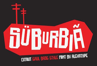 Designer of the cartoon font Skreeble (2019), the brush script Hakuno (2019), the bubblegum font Babel Gamee (2019) and the heavy display typefaces Smithsonian (2019) and Cheese Burga (2019).
  Indonesian designer of the brush script
  Ania Kruk (b. 1987, Poznan, Poland) is a designer in Barcelona. She has studied towards an MA in design at the University of Aerts in Poznan, 2005-2011 and obtained a Masters in Advanced Typography and Editorial Design in 2010 at Eina (Escola de Disseny i Art, Barcelona).
  During her studies at MIT Institute of Design in Pune, Ahmedabad, India-based Anmol Chopra designed the decorative Latin / Devanagari paper cutout / beatnik typeface Clown (2016). [
 [
[ Freelance designer in Mendoza, Argentina. In 2015, inspired by Pedro Almodovar's movies, she made the paper-cut or dada typeface Almodovar. [
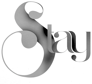 Prolific and talented Brazilian designer in London and Brasilia, who created the modular monoline display typeface
 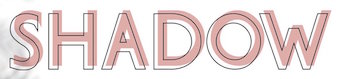 Miass, Russia-based type designer offering mainly handcrafted script or brush fonts. Her typefaces from 2021: Fruity Morning (a color SVG font), Coffee Break, Gradient Quirky, Aster Glow, Vintage, WMN Power, Carnival (and party masks), Snowflake Christmas, Cupid, Vegan.
 Artery Design is located in Gothenburg, Sweden, and is run by Botond Bokor (b. 1978). In 2012, Botond published a few free fonts at Dafont:

 [
[ A foundry which made over 500 fonts, mostly in 1998-1999, and was located in Carlsbad, CA, where Gail Conwell edited their Bright Ideas Magazine at that time, and Rick Hutchinson is listed as one of the directors / managers / owners.
  [
[ Casady&Greene, Inc. started out as two separate little companies, CasadyWare and Greene, Inc. CasadyWare, which was founded by Robin Casady in August 1984, began producing Fluent Fonts, which were bitmapped typefaces for the Macintosh. The 1984 set of fonts have copyright lines that mention Richard A. Ware. As soon as PostScript fonts appeared, CasadyWare got hold of the first version of Fontographer and produced the first downloadable PostScript fonts, even beating Adobe, the originators of PostScript, to the punch. These were marketed as Fluent Laser Fonts (FLF) out of Carmel, CA.
  Cofounder of Now Type,
  [
[ Born in Firenze in 1969. Cofounder with Francesco Canovaro and Debora Manetti of the Italian design firm in Firenze called Studio Kmzero. He co-designed some typefaces there such as
  Lucknow, India-based designer who started out as
  [
[ Type foundry in Sheffield, UK, first called Schizotype, and in 2021 renamed Eclectotype because this is not a foundry that likes to stick to trends or expectations. Its designer,
  Squid (aka Dave Cohen) is a font designer, sculptor, illustrator and musician. He has executed hundreds of prototypes for the toy, ceramics and gift industries, such as tiki mugs. Squid's fonts are published exclusively by Sideshow Foundry. You can see his other musings at
  [
[ Jogja, Indonesia-based designer of the art deco sans typeface Zietta Sans (2019), the free fat finger fonts Katherine Handwriting (2019) and Haylow Marker (2019), the marker pen fonts Markisa (2019) and Karenina Handwriting (2019), the vampire fonts Foxtails (2019) and Creepy Garden (2019), the comic book typefaces Johnie Blackerson (2019: hand-brushed), Bandrek (2019), Squad 62 (2019), Banana Island (2019), Rollenzo (2019) and Houston Comics (2019), Fugia (2019), Rankerton (2019: octagonal), Jovita (2019), Aliens Learn To Write (2019), Cherry Smoothies (2019), Garvey (2019), Paper Cutz (2019), Coconut Cookies (2019), Cherry Cupcake (2019), Sweet Smoothies (2019), Butter Yellow (2019), and the script typefaces Zietta Script (2019), Nabilla (2019), Hello Darkness (2019) and Mae Nitta (2019).
  [
[ Darcy Baldwin (DJBFontography) is the Texas-based designer of these handwriting typefaces in 2007: DJBABITOFFLAIRE, DJBADEE1, DJBAMANDAG, DJBANGELA, DJBANNALISE, DJBANNETTEscript, DJBCHERE, DJBCHRISTINEC, DJBCINDA, DJBCINDAs, DJBDAWN, DJBDOODLEDOO, DJBELIZABETHK, DJBELKE1, DJBEMILYS, DJBEuroscript, DJBGINAE, DJBGISELLA, DJBJANELLE, DJBJANINE, DJBJENB2, DJBJENNA, DJBJENNIFER, DJBJENNIFERscript1, DJBJOAN, DJBJOYscript, DJBKATHERINE, DJBKATRINE, DJBKEELYB, DJBKEELYBscript, DJBKELLEY, DJBKENNAscript, DJBKIRA, DJBLINDSE1, DJBLINDY, DJBLIZ, DJBLORRAINE1, DJBMANDY, DJBMEGAN, DJBMETA2, DJBMISH, DJBMichael, DJBPOOKIEDOO, DJBRITA2, DJBSOFEE1, DJBTABITHAscript, DJBWENDY, DJBWENDYPscript, DJBWRITESALOT. In 2008, she made DJB Treasure Hunt, DJB Curlie Wurlie, DJB 2Cute4U, DJB Heart of Dixi. Fonts made in 2009: DJB For Annie, DJB Sloppy Joe.
  Bandung, Indonesia-based designer of script typefaces. These include Bravalor (2018), St. Genoa (2018), Skelie Dancie (2018: a Halloween font), Lovely Puppy (2018), Pretty Pumpkin (2018), Gobbie Gobble (2018), Brioche (2018), The Graveyard (2018: Halloween font), The Royale (2018: an unconnected calligraphic script), Mister Boosty (2018: a children's book font), Swan Tales (2018), Chiko and Owlie (2018: another children's book font), Myrtle (2018), Unconnect (stencil), Arabica Vine (2018: free), Romanttica (2018: brush script), Brunella, Qlinsey, Camellia, Morning Glory, Gallant London, Gotmads, Gallant, Mary Quincy. He also designed the display sans typeface Trevor (2018).
  [
[ [
[ [
[ Graphic designer in Warsaw, Poland, who created the cosmic family Solanum (2019) and deco typeface
  [
[ [
[ Aka Director Fonts and Fade Line. Banda Aceh, Indonesia-based designer (b. 1993) of the calligraphic typefaces
  French designer of
  Moscow and/or Riga, Latvia-based designer of the pleasingly rough brush typeface Bronks Script (2015) and of the handcrafted typeface Marshmallow (2015). In 2016, she made the dry brush font Density (2016), the brush scripts Firecracker, Caricia, Pepper, Lady in Red (a fine brush script), Asparagus, Siberia (crayon style), Newport (marker font), Emerald and Haiti, Ambrosia Script, the wide calligraphic font Lancaster, the curly watercolor brush script typeface Candyland, Fallen Angel, the Treefrog-style script Lemon, Penelopa, Cutout, and the creamy brush script Marmaris.
 Russian designer (also spelled
 Russian designer based in Turkey. Creator of these typefaces in 2017:
  [
[ French designer (b. 1984) who s based in Montelimar. He created the poster typeface
  Japanese site with some original fonts. Creators of
  American (ex) art director at Adobe, who created the human gymnastics figure font Cutout. [
 Gaslight-type-foundry is collaboration between three type designers---Valery Zaveryaev, Maria Luarvik, and Roman Shchyukin---, founded in 2011. Valery Zaveryaev is a
  Aka Bud White. Dundee, Scotland-based creator of
  Type and industrial designer, b. 1899, New York. He had his own design studio and became director of the American Type Founders company, commonly known as ATF. His typefaces:
  [
[ Or Oghi Novianto. Bandung, Indonesia-based designer of the brush typefaces Mons (2015), Eyepic (2015) and Wild Nature (2015).
  [
[ Swedish type designer associated with
  Hanoded is the
  German type designer, b. 1980, Frankfurt. He runs a design studio in Frankfurt.
  [
[ Mexican foundry run by Enrique "Quique" Ollervides from Mexico City. Faces include
 Or Ira Dvilyuk. Ivano-Frankivsk, Ukraine-based designer of the heavy brush script Alanta Script (2017), the brush font Senorita (2017), and the paper cutout typeface Scandinavian Kids (2017).
  [
[ [
[ [
[ Prague, Czechia-based designer of the experimental paper strip font Scratch (2018). [
 Art director in Madrid, Spain, who created the fun cutout typeface Carnival (2016). [
 JC Fonts is the foundry, est. 2009, of
  Prolific type designer in Florida, b. New York, 1952. His fonts were originally free and consisted largely of dingbats. Around 2005 he went commercial, and now sells his work (over 350 fonts as of 2009) via
  Aka Jos Joy, as Joanne Ford Taylor, and as
  [
[ [
[ [
[ [
[ Kimmy Kirkwood (b. 1988, Seattle, WA) (Kimmy Design) studied at Chapman University, and lives in Santa Monica, Orange County. He graduated in 2018 from
  [
[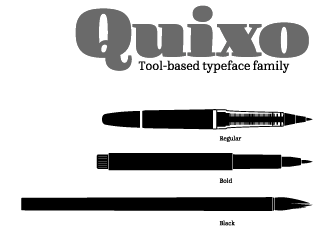
 Kristina Gess (aka Sproot, based in Chelyabinsk, Russia) created the Latin paper-cut typeface
  [
[ Kustomtype is Coert De Decker's type foundry in Otegem, Belgium. Coert (b. 1966) created
 Laic is the type foundry founded in 2018 by Warsaw, Poland-based type designer Maciej Polczynski. His typefaces:
  Graduate from
  [
[ Hendry Juanda runs Letterhend Studio in Yogyakarta, Indonesia. He designed the signage script typefaces
  Thijs Mertens is a Dutch designer in Arnhem who runs the design studio Letters en Plaatjes since 2009. He used FontStruct in 2009 to create ThM PurSans,
  Kiev, Ukraine-based designer of the display typeface Aurum (2018), the rounded sans titling typeface Bulky (2018), the modern brush typeface Gent (2018), the paper cutout font Cut Me (2018), the experimental Dots Lines (2018) and the simple sans typeface family Atlas (2018). [
 In the late 1990s, Klaus Johansen from Odense made gorgeous (free) dingbat typefaces such as Fabeldyr, Ancient Heads, Art Nouveau Headers, Art Nouveau Women, Atleter,
  Ipswich, UK-based designer of the rugged Flintstone typeface Rocky Ryder (2019), the papercut typeface Papier Couper (2019) and the handcrafted Bloopy (2019).
  [
[ [
[ [
[
 Adonis-Bold, Athena, AthenaHandwritten, Cuneate, CuneyChars, Diogenes, GreeKish, HellasDust, JuliusCTwo, MCapitals, MouseStrokes3D, MouseStrokesCont, MouseStrokesInverseShadow, OldGreekButtons, Papercuts, PetitexBut-Bold, PetitexBut-Light, PetitixBut-Normal, Pompeji-Black, PompejiMK, PompejiPetit, Prehistoric, Prehistorish, QuickGreekBold, QuickJuliusC, RandomUnciale-Bold, Rehacles-Light, Rehacles-Medium, RomaCesare-Normal, RomaMonumentalBC, SteinAntik-Bold, SteinAntik-Light, SteinAntik, StoneAgeBatsBold, StonesAgeButtons, StrokeBorn-Bold, StrokeBorn, StrokesFonds, StrokesNBullets, Strokey-Bold, Strokey-VeryBold, Strokey-VeryVeryBold, StrokeyHand, Tremolo-DemiBold, Tremolo, Twiggy-Bold, Twiggy-Light, Zyprian.
  Argentinian type designer María CarlaMazzitelli was born in Buenos Aires, Argentina. She got a degree in Graphic Design at FADU-UBA and, in 2017 she finished her Masters in Typography at the same University. Since 2005, María Carla works side by side with Professor Carlos Venancio and Professor Darío Contreras at FADU-UBA, assisting them in their Typography courses.
  [
[ [
[ In 2015, Dmitriy Chirkov (or: D.C. Store, or: Media Lab, or: Dima Evans, located in Moscow) created the brush typefaces Lovehearts, Cascade, Foliage, Something Wild, Pepper Mint, Summertime (watercolor brush), Breathe, Starshine Script, Seashore (an attractive dry brush style), The Moment, Cupcake, Anemone, Water, Adventurer, Sweet Brush, You & Me, Beverly Script, Sabrina, Onevia, Andrea and Dreamboat. He also created the Treefrog-style gonzo script typeface Sileighty and the handcrafted typefaces Scratchy, Julia's Dream, Begonia, Matryoshka (handcrafted Cyrillic sans) and Simpleton.
  Mehmet Reha Tugcu (Tugcu Design Company, Istanbul, Turkey) designed these typefaces:
  [
[ Aka Mikomix, her real name is Michelle Karla Sumulong, b. Anchorage, Alaska. Mikko grew up in Antipolo City in the Philippines, went to college back in Anchorage, Alaska, lived in New York City, took a two-year break in Alaska, and now resides in Manila / BGC in the Philippines.
  Banda Aceh, Indonesia-based designer of the script typefaces Devita Italic (2016), Cathy (2016), Arabella Script (2015, by Bro Luthfi), Nicky (2015), Lesly (2015), Victoria (2015), Coffee Script (2015), Coffee Sans (2015), Michael Script (2015; the same font is also available from Font Zilla...), Sweatpants (2015), Cutout (2015), Spoon (2015) and Theory (2015).
  [
[ Stefan Gandl was the designer at
  Swedish graphic designer, b. 1991, who obrained a Masters degree at IED in Florence, Italy. He is currently based in Stockholm. His typefaces:
  [
[ [
[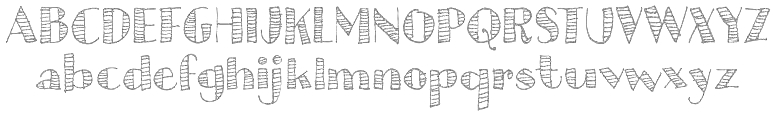 The Great Dane from Copenhagen,
  Art director in Bucharest, Romania. In 2016, Pose designed Matisse, a font inspired by fauvist painter Henri Matisse's cutouts and color palette. He hooked up with Andrei Ograda in 2017 and set up
  Veronika Golovko or Veronika Qilli (Qilli Design, Novorossiysk, Russian Federation) specializes in scrapbook fonts. She designed the brush typefaces Michelly (2015) and Jemmer (2015), and the hand-painted font Bellious (2015). In 2016, she designed Gentle Air, Clouds Caprice, Drawing A Life, Sorcery (a curly vampire script), Magic Snow (brushed), Joy In Night (Halloween font), Autumn Madness (perhaps for children's books), Belles Script, and the brush typefaces Adeline and Melony Script.
  [
[ Or Ira Trigubova. Kiev, Ukraine-based designer of these typefaces in 2017: the informal typeface School, Königreich (medieval blackletter calligraphic script), Sweetheart (a cutesy children's or Valentine's Day font), Coral Waves, Winter Story (handcrafted), Little Bee (+Sans: letters with bees buzzing around), Schönheit (connected script), Aisling (a monoline script), Rhapsody (connected script), Amanita, Star Dust (handcrafted), Urbano (dry brush), Tulip Garden, Meraki (a dotted ornamental sans).
  Aka Rendy Messenjah. Bandung, Indonesia-based designer of these typefaces in 2016:
  Brazilian graphic and type designer in Sao Paulo, b. 1990. He made the hand-printed brushy typeface
  Yogyakarta, Indonesia-based designer of the handcrafted typefaces
  American graphic designer and Oscar-winning filmmaker, best known for his design of motion-picture title sequences, film posters, and corporate logos. Born in the Bronx, NY, in 1920, he died in Los Angeles in 1996. Bass worked for some of Hollywood's most prominent filmmakers, including Alfred Hitchcock, Otto Preminger, Billy Wilder, Stanley Kubrick and Martin Scorsese. Among his best known title sequences are the animated paper cut-out of a heroin addict's arm for Preminger's The Man with the Golden Arm, the credits racing up and down what eventually becomes a high-angle shot of a skyscraper in Hitchcock's North by Northwest, and the disjointed text that races together and apart in Psycho. Bass designed some of the most iconic corporate logos in North America, including the Bell System logo in 1969, as well as AT&T's globe logo in 1983 after the breakup of the Bell System. He also designed Continental Airlines' 1968 jet stream logo and United Airlines' 1974 tulip logo, which became some of the most recognized airline industry logos of the era.
 Sebastian Cabaj (or: Pan Cabaj) studied graphic design at the Academy of Fine Arts in Warsaw, where he now works as a graphic and type designer, and runs Kometa Studio. In 2012, he set up the Sebastian Cabaj Foundry via MyFonts.
  London-based creator of the
  Sjoerd Kulsdom (Dot By Dot) is the Arnhem and/or Amsterdam-based designer of the curly typeface Spring Is In The Air (2011), the polygonal cut-out typeface Cardboard Cat (2016), the informal typeface Merijntje (2014) and the multiline typeface Monogram Rounded (2016). Sjoerd is associated with Ontwerpstudio Dot by dot.
  [
[ [
[ [
[ [
[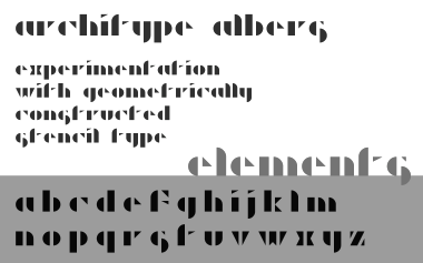 [
[ Oslo-based designer (b. 1986) of i8080 (2017: old computer screen emulation font), Manos (2017), Modum (2017), Monomod (2017), the tall serif typeface Roland (2017), the modular monoline monospace sans typeface Borgen (2017), Sullivan (2017), Inverted Stencil (2017), the high-contrast sans High Society (2017), and the slim slab serif typeface Klub Katz (2017).
  Tilman Jersch (Studio Jersch, Berlin, Germany) created the papwer fold typeface
  Malang, Indonesia-based designer of these free fonts in 2020: Jungle Adventurer, Fun Blob, Pure Joy, Saikyo (oriental simulation), Okashi (oriental emulation), Chubby and Groovy (psychedelic), Your Groovy Font (psychedelic), Flowerista, Sasha Play (beatnik), Quirky Scandi (beatnik), Happy Hints, Your Doodle Font, The Bomb Sound (octagonal), Black Knight (a horror font), Enigmatic (futuristic), Ethnique (patterned), Gameria (paper cutout), Karl Zone (modular), La Pirata, Monocoque (squarish), Organico, Quincy Jhons (brushed), Sunrize (oriental emulation), Ungai (oriental emulation), White Pearl (spurred), Woody Wood (a plank font).
  Prolific
 These are all free creations by Manfred Klein before or in 2001: Aftermath Manhattan, Aida Oops, Airdried Parma Font, Aliens, Amazon, AnthroPosoph, Architypo, Bullets 1+2, Casual Stencil, Cats, Circle Initials Freestyle, ClassiCaps, Claudius Imperator, Creepy, DisProporz, Dizzy, Eagle Konfetti, Feathered, First TypoManiacs, Flying Carpets, Furioso, Glitter, Glyptographs, Grid Exercise, Grid Scribbles, Headbirth (a great font with caricatures of men composed of deformed letters only), Headfeeter, Headfeeter 3, Hello Mr Pharao, IntourisTiqua, Kenzotiqua, Kidge&KidgeBoxes, Kleins BinAerfabet, Kleins First Bricks, Kleins Moons, Kleins Pharao I+II, Kleins Round Fragments, Kleins Sausages, Kleinsan (Japanese letterform simulation), Klill For Typesetters, Linoleu, Mannes Heads, MK Bats, MKonstrukTshirts, MutanTrios, My Nippon, Neu Gothic, Old Roman Klein, Oli Klein Bats (drawing by Manfred's son, 2001), Papercuts, Petra Font, Pointilism, Pompeji, Rainy Day, Remember Manhattan, Remember Scribbled Type?, Roots Koch Three, Rosett Klung, Sailing Strong Breeze, Sanstencil, Scribbled Astrobats, ScribbleDoni, SternenHimmel, Total Floral, Uncial Virtual, Uncitron Swinging Bold, Xmas Gingerbread, Grid Zebra, RuniK100-Bold, RuniKleinFreeform (2001, great simulated runes), Brix Round, AZ-Fusione, ClassiCaps Xmas, AngloSaxon, Betonia, Was A Screenfont, Kleins First Script, PetriFree, Aida Serif, Roaring Twenties, RoaringTwenties 2, TypeWriters Substitute, Free Bradbury, Twiggy, Arrowbix, Solunciale, Dada's Traces, AppleWine, Sumo Heavy, Petit San, Sketch Cameos Round, NipponToon, CrazyTimes, Give Euro A Face, Kids Kas, DymoFontInvers, K-Neptuns, Smile And Train, Free Bradbury Sans, Funny Faces, PointerSisters, Kritzel One, Quick Greek, Kleins Heraldry Box, Mercato Light+Bold, Silhous, Vertigo, CircleSigns, Warum 2001, MKlammeraffen, Dillefanten, Hallelujah, OhRosetta, Backgrounders, Cave AB, Broken ABC, XPFourTwoContour Medium, Karlas 1st Font, Frogs And Men, Pixel Nonsens, Latin Lovers Runes, Roundheads, Wacbats, CalliPsoGrafia, Typeface Eggs, Gourmet Icons, Hacke It!, Square Heads, FroxXMedium, FirstBricksMirored, Sportive, WacbatsItalic, MKartuhns, Typos, Free People, OliJo Sans Italic, FlyingSwimming, Clone Products, OliJo, Gutenbergs Traces.
  Ray Larabie (b. 1970, Ottawa, Canada) ran Typodermic in Mississauga, ON, which opened in the Fall of 2001. In 2006, it moved to Vancouver, BC, and in 2009 it moved on to Nagoya, Japan.
  [
[ Vicky Mardian (VMF Fonts) is the Bandung, Indonesia-based designer (b. 1988) of the pirate ship and/or tattoo font
  Gert Wiescher was born in Braunsbach am Kocher, Germany, in 1944. Based in München,
  Serif:
  Known as Wildan Carbon and Wildan Suprian Syah. Indonesian designer of
  Graphic designer and illustrator in the St Louis area in Missouri. Scott Simpson graduated with a Bachelor of Fine Arts in graphic design and illustration from Southeast Missouri State.
  Max Infeld (b. 1981, aka Xerographer Fonts) from Chico, CA, makes free fonts and offers a free font-making service. He surged onto the font scene in 2012, and is currently located in Ojai, CA.
  [
[ Italian design firm in Firenze consisting of three graphic designers,
  Graphic designer in Brunn am Gebirge, Austria, b. 1989, who graduated in 2012 from the New Design University in St. Pölten. His thesis work was the sans typeface family
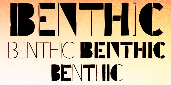
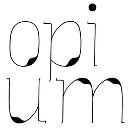
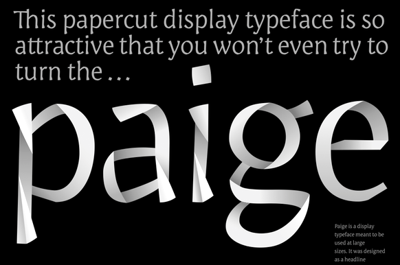
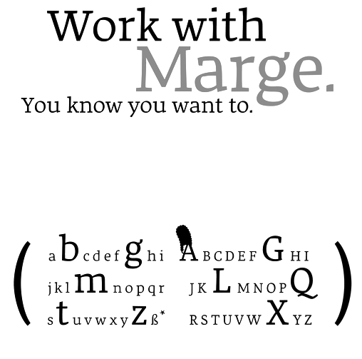
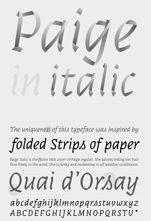
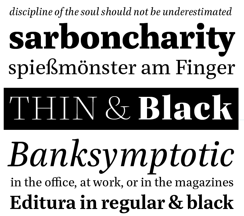
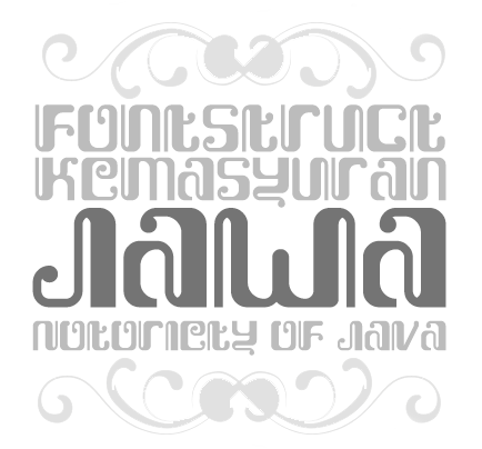
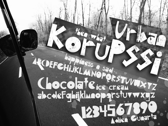
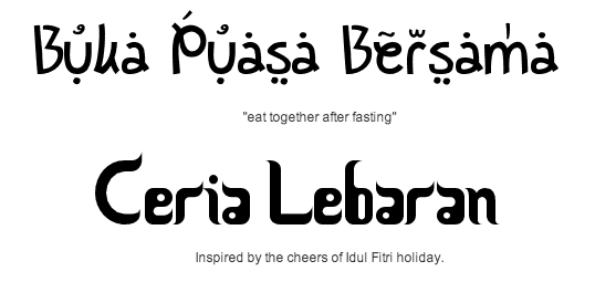
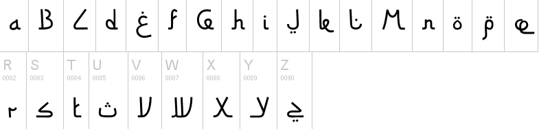
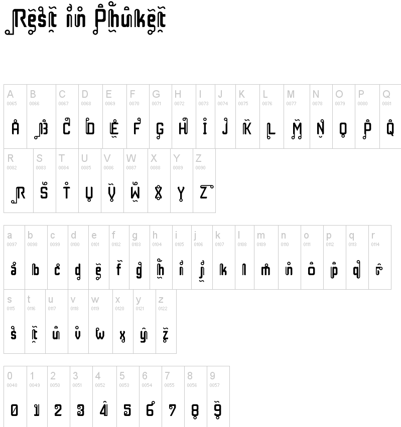
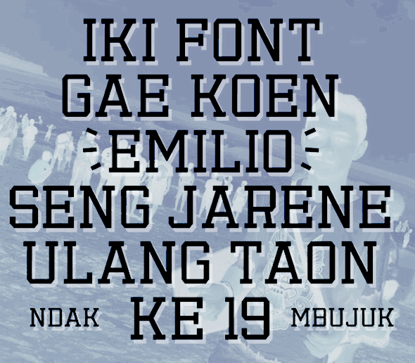
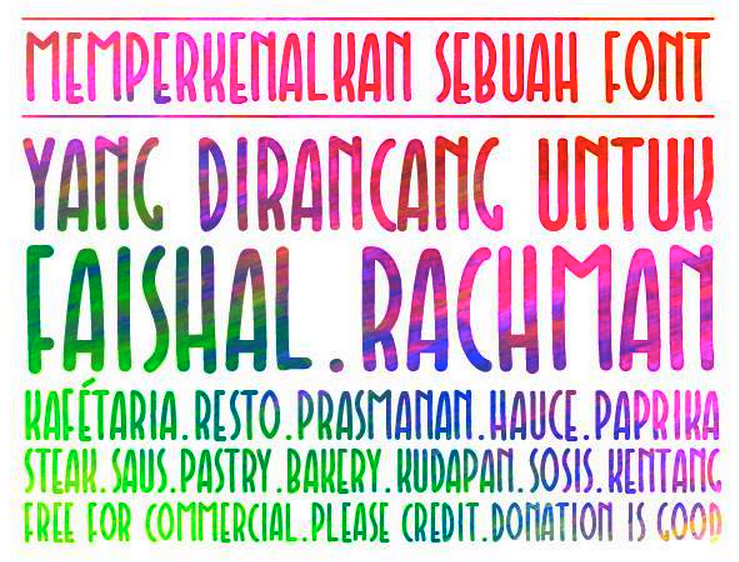
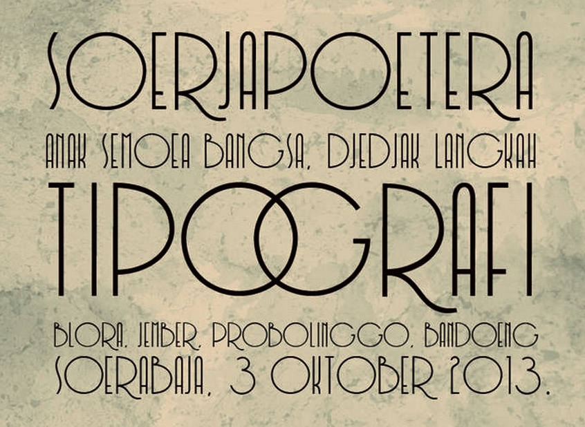
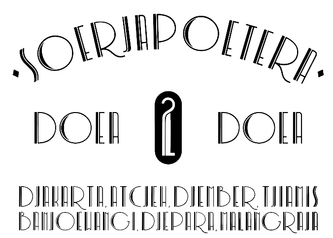
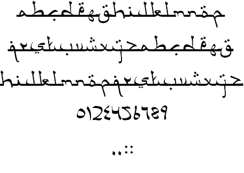
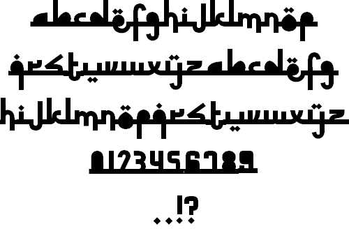
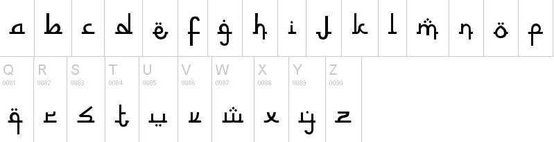
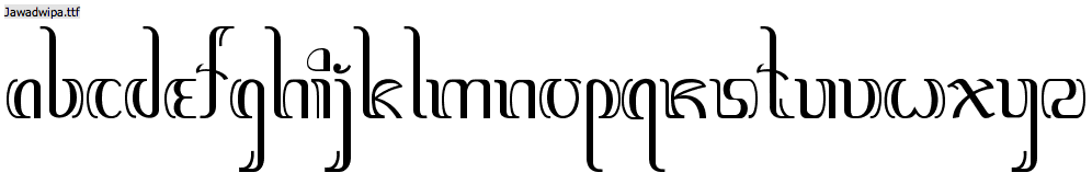
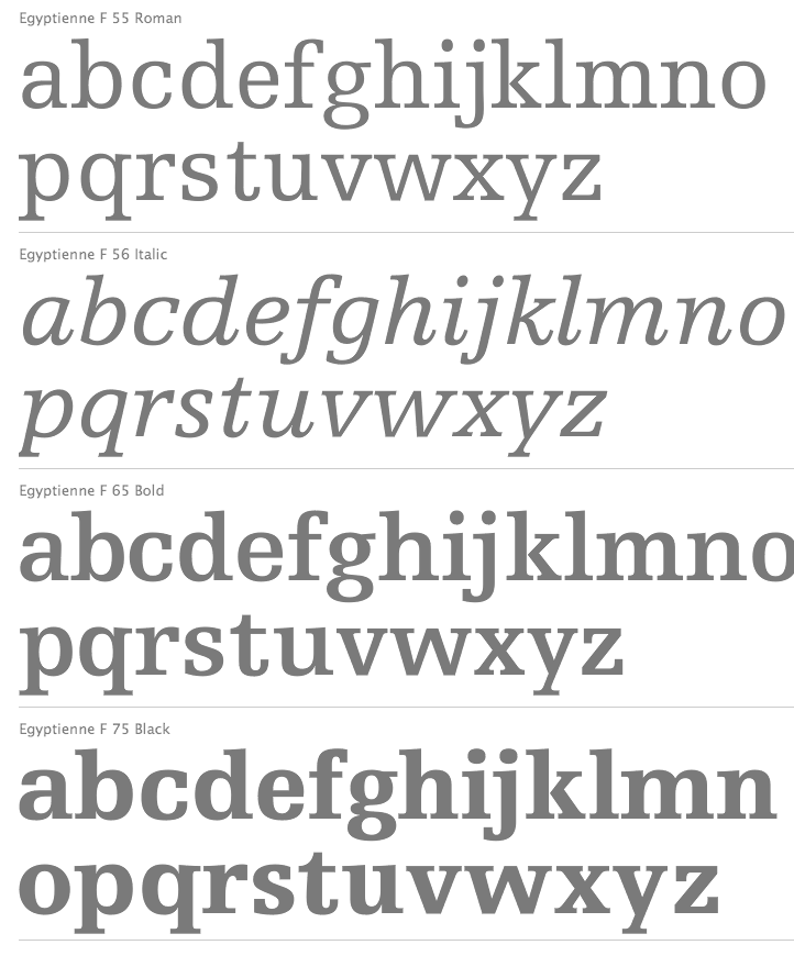
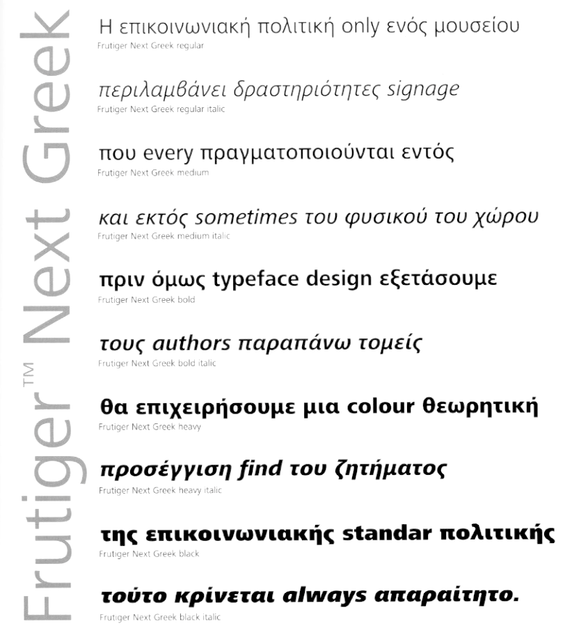
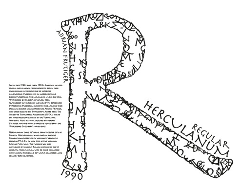
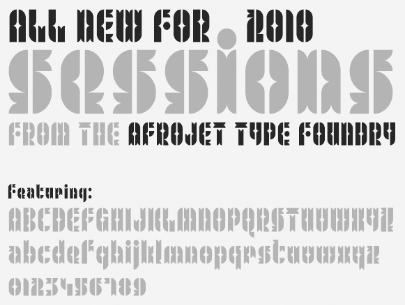
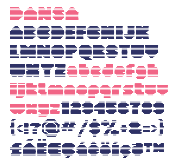
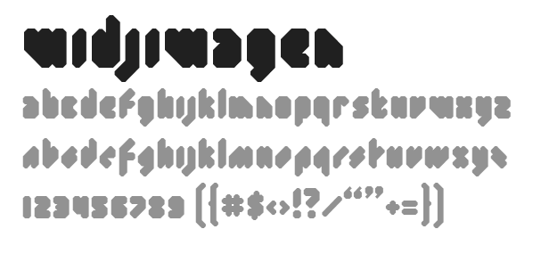
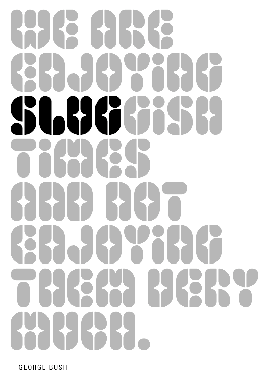
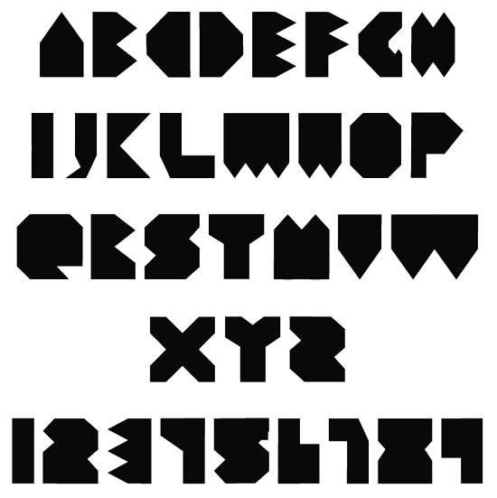
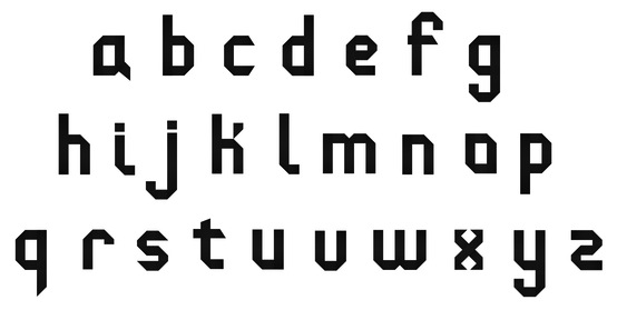
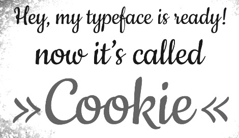
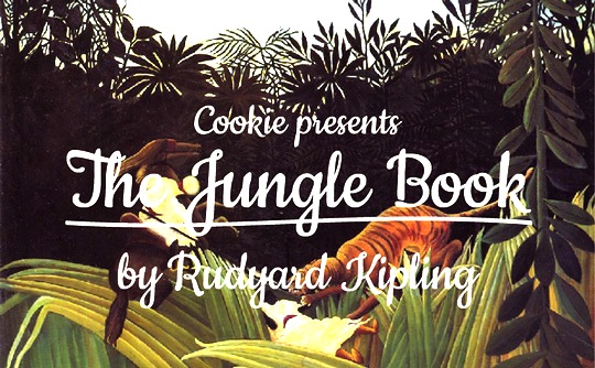
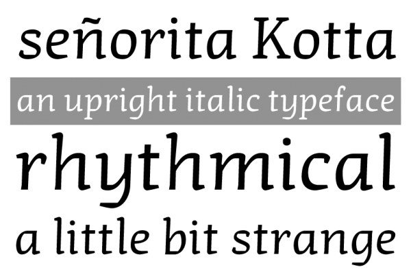
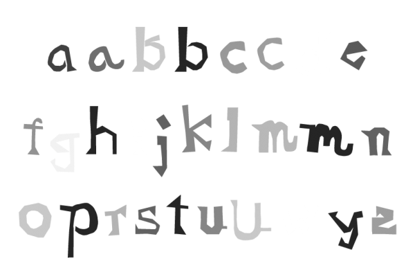
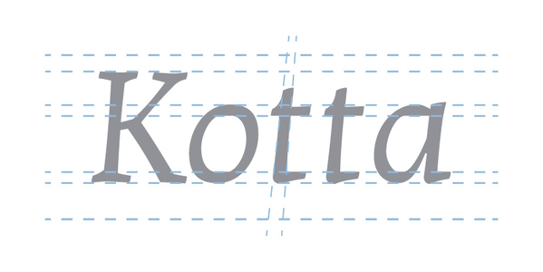
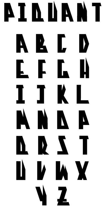
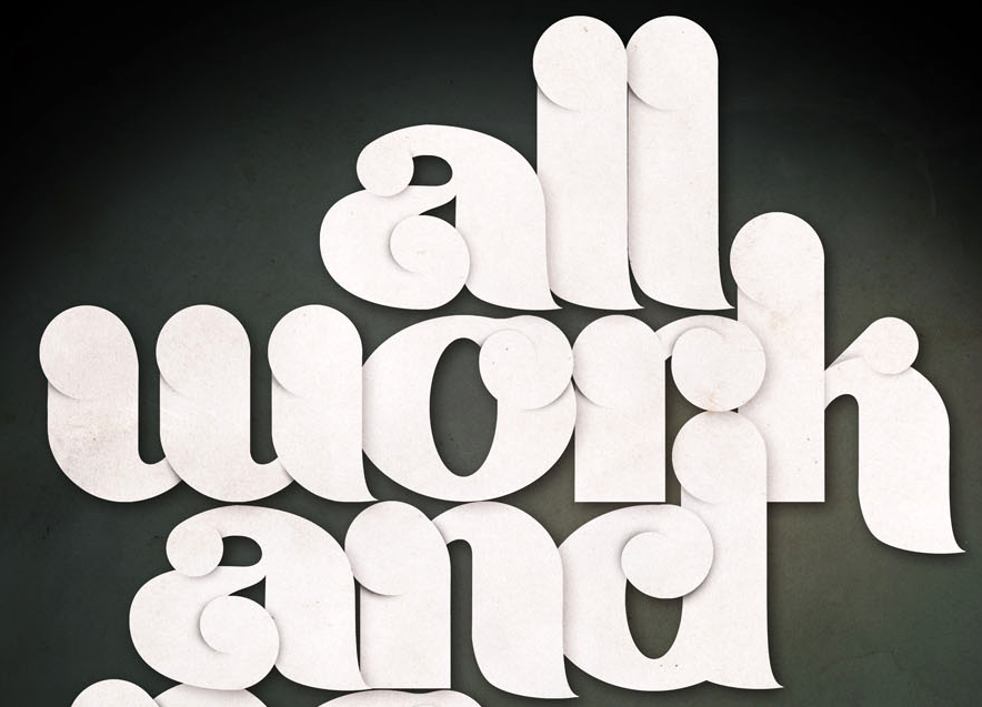
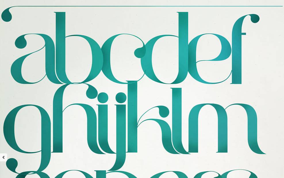
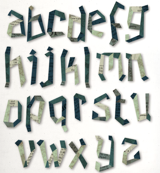
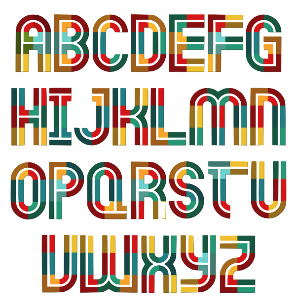
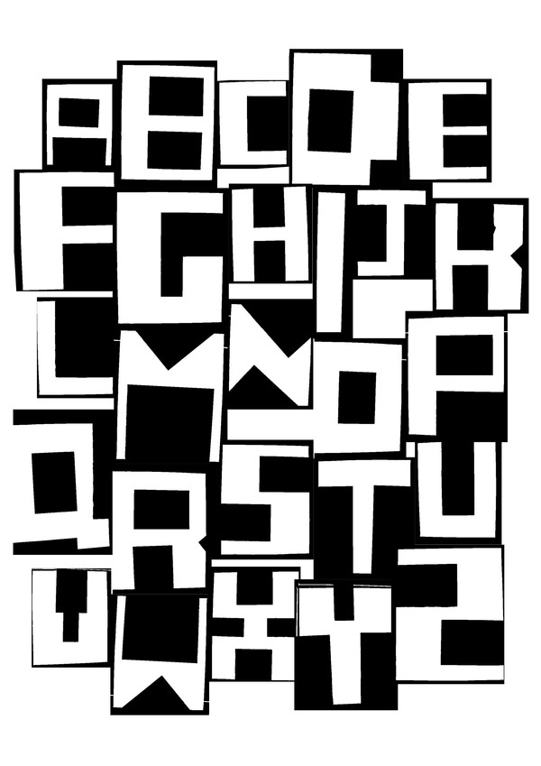
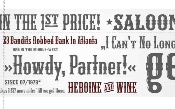
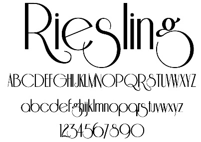
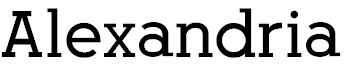
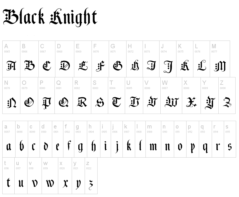
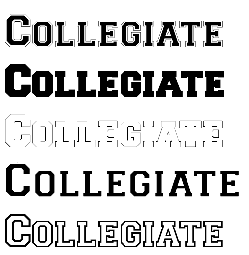
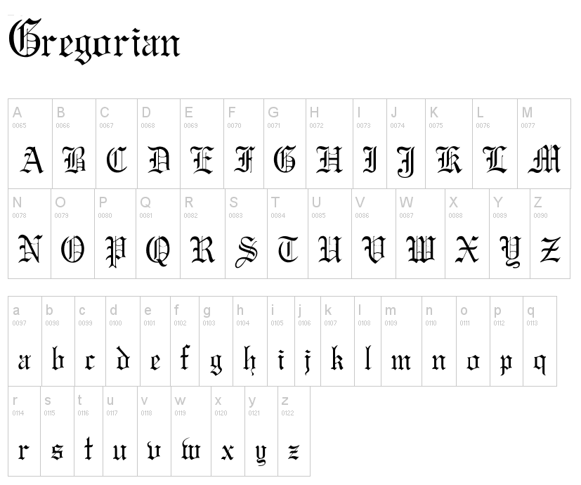
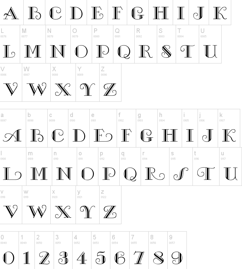
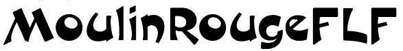
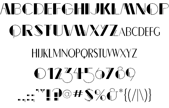
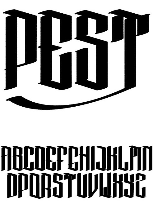
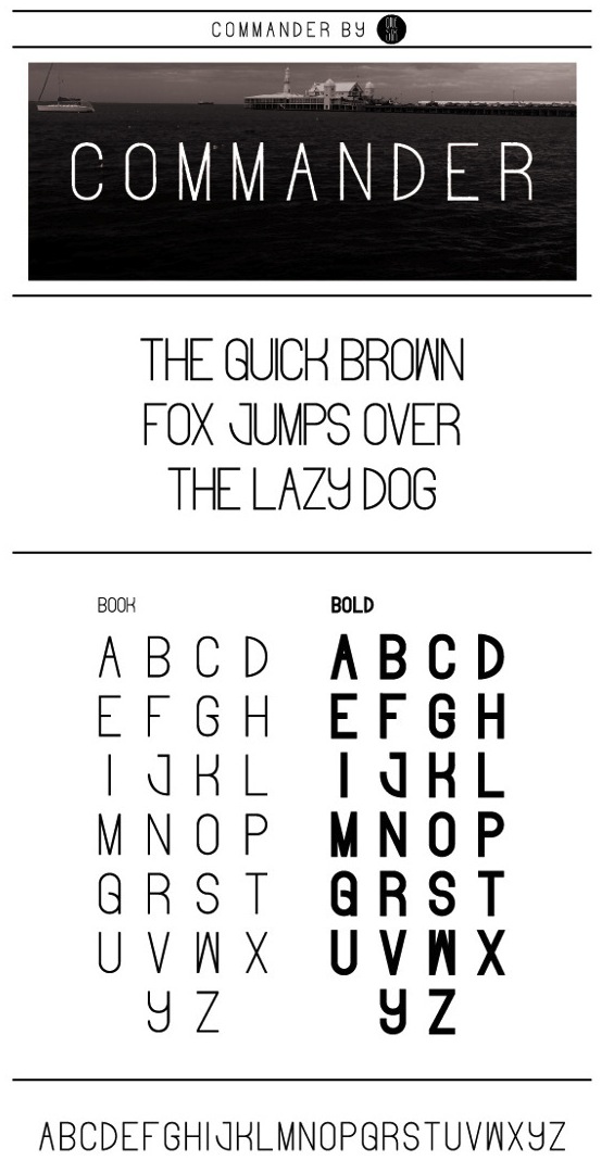
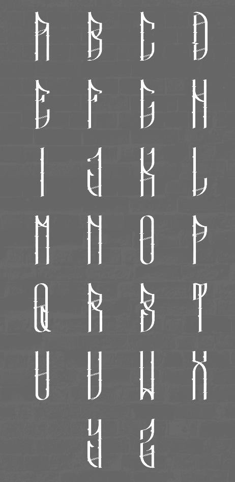
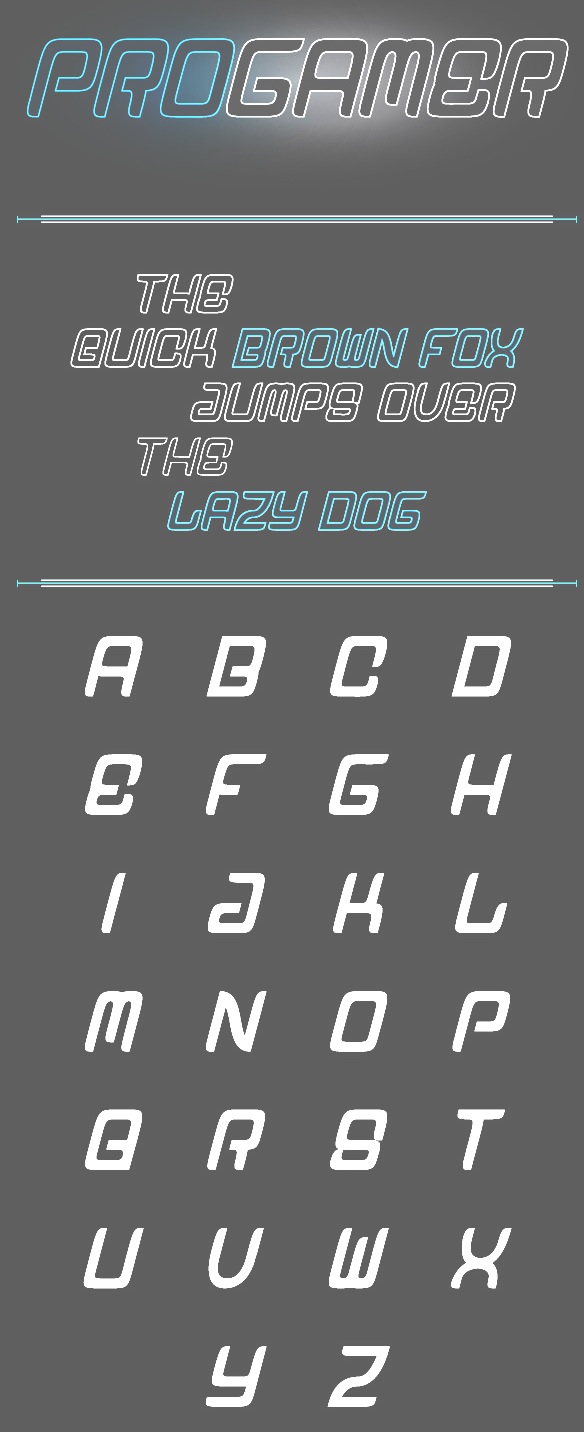
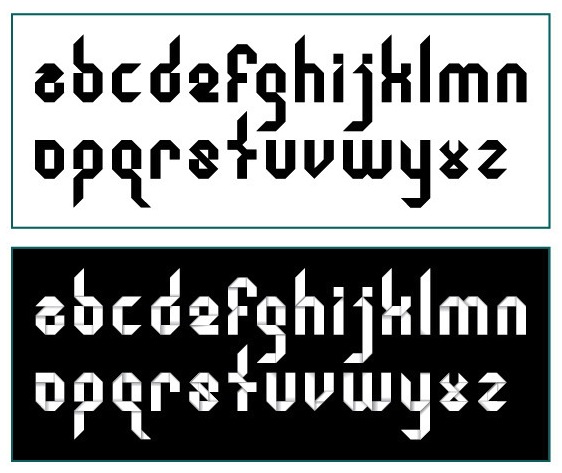
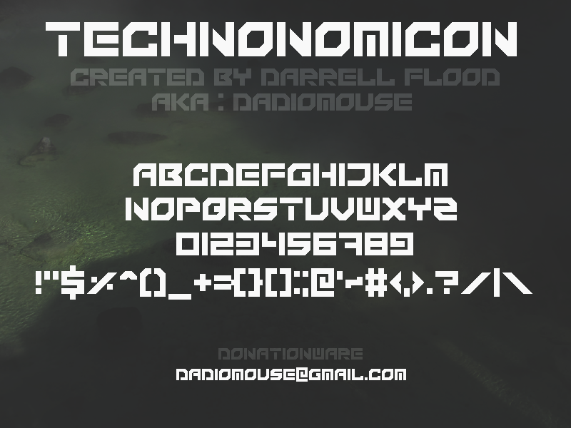
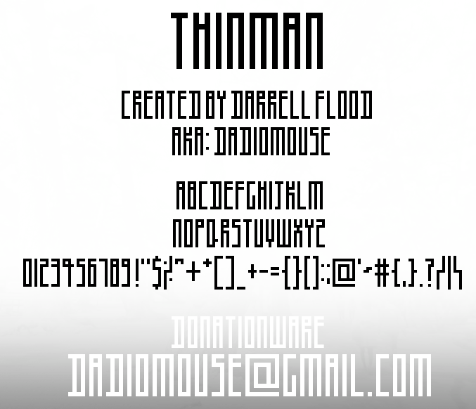
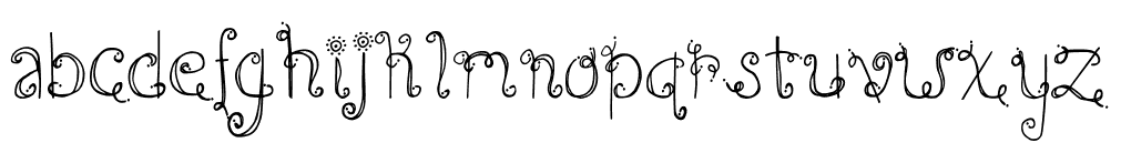
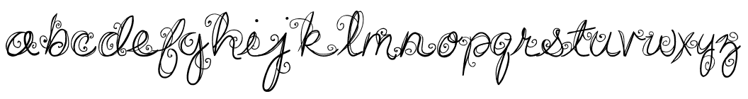
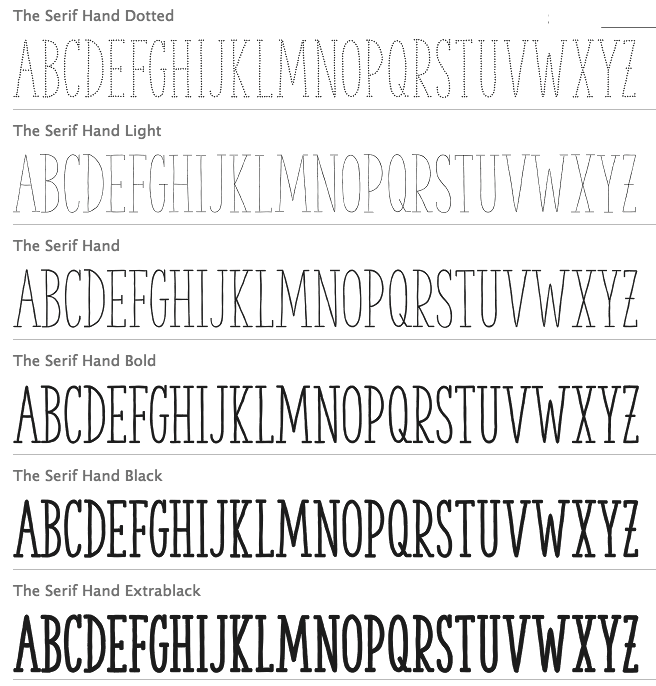
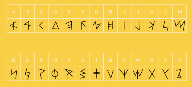
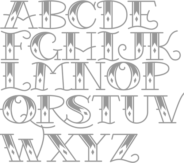
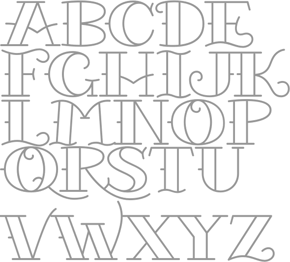
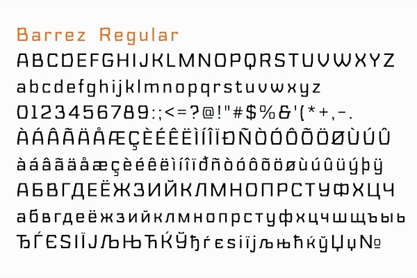
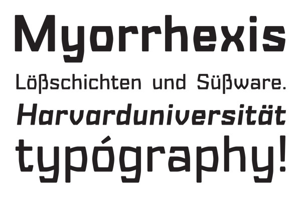
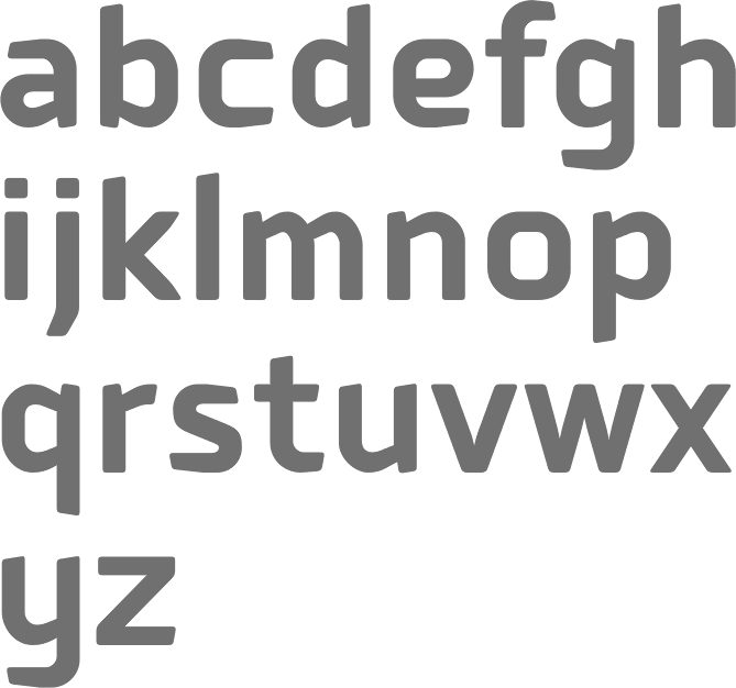
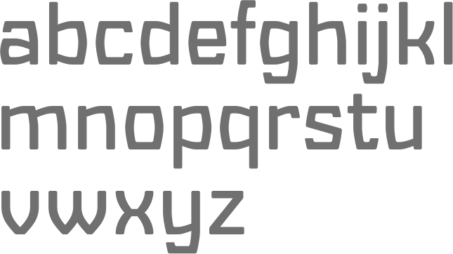
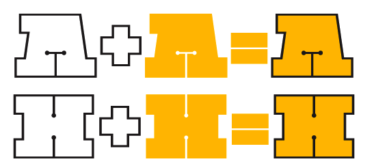
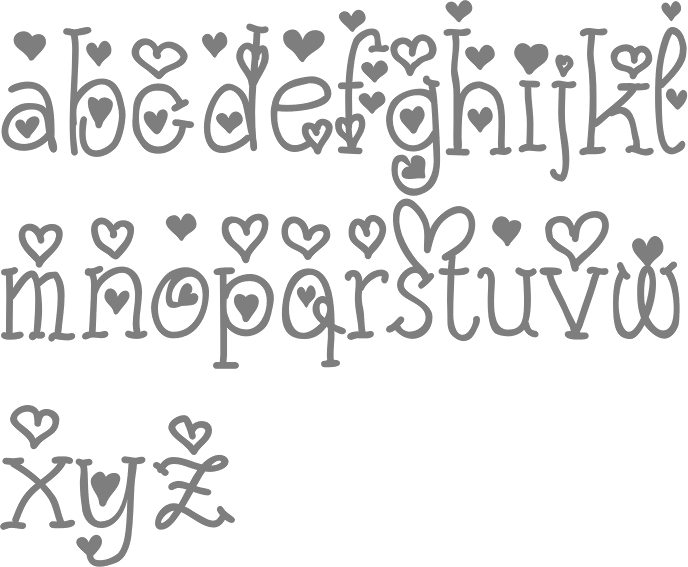
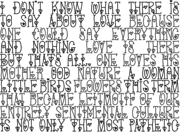
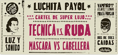
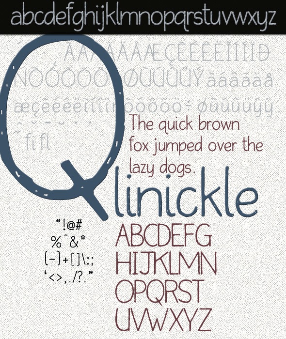
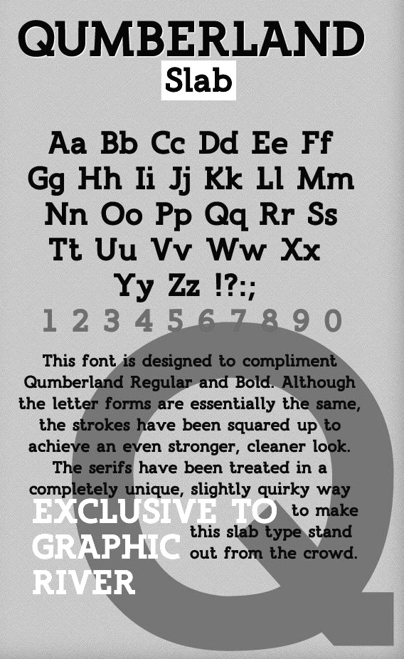
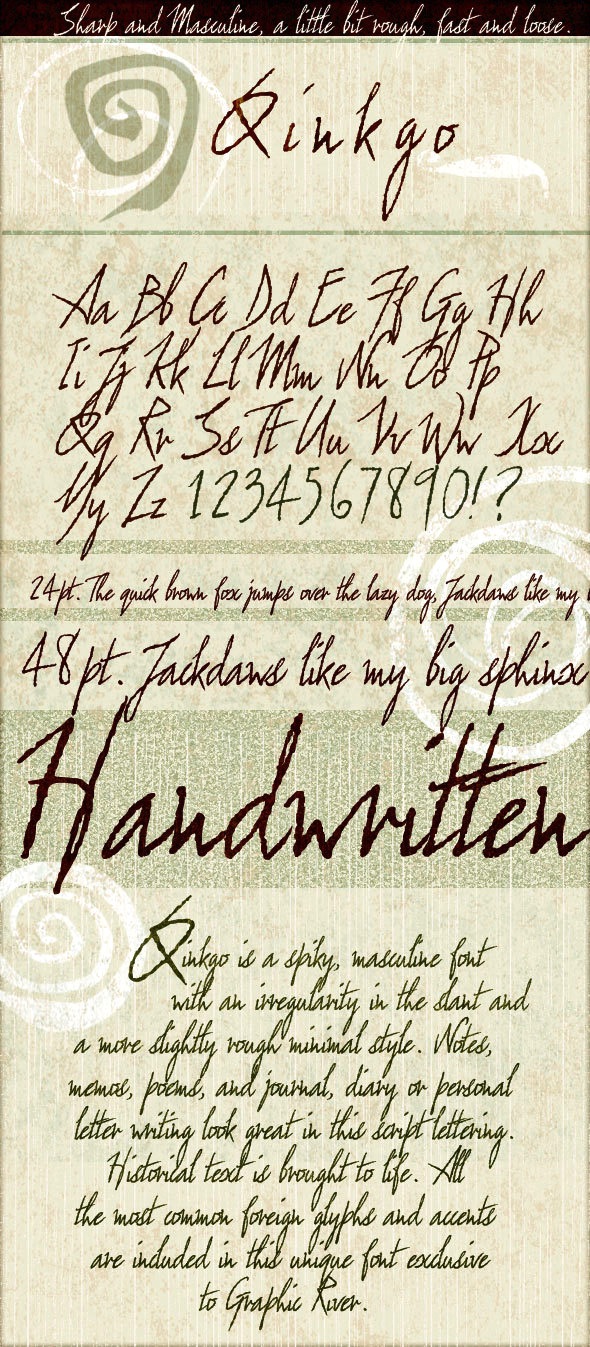
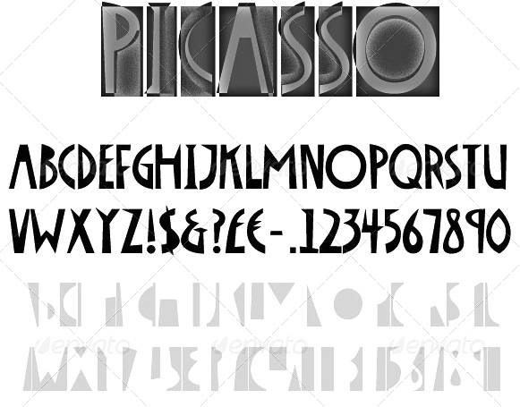
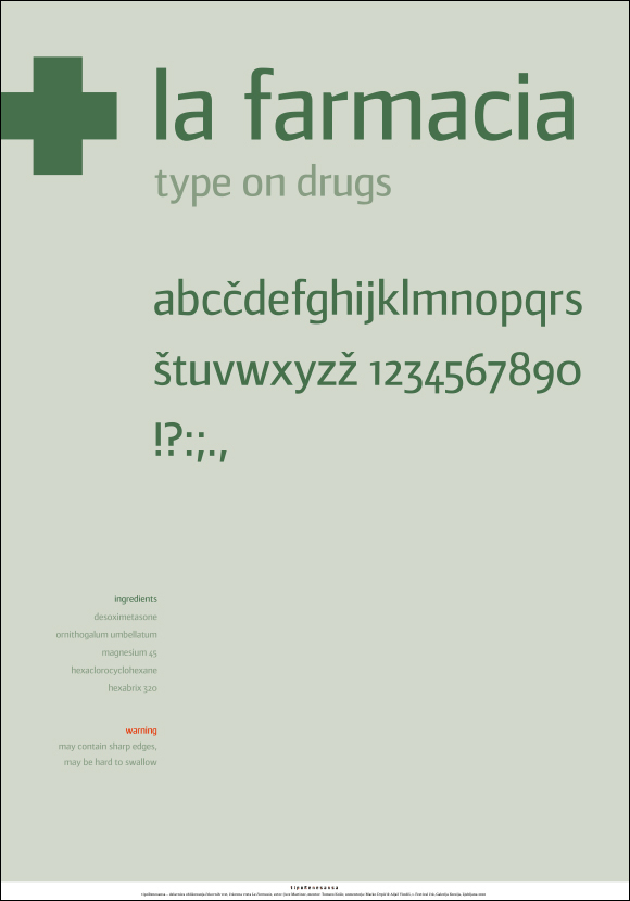
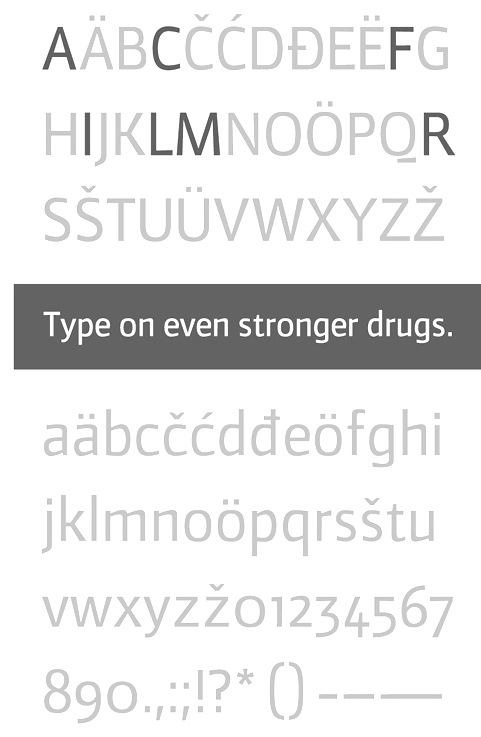
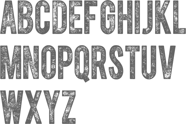
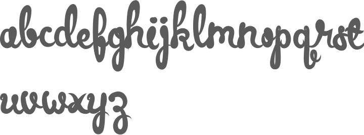
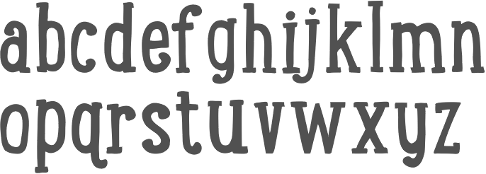
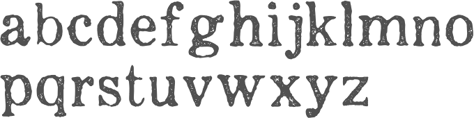
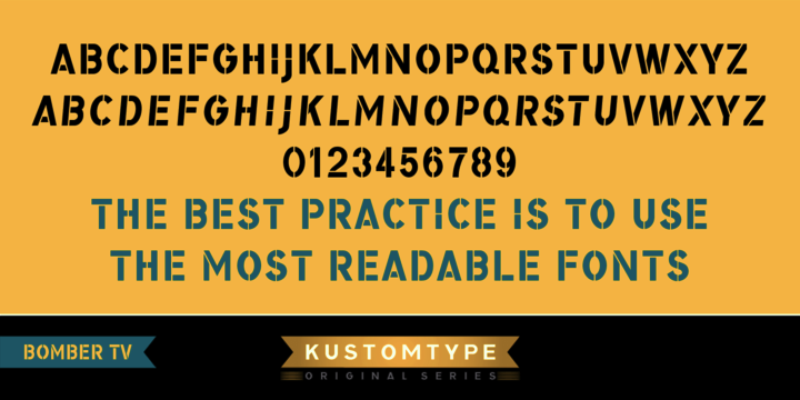
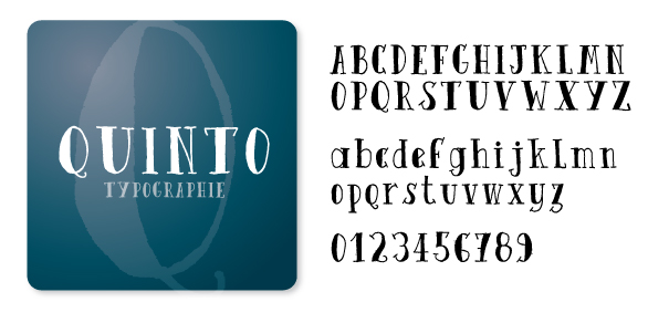
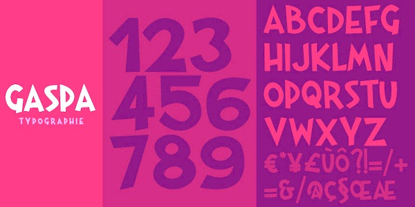
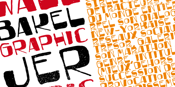
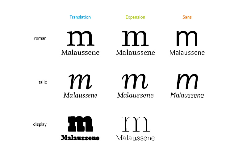
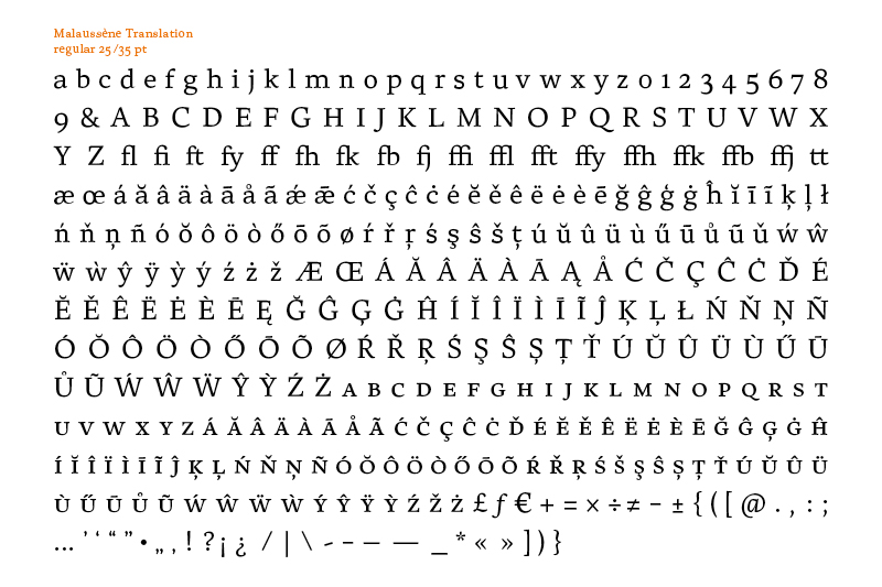
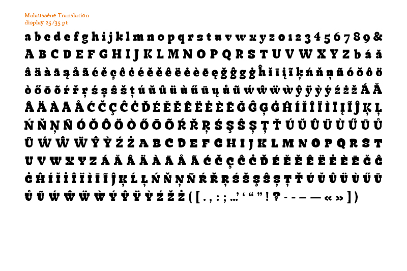
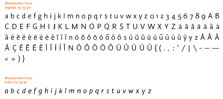
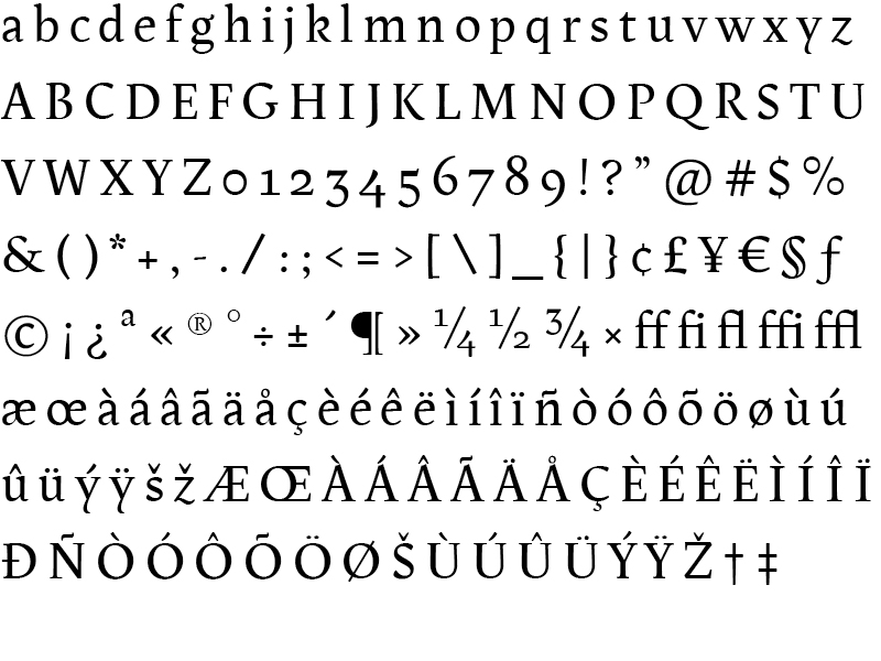
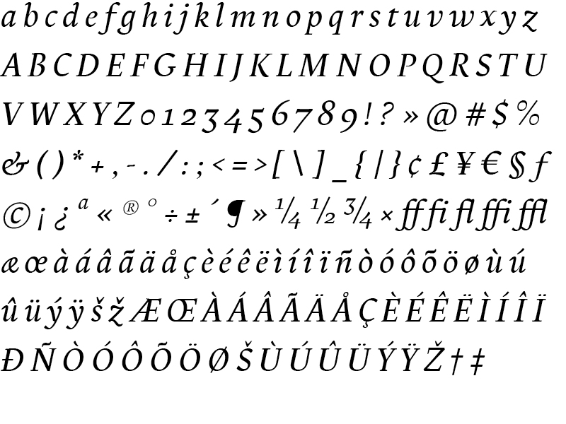
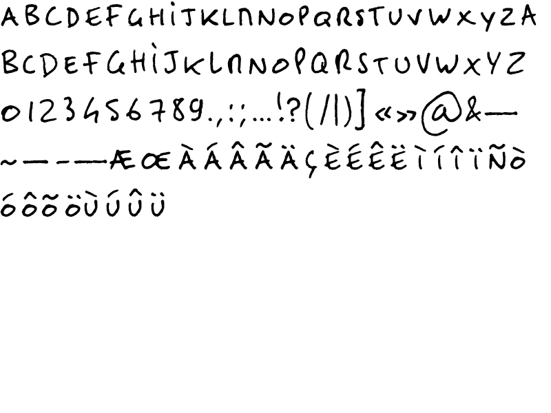
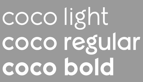
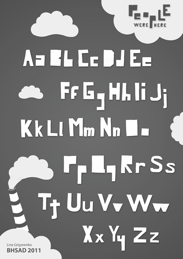
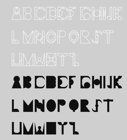
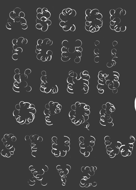
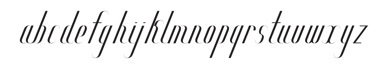
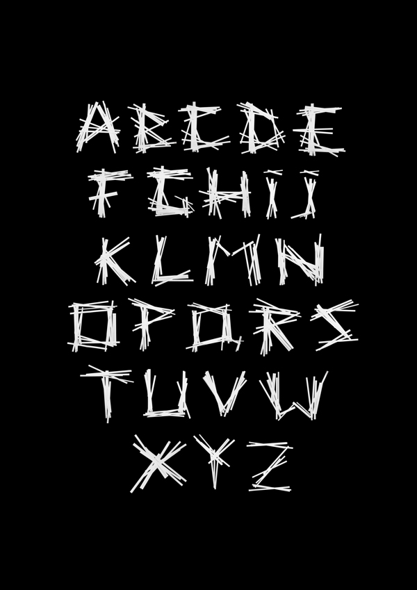
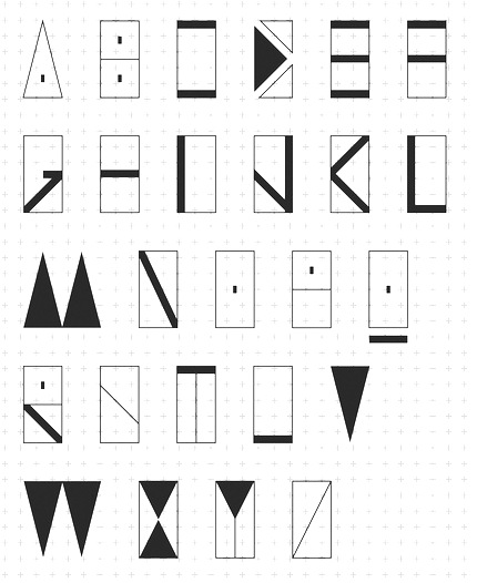
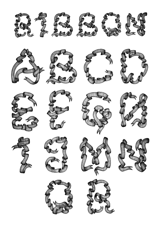
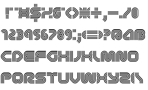
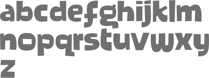
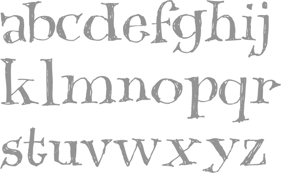
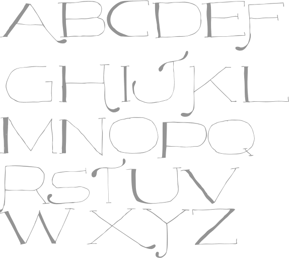
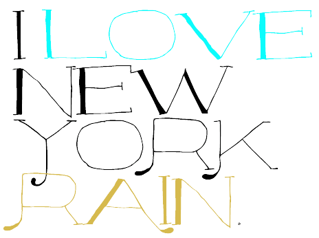
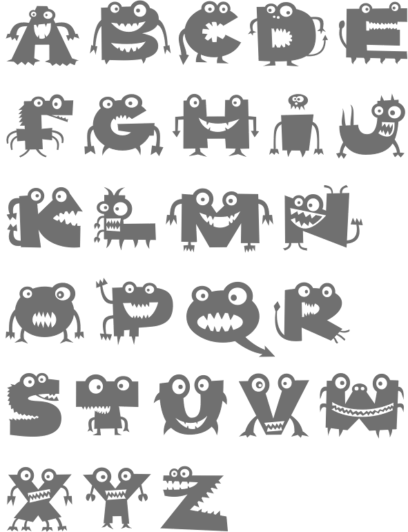
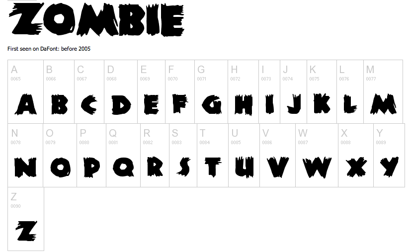
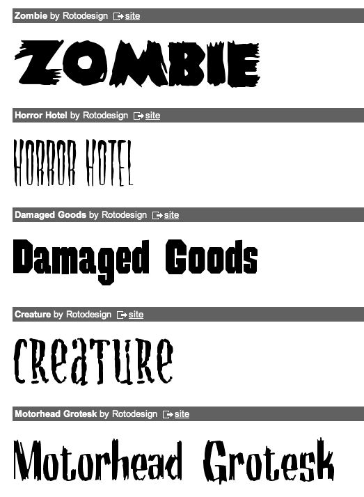
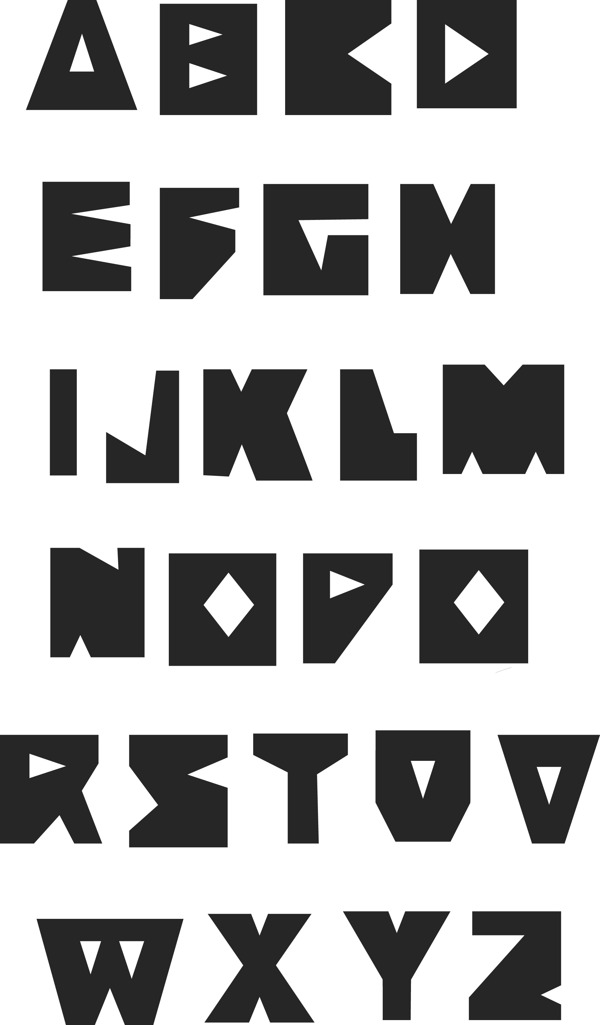
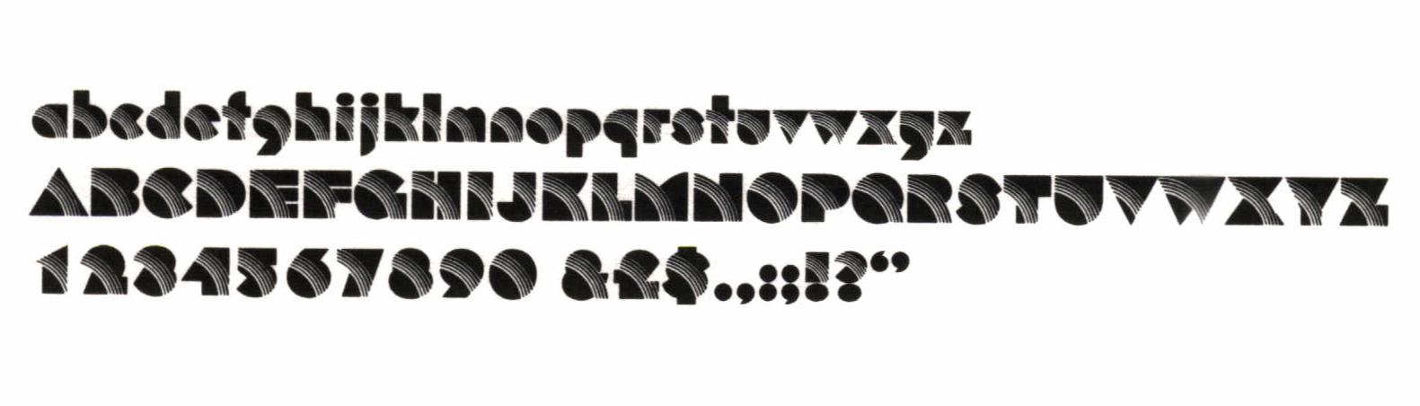
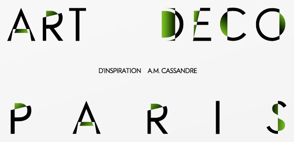
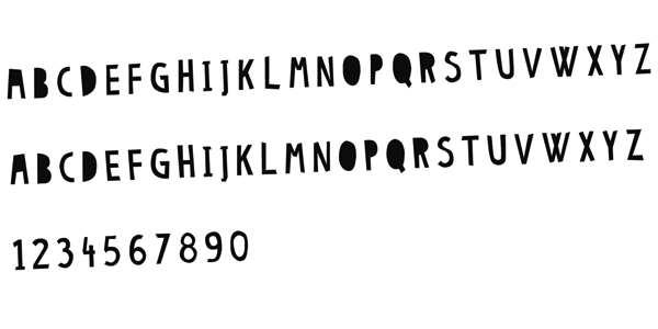
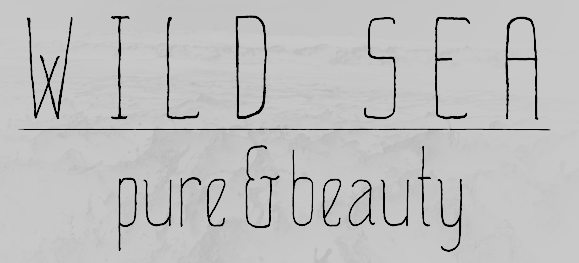
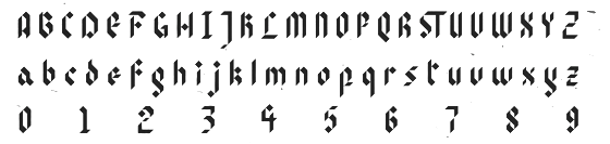
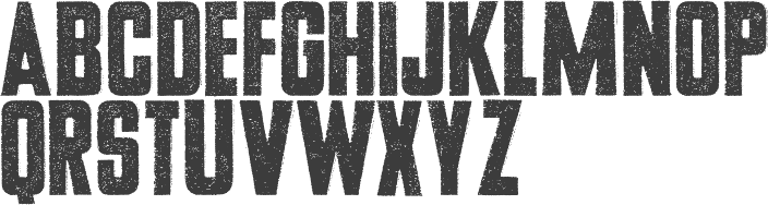
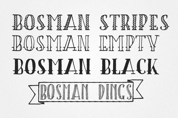
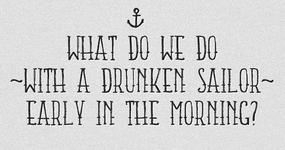
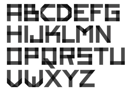
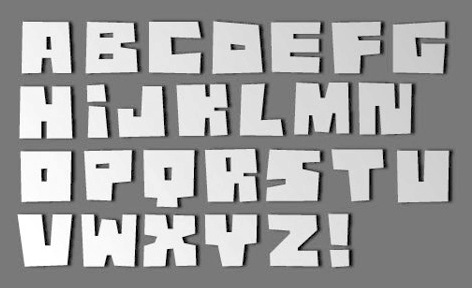
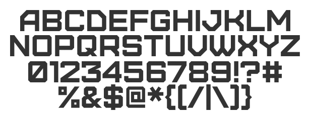
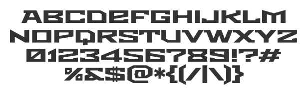
|
|
|
|