| | |
Abattis
[Dave Crossland]
|
 Abattis is a free software type foundry launched in 2009 by Dave Crossland. Auto-description on his wiki: I'm a designer and nerd in Bournemouth, UK, and I do systems and network consultancy for a living. I completed a BA (Hons) Interaction Design degree at Ravensbourne College in 2006, and am currently on the MA Typeface Design course at Reading, from October 2007 to July 2009. My design philosophy centers around the parameterisation and automation of design to improve the design process, and some of my old ideas are published at designprocess.com. He is a proponent of open source code and of free fonts, and involves himself with dedication in the Open Font Library project. He defines Free fonts as follows: Free Fonts are about freedom, not price. They are fonts you are free to use for any purpose, fonts whose internals you are free to study, fonts you are free to improve, fonts you are free to redistribute, and fonts you are free to redistribute improved versions of which means - in the specific context of font software - fonts you are explicitly free to embedded, subset, bundle and derive from to create any kind of artwork. To be truly Free they must allow commercial use and even to be sold by anyone - as it is about freedom, not price.
 Dave dreams of a free culture of visual communication around the world, so he decided to free fonts. His Masters Thesis written in 2008 at the University of Reading is entitled The Free Font Movement. In 2009, for his MA work at Reading, he designed Cantarell, a free humanist sans family, done together with Jakub Steiner, free at CTAN, Github and Open Font Library. OFL page. Cantarell was there at the launch of Google Fonts and has become widespread. In 2010 it was selected as the default User Interface font for GNOME 3. Petra Sans (2017) is a further development of Cantarell by Cristiano Sobral. Irene Vlachou added Greek support for Cantarell in 2018. The current state of Cantarell as reported on Github: After the GNOME project adopted the typeface in November 2010, minor modifications and slight expansions were made to it over the years. Pooja Saxena initially worked on the typeface as a participant of the GNOME outreach program and later developed her own Devanagari typeface Cambay, which included a redesigned Latin version of Cantarell. It was backported to the GNOME branch of Cantarell by Nikolaus Waxweiler, who also performed other janitorial tasks on it. The overall quality of the design was however far from good, given that the regular and bold face were worked on seperately and without consistency and had low quality outlines, and the oblique variants were simply slanted uprights without much correction. The GNOME design team also requested lighter weights. Up to this point, the work on Cantarell was mainly done with libre tools such as FontForge. Given the decaying state of FontForge (arcane user interface, heaps of quirky and buggy behavior) and the very early development status of alternatives such as TruFont, Nikolaus Waxweiler started redrawing Cantarell in the proprietary and Mac-only Glyphs.app under mentorship from Jacques Le Bailly ("Baron von Fonthausen"). Later, Alexei Vanyashin and Eben Sorkin reviewed the design. Finally, in 2009 or 2010, he started work on the Google Font Directory. Dave works as a typographic consultant to the Google Fonts project and gives financial support to libre type projects including FontForge, Glyphr Studio and Metapolator. Klingspor link. Kernest link. Google Plus link. Font Squirrel link.. [Google]
[More] ⦿
|
Abhijit Nadgouda
[Open Source Fonts]
|
[More] ⦿
|
Alan Wood
[Large Unicode fonts]
|
[More] ⦿
|
Alexis Reigel
[Metaflop]
|
[More] ⦿
|
André Berg
|
Computer and software specialist. He made the Meslo LG font in 2010. As he says, Meslo LG is a customized version of Apple's Menlo-Regular font (which is a customized Bitstream Vera Sans Mono). He did not like certain spacing decisions in Menlo, and so decided to make Meslo LG, where LG stands for Line Gap. The free family, made in 2009-2010, consists of these styles: MesloLGL-Bold, MesloLGL-BoldItalic, MesloLGL-Italic, MesloLGL, MesloLGM-Bold, MesloLGM-BoldItalic, MesloLGM-Italic, MesloLGM, MesloLGS-Bold, MesloLGS-BoldItalic, MesloLGS-Italic, MesloLGS. [Google]
[More] ⦿
|
Andreas Larsen
|
 Copenhagen-based designer (b. 1986) of Tal (2014), a full set of numerals in many weights for use on small devices. Tal is advertized as free, but there are no download buttons anywhere.
 In 2014, he also created the Open Source fonts Gidole Play (later renamed Gidolinya) and Gidole Sans [micropage], which is patterned after DIN 1451 and uses Euler spirals. Dedicated page for Gidole Sans. Github link for Gidole. In 2015, he published Gidole Regular and the monoline sans programming font families Monoid and Mono 16, which cover Latin, Greek and Cyrillic. Gidole was forked and extended in 2016 at Open Font Library by Cristiano Sobral as Normung. He modified the free M+ font to design MonoMusic for chords and tabs. Behance link. Dafont link. Open Font Library link. Use Modify link. [Google]
[More] ⦿
|
Anna Seslavinskaya
[Popkern]

|
 [MyFonts]
[More] ⦿
[MyFonts]
[More] ⦿
|
Arev Fonts
[Stephen Schrenk]
|
Motivated by mathematical applications, the "Arev" set of fonts adds Greek, Cyrillic, Latin-A, and some Latin-B, and Symbol characters (music and math, mainly) to Bitstream's Vera fonts. Stephen Schrenk (whose nom de plume is Tavmjong Bah) created the Arev Sans font. The text accompanying the Arev Sans package is: The package arev provides virtual fonts and LaTeX packages for using Arev Sans. Arev Sans is a derivative of Bitstream Vera Sans created by Tavmjong Bah by adding support for Greek and Cyrillic characters. Bah also added a few variant letters that are more appropriate for mathematics. The primary purpose for using Arev Sans in LaTeX is presentations, particularly when using a computer projector. Arev Sans is quite readable for presentations, with large x-height, "open letters," wide spacing, and thick stems. The style is very similar to the SliTeX font lcmss, but heavier. Stephen Hartke converted Arev Sans to Type 1 format, and created the virtual fonts and packages for using Arev Sans in LaTeX. [Google]
[More] ⦿
|
Arkandis Digital Foundry
[Hirwen Harendal]
|
 French foundry, est. 2007, which published many extensive free sans and sans serif families by Hirwen Harendal, who supports Open Source projects. The purpose of ADF is to provide a large number of high quality fonts (174 fonts as of the end of August 2007). Harendal has help from Clea F. Rees, most notably on the TeX part and the extensive Venturis family.
 His typefaces: - Accanthis (2009: an alternative for Galliard or Horley Oldstyle).
- AlbertisADF (from URW-A028), Albertis Titling.
- Ameris ADF (from URW n33012t).
- ArrosADF (from URW n021003L).
- AurelisADF (2009, almost art nouveau).
- Baskervald ADF (7 years of work according to Harendal: an alternative for New Baskerville).
- BerenisADF (2008, a didone family), BerenisNo2 (2008).
- BirkenADF (from URW-n033014t).
- ColonnadeADF (from URW-n033014t).
- EditorialisADF (from URW-n033014t).
- Electrum (like Eurostile and URW City).
- FenelrisADF (sans).
- FrontonADF Titling (from URW-n033014t).
- GaramondeADF (from URW-g043004t), GaramondNo8ADF (from URW g043024t).
- Gillius ADF and Gillius ADFN (from Vera Sans, an alternative for Gill Sans MT).
- HelvetisADF (from URW U001).
- Ikarius (2008, semi-serif; inspired by Hypatia Sans), IkariusNo2 (2008), Ikarius-Serie (2009).
- Irianis (2008; IrianisADFMath (2009) was made for the TeX math community).
- Keypad (2010). a dingbat face.
- LibrisADF (sans, patterned after Lydian).
- MekanusADF (2009, typewriter style).
- Mint Spirit (2012) and Mint Spirit No. 2 (2012). An original minimalist sans design. The truetype version is Mintysis (2012).
- NeoGothisADF (2009).
- OldaniaADF (2009, art nouveau).
- OrnementsADF (2009).
- PalladioADFStyle (a Palatino derived from URW g043023t).
- RomandeADF (with hints of Caslon, Times and Tiffany; CTAN download).
- Solothurn (2011). A family developed for Scribus, a free text preparation package that competes with Adobe's InDesign.
- SwitzeraADF (derived from Vera).
- SymbolADF (2008, bullets and arrows).
- Teknis: under development.
- TribunADF (2009, like Times New Roman).
- Universalis ADF (2008-2009, a take on Futura). Open Font Library link.
- VenturisADF, VenturisOldADF, VenturisTitlingADF and VenturisSansADF (2007: alternatives for Utopia).
- Verana Sans and Serif (from Bitstream Vera Sans and Serif).
Kernest link. [Google]
[More] ⦿
|
Arkpandora
[Gavin Graham]
|
The author of these free fonts, Gavin Graham, writes: Many people are still getting (by whatever means) the core MS fonts for their Linux Desktop. This project is meant to be as a replacement for some of these main fonts. They have been designed to match similarly with the fonts they replace. The fonts are derived from the Bitstream Vera fonts and are available under the same terms as Vera. With this set, you get Aerial instead of Arial, Tymes instead of Times New Roman and Veranda instead of Verdana. The actual list is: Aerial, AerialBd, AerialBdIt, AerialIt, AerialMono, AerialMonoBd, AerialMonoBdIt, AerialMonoIt, Tymes, TymesBd, Veranda, VerandaBd, VerandaBdIt, VerandaIt. [Google]
[More] ⦿
|
Autotrace
[Martin Weber]
|
Autotracing is the process of taking bitmap or pixel images and making smoooth, usually Bezier spline, outlines, as is required when taking a pixelized image of a glyph and making it into a possible opentype glyph. Tools in this genre include: Help with the use of autotrace for making a font via Autotrace from an existing font is provided by this video made in 2021 by Piotr Grochowski (Poland). The (polite, but negative) reaction to this video by the typophiles was quite predictable---they do not like the promotion of piracy software. It is ironic that none of the people villifying Grochowski are criticizing Bitstream and Monotype for similar past sins (i.e., copying existing digital fonts). [Google]
[More] ⦿
|
Behdad Esfahbod
|
Seyed Behdad Esfahbod MirHosseinZadeh Sarabi is an Iranian-Canadian software engineer, type expert and free software developer. He worked at Google in Mountain View, CA, and at Facebook (2019-2020). At the time he quit Facebook, his annual salary, as reported by The New York Times, was 1.5 million dollars. Behdad Esfahbod was born in 1982 in Sari, Iran. While at high school Esfahbod won a silver in the 1999 International Olympiad in Informatics and then gold in 2000. He studied computer engineering at Sharif University in Tehran while discovering the world of computer typography and open source. In 2003 he moved to Canada, studied computer science at the University of Toronto (MSc, class of 2006), became a regular contributor to GNOME---he was a director at GNOME Foundation from 2007 to 2010, serving as the president from 2008 to 2009---and many other open source projects. Esfahbod was among the founders of Sharif FarsiWeb Inc. which carried out internationalization and standardization projects related to open source and Persian language. He worked at Red Hat, Google, and generally became the go-to person regarding everything font and text rendering in open source projects. Among the projects he has led are the cairo, fontconfig, HarfBuzz, and pango libraries, which are standard parts of the GNOME desktop environment, the Google Chrome web browser, and the LibreOffice suite of programs. He received an O'Reilly Open Source Award in 2013 for his work on HarfBuzz. In 2012, he obtained an MBA from the University of Toronto as well. Speaker at ATypI 2014 in Barcelona. The abstract of his talk there explains the current status of the FontTools package: FontTools/TTX is a Python package for converting OpenType font fonts to / from XML. It was developed in early 2000s by Just van Rossum and has been in wide use by the type community since, mostly for testing and inspection, but its development has had stopped for the most part. In Summer 2013 I resurrected FontTools development by adding support for many tables that have not been supported before (EBDT/EBLC, CBDT/CBLC, sbix, COLR/CPAL, SVG, ...), as well as implementing new tools: a full font subsetting tool, font inspection tool, font merge tool. In this talk I will talk about the community gathered around the new FontTools development as well as my plans to expand FontTools into a full Open Source font production pipeline. Speaker at ATypI 2015 in Sao Paulo. Speaker at ATypI 2016 in Warsaw on The Open Source Python Font Production Pipeline. Addendum: Read his personal story involving psychological torture by the Iranian government. New York Times article in August 2020 about his Iranian experience: Esfahbod was arrested by Islamic Revolutionary Guards Corps' intelligence unit during a 2020 visit to Tehran. He was then moved to Evin prison, where he was psychologically pressured and interrogated in solitary confinement for seven days. They downloaded all his private data from his devices. Iranian security forces let him go based on his promise to spy on his friends once he was back in United States. According to Linkedin, he is now based in Edmonton, Canada. Wikipedia link. [Google]
[More] ⦿
|
Belleve Invis
[Renzhi Li]
|
 Programmer and font technologist in Hefei, China. He wrote a parametric program that can create fonts. His first adventure is the gorgeous (monoline monospaced) programming font Iosevka (2015), which is completely free: for the source code, see Github. It has 7 weights and 6 styles and is entirely programmed. Belleve says that he was inspired by Pragmata Pro, M+ and PF DIN Mono. Github link to the releases. The font covers Latin, Greek and Cyrillic, and is narrower than many fonts in order to be compatible with CJK characters. A tour de force that deserves an award. The 27-style Iosevka Extended was released in 2020. Jozsika (2015-2017) is a customized version of Iosevka Curly. Github link. Aardvark Sans (2020) by a mystery author is also based on Iosevka.
 In 2019, he released the free semi-monospaced font Zapus Sans. It is based on his earlier typeface Iosevka Aile. Sarasa Gothic (2020) is a CJK programming font based on Iosevka and Source Han Sans. Github link. [Google]
[More] ⦿
|
Ben Laenen
|
Antwerp, Belgium-based designer of the beautiful free musical symbols font Euterpe (2007). Alternate URL. He is also involved in the management of the DejaVu free font family. [Google]
[More] ⦿
|
Bepa Fonts
[Danilo Segan]
|
Danilo Segan added Cyrillic glyphs to Bitstream's Vera sans family, and created the Bepa family. Alternate URL. Apparently, they are now outdated, having been replaced by the DejaVu Sans and Serif families. He maintains the Cyrillic glyph set in DejaVu. The URW-CYR family contains cleaned-up and fixed Serbian glyphs---these are now outdated, since Valek Filipov has merged (and first improved) them back into upstream URW-CYR fonts available here. Danilo Segan also created Nova and Nova Light (2003-2004), an art deco Cyrillic unicase family. [Google]
[More] ⦿
|
Bera Fonts
[Malte Rosenau]
|
The Bera type 1 font pack comprises BeraSans-Bold, BeraSans-BoldOblique, BeraSans-Oblique, BeraSans-Roman, BeraSansMono-Bold, BeraSansMono-BoldOb, BeraSansMono-Oblique, BeraSansMono-Roman, BeraSerif-Bold, BeraSerif-Roman, all made in 2004. The developers, Malte Rosenau (University of Göttingen) and Walter Schmidt, write: The fonts were originally designed by Bitstream, Inc in TrueType format under the name "Bitstream Vera". These fonts are available from Gnome.org. Malte Rosenau converted them to the Postscript type1 format. The license required a different name ("Bera") to be assigned to the result. Ulrich Dirr (Art&Satz) reworked the kerning tables of the Bera Sans fonts. [Google]
[More] ⦿
|
Berzulis
[Mindaugas Gavrilovas]
|
Berzulis is an ongoing experimental type foundry project created by Studio Cryo with a focus on Lithuanian mythology and alphabets. The project is funded by the Lithuanian Cultural Council. All typefaces are free to use and are licensed under the SIL Open Font License: - Kipsas (by Studio Cyro). A typeface modeled after a Lithuanian evil-eyed small devil.
- Ausrine, named after the morning star and deity of the dawn that descends and rises above the horizon. According to Lithuanian traditions, Ausrine had an adulterous relationship with the moon god Menuo. The experimental typeface Ausrine was designed by Studio Cyro.
Studio Cyro is run by Mindaugas Gavrilovas. [Google]
[More] ⦿
|
Besarion Paata Gugushvili
[BPG Fonts]
|
[More] ⦿
|
Birdfont
[Johan Mattsson]
|
Birdfont is a free font editor by Uppsala, Sweden-based Johan Mattsson, launched in 2014. Supported by Mac, Windows, Linux and OpenBSD, it is based on the svg and ttf formats. It can generate fonts in TTF, EOT, SVG and BF format. Color fonts and OTF fonts are supported for a small fee. Github link. As of 2021, BirdFont had 90,000 lines of Vala code. Marko Jovanovac is listed as co-developer. [Google]
[More] ⦿
|
Bitstream Vera Fonts
[Jim Lyles]
|
The Bitstream Gnome project has released a free no-strings-attached typeface family Vera (2003) for the Linux world. Developed by Bitstream's Jim Lyles, Vera comes in didone Serif, Sans and Sans Mono versions, with Bold, Oblique and Bold Oblique weights. The Sans Mono families have a characteristic dotted zero and an almost Z-shaped lower case l, and are in my view far from optimal. The serif fonts are a bit like Carter's Georgia. See also here. Download also here or here. Jonathon Delacour complains about the lack of macroned characters, and compares various web browsers and font families. Alternate download site. Fontspace link. [Google]
[More] ⦿
|
BPG Fonts
[Besarion Paata Gugushvili]
|
 Besarion Gugushvili (born 1945) is a Georgian politician and a former Prime Minister of the country. Gugushvili was appointed prime minister after Tengiz Sigua resigned in August 1991. The closest associate of Georgia's former President Zviad Gamsakhurdia, he followed him into exile after the 1991-1992 coup and participated in the 1993 uprising. After the failure of the uprising and Gamsakhurdia's death, Gugushvili was granted political asylum in Finland.
 Besarion Paata Gugushvili Gugushvili designed the Georgian glyphs for the DejaVu typeface. He was also involved in the design of the Georgian script for the Nokia Pure typeface. Finally, he made a series of Georgian fonts with the acronym BPG in the font names and ran BPG-InfoTech. These fonts include - BPG DejaVuSans (Mkhedruli and Asomtavruli) normal and bold
- BPG DejaVuSerif (Mkhedruli and Asomtavruli) normal and bold
- BPG DejaVuSansMono (Mkhedruli) normal and bold
They are now part of the Dejavu open source font distribution (see also here). Some downloads and discussions here. Google group presence. BPG Classic Medium. BPG Dede Ena Block. BPG Glaho (2005) is here. Other families less easy to locate include BPG Afxazeti (2005). BPG Dede Ena. Direct access to these BPG fonts: BPGAcademiuriUAm, BPGChveulebriviUm, BPGClassic99U, BPGDumbadzeU, BPGLortkipanidzeU, BPGMikheilStefaneUm, BPGNinoKhutsuriU, BPGPaataKhutsuriMtavruli, BPGPaataKhutsuriU, BPGParisianU, BPGSanSerDina, BPGSansSerifUE, BPGSanSerUE2, BPGSanSerUE!, BPGSanSerUEm, BPGSerifUE, BPGSysVarEU, BPGUcnobiU. Nice 19th century fonts, with characters in unicode positions. Alternate URL. Download link. [Google]
[More] ⦿
|
Camille Bissuel
|
 Camille Bissuel, aka Nylnook, is a free spirit, an open source advocate, and French illustrator based in La Roche-des-Arnauds. He introduces himself in this manner: I'm Camille Bissuel and I'm creating free (as in freedom) graphic novels and illustrations about climate change. Sign-up to become one of my readers and receive a free (as in free beer) short comic! His comic strips are free, and even the font he uses, Comili Book (2016), designed by himself, is free. It is also refreshing to see his entire web site bathed in that wonderful nonchalant script.
 He defines free software in this manner: You can use without restrictions. You can copy and distribute freely (as in freedom), and therefore often for free (gratis). You can study by reading its source code, its recipe. You can change to improve. In addition to the philosophical choice, there are three reasons behind my choice of free software, despite my initial training on the Adobe suite and 3ds Max. (1) Software and updates at no cost, even if I donate to projects. (2) Sustainability of my data, thanks to open formats. In 20 years, I will have access to my files, so my creations, without having to seek permission from Adobe! (3)Technical stability of Linux and theses softwares in general, which is a real working comfort. Open Font Library link. Dafont link. [Google]
[More] ⦿
|
Caroline Hadilaksono
|
 Designer currently living in Los Angeles. She graduated from Otis College of Art and Design graphic design program, with a minor in illustration, and founded the open source type cooperative The League of Movable Type with Micah Rich in 2009. Designer, with Tyler Finck, of Junction (2009), about which she writes: Inspired by my favorite humanist sans serif typefaces, such as Meta, Myriad, and Scala, Junction is where the best qualities of serif and sans serif typefaces come together. It has the hand-drawn and human qualities of a serif, and still retains the clarity and efficiencies of a sans serif typeface. It combines the best of both worlds. Junction was updated in 2014.
 Co-designer, with Micah Rich and Tyler Finck, of League Gothic (2009-2011), which is modeled after Morris Fuller Benton's Alternate Gothic No. 1 (1903), and League Spartan Bold (2014), which is a revival of ATF's Spartan. Kernest link. Klingspor link. The League of Movable Type link. [Google]
[More] ⦿
|
Caroline Hadilaksono
[The League of Movable Type]
|
[More] ⦿
|
Chris Simpkins
[Source Foundry]
|
[More] ⦿
|
Chris Simpson
|
 Designer of the free (geometric, art deco) sans font family Metropolis (2015). According to Stephen Coles, it knocks off Gotham. That is of course not true, as Chris Simpson developed Metropolis from scratch using Glyphs. Fontsquirrel link. [Google]
[More] ⦿
Designer of the free (geometric, art deco) sans font family Metropolis (2015). According to Stephen Coles, it knocks off Gotham. That is of course not true, as Chris Simpson developed Metropolis from scratch using Glyphs. Fontsquirrel link. [Google]
[More] ⦿
|
Christ Trek Fonts
[Tim Larson]
|
 Tim Larson (Christ Trek Fonts) is the Minnesota-based creator of the Open Font License fonts Marapfhont (2009, inspired by the logo font of the classic 1990s game Marathon) and Squarish Sans CT (2011, in Bank Gothic style). Both fonts are free and have tons of glyphs that cover many unicode pages, including mathematical symbols, Greek, Coptic and Hebrew. It is quite possible---but I am not sure of that--that this Bank Gothic family member is the only one that has such a coverage.
 Tim is working on Brampton. He writes about Squarish Sans: Squarish Sans is not a direct clone of any Bank Gothic. I have made conscious choices to deviate from existing designs. Yet it is strongly inspired by them, of course, particularly Michael Doret's DeLuxe Gothic, in that Squarish Sans has a true lower case as well as small caps. It should fit the bill should you have need of a Bank Gothic face. Motivation for Marapfhont came from the Marathon Trilogy game: Remember the Marathon Trilogy by Bungie Games back in the mid-1990s? If you do, you remember it's iconic logo font, Modula Tall. There are no free alternatives to Modula Tall, and the few similar fonts miss important aspects of its character. I wanted to create a typeface inspired by the appearance of Modula Tall in Marathon. The lowercase of Modula Tall didn't fit the Marathon "feel" at all, for me, so I have redesigned the miniscules, to carry the signature look throughout. Thus, Marapfhont is not a clone of Modula Tall, but may nonetheless be used to generate the "MARATHON" title. In 2013, he finished the pixelish typeface Looks Like Spht. In 2014, Tim Larson published the free Hebrew simulation font Hananiah (2014, OFL), which is based on Ezra SIL. It also includes regular Hebrew. In 2015, he published the German expressionist typeface Abibas [Abibas is a fork/extension of Gamaliel, a blackletter by Rafael Ferran i Peralta]. Typefaces from 2016: Politics As Usual (political dingbats for the United States), Horta (an angular sci-fi typeface). Open Font Library link. Home page. Aka Christ Trekker. [Google]
[More] ⦿
|
Christopher Simpkins
|
 Christopher Eric Simpkins (1974-2025), of Hanover, NH, grew up in Gainesville, Florida, and attended the University of Florida. He earned his medical degree from the Johns Hopkins University School of Medicine. Quoting from his obituary, Chrise was a skilled and dedicated transplant surgeon whose work saved many lives. His gentle bedside manner and concern for his patients and colleagues earned him respect and admiration throughout his career. Chris was honored with numerous teaching awards and affectionately known by colleagues and patients as the Gentle Giant for his calm, kind demeanor. In recent years, he served as a Senior User Experience Program Manager at Google, with a special interest in font development. Chris initiated and guided the creation of Google Sans Code, a new brand font designed specifically for reading and writing code, and he program-managed the design and development of other Google font families that were recognized with both internal and international design awards. Throughout his time at Google, Chris led a broad network of vendors and partnered with teams across the company to integrate these fonts to major Google platforms.
 As a principal of Sourve Foundry in Baltimore, MD, he designed the free (open source) monospaced typeface Hack (2015) specifically for writing source code. Dafont link. Open Font Library link. Behance link. Sourcefoundry link. Official obituary. [Google]
[More] ⦿
|
Claus Eggers Sørensen
|
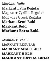 Also known by insiders as El Pato Loco Atomico. Danish type designer (b. 1973, Kulby, Vestsjalland, Denmark) who obtained his BDes from The Gerrit Rietveld Academie in Amsterdam, and his MA in typeface design from The University of Reading (2009), based on his type family Markant, which was specifically designed for newspapers and cares about ink traps, wide open bowls, inflection points and other special features. It supports Greek and Cyrillic as well.
 He says: I created a new design again taking inspiration from the early sketches of Dwiggins' Experimental No. 223. I was able to use the very open aperture design of the e in this experiment. The a again explored a inflexion points within the counters, and this was too integrated in the design. Finally lightly rounded wedge shaped base serifs were chosen. In 2011, Claus placed Playfair Display with Google Web Fonts. He explains: Playfair Display is a transitional design. From the time of enlightenment in the late 18th century, the broad nib quills were replaced by pointed steel pens. This influenced typographical letterforms to become increasingly detached from the written ones. Developments in printing technology, ink and paper making, made it possible to print letterforms of high contrast and fine hairlines. This design lends itself to this period, and while it is not a revival of any particular design, it takes influence from the printer and typeface designer John Baskerville's designs, the punchcutter William Martin's typeface for the Boydell Shakespeare (sic) edition, and from the Scotch Roman designs that followed thereafter. As the name indicates, Playfair Display is well suited for titling and headlines. It was followed in 2012 by Playfair Display SC. Free download at CTAN and at Open Font Library. Free download of Playfair Display Italic. In 2014, Claus designed Inknut Antiqua, a free angular text typeface family for low resolution screens, designed to evoke Venetian incunabula and humanist manuscripts, but with the quirks and idiosyncrasies of the kinds of typefaces you find in this artisanal tradition. Google Fonts link for Inknut Antiqua. Open Font Library link. Inknut Antiqua covers Latin and Devanagari. Claus lives in Amsterdam. Google Font Directory link. Speaker at ATypI 2011 in Reykjavik on the topic of typography for touch-screen devices. Klingspor link. [Google]
[More] ⦿
|
Clea F. Rees
|
Type designer and type technician at Cardiff University (Wales), who has helped Hirwen Harendal at Arkandis Type Foundry, and who maintains several free font packages on the CTAN site. These include cfr-lm (2014). This package offers enhanced support for the Latin Modern fonts in TeX. She also maintains EB Garamond Maths (a package for using the free EB Garamondc in a TeX environment), ADF Orn (TeX support package for Hirwen Harendel's Ornements ADF), and ADF Symbols (TeX support package for Hirwen Harendel's ArrowsADF and BulletsADF). [Google]
[More] ⦿
|
Cole Bemis
|
Frontend developer in San Luis Obispo, CA, who designed a great set of SVG format open source icons called Feather (2018). See also here. [Google]
[More] ⦿
|
Dafydd Harries
|
Designer of the free Olwen family in 2003, about which he writes: Olwen is a family of free fonts based on the Bitstream Vera fonts. It aims to extend the coverage of the Vera fonts while remaining true to the original style. Olwen's additional glyphs have been merged into the DejaVu fonts, another extension of Vera. Olwen supports the Welsh language (accented w and y glyphs). [Google]
[More] ⦿
|
Daniel Benjamin Miller
|
 Daniel Benjamin Miller (b. 2000, New York) is an undergraduate student in philosophy at McGill University. His type design work:
 - BMucicFont (2020). Based on the Steinberg Media music fonts for LilyPond music software.
- Salieri (2020). A revival of Jan Tschichold's Sabon (1964-1967).
- GFS Heraklit. This started out from Zapf's Heraklit Greek (1954). A digital revival was first done by George Matthiopoulos. Later improvements by Antonis Tsolomitis and in 2020 by Daniel Benjamin Miller.
- NX Baskerville Bold Italic (2020). An addition to Libre Baskerville (2012, Rodrigo Fuenzalida and Pablo Impallari).
- He added OpenType support and made some minor adjustments to ET Bembo (2002, Dmitry Krasny / Deka Design), releasing the result as XETBook (2019). In 2020, that font family was extended by Michael Sharpe as ETbb.
- In 2019, he started working on Regis, an original face inspired by the work of Pierre-Simon Fournier and Monotype 178 Barbou.
- RW Garamond (2019) is a freeware Garamond font in OpenType format. RW stands for Rudolf Wolf, the designer who created Stempel's version of Garamond from the Egenolff-Berner specimen. RW Garamond is a modified version of URW Garamond No. 8. and GaramondX, with changes being made to support OpenType (better vertical metrics, added diacritics, better kerning, more mathematical symbols, Greek for mathematics, character variants). Copyrights: 2000, URW++; 2005, Ralf Stubner; 2009, Gaël Varoquaux; 2012-2017, Michael Sharpe; 2019, Daniel Benjamin Miller.
- Domitian (2019). Based on URW's Palladio which in turn is based on Hermann Zapf's Palatino. Domitian is a project to develop a full-featured, free and open-source implementation of Palatino design. "Domitian" refers to the builder of the Flavian Palace, which is located on the Palatine Hill. Miller added true small caps and old style figures to URW's Palladio. The metrics have been adjusted to more closely match Adobe Palatino, and hinting has been improved.
- Garamond Libre (2019). Based on Unicode Fonts for Ancient Scripts (George Douros, 2017). CTAN link. Miller writes: Garamond Libre is a free and open-source old-style font family. It is a "true Garamond," i.e., it is based on the designs of 16th-century French engraver Claude Garamond. The roman design is Garamond's; the italics are from a design by Robert Granjon. The upright Greek font is after a design by Firmin Didot; the "italic" Greek font is after a design by Alexander Wilson. The font family includes support for Latin, Greek (monotonic and polytonic) and Cyrillic scripts, as well as small capitals, old-style figures, superior and inferior figures, historical ligatures, Byzantine musical symbols, the IPA and swash capitals. Miller added a bold italic.
- The STEP fonts (2019), free at CTAN and Github, created to be metrically compatible with Adobe's digitization of Linotype Times. STEP is based on the STIX and XITS fonts, and includes support for OpenType mathematical typesetting, usable with LuaTeX, XeTeX and Microsoft Office. It contains an original STEP Greek (2020) in Elzevir style.
- Courier Ten (2020). This is Courier 10 Pitch BT, made available by Bitstream, offered here in OpenType format as well as Type 1 for use with LaTeX. Package maintained by Daniel Benjamin Miller starting in 2020.
- MLModern (2021). He explains: MLModern is a text and math font family with (LA)TEX support, based on the design of Donald Knuth's Computer Modern and the Latin Modern project [note: 2003-2009, by B. Jackowski and J. M. Nowacki]. Some find the default vector version of Computer Modern used by default in most TEX distributions to be spindly, sometimes making it hard to read on screen as well as on paper; this is in contrast with the older bitmap versions of Computer Modern. MLModern provides a sturdy rendition of the Computer Modern design. [...] A script by Chuanren Wu was used to blacken the fonts before manual adjustment.
- MFB Oldstyle (2024). A public domain font based on Morris Fuller Benton's classic serif font, Century Oldstyle.
Miller is a supporter of free and open-source fonts, as well as free and open-source software. He uses FontForge for design, and releases all his work under free licenses: I really just want people to be able to use my designs, improve them and share them. First, on a pragmatic level, I know that my work will be imperfect, and I'd like others to be able to use their judgment to make adjustments (which I hope they'll also release under a free license). Second, I think that too much material (and not just fonts) is behind barriers of restricted access and artificial scarcity. This kind of thing---useful tools and information---wants to be free, so let it out for everybody to use. Github link. [Google]
[More] ⦿
|
Danilo Segan
[Bepa Fonts]
|
[More] ⦿
|
Dave Crossland
[Abattis]
|
[More] ⦿
|
Dave Crossland
[David Crossland: The Free Font Movement]
|
[More] ⦿
|
David Crossland: The Free Font Movement
[Dave Crossland]
|
Masters Thesis written in 2008 at the University of Reading by David Crossland that explains the free font movement in detail. I reproduce its Abstract: This dissertation examines the emerging free font movement, a small part of the larger free software and free culture movements. Part A provides an overview of key concepts in the free software and culture movements. It starts by describing the hacker culture of the 1970s, the origins of Richard Stallman's GNU project, and his ethical basis for free software. Business and copyright practices are exam- ined, and the cultural values of projects are described. This is followed by an account of Stallman's theory of culture, and the Wikipedia and Creative Commons projects that are associated with this theory. Debates within the movement are explored, such as how Wikipedia develops, the role of non-commercial licensings, and the definition of free culture. Part B explores the implications of the principles of free culture for typeface design, attempting to answer whether typeface designs and fonts ought to be free. To do this it examines what typefaces are, who the users of typefaces are, and how type connects to Stallman's theory of culture. It then discusses the relation of typefaces to font software, the different forms of digital type, and how font software connects to Stallman's theory. The legal status of typefaces and fonts is also considered. Part C looks at what it means for fonts to be free, such as what font source code is. It examines how fonts are made free. The effects of various licensing practices and the ways font freedom is exercised are explored, such as collaborative community development processes. A business model for sustainable commercial typeface design within the free culture movement is suggested, and a motivation for non-commercial typeface design activity is posed. Finally, areas for further research are suggested. [Google]
[More] ⦿
|
DejaVu Fonts
[Stepan Roh]
|
The DejaVu fonts form an open source font family based on the Bitstream Vera Fonts. Free download. Its purpose is to provide a wider range of characters (see Current status page for more information) while maintaining the original look and feel through the process of collaborative development. Included are DejaVuSans-Bold, DejaVuSans-BoldOblique, DejaVuSans-Oblique, DejaVuSans, DejaVuSansCondensed-Bold, DejaVuSansCondensed-BoldOblique, DejaVuSansCondensed-Oblique, DejaVuSansCondensed, DejaVuSansMono-Bold, DejaVuSansMono-BoldOb, DejaVuSansMono-Oblique, DejaVuSansMono-Roman, DejaVuSerif-Bold, DejaVuSerif-BoldOblique, DejaVuSerif-Oblique, DejaVuSerif-Roman, DejaVuSerifCondensed-Bold, DejaVuSerifCondensed-BoldOblique, DejaVuSerifCondensed-Oblique, DejaVuSerifCondensed. Authors and contributors comprise Adrian Schroeter, Ben Laenen, Dafydd Harries, Danilo Segan (Cyrillic), David Jez, David Lawrence Ramsey, Denis Jacquerye, Dwayne Bailey, James Cloos, James Crippen, Keenan Pepper, Mashrab Kuvatov, Misu Moldovan (Romanian), Ognyan Kulev, Ondrej Koala Vacha, Peter Cernák, Sander Vesik, Stepán Roh (project manager; Polish), Tavmjong Bah, Valentin Stoykov, and Vasek Stodulka. The idea is to eventually cover most of unicode. Currently, this is covered: Latin (+supplement, extended A and part of extended B), IPA, Greek, Coptic, Cyrillic, Georgian, Armenian, Hebrew, N'ko, Tifinagh, Lao, Canadian aboriginal syllabics, Ogham, Arabic, math symbols, arrows, Braille, chess, and many dingbats. Alternate download site. Wiki page with download information. Fontspace link. Open Font Library link. [Google]
[More] ⦿
|
Denis Moyogo Jacquerye
|
Denis Moyogo Jacquerye is the Belgian co-leader of the DejaVu font project (free fonts based on Bitstream Vera), the default GUI for fonts on several Linux OS distributions. He is working on extending various Open Source fonts to support African orthographies in Latin script. He is collaborating with a network of experts in African languages localization as part of the Pan Africa localization Network (ANLoc). Denis, with a Bs.C in Computer Science and a minor in Linguistics from McGill University, has experience in the Language Technology industry, Open Source software, Font Engineering and Unicode software support for African language. Denis currently lives in Brussels. He designed the open license font family Molengo (2010, sans), which is part of the Google open font directory. He also participated in the GNU Freefont project, where he added new glyphs and corrected existing ones in the Latin Extended-B (U+0180-U+024F) and IPA Extensions (U+0250-U+02AF) ranges. Speaker at ATypI 2008 in St. Petersburg on African fonts. [Google]
[More] ⦿
|
Dieter Steffmann on free fonts
|
Dieter Steffmann, who started out as a typesetter before the digital age, has made about 400 fonts in his career. Initially, he corrected or extended public domain fonts, but later on he created several original typefaces. He explains why he offers them for free: Since I consider fonts to be cultural heritage, I do not agree with their commercialization. Fonts once made out of metal type obviously had a price along with their metal value, and the cost of designing, cutting and casting is convincing, particularly since the buyer also acquired ownership of the purchased fonts! Anyone who believes that they can buy a magazine nowadays and then have the property acquired as in the times of metal setting, is wrong: The font foundries only sell "licenses" for a file of nothing but "zeros and ones" with no real material value, and the buyer usually does not become the owner, but only a licensee! For all these reasons I am giving out my fonts to everyone for free for commercial purposes without any restrictions and I hope you enjoy in these fonts as much as I and many other font-friends around the world do! [Google]
[More] ⦿
|
Eli Heuer
|
Font engineer and open source software advocate located in Seattle, WA. Before that, he studied mathematics at CUNY in New York. His typefaces: - Epistle. An old-style typeface.
- Toren Mono, Toren Proportional, Toren Rotalic. Use Modify link for Toren.
- Contributed to Titillium Web VF.
- Contributed to Orbitron VF.
- Contributed to Staatliches (a Google font).
- Micro Grotesk (2021). He writes: A classic sans-serif typeface as a 256-UPM variable font, designed to have a small file size.
- GTL Naskh (2020), is a contemporary Naskh typeface for the Perso-Arabic script.
- Isotherma (2015). A free blackletter font.
- Rena (2021).
- Gnu Grotesk.
Interview. Use Modify link. Github link. [Google]
[More] ⦿
|
Emmi Laakso
|
 Emmi Laakso (Chicago, IL) designed Manifesto, which is a friendly, but authoritative open-source stencil typeface intended to be used by non-profit organizations and individuals to propagate sociopolitical messages in public environments. There are Manifesto Rounded and Manifesto Geometric.
 Behance link. [Google]
[More] ⦿
|
Firago
|
 FiraGO (2012-2018) is an outgrowth of the open source Fira Sans typeface family by Carrois and Spiekermann. Script support has been considerably extended from Latin Extended, IPA, Pan African, Cyrillic Extended (+ locl BGR and SRB), and Polytonic Greek, already present in Firs Sans, to Arabic, Devanagari, Georgian, Hebrew, and Thai. Manual basic truetype hinting was done with Glyphs. Copyright of various parts of Firago: Carrois Corporate GbR, HERE Europe B.V., The Mozilla Foundation, Telefonica S.A., and bBox Type GmbH. Credits for the various additons and modifications:
 - Design FiraGO Arabic: Ralph du Carrois, Titus Nemeth and Hasan Abu Afash.
- Design FiraGO Devanagari: Rob Keller, Kimya Gandhi and Natalie Rauch.
- Design FiraGO Georgian: Akaki Razmadze and Anja Meiners.
- Design FiraGO Hebrew: Natalie Rauch with consultancy support by Yanek Iontef.
- Design FiraGO Thai: Mark Frömberg with consultancy support by Ben Mitchell.
- Hinting: Monika Bartels and Anke Bonk at FontWerk (now Alphabet Type).
- Scripts and technical support: Mark Frömberg.
[Google]
[More] ⦿
|
FontForge
[George Williams]
|
 George Williams' free Open Source UNIX-based font editor for type 1 and truetype fonts, previously called Pfaedit. Also does truetype collections (TTC) and opentype fonts. Note that FontForge can be used to do all conversions between all formats (type 1, truetype, OpenType; PC, UNIX and Mac): it's a formidable tool. The internal text format for fonts is called SFD. It is a format that is acceptable for communicating and storing fonts. Note also that there is a powerful scripting language that can automate conversions and various tedious tasks. FontForge keeps on getting updates by various contributors well into 2022.
 Interview. Wikipedia page on FontForge. FontForge documentation. FontForge history. Footnote: the headline of this page is set in New G8 by Artifex and Michael Sharpe based on URW Garamond No.8, a project developed, like hundreds of others in the open source community, by FontForge. Github link. [Google]
[More] ⦿
|
Fonts Nomina Nominata
|
Carefully crafted page by Stefan Unterstein who lists and discusses high quality free fonts. His list: - Adobe Utopia
- Charter
- Bitstream Vera Sans/Mono/Serif [Gnome Desk+Webfont]
- IBM Courier
- URW Antiqua/Grotesk
- URW Ghostscript/PS Core-Fonts
- Microsoft WebFonts (Georgia, Verdana, Trebuchet)
- Monotype Arial & Andale Mono
- Linotype Digi-Antiqua/Grotesk (2)
- Gentium RU Serif Roman/Italic Unicode (by Victor Gaultney)
- Linux Libertine Serif Roman/Italic Unicode (by Philipp H. Poll).
[Google]
[More] ⦿
|
Fredrick R. Brennan
[How to create a variable OpenType font using only open-source tools]
|
[More] ⦿
|
Gavin Graham
[Arkpandora]
|
[More] ⦿
|
George Williams
[FontForge]
|
[More] ⦿
|
George Williams
|
 George Williams's site (now defunct) site was a discovery! George Williams (b. 1959) wrote spline-generating code and then went on to produce several fonts with his software between 1987 and 1998:
 - Art nouveau style: Carmen, Ambrosia (1989), Fantaisie Artistique, Baldur, Monopol, Parisian, Peignot, Bocklin, Edda.
- Lombardic: Lombardic.
- Victorian: Caprice, Ringlet.
- Uncial: Uncial Animals, Roman Uncial Modern.
- Ornamental caps: Versal, Decorative, Square Caps, Extravagant Capitals, Floral Caps, Morris, Andrade.
- Display typefaces: Crystal, Flash, Cupola, Santa Barbara Streets (2013-2014; after the street signs in Santa Barbara, CA).
- Blackletter: Rotunda (1998), Bastarda, Textura Modern, Fractur (a remake of Wittenbach).
- Art deco: Piccadilly, Mirage (1999, prismatic).
- Calligraphic: Humanistic.
- Text: Caslon.
- Slab: Monospace.
- Sans: Caliban.
- Bamboo Gothic (2007).
- TIS620-2529 (a Thai font).
George Williams writes: I have been slowly working to provide free unicode postscript fonts for the three major groupings of styles used by European (Latin, Greek and Cyrillic anyway) type designs: serif, sans-serif and typewriter (or Times, Helvetica and Courier). Monospace is my approximation to Courier. Close examination will reveal that it is a bad copy of courier. Caslon Roman (1992-2001) is a serif font (designed by William Caslon in 1734), it's not a bad copy of Times, it's a bad copy of something else. Caliban is a bad copy of Helvetica. If Microsoft can call their version of Helvetica Arial, then Caliban seems appropriate for mine. Yet another URL. George Williams is best known as the inventor and creator of FontForge, the biggest and best free font editor today. It made him the darling of the Open Software community. Interview with OSP. Fontspace link. Dafont link. Abstract Fonts link. [Google]
[More] ⦿
|
George Williams: interview
|
An interview with my hero, George Williams, the developer of FontForge. [Google]
[More] ⦿
|
GNU Freefont (or: Free UCS Outline Fonts)
[Steve White]
|
 The GNU Freefont is continuously being updated to become a large useful Unicode monster. GNU FreeFont is a free family of scalable outline fonts, suitable for general use on computers and for desktop publishing. It is Unicode-encoded for compatability with all modern operating systems. There are serif, Sans and Mono subfamilies. Also called the "Free UCS Outline Fonts", this project is part of the larger Free Software Foundation. The original head honcho was Primoz Peterlin, the coordinator at the Institute of Biophysics of the University of Ljubljana, Slovenia. In 2008, Steve White (aka Stevan White) took over. URW++ Design&Development GmbH. URW++ donated a set of 35 core PostScript Type 1 fonts to the Ghostscript project.
 - Basic Latin (U+0041-U+007A)
- Latin-1 Supplement (U+00C0-U+00FF)
- Latin Extended-A (U+0100-U+017F)
- Spacing Modifier Letters (U+02B0-U+02FF)
- Mathematical Operators (U+2200-U+22FF)
- Block Elements (U+2580-U+259F)
- Dingbats (U+2700-U+27BF)
Yannis Haralambous and John Plaice. Yannis Haralambous and John Plaice are the authors of Omega typesetting system, which is an extension of TeX. Its first release, aims primarily at improving TeX's multilingual abilities. In Omega all characters and pointers into data-structures are 16-bit wide, instead of 8-bit, thereby eliminating many of the trivial limitations of TeX. Omega also allows multiple input and output character sets, and uses programmable filters to translate from one encoding to another, to perform contextual analysis, etc. Internally, Omega uses the universal 16-bit Unicode standard character set, based on ISO-10646. These improvements not only make it a lot easier for TeX users to cope with multiple or complex languages, like Arabic, Indic, Khmer, Chinese, Japanese or Korean, in one document, but will also form the basis for future developments in other areas, such as native color support and hypertext features. ... Fonts for UT1 (omlgc family) and UT2 (omah family) are under development: these fonts are in PostScript format and visually close to Times and Helvetica font families. - Latin Extended-B (U+0180-U+024F)
- IPA Extensions (U+0250-U+02AF)
- Greek (U+0370-U+03FF)
- Armenian (U+0530-U+058F)
- Hebrew (U+0590-U+05FF)
- Arabic (U+0600-U+06FF)
- Currency Symbols (U+20A0-U+20CF)
- Arabic Presentation Forms-A (U+FB50-U+FDFF)
- Arabic Presentation Forms-B (U+FE70-U+FEFF)
Yannis Haralambous and Wellcome Institute. In 1994, The Wellcome Library The Wellcome Institute for the History of Medicine 183 Euston Road, London NW1 2BE, England, commissioned Mr. Haralambous to produce a Sinhalese font for them. We have received 03/09 official notice from Robert Kiley, Head of e-Strategy for the Wellcome Library, that Yannis' font could be included in GNU FreeFont under its GNU license: Sinhala (U+0D80-U+0DFF). Young U. Ryu at the University of Texas at Dallas is the author of Txfonts, a set of mathematical symbols designed to accompany text typeset in Times or its variants. In the documentation, Young adresses the design of mathematical symbols: "The Adobe Times fonts are thicker than the CM fonts. Designing math fonts for Times based on the rule thickness of Times =,, +, /, <, etc. would result in too thick math symbols, in my opinion. In the TX fonts, these glyphs are thinner than those of original Times fonts. That is, the rule thickness of these glyphs is around 85% of that of the Times fonts, but still thicker than that of the CM fonts." Ranges: Arrows (U+2190-U+21FF), Mathematical Symbols (U+2200-U+22FF). Valek Filippov added Cyrillic glyphs and composite Latin Extended A to the whole set of the abovementioned URW set of 35 PostScript core fonts, Ranges: Latin Extended-A (U+0100-U+017F), Cyrillic (U+0400-U+04FF). Wadalab Kanji Comittee. Between April 1990 and March 1992, Wadalab Kanji Comittee put together a series of scalable font files with Japanese scripts, in four forms: Sai Micho, Chu Mincho, Cho Kaku and Saimaru. The font files were written in custom file format, while tools for conversion into Metafont and PostScript Type 1 were also supplied. The Wadalab Kanji Comittee has later been dismissed, and the resulting files can be now found on the FTP server of the Depertment of Mathematical Engineering and Information Physics, Faculty of Engineering, University of Tokyo: Hiragana (U+3040-U+309F), Katakana (U+30A0-U+30FF). Note that some time around 2009, the hiragana and katakana ranges were deleted. Angelo Haritsis has compiled a set of Greek type 1 fonts. The glyphs from this source has been used to compose Greek glyphs in FreeSans and FreeMono. Greek (U+0370-U+03FF). Yannis Haralambous and Virach Sornlertlamvanich. In 1999, Yannis Haralambous and Virach Sornlertlamvanich made a set of glyphs covering the Thai national standard Nf3, in both upright and slanted shape. Range: Thai (U+0E00-U+0E7F). Shaheed Haque has developed a basic set of basic Bengali glyphs (without ligatures), using ISO10646 encoding. Range: Bengali (U+0980-U+09FF). Sam Stepanyan created a set of Armenian sans serif glyphs visually compatible with Helvetica or Arial. Range: Armenian (U+0530-U+058F). Mohamed Ishan has started a Thaana Unicode Project. Range: Thaana (U+0780-U+07BF). Sushant Kumar Dash has created a font in his mother tongue, Oriya: Oriya (U+0B00-U+0B7F). But Freefont has dropped Oriya because of the absence of font features neccessary for display of text in Oriya. Harsh Kumar has started BharatBhasha for these ranges: - Devanagari (U+0900-U+097F)
- Bengali (U+0980-U+09FF)
- Gurmukhi (U+0A00-U+0A7F)
- Gujarati (U+0A80-U+0AFF)
Prasad A. Chodavarapu created Tikkana, a Telugu font family: Telugu (U+0C00-U+0C7F). It was originally included in GNU Freefont, but supoort for Telugu was later dropped altogether from the GNU Freefont project. Frans Velthuis and Anshuman Pandey. In 1991, Frans Velthuis from the Groningen University, The Netherlands, released a Devanagari font as Metafont source, available under the terms of GNU GPL. Later, Anshuman Pandey from Washington University in Seattle, took over the maintenance of font. Fonts can be found on CTAN. This font was converted the font to Type 1 format using Peter Szabo's TeXtrace and removed some redundant control points with PfaEdit. Range: Devanagari (U+0900-U+097F). Hardip Singh Pannu. In 1991, Hardip Singh Pannu has created a free Gurmukhi TrueType font, available as regular, bold, oblique and bold oblique form. Range: Gurmukhi (U+0A00-U+0A7F). Jeroen Hellingman (The Netherlands) created a set of Malayalam metafonts in 1994, and a set of Oriya metafonts in 1996. Malayalam fonts were created as uniform stroke only, while Oriya metafonts exist in both uniform and modulated stroke. From private communication: "It is my intention to release the fonts under GPL, but not all copies around have this notice on them." Metafonts can be found here and here. Ranges: Oriya (U+0B00-U+0B7F), Malayalam (U+0D00-U+0D7F). Oriya was subsequently dropped from the Freefont project. Thomas Ridgeway, then at the Humanities And Arts Computing Center, Washington University, Seattle, USA, (now defunct), created a Tamil metafont in 1990. Anshuman Pandey from the same university took over the maintenance of font. Fonts can be found at CTAN and cover Tamil (U+0B80-U+0BFF). Berhanu Beyene, Prof. Dr. Manfred Kudlek, Olaf Kummer, and Jochen Metzinger from the Theoretical Foundations of Computer Science, University of Hamburg, prepared a set of Ethiopic metafonts. They also maintain the home page on the Ethiopic font project. Someone converted the fonts to Type 1 format using TeXtrace, and removed some redundant control points with PfaEdit. Range: Ethiopic (U+1200-U+137F). Maxim Iorsh. In 2002, Maxim Iorsh started the Culmus project, aiming at providing Hebrew-speaking Linux and Unix community with a basic collection of Hebrew fonts for X Windows. The fonts are visually compatible with URW++ Century Schoolbook L, URW++ Nimbus Sans L and URW++ Nimbus Mono L families, respectively. Range: Hebrew (U+0590-U+05FF). Vyacheslav Dikonov made a Braille unicode font that could be merged with the UCS fonts to fill the 2800-28FF range completely (uniform scaling is possible to adapt it to any cell size). He also contributed a free Syriac font, whose glyphs (about half of them) are borrowed from the free Carlo Ator font. Vyacheslav also filled in a few missing spots in the U+2000-U+27FF area, e.g., the box drawing section, sets of subscript and superscript digits and capital Roman numbers. Ranges: Syriac (U+0700-U+074A), Box Drawing (U+2500-U+257F), Braille (U+2800-U+28FF). Panayotis Katsaloulis helped fixing Greek accents in the Greek Extended area: (U+1F00-U+1FFF). M.S. Sridhar. M/S Cyberscape Multimedia Limited, Mumbai, developers of Akruti Software for Indian Languages (http://www.akruti.com/), have released a set of TTF fonts for nine Indian scripts (Devanagari, Gujarati, Telugu, Tamil, Malayalam, Kannada, Bengali, Oriya, and Gurumukhi) under the GNU General Public License (GPL). You can download the fonts from the Free Software Foundation of India WWW site. Their original contributions to Freefont were - Devanagari (U+0900-U+097F)
- Bengali (U+0980-U+09FF)
- Gurmukhi (U+0A00-U+0A7F)
- Gujarati (U+0A80-U+0AFF)
- Oriya (U+0B00-U+0B7F)
- Tamil (U+0B80-U+0BFF)
- Telugu (U+0C00-U+0C7F)
- Kannada (U+0C80-U+0CFF)
- Malayalam (U+0D00-U+0D7F)
Oriya, Kannada and Telugu were dropped from the GNU Freefont project. DMS Electronics, The Sri Lanka Tipitaka Project, and Noah Levitt. Noah Levitt found out that the Sinhalese fonts available on the site metta.lk are released under GNU GPL. These glyphs were later replaced by those from the LKLUG font. Finally the range was completely replaced by glyphs from the sinh TeX font, with much help and advice from Harshula Jayasuriya. Range: Sinhala (U+0D80-U+0DFF). Daniel Shurovich Chirkov. Dan Chirkov updated the FreeSerif font with the missing Cyrillic glyphs needed for conformance to Unicode 3.2. The effort is part of the Slavjanskij package for Mac OS X. range: Cyrillic (U+0400-U+04FF). Abbas Izad. Responsible for Arabic (U+0600-U+06FF), Arabic Presentation Forms-A, (U+FB50-U+FDFF), Arabic Presentation Forms-B (U+FE70-U+FEFF). Denis Jacquerye added new glyphs and corrected existing ones in the Latin Extended-B (U+0180-U+024F) and IPA Extensions (U+0250-U+02AF) ranges. K.H. Hussain and R. Chitrajan. Rachana in Malayalam means to write, to create. Rachana Akshara Vedi, a team of socially committed information technology professionals and philologists, has applied developments in computer technology and desktop publishing to resurrect the Malayalam language from the disorder, fragmentation and degeneration it had suffered since the attempt to adapt the Malayalam script for using with a regular mechanical typewriter, which took place in 1967-69. K.H. Hussein at the Kerala Forest Research Institute has released "Rachana Normal" fonts with approximately 900 glyphs required to typeset traditional Malayalam. R. Chitrajan apparently encoded the glyphs in the OpenType table. In 2008, the Malayalam ranges in FreeSerif were updated under the advise and supervision of Hiran Venugopalan of Swathanthra Malayalam Computing, to reflect the revised edition Rachana_04. Range: Malayalam (U+0D00-U+0D7F). Solaiman Karim filled in Bengali (U+0980-U+09FF). Solaiman Karim has developed several OpenType Bangla fonts and released them under GNU GPL. Sonali Sonania and Monika Shah covered Devanagari (U+0900-U+097F) and Gujarati (U+0A80-U+0AFF). Glyphs were drawn by Cyberscape Multimedia Ltd., #101, Mahalakshmi Mansion 21st Main 22nd "A" Cross Banashankari 2nd stage Banglore 560070, India. Converted to OTF by IndicTrans Team, Powai, Mumbai, lead by Prof. Jitendra Shah. Maintained by Monika Shah and Sonali Sonania of janabhaaratii Team, C-DAC, Mumbai. This font is released under GPL by Dr. Alka Irani and Prof Jitendra Shah, janabhaaratii Team, C-DAC, Mumabi. janabhaaratii is localisation project at C-DAC Mumbai (formerly National Centre for Software Technology); funded by TDIL, Govt. of India. Pravin Satpute, Bageshri Salvi, Rahul Bhalerao and Sandeep Shedmake added these Indic language cranges: - Devanagari (U+0900-U+097F)
- Gujarati (U+0A80-U+0AFF)
- Oriya (U+0B00-U+0B7F)
- Malayalam (U+0D00-U+0D7F)
- Tamil (U+0B80-U+0BFF)
In December 2005 the team at www.gnowledge.org released a set of two Unicode pan-Indic fonts: "Samyak" and "Samyak Sans". "Samyak" font belongs to serif style and is an original work of the team; "Samyak Sans" font belongs to sans serif style and is actually a compilation of already released Indic fonts (Gargi, Padma, Mukti, Utkal, Akruti and ThendralUni). Both fonts are based on Unicode standard. You can download the font files separately. Note that Oriya was dropped from the Freefont project. Kulbir Singh Thind added Gurmukhi (U+0A00-U+0A7F). Dr. Kulbir Singh Thind designed a set of Gurmukhi Unicode fonts, AnmolUni and AnmolUni-Bold, which are available under the terms of GNU license from the Punjabu Computing Resource Center. Gia Shervashidze added Georgian (U+10A0-U+10FF). Starting in mid-1990s, Gia Shervashidze designed many Unicode-compliant Georgian fonts: Times New Roman Georgian, Arial Georgian, Courier New Georgian. Daniel Johnson. Created by hand a Cherokee range specially for FreeFont to be "in line with the classic Cherokee typefaces used in 19th century printing", but also to fit well with ranges previously in FreeFont. Then he made Unified Canadian Syllabics in Sans, and a Cherokee and Kayah Li in Mono! And never to be outdone by himself, then did UCAS Extended and Osmanya.... What next? - Armenian (serif) (U+0530-U+058F)
- Cherokee (U+13A0-U+13FF)
- Unified Canadian Aboriginal Syllabics (U+1400-U+167F)
- UCAS Extended (U+18B0-U+18F5)
- Kayah Li (U+A900-U+A92F)
- Tifinagh (U+2D30-U+2D7F)
- Vai (U+A500-U+A62B)
- Latin Extended-D (Mayanist letters) (U+A720-U+A7FF)
- Osmanya (U+10480-U+104a7)
George Douros, the creator of several fonts focusing on ancient scripts and symbols. Many of the glyphs are created by making outlines from scanned images of ancient sources. - Aegean: Phoenecian (U+10900-U+1091F).
- Analecta: Gothic (U+10330-U+1034F)
- Musical: Byzantine (U+1D000-U+1D0FF)&Western (U+1D100-U+1D1DF)
- Unicode: many miscellaneous symbols, miscellaneous technical, supplemental symbols, and mathematical alphanumeric symbols (U+1D400-U+1D7FF), Mah Jong (U+1F000-U+1F02B), and the outline of the domino (U+1F030-U+1F093).
Steve White filled in a lot of missing characters, got some font features working, left fingerprints almost everywhere, and is responsible for these blocks: Glagolitic (U+2C00-U+2C5F), Coptic (U+2C80-U+2CFF). Pavel Skrylev is responsible for Cyrillic Extended-A (U+2DEO-U+2DFF) as well as many of the additions to Cyrillic Extended-B (U+A640-U+A65F). Mark Williamson made the MPH 2 Damase font, from which these ranges were taken: - Hanunóo (U+1720-U+173F)
- Buginese (U+1A00-U+1A1F)
- Tai Le (U+1950-U+197F)
- Ugaritic (U+10380-U+1039F)
- Old Persian (U+103A0-U+103DF)
Primoz Peterlin filled in missing glyphs here and there (e.g., Latin Extended-B and IPA Extensions ranges in the FreeMono family), and created the following UCS blocks: - Latin Extended-B (U+0180-U+024F)
- IPA Extensions (U+0250-U+02AF)
- Arrows (U+2190-U+21FF)
- Box Drawing (U+2500-U+257F)
- Block Elements (U+2580-U+259F)
- Geometrical Shapes (U+25A0-U+25FF)
Jacob Poon submitted a very thorough survey of glyph problems and other suggestions. Alexey Kryukov made the TemporaLCGUni fonts, based on the URW++ fonts, from which at one point FreeSerif Cyrillic, and some of the Greek, was drawn. He also provided valuable direction about Cyrillic and Greek typesetting. The Sinhala font project has taken the glyphs from Yannis Haralambous' Sinhala font, to produce a Unicode TrueType font, LKLUG. These glyphs were for a while included in FreeFont: Sinhala (U+0D80-U+0DFF). Fontspace link. Crosswire link for Free Monospaced, Free Serif and Free Sans. Download link. [Google]
[More] ⦿
|
Greg Fleming
|
 British creator of the Open Font Library typeface family Railway Sans (2012), an open source version of Edward Johnston's typeface for the London Underground of 1916.
 Greg explains: Railway Sans is a previously unpublished work, originally digitised by my late friend and partner, the typographer Justin Howes, in 1994, some seventy-eight years after the first appearance of Johnston's Railway type in 1916. Using an old SPARC station, some bitmap-to-vector software which I'd written which output in ASCII Type 3 font format and a Crosfield drum scanner to initially capture the outlines, these were then converted from bitmaps into vector font data. Justin had wanted to capture and make an experimental font of this version, drawn directly from Johnston's original artwork of 1913-1915 as part of the book he was writing on Edward Johnston and other Johnston-related research, and later revisions and variations which were originally the only characters in the typeface in various samples and working proofs kindly lent by Andrew Johnston. He goes on: This version of the original Johnston typeface of 1916, in both TrueType and OpenType format, will work with Macs, Linux and Windows computers and will provide authenticity when recreating Underground signage. This is why I am making this version available for enthusiasts who seek an authentic-looking digital version of the original Underground type. It is not derived from the Banks's and Miles New Johnston Sans (so brilliantly realised by Eiichi Kono, 1979). Nor is it a copy or in any way a facsimile of any existing commercial typeface, such as P22's excellent version, Underground. It is rendered entirely from proofs done by Edward Johnston himself at the time the typeface was commissioned. Fontspace link. [Google]
[More] ⦿
|
Greyscale Press
[Manuel Schmalstieg]
|
An open source font archive. Located in Genève and Neuchâtel, Switzerland, this project is led by Manuel Schmalstieg and groups mostly students of the Haute École d'art et de design in Genève. It intends to show specimens of most open source fonts. In 2012, they published the free font Karmilla (by Manuel Schmalstieg and Raphael Bastide), which is based on Jonathan Pinhorn's Karla from 2011. Fontsquirrel link. [Google]
[More] ⦿
|
Harrisson
[Open Source Publishing (or: OSP)]
|
 [More] ⦿
|
Hirwen Harendal
[Arkandis Digital Foundry]
|
 [More] ⦿
|
How to create a variable OpenType font using only open-source tools
[Fredrick R. Brennan]
|
A Youtube tutorial by Fredrick Robert Brennan (1994-2026), who shows how to make a variable font using FontForge, AFDKO and fontmake. [Google]
[More] ⦿
|
Jeff Mcneill
|
 Jeff Mcneill is based in Chiang Mai, Thailand. His Github page features the open source geometrical and humanist sans serif typeface family Beteckna (2007-2021), which is co-designed by Johan Mattsson (Sweden), Gurkan Sengun (Switzerland), Alexander Fell (Germany) and Jeff Mcneill. [Google]
[More] ⦿
Jeff Mcneill is based in Chiang Mai, Thailand. His Github page features the open source geometrical and humanist sans serif typeface family Beteckna (2007-2021), which is co-designed by Johan Mattsson (Sweden), Gurkan Sengun (Switzerland), Alexander Fell (Germany) and Jeff Mcneill. [Google]
[More] ⦿
|
Jeremy Mickel
[MCKL (was: Mickel Design)]
|
 [More] ⦿
|
Jim Lyles
[Bitstream Vera Fonts]
|
[More] ⦿
|
Jim Lyles
|
 Type designer (b. 1955, Indiana) who lives in Michigan City, IN. While living in NYC, he began working for Mergenthaler Linotype, learning the craft of letter drawing and typeface design. For the next 32 years, Jim worked in the Type group at both Linotype and Bitstream. When Monotype acquired Bitstream early 2011, Jim chose to go solo by founding Stiggy & Sands together with Brian Bonislawsky. He is also a partner at BluHead Studio, where he digitizes old photo fonts by Joseph Churchward. Jim is also active in Stuart Sandler's Filmotype project, where he has resurrected several typefaces, including Filmotype Reef and Filmotype Jade.
 At Bitstream, he did in-house work, and had his signature on Candy Bits (1996, an M&M simulation font), Prima Sans (1998), Prima Serif (1998), Prima Sans Monospace (Bitstream, with Sue Zafarana, 1998) and Bitstream Vera (2003). According to Lyles, Bitstream Vera is actually a detuned Bitstream Prima. Gnome asked that we modify some of the characters in the monospace, particularly for coding legibility. We added a center dot to the zero and modified the lcase l to distinquish it from the figure one. Although I designed Vera (Prima), it was actually Sue Zafarana who adapted it to a mono version, at times a very challenging task. The Vera fonts are also here. Vera Sans is at the basis of Menlo (2009), a Snow Leopard system font, about which Apple writes: Apple's Menlo is based upon the Open Source font Bitstream Vera and the public domain font Deja Vu. He revived some Filmotype fonts from the 1950s: Filmotype Jade (2012, based on an original connected script typeface from 1955), Filmotype Reef (2011), Filmotype MacBeth (2007), and Filmotype Austin (2009, brush face). In 2012, he created a gracious upright script face, Stalemate, which can be downloaded from Google Web Fonts. The upright connected script Grand Hotel (2012, Google Web Fonts, with Brian Bonislawsky for Astigmatic) finds its inspiration from the title screen of the 1937 film "Cafe Metropole" starring Tyrone Power. The free Rum Raisin was published at Astigmatic One Eye. Stiggy & Sands is the American type foundry of Brian Bonislawsky and Jim Lyles, est. 2013. Their first commercial typefaces, all jointly designed, are Luckiest Guy Pro (a fat comic book font based on vintage 1950s ads) and Marcellus Pro (a flared roman inscriptional typeface with both upper and lower case, originally published in 2012 by Astigmatic; CTAN link). At Hamilton Wood Type, he designed HWT Roman Extended Fatface (2014), which is based on 19th century didone wood styles. In 2016, Brian J. Bonislawasky and Jim Lyles published the rugged octagonal mega typeface family Tradesman and the techno typeface Offroad at Grype. In 2018, he published the connected script typeface Michiana Pro at BluHead Studio. Another MyFonts link. Klingspor link. P22 link. [Google]
[MyFonts]
[More] ⦿
|
Johan Mattsson
[Birdfont]
|
[More] ⦿
|
Kelvin Ma
[Letterpunch]
|
[More] ⦿
|
Khaled Hosny
[Khaled Hosny]
|
 Khaled Hosny is a physician in Egypt. He loves Arabic and its type, and is interested in every aspect of letter forms and typography. A hobbyist translator, programmer and font developer, he supports software freedom and is actively participating in the free software community. Sourceforge link.
 Designer of Punk Nova (2010), a free OpenType implementation of Don Knuth's Punk font, based on modified Metapost sources by Taco Hoekwater and Hans Hagan, dating from 2008. Hosny writes: Punk is a dynamic font, every time a glyph is requested Matafont draws a unique instance of it. On the other hand, OpenType is static, glyph outlines are drawn once and stored in the font and the renderer can not alter those outlines. To emulate the dynamic nature of Punk, we generate several alternate shapes of each glyph and store them in the font. Alternate shapes are mapped to the base character using OpenType [Randomize] feature (rand), which tells the renderer to select glyphs randomly from the list of alternate shapes. Pick up the free Punk Nova from CTAN or Open Font Library. XITS (2011) is a Times-like typeface for mathematical and scientific publishing, based on STIX fonts. The main mission of XITS is to provide a version of STIX fonts enriched with the OpenType MATH extension, making it suitable for high quality mathematic typesetting with OpenType MATH capable layout systems, like MS Office 2007 and the new TeX engines XeTeX and LuaTeX. This free OFL package was developed by Khaled Hosny. Inside the fonts, we read Copyright (c) 2001-2010 by the STI Pub Companies, consisting of the American Chemical Society, the American Institute of Physics, the American Mathematical Society, the American Physical Society, Elsevier, Inc., and The Institute of Electrical and Electronic Engineers, Inc. Portions copyright (c) 1998-2003 by MicroPress, Inc. Portions copyright (c) 1990 by Elsevier, Inc. Euler OTF (2010) are OpenType Math fonts based on Hermann Zapf's Euler and implemented by Taco Hoekwater, Hans Hagen, and Khaled Hosny. Named Neo-Euler (2009-2010), it covers Latin, Greek and has a full blackletter set of glyphs. Copyright Hosny and the American Mathematical Society. Open Font Library link. In 2010-2011, Hosny developed the free Amiri font (OFL; dedicated web page): Amiri font is an open font revival of the Arabic Naskh typeface designed and first used by Bulaq Press in Cairo (also known as Amiria Press) in the early part of the twentieth century. Amiri's uniqueness comes from its superb balance between the beauty of Naskh calligraphy and the requirements of elegant typography. Amiri is most suitable for running text and book printing. See also CTAN, Google Web Fonts, and at OFL. Dedicated web page. In 2015, he created the free calligraphic Arabic typeface (in Ruqaa style) Aref Ruqaa. The Latin part is based on AMS Euler. Google Fonts link. Home page of Khaled Hosny. In 2015, Khaled Hosny and Santiago Orozco cooperated on the Latin / Arabic typeface Reem Kufi. Github link. Khaled, who designed the Arabic part, explains: Reem Kufi is a Fatimid-style decorative Kufic typeface, as seen in the historical mosques of Cairo. It is largely based on the Kufic designs of the late master of Arabic calligraphy, Mohammed Abdul Qadir, who revived this art in the 20th century and formalized its rules. In 2016, Khaled Hosny designed Mada (Google Fonts), a modernist, unmodulated Arabic typeface inspired by road signage seen around Cairo, Egypt. The Latin component is a slightly modified version of Source Sans Pro, led by Paul Hunt at Adobe Type. Khaled Hosny contributed to and maintained the free Libertinus font package between 2012 and 2020. In 2021, Hosny released Qahiri at Google Fonts and Github. Qahiri is a Kufic ypeface based on the modernized and regularized old manuscript Kufic calligraphy style of the late master of Arabic calligraphy, Mohammad Abdul Qadir. Github link. [Google]
[More] ⦿
|
Khaled Hosny
[Khaled Hosny]
|
[More] ⦿
|
Kickstand Apps
[Travis Zehren]
|
 Kickstand Apps (Travis Zehren, Stillwater, MN) is an upstart software development company currently focusing on iOS apps. Designer of the free font Weather Icons (2013), which was originally created for their own NOW Weather app. The typeface was modeled after but is quite different from the very popular Climacons by Adam Whitcroft. It was created by FontForge and its source files are free.
 Behance link. [Google]
[More] ⦿
|
Kyle Hathcoat
|
 American designer of the free typeface family Adumu (2017), a display typeface inspired by the wildness of Africa. He also designed Bracheos (2017), an all-caps display typeface inspired by prehistoric times.
 In 2019, he released the polygonal stone cut font Marinui (writing that Marinui is a tropical display typeface inspired by the islands of Polynesia) and Hypoxia (a grungy display typeface inspired by the rock music of the 1990s and bandaids). [Google]
[More] ⦿
|
Large Unicode fonts
[Alan Wood]
|
Alan Wood lists and discusses the main free Unicode fonts. As of 2010, these include: - AbRomanSerif (3805 glyphs, Language Geek).
- Alphabetum (5444 glyphs, by Juan José Marcos). For classical and mediaeval Latin, classical Greek, Coptic, Old and Middle English, and Sanskrit, but also includes characters for most Latin-based European languages and Esperanto.
- Andika Basic (838 glyphs, SIL).
- Andron Scriptor Web (1600 glyphs, Medieval Unicode Fiont Initiative).
- Arev Sans (2851 glyphs, arev Fonts): based on Bitstream Vera Sans.
- Arial (3381 glyphs, Microsoft).
- Arial Unicode MS (50377 glyphs, Microsoft). Supplied with Microsoft Office 2002 (XP) and Microsoft Office 2003.
- Berling Antiqua (842 glyphs).
- Caslon (3551 glyphs, George Williams).
- Charis SIL (4661 glyphs, SIL).
- Chrysanthi Unicode (4383 glyphs) .
- CN-Arial (3069 glyphs, Chan-Nguyen).
- CN-Times (2866 glyphs, Chan-Nguyen).
- Code2000 (63546 glyphs, James Kass).
- Courier New (3151 glyphs). Supplied with Microsoft Windows Vista.
- DejaVu Sans (5466 glyphs). Based on Bitstream Vera Sans.
- DejaVu Sans Condensed (5466 glyphs).
- DejaVu Sans Mono (3169 glyphs). Based on Bitstream Vera Sans Mono.
- DejaVu Serif (3064 glyphs). Based on Bitstream Vera Serif.
- DejaVu Serif Condensed (3064 glyphs).
- Dialekt Uni (1400 glyphs). Mainly for phoentics.
- Doulos SIL (4661 glyphs, SIL).
- e-PhonTranslit UNI (684 glyphs). Supplied withthe Indolipi package.
- EversonMono (6396 glyphs, Michael Everson).
- Fixedsys Excelsior 3.01 (5993 glyphs).
- Free Idg Serif (6256 glyphs).
- Free Monospaced (2560 glyphs).
- Free Sans (3999 glyphs).
- Free Serif (7971 glyphs).
- Frutiger Linotype (840 glyphs, Linotype). Supplied with Microsoft Reader.
- Gandhari Unicode (2265 glyphs, Andrew Glass). Designed for romanisation of Sanskrit and Gandhari.
- Garava (1319 glyphs, Michael Best).
- Gentium (1699 glyphs, Victor Gaultney, SIL).
- GentiumAlt (1699 glyphs, Victor Gaultney, SIL).
- Hindsight Unicode (2894 glyphs, Darren Rigby).
- jGaramond (1849 glyphs).
- Junicode (3096 glyphs, Peter S. Baker). Intended for mediaevalists.
- Kliment Std (2849 glyphs, Kodeks).
- Kurdish AllAlphabets (694 glyphs, Ernst Tremel). Intended for Kurdish.
- LeedsUni (2976 glyphs, Alec McAllister).
- Legendum (1151 glyphs).
- Linux Biolinum O (2418 glyphs, Libertine Open Fonts Project).
- Linux Libertine O (2432 glyphs, Libertine Open Fonts Project).
- Lucida Bright (1402 glyphs). Supplied with Java Runtime 1.4.2.
- Lucida Grande (2826 glyphs). Supplied with Apple - Safari 3 Public Beta.
- Lucida Sans (Java) (2929 glyphs). Supplied with Java Runtime 1.4.2.
- Lucida Sans (Star Office) (2094 glyphs). Supplied with Sun’s StarOffice 5.2 for Windows.
- Lucida Sans Typewriter (Java) (1376 glyphs). Supplied with Java Runtime 1.4.2.
- Lucida Sans Typewriter (Star Office) (1142 glyphs). Supplied with Sun's StarOffice 5.2 for Windows.
- Lucida Sans Unicode (1779 glyphs). Supplied with Microsoft Windows Vista
- Marin (3566 glyphs).
- MD King KhammuRabi (1296 glyphs, Michael Davodian). Mainly for Assyrian, Aramaic, Caldean, Soryoyo, Ashoraya.
- Microsoft Sans Serif (1997) (3053 glyphs, Microsoft). Supplied with Windows Vista. Version 1.41 (2301 characters, 2257 glyphs) was supplied with Windows XP SP2. Version 1.02 (1090 glyphs) was supplied with Microsoft Windows 2000 and Windows XP.
- Minion Pro (1663 glyphs, Adobe). Supplied with Adobe Reader 7.
- Monospace (2862 glyphs, George Williams).
- MPH 2B Damase (2895 glyphs, Mark Williamson).
- MS Reference Sans Serif (1193 glyphs). Supplied with Microsoft Encarta.
- MS Reference Serif (1135 glyphs). Supplied with Microsoft Encarta.
- Myriad Pro (834 glyphs, Adobe). Supplied with Adobe Reader 7.
- Quivira (7742 glyphs, Alexander Lange).
- Reader Sans (1291 glyphs).
- RomanCyrillic Std (3450 glyphs, Kodeks). Also known as CampusRoman Std.
- Roman Unicode (3923 glyphs).
- Rupakara (394 glyphs, Michael Everson).
- Summersby (1010 glyphs).
- Tahoma (3301 glyphs, Microsoft). Supplied with Microsoft Windows Vista.
- Thryomanes (1472 glyphs, Herman Miller). Mainly for old Greek.
- Times New Roman (3380 glyphs). Supplied with Microsoft Windows Vista. Version 2.82 (1170 characters) was supplied with Windows 2000 and Windows XP.
- TITUS Cyberbit Basic (10044 glyphs).
- Verajja (1264 glyphs, Michael Best).
- Verdana (911 glyphs, Microsoft). Supplied with Microsoft Windows Vista. Version 2.35 (680 characters) was supplied with Windows 2000 and Windows XP.
Suppliers of commercial Unicode fonts: [Google]
[More] ⦿
|
Lasse Fister
|
Lasse Fister (Nuremberg and before that, Berlin) is a graphic designer. He embarked on a great project in 2010 called Graphicore Font Building. Starting from a bitmap (BMF format) font, via a free Python program written by him, one can generate OpenType fonts. The free program, graphicoreBMFB has many parameters/options/settings, that allow one to generate very many children of the BMF font. He showcases this by making his free superfamily GraphicoreBitmapFont. All is free and open source. Speaker at ATypI 2016 in Warsaw on Introducing Metapolator. Metapolator is a web-based parametric font editor developed by Simon Egli, Lasse Fister, Reuben Thomas and Ben Martin. Lasse Fister also developed the Libre Barcode collection of fonts that includes, at Google Fonts, Libre barcode EAN 13 Text, Libre Barcode 39, Libre Barcode 39 Text, Libre Barcode 39 Extended, Libre Barcode 39 Extended Text, Libre Barcode 128, and Libre Barcode 128 Text. Lasse is the lead developer of Metapolator, ufoJS and Atem. At the moment (2018) he is freelancing as a font-engineer on Arabic libre font projects for Google-Fonts. Github link. [Google]
[More] ⦿
|
Letterpunch
[Kelvin Ma]
|
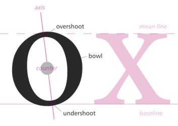 Letterpunch, Kelvin Ma's web site, makes a strong and convincing case for font freedom and open source fonts. At Behance, Kelvin Ma is Kelvin Song from Riverhead, NY. American creator in Long Island of Wumbology (2012, sans family), Compass (2012, sans), Maritime Sans (2012), Bam It's Andrea (2012, hand-printed), The Blurry Effect (2012, hand-printed), Maritime Tropical (2012, clean hand-printing), AFE Jen's Handwriting (2012), Pineapples don't have sleeves (2012), Schmitacular (2012, hand-printed), Cassini (2012, a fat finger font) and Cassini Marker (2012).
 Typefaces from 2013: Liberty Sans, Maritime Tropical Neue (monoline informal script). Typefaces from 2014: Free Monogram, Rainbow Mansion, Sugarcubes. Typefaces from 2015: In Screaming Color (script face). Behance link. Dafont link. [Google]
[More] ⦿
|
Liberation Fonts
|
A set of free fonts developed by Ascender Corp for Red Hat Linux. They state: On May 9, 2007, Red Hat announced the public release of these fonts under the trademark LIBERATION at the Red Hat Summit. There are three sets: Sans (a substitute for Arial, Albany, Helvetica, Nimbus Sans L, and Bitstream Vera Sans), Serif (a substitute for Times New Roman, Thorndale, Nimbus Roman, and Bitstream Vera Serif) and Mono (a substitute for Courier New, Cumberland, Courier, Nimbus Mono L, and Bitstream Vera Sans Mono). The list: Liberation-Mono-Bold, Liberation-Mono-Bold-Italic, Liberation-Mono-Italic, Liberation-Mono, Liberation-Sans-Bold, Liberation-Sans-Bold-Italic, Liberation-Sans-Italic, Liberation-Sans, Liberation-Serif-Bold, Liberation-Serif-Bold-Italic, Liberation-Serif-Italic, Liberation-Serif. Kernest states that these fonts were designed by Steve Matteson and Caius Chance. But I believe that they were all derived from public fonts like the Bitstream Vera series and some public URW fonts. Contributors include Herbert Duerr (who added Sans Narrow) and Pravin Satpute, who is now the main maintainer, after Caius Chance quit the project. Another URL. Direct download. Dafont link. Fontspace link. [Google]
[More] ⦿
|
Libertine Open Fonts Project
[Philipp H. Poll]
|
 Now, here is a project with a name I like! This project by Philipp H. Poll has been started in order to create fonts that can be released under the GNU Public License. As of early 2005, we have the following Times New Roman lookalikes: LLibertineCaps, LinLibertine, LinLibertine-Italic, LinLibertineBd. Libertine Grotesque is next on the list of things to do. The fonts came in truetype and fontforge (SFD) text formats, but have now been extended to include opentype and type 1 as well. Linux Libertine covers a big range of Unicode, including all characters in MES-1 (Afrikaans, Albanian, Basque, Breton, Catalan, Croatian, Czech, Danish, Dutch, English, Esperanto, Estonian, Faroese, Finnish, Frensh, Frisian, Galician, German, Greenlandic, Hungarian, Icelandic, Irish Gaelic (new orthography), Italian, Latvian, Lithuanian, Luxemburgish, Maltese, Manx Gaelic, Moldavian (with restrictions), Northern Sámi, Norwegian, Occitan, Polish, Portuguese, Rhaeto-Romanic, Romanian (with restrictions), Scottish Gaelic, Slovak, Slovenian, Lower Sorbian, Upper Sorbian, Spanish, Swedish, Turkish, Welsh (with restrictions)), IPA, Greek, Cyrillic, math symbols, and a host of other symbol and language sets. TeX archive. The typophiles are not impressed. Charles Ellertson writes: The bowl of the "a" doesn't fit other letters, the top and terminal of the "f" doesn't know where it is going, the descender of the "y" doesn't balance quite right, and the serif on the upper arm of the "z" (which probably reminded the original poster of Caslon) seems out of place. I get the impression, again from the small sample, that the font doesn't quite know whether it is supposed to be slightly condensed or slightly expanded.
 In 2007, the following weights are available: Normal, Kursiv, Fett, Fett Kursiv, Kapitaelchen, Unterstrichen, Grotesk. As a measure of the success of the font, we find that is now used on the logo of Wikipedia. As a companion font, they offer Linux Biolinum (2010): The Biolinum is an organic sans-serif and could be also described as organogrotesque (non-linear sans serif). It is still in a beta stage. Biolinum is meant for emphasizing titles but could be used also for short passages of text. For longer texts a serif font such as the Libertine should be used in favour of readability The Biolinum has the same vertical metrics and visual weight as the Libertine, so that it fits perfectly to the Libertine and can be also used for emphasizing within the body text. In 2017, Biolilbert was born out of Biolinum. Biolilbert's name is a portmanteau from Biolinum and Hilbert. In 2012, Bob Tennent created type 1 versions of Biolinum and Libertine. In 2016, LibertineGC was published by Michael Sharpe at CTAN, adding LaTeX support files for Greek (essentially complete LGR, supporting monotonic, polytonic and ancient features) and Cyrillic. Another effort at corrections was undertaken by Khaled Hosny in 2016 in his Libertinus family. The Libertinus font family is a fork of Linux Libertine and Linux Biolinum with many bug fixes and improvements. Also included are Libertinus Math, Libertinus Serif (from Lunux Libertine), Libertinus Sans (forked from Linux Biolinum) and Libertinus Mono (from Linux Libertine Mono). Github link. CTAN link for Libertinus, maintained by Herbert Voss. Dafont link. Fontspace link. CTAN link for Libertineotf. CTAN link for Libertine download. Klingspor link. Klingspor link. CTAN link. [Google]
[More] ⦿
|
Love Letters
[Sebastien Sanfilippo]
|
 Sebastien Sanfilippo founded Love Letters in Brussels, Belgium, under the motto Single-handedly drawing letters for world peace. He designed these open source typefaces:
 - Polsku Regula (2010).
- Reglo (2009). Free at OSP and at Open Font Library).
- Bagnard (2016). A wedge serif typeface inspired by the graffiti of an anonymous prisoner of the Napoleonic wars. The sans serif version, Bagnard Sans (2016), was developed jointly by Sebastien Sanfilippo, Doug Thomas, Chris Fodge and May Kim. Github link.
- Cotham Sans (2016). A grotesque typeface. Github link.
- Grotex (2018).
- Kvetch (2018): Monospace extended is the new reverse contrast. Kvetch is named after the Yiddish word for being a pain in the you know what. Initially started as a bit of a joke, this monospaced and extended typeface combines two unlikely ideas. Brutish but with calligraphic roots, Kvetch is Frankenstein in a ballerina costume. A commercial font family.
- Agrippa (2019). A playful ultra-fat stencil typeface.
- Blimey (2019). Intended to become a 2-axis variable font, Blimey is inspired by art nouveau and psychedelia. Variable font version. Future Fonts link.
- Mint Grotesk (2019) and its sturdy, no-nonsense sans-serif companion, Mint Book (2022).
- Tatras and Tatras Shaded (2021). These typefaces pay homage to eastern European design and its socialist heritage. The typeface takes its inspiration from the lettering that is emblematic of mid-century design in Hungary, Poland, Czechia, Slovakia and the Balkans.
Behance link. Personal home page. Git repository. Future Fonts link. [Google]
[More] ⦿
|
Ludivine Loiseau
|
Born in Besançon, France, in 1983, Ludivine graduated from Ecole Estienne in Paris in 2006 and now lives and works in Brussels as a freelance graphic artist and illustrator for the Speculoos agency. Font creations include the handwritten Alphajet (2005) and the Ethiopian/Latin/Turkish/Hebrew mixed experimental font Kassidy. In 2008, she made NotCourier Sans (Open Font Library, a free typewriter family based on Nimbus Mono; Cyrillic glyphs added by Valek Filippov). Kernest link. [Google]
[More] ⦿
|
Malte Rosenau
[Bera Fonts]
|
[More] ⦿
|
Manuel Schmalstieg
[Greyscale Press]
|
[More] ⦿
|
Martin Weber
[Autotrace]
|
[More] ⦿
|
Mathias Pfefferle
|
Karlsruhe, Germany-based open source and open web supporter. Designer of the free font Open Web Icons (2018). Github link. [Google]
[More] ⦿
|
MCKL (was: Mickel Design)
[Jeremy Mickel]
|
 Jeremy Mickel runs a design studio in Los Ange;les, where he moved to from Minneapolis in 2015. Before that, he was located in Brooklyn, New York and Providence, RI. Originally called Mickel Design, the studio and foundry was renamed MCKL in 2012. Mickel has taught at RISD and the Minneapolis College of Art and Design.
 He is working on this VAR-Rounded sans serif style face (2007) that was based on plastic cut letters seen in New York's subway. See also here and here. Mickel's typefaces: - Router (2008, Jeremy Mickel): a rounded sans family.
- Baro (2010, Chester Jenkins and Jeremy Mickel): Baro is inspired by memories of Antique Olive Nord, Roger Excoffon's landmark design originally commissioned for Air France in 1956. Nord, the heaviest weight of Antique Olive, was the starting point, but Baro shares DNA with other Village designs, including Apex New and Mavis.
- Eventide (2009, Jeremy Mickel): octagonal and 3d family based on ideas by Paul Carlyle in the early 1940s. That Carlyle typeface had also made it into the PhotoLettering collection in 1971. Eventide was developed into a family at House Industries under the art direction of Ken Barber and Christian Schwartz, and won an award at TDC2 2011.
- Superior (2010, Jeremy Mickel): a high-contrast transitional "nearly didone" face. Superior Title (2013) is described as a high-contrast missing link between Times and Bodoni. It was designed for fashion publications.
- Shift (2010, Jeremy Mickel): a slab serif family that won an award at TDC2 2011.
- Gonesh (2009, Jeremy Mickel): a great new sans family.
- Aero (2010, Village Type) was developed in cooperation with Chester Jenkins. This poster family, inspired by Excoffon's Antique Olive, was awarded at TDC2 2011.
- Letterboxes (2008). A stencil typeface that was part of a collaborative project with John Caserta at the Design Office.
- Plinc Flourish (a 2011 digitization by Jeremy Mickel for House Industries). Based on William Millstein's Millstein Flourish, an upright script first designed for PhotoLettering Inc in the early 1940s.
- Union (2011). A basic sans family, ideal for corporate design.
- Jeremy Mickel created a digital version L.Harl Copeland's (prismatic, beveled, roman caps) Trillium typeface [originally done at Photolettering] in 2011 at the new digital Photolettering / House Industries.
- Fort is a sans family published in 2012 by Village.
- Playoff Sans and Playoff Serif (2015).
- Adidas has partnered with MCKL to create an innovative suite of variable fonts. These fonts are being used across a wide spectrum of applications, including Creative Direction, Product Design, Graphics, Communications, Digital Experiences, and the brand campaign for the upcoming World Cup. In 2015, Mickel expansed the Adineue Pro family. In 2017 they started the first Adidas Variable Font, Adineue CHOP Variable, an octagonal athletic sans in a wide range of weights from hairline to black, and widths from extra-condensed to extra-wide. In 2018, Mickel embarked on Adineue Pro Variable.
- Rosa Sans (2019: by Jeremy Mickel and Pentagram). A free geometric grotesk (in their own words) sans family.
- Trust (2020). A flared typeface first used for the identity of the Commission on Presidential Debates (Trump versus Biden).
- Logic Monospace and Logic Monoscript (2020). Mickel writes: Logic Monospace takes inspiration from midcentury typewriter fonts, including IBM Selectric's Advocate and the ubiquitous Courier, with additional references in slab serifs like Stephenson Blake's Scarab. While there are many great script typewriter fonts, including Olympia and Aristocrat, Logic Monoscript is a novel creation, with few examples of true connecting monospace scripts in existence.
- Uber (2020). A custom job for Uber.
- Owners (2021). iJeremy explains: Owners is an expressive family of fonts that takes inspiration from the dynamic energy of handmade signage as seen around Los Angeles.
- RedHat Display, Text and Mono subfamilies. The open source fonts were originally commissioned by Paula Scher / Pentagram and designed by Jeremy Mickel / MCKL for the new Red Hat identity. Mickel writes: Red Hat is a fresh take on the geometric sans genre, taking inspiration from a range of American sans serifs including Tempo and Highway Gothic. The Display styles, made for headlines and big statements, are low contrast and spaced tightly, with a large x-height and open counters. The Text styles have a slightly smaller x-height and narrower width for better legibility, are spaced more generously, and have thinned joins for better performance at small sizes. In 2021 we added Light and Light Italic styles, and a Monospace family. Variable fonts with a weight axis are available. RedHat's official site.
Klingspor link. Village link. Speaker at ATypI 2018 in Antwerp. [Google]
[More] ⦿
|
Metaflop
[Alexis Reigel]
|
 Alexis Reigel (b. 1980) is a co-founder and developer of Metaflop. He is a software developer and has his main focus on web applications, and contributes in his spare time to several free and open source projects and organizes the Pantalks at Colab Zurich.A the other cofounder is graphic designer and Metafont specialist Marco Müller (b. 1979). Simon Egli and Linus Romer are participants in the free software project.
 The Metaflop site offers the source code of Metaflop (2012-2016) and several of their Metafonts. They created three metafonts, Fetamont (MF Fetamont (2014) by Linus Romer is an extended version of Knuth's rounded elliptical logo font), Bespoke (sans) and Adjuster (octagonal, techno), both with about fifteen parameters. Visitors can adjust the parameters to generate Opentype fonts that can be downloaded. [Google]
[More] ⦿
|
Michael McMaster
|
 Melbourne, Australia-based designer (b. 1989) of the free font Select Mono Italic (2021), which emulates the IBM Selectric typewriter's Light Italic font.
 Michael McMaster graduated from RMIT in 2017 and promptly started a PhD at RMIT University to study the emergence of videogames within art and design museums. [Google]
[More] ⦿
|
Mihail Bayaryn
|
Minsk, Belarus-based designer in 2005 of the Hindi fonts Chandas and Uttara. Latin and Cyrillic glyphs were added from DejaVu font and modified according to GPL by Dharmo Raksati Raksitah. I quote: The font contains 4347 glyphs: 325 half-forms, 960 half-forms context-variations, 2743 ligature-signs. It is designed especially for Vedic and Classical Sanskrit but can also be used for Hindi, Nepali and other modern Indian languages. The font includes Vedic accents and many additional signs and provides maximal support for Devanagari script. In version 1.1 were added Latin and Cyrillic characters and corresponding Open Type tables for Sanskrit transliteration. Chandas font represents Southern (most commonly used today) style of Devanagari script. And Uttara font represents Northern style of Devanagari Script. These styles are sometimes also called Bombay (Southern, contemporary) and Calcutta (Northern, old) pen families accordingly. Uttara is today the only Devanagari OTF font which supports Northern variations in simple glyphs and in ligatures. He also created the free Devanagari Unicode opentype font Siddhanta. Siddhanta font home page. The font can be used for Sanskrit, Vedic, Hindi, Nepali and other languages which use the Devanagari script. Siddhanta supports many ligature variations and script variations---Calcutta, Bombay and Nepali styles. Google Plus link. [Google]
[More] ⦿
|
Mindaugas Gavrilovas
[Berzulis]
|
[More] ⦿
|
Mooniak
|
Mooniak is a collective of designers and creatives based in Colombo, Sri Lanka. The Mooniak type studio works with designers to produce quality fonts for South Asian scripts, and supports free culture by releasing almost all of their work under libre licenses. In 2016, they published Abhaya Libre via Google Fonts: Abhaya Libre is the Unicode compliant and complete libre version of Pushpananda Ekanayakes's FM Abhaya font, the most popular Sinhala typeface on Earth, with a new and original Latin [didone style] designed by Sol Matas. They were helped by Pathum Egodawatta, Ayantha Randika, Sumantri Samarawickrama and Liang Hai. In 2011-2013, Kosala Senevirathne, Siva Puranthara, Lasantha Premarathna and Tharique Azeez co-designed the free stencil typeface family Post No Bills. In 2021, Mooniak published Yaldevi at Google Fonts. Yaldevi is a narrow font intended for titles and short texts in the web supporing Latin and Sinhala scripts, designed by Sol Matas, Rajitha Manaperi and Kosala Senevirathne. Github link for Yaldevi. Fontsquirrel link. [Google]
[More] ⦿
|
Nathan Willis
|
Type consultant and researcher based in West Texas. Graduate of the type design program at the University of Reading, class of 2017. His graduation typeface there, Sark, covers Bengali, Cyrillic, Latin and Greek: Sark's serif styles are arrayed for constructing multi-script text documents, while its sans-serif styles are attuned to the needs of contemporary display technologies. [...] Sark Bengali offers two styles: an upright style designed for setting body text and an auxiliary style with a calligraphic feel that can employed for emphasis. It supports contextually sensitive matras and kars, initial and final forms. Currently, he lives in London and is a PhD student at the University of Reading under Fiona Ross and Matthew Lickiss. At Reading, he explores algorithms for spacing, kerning, and letter fitting across typographic styles and writing systems. Designer of the free font News Cycle (2011, OFL), a sans typeface that can be downloaded at Google Font Directory. News Cycle is a realist sans-serif font family based on specimens of the 1908 News Gothic typeface from ATF. It covers Latin, Greek and Cyrillic, but, incredibly, the fonts have no number 6. Della Respira (2012, Google Web Fonts) is a revival of the Della Robbia typeface by American Type Founders (ATF). The source files are here. Open Font Library link. Klingspor link. Google Plus link. [Google]
[More] ⦿
|
New Typography
[Vernon Adams]
|
 Vernon Adams (born England, 1967) was a furniture restorer, woodcarver and typeface designer. On August 24, 2016 Vernon Adams passed away from injuries sustained in a scooter accident in May of 2014. New Typography was his type design site. Vernon graduated in 2007 with an MA in type design from the University of Reading and lived in San Clemente, California. His wife Allison now holds the trademark and/or copyright to most of his fonts.
 He developed Mako (2007), a type family for text and image in magazines. Earlier, he created AutoPacHousehold. Nobile (2010) is part of the Google font directory. Through the Open Font Library, one can get the source Fontforge code for this open source sans family. About Mako, he writes that he submitted the font to Fontsmith, which sat on it for a while and rejected it, only to publish a few weeks later Lurpak, which according to Vernon is too similar to his rejected design. Free fonts at Google Code by Vernon, as of the end of 2010 include Coda (a heavy elliptical face), Nobile (mentioned above), Corben (a curvy bold typeface in the style of Cooper Black), and Gruppo (a thin sans). In 2011, he added Coustard (a slab serif family), Damion (connected signage script), Smythe (Victorian), Radley (display face), Oswald (a reworking of the Alternate Gothic style: see this dedicated page; Oswald was updated continually by Vernon Adams until 2014. Vernon added Light and Bold weights, support for more Latin languages, tightened the spacing and kerning and made many glyph refinements throughout the family based on hundreds of users' feedback. In 2016 the family was updated by Kalapi Gajjar and Alexei Vanyashin to complete the work started by Vernon, and support languages that use the Cyrillic script), Candal (sans), Pacifico (connected signage face), Bangers (comic book face), Anton (heavy sans), Bevan (a reworking of Beton, a traditional slab serif display typeface created by Heinrich Jost in the 1930s), Six Caps (a condensed headline face), Meddon (a display font created from the handwritten script of an Eighteenth century legal document), Rokkitt (an Egyptian), Paytone One (headline face), Holtwood One SC (wood block simulation face), Monofett (white on black), Carter One (casual face), Francois One (gothic sans), Sigmar One (think mid twentieth century pulp magazine advertising), Bigshot One, Metrophobic, Mako, Francois One, Nunito (rounded; CTAN link), Shanti, Sigmar, Muli (minimalist sans), Kameron (an Egyptian), Stardos Stencil, Bowlby One, Bowlby One SC (fat poster face), Tienne (serif), Monoton (a multiline face in the style of Koch's Prisma, 1931), Sancreek (emulating an ornamental wood font), Amatic SC (hand-printed poster family), Sancreek (a Tuscan face), Oswald (in the old Alternate Gothic tradition of sans typefaces---a free Google font; CTAN link), Rammetto (based on the Stephenson Blake uppercase display font Basuto, released in 1926), and Michroma (modeled after Microgramma). Typefaces made in 2012 include Bench Nine (Google Web Fonts: based on old Stephenson Blake typefaces), Oxygen (a sans typeface available from Google Web Fonts; forked in 2016 at Open Font Library as Comme and in 2017 as Oxygen Sans, with two new oblique styles), Oxygen Mono (Google Web Fonts), Norican (free script font at Google Web Fonts based in part on Stephenson Blake's Glenmoy from the 1920s), Cutive (free at Google Web Fonts, based on the IBM typewriter typefaces Executive and Smith-Premier), Pontano Sans (Google Web Fonts: a light basic sans), Trocchi (Google Web Fonts: derived from Nebiolo's Egiziano, and Caslon & Co's Antique No.4 and Ionic No.2), Seymour One (Google Web Fonts: derived from Sigma One), Anaheim (sans, Google Web Fonts), Cutive and Cutive Mono (Google Web Fonts: based on the typewriter typefaces of IBM's Executive and the older Smith-Premier). Typefaces from 2013: Mondo (sans), Anton (grotesque). In 2016, Jacques Le Bailly extended Nunito to a full set of weights, and an accompanying regular non-rounded terminal version, Nunito Sans. Another extension of Nunito is Iunito (2019, unknown designer). In 2020, Jacques Le Bailly, Cereal and Vernon Adams (posthumously) released the sans typeface family Mulish at Google Fonts. Mulish is a minimalist sans, designed for both display and text typography. It was initially drawn in 2011 by Vernon Adams under the name Muli and then refined until 2014. In 2017 the family was updated by Jacques Le Bailly to complete the work started by Vernon after he passed away, in collaboration with his wife Allison, an artist who holds the trademark on the typeface family name. In August 2019, it was updated with a variable font weight axis. Donations to Vernon's family. Memorial. Fontspace link. Dafont link. Google Plus link. Fontsquirrel link. Klingspor link. Github link. Fontsquirrel link. [Google]
[More] ⦿
|
Nicolas Spalinger
[Planet Open Fonts]
|
[More] ⦿
|
Open Iconic
[P.J. Onori]
|
An open source icon set with 223 marks in SVG, webfont and raster formats. The OpenIcoic font was first created in 2014 by P.J. Onori using Fontforge. It evolved from his 2011 font that was simply called Iconic. Github link. [Google]
[More] ⦿
|
Open Source Fonts
[Abhijit Nadgouda]
|
A discusion of and links to open source fonts, organized by Abhijit Nadgouda. It recommends these free font families for web use: Gentium, Bitstream Vera, Deja Vu, Charis SIL, Andika, Inconsolata, Utopia, MgOpen. [Google]
[More] ⦿
|
Open Source Publishing (or: OSP)
[Harrisson]
|
 Free software project based in Belgium and run by four people (and I quote from their web page):
 - Harrisson: Graphic designer and typographer, based in Liege and Brussels. Started to use as much Open Source software as possible on his Macintosh, as part of a research project The Tomorrow Book at the Jan van Eyck Academy in Maastricht.
- Pierre Huyghebaert: Exploring for eighteen years several practices around graphic design, he currently drives his own studio Speculoos. Interested to use free sofware to re-learn to work in others way and collaboratively on cartography, type design, web interface, schematic illustration, teaching and book design.
- Nicolas Malevé: Systems- and software developer from Brussels with a long interest in the politics and practice of software. Uses Linux since 1998 and makes publishing- and distribution systems for collaborative work.
- Femke Snelting: Graphic designer and artist based in Brussels. Most of her current work is for the web. Recently switched to Linux after using Apple Macintosh for more than ten years.
Alternate URL. They also describe interesting autotrace software included in Inkscape and UNIX batch tools for good autotracing of images. Designers of free fonts: - Alfphabet (2009). Based on the Belgian road signage system in use from 1945 until 1975. It came from Minneapolis to Brussels with 3M.
- Broodthaers.
- Cimatics (2009). Totally experimental. This font was designed in July 2009, for the graphic identity of Cimatics A\V Platform. It gathers glyphs from FreeSerif, FreeSerifItalic, DejaVuSans, DejaVuSerif, the OSP_frog mascot, the Cimatics two piece heart, a baronchon_palm_tree from Open Clip Art Library and private use dingbats drawn for Cimatics (Cimatics_scare_eye, white_pentagon).
- Crickx. A digital reinterpretation of a set of adhesive letters.
- Distilled Spirit and Whisky Jazz. In September 2009, Harrisson and Jean Baptiste Parre from LPDME remixed URW Gothic (Avant Garde) and published the free fonts Distilled Spirit and Whisky Jazz.
- DLF. DLF stands for Dingbats Liberation Fest.
- Libertinage. In August 2008, Harrisson designed 26 variations on Philipp H. Poll's 2006 font Libertine, and called the new family Libertinage. It covers Greek, Latin and Cyrillic.
- Limousine. This font was made for a poster to support nine people accused of "criminal association for the purposes of terrorist activity". They were arrested the 11th of November 2008, in France. They and others are the victims of a witch-hunt where the word "terrorism" was applied to any idea or practice which challenges the status quo. An international movement is emerging in their support. For the poster, we re-mixed an open font, the Free Sans from Free UCS Outline Fonts. Open Font Library link.
- Logisoso. Logisoso is a reinterpretation of the Delhaize logo lettering.
- NotCourierSans. NotCourierSans is a reinterpretation of Nimbus Mono and was designed in Wroclaw at the occasion of Linux Graphics Meeting (LGM 2008). We took Nimbus as the base of the design. We proceeded to remove the serifs with raw cuts. We did not soften the edges. We are not here to be polite.
- OSP-DIN (2009). The first cut of OSP-DIN was drawn for the festival Cinema du réel.
- Polsku Regula (2010). Polsku Regula is inspired by polish signage, street signs and shop windows lettering.
- Reglo (2011) was used for the new identity of Radio Panik.
- Sans Guilt (2011). The three Sans Guilt fonts have been produced during "Read The Fucking Manual", an OSP workshop at Deparment 21 (Royal College of Art), using Gimp, Fonzie and Fontforge. They are different versions of Gill Sans based on three different sources. Sans Guilt MB: based on a rasterized pdf made with the Monotype Gill Sans delivered with Mac OSX. Sans Guilt DB: Based on early sketches by Eric Gill Sans Guilt LB: Based on lead type from Royal College of Arts letterpress workshop. Open Font Library link.
- Univers Else (2010-2012). A geometric sans, about which they write: Univers Else is an experiment, a first attempt to escape the post ’80 era of geometrical purity that is so typical of Postscript vector based font drawing. The shapes of Univers Else were obtained from scanning printed textpages that were optically composed by cheap phototypesetting machines in the sixties and seventies. Some of Univers Else beautiful features are: round angles, floating baselines, erratic kerning. More precisely in this case, George Maciunas of the Fluxus group used an IBM composer (probably a Selectric typewriter) for most of his own work, and as a former designer, for all Fluxus work. In the 1988 book Fluxus Codex, kindly given to Pierre Huyghebaert by Sylvie Eyberg, the body text is typeset in a charmingly rounded and dancing Univers that seems to smile playfully at its dry swiss creator. Different scans were assembled by Grégoire Vigneron following different grids. These huge bitmaps were processed with appropriate potrace settings by the Fonzie software* through a .ufo font format as a working format, and an OpenType as output. Some testing and fine-tuning was done by Pierre Marchand, Delphine Platteeuw and Pierre Huyghebaert in FontForge and the font was ready, in a finished state enough to typeset the book. The oblique versions was simply slanted on the fly.
- VJ12 (2009).
- W Droge. In 2008, they ran a workshop in Wroclaw, Poland, to design a font in a day with the free tools Inkscape, Gimp and FontForge---called W Droge. It was based on Polish traffic signs. Cooperation with Dave Crossland, Alexandre Prokoudine and Nicolas Spalinger. The designers were Malwina Pukaluk, Marcin Wajda, Anna Bartoszek, Kacper Lenczuk, and Ludivine Loiseau.
- Le Patin Helvète (2011) is a slab typeface derived from Nimbus L. It covers Latin, Greek, Cyrillic and Hebrew: Patin Helvete is a attempt to turn the slick propergol purity of the modernist lines back to the coal dirt of the iron horse by going backward in time and space through little pieces of rail. Designed by Harrisson, Ludi Loiseau and Sebastien Sanfilippo.
- Mill (2012) is an architectural style typeface that has been created for engraving building instructions into the wood of a bench.
- Sans Guilt Wafer (2012) is described by OSP as follows: Gill Sans eats a Gaufrette.
[Google]
[More] ⦿
|
OSP
|
OSP stands for Open Source Publishing (Design Tools for Designers). It is a blog and a news site based in Belgium. OSP is also an open source type foundry. [Google]
[More] ⦿
|
OSP and Monotype: An open letter
|
On April 9, 2011, the people at OSP, an open source foundry in Brussels, sent an open letter to Monotype in which they ask for permission to use the digital data of Gill Sans to make a reiniterpretation called Sans Guilt. See also here. It is unclear how Monotype replied. Whatever happened, we find the result for free download at Open Font Library in 2015: Versions of Gill Sans based on three different sources. Sans Guilt MB: Based on a rasterized pdf made with the Monotype Gill Sans delivered with Mac OSX. Sans Guilt DB: Based on early sketches by Eric Gill. Sans Guilt LB: Based on lead type from Royal College of Arts letterpress workshop. [Google]
[More] ⦿
|
OSP Foundry
|
Belgian type foundry established in 2006 that tries to promote libre fonts. They explain and motivate their approach nicely: Here you find all fonts produced by OSP. Some of them are complete typefaces, others works in progress. They are all Libre Fonts, meaning they are released under libre software licenses that allow modification, re-distribution and use. For us, typography is more than the work of solitary masters passing on their secret trade to devoted pupils, committed as they are to a specialist work overlooked by most common people. This image that is carefully preserved in the closed world of type design, obscures the fact that typography today is lightweight and widespread. It certainly contrasts with the invitation of Free Software to anyone to run, copy, distribute, study, change and improve. Could the production and distribution of Libre Fonts turn this patriarchal system inside out? What if expert and amateur users work together and make improvements to the typefaces they use, what if they share these fixes with others? What if the design of a typeface would benefit from the many eyes of designers working around the world? What if a typeface was not a fixed entity, but a networked set of elements, responding to context and types of use? At OSP we feel typography is inherently generative, especially since digital files have everything to gain from being copied and re-mixed. We would rather work with their constraints and affordances, than rely on a contradictory business model that invests more in copyright enforcement than in creative development itself. Typographers forge by nature and (sadly often without credit) appropriate the ideas and designs of their colleagues. We prefer to be explicit about the provenance of our glyphs and curves and hope you enjoy the result as much as we do. The OSP members, also called the caravan include Colm O'Neill, Sarah Magnan, Gijs De Heij, Eric Schrijver, John Haltiwanger, Seb Sanfilipo, Stephanie Vilaphiou, Alexandre Leray, Pierre Marchand, Ludivine Loiseau, Ivan Monroy Lopez, Yi Jiang, Pierre Huyghebaert, Nicolas Maleve, Harrison, and Femke Snelting. [Google]
[More] ⦿
|
Pablo Impallari
|
 Very prolific Argentinian type designer (b. 1976) located in Rosario. His extensive repertoire:
 - In 2010, he embarked upon an open source font project about a connected retro / signage script Lobster, which features carefully crafted opentype ligatures. In 2011, he added the upright script family Lobster Two. Alexei Vanyashin and Gayaneh Bagdasaryan added support for Russian, Ukrainian, Belarusian, Macedonian, Moldovan, and Serbian languages. Open Font Library link for Lobster.
- At the end of 2010, together with Edgar Tolentino (Mexico), he started a commercial font project about Terminal Dosis [or simply Dosis], a monoline basic and simple sans, now available at Google Web Fonts.
- Cabin (2010) is a free humanist sans face in the style of Gill. It was followed by Cabin Sketch (+Bold) in 2011. Open Font Library link for Cabin. For TeX support, see here.
- Dancing Script (2011) is an informal script in the spirit of Murray Hill or Mistral.
- Quattrocento (2011) is a classic roman titling face. Quattrocento Sans (2011) is a monoline sans. Quattrocento has been suggested by some as a free replacement of Friz Quadrata. CTAN link. Open Font Library link.
- Miltonian and Miltonian Tattoo (2011) are fun hand-printed typefaces.
- Creations from 2012: Poetsen One (signage face), Domine (Google Web Fonts; he says that It's is friendly in appearance because it combines the classic elements of familiar typefaces that have been in use from more than 100 years like Clarendon, Century, Cheltenham and Clearface), New Rocker (Google Web Fonts: blackletter tattoo font), Monda (Google Web Fonts and GitHub, a free sans family), Milonga (Google Web Fonts: a Victorian font inspired by the art of the tangueros), Ranchers (retro poster typeface at Google Web Fonts and Open Font Library, co-designed with Brenda Gallo), Petit Formal Script (Google Web Fonts), Cantora (Google Web Fonts: a friendly semi formal, semi condensed, semi sans serif; see also the Open Font Library), Kaushan Script (a readable brush script that is free at Google Web Fonts), Racing Sans (a techno typeface that conjures up speed; co-designed with Rodrigo Fuenzalida, it is free at Google Web Fonts and Open Font Library), Life Savers (Google Web Fonts).
- Libre Baskerville (2012, Google Web Fonts and CTAN) was developed together with Rodrigo Fuenzalida. It is based on 1941 ATF specimens, but it has a taller x height, wider counters and minor contrast that allows it to work on small sizes in any screen.
- Pablo Impallari and Rodrigo Fuenzalida extended McInerney's Raleway. Download here and at Open Font Library.
- Libre Caslon (2012) in four styles. See also the TeX support files for this free typeface. Co-developed by Rodrigo Fuenzalida and Pablo Impallari.
- Clement Numbers (2013). A commercial didone set of numbers from a 1838 specimen book by Fonderie Clément.
- The 45-font typeface family Encode Sans (2014, with Andres Torresi), its 5x9 matrix ranging from Compressed to Wide, and Thin to Black. Extended in 2019 to Plata Sans.
- Libre Bodoni (2014) was developed by Pablo Impallari and Rodrigo Fuenzalida based on Morris Fuller Benton's Bodoni types---they optimized the glyphs for use on the web. Github link. Google Fonts link.
- Caveat (2015, free handcrafted Google Font), Caveat Brush.
- Libre Clarendon is being planned.
- Amiko (2015). A Latin / Devanagari sans / screen typeface by Pablo Impallari, Rodrigo Fuenzalida and Andres Torresi. Github link.
- In 2016, Google Fonts published the free Latin / Bengali signage font Galada (2015). It is based on Pablo Impallari's Lobster (for Latin). The Bengali was developed as a studio collaboration by Jeremie Hornus, Yoann Minet, and Juan Bruce at Black Foundry in France. Github link.
- Libre Franklin (2016, Google Fonts). A large free typeface family that revives Morris Fuller Benton's Franklin Gothic (1912). Github link.
Dafont link. Fontspace link. Google font directory link. Klingspor link. Abstract Fonts link. Fontsquirrel link. Google Plus link. On Snot and Fonts link. Another Google Plus link. Creative Market link Behance link. Blog. Home page. [Google]
[More] ⦿
|
Paul James Miller
[PJM Homebrew Fonts]
|
[More] ⦿
|
Paulo Silva
|
Portuguese type designer in Porto, b. 1972, who created NewBodonesque (2004-2005) as part of Pedro Amado's Typeforge open source font project. Creator of Gentesque (2009), an Open Font Library family based on a scan of the Gentium family. Aka Nitrofurano. In 2009, he and others started work on OpenDinSchriftenEngshrift, an open source typeface that is as close as possible to the original DIN font done for the Prussian Railways. It was made with open source tools such as Inkscape and FontForge. In 2014, he published Cyrillic versions of Not Courier Sans (2008, Ludivine Loiseau). One download site. And another one. Kernest link. Behance link. Old Typeforge link. [Google]
[More] ⦿
|
Philipp H. Poll
[Libertine Open Fonts Project]
|
[More] ⦿
|
Pierre Huyghebaert
|
 Belgian type designer, font software expert, and defender of the principle of Open Source publishing. He had a hand in many typefaces at OSP Foundry. His work includes
 - Belgika (2014-2015). A great set of sans capital typefaces based on skeletal strokes, also known as stroke fonts. From heavy to hairline weights. The fonts starting from a vector format and were developed using FontForge into OpenType and Type 3. OSP link. Open Font Library link.
- Crickx (2011, by Pierre under the label Speculoos, and the OSP crew). A digital reinterpretation of a set of adhesive letters. In Regular, Droite, Rush and SharkCut styles. Open Font Library link.
- Univers Else (2010). They write: Univers Else is an experiment, a first attempt to escape the post-80 era of geometrical purity that is so typical of Postscript vector based font drawing. The shapes of Univers Else were obtained from scanning printed textpages that were optically composed by cheap phototypesetting machines in the sixties and seventies. Some of Univers Else beautiful features are: round angles, floating baselines, erratic kerning. More precisely in this case, George Maciunas of the Fluxus group used an IBM composer (probably a Selectric typewriter) for most of his own work, and as a former designer, for all Fluxus work. In the 1988 book Fluxus Codex, kindly given to Pierre Huyghebaert by Sylvie Eyberg, the body text is typeset in a charmingly rounded and dancing Univers that seems to smile playfully at its dry Swiss creator. Collaborators: Pierre Huyghebaert (Typography, initiative, testing), Pierre Marchand (Development and typography, Fonzie software), Delphine Platteeuw (Design and testing), Gregoire Vigneron (Scanning and assembling).
- Alfphabet (2007). The Alfphabet family is based on the Belgian road signage called Alphabet in French and Alfabet in Flemish. It was introduced in 1945 by 3M system working for the Marshall plan after the end of the war. In 1975, it was replaced by the Swiss SNV fonts, but is still in used randomly by the Belgian railroad and Charleroi's metro. In the early nineties, Pierre Huyghebaert was able to copy the original plates just before the split of the national office of the roads (Fond des Routes) in three regional entities and the burial of the documents deep into regional archives. Alfphabet Condensed is a rough merge between Alfphabet II (condensed caps only) and Alfphabet III (semi-condensed lowercase only!). It was redrawn in various occasions by Karl Bassil and Pierre under Hammerfonts umbrella in Brussels, then completed at Mind the gap studio in Beirut by Karl with the help of Nadim Zablit in the late nineties. The contrast between uppercase and lowercase is still quite non-typographic, and lot’s of diacritics need improvement. Alfphabet IV was redrawn by Pierre Huyghebaert and Ludi Loiseau at Speculoos studio in 2007. By Hammerfonts and OSP, 1992-2014: Karl Bassil, Nadim Zablit, Pierre Huyghebaert, Ludi Loiseau.
[Google]
[More] ⦿
|
P.J. Onori
[Open Iconic]
|
[More] ⦿
|
PJM Homebrew Fonts
[Paul James Miller]
|
 Sheffield, UK-based electronics engineer who works on CAD systems both mechanical and electrobic. An ardent supporter of the open source paradigm, he works for the NHS. Designer of these free fonts:
 - Balgruf (2020). A decorative typeface, inspired by the Skyrim game.
- Daniel Jaques (2019). He writes: This is a free decorative display font for signage and advertising.
- Cadman (2017-2018). An informal sans typeface designed for people with dyslexia that started out from SIL's Andika but was altered to include all the tips for legibility from the book Reading Letters by Sofie Beier. An outgrowth of Cadman is Bainsley.
- Kelvinch (2013-2016). Miller's first font. A free modified version of Gentium Book Basic. The Greek alphabet was ripped from Gentium Plus and then heavily modified. See also Kelvinch Italic.
- Munson (2017). A semi-Clarendon in four styles. He writes: There was a typeface by a company called Stephenson Blake Co. in Sheffield. This typeface was made around 1815 and was called Consort. It was a bracketed slab serif face with ball terminals where appropriate. I have obtained scanned documents and typeface samples from that era which depict the Consort typeface and I have attempted to re-create the look and style of that typeface in a modern font. I have photographs of an incomplete set of the Consort typeface, I have filled in the gaps and some of the characters in the Consort typeface were not to my liking so I have designed Munson according to my own aesthetic preferences and with a great deal of artistic license. There is also much of Clarendon in Munson. The Clarendon typeface was first made by Robert Besley in London in 1845 and is particularly well known. Munson is an amalgamation of all these influences, a sort of hybrid between the Consort and Clarendon with some of my own influence thrown in for good measure.
- Typey McTypeface (2015). An adaptation of Dieter Steffmann's Chelsea (1995). He writes: A good font for Arctic sailors.
- Bainsley (2020-2021). A sans leaning towards a serif, with supoort for Greek, Cyrillic and Armenian. It is free but the download button at Localfonts does not work.
- Wigner's Friend (2021). A single style slab serif.
Fontsquirrel link. Devian Tart link. Localfonts link. Wordpress link. Fontsquirrel link. [Google]
[More] ⦿
|
Planet Open Fonts
[Nicolas Spalinger]
|
Blog and open source font news, moderated by Nicolas Spalinger. The community's manifesto: We are members of the wider FLOSS community and we have a special interest in open fonts: appropriate licensing, collaborative typeface design, featureful open font design toolkit, packaging and availability of quality open fonts in the various distributions and OSes to cover the needs of language communities, publishers and artists, etc. We support the Open Font License as the recommended license for libre/open fonts. We are users, contributors and developers of various components of the open font design toolkit. Some components of the Open Font Design toolKit (OFDK) are: A few small shell, python or perl scripts designed between 2014 and 2018 to help with font-related tasks published at the Planet Open Fonts site: [Google]
[More] ⦿
|
Popkern
[Anna Seslavinskaya]
|
 Letterer, open source supporter, and visual designer from Russia (b. 1988) who is based in San Francisco. Graduate of BHSAD (the British Higher School of Art and Design) in Moscow, class of 2013. She founded Popkern. Her typefaces:
 - The hexagonal (student project) display typeface Sanity (2013). Free download.
- The oriental simulation typeface Sangha (2014). free download. see also here. Extended to the free Sangha Kali in 2018. Both Sanity and Sangha cover Latin and Cyrillic.
- The hipster typeface La Revolution Française (2015).
- At Popkern, she published the oblique all caps sans typeface Twelkmeyer (2017). It was inspired by the pathos of the late revolutionary asceticism and architectural projects of V.F. Twelkmeyer. Dedicated site for Twelkmeyer.
- Luftayah (2018).
- The free blackletter typeface Health Goth. For a retail, version, see Type Tomorrow.
Github link. Type Tomorrow link. [Google]
[MyFonts]
[More] ⦿
|
Ralf S. Engelschall
[TypoPRO]
|
[More] ⦿
|
Raphael Bastide
[Usemodify.com]
|
[More] ⦿
|
Raphël Bastide
|
Raphaël Bastide, graphic designer, hacker, open source evangelist, was born in 1985 in Montpellier, France. He currently lives in Paris and works as a freelance graphic designer and artist. FontStructor who made the pixelized typeface Terminal Grotesque (2011, OFL) for which he was inspired by Radim Pesko and Paul Renner. He also made the pixel typeface LYPC (2009). He proposes Unified Typeface Design for the standardization of typeface design in an open source context. It also aims for the promotion of open source typography by introducing a transversal and flexible classification. Technically, UTD is a folder architecture to organize font sources, inspirations and references. It is also a JSON file containing useful meta informations about the typeface and its repository. Further font software by him includes Ofont, a tool to list and organize fonts online. At Velvetyne, he published the free pixelish typeface Terminal Grotesque (2014). Avara (2013) is a free polygonal typeface. Avara Two (2013) is a derived typeface by Raphaël Bastide, Wei Huang and Lucas Le Bihan. Whois Mono (2014) is a monospaced sans typeface (perhaps for programming applications) that can be downloaded from Open Font Library. Open Font Library link. Github link. Fontsquirrel link. Raphaël Bastide at Velvetyne. Fontsquirrel link. [Google]
[More] ⦿
|
Rasmus Andersson
|
 Swedish software expert who lives in San Francisco and who has worked for Dropbox, Facebook, Spotify, Lear Corporation and Spray. His own company is called Notion. His typefaces:
 - The Open Source screen typeface family Interface (2017), which builds on Christian Robertson's Roboto. It covers Latin, Greek and Cyrillic. It seems that this family was renamed Inter UI in 2019. Inter is now downloadable at Google Fonts. Github link, where one can find a variable font version. CTAN link.
- Manix Sans (2019). A minor update of Inter UI.
- Linik Sans (2019), a further update of Inter and Manix Sans.
Open Font Library link. Github link. Linkedin link. Aka rsms. [Google]
[More] ⦿
|
Renzhi Li
[Belleve Invis]
|
 [More] ⦿
|
Richard Stallman
|
Richard Stallman (b. 1953) is an American software freedom activist and programmer who studied at Harvard and MIT. He campaigns for software to be distributed in a manner such that its users receive the freedoms to use, study, distribute and modify that software. Software that ensures these freedoms is termed free software. Stallman launched the GNU Project in 1983, founded the Free Software Foundation in 1985, developed the GNU Compiler Collection and GNU Emacs, and wrote the GNU General Public License. In 1989 he co-founded the League for Programming Freedom. Since the mid-1990s, Stallman has spent most of his time advocating for free software, as well as campaigning against software patents, digital rights management, and other legal and technical systems which he sees as taking away users' freedoms, including software license agreements, non-disclosure agreements, activation keys, dongles, copy restriction, proprietary formats and binary executables without source code. As of 2016, he has received fifteen honorary doctorates and professorships and is the recipient of a MacArthur Fellowship in 1990. Stallman professes admiration for whistleblowers Julian Assange and Edward Snowden; he advocates for Snowden in his email signature, which can be found in several mailing lists, after Snowden leaked the PRISM scandal in 2013: To any NSA and FBI agents reading my email: please consider whether defending the US Constitution against all enemies, foreign or domestic, requires you to follow Snowden's example. Stallman's campaign against software patents, digital rights management, software license agreements, non-disclosure agreements, activation keys, dongles, copy restriction, proprietary formats and binary executables without source code apllies in a general way to fonts if fonts are indeed software (they are not, in my opinion). But they do come with software-style licenses and they are binary executables. Stallman argues in some of his work for reduced copyright---about ten years. I especially applaud his stance on binary formats (like truetype or opentype). Fonts should be available in source code format, readable by ordinary people, and that format should not be proprietary---in other words, neither truetype, nor type 1 nor opentype. Wikipedia link. [Google]
[More] ⦿
|
Santhosh Thottingal
|
Palakkad, Kerala-based computer scientist. He is responsible for Autonym Font (2013). He explains: A font that can render all language autonyms. If we want to show a large number of languages written in their own scripts (autonyms), we cannot apply the usual webfonts to it. This is because when each script requires a webfont, we will end up using a large number of webfonts. This can cause large bandwidth usage. An example of this use case is a language selector on a website. Autonym font tries to solve this. The font contains glyphs and opentype rules for rendering the language autonyms. And it contains only those glyphs for a language. The glyphs for the font are taken from a large number of free licensed fonts. The sources for the glyphs, by language, are: - Main: FreeSans.
- Arabic: Droid Arabic Naskh
- Tibetan: Jomolhari
- Bengali: Lohit Bengali
- Telugu: Lohit Telugu
- Tamil: Meera Tamil
- Odia: Lohit Odia
- Malayalam: Meera
- Kannada: Lohit Kannada
- Gujarati: Lohit Gujarati
- Devangari: Lohit Devangari
- Khmer: Hanuman
- Thai: Droid Sans Thai
- Chinese: WenQuanYiMicroHei
- Lao: Phetsarath
- Divehi: FreeFontThaana
- Javanese: TuladhaJejeg
- Myanmar: TharLon
Open Font Library link. [Google]
[More] ⦿
|
Sean O'Brien
|
Free software, anti-cyber spying, UNIX philosophy and open source guru and speaker who studied at the University of Connecticut in Storrs (class of 2008) and is Asst. Director for Technology, Office of International Students & Scholars at Tale University in New Haven, CT, since 2013. At Open Font Library, where he published as Sean Diggity O'Brien, Sean created the cartoonish handwriting font Diggity (2015). [Google]
[More] ⦿
|
Sebastian Kosch
|
 Sebastian Kosch (b. 1989, Germany) studied Engineering Science at the University of Toronto. He designed the open license garalde font family Crimson Text (2010), which is part of the Google open font directory. This was followed by Crimson (2011) and Crimson Bold (2011). Free downloads at OFL, CTAN and Aldus Leaf. See also Crimson Pro, originally designed by Sebastian Kosch and in 2018 expanded by Jacques le Bailly. The Crimson fonts were corrected in 2016 by Michael Sharpe and are available as Cochineal. Michael writes: These remarkable fonts are inspired by the famous oldstyle fonts in the garalde family (Garamond, Bembo) but, in the end, look more similar to Minion, though with smaller x-height and less plain in detail..
 Sebastian's motto: free as in both "free beer" and "freedom." Klingspor link. Open Font Library link. Google Plus link. Github link. [Google]
[More] ⦿
|
Sebastien Sanfilippo
[Love Letters]
|
 [More] ⦿
|
Simon Pascal Klein
|
Designer from Canberra, Australia, but born in Mainz, Germany. Leader of Open Baskerville, an open source project for a digital revival of the famous Baskerville typefaces. Open Baskerville is based upon Fry's Baskerville, a Baskerville derivative from ca. 1768 created by Isaac Moore, a punchcutter who worked for John Baskerville. Besides Klein, contributors include James Puckett and Robin Mientjes. Typophile discussion. OFL link. They explain the project: In order to be historically correct and entertain typophiles, Open Baskerville is to be a revival of a Baskervillian ‘clone’ by Isaac Moore, a punchcutter who worked for the type foundry of Joseph Fry in Bristol and later in London. It is believed that he did so because Baskerville had little financial success, never selling his types which were at their making considered vulgar in their stark contrast of the lettershapes and ‘damaging to the eyes’. Further, no other printer had the technology to accurately print with the high-contrast, sharp hairline punches at the time anyway. Fry’s Baskerville was created as a derivative of Baskerville that could be used with the less expensive papers, presses, and the inks that were common. Moore created a huge series of fonts in this style, complete with ornaments, a (subjectively weak) italic, and old-style figures for the text weights. The typeface was cut around 1766 and the original matrices still exist. They were purchased from the Fry foundry by Stephenson, Blake & Co. in 1910 having already acquired the Fry foundry materials off the Sir Charles Reed foundry. The surviving punches and even original matrices are in the collection of the Type Museum, London and The Smithsonian National Museum of American History, though both inaccessible, the latter due to their location in a warehouse containing asbestos. Sadly only two complete original specimens exist, both in libraries that are currently inaccessible. The first, a broadside specimen printed in Bristol in 1766 is currently housed at the Providence library and the second specimen is in the Royal Library in Stockholm. A copy of the 1766 specimen was reprinted in Updike’s Printing Types, figure 276 though obtaining a high-quality scan is desireable. A contact attempt was made at the Providence with no luck whereas the cost of having a Stockholm copy digitized is presumed to be around the USD $100 mark — this is an option worth considering. There is a very large, multi-page specimen in the Library of Congress, but it only shows the ‘Quosque Tandem… ’ quote and it cannot be photographed. Stephenson, Blake are likely to have edited and extended the typeface, as there are subtle variations and differences in the 24-, (possibly 30-,) 36- and 48-point specimens that were made in 1913 and consequently most of the accessible specimens feature them. Below are featured two extracts from two separate scans of Stephenson, Blake specimens. They are both of the Stephenson, Blake Fry’s Baskerville, which in some sizes was produced entirely from the original matrices. In the smaller sizes the letters with descenders were replaced with shorter descenders in the twentieth century when the baselines of of metal type were standardized. Stephenson, Blake 1960s specimen featuring their version of Fry’s Baskerville. Stephenson, Blake 1960s specimen featuring their version of Fry’s Baskerville. Morris Fuller Benton revived the Moore design for ATF and it first appears in the 1923 ATF specimen (also note a 12pt scan from 1923), as well as later again in the 1934 ATF specimen and in the 1941 ATF specimen. Interestingly Benton did not choose to use Moore’s italic, instead opting for an italic which was in fact copied from the type of Richard Austin that English Monotype later made under the name of ‘Bell’ and also very similar to ‘Bulmer’. So also up for discussion is the selection of an italic; Moore’s italic has been received poorly and as just noted, even Benton choose to replace it. We may do the same, using or basing it off an existing italic or if we’re feeling particularly fruity, draw our own. Dunwich Type Founders [James Puckett] explains in an abrasive style Open Baskerville's origins, and destroys it as a possible web font: In 2007 I was working in-house at an organization that used ITC New Baskerville as the serif typeface of its identity. New Baskerville is a great design, but it lacks the high contrast needed for large sizes. This inspired me to start work on Large Fry's, a revival of Fry's Baskerville by Isaac Moore. Large Fry's had extreme contrast for big print use. I left that job in 2008 and never finished Large Fry's. Later a heated discussion about free/open-source/libre fonts occurred on a web forum. I ended up releasing my unfinished Large Fry's into the public domain in hopes that some of the libre fonts geeks could turn it into something worthwhile. That never happened; the project went off track when open-source zealots wanted to move the entire thing to Fontforge, which nobody with type design skills really wants to use to design type. So the files wasted away in online repositories, which is not really a loss to anyone. Then, in 2010, web fonts happened. And someone decided to make web fonts out of Open Baskerville. This was a horrible idea---Open Baskerville was not intended to be a general purpose print font. It needs to be used larger than 36 pixels just to be readable. [Google]
[More] ⦿
|
Source Foundry
[Chris Simpkins]
|
Christopher Eric Simpkins (1974-2025), of Hanover, NH, grew up in Gainesville, Florida, and attended the University of Florida. He earned his medical degree from the Johns Hopkins University School of Medicine. Quoting from his obituary, Chris was a skilled and dedicated transplant surgeon whose work saved many lives. His gentle bedside manner and concern for his patients and colleagues earned him respect and admiration throughout his career. Chris was honored with numerous teaching awards and affectionately known by colleagues and patients as the Gentle Giant for his calm, kind demeanor. In recent years, he served as a Senior User Experience Program Manager at Google, with a special interest in font development. Chris initiated and guided the creation of Google Sans Code, a new brand font designed specifically for reading and writing code, and he program-managed the design and development of other Google font families that were recognized with both internal and international design awards. Throughout his time at Google, Chris led a broad network of vendors and partnered with teams across the company to integrate these fonts to major Google platforms. As the principal of Source Foundry in Baltimore, MD, he wrote these free font tools: - font-unicode. A command line application that performs searches for Unicode character names by Unicode code points, and for Unicode code points by character names. It supports the Unicode standard v8.0.0. The query results are supplemented with the Adobe Glyph List for New Fonts v1.7 glyph names where applicable.
- compare-typefaces. Simple browser tool to compare a string between several typefaces, intended to judge the legibility of easily confusable glyphs.
- ufodiff. A command line UFO source file diff tool for collaborative typeface development projects.
- ufolint. A source file linter for typeface development in Unified Font Object (UFO) source code. It was designed for continuous integration testing of UFO source contributions to typeface projects.
- font-line: OpenType vertical metrics reporting and font line spacing adjustment tool.
- font-ttfa: A command line TTFA table reporting tool for fonts hinted with ttfautohint.
- fontname.py: Font renaming script for otf and ttf fonts.
- font-tables: An OpenType font table reporting tool for ttf and otf font files.
In addition, Chris designed the free programming font Hack (2018), a fork of Deja Vu SansMono. Github link. Use Modify link. Official obituary. [Google]
[More] ⦿
|
Stepan Roh
[DejaVu Fonts]
|
[More] ⦿
|
Stephen Schrenk
[Arev Fonts]
|
[More] ⦿
|
Steve White
[GNU Freefont (or: Free UCS Outline Fonts)]
|
[More] ⦿
|
The League of Movable Type
[Caroline Hadilaksono]
|
 Another cooperative where one can submit open source fonts, which is currently located in Anaheim, CA. Initial contributors in 2009 are Micah Rich, Caroline Hadilaksono, Haley Fiege, and Andrea Bergamini. The project was started by Micah Rich and Caroline Hadilaksono. Their manifesto: As designers on the web, we have a calling to raise the standards of the web-design world. We're not the only ones who value good design, and it's time for the web world to catch up with it. We understand the challenges that comes with the internet, but with our recent discovery of @font-face, we started getting excited. For those who aren't up to speed, @font-face is a fairly new addition to web styling, letting a designer specify the location of their own font files. Instead of having to design with just a handful of web-friendly fonts, we'll be able to use any typeface we desire. Well, that's our vision, anyway. There are people who design typefaces for a living, and we want them to make money off of something that they do well. This revolution is not a movement against type foundries and type designers; it's quite the opposite. The kind of revolution we want is a change in the way people think about doing business. We want type foundries and typographers to start thinking, "Maybe there's nothing wrong with giving things away sometimes." It's not always about the money, sometimes it's also about making a contribution to the society, in this case, the design community. Giving one typeface away for free will most likely only boost sales, and it's a good deed. We want more people to look at it like that: like they have a responsibility to do something good for their peers. We're not asking type designers and type foundries to sacrifice profit, we're asking them to contribute to a greater cause, to create a community where we not only have a high design standard for print and web alike, but also a community where we're able to share our creations, knowledge, and expertise with our peers and the world. Blog.
 In-house free font creations include League Gothic (2009-2011) [League Gothic is a revival of an old classic, and one of our favorite typefaces, Alternate Gothic No.1. It was originally designed by Morris Fuller Benton for the American Type Founders Company (ATF) in 1903. The company went bankrupt in 1993. And since the original typeface was created before 1923, the typeface is in the public domain.] and League Spartan (2014) [a bold geometric sans based on ATF's Spartan]. In 2017, they started an on-line type design course with type designer Thomas Jockin. [Google]
[More] ⦿
|
The Pennsylvania Sumerian Dictionary
|
Developers with Bitstream of this family of fonts in 2003: Lynn-Sans-Bold, Lynn-Sans-Bold-Italic, Lynn-Sans-Italic, Lynn-Sans, Lynn-Sans-Mono-Bold, Lynn-Sans-Mono-Bold-Italic, Lynn-Sans-Mono-Italic, Lynn-Sans-Mono, Lynn-Serif-Bold, Lynn-Serif-Bold-Italic, Lynn-Serif-Italic, Lynn-Serif. Apparently, these are all based on Bitstream Vera. [Google]
[More] ⦿
|
Tim Larson
[Christ Trek Fonts]
|
 [More] ⦿
|
Travis Zehren
[Kickstand Apps]
|
[More] ⦿
|
Tribby Type
|
 Jeremy Tribby is a multi-disciplinary designer from California. He studied art and art history at UC Berkeley and is a graduate of Type West in San Francisco, class of 2020. Tribby Type (San Francisco) is a custom typography, design, and engineering shop run by Jeremy Tribby. He has worked with large brands like Google and NBC, non-profits like EFF and Edupath, agencies like Instrument and Character, and startups like Chefs Feed and Shift. Github link. His typefaces:
 - The free variable font Barlow (2017, Google Fonts). He writes: Barlow is a slightly rounded, low-contrast, grotesk type family designed by Jeremy Tribby. Drawing from the visual style of the California public, Barlow shares qualities with the state's car plates, highway signs, busses, and trains. The family includes 54 manually-hinted styles in three widths and nine weights, as well as obliques, suitable for large and small digital and print use. Customizable weights and widths are available via the included variable font (GX) file. Barlow is named after internet pioneer, EFF co-founder, songwriter, and activist John Perry Barlow, in tribute to his lasting impact on the information superhighway. The original motivation was to replace the DIN Engschrift font currently used by the Eletronic Frontier Foundation by an open source font that does not look too different. Github link for Barlow. Google Font links for Barlow, Barlow Condensed and Barlow Semi Condensed. Additional free download. Typedrawers link. His Arthouse family of typefaces for NBC, which was based on Barlow.
- Tribby Grotesk.
- Galiano.
- Kinzig (2020). A blackletter developed during his studies at Type West.
[Google]
[More] ⦿
|
TypoPRO
[Ralf S. Engelschall]
|
TypoPRO is at once a repository of free fonts and a site that offers recommendations. Started in 2013, it is continuously updated by its founder, Dr. Ralf S. Engelschall (Munich, Germany), b. 1972. Dr. ret. nat. Dipl.-Inf. Univ. Ralf S. Engelschall is the the founder of the popular Open Source software organizations Apache Software Foundation, OpenSSL, OpenPKG and OSSP. He is an active developer in Apache, FreeBSD and GNU software development projects. He studied computer science at TU Munchen (class of 1999) and obtained a PhD in computer science from the University of Augsburg in 2018. In 2020, TypoPRO consisted of 1613 individual fonts or 182 hand-picked font families. He provides this table of his favorite fonts in the collection: | Sans Serif: | Slab Serif: | Serif: | Monospaced: | Script: | Display: | | Fira Sans | Roboto Slab | Merriweather | DejaVu Sans Mono | Handlee | Bebas Neue | | Roboto | Aleo | Droid Serif | Source Code Pro | Journal | Overlock | | Source Sans Pro | Bitter | Lora | Anonymous Pro | Delius | Yanone Kaffesatz | | Open Sans | Andada | Source Serif Pro | Latin Modern Mono | Kalam | Poetsen | | Lato | Crete Round | Libre Baskerville | Fira Mono | Nautilus Pompilius | Quando | [Google]
[More] ⦿
|
Usemodify.com
[Raphael Bastide]
|
Raphael Bastide's site with links to great open source fonts. His list of libre foundries. He writes: Use & Modify is a personal selection of beautiful, classy, punk, professional, incomplete, weird typefaces. Open source licenses make them free to use and modify. This selection is the result of deep search and crushes. This selection is yours. His goal is to provide a contemporary set of fonts distributed under libre or open source licences, hand picked by a typography and free culture lover. The project is based on ofont. [Google]
[More] ⦿
|
Vangelis Karageorgos
|
Xanthi, Greece-based designer Vangelis Karageorgos grew up between Grevena and Larisa, in northern Greece. In 2003 he completed his studies on Environmental Engineering at the Polytechnic of Democritus University of Thrace and is currently (2007) carrying out a PhD on atmospheric chemistry and physics in Xanthi, Greece. At Parachute, he created PFMuse and PFArmonia (2007), his first commercial typefaces. PF Muse was withdrawn in 2008 as a reaction to comments by the typophiles (being too close to its genetic parent, Delicious, by Jos Buivenga). He also created Morpheus Hellenic (2006; see also here), a Greek version of Eric Oehler's famous Morpheus font from 1996. He is also working on a Greek version of the DejaVu fonts (2006). Comments on typophile. He works at the University of Thrace, Greece. Alternate URL. [Google]
[More] ⦿
|
Vernon Adams
[New Typography]
|
 [More] ⦿
|
Walter van Rijn
|
 At Walter van Rijn's site, called Symbiotext, one finds a description of his Symbiote projects. One of these led to the grunge-style typeface Symlogidins (2012, free at OFL). This sans typeface is partially based on OSP-DIN.
 In 2014, Walter van Rijn created the Latin/Cyrillic typeface Putintin, showing both languages at the same time. He explains: If you type on a Latin keyboard the Latin letters appear on top and on a line underneath appears the Cyrillic, creating two lines of text at the same time. Please double the font size to get a readable text. If you type on a Cyrillic keyboard the Cyrillic appears on top with the Latin underneath. Putintin was created in response to the Russian annexation of the Crimea, which clearly breached UN resolutions and memoranda affirming Ukraine's territorial integrity, which Russia signed as well. To be precise, Resolution 2625 of 24 October 1970 and the Budapest Memorandum of 5 December 1994 (the Memorandum on Security Assurances in Connection with Ukraine's Accession to the Treaty on the Non-Proliferation of Nuclear Weapons). OK now it is confirmed that the UN is dead, we need to re-establish East West communication, for which I propose this font. It is free at Open Font Library. This typeface remixes work by Harrisson, Pierre Huyghebaert, Femke Snelting, Ivan Monroy-Lopez, Yi Jiang, Nicolas Malevé and Ludivine Loiseau. In 2016, in keeping with socially relevant type design, he published Sym Being Human, and writes: I have inserted words within the capitals of this digital font. Words which are only readable by us, humans, and not by the computers which use the font. The words relate to the human rights and freedoms as they are formulated in the Universal Declaration of Human Rights 1948. Open Font Library link. Home page. [Google]
[More] ⦿
|
Wikipedia: Open Source Font
|
A German wiki entry on Open Source fonts, listing Bitstream Vera, Caslon Roman, Computer Modern, DejaVu, Gentium, GNU Unifont, Junicode, Liberation fonts, Linux Libertine, MPH 2B Damase. [Google]
[More] ⦿
|

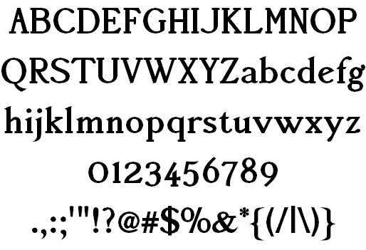
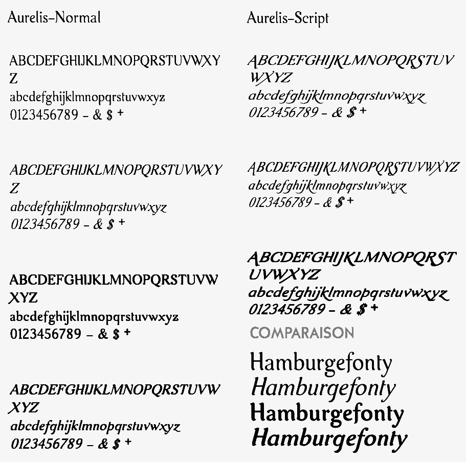
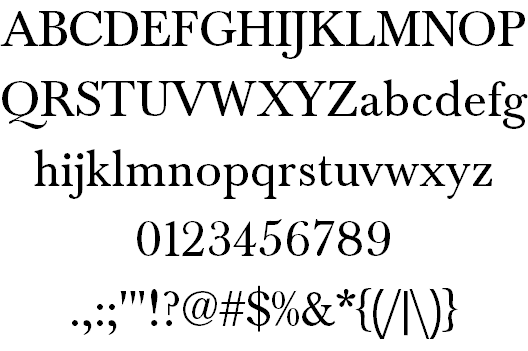
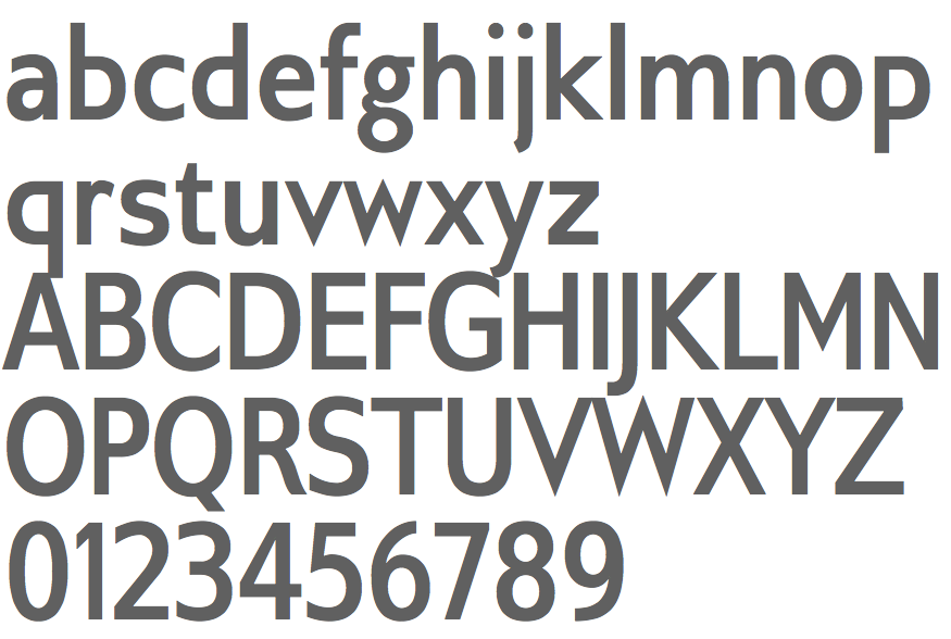
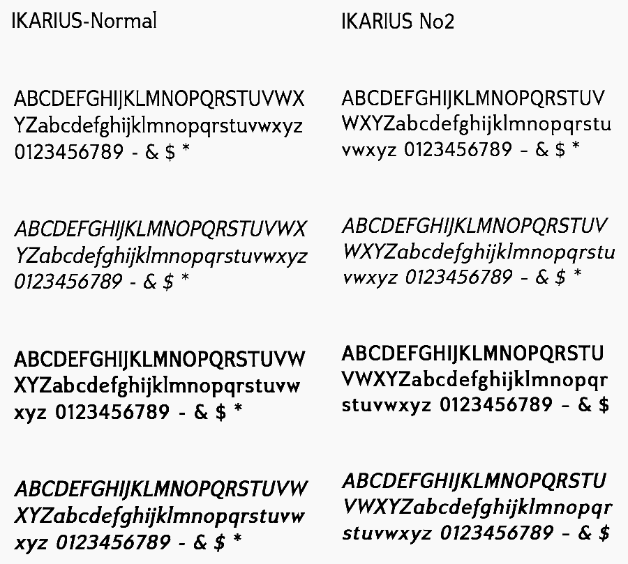
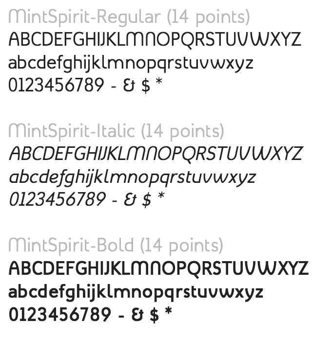
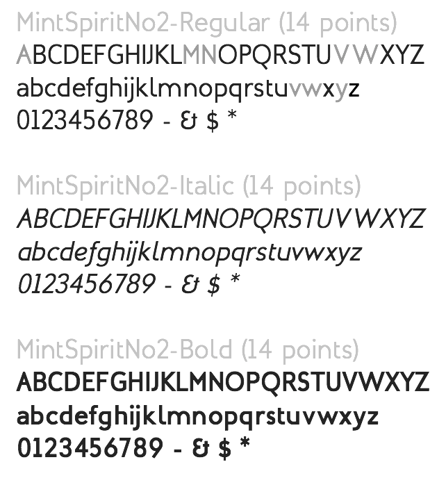
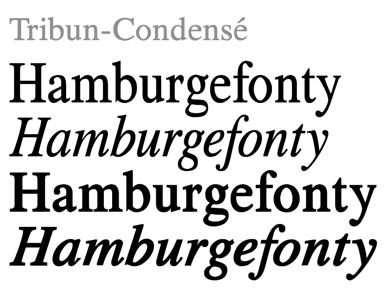
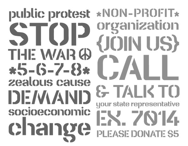
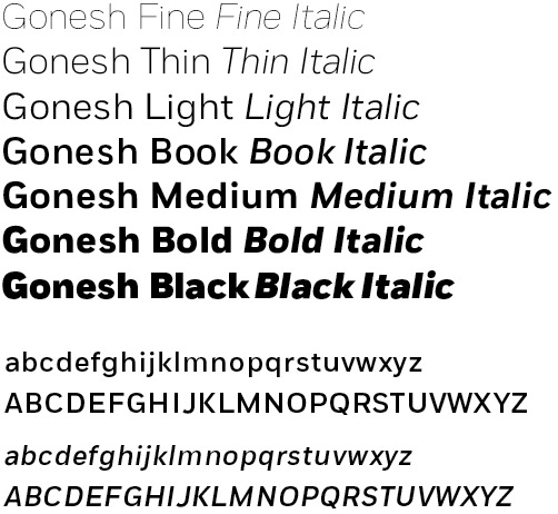
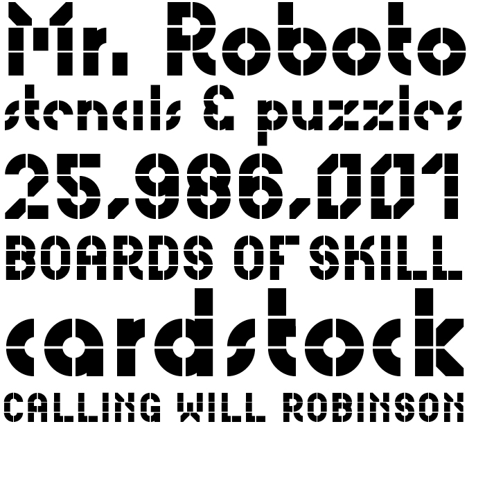
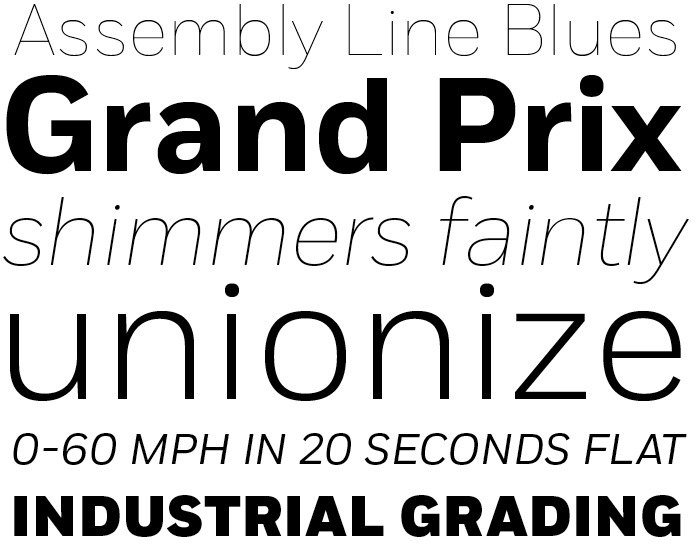
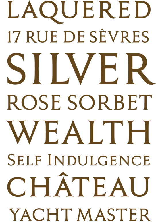
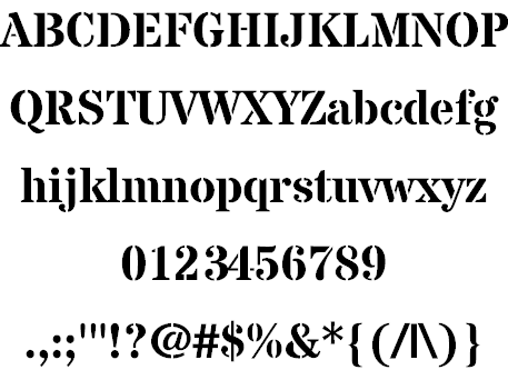
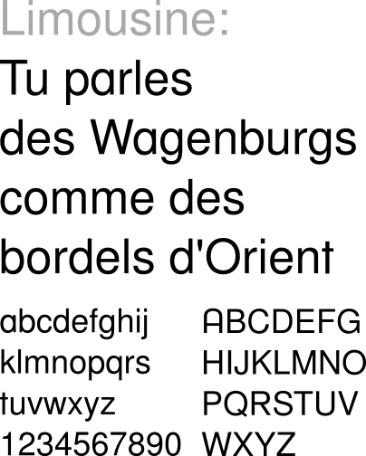
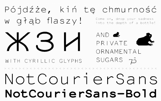
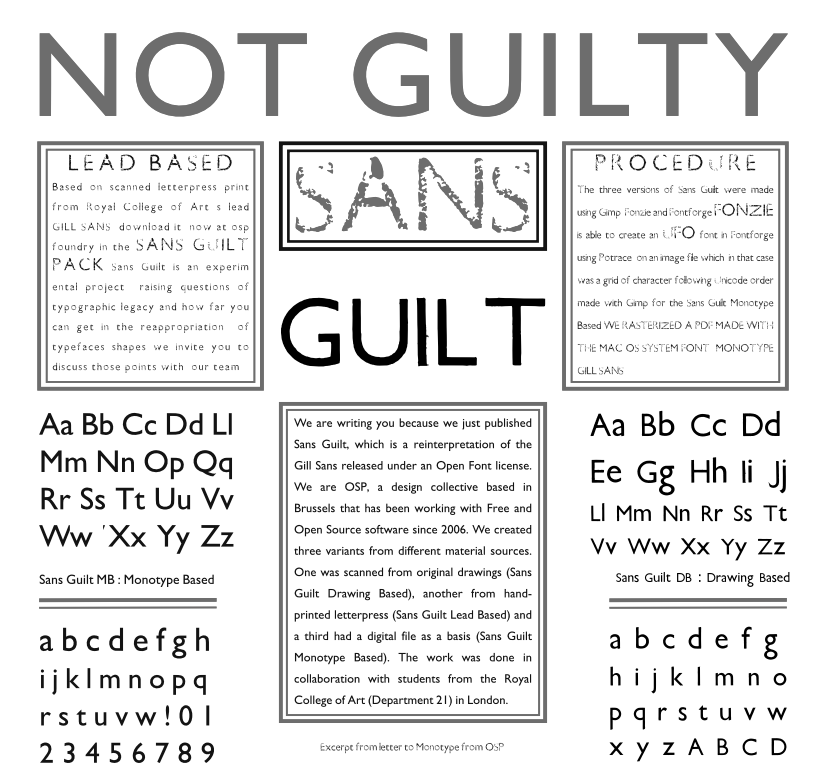