TYPE DESIGN INFORMATION PAGE last updated on Thu Jul 16 06:34:54 EDT 2026
FONT RECOGNITION VIA FONT MOOSE

|
|
|
|
|
The Polish type scene | ||
|
|
|
|
SWITCH TO INDEX FILE
066.FONT
| 066.FONT is Piotr Wozniak's Polish foundry based in Konskie with some commercial fonts (Linotype Kropki (1997), Dr066, Kfontz) and some free fonts (DNA, Zawijasy, Mieszkanie9 (a halftone curly hand), Plaq, Plaq 108). Kfontz and Dr066 are old typewriter fonts, and Kropki is a dot matrix font. The free fonts are for handwriting. Some fonts at MyFonts.com, such as Pokrak (2009, grunge family), Longinus Pro (2008, a 9-style family of medieval roughly outlined alphabets), Old Stefan (2008, five styles of grungy typewriter), Kra Kra (2008, grunge), Poldi (2007, 3d hand-printed), Poldi No 2 (2008), Bloor (2008), Crazy David No 1 and 2 (2006, grunge), Karacan Pro (2005, eroded look), Polish Dirty News (2005, grunge), Nieanana (2005), Jackcake (2005), Mada693, Nonpress (2006, grunge), Plaq (2005, halftone simulation face), Dr066, KfontZ, Zawijasy (1997, a curly hand, now commercial), Punx (2006, grunge), 066 Army (2006, grunge), Kulfonus No. 1 and 2 (2007, grunge), Duck Duck (2006), Finito (2008, grunge script), Wopi Script (2005), Pimpus (2009, grungy script) and Wopi Script No. 2 (2005) and No. 3 (2007). The designer is Piotr Wozniak in Krakow (b. Konskie, Poland, 1980). Typefaces at MyFonts: 066 Army (066.FONT), Bloor (066.FONT), Chigliak (066.FONT), Crazy David No 1 (066.FONT), Crazy David No 2 (066.FONT), Dr066 (066.FONT), Duck Duck (066.FONT), Finito (066.FONT), Jackcake (066.FONT), Karacan Pro (066.FONT), KfontZ (066.FONT), Kra Kra (066.FONT), Kulfonus No 1 (066.FONT), Kulfonus No 2 (066.FONT), Linotype Kropki (Linotype), Longinus Pro (066.FONT), Mada693 (066.FONT), Nieanana (066.FONT), Nonpress (066.FONT), Old Stefan (066.FONT), Pimpus (066.FONT), Plaq (066.FONT), Pokrak (066.FONT), Poldi No 2 (066.FONT), Poldi (066.FONT), Polish Dirty News (066.FONT), Punx (066.FONT), Vladicek (2022: grungy; emulating wall writing), Wopi Script No 2 (066.FONT), Wopi Script No 3 (066.FONT), Wopi Script (066.FONT), Zawijasy (066.FONT). Polish link. Dafont link. Linotype page. FontShop link. Klingspor link. [Google] [MyFonts] [More] ⦿ |
Wroclaw, Poland-based designer of the 3d typeface Dimension (2018). [Google] [More] ⦿ | |
Polish type designer who is based in Szczecin. At the 13th Typeclinic in Slovenia in 2016, Ada Krawczak designed Easy-a (sans typeface). At the 15th Typeclinic, held in 2017, she added Sciaga, a sans that has regular, inktrapped and stencil styles. [Google] [More] ⦿ | |
During his studies in warsaw, Poland, Adam Borowski created the free display typeface Brekol (2014). Aka Adam Boro. [Google] [More] ⦿ | |
Graphic designer in Warsaw, Poland. For a course taught by Lukasz Dziedzic he created the modular typeface Almond (2014) on an almond-inspired curved grid. Behance link. [Google] [More] ⦿ | |
In 2019, he designed the 62-style sci-fi typeface family Ares (+Ares VF), the condensed Latin / Greek / Cyrillic sans Rywalka, the creamy stencil typeface Aromatron and the leafy Aromatron Ornaments. Typefaces from 2020: AJ Quadrata (a revival of Textura Qadrata). Aka Quadratype. Devian Tart link. Creative Fabrica link. [Google] [MyFonts] [More] ⦿ | |
| |
Czestochowa, Poland-based designer of the body text typeface Spacer (2016). [Google] [More] ⦿ | |
| |
Warsaw, Poland-based designer of the roman typeface Summer Sky Serif (2017). [Google] [More] ⦿ | |
In 2018, Mateusz Machalski, Borys Kosmynka and Przemek Hoffer co-designed the six-style antiqua typeface family Brygada 1918, which is based on a font designed by Adam Poltawski in 1918. Free download from the Polish president's site. The digitization was made possible after Janusz Tryzno acquired the fonts from Poltawski's estate. The official presentation of the font took place in the Polish Presidential Palace, in presence of the (right wing, ultra-conservative, nationalist, anti abortion, anti gay, law and order) President of Poland, Andrzej Duda. Calling it a national typeface, the president assured the designers that he would use Brygada 1918 in his office. It will be used for diplomas and various other official forms. In 2021, with Anna Wielunska added to the list of authors, it was added as a variable font covering Latin, Greek and Cyrillic to Google Fonts. Github link. Digital revivals of Antykwa Poltawskiego:
| |
Wroclaw, Poland-based designer (b. 1980) of SU-30SM (2019), Animoto-Bubbly, Babymoto (2009-2019), Latikana (2019), Militech-Outlined, Militech (2019), Octane (2019), Surgeon (2004-2019), Wrocislaw-Light, Wrocislaw, Wrocislaw-Bold (2019), Zefir-Light, Zefir, and Zefir-Bold (2009-2019). [Google] [More] ⦿ | |
Adam Smialek (Poland) created a set of Palm pilot fonts, ca. 2006. [Google] [More] ⦿ | |
Adam Twardoch
| |
Adam Twardoch (b. 1975) was raised in Tychy, Poland, and graduated from the University of Frankfurt/Oder, Germany. He worked at for Agentur GmbH, a Frankfurt/Oder-based design firm. Since 1991, Adam has advised numerous type designers on Central European extensions of their typefaces and has created localized versions of over fifty fonts. He frequently writes on type-related matters, and is the founder of Font.org, a (now defunct) website featuring articles about typography in English and Polish. Adam Twardoch is Director of Products of FontLab (since 2004), and is typographic consultant at Linotype (since 2002) and Tiro Typeworks (since 2001), and general font specialist at MyFonts (2000-2012). Since 2012 he is based in Berlin. Adam Twardoch is working in the field of font technology, multilingual typography, CSS webfonts, Unicode and OpenType. His typefaces:
Speaker at ATypI 2013 in Amsterdam. Speaker at ATypI 2016 in Warsaw and at ATypI 2018 in Antwerp. [Google] [MyFonts] [More] ⦿ | |
Poznan, Poland-based designer of Skywalker (2017), a typeface that was inspired by Klavika and some gothic scripts. [Google] [More] ⦿ | |
Polish designer based Warsaw who created the free art deco typeface family Antoine (2015). Behance link. [Google] [More] ⦿ | |
Polish type designer. At the 13th Typeclinic in Slovenia in 2016, Adrian Sowinski designed Anna (text typeface). [Google] [More] ⦿ | |
Graduate in industrial design from Koszalin University of Technology, Poland. Poznan, Poland-based creator of the thin modular typeface Culture Fangs (2018). [Google] [More] ⦿ | |
During her studies in Poznan, Poland, Adrianna Celmer designed the modular display typeface Bubbles (2017). [Google] [More] ⦿ | |
"Flaunt yourself!" is a Polish website devoted to the history of interwar Polish advertising, which appeared mainly in printed form---a project by Sonia Jaszczynska and Ania Wielunska. The site has three parts:
Borys Kosmynka and Ania Wielunska designed Kolumbia and Renesans, while Filip Tofil created Makkabi. Kolumbia is based on E.J. Kitson's Post Oldstyle Roman (aka Columbia. Buffalo, and Kolonel), while Renesans is a revival based on Jan Idzkowski's version of Berthold's Secession typeface. [Google] [More] ⦿ | |
Wroclaw, Poland-based designer of the sans typeface Spozywczy (2018). [Google] [More] ⦿ | |
Warsaw, Poland-based designer of magnificent experimental typefaces in various vector formats. These include:
| |
In 2011, she designed Grand Duchess (script face), Rosette110621 (kaleidoscopic dingbats), Brasserie (connected script), Marker Script, Skarpa LT (an avant-garde hairline face), Skarpa Regular, Skarpa Bold, Auld Magick (blackletter), Two Am, and Fantasy Dingbats. Typefaces from 2013: Monmica (an upright copperplate script), Skarpa 2.0, Trufla (English round hand, copperplate script), Trufla Words (calligraphic), Calissa (copperplate script), Calissa Words. Typefaces from 2014: Mavblis, Lavenda (a connected copperplate script), Roicamonta (connected script). Typefaces from 2015: Skarpa Round, Nistiver (calligraphic script), Lavenda (calligraphic script). Typefaces from 2016: Lidaxid (connected script), Hinzatis (calligraphic script), Roicamonta Basic (an upright connected calligraphic script), Monmica Fancy, Bisalir (heavy script), Piambis (thick signage script), Piambis Round, Piambis Sharp. Typefaces from 2020: Skarpa (a revised version of her 2011 typeface), Skarpa Condensed. Typefaces from 2021: Timernis (a 9-style humanist sans based on 1940 stone engraving commemorative plaque). [Google] [MyFonts] [More] ⦿ | |
Gdansk, Poland-based designer of a colorful all caps alphabet called Donuts (2017). [Google] [More] ⦿ | |
Polish design student who made a typeface while studying in Krakow from 2003 until 2005. [Google] [More] ⦿ | |
| |
Agata Knajdek
| |
During her studies in Poznan, Poland, Agata Komborska designed the stylish typeface Combo (2017). [Google] [More] ⦿ | |
Warsaw, Pland-based graphic designer who created the handwriting font Santos (2020). [Google] [More] ⦿ | |
Polish creator of the curly psychedelic didone typeface Hippie (2010). In 2012, she created a text typeface. Behance link. [Google] [More] ⦿ | |
Agata Szydlowska (b. 1983, Poland) obtained her PhD in Anthropology from the University of Warsaw. She also holds an MA degree in Art History from the same University. She has completed her studies at the Graduate School for Social Research at the Polish Academy of Sciences. Currently she works as a lecturer at the Department of Design History and Theory in the Design Faculty of the Warsaw Academy of Fine Arts. She also lectures at the Polish-Japanese Institute of Information Technology. In 2015, she co-authored a book on the cultural history of Polish type design with Marian Misiak. Speaker at ATypI 2016 in Warsaw. [Google] [More] ⦿ | |
Katowice, Poland-based designer of Aztec (2018). [Google] [More] ⦿ | |
Krakow, Poland-based designer of some innovative logos in 2012. [Google] [More] ⦿ | |
Warsaw, Poland-based designer of the modular typeface Zlocona Pigulka (2016). [Google] [More] ⦿ | |
Wroclaw, Poland-based designer of the thin handcrafted typeface Matilda (2018). [Google] [More] ⦿ | |
Warsaw, Poland-based designer of some icons custom-made for the Proctronik company. [Google] [More] ⦿ | |
During her studies at Akademia Sztuk Pieknych w Krakowie in Krakow, Poland, Agnieszka Dudek designed the super-heavy Overweight (2017) and the super-condensed Prolong (2017). [Google] [More] ⦿ | |
Warsaw, Poland-based designer of the decorative caps typeface Sweets (2015, Studio Filigran) and of the outlined all caps typeface Typek (2018, Studio Filigran). In 2020, she designed Cnabel, which is based on a Slovenian book illustration from the art nouveau period. In 2021, she released Binia (a hyper-decorative typeface) and Zania (a fat display typeface) at Studio Filigran. Type Department link. [Google] [MyFonts] [More] ⦿ | |
Polish designer and illustrator. Behance link. Creator of a crazy poster typeface called Loft (2012). She also uses a fun hand-printed poster style in most of her illustrations. [Google] [More] ⦿ | |
Designer in Lodz, Poland. Creator of the white-on-black typeface Square Line Typo (2015). [Google] [More] ⦿ | |
New York-based designer of the experimental typeface Blue Notes (2011), which was inspired by the jazz of Billie Holiday. [Google] [More] ⦿ | |
During her studies, Agnieszka Tchorzewka (Wroclaw, Poland) designed the LED font New Digital (2016) and the video game typeface Tetris Classic (2016). [Google] [More] ⦿ | |
As a student in Pune, India, Akhil Komath designed the sans typeface Mascurve (2016). [Google] [More] ⦿ | |
Warsaw, Poland-based graphic designer. Creator of the free cybernetic display typeface Cykor (2020, with Kacper Janusiak). The commercial version of Cykor is here. [Google] [More] ⦿ | |
Aleks is the Polish designer of Absenced Streetsoul (2010). [Google] [More] ⦿ | |
Polish design student who made a typeface while studying in Krakow from 2003 until 2005. [Google] [More] ⦿ | |
Aleksandra Debniak
| |
Another URL. [Google] [More] ⦿ | |
During her studies in Warsaw in 2015, Aleksandra Jakubowska designed the display typeface Handgloves. [Google] [More] ⦿ | |
Aleksandra Mizielińscy
| |
In 2016, at SWPS University in Wroclaw, Poland, Aleksandra Mrozek designed the umbrella and raindrop-themed typeface Lluvia. [Google] [More] ⦿ | |
Polish designer of the yummy plumpish typeface Skrzat (2017). [Google] [More] ⦿ | |
During her studies at Nicolaus Copernicus University in Torun, Poland, Aleksandra Paczkowska designed the Illustrator-format multi-colored font Juice (2014). [Google] [More] ⦿ | |
Krakow, Poland-based designer of Strefa (2014), a typeface finished during her studies in fine arts. [Google] [More] ⦿ | |
During her studies, Szczecin, Poland-based Aleksandra Szwajda designed the heavy poster typeface Gruszka (2019). [Google] [More] ⦿ | |
| |
During her studies at the Academy of Fine Arts in Gdansk, Poland, Aleksandra Wasilczuk designed a condensed display sans typeface (2018). [Google] [More] ⦿ | |
| |
Bydgoszcz, Poland-based graphic designer who created bubbly initials for DIN Neuzeit Grotesk Light in 2014. [Google] [More] ⦿ | |
Torun, Poland-based designer of an origami typeface in 2018. [Google] [More] ⦿ | |
Foundry in Ypsilanti, MI. Kadmos, Bosporos (both classical Greek), Czasy, Szwajcarski (Polish), and Demotiki (modern Greek). Nice fonts, 85 US dollars per face. Jeffrey Rusten swears that these are the highest quality fonts for polytonic Greek. [Google] [More] ⦿ | |
Alma Type
| Mariusz Zajac graduated in 1995 from a printing school in Warsaw. In 2007, he designed the comic book typeface Shift Comic, which was eventually released in 2020 when he set up Alma Type. In 2020, he also released the single weight transitional text typeface Alma Serif [Google] [MyFonts] [More] ⦿ |
Ametype
| Poznan, Poland-based creator (b. 1990) of the free display sans typeface Gadaj P. Finch (2015) and the free blackletter typeface Ordnung (2015). Arrogant (2020) is a sci-fi emulation font family. [Google] [MyFonts] [More] ⦿ |
Warsaw, Poland-based designer of the floral caps typeface FlorN (2014). [Google] [More] ⦿ | |
During his studies in Warsaw, Poland, Andrew Zhukov designed Pixel Font (2013). [Google] [More] ⦿ | |
Creator of the commercial chess font Akiba Pro available from thr Polish Internet Chess Center. Andrzej lives in Jelenia Gora, Poland. [Google] [More] ⦿ | |
Polish designer (b. 1982) of the handcrafted typefaces Joy For Fun (2015) and Handy Andy (2015). Dafont link. Another URL. [Google] [More] ⦿ | |
Polish illustrator and graphic artist, b. 1928, Warsaw. He created the beautiful cursive text typeface Bona. He also did nice lettering on some film posters, and designed bank notes, postage stamps, postcards and book covers. In 2017, Mateusz Machalski contacted him for advice on the momentous revival and extension project Bona Nova, published by and available from Capitalics and MyFonts. For starters, Machalski had to design a regular upright style to match Heidrich's italics. Bona Nova is supplemented by the extreme contrast typeface family Bona Title and the inline typeface family Bona Sforza. Participants in the project also include Leszek Bielski, Ania Wielunska and Michal Jarocinski. Interview with Andrzej Heidrich, and the story of Bona Nova (PDF format, 2017). Google Fonts link for Bona Nova. Github link for Bona Nova. [Google] [MyFonts] [More] ⦿ | |
Polish typographer involved in GUST.org fonts for Polish, and son of Roman Tomaszewski, another Polish typographer. Author of Leksykon pism drukarskich Warszawa, Krupski i S-ka, 1996. Antykwa Poltawskiego, one of the few original Polish typefaces, is being digitized in an innovative way as a *parametrized* Type 1 font. The project is being co-sponsored by GUST, the Polish TeX users group. The typographical supervision is being held by Andrzej Tomaszewski (son of Roman Tomaszewski, R.I.P., a famous Polish typographer and a former member of the ATypI board). [Google] [MyFonts] [More] ⦿ | |
Andrzej Wroz
| |
Poznan, Poland-based designer of the free all caps sans display typeface Forta (2019). [Google] [More] ⦿ | |
| |
Krakow, Poland-based designer of the minimalist sans typeface Puro (2016). [Google] [More] ⦿ | |
Polish designer of the stencil typeface Cytat Tacyta (2016) and Web Icons (2016). [Google] [More] ⦿ | |
Krakow, Poland-based designer of the experimental typeface FontStruct (2016). [Google] [More] ⦿ | |
| |
She created the text typeface Arnie (2011). She writes: Arnie is a text typeface designed for books and poetry. Due to calligraphic origin, rather classical proportions and flat curves, it seems solid and stable. While big counters and varying line weight make it look light and airy in long texts. She also created the signage script face Cookie (2011), which is free at Google Web Fonts. Panna Kotta (2010) is an upright italic. Ladaco (2008) is inspired in Polish folkloric cut-outs. Krotta One (2012, Google Web Fonts) is an italic typeface. It was renamed Kotta a few days later. Behance link. Google Web Fonts link. Fontsquirrel link. [Google] [More] ⦿ | |
Ania Szerszen (Wroclaw, Poland) created the beautiful ornamental caps typeface Dream Shepherds (2012) and the oblique piano key typeface Lullaby (2012). [Google] [MyFonts] [More] ⦿ | |
Ania Wielunska
| |
Polish designer of Cyber System 2-3 (2011). [Google] [More] ⦿ | |
Architect in Gdynia, Poland, who designed a black art deco typeface in 2014. [Google] [More] ⦿ | |
Art director in Kozy, Poland, who created Shift Type Basic (2014) and Elena (2015, sans). Dafont link. Behance link. [Google] [More] ⦿ | |
At the 15th Typeclinic, held in 2017, Anna Dulska (Poland) designed the fashion mag text typeface Glam. [Google] [More] ⦿ | |
Her typefaces:
Fontsquirrel link. Behance link. [Google] [More] ⦿ | |
Polish designer with Tomasz Kaftal of the informal script typeface Stellina (2004). [Google] [More] ⦿ | |
| |
Graphic designer in Warsaw, Poland. Creator of a hexagonal typeface in 2017. Behance link. [Google] [More] ⦿ | |
Gdansk, Poland-based designer of HAFT (2013), a typeface that was inspired by embroidery. Behance link. [Google] [More] ⦿ | |
Polish designer of the free arrow typeface 4rrows (2014). [Google] [More] ⦿ | |
Poznan, Poland-based student designer who created the angular blackletter-inspired typeface Odpustova (2014). Behance link. [Google] [More] ⦿ | |
Polish designer of the modular typeface Gothica (2015), which was a school project at PJATK in Warsaw. [Google] [More] ⦿ | |
Warsaw-based creator of the paper-fold typeface Mutsu (2013). [Google] [More] ⦿ | |
Polish design student who made a typeface while studying in Krakow from 2003 until 2005. [Google] [More] ⦿ | |
During her studies in Wroclaw, Poland, Anna Waclawek designed the graffiti-inspired typeface Czto (2018). [Google] [More] ⦿ | |
Polish designer of the geometric display typeface Slomka in 2019. In 2020, she designed thae art deco typeface Pryzmat. [Google] [More] ⦿ | |
Anton Drachuk
| |
Wrclaw, Poland-based designer of Grass Sans (2018). [Google] [More] ⦿ | |
Polish designer (b. 1989) who created Balls (2006), Ross (2006, handwriting), MPL (2006, handwriting), Dominos (2006, handwriting), Qlfones (2006, handwriting), Melsy (2006, handwriting) and New Age (2007, handwriting). Home page. [Google] [More] ⦿ | |
Antraxja Fonts (or: Atrax)
| Antraxja Fonts (or: Atrax) is a (now defunct) Polish foundry which offered these free fonts made by Rafa Brzezinski in 2004: ARTUR, Antraxja Goth 1938 (blackletter), Art (art nouveau), Battlefield (war lettering face), BananaShow-Medium, CrashTest, CrashTestItalic, CrashTestShadow, Cybernetyka (futuristic family), CybernetykaItalic, CybernetykaNormal, CybernetykaOutline, DarkPalladin, History Brush, Kreskwka-Italic, Kreskwka (handwriting), Monster, MonsterShadow, Mortis, Orchidee, Reforma, Returntocastle (gothic), Speed+, Speed+2, Techno, Medusa (blocky lettering), Weronika, Bajareczka, Camilla, Cherif, Top Secret (stencil). Alternate URL. Fontspace link. [Google] [More] ⦿ |
antyktor
| Antykwa Toru\'nska (1952-1958, released by the Polish state foundry in 1960) is a serif font designed by the Polish type designer Zygfryd Gardzielewski (1914-2001) which has been reconstructed and digitized as Type1 by Janusz Nowacki. Three free Polish type 1 fonts called antyktor. Alternate site. Gardzielewski died in October 2001. [Google] [More] ⦿ |
Polish calligrapher, b. 1984. Creator of the experimental typeface Typo Prooba (2009). [Google] [More] ⦿ | |
Chorzow, Poland-based designer of the straight-edged typeface Aremio (2019). [Google] [More] ⦿ | |
Aka Baville, Artman Ay is based in Gothenburg, Sweden, and studies dentistry at the Medical University of Lublin, Poland. Creator of the hand-printed typeface Irregularis (2013). Created with Font Creator, it is useful for casual text, or blackboard emulation. Wikipedia link. Fontspace link. [Google] [More] ⦿ | |
Arriere Garde
|
In 2020, he released the 26-style humanist sans Phrasa. YWFT link. [Google] [MyFonts] [More] ⦿ |
Art City
|
In 2018, he published Baobab. Typefaces from 2022: Handcraft (a scrapbook script). Dafont link. Creative Market link. Behance link. [Google] [MyFonts] [More] ⦿ |
Polish graphic designer who lives in Wroclaw. He has made some inspired posters of typographic value. [Google] [More] ⦿ | |
Artur Frankowski
| |
Gdansk, Poland-based designer of the modular typeface Kroju (2016). [Google] [More] ⦿ | |
| |
Aspect Type
| Szczecin, Poland-based graphic designer, who designed the monospaced sans typefaces Tabela in 2017 and Tabela Soft in 2018. [Google] [MyFonts] [More] ⦿ |
| |
I do not know whether this graphic designer's name is Aubo lessi or Krzysztof Tryk. In any case, he lives in Otwock, Poland. Dafont link. In 2010, he took Bodoni as a model to design Muscle. [Google] [More] ⦿ | |
Typefaces from 2014: Bread and Confectionary, Dairy, Vegetables, Meat and Seafood, Fruits. Typefaces from 2017: Cacko (a slightly curvy sans family). Typefaces from 2018: Fajny, Fajowy. [Google] [MyFonts] [More] ⦿ | |
For her type revival project at KABK, she picked Lutetia (2013) and writes: Lutetia was designed as a commission from Enschedé by Jan van Krimpen. The drawings of the typeface were ready in the middle of 1924 and first cut and cast in 16 point size in the Enschedé Type Foundry. For the first time the typeface was used in the book dedicated to the exhibition that took place in Paris in 1925. Therefore the name Lutetia reffers to the Roman name of Paris. Her KABK graduation typeface family was Mala (2013). Loaded with opentype features and choices of widths, Mala was created for cartographic purposes. It was published by Bold Monday in 2016. In 2016 she published Abelard at Indian Type Foundry and wrote: Abelard is a modern (or neoclassical) family with 10 font styles. It is a contemporary take on classic types like Baskerville, Bulmer, and Scotch Roman that has been optimised for text embedding on eReaders. The design features elements ensuring even text color, including case-sensitive forms, prominent punctuation marks, ligatures, and four sets of figures. Each font also contains ornaments resembling pen nibs, bullet points, and arrows. In 2017, she published the didone fashion mag typeface family Rion and the text typeface Neco at Fontstore. Rion was republished in 2018 at Indian Type Foundry. Typefaces from 2018: Bonny (a decorative serif font family published by Indian Type Foundry; see also Bonny at Fontshare). In 2019, Noopur Choksi and Barbara Bigosinska published the sturdy wedge serif text typeface family Sapien at Indian Type Foundry. Still in 2019, Manushi Parikh and Barbara Bigosinska released the octagonal athletics font Fielder at Indian Type Foundry. Somehow this octagonal typeface seems to have been evolved into the 5-style free typeface Nippo at Fontshare. In 2021, Barbara Bigosinska released the 12-style didone family (+two variable fonts) Boska at Fontshare. Boska has quite extreme contrast and some calligraphic hooks in the c, f, k, r, s, x and z glyphs that make it perhaps less suitable for text but more in line with fashionable displays. Bevellier (2019-2021; by Arya Purohit and Barbara Bigosinska) is a 16-style (+variable) rounded condensed organic sans family. In 2021, Barbara Bigosinska, Rafa Buchner and Diana Ovezea set up Blast Foundry. At Blast Foundry, she designed the wonderfully expressive sharp-edged display typeface Sharf. Boska was published as a free font at Fontshare. Behance link. Bold Monday link. [Google] [MyFonts] [More] ⦿ | |
Calligrapher in Warsaw, Poland, who created various calligraphic alphabets in 2015-2016. [Google] [More] ⦿ | |
Barbara Lukasik
| |
Graduate of the masters program at Academy Of Fine Arts in Katowice. Krakow, Poland-based designer of the text typeface Beskid (2016) and the rounded poster typeface Wigwam (2016). [Google] [More] ⦿ | |
During her studies, Gdansk, Poland-based Barbara Szwedowska created a gorgeous pair of chancery hand typefaces (2015). [Google] [More] ⦿ | |
Wroclaw (and before that, Warsaw), Poland-based designer of the vampire or snake tongue script font Dianthus (2017). [Google] [More] ⦿ | |
Barmee.com (was: Czcionki.com, or: Barme Fonts)
|
Font list (with repetitions): 4Mini, BarmeReczny, Elementarz, Fiesta, GotykPoszarpany, GrubaBerta, Hieroglify, KeiserSousa, Kobajashi, Kwadryga, Magda, Manifest-Niski, Manifest, MaszynaAEG, MiniMasa, MiniSet, MiniSter, Nerwus, Nokian, Nokian2, Opeln2001-Prosty, Opeln2001, Opeln2001Szeroki, Pascal, Passja, Premiership, RecycleIt, Sandwich, SecesjaPL, Szablon, Wabene, Xar, Zakret, MiniForma, MiniStrzalki, Miniline, Minitot, Ulisson, Astalamet (2002), Gosford (2002), Volan (2002), Establo, QuatronFat, Infantyl (2002), Quatron (2002), YnduFat (2002), YnduOut (2002). URL not accessible to my browser (Mac+Firefox). This site carried these fonts in May 2008: 4Mini, Afarat-ibn-Blady, Astalamet, AstalametPure, BarmeReczny, Cyree, DorBlue, ElementarzDwa, Erton, Establo, EstabloFat, Fiesta, Gosford, GotykPoszarpany, GrubaBerta, Hieroglify, HongKong (oriental simulation), Infantyl, InfantylFat, InfantylItalic, InfantylOut, Jiczyn, KeiserSousa, Kobajashi, Komix, Kwadryga, Lola, Magda, Manifest-Niski, Manifest, MaszynaAEG, MaszynaRoyalDark, MaszynaRoyalLight, MiniBet, MiniForma2, MiniJasc, MiniKongo, MiniLine2, MiniMasa, MiniQuan, MiniQuanMniejszy, MiniSet2, MiniSter, MiniStrzalki, MiniTot, Nerwus, Nokian, Nokian2, Opeln2001-Prosty, Opeln2001, Opeln2001Szeroki-Metro, Opeln2001Szeroki, Pascal, Paskowy, Passja, Quatron, QuatronFat, RecycleIt, Sandwich, SecesjaPL, Sloneczko, Szablon, Tabun, TechnicznaPomoc-Italic, TechnicznaPomoc, TechnicznaPomocRound, Ulisson, Vaderiii, Volan, Wabene, Xar. In 2011, he established the commercial foundry GRIN3. Dafont link. Klingspor link. Fontspace link. GRIN3 link. Old free font URL. Showcase of Bartek Nowak's commercial fonts. [Google] [MyFonts] [More] ⦿ |
Bart Co Design
|
His vintage liqour collection (2017) includes
Typefaces from 2018: the Print Press collection (Blutzen, Fratley, Garnet, Harold, Stilzkin Sans, Stilzkin Slab), Nimitz (a free retro all caps sans), Bosmark (a vintage sketched typeface), Monkstead (a block display family with several textures), Signist, Hartwood, and the Newsstand collection (which includes Presson, Stammark, Brookset, and Darmond). Typefaces from 2019: Pelagia (text typeface), Moorland (a fat face didone), Keller (an all caps sans), Mosley (a weathered letterpress emulation font), Madchen Sans (a free retro sans), Maurine (a retro script). Typefaces from 2020: Braden Sans, Paschal (serif), Dumont (sans). Typefaces from 2021: Frisco (a retro display serif), Landman (a retro font inspired by Murillo/Aldo Manutio typefaces designed by Schelter & Giesecke in 1897), Devon (art nouveau caps), Omnibus (a free art nouveau font), Urban Serif (a condensed slab serif), Irish Poem, Mesnage Slab Serif, The Moonshine Collection (Bastien (art nouveau), Dalton (squarish), Fribois (a monolinear school script), Guilmot, Liboury (a frilly decorative blackletter)). Typefaces from 2022: Vespucio (a classic serif), Blokhaus (a bold sans). [Google] [More] ⦿ |
| |
Bartek Nowak
| |
Bartek Nowak
| |
Bartek Nowak
| |
Polish designer of the handcrafted typeface Pucelier (2017). [Google] [More] ⦿ | |
Krakow, Poland-based designer of the fat dot matrix typeface Evolv (2016), the caps typeface Hox (2016), and the straight-edged typeface Moshi Moshi (2016). [Google] [More] ⦿ | |
Bartek Szczepanski (Koszalin, Poland) made a simple geometric sans typeface called Culinar (2011) and a basic hand-printed face, Milosz (2011). Behance link. [Google] [More] ⦿ | |
Son of Piotr Wozniak, b. Konskie, Poland, 1994. He created the children's handwriting font Bart Script No. 1 (2006, 066.FONT). [Google] [MyFonts] [More] ⦿ | |
During his studies in Poznan, Poland, Bartosz Aziewicz designed an angular text typeface (2016). [Google] [More] ⦿ | |
Painter and illustrator in Warsaw, Poland. Designer of the very detailed intial caps typeface Adagio Sans Grande (2016). Behance link. [Google] [More] ⦿ | |
In 2014, Bartosz Mamak (Poznan, Poland) designed the display typeface Rusvod, which was inspired by the Russian lifestyle. He also created the angular typeface Manson (2014). [Google] [More] ⦿ | |
Bartosz Panek
| |
Polish designer of the deconstructed font Easy (2011). Behance link. [Google] [More] ⦿ | |
Bartosz Wesolek
| |
Gliwice, Poland-based designer of Wanda Sans (2013). [Google] [More] ⦿ | |
Beata Kurek graduated from Poznan Fine Arts University. As LoveLetters Studio, she designs fonts and lettering based on calligraphic writing. She also teaches lettering in workshops. Creator of the connected large x-height script typeface Polacy (2012), a school project at the Typography Studio of the University of Arts in Poznan, Poland. In 2013, she designed Rock, a script typeface. In 2016, as part of Warsaw Types, she designed the traditional calligraphic typeface Bajaderka and writes: Bajaderka is inspired by lettering of the small signage tablets found in Warsaw shops. The letters feature details typical for traditional calligraphy, with visible brush strokes, referring to the charming style of Warsaw's sign painters. Bajaderka is free. [Google] [More] ⦿ | |
BIZNET Central European (ISO 8859-2) X Window Fonts : 395 fonts that comply with ISO 8859-2 for X Windows. For 10 zlotys, you get the fonts on diskette, and for 70 zlotys on a CD. Downloads over the net are free. [Google] [More] ⦿ | |
Blaise Adamczyk (aka de Seingalt) is the Polish designer (b. 1986) of Rounded (2006), an all caps stencil face. [Google] [More] ⦿ | |
| |
Polish designer of the heavy squarish poster typeface Tall Bolder (2015) and the circle-based typeface Minimoon (2016). Dafont link. [Google] [More] ⦿ | |
Blazej Ostoja Lniski
| |
Polish designer of the reverse contrast typeface Brokat (2020). [Google] [More] ⦿ | |
Klingspor link. [Google] [MyFonts] [More] ⦿ | |
Boguslaw Jackowski
| |
Polish type designer involved in GUST.org fonts for Polish such as QuasiTimes, QuasiPalladio, QuasiHelvetica, QuasiCourier, QuasiChancery, QuasiBookman, Antykwa Półtawskiego (based on work by Adam Półtawskiego (1923-1928), constructed by Bogusław Jackowski, Janusz M. Nowacki and Piotr Strzelczyk). He developed the Latin Modern fonts (2003, type 1) based on Knuth's Computer Modern fonts. In 2006, Nowacki and Jackowski published free extensions of the Ghostscript fonts in their TeX Gyre Project: Adventor, Bonum, Cursor, Heros, Pagella, Termes, Schola, Chorus. [Google] [More] ⦿ | |
Poznan, Poland-based designer of the paper fold typeface New Construction (2016). [Google] [More] ⦿ | |
Borutta (or: Duce Type)
|
He is the creator of the blackletter-inspired typeface Raus (2012), which also could pass for a Cyrillic simulation font. It was possibly made with Pawel Wypych. He also made Kebab (2012, a fat caps face), Duce (2012, art deco: withdrawn from MyFonts after Charles Borges complained that it was a rip-off of his own Gloria), Fikus (2012), Woodie (2012, a condensed rough wood type face), Polon (2012), Aurora (2012, a German expressionist poster face), Musli (monoline connected script), HWDP (2012, poster font), Wieczorek Script (2012, hand-printed), Hamlet (2012, a sword and dagger typeface, renamed to Prince), Caryca (2012, Cyrillic simulation, done with Pawel Wypych), Bezerro (2012, poster face), Bitmach (2012, pixel face), Meat Script (2012, a caps only market signage brush script), Krac (2012, a tall poster font), Hermes (2012: Ten Dollar Fonts), Berg (2012, a roughened blackletter face), Buldog (2012), Dudu (2012, tall condensed face). In 2012, Polish designer Wojciech Freudenreich and Mateusz Machalski combined forces to design the techno typeface SYN, which is based on an earlier De Stijl-genre alphabet by Freudenreich. In 2020, they released the free typeface family SYN Nova, which includes additional styles and a variable font. Machalski likes old wood types, which inspired him in 2012 to publish a wood type collection of weathered display typefaces: Condom, Hype, Whore, Banger, Buka. Elo (2012) and Duce (2012) are fat weathered wood types. Typefaces made in 2013: Wood Type Collection 2 (which includes Brie, Kaszti, Mader, Modi, Rena, Roast, Ursus), Zigfrid (headline face), Salute (letterpress style), Benito (a letterpress or geometric wood typeface), Bojo (heavy wood style poster face), Picadilly (heavily inktrapped open counter sans family), GIT (a manly headline sans), Lito (an eroded poster typeface), Haine (vernacular caps), Aneba (an organic sans family, renewed in 2016 as Aneba Neue), Vitali (sans), Korpo Serif (slab serif), Korpo Sans (elliptical family; +Greek, +Cyrillic). Typefaces from 2014: Adagio Slab, Adagio Serif, Adagio Sans (a superfamily not to be confused with the 2006 typeface Adagio Pro by Profonts), Adagio Sans Script, Adagio Serif Script, Adagio Slab Script, Tupperware Pro. Tupper Pro (42 styles) was designed by Mateus Machalski and the RR Donnelley team. Typefaces from 2015: Tupper Serif (again with RR Donnelley: a custom superfamily for pairing Latin, Cyrillic, Hebrew an Greek; for Tupperware), Vitali Neue, Legato Serif, Corpo Serif, Corpo Sans, Zigfrid, Picadilly (a great ink-trapped sans typeface family with an erect g). Typefaces from 2016: Nocturne (just like Magiel, this free typeface was designed as part of the Warsaw Types project: this wedge serif text typeface is inspired by the lettering on stone tablets commemorating the victims of World War II, and prewar Jewish shop signage), Favela (an experimental, geometric sans, for headline and fashion magazine use), Gangrena (a weathered typeface system co-designed with Ania Wielunska), Migrena Grotesque (earlier named Enigma Grotesque but probably in view of a clash with the name Enigma used by Jeremy Tankard changed to the appropriately named Migrena Grotesque), Alergia Grotesk (a take on the classical geometric grotesque style, in 60 weights, for Latin, Greek and Cyrillic), Alergia Remix (a hipster / hacker / Futura take on Alergia Grotesque). Typefaces from 2017: Nocturne Serif, Massimo (copperplate semi-serif influenced by New York; originally called Madison, they were frced to change the name to Massimo), Magiel Pro (a geometric display family influenced by Polish banners from the Russian occupatuon era, 1945-1989; it has a charming Black and a hairline, and covers Cyrillic too). A particularly intriguing project in 2017 was Bona, which set out to revive and extend Andrzej Heidrich's old typeface Bona. Mateusz Machalski contacted him for advice on the revival project. The resulting typeface families were published by and are available from Capitalics. The centerpiece is the warm and wonderful text typeface Bona Nova. It is supplemented by the extreme contrast typeface family Bona Title and the inline typeface family Bona Sforza. Participants in the project also include Leszek Bielski, Ania Wielunska and Michal Jarocinski. Google Fonts link for Bona Nova. Github link for Bona Nova. Typefaces from 2018: Bilbao (an innovative blend of sans, slab and mono genres in 18 styles), Cukier (a logo font family inspired by the vernacular typography from Zanzibar). In 2018, Mateusz Machalski, Borys Kosmynka and Przemek Hoffer co-designed the six-style antiqua typeface family Brygada 1918, which is based on a font designed by Adam Poltawski in 1918. Free download from the Polish president's site. The digitization was made possible after Janusz Tryzno acquired the fonts from Poltawski's estate. The official presentation of the font took place in the Polish Presidential Palace, in presence of the (right wing, ultra-conservative, nationalist, law and order) President of Poland, Andrzej Duda. Calling it a national typeface, the president assured the designers that he would use Brygada 1918 in his office. It will be used for diplomas and various other official forms. In 2021, with Anna Wielunska added to the list of authors, it was added as a variable font covering Latin, Greek and Cyrillic to Google Fonts. Github link. Typefaces from 2019: Gaultier (a sans family that is based on the styles of Claude Garamond, Robert Granjon and Eric Gill---a serifless Garamond and Gill Sans hybrid; includes a fine hairline weight), Aioli (a commissioned type system), Promo (a rounded sans family), Sigmund (the main style is inspired by the Polish road signage typeface designed in 1975 by Marek Sigmund: With the increase of weight, Sigmund turns into a geometric display in the spirit of vernacular typography from the signs of Polish streets; followed in 2022 by Sigmund Pro (15 styles)), Podium Sharp (based on Dudu, this 234-style family is a hybrid between different old Polish modular and geometric woodtypes such as Rex, Blok and Bacarat; note that 234=2x9x13, so fonts are numbered in Univers style from 1,1 (ultra-compressed hairline) to 9,13 (ultra expanded heavy)), Harpagan (an experiment in reverse and unusual stresses). Typefaces from 2020: Tyskie (a custom sans for Tyskie Magazine), Habibi Display (an ultra-fat display typeface inspired by bold Arabic headline typefaces), Podium Soft, Afronaut (an experimental Africa-themed font). In 2020, the team at Capitalics in Warsaw, namely Mateusz Machalski, Borys Kosmynka and Ania Wielunska, revived Adam Poltawski's Antykwa Poltawskiego (1928-1931) as Poltawski Nowy. Typefaces from 2021: Alfabet (a 20-style Swiss-inspired sans with narrow connectors, with support for Latin (+Vietnamese), Greek and Cyrillic scripts, including Ukrainian, Bulgarian and Serbian forms), Change Serif (a 10-style Robert Granjon-genre garalde designed as a part of Mateusz Machalski's PhD project, carried out in 2015-2021; the main goal was to create a typeface allowing for the typesetting of complex humanistic texts, containing many historical letterforms; each font contains 4000 glyphs and covers Latin, Cyrillic and Greek), Engram (a soft geometric sans family in 22 styles; close to his own earlier font, Enigma, 2016). Typefaces from 2022: Yalla (inspired by Arabic headline type). Home page. Behance link. Personal Behance link. Behance link for Duce Type. Another link. Fontsquirrel link. [Google] [MyFonts] [More] ⦿ |
In 2018, Mateusz Machalski, Borys Kosmynka and Przemek Hoffer co-designed the six-style antiqua typeface family Brygada 1918, which is based on a font designed by Adam Poltawski in 1918. Free download from the Polish president's site. The digitization was made possible after Janusz Tryzno acquired the fonts from Poltawski's estate. The official presentation of the font took place in the Polish Presidential Palace, in presence of the (right wing, ultra-conservative, nationalist, law and order) President of Poland, Andrzej Duda. Calling it a national typeface, the president assured the designers that he would use Brygada 1918 in his office. It will be used for diplomas and various other official forms. In 2021, with Anna Wielunska added to the list of authors, it was added as a variable font covering Latin, Greek and Cyrillic to Google Fonts. Github link. Graduate of the MATD program at the University of Reading, class of 2019. His graduation typeface, Pactio, is a multi-script typeface family, intended for printing long text passages. It was created with small to medium size printing in mind. The Pactio family consists of six weights each for Latin, Cyrillic, and Arabic. In 2020, the team at Capitalics in Warsaw, namely Mateusz Machalski, Borys Kosmynka and Ania Wielunska, revived Adam Poltawski's Antykwa Poltawskiego (1928-1931) as Poltawski Nowy (2020). [Google] [More] ⦿ | |
Brandwide
| Visual identity and graphic design company in Krakow, Poland. Tomasz Ulman is the designer of the highly creative (free) Babybox font in 2008. In 2012, he made the fat counterless typeface Grubo. Dafont link. [Google] [More] ⦿ |
| |
Polish type and graphic designer, b. 1935. He graduated from the Academy of Fine Arts in Warsaw under Henryk Tomaszewski in 1961. In 1967, he received Tadeusz Trepkowski's WAG Award and from the 1970s on he worked as Hernyk Tomaszewski's assistant at the Academy of Fine Arts. Best known for his film posters, he lived in Vienna, and then moved to Lower Austria, where is is a painter. At Mecanorma in the early 1970s, he made Zelek Black, Zelek Shadline, Zelek Bold, and Zelek Boldline. Zelek Black looks twisted and almost geometrically impossible. Dan X. Solo in his Dover book "Moderne Alphabets" shows an identical face, renamed Zelda. In 2009, Zelek pops up again in a slightly reworked version by Simon Griffin for Wired UK. Typophile discussion. Dick Pape made a series of Zelek revivals including Zelel Shadline, Zelek Black, Zelek Bold, Zelek Bold Reflection, and Zelek Bold Line. The Russians have their own versions, starting with a 1987 semi-clone by G. Klikushin, which in turn inspired the 1993 face---far removed from Zelek's Zelek---, New Zelek about which its publisher Paratype writes: The typeface was developed at TypeMarket in 1993 by Alexey Kustov on the base of artworks of Viktor Kharyk and Lidia Kolesnichenko (1979), that were developed as a Cyrillic adaptation of the typeface of Bronislav Zelek, Mecanorma. The multicolor layered typeface Bron was published in 2014 by Swiss type designer Jeremia Adatte. In consultation with Zelek, Three Dots Type (Marian Misiak) in Poland did a revival called New Zelek Pro. Klingspor link. Biography at Culture.pl. [Google] [MyFonts] [More] ⦿ | |
During her studies at Aveiro University in Portugal, Bruna Santos designed the Couve Roxa typeface (2013), which is based on images of red cabbage. [Google] [More] ⦿ | |
Polish type designer who created Grotesk 2+9. [Google] [More] ⦿ | |
Bysiu Pysiu
| Maciej Ostañski is the Polish designer of Bip (2006, hand-printed) and Sweeet (2008, ice cream shop script). [Google] [More] ⦿ |
Polish graphic designer, b. 1981. Creator of the monowidth techno typeface Slimroundfont (2007). [Google] [More] ⦿ | |
Capitalics
|
|
Caput Mortuum
| Graphic designer in Poland who graduated from the Academy of Fine Arts in Warsaw. Creator of Quarterpound (2018), which takes inspiration from the Remington typewriter. [Google] [MyFonts] [More] ⦿ |
Polish graphic designer. Creator of the organic display sans typefaces Opti Font Bold (2007) and SFR Angellero (2007). [Google] [More] ⦿ | |
Danish designer from Copenhagen, b. 1975. He studied graphic arts at the San Carlos Academy of Fine Arts in 1997-1998 and at the Jan Matejko Academy of Fine Arts in Krakow, Poland, in 1999. Creator the free grunge typewriter family Traveling Typewriter (2006), the free experimental typeface Finger Type (2015), the triangulated Polygon (2015), and the squared LCD pixel typeface ChessType (2008). Dafont link. Yet another URL. Yet another URL. Newer Dafont link. [Google] [More] ⦿ | |
Polish designer (b. 1988) of the Slavonic alphabet font gagolica (2005). [Google] [More] ⦿ | |
Polish graphic designer, b. 1991. Her first name is Marlena. Creator of Liternictwo (2009, a frilly medieval caps face). [Google] [More] ⦿ | |
Polish extensions of the Computer Concrete fonts. Originally done in Metafont by Boguslaw Jackowski and Marek Ryćko, the type 1 versions were done using pktrace by Wlodek Bzyl. [Google] [More] ⦿ | |
Typographer, graphic designer, artistic director, teacher and maquettiste, b. 1910 in Slovita, Poland. [Google] [More] ⦿ | |
Polish graphic designer in Gdansk. Creator of the futuristic octagonal typeface C82 (2007). [Google] [More] ⦿ | |
Andrzej Tomaszewski tells sketches the history of the Columbia typeface in this Polish site. E.J. Kitson, the graphic designer of the weekly magazine Saturday Evening Post in Philadelphia, designed a characteristic typeface with wavy edges, representing the fashionable Arts & Crafts movement. The typeface rapidly gained popularity and was produced by several typefoundries in the USA and Europe. Originally used in the Saturday Evening Post vignette and later in the weekly titles, it was cast at American Type Founders in the form of two variants---Post Oldstyle Roman No. 1 and No. 2. Then the typeface went to Boston, where the Hansen Type Foundry (founded by Norwegian H.C. Hansen, previously an employee of Dickinson's typefoundry in the same city) introduced a font called Buffalo in 1902 or slightly earlier. The typeface family also had a poster variation, Buffalo Poster. In the early 1970s, Buffalo found its way to the New York-based Photo-Lettering Inc. The typeface was cast in the first decade of the 20th century under various names, e.g., at Renault as Cleveland, by Societa Augusta as Franklin, and by Stevens as Nelson Old Style. In 1904, Lettergieterij Amsterdam (formerly Nicolaas Tetterode) made its own version of Buffalo and offered it under the name Columbia. About the same time, the German adaptation of the typeface was created under the name of Kolonial. The fonts were produced by Wilhelm Woellmer's Schriftgiesserei in Berlin. This version of the typeface was cast in Warsaw: under the original name of Kolonial by Stanislaw Jeaynski and as Columbia (Columbia) by Jan Idzkowski. Even in the catalog from 1954, Odlewnia Fontek PP (the nationalized company of J. Idzkowski i S-ka) offered printing houses with fonts from Colombia. A large part of the matrices from both Polish foundries has been preserved in the collection of the Book Art Museum in Lodz: Columbia in seventeen sizes (degrees of writing of a given type) and one set of the Kolonial typeface from Jezynski's typefoundry. [Google] [More] ⦿ | |
B. Jackowski's Polish versions of Computer Concrete (metafont, TFM, PL files). [Google] [More] ⦿ | |
Creative Corner
| Polish graphic designer who designed the heavy script font Secret Boudoir (2022). [Google] [MyFonts] [More] ⦿ |
Creative Hands
| Poznan, Poland-based designer of the free all caps display sans typeface Forta (2020). [Google] [More] ⦿ |
Cuda Wianki
|
In 2011, they made the grunge typefaces Paciak, Fs Ornaments, Ony, Printed Claude and Xylograph (grunge). Totem (2011) is an octagonal face. Too Sweet To Eat (2011) is a 3d hand-drawn family. Typefaces created in 2012: Crystal (a layered font system), Pisak (hand-printed), Makata (decorative), Lectores (based on 18th century chronicles of Benedictine monastery manuscript), Lalalo (a monoline sans overlay system) and Lalalo Frames. Typefaces from 2013: Triat (a layered octagonal system), Hola (a lively connected script). Typefaces from 2020: Basquiat Irregular (inspired by graffitti and children's writing). [Google] [MyFonts] [More] ⦿ |
Dada Studio
|
|
Warsaw-based designer of Summer Wind (2015, a heavy brush typeface) and Ecoveggie Serif (2015, a thin coffee shop script). Creative Market link. | |
Polish designer based in Szczecin. At Typeclinic 12th International Type Design Workshop, he created Toucan (2016), a text typeface characterized by teardrop terminals, large x-height and bracketed round serifs. [Google] [More] ⦿ | |
Damian Balinski
| |
| |
Polish graphic designer in Katowice. Behance link. He seems to have designed some geometric typefaces in 2010. [Google] [More] ⦿ | |
Daniel Bak
| |
Daniel Kulacz
| |
Bydgoszcz, Poland-based designer of a counterless octagonal and a circle-based typeface in 2016. [Google] [More] ⦿ | |
In 2012, they added Mr. Brown, Mr. Dog Dog (hilarious animal silhouette typeface), Mr. Robot (an octagonal overlay family that can have shadows), Mr. Tiger (eroded woodsy caps), and Mr. Orange (hand-printed). Typefaces from 2013: Mr. Dodo, Mrs. Lollipop (a hand-drawn layered type system), Mr Lucky (sketched layered family), Mr. Alex, Mr. Happy (hand-drawn), Mr. Cyrk (checkered letters as seen on clowns and in a circus), Mr. Anteater, Mrs. Ant (comic book text typefaces). Typefaces from 2016: Mr Dum Dum. Behance link. Klingspor link. [Google] [MyFonts] [More] ⦿ | |
Polish type designer who published two fonts with Linotype: Nove Ateny (a great grunge font made in 1994), and Linotype Fresh Ewka. FontShop link. [Google] [MyFonts] [More] ⦿ | |
| |
Graphic designer in Zabrze, Poland, who has a BFA Degree in Graphic Design from the Academy of Fine Arts in Katowice. He created the Latin / Cyrillic pixacao-style typeface Roak (Street, Classic) in 2013. Behance link. [Google] [More] ⦿ | |
DejaVu Fonts
| The DejaVu fonts form an open source font family based on the Bitstream Vera Fonts. Free download. Its purpose is to provide a wider range of characters (see Current status page for more information) while maintaining the original look and feel through the process of collaborative development. Included are DejaVuSans-Bold, DejaVuSans-BoldOblique, DejaVuSans-Oblique, DejaVuSans, DejaVuSansCondensed-Bold, DejaVuSansCondensed-BoldOblique, DejaVuSansCondensed-Oblique, DejaVuSansCondensed, DejaVuSansMono-Bold, DejaVuSansMono-BoldOb, DejaVuSansMono-Oblique, DejaVuSansMono-Roman, DejaVuSerif-Bold, DejaVuSerif-BoldOblique, DejaVuSerif-Oblique, DejaVuSerif-Roman, DejaVuSerifCondensed-Bold, DejaVuSerifCondensed-BoldOblique, DejaVuSerifCondensed-Oblique, DejaVuSerifCondensed. Authors and contributors comprise Adrian Schroeter, Ben Laenen, Dafydd Harries, Danilo Segan (Cyrillic), David Jez, David Lawrence Ramsey, Denis Jacquerye, Dwayne Bailey, James Cloos, James Crippen, Keenan Pepper, Mashrab Kuvatov, Misu Moldovan (Romanian), Ognyan Kulev, Ondrej Koala Vacha, Peter Cernák, Sander Vesik, Stepán Roh (project manager; Polish), Tavmjong Bah, Valentin Stoykov, and Vasek Stodulka. The idea is to eventually cover most of unicode. Currently, this is covered: Latin (+supplement, extended A and part of extended B), IPA, Greek, Coptic, Cyrillic, Georgian, Armenian, Hebrew, N'ko, Tifinagh, Lao, Canadian aboriginal syllabics, Ogham, Arabic, math symbols, arrows, Braille, chess, and many dingbats. Alternate download site. Wiki page with download information. |
Rzeszow, Poland-based designer of the display typeface family Matris (2018). [Google] [More] ⦿ | |
| |
Tarnow, Poland-based studio that is working an the revival of a 1930s signage typeface called Tarnow (2012). Behance link. [Google] [More] ⦿ | |
The GR-Soft_TimesPol truetype font (Polish accents in Times). [Google] [More] ⦿ | |
Polish designer in Gdansk who made some experimental typefaces. [Google] [More] ⦿ | |
Polish designer of the optical experimentation font Xuczlam (2000) and of Biasel (2000). Fontspace link. Fontsnthings link. Old home page. [Google] [More] ⦿ | |
Warsaw, Poland-based designer of Kore (2018). [Google] [More] ⦿ | |
Photographer in Warsaw. He designed the curly Ars Kosmo (2010). [Google] [More] ⦿ | |
Swietokrzyskie and/or Kielce, Poland-based type designer. Creator of the rounded squarish typeface family Aquari (2012). Behance link. [Google] [MyFonts] [More] ⦿ | |
Warsaw, Poland-based designer of Clock Town (2014, modular, techno and squarish). [Google] [More] ⦿ | |
In 2014, he designed the text typeface Tilia. At Typeclinic 2015, he added Tilia Italic, and at Typeclinic 11th International Type Design Workshop, he completed Tilia Heavy (2015). Tilia was further extended at Typeclinic 12th International Type Design Workshop in 2016. At the 13th Typeclinic in Slovenia in 2016, Damian designed Juno, and adjusted Tilia. At Three Dots Type in 2019, he released the didone typeface family Heneczek Pro, which was co-designed with Dominika "Nika" Langosz. He wrote: Named after Teodor Heneczek, Silesian printer and publisher who started out the first Polish-language printing house in Upper Silesia (XIX century). Heneczek was ordered by the Municipal Public Library in Piekary Slaskie to commemorate the 200-th birthday of Teodor Heneczek. An extended and upgraded version of Heneczek called Heneczek Pro was designed for display purposes and text-heavy documents. Heneczek features a great set of arrows and pointers. | |
| |
Polish page on the use of fonts on various operating systems. [Google] [More] ⦿ | |
Druga Strona-Fonty-Windows
| Kuba Tatarkiewicz's font pages. Kuba also made a bunch of Polish modifications of Monotype's Dante (1992) in 2005 entitled Dante-BoldItalicPL, Dante-BoldPL, Dante-ExpertBoldItalicPL, Dante-ExpertMediumItalicPL, Dante-ExpertPL, Dante-ItalicPL, Dante-MediumItalicPL, Dante-MediumPL, Dante-PL, Dante-TitlingPL. [Google] [More] ⦿ |
ecaGraphics
|
|
Polish designer of the wood block print font Waved (2018). [Google] [More] ⦿ | |
The Polish TEX users group evolved into GUST and then e-foundry. Here you can find goodies in truetype and type 1 such as
Fontspace link. [Google] [More] ⦿ | |
Embe Studio
|
Typefaces from 2020: Aligant (Peignotian), Kidcut (paper-cut glyphs), Prymityv (a blocky Latin / Cyrillic typeface inspired by East European brutalist architecture), Milky Bar. Typefaces from 2021: Kwadrat (a 5-style squarish display family). [Google] [MyFonts] [More] ⦿ |
Polish designer of some free fonts: Drogowskaz (2006: this mimics the type on Polish traffic signs), BN-67.9010-03 (2003: sans). See also here for the images below, and a discussion. Download Drogowskaz here. [Google] [More] ⦿ | |
Poznan, Poland-based designer of the thin avant-garde typeface Splot (2017) and the connected retro script PRL (2017). [Google] [More] ⦿ | |
| |
Graphic designer in Krakow, Poland. Creator of the display typefaces Casa (2013) and Penguin (2013) and of the ornamental intials Inicjaly (2013). [Google] [More] ⦿ | |
At the 15th Typeclinic, held in 2017, Emilia Wesolowska (Wroclaw, Poland) designed the monoline sans typeface Lubatka. [Google] [More] ⦿ | |
Empty Page Studio
| Lukasz Kulakowski, a Polish graphic designer in Dublin and Baile Atha Cliath, Ireland, created the free typeface Mosaic Leaf (2011), which was inspired by Akzidenz Grotesk typeface. In 2012, he published Orbits (a prismatic multiline face, done with Zbyszek Czapnik). Typefaces from 2013 include the free display typeface Rhubarb Display Font (a condensed art deco sans caps family for Latin and Cyrillic done with Zbyszek Czapnik). In 2014, he created the tweetware font Christmas Time. Emptypage Studio is presently located in New York City. [Google] [More] ⦿ |
Endie
| Endie (Michal Lewkowicz) is the Polish designer of Bojivojova-12 (1999---this blackboard bold typeface is his best), Dafxter, Drapu Drap (1999, white on black), Dziewaty Final, Endiesonix, Inna, Jeff-Kovalsky, Kszywometrja, Lifeline (1999), Mike Brychkowsky, Nowa Arial Style, Lenka Krajniak, Subway-Sign, Tahalm-pl, Teknik-14, in or before 2001. In 2002, he designed Ich Bin Endie, Milan Krajniak, Io, Joke Prod, Lomax, Marika Anna Tarnofsky, Splywaj (dripping paint face), Mike Brychovsky, Throniser, JoseAndreas, StreetSoul (graffiti face). Older URL. Fontspace link. Dafont link. [Google] [More] ⦿ |
Polish foundry, located in Wroclaw. They sell barcode fonts (click on kody kreskowe), multi-language fonts, and many regular fonts, especially designed for East-European languages. The font "EFN PolskieStrony 2000 10pt" is a Polish bitmap truetype font that can be found here in the file pols2.zip. The free formal script font EFNDecoratorPS (type 1) can be found by clicking on Wypróbuj under eurofonty. EFN JuglansC (2000) is here. [Google] [More] ⦿ | |
Commercial truetype fonts for Western and Eastern European languages, Turkish, and Baltic. Based in Poland. [Google] [More] ⦿ | |
Warsaw, Poland-based designer of the free handcrafted typeface Drimi (2017). Behance link. [Google] [More] ⦿ | |
Polish designer. At Typeclinic 12th International Type Design Workshop, she created Canterel (2016), a didone typeface. [Google] [More] ⦿ | |
| |
Ewa Lubiarz
| |
Ewa Satalecka
| |
During her studies, Ewa Skuza (Poland) designed the octagonal typeface Pipeline (2019) and the display typeface Snickers (2019). [Google] [More] ⦿ | |
| |
| |
During her studies, Ewelina Klimik (Lodz, Poland) designed Everly (2019: a hexagonal typeface). [Google] [More] ⦿ | |
At the Art Institute in Tarnow, Poland, Ewelina Kotra designed the smooth art deco poster typeface Amy (2016). [Google] [More] ⦿ | |
Polish design student who made a typeface while studying in Krakow from 2003 until 2005. [Google] [More] ⦿ | |
Lodz, Poland-based designer (b. 1987) of the rune emulation font Runny (2016) and the experimental typefaces 1987 Nukmat (2016) and Bez Rail (2016). [Google] [More] ⦿ | |
Fabio 2k
| Polish graphic and poster artist. His fonts (no downloads) include Fabio (cropped circle font). Alternate URL. [Google] [More] ⦿ |
Felix Steffen is a German designer who moved in 1991 from Munchen to Warsaw, fascinated by the exotic life and lettering of post-communist Poland. He lives and works in Poland. He designed the Blanke family for use in Polish telephone directories. Felix claims that he got his ideas for that font from some writings in the train station of Kattowitz, from which he first developed the font Krakowa. He is currently working on the digitization/revival of Poltawskiego, a classic Polish text face, and the first typically Polish face, designed in the late 1940s by Polish type designer Adam Jerzy Poltawski (1881-1952). Felix's company in Warsaw is OM-Grafika. Someone reported to me that Felix Steffen is now Felix Tymcik. [Google] [More] ⦿ | |
Fernando Forero
| |
Fernando Forero Foundry
|
Designer of Ishia Antiqua (2013, a cursive hand), Urbania (2013, a dusty face), Ilex (2012, hand-printed), Baltan (2012, a calligraphic script), Old Stamps (2011, scanbats), Boys and Girls (2011, dingbats), Aliovha (2011, a monoline elliptical sans), Old Nyleshina or Old Nyleshna (2010, roughened calligraphy), Vexa (2010, grunge), Ornamentus (2010, an interesting modular ornamental face), Melonella (2010, a medieval script), Cioran (2010, aged letters), Ornalia (2010), Selbst (2010, hand-printed caps), Nugg (2010, grungy), Feeda (2010, a curly face), Intuitiva (2010, grungy), Czarnulka (2010, script), Khamus (an earthy calligraphic face) and Últimos Ritos (a hybridization between the forms of the Cyrillic and Roman characters), two typefaces that won awards at Tipos Latinos 2008. He also made the grungy Refaxed (2008) and Efficient Fax Font (2010), and the experimental Aleah (2010) and Ovhol (2010). In 2014, Forero published the grungy letterpress emulation font family Asfalto. Devian tart link. Behance link. Another Behance link. Klingspor link. Old URL. [Google] [MyFonts] [More] ⦿ |
Central European font links at Filip Blazek's Czech site. Great jump site for typography in general. Some links are taken from my own pages. Jump page for Polish typography. List of the special Polish characters: A, a, E and e ogonek; C, c, N, n, O, o, S, s, Z, and z acute; Lslash, lslash, Zdotaccent and zdotaccent. [Google] [More] ⦿ | |
Designer in Sopot, Poland, who created a monospaced octagonal typeface, Mono (2012). [Google] [More] ⦿ | |
| |
Polish graphic designer, b. 1989, based in Warsaw. Creator of WIP July (2009), a text serif typeface modeled after some 19th century designs, with full support for East-European languages. In 2010, he made the heavy geometric sans typeface Sonatic, the octagonal techno typeface Speeds, and the ronde squarish typeface Agrotos. Digart link. Behance link. [Google] [More] ⦿ | |
| |
Florence (or: Bombastudio)
|
In 2012, she published Lucrezia, an overzealous decorative caps typeface, and Henry (a free retro script all caps family named after Henry Ford). Cargo Collective page with interesting posters such as Archer (2011) and Einstein. [Google] [MyFonts] [More] ⦿ |
Font Boutique (was: Typografski Font Boutique)
| The Font Boutique is a commercial foundry started in 2002 by Heinrich Lischka from Köthen, Germany, who was born in 1968 in Groß Strehliz, Poland. An autodidact and freelancer, he taught some courses in 2005 at FH Magdeburg-Stendal. Lischka designed these fonts:
Dafont link. Old link. Klingspor link. Fontspace link. Volcano Type link. [Google] [MyFonts] [More] ⦿ |
Font Bud
|
In 2015, he set up his own commercial type foundry. Typefaces from 2018: URLOP (a 14-layer color font, with some SVG styles, and covering many multiline and stencil styles). Typefaces from 2019: Antifa (for anti-fascist---an ironic use of the blackletter style used by neonazi / fascist groups in Poland), Fushar and Fushar Arabic (a Latin / Arabic colorable and layerable comic book font family). Typefaces from 2020: Achtung (an extension of Epilepsja, covering Cyrillic as well). [Google] [MyFonts] [More] ⦿ |
Font Smoothing
| Krzysztof Szafranek explains font smoothing on computer screens. Things like antialiasing and subpixel rendering get a thorough treatment. Subpixel rendering seems to be the method of choice as of 2009, with Windows Vista's version called ClearType and the Masc OS X version called Quartz. I quote some of his conclusions. Unfortunately, a designer cannot ensure that users will see HTML text exactly as designed. Rendering the whole page as an image or Flash file is not a sensible alternative due to performance, usability and accessibility concerns. What, then, can a designer do to ensure maximum legibility and a good look of a type?
|
Fontarte
| Magdalena Frankowska is the cofounder, with Artur Frankowski, of Fontarte in Warsaw, Poland, in 2004. Fontarte developed several typefaces including contemporary new designs as well as Polish avant-garde revivals. Graphic designer and type designer. Her M.A. from Warsaw University dealt with women artists in the surrealist movement (1997). Creator of these typefaces:
|
FontArte (was: Magdart Fonts)
|
He spoke at ATypI 2005 in Helsinki on Type on maps and at ATypI 2007 in Brighton on Designing a regional typeface. Speaker at ATypI 2016 in Warsaw on From Typespotting to Warsaw letters. Designer of several typefaces:
|
Fontika
| Fontika is run by Polish graphic designer Kamil Szydło. In 2009, he created the modern typefaces Antika, Fontika, BadFace and Limak, and the techno typeface Horporacyjny. Digart link. Born i 1974, he lives in adresJastrz&ecedil;bie Zdrój [Google] [More] ⦿ |
Polish outfit which in 1998 published a collection of truetype fonts that included FLDrzewiasty, FLFiftyFifty, FLGoracaLawa, FLGotycki1, FLGotycki2, FLGotycki3, FLGotycki4, FLGotycki5, FLGotycki6, FLGotycki7, FLJazzowy1, FLJazzowy2, FLJazzowy3D, FLJazzowyCien1, FLJazzowyCien2, FLJazzowyDziurawy, FLJazzowyGruby, FLJazzowyOzdobny, FLJazzowyPasiasty, FLJazzowyPopekany, FLKonstrukcyjny1, FLKonstrukcyjny2, FLKonstrukcyjny3, FLKonstrukcyjny4, FLKonstrukcyjny5, FLKonstrukcyjny6, FLKonstrukcyjny7, FLKonstrukcyjny8, FLKonstrukcyjnyKolczasty, FLKonstrukcyjnyPofalowany, FLKreskowka1, FLKreskowka2, FLKreskowka3, FLKreskowka4, FLKreskowka5, FLKrzywy1, FLKrzywy2, FLKrzywy3, FLKrzywyReczny1, FLKrzywyReczny2, FLNowy1, FLNowy2, FLNowy3, FLNowy4, FLNowy5, FLObramowanyKarciany, FLObramowanyOzdobny, FLOzdobny1, FLOzdobny10, FLOzdobny2, FLOzdobny3, FLOzdobny4, FLOzdobny5, FLOzdobny6, FLOzdobny7, FLOzdobny8, FLOzdobny9, FLPismoReczne1, FLPismoReczne10, FLPismoReczne11, FLPismoReczne12, FLPismoReczne13, FLPismoReczne2, FLPismoReczne3, FLPismoReczne4, FLPismoReczne5, FLPismoReczne6, FLPismoReczne7, FLPismoReczne8, FLPismoReczne9, FLProsty1, FLProsty2, FLProsty3, FLProsty4, FLProsty5, FLProsty6, FLProsty7, FLProsty8, FLProstyKolczasty, FLProstyObramowany1, FLProstyObramowany2, FLProstyOzdobny, FLProstyWojskowy, FLRomanski1, FLRomanski10, FLRomanski11, FLRomanski12, FLRomanski13, FLRomanski14, FLRomanski2, FLRomanski3, FLRomanski4, FLRomanski5, FLRomanski6, FLRomanski7, FLRomanski8, FLRomanski9, FLRomanskiFalisty, FLRomanskiObramowany, FLRomanskiPasiasty, FLRomanskiPlamisty, FLRomanskiSpeed, FLRozwiany, FLStarogrecki1, FLStarogrecki2, FLStarogrecki3, FLStarogrecki4, FLStarogrecki5, FLStarogrecki6, FLStarogrecki7, FLStarogrecki8, FLStaropolski1, FLStaropolski2, FLStaropolski3, FLStaropolski4, FLStaropolski5, FLStaropolski6, FLStaropolski7, FLStaropolski8, FLSymbole1, FLSymbole2, FLSymbole3, FLSymbole4, FLSymbole5, FLSymbole6, FLSymboleFale, FLSymboleFigury1, FLSymboleFigury2, FLSymboleFigury3, FLSymboleFlagi1, FLSymboleFlagi2, FLSymboleFlagi3, FLSymboleGwiazdy1, FLSymboleGwiazdy2, FLSymboleKlawiatura1, FLSymboleKlawiatura2, FLSymboleKlawiatura3, FLSymboleKlawiatura4, FLSymboleMatematyczne1, FLSymboleMatematyczne2, FLSymboleMatematyczne3, FLSymboleMiny, FLSymbolePaski1, FLSymbolePaski2, FLSymboleStanyUSA, FLUnikatowyCartoon, FLUnikatowyCiern, FLUnikatowyGrecki, FLUnikatowyKolczasty, FLUnikatowyKwiatowy, FLUnikatowyLawa, FLUnikatowyLodowy, FLUnikatowyObramowany, FLUnikatowySpeed, FLUnikatowyZoom. The fonts can be downloaded here. Their fonts FL Pismo Techniczne (1999) and FL Pismo Techniczne Pochyle (1999) are both downloadable here. Here we find these fonts made in 1999: FLKrzywy2, FLModny3, FLPismoReczne10, FLPismoReczne11, FLPismoReczne13, FLPismoReczne4, FLPismoReczne8, FLProstyOzdobny, FLStarogrecki8, FLStaropolski3, FLStaropolski4, FLStaropolski7, FLStaropolski8. [Google] [More] ⦿ | |
Advertised as the center of Polish type. It has an active archive with many new postings. [Google] [More] ⦿ | |
Font.org
| Several free Polish fonts at this great page by Adam Twardoch. Included are STF Andromeda (free, truetype by Adam Twardoch), Antykwa Torunska (freeware; designed by Zygfryd Gardzielewski and digitized by Janusz M. Nowacki). There is also a nice archive of free fonts from major foundries, including URW's DTC fun fonts, DTC PlazaM22, DTC Funky M01, DTC Brody M20. The latter three fonts are by Digital Type Hamburg. [Google] [More] ⦿ |
Fontsphere (or: Prestologo)
|
Typefaces from 2017: Cylinder (rounded, yet squarish), Sushi, Sushi Stroke. Typefaces from 2018: Film Poster, Cufel (futuristic all caps). Typefaces from 2019: LOGX-30, LOGX-20 (a squarish typeface), Streeters (brush-drawn), LOGX-10 (a squarish all caps typeface). Typefaces from 2020: Pixeloza 01, Film P2 (a tall film credit font), Prosty (squarish), Juby (a squarish techno font), Juby Rounded. Typefaces from 2021: Pixeloza 03, Pixeloza 02, Digot (pixelish). Typefaces from 2022: Film P3 (a 9-style condensed movie credit font family). Home page. Old link. Fontsquirre4l link. [Google] [MyFonts] [More] ⦿ |
Fonty PL
|
His Multifonty package contains these Cyrillic typefaces: Ailanthus, Eliza, Eukalyptus, Bravus, Bureau, Classic, Fagus (Victorian), Gilead, Gilead Condensed, Gingko Biloba, Flores, Olivea, Ritmo, Switzer, Switzer Condensed, Orient, tamar Alba, Tamar Nigra, Switzer Beveled. His Eurofonty package has Aerton (+Shaded, +Caps), Alphabet (blackletter), AlphaBook, Absolut, Bravus, Abigail, Ailanthus, Edelmann (art nouveau), Dorothy (various brush typefaces), Cornelius (grunge), Bureau, Credo Chalk, Eunice, EuroGaramond, Gilead, German, Gutenberg, Gaya, Gingko Biloba, Koenig, McGregor (art nouveau), Goldy, Greenfield, Grand Antique, Irbis, Morus, Olivea, Penny Lane (script), Straight, Platea, Pinus, Symeon Old, Random, Schrift, Orient, Switzer (+Condensed, +Round, +Scribbled), Watch, Watch The Line, Tabasco, Techniczne, Rutica, Troya, Flowers, Jasmin, Handy, Fagus, Black Puzzle, Binokle, Breeze, Decorator, Kredki, Daglesia (blackletter), Tablica (chalk font), Detlef, Blackout, Ketling, Etiopia, Eukalyptus, Xtras (fleurons), Rubber, Garage, Machine One (old typewriter face), Wymalowany (brush). In 2012, he placed the brush typeface Akronim on Google Web Fonts. Google Plus link. [Google] [More] ⦿ |
The names of the fonts in the EuroFont collection by Fonty PL (Grzegorz Klimczewski): EFNAbigail, EFNAbsolut-Bold, EFNAbsolut, EFNAdalbert, EFNAdalbertBold, EFNAdalbertCnt, EFNAdamas, EFNAdamasBold, EFNAgabus-Italic, EFNAgabus, EFNAgabusBlack, EFNAgabusBlackCnd, EFNAgabusBold, EFNAgabusBoldItalic, EFNAgabusEngraved, EFNAgapes, EFNAlegoria, EFNAntyk, EFNArletta, EFNArlettaCzarna, EFNArlettaJasna, EFNArras, EFNArystone, EFNBarka, EFNBass, EFNBeate, EFNBelki, EFNBelkiII, EFNBenita, EFNBinokle, EFNBlackout, EFNBlacky, EFNBookOut, EFNBrawo, EFNBukoff, EFNBulgars, EFNButik, EFNCeline, EFNCeltyk, EFNChapter, EFNChicagoCube, EFNCienki, EFNCyrkiel, EFNCzarnyDiament, EFNDamian, EFNDance, EFNDaniel, EFNDebraCzarna, EFNDebraJasna, EFNDekorator, EFNDelfin, EFNDelfinBold, EFNDeseczki, EFNDetlef, EFNDingsy, EFNDokument, EFNDolores, EFNDustin, EFNDustinBold, EFNDustinBoldItalic, EFNDustinItalic, EFNDziurki, EFNEfekt, EFNElisheva, EFNEliza, EFNEnergia, EFNErazmus, EFNEtiopia, EFNEtiopiaCnt, EFNEukalipte, EFNFarba, EFNFarmer, EFNFelix, EFNFelixOpen, EFNFerrus, EFNFlorian, EFNGaled, EFNGaramo-BoldItalic, EFNGaramo, EFNGaramoBold, EFNGaramoCnd-Bold, EFNGaramoCnd-Italic, EFNGaramoCnd, EFNGaramoCndBoldItalic, EFNGaramoItalic, EFNGaucho, EFNGedeon, EFNGeorgia, EFNGermanik, EFNGilead, EFNGileadBlack, EFNGileadBlackCnd, EFNGileadBold, EFNGileadCnd, EFNGileadCndBold, EFNGileadHvSh, EFNGileadHvy, EFNGileadHvyCnd, EFNGoldenBlack, EFNGoldyOlds-Bold, EFNGoldyOlds-BoldItalic, EFNGoldyOlds-Italic, EFNGoldyOlds, EFNGoldyOpen, EFNGondola, EFNGothic, EFNGradientLogo, EFNGramatyk, EFNGramatykBold, EFNGraphos, EFNGrasses, EFNGrawer, EFNGregorio, EFNGustowny, EFNGutenberg, EFNHandy, EFNHandyBold, EFNHannait, EFNHarfa, EFNHarlem, EFNHasspis, EFNHebanus, EFNHebanusJasny, EFNHebel, EFNHebron, EFNHundred, EFNIberia, EFNImpresja, EFNIndiana, EFNJasmin, EFNJessica, EFNJoannes, EFNJonatan, EFNJonatanII, EFNKameleon, EFNKangoo, EFNKangooShinny, EFNKaret, EFNKarolus, EFNKastlers, EFNKetling, EFNKlasyk, EFNKlasykBold, EFNKlasykItalic, EFNKlawiatura, EFNKoenig, EFNKogelMogel, EFNKokos, EFNKorzenie, EFNKredki, EFNKreska, EFNKropelki, EFNKropleWody, EFNKunszt, EFNKursywa, EFNKuteLiterki, EFNKwiatki, EFNLaciaty, EFNLaten, EFNLatenCShad, EFNLatenCnd, EFNLatenLtSh, EFNLegenda, EFNLemon, EFNLeonis, EFNLiberus, EFNLinneus, EFNLiterki, EFNLiterkiEmi, EFNLitografia, EFNLitografiaBold, EFNLitografiaCnd, EFNLitografiaCndBold, EFNLubellus, EFNMalarz, EFNMalowany, EFNManuel, EFNMaretta, EFNMaszyna, EFNMcGregor, EFNMechanik, EFNMeduse, EFNMeduseWhite, EFNMeksyk, EFNMellotron, EFNMemphisSans, EFNMessage, EFNMetaloweLiterki, EFNMetropolia, EFNMiddayLights, EFNMiddayOutl, EFNMobil, EFNModernista, EFNMokreLiterki, EFNMonitor, EFNMost, EFNMotek, EFNMotyl, EFNNissan, EFNNissanBold, EFNNissanBoldItalic, EFNNissanHeavy, EFNNissanItalic, EFNNocneNiebo, EFNNocny, EFNNoemi, EFNNunete, EFNOdAnonima, EFNOknoFont, EFNOliwier, EFNOliwier3D, EFNOliwka, EFNOrient, EFNPalace, EFNPalaceBold, EFNPalaceBoldItalic, EFNPalaceItalic, EFNPalce, EFNPapirus, EFNPapirusCnd, EFNPastele, EFNPisak, EFNPisakBold, EFNPisakCienki, EFNPodartaKartka, EFNPoster, EFNPosterGradient, EFNPosterShadow, EFNPoszarpaneLiterki, EFNPrague, EFNPragueBold, EFNQuadrus, EFNRachel, EFNReDigit, EFNRebook, EFNRexFont, EFNRexFontKonturowany, EFNRobin, EFNRobinBold, EFNRobinHeavy, EFNRondo, EFNRut, EFNRytm, EFNRytmII, EFNSafari, EFNSalem, EFNSamuels, EFNSecess, EFNSerenade, EFNSerenadeWhite, EFNSerpentine, EFNSerpentineBold, EFNShadows, EFNShanghai, EFNSkrypt, EFNSpokojny, EFNStars, EFNStart, EFNStraightNew, EFNStraightNewBold, EFNStudio, EFNStudioBold, EFNStudioItalic, EFNSymeon, EFNSymeonBold, EFNSymeonCnd, EFNSymeonCndBold, EFNSzafir, EFNSzarfa, EFNSzeroki, EFNSzerokiFun, EFNSzklany, EFNSzkolnyZeszyt, EFNTablica, EFNTamiza, EFNTamizaBold, EFNTapes, EFNTatra, EFNTeheran, EFNTess, EFNTextury, EFNThailand, EFNTower, EFNTriangle, EFNTusz, EFNUncjalis, EFNWaranus, EFNWatch, EFNWatchBold, EFNWeiss, EFNWeissBold, EFNWeissBoldItalic, EFNWeissItalic, EFNWenecja, EFNWenezuel, EFNWerset, EFNWestEast, EFNWidok, EFNZawijany, EFNZecer, EFNZefir-Bold, EFNZefir, EFNZepsutaMaszyna, EFNZnak. [Google] [More] ⦿ | |
FontShop link. Linotype link. Klingspor link. [Google] [MyFonts] [More] ⦿ | |
Spanish language site for various non-Latin language fonts. A sampling: Afus Deg Wfus 2 (for Berber), AlKatib1 (2001, an Arabic typeface by Naseem Amjad), Albanian, Alice_0 (Lao typeface by by Ngakham Southichack), LAOMAY_5 CHAREUNSILP (Lao typeface by by Soupasith Bouahom), Arial AMU (1999, Armenian typeface by Ruben Tarumian), BaltFrutigerLight, BaltHelveticaMedium, BaltNewCenturySchoolbookMedium, BaltOptimaMedium, BaltTiffanyMedium, BaltUniversityMedium, CarloAtor (1997, Arabic family by Timm Erickson, Summer Institute of Linguistics), Caligraf-W, Ciula (1996, a Romanian typeface by Paul Hodor), Cursiv (Romanian), AnlongvillKhek, GabrialAtor (another Arab family by Timm Erickson), Gin, Greek (1993, by Peter J. Gentry&Andrew M. Fountain), HandSign (1993, Sam Wang), HFMassisShantNUnicode (1990-1994, an Armenian unicode typeface by BYTEC Computers and Massis Graphics), HONGKAD (1994, a family by Dr. Hongkad Souvannavong), IsmarBold, IsmarLight, Lakshmi, X000000A (1994, a lao typeface by Sith Bouahom), LAOMAY_2-CHAREUNSILP, Alice3Medium, Alice0Medium, Langagedessignes (1998, by Philippe and François Blondel), NorKirk (1997, a great Armenian typeface by Ruben Tarumian), NovaTempo (for Esperanto), Pazmaveb (for Armenian), ILPRumanianB100 (1996, by Charles J. Coker), Saysettha-Lao, Saysettha-LaoBold, SenzorgaAnhok, Timok, Tribuno, Turn-W, TimesUnicode, ArialAMU, PoliceTypeAPI (for Armenian), Cieszyn-Regular, PoojaNormal, Shibolet (1995, Hebrew), Shree-Ass-0552 (2000, by Modular InfoTech), Tudor-Semi-Lite, Webdunia, TimesNRCzech, TNRLiboriusVII (2001, a fully accented Times typeface by Libor Sztemon), GreatMoravia (2001 Libor Sztemon, Czechia), Johaansi-ye-Peyravi (2001, a full accent blackletter typeface by Libor Sztemon, Czechia), TimesNREuskaraEuransiEsperanto (2001, Libor Sztemon). [Google] [More] ⦿ | |
Fresk Tire
|
|
Frisk Web
|
|
Sosnowiec, Poland-based graphic designer who created the experimental geometric typeface Openspace (2013). [Google] [More] ⦿ | |
Sosnowiec, Poland-based designer of the paperclip font Openspace (2013), and the free miniserifed caps-only typeface Mathison (2018). [Google] [More] ⦿ | |
Warsaw, Poland-based designer of the cursive script typeface Delikatesy (2016). This school project was inspired by the neon signs from the 1960s and 1970s. In 2017, while studying at the Academy of Fine Arts in Warsaw, she created a great custom lettering poster entitled Longing For Beauty. [Google] [More] ⦿ | |
Katowice, Poland-based designer of the text typeface Olimpia (2018). [Google] [More] ⦿ | |
During her studies in Przemysl, Poland, Gabriela Prokop (b. 1994) designed the text typeface Constantia (2015). Behance link. [Google] [More] ⦿ | |
Galeria Communication
| Galeria Communication is a studio in Wroclaw, Poland. For his diploma thesis, Szymon Dabrowski developed a typeface called Szydab (2012), a circle-based typeface that comes in two styles, Szydab Optimal and Szydab Design. |
Gavin Helf
| |
Gentoo's Fast TrueType Font Guide is Artur Brodowski's guide for the use of truetype fonts in the Gentoo Linux distribution. [Google] [More] ⦿ | |
Gluk Fonts
|
Creator of the free artsy font Wanta (2008), of Resagnicto (2010), of Rawengulk (2010), of Rawengulk Sans (2011), of Reswysokr (2011), of the bold slab serif typeface Zantroke (2011), and of the free calligraphic typefaces Odstemplik (2009), promocyja (2008) and Konstytucyja (2008). He published the elegant serif family Foglihten (2010), which includes the inline typefaces Foglihten No. 1 (2011), Foglihten Fr02 (2011), Foglihten No. 3 (2011) and Foglihten No. 4 (2012). The latter is inspired by the Polish Constitution of May 3, 1791. Foglihten Petite Caps Black (2012) and Foglihten Black PCS (2012) are high-contrast fat didone typefaces, minus the ball terminals. The series continues with Foglihten No. 6 (2012) and Foglihten No. 7 (2013). Qumpellka No 12 (2011) is a flowing italic. Opattfram01 (2011) is a dingbat typeface with onamental patterns. The Okolaks family (2008) has a bit of an art deco feel. It covers East-European languages as well as Cyrillic. Sportrop (2008) is a neat multiline face. Gputeks (2008) is a delicate decorative face. Szlichta07 (2008) on the other hand is an experimental typeface based on tilting the horizontal edges about ten degrees up. Kawoszeh (2008) is a curly Victorian pre-art nouveau face. Spinwerad (2009) and Itsadzoke S01 (2010) and Itsadzoke S02 are display didones. Znikomit (2011) is an impressive lachrymal hairline slab face. See also Znikomit No. 25 (2012) and Znikomit No. 24 (2012; image by Benjamin Frazzetto). Creations from 2012: Charakterny, Garineldo, Mikodacs (an Impact-like black display sans), Yokawerad (a didone headline face), Resagokr, Nikodecs, Garineldo SC. Typefaces from 2013: Etharnig, Namskin, Namskout (a layered heavy display face), Prida 65 (spurred antique face), Ketosag, Prida 61, Gatometrix, Glametrix, Gallberik. Typefaces from 2014: VECfont FogV4, EtharnigV (a bi-colored font), Risaltyp, Wabroye, Kleymissky, Sortefax (an outline font with engraved versions as on dollar bills), Dragerotypos (blackboard bold), Resamitz. Typefaces from 2015: Prida 36, Sudegnak No. 3 (script), Vecfont Sudegnak (cartoonish), PridaEn (a vector font for color), Prida S4, Prida01, Prida02 Calt. Typefaces from 2016: BroshN, Tofimpelik (+Candy), Prosh3, Digitalt, Agreloy (a lovely curly Victorian typeface), Gluk Mixer (ransom note font), Fogtwo No 5. Typefaces from 2017: Prosh 4B (a variable color font), BroshK2 (an origami style color font, in OpenType SVG format), Fuetargio (a multiline bejeweled typeface). Typefaces from 2018: BroshK, Rostef (all caps titling typeface), Fogthree. Typefaces from 2019: ResotE, ResotE-Pastels (a color font), ResotYc (a decorative unicase font), Resot Yg, Liserif (a kinetic SVG font). Typefaces from 2020: Digico M (a color font), Resotho (a wide all caps geometric sans). Dafont link. Digart link. Fontspace link. Dafont link. Open Font Library link. Scribus Stuff link. Fontspace link. Kernest link. Abstract Fonts link. Behance link. Font Squirrel link. Klingspor link. Creative Market link. [Google] [MyFonts] [More] ⦿ |
| |
GRIN3
|
Aka Leitmotif. Dafont link. Klingspor link. Fontspace link. GRIN3 link. Old free font URL. Creative Market link. Home page. Showcase of Bartek Nowak's commercial fonts. [Google] [MyFonts] [More] ⦿ |
GRIN3 Marcinowicz
| Piotr Marcinowicz (Opole, Poland) is a type designer who co-founded the GRIN3 group. In the beginning of 2000 he started designing fonts which he published on the internet as freeware under the aliases PitDGulash and later just Gulash. In 2010 he tightened collaboration with Bartek Nowak (aka Barmee in the early days). As GRIN3 they design commercial fonts. In his daytime job, Piotr provides image management in areas of web presence and promotion. His commercial typefaces at GRIN3 Macinowicz include the grungy typeface Nageka (2013). His early free typefaces, designed as Gulash, include 270-Fudge, 700-Fudge, Antibiotech, Antibiotic, Ariendesse, Ariendezze, Brrritty, Celofan, Dirty-Dung-Solid, Dirty-Dung, Ekoclean, Floup, Lick'-em, Mich, Momentum, Mumendoom, Stuk-Puk, Trix, Wymaz, Ginger-Snake. Fontspace link. Dafont link. Old URL. Another old URL. And another one. [Google] [MyFonts] [More] ⦿ |
Graphic designer, artist, musician and photographer in Poland. In 2012, he created an organic sans typeface called Halogen. Devian tart link. [Google] [More] ⦿ | |
Wroclaw, Polans-based designer of the art cafe font Cocofli (2018). [Google] [More] ⦿ | |
Grzegorz Klimczewski
| |
Grzegorz Luksza
| |
| |
| |
Polish graphic designer in Wroclaw, b. 1982. Home page. He created the futuristic typeface Entrophic (2007). [Google] [More] ⦿ | |
Guixis
| Polish designer of the handcrafted typeface Erqif (2017). [Google] [MyFonts] [More] ⦿ |
GUST is the Polish TEX Users Group. This document describes, in Polish, the many directories and files here. Notable are the type 1 fonts Antykwa Torunska and seria PL by J.M. Nowacki, Quasi-Palladio IV'98 and QuasiTimes IV'98 by B. Jackowski. There are also many metafonts. Was maintained by Polish TeX expert Staszek Wawrykiewicz (d. 2018). [Google] [More] ⦿ | |
Wroclaw, Poland-based designer of Amerikana (2016, a Cyrillic version of Richard Isbell's Americana) and Bell Cyrillic (2016, a Cyrillic version of Richard Austin's Bell). [Google] [More] ⦿ | |
Graphic design graduate of the Academy of Fine Arts Minerva, Groningen, The Netherlands. With Karolina Lijklema, he runs the studio Lijklema Design in Warsaw, Poland. Author of Free Font Index (2008, The Pepin Press, Amsterdam). It contains comprehensive letterproofs of more than 500 fonts from 35 type foundries in 17 countries and interviews with 6 font designers. All fonts contained in the book are included on the accompanying CD and are licensed for personal and commercial use. The following have contributed fonts to this CD: Astigmatic One Eye Typographic Institute, Brain Eaters Font Co, Brode Vosloo, Bumbayo Font Fabrik, Dieter Steffmann, Fenotype, Flat-it type foundry, Fonthead Design Inc., GUST e-foundry, Grixel, Igino Marini, Janusz Marian Nowacki, La Tipomatika, Larabie Fonts, Manfred Klein Fonteria, MartinPlus, Misprinted Type, Nick's Fonts, Objets Dart, Reading Type, Rob Meek, SMeltery, Shamfonts, Sonntag Fonts, Typedifferent, Typodermic Fonts, VTKS DESIGN, Vic Fieger, WC Fonts, Yanone, boodas.de, defaulterror, eightface, exljbris, pizzadude.dk. As far as I can tell, all these fonts can be downloaded for free from the usual web archives. [Google] [More] ⦿ | |
Heinrich Lischka
| |
Polish type designer who created the serifed Hel family, wich comes with a stencil style, Helikon (+Outline). [Google] [More] ⦿ | |
During her studies in Warsaw, Helena Nowicka designed an inline typeface (2018) and a handcrafted typeface (2018). [Google] [More] ⦿ | |
Warsaw, Poland-based designer of the octagonal typeface Aleda (2016, in Bold and Light). Behance link. [Google] [More] ⦿ | |
Polish post-WWII type designer and calligrapher, b. 1942, Katowice, d. 2017, Katowice. He graduated in 1965 from Technikum Poligraficz. His typefaces include:
| |
Poster, set and graphic designer, illustrator, and cartoonist, b. Warszawa, Poland, 1914. He graduated from the Warsaw Academy of Fine Arts (ASP) in 1939, where he was Professor from 1952-1985. Honorary Royal Designer, Royal Society of Arts in London. Fabrizio Schiavi's grunge font Moore003 was inspired by Henryk Tomaszewski's poster lettering for the Moore Exibition (Warsaw, Poland 1959). MyFonts states: "The headline Moore is composed of paper collage. The lettering, in Tomaszewski's vision, contrasts in ways that recall the contrast of Moore's sculptures." [Google] [MyFonts] [More] ⦿ | |
Polish designer of the script typeface Nopra (2013), the fat marker typeface Kmurka (2013), the dot matrix font Lilas (2013), Lalek (2013), the rope font Robalek (2013), the composed typeface Pikia (2013), Bianca (2013, hand-drawn) and Domik (2013, domino tiles). Ditica (2013) is another domino tile font. Typefaces from 2014: Lift Me Up, Skygge, Lalex Hex (textured and hexagonal), Bistort, Szionka (pixelish), Karora (textured triangulated all caps typeface), 4K&A, Unek, Afterglow, Linka (textured), With The Waves. Typeface from 2015: Skontt. Typefaces from 2018: Plegusq, Qlka (textured), Cuksa (textured), Lalek Hex Q (textured). Dafont link. [Google] [More] ⦿ | |
Hipopotam
|
In 2012, they added Mr. Robot (an octagonal overlay family that can have shadows), Mr. Dog Dog (a hilarious animal silhouette typeface), Mr. Brown (a poster font), Mrs Grey, and Mrs Green (a 20-style family of quaint typefaces). Typefaces from 2013: Mrs. Summer (a wild West typeface), Mr. Alex, Mr. Anteater, Mrs. Ant (comic book text typefaces). In 2015, they published the layered typeface family Mrs. Onion and the 825-icon set of fonts Mr Foodie. Typefaces from 2016: Mrs Berry (layered handcrafted type). Behance link. Fontspring link. [Google] [MyFonts] [More] ⦿ |
Polish designer of the hand-printed typeface Szarpany (2004). [Google] [More] ⦿ | |
Aka Lomit. Polish creator of the free grungy typeface Sarinda (2014), which is based on Monotype's Arial. [Google] [More] ⦿ | |
Hypnotype
|
Google Plus link. [Google] [More] ⦿ |
i-ching
| The i-ching package by Wlodek Bzyl contains I-Ching-Regular in type 1 format and various macros and TEX files. Author of The Tao of Fonts (TUGBoat, vol. 23, pp. 27-40, 2002, in which he explains about font design using Metafont and MetaPost. [Google] [More] ⦿ |
| |
| |
Ingram Publishing put 1000 fonts (mostly from URW) on a CD and sells it for 139 Euros. Polish vendor of the same CD which has many PDF files with samples. Font list (PDF). [Google] [More] ⦿ | |
Polish FontStructor who made the chalky caps typeface Pierd Marianny (2011). [Google] [More] ⦿ | |
Poznan, Poland-based designer of an untitled modular typeface in 2014. [Google] [More] ⦿ | |
Polish street and graffiti artist. Designer of the interesting squarish-looking connected monoline typeface Iqq (2006). Dafont link. [Google] [More] ⦿ | |
Polish graphic designer, b. 1988. Creator of the geometric typeface Circle (2007-2009). [Google] [More] ⦿ | |
Krakow, Poland-based designer of the typeface Kurt (2015) which is named after Kurt Vonnegut. [Google] [More] ⦿ | |
In 2013, she designed a typeface (Helka) and a dingbat set for the wayfinding system of the Silesian Hospital in Cieszyn, Poland. [Google] [More] ⦿ | |
| |
Wroclaw, Poland-based designer of the connect-the-dots typeface Space Rangers (2018). [Google] [More] ⦿ | |
At the Academy of Fine Arts in Warsaw, as a Masters student, Izabela Lewkowicz designed the antiqua typeface Vetus (2019). [Google] [More] ⦿ | |
Jacek Dziubinski
| |
Jacek Jan Judkiewicz
| |
| |
Gdansk, Poland-based designer of the modular typeface Metropolis (2017), which is named after Fritz Lang;s movie. [Google] [More] ⦿ | |
At University of Rzeszow and Art School in Cracow, Poland, Jacek Macha Machowski (Rzeszow, Poland) designed the ultra-condensed typeface Dugas Pro (2019). [Google] [More] ⦿ | |
Jacek Machowski
| |
Polish designer of Danova (2011). He wrote Niewielkiego slownika typograficznego, and edits the 2plus3d magazine. [Google] [More] ⦿ | |
Berlin-based designer (b. 1974, Bydgoszcz, Poland) of the great avant garde font Droelma (or: Skylounge, 2000), and the dingbat font Seppuku, both free at Typotek. Jakob calls hiimself "Droelma, da King". [Google] [More] ⦿ | |
Polish designer (b. 1975) of the handwriting typeface Kuba Reczny (2000 and 2013), the hand-printed typeface Kuba Reczny 2005 (2005, followed by Kuba Reczny Neue in 2016), Pepsi (2000-2007) and Jamiroquai (2007). | |
Lodz, Poland-based designer of Apia (2014, pixel typeface). [Google] [More] ⦿ | |
Polish designer of Poterski-HND-CE-Bold (2006). Home page. [Google] [More] ⦿ | |
Polish typographer, b. 1976. In 2001, he set up the Hakobo studio. At present, he is professor of graphic arts. He coined the term TypoPolo for the vernacular style of Polish signage. [Google] [More] ⦿ | |
Graphic designer in Wroclaw, Poland, who created a Polish type anatomy poster in 2016. [Google] [More] ⦿ | |
Jan Bobrowski
| |
During his studies in Warsaw in 2013, Jan Duda designed the script typeface Szczud and the experimental caps typeface Tarot. [Google] [More] ⦿ | |
Warsaw-based creator of the high-contrast bespoke typeface Edit2010 (2010). At Three Dots Type, he designed Sudety (2018). In 2019, he published Telecom, a fiercefully avant garde experimental space age typeface. At The Designers Foundry, he published the text typeface family Wulkan Display (2019). Halisa (2021, The Designers Foundry) is a 60-style collection of semi-constructed grotesque typefaces with an industrial origin and mechanical character. Featuring super-elliptical curves, its designer is not identified on the web site. Halisa also features some variable format typefaces. [Google] [MyFonts] [More] ⦿ | |
Jan Id'zkowski
| |
Jan Id'zkowski Giesserei
| Jan Id'zkowski Giesserei was located in Warsaw. The most important type family in its collection was Antykwa Poltawskiego (+Italic, Bold, BoldItalic) designed in 1928-1931 by Adam Jerzy Poltwaski. Other typefaces included Nil (1934ff, a copy of Wolf's Memphis) and Baccarat (sans). [Google] [More] ⦿ |
Polish designer of the thin squarish typeface Odrodzenie (2019). [Google] [More] ⦿ | |
During his studies, Koronowo, Poland-based Jan Kowalski designed a blocky all caps typeface (2019). [Google] [More] ⦿ | |
Polish designer of the Hebrew typeface Haim (1930s). Adi Stern writes about Haim and another Polish-designed Hebrew font, Sapir: Both typefaces are clearly influenced by the Bauhaus and early modernism and involve simplified, constructed and more geometrical forms. The Haim typeface holds seven symmetrical letterforms while the Sapir has eight of them. The Sapir brings on stage several additional important features. First, as a monolinear sans-serif, it is far more constructed than the Miryam. The Sapir is basically made of simple geometrical shapes, similarly to many Latin faces of the time (e.g. Futura). Second, it uses identical forms, rotated, to make different letters. Third, it introduces---probably for the first time---convex curves instead of flat x-height horizontal strokes. The design of those curves might have been inspired by Hebrew semi-cursive or cursive handwriting, but it is more likely an attempt to simulate the Latin script's x-height curved nature. Digital versions of Haim include Haim MF (1997-1998, Masterfont), which was designed by Eventov Elizov, Zvika Rosenberg and Pini Hemo. [Google] [More] ⦿ | |
Polish graphic and type designer, b. 1907 (or 1908?), Czestochowa. He noticed how bad Hebrew type looked compared to Latin. So, in 1929 he designed the Hebrew alphabet Chaim. This alphabet became very popular in Israel since it departs from its Latin nemesis. [Google] [More] ⦿ | |
Jan Tonellato
| |
Freelance designer in Warsaw who created the dot matrix typeface Bubbles in 2011. [Google] [More] ⦿ | |
Janusz M. Nowacki
| |
Janusz Marian Nowacki
| |
Janusz Marian Nowacki
| |
Polish type designer in Grudziadz (Stycznia) involved in the restauration of historical Polish type designs. At GUST.org, he created fonts for Polish such as QuasiHelvetica, QuasiCourier, QuasiChancery, QuasiBookman, Antykwa Półtawskiego (based on work by Adam Półtawskiego (1923-1928), constructed by Bogusław Jackowski, Janusz M. Nowacki and Piotr Strzelczyk), Antykwa Toruńska (1995, based on work by Zygfryd Gardzielewski, electronic version by Janusz M. Nowacki). Alternate URL for the latter face. He runs FOTO ALFA. At the latter page, you can find these fonts in which Nowacki participated: Antykwa Torunska, Antykwa Pótawskiego, Rodzina krojów PL, Rodzina fontów LM (Latin Modern), Quasi Palatino, Quasi Times, Quasi Bookman, Quasi Courier, Quasi Swiss, Quasi Chancery. The Quasi series are Polish versions of standard URW and Ghostscript fonts. The Rodzina series are Polish versions of the Computer Modern families. In 2005, he placed these fonts on CTAN: Kurier and Iwona. Kurier is a two-element sans-serif typeface. It was designed for a diploma in typeface design by Malgorzata Budyta (1975) at the Warsaw Academy of Fine Arts under the supervision of Roman Tomaszewski. The result was presented with other Polish typefaces at the ATypI conference in Warsaw in 1975. Kurier was intended for Linotype typesetting of newspapers and similar periodicals. The design goals included resistance to technological processes destructive to the letter shapes. As a result, amongst others, the typeface distinguishes itself through intra- and extra-letter white spaces as well as ink traps at cross-sections of some elements constituting the characters. The PostScript and OpenType family covers Latin, East-European languages, Cyrillic and Vietnamese. Iwona covers all of these too and is Nowacki's alternative to Kurier. Both sans font families have many useful mathematical symbols as well. In 2006, Nowacki and Jackowski published free extensions of the Ghostscript fonts in their TeX Gyre Project: Adventor, Bonum, Cursor, Heros, Pagella, Termes, Schola, Chorus. In 2008, two styles of Cyklop were published. This was a generalization and extension of a historical type. He writes: The Cyclop typeface was designed in the 1920s at the workshop of Warsaw type foundry "Odlewnia Czcionek J. Idzkowski i S-ka". This sans serif typeface has a highly modulated stroke so it has high typographic contrast. The vertical stems are much heavier then horizontal ones. Most characters have thin rectangles as additional counters giving the unique shape of the characters. The lead types of Cyclop typeface were produced in slanted variant at sizes 8-48 pt. It was heavily used for heads in newspapers and accidents prints. Typesetters used Cyclop in the inter-war period, during the occupation in the w underground press. The typeface was used until the beginnings of the offset print and computer typesetting era. Nowadays it is hard to find the metal types of this typeface. | |
During his industrial design studies in Warsaw, Poland, Jared Hamryszczak created the experimental minimalist typeface Zipp (2014). Behance link. [Google] [More] ⦿ | |
During his studies in Warsaw, Poland, Jared Hamryszczak created an untitled minimalist experimental typeface (2014). Behance link. [Google] [More] ⦿ | |
j.dsky
| j.dsky is a Polish foundry located in Sobotka, and run by Jacek Dziubinski. Jacek designed the experimental modular graffiti typefaces Tagged One and Tagged Two (2010) as well as the silhouette dingbat typeface Just Boys (2010). [Google] [MyFonts] [More] ⦿ |
Jerz Stach
| |
Polish designer, b. Lodz, 1931, d. 2013. Creator at OPD in Poland of Alauda (1970). Adam Twardoch writes: This intricately drawn, beautifully clear typeface bears a strikingly modern appearance which remains fresh after 30 years. Although slightly slanted, Alauda retains its balance by using half-serifs. In essence, Desselberger follows Poltawski’s design postulates, but does so far better and more consistently than Poltawski himself has ever done. Initially, Alauda was meant for release on photosetting, with Desselberger having prepared three styles (roman, italic and bold), with over 350 characters each. Unfortunately, the typeface has never been released, and OPD has ceased to function in 1976 due to a financial crisis. Twardoch is working on a digital version with Desselberger. He also made the art deco typeface Akantis. [Google] [More] ⦿ | |
The "exe" files, when unzipped, have a bunch of truetype fonts for East-European languages such as Polish, and for Cyrillic. Included are ArialMT, TimesNewRomanMT, CourierNewMT, Cyrillic-1, and Eastern-EuropeRoman. [Google] [More] ⦿ | |
Jimi-neko
|
In 2012, Anton Drachuk was a calligraphy and graphic design student in Poznan. He designed Crimée (2012, a fresh blackletter typeface), and Sankakkel (2012, a geometric typeface for Latin and Cyrillic). Anton's graduation typeface in 2013 was Bertau. |
Joana Patrasc
| |
Aka Asia Ang. During her graphic design studies at Poznan Fine Arts University in Poznan, Poland, Joanna Angulska created the free condensed sans display typeface Komoda (2013), which has interlocking ligatures. In 2016, as part of Warsaw Types, she designed the connected monoline marker script typeface Havana, which is inspired by Warsaw's neon signs from before 1989. This free typeface is named after a former cafe in Warsaw. In 2017, she designed the pointed brush font Jubiler Script. [Google] [More] ⦿ | |
Polish graphic designer in Krakow, b. 1979. Creator of the great Koch Antiqua style typeface Baumgartner (2007). [Google] [More] ⦿ | |
During her studies at the Academy of Fine Arts in Gdansk, Poland, Joanna Czaplewska (Gdynia, Poland) created the experimental Alphabet For El Lissitzky (2014). [Google] [More] ⦿ | |
Warsaw, Poland-based designer of an untitled squarish typeface in 2014. [Google] [More] ⦿ | |
Tarnowskie Góry, Poland-based designer of the octagonal typeface Hasiok (2017). [Google] [More] ⦿ | |
As a student at the Academy of Fine Arts in Cracow, Poland, Joanna Musial designed the poster typeface golonka (2017). [Google] [More] ⦿ | |
Polish design student who made several typefaces while studying in Krakow from 2003 until 2005. [Google] [More] ⦿ | |
Behance link. Old URL for Kapitan Studio. [Google] [MyFonts] [More] ⦿ | |
Cracow, Poland-based designer of the mosaic typeface Organic (2019), which was inspired by the leaves of the Physalis. [Google] [More] ⦿ | |
Poznan, Poland-based designer of an old typewriter poster, Ksenofobia (2016). [Google] [More] ⦿ | |
Graphic design student at University of Arts in Poznan, Poland. Creator of the angular gothic arch-shaped Maastricht typeface in 2012. Bydgoszcz (2012) is a readable angular typeface. Figiel (2012) is a fancy display font. [Google] [More] ⦿ | |
Cracow, Poland-based designer of the ultra-black block typeface System (2018). [Google] [More] ⦿ | |
Graphic designer in Poznan, Poland, who created the sans typeface Tramwajarz during his studies in 2016. [Google] [More] ⦿ | |
Szczecin, Poland-based designer of the brush script typeface Nordic Space (2017). [Google] [More] ⦿ | |
Wroclaw, Poland-based designer of Blok (2018). [Google] [More] ⦿ | |
Photographer and typographer in Poznan, Poland. She created the experimental typeface Heelless (2010). [Google] [More] ⦿ | |
Designer in Gdansk, Poland, who created a colorful typographic poster called Calendar (2013). [Google] [More] ⦿ | |
| |
During her studies in Warsaw in 2008, Justyna Gostkiewicz created an elegant outlined fashion mag typeface possibly called High End. [Google] [More] ⦿ | |
Polish graphic designer who may have made some typefaces. [Google] [More] ⦿ | |
Warsaw-based designer of the prismatic typeface MyFont (2013). This was a school project for Andrzej Nowaczyk. [Google] [More] ⦿ | |
Bielsko-Biala, Poland-based designer of an untitled artsy poster typeface in 2013. [Google] [More] ⦿ | |
Polish design student who made a typeface while studying in Krakow from 2003 until 2005. [Google] [More] ⦿ | |
As a student in Wroclaw, Poland, Justyna Sikora created the experimental shadow typeface Itsgreatfont (2015). Behance link. [Google] [More] ⦿ | |
Creative Market link. [Google] [MyFonts] [More] ⦿ | |
During her studies in Gdansk, Poland, Justyna Zabielska designed a minimalist hipster typeface (2017). [Google] [More] ⦿ | |
K94 Studio
|
|
Ka Wa (Tilda Studio, Krakow, Poland) created the squarish typeface Game Mono in 2015. Behance link. [Google] [More] ⦿ | |
Kacper Janusiak
| |
Gdansk, Poland-based designer of the hipster typefaces Aquarius (2016) and Metamorph (2016). Behance link. [Google] [More] ⦿ | |
Polish designer of the free sans typeface Requiem (2016). Dafont link. [Google] [More] ⦿ | |
Krakow, Poland-based designer of the experimental typeface Gap (2016). [Google] [More] ⦿ | |
Kaja Slojewska
| |
Szczecin, Poland-based student-designer of the blackletter pixel typeface Pixel Gothic (2018). [Google] [More] ⦿ | |
Polish designer of the scribbly typeface Bazgrak Kaktus (2004). [Google] [More] ⦿ | |
Warsaw, Poland-based designer of the 3d typeface Labirynt (sic) (2016). Behance link. [Google] [More] ⦿ | |
Designer of the nice octagonal logotype Cremezzina (2010). Kamil lives in Krakow, Poland. [Google] [More] ⦿ | |
Polish creator of Guten Tag Engraved Beta Regular (2015, Open Font Library). [Google] [More] ⦿ | |
Polish graphic designer and assistant professor at the Academy of Fine Arts in Krakow, Poland. Behance link. Creator of Hoptype (2012) about which he says: Hoptype is a screen font I designed during Ala ma font(a) workshop in Katowice. The workshop was led by Martin Majoor, Filip Blazek, Marian Misiak, Eben Sorkin and Ann Bessemans and curated by Ewa Satalecka. The typeface is designed especially for iPad applications for children who are not yet fluent readers. [Google] [More] ⦿ | |
Other typefaces: Spectra (2008), Razor (2011), Coctail (sic: 2010), BR#8 (2008: for BR Magazine). Behance link. [Google] [More] ⦿ | |
Polish graphic and type designer. His typefaces include Coctail (2010: a display serif), Carbon (2010: a brutalist typeface for the Katowicka Shopping Center), Struqtura (2009: a corporate monospaced typeface), Razor (2011), and Kolo (2010: a 12-style corporate typeface for Kolo Sanitec) [Google] [More] ⦿ | |
Gdansk, Poland-based designer of the semi-stencil compass-and-ruler typeface White Graphic (2016). Behance link. [Google] [More] ⦿ | |
| |
Kamil Szydło
| |
Polish designer of a textured decorative all caps typeface in 2019. [Google] [More] ⦿ | |
During an internship at Playtype in Copenhagen, Denmark, Kamila Staniszewska (Warsaw, Poland) designed the display sans typeface Warszawa (2017). Later, she created the party font Freaky Styley (2017). [Google] [More] ⦿ | |
Warsaw-based designer of the display typeface Dont Tell Papa (2014). [Google] [More] ⦿ | |
Kapitan Studio
| Kapitan Studio is Joanna Rzezak and Piotr Karski. Based in Warsaw, they design books, typefaces and magazines. Their typefaces include Captian Blackbeard (2012, a heavy angular condensed caps typeface based on a 19th century wooden type Grecian made by William Page). Behance link. [Google] [MyFonts] [More] ⦿ |
Polish design student who made a typeface while studying in Krakow from 2003 until 2005. [Google] [More] ⦿ | |
Karlos Design
| Polish designer who lives in Krakow. Creator of the sans font Kroj and the accompanying dingbats typeface Piktogramy (2007). No downloads. [Google] [More] ⦿ |
Karlos Mizdrak
| |
Wroclaw, Poland-based designer of a hairline display typeface in 2018. [Google] [More] ⦿ | |
Polish dark artist. Designer of Detalitum (2007). No downloads. Born in 1988, he lives in Ceglow. [Google] [More] ⦿ | |
Krakow, Poland-based creator of the oblique techno typeface The League (2011) and the liquid ink typeface The Very Black (2011). Behance link. Together, Tom Nowak (Nowak Studios) and Karol Gadzala created the Lean Serif type family in 2012. They explain: Lean is Cologne based digital agency specialized in CGI, Photomanipulations, 3D Modelling and Sound Engineering. Lean is working with an international clients, especially with automotive companies like Lamborghini, Seat and some more. Perhaps not a full font, but the ornamental caps in her Just Do It series of banners for Nike in 2010 are also interesting. [Google] [More] ⦿ | |
Krakow, Poland-based designer of Fou Fou Garçon (2012), which is a typeface created on the basis of a grid. [Google] [More] ⦿ | |
At the Academy of Fine Aets in Krakow, Poland, Karolina Biskup designed the piano key typeface Bryka (2019). [Google] [More] ⦿ | |
Katowice, Poland-based designer of the tape font Pluszek (2018). [Google] [More] ⦿ | |
Warsaw-based creator of the knife-edged display typeface Polinoke (2013). [Google] [More] ⦿ | |
Szczecin, Poland-based illustrator whose characteristic neurrotic scribbly lettering is optimally used in her illustrations. [Google] [More] ⦿ | |
Wroclaw, Poland-based student-designer of the bilined all-caps typeface Kikmuw (2014-2015). [Google] [More] ⦿ | |
Her typefaces:
Behance link. Home page in New York City. Behance link. Klingspor link. Google Plus link. [Google] [More] ⦿ | |
Gdynia, Poland-based designer of the experimental Spatial Alphabet (2015). [Google] [More] ⦿ | |
Krakow, Poland-based designer of the minimalist sans typeface Modern Joseph (2014). It was named after Jozef Raszka, who designed a hose in Cieszyn in 1932-1933 that served as an inspiration for the font. [Google] [More] ⦿ | |
At the 15th Typeclinic, held in 2017, Karolina Wisniewska (Gliwice, Poland) designed the Latin text typeface Bangla. In 2018, she designed Skirma (2018) for the tablet game Skirma. Skirma is a modification of Ray Larabie's Nasalization. [Google] [More] ⦿ | |
Polish designer of some handcrafted typefaces in 2017 including Zelmyk. [Google] [More] ⦿ | |
Polish designer [with PAISM] of the free poster lettering font Rany Julek (2013). Paism writes: Designed by Kasia Fryza Ksiezopolska and PAISM, Rany Julek is a font originally inspired by the letters created by Wladyslaw Strzemiñski (Julian Przybos, "Z Ponad", 1930) and its development into a complete font [FA Julian, 2003] designed by Artur Frankowski (fontarte.com). Dafont link. [Google] [More] ⦿ | |
Graphic designer in Poznan, Poland, who created the hand-drawn typefaces Eco (2014) and Kantagraf (2014). [Google] [More] ⦿ | |
In 2014, Kasia Niedzielska (Warsaw, Poland) created the modular typeface Own Font (2014). [Google] [More] ⦿ | |
Warsaw, Poland-based designer of an untitled modular typeface in 2014. [Google] [More] ⦿ | |
Wroclaw, Poland-based designer of the stylish thin sans typeface Nose (2016). [Google] [More] ⦿ | |
Graduate of Maria Curie-Sklodowska University, Faculty of Arts, Lublin, Poland, who works as graphic designer in Warsaw. In 2017, Kasia Pereta designed the free display sans typeface Pan (+Ornaments and Pictograms) for the Pan Bistro. [Google] [More] ⦿ | |
Zabrze, Poland-based designer of the ballet-themed text typeface Pointa (2016) and the Aztec-themed typeface Zanoir (2016). Both were developed during her studies at Katowice Academy of Fine Arts. [Google] [More] ⦿ | |
Poznan, Poland-based designer of the bilined decorative typeface Absztyfikant. [Google] [More] ⦿ | |
Gdansk, Poland-based designer of the wood-inspired typeface Eco (2019). [Google] [More] ⦿ | |
Graphic designer in Poznan, Poland. Her typefaces in 2013 include Invisible Line (pixel face), Myriad Pro Redesigned and Gill Sans Redesigned. [Google] [More] ⦿ | |
Wroclaw, Poland-based designer of the piano key stencil typeface Chojrak (2014). [Google] [More] ⦿ | |
Poznan, Poland-based graphic designer. Creator of the artsy typeface Charlie Chaplin (2014). Behance link. [Google] [More] ⦿ | |
Katarzyna Nastaszyc
| |
Warsaw Poland-based designer of Etykieta (2014), a thin didone typeface. [Google] [MyFonts] [More] ⦿ | |
At Typeclinic 2015, Polish designer Katarzyna Wolny created the simple sans typeface Nonsens (2015). [Google] [More] ⦿ | |
Graphic designer and illustrator in Poznan, Poland, who created the Cerna Hora and Shakira (Arab look glyphs) typefaces in 2009. In 2010, he did the sans typeface Katika. [Google] [More] ⦿ | |
Rzeszow, Poland-based designer of a thin art deco typeface in 2019. [Google] [More] ⦿ | |
Graphic designer in Lodz, Poland, who created Vander (2017) using FontStruct. [Google] [More] ⦿ | |
St Louis, MO-based designer who was born in Poland and has an MFA from Lindenwold University, St. Charles, MO. Creator of KY Deco (2015). [Google] [More] ⦿ | |
Polish vendor in Warsaw for Linotype, Agfa, Fontshop, Tilde, Elsner&Flake and Berthold fonts. [Google] [More] ⦿ | |
Designer (b. 1989, Poland) of the rune simulation typeface Latin Runes (2011, FontStruct) and Runelike (2014). [Google] [More] ⦿ | |
| |
Behance link. [Google] [More] ⦿ | |
Klaudia created the stencil poster typeface Crackle (2014). It was inspired by an advertisement in the polish weekly Tygodnik Powszechny from 1938. The 1937 edition inspired Mauer (2014), a proportional blocky geometric poster typeface. In 2015, she made the ribbed textured typeface Leafy. In 2016, she designed the brush typeface Prince for the Berlin-based company Outfittery. Behance link. [Google] [MyFonts] [More] ⦿ | |
Wroclaw, Poland-based designer of the straight-edges typeface Joker 33 (2015), which was completed as a school project and inspired by 52nd street in New York city---the heart of jazz from 1930 until 1950. [Google] [More] ⦿ | |
During her studies at Huddersfield University, Dewsbury, UK-based Klaudyna Joczyn designed the connect-the-dots typeface Slavia (2016), which is based on Slavic mythology and culture. Behance link. [Google] [More] ⦿ | |
KNC Graphics (by "Konrad" in Poland) created the simple geometric sans typeface Simple Is Best (2010). [Google] [More] ⦿ | |
Konrad Bednarski
| |
Graphic designer in Cracow who created Rumor Type (2013). [Google] [More] ⦿ | |
Warsaw, Poland-based designer of the hand-printed typeface Gringo Board (2017). Behance link. [Google] [More] ⦿ | |
Konrad Lukasiak
| |
| |
Gdansk, Poland-based designer of the calligraphic semi-blackletter typeface Grabia (2016). Behance link. [Google] [More] ⦿ | |
Type designer in Warsaw (b. 1985, Warsaw). He created the broad nib calligraphic typeface Trsc (2011). [Google] [MyFonts] [More] ⦿ | |
Polish designer (p. 1976) of the pixel typeface PIXOriental9 (2012). Home page. [Google] [More] ⦿ | |
Graphic designer in Lodz, Poland. Creator of the connect-the-dots typeface Dot Line (2014). [Google] [More] ⦿ | |
Warsaw, Poland-based designer of the handcrafted typeface Majkun (2016). Behance link. [Google] [More] ⦿ | |
Krużyńska
| |
Krystian Berlak (Akkurat Studio, Lodz, Poland) designed the free experimental geometric 122 IOC font in 2016. Behance link. [Google] [More] ⦿ | |
Krysztof Chuc
| |
Przysietnica, Poland-based designer of the free light sans typeface Kabe (2017). [Google] [More] ⦿ | |
Polish designer of the faux Hebrew typeface Izrael (2004). [Google] [More] ⦿ | |
Polish designer of the free comic book font Addex (2017). Open Font Library link. [Google] [More] ⦿ | |
Krzysztof Fabiniak
| |
| |
Graphic designer in Katowice, Poland, who created Attach (2013, a free italic sans typeface) and Hopa (2013, a free rund sans typeface). [Google] [More] ⦿ | |
Krzysztof Kochnowicz
| |
Warsaw-based designer of the thin display sans typeface Patyki (2018). [Google] [More] ⦿ | |
Polish designer (b. 1973) of the grunge typewriter family Lucznik 1303 (2010). Dafont link. [Google] [More] ⦿ | |
Krzysztof Rosiak
| |
Graphic designer in Gdansk, Poland. Creator of a structured blackletter typeface family called Circa (2012), Rincewind (2013, a school project typeface), Tablespoon Sans (2013), Obsidian (2012, blackletter), and Alfabet Picassa (2011, inspired by Picasso's work). [Google] [More] ⦿ | |
Polish creator of the experimental almost cubist typeface Alfabet Picassa (2011). [Google] [More] ⦿ | |
Krzysztof Szafranek
| |
Polish graphic designer in Poznan, b. 1985. Creator of the organic display typefaces Arcaner (2007) and Rothica (2007). Digart link. [Google] [More] ⦿ | |
Kuba Tatarkiewicz
| |
Kule Type
| Polish designer of Stompedwide (wide, futuristic) (2021). [Google] [MyFonts] [More] ⦿ |
Warsaw, Poland-based designer of Long Thorn (2017). [Google] [More] ⦿ | |
Poland-based designer of the hipster typeface Antychrystio (2019) for Latin and Cyrillic. [Google] [More] ⦿ | |
Lafontiva
| Lafontiva is an independent digital type foundry and lettering studio based in Poland. Lafontiva was founded in 2020 by Michal Kot (b. 1986). In 2021, Michal Kot released Cubevano (a 3d blocky font)/ [Google] [MyFonts] [More] ⦿ |
Laïc
|
|
Behance link. [Google] [More] ⦿ | |
Polish design studio which created a nice logo for Restaurant Zurowina in Warsaw in 2012. Behance link. [Google] [More] ⦿ | |
Latin Modern fonts
| Boguslaw Jackowski, aka Jacko, writes about this large typeface family, developed from 2003-2009 by himself and J.M. Nowacki: The Latin Modern fonts are based on the Computer Modern fonts released into public domain by AMS (copyright (C) 1997 AMS). They contain a lot of additional characters, mainly accented ones, but not only. This family is free and in type 1 format. Developed by B. Jackowski&J. M. Nowacki thanks to Metatype. See also here. Font names: LMCaps10-Italic, LMCaps10-Regular, LMRoman10-Bold, LMRoman10-BoldItalic, LMRoman10-Italic, LMRoman10-Regular, LMRoman12-Bold, LMRoman12-Italic, LMRoman12-Regular, LMRoman17-Regular, LMRoman5-Bold, LMRoman5-Regular, LMRoman6-Bold, LMRoman6-Regular, LMRoman7-Bold, LMRoman7-Italic, LMRoman7-Regular, LMRoman8-Bold, LMRoman8-Italic, LMRoman8-Regular, LMRoman9-Bold, LMRoman9-Italic, LMRoman9-Regular, LMRomanDemi10-Italic, LMRomanDemi10-Regular, LMSans10-Bold, LMSans10-BoldItalic, LMSans10-Italic, LMSans10-Regular, LMSans12-Italic, LMSans12-Regular, LMSans17-Italic, LMSans17-Regular, LMSans8-Italic, LMSans8-Regular, LMSans9-Italic, LMSans9-Regular, LMSansDemiCond10-Italic, LMSansDemiCond10-Regular, LMSansQuotation8-Bold, LMSansQuotation8-BoldItalic, LMSansQuotation8-Italic, LMSansQuotation8-Regular, LMSlanted10-BoldItalic, LMSlanted10-Italic, LMSlanted12-Italic, LMSlanted8-Italic, LMSlanted9-Italic, LMTypewriter10-Italic, LMTypewriter10-Regular, LMTypewriter12-Regular, LMTypewriter8-Regular, LMTypewriter9-Regular, LMTypewriterCaps10-Regular, LMTypewriterSlanted10-Italic, LMTypewriterVarWd10-Italic, LMTypewriterVarWd10-Regular. These 72 fonts were renamed lmb10, lmbo10, lmbx5, lmbx6, lmbx7, lmbx8, lmbx9, lmbx10, lmbx12, lmbxi10, lmbxo10, lmcsc10, lmcsco10, lmdunh10, lmduno10, lmr5, lmr6, lmr7, lmr8, lmr9, lmr10, lmr12, lmr17, lmri7, lmri8, lmri9, lmri10, lmri12, lmro8, lmro9, lmro10, lmro12, lmro17, lmss8, lmss9, lmss10, lmss12, lmss17, lmssbo10, lmssbx10, lmssdc10, lmssdo10, lmsso8, lmsso9, lmsso10, lmsso12, lmsso17, lmssq8, lmssqbo8, lmssqbx8, lmssqo8, lmtcsc10, lmtcso10, lmtk10, lmtko10, lmtl10, lmtlc10, lmtlco10, lmtlo10, lmtt8, lmtt9, lmtt10, lmtt12, lmtti10, lmtto10, lmu10, lmvtk10, lmvtko10, lmvtl10, lmvtlo10, lmvtt10, lmvtto10. In addition, there now 20 math fonts: lmbsy5, lmbsy7, lmbsy10, lmex10, lmmi5, lmmi6, lmmi7, lmmi8, lmmi9, lmmi10, lmmi12, lmmib5, lmmib7, lmmib10, lmsy5, lmsy6, lmsy7, lmsy8, lmsy9, lmsy10. In 2013, they published one large opentype font, Latin Modern Math, which has as authors B. Jackowski, P. Strzelczyk and P. Pianowski. Articles about the Latin Modern Fonts:
|
Gdansk, Poland-based designer of Three Dimensional Alphabet (2015). [Google] [More] ⦿ | |
Graduate of the Warsaw Academy of Fine Arts, where he studied under Henryk Tomaszewski. One of his posters, designed for 16th International Meeting of Jazz Vocalists was selected as one of 100 most important posters from Europe and United States from the postwar period 1945-1990. Lech Majewski runs his own graphic studio and is professor at The Department of Graphics Academy of Fine Arts in Warsaw. Speaker at ATypI 2016 in Warsaw on Welcome to ASP [Google] [More] ⦿ | |
Lemkos
| Font page for people from the Carpathian mountains created by Walter Maksimovich. Several Ukrainian Cyrillic TrueType fonts (ER Kurier, ER Univers, ER Bukinist, ER Architect Proportional) designed by Gavin Helf. Also a Polish New Times font (free). Gavin Helf's ERUniversIF2 and ERUniversIV2 (1994; modified by Curt Ford for "Digital Russian" project, 1998; subsequently remodified for Internet use by Ken Petersen, 1998) are also here. [Google] [More] ⦿ |
Typographic poster based on the work of Annie Leibovitz. [Google] [More] ⦿ | |
Lesek Bielski (b. 1960) specializes in the design of visual identification systems, posters, graphic signs and graphics. In 2017, he participated in the Bona project, which set out to revive and extend Andrzej Heidrich's old typeface Bona. Mateusz Machalski contacted him for advice on the revival project. The resulting typeface families were published by and are available from Capitalics. The centerpiece is the warm and wonderful text typeface Bona Nova. It is supplemented by the extreme contrast typeface family Bona Title and the inline typeface family Bona Sforza. Participants in the project also include Leszek Bielski, Ania Wielunska and Michal Jarocinski. Google Fonts link for Bona Nova. Github link for Bona Nova. [Google] [More] ⦿ | |
| |
During her studies in Poznan, Poland, Lina Jarczyk created the rune emulation typeface Svalbard (2015). [Google] [More] ⦿ | |
| |
Love Letters
|
Behance link. Personal home page. Git repository. Future Fonts link. [Google] [More] ⦿ |
Calligraphy, lettering and illustration studio in Poznan, Poland. Specialized in connected scripts, they designed Polacy (2015) and Rock (2015). [Google] [More] ⦿ | |
| |
Lubudu
|
|
Ludka Biniek
|
|
Ludka Niezgoda
| |
Poznan, Poland-based designer of the free text typeface family Fontomir (2016). [Google] [More] ⦿ | |
Lukasz and Wojciech Bachur
| |
Lukasz Czarnota (aka Luke Black) is the Polish creator of Prophet (2008, futuristic). [Google] [More] ⦿ | |
| |
Lukasz Dziedzic
| |
Lukasz Kulakowski
| |
Poznan, Poland-based designer of a modular display typeface in 2013. [Google] [More] ⦿ | |
Warsaw, Poland-based designer of Archaic Graffiti (2015). [Google] [More] ⦿ | |
Radom, Poland-based designer of the geometric organic sans typeface Typographica (2016). [Google] [More] ⦿ | |
Polish graphic designer, b. 1981. Creator of the experimental typeface Typo Prooba (2009). [Google] [More] ⦿ | |
Polish designer of the multiline typeface PK Designers (2012). Behance link. [Google] [More] ⦿ | |
Lukasz Szpatowicz
| |
Lukasz Szubski (Lodz, Poland) was born in 1980, and is associated with the studio Graphic Background (or GB Studio). He created Stitch (2011). Klingspor link. [Google] [More] ⦿ | |
Industrial designer Lukasz Ziemba (Poznan, Poland) used Futura as a model for the development of his art deco typeface CNC (2016). [Google] [More] ⦿ | |
Designer for broadcast and motion, located in Warsaw. Behance link. He created Music Font (2011). [Google] [More] ⦿ | |
Luta Olszewski
| |
Lutastudio
| Warsaw, Poland-based architect and designer, aka Jozef Lukasz on Typedrawers. Creator of the rounded typefaces Teode (2016) and Teode Basic (2016: free demo). You Work For Them link. [Google] [More] ⦿ |
Macha
| Rzeszow, Poland-based designer of the free hyper-condensed typeface Dugas (2019) and the free calligraphic typeface Uncial (2018). Dribble link. [Google] [More] ⦿ |
| |
Polish creator of the free display typefaces Swordlings (2013), Inklings (2013), Binary Soldiers (2013, +II), Magic Sticks (2013), and Maya Culpa (2013). Fontspace link. Dafont link. [Google] [More] ⦿ | |
See also here. Fontspace link. Dafont link. [Google] [More] ⦿ | |
Designer of the penis symbol font Chujowy (2018), Polish for shitty. [Google] [More] ⦿ | |
| |
Maciej Ostañski
| |
Maciej Polczynski
| |
Art director in Warsaw, who created the minimalist Passion Font in 2013. Behance link. [Google] [More] ⦿ | |
In 2013, he made Brandiegames Icons. In 2014, he started his own commercial type foundry. Primiterus (2014) is a hipster typeface. Teutura (2015) is an expressionist blackletter typeface. Devian tart link. Fontspace link. Behance link. Aka Sergeant Swierq. Old URL. Old link. [Google] [MyFonts] [More] ⦿ | |
Maciej Wloczewski
| |
Maciek Blazniak
| |
| |
During her studies in Poznan, Poland, Magda Brankiewicz designed these typefaces: Oedo (2015, octagonal typeface), Blumen (2014, brush script). Now located in Barcelona, she designed a decorative caps typeface in 2016. [Google] [More] ⦿ | |
Warszaw, Poland-based designer of the calligraphic typeface Tracery (2016) and the display typeface Circa (2016). Behance link. [Google] [More] ⦿ | |
At the Academy of Fine Arts in Warsaw, Magda Dzielinska designed the blackletter typeface Breslau Black (2018). [Google] [More] ⦿ | |
Poznan, Poland-based designer of Arcadio (2017, a calligraphic alphabt), Miseli (2017, high contrast roman caps) and some weather icons (2017). [Google] [More] ⦿ | |
Poznan, Poland-based designer of the very high contrast typeface Miseli (2017). [Google] [More] ⦿ | |
Myslowice, Poland-based designer of a pixel typeface in 2016. [Google] [More] ⦿ | |
Polish graphic designer in Opole, b. 1988. Creator of Alfabet dla mechanika (2009). [Google] [More] ⦿ | |
Magdalena Boffito
| |
Katowice, Poland-based designer, who created the octagonal typeface Electro (2012). [Google] [More] ⦿ | |
Magdalena Frankowska
| |
Designer in Krakow, Poland, who made the anthroposophic typeface Gardela (2013). [Google] [More] ⦿ | |
Wroclaw, Poland-based designer of the display typeface Ale Faza (2015). [Google] [More] ⦿ | |
| |
During her studies in Warsaw, Poland, Magdalena Kozina designed the deco typeface Kozina (2016). [Google] [More] ⦿ | |
Graphic designer in Poznan, Poland, who created the deco typeface Najazd in 2017. [Google] [More] ⦿ | |
Gdansk, Poland-based designer of a textured caps typeface in 2015. [Google] [More] ⦿ | |
Rzeszow, Poland-based designer of a brush alphabet and a few new geometric display typefaces in 2017. [Google] [More] ⦿ | |
Graphic designer in London, who has created some typefaces in 2011. [Google] [More] ⦿ | |
Berlin-based graphic and type designer and painter, who is originally from Krakow, Poland. Creator of a 19-th century style serifed typeface in 2013. In 2017, she designed the sans typeface Bania Luka. With Anton Razvan, she designed Cabluri. [Google] [More] ⦿ | |
Born in 1987 in Wroclaw, Poland, Magdalena Wisniewska studied first at the Academy of Fine Arts in Wroclaw. Graduate of the TypeMedia program at the KABK in The Hague in 2017. Designer of the display typeface Bihma (2013). At Typeclinic 2015, she developed the text typeface Opera (2015). Typeclinic 12th International Type Design Workshop in 2016, she designed the sans typeface Boban. Her graduation typeface at KABK in 2017 was Essie, which was created for editorial use. [Google] [More] ⦿ | |
Lodz, Poland-based designer of the De Stijl / Mondrian-inspired typeface Mondriano (2017). [Google] [More] ⦿ | |
Wroclaw, Poland-based designer of the grungy typeface Typo Stempel (2015). [Google] [More] ⦿ | |
Malgorzata Bartosik
| |
Polish type designer who, for her diploma thesis in typeface design at the Warsaw Academy of Fine Arts under the supervision of Roman Tomaszewski, created Kurier (1975). In 2005, Janusz Marian Nowacki digitized the Kurier family, and added an alternative family, Iwona. Kurier was intended for Linotype typesetting of newspapers and similar periodicals. The design goals included resistance to technological processes destructive to the letter shapes. As a result, amongst others, the typeface distinguishes itself through intra- and extra-letter white spaces as well as ink traps at cross-sections of some elements constituting the characters. The PostScript and OpenType family covers Latin, East-European languages, Cyrillic and Vietnamese. Also, both sans families cover the most frequently used mathematical symbols. All type families are freely available from the CTAN archive. Alternate URL. Klingspor link. [Google] [More] ⦿ | |
Malgorzata Frackiewicz
| |
Warsaw, Poland-based designer of the retro connected typeface Neon (2017). This typeface was published during her studies at the Academy of Fine Arts in Warsaw. [Google] [More] ⦿ | |
During her studies, Dabrowa Gornicza, Poland-based Malgorzata Sobczyk designed the didone typeface Gallop (2019). [Google] [More] ⦿ | |
Malgorzata Sobocinska-Kiss (Twin Studio, Warsaw, Poland) designed the clean techno typeface Unikiss (2017) and Xmas and Newyear Icons (2016). [Google] [More] ⦿ | |
Olsztyn, Poland-based designer of the brush typeface The Street (2016). [Google] [More] ⦿ | |
Gdynia, Poland-based designer of the avant garde typeface Trakoja (2017). [Google] [More] ⦿ | |
Poznan, Poland-based designer of Polifan (2014), a partially completed typeface. [Google] [More] ⦿ | |
During her studies at Uniwersytet Artystyczny w Poznaniu (Poznan, Poland), Malwina Jungermann published the free Western typeface Psychedelic Cowboy (2021). [Google] [More] ⦿ | |
Polish graphic designer in Wroclaw, b. 1980. Creator of the experimental minimalist typeface Taki Prosti (2009) and the techno typeface Font na własne potrzeby (2009). [Google] [More] ⦿ | |
Freelance graphic designer in Torun, Poland, who designed the bilined poster typeface Apollo in 2013. [Google] [More] ⦿ | |
Wroclaw, Poland-based designer of the construction-themed stencil typeface Configure (2022). [Google] [More] ⦿ | |
| |
Polish design student who made a thinly serifed text face (2011). [Google] [More] ⦿ | |
Marcin Leskow
| |
Polish designer of a hexagonal typeface in 2017. [Google] [More] ⦿ | |
| |
| |
Graphic designer and architect in Wroclaw, Poland, who runs Camfora Design Studio. He seems to have created two typefaces in the family Tengwar New (2009). [Google] [More] ⦿ | |
Polish designer and photographer, who created the squarish typeface Coca Power in 2002. Behance link. [Google] [More] ⦿ | |
Born in Poland in 1994, and now in Vienna, Marcin Zdrojewski created the free display typeface Szewederewo in 2015. Dafont link. [Google] [More] ⦿ | |
Marek Z. Jeziorek was born and grew up in Poland, and studied mathematics, informatics and mechanics of the University of Warsaw. In 1976, he relocated to the United States, where he obtained an MSc in Computer Science in 1980 from UW (University of Wisconsin, Madison). He worked as compiler engineer at Intel and joined Google in 2003. Marek joined Google's font team in July 2015 as a Technical Program Manager. Speaker (with Behdad Esfahbod) at ATypI 2016 in Warsaw on the topic of The Open Source Python Font Production Pipeline: The Open Source Python Font Production Pipeline is a set of tools build by the open source community, including Google developers. It has been used by Google to produce Google's Noto font families. It can be used by anybody to automate their font production as well. The pipeline takes various inputs (e.g., *.glyphs files) and compiles them into multiple binaries (*.TTF and *.OTF files among others). This presentation is about why Google wanted to have an open source font toolchain, how the toolchain [aka pipeline] was architected, engineered and debugged and how Google uses it to produce and validate Noto fonts. [Google] [More] ⦿ | |
Codesigner with Boguslaw Jackowski from 1992 until 2009 of the TeX-PCR package, which contains the Polish (properly diacriticized) fonts for Knuth's Concrete. [Google] [More] ⦿ | |
Digital versions and/or extensions of Drogowskaz:
| |
Laski, Izabelin-based Polish designer of Olivia (2005). Dafont link. [Google] [More] ⦿ | |
Warsaw, Poland-based designer of the organic typeface Boa (2016) for a school project. [Google] [More] ⦿ | |
Polish type designer who created the art deco typeface Eska. [Google] [More] ⦿ | |
| |
Prismatique (2011) is a noncommercial font inspired by the art deco vase Nanking from 1925---a bit in the Futurismo style. Home page at Verine Design in Lodz, Poland. [Google] [More] ⦿ | |
Graphic designer in Warsaw, Poland, who created the school project font Furia (2013) in which she wanted to achieve Scandinavian minimalism and metal band gothicism. [Google] [More] ⦿ | |
Polish type designer who created Maryna (Roman, outline). [Google] [More] ⦿ | |
In 2013, Maria Regucka (Krakow, Poland) published a typeface called Animal Typography. Behance link. [Google] [More] ⦿ | |
Graphic design student in Warsaw, Poland, who created a geometric solid alphabet in 2017. [Google] [More] ⦿ | |
Marian Misiak
| |
During her studies in Poznan, Poland, Marianna Urbanska designed the blackletter typeface Brittle (2017). [Google] [More] ⦿ | |
Polish graphic designer in Ostrowiec Swietokrzyski. Creator of the rounded minimalist organic monoline sans family PLEJ (2011). Behance link. [Google] [More] ⦿ | |
Mariusz Zajac
| |
During her studies in Poznan, Poland, Marta Balcer designed the old slavonic emulation typeface Baba Jaga (2017) for a board game. [Google] [More] ⦿ | |
Katowice, Poland-based designer of the modular color typeface Halka (2018). [Google] [More] ⦿ | |
Marta Podkowińska
| |
Polish designer. At Typeclinic 12th International Type Design Workshop and the 13th Typeclinic in Slovenia in 2016, she created the crisp garalde children's book text typeface Round Trip. [Google] [More] ⦿ | |
Polish graphic and txtile designer. Creator of M Typeface (2009, sans). [Google] [More] ⦿ | |
Marta Waniek
| |
Lodz, Poland-based designer of a nice lettering poster called Piosenki (2013). [Google] [More] ⦿ | |
Speaker at ATypI 2016 in Warsaw on How skeleton based type design could shake up digital type design workflows. He writes: We have developed new tool inspired by the Stroke theory by Gerrit Noordzij. The tool translates a stroke and width and rotation of a nib into a shape. At ATyPI we let people try our software and conduct discussion about what might designing with skeleton based approach brings to the industry. [Google] [More] ⦿ | |
Martin Leśków
|
Klingspor link. [Google] [More] ⦿ |
As a student in Poznan, Poland, Martyna Talaga designed the paper cutout typeface Gaga (2016), the counterless typeface Chomik (2016), and the Arabic simulation typeface Arabica (2016). [Google] [More] ⦿ | |
Polish designer of the free fat finger font Martyy (2013). [Google] [More] ⦿ | |
Graphic designer in Poznan, Poland, who published the squarish typeface Quadrum (2019). [Google] [More] ⦿ | |
Graphic designer in Rzeszow, Poland, who created the thin sans typeface Phantom in 2016. [Google] [More] ⦿ | |
Born in Canada but now located in Komorow, Poland, Mateusz Glodek designed a set of gridded numbers simply called Pixel (2012). [Google] [More] ⦿ | |
Polish designer of Nisse (2020). [Google] [MyFonts] [More] ⦿ | |
Mateusz Machalski
| |
Dobrzechow, Poland-based student-designer of a thin typeface in 2017. [Google] [More] ⦿ | |
Krakow, Poland-based designer of the techno / logo font Stamina (2012). [Google] [More] ⦿ | |
Warsaw-based designer of Joanne (2012), an elliptical monoline sans typeface. [Google] [More] ⦿ | |
Wroclaw, Poland-based designer of the roman typefaces Pico (2018) and MSC (2017). [Google] [More] ⦿ | |
Warsaw, Poland-based graphic and type designer. Designer of the circle-based experimental typeface Gluszcenko (2008). [Google] [More] ⦿ | |
Polish designer (b. 1983) of the free pixel typeface Swiss Siena (2018) and the textured typefaces Sometimes at Home Me (2019), Sexta Susse (2019), Onward (2019) and Killed (2018). [Google] [More] ⦿ | |
Photo. Joaquin Contreras wrote a thesis at the Faculty of Architecture of the University in Chile in 2007 entitled Diseño de fuentes tipográficas, basadas en los libros integramente caligrafiados por Mauricio Amster en Chile. I quote from a talk given by Contreras in 2021: Mauricio Amster Cats is a leading Polish editorial designer who worked for 40 years in Chile as a publisher, potter, lettering artist and teacher. He published two books on graphic standards to support his classes at the school of journalism and design hundreds of books. Son of Jewish parents persecuted by the Nazi regime, as a young man he studied graphic arts in Germany. Together with his friend Mariano Rawicz he travelled to Spain to take part in the civil war. In Madrid he designed newspapers, pamphlets, posters and books, the best known being the Cartilla Escolar Antifascista, a study book for militiamen. As a refugee he travelled to Chile on the Winnipeg, a ship prepared by Pablo Neruda (Chilean poet, diplomat, winner of the Nobel Prize) where he arrived with his wife Adina, a Spanish bookbinder with whom he shared his life. In Chile he started out as an anarchist, but as time went by he became part of Chilean culture until he became probably the most important designer of the last century. [Google] [More] ⦿ | |
Typefaces designed by him at H. Berthold AG include Alt Mediaäval (1914, +Halbfett) and Alt Mediaäval Kursiv (1923). [Google] [More] ⦿ | |
| |
Polish designer of the pixelish typeface Elevenki2Czcionk (2017) that is used in the FNaF Fan-game Eleveki. [Google] [More] ⦿ | |
| |
Warsaw, Poland-based designer of a multilined typeface (2014). [Google] [More] ⦿ | |
Polish designer of the grunge typeface Masturbator (2004) and the bone typeface Bone Daddy (2004). [Google] [More] ⦿ | |
Mezzo Mezzo
|
At You Work For Them, Magdalena Boffito published the sans typeface Aquilone (2015), and the handcrafted typefaces Favo (2014: grungy), Fungo (2014), Fungo Extras (2015), Grano (2014) and Nevica (2014, Christmas season dingbats). Other typefaces include De Bouffet (2015, handcrafted). |
Polish designer of the free typeface 26 Alco (2010, alcohol-related dingbats). Dafont link. Alternate URL. Poster (2010). [Google] [More] ⦿ | |
Michal Adamiec (b. 1987) is studying at the Pedagogical University in Krakow, Poland. He made Murena (2012, a bouncy sans family), Cello Sans typeface (2010, organic), and the techno-inspired Penumbrum (2010). Behance link. [Google] [More] ⦿ | |
Wroclaw, Poland-based designer of the stone cut typeface Cubrick (2018). [Google] [More] ⦿ | |
Graphic designer in Warsaw, Poland, who studied at the Academy of Fine Arts in Katowice, Poland. In 2016, he designed the free rounded counterless display typeface Falafel. Behance link. [Google] [More] ⦿ | |
Michal Jarocinski
| |
Michal Jarocinski
| |
During his studies, Szczecin, Poland-based Michal Kluch designed the text typeface Chimarrao (2016). [Google] [More] ⦿ | |
Designer of Dark Garden, a free thorn-like font with Polish and German characters, 1999-2004. It The typeface is based on author's original hand drawings. The letterform is complex, with all characters decorated with spikes resembling thorns or flames. Access via NONAGS. Polish fonts at this site include Arial CE, Times New Roman CE, Courier New CE, Strony US. OFL link. Dafont link. Abstract Fonts link. Sourceforge link. Alternate site. [Google] [More] ⦿ | |
Michal Kot
| |
Polish designer of the free font PKP (2003), after the lettering used by the Polish railways. [Google] [More] ⦿ | |
During his studies in Leszno, Poland, Michal Kubalczyk designed the logotype Arkadius for Arkadiusz Paszkowski (2013). Behance link. [Google] [More] ⦿ | |
Michal Lewkowicz
| |
Lublin, Poland-based designer of the free black compact typeface Git Sans (2020) that adds hipster elements to the classical Impact. Other typefaces include the ultra-condensed typefaces Stadium (2020) and Stadium Cyrillic (2021). [Google] [More] ⦿ | |
Michal Nowak
| |
Polish designer of the Tolkien-inspired font TengwarFormal11 (2004). [Google] [More] ⦿ | |
Radom, Poland-based student-designer of the hexagonal typeface Square94 (2017). [Google] [More] ⦿ | |
Art student in Poland. During his studies, he created the free organic sans typeface Sobe (2012). Later, as a graphic designer based in Szczecin, Poland, he designed the free minimalist display typeface Simpla (2016). In 2018, he designed the sans typeface Prosta and the free techno typeface Hero. [Google] [More] ⦿ | |
Polish digital photographer (b. 1981) who lives in Torun. Creator of the dot matrix font Bus Led Display Small (2008). [Google] [More] ⦿ | |
During her studies in Krakow, Poland, Michalina Mosurek designed a handcrafted text typeface (2019). [Google] [More] ⦿ | |
During her studies at Academy of fine Arts Wladyslawa Strzemiskiego in Lodz, Poland, Michalina Suminska designed the very fat geometric poster typeface Phyllody (2017). [Google] [More] ⦿ | |
Polish American illustrator in Chicago. Creator at FontStruct in 2009 of Prof. Downer's Iowa Tonic (inspired by Brothers and Council, by Downer), Fleet (alomost octagonal), Bankowy Gotycki (outline typeface patterned after Ban Gothic), Bolt Plate, Garibaldi (+Bold, +Black), Nocturnis, Lastustruct (kitchen tile) and Macrogular. In 1999, he created the very original Aborigine (1999). Additional URL. Home page. Klingspor link. [Google] [More] ⦿ | |
Wroclaw, Poland-based designer of Khazar (2019). [Google] [More] ⦿ | |
Mikolaj Grabowski
| |
Polish designer of the futuristic typefaces Deltafonte (2004), Ryszard (2004). He also made the handwriting typefaces Gleitpfad (2004) and Glidepath (2004), the informal printing typeface Mikolajf (2004), and the kitchen tile typeface Hopscotch (2004). [Google] [More] ⦿ | |
Polish designer of the hand-printed typeface Milczar22 (2004). [Google] [More] ⦿ | |
Mili+Wise
| Polish designer of these typefaces in 2021: Felek (hand-drawn, beatnik), Kocha (a funky font with some interlocking pairs), Neatly Said (a monolinear script), Wisely, Neatly Said (a monolinear script), Wisely. [Google] [MyFonts] [More] ⦿ |
Graphic design studio in Krakow, Poland. They made some typefaces in 2009. Behance link. [Google] [More] ⦿ | |
| |
| |
Polish designer of the organic sans typeface Monika (2007). [Google] [More] ⦿ | |
Polish graphic designer in Torú, b. 1984. Creator of the organic typeface Circle (2007-2009). [Google] [More] ⦿ | |
Slupsk, Poland-based group that designed a dot matrix connect-the-dots typefaces in 2014. [Google] [More] ⦿ | |
Monika Drachal
| |
Polish designer of the hand-drawn blackboard bold typeface PFS Pastel Feather (2013). Her company is called Pastel Feather Studio. Dafont link. [Google] [More] ⦿ | |
Gdansk, Poland-based student in industrial design engineering. Creator of Moka (2018), a typeface whose outlines are following a circular lattice. [Google] [More] ⦿ | |
Poznan, Poland-based designer of a modular display typeface in 2017. [Google] [More] ⦿ | |
Polish designer of Trenta (2013), a typeface developed during Typeclinic 6 in 2013. [Google] [More] ⦿ | |
Graduate of the University of A. Mickiewicz in Poland ond of the Escuela Superior de Diseno in Spain. Sadki, Poland-based designer of the bubblegum typeface Be Happy (2013). [Google] [More] ⦿ | |
Wroclaw, Poland-based designer of the soft-edged text typeface Herbal (2016). [Google] [More] ⦿ | |
Mulberry Creations
| Bielsko-Biala, Poland-based designer of the weathered poster typeface family Lacroix (2017). [Google] [More] ⦿ |
Warsaw, Poland-based student designer of the display typefaces Kwiaty (2018) and Skkopje (2018). [Google] [More] ⦿ | |
Warsaw, Poland-based designer of the figurine font Keith Haring (2017). [Google] [More] ⦿ | |
Born in 1983 in Kujawy (Poland), and a 2008 graduate from the University of Fine Arts in Poznan, Natalia Seczkowska's first font, showcased at Behance, is called David (2011). It has a bit of a Victorian look. [Google] [More] ⦿ | |
Poznan, Poland-based desiugner of the blackletter typeface Kaligraf (2017). [Google] [More] ⦿ | |
Barcelona-based designer (b. Poland) of the hand-printed typefaces Quote (2015) and Aloha (2014). Between 2004 and 2010, she studied at the Nikolaus Kopernikus University (Torun, Poland), the University Of Ljubljana, and the Academy Of Fine Arts In Krakow, Poland. Behance link. [Google] [More] ⦿ | |
Neoqueto
|
In 2010, he created the computer game fonts ET Pixel Mark 1, 2 and 3, as well as the techno fonts Sinclair Logo, 4KSTNCL (techno stencil), LDR Dream (futuristic), LDR HAET (counterless), LDR#2, LDR#3, LDR#6, LDR Manufacture (circle-based geometric face), DOT/LED Scope and DOT/LED Illumination. Monolithic is modular to the extreme. Safe Plastelina (2010) is a soft experimental face. In 2011, he added LDR Hexatron, LDR #8, Sector 034, Microfuture (octagonal sci-fi face) and Hexample LDR (hexagonal). Typefaces from 2013: Walker Bot LDR, Synthek LDR, Kleen Blades LDR, Scary Glyphs & Nice Characters, LDR#1, nakki LDR, Tegma, Segment Rush LDR, LDR Hextaron, LDR Kaet, Spray Me (stencil), Terminal LDR, Proto LDR, Sampa LDR, Kasual Bloks LDR, Drum and Bass LDR, Pink Has Gone Extinct, Darktech LDR (stencil face), Affection LDR, Hextremum LDR, Hexotic LDR. Typefaces from 2014: Mapper Kit, Charmest (horizontally striped), Corruptor Clean LDR, Corruptor LDR, Critical Mass LDR, 2589 LDR, LDR2, Eurosteal (+big Caps: modeled after Eurostile), Mapper Kit (dingbats), She Stole The Night (multilined art deco font), Track Mania (based on an online racing game by Nadeo). Most of his typefaces are modular and can be categorized as techno or sci-fi. |
| |
Krakow, Poland-based designer of the experimental typeface Smbls (2016) and some FontStruct typefaces. He also made Logotype Font (2016). [Google] [More] ⦿ | |
Cracow, Poland-based designer of the experimental stencil typeface Smbls (2017). [Google] [More] ⦿ | |
Krakow, Poland-based student-designer of a modul;ar typeface made with FontStruct in 2017. [Google] [More] ⦿ | |
Polish graphic designer who is based in Krakow. Nina is exploring geometric concepts such as in her Alfabetczi White (2012), My Republic, Teleport (2011, monoline hexagonal), in her Stripes typeface (2010), in Do Not Cut (2011), in CLN 3000 ID (2011), in the multiline typeface Pink Twist Alphabet (2011), in the hand-printed poster typeface Bambi Letters (2011), and in Garaz (2011). Ksavery (2011) is an architectural typeface designed for the logo of the Krakow School of Art and Fashion Design's blog. In 2012, she created the alchemic typeface Keep Going. Fruits of the Forest (2013) is an alchemic typeface family. Classic Geometry (2013) also uses geometric patterns. In 2014, she created the geometric display typeface Baltazar, the multilined typeface Wake Up, and the avant-garde Proste Wnetrze (for the interior design studio by that name). In 2015, Nina designed the free EPS format polygonal typeface Kendrick. Home page. Home page. Hellofont link. Behance link. [Google] [More] ⦿ | |
No More Faith Fonts
|
|
Nomad Fonts
|
Graduate of the type design program at the University of Reading, class of 2017. Her graduation typeface there was the Latin / Greek / Cyrillic text typeface Alkes (2017). She is presently located in Vancouver, Canada, where she runs Nomad Fonts, which specializes in non-Latin script extensions. In 2020, she published the free reverse contrast / Western font Larrikin, VanSans (a 17-style minimalist humanist sans), Nuber Next (published at The Northern Block; Slojewska's role was to expand Jonathan Hill's Nuber from 2013), Strajk (for demonstration signs), and Capilano (a humanist sans family with a organic voice, inspired by nature and the native wilderness of Canada's parks and forests). In 2020, her graduation typeface was published in 14 styles by Fontfabric as Alkes. She received help from Plamen Motev and Nikolay Petroussenko. Designed to harmonize between Latin, Greek and Cyrillic, it features a generous x-height, wide letter spacing, large open counters and angled stress contrast so that the typeface is quite readable and friendly. She assisted Tiro Typeworks' John Hudson's and Paul Hanslow with the development of the text typeface Castoro (2020). Hudson writes: Castoro is a libre font family released under the SIL Open Font License. Castoro is a specific instance of an adaptive design developed for Tiro Typeworks' internal use as a base from which to generate tailored Latin companions for some of our non-European script types. The instance that has been expanded to create the Castoro fonts was initially made for the Indic fonts that we produced for Harvard University Press. In the Castoro version, we have retained the extensive diacritic set for transliteration of South Asian languages, and added additional characters for an increased number of European languages. The parent design here presented as the Castoro instance began as a synthesis of aspects of assorted Dutch types from the 16th through 18th Centuries. Castoro roman was designed by John Hudson, and the italic with his Tiro colleague Paul Hanslow, assisted by Kaja Slojewska. It is named Castoro after the busy beaver, a real workhorse in the Canadian forests. Typefaces from 2021: Rupert (a 16-style geometric sans). Fontsquirrel link. [Google] [MyFonts] [More] ⦿ |
Designer in Budapest. Behance link. In 2010, she created an art deco alphabet simply called ABC. [Google] [More] ⦿ | |
Wroclaw, Poland-based designer of the squarish industrial typeface Bloki (2019). [Google] [More] ⦿ | |
Nowa Era
| Gdansk, Poland-based designer of the informal typeface Illustra NE (2017). [Google] [More] ⦿ |
Odlewnia Czcionek Jan Idzkowski i S-ka
| Gisernia Jan Idzkowski i S-ka, founded in Warsaw by Jan Nepomucen Idźkowski and o�zef Drozdowski, was inaugurated in 1909, five years before the start of World War I. Initially, German typefaces were imported and copieds.nd often Idzkowski changed the names of the fonts. At e-foundry, Janusz M. Nowacki extended and digitized one of their high-contrast typefaces, and called it Cyklop (2008). Free downloads here. Nowacki explains: The Cyclop typeface was designed in the 1920s at the workshop of Warsaw type foundry "Odlewnia Czcionek J. Idzkowski i S-ka". This sans serif typeface has a highly modulated stroke so it has high typographic contrast. The vertical stems are much heavier then horizontal ones. Most characters have thin rectangles as additional counters giving the unique shape of the characters. The lead types of Cyclop typeface were produced in slanted variant at sizes 8-48 pt. It was heavily used for heads in newspapers and accidents prints. Typesetters used Cyclop in the inter-war period, during the occupation in the underground press. The typeface was used until the beginnings of the offset print and computer typesetting era. Nowadays it is hard to find the metal types of this typeface. The font was generated using the Metatype1 package. Then the original set of characters was completed by adding the full set of accented letters and characters of the modern Latin alphabets (including Vietnamese). Berthold (Berlin) created their successful Secession typeface in 1901 (halbfette in 1903 and contour and fette in 1907). It was one of the typefaces imported (copied) by Idzkowski, who changed the name to Renesans. Renesans was used in Poland until the second half of the 20th century. In the interwar period, it was often used in titles as well as in advertisements and advertising texts. The casting matrices of three sets of the Renesans typeface are kept in Lodz by the Book Art Museum run by Jadwiga and Janusz Pawel Tryzn. Renesans was digitally revived in 2020 by Borys Kosmynka and Ania Wielunska. It can be downloaded here. At that same site, one can find a paper by Andrzej Tomaszewski on the history of Renesans. [Google] [More] ⦿ |
| |
Wroclaw, Poland-based designer of a geometric color font in 2018. [Google] [More] ⦿ | |
Graphic designer in Krakow, Poland. Her typefaces:
| |
During her studies in Poznan, Poland, Olga Rafalska created the free icon set Elementarz (2014, AI format) and the circle-based typeface Etnofont (2014). [Google] [More] ⦿ | |
Polish designer of a fat counterless typeface in 2009. [Google] [More] ⦿ | |
Polish foundry, which existed from 1969-1976. Its history was told by Adam Twardoch: OPD was founded in Warsaw in 1969 under the direction of the Polish type designer and long-term Association Typographique Internationale (ATypI) board member Roman Tomaszewski. Until 1976, it existed as a research center of the state printing industry, gathering a group of Polish designers involved in lettering with a goal of creating a series of new typefaces for use in printing. Before OPD, very few original typefaces were designed in Poland. A major moment in the existence of this typeface development center was a font design contest held in March 1971 in Dresden, East Germany, where several Polish fonts designed at OPD specifically for that event received awards. One of the most interesting typefaces developed under the auspices of OPD is Alauda, designed by Jerzy Desselberger, who is a world-renowned specialist for Middle European birds. As a member of international ornithological associations, Desselberger writes about birds, supplementing the texts with beautiful illustrations. He occasionally deals with type, and Alauda (Latin for lark) is one of his typographic creations. This intricately drawn, beautifully clear typeface bears a strikingly modern appearance which remains fresh after 30 years. Although slightly slanted, Alauda retains its balance by using half-serifs. In essence, Desselberger follows Poltawski's design postulates, but does so far better and more consistently than Poltawski himself has ever done. Initially, Alauda has been meant for release on photosetting, with Desselberger having prepared three styles (roman, italic and bold), with over 350 characters each. Unfortunately, the typeface has never been released, and OPD has ceased to function in 1976 due to a financial crisis. [Google] [More] ⦿ | |
Portugal-born Mauro Santos (Oruam Graphiks, Zielona Gora, Poland) designed an unnamed blackletter typeface in 2013 during his studies in Poland. His home base is in Sines (and/or Santo André), Portugal. Squeezer (2013) is a graffiti face. [Google] [More] ⦿ | |
Oserone
| Polish designer (b. 1980) of the irregular condensed handcrafted typeface Kaisor (2020). [Google] [More] ⦿ |
Osialus
| Pawel Osial graduated from the Academy of Fine Arts in Warsaw. Based in Warsaw, Poland, he works as a graphic and type designer, specializing in book design, lettering and calligraphy. He set up his own type foundry, Osialus, in 2014. In 2014, he designed the condensed minimalist sans typefaces Blop11 and Blop77. [Google] [MyFonts] [More] ⦿ |
Torun, Poland-based designer of a modular display typeface in 2017. [Google] [More] ⦿ | |
Polish type development center from the communist era. OPD was founded in Warsaw in 1969 under the direction of the Polish type designer and long-term Association Typographique Internationale (ATypI) board member Roman Tomaszewski. Until 1976, it existed as a research center of the state printing industry, gathering a group of Polish designers involved in lettering with a goal of creating a series of new typefaces for use in printing. Before OPD, very few original typefaces were designed in Poland. A major moment in the existence of this typeface development center was a font design contest held in March 1971 in Dresden, East Germany, where several Polish fonts designed at OPD specifically for that event received awards. One of the most interesting typefaces developed under the auspices of OPD is Alauda, designed by Jerzy Desselberger, who is a world-renowned specialist for Middle European… birds. As a member of international ornithological associations, Desselberger writes about birds, supplementing the texts with beautiful illustrations. He occasionally deals with type, and Alauda — [Latin for lark] is one of his typographic creations. Adam Twardch: This intricately drawn, beautifully clear typeface bears a strikingly modern appearance which remains fresh after 30 years. Although slightly slanted, Alauda retains its balance by using half-serifs. In essence, Desselberger follows Poltawski’s design postulates, but does so far better and more consistently than Poltawski himself has ever done. Initially, Alauda has been meant for release on photosetting, with Desselberger having prepared three styles (roman, italic and bold), with over 350 characters each. Unfortunately, the typeface has never been released, and OPD has ceased to function in 1976 due to a financial crisis. Currently, Desselberger is working with Adam Twardoch on a digital version. Other typefaces by ODP include Hel, Helikon (by Helena Nowak-Mroczek), and Bona. [Google] [More] ⦿ | |
Paism is a graffiti writer and typography enthusiast, and a member of Typoets and Truest, and is located in Warsaw. The Brazilian pixacao graffiti style inspired him to design the typeface Pixacaism (2013). Rany Julek was published in 2013. Paism writes: Designed by Kasia Fryza Ksiezopolska and PAISM, Rany Julek is a font originally inspired by the letters created by Wladyslaw Strzemiñski (Julian Przybos, "Z Ponad", 1930) and its development into a complete font [FA Julian, 2003] designed by Artur Frankowski (fontarte.com). Rany Julek was free (dead link). Rany Julek was upgraded to Grubal in 2015. Behance link. Dafont link. [Google] [More] ⦿ | |
An orphaned supermarket script typeface designed in 2020 by a certain "Joanna" for her MA diploma at the University of Arts in Poznan, Poland. [Google] [More] ⦿ | |
Poznan, Poland-based designer of the asian-themed typeface Sarang (2016). He also created a (partially free) Cloudy Weather Icon Set (2016). Behance link. [Google] [More] ⦿ | |
Patrycja Dolata
| |
Gdansk, Poland-based designer of a modular squarish typeface in 2016. [Google] [More] ⦿ | |
Creator of the fat finger font PatiPe (2015). [Google] [More] ⦿ | |
| |
Gdansk, Poland-based designer of the modular typeface Salceson (2016). [Google] [More] ⦿ | |
Student in Poznan, Poland. Designer of the curly typeface Rooko (2012) and the cool display typeface Pear (2012). In 2013, she created the grotesque typeface Roma. In 2014, she made the informal children's book font Linda. [Google] [More] ⦿ | |
Ozarow Mazowiecki, Poland-based creator of Blocky (2015, a Lego dingbat face). [Google] [More] ⦿ | |
Krakow, Poland-based designer of the monoline monospace typeface Monoways (2016). [Google] [More] ⦿ | |
During her studies in Krakw, Poland, Paulina Strojniak designed the art deco typeface Goniec (2018), which is inspired by the defunct World War II newspaper Goniec Warszawski. [Google] [More] ⦿ | |
Pavel Boog
| Pavel Liapiokhin (b. Belarus) works as a graphic designer out of Gdansk, Poland. In 2021, he released Japan Stamp (emulating Japanese stamps), Unconscious (grungy), Razlom (grungy) and Shabby Brush (sketched). [Google] [MyFonts] [More] ⦿ |
Pavel Liapiokhin
| |
Katowice, Poland-based designer (b. 1982) of MediaWorks Drivec Font (2006), a smooth pixel face, and of Pebe Pixelblack (2006). As Enebene, he sells these fonts: Vayle (2014, rounded sans). Creative Market link. [Google] [More] ⦿ | |
| |
Polish creator of the free fat finger font Pavfont (2013). [Google] [More] ⦿ | |
Pawel Konkol is the Polish designer of the handwriting fonts Smolna and Rybnik. [Google] [More] ⦿ | |
Designer in Krakow, Poland, who created the all caps display typeface Hefner (2016), which was inspired by Luxury Diamond (Christian Schwartz and Dino Sanchez). [Google] [More] ⦿ | |
Graphic designer in Szczecin, Poland, who created a multilined 3d alphabet in 2015. [Google] [More] ⦿ | |
Pawel Osial
| |
In 2018, he designed the stick typeface Gdansk. His main effort that year went into Janek, a mini-wedge serifed display and text typeface family that was implemented as a variable font with width and optical size axes. It is based on Jan Wojenski's lettering technique. [Google] [More] ⦿ | |
PeDe Designs
| Polish designer of the script typefaces Brettany Script (2018), Simone & Nadia (2018), Big Beauty (2018) and Crazy Sometimes (2018, a font duo). Other typefaces include Crazy Sometimes, Crimson Lakes, Frosty Morning, Leontina, Majestic, Marlinda, Melissand, Quelina Elisabeth, Risteard, Samoset, Silver Paradise, Smile For Me and Sunny Monday. [Google] [More] ⦿ |
Polish type designer who created the calligraphic typeface Lubol. [Google] [More] ⦿ | |
Starting in 1988, Karow and Zapf cooperated on the hz program for micro-typography of texts. Karow published Digitale Schriften. Darstellung und Formate (1992, Springer, Berlin), Digital Typefaces (Springer, 1994), Typeface Statistics (URW Verlag, Hamburg, 1993), and Font Technology (Springer, 1994), and is an expert in font technology. In 2013, DTL published Karow's booklet Digital Typography & Artificial Intelligence. In 2003, he was the first recipient of the Dr. Peter Karow Award established by DTL to honor people with extraordinary and innovative achievements in the field of font-related technology. [Google] [MyFonts] [More] ⦿ | |
| |
Type coop in Poland. In 2017, they published the techno typeface Center Screen. [Google] [MyFonts] [More] ⦿ | |
pf2afm
| Free program that takes a PFB font format and writes an AFM and if necessary a PFM metrics file. Free utility by Polish TeX expert Staszek Wawrykiewicz (d. 2018). [Google] [More] ⦿ |
Great little piece of PostScript code requiring ghostscript to generate AFM files from the pfb/pfa files and an optional pfm file. By B.Jackowski (Gdansk, Poland), based on James Clark's printafm.ps (with alterations by d.love@dl.ac.uk and L. Peter Deutsch). To be used as "gs [-dNODISPLAY] -- pf2afm.ps disk_font_name". I found this program to be more robust than the well-known pfm2afm of Ken Borgendale. [Google] [More] ⦿ | |
Picador
|
Kaboom (2015) is an animal dingbat font. In 2016, he designed the high-contrast poster typeface family Artigua (with Wiktoria Galecka). Praho Pro (2017) is a high-contrast didone-inspired typeface family for headlines that mixes wedge serifs with traditional rectangular didone terminals. Covering both Latin and Cyrillic, it is part of Warsaw Types---a project based on Warsaw's local typographic heritage. The project, presented at the Museum of Praga, is a collaboration of 12 young Polish type designers. In 2018, he published the flared terminal typeface Picador Sans and the art deco typeface Disalina. Typefaces from 2019: Kotto Slab, Jagerlay (a branding font, slightly retro sci-fi, yet strong and angular). Behance link. Newer Behance link. Home page. Behance link for Picador Studio. [Google] [MyFonts] [More] ⦿ |
Wroclaw, Poland-based design group consisting of Maciej Kodzis, Grzegorz Owczarek, Ewa (Dominika) Sadowska, Marta Moskwa, and Michal Pawlowski. Together, they designed the free typeface family Pischinger (2016), which consists of PischingerFraktur-Basic, PischingerFraktur-InlineGlow, PischingerFraktur-NeonInline, PischingerFraktur-NeonOutline, PischingerFraktur-OutlineNeon, PischingerGrotesk-Basic, PischingerGrotesk-Fontex, PischingerGrotesk-Fontpol, PischingerGrotesk-InlineGlow, PischingerGrotesk-NeonInline, PischingerGrotesk-NeonOutline, PischingerGrotesk-OutlineGlow, and PischingerGrotesk-Shadow. Designed for Katowice City, the project was supervised by Verena Gerlach. They also made the vintage factory signage typeface Nadodrze (2016). Behance link. [Google] [More] ⦿ | |
Designer from Poznan, Poland, wo works at Heroes Design. Creator with Anastazja Borowska of the hairline typeface Les Memories (sic) (2011). [Google] [More] ⦿ | |
Piotr Ciesielski
| |
Polish designer of Lucek (2012, a clean hand-printed typeface). [Google] [More] ⦿ | |
Information and user interface designer at Designr.it in Florence. His diary on the web is exquisitely typeset. He has tens of useful tips for web typography. [Google] [More] ⦿ | |
Polish designer, who may have some fonts, but his page causes navigation problems. [Google] [More] ⦿ | |
Piotr Karski
| |
Piotr Klarowski
| |
During his architecture studies, Warsaw, Poland-based Piotr Klyszejko designed the monoline geometric sans typeface Fontanna (2018). [Google] [More] ⦿ | |
Piotr Kulesza
| |
Typefaces from 2022 include Xilene (a display serif). [Google] [More] ⦿ | |
Piotr Lukaszkiewicz
| |
Piotr Marinowicz
| |
Polish designer of the hand-printed typeface PieterReczny (2004). [Google] [More] ⦿ | |
Gdansk, Poland-based designer of the free hipster sans typeface family Cima (2017), which has substyles called Cima Grande, Cima Piccolo and Cima Ovest. [Google] [More] ⦿ | |
Szczecin, Poland-based designer of Platypus Sans (2019). [Google] [More] ⦿ | |
Gdansk, Poland-based designer of the modular typeface Broszka (2017). [Google] [More] ⦿ | |
Piotr Rypson is Deputy Director of the National Museum, Warsaw. He holds a PhD in literary studies. Author of books and articles on art, information architecture, visual communication and literature, including Against all Odds. Polish Graphic Design 1919-1949 (2011). Speaker at ATypI 2016 in Warsaw on Polish letters. [Google] [More] ⦿ | |
Polish typographer involved in GUST.org fonts for Polish such as QuasiHelvetica, QuasiCourier, QuasiChancery, QuasiBookman, Antykwa Półtawskiego (based on work by Adam Półtawskiego (1923-1928), constructed by Bogusław Jackowski, Janusz M. Nowacki and Piotr Strzelczyk). Read about that last project here in their 1999 EuroTeX article Antykwa Półtawskiego: a parameterized outline font. [Google] [More] ⦿ | |
Polish web designer (b. 1989) who lives in Warsaw. Creator of Minimal Pixel Font (2006). Alternate URL. [Google] [More] ⦿ | |
Piotr Wardziukiewicz
| |
Piotr Worwa
| |
Piotr Wozniak
| |
Piotrkowy
| Polish designer of the brush typeface Starotto (2020). [Google] [More] ⦿ |
Graphic designer and illustrator from Wroclaw, Poland, who made the original angular typeface Totalica (2010), and Paperbend (2010). He also has an active type blog. [Google] [More] ⦿ | |
PL fonts
| The PL fonts are a set of Polish extensions of the Computer Modern fonts. The type 1 and metafont code is in the public domain. Created by Janusz M. Nowacki, the 77 fonts are PLCaps10-Regular, PLDunhill10-Regular, PLFibonacci8-Regular, PLFunny10-Italic, PLFunny10-Regular, PLInch-Regular, PLMathExtension10-Regular, PLMathExtension9-Regular, PLMathItalic10-BoldItalic, PLMathItalic10-Italic, PLMathItalic12-Italic, PLMathItalic5-Italic, PLMathItalic6-Italic, PLMathItalic7-Italic, PLMathItalic8-Italic, PLMathItalic9-Italic, PLMathSymbols10-BoldItalic, PLMathSymbols10-Italic, PLMathSymbols5-Italic, PLMathSymbols6-Italic, PLMathSymbols7-Italic, PLMathSymbols8-Italic, PLMathSymbols9-Italic, PLRoman10-Bold, PLRoman10-BoldItalic, PLRoman10-Italic, PLRoman10-Regular, PLRoman12-Bold, PLRoman12-Italic, PLRoman12-Regular, PLRoman17-Regular, PLRoman5-Bold, PLRoman5-Regular, PLRoman6-Bold, PLRoman6-Regular, PLRoman7-Bold, PLRoman7-Italic, PLRoman7-Regular, PLRoman8-Bold, PLRoman8-Italic, PLRoman8-Regular, PLRoman9-Bold, PLRoman9-Italic, PLRoman9-Regular, PLRomanDemi10-Regular, PLSans10-Bold, PLSans10-BoldItalic, PLSans10-Italic, PLSans10-Regular, PLSans12-Italic, PLSans12-Regular, PLSans17-Italic, PLSans17-Regular, PLSans8-Italic, PLSans8-Regular, PLSans9-Italic, PLSans9-Regular, PLSansDemiCond10-Regular, PLSansQuotation8-Italic, PLSansQuotation8-Regular, PLSlanted10-BoldItalic, PLSlanted10-Italic, PLSlanted12-Italic, PLSlanted8-Italic, PLSlanted9-Italic, PLTeXExtended10-Regular, PLTeXExtended8-Regular, PLTeXExtended9-Regular, PLTypewriter10-Italic, PLTypewriter10-Regular, PLTypewriter12-Regular, PLTypewriter8-Regular, PLTypewriter9-Regular, PLTypewriterCaps10-Regular, PLTypewriterSlanted10-Italic, PLTypewriterVarWd10-Regular, PLUnslanted10-Regular. The fonts were originally created by Janusz M. Nowacki in 1997 and released during the meeting of the Polish TeX Users Group (GUST) in Bachotek. Several minor bugs were removed during a few years of using the fonts. Total re-arrangement of the collection and adaptation to the Windows environment took place out in 2000 and was carried out by the JNS TEAM (Boguslaw Jackowski, Janusz M. Nowacki and Piotr Strzelczyk). [Google] [More] ⦿ |
Essays and information by Adam Twardoch on the kropka (dot accent), kreska, ogonek, kreska ukosna, and Polish diacritics in general. [Google] [More] ⦿ | |
Polish Your Art (was: Marta Van Eck Designs)
| Marta Waniek (Marta Van Eck Designs, Poland and Germany) made the free old typewriter typeface SENTA Schreibmaschine (2011), the curly script Midnight Reverie (2012), the spindly script Vintage Marta Van Eck (2012), and Burned Letters (2012, recovered from burnt newspapers). In 2013, she published the grungy typeface Rubber Stamp, the children's hand font Melchior, and the scratchy chalky Chalkboard. Typefaces from 2014: Steampunk (grungy), Mischief Circus, Comic Block (3d, shaded). Typefaces from 2015: Clasica Striped (an etched money font). Typefaces from 2016: Sketched 3D. Fontspace link. Dafont link. Home page. [Google] [More] ⦿ |
Free Polish fonts at Stanislaw Staszic University of Mining and Metallurgy in Cracow. [Google] [More] ⦿ | |
Powazne Studio
|
|
Pracownia Liternictwa i Typografii
| Type and type design center in Krakow, Poland, aka the Lettering and Typography Studio Jan Matejko Academy of Fine Arts, headed by Wojciech Regulski. Behance link. [Google] [More] ⦿ |
Polish Fontstructor who made the broken typeface Gilotyna (2011). [Google] [More] ⦿ | |
Polish programmer. Creator (b. 1988) of the runic artificial language font Vojnic Rounded (2009, FontStruct) and of Vojnic (2010). [Google] [More] ⦿ | |
In 2013, he designed Madame Klara, Madame Deloblat and Madame Mary, a trio of thin slab serif typefaces for glamour magazines. In 2014, he made the octagonal typeface Mechanik. In 2016, he started work on Laktoza. In 2018, Mateusz Machalski, Borys Kosmynka and Przemek Hoffer co-designed the six-style antiqua typeface family Brygada 1918, which is based on a font designed by Adam Poltawski in 1918. Free download from the Polish president's site. The digitization was made possible after Janusz Tryzno acquired the fonts from Poltawski's estate. The official presentation of the font took place in the Polish Presidential Palace, in presence of the (right wing, ultra-conservative, nationalist, law and order) President of Poland, Andrzej Duda. Calling it a national typeface, the president assured the designers that he would use Brygada 1918 in his office. It will be used for diplomas and various other official forms. In 2021, with Anna Wielunska added to the list of authors, it was added as a variable font covering Latin, Greek and Cyrillic to Google Fonts. Github link. [Google] [More] ⦿ | |
Przemyslaw Zieba
| |
Other typefaces:
| |
As a student in Wroclaw, Poland, Radoslaw Gabrys designed Brailetica (2017). [Google] [More] ⦿ | |
Rafal Brzezinski
| |
During his studies in Wroclaw, Poland, Rafal Drozdzik designed the slab serif typeface Foptera (2018). [Google] [More] ⦿ | |
| |
In 2018, he graduated from the TypeMedia program at KABK in Den Haag. His graduation typeface is called Gamer. He writes: Gamer is a typeface which originates from nostalgia for the games, films, and technology I grew up with. The main aim of the project is to make letterforms that work well both on low and high-resolution screens. To accomplish this, the core shapes of the typeface are drawn on top of pixelated letters. The wider-than-usual proportions are informed by the logos of technology companies. The squarish letterforms are inspired by fonts that commonly appear in sci-fi movies. Contributor in 2019 to the variable programming font Recursive Sans+Mono, the brainchild of Stephen Nixon. Github page where we learn that contributors besides Stephen Nixon include Katja Schimmel, Lisa Huang and Rafal Buchner. In 2019, these authors published Recursive as a variable font with five axes, mono, casual, weight, slant and italics. Dedicated page. It will be added to Google Fonts at some point. In 2021, Buchner released the free 10-style rounded monolinear inktrapped slab serif family (+a variable font) Chubbo at Fontshare. In 2021, Barbara Bigosinska, Rafa Buchner and Diana Ovezea set up Blast Foundry. At Blast foundry, he released the variable typeface Ehrie with one axis that makes letters disappear. Typefaces from 2022: Duplet (a 14-style geometric sans with a techno vibe; by Diana Ovezea and Rafal Buchner at Indian type Foundry), Duplet Rounded (also 14 styles), Duplet Open (the 14-style companion of Duplet). [Google] [MyFonts] [More] ⦿ | |
Web designer and illustrator in Sandomierz, Poland. In 2009, he created the wonderful hand-printed typefaces Akvilon and Vanishing Point. He is working on the sans typeface OffDaHook (2009). [Google] [More] ⦿ | |
Polish designer of the grunge typeface Pismak. [Google] [More] ⦿ | |
Designer in Warsaw who made the tall condensed hand-printed typeface called Children's Alphabet (2012). [Google] [More] ⦿ | |
Ralf Herrmann
| |
| |
For a school project on 3d design, Renata Maj (Poland) drew Spatial Alphabet (2015). [Google] [More] ⦿ | |
Renata Pokrywińska is at the Uniwersytet Artystyczny in Poznań, Poland. She created the Milosz text typeface in 2011 in honor of Czeslaw Milosz (1911-2004), a Lithuanian-born poet who was part of the catastrophist school of poets in the 1930s. Renata Pokrywinska's graduation project was the large x-height informal screen font Arlekin (2013). It includes a cursive. The typeface has been used in children's books. [Google] [More] ⦿ | |
During her studies in Wroclaw, Poland, Iryna (Rene) Kovalchuk designed the stencil typeface Laika (2016). [Google] [More] ⦿ | |
Polish pixel typeface outfit, which gives away its creations here: RittswoodProfile6 (2004), RittswoodImpresive6 (2004), RittswoodOffice_lg (2004), RittswoodYoungEx7 (2004), RittswoodYoung08 (2004), RittswoodPlaza8 (2004), RittswoodClassic08 (2004), RittswoodProfile_6-Bold, RittswoodProfile_6-Regular, RittswoodTechnical-Regular, RittswoodThreeOranges-regular, RittswoodYoung-Extended, RittswoodYoung-Regular (2005). Others are commercial. We have (with the prefix Rittswood omitted) ThreeOranges7, Mataxa8, Office2, Profile5, Profile9, Fagot, WoodAloha, ImpresiveNew, Rozania, Makro, Friday, Metric, Lui, Profile, Place3_10, Place2_10, Place1_10, Avchai, OfficeLong, Office, Organic, Woodcode, Argentina, WoodRulez, Tronic, Tower, Atomic, Fix, Plaza, Cube, News, Impresive, Magnum, Classic, Young, Technical, Prestige, Hand, Pix Gothic 7 (2006), PIXleft_5 (2006), PIXroma_8 (2006), Rittswood Impressive (2006), RedStar (2006). Dafont link. Yet another URL. [Google] [More] ⦿ | |
Krakow, Poland-based created of a hand-drawn alphabet, Usterka (2013), which was done for a TV program. Behance link. [Google] [More] ⦿ | |
Polish type design pages by Robert Chwalowski. On-line type book on good and bad typography by Robert Chwalowski, in Polish. He is the author of Typografia typowej ksiazki (2001) (Typography of a typical book). [Google] [More] ⦿ | |
Robert Jarzec designed these typefaces:
| |
Robert Kubas (aka Graffiz) is a Polish graphic designer who made the sans typeface Elevation (2009). [Google] [More] ⦿ | |
Polish designer of the hand-printed typeface Galileo (2004). [Google] [More] ⦿ | |
Designer of the thick paint font RP Mola (2006). [Google] [More] ⦿ | |
Polish designer of the scribbly typefaces N.A.S., Writers---DJ-Gienek, DJ Gienek&Franca2r (2001-2004). See also here. [Google] [More] ⦿ | |
Roch Modrzejewski
| |
ROHH
|
In 2016, he published the 27-style vintage condensed sans typeface family Ganges (sans), the 27-style Ganges Slab, the script typeface Rumi (based on handwriting discovered at Jagiellonian University Library in Krakow), the curvy sans serif family Kasia, Pusia (a rounded organic sans family) and the clean geometrc sans typeface family Tosia. Typefaces from 2017: Akwe Pro (a 164-style grotesk typeface characterized by a tapered italic f, large x-height and stroke endings cut at a 10 degree angle), Paneuropa Nova (a minimalist geometric sans that revives Paneuropa (1931, Idzikowski Foundry), itself a take on Futura), Paneuropa Retro (closer to the original than Nova). Typefaces from 2018: Karibu (a 100-strong sans family), Bozon (a minimalist geometric grotesk), Qualion (a 30-style modern geometric grotesk), and Qualion Text. Qualion Round was added in 2020. Typefaces from 2019: Montreux Grotesk (132 fonts: advertized as a universal sans, it is a slightly more geometric approach to Helvetica and Swiss design in general), Amfibia, Eckhart (a 74-font family of modernized didones in Poster, Text, Display, Headline and Color subfamilies). Typefaces from 2020: Conthey (a unicase sans), Teramo (56 fonts in for optical sizes, and two variable fonts; an angular serif with design proportions of 15th and 16th century masters such as Francesco Griffo or Claude Garamond). Typefaces from 2021: Conthey Inline (42 styles, a layerable retro look; includes three variable fonts), Rothorn (a 20-style geometric sans; includes a variable font), Kefir (an eight-style typeface with the plumpness of Cooper Black and Windsor; +a variable font). Typefaces from 2022: Paneuropa 1931 (an 18-style revival of Paneuropa, a Polish Futura relative made by Idzikowski Foundry in 1931). [Google] [MyFonts] [More] ⦿ |
Polish graphic artist and photographer, 1930-1996. He designed a decorative alphabet in 1964 for Guide de la France Mystérieuse. [Google] [More] ⦿ | |
Poznan, Poland-based designer of the display typeface Mara (2020). [Google] [More] ⦿ | |
Polish type designer, typographer, writer and printer (b. Poznan, 1921, d. Warszaw, 1992). From 1968 until 1981, he was the leading type expert at the Polish Printing Industry Union. From 1966 until 1978, he edited Litera, a type magazine in Poland. From 1965 until 1975, he lectured on typography at the University of Arts (ASP) in Warsaw and College of Arts (WSSP) in Lodz. In 1968, he founded Osrodek Pism Drukarskich (the Centre of Typefaces) in Warszaw. [Google] [MyFonts] [More] ⦿ | |
Based in Krakow, Poland, and born in 1970, Romuald designed the condensed ouline font Armin (2007). Dafont link. Yet another URL. [Google] [More] ⦿ | |
Rotograf
|
|
Polish creator of the hand-printed font Cute (2010). [Google] [More] ⦿ | |
This list is extracted from the (German) text of Die Industrie Russlands in ihrer bisherigen Entwicklung und in ihrem gegenwärtigem Zustande mit besonderer Berücksichtigung der allgemeinen russischen Manufactur-Ausstellung im Jahre 1870 Industrielles Handbuch für das Gesammtgebiet des russischen Reiches, Band 1-2 (1872-1873, Friedrich Matthaï, Gera: Griesbach). The Finance Ministry reports ten foundries in 1870. A lot of type was imported from foundries like F. Flinsch (Frankfurt). The leading foundry in Russia was Osip Lehmann (founded in St. Petersburg in 1854). Also in St. Petersburg, one of the main printers there, Moritz Wolf, has started a foundry as well. There are other small foundries associated with the Academy of Sciences, with the Senate, with the Ministry of War, with the Office of the Emperor, and with the Interior Ministry, for example. Other small foundries include W. Besobrasow&Cie in St. Petersburg, and Iwan Glasunow (I presume also in that city). In Moscow can one find the oldest foundry in Russia (for Slavonic scripts), which is associated with the Sinodal printing company. Smaller foundries in Moscow include those of Ries and of Tschuksin. Mr. Steffenhagen runs a small foundry in Mietau. As Russia also comprised Poland then, we learn that Warsaw had three foundries, of which that of S. Orgelbrand (founded in 1836) was the largest and most impoortant. The other two were run by W. Schreiber and P. Swichotzki, respectively. Finally, the Alexander University in Helsingfors also had its own foundry, founded in 1842 and run by H. Hanemann. [Google] [More] ⦿ | |
The largest and most important foundry in Warsaw in 1870. It was founded in 1836. [Google] [More] ⦿ | |
Krakow, oland-based designer of a display typeface in 2013. [Google] [More] ⦿ | |
Polish design student who made Milosz (2011). [Google] [More] ⦿ | |
Wroclaw, Poland-based designer (b. 1991) who created Sahara Handwriting (2008) and Mouse Handwriting (2012). Dafont link. [Google] [More] ⦿ | |
Lodz, Poland-based designer of FT (2014), Geometry (2014), Abc (2014, hipster font), Ukrainian Alphabet (2014), Medicine Icons (2014), and Imopossible Figures (2014, Escher-style dingbats). Behance link. [Google] [More] ⦿ | |
Creator of the octagonal modular Castania (2012), the squarish display typeface DLG Monospace (2012), the dadaist cut-out typeface Mad Cut (2012), the hand-printed poster typeface Morning Coffee (2012), the Polish antiqua typeface Modena (2012, +Modena Printed), and the blackletter typeface Luft (2012). Typefaces from 2013: USKOK, Bosman (a sketched or tattoo font family), Marina (a tattoo font), Grot, Olech (a layered poster or letterpress simulation face based on Martin Jacoby-Boy's Bravour, 1912), Garda (a layered system with a great inline), Pancake (a signage script), Zapora, Sailors Dream (layered font family). Typefaces from 2014: USKOK, Old Craftsman. Typefaces from 2018: Epsum (a squarish poster or logo typeface family). Behance link. Hellofont link. Creative Market link. [Google] [MyFonts] [More] ⦿ | |
Polish designer of the futuristic typeface Cleev Reticulean (2004). [Google] [More] ⦿ | |
Born in Breslau (Poland) in 1978, Sebastian Onufszak is a German-Polish illustrator, designer and director. He is located in Augsburg, Germany. Creator of the experimental geometric typeface Black and White (2012). Behance link. [Google] [More] ⦿ | |
Lodz, Poland-based designer of the paperclip font Rzeczownik (2019). [Google] [More] ⦿ | |
Sebastien Sanfilippo
| |
Polish designer (b. 1981). Creator of Bazgroly (2006, handwriting font). [Google] [More] ⦿ | |
Silesian Letters
| Adam Twardoch is a Polish type expert (b. 1975) who lived in Frankfurt (Oder), after graduating in cultural studies in the same city. Since the summer of 2000, he is type consultant of MyFonts, and in the summer of 2002, he became type consultant at Linotype. He also ran Font.org, which closed around 2005. In January 2004, he joined Fontlab as "Scripting Products and Marketing Manager". Currently he is Product and Marketing Manager at FontLab and MyFonts. Designer of TTG Andromeda (2001, now Andromeda SL), inspired by a 1970's-like logo design for the "Andromeda" cinema in Tychy, Poland. Fontspace link. At ATypI 2004 in Prague, he spoke about East-European diacritics, and Cenrral European type support. In 2007, he designed Nadyezhda SL One, based on Jim Lyles' Bitstream Vera Mono. SL stands for Silesian Letters. Speaker in the TypeTech Forum at ATypI 2008 in St. Petersburg, at ATypI 2009 in Mexico City, and at numerous other type design and type tech meetings. Subpage with samples of Polish type, 1918-1990. [Google] [More] ⦿ |
Silesiana 2006
|
|
Polish designer of the hand-printed typeface Applause (2014). [Google] [More] ⦿ | |
Soar Studio
| Polish graphic and type designer. In 2021 he released the macho all caps national park typeface Wataha. [Google] [MyFonts] [More] ⦿ |
Poznan, Poland-based designer of Sabrak (2018). [Google] [More] ⦿ | |
Polish designer (b. 1987) of the angular Flintstone typeface Allegro Cartoon (2015). Dafont link. [Google] [More] ⦿ | |
Spinefonts
| Spinefonts is the type foundry in Warsaw of Polish designer Jerz Stach. Creator of Airbuzz (2012, octagonal typeface) and the monoline monospaced octagonal typeface Redaktor (2012). [Google] [MyFonts] [More] ⦿ |
| |
Warsaw, Poland-based designer of the layered geometric deco typeface Social (2019). [Google] [More] ⦿ | |
Type designer who participated in the Linotype International Type design Contest in 2000. [Google] [More] ⦿ | |
Staszek Wawrykiewicz
| |
Staszek Wawrykiewicz
| |
| |
Stefan Szczypka
| |
Stepan Roh
| |
Stolat Studio
|
In 2016, as part of Warsaw Types, she designed the (free) elegant artsy typeface Lombard, which is loaded with ball terminals and slightly inclined. She writes: Lombard is a combination of an expressive script inspired by traditional Warsaw neon lettering and block letters typical for local craftsmen signage. The design was influenced by the Jubiler neon sign. This combination resulted in a font that is decorative and yet modular. In 2017, she designed the 18-style typeface Gelato Sans (Borutta). That typeface was republished in 2020 at Stolat Studio. In 2017, she participated in the Bona project, which set out to revive and extend Andrzej Heidrich's old typeface Bona. Mateusz Machalski contacted him for advice on the revival project. The resulting typeface families were published by and are available from Capitalics. The centerpiece is the warm and wonderful text typeface Bona Nova. It is supplemented by the extreme contrast typeface family Bona Title and the inline typeface family Bona Sforza. Participants in the project also include Leszek Bielski, Ania Wielunska and Michal Jarocinski. Google Fonts link for Bona Nova. Github link for Bona Nova. In 2018, Ania Wielunska designed Lazarus (Regular, Italic, Upright Italic, Fraktur). Dedicated web site. A revival of the New Polish Karakter from 1594 by Jan Januszowski, Jan Kochanowski and Lukasz Gornicki. Typefaces from 2020: Gangrena (a weathered black typeface originally done in 2016). In 2020, the team at Capitalics in Warsaw, namely Mateusz Machalski, Borys Kosmynka and Ania Wielunska, revived Adam Poltawski's Antykwa Poltawskiego (1928-1931) as Poltawski Nowy (2020). [Google] [MyFonts] [More] ⦿ |
STR: Studio Typografii Realnej
| Stefan Szczypka's type studio in Warszaw. [Google] [MyFonts] [More] ⦿ |
Graphic and typographic design studio in Wroclaw, Poland. Behance link. They are involved in original typographic work and lettering. [Google] [More] ⦿ | |
Studio Filigran
|
In 2013, it published the hand-printed typeface Janusz, the unconventional slab serif Kurws, the angry angular Gang, the upright script Hashtag, and the dingbat typeface OJ. [Google] [MyFonts] [More] ⦿ |
Studio Ladne Halo
|
|
Lodz, Poland-based designer of the brush font Malarz (2018). [Google] [More] ⦿ | |
Designer in Warsaw, Poland, who created the straight-edged monoline typeface Nypel in 2016. [Google] [More] ⦿ | |
Szczecin, Poland-based designer of attention-grabbing poster typefaces such as the fat elliptical Pillow (2019) and the experimental stencil typeface Mountains (2019), which was inspired by the Tatra mountains. [Google] [More] ⦿ | |
Synthview
|
He created Novecento (2011), a useful 32-style uppercase-only sans family that covers every European language, and is loaded with plenty of opentype features. Six weights of it were free. It became a hugely successful commercial typeface in the two years after its publication. In 2013, Novecento Slab was published. In 2016, he added the layered typeface Novecento Carved and in 2020 Novecento Slab Rough. In 2019, he published the high-contrast 5-optical-size didone typeface family Operetta (Fontspring link). In 2021, he released Contralto (a fashionable high contrast sans in 40 styles). Fontsquirrel link. MyFonts link for Synthview. Klingspor link. Behance link. Fontspring link. Home page. Adobe Fonts. [Google] [MyFonts] [More] ⦿ |
Polish designer of the hand-printed typefaces My Own Script PL (2011) and dagita (2011). [Google] [More] ⦿ | |
Szymon Celej
| |
Szymon Dabrowski
| |
Polish designer (b. 1999) of the handcrafted typefaces Roza (2020) and Colendra (2020). [Google] [MyFonts] [More] ⦿ | |
His typefaces include
| |
Designer of the military typeface KoszPL (2002). [Google] [More] ⦿ | |
Poznan, Poland-based graphic designer. In 2020, she created the church slavonic style Cyrillic typeface Kalyna. [Google] [More] ⦿ | |
One can study typography in the Department of Design here. AT TDC47 in 2001, a group of five students (Jure Engelsberger, Martina Gobec, Tomato Kosir, Ziva Moskric and Mina Zabnikar) received a Certificate of Typographic Excellence. [Google] [More] ⦿ | |
A Courier-like font with all Polish diacritics. [Google] [More] ⦿ | |
| |
Warsaw, Poland-based illustrator and graphic designer. Creator of the typeface Doom Cult (2013). [Google] [More] ⦿ | |
British font service house: can sell you most of the commercial fonts. Sells also fonts for Albanian, Arabic, Bengali, Bulgarian, Croatian, Czech, Estonian, Farsi, Greek, Gujurati, Hindi, Hungarian, Japanese (Katakana, Hiragana, Kanji), Latvian, Lithuanian, Polish, Punjabi, Russian, Serbian, Slovak, Slovene, Thai, Turkish, Ukrainian, Vietnamese, Welsh. Has barcode fonts, and is a special distributor of the Royal Mail Barcode font. [Google] [More] ⦿ | |
The TeX Gyre Project was started in 2006 as the brainchild of Hans Hagen (NTG). It is described in The New Font Project (Hans Hagen (NTG), Jerzy Ludwichowski (GUST) and Volker RW Schaa (DANTE e.V.), presented at BachoTeX2, 2006). From the project, which is being implemented by GUST's e-foundry guys, Boguslaw Jacko Jackowski and Janusz M. Nowacki aka Ulan: All of the Ghostscript font families will eventually become gyrefied as the result of the project. Gyrefication, also called LM-ization, was first applied to the Computer Modern Fonts and their various generalizations with the result known as the Latin Modern (LM) Fonts. The Gyre fonts each have 1200 glyphs that cover basically all European scripts (including Latin, Cyrillic and Greek), and have Vietnamese characters added by Han The Thanh, and Cyrillic glyphs by Valek Filippov. Available in Type 1 and OpenType, they come under a very liberal license (free, modifiable, unlimited use, and a request to rename altered fonts). The TeX Gyre fonts are
Fontspace link. [Google] [More] ⦿ | |
Thaddeus Ted Szumilas
| |
Thaddeus Typographic Center
|
Klingspor link. [Google] [MyFonts] [More] ⦿ |
Jörg Knappen's page on the European Computer Modern fonts. "The following languages are supported by the Cork encoding: Afrikaans, Albanian, Breton, Croat, Czech, Danish, Dutch, English, Estonian, Faroese, Finnish, French, Frisian, Gaelic, Galician, German, Greenlandic, Hungarian, Icelandic, Irish (modern orthography), Italian, Letzeburgish, Lusatian (Sorbian), Norwegian, Polish, Portuguese, Rhaetian (Rumantsch), Romanian, Slovak, Slovene, Spanish, Swedish, Turkish." [Google] [More] ⦿ | |
Type conference on 7 and 8 December 2018 in Wroclaw, Poland. The speakers: Riccardo Olocco, Victoria and Vitalina Lopukhina, Viktoriya Grabowska, Peter Bence Simon, Maciej Majchrzak, Katarzyna Roj, Tomasz Bierkowski, Nikola Djurek, Dan Reynolds, Adam Twardoch. [Google] [More] ⦿ | |
Polish designer of Adler Clean (2009, Open Font Library), a "clean" derivative of the typewriter typeface Adler Monospace. Type 3 version only. I generated the truetype, opentype and type 1 versions. [Google] [More] ⦿ | |
Polish designer of the Cindy Crawford photo typeface Cindy (2000), and of the display typeface Aklatanic (2004). See also here. [Google] [More] ⦿ | |
Three Dots Type
|
Marian Misiak is a graduate of the type design program at the University of Reading in 2010. Marian designed Timeline for his thesis. Timeline is a full family with serif, sans and Arabic subfamilies. It is intended for information design---the serif is kept uncomplicated while the sans and Arabic are basically monoline styles. Marian has both a Polish and a Czech background. With Tomek Bersz, he runs a studio in Warsaw, Bersz Misiak. In 2015, she co-authored a book on the cultural history of Polish type design with Agata Szydloska. Speaker at ATypI 2016 in Warsaw. [Google] [More] ⦿ |
Polish illustrator, who created an ornamental caps alphabet called Malchov (2012). Behance link. [Google] [More] ⦿ | |
Polish designer of Neogeo (2008, FontStruct: gridded solid letters), Sonny Boy Williamson (2008, FontStruct) and Superlue (2008, FontStruct, rounded octagonal). [Google] [More] ⦿ | |
Together, Tom Nowak (Nowak Studios) and Karol Gadzala (YLLV, Krakow, Poland) created the Lean Serif type family in 2012. They explain: Lean is Cologne based digital agency specialized in CGI, Photomanipulations, 3D Modelling and Sound Engineering. Lean is working with an international clients, especially with automotive companies like Lamborghini, Seat and some more. [Google] [More] ⦿ | |
Gdansk-based Polish graffiti artist (b. 1982) who made the computer screen look font c-82 (2006). No downloads. [Google] [More] ⦿ | |
Glasgow, Scotland-based designer of Lego Technik (2014), complertely made with Lego pieces. [Google] [More] ⦿ | |
Tomasz Dudziak (b. 1982, Poland), aka Thomasso, created the hip comic book typeface Aklatanic TSO (2006). Dafont link. [Google] [More] ⦿ | |
Bielsko-Biala, Poland-based designer of the free handcrafted typeface Mariano Hand (2016). [Google] [More] ⦿ | |
Polish graphic designer (b. 1943). In 1991, he drew a naked woman alphabet for the title page of "Szpilli". Other humoristic drawings are here, under the theme "How to make love today", based on a poster sold by the German monthly journal Das Magazin. A specimen is in "Menschenalphabete" (Joseph Kiermeier-Debre and Fritz Franz Vogel, 2001). See also here, here and here. [Google] [More] ⦿ | |
Polish designer with Anna Hodel of the informal script typefaces Alamakota (2004) and Stellina (2004). See also here (where the name seems to be Tomasz Wrobel). [Google] [More] ⦿ | |
| |
Polish graphic designer in Wroclaw. Creator of the sans display typeface The Big Boy Uno (2009). [Google] [More] ⦿ | |
Tomasz Myczka
| |
Poznan, Poland-based designer of Stragan Cafe Icons (2015). Behance link. [Google] [More] ⦿ | |
Zakopane, Poland-based designer (b. 1975) who created these typefaces:
| |
Tomasz Ulman
| |
Polish designer of the free text family Apolonia (2011), which was based on SIL Sophia. This typeface is a result of Welna's doctoral dissertation at the Academy of Fine Arts in Krakow. [Google] [More] ⦿ | |
Freelance designer in Gdansk, Poland. Behance link. He created a nice type poster called M for Mathematics in 2009. [Google] [More] ⦿ | |
Gliwice, Poland-based designer of the free blackboard bold typeface Glanc (2015). [Google] [More] ⦿ | |
Traffic Sign Typefaces: Poland
| Ralf Herrmann discusses Polish traffic typefaces. Quoting some passages: The typeface has a very simple geometric design almost without any typographic corrections. Only one style is in use. There is no condensed style available and no variations for positive/negative contrasts. There are two digital versions: Tablica drogowa (commercial) by Grzegorz Klimczewski and Drogowskaz (free) by Emil Wojtacki. [Google] [More] ⦿ |
Trafotype
| Polish designer of the blackletter typeface De Ruyter (2019). [Google] [MyFonts] [More] ⦿ |
ttf2pf
| Postscript program that wraps a TTF font into a type 42 PostScript font, and writes an AFM file as well. Free utility by Polish TeX expert Staszek Wawrykiewicz (d. 2018). In the file itself though, it says that the program is by Boguslaw Jackowski. See also here. [Google] [More] ⦿ |
ttf2woff
| Convert TTF to WOFF. A free C program by Polish software specialist Jan Bobrowski. Github link. [Google] [More] ⦿ |
Israeli type designer, b. Radomska, Poland, 1909, d. 1981. In 2020, Masterfont released an expanded version of Aharoni's famous typeface as Aharoni MF as well as Aharoni Polished MF (by Zvika Rosenberg). [Google] [MyFonts] [More] ⦿ | |
Tymex Service
| Barmee (Bartek Nowak) and PitDGulash, both from Poland, used Tymex Service to publish their free fonts in 2004: 270-Fudge, Ariendesse, Brrritty, Dirty-Dung, Ekoclean, Elementarz, Fiesta, Ginger-Snake, GotykPoszarpany, KeiserSousa, Lola, Magda, MaszynaAEG (old typewriter type), Momentum, Nerwus, Nokian, Nokian2, Pascal, SecesjaPL, Stuk-Puk, Trix. They used to be at Barmee.com, Czcionki.com and Barme Fonts. [Google] [More] ⦿ |
TypeTalks2---the second edition of the symposium---took place at the University of Arts in Poznan, Poland, from 18-19 June 2011, and was organized by David Brezina and Anna Giedrys in collaboration with the University of Arts in Poznan and the Foundation of the Academy of Fine Arts. [Google] [More] ⦿ | |
TYPO
|
|
Typographic posters from the collection of the National Museum in Poznan, at the Miejska Galeria Sztuki in Lodz, Poland. Featuring type-based posters of five designers, Philippe Apeloig, Takenobu Igarashi, Tadeusz Piechura, Taku Satoh, and Ruedi Wyss. Especially the work of Taku Satoh from the early nineties (neo-ornamentalism) is quite impressive. Letters are constructively worked into futuristic designs and ads. [Google] [More] ⦿ | |
Typoforge
|
Creator of Merlo (2014, inspired by a You And Me Monthly published by National Magazines Publisher RSW Prasa; followed in 2015 by Merlo Round and in 2016 by Merlo Grotesque and Merlo Neue), Cervo (2014, a simple almost heartless sans that was inspired by a You And Me Monthly published by National Magazines Publisher RSW Prasa that appeared from 1960 until 1973 in Poland), Cervo Neue (2016), Toppo (2014, a letterpress emulation family inspired by a You And Me Monthly published by National Magazines Publisher RSW Prasa), Pekora and Pekora Slab (2014: inspired by a You And Me Monthly published by National Magazines Publisher RSW Prasa (Poland) between May 1960 and December 1973), Rospi Clean (2014: inspired by the weekly Tygodnik Ilustrowany from 1933), Rospo Wood (2014: a worn letterpress typeface inspired by the weekly Tygodnik Ilustrowany (1933)), Lupo (2014), Kapra (2014) and Bobbin and Bobbin Cyrillic (2014, letterpress style), which were inspired by You And Me Monthly published by the (Polish) National Magazines Publisher RSW Prasa which was active from 1960 until 1973. Kapra is beautiful---it has some of the masculinity of Impact and the naïveté of wood type. Other typefaces by him in 2014 include Skuul (a desperate cold war font inspired by a Letraset font from 1981), Blezja (inspired by a metal tin dated 1907, Potsdam), Greta (a roman typeface based on a prayer book from 1888), and Kleks (grunge typeface inspired by vernacular typography in Potsdam). Typefaces from 2016: Cozza (a grungy typeface family based on the dry transfer architect set Unitras Letraset from the 1980s). Typefaces from 2017: Merlo Neue Round, Kapra Neue (24 styles). Typefaces from 2018: Gambero (a slab cousin of Kapra with a reversed lower case g), Kapra Neue Pro. Typefaces from 2020: Tylbor (a 14-style monolinear almost DIN-like sans), Cervino (a 54-style sans). Typefaces from 2021: Cervo Neue Condensed (18 styles). You Work For Them link. Creative Market link. Behance link. View Typforge's typeface. [Google] [MyFonts] [More] ⦿ |
Typohole Basia Barbarja Lukasik (was: Barbarja)
| Polish graphic designer based in Lodz. Her studio was called Barbarja, and then Typohole Basia Barbarja Lukasik, or Studio Baklazan, or Basia Barbarja. She made the artsy fonts Barbarjowe-Krzywki (2001) and Geometyczna (2002), as well as the handwriting fonts Barbarjowe-Pisanki (2001), Barbarjowe-Pisanki (2001) and "not-included" (2000). Her illustrations and other art can be found here, here and here: A typical illustration, woman 1, woman 2, woman 3, woman 4, woman 5, woman 6, woman 7, woman 8. In 2014, as Typohole, Barbara Lukasik created the 3d typeface Axonometry Font No1. Fontspace link. Dafont link. Devian tart link. Behance link. [Google] [More] ⦿ |
tyPoland
|
In 2007, Lukasz created a three-style Latin and Cyrillic corporate family for empik, one of Poland's largest press and music retail store networks. At the same time, FontShop International released two of Lukasz Dziedzic's families (FF Clan and FF Good). Work on FF Clan had started in 2006. In 2008, FontFont released FF Clan Italic and FF Pitu. FF Clan is a sans family in seven weights and six widths. FF Good (60 styles in all) is used in the Polish-language tech magazine Komputer Swiat. FF Good Headline followed in 2010. In 2014, FF Good and FF Good Headline were extended for a total of 196 styles. FF Clan Web has 168 styles. But most praise went to the elegant FF Pitu, about which Adam Twardoch writes FF Pitu started off in 2002 as a set of swashy capitals accompanied by lowercase that sits somewhere between a didone italic and a Copperplate script. Its most characteristic features are probably the pronounced stroke modulation and blade-shaped sharp stroke endings, which are slightly softened by generous calligraphic loops with foxtail terminals. Tiffany Wardle drools This is gorgeous. Provocative even. The stems which mimick a sharp nib pen ... well it certainly doesnt shy away from anything. This is what people should think of when they want something that looks opulent, lavish and exclusive. This is a font for a private club with high bench seat and private alcoves with velvet curtains. Lato is a sanserif typeface family designed in the summer of 2010 by Lukasz Dziedzic In December 2010 the Lato family was published under the open source Open Font License by his foundry tyPoland, with support from Google. In 2013-2014, the family was greatly extended to cover 3000+ glyphs per style with the help of Adam Twardoch and Botio Nikoltchev. The Lato 2.010 family now supports 100+ Latin-based languages, 50+ Cyrillic-based languages as well as Greek and IPA phonetics. In the process, the metrics and kerning of the family have been revised and four additional weights were created. A further update in 2019 is renamed Verano Sans. Microsite. Open Font Library link. At OFL, the help of Adam Twardoch and Botio Nikoltchev is acknowledged. CTAN link. In 2013, Lato TR (for Turkish) was published by Fatih Günes: free download. tyPoland is the foundry he started in 2010. In 2011, FontShop published the text family FF More. In 2014, he published the sans family Ringo (Typoland) and the free typeface family Carlito (a sans family adopted by Google for ChromeOS as a font-metric compatible replacement for Calibri---it would be interesting to understand the motivation for Google's decision to do that). Download Carlito here. In 2015, he published the perky script typeface family FF Eggo (FontFont). Klingspor link. FontShop link. Google Code link. Google Plus link. [Google] [MyFonts] [More] ⦿ |
Typophobia
|
In 2020, he released Galle, a Latin typeface inspired by Sri Lankan typography. In 2021, he released the free display typeface Challah Display for which he was inspired by pixacao (Brazilian graffiti) and Korean typography. That font later became retail via MyFonts. Typefaces from 2022: Baraka (a blocky cuboid font for logos and posters, inspired by Tanzania). Typophobia link. [Google] [MyFonts] [More] ⦿ |
A Polish site that showcases and lists all typefaces by Polish designers or typefaces with a Polish connection. The Typoteka team consists of Mateusz Machalski, Michal Jaronski, Andrzej Tomaszewski, Adam Twardoch, Ania Wielunska and Borys Kosmynka. [Google] [More] ⦿ | |
Arial and Times truetype families with all Polish diacritics. [Google] [More] ⦿ | |
Unka Odya (b. 1986, Poland) studied at the Fine Arts Academy in Gdansk (class of 2011). Based in Warsaw, he created the techno typeface Luke (2015) and the modular hipster typeface Darren (2015). [Google] [More] ⦿ | |
Urszula Lopata (Poznan, Poland) is first and foremost an illustrator and digital artist. She designed a modular face, Mahbula (2011), which feels and smells like a FontStruct font. [Google] [More] ⦿ | |
Utku Taykut
| |
Krakow, Poland-based designer of the free-for-commercial-use Latin / Cyrillic all caps font Neutral Face (2021). [Google] [More] ⦿ | |
Art director in Warsaw, who created the modular Chrifis typeface in 2013. It was inspired by sacred art. [Google] [More] ⦿ | |
Rzeszow, Poland-based designer of a display typeface in 2018. In 2019, she published the ultra blocky Pona Font, and Blackletter Fraktur. [Google] [More] ⦿ | |
Canadian designer (b. Poland) of ITC TotSpots (1997, dingbats for children). Klingspor link. FontShop link. [Google] [MyFonts] [More] ⦿ | |
Graphic designer in Poznan, Poland, who created the stencil typeface Awry in 2017. [Google] [More] ⦿ | |
Viktoriya Gadomska
|
Creator of some interesting typefaces in 2008: Argon, Jackson (hand-printed, inspired by Michael Jackson). In 2009, she made the Armata family of elliptical sans faces for Latin and Cyrillic. This typeface is free at Fontsquirrel, where it was published by Sorkin Type. She also uses the name Viktoriya Grabowska at Google Font Directory, where one can download her angular typeface Passero One (2011) and the sturdy yet balanced balanced text face Fjord One (2011). In 2012, she made the rounded sans family Capriola (Google Font Directory). Kavoon, a fat signage script, and Fruktur, an angular German expressionist typeface, can be found at Sorkin Type and Google Web Fonts. Codesigner with John Hudson, Joshua Darden, Maxim Zhukov and Eben Sorkin of Omnes Cyrillic. Her informal typeface Birra Saison (Darden Studio) won an award at 23TDC. Speaker at ATypI 2016 in Warsaw. Fontsquirrel link. Behance link. Blogspot link. Fontspace link. Google Plus link. [Google] [More] ⦿ |
Viktoriya Grabowska
| |
Archive of free foreign language fonts covering Arabic, Armenian, Bengali, Bulgarian, Burmese, Cambodian, Celtic, Chinese, Croatian, Czech, Estonian, Old English, Farsi, Georgian, German, Greek, Hawaiian, Hebrew, Hindi, Hmong, Hungarian, Icelandic, Japanese, Khmer, Korean, Latvian, Myanmar, Nepali, Persian, Polish, Punjabi, Romanian, Russian, Serbian, Slovenian, Tagalog, Tamil, Thai, Turkish, Ukranian, Urdu, Vietnamese and Welsh. [Google] [More] ⦿ | |
The East-European typographic scene of the past 50 years reviewed by Adam Twardoch. Site temporarily in limbo. [Google] [More] ⦿ | |
Visual Works
|
|
| |
Polish design student who made a typeface while studying in Krakow from 2003 until 2005. [Google] [More] ⦿ | |
Wardziukiewicz
| Polish type designer who released Sydonia Atramentiqua in 2019. The inspiration came from the first releases of "Malleus Maleficarum" and the Caslon typeface. The first version of Sydonia Atramentiqua was created in 2018 for the purposes of the exhibition at the National Museum in Szczecin. The project's supervisors were Waldemar Wojciechowski and Patrycja Makarewicz. Named after a local witch, Sydonia von Borck, the typeface spills ink around its outlines. [Google] [MyFonts] [More] ⦿ |
Warsaw Types (Warszawskie Kroje in Polish) is a collection of free fonts that are based on Warsaw's heritage. The fonts were designed by a coperative of young Polish type designers, and started in 2016. Some of the fonts were expanded in 2017 to large commercial typeface families. Warsaw Types is coordinated by Jan Franciszek Cieslak and Rene Wawrzkiewicz. The list of fonts:
| |
Typefaces from 2017: The Youngest (textured), Harold (fashionable), Philemon (handcrafted), Tamarind (handcrafted blackboard bold typeface duo), June Morning, Cardamine (marker caps), Cedrus, Tarant (sans), Gramin (a great inky brush font), Moricandia, Thyme (curly letters), Parsley, Lovage (all caps sans poster type), Camomile, Chervil (sketched), Hornimet (watercolor brush), Asure (rounded all caps geometric sans), Savory (handcrafted), Anise (thick watercolor brush script), Hagna (sans), Marjoram (curly script), Caraway, Fonto. Typefaces from 2018: Realism (headline sans). [Google] [More] ⦿ | |
Whangarei Heads, New Zealand-based graphic desigmner and illustrator. In 2012, Wera created the monoline sans typeface Gdynia. Wera has an MA in graphic design from the University of Arts in Poznan, Poland (2012). Behance link. [Google] [More] ⦿ | |
During her studies at the Academy of Fine Arts in Cracow, Poland, Weronika Cyganik designed the experimental typeface Triangle (2017). [Google] [More] ⦿ | |
Polish designer of the textured decirative blackletter caps typeface Frankenstein Floral Font (2019). [Google] [More] ⦿ | |
| |
Wiktoria Matynia
| |
Wroclaw, Poland-based designer of the script typeface Stolorolo (2018). [Google] [More] ⦿ | |
Krakow, Poland-based designer of Needle (2015). [Google] [More] ⦿ | |
Polish design student who made a typeface while studying in Krakow from 2003 until 2005. [Google] [More] ⦿ | |
Wlodek Bzyl
| |
Interview in 2019 by Mateusz Machalski (in Polish). [Google] [MyFonts] [More] ⦿ | |
Polish designer (b. 1980) of the pixel font Mutter LVS, of the hookish font Rammstein (1999, named after the rock group), which can be found here, and of the scribbly handwriting font Sehnsucht (1999). See also here. See also here. [Google] [More] ⦿ | |
Wojciech Kalinowski was born in Wroclaw, Poland in 1969. Since 1990, he has designed and carved inscriptions and reliefs in stone, commemorative plaques, and gravestones. He also deals with computer graphics, digital typeface and logo design, and wallpapers. His typefaces are free and are available from the Open Font Library (or OFL). He created New Shape (2012, organic sans), Medieval Sharp (2011, blackletter), which originated 15 years earlier from a stone inscription alphabet. Consola Mono (2011, OFL) is a monoline monospaced sans for Latin, Greek and Cyrillic. Classica (2011) is a classical roman family. SquareAntiqua (2011, OFL) is a wavy informal face. Cursive Sans and Cursive Serif (ca. 1997, OFL) and Modern Antiqua (1997, OFL) are also based on stone inscriptions. Klaudia and Berenika (2011) is a Celtic style family. Roundstyle (2011) is a sans display family. Modern Antiqua (2011) has a strange name for a font that is neither modern (i.e., didone) nor Antiqua---it is an organic, or liquid, typeface with the gothic flavor of Jonathan Barnbrook's types. Kalinowski started the NovaCut typeface ca. 1986. Around that time, he developed Gothica, which served as a model for Nova Cut. Gothica was released in 2020. The uncial typeface family Celtica was released in 2020 and can be downloaded at Open Font Library. He created the free monospaced "programming" fonts NovaCut, NovaFlat, NovaOval, NovaRound, NovaSlim, NovaSquare, and NovaMono (2011, OFL): NovaMono is the monospace font especially created for programming, text editors and for terminal-use. NovaMono contains a large number of symbols, operators and other miscellaneous signs. NovaMono is a missing part of NovaFont Family. Nova Font is the family of six fonts. There are: NovaCut, NovaFlat, NovaOval, NovaRound, NovaSlim and NovaSquare. Now, the seventh part of the family - NovaMono. The following Unicode ranges are supported:
In 2020, he published Simply Sans. Klingspor link. Open Font Library link. Fontspace link. [Google] [More] ⦿ | |
Warsaw, Poland-based designer of the vintage monoline typeface Briik (2017) and the rounded sans typeface Obly Grotesk (2017). In 2018, he published Newgate Sans and Newgate Slab. | |
Wojciech Regulski
| |
Wojciech Regulski
| |
Polish type design professor who is active in TYPO, a Polish design studio, also called Sign and Typography Studio. Wojcieh (Wojtek) Janicki's page in Poland is called Genetyka Litery. Creator in 2010 of the Genetika family, which includes a Sans, a Serif and a Slab-Serif. He also made Nilaya and Recognita. [Google] [More] ⦿ | |
Polish graphic and web designer from Bialystok. [Google] [More] ⦿ | |
| |
Polish type designer, b. 1976, Gliwice, Poland. He studied graphic design at the Fachbereich Gestaltung of the Fachhochschule Bielefeld. After some training with LeonardiWollein in Berlin, he moved to Hamburg where he works today. At URW, he published Komisz (2004, outlined hand-printed face), Buchstaby (2004), Friederike (2004), Szablon (2004), Sztiefel (2004), Sztempel (2004), Sztark (2004, handwriting). [Google] [More] ⦿ | |
Print and design expert in Katowice, Poland. He created some artful type posters in 2009. [Google] [More] ⦿ | |
Polish designer of New Magnetic (2018) and Space Capitan (2018). In 2019, he published the script typeface Silky & Milky. [Google] [More] ⦿ | |
WR
| WR is the personal foundry of Wojciech Regulski, who teaches at and heads the Lettering and Typography Studio at the Academy of Fine Arts in Krakow, Poland. Designer of the roman typeface 128 Classic (2012). In 2020, he released the condensed squarish modular typeface Marengo and the text typeface Calm Gray. [Google] [MyFonts] [More] ⦿ |
Radom, Poland-based designer of the techno font Omni (2018). [Google] [More] ⦿ | |
Polish fonts: links, explanations, code tables, maintained by Zbigniew Koziol. Read about the following codings of the special Polish characters: Mazovia, Dom Handlowy Nauki, Cyfromat, Microvex, LOGIC, IEA = Instytut Energii Atomowej w Swierku, IBM Latin-2 (DOS - Latin-2, CP852), ISO Latin-2 (ISO-8859-2), CP1250 = Microsoft Windows Code Page 1250, also called a Latin-2. [Google] [More] ⦿ | |
Polish codesigner with Lukasz Kulakowski of the free prismatic multiline typeface Orbits (2012). Typefaces from 2013 include Rhubarb Display Font (a condensed art deco sans caps family for Latin and Cyrillic done with Lukasz Kulakowski). Free download. [Google] [More] ⦿ | |
Zdzislaw Beksinski
| Polish abstract and surrealist illustrator active in the 1950s, 1960s and 1970s, whose freehand sketches inspired an expressive typeface by Joana Patrasc (Toronto) in 2012. [Google] [More] ⦿ |
20, 50 and 150 font packs (Polish truetype fonts for Windows) at reasonable prices. [Google] [More] ⦿ | |
Poznan, Poland-based designer of the handcrafted typeface Kosimazaki (2017). Behance link. [Google] [More] ⦿ | |
Graphic designer who runs ZoSzo Studio in Krakow, Poland. In 2014, she created the display typeface Puella. Behance link. [Google] [More] ⦿ | |
Warsaw, Poland-based designer of the hairline decorative typeface Niebo (2017). [Google] [More] ⦿ | |
Graduate of the Academy of Art in Szczecin, Poland. Berlin, Germany-based designer of the avant garde sans typeface Forma (2018). [Google] [More] ⦿ | |
Design studio in Poznan that created Prefab Font in 2014. Prefab is a dot matrix typeface based on mosaic tiling. Behance link. [Google] [More] ⦿ | |
Or Zuzanna Waligorska. Polish designer based in Szczecin. At Typeclinic 12th International Type Design Workshop, she created Czytanka (2016). At the 13th Typeclinic in Slovenia in 2016 and the 15th Typeclinic in 2017, she continued the development of Czytanka. [Google] [More] ⦿ | |
Wroclaw, Poland-based designer of the stone cut typeface Komis (2019). [Google] [More] ⦿ | |
At the 15th Typeclinic, held in 2017, Zuzanna Labus (Poland) designed the text typeface Fika. [Google] [More] ⦿ | |
At the Academy of Fine Arts in Warsaw, Zuzanna Parcheta designed a straight-edged typeface (2016). [Google] [More] ⦿ | |
In 2016, as part of the Warsaw Types project, she published the free Warsaw graffiti typeface Tagger. [Google] [MyFonts] [More] ⦿ | |
Polish designer of Blok (2011, pixelish), Full Font (2011, counterless), Enigma (2012) and Domino (2011, fat face). Zuzanna graduated from Ecole Boulle (Paris) in 2008, with a degree in industrial design. She is currently studying media arts at the Polish-Japanese IT Institute in Warsaw. Dafont link. Behance link. [Google] [More] ⦿ | |
Bogusaw Jackowski, Janusz M. Nowacki and Piotr Strzelczyk created a series of digital fonts under the same name, Torunska. Gardzielewski's biography, told by Andrzej Tomaszewski. Antykwa Torunska (1995) is a large digital family made by Janusz Marian Nowacki based on Gardzielewski's work. Klingspor link. [Google] [More] ⦿ | |
Zygfryd Gardzielewski
|

 Aka Iorveth Aen Seidhe. Katowice, Poland-based designer of
  Wejherowo, Poland-based designer of the heavy modular upper case font Kolubryna (2015). [
 Graphic designer in Gdansk, Poland, who made an
  Polish graphic artist, printer, illustrator and a type designer (b. 1881, Warszaw, d. 1952, Krakow). He studied at the Art Academies of Krakow, München, Leipzig and Berlin, and became art director from 1912-1927 in Warszaw at the Zaklady Graficzne B. Wierzbicki i S-ka. From 1927 until 1930, he was technical head at a printshop in Warszaw. From 1930 on, he edited the magazine Grafika in Warszaw with F. Siedlecki and T. Gronowski. From 1922 until 1939, he taught graphical and print techniques at the High School for Journalism in Warszaw. He ran his own print shop, Jednosc, in Kielce from 1945-1949. He designed fonts that were widely used by Polish printing houses until the 1960s. His
  Aga Silva (aka Mme. Ping) is an ex-architect/urban designer, who now lives in Krakow, Poland. Creator of the
  Agata graduated from the Academy of Fine Arts in Poland, where she studied graphics and paintings. Presently, she is a graphic designer in Graz, Austria. She created colourful
  Polish graphic designer and illustrator. She created the grungy typeface
  [
[ Polish graphic designer, aka
  Poznan, Poland-based designer of the multilined typeface Pardon (2015).
  Warsaw, Poland-based designer of the layered rounded sans display typeface family Filip (2014).
  Poznan, Poland-based designer of the brushy poster typeface Jarzynka (2015), the beautiful brush script Filipinki (2015, her graduation typeface at Poznan University of Art), and of the counterless display typeface Mark (2015, inspired by the Mark Rothko Warsaw exhibition in 2013). [
 Ania Kruk (b. 1987, Poznan, Poland) is a designer in Barcelona. She has studied towards an MA in design at the University of Aerts in Poznan, 2005-2011 and obtained a Masters in Advanced Typography and Editorial Design in 2010 at Eina (Escola de Disseny i Art, Barcelona).
  [
[
 Polish type designer based in Zabrze. At
  [
[ Graphic designer from Warsaw, Poland, now based in Pruszkow, who created the blackboard bold typeface
  Artcity is a digital type foundry and lettering studio based in Legionowa, Poland. Artcity specializes in designing fonts for comic books and books for children. The principal, Daniel Bak, is the Warsaw, Poland-based designer of the free monoline signage typeface Sweet Melody (2012). In 2014, Sweet Melody became a commercial typeface. He also designed the comic book typefaces
  , Hamburg, Germany and Stockholm, Sweden-based designer of the decorative typeface Indian Summer (2015) and the 3d number font FC (2019). [
 Type foundry in Opoczno, Poland. Their type designs include the all caps poster typeface
 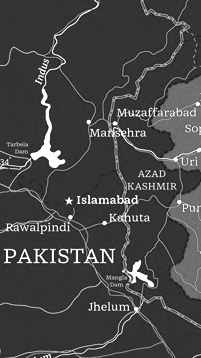 Barbara Bigosinska received her master degree in Graphic Design at the Academy of Fine Arts in Katowice, Poland. In 2013, she graduated from the
  Original fonts by Polishman Bartek Nowak (aka Barme, b. 1973) made in 2000-2001: BukwaNormal (Cyrillic), Nokian (pixel font), Passja, Xar, BarmeReczny, Elementarz (orthographic writing for kids) [see also
  Or Bart Wesolek, b. 1986. Nowa Sol / Poznan, Poland-based graphic designer, who published the vintage typeface Rheiborn, the display typeface Onufry (based on lettering on vintage cycling posters), the poster typeface Molheim, the letterpress typeface Darmond, the squarish Garthram, the vintage typeface Martslock, the
  Founder of illcatDZN.com in Lodz, Poland, in 2004. Creator of the
  [
[ [
[ [
[ Blast Foundry (The Netherlands and Poland) was set up in 2021 by Barbara Bigosinska, Rafa Buchner and Diana Ovezea.
  [
[ Polish type designer, b. 1936. Designer at Mecanorma of
  Borutta (or Duce Type) is the creative studio of über-talented Warsaw-based designer Mateusz Machalski (b. 1989), a graduate of Wydziale Grafiki ASP in 2014, and of Warsaw Academy of Fine Arts. His oeuvre is simply irresistible, charming and a worthy representative of the Polish poster style---witness Alergia (2016), Magiel Pro (2017) and Madiso (2017).
  Graphic and web designer in Boston who studied at Hampshire College 2006-2007). He wrote the
  Warsaw-based type foundry set up by Michal Jarocinski (who also founded Dada Studio), with initial participation of Mateusz Machalski (Borutta, Duce Type), Maciej Wloczewski (Picador) and Ludka Niezgoda. They offer revivals and high quality novelty typefaces, often related to or flowing from Polish typographic heritage. As of 2018, their fonts include:
  Cuda Wianki graphic design studio in Warsaw, Poland, was founded by Aleksandra Dabniak (or: Ola Debniak) and Paulina Rek, two graduates from the Warsaw Academy of Fine Arts.
  Dada Studio (Babice Nowe, Poland) is run by Michal Jarocinski (b. 1980, Warsaw). In 2017 or 2018, he founded
  Graphic designer and fine artist in Cieszyn, Poland. His only connection thus far to type design is the creation of ten circular-grid based numerals, called
 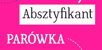 Designer and illustrator in Zabrze, Poland, who created the slab serif typeface Verticana in 2014 for a school project. [
 During her studies in Poznan, Poland, Diana Dobrut created Liszka (2014, a calligraphic script typeface), Hot Pepper (2014), and Snow Fat (2014, a creamy script). [
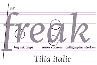 Wroclaw, Poland-based type designer, who joined
  Polish designer of Heneczek Pro (2018), a didone family that was published by Wroclaw-based Three Dots Type. They wrote: Named after Teodor Heneczek, Silesian printer and publisher who started out the first Polish-language printing house in Upper Silesia (XIX century). Heneczek was ordered by the Municipal Public Library in Piekary Slaskie to commemorate the 200-th birthday of Teodor Heneczek. An extended and upgraded version of Heneczek called Heneczek Pro was designed for display purposes and text-heavy documents. Heneczek features a great set of arrows and pointers. [
 Polish designer at FontStruct in 2008 of Le Chat Sans (inspired by a 1930s poster), Tetromino, Diamond, Alpha Spot, Ossicles (like ECG output), Cubistic1, Peter's Chess Pieces. In 2009, he added the artistic BO86. [
 Graphic designer in Warsaw, Poland, who created the cosmic family Solanum (2019) and deco typeface
  Polish graphic designer who created the octagonal experimental font
 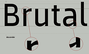 Polish designer of the sans typeface
  Warsaw-based graphic designer, who created the
  Krakow, Poland-based designer of Dream Letters (2018). [
 [
[ Fernando Forero (b. 1978, Tunja) ran EisartGraphic.com together with Weronika Kwiatkowska, and moved from Bogota to Kalisz, Wielkopolska, Poland, where he
  Polish designer of the free font Makkabi (2020), as part of the
  Katowice, Poland-based designer of the art deco / arts and crafts typeface atlantis (2016). [
 Marta Podkowińska is the Polish designer of a few great type logos such as Bomba (2009). She also made the exquisite
  During his studies in Warsaw, Poland, Mikolaj Grabowski designed the interesting stackable typeface family
  FontArte (est. 2004; ex: Magdart Fonts) is
  Zimna Wodka / Lublin, Poland-based designer of the
  Grzegorz Klimczewski, who runs Fonty PL, a commercial Polish foundry etablished in 1994 in Wroclaw, is the Polish designer of a commercial font that mimics the letters found on Polish traffic signs, called Tablica Drogowa (
 Polish type designer who teaches graphic design at the Secondary Art School in Bydgoszcz. Second prize at the 3rd International Digital Type Design Contest by Linotype Library for the handwriting fonts
  Poznan, Poland-based designer of the energetic cartoon fonts Straightforward (2018) and Fonkey (2018). [
 Lukasz and Wojciech Bachur are the Szczecin, Poland-based designers of
  Aka Grzegorz Luk and just Gluk, Grzegorz Luksza is a Polish type designer (b. 1973) who specializes in ultra-decorative and experimental typefaces.
  Graphic designer in Krakow (was: Warsaw), Poland, who specializes in vintage design elements. Their typefaces include the tweetware weathered / rustic font Black Willow (2016) and the free rough rounded sans Quickens (2018). In 2019, they released the great free vintage engraved money (or old map) font Vaderlands which is based on an original in a Dutch book dated 1781. [
 A group of independent designers from Poland, heade by Bartek Nowak, and located in Staromiejska. Nowak has been designing typefaces since ca. 2000. Typefaces:
 [
[ [
[ Warsaw, Poland-based creator of the fat brush ink typeface Grubylis (2010-2012).
 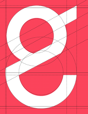 Wejherowo, Poland-based designer of the hipster sans typeface Edge (2019). [
 Children's book illustrators
  Polish foundry of Szymon Celej, located in Warsaw. Celej is a graduate of the Polish-Japanese Institute of Information Technology (New Media Art Department). Typefaces:
  Defunct Polish type foundry. In 1931, it published a slight modification of Futura called Paneuropa. The latter typeface was revived in 2017 by Roch Modrzejewski as
  Polish designer of decorative graphic elements selected from advertisements and classified ads, from the magazines "Teatr i Zycie Wytworne" and "Swiatowid", as part of the
 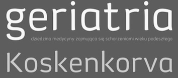 Polish print, graphic and type designer who lives in Poznan. She was inspired by Polish embroidery in her design of
  Poznan, Poland-based graphic and type designer, b. Sulechow, 1983.
  Poznan,Poland-based designer of Rock Font (2014, a spurred Victorian set of caps), and a
  [
[ Jimi-neko is a collaboration of Anton Drachuk and Jadwiga Krym offering expertise in various disciplines, such as graphic design, film-making, typography, lettering, print design, street-wear design, advertisement as well as corporate identity design and user experience design. It is located in Poznan, Poland.
  Kapitan Studio was Joanna Rzezak and Piotr Karski. Based in Warsaw, they design books, typefaces and magazines. Their typefaces included
  Warsaw, Poland, and now Paris, France-based designer of the hand-drawn typeface Delirium (2014) and of the vintage handlettered typeface Franek Type (2015).
  Polish graphic and type designer who started her own type foundry in 2014. Typefaces:
  Warsaw, Poland-based graphic designer. Creator of the
  [
[ Kamil Kurzajewski is an independent Art Director. In 2008 he obtained an MA in typography from the Academy of Fine Arts in Poznan. He lives in Poznan (Poland) and specializes in visual communication, typeface and graphic design. He created the slabby typewriter typeface
  Poznan, Poland-based designer of the
  Polish / American designer who writes: Karolina Lach is a graphic designer, web designer and typographer residing in New York. She currently works as the Senior Designer for Kiwibox Media, a social network and online magazine for teens. A graduate of The Cooper Union for the Advancement of Science and Art, she has studied under Mike Essl, Emily Oberman, James Craig, Maxim Zhukov and Hannes Famira. Graduate from the type design program at the
  During his studies at the Academy of Fine Arts in Katowice, Poland, in 2016, Krakow-based Kinga Gazda designed the text typeface Meander. [
 Kiosk is a group of students from various departments of the Academy of Gorgeous Arts in Warsaw and Poznan, Poland. In 2013, Kiosk published the stylish display typeface
  During her studies at Academy of Fine Arts in Warsaw and Universität der Künste in Berlin in 2014, Klaudia Krynicka set up her own type foundry. She graduated in 2015 and is working now in Berlin.
  [
[ Konrad Moszynski (MuchaDSGN, Ostrow Wielkopolski, Poland) created the Greek simulation typeface family
  [
[ Lodz, Poland-based poster artist, b. 1985. Many of his remarkable posters have a strong typographic component. [
 Laic is the type foundry founded in 2018 by Warsaw, Poland-based type designer Maciej Polczynski. His typefaces:
  Blogger, web/graphic Designer, and new media art student in Warsaw, Poland. She created the beautiful blackboard bold typeface
  Wroclaw, Poland-based designer of the circle-themed typeface Scalpel (2019). [
 The free package lmmath, or Latin Modern Math, is a math companion for the Latin Modern family of fonts (see
  Sebastien Sanfilippo founded Love Letters in Brussels, Belgium, under the motto Single-handedly drawing letters for world peace. He designed these open source typefaces:
  During his studies in Gdansk, Poland, Lu Caulfield created the experimental display typeface El Fabet (2014). [
 Type foundry set up in Sieradz, Poland in 2013 by Ewa Lubiarz. Creator of a potato stamp typeface family simply called
  Letter and type designer in Warsaw. In 2016, during her studies at Warsaw Academy of Fine Arts, and as part of
  [
[ [
[ Jastrzebie Zdroj, Poland-based designer of the typographic
  [
[ Kielce, Poland-based designer of the trainline-inspired display typeface Trainline (2016) and the grid-based stencil typeface Milano (2016). [
 Polish designer of the fun cat dingbat typeface
  Wroclaw, Poland-based designer of these typefaces in or just before 2016:
  [
[ Polish graphic designer, b. 1986, based in Nisza and Gliwice, Poland, aka Rym do\0Swierczek. Creator of the free fonts
  [
[ Graduate of the Academy of Fine Arts in Warsaw, class of 2008. During a summer course called
  Graphic designer and illustrator in Krakow, Poland, who created these fonts in 2017: Branta Serif, Antoni (informal sans style). [
 Polish graphic designer in Krakow, b. 1976. Creator of the funky typeface
  [
[ Poznan-based designer of
  During his studies in Poznan, Poland, Zolowsky designed the alchemic typeface
  Polish designer of Drogowskaz (1975) for the Ministry of Transportation of Poland. This geometric sans-serif typeface is used in public signage in Poland since 1975. Its capital letters exhibit a strong influence from Johnston, while its lowercase letters are closer to Spartan. See also
  Poznan, Poland-based designer of the script typeface Goplanka (2018). [
 [
[ Polish graphic designer.
 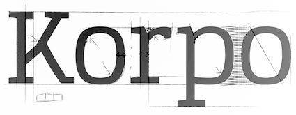 [
[
 Painter and graphic designer born in 1881 in Bunzlau (today Boleslawiec, Poland), he died in 1975. Read about him in Albrecht A. Gribl's book Max Hertwig (1881--1975): Zeichner Grafiker Maler in Düsseldorf, Hannover, Berlin und Dorfen.
  Graphic and type designer in Warsaw, Poland. During his studies at the Polish Japanese Institute of Information Technology and the Helsinki at School of Arts, Design and Architecture of Aalto University, Max created Skunky Sans (2014). [
 Polish designer of the irregular and scary Spider Bite (2009). [
 Magdalena Boffito (Mezzo Mezzo) studied at the Graphic Arts Department at the Warsaw Academy of Fine Arts, class of 2003. In 2006 she studied at the Turin Academy of Fine Arts.
  [
[ [
[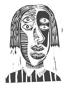 Graduate of the University of Lodz, Poland, in 2011 and Robert Gordon University in the UK, class of 2015. She is currently based in Mannheim, Germany. Her typefaces:
  Michal Nowak (b. 1994, aka Neoqueto) is the Koszalin, Poland-based designer who used FontStruct in 2009 to make the horizontal stripe typeface Mastercore (+Laddered),
  Krakow, Poland-based designer of the art deco typeface Mehlyzna (2018). [
 During her graphic design studies at PJWSTK in Warsaw, Poland, Kaja Slojewska created Bubble Alphabet (2014) and Tilton (2014, a headline all caps sans typeface).
  During her graphic design studies at the Academy of Fine Arts in Warsaw, Ola Szczepaniak created Manera (2021), a bold headline display typeface. [
 Polish designer of the balanced text typeface Zygoma (2014), which was developed at
  Kielce, Poland-based type designer who was born in 1971 in Kielce. Since 2010 he has been working as a freelance graphic and type designer. He created these typefaces:
  During his studies at Academy of Fine Arts in Gdansk, Poland, Pawel Schulz (based in Rumia, Poland) designed the display typeface Wooden Pallet (2016). At
  Born in Stargard, Pomerania, in 1940, Peter Karow studied physics at the University of Hamburg. After receiving his PhD in 1971, he co-founded the company URW Software & Type GmbH in Hamburg (URW stands for Unternehmensberatung Rubow Weber, after the first two of the founders, Rubow and Weber [Karow being the third one], and was succeeded by URW++). Peter Karow was the technical director at URW. In 1975, his Ikarus (typography software) was introduced to members of Association Typographique Internationale in Warsaw. Afterwards, Ikarus was used all over the world for the digitization of fonts. Between 1975 and 1995, URW digitized a large number of fonts for companies such as IBM, Siemens, Microsoft, Apple Inc., Adobe, Linotype, Monotype, Rudolf Hell and numerous Japanese companies.
  Polish design student who made the rhombic typeface
  Warsaw, Poland-based type designer who studied at Warsaw Academy of Fine Arts. His company is called Picador Studio. Some of his typefaces are also available from the new Polish type foundry
  Cracow, Poland-based designer of the
 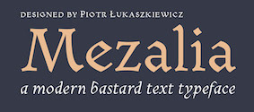 [
[ Powazne is a Polish type foundry, est. 2014, by Malgorzata Frackiewicz. Malgorzata created the dingbat fonts
  Radek Lukasiewicz studied printmaking at Nicolaus Copernicus University in Poland. He worked as a graphic designer and type designer in London. In 2019 he moved to Reading to study for an MA in Typeface Design, and graduated there
  Web and graphic designer from Poznan, Poland. Creator of the typeface
  Graduate of Warsaw Academy of Fine Arts. Type designer for Tygodnik Powszechny weekly magazine, History Meeting House and others. In 2016, as part of
  Szczecin, Poland-based designer of the minimalist cosmic display typeface Iota Persei (2015). [
 Type, lettering, information architecture and user experience designer, who studied at Poznan Fine Arts University and Adam Mickiewicz University. He is currently teaching at Poznan Fine Arts University.
  [
[ Roch Modrzejewski (ROHH, Krakow, Poland) established ROHH in 2015. That same year, he published the organic script typeface
 Sebastian Cabaj (or: Pan Cabaj) studied graphic design at the Academy of Fine Arts in Warsaw, where he now works as a graphic and type designer, and runs Kometa Studio. In 2012, he set up the Sebastian Cabaj Foundry via MyFonts.
  [
[ Silesiana 2006 is a project that involves a typeface designed in Poland after World War II. Supported by the government of Silesia (Poland), the (re)creators are Artur Frankowski (Warsaw), a type designer from the digital era, and Henryk Sakwerda (Katowice), a pre-digital typographer and calligrapher. The result is a gorgeous calligraphic typeface. To celebrate this, a free (!) conference was held on November 15, 2006, at The Castle of Enterprise and Art in Cieszyn and The Silesian Library in Katowice. Speakers include Artur Frankowski, Gerry Leonidas, Verena Gerlach and Filip Blazek. See also
  Graphic designer in Prague and Katowice, Poland.
  Polish
  Stolat Studio is a Warsaw-based creative agency founded by Michal Janica, Igor Kubik and Ania WielunDska. Irt specializes in branding, communication design, strategy and typography. Type designer Anna Wielunska (b. 1992) is based in Warsaw, and studied at the Warsaw Academy of Fine Arts. She created Musso (2016), a remarkable brushy vernacular script typeface that is loaded with alternates to emulate real handwriting. Since about 2010, there has been an explosion of brushy typefaces, but even in this crowded field, Musso stands out. Later in 2016, Ania Wielunska and Mateusz Machalski co-designed the weathered typeface family
  Type foundry in Warsaw, Poland, run by Krużyńska. It published the caps typeface
  Maciej Blazniak (Studio Ladne Halo, Lodz, Poland) is a graphic designer and illustrator. In 2015, he designed the fat art deco typeface Miasto.
 Szymon Sznajder (b. 1977) graduated from the Poznan University of Arts. He currently works as a typographer and font and book designer in Poznan, Poland and occasionally teaches at the Poznan University of Arts. He runs or ran Typolis.
  Temeshi is the Polish designer of a neat curly-jazzy logotype called
  [
[
 Warsaw-based designer of the calligraphic typeface Fontino (2012). [
 TYPO, or Sign and Typography Studio in English, was founded by Krzysztof Kochnowicz, b. 1955. Kochnowicz started teaching in 1989 at the State College of Fine Arts (now Academy of Fine Arts) in Poznan, Poland. His typefaces include
  Blazej Ostoja Lniski (b. 1974, Czersk, Poland) specializes in painting and lithography. From 1994 until 1999, he studied at the Warsaw Academy of Fine Arts. Currently, he is the Dean of the Faculty of Graphic Arts at he Warsaw Academy of Fine Arts. He founded the type foundry Typoforge.
  Typoland is the Warsaw-based foundry of Lukasz Dziedzic (b. 1967, Warsaw), est. 2014. Before that commercial venture, he was mostly creating free typefaces or commercial typefaces through FontShop / FontFont. Quoting
  Konrad "Koxu" Lukasiak (Warsaw, Poland) designed the angular typeface family Barcelona in 2019. It was inspired by the shapes found in the famous Sagrada Familia church. It was published as a retail font under the new name
  Freelance graphic and type designer in Poznan, Poland. Shee came from Crimea (Ukraine) but currently lives in Poznan, Poland. She obtained an MA in Graphic Design (Type Design) from the Academy of Fine Arts in Poznan in 2010. Since 2010 she teaches at the Sign and Typography Studio of the University of Arts in Poznan.
  [
[ Polish designer of
  Warsaw, Poland-based co-designer, with Lesha Pushkarev, of the
  Polish designer of the thin upright script typeface Mila (2016) and the sans typefaces Friday (2016), N78 Thin (2016) and Exmila (2016).
  Polish designer, b. Poznan, 1939. In 2012, Polish designer Wojciech Freudenreich and Mateusz Machalski combined forces to design the techno typeface
 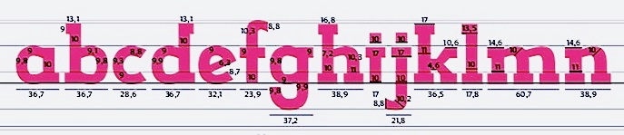 Wroclaw, Poland-based designer of the slab serif typeface Bastard (2014; a school project together with Rui Pinto and Mauro Pedrosa at IPCA; based on Dino dos Santos's Leitura Sans Grot 2), and Wroclaw Public Transport Pictograms (2015). [
 Graphic designer in Warsaw, Poland. During her graphic design studies at Poznan Fine Arts University, she created the brush script typeface
  Polish type designer, b. Torun, 1914, d. 2001. He worked as graphic designer and production manager at Thorner Grafikwerken, Creator of
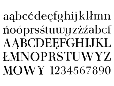
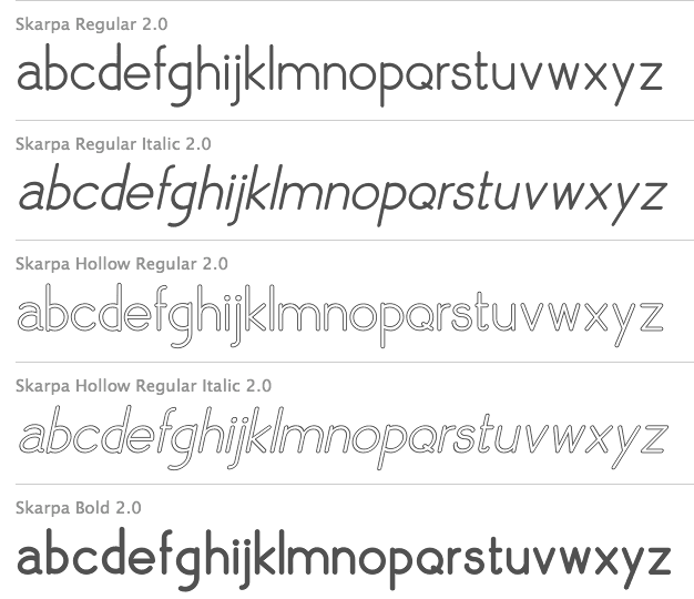
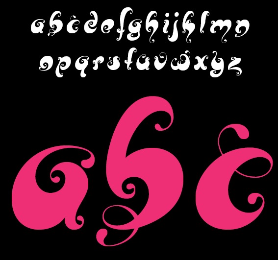
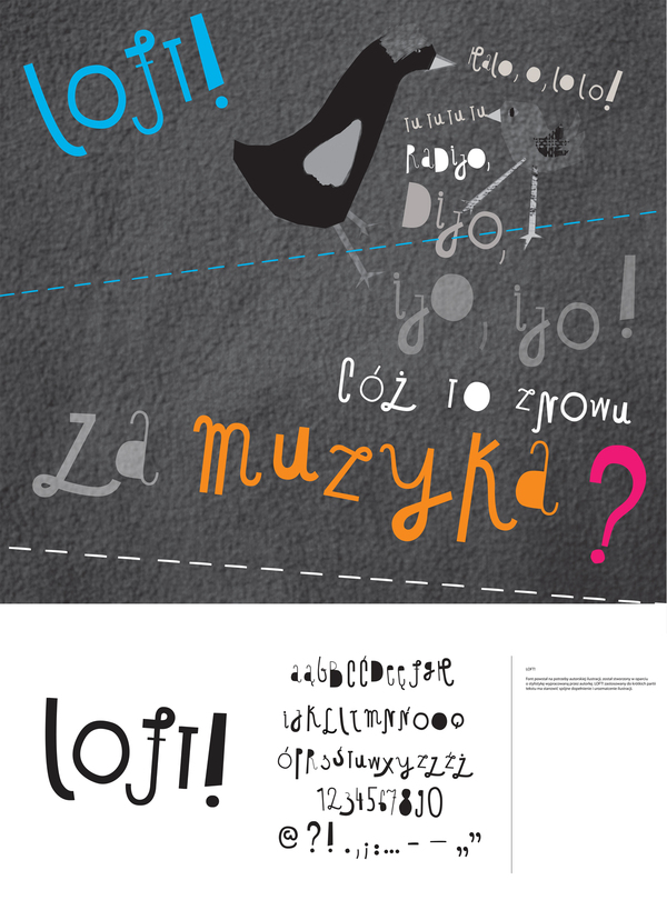
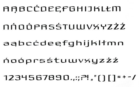
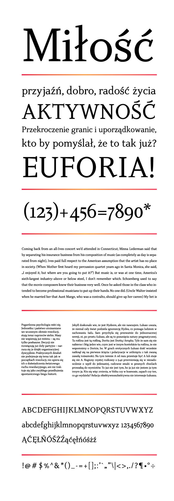
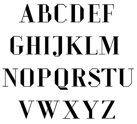
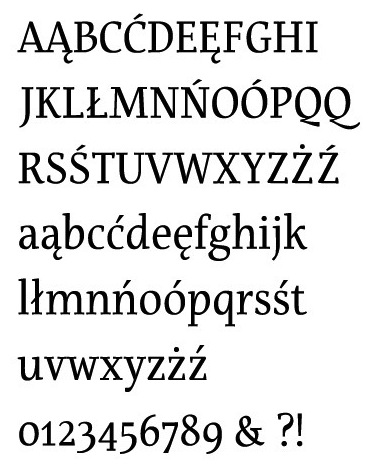
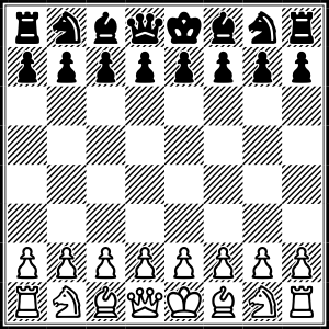
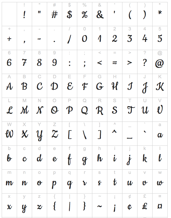
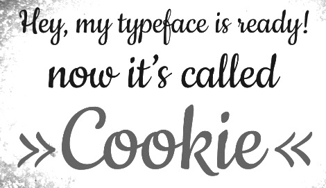
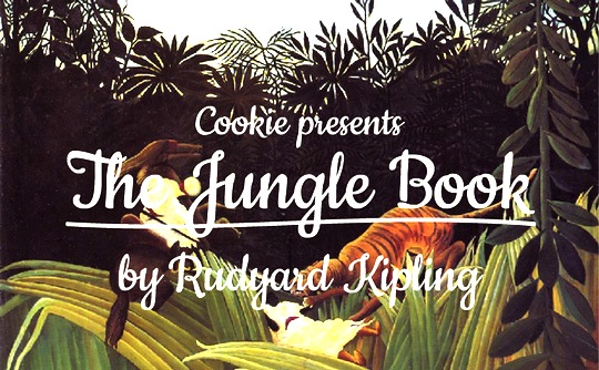
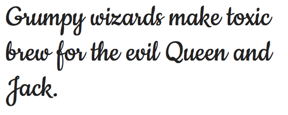
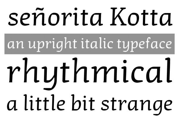
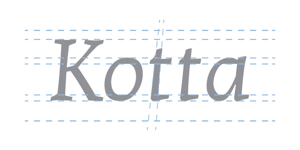
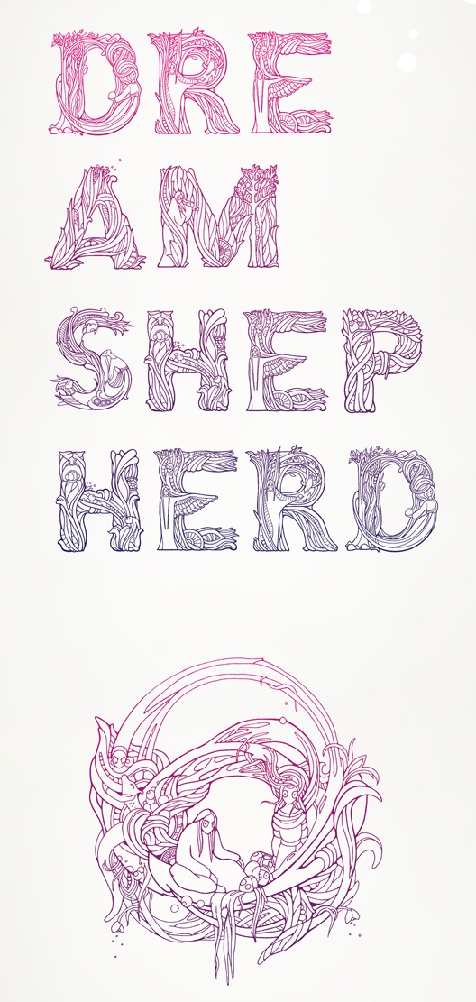
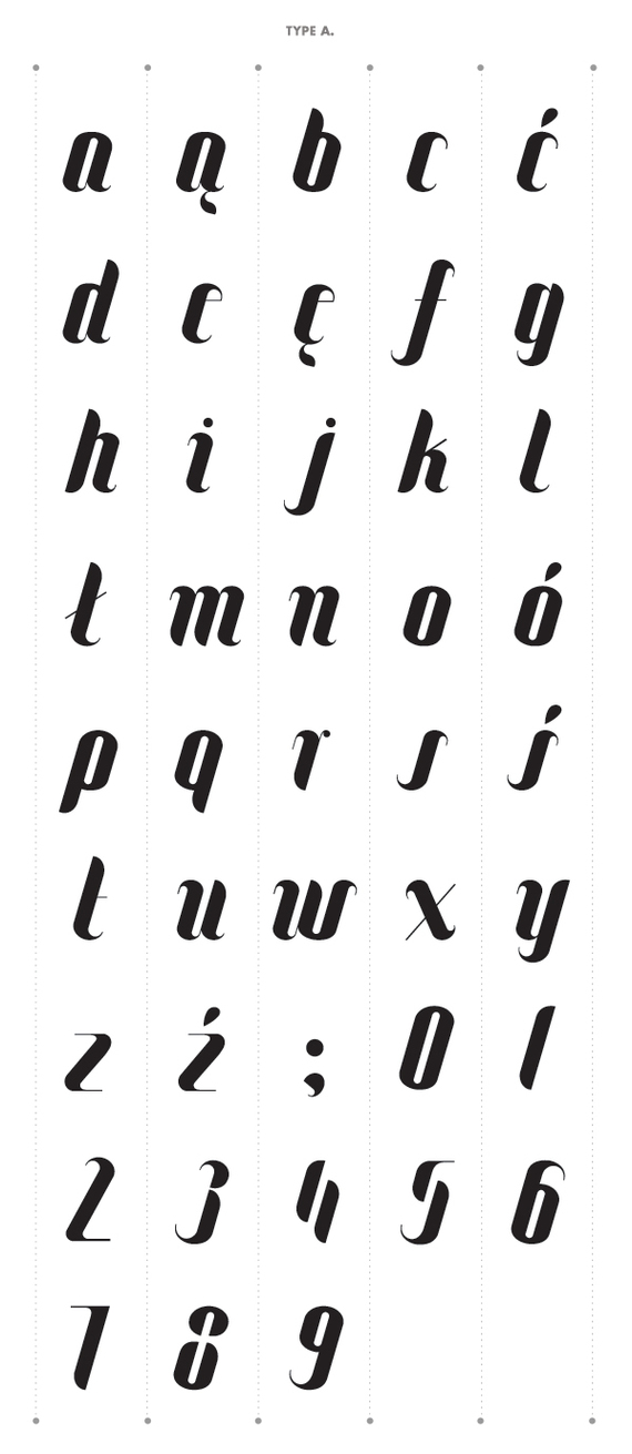
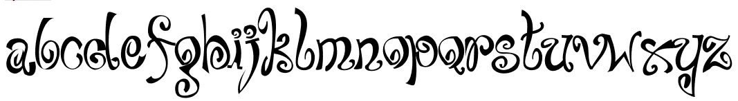
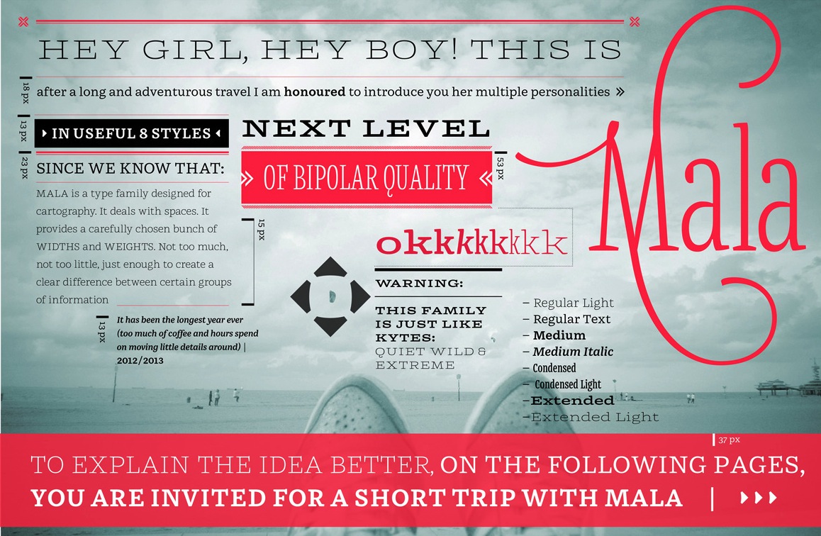
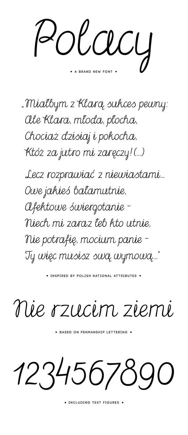
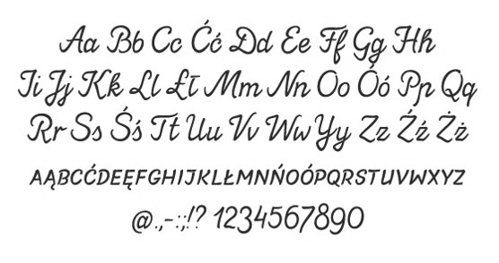
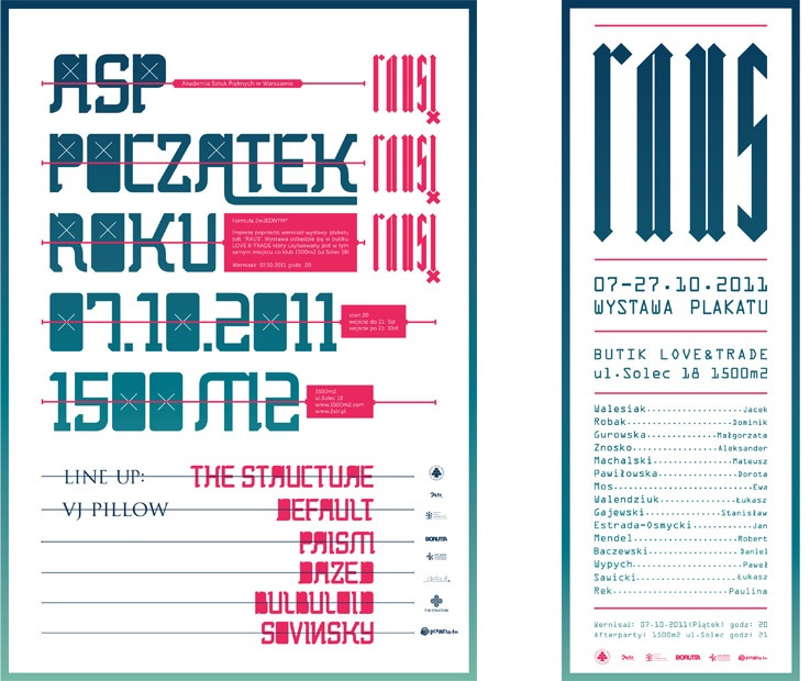
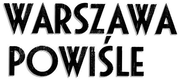
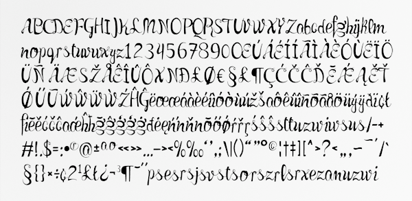
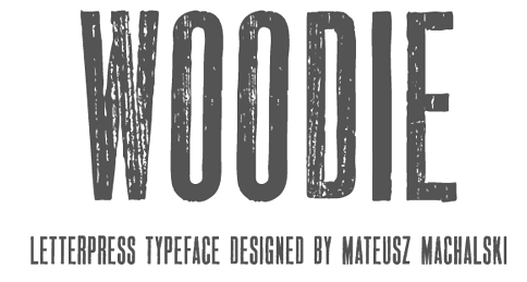
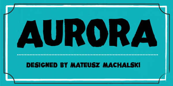
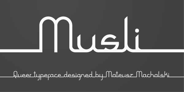
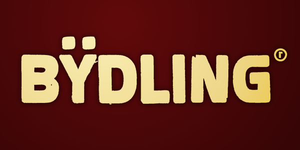
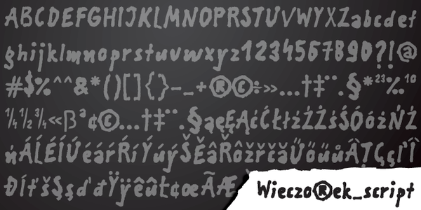
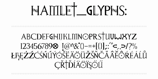
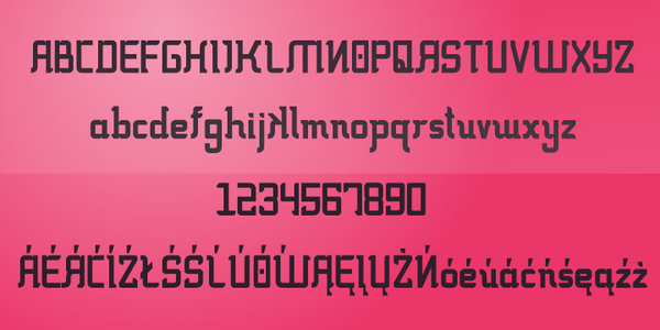
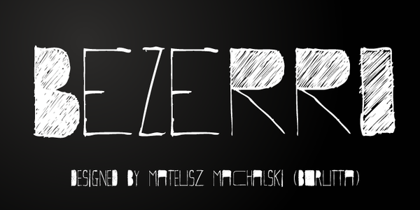
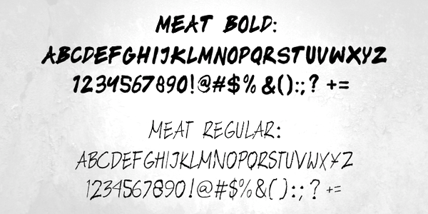
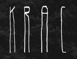
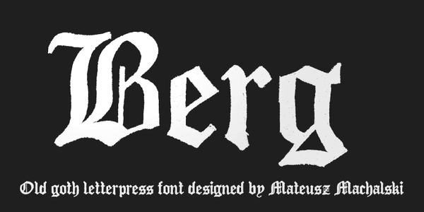
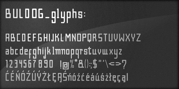
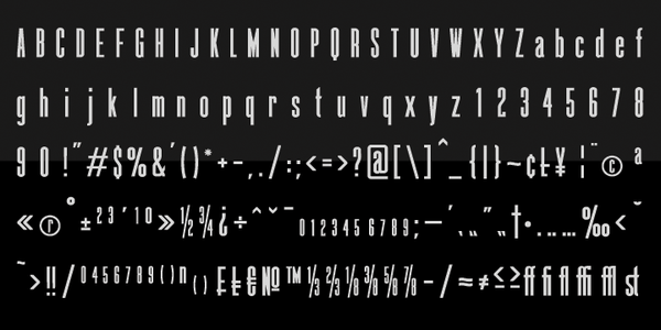
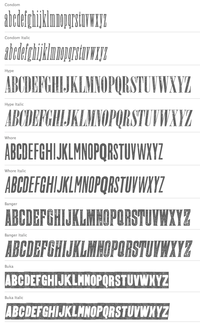
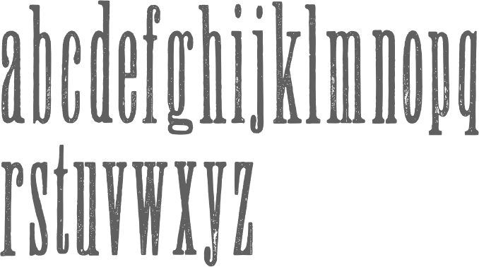
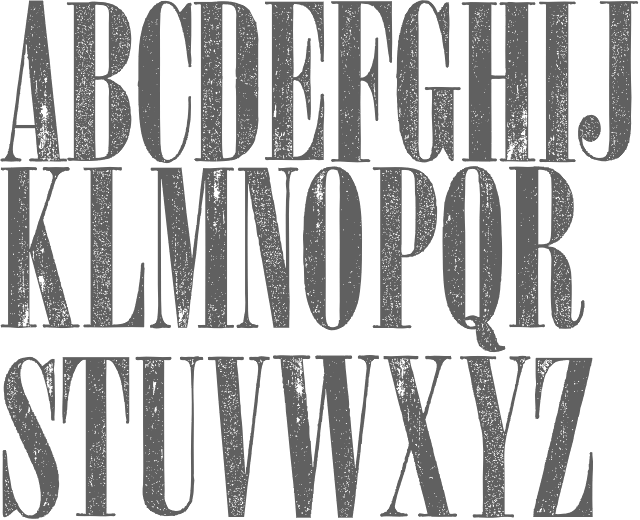
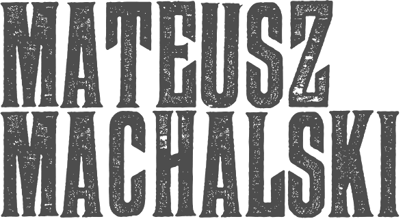
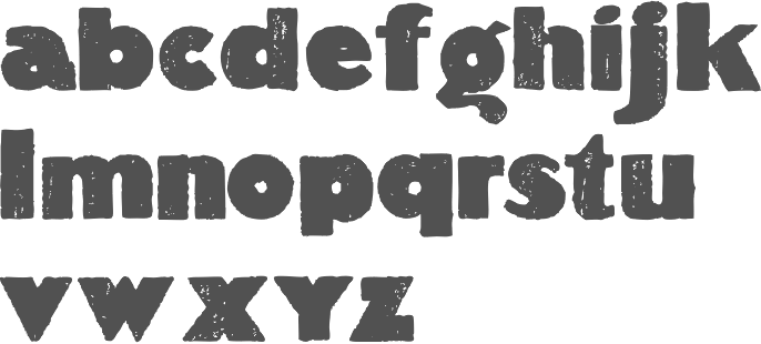
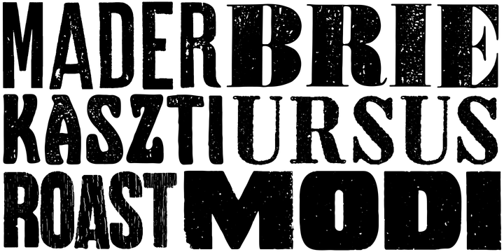
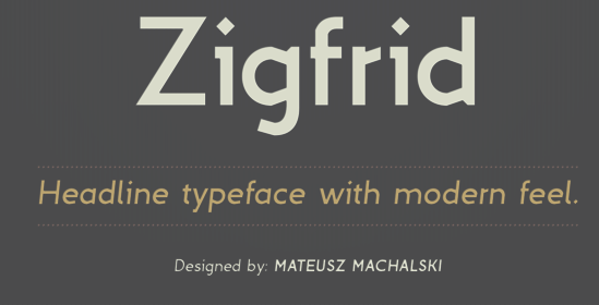
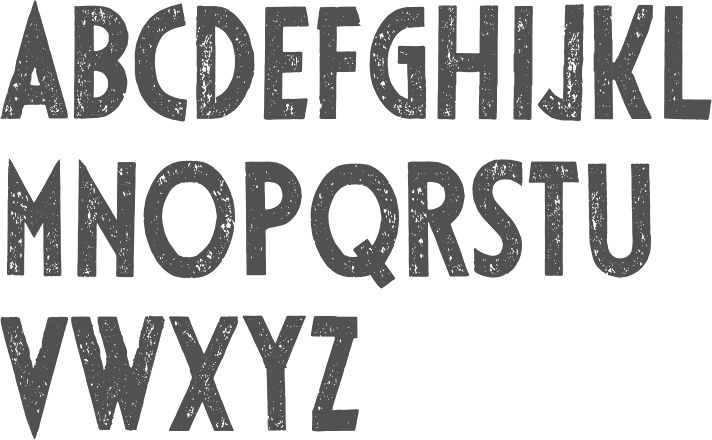
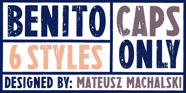
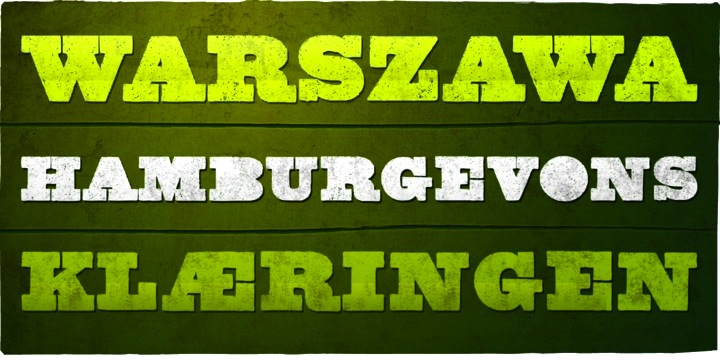
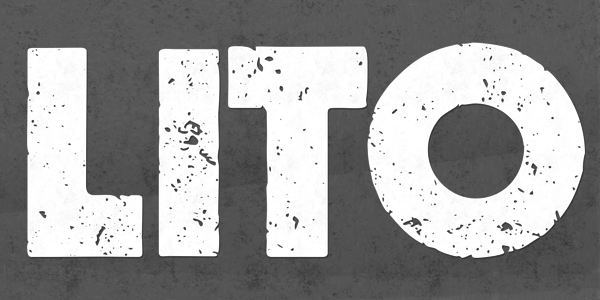
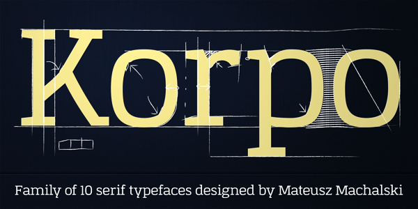
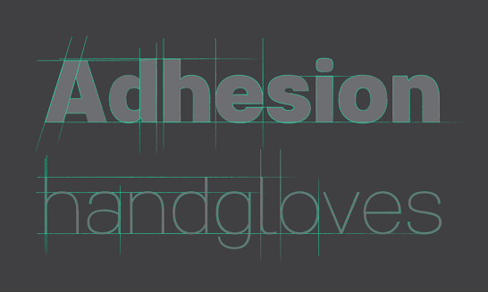
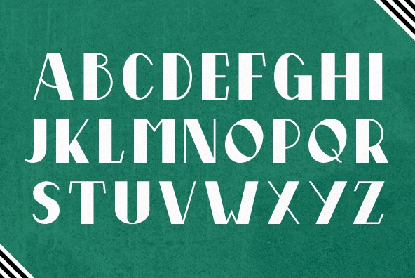
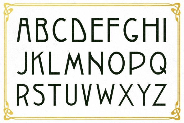
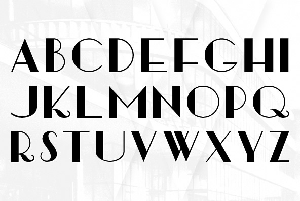
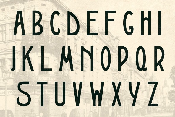
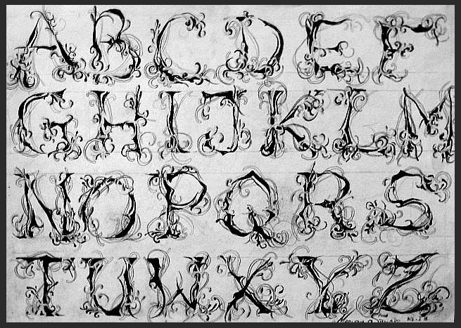
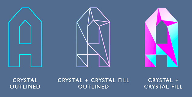
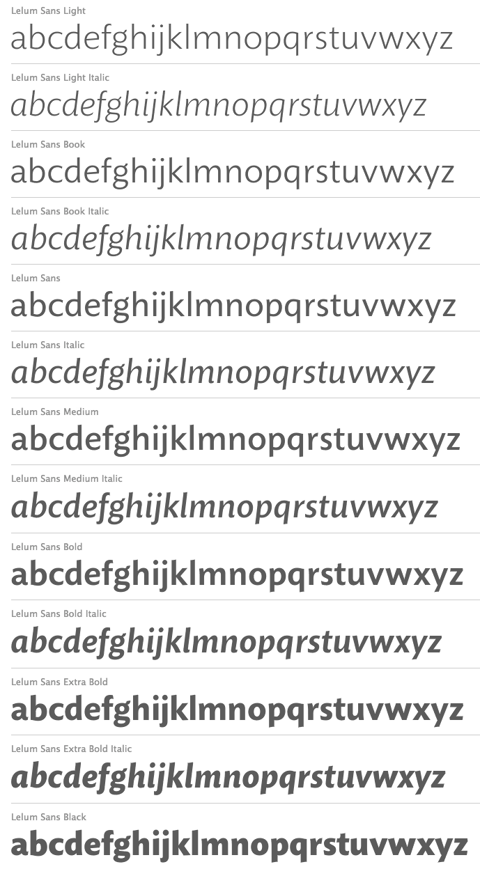
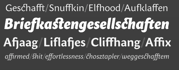
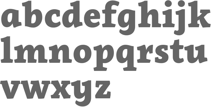
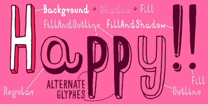
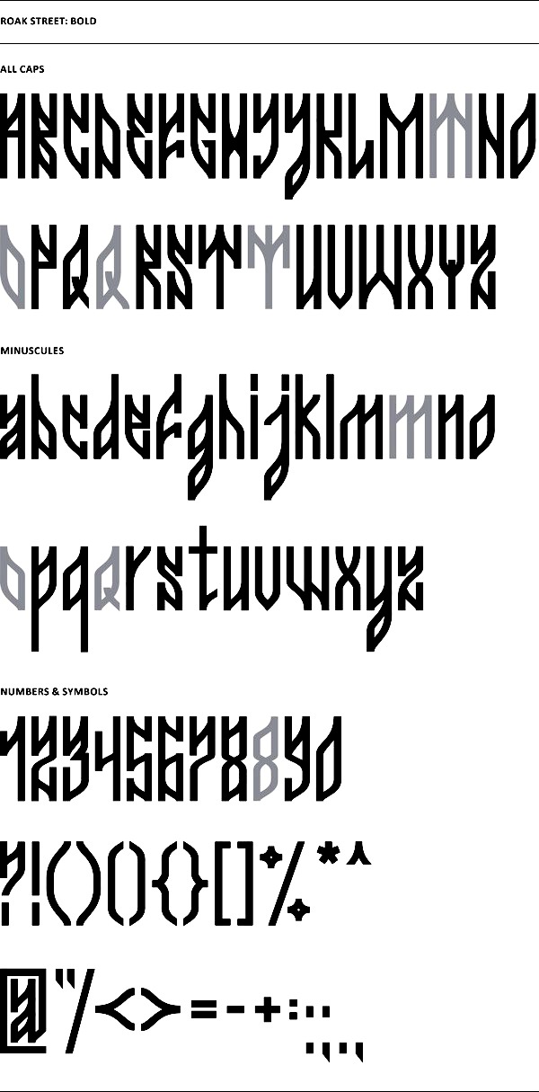
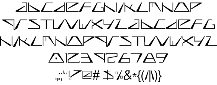
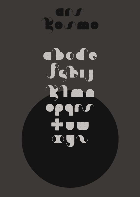
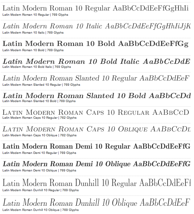
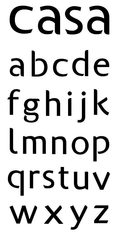
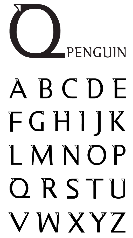
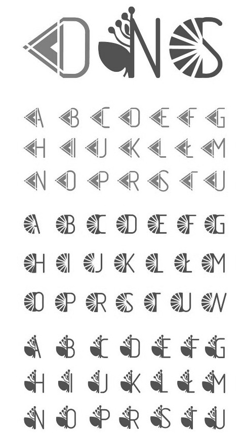
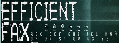
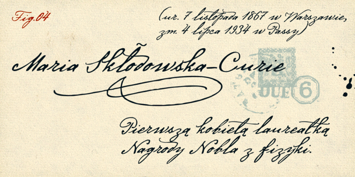
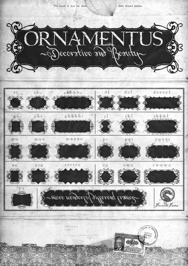
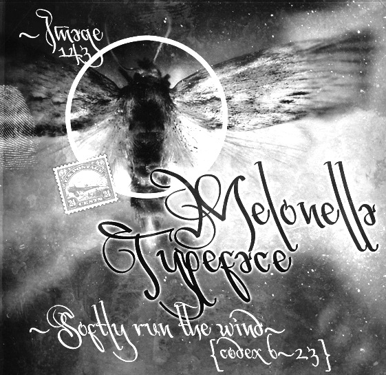
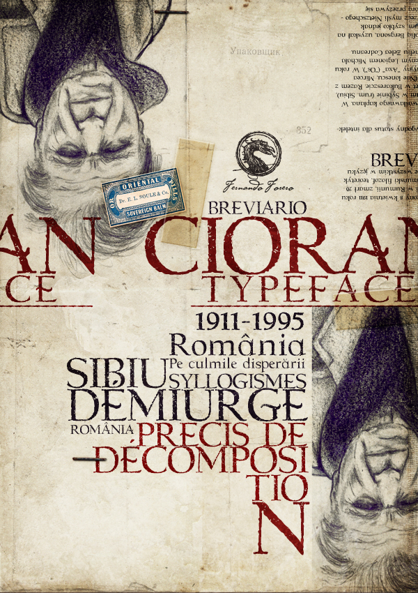
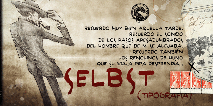
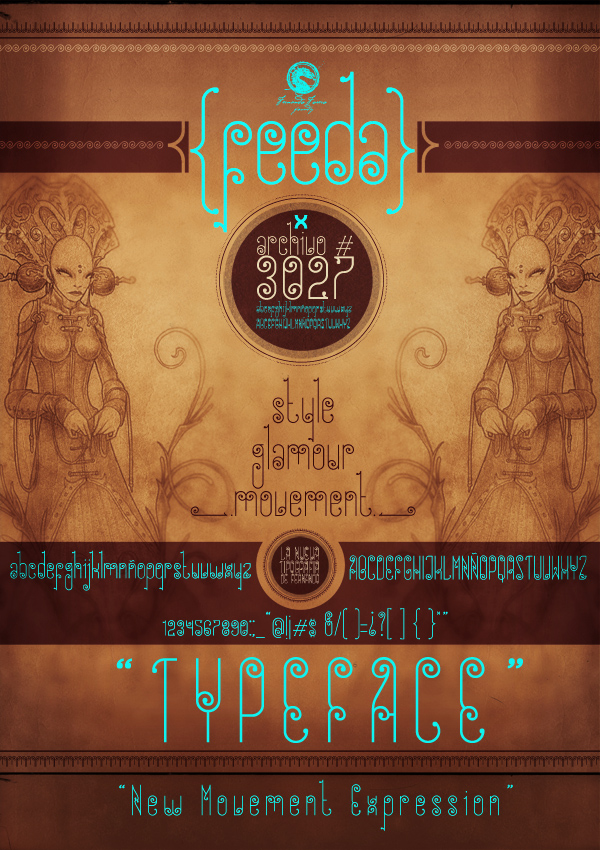
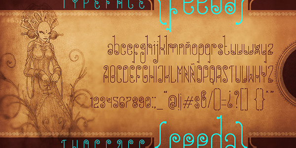
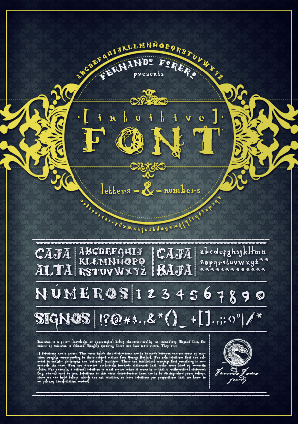
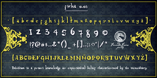
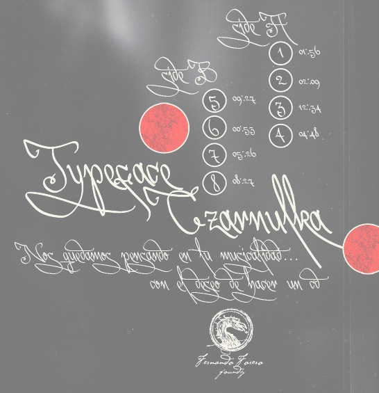
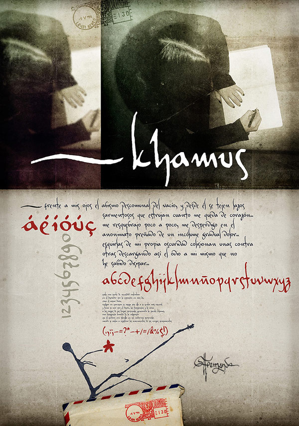
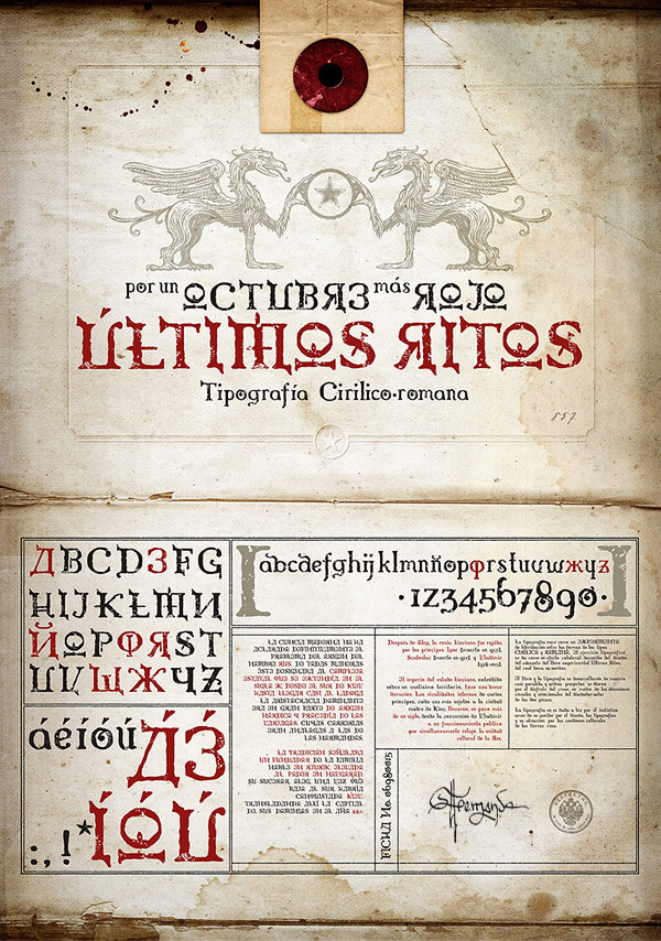
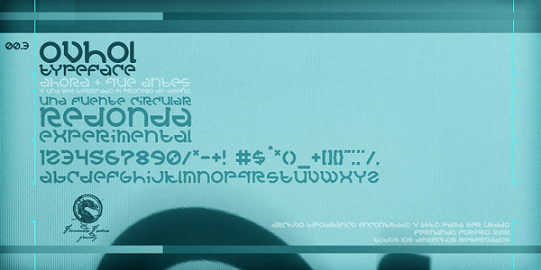
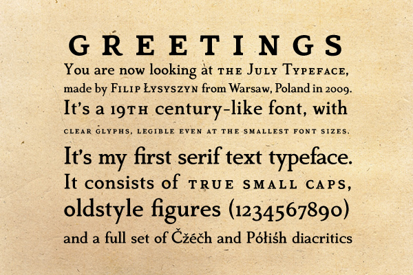
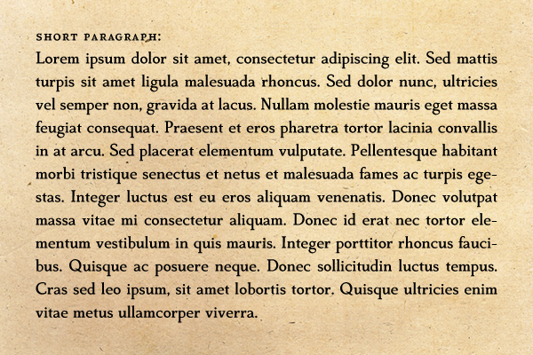
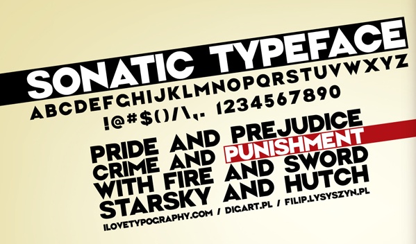
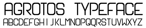
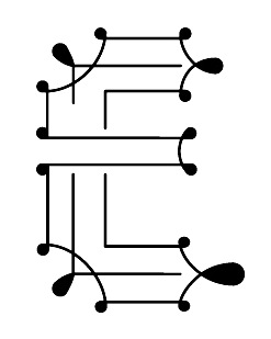
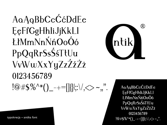
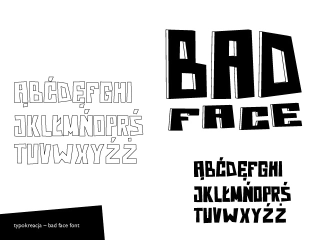
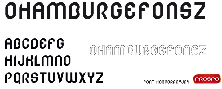
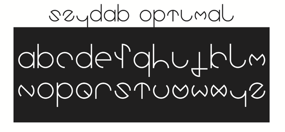
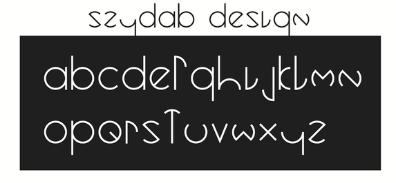
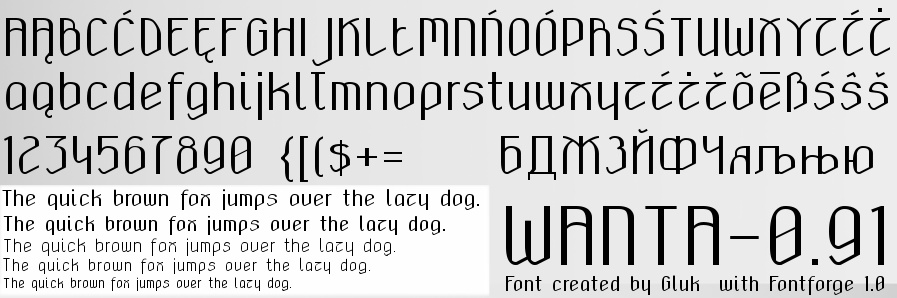
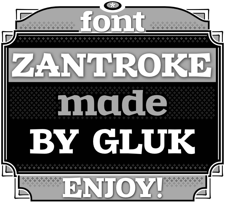
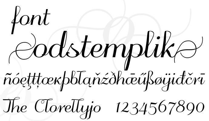
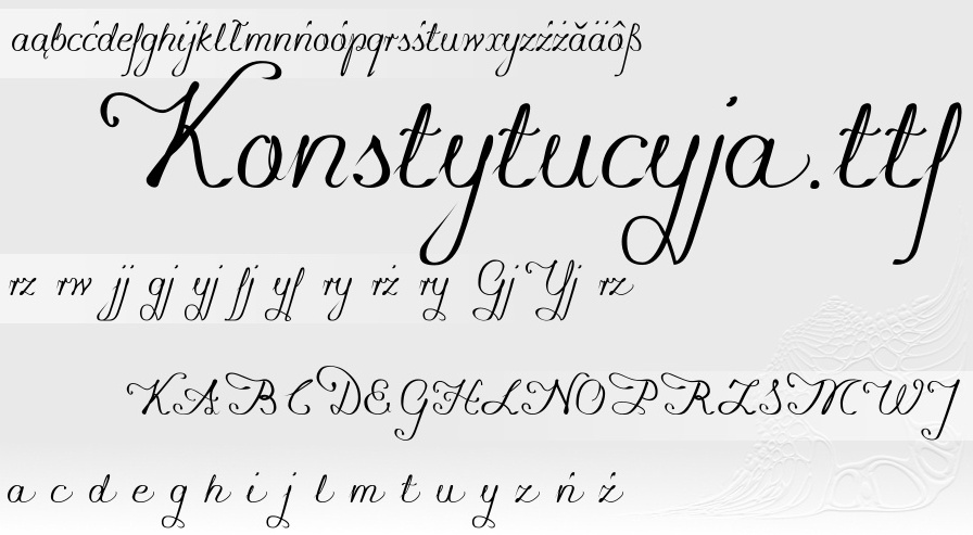
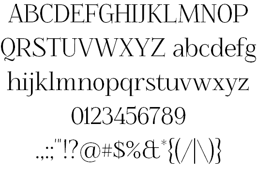
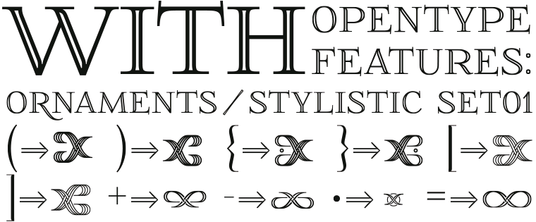
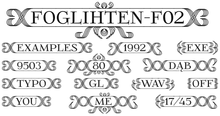
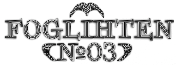
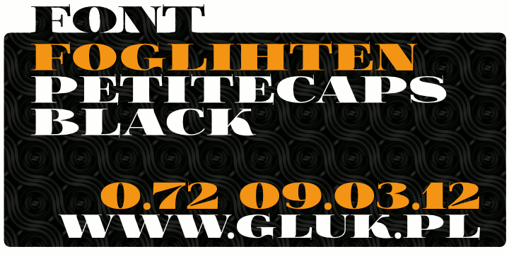
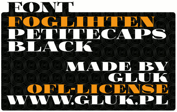
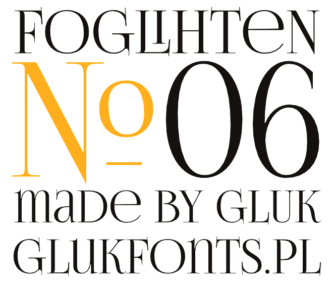
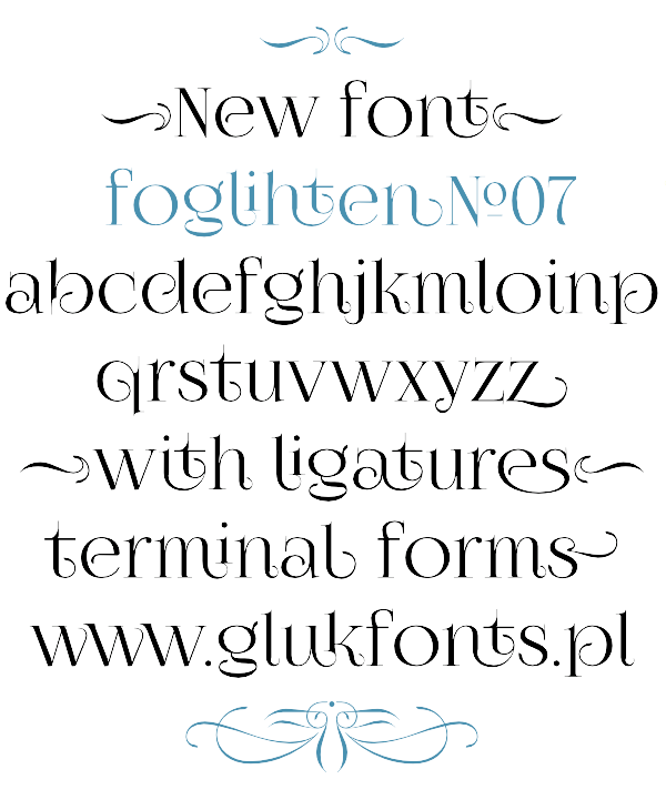
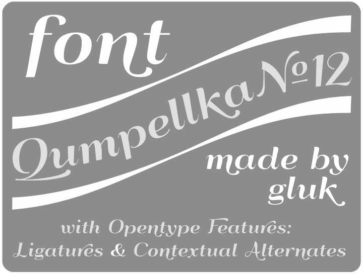
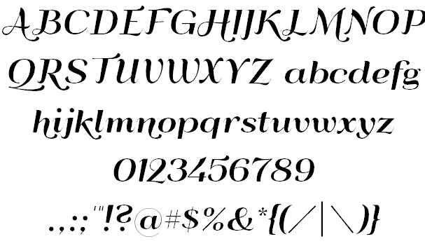
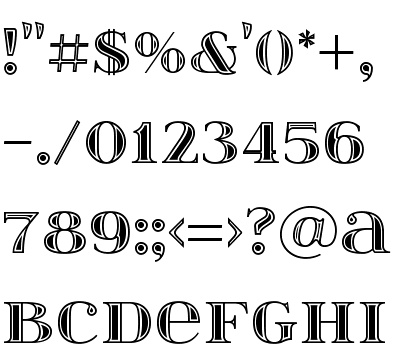
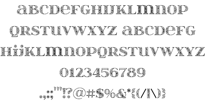
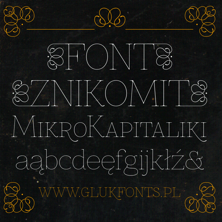
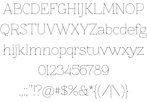
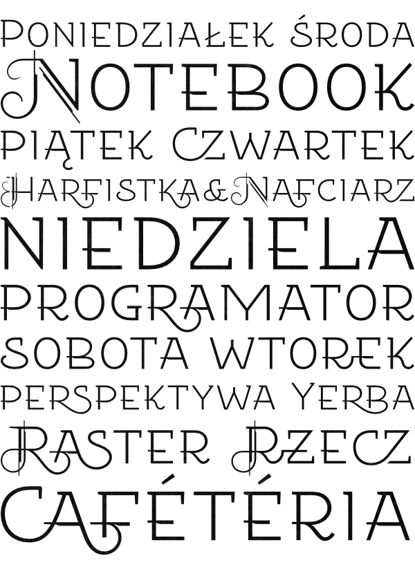
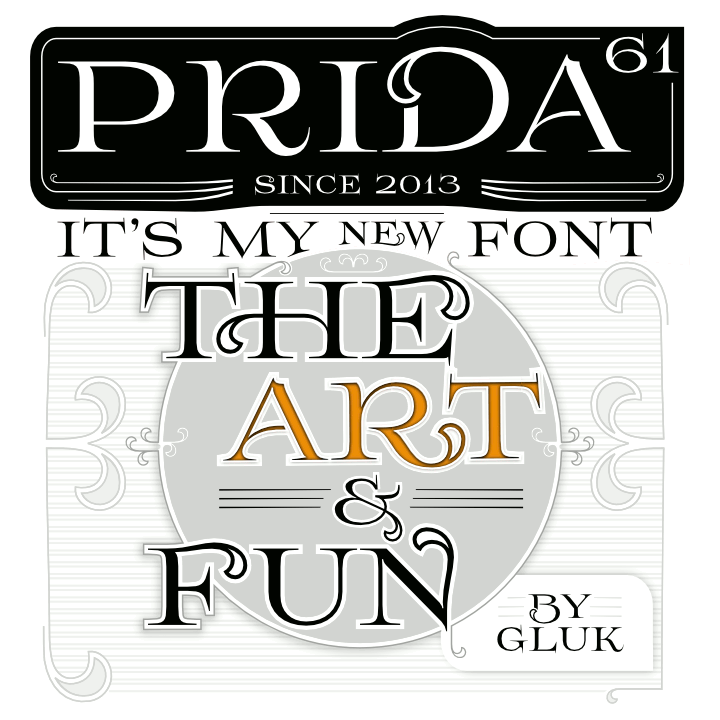
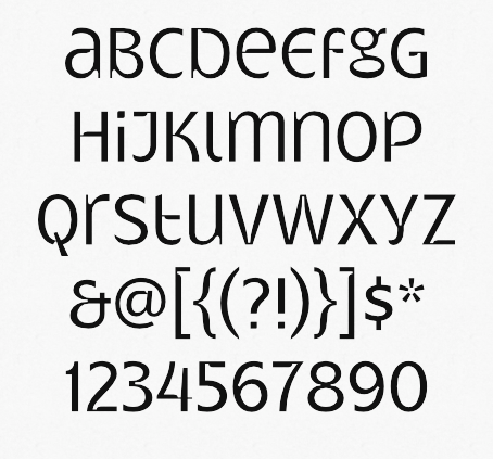
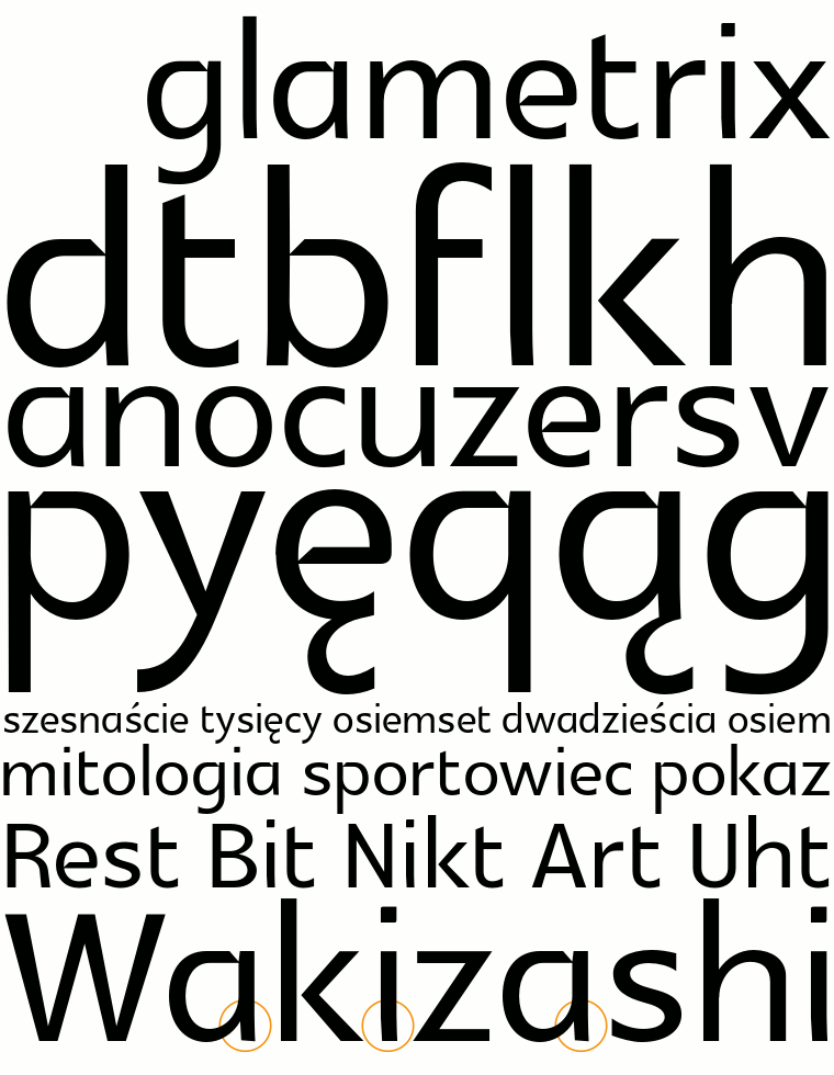
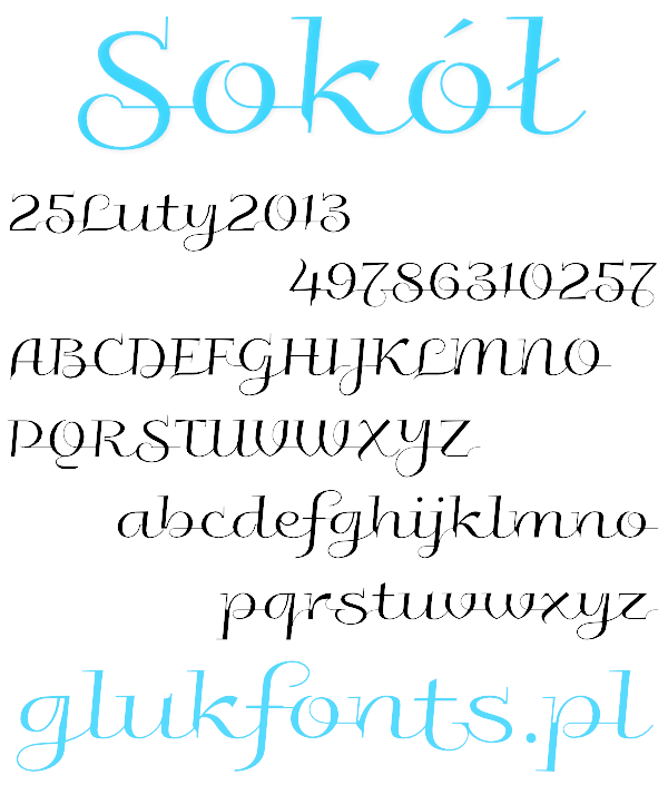
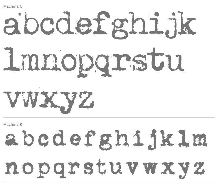
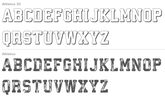
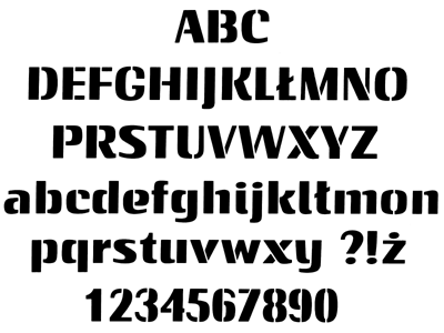
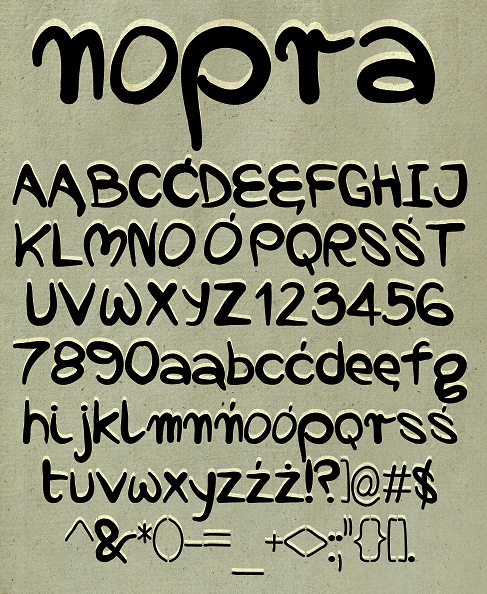
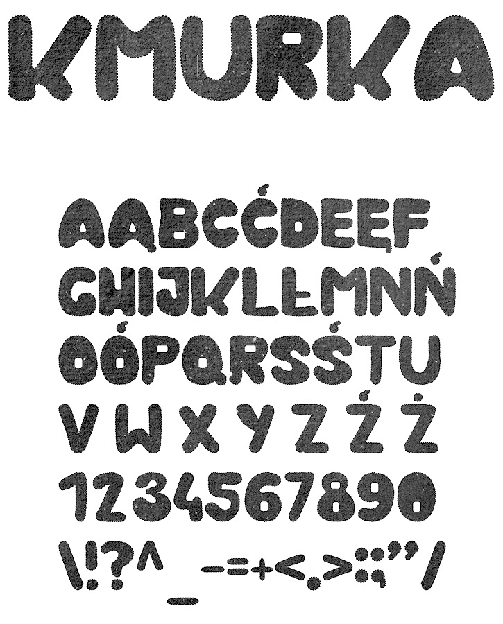
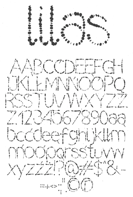
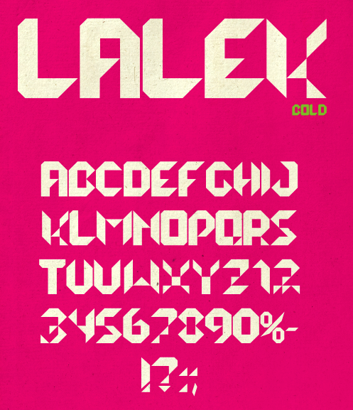
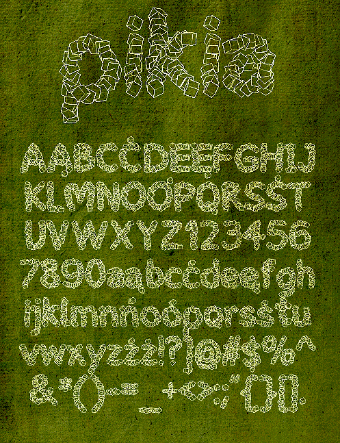
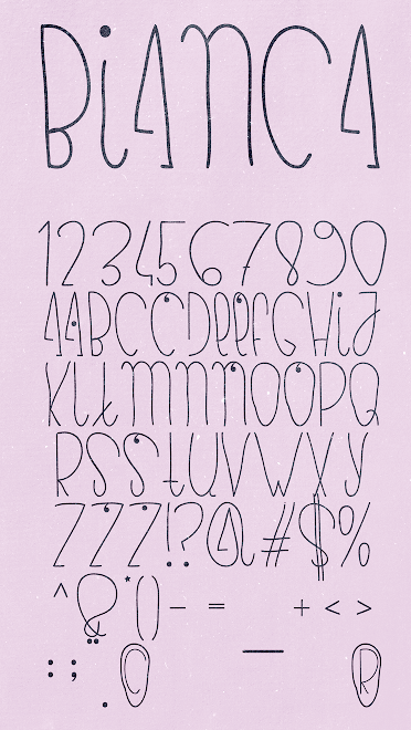
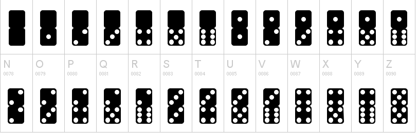
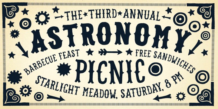
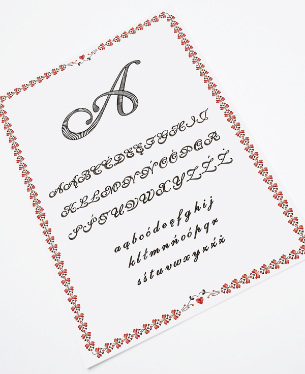
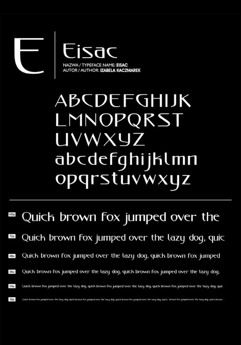
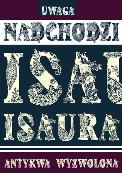
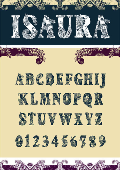
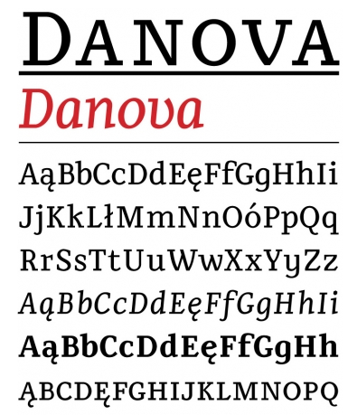
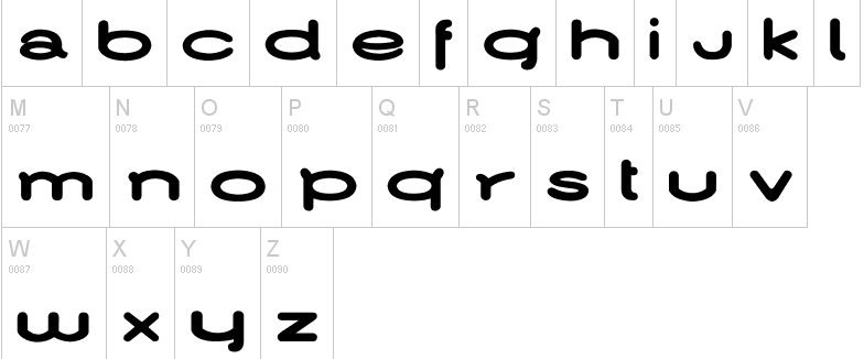
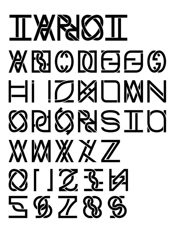
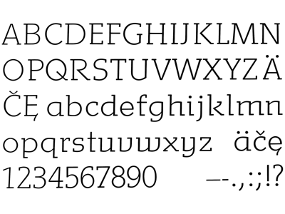
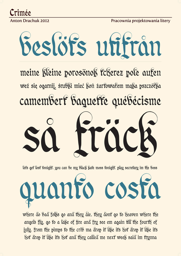
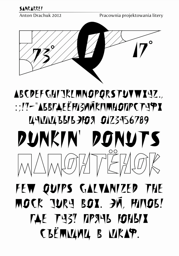
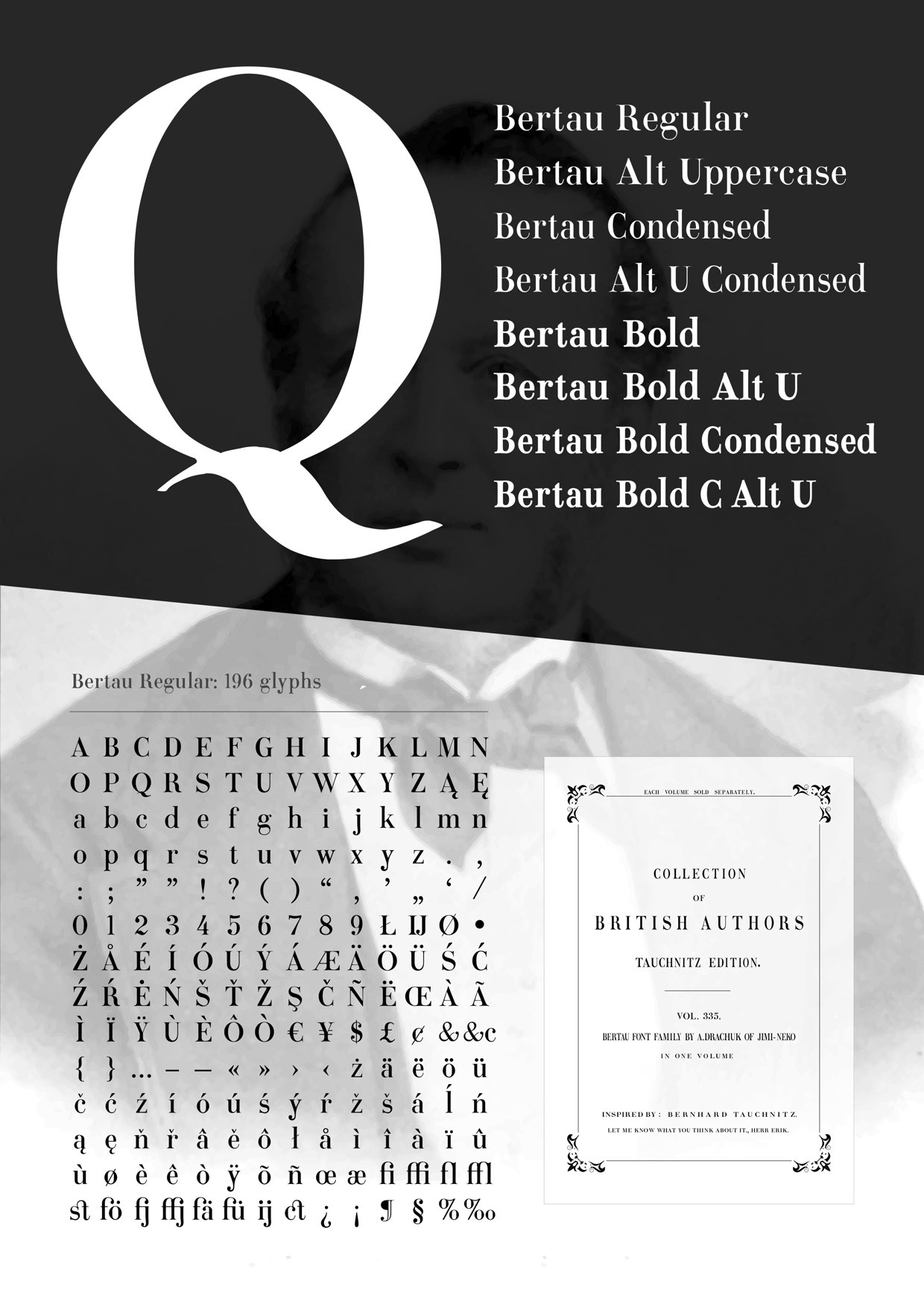
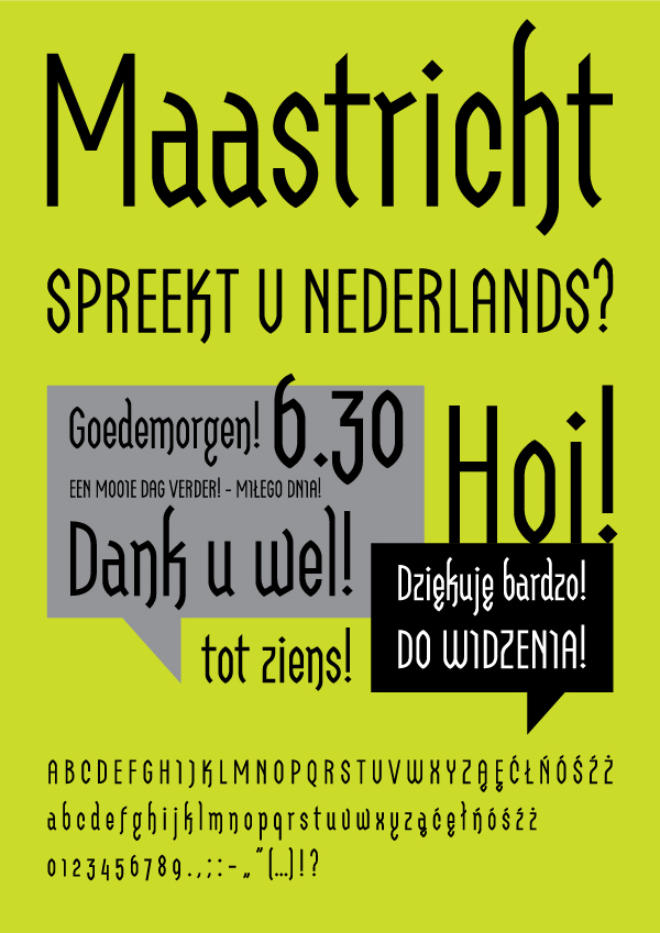
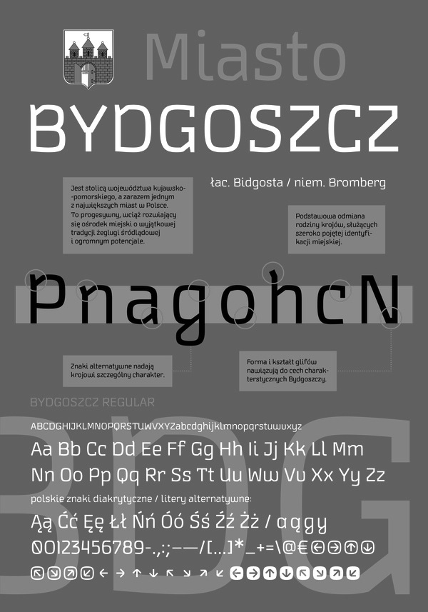
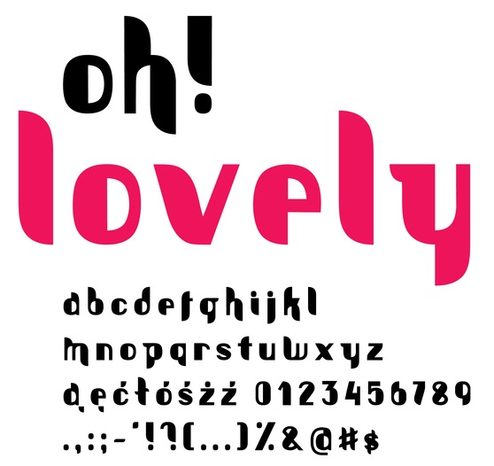
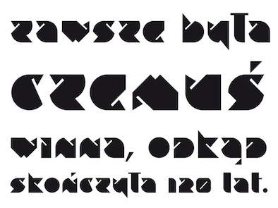
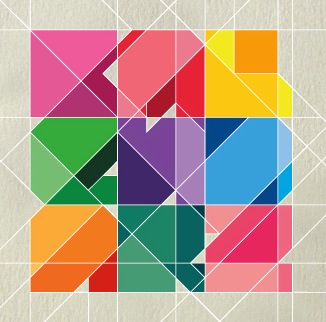
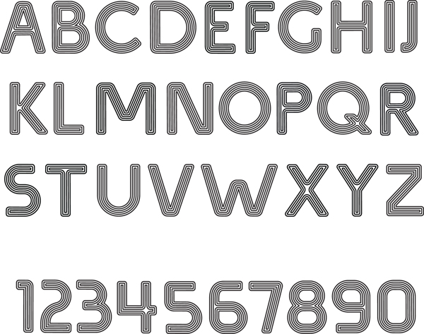
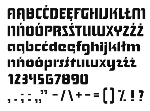
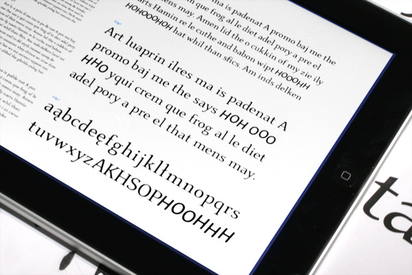
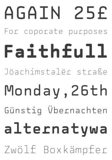
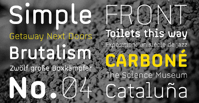
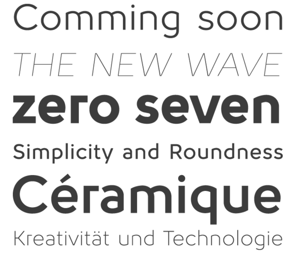
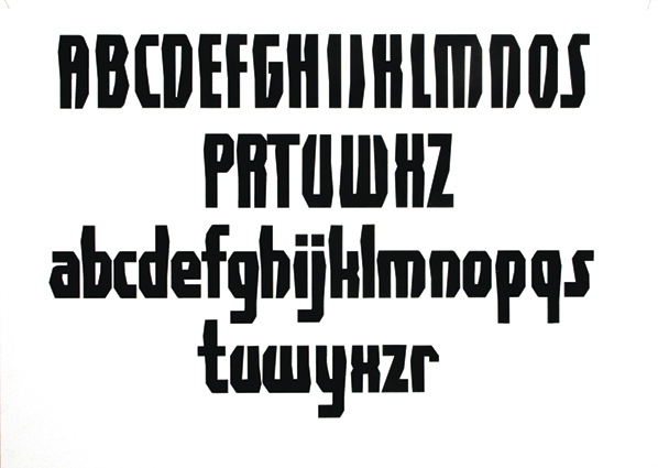
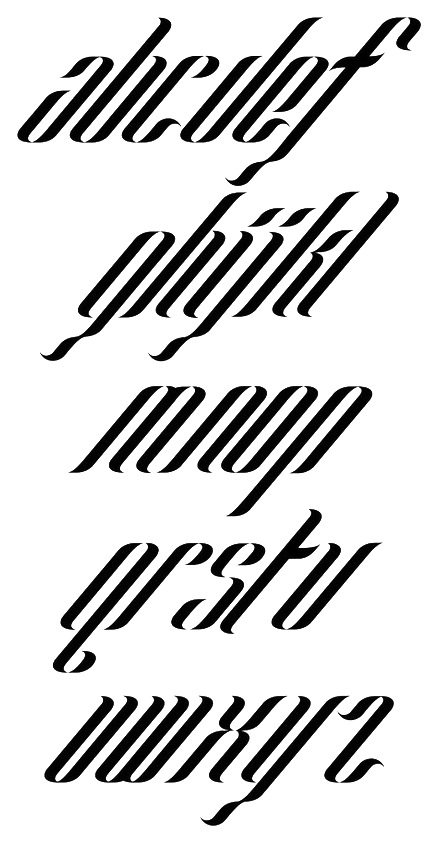
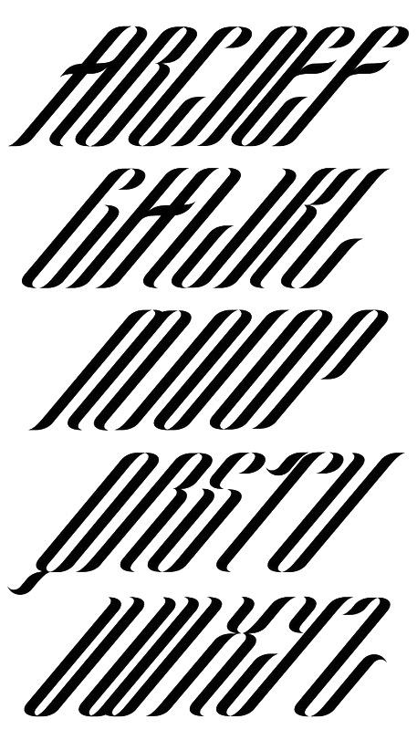
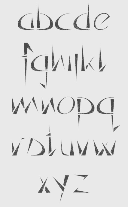
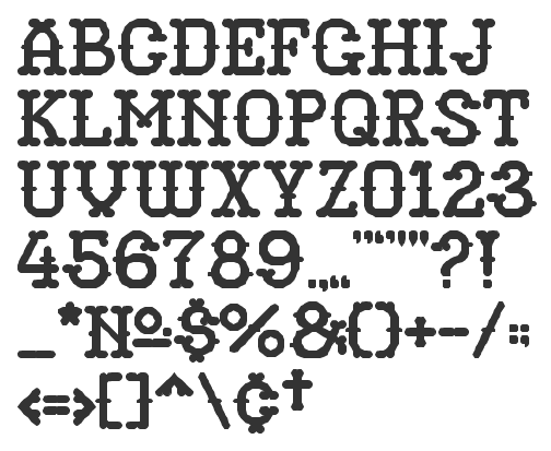
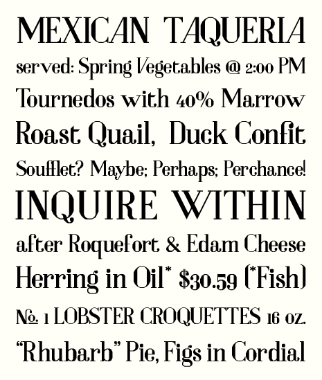
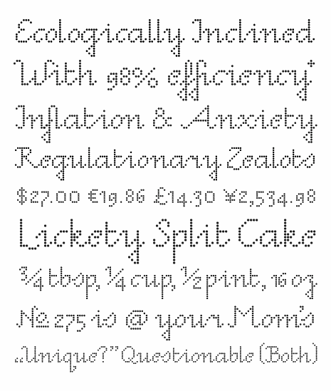
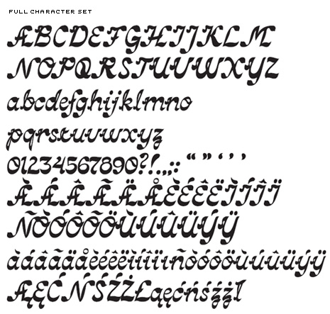
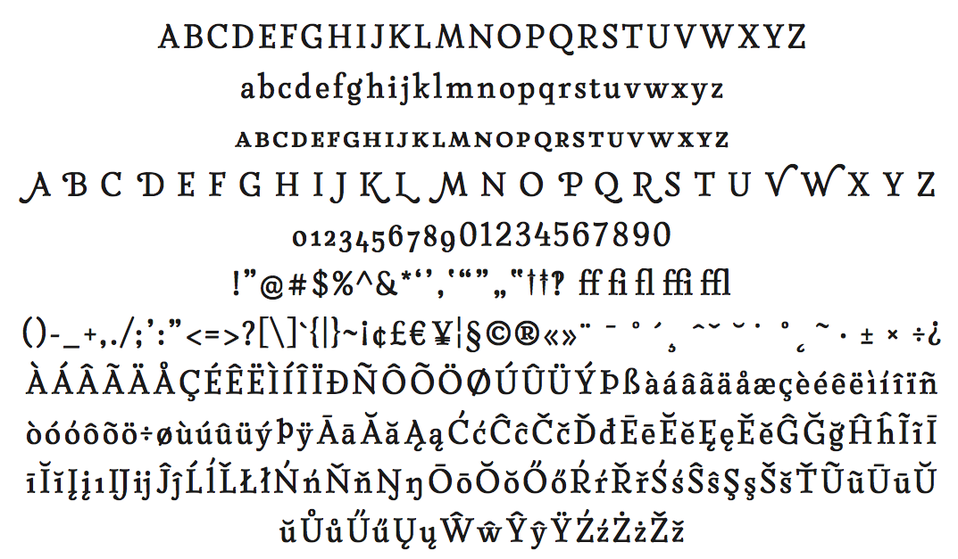
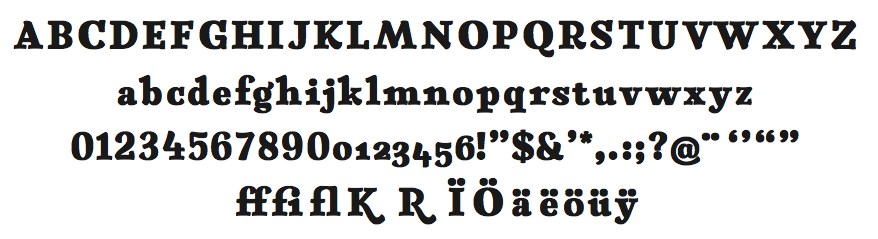
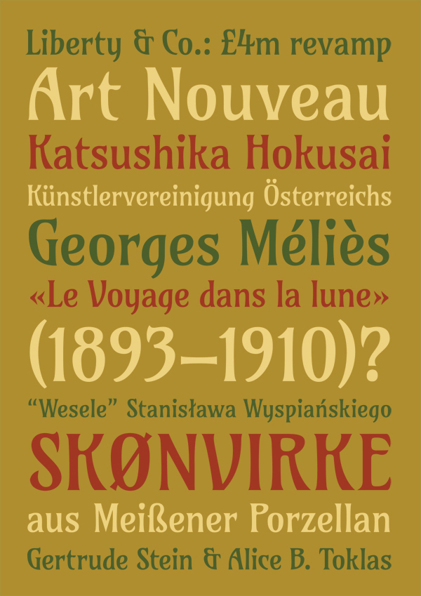
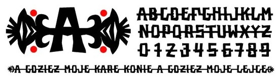
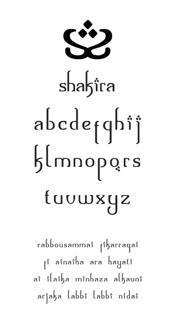
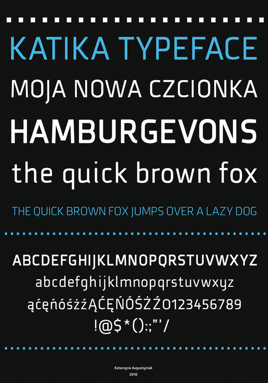
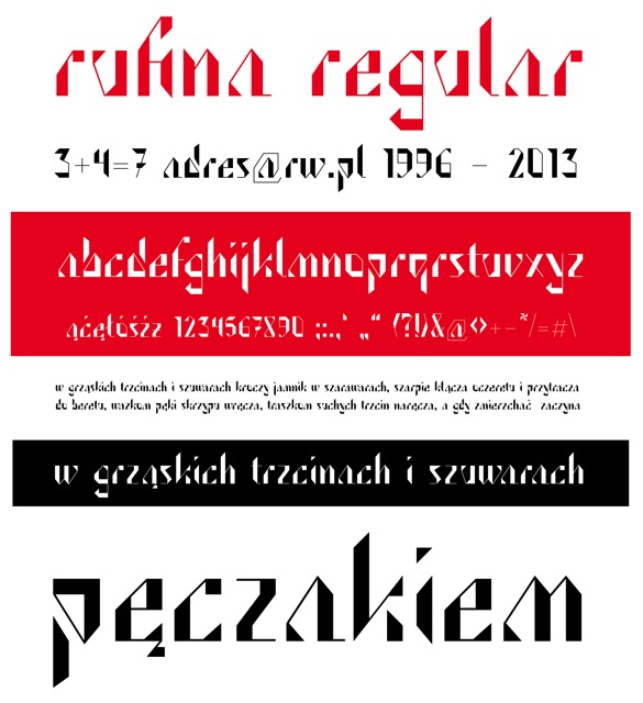
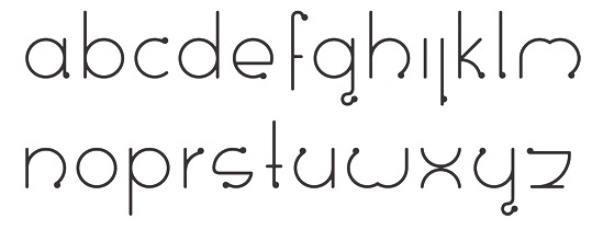
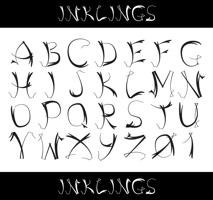
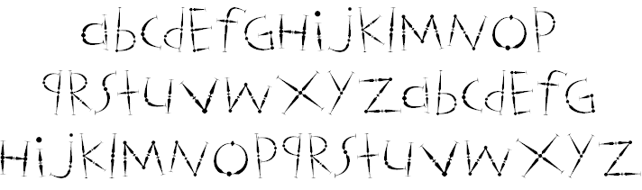
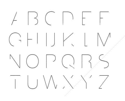
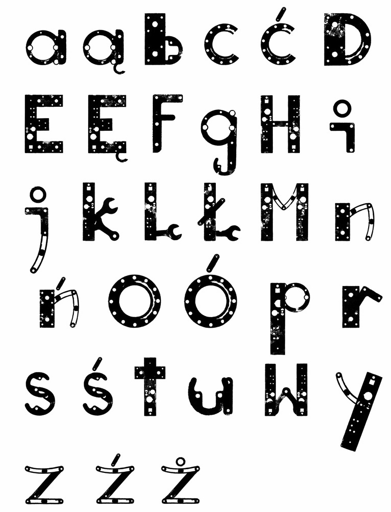
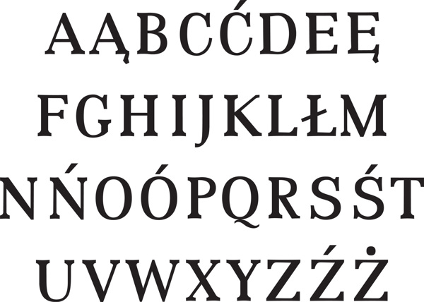
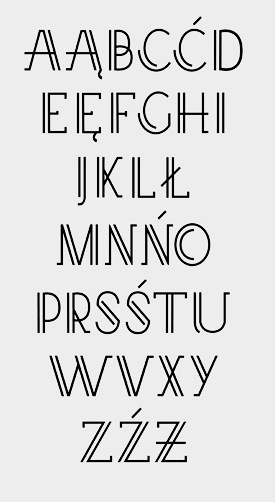
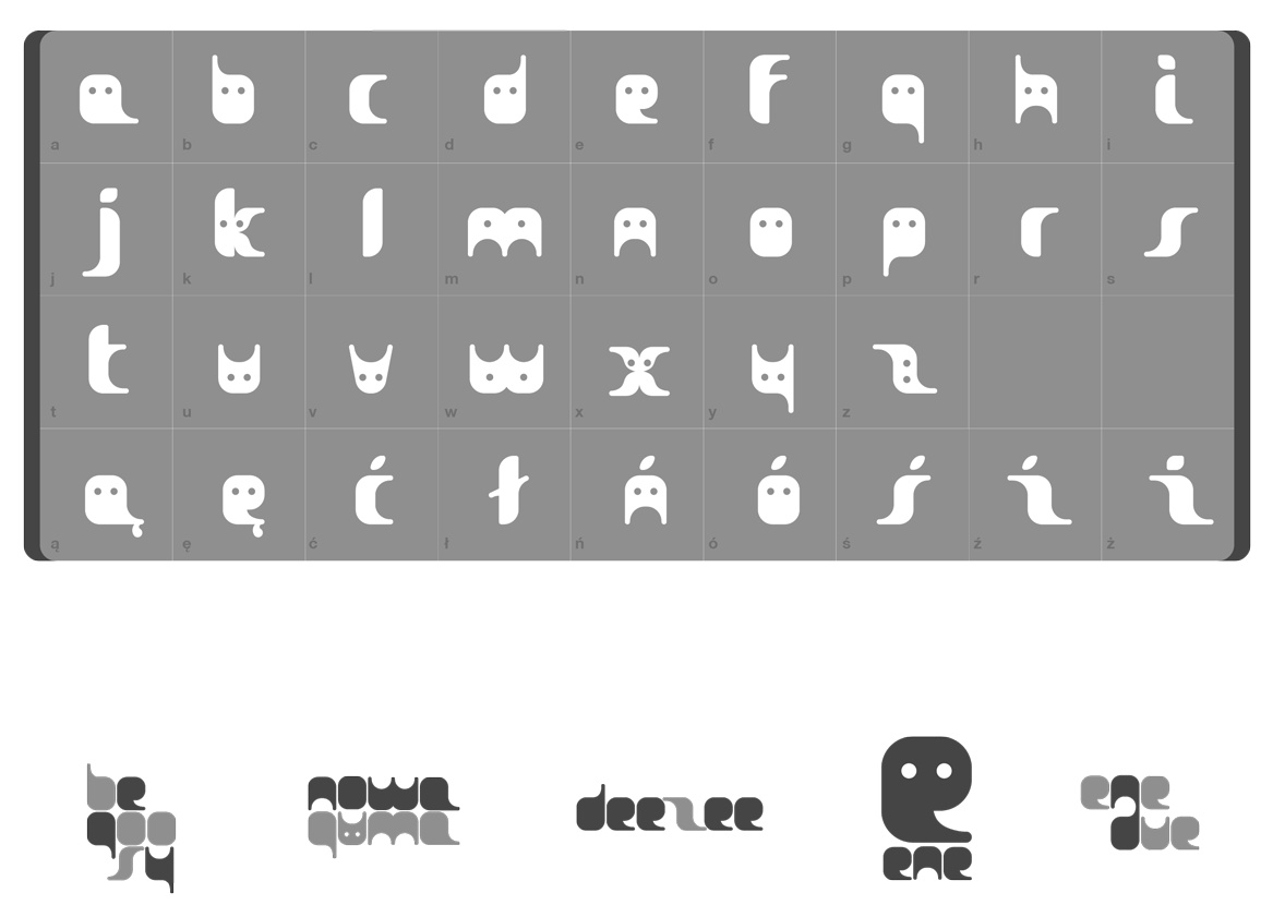
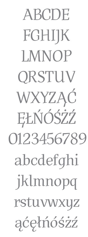
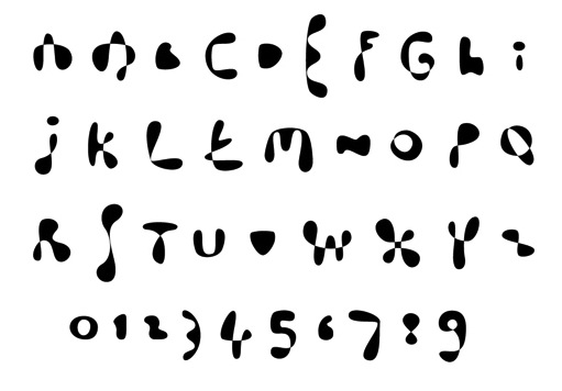
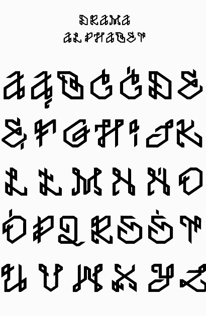
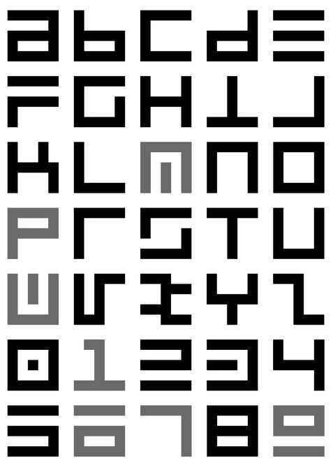
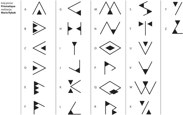
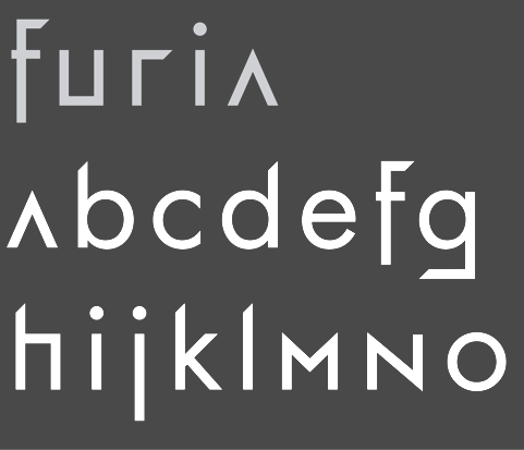
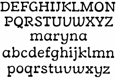
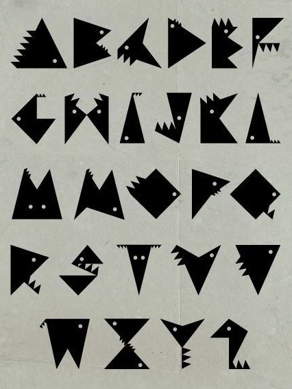
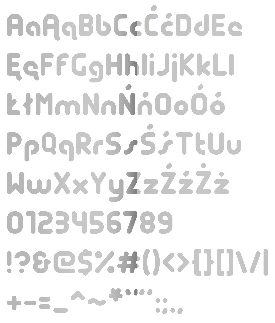
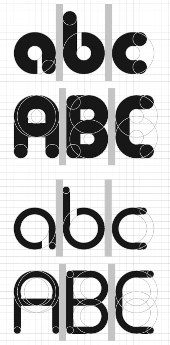
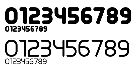
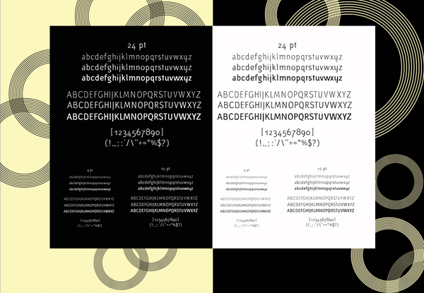
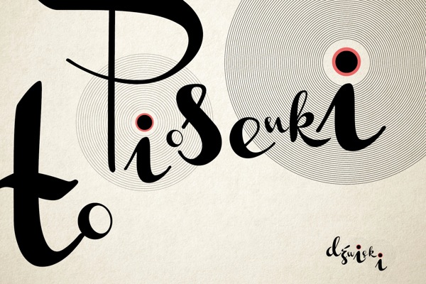
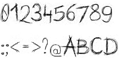
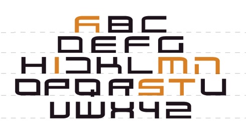
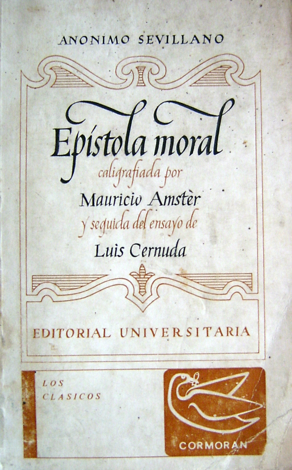
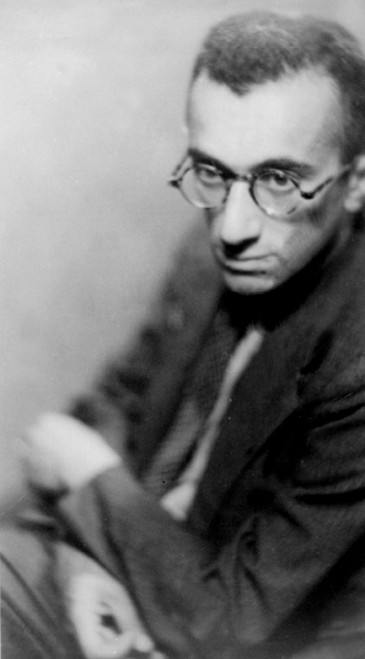
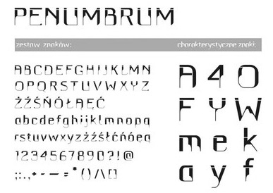
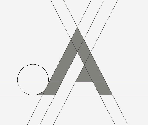
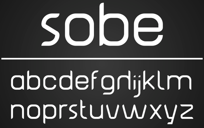
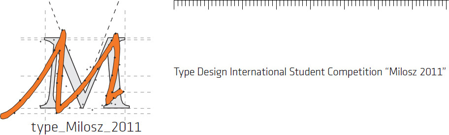
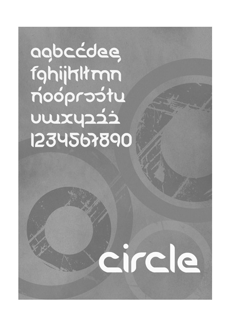
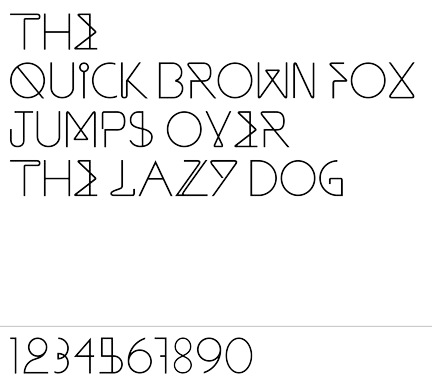
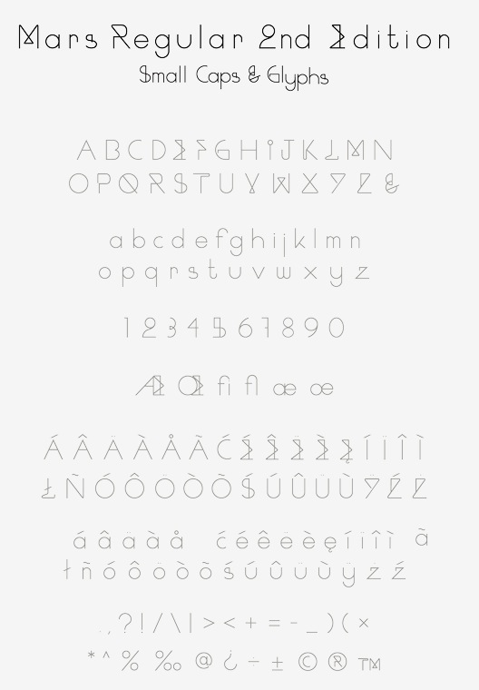
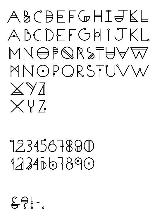
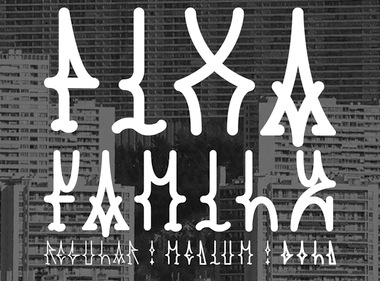
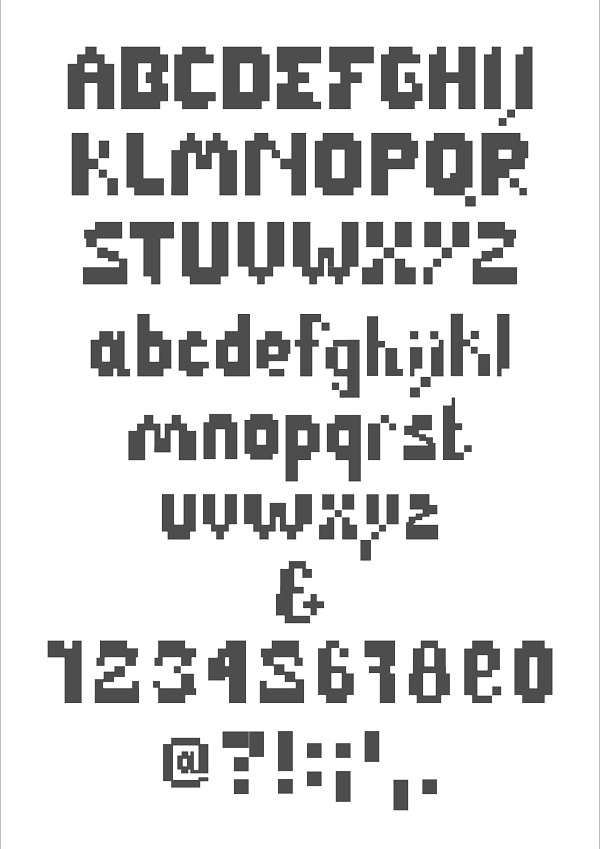
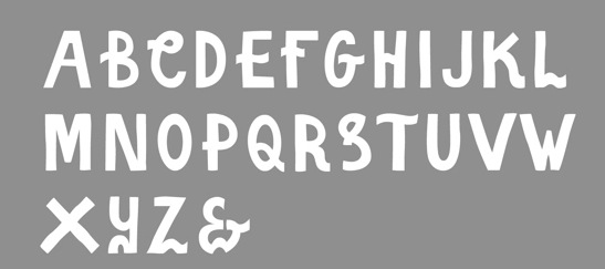
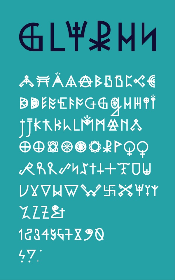
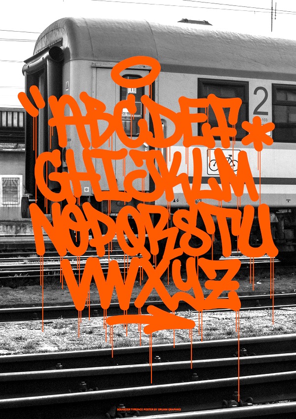
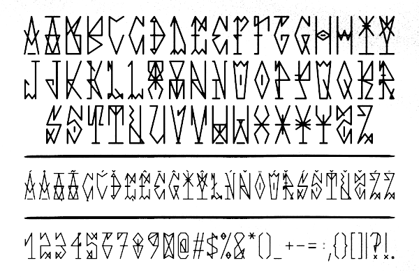
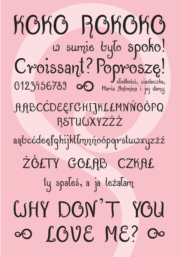
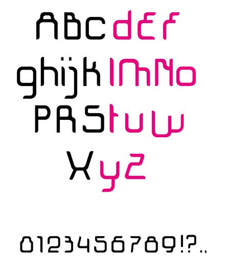
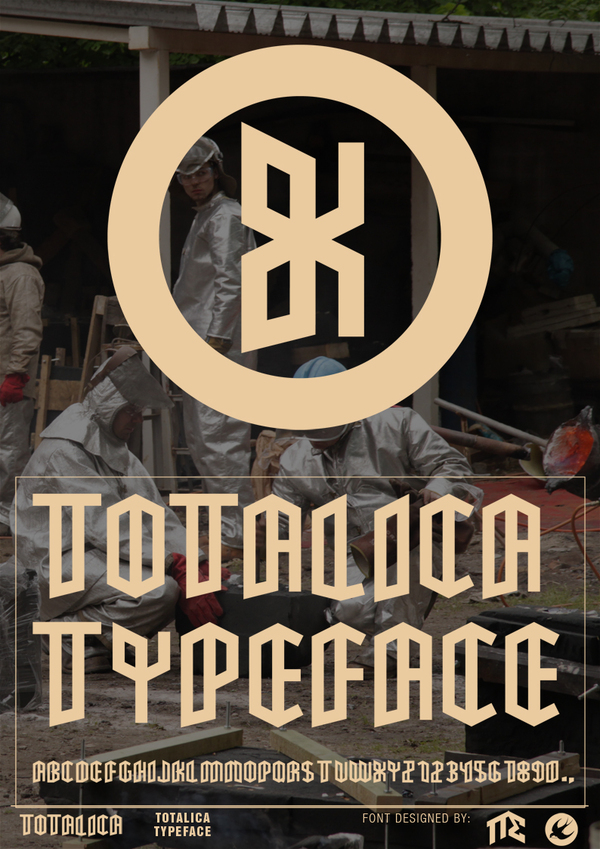
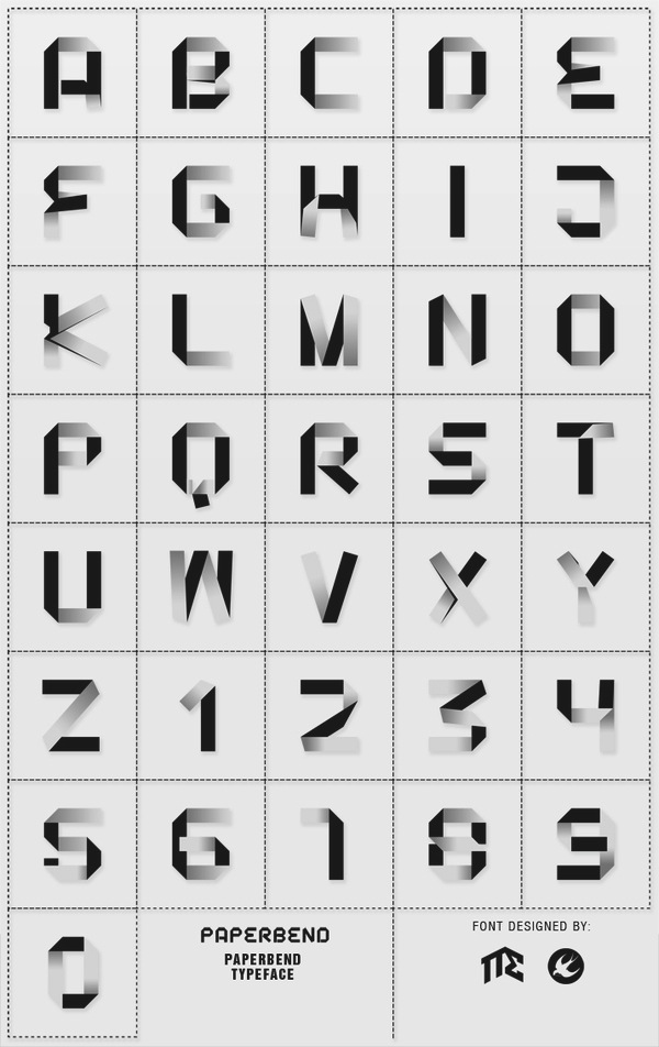
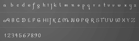
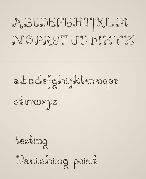
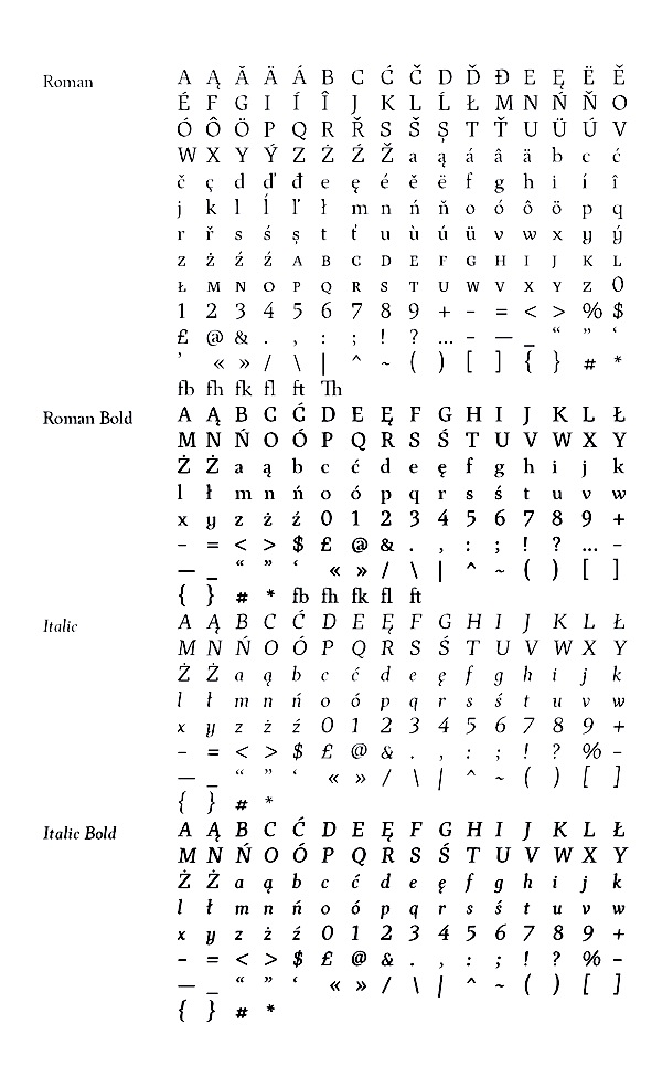
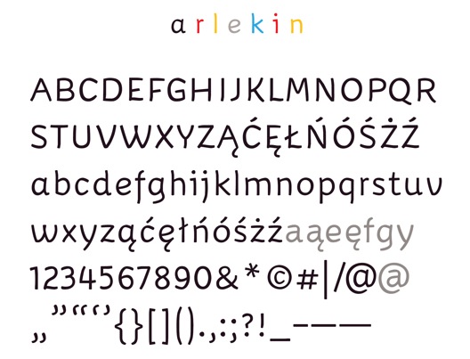
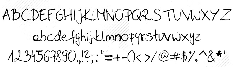
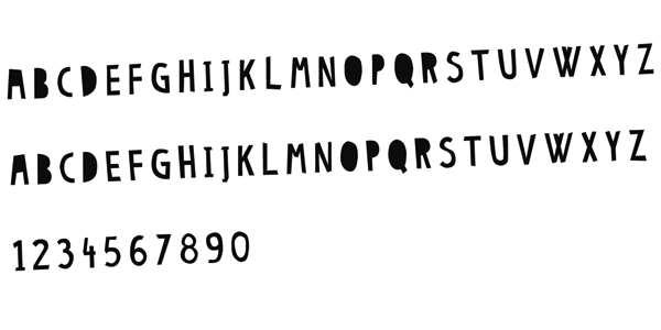
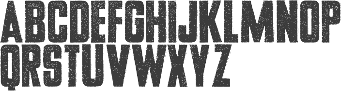
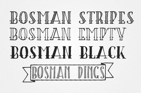
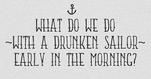
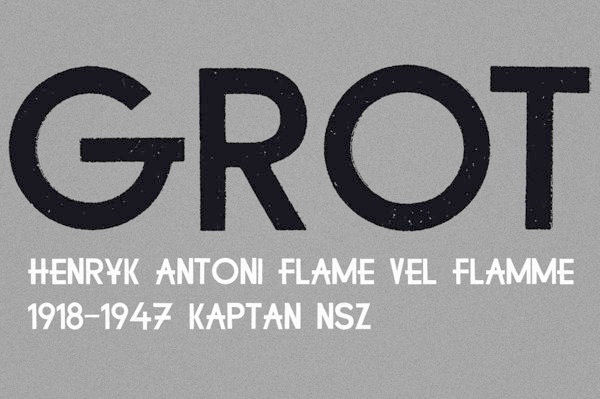
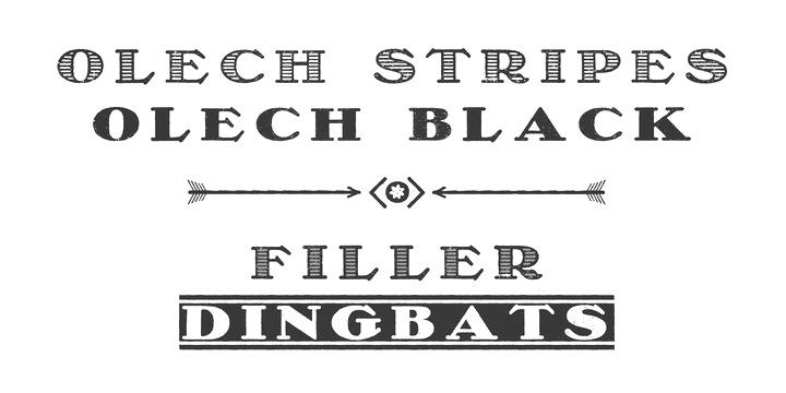
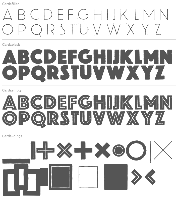
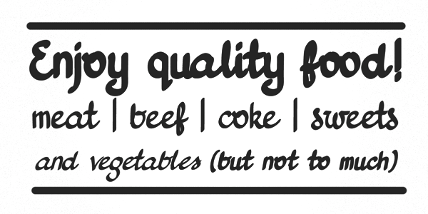
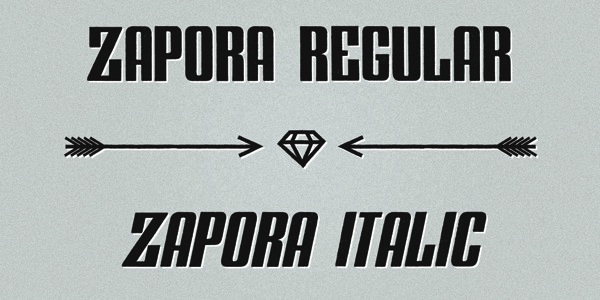
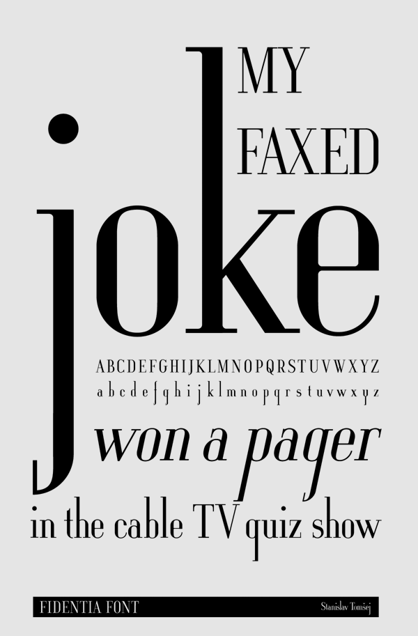
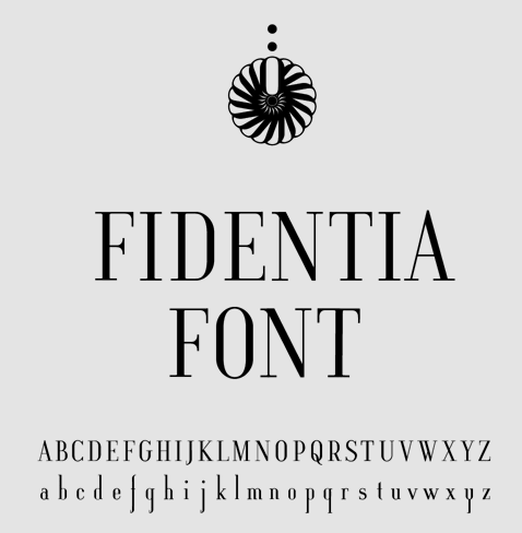
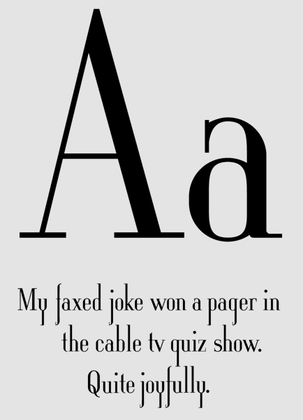
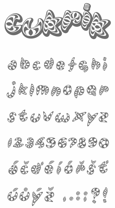
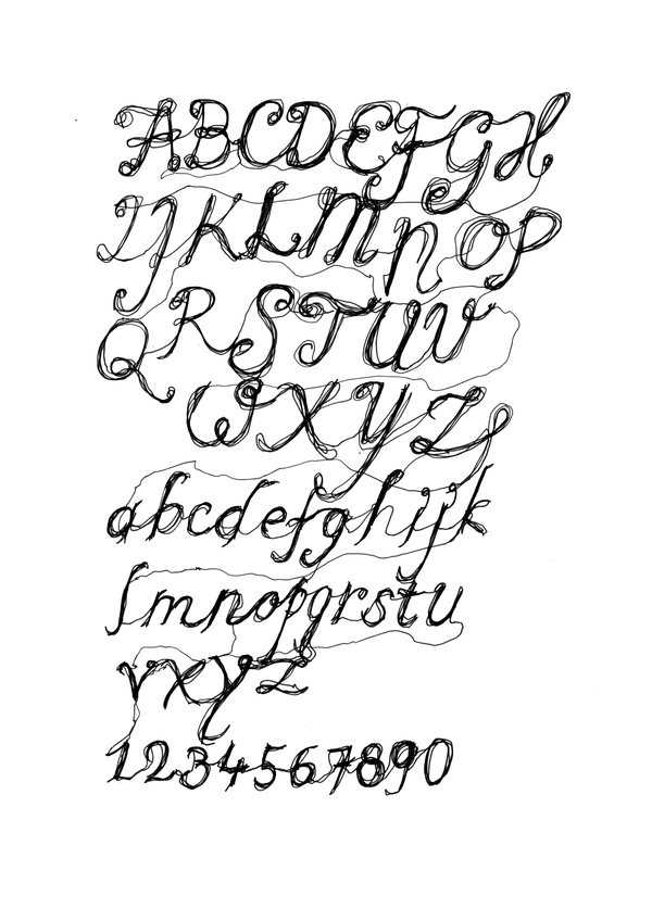
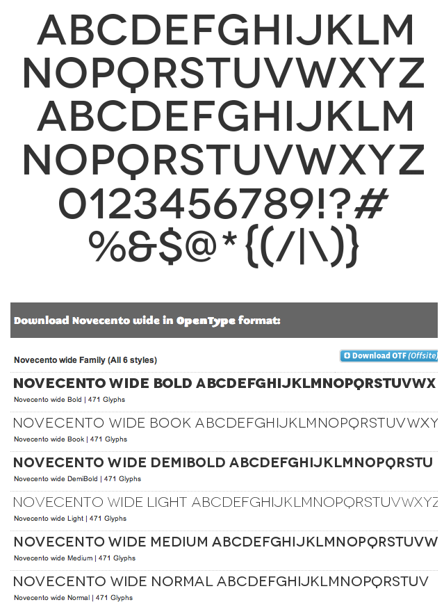
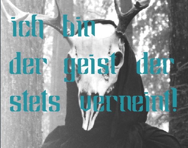
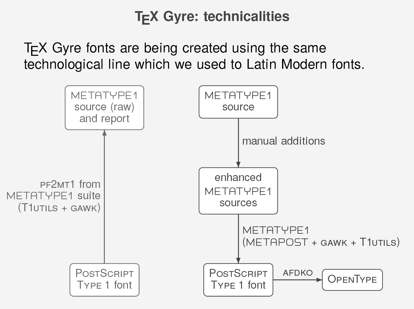
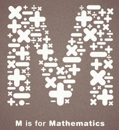
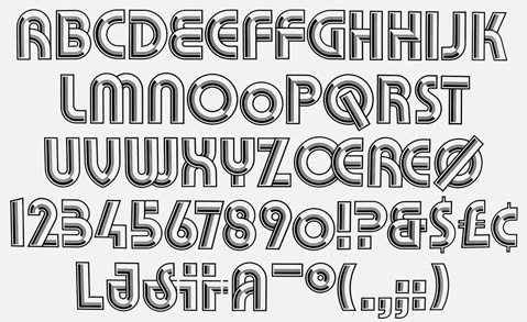
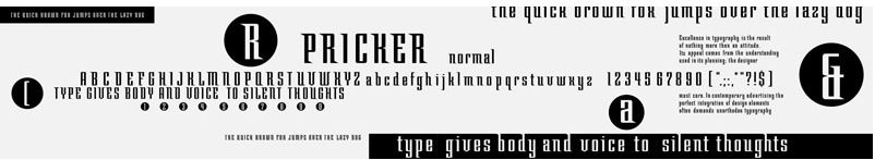
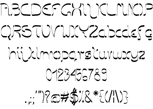
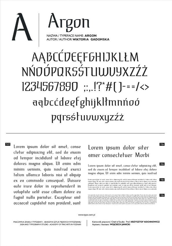
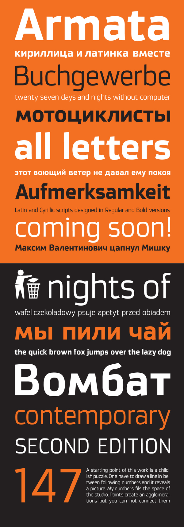
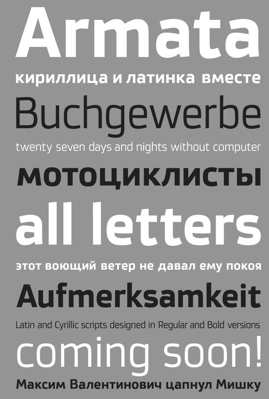
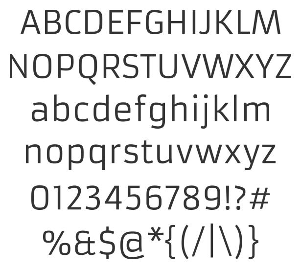
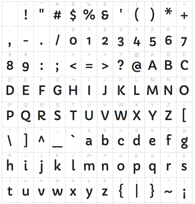
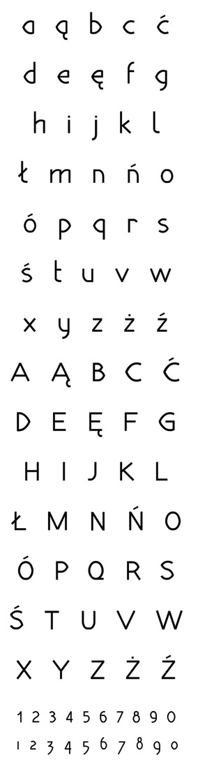
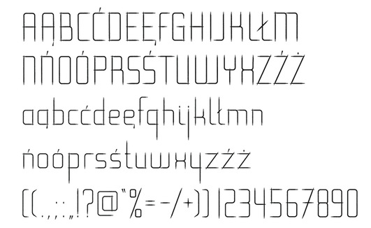
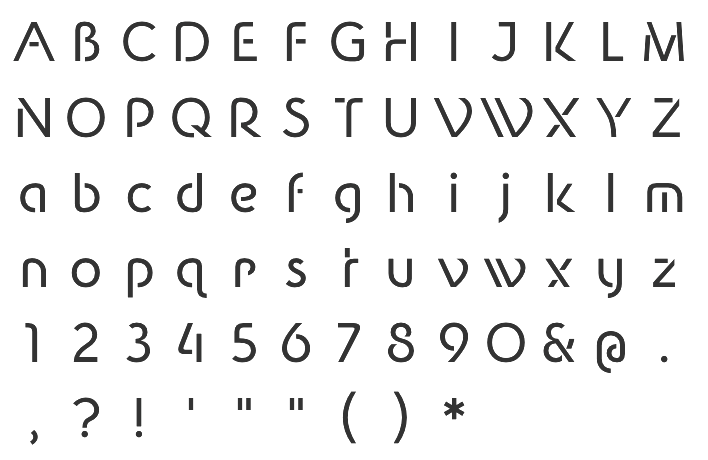
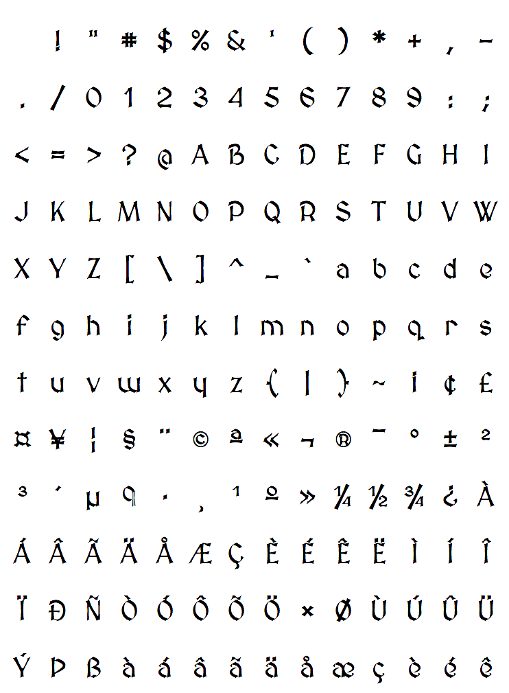
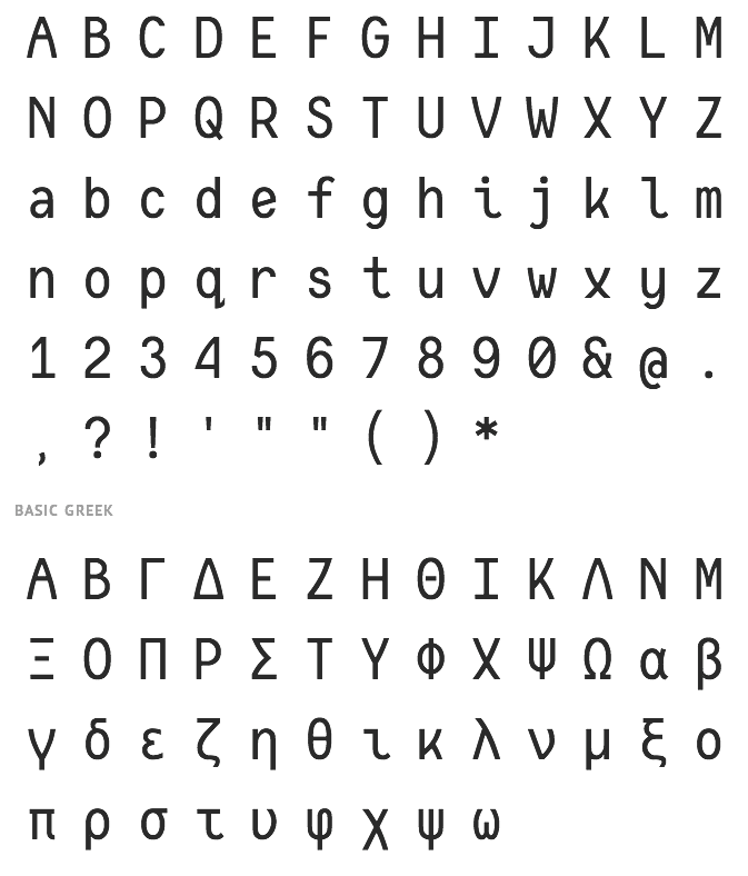
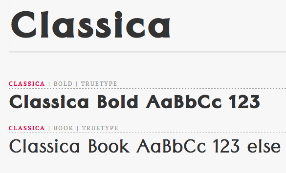
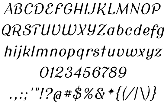
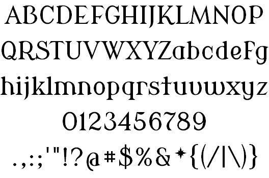
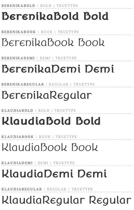
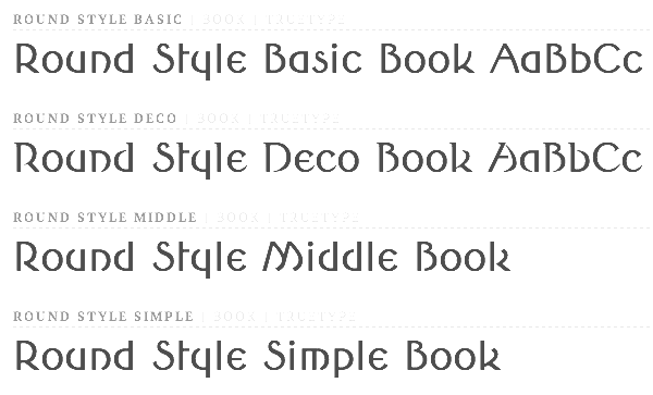
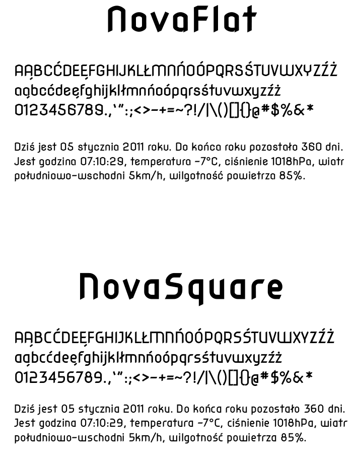
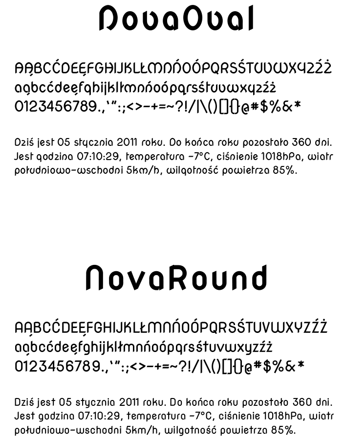
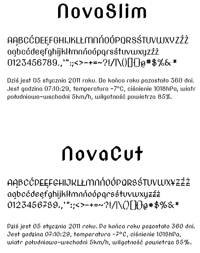
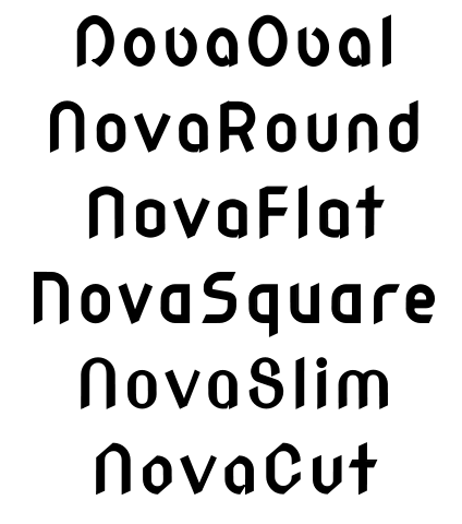
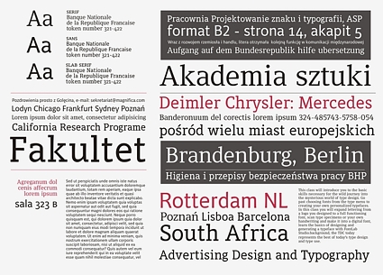
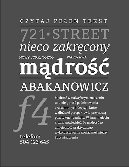
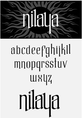
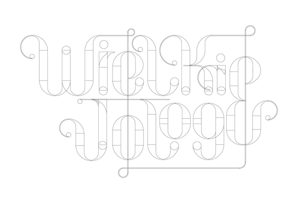
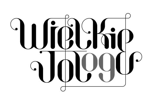
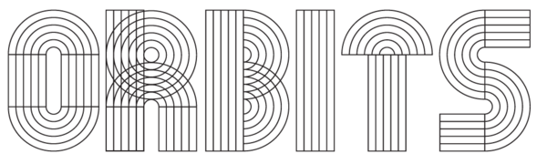
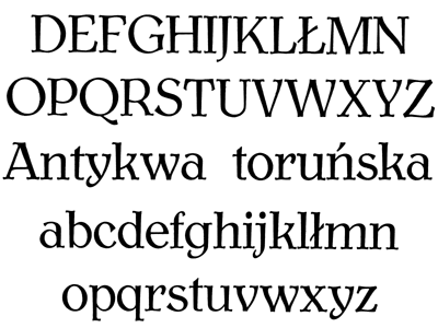
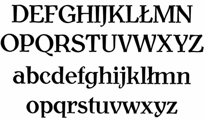
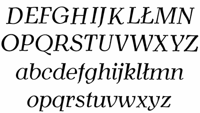
|
|
|
|