TYPE DESIGN INFORMATION PAGE last updated on Mon Jul 13 21:05:07 EDT 2026
FONT RECOGNITION VIA FONT MOOSE

|
|
|
|
|
Readability & Legibility | ||
|
|
|
|
SWITCH TO INDEX FILE
256tf
|
His typefaces are distributed by 205tf (was: 205 Corp, or 256tm):
|
A Comparison of Popular Online Fonts: Which is Best and When? | A study in 2007 at Wichita State University (Kansas) by Michael Bernard, Melissa Mills, Michelle Peterson and Kelsey Storrer compared these font types: Agency FB (Agency), Arial, Comic Sans, Tahoma, Verdana, Courier New (Courier), Georgia, Goudy Old Style (Goudy), Century Schoolbook (Schoolbook), Times New Roman (Times), Bradley Hand ITC (Bradley), Monotype Corsiva (Corsiva). They conclude: First, no significant difference in actual legibility between the font types were detected. There were, however, significant differences in reading time, but these differences may not be that meaningful for most online text because these differences were not substantial. It may, on the other hand, be helpful to consider using font types that are perceived as being legible. In this study, the font types that were perceived as being most legible were Courier, Comic, Verdana, Georgia, and Times. Courier and Times were perceived as being the most business-like, whereas Comic was perceived as being the most fun and youthful. [Google] [More] ⦿ |
A critique of existing typefaces for HDTV (EIA-708) captioning
| Joe Clark (Toronto) takes all the fonts proposed by Agfa/Monotype, Ascender and Bitstream for HDTV screen captioning apart. [Google] [More] ⦿ |
Led by designer and Emily Carr alumnus Tyler Hawkins (Shumka Centre for Creative Entrepreneurship), the Access Font (formerly Ceramic and Infinite Font) is a flexible font for low vision, using the variable font format as a foundation. A web tool assesses the needs of individual readers, and translates those needs into an individualized font. A browser extension then reads text from the Internet, displaying it on-screen in the user's personalized font. The technology has the potential to improve Internet accessibility and the experience of reading for an estimated one billion people worldwide who are partially sighted. Originally a graduate student project, Access Font was incubated through our Satellite Residency at Emily Carr University of Art + Design in Vancouver, BC. Hawkins will work with a web developer, Quinn Keaveney, and a font engineer, Mirko Velimirovic to develop, test, and release the Access Font software. The project is set for release in 2022. [Google] [More] ⦿ | |
In 2005, Alex Poole reviewed over 50 empirical studies in typography and found a definitive answer. It has an extensive literature review. [Google] [More] ⦿ | |
In 2015, Fontfont finally published the full family FF Real, in 13 weights each for FF Real Head and FF Real Text. The typeface family is influenced by the German grotesques from ca. 1900 by foundries such as Theinhardt and H. Berthold AG. In 2017-2018, that family was extended to 52 styles in all thanks to a new set of italics. The designers are listed as Erik Spiekermann, Ralph du Carrois and Anja Meiners. They write: The design of FF Real is rooted in early static grotesques from the turn of the century. Several German type foundries---among them the Berlin-based foundries Theinhardt and H. Berthold AG---released such designs between 1898 and 1908. The semi-bold weight of a poster-size typeface that was lighter than most of the according semi-bolds in metal type at the time, gave the impetus to FF Real's regular weight. In the words of Spiekermann, the historical example is "the real, non-fake version, as it were, the royal sans serif face", thus giving his new typeface the name Real (which is also in keeping with his four-letter names, i.e. FF Meta, FF Unit). FF Real is a convincing re-interpretation of the German grotesque style, but with much more warmth and improved legibility. With a hint towards the warmer American grotesques, Spiekermann added those typical Anglo-American features such as a three-story g and an 8 with a more defined loop. To better distinguish characters in small text sizes, FF Real Text comes in old style figures, f and t are wider, the capital I is equipped with serifs, as is the lowercase l. What's more, i-dots and all punctuation are round. In 2022, Erik Spiekermann, Anja Meiners, and Ralph du Carrois published the neo-grotesque superfamily Case at Fontwerk. It includes Micro and Text subfamilies. [Google] [More] ⦿ | |
Ann Bessemans (b. 1983) obtained her Ph.D. in 2012 from Leiden University (under Gerard Unger) and Hasselt University. She grew up in Sint-Truiden, Belgium. In 2011, she finished the Expert Type Design Class with Frank Blokland at the Plantin Genootschap in Antwerp, and created the typeface Matilda. Matilda was specially designed to help make kids make the transition from reading simple type forms to more complex ones. Her PhD in 2012 entitled Type Design for Children with Low Vision was jointly supervised by Gerard Unger at Leiden University, and Bert Willems at Hasselt University. Her research interests include the interrelations between image & word, typography, font design, legibility, reading graphic design, book design and modular systems. She speaks regularly about legibility. Speaker at ATypI 2013 in Amsterdam and at ATypI 2014 in Barcelona. In 2014, Ann Bessemans designed a Belgian postage stamp that set a Guinness record of 606 words on one stamp. Speaker at ATypI 2016 in Warsaw on READSEARCH---A Platform for Reading Research (together with Kevin Bormans and Maarten Renckens). READSEARCH, launched in 2015, is Bessemans's research group that studies reading from a multidisciplinary and scientific perspective, covering both impaired and normal readers. Speaker at ATypI 2017 Montreal. [Google] [More] ⦿ | |
Annie Opitz Olsen, a graduate of the University of Nevada, Reno, was previously a Reno printer and calligraphy teacher. She works for Wycliffe Bible Translators and has given type design training workshops in Bangalore and Mexico City. Creator (with Victor Gaultney) at SIL International (Dallas, TX) of the Open Font License package of sans serif fonts called Andika Design Review (2006, weights called A through G). Andika means "to write" in Swahili. Annie writes: Andika is a sans serif, Unicode-compliant font designed especially for literacy use, taking into account the needs of beginning readers. The focus is on clear, easy-to-perceive letterforms that will not be easily confused with one another. Andika was develioped between 2004 and 2015. It contains about 600 glyphs. The early fonts were called Andika DesRev A and Andika DesRev B. The current fonts, Andika, Andika Basic (2008) and Andika New Basic (2015) are here. See also Fontsquirrel and Google Fonts. In 2020, the design of Andika New Basic is attributed to Victor Gaultney, Annie Olsen, Pablo Ugerman in one place and Victor Gaultney, Annie Olsen, Julie Remington, Don Collingsworth and Eric Hays in another. Codesigner of various other typefaces at SIL, including Gentium Plus (2014; with J. Victor Gaultney, Iska Routamaa and Becca Hirsbrunner). Speaker at ATypI 2009 in Mexico City, where she updated the type world on the newest features of Andika, which is constantly being expanded. Interview. Google Font Directory link. [Google] [More] ⦿ | |
Her typefaces:
Antonia Cornelius won the People's Choice award for Legilux in 2016 at the Morisawa Type Design Competition 2016. Speaker at ATypI 2018 in Antwerp on the topic of legibility: Typeface designers Antonia Cornelius and Björn Schumacher conducted a preliminary study for their final master's projects. They set up a reading-speed test by reverting to well-tried test material, which they set in their new typefaces Legilux and Text Type as well as the common Walbaum Standard. Focusing on the effect of the optical scaling method, the typefaces were tested in two sizes: 1.5 mm and 1 mm x-height. The results tend to show a positive effect for optical adjustments in type designs. [Google] [MyFonts] [More] ⦿ | |
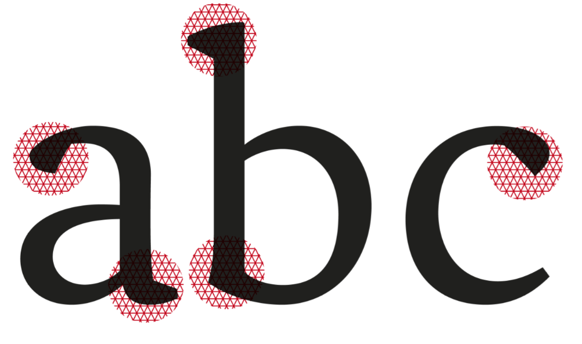
Atkinson Hyperlegible (2019-2020) is a free neo-grotesque typeface created by Applied Design Works for Braille Institute of America, Inc, which is based in Los Angeles. Named after Braille Institute founder, J. Robert Atkinson, it has been developed specifically to increase legibility for readers with low vision, and to improve character recognition. The project was the winner of the Graphic Design category in Fast Company's 2019 Innovation by Design Awards. In this video, Craig Dobie, Brad Scott, and Elliott Scott provide a behind-the-scenes look at the development of Atkinson Hyperlegible. Google Fonts link. The physical 4-style font family was designed by Elliott Scott, Megan Eiswerth, Linus Boman and Theodore Petrosky. Atkinson Hyperlegible differentiates common misinterpreted letters and numbers using various design techniques:
| |
Artur Frankowski
| |
| |
Bonnie Shaver-Troup
| |
Hrant Papazian (The MicroFoundry) explains how the eye reads, and what the importance is of having good boumas (a bouma is the nebulous shape of a word; as if seen through foggy glasses). Fonts with more distinctive boumas enjoy greater readability. A distinctive bouma depends a lot on ascenders and descenders. [Google] [More] ⦿ | |
The Braille Institute of America is located in Los Angeles, CA. In 2019, Elliott Scott, Megan Eiswerth, Linus Boman and Theodore Petrosky co-designed the totally free sans typeface family Atkinson Hyperlegible. Named after Braille Institute founder, Robert J. Atkinson, this font is characterized by differentiated letterforms, angled terminals, and a genuflexed lower case q. Fontsquirrel link. [Google] [More] ⦿ | |
Forma was revived by Tankboys as Forma Nova. The PhD thesis of Alessandro Colizzi at the University of Leiden deals with Bruno Munari's graphic design work. See also Colizzi's talk at ATypI 2013 in Amsterdam on Munari's legacy. Several typefaces have been made tio honor his work. These include Munari (2013, Dori Novotny). Dolcevita link. Munart: dedicated web site. [Google] [More] ⦿ | |
A legibility study in 2006 at Wichita State University (Kansas) by Barbara S. Chaparro, A. Dawn Shaikh and Alex Chaparro shows that Cambria is more legible than Constantia, and both are far more legible than Times New Roman. [Google] [More] ⦿ | |
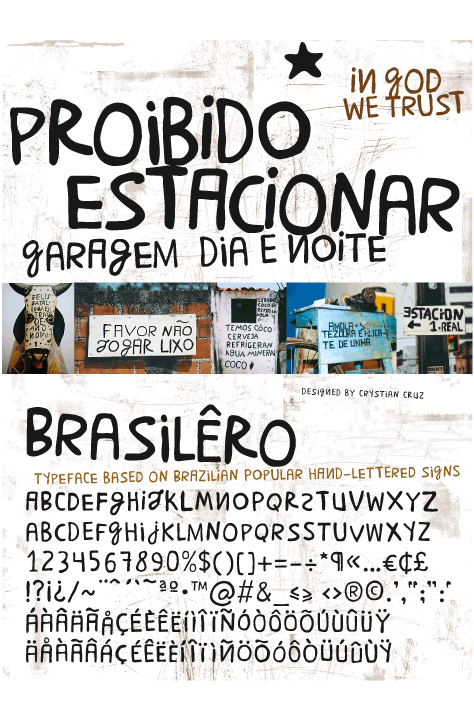
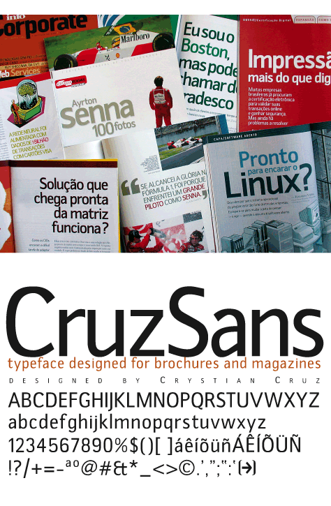
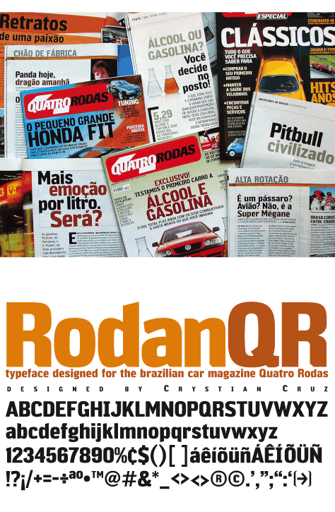
Crystian Cruz
| |
Lin obtained an MA in 2002 from Hochschule fuer Grafik und Buchkust Leipzig (Academy of Visual Arts) and a PhD in 2012 from the School of Design, China Central Academy of Fine Arts (CAFA). He is Associate Professor at CAFA. Speaker at ATypI 2012 in Hong Kong: Chinese typeface recognition in public space. The talk summarizes the factors that influence legibility of Hanzi characters, and deals with the proportion of black and white using statistical analysis. Using statistical analysis, the author discovers the relationship between major Hanzi typefaces, their strokes, texture and legibility. Based on statistics and calculation, this paper examines mathematical relationships between different parameters, and the threshold of black and white in terms of recognizability, ultimately ways of analyzing and testing the legibility of Hanzi typefaces. This paper tests the accuracy of this theory by experimenting with typefaces used in directional signs on highways. [Google] [More] ⦿ | |
Daan Jobsis
| |
Author of Legibility: Techniques of Investigation (1998) and Type on the Screen. [Google] [More] ⦿ | |
David Kindersley's great rule for spacing: place each letter such that its center is halfway between the centers of the adjacent letters, where center is defined in a least squares sense. [Google] [More] ⦿ | |
Dawn Shaikh received her PhD in human factors psychology in 2007 from Wichita State University. Throughout graduate school, she worked on a grant from Microsoft's Advanced Reading Technologies group. Her master's thesis focused on line length in news&narrative articles. She worked on the legibility of ClearType fonts, and on that of onscreen fonts. Her dissertation focused on the perception of typeface personality. After graduation, ironically---despite Microsoft scholarships throughout her life---, she joined arch enemy Google, where she worked on Google Web Fonts, Docs, Ebooks, Android, and Internationalization. Speaker at ATypI 2011 in Reykjavik on the topic of typefaces for Android OS (with Steve Matteson). [Google] [More] ⦿ | |
Dawn Shaikh
| |
Dawn Shaikh
| |
| |
Creators of DPCustomMono2 (2003), a monospaced font specially designed so that proofreaders make fewer mistakes. [Google] [More] ⦿ | |
Dustbunnies Everywhere
| Dutch designer of the cheerful hand-printed typeface Agrave Pro (2020), which is intended for long text passages. [Google] [MyFonts] [More] ⦿ |
Easy Reading
| Federico Alfonsetti designed the highly legible font family Easy Reading in 2009. It is used on many web sites, including at the University of Turin, and is recommended by the designer for use by dyslexics. A comparative study was carried out by Dr. Christina Bachmann that showed the value of the font. [Google] [More] ⦿ |
Fabula
| The Fabula typeface was originally designed as a screen font as part of a project that produced software to enable children and teachers to produce bilingual story books. Since then, changes have been made to its design and it is now, additionally, a font suitable for titling and text setting in large sizes. Fabula was designed by a team led by Sue Walker that included Conrad Taylor, Vincent Connare, Gerry Leonidas and José Scaglione. Sue writes: It has been used in a series of tests designed to find out what children in year 2 think about typefaces in the books they read. They descibed Fabula as 'clear, so you can see it properly'; 'normal'; 'like an ordinary book'. Stylistically, Fabula has long ascenders and descenders (to help identify the word shapes), an informal feel, rounded terminals, a rounded e, a clear distinction between characters that might be easily confused, such as the (a, o) pair and the (l, 1) pair. Fabula 1 has a double storey a. Fabula 2 has a single storey a. [Google] [More] ⦿ |
Faruk Ate
| |
Federico Alfonsetti
| |
A well-known example illustrating how unimportant the order of the letters is in a word, as long as first and last letter are right: "Aoccdring to a rscheearch at an Elingsh uinervtisy, it deosn't mttaer in waht oredr the ltteers in a wrod are, the olny iprmoetnt is taht frist and lsat ltteer is in hte rghit pclae. The rset can be a toatl mses and you can sitll raed it wouthit porblem. Tihs is bcuseae we do not raed ervey lterer by it slef but the wrod as a wlohe. That'll mcuk up the splelchekcer. Ceehiro." [Google] [More] ⦿ | |
Legibility expert. His research was reported at ATypI 2018 in Antwerp. He writes: During a two-year R&D project, we worked with people affected by the most common eye disorders and with experts from the German Federation of the Blind and Partially Sighted (DBSV) to evaluate typefaces and layouts in terms of legibility and readability. We found that visually impaired people preferred Humanist Sans typefaces i.e., sans serifs which are based on the Old Style/Garalde letterforms. [...] Using the study results and extensive source research, we produced concrete, practical recommendations on typefaces, sizes, spacing, layout, contrasts and surfaces. [Google] [More] ⦿ | |
FontArte (was: Magdart Fonts)
|
He spoke at ATypI 2005 in Helsinki on Type on maps and at ATypI 2007 in Brighton on Designing a regional typeface. Speaker at ATypI 2016 in Warsaw on From Typespotting to Warsaw letters. Designer of several typefaces:
|
Fontsmith
|
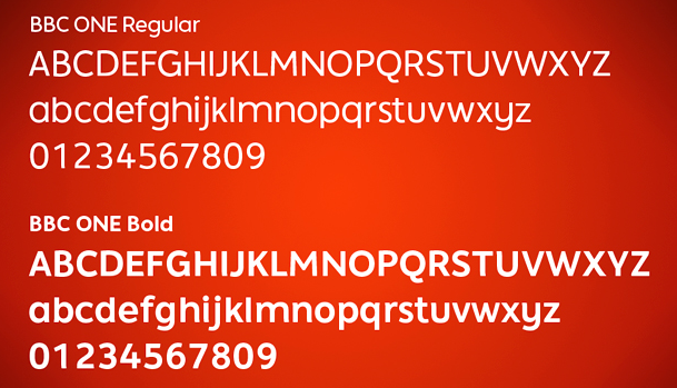
Smith's custom typefaces include Casey, Seat, Tractebel, PPP Healthcare, Powergen, Allied Irish Bank, UUnet, Channel 4, and Saudi Aramco, Champions (2009: for the UEAFA Champions League), Colgate Ready (2014: for Colgate, covering Latin, Cyrillic, Eastern European, Devanagari and Thai), More4 (2005, for the Channel 4 Adult Entertainment channel), ITV (2006, for the ITV network), BBC ONE (2006, for the BBC), Post Office Sans (2003), Severstal (2009), and Moto GP (2020: a custom techno / sports font). Vernon Adams and Fontsmith got into a quarrel about Vernon's Mako, which was submitted and rejected by Fontsmith, which published its own similar typeface Lurpak a few weeks later. Most of Jason Smith's typefaces are now at MyFonts, after Monotype's take-over in 2020:
|
Type commentator and analyzer in San Francisco who has written on Hrant Papazian's bouma theory, Futura, web typography, chirography and readability. [Google] [More] ⦿ | |
Gerardo Francisco Kloss Fernández del Castillo is a Mexican academic specializing in typography. As director of the graphic design career at UAM Xochimilco, he is developing an integral model to evaluate legibility. [Google] [More] ⦿ | |
Frederic Goudy
| |
Frere Jones Type
|
In 2016, he published the sans family for screen, mobile app and desktop, Retina, in seven weights, three widths and two sizes. Retina's MicroPlus styles are engineered to occupy the same space in any weight. To remain legible, deep notches and exaggerated carefully studied ink traps are applied. The Museum of Modern Art has recognized Retina as a milestone in type design, and acquired it for its Architecture and Design Collection. Retina was designed by Tobias Frere-Jones, with contributions by Graham Bradley, Nina Stössinger, Tim Ripper, Dave Foster, Octavio Pardo, Ksenya Samarskaya and Colin Ford. Exchange (2006-2017) was designed by Tobias Frere-Jones, with contributions by Nina Stössinger, Fred Shallcrass, Tim Ripper and Graham Bradley: Originally designed for newspaper text, Exchange strives for clarity and efficient copyfit across multiple platforms. Its strategy relies on an unorthodox collection of historical references, from nineteenth-century Britain to Depression-era America. The strategy for word shape coherence comes from the early Ionic style of slab serifs, while Bell Gothic offers a lesson in reinforcing the individual identities of letters. Sure-footed sobriety, inherited from Victorian text faces, runs throughout. The deep notches and amplified details make Exchange a kind of cousin to Retina, bringing the same defensive strategy to more traditional text settings. Early inspiration came from the British Ionic style of slab serif, Lynn B. and M.F. Benton's Century Expanded, and C.H. Griffith's Bell Gothic. In 2018, Tobias Frere-Jones and Nina Stössinger co-designed the modernized roman inscriptional typeface Empirica Headline (with contributions by Fred Shallcrass). It has original lower case letters and italics, and is largely based on Louis Perrin. Conductor (2018, Tobias Frere-Jones and Nina Stoessinger) is originally based on the delicate, blocky numerals from vintage Bulgarian lottery tickets. It also incorporates elements of vernacular shopfront lettering and mid-century type design. Conductor has power and pizzazz in all of its four widths, from condensed to wide. Custom typefaces: Sixty Thirty (for Cooper Hewitt), Donors Choose (with Nina Stössinger), TD Ameritrade Sans, Culver (for Hyperakt), Bosca, Essex Market (with Nina Stössinger), ACLU, Tableau (with Tim Ripper; for Tableau Software), AdAge (for OCD), Mallory Condensed (for Academy Sports), Topic (a piano key typeface), MSL Elzevir (for Martha Stewart Weddings). In 2021, Tobias Frere-Jones, Nina Stössinger and Fred Shallcrass designed Seaford for use in Microsoft's Office. They write: Seaford is a robust, versatile sans serif that evokes the familiarity and comfort of old-style seriffed type. With everyday Office users in mind---professionals typing up reports or correspondence, preparing school handouts or corporate presentations---we designed Seaford to be inviting, engaging, and effortlessly readable. A good font family for a miserable piece of software. At Frere Jones / Type Network, one can buy Tobias's older typefaces: Armada, Asphalt, Cafeteria, Citadel, Epitaph, Garage Gothic, Grand Central, Griffith Gothic, Hightower, Interstate, Interstate Mono, Interstate Pi, Niagara, Nobel, Pilsner, Reiner Script, Stereo. [Google] [More] ⦿ |
G. Kevin Connolly's thesis at the University of Calgary on legibility: Legibility and Readability of Small Print: Effects of Font, Observer Age and Spatial Vision (1998). [Google] [More] ⦿ | |
Type expert who wrote about legibility. [Google] [More] ⦿ | |
Born in 1929 in Balm/Lotstetten, Germany. He studied typefounding in Schaffhausen from 1944-1948, and worked as typesetter in printing shops in Zürich and Stockholm from 1951-1959. From 1959 until 1994, he taught typographic design in various schools, and from 1993-1998, he was a free-lance book designer associated with Niggli. Author of "Der typografische Raster The Typographic Grid" (Zürich, 2000), and "Typografie Schrift Lesbarkeit" (Verlag Niggli AG, Switzerland, 1996). The latter (highly recommended) book surveys legibility issues in type choices, and closes with a classification of post-1945 typefaces. [Google] [More] ⦿ | |
Foundry whose fonts are sold via Fontworks UK, who write: The Heinemann fonts were initially developed by the in-house design team at Heinemann educational publishing out of the necessity to find the perfect font for use in early primary reading books and literacy products. Basic Heinemann is defined by longer ascenders and descenders which help children to distinguish between letters; rounded edges on all letterforms help focus the reader on the individual letter shape; and modified characters (e.g., a, g) ensure instant recognition of letterforms. Heinemann Special offers further modified characters and kerning pairs ideal for dyslexic or special needs use (eg a, d, b). The Heinemann fonts were developed in partnership with children, literacy advisors, teachers of special needs/dyslexia and primary school teachers, and are now released in response to hundreds of requests from publishers, designers and teachers to purchase them. They have been trialled in schools and learning institutions over an 8 year period, and are a favourite for use in both print and electronic product. Heinemann is a 12-style sans family. [Google] [MyFonts] [More] ⦿ | |
Dutch type connoisseur after whom Antonio Pace's Linotype Gianotten (1990) is named. Born in 1940, he worked for 40 years in the production and distribution of graphic arts equipment and fonts, at companies such as Tetterode, BT and Buhrmann. As a student of Willem Ovink, he got very interested in legibility of typefaces. On his own contributions to typography, he writes: Since 1964 I was involved on the production of our typefaces for Morisawa. Later on we produced typefaces for photocomposition for Bobst (Autologic), Berthold, Compugraphic, A.M., Harris Composition, Itek, Scangraphic and others. Tetterode owned the rights for typefaces like Nobel, Lasso, Polka, Orator, Promotor, Lectura and Hollandsche Mediaeval. LinotypeLibrary owns the licenses for these fonts since October 1 2000. Gianotten left Tetterode in 2000. News about LinotypeGianotten. Linotype's press release. PDF samples of LinotypeGianotten. Article on Gianotten by Wim Westerveld in 2006. [Google] [More] ⦿ | |
Argentinian typography expert. In 2020, he co-authored Legibilidad y tipografia: la composicion de los textos (Campgrafic, Spain) with José Scaglione. [Google] [More] ⦿ | |
Hrant Papazian's alphabet reform efforts are based on his research on readability. This theory was first publically explained at the ATypI 1998 meeting in Boston. Hrant says: The best single place to read it is my 10K-word essay in the book "Graphic Design&Reading". There's also a quarter-length version of that essay in issue #54 of tipoGrafica magazine (in the English original and a superb Spanish translation." To see what he means, check his Mas Lucida project. [Google] [More] ⦿ | |
German type personality (b. 1973, Fulda) who studied visual communication at the Bauhaus University in Weimar. She is involved in type at the Museum für Druckkunst Leipzig and in the DIN committee for type classification. Founder of Kupferschrift, a type expertise firm based in Weimar and Düsseldorf. Alternate URL. She is a professor of Kommunikationsdesign und Typografie and head of the department FB Design at the HBK (Hochschule der Bildenden Künste) Saar. She researches the classification of typefaces, the history of grotesks and legibility. She is co-author of Helvetica Forever (Lars Müller Publishers) and Buchstaben kommen selten allein, a typographic reference book. Speaker at ATypI 2011 in Reykjavik. Speaker at ATypI 2013 in Amsterdam. At the latter meeting she introduces Type Record, a data base on typefaces run by her and Nick Sherman. Speaker at ATypI 2016 in Warsaw. Speaker at ATypI 2017 Montreal. [Google] [More] ⦿ | |
Behance link. [Google] [More] ⦿ | |
James Montalbano
| |
Jason Smith
| |
Lincoln, RI-based student (at SCAD, Savannah, GA) who is interested in legibility issues for her school project. [Google] [More] ⦿ | |
Joe Clark
| |
Joe Clark
| |
Joe Clark
| |
His books include Cómo crear tipografías. Del boceto a la pantalla, and Introducción al estudio de la tipografía (in collaboration with Jorge de Buen Unna). His fonts:
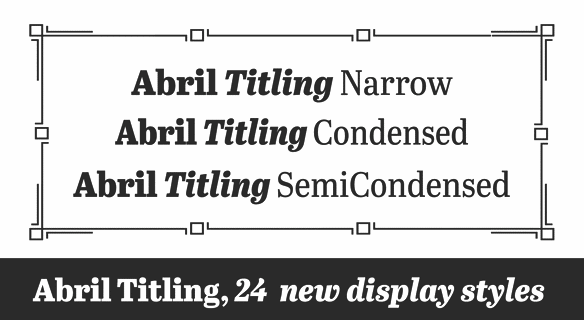
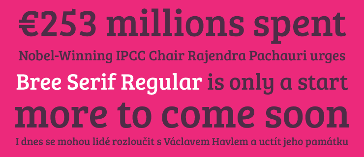
Karmina, Bree and Ronnia, all co-designed with Veronika Burian, won awards for extensive text families at Tipos Latinos 2008. Karmina won an ED Award in 2007 and Athelas won a first prize in the Gransham competition 2008. Bree won a bronze award in the 2009 edition of the ED Awards competition. Bree Serif (2009) won an award at Tipos Latinos 2014. Abril wan gold at the ED Awards. Coauthor of these books:
Speaker at ATypi 2006 in Lisbon, the Third International Conference on Typography and Graphic Communication in Thessaloniki 2007, 3CIT in Valencia, and ATypI 2008 in St. Petersburg, where his talk was entitled From laser printer to offset press. Speaker at ATypI 2009 in Mexico City, where his talk (with Andreu Balius) is entitled A sign to convey sound. Speaker at ATypI 2017 Montreal. Klingspor link. [Google] [MyFonts] [More] ⦿ | |
Juan Pablo de Gregorio
| |
Polish graphic designer and assistant professor at the Academy of Fine Arts in Krakow, Poland. Behance link. Creator of Hoptype (2012) about which he says: Hoptype is a screen font I designed during Ala ma font(a) workshop in Katowice. The workshop was led by Martin Majoor, Filip Blazek, Marian Misiak, Eben Sorkin and Ann Bessemans and curated by Ewa Satalecka. The typeface is designed especially for iPad applications for children who are not yet fluent readers. [Google] [More] ⦿ | |
Karin von Ompteda is an MPhil research student at the Royal College of Art investigating typeface legibility for people with low vision. With a background in the sciences (MSc, Biology, University of Toronto) and design (BDes, Graphic Design, Ontario College of Art&Design), her research takes an interdisciplinary approach to the study of typography. At ATypI 2008 in St. Petersburg, she spoke about the role of typeface design within the scientific study of legibility. [Google] [More] ⦿ | |
Kevin Larson received his PhD in cognitive psychology in 2000 from the University of Texas at Austin. His academic research was on word recognition and reading acquisition. He currently works for Microsoft's Advanced Reading Technology team in Redmond, WA, and is working on the scientific understanding of ClearType and other reading technologies. At ATypI 2003, he spoke about the recognition of words. He provided evidence to support the following theory: "The reader recognizes each of the letters at the same time (in parallel) and assembles a word." (As opposed to sequential recognition and assembly, or word shape recognition.) Speaker at ATypI 2007 in Brighton. At ATypI 2009 in Mexico City, his talk was entitled Don't we have enough fonts? A summary: Few can distinguish differences between typefaces beyond a serif / sans-serif difference, particularly with text typefaces. If readers can't detect these differences, then we are wasting a lot of time and effort. Many researchers now believe that that people have two evaluative systems - one that involves slow, effortful, deliberative thinking - and one that is automatic, fast, and pre-attentive. The second, called rapid cognition, allows people to make rapid judgments with relatively little information. For example, it only takes 50ms (1/20th of a second) to make a judgment about the aesthetics of a website that is similar to a judgment made after a long exposure. Our studies demonstrate that the personality of a typeface is identified with rapid cognition and that it impacts our recognition of the words written with the typeface. At ATypI 2013 in Amsterdam, he speaks about Designing with Science (jointly with Matthew Carter). An excerpt: Matthew Carter and Kevin Larson have developed a type design process where they iteratively conduct scientific letter recognition tests and use the results from the tests to inform design decisions. Speaker at ATypI 2017 Montreal: Typography for Children. Speaker at ATypI 2018 in Antwerp. [Google] [More] ⦿ | |
Argentinian tutorial on cascading style sheets, web typography, the main families of web fonts (included in the main operating systems), and legibility. [Google] [More] ⦿ | |
John Hudson explained in 2002 at textmatters.com (link died): I would equate legibility with decipherability, i.e., a typeface is legible if one can easily identify and distinguish the different letters. Pretty much any text typeface worth the name can claim this basic legibility. Readability is considerably more complex, because the act of reading is not based on the decipherment of the shape of individual letters but recognition of their combination in wordshapes. This introduces elements of type design that go beyond the creation of umabiguous letter shapes: spacing, for example, and issues of horizontal and vertical stress and the rhythm they create in text, which may either work with or against the natural movement of the eye during reading. Steve Hoselitz gives these definitions:
| |
Leticia Gouvea Rumjanek wrote a Masters thesis at ESDI (Univ. of the state of Rio de Janeiro, Brazil) on readability entitled Tipografia para crianças: um estudo de legibilidade (2009). [Google] [More] ⦿ | |
Letritas
|
Letritas home page. Creative Market link. Dafont link. Klingspor link. Kernest link. Behance link. [Google] [MyFonts] [More] ⦿ |
Linda Kudrnovská
| |
Ghent, Belgium-based creator of Mawe (2012), a font used for readability experiments. [Google] [More] ⦿ | |
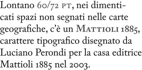
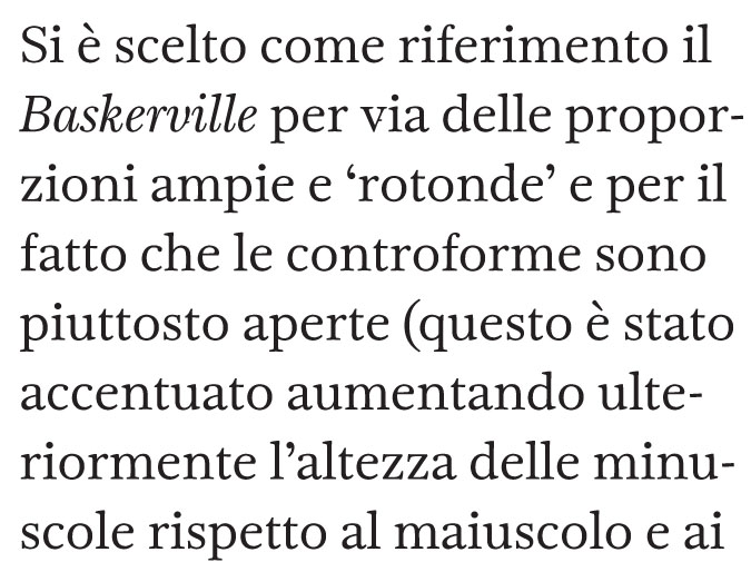
Luciano Perondi
| |
Margaret S. Ratz
| |
Graduate of Sint-Lukas Academy in Brussels in 2011. For her Masters project in 2011, she created Minimal, a type family in which parts of glyphs are omitted without jeopardizing legibility too much. Behance link. [Google] [More] ⦿ | |
Masayuki Yamamoto graduated in visual communication design from University of Tsukuba before he studied typography at University of Reading. He taught graphic design at the Department of Fine Arts&Music, Hyogo University of Teacher Education, and is now professor at Tama Art University. He spoke at ATypI 2005 in Helsinki on Harmony of type mixture in Japanese typography, and at ATypI 2007 in Brighton on Measuring harmony of type mixture. These statistical studies concern the Latin/Japanese type mixture focusing on four recent fonts: Heisei-Mincho W3 (1991), Hiragino-Mincho W3 (1993), Kozuka-Mincho R (1997), Yu-Mincho R (2002), and various sans (gothic) fonts for Japanese. At ATypI 2009 in Mexico City, she spoke on legibility research of Japanese typography. [Google] [More] ⦿ | |
| |
Mike Parker
| |
Milda Kuraityte is a graphic designer and PhD student at the Faculty of Fine Arts, University of Lisbon. She is a member of the European Cooperation in Science and Technology (COST) projects European Literacy Network (ELN) and E-Read, which focus on reading processes on screen. In her research on kinetic typography, Kuraityte combines the fields of typography and psycholinguistics. For her experimental work, in collaboration with the Psycholinguistics Laboratory at the Faculdade de Letras da Universidade de Lisboa (FLUL), she uses an eye-tracking system to analyze kinetic typography. Kuraityte lives in Amsterdam. Speaker at ATypI 2019 in Tokyo. [Google] [More] ⦿ | |
American ex-presidential candidate who said that anything you write in 85pt Garamond is far more likely to be believed. [Google] [More] ⦿ | |
Molotro
|
He was appointed associate professor of Design at the IUAV Venice in 2018 and he is also a member of the Alpaca cooperative of designers. From 2003 until 2007 he ran the Molotro studio. From 2005 until 2013 he was on the editorial board of the Italian design magazine Progetto Grafico. He has lectured in many Italian universities. From 2013 until 2016, he was the Director of the ISIA Urbino. In 2012 Stampa Alternativa published his book on non-linear writing, Sinsemie: scritture nello spazio. In 2013, he became a member of the cooperative foundry CAST, and is now its chief designer. At ATypI 2005 in Helsinki, he spoke about How does the irregularity of letters affect reading? His type designs include
|
| |
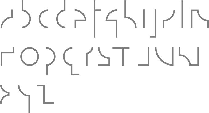
Really interesting way to show that reading distance matters. [Google] [More] ⦿ | |
Norwegian professor in the Graphics Engineering Arts Program of Gjøvik College. Type designer who lives in Raufoss. In 1999 at the University of Reading, he wrote a doctoral thesis, entitled Knowledge construction in typography: the case of legibility research and the legibility of sans serif typefaces. At ATypI 2004 in Prague, he spoke about British traffic signs. In particular, he will talk about Jock Kinneir and Margaret Calvert's influential traffic signs and accompanying letterforms from the early 1960s for Britain's national roads (first for the new motorways and later for the whole national road network). [Google] [More] ⦿ | |
Omega Type Foundry
|
His graduation typeface Marco (<2011), which is named after Marco Polo, covers Latin, Mongolian, Greek, and Cyrillic, and has sans and serif versions. Inspiration for Marco goes back to Italian humanist typography such as those of Nicholas Jenson or Aldus Manutius, and general influences from calligraphy. Marco is a true superfamily, with wide utility and superb legibility---not surprisingly, it won an award at Modern Cyrillic 2014. The text styles were professionally produced in 2015 by Type Together in 2015---each style has over 1900 glyphs. His chancery hand typeface Tangerine (2010) is part of the Google font directory (for free web fonts). Typefaces from 2013: Metro Nova (Linotype: a sans family with a strangely circumcised lower case f). Metro Nova won an award at TDC 2014. Typefaces from 2014: Neue Haas Unica and Neue Haas Unica Pan European. A digital update of the Helvetica alternative Haas Unica, which was originally released in 1980 by the Haas Type Foundry for phototypesetting. In 2015, he made Cowhand (Monotype: a Western typeface). All words typed in Cowhand are of equal width, whether they contain one character or twenty (the maximum the font allows). For Monotype, he made the custom typeface Quentin Blake (2016) that emulates the irregular handwriting of Sir Quentin Blake, acclaimed illustrator of Roald Dahl's novels. In 2017, Toshi Omagari designed the Wolpe Collection for Monotype, all based on Berthold Wolpe's distinctive typefaces: Wolpe Pegasus, Wolpe Tempest, Wolpe Fanfare, Sachsenwald (blackletter: a revival of Berthold Wolpe's Sachsenwald from 1936), Albertus Nova. In 2018, Linda Hintz and Toshi Omagari published the large geometric sans typeface family Neue Plak that revives and extends Paul Renner's Plak (1928). Nadine Chahine and Toshi Omagari collaborated with Akira Kobayashi and Monotype Studio on Avenir Next Arabic (2021). At his own foundry, Omega Type, he released these typefaces in 2021: Klaket (a bold and monolinear Arabic display typeface that was inspired by classic Egyptian film posters in a free form Ruqah style), Platia (a modern revival of the 19th century font Hellenic Wide). At ATypI 2011 in Reykjavik, he spoke about Mongolian scripts. At ATypI 2015 in Sao Paulo, he revealed his research on the Siddham (post-Brahmian). Speaker at ATypI 2016 in Warsaw on BubbleKern (a new kerning algorithm). Speaker at ATypI 2017 Montreal on Sini: Arabic calligraphic styles from the Far East. Fontsquirrel link. Dafont link. Klingspor link. I Love Typography link. Google Plus link. Interview by MyFonts in 2022. [Google] [MyFonts] [More] ⦿ |
Poynter Fonts
| The Poynter fonts were published in 1996 as "the readability series" for use in newspapers. Designed to optimize all aspects of text readability, the font series is the result of an ongoing collaboration among Poynter [Institute] faculty, conference participants from newspapers large and small, and the Font Bureau of Boston. The defunct page at poynter.org had questions and answers by Ron Reason of The Poynter Institute and Mike Parker, typographic editor of The Poynter Fonts. The fonts were adopted by the Detroit News and the Ottawa Citizen. They were released by the Font Bureau. [Google] [More] ⦿ |
Promodesign
|
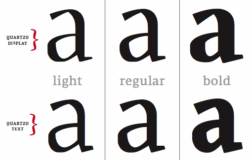
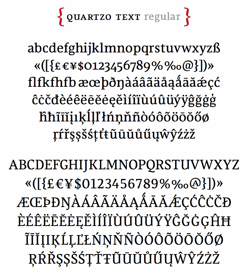
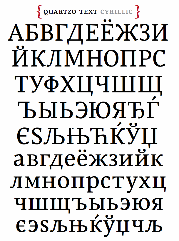
He obtained an MA in typeface design from The University of Reading (2009), based on his type family Quartzo, a typeface system for magazines. He lectured at IED Sao Paulo and is currently undertaking a PhD and teaching at the University of Newcastle, Australia. His fonts:
Behance link. Speaker at ATypI 2016 in Warsaw. [Google] [More] ⦿ |
Alyson L. Hill (Department of Psychology, Stephen F. Austin State University, Nacogdoches, TX) discusses readability of web sites. Dated 1997. One of her conclusions: In this experiment, Times NR (proportionally spaced) was faster than Courier New (non-proportionally spaced), while Arial (proportionally spaced) was slower than Courier New. [Google] [More] ⦿ | |
Author of "Report on the legibility of print", Medical Research Council, London, 1926. [Google] [More] ⦿ | |
Robert Jarzec designed these typefaces:
| |
Font, word and character selection and legibility experiments by Rudi Seitz. [Google] [More] ⦿ | |
Screenfont.ca
| Joe Clark (Toronto) is developing special fonts for captioning and subtitling for TV and film. Joe's motto is Watching TV is bad enough. Reading TV shouldn't be worse. Two interesting sub-pages: Here he explains the difference between captioning and subtitling. Captions are basically for the deaf, and are manually turned on. They not only describe what is said or heard but also mention or show things about the intonation, style, language, or nature of the voices or sounds. Subtitling is mostly used to translate. It is generally automatically turned on, and shown at the bottom of the screen. On this page, Joe lists the main issues with captioning and subtitling and lists the many problems with popular subtitling typefaces such as Bitstream's Tiresias or Monotype's Arial. Speaker at ATypI 2007 in Brighton. [Google] [More] ⦿ |
Serif vs sans serif
| Faruk Ate discusses this old dilemma. Serif is more legible in print, but less so on screen. Serif is better for dyslexics though, as there is less confusion. At small screen size, sans serif is recommended. He concludes: Personally, I still prefer sans-serif for large chunks of text with a lovely serif heading. [Google] [More] ⦿ |
British type designer, born in 1959, who runs Type Design, an independent consultancy which she founded in 1981. From 1977 on, she worked in the type department of Linotype, where she and Walter Tracy developed Arabic and Cyrillic typefaces. She created Telegraph Newface Bold (1989, with Walter Treacy, for The Daily Telegraph), Telegraph Newface Roman (1990), Pegasus Bold (1980, with Matthew Carter for Berthold Wolpe), Mitsubishi Arabic (1987, with Tim Holloway), New Johnston Signage Light (1988), Sun Life Engraved (1988), and helped Matthew Carter with the creation of foreign glyphs to extend his Galliard family. BAA Bembo, used at BAA airports, was drawn by her (and possibly Freda Sack as well). Typographers laud it for its legibility compared to Vialog and Frutiger. Klingspor link. [Google] [MyFonts] [More] ⦿ | |
Author of Reading Letters: Designing for Legibility (2012) and Type Tricks (2017). Designer of these typefaces:
Speaker at ATypI 2011 in Reykjavik. Speaker at ATypI 2013 in Amsterdam on the subject of typeface legibility. Her talk at ATypI 2014 in Barcelona was entitled The voice of a typeface. Speaker at ATypI 2014 in Barcelona. Speaker at ATypI 2016 in Warsaw on The legibility of letters and words and at ATypI 2017 in Montreal on The legibility of numerals. Speaker at ATypI 2018 in Antwerp on the topic of stroke weight and letter width. Speaker at ATypI 2019 in Tokyo on the topic of Age-Related Deficits and Their Effects on Reading. [Google] [MyFonts] [More] ⦿ | |
At the Department of Psychology, Wichita State University, Wichita, KS, various (mostly Microsoft) fonts were compared for speed of reading, and legibility. Conclusions: "o significant differences in reading efficiency were detected between the font types at any size. There were, however, significant differences in reading time. Generally, Times and Arial were read faster than Courier, Schoolbook, and Georgia. Fonts at the 12-point size were read faster than fonts at the 10-point size. In addition, a font type x size interaction was found for the perception of font legibility. In general, however, Arial, Courier, and Georgia were perceived as the most legible. For font attractiveness, Georgia was perceived as being more attractive than Arial, Courier, and Comic, while Times was perceived as more attractive than Courier. This contrasts with participants' general preference for a particular font type. Overall, Verdana was the most preferred font, while Times was the least preferred. Thus it seems that the Georgia and Times serif fonts are considered more attractive, but they are generally less preferred. Of the fonts studied, Verdana appears to be the best overall font choice. Besides being the most preferred, it was read fairly quickly and was perceived as being legible.". For font legibility, Tahoma 10pt, Courier 12pt and Georgia 10pt came out the winners. Research by Michael Bernard, Bonnie Lida, Shannon Riley, Telia Hackler, and Karen Janzen. Alternate URL [Google] [More] ⦿ | |
Designer of Roxane, a font designed with legibility in mind. Plus an essay on legibility. Stuart Gluth teaches graphic design, leads the Design Research Group at the University of South Australia, and has a master's degree from the ANCT in Paris. [Google] [More] ⦿ | |
Sue Walker
| |
Terminal Design
|
Montalbano designed custom corporate fonts for Condé Nast Publications, Warner Music, The American Medical Association, the U.S. National Park Service, Vanity Fair, Brides, Gourmet, Mademoiselle, Sassy, Details, Glamour, Jane, Self and Book. The list of font names, with links: Klingspor link. FontShop link. Linotype link. Behance link. View James Montalbano's typefaces done at ITC. [Google] [MyFonts] [More] ⦿ |
The Effect of Typeface on the Perception of Email
| A study in 2007 at Wichita State University (Kansas) by A. Dawn Shaikh, Doug Fox and Barbara S. Chaparro showed test subjects emails in Calibri, Comic Sans and Gigi. The selection of the three fonts used for the neutral email was based on previous work by Shaikh, Chaparro, and Fox (2006) that examined user perception of how appropriate 20 fonts were for 25 uses (i.e., business documents, web pages, email). The ranking of those 20 fonts: Calibri, Corbel, Candara, Cambria, Verdana, Arial, Times New Roman, Constantia, Georgia, Century Gothic, Comic Sans, Courier New, Consolas, Monotype Corsiva, Kristen ITC, Agency FB, Rage Italic, Gigi, Rockwell Extra Bold, Impact. Interestingly, in questions of ethos, Comic Sans and Colibri are almost equal, well ahead of Gigi. [Google] [More] ⦿ |
The Effect of Website Typeface Appropriateness on the Perception of a Company's Ethos
| A study in 2007 at Wichita State University (Kansas) by A. Dawn Shaikh reveals that among a handful of typefaces, readers of company web sites order them as follows: Calibri, Cambria, Arial, Calisto, Georgia, Courier New (way down), and at the bottom, Monotype Corsiva, Lucida Hand, Informal Roman, Viner Hand and Curlz. [Google] [More] ⦿ |
The Lexend Project
|
Bonnie writes: Lexend is a variable typeface designed by Bonnie Shaver-Troup and Thomas Jockin in 2018. Applying the Shaver-Troup Individually Optimal Text Formation Factors, studies have found readers instantaneously improve their reading fluency. Lexend was expanded to Arabic in January 2020. The Shaver-Troup Formulation was applied to Arabic with advise from Arabic typeface designer, Nadine Chahine. Lexend is based on the Quicksand project from Andrew Paglinawan, initiated in 2008. Quicksand was improved in 2016 by Thomas Jockin for Google Fonts. Thomas modified Quicksand for the specialized task of improving reading fluency in low-proficiency readers (including those with dyslexia. In 2019, Thomas Jockin released the free seven font family Lexend (Deca, Exa, Giga, Mega, Peta, Tera and Zetta) at Google Fonts, together with Bonnie Shaver-Troup. Github link. Dedicated site. Thomas Jockin writes that Lexend is empirically shown to significantly improve reading-proficiency. As prescription eyeglasses achieve proficiency for persons with short-sightedness, Lexend's families were developed using Shaver-Troup Formulations. We will eventually release all seven families as a single variable font featuring its own custom axis. Lexend is thus an implementation of Bonnie Shaver-Troup's 2000 study, in which she theorized that reading performance would improve through the use of (1) hyper expansion of character spacing [which creates a greater lag time and reduces potential crowding and masking effects], (2) expanded scaling, and (3) a sans-serif font [to reduce noise]. Lexend is indeed hyper-widely spaced. [Google] [More] ⦿ |
Thomas Huot-Marchand
| |
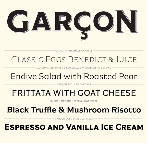
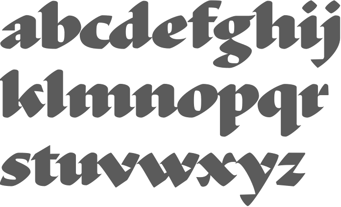
In 2012, he designed the large award-quality copperplate family called Garçon Grotesque. Typefaces from 2013: Ductus (a five-style broad-nibbed calligraphic / medieval family). In 2015, he published Azote (a multilined typeface family inspired by the 1968 Olympic Games in Mexico City). In 2019, he released the free seven font family Lexend at Google Fonts, together with Bonnie Shaver-Troup. Github link. Dedicated site. Lexend now comes in subfamilies called Deca, Exa, Giga, Mega, Peta, Tera and Zetta. He writes that Lexend is empirically shown to significantly improve reading-proficiency. As prescription eyeglasses achieve proficiency for persons with short-sightedness, Lexend's families were developed using Shaver-Troup Formulations. We will eventually release all seven families as a single variable font featuring its own custom axis. Lexend is thus an implementation of Bonnie Shaver-Troup's 2000 study, in which she theorized that reading performance would improve through the use of (1) hyper expansion of character spacing [which creates a greater lag time and reduces potential crowding and masking effects], (2) expanded scaling, and (3) a sans-serif font [to reduce noise]. Lexend is indeed hyper-widely spaced. Lexend also received support from Santiago Orozco and Hector Gomez. Additional links: CTAN link with TeX support. Github link by Brain Stone (Yannick Schinko). [Google] [MyFonts] [More] ⦿ | |
Tiresias: Critique by Joe Clark
| Joe Clark (Toronto) deflates the balloon blown up by Bitstream regarding John Gill's Tiresias, which was specially developed for screen captioning. His main points:
|
Tobias Frere-Jones
| |
Toshi Omagari
| |
TYPO
| Bi-monthly Czech type and graphic design magazine set up in 2003 by Pavel Zelenka, Filip Blazek, Pavel Kocicka and Jakub Krc. Some issues are free. Linda Kudrnovská is its present editor-in-chief. Issue 13 (2005) deals with readability and legibility, for example. Some of the articles: The Science of World Recognition (Kevin Larson), The Bouma Supremacy (Hrant Papazian), Lateral Interference, Response Bias, Computation Cost and Cue Value (Peter Enneson), and Producting legible text on screen: Where do we look for guidance? (Mary C. Dyson). Issue 14 (2005) has an article by Iva Knobloch on Vojtech Preissig and by Adam Twardoch on FontLab 5. Table of contents. [Google] [More] ⦿ |
Typologia
|
|
Unifon (or: Unifon Press)
| Unifon is a free font that serves as a proposal for a phonetic alphabet to help people read better and faster. It was proposed by Margaret S. Ratz in 1966. Unifon D 2005 (2005) is OCR-like and Uniforn Ra (2005) is roman. T [Google] [More] ⦿ |
Vladimir Levantovsky is a senior technology strategist at Monotype Imaging Inc. and currently serves as a chair of the W3C WebFonts Working Group and a chair of the ISO SC29/WG11 ad-hoc group on font format representation. Born in Ukraine, Vlad moved to the USA in 1995. He has been involved in the work of various industry consortiums and standards organizations since 2002, and is passionate about advancing typographic capabilities on CE and mobile devices and on the Web. He has been an active contributor to the development of various technology platforms, including hardware-accelerated vector graphics (OpenVG), Java ME profiles for mobile devices (JSR-271 and JSR-287), DVB Multimedia Home Platform, OMA Rich Media Environment and core font technology standardization at ISO/IEC. Speaker at ATypI 2012 in Hong Kong: Evaluating fonts legibility in automotive environment. Excerpts of the abstract: Can typeface design make a difference in minimizing glance times [in vehicles] while maximizing the time that drivers' eyes stay on the road? Monotype Imaging has partnered with the MIT AgeLab to study the impact of typeface design on driver demand. He goes on: Data from two separate experiments, each involving over 40 participants ranging from 36 to 74 years of age was collected in a real-time driving simulation in which participants were asked to respond to a series of address, restaurant identification and content search menus that were implemented using two different typeface designs. The results were collected and analyzed using eye tracking equipment and video recordings. Among participants, a Square Grotesque typeface resulted in a noticeable increase in visual demand as compared to the Humanist typeface. Total glance time and number of glances required to complete a response showed consistent results. He also spoke at ATypI 2015 in Sao Paulo. [Google] [More] ⦿ |

 256tm is the foundry of Besançon, France-based designer
  Cofounder, with Ralph du Carrois, of
  German type and communication designer, lecturer and researcher with a special interest in legibility and readability (b. 1989). She obtained a Bachelor's in communication design with Jovica Veljovic at Hamburg University of Applied Science, where her thesis was entitled The Letters in my Head. What Creatives should know about reading processes in order to design joyful reading experiences. She also did a Master's with Veljovic, which led to her Legilux typeface family (a transitional serif with optical sizes as well as a sans serif) and further research on legibility. She graduated in 2017. Antonia joined Dutch Design in 2017 and extended the FF DIN family to FF DIN Slab. Furthermore, she re-engineered the whole FF DIN family itself to make variable fonts; she also added Bulgarian Cyrillic and other characters; finally, she also made FF DIN Stencil into a functional three axis variable font. Since 2018, she teaches type design at Muthesius University of Fine Arts and Design in Kiel.
  Applied Design Works was founded in 2015, with offices in New York and Los Angeles. In their own words, Applied specializes in design, planning, strategy, and implementation for a broad range of mission-driven organizations. Their team includes Craig Dobie, Founding Creative Director, Brad Scott, Founding Managing Director, and Elliott Scott, Creative Director.
  German type designer at URW++, b. 1978, Dülmen. After studies at Fachhochschule Münster in 2009, he set up Designwerk H. In 2016, he completed the simple 4-style sans typeface families
  Italian artist, writer, designer, architect, graphic designer, educator, and philosopher, who proposed one font, Essential, in 1935, consisting of the minimum parts of letters needed for readability. His principles were lucidity, leanness, exactitude and humor. He was part of a team at Nebiolo (with Giancarlo Illiprandi, Franco Grignani, Ilio Negri, Till Neuburg, Luigi Oriani and Pino Tovaglia) that designed the lineale family Forma from 1966-1970 under the direction of Aldo Novarese. Born in 1907 in Milan, he died there in 1998.
  [
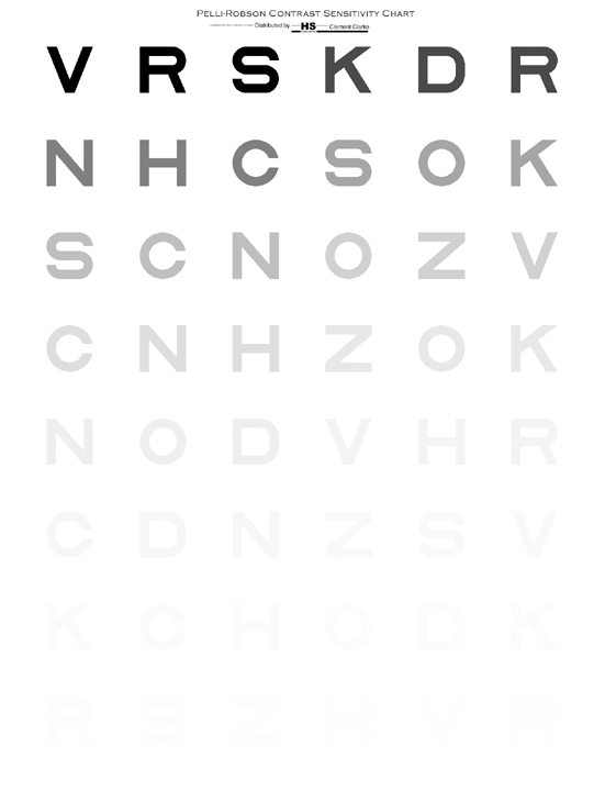
[ Creator of the free eye chart font Sloan (1990-1994, Metropia Ltd), which is based on Louise Sloan's design, which in turn has been designated the US standard for acuity testing by the National Academy of Sciences, National Research Council, Committee on Vision (1980, Adv Ophthalmol, 41, 103-148). The standard specifies only the letters CDHKNORSVZ, whereas the font file provides a complete uppercase alphabet A-Z. This font was developed for the
  FontArte (est. 2004; ex: Magdart Fonts) is
  Jason Smith is the British corporate typeface designer who founded Fontsmith in 1997, where he retailed his own designs from his office in London. He has created a typographic identity for the Post Office in the UK. Phil Garnham was one of the in-house type designers. In January 2020, Fontsmith was acquired by Monotype.
  After his break-up with Jonathan Hoefler, Tobias Frere-Jones set up shop as Frere Jones Type in Brooklyn, NY, in 2015, and joined
  Graphic designer and typographer in Sheffield, UK. In 2013, he created the experimental typeface
  [
[ [
[
 [
[ Juan Pablo De Gregorio Concha lived in Santiago, Chile, where he founded Letritas in 2006. He is presently based in Barcelona. Home page of
  [
[ During his studies, brighton, UK-based Michael Anderson designed the sans typeface Anderson (2017) for legibility on small screens.
  Molotro is
  MyFonts hit list for the tag word "legible".
 Promodesign is a Brazilian graphic design company of
  Type, lettering, information architecture and user experience designer, who studied at Poznan Fine Arts University and Adam Mickiewicz University. He is currently teaching at Poznan Fine Arts University.
 Terminal Design is the company of
  Bonnie Shaver-Troup, EdD, the creator of the Lexend project (which is based in Irvine, CA), is focused on making reading easier for everyone. As an educational therapist, Bonnie created the first Lexend typeface in early 2001 aiming to reduce visual stress and to improve reading performance for those with dyslexia and other struggling readers. Today, Bonnie's goal is to make the Lexend fonts accessible to a larger spectrum of users.
  Type designer in Brooklyn and/or Holbrook, NY, b. 1986, who studied at the Parsons School of Design and the inaugural Type@Cooper program. He lived in Portland, OR.
  [
[ [
[ The full title of this book is "Typologia, Studies in Type Design \& Type Making" (1940, University of California Press, Berkeley). At the TypeArt Reference Library, you can find 5 chapters of it. This is Frederic Goudy's magnum opus, his life's work, giving his vision on many typographic things. It contains the story of the proprietary typeface University (of California) Old Style. It even has a big section on the history of legibility. [
|
|
|
|