| | |
Albrecht Dürer

|
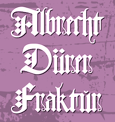 Born and died in Nuremberg, Germany, 1471-1528. Painter, wood carver and copper engraver extraordinaire, famous for many great geometrical and structured capitals and proportioned designs, carried out with compass and ruler. Example from 1524. Another example, ca. 1500. Best known for the books on the geometry of letters, Unterweysung der Messung [A Course on the Art of Measurement] [or: Of the Just Shaping of Letters], published in 1525. See here.
 Images of his work: his famous set of German Renaissance Capitals (1525), Gothic Capitals, German Minuscule, his famous rhinoceros (1515) and his blackletter type Dürerfraktur (1519). Digital typefaces based on Duerer's work: - Terry Wüdenbachs at P22: P22 Durer Caps (2004).
- MichelM at URW++: Hands on Albrecht (2005).
- Amy E. Conger: Duerer (2006).
- SoftMaker: Albrecht Duerer Fraktur Pro (2016). A revival of Duerer's ornamental blackletter.
- Christopher Adams: Just Letters (2012, blackletter). This was based on Albrecht Duerer's Of the Just Shaping of Letters (1525).
- Alan Hoenig: The Computer Duerer fonts (1990). A set of Metafont typefaces.
- Dieter Steffmann: Duerer Gotisch (2001).
- Jeff Jackson: JGJDurerGothic (1997).
- Gilles Le Corre: 1525 Durer Initials (2010).
- David nalle: Albrecht Durer Gothic.
- Martin Lorenz and Joan Pastor: VLNL TpDuro (2019). A blackletter.
- Manfred Klein. The geometrical overlays reminiscent of Duerer are another recurrent theme in Manfred Klein's work. Fonts directly or indirectly related to Duerer's compass-and-ruler constructions made by Manfred Klein include DancingVampyrish, GrafBoldBold, GrafCirculum, GrafCirculumBricks, GrafObliqueItalic, GrafRoundishMedium, GridConcreteDue, GridConcreteLogoable, OldConstructedCaps, RodauButtons, RodauButtonsInverse, RodgauHeads, RodgauerFisheyes, RodgauerOne, RodgauerOneRoundMedium, RodgauerThree, RodgauerThreeRoundedMedium, RodgauerTwo, RodgauerTwoRounded-Medium, RomanGridCaps, SketchesByDuerer-Inverse, SketchesByDuerer, TheRoots, XPCrazy-Light, XPFourTwoContourMedium, XperimentypoFS, XperimentypoFSBlack, XperimentypoFSWhite, XperimentypoFourBRound, XperimentypoFourCRoundInvers, XperimentypoFourRound, XperimentypoNr1, XperimentypoNr1Oblique, XperimentypoStripes-One, XperimentypoStripes-Two, XperimentypoThree-B-Square, XperimentypoThree-C-Square, XperimentypoThree-Crazy, XperimentypoThreeSquares, XperimentypoTwo, XperimentypoTwoCrazy, XperimentypoTwoStripes. Download page. Download all these fonts in onze zip file.
[Google]
[MyFonts]
[More] ⦿
|
American Text
|
 A textura typeface. Mac McGrew: American Text was designed by Morris F. Benton for ATF in 1932, as a modernized adaptation of the sort of typeface commonly called Old English. It seems to be constructed entirely of straight lines, with a very angular appearance. It has had some popularity in advertising, as well as for stationery.
 Digital versions include American Text by Bitstream, OPTI American Text by Castcraft, Blackletter 851 by Bitstream, National Text by Bitstream, American Text (2019) by SoftMaker, and the free typeface American Text (2000) by Dieter Steffmann. [Google]
[More] ⦿
|
Arno Drescher
|
 Type designer (b. Auerbach, Germany, 1882, d. Braunschweig, 1971) who studied at the Akademie für Kunstgewerbe in Dresden, and became professor there in 1920. During World War II, Arno Drescher was director of the Akademie für graphische Künste und Buchgewerbe in Leipzig. After a period as freelance designer, he finally moved to Braunschweig in 1960.
 Drescher is best known for his large geometric Super Grotesk family (Schriftguss, 1930). The list of his typefaces: - Appell (1933, Schriftguss).
- Arabella (1936, Ludwig Wagner) and Arabella Favorit (1939, Ludwig Wagner). A cursive pair of typefaces. Digital revivals include Arabella (ca. 1999) by Dieter Steffmann and Arabella Pro (2006) by Ralph M. Unger.
- Drescher Eilschrift (1934, Wilhelm Woelmer).
- Drescher Versalien (1927, Schriftguss). Aka Drescher Initials. An open lineale titling typeface.
- Duplex (1930, Typoart and 1937, Schriftguss). An all caps inline typefaces.
- Energos (1932, Schriftguss). An early brush script. Revived by Ralph M. Unger in 2008 as Energia Pro (2008).
- Fundamental Grotesk (1938-1939, Ludwig Wagner) and Fundamental Kursiv. In several weights.
- Helion (Schriftguss, 1935, and Fonderie Française, 1935, a 3-d shaded outline font). Digitally revived by Ralph M. Unger in 2020 as RMU Helion.
- Manutius Antiqua (1935, Ludwig Wagner), Manutius Kursiv (1935, Ludwig Wagner). This typeface is idenitical to Johannes Wagner's Antiqua 505 (1955).
- Milo (1940, Schriftguss). A shadow typeface.
- Onyx (1936, Schelter & Giesecke). A multiline art deco titling typeface.
- Schreibmeister Kursiv (1958, at Ludwig Wagner). A formal cursive font. Schreibmeister (2021) is Ralph Unger's interpretation.
- Super Grotesk (1930, Schriftguss). This geometric typeface family was revived at FontShop in 1999 by Svend Smital as FF Super Grotesk, and at Bitstream in 2001 by Nicolai Gogoll as Drescher Grotesk BT. Super Grotesk Schmalfett (1933) was revived in 2020 by Ralph M. Unger as RMU Gong.
- Super Blickfang (1932, Schriftguss), Super Elektrik (1931, Schriftguss), Super Reflex (1931, Schriftguss). For a digital revival, see FF Super.
Klingspor link. [Google]
[MyFonts]
[More] ⦿
|
Arnold Hans Morscher
|
Small blackletter archive, largely fonts made by Dieter Steffmann: BreitkopfFraktur, Deutsch-Gothic (by Jim Fordyce), FetteFraD, FettedeutscheSchrift, Fraktur, HumboldtFraktur, Kleist-Fraktur, KochFraktur (by Helzel), Luftwaffe (by WSI), MarsFrakturNormal (by Helzel), Propaganda (by Antifa Publishing), SchmaleAnzeigenschrift, SchwabenAlt-Bold, TannenbergFett, ZentenarFraktur. [Google]
[More] ⦿
|
ATF 1923 Catalog: Parsons
[Will Ransom]
|
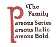 Showcasing the best pages from the Parsons Series in the ATF 1923 Catalog. This is an original ATF display typeface (via its acquisition of BB&S) with a hand-drawn almost art nouveau look. Created in 1918 by Will Ransom for Barnhart Brothers&Spindler, it was named after the artistic director of a Chicago-based department store.
 Mac McGrew: Parsons was designed for BB&S in 1917 by Will Ransom, Chicago artist based on the distinctive style of lettering he had been doing for advertisers in that city, and was named for I. R. Parsons, advertising manager of a Chicago department store. It is nearly monotone, but with a hand-lettered quality. It has unusual half-serifs and unique forms to a number of letters. The caps MNUY have a lowercase design, but at the insistence of users a more conventional form of M and N was added by the foundry, to the distress of the designer. Parsons Italic and Parsons Bold were added in 1918 by the same artist. Oversize ascenders and descenders are one of the most notable features of this type, but Ransom was reluctant to let the foundry cut them. At his insistence the foundry included with specimens a warning that generally only one such letter should be used in a line, and suggesting other restrictions. The type was a great success but the suggestions were commonly ignored, and advertising bristled with groves of tall letters. It is said that this display of bad taste in the use of his design dismayed Ransom so much that he abandoned the idea of designing other typefaces. Only Clearcut Shaded Capitals, in 1924, are later credited to him, aside from decorative material. Parsons is believed to be the first typeface to feature long characters of this sort although several artists had used them in distinctive hand-lettering. At least one typeface---Pencraft (q.v.)---had earlier supplied flourishes which could be added to special ascenders and descenders. Stymie Bold (q.v.) resurrected the idea later but less successfully. The Parsons long characters were included in all fonts; f-ligatures were made for all sizes of italic, but only up to 18-point in the roman and not at all for the bold. Monotype lists "Parson's Bold" in some of its literature; this is presumed to be the same typeface but no confirmation or specimen has been found. Parsons Swash Initials were designed by Sidney Gaunt; some of them were not approved by Ransom but were cast anyway. Digitizations include AIParsons (1994) by Inna Gertsberg and Susan Everett at Alphabets Inc. Nick Curtis' Parsnip family (2004) is based on Parsons. Jess Latham also digitized Parsons. See also OPTI Puritan Bold Flair in the Castcraft collection. Finally, Dieter Steffmann converted the Gertsberg / Everett revival in 1999 to truetype while keeping the name AI Parsons. [Google]
[More] ⦿
|
Bauersche Giesserei blackletter fonts
|
 Andreas Seidel lists the blackletter typefaces published by the Bauersche Giesserei (and I added a few more):
 - Flinsch Privat, 1919
- Renata, 1914. Digital revivals as renata by Gerhard Helzel, and later by Peter Wiegel.
- Bernhard Fraktur, 1913-22
- Frankfurter Fraktur, 1905 / after 1911 renamed to Flinsch Fraktur
- Flinsch Germanisch, 1876
- Zentenar Fraktur, 1937, named after the 100-year anniversary of the Bauer Foundry
- Herkules-Gotisch (1898)
- Hoyer Fraktur, 1935-37
- Weiß Gotisch, 1936, E. R. Weiß
- Weiß Rundgotisch, 1937
- Weiß Fraktur, 1914
- Element, 1933
- Gotika, 1933
- Laudan Kanzlei, 1913
- Manuskript Gotisch (1905-1923; note: I thought the correct date was 1899), made after letters created by Wolfgang Hopyl in 1514.
- Leipziger Fraktur, 1909
- Wieynck Fraktur, 1912, Prof. Heinrich Wieynck
- Gotisch, 1906, Georg Barlösius
- Enge Gotisch (1880). Digital version by Gerhard Helzel done in 2008.
[Google]
[More] ⦿
|
Bauersche Giesserei: Hauptprobe in gedrängter Form der Bauerschen Giesserei
|
 Type specimen book by Bauersche Giesserei published ca. 1915. Open Library link. Archive.org link. Local download. Local download, colored version [27MB].
 An earlier and more volumunous book of specimens is Hauptprobe der Bauerschen Giesserei in Frankfurt am main und Barcelona (Frankfurt am Main, 1907). [Google]
[More] ⦿
|
Bauersche Schriftgiesserei
|
 Frankfurt-based foundry started in 1837 by Johann Christian Bauer. At the end of the 19th century, the new owner was Georg Hartmann. On its staff, it had designers such as Konrad F. Bauer [Alpha (1954), Beta (1954), Folio (1956-63), Imprimatur (1952-55), Volta (1956), Verdi (1957), Impressum (1963), all made with Walter Baum], Lucian Bernhard [Bernhard Condensed, 1912], Hugo Steiner-Prag [Batarde, 1916], Julius Diez [vignetten, 1910-1912], Henri Wieynck [Trianon, 1906; Cursive Renaissance, 1912; Wieynck-Kursiv, 1912], Georg Hartmann, Paul Renner [Futura, 1937], Emil Rudolf Weiß [Weiß Fraktur, 1924], Berthold Wolpe [Handwerkerzeichen, 1936; Hyperion, 1931; Rundgotisch, 1938] and F.H. Ernst Scheidler [Legend, 1937]. In its glory period, Bauer's leader was Heinrich Jost (1889-1949), from 1922 until 1948, who with punchcutter Louis Hoell made a beautiful version of Bodoni, now known as Bauer Bodoni. A New York office was set up in 1927, but after the 1960s, the foundry declined and finally closed its doors in 1972. Its typefaces were passed on to its Barcelona branch, Fundición Tipográfica Neufville. See also here. Digitized typefaces include Futura ND (Paul Renner, redigitized by Marie-Therésè Koreman at Neufville in 1999), Edison Swirl SG (late 1800s, digitized by Spiece Graphics), Gable Antique Condensed SG (late 1800s, digitized by Spiece Graphics), Weiß (Bitstream, based on a family made in 1924-1931 by Emil Rudolf Weiss), Bauer Bodoni (1926, FT Bauer, made by Heinrich Jost and Louis Hoell), Bauer Bodoni (Adobe version), Candida (1936, now digitized at FT Bauer), Charme (1957, now available from FT Bauer), Impressum, Imprimatur, Venus (1907-1927, now at FT Bauer), Venus and Hermes (both available at Linotype; Venus is also at URW), Volta (1955), and Phyllis (1911, aka Wieynck Cursive). Other typefaces: Bernhard Cursive (1962), Constantia, Hellenic Wide (1962), Lucian (1962), Cantate (1962), Gillies Gothic (1962), Horizon (1962), Folio (1962), Bauer Beton (1962), Bauer Topic (1962), Bauer Classic (1962), Elizabeth (1962), Cartoon (1962), Trafton Script, Astoria, Lilith, Legend (1937), Fortune, Folio Kursiv, Folio Grotesk (1960), Cantate (1958), Papageno (1958), Verdi (1957), Amalthea (1957), Magic (1955), Steile Futura Kursiv (1955), Columna (1955), Maxim (1955), Tivolischmuck (1950), Symphonie (1938, by Imre Reiner, in 1945 called Stradivarius), Weiß Antiqua (1950), Legende (1950), Quick (1950), Ballé Initials (1940), Beton (1940), Corvinus (1934), Bernhard Roman (1930), Hyperion (1931), Volta Kursiv (1955), Rundgotisch (1938), Hoyer Fraktur (1935), Gotika (1934), Jubilaeums-Initialen (1902), Jubilaeums Antiqua (1902), Victoria Antiqua (1902), Künstler Grotesk, Lichte Futura (1931), Weiß Fraktur (1924), Reklameschrift Herkules, Herkules-Gotisch (1898), Enge Gotisch (ca. 1880: digital version by Gerhard Helzel), Ehmcke Antiqua (1921), Batarde (1916), Wieynck-Kursiv (1912), Zweifarbige Grotesk Kursiv, Cursive Renaissance (1912), Manuskript Gotisch (1899; after Wolfgang Hopyl, 1514), Graziosa (1914 or earlier, script face), Kleukens Antiqua (1910), Barlösius Schrift (1906-1907, H. Barlösius), Trianon (1906), Hohenzollern (1902, + Initialen), Telefunken (1959), Sinfonia (script), Amerikanische Alt-Gotisch (1903, influenced by Henry William Bradley's and Joseph Warren Phinney's 1895 art nouveau face, Bradley). Some of their vignettes were captured in Dieter Steffmann's Schluss Vignetten (2002). In house samples: AntiquaBrotschriften-IX-Garnitur, Einfache Kanzlei (ca. 1830), Enge halbfette Zeitungsfraktur, Fette Gotisch, Moderne halbfette Fraktur, Gotisch. [Google]
[MyFonts]
[More] ⦿
Frankfurt-based foundry started in 1837 by Johann Christian Bauer. At the end of the 19th century, the new owner was Georg Hartmann. On its staff, it had designers such as Konrad F. Bauer [Alpha (1954), Beta (1954), Folio (1956-63), Imprimatur (1952-55), Volta (1956), Verdi (1957), Impressum (1963), all made with Walter Baum], Lucian Bernhard [Bernhard Condensed, 1912], Hugo Steiner-Prag [Batarde, 1916], Julius Diez [vignetten, 1910-1912], Henri Wieynck [Trianon, 1906; Cursive Renaissance, 1912; Wieynck-Kursiv, 1912], Georg Hartmann, Paul Renner [Futura, 1937], Emil Rudolf Weiß [Weiß Fraktur, 1924], Berthold Wolpe [Handwerkerzeichen, 1936; Hyperion, 1931; Rundgotisch, 1938] and F.H. Ernst Scheidler [Legend, 1937]. In its glory period, Bauer's leader was Heinrich Jost (1889-1949), from 1922 until 1948, who with punchcutter Louis Hoell made a beautiful version of Bodoni, now known as Bauer Bodoni. A New York office was set up in 1927, but after the 1960s, the foundry declined and finally closed its doors in 1972. Its typefaces were passed on to its Barcelona branch, Fundición Tipográfica Neufville. See also here. Digitized typefaces include Futura ND (Paul Renner, redigitized by Marie-Therésè Koreman at Neufville in 1999), Edison Swirl SG (late 1800s, digitized by Spiece Graphics), Gable Antique Condensed SG (late 1800s, digitized by Spiece Graphics), Weiß (Bitstream, based on a family made in 1924-1931 by Emil Rudolf Weiss), Bauer Bodoni (1926, FT Bauer, made by Heinrich Jost and Louis Hoell), Bauer Bodoni (Adobe version), Candida (1936, now digitized at FT Bauer), Charme (1957, now available from FT Bauer), Impressum, Imprimatur, Venus (1907-1927, now at FT Bauer), Venus and Hermes (both available at Linotype; Venus is also at URW), Volta (1955), and Phyllis (1911, aka Wieynck Cursive). Other typefaces: Bernhard Cursive (1962), Constantia, Hellenic Wide (1962), Lucian (1962), Cantate (1962), Gillies Gothic (1962), Horizon (1962), Folio (1962), Bauer Beton (1962), Bauer Topic (1962), Bauer Classic (1962), Elizabeth (1962), Cartoon (1962), Trafton Script, Astoria, Lilith, Legend (1937), Fortune, Folio Kursiv, Folio Grotesk (1960), Cantate (1958), Papageno (1958), Verdi (1957), Amalthea (1957), Magic (1955), Steile Futura Kursiv (1955), Columna (1955), Maxim (1955), Tivolischmuck (1950), Symphonie (1938, by Imre Reiner, in 1945 called Stradivarius), Weiß Antiqua (1950), Legende (1950), Quick (1950), Ballé Initials (1940), Beton (1940), Corvinus (1934), Bernhard Roman (1930), Hyperion (1931), Volta Kursiv (1955), Rundgotisch (1938), Hoyer Fraktur (1935), Gotika (1934), Jubilaeums-Initialen (1902), Jubilaeums Antiqua (1902), Victoria Antiqua (1902), Künstler Grotesk, Lichte Futura (1931), Weiß Fraktur (1924), Reklameschrift Herkules, Herkules-Gotisch (1898), Enge Gotisch (ca. 1880: digital version by Gerhard Helzel), Ehmcke Antiqua (1921), Batarde (1916), Wieynck-Kursiv (1912), Zweifarbige Grotesk Kursiv, Cursive Renaissance (1912), Manuskript Gotisch (1899; after Wolfgang Hopyl, 1514), Graziosa (1914 or earlier, script face), Kleukens Antiqua (1910), Barlösius Schrift (1906-1907, H. Barlösius), Trianon (1906), Hohenzollern (1902, + Initialen), Telefunken (1959), Sinfonia (script), Amerikanische Alt-Gotisch (1903, influenced by Henry William Bradley's and Joseph Warren Phinney's 1895 art nouveau face, Bradley). Some of their vignettes were captured in Dieter Steffmann's Schluss Vignetten (2002). In house samples: AntiquaBrotschriften-IX-Garnitur, Einfache Kanzlei (ca. 1830), Enge halbfette Zeitungsfraktur, Fette Gotisch, Moderne halbfette Fraktur, Gotisch. [Google]
[MyFonts]
[More] ⦿
|
Benjamin Franklin
|
Benjamin Franklin, Typefounder (1925, Douglas C. McMurtie, New York) describes Benjamin Franklin as typefounder. McGrew writes about Franklin: Prior to 1722 English typefounding was at a low ebb, and most printers in that country used Dutch types. But in that year William Caslon completed the first sizes of his new style, which quickly gained dominance over the Dutch types. This new English style was also extensively exported to other countries, including the American Colonies, where it was popular before the Revolution. In fact, the Declaration of Independence of the new United States was first printed in Caslon's types. Benjamin Franklin met Caslon in London, admired and recommended his types, and used them extensively in his printshop. F. Kerdijk penned the Dutch book Benjamin Franklin. Drukker - Postmeester - Uitvinder en Gezant, 1706-1790 (1956, Drukkerij Trio, 's-Gravenhage), a 16-page booklet that further explains Franklin's multidimensional persona. Further books on Franklin's sideline include Typophiles Chapbook: B. Franklin, 1706-1790. Franklin's interests in typography and as a printer have caused a number of typefaces to be named after him, such as the famous Franklin Gothic, but also Ben Franklin, Ben Franklin Condensed and Ben Franklin Open (metal types at Keystone Type Foundry. 1919), Franklin's Caslon (2006, P22), Poor Richard RR (named after Benjamin Franklin's "Poor Richard Almanack"), Poor Richard (1994, Projective Solutions: a free font), and Benjamin Franklin Antique (free font by Dieter Steffmann). [Google]
[More] ⦿
|
Benjamin Krebs blackletter fonts
|
Andreas Seidel lists the blackletter typefaces published by the Benjamin Krebs foundry (and I added a few): - Normale Fraktur
- Neue Fraktur
- Bismarck Fraktur
- Kräftige Fraktur
- Caxton Type
- Fraktur Buchschrift
- Kaiser Gotisch (date unknown, before 1907). Also sold by Stempel, Kloberg, and Weisert, and as Royal Black by Reed. Seemann (1926) lists the mager (light) as available from Krebs, and the regular weight from AG für Schriftgießerei and Stempel. Digital revivals of the regular weight include Kaiser Gothic (Dan X. Solo, included in the Celtic and Medieval Alphabets book by Dover, 1998) and Kaiser-Gotisch (G. Helzel, 2001, used for sample). KaiserzeitGotisch (D. Steffmann, 2001) is a free version of the Solotype version.
- Künstler Gotisch
- Psalter Gotisch (ca. 1890). Digital revivals include TbC Psalter Gotisch (2014, Chiron), Psalter Gotisch (2012, Alter Littera), and Psalter Gotisch (2009, Paulo W).
- Neue Kanzlei
- Fette Kanzlei
- Enge Altgotisch
- Mammut Gotisch
- Robusta
[Google]
[More] ⦿
|
Blackletter: Typophile choices
|
 Typophiles list their favorite blackletter typefaces:
 - Georg Trump: Fette Trump Deutsch (there exists a free version by Dieter Steffmann).
- Emil Rudolf Weiss: Weiss Rundgotisch (1937)
- Canada Type: Blackhaus (2005), a typeface based on Kursachsen Auszeichnung, which was designed in 1937 by Peterpaul Weiss for the Schriftguss.
- Michael Harvey and Andy Benedek: Fine Gothic.
- House Industries: Blaktur.
- Underware: Fakir.
- Letterror: Brokenscript.
- Kombinat: Ode (2010, Martin Wenzel).
- Fette Fraktur.
- Old English.
- Wilhelm Klingsporschrift.
- Ryoichi Tsunekawa: Deluta (2007).
- Gabriel Martinez Meave: Darka.
- J. Mach Wust: UnifrakturMaguntia (2010: based on Peter Wiegel's font Berthold Mainzer Fraktur which is in turn based on a 1901 typeface by Carl Albert Fahrenwaldt) and UnifrakturCook (2010: based on Peter Wiegel's font Koch fette deutsche Schrift which is in turn based on a 1910 typeface by Rudolf Koch). Latest update of Unifraktur in 2017. Dedicated page.
- Brian Sooy: Greenbriar. [I disagree. This is a hexagonal and not a blackletter typeface family.]
[Google]
[More] ⦿
|
C. E. Weber
|
 Stuttgart-based foundry established in 1827, and taken over by D. Stempel in 1970, which in turn became Linotype in the eighties. Their library included Druckhaus Antiqua (1919), Schadow Antiqua (1938), Mars Grotesk, Weber Fraktur (1860) and typefaces by these designers:
 - Albert Auspurg: Start (1935).
- Julius Kirn: Bison (1935-1938). This brush typeface was revived as Brush 738 BT (Bitstream) and as RMU Bison (2020, Ralph M. Unger).
- Walter Jakobs (or Jacobs): Chronika (1936), Verzierte Chronika (1937), Chronika fett (1938) and Chronika licht (1939).
- Hans Möhring: Gabriele (1938; Hastings mentions 1947).
- Erich Mollowitz: Forelle and Forelle Auszeichnung (1936, script types).
- Willy Schaefer: Neon (1935).
- Friedrich Hermann Ernst Schneidler: Bayreuth (1935), Deutsch Roemisch (1923; Kursiv in 1926, fett in 1930), Roemisch fett (1930), Kontrast (1930), Suevia Fraktur (+halbfett).
- Georg Trump: Amati (1951), Codex (1954), Delphin I and II (1951), Forum I and II (1948 and 1952), Jaguar (1965), Palomba (1954, script), Schadow (Antiqua 1938, Antiqua werk, 1948, Kursiv 1942, Antiqua Fett 1952, Antiqua halbfett 1939, Antiqua Schmalfett 1945), Signum (1955), Time Script (+Light and Medium) (1956), Trump Mediaeval (1954; Kursiv and halbfett in 1956; fett in 1958; Kursiv fett and schmal halbfett in 1962).
- Wagner&Schmidt, Leipzig: Colonna Antiqua (1908; halbfett in 1911), Druckhaus Kursiv, Druckhaus Antiqua (1919; +fett, + halbfett, +schmalhalbfett), Ekkehard (1903), Erika (1920; +halbfett), Margarete (<1927), Orient Antiqua (1914), Parlements Fraktur (1908), Progress Reklameschrift.
[Google]
[MyFonts]
[More] ⦿
|
Carl Kloberg
[Giesserei Carl Kloberg]
|
[More] ⦿
|
Character
[Herbert F. Van Brink]
|
 Prolific Woodland Hills, CA-based typophile and type designer (1937-2013) whose portfolio consisted largely of revivals and who used the alias Character for his typographic work. The Los Angeles Times posted this obituary: Herb passed away after a brief fight against esophageal cancer. He was a 42 year resident of Woodland Hills CA. Son of the late Jean and Mary Van Brink, he was born in Manhattan, graduated from Stuyvesant High School (1952) and Queens College (1956) and always considered himself a New Yorker. He had a long career in Information Technology and retired from Arco. He loved traveling, bowling, genealogy, and was a bridge Life Master among his many interests. He was a trickster and a perfectionist. He leaves his wife, Paula, his son, David Van Brink and DIL Deb Culmer of Santa Cruz CA, his daughter Qarin Van Brink and SIL James Ray of Burien WA, grandchildren Amelia and Wilhelmina Ray Van Brink, brother and sister-in-law Jeffrey and Louise Van Brink of E. Northport NY and nephews Matthew and Jordan Van Brink.
 His typefaces: - Animal dingbat fonts: AbecedarianZoo (2003, created from an alphabet in Art Explosion 200,000), Turf&surf (2005).
- Alphadings: Jennifer's train (2011), ABCPlay (2005), DiddleTheMouse (2005), Silly Set (2005), Stone Carving (2005), Snow Persons (2005), Alaskan Ice (2005), Peppermin Canes (2005), USStarsNStripes (2003, first called USFlags), XmasTree (2002), XmasTree II (2004), Xmas Alpha (2005).
- Erotic alphabets: Flotner (2002, based on a scan of the human character alphabet by Peter Flötner (1534)), SilvestreBodies (2006, based on a figurative alphabet designed by Joseph Balthazar Silvestre in 1834, with engravings made by Girault), ErotiCaps Outline (2007), ErotiCaps Solid (2007), WeygelBodies (2006, adapted from Martin Weygel's 1560 interpretation of Peter Flotner's 1534 figurative alphabet).
- Stained glass themed fonts: ModernStainedGlass (2007), ModernStainedGlass2Tone (2007).
- Capital alphabets: Cameo Antique (2011, after Cameo Antique on page 17 of The Solotype Catalog of 4,147 Display Typefaces---a shaded outline version of the typeface called NightShade, on the same page of Dan Solo's book; the only known digitized fonts of NightShade are "Shadowed Serif" by James Fordyce (1994) and NigelSadeSH, from Soft Horizons (1993)), Modern French Capitals (2010, after a set of capitals drawn by Alphonse Mucha), Mucha French Capitals (2010, similar?), Marcel Caps (2007; based on "Crossroads" by August Will (1891)), WoodLook (2007, an improvement of 101's Wooden Alpha BlockZ), 3DAlphabet (2008, based on an alphabet coloring book designed by Jean Larcher, 1978), RomantiqueInitials (2007, based on work by Aridi), Blistered, BlisteredFramed, BlisteredReverse (2005, based on Marwan Aridi's Blister from the Initial Caps Vol I), ChiseledRound, Contemporary CH (2010), CourierInitials (2005, based on an alphabet by Johan)), Eclectica (2003, party-theme), FeathersInYourCaps (2002), FlowerSketches (2002), LACETRIM (2002), LeafyStencil (2003), QuiltedStippled (2004, based on an embroidery alphabet created by DesignsInStitches), RetroCapsBW (2004), RetroCapsWB (2004), Rope5 (2004, rope font), Rustic Black Shadow (2011. He explains: In the Solotype Catalog of 4,147 typefaces, RUSTIC is shown with a black shadow. RUSTIC WHITESHADOW has a white shadow. However, the Solotype digital font named RUSTIC has no shadow. Similar no-shadow fonts are also available as Pinewood (by Rick Mueller and one by Dieter Steffmann) and as Woody (by DincType). As of October, 2011, no digitized version of Rustic Whiteshadow is known. Character has produced a font named RusticBlackShadow, which matches the font named Rustic in the Solotype Catalog. Dick Pape had created an earlier version named Pepin Press Caps FA204, based on fonts contained in the Pepin Press book Fancy Alphabets. ), THINROPE (2002), VALENTINEHEARTS (2002), Printed Circuit (2005), SportsABC (2005), Feathered Flight (2005), Joe Clement (2007, Western pixel face), Ribbon Shadow (2007).
- Fonts based on scans from Awesome Alphabets (Mike Artell, 1999, Good Year): SketchBoards, SketchBones, SketchClothes, SketchLogs (2005), SketchPencils, SketchPipes, SketchTools, all done in 2005.
- Athletic lettering: Collegiate Heavy Outline (2006), Real Madrid 2011-2012 (2011, an expansion of a font by "Adriano"), The Football League (2011), Adidas Euro 2008 (2011), Puma World Cup 2010 (2010: based on Crepello, a custom-made font by Paul Barnes for Puma, that was used on the jersey of Italy, Switzerland and Uruguay during the 2010 FIFA World Cup), Adidas Unity (2010), LINKEB+Regular (2008) uses the lettering of the Geaux font used by LSU.
- Pixel or dot matrix style fonts: Dash It All (2007, based on Cooper Black), Even Hearted (2007, an improvement of CK More Hearts), Square 9x9 (2007).
- Brush typefaces: Skippingbrush (2006), GraffitiPaintBrush (2008).
- Dingbats: Being Sport Pictograms (2008).
- Scanbats: PilobusSilhouettes (2010) is based upon a human alphabet photographed by John Kane.
- Techno: BultacoDual (2010), Dr Who 42 (2007), London MMXII (2008), ArrowheadLake (2009, +Shadows, +Sunlit; based on the nearly blackletter typeface Arrowhead from the Solotype Catalog and alphabet books).
- Historic typefaces: Driftwood 67 (2011, Driftwood on page 67 of The Solotype Catalog of 4,147 Display Typefaces), ArrowheadLake and ArrowheadLakeShadows (2011, based on Solotype Catalog p.74), Cutin (2011, a simple rounded monoline sans called Cut-in Medium on page 163 of The Solotype Catalog of 4,147 Display Typefaces),Cutin (2011, a simple rounded monoline sans called Cut-in Medium on page 163 of The Solotype Catalog of 4,147 Display Typefaces), Pepin FA288 (2011, based on Matra, or Bifur, on page 54 of The Solotype Catalog of 4,147 Display Typefaces by Dan X. Solo), Varicka (2010, from "Decorative Condensed Alphabets", by Dan Solo, p. 94. It is similar to Red Rooster's Triple Gothic Condensed, but the Solo's font has different features), MaxfieldParrish140 (2007: From an incomplete (no "N") hand-drawn alphabet by Maxfield Parrish. See figure 140 of "Letters&Lettering" by Frank C. Brown, 1921. This is a different source than the P22 Parrish font family.), Ronde Antique (2009, based on page 110 of the Verlag Gerlach 1881 catalog).
- Other: Scramble Mixed (2006, scrabble face), Happy Fourth, Emperor AN (2009: this semi-art nouveau typeface is Emperor on page 42 of The Solotype Catalog of 4,147 Display Typefaces---not the same as Dan Solo's Emperor at MyFonts), Wood Gothic Caps (2011, blackletter), WoodWud (2011), Gallia Two (2010, based on a font found on page 55 of The Solotype Catalog of 4,147 Display Typefaces as Gallia No. 2), Charleston (2010, based on page 46 of The Solotype Catalog of 4,147 Display Typefaces), Azteca Regular (2010: based on Azteca Condensed by Dan X. Solo, page 74 of The Solotype Catalog of 4,147 Display Typefaces), Othello Fill and Solid (2011, derived from Othello on page 155 of The Solotype Catalog of 4,147 Display Typefaces), Sharons Shadows (2010, +Bold), Masked Menace (2012, based on Bodoni Poster).
Fontspace link. Dafont link. Fontspace link. And another one. See also at abfonts. Dafont link. [Google]
[More] ⦿
|
CybaPeeCreations (or: Typoasis)
[Petra Heidorn]
|
 CybaPee is the nom de plume of Petra Heidorn who lives near Hamburg. She has created many typefaces (listed below) between 1997 and 2005 and has cooperated with several type designers on interesting projects. She is undoubtedly best known for her successful web site Typoasis (discontinued in 2016), where one could download her own creations, and those of her many friends. Petra was also heavily involved in several attempts to revive blackletter fonts, in cooperation with Manfred Klein, Dieter Steffmann, Paul Lloyd and others. She organized several revivals of the typefaces of Rudolf Koch and Ernst Schneidler. She also managed the extensive web presence of Manfred Klein.
 In 2016, she allowed me to host her fonts on my site. Download page. Download all her fonts in one zip file. Her typefaces: - AlphanatismConHeads (2001). Stamped style.
- ArabDancesMediumItalic (2002). An Arabic simulation typeface done with Manfred Klain's assistance.
- Azimech (1999).
- Bauernschrift (2004). After a 1911 typeface from Bauersche Giesserei.
- Bayreuth (2003). A nice scan-version of Bayreuth Fraktur by Ernst Schneidler for C.E. Weber in 1932.
- Bibelschrift (2004). Codesigned with Manfred Klein, Bibelschrift revives a Fraktur from 1926-1928 used by the Bremer Presse, est. 1911. The Bremer Presse was bombed by the Americans in 1944.
- BirthdayGreetz (1999).
- Brahms Gotisch (2005). A blackletter typeface co-designed with Manfred Klein. It is a revival of a 1937 Genzsch&Heyse typeface designed by Heinz Beck.
- Burte Fraktur (2003). After Christian Heinrich Kleukens for the Mainzer Presse, 1928.
- CalliBrush (1999).
- Camouflage (1999). Textured.
- Chaos-Theorie (2000). A Halloween or vampire font.
- Charon (1999). An angry and / or scary typeface.
- Crystopian.
- CursedKuerbis (1999).
- Cyclin (2000). An ironwork font.
- DecoCaps (1999). Ornamental caps.
- DeutscheDruckschrift (2004). A revival of Heinz König's 1888 blackletter typeface for Genzsch&Heyse.
- DeutscherSchmuck (2004). Codesigned with Manfred Klein, this ornamental dingbat font is a revival and extension of the Schmuck für Deutsche Druckschrift by Eduard Ege, Genzsch and Heyse, 1922.
- DiamondDreams (1999). A pearly all caps typeface.
- Ellipsoideogram (2000). An italic headline sans.
- Epitough (1999). A sans.
- Extemplary (1999).
- Funtastique (1999). An exagerrated, almost bubbkly, art nouveau typeface.
- Gondoliere (2000). A light-hearted poster typeface.
- Gotika (2005). After Reiner's 1933 blackletter typeface for Bauer.
- Greex (1999). A Greek emulation typeface.
- Hans Sachs Gotisch (2005). Based on a typeface by that name of Albert Auspurg, 1911, Genzsch&Heyse.
- Hartwig-Schrift (2005). A blackletter typeface that revives Hartwig Poppelbaum's Hartwig Schrift from 1927-1928.
- Hasenchartbreaker (1999). A handcrafted typeface.
- Heimat (2005). After Wilhelm Weimar's Heimat from 1917, Genzsch&Heyse.
- HelvAssim (1999). A naughty take on Helvetica to needle Linotype.
- Hohenzollern (2004). Based on Carl Albert Fahrenwaldt's blackletter typeface for Bauersche Giesserei, 1902.
- HollandGotisch (2005). Designed together with with Manfred Klein, this is a revival of the textura typeface Nederduits (aka Fleischmann Gotisch) by Johann Michael Fleischmann, ca. 1750.
- InkyDinky (1999).
- IsleOfTheDead (1999). An angular handcrafted typeface reminiscent of the movie titling of Dr. Caligari.
- Jaecker-Schrift (2005). Revival of the 1912 blackletter typeface by Wilhelm Jaecker for D. Stempel.
- Kleukens-Fraktur (2004). A Schwabacher based on a design by Friedrich Wilhelm Kleukens, 1910.
- KrasniFellows (1999). An old Slavonic emulation typeface.
- KuehneRevised (2003). A blackletter typeface.
- LadyIce-Italic, LadyIce-SmallCaps, LadyIce, LadyIceRevisited, LadyIceRevisitedUpper. An organic monoline sans typeface family developed together with Apostrophe.
- Leibniz-Fraktur (2003). A Schwabacher typeface based on a house font at Genzsch & Heyse, 1912.
- LeontineLoew. A warm and plump informal typeface.
- LightBats (1999). Dingbats.
- Lupinus (1999).
- Lurzing-Initials (1997). A decorative caps typeface based on a 1908 typeface by Karl Lürzing that depicts naked figures.
- Manuskript Gotisch (2004). A revival of a 1514 Textura typeface by Wolfgang Hopyl, which was a house typeface at the Bauersche Giesserei in 1899.
- ModerneSchwabacher (2005). After a ca. 1900 typeface by the Otto Weisert foundry called Moderne Halbfette Schwabacher.
- MonkeyHouseParty (2001).
- MothproofScript (1999). A calligraphic typeface. The name is a take on frostmoth, one of Petra Heidorn's early aliases.
- MuseAsis (2002). Artsy fartsy.
- Napapiiri (1999).
- Neudeutsch (2004). After a 1900 original by Otto Hupp for Genzsch&Heyse.
- NeueFraktur, NeueFrakturExtraBold (2004). Revivals of typefaces by Johannes Wagner Schriftgiesserei in 1927.
- NinjaLine (2000). An outlined graffiti typeface.
- Nordland (2005). Based on a typeface by Heinz Beck for Trennert&Sohn, 1935.
- Oetztype (1999). German expressionist. Named after the Tyrolian Iceman, Oetzi.
- Oktoberfest (1999).
- Pachyderm (1999). A nice ultra-fat typeface.
- PeesCelticItalic, PeesCelticPlain, PeesCelticOutline (1999). Ornamental Celtic caps.
- Pegypta, Pegyptienne (1999). Hieroglyph-inspired typewriter fonts.
- PostmoderneFraktur (1999).
- Rammstein (1999). A tall condensed typeface.
- ResPublica (2000).
- RoteFlora (1999). Garffiti style typeface.
- RoyalGothic (1999). A swashy set of initials.
- SadLisa. A kitchen tile font designed to support Lisa Jenkins in a copyright battle.
- Sagittarius (1999). An arrowed typeface.
- SailingJunco (1999). A stencil typeface.
- Scalper-Bold, Scalper, ScalperInk (2001). Grunge style.
- SchmalfetteGotisch (2004). Codesigned with Manfred Klein, this semi-Textura typeface is based on a type of Ernst Schneidler.
- SchneidlerInitialen (2004). After F.H.E. Schneidler.
- Schneidler Schwabacher (2004). After F.H.E. Schneidler.
- SchwabachDeko (2005). This is Verzierte Schwabacher by Carl Kloberg, Leipzig, 1891. In 2005, Petra co-designed a similar revival of Verzierte Schwabacher with James Arboghast, simply called Verzierte Schwabacher. Her SchwabachDeko attempted to be as close as possible to the original.
- Scoglietto (1999). A text typeface.
- SerpentisBlack (2004). Digitization of a typeface by E.W. Tieffenbach for Officina Serpentis, 1913. This in turn is based on a Gotico-Antiqua by Peter Schoeffers (Mainz, 1462) which was refined in the late 15th century by Creussner and Koberger.
- SlimlinerMicro (1999).
- Smoke-Rasterized-Medium (2001). Degraded and textured.
- SoftAutumn (1999).
- Stoertebeker (1999). A mediaeval typeface with a rough outline.
- SunnySide (2000).
- Symphonie (2005). A digitization of Imre Reiner's Symphonie from 1938 (renamed Stradivarius in 1945).
- TaraType (1999). A lapidary typeface named after Petra's friend, Sabine Taranowski.
- Teutonia (2004). Based on a typeface by Roos & Junge, ca. 1900.
- TipTop (2004). Based on a typeface from Schriftgiesserei Julius Klinkhardt, Leipzig, ca. 1900. Virtually identical to Teutonia.
- ToolTime (1999). Dingbats.
- TypesourceFanclub (2001). A heavy semi-slab serif.
- Urdeutsch (2004). A rounded blackletter typeface based on Urdeutsch (1924-1925, Adolf Heimberg for Genzsch&Heyse).
- Vogeler Caps (2002). Based on Heinrich Vogeler's decorative blackletter caps typeface Jugendstil Initialen (1905).
- Weiss-Gotisch (2004). A revival of E.R. Weiss's typeface by that name, published in 1936 at the Bauersche Giesserei.
- WelcomeY2K (2000). A casual typeface.
- XmasTerpiece, XmasTerpieceSwashes (2001). A Fraktur font based on Rhapsodie by Ilse Schuele.
Dafont link. Klingspor link. Fontspace link. [Google]
[More] ⦿
|
Dafont Top Twenty
|
A snapshot of the top twenty free font designers taken at Dafont on July 15, 2010. The ranking is based on the number of downloads in one day, which, amazingly, goes from 53,365 for Ray Larabie, the winner, down to 4,267 for Lauren Thompson in twentieth position. Better still is that four of the first 11 are Canadian (1st, 4th, 9th, 11th). Five of the top 20 are American (8th, 10th, 13th, 16th, 20th), and three are women (4th, 15th, 20th). Here we go: [Google]
[More] ⦿
|
Dafont Top Twenty: April 2018
|
A snapshot of the top twenty free font designers taken at Dafont on April 25, 2018. The ranking is based on the all-time number of downloads and starts at almost 102 million downloads for Mans Grebäck. [Google]
[More] ⦿
|
Dafont Top Twenty: August 2016
|
A snapshot of the top twenty free font designers taken at Dafont on August 29, 2016. The ranking is based on the all-time number of downloads and starts at almost 80 million downloads for Mans Grebäck. [Google]
[More] ⦿
|
Dafont Top Twenty: January 2014
|
A snapshot of the top twenty free font designers taken at Dafont on January 29, 2014. The ranking is based on the all-time number of downloads and starts at almost 37 million downloads for Manfred Klein. - 1. Manfred Klein 36,677,094 downloads
- 2. Mans Grebäck 36,610,510 downloads
- 3. Typodermic Fonts - Ray Larabie 35,923,368 downloads
- 4. Billy Argel 34,548,089 downloads
- 5. Kimberly Geswein 31,920,849 downloads
- 6. Fontalicious - Ben Balvanz 28,731,382 downloads
- 7. Dieter Steffmann 27,767,475 downloads
- 8. Segments Design (aka Last Soundtrack) - Guillaume Séguin 26,739,278 downloads
- 9. Iconian Fonts - Daniel Zadorozny 24,241,772 downloads
- 10. Jellyka Nerevan
- 11. Apostrophic Labs 18,659,923 downloads
- 12. Dirt2.com - SickCapital - Andrew Hart 17,422,022 downloads
- 13. imagex 16,504,033 downloads
- 14. Pizzadude - Jacob Fisher 15,772,676 downloads
- 15. Nick's Fonts - Nick Curtis 15,458,481 downloads
- 16. Douglas Vitkauskas 13,642,171 downloads
- 17. Intellecta Design - Paulo W 12,895,661 downloads
- 18. GemFonts - Graham Meade 12,848,316 downloads
- 19. Jonathan S. Harris 12,273,856 downloads
- 20. Paul Lloyd 11,908,120 downloads
[Google]
[More] ⦿
|
Dafont Top Twenty: January 2015
|
A snapshot of the top twenty free font designers taken at Dafont on January 18, 2015. The ranking is based on the all-time number of downloads and starts at almost 52 million downloads for Mans Grebäck. - 1. Mans Grebäck 51,866,209
- 2. Typodermic Fonts - Ray Larabie 41,883,385
- 3. Manfred Klein 39,958,770
- 4. Kimberly Geswein 39,264,359
- 5. Billy Argel 37,681,378
- 6. Dieter Steffmann 31,256,447
- 7. Fontalicious - Ben Balvanz 30,519,792
- 8. Iconian Fonts - Daniel Zadorozny 28,147,330
- 9. Segments Design (aka Last Soundtrack) - Guillaume Séguin 27,560,441
- 11. Jellyka Nerevan 23,131,234
- 12. Apostrophic Labs 20,220,624 13. Jonathan S. Harris 19,513,363 14. Dirt2.com - SickCapital - Andrew Hart 18,917,760 15. Nick's Fonts - Nick Curtis 17,161,005 16. Pizzadude - Jacob Fisher 16,765,834 17. Maelle.K - Maelle Keita 16,640,377 18. Xerographer Fonts - Max Infeld 16,522,276 19. Intellecta Design - Paulo W 16,317,988 20. Brittney Murphy Design - Brittney Murphy 15,498,462
[Google]
[More] ⦿
|
Dafont Top Twenty: June 2016
|
A snapshot of the top twenty free font designers taken at Dafont on June 4, 2016. The ranking is based on the all-time number of downloads and starts at almost 76 million downloads for Mans Grebäck. [Google]
[More] ⦿
|
Dafont Top Twenty: November 2018
|
A snapshot of the top twenty free font designers taken at Dafont on November 5, 2018. The ranking is based on the all-time number of downloads and starts at over 106 million downloads for Mans Grebäck. |
Dennis' Hall of Fame
|
 Dennis was a major contributor to a.b.f., and managed the fontplay site. He often referred to his "Hall of Fame" sites. On February 3, 2002, he finally revealed his list of five favorite font sites, all characterized by usefulness and professional quality free fonts:
 [Google]
[More] ⦿
|
Dieter Steffmann
|
 FontShop was the name of Dieter Steffmann's foundry in Kreuztal, Germany (not to be confused with the FontShop foundry and font vendor). He made about 600 self-proclaimed "old-fashioned" fonts, and among these many Fraktur fonts. His site became too expensive to run, and was for about two decades hosted by Typoasis. His fonts can now de downloaded afrom 1001 Fonts. Alternate URL. Current list of fonts. See also here. New stuff. Fontspace link. A nice essay about Fraktur fonts accompanies the fonts. News. As Dieter puts it: I am not a designer but I add missing letters to public domain fonts in order to get a complete character set and I hint the fonts and create new weights (shadow, inline etc.) His Christbaumkugeln font, and how it was made. The font families:
 - Acorn Initialen (2000), Adine Kirnberg (2000, after David Rakowski's Adine Kirnberg Script, 1991), AI Parsons (1999: a simple conversion to truetype of AI Parsons (1994, Inna Gertsberg ans Susan Everett), which in turn revived Will Ransom's Parsons from the 1920s), Albert Text (2000), Alpine (2000), Altdeutsche Schrift (1998: a rotunda), Alte Caps (2000: white on black), Alte Schwabacher (2000, +Shadow), Ambrosia (2000), American Text (2000: a blackletter), Aneirin (2000: Lombardic), Angel (2000: an ironwork font), Anglican Text (2000: a frilly blackletter), Angular (1999: +Inline, +Shadow), Ann-Stone (2000: boxed art nouveau caps), Antique No. 14 (2000: fuzzy hand-crafted letters), Arabella (2000: script), ArabesqueInitialen (2002), Argos George (1999, an art nouveau font after Georges Lemmen's George-Lemmen-Schrift (1908); Steffmann added Argos Geirge Contour), Aristokrat Zierbuchstaben (2002, after a house font at Ludwig&Mayer, 1911), Ariston Script (2000: a formal calligraphic script), Art Nouveau Initialen (1999), Attic Antique, Augusta (2000: a rotunda; +Shadow).
- Baldur (2000: art nouveau; +Shadow, +RoughSliced; after a schelter typeface from 1895), Ballade Bold (2002, a Schwabacher font based on Ballade Halbfette designed by Paul Renner in 1937; +Contour, +Shadow), Barock Initialen (2002: an incomplete decorative initials typeface), Becker (1999; +Shadow, +Inline), Beckett-Kanzlei (2001), Behrens-Schrift (2002: an art nouveau-inspired blackletter typeface based on an original by Peter Behrens), Belshaw (2000: a Victorian decorative serif), Belwe (2002, after an original by Georg Belwe, 1913; Gotisch, Vignetten), Benjamin Franklin Antique (2000, after a warm wood type designed in 1991 by Walter Kafton-Minkel simply called Benjamin), Berlin Squiggle Condensed, Bernhard Schmalfett, Bier und Wein Vignetten (2002, based on drawings from the Bauersche Giesserei), Billboard, Bizzaro, Black Forest (2000, blackletter; +Text, +ExtraBold), Black Knight (1999: blackletter), Blackletter (2001; +ExtraBold, +Shadow), Blackwood Castle (2000: an almost Lombardic blackletter; +Shadow), Breitkopf Fraktur (2000), Bretagne Gaelic (1999), Brian James Bold (2000, +Contour), Bridgnorth, Broadcast Titling (2000, 3d caps), Broadway Poster, Brock Script (2000: formal calligraphic script).
- Cabaret (2000: all caps, +Contour, +Shadow), Campanile (2000: Victirian), Camp Fire (2000: wooden plank font), Canterbury Old English (2001: blackletter), Cardiff (2000: textured caps), Cardinal (2000: almost Lombardic; +Alternate, +Anglican), Carmen (1998: art nouveau style; +Shadow), Carrick Caps (2000), Caslon Antique, Caslon Fette Gotisch, Cavalier (2000), Celtic Frames (2000), Celtic Hand (2000), Challenge (2000; +Contour, +Shadow), Chelsea (2000: a serif), Chopin Script (2000, a formal penmanship script identical to Polonaise), Christbaumkugeln (1999: art nouveau alphadings consisting of Christmas ornaments), Chursächsische Fraktur, Cimbrian (2001: blackletter), Circus Ornate Caps (2001, a Western or circus font), Cloister Black Light (2001: blackletter), Coaster Black (2001, +Shadow), Coelnische Current Fraktur (2000), Colchester Black (2001: an ornamental blackletter), College, Courtrai (2000: a decorative blackletter), Coventry Garden, Cruickshank (2000: art nouveau caps).
- Damn Noisy Kids (2002: a heavy brush font), Davy's Dingbats, Debussy, Decorated Roman Initials (2003), Deutsch Gotisch (2002: an expressive blackletter font; +Dutesch Gotisch Heavy, +Outline, +Shadow), Deutsche Uncialis (+Shadow) (2000), Deutsche Zierschrift (2002, after Rudolf Koch, 1919-1921), Devinne Swash (2000), Digits (2000), Direction (2000: letters with embedded arrows), Dobkin Script (2000: after David Rakowski, 1992, Domino, Domo Arigato (1999: oriental emulation), Dover, Driftwood Caps (2000: a wooden plank font), Due Date (2000: a grungy stencil typeface), Duerer Gotisch (2001), Duo Dunkel (+Licht), Durwent (2001: a rotunda).
- Easter Bunny (after a 1994 font by Apropos Creations), Easter Egg (2001; after a 1994 font by Apropos Creations), Eckmann Initialen (2002, after the famous art nouveau typeface from 1900 by Otto Eckmann), Eckmann Plakatschrift (2002), Eckmann-Schrift (2002), Eckmann Titelschrift (2002), Eckmann Schmuck (2002), Egyptienne Zierinitialen (2002), Egyptienne Zierversalien (2002), Ehmcke-FrakturInitialen (2002), Ehmcke-Schwabacher Initialen (2002), Eichenlaub Initialen (2000), Eileen Caps (2000; after David Rakowski, 1992), Eisenbahn (2002, based on train vignettes at Bauersche Giesserei), Elzevier Caps (2000; after David Rakowski), Enge Holzschrift (2000; +Shadow), English Towne Medium (2000: a Fraktur), Epoque (1999; an art nouveau typeface; +Shadow, +Inline), Erbar Initialen, Estelle, Evil of Frankenstein, Express (1999).
- Faktos (1998; a rip-off of Cory Maylett's Faktos, 1992; +Striped, +Contour, +Shadow), Fabliaux (2000: Lombardic caps), Fancy Card Text (2000: a textura), Fat Freddie (2000: a fat all caps font; +Shadow, +Outline), Faustus (2000: a Schwabacher), Fenwick Woodtype (blackletter: 2001), Fette Caslon Gotisch (2001), Fette Deutsche Schrift (2002, a revival of a Rudolf Koch font from 1908), Fette Egyptienne, Fette Haenel Fraktur (2000), Fette Kanzlei (2002), Fette Mainzer Fraktur (2001), Fette Steinschrift (2002), Fette Thannhäuser (2002; after Herbert Thannhäuser, 1937-1938; +Schattiert), Fette Trump Deutsch (20002, after Georg Trump, 1936), Firecat, Flaemische Kanzleischrift (2000: calligraphic), Flowers Initials (2000: floriated caps), Forelle (2002: a retro script; +Shadow), Fraenkisch Spitze Buchkursive (2002; after Lorenz Reinhard Spitzenpfeil, 1906), Fraktur Coelnische Current (2000), Fraktur Schmuck (2001: ornaments), Fraktur Shadowed (2001), Fraktur Theuerdank (2000: a Schwabacher), Frederick Text (2001: a blackletter), Futura Script.
- Gabrielle (1999: a retro script), Ganz Grobe Gotisch (2000), Gebetbuch Fraktur (2000: a Schwabacher), Gebetsbuch Initialen (2001), Germania (2001, a revival of the 1903 blackletter typeface by Heinz König called Germania as well), Germania-Versalien, Gille Fils Zierinitialen (2002, after Gillé Fils, ca. 1820), Gingerbread Initials (Victorian initials, after an original from ca. 1890), Globus, Gloucester Initialen (2001), Gorilla Black (2000: rounded elephant feet font), Gotenburg A+B (2002, after Friedrich Heinrichsen), Gothenburg Fraktur (2000), Gotische Initialen (two different sets with the same name, one from 2000 and one from 2002), Gotisch Schmuck (2002, Fraktur), Goudy Initialen (2000), Goudy Medieval (2000), Goudy Thirty (2000), Grange (1999), GrenzschInitials (2001), Grusskarten Gotisch (2001), Gutenberg Textura (2000).
- Haenel Fraktur Fett, Hansa (1999: art nouveau), Hansa Gotisch (2001: a textura), Hansen (1998; +Contour, +Shadow), Happy Easter (1994, by Apropos Creations: art deco caps), Harrowgate (2001: a textura), Hazard Signs (2000), Headline Text (2001: a textura), Hercules (1999: art nouveau), Herkules (2004: art nouveau), Hermann-Gotisch (2002; after an original by Herbert Thannhaeuser, 1934), Herold (2002), Hippy Stamp (2000: after rubber stamps from the 1960s), Hoedown (2000; +Shadow), Holla (2001; after Rudolf Koch), Holidayfont, Holtzschue(2000: a circus font, after David Rakowski, 1992), Honey Script (2000: a retro script), Horror Dingbats (2000; after Letters from the Claw, 1998), Houtsneeletter, Humboldt Fraktur (2002-2005; after a Schwabacher font by Hiero Rhode, 1938; +Zier, +Initialen).
- Iglesia Light (2002), Iron Letters (2000), Isadora Original.
- Jan Brad, Journal Dingbats, Jahreskreis (seasonal dingbats, 2002), JSL Blackletter Antique (2000, by Jeffrey S. Lee), Jugendstil Fraktur (originally designed by Heinz Koenig, 1907-1910), Jugendstil Ornamente (2002, art nouveau ornaments, after Schelter & Giesecke).
- Kabinett Fraktur, Kaiserzeit Gotisch (2001), Kanzle (2001)i, Kanzlei Initialen (2002), Kalenderblatt Grotesk (2000), Kashmir (2001: an arts and crafts typeface), Kinder Vignetten (2002), KingsCross (2001: blackletter), Kinigstein Caps (2000: art nouveau initials after David Rakowski, 1990), Klarissa (2000), Kleist Fraktur + Zierbuchstaben (2002, after Walter Tiemann, 1928), Koch Antiqua (2002), Koch Antiqua Zierbuchstaben (2002), Koch Initialen (2000, after Rudolf Koch, 1922), Koenigsberger Gotisch (2001), Koenig-Type (2002; a Jugendstil Fraktur originally designed by Heinz Koenig, 1907-1910), Kohelet (2001), Koloss, Konanur Kaps (2000, after David Rakowski, 1991), Kramer, Krone Bold.
- La Negrita (2000, +Shadow), Latina (2001: script), Lautenbach (2001, +Zierversalien), Legrand (1999: art nouveau), Lemiesz (2000), Lettres ombrées ornées (2002, based on a typeface by Schriftgiesserei J. Gillé, 1820), Linolschrift (2000, +Heavy, a linocut font as in the Munch paintings), Lintsec (2000, a stencil typeface, after David Rakowski, 1992), Liturgisch + Zierbuchstaben (2002, after Otto Hupp, 1906), Logger (2000, after David Rakowski, 1991), Lohengrin Fraktur (2000), Long Island Antiqua, Louisianne (1998-2000: +Contour, +Shadow; a bold upright connected script), Ludlow Dingbats (2000, after Ludlow, 1930), Luthersche Fraktur (2000).
- Mainzer Fette Fraktur, Marker Felt (2001), Marketing Script (1999, +Shadow, +Inline), Marlboro (2000), Maximilian (2002, a Fraktur font and decorated caps based on Rudolf Koch, 1914; +Zier), Mayflower Antique (2000), Mediaeval Caps (2000), Medici Text (2002: an ornamental blackletter), Menuetto (1994, after K.R. Field), Messing Lettern (2000), Metropolitain (2000, an art nouveau font like the ine used for the Paris metro; +Contour, +Condensed), Middle Saxony Text (2001), Moderne Fraktur (1999), Monats-Vignetten (2002, based on drawings by Franz Franke for Bauersche Giesserei, 1920), Montague (2000), Monument (2002, after Oldrich Menhart, 1952), Mordred (2000), Morgan Twenty-Nine (1999: Victorian caps), Morris Roman Black (2002, after William Morris, 1893), Morris Initialen (2000, after William Morris).
- Napoli Initialen (2000), Neptun Gotisch (1999), Neugotische Initialen (2002, after an original from 1890), North Face (2000), Nougat (2000), Nougat Nouveau Drop Caps (2000), Nubian (after Walter T. Sniffin's font from 1928).
- Olde English, Old English Five (2000: blackletter), Old Town (2000: Western), Old London (2000: blackletter).
- Packard Antique (2000), Paganini Text (2000: blackletter), Pamela (2000: an ornamental blackletter), Paris Metro (1998; +Outline), Parsons Heavy (2000, after Bill Ransom, 1918), Paulus Franck Initialen (2002), Penelope (2000, Victorian), Peter Schlehmil (2002, after Walter Tiemann, 1918-1921), Peter Schlemihl Fraktur, Picture Alphabet (2000; after an original from 1834), Pilsen Plakatschrift (2000), Pinewood (2000, like wooden branches), Pinocchio (based on a psychedelic typeface by Gustav Jaeger, TypeShop, 1994), Plakat-Fraktur (2001), Plakat Antiqua, Plastisch (2002: ornamental caps), Plastische Plakat Antiqua (2002), Plum Script (2000: an upright script)), Pointage (2000; after David Rakowski, 1992), Polonaise (1999: a formal calligraphic script), Polo Semi (2000), Powell Antique (2000), Prince Valiant (1999: blackletter), Printer's Ornaments One (after Blake Haber, 1994), Prisma (2003, a four-line typeface inspired by Rudolf Koch's Prisma), Progressive Text (2001), Puritan (2000, +Swash).
- Quentin Caps (2001: Tuscan).
- Rediviva (2002), Rediviva Zierbuchstaben (2002: a Schwabacher font after a 1905 typeface at Benjamin Krebs designed by Franz Riedinger), Reeperbahn (1999; aka Rope), Regatta Relief, Reiner Script, Relief Grotesk (2003), Revue Decor, Reynold Art Deco (2000: arts and crafts; +Contour), Rheinische Fraktur (1999: after a 1905 Stempel font called Arminius Fraktur and Rheinische Fraktur), Rio Grande, Rockmaker (2000, after David Rakowski, 1992), Roland 92000. +Shadow, +Contour), Rolling No. 1 ExtraBold (2000), Roman Antique (+Italic) (2000), Romantik Initialen (2000), Romantiques (2002: ornamental caps, perhaps a circus font), Rondo, Rosemary Roman (2001: a great calligraphic script based on Rosemary Hall's Rosemary Roman), Roskell (1998: a poster font, +Bold, +Shadow), Roslyn Contour (2000), Rossano (2000, +Shadow), Rothenburg Decorative (2000: a frilly blackletter), Rothenburg Fraktur, Royal Initialen (1999), Roycroft Initials (2000), Rudelsberg (Schrift, Initialen, Schmuck: a typeface family in Munch Jugendstil style, based on Otto Eckmann's Eckmann from 1901).
- Saddlebag Black (2000: Western), Saloon ExtraBold, Saltino, Salto, Sans Plate Caps (2000), San Remo (2000: a Parisian art nouveau typeface), Sans Serif Shaded (2000, after a font by Stephenson Blake), Savings Bond, Schampel Black (2001: a blackletter), Schmalfette Fraktur (2000; +Schattiert), Schluss-Vignetten (2002, also from Bauersche Giesserei), Schmale Anzeigenschrift + Zierbuchstaben (2002, after Rudolf Koch's Deutsche Anzeigenschrift, 1916-1923), Schmuck Initialen (2001), Schwabacher (2002), Sebaldus-Gotisch (2002, a blackletter after H. Berthold's Sebaldus Gotisch from 1926), Sentinel (decorative caps from 2001), Sesame (2000, +Shadow), Shaded (2002, a take on Sans Serif Shaded by Stephenson, Blake & Co. Ltd., Sheffield), Sholom (1999: Hebrew emulation), Showboat Caps (2000), Shrapnel (2000: in the font, we find a reference to David Rakowski, 1992), Siegfried (2001, art nouveau, based on a typeface by Wilhelm Woellmer), Simplex, Sixties, Snowtop Caps (2001), Starburst (2000; after a 1990 font by David Rakowski), Steelplate Textura (2002), Stencil Display, Subway (2001: Black, Shadow), Supermarkt.
- Tanach (2003: Hebrew emulation), Tannenberg (Fette Gotisch, Fett, Umrandet, Schattiert: after Emil Meyer, 1933-1935), Thannhaeuser Fette Fraktur, Thannhäuser Zier (2002; original by Herbert Thannhauser, 1937/38), Theuerdank Fraktur (2000; after Schoensperger's Theuerdank, 1517), Thorne Shaded (2002, a shaded didone based on a Robert Thorne design of 1810), Tierkreiszeichen (2002, zodiac signs, based on drawings by Franz Franke for Bauersche Giesserei), Tintoretto (2000, after a Schelter & Giesecke original), Titania (2001; after Titania by Haas, 1906), Titling Roman Antique, Tobago Poster (2001; +Shadow), Tone And Debs (2002; after a 1991 snow capped font by D. Rakowski; identical to Snowtop Caps in 2001), Tonight (2002: a marquee font), Topic, Toskanische Egyptienne Initialen (2003: after a 1889 font by Schelter & Giesecke), Transport Pictorials, Tribeca (2001, after a David Rakowski original), Trocadero Caps, Trucker Style ExtraBlack, Turtles (2000; an extension of Turtles by Neale Davidson), Typographer Caps (2000), Typographer Fraktur (2002), Typographer Gotisch (2002), Typographer Holidayfont (2002: Christmas dingbats), Typographer Rotunda (2002), Typographer Subway (2011), Typographer Textur (2002, Fraktur), Typographer Uncial Gotisch (2002), Typographer Woodcut Initials (2002), Typographer's Schmuck-Initialen.
- Uechi Gotisch, Uncialis Deutsche, Unger Fraktur Zierbuchstaben (2002; after an ornamental caps typeface by Julius Nitsche done in 1908), Unicorn (2000).
- Vadstena Rundgotisch, Varah Caps, Ventura Bold (2000), Verve (+Shadow, 2000), Victorian Initials (2001), Victorian Text (2001), Viking (2000), Vivian (2000, +Shadow), Vogeler Initialen (2002, aka Vogeler Caps), Volute (1999: art nouveau caps).
- Walbaum Fraktur (after Justus Erich Walbaum, 1800), Wallau Deutsch, Wallau Rundgotisch, Wallau Unzial and Wallau Zierbuchstaben (2002; originals by Rudolf Koch 1925-1930), Walthari Text, Washington Text, Waterloo Relief, Wave, Weiß Initialen (2000), Weiss Lapidar (2002, revival of a typeface by Emil Rudolf Weiss), Weiss Rundgotisch (1998; Bold and Shadow), Werbedeutsch (2002, original by Herbert Thannhaeuser, 1934), Westminster Gotisch (2001: Lombardic), Wharmby (2000, a shadow font), White Bold (2003, a shadow font), Wieynk Fraktur (2002, +Initialen, + Caps Round; after a Schwabacher by Heinrich Wieynck, 1912), Wieynk Fraktur Vignetten (2001), Will-Harris Caps (2002, after David Rakowski, 1992), Woodcut.
- Yellow Submarine (1995; after Stanley Davis's Amelia, 1966), Yentus (2001: Hebrew emulation), Yonkers (2001: a Rundgotisch font), Yorktown (2000: a Western wood type emulation font).
- Zallman Caps (2000, after David Rakowski, 1991), Zentenar Fraktur (2003: after Friedrich Hermann Ernst Schneidler, 1937), Zentenar Zier (2002; after F.H.E. Schneidler, 1937), Zierinitialen 1 (2002, after an original from ca. 1800), Zierinitialen Two (2002; based on Deutsche Zierschrift by Rudolf Koch), Ziffern und Pfeile, Zither Script, Zodiac Pictorials.
A set of TeX service files for many of the decorative caps fonts was published by Maurizio Loreti from the University of Padova. The collection is now also available in OpenType. 1001Fonts link. Fontsquirrel link. Dafont link. Fontspace link. Abstract Fonts link. Home page. [Google]
[More] ⦿
|
Dieter Steffmann on free fonts
|
Dieter Steffmann, who started out as a typesetter before the digital age, has made about 400 fonts in his career. Initially, he corrected or extended public domain fonts, but later on he created several original typefaces. He explains why he offers them for free: Since I consider fonts to be cultural heritage, I do not agree with their commercialization. Fonts once made out of metal type obviously had a price along with their metal value, and the cost of designing, cutting and casting is convincing, particularly since the buyer also acquired ownership of the purchased fonts! Anyone who believes that they can buy a magazine nowadays and then have the property acquired as in the times of metal setting, is wrong: The font foundries only sell "licenses" for a file of nothing but "zeros and ones" with no real material value, and the buyer usually does not become the owner, but only a licensee! For all these reasons I am giving out my fonts to everyone for free for commercial purposes without any restrictions and I hope you enjoy in these fonts as much as I and many other font-friends around the world do! [Google]
[More] ⦿
|
Dieter Steffmann's blackletter typefaces
[Tim Larson]
|
 A list of Dieter Steffmann's blackletter typefaces, as compiled by Tim Larson (Christ Trekker). Download them here.
 - Fraktur: Breitkopf Fraktur, Chursaechsische Fraktur, Cimbrian, DS Ballade, DS Luthersche, DS Walbaumfraktur, Durwent, Ehmcke-Fraktur Initialen, Fette deutsche Schrift, Fette Haenel Fraktur, Fraktur Shadowed, Gebetbuch Fraktur, Humboldt Fraktur, Kabinett-Fraktur, Kanzlei, Kleist-Fraktur, Koenig-Type, Moderne Fraktur, Neptun, Paganini, Peter Schlemihl, Plakat-Fraktur, Rediviva, Rothenburg Decorative, Schampel, Schmale Anzeigenschrift, Schmuck Initialen, Theuerdank Fraktur, Typographer Fraktur, Unger-Fraktur Zierbuchstaben, Walbaum Fraktur, Wallau, Washington Text, Wieynk Fraktur, Yonkers, Zentenar Fraktur.
- Rotunda: Typographer Rotunda, Weiss Rundgotisch.
- Schwabacher: Alte Schwabacher, Schwabacher.
- Textura: American Text, Anglican Text, Beckett-Kanzlei, Black Forest, Blackletter Blackwood Castle, Canterbury, Cloister Black, Coelnische Current Fraktur, Colchester, Courtrai, Deutsch-Gotisch, DS Caslon Gotisch, DS Fette Gotisch, DS Weiss-Gotisch, DS Zierschrift, English Towne, Faustus, Fette Trump-Deutsch, Frederick Text, Ganz Grobe Gotisch, Gotenburg, Gothenburg Fraktur, Grusskarten Gotisch, Gutenberg Textura, Hansa Gotisch, Harrowgate, Headline Text, Iglesia, Kaiserzeit Gotisch, Kings Cross, Koenigsberger Gotisch, Liturgisch, Lohengrin, Maximilian, Medici Text, Middle Saxony Text, Old English Five, Old London, Olde English, Pamela, Prince Valiant, Progressive Text, Steelplate Textura, Tannenberg, Thannhaeuser Zier, Typographer Gotisch, Typographer Textur, Victorian Text, Werbedeutsch, Westminster Gotisch.
- Script: DS Admiral.
- Unclassified: Alpine, Aristokrat Zierbuchstaben, Augusta, Belwe, DS FetteThannhaeuser, DS HermannGotisch, DS Wallau, Fraenkisch, Lautenbach, Neugotische Initialen, Typographer Uncialgotisch, Zentenar Zier.
[Google]
[More] ⦿
|
Dino dos Santos
[dstype]
|
 [MyFonts]
[More] ⦿
[MyFonts]
[More] ⦿
|
Disney Fonts: Parks and Attractions
|
This is a listing that started from Justin Callaghan's listing of Disney fonts. Most of these are retail fonts that can be found at MyFonts. Justin himself made a number of lookalike freeware fonts. - Albertus - Animal Kingdom > Oasis (area signage); Epcot > Norway
- Algerian - Magic Kingdom > monorail station, Main Street, Haunted Mansion Fastpass, etc.; Blizzard Beach > Beach Haus
- Amelia - Epcot > Horizons > SoloSub logo (defunct)
- Americana - Magic Kingdom > Main Street, Liberty Square
- Anna - Magic Kingdom > Tomorrowland logo/signage; Studios (misc. signage) > Rock 'n' Rollercoaster (entrance arch); Walt Disney Studios Paris > misc. signage
- Antique Olive - Epcot > The Land > Soarin' (main logo/signage)
- Art Gothic - Magic Kingdom > Frontierland (misc. signage), Adventureland > Pirates of the Caribbean (barker signs "SAIL WITH THE TIDE")
- Ashley Crawford - Magic Kingdom > Toontown; Epcot > Sunshine Season Food Fair (defunct)
- Aurora (bold condensed) - misc. signage (Epcot construction walls)
- Avant Garde - Magic Kingdom > Tomorrowland > Alien Encounter > generic signage (defunct)
- Bahnhof - Studios > Tower of Terror > Fastpass signage
- Baker Signet - Epcot > World Showcase > directional signage (2010)
- Banco - Magic Kingdom > Tomorrowland posters, Buzz Lightyear (attraction graphics); Animal Kingdom > Kilimanjaro Safaris poster
- Bank Gothic - Epcot > Mission Space > main signage; Studios > Hollywood area street signs
- Barmeno (aka Sari) - Epcot > The Land (main logo and signage post-2005)
- Bauhaus - misc. deco signage (Magic Kingdom > Tomorrowland; Epcot > Future World; Disney MGM-Studios)
- Belwe - Epcot > World Showcase > World Showcase logo (modified), Showcase Plaza area, trash can emblems, etc.
- Ben Franklin (aka Benjamin Franklin) - Magic Kingdom > Frontierland > Splash Mountain area signage
- Benguiat - Magic Kingdom > Main Street; Epcot > World Showcase area; California Adventure > Paradise Pier logo
- Berliner Grotesk - California Adventure > Grizzy Peak Recreation Area signage
- Binner - Studios (misc. deco signage)
- Block - Animal Kingdom > Dinoland area
- Bodega Sans - Studios (misc. signage); Walt Disney Studios Paris (misc. signage) Disneyland > Tomorrowland > Innoventions logo
- Bodega Serif - Walt Disney Studios Paris (directional signage)
- Bookman Swash - Magic Kingdom > Haunted Mansion logo / Diamond Horseshoe logo ("The"), Adventureland > Caribbean Plaza (hand painted signage)
- Bradley - Magic Kingdom > Fantasyland (area signage) > Snow White's Scary Adventure; Blizzard Beach (misc. signage); Disneyland Paris > Adventureland > La Cabane Des Robinson
- Broadway / Broadway Engraved - Studios (misc. deco signage); Epcot > Horizons > "SELECT TAN" machine (defunct)
- Bronzo / Ultrabronzo - Magic Kingdom > Tomorrowland > Cool Ship
- Bubba Love - Magic Kingdom > Tomorrowland (seals/posters); Epcot > Pasta Piazza Ristorante logo ("PASTA PIAZZA"); Disneyland Paris > Discoveryland > Space Mountain de la Terre à la Lune signage (defunct?)
- Busorama - Studios (misc. deco signage)
- Campanile (aka Campanili) - Magic Kingdom > Main Street; Disneyland > Main Street > Great Moments With Mr. Lincoln poster
- Campanile (part of Dover's Victorian Display Fonts CD, digitized by Dan X. Solo)
- Campanile (freeware digitization by Dieter Steffmann)
- Casablanca - Magic Kingdom > Tomorrowland (posters) > Timekeeper posters (defunct); Studios > Muppetvision logo; Fantasia 2000 film titles
- Caslon Antique - Magic Kingdom > Adventureland > Pirates of the Caribbean signage
- Charlemagne - Magic Kingdom > Sorcerers of the Magic Kingdom (logo, maps, cards); Magic Kingdom > Tomorrowland (seals)
- City - Magic Kingdom > Tomorrowland > Mickey's Star Traders logo ("STAR TRADERS")
- Columbian - Disneyland > Haunted Mansion Holiday; The Nightmare Before Christmas logotype (customized)
- Columbus - Magic Kingdom > Adventureland > Pirates of the Caribbean entrance sign, House of Treasure, El Pirata Y El Parico / Tortuga Tavern; Epcot > Mexico
- Computer - Magic Kingdom > Tomorrowland > Space Mountain load area (flashing signs, defunct)
- Conduit - Studios > Who Wants To Be A Millionaire (on screen questions font, defunct)
- Congress - Epcot > Horizons > "If we can dream it, then we can do it" entrance sign (defunct)
- Cooper Black - Magic Kingdom > Frontierland (misc. signage); Epcot > The Land > main signage (pre-2005, mostly defunct)
- Copperplate - Magic Kingdom > Tomorrowland (posters/seals), Frontierland (misc.); Animal Kingdom > Kilimanjaro Safaris logo; Studios > Who Wants To Be A Millionaire (logo, defunct)
- Coronet - Magic Kingdom > Tomorrowland (seals)
- Courier - Epcot > Test Track (queue exhibit signage)
- Data 70 - Magic Kingdom > Tomorrowland > Buzz Lightyear's Space Ranger Spin (attraction graphics)
- Davida - Magic Kingdom > Main Street, Adventureland (Caribbean Plaza area), outdoor vending carts
- Dolmen - Studios > Sunset Blvd. (storefront signage)
- Earth - Epcot > Horizons > Futureport, Brava Centuri signage (defunct)
- Eckmann - Disneyland/Magic Kingdoms > Haunted Mansion poster (tagline "They've been dying to meet you at the...")
- Eckmann (at MyFonts.com)
- Rudelsberg (2002: a freeware digitization by Dieter Steffmann)
- Rudelsberg (a freeware digitization by David Rakowski)
- Elektron - Hong Kong Disneyland > Tomorrowland > Stitch Encounter
- Elefont - Animal Kingdom > Discovery Island (area signage)
- Empire - Studios (storefront signage)
- Engravers - Magic Kingdom > Main Street (train station signage)
- Eras - Epcot > Test Track (misc. signage), Horizons > Choose Your Own Tomorrow destination signs (defunct)
- Estro - Magic Kingdom > Toontown (misc. signage)
- Eurostile (aka Microgramma) - Disneyland > Tomorrowland > 1960s "New Tomorrowland" era signage ("ADVENTURE THRU INNER SPACE", etc.); Magic Kingdom > Tomorrowland > pre-1994 era signage; Epcot > Living Seas (Sea Base Alpha area), Horizons > INTERCOLONY logo (defunct); Studios > Star Tours
- Excelsis (aka Farquharson) - Magic Kingdom > Main Street, Haunted Mansion; Studios > Tower of Terror
- FHWA Series (Federal Highway Administration Standard Alphabets for Highway Signs) - Epcot > Test Track (road signs)
- Highway Gothic (digitization by Page Studio Graphics)
- Interstate (reinterpretation by Font Bureau)
- Expressway (reinterpretation by Typodermic)
- Roadgeek (freeware digitizations of highway fonts by Michael Adams)
- Fabulous - Magic Kingdom > Tomorrowland > Space Mountain (2009 signage script)
- Fette Fraktur - Magic Kingdom > Fantasyland (misc. signage)
- Franklin Gothic - Studios > Sunset Blvd (misc. signage) > Tower of Terror > Hollywood Tower Hotel sign ("HOLLYWOOD TOWER")
- Friz Quadrata - Animal Kingdom > Oasis (area signage)
- Frutiger - misc. signage (Epcot > Living Seas area, Leave a Legacy area, etc.)
- Futura - misc. signage (Walt Disney World > ride safety panels; Studios > directional signage; Animal Kingdom > Dino Institute signage; etc.)
- Futura Black - Magic Kingdom > Tomorrowland > "WEDWAY PEOPLEMOVER" sign (defunct)
- Gill Sans - misc. signage (Epcot > Imagination area; etc.)
- Glaser Stencil - Epcot > Test Track, KiDCOT logo
- Glyphic - Studios > Star Tours
- Handel Gothic - Magic Kingdom > Tomorrowland > Buzz Lightyear's Space Ranger Spin (attraction graphics); Epcot (misc. signage)
- Helvetica - misc. signage; Disneyland > Tomorrowland > "New Tomorrowland" era signage; Magic Kingdom > Tomorrowland > pre-1994 era signage
- Hobo - Magic Kingdom > Frontierland > Splash Mountain area ("RABBIT TALES")
- Houghton (aka Edison) - Disneyland/Magic Kingdom > Mad Tea Party poster
- Huxley Vertical - Magic Kingdom > Tomorrowland > Carousel of Progress logo and signage, Starlight Cafe logo ("CAFE")
- Ignatius - Magic Kingdom > Liberty Square > outdoor vending cart
- Industria - misc. futuristic signage (Tomorrowland, Innoventions, Imagination, Mission Space, Toy Story Pizza Planet)
- Insignia A - Magic Kingdom > Tomorrowland > Tomorrowland Transit Authority (logo/signage "BLUE LINE")
- Interlock (similar) - Magic Kingdom > Adventureland > Tiki Room signage
- Juniper - Magic Kingdom > Haunted Mansion (misc. signage)
- Kabel - Studios (misc. signage); Animal Kingdom > Dino Institute Logo; etc.
- Kaufmann - Magic Kingdom > Tomorrowland (posters)
- Kem Weber (view sample) - Studios > Animation Tour; Walt Disney Studios Paris (misc. signage); Epcot > Mission Space > Expedition Mars game ("MARS")
- Mouse Deco (freeware digitization by Steve Fererra)
- Keming Grotesk (unreleased digitization for subsonicradio.com)
- Kismet - Disneyland > Main Street > Corner Cafe
- Korinna - Epcot > Ellen's Energy Adventure (Jeopardy text font)
- Kuenstler Script - Magic Kingdom > Main Street
- Koloss - Magic Kingdom > Tomorrowland (misc. signage); Studios (misc. signage)
- LCD - Magic Kingdom > Tomorrowland > Buzz Lightyear, Timekeeper show counter ("NEXT SHOW BEGINS..." defunct)
- LD Cottage - Magic Kingdom > Sorcerers of the Magic Kingdom (maps and cards)
- Latin - Magic Kingdom > Frontierland
- Libra - Magic Kingdom > Fantasyland
- Lithos - Animal Kingdom (misc. signage); Epcot > The Land > Circle of Life film marquee; Studios > Mama Melrose's; etc.
- Macbeth - Magic Kingdom > Walt Disney World Railroad engines
- Machine - Magic Kingdom > Tomorrowland
- Madisonian - Magic Kingdom > Tomorrowland > Mickey's Star Traders logo ("Mickey's")
- Makart - Magic Kingdom > Main Street
- Mata - Epcot > Spaceship Earth > AT&T Global Neighborhood compass screens (defunct)
- Memphis - Epcot > Innoventions > Pasta Piazza Ristorante logo ("RISTORANTE")
- Mesquite - Magic Kingdom > Main Street (tip board)
- Modula - Epcot > Innoventions > Mouse Gear signage
- Modula (analog, aka Kasse) - Epcot > The Living Seas > Sea Base Alpha signage
- Monaco (aka Lucida Mono) - Epcot > Test Track (preshow video); Animal Kingdom > Dinosaur (preshow video)
- Murray Hill - Magic Kingdom > Tomorrowland posters
- Neuland - Magic Kingdom > Adventureland; Animal Kingdom
- Neutraface - Studios > American Idol Experience signage
- Nueva (bold condensed) - California Adventure > Ariel's Undersea Adventure
- OCR A - Magic Kingdom > Tomorrowland > Space Mountain (exit ramp)
- Old Towne (aka Figaro) - Magic Kingdom > Frontierland; Epcot > Canada
- Ondine - Magic Kingdom > Adventureland, Fantasyland (misc. signage)
- Optima (aka Zapf Humanist or Zapf Humanist 601 over at bitstream) - Epcot > Odyssey Center (main signage)
- Outerspace-Beta - Magic Kingdom > Tomorrowland > Buzz Lightyear (Fastpass signage)
- Papyrus - Epcot > Spaceship Earth > AT&T Global Neighborhood (defunct)
- Parisian - Magic Kingdom > Tomorrowland > Space Mountain ("MESA VERDE" logo)
- Park Avenue - Magic Kingdom > Fantasyland (misc. signage), Tomorrowland (posters)
- Party - Magic Kingdom > Fantasyland > Fantasyland Character Festival (defunct), misc. signage
- Players (aka Saint Louis) - Studios > ABC Commissary
- Publicity Gothic - Animal Kingdom (misc. signage); Epcot > Ellen's Energy Adventure (attraction billboard), Outpost pavilion signage
- Phenix American - Magic Kingdom > Tomorrowland (seals/posters), Studios (misc. signage)
- Premier - Magic Kingdom > Tomorrowland; Studios
- Pritchard - Studios (misc. signage)
- Quadrangle - Magic Kingdom > Tomorrowland > Space Mountain (2009 signage block-letter)
- Republik Sans - Epcot > Innoventions > Ice Station Cool seal (defunct)
- Retro Bold - Magic Kingdom > Tomorrowland > Space Mountain (Fastpass signage); Epcot > Innoventions East (inventor plaques); Disneyland > Tomorrowland > Autopia logo
- Revue - Magic Kingdom > Tomorrowland > Buzz Lightyear's Space Ranger Spin (main logo/signage)
- Robotik - Epcot > Future World misc. signage (Fountain View, Guest Relations, etc.)
- Rockwell (bold condensed) - Blizzard Beach (directional signage)
- Romana - Studios > Tower of Terror (Fastpass signage)
- Rubens - Magic Kingdom > Main Street; Disneyland/Magic Kingdoms > Haunted Mansion (main logo/signage)
- Russell Square - Magic Kingdom > Tomorrowland > Buzz Lightyear, Alien Encounter entrance sign (defunct); Epcot > Mission Space > Expedition Mars game ("EXPEDITION")
- Saloon - Studios > Sunset Blvd. (storefront signage)
- Sam's Tune (vintage poster lettering alphabet) - Magic Kingdom > Tomorrowland (Buzz Lightyear, Starlight Cafe); Studios > Rock 'n' Roller Coaster (snack cart)
- Santa Fe - Magic Kingdom > Tomorrowland neon signage (Rockettower Plaza, Light & Power, etc.)
- Senator - Disneyland > New Tomorrowland; Walt Disney World > souvenir merchandise circa 2001
- Serif Gothic - Epcot > Living Seas > Coral Reef Restaurant logo; Studios > Rock 'n' Roller Coaster (G-Force Records signage)
- Serpentine - Magic Kingdom > Tomorrowland (legacy signage); Epcot > Mission Space (misc. signage)
- Snell Roundhand - Studios > Tower of Terror > Hollywood Tower Hotel sign ("The"..."Hotel")
- Solemnis - Magic Kingdom > Liberty Square > Columbia Harbor House
- Spaceport - Magic Kingdom > Tomorrowland > Buzz Lightyear
- Stencil - Animal Kingdom > Dinosaur; etc.
- Stratford - Magic Kingdom > Fantasyland > Mickey's PhilharMagic (main logo/signage)
- Techno - Epcot > Future World (misc. signage) > Innoventions (main signage) .. Universe of Energy (new logo); Magic Kingdom > Tomorrowland > Indy Speedway
- Tiffany - Magic Kingdom > Main Street, Frontierland (misc. signage)
- Time Script - Magic Kingdom > Tomorrowland > Starlight Cafe logo ("Cosmic Ray's")
- Tomboy - Epcot > The Land > Sunshine Seasons logo ("Seasons"), misc. signage; Walt Disney Studios Paris (misc. signage)
- Triplex (Serif Condensed) - Studios > One Man's Dream (main signage)
- Univers - Walt Disney World > misc. signage (transportation, directional, etc.); Transportation and Ticket Center signage
- University Roman - Epcot > International Gateway signage
- Victorian - Magic Kingdom > Main Street, Adventureland (Caribbean Plaza area), outdoor vending carts
- Vivaldi (modified) - Magic Kingdom > Tomorrowland > Dreamflight logo (defunct)
- Walt Disney Script (aka Waltograph) - Studios > One Man's Dream (projected Disney quotes), Animation tour (postshow exhibit marquees)
- Wedlock - Studios > Tower of Terror
- Westwood - Magic Kingdom > Fantasyland > Legend of the Lion King (defunct); Epcot > Outpost pavilion
- Windsor - Magic Kingdom > entrance area (transportation and misc. signage), Main Street
- Woodblock - Magic Kingdom > Frontierland (Splash Mountain area); Tokyo Disney Sea > Mysterious Island signage; Disneyland Paris > Discoveryland > Nautilus signage
- Wood Type - Magic Kingdom > Frontierland
- World Bold (proprietary) - Epcot > Future World (main signage)
- Prototype (freeware digitization by Justin Callaghan)
- World (digitization by David Occhino)
[Google]
[More] ⦿
|
Don Munson
|
Ex-art director at Ballentine Books. Creator of MGB Patrician (1980, Letraset). Digital revivals or remakes include Verve (Dieter Steffmann), Mazama Plain (Harris Type), Aegina (Brendel Informatik GmbH), and Protea (Castcraft/Opti), In the MyFonts forum of 2005, J-Louise Heron writes: Don Munson, former Art Director of Ballantine Books, NYC---designed MGB Patrician. (The initials I believe were for him, his wife and partner, the Patrician for his daughter) At first it was a typositor exclusive at Haber. They would bill out 2 dollars a letter for each letter they set. Eventually, it was turned over to Letraset and made a rub-on transfer---with those great alternative "S"s... Mr. Munson left his job, Haber's shop moved into Image's shop, and old man Haber, left the office one night, took 4 steps outside the door, had a heart attack, and was found dead on the floor later that night. Lynda Graham-Barber informed us that MGB Patrician was co-designed by Ray Barber, her late husband, and Don Munson. The letters MGB refer to Don Munson, Lynda Graham and Ray Barber. [Google]
[More] ⦿
|
Douglas Day
|
 Creator of Bracelet Victorian (Tuscan Ornate, Victorian) New&Old in 2001. He writes: Scanned from Tschichold's "Treasury of Alphabets and Lettering" (Norton) and painstakingly digitized. For another typeface based on the same alphabet, see Romantiques (2002, Dieter Steffmann).
 In 2013, he reappeared at Fontspace and posted these free Victorian / Western / circus style ornamental caps typefaces: Gardenia Victorian, Radiant Antique, Caliope Victorian. All three were scanned from Dan Solo's Victorian Display Alphabets in 2001. Fontspace link. [Google]
[More] ⦿
|
dstype
[Dino dos Santos]
|
 Established in 1994, dstype used to offer free fonts but has gone commercial now. It is run by Dino dos Santos (b. 1971, Oporto) from Oporto, Portugal. He graduated in Graphic Design at ESAD, Matosinhos. He received a Masters degree in Multimedia Arts at FBAUP, Porto. MyFonts place. In 2006 he won the Creative Review Type Design Competition in the Revival/Extension Family. At ATypI 2006 in Lisbon, he spoke about Portuguese lettering since 1700. Interview in 2007. Klingspor link. Author of A Letra Portuguesa, a book about Portuguese calligraphy. Dino created these typefaces:
 - Access (1997).
- Acta, Acta Display and Acta Poster (2011, +Poster swashes). A didone fashion mag family. First designed for Chilean newspaper La Tercera in 2010, DSType's Acta family is a clean information design type system. It includes Acta Symbols, an extensive dingbat family. Acta Var (2020) has two axes, weight and optical size.
- Acto (2012). Acto is a type system designed as the sans serif counterpart of the previous released Acta. Both type families were designed in 2010 for the redesign of the Chilean newspaper La Tercera.
- Andrade Pro (a modern) and Andrade Script Pro: based on the calligraphy of Andrade de Figueiredo, ca. 1722.
- Anubis (2003): a unicase face.
- Aparo (2013). A plumpish elegant high-contrast script face.
- Apice (2022). A highly structured calligraphic typeface with five optical sizes.
- Apud and Apud Display (2010): a high-contrast serif family.
- Aquila (2004).
- Ardina (2016). Done with Pedro Leal, this text typeface family has three optical sizes.
- Boldina (2004). A fat informal poster family with 18 weights and styles.
- Braga (2011, Dino dos Santos and Pedro Leal). This is a layered font design family. Dino writes: Braga is an exuberant baroque typeface, named after a portuguese city, also known as the baroque capital of Portugal. Our latest typographic extravaganza comes with a multitude of fonts designed to work like layers, allowing to insert color, lines, gradients, patterns, baroque, floral swashes, and many other graphic elements. Starting with Braga Base, you can add any of the twenty-three available styles, to create colourful typographic designs.
- A type system from 2014: Breve News, Breve Display, Breve Slab Title, Breve Sans Title, Breve Title, Breve Slab Text, Breve Sans Text, Breve Text. The Breve system includes modern design elements in the skeleton and ball terminals, transional elements, almost wedge-serifs in the serifed styles. As with most of dos Santos's typefaces, even the sans and slab styles exhibit Latin warmth and exuberance.
- Capsa (2008): a family that was inspired by, but is not a revival of the Claude Lamesle types Gros Romain Ordinaire and Saint Augustin Gros Oeil.
- Ception (2001): a futuristic sans family.
- Cimo (2017). A distinguished condensed sans.
- Cultura, and its improved version Cultura New (2013), a text book typeface family.
- Decline (1996).
- Denso (2019). By Dino dos Santos and Pedro Leal: a great condensed variable font with weight, serif and optical size axes.
- Digno (2022). A fuzzy text typeface family.
- Dione (2003): a sans; redone in 2009 as Dobra at TypeTrust. See also Dobra Slab (2009).
- Enorme (2020). Ultra massive and modular 3000-glyph mastodont of a constructivist font, by Pedro Leal and Dino dos Santos.
- Esta (2004-2005): extensive (transitional) text and newsprint family.
- Estilo (2005): a gorgeous and simple art deco-ish geometric headline face. This was accompanied by Estilo Script (2006), Estilo Text (2007, a 6-style rounded sans family), and later, Estilo Pro (2010, +Hairline).
- Ezzo: a sans family.
- Factor (1997).
- Finura (2009): this typeface has hints of University Roman.
- Firme (2014). A geometric sans for corporate use.
- Fragma (2003): squarish techno family.
- Girga (+Italic, +Engraved, +Banner, +Stencil) is a strong black Egyptian family designed in 2012 together with Pedro Leal at DS Type.
- Glosa (2008): Glosa is a meaty multi-style didone family. Glosa Text and Glosa Headline all followed a bit later in 2008, and Glosa Display in 2009.
- Hades (2012). A yummy and free blackletter typeface.
- Hypergrid (2002): octagonal.
- Ines (2015). A classic 7-style text typeface.
- Isento and Isento Slab (2017). Both are loosely based on ATF's Times Gothic.
- Lucius (Sans, Serif) (2022). The Lucius type family began as an attempt to reproduce the Principios Methodicos para as Letras Aldina e Roman---Typo Portuguez, but went went way beyond that in its multi-faceted execution.
- The Quase family (2017): Quase is a very free interpretation of the types found in the Specimen of Printing Types by William Caslon from 1785. We wanted to start with Caslon and then transform it into an editorial typeface, hence the increase of the x-height and the radical reduction of the ascenders and descenders. Subfamilies: Quase Headline (12 styles), Quase Poster, Quase Display, Quase Text.
- Idem and idem Display (2021).
- Dino dos Santos and Pedro Leal published Jules in the summer of 2015---a fat fashion mag didone 45-style family inspired by several plates from Portuguese calligrapher Antonio Jacintho de Araujo; it comes in Big, Colossal and Epic. They followed up in 2017 with Jules Text.
- Kartago (2005): based on Roman inscriptions from Cartago.
- Keiss (2017) and Keiss Text (2021). A Scotch roman with a lot of contrast. Keiss Text comes in twelve styles and features short descenders and ascenders, along with three very distinct optical sizes. It was designed with contemporary newspapers in mind. In 2021, he added Keiss Title, Keiss Condensed, Keiss Big (14 styles) and Keiss Condensed Big.
- Large (1999) and Large Pro (2006).
- In 2020, Dino dos Santos and Pedro Leal designed Larga, which was inspired by the typefaces shown in the specimens of the Fundiçãao Typographica Portuense from 1874. Larga is a wide all caps family and comes with a variable opentype format.
- Leitura, Leitura Headline, Leitura News, Leitura Sans, Leitura Symbols, Leitura Display (2007): the 31 styles were all made in 2007.
- Logica (2016). A classical text typeface.
- Maga (2012). A text family.
- Methodo (2005): calligraphic penman typefaces.
- Missiva (2004).
- Monox and Monox Serif (1998-2000): a monospaced family.
- Ni Sans, Ni Slab, Ni Serif (2018).
- Musee (2006): a transitional family with ornaments and borders.
- Nerva (2004). A subdued Trajan typeface with flaring.
- Nitida (2017). A 114-font family with five optical sizes.
- Nyte (2012). A serifed text family.
- Otite (1995).
- Outside (1996): grunge.
- Parco (2021). A compact headline typeface with large x-height.
- Plexes (2003). See also Plexes Pro (2006).
- Pluma (2005): a series of three exquisite calligraphic flowing scripts called PlumaPrimeyra, PlumaSegunda and PlumaTerceyra). Inspired by the typographic work of Manuel de Andrade de Figueiredo that was published in 1722: "Nova Escola para Aprender a Ler, Escrever e Contar, offerecida a Augusta Magestade do Senhor Dom Jao V, Rey de Portugal".
- Poesis (1999).
- Pratico UI and Pratico Slab UI (2022).
- Prelo (2008): A sans family for magazines, it has styles that include Hairline, Hairline Italic, Extra Light, Extra Light Italic, Light, Light Italic, Book, Book Italic, Medium, Medium Italic, Semi Bold, Semi Bold Italic, Bold, Bold Italic, Extra Bold, Extra Bold Italic, Black, Black Italic, Slab and Prelo Condensed.
- Priva Pro (2006): a sans family that includes Greek and Cyrillic).
- Prumo (2011-2012). A 92-font family originally created for the redesign of the Argentinian newspaper La Nacion. Released to the public in 2013, it covers low and high contrasts, and has slab serif styles as well as Scotch Roman styles. So, it is more a type system or type collection than one single typeface: Prumo Banner, Prumo Deck, Prumo Display, Prumo Poster, Prumo Slab, Prumo Text.
- Quadricula (1998).
- Quaestor and Quaestor Sans (2004). Roman inscriptional typefaces.
- Recita (2019). A sturdy oldstyle text typeface family.
- Resea (2004) and Resea Consensed: Bank Gothic style typefaces.
- Solido (2012) is a versatile type system with five widths: Solido, Solido Constricted, Solido Condensed, Solido Compressed and Solido Compact. In total there are 35 fonts. In 2020, a variable font was added to Solido. Codesigned with Pedro Leal.
- Synuosa (1999): an experimental typeface showing only the top half of the characters.
- Tecla (2018). After Printype, a typeface developed in the early twentieth century for the Oliver Typewriter.
- Terminal (1996).
- Titan and Titan Text (2003).
- User (2012), User Upright (2012), and User Stencil (2012). Monospace type families.
- Velino (2010): an extensive family including Velino Text, Velino, Velino Condensed, Velino Compressed, Velino Poster, Velino Sans, Velino Sans Condensed, Velino Display (+Compressed Display, +Condensed Display). This didone superfamily is sure to win a ton of awards.
- Ventura (2007): based on the calligraphy of Portuguese calligrapher Joaquim José Ventura da Silva, ca. 1802, who wrote Regras methodicas para se aprender a escrever os caracteres das letras Ingleza, Portugueza, Aldina, Romana, Gotica-Italica e Gotica-Germanica in 1820. It had a "Portuguese Script". Do not confuse Ventura with Dieter Steffmann's font by the same name made many years earlier. Ventura won an award at TDC2 2008).
- Viska (2015, by Dino dos Santos and Pedro Leal) is designed for small print.
- Volupia (2005): a connected advertising face.
DS Type also has typefaces by other type designers, such as Pedro Leal. They worked with leading companies, world scale events and well-known design agencies including: Appetite, Banco CTT, Banco Economico, BBDO, CondéNast, CTT Correios de Portugal, Electronic Arts, Errea Communicacion, Erste Bank, ESPN, Expo 2020 Dubai, Fifa World Cup 2018 Russia (the Ducha typeface), Garcia Media, Gatorade, Gruner + Jahr, Hearst, Innovation, King Games, McCann-Erickson, Meredith, Palmer Watson, Pentagram, Sagres, Starbucks, The New York Times (the Nyre typeface), Vox Media and Wolff Olins. View Dino dos Santos's typefaces. DS Type's typeface library. [Google]
[MyFonts]
[More] ⦿
|
Eduard Gustav Haenel
[Schriftgiesserei Eduard Haenel]
|
 [More] ⦿
|
Emil Meyer
[Erich Meyer]
|
Type designer (b. Offenbach, 1898, d. Waldshut, 1983). He created the blackletter typefaces Tannenberg mager and halbfett (1933-1935, D. Stempel) and Woellmer-Fraktur (1937, Wilhelm Woellmer). In several publications and web sites, Emil is called "Erich". Schnelle calls him Erich Mayer. Digitizations of his typefaces include Tannen (2021: a layerable family by Rafael Jordan Oliver), Tannenberg Fett (+Umrandet, +Schattiert, 2002, Dieter Steffmann), DS Tannenberg (2001, Delbanco) and Tannenberg (Gerhard Helzel). [Google]
[More] ⦿
|
Emil Rudolf Weiß
|
 German typographer, graphic artist, book artist, painter, type designer, poet and teacher, b. 1875, Lahr, d. 1942, Meersburg. His typefaces include
 - Weiss Roman (1926). Digital versions include one at Adobe.
- Weiss-Fraktur (1909). This was commercialized in 1913 by Bauersche Giesserei. Digital versions: Weiss Fraktur (2004, Petra Heidorn and Manfred Klein), Emilia Fraktur (2021, Ralph Unger).
- Weiss-Fraktur Kursiv (1923-1924, Bauer).
- Weiss Antiqua (1928). Digital versions: W 690 Roman (SoftMaker), Emilia (2016, Ralph Unger), Weiss Antiqua (URW). In 2019, Rutherford Craze did his own revival.
- Weiss Lapidar mager (1931). Revived as Weiss Lapidar in 2002 by Dieter Steffmann.
- Neue Weiss-Fraktur (1935).
- Lichte Initialen (1935). Revived by Manfred Klein in 2005 as WeissGotnitials.
- Weiss-Gotisch (1936). A Textura typeface at Bauer, revived by Petra Heidorn in 2004 under the same name, by Delbanco as DS-Weiss-Gotisch, and by Ralph Unger as Emilia Gotisch in 2016.
- Weiss-Kapitale (1931).
- Weiss-Rundgotisch (1937, Bauer). Digitized by Fraktur.de, Nick Curtis (as Garmisch Rund NF, 2009), Elsner and Flake (as Weiss Rundgotisch), and Softmaker (as Gothic).
- Weiss Rundgotisch Inititalen (1939), at the Bauersche Giesserei.
- Rundgotisch and Uhlen Rundgotisch (1937), at Hansestadt Letter Foundry. Uhlen Rundgotisch became a Monotype font in 1938.
- Weiß Initials (Series I, II, II Bold, III), the 1920's. Digital versions: Wellsbrook Initials SG (2004, Spiece Graphics), URW Weiss Titling, and Quadrivium NF (Nick Curtis).
In 2011, Gerald Cinamon published E.R. Weiss: The Typography of an Artist (Oldham: Incline Press). Bio at Linotype, and at DdS. Footnote: Many textbooks incorrectly credit Weiss with Memphis (Stempel, 1929)---these include Mac McGrew, Rookledge, and Jaspert&Berry. Memphis was made by Rudolf Wolf. View Emil Rudolf Weiss's typefaces. Klingspor link. FontShop link. [Google]
[MyFonts]
[More] ⦿
|
Erasmus Luther
[Luthersche Fraktur]
|
[More] ⦿
|
Erich Meyer
[Emil Meyer]
|
[More] ⦿
|
Erich Mollowitz
|
 German designer of these typefaces:
 - The medium weight formal script font Forelle (Weber, 1936), also called Rhinegold or Rheingold (Trennert, 1936). It has tall ascenders and short descenders. It is accompanied by Forelle Auszeichnung (1936). Mercury (Stephenson Blake) was copied from this. Jaunty Gent NF (2007, Nick Curtis) is based on Rheinhold Kräftig---surely Nick meant to write Rheingold Kräftig. Forelle Pro (2010, Ralph M. Unger) is another digital version of Forelle. Dieter Steffmann made the free font Forelle.
- Anemone (1955, Genzsch&Heyse). A condensed all caps inline typeface.
Misspellings of his name abound: R.S. Hutchings calls him Mallowitz. Others spell his name as Mollwitz. [Google]
[MyFonts]
[More] ⦿
|
Fette Kanzlei
|
A famous decorative blackletter typeface from ca. 1830-1840. By the 1920s, versions of Fette Kanzlei were cast by most foundries in Germany and Switzerland under the names Fette Kanzlei (Berthold, Haas, Benjamin Krebs) or Halbfette Kanzlei (AG f. Schriftgiesserei u. M., Arndt, Flinsch, Genzsch & Heyse, John, Klingspor, Schelter & Giesecke, Stempel, L. Wagner, Weber). Digital implementations include: - Fette Kanzlei (2019). By Ralph M. Unger.
- Kanzlei halbfett (1995 and 2005). By Gerhard Helzel.
- Fette Kanzlei (2002). A free font by Dieter Steffmann.
- Fette Kanzlei BQ. By Berthold.
[Google]
[More] ⦿
|
Fraktur.de
[Markwart Lindenthal]
|
Wonderful new foundry run by Friedemann, Volker and Markwart Lindenthal, and specializing in redigitizations of Fraktur fonts. Fonts: Gilgengart (Hermann Zapf, 1938), Gutenberg-Bibelschrift, Jaguar, Legende, Mainzer Fraktur (Carl Albert Fahrenwaldt, 1901), Post Fraktur (Herbert Post, 1933-1935), Rhapsodie (Ilse Schüle at Ludwig&Mayer, 1949-1951), Thannhaeuser Fraktur (Mager, magere Zierversalien, Schmalfett and Halbfett) (Herbert Thannhaeuser, 1937-1938), Wallau (Rudolf Koch, 1926-1934), Weber Mainzer, Weiss Rundgotisch (Emil Rudolf Weiß, 1937), Wilhelm Klingspor Schrift (Rudolf Koch, 1926), Zentenar Fraktur (Friedrich Hermann Ernst Schneidler, 1937-1938). There were plans to digitize Werbedeutsch and HermannGotik. Alternate URL. Yet another URL. [Google]
[More] ⦿
|
Franz Franke
|
Vignette designer at the Bauersche Giesserei. His astrological symbols were revived in 2002 by Dieter Steffmann as Tierkreis1, Tierkreis2 and Tierkreis3. Some of his vignettes from 1920 were recreated by Dieter Steffmann as MonatsVignetten1 (2002). [Google]
[MyFonts]
[More] ⦿
|
Franz Riedinger
|
 Designer at the Benjamin Krebs foundry who made Epoche (1912---well, I think this was by Eduard Lautenbach), Merian Fraktur (1910), Phänomen (1927, a heavy informal script), Ideal Schreibschrift (1927, a condensed formal script; this was later passed to Stempel), Riedingerschrift (1903: for a digital version, see Ridinger Std (2012, Ralph Unger)), Riedinger Mediäval (1929), Rohrfeder Fraktur (1909), Rediviva (1905, a Schwabacher published by Benjamin Krebs; a digital revival by Dieter Steffmann in 2002 is also called Rediviva), Altschwabacher Werkschrift (1918; followed by Altschwabacher mager in 1923 and Altschwabacher schmalfett in 1922; also, Altschwabacher Werkschrift Angangsbuchstaben). Reichardt also credits him with Rediviva (1905; halbfett 1906, schmalfett 1907), Riedinger Kursiv (1929), Riedinger Mediäval halbfett (1929), and Brentano Fraktur schmalfett (1917). [Google]
[More] ⦿
Designer at the Benjamin Krebs foundry who made Epoche (1912---well, I think this was by Eduard Lautenbach), Merian Fraktur (1910), Phänomen (1927, a heavy informal script), Ideal Schreibschrift (1927, a condensed formal script; this was later passed to Stempel), Riedingerschrift (1903: for a digital version, see Ridinger Std (2012, Ralph Unger)), Riedinger Mediäval (1929), Rohrfeder Fraktur (1909), Rediviva (1905, a Schwabacher published by Benjamin Krebs; a digital revival by Dieter Steffmann in 2002 is also called Rediviva), Altschwabacher Werkschrift (1918; followed by Altschwabacher mager in 1923 and Altschwabacher schmalfett in 1922; also, Altschwabacher Werkschrift Angangsbuchstaben). Reichardt also credits him with Rediviva (1905; halbfett 1906, schmalfett 1907), Riedinger Kursiv (1929), Riedinger Mediäval halbfett (1929), and Brentano Fraktur schmalfett (1917). [Google]
[More] ⦿
|
Frederic William Goudy
|
 One of the great type designers of the twentieth century, 1865-1947. Born in Bloomington, IL, he made over 125 typefaces. He founded the Village Press with Will H. Ransom at Park Ridge, IL, in 1903. From 1904 until 1906, it was in Hingham, MA, and from 1906-1913 at 225 Fourth Avenue, New York City, where a fire destroyed everything except the matrices on January 10, 1908. From 1913 until 1923, it was located in Forest Hill Gardens, Long Island, and from 1923 until his death in 1947 at Deepdene, in Marlborough-on-Hudson, NY. He was an art consultant for Lanston Monotype from 1920-1940.
 His life's work and his ideas on typography can be found in his great book, Typologia, Studies in Type Design \& Type Making (1940, University of California Press, Berkeley), but his views are already present in Elements of Lettering (1922, The Village Press, Forest Hill Gardens, New York). His own work is summarized, shown and explained in his last book, A Half-Century of Type Design and Typography 1895-1945, Volume One (1946, The Typophiles, New York). See also Frederic Goudy by D.J.R. Bruckner for Harry N. Abrams Publishers, New York. In 1936, Frederic Goudy received a certificate of excellence that was handlettered in blackletter and immediately stated, Anyone who would letterspace blackletter would steal sheep. He also wrote: All the old fellows stole our best ideas, and Someday I'll design a typeface without a K in it, and then let's see the bastards misspell my name. His 116 fonts include - Camelot (1896, Dickinson Type Foundry). He sold another design in 1897 to that foundry, but it was never published. McGrew writes: Camelot or Camelot Oldstyle was the first typeface designed by Frederic W. Goudy. He offered it to Dickinson Type Foundry (part of ATF) in Boston, which accepted it and sent him $10, twice what he had modestly asked for it. This was in 1896; it was apparently cut and released the following year as drawn, without lowercase. In February 1900 a design patent was issued in the names of Goudy and Joseph W. Phinney, and assigned to ATF. Phinney was a well-known designer for Dickinson-ATF, and apparently it was he who added the lowercase alphabet. Its success encouraged Goudy to make a distinguished career of type designing, and this typeface was included in ATF specimen books as late as 1941. Compare Canterbury.
- De Vinne Roman (1898)
- Copperplate (1901): See Copperplate Gothic Hand (2009, Gerd Wiescher), Copperplate URW, or Copperplate EF (Elsner&Flake).
- Pabst Roman (1902)
- Village (1902). Some say 1903. Village was originally designed by Frederic Goudy in 1903 for Kuppenheimer & Company for advertising use, but it was decided it would be too expensive to cast. It was later adopted as the house face for Goudy's and Will Ransom's Village Press. The matrices were cut and the type cast by Wiebking. The design was influenced by William Morris's Golden Type. This Venetian typeface was digitized by David Berlow (1994, FontBureau), by Paul D. Hunt (2005), and by Steve Matteson (2018), who simply called his revival Village. Hunt's version was eventually released in 2016 by P22 as LTC Village. Ivan Louette (Belgium) is working on a fine version of Village as well.
- Bertham (1936), his 100th typeface, named for his wife, Bertha.
- Copperplate Gothic (ATF, 1905): The Bitstream version was done by Clarence Marder.
- Goudy Old Style (ATF, 1914-1915): A 15% heavier weight was made by Morris Fuller Benton in 1919. Bitstream and URW++ sell that as Goudy Catalogue. See also Goudy Catalogue EF (Elsner&Flake), Bitstream's Goudy Old Style, Scangraphic's Goudy Old Style SB (2004), Infinitype's Goudy Old Style, Bitstream's Venetian 522, and Softmaker's G790.
- ATF Cloister Initials (1917-1918). This was revived digitally by several foundries: Alter Littera did Initials ATF Cloister (2012). Group Type created Cloister Initials (2006).
- Goudy Handtooled (1916): A decorative font. Elsner&Flake and Bitstream have a digital version. The Bitstream version used to be called Venetian 523.
- Goudy Modern (Lanston, 1918): Goudy Modern MT is the Agfa-Monotype version. Adobe's version is confusingly called Monotype Goudy Modern.
- Hadriano (1918): Agfa-Monotype has a digital version, as does Adobe.
- Goudy Heavyface (ATF, 1925-1932): Created as a possible competitor of Cooper Black. Bitstream has a digital version.
- Goudy Newstyle (1921): additional letterforms are provided to distinguish different pronunciations. This legible semi-Venetian typeface was cut by Wiebking and recut in 1935. It was sold to Monotype in 1942. Revival by Steve Matteson in 2018 as Newstyle.
- Italian Oldtyle (+Italic) (ca. 1925): made after Dove, Monotype's president, prompted Goudy to make a Venetian typeface to compete with ATF's Cloister Old Style.
- Venezia Italic (1925), to accompany Venezia. George W. Jones of the English Linotype company had it made by Linotype.
- Aries (1925-1926): a kind of blackletter typeface in the style of Subiaco done for Spencer Kellogg for his new private press (he never used it).
- Goudy Dutch: based on handwriting on an envelope from Holland. Goudy lost the drawings.
- Companion Old Style and Italic
- Deepdene (1927). See D690 Roman on the SoftMaker MegaFont XXL CD, 2002. Deepdene became a Berthold font, and at Berthold it was digitized and refreshed by G.G. Lange from 1982-1983. URW also has a Deepdene family. But above all, one could pick up a free two-style revival by Barry Schwartz, Linden Hill (2010, OFL). View various Deepdene implementations.
- Goudy Text (1928). Based on the textura blackletter types of by Johann Gutenberg in the fifteenth century, Goudy Text has a narrow, ordinary lowercase. It can be used in display advertising and on certificates and invitations. Goudy Text is a "blackletter" type first used in 1928 by Goudy in a Christmas card from type cast at his own foundry. Among the digital versions, see LTC Goudy Text (P22 and Lanston; by Paul D. Hunt; this family includes LTC Goudy Text Lombardic Caps) and Goudy Text CT (Jason Castle).
- Kaatskill (1929, Lanston Monotype): a beautiful old style figures font originally done for an edition of Rip van Winkle. Mac McGrew: Kaatskill is a private typeface designed and cut by Frederic W. Goudy for use in an edition of Rip Van Winkle which he made for The Limited Editions Club, in 1929. Goudy says that what he had in mind was merely to design a type "as simple, legible, vigorous, clear, and effective in detail as could, and which would at the same time show no note of strangeness in the mass. ...I feel that Kaatskill owes nothing in its design to any existing face. and the type therefore is as truly an American type as anything so hidebound by tradition as type can be." It is named for the Catskill mountains, which were the locale of Goudy's home and workshop as well as of the story. See Trajan Title.
- Remington Typewriter (1929)
- Kennerley (1930) (see his book A Novel Type Foundery for specimens). The Berthold foundry, where the types can now be bought in digital form, mentions the dates 1911-1924.
- Ornate Titling (1931). See LTC Goudy Ornate (Lanston) and Goudy Ornate (2002, Ascender).
- Kennerley Bold and Bold Italic, and Kennerley Open Caps, to accompany Kennerley Old Style.
- Goudy Heavy Face (+Italic), made to please Harvey Best, the successor of Dove at Lanston Monotype.
- Marlborough (1930s): a typeface whose design was sold in 1942 to Monotype, but nothing came of it.
- Tory Text (1935). A blackletter typeface inspired by the lettre batarde used by Geoffroy Tory in his Champs Fleury.
- University (of California) Old Style (1938). Also called Californian (1938). A commercial version of this is ITC Berkeley Oldstyle by Tony Stan (1983). Font Bureau published FB Californian (1994, Carol Twombly, David Berlow, Jane Patterson).
- Bulmer (1939)
- Goudy Sans: ITC Goudy Sans (1986), LTC Goudy Sans (2006, Colin Kahn), Goudy Elegant (SoftMaker), Moon Cresta (Ray and Chikako Larabie, 2010) and Goudy Sans EF (now gone?) are digital revivals of Goudy's Goudy Sans family from 1929. GoudySorts MT, an Agfa Monotype font consisting of beautiful ornaments.
- Goudy Thirty. Mac McGrew: When Monotype suggested that Goudy design a type that that company might bring out after his death, to be called Goudy Thirty (from the newspaper term for the end of a story), he thought of a design he had started for a western college. That commission had fallen through, so the design was unfinished. Then, as Goudy relates, "This design struck me as particularly adapted to the purpose. As I worked on it I had determined to make it, as far as I was able, my last word in type design, a type in which would give my imagination full rein, and a type by which as a designer would be willing to stand or fall." Completed in 1942, it was kept under cover by Monotype and not released until 1953-long after his death in 1947. But he designed several types after this one, so it was not the last one from his hands. Goudy Thirty is a fine recreation of a fifteenth-century round gothic, excellent for period pieces. For digital versions, see LTC Goudy Thirty (Lanston, now P22 Lanston) and Goudy Thirty (a free font by Dieter Steffmann).
- Nabisco (1921).
- Garamont (1921).
- Goudy Initials. These are floriated caps.
- New Village Text (1938). A hybrid consisting of the capitals of Tory Text and the lower case of Deepdene.
Several foundries specialize in Goudy's types. These include P22/Lanston, which has an almost complete digital collection, Ascender Monotype, and Castle Type, which offers Goudy Trajan (2003), Goudy Text, Goudy Stout and Goudy Lombardy. WTC Goudy was digitized ca. 1986 by WTC. Links: Bio by Nicolas Fabian. Alternate URL. Andrew R. Boone's article on Goudy in Popular Science, 1942. Goudy's typefaces listed by Paulo W. Obituary, May 13, 1947, New York Times, Time Magazine, November 6. 1933, Amy Duncan's thesis at BSU entitled "Howdy Goudy: Frederic W. Goudy and the Private Press in the Midwest", A 2009 lecture on Goudy by Steve Matteson (TypeCon 2009, Atlanta), Melbert B. Cary Jr. collection of Goudyana. Wikipedia: List of typefaces designed by Frederic Goudy. Linotype link. FontShop link. [Google]
[MyFonts]
[More] ⦿
|
Friedrich Heinrichsen
|
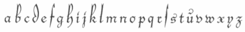 Type designer and calligrapher (b. Passau, 1901, d. 1980, Traunstein) who made Gotenburg (1935-1937, D. Stempel) [with Zierversalien, 1936]. This was digitized in 2001 by Delbanco as DS-Gotenburg. GotenburgA and GotenburgB were revived by Dieter Steffmann in 2002. Heinrichsen was associated with the Werkstattgemeinschaft Rudolf Koch. Other typefaces: Heinrichsen-Kanzlei (1933, Trennert), a gorgeous tall-ascendered blackletter face [for a free digital descendant, see KanzleiScriptHJZ by Hans J. Zinken]. His calligraphic work was also outstanding, and includes Initialen, a proposal for Lichte Schwabacher (never actually cut), and numerous handwriting and calligraphic keepsakes.
 In 1986, Wolfgang Hendlmeier wrote a brief biography. Picture. [Google]
[More] ⦿
|
Friedrich Hermann Ernst Schneidler
|
 Type designer, teacher, publisher and calligrapher, b. Berlin (1882), d. Gundelfingen (1956). He worked initially with J.G. Schelter&Giesecke in Leipzig and C.E. Weber in Stuttgart. In the 1930s, he published his type designs with Bauer. He studied at the school for applied arts in Düsseldorf under F. H. Ehmcke and Peter Behrens. From 1920 until 1948, he was head of the graphics division of the Akademie der bildenden Künste Stuttgart, where his students included Albert Kapr, Imre Reiner and Lilo Rasch-Naegele. His oeuvre resides now in the Klingspor Museum in Offenbach. He is famous for his Amalthea, Zentenar Fraktur, Schneidler Antiqua, Schneidler Mediaeval and Legende. In general, due to his calligraphic tendencies, his types have great rhythm. In his era, he was at the top of his craft (in my view). A list and samples of his work. His typefaces, by foundry:
 - C.E. Weber: Deutsch Römisch (1923; Berry et al give the date 1926 for this old face; the A has a flat apex; the M has thin slab serif; Q has the tail outside the bowl; in the lower case the round letters are condensed; f is narrow; g has an oval-like bowl and wide tail), Kontrast (1930, an art deco collection which was revived in 15 styles in 2007 by Iza W as Schneider (sic) Kontrast and which saw another revival, RMU Kontrast, by Ralph M. Unger in 2021), Bayreuth (1932: this blackletter font was remade from a scan by Petra Heidorn in 2003 as Bayreuth-Black; for a variation, see Manfred Klein's Bayreuther-BlaXXL (2005); see also the free orphaned typeface Bayreuth), Suevia-Fraktur.
- J.G. Schelter&Giesecke: Schneidler Schwabacher (1912-1913; revival in 2004 by Petra Heidorn and Manfred Klein), Schneidler Schwabach Initials (digitized by Manfred Klein in 2004 as SchneidlerSchwabachInitials), Buchdeutsch (1923; a blackletter revived in 2021 by Ralph Unger as Werbedeutsch), Buchdeutsch halbfett (1926), Schneidler-Deutsch [a blackletter revived in 2009 by Intellecta Design as Schneidler Halb Fette Deutsch], Schneidler Fraktur (1914-1916), Schneidler Kursiv (1921).
- Schneidler Latein, released in 1916, the bold version in 1920 and the italics in 1921. This typeface was first revived and extended by Lena Schmidt in 2019 as Schneidler Latein. Lena writes: Schneidler Latein is a sharp and elegant Antiqua based on the ductus of the broad edged pen with a strong character. Running perfectly in paragraph text giving it something quite special and being effortlessly legible at the same time, Schneidler Latein works great in headings as well. Each glyph is a piece of art ready to be used in branding and blowup combining beauty and personality in a kick-ass blend. It is absolutely new to the digital world as it never has been digitized before.
- Bauersche Giesserei: Ganz Grobe Gotisch (1930): this was revived by Ralph Unger as (FontForum) Ganz Grobe Gotisch (2006, URW), by Dieter Steffmann as Ganz Grobe, by Manfred Klein as TypoasisBoldGothic (2003), by Mars Attacks as Grobe Hand (2012, free), by Paulo W as Schneidler Grobe Gotisch (2008), and by Petra Heidorn as Bayreuth.
- Bauersche Giesserei: Graphik (aka Herald, 1934).
- Bauersche Giesserei: Schneidler Old Style (or Bauer Text), 1936.
- Bauersche Giesserei: Zentenar Fraktur (1937). So called to honor the 100th anniversary of Bauersche, est. 1837: Peter Wiegel (CAT Zentenar Fraktur, 2014), Delbanco (DS Zentenar Fraktur), Ralph M. Unger (Zentenar Fraktur mager, halbfett, 2010), Softmaker (2016) and Dieter Steffmann each have digital versions. See also Z690 Blackletter on the SoftMaker MegaFont XXL CD, 2002. Followed by Zeichen Zentenar Fraktur (1937; see also the 2007 digitization of the caps by AR Types entitled Zentenar Initialen).
- Bauersche Giesserei: Zentenar Buchschrift (1937-1938). Digital version by Delbanco.
- Bauersche Giesserei: Schneidler Mediaeval (1936). See URW Schneidler Mediaeval (2011).
- Bauersche Giesserei: Schmalfette Gotisch. Revived as SchmalfetteGotisch in 2004 by Petra Heidorn and Manfred Klein, and extended by Manfred Klein to SchmaleGotischMK, also in 2004.
- Bauersche Giesserei: Schneidler Initials (1937, a Trajan face). See the 2004 revival by Petra Heidorn as Schneidler Initialen, and Shango (1993, Castle Type), and Shango Gothic (2007, Castle Type), the free font Au Bauer Text Initials (1990, Auras Design), OPTI Bauer Text Initials (Castcraft), and the 1994 revival by GroupType as Schneidler Initials. Schneidler Initials is in fact originally known as Schneidler-Mediaeval mit Initialen.
- Schneidler Amalthea (1936). See A770 Roman on the SoftMaker MegaFont XXL CD (2002), OPTI Schneidler Swash by Castcraft, Stempel Schneidler by Bitstream, Amalthea SH by Scangraphic, Amalthea SB by Scangraphic, and URW Schneidler Amalthea (2011, URW).
- Bauersche Giesserei: Legende (1937). A faux Arabic script font digitized at Profonts/URW++ by Ralph M. Unger in 2002, by Brendel (as Legend) in 1990, by SoftMaker (as Legende Script) in 2012, By SoftMaker as L690 Script, and by Ari Rafaeli in 2006. Elsner and Flake published the script font Graphis (1934, revival by Jürgen Brinckmann).
- Bauersche Giesserei: Schneidler (1936). It was published in digital form by Bitstream, Adobe, and Elsner&Flake.
For Schneidler, the best source is the book by Max Caflisch, Albert Kapr, Antonia Weiss, and Hans Peter Willberg entitled F.H. Ernst Schneidler Schriftentwerfer Lehrer Kalligraph SchumacherGebler, München, 2002. FontShop link. Klingspor link. View F.H. Ernst Schneidler's typefaces. [Google]
[MyFonts]
[More] ⦿
|
Fritz Helmuth Ehmcke
|
 Born in 1878 in Hohensalza, Ehmcke died in 1965 in Widdersberg. Graphic artist, book and type designer, and professor. From 1893 until 1897, he studied lithography in Berlin, and from 1899-1901 he studied at the Kunstgewerbemuseums Berlin. With Georg Belwe and Friedrich W. Kleukens, he founded the Steglitzer Werkstatt in 1900. He taught from 1903 at the Kunstgewerbeschule Düsseldorf, and from 1913-1938 at the Kunstgewerbeschule München . He ran the Rupprecht Presse in Munich from 1913-1934. Since 1941, he worked for the Bund für Deutsche Schrift, which is partially concerned with blackletter type. Finally, from 1946-1948, he was professor at the Hochschule der bildenden Künste München. He designed these typefaces:
 - Ehmcke Flinsch (1908, Bauersche Giesserei).
- Ehmcke Antiqua (1908-1909, Flinsch). A beautiful Belle Epoque font. Linotype sells the digital version as Carlton, after acquiring ITC and Letraset which had digitized Carlton in 1983, based on a Stephenson Blake typeface from the 1910s. It appears that Ehmcke Antiqua predates that Stephenson Blake face. For another revival, see Antiqua Roman (2015, Yuanchen Jiang).
- Ehmcke Kursiv (1910, Flinsch).
- Ehmcke Fraktur (1910, Offizin W. Drugulin and 1912, at D. Stempel). The halbfett is from 1917. Revived by Dieter Steffmann as Ehmcke-FrakturInitialen (2002).
- Ehmcke Rustika (1914, Stempel).
- Ehmcke Schwabacher (1914, D. Stempel; some mention the dates 1916 and 1920; see also Ehmcke Schwabacher Zierbuchstaben). The halbfett is from 1915. The Delbanco revival is called DS-Ehmcke Schwabacher. Revived by Dieter Steffmann as Ehmcke-Schwabacher Initialen (2002).
- Ehmcke Mediaeval (1922, Stempel). The kursiv is from 1923 and the halbfett from 1924.
- Ehmcke Latein (1925, Ludwig&Mayer).
- Ehmcke Brotschrift (1927, Ruprecht Presse).
- Ehmcke Elzevier (1927, L. Wagner).
FontShop link. Klingspor link. [Google]
[More] ⦿
|
Gebrochene Schriften
|
Proposed classification of blackletter typefaces. Main page, by Bernhard Schnelle. He has: - Xa Gotisch. Examples: Bamberg, Belwe Gotisch, Caslon-Gotisch, Cloister Black, Fette Gotisch, Ganz Grobe Gotisch, Goudy-Text, Manuskript-Gotisch, Maximilian, Sebaldus-Gotisch, Trump-Deutsch, Weiß-Gotisch Wilhelm-Klingspor-Gotisch.
- Xb Rundgotisch. Examples: Gotico, Kühne-Schrift, San Marco, Uhlen-Rundgotisch, Wallau, Weiß-Rundgotisch.
- Xc Schwabacher. Examples: Alte Schwabacher, Ehmcke-Schwabacher, Neue Schwabacher, Nürnberger Schwabacher, Rediviva, Renata-Schwabacher.
- Xd Fraktur. Examples: Amts-Fraktur, Breitkopf-Fraktur, Fette Fraktur, Fichte-Fraktur, Humboldt-Fraktur, König-Type, Luthersche Fraktur, Mainzer Fraktur, Poppl-Fraktur, Thannhaeuser-Fraktur, Unger-Fraktur, Walbaum-Fraktur, Wieynk-Fraktur, Wittenberger Fraktur (Monotype, 1904 or 1906; Adobe's digital Wittenberger Fraktur), Zentenar-Fraktur.
- Xe Fraktur-Varianten. Examples: Claudius, Engravers Text, Fette Deutsche Schrift (Koch), Fette Kanzlei, Hermann-Gotisch, Hölderlin-Fraktur, London Text (Blackletter 686), Post-Fraktur, Rhapsodie, Wedding Text (Blackletter 681).
[Google]
[More] ⦿
|
Georg Belwe
|
Belwe is best known for his Belwe text family (1907, a somewhat unsuccessful art nouveau font). Based in Berlin, Georg Belwe lived from 1878 (b. Berlin) until 1954 (d. Ronneburg), and was for a long type head of the typography department at the Leipzig Academy for Art. After studies in Berlin, he set up the Steglitzer Werkstatt in 1900 with F.H. Ehmcke and F.W. Kleukens. He taught at the Kunstgewerbschule in Berlin. His typefaces: Belwe Antiqua (1913), Wieland (1926, a handwriting typeface done at J.G. Schelter&Giesecke), Schönschrift Mozart (1927), Belwe (1907, a somewhat unsuccessful art nouveau font that saw several additions in the period up to 1914 such as Belwe Kursiv (1914)). He designed the blackletter font Belwe Gotisch in 1912 at J.G. Schelter&Giesecke. Digitizations of his work include Nick Curtis's 2009 typeface Bellwether Antique NF and in the Scangraphic collection, Belwe SB and Belwe SH. Dieter Steffmann designed Belwe Gotisch and Belwe Vignetten in 2002. [Google]
[MyFonts]
[More] ⦿
|
Georg Trump
|
 A giant of German type design, b. Brettheim, 1896, d. München, 1985. Active with Berthold in Berlin from 1930-1935, and with C.E. Weber in Stuttgart from 1937 onwards. From 1934 until 1953, he succeeded Paul Renner as the Director of the Meisterschule für Deutschlands Buchdrucker in München. In 1982 he was awarded the TDC Medal. Ph. Luidl and G.G. Lange published "Hommage für Georg Trump" in 1981. Linotype link. FontShop link. His production:
 Klingspor link. View the typefaces made by Georg Trump. [Google]
[MyFonts]
[More] ⦿
|
Georges Lemmen
|
Belgian who worked with Henry Van de Velde. He was born in 1865 in Schaerbeek, and worked as a painter and designer. He died in 1916 in Ukkel. Creator of Argos (1908, W. Drugulin, an art nouveau alphabet). For a free digital version, see Rick Mueller's Argos or Dieter Steffmann's Argos George (1999). For a commercial digital version, see David Nalle's Bucephalus (1993). Dan Solo calls it Argos George. Berthold AG's phototype collection has it as Georges Lemon. However, the original name, according to Klingspor, is George-Lemmen-Schrift. [Google]
[More] ⦿
|
Giesserei Carl Kloberg
[Carl Kloberg]
|
Leipzig-based foundry of Carl (or Karl) Kloberg which was taken over by Berthold in 1922. One of their house typefaces was Verzierte Schwabacher (1891) (Schwabacher Handtooled), which was revived in 2005 by Petra Heidorn as Schwabach Deko, with further fine-tuning still in 2005 by James Arboghast and Petra Heidorn in Verzierte Schwabacher. Related typefaces are Hermann-Gotisch by Herbert Thannhaeuser, 1934 and Peter Schlemihl, also known as Lichte Tiemann-Fraktur by Walter Tiemann, 1918-1921. Both were digitized by Dieter Steffmann. House typefaces also include Leipziger Altfraktur (1912, mentioned by some as a Berthold face; revived by Gerhard Helzel), Bavaria-Buchschrift (ca. 1900), Bavaria-Brotschrift (ca. 1900), and Gotisch Enge (1882, Berthold). In 1909, they published a 63-page specimen book, Spezial-Musterbuch für Buchdruckereien über moderne Schriften, Einfassungen, Messinglinien, Ornamente und Vignetten. [Google]
[More] ⦿
|
Goudy Thirty
|
A pen-drawn calligraphic typeface designed by Frederic Goudy in 1942. Mac McGrew: When Monotype suggested that Goudy design a type that that company might bring out after his death, to be called Goudy Thirty (from the newspaper term for the end of a story), he thought of a design he had started for a western college. That commission had fallen through, so the design was unfinished. Then, as Goudy relates, "This design struck me as particularly adapted to the purpose. As I worked on it I had determined to make it, as far as I was able, my last word in type design, a type in which would give my imagination full rein, and a type by which as a designer would be willing to stand or fall." Completed in 1942, it was kept under cover by Monotype and not released until 1953-long after his death in 1947. But he designed several types after this one, so it was not the last one from his hands. Goudy Thirty is a fine recreation of a fifteenth-century round gothic, excellent for period pieces. For digital versions, see Goudy 30 (a free font by Dieter Steffmann) and LTC Goudy Thirty (Lanston, now P22). [Google]
[More] ⦿
|
Gregor Stawinski
|
Author of Retrofonts (2010, Mark Batty Publ.), a 560-page book that comes with a CD that contains 222 fonts. These are basically old freeware and shareware fonts by Dieter Steffmann, Nick Curtis, and others---all easily found on web archives. [Google]
[More] ⦿
|
Gustav Jaeger
|
 Designer (b. 1925) who studied at Werkkunstschule Offenbach and worked at Bauersche Giesserei. All his fonts were published at Berthold with the exceptions explicitly mentioned:
 - Aja (1981): a calligraphic font
- Becket LL (1980, Linotype).
- Bellevue (1986): a ball terminal script
- Catull (1982, Berthold): a modern typeface. Google logo was made by Ruth Kedar based on a slight modification of Catull.
- Chasseur (1988).
- Cornet (1989).
- Cosmos (1982).
- Jaeger Daily News (1976), or just Daily News BQ. Some sources mention the date 1982. The font has been used in Italy Daily, a supplement of the International Herald Tribune. See D650 Roman on the SoftMaker MegaFont XXL CD, 2002). A small design flaw: the capital O hovers above the baseline instead of dipping below it.
- Delta (1983).
- Donatus (1986).
- Epikur (1986).
- Jaeger-Antiqua (1984).
- Jersey (1985).
- Jumbo (1973). Not a Berthold font, I think.
- Komet (1976, Berthold AG).
- Mark Twain (1973): an art nouveau / psychedelic typeface created in reaction to VGC Eightball, and digitized in 2006 as Huckleberry by Canada Type. Not a Berthold font.
- Osiris (1984: see O830 Roman on Softmaker's XXL CD (2002).
- Pinocchio (1973, Berthold). A psychedelic typeface in the style of Alfred Roller and Wes Wilson. Revivals: P732 Deco (SoftMaker), Pinocchio (2012, SoftMaker), Pinocchio (Dieter Steffmann), OPTI Pulaski (Castcraft), Pinwheel (FontBank, 1990-1993) and Pinocchio (TypeShop, 1994).
- Prado (1990) and Prado Swash (1990).
- Sacher (1973, Berthold).
- Semin Antiqua (1976, Berthold).
- Seneca (1977). See S691 Roman on the SoftMaker MegaFont XXL CD, 2002.
Apparently, the former (now bankrupt) Berthold bankruptcy lawcourt administrator transferred in 1993 all Jaeger design rights from Berthold back to Gustav Jaeger. Thus, the "new" Berthold versions, sold by Linotype since 2008, are all rip-offs sold without Jaeger's consent. FontShop link. Klingspor PDF file. Linotype link. Pic. [Google]
[MyFonts]
[More] ⦿
|
H. Berthold AG
|
 H. Berthold Systeme AG was founded in 1858 in Berlin by Hermann Berthold. Also known as H. Berthold Messinglinienfabrik und Schriftgiesserei, the type foundry was the largest in the world by 1918, with offices in Stuttgart, St. Petersburg, Leipzig, Riga, Budapest and Vienna. It grew by acquisitions of many other foundries, see., e.g., here. A partial list:
 - 1897 Bauer&Co, Stuttgart, 100%, Germany
- 1898-1900 Branch St. Petersburg, 100%, Russia
- 1901 Georg Ross&Co. St. Petersburg + new Branch in Moscow, 100% Russia
- 1905 J. H. Rust&Co. Vienna, 100%, Austria
- 1907 A. Haase, Prague, 100%
- 1908 Ferdinand Theinhardt GmbH Berlin, 100%, Germany
- 1912 St. Petersbrug Branch of Flinsch (later Bauer), 100%, Russia
- 1917 Emil Gursch Berlin, 100%, Germany
- 1918 Gottfried Böttger, Leipzig, 100%, Germany
- 1918 A. Kahle, Weimar, 100%, Germany
- 1920 Julius Klinkhardt, Leipzig, 100%, Germany
- 1922 C. Kloberg, Leipzig, 100%, Germany
- 1926 Poppelbaum, Vienna, 50% - 50% to D. Stempel A.G., Austria
- 1926 First Hungarian Type Foundry, Budapest, 50% - 50% D. Stempel A.G, Hungary
- 1929 Genzsch&Heyse, Hamburg 33% - 33% Bauersische Gießerei (Bauer) - 33% D. Stempel A.G., Germany
Typesetting MPEG4 movie, ca. 1935. To complement its typesetting equipment business activities, Berthold developed the Berthold Exklusiv Collection, a collection of typefaces created solely for Berthold by distinguished designers. Günter Gerhard Lange began his association with Berthold in 1952, and was artistic director from 1961-1990. In March 1991, Adobe Systems and H. Berthold AG announced that Adobe was to produce PostScript versions of numerous Berthold Exklusiv ("BE") typefaces - these typefaces were later to be known as Adobe Berthold BE fonts. Until 1999, Adobe marketed its versions of 365 Berthold Exklusivs under agreements with H. Berthold AG, and later Berthold Types Limited. H. Berthold AG also produced its own digital versions of their entire library using the Ikarus system - some of these fonts are later to be known as Berthold BQ. In 1993 the company reported insolvency. A follow-up company, H. Berthold Systeme GmbH was formed, but it finally was dissolved in 1995. Shortly before dissolution, the Berlin-based H. Berthold company signed license agreements with and transferred certain rights and trademarks to a Chicago-based US company that later took the name Berthold Types Limited, now called Berthold Direct Inc. This company now offers digital versions of the "Exklusiv" Berthold typefaces. Some of its history is explained in this letter. Old blackletter typefaces from the metal era: Ballade (ca. 1927, Paul Renner), Berthold-Fraktur (1909), Bismarck-Fraktur (1860), Breda-Gotisch (1928, house font), Englische Schreibschrift (1972, version One, version Two; for digital versions elsewhere, see English 157 by Bitstream, or Elegant Script by SoftMaker), Deutschland (ca. 1934), Hansa Kursiv (ca. 1895: art nouveau style, the light version of Regina Kursiv), Schraffierte Gotisch (before 1900; aka Stella), Mainzer Fraktur (1901, Carl Albert Fahrenwaldt for Bauer and Berthold), Morris-Gotisch (before 1905, for Bauer and Berthold), Post Fraktur (1935, Herbert Post), Prinzeß Kupferstichschrift (1905, digitized by Ralph M. Unger as Prinzess Gravur in 2010), Regina Cursiv (ca. 1895: revivals include Carlsbad (2018, Ralph M. Unger), Regina Cursiv (2007, HiH), Toffee Script (2010, Tomi Haaparanta)), Sebaldus-Gotisch (1926: revival by Ralph M. Unger in 2019 as Sebaldus; see also the earlier revivals by Ingo Preuss and Dieter Steffmann, both called Sebaldus), Straßburg (1926, a blackletter face; the digital version by Delbanco is called DS Strassburg; see also Strasburg by Gerhard Helzel), Trump-Deutsch (1936, Georg Trump). House typefaces include Isolde (1912, script face), Augustea Kursiv (1906) and Augustea Fett. Hebrew fonts in their collection include Meruba, Stam, Mirjam and Frank Ruehl. Some of the Berthold collection can nowe be bought through Monotype Imaging and Linotype. [Google]
[MyFonts]
[More] ⦿
|
Hans Lijklema
|
Graphic design graduate of the Academy of Fine Arts Minerva, Groningen, The Netherlands. With Karolina Lijklema, he runs the studio Lijklema Design in Warsaw, Poland. Author of Free Font Index (2008, The Pepin Press, Amsterdam). It contains comprehensive letterproofs of more than 500 fonts from 35 type foundries in 17 countries and interviews with 6 font designers. All fonts contained in the book are included on the accompanying CD and are licensed for personal and commercial use. The following have contributed fonts to this CD: Astigmatic One Eye Typographic Institute, Brain Eaters Font Co, Brode Vosloo, Bumbayo Font Fabrik, Dieter Steffmann, Fenotype, Flat-it type foundry, Fonthead Design Inc., GUST e-foundry, Grixel, Igino Marini, Janusz Marian Nowacki, La Tipomatika, Larabie Fonts, Manfred Klein Fonteria, MartinPlus, Misprinted Type, Nick's Fonts, Objets Dart, Reading Type, Rob Meek, SMeltery, Shamfonts, Sonntag Fonts, Typedifferent, Typodermic Fonts, VTKS DESIGN, Vic Fieger, WC Fonts, Yanone, boodas.de, defaulterror, eightface, exljbris, pizzadude.dk. As far as I can tell, all these fonts can be downloaded for free from the usual web archives. [Google]
[More] ⦿
|
Heinrich Vogeler
|
Heinrich Vogeler (b. 1872, Bremen, Germany) was an art nouveau era artist, designer, illustrator and teacher, known for his paintings and for his illustrations of fairy tales. He also did some work for the art nouveau magazine Pan. From 1894 on, he lived for some time in the artist colony at Worpswede, Germany. In 1908 he and his brother Franz founded the Worpsweder Werkst&aauml;tte, which produced household objects. He studied at the Kunstakademie Düsseldorf from 1890-1895. With sympathies for the working class, after the Great War, he became a pacifist and joined the Communist Party of Germany (KPD). The romanticism of his early art nouveau work gave way to proletarian content. In 1931, Vogeler and his second wife, Sonja Marchlewska, emigrated to Russia. Ironically, he was deported in 1941 to Kazakhstan by Soviet authorities, and died there in 1942. Jugendstil Initials (2007, HiH, Malcolm Wooden) is a commercial digital revival of Jugendstil Initialen (1905, Rudhardsche). Compare with Vogeler Caps (2002, Petra Heidorn, CybaPee Creations) and Vogeler Initialen (2002, Dieter Steffmann), both free revivals of a similar style face. Other typefaces by him include Vogeler Zierat (1904, Rudhardsche Giesserei), Kalender Bilder (1910, Klingspor). Vienna Secession link. Klingspor link. [Google]
[MyFonts]
[More] ⦿
|
Heinrich Wallau
|
German printer, b. 1852, Mainz, d. 1925, Zwingelberg. Author of Aesthetik der Druckschrift, which served as a motivation and example for Rudolf Koch, when Koch designed his Wallau blackletter family starting in 1924. This project lasted until 1936, with the rotunda or Rundgotisch typefaces magere Wallau (1931-1933), fette Wallau (1933-1934), Schmale Wallau (1933-1934), and halbfette Wallau (1933-1936). There were also various Versalien (Antiqua-Versalien, Fraktur-Versalien and Schmuck-Versalien) along the way. [The link leads to a short bio by Wolfgang Hendlmeier, written in 1987.] Digital versions of Wallau include RMU Wallau (2019, Ralph M. Unger), Wallau No1 Pro, Wallau No2 Pro by SoftMaker, Alter Littera's Wallau (2012), Wallau (1996, by Delbanco; called Wal at PrimaFont), Wallau (by Gerhard Helzel), DS Wallau (Dieter Steffmann), Wallaby (SoftMaker), and the 2002 series WallauDeutsch-Bold, WallauRundgotisch-Heavy, WallauRundgotischOsF-Heavy, WallauUnzial-Bold and WallauZierBold (2002) by Dieter Steffmann. [Google]
[More] ⦿
|
Heinrich Wieynck
|
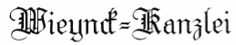 German type designer (b. Barmen, 1874, d. Saarow, 1931) principally associated with the Bauersche Giesserei. In 1914 he became a Professor at the Akademie für Kunstgewerbe in Dresden. Before that he lived mainly in Berlin. He designed
 - Belvedere (1906-1907, Bauersche Giesserei). An art nouveau / fin-de-siècle typeface that was digitally revived by Ralph M. Unger in 2020 as RMU Belvedere.
- Kolumbus and Kolumbus Eng (1905-1906, W. Gronau)
- Mercedes Antiqua, Kursiv and Antiqua Halbfett in 1904, 1905 and 1906 respectively, at Wilhelm Woellmer
- Trianon (1905, Bauersche Giesserei) and Trianon Licht (1909, Bauersche). For a digital revival, see Ralph Unger's RMU Trianon (2020), which under pressure from Production Type, was quickly renamed RMU Trifels.
- Phyllis (1911, Bauersche Giesserei): a clean old-fashioned rounded script font. Digital versions: Phyllis (Linotype), Phyllis (URW++), Phyllis EF (Elsner+Flake), Phyllis SB (Scangraphic Digital Type Collection), Phyllis FS (Fontsite), Philadelphia (Softmaker). This typeface is also called Wieynck Kursio or Wieynck Cursive.
- Wieynck-Fraktur (1912) and Wieynck-Fraktur Halbfett (1913), both at the Bauersche Giesserei. Revived in 2002 by Dieter Steffmann, who also made Wieynck Vignetten). Also revived commercially by Ralph M. Unger as Wieynck Fraktur (2019).
- Wieynck Gotisch (1926, Schriftguss; revived by Gerard Helzel in 2001; see also Wieynck Gotisch in 2018 by Ralph M. Unger), Wieynck Werkschrift (1930, Schriftguss), Wieynck Gotisch Licht (1929, Schriftguss)
- Wieynck Kanzlei (1926, D. Stempel)
- Wieynck Mediaeval (1928) and Wieynck Mediaeval Kursiv (1929), at Otto Weisert.
- Woellmer Antiqua (1907), Woellmer Kursiv (1907) and Woellmer Antiqua Halbfett (1908), all at Wilhelm Woellmer.
Biography by Harald Süß (Die deutsche Schrift, 2002). Picture. Klingspor link. Digital versions of Phyllis. [Google]
[MyFonts]
[More] ⦿
|
Heinz König
|
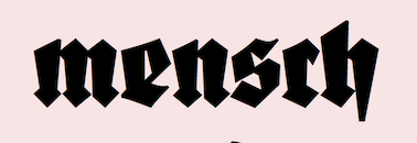 German type designer (b. Lüneburg, 1856, d. Lüneburg, 1937). After years in Braunschweig and Stuttgart, Heinz had contact with Genzsch&Heyse in Hamburg in 1881 and with Otto Hupp in 1887. After that, he returned to his home town to take over the printing business of his father. Brief bio by Harald Süß in 1999.
 List of his fonts compiled by Harald Süß. - Typefaces for J. D. Trennert: Alarm (1928), Wiking (1925: blackletter), Wiking licht (1927). Wiking Licht and Wiking Dunkel were revived digitally by Chiron in 2012 as TbC Wiking Licht and TbC Wiking Dunkel, and in 2019 by Ralf Herrmann as FDI Wiking.
- Typefaces for J. Klinkhardt: Rundine (1909), Rundine halbfett (1909), Askania, Askania halbfett (1910).
- Typefaces for Genzsch&Heyse: Segretario (before 1902), Superbia (1913), Renaissance Fraktur (1885; revived by Manfred Klein in 2005 as Münchner Fraktur and by Softmaker in 2016 as Renaissance Fraktur Pro), Renaissance Fraktur fett (1885), Deutsche Druckschrift (1888/1922; a revival under the same name was done by Petra Heidorn in 2004; the initials were done by König after drawing by Eduard Ege in München), Frappant (1913).
- Typefaces for Gebr. Klingspor: Falstaff (1906, a strong black titling face), König Antiqua (1905), König Antiqua fett (1906), Offenbacher Fraktur (1901), Reform Kursiv and Reform Kursiv halbfett (1904), Walthari (1899-1900, Jugendstil font originally done at the Rudhardsche Giesserei), Walthari halbfett (1901). A revival in 2008 by HiH named Waltari is here. Schmuckinitialen (2009, Ralph Unger) is also a revival. Walthari Initialen (Rudhardsche, ca. 1900) was revived by Ralph Unger in 2012 in his Initials RMU One.
- Typefaces for Schriftguss: Germania (1903), Germania halbfett (1903). Schnelle mentions that Germania was done for Aktiengesellschaft für Schriftgiesserei und Maschinenbau. Digital revival by Dieter Steffmann in 2001 under the same name.
- Typefaces for Emil Gursch: Koenig-Fraktur (1910-1915). This is also called Gursch Fraktur. A revival by Gerhard Helzel exists), Koenig-Fraktur halbfett, Koenig Schwabacher (1912-1913) and Koenig Schwabacher halbfett (1912), Koenig-Type (1903: revived by Gerhard Helzel; Wetzel and Die deutsche Schrift mention 1913), Koenig-Type halbfett (1906), Koenig-Type fett (1910), Koenig-Type eng (1908), Koenig-Type schmallfett (1908). Article about Koenig Type.
- Typefaces that ended up in the Linotype library: Heinz-Koenig schmallschrift (1927), Heinz-Koenig schmallschrift halbfett, Heinz-Koenig Setzm. Scans: Roemische Antiqua (1888), Schmalfett, Warm (1928), Heinz König Fraktur (1913), Heinz-Koenig Setzmaschinen Fraktur (+halbfett) (1913, originally Stempel). Dieter Steffmann offers a revival of Heinz Koenig (2002). Chiron has TbC Neue Roemische Antiqua (2012), based on Neue Roemische Antiqua (1924, Julius Klinkhardt).
[Google]
[More] ⦿
|
Herbert F. Van Brink
[Character]
|
[More] ⦿
|
Herbert Thannhäuser
|
 Designer born in 1898 in Berlin, who died in 1963 in Kleinmachnow. He worked in various Berlin graphics bureaus. He was artistic consultant at Max Krause and for many printing shops. From 1933 until 1940, he was artistic consultant at Schelter&Giesecke in Leipzig. From 1951 on, he was artistic director at VEB Typoart in Leipzig. Bio at BfdS. Bio at Linotype. Bio at Klingspor. MyFonts link. A brief biography by Gertrud Thannhaeuser in Die deutsche Schrift, volume 1095, 1992: A, B, C, D.
 His typefaces: - At D. Stempel AG: Adastra (1928), Schwung Adastra (1931). Adastra was revived in 1995 by Douglas Olena / Keystrokes and by Neil Summerour in 2011 as Rhythm.
- At Typoart: Kurier (1939, a brush typeface digitized by Canada Type's Rebecca Alaccari as Puma (2004) and by Peter Wiegel in 2015 as CAT Kurier), Typoart Didot Antiqua, Kursive and Halbfett (1958), Erler Versalien (1953, Typoart: digital versions include Erler Titling (2015, Ralph M. Unger), Missale Incana (2004, Andreas Seidel) and Erler Versalien (2006, Ari Rafaeli)), Typoart Garamond (see Garamond No. 4 by URW) and Garamond No. 5 by Elsner&Flake) and Typoart Garamond Kursiv (1955), Lotto (1955, brush script, revived as Lotto in 2009 by Hans Van Maanen, Canada Type), Liberta Antiqua (1957; revived by Ralph M. Unger as Trybuna in 2013, and by Elsner & Flake as Liberta TA in 2017), Kursive, Antiqua Halbfett and Antiqua extrafett (1956), Liberta Antiqua schmalhalbfett (1959), Liberta Antiqua schmalfett (1960), Magna, Magna Kursiv and Magna Halbfett (1968; see Magna EF by Elsner&Flake, dated 1962 by them), Meister Antiqua (1952, digitized and extended by Ralph M. Unger in 2011 as Meister Antiqua; images: i, ii, iii), Meister Kursiv (1952), Meister Antiqua halbfett (1952), Technotyp schmalhalbfett (1960).
- At Schriftguss: Gravira (1935; a stylish multilinear typeface revived as Gravira in 2021 by Ralph M. Unger), Großdeutsch (1935), Hermann Gotisch (1934; revived in 2002 by Dieter Steffmann and in 2015 by Ralph M. Unger as Staufer Gotisch), Kornett (1939), Parcival Antiqua (1930, or is it 1926?; revived in 2016 by Ralph M. Unger as Parcival Antiqua), Parcival Kursiv (1930), Parcival Antiqua fett (1932), Technotyp and Technotyp halbfett (1948), Technotyp Kursiv, Technotyp fett and Technotyp extrafett (1949), Technotyp schmalfett (1951), Thannhaeuser Fraktur and Thannhaeuser Fraktur halbfett (1927-1939, Schelter&Giesecke; Delbanco has a digital version called DS Thannhaeuser Fraktur; Thannhaeuser Fraktur (2013, Ralph M.Unger) is a redesign of Typoart's Thannhaeuser Fraktur)), Thannhaeuser Fraktur schmallfett (1939) and Werbedeutsch (1933). The Lindenthal brothers revived Thannhaeuser Fraktur (Mager, magere Zierversalien, Schmalfett and Halbfett). Delbanco revived these ca. 2001. See also Werbedeutsch by Dieter Steffmann (2002).
- At Schriftguss AG: Thannhaeuser Schrift (1929), Thannhaeuser Schrift Kursiv (1933), Thannhaeuser Schrift halbfett (1934). The slab serif family Technotyp was revived in its entirety by Coen Hofmann at URW++ in 2011 under the same name.
- Other typefaces: Buick schmalfett. This was digitally revived by Nick Curtis in 2014 as Strassenmeister NF.
FontShop link. Klingspor link. View Herbert Thannhaeuser's typefaces. [Google]
[MyFonts]
[More] ⦿
|
Hoefler (was: Hoefler&Frere-Jones, and Hoefler Type Foundry)
[Jonathan Hoefler]
|
 Born in 1970 in New York, Jonathan Hoefler ran the Hoefler Type Foundry (or: HTF) in New York. It employed Tobias Frere-Jones, Josh Darden, and Jesse Ragan. In 2004, it was renamed Hoefler&Frere-Jones, or HFJ for the cognoscenti. However, a legal problem between Jonathan and Tobias led to a corporate divorce in 2014---the company is renamed again The Hoefler Type Foundry. In September 2021, Monotype acquired Hoefler, and that is the end of that chapter. Their typefaces:
 - Acropolis.
- Archer (2001, by Jonathan Hoefler and Tobias Frere Jones). A humanist slab serif originally designed for Martha Stewart Living. It has a great range of features, including a classy hairline style. However, I see trouble down the road with the name Archer which has been used previously by several other foundries such as SignDNA, Arts&Letters and Silver Graphics. Some say that Archer is just Stymie with some ball terminals. Nevertheless, it became a grand hit, and has been used by Wes Anderson in The Budapest Hotel, and in Wells Fargo's branding. David Earls on Archer: with its judicious yet brave use of ball terminals, and blending geometry with sexy cursive forms, all brought together with the kind of historical and intellectual rigour you fully expect from this particular foundry, Archer succeeds where others falter.
- Champion Gothic.
- Chronicle Text. In 2007, HFJ published the "blended Scotch" newspaper serif text family Chronicle, which led to Chronicle ScreenSmart in 2015. See also Chronicle Display. In 2016, Hoefler published Chronicle Hairline. In Wired Magazine, Margaret Rhodes writes that it is for men who wear dress shoes without socks. Chronicle Hairline is a didone that breaks the didone rules. It is rounder, asymmetric (as in the mouth of the C), and as Hoefler puts it, more musical. As of 2016, the Chronicle typeface family consists of the display styles Chronicle Hairline, Chronicle Display (+Condensed, +Compressed), and Chronicle Deck (+Condensed), and the 60-style Chronicle Text family, which comes in G1, G2, G3 and G4 subfamilies.
- Many custom and branding typefaces, including, e.g., General GG (2005-2007) and typefaces for The New York Times Magazine, Times Mirror, Esquire and McGraw-Hill (1995, free download). Time.com provides previews of fonts made for Esquire, Lever House, eCompany Now, The Guggenheim Museum, The New York Times, and the Whitney Museum.
- Cyclone.
- Decimal (2019). A sans based on early wristwatch typefaces, i.e., the microscopic letters used by Swiss watchmakers in La Chaux-de-Fonds.
- Didot. HTF carefully designed and complete families include HTF-Didot (1991) in 42 weights/variations, originally designed for Harper's Bazaar; based on the grosse sans pareille no. 206 of Molé le jeune.
- Eyes Only (2019). A stencil typeface.
- Forza (2010). A sans typeface. Not to be confused with the 2007 font Forza by Michel Luther at Die Gestalten.
- Geometer Screen Fonts. Free Mac fonts.
- Giant.
- Gotham (2003). The stylish sans typeface made famous by Obama. See also Gotham Rounded.
- Historical Allsorts. This includes Historical-EnglishTextura, Historical-FellType, Historical-GreatPrimerUncials and Historical-StAugustin.
- Hoefler Text (+Ornaments). This antiqua text typeface consists of 27 fonts made in 1991-1992, and is distributed with many Apple products.
- Hoefler Titling.
- Ideal Sans. A slightly flared humanist sans. In the 1996 Morisawa Awards competition, Hoefler received a bronze prize for Ideal Sans. In 2011, HFJ writes it up beautifully: Typefaces are born from the struggle between rules and results. Squeezing a square about 1% helps it look more like a square; to appear the same height as a square, a circle must be measurably taller. The two strokes in an X aren't the same thickness, nor are their parallel edges actually parallel; the vertical stems of a lowercase alphabet are thinner than those of its capitals; the ascender on a d isn't the same length as the descender on a p, and so on. For the rational mind, type design can be a maddening game of drawing things differently in order to make them appear the same. Twenty-one years ago, we began tinkering with a sans serif alphabet to see just how far these optical illusions could be pushed. How asymmetrical could a letter O become, before the imbalance was noticeable? Could a serious sans serif, designed with high-minded intentions, be drawn without including a single straight line? This alphabet slowly marinated for a decade and a half, benefitting from periodic additions and improvements, until in 2006, Pentagram's Abbott Miller proposed a project for the Art Institute of Chicago that resonated with these very ideas. As a part of Miller's new identity for the museum, we revisited the design, and renovated it to help it better serve as the cornerstone of a larger family of fonts. Since then we've developed the project continuously, finding new opportunities to further refine its ideas, and extend its usefulness through new weights, new styles, and new features. Today, H&FJ is delighted to introduce Ideal Sans, this new font family in 48 styles. Ideal Sans is a meditation on the handmade, combining different characteristics of many different writing tools and techniques, in order to achieve a warm, organic, and handcrafted feeling.
- Idlewild (2012). A wide sans typeface family.
- Isotope (2018). A squarish typeface family. Not to be confused with Isotope by Fábio Duarte Martins, designed six years earlier.
- Inkwell (2017). Hoefler writes: Inkwell is provided in a range of styles with which readers already have clear associations: a bookish Serif and a cleanly printed Sans, a conversational Script, a ceremonial Blackletter, a fancy Tuscan for decoration, and a stately Open for titles. Each style is offered in six weights, from a technical pen Thin to a graffiti marker Black. Inkwell is a name used as far back as 1992 by Sam Wang, and additional older fonts called Inkwell exist by Dan Solo, Philip Cronerud and MXB Foundry.
- Knockout. The Knockout collection was designed to celebrate the beauty and diversity of nineteenth century sans serif wood types.
- Knox.
- Landmark (2013). In Regular, Inline, Shadow and Dimensional styles. A collection of architectural caps which started out as a custom typeface for Lever House in New York.
- Leviathan.
- Mercury Text and Mercury Display.
- Nitro & Turbo (2016). Hoefler writes: We designed Nitro for Pentagram's Michael Bierut, as part of a new identity for the New York Jets football team. Originally named Jets Bold, Nitro is rooted in the styles of lettering used by the team throughout its fifty-year history: even as its logotype evolved, it consistently used heavy, slanting forms to imply force and movement. and ends with corporate babble: Nitro embodies this indomitable spirit in the context of a fresh, contemporary design. About the naming: AF Nitro was made by Sylvia Janssen at the very popular Die Gestalten Studio in Germany, in 2001. It will be fun to watch that battle between giants. Not to mention that lesser known players also made commercial fonts called Nitro more than a decade earlier---these include Jack Wills at Sign DNA and Markus Schroeppel (in 2004).
- Numbers. In 2006, HFJ published the Numbers family, 15 fonts with nothing but numbers from various sources: Bayside (based on a set of house numbers produced around 1928 by H. W. Knight & Son of Seneca Falls, New York), Claimcheck (inspired by ticket stubs), Delancey (from tenement doorways), Depot (modeled on vintage railcars), Deuce (based on playing cards), Dividend (from an antique check writer), Greenback (based on U. S. currency), Indicia (inspired by rubber stamps), Premium (after vintage gas pumps), Prospekt (based on Soviet house numbers), Redbird (inspired by New York subways), Revenue (from cash register receipts), Strasse (after European enamel signs), Trafalgar (inspired by British monuments), Valuta (after Hungarian banknotes).
- Obsidian. In 2015, Jonathan Hoefler and Andy Clymer cooperated on the decorative copperplate engraved emulation typeface Obsidian. Various kinds of 3d illumination in Obsidian were obtained by an algorithmic process. Not to be confused with about ten other fonts called Obsidian--for example, we have Obsidian (pre 2003, Silver Graphics), Obsidian (2014, Steffi Strick), Obsidian (2012, Krzysztof Stryjewski), Obsidian Deco (2013, Yautja), Obsidian (2005, Sparklefonts), and Obsidian Chunks (pre 2002, Jeni Pleskow).
- Operator, Operator Mono, Operator Screensmart and Operator Screensmart Mono. The non-typewriter typewriter type..
- Peristyle (2017). A stylish condensed typeface family with piano key elements, and described by Hoefler as dramatic.
- Quarto.
- Requiem (1991-1994).
- In 2003, they published Retina (which was originally designed for the stock listings in the Wall Street Journal), but that font disappeared from their listing.
- Ringside.
- St. Augustin Civilité: St. Augustin Civilité is a digitization of Robert Granjon's extraordinary type of 1562, now in the collection of the Enschedé type foundry, Haarlem. This typeface is reproduced in Civilité Types by Harry Carter and H. D. L. Vervliet (Oxford Bibliographical Society, by the Oxford University Press, 1966.) As figures and punctuation were lacking in the original, these have been borrowed from two other Granjon types, the Courante and Bastarde of 1567. (The remainder of the character set has been invented.)
- Sagittarius (2021). A soft-edged compact semi-futuristic headline sans. In keeping with tradition, Hoefler dismisses or ignores the fact that the name Sagittarius was taken by a handful of other fonts since about 22 years ago.
- Saracen.
- Sentinel. Sentinel (1999) is HFJ's take on a Clarendon. I can't understand why they picked a name already taken by many foundries such as Graphx Edge Fonts, Comicraft, Dieter Steffmann and Sentinel Type. Anyway, in 2020, Sentinel got un upgrade (with smallcaps and ornaments) in 2020 in Sentinel Pro.
- Shades (2003). In Cyclone, Topaz, Giant and Knox weights.
- Surveyor (2014). An exquisite mapmaker and newsprint didone font family with Fine, Display and Text subfamilies.
- The Proteus Project.
- Topaz.
- Tungsten (2009) and Tungsten Rounded. Their sales pitch: That rarest of species, Tungsten is a compact and sporty sans serif that's disarming instead of pushy - not just loud, but persuasive. Douglas Wilson compares Tungsten with Alternate Gothic No. 3 (Morris Fuller Benton). Not to be confused with Tungsten (2005, Sparklefonts).
- Uncategorized early typefaces: Gestalt-HTF, Fetish-HTF (blackletter modernized, 1995), Ehmcke-HTF.
- Verlag (2006). A 30-style art deco-inspired semi-Bauhaus geometric sans family based on six typefaces originally designed for the Guggenheim. HFJ writes: From the rationalist geometric designs of the Bauhaus school, such as Futura (1927) and Erbar (1929), Verlag gets its crispness and its meticulous planning. Verlag's fairminded quality is rooted in the newsier sans serifs designed for linecasting machines, such as Ludlow Tempo and Intertype Vogue (both 1930), both staples of the Midwestern newsroom for much of the century. But unlike any of its forbears, Verlag includes a comprehensive and complete range of styles: five weights, each in three different widths, each including the often-neglected companion italic.
- Vitesse (2010). The typophiles react to the slab family with praise: I think they're chasing Cyrus Highsmith, Dispatch and Christian Schwartz, Popular on this one. Doing a pretty good job of it too! [...] Looks to me like the love-child of Eurostile and City. In 2020, Jonathan Hoefler added the inline Cesium, which forced him to modify the glyphs somewhat.
- Whitney. In 2004, they produced an amazing 58-weight sans serif family, Whitney (by Tobias Frere-Jones), designed for use in infographics. Whitney's sales blurb: While American gothics such as News Gothic (1908) have long been a mainstay of editorial settings, and European humanists such as Frutiger (1975) have excelled in signage applications, Whitney bridges this divide in a single design. Its compact forms and broad x-height use space efficiently, and its ample counters and open shapes make it clear under any circumstances. See also Whitney Condensed and Whitney Narrow.
- Ziggurat.
Hoefler received Bukvaraz 2001 awards for HTF Guggenheim, HTF Knockout, HTF Mercury (1997, no relationship with Goudy's Mercury of 1936) and HTF Requiem. At ATypI in 2002, he received the Charles Peignot award. FontShop link. [Google]
[MyFonts]
[More] ⦿
|
Hubert Jocham
|
 German über-type designer (b. 1965, Memmingen) who studied graphic design in Augsburg (Germany) and Preston (England). His degree project dealt with the history of the italic type of the renaissance and the relationship between roman and italic. In 1998 he moved to London to work for Henrion, Ludlow and Schmidt in corporate branding. He worked at one point for Frank Magazine in London. Today Hubert Jocham is a freelance designer located once again in Memmingen, Germany. He develops brandmarks and logotypes for leading brand agencies like Interbrand, Landor, Enterprise and Futurbrand. He designs text and headline systems for international magazines like GQ London, Vogue Moscow, Vogue France (2010), Vogue Turkey, L'Officiel Paris, and New York and German publishers like Milchstraße and Gruner&Jahr. He is responsible for the corporate type of Bally in Switzerland, the Kunsthaus Graz and Agfa Photo. He set up Hubert Jocham Type in 2007. MyFonts link. FontShop link. His typefaces:
 - Adonis.
- The ecccentric serif families Alida Text and Display (2007).
- Becca (2018). An extensive slab serif family.
- Bent (sans family).
- Bravery. A curvy wedge serif. Accompanied by Bravery Sans.
- The Contra Sans and Contra Serif families.
- Contura. Inspired by Jakob Erbar's Feder Grotesk, and designed with the fashion industry in mind.
- The Crema family (2012) has various flowing thick signage script styles.
- Debra. A modern grotesque.
- Dolce.
- Element.
- Elsner&Flake fonts: EF Havanna (1996), EH Herbert (1996), EF Panther, EF Sahara, EF Keule and EF Tabard.
- Esquina. An open and attractive sans.
- The TV-screen-curved Fernseher family.
- Fire.
- The signage brush script typeface Flavour (2004).
- Flow. A sharp-edged sans.
- Glanz (2018). A high contrast fashion mag typeface family.
- Glenda (2009). A script face.
- Granat (2009). A 14-style rounded sans family related to Jocham's own Teleplu and Teleneue.
- Jocham (2012). A fat connected signage script family that won an award at TDC 2013.
- June, New June and New June Serif (1999, after the large x-heighted June, used in W-magazine and Harvey Nichols magazine).
- Keks (2009). A broken angular type.
- The industrial sans family Konsens (with related Konsens Stencil).
- Leaf. A playful serif.
- Legau (2007). A sans with lots of stroke modulation.
- Libris, Bally Libris.
- LTA Identity.
- Madita (2011). An upright connected script family.
- Magazine.
- Matrona (2010). An ultra fat rounded family, awarded at TDC2 2011.
- The display serif typeface Mighty.
- Mommie (2006) was originally designed as a display typeface for L'Officiel magazine in Paris in 2003. It won a display typeface award at TDC2 2008, and was followed in 2008 by MommieBrush. Boris Bencic, the art-director asked Jocham to design a script with high contrast in the stroke, in the tradition of Spencerian Hand.
- The wide basic sans family Monday.
- Motora Sans (2011). A simple sans family which according to Hubert is pure gasoline and sweat.
- Narziss (a beautiful high-contrast ornamental didone headline typeface, winner at TDC2 2010). Followed in 2012 by Narziss Pro Cyrillic. See also Narziss Grotesk and Narziss Text.
- Neopop (2009). A circular type experiment.
- New Libris Sans. This is a multi-weight extension of Libris, the corporate typeface of Bally, Switzerland, designed by Jocham in 1999. New Libris Serif.
- Oktober.
- Other Sans, Other Oldstyle.
- Perfetto (2008). A classic serif family based on a typeface penned by Giovanni Francesco Cresci with an x-height of 8 mm, and published in his book Il perfetto Scrittore in 1570 (also seen in Tschichold's Meisterbuch der Schrift).
- Polia (2014).
- Ramon (2014).
- Riccia (2010). A grotesk family with schizophrenic "a" and "g".
- The angular serif typeface Rudolph.
- Safran (2009). A solid 18-style sans family.
- In 2005, he made the brush script headline typefaces Schoko and Drop.
- In 2008, he added the brush signage families Schwung and Milk.
- September.
- Softedge.
- Spring Sans (2008).
- Susa (2009). A connected script face.
- Tantris Sans (2014). Created for the book about the famous restaurant Tantris in Munich.
- The comic book family Tasty (2005).
- Teleneue.
- Televoice (2018). A sans with elliptocal curves.
- Venturio (50s diner face).
- Verve Sans and Serif (2006-2007) are a pair of fun birds, especially the frivolous serif originally planned for a women's psychology magazine called Emotion. A few days after their publication, they were renamed Verse Sans and Verse Serif, probably because the name Verve clashed with Adobe's VerveMM font made in 1998 by Brian Sooy (by the way, there is also a Verve type family by Dieter Steffmann, dated 2000).
- Vivid (2009).
- Voice (2004-2005, elliptical sans). Subfamilies include Voice Edge, Voice Sans and Voice Shoulder, all done at URW. In 2007, Voice was removed from URW and is solely available at Hubert Jocham Type&Design. The family was extended and now includes many styles, subdivided in Voice (sans), VoiceEdge, VoiceShoulder, VoiceSerif, Voice Heavy, Voice Medium, Voice Ultra Bold, and TeleVoice.
- The very interesting asymmetrically rounded Volt (2007), a sans family he claims improves on similar typefaces such as Bernhard Gothic, Barmeno, Dax, Prokyon, Voice Shoulder, and Phoenica.
- Weekend.
- Work ahead: this serif face (2005).
- Xmas Rudolph (2006). A free display serif face.
- Yuri (2017). A predominantly didone typeface with gently sloped serifs.
View Hubert Jocham's typefaces. Another view. Klingspor link. MyFonts interview. Volcano Type link. [Google]
[MyFonts]
[More] ⦿
|
Imre Reiner
|
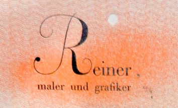 Typographer, architect, designer and type designer, b. Versec, Hungary, 1900, d. Lugano, Switzerland, 1987. He emigrated from Hungary, and studied at the Staatliche Bildhauerschule Zalatua, the Kunstgewerbeschule Frankfurt, and the Kunstgewerbeschule in Stuttgart, where Prof. F. H. Ernst Schneidler was his teacher. After a brief stint (1923-1925) as a graphic designer in London, Paris, New York and Chicago, he returned to study with Schneidler, and from 1931 onwards, he worked in Ruvigliana near Lugano as painter, graphic designer and illustrator. His list of fonts includes:
 - Bazaar or Bazar (1956, D. Stempel; this brush typeface was revived in 2005 by Patrick Griffin, Canada Type, as Boondock).
- The brush script Contact (Deberny&Peignot, 1952; Ludwig&Mayer, 1968 (according to Jaspert), and 1963 according to others).
- Corvinus (Bauersche Giesserei, 1934; Swisstypedesign mentions 1932-1935). See also here. Corvinus Skyline (1934). Digital typefaces derived from this include Corvinus Skyline (1991, Group Type), Skyline (1992, Jane Patterson, Font Bureau).
- Figaro (1940).
- Floride or Florides Initiales (Deberny&Peignot, 1938): 3d horizontally shaded caps.
- The Gotika fraktur font (Bauersche Giesserei, 1933), revived as Gotika by Petra Heidorn (2005, no downloads) and as Leather by Canada Type (2005). Manfred Klein created Gotika Buttons (2005) based on Petra Heidorn's Gotika. Gotika discussion on Typophile. Eric West intends to do a digitization as well, and Neufville is not cooperating.
- London Script (1957). This was digitized twice at Canada Type, once by Phil Rutter in 2004 as Almanac, and once in 2007 by Rebecca Alaccari as Reiner Hand.
- Matura MT (1938, Monotype), Matura Swash (1938).
- Mercurius MT (1957).
- Meridian (1930, Klingspor: a fat display face). Swisstypedesign says 1929.
- Mustang (1956, D. Stempel, a brush script revived in 2005 by Canada Type as Hunter).
- Pepita MT (1959).
- Reiner Black (1955, Berthold, a brush script). For a digital vrsion, see Rough Script (2012, SoftMaker).
- Reiner Script (1951, Amsterdam). Digitizations of this brush script under the same name include those of Dieter Steffmann and Tobias Frere-Jones (Font Bureau, 1993).
- Sassa (1939).
- Stradivarius (1945, identical to his Symphonie; Bauersche Giesserei, 1938), a formal script font with a compressed straightened lower case alphabet. [Note: Neufville copied it in its Sinfonia later, and in 2005, Petra Heidorn made a digitized version called Symphonie.] Martin Z. Schröder discusses its origins here. Also called Neue Symphony (1938). Digitizations include the free font Symphonie (2015, Peter Wiegel) and the commercial typeface by Group Type (1993) called Stradivarius.
- Amsterdam Primula Ornaments. A digital version by Ari Rafaeli is called Ornaments 5 (2010).
In 1992, Manfred Klein made Tokay-MK after one of Reiner's ideas. In 2004, he added VariationsForImre, a playful typeface based on Reiner's lettering, and this was followed in 2005 by Magyarish. Reiner wrote several books, including Modern and Historical Typography An Illustrated Guide (1946, Paul A. Struck, New York, and 1948, Zollikofer and Comp., St. Gallen). Linotype page on him. FontShop link. Klingspor link. View Imre Reiner's typefaces. [Google]
[MyFonts]
[More] ⦿
|
Inna Gertsberg
|
Designer of the dingbats font Menu at Alphabets Inc. With Susan Everett, she made AIParsons-Heavy in 1994 [based on Parsons by Will Ransom, 1920s]. Dieter Steffmann converted the Gertsberg / Everett revival in 1999 to truetype while keeping the name AI Parsons. [Google]
[More] ⦿
|
Jakob Erbar
|
 Born in Düsseldorf in 1878, died in Köln, 1935. A teacher at the Köner Werkschule, he designed these typefaces:
 - Candida (Ludwig&Mayer, 1936). Erbar drew the Candida typeface for the Ludwig & Mayer foundry shortly before his death in 1935. The typeface was released posthumously in 1936. An italic designed by Walter Höhnisch was published the following year and a reworked version was produced in 1945. Bold weights followed in 1951. Both Candida and the italic are mediocre modern typefaces. Digital revivals: Candida EF (Elsner+Flake), Candida (URW), Candida (Adobe), Candida (Tilde), Candida SB (Scangraphic Digital Type Collection), Candida SH (Scangraphic Digital Type Collection), Candida (Linotype), Candida (Bitstream) and Candida (2021, Michelle Devlin). See this Candida Antiqua booklet by Ludwig & Mayer, ca. 1960.
- Erbar-Fraktur (1936, Ludwig&Mayer). The Fett was published in 1938.
- Erbar Grotesk (1926-1930, Ludwig&Mayer). The Kräftig and halbfett weights are especially attractive, and contributed to the popularity. Some publications mention the time range 1922-1930. Linotype (London) published two weights of Linotype Erbar, and Mergenthaler Linotype four weights of Erbar Condensed. Digital interpretations: Erbar (Linotype), URW Erbar (2009, URW), Erbar AT (Linotype), dT Jakob (Eduilson Wessler Coan and Gustavo Soares at dooType), Journal Sans (designed at the Polygraphmash type design bureau in 1940-56 (project headed by Anatoly Shchukin) based on Erbar-Grotesk; digital revival in 1994 by Olexa Volochay at ParaType; in 2014 designer Olexiy Volochay made some corrections in original digital data and extended character set; The family was re-released by ParaType in 2014), URW Erbar Neo Mini (2010), Neu5Land (2018, a free font by Uwe Borchert).
- Erbar Initialen (Ludwig & Mayer). Dieter Steffmann revived it as the free font Erbar Initialen. See also Eller Initials (2012, SoftMaker) and Kudos Kaps Five NF (2006, Nick Curtis).
- Erbar-Kanzlei (1913, Ludwig & Mayer).
- Erbar Mediaeval (1913-1914, for Ludwig and Mayer). Erbar Mediaeval Lichtfett (1922) is an inline typeface. Erbar Mediaeval inspired Nick Curtis's Jacopo Mediaeval NF (2012, Nicks Fonts).
- Erbar Unziale and Unziale Halbfett (Ludwig & Mayer).
- Feder-Grotesk (Ludwig&Mayer, 1908, an early sans). Later weights came about between 1909 and 1925. Feder Grotesk inspired Olexa Volochay's free web font Federo (2011). Dick Pape's free version is called Initialen Feder Grotesk (2010).
- Grotesk lichtfett (Ludwig & Mayer). An inline typeface designed before 1923.
- Koloss (Ludwig&Mayer, 1923). The art deco typeface Koloss was digitized by many---check for example Koloss SB (Scangraphic), Koloss EF (Elsner+Flake) and Sonrisa (2011, CastleType).
- Lautsprecher (1931, a script typeface at Ludwig&Mayer).
- Lucina (1926, Ludwig&Mayer).
- Lumina (1928, Ludwig&Mayer).
- Lux (1929, Ludwig&Mayer). An inline art deco typeface. Revived in 2021 by Ralph Unger as RMU Luchs.
- Phosphor (1922-1930, Ludwig&Mayer, a very famous inline typeface. Digital revivals: Phosphate Pro (2010, Steve Jackaman (ITF) and Ashley Muir at Red Rooster Collection), Zamenhof (2011, CastleType), Letterpress Phosphor (2009, Marcus sterz at FaceType), Phosphor (Monotype).
Linotype page. Typedia link. FontShop link. Klingspor link. Catalog of some of his digitized typefaces: they include Canyon (SoftMaker), Humanist Slabserif 671 (Bitstream) and a custom typeface by Reymund Schroeder and Andrej Loll. Various digital versions of Candida. Jakob Erbar typeface showcase. [Google]
[MyFonts]
[More] ⦿
|
J.G. Schelter&Giesecke
[Johann Schelter]
|
 Leipzig-based foundry started in 1819 by punchcutter Johann Schelter and typefounder Christian Friedrich Giesecke (1793-1850). It evolved in 1946 into Typoart in Dresden, the official East German government's press. Its early history is told in Schelter & Giesecke 75 Jahre (1894, Leipzig).
 The descendants of Giesecke were also involved, because we find patents filed in the USA by Georg F. Giesecke for typefaces such as Italian Renaissance (1883, blackletter), an ornamental caps typeface (1889), a boxed alphabet (1881), a Celtic caps typeface (1883), Gothic Initials (1883), Zierschrift 1328 (1889), Zierschrift 1400 (1889), Akantrea (1883, borders and ornaments), an early border typeface (1878), Silhouette Border Series 63 (1884), a Lombardic typeface (1885), some script typefaces (1887, 1892), Kartuschen Einfassung serie 72 (1887, ornaments), an ornamental caps typeface with angels (1888), Shieldface A (1881, caps), Shieldface Combinationpieces (1881, ornamental) and Toskanische Egyptienne Initialen (1889; revival by Dieter Steffmann in 2003). Typefaces include the script typefaces Hispania Script (1890, a pirate map face), Koralle (1915), Flamme (1933, brush-like script), Fanal (1933, angular blackletterish script face), Sakia (1931, by Jan Tschichold), Shakespeare Mediäval (1930), Koralle (1929; Georg Kraus mentions the date 1915, as does Nick Curtis, who based his Koralle NF (2012) and Koralle Rounded NF (2014) on this typeface; see also the recent revival Koralle RMU (2018, Ralph M. Unger)), Belwe (1929, by Georg Belwe), Gnom (1928), breite Gnom (1928), Perkeo (1928), Tauperle (1928), Kolibri (1928), Wieland (1927, Georg Belwe), Belwe Antiqua (1927, Belwe), Alt Latein (1924, modified modern), Dolmen (1923, Max Salzmann), Titan and breite Titan (1915), Watteau-Schrift and Watteau Schmuck (1913: aka Kartenschrift Watteau; a non-connected script; ornaments by artists Erich Gruner, Professor Flinzer and Louis Oppenheim), Die Zierde (1913, ornaments by F.H. Ernst Schneidler), Salzmann Antiqua (1913, Max Salzmann), Monos (1912), Salzmann Fraktur and Kräftige Salzmann Fraktur (1911, Max Salzmann), Salzmannschrift and halbfette and schmale Salzmannschrift (1910, Max Salzmann), Roland Grotesk and Roland Kursiv (1910), Rundgotisch (1909; others say 1902-1903), Mimosenzierat (1909, Heinz Keune), Meierschrift (1904-1908, C.F. Meier), Walgunde mit Zieraten (1908, Eduard Lautenbach), Schmale Anker Romanisch (1908, a German romanesque), Leipziger Lateinschrift (1908), Liane (1908), Schmale fette Schelterantiqua (1908), Kalender Vignetten (1907, Max Salzmann), Initialen zur Rousseau (1907), Fee (1907, handwriting), Fata Morgana (1907, handwriting), Schmale fette Edelgotisch und Zierat (1907), Schmale Medieäval (1840: revived in 2020 by Ralph M. Unger as Schmale Mediaeval), Akropolis Ornamente (1907), Patriz Huber Ornamente (1906, Patriz Huber), Reklameschrift Radium (1904-1906), Schelter Kursiv (1906), Schelter Antiqua (1906---and its extensions in 1907, Leipziger Lateinschrift and Tauchnitz-Antiqua; revived in 2020 by Oliver Weiss as Schelter Antiqua WF), Fafner (1905, + Schraffierte; revived by Oliver Weiss in 2020 as WF Fafner), Biedermeierzierat (1905), Rosenzierat Serien 534 und 535 (1905, Heinz Keune), Accidenz-Zierat (1902), Edelgotisch (1901, Albert Knab), Belwe Antiqua (Georg Belwe), Belwe Kursiv (Georg Belwe), Schul-Fraktur (1886, + Fette, 1890, + Schmale fette, 1918; digitization by Delbanco as DS-Schulfraktur in 2001), Gutenberg-Gotisch (1885; the original by F.W. Bauer and Th. Friebel dates from 1880; Halbfette Gutenberg-Gotisch was done in 1890), Borghese (1904, art nouveau: revived in 2015 by Ralph M. Unger as Borghese), Münster-Gotisch (1896; revived in 2009 by Paulo W as Münster Gotische; Gerhard Helzel also did a revival), Jugend-Fraktur (ca. 1900), Breite Kanzlei (1835; other publications mention 1890...), Halbfette Kanzlei (1860), Baldur (1895; for a digital revival, see Alan Jay Prescott's New Baldur APT, 1996, and Dieter Steffmann's Baldur from 2000), Moderne enge halbfette Fraktur (1886), Schmale Steinschrift (1898, Grotesk), Schlanke Grotesk (1886, Grotesk), Breite Grotesk (1886, a typeface that influenced the Bauhaus movement and that become the forefather of Helvetica; revived by Nick Curtis as Schelter Grotesk NF in 2010, and by Arve Båtevik as Sagen Grotesk in 2015), Breite Halbfette Grotesk and Breite magere Grotesk. Ornaments found in their 1902 catalog formed the inspiration for the digital family Allerlei Zierat (2008, Intellecta Design). Comments by Paul Hunt in 2005 on Schelter Antiqua (1906): Schelter & Giesecke had launched Schelter-Antiqua as their own original in-house design with very elaborate and beautiful specimens, an essay on its features, and a warning that they had protected it under German law (gesetzlich geschützt). It was intended as a very serious contender in the legibility stakes and the Schelter & Giesecke specimen contains a fascinating 4-page article on it. There is much emphasis on the care put into avoiding over-fine hairlines and achieving good spacing. Benton's 1914 ATF typeface Souvenir is a cuddly soft version of Schelter Antiqua. Ed Benguiat (Photo-Lettering) did a faithful phototypesetting revival of Benton's typeface in his Souvenir Graphic (1967) and Souvernir Balloon, and that typeface in turn evolved (and was expanded) into the digital typeface ITC Souvenir. Books: Probensammlung Schelter&Giesecke, Zweite Folge (1894), Probensammlung (1888), Type specimen book of Schelter & Giesecke (1899), Schriften und Zierat (1909), Type specimen book of Schelter & Giesecke (1912), Type specimen book of Schelter & Giesecke (ca. 1932). Scans of some typefaces: Altromanisch Kursiv, Cancellaresca, Dante, Edda (art nouveau), Edelgotisch-Initialen, Edelgotisch (art nouveau), Galathea, Hispania, Iris, Müstergotisch, Petrarka (1900, an art nouveau typeface revived in 2012 by Nick Curtis as Petrushka NF), Rundgotisch, Sylphide, (see Hispania Script, 2008, Tom Wallace), Thalia (art nouveau), Tintoretto (for digital versions, see Dieter Steffmann (2000) or Ralph M. Unger, 2009), Washington, Altromanische Antiqua, Halbfette Altromanisch Versalien, Romanische Antiqua, Romanische Kursive No 20, Schmale Halbfette Romanisch, Schmale Muenster Gotisch, Sylphide, Sylphide. View some digital typefaces that are derived from the Schelter & Giesecke library. FontShop link. [Google]
[MyFonts]
[More] ⦿
|
Johann Friedrich Unger
|
 German type designer, b. 1750, Berlin, d. 1804, Berlin. He had a press in Berlin, which he founded in 1780. His foundry started in 1791. His typefaces:
 - Unger-Fraktur (1793-1794). Revived by the following foundries: D. Stempel (1919), Julius Klinkhardt (Berthold) (1907), Otto Weisert (1927), Norddeutsche Schriftgiesserei, Schiftguss (1928), Delbanco (as DS-Unger-Fraktur), SoftMaker (2002: see J790 Blackletter on the SoftMaker MegaFont XXL CD), Berthold (as Unger Fraktur BQ), and Ralph M. Unger (Unger Fraktur (2010); includes fett and mager).
- The metal font Kabinett-Fraktur (1938-1939, Johannes Wagner) is identical to Unger Fraktur. Peter Wiegel did a digital revival in 2015 called Kabinett Fraktur. Dieter Steffmann also revived Kabinett Fraktur.
He became a professor of woodcutting at the Akademie der Künste in 1800. Brief bio by Harald rösler, 1999. Unger's publications: Etwas über den Buchhandel, Buchdruckerey und den Druck außerhalb Landes (1787), Etwas über die Holz- und Formschneidekunst, und ihren Nutzen für den Buchdrucker (1788), Einige Gedanken über das Censur-Edikt vom 29. December 1788 (1789), Vorschlag, wie Landkarten auf eine sehr wohlfeile Art können gemeinnütziger gemacht werden (1791), Probe einer neuen Art deutscher Lettern (1793), Die neue Cecilia. Letzte Blätter von Karl Philipp Moritz. Zweite Probe neu veränderter deutscher Druckschrift (1794). Heinrich Heeger wrote in 1973 about the story of Unger Fraktur and Kabinett Fraktur. Konrad F. Bauer penned Zur Geschichte der Unger-Fraktur (1929, Bauersche Giesserei). Klingspor link. MyFonts page. [Google]
[MyFonts]
[More] ⦿
|
Johann Gottlieb Immanuel Breitkopf
|
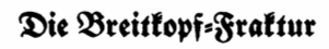 Printer, type designer and type cutter in Leipzig (b. 1719, Leipzig, d. 1794, Leipzig), who created over 400 different alphabets. Also known as Johann Gottlob Immanuel Breitkopf. Author of Ueber die Geschichte der erfindung der Buchdruckerkunst (Leipzig, 1779). Local download.
 Proben der Schriften in der Breitkopfischen Schriftgießerey zu Leipzig (1787, Leipzig) shows Breitkopf's specimens. Local download. Breitkopf designed Breitkopf Fraktur ca. 1760. Walden Font sells a version of this typeface, which was used for most of the 19th century. Dieter Steffmann's version is free. Helzel's version is sold by Fraktur.de. Breitkopf's simplified fraktur of the 1790s was revived in 1914 as Jean-Paul-Schrift, and was revived again around 2000 by Gerhard Helzel in digital form as Jean-Paul Fraktur. See also Breitkopf Fraktur Pro (2016, SoftMaker), URW Breitkopf Fraktur D by Ralph Unger, Jean Paul Fraktur (2021, Ralph Unger), and DS-Breitkopf-Fraktur (2001, Delbanco). Breitkopf is perhaps best known for his original music characters. Metal versions of Breitkopf Fraktur are at Stempel (1912), Klinkhardt (1912), Berthold (1919) and C.F. Rühl (1912). Ben Archer writes: Breitkopf Fraktur was the preferred Fraktur of the German Baroque period. With wider proportions and a lower x-height than its predecessors, this graceful gothic type was modelled on the Neudörffer-Andreä Fraktur that had been used by Albrecht Durer in several of his works. Samples: A, B, C. Klingspor link. [Google]
[MyFonts]
[More] ⦿
|
Johann Heinrich Schoensperger
|
Johnann or Johannes or Hans Schoensperger or Johann Schönsperger der Älte, was an early printer in Augsburg. Born ca. 1455, d. before 1521. He started his print shop in 1481 and dominated German printing in Augsburg until 1500. For Kaiser Maximilian I, he printed the beautiful Theuerdank (1517) and the blackletter Gebetbuch für den St.-Georgs-Orden. For both these books, he designed his own type. Sample page from 1517. Sample page of Gart der Gesundheit (1487). A font named after him, FF Schoensperger, was made by Manfred Klein as part of his package, which also includes FF Carolus Magnus, FF JohannesG, and FF Koberger. SchoenspergerCaps (2004), Hans Fraktur (2003) and Hans Schoensperger Randomish (2004) can be had for free at Manfred Klein's site. Other revivals include Theuerdank Fraktur (2000) by Dieter Steffmann ans Theuerdank Fraktur Pro by Softmaker (2016). Schoensperger's typeface for the prayer book of Maximilian I in 1514 served as example for an 1890 metal typeface at Genzsch and for the digital font Altdeutsch (2002-2006) by Hans J. Zinken. See also Schoensperger Der Altere (2017, Shane Brandes). [Google]
[More] ⦿
|
Johann Schelter
[J.G. Schelter&Giesecke]
|
 [MyFonts]
[More] ⦿
[MyFonts]
[More] ⦿
|
Johannes Anton Hiero Rhode
|
 German type designer, b. 1903 Nordhausen/Sachsen, d. 1954 Berlin. He made these typefaces:
 - Humboldt Fraktur (1938, D. Stempel). Digitized by Gerhard Helzel, Delbanco (2001, as DS Humboldt Fraktur), and Dieter Steffmann (2002, as Humboldt Fraktur and Humboldt Fraktur Zier). It was named after the German researcher Alexander von Humboldt (1769-1859).
- The concave-stroked Hiero Rhode Roman (J. Wagner, 1945). The italic version of that typeface is due to Karl Hans Walter in 1958 at Johannes Wagner. Berry, Johnson and Jaspert write: Calligraphic This type, mainly intended as a book face, and designed by Hiero Rhode, is characterised by concave strokes, which give it a slightly Chinese appearance. The variation in the thickness of strokes is especially apparent in the Bold; serifs are only lightly indicated. E and F have arms which extend over the vertical stroke. The g has a very large bowl and a short tail 96 (open in the light version of the type).
- Hiero Rhode Antiqua. This was revived in 2006 by Ari Rafaeli.
Klingspor link. [Google]
[MyFonts]
[More] ⦿
|
John Stephenson
[Stephenson Blake]
|
 [MyFonts]
[More] ⦿
[MyFonts]
[More] ⦿
|
Jonathan Hoefler
[Hoefler (was: Hoefler&Frere-Jones, and Hoefler Type Foundry)]
|
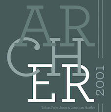 [MyFonts]
[More] ⦿
[MyFonts]
[More] ⦿
|
Julius Diez
|
Vignette designer at the Bauersche Giesserei between 1910 and 1912. His astrological symbols were revived in 2002 by Dieter Steffmann as Tierkreis5. [Google]
[MyFonts]
[More] ⦿
|
Julius Edmund R. Nitsche
|
 Designer, illustrator, painter and interior design architect, b. 1882, Breslau, Germany, d. 1965, München. He worked for the Jugend magazine in München.
 Creator of Buchschmuck (1905), Akzidenz Zierat (1905), Unger Fraktur (1910, Klinkhardt; Wetzig says 1907), Waltraute (1916, a blackletter typeface done at Klinkhardt and at Berthold, Berlin) and Neudeutsche Ornamente (1911, Klinkhardt). Among digital revivals, we note the ornamental caps typeface Unger Fraktur Zierbuchstaben by Dieter Steffmann (2002). [Google]
[More] ⦿
|
Julius Klinkhardt
[Julius Klinkhardt Schriftgiesserei]
|
 [More] ⦿
|
Julius Klinkhardt Schriftgiesserei
[Julius Klinkhardt]
|
 Julius Klinkhardt designed typefaces such as the blackletter font Neue Schwabacher (1922, Berthold). He ran the Julius Klinkhardt Schriftgiesserei in Leipzig in the late 19th century, after having acquired the type foundry of Gustav Schelter in 1871. It was taken over by Berthold in 1920. Their typefaces include Flora Ornamente (1906), Lithographia (1895), Secessions Schriften (1906), Baldur (1903, art nouveau; for a digital revival, see Alan Presott's New Baldur APT, 1996, and Dieter Steffmann's Baldur from 2000), Britania-Gotisch (1900, also known as Altgotish, and as Kloster Gotisch, and as Mammut Gotisch), Breitkopf Fraktur (just like versions of this typeface at C.F. Rühl (1912)), Helios Reklameschrift (revived by Ralph M. Unger in 2017 Affiche), Stempel (1912) and Berthold (1919)), Rosen Zierat (ca. 1910), Negro (1908), Elvira (1908), Cornelia Einfassung (1908), Hubertus Schmuck (1909), Filigran Ornamente (1910), Doris Ornamente (1917), Stigma Ornamente (1911), Bastard gross (a Kanzlei typeface with mager and fett versions), Werkschrift Germanisch (ca. 1880), Tango-Cursiv (1914), and Bismarck-Gotisch gross, all digitally revived by Gerhard Helzel. His TipTop (ca. 1900) was digitized under the same name by Petra Heidorn (2004). Tip Top Pro (2008, URW++) is a commercial revival of the same typeface by Ralph M. Unger.
 On EBay, they were selling the specimen book: See here. Their main specimen books are Gesamt-Probe der Schriftgiesserei Julius Klinkhardt in Leipzig und Wien (1885, 690 pages) and Oktav-Probe II (1890, 452 pages). See the cover of an earlier specimen book. Some type designers: - Richard Grimm-Sachsenberg: Grimm-Antiqua und Schmuck (1914), Neue römische Antiqua (1907), Saxonia (1907), magere römische Antiqua (1912).
- Heinz König: Rundine (1913).
- Hermann Delitsch: Ramses (1912, an Antiqua face), Delitsch-Kanzlei (1903), Delitsch Antiqua (1911).
- Julius Nitsche: Unger Fraktur (1910; Wetzig says 1907), Neudeutsche Ornamente (1911), Buchschmuck (1905), Akzidenz-Zierat (1905).
- Remarkable typefaces: Schmale Runde Grotesk (1885, a forerunner of DIN?).
- Gadso Weiland: Toscana Schriften und Schmuck (1908).
Examples from their catalog from 1890: Fette Universal, Garnitur XII and XIII, Garnitur XIV, Kurrentschrift, Verzierte Merkur Kanzlei, and Neue Cursiv Zierschrift, Antika and Italia Grotesk Versalien, drawing of a boudoir, Enge Egyptienne, Fette Cursiv, Fraktur, Halbfette Fraktur, Holz Schriften (wood type), more wood type, drawing of horses, Moderne Fette Fraktur, monograms, Neue Fette Fraktur and Victoria Gotisch, Neue Fette Fraktur, Neue Schmale Fette Egyptienne, Romanische Gotisch, Rundschrift Polytypen, Schmale Antiqua, Schmale Fraktur, Schmale Halbfette Grotesk, Schwabacher, Silhouette Initialen, Stickmuster Typen, vignetten, more vignetten, Zierschriften, more Zierschriften, Zweifarben-Schriften. [Google]
[More] ⦿
|
Justus Erich Walbaum
|
 Born in 1768 in Steinlah (Braunschweig), Walbaum died in Weimar in 1839 [Jay Rutherford puts his death in 1838]. This German punchcutter and typefounder introduced the modern (i.e., didone) lettershapes. In 1796, he acquires printer Ernst Wilhem Kircher's type foundry in Goslar, and moves it to Weimar in 1803. He runs the foundry until 1836, at which point he sold it to F. A. Brockhaus in Leipzig. In 1918, H. Berthold AG in Berlin gains possession of art of the Walbaum foundry and some of its matrices. Walbaum produced Walbaum Fraktur (1800) but is best known for his didone masterpiece, the Walbaum (1804), aka Walbaum Antiqua and kursiv. Klingspor pins the date at 1800. The early modern metal versions include Walbaum 374 (1933 and 1934, Monotype), and the later ones Walbaum 674 (1957, Monotype) and the Typoart version. Versions and revivlas from the digital age:
 - Walbaum LT (Linotype). This family has 34 weights.
- Walbaum SB and Walbaum SH (Scangraphic).
- G.G. Lange's Berthold Walbaum Book is based on the 16 point size of Walbaum's 1804 typeface and has great contrast in stroke weight [see Walbaum Display on the SoftMaker MegaFont XXL CD, 2002]. Berthold released Berthold Walbaum Book in 1975. It is well-suited for body copy, particularly for formal documents that need a contemporary flair, as well as for headlines.
- Khunrath's revival called Justus (2008, Open Font Library) has six styles and is free.
- Walbaum Text (2002) by Frantisek Storm. Storm also released Walbaum 10 Pro (2010) and Walbaum 2010 Pro (2010), which are extensive (and gorgeous!) didone families, the latter obtained from the former by optical thinning. Storm quips: I only hope that mister Justus Erich won't pull me by the ear when we'll meet on the other side. Advertised as a poster sans family, he also offers Walbaum Grotesk Pro (2011).
- Walbaum Antiqua Pro (2013, Ralph M. Unger).
- In 2018, Monotype's Carl Crossgrove, Charles Nix, Juan Villanueva and Lynne Yun co-designed Walbaum, a reimagined superfamily with 69 total fonts, in five optical sizes. Monotype writes: Walbaum was meticulously crafted by Monotype's Carl Crossgrove, Charles Nix, and Juan Villanueva to bring Justus Erich Walbaum's high contrast didone style masterpiece to the 21st century. Walbaum has over 600 glyphs with OpenType typographic features like small capitals, old style and lining figures, proportional and tabular figures, fractions and ligatures. Also included in the family are three decorative and ornament fonts.
Walbaum Fraktur (ca. 1800, Berthold) is called W650 Blackletter and Walbaum Fraktur on the SoftMaker MegaFont XXL CD (2002) and DS-Walbaum Fraktur by Delbanco. Softmaker later realeased Walbaum Fraktur No. 2 Pro and Walbaum Zierfraktur Pro. URW also has a version, Walbaum Fraktur, and Linotype's is also called Walbaum Fraktur. See also Scangraphic's Walbaum Fraktur SH and Walbaum Fraktur SB, Dieter Steffmann's Walbaum Fraktur (2002), and Elsner and Flake's EF Walbaum Fraktur. In 2010, Mallory Wiegers published a couple of insightful posters on Walbaum's modern typefaces. Linotype link. MyFonts listing of digitizations of his work. Kernest link. [Google]
[MyFonts]
[More] ⦿
|
Karl Klingspor
[Klingspor (or: Gebrüder Klingspor)]
|
[MyFonts]
[More] ⦿
|
Keith R. Field
|
Pointe Claire, Quebec-based designer of the elegant freeware font Menuetto (1994; available from the FontFreak site and revived by Dieter Steffmann), Floralies (1994), and Obtuse Highlight. [Google]
[More] ⦿
|
Klingspor (or: Gebrüder Klingspor)
[Karl Klingspor]
|
 German foundry established in 1906 by brothers Karl Klingspor (1868-1950) and Wilhelm Klingspor (1871-1925) in Offenbach am Main. About half of its catalog consists of blackletter types (as listed in 2000 by Harald Süß), and many of its typefaces were designed by German über-designer Rudolf Koch. History (in German, PDF), resummarized here:
 - 1892: Carl Klingspor (1839-1903), the father, buys the Rudhardsche Gießerei in Offenbach am Main in 1892, which was originally founded in 1842 by Johann Peter Nees, Phillip Rudhard and Johann Michael Huck.
- 1899: Heinz König designs Walthari (a light Fraktur font).
- 1900: Otto Eckmann designs the Fraktur font Eckmann Schrift, and Kurt Wanschura (from Leipzig) designs the Fraktur font Offenbacher Schwabacher. Reform appears!
- 1901: Peter Behrens publishes Behrensschrift (art nouveau style). Offenbacher Fraktur appears too.
- 1902: Behrens Schrift by Peter Behrens. Fette Eckmann Schrift und Ziermaterial by Peter Behrens. Vignetten by Emil Doepler d.J., and Schmuck für Bücher und Akzidenzen by Robert Engels, München.
- 1903: Reform Kursiv.
- 1904: Karl and Wilhelm Klingspor become the sole owners of the Rudhardsche Gießerei. As a private typeface, they decide on Munthe Schrift by Norwegian Gerhard Munthe.
- 1905: Heinz König designs König Antiqua. Breitkopf Fraktur is published, based on the original design of Joh. Gottl. Immanuel Breitkopf (1719-1794). Also new is Auszeichnungsschriften für Fraktur, as well as Die Leidensstationen by Robert Engels.
- 1906: The form is renamed Gebr. Klingspor. Otto Hupp makes Liturgisch (another Fraktur font). Jugendschrift is published.
- 1907: Peter Behrens publishes Behrens-Kursiv.
- 1908: Peter Behrens publishes Behrens Antiqua. Otto Hupp makes Neue Anzeigen Schriften. Halbfette Reform is published.
- 1909: Otto Hupp makes Hupp Antiqua (a Basque "A" in here!), Hupp Unziale. Walter Tiemann designs Tiemann Mediäval.
- 1910: Rudolf Koch designs Fette Deutsche Schrift (Fraktur) and Fette Kochschrift (are these not the same?). Hupp Fraktur appears. The company publishes Kalender Bilder by Heinrich Vogeler.
- 1911: Tiemann makes Halbfette Tiemann Mediäval.
- 1912: Tiemann makes Tiemann Mediäval. Kursiv and Tiemann-Kursiv. Koch makes Halbfette Deutsche Schrift and Deutsche Schrägschrift.
- 1913: Peter Behrens publishes Behrens Mediäval. Koch makes Schmale deutsche Schrift.
- 1914: Rudolf Koch publishes Frühling, Maximilian Gotisch, Maximilian-Antiqua and Maximilian. Walter Tiemann makes Peter Schlemihl and Tiemann Fraktur.
- 1915: Klingspor acquires F. W. Aßmann and Wilhelm Gronau in Berlin.
- 1917: Albert Windisch makes Windisch Kursiv.
- 1919: Karl Michel designs Schraffierte Antiqua. Some cooperation is established with D. Stempel AG, which acquires some shares.
- 1920: Tierbilder-Probe is published.
- 1921: Rudolf Koch publishes Deutsche Zierschrift (Fraktur) and Magere deutsche Schrift. Walter Tiemann makes Narziß. The company publishes Elfenschmucjk, as well as Schräge Schwabacher. Leo Wackerle makes Kalender Bilder.
- 1922: Rudolf Koch designs Koch Antiqua and Koch Antiqua Kursiv. Otto Hupp publishes Deutsche Schrägschrift. Ernst Engel designs Mörike Fraktur, a private typeface just created for the Ernst Engel Presse.
- 1923: Rudolf Koch designs Koch Antiqua Kursiv and Neuland. Walter Tiemann designs Tiemann Antiqua.
- 1924: Koch designs Grosse Koch Antiqua, and Tiemann makes Tiemann Gotisch.
- 1925: Wilhelm Klingspor dies. Rudolf Koch designs Wilhelm-Klingspor-Schrift (Fraktur), and Victor Hammer creates an uncial font, Hammerschrift.
- 1926: Tiemann makes Tiemann Antiqua Kursiv and Koch publishes Klingsporschrift.
- 1927: Rudolf Koch designs Kabel.
- 1928: Rudolf Koch designs Neuland Licht. Walter Tiemann makes Kleist Fraktur.
- 1929: Rudolf Koch creates Zeppelin.
- 1930: Rudolf Koch designs Wallau (rotunda) and Jessen-Schrift (Fraktur).
- 1931: Heinrich Maehler makes Salut.
- 1932: Rudolf Koch designs Holla.
- 1934: Walter Tiemann makes Fichte Fraktur.
- 1935: Rudolf Koch creates Koch Kurrent.
- 1937: Rudolf Koch publishes Claudius.
- 1940: Rudo Spemann's Gavotte appears.
- 1944: A bombardment destroys a lot of material and drawings.
- 1950: Karl Klingspor dies. Walter Tiemann makes Offizin. According to Chronik und Stammfolge der Familie Klingspor (1989, Reinhard Klingspor and Gerhard Moisel), Karl Klingspor died on January 1, 1951, but everywhere on the web we find 1950.
- 1951: Karl Hermann Klingspor (1903-1986), son of Wilhelm, takes over the company.
- 1952: Karlgeorg Hoefer makes Salto.
- 1953: Karlgeorg Hoefer publishes Saltino. Victor Hammer makes Hammer Unziale. The Klingspor Museum in Offenbach is created.
- 1954: Hans Kühne designs Andreas Schrift (Fraktur) and Kühne Schrift (Fraktur). Joachim Romann makes Constanze (a formal script) and Queen. Alfred Finsterer designs Duo Licht and Duo Dunkel.
- 1955: Karlgeorg Hoefer makes Monsun.
- 1956: D. Stempel AG buys the remaining shares of Klingspor, and incorporates many of its types in its own catalog.
That library included typefaces by these designers: - H. Kühne: Andreas Schrift (1954, carried by Delbanco and Gerhard Helzel), Kühne Antiqua (1954), Kühne Schrift (1954), Stahl (1933-1939).
- P. Behrens: Behrens Antiqua (1907), Behrensschrift (offered by Intecsas as Sprecher Gothic), Behrens Initialen (called Sprecher Initials at Intecsas).
- Rudolf Koch: Claudius (carried by Delbanco), Deutsche Schrift (1910), Frühling (1917, carried by Delbanco), Deutsche Zierschrift (1921, offered by Delbanco and Gerhard Helzel), Holla (1932), Jessen-Schrift (1924-1929, carried by Delbanco), Kabel (1927, at Linotype now; called Geometric 231 at Bitstream, and Kalten at PrimaFont, and Koch Original at LetterPerfect), Koch Antiqua (1922, published by Linotype now; available from Alphabets Inc as AI Koch Antiqua MM; called Eva Antiqua SG at Spiece Graphics), Zeppelin (1929, available from Agfa now), Koch Kurrent (1935, offered by Delbanco), Koch Fraktur (offered by Delbanco, Gerhard Helzel, and Christian Richter), Marathon (1938), Maximilian (1917, available at Castle Systems, and carried by Delbanco), Maximilian-Gotisch (carried by Gerhard Helzel and by Walden Font), Neuland (1923, available from Linotype; available from Alphabets Inc as AI Koch Neuland, and at Bitstream as Informal 011, and at PrimaFont as Newfish, and at Keystrokes as Neuland inline), Prisma (1928; a multiline typeface revived in 2003 by Dieter Steffmann, and extended in the large family LL Prismaset at Lineto), Wallau (1926-1934, carried by Delbanco, and called Wal at PrimaFont), Wilhelm Klingspor-Schrift (1925, carried by Delbanco and Linotype; Wilhelm Klingspor-Gotisch is called Wilson at PrimaFont).
- J. Romann: Constanze (1954), Queen (1954, called Ferrante by Intecsas).
- Walter Tiemann: Daphnis (1929), Fichte Fraktur (1934-1939, carried by Delbanco and Gerhard Helzel), Kleist Fraktur (1928, revived by Dieter Steffmann in 2002, and carried by Delbanco), Narziss (1921, available from Font Bureau and Spiece Graphics as Narcissus), Offizin (1952), Peter Schlemihl (revived by Walden Font, and by Dieter Steffmann in 2002), Tiemann Mediäval (carried by Gerhard Helzel), Tiemann Antiqua (1923, now at Linotype).
- A. Finsterer: Duo licht/Duo dunkel (1954).
- O. Eckmann: Eckmann Schrift (1900, called Freeform 710 at Bitstream, and called Eckmann at Elsner&Flake, ScanGraphic, Linotype, URW++, Gerhard Helzel and Delbanco), Eckmann Initialen (called Jan Bent at Intecsas).
- Kurt Wanschura: Offenbacher Schwabacher (1900, Offered at Delbanco).
- H. König: Falstaff (1906).
- H. Schardt: Folkwang (1949).
- R. Spemann: Gavotte (1940, available from Linotype).
- V. Hammer: Hammerschrift (1923, available as Martel at Scriptorium), Hammer Unziale (1953). [Linotype has it as Neue Hammer Unziale. Agfa carries Uncial, which is really Neue Hammer Unziale. The Electric Typographer calls it Electric Uncial. Elsner&Flake have a version called American Uncial.]
- O. H. W. Hadank: Ornata (1943).
- H. Bohn: Orplid (1929).
- O. Hupp: Liturgisch (1906, carried by Gerhard Helzel), Hupp Antiqua (1909).
- F.K. Sallwey: Information breitfett (1958).
- A. Kumlien: Kumlien Antiqua.
- R. Bauer: Magnet (1906).
- K. Hoefer: Monsun (1955), Salto (1952, now at Linotype), Saltino (1953, carried by TypeRevivals), Saltarello (1954).
- H. Maehler: Salut (1931, version available from Agfa).
An unclassified condensed elongated Victorian fat face, Slimback-style, is Figura. No date known. View the Klingspor typeface library. [Google]
[MyFonts]
[More] ⦿
|
Leslie Cabarga
|
Agfa Creative Alliance designer Leslie Cabarga has the following thesis: all free fonts are either of poor quality or are in some way pirated. This is a disappointing view from a talented type designer. Clearly, there are top-of-the-line original free fonts out there made by the likes of Apostrophe, Nick Curtis, Manfred Klein, Petra Heidorn and Dieter Steffmann. On the other hand, Cabarga is right about the abundance of poor quality fonts (unfortunately, both free and commercial), and the proliferation of pirated fonts, renamed time and again, but the renaming is mostly done by commercial companies (often cheap CD vendors). The page used to be here. [Google]
[More] ⦿
|
Lettres Ornées
|
 Famous decorative caps typeface originated by the Paris-based foundry of Joseph Gillé (ca. 1820). Later versions included one by Wood & Sharwoods (ca. 1842), Laurent & Deberny (ca. 1867: in various size variations, (Lettres ornées No 101, No 103 and No 89)), Deberny & Peignot and Haas.
 In the phototype era, PLINC carried the face as Lettres Ornées, with a variant named Eldorado B where the line fill is missing. Letraset had it as Lettres Ornées (with a Deberny & Peignot credit), and Mecanorma developed it some time before 1971 as 82A Lettres Ornées and Ornées A (with a Haas credit). Digital revivals were attempted by Dieter Steffmann (2002: a free font called Lettres ombrées ornées), FontMesa (2015), Alan Jay Prescott (as "Currier") and Steve Harrison (2021: Lettres Ornes Blonde, Lettres Ornes Noire and Lettres Ornes Lignes). [Google]
[More] ⦿
|
Linotype harassment
|
The lawyers' letters signed by N. Yilmaz continue to flow out of the Linotype offices to unsuspecting typographers such as Dieter Steffmann, Markus Wäger, Dirk Uhlenbrock and others, all claiming trademark violations, and asking for immediate payment of sums ranging from 300 to over 10,000 Euros. This page explains how Linotype itself is "interpreting" the law. (Dead) German language page on the same topic by Cybapee. [Google]
[More] ⦿
|
Lorenz Reinhard Spitzenpfeil
|
Blackletter type designer at Ludwig&Mayer, b. 1874 Michelau, d. 1945 (by suicide), who lived most of his life in Kulmbach, and is often called the forgotten designer. His typefaces: - Welt-Fraktur (Magere and Halbfette) (1908-1910). Also called Spitzenpfeil Fraktur.
- Werk-Fraktur (1918; the mager is from 1913). Revived by Gerhard Helzel.
- Kulmbacher Fraktur. Unpublished.
- Kulmbacher Schwabacher (1935).
- Fränkisch Spitze Buchkursive (or just Fränkisch) (1906, Genzsch & Heyse; Seemann and Wetzig both mention 1910). Revived by Dieter Steffmann in 2002.
- Spitzenpfeil Splendid (Ludwig&Mayer).
His life story was told in 1983 by Hermann Stettner and others in the magazine of the Bund für die deutsche Schrift, volume 69: Page 1, Page 2, Page 3, Page 4, Page 5, Page 6, Page 7, Page 8, Page 9. See alo Kurt Muhlhausser's article Lorenz Reinhard Spitzenpfeil. Ein Lebensbild des oberfränkischen Künstlers und Forschers (in: Geschichte am Obermain, Bd. 17, 1989-1990). Author of Die Behandlung der Schrift in Kunst und Gewerbe. Eine Einführung in die Schriftbildung, Schrifttechnik und Schriftanwendung (Nürnberg, 1911), Die Grundformen neuzeitlicher Druckschriften (Leipzig, 1912) and Der Schriftkünstler. Anleitung zur Kunstschrift (Hannover/Wien, 1912). [Google]
[More] ⦿
|
Ludwig&Mayer
|
 Big German foundry active in the first half of the 20th century. It was absorbed by Neufville in 1984, which will make its typefaces available in digital form. Type designers and typefaces:
 - House typefaces: Allemannia Fraktur (1908, or: Alemannia Fraktur; a digital revival in 2018 by Mew Varissara Ophaswongse), Allright (1936), Altenburger Gotisch (1928), Aristokrat Zierbuchstaben (1911: digital revival by Dieter Steffmann in 2002), Bastard Mediaeval, Beatrice (1931), Chic, Cochin (1922), Commerciale, Die Mode (1914-1915), Diplomat (1964, see the digital version Diploma by Hans van Maanen, 2009), Excelsior (1914, script face), Firmin Didot (1929), Hallo (1956), Kombinette (1932), Kupferplatte (1950), Largo (1939), Magnet (1951), Manolo (art nouveau: revival in 2019 by Ralph Unger as RMU Manolo), Nelson (1902, art nouveau), Wren, Samson Script, Luminous, Behrens. Kudos Kaps NF (2006, Nick Curtis) is a set of five nice ornamental caps and associated alphabet and border sets, including a Lombardic set, and an engraved set--they are based on typefaces from the Ludwig&Mayer library.
- Albert Christoph Auspurg: Rasse (1924), Mona Lisa (1930), Brigitte (1935), Krimhilde (1934)
- Hans Bohn: Allegro (1936-1937)
- Jakob Erbar: Erbar-Grotesk (1922-1930), Lucina, Lumina, Lux, Phosphor, Koloss (1923), Candida (1936, a mediocre didone family), Feder Grotesk (1910), Fette Feder Grotesk, Erbar
- Hace Frey: Charleston (1967, Alphonse Mucha-style display face)
- G. Germroth: Germroth-Deutsch (1935, blackletter)
- Erhard Grundeis: Achtung (1932)
- Karlgeorg Hoefer: Stereo (1968), Permanent (1962), Headline (1964), Elegance (1968), Big Band (1974)
- Walter Höhnisch: Tempo (1930), Werbeschrift Deutsch (1933), National (Fraktur, 1933-1934), Schräge National (1937), Skizze (1935, a script face), Stop (1939), Antiqua die Schlanke (1938-1939), Express (1952), Candida Italic (1937), Slender (1939)
- Heinrich Jost: Aeterna (or Jost Mediaeval, 1927)
- Walter Ferdinand Kemper: Colonia (1938-1939, a humanist sans)
- Wilhelm Krause: Professor-Krause-Fraktur (1930, blackletter)
- Paul Eduard Lautenbach: Prägefest (1926)
- Richard Ludwig: Augenheil (1908)
- Helmut Matheis: Charme (1957-1958, calligraphic), Slogan (1959, connected script), Primadonna (1956, a formal script), Matheis Mobil (1960), Compliment (1965, an angular vertical script)
- Joshua Reichert: Reichert-Gotisch (1930s).
- Imre Reiner: Contact (Deberny&Peignot, 1952; Ludwig&Mayer, 1968 (according to Jaspert), and 1963 according to others), Corvinus (ca. 1932), Stradivarius (1945)
- Lorenz Reinhard Spitzenpfeil: Welt-Fraktur (1910), Werk-Fraktur (1918)
- Alfred Riedel: Domino (1954: a fat face)
- Georg Schiller: Lyrisch (1907)
- Arthur Schulze: Werbekraft (1926)
- Ilse Schüle: Rhapsodie (1949-1951, bastarda)
- Johannes Schweitzer: Dominante (1959)
- Francesco Simoncini: Aster (or Aster Simoncini, 1958), Life (1965), Armstrong (1970), Simoncini Garamond (1961)
- K. Sommer: Dynamo (1930)
- Hans Wagner: Altenburger Gotisch (1928, Fraktur font), Welt (1931, slab serif), Wolfram (1930, a heavy upright italic).
- Eugen Weiss: Hoelderlin (1937-1938, blackletter)
[Google]
[MyFonts]
[More] ⦿
|
Luthersche Fraktur
[Erasmus Luther]
|
Luthersche Fraktur was designed by Erasmus Luther in 1708. Among Fraktur fonts, it is legible and fresh. The Luther Fraktur forms a link between the earlier Gebetbuch Fraktur and the later Breitkopf Fraktur types. Versions: [Google]
[More] ⦿
|
Luthersche Schriftgiesserei
[Paulus John Christian Egenolff]
|
 One of the oldest type foundries, founded by Paulus John Christian Egenolff (1502-1555), who was a printer in Strasbourg (1528-1530) and later in Frankfurt, where he was the first book printer. After his death, until 1572, his foundry was headed by family members, Magdalena, Barbara and Maria Egenolff. In 1572, punchcutter Jacob Sabon (d. 1580) took over after marrying Judith Egenolff, Christian's only daughter, in 1571. The widow remarries with Konrad Berner, a typefounder. Upon his death in 1606, the foundry is left to his son Hans Berner who dies in 1626. His daughter Katharina Berner takes over and marries Johann Luther in 1629, son of Friedrich Luther and family of Martin Luther. Out of this marriage was born Johann Erasmus Luther (1642-1683), who marries Anna Katharina Hoffmann. Their son is Johann Nikolaus Luther (1662-1740), a lawyer. His son is a doctor in law, Heinrich Ehrenfried Luther (1700-1770), and the latter's son is also a doctor in law, Johann Nikolaus Luther (1732-1805).
 The foundry was heavily involved at first in Schwabacher typefaces, such as the Egenolffschen Schwabacher (1500s). Among the Schwabacher typefaces, Johan Enschedé's catalogue mentions Garamond Luther (1678), Gross Petit Luther (1718), Mittel Luther (1678), Cicero Luther (1718), Tertia Luther (1678), Gross Mittel Luther (1718), as well as the Fraktur typefaces Petit Luther (1678), Colonel Luther (1718), Luther (1718), Cicero Luther (1678 and 1718), Gross Cicero Luther (1678 and 1718). Digitizations include Coelnische Current Fraktur by Dieter Steffmann, Coelnische Current Pro (2016, SoftMaker), and JubiläumsFraktur by Gerhard Helzel. [Google]
[More] ⦿
|
Manfred Klein
[Manfred Klein's Fonteria]
|
[MyFonts]
[More] ⦿
|
Manfred Klein's Fonteria
[Manfred Klein]
|
 Prolific Frankfurt-based designer, born in Berlin in 1932, who studied typesetting at the Kurier in Berlin, later in Typografische AG (a work-group). His teacher was Berthold's G. G. Lange. He worked as a Creative Director and then as a freelancer for several companies, including Stempel and Monotype. Since 1990, prolific font creator, with fonts appearing at Fontshop, Fonthaus, Elsner and Flake, Alphabets Inc, Apply Design Group, and Medienwerkstatt Muehlacker (school fonts). His fonts are partly commercial and partly freeware. They are invariably stylish, original, and often funny. He looks at type as an essential part of visual communication, and that theme unifies his work, giving his typefaces a unique cachet. Manfred Klein died on November 17, 2018.
 MyFonts page. MyFonts catalog. List of his commercial typefaces. His fonts can be found here: - Alphabets Inc: AlphaKid, AlphaZeta, AppleWine, BadTimes, Before The Alphabet-I, BeforeTheAlphabet II, BradOgilvy, BritishWriting, CaligulaNero, ChaoTiqua, ClassicalBPlus, ClassicCaps, ClassicIngenus, DancingEgypt, Dino, DinoSaurier, Flighty, Fragment, FraktKonstruct (1994), FraktScript, FranklySpoken, FruechtOne, Fusion, Half, Head to Heads, HeSheIt, Ideograph, JessicaPlus, JustPicts, KleinsSerif, Laufendes, MarsMen, MirrorKleinShadows (2000), NeptuneSerif, OlisEckige, Online, ParmaPetit, Quasimodo, SomeDrawings, StopperRosetten, Szene, Toskana, ToursandTravels, Uncitroncia, EthnoFont, WhyNot, Witches and Venezia.
- At Fontshop: FF Carolus Magnus (uncial), FF Double Digits, FF JohannesG (blackletter), FF Koberger (blackletter), FF Quill, FF Schoensperger (blackletter), FF Spontan, FF Witches.
- Fonthaus:
- Elsner&Flake: EF Aliens (great tribal masks), EF BeforeTheAlphabets (primitive dings), EF Birds (1992), EF Bloxx, EF Brushable, EF BuchZeichen, EF DeconStruct, EF Ethno Font, EF Flying Objects, EF Flying OpArt, EF Gois, EF Gutenbergs Traces, EF KLTypeFaces, EF Kleins Sketch (1995), EF More Kaputt, EF PoetConcrete, EF Remember Irme R (1995), EF StarsN Spirals, EF Suetterlin, EF Tokay (1992, after an idea of Imre Reiner), EF WhyNot (a lovely crazy handwritten character font, oozing originality and style), EF Witches Brood.
- Apply Design.
- Linotype: SketchCameoInvers (free).
- Medienwerkstatt Muehlacker: KreuzWort, Norddruck, Sdfett, Vahalb, Veraus, Verfett.
- His first animal-inspired font, Font Zoo (1990).
- Tons of experimental typefaces, such as MoKsford Fraktur (based roughly on a bitmap font that came with the early Macs), Unciale Experimental, Jahn Caps Round (named after Klein's friend Joachim Jahn, who studied type with him in the fifties under G. G. Lange), Moksford BetaTest and Moksford Stencil.
- Kopffuessler: heads and feet font, free. This is a hilarious face.
- Fonteria CD (2001, from his own foundry): Aliens2000 (masks), Artist, BodoniTwinsCaps, Caslonia, CircusOne through CircusFour, Clown, CrazyTimes, Emmenthaler, Ermir, Erpressung, FloRaTialen, GaraNitials, GaraSans, Imre, Jockey, Jonas, KL1GridZebra, KL1MonoSansInvers, KL1MonocaseSerif, Kl1RheumaticFraktur (2001), KleinsDancingSlapzerif-Light, Laurens, LernschrittABC, Mighty, MightySpecial, MirrorKleinShadows, MonoAlphabet, MonoAlphabetSerif, Monument, Mutoni, PfeileOne through PfeileThree, Pointout, RootsOfMatisse, SMHand, SaltoOne, SaltoTwo, SonnCar, Steamdecor, StonageStamp, Stoneage, WalNuss, Zoography-Normal.
- Progothics (a Fraktur web site run by Steffmann and Cybapee; free downloads): Broken Brains, Frax Initials, MKaslon Textura, Civilité Edges, Very Broken Frax, Fraxx Sketch Quill (inspired by the work of Imre Reiner), Cowboy Caxton, TShirts for Frax.
- Manfred Klein @ typOasis (free creations). The first batch of free fonts: Aftermath Manhattan, Aida Oops, Airdried Parma Font, Aliens, Amazon, AnthroPosoph, Architypo, Bullets 1+2, Casual Stencil, Cats, Circle Initials Freestyle, ClassiCaps, Claudius Imperator, Creepy, DisProporz, Dizzy, Eagle Konfetti, Feathered, First TypoManiacs, Flying Carpets, Furioso, Glitter, Glyptographs, Grid Exercise, Grid Scribbles, Headbirth (a great font with caricatures of men composed of deformed letters only), Headfeeter, Headfeeter 3, Hello Mr Pharao, IntourisTiqua, Kenzotiqua, Kidge&KidgeBoxes, Kleins BinAerfabet, Kleins First Bricks, Kleins Moons, Kleins Pharao I+II, Kleins Round Fragments, Kleins Sausages, Kleinsan (Japanese letterform simulation), Klill For Typesetters, Linoleu, Mannes Heads, MK Bats, MKonstrukTshirts, MutanTrios, My Nippon, Neu Gothic, Old Roman Klein, Oli Klein Bats (drawing by Manfred's son, 2001), Papercuts, Petra Font, Pointilism, Pompeji, Rainy Day, Remember Manhattan, Remember Scribbled Type?, Roots Koch Three, Rosett Klung, Sailing Strong Breeze, Sanstencil, Scribbled Astrobats, ScribbleDoni, SternenHimmel, Total Floral, Uncial Virtual, Uncitron Swinging Bold, Xmas Gingerbread, Grid Zebra, RuniK100-Bold, RuniKleinFreeform (2001, great simulated runes), Brix Round, AZ-Fusione, ClassiCaps Xmas, AngloSaxon, Betonia, Was A Screenfont, Kleins First Script, PetriFree, Aida Serif, Roaring Twenties, RoaringTwenties 2, TypeWriters Substitute, Free Bradbury, Twiggy, Arrowbix, Solunciale, Dada's Traces, AppleWine, Sumo Heavy, Petit San, Sketch Cameos Round, NipponToon (2001), CrazyTimes (2001), Give Euro A Face (2001), Kids Kas (2001), DymoFontInvers (2001), K-Neptuns (2001), Smile And Train (2001), Free Bradbury Sans, Funny Faces, PointerSisters (2001), Kritzel One (2001), Quick Greek (2001), Kleins Heraldry Box (2001), Mercato Light+Bold (2001), Silhous (2001), Vertigo (2001), CircleSigns (2001), Warum 2001 (2001), MKlammeraffen (2001), Dillefanten (2001), Hallelujah (2001), OhRosetta (2001), Backgrounders (2001), Cave AB (2001), Broken ABC (2001), XPFourTwoContour Medium, Karlas 1st Font (2001), Frogs And Men, Pixel Nonsens (2001), Latin Lovers Runes, Roundheads (2001), Wacbats (2001), CalliPsoGrafia, Typeface Eggs (2001), Gourmet Icons, Hacke It!, Square Heads, FroxXMedium, FirstBricksMirored, Sportive, WacbatsItalic (2001), MKartuhns (2001), Typos (2001), Free People, OliJo Sans Italic (2001), FlyingSwimming (2001), Clone Products (2001), OliJo (2001), Gutenbergs Traces (2001), Bauhouse (2002), ClassiCaps Xmas 2002 (2002), GGothique MK (2002), Lombardic (2002), Mouse Traces (2002), Music Elements (2002), DreiDreiDreiBlack (2002), Griffo's Font (2002), Noisy Buttons (2002), Hamlet ToBeOrNot, Oszillo Caps (2002), Cave Paintings (2002), Rodgauer (2002), Prinz Eugen (medieval font, 2002), DreiDee Sketches, Typo Cubes (2002), AustralBats, RoundMouseBats (2002), Torynitialen, Wood Cutted (2002), FlowerPower, Graf Typo, Solitaire (2002), Breeze, Eyes, Lead Types Heap, Petit Fleur (2002), ABCari, Floralalpha (2002), Karlas ABC-Start, OliJo Bold (2002), Athena Handwritten, The BroadWay (2002), MK Squares (2002), Incunitials (2002), Luc's Plants (2002), Monte Petito (2002), Before Alphabets 4, Threedimensional (2002), Blind Reading, Zebral Caps (2002), Before Alphabets 3, Braille Latin, Tangoasis (2002), Katrins (handwriting of Katrin Dillmann, Manfred's daughter), Laurens Erste (handwriting of Laurens Dillmann, Manfred's grandson), Tangodoni (2002), Typesetters TV, Unscreen (2002), Caps MKS (2002), Haunted, Mouse Scribbles (2002), RunishMK (2002), Fatsans (2002), Rotten Script, Stormy, Strong Dots (2002), Caro Mio, Reduce 2 Max (2002), Pudels Kerning (2002), Cheerio, Gersans (2002), ArabDances (2002, Arabic simulation font, with Cybapee), Slab Serif Written (2002), Shalom (2002, Hebrew simulation), Bloxx Serif, Kara Ben Nemsi, Remember Cassandre, Wieynk Caps Round (2002), Fragment Caps, Golden Swing, Tango Macabre (a gorgeous font in which letters are made with skeletons: 2002), Eye Beings, Frax Handwritten (2002), HotsBlots, Latin China (2002, oriental lettering), Dinos Fragments, HotchPotch (2002), SketchBats (2002), AmorE (2002), Chinawestern (2002, oriental simulation), Valentine Flies (2002), AmorEatPersia, AmorEmoticons (2002), Artfacts, The Kiddies (2002), ConstrAccident, Kochs Roots (2002), AnimSilhous (2002), Framed Frax Caps, K-Arrows (2002), GridEx Gallery, K-Arrows B, Swinging Petidoni (2002), Big Swinging SlabS, Relief Caps, Shapes 1-3 (2002), Petitscript, Shapes Four (2002), Fullsize Sans, Petitscript Italic, Shapes A 1-3 (2002), Imperium Serif (2002), Big Broken, Semaphore (2002), MKalligFrax, Pix Caps (2002), Slabsoft, Windy City (2002), Slabsoft, Windy City (2002), Timeless (2002), Against Rules, Berolina (2002), FabCreatures (2002), CookinDada (2002), FoodnDrinks One, HabSpass-HaveFun (2002), Mighty (2002), Klammeraffen Italic (2002), Elefontitis Xtreme (2002), Cairotiqua Freestyle, Eastereggs (2002), Cave People, RandoMiKa (2002), Big Ella, Hands Subversive 1+2 (2002), Build Your Own People (2002), Antroposofia, EasterChicken, GridRiding (2002), rish Sketches, KidPicts, MatrixbuK (2002), Dornspitz Grotesk, PeaceBats (2002), Arte FS, Eagles Buttons (2002), BlowinInWind, Cave Popart, Karla 1B (2002), Crosses, SharkJockey, Toscanienne (2002).
[Google]
[MyFonts]
[More] ⦿
|
Mark Simonson
[Mark Simonson Studio]
|
 [MyFonts]
[More] ⦿
[MyFonts]
[More] ⦿
|
Mark Simonson Studio
[Mark Simonson]
|
 Mark Simonson Studio is located in StPaul, MN. Mark founded Mark Simonson Studio around 2000, and describes himself as a freelance graphic designer and type designer. From his CV: Early in my career I worked mainly as an art director on a number of magazines and other publications including Metropolis (a Minneapolis weekly, 1977), TWA Ambassador (an inflight magazine, 1979-81), Machete (a Minneapolis broadsheet, 1978-80), Minnesota Monthly (Minnesota Public Radio's regional magazine, 1979-85), and the Utne Reader (1984-88). I was head designer and art director for Minnesota Public Radio (1981-85) and an art director for its sister company, Rivertown Trading Company (1992-2000). During that time, I designed over 200 audio packages, including most of Garrison Keillor's, along with several hundred products (t-shirts, mugs, rugs, watches, etc.) for the Wireless, Signals, and other mail order catalogs. I have frequently done lettering as part of design projects I'm working on. This has always been my favorite part, so in 2000 I opened my own shop specializing in lettering, typography and identity design. I've also been interested in type design since my college days. I started licensing fonts to FontHaus in 1992, and since starting my new business, stepped up my efforts in developing original typefaces. I now have more than 70 fonts on the market with many more to come. This is increasingly becoming the focus of my activities. In 2021, he joined The Type Founders.
 His fonts: - Coquette (2001). He says: Coquette could be the result of a happy marriage of Kabel and French Script.
- Anonymice Powerline (2009-2010). This is probably a hack by some people based on Anonymous. It is available in some Github directories.
- Kandal: a 1994 wedge serif, now also at MyFonts).
- Proxima Sans (1994, a geometric sans, rereleased in 2004), followed in 2005 by his massively successful Proxima Nova in 42 styles/weights. Followed by Proxima Nova Soft (2011). The rounded version of Proxima Nova is Proxima Soft (2017). For a variable font that captures all styles, see Proxima Vara (2021). In 2022, he added Proxima Sera (an 18-style workhorse serif that combines old style forms with contemporary and modern typefaces).
- Mostra (2001): based on a style of lettering often seen on Italian Art Deco posters and advertising of the 1930s. Look at the Light and Black versions, and drool...... The 2009 update is called Mostra Nuova. Selected styles: Mostra Nuovo Bold, Mostra One Light, Mostra Three Bold, Mostra Two Heavy.
- In 2001, he made the Mac font Anonymous. Its updated version is Anonymous Pro (2009-2010), a TrueType version of Anonymous 9, which was a freeware bitmap font developed in the mid-90s by Susan Lesch and David Lamkins. It was designed as a more legible alternative to Monaco, the mono-spaced Macintosh system font.
- In 1998 and 2001, he produced the (free) 3-style Atari Classic family.
- In 2003, he released Blakely Bold and Heavy (an art deco font first done for the Signals mail order catalog). The original Blakely is from 2000.
- Goldenbook Light, Regular, and Heavy, based on the logotype of the 1920s literary mag called "The Golden Book Magazine".
- Metallophile Sp 8 Light and Light Italic (2008): a "faithful facsimile of an 8-point sans as set on a 1940s-vintage hot metal typesetting machine".
- Refrigerator Light and Heavy, Refrigerator and its extension Refrigerator Deluxe (2009) (geometric sans).
- Changeling Light, Regular, Bold, Stencil, and Inline (2003): a redesign and expansion of China, a VGC photo-typositor typeface from 1975 by M. Mitchell, which includes unicase typefaces; see also Changeling Neo, 2009.
- Sanctuary Regular and Bold: a computerish typeface based on lettering in the 1976 movie Logan's run--later withdrawn from the market.
- Sharktooth (+Bold, +Heavy).
- Felt Tip Roman, Woman and Senior (based on his own handwriting). Felt Tip Senior (2000) is based on the hand of Mark's father. Felt Tip Woman Regular and Bold are based on the handwriting of designer Patricia Thompson.
- Filmotype Gay (2011).
- Filmotype Honey (2010): fifties brush lettering face. For a free alternative, see Honey Script (2000) by Dieter Steffmann.
- Raster Gothic Condensed Regular and Bold (12 fonts total), and Raster Bank (a pixelized version of Bank Gothic).
- Other free bitmap fonts for the Mac [the PC version was made by CybaPee]. MyFonts page.
- He digitized Phil Martin's family, Grad (2004, inspired by Century Schoolbook, and originally done by Martin in 1990).
- His 2006 production includes three script typefaces: Kinescope is a connected script based on title lettering in Fleischer Studios' animated Superman films from the 1940s. Snicker is a cartoony block letter type. Both were published at Font Bros. And Launderette is a connected very slanted script based closely on lettering used in the titles of the 1944 Otto Preminger film, Laura.
- In 2007, he revived and extended Filmotype Glenlake (2007, sold at Font Bros).
- Lakeside (2008) is a flowing 1940s-style brush script. It was inspired by hand-lettered titles in the classic 1944 film noir movie Laura.
- In 2008, he revived Filmotype Zanzibar, about which he writes: That Zanzibar is nearly an anagram of bizarre seems fitting. The surviving people from Filmotype (later Alphatype) have not been able to tell us who designed this gem, so we have no record of the designers intentions. Released in the early 1950s, it seems somewhat inspired by the work of Lucian Bernhard (Bernhard Tango, 1934) and Imre Reiner (Stradivarius, 1945). At first, it appears to be a formal script, but there are no connecting strokes. It would be better described as a stylized italic, similar to Bodoni Condensed Italic or Onyx Italic, with swash capitals.
- Filmotype Vanity (2008) is an outline typeface based on a 1955 design by Filmotype. It was derived from Filmotype Ginger.
- Filmotype Alice (2008) is casual handwriting. However, MyFonts now credits Patrick Griffin with the digitization.
- Filmotype MacBeth (2008) is a freestyle face.
- Filmotype Ginger (2008) is a heavy display typeface with an aftertaste of Futura.
- Boxy2 (2008) and Boxy1 (2008) are severely octagonal typefaces made to test out FontStruct. See also bubblewrap.
- In 2008, Mark Solsburg and Mark Simonson cooperated on the digital revival of the calligraphic Diane Script, originally designed in 1956 by Roger Excoffon.
- In 2009, Mark worked on SketchFlow Print, a font for Microsoft. It will be bundled with the next version of Christian Schormann's Expression Blend, part of Microsoft's Expression Studio suite. The fonts, based upon the handwriting of architect Michaela Mahady of SALA Architects, Inc., give that well-known architectural printing look (like Tekton).
- Filmotype Gem (2011). A sans headline typeface that was first drawn by Filmotype in the 1950s.
- Bookmania (2011) is a revival of Bookman Oldstyle (1901) and the Bookmans of the 1960s, but with all the features you would expect in a modern digital font family. Especially, Simonson's Bookmania story is worth reading.
- In 2018, he published the 25-style Acme Gothic at Fontspring. He explains: Acme Gothic (2018) is based on the thick and thin gothic lettering style popular in the U.S. in the first half of the twentieth century. There have been typefaces in this genre before, but they were either too quirky (Globe Gothic), too English (Britannic), too Art Deco (Koloss), too modern (Radiant), or too Art Nouveau (Panache). None captures the plain, workman-like style of Acme Gothic.
- Parkside (2018) is a script typeface inspired by typefaces and lettering of the 1930s and 1940s. Parkside uses OpenType magic to automatically select letter variations that seamlessly connect to the letters coming before and after.
- In 2018, he emulated wood type in his HWT Konop at P22. Named for Don Konop, a retired Hamilton Manufacturing employee, who worked from 1959 to 2003, this typeface is monospaced in both x and y directions so that letters can be stacked vertically and horizontally. All proceeds go to the Hamilton Wood Type and Printing Museum.
- Etna (2020). A 30-style text and display family that started out from William H. Page's Victorian wood type Aetna (1874), and was remolded by Simonson into a useful typeface family though still distinctly linked to its ancestor. Etna includes three different condensed widths in all six weights (intended for display use), four different figure styles, alternate characters, true small caps, and a selection of dingbats, including arrows, stars, asterisks, and manicules.
Links to his typefaces, in decreasing order of popularity: Proxima Nova, Bookmania, Mostra Nuova, Proxima Nova Soft, Coquette, Refrigerator Deluxe, Felt Tip Roman, Grad, Changeling Neo, Goldenbook, Lakeside, Kinescope, Metallophile Sp8, Blakely, Felt Tip Woman, Snicker, Felt Tip Senior, Kandal, Sharktooth, Anonymous, Raster Bank, Raster Gothic. FontShop link. Fontspace link. MyFonts interview. View all typefaces designed by Mark Simonson. Fontspring link. Google Plus link. Klingspor link. Abstract Fonts link. Kernest link. I Love Typography link. Font Squirrel link. Old link to hos site. [Google]
[MyFonts]
[More] ⦿
|
Markwart Lindenthal
[Fraktur.de]
|
[More] ⦿
|
Neale Davidson
[Pixel Sagas (was: Protoform Project, and Fontshack)]
|
 [More] ⦿
|
Oldrich Menhart
|
 Czech type designer (b. Prague 1897, d. Prague 1962) who was mainly active at Grafotechna, a state foundry in Prague. Menhart was also an author who wrote about type and its history. After the World War II, he helped the communist party to promote itself. He was the author of fonts celebrating the victory of communism in hand-written manifests. Menhart considered himself foremost as a craftsman, and derived typefaces from calligraphic origins. Author of Nauka o pismu (1954) and Tvorba typografickeho pisma (1957). PDF file of Nauka o Pismu.
 Veronika Burian on Menhart. FontShop link. Klingspor PDF. Oldrich Menhart's typefaces include - Manuskript Antikva (1944-1950, Grafotechna), Manuskript Kursiva (1951, Grafotechna). An angular and slightly irregular typeface with a handwritten feel. Burian places Manuscript Antikva in 1943 and Kursiva in 1946. Digitizations of Manuskript: the five-weight family by Franko Luin (1991) at Omnibus, Menhart Manuscript by Alex V. White, Manuskript Antiqua (URW++, by Ralph M. Unger), and ITC Oldrichium by George Thompson from No Bodoni Typography.
- Menhart Antiqua and Menhart Kursiva, 1930. Menhart Antiqua was first published by the Bauersche Giesserei in 1932. We also find versions of this garalde set in 1936-1938 at Monotype. See also Grafotechna. Paul Hunt's Junius (2006) is a revival/adaptation of Menhart Antiqua. See also the beautiful revival Menhart Antiqua (2008, Albert Creus).
- Menhart Roman (1933) and Menhart Italic (1933), published by Lanston Monotype in 1934-1935, and by Bauersche Giesserei in 1939. Bill Horton recreated Menhart-Italic and Menhart-Regular. Alexander W. White revived Menhart Italika [his revivals of Preissig Antikva, Preissig Italika, Menhart Italika and Menhart Manuscript won him awards at the TDC2 2001 competition].
- Menhart Latein.
- Parlament (1950, Czech Government Printing Office). Calligraphic type with lots of individuality and irregularity, first planned to be used for printing the Czech Constitution.
- Standard Antikva and Kursiva (1959). See also at Grafotechna in 1966.
- Victory Roman, Medium and Italic, 1942-1943. Published in 1947 at Intertype. An angular text face.
- Triga Antikva, Kursiva and Medium (1951, published in 1954 at Sluzba Tos, Prague). Calligraphic text type.
- Ceska Unciala (1944), published in 1949 at Grafotechna. An angular pseudo-Gaelic uncial. Ralph Unger's FontForum Unciala (2005, URW++) is a revival.
- Figural Romana or Antikva (1940, published in 1949 at Grafotechna), Figural Kursiva or Italika (1948; published in 1949-1950, Grafotechna), Figural Romana (1940). Rather angular lower case letters with several slopes. Michael Gills, under the art direction of Colin Brignall, did Figural (1992) and Prague for Letraset without Grafotechna's permission, and ITC is still selling those fonts now as ITC Figural and ITC Prague. Monotype and Linotype also offer Figural. Figural and Figural Italic were also revived in 2006 by Ari Rafaeli.
- Grazdanka (1953, Grafotechna), Grazdanka Kursiva (1954, Grafotechna). Manuscript Grazhdanka (cyrillic) was revived in 2006 by Ari Rafaeli.
- Hollar (1939, at Jaroslav Picku, Prague).
- Monument (1950-1952, Grafotechna). An almost pen-drawn all-caps outline face. The digital version by Ralph M. Unger is also called Monument (2010, Profonts). Dieter Steffmann has a free revival of Monument in 2002.
- Vajgar (1961, Tiskarna Straz)
View the typefaces related to Oldrich Menhart. See also here. [Google]
[MyFonts]
[More] ⦿
|
Otto Eckmann
|
 Born in Hamburg, 1865, died in Badenweiler, 1902. Otto Eckmann was a painter, graphic artist and type designer, who did some graphic design for the magazines "Pan" (from 1895 onwards) and "Jugend" (from 1896 onwards). Otto Eckmann's work from around 1900 for Klingspor includes his Munch Jugendstil style typeface from 1901 simply called Eckmann or Eckmann-Schrift (1900, Jugendstil font at the Rudhardsche foundry), his famous Rudhardsche Initialen, and Fette Eckmann (1902). Digital versions of this:
 - Linotype's Eckmann Com.
- Delbanco's DS Eckmann Schrift.
- Ralph Unger's Schmuckinitialen (2009) and Initials RMU One (2012).
- Bitstream's Freeform 710.
- Elsner&Flake's Eckmann EF.
- URW's version.
- Brendel/Softmaker's Etienne Regular.
- Dieter Steffmann's excellent free font family Rudelsberg (2002), which has styles called Schmuck, Schrift and Initialen. Steffmann has an accompanying Jugendstil Ornamente. Other revivals by Dieter Steffmann include Eckmann Initialen (2002, after the famous art nouveau typeface from 1900 by Otto Eckmann), Eckmann Plakatschrift (2002), Eckmann-Schrift (2002), Eckmann Titelschrift (2002) and Eckmann Schmuck (2002).
- Peter Wiegel's free font CAT Eckmann (2020).
- Paper Moon's PM Eckmannschrift (2022), PM Eckmore (2022) and PM Eckmann Initials (2022).
Image: A set of his art nouveau capitals. FontShop link. Linotype link. [Google]
[MyFonts]
[More] ⦿
|
Otto Hupp
|
 German type designer, painter, Gutenberg researcher and heraldy specialist, b. Düsseldorf 1859, d. 1947, Oberschleissheim. Mainly specializing in blackletter. His typefaces:
 - At Genzsch&Heyse (Hamburg, München), he did Heraldisch (1910), Hupp-Neudeutsch or Neudeutsche Schrift (1899-1900, see revivals by Gerhard Helzel and Petra Heidorn (2004)), Baltisch (1903, extension of Hupp-Neudeutsch), Numismatisch (1900; revived (?) by P22 as P22 Numismatic), Liturgisch (1906, Klingspor, revived by Dieter Steffmann in 2002, Kristian Sics in 2013, Eugen Kaelin in 1988, as well as by Gerhard Helzel), and Hupp-Gotisch.
- At Rudhardsche Giesserei, Offenbach am Main, which in 1906 became Gebr. Klingspor, he made more blackletter typefaces, such as Hupp-Fraktur (1906-1911), Hupp Fraktur Fett (1910), Hupp Unziale (1909), Heraldisch (1910), Hupp Antiqua (1909: this is a delightful display typeface with religious undertones), Hupp Antiqua Fett (1910), Hupp Schrägschrift (1922; others give the date 1927), and the display fonts Lichte und volle Tam-Tan, Keilschrift and Kegelschrift.
Noteworthy among modern digitizations are Hupp Fraktur (2016, Ralph M. Unger), Hupp Antiqua NF (2006, Nick Curtis) and DXS Otto Hupp Initials (2010, Dick Pape). In 2012, Dick Pape created LFD Alphabet Und Ornamente 216 which is based on Hupp's Modern German version of roman capitals, as seen in Alphabete und Ornamente (Frau Bassermann Nachfolger, Munich). German biography by Wolfgang Hendlmeier from 1985: A, B, C. Scans of his blackletter alphabets: I, II, III, IV, V. Klingspor link. [Google]
[MyFonts]
[More] ⦿
|
Patent Type Foundry (or: P.M. Shanks&Co, or P.M. Shanks and Sons)
[P.M. Shanks]
|
P.M. Shanks&Co, or the Patent Type Foundry was based in 31 Red Lion Square in London. The foundry was started 1855 by John Huffam King. It was renamed Patent Type-Founding Company in 1857. The foundry purchased a Johnson automatic typecasting machine in 1873. Known as P.M. Shanks & Co. from 1881 and finally as P.M. Shanks and Sons, Ltd. until its merger with Stevens to form Stevens, Shanks & Sons Ltd. Its Epitome Specimen Book of Printing Types Manufactured by the Patent Type Foundry (1890) offers little help--no full type showings, and no grand designs. The name "siderographic" caught my eye---they used it to name ornate and ornamental headline type. For example, Siderographic Ornate is from 1872. Scan of the Edwardian typeface Pretorian. Digital versions of Pretorian include Pretoria (2012, SoftMaker), P820 Deco (SoftMaker), Pretorian DT (1992, Ron Carpenter and Malcolm Wooden), OPTI Pretoria (by Castcraft), and Vivian (Dieter Steffmann). [Google]
[More] ⦿
|
Paul Eduard Lautenbach
|
 German type designer (b. 1875, d. 1954, Berlin [note: Schnelle mentions that he died in 1926 in Berlin, and Klingspor puts the date as 1927]) who designed these typefaces:
 - The heavy German script typeface Prägefest (Ludwig&Mayer, 1926).
- Lautenbach-Gotisch and Zierversalien (1912, Ludwig & Mayer). Klingspor mentions 1914. A free revival by Dieter Steffmann simply as Lautenbach. Klaus Burkhardt and Dan X. Solo also have revivals called Lautenbach. see also Ernst H. Wulfert's Lautenbach.
- Frankfurter Buchschrift I and II (1906, Benjamin and Krebs).
- Eskorial (1909) and Eskorial halbfett (1908), both published at Emil Gursch in Berlin.
- Epoche and Epoche Schmuck (1912, Benjamin and Krebs).
- Lautenbach Kursiv (1926, Ludwig & Mayer).
- Markant (1909, Ludwig & Mayer).
- Ohio Kraft (1922, Schriftguss AG). Oliver Weiss has a 3-style revival. WF Neue Ohio Schrift is described by him as follows: The Brüder Butter foundry in Dresden had a good working relationship with ATF, and thus several American typefaces found their way into the Butter catalog. Among them was Pabst Oldstyle, designed in 1902. Brüder Butter changed the erect peak of Pabst's A to a flaccid one, and distributed the result as Ohio Schrift, starting about 1913. Throughout the 1920s, Brüder Butter marketed the Ohio family through a series of leaflets that put the typeface through its paces in innovative ways. WF Neue Ohio Kursiv is the Italian companion. In 1922, Brüder Butter added a bold typeface to the Ohio family. This was not an ATF transplant, but a new design by Eduard Lautenbach. It was available with a set of swash capitals, and several curly-cued, lowercase alternates, ideally suited for children's books. Weiss's revival of the latter typeface is WF Neue Ohio Kraft.
- Walgunde mit Zieraten (1908, Schelter & Giesecke). Klingspor writes that the date is 1906.
[Google]
[More] ⦿
|
Paul James Miller
[PJM Homebrew Fonts]
|
[More] ⦿
|
Paul Renner
|
 German type designer, architect and Bauhaus-style designer, b. 1878, Wernigerode, d. 1956, Hödingen. He designed the famous and popular Futura between 1924 and 1936 at Bauer. He had a strict Protestant upbringing, being educated in a 19th-century Gymnasium. He was eductaed with a traditional German sense of leadership, duty and responsibility. Despite the fact that Futura came to symbolize abstract ideas, but also modernism and jazz, Renner disliked abstract art and many forms of modern culture, such as jazz, cinema, and dancing.
 Later weights include the headline stencil typeface Futura Black. Deberny&Peignot issued the Futura family under the name Europe. Spartan (American Typefounders and Mergenthaler Linotype) is similar but not identical. Intertype Futura Extra Bold was designed by Edwin W. Shaar (roman in 1952; italic in 1955 with Tommy Thompson). Neufville published a revival of his Futura fonts. This 50+ family, Futura ND (1999), has Small Caps, Old Style Figures, Display and Black (stencil), and was digitized by Marie-Therésè Koreman. The typophiles generally agree that this version of Futura is the best digital implementation around. Nick Curtis's Airport Tourist (2009) is modeled after Futura. In 2013, URW++ published Futura Round. Tens of other typefaces are also descendants of Futura. Renner's typeface "Topic" is also known as Steile Futura (1952) [check also Bauer Topic (The Font Company), Tasse (1994, Guy Jeffrey Nelson at Font Bureau) and URW Topic for digitizations]. Renner also designed the Fraktur font Ballade (1937, Berthold; revived by Dieter Steffmann in 2002), the geometric sans family Plak (1928), Futura Schlagzeile (1932), and Renner Antiqua (1939, D. Stempel). Plak was revived in 2018 by Linda Hintz and Toshi Omagari at Monotype as Neue Plak. Renner, who was a prominent member of the Deutscher Werkbund (German Work Federation), wrote Typografie als Kunst (Typography as Art) and Die Kunst der Typographie (The Art of Typography). Bibliography: Christopher Burke wrote "Paul Renner: the art of typography", Hyphen Press, 1999. U&LC review. Bio by Nicholas Fabian. In 2007, Nathalie Wegener wrote a graduation thesis on Renner entitled Paul Renner. Au-delà du Futura. Klingspor link. FontShop link. Showcase of Paul Renner's fonts. View digital typefaces based on Futura. [Google]
[MyFonts]
[More] ⦿
|
Paulus Franck
|
Designer of a set of curly baroque initials in Nürnberg in 1601, published in Schatzkammer. Allerhand Versalien. The original book was scanned in at the BSB (Bayerische Staats Bibliothek and can be downloaded. Joseph Kiermeier-Debre and Fritz Franz Vogel published a facsimile that can be seen at Google Books and at Amazon (Ravensburger Buchverlag, 1998). A penmanship book due to Paulus (or Paul) Franck from 1655 under the title Kunstrichtige Schreibart: allerhand Versalien oder AnfangsBuchstaben der teütschen, lateinischen und italianischen Schrifften aus unterschiedlichen Meistern der edlen Schreibkunst zusammen getragen was published in 1655 in Nürnberg by Paul Fürst (ca. 1605-1666) and printed by Christoph Gerhard (1624-1681). This text, of which some pictures can be viewed here, consists largely of hyper-ornamental blackletter initials. Franck's über-ornamental decorative caps were revived digitally in several typefaces: - PaulusFranckInitialen (2002) was created by Dieter Steffmann based on those initials, but they are apparently incomplete.
- Paulo W (Intellecta Design) created the font Paulus Franck 1602 (2006).
Open Library link. [Google]
[More] ⦿
|
Paulus John Christian Egenolff
[Luthersche Schriftgiesserei]
|
[More] ⦿
|
Peter Behrens
|
 Hamburg-born type designer, painter and architect, 1868-1940 (Berlin). From 1900 until 1903, he was part of the Darmstädter Künstlerkolonie, at the apex of the art nouveau era. From 1903 until 1907, he was director of the Duesseldorfer Kunstgewerbeschule. From 1903 until 1914, he was artistic director at AEG and designed their corporate identity. He was the cofounder of the Deutsche Werkbund in 1913, became a professor at the Wiener Akademie in 1922, and the head of the Prussian Academy of Art in Berlin in 1936. CV. MyFonts page. Typefaces:
 - Behrens Roman (1900, a rather useless and ugly pen-drawn roman; Klingspor)
- Behrens Schrift (1901-1902, Jugendstil font at the Rudhardsche foundry in Offenbach. This typeface served, for example, as the official German type for the world expositions in 1904 and 1910. Digital revivals or interpretations:
- Behrens-Kursiv (1906, Klingspor), aka Behrensschrift Kursiv (1907). For a digital version, see Behrens Kursiv (2013, Ralph M. Unger).
- Behrens Antiqua (1907; digitized by Dan X. Solo). The halbfett is from 1909. Behrens Antiqua Initialen was revived in 2015 by Typograf in a free font.
- Behrens Mediäval (1914)
- Behrens Initialen. Digitally revived as Sprecher Initials at Intecsas, and as Ar Tarumian Behrens Initialen (by Ruben Tarumian).
- Behrens Schmuck (ornaments). Faithfully revived based on a 1914 catalog by Andreas Stötzner in 2014 as Behrens Ornaments.
- AEG logotype
Complink. MyFonts page. Klingspor link. View typefaces. [Google]
[MyFonts]
[More] ⦿
|
Petra Heidorn
[CybaPeeCreations (or: Typoasis)]
|
 [More] ⦿
|
Pixel Sagas (was: Protoform Project, and Fontshack)
[Neale Davidson]
|
 Free original designs, often with a science fiction feel, by Neale Davidson (b. 1971). Does some custom font work. Adventure.
 Neale Davidson's typefaces: - 4E Dings (based on those used in WotC's 4E Dungeons and Dragons game).
- AdventureNormal (1998), AdventureSubtitlesNormal, Alpha Mutation (2012, based on the title logo to the 2011 version of "Gammaworld"), Algol (2013, based on the logo for R Talsorian's "Mekton Zero" role-playing game), Alternity, Amuro (2013, +Condensed: an ocragonal typeface), Anayanka (2013, Cyrillic simulation font), Ancient Thorass (2013), Angel Arms (2012, a shothole font), Anglo Celestial (2014, connect-the-dots typeface), Anglorunic (2011), AngloYsgarth (2014), Angolmois (2013, based on the Hasbro 'Dark Energon' exclusive toy line), Armorhide (2013, sci-fi face), Arneson (2013), Artifact (2011; became Ravenwood), Aurebesh (2013, based on the WEG version of Star Wars Imperial Writing).
- Bantorain (2013, spurred), Barazhad (2014, flourished, runic typeface based on the demonic and occult and necrotic languages from Wizards of the Coast's Dungeons and Dragons game), BattleBeasts (2000), Bayformance (2014), Beastformer (2011, based on the long-ago logo of Hasbro's "Battle Beasts"), Bayformance (2014), Beast Wars (2011, based on the logo of the show of the same name), Betazed (2013, for Star Trek betazoids), Bidan (2013, constructivist), Bienvenu (2011, pixel face), Blitzwing (2013, octagonal family), Blofeld (2013, a distressed font based on the title logo of Exile's cult-classic "Evil Genius"), Bloomingworth (2013), Braddington (2013, art deco), Britannian (2014, runes), Broadmoor (2012, art deco).
- Callie Mae (2013: a rounded organic sans), Cardosan (2013, runic script), Carlton (2012), Celestial, Chapleau (2012, art deco), Chinyen (2005, oriental simulation), Clark (2013), Classic Robot (2011), Coburn (2013: military stencil), Colony Wars (replaced by Gallonigher), Comic Book, Constitution Class Hull, Convoy (2011, based on the logo for "Armada" and "Robots in Disguise"), Counterfire (2014, stencil), Crichton (2013, an avant-garde font based on the title logo from the "Farscape" television series), 2015 Cruiser (2013, based on the police-car lettering used in the move "Back to the Future II"), Crystal Deco (2008, based on the logo for much of the merchandising for "Indiana Jones and the Crystal Skull"), CuniformEnglishNormal, Cyberfall (2013, octagonal / mechanical typeface based on the logo of the console game "Fall of Cybertron"), Cybertron Generations (dingbats, now replaced by Transdings), Cybertron Metals, Cybertron OpCode (2014), Coulson (2014, stencil), Cyberverse (2011, futuristic), Cyrodiil (2014).
- Daedra (2012: based on the Elder Scrolls series of games), Dai Atlas (2013, based on the original Transformers logo from Hasbro), DalelandsNormal (a Celtic typeface based on the lettering used in early TSR Dungeons and Dragons products), Datacron (2013: based on the Fall of Cybertron toyline), Davek (2014, based on the dwarven and "under-mountain" runic scripts found in Wizards of the Coast's Dungeons and Dragons fourth edition role-playing game), Decahedron (2012), Destronic Graffiti (2013), Dethek Stone (2011, runes), DiamondFantasyNormal, Dinobots (based on the Dinobots logo from Hasbro's Beast Machines line), Dodecahedron (2012), Downlink (2013, techno), Dragonmaster, Droid (2015), Dunkin and Dunkin Sans (2012, based on the rounded fat letters of the Dunkin Donuts logo), Dovahkiin (2013), dPoly (2013, polyhedra and game dingbats), Duodecahedron (2012), Dwemer (2013), Dynotherm (2013, a heavy octagonal face).
- Eladrin (2011, based on the third edition version of the Elven font used in Dungeons and Dragons), Electrorocket (2012, art deco), Elminster, Emotion Engine (2012, based on the Playstation 2 logo from Sony), Empanada (2013), Emulator (based on the old Nintendo game font), Energon (2011), Equestria (2012: based on the My Little Pony Line), Erte (2013), Espruar (2011, based on the Elvish script found within TSR's "2nd Edition: Dungeons and Dragons" Forgotten Realms Elvish script), Eurocorp (2012, based on the logo and menus within the classic "Syndicate Wars" game from Bullfrog Entertainment), Exodite Distressed (2013, a custom design for LPJ's "Neo-Exodus" Pathfinder campaign world), Explorien (2014), Eyvindr (2014, rune simulation font).
- Falmer (2013), Fhokki (2014), Flipbash (2012, an octagonal typeface that is based on the logo of Hasbro's Bot Shots), Flynn (2011, futuristic stencil face), Fontana (2011, techno-futuristic), Fractyl (2013, used for the Predacons' speaking bubbles in the BotCon "Ground Zero" comic in 1997), Furmanite (2011).
- Gaiking (2012: Based on the logo of Mattel's Giant Robot toyline, Shogun Warriors), Galaxy Force (2011, based on Hasbro's Transformers: Cybertron logo), Gallonigher (was Colony Wars), Gamedings, Gargish (2013), Gargoyles, Garriott (2013, runic), Geddes (2011, art deco sans related to Futura), Gemcut (2013), Generation Two, GIColton (2014), GiediAncientAutobot (2014), GiediDecepticonGraffiti, GiediGoldenDisk, GiediMaximal, GiediPredacon, Gin Rai (2011, based on the logo of Hasbro's latter-era "Generation One" Transformers series), Gold Box (2012, a pixel typeface based on the in-game lettering from the classic SSI "Gold Box" game collection, featuring Dungeons and Dragons: Pool of Radiance, Curse of the Azure Bonds, and so on), Gosub (2011, a pixel typeface similar to the on-screen lettering of the Timex Sinclair), Gotham Nights (2011, based on the lettering used in "Batman: The Animated Series"), Green Martian (2013), Gutcruncher (2011, based on the logo from the famous Blood Bowl game), Graalen (2013: an alien-glyph typeface based on the Andorian writing found in Last Unicorn Games' Among the Clans supplement for their Star Trek: Roleplaying Game).
- Harker (2013), Harpers (runes), Hauser (octagonal, futuristic; Former "Action Force", based on the logo of GI Joe), Hellpoint (2013, based on some of the plate markings founds in IDW's "Transformers" comic series), Hetfield (2013: a spurred typeface), Hexahedron (2012: dice), Hexahedron Rounded (2013), Hyperspace (2012, thin monoline octagonal, based on the original Atari vector font from Battlezone, and on Asteroids).
- Imaki (2011, futuristic; was Cybertron Metals; based on the logo of the Japanese Beast Wars Metals series), Indiana (2012, from the titling for the Indiana Jones movies and comics), Instruction (2012, monospaced and monoline caps typeface for engineering applications), Interceptor (2014, sci-fi), Invaders (2012, based on posters for the 1960s movie), Iokharik (2014, a Mandarin-stylized runic typeface based on the language described in Wizards of the Coast's Dungeons and Dragons), Iori (2013, octagonal stencil family).
- Jedi (2012: Star Wars logo font), JediHollowNormal, JediSolidNormal, Jefferies (former Constitution Class Hull, based on the original Star Trek Enterprise lettering), Jhiaxus (2011, based on the logo of "Transformers: Generation Two"), Joystick (2011, based on the lettering used from Sears' Tele-Games cartridges), Jumpman (2012, based on the logo of the original Donkey Kong game from Nintendo).
- Kanno (a geometric sans formerly called Sharon Apple), Kargi (2014), Kentaurus (2013, Greek simulation typeface; he writes: This 'microgramma-like' font is based on the "Kentaurus" writing found within Franz Joseph's "Star Trek: Technical Manual"), Ketchum (2011, a comic book typeface based on the logo of the popular Pokemon franchise), Kehdrai (2014), Kreon (2011, a round techno typeface based on the logo of Hasbro's Kre-O line).
- LaBoeuf (2011, techno: based on Indiana Jones subtitles), Laser Rod (2011, based on the Transformers line), Lassiter (2012, a spurred Western typeface), Lorre (art deco).
- Mage Script (2013), Majel (2013, an avant-garde typeface), Majoram (2012, a hairline avant garde typeface), Majoram Serif (2012), Manga (2011, oriental simulation), Mara's Eye (2013, based on the lettering used on Disneyland's Indiana Jones "Forbidden Eye" ride), Marston (2013, on the title logos of numerous Spaghetti westerns), Masterforce, MasterforceHollow, MasterforceSolid, MaximalBeasts, Maximus, Mechalock (2013, based on the "Combiners" subline logo from Hasbro's "Robots in Disguise" Transformers series), Mech Tech (2013, based on Hasbro's "Transformers: Dark of the Moon's" toys' "Mech Tech" logo), Medabots (based on the Hasbro toy line), Megatron (2011, based on the logo of the live-action Transformers movies), Microgramma Extended (later replaced by Probert), Minerva (2012: based on the logos used for Shout's releases of Transformers: Headmasters, Masterforce, and Victory), Mission GT-R (2013, based on Takara's "Transformers: GT-R"), Mode X (2012, based on lettering from classic "Mode X" games of the early 1990s), Modern Cybertronic (2013: an alien-dings font based on Jim Sorenson's "Ancient Autobot" script), Modern Destronic (2013: based on Jim Sorensen's "Ancient Decepticon" script), Modern Iaconic (2014: based on the 'runic' letting found in Transformers: Legacy), Mons Olympia (2014, sci-fi), Montalban (2011, based on the title credits of Star Trek II: The Wrath of Khan), Moria (runes), Morse Tech, MysticEtchingsNormal.
- Nakadai (2011, a unicase techno font based on Hasbro's Transformers: Prime figures), Neo Gen (2011, based on the logo for the SD Gundam series of games), Neostar (2012, sci-fi), Neverwinter (2011, based on the logo of the popular "Neverwinter Nights" computer game from Bioware) (see also here), Night Warrior, Nippon Tech (faux oriental), Nite Club (2011, dot matrix), Nyctographic (2014).
- Octohedron (2012), Okuda (formerly Okudagrams; based on the LCARS characters from Star Trek: The Next Generation), Omnicron, Ophidian, Optic (2011), Optimus (2011, based on the original Transformers logo from Hasbro), Orion (2012, a techno-style font based on the "Robots in Disguise" logo from Hasbro's 2012 Transformers toyline), Overseer (2011).
- Pacmania (2013), Palisoc (2013), Pcap Terminal (2014, sci-fi face), Phoenixians (2012: based on the logo of Centuri's Phoenix arcade game), Pixel Cowboy (2015), Pixel Musketeer (2013, based on Sony's Wild Arms and Wild Arms 2 games for the Playstation), Pixel Azure Bonds (2015), Pixel Combat (2015), Pixel NES (2013: based on screen fonts of Colecovision, Timex Sinclar, Nintendo, SimTech's ModeX VGA, Tandy Color), Planewalker (formerly called Magic Cards. Based on the text used in older Magic: The Gathering cards), PlanewalkerDings (2014), Plavsky (2013), Pokemon, Politik (2014, constructivist), Powerpuff (based on the logo of "The Powerpuff Girls" from Cartoon Network), PredaconBeasts, Probert (replaces Microgramma Extended), Protoculture (2012, based on the franchise logo of Robotech).
- Qijomi (2013), Quintanar (2011), Quantum (2013: based on the title credits of the James Bond movie "Quantum of Solace").
- Rapier Zero (2013), Ravenwood (2011), Razorclaw (2013: based on the logo of the Beast Hunters Transformers line), Reanaarian (2014), Reconstruct (2013), Red World (2014), Regen (2012: a science-fiction font based on the logo used on the cover of the Transformers: Regeneration One comics), Rellanic (2014), Renegade (2013, techno stencil, based on FASA's "Renegade Legions" gaming line), Resavy (2012, a Broadway style art deco beauty), Rio Oro (2012, a Far West Tuscan marquee font), Robot Masters (now called Takara), Roddenberry (2011, based on the StarTrek logo), Roughknight (formerly Materia Arms. Based on the Wild Arms 5 video game logo---it simulates wood type and is Western in concept), RubCaps (2013), RunicEnglishNormal.
- SandsofFireNormal, Schnaubelt (2011, rounded technical caps face), Semphari (2014), SharpAvienne (2014), Sierra Madre (2012: an avant-garde typeface based on the Sierra Madre casino's logo from Fallout: New Vegas: Dead Money), Silverball Oblique (2012, LED font), Simple Runes, Sinescript (2013), SkeksisNormal, Skir, Sorenson (2013, a stencil typeface), StarburstPips (2014), StarcraftNormal, Starfleet (2004), Stark (2012: based on the title logo of the Iron Man and Iron Man 2 movies), Steamcog Caps (2013), Steampuff (2012), Steamwreck (2012), Steiner (2014), Sternbach (2011), Straczynski (2011, based on the opening credits for the classic television series "Babylon 5"), Strongarm (2014, based on the title logo of Hasbro's Transformers: Robots in Disguise (2015) line), Suchet (2013: a nice art deco typeface inspired by the material of BBC Production's legendary "Poirot" series starring David Suchet), Symtext (2012, a faux 5x5 bitmap font based on the lettering used in early VGA games, such as Syndicate).
- Taibaijan (faux Arabic), Takara (former Robot Masters; based on the "Robot Masters" logo from Takara's Transformers), Tandysoft (2011, based on the old typeface of the MC-10 computer), Tellarite (2013: based on the canonical glyphs of the "Tellarite" language from Paramount's Star Trek franchise), Tetrahedron (2012), Thorass (runes), Thundara (the old name was Thundercats), Tirolese (2013, an alien glyph font), Tonopah (2012, western font), Toril (2011), Transdings (replaces Cybertron Generations: based on Transformers logos from Hasbro), Transformers, TransformersHollowNormal, TransformersSolidNormal, Transmaidens, Transmetals (based on Hasbro Inc's, "Beast Wars: Transmetals" logo), Trek Arrowheads (2013), Trek Arrowcaps (2013), Tsa Script (2011, based on logos used within TSR's classic "Dragon Magazine"), Turok (2011, based on the logo of the "Turok" video game), Turtles (2011, based on the popular classic "Teenage Mutant Ninja Turtles" logo; for an extension, see Dieter Steffmann's Turtles), Twobit (2013, LCD font).
- Vector Sigma (2011, based on the secondary "Beast Machines" logo), Vecna (2014), Videopac (2013, a stencil typeface based on a Philips gamme from the 1970s), Virtucorp (2014), Visionaries, Visitor Script (2013), Volkoff (2013, a Russian style tencil face).
- Warlords (2011, based on the logo of the game series), Whitestone (2014, octagonal), Whittle (2013, octagonal), Winslett (2012, Far West face), Wreckers (2013, octagonal).
- XBall (2013, loosely based on several title logos from Electronic Arts's (EA's) sports gaming titles).
- YsgarthEnglishNormal (2011, almost blackletter).
- Zarathos (2012, based on the titles for the Ghost Rider movie series), Zebulon (2013, sci-fi typeface based on the title logo of TSR's classic "Star Frontiers" game series), Zentran (2013, based on the Zentraedi glyphs found in Harmony Gold's "Robotech" franchise).
- Typefaces from 2014: Rebellion, Politik (squarish).
- Typefaces from 2015: Diner Bold, RPM, Pixel Calculon, Pixel Intv, Pixel Digivolve (based loosely on the title logo from the classic Digimon), Mechfire (military stencil and octagonal styles), Aurabesh Cantina (Star Wars font), Huggy Bear, Sigma Five, dPoly Block Dice, dPoly Imperial, dPoly Steampips (steampunk genre), Pixel Gosub, Pixel Symtext, Strongarm (circled glyphs), Chromia, Pixel Countdown, Pixel Tactical, Pixel Azure Bonds, Pixel Combat, Pixel Cowboy, IDroid.
- Typefaces from 2016: Hastings (art deco), Timepiece, Norfolk (octagonal; based on US Navy ship lettering), Nuffle (slab serif), Nuffle Dice, Outland (octagonal), Subspace (based on the early logo for CBS/Paramount's 2017 Star Trek television series), Spellweaver Nodes (a simple runic connect-the-dots font based on Dragon Magazine's fantasy hieroglyphics), Gobotronic (based on a design from Jim Sorenson, Gobotronic is a symbolic interpretation of the language of Hanna-Barbera's own take on robots in disguise), Kaplah (angular sans), Brainstorm, Manhattan Tower, Persis, Exostencil, Phelps (based on the Mission Impossible series), Inquisitor (insipired by the Dark Heresy sub-titles from Fantasy Flight Games), Steamwheel (steampunk style), Horizon, Thirty-Seven (art deco), Draconis (loosely on the title logos of Wizards of the Coast's Dungeons and Dragons: Fifth Edition game line).
Dafont link. See also here and here, here, and here. Klingspor link. Abstract Fonts link. Devian Tart link. Fontspace link. [Google]
[More] ⦿
|
PJM Homebrew Fonts
[Paul James Miller]
|
 Sheffield, UK-based electronics engineer who works on CAD systems both mechanical and electrobic. An ardent supporter of the open source paradigm, he works for the NHS. Designer of these free fonts:
 - Balgruf (2020). A decorative typeface, inspired by the Skyrim game.
- Daniel Jaques (2019). He writes: This is a free decorative display font for signage and advertising.
- Cadman (2017-2018). An informal sans typeface designed for people with dyslexia that started out from SIL's Andika but was altered to include all the tips for legibility from the book Reading Letters by Sofie Beier. An outgrowth of Cadman is Bainsley.
- Kelvinch (2013-2016). Miller's first font. A free modified version of Gentium Book Basic. The Greek alphabet was ripped from Gentium Plus and then heavily modified. See also Kelvinch Italic.
- Munson (2017). A semi-Clarendon in four styles. He writes: There was a typeface by a company called Stephenson Blake Co. in Sheffield. This typeface was made around 1815 and was called Consort. It was a bracketed slab serif face with ball terminals where appropriate. I have obtained scanned documents and typeface samples from that era which depict the Consort typeface and I have attempted to re-create the look and style of that typeface in a modern font. I have photographs of an incomplete set of the Consort typeface, I have filled in the gaps and some of the characters in the Consort typeface were not to my liking so I have designed Munson according to my own aesthetic preferences and with a great deal of artistic license. There is also much of Clarendon in Munson. The Clarendon typeface was first made by Robert Besley in London in 1845 and is particularly well known. Munson is an amalgamation of all these influences, a sort of hybrid between the Consort and Clarendon with some of my own influence thrown in for good measure.
- Typey McTypeface (2015). An adaptation of Dieter Steffmann's Chelsea (1995). He writes: A good font for Arctic sailors.
- Bainsley (2020-2021). A sans leaning towards a serif, with supoort for Greek, Cyrillic and Armenian. It is free but the download button at Localfonts does not work.
- Wigner's Friend (2021). A single style slab serif.
Fontsquirrel link. Devian Tart link. Localfonts link. Wordpress link. Fontsquirrel link. [Google]
[More] ⦿
|
P.M. Shanks
[Patent Type Foundry (or: P.M. Shanks&Co, or P.M. Shanks and Sons)]
|
[More] ⦿
|
Progothics
|
Fraktur site run by Petra Heidorn and Dieter Steffmann (in German). Books on Fraktur. Tons of history. The fonts: - Fontsmith et.al.: Crusades Alternate
- Petra Heidorn: Semper Idem (2001)
- James Fordyce: Deutsch Gothic
- Richard Gast: LeeBee Schwarz, Swedie Cruel
- Iconian Fonts: Uberhölme
- Manfred Klein: Broken Brains, Frax Initials, MKaslon Textura, Civilité Edges, Very Broken Frax, Fraxx Sketch Quill (2001, inspired by the work of Imre Reiner), Cowboy Caxton (2001), TShirts for Frax.
- Graham Meade: Heidorn Hill, Labrit
- Darren Rigby: Bayern
- Mickey Rossi: Bongo Fraktur
- Dieter Steffmann: Lautenbach
- Tepid Monkey: Benegraphic
- Derek Vogelpohl: Gothican, Iron Gothic, Ironsides
- Matthew Welch: Fraktur Modern
- Sara: Hilda Sonnenschein (2001)
[Google]
[More] ⦿
|
Ray Barber
|
Ray Barber created the iconic logo for Saturday Night Fever. He taught typographic design at Pratt in New York for over 30 years. With Don Munson, former director at Ballentine Books, he created MGB Patrician (1980, Letraset). The letters MGB refer to Don Munson, Lynda Graham-Barber and Ray Barber (Lynda's husband). Digital revivals or remakes include Verve (Dieter Steffmann), Mazama Plain (Harris Type), Aegina (Brendel Informatik GmbH), and Protea (Castcraft/Opti), In the MyFonts forum of 2005, J-Louise Heron wrote: Don Munson, former Art Director of Ballantine Books, NYC---designed MGB Patrician. (The initials I believe were for him, his wife and partner, the Patrician for his daughter) At first it was a typositor exclusive at Haber. They would bill out 2 dollars a letter for each letter they set. Eventually, it was turned over to Letraset and made a rub-on transfer---with those great alternative "S"s... Mr. Munson left his job, Haber's shop moved into Image's shop, and old man Haber, left the office one night, took 4 steps outside the door, had a heart attack, and was found dead on the floor later that night. [Google]
[More] ⦿
|
Robert Thorne
|
 English punchcutter and typefounder (1754-1820, North London), designer of the first fat typefaces, founder of the Fann Street Foundry in 1794 and active until his death in 1820, when his foundry was sold to William Thorowgood a few months after his death. Designer of one of the first fat didone typefaces, Thorowgood (1809), and of Thorne Shaded (1820; Thorne Shaded was part of the Reed foundry material, had defective matrices, so Stephenson&Blake had it recut by Karl Gomer in 1938-1940). iAs metal typeface, Thorowgood was featured in 1953 by Stephenson and Blake.
 Quoting from the typophile wiki: In 1794 Robert Thorne purchased the foundry of Thomas Cottrell, a former employee of the original William Caslon, which had been founded in 1757 when Cottrell and Joseph Jackson were fired in a wage dispute. By 1798 Thorne had replaced all of Cottrell's types with his own designs and in 1801 was the first type founder to begin showing the fat typeface types. He went on to design many popular display typefaces. He also moved the foundry to Fann St. renaming it the Fann Street Foundry. Upon Thorne's death in 1820 the foundry was purchased at auction by William Thorowgood using money he had won in a lottery though he was never involved in the type founding business. Subsequently many of the types identified as Thorowgood's are actually the designs of Robert Thorne. Author of Specimen of Printing types (1794, 1803, 1814). Digital revivals of his types: [Google]
[MyFonts]
[More] ⦿
|
Rosemary Hall
[Rosemary Hall Calligraphy]
|
 [MyFonts]
[More] ⦿
[MyFonts]
[More] ⦿
|
Rosemary Hall Calligraphy
[Rosemary Hall]
|
 Rosemary Hall (Oak Park, IL) mae exquisite calligraphic fonts such as Rosemary Modern, Rosemary Copperplate, Rosemary Italic, Rosemary Modified Italic, Rosemary Script, and Rosemary Roman (a stunning font; a free version was done by Dieter Steffmann in 2001 called Rosemary Roman). Check also the fantastic Rosemary Celtic, 50 USD. Mike Yanega claims that the designer is actually Brian Hall (Chicago, IL). [Google]
[MyFonts]
[More] ⦿
Rosemary Hall (Oak Park, IL) mae exquisite calligraphic fonts such as Rosemary Modern, Rosemary Copperplate, Rosemary Italic, Rosemary Modified Italic, Rosemary Script, and Rosemary Roman (a stunning font; a free version was done by Dieter Steffmann in 2001 called Rosemary Roman). Check also the fantastic Rosemary Celtic, 50 USD. Mike Yanega claims that the designer is actually Brian Hall (Chicago, IL). [Google]
[MyFonts]
[More] ⦿
|
Rudhardsche Gießerei
|
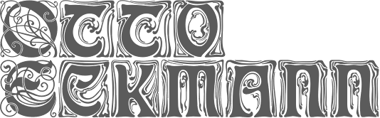 German foundry established in 1842 by Johann Peter Nees, Phillip Rudhard and Johann Michael Huck, that was located in Offenbach am Main. Carl Klingspor (1839-1903), the father, bought the Rudhardsche Gießerei in 1892. It was renamed Gebr. Klingspor in 1906. Scans of some of its typefaces:
 - By Peter Behrens: Behrens Schrift (1901-1902), a Jugendstil font. It was digitized by Intecsas (as Sprecher Gothic), Dan X. Solo, Ralph M. Unger for URW++ (2007, as Behrensschrift D), Ingo Zimmermann (2008, as Behrens Schrift), and Klaus Burkhardt)
- Eckmann Schrift: the prototypical art nouveau typeface by Otto Eckmann. This Munch Jugendstil style typeface from 1900-1901 is often simply called Eckmann or Eckmann Schrift, Rudhardsche Initialen, or Fette Eckmann (1902). Digital versions of it exist at Linotype, Delbanco, Ralph Unger (Schmuckinitialen, 2009, and Initials RMU One, 2012), Bitstream (where it is called Freeform 710), Elsner&Flake (Eckmann EF), URW, Brendel/Softmaker, and Dieter Steffmann (an excellent free font called Rudelsberg; Steffmann has an accompanying Jugendstil Ornamente).
- Offenbacher Schwabacher (1900) by Kurt Wanschura. The idea for this type came from Gustav Ruprecht. Revivals at Delbanco (as DS-Offenbacher-Schwabacher) in 1996.
- Walthari, a mix between art nouveau and blackletter, designed in 1899 by Heinz König. Walthari Initialen.
- Behrens Initialen. Also by Peter Behrens.
- Schwabacher Initialen.
[Google]
[More] ⦿
|
Rudolf Koch
|
 Great German type designer (b. Nürnberg, 1876; d. Frankfurt, 1934) who worked mainly at the Klingspor foundry. He founded the Offenbach Werkstatt in 1921.
 Many of his typefaces can be classified as German expressionist. These include Kabel (a sans), and Neuland (an angular poster face). An early Nazi sympathizer and supporter, Koch's fonts were heavily used by the Nazi regime. This page lists 158 royalty-free Christian symbols drawn by Rudolf Koch, a religious Lutheran, with the collaboration of Fritz Kredel (1900-1973) (see also here). His typefaces, with notes on digitizations: - Claudius (1931-1934, 1937, D. Stempel AG). His son Paul Koch followed Rudolf's instructions to make one weight in 1931-1934. Klingspor completed it in 1937. Delbanco (as DS-Claudius) and Klaus Burkhardt (1991) digitized it. Based on the latter, Manfred Klein made ClaudiusImperator (2001). Dieter Steffmann made Claudius, ClaudiusAlternate, and ClaudiusHeadline in 2003. Ralph M. Unger published Claudius in 2010.
- Deutsche Anzeigenschrift (1913-1914), Deutsche Anzeigenschrift schmal (1916-1923, D. Stempel AG). revivals include SchmaleAnzeigenschrift (2002) and SchmaleAnzeigenschriftZier (2002) by Dieter Steffmann, and Schmale Anzeigenfraktur (2009) by Ralph Unger. Later weights by Koch: Deutsche Anzeigenschrift eng (1923) , Deutsche Anzeigenschrift breit (1923, D. Stempel AG) , Deutsche Anzeigen. schmalhf. (1934, D. Stempel AG).
- Deutsche Schrift (1908-1921), consisting of Deutsche Schrift schmal (1913, Gebr. Klingspor), Deutsche Schrift fett (1910, Gebr. Klingspor), Deutsche Schrift mager (1918, Gebr. Klingspor) and Deutsche Schrift halbfett (1912, Gebr. Klingspor). Also known as Koch Fraktur. Revived by Gerhard Helzel as KochFrakturSchmaleHalbfette (2000), by Christian Richter as Rudolf Koch (2003), and by Delbanco as DS Koch Fraktur. It was a popular family, known in England as Oxford. For comparison, here is a phototype version. Deutsche Schrift fett, aka Fette Deutsche Schrift, was revived by Dieter Steffmann in 2002 (as Fette Deutsche Schrift) and by Alter Littera in 2012 as Deutsche Schrift.
- Deutsche Schrägschrift (1912, Gebr. Klingspor).
- Deutsche Werkschrift (1934, D. Stempel AG) and Deutsche Werkschrift hablfett (1934, D. Stempel AG): This is really the "mager" version of Deutsche Anzeigenschrift. Delbanco revived it digitally as DS Deutsche Werkschrift.
- Deutsche Zierschrift (1919-1921, Gebr. Klingspor). Revived as Dutesche Zierschrift (2002) and Zierinitialen> (2002) by Dieter Steffmann. See also Delbanco's DS Deutsche Zierschrift.
- Frühling (1913-1917, Gebr. Klingspor). A blackletter that seems to have been executed with a shaky hand---it is definitely one of Koch's weakest and ugliest designs. Incredibly, the revival gang was still eager to spring into action: it was revived and interpreted by Frantisek Storm in Monarchia. See also Delbanco's DS Frühling. For another revival, see Next Stringtime by Manfred Klein (2003). Frühling is sometimes called Kartenschrift.
- Geschriebene Initialen zur Grotesk (1930, Gebr. Klingspor).
- Grotesk Initialen (1933, Gebr. Klingspor). Paul Hayden Duensing made Koch Initials (metal).
- Holla (1932, Gebr. Klingspor). Digitized by Dieter Steffmann in 2001.
- Jessen Schrift (1924-1930) is a hybrid of gothic (blackletter) minuscules and roman capitals (including the characteristic Basque capital A) designed and cut without preliminary drawings in Offenbach am Main by Rudolf Koch for The Four Gospels, which was printed at the Klingspor press in 1926 and published by Koch himself. Formerly named Bibel-Gotisch, the type was developed between 1924 and 1929 as Peter Jessen Schrift and released as Jessen in several sizes by the Klingspor foundry in 1930. See DS-Jessen-Schrift (1998, Christian Spremberg), Peter Jessen Schrift (Delbanco), Jessica Plus (2002) and JessicaSerif (2003) by Manfred Klein, Peter Jessen Schrift Pro (Softmaker, 2016), and Jessen Schrift (2004, Ralph M. Unger). Jessen Mittel 14 and Jessen Cicero 12 were developed by Alexis Faudot and Rafael Ribas in 2016 during an ANRT workshop in Valence, France.
- Kabel (1927, Gebr. Klingspor), Klingspor's competing design for Paul Renner's Futura. The most famous digitization of this Koch Sans family is by Victor Caruso in ITC Kabel (1976), and with its exaggerated x-height, much larger than the original, it is a poor bastard. The modern Bitstream version is called Geometric 231. Softmaker calls it Koblenz. Poster by Jorge Martinez. At Linotype, Marc Schütz designed the large family Neue Kabel (2016) that revives Kabel by making it more consistent. This version overshadows all previous digital versions or extensions of Kabel. Dates of the various weights: Kabel Kursiv (1929, Gebr. Klingspor), Kabel groß (1928, Gebr. Klingspor), Kabel Kursiv groß (1930, Gebr. Klingspor), Norm Kabel (1930, Gebr. Klingspor): LinotypeLibrary, Kabel fett (1929, Gebr. Klingspor): LinotypeLibrary, Kabel schmal (1930, Gebr. Klingspor), Kabel schmalhalbfett (1929, Gebr. Klingspor).
- Koch Antiqua (or: Locarno) (1920-1922, Gebr. Klingspor). It was sold by Continental Type in the United States as Eve. This gorgeous tall-legged and flared typeface was designed in 1917, but cut in 1922. Koch Kursiv (1923, Gebr. Klingspor) is the Kursiv version of Koch Antiqua. See also Koch Kursiv groß (1929, Gebr. Klingspor) and Koch Antiqua fett (1926, Gebr. Klingspor: some give the date 1923-1924). Rivoli is a similar metal typeface. Digital versions include Rudolf Antiqua (2018, Now Type), Eva Antiqua, Eva SG (Spiece Graphics), Eva (Monotype), AIKochAntiqua (a multiple master font by Randall Jones for Alphabets Inc), Astaire Pro (2004, Bergslund Design, or Hackberry), Koch Altschrift (2004, Moorstation crew), Locarno (1985, Alan Meeks for Letraset), Kuenstler 165 (Bitstream), Koch Antiqua (Adobe, Linotype), Evadare (David Nalle), Hellen (2019, Genilson Lima Santos).
- Koch Kurrent (1933, Gebr. Klingspor). This is Koch's version of school scripts, a variant of his earlier proposal, Offenbacher Schrift (1927). It was only cut in 1935. See Rudolf Koch Kurrent at Delbanco .
- Koch Schrift (1909) is a Schwabacher first known as Neudeutsch and later as Koch Schrift. It was used by the Deutsche Reichsbahn, ca. 1930. For a digital revival, see, e.g., Koch Schrift (1998-2021) by Ingo Zimmermann.
- Marathon (1930-1938, Gebr. Klingspor). Digitized by Linotype in 2003 as Marathon LT (by Ute Harder, aka Frau Jenson), and by Softmaker a bit earlier. The best digital version is by the Koch Memorial team of Petra Heidorn under the name Romantha (a permutation of the letters) in 2003 (it preserves the original x-height better, for example).
- Maximilian Antiqua (1913-1917, Gebr. Klingspor). Digitization by Manfred Klein, who made Maximilian Antiqua (2003) and MaximilianAntiquaSmallCaps (2003). For an initial caps extension, see Typograf's Maximilian Antiqua Initialen (2015).
- Maximilian (Gotisch) (1914-1917, Gebr. Klingspor). Walden Font has a revival. See also Maximilian at Delbanco. Castletype made MaximilianCS. In 1995, Doug Olena revived it as Maximilian. Dieter Steffmann made Maximilian (2002) and Maximilian Zier (2002). Maximilian (2012) is due to Alter Littera. Drawings for Maximilian-Gotisch. Gerhard Helzel's revival from 1995. Stephen Miggas's revival is called Gothicus (2006).
- Neu Fraktur (1933-1934, Gebr. Klingspor): Koch's last Fraktur.
- Neuland (1923, Gebr. Klingspor) and Neuland licht (1928, Gebr. Klingspor), an outline version of Neuland. Neuland is all caps German expressionist typeface chiseled directly by Koch from metal. Copied by Monotype in 1929 as OthelloMT. Digitized by Linotype Library. Also digitized as Newland Black by Andrey Mel'man. In 1995, Doug Olena (Keystrokes) revived it as FFD Neuland (1995). A lower case and hair-serifed extension was created by Manfred Klein as On Kochs Roots (2002) and KochNeu-ExtraBlack (2003). Nick Curtis made Jungle Fever and Jungle Fever Shaded (2008) after Neuland. In 2010, Ian Lynam published yet another update, Neuerland. In 2013, Lazar Dimitrijevic created Cal Neuland Bold.
- Offenbach (1928-1934, Gebr. Klingspor). Made for display in church windows, Koch designed the "mager" weight (1931) and an uncial version. His student Hans Kühne finished the "halbfett" and the gothic after his death.
- Prisma (1928-1931, Gebr. Klingspor): A four-lined art deco face. Revived by Dieter Steffmann (2003-2004) as Prisma, and by Ralph Unger as Prisma Pro (2011). See also the 10-style typeface family LL Prismaset at Lineto (2003-2017, Mauro Paolozzi, James Goggin, Alex Rich, Arve Båtevik, and Raphael Koch).
- Stahl (1933-1939): Done with H. Kühne. Revived by J.F.Y.Daniel Gauthier (GautFonts) as StahlSteel (2003) and StahlSteelRiveted (2003).
- Wallau (1924-1932, Gebr. Klingspor), Wallau halbfett (1930, Gebr. Klingspor), Wallau fett (1935, Gebr. Klingspor), Wallau schmal (1934, Gebr. Klingspor). See Wallaby on the SoftMaker MegaFont XXL CD, 2002, or Wallau by Fraktur.de or DS Wallau by Delbanco, or Wallau (2012) by Alter Littera. Pictures by Dan Reynolds about Klingspor's Wallau speciman book (1939). Wallau, which comes in rotunda (Rundgotisch) and uncial, was named after Heinrich Wallau (1852-1925), a printer from Mainz. Originally, the typeface was going to be called Missale. Also revived by Dieter Steffmann (as WallauDeutsch-Bold (2002), Wallau Rundgotisch Heavy (2002), Wallau Rundgotisch OsF Heavy (2002), WallauUnzial-Bold (2002) and WallauZierBold (2002)) iand by PrimaFont.
- Wilhelm-Klingspor-Schrift. (1920-1926, Gebr. Klingspor): This was originally called Missal. To commemorate Wilhelm Klingspor, who died in 1925 from a war injury, it was renamed Wilhelm-Klingspor-Gotisch. Paul Hayden Duensing made a metal version under the latter name. Digitizations by Fraktur.de and Delbanco. See also Wilhelm-Klingspor-Schrift at LinotypeLibary, Wilhelm Klingspor Schrift (2012) by Alter Littera, Wilhelmschrift (2006) by Stephen Miggas, and Missal by Dieter Steffmann (2003). Matching decorative caps were made in 2004 by Paul Lloyd under the name Holzschnitt-Initialen.
- Zeppelin (1929, Gebr. Klingspor). This is a decorative (inline) version of Kabel. Revived as Zeppelin (2003, Dieter Steffmann) and Evadare (1993, David Nalle).
In 1984, Wolfgang Hendlmeier discussed the blackletter typefaces in Koch's oeuvre: A, B, C, D, E, F, G. Brief bio by Wolfgang Hindlmeier (1984). Koch's involvement in handwriting education in Germany led to these Schreibschrift examples from 1930 (also called Deutsche Verkehrsschrift), and to the development by Martin Hermersdorf of the Deutsche Schreibschrift for fourth graders in Bavaria in 1950. Wood engraving of Koch by Bernard Brussel-Smith. Publications by Rudolf Koch: - Die Schriftgießerei im Schattenbild, Offenbach 1918.
- Das Schreiben als Kunstfertigkeit, Leipzig 1921.
- Das ABC-Büchlein, Leipzig 1934.
- Das Schreibbüchlein, Kassel 1939.
- Klassiche Schriften.
- Das Zeichenbuch. This book contains 493 old-world symbols, monograms and runes and was reprinted in 1955 in the Dover Pictorial Archive Series as The Book of Signs.
- Das Blumenbuch.
References: - Gerald Cinamon: Rudolf Koch: Letterer, Type Designer, Teacher (2000, Oak Knoll Press and The British Library).
- Georg Haupt: Rudolf Koch der Schreiber, Leipzig 1936.
- Wilhelm H. Lange: Rudolf Koch, ein deutscher Schreibmeister, Berlin, Leipzig 1938.
- Oskar Beyer: Rudolf Koch. Mensch, Schriftgestalter und Erneuerer des Handwerks, Berlin 1949.
- Friedrich Friedl, Nicolaus Ott (Editor), Bernard Stein: Typography An Encyclopedic Survey of Type Design and Techniques Throughout History, Könemann Verlagsgesellschaft mbH.
Rudolf Koch's carved lettering inspired spin-offs like PGF Americas (2021, Pedro Gonzalez). FontShop link. Klingspor link. Biography by Nicholas Fabian. Bio at Linotype. Bio in German. The Koch Memorial page [now defunct] offered historical notes and many free revivals of his typefaces. View digital typefaces based on Rudolf Koch's work. [Google]
[MyFonts]
[More] ⦿
|
Rudolf Koch - Ein virtuelles Denkmal
|
 Dead link. Extraordinary pages by Petra Heidorn and her group of type designers (Manfred Klein, Dieter Steffmann, Daniel Gauthier, Paul Lloyd, Graham Meade and Harold Lohner) to commemorate the 70th year of Koch's death (1876-1934). The free fonts, revivals and interpretations include, by designer:
 - Dieter Steffmann: Claudius, ClaudiusAlternate, ClaudiusHeadline (2003), DeutscheZierschrift (2002), FettedeutscheSchrift (2002), Holla (2001), KochAltschrift-Bold, KochAltschrift, KochAltschriftAlt, KochAltschriftInitialen, KochAltschriftKursiv-Bold, KochAltschriftKursiv (2003), Maximilian (2002), MaximilianZier (2002), Missal (2003), Prisma (2003), SchmaleAnzeigenschrift, SchmaleAnzeigenschriftZier (2002), WallauDeutsch-Bold, WallauRundgotisch-Heavy, WallauRundgotischOsF-Heavy, WallauUnzial-Bold, WallauZierBold (2002), Zeppelin (2003).
- Manfred Klein: ClaudiusImperator (2001), JessicaPlus, JessicaSerif (2003), KochNeu-ExtraBlack (2003), KochWoodcut (2003), Kochfragments (2003), KochsBricksInvers (2004), KochsGries (2003), Kochwood-Light (2003), KochwoodQuill (2003), MaximilianAntiquaSmallCaps (2003), NextSpringtime (2003), OnKochsRoots (2002), RootsKochThree (2001), SacredOldSymbols (2003).
- Paul Lloyd: Holzschnitt-Initialen (2004).
- Daniel Gauthier: StahlSteel, StahlSteelRiveted (2003).
- Graham Meade: Rudolphin (2004), Rudolphin Oblique (2004).
- Graham Meade and Manfred Klein: ABC-LongLegs (2004).
- Harold Lohner: KochRivoli (2000).
- The entire team: Koch-Defrag (2003), Romantha (2003).
[Google]
[More] ⦿
|
Schriftgiesserei Eduard Haenel
[Eduard Gustav Haenel]
|
 Schriftgiesserei Eduard Haenel is a Berlin-based foundry operational in the 1840s, run by Eduard Haenel (b. 1804, Magdeburg, d. 1856, Berlin), who was a type founder and book printer. His life's story. His father Christian Jacob Haenel had a printing shop since 1798 in Magdeburg, the Hänelsche Hofbuchdruckere, which Eduard took over in 1824 after his father's death. In 1830, he started also some typefounding, and slowly started operating in Berlin as well. He let his staff cut many vignettes, ornaments, ornamental typefaces and typefaces, and imported many English and French types. The Magdeburg office burnt down, and Eduard moved completely to Berlin, where he worked until selling the business in 1852 to Carl David. The Magdeburg Druckerei continued with Eduard's brother and his sons until 1945 as the Magdeburger Qualitätsdruckereien. Eduard made the so-called Fette Haenel-Fraktur (ca. 1840), specially designed for headlines. He also cut Haenel Antiqua.
 Haenel-Fraktur was digitized by many, including Ralph Unger (who made Haenel-Fraktur in 2011), Walden Font (with Fette Haenel Fraktur), and Dieter Steffmann (2000; as Fette Haenel Fraktur). Haenel Antiqua was revived by Gerhard Helzel and separately, in 2020, by Ralph Unger. In 2017, Pierre Pané-Farré (Forgotten Shapes) set out to revive some poster typefaces by Eduard Haenel. These include: - Breite-Fette Antiqua FSL (2017): Breite-Fette Antiqua FSL is the digital re-issue of an unidentified display typeface which---from ca. 1850 onwards---was part of the type case in the printing workshop of Oskar Leiner in Leipzig. It can not be said whether it was a custom-made design or if the typeface was distributed commercially by a foundry.
- Doppel-Mittel Egyptienne FSL (2017): Doppel-Mittel Egyptienne FSL is the digital re-issue of Doppel-Mittel Egyptienne by Eduard Haenel, Magdeburg. It was advertised 1833 in "Schrift- und Polytypen-Probe. Zweite Lieferung. Blatt 25-72." and again 1834 in "Neueste Lettern", a supplement to the "Journal fuer Buchdruckerkunst." Doppel-Mittel Egyptienne itself was a re-casting of Two-Line English Egyptian No. 1 originally shown in 1821 by William Thorowgood, London.
- Schmale Egyptienne N.12 FSL (2017). By Pierre Pané-Farré: Schmale Egyptienne N.12 FSL is the digital re-issue of Schmale Egyptienne No. 12, 28 Cicero Kegel advertised in 1841 in "Proben der Affichen-Schriften von Eduard Haenel. Berlin."
References: Schriftgiesserei, Schriftschneiderei und Graviranstalt (1847, Eduard Haenel), a 490-page book of type specimens. [Google]
[More] ⦿
|
Schriftklassifikation nach DIN 16 518
|
 Type classification (in German) according to the DIN 16 518 system invented in 1964. Pages by Bernhard Schnelle. I will use his German nomenclature, and quote his examples of each style.
 - I. Venezianische Renaissance-Antiqua: Amalthea, Ascot, Berkeley Old Style, Centaur, Concorde, Deepdene, Eusebius, Goudy Italian, Guardi, Horley Old Style, Jersey, Lutetia, Menhart-Antiqua, Normandy, Seneca, Schneidler-Mediaeval, Trajanus, Verona, Weidemann, Worcester Round.
- II. Französische Renaissance-Antiqua [garalde types]: Aeterna, Aldus-Buchschrift, Bembo, Berling, Charter, Comenius-Antiqua, Garamond, Granjon, Leipziger Antiqua, Meridien, Michelangelo, Octavian, Palatino, Perpetua, Plantin, Sabon-Antiqua, Trump-Mediaeval, Van Dijck, Vendome, Weiß-Antiqua.
- III. Barock-Antiqua [transitional types]: Baskerville, Bernhard Modern, Bookman, Caledonia, Caslon, Century, Century Schoolbook, Cheltenham, Cochin, Diotima, Ehrhardt, Imprimatur, Janson, Life, Nicolas Cochin, Poppl-Antiqua, Raleigh, Schoolbook, Scotch, Tiffany, Times.
- IV. Klassizistische Antiqua [modern or didone types]: Bauer Bodoni, Bodoni-Antiqua, Linotype Centennial, Corvinus, De Vinne, Linotype Didot, Ellington, Falstaff, Fat Face, Fenice, Madison-Antiqua (Amts-Antiqua), Normande, Tiemann-Antiqua, Torino, Walbaum-Antiqua.
- V. Serifenbetonte Linear-Antiqua [slab serif]: Aachen, Clarendon, Memphis, Old Towne, Pro Arte Schadow-Antiqua, Serifa, Volta.
- VI. Serifenlose Linear-Antiqua [sans]: Akzidenz-Grotesk, Antique Olive, Avant Garde Gothic, Cosmos, Delta, Erbar-Grotesk, Eurostile, Folio, Franklin Gothic, Frutiger, Futura, Gill, Helvetica, Univers.
- VII. Antiqua-Varianten: Abbot Old Style, Amelia, Americana, Arnold Böcklin, Banco, Calypso, Churchward, Cooper Black, Dynamo, Eckmann, Glaser Stencil, Hobo, Lasso, Mexico Olympic, Plastica, Profil, Souvenir, Stop, Superstar, Tintoretto, Traffic, Washington, Windsor, Zipper.
- VIII. Schreibschriften [scripts]: Arkona, Amazone, Bison, Boulevard, Brush Script, Caprice, Charme, Choc, Diskus, Englische Schreibschrift, Künstler-Schreibschrift, Lithographia, Mistral, Reiner Script, Rondo, Signal, Swing, Vivaldi.
- IX. Handschriftliche Antiqua: American Uncial, Antikva Margaret, Arcade, Codex, Delphin Dom Casual, Hadfield, Klang, Koch-Antiqua, Libra, Lydian, Ondine, Poetica, Post-Antiqua, Prima, Ritmo, Solemnis, Studio, Time Script.
- X. Gebrochene [Fraktur, blackletter], subdivided into Xa Gotisch, Xb Rundgotisch, Xc Schwabacher, Xd Fraktur, Xe Fraktur-Varianten.
- XI. Fremde Schriften [foreign types]: all non-Latin typefaces.
[Google]
[More] ⦿
|
Sidney Clyde Gaunt
|
Artist and type designer at Barnhart Brothers&Spindler, 1874-1932, who lived in Chicago. Creator of many typefaces: - Adstyle&Italic (plus Condensed, Extra Condensed&Headletter, Wide, Lightface, Black, Black Outline, Shaded: 1906-1920, BB&S).
- Authors Oldstyle&Italic, Authors Oldstyle Bold, Authors Roman&Italic (plus Condensed, Wide, Bold, Bold Condensed). Mac McGrew writes: Authors Roman Italic, and Authors Roman Wide were designed by Sidney Gaunt for BB&S in 1902, with other versions added in 1909 to 1915. It is a legible but generally undistinguished face, perhaps best in the Wide version. The italic includes a number of quaint swash characters. and was one of the first BB&S italics to be cast on its offset body, described elsewhere (see "The Third Dimension of Type" in the Introduction); the bold typefaces provide restrained complementary display for headlines. Authors Oldstyle, shown by BB&S in 1912, bears little resemblance to Authors Roman.
- Barnhart Oldstyle&Italic (and a No. 2 version). Mac McGrew writes: Barnhart Oldstyle was designed in 1906 by Sidney Gaunt for BB&S, followed by the italic and Barnhart Oldstyle No.2 the next year. The latter appears to have the same caps as the first typeface but larger lowercase with shorter ascenders. There is also Barnhart Lightface, advertised in 1914 but perhaps designed earlier. This series seems undistinguished, but the original roman and italic were popular enough to be shown as much as twenty years later. Ascenders are long, and some characters have a bit of the irregularity that was popular at that time. The italic apparently was one of the first typefaces cast by BB&S on its offset body, which provided mortises to avoid overhanging kerns in italic designs.
- Barnhart Lightface.
- Cardstyle. Mac McGrew writes: Cardstyle is an unusual typeface designed in 1914 by Sidney Gaunt for BB&S. It is a medium weight monotone, rather narrow, with tiny serifs, and was intended for use on announcements. There is no lowercase, but caps are cast in several sizes on each of three bodies, for cap-and-small-cap combinations. Notice the logotypes, which were more common around the turn of the century.
- Chester Text (1914, blackletter). Mac McGrew writes: Chester Text is a fancy shaded letter designed by Sidney Gaunt in 1914 for BB&S. It features caps and small caps, and is intended for stationery and social work, but is hard to read and not suited to anything but a few simple names or words.
- Engravers Old Black, Engravers Roman Shaded (1914, BBS, formerly Chester Title).
- French Plate Script. Mac McGrew writes: French Plate Script (or French Plate) was designed by Sidney Gaunt for BB&S in 1904. It is an upright script, otherwise similar to the same founder's Wedding Plate Script, both derived from types cut by Mayeur of Paris which were based on eighteenth-century engraving. Both are connecting scripts, the former being similar to Typo Upright (q.v.). Inland Type Foundry showed a similar French Script in 1905, patented by William Schraubstadter, and later listed by ATF. Douglas C. McMurtrie, in his book Type Designs, calls this "one of the finest script types ever produced."
- Mission. Mac McGrew writes: Mission was designed for BB&S by Sidney Gaunt in 1905, but patented by George Oswald Ottley. It is a rather novel face, with long ascenders and short ascenders. Serifs are triangular, like some members of the Latin series. Most noticeable is the way some strokes in the capital letters are joined with curves, especially in the B. Compare Viking.
- Old Roman Condensed (plus Bold, Bold Condensed, Black&Italic, Semitone).
- Parsons Swash Initials.
- Pencraft Oldstyle&Italic (1914, plus Bold, Shaded), Pencraft Text (1916, blackletter). Pencraft Oldstyle and its ornamental version (Pencraft Specials), as printed in the 1922 BBS catalog, inspired the lowercase of Pencraft (2010, Chyrllene K, Intellecta Design). Mac McGrew writes: Pencraft Text was designed by Sidney Gaunt for BB&S in 1916. It has somewhat the character of Pencraft Oldstyle, by the same artist at about the same time, but it can hardly be considered a part of that family. It has just a suggestion of the angularity of Text or Old English typefaces, but retains more of the character of simple hand-lettering. Mac McGrew writes: Pencraft Old Style and Pencraft Italic were designed by Sidney Gaunt for BB&S in 1914, with the bold and shaded versions following over the next two years. The Oldstyle is a rather charming interpretation of lettering styles popular at that time, but the other versions are not as impres- sive. Pencraft Oldstyle is notable for the large number of Auxiliary charac- ters, some of which were commonly included with other similar typefaces, and the unique Pencraft Specials, which consisted of a variety of swash strokes to be used to extend the special ascending and descending letters. Pencraft Italic included several swash caps among its Auxiliaries, and Pencraft Bold had Auxiliaries comparable to the roman, but without the flourishes or Specials. Compare the long ascenders and descenders of Parsons and Stymie.
- Publicity Gothic (1916). Free versions called Lemiesz by David Rakowski and Dieter Steffmann. Publicity Gothic was digitally extended to a commercial all-caps face, Publicity Headline, in 2006 by Tom Wallace (HiH). See also the revival in 1995 by Image Club Graphics: Publicity Gothic ICG Out and Solid. Holy Ravioli NF (Nick Curtis) is also based on Publicity Gothic. Library Book Initials JNL (2018, Jeff Levine) was modeled after examples of Sidney Gaunt's Publicity Initials, which was originally sold in metal type by Barnhart Brothers and Spindler as a companion to the Publicity Gothic typeface. Other digital versions: OPTI Publicity Gothic (Castcraft), Publicity Gothic (by SoftMaker). Mac McGrew writes: Publicity Gothic was designed by Sidney Gaunt in 1916 for BB&S. It is basically a bold gothic, but with many deep irregularities designed into the edges of strokes, which are the same in all sizes. There are no descenders. characters which normally have descenders being designed within the x- height. Caps and ascenders are nearly the full body size, making the typeface considerably oversize by usual standards. Lowercase q has a capital form and is made only in combination with u. The colon and semicolon are full cap height, and there are a number of special characters as shown. ATF revived it for a short time about 1933. Compare Advertisers Gothic.
- Stationers Semiscript. McGrew: Stationers Semiscript as offered by BB&S was a renaming of Palmer Series, introduced by Inland Type Foundry in 1899. It has been ascribed to Sidney Gaunt. It is similar to the BB&S Wedding Plate Script in slope, proportions, and general appearance, but characters do not join. This typeface was revived and extended by Canada Type in 2010 as Siren Script.
- Talisman&Italic. Patented in 1903 and 1904 resopectively.
- Wedding Plate Script. Mac McGrew writes: Wedding Plate Script was designed by Sidney Gaunt for BB&S in 1904. It is much like the same founder's French Plate Script, but sloped, and similar to Typo Slope, produced the following year by ATF.
Images of some of his typefaces when they were patented by BBS: 1908, 1908, 1908, 1906. Klingspor link. [Google]
[MyFonts]
[More] ⦿
|
Stempel blackletter fonts
|
 Andreas Seidel lists the blackletter typefaces in D. Stempel's Probe No. 100 specimen book from the early 1940s. Verbatim, with some missing dates and designers filled in:
 - Fraktur designs
- Amts Fraktur 1906-11 Heinrich Hoffmeister
- Balmung
- Breitkopf Fraktur 1912
- Buhe Fraktur 1915-22-35 Prof. Walter Buhe
- Büxenstein Fraktur (1912)
- Deutsche Anzeigen-Schrift (1923-34, Rudolf Koch)
- Deutsche Werkschrift (1934, Rudolf Koch)
- Deutsche Zeirschrift
- Ehmcke Fraktur (1912, F. H. Ehmcke)
- Ekkehard Fraktur 1912 (1917? by Heinrich Hoffmeister)
- Elfen Fraktur (1919, M. Beck)
- Faust Fraktur (1910, E. Brox)
- Fette Fraktur
- Frühling (1914, Rudolf Koch: Klingspor?)
- Halbfette Fraktur
- Heinz König Setzmaschienen Fraktur (1913, Heinz König)
- Humboldt Fraktur (1938, Hiero Rhode)
- Kleukens Fraktur (1911, F.W. Kleukens
- Luthersche Fraktur (1919, acquired from Drugulin, and revived)
- Matthies Kursiv (1912, Karl Matthies)
- Neuzeit Fraktur
- Reform Fraktur (1903, Heinrich Hoffmeister)
- Schumacherische Fraktur
- Stempel Fraktur (1914, Heinrich Hoffmeister)
- Unger Fraktur 1794 Joh. Friedrich Unger (revival in 1919)
- Schwabacher designs
- Alte Schwabacher (1919, acquired from Drugulin and revived)
- Ehmcke Schwabacher 1920 Prof. F. H. Ehmcke
- Nürnberger Schwabacher
- Offenbacher Schwabacher
- Schwabacher (1906)
- Gotische&Kanzlei designs
- Aristokrat
- Caslon Gotisch
- Elegant
- Elite Kanzlei
- Gotenburg Garnitur A&B 1935-37 Friedrich Heinrichsen
- Jaecker Schrift 1912 Wilhelm Jaecker
- Lithurgisch
- Tannenberg 1933-35 Emil Meyer
- Victoria Kanzlei
- Wieynck Kanzlei 1926 Prof. Heinrich Wieynck
He goes on to say: In a newer specimen book "Gesamtprobe der lieferbaren Schriften D. Stempel AG from 1962 you will find also: - Claudius original Klingspor design
- Jessen original Klingspor design
- Fette Gotisch
To which I should add - Achilles Fraktur (1910)
- Ariadne Fraktur (1910)
- Arminius Fraktur (1905). Also called Rheinische Fraktur. Revival by Dieter Steffmann in 1999 as Rheinische Fraktur.
- Caslon Gotisch (1926, revival)
- Ceres Fraktur (1903)
- Danziger Fraktur (1905, Cohn Stempel)
- Deutsche Laufschrift (1911, Rudolf Engelhardt, Heinrich Hoffmeister)
- Egmont Fraktur (1909)
- Fraktur (1908)
- Fenella Fraktur (1911)
- Frankfurt (1906, F. Schweimanns)
- Frankfurter Schwabacher (1912)
- Fröbel Fraktur (1910)
- Gilgengart (1941, Hermann Zapf---some say 1952)
- Gutenberg Fraktur (1900)
- Gutenberg Juniläums Fraktur (1900)
- Marius Fraktur (1910)
- Moderne Schwabacher (1926)
- Moderne Setzmachinen Schwabacher (1908)
- Neue Fraktur (1913)
- Neue Luthersche Fraktur (1934, revival)
- Normal Fraktur (1908, Roos&Junge)
- Normannia (1905, mager, halbfett). Digitizations in 1995 by Gerhard Helzel. This Hausschrift of Stempel was also adopted by linotype, where it became Germanen-Fraktur.
- Reform/Offenbacher (1916, Roos&Junge)
- Romeo Fraktur (1910)
- Rheinische Fraktur (1905). Same as Arminius Fraktur.
- Romulus Fraktur (1910)
[Google]
[More] ⦿
|
Stephenson Blake
[John Stephenson]
|
Founded in 1819 in Sheffield by toolmaker John Stephenson (died in 1864), silversmith William Garnett and financier James Blake, initially largely based on the purchase of the foundry of William Caslon III and IV in 1819. In 1829 Garnett left to become a farmer. The company was renamed Blake&Stephenson in 1830, but Blake died soon after. It became Stephenson, Blake&Co. in 1841. John Stephenson died in 1864, the year after he handed control to his son Henry. The company grew by acquiring most British typefoundries: Fann Street Foundry (1906); Fry's Type Street Letter Foundry; H.W. Caslon&Sons (1937); Miller&Richard (1952). The matrices and other old typographic equipment to Monotype and can be seen in the Type Museum of London. MyFonts provides this update: Members of both the Stephenson and Blake families still sit on the board of the present company. In 2001, according to managing director Tom Blake, the foundry was still producing some type in zinc, but by 2005 the company was wound up. There are plans to turn the former premises into an apartment complex. In 1996, all remaining materials (punches, matrices, specimen books) were sold to Justin Howes' Type Museum. The information in The Ancestry of British Typefounding and the complete list of the Stephenson-Blake typefaces comes from Roy Millington's Stephenson Blake The Last of the Old English Typefounders, The British Library, London, 2002. Today, Stephenson Blake continues in manufacturing only. Partial typeface list: Algerian (URW), Brittanic (Linotype), Baskerville Old Face (URW), Blackfriars (1920; a reversed-contrast Victorian typeface; digitally revied as a variable font by Roberto de Vicq de Cumptich at Delve Fonts as Tuppence), Carlton (1910s, digitized by Letraset in 1983; some say the original is F.H. Ehmcke's Ehmcke Antiqua, 1909), Chisel (an engravers typeface done in 1939 by Robert Harling; digital version at URW), Consort [the Stephenson Blake version of Clarendon], Doric Bold (Adobe), Elongated Roman (1937: a revival of the Victorian condensed and elongated fat faces, in the genre of Slimback), Fry's Ornamented No. 2 (many digitizations exist, e.g., Beffle (1991, David Rakowski)), Grotesque No 9 (URW), Impact (Linotype, Adobe), Kingston (with almost square counters and eyes), Klang (by Will Carter), Latin (URW), Latin Wide (1940), Latin Antique (1880s; a woodish typeface revived by Nick Curtis in 2011 as Indubitably NF; Monotype also had a metal version of this), Old Town No 536 (Western face, see Linotype), Playbill (a 1939 western saloon typeface by Robert Harling; digital versions at Bitstream, Linotype, and URW), Sans Serif Shaded (revived by Dieter Steffmann in 2002), Tea Chest (1939, an all-caps stencil typeface revived in 2011 by Nick Curtis as East India Company NF; Sigrid Claessens and Günther Flake revived Tea Chest Stencil in 1999 for Apply Interactive), Thorowgood, Verona (1923), Vivaldi (now at Linotype), Windsor (Bitstream, URW, Linotype, after a 1903 original by Sir William Kirkwood at Stephenson Blake), Wood Indexes (fists), Marina Script (1936, a copperplate script), Parisian Ronde (acquired from the Inland Type Foundry in 1905), Imperial Script (late 1800s formal script not unlike Firmin Didot's Anglaise, 1809), Bologna (script face, 1946), Glenmoy (script face, 1932, digitized and expanded in 2005 by Alejandro Paul as Mousse Script (Sudtipos) and in 2007 by Nick Curtis as Glengary NF, and in 2012 by Vernon Adams as Norican at Google Web Fonts), Francesca Ronde (1948), Granby (1930, a humanist sans family based on Edward Johston's types; revivals include one by Steve Jackaman and Ashley Muir called Granby Elephant (2011), and the main digital revival, from 2011, by Elsner and Flake called Granby EF), Recherché (revived by Nick Curtis as Plus de Vagues NF (2006)), Youthline Script (1952, a copperplate script for the banking and insurance industry, digitized and extended into a 7-weight family in 2005 by Rebecca Alaccari and Patrick Griffin as Sterling Script (2005)). Some type specimen, and a discussion of some typefaces, by yours truly. Scans of some old typefaces: Britannic Italic (1906), Flemish (for a digital semi-revival, see Dan Solo's Brussels), Freehand Script, Olympian. A few scans from Henry Taylor Wyse's book of 1911, showing types owned jointly by Stephenson Blake and Sir Charles Reed of Sheffield: AntiqueRoman, Athenian, Baskerville, Black No. 3, DeVinne, DeVinne Italic, Hallamshire Old Italic, Italian Old Style, Italian Old Style, Italian Old Style Italic, Lining Modern No. 20, Lining Old Style No. 5, Lining Westminster Old Style, Winchester Bold, Winchester Old Style, Winchester Old Style Italic. View digital typefaces that descend from the Stephenson Blake collection. [Google]
[MyFonts]
[More] ⦿
|
Susan Everett
|
Designer at Alphabets Inc with Inna Gertsberg of AIParsons-Heavy in 1994 [based on Parsons by Will Ransom, 1920s]. Dieter Steffmann converted the Gertsberg / Everett revival in 1999 to truetype while keeping the name AI Parsons. [Google]
[More] ⦿
|
Tim Larson
[Dieter Steffmann's blackletter typefaces]
|
[More] ⦿
|
Titania
|
Titania is a typeface that was issued by Haas'sche Giesserei before 1906. It was also cast by Berling and by Bertrand (as Grasses modernes). Societa Augusta had a related typeface, Titania chiara (before 1914). It was also cast by Trennert. In the phototype era, Titania appeared at Berthold. Aldo Novarese did a related typeface, Floreal Haas (1983), for Haas'sche Giesserei. Digital versions: Titania (1993, Rick Mueller), Klarissa (2000, Dieter Steffmann; with Contour and Shadow styles), Titania (2001, Dieter Steffmann; with Outline and Shadow styles), Karissa (Bright Ideas), EFN Mellotron/Melody (2004, Eurofonts), Athenia/Athenian (Thomas Harvey). [Google]
[More] ⦿
|
TypOasis: Christmas Fonts
|
Christmas font archive at TypOasis. Includes Brianquol (Christine Mauerkirchner and Rainer Grunert, RWE, 1993), ClassiCapsXmas (Manfred Klein, 2001), GE Christmas Joy (Graphx Edge, 1998), GEComicalChristmas (Graphx Edge, 1998), SLChristmasSilhouettesNormal (2000), TroyerDecember (Richard Beatty, 1990), TypographersHolidayfont (Dieter Steffmann, 2001), WWFlakes (Angela Lane, 1999), WinterWonderland (Dani Herring, 1999), XmasGingerbread (Manfred Klein, 2001), AlaskanNights (1994-1996, Adam Wunn), BallantinesSerial (1999, Softmaker), Bangalore (1998, Yuji Adachi), Baraquiel (2001, Scriptorium), Callimundial (2004, Manfred Klein and Cybapee, uncial style), Champignon (1999, formal script), DH Angry Santa Claus (Demon Hill), Excalibur Script (1993, Excalibur Communications, Inc), Flaemische Kanzleischrift (2000, Dieter Steffmann), Folkard (1998, Scriptorium), HallelujaEngeland Medium (2001, Manfred Klein), HallelujaLosAngeles (2001, Manfred Klein), JS_Snowbiz (2000, Jessica Slater), MKBritishWriting (2003, Manfred Klein), PlymouthRock'SnowDusted' (2003, Hypotypo), Porcelain (2001, Eduardo Recife), Santa's Sleigh (1998), St. Nicholas (1997), Summer's Snowman (2000, SummerNytz), WWGingerbread (1999, Angela Lane), XmasSketches (2002, Manfred Klein), XmasTerpiece (2001, Petra Heidorn), XmasTerpieceSwashes (2001, Petra Heidorn), MSTKboundround (2000, Masatake Ito). [Google]
[More] ⦿
|
Uwe Borchert
|
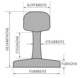 German type designer and software expert who offers his fonts for free. He is mostly doing revivals, and started in 2010. His typefaces:
 - Neu5Land (2018). Based on the Schmale Erbar Grotesk (Jakob Erbar, 1922ff) that was very popular on signs in the former German Democratic Republic / Deutsche Demokratische Repubik.
- Bstyle (2013). A squarish typeface family, perhaps a revival of Binder Style which Joseph Binder cut for the Stempel foundry ca. 1959.
- Schilder Grotesk (2012). Based on the old handlettered road signs in Karlsruhe.
- ST37K and ST32K (2010). Based on Stahl by Rudolf Koch (1933). Other digital versions of Stahl, but inadquate according to Borchert, include CG Lisbon and Lydian.
- Saarland (2010). Based on hand-lettered typefaces on factory walls and propaganda posters from the 1930th in Germany and Czechia. In this genre, see also Iwan Reschniev (2008, Sebastian Nagel), Teuton (Storm), Stahlbeton (2005, Patric Schwarz), Stahlbetonträger (2008, Nils von Blanc), Urban Constructed (Nils von Blanc) and Nonstop (Jakob Fischer).
- Plakative Grotesk (2010). A geometric poster face. In this style, see also Pilsen Plakat (Dieter Steffmann), Steelfish (Ray Larabie) and Placard MT Condensed. Uwe Borchert added Sturkopf Grotesk in 2013.
- Grabstein Grotesk (2010). A geometric poster face. In this style, see also Iwan Reschniev (2008, Sebastian Nagel), and Teuton (Storm).
- Mops Antiqua (2010). Or Pug Serif. A quaint serif typeface for menus. Similar typefaces include Chesterfield Antique (Alan Meeks), Chelsea (Dieter Steffmann) and Cheboygan (Christine Mauerkirchner and Rainer Grunert Schwalbach).
- Fabrik (2012). A grotesk family based on Beteckna by Johan Mattsson. He calls it a real Deutsche Grotesk of the 1920s, with many influences of Bauhaus like Paul Renner's Bahnhofsfutura (1924), Erbar Grotesk, Drescher Grotesk BT, and Dr. Klein's numbers for the German highways. Similar typefaces include Verlag (Hoefler), Drescher Grotesk (Arno Drescher), and Universalis ADF (by Arkandis).
- Jakob (2010). A grotesk inspired by Jakob Erbar's typeface Erbar Grotesk and the first versions of DIN Fette Engschrift. Similar typefaces include Verlag (Hoefler), Avenir (Adrian Frutiger), Erbar Grotesk (Jakob Erbar), Drescher Grotesk (Arno Drescher), and Universalis ADF (by Arkandis).
- Tattoo U (2012).
- Capitalis Minimalis (2012). A Trajan caps face.
Klingspor link. Abstract Fonts link. Open Font Library link. [Google]
[More] ⦿
|
Walter Kafton-Minkel
|
 Walter Kafton-Minkel was an active member of the Portland Macintosh Users Group. Designer of the old shareware font Lumparsky (a comic book font available in most archives), Benjamin (1991, based on the wood type Ben Franklin; revived in 2000 by Dieter Steffmann as Benjamin Franklin), Grooovvelic (essentially identical to PsychedelicSmoke), PostCrypt (1993; a dripping blood font based on Crypt from MacroMind Inc), Psychadelic (1992) and PsychedelicSmoke (1990, in various weights).
 Author of Subterranean Worlds: 100,000 Years of Dragons, Dwarfs, the Dead, Lost Races and Ufos from Inside the Earth (Loompanics Unlimited, 1989). [Google]
[More] ⦿
|
Walter Tiemann
|
 Famous German type designer, b. Delitzsch, 1876, d. Leipzig, 1951, who was active at Klingspor. He studied painting at the art academy in Leipzig. In 1898, Tiemann started working for various publishers, including S. Fischer, Reclam and Rütten&Loening. In 1903, he took up teaching at the Staatliche Akademie für Graphische Künste in Leipzig, where Jan Tschichold was one of his students [he was director of that school from 1920-1941 and from 1945-1946]. In 1907, Tiemann founded the Janus Presse with C. E. Poeschel. In 1946, he was awarded an honorary doctorate. Poster for BUGRA in 1914. Picture. Publications:
 - Georg Kurt Schauer Walter Tiemann. Ein Vermächtnis, Offenbach 1953.
- Biography by Wolfgang Neuloh (1971, Die deutsche Schrift, volume 42): 1 2 3 4 5.
- Biography by Wolfgang Neuloh (1981, Die deutsche Schrift, volume .--65): 1 2 3 4 5 6 7 8..
- Biography by Harald Suess (2001, Die deutsche Schrift): 1 2 3.
Designer at Klingspor of these typefaces: - Daphnis (1929). Digital revival by Ralph M. Unger in 2016 as Daphnis.
- Fichte Fraktur (1934-1939). This was originally called Hindenburg Fraktur. Revivals by Ralph M. Unger (as Fichte Fraktur, 2020), Delbanco (as DS Fichte Fraktur) and Gerhard Helzel (as Fichte Fraktur).
- Kleist Fraktur (1928). Kleist Fraktur was revived by Dieter Steffmann in 2002 as Kleist Fraktur and by Delbanco as DS Kleist Fraktur. Ralph Unger's version from 2010 is simply called Kleist Fraktur.
- Narziss (1921), based in part on earlier types of Pierre-Simon Fournier. The Font Bureau font Narcissus (1995) was based on this work. Further digitizations include Narziss (2018, Ralph M. Unger), and Narcissus SG (Open and Solid) (Jim Spiece).
- Janus-Pressen-Schrift (with C. E. Poeschel, 1906). Note: he founded the Janus Presse with C. E. Poeschel in 1907.
- Tiemann-Medieval (1909).
- Mediaeval Kursiv (1911).
- Tiemann Fraktur (1914).
- Tiemann-Antiqua (1923-1926). Available from Linotype.
- Tiemann-Gotisch (1924).
- Orpheus (1926-1928, Klingspor). This refined and elegant roman family languished for many years until its grand digital revival in 2011 by Patrick Griffin and Kevin Allan King at Canada Type, called Orpheus Pro.
- Euphorion (1935-1936). This was the italic of Orpheus. It too was revived digitally at Canada Type in their Orpheus Pro package.
- Offizin (1952).
- Peter-Schlemihl-Schrift (1914). Also called Lichte Tiemann Fraktur. Revived by Dieter Steffmann in 2002, and by Ralph M. Unger for Profonts as Peter Schlemihl in 2008.
Linotype link, FontShop link. Klingspor link. View some digital typefaces that are based on the work of Walter Tiemann. [Google]
[MyFonts]
[More] ⦿
|
Western fonts
|
 Listing of Western fonts taken from BarClaey's (defunct) site:
 - Alamo
- Alfredo's Dance (Ray Buetens).
- Big
- Cottage = Cottonwood (Adobe: Kim Buker Chansler and Joy Redick)
- Durango (Lazy Dog Foundry)
- Ireland = Ironwood (Joy Redick) = Judas
- Ironworks (Scriptorium)
- Jupiter
- Mirisch (Thomas E. Harvey) = Expo
- Old Town (Linotype, redone by Dieter Steffmann)
- Playbill (original by Robert Harling, 1938; Hank Gillette: Bitstream, Linotype, URW)
- Posse = Ponderosa (Adobe: Kim Buker Chansler)
- Saloon
- StageCoach
- Thunder Bay
- Thunderbird (1995, Bayer)
[Google]
[More] ⦿
|
Wilhelm Woellmer
|
 Wilhelm Woellmer is a German type designer who ran a foundry which published typefaces such as Deutsche Reichsschrift (1910, a Fraktur digitally revived by Gerhard Helzel). The earliest publication is from 1886, and the latest one from 1933. The Wilhelm Woellmers Schriftgießerei in Berlin ceased operations in 1938. Most matrices are now in the possession of Typoart, formerly Schriftguss KG. Designers who published at Woellmer's foundry, which was located in Berlin, include:
 - Wilhelm Woellmer: the Fraktur typeface Berliner Gotisch (1910) and the script typefaces Barberina (1925, advertised as Kartenschrift Barberina), Berolina (1930), Drescher Eilschrift (1934) and Attraktion (1925; Jaspert says 1930).
- Heinrich Wieynck: Mercedes Antiqua, Kursiv and Antiqua Halbfett in 1904, 1905 and 1906 respectively, as well as Woellmer Antiqua (1907), Woellmer Kursiv (1907) and Woellmer Antiqua Halbfett (1908).
- Lucian Zabel: the Fraktur typeface Zabel Roman (1928-1930), Fette Zabel Antiqua.
- Erich Meyer: Woellmer-Fraktur (1937).
- Konrad Jochheim: the Fraktur typeface Jochheim Deutsch (1933-1935).
- Martin Wilke: Ambassador.
- Arthur Pestner: Deutsche Reichs-Schrift (1915).
Other typefaces: Kartenschrift Feodora (1925, Wilhelm Woellmer's Schriftgiesserei: a slender sans for use on maps and drawings; designer unknown), Deutsche Reichsfraktur (before 1925), Schattierte Grotesk, Senats Antiqua (1914), Kartenschrift Gerda (1915), Breite Magere Medieval mit Zierschrift Initialen (1894), Breite magere Kolonial (1911), Empire Messing (1910s), Berliner Gotisch (1909, blackletter), Lessing Antiqua (1908), Dekor (1907), Consul Kursiv (1906), Avista Ornamente (1906), Goethe Fraktur (1905; some say 1910; digitally revived by Ralph Unger (2022) and Gerhard Helzel), Mercedes Ornamente Series 1-6 (1905), Kolonial (1904), Reiher Grotesk (1904), Mercedes Antiqua and Kursiv (1904), Halbfette Transita (1904), Consul (1903), Fette Freihand Ornamente (1903), Freihand-Ornamente (1901), Freihand-Linien (1901), Römische Initialen, Runde Buchgotisch (ca. 1900), Favorit (ca. 1900, blackletter; a reader reports having seen it in a 1889 specimaen book), Fette Globus (1898, blackletter), Reuß-Schrift, Uncial-Gotisch (ca. 1900). Berry, Johnson and Jaspert write about Kolonial: A heavy display roman, rather like CHELTENHAM. It is somewhat condensed and has short ascenders and descenders. Serifs are thick, blunt and horizontal (except on the d). The K has a very high waist, the middle strokes of the M descend only half-way, the R has a tapering tail. The ear of the g points north-east. The arches of the h, m and n are splayed. The italic has the serifs of the roman and some swash capitals. There are also a Shaded and an Extended face. Before World War II the type was also sold as Columbia by the Amsterdam Typefoundry, and is the Buffalo of the H.C. Hansen Foundry of Boston. It belongs with Morland (Blanchard of the Inland Type Foundry) to the group of heavy display types of which many American foundries had their own version. Its similarity with Cheltenham applies particularly to the original Cheltenham drawings. Notes on revivals of selected typefaces: - The art nouveau typeface Siegfried (ca. 1900) is also attributed to Woellmer. It was revived by Dieter Steffmann as Siegfried (2001) and by Ralph M. Unger as Siegfried Pro (2017).
- Schmale Fette Renaissance (1895) was revived in 2016 as Edna by Reymund Schroeder.
- Consul was revived by Stephan Müller and Reymund Schroeder.
- In 2004, Dan Solo published Marshall Normal, an art nouveau typeface that he attributes to Woellmer, ca. 1900.
The main specimen book of the foundry is Muster-Sammlung von Wilhelm Woellmer's Schriftgiesserei und Messinglinienfabrik (Berlin, 1896 or 1898). [Google]
[More] ⦿
|
Will Ransom
[ATF 1923 Catalog: Parsons]
|
[More] ⦿
|
Will Ransom
|
American designer, letterer, author and type designer (1878-1955) who was associated with ATF. In Chicago, he and Frederic Goudy started the private Village Press in 1903, which was a popular meeting place for typophiles, including Cooper and Dwiggins. Bio by Eason&Rookledge. - In 1918, he created Parsons for Barnhart Brothers&Spindler, which was named after the artistic director of a Chicago-based department store. This was the basis of the typeface AIParsons (1994) by Inna Gertsberg and Susan Everett at Alphabets Inc. Nick Curtis' Parsnip family (2004) is based on Parsons. Jess Latham also digitized Parsons. Finally, Dieter Steffmann converted the Gertsberg / Everett revival in 1999 to truetype while keeping the name AI Parsons.
- He created Clearcut Shaded Capitals (1920s, Barnhart Brothers&Spindler). This was extended to a full font by Nick Curtis in 2005 as Ransom Clearcut NF).
Klingspor link. [Google]
[MyFonts]
[More] ⦿
|
William Morris
|
 British type designer, architect and designer (b. Walthamstow in East London, 1834, d. 1896). Defender of the medieval form, he set up Kelmscott Press in 1891, and was one of the founders of the Arts and Crafts Movement. Morris was an artist, poet, writer and designer himself, but he is probably best remembered for his fabric designs and his book designs for Kelmscott Press, such as The Kelmscott Chaucer (1896). All his punches and matrices and some types are now with Cambridge University Press.
 William Morris's typefaces: - Kelmscott Golden or Golden Type (1889-1890): a bolder re-design of the classical Jenson face, done while he ran Kelmscott Press. The punches were cut by E.P. Prince. It was based on Nicolas Jenson but darkened. ATF's copy of this was called Nicolas Jenson, just before 1900. Morris used it in many of the books in the Kelmscott Press. Ancient Roman was Keystone Type Foundry's adaptation in 1904 of the Golden type [Mac McGrew deems it comparable to Jenson Oldstyle]. All matrices, punches and some of the types are in possession of Cambridge University Press. Digital versions include GoldenType (Elsner and Flake), GoldenType ITC (ITC), Kelmscott Roman (Nick Curtis), Kelmscott (Scriptorium), True Golden (Scriptorium), URW GoldenType (URW), URW GoldenTypeITC (ITC).
- Troy (1891-1892): blackletter. Called Morris Gotisch, it was published by Berthold in 1903. Multiple digital versions exist: GL Morris (2017-2018, Gutenberg Labo, a free version), P22 Morris Troy (2001, Richard Kegler), Joyeuse (1992, Scriptorium: a variation), Morris Gothic and Morris Initials (Tom Wallace), Troy3Roman (Chet Gottfried), MorrisBlack (Dan Solo), Satanick (Marty Snyder), an unnamed revival by Eliana Ferreira (2010), Kelmscott (Scriptorium), Morris Gotisch (Gerhard Helzel), MorrisBlackLetter (Scriptorium), MorrisRoman (Dieter Steffmann), Troycer (Torbjörn Olsson).
- Chaucer (1892): an enlargement [in the sense of point size only!] of Troy. Wetzig mentions the date 1897. For a digital version, se Alter Littera Chaucer (2012).
- Morris Romanized Black. Mac McGrew: Morris Romanized Black is an adaptation of the Troy and Chaucer types designed by William Morris for his Kelmscott Press. This adaptation first appeared under the name Tell Text about 1895, and was renamed in 1925. Troy and Chaucer were two sizes of one style, approximately 18- and 12- point respectively. William Morris had previously designed a roman type which became popular commercially as Jenson Oldstyle (q.v.); of this design he says, "After a while I felt that I must have a Gothic [in the sense of Blackletter or Old English] as well as a Roman, and herein the task I set myself was to redeem the Gothic character from the charge of unreadableness. ... Keeping my end steadily in view, I designed a blackletter type which I think I may claim to be as readable as a Roman one, and to say the truth, I prefer it to the Roman." Compare Satanick. For digital versions, refer to the digital interpretations of Troy.
- Jenson Oldstyle, Morris Jensonian, Morris Old Style. Well, not really---Mac McGrew explains: Jenson Oldstyle, though a comparatively crude typeface in itself, did, much to start the late nineteenth-century move toward better types and typography. Designed by J. W. Phinney of the Dickinson Type Foundry (ATF) and cut by John F. Cumming in 1893, it was based on the Golden Type of William Morris for the Kelmscott Press in 1890; that in turn was based on the 1470-76 types of Nicolas Jenson. Morris had established standards for fine printing, in spite of the fact that he did not design really fine types. Serifs in, particular are clumsy, but the Jenson types quickly became popular. BB&S introduced Mazarin in 1895-96, as "a revival of the Golden type, redesigned by our artist." But it was a poor copy, and was replaced by Morris Jensonian. Inland's Kelmscott, shown in 1897, was acquired by BB&S and renamed Morris Jensonian in 1912; Keystone had Ancient Roman (q. v.); Crescent Type Foundry had Morris Old Style. Hansen had Hansen Old Style (q. v.); and other founders had several other typefaces, all nearly like Jenson. It is hard to realize that Jenson was inspired by the same historic type as the later and more refined Centaur, Cloister, and Eusebius. ATF spelled the name "Jensen" in some early specimens, and added "No. 2" to the series, the latter presumably when it was adapted to standard alignment or when minor changes were made in the design. Jenson Italic was introduced at the same time as the roman. ATF advertised Phinney's Jenson Heavyface in 1899 as "new and novel-should have been here long ago." Jenson Condensed and Bold Condensed were introduced in 1901.
- Morris Initials: illuminated capitals in the Kelmscott edition of Chaucer's works at the Kelmscott Press. Digital versions: Morris Inits (George Williams), Chaucerian Initials (Scriptorium), Morris Initials (Scriptorium), Morrisinits (Dieter Steffmann), William Morris Initials (2018, Chafomon). The Morris Jenson Initialen font by Typograf (2015) is somehow different.
Self portrait, 1856 and picture, age 53. William S. Peterson writes on Morris. FontShop link. MyFonts link. Bio by Nicholas Fabian. Reference books include Typophile Chapbook: The Kelmscott Press, 1891 to 1898 (William Morris), and The Cambridge University Press Collection of Private Press Types, Kelmscott, Ashendene, Eragny, Cranach (Thomas Balston, 1951; inscribed by Adrian Wilson to Bob&Jane Grabhorn). William Morris himself wrote The Art and Craft of Printing (1895, Kelmscott Press) in which he explains his aims in founding the Kelmscott Press. Ebook version of the latter book. View typefaces by William Morris, and historical descendants. [Google]
[MyFonts]
[More] ⦿
|


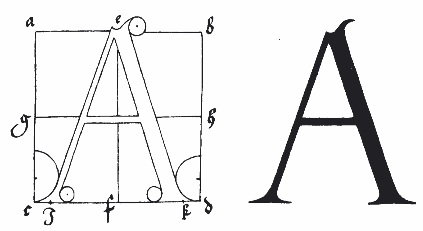
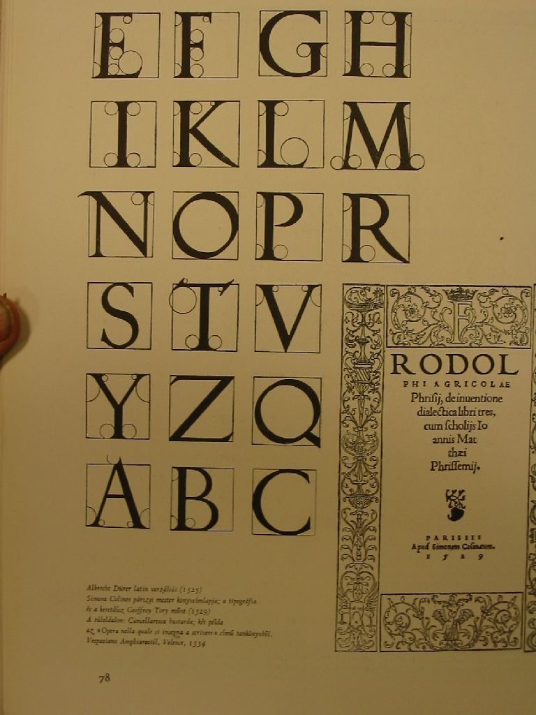
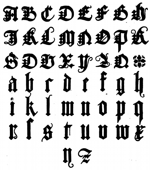
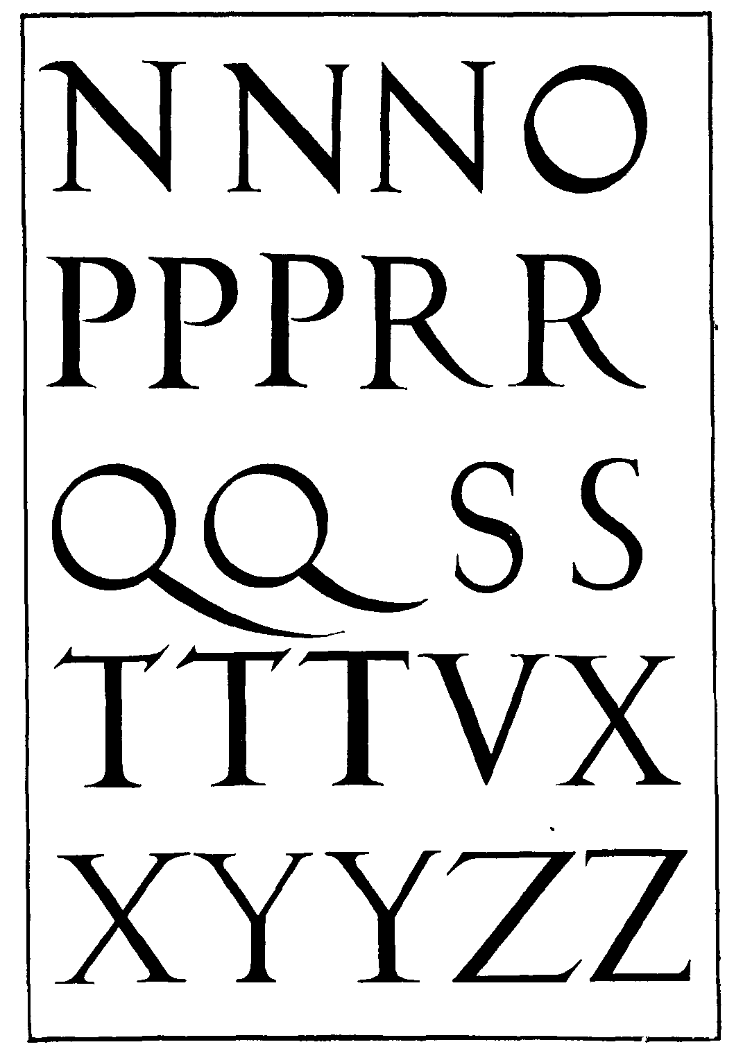
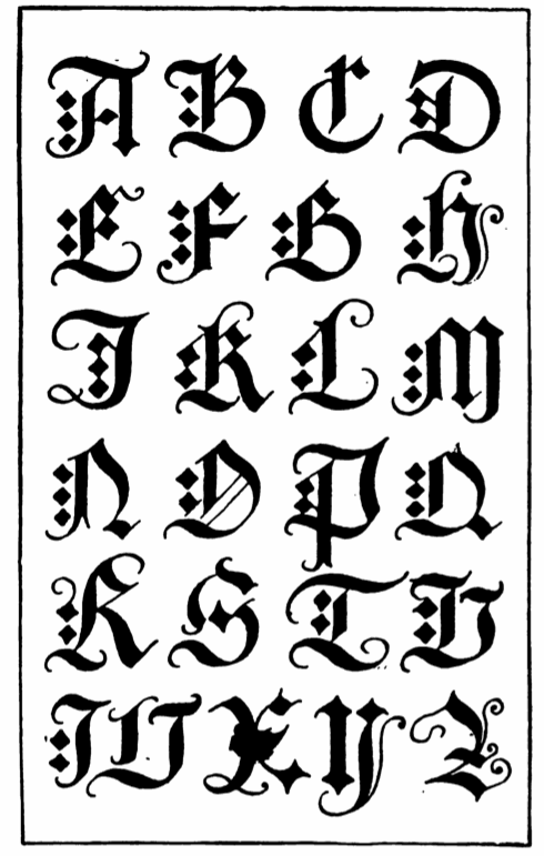
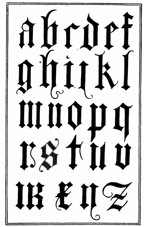
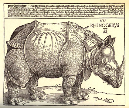
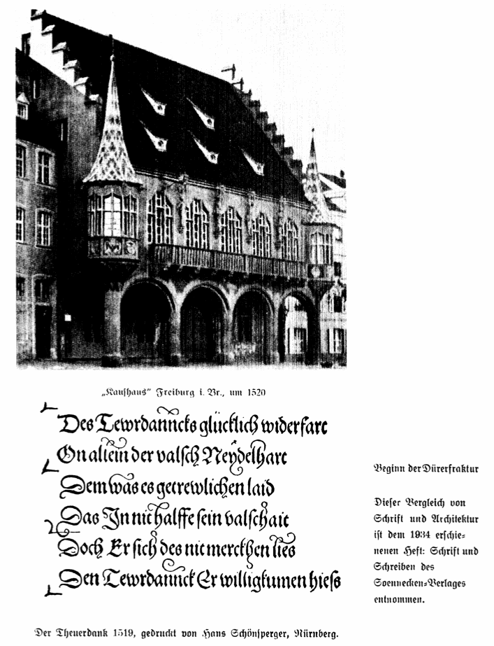
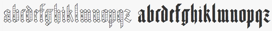
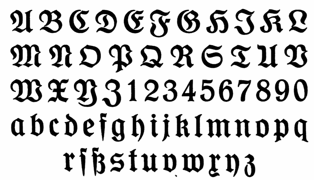
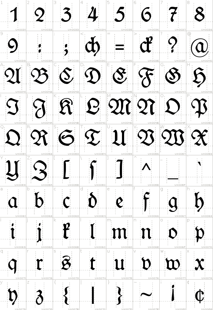
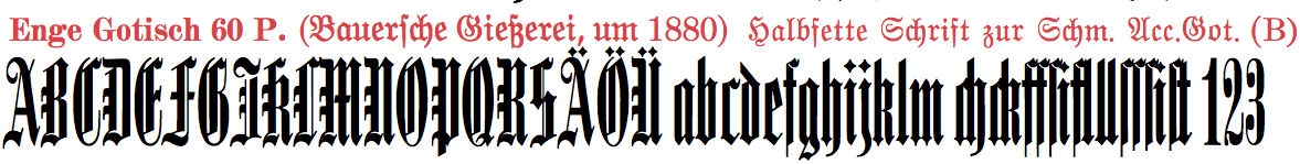
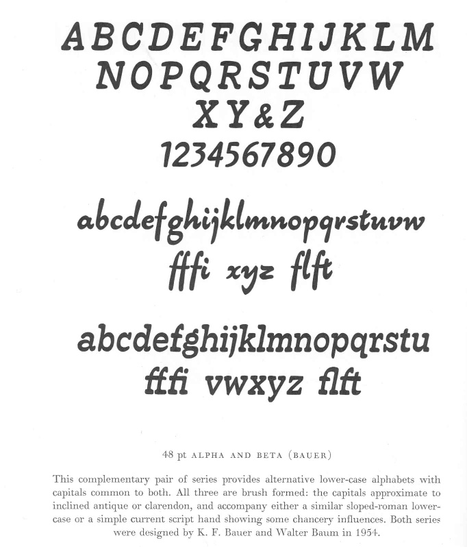
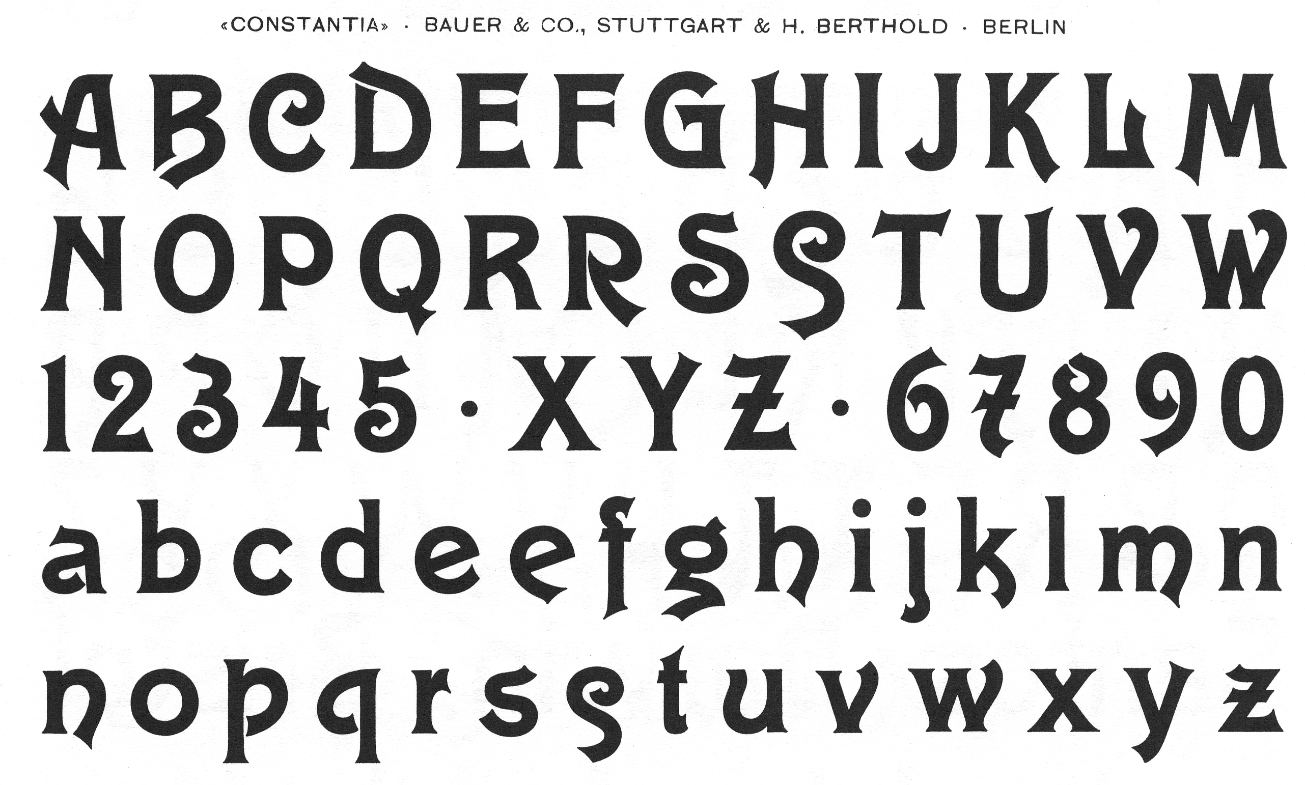
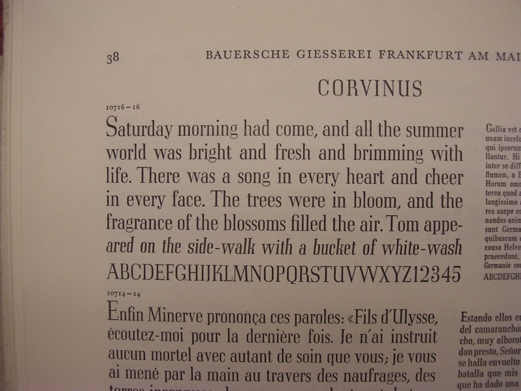
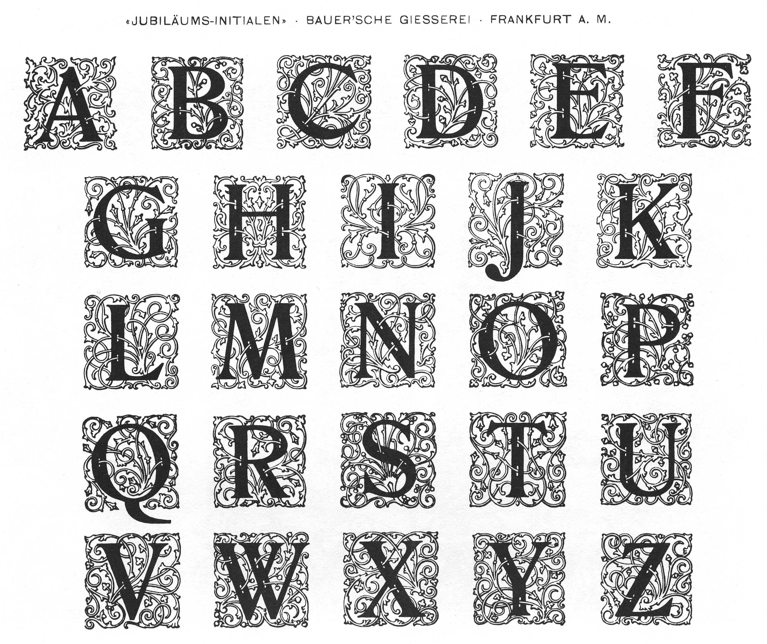
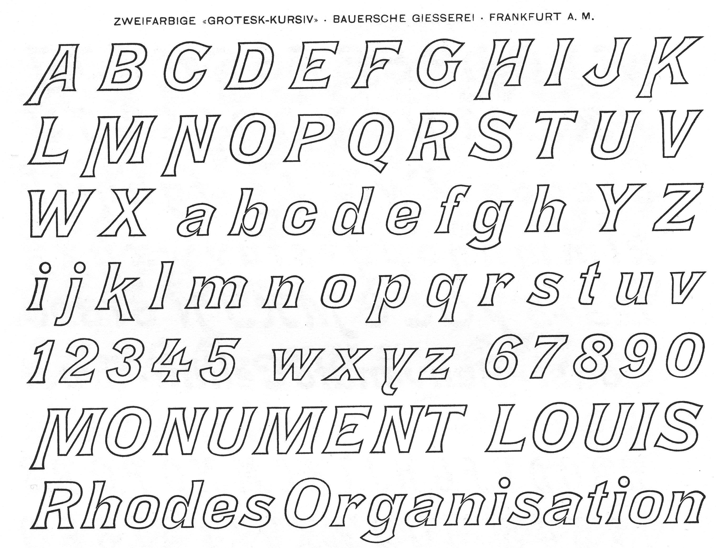
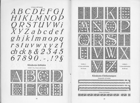
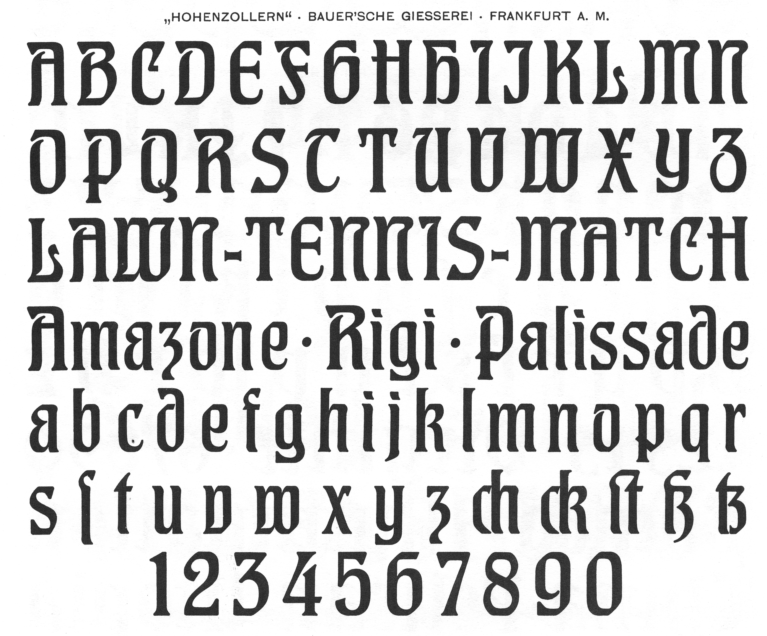
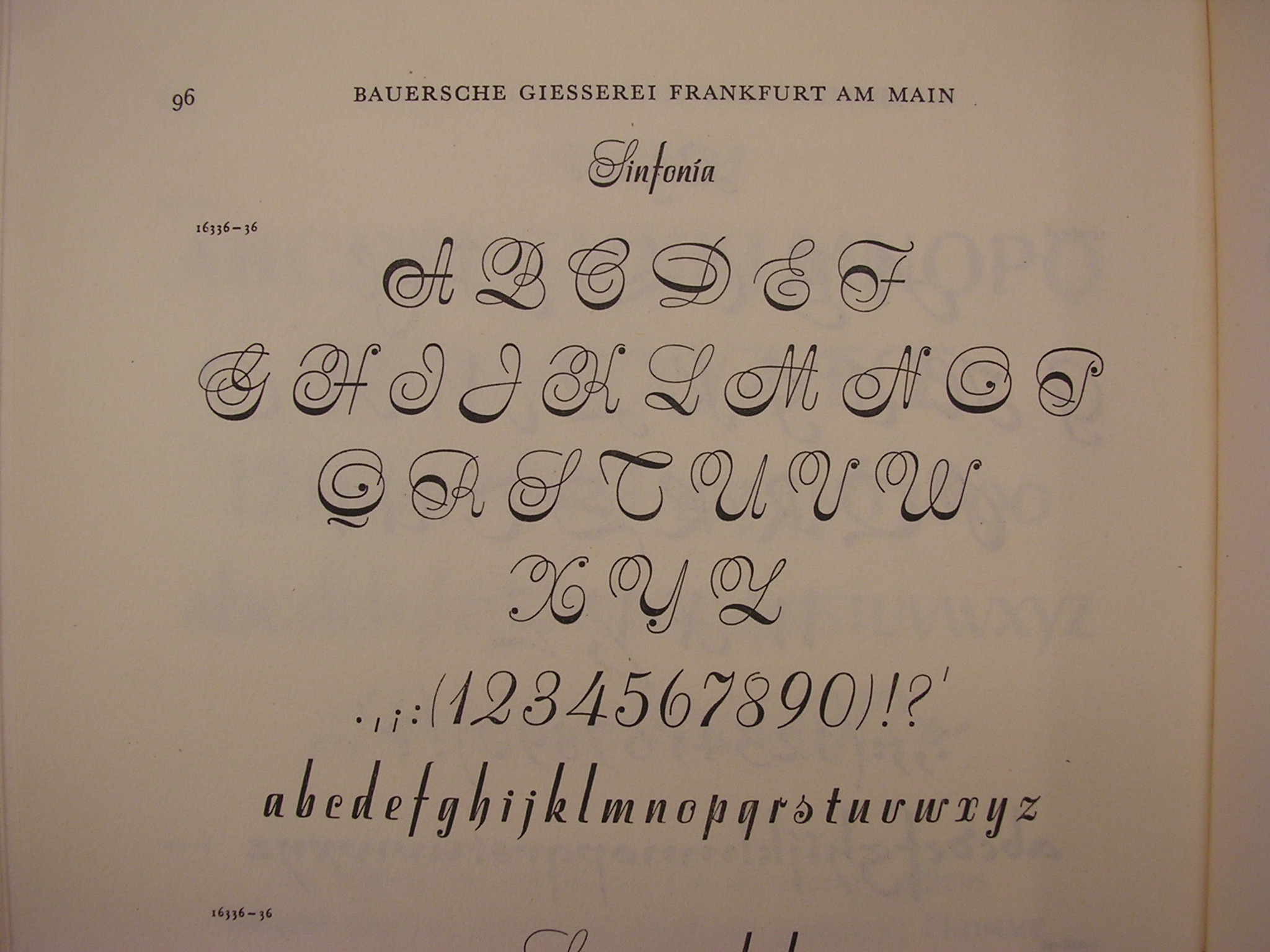
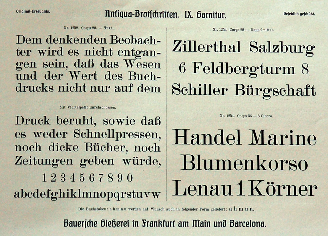
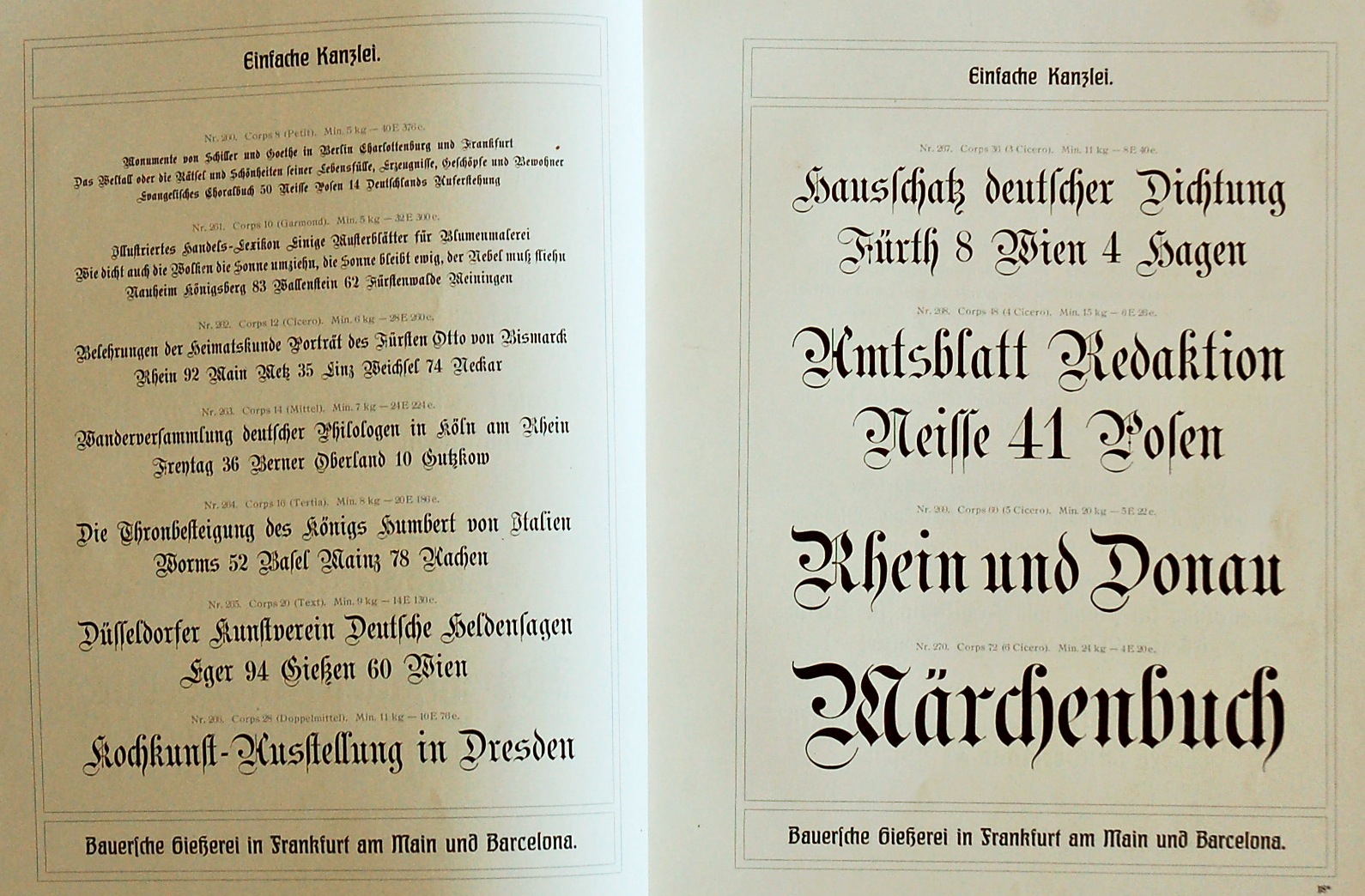
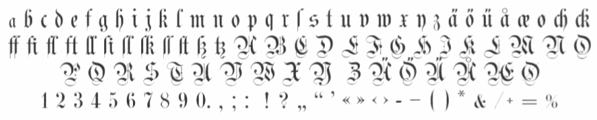
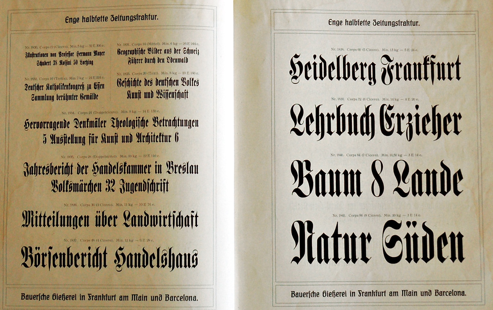
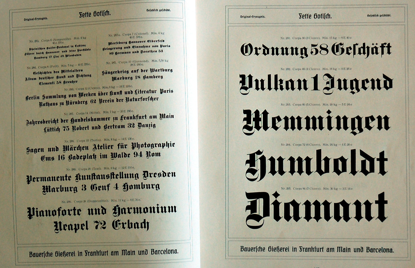
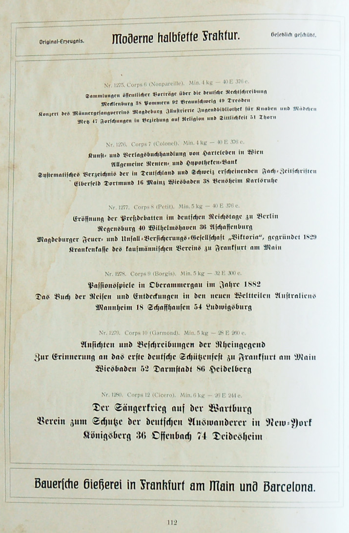
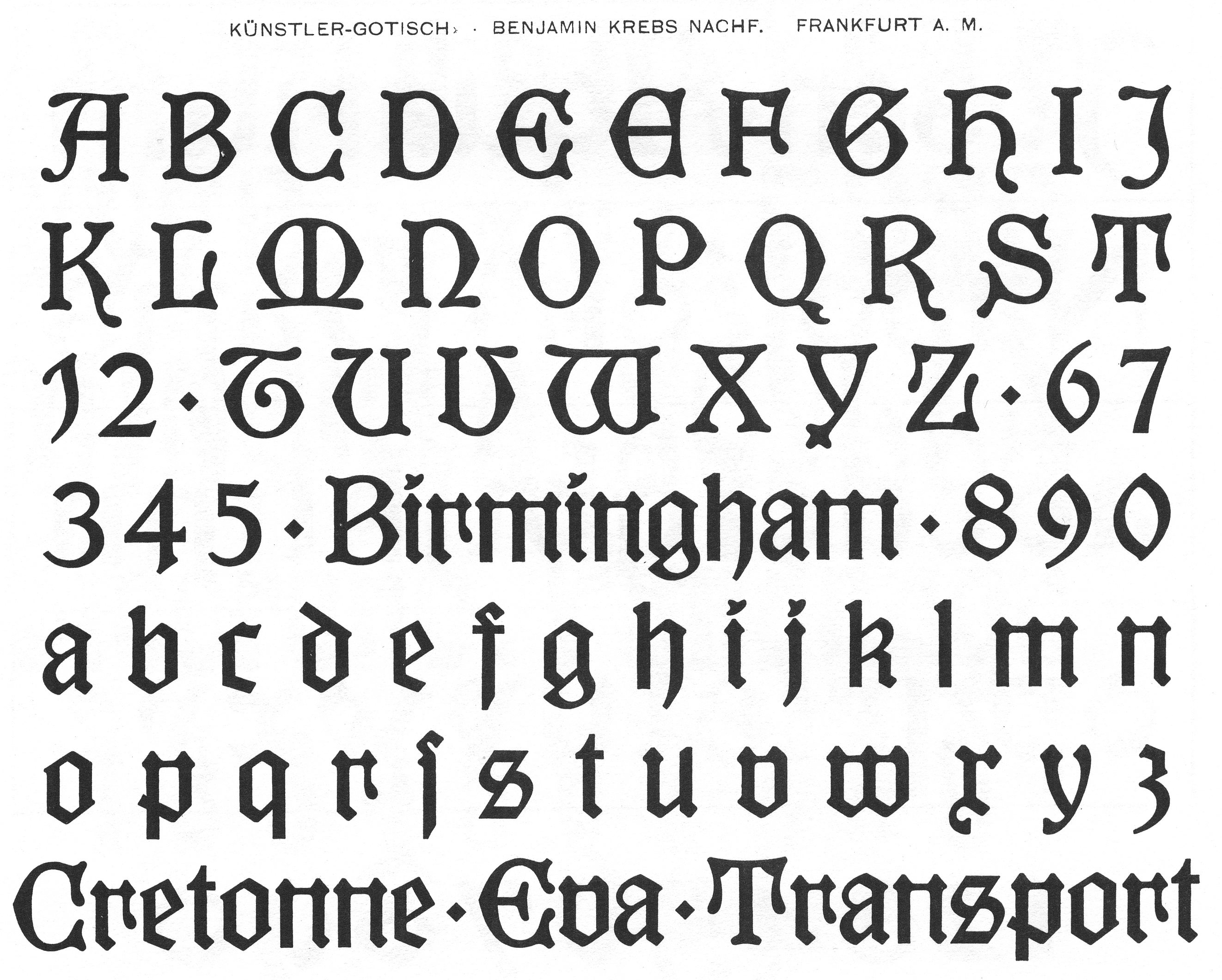
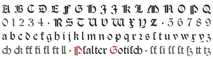
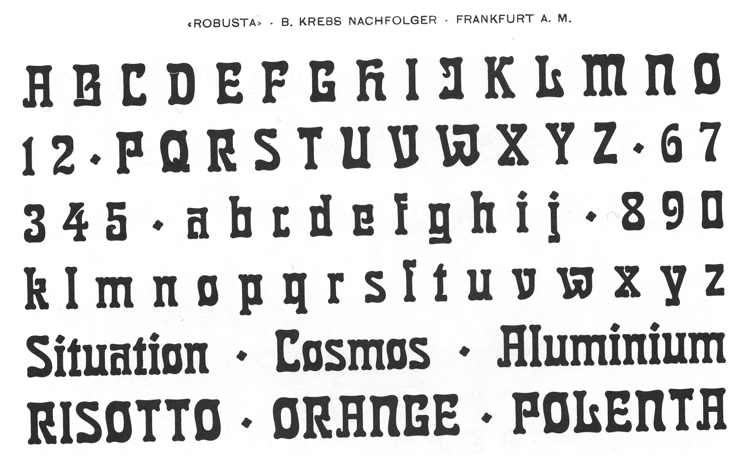
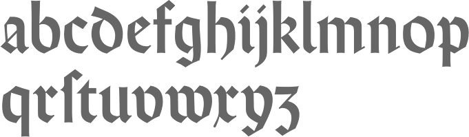
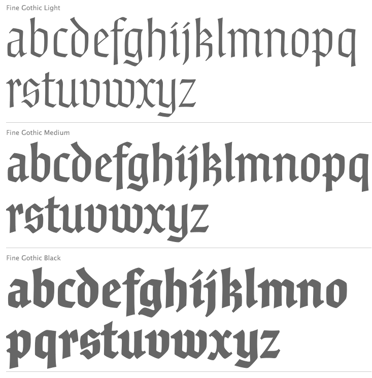
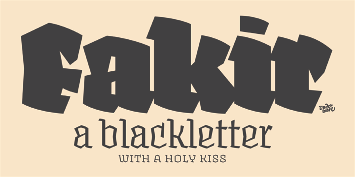
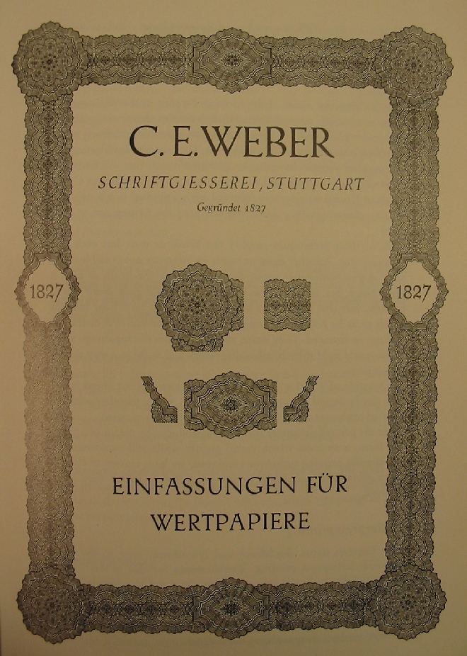
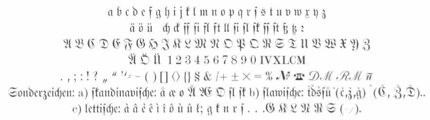
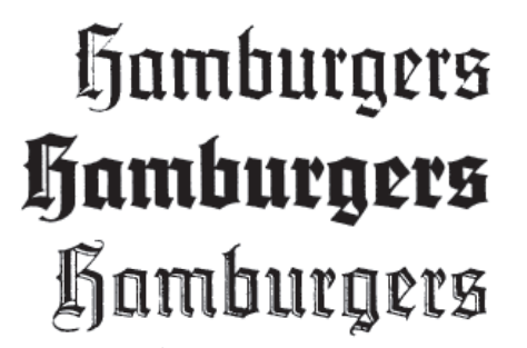
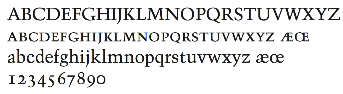
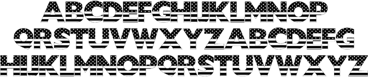
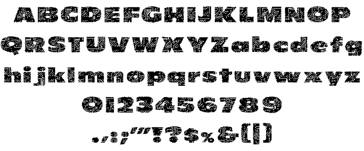
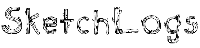
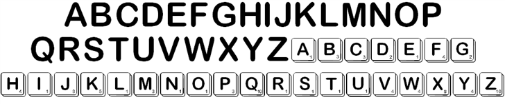
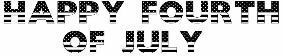
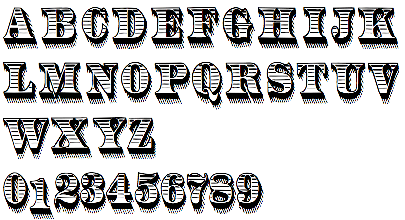
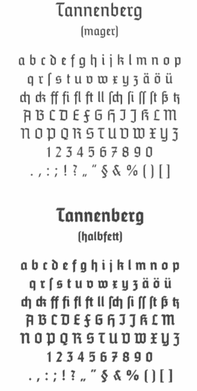
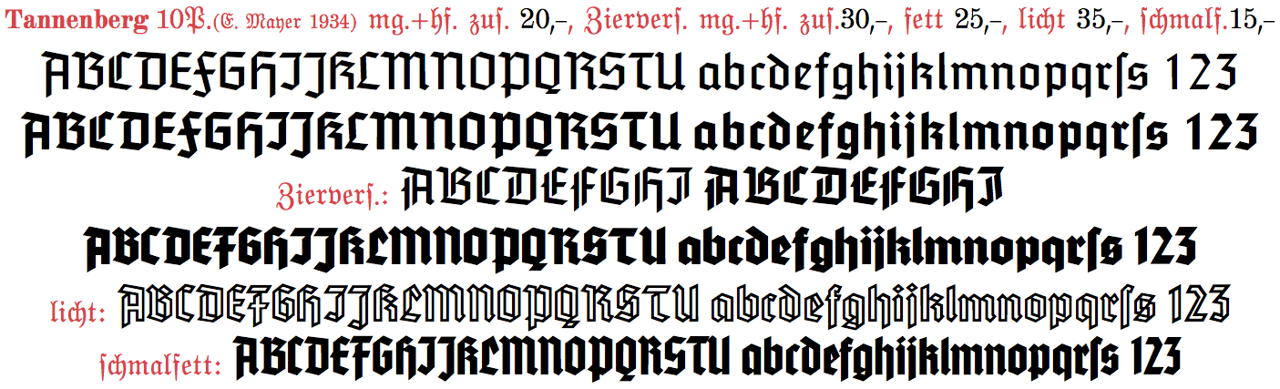
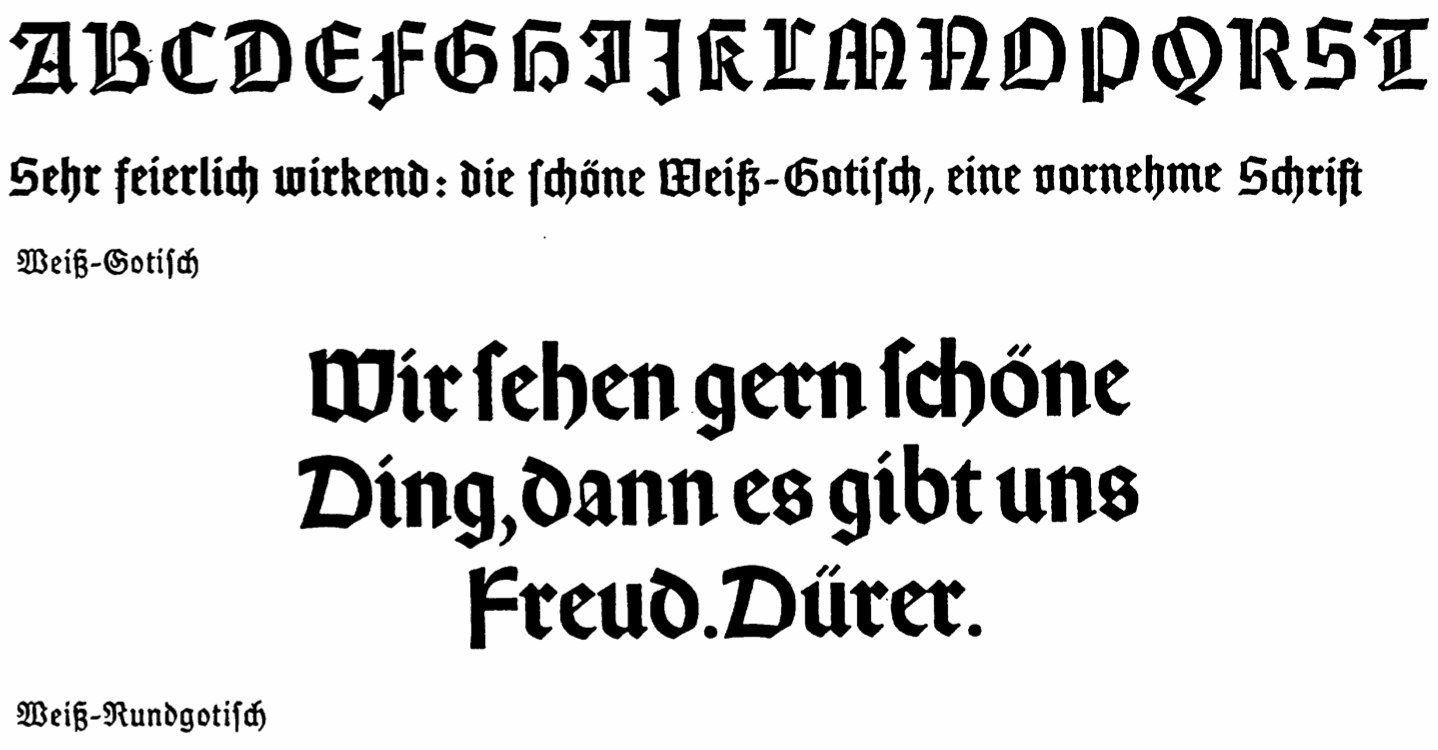
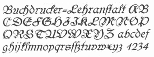
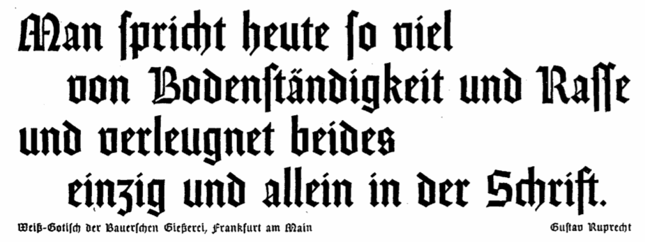
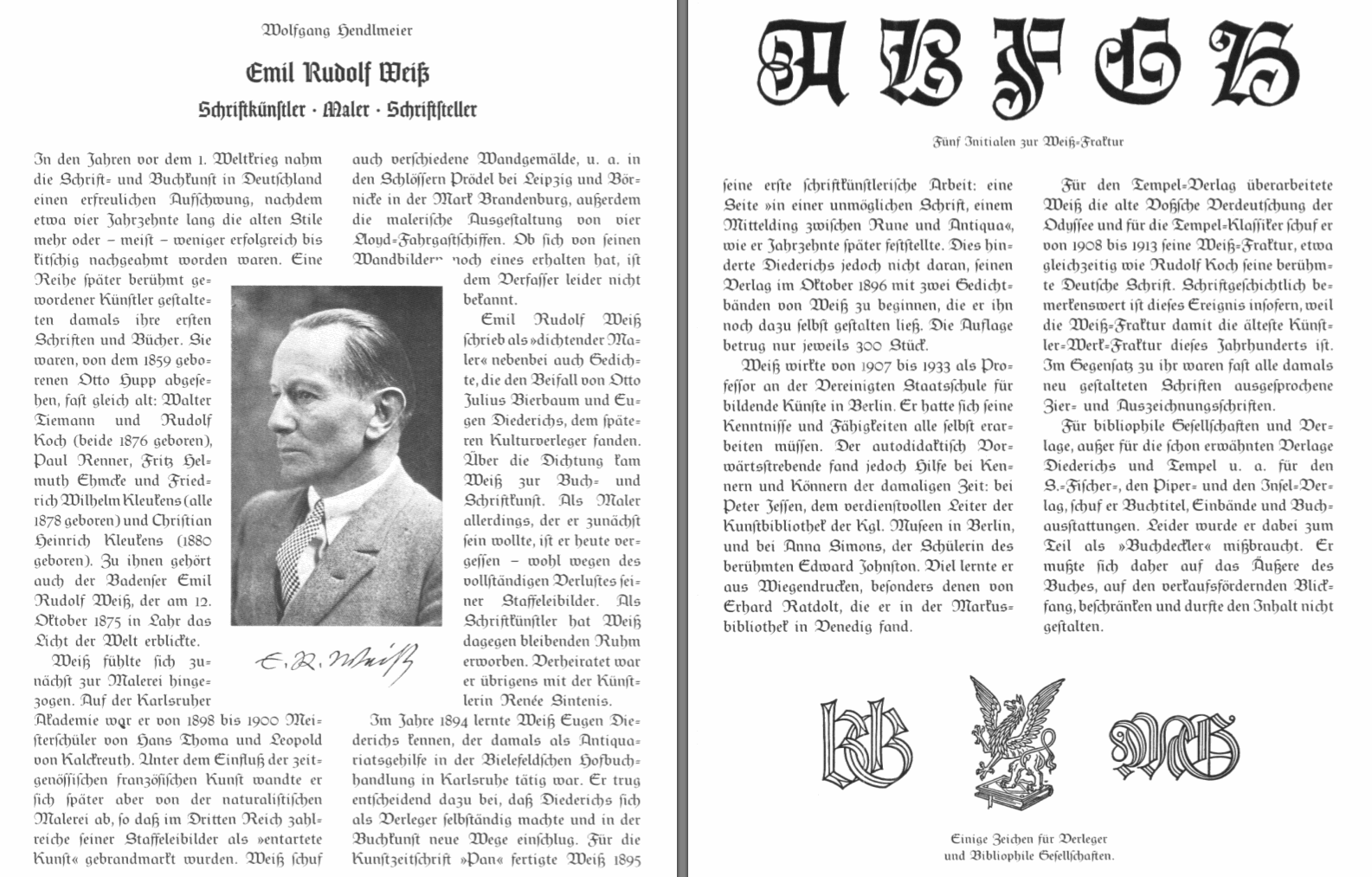
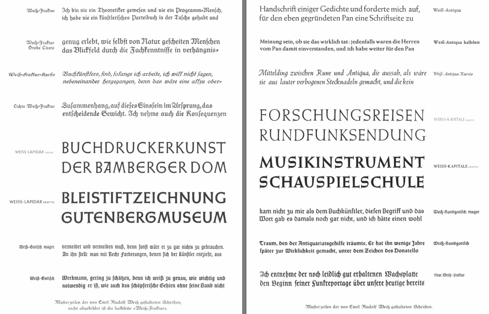
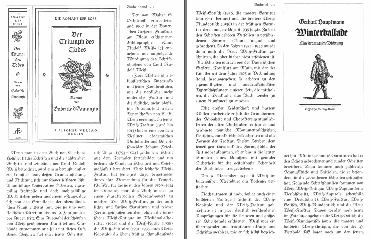
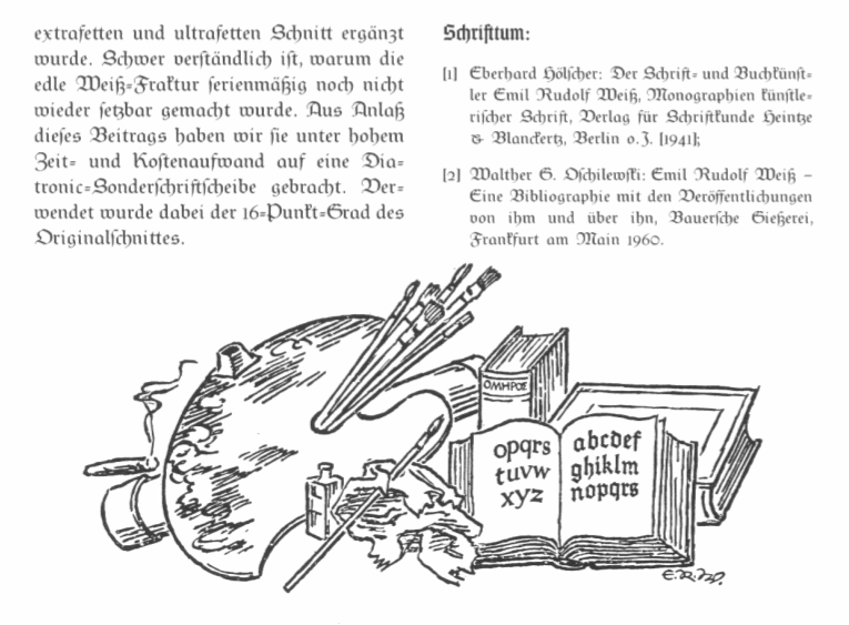
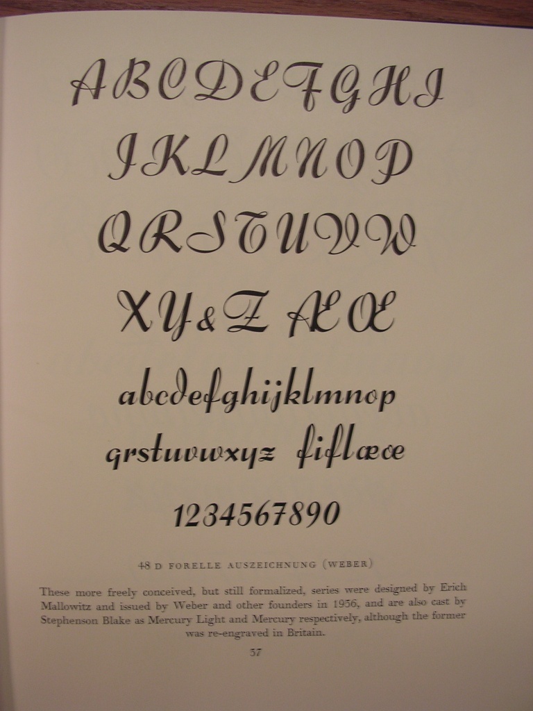
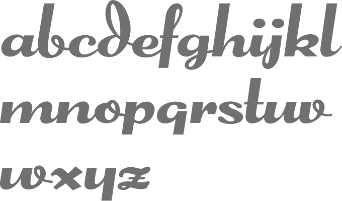
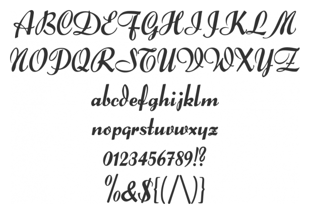
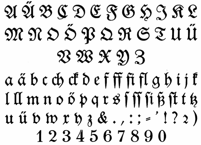
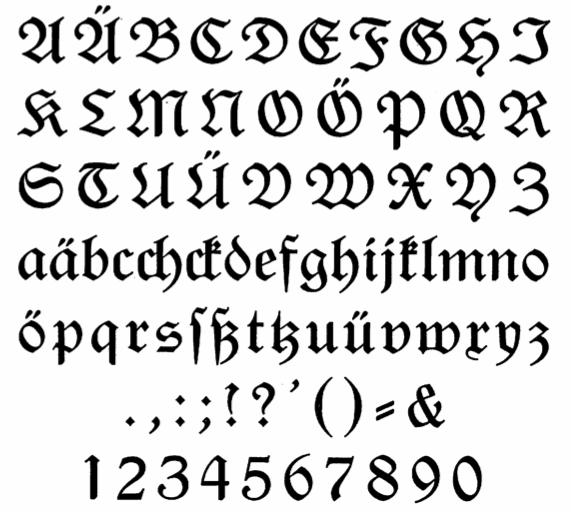
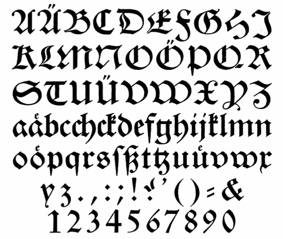
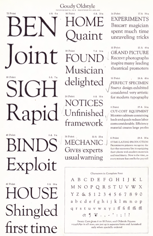
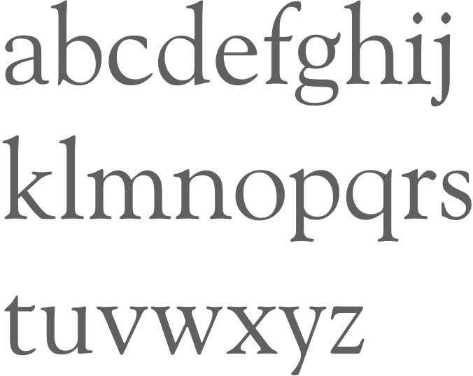
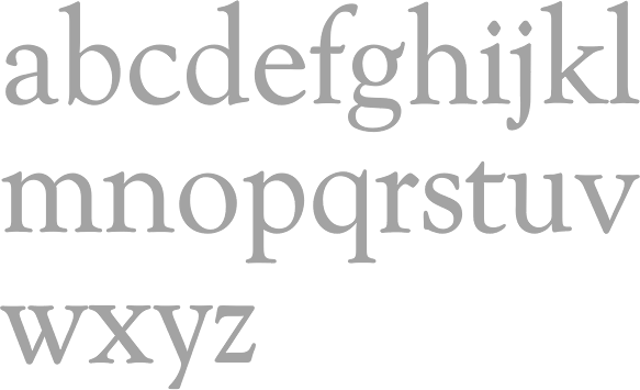
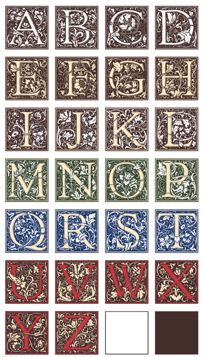
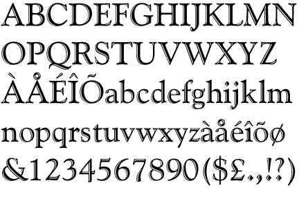
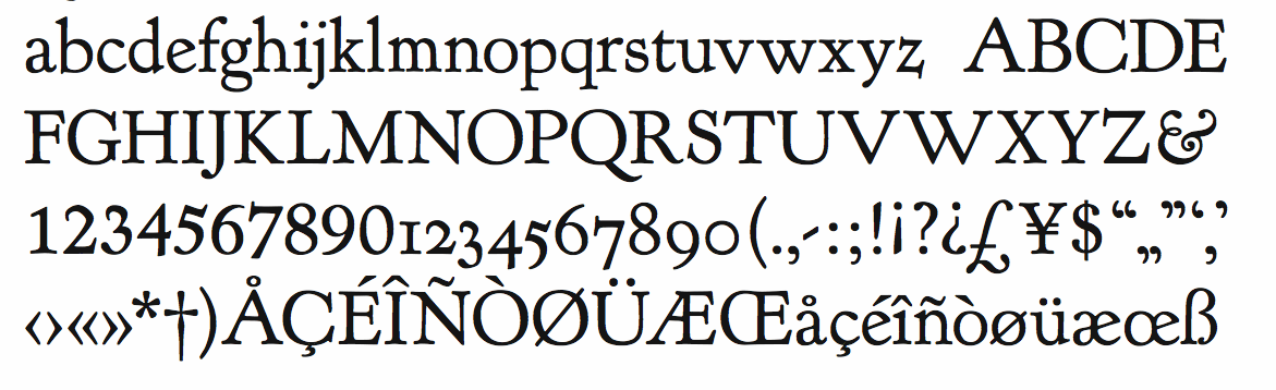
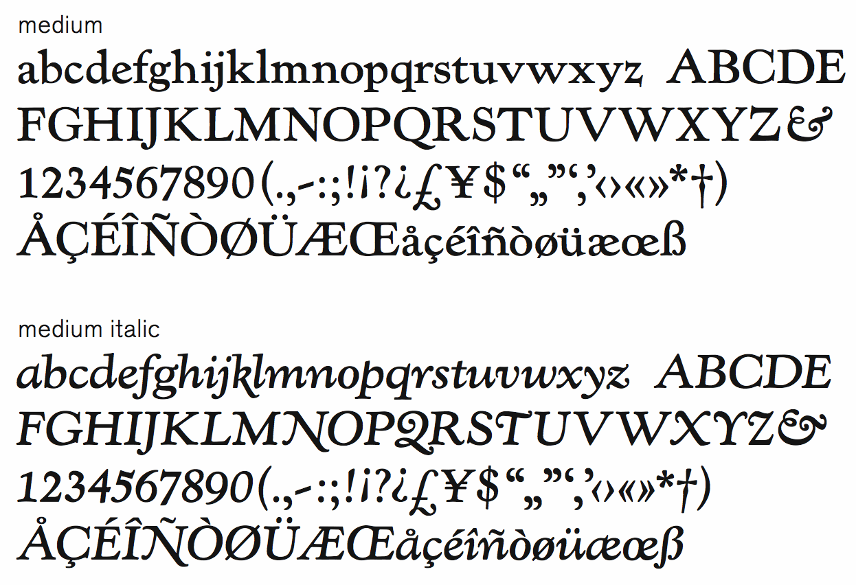
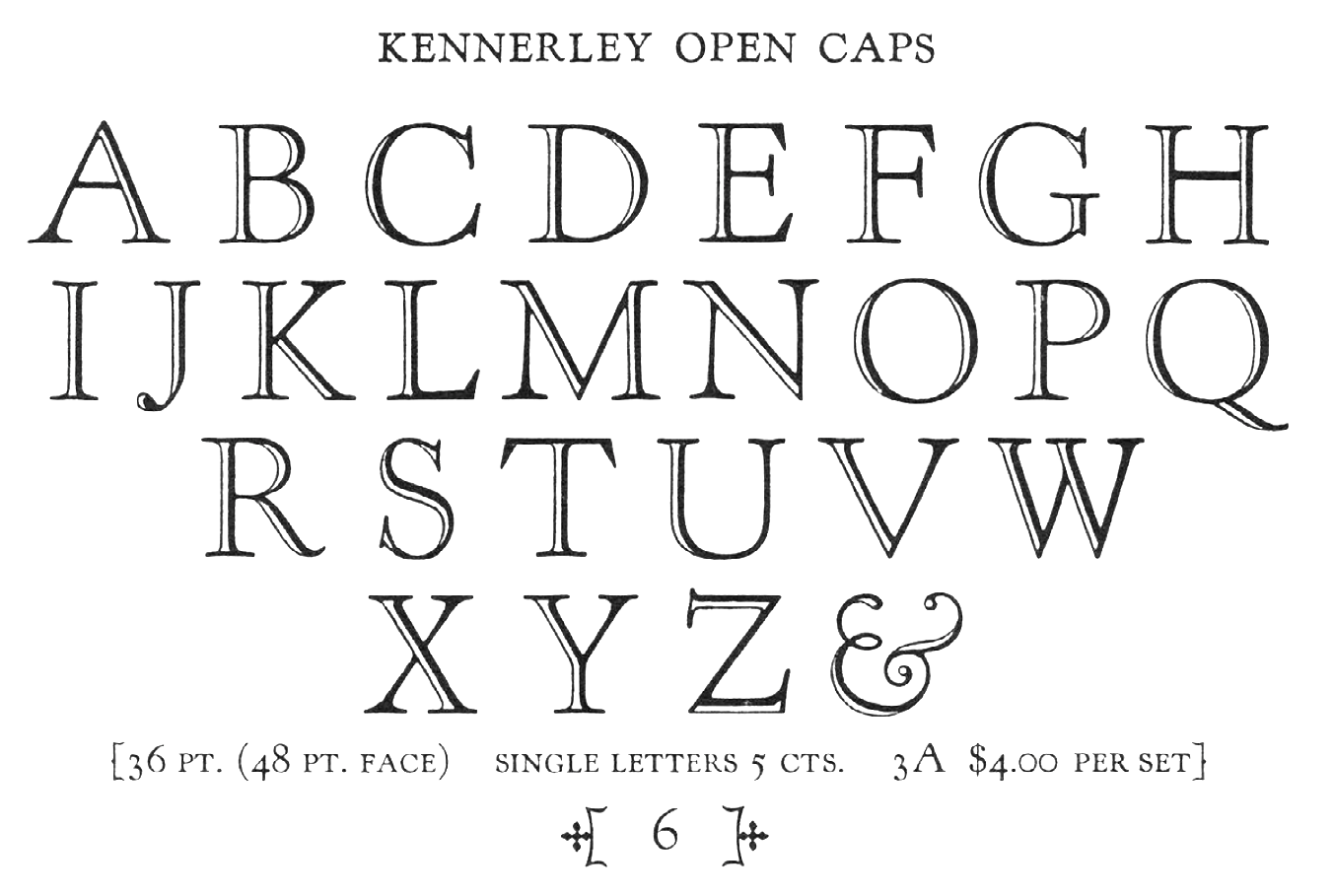
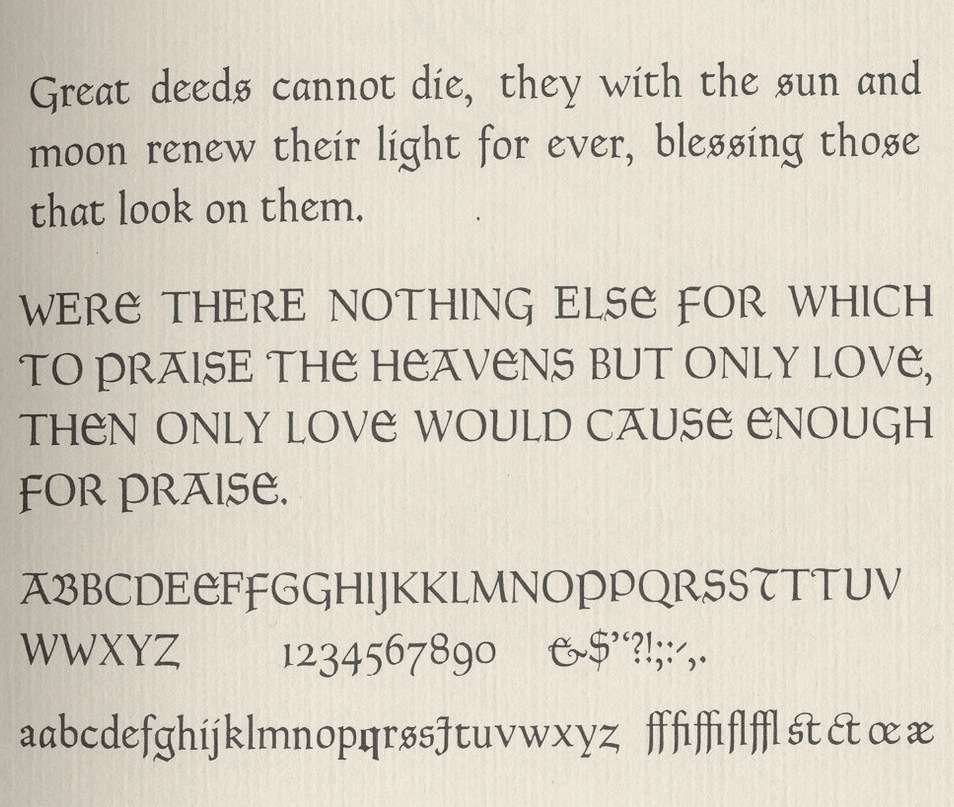
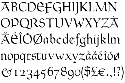
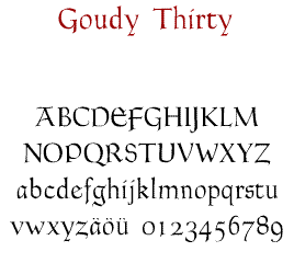
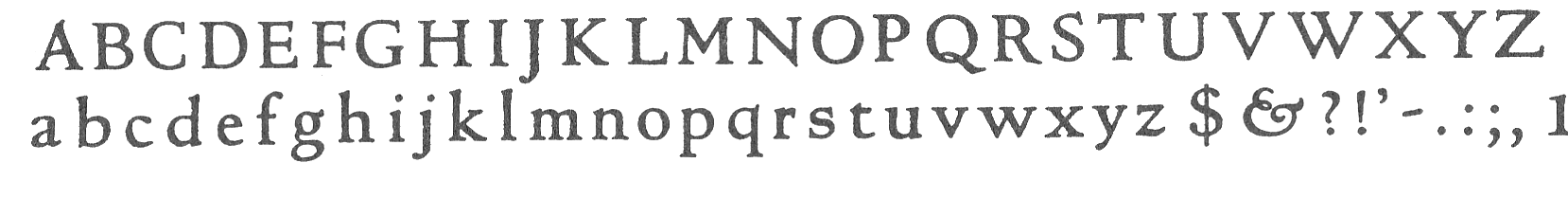
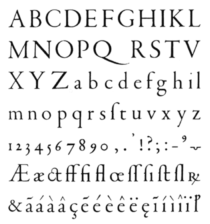
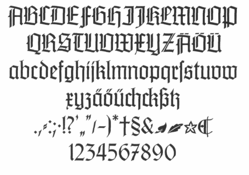
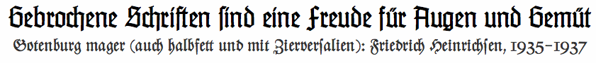
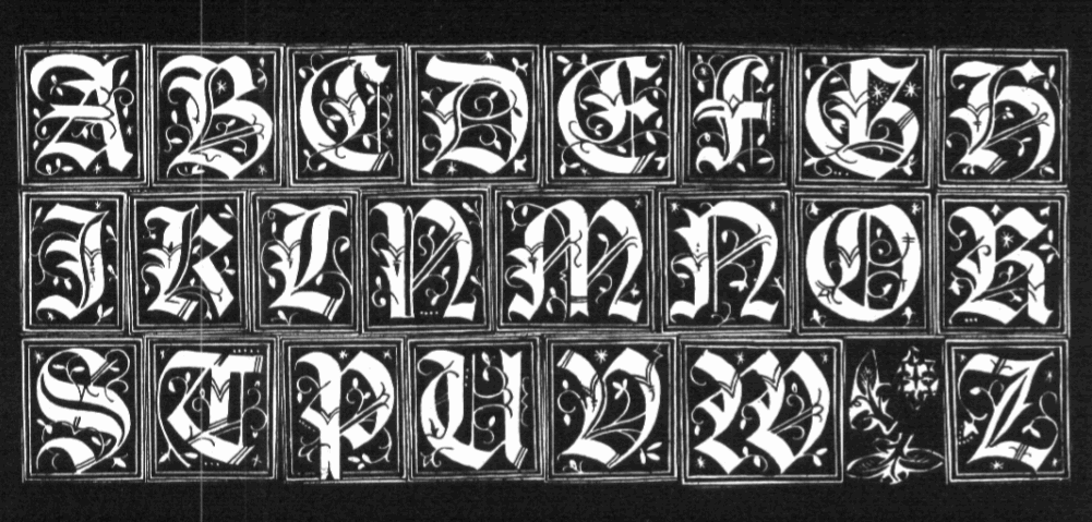
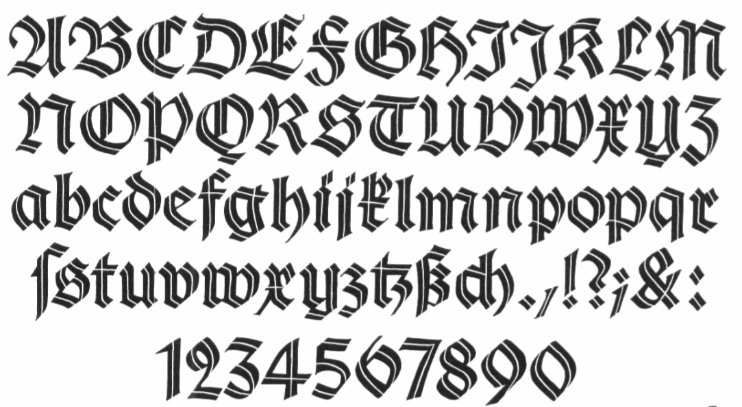
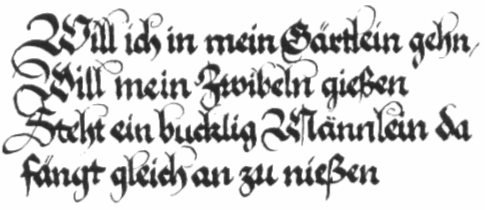
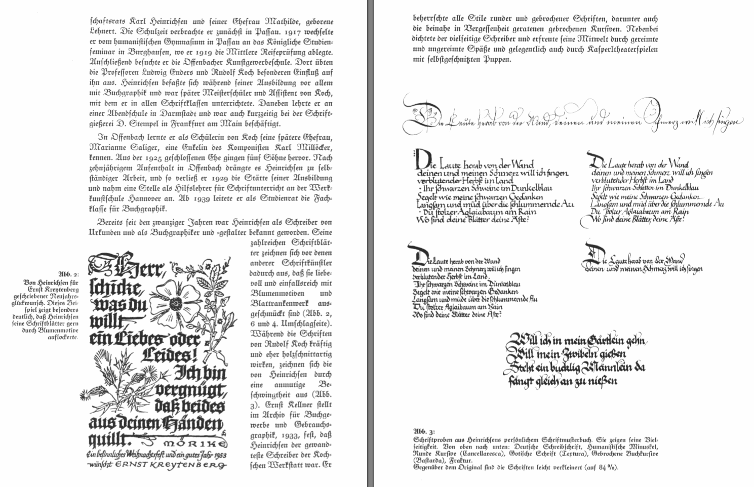
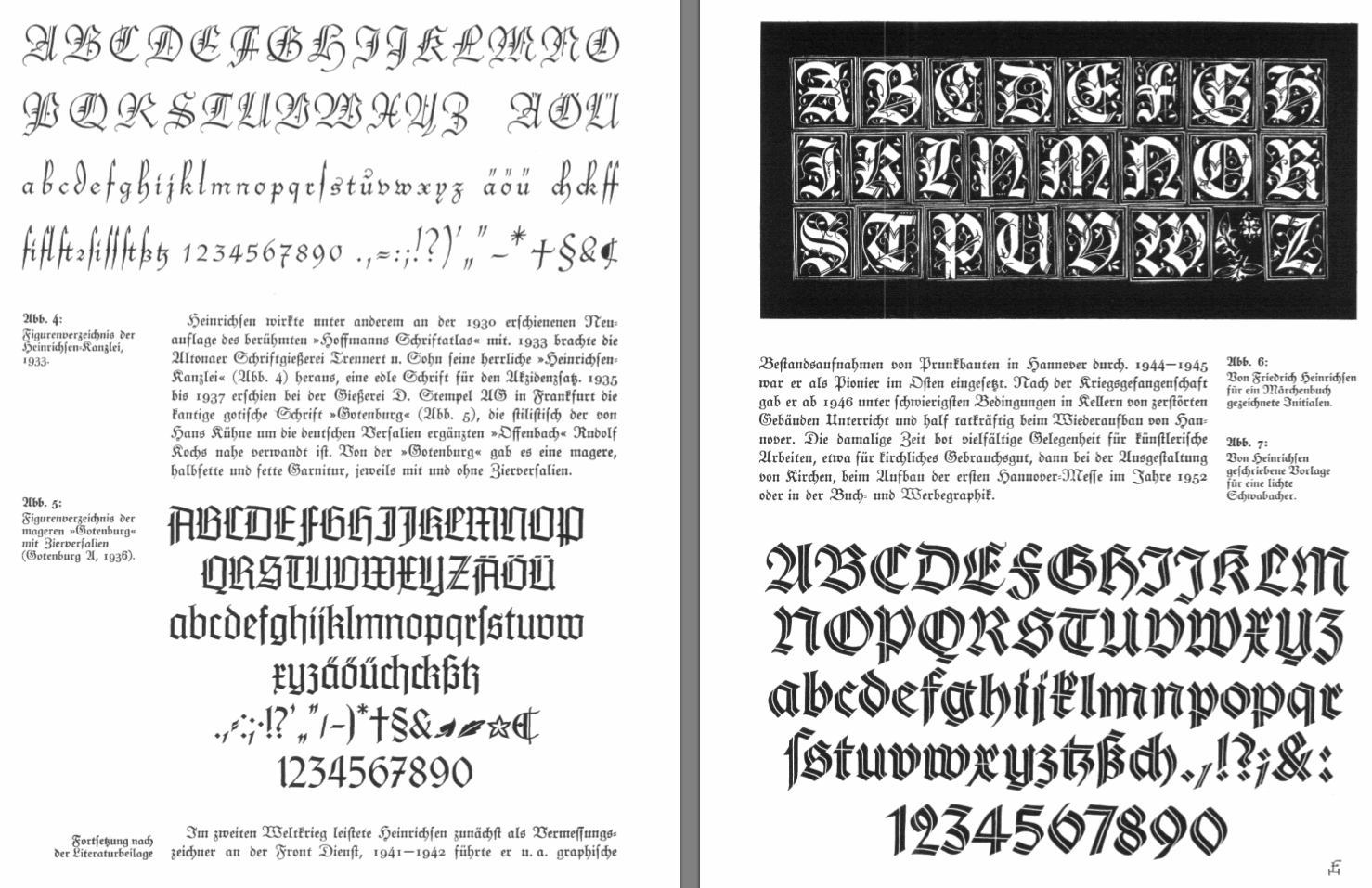
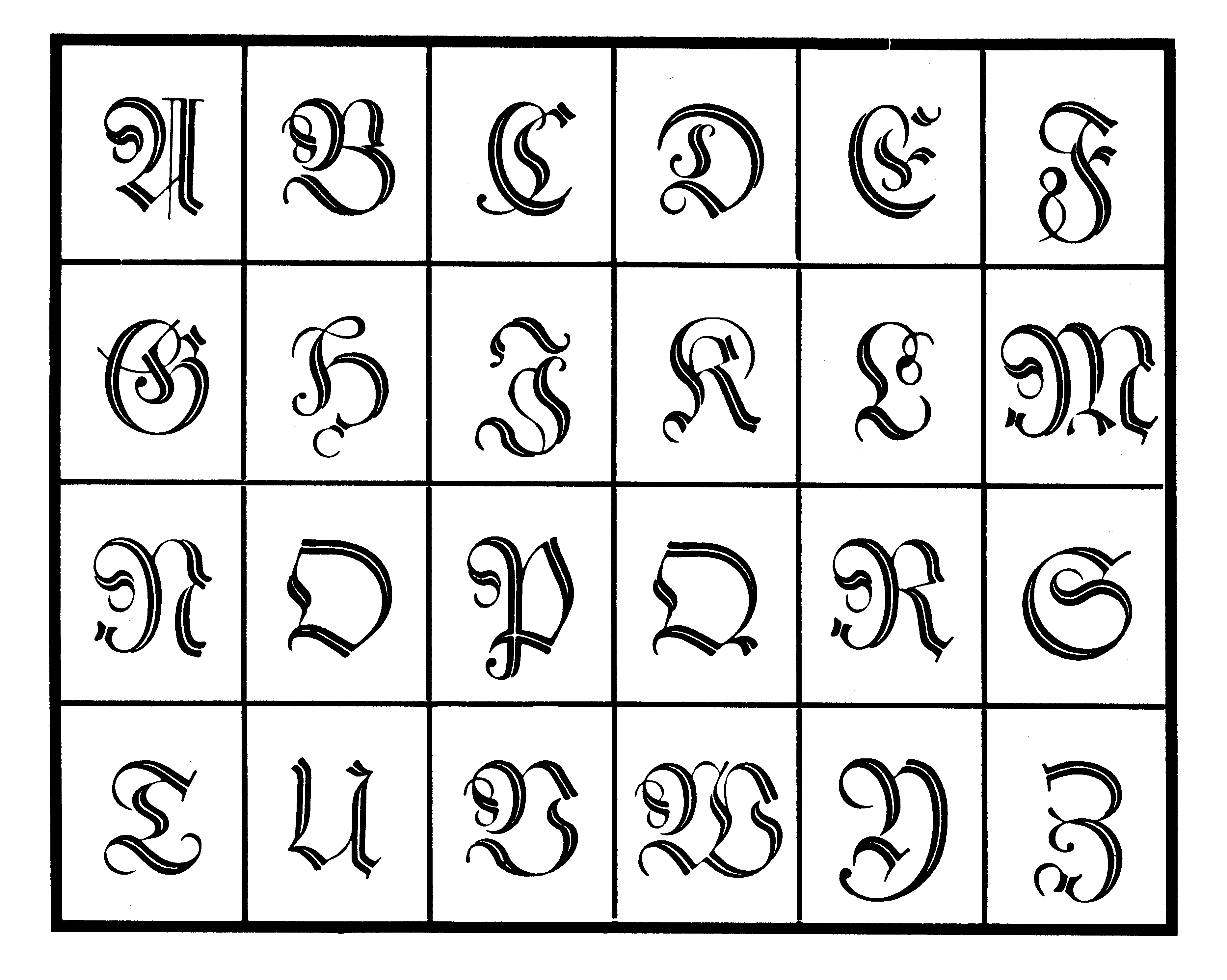
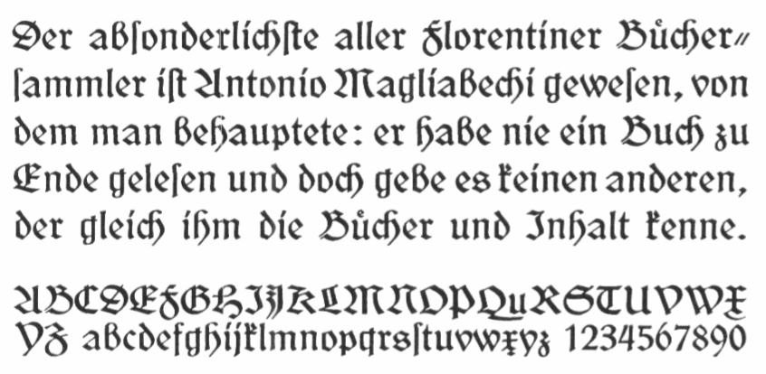
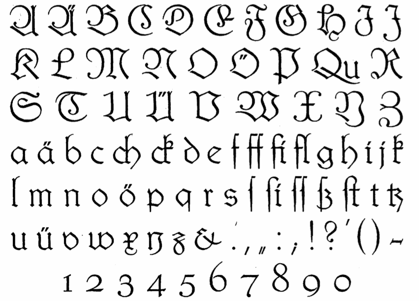
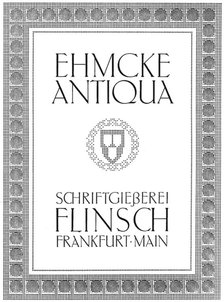
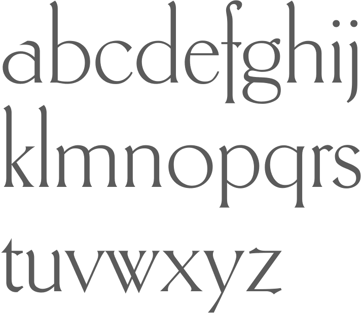
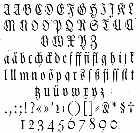
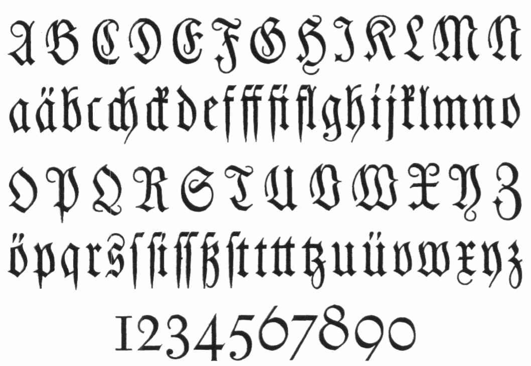
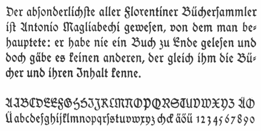
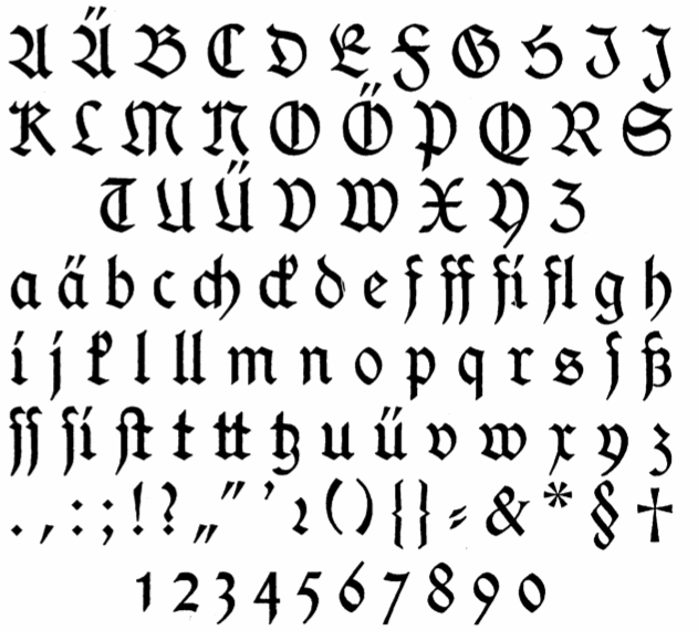
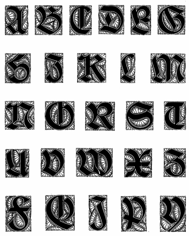
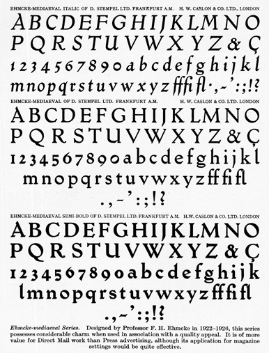
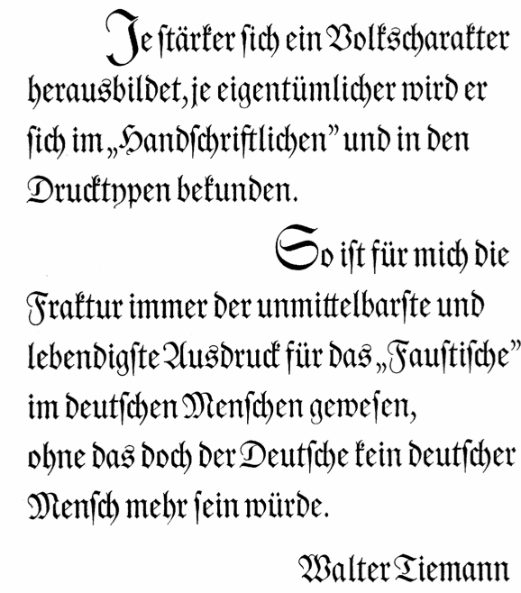
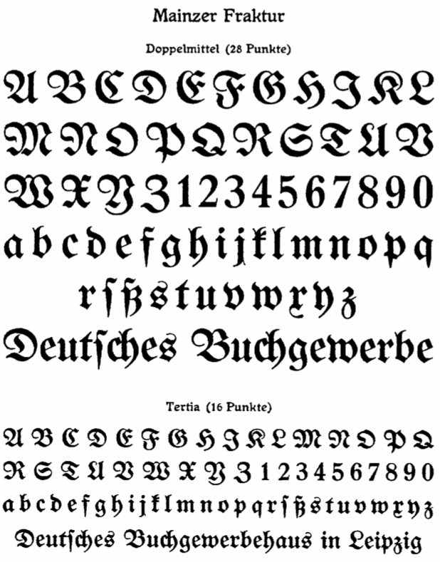
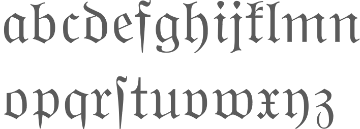
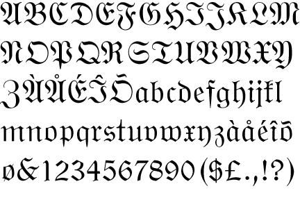
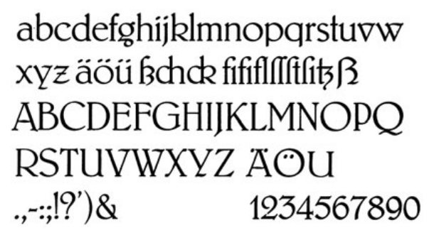
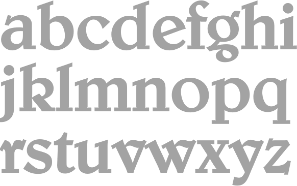
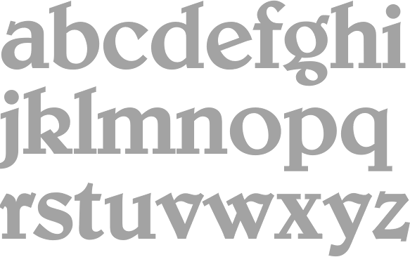
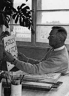
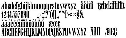
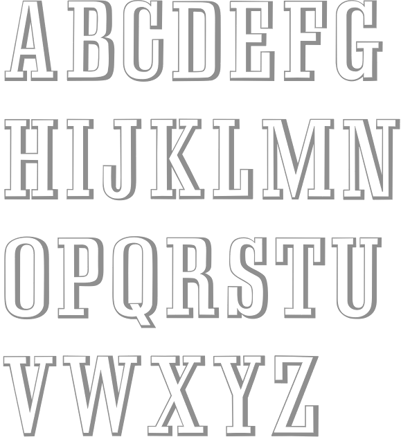
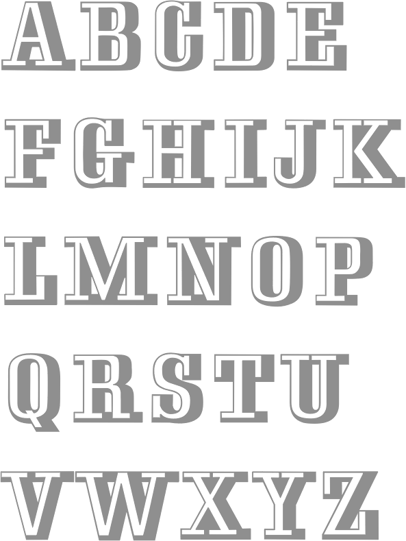
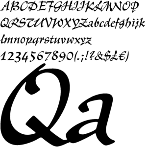
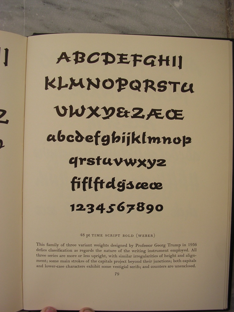
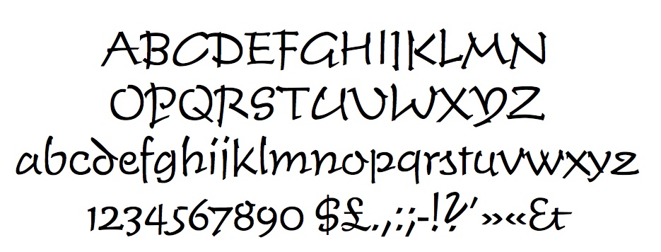
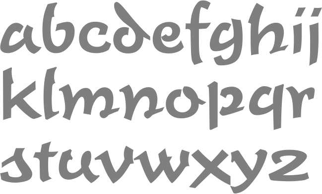
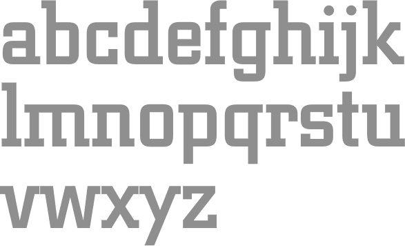
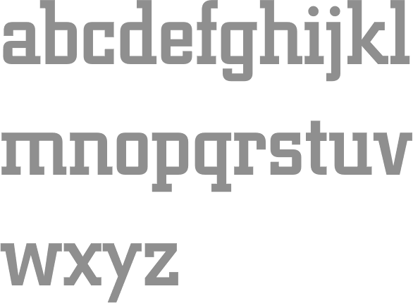
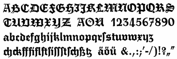
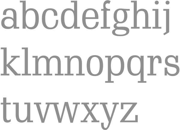
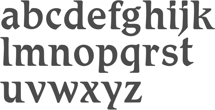
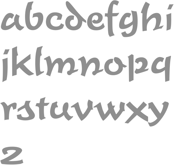
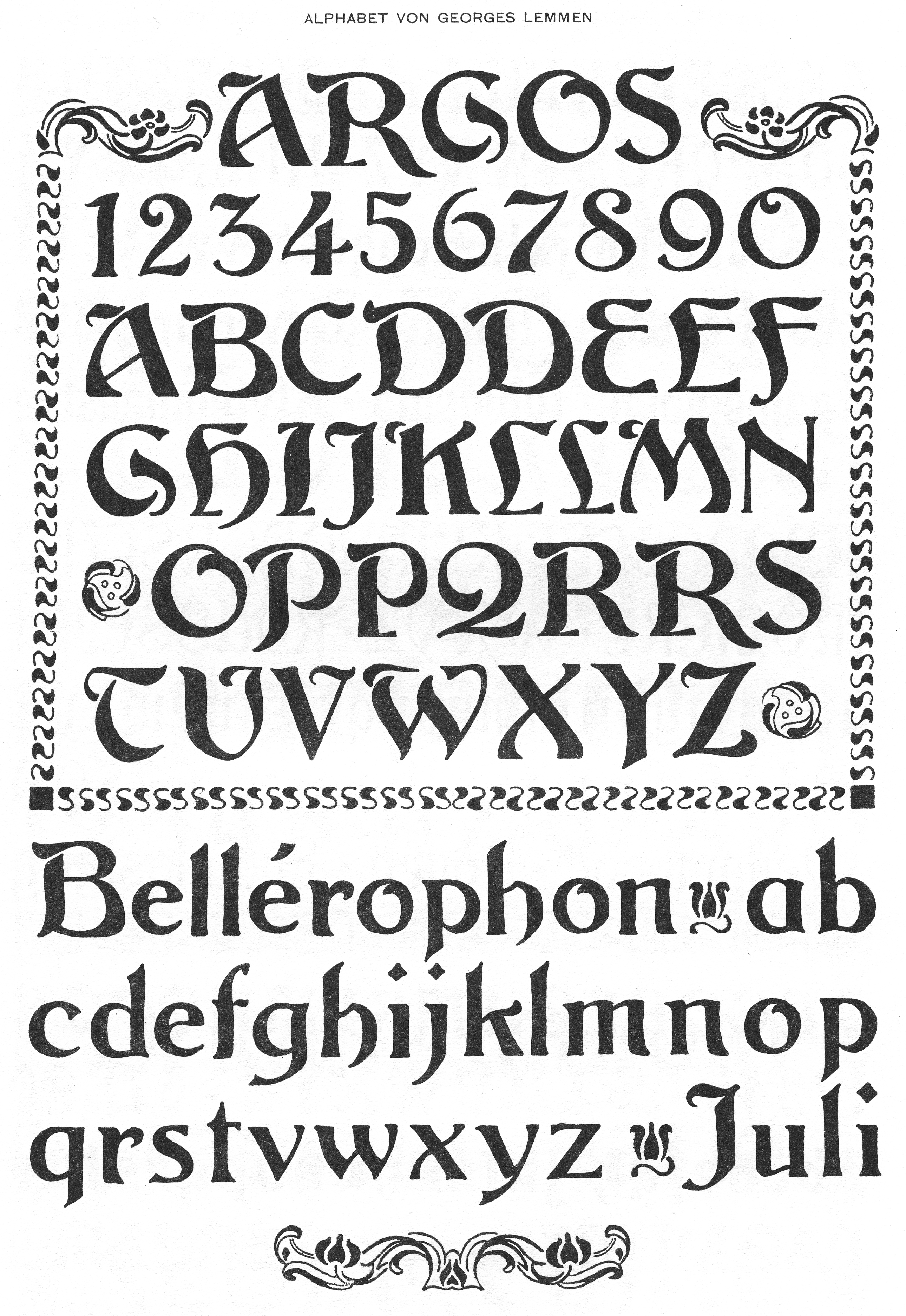
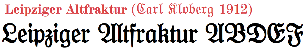
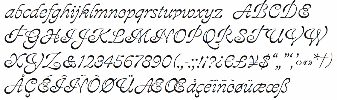
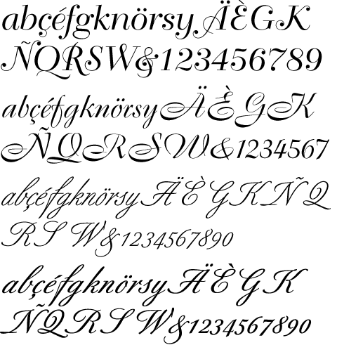
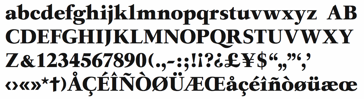
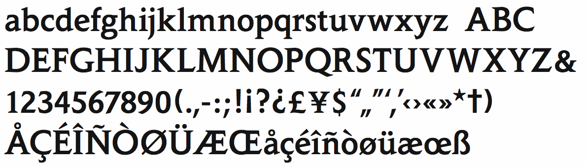
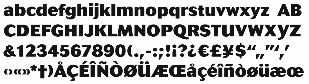
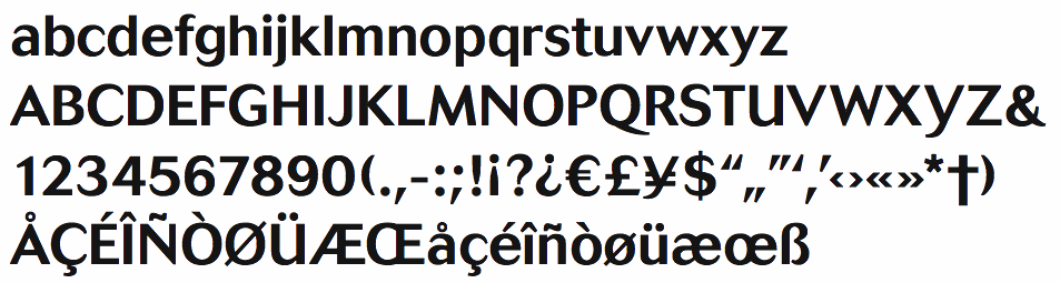
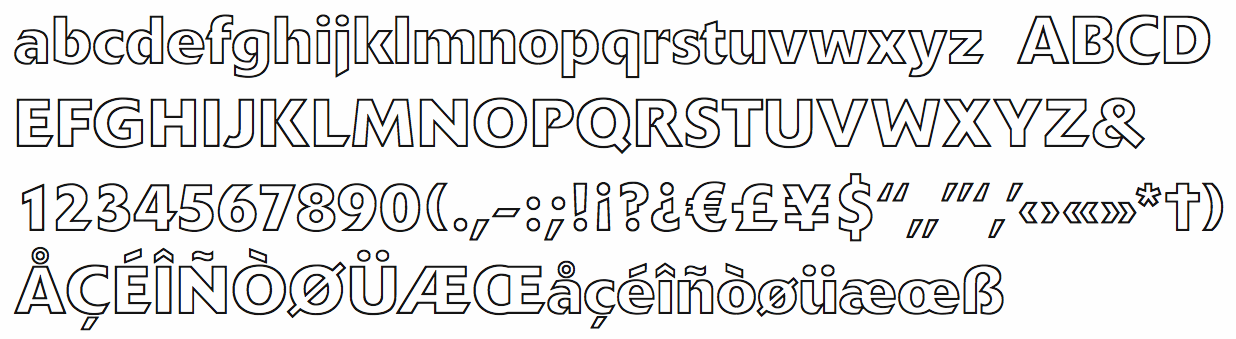
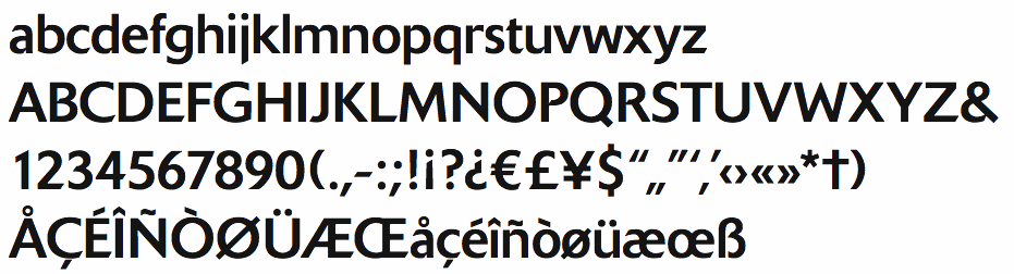
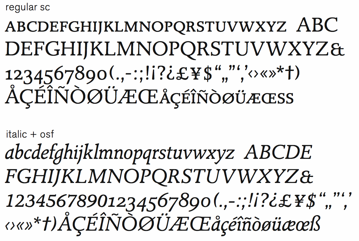
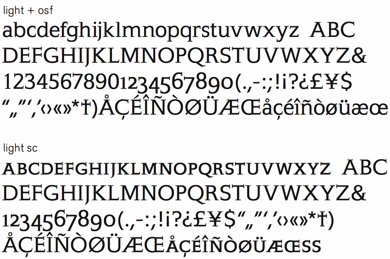
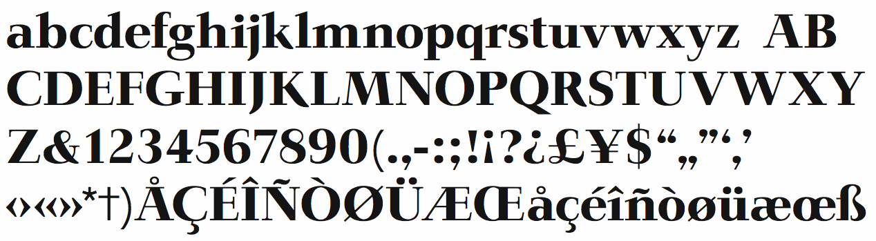
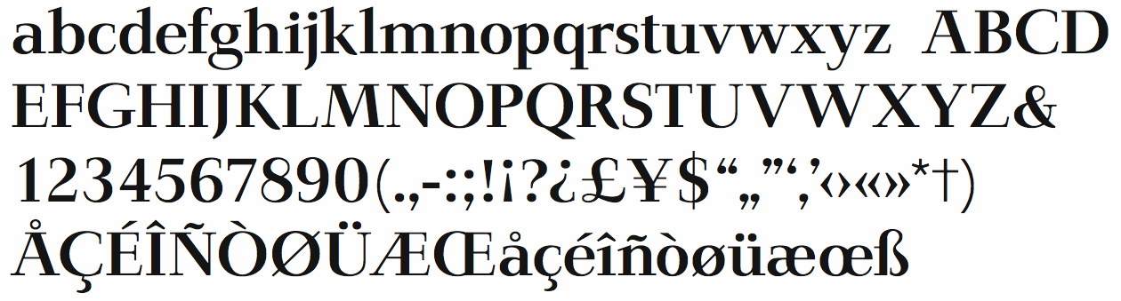
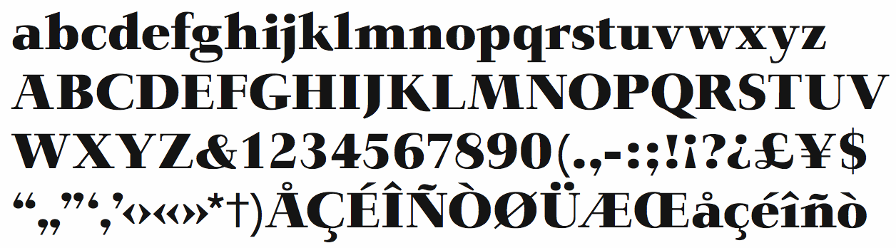
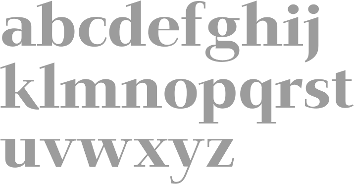
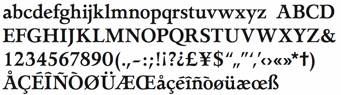
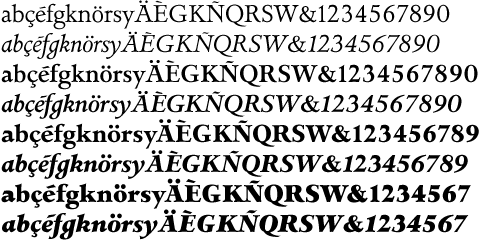
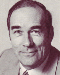
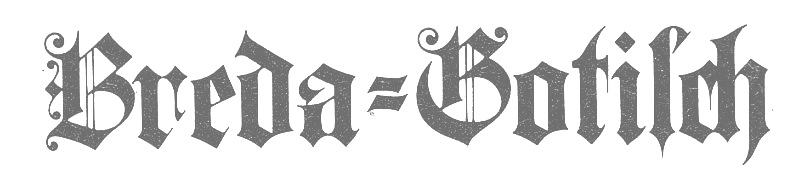
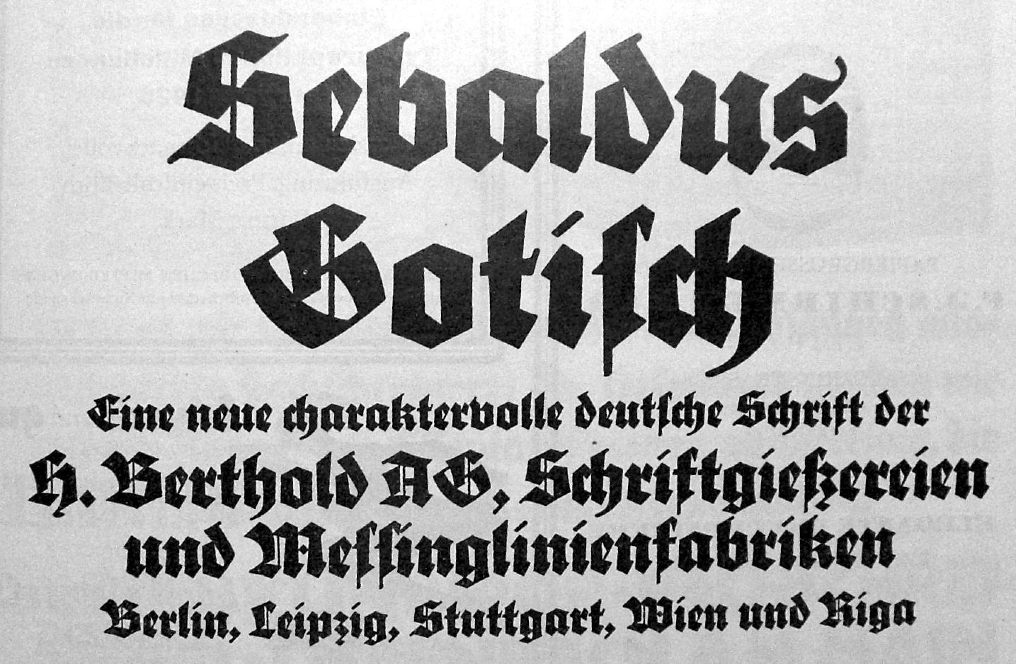
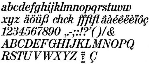
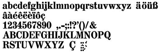
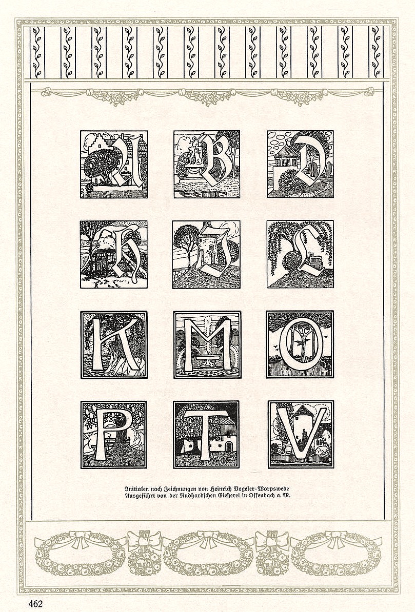
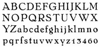
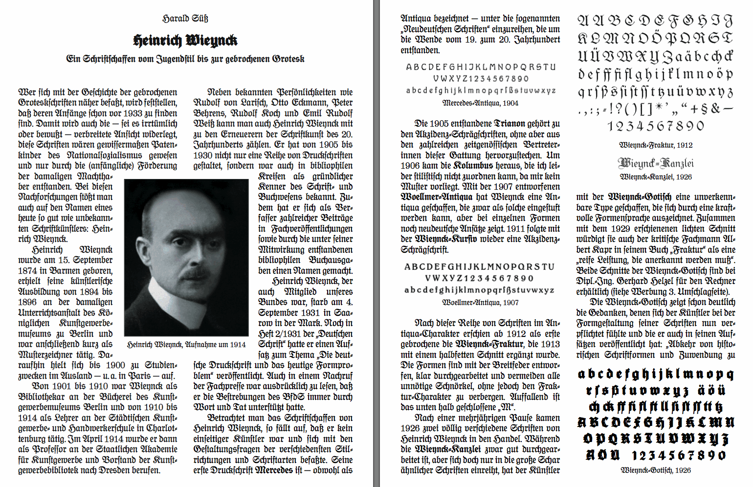
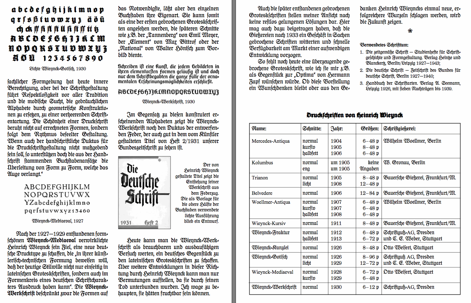
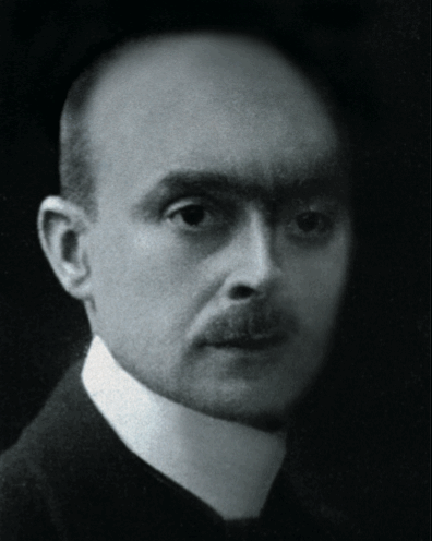
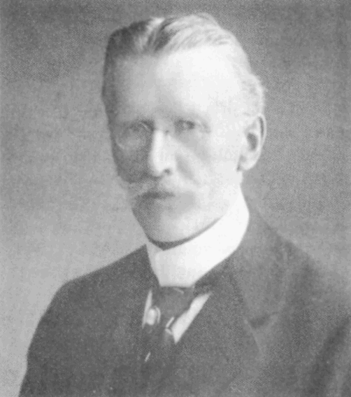
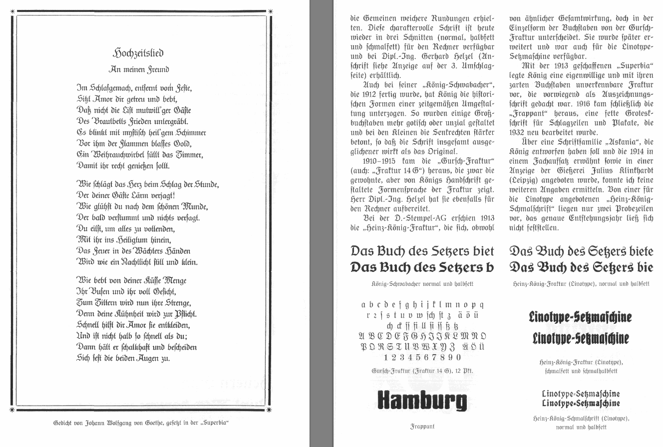
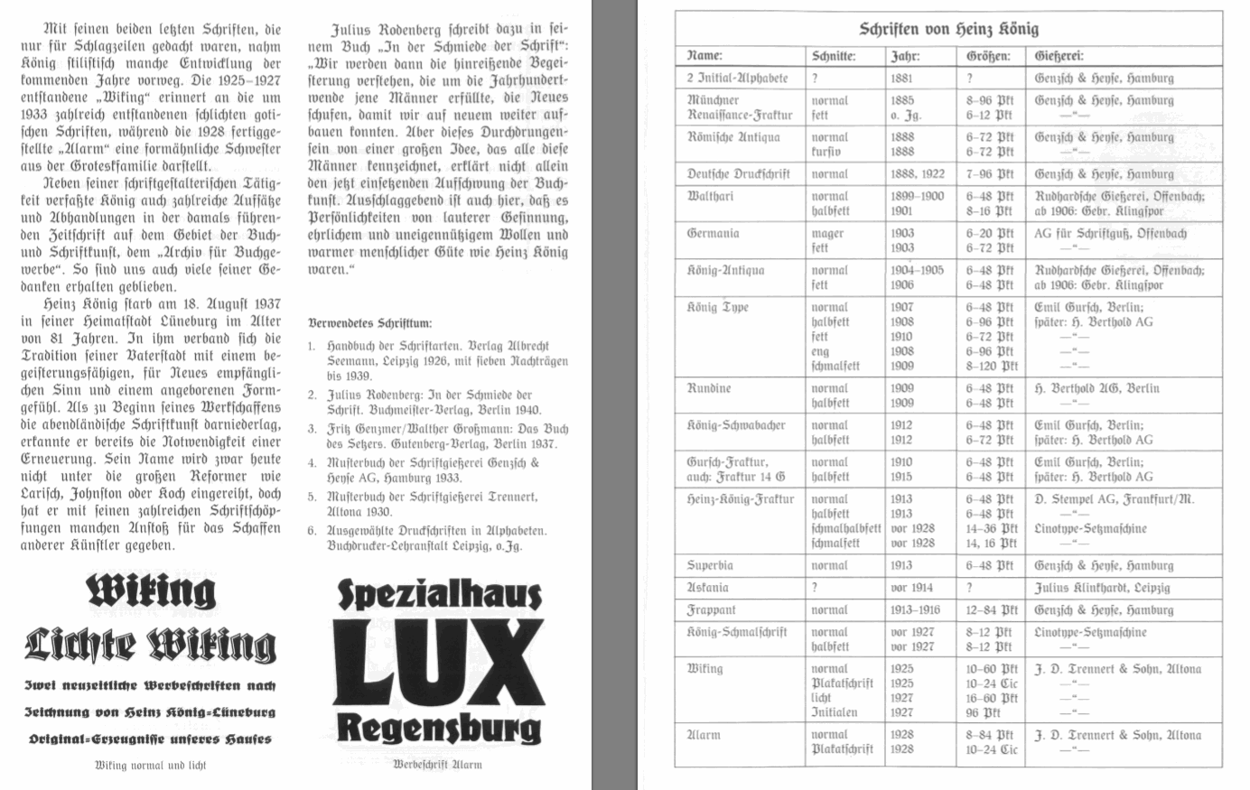
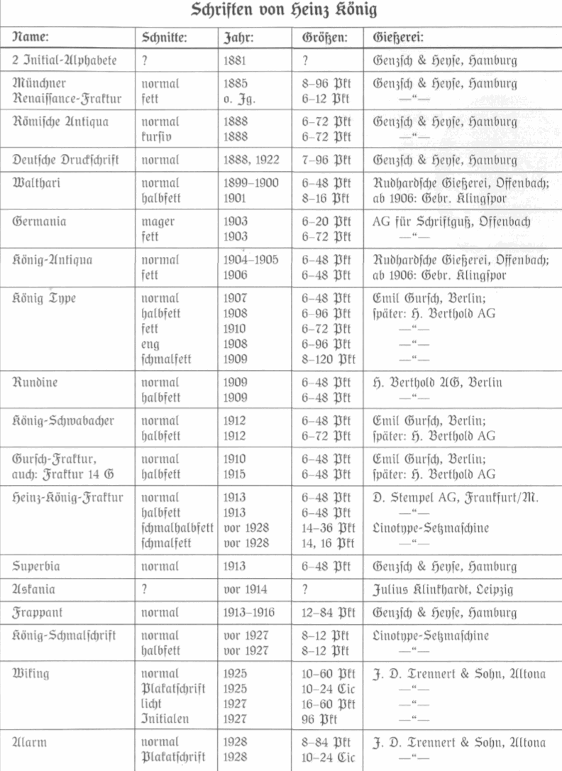
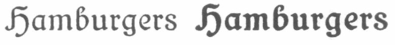
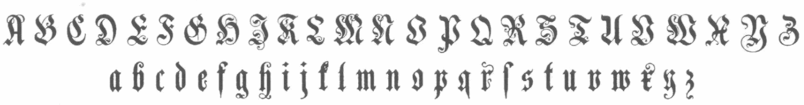
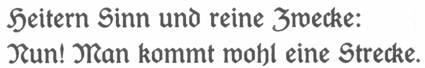
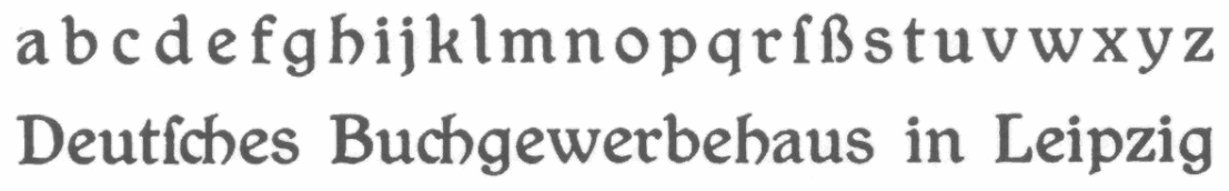
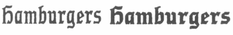
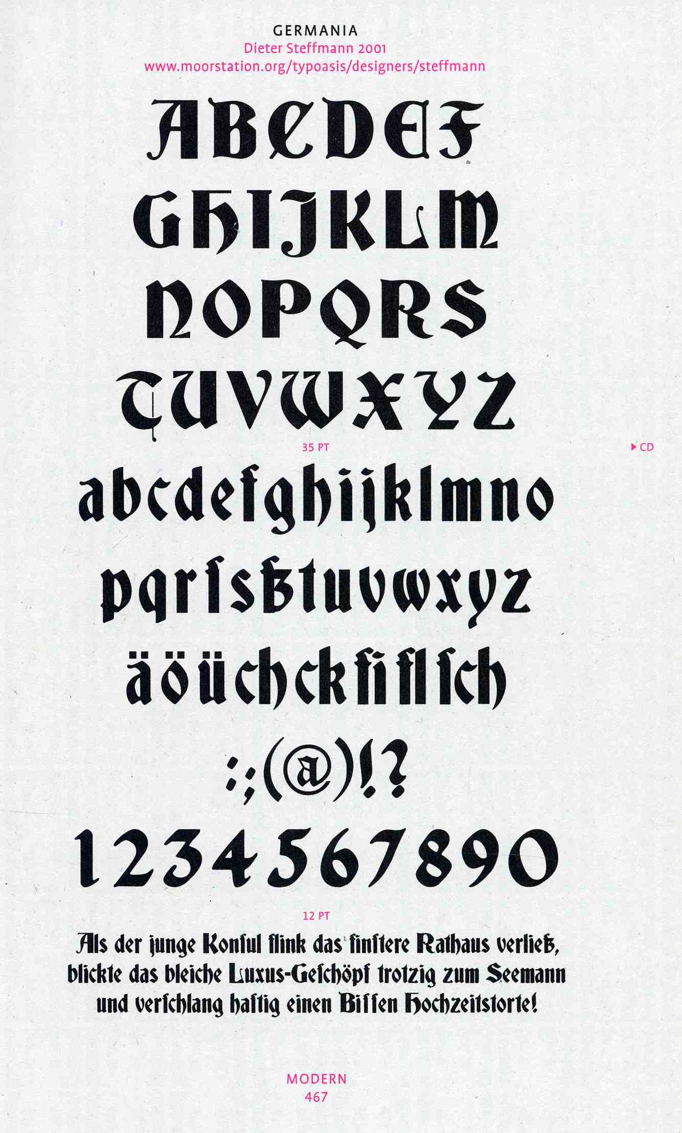
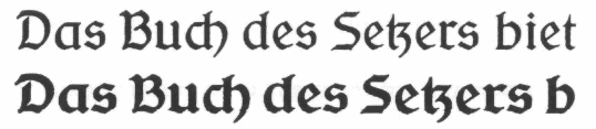
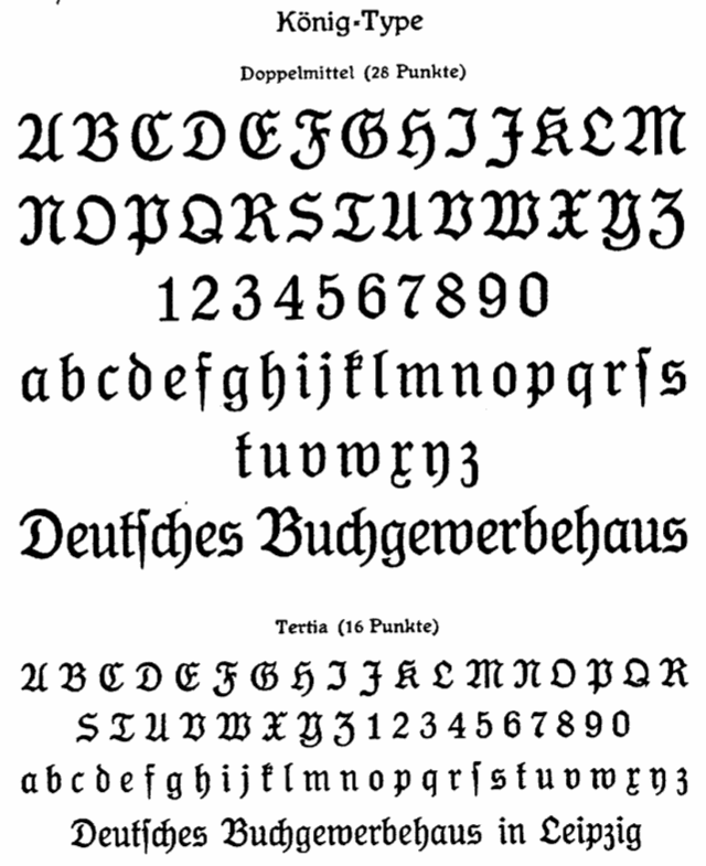
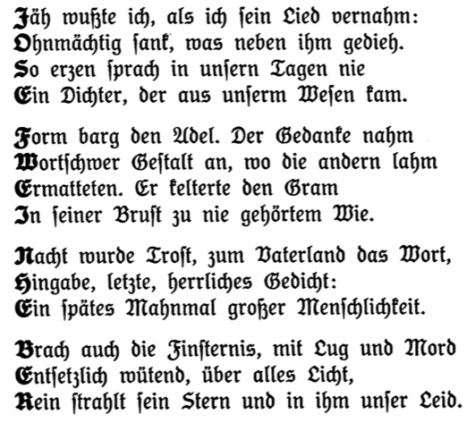
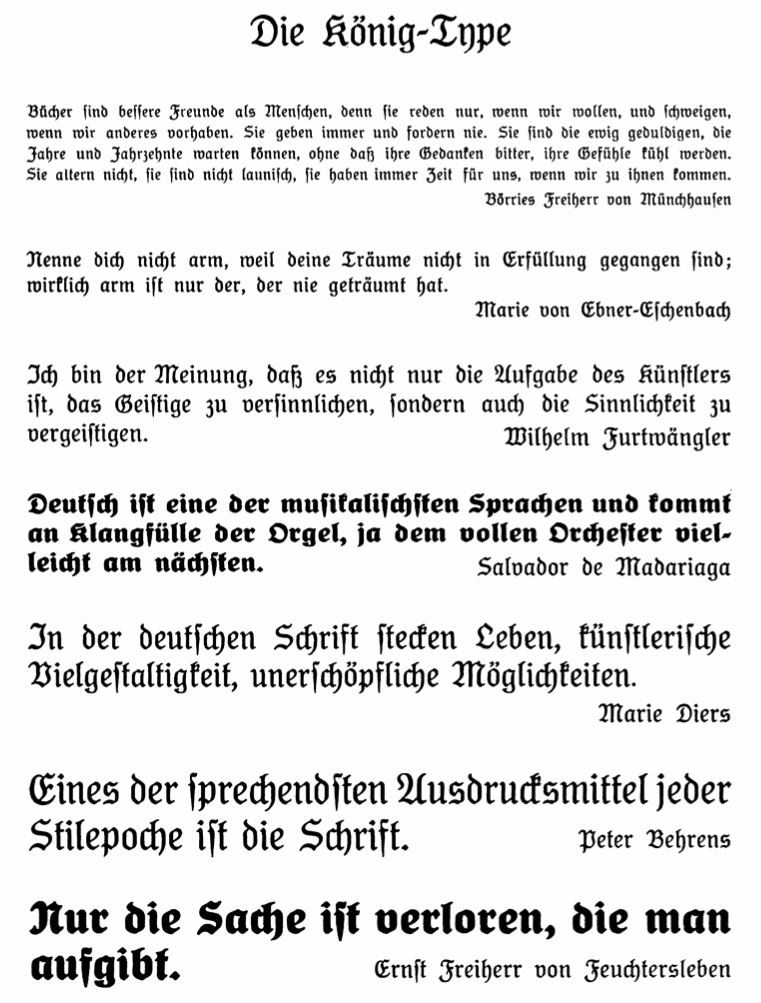
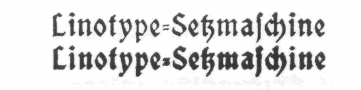
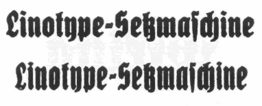
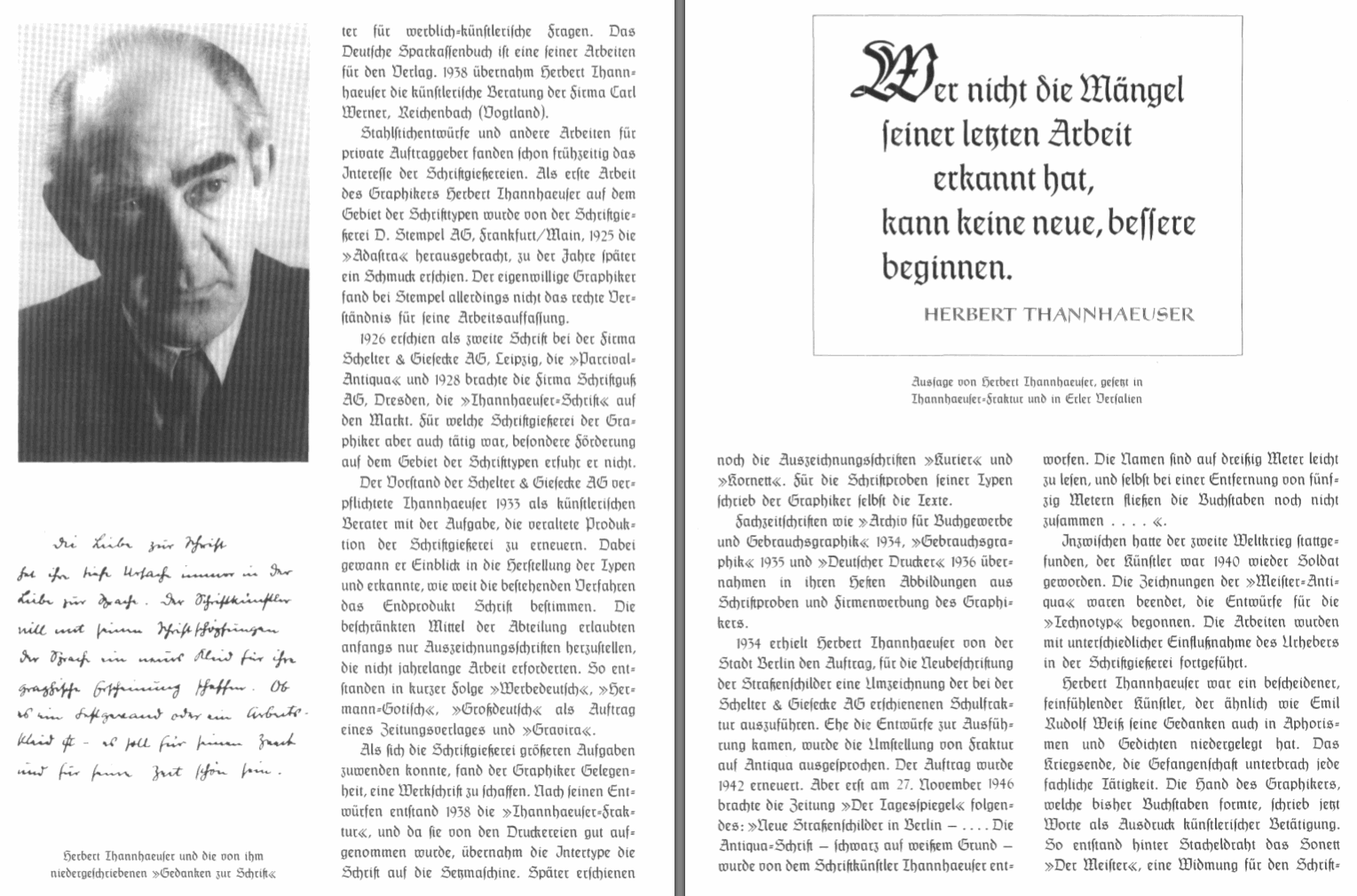
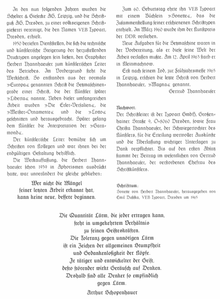
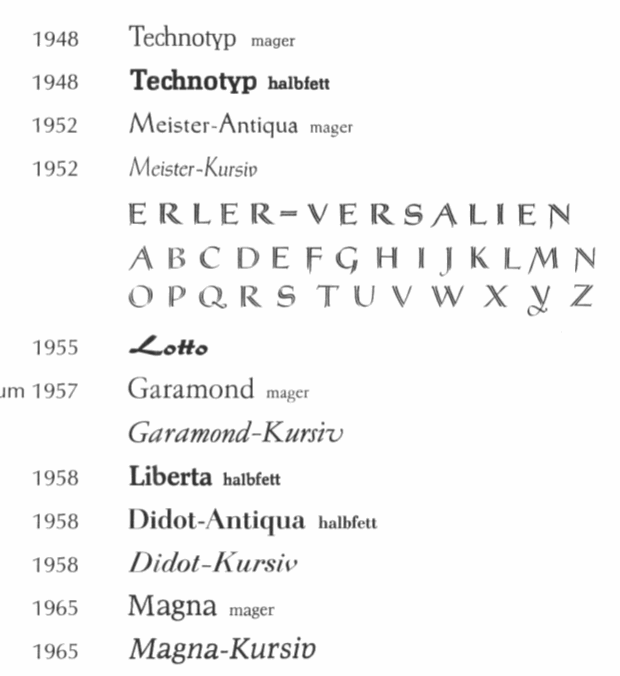
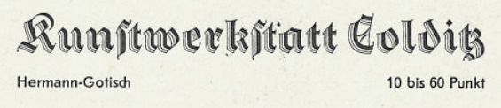
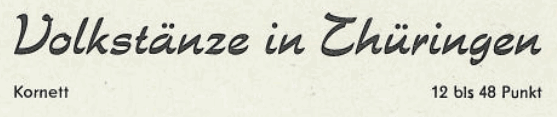
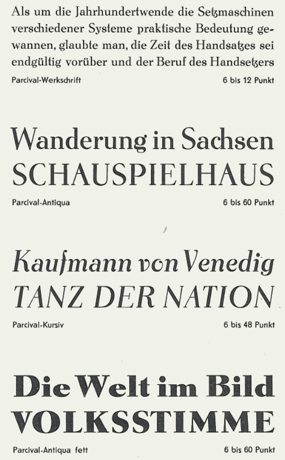
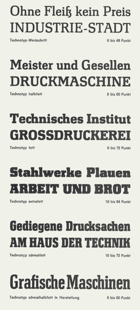
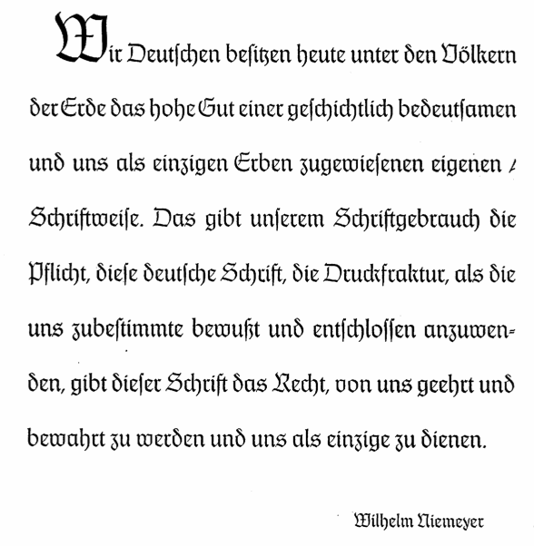
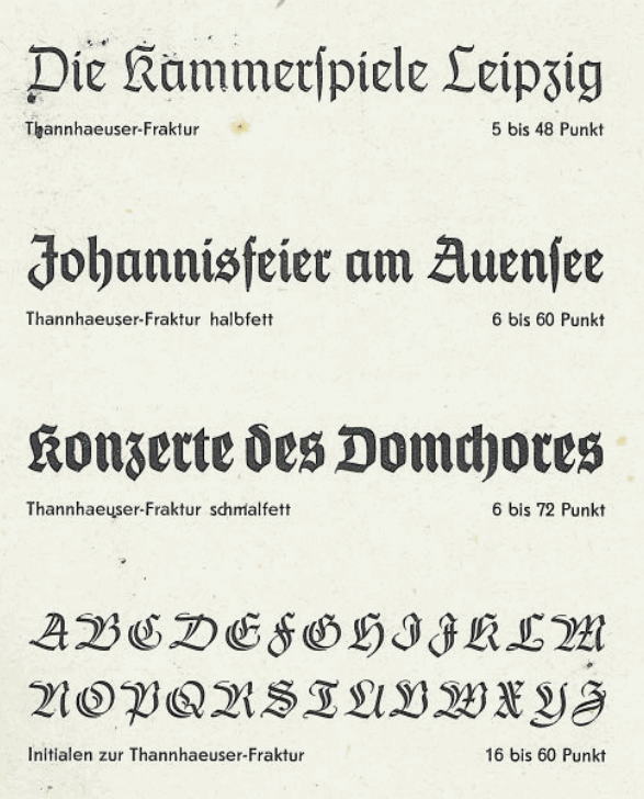
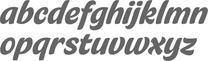
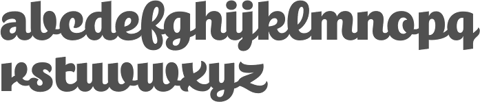
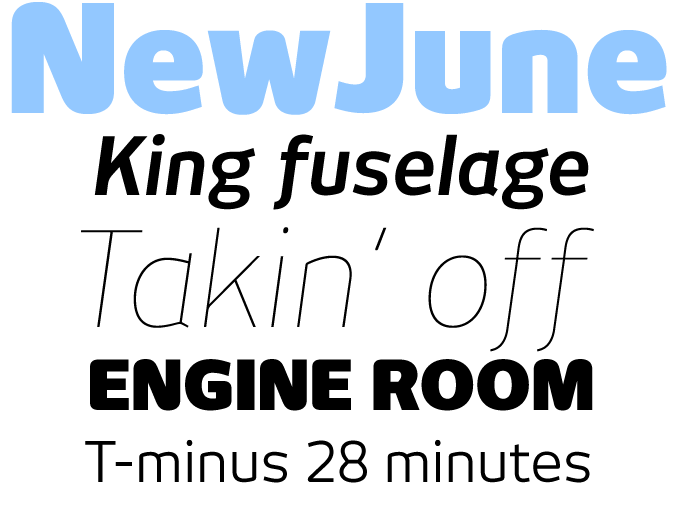
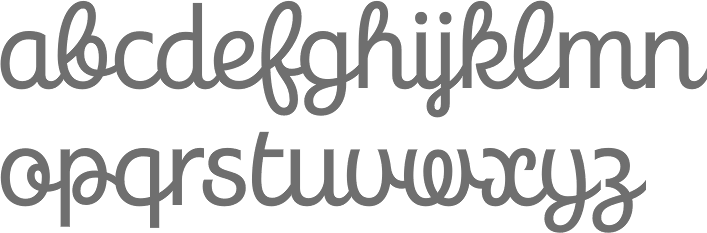
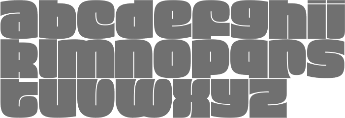
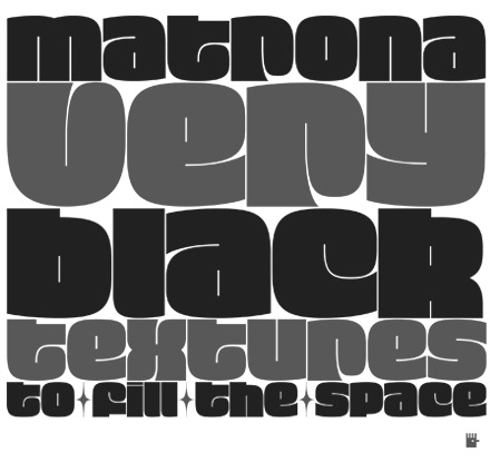
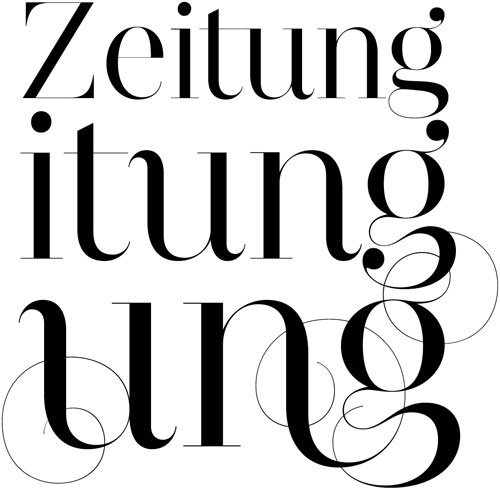
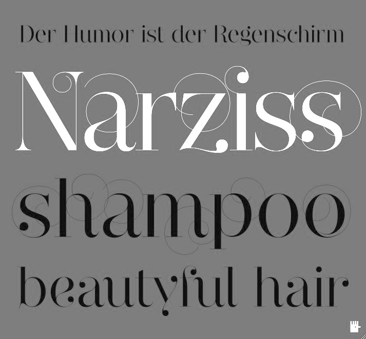
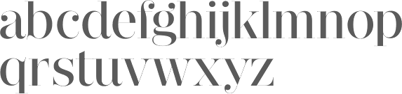
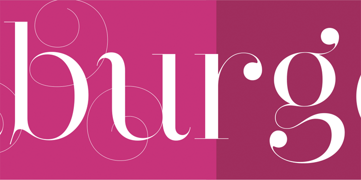
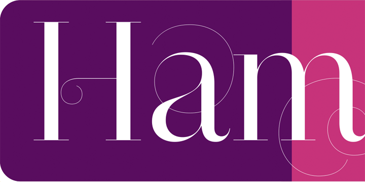
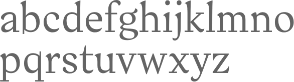
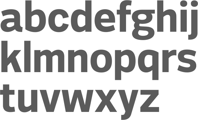
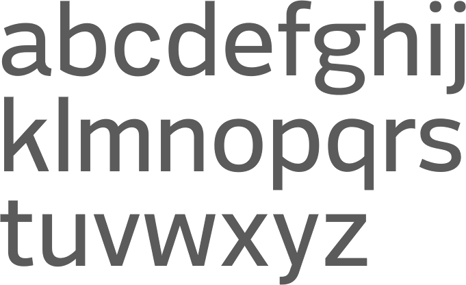
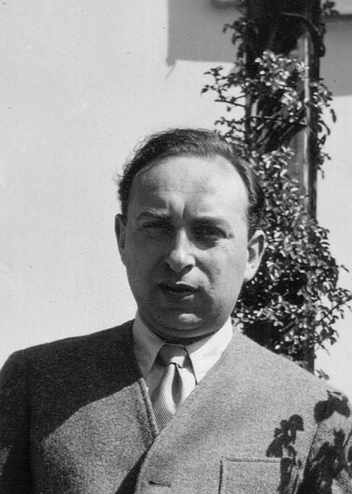
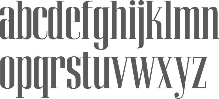
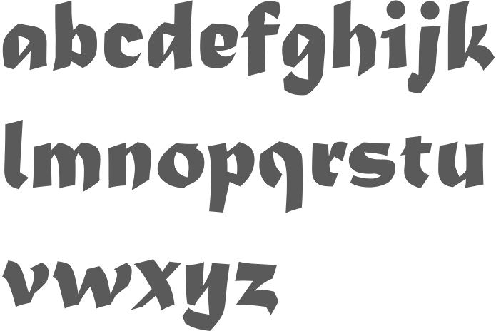
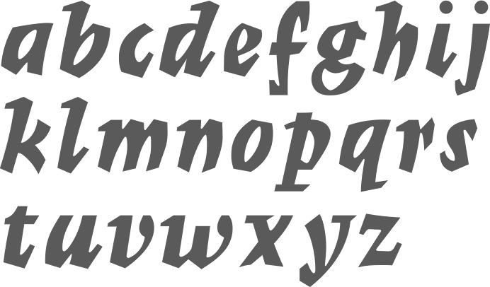
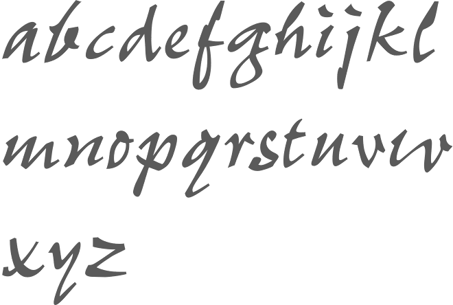
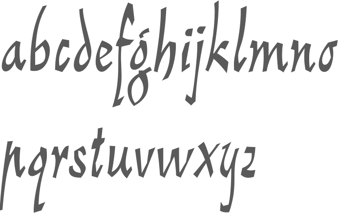
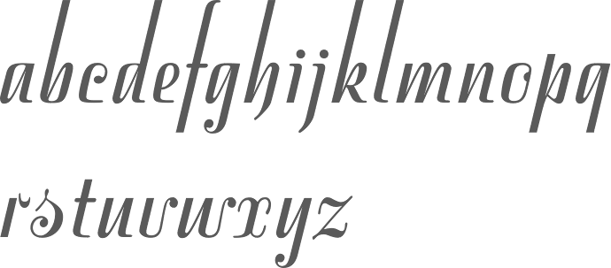
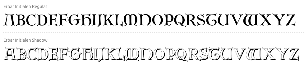
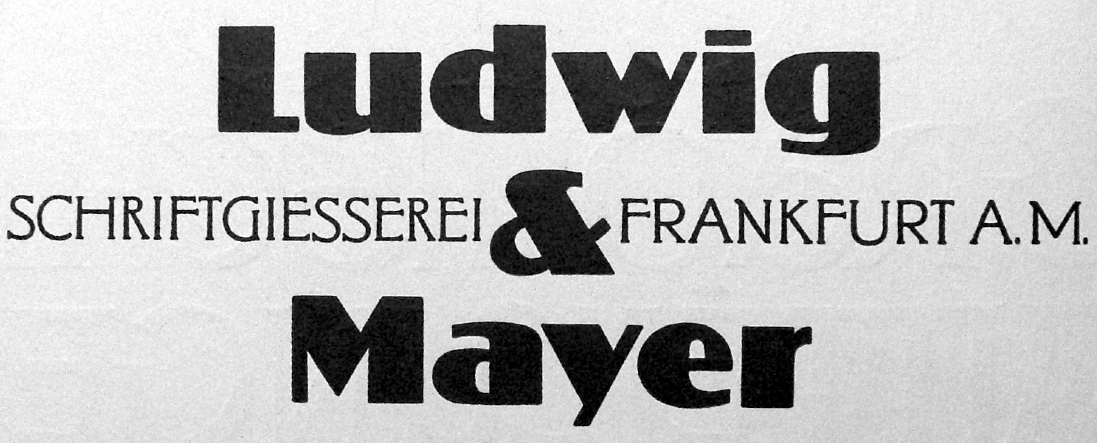
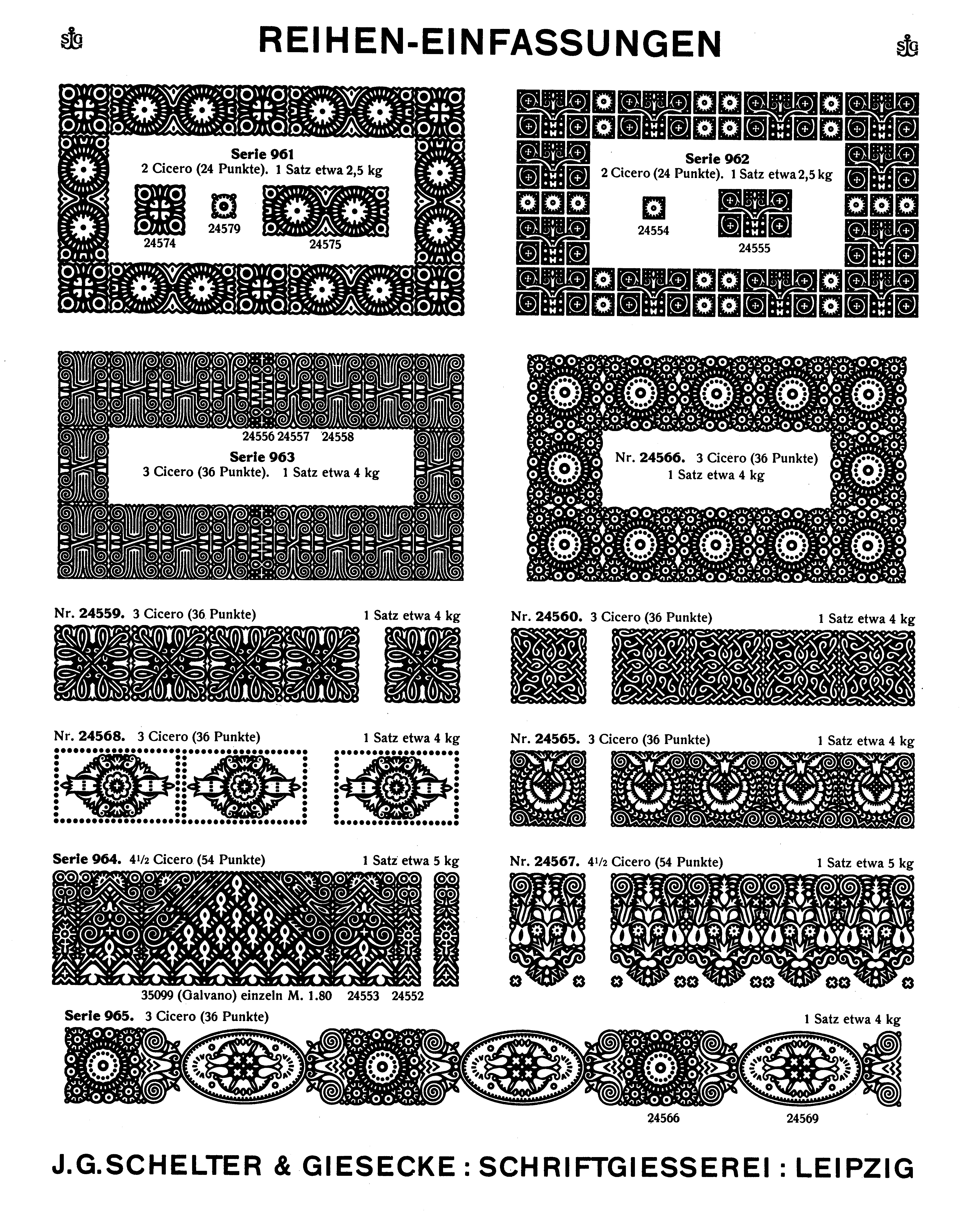
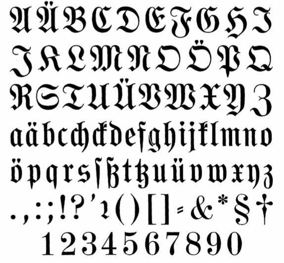
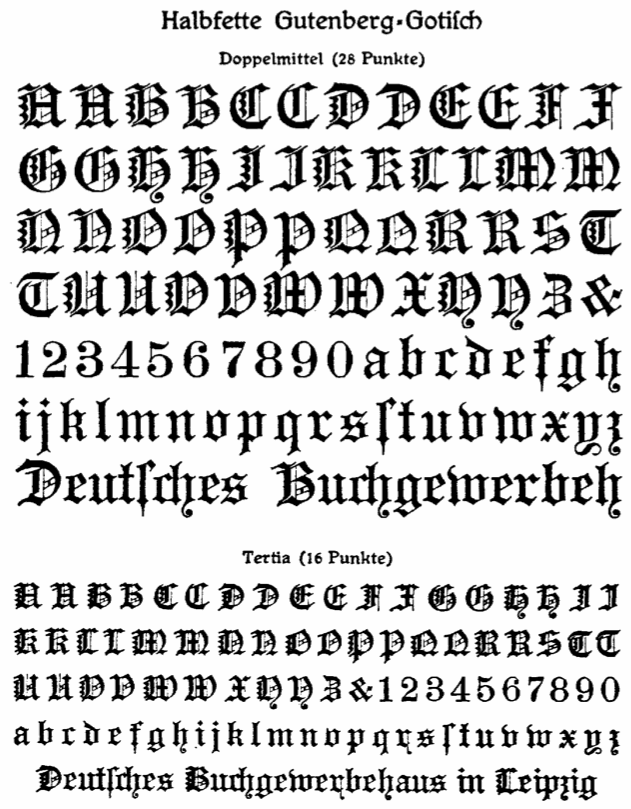
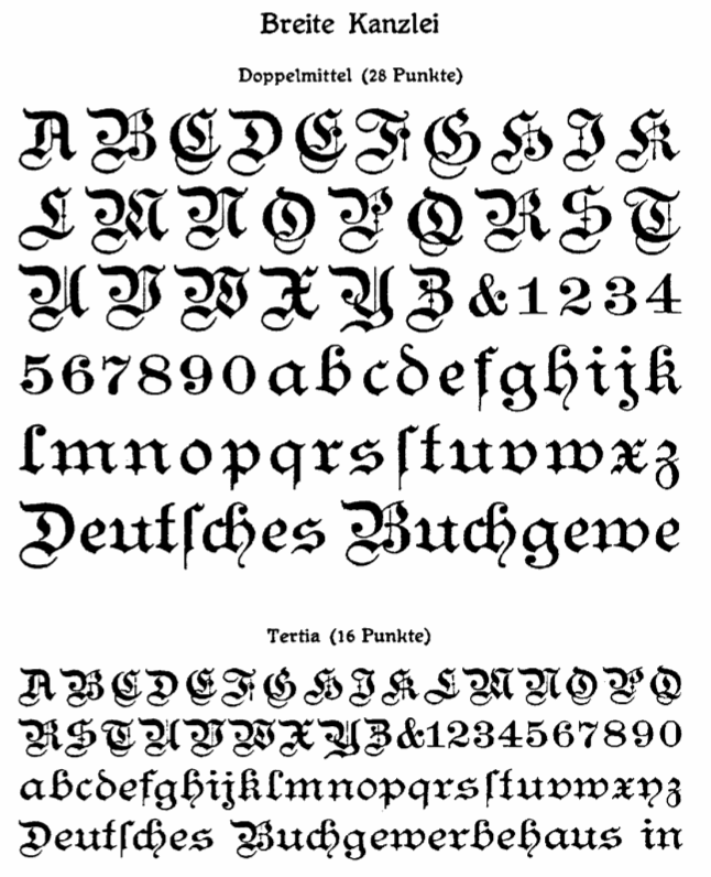
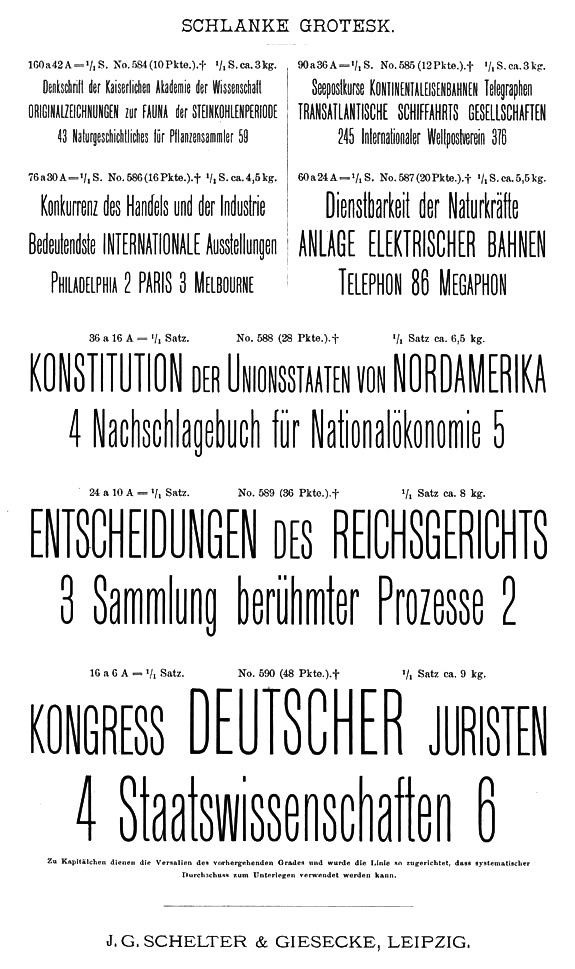
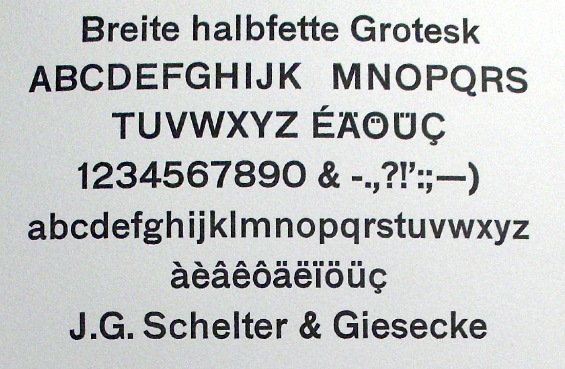
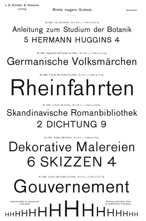
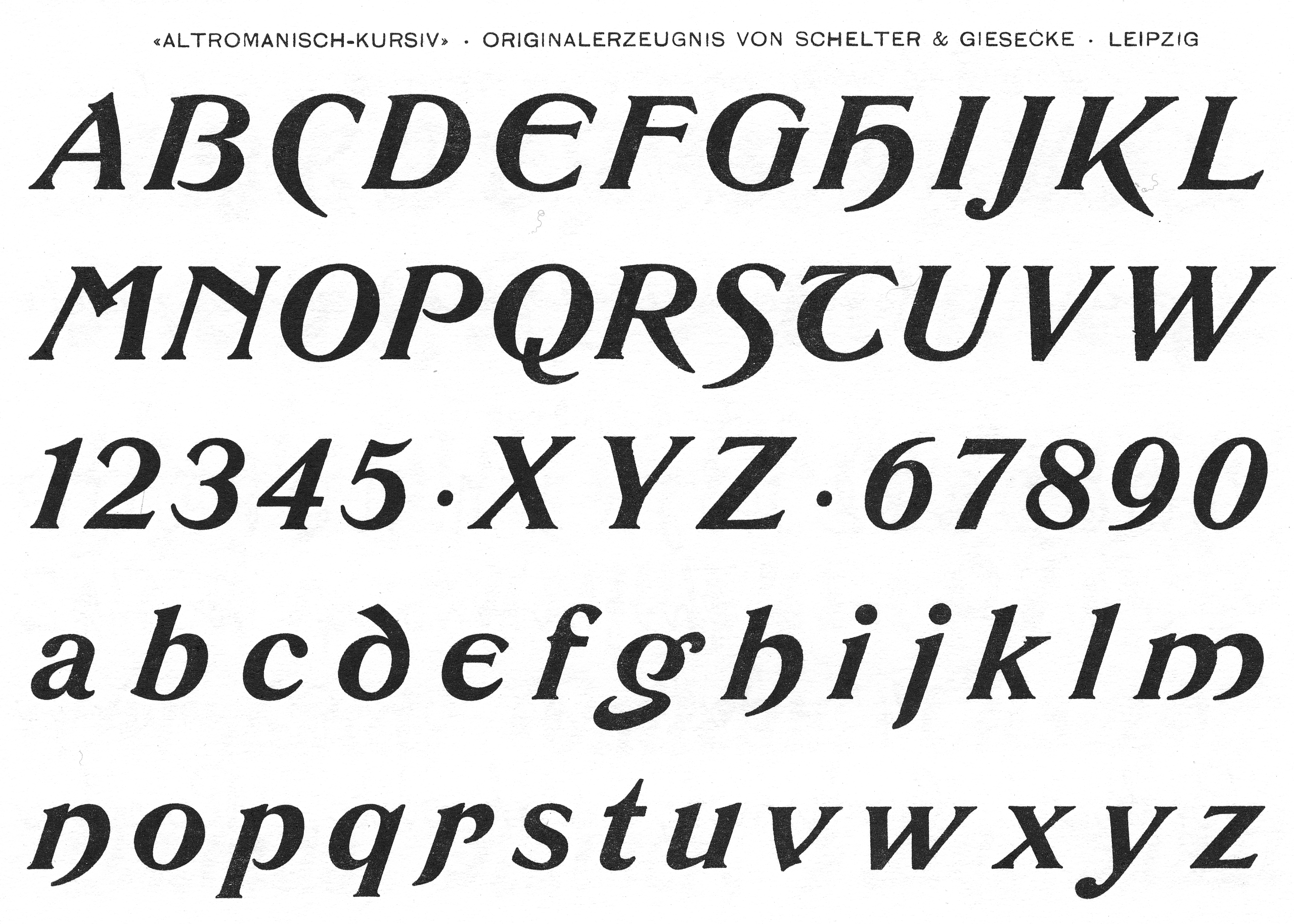
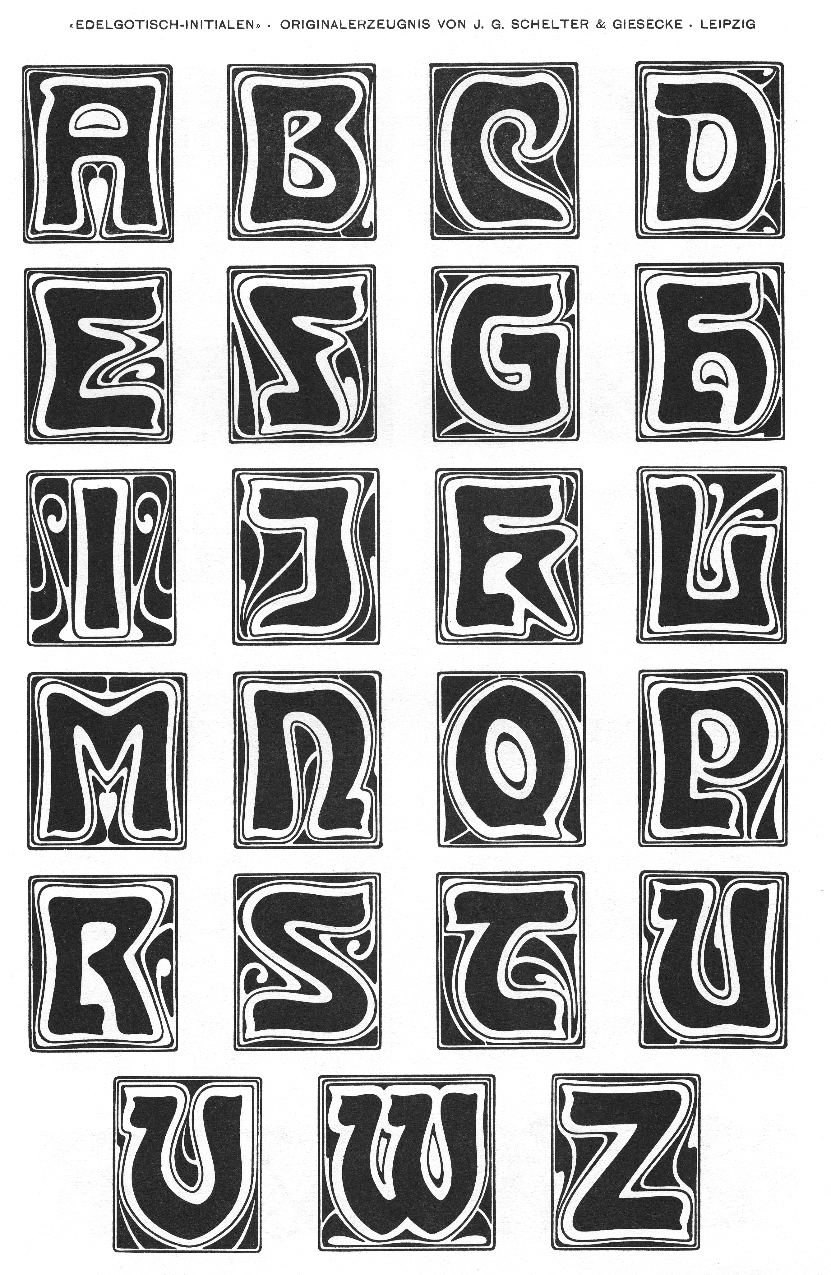
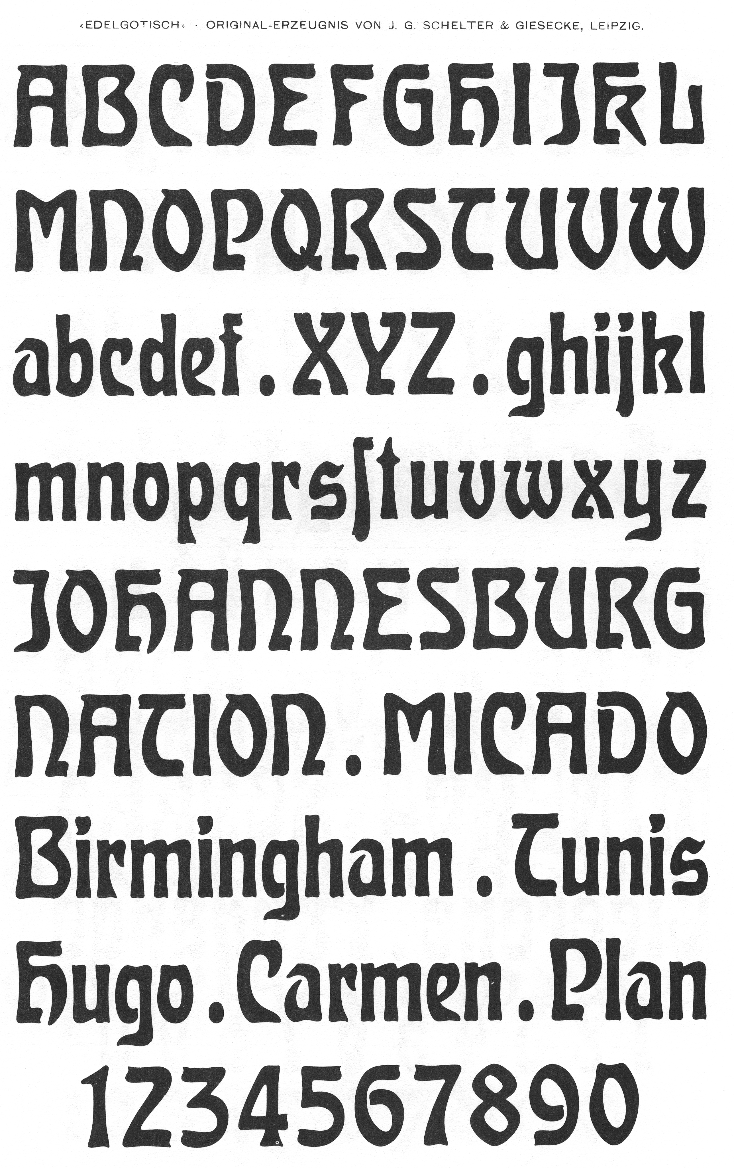
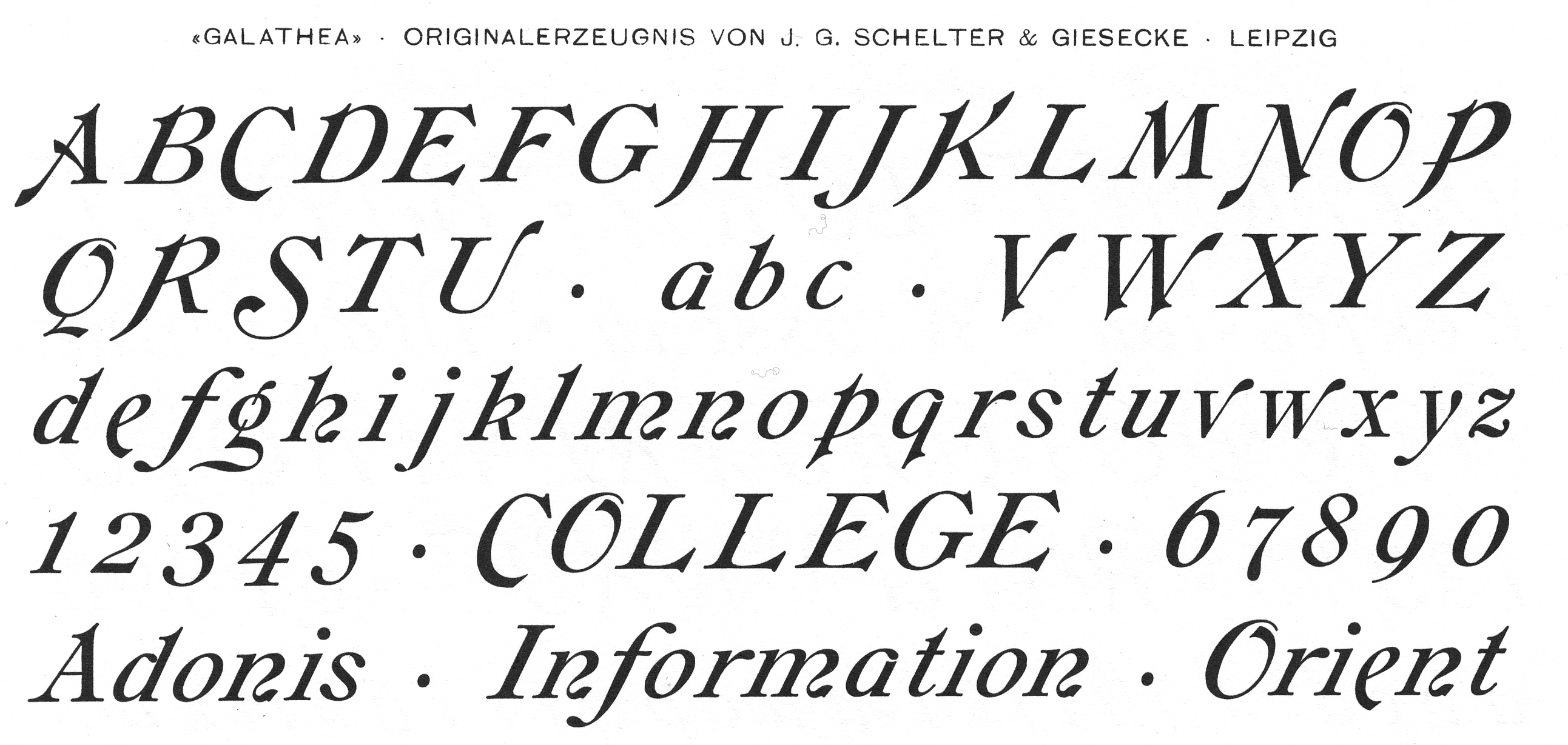
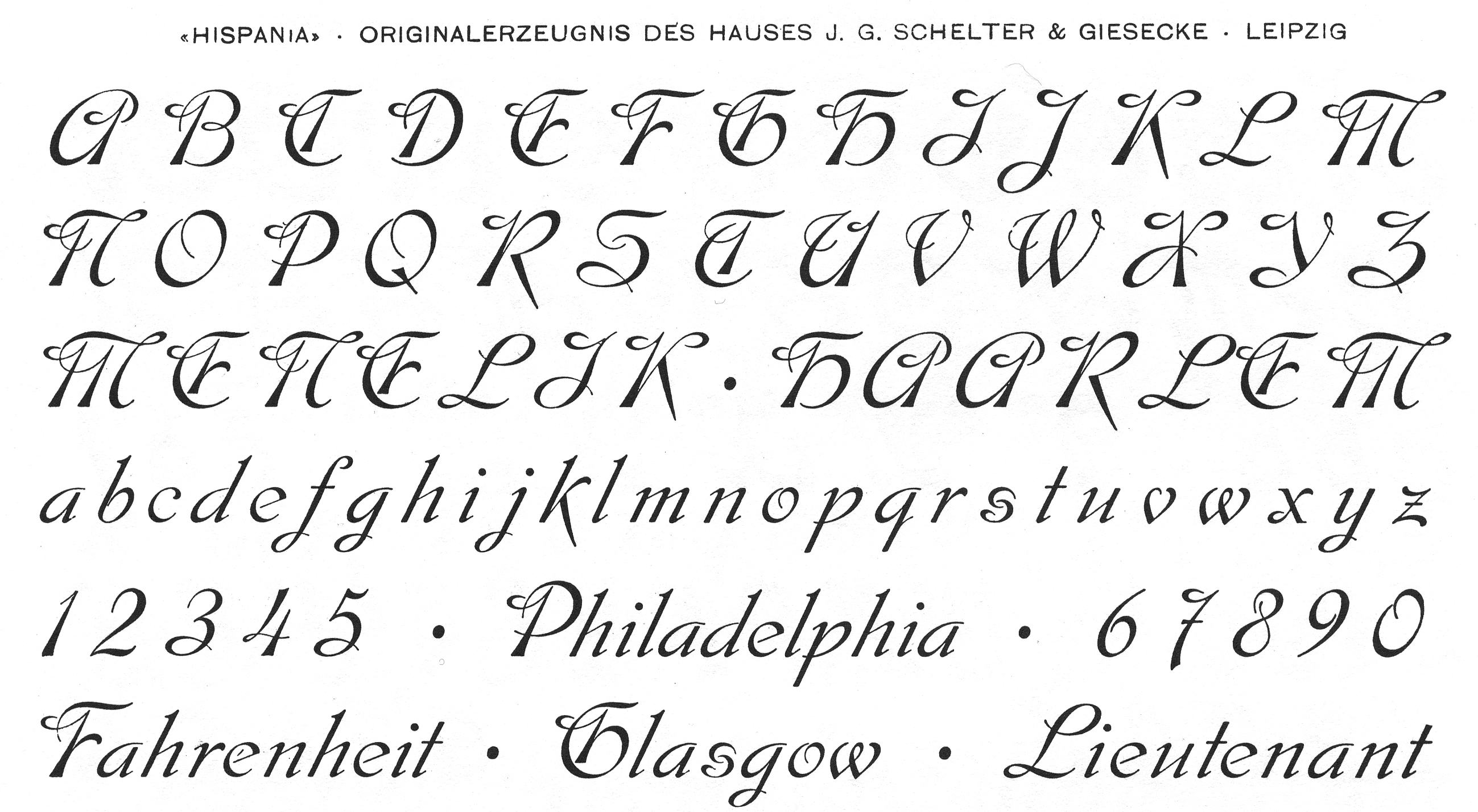
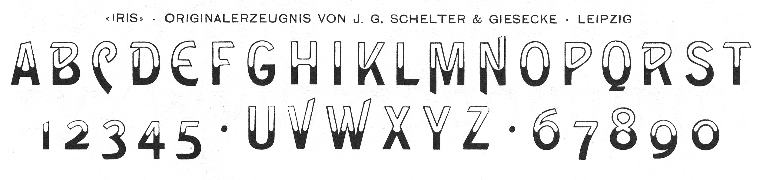
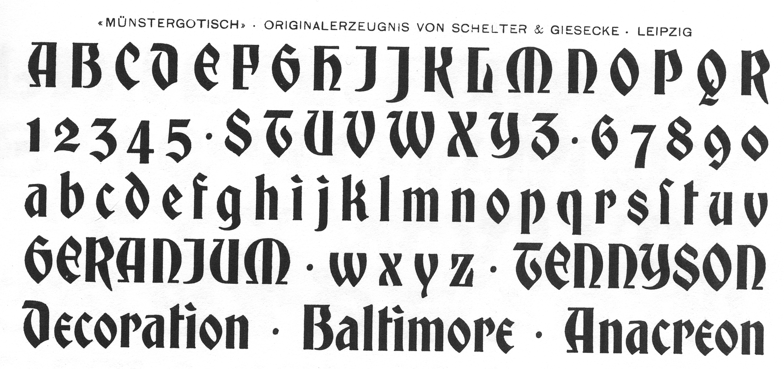
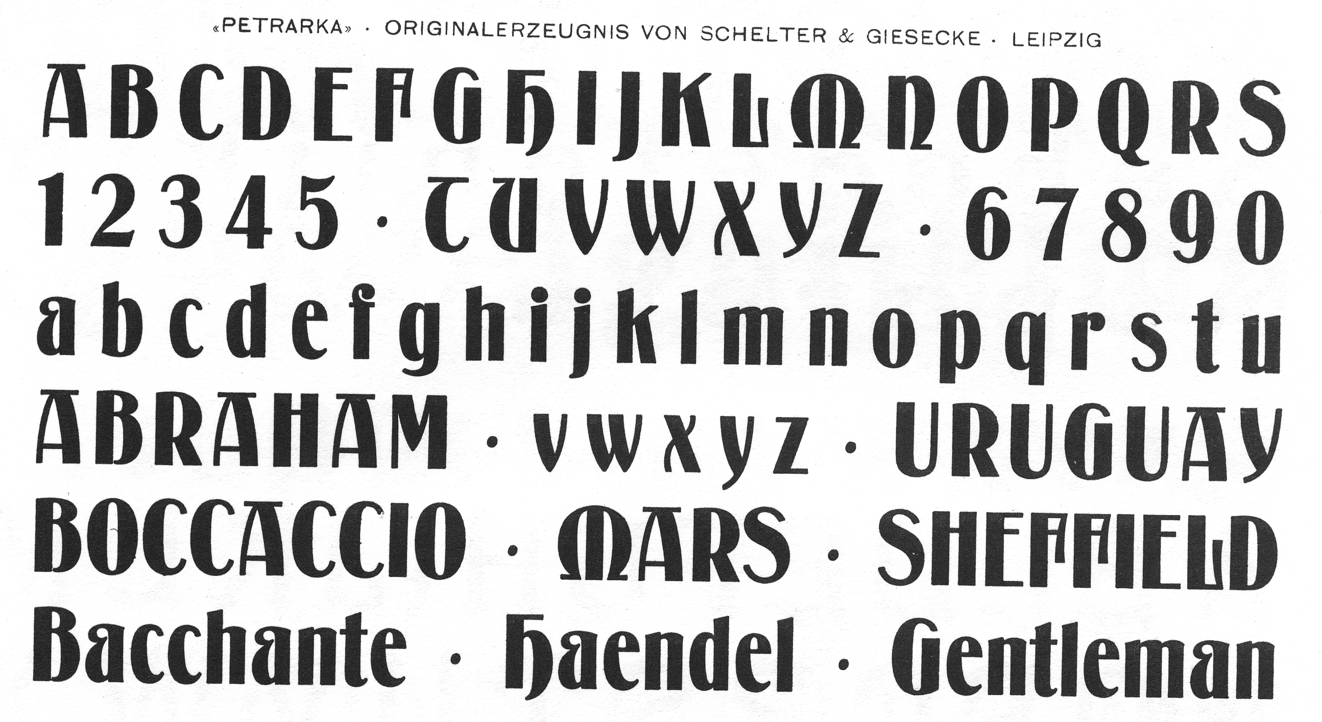
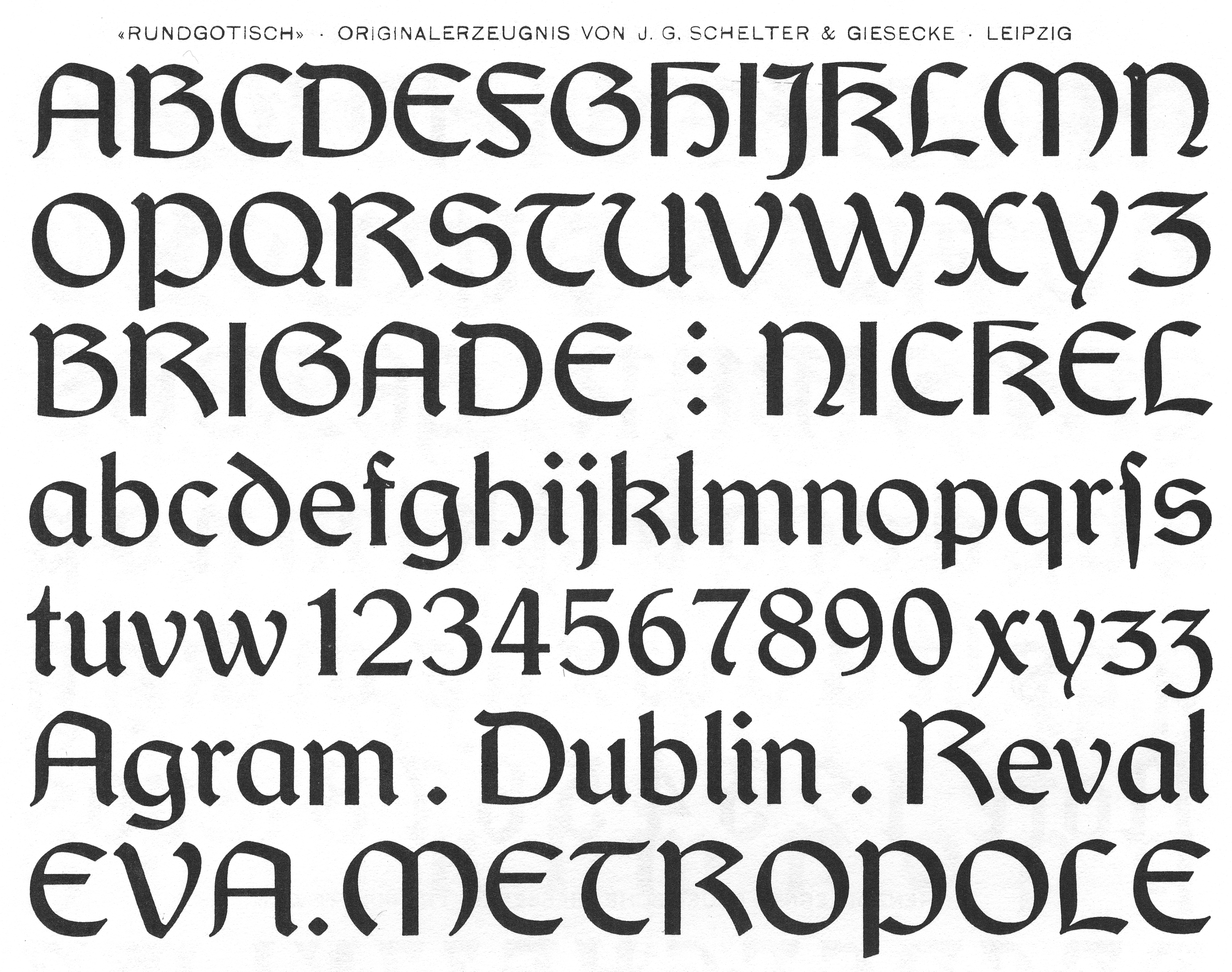
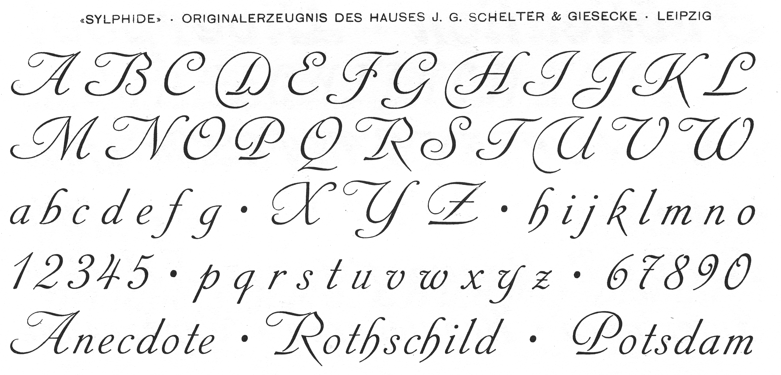
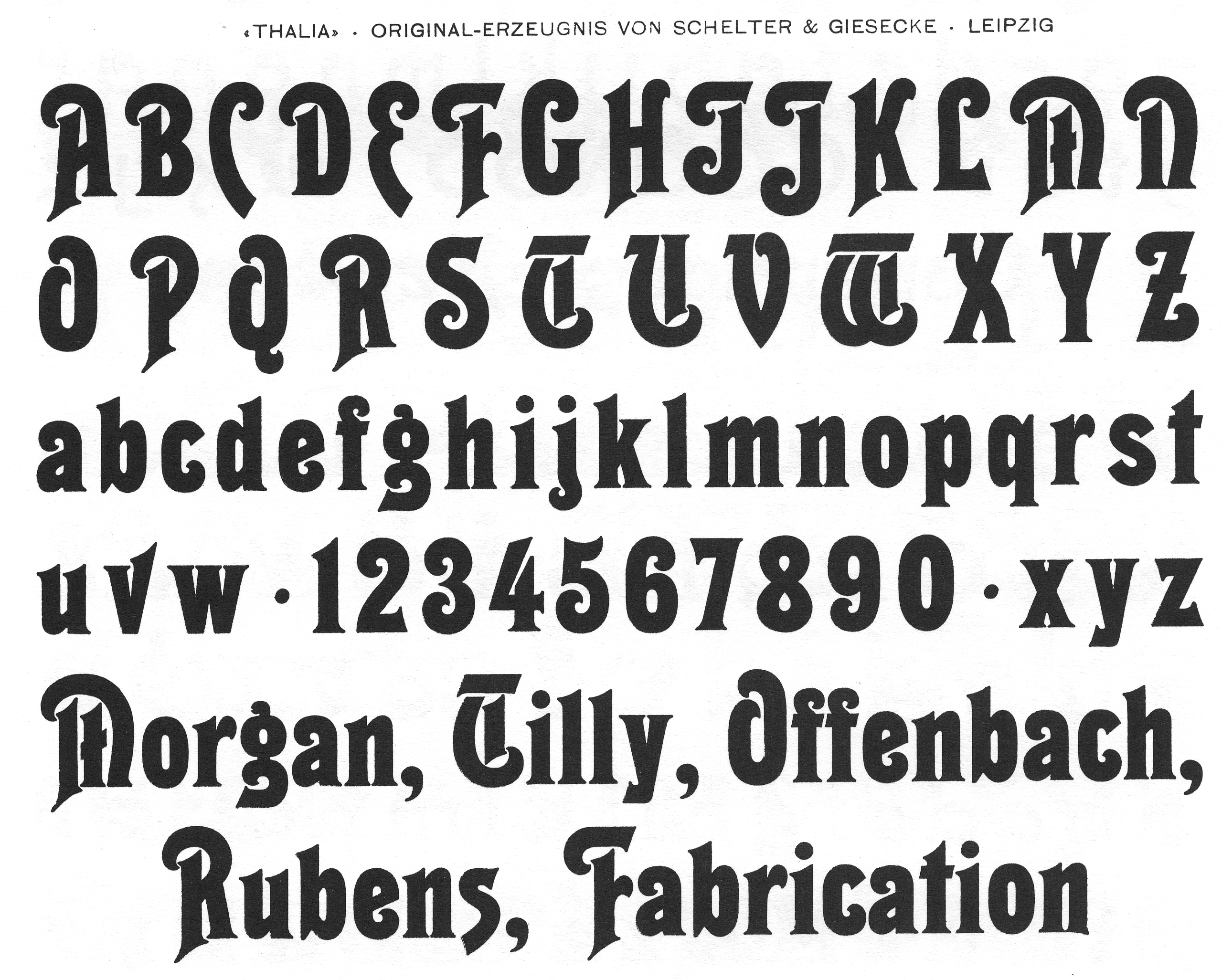
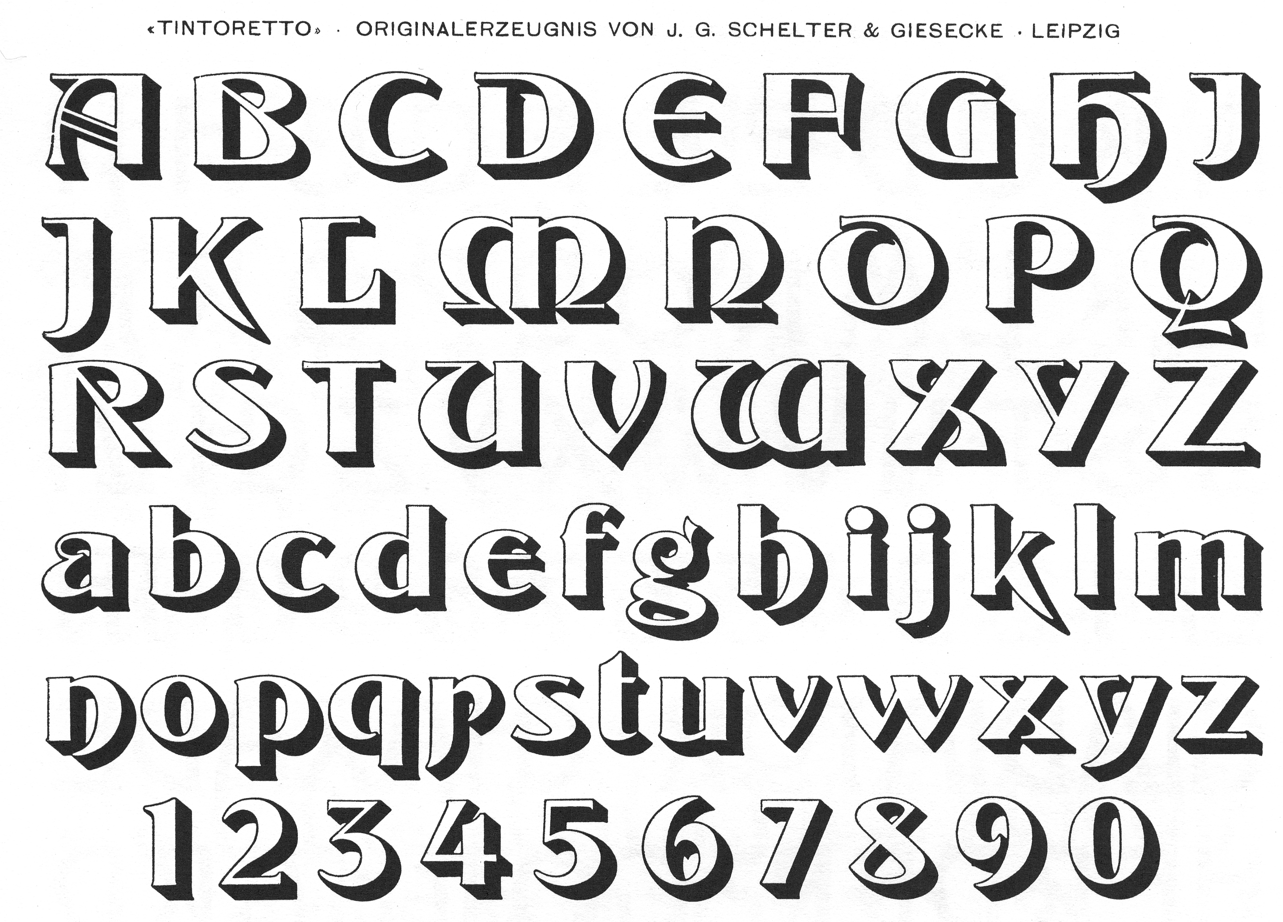
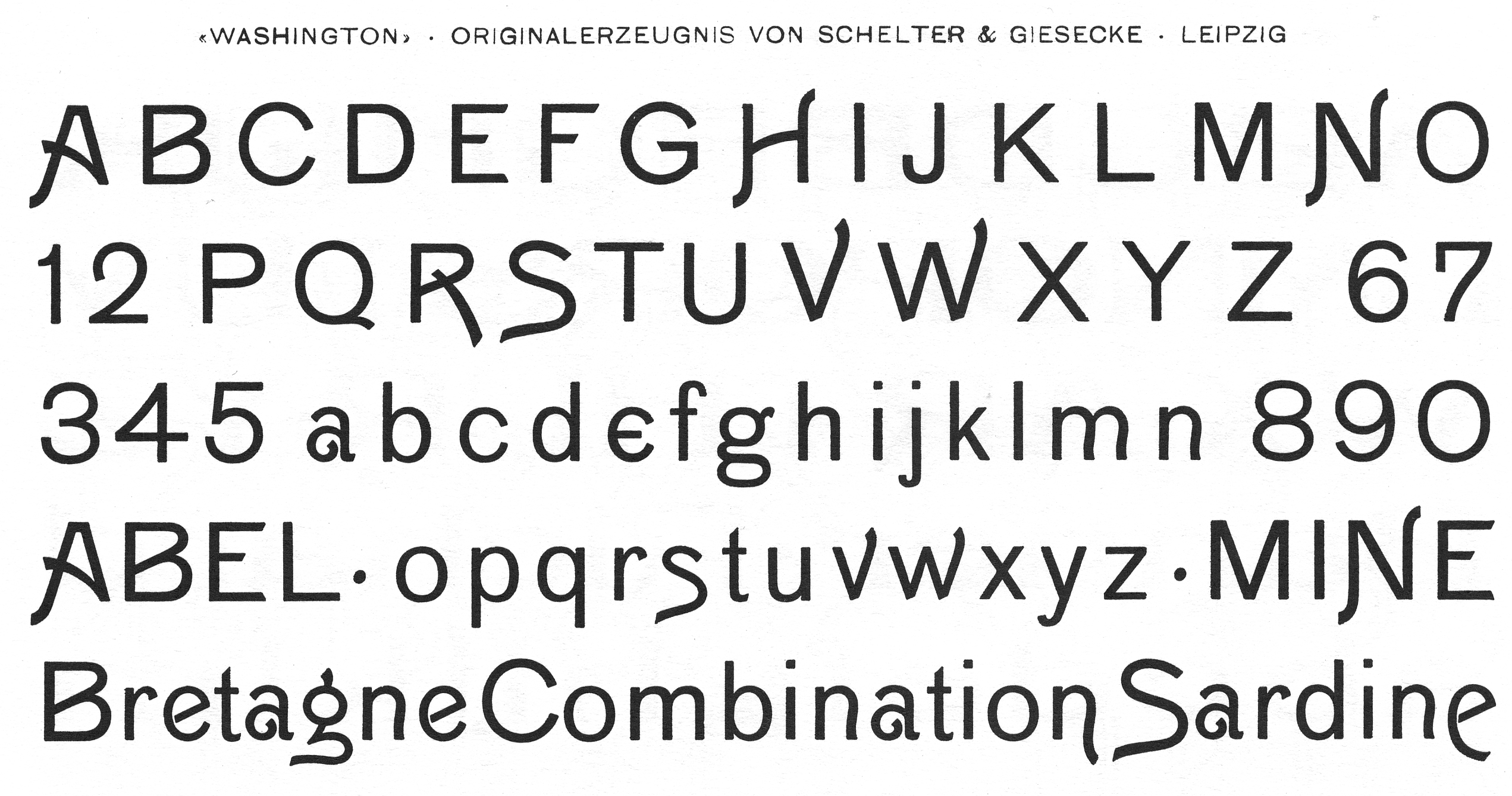
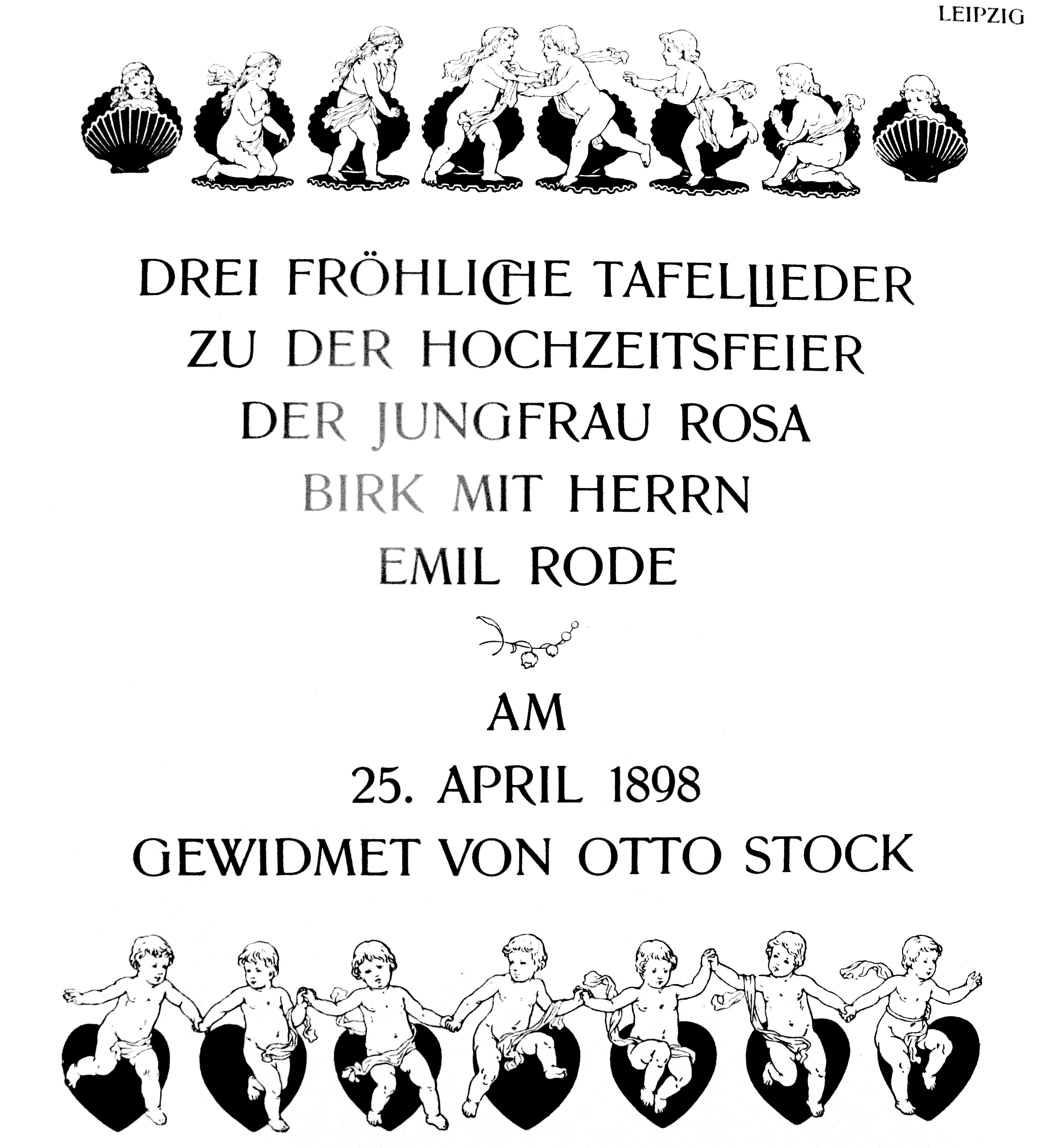
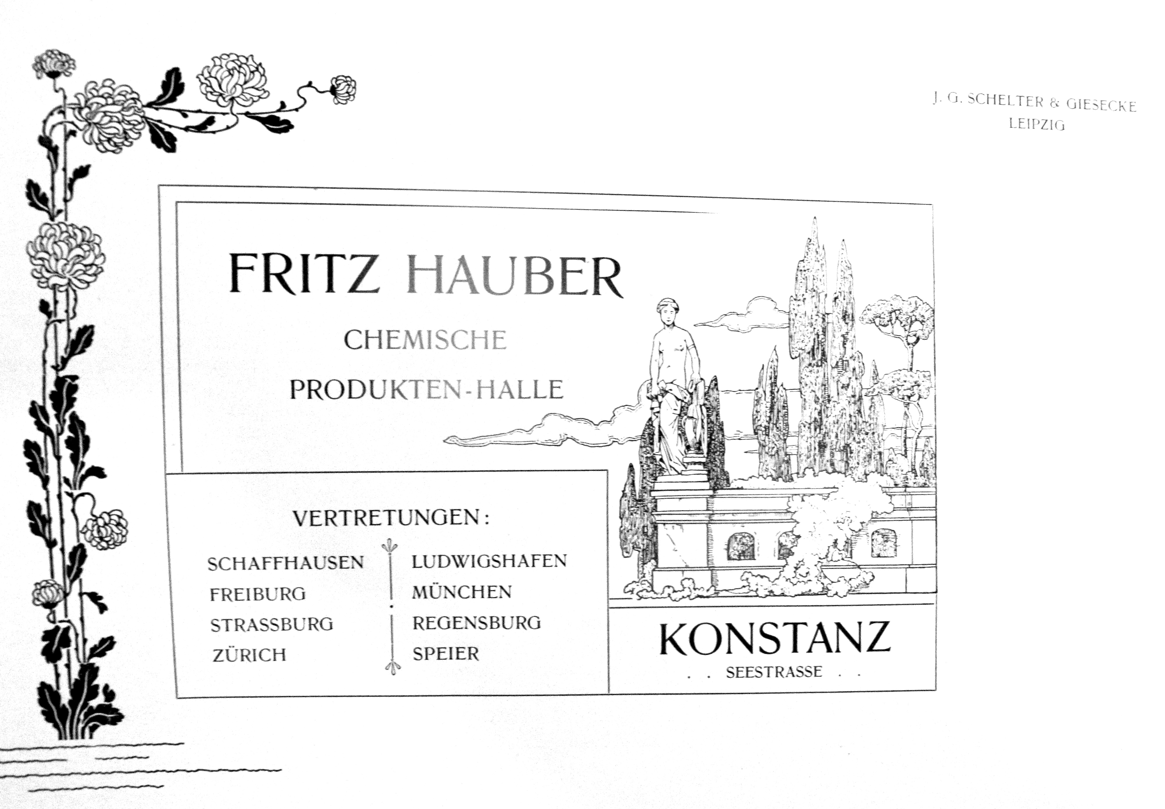
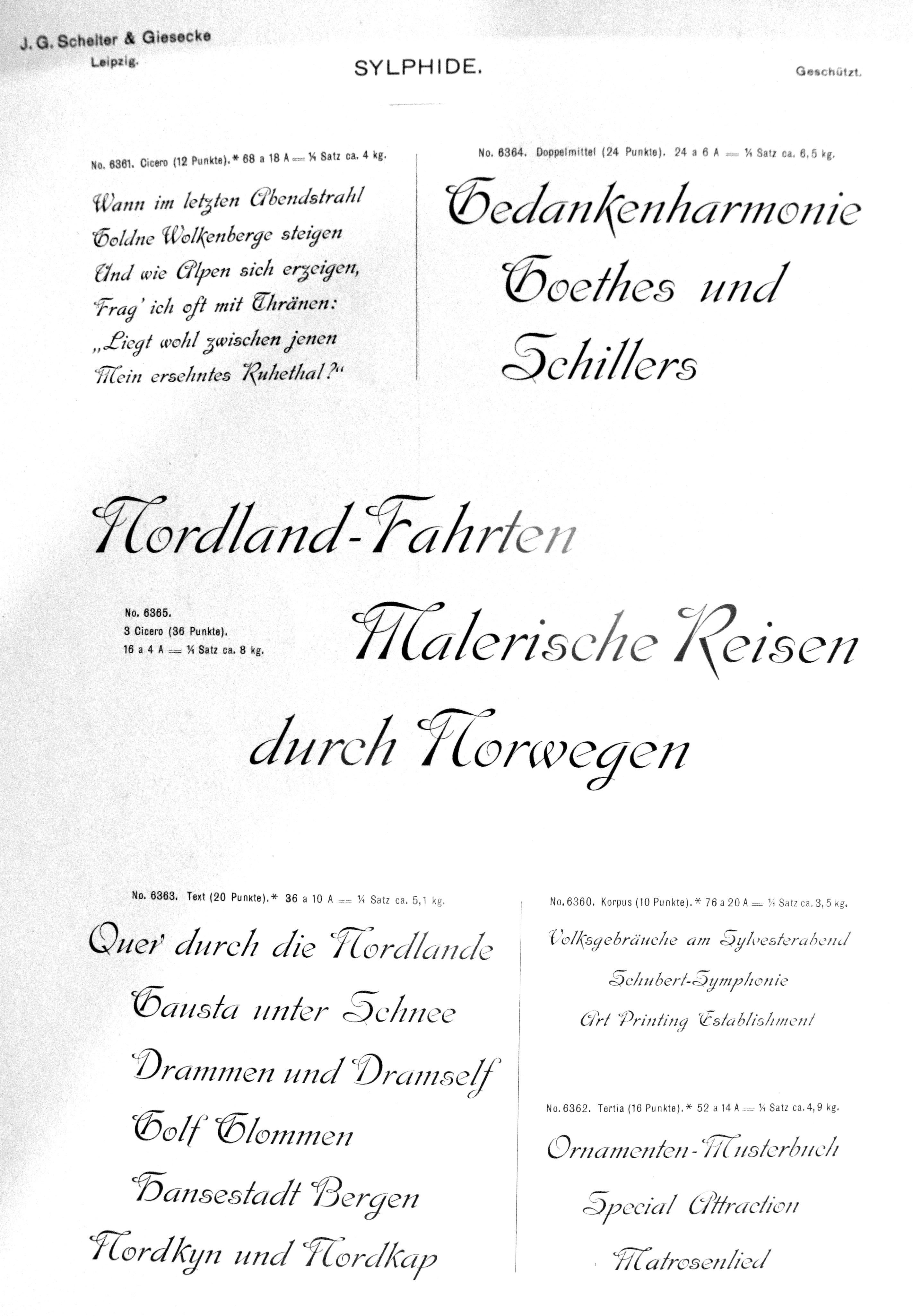
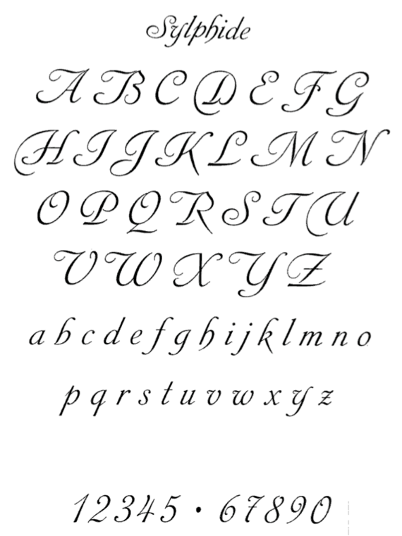
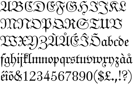
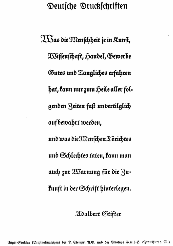
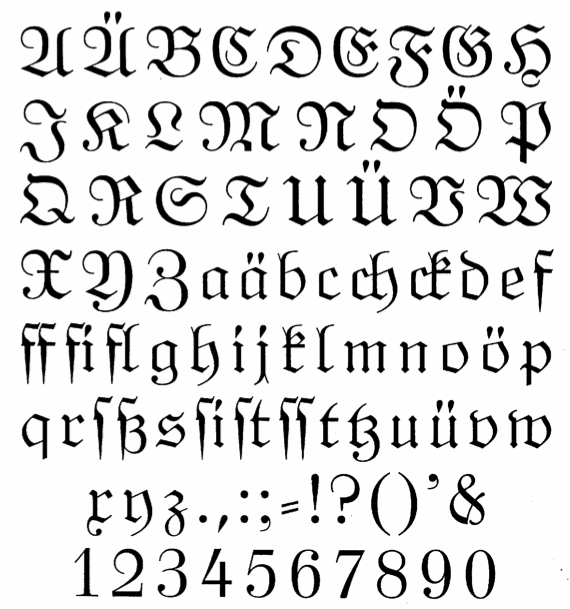
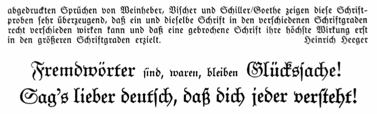
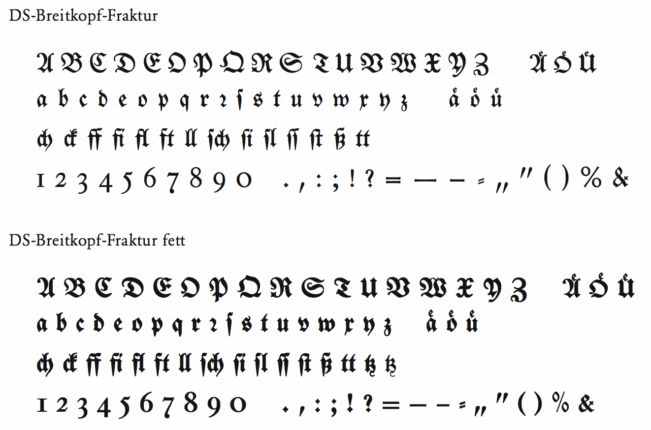
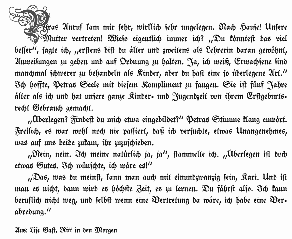
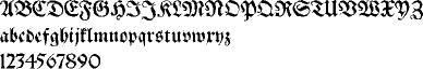
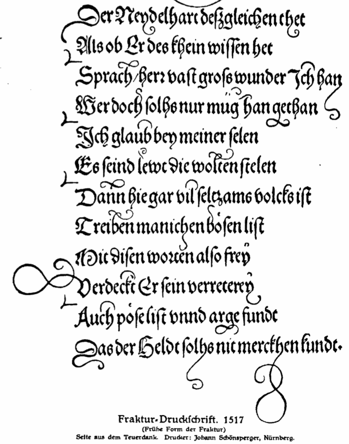
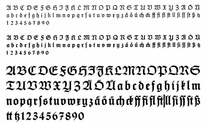
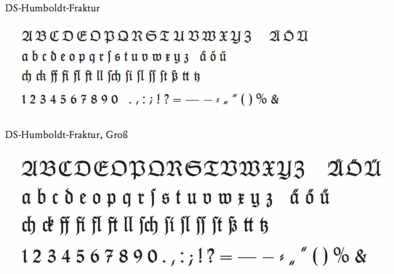
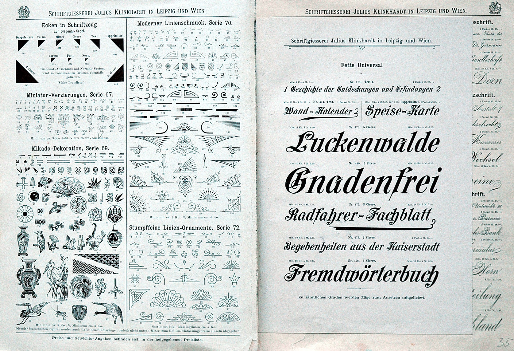
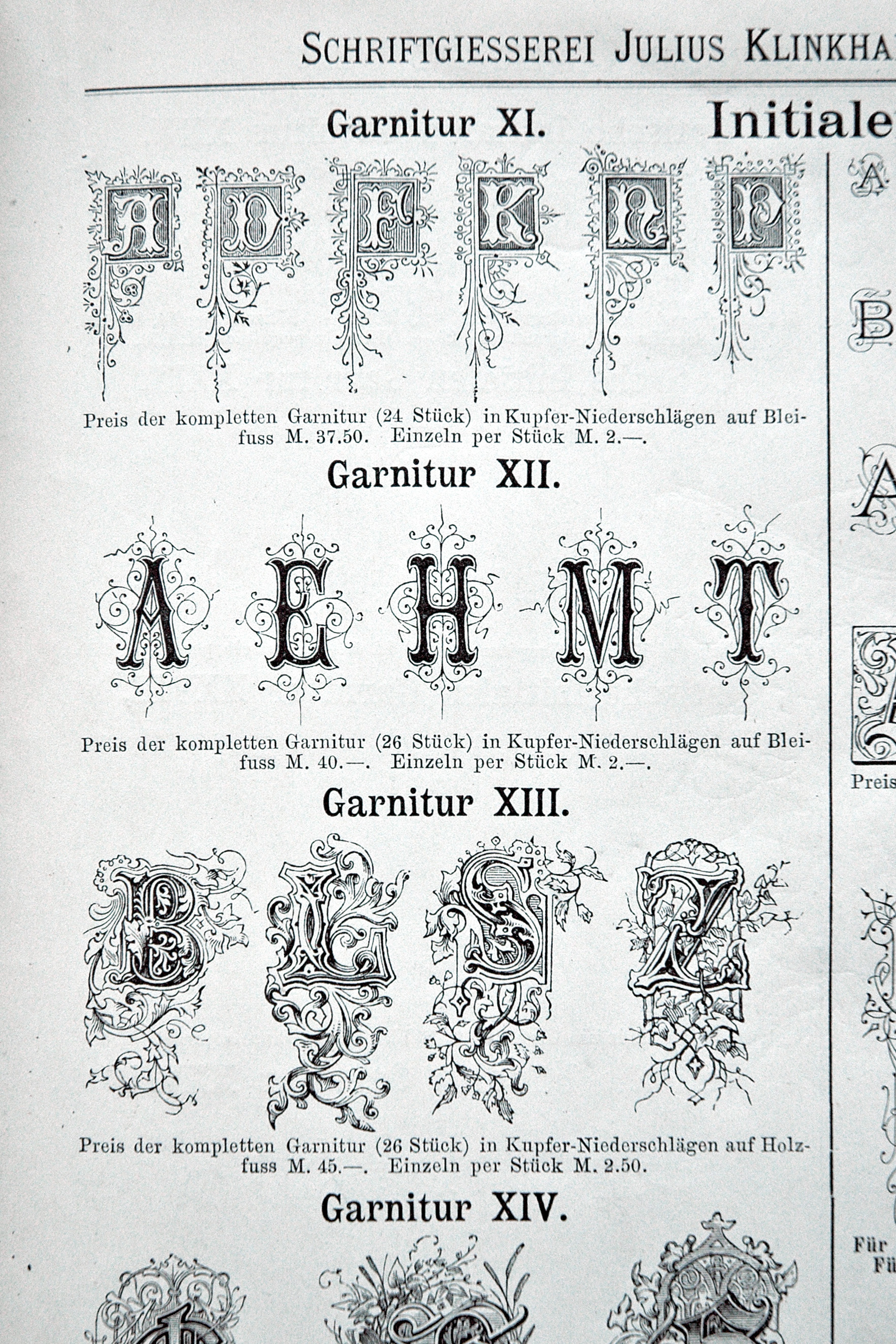
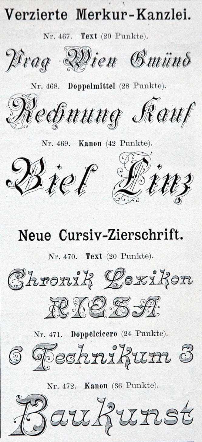
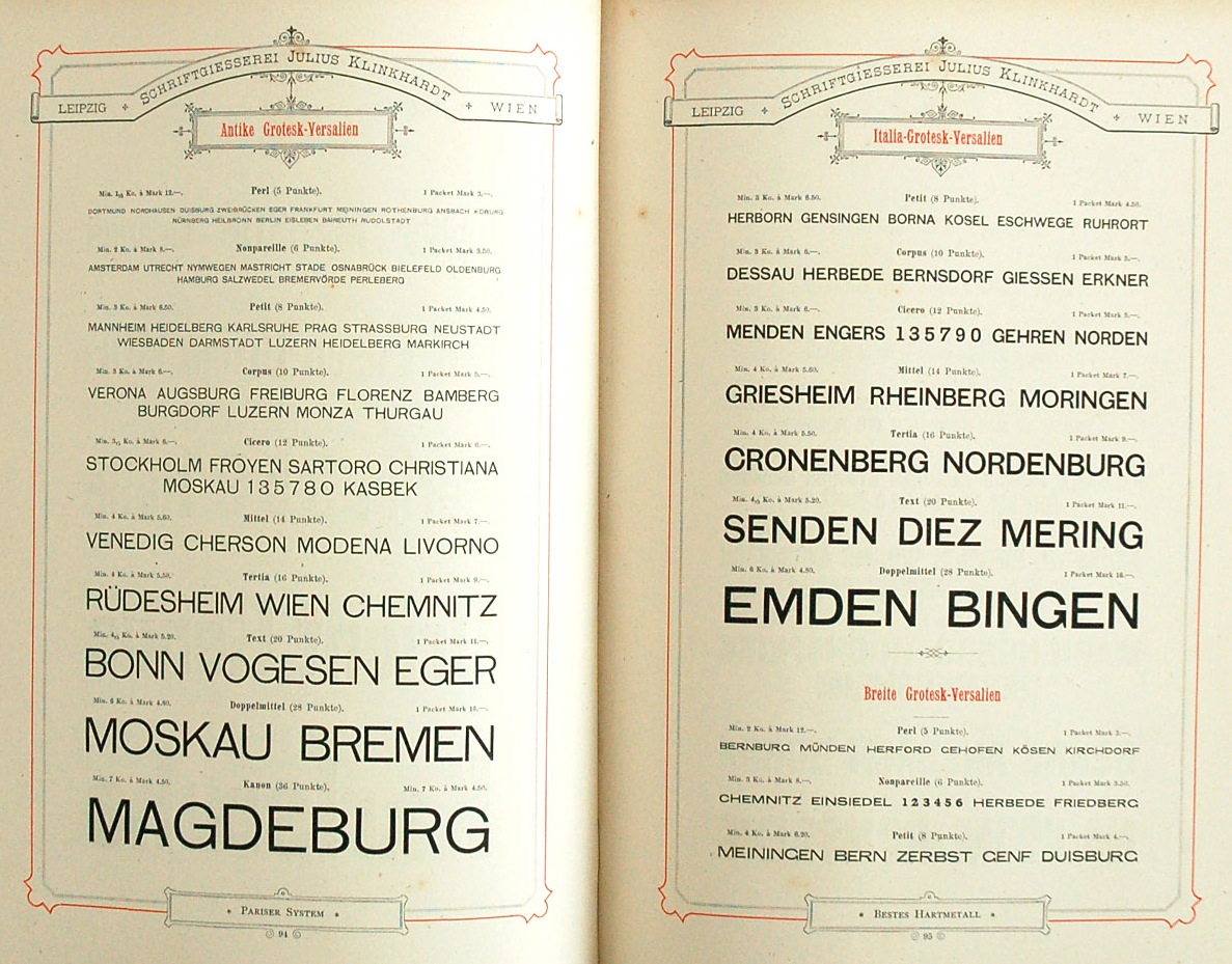
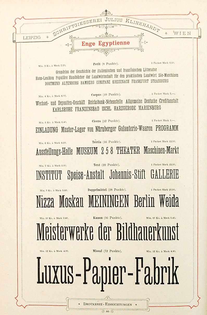
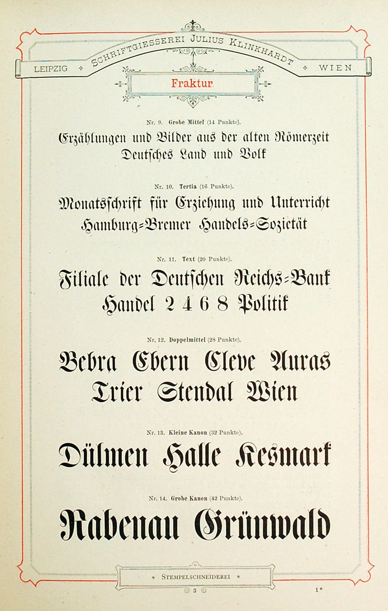
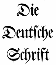
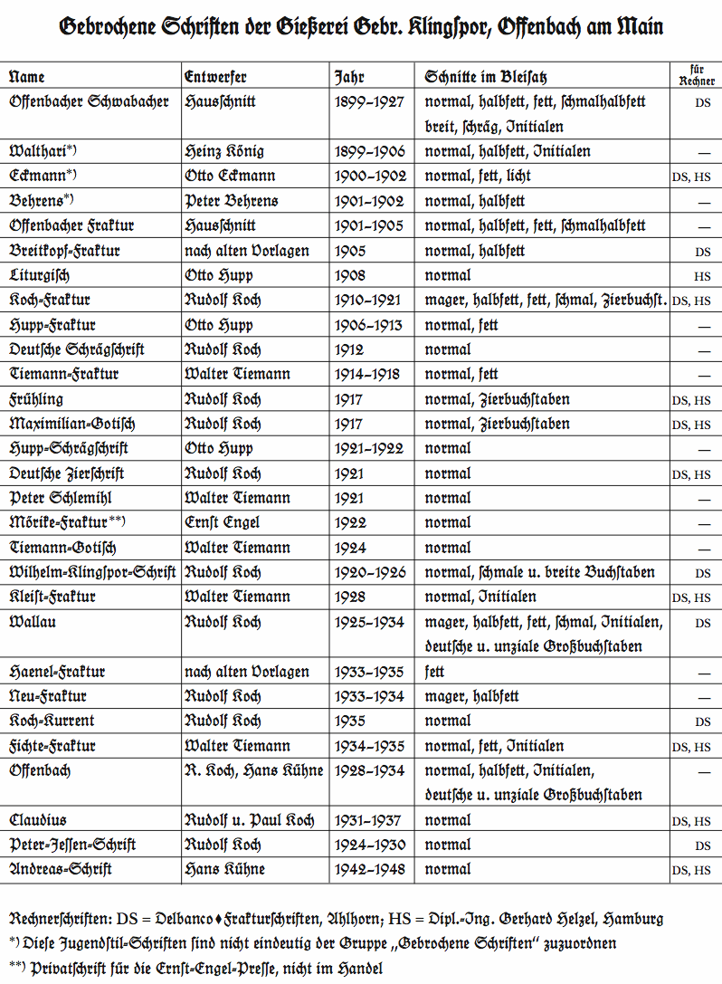
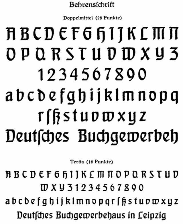
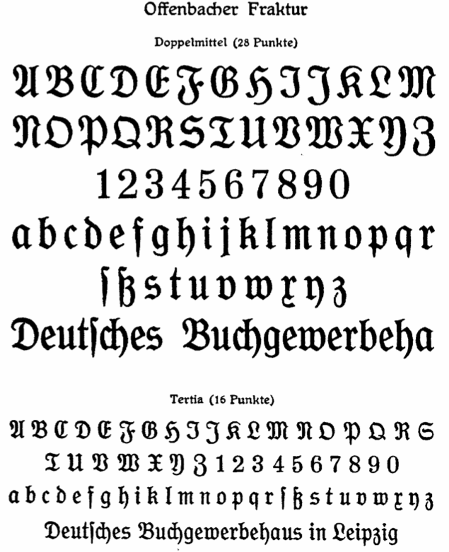
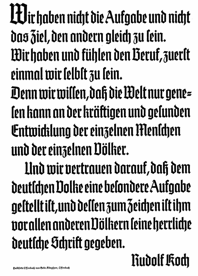
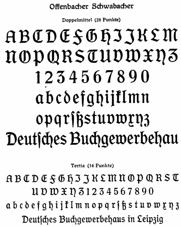
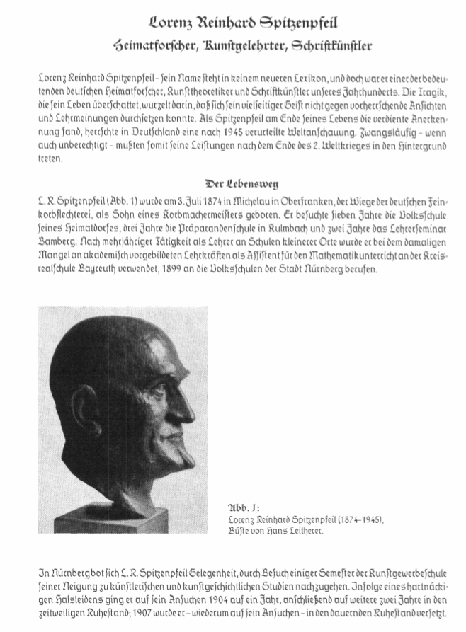
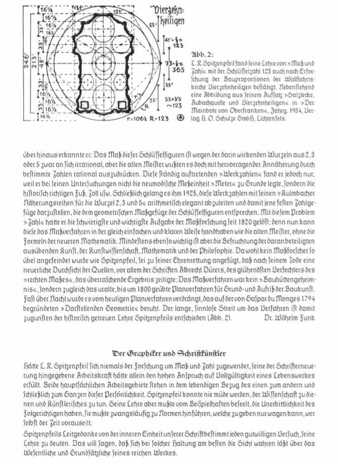
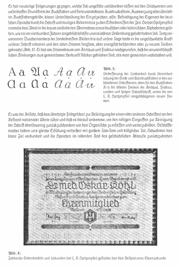
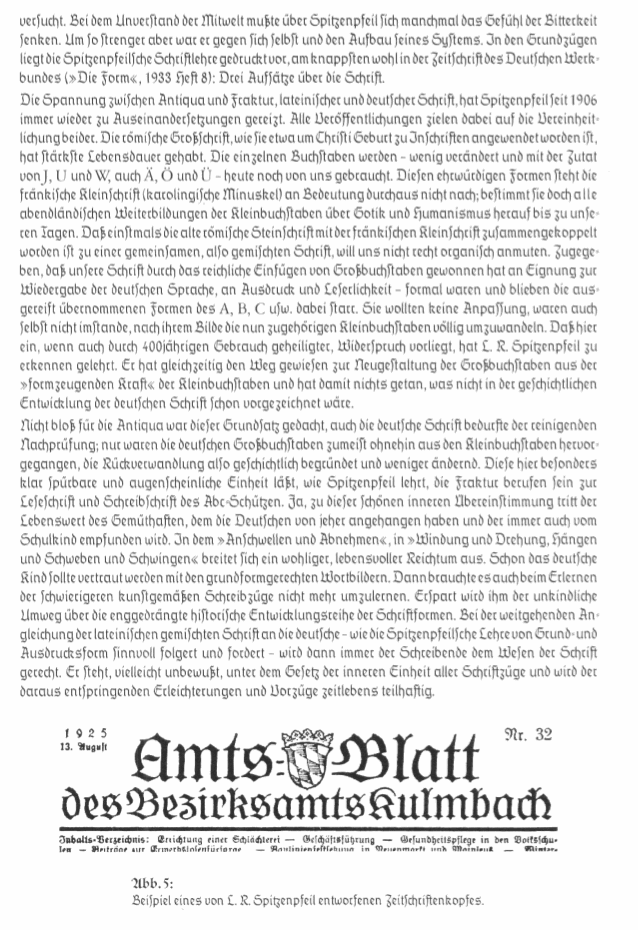
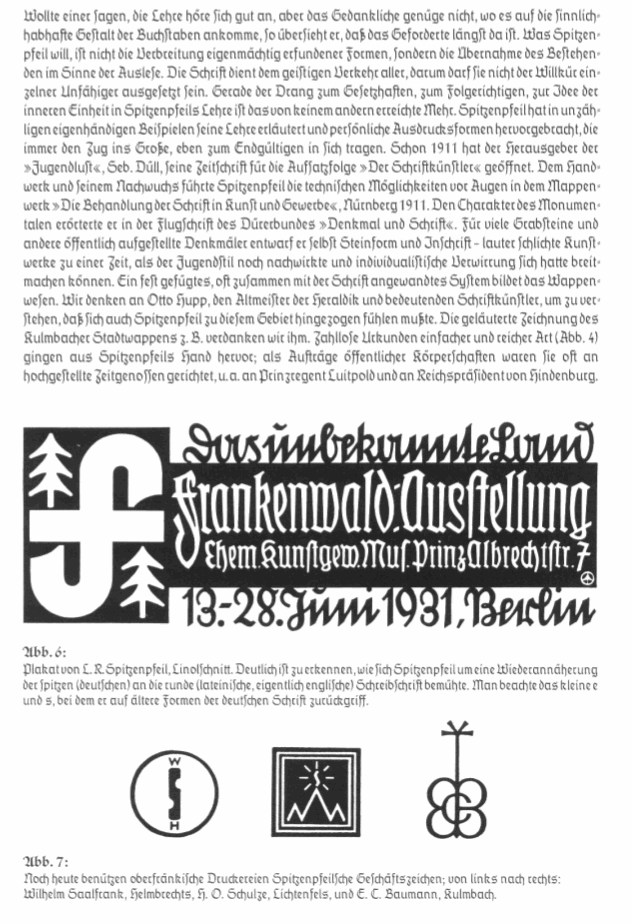
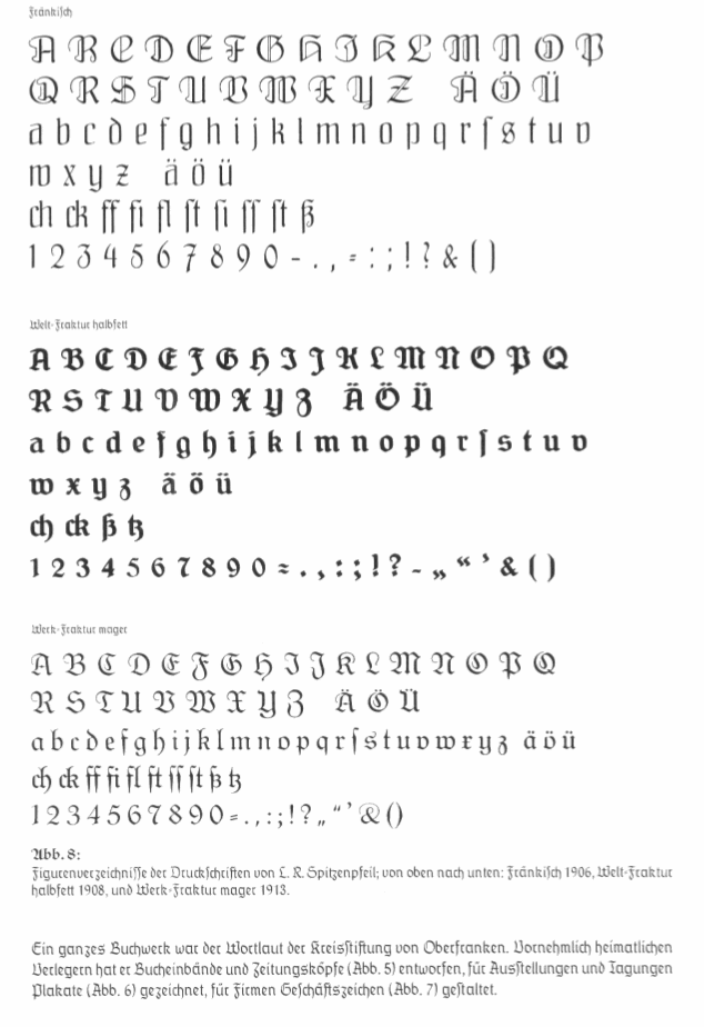
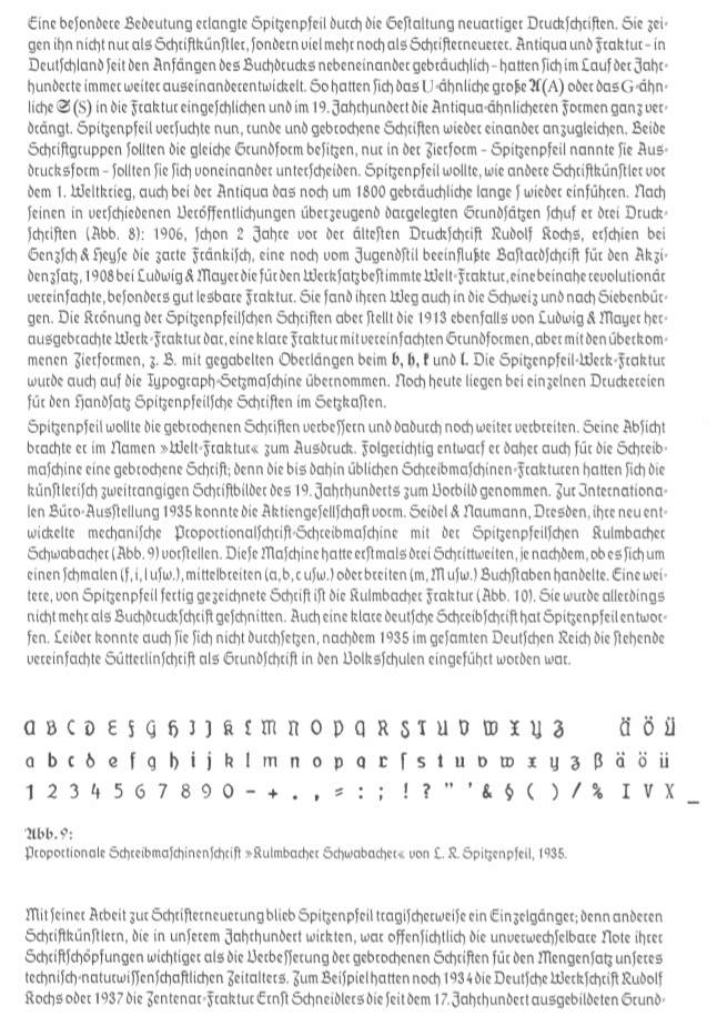
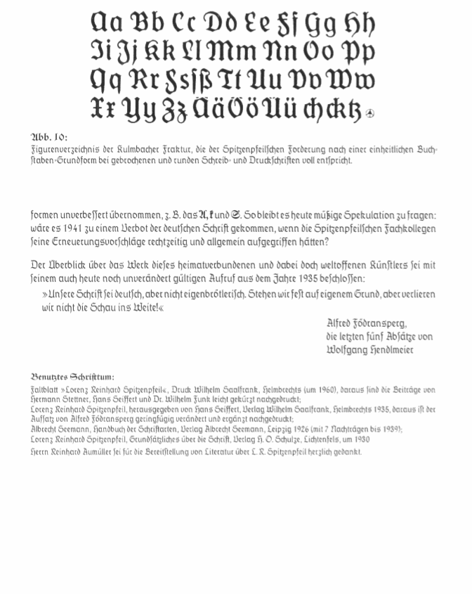
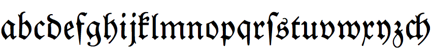
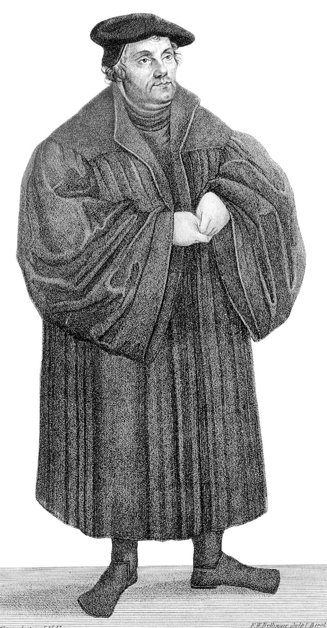
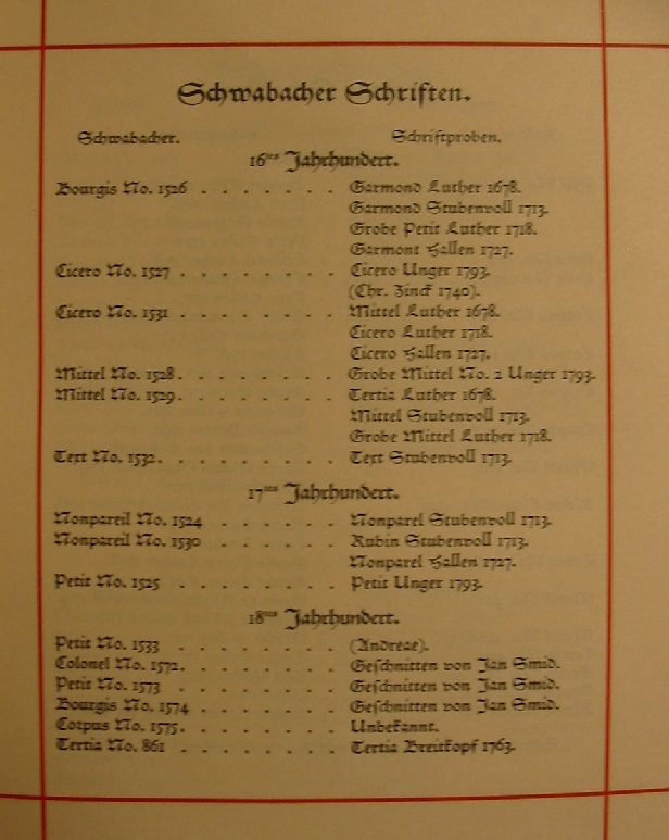
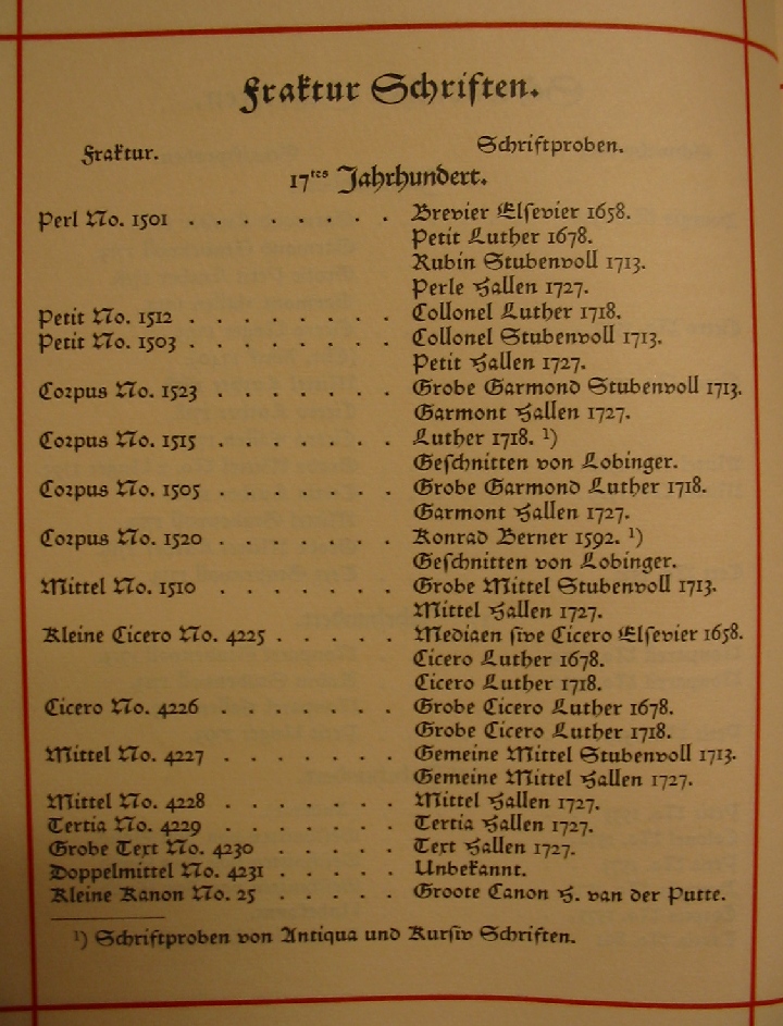
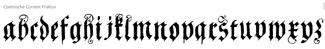
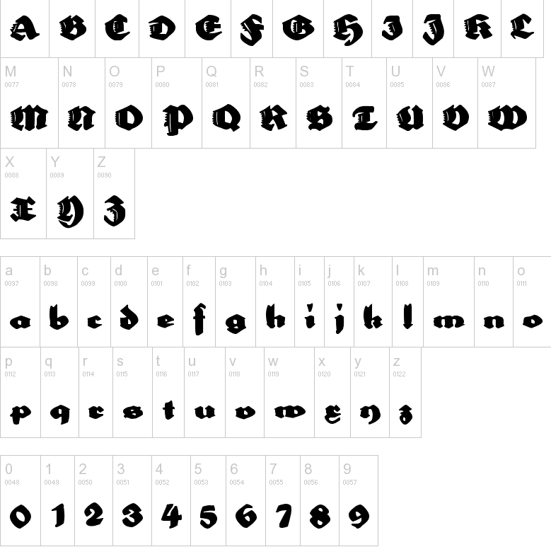
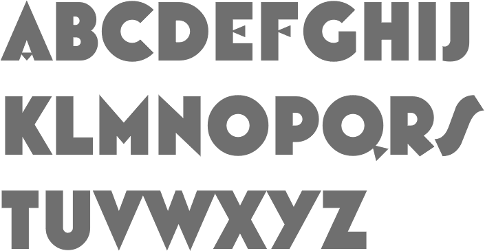
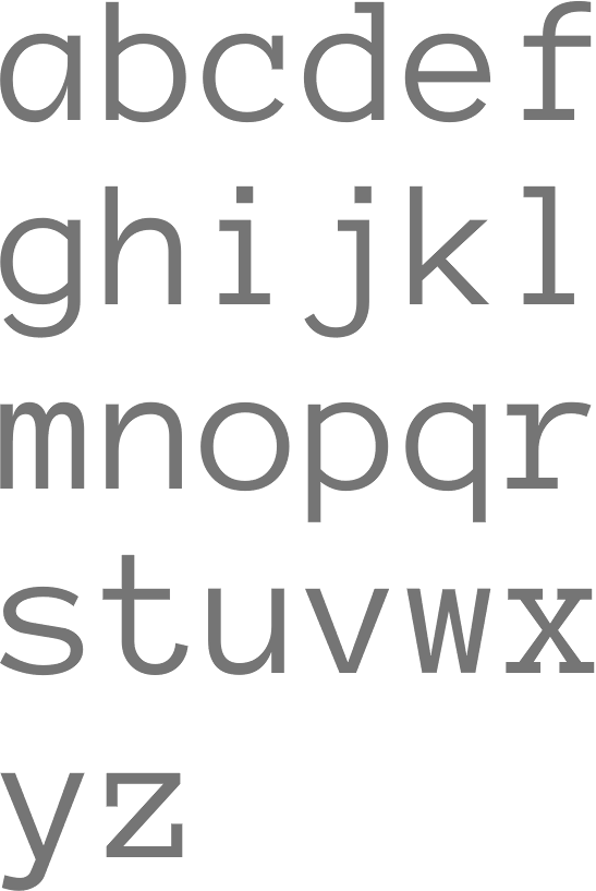
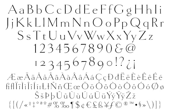
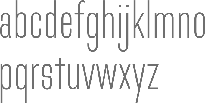
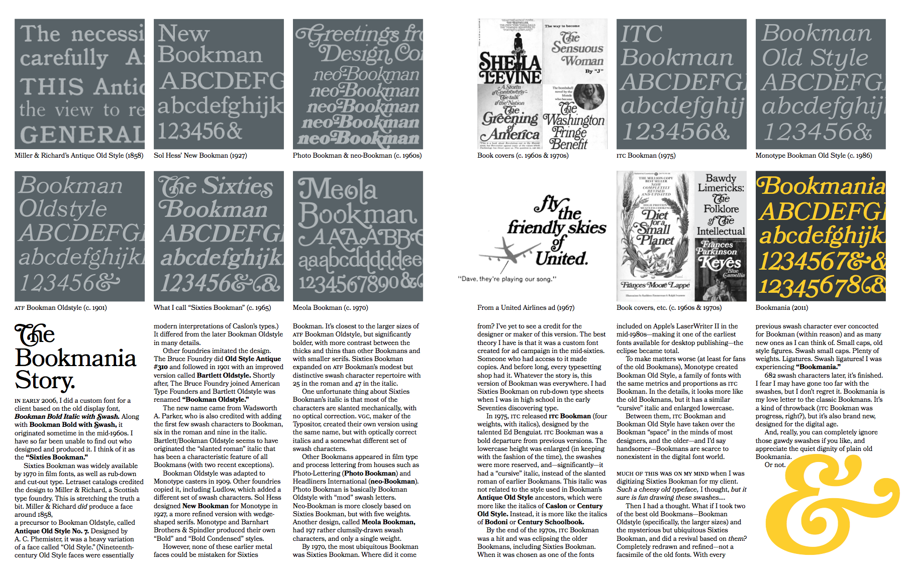
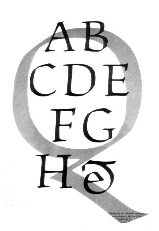
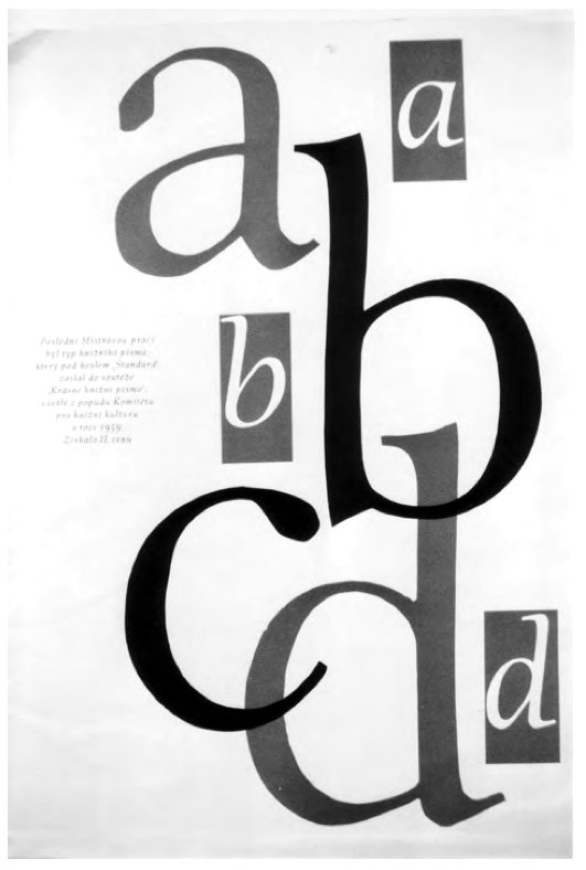
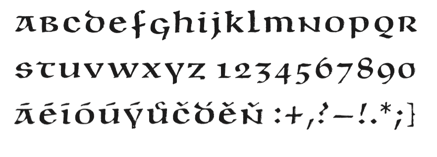
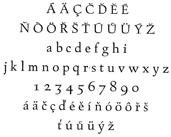
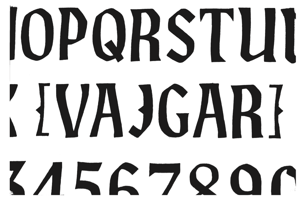
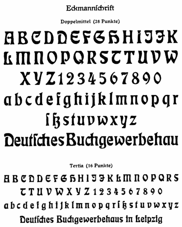
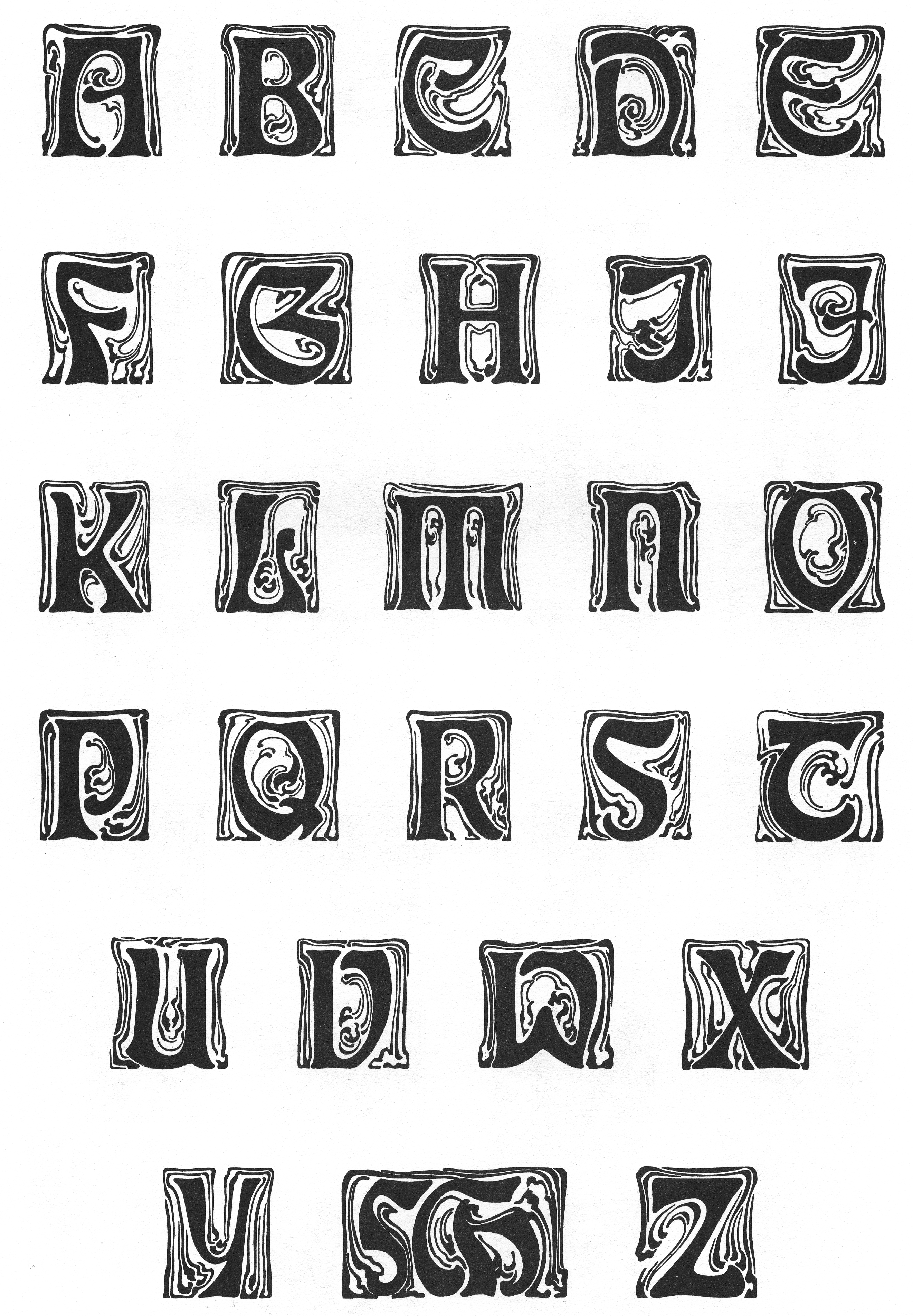
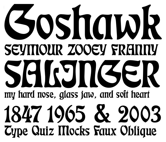
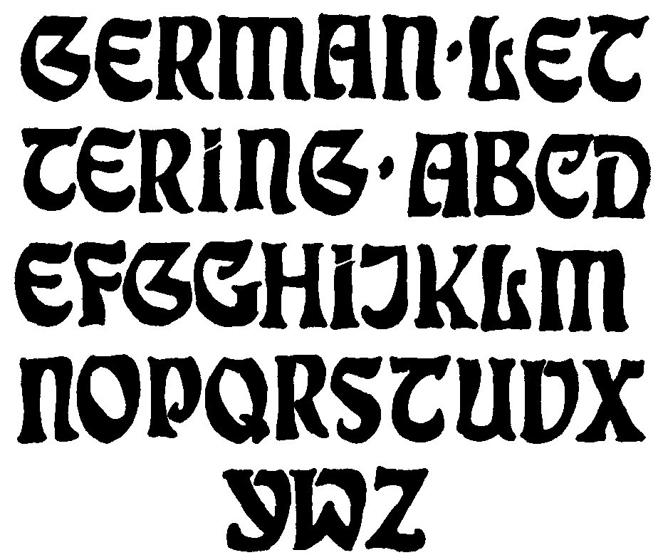
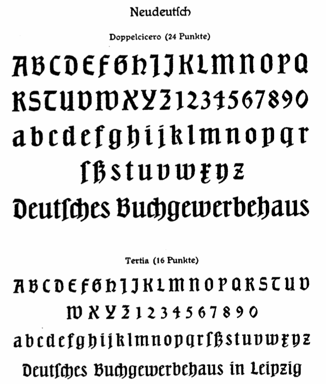
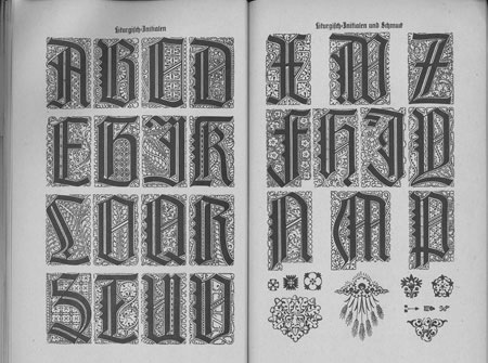
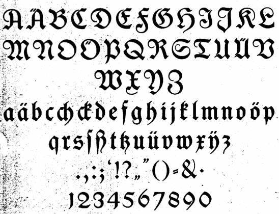
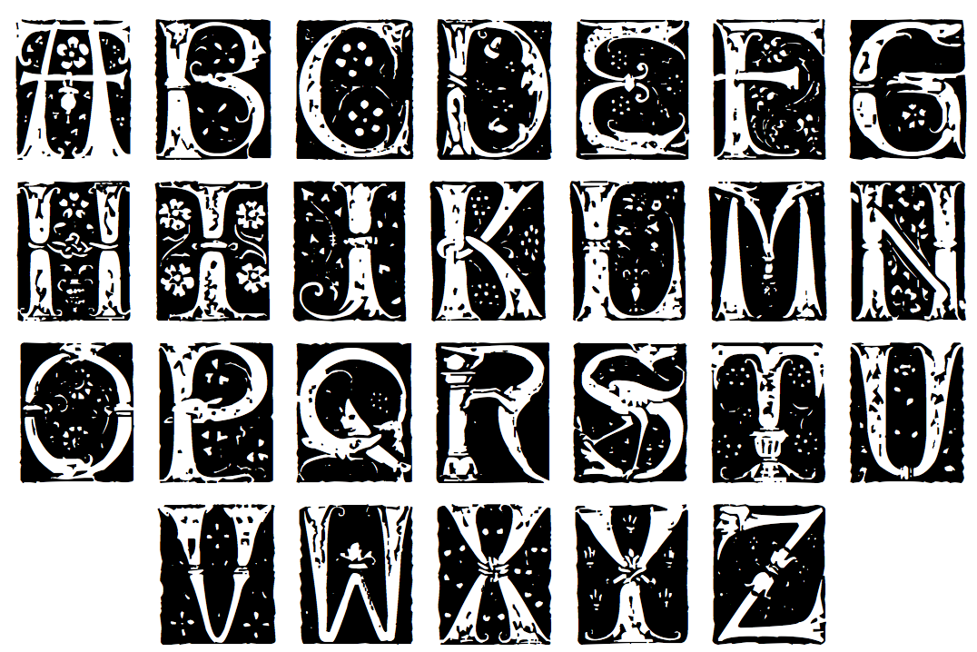
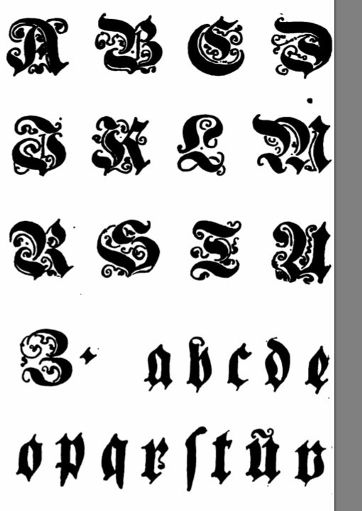
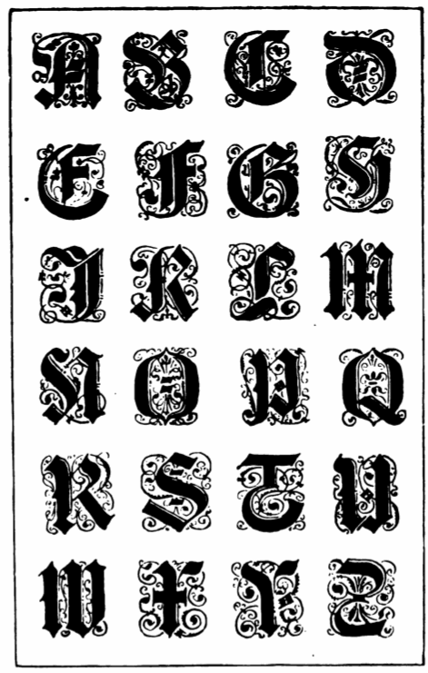
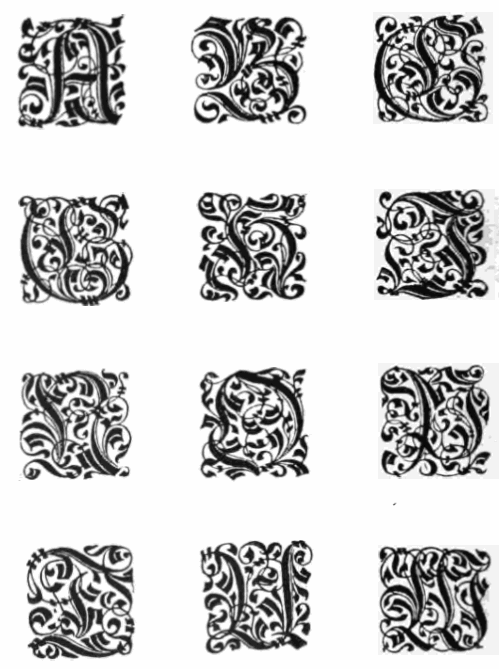
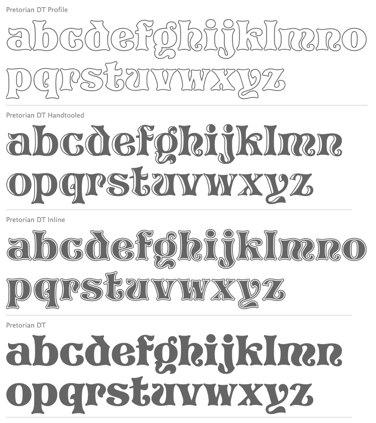
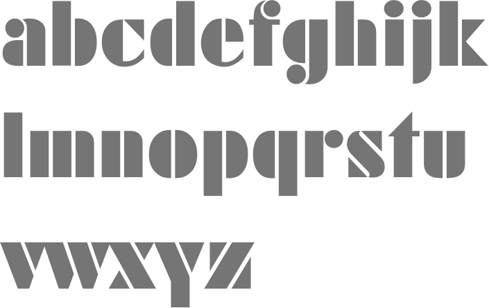
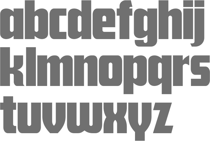
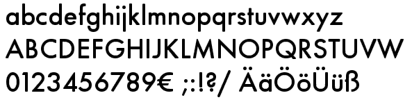
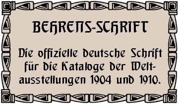
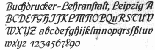
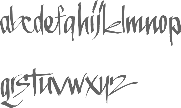
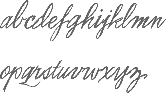
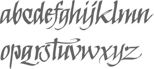
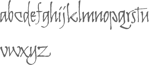
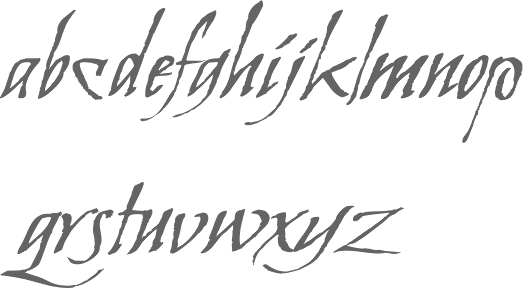
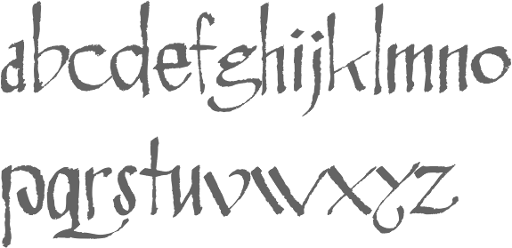
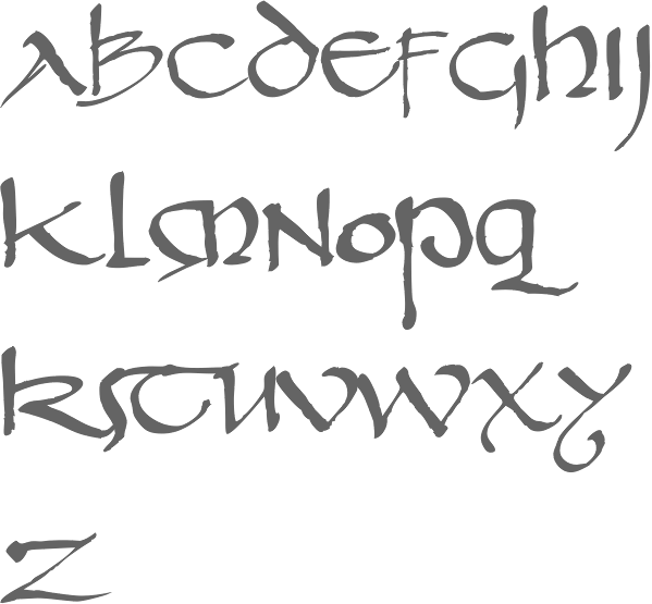
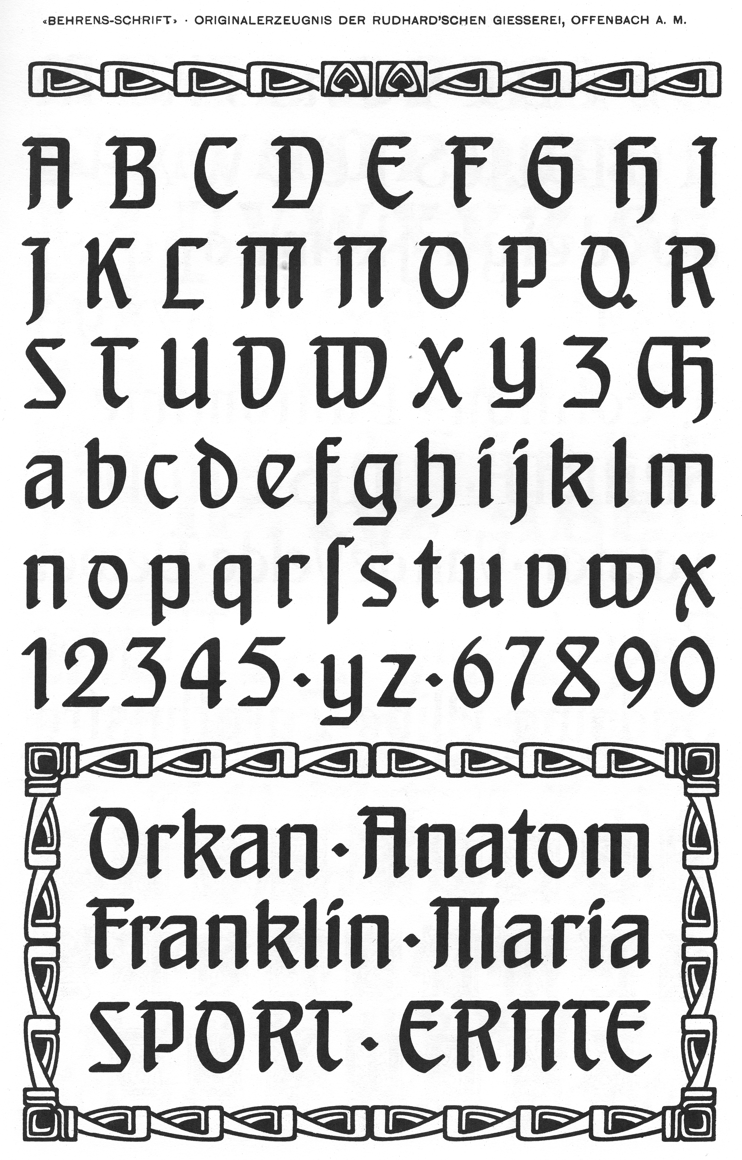
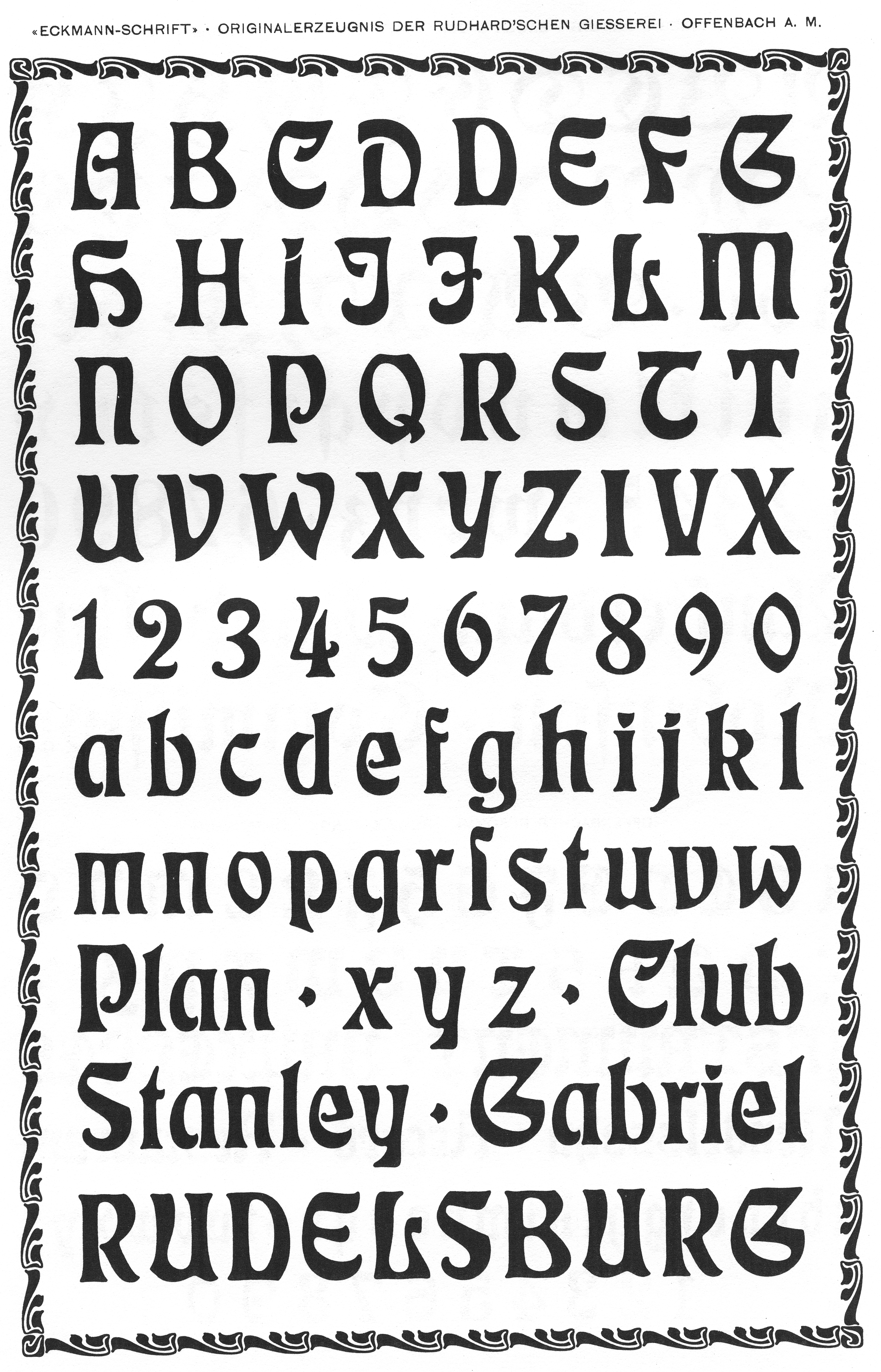
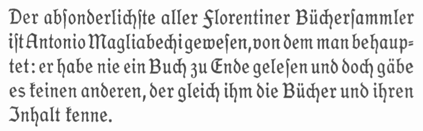
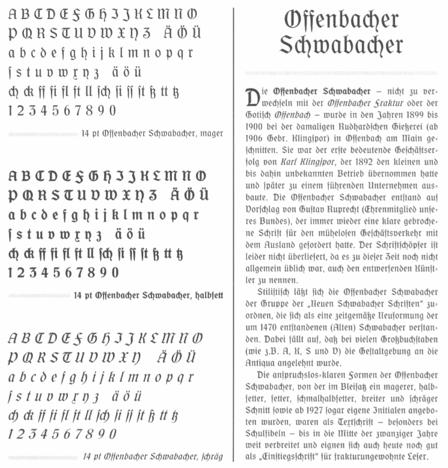
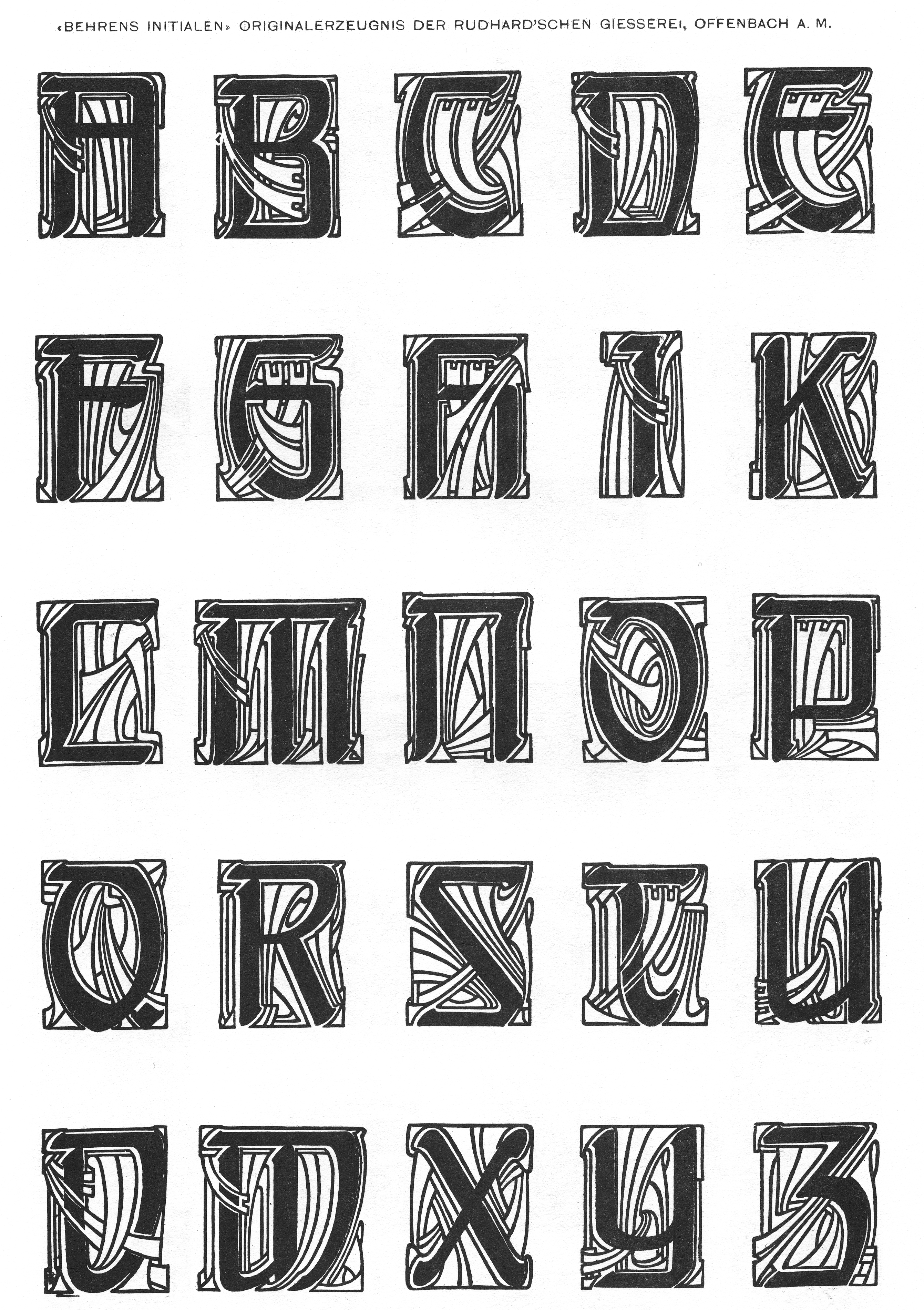
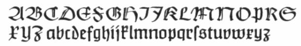
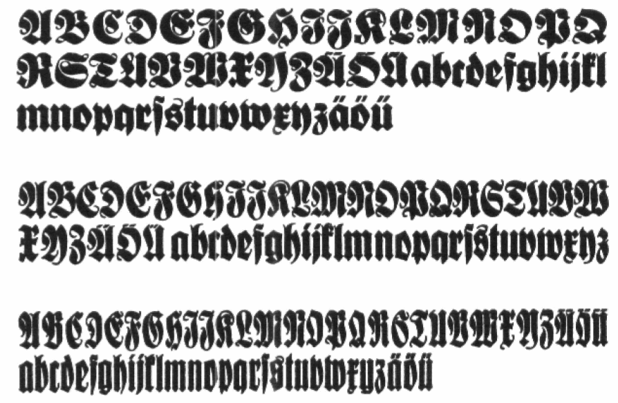
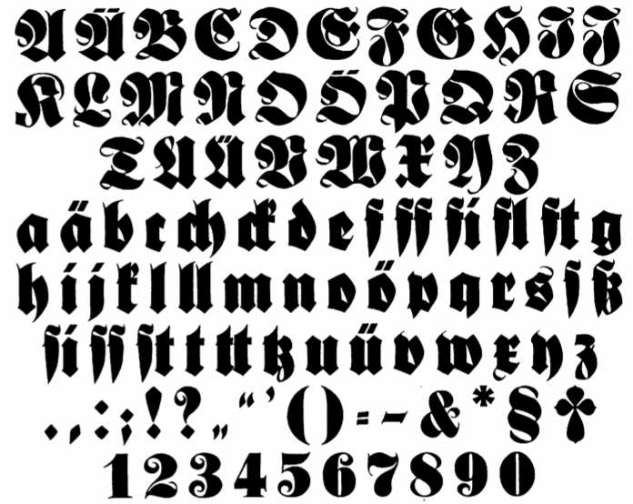
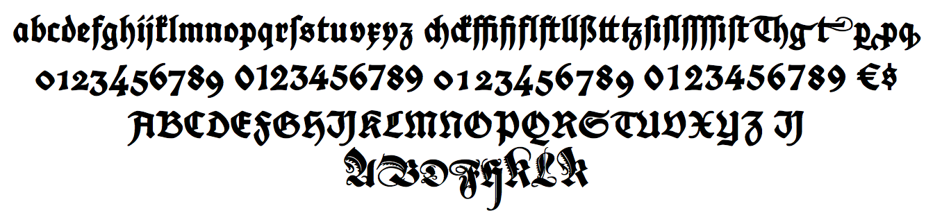
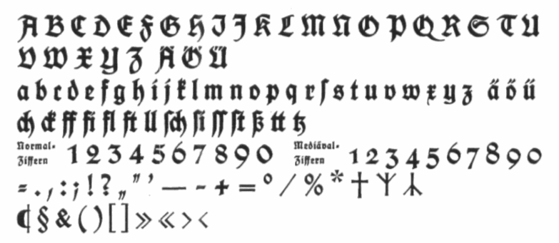
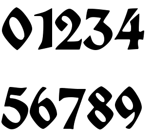
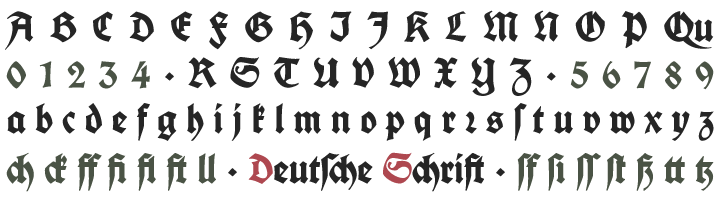
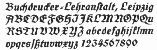
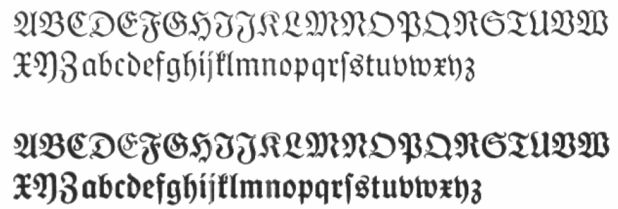
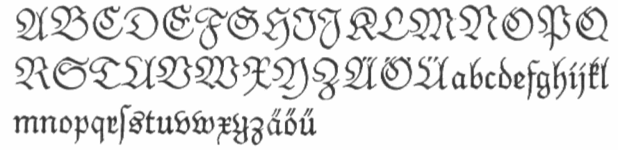
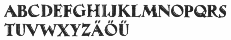
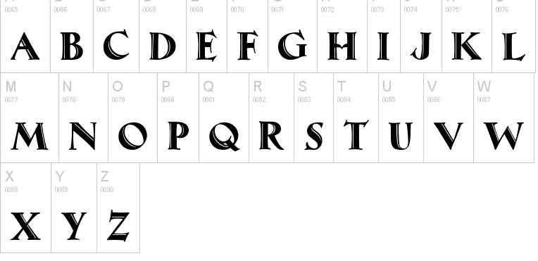
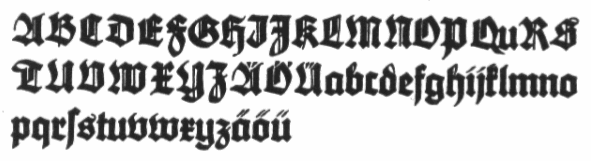
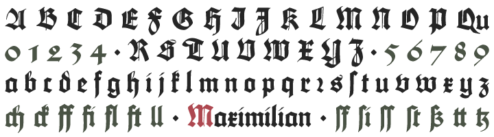
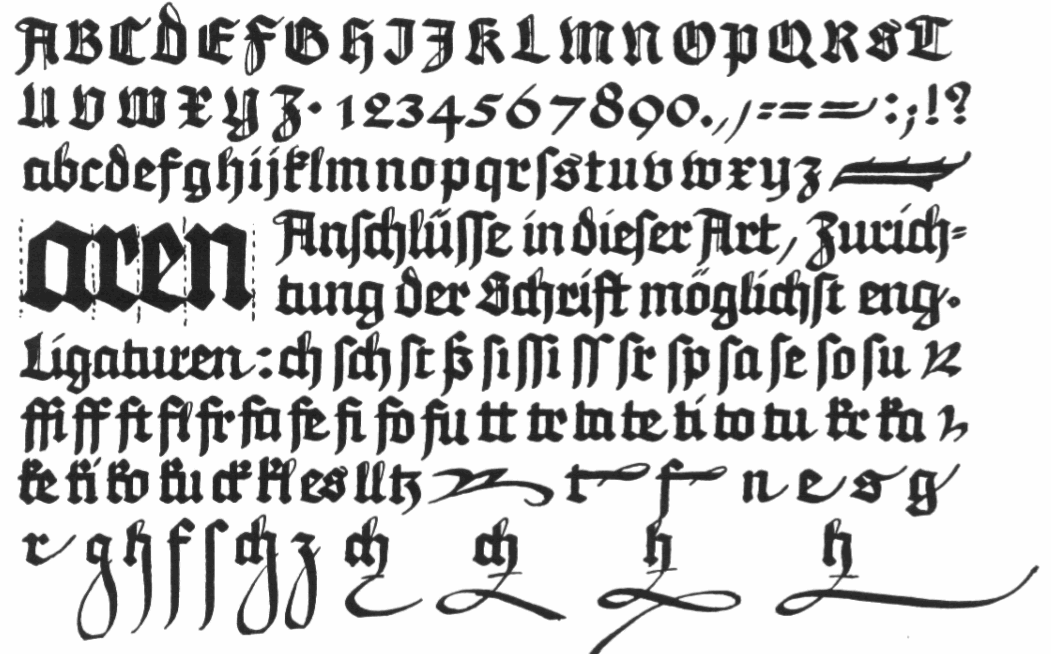
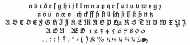
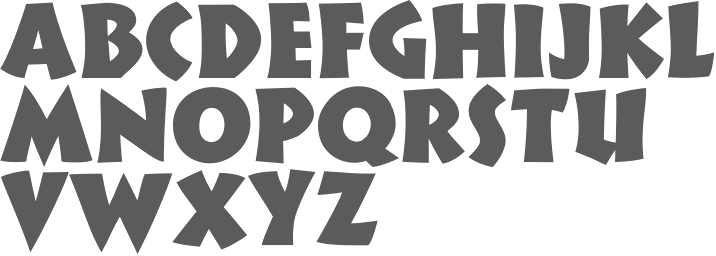
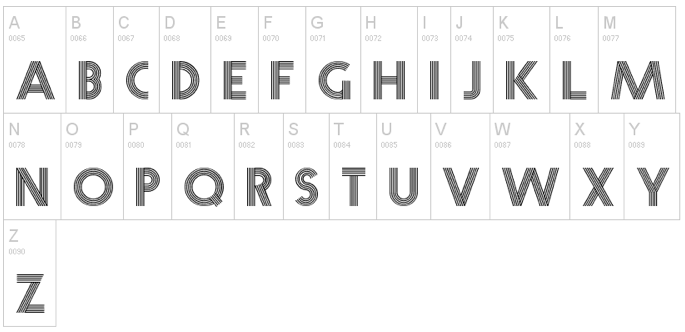
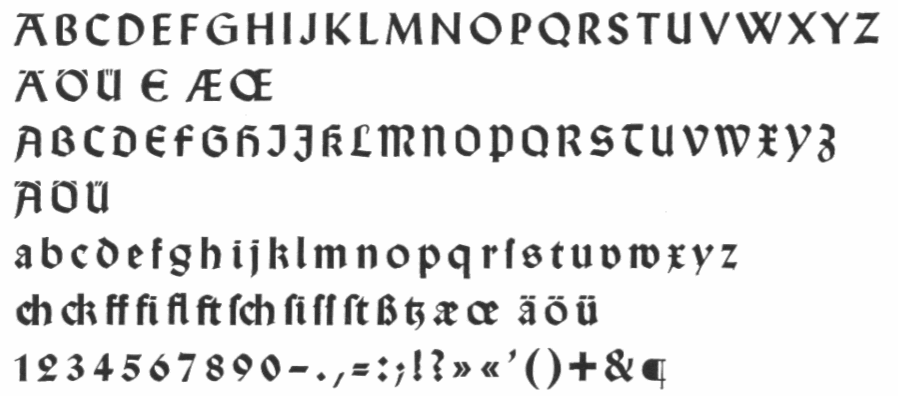
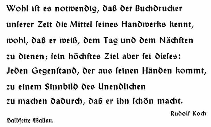
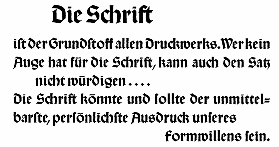
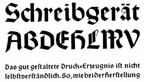
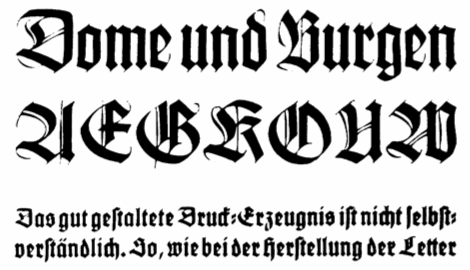
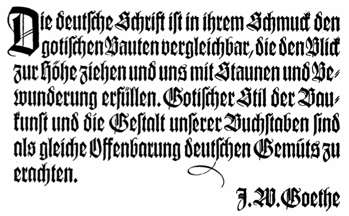
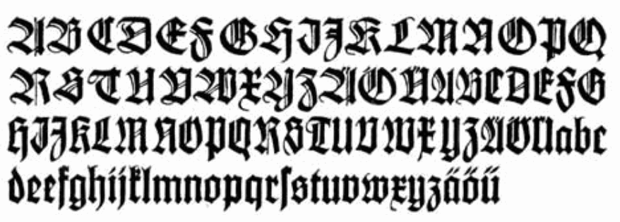
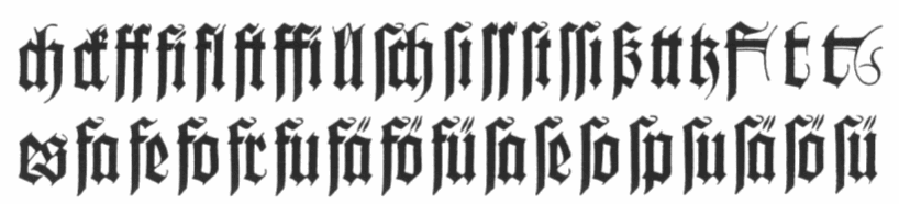
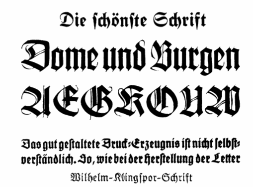
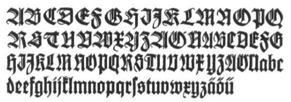
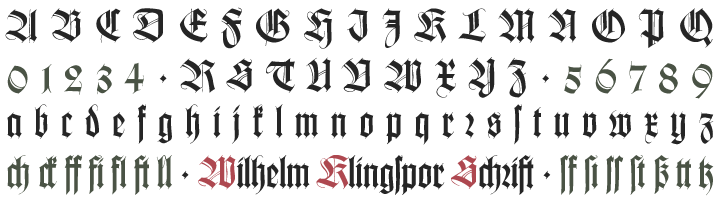
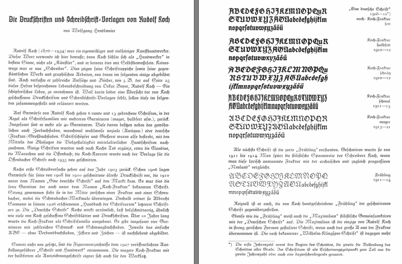
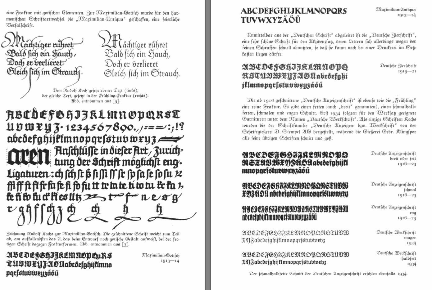
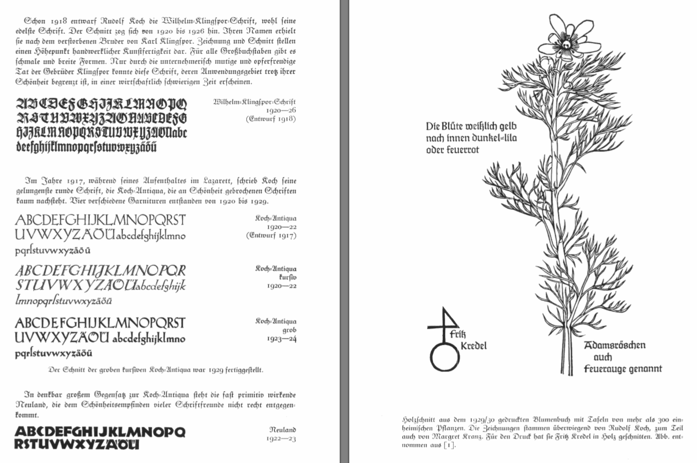
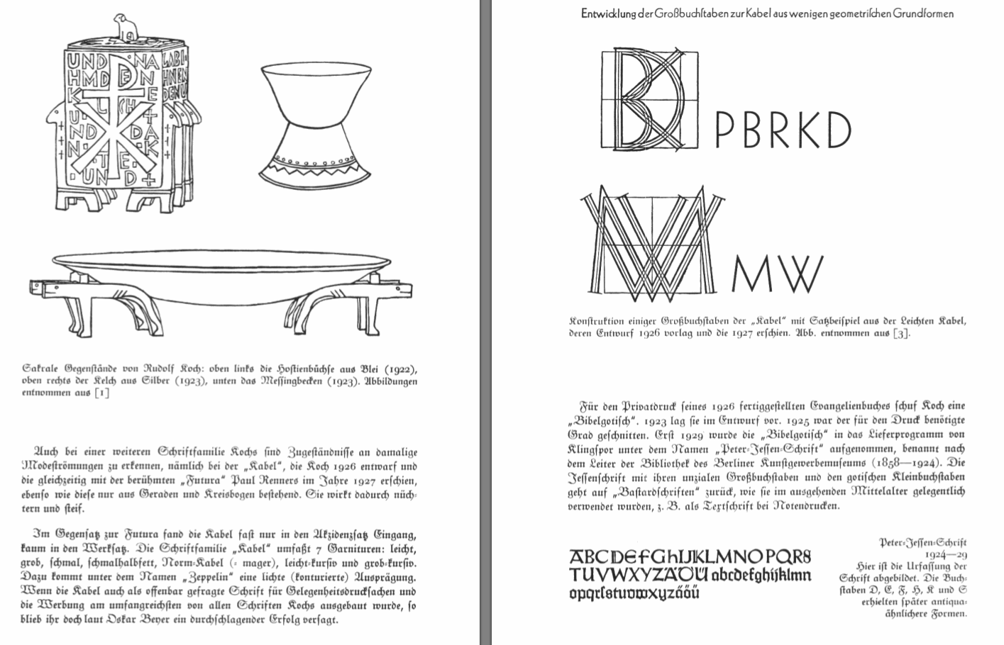
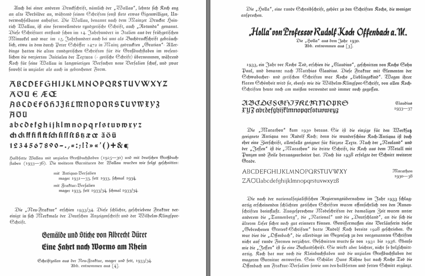
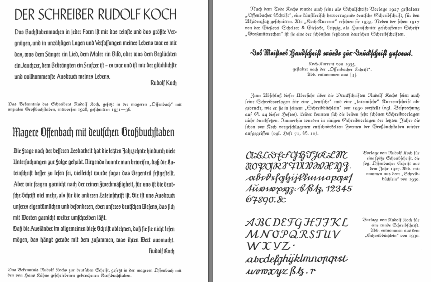
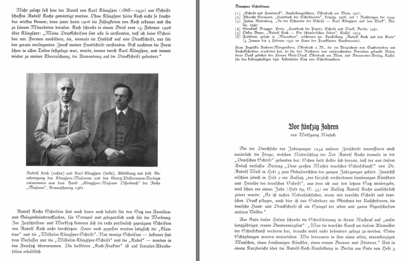
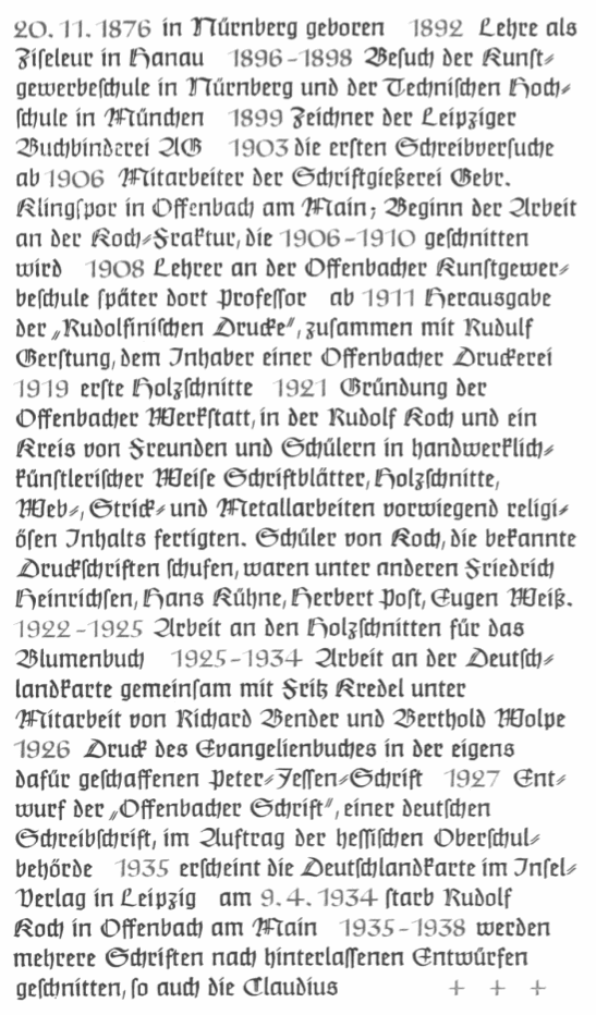
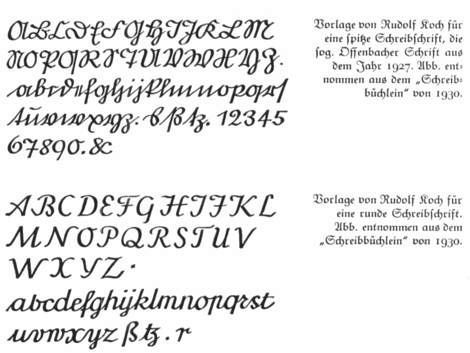
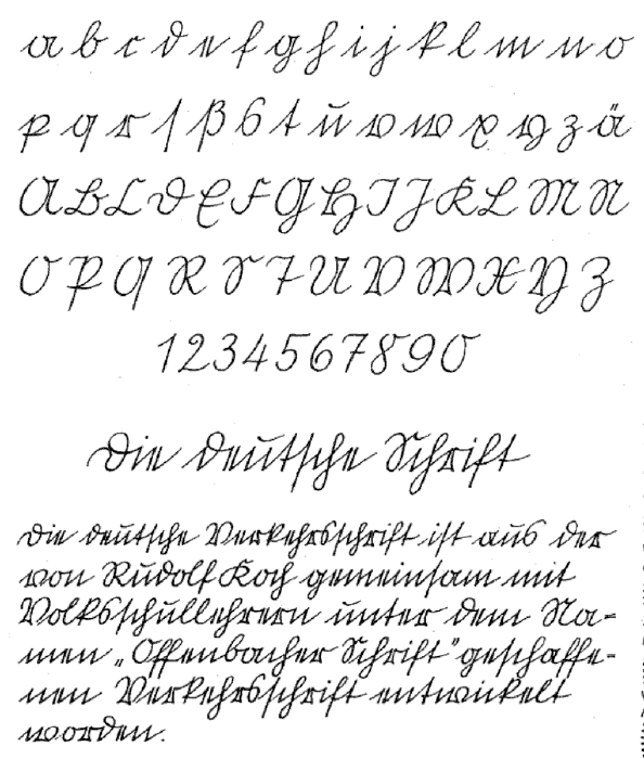
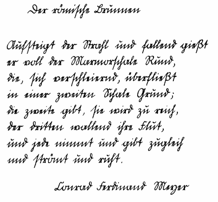
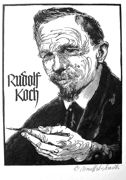
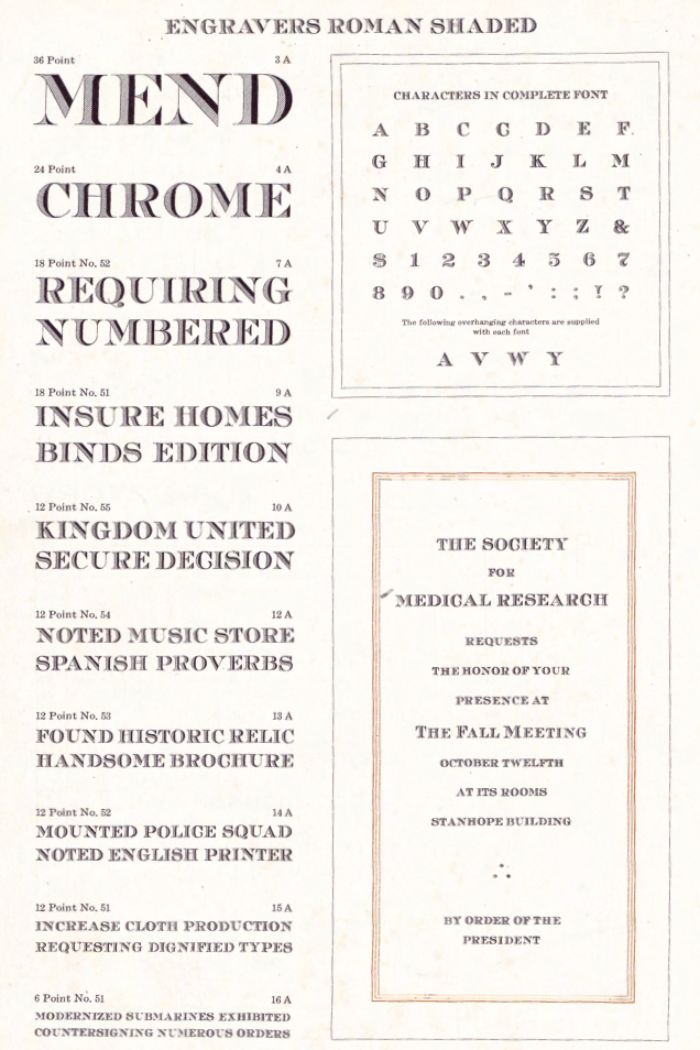
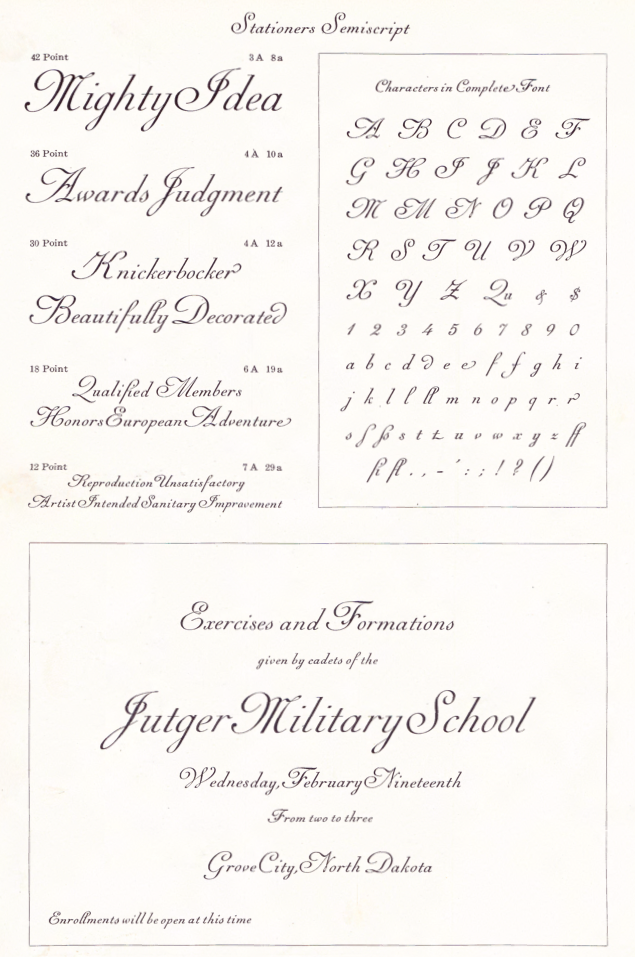
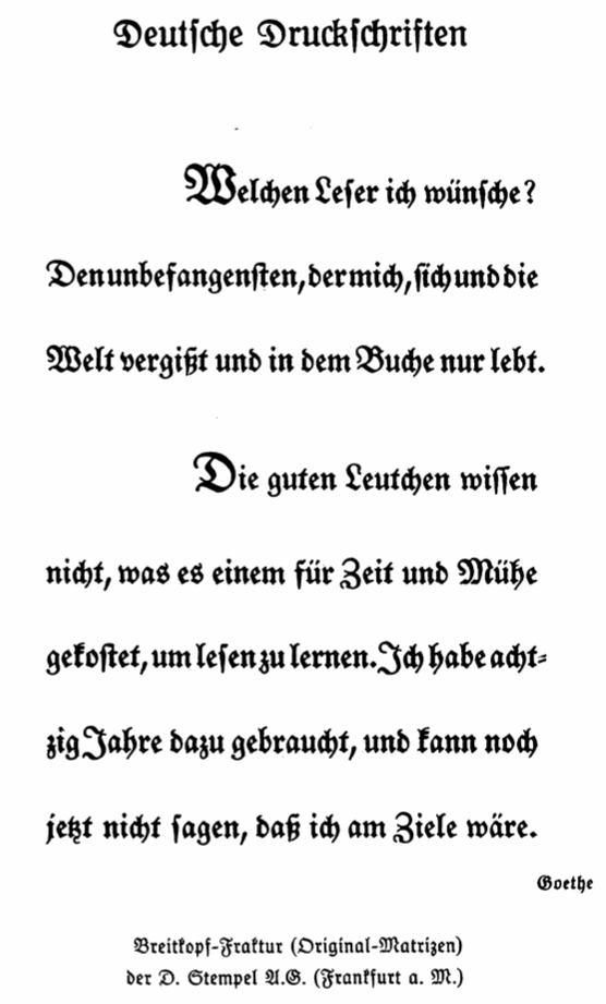
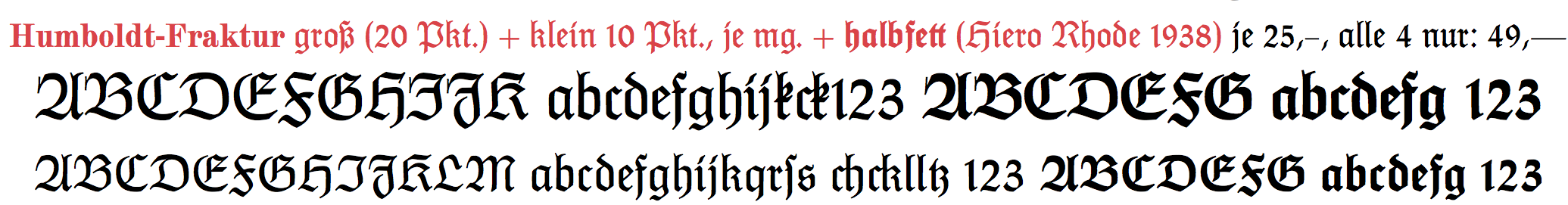
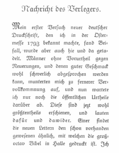
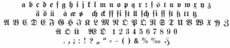
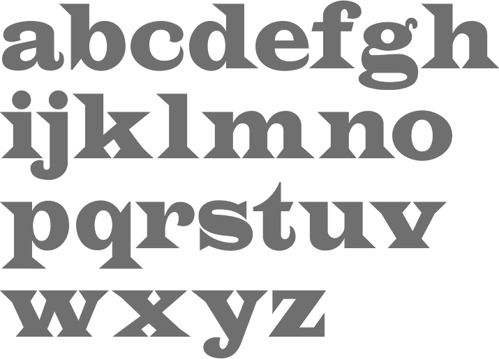
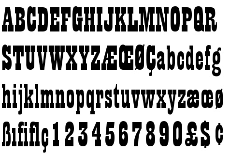
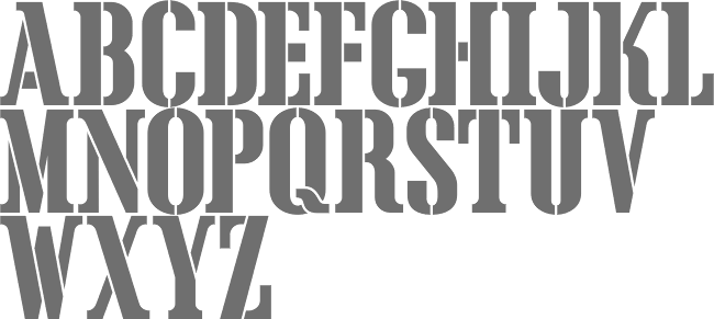
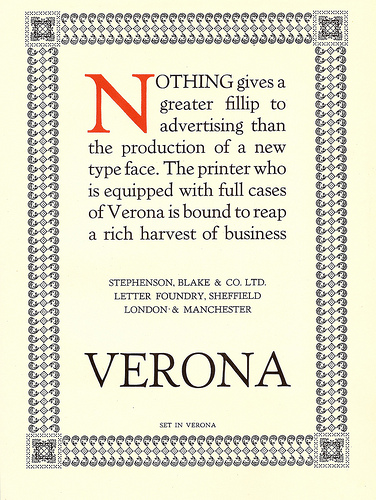
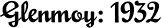
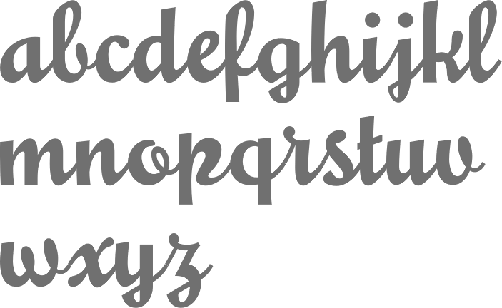
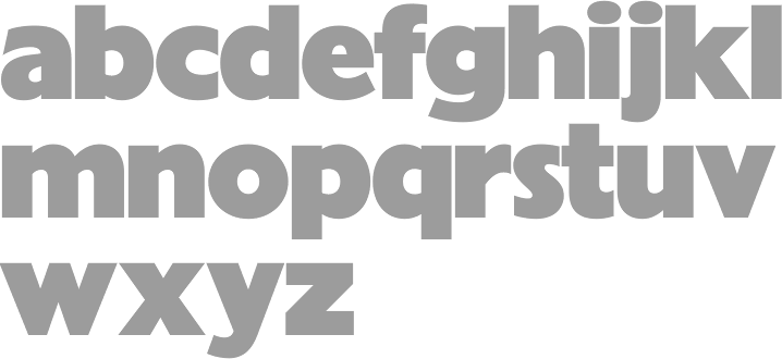
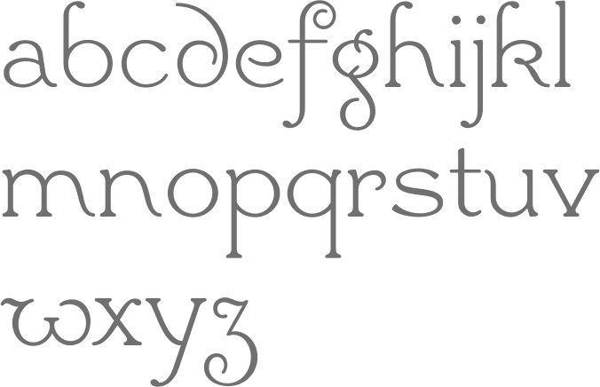
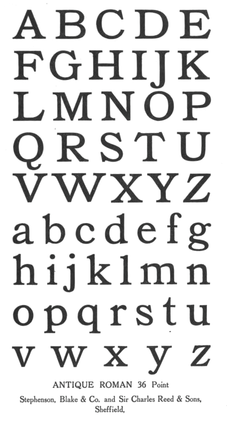
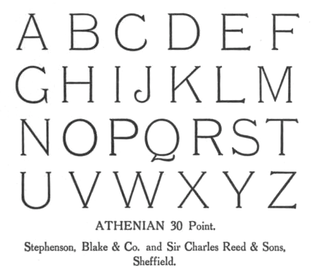
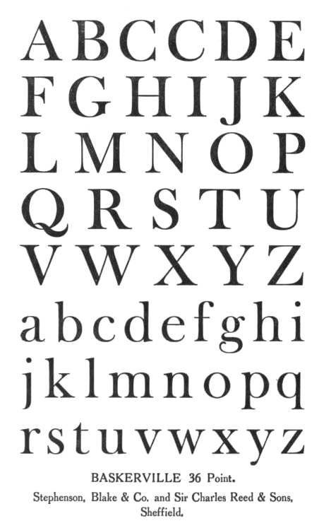
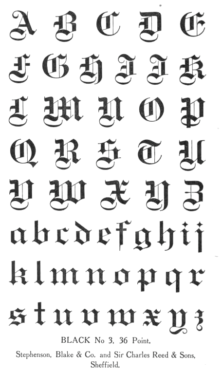
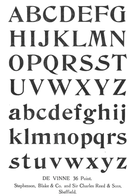
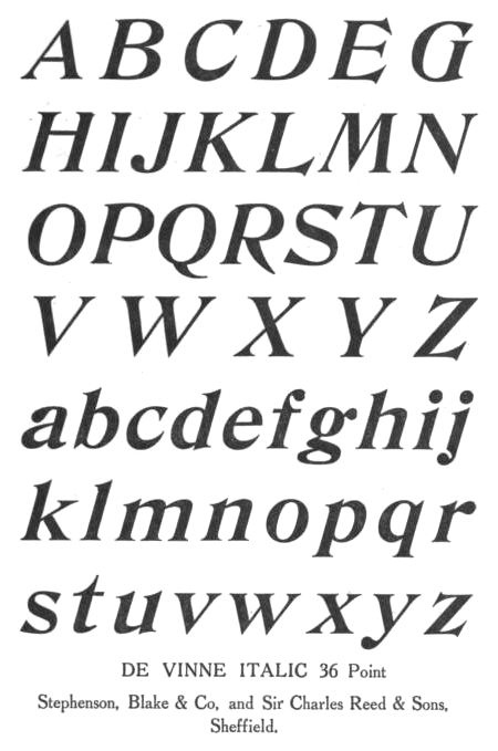
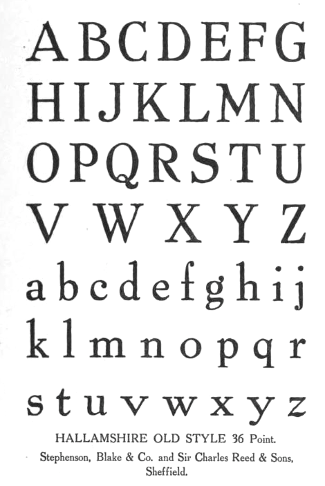
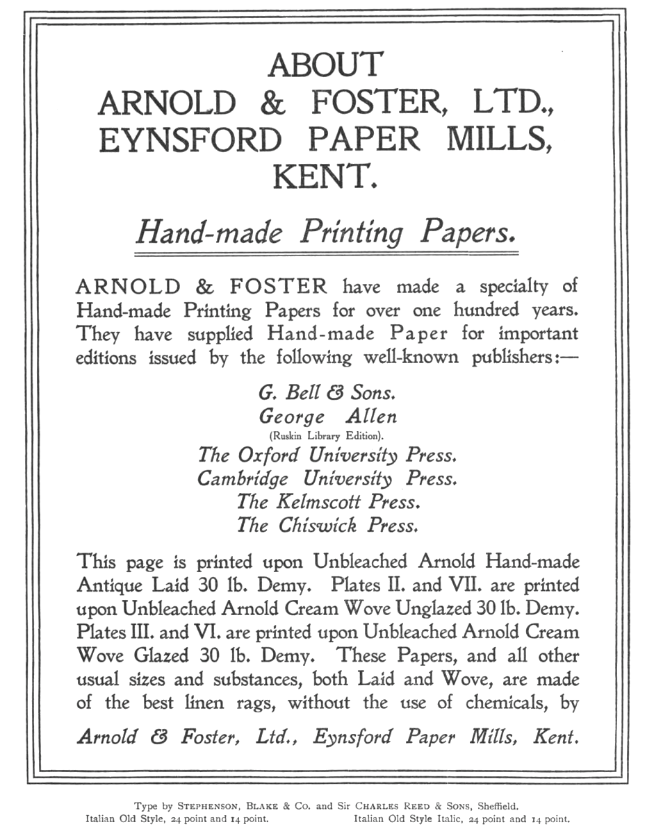
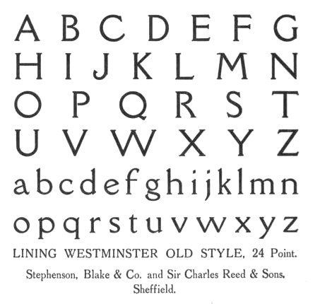
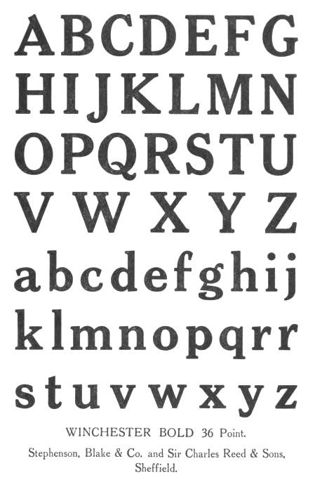
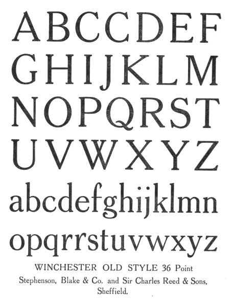
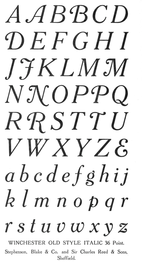
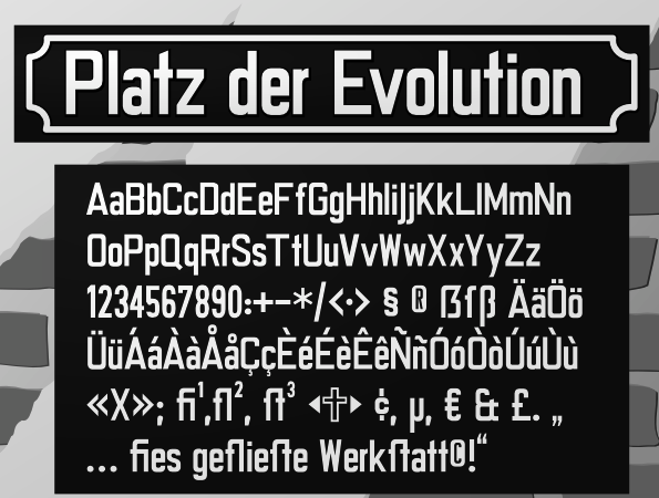
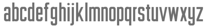
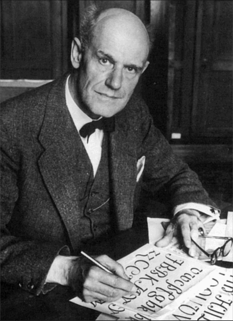
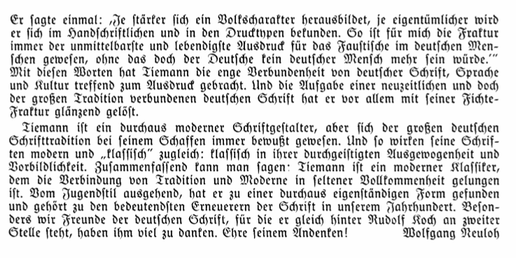
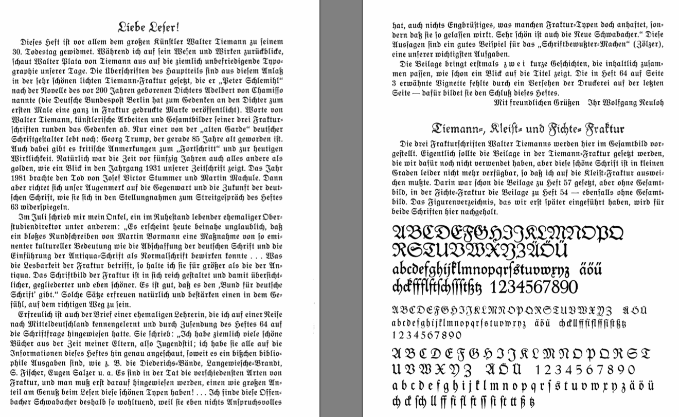
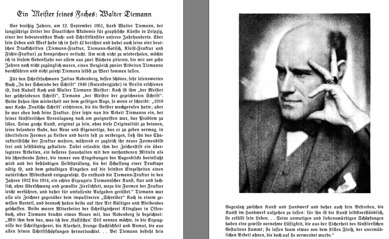
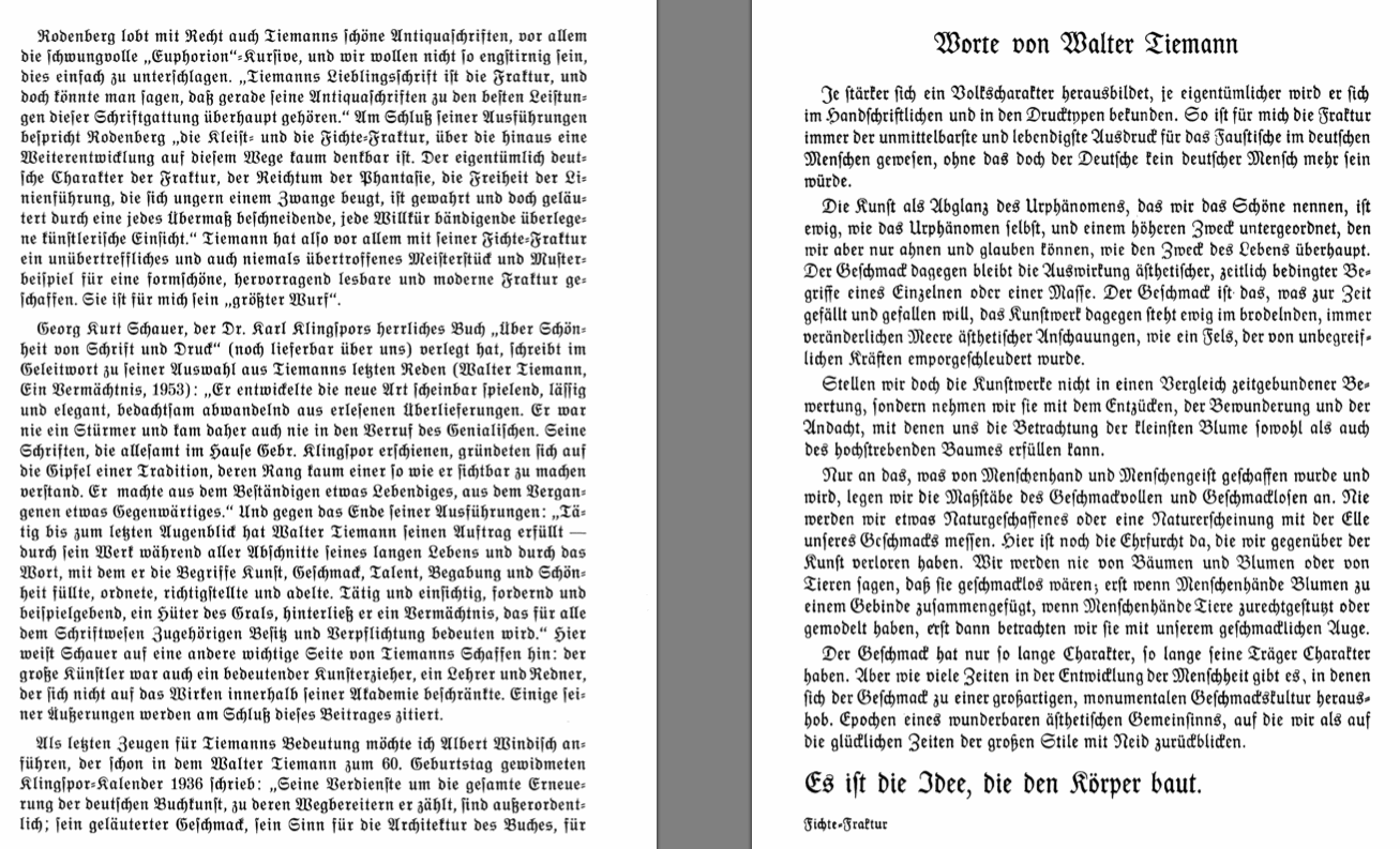
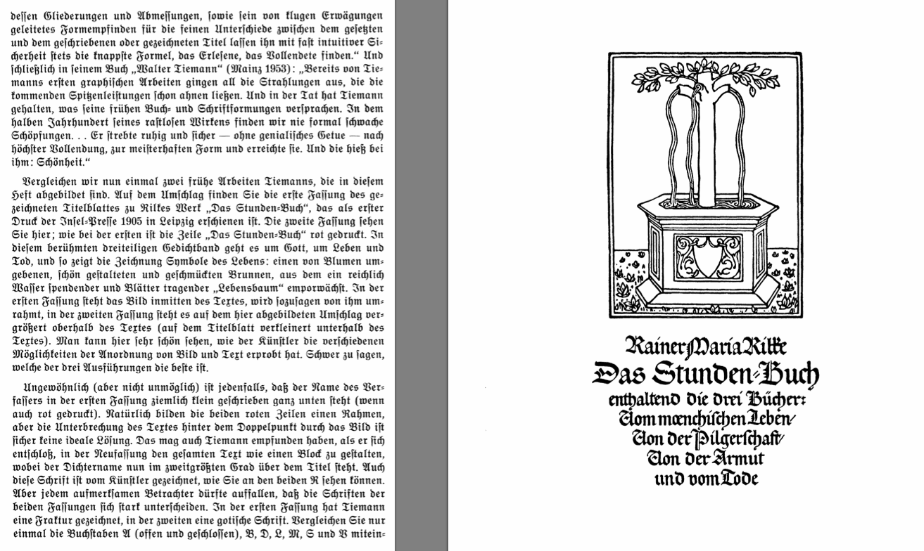
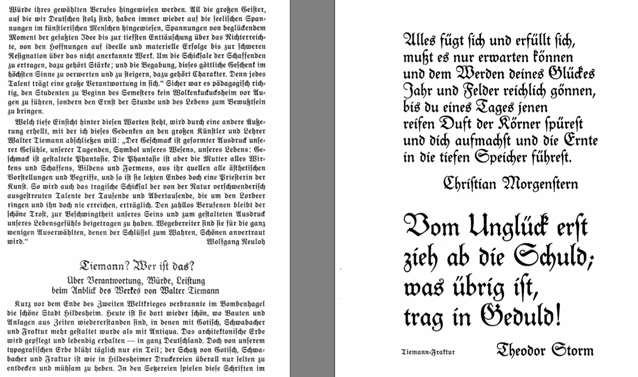
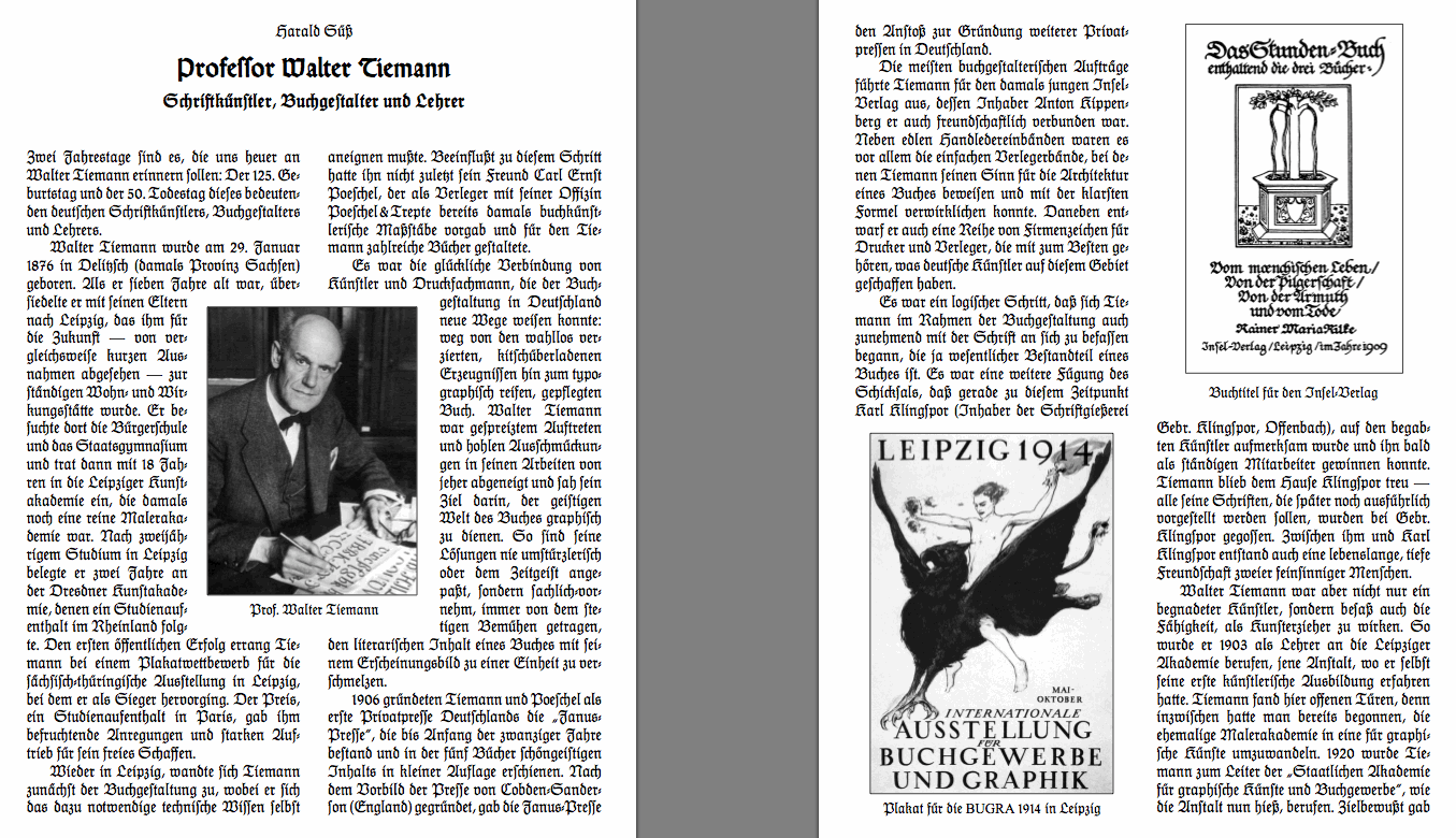
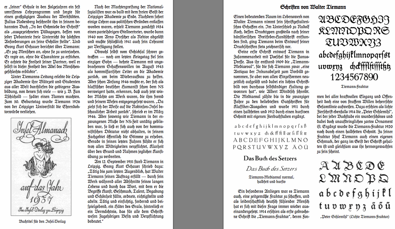
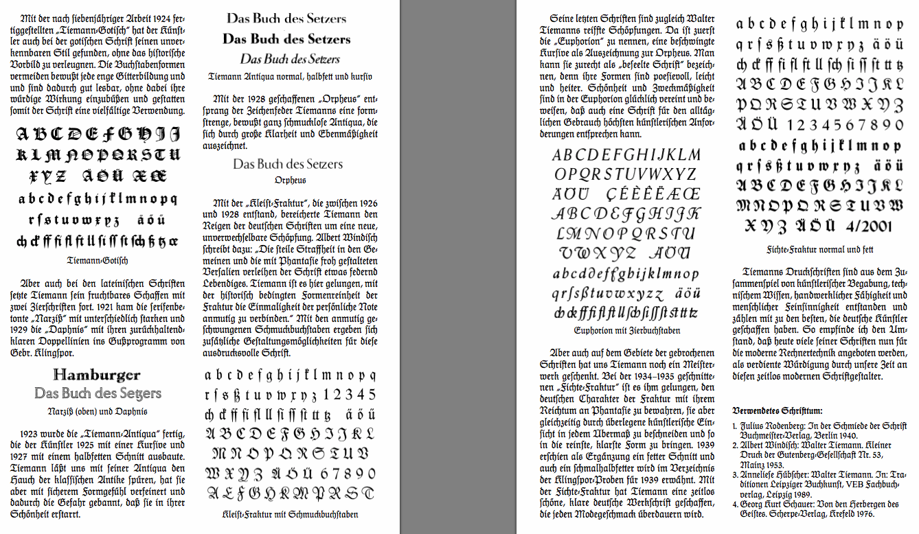
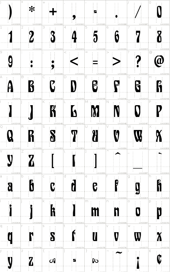
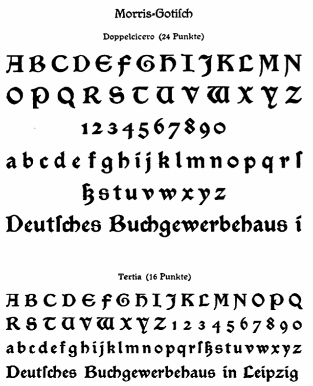
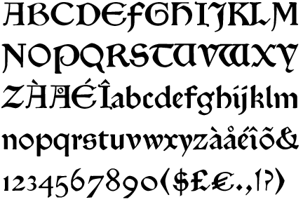
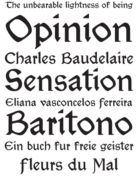
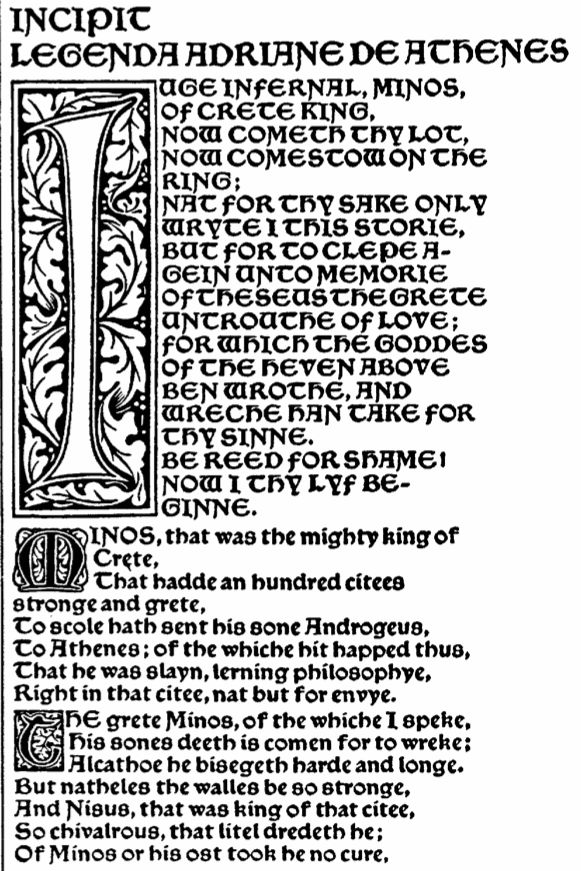
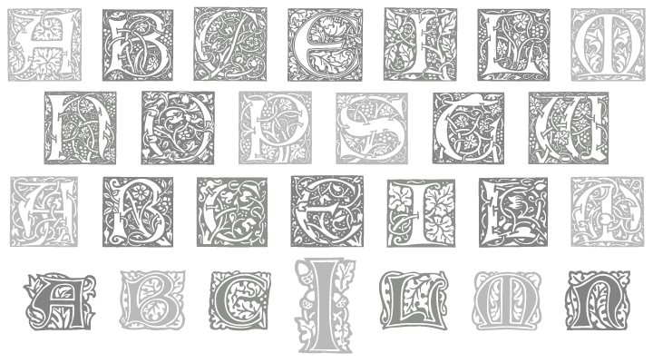
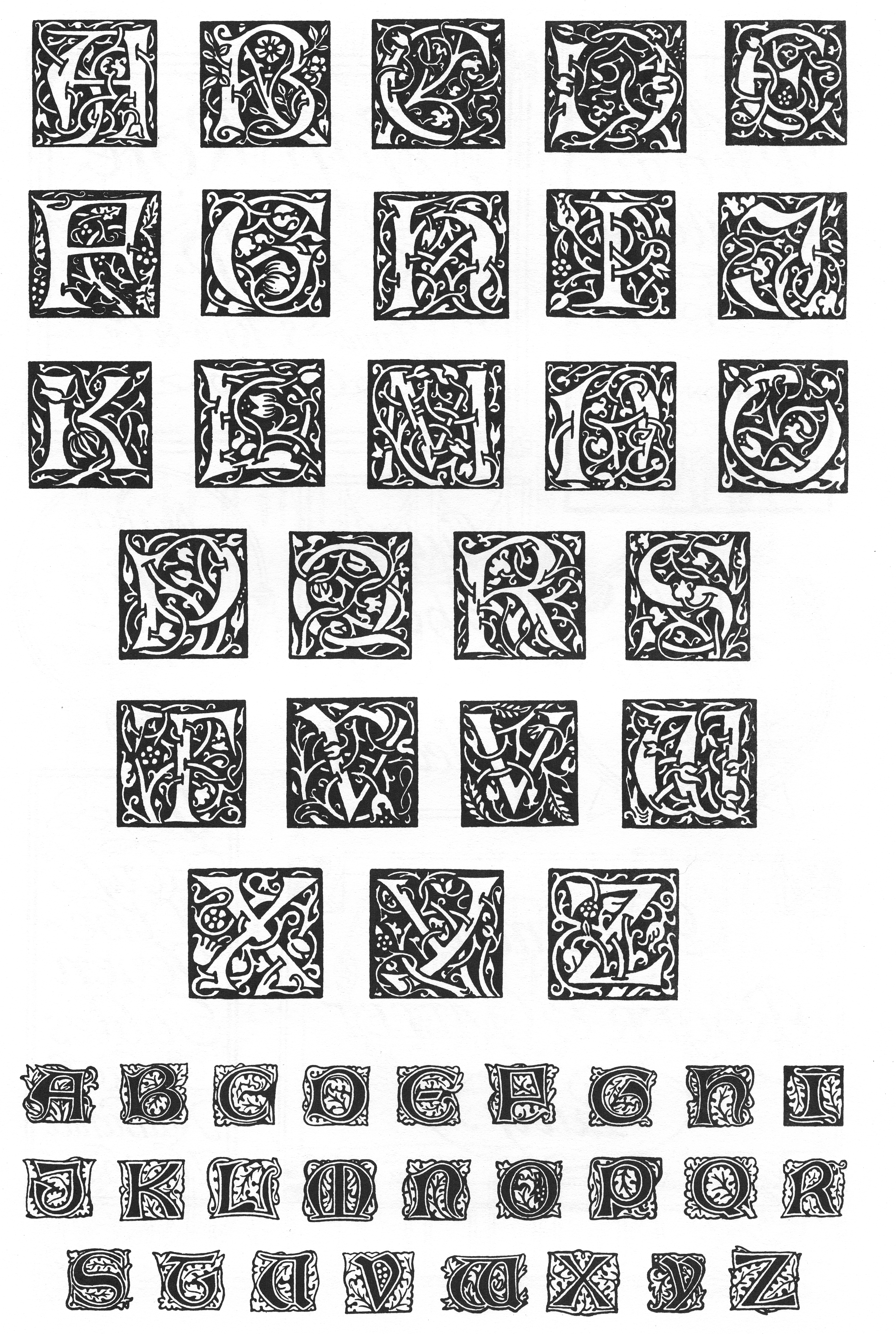