TYPE DESIGN INFORMATION PAGE last updated on Wed May 6 15:55:03 EDT 2026
FONT RECOGNITION VIA FONT MOOSE

|
|
|
|
|
Type design in Catalunya | ||
|
|
|
|
SWITCH TO INDEX FILE
| |
Barcelona-based designer of the rounded stencil typeface Gordita (2015) and of the tangram-inspired Tangrama (2014). Behance link. [Google] [More] ⦿ | |
(Old) home page. FontShop link. [Google] [More] ⦿ | |
While studying in Barcelona, Adri Valls designed the squarish typeface New Trink (2013) and a modular typeface called Moludar (sic) (2013) and Moludar Neue (2013). In 2018, he published the free blackletter typeface Ludwig, which was inspired by Koch Script. [Google] [More] ⦿ | |
As a design student in Barcelona, Adria Molins created the modular typeface Graciosa (2013). Behance link. [Google] [More] ⦿ | |
At EASD Serra i Abella (ESDAP) in L'Hospitalet del Llobregat, Mataro, Catalunya-based Adria Romana designed the free vector format Escher-inspired set of numbers called Imponumbers (2016). In 2017, she designed the piano key typeface Ona, the free Western font Sheriff and the free rounded sans typeface Rosmi. [Google] [More] ⦿ | |
| |
| |
Catalan graphic and type designer and illustrator, b. 1986, Barcelona. Graphic design student at ELISAVA University. Creator of Hol'em Regular (2007, heavy slab serif face) and Ecstasi (2007, a script logotype). [Google] [More] ⦿ | |
Catalan designer of the scratchy font Diatriba, of the corroded font Dead End, and of the ancient caps font Ot. [Google] [More] ⦿ | |
From Barcelona, he is the Garcia designers of Afligidos deudos (1996, grunge). [Google] [More] ⦿ | |
Newsense (2013) is an art deco typeface that extends Milton Glaser's Film Sense (1968). Romaji Mincho (2013) is a free Asian simulation font based on the style of the Mincho typeface. Rhyder (2013) is a great (free) geometric 1930s style sans typeface. Martell (2013) is a free general purpose slab serif family. AC Big Serif (2013) is a free rounded wedge serif typeface. AC Thermes (2013) is a sans display typeface. Typefaces from 2014: AC Wanita (hand-drawn). Typefaces from 2019: AC Guanche (a font based on the ancient scripts used by the Guanches, the aboriginal inhabitants of the Canary Islands). [Google] [More] ⦿ | |
Barcelona-based designer of the piano key typeface Yaka (2017) and the free geometric sans typeface Adca (2017). [Google] [More] ⦿ | |
Barcelona-based designer of the display typeface Proe (2015). [Google] [More] ⦿ | |
| |
Adriana Sanlo (or Adriana Sanchez) is the Barcelona-based creator of the grungy typeface Agency Grotesque (2012). Behance link. [Google] [More] ⦿ | |
Affaire
| Affaire is an art and design studio working in the fields of fashion, culture and consumer goods, founded in 2015 by Josep Roman and Pol Perez. The studio works for an array of international and domestic clients on disciplines ranging from art direction and edition to publishing, visual identity and web design. Barcelona-based art director and designer Josep Roman graduated from Elisava in 2011 and studied ias an exchange student at ECAL (Lausanne, Switzerland). He teaches at Elisava in Barcelona. Josep Roman's typefaces include Elia (2012) and Lausana (2012). [Google] [More] ⦿ |
Afu Sánchez (Barcelona) created the ultra-fat modular typeface Tasious (2011). [Google] [More] ⦿ | |
Great graphic designer from Valencia, Spain. At Behance, she showed a trendy blingy smoky New York typographic poster (2009). In 2010, she made an equally fine poster for Berlin. [Google] [More] ⦿ | |
As a student in Barcelona, Aina Planells created the piano key typeface Clandestino (2015). [Google] [More] ⦿ | |
Alba Boyer Margalef was born in 1990 in El Perello, and studied at ELISAVA. She is now a freelance designer in Barcelona. In 2013, she designed a serifless didone called Dorina. Behance link. [Google] [More] ⦿ | |
Based in Barcelona, Alba Dominguez created the art deco sans typeface Mossant in 2015. [Google] [More] ⦿ | |
Barcelona-based designer (b. 1986) who made the strong bold typeface Dakats (2010), and the ornamental Lombardic typeface Aribau (2010). Home page. [Google] [More] ⦿ | |
During her studies in Barcelona, Alba Martinez Sanchez created the poster typeface Irregular (2014). [Google] [More] ⦿ | |
| |
Designer in Barcelona. Creator of Tipografia Modular (2013). [Google] [More] ⦿ | |
Cervera / Barcelona-based designer of the modular and molecular typeface Panot (2018), and the exercise in reverse contrast, Esbart (2018). [Google] [More] ⦿ | |
Barcelona-based designer of Giulia (2018: a monoline sans), Kind (2018), Evil (2018: a reverse stress typeface), and Playground (2018: a modular typeface). [Google] [More] ⦿ | |
Barcelona-based designer of Madnezz Quiin (2018) and the oriental emulation typeface Shinsengumi (2018). [Google] [More] ⦿ | |
Barcelona-based designer of a handcrafted typeface (2015). [Google] [More] ⦿ | |
Barcelona-based designer of Filfont (2014: a modular display face). Behance link. [Google] [More] ⦿ | |
Barcelona-based designer of the Peignotian typeface Lonia (2016). [Google] [More] ⦿ | |
Type historian at Reial Academia de Bones Lletres in Barcelona, who has a PhD in art history from Universitat Autonoma de Barcelona (UAB). Born in Barcelona in 1971, Corbeto is responsible for all the publishing activities of the Real Academia de Buenas Letras de Barcelona and the Asociación de Bibliófilos de Barcelona. His field of investigation is the history of printing types and, in particular, the work of Spanish punchcutters throughout the second half of the eighteenth century. At ATypI 2006 in Lisbon, he spoke about the efforts around 1750-1770 to set up the Royal Library type foundry by Juan de Santander and Gerónimo A. Gil. Speaker at ATypI 2009 in Mexico City, where he talked about the punches from the Spanish Royal Printing House. Soon he will publish a specimen and text book on all this. His books: Muses de la impremta. La dona i les arts del llibre (segles XVI-XIX) (ed., with M. Garone) (Associació de Bibliòfils de Barcelona, 2009); Especímenes tipográficos españoles. Catalogación y estudio de las muestras de letras impresas hasta el año 1833 (Calambur, Madrid, 2010); Daniel B. Updike, impresor e historiador de la tipografía (Campgrafic, Valencia, 2011); Tipos de imprenta en España (Campgrafic, Valencia, 2011), Las letras de la Ilustración. Edición, imprenta y fundición de tipos en la Real Biblioteca (Catálogo de la exposición en la Biblioteca Nacional, Madrid, 2012) e Història de la tipografia. L'evolució de la lletra des de Gutenberg fins a les foneries digitals (coauthor with M. Garone, Pagès Editors, Lérida, 2012). [Google] [More] ⦿ | |
| |
Behance link. [Google] [More] ⦿ | |
Albert Folch
| |
| |
Design graduate from ESDI, who works in Barcelona. Creator of the nibbed caps typefaces Add Shadow Left and Add Shadow Right (2013), and the modular typeface Colb (2013). [Google] [More] ⦿ | |
Sabadell, Spain-based designer of the squarish typeface Occidental Kufic (2019). [Google] [More] ⦿ | |
During his studies at BAU, Barcelona-based Albert Navarro designed the all caps display typeface Monterosa (2019). [Google] [More] ⦿ | |
Albert Pereta
| |
Catalan graphic designer. His designs include Nenufar, loked Piece, Loked Stencil, Landeth. No sales or downloads. [Google] [More] ⦿ | |
Barcelona-based designer of Josefina's Type (2013). [Google] [More] ⦿ | |
Barcelona-based designer of an all caps display typeface in 2019. [Google] [More] ⦿ | |
Barcelona, Spain-based designer of the modular display typeface Olika (2016). It is inspired by the sea waves and the surf culture. Behance link. [Google] [More] ⦿ | |
Barcelona, Spain-based designer of the squarish Stargazer (2017). [Google] [More] ⦿ | |
Barcelona-based designer of Binary Verges (2020). [Google] [More] ⦿ | |
Catalan creator of the free hand-printed font Zrylux (2012). [Google] [More] ⦿ | |
Barcelona-based designer, b. 1989. He studied at the Swiss-School of Barcelona. His typeface AR Vulcano (2011-2012) has a high-contrast condensed octagonal design for application in fashion mags. Behance link. [Google] [More] ⦿ | |
Typefaces from 2014: Brava, Otrebla, Naula, Aghila, Wex, Malk, Fulgura, Dawner, Hebe, Mulago, Wako, Senzi, Awelita, Serpi, Connexion (circuit typeface), Caramelo, Matcha, Pazuzu, Rustika (art nouveau). Typefaces from 2015: Drabe, Respingo, Keyla, Greenstone, Linu (bilined). Typefaces from 2016: Molona (brush script), Zem (a futuristic typeface), Uglygraphy, Glabori, Campana (vector font), Grobb, Xtravagant, Wouliane, Kuasar. Aka Albertako. Dafont link. Creative Market link. [Google] [More] ⦿ | |
Barcelona-based designer of the piano key typeface Supertipo Bemoll (2016). [Google] [More] ⦿ | |
Originally from San Salvador, El Salvador, this Barcelona-based designer created the logotype Marlin (2011) for a yachting company. [Google] [More] ⦿ | |
Alex Baisan (Valencia, Spain) designed Soul Trumpet (2013), a display typeface. Behance link. [Google] [More] ⦿ | |
Alex Camacho Studio
|
Cargo collecive link. Linotype link. [Google] [MyFonts] [More] ⦿ |
Alex Camacho Pizarro
| |
Alex Cervera (Barcelona, Spain) created the typeface Kelm Regular in 2013 for magazines and newspapers. It is characterized by low contrast, short ascenders and descenders, and large x-height. Behance link. [Google] [More] ⦿ | |
Graphic designer from Figueres (Spain). He designed Network (1996) at Garcia fonts. He created Pilgrim (1997), Montaplex (1997) and Kennedy (1997) at [T26]. Bondage (a set of 16 fonts) was announced but never released by [T26]. Klingspor link. [Google] [MyFonts] [More] ⦿ | |
During his studies, Sant Fost de Campsentelles, Barcelona-based Alex Ldalí created an angry angular typeface (2015). [Google] [More] ⦿ | |
He is the codesigner with Andreu Balius of SuperVeloz (2005, TypeRepublic), a digital version of his grandfather's typeface. It won an award at the TDC2 2005 type competition. Balius says about this typeface originally created by Joan Trochut from 1920-1980: Super-Veloz could be considered as an Ornamental type design, but in its core it is an experimental typeface based on a set of modular features that, with the combining of its modules, a great range of typefaces, ornaments ---even illustrations---, could be made. That is perhaps the most interesting experiment in early modern type design ever made in Spain during the immediate years after the War. The lecture, considering the borders between type design and ornament design, will introduce the context where Joan Trochut's Super-Veloz was produced (from sketches to published brochures and speciments) in 1942. Also will explain how Super-Veloz works. It is really a "type-ornament" design that could be considered on the edge of what we call type design. Alex has created design, illustration and typography for a diverse range of clients: Nike, Adidas, The Rolling Stones, Katy Perry, BBC, Coca-Cola, Pepsi, The Guardian, The New York Times and Time Magazine. Alex Trochut's lettering must be seen to be believed---it has to be genetic transmission. Recurring themes include adorned initials and modular types. His numerical all-caps alphabet for British Airways is phenomenal and pushes the bling-bling to the fashionable extreme. Stunning dollar sign drawn by him in 2007 for Acido Surtido. In 2009, he published Neo Deco at HypeForType. Noteworthy type treatments of that year include Nixon and the Futurecraft logo. In 2012, he designed Trojan Font (like Trajan). He also did some stunning multiline alphabet for V Magazine. Also noteworthy is a swashy calligraphic logo for Wiz Khalifa and Atlantic Records. In 2013, Barcelona-based creative agency, Herraiz Soto commissioned Alex Trochut to create an original typeface collection titled Raw for Notegraphy. In 2017, he made the color font Megazero at Fontself in Opentype SVG format. In 2018, Alex Trochut and Sudtipos cooperated on Utopian and Dystopian. Utopian is a color font family based on primary colors and pure geometric shapes, influenced by Bauhaus and De Stijl. Dystopian, its black and white companion with square features of Renner's original Futura drawings, emits a darker look and evokes Trumpian gloom and doom. Behance link. Debutart link. Klingspor link. [Google] [MyFonts] [More] ⦿ | |
Alexandra Bardou, a graduate from the ELISAVA School of Design in Barcelona in 2013, created an unnamed connected script font in 2013. Behance link. [Google] [More] ⦿ | |
| |
| |
Barcelona-based creator of the simple handprinting typeface called Alexis (1997, Garcia Fonts). [Google] [More] ⦿ | |
Graphic designer and illustrator in Terrassa, Catalunya, b. 1980, Sabadell. Professor at Escola d'Art la Garriga and Escola d'Art de Terrassa. He created the techno typeface Baucis in 2016 and the fat display sans typeface Calgary88 in 2020. [Google] [More] ⦿ | |
Born in Buenos Aires, and a resident designer in Barcelona, Alfredo Graziani is the codesigner with Alejandro Paul at Umbrella Type of the medieval script Mama Script (2004). At Sudtipos, he created the script typeface Milk Script (2004, with Alejandro Paul: based on lettering seen in a 1923 Speedball manual), as well as Divina. Typedia link. Klingspor link. [Google] [MyFonts] [More] ⦿ | |
During her graphic design studies in Barcelona, Alice Maurier created the high-contrast Peignotian sans typeface Gironde (2014), which she claims to be a hybrid of Futura and Bodoni. Behance link. [Google] [More] ⦿ | |
Palma de Mallorca-based creator of a nice typographic collection of posters entitled Carteles Leo Bassi (2011), which mix the Western circus poster style and art nouveau elements. Typefaces created by er include the paper cut typeface Diplodocus (2011), and the octagonal typeface That Tune (2012). View her Y Modaba poster (2011). [Google] [More] ⦿ | |
Alkimia Fonts
| Barcelona-based designer (b. 1984) of the free modular typeface Arkadia (2016). Dafont link. [Google] [More] ⦿ |
Alter Order
| Alter Order is the web alias for Pedro Gonçalves, a Portuguese art director based in Barcelona. Creator of the ultra black slab typeface Gorda Slab (2010). [Google] [More] ⦿ |
Alva Aur (Valencia, Spain) designed the Witch Lab typeface (2012, alchemic). [Google] [More] ⦿ | |
Alvaro Franca
| |
Barcelona-based illustrator. Look at the informal lettering in her posters. [Google] [More] ⦿ | |
As a student at Elisava in Barcelona, Ambar Amill Bosco designed a lachrymal all caps typeface (2015). [Google] [More] ⦿ | |
Graphic designer in Barcelona who created these typefaces in 2014: Honolulu, Western, Arsenal, SciFi, Paperclip, Tangram. [Google] [More] ⦿ | |
| |
Barcelona, Spain-based designer of the geometric modular typeface Aztore (2015). [Google] [More] ⦿ | |
Ana Dorado
| |
During her design studies in Barcelona, Ana Garcia Royo created the foliate typeface Leaf (2014). [Google] [More] ⦿ | |
Ana V. Francès (or A-GRPHCS in Valencia, Spain) created a bichromatic typeface in 2012. Behance link. [Google] [More] ⦿ | |
Graphic designer in Barcelona. In 2016, she created the sturdy text typeface Cantera, perhaps most useful for engineering and building applications. Quantum (2016) is an experimental typeface based on circles, while Avier (2016) is even more experimental, while staying in the techno realm. [Google] [More] ⦿ | |
| |
During her studies at ELISAVA in Barcelona, Andrea Buonaventura (Arenys del Mar) designed the ball terminal fat display typeface Wave (2013, with Sandra Galan). She also designed the sans display typeface Mula (2013). Behance link. [Google] [More] ⦿ | |
Designer from Barcelona who created Hair Type (2011). I am not sure that this is a font. [Google] [More] ⦿ | |
| |
In Laura Meseguer's class in Barcelona, Andrea Fusinski designed a German expressionist typeface called Shelley (2013). Behance link. [Google] [More] ⦿ | |
Barcelona-based graphic designer and illustrator, who made Bubble Line type (2012). [Google] [More] ⦿ | |
Art director in Barcelona, who designed the free sans typeface Partenope Grotesk (2016). Behance link. [Google] [More] ⦿ | |
As a design student in Barcelona, Andrea Ruiz created the modular typefaces Enea (2013) and Crear (2013). Behance link. [Google] [More] ⦿ | |
| |
Andrei Robu
| |
Andreu Balius Planelles
| |
Andreu Balius Planelles
| |
Balius won a Bukvaraz 2001 award for Pradell. Pradell also won an award at the TDC2 Type Directors Club's Type Design Competition 2002. SuperVeloz (codesigned with Alex Trochut) won an award at the TDC2 2005 type competition. At ATypI 2005 in Helsinki, he spoke on Pradell and Super-Veloz. Speaker at ATypI 2006 in Lisbon. At ATypI 2009 in Mexico City, he spoke about the Imprenta Real. Coorganizer of ATypI 2014 in Barcelona. Author of Type at work. The use of Type in Editorial Design, published in English by BIS (Amsterdam, 2003). FontFont link. Linotype link. Behance link. His production:
| |
| |
Barcelona-based designer of the rounded techno typeface Venair (2017). Behance link. [Google] [More] ⦿ | |
Barcelona-based creator of the typographic poster La Mano Larga (2011). Behance link. [Google] [More] ⦿ | |
Angel Alvarez
| |
Barcelona-based designer of the text typeface Amaro (2017), his Master's project at EINA. Behance link. [Google] [More] ⦿ | |
During his graphic design studies, Angel Cebrian (Olot, Catalunya) created the ultra-condensed piano key typeface Condemned (2014). [Google] [More] ⦿ | |
Barcelona-based designer of the icon set called Eyetok (2017), which was created for a visual identity. [Google] [More] ⦿ | |
Barcelona-based Colombia-born designer of the text typeface Ninive (2018). [Google] [More] ⦿ | |
She created the text typeface Arnie (2011). She writes: Arnie is a text typeface designed for books and poetry. Due to calligraphic origin, rather classical proportions and flat curves, it seems solid and stable. While big counters and varying line weight make it look light and airy in long texts. She also created the signage script face Cookie (2011), which is free at Google Web Fonts. Panna Kotta (2010) is an upright italic. Ladaco (2008) is inspired in Polish folkloric cut-outs. Krotta One (2012, Google Web Fonts) is an italic typeface. It was renamed Kotta a few days later. Behance link. Google Web Fonts link. Fontsquirrel link. [Google] [More] ⦿ | |
Designer of a circle-based typeface for Carnaval de Barcelona 2017. [Google] [More] ⦿ | |
Barcelona-based creator of some geometric typefaces in 2013. Behance link. [Google] [More] ⦿ | |
Barcelona-based designer of the geometric sans display typeface Pinocchio (2013). [Google] [More] ⦿ | |
Freelance graphic designer in Barcelona, who created the connect-the-dots font Linkup (2012). Behance link. [Google] [More] ⦿ | |
Mataro, Catalunya-based designer of the kitchen tile font Arc (2016) and the free text typeface Atia (2016). Behance link. [Google] [More] ⦿ | |
Anna Tilche (Barcelona) created an animal-themed caps alphabet called Animalario (2013). Behance link. [Google] [More] ⦿ | |
Antidesign
| Freelance designer in Girona, Spain. Behance link. He created the multiline neon-look techno typeface Adtype01 (2010) and the futuristic typeface Adtype00 (2010). [Google] [More] ⦿ |
Catalan designer of the decorative futuristic font Diagonal ND (1970, Neufville), named after the main street in Barcelona. [The MyFonts page gives 2000 as a date, a bit confusing!] FontShop link. [Google] [MyFonts] [More] ⦿ | |
Antonio Lopez
| |
Barcelona-based creator of an identity typeface Soldevila (2012) for a restaurant by that name in Calders, Catalunya. [Google] [More] ⦿ | |
Graduate of ESDAP, Barcelona, who works as a graphic designer in Barcellona. In 2020, she released the decorative display typeface Orquidia. [Google] [More] ⦿ | |
Barcelona-based designer of Mech Regular (2013) and the modular typeface Pepper Type (2013). [Google] [More] ⦿ | |
Barcelona-based designer of the wavy display typeface Belafonte (2013). [Google] [More] ⦿ | |
Barcelona-based designer of Kandu (2013), a thin typeface that was derived from Bell MT in 2013. Behance link. [Google] [More] ⦿ | |
Barcelona-based designer of the tuxedoed typeface Sonora (2018). [Google] [More] ⦿ | |
Graphic designer in Barcelona who studied at ESDAP. Creator of the pixelish typeface Tetris (2017). Behance link. [Google] [More] ⦿ | |
Esplugues de Llobregat, Barcelona-based designer of the squarish / octagonal / techno motorcycle lettering typeface Gravis (2015). [Google] [More] ⦿ | |
Behance link. [Google] [More] ⦿ | |
Illustrator, graphic designer and graffiti painter in Barcelona who created the pixacoo-inspired typeface Distilo (2014). [Google] [More] ⦿ | |
| |
Atelier Laia
|
In 2013 Atelier Iaia published the calligraphic Iturzaeta-inspired typeface Lamia, a joint effort of Santos Bregaña, Julen Cano Linazasor and Maore Sagarzazu: The Lamia font is inspired by the work of the most famous calligrapher of the Basque Country, Jose Francisco de Iturzaeta Eizaguirre (Getaria, 1788-Madrid, 1853). His writing method was compulsory in Spanish schools since 1835. His "unpolished Spanish font" tried to be more effective than the more commercial English version by avoiding embellishments and excessive rear tearing. More akin with the liberal values imported by the French, his offerings sought uniformity, speed and efficiency to ensure that those in the less-favored echelons of society had an effective communication tool. From his "General collection of characters of European Letters" published in Madrid in 1833, we have chosen the "lower case pancilla reformed" represented in one of the prints. We have tried to reinterpret it by keeping its essence but also ensuring that it is viable for potential contemporary uses which, thanks to its good readability and effectiveness in longer texts, basically means as a decorative or display font. The upper case was generated using the lower case as a reference. Waskonia (2013, Santos Bregaña) is inspired by Basq gravestones from the 8th century. Earlier work of Santos Bregaña includes the Kai (Basque) typeface family (199701999, with Mikel Enparantza) at Garagefonts. FontShop link. Klingspor link. [Google] [MyFonts] [More] ⦿ |
| |
ATypI 2014 was held in Barcelona from 17-21 September 2014. The first two days were at the spectacularly beautiful BAU School of Design and the last three at the Museu del Disseny. Speakers included Alexander Cooper, Matthew J. Rechs, Azza Alameddine, Andreu Balius Planelles, Jesus Barrientos, Sofie Beier, Caleb Belohlavek, David Berlow, Ann Bessemans, Henrik Birkvig, Noe Blanco, Nathan Davis, Nikola Djurek, Nathalie Dumont, Behdad Esfahbod, Martina Flor, Domen Fras, Tomas Ferrari, Rezan Gassas, Yashodeep Gholap, John Giannopoulos, Stuart Gill, Rose Gridneff, Theodore Harrison, Andrew Haslam, Masataka Hattori, Paul Hunt, Thomas Huot-Marchand, Eric Kindel, Boris Kochan, David Kuettel, Indra Kupferschmid, Kevin Larson, David Lemon, Jean-Baptiste Levee, Bruno Maag, Thomas Maier, William Montrose, Oriol Moret-Vinals, Paulo Moretto, Haytham Nawar, Meta Newhouse, Alessia Nicotra, Ryoko Nishizuka, Toshi Omagari, Michele Patane, Raquel Pelta, Joan Carles Perez Casasin, Yves Peters, Thomas Phinney, Albert-Jan Pool, Daniel Reynolds, Daniel Rhatigan, Jay Rutherford, Keitaro Sakamoto, Alice Savoie, Jose Scaglione, Rainer Erich Scheichelbauer, Georg Seifert, Manuel Sesma, Fred Smeijers, Liron Turkenich, Michael Twyman, Gerard Unger, Jim Wasco, Jurgen Willrodt, Taro Yamamoto, Onur Fatih Yazicigil, Erik van Blokland, and Ozlem Ozkal. The meeting was a stunning success as seats were sold out more than a month in advance. On the other hand, considering the loss of income this entails for ATypI as an organization, the lack of a contingency plan is also a failure of sorts. The general feeling was that this was possibly one of the best ATypI conferences ever. Links: Tweets. Album by Magnus Rakeng. Album by TypeTogether. Photographs by Nina Stossinger. Martina Flor's sketches of the talks. [Google] [More] ⦿ | |
Aurelio Sánchez
| |
| |
The Latin / Arabic version of Dalton Maag's Effra was co-designed by Azza Alameddine and Alex Blattmann. It won an award at Granshan 2016. In 2017, she finished Adelle Sans Arabic at Type Together. In 2019, Type Together released Catalpa (Veronkia Burian, Jose Scaglione, Azza Alameddine) and wrote: Primed for headlines, Catalpa is designed to give words bulk and width and gravity itself. The Catalpa font family is José Scaglione and Veronika Burian's wood type inspired design for an overwhelming headline presence. Catalpa was followed in 2021 by Belarius, a three-axis variable family that shifts from sans to slab serif, from condensed to expanded widths, and includes every possibility in between. Published by Type Together in 2021, it was developed under the guidance of Veronika Burian and José Scaglione, with type design by Azza Alameddine and Pooja Saxena, and additional kerning and engineering help from Radek Sidun, Joancarles Casasin and Irene Vlachou. At the end of 2021, she finished Bree Arabic as part of Type Together enormous Bree multiscript typeface family. [Google] [More] ⦿ | |
Bababau
| Xavier Puig is a type and graphic designer, born in Artés, Barcelona. He moved to London in 2003 where he graduated in Visual Communication and Typography at the London College of Communication. He created the severe octagonal typeface Ihavebeenwaitingforyou (2009) and the LED typeface Water In My Casio (2009). In 2010, he added Sexything. Dafont link. [Google] [More] ⦿ |
Baimu Studio (Barcelona) created the display typeface Roundone (2012) and the elliptical Baimu house typeface (2012). [Google] [More] ⦿ | |
Barcelona-based designer of the free neon typeface Neoneon (2017). Behance link. [Google] [More] ⦿ | |
| |
| |
BaseLAB
|
|
Designer, b. Bilbao, 1987, who graduated in 2010 with a degree in Fine Arts and a specialty in Graphic Design from the University of the Basque Country. She also obtained a Masters degree in typography from the University of Barcelona. She created La Botica de Bernarda (2012, a retro display face). That typeface was co-designed with Mariana Alvarez Matijasevic. Other type designs by Begoña include Bambola Script, which was created in Ricardo Rousselot's studio called Gruppo Erre. [Google] [More] ⦿ | |
Spanish graphic designer based in Barcelona who works at Aktiva Brand Design Experience. His typefaces include Torreta (2021). The distressed old style serif Torreta was originally designed for the children's book La fábrica de etiquetas by Emma Piquer published by Juventud Editorial in July 2021. [Google] [MyFonts] [More] ⦿ | |
Bernat Gramage/Toni Benlliure
| |
Igualada, Spain-based designer of the geometric display typeface Cubik (2018) and the grotesque all caps typeface Lux (2018). [Google] [More] ⦿ | |
During her studies in Barcelona, Betta Judge designed a handcrafted color alphabet (2017). [Google] [More] ⦿ | |
Mahon (or Mao), Menorca-based art director, who created the rounded tweetware stencil typeface Puig (2014), and Adventure Icon Set (2014). Creative Market link. [Google] [More] ⦿ | |
Behance link. Old URL. Ultratypes link. [Google] [More] ⦿ | |
Blackletra
|
He won an award at Tipos Latinos 2012 and at TDC 2013 for Karol. In 2012, he won the Silver Prize in the Latin category of the Morisawa Type Design Competition for Hashar, a beautiful angular connected script face. In 2013, he published Karol at Type O Tones. Falado (2013) is a delicate display typeface commissioned by Estudio Mucho for the graphic identity of the Spanish orchestra La Filarmónica. It won a Gold Medal at Laus'13. In 2014, he designed the superb angular script typeface Haltrix (Village). Karol Sans was published at Type-o-Tones in 2014. Haltrix, Gandur (which was inspired by other geometric texturas, specially Max Bittrof's Element (1933)) and Karol Sans all won awards at Tipos Latinos 2014. Expectedly, Haltrix won an award in the TDC 2015 Type Design competition. Gandur New (German expressionist) and Gandur Alte (closer to Textura) followed in the summer of 2014. In 2015, he released Silva (Text, Display), a typeface co-designed with Chester Jenkins. Gothiks (2015, Village), Gothiks Compressed (2016) and Gothiks Condensed (2016), a family of condensed typefaces of varying widths and thicknesses that hearken back to the gothic wood types, and Latam Sans (2015, a custom typeface for Latam Airlines) won awards at Tipos Latinos 2016. Typefaces from 2016 include Ofelia Std, a corporate sans family characterized by a lower case f that looks like a stretched s. Typefaces from 2017: Noka (a sci-fi geometric sans characterized by its curvy f and hipster g). Typefaces from 2019: STC Forward (a bespoke sans typeface for Saudi Telecom Company), Gothiks Round Compressed, Gothiks Round Condensed, Gothiks Round. Typefaces from 2020: Elizeth and Elizeth Condensed (a slab serif by Daniel Sabino, Lucas Gini and Henrique Beier), Skol Display (a forceful poster sans), Ofelia Text and Display, Ekos (an all caps typeface designed for the Natura Ekos brand). Typefaces from 2021: Silva Display (a 16-style serif). Winner at Tipos Latinos 2018 of a type design award for Elizeth. Village link (since 2014). Behance link. [Google] [MyFonts] [More] ⦿ |
Barcelona-based designer of the hand-drawn Taboo (2019) and the ultra-condensed piano key typeface Queso (2019). [Google] [More] ⦿ | |
Designer and illustrator in Barcelona who made a few typefaces in 2011. [Google] [More] ⦿ | |
He designed a macho poster headline face in 2012. His graduation typeface at KABK is Lanka. Lanka uses stencil effects in calligraphy, and is inspired by Francisco Palomares's book Arte nueva de escribir (1776). He produced several stencil and text styles for an attractive and highly original ensemble. In 2019, he released the curvy stencil family Laima at TypeTogether. Laima won an award at 23TDC. [Google] [MyFonts] [More] ⦿ | |
BohFonts
|
|
Barcelona-based designer of the modular display typeface Ex Machina (2016). [Google] [More] ⦿ | |
| |
Graphic designer in Barcelona, who created Fedora Serif in 2012 and Ritual Serif (an esoteric typeface based on ancient blood rites and a bit of alchemy---think Jonathan Barnbrook) in 2013. [Google] [More] ⦿ | |
Bruno Selles
| |
Bunker Type
| Letterpress company in Barcelona run by Jesus Morentin. Morenti studied graphic design at la Escuela d'Arts i Oficis Llotja, at the University of Barcelona and finally at Escola Superior de Disseny, ESDi. Behance link. [Google] [More] ⦿ |
Caligraft
| Beautiful (programmed) experimental letters derived from fonts. This is based on the Masters Thesis in Digital Arts, obtained in 2005 by the Catalan designer Ricard Marxer Piñón, 2006. For this, he wrote the "Geomerative" library of programs, which includes a truetype importer and interpreter. Alternate URL. [Google] [More] ⦿ |
| |
Art director in Barcelona who created the display typeface Suave and the wide sans typeface Soo White in 2018. [Google] [More] ⦿ | |
Barcelona-based designer of Blan Type (2015, a rounded all caps sans). Behance link. [Google] [More] ⦿ | |
Aka Charly Brown, he designed Ninja Type and Vertigo at Garcia fonts. Lives and works in Barcelona. [Google] [More] ⦿ | |
Art director in Barcelona who made Doblez Condensada (2010, a bilined typeface). Behance link. [Google] [More] ⦿ | |
| |
| |
Graphic designer in Barcelona who created Fucktype (sic) (2011), a fat rounded typeface that is based on the logotype of Yoigo. Home page. [Google] [More] ⦿ | |
In 2013, he designed the humanist mediterranean sans typeface Born (tweetware). In 2014, he created Neon (2014), a set of capital numerals, for the September issue of Yorokobu Magazine. Neon is inspired by American road movies from the 80's and 90's. In 2015, he created Yorokobu numbers for the magazine. Still in 2015, he designed Recia (Indian Type Foundry): an angular ten-style wedge serif typeface family. Free at Fontshare. Typefaces from 2016: 3D Experimental. In 2018, he graduated from the TypeMedia program at KABK in Den Haag. His graduation typeface, Azor, was designed for editorial use. He explains: Azor is a typeface for display and text that requires comfortable legibility, personality and a human touch. Azor's italics are quite angular for added contrast with the romanstyles. [Google] [MyFonts] [More] ⦿ | |
Carlos Galan Rubio (Barcelona) created the delicate display typeface Gracia Divina in 2012, which was custom designed for a store that sells religious articles. Behance link. [Google] [More] ⦿ | |
Barcelona-based graphic designer, b. Zaragoza, 1986. After studies in Zaragoza and Barcelona, Carlos Irazabal created the Misterio text typeface (2014, transitional). [Google] [More] ⦿ | |
Barcelona-based designer and illustrator. Creator of the grungy alphabet Smokey (2009). Pic. [Google] [More] ⦿ | |
Barcelona, Spain-based designer of the partially dotted typeface Mist (2016). Behance link. [Google] [More] ⦿ | |
At EINA in Barcelona, Carlota Gallart designed a geometric display typeface in 2018. [Google] [More] ⦿ | |
Graphic designer in Barcelona who created the "Latin" display typeface Sonora Bold Display (2015). Behance link. [Google] [More] ⦿ | |
Barcelona-based designer of the Greek simulation font Nemrac (2014) and the speed emulation font Incliso (2014). Flickr link. [Google] [More] ⦿ | |
During her studies in Barcelona, Carmen Marin created the monoline modular typeface Blumenblatt (2013), for which she was inspired by petals. In 2015, shev designed the bilined all caps typeface DBL. [Google] [More] ⦿ | |
Carolina Poch Enciso is an illustrator and graphic design who studied at ELISAVA in Barcelona. She created the experimental Ciocco ball terminal typeface in 2013 together with Isa Lapera. Behance link. [Google] [More] ⦿ | |
Graphic designer in Figueres, Catalunya. She published the free basic sans typeface Marvel (2011, Google Web Fonts). [Google] [More] ⦿ | |
| |
Barcelona-based group headed by Laura Meseguer and Eduardo Manso which organizes frequent conferences and workshops on type. [Google] [More] ⦿ | |
Lettering artist from Barcelona who created this alphabet. A font called Gorchs was made in 2007 by Josep Patau Bellart (Astramat) and published by T26. [Google] [More] ⦿ | |
Designer at Astramat, a Catalan foundry (part of ANTAVIANA SERVEIS INTERACTIUS, SCCL) located in Lleida. He made the grunge fonts FAXADA (2001), Gastada (2001, like a glaz krak face), and Tiquet (2001: dot matrix typeface). Dafont link. [Google] [More] ⦿ | |
In 2016, based in Barcelona for his studies in the Masters program at EINA, he designed the free modern text family Avila, which borrows DNA from Linotype Gianotten, Utopia, Bulmer MT and Kepler, but has unique features of its own. [Google] [More] ⦿ | |
Cesc Aldabó
| |
Cesc Design (was: Ceskus Disseny)
|
In 2014, Aldabó made Climb Font (based on climbing gear), Tipoencuentro (poster face), Typoasi (modular), 15M Typestencil, and I Love Climbing. Typefaces from 2017: Walls Talk. Behance link. FontStruct link. Creative Market link. Older Behance link. Newest Behance link. [Google] [More] ⦿ |
Graphic designer in Barcelona who designed these typefaces in 2016: Oasi, TypeStencil, Climb (dingbats). In 2017, C32K created the pixacao graffiti-inspired typeface Grafftastics Sabadell. [Google] [More] ⦿ | |
Barcelona-based lettering artist. An example of his craft. [Google] [More] ⦿ | |
Charles Pons has a Master's in Graphic Design from Elisava in Barcelona. Barcelona, Spain-based designer of the brutalist typeface Brute (2018). [Google] [More] ⦿ | |
A graduate of Bau, Escola Superior de Disseny, Chema works at Battlegroup since 2002. Behance link. [Google] [More] ⦿ | |
Chris Jimenez (Barcelona, Spain) created Geom Type in 2014. [Google] [More] ⦿ | |
Christian Cuesta (Palma de Mallorca) created the alchemic typeface Square (2013). Behance link. [Google] [More] ⦿ | |
Barcelona-based designer of the all caps typefaces Vinbase (2014), Othertype (2014) and Meddusa (2014). Behance link. Creative Market link. [Google] [More] ⦿ | |
Christopher Burke
| |
Cifonts
| Daniel Fuentes, who founded Cifonts in 2015, is the Badalona, Spain-based designer of the typeface family Niu Sasson (2014) and Tapas Signpainting (2016). He studied at EINA in Barcelona, graduating in 2015. His graduation typeface ther was the text book typeface Rals. Behance link. [Google] [MyFonts] [More] ⦿ |
Ciscu Design
| Ciscu Design (Barcelona) created the display typeface No and the experimental typeface Pixelated Stripes in 2014. Its designer, Ciscu Gomez Garcia, studied at ESDI in Barcelona in 2014. IN 2015, he proposed the Mayus and Minus typographic experiment in which uppercase and lowercase elements are mixed in one hybrid typeface. Behance link. [Google] [More] ⦿ |
Ciscu Gomez Garcia
| |
Art teacher in Reus, Spain, who designed the modular typeface Coldplay in 2016. [Google] [More] ⦿ | |
Barcelona, Spain-based designer of a colorful geometric all caps typeface, Geo Type (2018). [Google] [More] ⦿ | |
Claudia Canovas
| |
| |
Barcelona-based designer of Escher Type (2016). [Google] [More] ⦿ | |
Claudia Orengo
| |
Barcelona-based designer of the modular foliate typeface Folium (2014). [Google] [More] ⦿ | |
During her studies, Barcelona, Spain-based Clouds Hintzmann designed the experimental typeface Gigster (2020). [Google] [More] ⦿ | |
Barcelona-based designer (b. 1966) of the handcrafted typeface Manustype (2017). [Google] [More] ⦿ | |
Designer in Barcelona who created Xilora (2010, grunge) and COR (2010, hand-printed). [Google] [More] ⦿ | |
Graphic design student in Philadelphia, PA, who created the angular and textured Sort Sol typeface (2012), which was inspired by large flocks of starlings. [Google] [More] ⦿ | |
Designer in Barcelona, who created the calligraphic typeface Ellethwen (2013). [Google] [More] ⦿ | |
Creatype
| Sergi Mana (Creatype, Barcelona) designed the flowing script typeface Alma (2014). Behance link. [Google] [More] ⦿ |
Barcelona-based designer of Stencil Type (2012), a piano key typeface. [Google] [More] ⦿ | |
Barcelona-based designer of Icarus (2015). [Google] [More] ⦿ | |
During her studies in Barcelona, Cristina Carrero created the piano key typeface Musk Type (2014). Behance link. [Google] [More] ⦿ | |
Designer in Barcelona, who created the wonderful art deco typeface Goms (2012). [Google] [More] ⦿ | |
Barcelona, Spain-based designer of the African-themed typeface Arec (2017). [Google] [More] ⦿ | |
During her graphic design studies in Barcelona, Cristina Tejado created the free rounded sans typeface Daruma (2015) and the free modular typeface Blum (2015). [Google] [More] ⦿ | |
A conference subtitled La letra dibujada was eld from June 18-20, 2010, in the Escuela de Arte y Superior de Diseño de Valencia, Valencia, Spain. Speakers included Gerrit Noordzij, Ken Barber, Ale Paul, Ricardo Rousselot, Javier Mariscal, James Mosley, Claude Mediavilla, Keith Adams, Marian Bantjes, Pepe Gimeno, Jose Ramon Penela, Pilar Cano and Sergio Jimenez. [Google] [More] ⦿ | |
Design site and blog, in Spanish. It is much more concerned with mag design than typogrophy. Run by four guys from Valencia: Javier Perez Belmonte, Diego Obiol, Tomas Gorria, and Herminio Javier Fernandez. [Google] [More] ⦿ | |
Damià Rotger Miró
| |
Designer and art director (b. Riobamba, Ecuador, 1986) whose studio is Disaikner in Barcelona. He created several free vernacular typefaces in 2013 that are based on wall writing and hand-drawn signs found in the city. These include Trueno, Mecanica, Garaje and Tiner. Behance link. [Google] [More] ⦿ | |
Dan Gu was studying at ECV in Bordeaux, France, in 2014. During that time, Dan created Round Sans. Behance link. [Google] [More] ⦿ | |
Illustrator and graphic designer in Barcelona. Creator in 2017 of the beatnik lettering typeface Jazzy. [Google] [More] ⦿ | |
| |
| |
Graphic designer in Barcelona since 2004. Creator of the wood type-inspired typeface Madera (2014) and of the ornamental caps typeface Metamorfosis (2014). Behance link. [Google] [More] ⦿ | |
Daniel A.P.Acuña (Shiken Studio, Barcelona, Spain) designed the squarish modular typeface Underpick in 2016. Aka Daniel Pepe. [Google] [More] ⦿ | |
Daniel Cifuentes
| |
Barcelona-based designer of an unnamed curly typeface in 2012. [Google] [More] ⦿ | |
Daniel Hernando
| |
Daniel Ramirez
| |
Daniel Rodríguez Valero received his PhD in Arts in 2006 from University of Barcelona, where he also got a Postgraduate in Digital Typography. He teaches Typographic Design and Digital Typography in the Arts Faculty (University of Barcelona) since 1999, and Graphic Design in Advertising studies (University of Alicante) since 2002. He teaches Digital Typography at the máster ibérico em design, Oporto (Portugal). He has created a new system for type design called Constructor in collaboration with Marc Antoni Malagarriga I Picas, a programmer. Constructor is a glyph editor based on calligraphic curves, which he presented at TypeTech, ATypI in Brighton in 2007. He writes: Constructor is a new tool for type design, open source and cross-platform, based on a calligraphic heritage that provides new possibilities. It can be combined with production tools like Fontographer or FontLab, because its finality is to construct outlines extrapolating some instructions or parameters given by the user. It works with only one master and produces different letterforms that can be copied/pasted to a font editor. It will help to design quickly a complete family, so the benefits of this new system for type designers are tremendous. He claims to be inspired in part by Gerrit Noordzij's theory of type design as explained in The stroke of the pen. [Google] [More] ⦿ | |
Daniel Sabino
| |
Daniel created Goma (a beautiful rounded octagonal monospaced typeface; Goma Mono was published in 2014), Shadow Type and Grom (3d type) in 2013. In 2014, he created the squarish sans typeface Europa. In 2017, he designed the ink-trapped grotesque typeface Polar and the fun tall condensed all caps typeface Dinosaur. Behance link. [Google] [MyFonts] [More] ⦿ | |
In 2017, Daniel Vidal and Maria Berga co-designed the liquidy Cool Shit font. Behance link. [Google] [More] ⦿ | |
During his studies in Barcelona, Darek Artworks designed Gothic Stencil (2019). [Google] [More] ⦿ | |
DarezD
| Costa Brava, Spain-based designer of the stencil typeface Stenzilla (2022) and the logo/headline font Aforo Display, (2022). [Google] [MyFonts] [More] ⦿ |
| |
Dase
| Dase is a design studio in Barcelona that was founded in 2006 by Marc Alvarez. He describes himself as a vegan artivist & graphic designer with a large experience working in illustration, lettering, calligraphy and typography with a minimal and conceptual approach. In 2021, he designed the bold street art brush script font Dase Signature. [Google] [MyFonts] [More] ⦿ |
Barcelona-based designer of the Escher-style outline typeface Barcelona (2014). Behance link. [Google] [More] ⦿ | |
David Capo Vallbona
| |
| |
As a student in Barcelona, David Pascual created the stencil typeface The New Deco (2013). Behance link. Aka David Spagetti. [Google] [More] ⦿ | |
Barcelona-based designer of the 3d school project typeface Cube (2013) and of the geometric sans typeface Felicity (2013). [Google] [More] ⦿ | |
Barcelona, Spain-based designer of the all caps sans titling typeface Thin Condensed (2017), which is condensed by not thin. [Google] [More] ⦿ | |
Graphic designer from Sant Feliu del Llobregat near Barcelona. Designed Panxo-Panxo and Panxo-Pinxo (1996) at Garcia fonts. Both are grungy. [Google] [More] ⦿ | |
Barcelona-based designer of Diari (2012, a serifed text typeface in the style of Times Roman). Behance link. [Google] [More] ⦿ | |
Barcelona-based designer of the contrasted sans typeface Goudal (2014). Behance link. [Google] [More] ⦿ | |
Barcelona-based designer of the high-contrast typeface Forger (2018). [Google] [More] ⦿ | |
Barcelona-based studio which designed the rounded display typeface Bitbath (2010). [Google] [More] ⦿ | |
Graphic designer in Barcelona. In 2012, he created the display typeface Pantoja. Behance link. [Google] [More] ⦿ | |
Located both in Venezuela and in Barcelona, this web designer created the ultimate minimalist ultra fat boxy font Black Block Box in 2008. [Google] [More] ⦿ | |
Designer in Barcelona, who created Pixel8 (2012) and Norpeck (2014: a prismatic typeface). [Google] [More] ⦿ | |
Valencia, Spain-based designer of the bilined poster typeface Horta (2018). [Google] [More] ⦿ | |
| |
Studio in Barcelona. Their oeuvre includes a number of wine labels, such as Alfaro Barroco, for which a special set of ornamental initials was created in 2011. [Google] [More] ⦿ | |
Dos BCN
| Creative studio in Barcelona run by Jimmie Zu. In 2013, they published Loopita Complex, the hexagonal display typeface Hexelia, the alchemic Benet Doble Line, the free alchemic / hispter typeface DOS Amazigh, the experimental typeface Tipos Dobles, and the compass-and-ruler typeface Sensilist. Rainbow is a fun display typeface. Typefaces from 2014: Magnetype (experimental typeface). Behance link. Another Behance link. Hellofont link. Dafont link. [Google] [More] ⦿ |
Dúctil
|
His creations in 2008-2009: Lullius (2009, a blackletter named in honor of Ramon Llull (Palma de Mallorca, 1232-1316)), Dúctil (2009, sans family), Crespell (2008, a soft organic sans), Miona (2008, an award winning and stunning serif), Concu (2007, sans family), Lullius Rotunda (2009). In 2010, these fonts were added: Cintax (octagonal, modular), Lullius Textura, Lullius Borders, Moll (+Italic). The sans family Ductil was designed in 2011. In 2012, we find these new typefaces: Nuada (a chancery script), Lullius Textura Modula. Other typefaces include FernandezCoca, an informal script named after illustrator Antonio Fernández Coca. |
During his studies at EINA in Barcelona, Eduard Arajol Lopez created the octagonal soccer shirt typeface Revolutype Bold (2016). [Google] [More] ⦿ | |
Barcelona-based graphic designer who made Koala (2011), a monoline geometric sans face. [Google] [More] ⦿ | |
Graphic and type designer in Barcelona who studied at EINA. His typefaces:
Behance link. [Google] [More] ⦿ | |
Ripoll-based designer of the shadow headline typeface Icy (2012). [Google] [More] ⦿ | |
Eduardo Manso
| |
Edy Type
|
His typefaces include Carlomagno (1997-2000) and Uncial Romana (1996), released by Neufville. He sells his fonts nowadays through his foundry, Edy Type. For example, in 2010, Edy Type launched the lively connected handwriting font Despeinada, which, Ricardo says, tries to find the middle between Mistral and Zapfino. Chevronne (2010, not my favorite) is based on mediaeval / gothic forms but tries to be contemporary. Drumbeat (2011) is a calligraphic script face, and Bambola (2011) is a curly signage script. Klingspor link Behance link. MyFonts link. [Google] [MyFonts] [More] ⦿ |
School in Barcelona that started a postgraduate type design program in 2003. Teachers include Laura Meseguer, José Manuel Urós (Type-o-Tones), and Iñigo Jerez. The Master's in Advanced Typography is coordinated by Enric Jardí. Other teachers not mentioned above include Allan Daastrup, Josep Babiloni, Arcàngela Regis, Eduardo Manso, Joan Carles Casasín, Josep Maria Pujol (d. 2012), Oriol Miró, Keith Adams, Ricardo Feriche, Patricia Ballesté, Flor Helguera, Teresa Domingo, Raquel Pelta, Enric Jardí, Jaume Serra, Fernando Gutiérrez and Luis Mendo. [Google] [More] ⦿ | |
During her studies in Barcelona, Elena Campos Pascual designed the modular kitchen tile typeface Cane Type (2016). [Google] [More] ⦿ | |
| |
| |
Illustrator and art director in Barcelona who created the piano key typeface Jags and the text typeface Encarna in 2014. [Google] [More] ⦿ | |
Barcelona-based designer of the modular blackletter typeface Kory (2017) and the experiment in contrast and stress called Contrast (2017). [Google] [More] ⦿ | |
Barcelona-based design school. In 2018, they introduced a new Masters program in type design and typography called Master in Typograhic Creation. Its founding co-directors are Iñigo Jerez Quintana and Laura Meseguer. Initial faculty also include Joancarles Casasin, Ivan Castro, Jose Maria Ribagorda, Jesus Morentin, Oriol Miro, Bogidor Macarenas, Herminio Javier Hernandez, Marta Cerda, Noe Blanco, Borja Martinez, and Bruno Selles. The inaugural cost is 9400 Euros per annum. [Google] [More] ⦿ | |
| |
Highly original freelance designer in Barcelona. He made the free art deco typeface EMILKOZAK.COM|fartdeco (2005). This typeface won the Fifth Annual Amagasaki Hanshin Sen Award in 2006 for best typonomy. [Google] [More] ⦿ | |
As a student, Cambridge, UK-based Emily Brown designed Embrace The Craziness in 2017. [Google] [More] ⦿ | |
| |
Emtype
|
Argot was renamed Bohemia (published in 2004 with Linotype), and won an award at the Linotype International Type Design Contest 2003. EMT Lorena won an award at TDC2 2007. He custom designed Sunday Times Modern (2008) for the Sunday Times. Still in 2008, he published Geogrotesque, a semimodular geometric display typeface in 7 styles. Geogrotesque won an award at Tipos Latinos 2010. This was followed in 2009 by Geogrotesque Stencil and in 2015 by Geogrotesque Stencil Italic, Geogrotesque Compressed, Geogrotesque Condensed, and Geogrotesque Extra Compressed. In 2016, he added Geogrotesque Slab, in 2018 Geogrotesque Cyrillic, in 2019 Geogrotesque Expanded and in 2020 Geogrotesque Sharp (98 styles, and a variable font). He created the custom typeface La Grilla. Periodico (Text, Display) was originally commissioned by the Spanish daily newspaper 'ABC', and was published as a 30-font family with lots of old Spanish ingredients in 2011. In 2012 the London agency GBH commissioned Emtype to develop a custom typeface for the Puma football teams for use in the Brazil World Cup 2014 as well as in the national competitions. Ciutadella (2012) was originally commissioned by Mario Eskenazi's studio. It is a versatile geometric sans serif, a simple, clean and direct family. In 2015, Emtype published Ciutadella Rounded and in 2016 Ciutadella Slab and Ciutadella Display. Typefaces from 2014: Shentox. This squarish nearly monoline typeface family started out from British license plates. Camber (2015) is a workhorse sans typeface, slightly squarish and on a geometric base. Eduardo's keen eye strikes again in the variable width grotesque typeface family Akkordeon (2017), whose black weight will give Impact serious competition. Akkordeon Slab< (2017) is equally impressive. Other typefaces from 2017: Isotonic (a rounded almost monoline sans typeface based on Ciutadella). Corporate typefaces: Sunday Times, Lorena Serif (newspaper type; certificate of excellence in TDC2 2007). Typefaces from 2018: Steradian (a geometric sans), Aribau Grotesk (a low contrast geometric sans). Typefaces from 2019: Approach (a low contrast sans in the style of the earliest grotesques, with slightly angled terminals and plenty of elbow pipes, and a characteristic snub nose "1"). Typefaces from 2020: Approach Mono (a typewriter or programming font family derived from Approach), Majorant (a stocky monoline avant-garde geometric sans). Typefaces from 2021: Classike (a 13-style high contrast squarish display typeface inspired by art deco), Chiaroscura (Eduardo writes: inspired by an art technique, Chiaroscura is a display typeface that conveys elegance and finesse; it has high contrast, sharp terminals and compact vertical proportions that makes it ideal for headlines), Inklination (a low x-height neo-grotesque with five romans, ten italics, five monospaced versions and 50 fun fists and icons). Interview in 2013. Myfonts page. Linotype page. Behance link. FontShop link. Klingspor link. Catalog of Eduardo Manso's typefaces. View Eduardo Manso's typefaces. View even more of Eduardo Manso's typefaces. [Google] [MyFonts] [More] ⦿ |
As art director of the Fonderie Typographique Française, he designed these fonts:
Bibliography: Enric Crous-Vidal. Un carácter en tipografía (Andreu Balius, 2008). View Enric Crous-Vidal's typefaces. Klingspor link. French wikipedia link. FontShop link. [Google] [MyFonts] [More] ⦿ | |
Catalan type designer who made Nova Gótica Huguet (1964-1970), Expo82 (a custom design for the 1982 exposition in Barcelona). [Google] [More] ⦿ | |
At type-o-tones in Barcelona, Enric Jardi created Neeskens (1991-2007), Retorica Buida (1995, blackboard bold), Retorica-Plena (1995), Deseada (1995, a blurred roman), Escher, Magothic, Mayayo (1991, great children's book display font in Inline, Holes and Black styles), Peter Sellers (2007), Poca (1995, pixelish), Radiorama (1995), Verdaguera (1995, a classical weathered typeface)), Wilma (1995-2007: a chromatic type system), Xiquets Forever (1995, dingbats). Klingspor link. Type-o-tones link. FontShop link. Type-o-tones link. [Google] [MyFonts] [More] ⦿ | |
Graphic designer in Esparreguerra near Barcelona, who created the spurred display typeface Ice in 2015. [Google] [More] ⦿ | |
Barcelona-based illustrator. Graduate of EASD Serra i Abella, Universitat Autònoma de Barcelon, andUniversitat Oberta de Catalunya. In 2015, he created the decorative and gory typeface Gorecedario (2015). [Google] [More] ⦿ | |
| |
Barcelona-based designer of the rope font Knot Numbers (2014). Behance link. [Google] [More] ⦿ | |
Senior designer in Barcelona who created Sofatype in 2015. Behance link. [Google] [More] ⦿ | |
Barcelona-based designer of the typeface Glory & Halal (2016), a handcrafted typeface in a style described as trash tattoo. [Google] [More] ⦿ | |
| |
During her graphic design studies in Barcelona in 2014, Estefania Palacios created the interesting modular display typeface Wooblo (2014, updated in 2016). [Google] [More] ⦿ | |
| |
During her graphic design studies in Barcelona, Ester Ramirez created the modular typeface Kiwi (2014) and the mini-slab typeface Bilma (2014). [Google] [More] ⦿ | |
During her graphic design studies in Barcelona, ester Vilaplana created Drip Drops (2014). [Google] [More] ⦿ | |
Estudi Xarop
| A Xàtiva, Valencia-based graphic design studio founded in 1993 by Toni Benlliure and Bernat Gramage. They designed Alquimia (1995, grunge) at Garcia Fonts. [Google] [More] ⦿ |
Estudio Mariscal
| Estudio Mariscal (Javier Mariscal) is a Barcelona-based design studio that experimented a lot with letters in designs. It created Hannover-Modern in 1996-1997 (for the World Exposition in 2000 in Hannover), available at type-o-tones. For Hannover Modern, Jose Manuel Uros developed one Egyptian style of this typeface. Chico (2020). Chico was by designed by Javier Mariscal and Josema Uros specifically for the final roll of credits in the animated film Chico y Rita. [Google] [More] ⦿ |
Etna Santacreu (aka Fluna Daiyunel) is a designer in Barcelona (b. 1990) who created the hand-printed Fluna's Handwriting (2009, FontCapture). [Google] [More] ⦿ | |
| |
Illustrator and designer in Palma de Mallorca. She created some hand-drawn school fonts, both connected and non-connected, in 2013, in a learning to read project called Pipo. [Google] [More] ⦿ | |
Evelin Toledano (Barcelona) showed Täxtur in 2013 on Behance. It is possible that this typeface was designed by her. [Google] [More] ⦿ | |
Ewyrn M
| During her studies in Barcelona, Judith Perez (Ewyrn M) designed Gellogs (2019: a monoline sans), Good Wrong (2019: a play on reverse stress), and Prie Things (2019: a modular sans). [Google] [More] ⦿ |
Extratype (was: Textaxis)
|
Typefaces either made or extended in 2015 when the company was renamed Extratype: ASM (an industrial monospaced sans: ASM stands for the Santa Monica Arts cultural center located in Barcelona where ASM was the corporate typeface from 2008-2013), Blak (a chubby typeface originally designed for the now defunct magazine Suite), Poster (a fat face family, i.e., with ultra-black didone excesses and high contrasts). In 2020, he released the 56-style text family Chamberi (co-designed with Francisco Torres) and wrote: Chamberí is designed to be Vogue Spain's bespoke typeface. An ambitious typographic branding project made for one of the most iconic magazine headers of the world, it defines the Spanish edition's personality through a blending of the functionality of 19th century modern romans (also known as Scotch typefaces) and the gestural expressiveness of typographic Baroque. Chamberi is a peculiar combination of the rational and the delicate, the sturdy and the feminine. It is offered in Text, Headline, Display and (fashion mag) Super Display sub-families. Suite won an award at the TDC2 2003 competition. His Quixote text family (2005) won an award at TDC2 2006 and at Tipo-Q. FontShop link. Klingspor link. [Google] [MyFonts] [More] ⦿ |
During her graphic design studies in Linz, Austria, Fabienne Plangger, now based in Barcelona, created the experimental typefaces Silk Paper Font (2013), Old Spice (2013, a rune simulation font), Marbling (2013), Rorschach (2013) and YO (2013). In 2014, she released a Juan Miro-style typeface. [Google] [More] ⦿ | |
| |
Barcelona-based designer of a didone typeface called Agnes (2014). [Google] [More] ⦿ | |
Barcelona-based freelance designer who designed the experimental typeface Universe (2016) by combining Arial with geometric shapes. [Google] [More] ⦿ | |
FC Barcelona (2009), Premier League (2007), and Real Madrid 2009 (2009) are athletic lettering typefaces made by a designer who wishes to remain anonymous. Even though I know the designer, I am classifying these typefaces now as orphaned. [Google] [More] ⦿ | |
Barcelona-based creator of the hand-printed typeface Federal (2013), Snob Handscript (2013) and the sketched typeface Haityfont (2013). Dafont link. [Google] [More] ⦿ | |
Federico Landini and Jonathan Calugo cooperated on Chinotto Regular (2012), a sans typeface custom designed for the Pistoia Underground Festival. In 2018, he designed the MICR font Code 2020. [Google] [MyFonts] [More] ⦿ | |
Designer at Type-o-tones in Barcelona of the unicase typeface family Designal (2007, +Stencil), which comes with 400 dingbats for, e.g., weather and packaging. [Google] [MyFonts] [More] ⦿ | |
Barcelona-based designer of the stone-chiseled Flintstone Font (2014) and of Trashfont (2014, a grungy stencil face). [Google] [More] ⦿ | |
Graduate of IED Barcelona. Queretaro, Mexico-based designer of the free striped op-art typeface NaNo (2014, FontStruct) and the hyper-experimental Triangle (2014). Behance link. [Google] [More] ⦿ | |
Or Fer Rodriguez. Born in Manresa, Catalunya, in 1988, he is a type and graphic designer. After graduating from Idep Barcelona University in 2016, he started collaborating with the Barcelona-based typefoundry Tipografies and participated in their development of Nomada Incise. He started his career as a freelance graphic designer focused on typography projects, and teaches graphical production at Idep Barcelona University. As a student, he designed the text typeface Propia (2014-2015) and Montes Slab (2017). [Google] [More] ⦿ | |
He created the Latin / Arabic typeface Bubblegum (2011) during his studies there. Bubblegum is soft and rounded, but is remarkably well-suited for small text thanks the careful use of inktraps. In 2012, he won the Bronze Prize in the Latin category of the Morisawa Type Design Competition for Baldufa. Baldufa was also crowned at TDC 2013. Award winner at The 2014 Horouf Type Design Competition. Its angular and stocky design makes it ideal for use in catalogs and magazines. In 2021, Ferran Milan and Pilar Cano released Baldufa Greek Ltn (Greek and Latin), Baldufa Greek, Baldufa Cyrillic Ltn, Baldufa Cyrillic and Baldufa Paneuropean. In 2013, Pilar Cano and Ferran Milan co-designed the text typeface Quars, which was published at Letterjuice. It was influenced by Scotch Roman and classical Dutch typefaces. In addition, it offers a generous glyph set with many ligatures specially crafted for titling and ornaments based on anonymous metal types found in the drawers of an old printing workshop in a coast town near Barcelona. Pilar Cano and Ferran Milan bundled their efforts once again in 2018 for the Latin / Thai typeface family Arlette (TypeTogether). Codesigner with Pilar Cano in 2022 of Nawin Arabic, an informal Arabic typeface inspired by handwriting. [Google] [MyFonts] [More] ⦿ | |
| |
Illustrator and graphic designer from Barcelona, b. Menorca. He lives and works in Mexico City since 2008. Fhil designed BlaBo (2013), a typeface based on a combination of Morse code and Braille. Behance link. [Google] [More] ⦿ | |
FontShop link. Klingspor link. Type-o-tones link. [Google] [MyFonts] [More] ⦿ | |
Fluorink
| Art direction and graphic design by Aurelio Sánchez in Barcelona. Behance link. Creator of the counterless modular typeface Expanded (2009) and the 3d typeface Compact Box Type (2006), created in a workshop led by Andreu Balius. [Google] [More] ⦿ |
Folch Studio
| Albert Folch established Folch Studio in Barcelona in 2004. Folch Studio's typefaces:
Typecache link. [Google] [More] ⦿ |
Barcelona, Spain-based designer of the organic sans display typeface SB Unica (2020), which was released by Fontspring. [Google] [More] ⦿ | |
Forma & Co
|
Joel Lozano, Dani Navarro and Roger Pau run Forma.co together in Barcelona. Forma.co published the tweetware rounded sans typeface Sant Joan Despi in 2014. Icons by Forma & Co include Pitney & Bowes brand icons (2015), the official Behance icons (2016-2017), Ayondo corporate icons (2019), Davy icons (2019: for an Irish stock broker). Behance link. . Behance link for Forma.co. Forma & Co link. Personal home page. [Google] [MyFonts] [More] ⦿ |
Fran Mendez (London, UK) has a BA Honours degree in Fine Arts from the University of Salamanca, Spain, a PGCE from Polytechnic University of Valencia (2008) and a Masters in Graphic Design (Communication and Editorial Design) from Escuela Superior de Diseño Elisava in Barcelona (2010). She created the experimental typefaces Morse Code (2014) and LDF Type (2014). Behance link. [Google] [More] ⦿ | |
Barcelona-based designer. Behance link. Creator of Fills de Moretó (2012). Behance link. Creator of Fills de Moretó (2012). [Google] [More] ⦿ | |
Artist and cultural activist in Reus, near Tarragona. At Garcia fonts, Vidal designed Route 66 (1997), a scratchy white on black font. [Google] [More] ⦿ | |
Graphic designer in Granollers, Spain, who created the rough stencil typeface stranger (2017). [Google] [More] ⦿ | |
Graphic designer in San Diego and Tijuana, who created the block typefaces Powinaky, Liber and SqL in 2010. Baika (2010) is a thin avant-garde face. On Behance though, he mentions Barcelona as his home base. Finalist in the 17th Annual San Diego Latino Film Festival's Poster Competition. Besides some custom typefaces, he also designed experimental typefaces such as Liber13 (high-contrast squarish poster face) and Lisa The Lush. [Google] [More] ⦿ | |
Fresh Fonts
| Barcelona-based designer and type enthusiast, originally from Lausanne, who publishes a curated newsletter, Fresh Fonts, that reviews the best new contemporary fonts from independent designers. Co-curated with Christian Bouche. Home page. Twitter link. [Google] [More] ⦿ |
Distributor in Barcelona of Neufville fonts, est. 1995. The fonts can also be bought at MyFonts. Ownership: the successors of Georg and Carlos Hartmann: Wolfgang and Vivian Hartmann. Digital type production director is Antoni Amate. Bauertypes also has a nice set of books and type catalogs for sale. [Google] [MyFonts] [More] ⦿ | |
Fundición Tipográfica José Iranzo
| Fundición Tipográfica José Iranzo is a Spanish foundry which published type typefaces in the 1940s such as the heavy script font Pulido, the commercial modern typeface Publicidad (1930) and Supertipo Veloz (1942, see Neufville). Located in Barcelona and Madrid. José Iranzo published Catálogos : Tipos (Madrid, 1968). Catalog in PDF format (thanks to J.R. Penela). [Google] [More] ⦿ |
Spanish foundry active in the 20th century, with offices in Barcelona, Madrid and Valencia. It made typefaces such as Numantina, Numancia, Hispalis (digitally revived by Red Rooster as Schiller Antiqua), Grotesca Nacional, Nueva Grotesca, Vigorosa, Clasico Nacional, Electra, Imperio, Radar (brush script), Romana, Ingles 15, and Rusinol (C. Winkow). Catalogo de la Fundicion Tipografica Nacional. [Google] [MyFonts] [More] ⦿ | |
Fundicion de Antonio Lopez
| Late 19th century foundry in Barcelona, which worked mostly with types imported from France and Germany. Their work can be found in Fundicion de caractéres de imprenta y fábrica de tintas de imprimir de Antonio Lopez (Barcelona, 1869). [Google] [More] ⦿ |
Graphic designer in Barcelona, whose type design work includes the sans headline typeface Ground Type (2013). [Google] [More] ⦿ | |
Garcia Fonts&Co
| Experimental foundry, est. 1993 in Barcelona by Andreu Balius who lives in Santa Maria de Martorelles near Barcelona. It existed for a few years and evolved into Typerware. Garcia/Typerware offered about 50 fonts, including some very artsy typefaces, such as Garcia Bitmap (1993), Playtext (Andreu Balius, 1995), Matilde Script (Andreu Balius, 1994: an embroidery face), Helvetica Fondue (1993-1994), Futuda (1993), Ozo Type (1994), Tiparracus (1994, dingbats), (Mi mama) Me soba Script (1994), Parkinson (1994), Garcia Bodoni (1995), Garcia snack's (1993-1995), and Vizente Fuster (1995), all by Andreu Balius and Joancarles Casasin, 1993-1995. The list of typefaces as of 2007: Afligidos deudos (1996, grunge typeface by Adi&arave; Gual), Alexis (1997, handwriting typeface by Alexis Rom), Alfallufat, (1998, fun display family by Saíz), Alquimia (1995, grunge typeface by Estudi Xarop), Ariadna (1988-1989, pixel typeface by Andreu Balius), Braille (1999, by "Txarly Brown", a Braille simulation face), Bubbles (1996, dot matrix typeface by Franco Bonaventura), BuckShot (1994, total grunge by Malcolm Webb), Bunghole (1996, grungy pixel typeface by Michael G. Kippenhan), Calypso (1997, Txarly Brown), Cartolina (2000, poster stencil typeface by Jordi Fosch), Cero (2001, sans typeface by Miguel M. Velacoracho), Dinamo (1993, Andreu Balius), Dr. Zaius (1997, André Nossek), Euroface 80mph ad 100mph (1996, Peter Bilak: a joke typeface that reads more easily as one speeds up on a highway), Fabrique (1993, Andreu Balius), Floridax (1997, a stunning stencil typeface by Txarly Brown), Freddie Frog (1996, Malcolm Webb), Funny (2001, caps for kids, by Jordi Fosch), Futuda (1993, grunge by Balius and Perez Casasin), Game (2002, by Miguel M. Velacoracho), Garage (1997, grunge by Fabrice Trovato), Garcia Bitmap (1993, Balius), Garcia Bodoni (1995, an experimental Bodoni by Balius and Perez Casasin), Garcia Snack's (1993-1995, snack bar lettering by Balius and Perez Casasin), Helvetica Fondue (1993-1994, Helvetica with cheese holes; by Balius and Perez Casasin), Hispana (1996, by José M. Ribagorda), Hokvo (1994, pixel style typeface by Perez Casasin), Inercia (1996, a rounded sans by Inigo Jerez), Inmaculatta (1997, grunge by Roberto Saenz Maguregui), Jam Jamie (1996, painted letter simulation typeface by Malcolm Webb), Janson (1997, grunge by Harald Weber), Juan Castillo Script (1995, by Balius and Perez Casasin, based on the handwriting of an old man in Albacete), Joroña (2001, Kafkaesque caps by Jordi Fosch), Kentucky (1997, grune by André Nossek), Loop Ultra (1996, Franco Bonaventura), Loreakop (1995, irregular hand by Txarly Brown), Martí Hand Script (1998, Saíz), Matilde Script (1993-1994, Balius), MCK mono (2005, pixel typeface by Milos Radosavljevic), Mi Mama Me Soba Script (1994, grunge script by Balius and Perez Casasin), Network (1996, Alex Gifreu), Ninja type (1995, kana-lookalike by Txarly Brown), Ozó Type (1994, an overprinted type by Balius and Perez Casasin), Pantacas (1998, grunge by Nicolas Gallardo), Panxo Pinxo (1996, David Molins), Parkinson (1994, grunge typeface by Balius and Perez Casasin), Playtext (1993-1996, Balius), Popular (1997, Sergi Ibañez), Proceso Sans (1996, only crosses, by Pablo Cosgaya), Rocky (1997, grunge by Harald Weber), Route 66 (1997, Francesc Vidal), Sablon (2005, a stencil typeface by Marcus Schreiter), Simple (2001, experimental typeface by Romulo Fernandez), Skupitajo (1998, graffiti letters by Nicolas Gallardo), SoundFiles (1998, totally off-the-wall experimental typeface by Reto Brunner), Surface (2001, grunge by Jordi Fosch), Temble (1993, Balius), Tiparracus (1994, dingbats by Balius and Perez Casasin), Trash (1996, grunge typeface by Matthias Rawald), Vertigo (1996, a Kafkaesque typeface by Txarly Brown), Visible (handwriting by Fabrice Trovato, 1997), Vizente Fuster (1995, handwriting by Balius and Perez Casasin based on scripts seen in the Sant Antoni market), Water Knife (1995, a medieval calligraphic script revival by Laudelino L.Q), Weird (1996, an experimental typeface by Mladen Balog). [Google] [MyFonts] [More] ⦿ |
La Seu d'Urgell, Catalunya-based designer (b. 1976) of the counterless typeface Comic Bold (2017). Dafont link. [Google] [More] ⦿ | |
| |
Graphic designer in Barcelona, who created the broken style font Dajaja (2014). [Google] [More] ⦿ | |
Designer in Barcelona, who published a small booklet enttled Sixties and Type. [Google] [More] ⦿ | |
Barcelona-based designer of the smooth modular typeface SuperTipo (2017). [Google] [More] ⦿ | |
During her studies in Barcelona, Georgina Soley Garcia designed the Hebrew emulation typeface Anti Contrast (2017), the monoline Jandi (2017), and the modular typeface Klyde (2017). [Google] [More] ⦿ | |
Gerald Puig
| |
Graphic designer in Barcelona who created a modular octagonal typeface in 2014. [Google] [More] ⦿ | |
| |
For a school project, German Texier (Nantes, France) created the hyper-experimental typeface Copernic (2014). He explains: Code alphabet system based on Nicolas Copenic's model for the revolution of the planets. Vowels are represented using the colors of Mercury, Venus, Earth and Saturn, Consonants use the colors of Mars, Jupiter, Uranus and Neptune. The numbers are modeled on the Roman system and are obtained with an additive to the first letters of the alphabet. [Google] [More] ⦿ | |
Barcelona-based designer of a modular typeface (2015). [Google] [More] ⦿ | |
Photographer in Barcelona who created the modular art deco typeface DecoPop (2013). [Google] [More] ⦿ | |
Gina's typefaces:
| |
During her studies in Barcelona, Gisela Llorens designed a modular, almost FontStruct-style, typeface called Aurora (2016). [Google] [More] ⦿ | |
Giuseppe de Cesare
| |
Giuseppe Salerno
| |
Graphic designer in Barcelona, who created the tweetware piano key typeface Astro (2015). [Google] [More] ⦿ | |
Art director in Barcelona who designed Trump Font in 2016. Behance link. [Google] [More] ⦿ | |
Google Maps Typewriter Machine
| A free on-line tool to write text using letters found as patterns in google maps. By Marc Antoni Malagarriga i Picas at the University of Barcelona. [Google] [More] ⦿ |
In 2017, GreenCube Graphics (Barcelona, Spain) designed the free handcrafted typeface Hand Roboto. Behance link. [Google] [More] ⦿ | |
Guillermo Lizarzuay
| |
Barcelona-based designer of a number font in 2018. [Google] [More] ⦿ | |
Heartmade
| Barcelona-based designer of the handcrafted typeface Do Not Forget Me (2017). Creative Market link. [Google] [More] ⦿ |
Barcelona-based graphic designer (b. 1988) who created the avant garde experimental typeface AMFE (2013), and Scanogram (2013). Creator of Bowman (2010), a font specially made as a typographic tribute to 2001: A Space Odyssey. Cairo Slab UT (2013, available from Ultra Types) is a reworking of Slab Serif, a typeface found in 100 alphabets publicitaires (1946). Typefaces from 2014: Odd Slab. Behance link. Dafont link Fontspace link. Blogspot link. [Google] [More] ⦿ | |
| |
Barcelona, Spain-based designer of Modular Type (2015). Behance link. [Google] [More] ⦿ | |
As a student in Palma de Mallorca, Hella 9 designed the decorative (Tim Burton-inspired?) all caps typeface Alpha Burtonet (2016) and the colorful all caps typeface Youkaiphabet (2017). [Google] [More] ⦿ | |
Hibernia Type
| Christopher Burke (b. 1967) is a British type designer, typeface designer and type historian. He worked at Monotype Typography in the UK, before studying for a PhD in Typography&Graphic Communication at the University of Reading, England, where he planned and directed the MA in typeface design from 1996 until 2001. Hibernia Type is run by Christopher Burke. The oeuvre of Burke contains typefaces that blend in the background---legible, book types, magazine types that want to go unnoticed:
Author of Gerard Unger Life in Letters (2021, De Buitenkant) and Paul Renner: The Art of Typography, Hyphen Press, 1999 (U&LC review). His essay Jan Tschichold&Sabon, written in the specimen book Linotype Sabon Next (Linotype, 2002), is is a must for anyone wishing to understand Tschichold. In 2013, Christopher Burke, Eric Kindel and Sue Walker co-edited the wonderfully informative book Isotype Design and Contexts 1925-1971 (Hyphen Press), which includes a full discussion of Otto Neurath's work. FontFont bio. FontShop link. MyFonts listing. Chris lived (still lives?) in Barcelona. View Christopher Burke's typefaces. [Google] [MyFonts] [More] ⦿ |
Hio Massaguer (b. 1983, Girona) is a graphic designer in Barcelona. He made the ornamental caps typeface Bones (2012). Behance link. [Google] [More] ⦿ | |
The first set of typefaces from 2014 includes Guillermo, Francisco, Gemma, Luis Serra, and Loraine. In 2015, they added Salvador and Juan Carlos. [Google] [MyFonts] [More] ⦿ | |
Barcelona-based designer of the thin bilined circle-themed typeface Brotes (2016). Behance link. [Google] [More] ⦿ | |
Born in Rumily, Gotard settled in Barcelona in 1581, where he was an active type founder and printer until about 1590. [Google] [More] ⦿ | |
Barcelona, Spain-based designer of the colored floriated caps alphabet Sellos Naturales (2019). [Google] [More] ⦿ | |
Graphic designer from Barcelona, who created a clean marker pen typeface called Marker (2012). [Google] [More] ⦿ | |
Barcelona-based designer of Wire Alphabet (2013). [Google] [More] ⦿ | |
Late 19th century foundry in Barcelona, which worked mostly with types imported from France and Germany. Predecessor of Fundicion Neufville in Barcelona. [Google] [More] ⦿ | |
Book publisher in Barcelona, which has an active section on typography. [Google] [More] ⦿ | |
Lisbon, Portugal-based co-designer, with Elsa Rodrigues, of the playful typeface Barna (2017). [Google] [More] ⦿ | |
Barcelona-based designer of the free modular futurustic typefaces Sideral (2015) and Sideral Contrast (2015). [Google] [More] ⦿ | |
Barcelona-based designer of a display typeface in 2016. [Google] [More] ⦿ | |
Inkclear
| Luis Carlos Redondo (Inkclear) is an art director, illustrator and designer in Zagreb, Croatia. He made the heavy slab serif headline typeface Heavyweight (2011). We find him a couple of years later back in Barcelona. In 2013, he helped organize a multi-designer ornamental caps typeface called Simpl3. Behance link. [Google] [More] ⦿ |
Inquietto
| Oscar Marchal (Inquietto; b. 1977) is an art director and creative director in Barcelona, who specializes in motion graphics, animation, 3D graphics, illustration, graphic design, cinema, TV graphics and multimedia applications. He has made some experimental typefaces: Pena (2009), Buga (2009), Sticky (2008), Rec (2008). Extravaganzza (2008) is a free sans typeface that can be found here. Behance link. [Google] [More] ⦿ |
Graphic designer in Barcelona. In 2016, he created the text typeface Staquit (or Staqit). Behance link. [Google] [More] ⦿ | |
Iñigo Jerez Quintana
| |
Art director in Barcelona and Andorra, who studied at IDEP, School of Design in Barcelona. She lives in Andorra. Her typefaces include Escola Andorrana (2013, layered geometric face), and Marmott (2013, a serifed text typeface). Behance link. [Google] [More] ⦿ | |
Graphic designer In Barcelona. Creator of the art deco typeface Colmado (2019), which was inspired by shop signs in Barcelona. [Google] [More] ⦿ | |
As a student at IDEP in Barcelona, Irene Lopez Vera created the Baskerville style typeface Thousand Lines (2016). [Google] [More] ⦿ | |
During her studies at ESDI, Terrassa, Spain-based Irene Talló designed the occult Barnbrook style typeface Ritual (2017), which is based on Ong Chong Wah's Footlight MT (1986). [Google] [More] ⦿ | |
During her studies at ESDI in Barcelona, Iria Caballero created Winter Type (2013, display typeface). [Google] [More] ⦿ | |
Isa Lapera (b. Callosa d'en Sarria near Alicante, Spain) is a graphic designer in Callosa d'en Sarria (where she runs Isa Lapera Design) and in Barcelona (where she is with Nügat Bcn). She created the experimental Ciocco ball terminal stencil typeface in 2013 together with Carolina Poch Enciso, while both were students at ELISAVA. In 2014, she created the minimalist experimental typeface Lapera. Behance link. [Google] [More] ⦿ | |
| |
Isaac Art Grant
| |
Black Flag (2013) is a poster typeface motivated by revolutions. Dans (2013) is a letterpress typeface. [Google] [More] ⦿ | |
| |
For a university project in Barcelona, Isabel Plana designed the slightly disconnected text typeface Delta (2017). [Google] [More] ⦿ | |
Isbert Design
| Barcelona-based designer of the modular display typeface Mig (2017). Behance link. [Google] [More] ⦿ |
| |
Barcelona-based designer of Fettoni Boktur (2016), an experimental typeface that mixes Bodoni and Fette Fraktur. [Google] [More] ⦿ | |
Australian designer of the curly mosaic art typeface Gaudia (2018), which is inspired by Gaudi's work. [Google] [More] ⦿ | |
For his Masters degree in typography at EINA in Barcelona, Jackson Tenclay designed Retrograde Grotesk (2016). Behance link. [Google] [More] ⦿ | |
Barcelona-based designer of the vintage typeface Grimsy Blend (2015) and the children's alphabet font Glyphers (2015). Behance link. [Google] [More] ⦿ | |
Jairo Perez
| |
James George Dunn
| |
During her studies in Barcelona, Janis Gomez designed a geometric hipster typeface in 2015. [Google] [More] ⦿ | |
During his Master of Typeface and Editorial Design studies at Eina Barcelona in 2015, Jaume Giralt (London, UK) designed the text typeface Cosmo. [Google] [More] ⦿ | |
Barcelona-based designer of the slab serif typeface Bigota (2013). [Google] [More] ⦿ | |
Architect in Barcelona. Designer of the free condensed all caps sans typeface Kompakt (2017). Behance link. [Google] [More] ⦿ | |
Jaume Osman Granda is a designer from Vilanova i la Geltrú, near Barcelona. He studied multimedia programming at the Polytechnic University in Terrassa. Creator of the 3d hand-printed typeface Cubitus, which can be had for free at Dafont as Creator of Cubus (2009). [Google] [More] ⦿ | |
Designer at type-o-tones in Barcelona who created Despatxada (1997, grunggy, published by TypeOTones) and Frankie Dos (2007, a grungy version of Franklin Gothic named after his brother Frankie). FontShop link. [Google] [MyFonts] [More] ⦿ | |
| |
Designer in Barcelona, who created a typeface based on the logo for Trafiq in 2017. [Google] [More] ⦿ | |
Javier Mariscal
| |
Javier Royo
| |
Javirroyo
|
|
Jean Wojciechowski
| |
Jesus Morentin
| |
Barcelona, Spain-based designer of the circle-inspired typeface Cirkulus (2015). [Google] [More] ⦿ | |
Jimmie Zu
| |
Joan A. Alegret
| |
In 2013, Joan Barjau published the cartoonish typeface family Sniff, which he first created in 1995. He writes: Joan Barjau used the pseudonym Sniff while working as a cartoonist for the Spanish satirical magazine El Papus, and Sniff is also the typeface based on the style of lettering he used for the balloons. FontShop link. MyFonts link. Klingspor link. [Google] [MyFonts] [More] ⦿ | |
Joan Marti Mas
| |
| |
Joan Ramon Pastor Rovira
| |
Rebecca Alaccari and Patrick Griffin (Canada Type) published a revival and elaborate extension of Muriel as Blanchard. Novadam, a great geometric black modern face, was digitized by Nick Curtis as Novadam Obese (2005). Nick Curtis's Conga Line NF (2002) and Super Bob Triline are based on SuperVeloz. Super Veloz allows snap-on serifs and incredible modularity, thanks to the implementation by Andreu Balius and Alex Trochut. More styles were added in 2020 by Andreu Balius and Ricard Garcia: The Superveloz Centenary Collection consists of SV Mambo, SV Jazz, SV Bebop, SV Bolero, SV Swing and SV Twist. Bibliography on SuperTipo Veloz: Enric Satué and Mario Esquenazi, SuperTipo Veloz. Un sistema tipográfico para el pequeño impresor, Cuadernos de Comunicación 1. Barcelona, 1989; V. Martínez Sicluna, Teoría y práctica de la Tipografía Gustavo Gili. Barcelona, 1945; Joan and Esteban Trochut, NOVADAM (vol. 1, 2, 3 y 4), Sadag. Barcelona; Joan y Esteban Trochut, ABUNDANCIA (catalog), Barcelona (1950's). Digital descendants: Conga Line NF (1999-2002, Nick Curtis); the lower case of Astoria Titling (Nick Curtis) is based on Super Veloz. Andreu Balius's free family Trochut (2012, Google Web Fonts) is based on Bisonte. Balius and Alex Trochut co-designed Super Veloz in 2005. In 2020, Andreu Balius and Ricard Garcia released The Superveloz Centenary Collection at Type Republic to honor Joan Trochut's 1942 masterpiece. It consists of SV Mambo, SV Jazz, SV Bebop, SV Bolero, SV Swing and SV Twist. In 2021, Ricard Garcia and Andreu Balius added the large family SuperVeloz Caps which consists of SV Caps Bebop SV Caps Bolero SV Caps Jazz SV Caps Mambo SV Caps Swing and SV Caps Twist. The ultimate tribute to Trochut-Blanchard is Superveloz net. [Google] [MyFonts] [More] ⦿ | |
During his studies in Barcelona, Joan Zenor created Quantum Zen (2013, FontStruct). FontStruct link. [Google] [More] ⦿ | |
Joancarles P. Casasín
| |
Joancarles P. Casasín
| |
He made ITC Belter and FF FontSoup. He was co-principal of Typerware with Andreu Balius, in Barcelona. At Typerware, he co-designed the following original fonts with Andreu Balius: TW Czeska, TW FaxFont amily, TW NotTypeWriterButPrinter, FF FontSoup, Matilde Script, Garcia Bodoni. Check the Canas Cister Abbey font project. Check also the award winning font Universitas Salamantini by the Typerware duo. In 2010, he created Adineue Bold for Adidas. For the fashion brand Kipling, he designed a vogueish typeface called Kipling (2012). For the STM Montreal (the transport authority of Montreal), he created a custom typeface called STM Montreal (2011). In 2017, he joined Type Together as a font engineer. Interview with Penela. Fontfont link. FontShop link. Behance link. Type Together link. [Google] [MyFonts] [More] ⦿ | |
Joaquim Massana
| |
Designer in Barcelona. His Oboe typeface (2012) has a negative axis and is remarkably sturdy and readable. [Google] [More] ⦿ | |
Joel Lozano
| |
Jordi
| |
Graphic designer in Barcelona who created an unnamed stencil typeface for a school project in 2013. [Google] [More] ⦿ | |
Catalan designer at FontStruct in 2008 of bb_tempo_extended_3, bbtempo (pixel face), bbtempo_bold, bbtempo_condensed. [Google] [More] ⦿ | |
Jordi Embodas
| |
Tarragona-based Catalan designer of the typewriter font called Let32,2, and of the comic book font Love Gun. He also made Escher Desigual and FoschWords 1. In 2000, he created the poster stencil typeface called Cartolina (2000). In 2001, he designed the grunge typeface Surface (Garcia Fonts), the Kafkaesque all-caps typeface Jroña (Garcia Fonts) and the all-caps kids typeface Funny (Garcia Fonts). [Google] [More] ⦿ | |
Barcelona-based designer of a really really ultra-fat rounded face, based on the architecture in the Eixample neighborhood of Barcelona. The typeface is called Eixample (2009). Behance link. [Google] [More] ⦿ | |
Girona, Spain-based designer of the modular squarish 3d shadow typeface Robotam (2016). [Google] [More] ⦿ | |
Jordi Manero Pascual
| |
Jordi Sagrera
| |
Graphic design student in Girona, Spain, who created Superveloz (2014). [Google] [More] ⦿ | |
| |
Born in 1987 in Las Palmas de Gran Canaria, this graphic designer worked in Bacelona for two years at Folch Studio and Clase BCN. Today, he lives in the Canary Islands. He created Foster (2010, a didone italic) and the display typefaces Joker Serif and Joker Slab Serif (2010). Tauromaquia (2012) was inspired by bull fights. Futura and medieval symbology influenced Jorge in the creation of the alchemic typeface Avariciya (2013). Tiempo (2013) is a Peignotian sans. Behance link. [Google] [More] ⦿ | |
July 7-11, 2009: a week of exhibits, conferences and workshops about typography, editorial design and typographic motion, organized by Bau, Escola Superior de Disseny, Barcelona. [Google] [More] ⦿ | |
Alberto Gonzalez (b. 1977, Algeciras) runs Plus Design in Barcelona. He created FAT BROSS (2009). [Google] [More] ⦿ | |
Barcelona-based designer of the free hipster font Hipstelvetica (2013). Behance link. [Google] [More] ⦿ | |
Graphic designer and illustrator in Barcelona, who designed Monopatin (2018), a grotesque typeface that was inspired by old license plates. [Google] [More] ⦿ | |
José Iranzo
| |
José Manuel Urós
| |
Klingspor link. FontShop link. [Google] [MyFonts] [More] ⦿ | |
Barcelona-based designer of the blackletter font Gothic Proto (2019) and the circle-themed Round Proto (2019). [Google] [More] ⦿ | |
| |
Designer associated with Ars Virtualis and Tipos Reunidos in Barcelona. [Google] [MyFonts] [More] ⦿ | |
Josep M. Girones Diaz
| |
Typography professor at the Escola Eina, 1947-2012 (Barcelona). [Google] [More] ⦿ | |
Graduate of Eina, Escola de Disseny i Art in Barcelona, who works as a graphic designer in Barcelona. In 2016, he designed Pixel Stencil. [Google] [More] ⦿ | |
Catalan lettering artist: check Mosaicos E.F. Escofet y Cia. (1908). [Google] [More] ⦿ | |
Josep Pep Patau i Bellart
| |
Behance link. [Google] [More] ⦿ | |
Josep Roman Barri
| |
Student in the Masters in Typography program at EINA in Barcelona. He is working on Filler Sans (2011) and Holden (2011, serif face). Behance link. [Google] [More] ⦿ | |
Barcelona-based creator of Mason (2011, a fat didone display face). [Google] [More] ⦿ | |
Designer at type-o-tones in Barcelona. In 1992, he made the grunge typeface Frankie together with Laura Meseguer. | |
| |
Juan Pablo de Gregorio
| |
During his studies at ESDAP Llotja in Barcelona, Juan Ramirez created the squarish typeface Quadratum (2014). [Google] [More] ⦿ | |
| |
Architect and publicist. Designer (b. 1972) of the rounded titling typeface Terondaremorena (2008). Juan lives in Barcelona and his company there is called Inside Consultores. [Google] [More] ⦿ | |
| |
Illustrator and graphic designer in Barcelona, who designed the display typeface Seda (2016) for a university project. [Google] [More] ⦿ | |
Judit Vilarasau Creus (Lerida, Spain) created the modular typeface Cube in 2013. [Google] [More] ⦿ | |
As a design student in Barcelona, Judith Musachs created the modular typeface Hellen Hopper (2013). [Google] [More] ⦿ | |
Judith Perez
| |
During her studies at ESDi in Sabadell near Barcelona, Julia Roma designed the destructive typeface Glitch (2016). [Google] [More] ⦿ | |
Based in Barcelona, Karen Figueiredo created the experimental mouse and program-generated typeface Dynamo (2015). [Google] [More] ⦿ | |
In 2020, she released Momoiro at Uruguay's typefoundry Underground. Momoiro draws inspiration from 17th century Dutch classic text typefaces and is intended for use in fashion magazines. [Google] [MyFonts] [More] ⦿ | |
Illustrator in Barcelona, who drew the all caps illustrative alphabet Abecedario (2010), which as far as I know has not been "fonted" yet. [Google] [More] ⦿ | |
Behance link. [Google] [More] ⦿ | |
Barcelona-based creator of the multicolored Geometric Alphabet (2014). Behance link. [Google] [More] ⦿ | |
Kickingbird
|
Typefaces from 2013: Bathysphere. This is a steampunk sans described as follows: This steam era typeface, created by Gustav Schroeder in 1884, found popular use on soap box labels and tobacco tins during its initial release. Then, later, a successful and stout revival of Gustav's face, named Othello, was carried out by Morris Fuller Benton in 1934, and the typeface's appeal widened to include items such as broadside posters featuring Boris Karloff's Frankenstein. After metal gave way to film type, Gustav's creation experienced a brief fashion moment in the 1960's, but then disappeared entirely, never re-surfacing as a full digital typeface. With the release of Bathysphere, the typeface comes full circle, having been completely redrawn from scratch using Gustav's original specimens. The new extended language support establishes the typeface firmly in the modern era, while Bathysphere's refinement of subtle blunt corners restores a deep-sea grace to this iron giant. However, Nick Curtis's Iago NF (2011) is also based on Othello, and is close in execution. In 2016, Caprice designed Trop Magus and writes: Trop Magus is a rugged typeface following in the tradition of Ramon Llull and Jean Jannon. Llull's illuminated manuscripts from the Middle Ages inspired many later Alchemical texts in the Renaissance. And it was during this era, in 1615, that Jannon cut the matrices for Typi Academiae. Sixty-five astrological and alchemical symbols are included. Klingspor link. [Google] [MyFonts] [More] ⦿ |
| |
Krisp Designs
| Barcelona-based Isaac Grant (Krisp Designs) created the circular monoline typeface Tax Free (2011), the modular typeface Monotone (2011, free), and the octagonal display typeface Brandold (2011). Dafont link. Klingspor link. [Google] [MyFonts] [More] ⦿ |
La Foneria
| Albert Pereta is a communication designer associated with Eina University in Barcelona. In 2010, he and Santi Grau co-founded the foundry La Foneria. Designer of some beautiful fonts: Kadabra (2010, a high-contrast octagonal didone), Coconut (a warm Latin signage face), Kranne (a thin slab serif), Locked. [Google] [More] ⦿ |
For about 200USD, you can buy here a 3200 professional font CD (or so they say). These are allegedly not pirated, no rip-offs, and not shareware/freeware fonts. So what are they? [Google] [More] ⦿ | |
La Petite Prune
| Reus, Spain-based designer of Alice (2018: a floral caps typeface) and Beatrice (2018: a floral typeface). [Google] [More] ⦿ |
Girona, Catalunya-based designer of the triangulated typeface Threetype (2016). She also made Citric Type (2016). [Google] [More] ⦿ | |
Barcelona-based free fonts outfit. Creations: Toch, Closer, Cegada, PickUp. [Google] [More] ⦿ | |
Graphic designer from Lebanon who is/was based in Amsterdam. She taught design and typography at the American University of Beirut until she moved to The Netherlands where she became an apprentice in DecoType's ACE technology for Arabic type. She says that she refused to design any typeface before having sufficient knowledge over the history and mechanics of the script. In 2018, she is working on an ACE-engined Arabic type family, with support from the Creative Industries Fund NL. Creator of the angular chancery typeface Cancellarecta (2012) at The Cooper Union. She graduated from Escola de Disseny i Art in Barcelona. Speaker at ATypI 2018 in Antwerp. Award winner at 25 TDC in 2022 for Youtube Sans Arabic, a member of an increasingly larger multi-script family. The typeface spans across ten weights and includes Sans, Rounded, and a Grades version. It was developed together with Khaled Hosny (font engineer), David Berlow (consultant), Dave Crossland (manager) and Chris Bettig (creative director). [Google] [More] ⦿ | |
Spanish (Catalan?) designer of some experimental typefaces, such as Rose (2010), a typeface in which the dots are rose petals. She also made a typeface called Buit (2010) but I can't find a sample anywhere. [Google] [More] ⦿ | |
Barcelona-based designer of Snap (2005, display). [Google] [More] ⦿ | |
Barcelona-based graphic designer, who created a revival of a medieval calligraphic script called Water Knife (1995, Garcia Fonts). [Google] [More] ⦿ | |
During her studies in Barcelona, Laura Cabezudo Figueredo designed the modular bike chain-themed typeface Tipocleta (2016) and the free display sans typeface Kabe (2018). [Google] [More] ⦿ | |
Illustrator (b. 1990, Mallorca, Spain) who now lives and works in Berlin. She created the tweetware hand-printed typeface Happy Fox Condensed in 2013 together with Fran Llull. Aka Lauryn Green. Behance link. [Google] [More] ⦿ | |
During her graphic design studies in Barcelona, Laura Cano created the stencil typeface Pernocta (2014). [Google] [More] ⦿ | |
Graphic designer in Santa Margarida de Montbui, Catalunya. Created of the hand-drawn typeface Ura Lala (2015). [Google] [More] ⦿ | |
During her studies in Barcelona, Laura Estrada designed Melontipo (2016). [Google] [More] ⦿ | |
Barcelona-based creator of the experimental modular typeface Burbon (2014). Behance link. [Google] [More] ⦿ | |
Barcelona-based designer of the ribbon font Knot (2016). [Google] [More] ⦿ | |
Barcelona-based designer of the slab serif typeface Colin (2016). [Google] [More] ⦿ | |
Designer at type-o-tones in Barcelona who made Surreal Post Indian (1999, a triline font, in two weights, One and Two). Home page. FontShop link. Klingspor link. [Google] [MyFonts] [More] ⦿ | |
Graphic Design student at Graphic Design student based in Barcelona, most of the projects shown here are made at EINA (Escola de Disseny i Art de Barcelona). During her studies in 2012, she created the straight-edged typeface Mikado. [Google] [More] ⦿ | |
Interview by MyFonts. Speaker at ATypI 2016 in Warsaw on A Typographic Maghribi Trialogue. In this talk, he explains, together with Juan Luis Blanco and Krystian Sarkis, the Typographic Matchmaking in the Maghrib project of the Khatt Foundation, which tries to facilitate a cultural trialogue as well as shed a typographic spotlight on the largely ignored region of the Maghreb in terms of writing and design traditions. The specific goal of the collaboration is the research and development of tri-script font families (for Latin, Arabic and Tifinagh) that can communicate harmoniously. | |
During her studies in Barcelona, Laura Peris created the all caps sans typeface Beach Bound (2014). [Google] [More] ⦿ | |
Graphic designer in Barcelona, who created Squarized in 2014. [Google] [More] ⦿ | |
| |
| |
Le Moustache is based in Palma de Mallorca. They created the ultra-black experimental typeface Payopony (2008). [Google] [More] ⦿ | |
Letritas
|
Letritas home page. Creative Market link. Dafont link. Klingspor link. Kernest link. Behance link. [Google] [MyFonts] [More] ⦿ |
Letterjuice
|
Coauthor, with Marta Serrats, of Typosphere (2007, Harper Collins). Creator of these typefaces:
Interview by Unostiposduros. Cargo Collective link. MyFonts link. Behance link. Wiki page. Klingspor link. Behance link for Letterjuice. [Google] [MyFonts] [More] ⦿ |
Lillan Team
|
In 2017, he designed the free modular display typeface Golem. Typefaces from 2018: Haki (a free squarish variable font), Carbono (an octagonal family in 42 styles, and a 3-axis variable font), UT Morph (with Wete; a piano key variable opentype font that was inspired by Wim Crouwel's Nagasaki poster). Typefaces from 2019: Concasse (a sans typeface family, +a variable font). [Google] [MyFonts] [More] ⦿ |
During her studies at BAU, Girona-based Lisa Lot created a nice tpographic poster entitled Neocalorrisma (2013). Behance link. [Google] [More] ⦿ | |
Barcelona-based Spanish type design blog. It is run by these people: zorglub, rare, PHOTO&GRAPHIC, Carlos Cabanas, Ángel, Arnau, Álvaro, Ángel, Josep Patau Bellart, lletraferit, clau4ni, Raúl Campuzano, Dídac Ballester, Andreu Balius, Eduardo Manso, txo, Txusmarcano, Víctor Palau. | |
| |
Lluís Bartra
| |
| |
Born in Gracia in Barcelona, in 1881, Louis Jou y Senabre was a printer. He died in 1968 in Les Baux, France. Together with Charles Malin, he designed Louis Jou Antiqua and Louis Jou Kursiv. André Macchia wrote a book about him: Louis Jou---Ein Architekt des Buches 1881--1968 (Mainz, 1968). [Google] [More] ⦿ | |
Graphic designer in Barcelona, who did some experimental typography. [Google] [More] ⦿ | |
Fine Arts graduate from the University of Barcelona, who also studied at Central Saint Martins College of Art&Design in the UK. She presently works as a graphic designer for Adidas in Nürnberg, Germany. For a school project, Lucia revived a 1931 typeface by Carlos Winkow, called Elzeviriano Ibarra (2009-2010). Behance link. [Google] [More] ⦿ | |
Lucía Castro Triay
| |
Lughdailh
| Catalan designer of Arepas y Queso (2006, irregular hand), Belisa Plumilla Regular (2006), Lughdailh Regular (2006) and Mariana Peluso (2006, great curly handwriting). Dafont link. Fontsy link. [Google] [More] ⦿ |
Luis studied Graphic Design at ESDI (Ramón Llull University) and earned his Masters degree in Advanced Typography at Escola Eina (Autonomous University of Barcelona). Since 2006 he has worked from Plam on various projects related to, above all, corporate identity and editorial design. He is working as a type designer, along with Ricardo Santos and Charlie Zinno, with whom he founded in 2011 the type design collective Tiponautas. With Santos, he designed the techno sans families Lab Slab Pro (2011) and Lab Sans Pro (2011). Behance link. Klingspor link. [Google] [MyFonts] [More] ⦿ | |
Luis Carlos Redondo
| |
Born in 1977, Luis Llabrés obtained a BA in Advanced Graphic Design from IDEP, Barcelona, in 2003, and runs 4L Design. He lives in Amsterdam. In 2003, he created the typeface Scalextric (aka Superslot), based on car game racetracks. He claims that Renault stole his type design and is really surprised how Renault obtained the font data---he suspects that one of the judges of a type competition (Tipografias Urbanas, Barcelona, 2003) leaked it. Renault was sued but the initial judgment was with Renault, claiming that Llabres added nothing new in creating letters based on shapes of tracks in car games. [Google] [More] ⦿ | |
Designer at type-o-tones in Barcelona who made Design Or Die (1997, techno face), and Vulcano (2007, with Tori Alimbau and José Manuel Urós). Mendo lives in Amsterdam. FontShop link. Klingspor link. [Google] [MyFonts] [More] ⦿ | |
During her graphic design studies in Barcelona, Mademoiselle Aida created the experimental modular display typeface Kiungo (2013) and the display typeface Mezzarondi (2013). [Google] [More] ⦿ | |
During her studies in Poznan, Poland, Magda Brankiewicz designed these typefaces: Oedo (2015, octagonal typeface), Blumen (2014, brush script). Now located in Barcelona, she designed a decorative caps typeface in 2016. [Google] [More] ⦿ | |
| |
Lleida, Catalunya-based illustrator who created the experimental circle-based typeface Diccionario Ilustrado (2015). [Google] [More] ⦿ | |
Manfred Klein
| |
Manfred Klein's Fonteria
|
|
Studio in Barcelona. Their typefaces include Pernocta (2014, a piano key stencil typeface), and Basic (2016, a geometric solid typeface). Behance link. [Google] [More] ⦿ | |
Barcelona-based designer of the sans headline typeface Lick King (2017). Behance link. [Google] [More] ⦿ | |
Author of Muestra de los caracteres que se funden e imprimen / por D. Manuel Peleguer ... ; cuyos punzones y matrices son hechos enteramente por el mismo (1786, Valencia). [Google] [More] ⦿ | |
| |
Marc Alvarez
| |
Marc Antoni Malagarriga i Picas
| |
Designer in Vilanova i la Geltru near Barcelona. Interior design student in the Graduate School of Design Elisava, which is part of Universitat Pompeu Fabra. Creator of the semi-stencil typeface Claim Claim (2012). [Google] [More] ⦿ | |
| |
| |
During his studies in Barcelona, Marc Español created the modular typeface Enarm (2016). [Google] [More] ⦿ | |
During his graphic design studies at EINA in Barcelona Marc Fernandez created Slabtype (2015). In 2017, he created Flaira Sans. [Google] [More] ⦿ | |
As a student in Barcelona, Marc Fernandez designed an experimental typeface in 2016 that reflects the work of Kasimir Malevich. Later in 2016, he designed the text typeface Alego, which is influenced by stone cut types from the 18th century found in Tarragona. [Google] [More] ⦿ | |
Barcelona-based graphic and typeface designer. Home page. [Google] [More] ⦿ | |
| |
Designer (b. Vic), based in Barcelona, aka Marc Vila. He made Cubic Sans (2012). This free 3d typeface is very loosely based on Comic Sans. Behance link. Download page. [Google] [More] ⦿ | |
Graphic designer in Barcelona. He created the sturdy slab serif typeface Gustaf in 2009. Behance link. [Google] [More] ⦿ | |
During his studies at EINA in Barelona, Marc Oriol designed the didone display typeface Lobby (2015). [Google] [More] ⦿ | |
During his studies, Girona, Catalunya-based Marc Ortega designed the 3d skeletal typeface Isotype (2016). [Google] [More] ⦿ | |
| |
Catalan designer of the grunge stencil typeface Transfer (1996). He runs a Spanish language type blog. Alternate URL. [Google] [More] ⦿ | |
Marc Salinas (We Traphic, Barcelona) designed the commissioned bilined Wooky (2016), the brushed corporate typeface Hornimans (2016), the corporate athletic lettering typeface Dani Comas (2016). [Google] [More] ⦿ | |
Barcelona-based designer of Network Type (2012), a multiline prismatic typeface that was influenced by Alex Trochut's Hyper Dunk. [Google] [More] ⦿ | |
Graphic designer in Vic, Catalunya who studied in Northampton, UK, and who also uses the name Marc Mars. Creator of the free 3d typeface Cubic Sans (2012). Behance link. Download page. [Google] [More] ⦿ | |
Graphic designer in Barcelona who used only rectangles and circles to design the New York City-inspired typeface Ninety-Nine (2018). [Google] [More] ⦿ | |
Graphic designer in Vilassar de Mar, Spain. In 2014, he created the expermental tactile typeface Touch Type. [Google] [More] ⦿ | |
Barcelona-based designer of the runic straight-edged typeface Focka (2015). Behance link. [Google] [More] ⦿ | |
Graphic designer in Barcelona, who co-designed the liquidy Cool Shit font in 2017 with Dani Vidal. Behance link. [Google] [More] ⦿ | |
Designer in Barcelona who created the circle-based display typeface Baco (2012). [Google] [More] ⦿ | |
Barcelona-based designer of the lava lamp typeface Lifetip (2015). [Google] [More] ⦿ | |
Art director in Barcelona. Creator of a 3d wood alphabet (2012). [Google] [More] ⦿ | |
Maria Miró (Sabadell, near Barcelona) created the angular blackboard bold typeface Geometric Lines (2012). [Google] [More] ⦿ | |
Her great angular semi-calligraphic typeface March Twenty Two (Sans, Serif) was created during the Summer Condensed Program at Cooper Union in NYC in 2012. In 2016, she designed the fine ornamental caps typeface Green Fairy. [Google] [MyFonts] [More] ⦿ | |
Maria Mora and Claudia Dunkel co-designed the display typeface Minuet in 2013 during their studies at the Elisava School of Design, Barcelona, in a workshop run by Laura Meseguer. Behance link. [Google] [More] ⦿ | |
Maria Olga Reyes
| |
| |
Graphic designer in Barcelona. In 2010, she made the textile texture face Bamba. [Google] [More] ⦿ | |
A Mexican graphic designer based in Barcelona. Creator of Milkee (2013). [Google] [More] ⦿ | |
Designer in Medellin, Colombia, who studied typography at the University of Barcelona. Behance link. She created La Botica de Bernarda (2012, a retro display face). That typeface was co-designed with Begoña Viñuela. In 2014, she created the gorgeous modular typeface Supertipo based on a XXII-th century tombstone. [Google] [More] ⦿ | |
Spanish designer in Barcelona. During a workshop of Alex Trochut and Marta Cerdá, he designed this experimental typeface in 2010. Behance link. [Google] [More] ⦿ | |
During her studies at ESDAP, Sant Cugat del Valles, Spain-based Marina Coll Puchol designed the deco typefaces Ruston (2018) and Orangey (2018), and the modular outlined typeface Bigweld (2018). [Google] [More] ⦿ | |
Barcelona-based designer of the piano key typeface Gala (2016). [Google] [More] ⦿ | |
| |
| |
Barcelona-based designer of Salad Font (2016). [Google] [More] ⦿ | |
Barcelona-based creator of Barbie Font (2012). [Google] [More] ⦿ | |
Based in San Francisco, Marina Sauri designed the paper fold typeface Streamers (2009) as part of a project at EINA (Escola de disseny i Art de Barcelona). [Google] [More] ⦿ | |
Klingspor link. Dafont link. Fontspace link. [Google] [MyFonts] [More] ⦿ | |
During his studies in Barcelona, Mario Saenz de Tejada designed the minimalist experimental typeface Soultype (2014). [Google] [More] ⦿ | |
Behance link. [Google] [More] ⦿ | |
| |
Debutart link. Klingspor link. Behance link. [Google] [More] ⦿ | |
During her graphic design studies in Barcelona, Marta Cid created the modular typeface Lola (2014). [Google] [More] ⦿ | |
Illustrator and graphic designer in Barcelona, who created a cute children's alphabet in 2013. [Google] [More] ⦿ | |
Granollers, Barcelona-based designer (b. 1995) of the display typeface Loompa (2017) and Contrast (2017). In 2017, she also designed the free organic sans typeface Cona. [Google] [More] ⦿ | |
| |
Barcelona-based designer of some modular typefaces during her studies at EASD in 2014. [Google] [More] ⦿ | |
Graphic design student at Elisava in Barcelona, who created the heavy octagonal typeface Box Type (2012). [Google] [More] ⦿ | |
Barcelona-based creator of The Thread Font (2012), an experimental typeface that started out by winding a thread around pins in a grid. [Google] [More] ⦿ | |
Marta Vargas (b. Barcelona, 1990) is a graphic design student who currently lives in Barcelona, where she attends ELISAVA Design School. Behance link. She created Svenska (2012, a Peignotian typeface). [Google] [More] ⦿ | |
Barcelona-based illustrator and designer. Behance link. Her illustrative caps typeface The No Name Horses (2011) was made on commission for an independent film by Lorena Medina. [Google] [More] ⦿ | |
During her graphic design studies in Barcelona, Martha Blanch Pavia created the rounded chiseled typeface Dolmen (2013). [Google] [More] ⦿ | |
Graphic designer in Barcelona, who created the free condensed connected typeface Barcelona (2015) and the free wavy typeface Freebacon (2015). In 2016, he designed the graffiti-inspired Numerograffiti and the very rounded monoline sans typeface Serptype. [Google] [More] ⦿ | |
During his graphic design studies in Barcelona, Marti Pujol designed the modular typeface Hobb (2015). [Google] [More] ⦿ | |
Sabadell-based creator of the fun display family called Alfallufat (1998, Garcia Fonts) and the handprinting typeface Martí Hand (1998). [Google] [More] ⦿ | |
Graphic designer in Barcelona who makes extraordinary typographical posters. [Google] [More] ⦿ | |
Martin Lorenz
| |
Vallirana, Spain-based designer of the poster sans typeface San Junipero (2019). [Google] [More] ⦿ | |
| |
Graphic designer in Barcelona, who created the angular typeface Fosco (2014), which has calligraphic and blackletter influences. [Google] [More] ⦿ | |
Barcelona-based creator of the modular typefaces Tipo06 (2012) and Bastard (2012: a 3d face). [Google] [More] ⦿ | |
Graduate of of Atelier, OFFF 2015. English graphic designer who lives in Barcelona. Designer of the square-tiled typeface Feed (2015). Behance link. [Google] [More] ⦿ | |
Andorra-based creator (b. 1970) of the free hairline typeface Dayona Elegant (2013). [Google] [More] ⦿ | |
Madrid-based designer of a Tuscan typeface in 2016 that revives a signage type used by the El Marco de Oro shop in Barcelona. She also designed a modular typeface in 2016. [Google] [More] ⦿ | |
Valencia, Spain-based designer of the multiline typeface Pattern Type (2013). [Google] [More] ⦿ | |
Barcelona, Spain-based designer of the display typeface Ice (2018) and Elf Font (2018). [Google] [More] ⦿ | |
During her studies in Barcelona, M. Yao Liu created an untitled pixel typeface (2014). She also hand-lettered a gender equality poster in 2012. [Google] [More] ⦿ | |
Graphic designer in Barcelona, b. 1984, Barcelona. Graduate of Escuela Superior de Diseño Bau (Barcelona). Creator of Ariadna (2013) and Cocotte (2014). Behance link. [Google] [More] ⦿ | |
Mercè Sumarroca
| |
Mercè SV
| Catalan creator of the free textured caps typeface Diamonds Are Forever (2013) and the spotted typeface Happy Cow (2013). In 2014, she designed Safari Zebra, Bones Roses, and Snake (a textured typeface). Typefaces from 2016: Constellations Ostia, Welcome Home (house dingbats), Love Amy (hearts). [Google] [More] ⦿ |
Vic, Catalunya-based designer of Droid Voice (2012, FontStruct). [Google] [More] ⦿ | |
Graphic designer in Barcelona who created the futuristic blackletter typeface Fraktions in 2015. [Google] [More] ⦿ | |
Valencia, Spain-based designers of the sans display typeface Onyx (2015), the soft sans typeface Jules (2015), the art deco typeface Elaine (2015) and a few icon sets. Behance link. [Google] [More] ⦿ | |
Catalan designer of the free sans typeface Oxbot (2013). [Google] [More] ⦿ | |
Graphic and web designer from Barcelona who created the fat squarish typeface Dora (2011). [Google] [More] ⦿ | |
Barcelona-based designer of an arc and straight line typeface called Circles Groove (2012). Behance link. [Google] [More] ⦿ | |
| |
Klingspor link. FontShop link. [Google] [MyFonts] [More] ⦿ | |
Valencia, Spain-based designer of the art nouveau typographic poster True Love (2015). [Google] [More] ⦿ | |
Spanish designer, b. 1991 in Santa Coloma de Gramanet near Barcelona. At FontStruct, where he is known as ieeeh, he created the paper-fold typeface ModularCo (2012). Behance link. [Google] [More] ⦿ | |
| |
Miguel Plasencia
| |
Barcelona-based designer of the bilined typeface Chandal (2018). [Google] [More] ⦿ | |
During his studies in Tartu, Estonia, Mihkel Loomus created Antenna (2014). [Google] [More] ⦿ | |
| |
Minimo
| Mariaolga Reyes (aka Minimo, or as MO) is a web and editorial designer in Guatemala City. She created the wrought iron curly Victorian typeface Barrots (2012), which was inspired by some buildings in Barcelona. [Google] [More] ⦿ |
Design studio in Barcelona. In 2014, they co-designed the corporate typeface Seat Sans with Pilar Cano. Behance link. [Google] [More] ⦿ | |
Graduate of CIC Elisava. Barcelona-based designer of a variable font in 2019. Still in 2019, he drew Gothic Alphabet. [Google] [More] ⦿ | |
Valencia-based designer of the architectural hand typeface Enric Miralles (2014). [Google] [More] ⦿ | |
Barcelona-based designer of the foam emulation typeface Soap (2017). Behance link. [Google] [More] ⦿ | |
Spanish designer of several typefaces at Folch Studio. These include Cordinate Bold, Times Screen (a pixelized version of Times), FS Futura (2007) and FS Ugly Italic (2008, with Reto Moser). [Google] [More] ⦿ | |
Barcelona-based designer of the bilined typeface Helevetic Doppelt (2016). [Google] [More] ⦿ | |
| |
During her studies in Barcelona, Mireia Mir designed the modular typeface Galaxia (2018), and the typographic stress exercise Proud (2018). [Google] [More] ⦿ | |
Aka Mimi Grafiks. Barcelona, Spain-based designer of the De Stijl-themed typeface Geoplastic (2014) and the modular typeface Pipeline (2016). [Google] [More] ⦿ | |
Moises Carracedo Martin
| |
Graphic designer in Barcelona. She created the script typeface Dinosaure (2012). [Google] [More] ⦿ | |
Barcelona-based designer of the typeface Architexture (2012). [Google] [More] ⦿ | |
Barcelona-based designer (b. 1985) of Simo Cosmo (2013, an experimental 3d outline typeface). Behance link. Dafont link. [Google] [More] ⦿ | |
| |
| |
Barcelona-based designer of the reversed stress Western font Heels (2018) and the Greek display typeface Omorfia (2018). [Google] [More] ⦿ | |
Morula Type (or: Type01 Foundry, or: T1 Foundry)
|
Type department link. [Google] [More] ⦿ |
Münster Studio (or: Munster Estudio)
|
Behance link. Dafont link. [Google] [More] ⦿ |
Graphic designer in Barcelona, who created Mercè Type in 2014. [Google] [More] ⦿ | |
Designer in Mallorca and Madrid. For a course project, he designed Caminito Regular (2011). Alternate URL. [Google] [More] ⦿ | |
Naipe Foundry
|
In 2016, he created the 9-width titling or poster typeface family Bonde and wrote: It is the result of a year long research project on the hand painted lettering used in Rio de Janeiro tramways between 1868 and 1966. The carioca engineers who lettered the original signs used compression and expansion of letters so that station names of all sizes would occupy the same horizontal space. Because they didn't have lettering training or a model to follow, they had to come up with their own unique solutions for the problem of width variation in letterforms. Bonde applies these quirky and ingenious designs to a multi width type family, but adapts letterforms for contemporary use in their original function: signage and wayfinding. In 2016, he designed the informal typeface Noturna. In 2017-2018, he participated in the Type Expert program at the Plantin-Moretus Institute in Antwerp. He won an award at Tipos Latinos 2018 for Discordia (Naipe Foundry and Future Fonts): Developed originally for use in magazines, the goal was to create a concise text family that blurred the lines of type classification, mixing things that normally don't go together but which could be persuaded to play nice this one time. In 2020, Hebrew support was added thanks to Ben Nathan. In 2021, MyFonts published Discordia and credited Felipe Casaprima and Alvaro Franca. In 2020, Naipe released Pacaembu. Advertized as a tropical art deco sans, this seven-style sans serif typeface by Alvaro Franca and Felipe Casaprima finds its roots in Brazilian soccer. In particular, it took inspiration from the stone lettering found in the 1940 art deco style Sao Paulo Municipal Stadium, also known as Estadio Pacaembu. A variable style is included. Future Fonts link. https://fonts.ilovetypography.com/fonts/naipe-foundry">I Love Typography link. [Google] [MyFonts] [More] ⦿ |
Naok Art
| Miguel Plasencia (Naok Art, Barcelona) is a graphic designer and art director. In 2010, he created the handlettered font Tipo Traper. [Google] [More] ⦿ |
Barcelona-based designer of the modular stencil typeface Carmen (2014). [Google] [More] ⦿ | |
| |
Barcelona-based designer (b. Poland) of the hand-printed typefaces Quote (2015) and Aloha (2014). Between 2004 and 2010, she studied at the Nikolaus Kopernikus University (Torun, Poland), the University Of Ljubljana, and the Academy Of Fine Arts In Krakow, Poland. Behance link. [Google] [More] ⦿ | |
Art director and illustrator in Barcelona. His typefaces include Fecunda (2012, LED style), Tan Sols, Maneira (comic book face), and an unnamed piano key face. Behance link. [Google] [More] ⦿ | |
Neue
|
Behance link. Fontshop link. [Google] [MyFonts] [More] ⦿ |
List of typefaces. MyFonts link. Fonts include a newly digitized Futura family (Paul Renner, 1928), in the Bauer Classics collection. In the collection Grafia Latina, we find Diagonal ND (Antoni Morillas, 1970), Uncial Romana (Ricardo Rousselot, 1996), Pascal ND (José Mendoza y Almeida, 1959), Sully-Jonquieres (José Mendoza y Almeida, 1980), Fidelio ND (José Mendoza y Almeida), Llerda ND, Paris ND, Flash ND and Arabescos ND, all by Enric Crous Vidal (1945 to 1953). They write: Within the GRAPHIE LATINE collection Neufville Digital releases the works of famous typographers like José Mendoza y Almeida, René Ponot, Tomas Vellvé, Antonio Morillas, Ricard Giralt Miracle, Ricardo Rousselot, Juan Trochut and others. The BAUER CLASSICS collection includes the many typefaces from the Bauersche Giesserei. The first fontfamily available is FUTURA that has been completely digitized anew to meet today's professional demands. Many other fonts are to follow. Neufville Digital produces and markets the fonts from Fundición Tipográfica Neufville, Bauersche Giesserei, Ludwig&Mayer, Fonderie Typographique Française and Fundición Tipográfica Nacional. You will certainly be familiar with famous typefaces like Futura, Bauer Bodoni, Weiss, Folio, Imprimatur and many others from the rich type founding era. Neufville Digital digitizes them from their original artwork using state of the art technology and makes them available in compliance with the latest standards. Among the fonts to be reissued, we cite a few. From Ludwig&Mayer: Allemannia Fraktur (1908), Allright (1936), Altenburger Gotisch (1928), Bastard Mediaeval, Beatrice (1931), Chic, Cochin (1922), Commerciale, Diplomat (1964), Firmin Didot (1929), Hallo (1956), Kombinette (1932), Krimhilde (1934), Kupferplatte (1950), Largo (1939), Magnet (1951), Wolfram (1930). From FT Neufville: Antiqua (1850). From FT Nacional: Astur (1940), Belinda (like 15th century Spanish calligraphic writing, with fine curved serifs on the tips of the ascenders), Cervantes, Elzeviriano, Hispalis (1940), Imperio (1949), Inglés (1940), Interpol (1950), Numantina (1940; for a digital version, see Nick Curtis's Numancia NF (2011)), Radar (1940), Romana, Victoriana (1940). From the Bauersche Giesserei: Astoria (1911), Azurée (1908), Baron (1911), Baroness (1911), Baskerville-Antiqua (1923), Batarde (1915), Bauer Bodoni (1926), Fette Antiqua (1850), Lithographia (1895), Manuskript Gotisch (1899), Noblesse (1908), Steile Futura, Stephanie (1890), Times-Antiqua, Venus (1907). From FT Française: Bizerte, Italienne, Romantiques (1937), Stylo (1937). Their Catalogo de tipos (1978) shows many other typefaces too, so, with some repetition, we find the handwriting/script typefaces Vigor, Sinfonia, Privat, Sirena, Maxim, Litografia, Leyenda (Legend), Bernhard Cursive and Adagio, the federal money typeface Azuree (1908), the typewriter family Ibematic, OCR A-1, the blackletter typeface Gotico (or Manuskript-Gotisch), the outline fonts Royal and Columna, the checkbook typeface Litho, the display typefaces Nobleza and Carnaby, the Egyptian family Epoca (=Beton), as well as Homera (=Hyperion), Corvinus, Volta and Impressum. Galaxy ND (2006) is a mysterious, organic and quite useless typeface. Go here for a description of the old printing machines. Check also the Fundicion Tipografica Bauer in Barcelona and Visualogik Technology and Design in the Netherlands. Showcase of Neufville's fonts. Neufville Digital's typeface library. Neufville Digital's collection of fonts:
| |
Barcelona-based graphic designer, who created the graffiti typeface Skupitajo (1998, Garcia Fonts) and the grunge typeface Pantacas (1998, Garcia Fonts). [Google] [More] ⦿ | |
While working at Mario Eskenazi Studio in Barcelona, Nikita Bashmakov designed the sturdy Latin / Cyrillic text typeface Olga (2016). [Google] [More] ⦿ | |
Stara Zagora, Bulgaria-born designer (b. 1988) who works in Sofia and Barcelona. Creator of FF Null (2012, with Svetoslav Simov). [Google] [More] ⦿ | |
Barcelona, Spain-based designer of a sturdy Renaissance text typeface (2015). [Google] [More] ⦿ | |
| |
Vic, Spain-based designer of the modular typeface Anaconda (2017). [Google] [More] ⦿ | |
During her studies at EINA in Barcelona, Noa Paz Gimenez created the modular typefaces Modular (2013) and Moved (2013, an octagonal typeface) and the sans typeface Titidolm (2013, a redesign of Titillium). Behance link. [Google] [More] ⦿ | |
Her graduation typeface at KABK was Minima (2012), a text typeface families woth sans and serif components. The sans is roundish and flared, and both read very well at small point sizes. In 2013, together with Jordi Embodas, she designed the commercial rounded grotesk typeface Bulo Rounded (2013, Tipografies). Codesigner with Jordi Embodas of Trola Text (2014). Co-designer of Epicene Text & Display (2021, by Dave Foster and Noe Blanco). Award winner at 25 TDC in 2022. These are baroque typeface families inspired by the work of 18th century masters J-F. Rosart and J.M. Fleischmann. AIGA describes the result as a baroque typeface celebrating ornamental idiosyncracy. Co-designer of Manuka (2019-2021, by Dave Foster and Noe Blanco). Award winner at 25 TDC in 2022. Compressed typefaces for large sizes. Described by Klim Type: With deviant details pilfered from Teutonic timber type, Manuka grafts a contemporary antipodean aesthetic onto 19th century German root-stock. Tight spacing, closed apertures and sharp joins make a compelling texture, like sunlight sparkling through a forest canopy. Her talk at ATypI 2014 in Barcelona was entitled Fonts out of ink. [Google] [MyFonts] [More] ⦿ | |
Noemi Fernandez Selva
| |
Noemi Stauffer
| |
Nois (was: Makenois)
| Barcolona-based designer who set up Makenois and then Nois, a studio engaged in branding, web design and digital campaigns. Creator of Mirtha Display (2020), Britti Sans (2020: a 14-style brutalist sans), Lalo Grotesk (2020) and Beni (2020: a condensed headline sans). Typefaces from 2021: Krooner (a tall sophisticated display serif), Jessi Neue (a soft serif in four styles, and a variable font). [Google] [MyFonts] [More] ⦿ |
For a university project in Barcelona, Nuria Alarcon Giné created the octagonal typeface Tech (2014). [Google] [More] ⦿ | |
Barcelona-based graphic designer who created some ornamental caps for the Festa Xica Pont de Suert (2012). Behance link. [Google] [More] ⦿ | |
During her studies at ESDAP Serra i Abella, L'Hospitalet de Llobregat, Spain-based Nuria Casanova designed the modular deco typeface Mooky (2017) and the sans typeface Wilon (2017). [Google] [More] ⦿ | |
Nurai Lopez (b. 1992) studied at Art School of Jerez (2016). Today, she is a member of the ADG-FAD at Barcelona and the Collegi Oficial de Disseny Gafic de Catalunya. Designer of Blind Type (2016), a typeface that combines Braille and Latin. [Google] [More] ⦿ | |
During her studies in Barcelona, Oihane Bastida Guinea created the circular modular typeface Moontype (2015). [Google] [More] ⦿ | |
Type designer at Tipos Reunidos in Barcelona. [Google] [MyFonts] [More] ⦿ | |
During his studies at IED Barcelona, Oliver Hasselblad designed the reverse contrast typeface Pxlstrk (2019). [Google] [More] ⦿ | |
Graphic designer in Barcelona who created the circle-based typeface Bauma in 2015. [Google] [More] ⦿ | |
Barcelona-based illustrator and graphic designer who created a pixel typeface in 2009. [Google] [More] ⦿ | |
Oriol Armengou
| |
Berlin-based designer who seems to have made some typefaces according to his Behance face, but I could find no confirmation that he has actually created complete alphabets. Before his Berlin stint, he studied communication in Barcelona. [Google] [More] ⦿ | |
Oriol's fonts are available for free via Fontsqurrel. They include the basic Afta Sans (2011) and Afta Serif (2011) families. I think Oriol is based in Catalunya. Klingspor link. [Google] [More] ⦿ | |
Oriol Moret-Viñals (b. 1968, Barcelona) has a Phd in Letterpress Typography and teaches at the Faculty of Fine Arts of the University of Barcelona since 1997. At ATypI 2014 in Barcelona, he spoke about the geminated el (l-l) in the Catalan language. In 2017, he published Romain du Roi: el enredo. [Google] [More] ⦿ | |
Oriol is based in Santa Perpetua de Mogoda near Barcelona. During his graphic design studies, he created the modular typeface Baloo (2013). [Google] [More] ⦿ | |
| |
Menorca-based Oscar Bagur iruns this wonderful type page (in Catalan). [Google] [More] ⦿ | |
Oscar Cobo
| |
Oscar Marchal
| |
Art director in Barcelona, who created several counterless typefaces in 2016, including Pena and Buga. Behance link. [Google] [More] ⦿ | |
Barcelona-based creator of the free modular art deco typeface Thirties Gothic (2013), which is also influenced by the Glasgow School and the Viennese Secession. [Google] [More] ⦿ | |
Illustrator and graphic designer in Barcelona. Behance link. He made the object-inspired experimental typeface ObjecType (2010). [Google] [More] ⦿ | |
| |
After some work experience in Buenos Aires, he returned to Spain. Nowadays Pablo is living in Madrid, works as Creative Director at Picnic and teaches editorial design at the Istituto Europeo di Design. [Google] [MyFonts] [More] ⦿ | |
| |
Pablo Calzado Isbert
| |
Print and web designer in Barcelona. Creator of the elliptical face Brida Slab (2011), a snowboarding competitions typeface. [Google] [More] ⦿ | |
Pangramas
|
|
P.A.R.
|
Lucía Castro designed the wedgy display typeface Claxon (2009), Ignore (2009: a grotesque caps-only typeface). Behance link. [Google] [More] ⦿ |
Barcelona-based designer of the modular stencil typeface Sun (2014). [Google] [More] ⦿ | |
Technical architect in Barcelona, who created the hand-drawn typeface Hello (2014). Behance link. [Google] [More] ⦿ | |
Pau Gomas
| |
Pau Gomas Studio
| Graphic designer in Barcelona. Designer of the blacklteerr-inspired typeface Modern Gothic (2021). [Google] [MyFonts] [More] ⦿ |
Barcelona-based designer of the connect-the-dots typeface Constellation (2015, for Panna Studio). [Google] [More] ⦿ | |
Illustrator and graphic designer in La Bisbal d'Empordà, Girona, Catalunya. Creator of the fat counterless typeface Troquel (2010; see also Hype For Type) and the VAG-Rounded style typeface 1M2 (2009). Creator of the monospaced font family 1M2 (2009). Behance link. MyFonts link. Pau Lamua Foundry. [Google] [MyFonts] [More] ⦿ | |
Pau Misser
| |
Barcelona-based designer of the free experimental multiline typeface Fusion (2012, Adobe Illustrator format), and of the connected script signage typeface Dolorosa (2012). [Google] [More] ⦿ | |
During her studies at EASD Vic, La Garriga, Spain-based Paula Dominguez designed the fun typeface Footprints (2018). [Google] [More] ⦿ | |
She also participated in the production process of Ramiro espinoza's calligraphic script typeface Medusa. Behance link. Re-type link. Type Network link. [Google] [More] ⦿ | |
During her graphic design studies in Barcelona, Paulina Kulyk created the hipster typeface Planet (2015). [Google] [More] ⦿ | |
Pedro Azevedo Gonçalves
| |
Barcelona-based creator (b. 1987) of Hipot (2012) and Bloquer (2013, a monospaced and blocky face). During his studies in 2014, he made Edelweiss. Behance link. Dafont link. [Google] [More] ⦿ | |
Author in Valencia of Libro Subtilissimo intitulado Honra de escribanos (1565), a writing manual. [Google] [More] ⦿ | |
Author of A homage to typography (2009, Index Book, Barcelona). [Google] [More] ⦿ | |
Design student at Design Academy IDEP, Barcelona. He created the serif typeface Invicta (2010). Another Behance link. [Google] [More] ⦿ | |
Pedro Sanoja
| |
Barcelona-based creator of the modular typeface Pagesa (2015). [Google] [More] ⦿ | |
Designer at type-o-tones in Barcelona who made Matricia and Matricia Dos (1997, a dot matrix font, with José Manuel Urós). FontShop link. [Google] [MyFonts] [More] ⦿ | |
Pere Esquerra
| |
Pere Esquerra
| |
Designer at type-o-tones in Barcelona. He made the squarish typeface Poca (2007) together with Enric Jardi. It comes in Regular and Ninots (robotic pixel dingbats) styles. FontShop link. [Google] [More] ⦿ | |
| |
Pilar Cano
| |
Barcelona-based creator of Galang (2012, an alchemic typeface). Behance link. [Google] [More] ⦿ | |
PM Fonts
| Pau Misser is the founder of PM Fonts and the Barcelona-based creator of free futuristic fonts. He will send them if you first send something you created. All fonts were made between 2000 and 2002. The list: PmnatjaItalic, Pmnatja, Pmoliosa (2001), Pmagrafia, PMbustiaBold, PMbustia, PmcapsigranyBold, PmcapsigranyDemiBold, PmcapsigranyExtraBold, PmcapsigranySemiBold, PmcapsigranyUltraBold, Pmcapsigrany, PMoliosa, PMnatja, PMdelit, PMescacsBold, Pmescacs, PMfastigCondensed, PMfastig, PMguix, PMmeravellaThin, PMmeravella, PMpantalla, PMquelcom, PMreg, PMsembla, PMtrifasic. Interview. At Typephases, we found the screen font Pantalla, and the geometric display font Sembla. At Die Gestalten, one can buy Agrafia (LED simulation), Bustia (futuristic), Escacs, Fastig, Hodierna, Natja, Oliosa, Trifasic (futuristic), Quelcome. [Google] [More] ⦿ |
Pnitas (Barcelona) is a digital imaging freelancer. She created an ornamental alphabet called Abecedario (2012). [Google] [More] ⦿ | |
Spanish designer in Barcelona who made a series of Didot posters in 2011. [Google] [More] ⦿ | |
| |
Pol Solsona (Sabadell, Catalunya, and Helsinki, Finland) created the experimental typeface Fuck Stereotypes (2011). Behance link. [Google] [More] ⦿ | |
Creators of a couple of nice posters that advertise music events in 2009 in Sabadell, Catalunya. [Google] [More] ⦿ | |
Behance link. [Google] [More] ⦿ | |
In 2019, they art directed the custom typeface Kymco for a motorcycle brand. Again, the type production was by Jordi Embodas (tipografies). [Google] [More] ⦿ | |
Pretty Faces Typefaces
| Jean Wojciechowski is a Barcelona-based graphic designer, who hails from Curitiba, Brazil, and spent some time in New York City. His typefaces:
|
Quevin Beicon
| Barcelona-based designer (b. 1993) of the free typeface Bacon Sans (2016). Dafont link. [Google] [More] ⦿ |
Barcelona-based designer. His free shaded typeface Isaac Oplup (2013) is an homage to Isaac Diaz Pardo (1920-2012), a Galician intellectual, painter, ceramicist, designer, editor and entrepreneur. Behance link. [Google] [More] ⦿ | |
Other fonts by him from 2012 include Geoda (a geometrically designed font), Modula Mono (a monospaced bold organic caps set, available from Ten Dollar Fonts), Mana (alchemic), and Marina (this three-style text family is his final project for the Masters in Advanced Typography at EINA). In 2013, he designed the 900-glyph geometric display sans typeface Sifonn Pro (Ultra Types), which is loaded with interlocking pairs. There is a basic tweetware version. In 2015, he published Yorokobu Isometric for the Yorokobu cover---it is a 3d Escher-style typographic piece. In that year, he also made a set of travel / wayfinding icons called Trippeo, the circle-based Rotula Display. Typefaces from 2016: 36Dot (colorful 3d caps set), Bosanova (prismatic titling typeface). Behance link. Home page. Utratypes link. [Google] [More] ⦿ | |
| |
| |
Graphic designer in Barcelona, b. 1990, who graduated from Elisava in 2012. Designer of Fausto (2013), a heavy sans typeface that is based on late XIXth century wood grotesque typefaces. [Google] [More] ⦿ | |
Barcelona-based foundry which became Fundición Typográfica Neufville in 1885. [Google] [More] ⦿ | |
Ramon Bosch (b. Barcelona, 1990) designed Barceloneta Monospace (2021). Barceloneta Monospace is a free dingbat font based on the International Code of Signals or semaphors. It includes a stylized version of the whole code's alphabet and also brand new capital characters, numbers and basic punctuation marks. [Google] [More] ⦿ | |
Ramon or Raimundus Llull (1232-1315) designed many illuminated manuscripts. He was was a philosopher, logician, Franciscan tertiary and Majorcan writer and is credited with writing the first major work of Catalan literature. His lettering inspired Seymour Caprice in the creation of his Trop Magus typeface (2016). [Google] [MyFonts] [More] ⦿ | |
This book led to the development of various modern script typefaces, such as Alejandro Paul's Bellissima Script (2013). Ramon's influence can also be seen in Ramiro Espinoza's Medusa (2013). [Google] [More] ⦿ | |
Designer of Iva, a typeface commissioned to Joan Barjau at Type-O-Tones. Tosas died some time ago. [Google] [More] ⦿ | |
Barcelona-based designer, who created a piano key typeface in 2010. [Google] [More] ⦿ | |
During her studies, l'Hospitalet de Llobregat, Catalunya-based Raquel Martos designed an experimental geometric typeface (2014). [Google] [More] ⦿ | |
Raquel Pelta
| |
Barcelona, Spain-based designer of the African-themed font Africa (2015). [Google] [More] ⦿ | |
| |
Resistenza
|
In 2010, he made the circular multiline face Afrobeat (+Light), the fat counterless typeface Vito Sans (2010), Wonderwall (2010, like a skeletal construction), the high-contrast art deco typeface Zaza (2010), and the pure Italian vintage art deco face Luxx (futurism). Other work: an art deco poster. Direct links to his fonts: Zaza, Afrobeat, Vito Sans, Luxx, Wonder Wall, Afrobeat Light. Creations from 2011: Ratatan, Bodoni At Home (a handpainted Bodoni), Arcanotype (2011, delicate caps, individually drawn using Chinese ink on Japanese calligraphy paper), Babushka (2011), Dolce Caffe (2011), Adelaida (hand-printed poster face), Monella (octagonal). Production in 2012: Ampersanders (a font with many ampersands), BLAQ (an ornamental blackletter caps typeface inspired by Henry W. Troy), The Bay (hand-printed all caps poster face), Bratislove (an artsy hand-drawn typeface), Modernissimo (decorative modern art-inspired caps), Clementina (hand-printed caps), Afrobeat Gothic (angular multiline face). Typefaces from 2013: Glob (bubblegum face), Archivio (slab serif family with very open counters), Mina (connected script), Monster Hand (brush script), Berliner Fraktur (a flat brush fraktur inspired by Rudolf Koch), The Luxx (a redesign of the 2010 art deco sans typeface Luxx---a comparable typeface is Mostra Nuova by Mark Simonson), Starburst (calligraphic gestural light script), Caramello Script, Copperlove (copperplate script), Yma Italic (retro script), Sonica Brush. Typefaces from 2014: Stencil Creek, Elastica (handcrafted typeface family), Elastica (hand-drawn poster family), Nautica (copperplate script, extended in 2018 to Nautica Sottile and the monoline version Nautica Line), Ingles (copperplate script), Peperoncino Sans (a decorative sans serif font system designed with a marker), Attica RSZ (inspired by Caslon Italian and Novarese's Estro), Montana (poster family, +Icona), Superb (a yummy creamy script, co-designed with Paco Gonzalez), Dolce Caffe 3D, Coming Home (a hairline curly script based on a childish handwriting), Rachele (a monoline connected script with a large x-height), The Crashed Fonts (a glaz krak family), Newland (inspired by Rudolf Koch's Neuland), Two Fingers (a funky hand-drawn family that includes, e.g., Two Fingers Bodoni, Two Fingers Courier, Two Fingers Poster [blackboard bold] and Two Fingers Script). Typefaces from 2015: Modern Love (brush script), Mela (a gorgeous pointed brush / walnut ink typeface), Turquoise (a calligraphic serif type influenced by capitalis romana; not to be confused with Ahmet Altun's Turquoise typeface from 2011; co-designed with Paco Gonzalez, it was extended in 2019 in Turquoise Inline, and a new version was added in 2021, Turquoise Tuscan), Mina Chic (a wide connected calligraphic fashion mag script), Natura (connected fountain pen script, with accompanying Notebook, Icons and Stamps (initial caps) styles), Stencil Creek (inspired by Akzidenz Grotesk and influenced by street signs of the North West Pacific), Quaderno (monoline upright signage script). Typefaces from 2016: Xmas Wishes, Gianduja (2016, a chocolate box script typeface family co-designed with Andrea Tardivo and Paco Gonzalez). Apero (a handcrafted emulation of sans and slab styles; the sans serif was inspired by vintage local liquor labels), Respect (a brush script sign painting typeface), Mentha (a calligraphic connected script typeface). Typefaces from 2017: Peperoncino Vintage, Shabby Chic (wide signature script), Merendina (rounded sans family), Adore You (dry brush script), Quaderno Slanted (monolinear connected script), Love Wins (a collection of signage type phrases), Beach Please (watercolor brush), Timberline (dry brush script), Orbita (stencil shadow), Modern Love Slanted (brush style), Gessetto (a chalk lettering family). Typefaces from 2018: Pesto Fresco (a wonderful 28-font layerable font family for use in hand-lettered posters), Instamood (a casual script), Auster (an unconventional flared and reverse contrast sans; followed in 2019 by Auster Rounded by Paco Gonzalez and Giuseppe Salerno, and in 2020 by Auster Variable), Smoothy (brush script), Voguing (a multiline typeface inspired by the movement and glamour of the 80�s and New York ballrooms scene), Beach Please Vintage, La Bodeguita (calligraphic), Contigo (with Paco Gonzalez; see also Contigo Vintage ), Story Tales (folklore style, with many choices of textures and possibility of layering), DreamTeam (multilined). Typefaces from 2019 co-designed by Paco Gonzalez and Giuseppe Salerno: the brush typefaces Pando Script and Parkour, the Tuscan family Royale, the chalk font Dolce Caffe Chalk, the brush script Batticuore, the bry brush script typeface Blue Jeans, the layered handcrafted sans typeface Dolcissimo, and the font duo Sunday Morning. Typefaces from 2019 by Giuseppe Salerno: SmoothyPro (with Paco Gonzalez), Auster Slab (a reverse stress slab). Typefaces from 2020: Vermouth (a layerable font based on Italian signs from the 1960s), Big Mamma (a hand-printed slab serif by Giuseppe Salerno and Paco Gonzalez), Suerte (a reverse contrast display type, inspired by Aldo Novarese's Estro; with Paco Gonzalez), Norman (a fashion mag typeface by Paco Gonzalez and Giuseppe Salerno), Royale Italic (Tuscan; with Paco Gonzalez), Groupie (a psychedelic delight), Hello Fresh (with Paco Gonzalez), Nostalgia and Nostalgia Flowers (with Paco Gonzalez), Tresor (a romantic flared sans; with Paco Gonzalez), Pesto Fresco Italic (with Paco Gonzalez). Typefaces from 2021: Industria Serif (54 styles; by Giuseppe Salerno and Paco Gonzalez), Guess What (hand-printed), Little Boxes (a fat finger font), Notes (a notebook script family), Annuario (an 48-style sans initially created for a calendar), Norman Stencil, Norman Variable, Videomusic (script), Norman Fat (a decorative high-contrast razor-sharp serif). Typefaces from 2022: Oddity (a stylish calligraphic script). His type blog is called It's Not My Type. Behance link. Creative Market link. Klingspor link. Creattica link. [Google] [MyFonts] [More] ⦿ |
Grotesk cc is Tobias Rechsteiner, Reto Moser, and Simon Renfer in Bern, Switzerland. The former two designed GT Haptik (2009), which is a grotesk typeface in which the letters are optimized to be read blindfolded and by touching them. GT Haptik was published at Grilli Type. In 2015-2016, Reto Moser designed the sans typeface family GT Eesti at Grillitype. GT Eesti has Soviet roots: It is a free-spirited interpretation of the Soviet geometric sans serif Zhurnalnaya Roublennaya, first released in 1947 and designed by Anatoly Shchukin. Another URL. In 2020, Reto Moser finally released the 70-style workhorse serif family GT Alpina at Grillitype. GT Alpina a three-axis variable font (weight, width, display). [Google] [More] ⦿ | |
Type foundry in Barcelona, est. 2011. Creators of the fatty didone face Bendita (2011). Postscript: Joan Alegret's type foundry, La Tipomatika seems related---at least, the typeface Bendiat seems to be shared across these two typefoundries in Barcelona. [Google] [MyFonts] [More] ⦿ | |
Github link. [Google] [More] ⦿ | |
Designer and type designer. Born and died in Barcelona, 1911-1994. In 1947, he founded Filograf, Institut d'Art Gràfic, where among other things, he created typefaces. His typefaces include Gaudi (1962, available from Neufville), Xenius, Helios, Gaya Ciencia (1973), Biblos, Pompeya and Maryland. [Google] [MyFonts] [More] ⦿ | |
Ricard Marxer Piñón
| |
Ricardo Victor Rousselot Schmitt
| |
Google Plus link. [Google] [More] ⦿ | |
Robert Roman (Barcelona) is an art director. Dinamic Tipo (2011) was created by him for Claims of Herokid. Home page. [Google] [More] ⦿ | |
Graphic designer in Barcelona. Creator of the hip alphading typeface Imperfect Type (2010). [Google] [More] ⦿ | |
Graphic designer in Barcelona. He made the futuristic (techno) typeface Handgloves (2010). [Google] [More] ⦿ | |
During his studies in Valladolid, and on the day of the Ramblas attack in Barcelona, Rodri TM designed the soft octagonal typeface BCN (2017), which mimics the characteristic street intersections in that city. [Google] [More] ⦿ | |
Barcelona-based designer of the sports font Timeout (2019). [Google] [More] ⦿ | |
| |
In 2013, Rouli designed the tall thin typeface Sentient Adult. Behance link. [Google] [More] ⦿ | |
Barcelona-based designer of the techno typeface Zubble (2016). Behance link. [Google] [More] ⦿ | |
Graduate of Elisava and Eina in Barcelona. Creator of the serif typeface Neutral Text (2017). Behance link. [Google] [More] ⦿ | |
Graphic designer Ruth Dominguez (Barcelona) created the text typeface Gala in 2013. Behance link. [Google] [More] ⦿ | |
Ruxandra created the angular text typeface Botanica (2014, as a project at EINA), and the blackletter-inspired Textura Nova (2014, for the modern monk). In 2016, she designed the free knotted typeface Royal. [Google] [More] ⦿ | |
Facebook link. [Google] [MyFonts] [More] ⦿ | |
Student in Barcelona, who created the leafy display typeface Birch in 2017. [Google] [More] ⦿ | |
During her studies in Barcelona, Sakshi Gaggar (Bangalore, India) designed a renaissance type revival based on letters found in Poetae Christiani Veterus: Opera by Caius Vettius Aquilinus Juvencu, which was printed between 1501 and 1502 by Aldus Manutius. [Google] [More] ⦿ | |
Salvador (or just Tori) Alimbau is a designer at type-o-tones in Barcelona who made Vulcano (1997, with José Manuel Urós). Tori Alimbau, Luis Mendo and José Manuel Urós co-designed DesignOrDie. FontShop link. Klingspor link. [Google] [MyFonts] [More] ⦿ | |
The great surrealist Salvador Dali (1904-1989) created a pornographic alphabet that he called Paule Gala (1931, France), in which his friend Paul Eduard, is pictured together with his wife, Gala, who also was Dali's mistress. [Google] [More] ⦿ | |
During his studies in Barcelona under Andreu Balius, Samuel George created the high-contrast fashion mag script typeface Chantal (2013). Behance link. [Google] [More] ⦿ | |
Barcelona-based designer of Dakhla (2012). [Google] [More] ⦿ | |
During her studies at ELISAVA in Barcelona, Sandra Galan designed the ball terminal fat display typeface Wave (2013, with Andrea Buonaventura). Behance link. [Google] [More] ⦿ | |
Graphic designer in Barcelona. Creator of Tubular Type (2012). [Google] [More] ⦿ | |
Santi Vilagran Casanovas
| |
Designer and illustrator in Barcelona and/or Bogota, Colombia, aka Xato. Creator of the spiky hexagonal typeface Uglymann (2012). The octagonal typeface Crwell (2014) was designed on a rhombic grid. Dafont link. Behance link. Cargo collective link. [Google] [More] ⦿ | |
Designer in Barcelona of the ornamental caps typeface Old Electricity (2010). Behance link. [Google] [More] ⦿ | |
Santos Bregaña
| |
During her graphic design studies in Barcelona, Sara Vidal created the titling typeface La Bourgeoise (2014). Behance link. [Google] [More] ⦿ | |
Sergi Delgado is a graphic designer and illustrator in Barcelona. He created the piano key modular stencil typeface Gado (2013). In 2015, he made the wonderful rotating op-art Candy Numbers. In 2017, Sergi Delgado and Daniel Wenzel co-designed the textured op-art typeface Aigua. Behance link. [Google] [More] ⦿ | |
Illustrator in Barcelona, who created the organic sans typeface Ainara in 2014. [Google] [More] ⦿ | |
During his studies in Barcelona, Sergi Doñate Sala designed the all caps grotesk typeface Abstract (2017). [Google] [More] ⦿ | |
Barcelona, Spain-based designer of the origami typeface Origam (2016). [Google] [More] ⦿ | |
Designed Popular (1997) at Garcia fonts, a display/dingbat mix. Works in Barcelona. [Google] [More] ⦿ | |
Sergi Mana
| |
Graphic designer in Badalona, Catalunya, b. 1987, Mostoles, Spain. He studied at Escola d'art i superior de disseny Pau Gargallo in Badalona. Designer of the school project font Tipografia Inedit (2014). Behance link. [Google] [More] ⦿ | |
| |
Barcelona-based designer of the squarish modular typeface Alonso Beefmeat (2015). Behance link. [Google] [More] ⦿ | |
Serialize
|
|
Barcelona-based designer of the high-contrast display typeface Aura (2016). Behance link. [Google] [More] ⦿ | |
| |
| |
Seymour Caprice
| |
Barcelona-based graphic designer. For Yorokobu Magazine, he created a set of fancy numerals called Numeric Paradise (2014). Behance link. [Google] [More] ⦿ | |
Sabadell, Catalunya-based designer of Myriad Pro Rounded (2016). [Google] [More] ⦿ | |
Art director in Barcelona, who designed the multiline typeface Qubico (2015). Behance link. [Google] [More] ⦿ | |
Israeli designer who runs Salvador Brand, a specialist in developing lifestyle brands through licensing of properties, associated with the Spanish artist, Salvador Dali. Creator of the hand-printed typeface VS1 (2012). [Google] [More] ⦿ | |
During her studies at AKV Sint Joost, Breda, The Netherlands-based Sijing Zhang designed the experimental typefaces Hair (2014) and Female (2014). Behance link. [Google] [More] ⦿ | |
| |
Designer in Barcelona, who created the slab serif typeface Scuadra (2012). Behance link. [Google] [More] ⦿ | |
Smart Designs
| Designer and restaurant chef in Sant Joan de les Abadesses, Catalunya, b. 1977, who specializes in beer label design. Creator of the liquid lettering typeface Kikuri Script (2015), children's script typeface Lukid (2015), the ultra heavy brush typeface Sekula (2015), the ivied Climbing (2015), the free handcrafted typeface ZeFont (2015). In 2015, he published the commercial handcrafted beer label typefaces Beer Script and Free Markfreer. Other typefaces include Jackfont Script (2015), Fabian (2015, brush font), Bloody (2015, free dripping blood font), Vincent (2015, a heavy handcrafted poster font), Wallgate (2015), Honey Bunny (2015), Woys Script (2015), Lluc Script (2015, brush script), Fabian (2015), Jody (2015), My Name is Jody (2015), In Wonder (2015, brush script), Wolf Script (2015), Pumpkin Script (2015), the poster typefaces Captain Koons (2015), Tottem (2015), Script Calm (2015) and Hannding (2015), the handcrafted Hannah (2015) and Pubinie Script (2015) and Buffy (2015), and the script typeface Mocka (2015). Typefaces from 2016: The Clouds (a handcrafted weathered fat sans), Mamma Mia (free), Martha (brush font), Big Eddie, Harmony, Witold, Hilton, Mr. Duff, The Stopped Brush, Hunk (thick brush), Howie, Free Marvin, Markos Brush, Maddox Brush, The Amish (brush script), Bimba, Bumpy, Mikelin (brush typeface), Quentin, Latin Brush, Sheena, Wooby Script (vampire script), El Zorro Script, Hey Buddy, Punks and Skins, Frederik. Behance link. Another Behance link. Another URL. Creative Market link. Dafont link. [Google] [More] ⦿ |
Navajo tribal symbols inspired Barcelona-based Sofia Dezaki's typeface Navajo (2014). [Google] [More] ⦿ | |
At IED Istituto Europeo di Design in Barcelona, Sofia Shmaenok created a geometric alphabet in 2015. [Google] [More] ⦿ | |
Lleida, Catalunya-based designer of a 3d dripping paint font that is based on Gill Sans (2016). She also designed the modular typeface savage (2016). [Google] [More] ⦿ | |
Art director in Barcelona, who designed the straight-edged typeface Pajaro (2016). Behance link. [Google] [More] ⦿ | |
Barcelona-based designer of the all caps wedge serif typeface Möx (2019). [Google] [More] ⦿ | |
Graphic designer in Barcelona who released the wide open counter sans typeface Aperture Curved in 2019. [Google] [More] ⦿ | |
Barcelona-based designer of Sky Round (2013, modular). Behance link. [Google] [More] ⦿ | |
Barcelona-based creator of the modular typeface Skyround (2012). [Google] [More] ⦿ | |
A tribute to Joan Trochut-Blanchard modular type system, Supertipo Veloz (1942) by a Catalan group that includes Andreu Balius and Alex Trochut. It includes a nice sandbox. It was started in 2003. [Google] [More] ⦿ | |
Graphic designer in Barcelona who created the display typeface Old School (2014). Behance link. [Google] [More] ⦿ | |
Tanaestel
|
|
Her early typefaces: 1 | 2 | 3 | 4 | 4 | 5 | 6 | 7 | 8 | 9 | 10 | Sukkhos (Mr. Softie) | Overseas Type (2010, done at Concordia University in Montreal) | Moda Barcelona (2011). In 2010, she designed the map face Cartola, which grew out of a project at EINA in Barcelona and is based on Mrs Eaves. Mar 34 (2011) designed exclusively for the identity of Estruch, a restaurant located at the Plaza of the Cathedral in downtown Barcelona. The project was made in collaboration with Raquel Quevedo, who used the typeface for designing a graphic system for the identity. Both the face&the graphic design are based on postal service paraphernalia. Momo (2011) is a typeface that is developed based on the concepts of dada by El Lissitsky&Kurt Schwitters. In 2013, she graduated from the Type & Media program at KABK in Den Haag with a text typeface called Botanica that is geared towards scientific publications. In 2018, she published Tara at Indian Type Foundry. Designed for immersive reading, it has considerable contrast and wedge serifs. | |
Tanit Boronat (Valencia, Spain), together with Albert Gómez and Ana Civera, created Versa (2013, a beveled typeface). [Google] [More] ⦿ | |
A conference subtitled "Glocal. Tipografía en la Era de la Globalización" was held from June 20-22, 2008, in the Escuela de Arte y Superior de Diseño de Valencia, Valencia, Spain. Flickr group. [Google] [More] ⦿ | |
During her studies in Barcelona, Teresa Martinez created the modular foliate typeface Alba (2013). [Google] [More] ⦿ | |
| |
Klingspor link. View Terry Wüdenbachs's typefaces. [Google] [MyFonts] [More] ⦿ | |
During er studies in Barcelona, Thersa Martinez designed the modular organic typeface Alba (2013). [Google] [More] ⦿ | |
Brazilian/Swiss design student and freelancer in Barcelona. In 2014, during his studies, Tino created the free modular typeface family Paragon (or Paragon Cleaners). In 2017, he designed Massa (a lachrymal typeface) and Grand Finale (a modular sans). Behance link. Home page. Dafont link. [Google] [More] ⦿ | |
Tipo Pepel (was: Antaviana Typeface Division, or: Astramat)
|
Additional links: Dafont. MyFonts page. Alternate URL. Fontspace link. Fontfreak page. Patau Bellart is also involved in the type information site Unos Tipos Duros. Klingspor link. Abstract Fonts link. Interview by Unostiposduros. Fontspring link. [Google] [MyFonts] [More] ⦿ |
Tipocondriac
| Experimental Catalan font foundry offering these Mac and PC fonts by Gerald Puig: Manifesto, Obsolet, Serifos Gor, Serifos Zzzzzzzz, Bustop. [Google] [More] ⦿ |
Tipode
| Graphic designer from Valencia, Spain. He has a site with Spanish and Catalan language type material, including an interview with Fred Smeijers and the history of typefounding in Valencia. He is working on the stone and garden inspired Lhorta (2007). [Google] [More] ⦿ |
Tipofil
|
Behance link. Home page. Creative Market link. [Google] [MyFonts] [More] ⦿ |
From Magic Soft in Barcelona: six dingbat fonts, Zodiaco, Astrologia, Runas (3), and I-Ching. [Google] [More] ⦿ | |
Tipografia Lleida
| Jordi at Tipografia Lleida is the Catalan designer of Lleida 1. [Google] [More] ⦿ |
Tipografies
|
Behance link. Village link. Another link. Klingspor link. Interview by Unostiposduros. Juste Calduch link. [Google] [MyFonts] [More] ⦿ |
Tipomnatica (was: La Tipomatika)
| Joan A. Alegret (Tipomatica; formerly "La Tipomàtika") is a Barcelona-based Catalan designer (b. 1987) who studied graphic communication at Escola Massana in Barcelona. Creator of the free geometric sans families Candela (2009), Cicle (2007) and Newcicle (2007), and the absolutely rectangular sans family Simply Mono (2007). Joan's first commercial typeface is the didone fat typeface Bendita (2011), done for Bonart magazine. Muro (2013) is a heavy sans face. Chispa (2013) aand Verano (2013) are free hand-printed typefaces. Dafont link. Font Squirrel link. Fontsy link. Kernest link. Klingspor link. Creative Market link. Behance link. Old URL. Dafont link. [Google] [MyFonts] [More] ⦿ |
Ricardo Santos and Luis Alonso co-designed designed the techno sans families Lab Slab Pro (2011) and Lab Sans Pro (2011). In 2012, Ricardo Santos published the great and large garalde family Tramuntana Pro (which has optical corrections), accompanied by Tramuntana Dingbats (a set of beautiful arrows). Behance link. [Google] [MyFonts] [More] ⦿ | |
Tipos en red
|
Behance link. [Google] [More] ⦿ |
Tipos Reunidos (or: Petit Comite)
| Barcelona-based type and graphic and visual identity designers who published these fonts in 2006 at T-26: Brotxa (2007, fat hand-printed face), Canvas (a stencil experiment), Mequetrefe (2007, T-26, an informal 3-d block letter family), Cuca (an informal printed script family), La Fuente Dingbats, La Fuente (playful script and dingbats for sales signs), Cobalt, Dotdotis, Diario tuc-tuc (2005), Diamant. Petit Comite, the other name for Tipos Reunidos, was established by Quim Massana (the type designer) and Yolanda Martín. Tatiana Vallejo is a Mexican designer who also contributes. The Don family (T-26, 2007) is a fat didone display font with stylistic changes--it includes Don Paco Bold, Don Pancho Bold, Don Pascual Bold and Don Pepito Bold, and Cobalt (2002, T-26) is a 3-weight stencil family. MyFonts link. [Google] [MyFonts] [More] ⦿ |
Located in Barcelona, Tois Estudio Creativo made the 3d typeface Indigo (2013). Behance link. [Google] [More] ⦿ | |
FontShop link. Klingspor link. [Google] [MyFonts] [More] ⦿ | |
Art director in Barcelona, who made several typefaces during his career: Grapa (1996, stick-based face), Ona (1995, wavy letters), Rasca (1999, grungy face), Rasca Outline (1999), Zary (2001). [Google] [More] ⦿ | |
Catalan designer at Vasava Artworks in Barcelona who created the stencil font VSV Rotula (2001, free). [Google] [More] ⦿ | |
Toormix
| Oriol Armengou (Toormix) is a designer based in Barcelona specialised in branding projects, art direction, graphic design, and websites. Toormix sells these typefaces: Vermut (2014, based on Spanish toothpicks called palillos), Poligonal (2014, octagonal), Optilus (2014, beveled) and Marimuntanya (2014, alchemic). Behance link. HypeForType link. [Google] [More] ⦿ |
During his studies in Barcelona, Tornike Topchishvili created the modular display typeface Ragnier (2014, free download). [Google] [More] ⦿ | |
TwoPoints.net
|
In 2019, TwoPoints published On The Road To Variable (Victionary). [Google] [MyFonts] [More] ⦿ |
As a student at EMAD La Garriga, this Barcelona-based designer created the sans typeface Bretola (2020) and a few experimental geometric typefaces. [Google] [More] ⦿ | |
During her studies in Barcelona, Txell Palau Julia designed the serif signage typeface Maricarmen (2018). [Google] [More] ⦿ | |
Type For Now
| Typographer and graphic designer in Newcastle upon Tyne, UK. He created Barcelona Octagon (2010), a name that everyone who has visited Barcelona will understand. In 2011, he added the experimental typefaces Interlaced and Eixample. Airship 27 (2011, Lost Type) is a tall condensed industrial sans face. Valley Fold (2013) is an origami typeface. Behance link. Another Behance link. Personal site of James George Dunn. Klingspor link. [Google] [More] ⦿ |
Type Republic
|
Balius set up Garcia Fonts in 1989. He co-founded Typerware in 1996 (which existed until 2001), where he managed type-related projects for La Vanguardia newspaper, La Fura dels Baus and Primavera Sound Festival. In 2003, he launched Type Republic, catering to clients such as SEAT/Wolkswagen group, Victoria's Secret, Acciona, Ferrovial, and designed text typefaces for newspapers such as La Gaceta, Tribuna (Salamanca, Spain) and La Discusion (Chile). Some fonts sold through MyFonts:
Custom / bespoke typefaces include Carmen VS (for Victoria's Secret, New York), Ferrovial, Dsignes (a wayfinding sans), VLC (for Valencia Tourism Bureau), Lladro (sans), Forum. |
FontShop's Petra Weitz wrote this to ATypI: A short aside by Erich Alb a few days ago mentioned the fact that FontShop sells a font which Adrian Frutiger considers to be a bad rip-off of one of his typefaces. In the FontBook we have credited the original designer, too. Based on the information supplied by the foundry, Type-ø-Tones of Barcelona, we had no reason to suspect any foul play involved. Here's the copy from Type-ø-Tone's catalogue: Tschicholina and Jeune Adrian are homages to two experimental projects carried out by two of the greatest typographers of all times. Tschicholina was inspired by a project by Jan Tschichold dating from around 1929. It is a *universal* font without distinction between upper and lower cases, and which has always been considered to have very little future; Jeune Adrian is another experiment with the same characteristics, made by the master Adrian Frutiger (everybody stand up!).... For FontShop's own FontFonts, we do make sure that new designs don't conflict with anybody's previous rights, but when it comes to the foundries who license us their fonts for distribution, we have to rely on their information. There have been cases where we thought a "new" font looked like something we'd seen before, and then we went back to the supplier to get the story. In this case, however, we took Type-ø-Tone's word and we are convinced that they naively did not see any harm in it. We will contact Joan Barjau and advise him to contact Adrian Frutiger. [Google] [More] ⦿ | |
View the typefaces made by Type-O-Tones. For later typefaces, please consult the individual entries of the designers on my site. [Google] [MyFonts] [More] ⦿ | |
TypePhases (was: vigital tipografia)
|
Commercial fonts: Merry Mob (2020), Genteta I, II and III, Absurdies (mad men dingbats), The Joy of Reading (2001), Fontorio (handwriting), Simpa (handwriting), Entestats (2004, dingbats of heads), Incipials 1, Deaf Crab, Racana, Emplomada, Phalopha, Feedback, DaMarka, Bizarries, Brrrush, Threedee, Capsbats 1,2&3 (very original: human heads with things in them), Manualita (handwriting), Ombres 2&3. He (note: Joan is a man's name in Catalonia) also has a sub-page on font creation and typography. [Google] [MyFonts] [More] ⦿ |
Typerware
| Typerware is a foundry in Barcelona set up in 1993 by Andreu Balius and Joancarles P. Casasín. It offers the following original fonts: TW Czeska, TW FaxFont, TW NotTypeWriterButPrinter, FF FontSoup, Matilde Script, Garcia Bodoni. Canas Cister Abbey font project. Creators of the award-winning typeface Universitas Salamantini (Andreu Balius and Joancarles P. Casasín). Interview with Penela. [Google] [MyFonts] [More] ⦿ |
Typeverything
|
Andrei creates key visuals for branding, packaging, events and artist collections. He has worked with clients such as Adobe, Apple, Bloomberg, Nike, Jordan Brand, Stella Artois, Dailies, Fenwick London, Mastercard, Vodafone, VISA Epos, Coca-Cola, ESPN Magazine, Billboard, Wired, The Golden Globes, Exxon, Toyota, Hiscox. In 2011, he set up Typeverything in Barcelona. Typeverything features Andrei Robu's typefaces as well as those of other type designers such as Cahya Sofyan, Felipe Calderon, Natanael Gama, Adam Fathony, Matteo Broillet, Simon Walker, Drew Melton, Jason Carne, Lewis McGuffie, and Fer Cozzi. In his early type designs, we find extraordinary colored geometric experimental typefaces made in 2007 such as Idea, Trick Fun, Trick Squared, Trick (wow!). In 2009, he made Bs, Merci, Metropolis, Origami, and Think. In 2011, this was followed by Funky. These early typefaces are not featured in his foundry, Typeverything. His commercial typefaces:
Subpage with more experimental type. Flickr page. Behance link. Behance link for Typeverything. Old web site. Typeverything link. [Google] [MyFonts] [More] ⦿ |
Type cooperative in Barcelona and New York City, est. 2011 by Andrei Robu. Participants include Dan Cassaro, Fernanda Cozzi, Dominic Le-Hair, Ged Palmer, Jeff Rogers, Jeremy Pruitt, Maia Then, Neuarmy, Ryan Hamrick, and Tom Lane. [Google] [MyFonts] [More] ⦿ | |
Type and graphic design book published in 2007 by Mao Mao in Barcelona. [Google] [More] ⦿ | |
Ultra Types
|
Typefaces created by him include the useless monstrosity called Combo (2009), the hand-printed Deibi (2009, free), the text typeface Alba Serif (2010), and the fantastic geometric/mathematical caps face Roke 1984 (2010). TP Duro (2011) is a blackletter typeface inspired by an Albrecht Dürer design from 1525. It was published in 2019 at Vette Letters in cooperation with Martin Lorenz: VLNL TpDuro. Favela (2011) is a free tattoo face. In 2012, he designed an experimental / futuristic set of numbers for a Yorokobu magazine section called Numerografia. Still in 2012, he created the Alexander Grotesk typeface family (which can be bought at Ten Dollar Fonts), and Ut One (modular, arc-based). In 2013, he designed the sans typeface Reefont Condensed on commission for Reebok [under the creative direction of Manuel Lemus]. 4YFN (4 Years Fro Now, 2013) is a minimilaist custom typeface created for an event organized by Mobile World Congress. He also designed Stela UT (a layered stencil font) in 2013. Cairo Slab UT (2013) is based on an alphabet found in 100 alphabets publicitaires (1946). In 2014, he made an experimental connect-the-dots typeface with Drawbot. Intangibles is a custom-designed didone titling face. UT Rounded is free. In 2015, Wete made the angular brutalist display typeface UT Nickel. In 2018, Oscar Cobo and Wete co-designed the piano key variable font UT Morph, which was inspired by Wim Crouwel's Nagasaki poster. In 2019, Wete designed the logotype for TCM (Turner Classic Movies) and the identity and wayfinding symbols for Hotel El Call. Typefaces from 2021: UT Barrel (a fat face with serious ink traps). Behance link. Dafont link. Abstract Fonts link. Personal home page. Klingspor link. [Google] [MyFonts] [More] ⦿ |
Small type foundry based in Barcelona specializing in display fonts. [Google] [More] ⦿ | |
Unografik
| Graphic designer and art director in Barcelona. His slab serif typeface Deck (2012) relates to the world of skateboarding. [Google] [More] ⦿ |
Unoriginal (or: User Unknown)
| Catalan designer of the alien symbolism font Deus Antics (2018). [Google] [More] ⦿ |
Illustrator from Barcelona, who made Pipe Font (2009). Behance link. [Google] [More] ⦿ | |
| |
| |
Valerio Monopoli
| |
| |
Graphic designer in Barcelona, who created the rounded techno font TypoPhobia (2014). Behance link. [Google] [More] ⦿ | |
Vasava Fonts
|
Selles created fonts like VSV-Alergia-Bold, VSV-Alergia-Regular, VSV-ByPass-StencilBold, VSV-Epidermis-Black, VSV-Leila-Bold, VSV-Leila-Medium, VSV-Melon (Light and Regular), VSV-DingDong (I and II), VSV-Lengua-RoundedRegular, VSV-Pachuca-Regular, VSV-Pachuca-Suau, VSV-Romina-Bold, VSV-Romina-Light, VSV-Romina-Regular, VSV-RominaRounded-Light, VSV-RominaRounded-Regular, VSV-Rotula-Regular (2001, by Toni Selles, used to be a free stencil font), VSV-Tirania-Caps, VSV-Tirania-RoundedCaps, ADN, ADN-katakana (pixel fonts, 1998), Neurona, Neurona-katakana (pixel fonts, 1999) and Retina. Some fonts used to be free (but they have gone totally commercial now, it seems). Custom typefaces include the official Nike Barca font used by the Barcelonba soccer team. Typefaces from 2015: Matchpoint (a scoreboard or sports jersey typeface), Amaretta (a Suetterlin script-style typeface renamed Amarissima after a few days), Synopsis (a classic small caps or titling typeface). Typefaces from 2017: Kröwn (3d, beveled). Typefaces from 2018: Parca (a grotesk sans). Typefaces from 2019: Abu Dhabi (a custom typeface for Etihad Airlines' magazine Atlas). [Google] [MyFonts] [More] ⦿ |
During her studies in Barcelona, Veronica Manchado created a wavy modular typeface (2014). [Google] [More] ⦿ | |
During her studies in Barcelona, Veronica Moran designed the sans typeface Onara (2017), the display typeface Anticontraste (2017) and the geometric solid typeface Momu (2017). [Google] [More] ⦿ | |
Catalan artist, b. 1932, Barcelona, who works in Mexico. He studied drawing and sculpting. During the Franco persecution, Vicente and his father fled to Mexico City, and fell in love with the city and the country. Exiled Spanish graphic designer Miguel Prieto employed him---together, Vicente and Miguel would go on to have successful careers. In 1953, he became a director at the Instituto Nacional de Bellas Artes. After some socio-political art exhibitions, he became interested in geometric artforms. For the magazine Plural, Vicente designed a multiline op-art typeface in 1971. A very geometrical bespoke typeface was created in 1971 as well for the Fondo de Cultura Económica. Revivals of his typefaces include K22 Plural (2013, Toto). [Google] [More] ⦿ | |
Graphic designer at MIETIS who is based in Capellades, Spain. In 2018, she designed the stencil / piano key typeface Burger, and the high contrast typeface Desk Type, which was a project at ESDAP Serra i Abella. [Google] [More] ⦿ | |
Barcelona-based graphic designer, who created some typefaces. Behance link. [Google] [More] ⦿ | |
During his studies in Barcelona, Victor Camps Zomeño designed the modular stencil typeface Apart (2016). [Google] [More] ⦿ | |
Victor Navarro Barba
| |
Catalan author of Introducción al estudio del arte del alfabeto en Cataluña (Verdaguer, 1913), a book about the history of the alphabet. Pic of the Epistolae Sancti Augustini alphabet. [Google] [More] ⦿ | |
Graphic designer in Barcelona, who used FontStruct to make the pixel font Vice (2012). [Google] [More] ⦿ | |
Vicky Salsas was born in Barcxelona in 1989, and obtained a Masters in fashion design from the London College of fashion, as wiell as a degree from EINA in Barcelona. In 2011, she designed the avant garde typeface Borwicks. [Google] [More] ⦿ | |
Vince Connare
|
At Connare.com (Seattle), he designed the transitional book text typeface Magpie in 2000. Vincent Connare joined Dalton Maag in the spring of 2001 as production manager. At Dalton Maag he was part of the team that developed Ubuntu and Nokia Pure. His own Magpie typeface was published in 2008 at Dalton Maag as Magpie Typo. Lesser known fonts by Connare include WildStyle (done for the Agfa Creative Alliance), Fabula (a font for children's texts in Basque, Catalan, Dutch, English, French, Frisian, Irish, Spanish and Welsh), Amaze (for mazes), and Vixar ASCII (1995, for Microsoft). Connare also enjoys a reputation as an expert font hinter. There is a movement by Isaac Stanfield to ban Comic Sans, discussed at Typographica and Typophile. Interview by Karen Huang. Piece by Emily Steel. Can Comic Sans look good in design? Check Markku Ylisirniö's Comic Sans poster. At Ampersand in 2011, he concluded "I just wanted to let it go; it just looks ridiculous" explaining why he was not involved with Ascender's Comic Sans Pro. Video: Influencers and Innovation: Comic Sans (2013). [Google] [More] ⦿ |
Vincent Connare
| |
Badalona, Catalunya-based designer of the sans typeface Literata (2015). [Google] [More] ⦿ | |
Visual.gi
| Raquel Pelta's Spanish web site (Visual Magazine). Has lots of type information, but many links do not work for me. Raquel Pelta is a graphic design historian who holds a PhD in Arts from Facultad de Bellas Artes de la Universidad de Barcelona. She was professor of history of design at Elisava School of Design (University Pompeu Fabra, Barcelona), and editor of Visual magazine (2001-2004). She is curator of exhibitions related to the first and second Spanish Typographical Conferences, held in Valencia in 2004 and 2006. At ATypi 2006 in Lisbon she spoke about the post-war resurgence of Spanish type design. Since 2006, she teaches at the Facultad de Bellas Artes de la Universidad de Barcelona. Biography. [Google] [More] ⦿ |
Walrus
|
|
Barcelona-based designer of the display typeface HAVTT (2012). [Google] [More] ⦿ | |
Woodcutter Manero
|
In 2013, he created Gothic Winter (snow-capped blackletter), Woodcutter Anonymous (ransom note font; +part2, 2014), The Shining (movie scanbats), Woodcutter Optical Army (op-art), Viking Runes Shields, Fresh Blood, Pig Rules, Pole Dance, Music+Party, Asian Food, Deers (sic), Woodcutter Amor de Madre (curly tattoo font), Tattoo Vieja Escuela 1, 2 and 3, Origami (animal dingbats), Vintage Motorcycle Club (scanbats), Vintage Christmas (dingbats), Terry Richardson World (scanbats), Woodcutter Wire Fence, Woodcutter Points (textured face), Made in Spain 4, I Love 80s (dings), Drugs (drug paraphernalia dings), Barber Shop (dingbats), Woodcutter del Reves, Adventure Time, New York New York (1 and 2), Woodcutter Dripping Classic, Woodcutter Tinta China (ink splatter font), Woodcutter Cross, Nightmare on Social Media, Breaking Bad (scanbats), Fight Club (boxing scanbats), Boligrafo (sketched font), Robots, Luxury Brands, Woodcutter Buena Lettra, Barcelona (scanbats), Devoto (religious dingbats), Joker (dingbats), Woodcutter Typewritter (sic), Banksy (scanbats), Made in Spain 1, 2 and 3 (company logos), Animal City (funny dingbats), LSD Junior (a scary alphading font), Woodcutter Army (army stencil), Woodcutter El Día De Todos Los Santos (Mexican dingbats), Woodcutter Summer Shadows, and the monster dingbat typeface Woodcutter El Dia del Juicio. Still in 2013, he designed Woodcutter Black Square, DaPunk, Woodcutter Pollita Alegre (a penis font), Woodcutter Hungry Pig, and Woodcutter Hand Light. Typefaces from 2014: Hospital Icons, Woodcutter Rare Drawings, Headache, Irresistible (rounded sans), Doctor Garcia (textured), Violence, Hipster Icons, Saint Valentine's Day, Mister Manson, Casino (dingbats), Christian Icons, Christmas Icons, Hermes Manero, Beauty (dingbats), Art Icons & Tools, Clouds Mix, Malamadre (grunge), Offset Punk, Manos de Cerdo, Hotel Oriental, Basic Trip, Popeye (scanbats), Viva la Fiesta (flag alphadings), Street Stencil, Supermarket, Ebola Font, Vintage Halloween, Motel Imperial, Clothes, The Second World War (army stencil), Tahs On A Rope, Penis (dingbats), Regular Show (dingbats), Parkinsonism, The 70 Greatest Directors of All Time (scanbats), Smartphone (alphadings), Dripping, Chaos in Wisconsin, Saturno, Gym (dingbats), Angie, Antique Book, Black Rodeo, Gutierrez+, Matias-Font, Viejo-Oeste, Woodcutter-Prison-Tattoo, old+sailor, Italian Revolution, Kid Nightmare, Anderson (rough stencil), Manero (scratchy script), Tecno-Chaos (dot matrix font), Neverland, Martian Font, Radical Block, Woodcutter Delicada, Bon Appetit, Termica, Kandinsky, Hotel Paradiso, Seven Arts, Street Icons, Militaria (dingbats), Undergramo (poster font), Woodcutter Avispa, Fuego Fatuo, Other Space, Electrica Sals, Woodcutter Dramatica, Cocinitas (cooking dingbats), Bad Mother Fucker, Quentin Tarantino (scanbats), El Extraño, Fine Disorder, Woodcutter BCN Style (dripping blood font), Woodcutter Virus, Efectiva, Mogambo (fat brush), Duck Tape, Warriors, Cutre Glam, Woodcutter Sutill Shadow, Woodcutter Future, Rage, Woodcutter Negative, Manolo, Vegetables, Woodcutter Storm (lightning texture), Woodcutter Rare Drawings, Rustic Heavy Metal, Grass, Virgin Mary (scanbats), Laurus Nobilis (wreaths), Mister Bambu, Woodcutter Barcode, Conquest, Multimedia Icons, Preschool, Cursors, Woodcutter Kaos, Woodcutter Lines, Ukraine (constructivist), Meccano, Woodcutter Simple Font, Crux (crucifixes), Dolores (3d), Eyes, MoneyMoneyMoney, Made in Spain 5, Barcelona Mon Amour, New Society (a 3d shadow face), Federico (a hand-printed shadow typeface), Aranea (spider dings), Fifth Avenue (art deco), Beware of Pitbull, Dictators (scanbats), Woodcutter Vintage Cartoon, The American (textured face), Woodcutter Mixed Icons, Apple Japanese Keyboard, Vintage Classics Disney, Carnage College (blood splatter font), Vintage Porn (scanbats), Woodcutter Fontana (textured caps), Woodcutter Mixed Icons, Woodcutter Jet Set, Woodcutter Gothic Drama (blackletter), Woodcutter Relieve, Mixed Icons Vol. 1, Woodcutter Electric, Woodcutter Cloth, Street Style (graffiti font), Gothic Punk, Human Body Parts, Dirty Harry, Woodcutter Fine Sketch, Woodcutter Invisible, Miley Cyrus (scanbats), Old Guard, Circus and Fair, Comic Cover, Woodcutter Gigantismo, Clockwork Orange (scanbats), Dosmilcatorce, The Walking Dead (scanbats). Typefaces from 2015: Rude High School, Imprenta Gonzales (white on black), Estrategia (textured style), Monkey Business, Venganza (dripping blood font), Woodcutter Executive, Left Hand Comic (textured), Dirty News, Gorilla BCN (a great handcrafted athletic lettering typeface), Neo Protein (bio-grunge), Barrio-Santo (graffiti style), Periodic-Table-of-Elements, TerrorToons, Vanilla-Candy, Baseball-Icons, Boots, Fine-Homage, Jesus-Christ (religious icons), Lock, Meredith (texturted typeface), Neo-Victorian, Old-Europe (soft blackletter), White-Army (military stencil), HeadWear, Oil-Icons, Pollito-Peligroso (white-on-black letters), Taxi, The-Dentist, Planeta Zero (white-on-black letters), Cronenberg, Hell Bar, Horror Poster, Big Gipsy Bro, Peccatum (bloo drip font), Tempus Fugit (grunge), Indiana State (a great shaded titling face), DJ Icons, Gentleman Icons, Dope Crisis (textured), Bad Quality, Love and Hate, Smoking (dingbats), Phantom of the Opera (dripping blood font), Video Games (dingbats), Beauty Initials, Knife, Ciudad Capital, System Error (dot matrix font), Rejilla (gridded font), Punk Survival, Watches, Barrio Chino (grungy typeface), Delayed (dot matrix font), Impertinencia, Ecology, Anchor, Comic Sandchez, Beard, Globe Icons, Jalisco Company (handcrafted 3d typeface), Summer Icons, New Art Deco (textured art nouveau typeface), Gordita Alegre, Banned World, Pixel Chaos, Dirty Grunge, Metal Curvy, Jazz Club, One Percent, Profile, Scoreboard, Sentencia, The Octopus (silhouettes of octopi), New Sailor (tattoo script), Cleaner, Bear Icons, Woodcutter Trama, Manolete (wavy font), Skully (alphadings), Big Designer, Vintage Punk (white on black), Streets of Fire (textured), Nordica, Belle Epoque (art deco), Bakery, The Worlds Best Logos, Special Unit (textured typeface), Manifesto, Shooter, Woodcutter Carnage, Black Rain (sketched), Soft Addiction, Digital Camera Symbols, Surf, Tailoring, Palo Santo, Morbida (rounded athletic letters), Fine Shadows, The Woodcutter (dings), Experimento (textured typeface), Seven Sisters, Senior Citizen (dingbats), Hotel California, Woodcutter Hand 2015, Fire Department (scanbats), Dolor de Muelas [toothache], Hamburger, Vintage Mixed Vol 1 and 2, Torremolinos, Ol Torero (bullfight scanbats), Formula 1 (scanbats), Presidents of the United States of America, Furure Blood (dripping blood typeface), Wild West Icons, Maravillosos, Territorio (textured display face), Forced Flowers, Black Hole, The Death, Extra Fat (comic book font), Cristobal, Cirilico, Fuck Off (a very useful raised middle finger font), Mexican Skull (the best Mexican skull font anywhere), Old Nuremberg, Maria Dolores, China, Street College, Rodriguez, Tourism, Community, Oklahoma (varsity font), Smartphone Icons, Science Icons, Horse, Greek Mythology, Persiana (a Venetian blind font), Alcohol, Whatsap Emoticons, Library (possibly the best library icon font today), Candelita, Remember Me, Flamenco, Universidad 2015 (athletic lettering), Sneakers, Fire, Industrial Worker, Europe, Abstemious, Police, School, Paris, Savage Empire, Nautical (dingbats), Crusader (dingbats), Woodcutter MMXV, Rats, Monster Mash, 5th Avenue Stencil, Baby Icons, New Space, City Icons, Diamonds, Punkland, Temblores, Puttana Antique, Human Anatomy (dingbats), Guerra Santa, Winter Icons, Farm, NeoWriter, Russia. Typefaces from 2016: Woodcutter People Faces, Ear, Codociosa (grungy), Viking Hell, Simple Myopia (textured, halftone style), Bulbs, Emblem, Vegan Icons, Fleur de Lis, Pregnancy, Harley Davidson, Window, Owl, Native American Indians, The Toy Castle, Aristogramos Chernow, Mediogramo (monogram font), Yes Darling, Dilema Emocional (white on black), Original 301 (draftsman style), Emperador Oscuro (scribbly), Vespa (scanbats), Fine-Sheriff, Hard-Western, Olivia-Garcia (brush script), Woodcutter-Rude-Press (a great handcrafted poster typeface), Printing, Disabled Icons, Golf Icons, Electric Guitar Icons, Airport-Icons, Prudencia (pixel style), Rude-Basic, Stencil-Guerrilla, Tramita-club, Drone, Garden Icons, Feminine Hygiene, Psycho Dad, Intransigencia (textured), Fat Food Icons, Torrebruno, Home Appliances, La Pecosa (textured), Gyn Toons, Insect Icons, Bomb, Special Forces, Business, Irish, Female Underwear, Zombie Salad, Isometric Love, Dinastia (textured), Fireworks, Happy Birthday, Snake Mix, US Election, Spectrum, Extreme Simple, Drunk Sailor (tattoo font), Mountain (dingbats), Cafe Madrid (white on black), Celebration, Rabbit, Rude College, Words, Wingding Review, Transilvania (blood drip font), Tattoo Museum, El Arropeiro (dry brush font), TV (scanbats), Western Dead, Star Wuarras, File Types, Industrial Poison (grunge), Future War, Masacre Digital, Senor Domingo (grungy), Workout Routine (dingbats), Gipsy Bar, Finegrams (ornamental caps, monogram font), Diving (dingbats), Extupida, Dictadura, Euro Estilazo, Cul de Sac, Lions, Woodcutter Olla Barrejada, Cocaine, Monogramos, Gobierno (rounded sans), Maldita Comebolsas, Macho (spurred style), Eagle (great eagle-themed dingbats for East European coup d'etats ca. 1880), Fuck Love, Woodcutter Rocks (white on black), England (dingbats), Mechanic (garage mechanic dingbats), Rodaja (script), Le Petit Chaos, Old Deutschland (blackletter), Mister George, Cloud Candy, Ceporro, Old School Toons, Big Drama (fat poster style), Serial Font, Hotel Madriz, Lady Fiesta, Punk Army, Enfermo Rules, The Laguna, Casa Camaron, Mister Muerte (dripping blood font). Typefaces from 2017: Sea Life, Sushi Sushi, Destruccion, The Barrio Caps (blackletter for gangs), Prehistoric Paintings, Sumo, Hot Air Balloons, Woodcutter Self-Portraits, Manero Universe (grune), Digital Dark Sister (LED font), New Watch (LED style), Free Biker (spurred tattoo font), The King, Canada, Super Hero, Target Shooting, Smokeland, Rabia Absoluta, Infringement, Gifts Icons, Sprinkled (textured), Miopia Internacional, Chupapollas, Orientalismus (oriental emulation), Technopollas, Doctor Punk (ransom note font), Global Terror, Bananas Social Club, Wedding, Coffee Icons, Archeology, Graffiti Tags, Maquina de Escribir (old typewriter font), Little Candy Shop, Madre Superiora (script), Territorial, Diogenes, Cyber Tittle, Pain Explosion, Panchito Style, Lightning Bolt, Pixeland, Club Seven Espadas, Chandelier, Computer Mouse, Restroom, Wash Care, Hell Circus, Extraterrestre, Pix Punk, Lamp, Pizza, Pirate Style, Vacaciones, Hecatombe, Fuente Manerismo, La Cucaracha (white on black), Plastic Surgery, Mafia Mix, Dirty Classic Machine (old typewriter), Woodcutter Noise, Cokelines, Simple Cream, Vintage Poison, Lighter Icons, Pacific Break, Maldito Gringo, Bazar Costa, Doctor Satan (dripping blood font), Caja Fuerte (textured stencil typeface), Saint Peter (brush script), Bela-Lisboa, Ear, Future-Socialism (constructivist), Poop, Retro-Toons, Tattoo-Pro-Icons, Victorian-Gang, Woodcutter-Justice, Writing, Amusement-Park, Linoleum, Funny Barber (shaded), Decadence, Victorian Gang, Depalma (spurred sans), Bela Lisboa. Typefaces from 2018: La Gilda, Portugal Vintage, Call to Huesi, Wood Xmas, Black Empire (a fancy blackletter), Benedicto (a textured all caps typeface), Pixel Icons, Hysterical, Cadalso 74 (grunge), Gramitos, Negroni Chaos, Carajillo de Anis, Hail Disney, Pen Icons, Neo Spain (a glitch font), Adolfito, Anesthesia, Don Pasquale, The Imperial, Juanita Banana, Sovereignty, Bloody Winter (dripping blood font), Drunk College, Sunset Boulevard (shadow font), Miss Order (3d effect font), Burning Manero, Dirty War (a grungy military stencil), Press Division (a shadow font), Fight Team 18, Time To Dead (grunge), Woodcutter Clasica, La Nueva Vieja Escuela (a paint drip font), Woodcutter Animal Faces, Crochet (a softly spurred typeface), Marshal Manero, Nou Barris Bcn, Bad Things (a dripping blood font), Biker Vamp, Insuperable, Pain Shop, El Monstruo del Raval, Arabesque Ornaments, Fans, Tarraco City, Woodcutter Basic Viking (rune simulation), The Hurraca Company, Broken Press, Carnage 1974 (a dripping blood font), Manicomio Woodcutter (a very funny comic book style dingbat font), Amor (spurred), Rompetechos, Electric Punk, Happy Square, Bad Signal (a glitch font), Funny Death, Fresh Nieve (paint drip font), Rota en mil Pedazos (a glitch font), Perra Gorda, Goma de Mascar (a bubblegum font), Mister Love, La Deco Klan, Glitchland, Hackerchaos, Vicious Stencil, Hippie (dings), Skate (dingbats), Dinosaur Icons, Mastodontus, Alphaletras, Torito Style (a woven font), Problems in Wisconsin, Alarma Social, Rue Mademoiselle, Tree Icons, Go Go Sports, Rage Against Mom, Hell Kitchen, Black Order, Black Trident, Sale, War Times (dingbats), Ice Cream Icons, Bastardo, Titi Yayo Rules, Jailbreak, Britannia (blackletter), Venenosa (grungy letterpress), The Gallery (3d, sketched), El Puto Amo, Finolis, Lovegramos (monogram font), Smartwatch, Interferencias (glitch font), Hostage (ransom note font), Miss Antonia (grungy caps), Bocadilla de Mortelada, Bitcoin, Car Parts, Celtic Knots, Cock (rooster dingbats), Dubious Reputation, Funny Chaos, Garage Imperio (shaded, vintage), Geometriarquia (archeological stone font), Good Morning, Graphic Design (dings), Hard Core, HoldFast (spurred), MacizoCompany, Milk, New Gang (garage dingbats), Ninja and Samurai, PhayaThai (Thai emulation), Robotic Arm, Rotunda, Social Media Circled, Stone Block, Unicorn, Victorious (Victorian), Gypsyland, Modernist Chaos, Rata Negra, MMA Champ, Love Initials, Doctor Glitch, Mad College, E-Commerce (dingbats), Sheriff (dingbats), Outline Mix, Stencil Icons, Fairy Tales (dingbats), Alfabetizacion, Night Fever Again, Jodido & Noble, Woodcutter Oligarquia, Screwdriver, Baroque Explosion, Seville Kid, Huesitos, Hanging Party, Brave Grams, Tower of London (outlined, Tuscan), Quintanar de la Orden, Punk West, El Forastero, The Enemigo (ink splash font), El Camino, Finisterre (thin sans). Typefaces from 2019: Ho Chi Minh City, Retro Team, Brushland, Stamp Empire, The Drama Army (an irregular military stencil), Space Grunge, Disturbed (a glitch font), Dead Corporation, El Tito Adolfo (textured), Dirty Deco, Mister Black, Grunge Manifesto, Dark College, Indian casino (a striped Far West font), Heil West (Tuscan), Bonesitos (a bone font), Bad Santa Company, Felipe Segundo, Vanity Garden, Rough Blacky, Rough City (textured, weathered caps), California, Canarias, Chernobyl (weathered), Beauty Bee (an inky script), Chain Style (a bike chain font), Spaniard Soldier, The Matadero (a slimey font), Lapicero, The Minima, House Icons, La Distinguida, Fuente Jalisco, Cordoba, Extreme Glitch, Simulacro, Dies Irae Saloon, El Hispano (decorative Tuscan capitals), Senorita Esmeralda (Tuscan; white on black), Easy Listening, Cool Chaos, Guarrilla, Big Dealer (a grungy poster typeface), Lord British (decorative caps), Cantina Jalisco (Tuscan), Disco Paradiso (brush font), Dark Metal Institute, Asteroide, Bloody Office (dripping blood font), Los Chapters, Home Entertainment, Witch, Cemetery King (dripping blood font), Steel Soldier (a military stencil), Estreno (a dot matrix font), Cat Faces, Gears Icons, Flower Icons, Hardcore Poster, Northern Army (a military stencil), Casimiro, Pantano Gipsy (sic), Zodiac Mix, Insane Empire, Break Summer, Wood Hell Company, Merluza Company (a grungy typeface), Metalurgia Sexual, Aztec Icons, Cemetery Picnic, Pantano Thing, Falange Punk, Jupiter Team, Breakdance, Origaminator, Gothic Gotera, Friday 14, Wifi Icons, Parque del Buen Retiro, Bato Todo El Rato (a graffiti font), Neo Nacional (a shadow font), Capitan Morgan (a Tuscan pirate font), Habitacion 37, Santa Monica (a shadow font), Casino Bar (shaded font), El Boxeador, Attack the Block, Sister Ant, Hard Tree, Another Round, Charcuteria, Thor Gonzalez, Crappy Town (grungy), European War (eroded military stencil), Rock of Times (3d), Crazy Saigon (shaded), Diamondgrams (monograms), Humanoide 2014 (a dripping blood font), Cheddar Cheese (weathered type), Alberto ha Vuelto, Sweet Cake, Cortocircuito (a glitch font), Potorro Angular, Hijo Puta Peligroso (a 3d shadow font), Constitution, Mastodonte, Street Reich, Hispania Manero, Pureta, Pandora, Spray Letters, Roca de Escama, Fat Mom Rules, Thespian, Stencil Time, Isometria Club (3d), Meteoritox, Cinema Capitol, Barna Break, Scratch Night Team, The Estampada, Afterhours, B-Team, Caballito, Ampersand, Gothic Manus, Espana (spurred, Western), Circus Manerus (Tuscan circus font), Hood Army Stencil, Negative System, Positive System, Pagan Symbols, Andy Capp, American Sign Language, Tiki Idols, Greek Column, Maze, Euro Western, Speed Grams, Tiki Tako, Burgos City (waethered caps), The Company (inline caps), Waste Money (a striped money font), Speedy Retro (a circus font), La Rapidita (a speed emulation font), Chill-out Gang, Resistance (grunge), Normandy Squad (condensed military stencil), Last Round, Tecno Extrema, Madrid Grunge, Escabetxina, Face To Sun, Sailor Gonzalez (a tattoo font), Times Now (a codex font), Sergi Tete, Orgasm Co. Typefaces from 2020: Pocket Change, Basura Humana, Korean Icons, Construction Icons, Cowboy Manero (handcrafted, Western), National College, Big Junkie Joe, New World Order, Le Club Parisien, Hardcore Attitude (grungy), Orchestra Icons, Soccer Icons, Tennis, Billiard, Startup Icons, The Fortune, Imperator, La Ramera de Barcelona, The North Hell, Soccer Team, Traditional Punk (a ransom note font), Seismo Club (a glitch font), Ugly, Pistolas, Thailand Icons, Renderland (beveled), Traditional Tattoo Parlour, Retro Computer (halftone font), Vintage Glitch, Torquemada in da house, Louisiana Biker Shop, Le Casino Royale (vintage caps, almost Tuscan), Property of Thor, Los Angeles MMXX (a dripping blood blackletter), American Dreamer (a circus font), American Signs, Back To The Fantasy, Badass Draws, Ballooning, Barcelona Streets (a dripping paint font), Battle of Gettysburg, Bisturi Night Club (a marquee font), Born To be Strong (grungy), Bourbon Whiskey, Century Manero (blackletter), Crunch Motel, Decorative Stencil, Drunk Company, Fat Enterprise, Fellini Club, Gameboard, Gorilla Team, Grandma Rules (a stitching font), Grindcore Records (a scratchy font), Hygiene Icons, La Cebadita, Laia the Great Blondie, Latino Heart, Mass Hysteria, Neo Metropolis, Old Celtiberian (blackletter), Oscuro Club (a heavy grungy brush font), Pandemic&co, Poster Queen, Retro Killer (splattered blood font), Saint-Tropez, Sangre y Arena, Se Esta Lianado, Skate Brand (grungy), Spanish Nightmare (a glitch font), The Happy Bear, The Poster King (grungy), Trabello, Trapeze Artist, Western Samurai, City of Brussels, Daddy Ink (a dripping blood font), Conflictive, Albacete Team, Ornaments Salad, Strong Brain, Hand Shadows Icons, Hello Kitty, Bunker Lowercase (a blackletter), LSD Glitch, Rounder Dirty Team, Ole Torrero, Doctor Terror, Hello Chilly (a glitch font), Donuts Icons, Candy Icons, Holy Bible, Old Japanese, Gothic Notausgang, Adventure Magazine, Nordic Thunder, Black Metal, Franco Bros, Saigon Hotel, Piratas, English Bulldog, Mount Olympus (stone cut Greek emulation), Recreativos, Coronavirus, Dirty And Elegant (grungy), 18 Army (an army stencil), Dirty Streets (grungy), Dark Citizen (grungy), Wild Spain, Marbella, Woodcutter People Faces Vol2, Hawaiian Icons, Vietnam, Maps of USA, Comandante Glitch, Planets, Documenta (a shadow font), Ghetto Bros, Charnego (a wooden plank font), Westfalia (a blackletter), Oi!oi!oi! Party (a ransom note font), Bad Gringo (Tuscan), La Formalita, Sabandija Asquerosa, Woman Faces, Dark Tales, Model Woman Silhouettes, Super Impacto, Adolfo's Punk Restuarant, Virginia, Henry McCarty (a grungy western font), Neo Euskal Herria (a Basque font), Heartbreaking, Battery Icons, Space Rangers, Terremoto, La Distorsionada (a glitch font), New York Press (textured ultra fat caps). Typefaces from 2021: Retro Grunge West, The Bandido (spurred), Casino Madrid, Rosita's Dinner, Mom's Gang (a grungy slab serif), Las Brigadas (a military stencil), Typewriter Grunge, Fire Safety Icons, Zodiac Killer Code, Hearts Salad, American Offset (a halftone texture font) Schizoid Personality, Happy Ending (a dripping semen font), María Magdalen, Nuevo Orden Nacional, Future Shit, Carnage Movie Poster (brush), Big Holidays (counterless), San Judas Tadeo, The King Of Wall (a ransom note font), Graffiti City, Spanish College (a sports font), Campo De La Bota, History Icons, Gothic War, Rocking Bunny, White Storm, Police Department, Rebel Hero, Graphic Lady, La Casa Del Cementerio, Picapiedra (a 3d stone font), Barcelona Scared (a dripping blood font), Nightmare On Raval Streets, High Moon, The Lord of War, La Isla Tortuga (a pirate font), Carmen Polo Superstar (script), Napolitana, New Dimension (3d), Heavy Steel, Barna Hardcore, Fine Books (Initial caps), Descompensada (a ransom note font), Rifle Casual, Espana Imperial, Big Titles, La Costa Dorada is Spain, Brasil Icons, Indonesian Icons, Los Guripas (a grungy blackletter). [Google] [More] ⦿ |
Graphic designer from Barcelona who made the potato stamp typeface Geo Basic Fifteen (2013), in which all letters are crafted from fifteen basic geometric shapes. Behance link. [Google] [More] ⦿ | |
Graphic designer in Barcelona who created Futura Shadow (2013). [Google] [More] ⦿ | |
Xavier (aka xapadisseny) is the Catalan designer of the beautiful free hand-printed typeface family Carta (2013). [Google] [More] ⦿ | |
Barcelona-based creator of the free modular techno (perhaps soccer shirt?) typeface Melbourne (2014) and the free handcrafted typeface Munich (2016). Behance link. [Google] [More] ⦿ | |
Xavier Lanau
| |
Barcelona-based designer of the handcrafted typeface Axiver (2019). [Google] [More] ⦿ | |
Xavier Puig
| |
Barcelona-based designer of the fashionable typeface Birth Display (2019). [Google] [More] ⦿ | |
Barcelona-based designer of Seagram (2014), a squarish typeface that was inspired by Mies van der Rohe. [Google] [More] ⦿ | |
During his studies in Barcelona, Xiao Lin Liu designed the modular stencil typeface Linium (2016). [Google] [More] ⦿ | |
Palma de Mallorca, Spain-based designer of the hexagonal stencil typeface Dimetric (2016) and the octagonal typeface family Xfont (2016). Behance link. [Google] [More] ⦿ | |
Studio in Barcelona responsible for the foliate typeface Leafont (2016). [Google] [More] ⦿ | |
During his studies in Barcelona, Yannick Buchs created the modular constructivist typeface Hard Type (2014). [Google] [More] ⦿ | |
During his studies in Barcelona, Yannick Buchs designed the modular typeface Hard Type (2016). [Google] [More] ⦿ | |
Art director and graphic designer in Barcelona, who created the vernacular signage typeface Ultramarino (2014). [Google] [More] ⦿ | |
| |
Ze Studio
|
Typefaces from 2016: Selfish, Grimm Brush (free), Hidoku (brush script), Cinthia, Julianne Script, Shandala Brush, Mahatma (smooth brush). [Google] [More] ⦿ |
During her studies at Instituto Europeo di Design in Barcelona, Zehra Aylin Ozcan created the rounded sans typeface Presida (2014). [Google] [More] ⦿ | |
Designer and art director in Barcelona. Behance link. Creator of the ornamental slab typeface Suede (2011), the multiline ornamental titling typeface Nando (2011) and the circle-themed geometric typeface Cercles (2011). In 2012, Zozu designed the free alchemic typeface Nina. Behance link. Ultratypes link. [Google] [More] ⦿ | |
Zyan Graphics (Barcelona) is the creator of the free display font family Niewe (2013). Behance link. [Google] [More] ⦿ |
 131 (Barcelona and Lleida) is a collaborative project between Pau Llop and Esteve Padilla. Their typefaces include Equilibrio (2019: a bespoke typeface for Proyectos Euiamor and Museo del Prado) and La Pionera (2019: for Ajuntament de Barcelona). [
 Designer at type-o-tones in Barcelona who created the connect-the-dots typeface family
  Barcelona, Spain-based designer of the text typeface Delmar (2014).
 Graphic designer in Barcelona, b. 1990. Creator of these typefaces:
  Valencia, Spain-based creator of the Bauhaus-inspired monoline geometric rounded sans typeface
  Adriana Perez Conesa is a Spanish graphic and typeface designer, currently based in Barcelona. She studied art and graphic design at the University of the Basque Country. Graduate of
  Graphic designer in Barcelona, who created the display typeface Pho in 2016.
 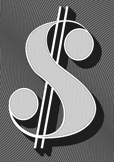 Badalona, Catalunya-based creator of Antibodi (2014), a textured didone display typeface. He also created the monoline monospaced typeface Bended (2015).
  Graphic designer in Barcelona, who created the angular and very readable text typefaces
  Barcelona-based designer of the square-shaped ultra-black typeface Bookcase (2019) and a pixel typeface (2019). [
 Alberto Villanueva (b. 1982) lives in L'Hospitalet de Llobregat near Barcelona. He designed the gothic display typefaces
  Graphic designer and illustrator from Barcelona who has an MA from Central Saint Martins, and works in London since 2009. His typefaces:
  [
[ Brooklyn, NY-based grandson of Joan Trochut of Super-Veloz fame, b. 1981, Barcelona. After completing his studies at Elisava Escola Superior de Disseny in Barcelona, Alex established his own design studio in Barcelona before relocating to New York City.
  Catalan graphic and type designer. For her final thesis project in Barcelona, Alexandra Echevarria created
  During her studies at Eina, Escuela de Diseño y Arte in Barcelona, Alexandra Zielaskiewicz created an elegant bilined semi-blackboard bold typeface (2014). [
 [
[ Graphic designer in Barcelona who made the floriated caps typeface Herbarium (2014). [
 During her graphic design studies in Barcelona, Andrea arques created the tattoo font Rocker Slab (2014) and Christmas Icons (2014). In 2015, she created the modular typeface Avelli, which was inspired by the calligraphy of Pedro de Madariaga, Joseph de Anduaga y Garimberti, and Torio de la Riva. [
 Graphic designer in Barcelona. In 2010, she designed
  Freelance designer in Caldas da Reinha, Portugal, b. 1989. Creator of the great display typeface Bizarre (2014).
  [
[ [
[ Born in Barcelona in 1962,
  Vic, Spain-based designer of the blackletter typeface Kalika (2018), the connected script typeface family Andarina (2018), the free black lapidary serif typeface Gilland (2018: an extension of Gary Elfring's free font Alonse (1993) from 100 to nearly 500 glyphs), the octagonal typeface family Gridger (2018) and the decorative inline typeface Linocut Deko Shade (2018).
  Ania Kruk (b. 1987, Poznan, Poland) is a designer in Barcelona. She has studied towards an MA in design at the University of Aerts in Poznan, 2005-2011 and obtained a Masters in Advanced Typography and Editorial Design in 2010 at Eina (Escola de Disseny i Art, Barcelona).
  Combine the principle of the piano key typeface first introduced by Wim Crouwel and that of interlocking letters, and you have the
  Graphic designer in New York City, who created a font based on the mosaics of Gaudi called
  Spanish type foundry, est. 2013. One of its founders, Santos Bregaña, writes: Of Croatian origin, Santos Bregaña is born by chance in the city of Pamplona in 1965 on the very day that Le Corbusier drowns in Cap Martin. After studying architecture in San Sebastian and Barcelona he launches the Laia Atelier in 1996 where he focuses on interior design, and on graphic and industrial design projects associated with the culinary culture and business. In 2008 he receives, along with co-creator Anne Ibañez Guridi, the Art Director's Club of New York Sphere Award for their body of work for the restaurant Mugaritz. He leads Tabula, a publishing house dedicated to the spread of culture and gastronomy, and is a speaker on public forums and seminars related to high cuisine. His porcelain designs and his O! Luna, Tabula, and Linneo collections have received international praise and are in many of the best restaurants and hotels in the world.
  Design studio in Barcelona, est. 1998. They made the
  Barcelona, Spain-based designer of Kitchen Stencil (2014). [
 Azza Alameddine has worked as a graphic designer in Lebanon, the Netherlands and London since 2009, and is now based in Barcelona. She holds a BA in visual communication from Créapole, Paris. A graduate of the Masters in Typeface Design program of the University of Reading, she specializes in Arabic script. Her talk at
  Barcelona-based menu designer who occasionally designs some fonts. These include Bonjour (2019: textured caps), Mango Tango (2019: rounded all caps sans), Mocha (2019), Latte (2019), Espresso (2019), Alioli (2017: textured caps), Coffeelover (2017: a connected brush script), Bon Appetit (2016: decorative caps), Original Burger (2016). [
 Barcelona-based designer of Original Burger Font (2016), which combines a signage style with some food dingbats. On the same theme, they designed the 3d matinee lettering font Bon Appetit (2016). [
 Barcelona-based foundry involved in custom font work, est. 2005. Original fonts: Inclusive (2007), Urbanium (2005, a bold display face), Handwritten, Eixample (2008, octagonal and rounded), Screech (2008) and Begyptienne. Modified fonts (or re-fonts in their words) include Le Grand Palais (stencil, for La Force de l'Art, Paris, 2006), BeTV (for a Belgian TV channel), and VijfTV (a modification of Chalet for a Flemish TV station). Their custom types include
  Austrian graphic designer and illustrator located in Barcelona. Lecturer at FH Salzburg & EINA Barcelona since 2016. She created the ornamental caps alphabet
  Brazilian type designer Daniel Sabino de Souza studied under Laura Meseguer at the Eina-Escuela Superior de Disseny in Barcelona. His foundry in Sao Paulo is called Blackletra (est. 2012). He has taught type design at IED/Sao Paulo.
  Editorial and graphic designer in Barcelona, b. 1990, who studied at Elisava in Barcelona (2008-2012), the Cooper Union in New York (2014) and the
 Brian Xiao (Brian Xiao Design, Hacienda Heights, CA) designed the text typefaces Keyserling (2014) and Galatea Bold Italic (2014). [
 For her final project at EASD Valencia in Spain, Cami Alama created the Dutch Krulletter typeface Krullcoplate Script (2014). [
 During his studies in Barcelona, Carlos Adalid designed the wonderful
  Palma de Mallorca, Spain-based designer of the text typeface Thoreau (2015) and the piano key Bauhaus stencil typeface Gehape (2015). In 2016, he designed the sans typeface Palo.
  Born in Logroño, Spain, Carlos studied graphic design at ESDIR (Escuela Superior de Diseño de La Rioja), and type design in the Advanced Typography Master class of the Universidad Autónoma de Barcelona (EINA). He was first based in Barcelona, but currently works out of London.
  Graduate of the ECV in Paris who lives in Barcelona. In 2016, she designed the garalde typeface Jannon CC, which is inspired by the XVIIth century Rabelais Jannon.
  [
[ Cesc (Francesc) Aldabó (Ceskus Disseny) is based in Sant Cugat des Valles and/or Terrassa, Spain. Studio Ceskus Disseny created Climb (2011, a decorative typeface),
  Chema Sanchez, or just snchz, is the Barcelona-based designer who created the fat angular typeface
  Graphic designer and photographer in Barcelona, who created the squarish modular typeface Glower Type in 2016. [
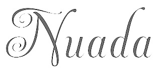 [
[ During his studies in Barcelona, Dani Gimenez designed the experimental typeface Contrastes (2017) and the negatively inclined techno typeface Flip (2017). [
 El Port de Sagunt, Spain-based designer of the 5-style sans typeface family Malamente (2016), which was done as a school project . [
 [
[ Designer in Tarragona and now Barcelona, Spain, b. 1978, Barcelona. Since 2006 he teaches graphic design at the School of Art and Design of Tarragona.
  Barcelona-based designer of Folk (2015), a typeface inspired by the early unsophisticated renaissance types and Dwiggins's M-formula.
  During his studies at Escola Massana in Barcelona in 2014, Dario Trapasso created a shaded typeface called Humbral.
  Barcelona-based designer of the circle-based modular typeface family Pegaso (2015). [
 Barcelona-based designer of Nouveau Grotesque (2016) and Devianz Grotesk (2014). This typeface was originallly part of the corporate identitity of culture cafe KUAPO (Leipzig).
  Damià Rotger Miró (b. 1981, Ferreries, Menorca) is a type designer, letterer and graphic designer at Dúctil in Palma de Mallorca. He also is professor at
  [
[ Ricardo Victor Rousselot is a calligrapher and type designer born in Argentina in 1936. He was trained in the sixties in Chicago in the studio Ficho&Corley Inc., which was led by a disciple of Frederic Goudy and Oswald Cooper, Carl Corley. After that, he returned to Buenos Aires, and in 1975, he settled permanently in Barcelona, where he teaches at the University of Barcelona.
  Very original fashion designer and illustrator in Barcelona. Her Fashion Type Maison Martin Margiela (2014) is an aquarel alphabet based on fashion drawings. [
 Elena Peralta Dimas is a graphic and type designer from Madrid, Spain, where she obtained her BA in Graphic Design. Before studying the Master in Type and Media in the KABK, she lived in Barcelona, where she got an MA in Typography and interned at Estudio Mariscal. She also worked as an in-house type and graphic designer at Seriesnemo Studio, developing projects related to branding, type and packaging. With a group of friends she brought TypeThursday, the monthly type event, to the city of Barcelona. Gaduate of the
  For a school project, Eloi Canals Serra (Barcelona, Spain) created the
  Graphic designer in Barcelona, who made the text typeface Sonetto in 2014. This typeface was modeled after Gudrun Zapf-Von Hesse's semi-calligraphic typeface Hallmark Shakespeare (1968). [
 Emtype is the foundry in Barcelona that was founded in 1997 (in Buenos Aires) by Eduardo Manso. Eduardo was born in Buenos Aires in 1972 and studied graphic design at the Escuela de Artes Visuales Martín A. Malharro and at the Universidad Nacional de Mar del Plata, both in Mar del Plata. Art director of the Argentinian graphic design mag "el Huevo". He currently lives in Barcelona. His typefaces include the pixel font family
  Type and graphic designer born in Lerida, Spain (1908), who lived and worked mostly in Paris, where he had emigrated to during the Spanish Civil War (1936-1939). He died in 1987 in Noyon. All his fonts are available from Neufville. He was the founder of the movement that is known as Grafía Latina (or La Graphie Latine), which promoted the need to create a new system of typically Latin (as opposed to cold geometric nordic) typographic structures, graphics, alphabets and decorative ornaments.
 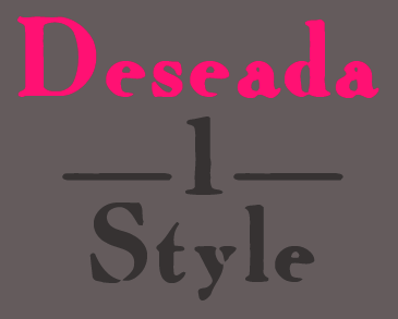 Born in Barcelona in 1964. Graphic design teacher at Elisava in Barcelona since 1988. Director of the Master on Advanced Typography at the Eina school of art and design, in collaboration with the Autonomous University of Barcelona. He also teaches a Master's course on art direction and advertising at Ramon Llull University. Author of Twenty-two tips on typography (that some designers will never reveal) and twenty-two things you should never do with typefaces (that some typographers will never tell you) (Actar).
  Girona, Catalunya-based designer of Patata (2014), a potato print font custom-made for Set Café. Edding (2014) is a marker font.
  Spanish designer (b. 1985) from Malaga who now lives in Barcelona.
  During her graphic design studies in Barcelona in 2014, Estela Zamora created the art deco Futura Poster-style typeface Modular. [
 Or Eudaldo Pradell. Catalan punchcutter (b. Ripoll, 1721, d. 1788). He was Spain's most important punchcutter in the 18th century. He was commissioned by King Carlos III to provide new typefaces for the Imprenta Real in Madrid. Read about
  Textaxis was Spanish/Catalan foundry run by Barcelona-based Iñigo Jerez Quintana since 1995. In 2015 it was renamed Extratype. Iñigo Jerez's beautiful typefaces
  During his studies in Buenos Aires, Fabricio Orellano created the painter's typeface Jona Miro (2014). [
 Designer in Pistoia and Firenze (and before that, Barcelona) who was born in 1982 in Pistoia, Italy. He created the ultra fat counterless typeface
  Born in Barcelona in 1979, Ferran Milan studied graphic design at Massana School of Art in the same city, then relocated to the UK to study typeface design. In 2011 he graduated from the MA in Typeface Design at
  Barcelona-based designer in 2017 of these typefaces: Calafat (a gorgeous blackletter that revives a typeface made by the first printing press in Mallorca, Nicolau Calafat), Mirona (Scotch), Eixam (octagonal; named after the octagonal intersections of the Eixample neighborhood of Barcelona), and Kely (piano key stencil). [
 Brazilian illustrator who is based in Barcelona. Designer at type-o-tones (Barcelona) of
  Joel Lozano studied graphic design at the Escola Massana, Centre d'Art i Disseny in Barcelona. Barcelona-based codesigner with Robin Frank at
  During her graphic design studies, Gemma Estadella Colomé (Sabadell, Catalunya) created the tall-legged display typeface
  Barcelona-based designer of these typefaces:
  Graphic designer, lettering artist and calligrapher in Sabadell, Catalunya, who was born in Barcelona. In 2011 she received her Masters in Advanced Typography at EINA (Barcelona). Since 2016, she teaches calligraphy, lettering and typography at several schools/art centres in Spain and France. Author of the brush calligraphy book Caligrafia con Pincel (2018, Ediciones Urano). She also teaches since 2019 at
  [
[ Graphic designer, illustrator and photographer in Valencia, Spain, who created a thin monoline typeface called
  "Homeless Fonts" is a Spanish project to turn hand-scrawled cardboard signs into charitable assistance. Homeless Fonts, a joint effort between the charitable Arrels Foundation and creative agency McCann Worldgroup, has paired designers with a small band of homeless people in Spain. The end goal is to sell these fonts to corporations that will use them to push their brands, with the financial proceeds going toward Arrels' homeless-outreach work in Barcelona.
  [
[ During her studies at Escola d'Art i Superior de Diseny de Valencia, EASD, Isa Lloret (Trieste, Italy) created a geometric solid alphabet that was inspired by the Bauhaus work of Josef Albers, and colored it according to Kandinsky's paradigm of relating color to shape.
  Catalan graphic designer who lives in Olot and/or Montblanch. He created the sans family
  Barcelona-based designer of the piano key typeface
  Graphic designer in Barcelona, who created the fantastic decorative Surcito Capital in 2017 and explains: Display [typeface] designed for Picmedia. The font design is inspired by the decorative ornaments of the streets of Andalucía. The tiles of its streets, the ornaments of doors, windows and balconies, act as the "architecture" used to construct this [typeface]. [
 Talented illustrator in Salvador Dali's home town of Cadaques, Catalunya. In 2019 and 2020, he illustrated Wes Anderson's film The French Dispatch, which showcases remarkable typography. [
 [
[ Illustrator based in Barcelona. In 2018, he designed the pointillist pebble-themed color font
  Born in Barcelona in 1950, Joan Barjau is a graphic and type designer, cartoonist, illustrator, painter, and animator who taught at Eina in Barcelona from 1984-1993. Designer at type-o-tones in Barcelona who made Analfabeta Regular (1999, with Flavio Morais), Analfabeta Pics (1999, with Flavio Morais),
  [
[ Surrealist Catalan painter, 1893-1983. His work spawned a lot of interest from the part of type designers, who created a number of typefaces in his unique style. The one most taken with Miro's art is undoubtedly
  [
[ Catalan designer (b. 1920, Caldes de Montbui, d. 1980, Barcelona) of Bisonte (Fonderie Typographique Française, 1950),
  [
[ Catalan type designer (b. Barcelona, 1969). In 2018, he joined the faculty in the Masters program in typographic design at
  [
[ [
[ Jorge Carrillo (Barcelona) created the monoline semi-stencil typeface Smooth (2014) ande the sans/slab pait Mishmash (2014). [
 [
[ Aka Josema Uros. Self-taught programmer in Barcelona, b. 1956, who set up the type foundry Type-O-Tones in 1992. He is also involved in
  Catalan painter, sculptor and graphic designer, b. 1931, Barcelona. He created
  [
[ Barcelona-based graphic designer who created the commercial typefaces
  Graphic designer from Bogota, Colombia, who is based in Barcelona. At Eina in Barcelona in 2016, he designed the crisp didone-inspired text typeface Sabores. Unlike Didot or Bodoni, Sabores has no ball terminals, only axe-like serifs giving it a cruel look. [
 [
[ Zaragoza (and now, Barcelona), Spain-based creator (b. 1993) of the graffiti typeface Juanalzada (2013) and of the dripping blood caps typeface
  Graphic designer in Barcelona, who created the squarish angular display typeface
  Karina Goto graduated from the Masters program in advanced typography at EINA, Barcelona in 2013. Before that, she obtained an MBA in branding from Rio Branco University. She created the decorative fashion mag typeface
  Japanese graphic designer in Barcelona, where he studied at Eina. His typefaces:
  I like the description of this Catalan foundry at MyFonts: A foundry with a home in Catalunya. Kickingbird font work takes place in the quiet treehouse headquarters near a former Barcelona textile homestead. Font sketches are completed anywhere a notebook is handy... in the cafes of Gràcia, on the RENFE railway or outside the cloisters of Santa Maria del Mar. Font design inspiration comes from many sources. Faded broadside wall manifestoes in Ravel, broken floor tiles washed up on the shores of Vilassar de Mar or from old cigar boxes found at the Mercat de Sant Antoni. For those who know Barcelona, sweet memories. The designer,
  Graduate of Elisava (Barcelona) in 2014 and Eina (Barcelona) in 2016. At Eina, he obtained a Masters in Advanced Typography. In 2015, he designed the slab serif typeface 66 Legend to celebrate the 110th birthday of the Harley Davidson motorcycle. In 2016, he published Nomad Serif.
  Designer (b. Barcelona, 1968) at
  Graphic designer on Barcelona who created the sans typeface Neoma, the decorative Fable, and the modular spurred typeface Andale in 2017. [
 Barcelona-based designer who created a hip
  Juan Pablo De Gregorio Concha lived in Santiago, Chile, where he founded Letritas in 2006. He is presently based in Barcelona. Home page of
  Letterjuice is the British type foundry of Pilar Cano, who graduated from the University of Reading, 2006, but started out life in Barcelona. After graduation, still in 2006, she co-founded Mídori, a graphic design studio specialised in editorial design. Letterjuice is based in Brighton, UK.
  During his studies in Barcelona, Oscar Cobo created the modular Tuscan typeface family Batto (2015,
  Catalan free font outfit. At Dafont, they published these fonts in 2011:
  Award-winning graphic designer and illustrator in Barcelona, whose work and letter designs are characterized by flashy and colorful contructions. She studied at the University of Salamanca (2008) and ELISAVA (2013). Her type designs include 36 Days of Type (2016) and Ahoy (2013, a decorative rope font, which can be bought
  Spanish designer of the morbidly obese decorative slab serif typeface Rhinozeros (2014). I am not entirely sure, but I suspect that Maja is based in Barcelona. [
 During her studies in Barcelona, Mar de la Llave created the bold lachrymal typeface Gazelle (2014). [
 Graduate of Escola Serra i Abella de l'Hospitalet de Llobregat, class of 2013. Graphic designer in Barcelona who created the antiqued typeface
  Graphic designer in Barcelona, who designed the heavy blackletter typeface Wurth in 2016 for a university project supervised by Andreu Balius and Ferran Milan. [
 Barcelona-based designer who made the rounded sans typeface familia on commission for Caixa Forum. [
 Barcelona-based designer of the fat didone typeface Biggie (2019). [
 Catalonian designer, illustrator and lettering artist. Graduate of Eina, Barcelona (1996) and Cooper Union New York (2012). Now based in Melbourne, Australia, Maria Montes created Milosz Italic at Eina, Barcelona, in 2011. She co-founded a textile and print design studio called MarchTwentyTwo in collaboration with fashion designer Laura Piera. The studio focuses on art prints, limited edition scarves, calligraphy workshops and other analogue crafts.
  Graduate of Institut Superior de Disseny IDEP in Barcelona, class of 2010. Graphic designer in Barcelona, who created the thin and hip display typeface Boreas (2011). [
 During her graphic design studies in Barcelona, Marina Garcia designed the wedge serif typeface Marain (2018), Pixel Caroline (2018), the modular typeface Architecture (2018) and the blocky typeface Brutal (2018). [
 Graphic designer in Barcelona who created the piano key typeface
  Barcelona-based graphic designer (b. 1963).
  Barcelona-based creator of the script typeface
  Creator of the modern typeface Regen Condensed (2014) during her studies in Barcelona.
  Graphic designer in Barcelona who founded her own studio in 2008. In 2018, she joined the faculty in the Masters program in typographic design at
  During her studies at ESDAP Serra i Abella, Marta Forns (Sant Boi de Llobregat, Barcelona) designed the humanistic sans typeface Retonic (2017), the modular typeface family Contrast (2017) and the modular typeface Jowo (2017). [
 Art director in Barcelona, who designed the classical roman typeface BRVTS in 2016 for a project of his Master's Degree in Advanced Typography at EINA. It was intended for a men's magazine. Still in 2016, he designed the custom all caps typeface Pilecco King Display.
  Barcelona-based illustrator. Designer of a very original lettered poster to celebrate Josep Maria Pujol (2015).
  Spanish cartoonist and illustrator. With Laura Meseguer at type-o-tones in Barcelona, he made
  Author, ca. 1945, of Rotulacion Decorativa no. 1 (Ediciones ARS, Barcelona) and
  Born in Pamplona in 1987 who obtained a Masters in typography and type design from EINA in Barcelona. He designed
  Miquel Vila is a Barcelona-based graphic designer. His type-based practice revolves around brand identities, editorial and type design. Designer of the warm rounded text family Gauguin, which was developed during a workshop at
  Graphic designer in Barcelona, who created the grotesque typeface
  Barcelona-based designer of these typefaces:
  Graphic designer and art director in Barcelona, who used to be in Zaragoza, Spain. One can buy absolutely magnificent prints from them, as well as the vintage condensed sans poster typeface Americana (2015). Via dafont, one can download these free typefaces:
  Naipe Foundry is the type design, lettering & font production company set up in 2018 by
  Researcher based in Besalu, Girona, Catalunya. In 2016, Pablo Garcia Risueño, Apostolos Syropoulos and Natalia Verges launched the
  Neue is a digital studio in Barcelona, run by José Manuel Urós (b. 1956), who founded Type-O-Tones in 1992. In 2013, it created a grotesque type family called
  Fundicion Tipografica Neufville SA is a foundry based in Barcelona, headed by Wolfgang Hartmann, which writes about itself: Neufville Digital produces and markets the fonts from Fundicion Tipografica Neufville, Bauersche Giesserei, Ludwig&Mayer, Fonderie Typographique Française and Fundicion Tipografica Nacional.
  Graphic designer in Barcelona, who created an unnamed modular geometric typeface in 2012.
  Originally from Barcelona, Noe is a graphic designer who holds a BA in Graphic Design from BAU, School of Design and a MA in Advanced Typography at Eina, Escola de Disseny i Art, where her interest in type design began and where she created her first typeface. Since 2008, she has been working as a graphic designer for different studios in Barcelona. She is a graduate of the
  [
[ Barcelona-based designer of
  [
[ In 2015, Outline Studio created the
  Type designer in Madrid, Spain, b. Barcelona, 1982. In 2006, he moved to Buenos Aires. Pablo Alaejos's graduation typeface in 2012 at
  Pablo Bosch (Valencia, Spain) developed the legible typeface Atiza (2013) during an intensive study program at Type@Cooper in New York. He writes: Atiza is a text face for editorial purposes but with characteristics to also be used in newspapers. High X-hights, relatively low contrast and strong asymmetrical serifs make Atiza a very legible typeface in small sizes with a perfect behaviour in sizes between 8pt and 11pt, but with also with extraordinary legibility at 6pt.
  Pangramas is Pedro Sanoja in Barcelona and Buenos Aires. His typefaces include
  P.A.R is a graphic design studio based in Barcelona, founded and run by
  After graduating from Escola d'Art i Disseny (Eina), Paula Mastrangelo worked for La Vanguard, Catalonia's leading newspaper. Since then, she has focused on corporate magazines and works as an editorial art director. In 2012, Paula completed a postgraduate course in type design at Eina. Upon graduation, she started to collaborate with Ramiro Espinoza's Retype in Den Haag, The Netherlands. Paula Mastrangelo, who lived in Barcelona, writes about her typeface
  For a school project at EINA in Barcelona in 2017, Piero Beninato designed the humanist semi-serif typeface Otilia. [
 [
[ Junior graphic designer at Dani Rubio Arauna studio in Barcelona. In a course taught by Andreu Balius and Ferran Milan in 2015, he designed the bold rounded display typeface Bacon Display. [
 Pons Designo, a studio in Palma de Mallorca, created the
  Studio based in Barcelona and New York. In 2020, they designed the custom Basque typeface Arbizu for the Basque electronic music company Zetak. Its glyphs are inspired by old funerary inscriptions, engravings, gravestones, and lintels from the Basque Country. The typeface was produced by Jordi Embodas.
  Barcelona-based designer of the alchemic typeface
  Catalan creator, b. 1964, of these typefaces:
  Rafael Jordan Oliver, aka Barry Bianco, is a graphic designer and calligrapher in Valencia, Spain, b. 1983, Alzira. Graduate of EASD in Valencia, class of 2013. His typefaces:
  Spanish author of the calligraphy and penmanship book Bellezas de Caligrafia (1844, Joaquin Verdaguer, Barcelona). Stirling was active in Barcelona.
  Barcelona, Spain-based designer of the modular typeface Ninja Cut (2016, for an assignment at EASD Serra i Abella) and the wonderful
  Giuseppe Salerno (aka
  Designer at
  Barcelona-based designer and lettering artist. In 2015 he received his BA in Graphic Design from the University of Barcelona. Graduate of the
 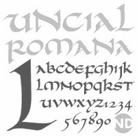 [
[ Italian graduate from the type design program at the
  Calligrapher and graphic designer in Madrid and Barcelona, who was born in Sao Paulo. Creator of the organic sans typeface
  Born in Iasi, Romania, Ruxandra Duru moved first to Casablanca and then to Montreal. In 2011, she studied at EINA in Barcelona.
  Sabina Chipara (or: Kipara) was born in 1987 near the seaside in Constanza, Romania. She moved to Bucharest to study graphic design at the National University of Arts in Bucharest, Romania, and at EINA Centre Universitari de Disseny i Art de Barcelona. She took the
  Catalan foundry, est. 2008 by Xavier Lanau, who lives in Barcelona. He designed the feminine sans family
  Serse Rodriguez (Barcelona) created the avant garde all-caps sans typeface Basico Typo (2014), Tangram Typo (2009) and the thin geometric beauty Panama Jack (2014).
  During his studies in Barcelona in 2015, Servando Gion designed the typeface New Bauhaus, which was inspired by Bauhaus LH Regular, Chalet London 1970, and Neuland. [
 Mataro, Catalunya-based designer of a modular typeface in 2014. [
 Catalan children's book author. Designer of the dingbat typefaces Tanaestel Doodle Leaves (2019), Tanaestel Doodle Arrows 01 (2019) and Tanaestel Doodle Frames O1 (2019). [
 Talented Mexican graphic designer and digital artist (b. 1985) who was based in Montreal but is now back in Mexico City. She pushed the boundaries of experimental typography with creations like Fabric Type (2009), which was developed at Concordia University in Montreal, where she obtained a BFA in design in 2009. She continued her studies at EINA in Barcelona, graduating in 2010.
  During her studies in Barcelona, Teresa Such created the stylish display typeface Goyesca (2015).
  Snowboarder from Liechtenstein, who designs typefaces at P22 and its descendant foundries such as HWT. The list:
 Tipofil is graphic designer Victor Navarro Barba in Barcelona. In 2015, he strated selling his fonts via Creative Market and MyFonts. His typefaces include:
 Type design collective founded in 2011 by Luis Alonso (Barcelona), Ricardo Santos (Lisbon) and Charlie Zinno (Buenos Aires).
  Catalan/Spanish typography and type design blog and information site. At Behance, Ana is listed under Buenos Aires, Argentina. The motor behind Tipos en Red is
  Catalan type designer (aka Tomás Vellvé), who, at FT Neufville in 1971 created Vellvé, a simple rounded sans serif family, which was published at the
  Design bureau in Barcelona, Hamburg and Berlin, est. 2007, with fonts that are mainly due to German type designer Martin Lorenz. The list of typefaces:
  Catalan foundry headed by Andreu Balius (b. 1962), who is based in Barcelona and Son (Alt Aneu), Lleida. Balius holds a PhD in Design from the University of Southampton (UK) and teaches typography and type design at EINA, University School of Design and Art, in Barcelona.
  Joan Marti Mas' dingbats and fonts. Joan Mas is a Catalan type designer, illustrator and graphic designer in Palma, who offers free and commercial fonts. His free fonts include Cu-tbo-rough (2004, handwriting), Dalicanya (2004), Pero Jefe (2004), Corbatins (2004), Cartelia (2004), Carusses (heads), Ataques, Scroonge (grunge), Tooman (tribal dingbats), Kinky Boots (2004), Viatge Quimic (2004, psychedelic face), Kool Aid Acid Text (2004), CU-TBO (2004, comic book family), Psychopaths (2002), CapsBats (2002), Plantiya (1999), Illustries (2000),
 Wete, or
  Valencia-based designer of
  During her studies in Barcelona, Valentina Rueda designed the kitchen tile typeface Selah (2018), the fine all caps display typefaces Mufasa (2018), Pumba (2018) and Skar (2018), and the all caps titling typeface Fallen (2019). [
 [
[ Art design studio that outputs some interesting typographical work such as the
  Catalan designer Bruno Selles (b. 1976) set up Vasava Artworks (and later, Vasava Fonts) in Barcelona in 1997. In 2018, he joined the faculty in the Masters in typographic design program at
  [
[ Vincent Connare (b. 1960, Boston) is an ex-painter turned type designer, who holds an MA in typeface design from the University of Reading in 1999. In the late eighties/early nineties Connare worked in the Ikarus, Intellifont and TrueType teams for Agfa/Compugraphic, and was one of the first type designers to learn TrueType hinting. Then he joined Microsoft, where he designed
  David Capo Vallbona (Walrus) graduated from ESDI. Based in Palma de Mallorca, he designed the condensed titling typeface
  Prolific Barcelona-based type designer. He started out by creating the counterless hand-printed typefaces Woodcutter Dripping Nightmare (2012) and
  Designer in Barcelona who grew up in Santo Domingo, Dominican Republic. Her company is called Shiny Design. Creator of the fat rounded multicolor alphabet
  Ze Studio (Barcelona) is most likely run by Pere Esquerra. He created the curly script typeface Clotilda Script (2015), the handcrafted Therevel (2015), the
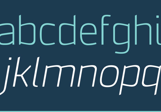
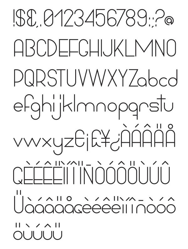
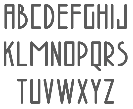
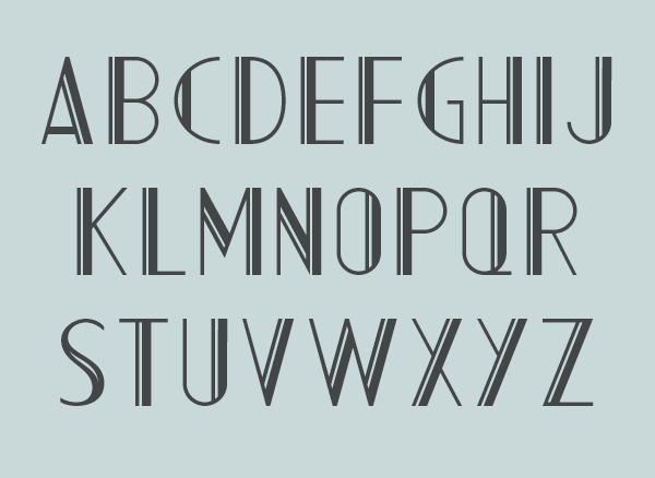
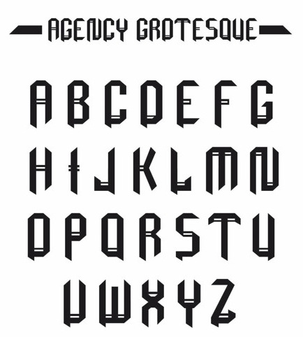
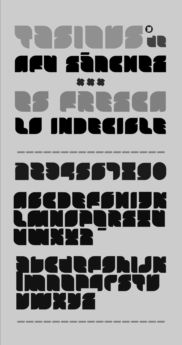
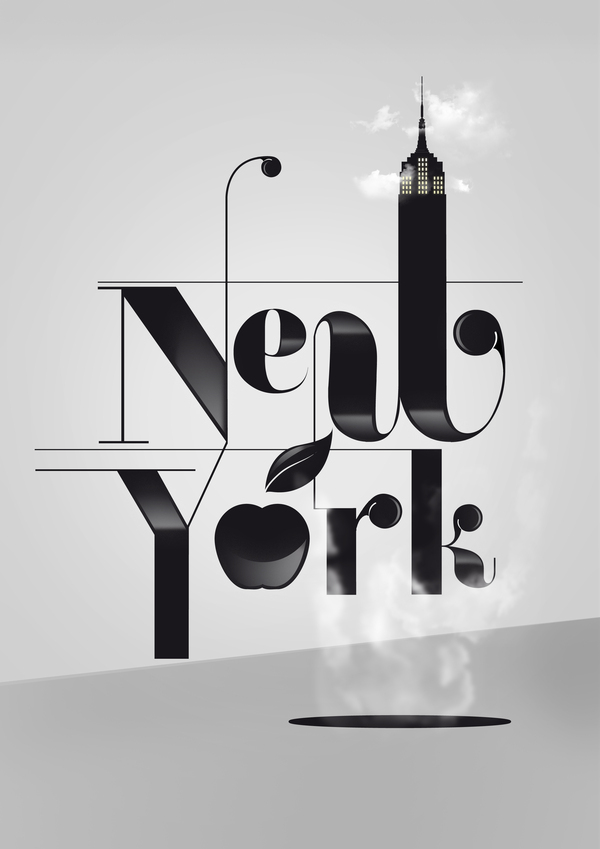
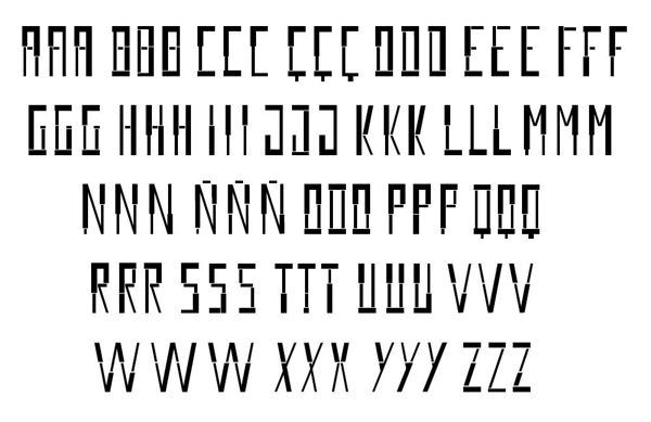
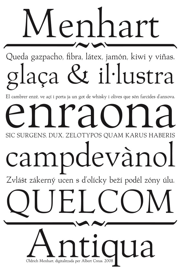
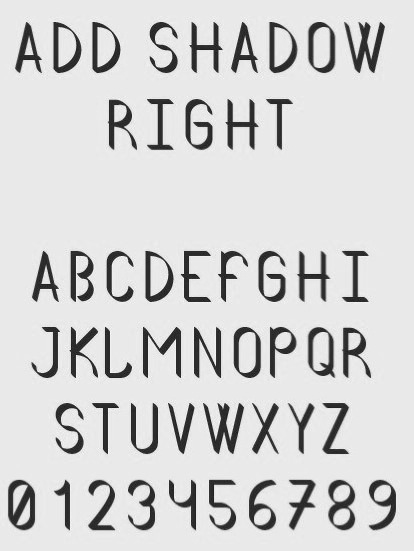
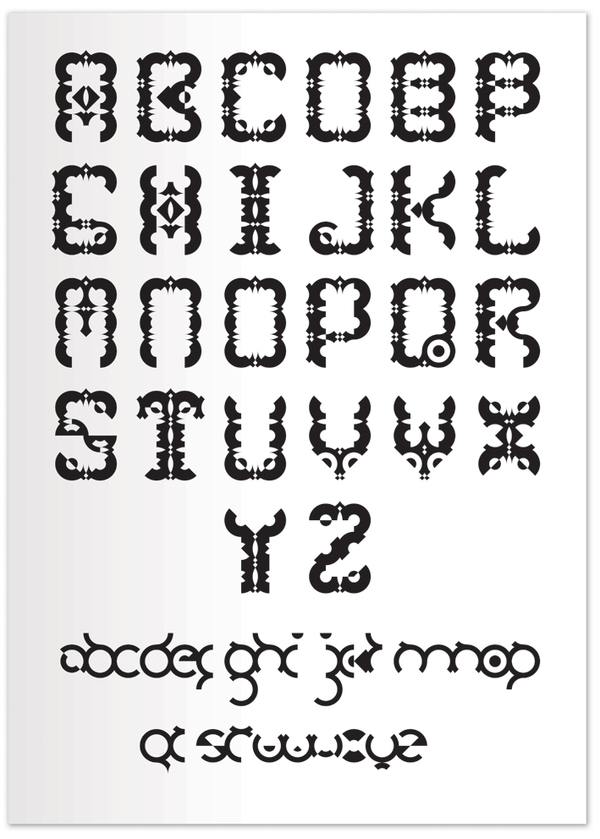
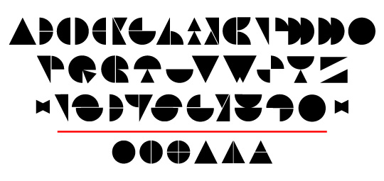
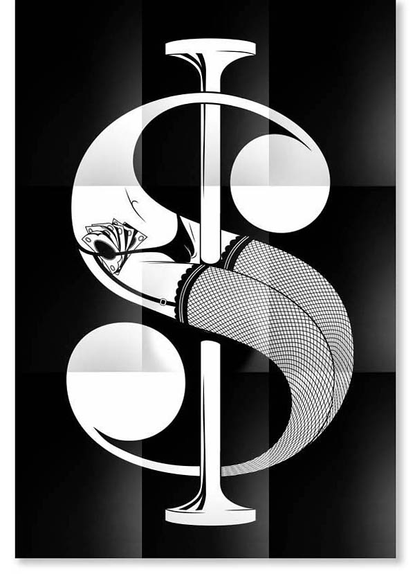
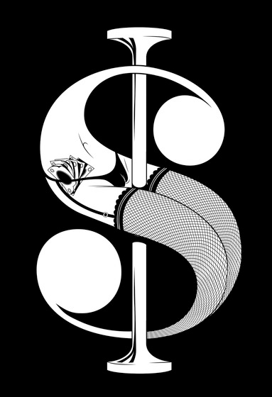
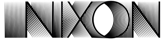
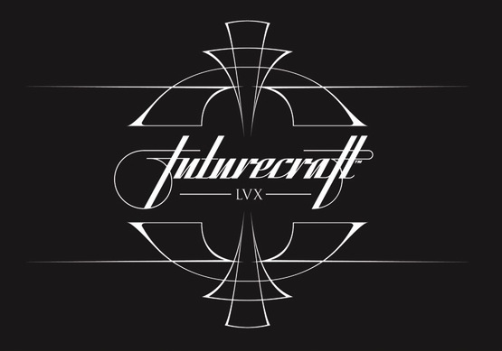
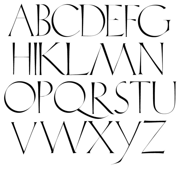
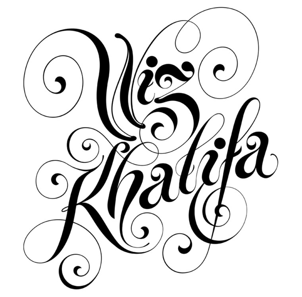
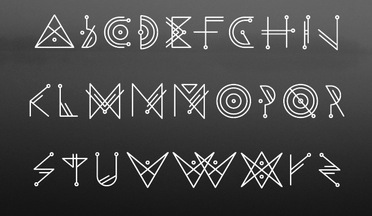
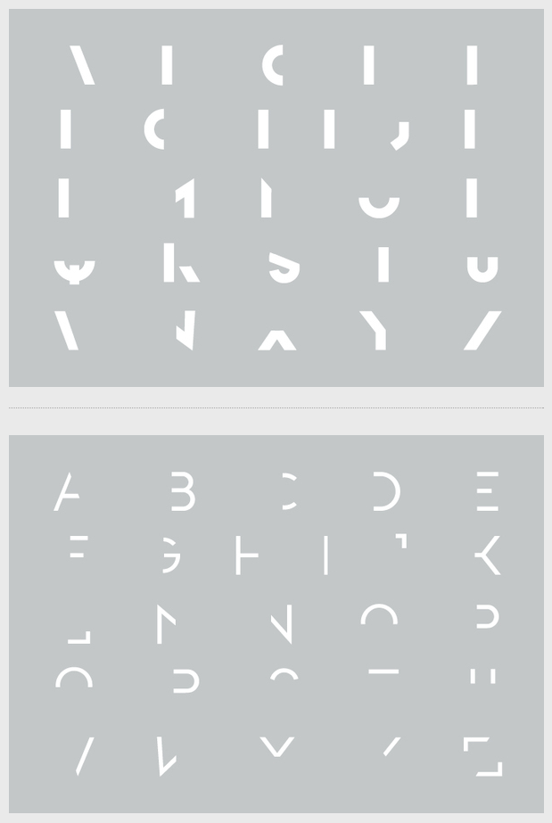
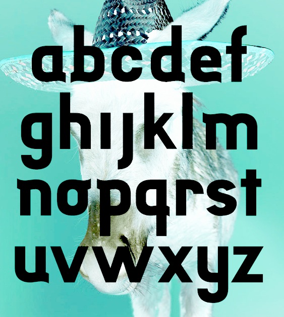
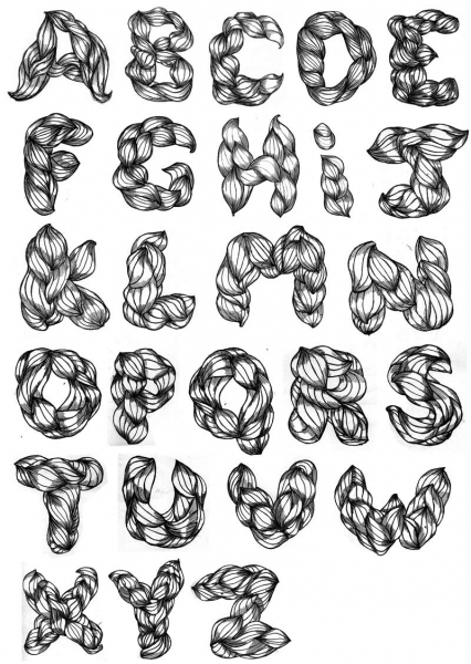
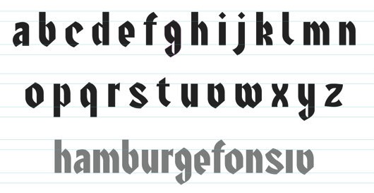
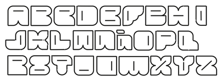
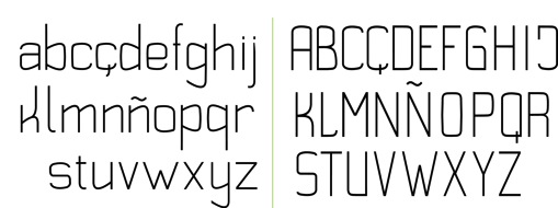
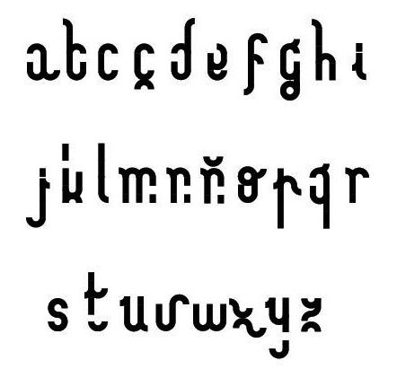
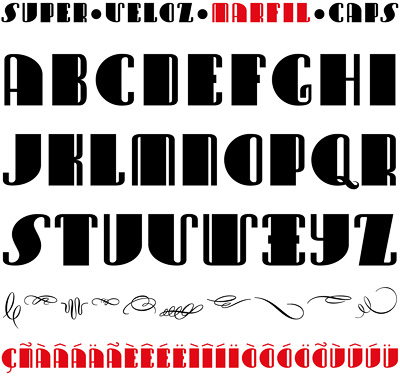
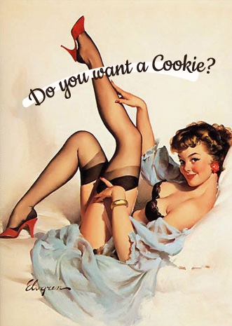
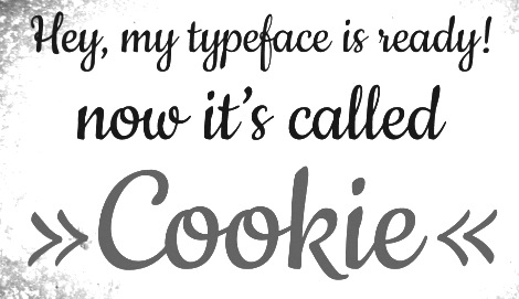
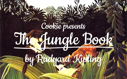
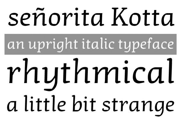
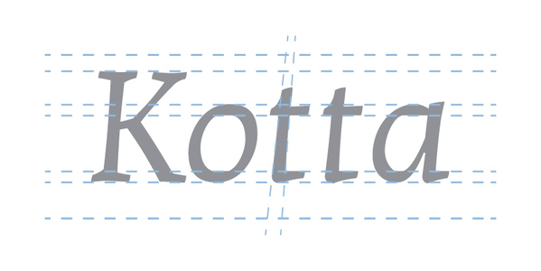
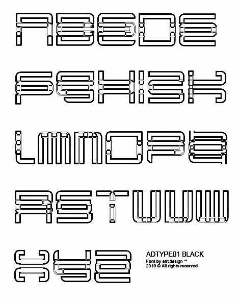
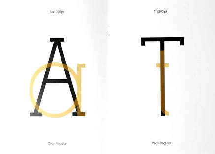
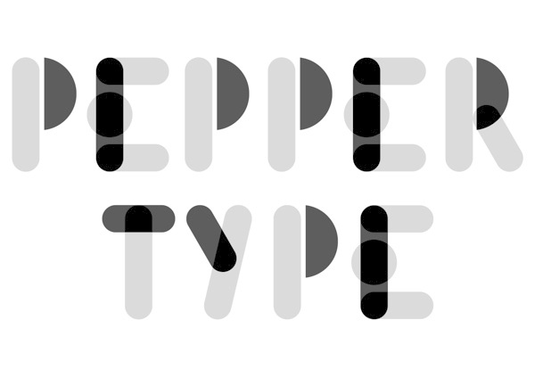
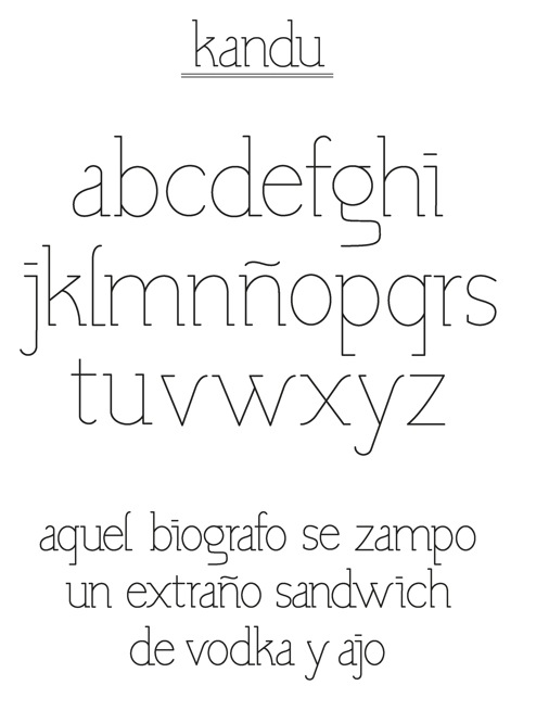
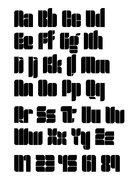
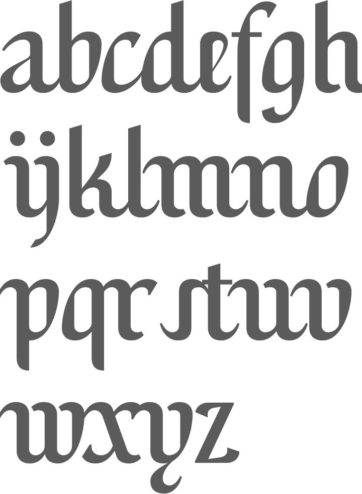
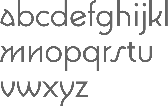
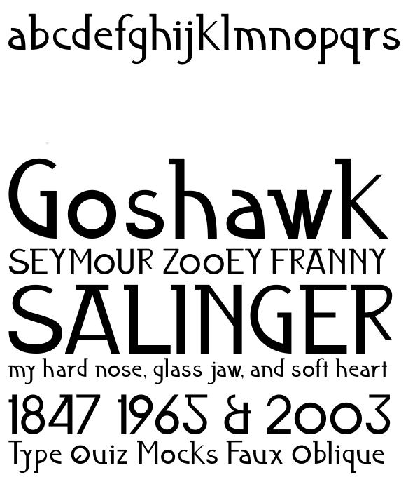
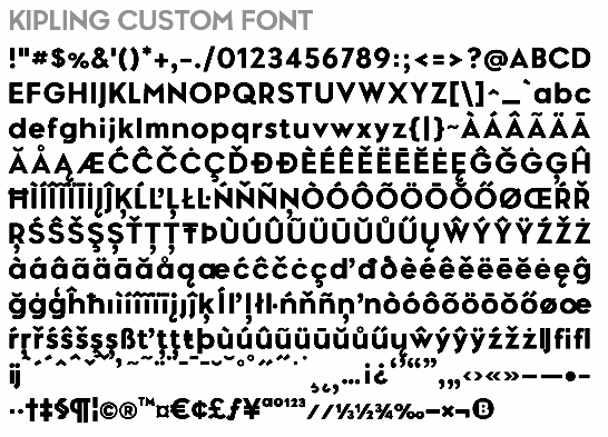
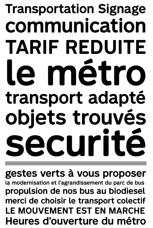
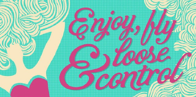
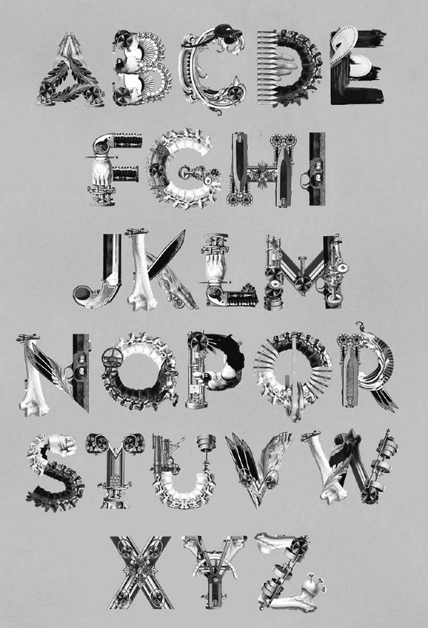
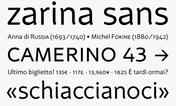
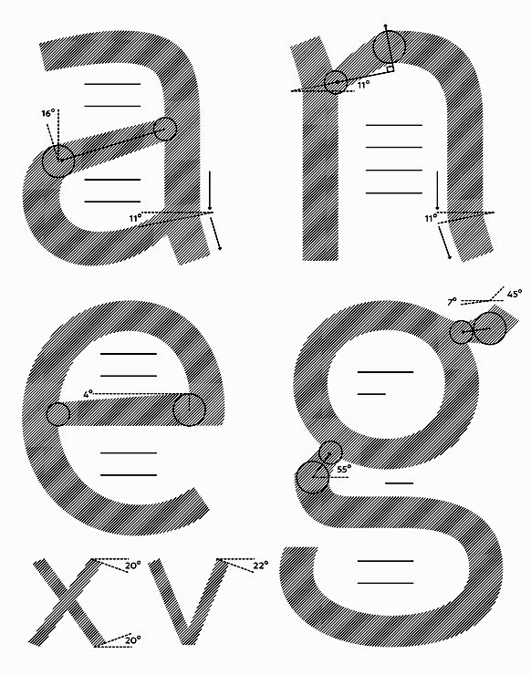
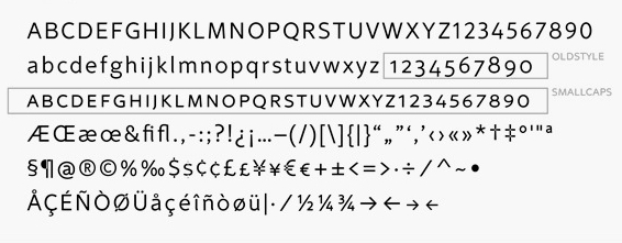
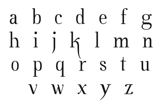
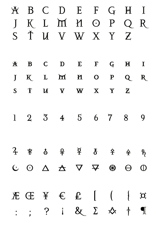
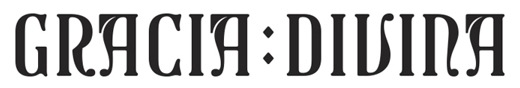
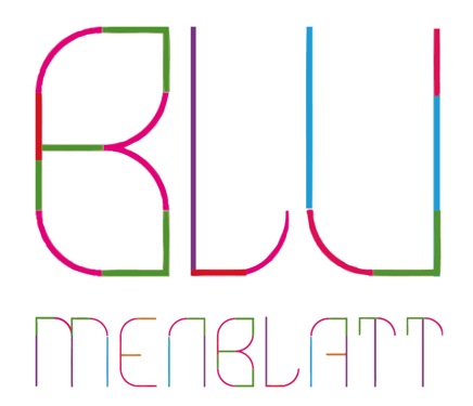
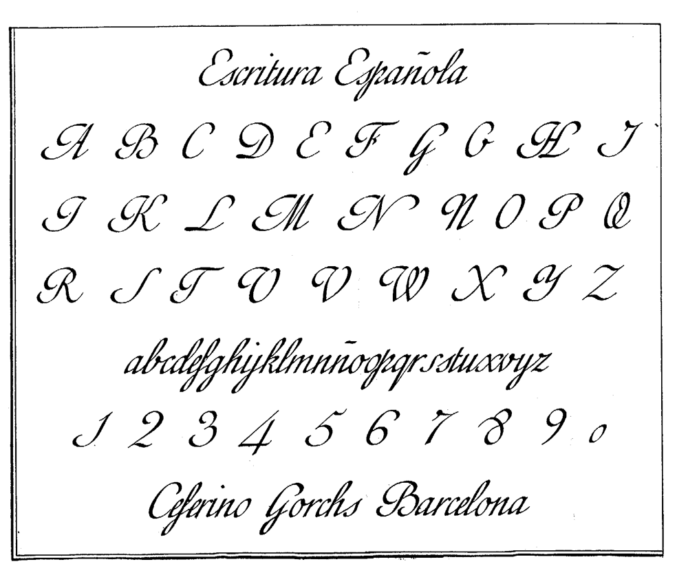
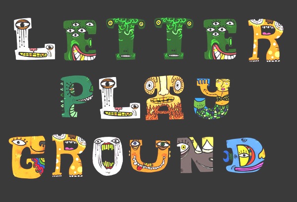
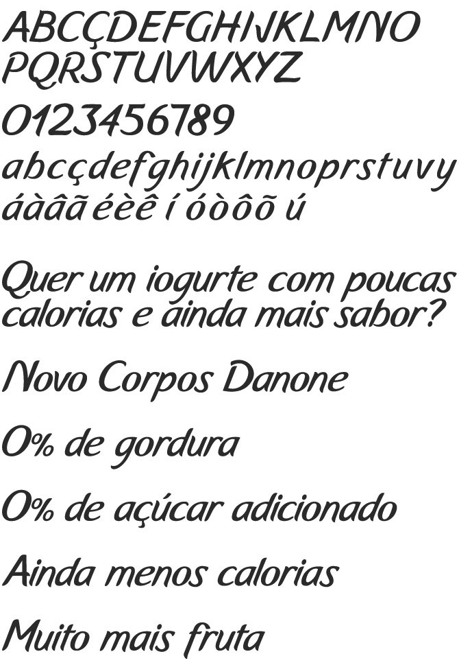
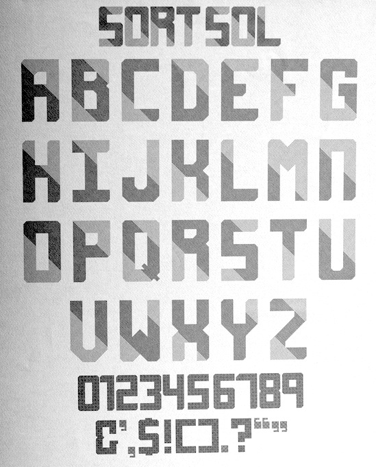
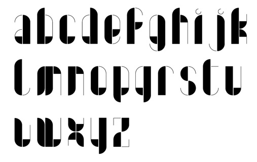
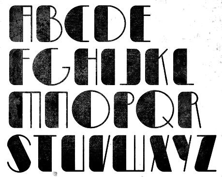
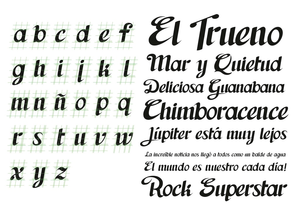
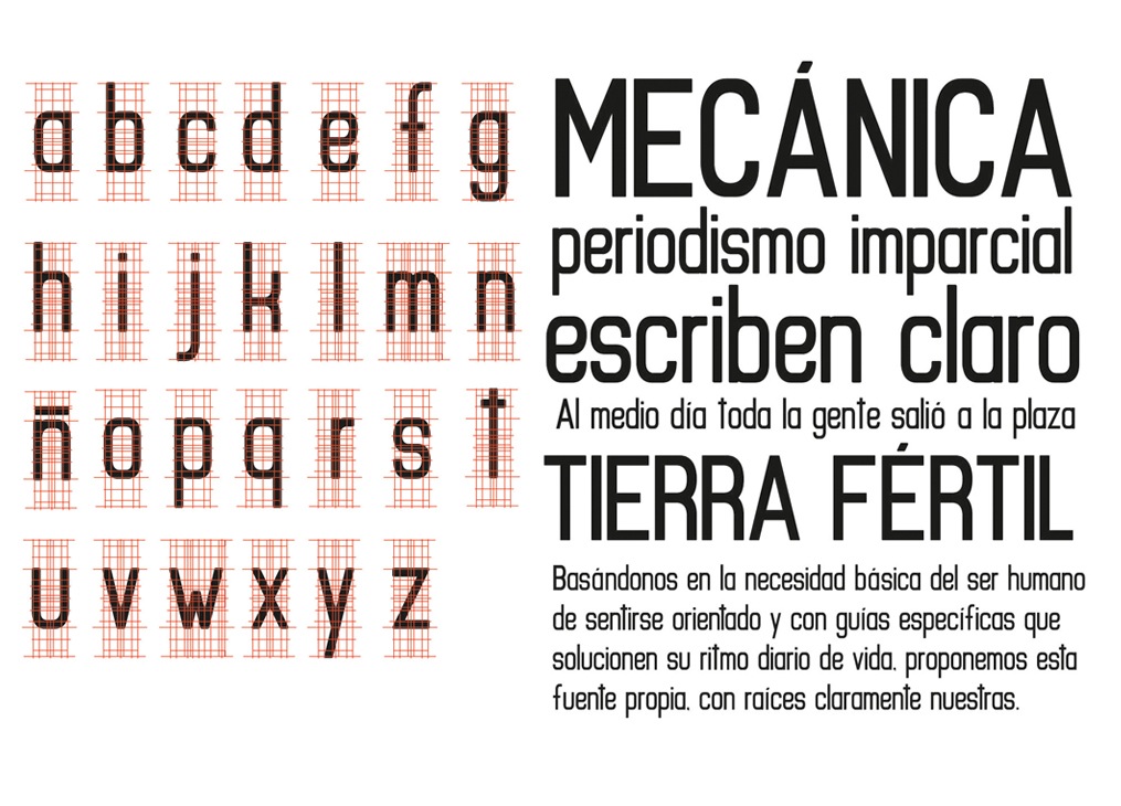
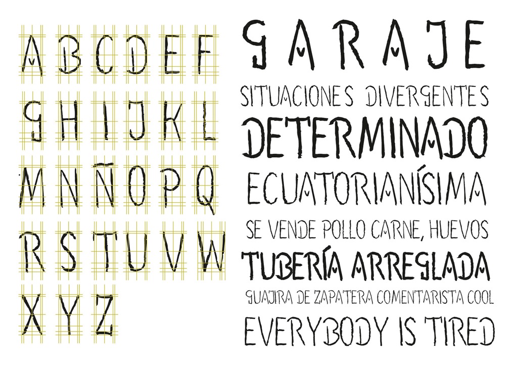
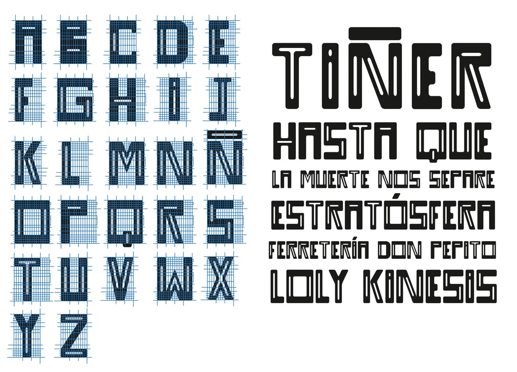
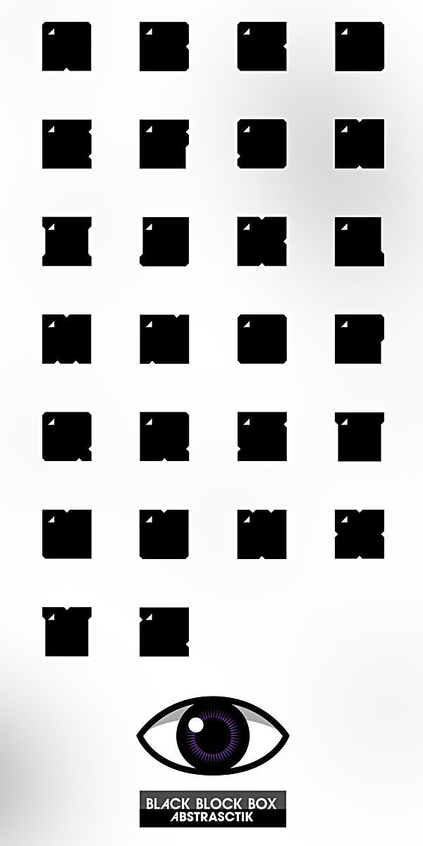
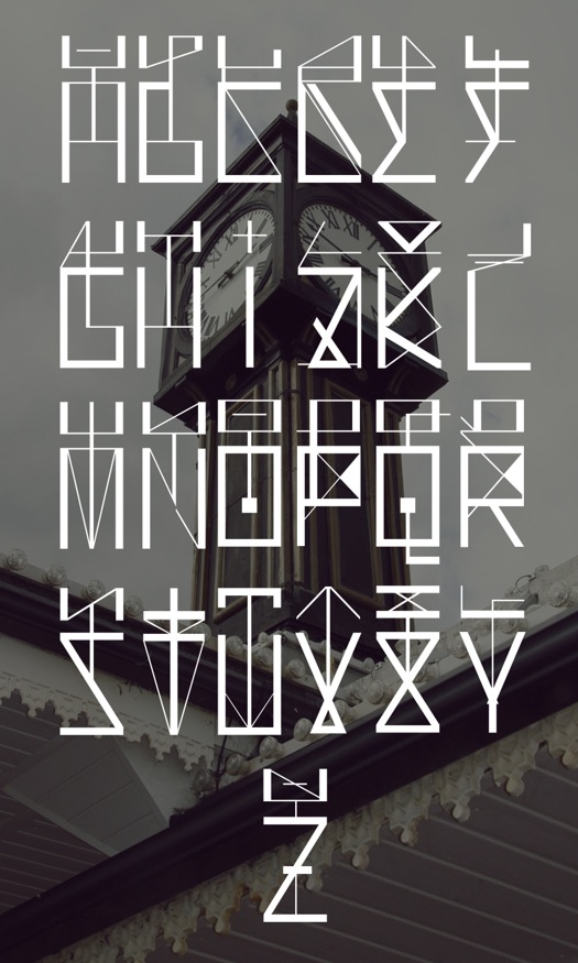
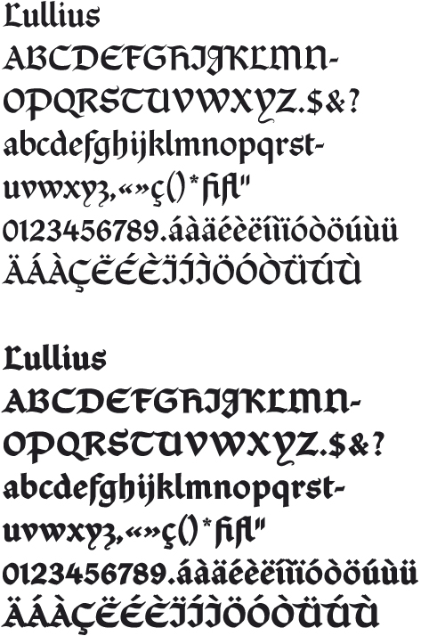
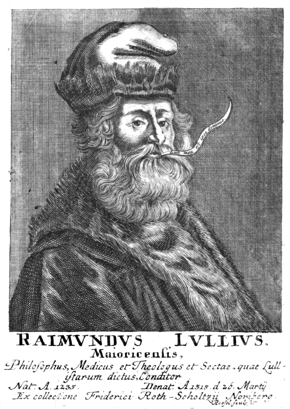
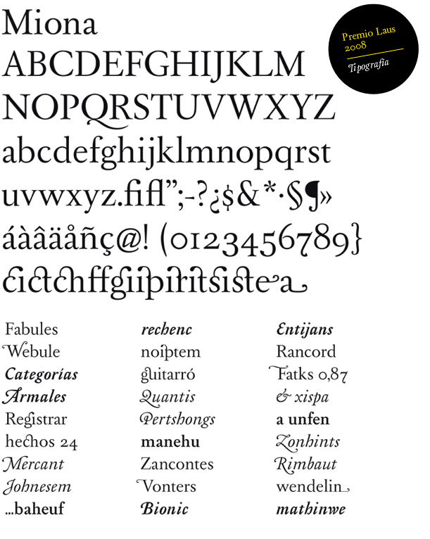
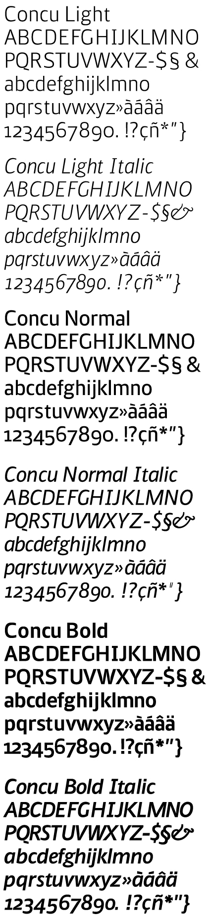
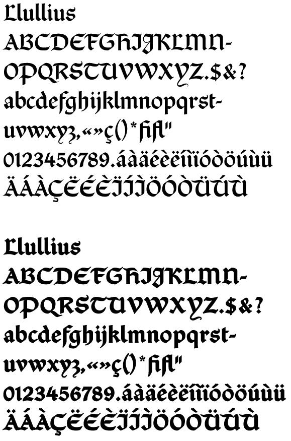
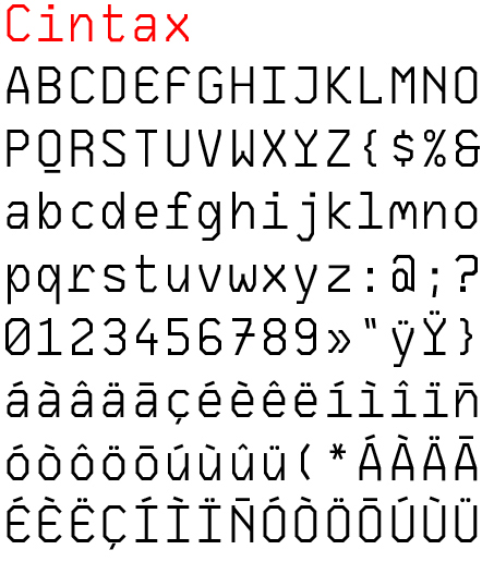
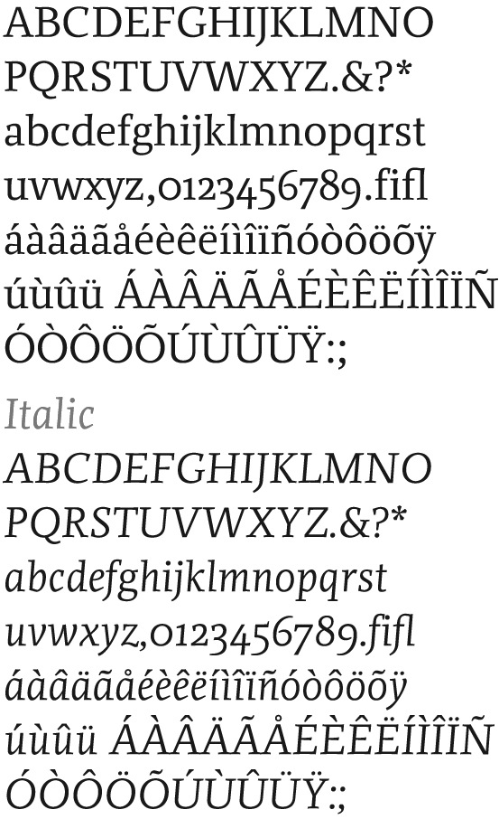
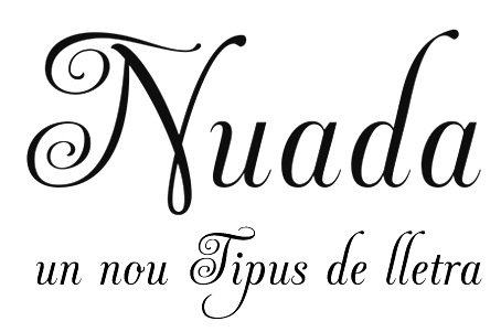
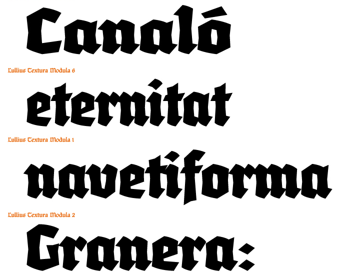
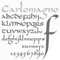
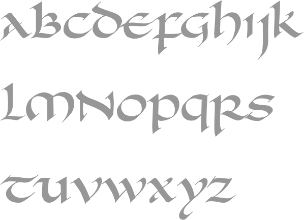
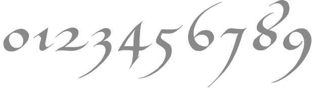
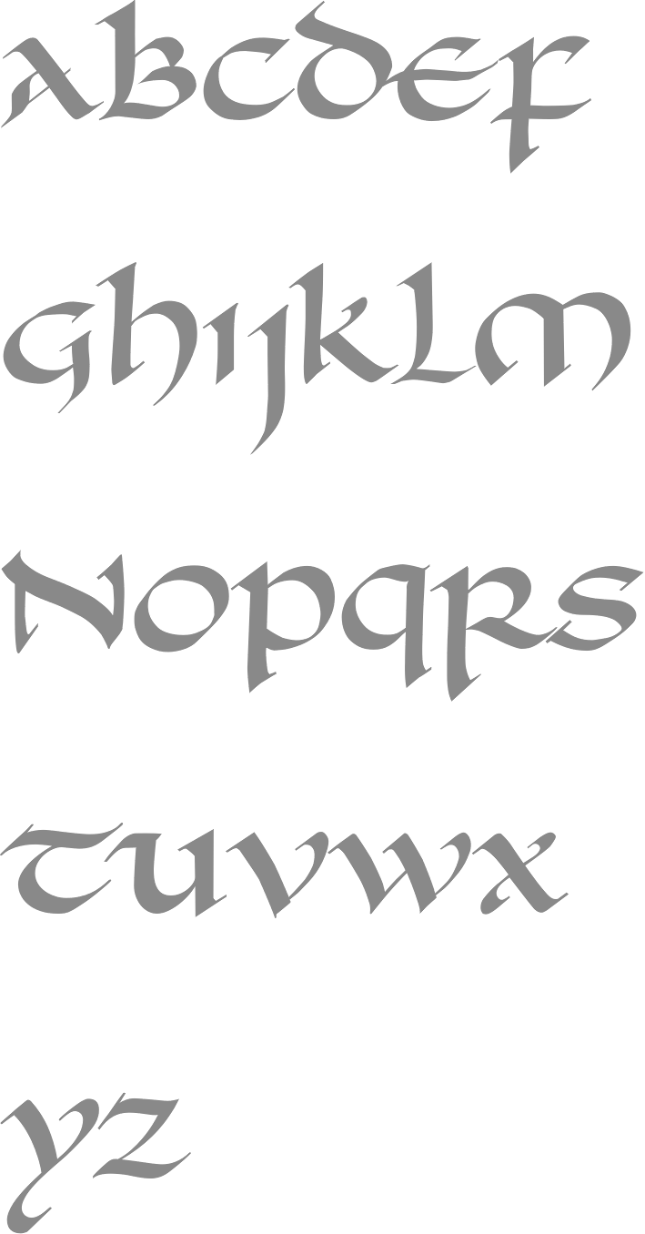
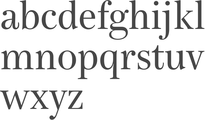
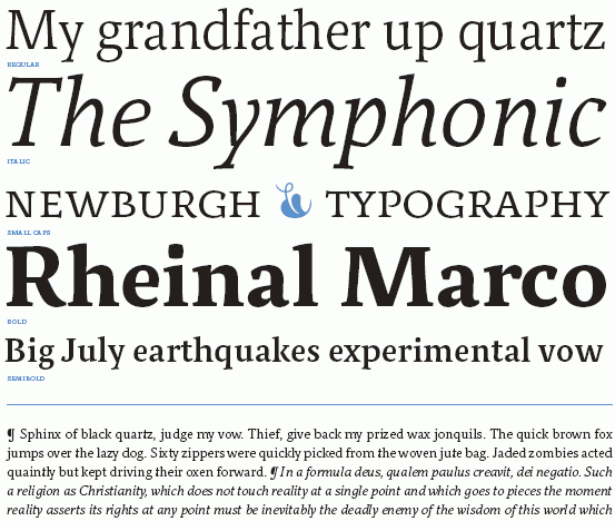
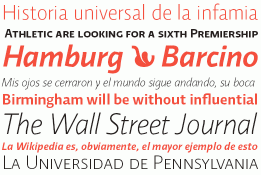
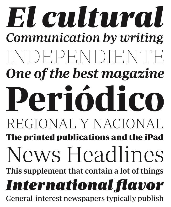
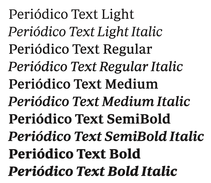
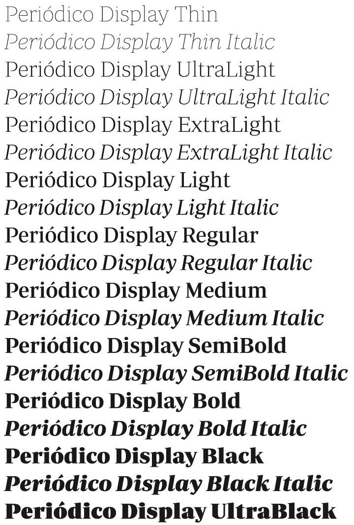
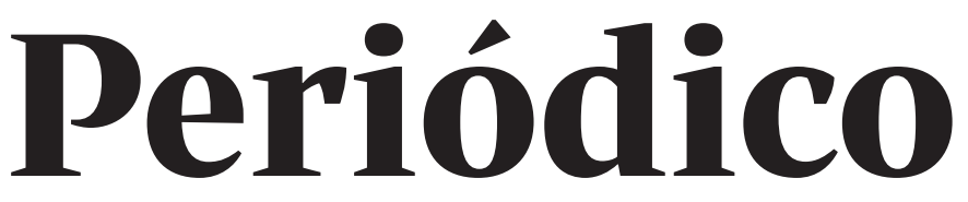
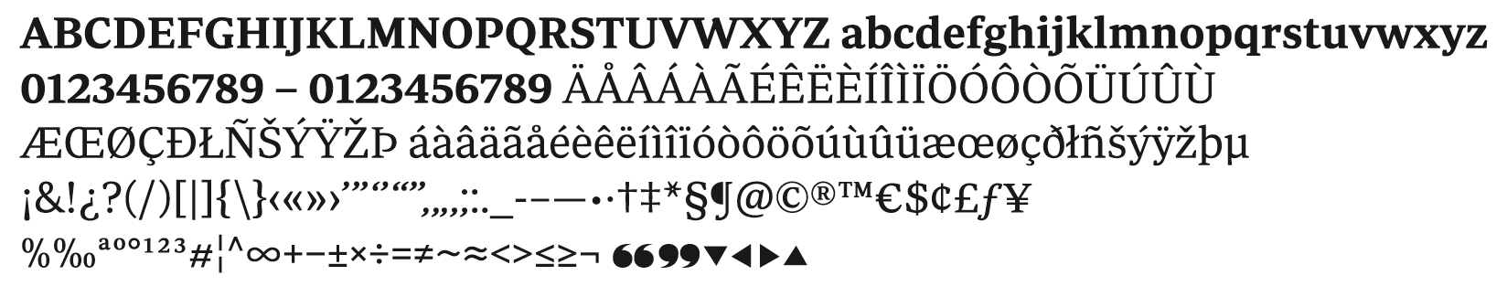
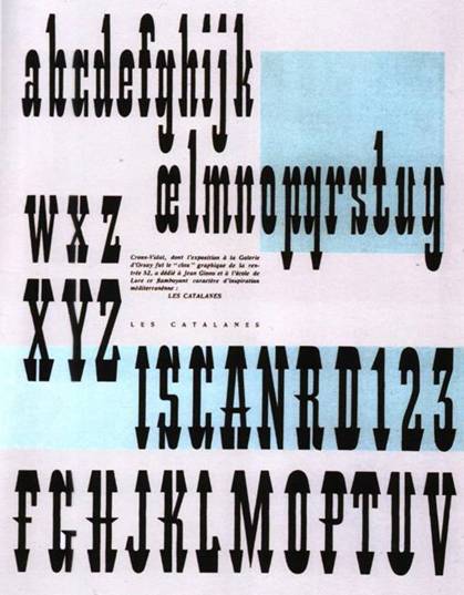
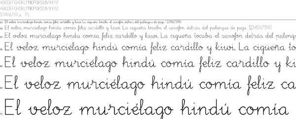
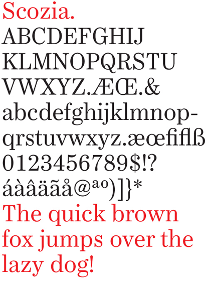
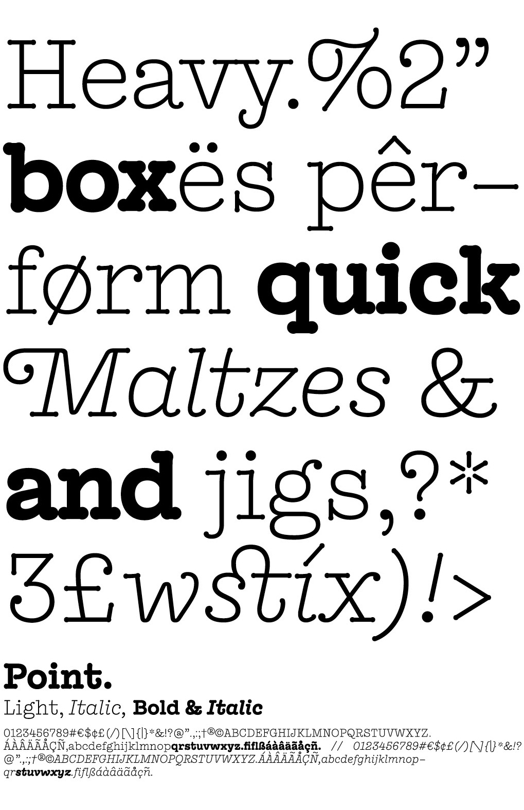
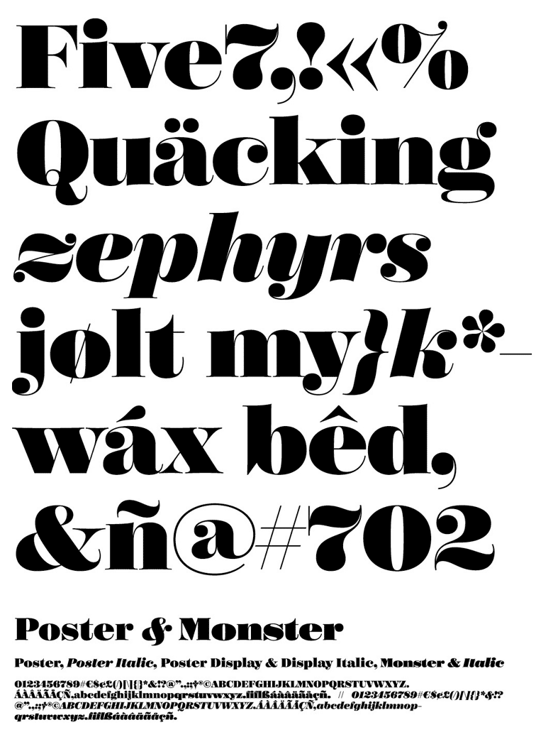
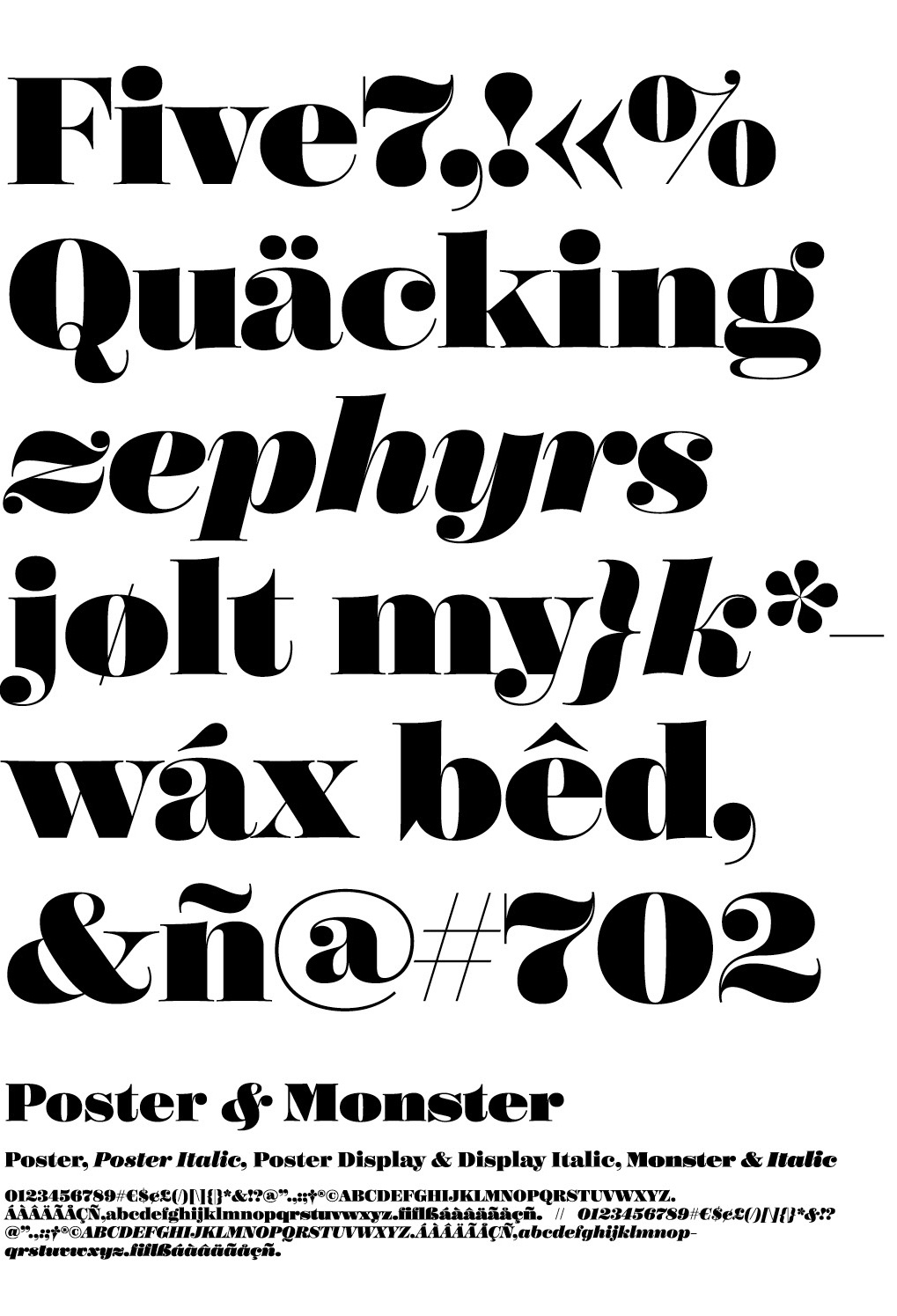
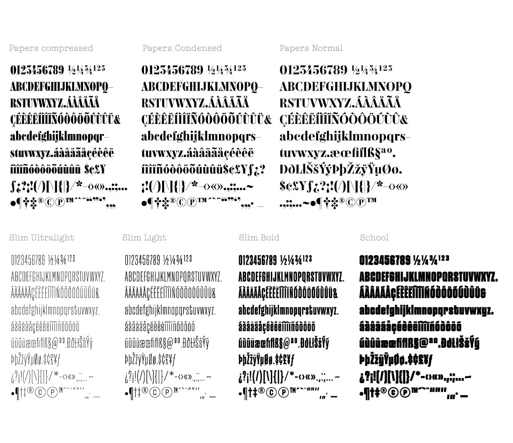
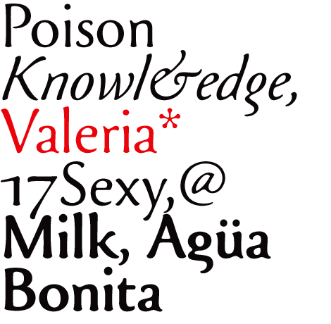
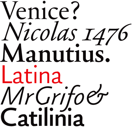
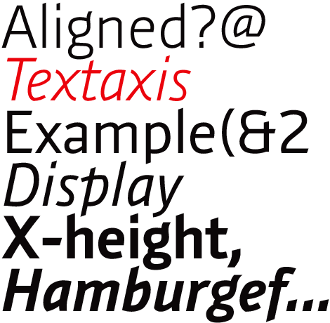
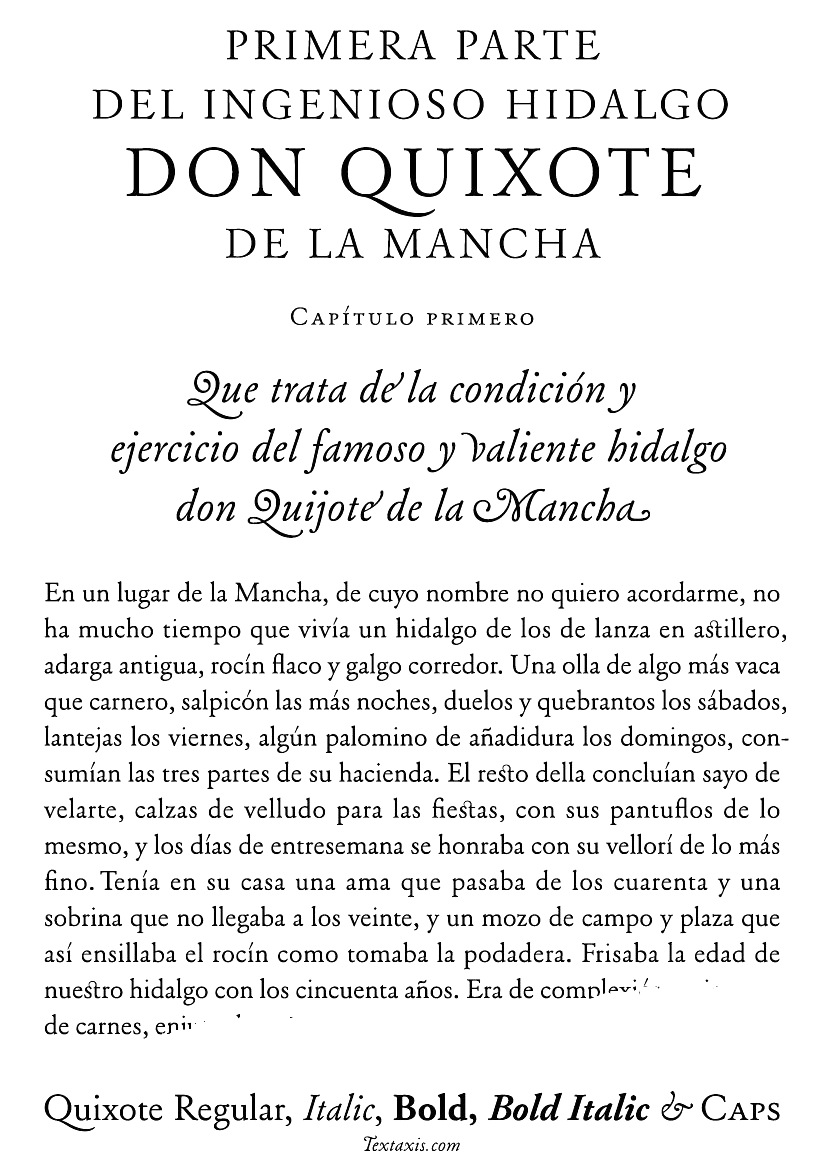
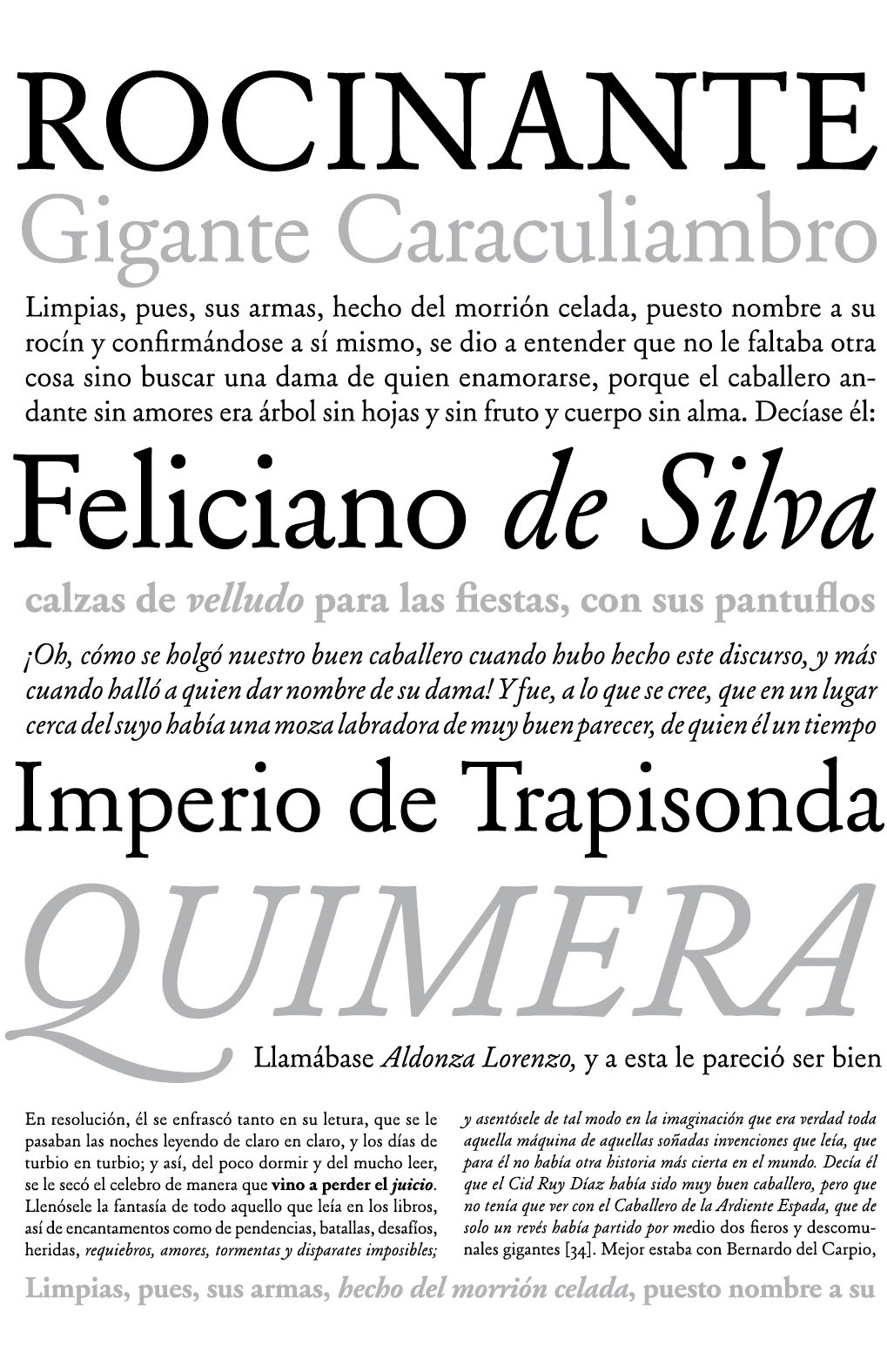
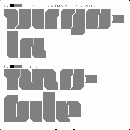
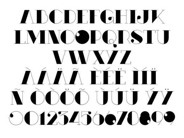
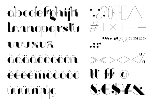
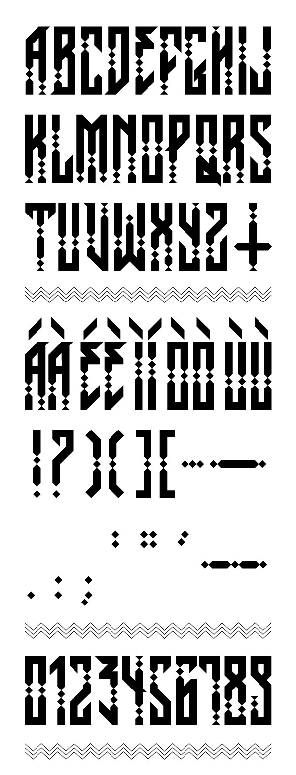
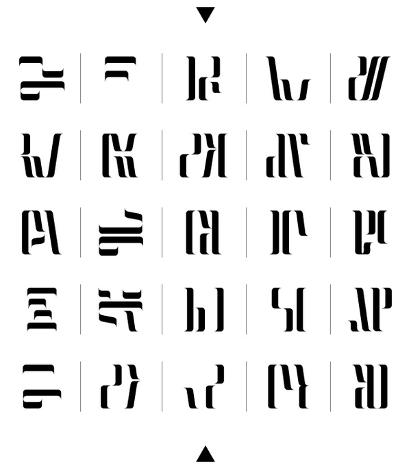
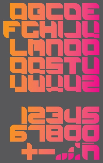
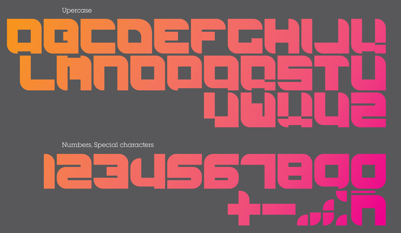
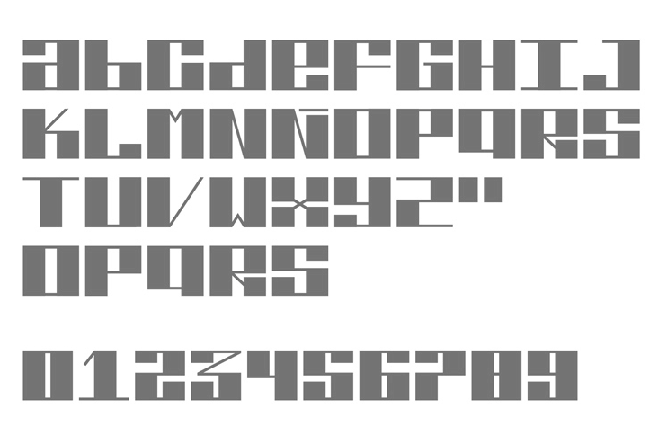
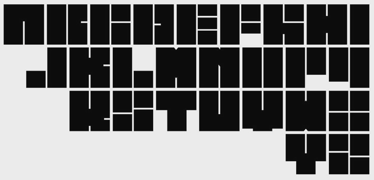
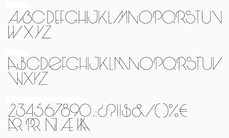
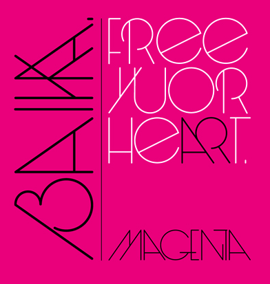
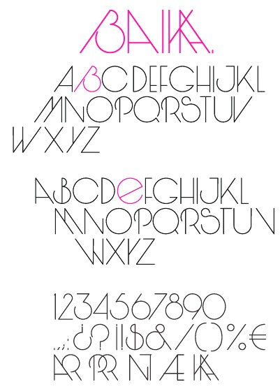
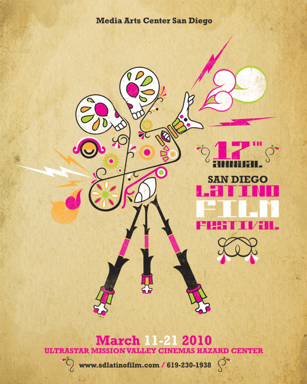
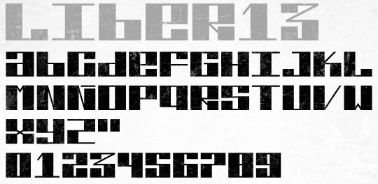
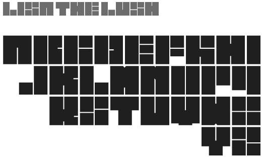
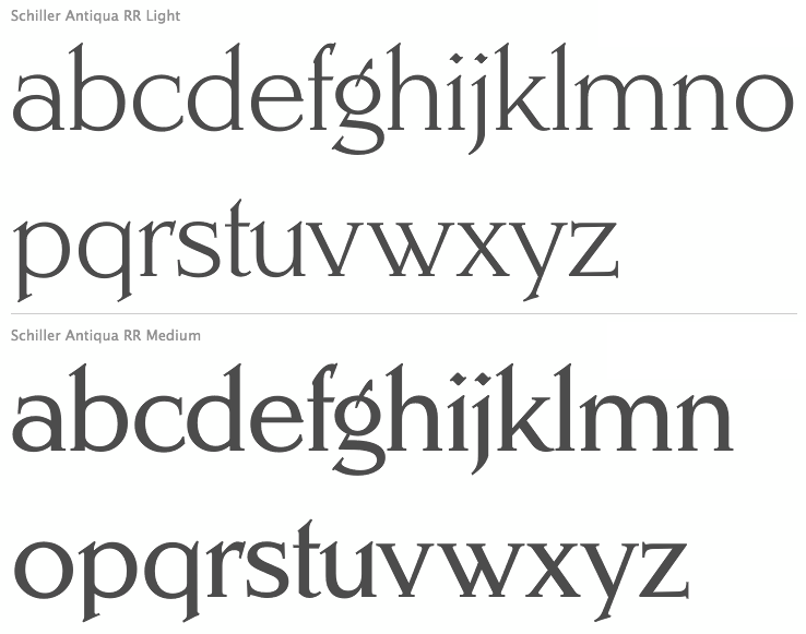
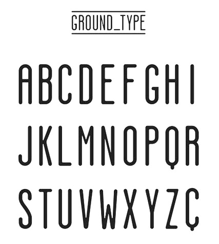
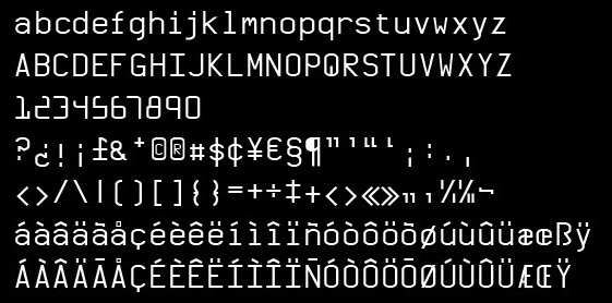
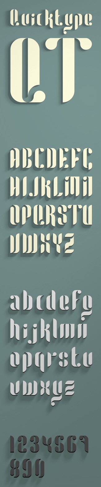
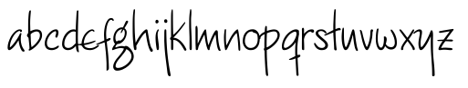
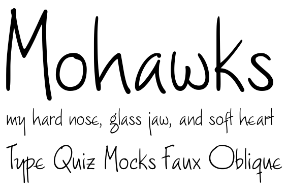
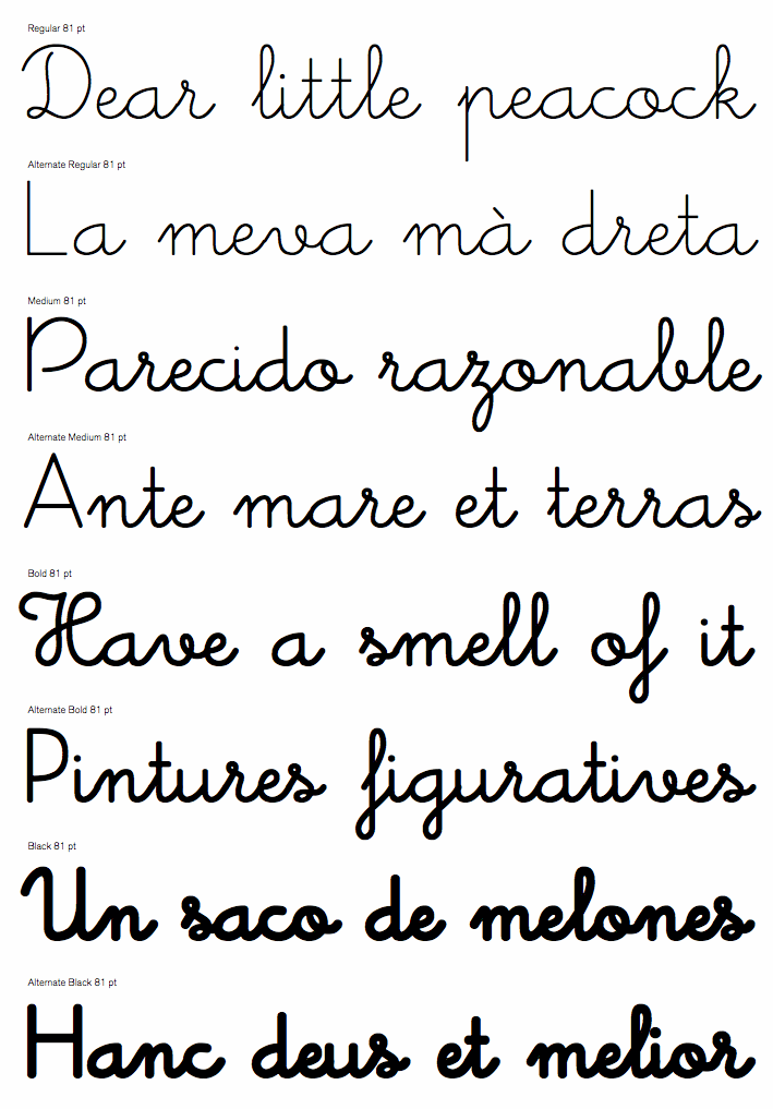
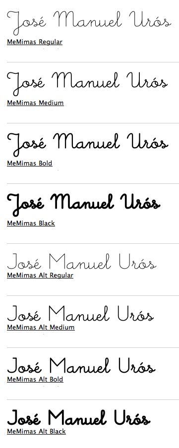
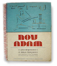
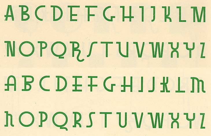
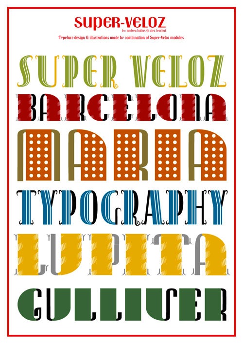
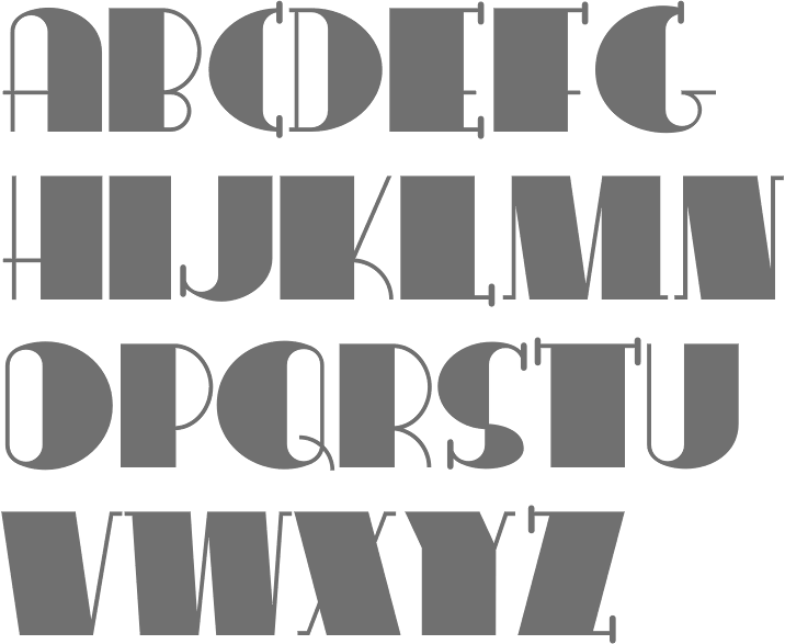
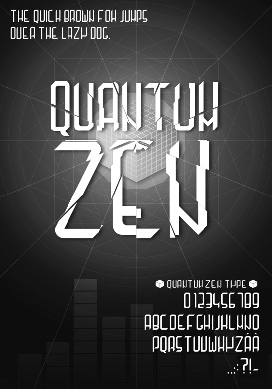
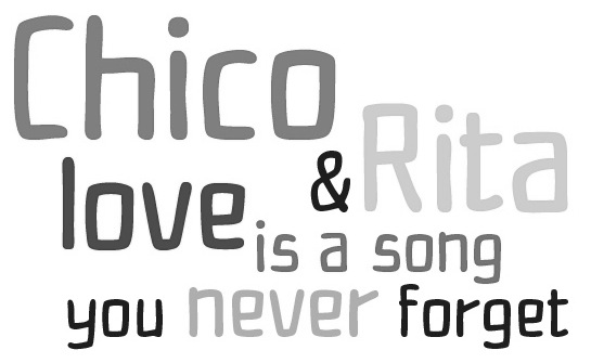
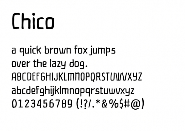
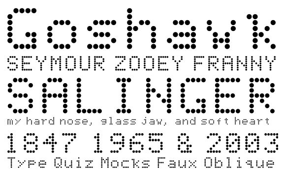
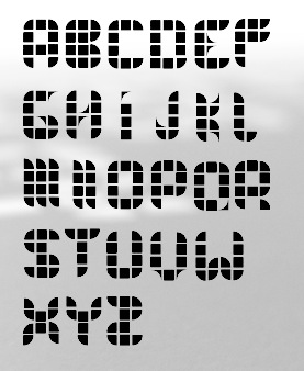
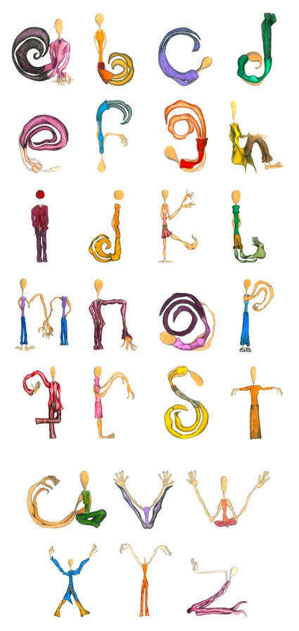
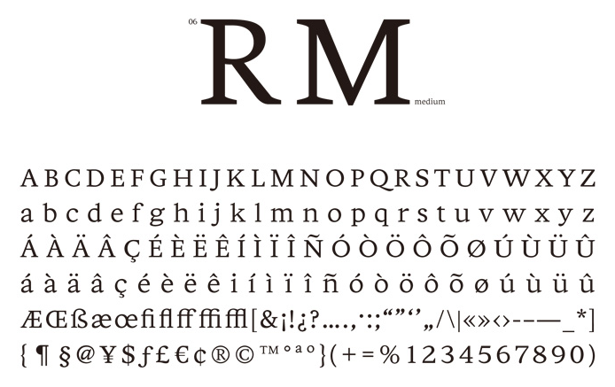
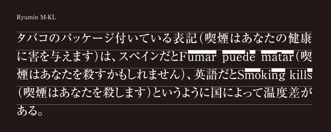
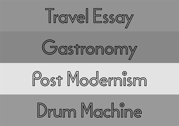
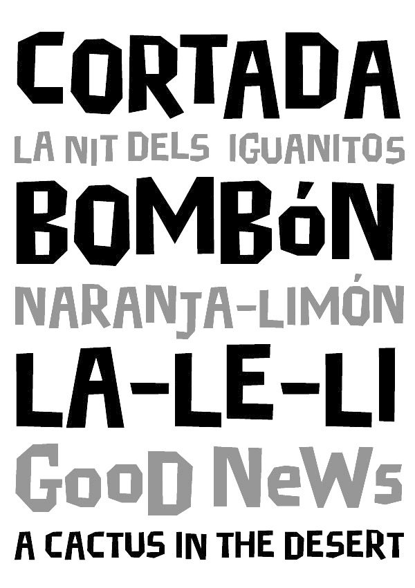
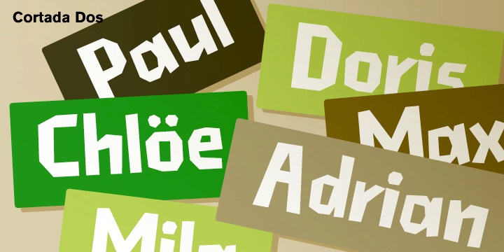
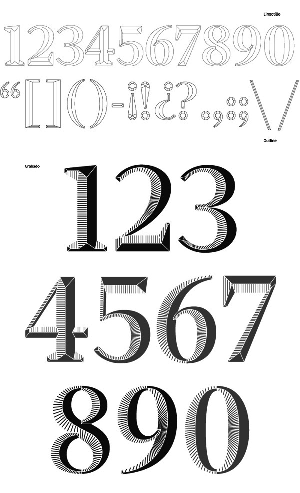
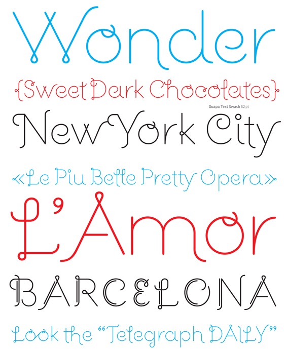
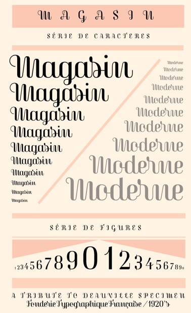
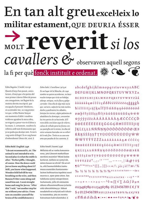
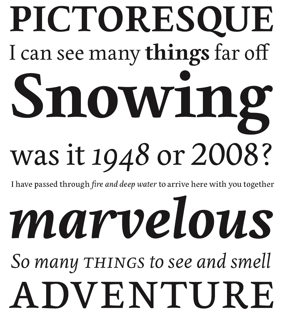
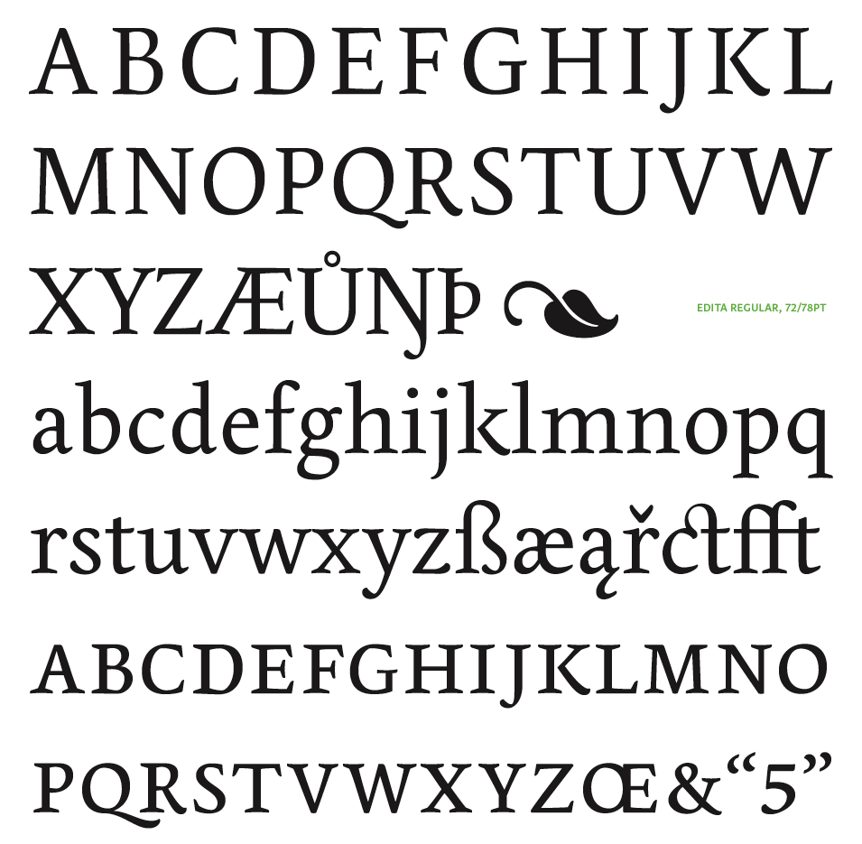
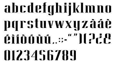
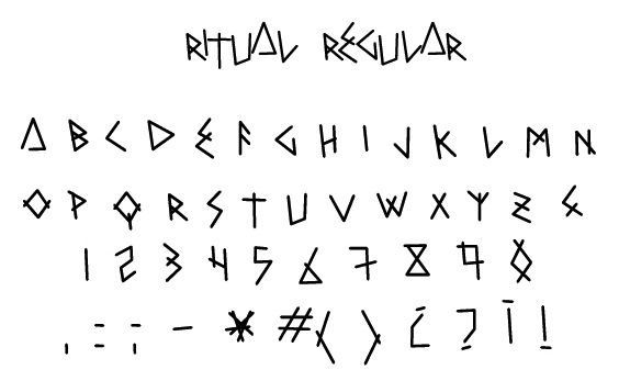
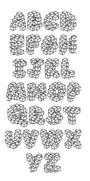
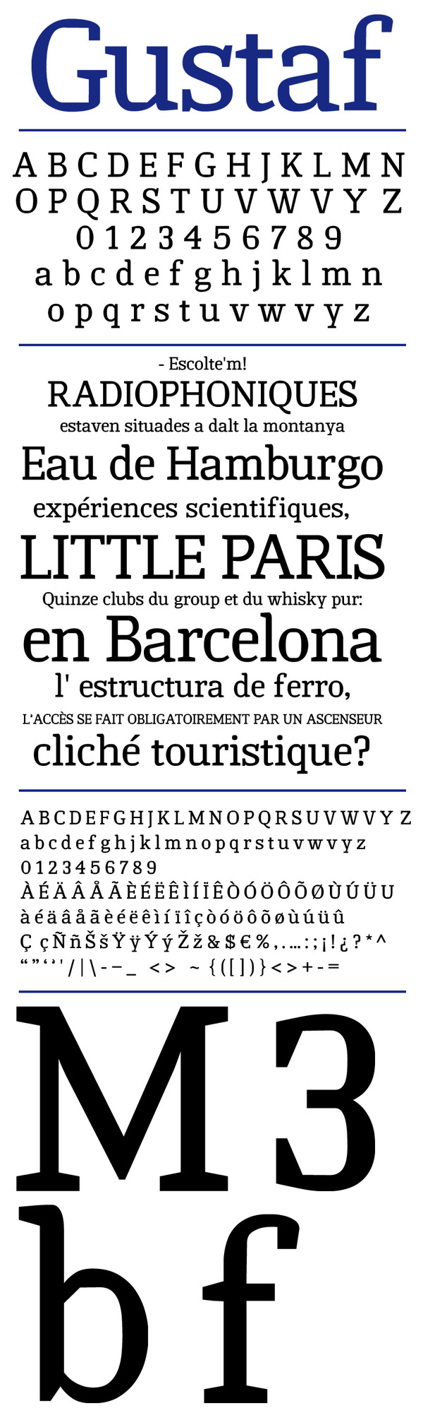
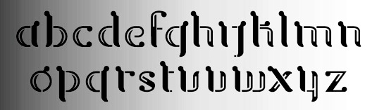
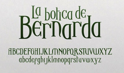
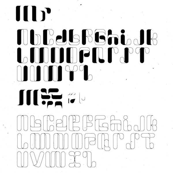
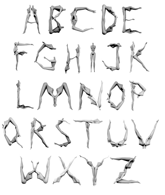
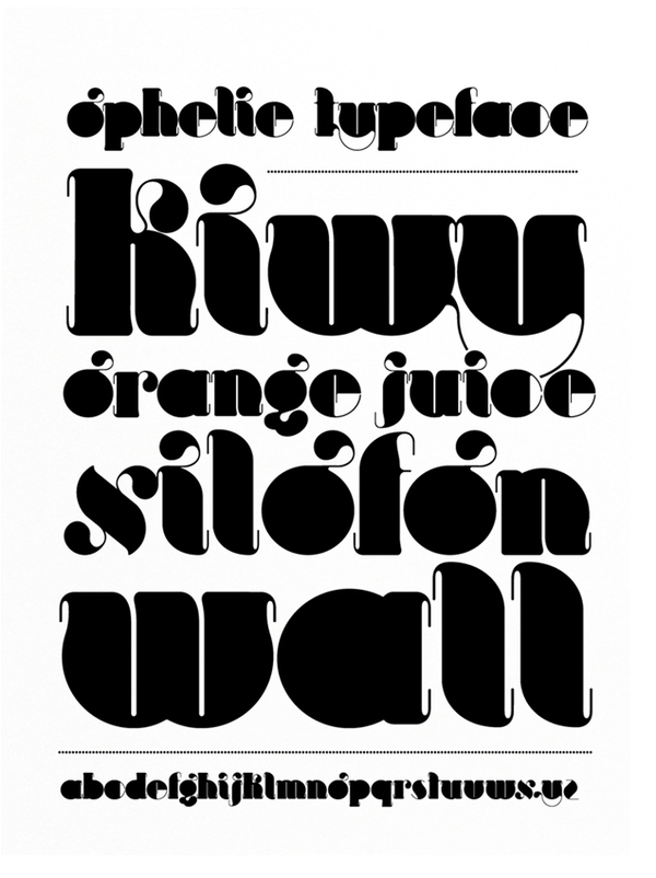
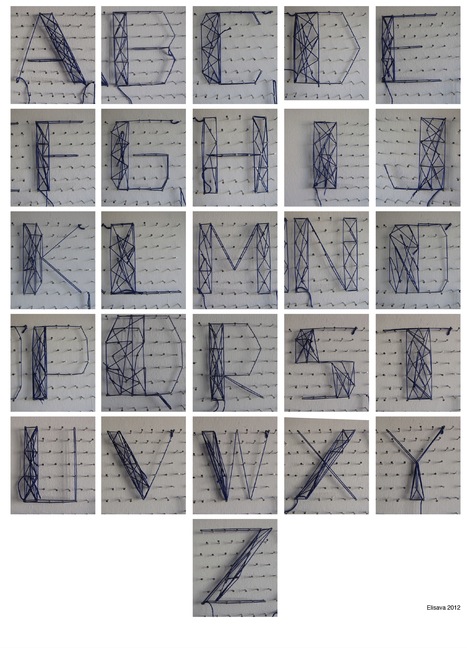
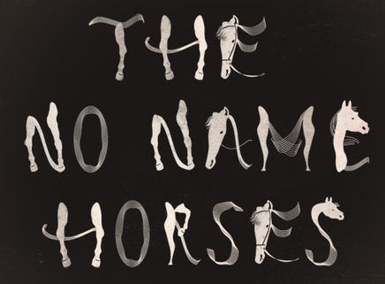
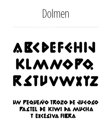
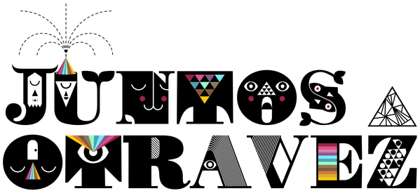
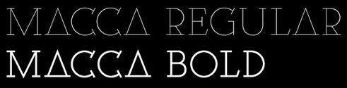
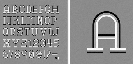
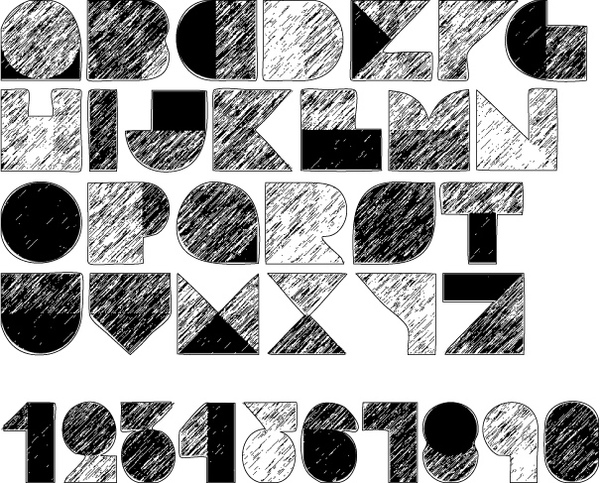
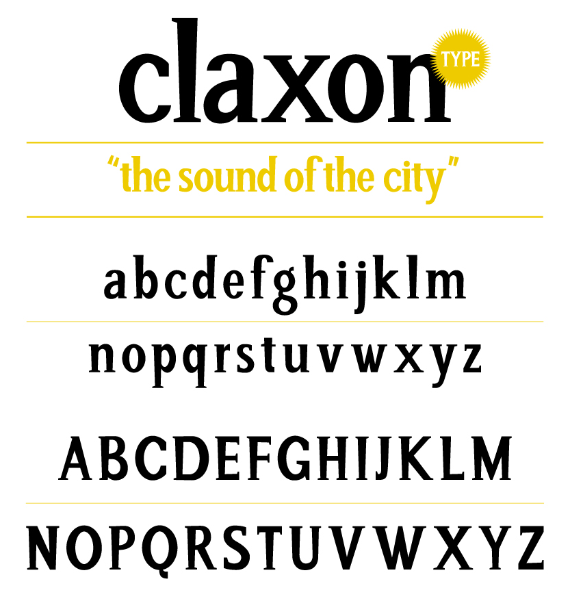
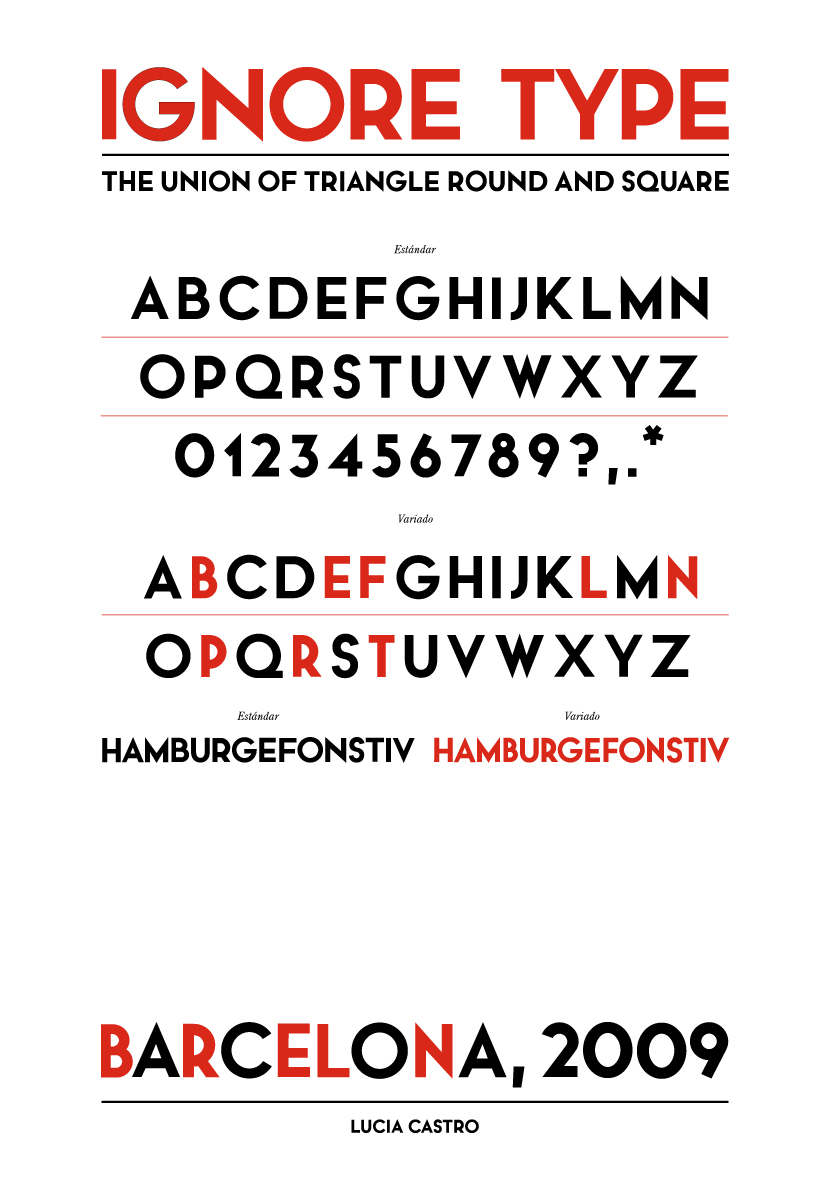
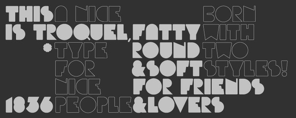
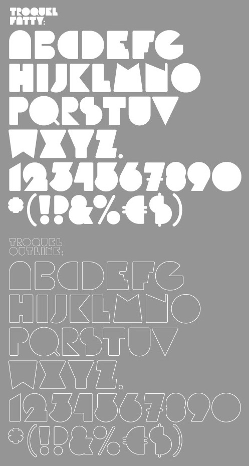
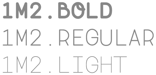
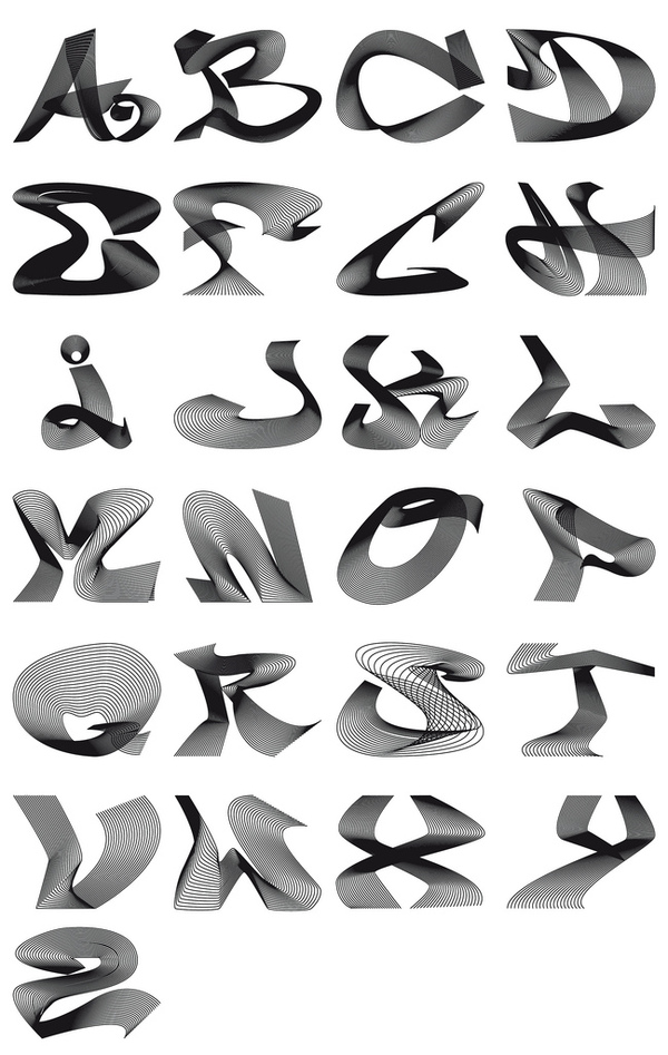
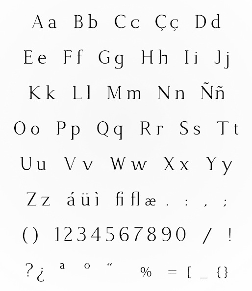
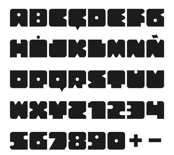
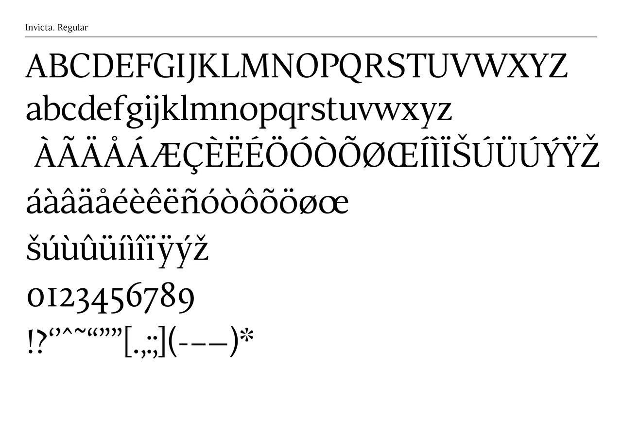
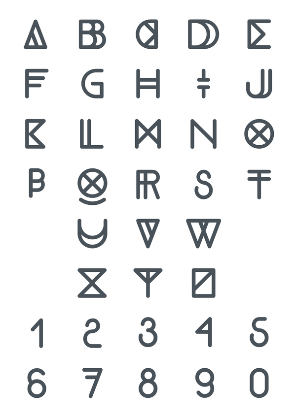
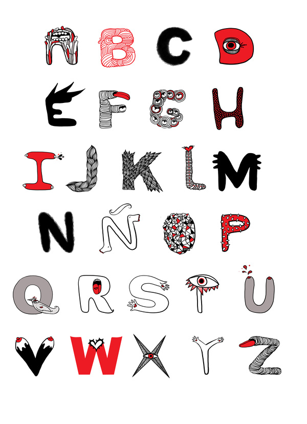
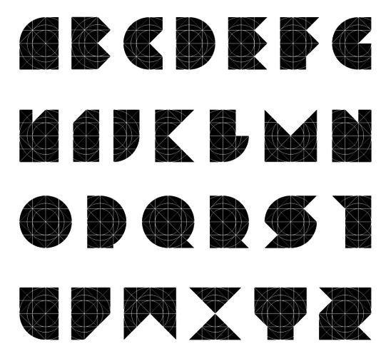
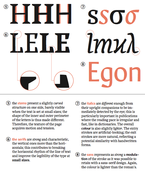
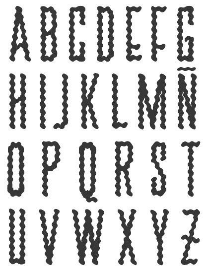
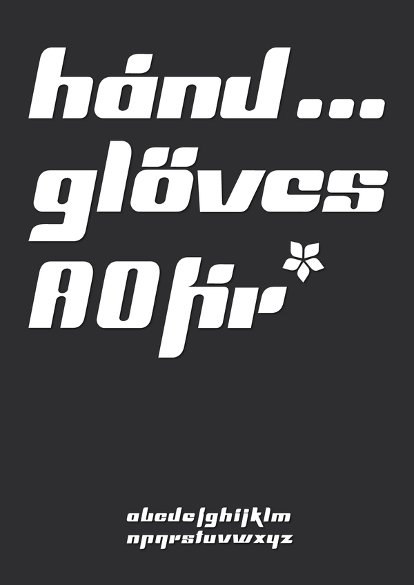
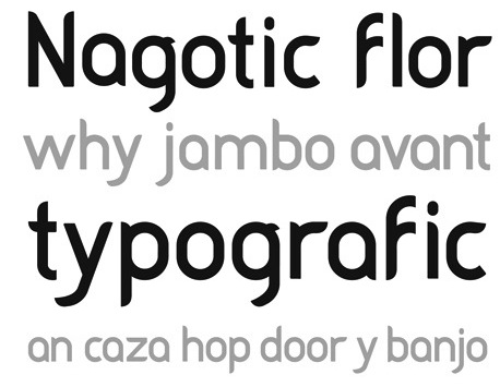
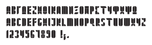
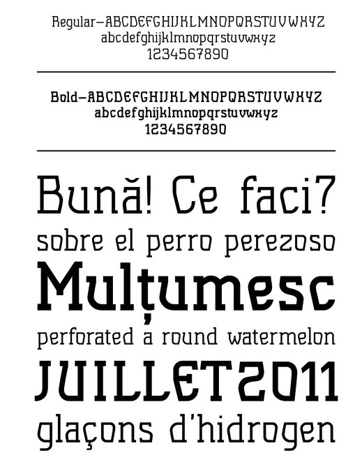
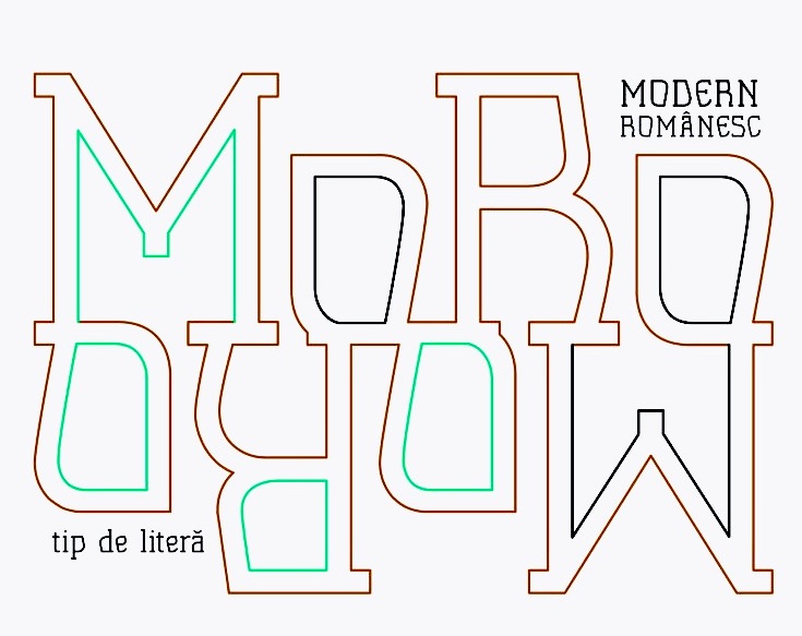
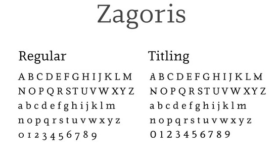
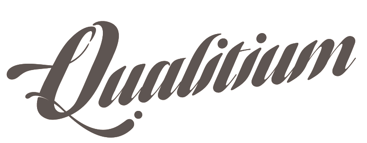
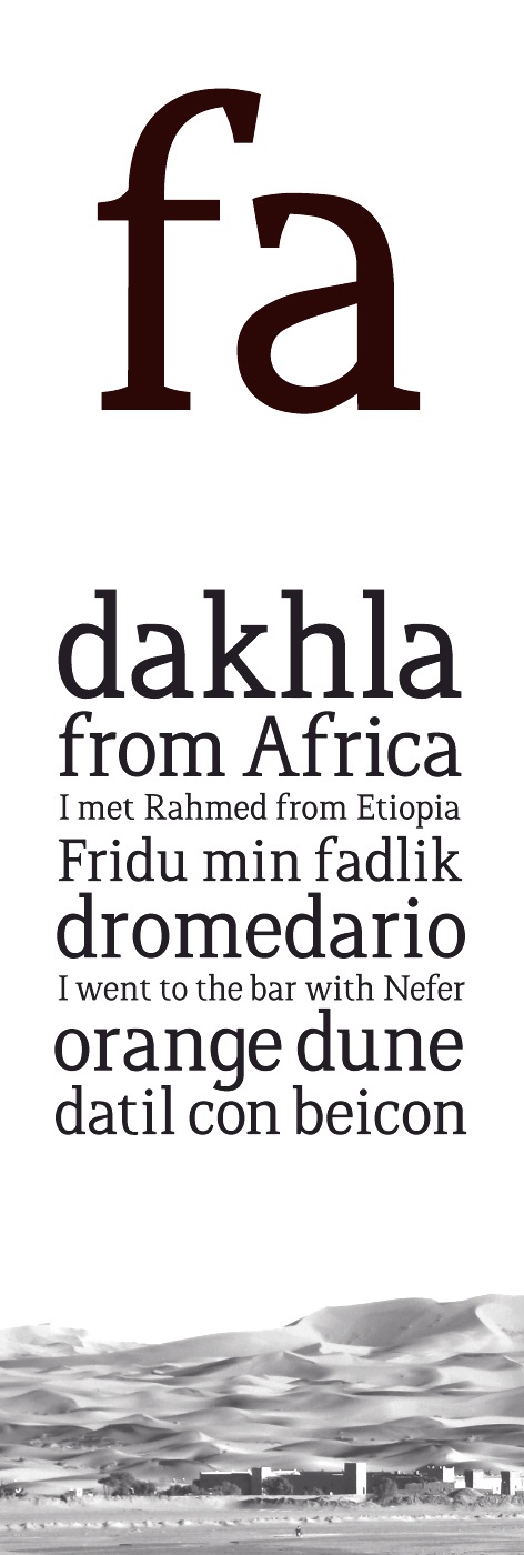
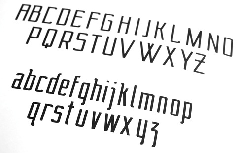
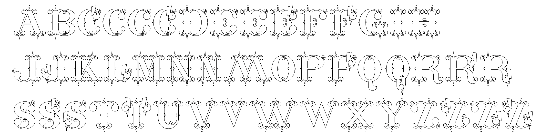
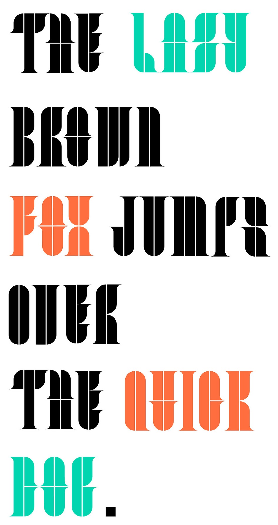
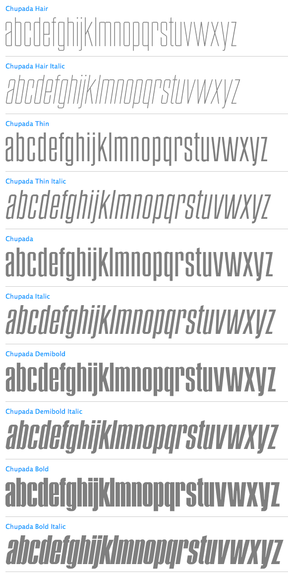
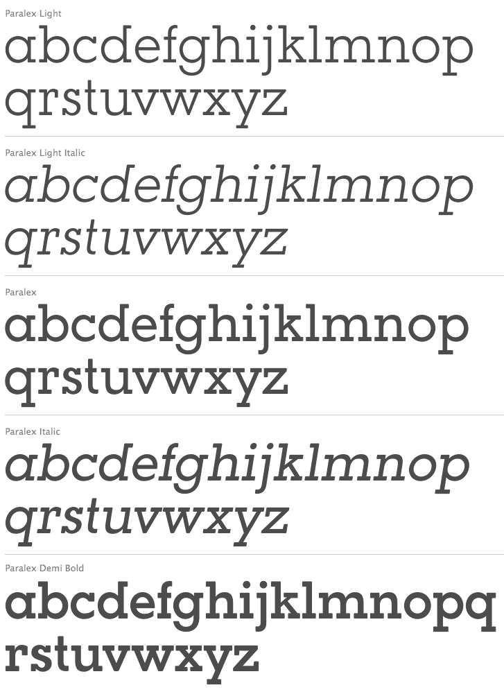
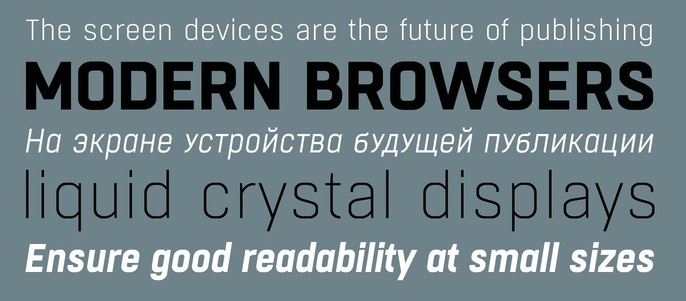
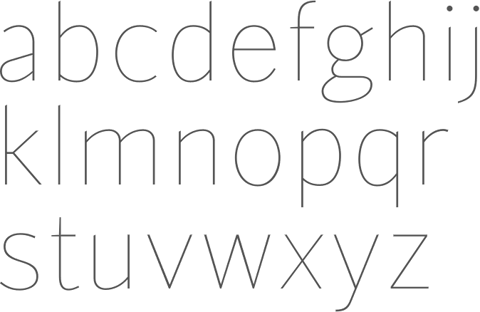
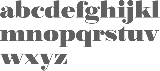
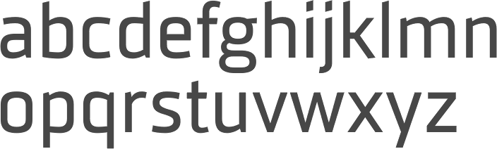
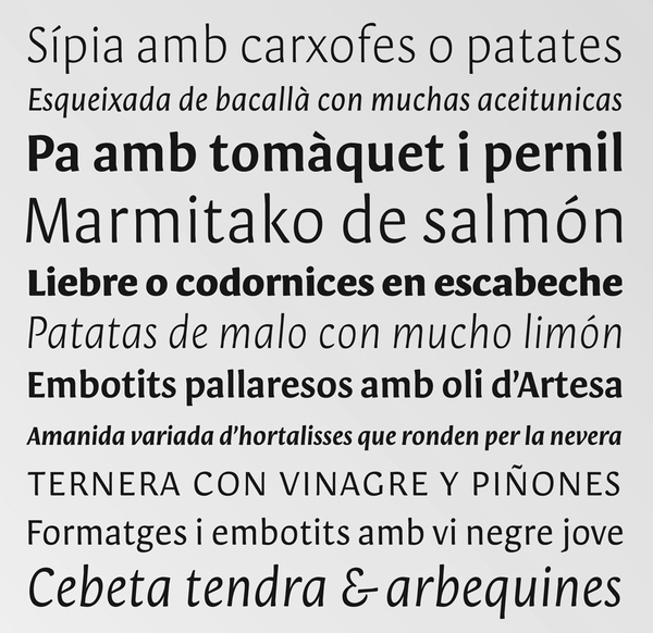
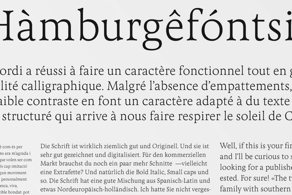
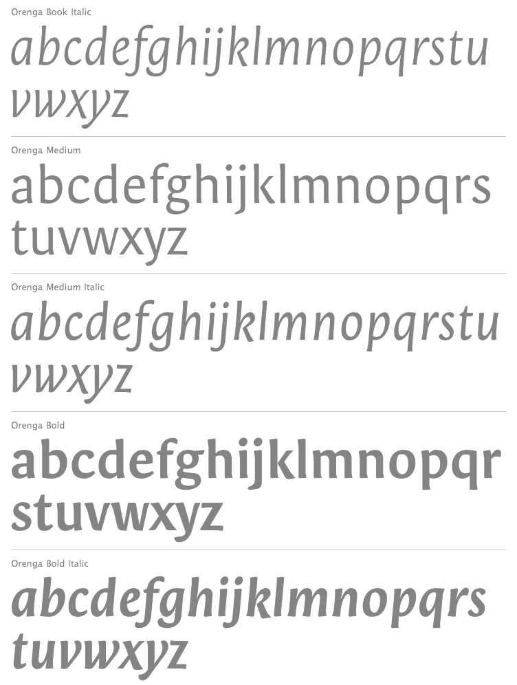
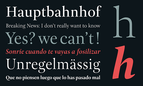
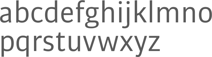
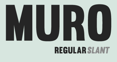
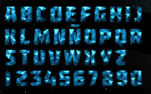
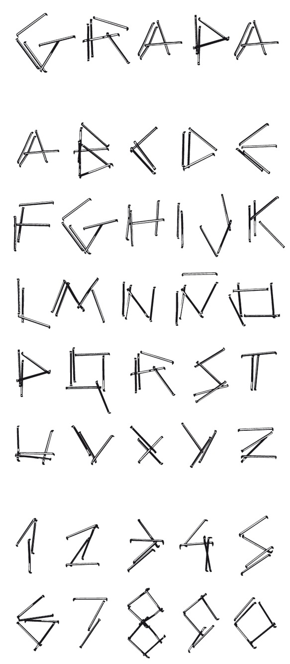
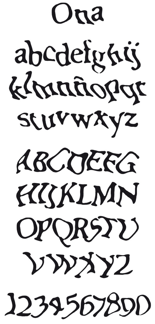
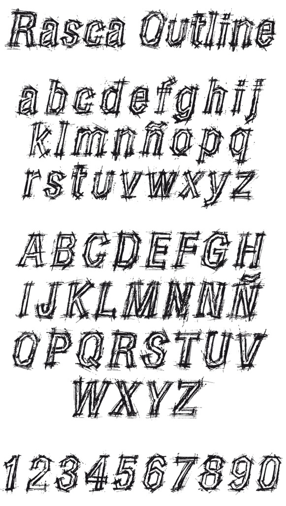
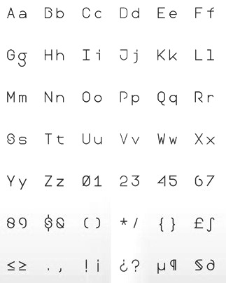
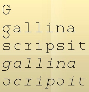
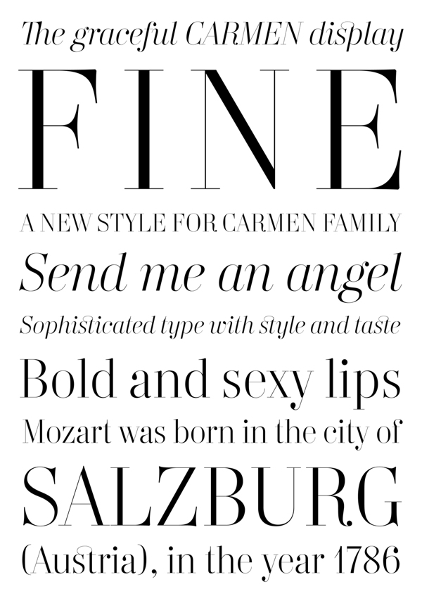
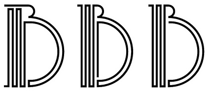
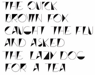
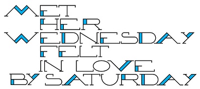
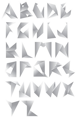
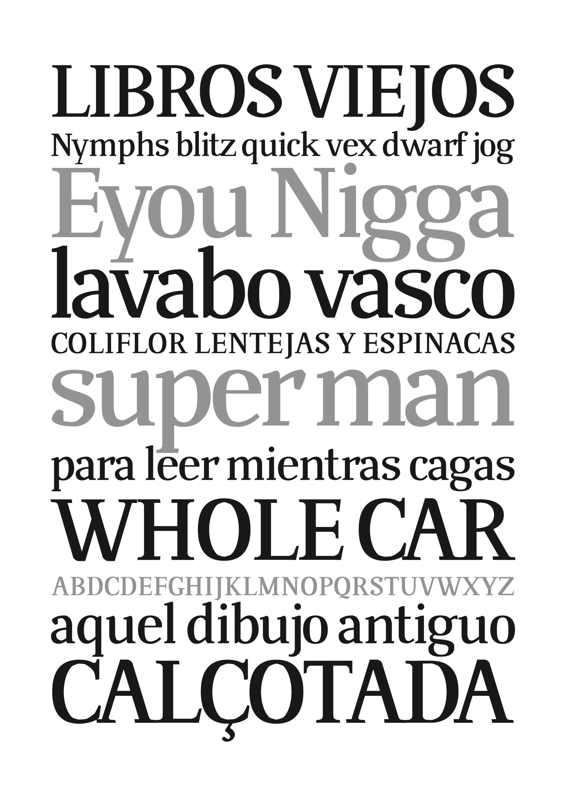
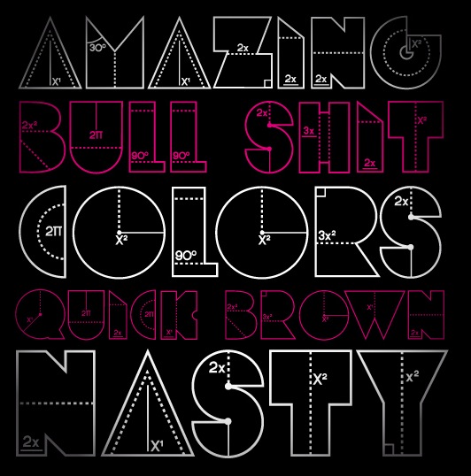
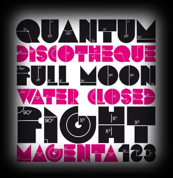
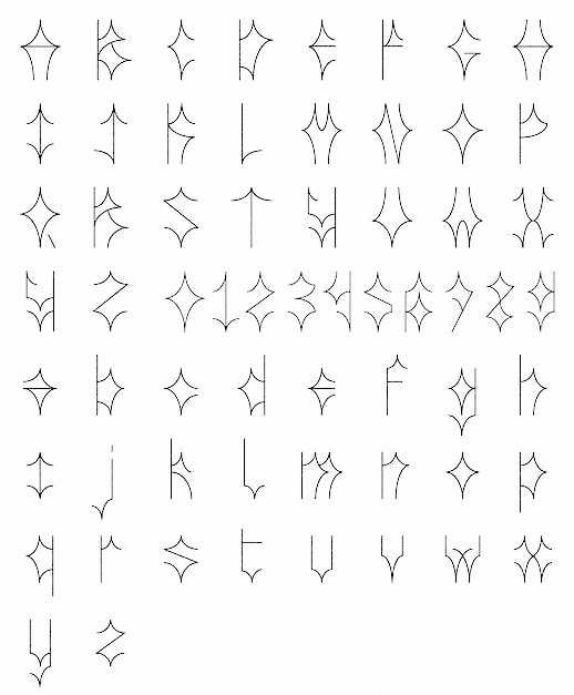
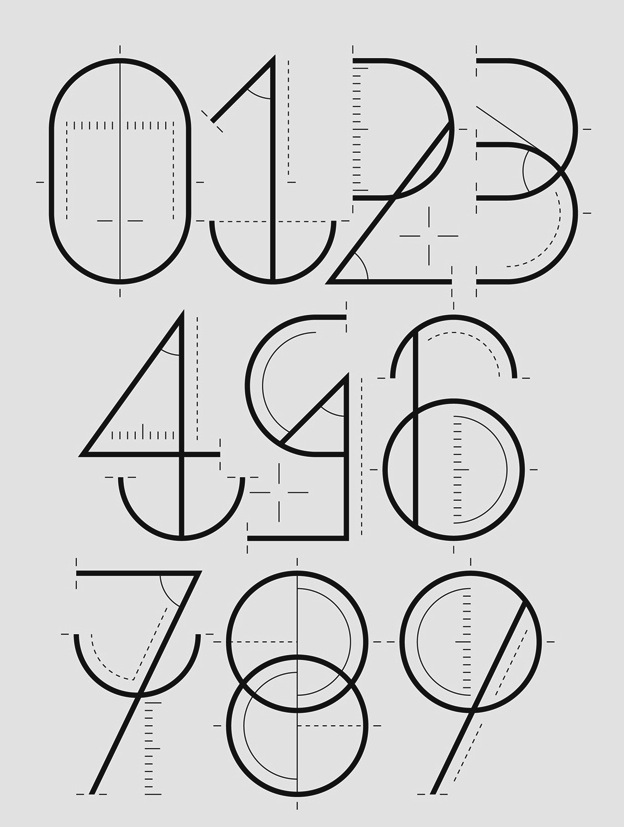
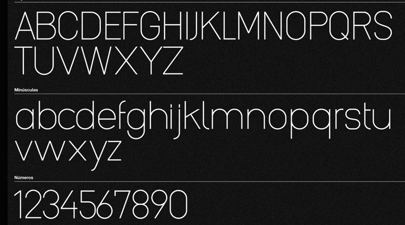
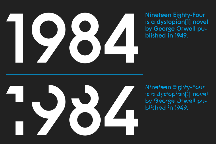
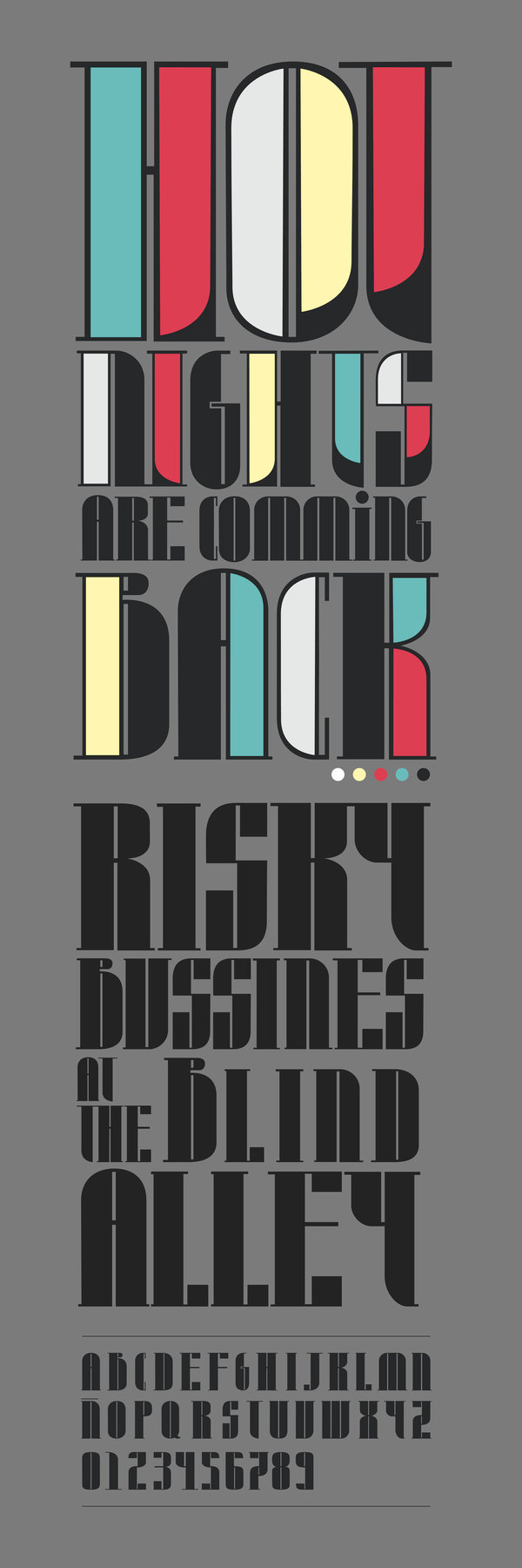
|
|
|
|