| | |
A Handy Little Font
|
A metafont with a series of "pointing hand" dingbats in various orientations, including pointing left and right, and "reverse video" versions in the same directions. Design work was originally by Georgia K.M. Tobin, and the final version assembled by Norman E. Powroz. [Google]
[More] ⦿
|
A. Zeese & Co
|
 Chicago-based electrotypers and photo-process engravers. They published Specimens of Electrotypes Comprising Cuts, Borders, Initials, Ornaments, Etc. (1891, Chicago: A. Zeese&Co).
 Very Victorian in style, this 200 plus page publication showcases traditional ornaments and has about fifteen pages worth of ornamental capital alphabets. [Google]
[More] ⦿
|
A2 Type
[Henrik Kubel]

|
 A2-Type (or simply, A2) is a type foundry set up in the autumn of 2010 by the London based design studio A2/SW/HK. The designers are Henrik Kubel and Scott Williams. A2's bespoke type design is mainly the responsibility of Henrik Kubel, though every typeface is developed and approved by both partners. Kubel is self-taught, making his first typefaces while studying at Denmark's Design School from 1992 until 1997. Their typefaces:
 - 4590
- 60 Display.
- Amplify (2013) won an award at TDC 2014.
- Antwerp (2011). A readable text family designed by Kubel during an Expert Type Design Class in 2011 at Plantin Genootschap in Antwerp.
- A2 Archi (2005, Henrik Kubel): an octagonal face.
- A2 Aveny-T (2000, Henrik Kubel): Poster typeface commissioned as aprt of the identity of the Aveny-T theatre in Copenhagen.
- Agriculture.
- Archi.
- Banknote.
- A2 Battersea (1999, Henrik Kubel): inspired by Meta, DIN and Transport Alphabet. Followed in 2012 by Battersea Slab.
- Bauhouse.
- A2 Beckett (2008). A condensed sans family with the masculinity of Impact.
- Boing.
- Copenhagen
- A2 CPH Tram (2009, Henrik Kubel): revival of an odd mini-serifed type found on the exterior of Danish trams, ca. 1920.
- A2 CWM (2008, Henrik Kubel): constructivist type designed for the headlines and cover of Cold War Modern Design 1945-1970. Octagonal.
- Dane.
- A2 Danmark (2008, Henrik Kubel): a display stencil family.
- A2 Ergonomics (2011).
- Flavin Medium. A neon tube font.
- A2 Flowers (2005, Henrik Kubel): arrows, fists, flourishes, ornaments.
- A2 FM: slab serif family.
- Foundation (2018) in Sans (Number 44, Condensed, Wide), Serif, and Serif Didot subfamilies. These are all revivals of skeletal typefaces. Foundation Sans Number 44 was inspired by Circular Gothic No. 44 (1879, Charles E. Heyer, for the Great Western Type Foundry). Foundation Sans Condensed and Foundation Sans Wide are derived from two types described as Caractères pour Marques de Linge (typefaces for marking on linen) in the Signes section of the first volume of Spécimen Général des Fonderies Deberny et Peignot (ca. 1934). Foundation Serif is based on Caractère No. 7, another Caractère pour Marques de Linge in that 1934 Deberny & Peignot specimen book. Kubel's inspiration for Foundation Serif Didot was a sheet of lettering (dated 1939) he discovered in the archive of the influential Danish architect and graphic/industrial designer Gunnar Biilmann Petersen, 1897-1968.
- Grand. A stencil typeface.
- A2 Grot 10 (2009, Henrik Kubel): a take on the Grot Series by Stephenson Blake. Grot 12 followed in 2015.
- A2 Impacto (2005-2011, Henrik Kubel): Impact?
- A2 Klampenborg (1997, Henrik Kubel): industrial style sans.
- Kunstuff.
- London (2010).
- Magna.
- Maximum.
- A2 Mazarin (2017). A2 writes: Originally designed as a Garamond-inspired metal typeface by Robert Girard ca. 1921-1923, and published under the name Astrée by Deberny Peignot, the typeface was soon recut and renamed Mazarin by the English foundry Stephenson Blake in 1926. That single style original has now been expertly restored and reimagined as a contemporary typeface in multiple styles.
- Melissa Script (2010).
- A2 Monday (2003-2016, Henrik Kubel): based on 19th century English vernacular serif signage type.
- Moscow Sans (2014-2015). Award winning custom fonts and pictogram system for Moscow Metro. Art directed and designed by A2 (Scott Williams and Henrik Kubel) with Margaret Calvert as type and pictogram consultant. Cyrillic script designed in collaboration with Ilya Ruderman.
- Naive.
- New Grotesque Square series (2015). A newspaper typeface modeled after a Stephenson Blake typeface. Followed by New Grotesque Round in 2015-2016.
- New Rail Alphabet (2009). A refreshed and expanded version of Margaret Calvert's alphabet from the 1960s which saw nationwide use with British Rail, BAA, and the NHS. Developed in cooperation with Margaret Calvert.
- New Transport (with Margaret Calvert). A digital version of Transport, the Jock Kinnear and Margaret Calvert typeface for the British road signs. New Transport will be commercially released in September 2013.
- Register (2012-2017). A text typeface family inspired by French renaissance types.
- Regular (2012-2016). Think Futura in new clothes. Accompanied by Regular Slab.
- Sans, Slab and Serif typefaces for a redesign of The New York Times Magazine in 2015. The starting point for the Serif font is the Stephenson Blake Garamond-ish metal typeface Mazarin also known as Astrée from French foundry Deberny & Peignot. The slab fonts used for pull quotes and headlines are a continuation of the magazines existing Stymie font but in a condensed format. The sans fonts are linked to the industrial grotesque types, with metal type specimen versions of Futura and Akzidenz fonts as loose models for inspiration.
- Nosferato.
- Ole.
- Outsiders (+Outsiders Light and many other weights). A slab serif family.
- Parsons Green Medium.
- A2 Record Gothic (2019, Henrik Kubel), after Robert H. Middleton's American grotesk, Record Gothic (1027, Ludlow). Kubel writes: In celebration of Record Gothic's eclectic history, we designed four related but independent styles: Slab, Mono, Stencil and Outline.
- Square.
- Staton.
- Tagstyle.
- Test.
- Triumph.
- A2 Typewriter (2000, Henrik Kubel): based on Olivetti Typewriter 22.
- A2 Vogue Floral: a fashion mag modern display face in two styles.
- Vogue Paris. Granshan 09 Type Design Competition. 1st Prize, Display fonts.
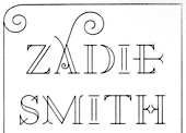
- A2 Zadie (2005, Henrik Kubel): inspired by Edwardian railings surrounding the Royal Army Military College in London. Used on the cover of the Zadie Smith bestseller On Beauty (2005, Penguin Press, NY). Granshan 10 Type Design Competition. 3rd Prize, Display fontt described as an ornamental blackboard bold type.
- In 2014, Scott Williams and Henrik Kubel (A2 Type) co-designed A23D, a 3d-printed letterpress font. It was fabricated by model making specialists Chalk Studios. The font is presented by New North Press, which specializes in traditional letterpress printing. Adrian Harrison made a short film about the birth of the font, charting its progress from preliminary sketches to first inking and printing at New North Press. A23D won an award in the TDC 2015 Type Design competition.
- English 1766 (2017). Kubel's take on Caslon.
- Regular (2017). A sans family inspired by Memphis, Karnak, Stymie and Futura.
- Schwiss (2018). Inspired by Akzidenz Grotesk and Helvetica.
Custom type by them include an alphabet for Qantas Airlines (2017), a masthead for Toronto Life (2010), a custom typeface for Banca Sella (2018), Qualcomm (2017), Arne Jacobsen (2018?), Evening Standard Newspaper (2018: 43 fonts), New York Times Magazine's Olympics issue (2018: a monowidth font for stacking), Eurosport Pyeongchang 2018, Weekendavisen (2007-2010), Design Museum London (2010), Faber&Faber (2009-2010), Afterall Publishing (2006-2010), Faulkner Browns Architects (2007), Penguin Press (2005), and Norrebro Bryghus (2005). At ATypI 2013 in Amsterdam, he spoke about New Transport. Winner of the type design prize at the Tokyo Type Directors Club TDC 2019, with Matt Willey, for the New York Times Magazine Olympic font. [Google]
[MyFonts]
[More] ⦿
|
Alexander Lange
|
 Karlsruhe-based software developer. Creator of the large (and free) Unicode font Quivira (2005). It covers mathematics, chess, astrological symbols, arrows, fists, Latin, Greek, Cyrillic, Hebrew, Armenian, Georgian, Tifinagh, Coptic, emoticons, Vai, and Braille, to name just a few ranges. Alexander graduated in computer science at the Hochschule Mannheim University of Applied Sciences (degree: Diplom-Informatiker (UAS)). [Google]
[More] ⦿
Karlsruhe-based software developer. Creator of the large (and free) Unicode font Quivira (2005). It covers mathematics, chess, astrological symbols, arrows, fists, Latin, Greek, Cyrillic, Hebrew, Armenian, Georgian, Tifinagh, Coptic, emoticons, Vai, and Braille, to name just a few ranges. Alexander graduated in computer science at the Hochschule Mannheim University of Applied Sciences (degree: Diplom-Informatiker (UAS)). [Google]
[More] ⦿
|
Altemus Creative
[Robert Altemus]
|
Altemus Creative Services sells dingbat fonts by Robert Altemus from New York, NY: Your premiere source for digital decorative fonts. Their commercial dingbats are sold by MyFonts. Partial list: AltemusBirds, AltemusBorders 1 through 4 (1992; Borders 4 containss pointing hands and flourishes), AltemusBursts 1 through 4, Altemus Bursts 1 through 4 (2002, contains snowflakes), AltemusChecks, AltemusChecksTwo, AltemusCorners, AltemusCrosses, AltemusCuts, AltemusCutsThree, AltemusCutsTwo, AltemusFlowers, AltemusHands, AltemusHolidaysOne, AltemusKitchen, AltemusPinwheels (1996), AltemusPointers, AltemusRays, AltemusRaysBold, AltemusRoughcuts, AltemusRounds, AltemusRules, AltemusSecurity, AltemusShields, AltemusSpirals, AltemusSpiralsBold, AltemusSpiralsBoldItalic, AltemusSpiralsItalic, AltemusSquares, AltemusStars 1 through 3, AltemusSuns, AltemusSunsBold, AltemusToolKit (2 fonts), Altemus Web Icons, EuropaArabesque, Games (cards, domino), Games 2 (mahjong, chess), Sports (balls), Sports 2, Leaves 1 and 2. Catalog, part I, part II. [Google]
[MyFonts]
[More] ⦿
|
Andinistas
[Carlos Fabián Camargo Guerrero]
|
 Bogotá-based Colombian graphic design studio and type foundry Andinistas was founded in 1998 by Carlos Fabián Camargo Guerrero, Lennyn Salinas, Mariangeles Valero, Juan Carlos Valero, Jorge Alexander Camargo Guerrero, Rafael Rincón, and Jordi Teres. It was first located in Caracas, Venezuela, but moved in 2003 to Bogotá, Colombia. New names in its organization include Alexander Moreno. Many of its designers are Venezuelan.
 Among their typefaces: Nikona, Magola (2008, puffy script), Angelita, Pepelepu, Zerotipo, Skuke, Retro, Radio Bemba, Pumarosa, Pr1, Oficia, Nativa, Mongol (free), Lirrot, Leroy (1999-2008, computer screen stripes), Leroy Dingbats (1998-2008), Hiroformica, Hibrida, Guerilla, Guerilla Outline, Gruada, Gancho Petare, Escuedra, Esbelta, DSNett, dia-D, Download, Denego, Cristal, Codiga, Codiga Icon, Codiga Destroy, Codiga Codec, Chacao Petare, Cazon Gothic, Boa, Biol, Ave-cedario, Anaira. Cazon (2007, Camargo Guerrero) is a family of calligraphic origin consisting of 7 styles: Gris, Negra, Uno, Dos, Tres, Dingbats A and B and is based on the paintbrush letters found in the popular markets of La Guaira, Caracas. This family won an award in the experimental typeface category at Tipos Latinos 2008. Lirrot (2007) is a 6-style grunge handwriting typeface bordering on the psychotic, and comes with Lirrot Dingbats. It too won an award at Tipos Latinos 2008. PP Lepu (1998-2008) is pixel grunge. Josefina (+Dingbats1) is a curly script also made in 2008. Navaja (2008) and Diad are collections of grunge fonts with grungy dingbats. Lucrecia 1 through 3 (2008) is a fat connected script family ranging from clean to splattered. Telesforo (2008) radiates anger from its brushy grungy limbs. Telesforo Black won an award at Tiupos Latinos 2012. Ninja 1 and Ninja 2 (2008) are script fonts, and are accompanied by Ninja Dingbats (2008). Dsnet (2008) is a 6-style bare-bones rounded squarish family. Flaminia and Flaminia Dingbats (2008) are useful for food-related signage. Modelia (2008) is thick, informal, and looks like it was brushdrawn. Modelia won an award at Tipos Latinos 2010. Filomena (2008) is a brush family with a goth theme and an accompanying goth dingbats. Obdulia (2008) and Floro (2008) are extreme mural grunge fonts. Marimonda (2009) is grunge calligraphy. Typefaces from 2012: Demetria (a hellish script), Ciclope (army stencil), Meteora (a sturdy weathered family), Kamuy (a grunge typeface, with dingbats, that links to Asian comic style lettering, and Japan in the Pacific War), Naturalia (an informal sans family). In 2013, he made Gluten (a poster typeface family), Bengala Script (a distant relative of Mistral), Chef Script (a large signage script influenced by Ross F. George's Speedball lettering manual (1957)), Chef Script Dingbats (hilarious restaurant dings and fists), Sumergible Script. Typefaces from 2014: Citronela (cartoon or Caribbean hotel signage font family), Bemol (a set of script fonts in craftsman style), Nemocon (creamy script), Acustica (a calligraphic Acustica Script, with didone Acustica Caps, and a decorative Acustica Dingbats), Cereal (+ Script (a vampire script), Skin and Dingbats). Typefaces from 2015: Draw (which includes a gorgeous calligraphic Draw Script), Coffee Break (signage script family, +dingbats), Solar (a set of seven handcrafted styles). Typefaces from 2016: Enjoy (Script, Caps). Typefaces from 2017: Warhol (irregular scripts), Makeup (a crayon font by Carlos Guerrero and Carolina Suarez). Typefaces from 2018: Bechamel (a delicious curly brush script), Bechamel Roman (based on the unicase letterings of the movie Willy Wonka and the chocolate factory), Stevia (script). Typefaces from 2019: Bleak (an experimental layerable font inspired by wood type, Piet Zwart, Lissitzky and van Doesburg), Nutcake CatchWords. Sonora won an award at Tipos Latinos 2014. Combine Script and Combine Caps (layerable colorable fonts), and Nemocon, won awards at Tipos Latinos 2016. Winner at Tipos Latinos 2018 for Clothing, a titling typeface published at Andinistas by Camilo Zamora and Carlos Fabian Camargo. Typefaces from 2020: Cherrypie (a food packaging script), Rapsodia (a decorative all-caps family with curl, spurs, Victorian details, and decadent frills). Typefaces from 2021: Visible (an inky script family), Caribe (Script, Caps, Shields). View the typefaces designed by Andinistas. Klingspor link. Dafont link. Behance link. [Google]
[MyFonts]
[More] ⦿
|
Andrey Belonogov
|
Russian designer (b. 1975, Moscow) who won an award at Bukvaraz 2001 for Handmade (hand sign font), and for Rouble, a minimalist Latin/Cyrillic font made in 1999-2001. He received a TypeArt 05 award for the dingbat family Astra. Other typefaces include Lenta, Moloko and Svoboda. He graduated from Moscow State University of Art (named after S. Stroganov in 2001). The astronomical signs font Astera was published by Paratype in 2008. Other Paratype fonts by him include Brusque (2008, renamed Rouble), Cliche (2008, stencil face), FastFingers (2008, remake of Handmade), Powerview (2010, with Yana Kutyina), Chetwerg (2014, which won an award at Modern Cyrillic 2014), and Vataga (2008, a human typefaces dingbat font co-designed with Yana Kutyina). [Google]
[MyFonts]
[More] ⦿
|
Antique Embellishments
[Jeff Levine]
|
 A font made in 2009 by Jeff Levine, which includes a gorgeous fist. [Google]
[MyFonts]
[More] ⦿
A font made in 2009 by Jeff Levine, which includes a gorgeous fist. [Google]
[MyFonts]
[More] ⦿
|
Archive Type
[Matevz Medja]
|
 Slovenian foundry which specializes in old typefaces found in old prints, books and samples. Typefaces are reproduced as they appeared in print. In order to preserve the original feel of typefaces, no additional characters were added to originals therefore most of fonts consist just of basic character set. Upper case letters, lower case letters, numerals and basic punctuation. It was set up in 2000 by Matevz Medja. Engraving style typefaces: Kludsky (2006), Garfield (2005), Copperplate Head (2005), Western Iron (2005), Cider (2005), French Shaded (2005), Tilt (2005). The blackletter typefaces: School Text (2005), Harlem Title (2005), Copperplate Text (2005), Black Title (2005), Chased Black (2005), Tinted (2005), Steeler (2005), Blackcap (2005). Calligraphic typefaces: Petite Script (2005), Autograph Script (2005), French Script (2005), Penman Script (2005), Magnolia Script (2005), Roundface Script (2005), Roundhand Script (2005). Other typefaces: American Shadow (2005), Lightface Extended (2005), Grotesque Shaded (2005), Gothic Ornate (2005), Antique Extra Condensed (2005), Antique Extended (2005), Ironlace (2005), Atlantique (2005), Mann (2005), Old Style Condensed (2005), Ribbon (2005), Salisbury Script (2005), Black Title Text (2005, blackletter), German Text (2005, blackletter), Archive Hands (2006, pointing fingers), Archive Woodchild (2006). Distressed typefaces: Archive Tale (2006), Archive Egipt Compressed (2006). In 2011, he published the Archive Garamond family, which is closer to the unpolished originals. The 2010 catalog has three parts:
 - The Archive 40: Archive Western Iron, Archive American Shadow, Archive Antiqua Extra Cond, Archive Antique Extended, Archive Atlantique (avant garde sans), Archive Autograph Script, Archive Black Title Text, Archive Black Title, Archive Blackcap, Archive Chased Black, Archive Cider (engraved; a vintage money font), Archive Copperplate Head, Archive Copperplate Text, Archive Egipt Compressed, Archive French Script, Archive French Shaded, Archive Garfield (2005), Archive German Text, Archive Gothic Ornate, Archive Grotesque Shaded, Archive Harlem Title, Archive Ironlace, Archive Kludsky, Archive Lightface Extended, Archive Magno Script, Archive Modern II Open, Archive Modern II, Archive Old Style Condensed, Archive Penman Script, Archive Petite Script, Archive Ribbon, Archive Roundface Script, Archive Roundhand Script, Archive Salisbury Script, Archive School Text, Archive Steeler, Archive Tale, Archive Tilt, Archive Tinted.
- Archive Americana: Archive American Shadow, Archive Steeler, Archive Tilt, Archive Grotesque Shaded, Archive Black Title (blackletter), Archive Mann (an industrial 3d typeface), Archive Autograph Script, Archive Tinted, Archive Harlem Title (blackletter).
- Archive Western: Archive Egipt Compressed, Archive French Shaded, Archive Western Iron, Archive Antique Extended, Archive Copperplate Head, Archive Ribbon, Archive Gothic Ornate, Archive Oldstyle Condensed, Archive Lightface Extended, Archive Ironlace.
Creative Market link. View Archive Type / Matevz Medja's typefaces. [Google]
[MyFonts]
[More] ⦿
|
Arthur Baker
[Arthur Baker Designs (or: Glyph Systems)]
|
 [MyFonts]
[More] ⦿
[MyFonts]
[More] ⦿
|
Arthur Baker Designs (or: Glyph Systems)
[Arthur Baker]
|
 American calligrapher in Andover, MA, who worked for many foundries, and ran several studios. He ran Glyph Systems in Andover, MA, and before that, Alpha Omega and Maverick Designs. Baker grew up in Berkeley, CA, and attended school on the West Coast and New York City. After serving in the U.S. Army, he studied under calligrapher Oscar Ogg and had private lessons with George Salter and Tommy Thompson. Some of Baker's earliest designs were made available through Photo-Lettering Inc., and his first widely-available commercial typeface was published in 1965. Baker's first book was published in 1973. Arthur Baker died in 2016 at the age of 86. Tribute by Allan Haley. His typefaces were all calligraphic:
 - Amigo (Adobe), Amigo (Linotype). Designed by Arthur Baker in 1989 for Agfa Compugraphic, Amigo is based on spontaneous pen lettering and an exaggerated calligraphic look.
- Arrows (Arthur Baker). Made in 1995.
- Baker Signet (Monotype), Baker Signet (Bitstream), Baker Signet (Adobe), Baker Signet (Linotype). Originally designed as a photo type in 1965 for VGC, it was Baker's first commercial design. Baker Signet features in the word Coke on the Coca Cola bottles. Halley writes: Tall ascenders and angled weight transfer show a subtle foundation in late 15th century typefaces. Baker Signet can also be found at VGC as Baker Argentina No 1 (1976) and Baker Danmark One (1976). Baker Signet, in its display text weights, was at the basis of Sigvar (Softmaker).
- Calligraphica (Arthur Baker), Calligraphica (IHOF). Created in 1995.
- Cold Mountain (Arthur Baker). Designed in 1995.
- Collier Script (Arthur Baker). Designed in 1995.
- Daybreak (Arthur Baker). Designed in 1995.
- Duckweed (Arthur Baker), Duckweed Sans (Arthur Baker). Designed in 1995.
- Feathers (Arthur Baker), Fishface (Arthur Baker), Florettes (Arthur Baker), Flowery (Arthur Baker), Hands (Arthur Baker). Designed in 1995.
- Hiroshige Sans (Arthur Baker), Hiroshige (Adobe). Hiroshige was designed in 1986 by Cynthia Hollandsworth of AlphaOmega Typography, Inc. The typeface was originally commissioned for a book of woodblock prints by nineteenth-century Japanese artist Ando Hiroshige, whose work influenced many impressionist artists. Hiroshige Sans (Arthur Baker) followed in 1995.
- ITC Tiepolo (ITC), ITC Tiepolo (Adobe). Tiepolo was designed at AlphaOmega Typography for the International Typeface Corporation in 1987.
- Kigali (Arthur Baker), Kigali (Adobe). Designed by Arthur Baker in 1994 for URW, Kigali is a wide-bodied display type with bold, uneven pen-drawn strokes that taper dramatically downward. There also is a textured version called Kigali ZigZag.
- Marigold (Monotype), Marigold (Adobe). Marigold was first released by Agfa Compugraphic in 1989.
- Mercator (Arthur Baker), Mercator (IHOF). Designed in 1995. Based on the lettering of Flemish map maker Gerardus Mercator (1512-1594).
- The Maverick Designs Collection (1994): New Amigo (Arthur Baker), New Marigold (Arthur Baker), New Oxford (Arthur Baker), New Pelican (Arthur Baker), New Visigoth (Arthur Baker).
- Oakgraphic (Arthur Baker). Designed in 1995.
- Oxford (Adobe). Designed for Agfa Compugraphic in 1989. It is a robust and lively non-connecting script with several bi-form characters.
- P22 Matador (IHOF). P22 Matador (2007) is a contemporary Roman font based on the manuscript tradition (digitized by Michael Clark).
- Pelican (Linotype), Pelican (Adobe). Released by Agfa Compugraphic in 1989.
- Plumes (Arthur Baker). Designed in 1995.
- Sassafras (Arthur Baker), Sassafras (Adobe). Designed for URW in 1995, Sassafras is based on the natural inline effect created when writing with a split-metal nibbed pen.
- Swirls (1994), Swooshes (1994). Ornaments.
- Visigoth (Adobe), Visigoth (Linotype). Visigoth was created in 1988 by Arthur Baker for AlphaOmega Typography. He designed it specifically for setting the text of A Dante Bestiary published in 1989 for Ombondi Editions in New York.
Some explanations by Freddy Nader: The Baker Argentina and Danmark typefaces were variations on his Signet. Baker originally made Signet for Headliners International in the 1960s, where he worked full time. In 1972 he was approached by VGC and told that they would pay him royalties as well if he made the same typeface for them. Royalties were a relatively new thing back then - Tommy Thompson was the very first person to ever earn royalties in type (in 1944 for his Thompson Quill script for Photo Lettering Inc), and he wasn't a type designer per se, he was a calligrapher. Lured by the idea of royalties coming his way from two different directions for the same face, Baker did a Signet for VGC. When Bob Evans, owner of Headliners, found out, he threatened to sue VGC for trademark infringement (copyright for typefaces was unheard of at the time - every major photo type house had "similar" fonts, and whenever someone got exclusives made by outside designers under a royalty program, it was only a matter of weeks before they were knocked off and changed slightly by other type houses, big and small). So in order to avoid a trademark infringement lawsuit, VGC called their typeface Baker Signet, instead of just Signet, and went further by asking Arthur Baker to make a lighter version and a condensed version. The lighter version was called Baker Argentina, the condensed version was called Baker Danmark. The "Number One" prefix was added to both so that when the inevitable knockoffs happened, type buyers would know which type was made first. About Baker Sans, Freddy writes: The Baker Sans was a knockoff of Helvetica. It was a massive family of a lot of fonts, rendered very ugly by camera stretching and slanting. Eddie Bauer used it as their corporate typeface for a long time in order to avoid the expensive fees of licensing Helvetica. Tim Ryan ended up digitizing it for Arthur Baker in the mid 1990s for a lot of money. That digital version is now being sold by ITF under one of its many companies (either Arthur Baker Design, or Arthur Baker Designs, or maybe Maverick Designs). MyFonts link. Klingspor link. View Arthur Baker's typefaces. Linotype link. MyFonts page. Another MyFonts page. And still another MyFonts page. FontShop link. View Arthur Baker's typefaces. [Google]
[MyFonts]
[More] ⦿
|
atatz
|
Designer at FontStruct in 2008 of signed (a fantastic fist and pointing hands font), round_piece, Six Piece Chicken Nugget (pixel face), Stroked (paper clip font), Pointalism, Quad Light, Quad (octagonal), Blocks, Swerve (kitchen tile), and Old School (Big Mario dingbats). [Google]
[More] ⦿
|
Barta Karoly
|
 Hungarian creator of the bouncy black comic book typeface Model (2009). He also updated Maurizio Loreti's BrushScriptX and placed the updates here. His roman caps typeface Livio (2010) is based on S.G. Moye's Livia (1991). He also updated Thatcher Ulrich's Tuffy family in 2010, and made the handy Zapfian dingbat typeface DTP Dingbats (2008), which has fists and arrows, among other things. [Google]
[More] ⦿
Hungarian creator of the bouncy black comic book typeface Model (2009). He also updated Maurizio Loreti's BrushScriptX and placed the updates here. His roman caps typeface Livio (2010) is based on S.G. Moye's Livia (1991). He also updated Thatcher Ulrich's Tuffy family in 2010, and made the handy Zapfian dingbat typeface DTP Dingbats (2008), which has fists and arrows, among other things. [Google]
[More] ⦿
|
Bauersche Giesserei: Hauptprobe in gedrängter Form der Bauerschen Giesserei
|
 Type specimen book by Bauersche Giesserei published ca. 1915. Open Library link. Archive.org link. Local download. Local download, colored version [27MB].
 An earlier and more volumunous book of specimens is Hauptprobe der Bauerschen Giesserei in Frankfurt am main und Barcelona (Frankfurt am Main, 1907). [Google]
[More] ⦿
|
Bill Tchakirides
[UTF Type Foundry]
|
[More] ⦿
|
Bosil Unique Fonts
[Michael Bolen]
|
American designer Michael Bosen or Michael Bolen (Bosil Unique Fonts) made these fonts in 2003: Mikie's Christmas List (hand-printed), Bosil Unique Regular (comic book face), Bosil Marker, BU DeBoned, BU Boned, Uniquely Sprayed (grunge), Slightly Dinged, Bu Handy Dings (hands, including fists), and "the finger"), Bu Marker SC. In 2012, he added BU Gothic Hybrid (a hybrid of grunge calligraphy and blackletter). Typefaces from 2013: BU Dingbats Sans Purpose (scanbats), BU Wicked, BU Richard The Second (textura), Bu 1757 Bordelish (frilly ball terminal caps), Bu Darn Cupids Again (Valentine Day's font), BU Penfield Deco (loosely based on a font by Edward Penfield at the turn of the 20th century), BU Bernhard Pen (loosely based on a style by Bernhard Pankok from the turn of the 20th century), BU Scarecrow (gothic font based on the hand of Walter Crane), BU Glenda, BU Oscar Diggs. [Google]
[More] ⦿
|
Bruce Type Foundry
[George Bruce]
|
Founded in New York in 1813, and acquired by ATF in 1901, this foundry made fonts such as Bruce Old Style (now Bitstream), Madisonian (now available from Présence Typo), Ornamented No. 1007 (Mac McGrew: Old Bowery is an ATF revival, in 1933 and again in 1949, of Round Shade No.2, originated by Bruce, one of its predecessor companies, about 1854, as Ornamented No. 1007.), and Old Style 7 (Linotype, Adobe). Also called D.&G. Bruce, George Bruce, George Bruce&Co., George Bruce's Son, George Bruce's Son&Co., and V.B. Munson. They published a 592-page specimen book in 1901: Bruce Type Foundry: Our Handy Book of Types, Borders, Brass Rule and Cuts, Printing Machinery&General Supplies.. In 1869, George Bruce (b. 1791, Edinburgh, Scotland; d. 1866, New York) published An abridged specimen book Bruce's New York Type-Foundry (1869), now available as a free Google book. Page with specimen of Great Primer Ornamented No. 5, Meridian Black Open (blackletter), Canon Teutonic Ornamented, Small Pica No. 2, Double Pica Graphotype, all taken from An Abridged Specimen of Printing Types Made at Bruce's New-York Type-Foundry (1868) and stolen from Luc Devroye's web site. Fists by the Bruce Foundry. Revivals: Bruce Ornamented No. 6 was digitized by Iza W from Intellecta Design in 2006 as GeodecBruceOrnamented. Gold Rush (2008, FontMesa) is a family of Western style typefaces based on a Bruce type family from 1865. FontMesa also made Belgian (2008) based on a Bruce Type Foundry design from the 1860s. Bruce 532 Blackletter (2011, Paulo W, Intellecta Design) is an excessively ornamental blackletter face. Michael Hagemann's slab serif family Gold (2011) is based on Bruce's Gold Rush (1865) after removing the shadows. RMU Bowery (2019, Ralph M. Unger revives Old Bowery). [Google]
[MyFonts]
[More] ⦿
|
Brumale
[Stefano Giliberti]
|
 Salerno, Italy-based designer of these typefaces in 2018: Sonica (a rounded techno sans), Giordano (a geometric sans), Sauro (techno family), Deciso (octagonal / mechanical / brutalist: free), Adita (sans), Partita (a free outlined pixel font family), Marmo (slab serif), Denso (sans), Apice (a free sans), Altero (titling sans), Parco (a rounded octagonal multilined typeface family), Mani (a free set of hand icons), Sagoma (bilined), Serico (a free semi-calligraphic display typeface), (Altero (caps only sans), Animosa (free), Voluta (rounded sans, with a handicapped lower case e), Stoica (a fine monolinear sans), Anodina (free), Mandorlato (a free display typeface with almond-shaped glyphs).
 Typefaces from 2019: Osmica. Typefaces from 2021: Desta (a squarish family in 18 styles, with some styles branded neon), Agosto (a dry brush script with calligraphic roots). Blog. Typefaces from 2022: Valerio (a high contrast boutique serif). [Google]
[More] ⦿
|
Cahya Sofyan
[Studio Sun (or: Sun Brand Co)]
|
 [MyFonts]
[More] ⦿
[MyFonts]
[More] ⦿
|
Carlos Fabián Camargo Guerrero
[Andinistas]
|
 [MyFonts]
[More] ⦿
[MyFonts]
[More] ⦿
|
Castle Type
[Jason Castle]
|
 Designs by Jason Castle from San Rafael, CA, who studied psychology at Dominican University of California. He does custom font design and sells commercial typefaces through MyFonts and FontShop. Blog. These include:
 - A: AfrikaBorders, Afrika Motifs, Agency Open (M. F. Benton, 1934, revival Jason Castle), Agency Gothic Inline, Ampersands, Azbuka (2005, a heavy slab serif).
- B: Brasileiro (2007, an art deco face).
- Carisma (2007, a clean geometric sans), Carlos (art deco inspired by Elektra), Castle Fleurons, Chinoise (2008, based on hand lettering that is reminiscent of a style of ancient Chinese square-cut ideograms), Cloister Black, Copperplate Script, Cradley (2015, a Caslon titling family with Greek and Cyrillic, named after the birthplace of William Caslon).
- D: Deko Initials (1993, discontinued in 2007; based on NADA0 drawn in 1972 by Marcia Loeb), Dionisio (2008, didone).
- E: Eden (Bold, Light; originally designed by Robert H. Middleton in 1934).
- F: Fat Freddie, Futura CT and Futura CT Inline (2007, based on Futura ND, but discontinued after only a few weeks).
- G: Goudy Lombardy (Lombardic), GoudyStout, Goudy Text, Goudy Trajan (1994-2010, free; +alternates).
- H: Handsome (2002, nice finger dingbats, aka fists).
- J: Jensen Arabique (left field art deco, based on work of Gustav Jensen, 1933).
- K: Koloss (art deco).
- L: Latin CT (2008, 6 styles), Latin Wide, Laureat, Lise Informal (2008, hand-printed), Lombardy.
- M: Maximilian CS (Rudolf Koch, 1917), Metropolis Bold and Shaded (based on the 1932 Stempel cut as designed by W. Schwerdtner), Minotaur (2008, an original monoline design based on an Oscan votive inscription from the second century BC; looks like simulated Greek).
- N: Norberto (2009, an all-caps Bodoni; +Stencil).
- O: Ogun (2008, inspired by an Egyptian-style Russian block alphabet and useful for athletic lettering; formerly named Azbuka).
- P: Plantain (2002, a digital version of Plantin Adweight, a 1913 typeface by F. H. Pierpont), Plantain Stencil (2009), Progreso (2010, a condensed, unicase, serif gothic type design inspired by the hand-lettering on Russian posters from the 1920s).
- R: Radiant, Radiant Extra Condensed CT (both Radiants are revivals of Roger Middleton's typeface by that name, 1940), Ransahoff (2002, ultra condensed didone), Rudolf (1992, based on Rudolf Koch's German expressionist work such as Neuland).
- S: Samira (2008, art nouveau style; based on Peter Schnorr's Schnorr Gestreckt, from 1898), Shango (1993, based on Schneidler Initials by F.H.E. Schneidler (1936), and including a digital version of Schneidler Cyrillic (1992); extended in 2007 to Shango Gothic and in 2008 to a 3-d shadow version, Shango Chiseled, and in 2009 to Shango Sans), Sculptura (2005, an all caps typeface based on Diethelm's Sculptura from 1957), Sencia (2008, based on Spanish art deco stock certificate lettering from 1941), Sonrisa (2009, art deco family---Sonrisa Thin is free), Standard CT (a neo-grotesque family), Standard CT Stencil (2012: free).
- Tambor (Light, Black, Inline, Adornado) (1992) (note: Jason claims that it was remotely based on Rudolf, which in turn was based on calligraphy of Rudolf Koch), Trio (an art deco sansserif), Trooper Roman (discontinued).
- V: Vincenzo (2008, a slabby didone), Warrior (2009, a 3d font based on Ogun; +Shaded).
- X: Xavier (art deco family based on Ashley Crawford by Ashley Havinden, 1930, revival by Jason Castle in 1992).
- Z: Zagora, Zamenhof (2011: an all caps poster face with constructivist ancestry, named after the inventor of Esperanto), Zuboni Stencil (2009, Latin and Cyrillic, constructivist and perhaps even military).
Klingspor link. Behance link. View Jason Castle's typefaces. [Google]
[MyFonts]
[More] ⦿
|
Charles Hasler
|
British author of A Show of Hands (Typographica, 1953, pp. 4-11). The journal Typographica was edited by Herbert Spencer and published sporadically between 1949 and 1967. This article has many images of printer's fists and pointing hands. Plinc Hasler Circus (2011, House Industries) is a digitizztion of a photo era font, Circus, done by Hasler for Photo-Lettering, Inc. in the 1950s. This circus font was digitized by Erik van Blokland in 2011 at House Industries, with a helping hand from Ken Barber. Other typefaces designed by him at Photo Lettering include Regency Inline (caps only), French Antique Inline and Pearl Shaded (decorative caps). [Google]
[MyFonts]
[More] ⦿
|
Charles Henry Beeler
|
Type designer, b. 1855 Philadelphia, d. 1934. He made a condensed sans serif issued by Mackellar, Smiths & Jordan foundry in 1887, and digitally revived as Roundhead by Dan Solo (Solotype). In fact, this type already appears in an 1883 specimen book by Mackellar, Smiths & Jordan. For a second revival of Roundhead, see LevellerNF (2014, Nick Curtis). Still at Mackellar, he created a fist-based alphading typeface in 1891. Hansard (1887) and Telegraph (1895), Victorian designs, were also revived by Dan Solo. Manifesto Bold (2003, Dan Solo) is a further revival. Google patent link. MyFonts catalog. Klingspor link. Patent office link. [Google]
[MyFonts]
[More] ⦿
|
Chyrllene Albuquerque
|
 Aka Chyrllene K. Daughter of Iza W, who designed many typefaces at Intellecta Design starting in 2010. She studied applied mathematics and graphic design, and works as COO of Intellecta Design. In 2013, she wrote a thesis entitled Revival Tipografico at Faculdades Integradas Barros Melo, Brazil. Based in Recife, Brazil, she is credited with these typefaces:
 - Naive Ornaments (2012, with Iza W).
- Calligraphic Birds (2012, with Iza W).
- ABC Hand (2011). A sign language face.
- Pencraft (2010): a penmanship typeface with uppercase based on Swagger Capitals (Carl Stephen Junge, at Barnhart Brothers&Spindler), and lowercase based on Sidney Gaunt's Pencraft Oldstyle series (1914), as displayed in the BBS catalog from 1922.
- Eingraviert Dutch Capitals (2009). An engraved typeface.
- Vintage Hands (2012). A set of fists and penman's hands.
- Bonsai Paufo (2010): a dingbat face.
- Floreart (2012). With Iza W.
- Jugendstil Flowers (2011).
- Libertee Ornaments (2011): an elegant art nouveau typeface done with Paulo W.
- MesoAmerican (+Two) (2011): native Indian dingbat typefaces.
- Tribalism (2011): three typefaces with ornaments and fleurons, done together with Iza W and Paulo W.
- Cripto (2011). With Paulo W.
- Soft Garden (2012). With Iza W.
- Bruce 1065 Soft Serifs (2011). Very Victorian. With Iza W.
- Victorian Advertizing (2011).
- Gothic Revival Layered (2012). One of the first layered blackletter typefaces anywhere.
- Forte (2013) is a fee brush font in the style of Forte MT (1962, Carl Reissberger).
- Tribalism (2011). Three fonts with penmanship-style flourishes.
- Enchiridion (2012).
- Azalleia Ornaments (2012). With Iza W.
Behance link. [Google]
[MyFonts]
[More] ⦿
|
Claude Persons
[Empire Type Foundry]
|
[More] ⦿
|
Clotilde Olyff
|
Belgian designer (b. 1962) who lives in Brussels where she taught (teaches?) at the École supérieure des arts visuels de La Cambre and at the École supérieure de l'image. Her fonts were published by 2Rebels in Montreal, and by FontHaus in the USA. Her fonts are experimental and geometric in nature. Some creations: Billes (1995), Boulbar (1995), Boules (1996), BubbleBath (1996), Craaac (1996) Caaarc (1996), Design, Douff, Graphic, Handex (1995; an alphading based on fists), Inbetween (1996), Lines (1994), Lolo (1992, funny figurines), Minimex (1996), Modern (1996), Perles (1995), StencilFull (1997), StencilFullBraille (1997). She is most famous for her avant-garde geometric fonts Alpha Bloc (1994) and Alpha Geometrique (1994) published by Font Bureau. Alpha Geometrique Compact, for example, is a Bauhaus style stencil face. FontShop link. Klingspor link. View Clotilde Olyff's typefaces. [Google]
[MyFonts]
[More] ⦿
|
Conner Type Foundry
|
 New York-based foundry, also called the United States Type Foundry, Conner&Cooke, James Conner&Son, James Conner&Sons, and James Conner's&Sons. [Google]
[More] ⦿
New York-based foundry, also called the United States Type Foundry, Conner&Cooke, James Conner&Son, James Conner&Sons, and James Conner's&Sons. [Google]
[More] ⦿
|
Dani Marti
|
Haiku, Maui, HI-based designer of the display typeface Boga (2015) and the free 3d Escher effect font Volume (2015). He also made vector hand icons and a free AT Vecor Symbol Logo font. Typefaces from 2017: the geometric solid typeface Malibu. Creative Market link. Behance link. [Google]
[More] ⦿
|
Day & Collins
|
 Wood type foundry in Fann Street, London. Publishers of Wood Type, Printing and Bookbinding Materials (1904, London).
 Revivals of their work include MPI Atlas (2013, MPress Interactive). A 1910 catalog inspired Jeremia Adatte to create Day and Collis Logotypes (2014). [Google]
[More] ⦿
|
Dick Pape
[Golden Era Ornaments]
|
 [More] ⦿
|
Dick Pape
[Dick Pape: Design Elements]
|
 [More] ⦿
|
Dick Pape: Design Elements
[Dick Pape]
|
 Dick Pape's digitization of design elements, in 43 truetype fonts called Design Elements. Created in 2010, this is a gold mine of useful dingbats. Typeface design Elements 4g contains chess pieces. My preferred typeface is 6e, which has tens of fists. Font 7a has snow crystals. Number 6a consists of arrows.
 Download here. [Google]
[More] ⦿
|
Digit
|
From G.A. Glaister's Encyclopedia of the Book, this definition of a printer's digit: the printer's symbol [pointing hand]. This type ornament has a long history, the printed outline of a hand being used as a paragraph mark by, among other early printers, Huss at Lyons in 1484 in the edition of Paulus Florentinus's Breviarum totius juris canonici he printed with Johannes Schabeler. As with other typographic conventions this was taken from scribal practice, carefully drawn hands pointing to a new paragraph being found in early 12th century (Spanish) manuscripts. It is also known as a fist, hand, or index. The full reference: Geoffrey Ashall Glaister, Encyclopedia of the Book, 2nd Edition, with a new introduction by Donald Farren (New Castle, DE and London: Oak Knoll Press and The British Library, 2001), 141. [Google]
[More] ⦿
|
Digital Scriptorium: Shelfmark Images
|
Pictures of marginal marks, including a gorgeous manicule, in medieval manuscripts. Courtesy of the digital library at the University of California at Berkeley. [Google]
[More] ⦿
|
Eagle Reading Company
|
 Publishers of a paperback of type specimen in 1931 called Specime Book Type Rules and Borders. Pictures here. Images: Cover, fists, typefaces, more typefaces, and more. [Google]
[More] ⦿
Publishers of a paperback of type specimen in 1931 called Specime Book Type Rules and Borders. Pictures here. Images: Cover, fists, typefaces, more typefaces, and more. [Google]
[More] ⦿
|
Eduardo Manso
[Emtype]
|
 [MyFonts]
[More] ⦿
[MyFonts]
[More] ⦿
|
Empire Type Foundry
[Claude Persons]
|
 The Empire Type Foundry of Delevan, New York was established in 1893 remaining active until it's demise in 1970. According to Annenberg, this foundry was not a part of, or affiliated with, The older Empire State Foundry, which apparently closed at least a year prior to the opening of The Empire Type Foundry. Even though the casters used by Empire were Monotype machines, the type produced was well formed and of a high quality. It was initially owned by Wilbur F. Persons and Claude Persons. A picture of fists from the catalog #18, published in 1923.
 [Google]
[More] ⦿
|
Emtype
[Eduardo Manso]
|
 Emtype is the foundry in Barcelona that was founded in 1997 (in Buenos Aires) by Eduardo Manso. Eduardo was born in Buenos Aires in 1972 and studied graphic design at the Escuela de Artes Visuales Martín A. Malharro and at the Universidad Nacional de Mar del Plata, both in Mar del Plata. Art director of the Argentinian graphic design mag "el Huevo". He currently lives in Barcelona. His typefaces include the pixel font family Dixplay (2003, Emtype), the grunge font Eroxion (1997) and Rina Linea and Rina (2001), all at Bitstream, the Scotch roman text family Bohemia (2004), Andromeda ([T-26]), Garadonis, Fluxus, Ovalus (2005, free dot matrix face), Relato (2005, advertised as a muscular serif family), Relato Sans (2005, which won an award at TDC2 2006), Merss (2000, ITC), Argot (2004, winner of an award at TDC2 2004), Flour, and Flour Inline.
 Argot was renamed Bohemia (published in 2004 with Linotype), and won an award at the Linotype International Type Design Contest 2003. EMT Lorena won an award at TDC2 2007. He custom designed Sunday Times Modern (2008) for the Sunday Times. Still in 2008, he published Geogrotesque, a semimodular geometric display typeface in 7 styles. Geogrotesque won an award at Tipos Latinos 2010. This was followed in 2009 by Geogrotesque Stencil and in 2015 by Geogrotesque Stencil Italic, Geogrotesque Compressed, Geogrotesque Condensed, and Geogrotesque Extra Compressed. In 2016, he added Geogrotesque Slab, in 2018 Geogrotesque Cyrillic, in 2019 Geogrotesque Expanded and in 2020 Geogrotesque Sharp (98 styles, and a variable font). He created the custom typeface La Grilla. Periodico (Text, Display) was originally commissioned by the Spanish daily newspaper 'ABC', and was published as a 30-font family with lots of old Spanish ingredients in 2011. In 2012 the London agency GBH commissioned Emtype to develop a custom typeface for the Puma football teams for use in the Brazil World Cup 2014 as well as in the national competitions. Ciutadella (2012) was originally commissioned by Mario Eskenazi's studio. It is a versatile geometric sans serif, a simple, clean and direct family. In 2015, Emtype published Ciutadella Rounded and in 2016 Ciutadella Slab and Ciutadella Display. Typefaces from 2014: Shentox. This squarish nearly monoline typeface family started out from British license plates. Camber (2015) is a workhorse sans typeface, slightly squarish and on a geometric base. Eduardo's keen eye strikes again in the variable width grotesque typeface family Akkordeon (2017), whose black weight will give Impact serious competition. Akkordeon Slab< (2017) is equally impressive. Other typefaces from 2017: Isotonic (a rounded almost monoline sans typeface based on Ciutadella). Corporate typefaces: Sunday Times, Lorena Serif (newspaper type; certificate of excellence in TDC2 2007). Typefaces from 2018: Steradian (a geometric sans), Aribau Grotesk (a low contrast geometric sans). Typefaces from 2019: Approach (a low contrast sans in the style of the earliest grotesques, with slightly angled terminals and plenty of elbow pipes, and a characteristic snub nose "1"). Typefaces from 2020: Approach Mono (a typewriter or programming font family derived from Approach), Majorant (a stocky monoline avant-garde geometric sans). Typefaces from 2021: Classike (a 13-style high contrast squarish display typeface inspired by art deco), Chiaroscura (Eduardo writes: inspired by an art technique, Chiaroscura is a display typeface that conveys elegance and finesse; it has high contrast, sharp terminals and compact vertical proportions that makes it ideal for headlines), Inklination (a low x-height neo-grotesque with five romans, ten italics, five monospaced versions and 50 fun fists and icons). Interview in 2013. Myfonts page. Linotype page. Behance link. FontShop link. Klingspor link. Catalog of Eduardo Manso's typefaces. View Eduardo Manso's typefaces. View even more of Eduardo Manso's typefaces. [Google]
[MyFonts]
[More] ⦿
|
Factor Design
[Olaf Stein]
|
 In 1993, Olaf Stein and Johannes Erler founded their studio Factor Design in Hamburg. Today, Factor Design is a team of designers and project managers working with clients in Germany and throughout the world. Designers in 1993 of the FontFont fonts FFDingbats-ArrowsOne, FFDingbats-ArrowsTwo, FFDingbats-BasicForms, FFDingbats-Number, FFDingbats-SignsOne, FFDingbats-SignsTwo, FFDingbats-SymbolsOne. Its 2009 extension FF Dingbats 2.0 is due to Johannes Erler and Helmut Skibbe. FontShop link for Stein. [Google]
[MyFonts]
[More] ⦿
In 1993, Olaf Stein and Johannes Erler founded their studio Factor Design in Hamburg. Today, Factor Design is a team of designers and project managers working with clients in Germany and throughout the world. Designers in 1993 of the FontFont fonts FFDingbats-ArrowsOne, FFDingbats-ArrowsTwo, FFDingbats-BasicForms, FFDingbats-Number, FFDingbats-SignsOne, FFDingbats-SignsTwo, FFDingbats-SymbolsOne. Its 2009 extension FF Dingbats 2.0 is due to Johannes Erler and Helmut Skibbe. FontShop link for Stein. [Google]
[MyFonts]
[More] ⦿
|
Fist: Depression Press
|
Fists taken from a specimen book by Depression Press. [Google]
[More] ⦿
|
Fists
|
Ornamental fists throughout history, as described by Paul McPharlin (1903-1948) in "Roman Numerals Typographic Leaves and Pointing Hands" (1942, The Typophiles, New York). - Rycharde Kele (1545), publisher of John Skelton's "Colyn Cloute".
- Sixteenth-century fists were mostly outlined hands. See also Berner's specimen sheet (1592).
- The earlist fists in type specimen sheets are by Conrad Berner (1592), who showed them alongside Garamond's types. See here.
- See here for fists by Briquet (Paris, 1757), and Mein&Fleeming (Boston, 1760).
- From McPharlin: "The use of a fist pointing out a line at the end of a message, to give it parting punch, became commonplace in the job printer's formulae of 1840-1870 in America."
- Example of fists by Joseph Crawhall (1883) in a music book. See also here. Crawhall awakened many to the charm of chapbook cuts.
- In the 1890's, Will Bradley designed a set of fists in chapbook style, which were to be found at ATF.
- Fred G. Cooper used many fists to accompany his hand-lettering.
- Bruce Rogers used many fists in the 1933 Oxford University Press edition of Fables of Aesop. See also here.
[Google]
[More] ⦿
|
Font Mesa
[Michael Hagemann]
|
 Michael Hagemann's creations have a 1850-1920 style or at evoke the Wild West. Font Mesa was located in Naperville, IL, but is now based in Las Vegas, NV.
 Free fonts include Cactus Sandwich (Mexican simulation face), Timepiece (originally called Tax Cut), Timepiece 3D, Magic School One and Two (2004, two Harry Potter typefaces), Wild Ride, Corleone (2001: see also here), Corleone Due (2001), MightyRapids (2001: discontinued) and the Ferrari logo font FerroRosso (2002). Michael Hagemann's commercial fonts by year of production: - 2001: La Mesa (2001), Maverick's Luck (2001), Desperado (2001), Rio Mesa, Maverick's Luck (based on a bank document from 1876), La Macchina (2001, Lamborghini car lettering)
- 2002: Brewmaster Modern (lettering of Budweiser Racing), Saddlery and Saddlery Post (Western-style caps: a revival of Minaret by Ihlenberg in 1868; Solo calls it Trocadero), FerroRosso (lettering as in the Ferrari logo), Stampede (a family based on lettering used in document from the Chicago, Indiana&Eastern Railway Co. in 1902), Main Event (a Tuscan font, based on Tuscan Ornate, or Bracelet, fonts that date from before 1860; originally called Main Strike in 2003), Red Dog Saloon, Rough Riders (great Western-style caps), Draft Beer.
- 2003: OK Corral (revival of Caslon and Catherwood's Italian from 1821), OK Corral Lined (same as OK Corral with layers; called Italianate Barnum by Dan Solo), Gold Standard (a Tuscan font based on a few letters found on an old Gold Certificate from 1882), Rodeo Clown (based on Carnival), Taqueria, Cove.
- 2004: Bronc Stomper, Open Range, Saloon Girl (a spurred version, Tex Mex, appeared in 2021), Gillé Classic an exquisitily detailed family based on work by Joseph Gillé, 1820's, and implemented elsewhere under the names Circus, Roma and Madame; this was originally called Home Style; some say that the original goes back to Silvestre and not to Gillé; because of this, finally renamed Maison Luxe in 2017; the condensed versions, released in 2021, are Mi Casa and Mariachi), Miss Scarlett (Gone with the Wind poster lettering), Open Range, High Noon, Draft Beer Classic (2002-2005, connected 50s script), High Country, American West, West Wind, AmericanPop (Coca-Cola font).
- 2005: Buckhorn (a Tuscan style Western or circus font; renamed Circus Wagon in 2020), Rodeo Roundup (rope font; Solo called it Rope Initials), Algerian Mesa (32 fonts; extended to the gigantic font family Tavern in 2017, with further development in 2020 in Bay Tavern and Bayside Tavern; the original Algerian goes back to Stephenson and Blake), Conestoga (circus font), Rough Riders (a nice Western font based on the logo of the Beach Creek Railroad Company in the 1860s), Rough Riders Redux, Mesa Pointe (pointing hands, from 19th century sources), Black Pearl (an ornamental blackletter typeface based on an original from ca. 1860; it has two beautiful manicules; some say it is based on an 1860 font called Rimmed Black by West, published by Farmer&Little), Saloonkeeper (inspired by the Leinenkugels brewing label), Wanderer (inspired by the title logo of the TV show The Wild West), Lynchburg (inspired by the Jack Daniels Green Label Whiskey logo).
- 2006: Flatrock (a revival of Inverted Shaded by Julius Herriet, done at Conner in 1886; Solo calls it Big Cat; in 2020, Flat Rock was renamed Big Cat by Hagemann), Livery Stable (revival of GlypticShaded by Ihlenburg at MS&J, 1878. See also Glyptic and Glyptic No.2, 1878), Happy Holly Day, Main Street (a Tuscan typeface that revives Soutache by Julius Herriet and Bruce, 1873).
- 2007: Birdcage (2007, after a lettering sample in Rob Roy Kelly's American Wood Type book), Lonestar, Lonestar Western, Railhead (2007: 4 styles, a revival of an 1870s type style that was originally available from both Bruce's New York and James Conner's&Sons type foundries called English Two-Line Ornamented No.4; an earlier version was English, done in 1853 by Caslon, Austin, Woods and Sharwoods; and before that, the typeface was created by a German designer in 1849), Flying Dutchman (2007, a revival of a MacKellar, Smiths&Jordan Co Kanzlei-style font from 1876), and Western Sky (2007, a revival of a late 1800s Italian font known as Italian Slab Fancy or Dodge City: it is Italic Ornate from Smith, 1874, MS&J). Country Western (2007, 11 styles; plus versions called Country Western Script and Country Western Swing) is a revival of the classic William Page font known as Clarendon Ornamented originally designed in 1859 and again in 1877 by Vanderburgh&Wells. Abbiente (2007) is his first foray into the world of Bodoni and Didot. Buffalo Bill (2007) is a beautiful Western style font that revives a classic from James Conner's foundry from 1888 [Solo also calls it Buffalo Bill].
- 2008: Gold Rush and Gold Spur (2008) are further Wild West style families, based on typos from the Bruce Foundry, 1865. Silverland (2008, 8 styles; a revival of Ornamented No. 1490 by Ihlenberg, 1874, Bruce) and Belgian (2008, 5 styles; a revival of Ornamented No. 1515 by Julius Herriet, 1861, Bruce) are further revivals of typefaces from the Bruce Foundry.
- 2009: Spanish Main (revival of an old MacKellar Smiths&Jordan blackletter font named Sloping Black, 1896; others mention Witham and MS&J and give the date 1869), Spanish Rose, Black Rose (spiky blackletter based on BlackOrnamented No. 532, Ihlenberg, 1873, Bruce), Bella Rose (2009, blackletter), Broadgauge Ornate (revival of an 1869 Western poster typeface by Ihlenberg at MacKellar Smiths&Jordan). Apple Pie (2009) is some sort of Bodoni Ornate---it revives and extends a William Hagar Type Foundry face, ca. 1850 [MS&J added a lowercase in 1869]. This was followed immediately by Bodoni Ornamental. Hickory (2009) is an ornamental Western face, a revival of an old unnamed font dating back to 1852 and was sold through a few different type foundries including Bruce, MacKellar Smiths&Jordan and James Conner's Sons.
- 2010: Gunsmoke is a Far West font, a revival of a James Conner's Sons font that has been around the block under different names such as Extended Clarendon Shaded, Original Ornamented and Galena [Solo called it Galena]. Night Train is another Far West font.
- 2011: Gold is a multi-style slab serif font family based on the classic Gold Rush (1865, Bruce), with the shadows removed. Images: Gold Black, Gold Thin.
- Undated: Cowboy Serenade (based on Phidian by Ihlenberg, 1870, MS&J; Solo's names: Eureka, Shaded Phidian), Gold Fever (based on Caxtonian, 1878, MS&J), Old Thunder (based on a Tuscan typeface from the 1800s).
- 2013: Great Western, Cowboy Western, Cowboy Rodeo.
- 2014: Magnum Sans.
- 2015: Grillmaster (a basic sans family consisting of 128 fonts).
- 2016: Pitmaster.
- 2017: Ribfest (a Tuscan circus font), Texicali, Alta Mesa (Wild West wood type).
- 2019: Marlin Geo, a large sans typeface family---a modern geometric take on Helvetica. Michael writes on Creative Market: You may have noticed a new FontMesa font released on June 17th called Geovetica, Monotype has asked me to rename the font because it's too close to their best selling product. Marlin is the new name choice for our new font with the geometric version [Marlin Geo] being released first. Marlin Geo has many opentype features and comes with italics (at a 12 degree angle) and a slanted version (at a 6 degree angle). See also Marlin Soft (2019).
- Fried Chicken (2020). A 32-style slab serif family intended for supermarket or food product advertizing.
- Philadelphian (2020). A Western or billboard font family based on a MacKellar, Smiths & Jordan font from 1867 by the same name.
- Taco (2020). A multistyle Mexican party font.
- Tortilla (2021). A 24-style Tuscan typeface, a flat-sided version of Fontmesa's Saloon Girl and Tex Mex font families.
- Marzano (2021-2022). A 30-style blend of Futura, Helvetica and his own Marlin.
Klingspor link. Fontspace link. Dafont link. Creative Market link. MyFonts page. View Michael Hagemann's typefaces. Abstract Fonts link, [Google]
[MyFonts]
[More] ⦿
|
Fundicion Tipografica Richard Gans
[Richard Gans]
|
 The Richard Gans Foundry is a defunct Spanish foundry which existed from 1888-1975. Richard Gans was the son of a medic from Karlsbad, Austria. He emigrated to Spain in 1874, and died in 1925. Until 1936 the foundry was led by Mauricio Wiesenthal, but in 1936, his children, Ricardo, Manuel and Amalia Gans Gimeno, now adults, took over. Ricardo and Manuel were assassinated during the Civil War. The foundry was used to make ammunition, and after the war, Amalia Gans and then Reinaldo Leger Tittel started anew in run-down buildings. The foundry operated roughly from 1881-1975. Throughout its existence, types were designed by a number of people from within and outside the foundry. Designers included José Ausejo Matute (d. 1998), Antonio Bilbao (who created Escorial in 1960), the son Ricardo Gans, and Carl Winkow. In the post-war era, Reinaldo Leger and Amalia Garcia Gans made typographic decisions on which types to produce, and acted as typographic directors. Richard Gans' grandson, José Antonio Gans García, is still alive today. Manuel Lage informed me in 2017 that he has inherited the Richard Gans collection.
 Six specimen books were published with titles like Fundicion Richard Gans Muestrario Edicion V. The first and second editions, rare books indeed, were published between 1883 and 1903. Editions 3 through 6 appeared in the period 1903-1922. The 1922 edition is here in its entirety (thanks to J.R. Penela). See also here. In 1965, a small catalog was published under the name Tipos Gans. The National Library in Madrid has Muestrario de Richard Gans (Madrid, Richard Gans, 1903, 410 pages) and Catalogo provisional (Madrid, 1950). On the web, the most complete discussion of Richard Gans is in the PDF file Fundicion Tipografica Richard Gans Historia y Actividad 1888-1975 (2004) by Dimas García Moreno and José Ramón Penela. Catalog of font names. Fonts: Until 1925, there were basically no original types. Almost everything in the specimen books of that era is due to German foundries, principally those of Wilhelm Woellmer in Berlin and Edmund Koch in Magdeburg. Some of those typefaces in common with Koch include Grotesca Chupada Redonda, Ronda Universal. Early types in this category also include Escritura Selecta, Escritura Favorita, Escritura Luis XV (it is being digitally revived by Manuel Lage), Gótico Globo (blackletter), Gótico Uncial (blackletter), Nueva Titular Adornada, Tipos de Adorno, Latina Moderna, Grotesca Ancha, Grotesca and Grotesca Chupada. Many, if not most of these, saw the light at the end of the 19th century and survived until 1965. It is fashionable now to revive all the typefaces. Nick Curtis created a few (see below), and Paulo W (Intellecta Design, Brazil) did many more. Intellecta Designs revivals include Gans Tipo Adorno, Gans Lath Modern, Gans Titular Adornada, Gans Ibarra, Gans Antigua, Gans Antigua Manuscrito, Gans Fulgor, Gans Radio Lumina, Gans Carmem Adornada, Gans Animals, Gans Italiana, and Gans Titania. The original Gans types can be categorized as follows: - Aldine.
- Anchas Americanas.
- Antigua El Greco (+Adornada, Cursiva, Negro, Negro Cursiva, Seminegro, Seminegro Cursiva, Titular), aka El Greco Antique. Weights include Antigua El Greco (1924), El Greco Adornado Titular (with Mexican-style sawteeth). Greco was the inspiration for Melina BT (Nick Curtis, 2003). Curtis' Melina Fancy is based on Greco Adornado. For a free version of Adornado, see GrekoDeco (1992, Dave Fabik). Revived as Kifisia Antigua NF in 2005 by Nick Curtis.
- Antigua. See the digital family Gans Antigua (2006, Paulo W). The Antigua series includes weights like Esbelta, Estrecha, Heraldo, Heraldo Cursiva, I, I Cursiva, I Titular, Mercantil, Negra, Prolongada, Universal, Universal Cursiva, Universal Negra, Universal Negra Cursiva, Universal Negra Estrecha, Universal Seminegra, Veneciana, Veneciana Cursiva, Veneciana Cursiva Fantasia.
- Antigua Manuscrito: a semiscript typeface designed by Hermann Delitsch at the Royal Academy of Graphic Arts in Leipzig. Delitsch was Tschichold's teacher. Digitized as a family by Paulo W as Gans Antigua Manuscrito (2006).
- Antigua Progreso (1923) (+Cursiva, Negra): an interesting serif face. A digital version called Bellini was made by A. Pat Hickson, 1992. Linotype sells Greco (DsgnHaus, 1996) which really is Progreso.
- Arabe.
- Atlántida.
- Azures.
- Bodoni and Bodoni Redonda.
- Carmen, Carmen Adornada, Velázquez, Españolas Adornadas, Antigua Adornada, Utopian, Tipos de Adorno, Americanas (Tuscan style), Americanas-Titular, Elzevirianas Adornadas: Late 19-th century style display typefaces. Paulo W (Intellecta Design) created the beautiful digital family Gans Tipo Adorno (2006). He also made the family Gans Titular Adornada (2006).
- Cartel.
- Cursiva Comercial.
- Dalia (or Ibarra Vaciada): a two-line display face. Similar to Delphian Open Titling (Middleton, Ludlow, 1928).
- Decorativa. Digitally revived by Manuel Lage as Decorativa RGf in 2017 and Volvoreta RG LG in 2021.
- Egipcia in weights called Estrecha, Negra and Nueva, ca. 1923; Egipcia Progreso (1923). The serifs are Venetian, heavy and oblique in the lower case. The ascenders and descenders are short and the strokes have almost no contrast, giving the typeface a stocky appearance. The e has a diagonal Venetian stroke, while the tail of the g is open.
- Elzeviriano: Anchas, Adornado, B, B Cursiva, Chupado, Ibarra, Ibarra Cursiva, Ibarra Titular, Negro.
- Escorial: a display typeface with Koch Antiqua influences, designed ca. 1960 by Antonio Bilbao. Additional weights include Cursiva, Seminegra and Titular. It is being digitally revived by Manuel Lage.
- Escritura Juventud (1950, Joan Trochut Blanchard): a great script with lots of identity and swing. Other Escritura styles: Decorativa (Manuel Lage is working on a digital revival), Gloria reformada, Isabel, Luis XV, Selecta.
- Espanolas.
- Etienne Ancha.
- Filetes de Bronce, Filetes de Metal.
- Fulgor (1930): a connected script face.
- Gacela.
- Galeria Coruna. Revived by Manuel Lage in 2008 as Galeria Coruna LG. In 2017 Lage was working on a further refinement of this typeface.
- Gaviota.
- Gloria (already listed above under Escritura), Gloria Reformada (1930): a connected script family. Gloria was revived by Nick Curtis in 2005 as Pismo Clambake NF.
- Gótico Cervantes (1928): blackletter with regular and ornamental caps.
- Gótico Globo: art nouveau style with blackletter influences. Revived by Intellecta Design in 2007.
- Gótico Uncial (blackletter).
- Graciosa (+Gris).
- Griego.
- Grotesca Ancha (+Fina, Negra, Nueva, Vaciada).
- Grotesca Antigua.
- Grotesca Chupada and Grotesca Chupada Redonda: a rounded sans.
- Grotesca Colón.
- Grotesca Compacta.
- Grotesca Cursiva (+Seminegra).
- Grotesca Estrecha Hercules.
- Grotesca Mercantil, Grotesca Mercurio, Grotesca Negra Cursiva.
- Grotesca Ideal (Negra, Fina, Entrelina), Grotesca Favorita, Grotesca Reformada.
- Grotesca Radio: a geometric no-contrast sans. Styles: Editorial, Estrecha Fina, Estrecha Negra, Fina, Fina Cursiva, Negra, Negra Cursiva, Seminegra, Seminegra Cursiva. For a revival and reinterpretation, see Radar (2019) by Marta Sanchez Marco for Type-o-Tones.
- Helenica (+Ancha, Ancha Negra, Ancha Seminegra, Cursiva, Seminegra).
- Ibarra (1931) and Ibarra Cursiva: a tall ascender garalde family. Ibarra Negra, Ibarra Negra estrecha, Ibarra Vaciada, Ibarra Redonda. See also under Elzeviriano above. Iniciales Ibarra.
- Imán: a shadow headline all-caps face. This was digitally revived in an authoritative way by Manuel Lage in 2016 as Iman RG.
- Inglesa Excelsior.
- Italiana (Cursiva, Titular), 1951, a black caps face. Italienne (Chupada, Moderna).
- Luxor (+Cursiva, Negro, Negro Estrecho).
- Manos (manicules, fists).
- Maquina de Escrebir.
- Maruxa. Manuel Lage is working on a digital version of this script type.
- Normanda (Ancha Negra, estrecha Negra).
- Nueva Antigua No. 1 and No. 2. Nuevas Titulares Adornadas.
- Orlas de Linea.
- Preciosa: Showboat-style Western look.
- Primavera: a condensed sans. Paulo W digitized a condensed family called Gans Lath Modern (2006). See also the extension Primavera (2016, Manuel Lage).
- Radio Bicolor: a headline sans family.
- Radio Gris. Scans of the Radio catalog of 1930.
- Radio Lumina: a display sans. Digitized as Gans Radio Lumina (2006) by Paulo W at Intellecta Design.
- Regina (+Estrecha), Helios, Vulcano (1920s): art nouveau style. Ludlow's Vulcan Bold is based on Vulcano.
- Renacimiento Ancha.
- Romana I (+Cursiva, Egipcia, Estrecha, Negra).
- Royalty.
- Senefelder: engraved look all caps.
- Talla Dulce (+Cursiva).
- Tipo Sombreado, Tipos Adornados, Tipos de Texto.
- Titania (1933): an elegant two-line poster face. See the revival (2006, Nick Curtis).
- Veneziana Negra.
showcase-gans/">View the digital revivals of typefaces by Gans. [Google]
[More] ⦿
|
Gabriel Figueiredo
[Typeoca]
|
 [MyFonts]
[More] ⦿
[MyFonts]
[More] ⦿
|
George Bruce
[Bruce Type Foundry]
|
[MyFonts]
[More] ⦿
|
Germán Ventriglia
|
 Argentinian graphic designer (b. 1982). He created Can Can de Bois (2005, wood type look) and Ayosmonika-Bold (2005).
 Dafont link. Devian tart link. Ventriglia used to use the name Graveman Foundry. [Google]
[More] ⦿
|
Golden Era Ornaments
[Dick Pape]
|
 Under the heading of Golden Era Ornaments, Dick Pape created the following typefaces containing panels, borders, fists, fleurons and ornaments in 2010-2011: KatalogAmericana1, KatalogAmericana2, KatalogAmericana3, KatalogAmericanaCorners, KatalogAmericanaWords, LHF20SixPanels, LHFAmericanRibbons, LHFAmericanaOrnaments1, LHFBerglingPanels, LHFBroadwayPanels1, LHFBroadwayPanels2, LHFBroadwayPanels3, LHFBroadwayPanels4, LHFCentennialPanels1, LHFCentennialPanels2, LHFCentennialPanels3, LHFCentennialPanels4, LHFConfectionEssentials, LHFCornerSpecimens1, LHFCornerSpecimens2, LHFCornerSpecimens3, LHFEngraversOrnaments, LHFGoldenEraArtElements1, LHFGoldenEraArtElements2, LHFMainstreetOrnaments1, LHFMainstreetOrnaments2, LHFSaratogaOrnaments1, LHFSaratogaOrnaments2, LHFSaratogaPanels1, LHFSaratogaPanels2, LHFSaratogaPanels3, LHFSaratogaPanels4, Ornaments1-ArtNouveau, Ornaments2-Signs, Ornaments3-PanelsRibbons, Ornaments4-PanelsFrames, Ornaments5-Panels, Ornaments6-PrintingOrnaments, SignPainterOrnamentsA, SignPainterOrnamentsB.
 Download page. [Google]
[More] ⦿
|
Hamilton Holly Wood Type Co. (or: Hamilton Manufacturing Company)
[James Hamilton]
|
 Founded by Edward J. Hamilton as the J. E. Hamilton Hollywood Type Company after the introduction in 1880 of Hollywood type. Located in Two Rivers, Wisconsin, this company was the successor firm to the William H. Page Wood Type Company, Morgans and Wilcox, and Vanderburgh, Wells&Company, and thus possessed most wood type in the USA in 1906. In 1906, they published a specimen book of all the wood-type designs in their possession, and, incredibly, destroyed all the original paper designs and patterns for the individual letters. This brought a heavy blow to the wood type industry. The lithograph dealt it another blow, and wood type became obsolete soon afterwards. Samples of their specimen books are starting to appear on the web. See here and here for samples of pointing hands from the 1901 catalog, and here for fists from their 1900 catalog. About their start: Just after 1880, Max Katz finances the business, and it becomes Hamilton&Katz for a few years. Katz sells out to William Baker, and the name of the firm becomes The Hamilton Co., or Hamilton&Baker. A bit later, Hamilton buys out Baker, to form the Hamilton Manufacturing Company. And then the takeovers start in earnest: in 1891, they buy the William H. Page Wood Type Company, then in 1898 Heber Wells, in 1899 Morgans and Wilcox Mfg Co., and in 1918 Tubbs Mfg Co. Amazingly, the company lasted until 1985, and enjoyed the lion share of the wood type business in the 20th century.
 Hamilton Wood Type Catalog #14 (1899) can now be viewed on-line. Ross Connard's PDF file of that same catalog. Scans from the 1899 catalog: Fist, Page 27, Page 30, Page 35, Page 36, Page 39, Page 65, Page 66, Page 68, DeVinne Condensed, Devinne Double Extra Condensed, Jenson Old Style, Bradley, The Inland, Page 106. Additional typefaces: Ben Franklin (1895, distressed edge font---other fonts in that style include Plymouth, Pabst and Blanchard), Bradley (1900, based on an ATF typeface by Will Bradley), Old Style (1900, after William Caslon IV's Caslon, ca. 1816), Cheltenham (1891, 1900), Cheltenham Black Expanded (1900), Clarendon Condensed (1899, after the original by Bill Stark & Co., 1853), Cooper Black (ca. 1900). DeVinne Condensed (1895), French Clarendon (1890), Antique No7 (1889), Antique Tuscan (1881, after Wells&Webb, 1854), Etruscan No4 (1895). A note on digitizations of the collection. There are two main sources, one commercial, and one free. The commercial revival project of Richard Kegler / P22 is called HWT, or Hamilton Wood Type. The free font project is by Dick Pape, who digitized many of Hamilton's typefaces in his American Wood Type collection. Download page for Dick Pape's fonts. Jeff Levine addded a few revivals of his own. These include Wood Clarendon JNL (2020: after Hamilton Clarendon Condensed, 1899), Wood Sans Narrow JNL (2017), West Fork JNL (2020: after Hamilton's Latin Extended from 1999) and County Clerk JNL (2020: after Gothic Special). References: Wood Type (Hamilton Manufacturing Co., Two Rivers, WI, 1938). [Google]
[More] ⦿
|
Hargitai's Antique Fonts
[Henrik Hargitai]
|
Henrik Hargitai (Budapest, Hungary) digitized a number of alphabets and is making them freely available to the world. He is a scientist (astronomer) at Eötvös Loránd University's Institute of Geography and Earth Sciences (Planetary Science Research Group) and Institute for Art Theory and Media Studies. His fonts: - Landerer Pesti Hirlap 1843 PIC2: created from a copy of an 1843 issue of Pesti Hirlap, a daily newspaper printed by Landerer and Heckenast's Printing House in Pest.
- Magyar Piktogram: Various pictograms related to Hungarian art, geography, culture, folk motifs. Including maps of Hungary, ornaments (Aldus letters etc.), peasant portraits, coat of arms, and cartouches.
- Pointer Ornaments: arrows and fists.
- Primus Antique HU (three styles): Primus was the only font for newspaper Linotype machine typesetting between 1950 and 1990 in Hungary. The letters of this font are digitized from a copy of the Fövárosi Mozimüsor (Capital Movie Guide) from the 1960s.
- Widmanstadius Grecz 1610 (2003, four styles): A renaissance antiqua that is based on a Hungarian language Bible printed in the Printing House of George Widmanstadius in the town of Graz in 1610.
[Google]
[More] ⦿
|
HBC fist
|
Picture of a fist near the HBC Babk in New York City. [Google]
[More] ⦿
|
Heikki Morgan Hämäläinen
[Morganismi]
|
 [MyFonts]
[More] ⦿
[MyFonts]
[More] ⦿
|
Henrik Hargitai
[Hargitai's Antique Fonts]
|
[More] ⦿
|
Henrik Kubel
[A2 Type]
|
 [MyFonts]
[More] ⦿
[MyFonts]
[More] ⦿
|
Hermann Zapf
|
 Prolific master calligrapher and type designer, born in Nuremberg in 1918. Most of his life, he lived in Darmstadt, where he died in 2015. He is best known for Palatino, Optima, Melior, Zapf Dingbats, Zapfino, and ITC Zapf Chancery. He created alphabets for metal types, photocomposition and digital systems.
 He studied typography from 1938 until 1941 in Paul Koch's workshop in Frankfurt. From 1946 until 1956, he was type director at D. Stempel AG type foundry, Frankfurt. In 1951 he married Gudrun von Hesse. From 1956 until 1973, he was consultant for Mergenthaler Linotype Company, Brooklyn and Frankfurt. From 1977 until 1987, he was vice president of Design Processing, Inc., New York (which he founded with his friends Aaron Burns and Herb Lubalin), and professor of Typographic Computer Programs, Rochester Institute of Technology, Rochester, New York. Students at RIT included Kris Holmes and Charles Bigelow, who together created the Lucida type family. Other prominent students include calligrapher/font designer Julian Waters and book designer Jerry Kelly. From 1987 until 1991, he was chairman of Zapf, Burns&Company, New York. He retired in Darmstadt, Germany, but consulted on many font projects until a few years before his death. In the 1990s, Zapf developed the hz program for kerning and typesetting. It was acquired by Adobe who used ideas from it in InDesign. Awards: - 1969 Frederic W. Goudy Award, Rochester Institute of Technology, Rochester, New York.
- 1973 Gutenberg Prize, City of Mainz.
- 1975 Gold Medal, Museo Bodoniano, Parma.
- 1985 Honorary Royal Designer for Industry, Royal Society of Arts, London.
- 1987 Robert Hunter Middleton Award, Chicago.
- 1994 Euro Design Award, Oostende.
- 1996 Wadim Lazursky Award, Academy of Graphic Arts, Moscow.
- 1999 Type Directors Club award for Zapfino (1998), New York.
- 2010 Bundesverdienstkreuz 1. Klasse.
Some publications by Hermann Zapf: Feder und Stichel (1949, Trajanus Presse, Frankfurt) About Alphabets (1960) Manuale Typographicum (1954 and 1968). Only 1000 copies were printed of the original. Typographic Variations (1964), or Typografische Variationen (1963, Stempel), of which only 500 copies were printed. Orbis Typographicus (1980) Hermann Zapf and His Design Philosophy (Chicago, 1987) ABC-XYZapf (London, 1989) Poetry through Typography (New York, 1993) August Rosenberger (Rochester, NY, 1996). Alphabet Stories (RIT Cary Graphic Arts Press, Rochester, 2008). Review by Hans Hagen and Taco Hoekwater. My collaboration with Don Knuth and my font design work [just an article], TUGboat 22:1/2 (2001), 26-30. Local download. List of his typefaces: - Alahram Arabisch.
- Arno (Hallmark).
- Aldus Buchschrift (Linotype, 1954): Italic, Roman. Digital version by Adobe.
- Alkor Notebook.
- Attika Greek.
- Artemis Greek.
- Aurelia (1985, Hell).
- AT&T Garamond.
- Book (ITC New York). Samples: Book Demi, Book Demi Italic, Book Heavy, Book Heavy Italic, Book Medium Italic. The Zapf Book, Chancery and International fonts are under the name Zabriskie on the SoftMaker MegaFont XXL CD, 2002.
- Brush Borders.
- Comenius Antiqua (1976, Berthold; see C792 Roman on the SoftMaker MegaFont XXL CD, 2002).
- Crown Roman and Crown Italic (Hallmark).
- Chancery (officially called ITC Zapf Chancery): Bold, Demi, Italic, Light, Liht Italic, Mediu Italic, Roman.
- Civilité (Duensing). Mac McGrew on the Zapf Civilité: Zapf Civilite is perhaps the latest typeface to be cut as metal type, having been announced in January 1985, although the designer, Hermann Zapf, had made sketches for such a typeface as early as 1940, with further sketches in 1971. But matrices were not cut until 1983 and 1984. The cutting was done by Paul Hayden Duensing in Kalamazoo, Michigan. The first Civilité typeface was cut by Robert Granjon in 1557, based on a popular French handwriting style of the time. Other interpretations have been made from time to time, notably the Civilité (q.v.) designed by Morris Benton in 1922 for ATF. The new Zapf design has the same general character but with a more informal and contemporary feeling. A smooth flow between weights of strokes replaces the stark contrast of thick-and-thin in older interpretations. There are several ligatures, and alternate versions of a number of characters, including several terminals. Only the 24-point Didot size is cut or planned.
- Charlemagne (Hallmark).
- Digiset Vario (1982, Hell): a signage face.
- Edison (Hell), Edison Cyrillic. Scans: Bold Condensed, Book, Semibold Italic, Semibold, Book Italic.
- Euler (American Mathematical Society). Zapf was also consultant for Don Knuth on his Computer Modern fonts. In 1983, Zapf, Knuth and graduate students in Knuth's and Charles Bigelow's Digital Typography program at Stanford University including students Dan Mills, Carol Twombly, David Siegel, and Knuth's computer science Ph.D. students Scott Kim and John Hobby, completed the calligraphic typeface family AMS Euler for the American Mathematical Society (+Fraktur, Math Symbols, +script). Taco Hoekwater, Hans Hagen, and Khaled Hosny set out to create an OpenType MATH-enabled font Neo-Euler (2009-2010), by combining the existing Euler math fonts with new glyphs from Hermann Zapf (designed in the period 2005-2008). The result is here. The Euler digital font production was eventually finished by Siegel as his M.S. thesis project in 1985.
- Firenze (Hallmark).
- Festliche Ziffern (transl: party numbers).
- Frederika Greek.
- Gilgengart Fraktur (1938, D. Stempel). Some put the dates as 1940-1949. It was released by Stempel in 1952. Revivals include RMU Gilgengart (2020, Ralph M. Unger), and Gilgengart by Gerhard Henzel.
- Heraklit Greek (1954). A digital revival was first done by George Matthiopoulos, GFS Heraklit. Later improvements followed by Antonis Tsolomitis and finally in 2020 by Daniel Benjamin Miller.
- Hunt Roman (1961-1962, Pittsburgh). A display typeface exclusively designed for the Hunt Botanical Library (Hunt Institute for Botanical Documentation since 1971), situated on campus of Carnegie Mellon University in Pittsburgh, to accompany their text typeface Spectrum. Review by Ferdinand Ulrich.
- International (ITC, 1977). Samples: Demi, Demi Italic, Heavy, Heavy Italic, Light, Light Italic, Medium, Medium Italic.
- Janson (Linotype).
- Jeannette Script (Hallmark).
- Kompakt (1954, D. Stempel).
- Kalenderzeichen (transl: calendar symbols).
- Kuenstler Linien (transl: artistic lines).
- Linotype Mergenthaler.
- Melior (1952, D. Stempel; see Melmac on the SoftMaker MegaFont XXL CD, 2002). Samples: Bold, Bold Italic, Italic, Roman.
- Michelangelo (1950, D. Stempel, a roman caps face; a digital version exists at Berthold and at The Font Company).
- Marconi (1975-1976, Hell; now also available at Elsner&Flake and Linotype; according to Gerard Unger, this was the first digital type ever designed---the original 1973 design was intended for Hell's Digiset system; Marconi is a highly readable text face).
- Medici Script (1971).
- Musica (Musiknoten, transl: music symbols; C.E. Roder, Leipzig).
- Magnus Sans-serif (Linotype, 1960).
- Missouri (Hallmark).
- Novalis.
- Noris Script (1976; a digital version exists at Linotype).
- Optima (1955-1958, D. Stempel--Optima was originally called Neu Antiqua), Optima Greek, Optima Nova (2002, with Akira Kobayashi at Linotype, a new version of Optima that includes 40 weights, half of them italic). Samples: Poster by Latice Washington, Optima, Demibold Italic, Black, Bold, Bold Italic, Demibold, Extra Black, Italic, Medium, Medium Italic, Regular, Italic. Digital clones: Zapf Humanist 601 by Bitstream, O801 Flare on the SoftMaker MegaFont XXL CD (2002), Opus by Softmaker, Columbia Serial by Softmaker, Mg Open Cosmetica, Ottawa by Corel, October by Scangraphic, CG Omega by Agfa compugraphic, Chelmsford by URW, Classico by URW and Optus by URW.
- Orion (1974).
- Palatino (1948, D. Stempel; the original font can still be found as Palazzo on Softmaker's XXL CD, 2002), Palatino Nova (2005, Linotype), Palatino Sans (2006, Linotype, with Akira Kobayashi), Palatino Greek, Palatino Cyrillic. Palatino was designed in conjunction with August Rosenberger, In 2013, Linotype released Palatino eText which has a larger x-height and wider spacing. Palatino samples: black, black italic, bold, bold italic, italic, medium, roman, light, light italic. Poster by M. Tuna Kahya (2012). Poster by Elena Shkarupa. Poster by Wayne YMH (2012). Zapf was particularly upset about the Palatino clone, Monotype Book Antiqua. Consequently, in 1993, Zapf resigned from ATypI over what he viewed as its hypocritical attitude toward unauthorized copying by prominent ATypI members.
- Phidias Greek.
- Primavera Schmuck.
- Pan Nigerian.
- Quartz (Zerox Corporation Rochester, NY).
- Renaissance Antiqua (1985, Scangraphic). Samples: Regular, Bold, Book, Light Italic, Swashed Book Italic, Swash Italic.
- Saphir (1953, D. Stempel, see now at Linotype).
- Sistina (1951, D. Stempel).
- Scriptura, Stratford (Hallmark).
- Sequoya (for the Cherokee Indians), ca. 1970. This was cut by Walter Hamady and is a Walbaum derivative.
- Linotype Trajanus Cyrillic (1957).
- Textura (Hallmark).
- URW Grotesk (1985, 59 styles), URW Antiqua, URW Palladio (1990).
- Hallmark Uncial (Hallmark).
- Virtuosa Script (1952, D. Stempel). Zapf's first script face. Revived in 2009 as Virtuosa Classic in cooperation with Akira Kobayashi.
- Venture Script (Linotype, 1966; FontShop says 1969).
- Winchester (Hallmark).
- World Book Modern.
- ITC Zapf Dingbats [see this poster by Jessica Rauch], Zapf Essentials (2002, 372 characters in six fonts: Communication, Arrows (One and Two), Markers, Ornaments, Office, based on drawings of Zapf in 1977 for Zapf Dingbats).
- Zapfino (Linotype, 1998, winner of the 1999 Type Directors Club award), released on the occasion of his 80th birthday. This is a set of digital calligraphic fonts. Zapfino Four, Zapfino Three, Zapfino Two, Zapfino One, ligatures, Zapfino Ornaments (with plenty of fists). Poster by Nayla Masood (2013).
Books and references about him include: - Hermann Zapf: A Life in Letters (2016, Julian Waters).
- What Our Lettering Needs: The Contribution of Hermann Zapf to Calligraphy & Type Design at Hallmark Cards (2011, Rick Cusick, RIT Cary Graphic Arts Press, Rochester).
- Hermann Zapf and the World He Designed: A Biography (2019, Jerry Kelly, The Grolier Club, New York).
- Laudatio for Professor Hermann Zapf (Frank Mittelbach). TUGboat 22:1/2 (2001), 24-26. Local download.
- Book review: Hermann Zapf and the World He Designed: A Biography, by Jerry Kelly (Barbara Beeton). TUGboat, Volume 40 (2019), No. 3.
Pictures of Hermann Zapf: with Lefty, with Rick Cusick, in 2003, with Frank Jonen, with Jill Bell, with Linnea Lundquist and Marsha Brady, with Rick Cusick, with Rick Cusick, with Stauffacher, a toast, with Werner Schneider and Henk Gianotten, with Chris Steinhour, at his 60th birthday party. Pictures of his 80th birthday party at Linotype [dead link]. Linotype link. Klingspor link. [Google]
[MyFonts]
[More] ⦿
|
Hermann Zapf
[Zapf's fists]
|
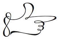 [More] ⦿
|
Hex
[Nick Sherman]
|
Hex was founded by Nick Sherman (b. 1983). Nick is a typographer and typographic consultant based in New York City and Los Angeles. He is a co-founder of Fonts In Use and a graduate of the Type@Cooper typeface design program at Cooper Union. He serves on the board of directors for the Type Directors Club, the Adobe Typography Customer Advisory Board, as well as the artistic board for the Hamilton Wood Type & Printing Museum. He has taught typography, typeface design, letterpress printing, and responsive design at MassArt and Cooper Union. He previously worked at Font Bureau, Webtype, and MyFonts, directing web design and promotional material for typefaces. Originally from Hyannis Port and Boston, MA, he studied graphic design at MassArt in 2005. His degree project there, entitled A Modern Day Specimen Book, is beautifully presented, and leads us through thoughts on type classification to the idea of type molecules, with the nodes in the molecules representing styles or descriptions or dates, and the edges representing typefaces. He is interested in wood type, and occasionally helps out the organizers of the TypeCon conferences. As a designer at MyFonts (from 2007 until 2010), he was in charge of the interviews, presentations, and web designs of their successful and useful pages. In 2010, he joined Font Bureau. Flickr page. He is the founder of Woodtyper, an online journal focused on large and ornamented type and related matters. He also set up the type documentation project Type Record together with Indra Kupferschmid. His type designs: - Ambient (2005): a simple geometric monoline logotype for Ambient Devices.
- Sargent (2004): inspired by the lettering on the gravestones at Boston's Old Granary Burial Ground.
- Meatland (2004): a grotesk inspired by the lettering on a shop in Jamaica Plain.
- Plan 9 (2005): a squarish masculine sans typeface originally designed for a TV program called 3-B which would feature B-movies, including many horror flicks.
- HWT Brylski (2017, P22 Hamilton Wood Type Collection), named for retired wood type cutter Norb Brylski and designed to be cut as wood type at the Hamilton Wood Type & Printing Museum. It incorporates several themes that were common in 19th-century type design, including split Tuscan serifs with angled mansard-style sides, heavy weight placement at the top and bottom of letters (traditionally referred to as French or Italian/Italienne), and an extended overall width. The design was started in 2011 and released in 2017. David Jonathan Ross assisted with the final digital font production.
- Cleaner. Inspired by casual lettering seen in everyday settings: laundromats, work trucks, comics, parking signs and diners.
- Flight Center Gothic, designed for Michael Bierut's team at Pentagram as part of a restoration of the TWA Flight Center, Eero Saarinen's 1962 icon of modernist architecture at JFK airport in New York City. The typeface is a reinterpretation of the building's original signage lettering, with origins in Johannes John's Fette Kursiv-Grotesk, originally released as a standalone italic in 1892 by the J. John Söhne type foundry. David Jonathan Ross assisted with the final font production.
- Forester (2019), a typeface inspired by rounded lettering on signage at many parks in North America.
- French Tuscan. A Tuscan typeface modeled after a wood type-like typeface in the collection of Lanes Press.
- Horn Please. Inspired by a quirky, chamfered lettering style often used for Horn OK Please truck signs in India. The widths are drawn for variable interpolation.
- Kobodaishi. Kobodaishi is a digital interpretation of Electra, originally designed by W.A. Dwiggins.
- Kultur. An ultra-condensed grotesquea: It follows the ultra-narrow flat-sided headline typeface genre sometimes referred to as Inserat.
- Curvature.
- Laureate. A digital revival of Laureate, a typeface originally released by the Keystone Type Foundry at the turn of the 20th century. Sherman's version is based on an adaptation by the Ludlow Typograph Company.
- Lauweriks. Lauweriks was inspired by the Quadratuuralfabet, designed by Dutch architect and designer J.L. Mathieu Lauweriks in 1900. The new typeface adds a lowercase and refines or replaces the forms from the original caps-only design.
- Lupino Sans and Serif. Influenced by newspaper type.
- Manifold Sans and Serif. An expansion of the original manifold monospaced typeface for IBM Selectric typewriters.
- Margo. Margo is inspired by classic hand-lettered movie titles and book jackets from the 1940s and 1950s. Many of its distinctive features follow lettering from films art directed by Lyle R. Wheeler, including All About Eve, The Gunfighter, The Secret of Convict Lake, and dozens more.
- NYC Sans. NYC Sans is a typeface originally commissioned by New York City's official tourism agency, NYC & Company, as their brand typeface. The design began with my digitization of the type system from the 1970 NYCTA Graphics Standards Manual. In collaboration with Jeremy Mickel and with design direction from Emily Lessard, additional weights and refinements were developed.
- Papanek. Inspired by the energetic handwriting of industrial designer and social critic, Victor Papanek, this typeface began as a commission for use in a book on Papanek by Al Gowan. Many characteristics of the design come directly from samples of Papanek's writing.
- Phive. Based on Stephenson Blake's Condensed Sans Serifs No. 5, including a range of optical size variations.
- Plastic Script.
- Service Gothic (2020). A vernacular sans with a variable font thrown in.
- Skelter. Based on a piece of blackletter calligraphy by Jaki Svaren.
- Strike. A hairline sans based on an alphabet found in 50 Alphabete fuer Techniker und Fachschulen by Eric-Jean Müller.
He wrote Type from the Crypt about horror fonts. He started the Flickr group called Manicule about pointing hands (fists; see, e.g., here and here). He wrote the long essay on printing fists called Toward a History of the Manicule (2005). Check out this pic he took of Lucha Libre posters in Mexico City in 2009. He also designed the poster for the 2008 documentary on wood type called Typeface. Speaker at ATypI 2011 in Reykjavik. Speaker at ATypI 2013 in Amsterdam. Future Fonts link. [Google]
[More] ⦿
|
Human figures, stick figures
|
"Char@cter" suggests the following fonts for letters made to resemble humans: - apicturefont (Colonial figures with Caslon-Open style letters)
- arbitre (A whistle-blowing referee)
- armyboy (All identical soldiers with a simple superimposed letter)
- BadCabbageICG-Primal (Elongated stick figures)
- bizarro (It's ..errr.. well, its ummm ... bizarre)
- CG Victorian Silhouette (People doing various things)
- Chlorinuh (Think of the Pilsbury Doughboy in a swimming pool)
- EDBindia (Puffy letters with eyes, wearing a feather headdress)
- EDBsweatingIt (Puffy people-letters exercising)
- FuzzyCootie (Sans-serif outline font with female silhouettes)
- getagrip (Letters made up of arms holding each other's wrists)
- GroovyGhosties (Cartoony ghosts - the covered-with-a-sheet kind)
- Groupsex (Suggestive - Stick people in compromising positions)
- KiddoTRT (Children Playing)
- Kilroys (Like the WWII Kilroy Was Here)
- LittleBallerina (Normal letters with a ballerina nearby)
- PointerCaps (Each letter has a pointing hand)
- Rad (People in exercise positions)
- StickLetter (Stick people)
- stripletter (Black letters with outline nudes superimposed)
- Vintage Erotique (Elaborate and just what it says)
[Google]
[More] ⦿
|
Huy Fonts
[Juan José Lopez]
|
 Huy Fonts is a foundry in Madrid run by Juan José Lopez. In 2016, he designed the great poster typeface Black Pack, which is inspired by the odd bold plastic shops signs from the 60s and 70s.
 With Inés Atienza, Juanjo designed the multilayered and/or chromatic circus font family Show (2014). Influenced by chromatic letterpress types, it is based on a type family called Concave, a Victorian type launched in 1884 by the foundry Marder, Luse & Co. Inés Atienza and Juanjo López are members of the Familia Plomez association, a small printshop based in Madrid that devote their efforts to promote everything about letterpress printing, calligraphy, and lettering. Lopez made Choriza and Choriza Sans (2013: sausage-inspired type), Adoquin (2013), the informal sketchified family Bodoniez (2011), Chiripa (2011, hand-printed), Hands Up (2011, various hands, including "thumbs up", "a OK", "the finger", and fists), Paquita Pro (2011, informal lettering; this children's book font was remodeled in 2016 as Paquita Next), Ultramarina (2011, a quaint face based on wood type headline examples), and Pichi (2011). Designer of the Scotch modern typeface Schotis Text (2017), the cartoon font family Xunga (2017) and the angular text typeface family Pliego. Earlier, Lopez was a T-shirt designer, who also used the name Juanjo Lopez. Old page of Juanjez Nikis. At Dafont, one could download the headline handwriting font Paquita (2006), a predecessor of Paquita Pro. See alo Fontstore / Fontshare's Paquito (2017). In 2021, he released the 70-strong thick-and-thin poster sans typeface Rotulo, which was inspired by Jano's Spanish movie posters. Later in 2021, he designed Graveur (he writes: Graveur is a Renaissance style text face based in the work of the French punchcutter Robert Granjon (1513-1589). Working on original artifacts kept in Museum Plantin-Moretus in Antwerp, observation of his punches, matrices and printed materials resulted in a extense type family that tries to capture the overall style of Granjon rather than simply being a slavish copy of a particular source. Started as my project at Expert Class in Type Design in Antwerp, Graveur has grown to become a typeface with four optical sizes and seven weights, plus italics and an ornaments font. It also has variable font). Klingspor link. Home page. I Love Typography link. Behance link. View Juanjo Lopez's typefaces. [Google]
[MyFonts]
[More] ⦿
|
Igor Kubik
|
 Polish designer of decorative graphic elements selected from advertisements and classified ads, from the magazines "Teatr i Zycie Wytworne" and "Swiatowid", as part of the Afiszuj Sie project in 2020. In addition, Igor Kubik prepared graphics and instructions for creating an advertising poster in the style of famous interwar Polish graphic artists such as Tadeusz Gronowski, Henryk Berlewi and Edmund Bartlomiejczyk. [Google]
[More] ⦿
Polish designer of decorative graphic elements selected from advertisements and classified ads, from the magazines "Teatr i Zycie Wytworne" and "Swiatowid", as part of the Afiszuj Sie project in 2020. In addition, Igor Kubik prepared graphics and instructions for creating an advertising poster in the style of famous interwar Polish graphic artists such as Tadeusz Gronowski, Henryk Berlewi and Edmund Bartlomiejczyk. [Google]
[More] ⦿
|
Ingrimayne Type (was: The Bovine Rebellion)
[Robert Schenk]
|
 Ingrimayne Type was established in 1988 by Robert Schenk to sell his fonts via the web and via CDs such as the No-Hype Type CD (2500 typefaces in trueType and PostScript, with mostly original typefaces). Robert Schenk (b. 1946, Minnesota) lives in Rensselaer, IN. Before Ingrimayne, Schenk's type was distributed by Wayzata Technology. Free fonts at his site included Red Letter, Zirkle, Sallonext, Zarrow, Serpent.
 Specimen book. Alternate URL. Dingbat fonts: XPhyngern (1990, pointing fingers), XPointedDesert and XSimpleHands (1994, more fists), Schneeflaken (two snow fonts, now available as XSchneeFlaken), ComputerBugz (nice butterflies, now available as XCompuTerBuggz), Galaxies (around the theme of the sun and stars), GlitzyFlash (1990), Grandecort (1994), LeakOrLeach (1995), Baumfuss (1990), LeafMeAlone (leaves), StarsAndStripes, StarPieces, Fingers, SimpleHands, PointedDesert, IngyDing (1996, 3 dingbat fonts in the style of Zapf Dingbats; in 2010 overhauled into one 1400-ornament monster face, Ingy Ding MCD, containing smilies, arrows, Zapfian ornaments, dice, chess pieces, fists, weather dingbats, and so forth), IngyDingLeftovers. A list of fonts: - A: Aabced-Bold-Italic, Aabced-Bold, Aabced-Italic, Aabced-Regular, Aabced, AabcedBold, AabcedBoldItalic, AabcedExtraBold, AabcedItalic, AabcedRoman, AabcedXBold-Bold, AabcedXBold, Abagail-Regular, AbagailJackson, AccruedInterest, AcornSwash-Regular, AcornSwash, AcornSwashAltern-Regular, AcornSwashAltern, AcornSwashRoman, Accrued Interest, Albert Betenbuch (blackletter), AlbertBetenbuchExtrude, AllSmiles, AmericanMorseCodeIT, AnarckWarp, Anarckhie, AnarckhieBold, AnarckhieBoldItalic, AnarckhieDecayed, AnarckhieItalic, AnarckhieJiggled, AnarckhieRagged, AnarckhieShadow, AndrewAndreasBold, AndrewAndreasPlain, AndrewAndreasXBold, Andrew Andy College (athletic lettering), AndrewAndyStencil, AndrewAndyStencilBold, AndyEight, AntsyPantsy, ArgentBobSquish, Argenta, ArgentaBobbWig, ArgentaBobbed, ArgentaBold, ArgentabObbed, Asterx-Regular, Asterx, Auldroon-Regular, Auldroon (blackletter), AndrewAndyKactus, AntsyPantsy.
- B: Baker Half (2004, an experimental hexagonally designed family), Balboat-Regular, BalboatBold, BalboatPlain, Bannetters (2021: letters for tilted banners), Barefoot, BaumSquiggle, Baumfuss-Regular, Baumfuss, BaumfussTwo-Regular, BaumfussTwo, Bear Anark (2021: a 10-style slab serif), BearButteTBold, BearButteTBoldItalic, BearButteTItalic, BearButteTPlain, BearButteTSpecial, BeastlyFont, Bene, BeneCryptExtrude, BeneCryptine-Regular, BeneCryptine (blackletter), BeneCryptineDistorted, BeneScriptine-Regular, BeneScriptine (blackletter), BetterEuroika, BetterEuroikaBold, BetterEuroikaBoldItalic, BetterEuroikaHybrid, BetterEuroikaHybridBold, BetterEuroikaItalic, BetterIngriana, BetterIngrianaBold, BetterIngrianaBoldItalic, BetterIngrianaHybrid, BetterIngrianaHybridBold, BetterIngrianaItalic, BetterKamp, BetterKampBold, BetterKampBoldItalic, BetterKampItalic, BetterTypeRightBold, BetterTypeRightBoldItalic, BetterTypeRightItalic, BetterTypeRightMedium, BetterTypeRightPlain, BetterTypeRightThin, BetterTypeRightThinItalic, BetterTypeRiteSpec, BetterTypeRiteSpecBold, Big-Regular, BigBottom, Big Stripes Mono (2021), Bigtop-Regular, Bigtop, Bilevel, Billowed (2022), BiteOfApple, Bizaro, BizaroRES, Blockboys, Bluster Left, BobsExtraPictures, BobsStandardChess, Bouncer (2019), Bowling, Bright Ideas (2020: lightbulb alphadings), BringInTheFrowns, Brrrrr-Regular, Brrrrr, BuggyFont, BumberShoot.
- C: Caltic (2020), CemeteryWalk (2018), Cennerik-Bold, Cennerik-Regular, Cennerik, CennerikBold, CennerikEBold, CennerikExtraBold, CennerikPlain, CennerikSpiked, CennerikXBold-Bold, ChainLetterOne, ChainLetterTwo, CheckMateRES, ChessNut, ChessNutTwo, Chessterton, ChesstertonTwo, Circlet, Ckornoments (2020), Close Together (2020), CoffeeMug, Coffinated (2020: letters boxed into coffins), CompassOne, CompuTerBuggz, ConcavWarp, ConcavexCaps, ConcavexCapsWave, ConcavexStepper, CoughingNails, Court-Regular, CourtGesture, CourtJesterFrizzy, CrippledFont, CuthbMangle, CuthbeNick, Cuthbert.
- D: DavidBurry, DavidFarewell, DavidFarewellBold, David Farewell Stencil, Dear John, Demotte-Bold, Demotte-Regular, Demotte, DemotteBold, DemotteWarp, Dinner-Regular, Dinner, DinoTracks (2021), Dottie, DrivEddie, Dschoyphul.
- E: EdsDream, EdwardEdwinBold, EdwardEdwinPlain (1994, copperplate script), Eggad (2020), Eldroon, Erkball, ErkballBold, Euroika-Bold-Italic, Euroika-Bold, Euroika-Italic, Euroika-Regular, EuroikaBold, EuroikaBoldItalic, EuroikaItalic, EuroikaKamp, EuroikaKampBold, EuroikaKampBoldItalic, EuroikaKampItalic, EuroikaRoman, Euroika, Eyebel, EyebelBold, EyebelRuff.
- F: FabFours (2015, patterned typeface), Fangs ALot (2022), FansiPensle (1990, connected signage script), FansiPensleBold, FansiPenslePlain, FansiPensleTwo, FansiPensleTwoBold (1990), FansiPensleTwoPlain, Febdrei, FebdreiBold, Federhozen-Bold-Italic, Federhozen-Italic, Federhozen-Regular, Federhozen, FederhozenBold, FederhozenBoldItalic, FederhozenItalic, FederhozenPlain, FeggoliteDancing, FeggoliteDancingItalic, FeggoliteHatched, FeggoliteKeyed, FeggoliteMonoBold, FeggoliteMonoPlain, FeggoliteRuffled, Fezdaz, Fishhook, FiveOhOne, FiveOhTwo, FlagDayFour, FlagDayOne, FlagDayThree, FlagDayTwo, Fly High, FlyHighBold, FlyHighBoldItalic, FlyHighItalic, ForTheBirds, FourJuly, FourJulyG, FourJulyH, Framo-Regular.
- G: GLitzy, GLitzyBarbed, GLitzyPlain-Regular, GLitzyStripe, GLitzyVStriped, Galexica-Bold-Italic, Galexica-Bold, Galexica-Italic, Galexica-Regular, Galexica, GalexicaBold, GalexicaBoldItalic, GalexicaExtraBold, GalexicaItalic, GalexicaMono-Bold, GalexicaMono-Regular, GalexicaMono, GalexicaMonoBold, GalexicaMonoPlain, GalexicaPlain, GalexicaXBold-Bold, GlitzyCurl-Regular, GlitzyCurl, GlitzyFlash-Regular, GlitzyFlash, GlitzyJewel-Regular, GlitzyJewel, Gothamburg (blackletter), GothamburgBold, GothamburgShadowed, GothicHorror, GothicRock, GranCanaries, GrancMitSripes, GrandecortBold, GrandecortHoly, GrandecortMedium, GrandecortShadow, GretchenHelloBold, GretchenHelloPlain, Grundee.
- H: Hammered, HandanaBold, HandanaPlain, HandmadeFont, HeartMatrixed, Hermainita, HermainitaBold, HermainitaPlain, Hexonu (2020: hexagonal), HeyPumkin, HippityDippityBold, HippityDippityInline, HippityDippityPlain.
- I: IanSegoe, IggoliteMono, IngBurried, IngDingLeftover, Ingone, IngoneSaw, IngoneShadow, IngrianEuroikHybrid, IngrianEuroikHybridBold, IngrianEuroikaH, IngrianEuroikaHBold, IngrianEuroikaHBoldItalic, IngrianEuroikaHItalic, Ingriana, IngrianaBold, IngrianaBoldItalic, IngrianaCasual, IngrianaCasualBold, IngrianaCasualBoldItalic, IngrianaCasualItalic, IngrianaCasualPlain, IngrianaExtraBold, IngrianaItalic, IngrianaPlain, IngyArrows, IngyArrowsTwo, IngyDingThree, IngyDings, Ingy Star Tilings (2019), InsideLetters, InternationalMorseCodeIT, IrritationOne, IrritationTwo.
- J: JabcedHy, JabcedHyBold, JabcedHyBoldItalic, JabcedHyItalic, JasperSqueeze, JasperSqueezeBold, JasperSqueezeBoldItalic, JasperSqueezeEB, JasperSqueezeEBItalic, JasperSqueezeItalic, JenneriCurved, Jennerik, JennerikBold, JennerikExtraBold, JennerikInfml-Bold, JennerikInfml, JennerikInfmlBold, JennerikInfmlExtraBold, JennerikInfmlPlain, JennerikInfmlXBold, JennerikRoman, Jester, JesterRES (Tuscan), JesterTwo (Tuscan), Jestres, JetJanBoldItalicGray, the Jet Jane family [JetJaneButton, JetJaneMonoBold, JetJaneMonoBoldItalic, JetJaneMonoCapsBold, JetJaneMonoCapsPlain, JetJaneMonoCapsThin, JetJaneMonoItalic, JetJaneMonoPlain, JetJaneMonoThinBook, JetJaneMonoThinItalic].
- K: KampFriendshipBold, KampFriendshipBoldItalic, KampFriendshipItalic, KampFriendshipPlain, KampIngrianaH, KampIngrianaHBold, KampIngrianaHBoldItalic, KampIngrianaHItalic, KampIngrianaHybrid, KampIngrianaHybridBold, KampRipple, Karlisbad, KiddyChessFont, KlipJoint, Knaudens-Regular, Knaudens, Kneebls, KneeblsBold, KneeblsExtruded, KneeblsPlain, KneeblsRuffled, KneeblsThin, KnewFont, KnewFontBold, KnewFontJagged, KnewFontPlain, KnewFontWaisted, KnewFontWaistedBold, KnightMares, KolSpotted, KolStriped, KolkFizzy, Kolkman-Bold, KolkmanDimly, KolkmanGray, KolkmanShatter, KolkmanStriped, Kwalett (2020), Kwersity, KwersityBold, KwersityWider, KwersityWiderBold, Kwodsity, KyhotaBarbed, KyhotaOne, KyhotaTwo.
- L: LaserTrain, LaserTrainBold, LastBigFling, LastBigFlingBold, LastMinuteChess, Laudens, LeakorLeach, LeakorLeachLeft, LeefMeAlone, LeefMeAloneHoles, LeekorLeech, Lentzers (2020), Letrinth, LetterTrain-Regular, LetterTrain, LetterTrainBold, LetterTrainBoldItalic, LetterTrainItalic, LetterTrainPlain, Lettergical (1994, blackletter with Lombardic capitals), LettergicalWave, LetunicalBold, LetunicalInline, LetunicalNormal, LetunicalShadow, LetunicalWarp, Library-Italic, Library-Regular, Life After College (2008, athletic lettering family), LineDrive, LineDriveBold, LineDriveOutlined, LineDrivePlain, LineDriveShadow, Lopsickles (a Hobo-style top-heavy font) (2021).
- M: MITuscan, MMCheckered, MMDrawings, MMPattern, Mangaled, Masheen (1990, octagonal font), MasheenBold, MasheenConvicted, MasheenFlag, MasheenIIID, MasheenOutlined, MatthewTwo, MattsFastFont, MedicineShelf, MedievalGunslinger, MedievalGunslingerShadow, Metavoria (2021: playful), Minimalist-Regular, Minimalist, Minniesoda, MinniesodaBold, Modsten-Bold, Modsten-Regular, Modsten (stencil, 1990), ModstenBold, ModstenRoman, MoreTexture, MousyFont, MushmellowBold, MushmellowCactus, MushmellowOutline, MushmellowPlain, MuskitosCaps, MuskitosCapsShadDown, Myhota, MyhotaBarbed, MyhotaBold, MyhotaHatched, MyhotaHatchedBold, MyhotaPlain, MyhotaWithSpikes.
- N: NailsNStaples, NairobiNormal, NeedALilly, NerdishHex, NerdishHexBold, Neu Altisch (blackletter), NeuAltischBold, NeuAltischGray, NeuAltischPlain, NeuAltischShadLeft, NeuAltischShadow, NeuAltischWormEaten, NeuropolMedium, NewLaudens, NewLibrary, NewLibraryItalic, NewNerdShadowed, NewNerdishBold, NewNerdishPlain, NewNerdishThin, NoPainRight, NoPainRightBold, NopainLeft, NopainLeftBold.
- O: OakParkAve, OakParkAvePlain, OakParkBlvdPlain, OakParkExtruded, OakParkSpeckled, OakParkSquaRe, OakParkZiggy, OakParksTripped, Old Harold Ree (1992, a modification of PhederFract, which was a calligraphic fraktur typeface also by Schenk), OldHaroldReeBold, OldHaroldReePlain, Onyon (1997).
- P: PastedWarp, PattyDay, PawnShop, Pedestrian, PencilFat, PencilIn, PencilOut, PensleCaligraf-Bold, PensleCaligraf-Regular, PensleCaligraf, PensleCaligrafBold, PensleCaligrafPlain, PeterPierreBold, PeterPierreCondensed, PeterPierrePlain, PeterPierreXBold, Pheder Frack (blackletter), PhederFrackBold, PhederFrackDtsh, PhederFrackDtshBold, PhederFrackDtshThin, PhederFrackPlain, PhederFrackShadowed, PhederFrackThin, PhrackCack, PhrackSle, PhrackSleBold, PhrackSlePlain, Phraxtured (blackletter), PhraxturedDeutsch, PhraxturedPlain, PhraxturedShadowed, Phyngern, Pigknot, PigknotBold, PlainPensle, PlainPensleBold, PlainPensleBoldItalic, PlainPensleItalic, PlainPenslePlain, PlainPensleXBold, PlainPensleXBoldItalic, Porker, PorkerGrey, Poultry Sign (2020), PutMyFootDown, Pzytupid.
- Q: Qualettee, QualetteeBold, QualetteeMedium, Quatsity (2020), Quidic, QuidicHatched, QuidicHoley, QuidicItalic, QuidicRoman, QuidicShotUp, Quirtly, Qwatick (1992), QwatickBold, QwatickPlacard.
- R: Ranger (1996, octagonal), RangerWider, Rankensteen, Rataczak-Regular, RataczakBold, RataczakBoldItalic, RataczakCandied, RataczakCondItalic, RataczakCondPlain, RataczakExtraBold, RataczakItalic, RataczakRoman, RataczakSwash, Rauchens, Razephu, Red-Regular, RedLetter, Renslaer, RoomingHouse, Rosary, RosaryBold, RoundUp, RoundUpBold, RoundUpShadow, RoundWhy (2019: Western), RoundWhyBold, RummageSaleOne, Rumpled, RundigPencilBold, RundigPencilMedium, RundigPencilNormal, Rundigsburg (1994), RundigsburgBold, RundigsburgMedium, RundigsburgPlain, RundigsburgShadowLeft, RundigsburgShadowRight.
- S: SafetyPinned, Salloon, SalloonAStripe, SalloonCracked, SalloonHStripe, SalloonStripeBottom, SalloonStripeEnds, SalloonStripeMiddle, SalloonStriped, Saloon-Regular, SaloonExt, SaloonFrilled, Samsheriff (2020), Sansduski Mono (2022), Sansduski (squarish) (2022), Sansville, SansvilleBold, SarahfSlob, SarahfSlobItalic, SchneeFlaken, SchneeFlakenTwo, Screwged, Sdrawkcab-Regular, Sdrawkcab, Seasick, SeasickBold, SeasickMirror, SeasickMirrorBold, SeasonsGreetings, SeederChess, SeederChessSmall, Sergury, Serpent-Regular, ShadyCharacters, Sihmittree (2019), ShirlyUJest, SimpleChessFont, Sirpent, SJURecord (2019: blackletter), Skagwae, SkagwaeMono, Skigway, SkwareDots, SlimpiSquares, Slippery Fishes (2022), SmokeHausShadow, SmokeHaus (1998), SmokeHouseRough, SmokeHouseShatter, SmokeHouseWave, Snuggels (2020; hexagonal), Spicandspan, SquiggleRES, SquiggleRESBold, Stamper, Substance, SusiScript, SusiScriptBold, SusiScriptPlain, Swanville-Regular, Swanville, Swirlity, SwirlityBold, SwirlityScript, SwirlityText.
- T: Tape Up (2022: a tape font), Tescellations (2012), Tessie Letters (2019), Tessie Some More (2020), Tessie Dingies (2012), TOCinRings, TRGrunge, Tacky (2005), Talloween, TapedUp, Teapot (1999), Teethee, TessieSpinners, TessieMiscellaneous (2018), TessieMoreStuff (2018), TessieXtraBirds (2018), TessieMoreBirds, TessieAnimals, TessieBugs (2019), TessieOddsNends (2019), TessieStandingBirds (2018), TessieFlyingBirds (2018), TessiePuzzlePieces (2018), TexturesOne, TiedUp, Tieroh, TierohBold, TierohSans, TierohSansBold, Tinkerer, TiredOfCourier (1992, + Bold, +BoldItalic, +Italic, +Plain, +Thin, +ThinItalic), ToothBrush, TootsieBold, TuskcandyBold, TuskcandyInline, TuskcandyPlain, Twigglee-Regular, Twigglee (1990, inspired by the hand lettering on the plates in a 19th century book on ornaments by Owen Jones), TwiggleeBold, TwiggleePlain, TwiggleeWarped, TwoTonedStoned.
- U: UUeirdieBold, UUeirdieRoman, UUeirdieWarp, Undulate (a wavy typeface) (2021), Undulated (2021), Unikled, UnikledBold, UnikledPlain, UnikledSpotted, UnivoxAtomLight, UpsideDown, UrbanScrawl.
- V: ValManGal, Valenteena, ValenteenaBroken, ValentinaContour, Valentine-Regular, Valgal, ValgalBold, Vglee, Vinetters (2020), VunderScriptBold, VunderScriptPlain.
- W: WalcomeOne, WalcomeOneBold, Watchmaker, WatchmakerBold, WaterCloset, WaterWorksCaps (1992), WaterWorksCaps-Bold, WaterWorksCaps-Regular, WaterWorksCapsBold, WaterWorksCapsPlain, Weaving (2022), WeirdChessFont, Wetetque (1991, an all caps multiline family), WetetqueBold, WetetquePlain (1991), Whichit, WhichitBold, WhichitTwo, WhichitTwoBold, Woven (2022), WrenchedLetters, WurstCactus, WurstHassen, WurstchenDotted, WurstchenOutlined, WurstchenSplatted, WyomingMacroni, WyomingMacroniPegged, WyomingMacroniShadRight, WyomingMacroniShadowed, Wyoming Pastad (1994, Western slab face), WyomingPastadShadLeft, WyomingPastadShadowed, WyomingSpaghettiBold, WyomingSpaghettiPlain, Wyoming Strudel (Far West type).
- X: XBobsExtraPictures, XBobsStandardChess, XChessNut, XChessNutTwo, XChesstertonTwo, XCompuTerBuggz, XGalaxies, XGalaxyOne, XIngDingLeftover, XIngyArrows, XIngyArrowsBetween, XIngyArrowsTwo, XIngyDingIII, XIngyDingTwo, XIngyDings, XInterntnlMorseCodeIT, XKiddyChessFont, XKnightMares, XLaserTrainBold, XLaserTrainPlain, XLastMinuteChess, XLeef Me Alone (leaf dingbats), XMMCheckered, XMMDrawings, XMMPattern, XMattsAnimalsOne, XMoreTexture, XPatColumRow, XPatCzeckerz, XPawnShop, XPhyngern (fists), XPointedDesert, XRoomingHouse, XSchneeFlaken (1995), XSchneeFlaken, XSchneeFlakenTwo, XSeederChess, XSeederChessSmall, XSimpleHands, XStarPieces, XStarsAndStripesOne, XStarsAndStripesTwo, XStellaStern, XStellaSternBright, XSternStellaNight, XTexturesOne, Xahosch, Xaltid, XaltidBold, XaltidPlain. The X fonts are predominantly dingbats.
- Y: YahoschBold, YahoschMedium, YahoschPlain, YahoschWormy, Yassitf (2019: a sans), YngreEBStripe, Yngreena, YngreenaBold, YngreenaBoldItalic, YngreenaExtraBold, YngreenaItalic, YngreenaPlain, Youbee, YoubeeBold, YoubeeBoldItalic, YoubeeItalic, YoubeeShadow.
- Z: Zarrow-Regular, Zarrow, ZcriptBold, ZcriptPlain, Zebraw, ZebrawOS, Zigzaggy (2021), ZimpleBlack, Zimric (2020), ZirkStressed, ZirkleOne-Bold, ZirkleOne-Regular, ZirkleOne, ZirkleOneBold, ZirkleOneRoman, ZumbelsburgBold, Zumbelsburg (blackletter, 1996).
Klingspor link. Dafont link. Abstract Fonts link. View Robert Schenk's typefaces. View Ingrimayne's typeface library. [Google]
[MyFonts]
[More] ⦿
|
Intellecta Design (or: Monocracy Types)
[Paulo W]
|
 Intellecta Design is a design company in Brazil run by Paulo W (b. 1970) from Recife. In 2020, he also set up Monocracy Types. Paulo W is a gaúcho (Brazilian southerner), with interests in multiple areas, including poetry (he has published the digital opus Magical Book), graphic design and, most recently, type design.
 Dafont link. MyFonts. MyFonts link. Abstract Fonts link. YWFT link. Behance link. Blog. Home page. Fonthaus. Monotype. Eshops. Facebook. Flickr. Klingspor link. Wordpress. Devian tart. T26. Linkedin. Identifont. Linotype. ITC. Faces.co. His typefaces: - Free fonts: Inductive Resonance (2014: connected script), Retrodings (+Two, 2014), Living In The Past (outlined Tuscan face), Rough Ornaments Free (2014), CornPop Three (borders), Too Good To Be True (2013, retro script), Blanchard Inland (2013), Living Together (2013), Arresto (2013, brush script), Hertziano (2013, non-connected fat script), Japanese Tourist (2013), Nouveau Never Dies Free (2013), The Beat Goes On (2012, fifties script), Stencix (2012), Figgins Brute Trash (grunge), Fontaniolo Beveled (2011, ornamental caps), Czech Gotika (2011), Random Dingbats (2011), Victorian Free Ornaments (2011), Rustic (2011), Armorial (2011), Woman Silhouettes (2011), The Nile Song (2010, hieroglyphics), Smith Typewriter (2009), Sign Flags (2010, semaphore dingbats), Senectus Morbus (2010), MesoAmerica (2010, Indian symbols), ClassicSketches (2010, dingbats), Columns (2010, dingbats of Greek and Roman columns), EasyCuneiform (2010), EasyLombardicTwo (2010), EasyOpenFace (2010, blackboard bold style), Egidia (2010), Significante (2010, dingbats with, e.g., gender symbols), WhiteDominoes (2010, domino pieces), Easy Heraldics (2010), Intellecta Heraldics (2010), Heraldic Devices (2011), KidingsFree (2010, dingbats), RoughTuscan (2010), The French (2009, Fleur de Lys dings), AprendizCaligrafico (2010), Volitiva (2006, Trajan caps and chancery lower case, all based on work by Ludovico Vicentino Arrighi), Gaivota (2006), KurrentKupferstichThin (2006), PaulKlein (2010), PaulKleinTwo (2010), PortuguesArcaicoLectura (2005), ReproxScript (2009, based on Jerry Mullen's Repro Script from 1953-1954), RickGearyHomage (2007, scanbats), WestBalaio (2006, ornamental caps), Corto Maltese (2006, scanbats), Renaissance Coiffure (2006), Renaissance Ornaments (2007), Renaissance Shoes (2012, free), TTF Tattoef (2006, tattoo-inspired dingbats), ExperiTypo5 (2006), Lower Metal (2006), Geometric Serif PW (2006), Geometric (2006), Geometric Petras PW (2006), War II Warplanes (2005), Carbono (2005), Times New Vespasian (2005), BoldBold (2005), Vengeance (2005), Doppleganger (2005), Chancelaresca (2005), Cursivo Saxonio (2005), Gotische Minuskel 1269 (2005: a Kanzlei Schrift after Dekan Hermann zu Soest, 1269) and Guto Lacaz (2005, dingbats).
- Richard Gans revival project: Gans Tipo Adorno, Gans Lath Modern, Gans Titular Adornada (2006), Gans Ibarra (2006, after Carlos Winkow's Elzeviriano Ibarra), Gans Antigua (2006), Gans Antigua Manuscrito (2006), Gans Radio Lumina (2006), Gans Fulgor (2006), Gans Carmem Adornada (2006), Gans Italiana (2006, extensive Italian-style slab serif family), Gans Titania (2007), Gans Titania Adornada (2007), Gans Titular (2007), Gans Gotico Globo (2007: 9 styles by Iza W), Gans Royality (2007: 3 styles by Iza W), Gans Headpieces (2008), Gans Rasgos Escritura (2010: filets---followed in 2011 by Rasgos Escritura Nuevos), Gan Esquinazos (2010, frames), Gans Blasones (2010, shields), Gans Neoclassic Fleurons (2008), Gans Classical Fleurons, Gans Ding.
- Wood-inspired typefaces: Dead Wood Rustic (2007), Taranatiritza (5 wood type styles, after William Hamilton Page), Majestade (2007, by Iza W---two Tuscan style typefaces), Decorative Tuscanian (2007), Concave Tuscan (2010, wood type), Palermo (2007, by Iza W---Tuscan style family), Teatro (2009, Tuscan), Bruce Double Pica (2009, Tuscan; the Beveled weight is free), Antique Extended (2010, slab serif wood type), Dark Wood (2009, gothic), Dark Wood Beveled (2011).
- Charles Bluemlein's script revivals: Bluelmin Kisaburo (2013), Bluelmin Ralph (2012), Bluelmin Ronald (2012), Bluelmin Sandsfort (2012) and Bluelmin Benedict (2012). (2012).
- Blackletter: Salterio (2012, +Trash, +Three, +Gradient, +Shadow, +Shadow Two), Leothric (2011, bastarda), Bruce 532 Blackletter (2011, after George Bruce), Schneider Buch Deutsch (2007, +Trash, +Shadow, +Shadow Two), Schneidler halb fette Deutsch (2009, +Beveled), Schneidler Zierbuchstaben, Hostetler Fette Ultfraktur Ornamental (2007, blackletter caps), Gothic 16 CG (2007), Gothic 16 CG Decorative (2007, blackletter caps), Schneidler Grobe Gotisch (2008, Iza W, T-26), Allerlei Zierat (2008, ornament fonts based on a 1902 catalog of Schelter & Giesecke), Allerlei Zierat Capitals (2007), Psalter Gotisch (2009, a blackletter after the Benjamin Krebs blackletter face by the same name, ca. 1890), Münster-Gotische (2009, a blackletter family after a 1896 typeface by the same created by Schelter&Giesecke), Koberger N24 Schwabacher (2007), Student's Alphabet (2007, blackletter), Like Gutemberg Caps (2007), Nürnberg Schwabacher, Gotische Frame (2007: four framed blackletter styles by Iza W), Gotische (2007: ten ornate blackletter styles by Iza W), Gothic Garbage, Gothic Shadow, Gothic Trashed, Gothic Flourish (2009), Gotica Moderna (octagonal, blackletter), AltDeutsch (2007, four severe blackletter fonts by Iza W), Fin Fraktur, Gotische Bouffard, Heimat RGS, Gothic Handtooled Bastarda (2006), HostetlerFetteUltfrakturOrnamental (2007, blackletter caps), Gothic Handtooled Bastarda (2006).
- Historical revivals: Pantographia (2010: a digitization, as is, of several alphabets from Edmund Fry's Pantographia, 1799), Caslon2000, Caslon B, Delamotte Large Relief (2010), Figgins Brute (2007: 8 heavy Egyptian styles by Iza W based on Figgins' 1817 specimen book), Erased Figgins Brute (2007), Gras Vibert (2007, a didone family; followed by Gras Vibert Two in 2009).
- Erotic or human alphabets: American Way of Life (2011), Roman Silhouettes (2011), Silvestre Weygel (2007, named after Martin Weygel'a erotic alphabet from 1560, which in turn was based on Peter Flötner's 1534 alphabet), Gravure (caps typeface made of human silhouettes), Innocence (2007, dingbats of girls).
- Medieval chancery hand: Portugues Arcaico (2005, three medieval handwriting styles), Kurrent Kupfertisch (2006, a medieval hand done with Fernanda Salmona), Dovtrina Christam 1622 (authentic old manuscript face), Catania (2007, exquisite medieval caps in 3 styles by Iza W).
- Typewriter typefaces: Remix Typewriter (2012), Smith Trash (2012), Neo Bulletin (2010, +Trash), Remington PW (old typewriter face), Olivetti Linea (old typewriter face), Erased Typewriter 2 (2007: 4 styles by Paulo W), RIP Typewriter (2009), Shadow Typewriter (2007), Underwood Typewriter (by Iza W).
- Calligraphic: Broken Kiss (2015), Derniere Script (2015), Bradstone Parker Script (after Zaner's penmanship), Jan van den Velde Script (2011, based on the penmanship of Jan van den Velde as illustrated in vna den Velde's 1605 book Spieghel der schrijfkonste; developed jointly by Paulo and Iza W), Penabico (2010, with Iza W); Penabico is a free interpretation of the copperplate script styles to be found in the Universal Penman, London, 1741, by George Bickham---it contains over 1500 calligraphic glyphs and 250 ornaments. Samples of Penabico: i, ii, iii, iv, v, vi, vii, viii, ix), Easy Calig, Intellecta Mixed Script (2008), Spencerian Constancia (2008), Calligraphia Latina Soft4 (2010, quilled ornaments), Intellecta Script commercial (2009), Spencerian By Product (2009), Spencerian Palmer Penmanship Pro (2010), Indenture English Penman (2010), Calligraphia Latina (2008-2010, in weights called Soft2, Dense, 3, Soft4, Mixed, Square Edition).
- Victorian, Edwardian: Engel (2007, by Iza W in 15 styles that have a 1870s look), Compendium (Victorian), Costado (2009, a Victorian / Western face).
- Ornamental caps: Campi (2009), Doppel Mittel Lapidar Azure (2012), Musirte Antiqua (2012), The House of Usher (2012), Peterlon (2012), Dolphus Mieg Alphabet (2011, +Two), Dolphus Mieg Monograms (2011), Human Nature (2011), English Arabesque Revival 1900 (2011), Imprenta Royal Nonpareil (2011), XVI Century Shaw Woodcuts (2011), Ichweis Caps (2011), Cherubim Caps (2011), Rara Beleza (2011), Gothic 1880 Revival (2011), Angelicaps (2010), Unnamed Caps Two (2010), VertiCaps (2010) Rebimboca Caps (2010), Rebimboca Beveled (2012, free), Rebimboca Gradient (2012, free), Rebimboca Trash (2012, free), Rebimboca Outlined (2012, free), Republica Presente (2010), Speedball Metropolitan Caps (2010, after a design by Ross F. George), Nice Initials (2010), Morphelic (2010), DurerGotischCapitals (2010), Egmontian (2007, ornamental caps family), Saducismus Triumphatus (ornamental caps), Vogus (Victorian caps), Victorian Ornamental Capitals (2009) and Frompac 1889 Arabesque (2007) [both are classical arabesques published in Ludwig Petzendorfer's Schriften-Atlas. Eine Sammlung der wichtigsten Schreib- und Druckschriften aus alter und neuer Zeit nebst Initialen, Monogrammen, Mappen, Landeskarten und heraldischen Motiven fur die praktischen Zwecke des Kunstgewerbes, 1889], Lettrines Petin (+Ornée), Numa Initials (2006), Gradl Initialen, Vampirevich (2009, ornamental caps), Paulus Franck 1602 (2006, ornate caps), Geodec (2006, baroque caps), HostetlerFetteUltfrakturOrnamental (2007, blackletter caps), Cadels (2007, ornate caps by Iza W), Manuscript XIV Century (2007, by Iza W--four Lombardic caps), Merona (2007, by Iza W--ten Lombardic caps fonts), Selena (2007, by Iza W---ornate Victorian caps), Leyenda (great Victorian era ornamental caps), Mixed Capital Style (2007, caps), Lenda (2008, capitals), Kidnaped at Old Times (2008, ornamental caps, ransom note style), Mortised Capitals, Is Not ABrazilian Font (hand-printed blackboard bold caps), Robur The Conqueror (2009, ornamental caps), Georgia Capitals (2009), Decadence avec Elegance (exaggerated ornamental caps).
- The American Advertise series: American Advertise No. 9 (2008), American Advertise No. 17 (2007, 19th century caps), American Advertise 018 and 019 (2008), American Advertise Square Series (2007), American Advertise 003 (2012), American Advertise 004 (2010), American Advertise 005 (2010), American Advertise 006 (2010, alphadings), American Advertise 007 (2010, ornamental caps).
- Ornaments, fleurons: Transportation Dings *2015), Cornucopia of Dingbats Eight (2015), Animals Old Cuts Two (2015), Unpublished Ornaments Two (2013), Classix (2012), Cornucopia of Dingbats (2012-2014, +Two, +Three, +Four, +Five, +Six, +Seven), Cornucopia of Ornaments (2013; +Two, +Three, +Four, +Five, +Six, 2014), Cornucopia Caligrafica (2012), Vintage Hands (2012), Human Silhouettes (2012; +Free, 2013; +Two, 2013; +Human Silhouettes Three, 2013; +Four, 2013; +Five, 2014; +Six, 2014; +Seven, 2014; +Eight, 2014; +Nine, 2015), Easy Fleurons (2012), Floreale Two (2012), Neoclassic Fleurons Free (2011), Calligraphic Frames Soft (2011, +Two), Jugendstil Flowers Free (2011), Easy Ornaments (2011), Blasons (2011), Blasons Free (2012), Armorial (2011), Monograms Soft (2010, with Iza W), Easy Tiles (2010), Free Tiles (2010), Rough Fleurons Two (2010), Vegetable Breathe (2010), Corn Pop Plus (2010), Mortised Fleurons (2010), Mortised Ornaments (2011), Mortised Ornaments Free Two (2013), Golden Times (2010), Stahlhelme und Kronen (2010), Rough Fleurons (2006), Nouveau Never Dies (2009, ornaments), GeodecBruceOrnamented6 (2006, after a sample from the Bruce Type Foundry), Grave Ornamental (2006), BlackOrnaments (2008), Hera Hedelix (2009, ornamental tiles), Mortised Ornaments (2009), Soft Fleurons (2007), Half Flower (2007), Frames 1 (2007, by Iza W), Flower Essences, Micro Fleurons (2009), Naturella (2009, leaf and grape dingbats by Iza W), Black Fleurons (2010), Easy Fleurons Two (2011), Intellecta Borders (2008, by Iza W), Intellecta Style (2007, borders).
- Fonts made before 2007: Brute Aldine (2007, Western family), Bad Situation (2007, after a design by Freeman Delamotte from 1864), Benjamin Franklin (2007), Geodec Petras Enhanced (2006), Deutsche Poster (2006), FatFontGrotesk (2006), Orchis (2006, an art deco family by Iza W), Fantis (2006), Frompac (2006, with Iza W), Geodec Fog (2006), Intellecta Modern (2006), Intellecta Modern 2 (2006), Intellecta Romana Humanistica (2006), Advantage (2006, together with Iza W), Biza (2006, together with Iza W), Elegancy (2006, together with Iza W), Estiliza (2006, a sans family together with Iza W), Experitypo 4, Stairway to Heaven, Copperplate PW, Dings PW, Roger Dean, Gliphs PW, Luxeuil, Watchtower Bible 1965, Gabinete Portugues (11 fonts), Elara (2009), Xilografuras (dingbats), Beta, Alta, Paleolitica Nacional, Shakespeare Studs, Copperplate collection (5 fonts), Wine, Ampersamp, James Poem, Leal Conselheiro, Haeckel Enygma, Iza B, Of, Lementa (2006, ornate family), Pirates (dingbats), Wire Clip (2009), Divina Proportione (2009, dingbats), Tharagaverung (2007), Correo (2009, a nice manly bold face), Titivilus (2007, Roman lettering), Pirates De Luxe (2007, dingbats), Geodec Minuskel (2006), Geodec Spyral (2006), Copperplate Decorative (2006), Feosa (2006), Francesco Decorative (2006, Iza W), Geodec Petras Enhanced (2006), Ibarra Flourished (2006), Intellecta Decorative 017 (2006), Intellecta Decorative 018 (2006), Intellecta Slab Bold (2006), Kansas Decorative (2006), Pingente (2006), Sixties Living (2006), Caractere Doublet (2007), DeutschePosterSteinschrift (2007; by Iza W), Bailarina (2007), GP Casual Script (2007), Colonia Portuguesa (2007), Contouration (2007), Deco Experiment 3 (2007), Floresco (2007), Flower Jars (2007, by Iza W---a very nice idea), Frutisis (2007), Intellecta Monograms (2007: 19 monogram fonts by Paulo W), Intellecta Monograms Random Sample (2012-2013: several typefaces), Peloponeso (2007, by Iza W), Porcupine (2007, by Iza W), Southern Flight (2007, by Iza W---condensed), TTF TTTOEF 4 (2007, by Iza W---dingbats), GeodecBruceFlourished, HostetlerNormande, Victorian Ultra Parphernalia (2007), Angels (2007), Angels Free (2013), Mondrongo (2007), Oorlog (2007).
- Fonts in 2008: Das Riese (3d engraved caps, +Shadow), Economica (sans, T26), Antiqua Double 12, Bad Baltimore (+Beveled, +Typewriter), Calligraphia Latina (2008-2009, in weights called Soft2, Dense, 3, Mixed, Square Edition, Free), Fry's Alphabet, Grissom (bug dingbats, by Iza W), Latinish (by Iza W), Lettering Deco (by Iza W), Litho Romana Inland, Quadratta Serif (a slab serif by Fernando Diaz), TTF TATTOEF 7 (by Iza W).
- Fonts made in 2009: Eingraviert (engraved; scans: i, ii, iii), Eingraviert Beveled (2011), Greko Roman Oldstyle, Ortodoxa do oriente, Sans Square, Speedball (by Iza W, Victorian style), Speedball Western Letters (after Ross F. George's lettering), Elara (2009), Intellecta Roman Tall, Force Brute & Ignorance, Sunamy Caps, Starret, The Pilgrim (alphadings), Renaisperian (alphadings), Real Caps Two, Mateus Bold (4 bold styles), Intellecta Crafts (arts and crafts family), Bruce 1490, Bradley Dingies (five dingbat typefaces, after William H. Bradley), Allerlei Zierat Renaissance, Grave Plus, the grungy Monkey series (Victorian Monkey, Monkey Poesy, Monkey Messed Gutenberg Caps, Monkey Was Here, Monkey Insinuation, Monkey In The Middle Ages), Montezuma (dingbats), Grotesque and Arabesque, Calhambeque (old car dingbats), Eiger (2009, a 3d sketched headline face).
- Faces made in 2010: Polen, Pencraft (capitals were inspired in Swagger Capitals, an original design from Carl Stephen Junge, at Barnhart Brothers & Spindler; lowercase based Pencraft Specials, an ornamental variation of the Pencraft Oldstyle series, as displayed in the BBS catalog from 1922), Salamemingoe (children's hand), BarberPoles, Beware the neighbors (scary), BlackInitialText, CaligrafiaDivina, CornPop, CowboyHippie Pro, Grotesca3-D, Nardis, Senzacuore, Speedball Metropolitan Poster (2010, after a design by Ross F. George), TagWood, Tosca, TypographyTribute, Zooland, Bubbleboddy-Fat, bubbleboddylight-Light, Pretoria Gross (a Victorian family done with Iza W), Wood Font Five (wood plank font), Wood Font Four, Herr Foch (art nouveau), Rebimboca, Octagon French (a 3d beveled typeface due to George Nesbitt, 1838), Picuxuxo (retro futuristic, comic book style), Large Old English Riband, Ornamental Riband, Kidings (Dutch dingbats), Hostil (originally done in 2007: a headline family; followed by Hostil Shadow Two (free, 2012) and Hostil Gradient (free, 2012)), Grotesca, Heptagon French, Antiquariaat (condensed), Cortinado, Sanoxio (3d headline face), Violentia (grunge), Swirlies (spiral dings).
- Faces from 2011: Dia de los Muertos (fantastic skeletal masks), Inland Becker, Rasgos Escritura Nuevos, Jaggard (2007, a renaissance penmanship caps typeface modeled after Joachim Romann's Queen (1954-1956, Stempel)), Jaggard Two, Naive Ornaments Black, Augustus (+Beveled: roman letters), Sayonara (oriental simulation face; the Beveled style is free), Trash Barusa (inline ornamental face), Free Ribbons, Black Ornaments Three, Calligraphia Latina Soft 5, Heraldic Devices Premium, Ornate Blackboards, Benjamin Franklin Beveled, Baltimore Typewriter Beveled, Bernardo Beveled, Van den Velde Script (a free interpretation of the work of the famous master penman Jan van den Velde, found in the Spieghel der schrijfkonste, in den welcken ghesien worden veelderhande gheschrifften met hare fondementen ende onderrichtinghe (Haarlen, 1605)), Indenture English Penmanship, Penmanship Birds and Ornaments (2012), Beware The Neighboors Shadow (texture face), White Free (shadow face), Delamotte Large Relief Beveled.
- Typefaces made in 2012: Porosa, Presto, Derradeira (signage script), About Sweet Memories (brush script), Intellecta Ribbons, Irrelevante (beveled caps), Laus Sus Chris (Christian dingbats), Unpublished Ornaments, Heavy Squared Writing (brush face), Mezcla Titan, Sweet About (retro script), Publicité, Hard to read monograms, Free Medieval, Doctor Polidori (initial caps), Mixed Silhouettes (One through Five), Glosilla Castellana Cursiva (inline type family), Sayonax (a textured version of the oriental simulation typeface Sayonara), Wood Stevens (free), Rockabilly (fifties script), Interdite Script (heavy calligraphic face), Prismatica (free), Cristalid (free prismatic face), Zed Leppelin (free), Neo Bulletin Outline (free), Neo Bulletin College (2012), Victorian Free Ornaments (+Two), Spanish Army Shields (+Two), Varius Multiplex, Stephens Heavy Titling.
- Typefaces from 2013: Face of Yesterday (calligraphic script), Ribbon in the sky, Dreamer (a flowing upright semi-connected script), Vorname (blackletter), Barocque Capitals, Close To You (a rabbit-eared script), Wappen (heraldic shields), Eletroz (hand-printed), Morcrepito (blackletter), Metropolitan Poster Black, Animal Silhouettes, Intellecta Pointers and Hands, The Loyalist (script), Vonnegut (a left-leaning script), Perhaps Love (left-leaning script), So Lonely (script), Exposition (upright script), Plaster of Paris (connected script), Volstead (connected script), Versitia (connected script), Porongo (heavy brush script), Fat Fantasy, Das Krieg (soldier dingbats), Corn Pop Two (ornamental corners), Corn Pop Four, Corn Pop Five, Astrodings, Vulnavia Sans (comic book face), Capitular Heraldica, Mirella Initials Ornamntals (a swashy calligraphic script; with Iza W), Carpete (retro script), Free Writer, Round Hand, Exclusivite (fifties script), Hertz Oscillations (fat retro script), Heavy Rock (fifties script), Raindrops (retro script), Ralph Walker (ronde), Exiles (retro signage script), Mr. Richmond Caps (art nouveau alphadings), Berengard Caps Two.
- Typefaces from 2014: Prester John, Animals Old Cuts, Take a Pebble, Corn Pop Five (borders), Kidnapped at German Lands (ransom note font), Kidnapped at German Lands 2, Kidnapped at German Lands 3, Kidnapped at German Lands 4 (finished in 2016).
- Typefaces from 2015: Rogeer (script), Chart Moss, Eliensee, Speedball Ragged, State Bridge, Derniere Script, Grissom Four (dingbats of critters), Das Modern, Zona Pro (a sans family).
- Typefaces from 2016: Ares Modernos, Soldier William Holmes (vintage handwriting), Doctor Russel (script), Hollandisch Closed (blackletter), Rough Flowers (floral ornaments), Equis (crosses), Mattaaus (a counterless poster font), Holland Morleau (a Kanzlei style blackletter font), Rough Vignettes, Rechnung (a bejeweled didone), Alphabet Fantasie (decorative caps), Phantasinian (blackletter), Loosing Memory (blackletter), Laandbrau (blackletter), Lord Radcliff.
- Typefaces from 2019: Penmanship Feather.
- Typefaces from 2020: Victorian Alphabets (a weathered engraved money font; despite its name, this is just one alphabet), Mortised Vignettes, Mortised Caps, Monocracy Cuts And Clips, Sincelo Ornaments, Augusta Torino Ornaments (based on art nouveau ornaments from Societa Augusta Torino), Renouveau (art nouveau).
Typefaces from 2021: Gotteslob (blackletter), Cotton Mather (a medieval blackletter), Josef Wein Moderne Blackletter (after an alphabet by Josef Heim from the 1900 book Moderne Schriften / herausgegeben und verlegt von Josef Heim, Supernouveau (art nouveau ornaments). Showcase of Intellecta Design's fonts, numbering 554 as of early 2017. [Google]
[MyFonts]
[More] ⦿
|
J. Gyles&Sons
|
 J. Gyles&Sons was a foundry in Clerkenwell, UK, est. 1865. It advertised itself as Ornamental Typefounders. Samples from their catalog: Cheltenham Bold Outline, Dashes, fists, initials, a dingbat set called Convincers, and a dingbat set called Domestics. [Google]
[More] ⦿
J. Gyles&Sons was a foundry in Clerkenwell, UK, est. 1865. It advertised itself as Ornamental Typefounders. Samples from their catalog: Cheltenham Bold Outline, Dashes, fists, initials, a dingbat set called Convincers, and a dingbat set called Domestics. [Google]
[More] ⦿
|
James Dudley
|
Graphic designer in Plymouth, UK, who made the fun set of icons called Marginalia (2016). [Google]
[More] ⦿
|
James Hamilton
[Hamilton Holly Wood Type Co. (or: Hamilton Manufacturing Company)]
|
 [More] ⦿
|
Jason Castle
[Castle Type]
|
 [MyFonts]
[More] ⦿
[MyFonts]
[More] ⦿
|
Jean-François Porchez
[Typofonderie (was: Porchez Typofonderie)]
|
 [MyFonts]
[More] ⦿
[MyFonts]
[More] ⦿
|
Jeff Levine
[Antique Embellishments]
|
[MyFonts]
[More] ⦿
|
Jeff Levine
|
 Prolific type designer in Florida, b. New York, 1952. His fonts were originally free and consisted largely of dingbats. Around 2005 he went commercial, and now sells his work (over 350 fonts as of 2009) via MyFonts. He has branched out into several font styles, with a soft spot for stencil fonts, fonts for signage, art deco, and fonts for advertising. Born in New York, his family moved to Florida in 1963, where he has been ever since.
 An interview. Alternate URL. Yet another URL with his early free fonts. My pages on him. Dafont link. Abstract Fonts link. MyFonts link. Klingspor link. [Google]
[MyFonts]
[More] ⦿
|
Jeff Levine
[Jeff Levine: Dingbats and Alphadings]
|
 [MyFonts]
[More] ⦿
[MyFonts]
[More] ⦿
|
Jeff Levine: Dingbats and Alphadings
[Jeff Levine]
|
 Before 2006, Jeff Levine was mostly known for his free dingbats, having made over one hundred of them. He keeps making them, but now commercially, and less frequently. The list is long though:
  Dingbats: 50s Yesterdings, Action is the Sequel, ActionIsJL, Alpha Test, Another Dingbat Font JL, Antique Decorations JNL (2012), Antique Embellishments JNL (2009, nice 1800 style dings, including a great fist), Antique Ornaments JNL (2009), Antique Stencils JNL (2013), Apartment-Life-JL, Arrow Callouts JNL (2021: an arrow-themed alphading font), Artsy Parts JL, Attention Getters JNL (2009), Auto-Store-JL, Bachelor Pad, Bank-Visit-JL, Bijou, Boat Decals JNL (2008, squarish), BookshelfTitlesJL, BottomsUp!JL, Buttons-and-Switches-JL, Carnival Days, Cartoon Cavalcade (2014), City-Signs-JL, Classic Clips JNL (2015), Clown Alley JNL (2009, clown typefaces), Cobb-Shinn-Stock-Cuts (7 fonts), Collected-Dings-JL, Columbia Shuttle Memorial Font (2003), CroakersJL, DecoPics, Decorative Arrows JNL (2011), Decorative Elements JL, Dekka Dense, Desk Draswer JNL (2010), Ding Dong Dingbats, Dingdangits JNL, Dingfont100JL, Dingits JNL (2009, flags), DiskettesJL, Doctor's-Dings-JL, Dont Bug Me JNL (2009), Double Nines JNL (2011, a domino tile font), Drug-Store-Items-JL, ElectricalItemsJL, Embossing Seals JNL (2014), Error-MessagesJL, Even More Dings JL, FloorTilePatternsJL, FontCollectingJL (2003), Frantic, FunInTheSunJL, Funny-Faces-JL, Fun Signs JNL (2013: comprises twenty-six humorous signs from a 1930s-era sales list of products manufactured by the Koehler Sign Company of St. Louis, Missouri), Geometric Patterns JNL (2013), GoingPostalJL, Got A Ding For You JL, Graphic Arts JL, Grocery-Items-JL, Handbill JNL, Handy Dandies JNL (2014: fists), Hurricane-Preparations-JL, Ink Spots JNL (2013), It's Your Ding JL, JeffreyPrintJL (8 fonts), JewishCultureJL, Kilroy Was Here JL (very funny), Law-and-Order-JL, Leathercrafter JNL, Letter Delivery JNL (2014), Letterpress Assistants JNL (2015), Letterpress Assortment JNL (2016), Letterpress Cuts JNL (2015), Letterpress Embellishments JNL (2014), Letterpress Illustrations JNL (2015), Letterpressers JNL (2015), Letterpress Extras JNL (2014), Letterpress Helpers (2014), Letterpress Nostalgics JNL (2015), Letterpress Ornamentals JNL (2014), Letterpress Pieces JNL (2015), Letterpress Retro JNL (2015), Letterpress Sorts JNL (2016), Letterpress Stock Cuts JNL (2015), Lifeline, LittleBalerina, Loung-Lizards-Lite-JL, Message Helpers JNL (2014), Messages&Memos JL, Militaria JNL (2014), Miscellany JNL (2012), Mixed Bag O' Dings JL, Monthly Calendar JNL, Mordings JNL (2010: this includes weather dings, snow dingbats, and a beautiful quill), More Antique Stencils JNL (2013), More Printing Helpers JNL (2010, has some fists), Mr.MuellerJL, Old Favorites JNL (2009, fists), Old Labels JNL (2019), One Ding After Another JL, Opz Popz JNL (2019: 52 geometric dingbats), Outer Space JL, OuterSpace, Picnics-&-Parties-JL, Pictora JNL (2009, dings), Point Made JNL (2011, fists and arrows), Point of Sale JNL (2013), Point Taken JNL (2009, fists), Price Tag JNL (2011), Print Art JNL (2013: contains nice fists), Print Assistants JNL (2013), Print Damosel (2013), Print Embellishments JNL (2013), Print Enhancers JNL (2013), Printers Assistants JNL (2015), Printers Decorations JNL (2015), Printers Choice (2014), Printers Dingbats JNL (2015), Printers Drawer JNL (2015), Printers Helpers JNL (2015), Printers Helpmates JNL (2014, with many fists), Printers Impressions (2014), Print Helpers JNL (2013), Printers Leftovers JNL (2013), Printers Lot JNL (2014), Printers Parts JNL (2013), Printers Pictures JNL (2014), Printers Playthings JNL (2014), Printers Playtoys JNL (2014), Print Promoters JNL (2015), Print Sellers JNL (2015), Printers Stock Cuts JNL (2015), Printers Stuff JNL, Print Illustrations JNL (2013), Printing Extras JNL (2009), Printing Press Cuts JNL (2013), Printing Press Designs JLN (2013), Printing Press Elements JNL (2013), Print Marks JNL (2013), Print Oddities JNL (2014), Print Partners JNL (2014), Print Shop Classics JNL (2013), Print Shop Cuts JNL (2015), Print Shop Delights JNL (2015), Print Shop Parts JNL (2012), Print Shop Relics JNL (2014), Print Shop Sorts JNL (2015), Print Shop Treasures JNL (2015), Print Spots (2013), Printy Things JNL (2013), Prismatiq JNL, Rail Line JNL (2014), Ranger Ray's Rocketeers JL, Remnants-JL, Remnant Sorts JNL (2011: contains many nice fists and plumes), Screen Scrawls JL, Sendit Safely JNL (2010), Service Men JNL (2015), Shinn Kickers (2014: after Cobb Shinn's cartoon characters), Shopping Center JL, Sign Helpers JNL (2009, a collection of silhouette images carefully redrawn from two distinct sources, the Webway sogn kits of the Holes-Webway Company of St. Cloud, MN, and the cling vinyl sign kits made in the 1950s and 1960s by the Joseph Struhl Company (now known as Magic Master Industries)), Silhouettes&StuffJL, Silly-Symbology-II, Silly-Symbology-JL, SimplerTimesJL, Sixties Pin Buttons JNL (2018), Sixties Symbols JNL (2009), SmallTalkJL, Son of the Bride of Foo JL, Star Time, Star Time 3 and 4, Star Time Too, Storm-Track-JL, Sunbursts JNL (2013), SunDings, Sundings2JL, SymbologicaJL (2003, has smilies), TaxingMomentsJL, TeeVeeSet, Thataway JNL (2020: arrows), These Foolish Dings JL, Things-Collected-JL, TimePiecesJL, Toddler JNL, Top 40 JL, Trinkets JL, Tune Up JNL (2015: a musical symbol font), Typesetter Helpers JNL (2014), Typesetter Trinkets JNL (2014), Typesetter Treasures JNL (2014), Typesetter Ornaments JNL (2012), Type Toys JNL (2015), Type Warmers JNL (2015), Vintage Stencil Borders JNL (2016), Vintage Stencil Motifs (2014), VitaminShopJL, Voter JNL (2020), Whatzis JNL (2009, question marks), Winner-Take-All-JL. Dingbats: 50s Yesterdings, Action is the Sequel, ActionIsJL, Alpha Test, Another Dingbat Font JL, Antique Decorations JNL (2012), Antique Embellishments JNL (2009, nice 1800 style dings, including a great fist), Antique Ornaments JNL (2009), Antique Stencils JNL (2013), Apartment-Life-JL, Arrow Callouts JNL (2021: an arrow-themed alphading font), Artsy Parts JL, Attention Getters JNL (2009), Auto-Store-JL, Bachelor Pad, Bank-Visit-JL, Bijou, Boat Decals JNL (2008, squarish), BookshelfTitlesJL, BottomsUp!JL, Buttons-and-Switches-JL, Carnival Days, Cartoon Cavalcade (2014), City-Signs-JL, Classic Clips JNL (2015), Clown Alley JNL (2009, clown typefaces), Cobb-Shinn-Stock-Cuts (7 fonts), Collected-Dings-JL, Columbia Shuttle Memorial Font (2003), CroakersJL, DecoPics, Decorative Arrows JNL (2011), Decorative Elements JL, Dekka Dense, Desk Draswer JNL (2010), Ding Dong Dingbats, Dingdangits JNL, Dingfont100JL, Dingits JNL (2009, flags), DiskettesJL, Doctor's-Dings-JL, Dont Bug Me JNL (2009), Double Nines JNL (2011, a domino tile font), Drug-Store-Items-JL, ElectricalItemsJL, Embossing Seals JNL (2014), Error-MessagesJL, Even More Dings JL, FloorTilePatternsJL, FontCollectingJL (2003), Frantic, FunInTheSunJL, Funny-Faces-JL, Fun Signs JNL (2013: comprises twenty-six humorous signs from a 1930s-era sales list of products manufactured by the Koehler Sign Company of St. Louis, Missouri), Geometric Patterns JNL (2013), GoingPostalJL, Got A Ding For You JL, Graphic Arts JL, Grocery-Items-JL, Handbill JNL, Handy Dandies JNL (2014: fists), Hurricane-Preparations-JL, Ink Spots JNL (2013), It's Your Ding JL, JeffreyPrintJL (8 fonts), JewishCultureJL, Kilroy Was Here JL (very funny), Law-and-Order-JL, Leathercrafter JNL, Letter Delivery JNL (2014), Letterpress Assistants JNL (2015), Letterpress Assortment JNL (2016), Letterpress Cuts JNL (2015), Letterpress Embellishments JNL (2014), Letterpress Illustrations JNL (2015), Letterpressers JNL (2015), Letterpress Extras JNL (2014), Letterpress Helpers (2014), Letterpress Nostalgics JNL (2015), Letterpress Ornamentals JNL (2014), Letterpress Pieces JNL (2015), Letterpress Retro JNL (2015), Letterpress Sorts JNL (2016), Letterpress Stock Cuts JNL (2015), Lifeline, LittleBalerina, Loung-Lizards-Lite-JL, Message Helpers JNL (2014), Messages&Memos JL, Militaria JNL (2014), Miscellany JNL (2012), Mixed Bag O' Dings JL, Monthly Calendar JNL, Mordings JNL (2010: this includes weather dings, snow dingbats, and a beautiful quill), More Antique Stencils JNL (2013), More Printing Helpers JNL (2010, has some fists), Mr.MuellerJL, Old Favorites JNL (2009, fists), Old Labels JNL (2019), One Ding After Another JL, Opz Popz JNL (2019: 52 geometric dingbats), Outer Space JL, OuterSpace, Picnics-&-Parties-JL, Pictora JNL (2009, dings), Point Made JNL (2011, fists and arrows), Point of Sale JNL (2013), Point Taken JNL (2009, fists), Price Tag JNL (2011), Print Art JNL (2013: contains nice fists), Print Assistants JNL (2013), Print Damosel (2013), Print Embellishments JNL (2013), Print Enhancers JNL (2013), Printers Assistants JNL (2015), Printers Decorations JNL (2015), Printers Choice (2014), Printers Dingbats JNL (2015), Printers Drawer JNL (2015), Printers Helpers JNL (2015), Printers Helpmates JNL (2014, with many fists), Printers Impressions (2014), Print Helpers JNL (2013), Printers Leftovers JNL (2013), Printers Lot JNL (2014), Printers Parts JNL (2013), Printers Pictures JNL (2014), Printers Playthings JNL (2014), Printers Playtoys JNL (2014), Print Promoters JNL (2015), Print Sellers JNL (2015), Printers Stock Cuts JNL (2015), Printers Stuff JNL, Print Illustrations JNL (2013), Printing Extras JNL (2009), Printing Press Cuts JNL (2013), Printing Press Designs JLN (2013), Printing Press Elements JNL (2013), Print Marks JNL (2013), Print Oddities JNL (2014), Print Partners JNL (2014), Print Shop Classics JNL (2013), Print Shop Cuts JNL (2015), Print Shop Delights JNL (2015), Print Shop Parts JNL (2012), Print Shop Relics JNL (2014), Print Shop Sorts JNL (2015), Print Shop Treasures JNL (2015), Print Spots (2013), Printy Things JNL (2013), Prismatiq JNL, Rail Line JNL (2014), Ranger Ray's Rocketeers JL, Remnants-JL, Remnant Sorts JNL (2011: contains many nice fists and plumes), Screen Scrawls JL, Sendit Safely JNL (2010), Service Men JNL (2015), Shinn Kickers (2014: after Cobb Shinn's cartoon characters), Shopping Center JL, Sign Helpers JNL (2009, a collection of silhouette images carefully redrawn from two distinct sources, the Webway sogn kits of the Holes-Webway Company of St. Cloud, MN, and the cling vinyl sign kits made in the 1950s and 1960s by the Joseph Struhl Company (now known as Magic Master Industries)), Silhouettes&StuffJL, Silly-Symbology-II, Silly-Symbology-JL, SimplerTimesJL, Sixties Pin Buttons JNL (2018), Sixties Symbols JNL (2009), SmallTalkJL, Son of the Bride of Foo JL, Star Time, Star Time 3 and 4, Star Time Too, Storm-Track-JL, Sunbursts JNL (2013), SunDings, Sundings2JL, SymbologicaJL (2003, has smilies), TaxingMomentsJL, TeeVeeSet, Thataway JNL (2020: arrows), These Foolish Dings JL, Things-Collected-JL, TimePiecesJL, Toddler JNL, Top 40 JL, Trinkets JL, Tune Up JNL (2015: a musical symbol font), Typesetter Helpers JNL (2014), Typesetter Trinkets JNL (2014), Typesetter Treasures JNL (2014), Typesetter Ornaments JNL (2012), Type Toys JNL (2015), Type Warmers JNL (2015), Vintage Stencil Borders JNL (2016), Vintage Stencil Motifs (2014), VitaminShopJL, Voter JNL (2020), Whatzis JNL (2009, question marks), Winner-Take-All-JL. - Alphadings: Dentist (2020), Looky Here JNL (2009, alphadings), Love Notes JNL (2011), Sensual Initials JNL (2009, alphadings after his own French Art Initials JNL), Suninitials JNL (2008: alphadings), Eurasian Stenciinitials JNL (2010).
[Google]
[MyFonts]
[More] ⦿
|
Jeremia Adatte
|
 Lausanne, Switzerland-based type designer. He created Swissa Piccola (2012, an old typewriter font).
 In 2014, he designed the multicolor layered typeface Bron and Bron Shadline. Bron is based on Zelek, designed in the early 1970s by Polish type designer Bronislaw Zelek at Mecanorma. This typeface was originally made for dry transfer lettering sheets. It is has been redrawn and refreshed by Adatte. Also in 2014, he created Day and Collins Logotype (2014, based on catchwords and fists fond in a 1910 wood type catalog by Day & Collins, London). In 2015, he designed Marcel, an angular upright script typeface that was inspired by Jacno (1948) by French type designer Marcel Jacno. In 2016, Jeremia designed Script Typewriter Rough, which is the very first complete cursive digital typewriter font ever made after the original 1960 Smith-Corona Electra 210 typewriter. Behance link. [Google]
[MyFonts]
[More] ⦿
|
Johannes Erler
|
Johannes Erler was born in 1965 in Hamburg. While studying graphic design in Kiel, he worked with Lo Breier in Hamburg and on joint projects with Neville Brody. In 1992 he graduated in communication design from the Muthesius Academy, School of Applied Arts in Kiel. His thesis was about a typeface with information and warning symbols for packaging. FontShop liked the concept and published it as FF Care Pack in 1992. He created the octagonal family FF Pullman in 1997. FontShop's Jürgen Siebert soon suggested that a modern alternative to Zapf Dingbats would be needed. Though Hermann Zapf's symbol font was pre-installed on nearly every computer, it was too incomplete, inconsistent, and out of date, according to Siebert. The result was FF Dingbats, co-designed with Olaf Stein and launched in 1993, just as Johannes Erler and Olaf Stein launched Factor Design. The fonts have become a fixture in communication design worldwide. In 2007, the extensive update FF Dingbats 2.0 by Johannes Erler and Helmut Skibbe was published. This was followed in 2014 by FF Dingbats 2.0 UI and FF Dingbats 2.0 Inverted UI. FFDingbests (with Olaf Stein) is a free sampler of FF Dingbats. Erler Dingbats (2011) is free. Fontshop link. Klingspor link. [Google]
[MyFonts]
[More] ⦿
|
John Stephenson
[Stephenson Blake]
|
 [MyFonts]
[More] ⦿
[MyFonts]
[More] ⦿
|
Juan José Lopez
[Huy Fonts]
|
 [MyFonts]
[More] ⦿
[MyFonts]
[More] ⦿
|
Khaled Hosny
[Libertinus]
|
[More] ⦿
|
Knowles and Maxim
|
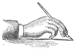 Authors in Pittsfield, MA, of Real Pen Work---Self Instructor in Penmanship (1881). Selected alphabets: Slanted Letters, Business Letters, Capitals, Ornamental Alphabet, Rustic Alphabet, German Text, Old English, Marking Alphabet, Steel Pen Capitals. Additional drawings: Fists, afish, a lion, a deer, a horse, two horses, flourished heads.
 They also wrote Golden Gems of Penmanship (1884). Digital typefaces influenced by Knowles & maxim include Holly Initials (2010, David Nalle). [Google]
[More] ⦿
|
Libertinus
[Khaled Hosny]
|
 The extensive open source font family Libertinus is a fork of the Linux Libertine and Linux Biolinum fonts that started as an OpenType math companion of the Libertine font family, but has grown as a full fork to address some of the bugs in the fonts. The family consists of:
 - Libertinus Serif: forked from Linux Libertine.
- Libertinus Sans (lapidary): forked from Linux Biolinum.
- Libertinus Mono: forked from Linux Libertine Mono.
- Libertinus Math: an OpenType math font for use in OpenType math-capable applications like LuaTeX, XeTeX or MS Word 2007+. See also the slightly modified Libertinus T1 Math (2017) by Michael Sharpe.
- Libertinus Keyboard.
Portions of the fonts are copyright of Khaled Hosny (2012-2016), while the Linux Libertine material is originally due to Philipp H. Poll (2003-2012). All fonts have over 2000 characters, and cover all European languages, including Greek, Hebrew and Cyrillic. In addition, there is an excellent coverage of symbols in addition, of course, to the plentiful mathematical symbols. Khaled Hosny was the primary contributor and maintainer from 2012 until 2020, and passed the poupon in 2020 to Caleb Maclennan. Github link. [Google]
[More] ⦿
|
Ludka Biniek
[Ludka Niezgoda]
|
 Letter and type designer in Warsaw. In 2016, during her studies at Warsaw Academy of Fine Arts, and as part of Warsaw Types, she designed the free display typeface Olympic. For this typeface, she was inspired by Warsaw's signage and typography from the 70s. At Capitalics, she published the wonderful text typeface family Atoli. Another graduation project at the Warsaw Academy of Fine Arts was the editorial typeface Geller (2018), which can be bought at Capitalics. She released the woolly warm winter font Geller Sans (104 styles) in 2020. [Google]
[MyFonts]
[More] ⦿
Letter and type designer in Warsaw. In 2016, during her studies at Warsaw Academy of Fine Arts, and as part of Warsaw Types, she designed the free display typeface Olympic. For this typeface, she was inspired by Warsaw's signage and typography from the 70s. At Capitalics, she published the wonderful text typeface family Atoli. Another graduation project at the Warsaw Academy of Fine Arts was the editorial typeface Geller (2018), which can be bought at Capitalics. She released the woolly warm winter font Geller Sans (104 styles) in 2020. [Google]
[MyFonts]
[More] ⦿
|
Ludka Niezgoda
[Ludka Biniek]
|
 [MyFonts]
[More] ⦿
[MyFonts]
[More] ⦿
|
Manfred Klein: Fists
|
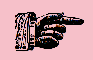 Manfred Klein's fists: AllHands, DingsUndDasRunde, Hands, HandsAreClaws, HandsAreHands, HandsDown, HandsOnly, HandsUp, HandsUpHandsDown, SpeakingHands.
 Download page. Download all these fonts in onze zip file. [Google]
[More] ⦿
|
Manfred Klein: Font Hosting
|
 In July 2017, Typoasis / Moorstation shut down. Run by Petra Heidorn out of Hamburg, Germany, it hosted her own fonts, as well as those of the popular and talented type designer and artist Manfred Klein (Frankfurt, Germany). Manfred, who was an active type designer from the late 1990s until about 2007, created over 3600 fonts in that period. Those fonts are now hosted at my site, thanks to Petra Heidorn. Manfred's oeuvre is too large to consume and analyze in one sitting or even one month.
 This zip file contains all his fonts. For those interested in particular styles, please visit this web page for downloads of individual fonts, or fonts grouped by these themes: 3d, Africa, aliens, animals, architecture, arrows, astrology, birds, calligraphy, cave style, codex, Christmas, dada, decorative caps, didone style, dingbats, display style, Egypt, eyes, fists, Fraktur, handcrafted typefaces, Karla, kids, Laurens, masks, medieval styles, Mexico, monsters, native themes, ornaments, painters, peace, people, pixel fonts, runes, Sans, serif, slab, stencil, stone age, typewriter, uncial, wood and woodcuts. [Google]
[More] ⦿
|
Manicule
|
A manicule is a textual hand with a pointing finger, also called an index, a fist, a hand, a printer's fist, a bishop's fist, a pointing hand, a digit, and a mutton-fist (in old British circles). They were often used between the 12th and 18th centuries in the margins of books to mark passages. [Google]
[More] ⦿
|
Manicule in Unicode
|
Manicules (pointing fingers, aka fists) have six positions in the Unicode table: - Black left pointing index: U+261A ☚
- Black right pointing index: U+261B ☛
- White left pointing index: U+261C ☜
- White up pointing index: U+261D ☝
- White right pointing index: U+261E ☞
- White down pointing index: U+261F ☟
[Google]
[More] ⦿
|
Marilyn Neuhart
|
 Designer of a great Hand Press logo in 2009. [Google]
[More] ⦿
Designer of a great Hand Press logo in 2009. [Google]
[More] ⦿
|
Mark Simonson
[Mark Simonson Studio]
|
 [MyFonts]
[More] ⦿
[MyFonts]
[More] ⦿
|
Mark Simonson Studio
[Mark Simonson]
|
 Mark Simonson Studio is located in StPaul, MN. Mark founded Mark Simonson Studio around 2000, and describes himself as a freelance graphic designer and type designer. From his CV: Early in my career I worked mainly as an art director on a number of magazines and other publications including Metropolis (a Minneapolis weekly, 1977), TWA Ambassador (an inflight magazine, 1979-81), Machete (a Minneapolis broadsheet, 1978-80), Minnesota Monthly (Minnesota Public Radio's regional magazine, 1979-85), and the Utne Reader (1984-88). I was head designer and art director for Minnesota Public Radio (1981-85) and an art director for its sister company, Rivertown Trading Company (1992-2000). During that time, I designed over 200 audio packages, including most of Garrison Keillor's, along with several hundred products (t-shirts, mugs, rugs, watches, etc.) for the Wireless, Signals, and other mail order catalogs. I have frequently done lettering as part of design projects I'm working on. This has always been my favorite part, so in 2000 I opened my own shop specializing in lettering, typography and identity design. I've also been interested in type design since my college days. I started licensing fonts to FontHaus in 1992, and since starting my new business, stepped up my efforts in developing original typefaces. I now have more than 70 fonts on the market with many more to come. This is increasingly becoming the focus of my activities. In 2021, he joined The Type Founders.
 His fonts: - Coquette (2001). He says: Coquette could be the result of a happy marriage of Kabel and French Script.
- Anonymice Powerline (2009-2010). This is probably a hack by some people based on Anonymous. It is available in some Github directories.
- Kandal: a 1994 wedge serif, now also at MyFonts).
- Proxima Sans (1994, a geometric sans, rereleased in 2004), followed in 2005 by his massively successful Proxima Nova in 42 styles/weights. Followed by Proxima Nova Soft (2011). The rounded version of Proxima Nova is Proxima Soft (2017). For a variable font that captures all styles, see Proxima Vara (2021). In 2022, he added Proxima Sera (an 18-style workhorse serif that combines old style forms with contemporary and modern typefaces).
- Mostra (2001): based on a style of lettering often seen on Italian Art Deco posters and advertising of the 1930s. Look at the Light and Black versions, and drool...... The 2009 update is called Mostra Nuova. Selected styles: Mostra Nuovo Bold, Mostra One Light, Mostra Three Bold, Mostra Two Heavy.
- In 2001, he made the Mac font Anonymous. Its updated version is Anonymous Pro (2009-2010), a TrueType version of Anonymous 9, which was a freeware bitmap font developed in the mid-90s by Susan Lesch and David Lamkins. It was designed as a more legible alternative to Monaco, the mono-spaced Macintosh system font.
- In 1998 and 2001, he produced the (free) 3-style Atari Classic family.
- In 2003, he released Blakely Bold and Heavy (an art deco font first done for the Signals mail order catalog). The original Blakely is from 2000.
- Goldenbook Light, Regular, and Heavy, based on the logotype of the 1920s literary mag called "The Golden Book Magazine".
- Metallophile Sp 8 Light and Light Italic (2008): a "faithful facsimile of an 8-point sans as set on a 1940s-vintage hot metal typesetting machine".
- Refrigerator Light and Heavy, Refrigerator and its extension Refrigerator Deluxe (2009) (geometric sans).
- Changeling Light, Regular, Bold, Stencil, and Inline (2003): a redesign and expansion of China, a VGC photo-typositor typeface from 1975 by M. Mitchell, which includes unicase typefaces; see also Changeling Neo, 2009.
- Sanctuary Regular and Bold: a computerish typeface based on lettering in the 1976 movie Logan's run--later withdrawn from the market.
- Sharktooth (+Bold, +Heavy).
- Felt Tip Roman, Woman and Senior (based on his own handwriting). Felt Tip Senior (2000) is based on the hand of Mark's father. Felt Tip Woman Regular and Bold are based on the handwriting of designer Patricia Thompson.
- Filmotype Gay (2011).
- Filmotype Honey (2010): fifties brush lettering face. For a free alternative, see Honey Script (2000) by Dieter Steffmann.
- Raster Gothic Condensed Regular and Bold (12 fonts total), and Raster Bank (a pixelized version of Bank Gothic).
- Other free bitmap fonts for the Mac [the PC version was made by CybaPee]. MyFonts page.
- He digitized Phil Martin's family, Grad (2004, inspired by Century Schoolbook, and originally done by Martin in 1990).
- His 2006 production includes three script typefaces: Kinescope is a connected script based on title lettering in Fleischer Studios' animated Superman films from the 1940s. Snicker is a cartoony block letter type. Both were published at Font Bros. And Launderette is a connected very slanted script based closely on lettering used in the titles of the 1944 Otto Preminger film, Laura.
- In 2007, he revived and extended Filmotype Glenlake (2007, sold at Font Bros).
- Lakeside (2008) is a flowing 1940s-style brush script. It was inspired by hand-lettered titles in the classic 1944 film noir movie Laura.
- In 2008, he revived Filmotype Zanzibar, about which he writes: That Zanzibar is nearly an anagram of bizarre seems fitting. The surviving people from Filmotype (later Alphatype) have not been able to tell us who designed this gem, so we have no record of the designers intentions. Released in the early 1950s, it seems somewhat inspired by the work of Lucian Bernhard (Bernhard Tango, 1934) and Imre Reiner (Stradivarius, 1945). At first, it appears to be a formal script, but there are no connecting strokes. It would be better described as a stylized italic, similar to Bodoni Condensed Italic or Onyx Italic, with swash capitals.
- Filmotype Vanity (2008) is an outline typeface based on a 1955 design by Filmotype. It was derived from Filmotype Ginger.
- Filmotype Alice (2008) is casual handwriting. However, MyFonts now credits Patrick Griffin with the digitization.
- Filmotype MacBeth (2008) is a freestyle face.
- Filmotype Ginger (2008) is a heavy display typeface with an aftertaste of Futura.
- Boxy2 (2008) and Boxy1 (2008) are severely octagonal typefaces made to test out FontStruct. See also bubblewrap.
- In 2008, Mark Solsburg and Mark Simonson cooperated on the digital revival of the calligraphic Diane Script, originally designed in 1956 by Roger Excoffon.
- In 2009, Mark worked on SketchFlow Print, a font for Microsoft. It will be bundled with the next version of Christian Schormann's Expression Blend, part of Microsoft's Expression Studio suite. The fonts, based upon the handwriting of architect Michaela Mahady of SALA Architects, Inc., give that well-known architectural printing look (like Tekton).
- Filmotype Gem (2011). A sans headline typeface that was first drawn by Filmotype in the 1950s.
- Bookmania (2011) is a revival of Bookman Oldstyle (1901) and the Bookmans of the 1960s, but with all the features you would expect in a modern digital font family. Especially, Simonson's Bookmania story is worth reading.
- In 2018, he published the 25-style Acme Gothic at Fontspring. He explains: Acme Gothic (2018) is based on the thick and thin gothic lettering style popular in the U.S. in the first half of the twentieth century. There have been typefaces in this genre before, but they were either too quirky (Globe Gothic), too English (Britannic), too Art Deco (Koloss), too modern (Radiant), or too Art Nouveau (Panache). None captures the plain, workman-like style of Acme Gothic.
- Parkside (2018) is a script typeface inspired by typefaces and lettering of the 1930s and 1940s. Parkside uses OpenType magic to automatically select letter variations that seamlessly connect to the letters coming before and after.
- In 2018, he emulated wood type in his HWT Konop at P22. Named for Don Konop, a retired Hamilton Manufacturing employee, who worked from 1959 to 2003, this typeface is monospaced in both x and y directions so that letters can be stacked vertically and horizontally. All proceeds go to the Hamilton Wood Type and Printing Museum.
- Etna (2020). A 30-style text and display family that started out from William H. Page's Victorian wood type Aetna (1874), and was remolded by Simonson into a useful typeface family though still distinctly linked to its ancestor. Etna includes three different condensed widths in all six weights (intended for display use), four different figure styles, alternate characters, true small caps, and a selection of dingbats, including arrows, stars, asterisks, and manicules.
Links to his typefaces, in decreasing order of popularity: Proxima Nova, Bookmania, Mostra Nuova, Proxima Nova Soft, Coquette, Refrigerator Deluxe, Felt Tip Roman, Grad, Changeling Neo, Goldenbook, Lakeside, Kinescope, Metallophile Sp8, Blakely, Felt Tip Woman, Snicker, Felt Tip Senior, Kandal, Sharktooth, Anonymous, Raster Bank, Raster Gothic. FontShop link. Fontspace link. MyFonts interview. View all typefaces designed by Mark Simonson. Fontspring link. Google Plus link. Klingspor link. Abstract Fonts link. Kernest link. I Love Typography link. Font Squirrel link. Old link to hos site. [Google]
[MyFonts]
[More] ⦿
|
Martin Majoor
|
 Dutch type designer born in Baarn in 1960, who works in Arnhem and Warsaw. Showcase of his most popular typefaces. Type designs:
 - His 1993 Scala text family (which includes both sans and serif sub-families, as well as goodies such as the fist font FF Scala Hands, 1998) is great and well-balanced---one of the best fist fonts ever made. Scala is in the style of W.A. Dwiggins's Electra.
- He designed Telefont List and Telefont Text for the Dutch phone company PTT Telekom in 1994. He writes: The 1994 design of the Dutch telephone book can partly be seen as a reaction to the iconic 1977 phonebook designed by the modernist Wim Crouwel with Jolijn van der Wouw. Crouwel's late-modernist design, featuring the typeface Univers in lowercase-only text, had been christened The New Ugly by Dutch writers. In the following years, the original Crouwel design had been watered down considerably, and by the early 1990s, its usability had reached an all-time low. When Jan Kees Schelvis and Martin Majoor began their drastically renewed design of the phonebook, they set themselves a list of strict requirements: a new typeface, a better hierarchy, improved usability, and paper-saving typography. Majoor was responsible for both the new typeface (later named Telefont) as well as the book's microtypography. In 2018, it was announced that the last telephone book had been published.
- He created Scala Jewels in 1997.
- FF Seria and FF Seria Sans (2000). These families received awards at the Bukvaraz 2001 competition.
- In 2004, he published FF Nexus Mix, FF Nexus Sans, FF Nexus Serif, and FF Nexus Typewriter.
- He started a project with Pascal Zoghbi on the development of Sada (2007), an Arabic companion of FF Seria. In 2009, Sada was renamed FF Seria Arabic and published by FontFont.
- In 2010, he started work on Questa Sans (a typeface with a special y). The Questa project is a type project of Jos Buivenga and Martin Majoor---Questa is a squarish Didot-like font that Jos originally had planned in one display style only. It turned out to be a perfect basis to apply upon Martin's type design philosophy about the form principle of serif and sans. Questa was finished in 2014 and now includes Questa Sans, Questa Serif, Questa Slab and Questa Grande. Finally, the Questa project became the Questa Foundry.
- His corporate typefaces include Deutsche Telekom.
Interview at Typotheque. MyFonts interview. To understand Majoor, read his article My type design philosophy. At ATypI 2004 in Prague, he spoke about his experiences as a designer and type designer in Poland. The text José Mendoza y Almeida (Martin Majoor and Sébastien Morlighem, introduction by Jan Middendorp, 2010, Bibliothèque typographique) describes Mendoza's contributions to type design. Majoor's Flickr page. Speaker at ATypI 2010 in Dublin. At ATypI 2018 in Antwerp, he spoke on the history of Telefont. His type design blog. Klingspor link. FontShop link. MyFonts catalog. Adobe link. [Google]
[MyFonts]
[More] ⦿
|
Matevz Medja
[Archive Type]
|
 [MyFonts]
[More] ⦿
[MyFonts]
[More] ⦿
|
Melvas Type (was: Mahti)
[Mika Melvas]
|
 Type foundry, est. 2011 by Vantaa, Finland-based Mika Melvas. It was originally called Mahti Type Studio, but was later changed to Mika Melvas. Melvas created the signage typefaces Signalist (2012), Santeli (2012), Delisia (2011), Belinda (2011) and Suti (2011).
 Ringa (2011) is a fun extra bold slab serif face. Alina (2012) is a connected fifties-style signage typeface. Saline (2012) is an angular brush script typeface. Typefaces from 2013: Riona Sans. Typefaces from 2014: Ahkio (fat brush signage typeface accompanied by great manicules (fists)), Sanelma (a brush script inspired by Hot Rod lettering and sign painting), Roihu (a monoline sans typeface family with a large x-height and very open counters; its 16 styles and opentype features make it ideal for scientific publications). Typefaces from 2015: Paintlay (a layered sign painting font), Sivellin (a gracious connected brush script). Typefaces from 2016: Kaleidos Rough (dry brush script), Kaleidos (a brush script), Suti (signage type), Handelson (a 6-style handcrafted typeface family). Typefaces from 2017: Kuunari (simple squarish sans), Kuunari Rounded, Organika (handcrafted typeface family), Magneton (retro brush signage script), Buinton (signage script), Buinton Rough, Boomville (signage script), Ahkio (a retro brush script), Signalist, Authenia (brush script), Boutiera (a retro signage script). Typefaces from 2018: Bakeshop, Fineday (brush signage script), Hangbird. Typefaces from 2019: Monteria (a brush / signage script), Sideroad (a brush script), Baguet Script (a modern brush script), Bluestar (an upright roundhand script; perhaps a baseball or beer bottle script), Lemonado (a fine brush script). Typefaces from 2020: Vadelma (script), Chella (a 16-style creamy display face), Bogue (a 16-style soft serif family), Bogue Slab (an 18-style rounded slab serif), Gladiola (a retro brush script), Mainsail (a dry brush script). Typefaces from 2021: Nietos (a 19-style geometric sans), Steamtown (a 12 style family that mixes industrialism and letterpress), Belinda New (a retro brush script). Klingspor link. Creative Market link. Behance link. View Mike Melvas's typefaces. [Google]
[MyFonts]
[More] ⦿
|
Michael Bolen
[Bosil Unique Fonts]
|
[More] ⦿
|
Michael Hagemann
[Font Mesa]
|
 [MyFonts]
[More] ⦿
[MyFonts]
[More] ⦿
|
Michel Bovani
|
 French designer of the (free) Fourier-GUTenberg package (dated 2003) for Latex, which includes a number of mathematical type 1 fonts that are new: Fourier-Alternate-Black, Fourier-Alternate-Bold, Fourier-Alternate-BoldItalic, Fourier-Alternate-Italic, Fourier-Alternate-Roman, Fourier-Alternate-SemItalic, Fourier-Alternate-SemiBold, Fourier-Math-BlackBoard, Fourier-Math-Cal, Fourier-Math-Extension, Fourier-Math-Letters-Italic, Fourier-Math-Letters, Fourier-Math-Symbols. By 2020, the package features Fourier-Orns (ornaments, including fists and fleurons) and opentype files.
 Fourier Gutenberg is derived from Adobe's Utopia font. [Google]
[More] ⦿
|
Mika Melvas
[Melvas Type (was: Mahti)]
|
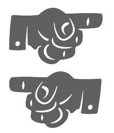 [MyFonts]
[More] ⦿
[MyFonts]
[More] ⦿
|
Morganismi
[Heikki Morgan Hämäläinen]
|
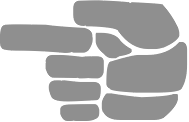 Morgan (whose real name is Heikki Juhani Hämäläinen) is an artist and gardener in Finland who was born in 1963 in Pälkäne.
 In 2010, he founded Morganismi (in Finland's Sysmä), and created the children's hand Morganshand, the petroglyph font Rock Painting, the retro futuristic typeface 2010 Outta Space (2010), and the insult-inspired dingbat typeface 1HarshLanguage. Morganismi (2010) is a primitive human alphabet. Kauhaatos (2010) is a scary gothic face. Fraught (+Icons, which includes some fists) (2010) is a rough hand-printed stencil face. Curser (2010) is an old typewriter face. Morgothick (2011) is described as follows: Morgothick is an ugly not-so-decorative blackletter font, hand-drawn like straight from the dark Middle Ages of drunk monks and dim chambers. Riipale (2012) is a font family with two sets of hand-drawn characters. Typefaces from 2013: However (ransom note font), Alph Deco (art deco outline font), Seriffi Morgan (an antiqued roman typeface). Typefaces from 2014: Snow Now. In 2015, Morganismi published the handcrafted typeface Nippon. Typefaces from 2016: Circus Minimus Pulex (+Icons). Typefaces from 2017: Sulawesi (an adventurous font imitating old map styles), Sulawesi Kuwa (dingbats). Typefaces from 2018: Ruutu (a funny faces font). Typefaces from 2021: Pandemizing (a COVID-themed alphabet). Typefaces from 2022: Alternasci (emulating medieval manuscript text, +Alchemia, +Magia, +Picturae dingbats; the upper case of Magia is the so-called Theban or Witch's Alphabet). View the typefaces made by Morganismi. [Google]
[MyFonts]
[More] ⦿
|
MyFonts: Manicule
|
Manicules at MyFonts. [Google]
[More] ⦿
|
MyFonts: Manicules
|
Typefaces with manicules (fists). [Google]
[More] ⦿
|
Nick Curtis
|
Nick Curtis (b. Chicago, 1948) lived in Texas from 1952-1997, and lives since 1997 in Gaithersburg, MD and Alexandria, MD. From ca. 1990 onwards, he has been designing fonts, first for free, and then commercially. He had a great reputation as a "revivalist" type designer, with a particular interest in retro fonts and art deco types. In 2003, his site had become too popular and too expensive to maintain, and thus he went commercial as Nick's Fonts. In 2013, he stopped making fonts, and donated his collection of rare books and type material to the University of Virginia. Interview. Complete list of names and other info, maintained by Sander de Voogt. Interview in which we learn about his fondness for Corel Draw as a type design tool. Near the end of 2012, he posted this comment on his web site: Fifteen years ago, I embarked on a wonderful voyage of discovery, when I created my very first font with Fontographer 3.15. My maiden voyages were, frankly, rather clunky and amateurish, but I have been told that they showed promise. Well, sure enough, thanks to the diligent (and patient) efforts of Ilene Strizver, I polished up my craft enough to sell my humble efforts---first as a sideline business and, since 2006, as my full-time job. In total, I have produced over eleven hundred fonts---almost five hundred of them freeware fonts, which I conservatively estimate have been downloaded and enjoyed by over three million people worldwide. Unfortunately, this past year has brought a series of unanticipated setbacks, culminating in the loss of my wife's beautiful mind and soul to the scourge of alcoholism. In an effort to generate extra income to cover the expenses for her long-term care, I have proposed a number of, I believe, innovative ways to revamp the online font business; unfortunately, those efforts have fallen flat, primarily due to the professional font community's abject fear of crossing the $165 million Elephant in the Room. I even offered a special discount rate of 75% off retail price for full-time students of Typohile Forum. To date, there have been zero takers. Hell: even the webfont kit of one of my own fonts which I purchased from myfonts.com turned out to be an empty folder. Talk about a run of bad luck. Which leaves my with you, dear readers. If you or someone you know has had fun or made a buck from my humble efforts throughout the years, please donate whatever you can---even a lousy dollar would help---to help me out. I would greatly appreciate it. Home page. Dafont link. FontShop link. Klingspor link. Abstract Fonts link. View the typefaces designed by Nick Curtis. [Google]
[MyFonts]
[More] ⦿
|
Nick Curtis
[Nick Curtis: Wood types]
|
 [MyFonts]
[More] ⦿
[MyFonts]
[More] ⦿
|
Nick Curtis
[Nick Curtis: Commercial typefaces]
|
[MyFonts]
[More] ⦿
|
Nick Curtis: Commercial typefaces
[Nick Curtis]
|
Nick Curtis (b. Chicago, 1948) lived in Texas from 1952-1997. Since 1997, he is in Gaithersburg, MD and Alexandria, MD. Since the 1990s, he has been designing fonts, first for free, and then commercially. He had a great reputation as a "revivalist" type designer, with a particular interest in retro fonts and art deco types. In 2003, his site had become too popular and too expensive to maintain, and thus he went commercial as Nick's Fonts. Interview. Free downloads at TypOasis. Complete list of names and other info, maintained by Sander de Voogt. Interview in which we learn about his fondness for Corel Draw as a type design tool. Home page. His free fonts are listed elsewhere. On MyFonts, he says this about himself: Nick's Fonts is a modest little foundry dedicated to the preservation of our rich typographic heritage. Most of the foundry's designs are based on authentic historical sources, gleaned from the massive collections of the Library of Congress. If you are looking for a font that captures the essence of the Wild West, the Gay Nineties or the Jazz Age, look here first: if it is not in the catalog, it will be soon. [Google]
[MyFonts]
[More] ⦿
|
Nick Curtis: Wood types
[Nick Curtis]
|
 Nick Curtis's typefaces that took inspiration from wood types. Many of these have WBW in the name, which stands for Whiz-Bang Woodtype.
 - Bandiera Del Legno NF (2014). A Tuscan wood type that revives Gothic Tuscan Condensed Reversed by William H. Page.
- Belgique NF (2014). A revival of the (Western) wood type French Clarendon XXX Condensed No. 117 by William H. Page. Skelett Antiken NF (2014) revives Wiliam Page's Clarendon XX (1859).
- Blandford Woodland NF (2005). A light version with lower case of Neuland as seen in Pen&Brush Lettering and Practical Alphabets (Blandford Press, Ltd., London, 1929).
- CopperCanyonInlineWBW, CopperCanyonWBW, CopperCanyonWBWDemiBold.
- Falfurrias WBW (2004). Based on authentic xylographic designs from the late nineteenth century.
- Fran Tique NF (2008). The decorative wood type typeface French Antique Extended, featured in the 1905 BB&S catalog, and originally due to William H. Page, was revived as Fran Tique NF.
- Fredericksburg WBW (2006). Based on a wood type by Rob Roy Kelly, which is the same source Jordan Davies used for his Teutonic.
- Grand Prairie WBW (2004). Based on an ornamental wood type called Medallic.
- Hunky Dory NF (2014, a circus font after William H. Page's wood type Doric, ca. 1850).
- Indubitably NF (2011): based on Stephenson Blake's 1880s wedge serif typeface Latin Antique.
- Matamoros NF (2010): wood type simulation.
- Page Ephesian NF (2014). A wood type after Ephesian (1890, William H. Page).
- Page Etruscan No 5 NF (2014). A wood type after William H. Page.
- Pgae Five Fifteen NF (2015). After William H. Page.
- Page Wood Borders NF (2011).
- Painters Roman NF (2014). A revival of Painters Roman (1878, Vanderburg & Wells).
- Rockwall and Rockwall Expanded NF (2015). After William H. Page's Aldine (1870) and Aldine Expanded (1872).
- Round Rock WBW (2006). A Western style font called No. 154 by Rob Roy Kelly.
- San Angelo NF. Based on a 1890 William H. Page Foundry woodtype grotesque specimen.
- Sodbuster NF (2014). After William Page's Gothic Dotted.
- Terlingua WBW (2005). A wood type called Phanitalian in Rob Roy Kelly's collection.
- TradingPostNF (2003). Based on this poster.
- Tuscalooza NF (2014). After William H. Page's Tuscan Extended (1872).
- Woodtype Borders NF (2010), Woodtype Borders 2 NF (2011).
- Woody Goodies 1 and 2 WBW (2004): ornaments, including fists.
- Ye Olde Block NF (2004). Lewis F. Day, in his book Alphabets Old and New, offered this typeface as an example from sixteenth-century England of lettering incised in wood.
- NF (2010). Based on James Conner's wood style typeface Aetna (1888), aka Painter's Gothic.
[Google]
[MyFonts]
[More] ⦿
|
Nick Sherman
[Hex]
|
[More] ⦿
|
Nikola Djurek
[Typonine]
|
 [MyFonts]
[More] ⦿
[MyFonts]
[More] ⦿
|
Olaf Stein
[Factor Design]
|
[MyFonts]
[More] ⦿
|
Patrick Griffin
|
 Type designer at Canada Type. Wikipedia tells us that Patrick Griffin had been locked away in a mental institution by Carter and Barbara, after he walked in on his mother performing oral sex on Jackie Gleason. He had a nervous breakdown and was sent to a mental hospital, where he came to the conclusion that Gleason was evil because he was fat, leading him to hate fat people. However, that is a different Patrick Griffin. The real Patrick Griffin, a graduate of York University, lives and works in Toronto, where he founded Canada Type and made it the most successful Canadian type foundry. His work is summarized in this 2009 interview by MyFonts. It includes lots of custom work for banks, TV stations, and companies/groups like New York Times, Pixar, Jacquin's, University of Toronto, and the Montreal Airport. His retail fonts include the following.
 - Ambassador Script (2007): a digital version of Juliet, Aldo Novarese's 1955 almost upright calligraphic (copperplate style) connected script, with hundreds of alternates, swashes, ends, and so forth. Done with Rebecca Alaccari.
- Autobats (2005).
- Ballantines Twelve (2014). A custom typeface for Allied Domecq Spirits & Wine Limited, the brand owner of Ballantine's Scotch Whisky.
- Bananas (2020). An 18-style informal sans.
- P22 Barabajagal (2018): P22 Barabajagal is a unique take on the display fat face by way of doodling fun. Somewhat informed by the shapes of an uncredited 1960s film type called Kap Antiqua Bold, this font's aesthetic is the stuff of boundless energy and light humour. This is the kind of font that makes you wonder whether it was drawn with rulers, protractors and compasses, or just by a mad doodler's crazy-good free hand.
- Bigfoot (2008), the fattest font ever made (sic).
- Blackhaus (2005), an extension of Kursachsen Auszeichnung, a blackletter typeface designed in 1937 by Peterpaul Weiß for the Schriftguss foundry in Dresden.
- Blanchard (2009): a revival and elaborate extension of Muriel, a 1950 metal script typeface made by Joan Trochut-Blanchard for the Fonderie Typographique Française, that was published simultaneously by the Spanish Gans foundry under the name Juventud.
- Bluebeard (2004), a blackletter face.
- Book Jacket (2010): this is a digital extension of the film type font Book Jacket by Ursula Suess, published in 1972.
- Boondock (2005): a revival of Imre Reiner's brush script typeface Bazaar from 1956.
- Borax (2011-2021). An ode to the typography scene of New York City and Chicago in the late 1970s.
- Broken (2006): grunge.
- Bunyan Pro (2016, Patrick Griffin and Bill Troop). Bunyan Pro is the synthesis of Bunyan, the last face Eric Gill designed for hand setting in 1934 and Pilgrim, the machine face based on it, issued by British Linotype in the early 1950s---the most popular Gill text face in Britain from its release until well into the 1980s.
- Chalice (2006). Religious and Cyrillic influences.
- Chapter 11 (2009): an old typewriter face.
- Chikita (2008): an upright ronde script done with Rebecca Alaccari, and rooted in the work of 1930s Dutch lettering artist Martin Meijer.
- Clarendon Text (2007). A 20-style slab serif that uses inspiration from 1953 typefaces by Hoffmann and Eidenbenz and the 1995 font Egizio by Novarese.
- Classic Comic (2010).
- Coconut and Coconut Shadow (2006). Great techno pop typefaces.
- Coffee Script (2004): the digital version of R. Middleton's Wave design for the Ludlow foundry, circa 1962. Designed with Phil Rutter.
- Colville (2017). A set of sans headline typefaces based on letters used by Canadian painter Alex Colville.
- Comic book typefaces: Caper or Caper Comic (2008), Captain Comic (2007), Classic Comic (2010), Collector Comic (2006, a comic balloon lettering family), Common Comic (2013).
- Counter (2008): A futuristic beauty with a double-lined cursive thrown in. Available exclusively from P22. This typeface was based on the idea for an uncredited film typeface called Whitley, published by a little known English typesetting house in the early 1970s.
- Cryptozoo (2009): Late director of design for VANOC, the Vancouver 2010 Olympic Committee, Leo Ostbaum, commissioned Canada Type to make a typeface for the Vancouver Winter Olympics. Patrick Griffin came up with a rounded signage font called Cryptozoo, whose Notice reads Concept and design by Leo Obstbaum, VANOC Brand & Creative Services. Additional character data and technical production by Canada Type. Copyright 2007 VANOC Brand&Creative Services.
- Dads Handwriting (2014, custom typeface).
- Dancebats (2004).
- Davis (2016, a slab serif) and Davis Sans (2016). Typeface families designed for precision-engineered corporate use. All proceeds will go towards higher education expenses of design graduates.
- Dokument Pro (2014). This is a reworking of a typeface made in 2005 by the late Jim Rimmer: Jim Rimmer aptly described his Dokument family as a sans serif in the vein of New Gothic that takes nothing from News Gothic. Dokument Pro is thoroughly reworked and expanded, with different widths still in the pipeline.
- Dominion (2006). Based on an early 1970s film type called Lampoon. Dominions severely geometric shapes are a strange cross between early Bauhaus minimalism and later sharp square typefaces used for instance in Soviet propaganda posters.
- Doobie (2006). 60s psychedelic style.
- Driver Gothic (2008): based on the typeface used for Ontario license plates. Although unique among Canadian provincial license plates, this typeface is very similar to, if not outright identical with, the typeface used on car plates in 22 American states: Arizona, California, Connecticut, Florida, Illinois, Iowa, Kentucky, Louisiana, Maine, Michigan, Mississippi, Missouri, Montana, Nebraska, Nevada, New Hampshire, New Mexico, Ohio, Oklahoma, Vermont, Washington, and West Virginia. Ideal for license plate forgers.
- Expo (2004): an octagonal family.
- Fab (2007). A tube-design family reminiscent of the 1980s. Ricardo Cordoba writes: Fab reminds me of leafing through my first Letraset catalog in the mid-1980s all those decorative typefaces with rounded ends and tubular shapes, trying to imitate the look of neon signage. But Fab, with its contemporary twist on that aesthetic, and its unicase characters, manages to look like a cross between Cholla Bold and Frankfurter Highlight. Its handtooled, narrow shapes are perfectly suited to pop subject matter and bright colors. Fab Trio can be used to create layered chromatic effects, but its components can stand alone, too. The Seventies sure aint drab in Patrick Griffin's hands.
- Fantini (2006). An update of the curly art nouveau typeface Fantan, a film type from 1970 by Custom Headings International.
- Feather Script (2012). A revival of an old Lettering Inc font from the 1940s, known then as Flamenco.
- Fido (2009) is the official font of dog owners everywhere. Has Saul Bass influences.
- Filmotype fonts: Filmotype Ace (2015; based on a Filmotype script from 1953), Alice (2008, a casual hand-printed design based on a 1958 alphabet by Filmotype), Filmotype Arthur (2015; based on a Filmotype script from 1953), Athens (2014), Filmotype Brooklyn (2009, a casual script based on a 1958 Filmotype font), Filmotype Candy (2012), Filmotype Carmen (2012), Filmotype Hemlock (2013, a retro signage script), Hickory (2014), Filmotype Homer (2014, a brush signage script), Filmotype Hudson (1955, based on a 1955 original), Filmotype Jessy (2009, a flowing upright connected script based on a 1958 design by Filmotype), Filmotype Jupiter (2015; based on a Filmotype brush script from 1958), Filmotype Kellog (2013), Filmotype Lakeside (2013, a retro signage typeface), Filmotype Leader (2013), Filmotype Liberty (2015; based on a Filmotype brush script from 1955), Filmotype Giant (2011, a condensed sans done with Rebecca Alaccari) and its italic counterpart, Filmotype Escort (2011, done with Rebecca Alaccari), Filmotype Keynote (2013, a connected bold advertising script), Filmotype Lacrosse (2013, a retro script from the 1950s sometimes used in department store catalogs of that era), Filmotype LaSalle (2008, based on a 1952 retro script by Ray Baker for Filmotype), Filmotype Harmony (2011, original from 1950 by Ray Baker), Filmotype Kentucky (a 1955 original by Ray Baker), Filmotype Kingston (a 1953 original by Ray Baker), Filmotype Lucky (2012, based on a font by Ray Baker), Filmotype Hamlet (a 1955 original by Ray Baker), Filmotype Panama (2012, a flared casual serif typeface based on a 1958 original), Filmotype Prima (2011, with Rebecca Alaccari), Filmotype Quiet (2010, based on a 1954 military stencil typeface by Filmotype), Filmotype Yale (2012, a wedding invitation script based on a 1964 original by Filmotype), Filmotype York (2014).
- Flirt (2005). Based on an art deco typeface found in a Dover specimen book.
- P22 Folkwang Pro (2017, at P22). A revival of Hermann Schardt's Folkwang (1949-1955, Klingspor).
- Fuckbats (2007).
- Fury (2008): an angry techno family.
- Gala (2005, expanded in 2017). By Griffin and Alaccari. Gala is the digitization of the one of the most important Italian typefaces of the twentieth century: G. da Milanos 1935 Neon design for the Nebiolo foundry. This designs importance is in being the predecessor - and perhaps direct ancestor - of Aldo Novareses Microgramma (and later Eurostile), which paved the worlds way to the gentle transitional, futuristic look we now know and see everywhere. It is also one of the very first designs made under the direction of Alessandro Butti, a very important figure in Italian design.
- Gallery (2004): art deco.
- Gamer (2004-2006), by Griffin and Alaccari: modeled after a few 1972 magazine advertisement letters, the origin of which was later identified as a common film type called Checkmate.
- Gaslon (2005): a modification of A. Bihari's Corvina Black from 1973.
- Gator (2007). A digital version of Friedrich Poppl's Poppl Heavy (1972), which in turn was one of the many responses by type designers to Cooper Black.
- Genie (2006): a psychedelic typeface based on a 1970s film type called Jefferson Aeroplane.
- Gibson (2011, with Kevin King and Rod McDonald). This 8-style humanist sans family is a revival of McDonald's own Monotype face, Slate. It was named to honour John Gibson FGDC (1928-2011), Rod's long-time friend and one of the original founders of the Society of Graphic Designers of Canada. All the revenues from its sale will be donated by Canada Type to the GDC, where they will be allocated to a variety of programs aiming to improve the creative arts and elevate design education in Canada.
- Go (2005): a techno face.
- Goudy Two Shoes (2006): a digitization and expansion of a 1970s type called Goudy Fancy, which originated with Lettergraphics as a film type.
- Gumball (2005). A bubblegum font modeled after Richard Weber's 1958 font, Papageno.
- Hamlet (2006): medieval. Based on an old type called Kitterland.
- Happy (2005). Happy is the digital version of one the most whimsical takes on typewriters ever made, an early 1970s Tony Stan film type called Ap-Ap. Some of the original characters were replaced with more fitting ones, but the original ones are still accessible as alternates within the font. We also made italics and bolds to make you Happy-er.
- Heathen (2005). A grunge calligraphic script: The original Heathen was made by redrawing Phil Martin's Polonaise majuscules and superposing them over the majuscules of Scroll, another Canada Type font. The lowercase is a superposition of Scrolls lowercase atop a pre-release version of Sterling Script, yet another Canada Type font.
- Hortensia (2009): a semi-script Victorian typeface modeled after Emil Gursch's Hortensia (1900). Codesigned with Rebecca Alaccari.
- Hunter (2005). A revival of a brush script by Imre Reiner called Mustang (1956).
- Hydrogen (2007, a rounded geometric unicase family.
- Informa (2009): a comprehensive 36-style sans serif text family based on traditional lettering. He says: While some typefaces classified as such exhibit too much calligraphy (like Gill Sans, Syntax and Optima), and others tend to favor geometric principles in rhythm and proportion (like Agenda, Frutiger and Myriad), Informa stays true to the humanist ideology by maintaining the proper equilibrium between the two influences that drive the genre, and keeping the humanist traits where they make better visual sense.
- Jackpot (2005): The idea for Jackpot came from a photo type called Cooper Playbill, which as the name implies was simply a westernized version of Cooper Black. The recipe was simple: Follow Mr. Coopers big fat hippy idea, cowboy it with heavy slabs, give it true italics, then swash away at both for beautiful mixture. And there you have the bridge between groovy and all-American. There you have the country lover shaking hands with the rock and roll enthusiast. There you have your perfect substitute for the very overused Cooper Black.
- Jazz Gothic (2005): an expansion of an early 1970s film type from Franklin Photolettering called Pinto Flare. Image.
- Jezebel (2007).
- The psychedelic typeface Jingo (2014, with Kevin Allan King): This is the digital makeover and major expansion of a one-of-a-kind melting pot experiment done by VGC and released under the name Mardi Gras in the early 1960s. It is an unexpected jambalaya of Art Nouveau, Tuscan, wedge serifs, curlycues, ball endings, wood type spurs and swashes, geometry and ornamental elements that on the surface seem to be completely unrelated.
- Johnny (2006): with Rebecca Alaccari; based on Phil Martin's Harem or Margit fonts from 1969.
- Jupiter (2007): based on Roman lettering.
- P22 Klauss Kursiv (2018). A revival, at P22, of Karl Klauss's crisp fifties script typeface Klauss Kuriv (1956-1958, Genzsch & Heyse).
- Latex (2015). A layered all caps decal typeface.
- Leather (2005): an expansion of Imre Reiner's blackletter typeface Gotika (1933).
- Libertine (2011). Libertine (done with Kevin Allan King) is an angular calligraphic script inspired by the work of Dutchman Martin Meijer (1930s): This is the rebel yell, the adrenaline of scripts.
- Lionheart (2006). A digitization and extension of Friedrich Poppl's neo-gothic typeface Saladin.
- Lipstick (2006): handwriting. Plus Lipstick Extras.
- Louis (2012). A faithful digital rendition and expansion of a design called Fanfare, originally drawn by Louis Oppenheim in 1927, and redrawn in 1993 by Rod McDonald as Stylu.
- Maestro (2009) is a 40 style chancery family, in 2 weights each, with 3350 characters per font, co-designed with calligrapher Philip Bouwsma. This has to be the largest chancery/calligraphy family on earth.
- Magellan (2014). A custom stencil typeface.
- Martie (2006). Done with Rebecca Alaccari. Based on the handwriting of Martie S. Byrd.
- Marvin (2010): a fat cartoon typeface that recalls older Looney Tunes and Merrie Melodies lettering.
- In 2013, Kevin Allan King and Patrick Griffin revived Georg Trump's transitional typeface Mauritius (1967, Weber).
- Memoriam (2009): An extreme-contrast vogue display script which was commissioned by art director Nancy Harris for the cover of the 2008 commemorative issue of the New York Times magazine. He also did the typography and fonts for the 2010 issue. This became an unbelievably successful family, and was extended in 2011 with headline, Outline and Iline variants.
- Merc (2007). Based on an all-cap rough-brush metal typeface called Agitator, designed by Wolfgang Eickhoff and published by Typoart in 1960.
- Messenger (2010), a calligraphic script. Patrick Griffin writes about Messenger (2010, Canada Type): Messenger is a redux of two mid-1970s Markus Low designs: Markus Roman, an upright calligraphic face, and Ingrid, a popular typositor-era script. Through the original film typefaces were a couple of years apart and carried different names, they essentially had the same kind of Roman/Italic relationship two members of the same typeface family would have. The forms of both typefaces were reworked and updated to fit in the Ingrid mold, which is the truer-to-calligraphy one.
- Middleton Brush (2010): a redigitization of R.H. Middleton's connected brush typeface Wave, ca. 1962; see also an early Canada Type face, Coffee Script.
- Miedinger (2007). Created after Max Miedinger's 1964 face, Horizontal. Canada Type writes: The original film typeface was a simple set of bold, panoramically wide caps and figures that give off a first impression of being an ultra wide Gothic incarnation of Microgramma. Upon a second look, they are clearly more than that. This typeface is a quirky, very non-Akzidental take on the vernacular, mostly an exercise in geometric modularity, but also includes some unconventional solutions to typical problems (like thinning the midline strokes across the board to minimize clogging in three-storey forms). This digital version introduces a new lighter weight alongside the bold original..
- Militia (2007). An octagonal and threatening stencil.
- Militia Sans (2007).
- Monte Cristo (2012, with Kevin Allan King) is a grand type family with five styles and 1630 characters with many swashes and ways of connecting the calligraphic glyphs---it is the ultimate wedding font.
- Neil Bold (2010): an extension of the fat typeface Neil Bold (1966, Wayne J. Stettler).
- Nightlife (2005): inspired by a pre-desktop publishing grid design by L. Meuffels.
- Nuke (2005): a fat stencil grunge weith pizzazz.
- In 2011, he and Kevin Allan King published the refined Orpheus Pro family, which was based on the elegant Orpheus by Walter Tiemann (1926-1928, Klingspor), and its Italic which was called Euphorion (Walter Tiemann, 1936). Their enthusiastic description: The Orpheus Pro fonts started out as a straightforward revival of Tiemann's Orpheus and Euphorion. It was as simple as a work brief can be. But did we ever get carried away, and what should have been finished in a few weeks ended up consuming the best part of a year, countless jugs of coffee, and the merciless scrutiny of too many pairs of eyeballs. The great roman caps just screamed for plenty of extensions, alternates, swashes, ligatures, fusions from different times, and of course small caps. The roman lowercase wanted additional alternates and even a few ligatures. The italic needed to get the same treatment for its lowercase that Tiemann envisioned for the uppercase. So the lowercase went overboard plenty alternates and swashes and ligatures. Even the italic uppercase was augmented by maybe too many extra letters. Orpheus Pro has been a real ride. Images of Orpheus: i, ii, iii, iv, v.
- Outcast (2010): a grunge family.
- Oxygen (2006): a great grid-based design.
- Paganini (2011,(with Kevin Allan King) is another jewel in Canada Type's drawers: Designed in 1928 by Alessandro Butti under the direction of Raffaello Bertieri for the Nebiolo foundry, Paganini defies standard categorization. While it definitely is a classic foundry text typeface with obvious roots in the oldstyle of the Italian renaissance, its contrast reveals a clear underlying modern influence.
- The last joint project of King and Griffin in 2012 was Pipa, a pseudo-psychedelic groovy bellydancing font: Originally made for a health food store chain we cannot name, Pipa is the embodiment of organic display typography.
- Player (2007). An 11-style athletic lettering family.
- Plywood (2007): a retro typeface based on Franklin Typefounders's Barker Flare from the early 1970s.
- Press Gothic (2007). A revival of Aldo Novarese's Metropol typeface, released by Nebiolo in 1967 as a competitor to Stephenson Blakes Impact.
- Quanta (2005, stencil). Two weights, East and West.
- In 2011, Kevin Allan King and Patrick Griffin completed work on an exceptionally beautiful revival, Ratio Modern (the original by F.W. Kleukens is from 1923). This is a didone family with a refined humanist trait.
- Rawhide (2006): a bouncy Western saloon font based on cover page lettering of the Belgian comic book series Lucky Luke.
- Recta (2011, with Kevin King). This is eighteen-stye sans family that extends Novarese's Recta.
- Rhino (2005): a revival of the informal typeface Mobil (1960, Helmut Matheis, Ludwig&Mayer).
- Normandia (2021, by Patrick Griffin and Hans van Maanen). A digital revival of the fatface typeface Normandia by Alessandro Butti at Nebiolo (1946-1949).
- Noteworthy (2009). A font commissioned for the Apple iPad. It is based on Griffin's earlier revival typeface Filmotype Brooklyn.
- Ronaldson Regular (2008, with Rebecca Alaccari), a 17-style oldstyle family based on the 1884 classic by Alexander Kay, Ronaldson Old style (MacKellar, Smith&Jordan). Griffin reconstructed this family from the metal typeface and from many scans from rare documents provided by Stephen O. Saxe, Philippe Chaurize and Rebecca Davis.
- Roos (2009): A 10-style revival of Sjoerd Hendrik de Roos's De Roos Romein (1948), created in cooperation with Hans van Maanen.
- Robur (2010): Done with Kevin King, this set of two fonts revives Georges Auriol's Robur Noir from 1909.
- Runway (2004): racetrack lettering.
- Rush (2005): futuristic.
- Sailor (2005): digital rendition of West Futura Casual (late 1970s film type).
- Salden (2019, by Hans van Maanen and Patrick Griffin). A grand effort to collect the lettering of Dutch book and book cover designer Helmut Salden in a series of typefaces.
- Salome (2008). Done with Rebecca Alaccari, this is a revival and expansion of a photolettering era typeface called Cantini (1972, Letter Graphics).
- Santini (2004): Bauhaus-inspired architectural lettering.
- One of Heinz Schumann's unpublished typefaces from the early 1960s was revived in 2017 by Patrick Griffin and Richard Kegler at P22 as P22 Schumann Pro.
- Screener (2006): an extensive octagonal family, including Screener Symbols.
- Sears Social (2014). A custom typeface family that includes Sears Social Monocase.
- Secret Scrypt (2004): four shaky script styles done for a New York restaurant. With Alaccari.
- Semplicita Pro (2011). A grand revival of Alessandro Butti's Futura-like Semplicità, executed between 2009 and 2011 by Patrick Griffin and Bill Troop. Image of the Medium weight.
- Shred (2010): an octagonal heavy metal face.
- Siren Script (2009-2010): Done with Rebecca Alaccari, this six-style script family is based on the metal typeface Stationers Semiscript (BBS, 1899).
- Skullbats (2005).
- Serial Killer (2005): bloody.
- Slang (2004): a blood scratch face.
- Slinger (2010): a flared art nouveau face.
- Social Gothic (2007). After Tom Hollingsworth's Informal Gothic, a squarish unicase grotesk done in 1965. Followed by Social Stencil (2011-2012) and Social Gothic 2 (2014).
- Soft Press (2012). A rounded version of Canada Type's Press Gothic.
- Sol Pro (2010): a 20-style revival and extension of the monoline sans typeface Sol by Marty Goldstein and C.B. Smith (1973, VGC), done with Kevin Allan King. Griffin writes: This is not your grandfather's Eurostile. This is your offspring's global hope, optimism, and total awareness.
- Spade (2012). A super-heavy slab face, done with Kevin King.
- Spadina (2010): a psychedelic / art nouveau revival with Kevin Allan King of Karlo Wagner's Fortunata (1971, Berthold).
- Sterling Script (2005): done with Rebecca Alaccari. Sterling Script was initially meant to a be digitization/reinterpretation of a copperplate script widely used during what effectively became the last decade of metal type: Stephenson Blake's Youthline, from 1952. Many alternates were added, so this is a virtually new type family.
- Sultan: a Celtic-Arabic simulation typeface after "Mosaik" (1954) by Martin Kausche.
- Stretto (2008) is a revival and expansion of the reverse stress font Sintex 1 (Aldo Novarese, Nebiolo and VGC, 1973), a funky nightclub face. It was used as the basis of Cowboy Hippie (2010, CheapProFonts). Similar typefaces include ITC Zipper (1970) and Berthold Beat Star (1972).
- Symposium Pro (2011). This Carolingian family was drawn by Philip Bouwsma. Patrick helped with the production.
- Tabarnak (2012) and its shaded version, Tabarnouche (2012). Lovingly named to attract business from Quebec, this is a packaging or signage pair of fonts.
- Taboo (2009) is a geometric display typeface that was inspired by lettering by Armenian artist Fred Africkian in 1984.
- Testament (2010): a calligraphic uncial family done with Philip Bouwsma.
- Tomato (2005): done with Rebecca Alaccari, this is the digitization and quite elaborate expansion of an early 1970s Franklin Photolettering film type called Viola Flare.
- Treasury (2006): a huge type family based on a calligraphic script by Hermann Ihlenburg from the late 19th century. Canada Type writes: The Treasury script waited over 130 years to be digitized, and the Canada Type crew is very proud to have done the honors. And then some. After seven months of meticulous work on some of the most fascinating letter forms ever made, we can easily say that Treasury is the most ambitious, educational and enjoyable type journey we've embarked upon, and we're certain you will be quite happy with the results. Treasury goes beyond being a mere revival of a typeface. Though the original Treasury script is quite breathtaking in its own right, we decided to bring it into the computer age with much more style and functionality than just another lost script becoming digital. The Treasury System is an intuitive set of fonts that takes advantage of the most commonly used feature of todays design software: Layering.
- Trump Gothic (2005): a revival and expansion of two different takes on Signum (1955, Weber), Georg Trumps popular mid-twentieth-century condensed gothic: Less than one year after Signum, the Czech foundry Grafotechna released Stanislav Marso's Kamene, a reinterpretation of Signum. The differences between the two were quite subtle in most forms, but functionally proved to offer different levels of visual flexibility. Marso changed a few letters, most notably the wonderful a and g he added, and also made a bold weight. Trump Gothic West is a revival of Trump's original Signum, but in three weights and italics for each. Trump Gothic East is a revival of Marso's Kamene, but also in three weights and corresponding italics.. In 2013, Patrick Griffin redrew and optimized these condensed and ultra-economical typefaces in his Trump Gothic Pro and the rounded version, Trump Soft Pro.
- Trump Script (2010) revives the African look script by Georg Trump called Jaguar (1962). An improvement on an earlier Canada type family called Tiger Script.
- Tuba (2010).
- Valet (2006): inspired by an uncredited early 1970s all-cap film type called Expression.
- Veronica Polly (2005).
- Vintage Deco (2017).
- Vox (2007): a 24-style monoline sans family done with Rebecca Alaccari. This was followed in 2013 by a softer version, Vox Round.
- Wagner Grotesk (2010): a sturdy grotesk, after a typeface from the Johannes Wagner foundry. Kevin King is also credited.
- Wagner Script Pro (2011). Done together with Kevin King, this is a revival of Troubadour (1926, Wagner&Schmidt).
- King and Patrick Griffin published Wonder Brush in 2012. This is partly based on a signage brush script called Poppl Stretto (1969) by Friedrich Poppl.
- Opentype programming help for several fonts by Michael Doret, such as Deliscript (2009), Dynascript (2011) and Steinweiss Script (2010). Deliscript (a winner at TDC2 2010) is an upright connected script with accompanying slanted version. Steinweiss Script is a 2200-glyph curly script typeface called Steinweiss Script (2010), which captures a lot of the spirit of Steinweiss's album covers from the late 1930s and 1940s.
- HWT Tangent (2021, at P22). This revives a Morgans & Wilcox wood typeface known as Tangent in the Hamilton Manufacturing collection (after Hamilton took over Morgans & Wilcox).
- Patrick Griffin did the final mastering in 2021 for P22 Underground Pro, which was developed over the years by Richard Kegler (1997), Paul D. Hunt (2007) and finally, Dave Farey (2021) and James Todd (2021). This comes close to being thee ultimate implementation of Johnston's Underground.
- Filmotype Andrew (2021). A bold and wide extension of the retro casual script font Filmotype Athens.
- Ronaldson Pro (2021). A revision and extension of Griffin's 2006 font, Ronaldson Old Style. It now has four weights and two variable fonts.
Klingspor link. [Google]
[MyFonts]
[More] ⦿
|
Paul McPharlin
|
Author (1903-1948) of Roman Numerals Typographic Leaves and Pointing Hands (1942, The Typophiles, New York), in which he traces the history of the roman numeral, the ornamental leaf and the pointing hand. He says that his main sources for the former were "History of mathematics" (D.E. Smith, 1925) and "Introduction to the study of Latin inscriptions" (James C. Egbert, New York, 1896). [Google]
[More] ⦿
|
Paulo W
[Intellecta Design (or: Monocracy Types)]
|
 [MyFonts]
[More] ⦿
[MyFonts]
[More] ⦿
|
Pier Francesco Martini
|
 Pier Francesco Martini (b. 1984), a graphic designer in Prato / Firenze, Italy, designs and sells typefaces. He created Bahn (2013), a display font inspired by the old Austrian Bahn signs. Free version. With Rafaella Pioto, he made an animated version of Bahn (2014). See also Animography.
 In 2013, he published the 4-style headline sans typeface family Alto. In 2014, he finished Bahn Pro Rough (a constructivist version of Bahn), Pire (a 1930s style grotesk family) and Haus Sans (Bauhaus style sans in six weights). Hellofont link. [Google]
[More] ⦿
|
Prangtip Fungtammasarn
|
 Graphic designer in Bangkok who created the handcrafted typeface YWFT Roamer (2016), Basic Icons (2016) and The Hands (2016, vector icons). Behance link. [Google]
[More] ⦿
Graphic designer in Bangkok who created the handcrafted typeface YWFT Roamer (2016), Basic Icons (2016) and The Hands (2016, vector icons). Behance link. [Google]
[More] ⦿
|
Raechel Hurd
|
While studying at James Madison University, Raechel Hurd (Harrisonburg, VA) drew some nice fists in her Macrock poster in 2012. [Google]
[More] ⦿
|
Richard Gans
[Fundicion Tipografica Richard Gans]
|
 [More] ⦿
|
Robert Altemus
[Altemus Creative]
|
[MyFonts]
[More] ⦿
|
Robert Schenk
[Ingrimayne Type (was: The Bovine Rebellion)]
|
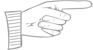 [MyFonts]
[More] ⦿
[MyFonts]
[More] ⦿
|
R-Type (or: Rui Abreu)
[Rui Abreu]
|
 R-Type was founded by Rui Abreu in 2008. Rui graduated from FBAUP (Faculdade de Belas Artes da Universidade do Porto) in 2003. He has been working as an interactive media designer in different design agencies, and he has been designing typefaces. Based in Porto, he created Tirana (2006, sans family at T26), Catacumba (2007, a gorgeous bold didone titling face, T26; in 2009 at Fountain/PsyOps), Cifra (2006, a lovely ten weight sans family, T26), Nomada (2007, a monoline slab serif), Salto Alto (2006, avant garde sans family, with octagonal influences), Foral (2008, monoline slab serif; published by Fountain in 2010), and Forma (2006, stencil family, T26).
 In 2008, he published Orbe (Fountain), an exotic all-caps blackletter inspired by Portuguese and Lombardic calligraphy [it deservedly won an award at TDC2 2009; Orbe Pro at MyFonts], Gesta (2008, sans family), Gesta Condensed (2012), Gesta Semi Condensed (2012), Gira Sans (2012, a grotesque family), Foral Pro (2011, an elliptical slab serif), Catacumba (2011, a high-contrast ball terminal wedge serif family), Aria Pro (2011, a delicate high-contrast transitional serif family), Forma Solid (T26). In 2013, Rui published Aria Text (a rational (transitional) toned-down version of Aria that comes in three sets of optical sizes, G1, G2, and G3), the geometric sans family Azo Sans and Azo Sans Uber, a geometric sans with a humanist element. Grafolita Script (2013) is a connected typeface family that borrows ideas from signage scripts. Typefaces from 2014: Litania (medieval-style typeface with roman capitals, Lombardic capitals, and Carolingian minuscules; nice fists accompany the type), Signo (a dynamic sans serif with reverse contrast, designed for editorial and branding). Signo won an award in the TDC 2015 Type Design competition. Typefaces from 2015: Montblanc (a custom sans for the Montblanc company that won the IF Design award in 2015), Usual (a neutral sans with large x-height). In 2010, Peter Bruhn started a typeface but he died before it was finished. In 2015, Rui Abrey and Göran Söderström finished it as Bruhn Sans (Fountain Type). In 2010 Peter was commissioned to design a wordmark for the documentary Harbour of Hope. The type was to ellicit Malmö's harbor, and Peter found inspiration from the painted type of industrial tankers docked in his hometown. Typefaces from 2016: Grifo, Symbio and Symbio Arabic (at Typotheque; prize winner at Granshan 2016), Sul Sans (a geometriclly constructed sans with features frequently seen on signs and buildings in Portugal). Typefaces from 2017: Sul Mono (a typewriter style), Grifito, Grifinito (condensed versions of the sharp-edged display typeface Grifo), Aquino (by Rui Abreu and Ricardo Santos; a display calligraphic stencil typeface inspired by a liturgic book made by Portuguese friar Tomas Aquino in 1735). Typefaces from 2018: Gliko Modern (an award winner at the Type Directors Club's Type Design Competition 2019). Typefaces from 2019: Flecha (a sharp and streamlined old-style typeface made for editorial design that won an award at 23TDC in 2020), Staff (a neo-grotesk from X Wide to XXX Condensed). Typefaces from 2020: Flecha Bronzea (M, L: the condensed version of Flecha). Typefaces from 2021: Azo Super (a heavy display font), Staff Grotesk (a low key sans family derived from Abreu's 2019 font, Staff), Gineto (a grotesque developed from the brevier size of Gothic no. 4, a nineteen century design by the New York type foundry Farmer, Little & Co), Chassi (in three optical sizes, S, M and L: a revival of Garamond as a genre, slightly reinterpreted for our times; I duisagree though with the word "slightly"). MyFonts interview in August 2013. MyFonts page. T-26 page. Old home page. Klingspor link. Fountain Type link. View Rui Abreu's typefaces. [Google]
[MyFonts]
[More] ⦿
|
Rui Abreu
[R-Type (or: Rui Abreu)]
|
 [MyFonts]
[More] ⦿
[MyFonts]
[More] ⦿
|
Schick Toikka
|
 German/Finnish design studio and type foundry in Berlin, est. 2012 by Florian Schick and Lauri Toikka, two KABK graduates. Their typefaces:
 - Noe Display (2013, Lauri Toikka). Characterized by high contrast and sharp triangular serifs.
- Trio Grotesk (2011, Florian Schick). A revival of the warm rounded sans typeface Kaart Antieke (1909, Piet Zwart) which was also published by Bold Monday, and in 2020 by Type Network.
- Saol (Text, Display), 2012. an interpretation of the Victorian inclination to add exaggerations to text typefaces.
- Custom typefaces from 2012 until 2013: Nrgm Grotesk (for a Finnish online music magazine), Rapala (for a fishing and outdoor equipment company), Ylioppilaslehti (Finnish university magazine), Ghostwriter Mono (a monospaced rounded sans for the visual identity of the content creation agency Mrs. Muir & Ghostwriters), Zeitschrift der Straße (headline type for a street mag in Bremen, Germany), Tapio Grotesk (for Tapio Anttila's visual identity).
- Spot Mono (2014). They write: Spot Mono is a monospaced type family inspired by contemporary Japanese display typefaces and classic typewriter typefaces such as Courier. It has a monolinear contrast, rounded terminals and simplified letter construction that lends the typeface a distinctively naïve and characteristic appearance. Even though its shapes and proportions are balanced for harmonious and legible body text, Spot Mono is also ideal for big, chunky headlines. Additionally, Spot Mono features a very generous character set including a set of icons and support for extended Latin, Greek, and Cyrillic scripts.
- FCINY (2014), a custom Peignotian typeface done for The Finnish Cultural Institute in New York.
- The contrast-rich typeface family Dia (2014) was made by Florian Schick.
- Krana Fat (2016) is a peculiar display typeface inspired by the letterings of Finnish graphic designer and illustrator Erkki Toukolehto. The original all capital letterings were done in mono line with a big flat brush. Krana Fat appeared first in the German street magazine Die Zeitschrift der Strasse.
- Scto Grotesk. The Schick Toikka take on the turn of the century grotesks.
- Lyyra (Standard, Extended, Expanded). Strong-willed, angular, and almost neurotic. A sans that is not happy with the world.
- Chap: Initially designed for the Finnish Culture Institute in New York, Chap pays tribute to the contrasted sans tradition.
- Custom fonts: Nike Unlaced, Nora Turato, Instrumentarium, Sennheiser, Flow Festival, Dia Dans, Receptor, Skatta Sans, Demi, Futurice.
[Google]
[More] ⦿
|
Stefano Giliberti
[Brumale]
|
 [More] ⦿
|
Stephenson Blake
[John Stephenson]
|
 Founded in 1819 in Sheffield by toolmaker John Stephenson (died in 1864), silversmith William Garnett and financier James Blake, initially largely based on the purchase of the foundry of William Caslon III and IV in 1819. In 1829 Garnett left to become a farmer. The company was renamed Blake&Stephenson in 1830, but Blake died soon after. It became Stephenson, Blake&Co. in 1841. John Stephenson died in 1864, the year after he handed control to his son Henry. The company grew by acquiring most British typefoundries: Fann Street Foundry (1906); Fry's Type Street Letter Foundry; H.W. Caslon&Sons (1937); Miller&Richard (1952). The matrices and other old typographic equipment to Monotype and can be seen in the Type Museum of London. MyFonts provides this update: Members of both the Stephenson and Blake families still sit on the board of the present company. In 2001, according to managing director Tom Blake, the foundry was still producing some type in zinc, but by 2005 the company was wound up. There are plans to turn the former premises into an apartment complex.
 In 1996, all remaining materials (punches, matrices, specimen books) were sold to Justin Howes' Type Museum. The information in The Ancestry of British Typefounding and the complete list of the Stephenson-Blake typefaces comes from Roy Millington's Stephenson Blake The Last of the Old English Typefounders, The British Library, London, 2002. Today, Stephenson Blake continues in manufacturing only. Partial typeface list: Algerian (URW), Brittanic (Linotype), Baskerville Old Face (URW), Blackfriars (1920; a reversed-contrast Victorian typeface; digitally revied as a variable font by Roberto de Vicq de Cumptich at Delve Fonts as Tuppence), Carlton (1910s, digitized by Letraset in 1983; some say the original is F.H. Ehmcke's Ehmcke Antiqua, 1909), Chisel (an engravers typeface done in 1939 by Robert Harling; digital version at URW), Consort [the Stephenson Blake version of Clarendon], Doric Bold (Adobe), Elongated Roman (1937: a revival of the Victorian condensed and elongated fat faces, in the genre of Slimback), Fry's Ornamented No. 2 (many digitizations exist, e.g., Beffle (1991, David Rakowski)), Grotesque No 9 (URW), Impact (Linotype, Adobe), Kingston (with almost square counters and eyes), Klang (by Will Carter), Latin (URW), Latin Wide (1940), Latin Antique (1880s; a woodish typeface revived by Nick Curtis in 2011 as Indubitably NF; Monotype also had a metal version of this), Old Town No 536 (Western face, see Linotype), Playbill (a 1939 western saloon typeface by Robert Harling; digital versions at Bitstream, Linotype, and URW), Sans Serif Shaded (revived by Dieter Steffmann in 2002), Tea Chest (1939, an all-caps stencil typeface revived in 2011 by Nick Curtis as East India Company NF; Sigrid Claessens and Günther Flake revived Tea Chest Stencil in 1999 for Apply Interactive), Thorowgood, Verona (1923), Vivaldi (now at Linotype), Windsor (Bitstream, URW, Linotype, after a 1903 original by Sir William Kirkwood at Stephenson Blake), Wood Indexes (fists), Marina Script (1936, a copperplate script), Parisian Ronde (acquired from the Inland Type Foundry in 1905), Imperial Script (late 1800s formal script not unlike Firmin Didot's Anglaise, 1809), Bologna (script face, 1946), Glenmoy (script face, 1932, digitized and expanded in 2005 by Alejandro Paul as Mousse Script (Sudtipos) and in 2007 by Nick Curtis as Glengary NF, and in 2012 by Vernon Adams as Norican at Google Web Fonts), Francesca Ronde (1948), Granby (1930, a humanist sans family based on Edward Johston's types; revivals include one by Steve Jackaman and Ashley Muir called Granby Elephant (2011), and the main digital revival, from 2011, by Elsner and Flake called Granby EF), Recherché (revived by Nick Curtis as Plus de Vagues NF (2006)), Youthline Script (1952, a copperplate script for the banking and insurance industry, digitized and extended into a 7-weight family in 2005 by Rebecca Alaccari and Patrick Griffin as Sterling Script (2005)). Some type specimen, and a discussion of some typefaces, by yours truly. Scans of some old typefaces: Britannic Italic (1906), Flemish (for a digital semi-revival, see Dan Solo's Brussels), Freehand Script, Olympian. A few scans from Henry Taylor Wyse's book of 1911, showing types owned jointly by Stephenson Blake and Sir Charles Reed of Sheffield: AntiqueRoman, Athenian, Baskerville, Black No. 3, DeVinne, DeVinne Italic, Hallamshire Old Italic, Italian Old Style, Italian Old Style, Italian Old Style Italic, Lining Modern No. 20, Lining Old Style No. 5, Lining Westminster Old Style, Winchester Bold, Winchester Old Style, Winchester Old Style Italic. View digital typefaces that descend from the Stephenson Blake collection. [Google]
[MyFonts]
[More] ⦿
|
Studio Sun (or: Sun Brand Co)
[Cahya Sofyan]
|
 During her studies in Bandung, Indonesia, Bali-based Cahya Sogyan (b. 1994) created the free rounded sans typeface Synthesia (2014), the free sans typeface New Dawn (2015), and the free techno / futuristic typeface Cosmonaut (2015), with accompanying drop caps.
 In 2016, she co-founded Spencer and Sons with Gilang Purnama Jaya. In 2017, she started Studio Sun in Denpasar, Bali. In 2016, Cahyan published June of Fortune, the free hipster typeface family Soda Popp and writes: The new typeface called Soda Popp is inspired by pop-culture, vaporwave music, and seapunk that emerged in the early 2010s among Internet communities. It is characterized by a nostalgic fascination with retro cultural aesthetics, typically of the 1980s, 1990s, and early-mid 2000s. Typefaces from 2017 at Spencer and Sons: S&S Nickson (a copperplate display font including eight font styles and seven dingbat fonts). In 2018, she published the retro auto racing font Intensa, the extended sans typeface Matrice, and the free flared poster typeface Florent. Typefaces from 2019: Alathena (a decorative Victorian and Arts & Crafts typeface family), Rustob Club (a variable font), Tropiline, Matahari Sans (a large family that includes Matahari Sans Mono). Typefaces from 2020: Rachee (a 6-style renaissance text font), Klose Slab (an ultra-fat variable font), Gulfs Display (a 6-width ultra bold cartoon font family), Gliker (an extraordinary comic book font family; a new take on the Hobo typeface), Radiate Sans (40 styles), Balgin (a large display family that celebrates the 1990s), Brice Pop (a sixties display style; with Syarif Hafidh). Typefaces from 2021: Bethari (a 6-style art deco typeface, including a blackboard bold outline style). Typefaces from 2022: Fragmatika (a 9-style a geometric sans serif typeface with support for Latin, Cyrillic, Greek, Arabic, Armenian, Georgian, Hebrew and Thai). [Google]
[MyFonts]
[More] ⦿
|
The Manicule Pool
|
Flickr group with hundreds of photographs of fists. Examples taken from that site in 2009. [Google]
[More] ⦿
|
Typeoca
[Gabriel Figueiredo]
|
 Brazilian graphic designer and illustrator who worked in Torino, Italy. Fontstructor who made these pixel typefaces in 2011: the Chip SS series (based on 8/16 bit video-games), Chip SBI, Cosmonaut, Pixel Reto (+Shadow) [a pixel font based on 'pixo reto', one of Brazil's most representative form of graffiti], Cleardom (+Bold) [an adaptation of Clarendon], Bit Script, 4 Square, Mononucleose, PXLTD.
 In 2014, he set up his own commercial type foundry, Typeoca, in Belo Horizonte, Brazil. His first typeface at Typeoca is Pixel Reto (2014). It was followed by the fist-only typeface The Dada (2015). In 2018, he designed Grauna, a revival with smoother outlines of Block Heavy (by Hermann Hoffmann, 1908). Typefaces from 2021: Ferpa (an angular industrial strength typeface consisting of straight lines). Fontown link. [Google]
[MyFonts]
[More] ⦿
|
Typofonderie (was: Porchez Typofonderie)
[Jean-François Porchez]
|
 Jean-François Porchez (b. 1964) lived in Malakoff near Paris until 2006, when he moved to Sèvres, and from there to Clamart in 2008. He studied at the Atelier Nationale de Recherche Typographique (or ANRT), and caught the world's attention when he created a new type family for Le Monde in 1994. His fonts Angie and Apolline were prize-winning entries at the Morisawa Typeface competition. He received the Charles Peignot award in 1998, and many awards at Bukvaraz in 2001 for fonts such as Ambroise and Anisette. He runs an increasingly important foundry, Porchez Typofonderie, and is the main typographical driving force in France today. He set up ZeCraft. Until 2004, he taught typography at ENSAD in Paris, and teaches occasionally at Reading. From 2004 until 2007, he was President of ATypI. His fonts:
 - Airco Std (2020). An italic at 27 degrees to evoke speed.
- Allumi PTF (2009---Eurostile meets Frutiger). Allumi comes in 27 styles. In 2021, Allumi Inline was added. Allumi Dingbats (2009) is free: it has several fists and arrows.
- Alpha Poste (2005). A sans family for the group La Poste.
- Ambroise, Ambroise Firmin (condensed) and Ambroise François (extra condensed) (2001, 30 fonts in all). Inspired by late style (1830s) Didot's, and with g, y and k as in the types of Vibert, the Didot family punchcutter as per the specimen books of the Fonderie Générale. This family was updated and extended with a new italic in 2016 as Ambroise Pro.
- Angie (1995, FontFont). A flared humanist sans in six styles.
- Anisette (1997, Font Bureau), Anisette Petite (2001-2008). Anisette is an art deco / avant garde family. The Petite is trending towards a more standard geometric sans. Anisette Pro Petite appeared in 2013.
- The Typelab fonts Antwerpen (1993) and Antarée (1993).
- Apolline (1995-1998, Porchez Typofonderie).
- Arcane (1997, Ogilvy-Quérac).
- Ardoise (2010). An extension of the Charente typeface (1999), which Porchez designed for the daily La Charente Libre, following the simple style of Franklin Gothic. The typeface extension to normal widths was developed from 2006 by Porchez and was used in 2010 in the redesign of the magazine Pelerin. Porchez: Ardoise PTF and its 45 series could be considered as an homage to Antique Olive. [...] It is virtually immune to distortion.
- Audace Std (2020). A curvy sans.
- Bienvenue (1999-2000, for France Telecom), Francetelecom-Demi (1999-2000, also for France Telecom).
- Charente (2000).
- AW Conqueror (2010). Jean-François Porchez was approached at the end of 2009 by Reflex Image to create a set of typefaces to relaunch the Conqueror papers collection. AW Conqueror is a family of free fonts available at the slow, chaotic and dysfunctional Conqueror.com / Arjo Wiggins web site. Styles include AW Conqueror Sans, AW Conqueror Slab, AW Conqueror Inline, AW Conqueror Didot and AW Conqueror Carved (with horizontal stripes as in money fonts). Not to be confused with the 2005 family called Conqueror by Yuri Gordon.
- Courrier (1997).
- Deréon (2005). Custom design for Beyoncé Knowles, remotely related to Dwiggins' Caledonia.
- Disney Channel (1997).
- Henderson Serif & Sans [2006). A Baskerville-meets-Arial family conceived by J.-F. Porchez, but extended and perfected by J.-B. Levée.
- La Terre (1994-2000). Circulated on abf under the names BAAAAALaTerre-Regular in 2002.
- Le Monde Journal (1997), Le Monde Sans (1997), Le Monde Livre and Le Monde Livre Classic (1997), Le Monde Journal Ipa (2003, a phonetic family), Le Monde Costa (Costa Crociere), Le Monde Courrier (2002).
- Linotype Sabon (2002). An interpretation of Tschichold's Sabon. This project was conceived at Type Sexy Night in Leipzig with a thoroughly drunk Bruno Steinert.;
- Lion (1998, Peugeot automobiles).
- Pyrénée (1996, Albert Boton, Carré Noir).
- Mencken (2005). For the Baltimore Sun, dubbed a contemporary Didot by JFP himself. Mencken replaces Retina for the stock tables and small print---Retina was originally created by typographer Tobias Frere-Jones of Hoefler&Frere-Jones for use in The Wall Street Journal, but seems harder to read than Mencken). In 2017, it was developed into a 163-style family, consisting the low contrast transitional Mencken Text, and the Scotch didone Mencken Head. It was also used near the end of presidential campaign of Emmanuel Macron. It is named after American journalist and satirist Henry Louis Mencken (1880-1956). For a retail version, see Mencken (2020, Typofonderie).
- Parisine (1996). Read about the history here. Parisine Office was done in 2005 for the RATP. Other weights include Parisine Clair, Parisine Sombre, Parisine Plus.
- Renault Identité (2004). Designed for Renault, and based on lettering by Eric de Berranger.
- Retiro (2006-2009). A Didot headline suitably ibericized for the magazine Madriz. Winner at TDC2 2010.
- Singulier (2012) is a geometric sans typeface created for Yves Saint Laurent Parfums. It was inspired by the monogram and logotype called Yves Saint Laurent that was created by Cassandre in the early 1960s.
- Sitaline (a corporate type for SITA, 1998).
- Vuitton Persona (2007). An all-capital two-color custom font designed for Louis Vuitton Malletier. Retail since 2008.
- Ysans was conceived in 2010 and published in 2017. Influenced by Cassandre's lettering, this geometric sans is aimed at the fashion industry. Its beveled multiline version is Ysans Mondrian.
- In 2020, he designed Arteria, a compressed display typeface family inspired by Italian shop signs and wood types.
- In 2021, Porchez developed the wonderful copperplate calligraphic typeface family Altesse, which is a typographic adaptation of the scripts engraved by the French copperplate masters from the 19th and 20th centuries. Altesse comes in many optical sizes. It won the grand prize in the 2022 Tokyo TDC competition.
- In late 2021, he released Astronef Super, a retro-futuristic typeface family with seven weights pushed to the extreme on both ends.
FontFont write-up. Adobe write-up. Bio. At ATypI 2004 in Prague, he spoke about Parisine and legibility. In 2014, Adverbum published the French/English book Jean François Porchez L'excellence typographique---The haute couture of typeface design, which has pieces by Karen Cheng, Aaron Levin, Muriel Paris and Sumner Stone. Linotype link. Behance link. Another Behance link. FontShop link. MyFonts link. MyFonts interview in 2009. Behance link. Speaker at ATypI 2010 in Dublin. View the typefaces made by Typofonderie Porchez. Adobe link. [Google]
[MyFonts]
[More] ⦿
|
Typonine
[Nikola Djurek]
|
 Typonine was founded in 2005 in Croatia and The Netherlands by Nikola Djurek. Djurek was born in Croatia, and studied in The Netherlands at postgraduate master course Type and Media at Royal Academy of Art in The Hague (2004-2005), he later earned his PhD degree in the graphic and type-design field. Nikola is a partner at Typotheque, and teaches at Art Academy DVK, University of Split and University of Zagreb. He lives in Zabok, Croatia.
 Typotheque link. MyFonts page. Alternate URL. FontShop link. Behance link. Speaker at ATypI 2013 in Amsterdam and at ATypI 2014 in Barcelona. In Amsterdam, he presented a system that weds Latin and Cyrillic scripts. The chronology of his typefaces: - 2002. He created the gorgeous gorgeous gorgeous stencil family Jan (T-26), the 4-weight screen font family Makro (T-26), the computer simulation font Bronika, and Escom (T-26).
- 2003. At Stereo Typehaus, he published the Tribeca, Magasine, Soho and Novella families. At Garagefonts, he published the sans serif family Tera. New fonts being planned then included the serif family Albeka, the octagonal family Hetra, and the sans families Patagonia.
- 2006. Porta (a 130-weight serif family, now available as DTL Porta: it is advertised as type for the tabloids), Typonine Stencil (or T9 Stencil, aka SeeMore), and Tribeca. At OurType, he published the serif type Amalia (2005-2006).
- 2007-2008. Tempera Sans, Tempera Biblio, Tempera Rose, Typonine Sans (+Mono, +Hairline, +Condensed), Typonine Stencil, Tesla Dynamo (fat rounded), Sablona, Greta Display (Typotheque), Fedra Display (Typotheque), Brioni Text (Typotheque, a promising slab serif family, with a large number of glyphs), Marlene (book face). Marlene is accompanied by Marlene High, Marlene Stencil and Marlene Display.
- 2009. Nota. A curvy and very readable sans.
- 2010. The Plan Grotesque family (Typotheque; +Stencil, Condensed, Condensed Stencil, Italic).
- 2011. Delvard (Typotheque). This sans family was followed in 2022 by Delvard Serif (Display, Text, Subhead), which has a large x-height and a generous width.
- 2012. Thema (2012) is a high-contrast display typeface with pointy serifs. With Marija Juza (Babushke Studio, Zagreb) Djurek co-designed Balkan, a Latin / Cyrillic sans / stencil type system that won an award at TDC 2012.
- 2013: Nocturno (+Display, +Stencil). A play on contrasts. Lumin (for editorial work, including Sans, Sans Condensed and Display subfamilies: see Typotheque). DTL Porta (Text and Display, Dutch Type Library) and DTL Porta News.
- 2014: Valter (Typotheque). A variable contrast Peignotian sans inspired by pointed-pen writing. Valter won an award in the TDC 2015 Type Design competition.
- In 2016, Peter Bilak, Nikola Djurek and Hrvoje Zivcic published the Uni Grotesk typeface family at Typotheque. It is based on Grafotechna's 1951 typeface Universal Grotesk, which in turn is based on 1934 design by Vladimir Balthasar. Tremolo (Typotheque, 2015) won an award at TDC 2016.
- In 2016, Nikola published Bara at Typotheque in three optical sizes, Text, Display and Grande. He writes: Bara is inspired by the carved, incised metal types of the Dutch Golden Age. It is not a historical revival, but a loose interpretation of a typeface found in "The steadfast tin soldier" by Joh. Enschedé en Zonen (Haarlem, published by Spectatorpers in 1992), hand-set by Bram de Does in so-called Schefferletter, also known as Enschedé English-bodied Roman No6. The origins of this historical typeface are unclear, probably dating to early 16th century.
- Francis Gradient (2016, Typotheque): is a capital-only Sans-serif typeface with with high contrast of thick and thin strokes, ideal for creating strong headlines. Francis draws its inspiration from an early 20th century lettering style often seen in European advertising, but also from the rational geometry that lends a rhythm to the typeface in text. [...] The typeface dynamically increasing or decreasing character widths. These remarkable text patterns are possible because each Gradient style contains 2,690 glyphs that are selected automatically using OpenType's Contextual Alternates feature.
- Gordian (2017, Typotheque). A monoline rounded sans family with irresistible charm. Followed in 218 by Gordian Knott and Gordian Kapitalen.
- The Plotter techno superfamily in these styles: Regular, Mono, Hand, Display, Wave, Stencil, Liner, Line Mono, Liner Mono Stencil, Liner Display, Liner Stencil, and Mono Stencil.
- Diurnal (2017: Text and Display). Diurnal Mono (2022): a humanist monospaced typeface with calligraphic traits.
- The Brenner superfamily, which comes in Display, Sans, Script, Sans Condensed, Serif, Slab and Mono versions.
- Murtaugh and Riggs (2020, Typotheque).
- Tremolo Sans (2020).
- Maro (2021). A stencil typeface published by Typotheque. It includes a variable font.
View Typonine's typefaces. MyFonts page. Alternate URL. FontShop link. Behance link. Klingspor link. [Google]
[MyFonts]
[More] ⦿
|
UTF Type Foundry
[Bill Tchakirides]
|
Fonts designed by Bill Tchakirides (b. 1946) out of Shepherdstown, WV (was Hartford, CT), who writes about himself: Would you believe that this old man in West Virginia was once a Broadway Producer, or a Commercial Food Photographer, or a Justice of the Peace, or a Font Designer, or even a Director of a major non-profit Arts Program on Cape Cod? Well, he was. Now he spends most of his time posting in the blogosphere and looking for things to do (retirement is a bitch). This company (UTF=U-Design Type Foundry) sells display and picture fonts at 45 dollars a shot (30+15 handling): Bill's Hand Chiseled, Bill's Blasting Caps, Bill's Fat Freddy Caps, Bill's Olde Foundry, Bill's 1935 Caps, Bill's Printer Pals (2003), Bill's Light Deco, Bill's DECOrations, Bill's Tropical DECOrations, Bill's Modern Diner, Bill's Barnhart Ornaments (1989), Bill's Victorian Ornaments, Bill's Broadway DECOrations, Bill's Dingbats (1988---his first font), Bill's Universal Symbols, Bill's Century Marks, Bill's Cast O Characters (2003), Bill's New Elzevir (1993), Bill's School Letters (1993), Bill's School Daze (1993), Bill's American Ornaments (1993), Bill's Bertham (after Goudy), Bill's Brushed Broadway (1993, fat art deco face), Bill's Metropolitan (1993, art nouveau), Bill's Peculiars, Bill's Real Rubber Stamps, Bill's Asterisks and Bullets (1993), Bill's FISTory (1993), Bill's Brackets, Bill's Ampersands, Bill's Box Specials. Klingspor link. [Google]
[More] ⦿
|
Vectorian
[Vincent Le Moign]
|
 A vector ornament pack (EPS and AI formats) can be downloaded here. It was made by Vincent Le Moign from Rennes, France, who is now based in Chiang Mai, Thailand. There is an extensive set (for money) and a free sampler set. The ornaments are from George Bruce's catalog from 1882.
 In 2013, he published Printer's Paradise (430 frames and 179 seamless patterns, taken directly from George Bruce's Son & Co Type Catalog (1882)) and Luxurious Flourishes (543 ornaments and 179 frames taken from Specimen Album catalog, by the Charles Derriey French type foundry (1862)). There is also a list of links to free vintage fonts. [Google]
[More] ⦿
|
Vincent Le Moign
[Vectorian]
|
 [More] ⦿
|
Vladimir Nikolic
|
 Belgrade, Serbia-based designer (b. 1981) of these typefaces:
 - The dingbat fonts Canavarlar (2020: funny men), Haircut (2020: women's hairdos), Ornament Borders (2020), Gourdy (2020: birds), Lizards (2020), Mantra (2020), All Star (2020), Speel (2020), Soavely (horses) (2020), Forma (2020), Hell Beasts (2020), Mistresses (2020), Paraiso (2020), Crow (2020), Traverser (2020: crosses), Cats (2020), Dogs (2020), Negative-Heads (2020), Otu (2020), Wakazi (2020), Risk (2020), Wurm (2020), Beard Man (2020), Hoder (2020), Damen (2018), Damen 2 (2020), Foliga (2020), Solo Drinker (2020), Congress (2020), Farmacy (2020), Elections (2020), Emergency (2020), VN Arrows (2020), Hexagonos (2020), Automobiles (2020), Cars (2020), Emoji Boom (2020), Bestia (2020), Aliens (2020), Insect (2020), Bytost (2020), Monstero (2020), Aveto (2020), Dancing Cat (2020), Atradimas (2020), Womanhood (2020), Figur (2020: an alien insect font), Halfwits (2020), Silly Donkey (2020), Crazy Monkey (2020), Round Masks (2020), The Quick Dog (2020), Flying Birds (2020), Maskid (2020), Monstra (2020), Bull Skulls (2020), War Items (2020), Public Transport (2020), Loomad (2020), Mokhabiso (2020: African patterns), Record (2020), Mulher (2020), Heroez (2020), Bulls (2020), Madarak (2020: birds), Bold People (2020), Munari (2019: a collection of drawings based on Bruno Munari's book "Artista e designer" from 1966), Screws (2019), White Mouse (2019), Schepselen (2019), Glatze (2019), Crosses (2019), Chefs (2019), Diamond Blocks (2019), Hexagons (2019), Maumbo (2019), Circles (2019), Enfeite (2019), Pigs (2019), Mythos (2019), Kreaturen (2019), Baby Alien (2019), Body Moving (2019), Various Boys (2019), Lines and Objects (2019), Mouvman (2019), Watch (2019), Credit Card (2019), Cycles (2019), Devil Emoji (2019), Fare (2019), Mund (2019), Labbra (2019), Circular Ornaments (2019), Cranium (2019), Ugok (2019), Ansigter (2019), Tsim (2019), Schmetterlinge (2019), Jungfrau Maria (2019: religious icons), Knights Helmets (2019), Kinderskizzen (2019), Wolves (2019), Various Cats (2019), Owls (2019), Spiral Object 3D (2019), Zodiac Signs (2019), Cyborg (2019), Duck (2019), Cat 3D (2019), Object 3D (2019), Circle and Line (2019), Various Girls (2019), Dulcet (2019), Erotic Symbols (2019), Frauen (2019), Pierre the Vampire (2019), Robotter (2019), Middle Finger (2019), Claudio The Cat (2019), Medusa (2019), Veggie (2019), Pablo (2019), Fishes (2019), Dream of Picasso (2019), Stam (2019), Animality (2019), Ink Drops (2019), Faces (2019), Bayan (2019), Froggy (2019), Senhoras (2019), Diamondo (2019), Skallen (2019: skulls), Swimmers (2019), Churches (2019), Easter Icons (2019), Lippen (2019), Gullar (2019), Bankwesen (2019), Creatures with Horns (2019), Vehicles (2019), Various Hands (2019), 3D Animals (2019), Abantu (2019), Herr (2019), Menge (2019), Funny Aliens (2019), Mustachos (2019), Kids Drawings (2019), Tierfarm (2019), Troep (2018), Women Heads (2018), Cats and Dogs (2018), Wanita (2018), Eyez (2018), Animales (2018), Peoples (2018), Mobile Icons (2018), Controllers (2018), Womano (2018), Lost in Space (2018), Blumen (2018: flowers), Tetriso (2018), Snowflake (2018), Meine (2018: masks), Horoscopicus (2018), Esoterica (2018), Astrologicus (2018, astrolical symbols), Abbild (2018: African masks), Being (2018: monsters), Gebell (2018), Headed (2018), Falter (2018), Filling (2018), Anichka (2018), Cyclopia (2018), Buggus (2018), Opa (2018), Messe (2017), Head of Idol (2018), Diavolo Nero (2017: funny silhouettes).
- The boxed or encircled alphabets Audience Capitals (2020), Galileo (2020), Compare (2020), Compare-Light (2020), Hexagonas (2020), Select (2020), Before (2020), Before-Dark (2020), Boxes (2020), Boxes-Extravagant (2020), Boxes-Fancy (2020), Calf-Negative (2020), Capital-Relationship (2020), Pyxidas (2020), Capitalica (2020), Tundra (2020), Ordinary Capitals (2020), Broadway Capitals (2020), Browser Capitals (2020), Capitalismo (2019), Schwarzenberg Capitals (2019), Retrospective Capitals (2019), Official Capitals (2020), Impression (2020), Oriental (2020), and Letters in Circles (2018).
- Shadowed caps: Cleopatra (2021), Farmers Market (2021), Erkekler (2021), Assignation (2021), Greek Tragedy (2021), Distorted (2021), Lightshow (2021), Credenza (2021), Ragusa (2021), Comunismo (2021), Scordia (2021), Gazelle (2021), Organ (2021), Strizhi (2021), Umoya (2021), Ninja Justice (2021), Unlimited (2021), Unicorns (2021), Labyrinth (2021), True Artisans (2021), Poker (2021), Donald (2021), Ferrari (2021), Booster (2021), Madness (2021), Favorita (2021), Vitamin (2021), Robot (2021), Robust (2021), Engine (2021), Whether (2021), Nucleus (2021), Trunk (2021), Ombre (2021), Viscosus (2021), Jewelry (2021), Verge (2021), Pursue (2021), Keener (2021), Visor (2021), Korvo (2021), Squash (2021), Scum (2021), Darker (2021), Education (2021), Cimice (2021), Tomb (2021), Bambola (2021), Calla (2021), Rump (2021), Complex (2021), Razor (2021), Driveller (2021), Karambol (2021), Princino (2021), Berger (2021), Adopted (2021), Bugbear (2021), Samara (2021), Talisman (2021), Waterway (2021), Megabus (2021: a marquee font), Roller (2021), Numerica (2020), Bond (2020), Gloom (2020: a marquee font), Chalkboard (2020: sketched), Unboxing (2020: techno), Antennas (2020), Secca (2020), Umfo (2020), Sabbia (2020), Squirrel (2020), Byzan (2020), Debtor (2020), Bridge (2020), Familie (2020), Lake (2020), Roma (2020), Tissue (2020), Bombay (2020), Osteology (2020), Restroom (2020), Speaker (2020), Bebika (2020), Center (2020), Gismo (2020), Fierce (2020), Gambler (2020), Afterparty (2020), Birdbrain (2020), Boner (2020), Divine (2020), Gelatin (2020), Lost (2020), Marshland (2020), Quadri (2020), Shadow (2020), Stairs (2020), Superba (2020), Techno (2020), Underman Book (2020), Wired Capitals (2020), Fineliner (2020), Fictive Kinship (2020), Exotica (2020), Ural (2020), Devianza (2020), Kultur (2020), Unmute (2020), Antiqua (2020), Chains (2020), Scheme (2020), Stumble (2020), Aroma (2020), Beans 2 (2020), Cover (2020), Cronica (2020), Fundament (2020), Horna (2020), Loce (2020), Mademoiselle (2020: art nouveau), Melodia (2020), Penny (2020), Taikun (2020), Assault (2020), Athletica (2020), Baraka (2020), Brassica (2020), Builder (2020), Chancellery (2020), Gwara (2020), Pliez (2020), Recinzione (2020), Right (2020), Rimes (2020), Seal (2020), Service (2020), Scorpions (2020), Terraces (2020: American flag font), Wedding Cabbage (2020), Wild Girl (2020), Tragedy (2020), Indos (2020), Starfish (2020), Vintage (2020), Adriatica (2020), Funeral (with American flag texture) (2020), Voleur (2020), Calzino (2020), Peshkop (2020), Metzger (2020), Asshole (2020), Puppet (2020), Broeksel (2020), Hals (2020), Escort (2020), Vortex (2020), Dades (2020), Boild Hedgehog (2020), Mermer (2020), Grower (2020), Rainbow (sketched) (2020), Baise (2020), Necklace (2020), Angels (2020), Smuggler (2020), Dommage (grungy) (2020), Squalor (2020), Fusto (2020), Course (2020), Fisheye (2020), Baiser (2020), Banda (2020), Cantaloupe (2020), Canto (2020), Begriff (2020), Trapeze (2020), Arabeska (2020), Silver (2020), Wasco (2020), Kosaken (2020), Triangle (2020), Banquet (2020), Demode Capitals (2020), Cultus Capitals (2020), Idiot Capitals (2020), Granary Capitals (2020), Liberta (2020), Montblanc (2020), Granary (2020), Blanket (2020), Tuyaux (2020), Wolf (2020), Comeback (2020), Oliba (2020), Idiot (2020), Trailer (2020), Bricks (2020), Toys (2020), Luxury (2020), Hertz (2020), Signal (2020), Serenada (2020), Kurven (2020), Schnecke (2020), Mona (2020), Sierra (2020), Search (2020), Tranchante (2020), Eccentric (2020), Fast (2020), Mosquito (2020), Speed-of-Light (2020), Thanks (2020), Album (2020), Boyhood (2020), Ending (2020), Trend (2020), Universal-Serial-Bus (2020), Fixed (2020), Kings (2020), Holiday (2020), Range (2020), Numbers (2020), Shipman (2020), Officer (2020), Video (2020), Order (2020), Route (2020), Cosa-Nostra (2020), Clowns (2020), Unique (2020), Voyeur (2020), Shape (2020), Brigadier (2020), Allora (2020), Spartacus (2020), Advisor (2020), Ambis (2020), Cables (2020), Genesa (2020), Horse (2020), Laptop (2020), Pork (2020), Mafioza (2020), Mucho (2020), Athens (2020), Audience (2020), Rotor (2020), Mundo (2020), Olympus (2020), Border (2020), Scale (2020), Survival (2020), Trouble (2020), Turnabout (2020), Catharsis (2020), Parade (2020), Discoteque (2020), Rude (2020), Fame (2020), Safran (2020), Ausweis (2020), Mechanica (2020), Moscowian-Party (2020), Beers (2020), Strengthen (2020), Tempo (2020), Unreal (2020), Poetico (2020), Bach (2020), Bach-Fat (2020), Energy (2020), Alexandra (2020), Basket (2020), Cushion (2020), Model (2020), Organiser (2020), White (2020), Anabela (2020), Cannibal (2020), Casablanca (2020), Castle (2020), Control (2020), Crazy (2020), Crazy-Gradient (2020), Emotion (2020), Honey-Bunny (2020), Knockout (2020), Linearo (2020), Murmure (2020), Polished (2020), Reon (2020), Sparrow (2020), Storms (2020), Street-Stars (2020), Franchise (2020), Pencil (2020), Ruanda (2020), Pepito (2020), Megalomania (2020), Rouleaux (2020), Frozen (2020), Together (2020), Saldo (2020), Museum (2020), Network (2020), Hunk (2020), Cultus (2020), Creator (2020), Flow (2020), Blocchi (2020), Possession (2020), Bad Germans (2020), Discounted (2020), Traversal (2020), Mangalica (2020), Murmansk (2019), Summer Candy (2019), Question (2019), Second Channel (2019), 3D Models (2019), Memory (2019), Computer (2019), Diversity (2019), Elastic Letters (2019), Businessman (2019), Kuchen (2019), Demode (2019), Objective (2019), Medication (2019), Nonsense (2019), Plagiat (2019), Toledo (2019), Tricks (2019), Common (2019: a trompe-l'oeil font), Mafia (2019), Releases (2019), Extradition (2019), Shoot To Kill (2019), Groowing (2019), Enough (2019), President (2019), Silence (2019), Dressed (2019), Already (2019), Hocus Pocus (2019), Password (2019), Ready (2018) and Messages (2017).
- The ornamental caps typefaces Mahal (2021), Stamp (2021), Hell Door (2021), Tangram (2021), Custom (2021), Remake (2021), Studio (2021), Adagio (2021), Oxidizer (2021), Mondial (2021), Paraglide (2021), Tattoo (2021), Developer (2021), Dama (2021), Lobby (2021), Gabaritos (2021), Sence (2021), Ombre (2021), Cresa (2021), Anniversary (2021), Wire (2021), Triton (2021), Lamina 92021), Hangup (2021), Years (2020), Dowry (2020), Sephora (2020), Jewels (2020), Straightforward (2020), Dance (2020), Necklace (2020), Maria (2020), Taxi2 (2020), Outlaw (2020), Combat (2020), Chewed (2020), Fantasy (2020), Observation (2020), Cure (2020), Pioneer (2020), Near (2020), Kleid (2020), Unitas (2020), Tomato (2020), Blader (2020), Canal (2020), Baked Snails (2019), Alcoholic (2019), Bonjour (2019), Zylinder (2019), Phenomenal (2019), Surfaces (2019), Success (2019: as in De Stijl), Retailer (2019: multilined), Havana (2019: multilined), Mechanismo (2019) and Pencil Letters (2019).
- The display typefaces Trader (2020), Oysters (2020), Furious Ride (2020), Portfolio (2019), Pontos (2019), Swordsman (2019), Regular (2019), Andrey (2019), Retrive (2019), Connected (2019), Locator (2018), Tracking (2018), Iceberg (2018: snow-capped letters), New Amsterdam (2018), Ana (2018), Enemy (2018), New Yorkers (2018), Happy Day at School (2018), Focused (2018), Modish (2018), Beholder (2018) and Principality (2017).
- The alphadings Birthdays and Parties (2021), Bahanalia (2020), Icecreams (2020), Brailler (2020), Night Dreams (2020), Flower Capitals (2020), Jingle Bells (2020), Neuron Capitals (2020), Easter Time (2020), Hearts and Arrows (2018), Penguins (2018), Kitties (2018), Doggy (2018), Teddy Bears (2018), International Capitals (2018), Aafia Capitals (2018), Answer Capitals (2018), Beholder Capitals (2018).
- The circuit font Simple Repairs (2021).
- The 3d typefaces Sharp (2021), Edited (2021), Three Dimensions (2020), Rental (2020), Shiny Blocks (2020), Turbulence (2020), Labor (2020), Worship (2020), Fantasy-3D (2020), Zucker (2020: stacked blocks) Perfetto (2020), Rude-3D (2020), Lover (2020), Kasten (2020), 3D Models (2019), Tricks (2019) and Metallic (2019).
- The multiline typefaces Yiphi (2021), Porker (2020), Formula (2020), Laguna (2020), Hypochondria (2020), Majestic (2020), Vibes (2020), Tubes (2020), Yogurt (2020), Turkish (2020), Question (2019), Pancake (2019), Remained (2017), Liquidrom (2018), Second Channel (2019), 3D Models (2019), However (2019), Confarreatio (2018) and Fudged (2018).
- The textured typefaces Incompetent (2021), Autumn (2021), Sangria (2021), Studio (2021), Kino (2021), Elixir (2021), Espace (2020), Mistress (2020), Heritage (2020), Silicone (2020), Hornettio (2018), Ignorant (2018), Americans (2020: the American flag embedded into the glyphs), Pollution (2020), Jakob (2019), Diversity (2019), Townscape (2019), Patriotic (2019: American flag theme), Meshes (2018), Complained (2019), Duration (2018) and its solid counterpart, Duration Book (2018).
- The Slavonic emulation typeface Russian Land (2017) and the Cyrillic emulation typefaces Monarch (2021), Cold War (2021), Beograd (2020), Ukrainian Princess (2019), Territory (2019), Kalinka (2019), Rubles (2018), Maniac (2018), Jurij (2018), Kachusha (2018), Soviet Program (2018), Armenia (2017), Fontograd (2018) and Russian Spring (2017).
- The constructivist typefaces Tokarev (2017), Russiano (2018), Suggested (2018), Hungaria (2018) and Schwachsinn (2018).
- Art deco typefaces: Cavalier (2021), Performer (2021), Angelica (2019), Protocol (2019), Retrospective (2019), Leculier (2018, after an alphabet in Georges Leculier's art deco lettering book from ca. 1930), Better (2018), Critical (2017).
- Art deco caps: Reverse (2020), Bathroom (2019), Idiotism (2019).
- The chess fonts Schach (2020) and Wisdom Chess (2020).
- The weather icon font Weather Symbols (2020).
- The decorative sans typefaces Shock (2021), Energia (2021), Pitviper (2021), Nemesis (2021), Addiction (2021), Nehad (2021), Chewer (2021), Nightfall (2021), Gourmet (2021), Flipside (2021), Layered Letters (2019), Imbecile (2019), Answer (2018), Hours (2018), Abandoned (2018), Sea Gardens (2017), Forvertz (2018), Yeysk (2018) and Closeness (2018).
- Sans: Wollicht (2021), Ministro (2021), Lonely (2021), Noix (2021), Messina (2021), Samara (2021), Rickrack (2021), Broadcaster (2021), Catamaran (2021), Official (2019).
- Comic book fonts: Reset (2021).
- Artsy fonts: Hornstick (2021), Kikundi (2021), Shanghai (2021), Skewed (2021), Company (2021), China (2020).
- The headline sans typefaces Finance (2020), Marija (2020), Fashion (2020), Magazine (2020), Policemen (2020), Impressum (2019), Educated Deers (2019), Hindenburg (2019) and Fixation (2018).
- The rounded organic sans typefaces Hofmann (2020), Adelino (2020), Available (2018) and Biysk (2018).
- The handcrafted typefaces Diana (2020), Flood In London (2019), Milord (2018), Sex and Breakfast (2018), Sweet Handwrite (2018), Industrial Revolution (2018), Oh Maria (2017), Sofija (2017) and Travelling (2017).
- The bubblegum typefaces Roller (2020), Jellies (2020), Designero (2019), Bubblicious (2019) and Icecreamer (2017), and its oily companions Gummy (2018) and Liquid (2018).
- The heavy deco typefaces Guest (2019), Bigger (2018), Hours (2018), Intransitive (2018: Dutch deco), Theatrical (2017) and Consequences (2017).
- The beveled fonts Iron (2020), Rising (2020), Novgorod (2020), Troy (2020), Fake Hope (2019), Diamond Ring (2019), Playback (2018) and Member (2018).
- The starred caps typefaces Farmers Market (2021), Donald (2021), Citizen (2021), Wizard (2021), Adrenaline (2021), Diabolo (2021).
- The stencil fonts Browser (2019), Serbia (2019), Belgrado (2019), Further (2019), Generals (2018), Mayor (2018) and Olga (2018).
- The semi-stencil all caps typefaces Restaurant Menu (2019), Queen Dea (2019), Latest (2019) and Large (2019).
- The fat rounded sans typefaces Guest (2019) and Subscribe (2019).
- The Western fonts Newlywed (2020) , Tombola (2019), Permission (2019), Alexander (2019), Retrosonic (2019), Kasplysk (2019).
- The experimental typeface Typo Layer (2019).
- The German expressionist outline typeface Robert (2018).
- Current Moment (2019): a digitized "Zuccini" plate by Frits Jonker.
- The LED fonts Remaster (2021), Ringing (2022), Gigabytes (2020), Error (2020) and Technology (2018).
- The octagonal athletic lettering fonts Academy (2021), Junk (2020), Barbara (2019), Soccer (2020), and Soccer League (2018) and the outlined athletic font Onderneming (2018).
- Leculier (2018). After an alphabet in Georges Leculier's art deco lettering book from ca. 1930.
- The speed fonts Live News (2020) and Speed Racing (2019).
- Essere (2018).
- The squarish typefaces Archipelago (2021), Haine (2020), Augsburg (2020), Legionary (2020), Cyber Princess (2019), Professor (2019), Layers (2018) and Cataclysmo (2017).
- Driving Around (2018).
- The decorative floral caps typefaces Floral Capitals (2018) and Narcissus (2018).
- Gradientico (2018). A textured didone.
- The Greek simulation font Meteora (2018).
- Griddy Blocks (2018) and Blocky Letters (2018).
- Decorattio (2018).
- Ordinary (2018) and Mina is Gone (2018).
- The trilined typeface Trio (2017).
- The connected handwriting typeface Eric's (2016).
- The military typefaces Login (2018), Commanders (2017) and Hunt (2017, after an alphabet by the Hunt Brothers in their 1930s book Lettering of Today).
- The neon typeface Bubble 3D (2017), and the neon and shadow font family Magia (2019).
- Schaeffer (2017). A revival of the famous multiline typeface Fatima (1933, Karl Hermann Schaefer).
- The grungy typefaces Horizont (2020), Cosmas (2020), Drunk Millionaire (2019), Leave No Fingerprints (2018), Haziness (2017) and Victorious (2017).
- The molecular typeface Neuron (2019).
- The inline caps typefaces Panther (2021), Africa (2021), Look (2019) and Speed (2019).
- The inline typefaces Green (2020), Bernard (2020), and Games (2017).
- The display serif typefaces Kandinsky (2021), Funia (2021), Army Guys (2021), Hoodie (2019).
- The marquee typefaces Squad (2021), Grotto (2021), Megabus (2021), Plagiat (2019), Dropped (2019), Casino (2018) and Chicago (2018).
- The layerable marquee font Rockefeller (2018).
- Movie fonts: Film Letters (2018).
- The outlined typeface Important (2018).
- The white-on-black typeface Circusant (2019).
- The didone typeface Vogue (2018).
- The geometric solid typeface family Ivan (2019).
- The geometric sans typeface Occupied (2017).
- Rise of Kingdom (2017).
- Cartoonish (2017).
- Hesitation (2017). A rounded handcrafted poster font.
- Leben and Leben Shadow (2018).
- Braillenum (2018).
- The condensed grotesks Around (2020), Heinrich (2019) and Schwarzenberg (2019).
- Schreibmaschine (2017). A dusty old typewriter font.
- The vintage initial caps typefaces Nautiica 3d (2018), Fantasy Capitals (2018) and Herne Capitals (2018).
- The Arabic emulation typefaces Bayram (2020) and Sinbad (2018).
- Herne (2018).
- Passage (2018).
- Knotty (2018).
- The Mexican style font Mexicanera (2018), Dilemma (2018: Mexican Calavera skulls), and Mexican Tequila (2018).
- The techno typefaces Flight 21 (2019), Cyber Princess (2019), Passionate Relationship (2019), Neighbor (2018), Bombardment (2018) and Leprosy (2018).
- The avant-garde typeface Typolino (2018).
- Regensburg (2018).
- The ultra-fat typefaces Crime (2020), Owners (2018) and Housebreak (2019).
- The prismatic typefaces Jumble (2020), Boogie Woogie (2019), Running (2019), Bigger Italic (2018; based on Bigger Book), Linerine (2018) and Cosmology (2018).
- Failed (2018).
- The codex typefaces Grille (2020), Compass (2020) and Measurements (2018).
- Damages (2018).
- The circle-themed fonts Sparks (2020) and Condition (2018).
- The textured typefaces Mitesser (2020), Object (a meshed font) (2020), Noisy Walk (2020), Brightness (2020), Mistress (2020), Heritage (2020), Silicone (2020), Hornettio (2018) and Ignorant (2018).
- The oriental simulation fonts Dasvidaniya Book (2020), Pearl Harbor (2020), Chinese Dragon (2019), Sudoku (2019), Hiroshima (2019) and Kamikaze (2018).
- Monograms: Quintete (2020), Formogram (2020), Diamond Monogram (2020), Ribbon-Monogram (2020), Bulged Monogram (2020), Monogramus (2019), Blocky Monogram (2018) and Monograma (2018).
- Blackletter: Bramble Princess (2021), Drunks (2021), Cosmopolite (2020).
- Fists: The-Point (2020).
- Scanbats: Retro-People (2020), Vladimir (2019: Putin scanbats), Portraits de Femmes (2019: scanbats), Notre Dame and Notre Dame de Paris (2019: scanbats), Hollywood Actors (2019: scanbats), European Leaders (2018: scanbats), Trumpolina (2018: Trump scanbats).
- Word fonts: Black-Lives-Matter (2020).
- Plank fonts: Wooden Planks (2020).
- The outlined typefaces Carwash (2020), Hypno (2020), George (2020), 3D Letters (2018), Milk & Chocolate (2018: trilined), Czar (2018), Classica (2018) and Created (2018).
- The glitch fonts Elderberry (2021), Sparkle (2021), Eclairages (2021), Nectar (2021), Check Your Connection (2020), Horizons (2020) and Searching For Signal (2019).
- The glaz krak font Smashed (2018).
- The circus font Amigo (2020).
- The kitchen tile font New Message (2020).
- The 3d dingbats typefaces Basic Objects (2020: geometric shapes) and Jigsaw Puzzles 3D (2018).
- The modular typefaces Orenburg (2018), Broadway (2018) and Assyrian (2018).
- Escher style: Illusion (2019), Vologda (2019).
- Slinky typefaces: Rings (2020), Zylinder (2019), Pipes (2019).
- Lombardic caps: Moher (2020), Dublin (2020), Moderno (2020).
- Ransom note caps: Today (2020).
- Artistic font: Meute (2020).
- Halftone fonts: Tourner (2020), Cinquecento (2020), Devotion (2020), Gulliver (2020), Bamboo (2020).
- Ornaments: Adornos (2020).
- Antique caps: Grandes (2020), Reveler (2020: from Draughtsman's Alphabets (1877) by Hermann Esser)).
- Funny faces: Isitolo (2020).
- Angular caps: Milk (2020), Strike (2020), Worldwide (2020).
- Tall sans caps: Bungler (2020), Shakeout (2020).
- Mecano typefaces: Shakers (2020).
- Titling sans: Steinberg (2020).
- Titling serif: Love (2020).
- Break (2020).
- China (2020).
Creative Fabrica link. [Google]
[More] ⦿
|
William H. Bradley
|
 Book designer, poster designer and typographer, born in Boston (1868). He died in 1962. His typefaces include the following:
 - Abbey Text (1895, A.D. Farmer).
- Bradley (ATF, 1895). This blackletter typeface was cut into a wood type by Hamilton in 1900.
- A beautiful unnamed lettering for the Inland Printer (1891-1892).
- He drew the Bradley Series and licensed it to American Type Founders in 1895. That blackletter design was copied and issued by the Inland Type Foundry (as "St. John") and by A.D. Farmer&Son Type Founding Co (as "Abbey Text", still 1895). Also in 1895, Hermann Ihlenburg at ATF made the Germanic-language version of the Bradley Series. Several German foundries had metal versions of his 1895 series under the names Halbfette Altgotisch, Altfettgotisch and Amerikanische Altgotisch, such as Bauersche Giesserei and Schelter & Giesecke (1903). Digital revivals: Fyne Fish NF (Nick Curtis, 2009), Bradley Pro (2005, Ralph Unger at Profonts), Bradley DJR (2018, David Jonathan Ross). Bradley was used by Disney in its Sleeping Beauty Castle.
- Priory Black (ATF, 1897-1898) is said to be due to Bradley. In 1904, ATF introduced a modernized version called Cloister Black (or Cloister Text), designed by Joseph W. Phinney or Morris F. Benton.
- Bradley Roman and Italic saw the light in 1901 when Bradley was writing Peter Poodle, Toymaker to the King, and these typefaces are known as the Peter Poodle types.
- In 1904, he co-designed Antique Bold with J.W. Phinney and Morris Fuller Benton at ATF.
- His Bewick Roman series (1904) has gorgeous ligatures (tt, ct, and so on). Mac McGrew: Bewick Roman was designed by Will Bradley in 1904 and issued by ATF the following year. It is a quaint display type with a number of unusual characteristics. Several capitals have both wide and narrow versions, although generally the typeface is rather narrow; there are also several tied charac$Gters and ornaments in the font, as was common with nineteenth-century designs. Compare Rogers, Vanden Houten.
- Wayside Roman and Italic. Mac McGrew: Wayside Roman and Italic were shown by ATF in 1900, as a handsome interpretation of modern typeface similar to Scotch Roman, but without the heavier capitals of the latter face. Some sources say the designer was Will Bradley, but this is disputed by other authorities, and most likely it is a revival of an older face. It was not in regular production very many years, but special castings have been made at times. Some figures appear to be oversize---6, 7, and 9 in the specimen shown here---but this is a characteristic of the font, although not uniform from one size to another. Also compare Oxford, Bell.
- In 1904, he created the beautiful Chap-Book series (Cuts, Borders, Directors (pointing fingers), Guidons (unbelievable parentheses)), as well as the Mission Toys Ornaments, all at ATF. Thereafter followed Missal Initials, Wayside Borders (1904), Wayside Ornaments (1904), Cloister Borders (1905), Cloister Initials (1905), Indian Borders (before 1908). Some of his ornaments made it to American Pi NF (2006, Nick Curtis) and to the five-font-set Bradley Dingies (by Paulo W, 2009). Mac McGrew: Missal Initials were issued by ATF in 1904; their design has been ascribed to Will Bradley. Derived from fifteenth-century sources, each letter is designed to fill a square area. Compare Caxton Initials, Lombardic Initials. For a digital version of Missal Initials, see Initials ATF Missal Caxton (2012, Alter Littera).
- Bradley Initials (1934). For a degital version, see Glenda de Guzman's Bradley Intials (1994, Font Bureau).
- Vanity (1921-1930) is custom type he made while he was art director.
- His last group of typefaces was Bradley Combination Ornaments, made in 1952 for Steve Watts, type merchandising director of the American Type Founders Company.
- Roman alphabet by Bradley.
Fontshop link. A Booklet of Designs (1915, New York) contains many of his interesting drawings for typefaces. [Google]
[MyFonts]
[More] ⦿
|
William H. Sherman's fist
|
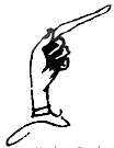 A beautiful fist on the cover of Used Books: Marking Readers in Renaissance England (William H. Sherman, University of Pennsylvania Press). William H. Sherman is Professor of English at the University of York. [Google]
[More] ⦿
A beautiful fist on the cover of Used Books: Marking Readers in Renaissance England (William H. Sherman, University of Pennsylvania Press). William H. Sherman is Professor of English at the University of York. [Google]
[More] ⦿
|
Zapf's fists
[Hermann Zapf]
|
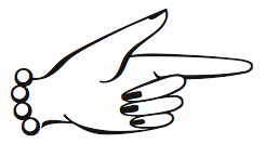 Hermann Zapf drew a whole bunch of fists for his Linotype Zapfino Ornaments in 1998. [Google]
[More] ⦿
Hermann Zapf drew a whole bunch of fists for his Linotype Zapfino Ornaments in 1998. [Google]
[More] ⦿
|

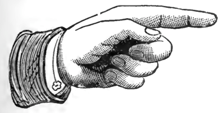
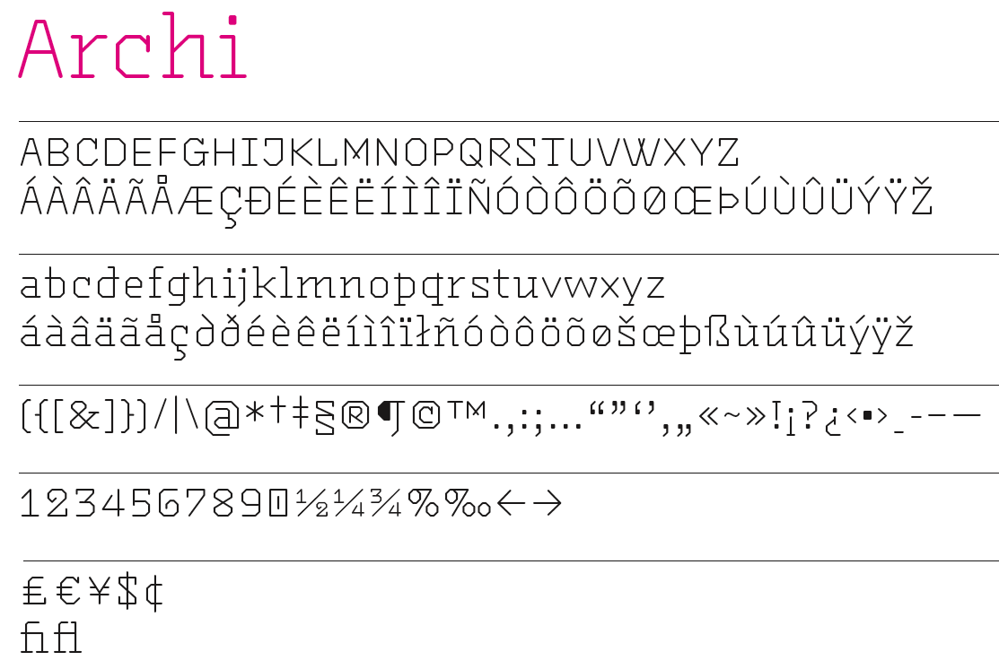
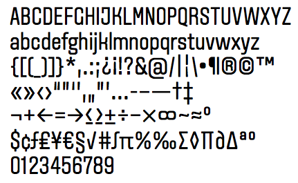
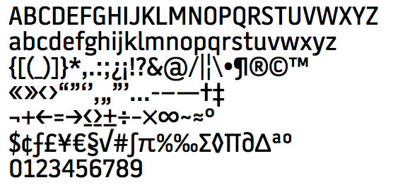
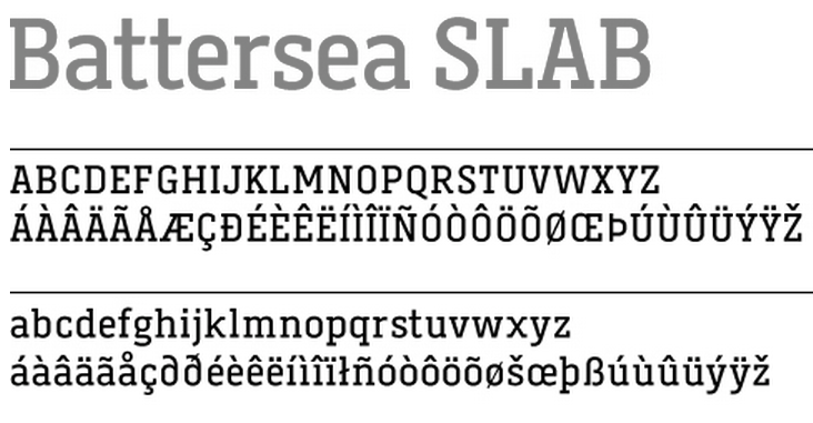
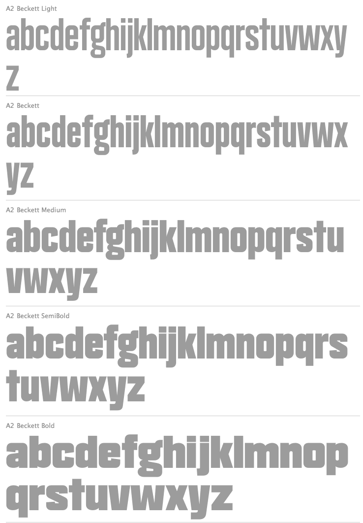
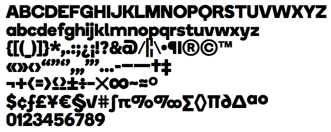
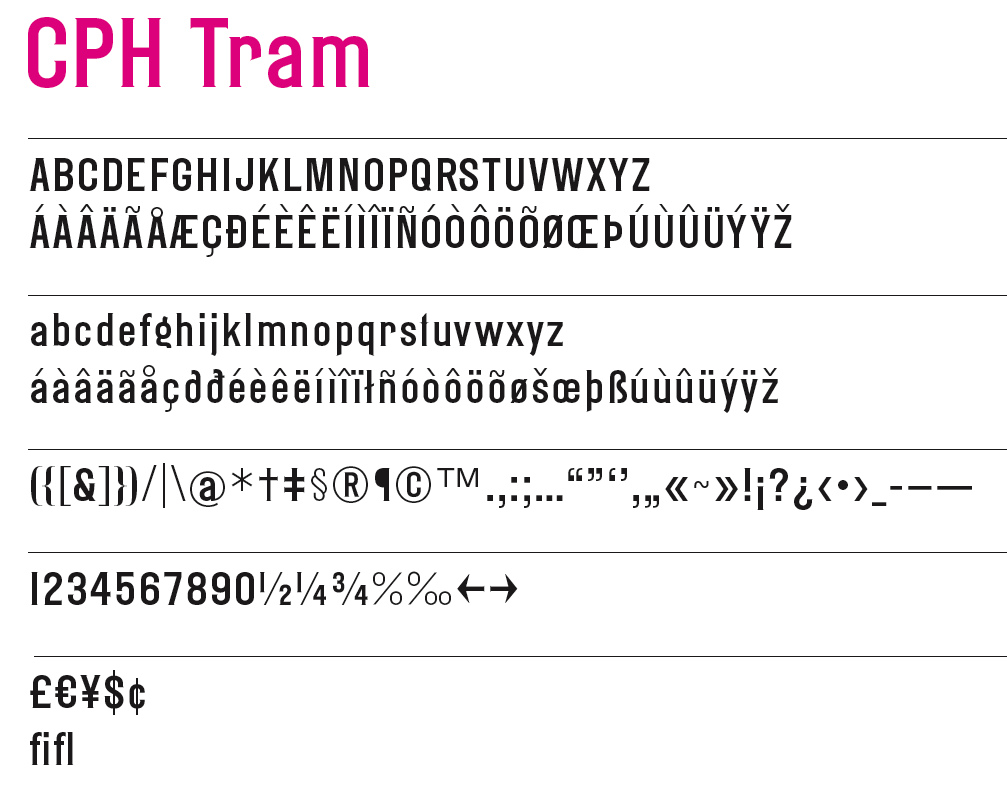
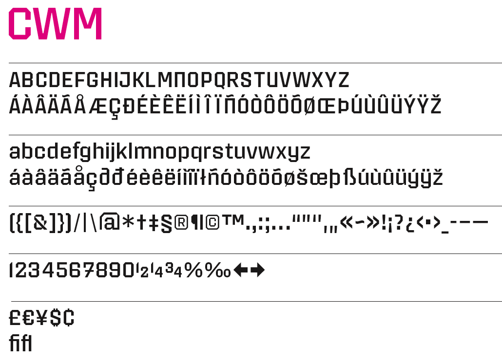
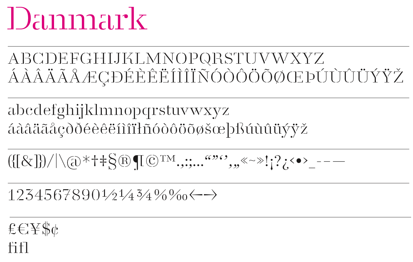
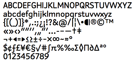
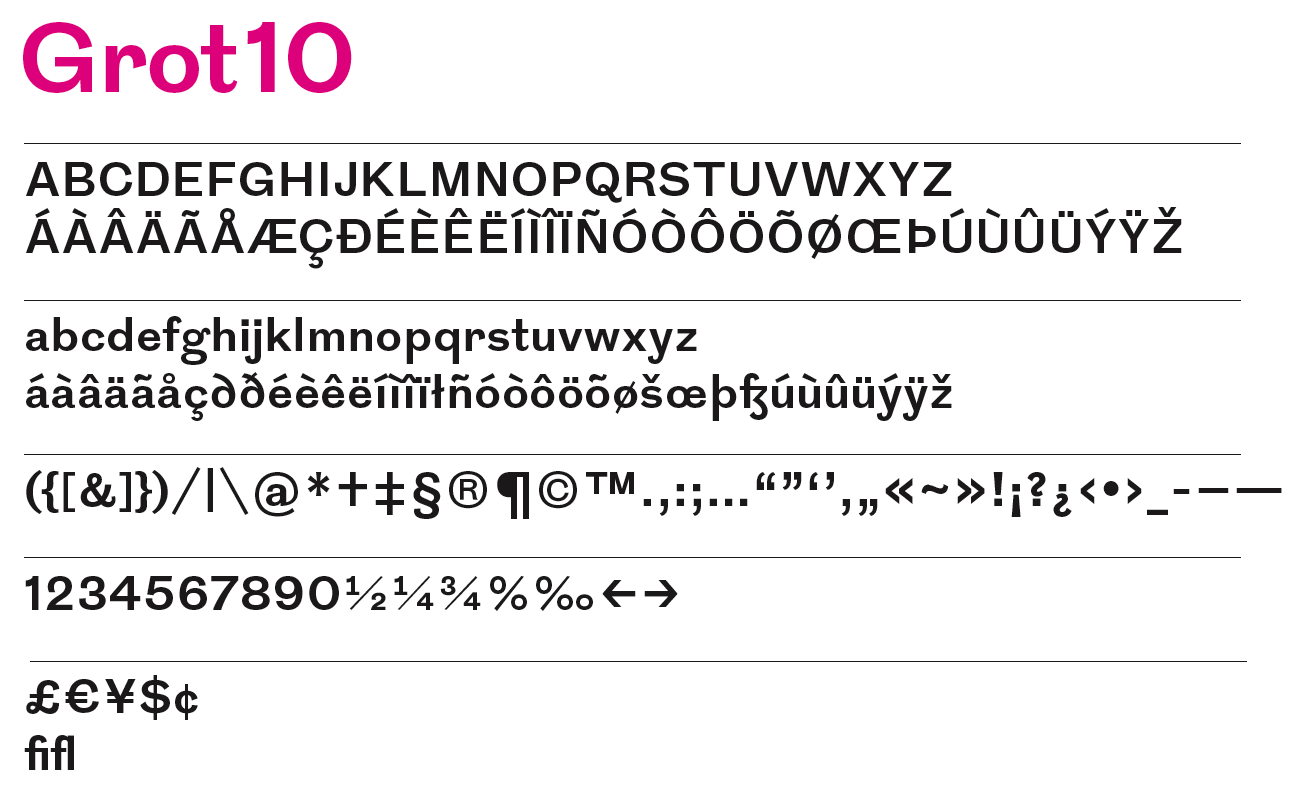
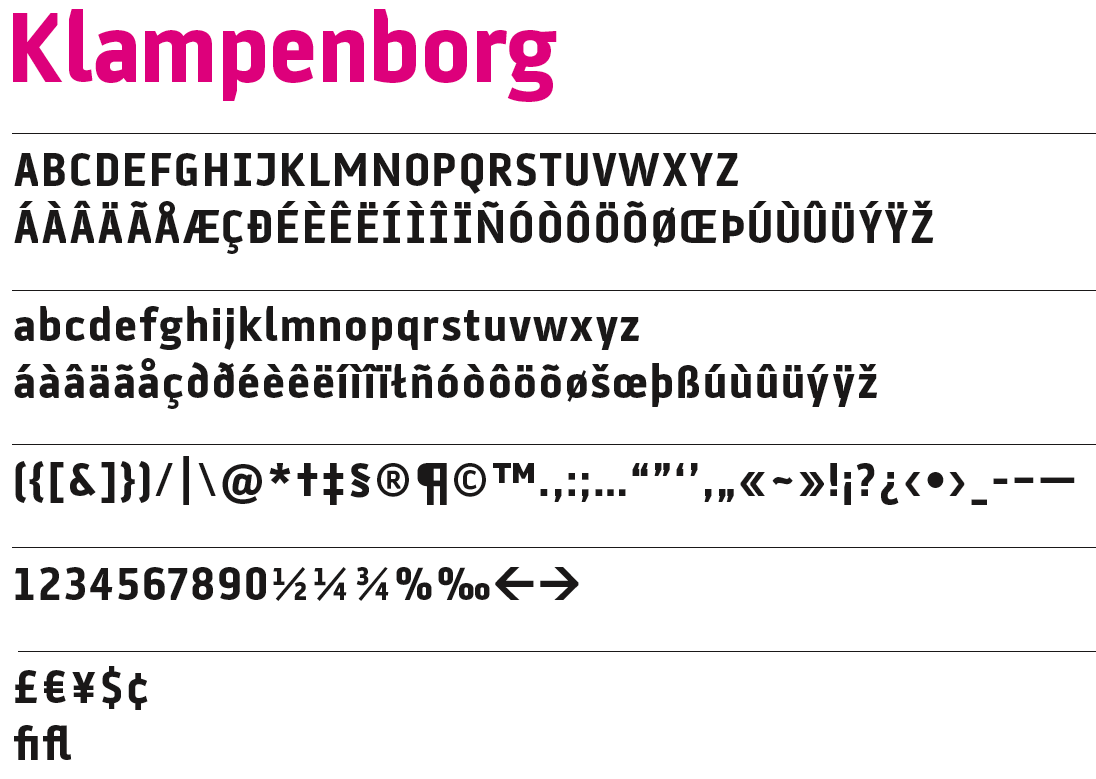
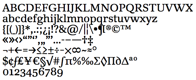
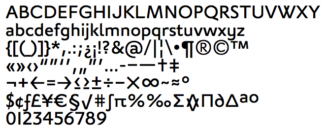
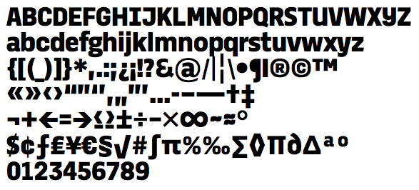
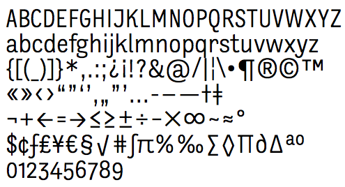
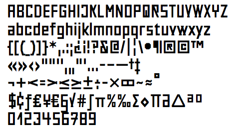
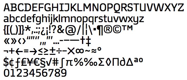
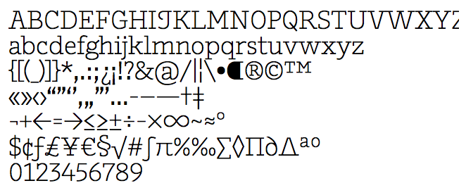
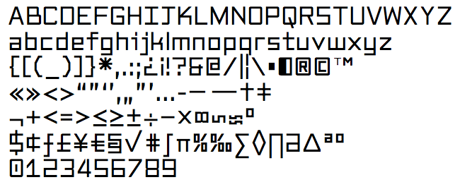
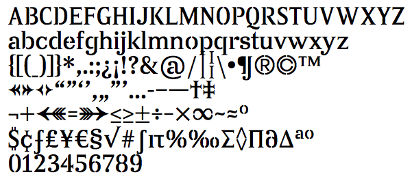
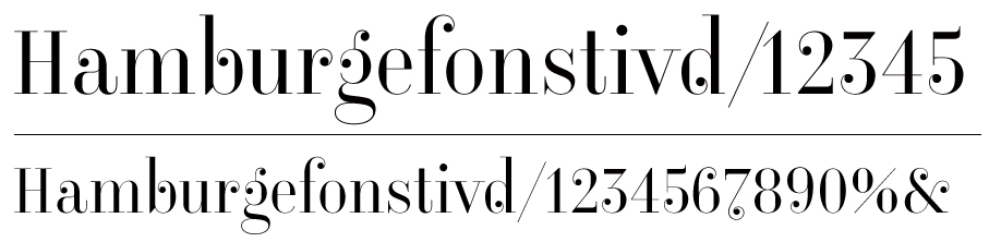
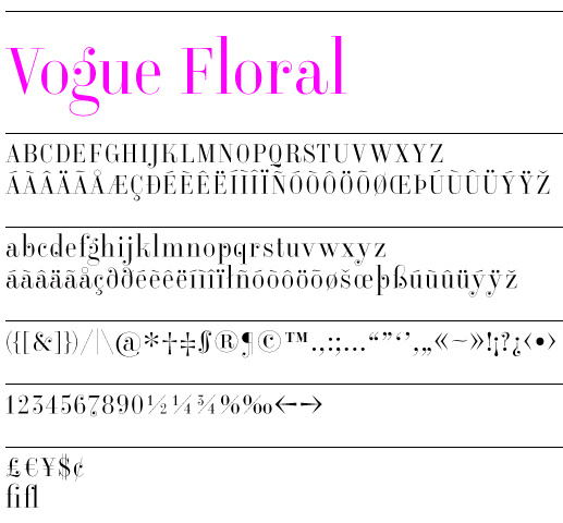
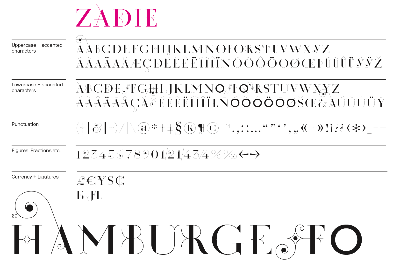
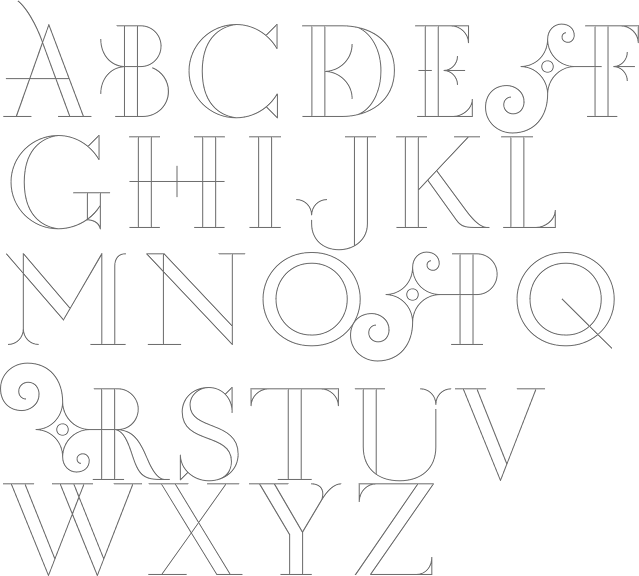
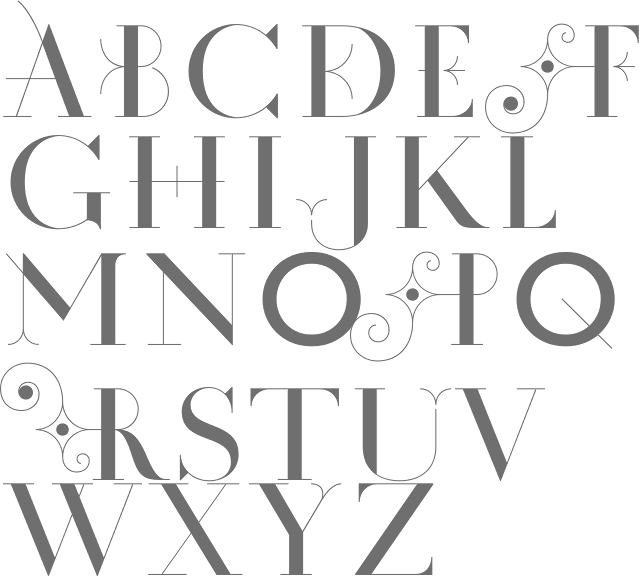
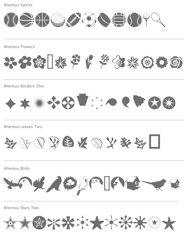
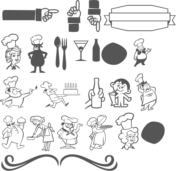
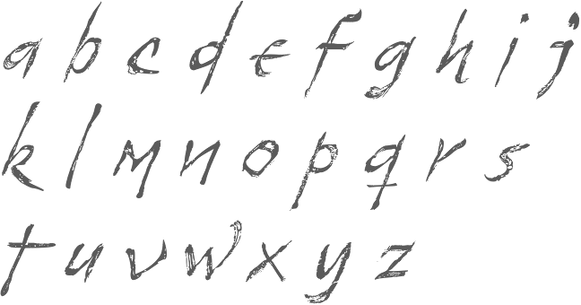
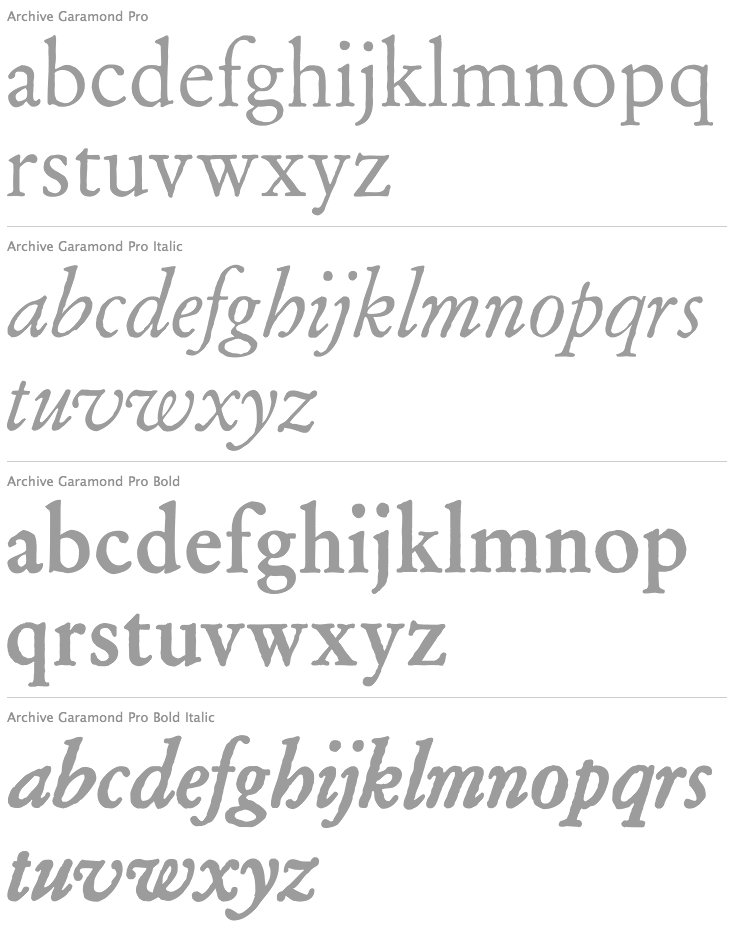
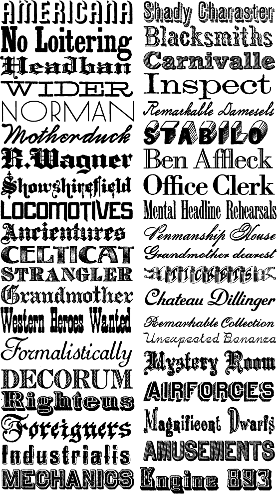
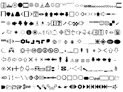
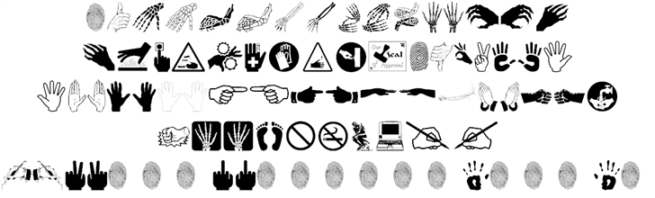
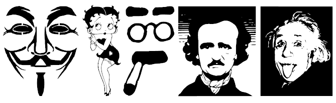
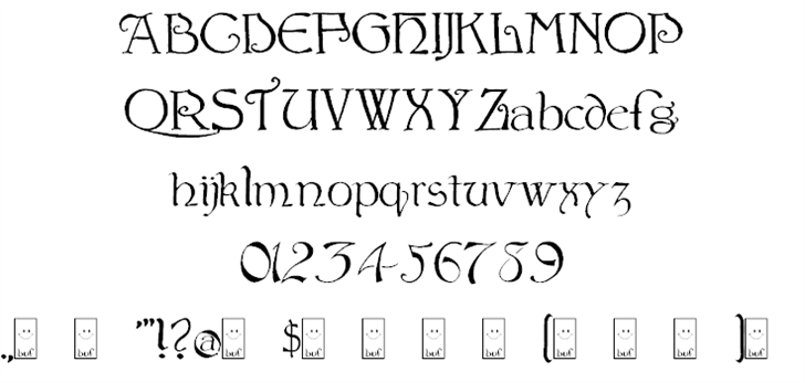
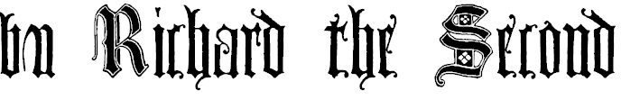
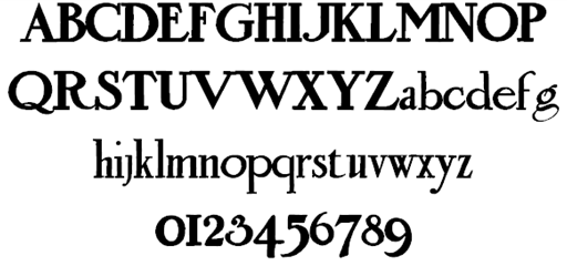
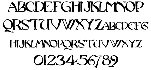
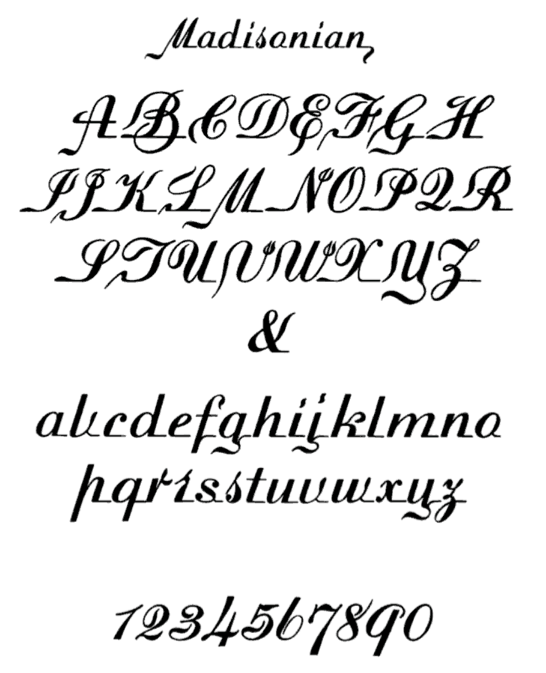
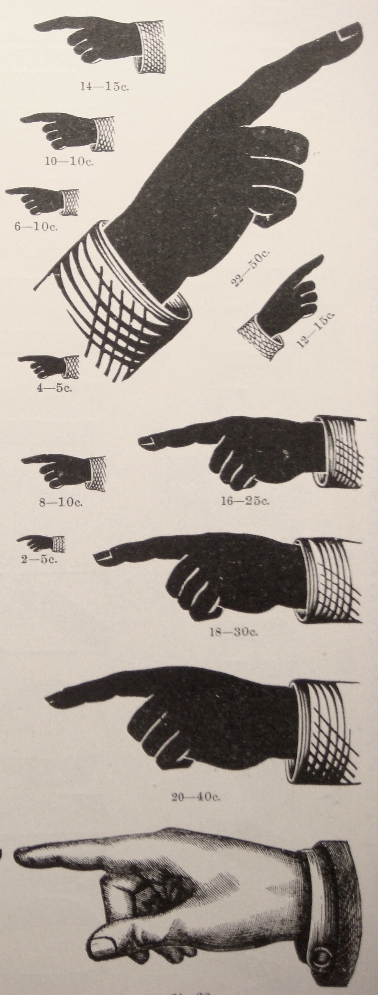
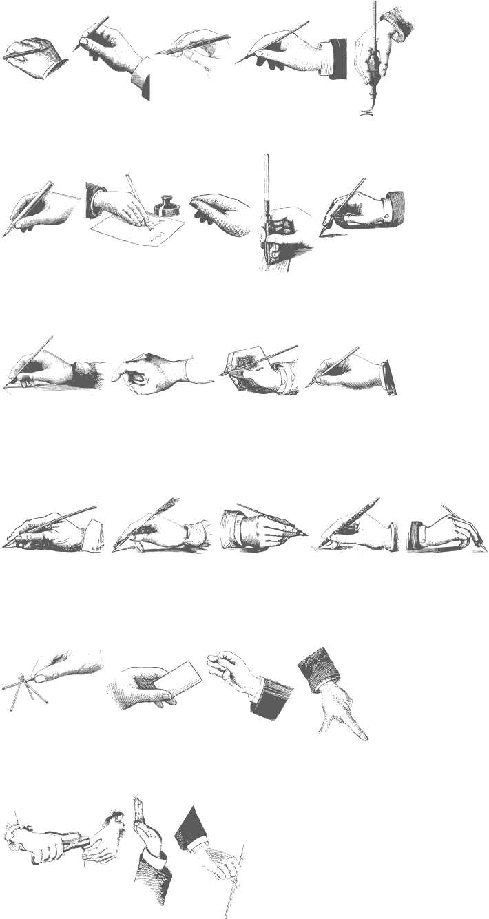
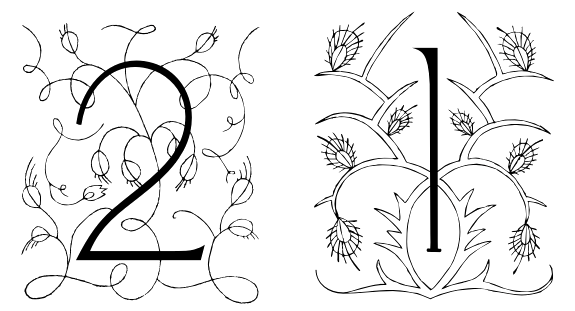
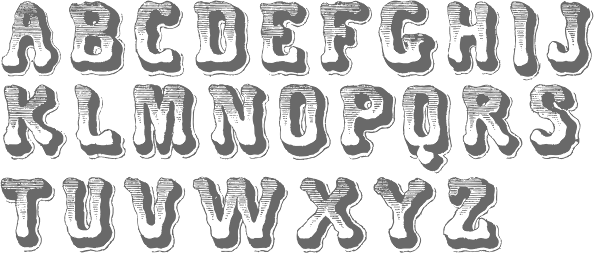
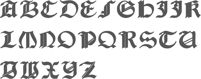
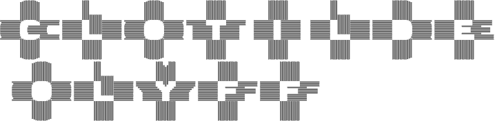
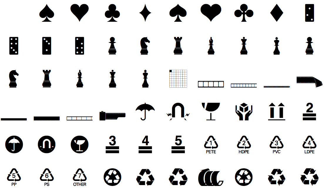
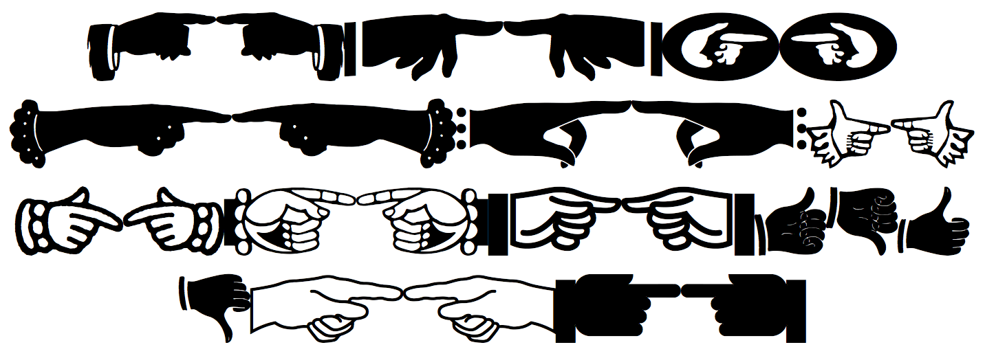
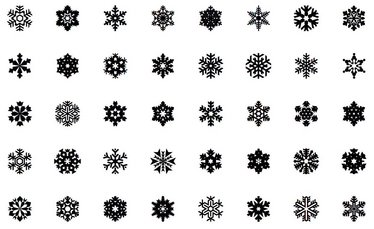
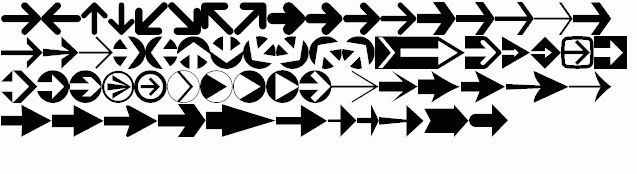
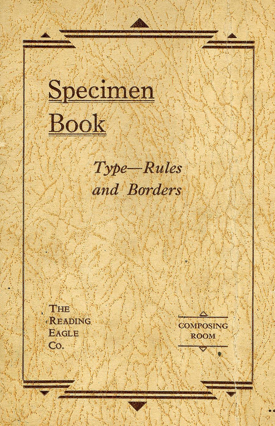
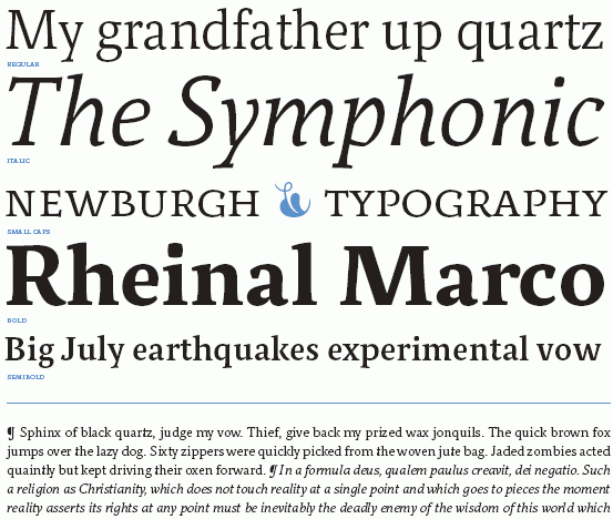
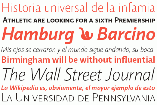
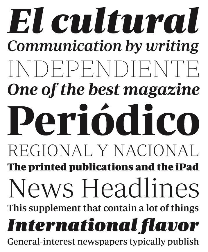
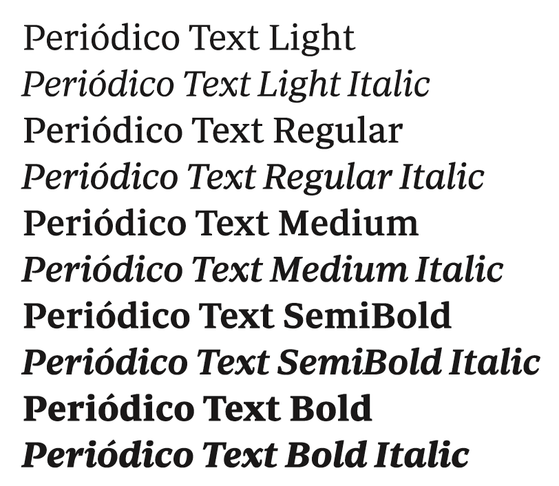
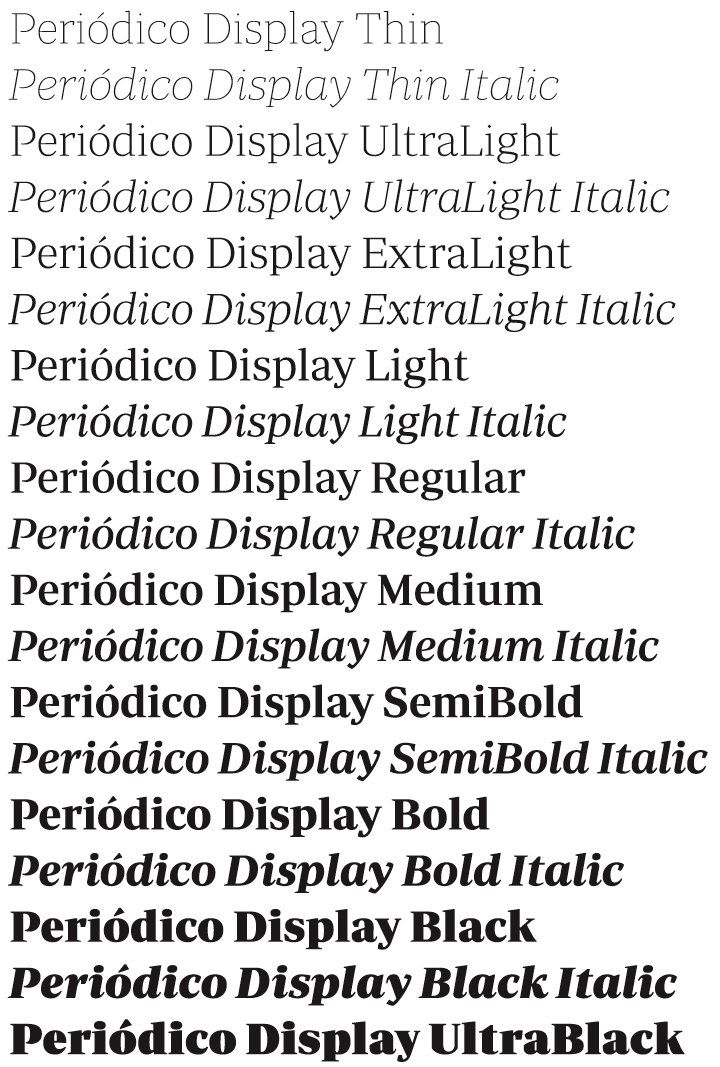
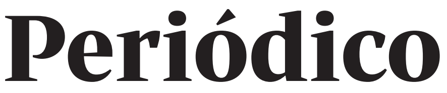
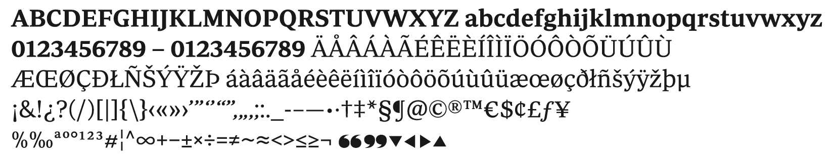
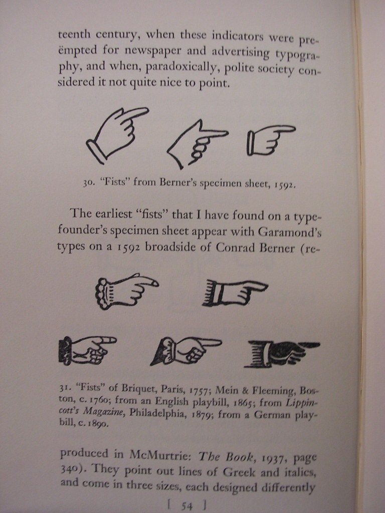
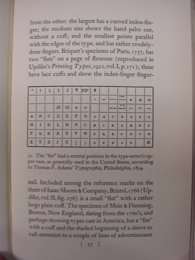
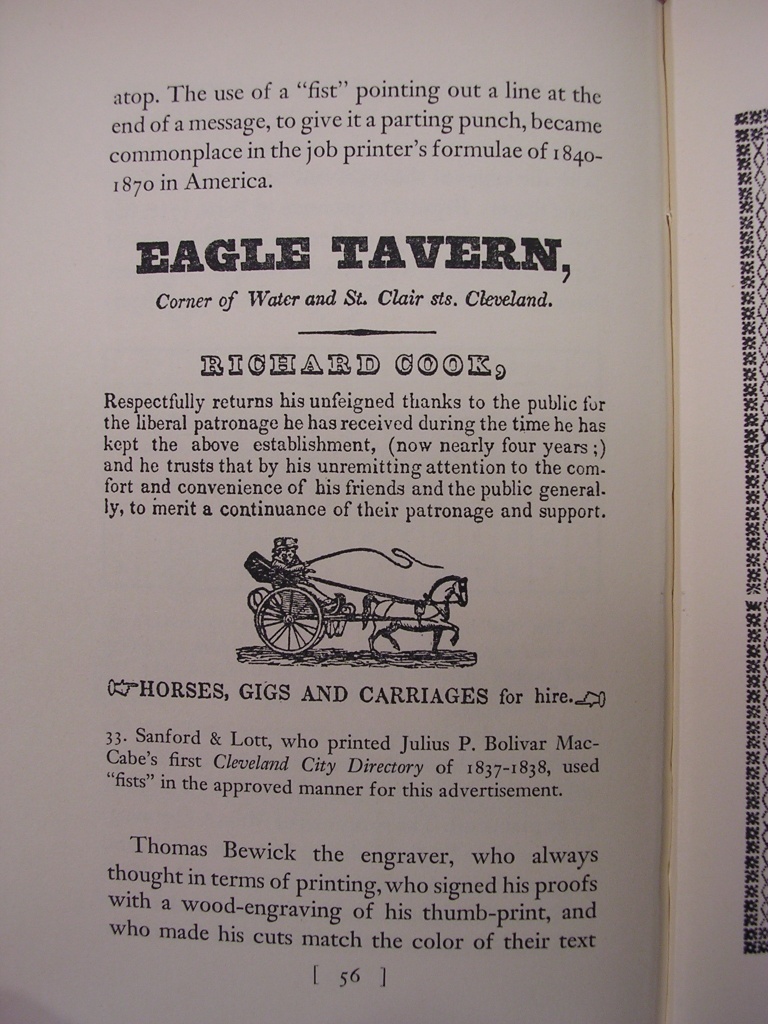
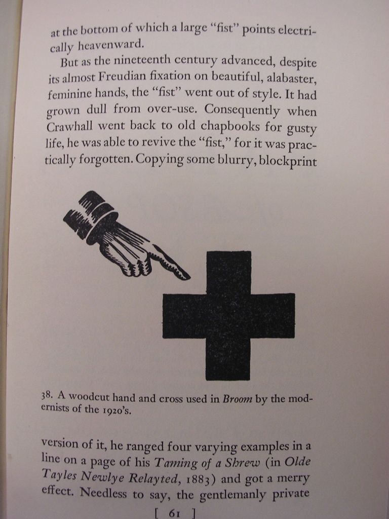
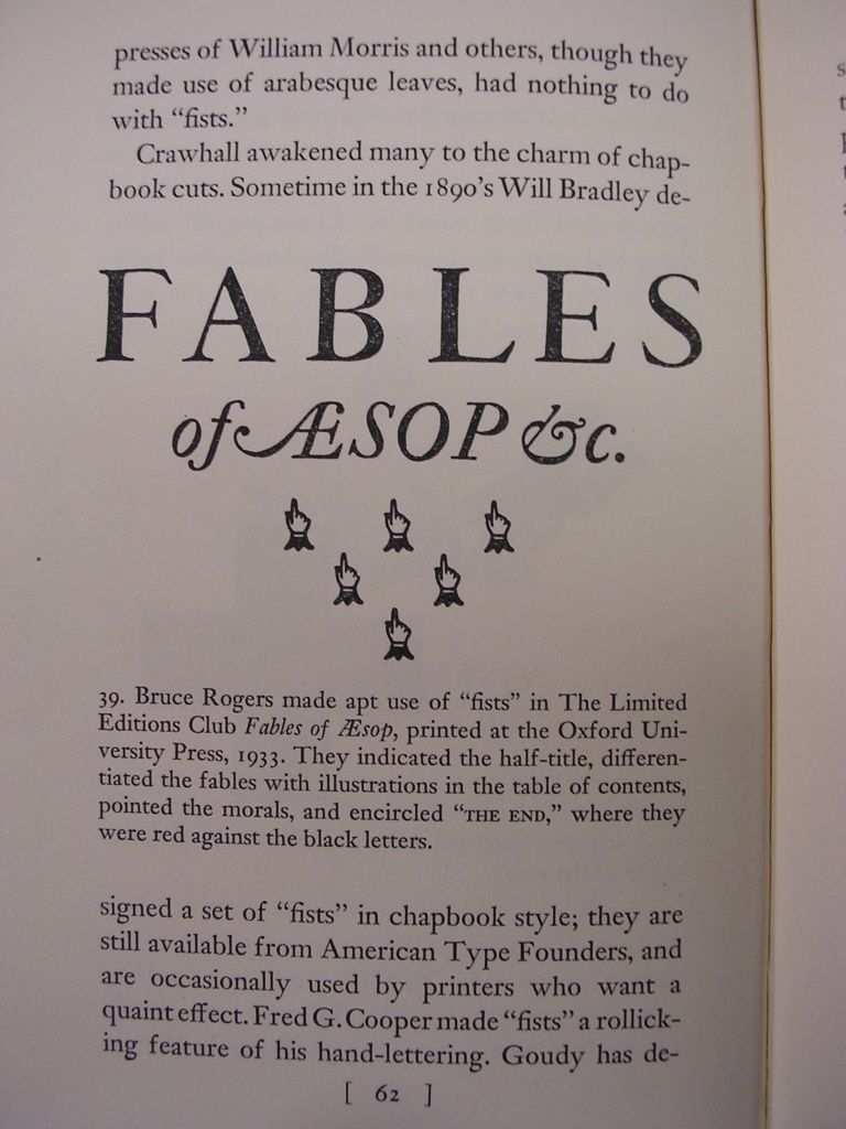
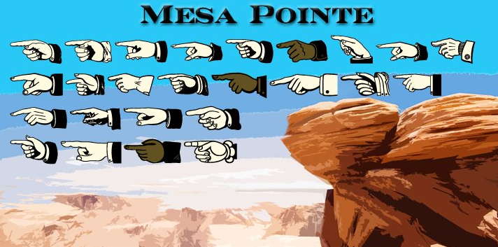
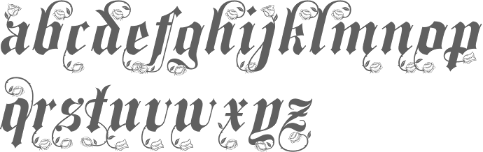
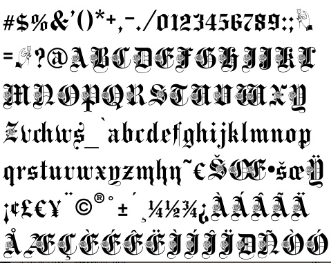
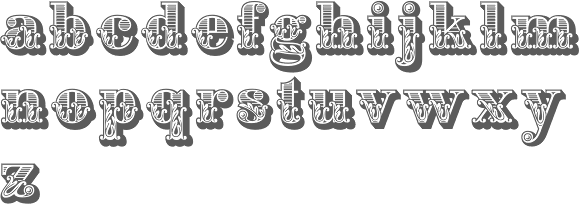
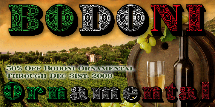
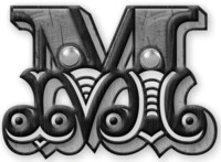
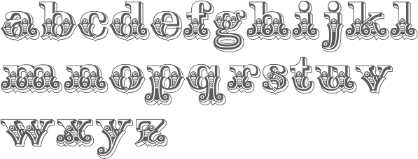
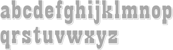
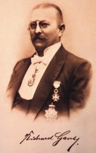
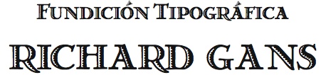
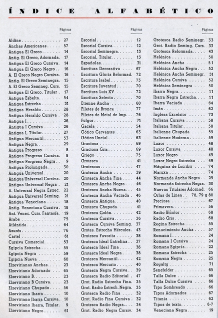
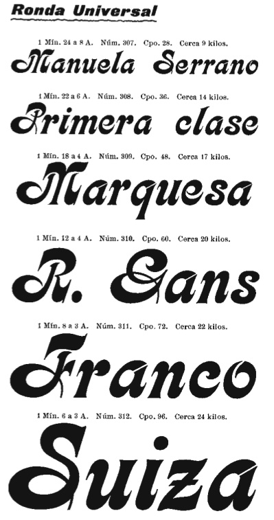
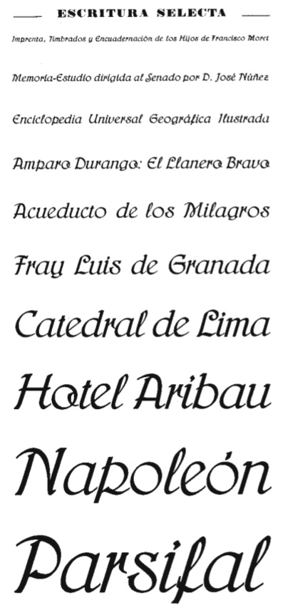
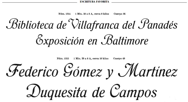
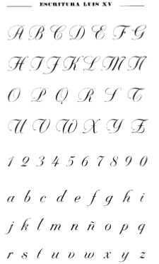
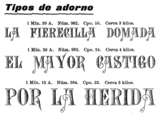
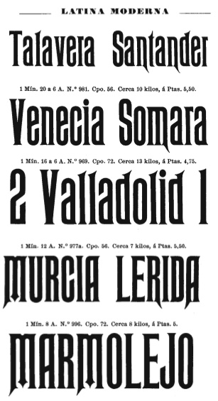
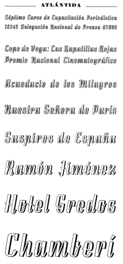
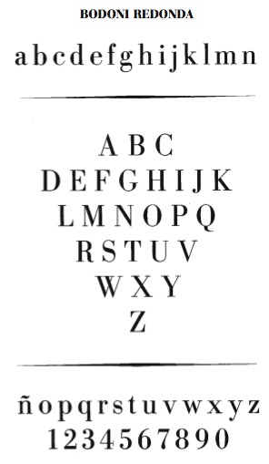
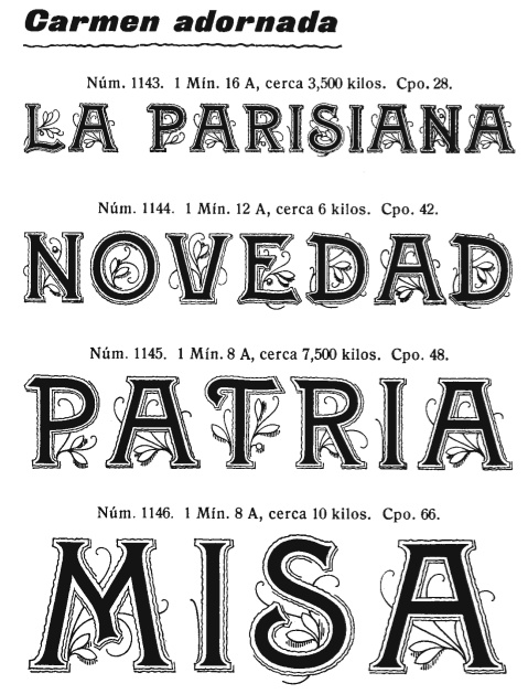
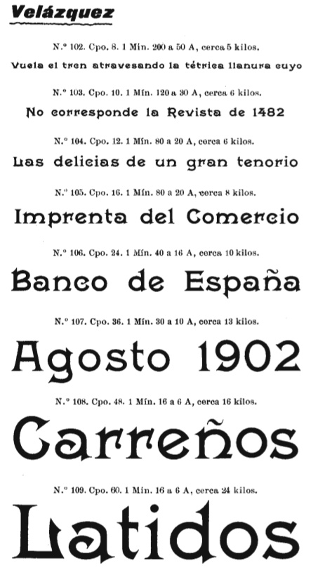
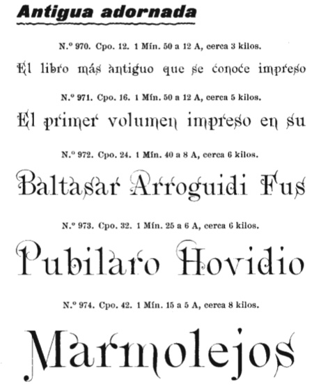
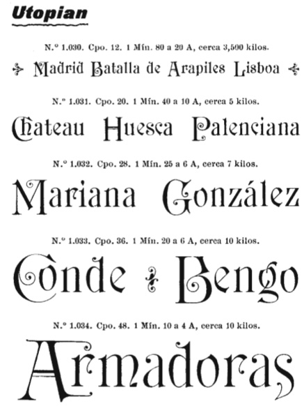
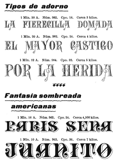
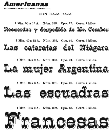
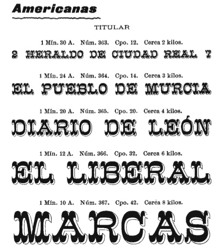
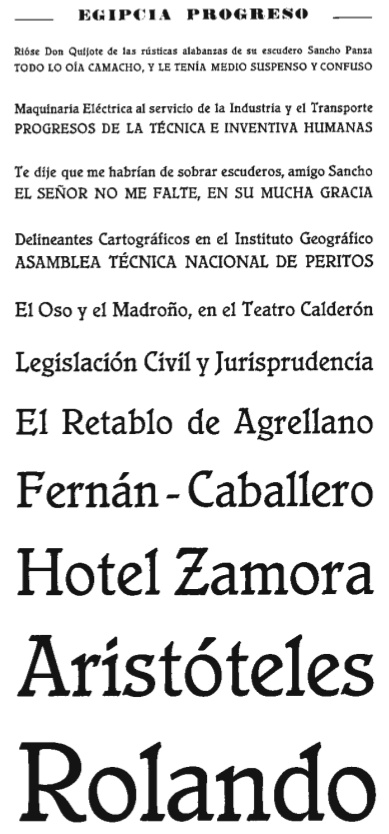
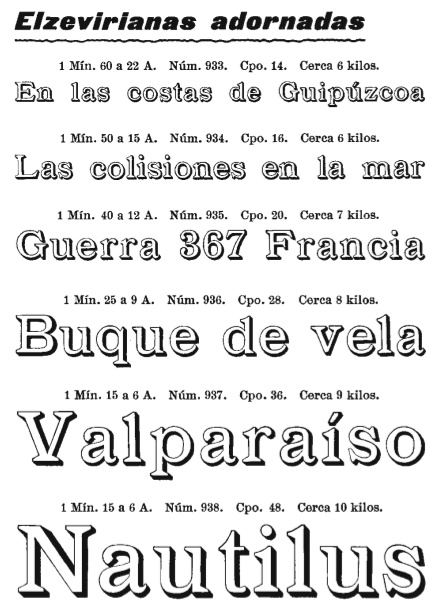
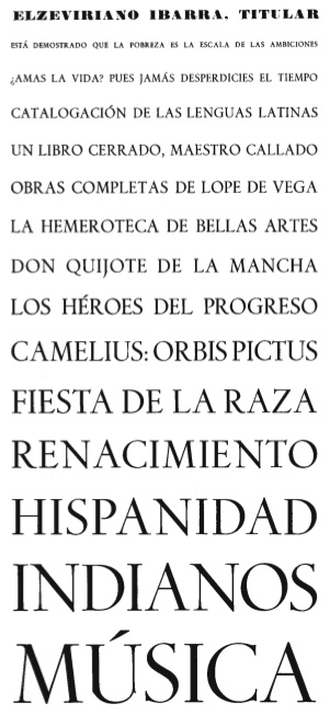
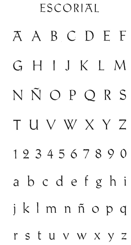
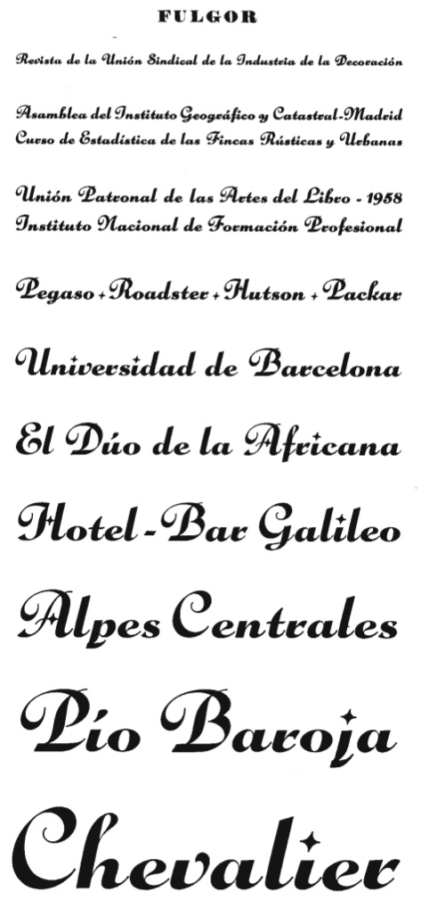
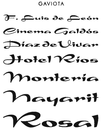
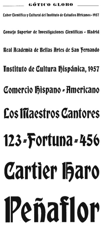
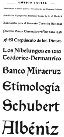
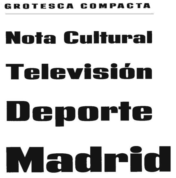
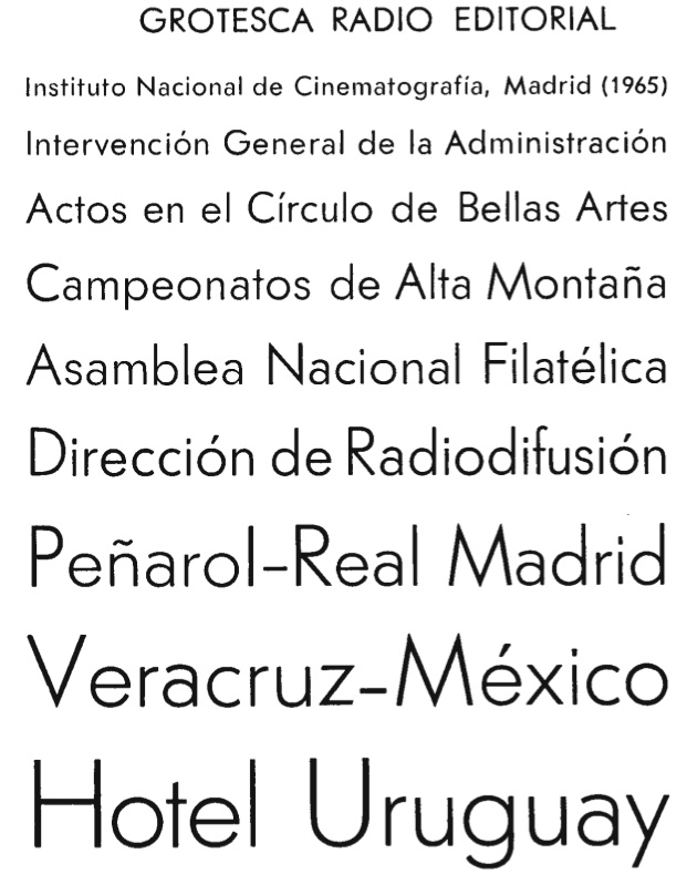
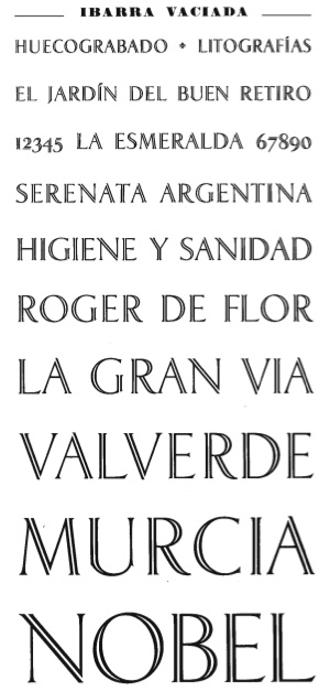
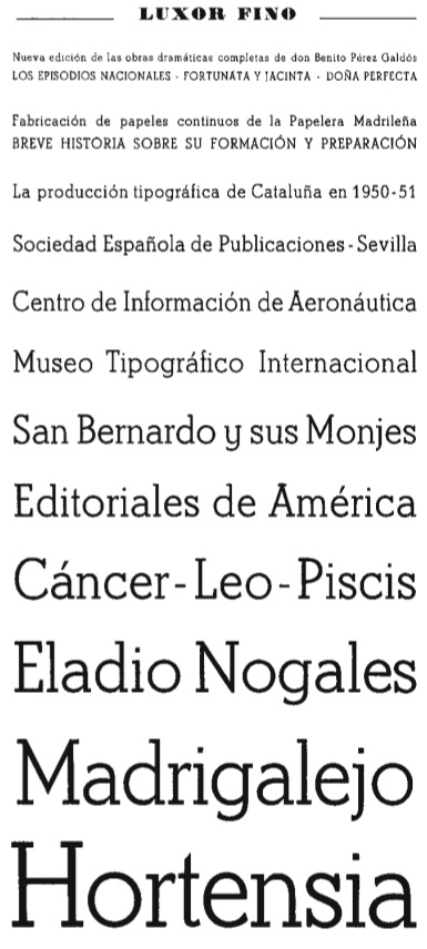
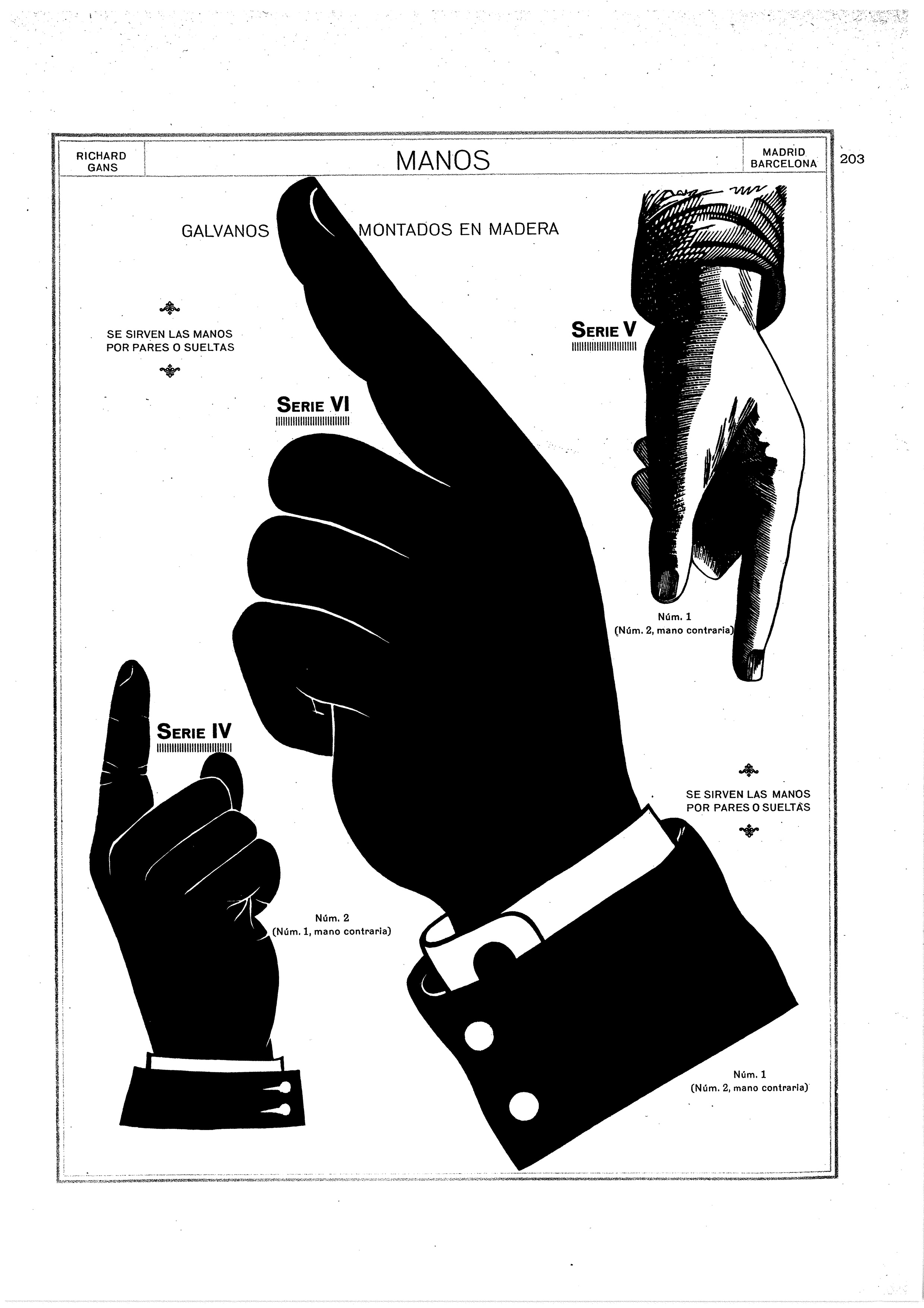
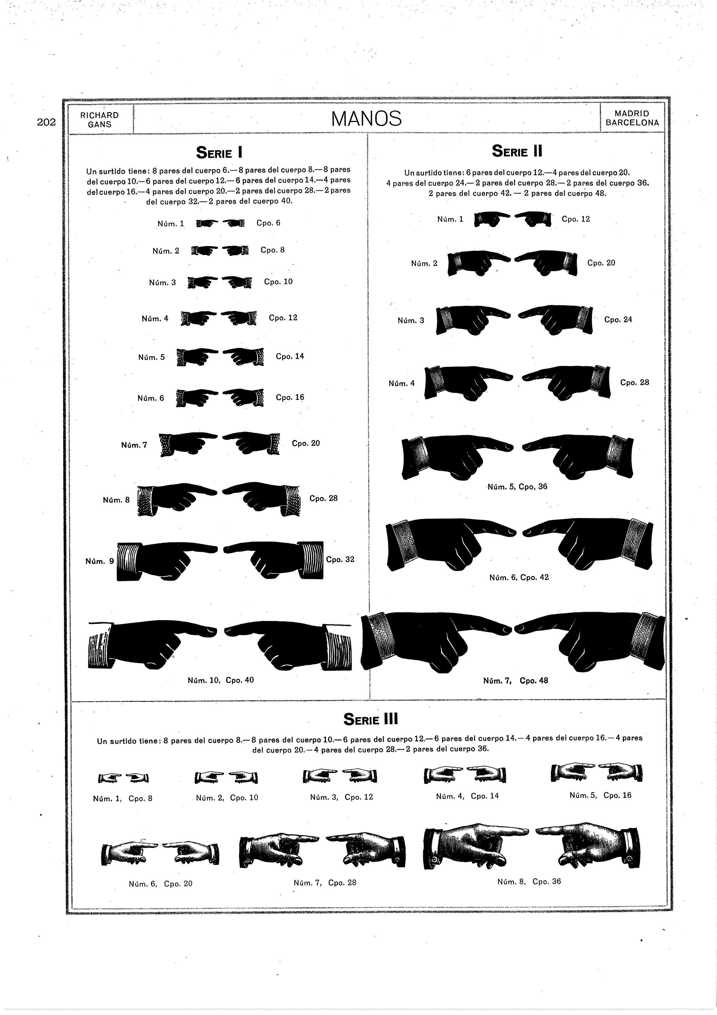
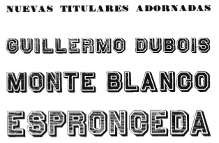
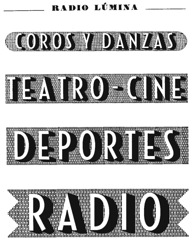
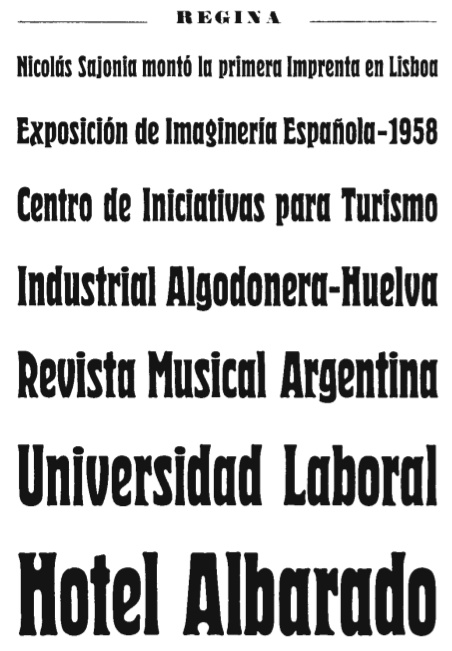
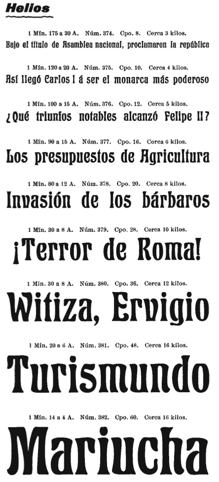
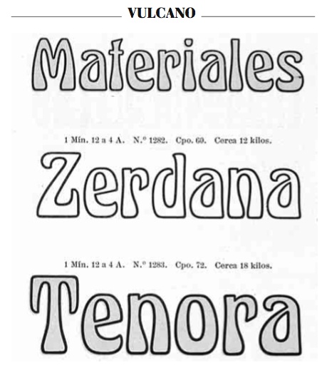
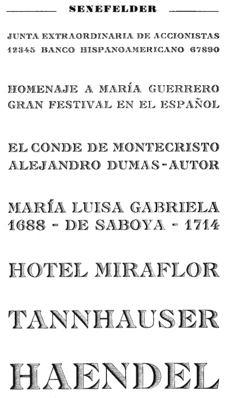
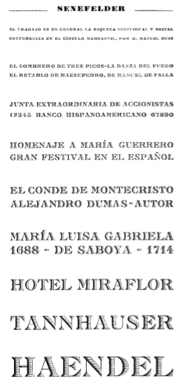
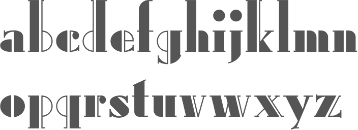
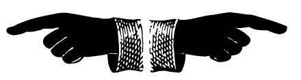
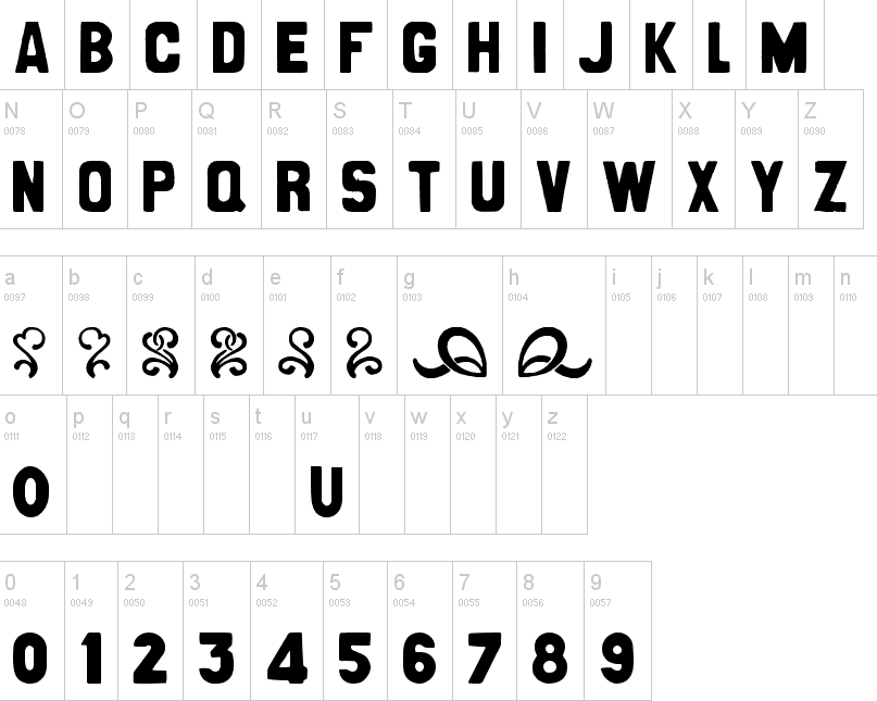
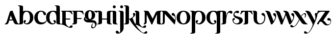
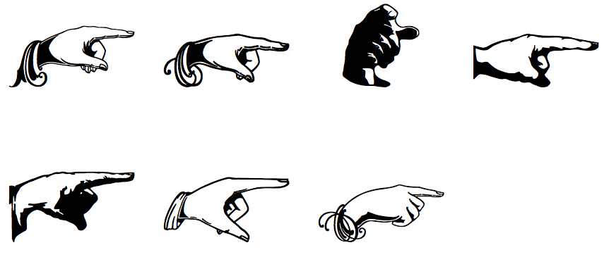
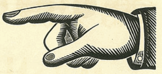
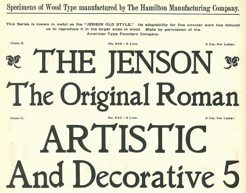
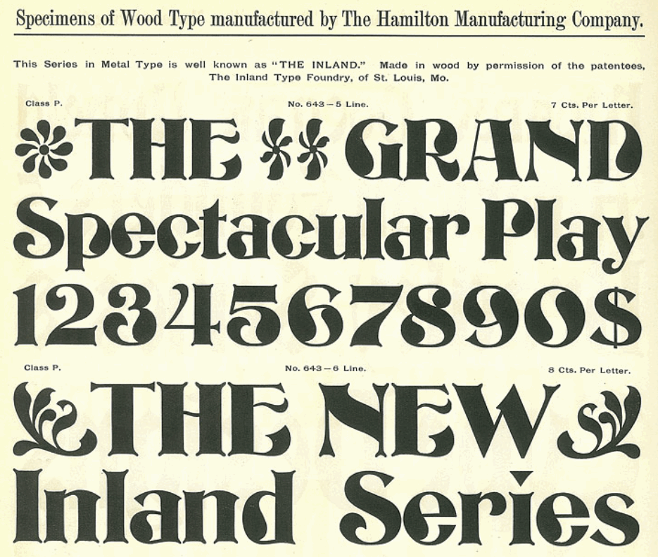
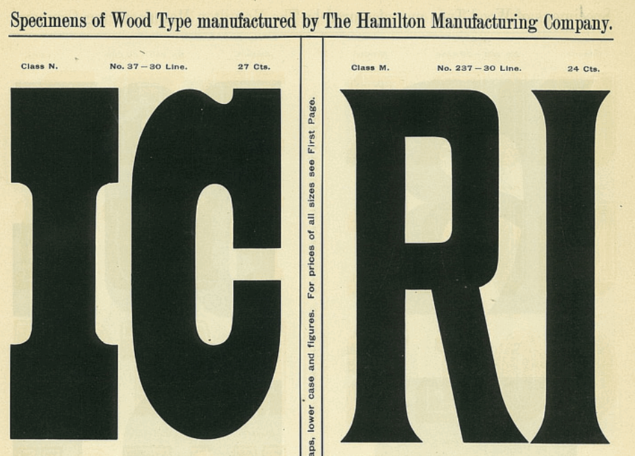
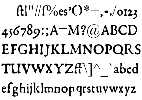
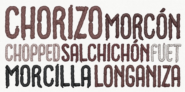
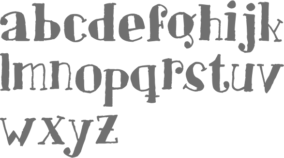
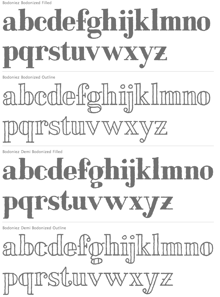
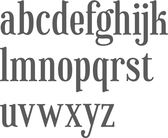
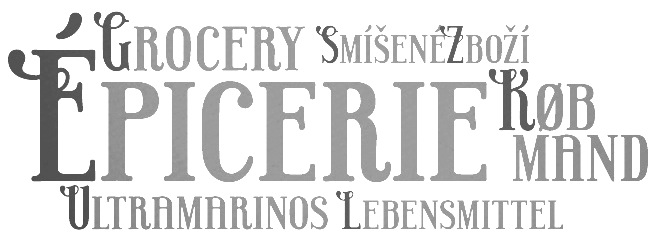
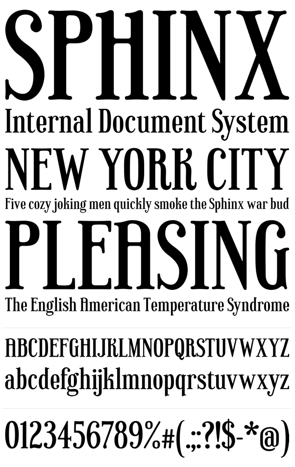
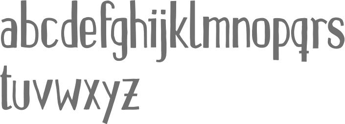
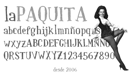
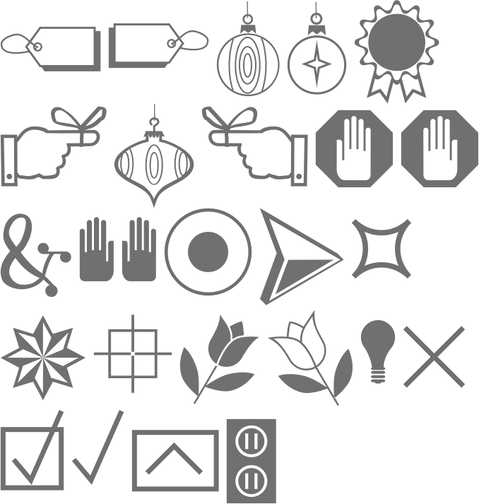
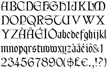
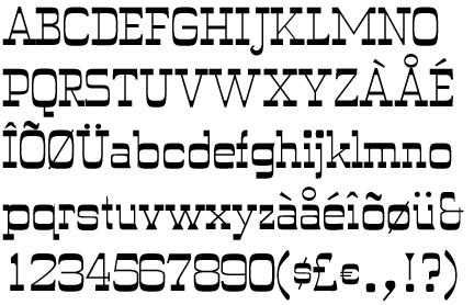
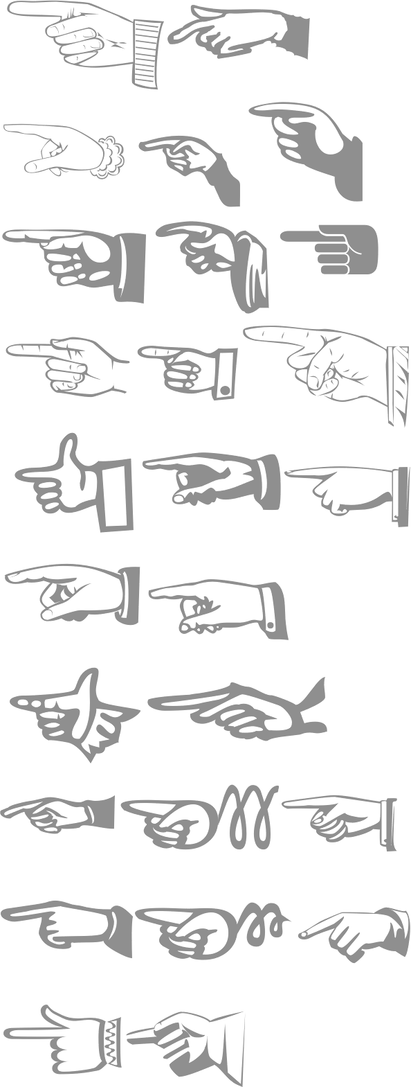
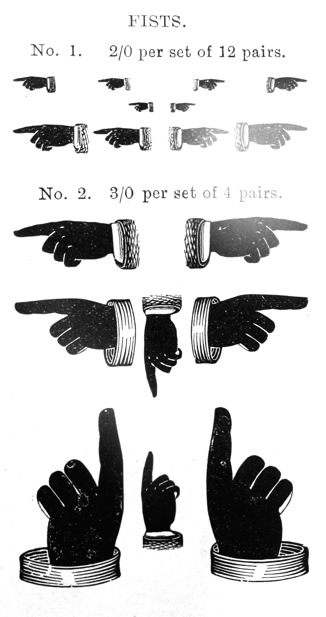
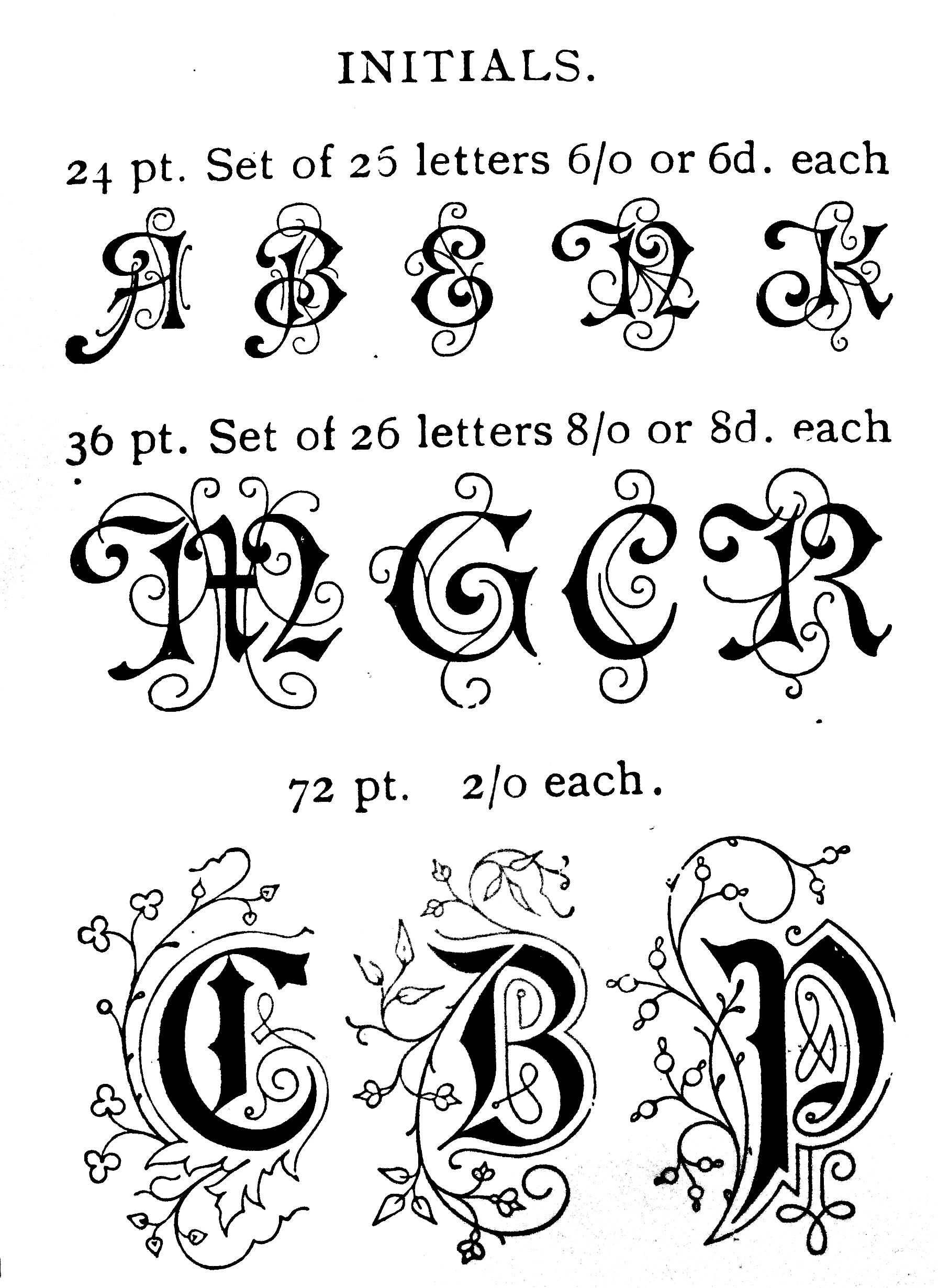
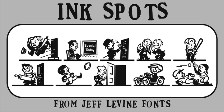
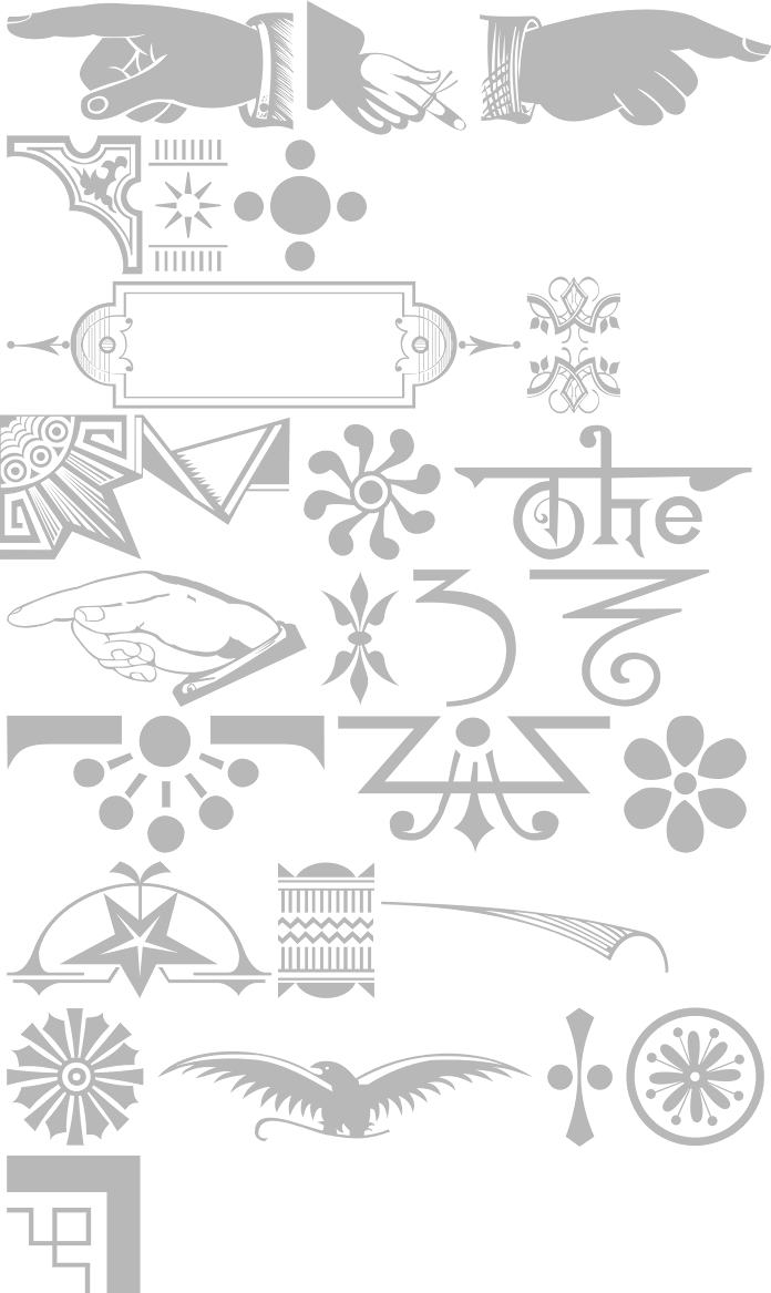
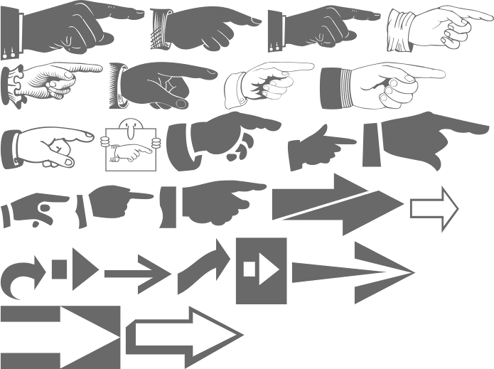
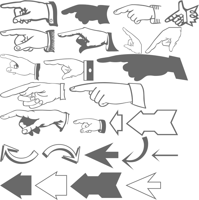
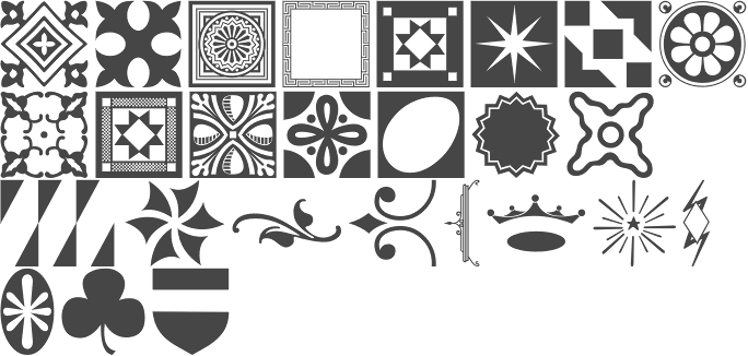
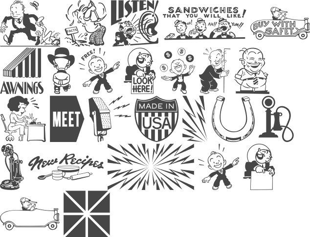
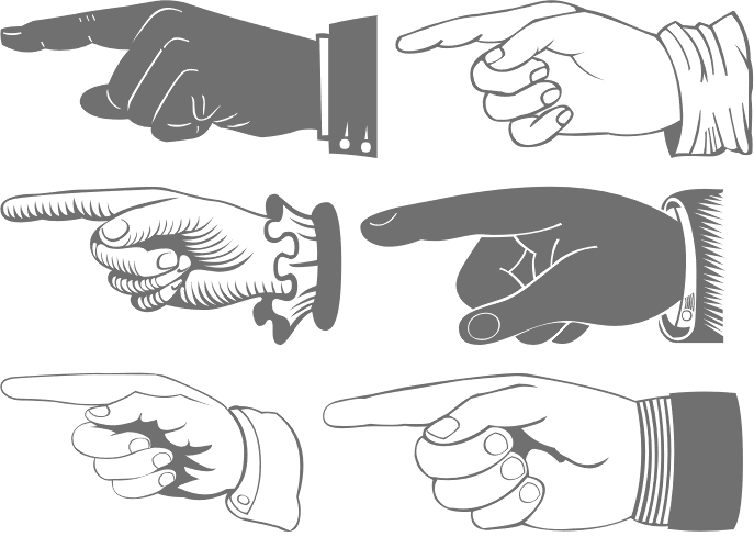
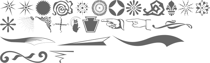
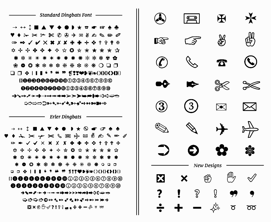
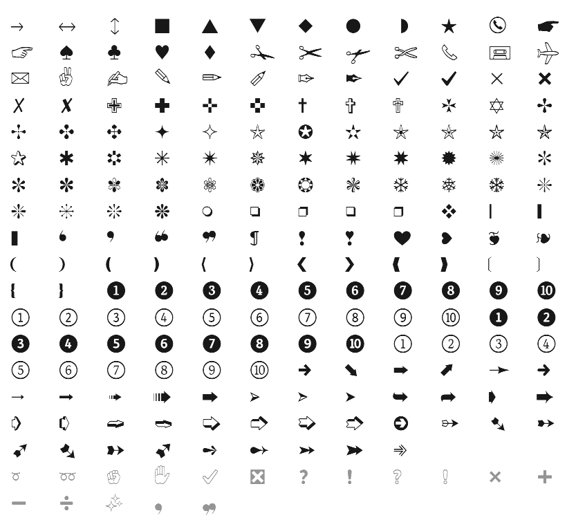
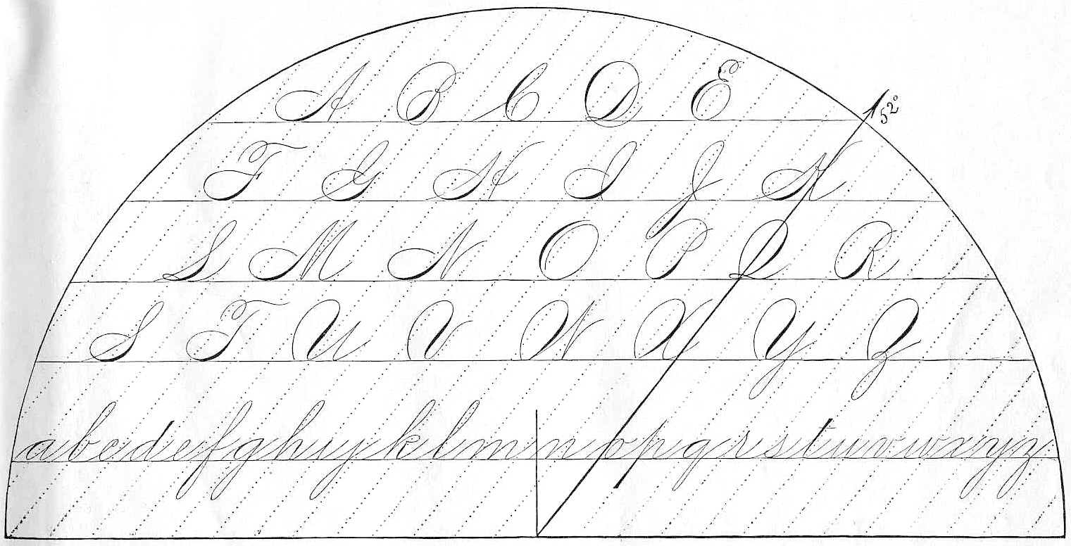
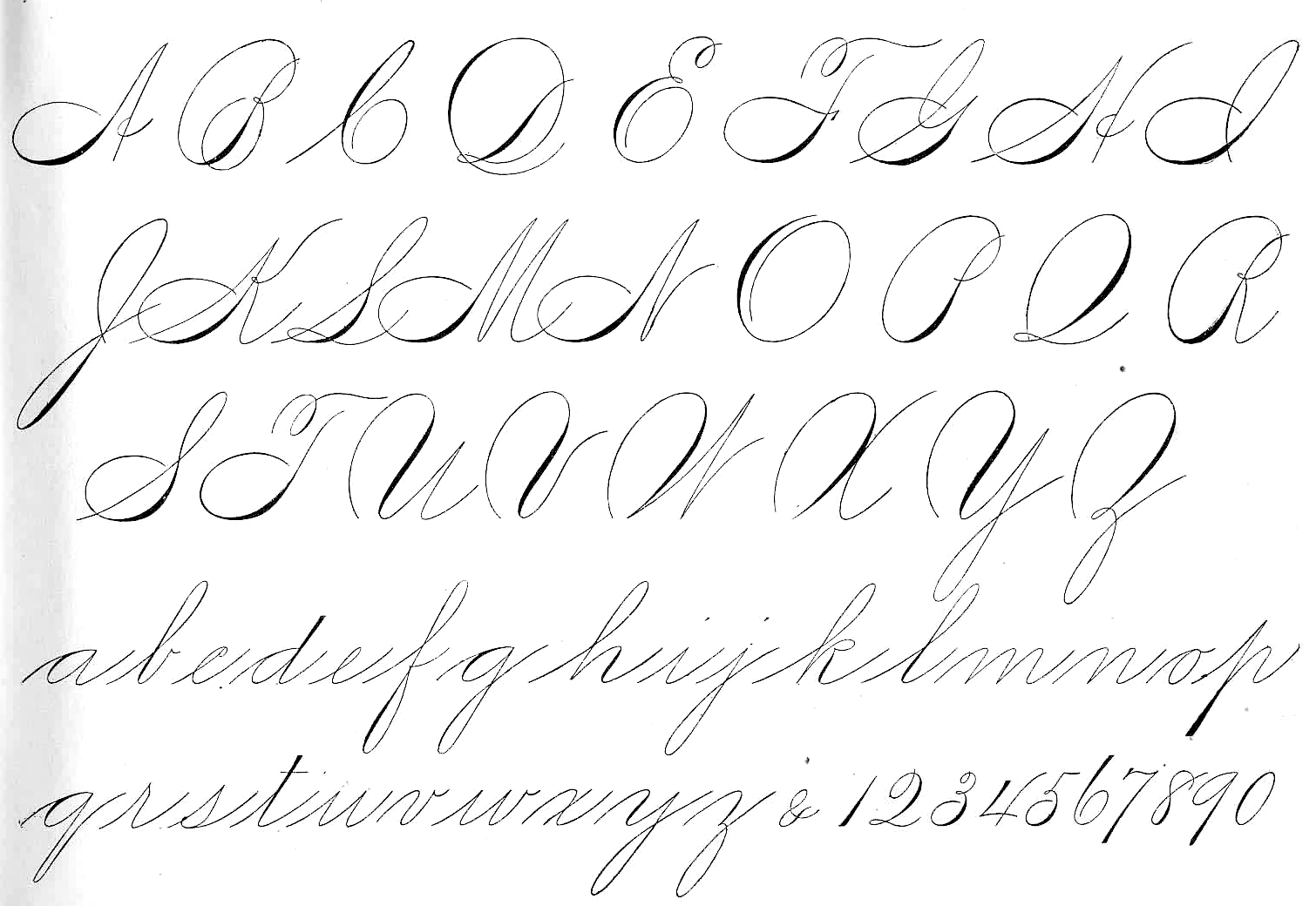
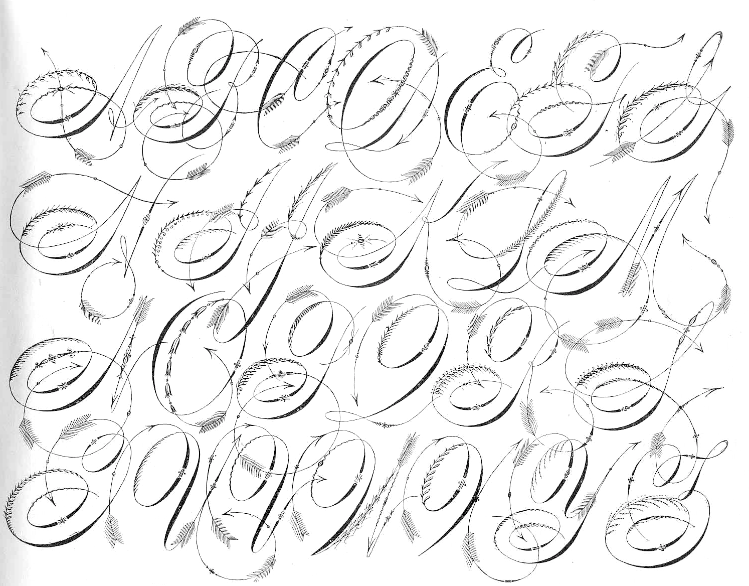
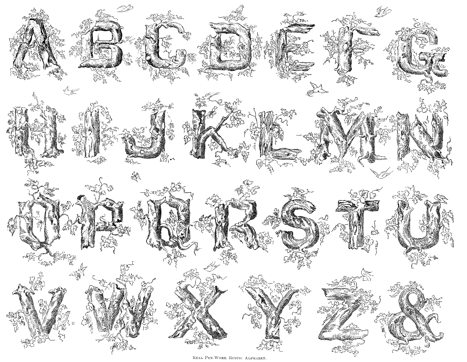
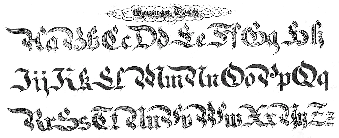
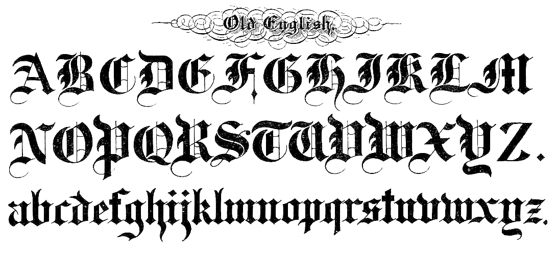
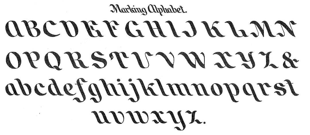
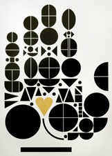
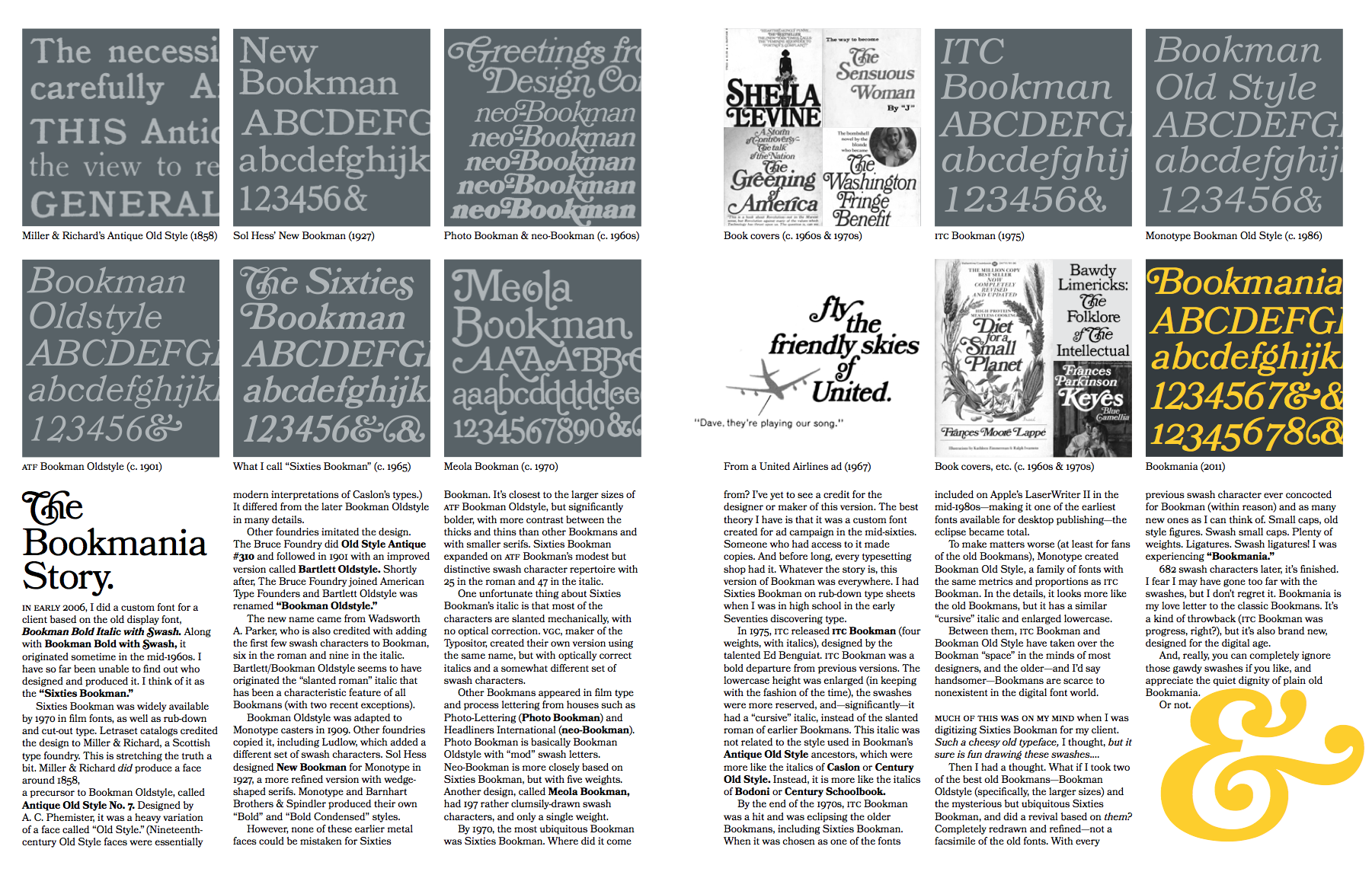
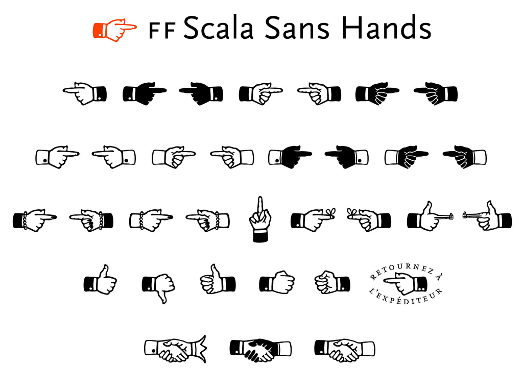
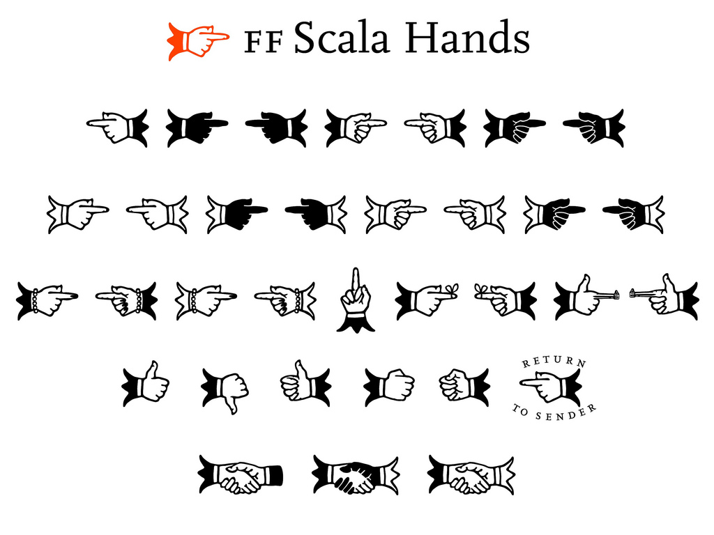
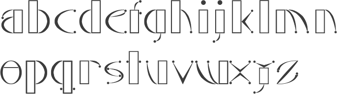
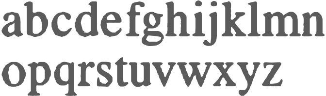
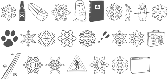
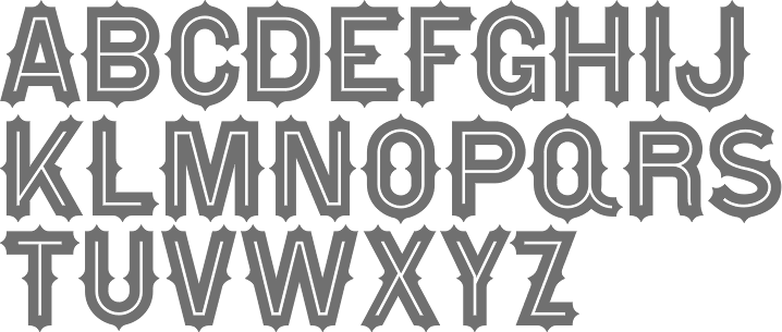
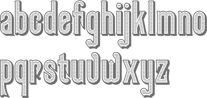
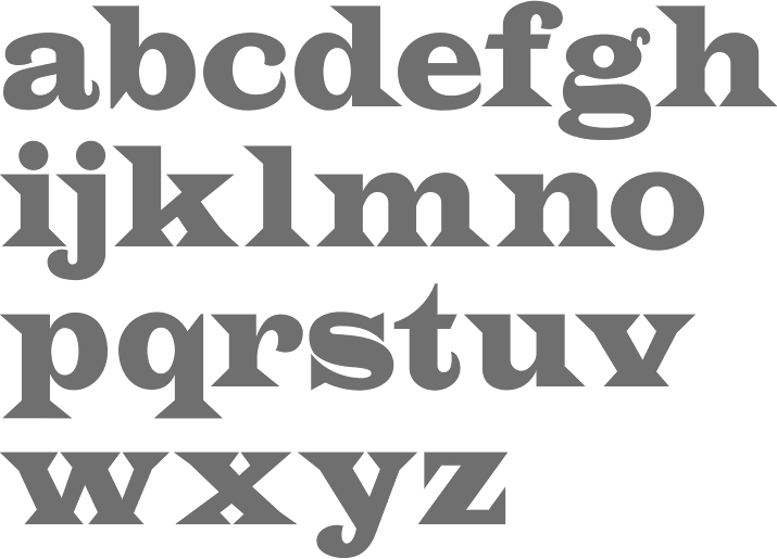
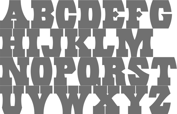
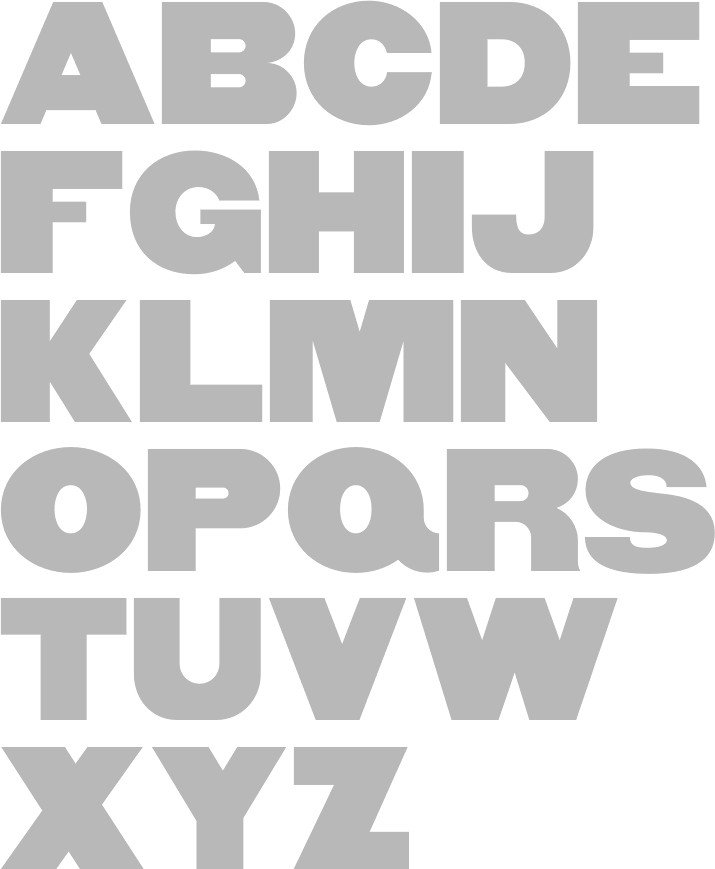
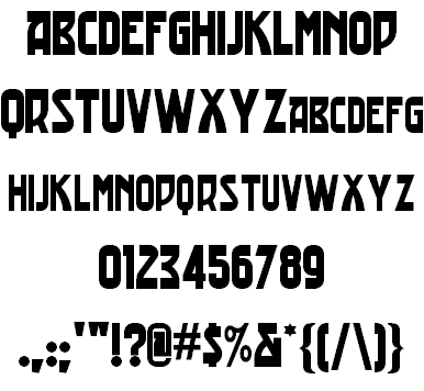
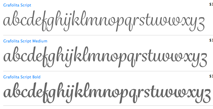
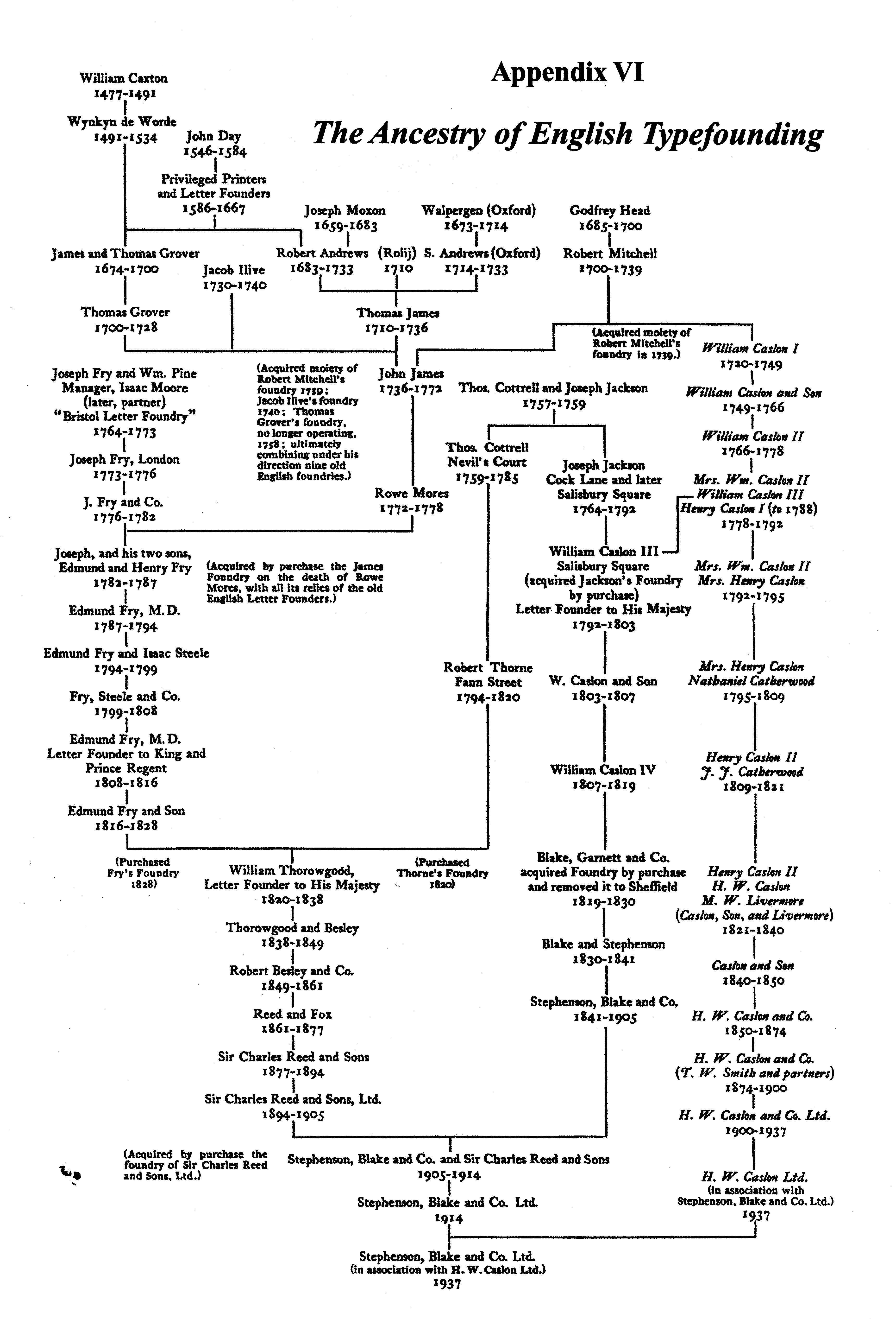
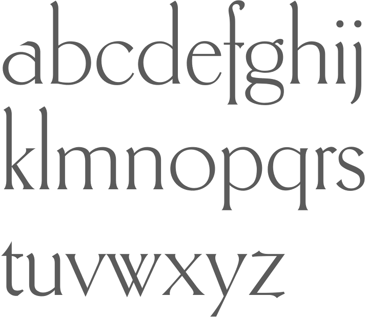
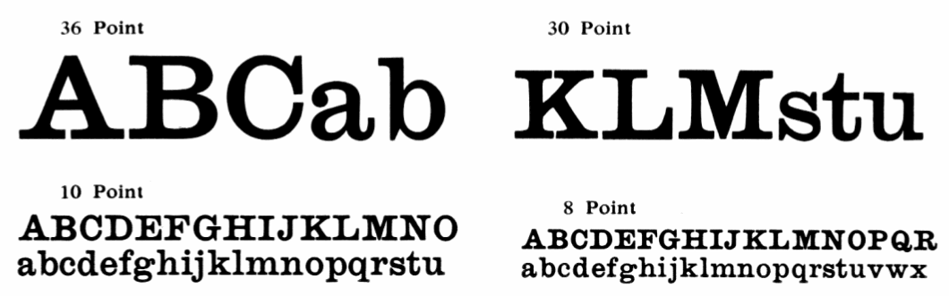
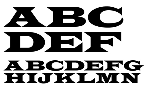
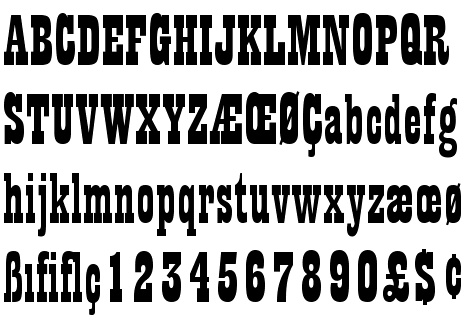
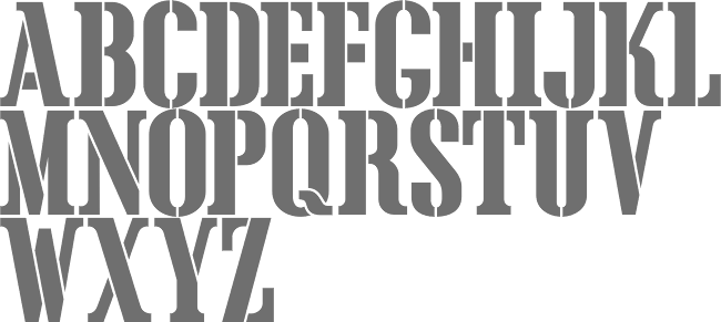
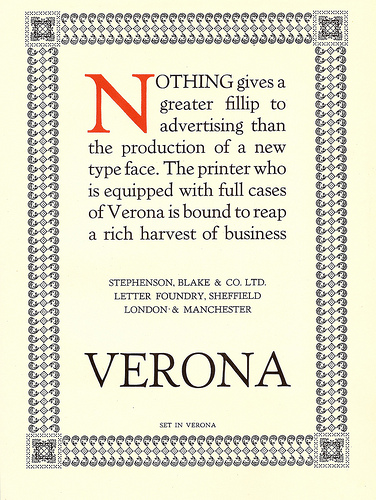
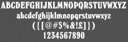
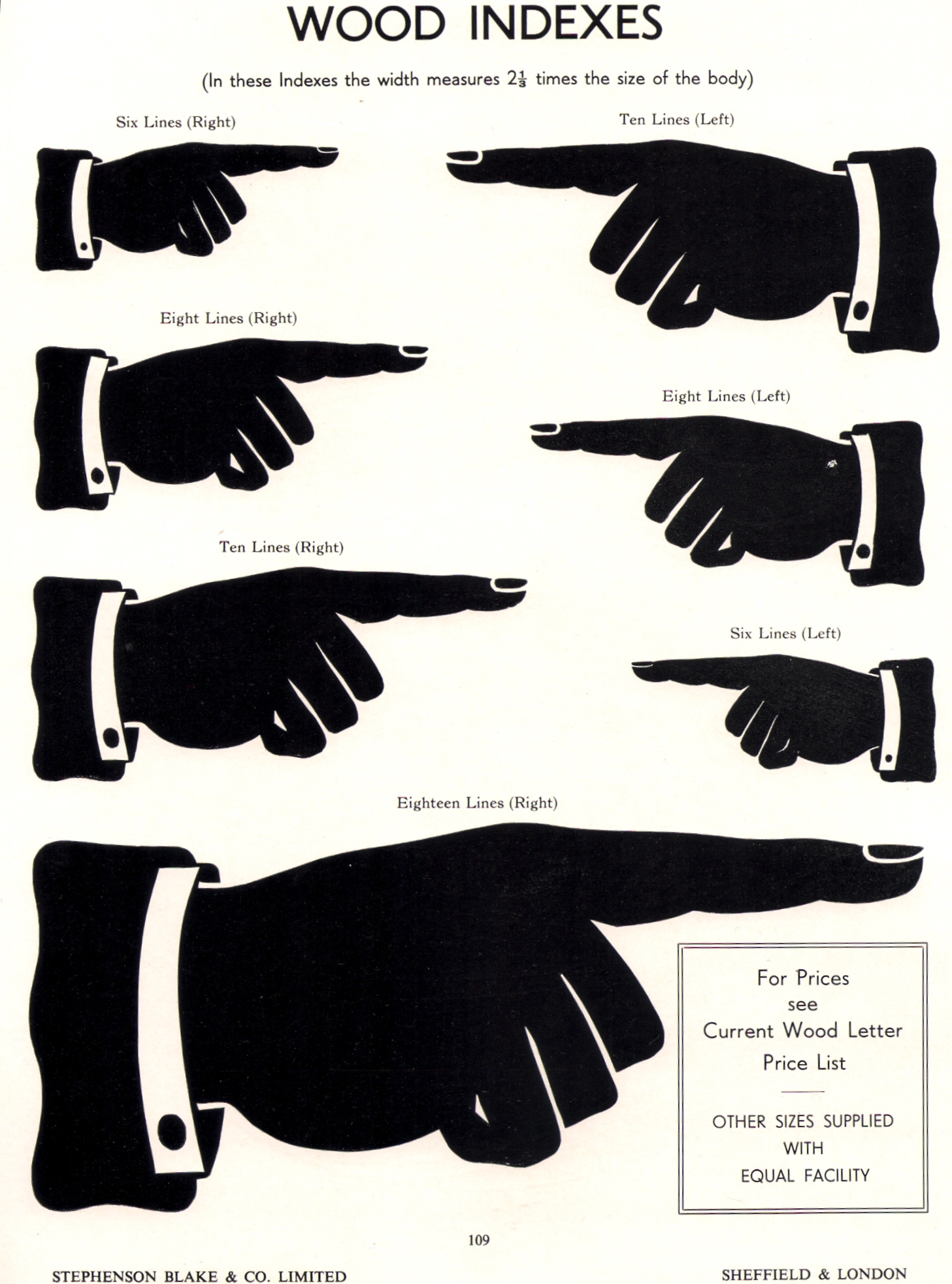
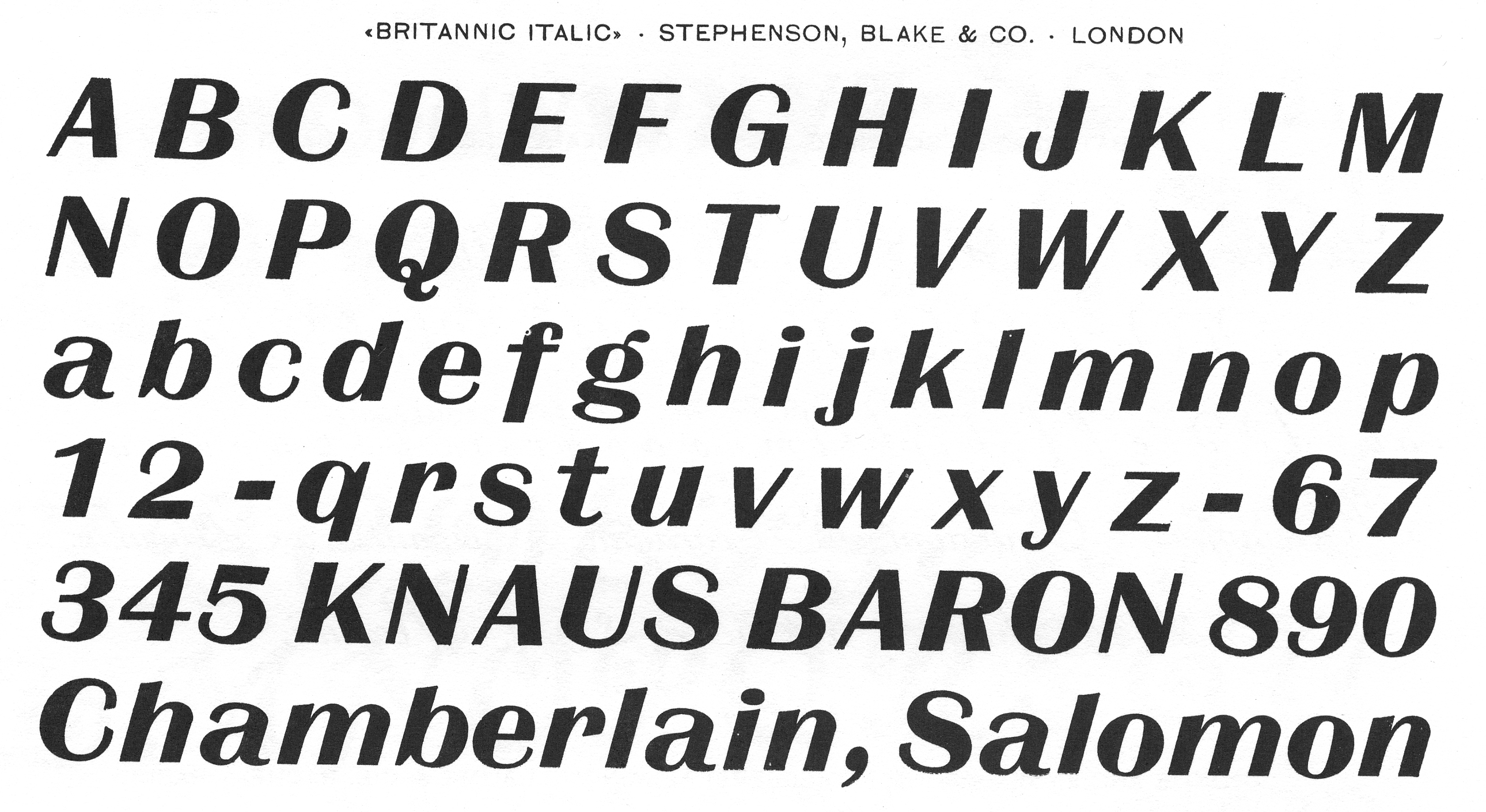
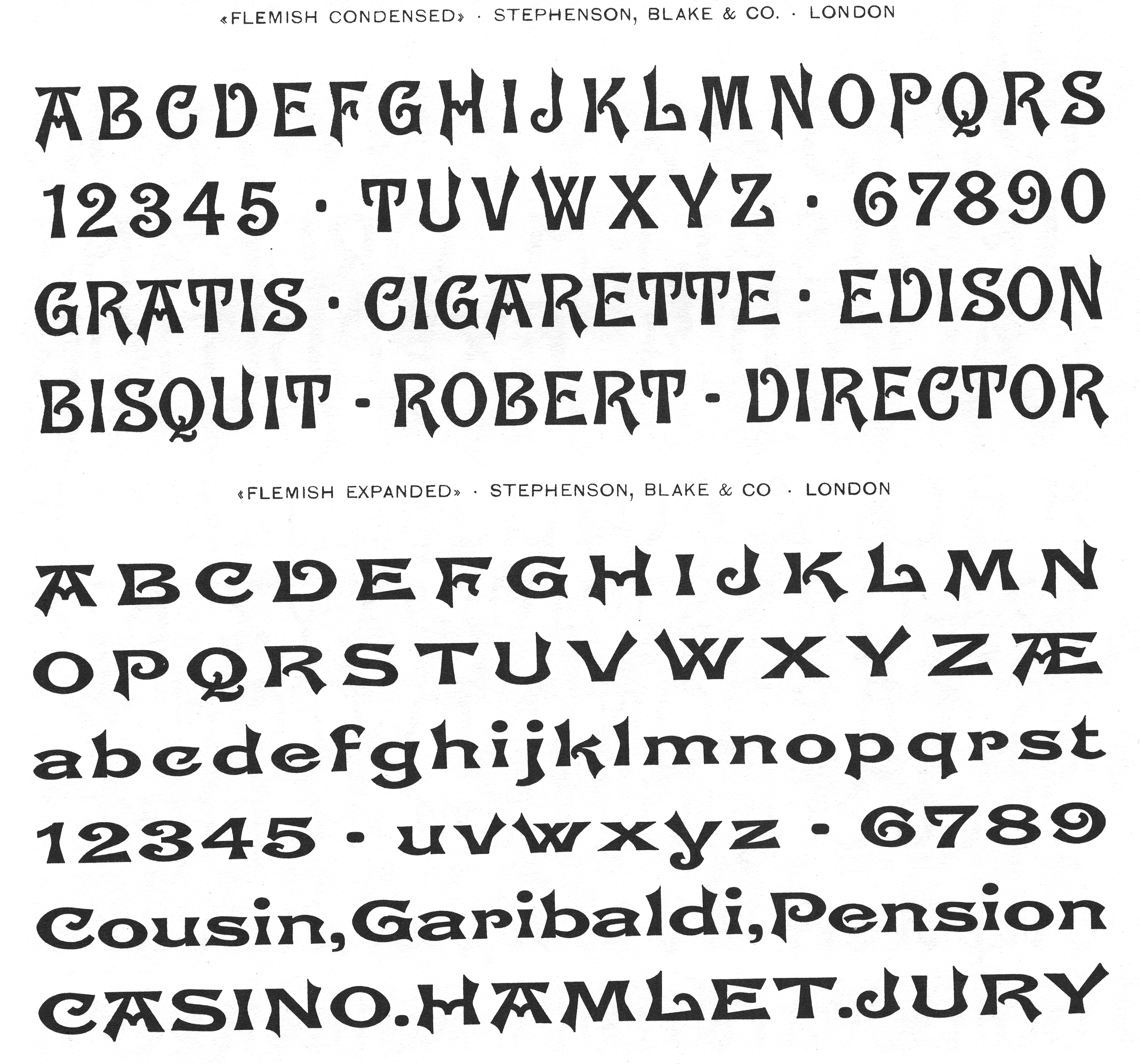
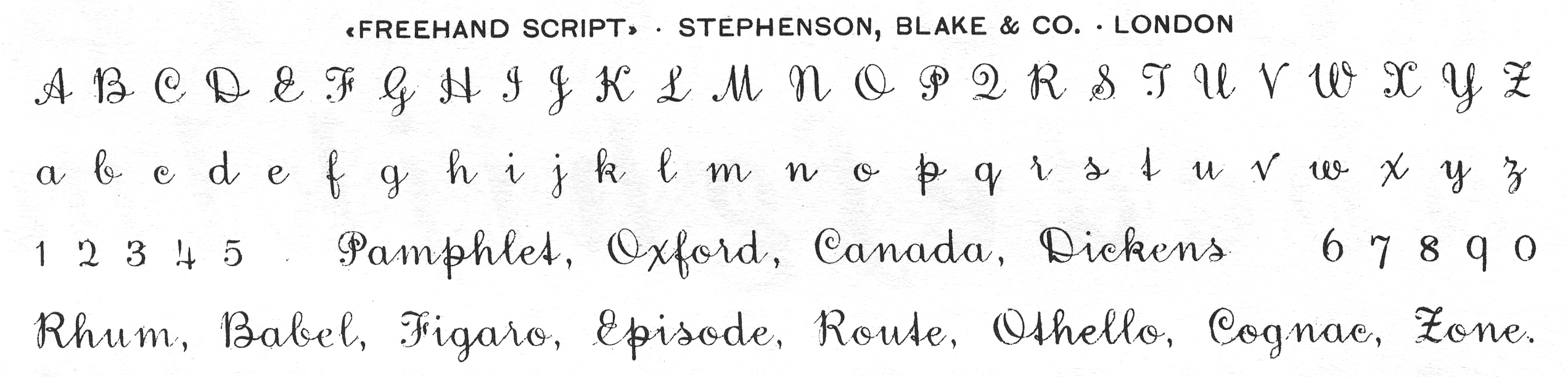
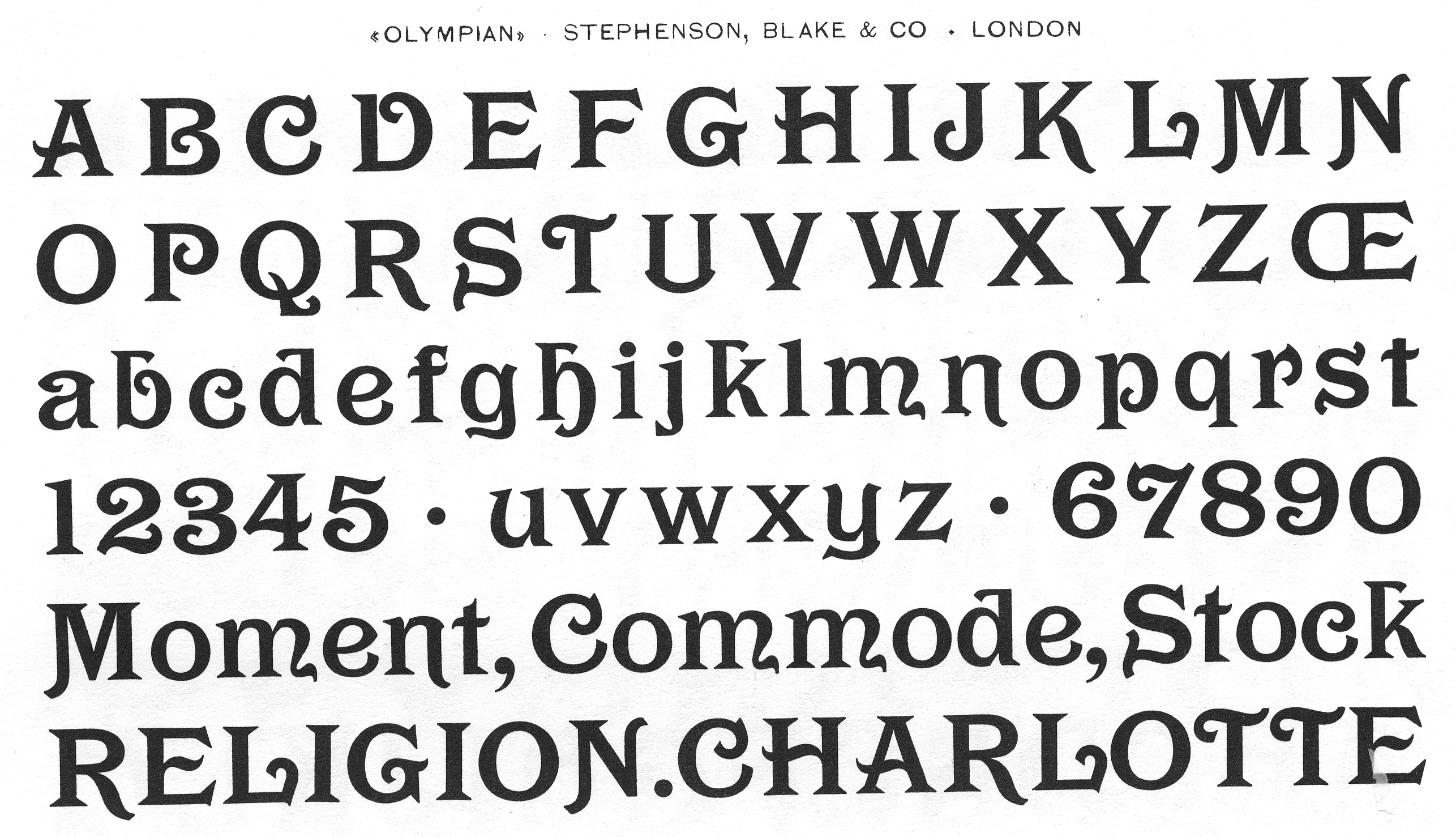
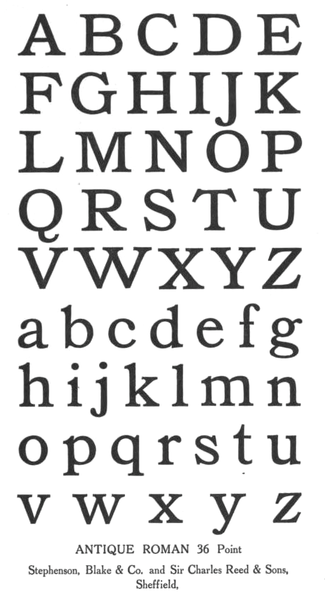
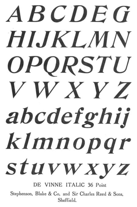
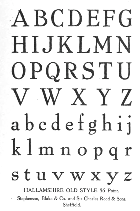
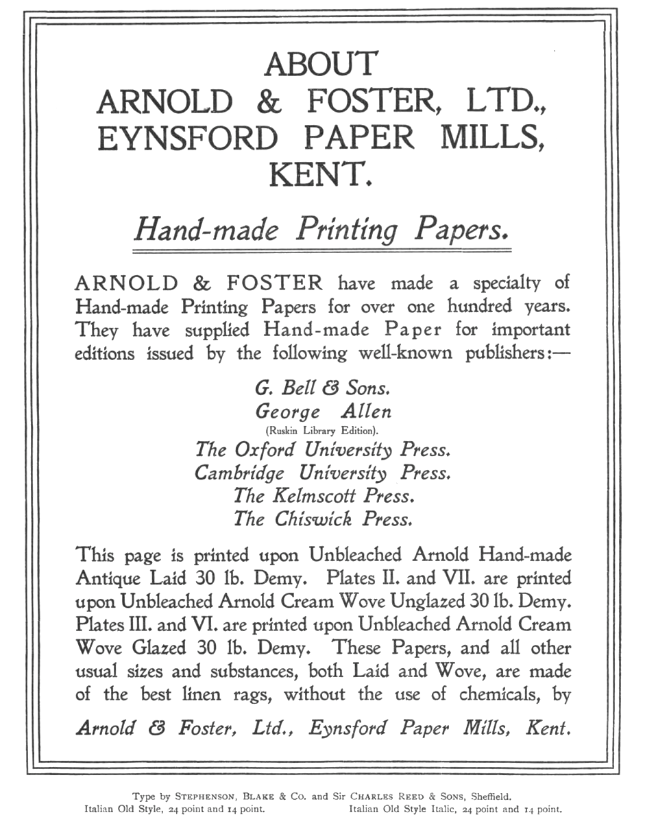
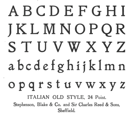
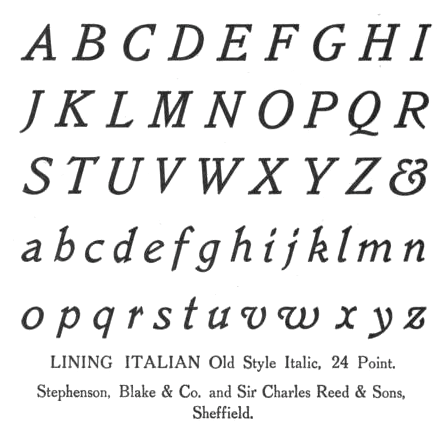
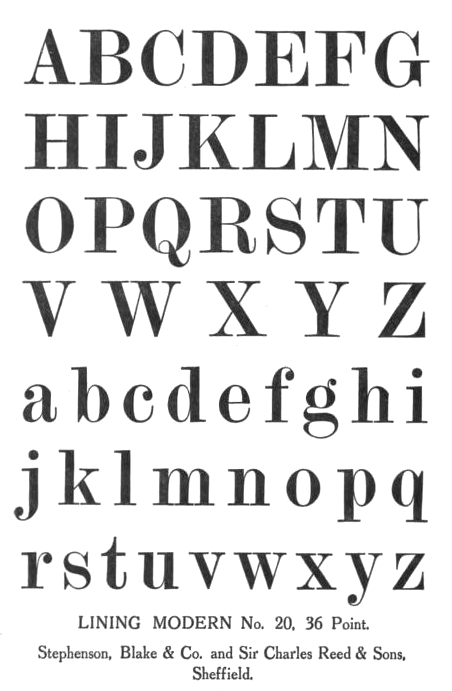
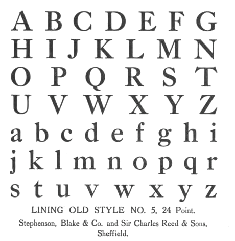
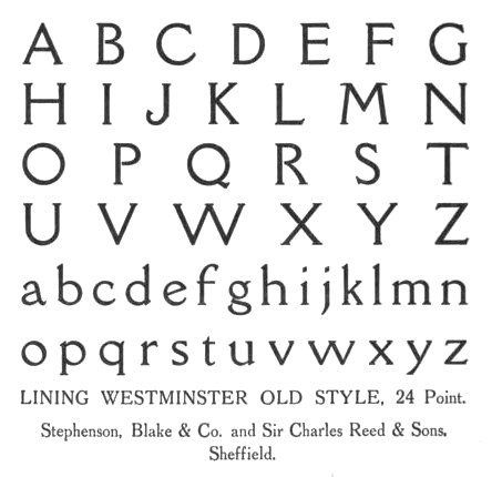
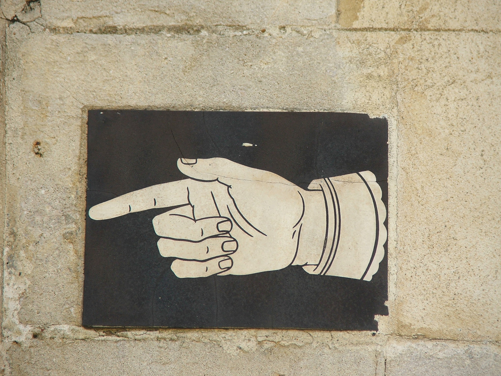
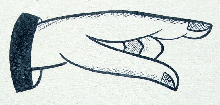
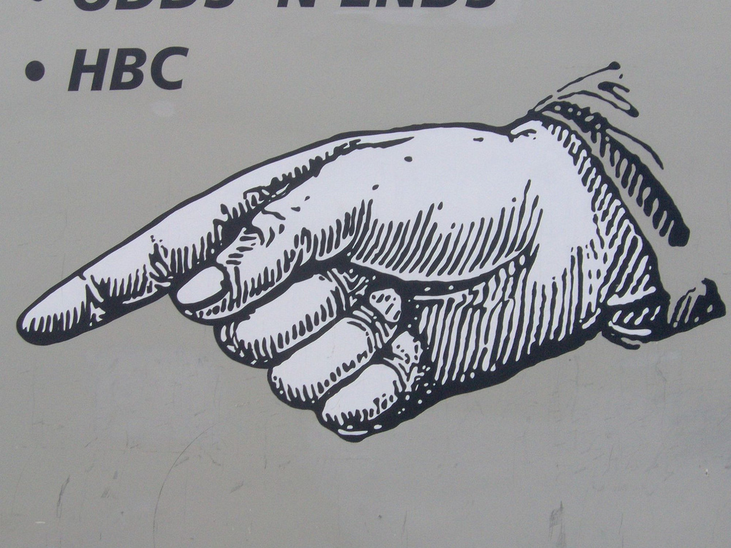
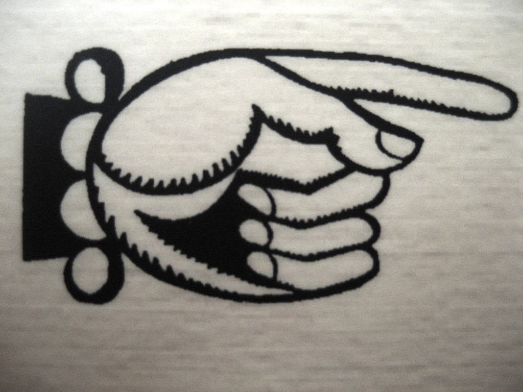
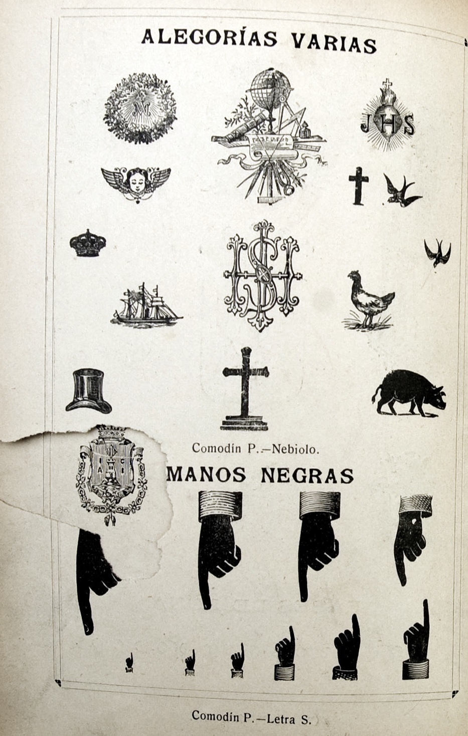
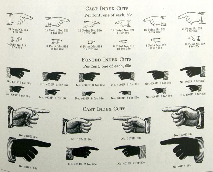
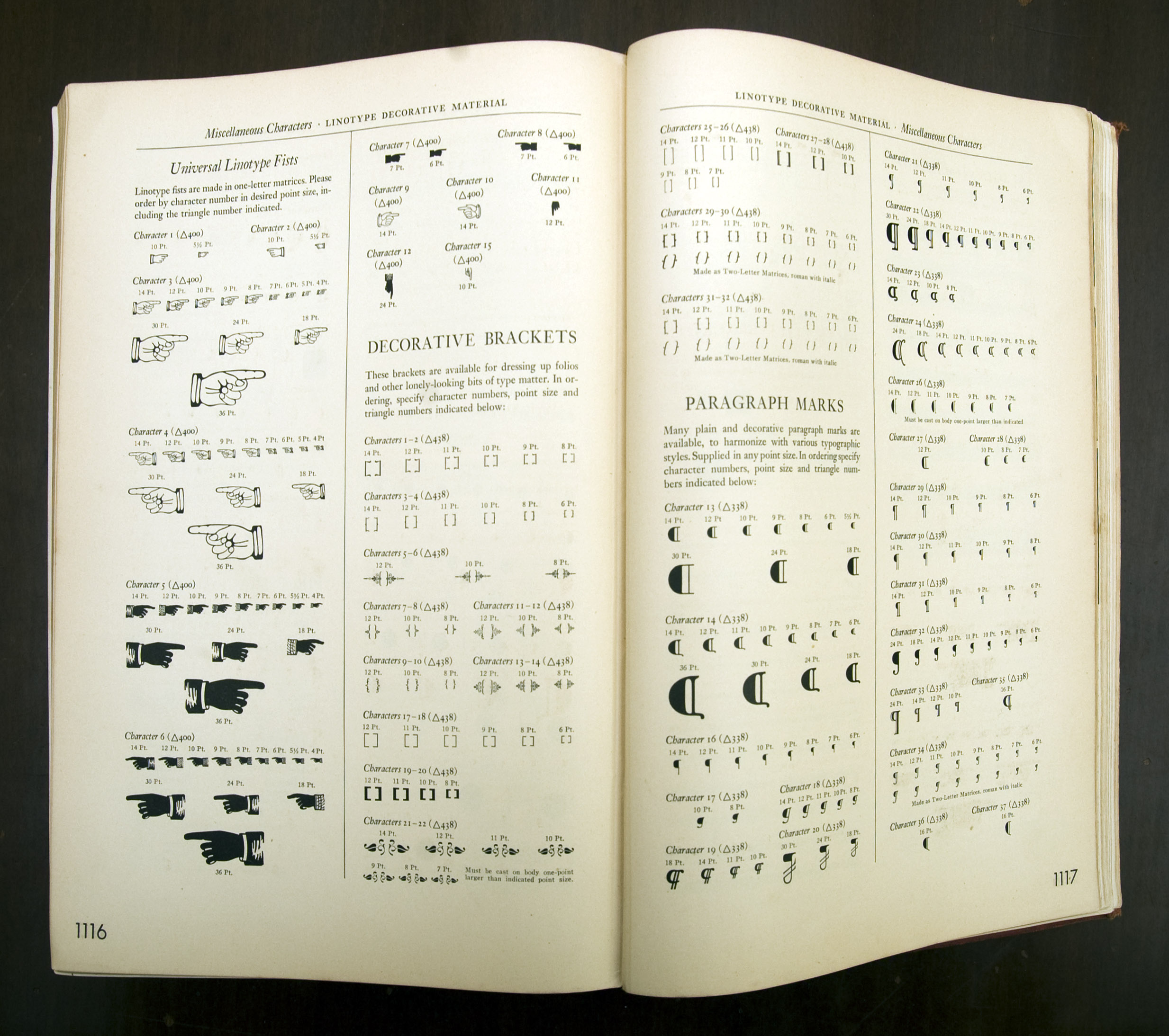
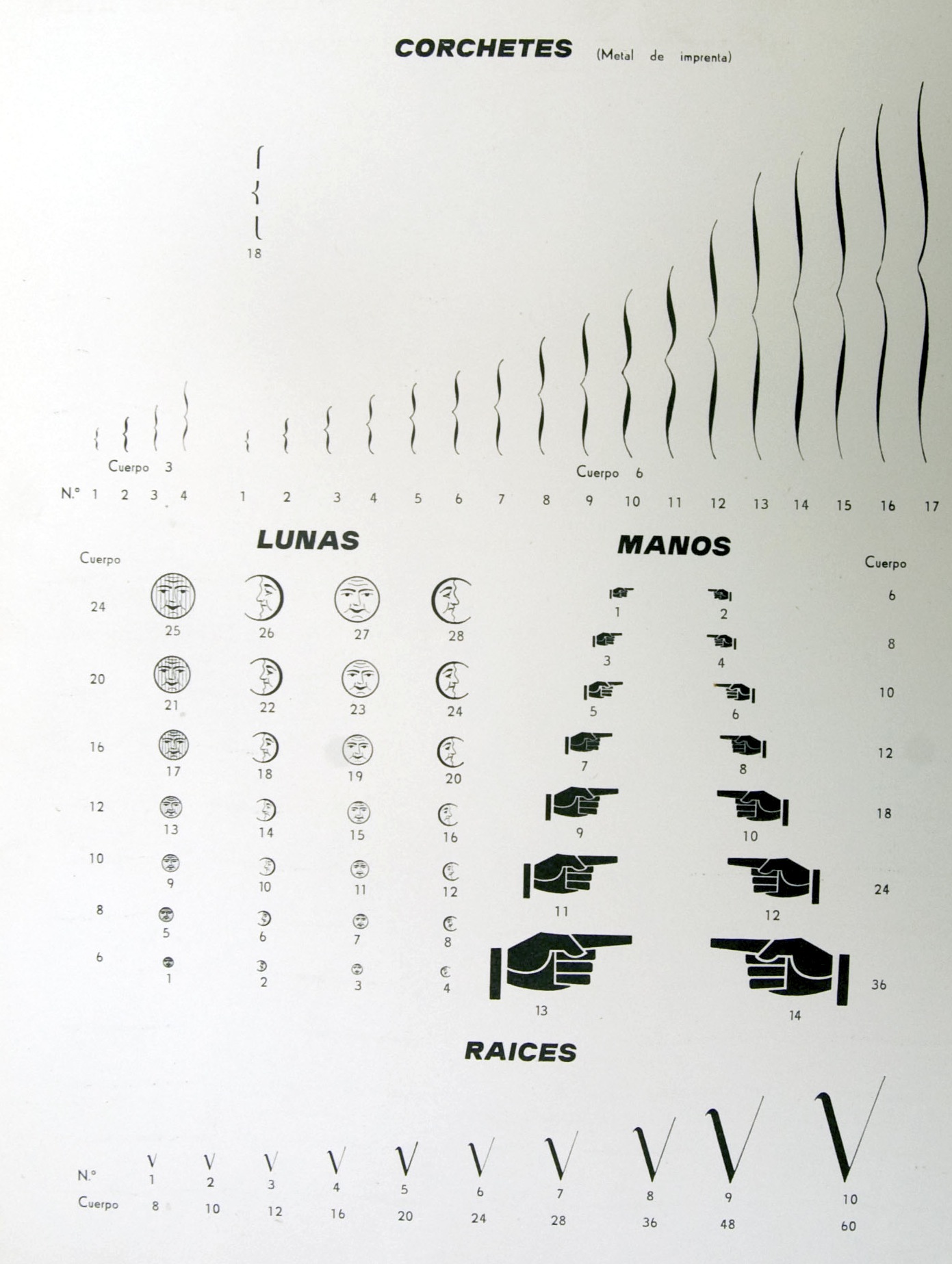
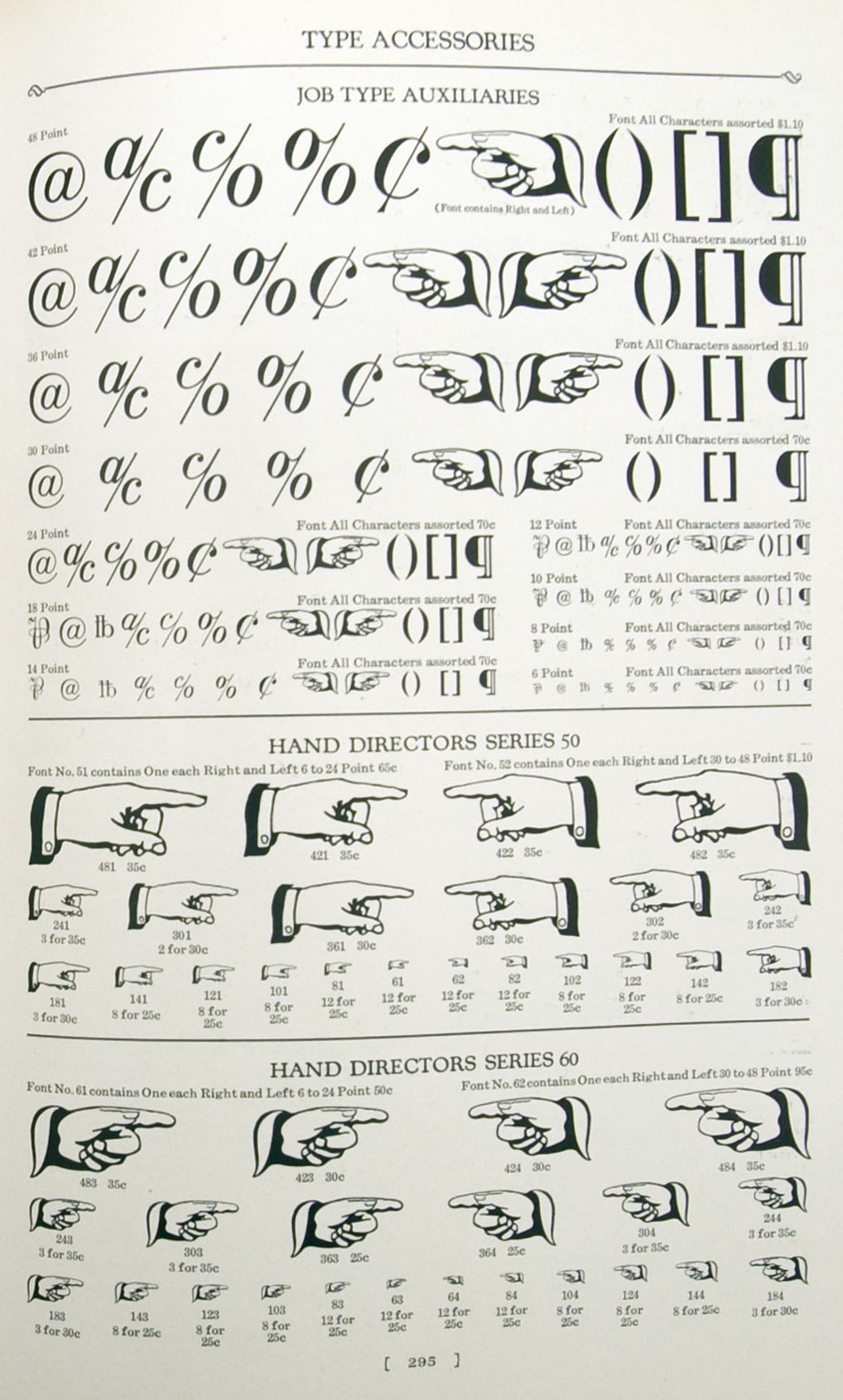
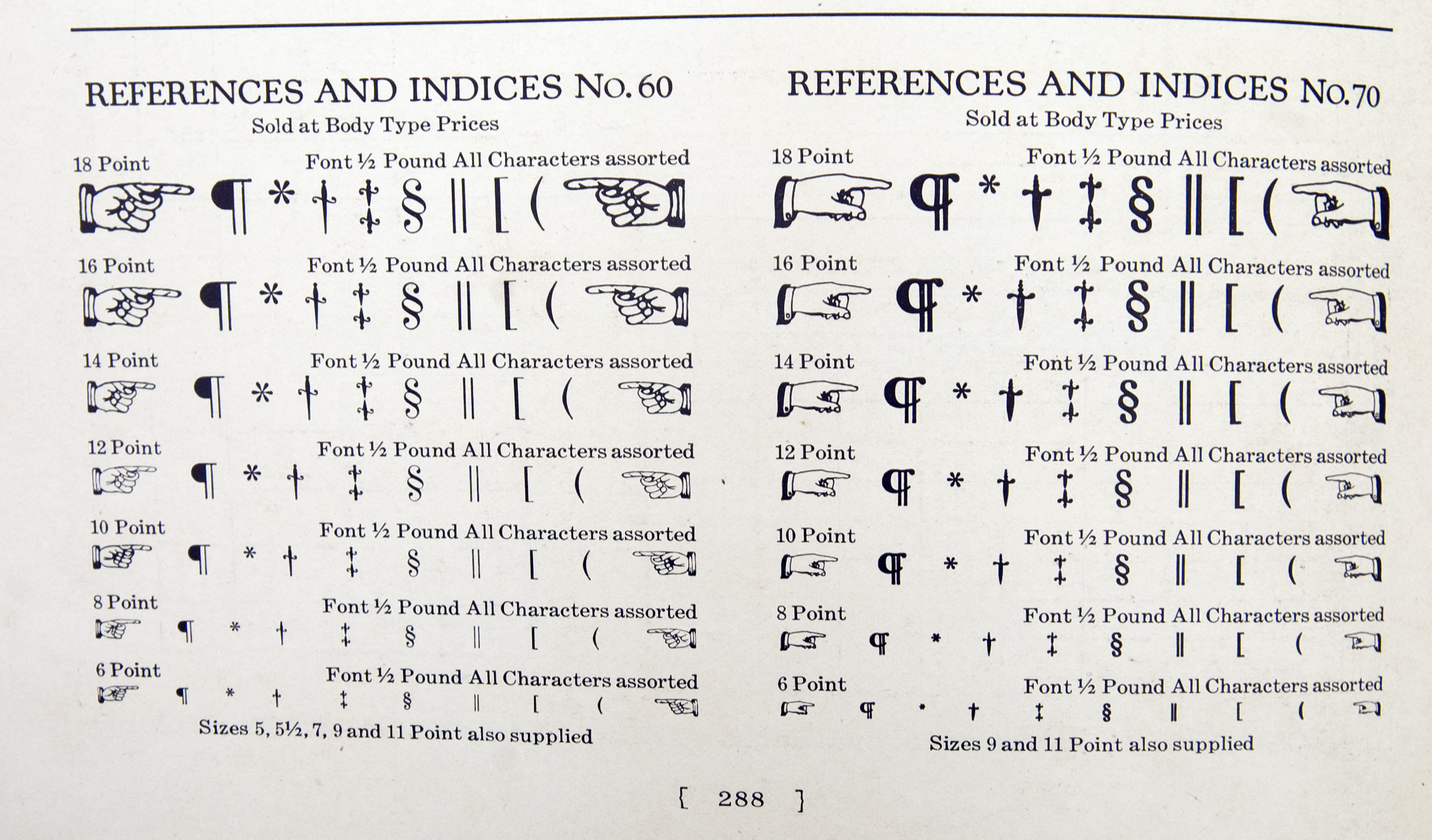
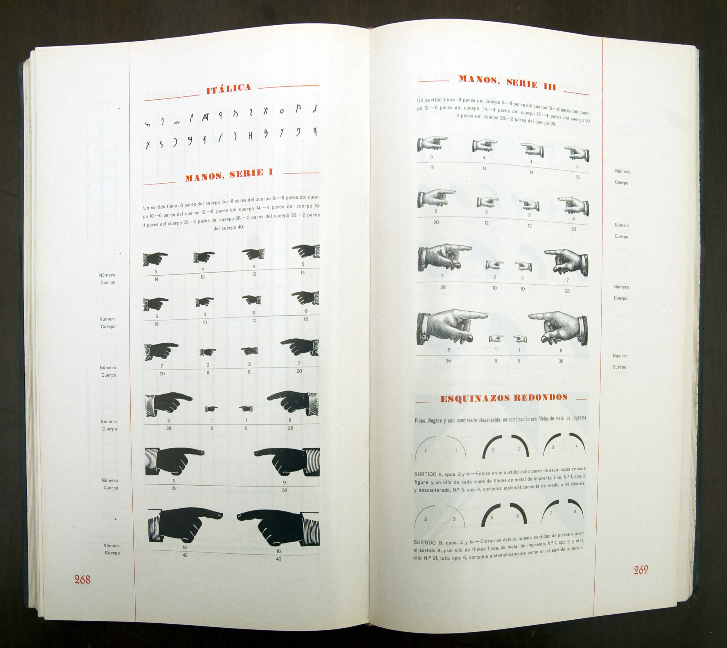
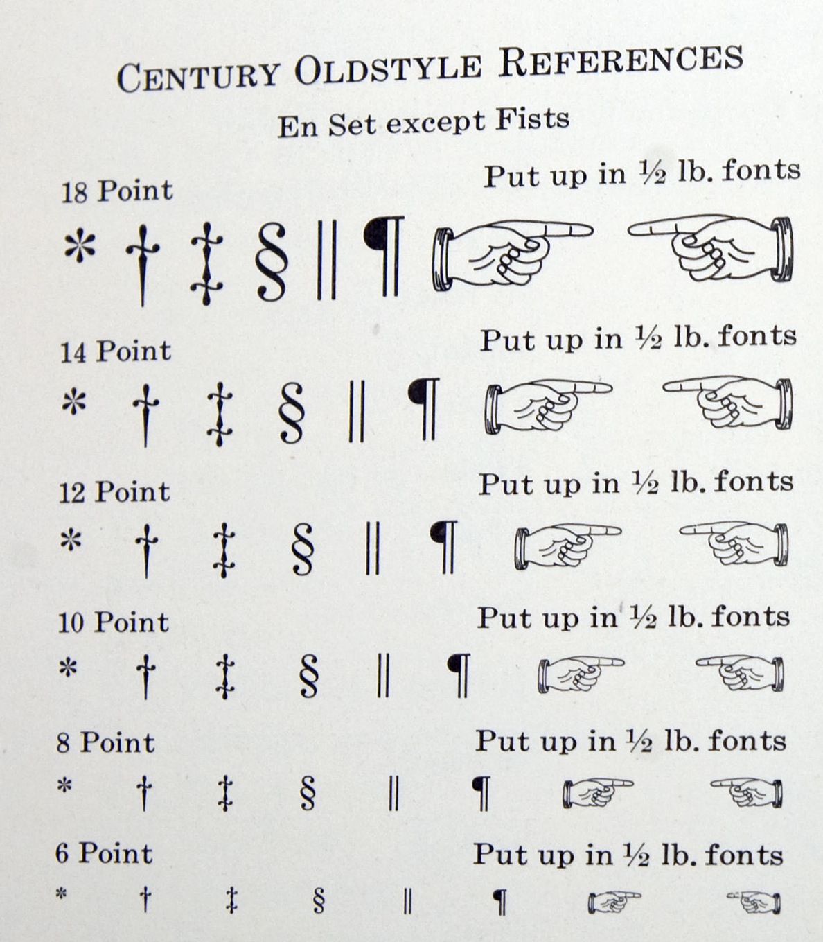
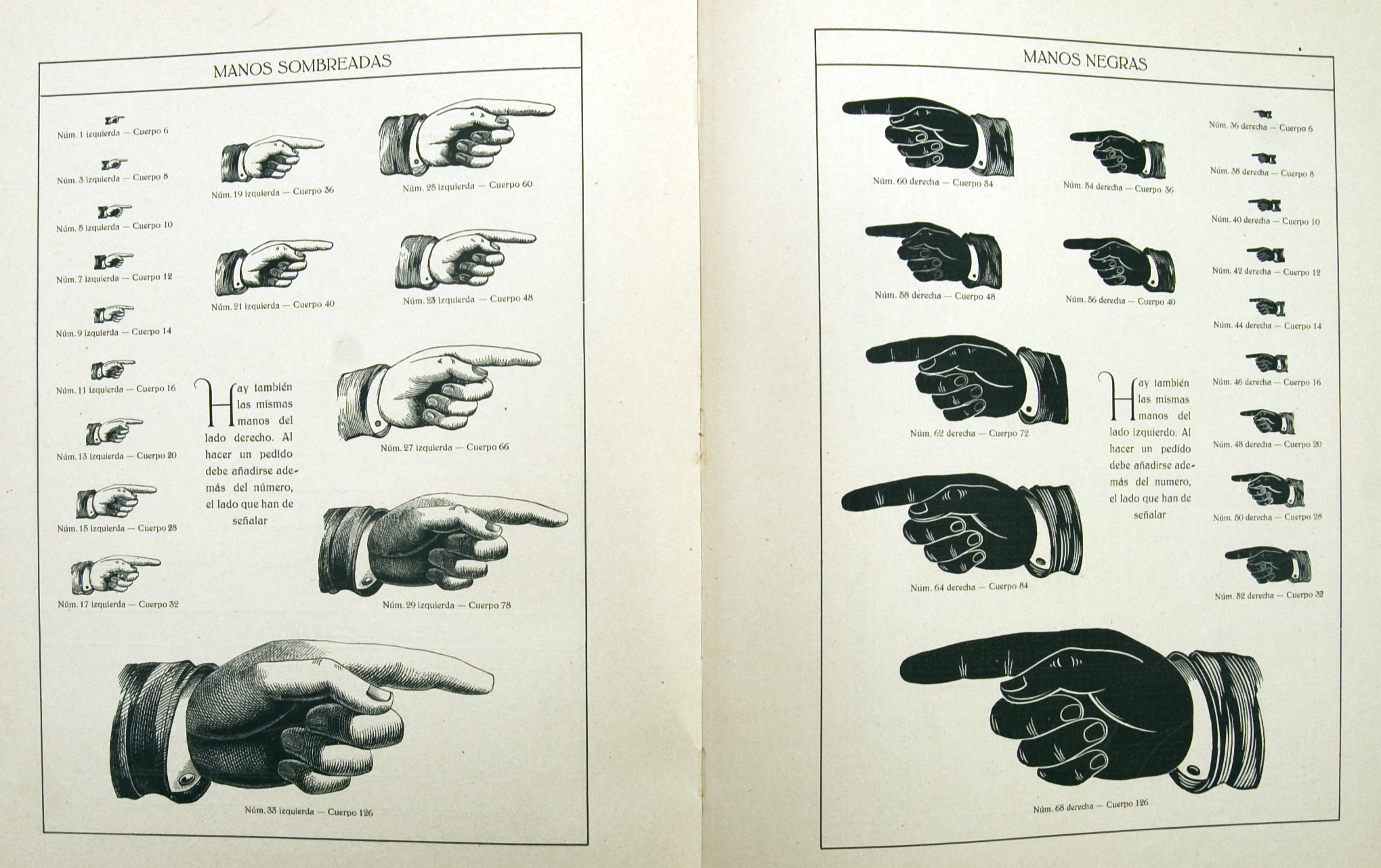
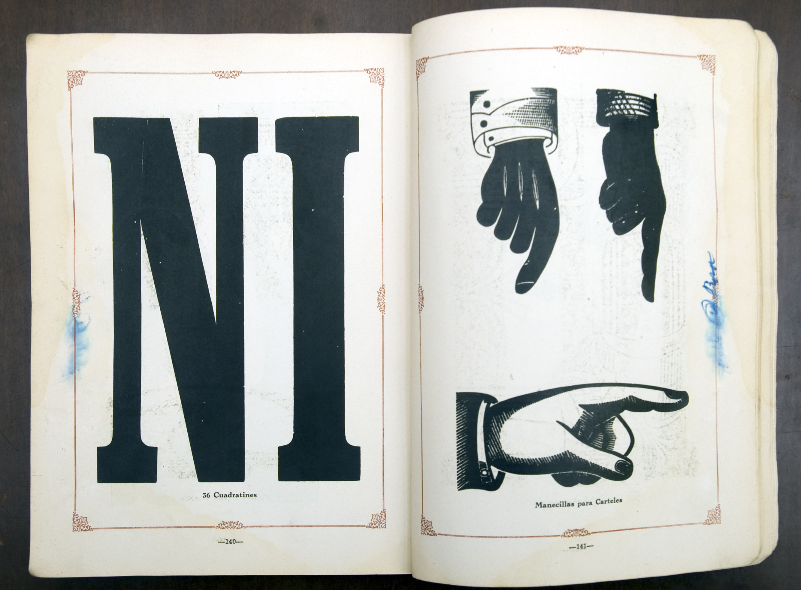
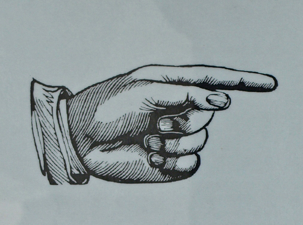
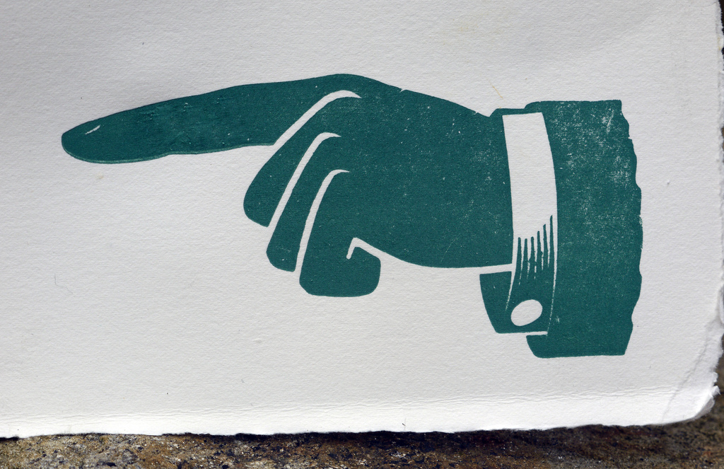
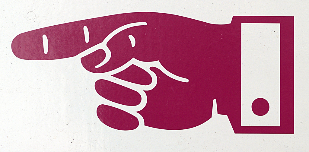
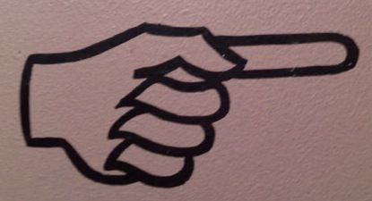
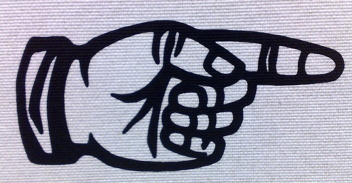
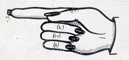
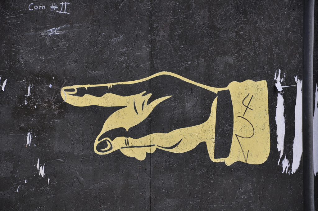
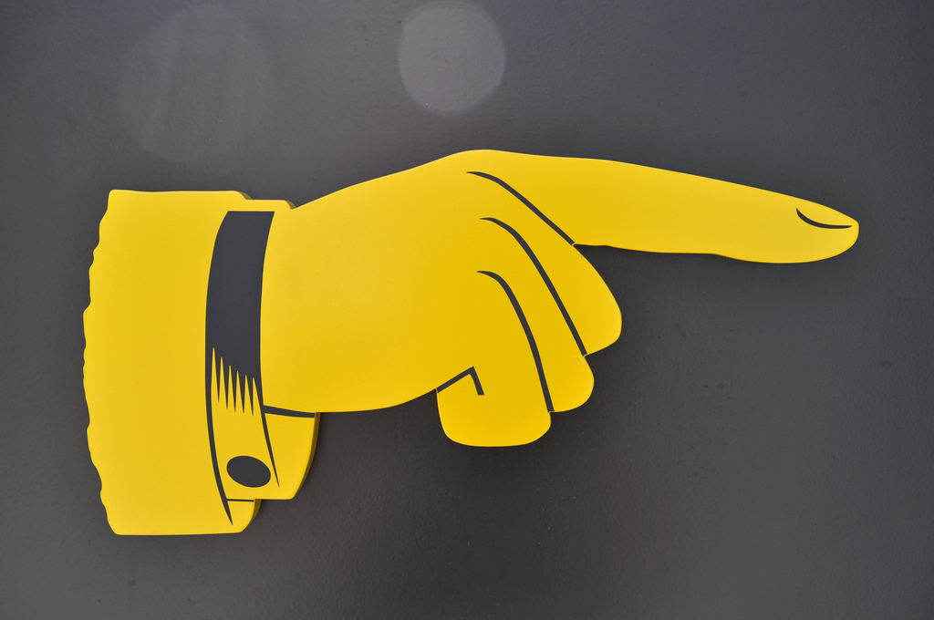
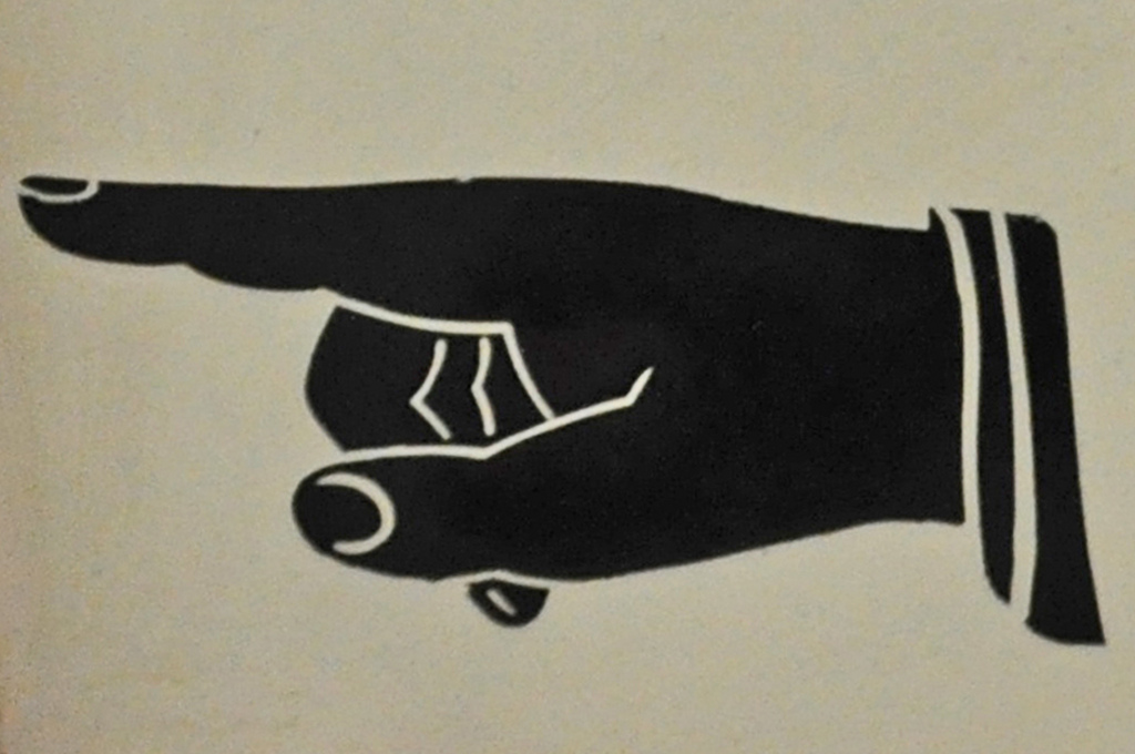
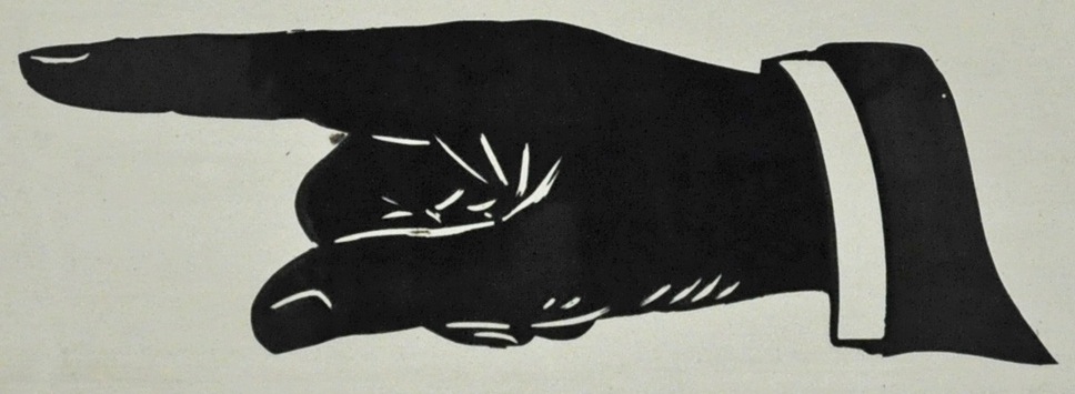
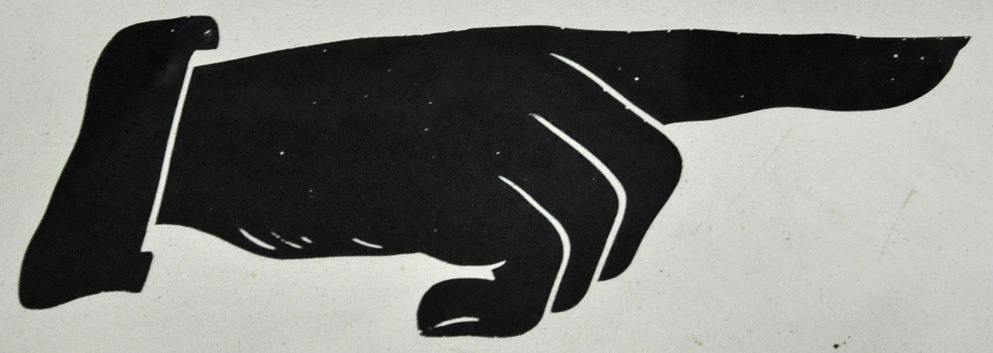
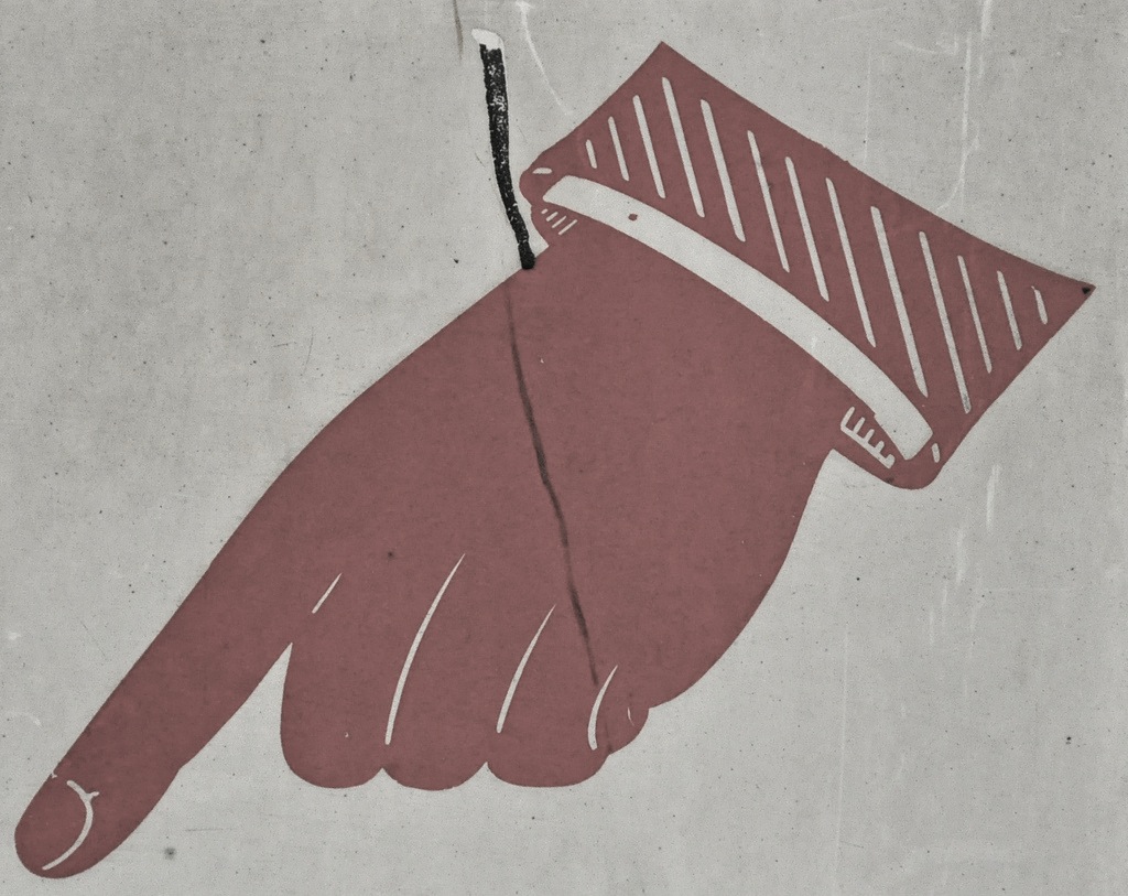
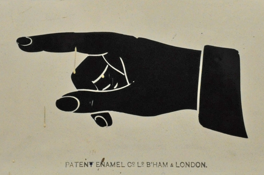
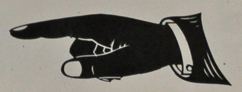
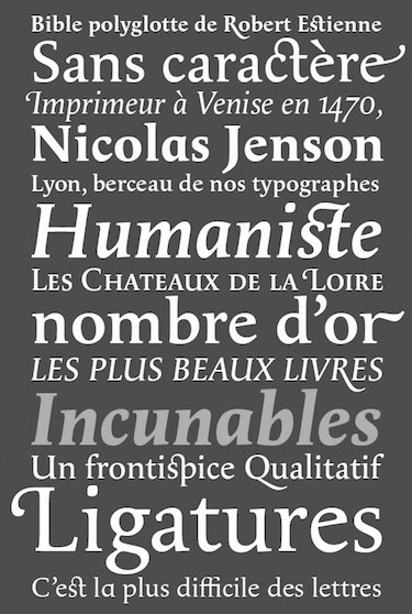
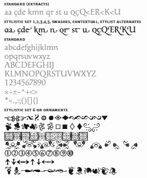
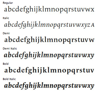
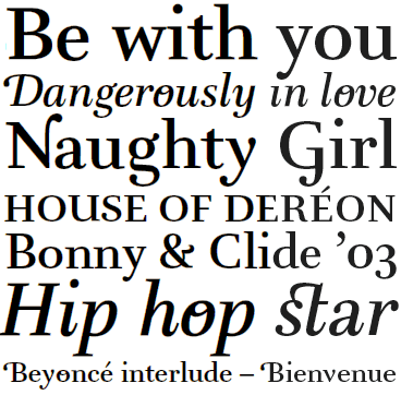
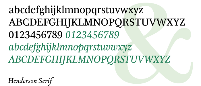
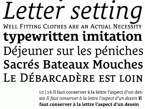
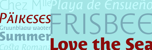
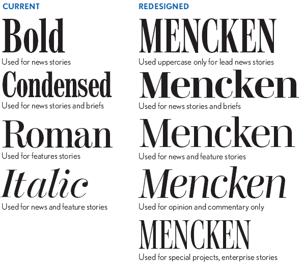
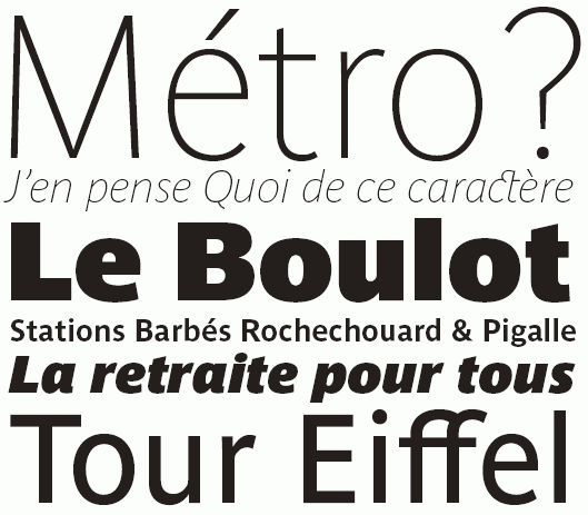
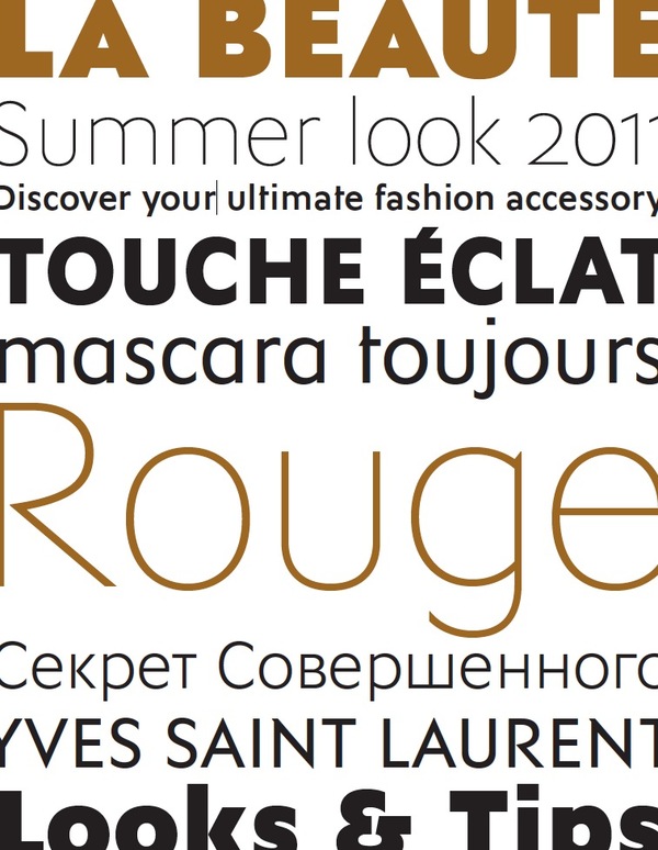
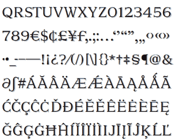
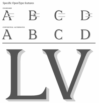
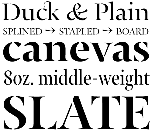
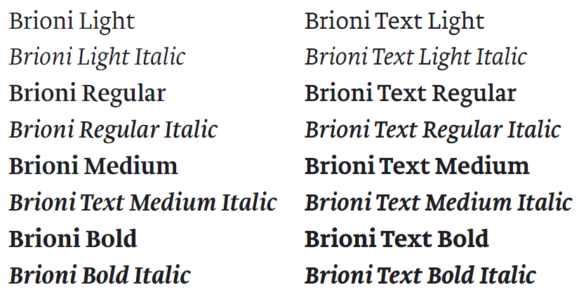
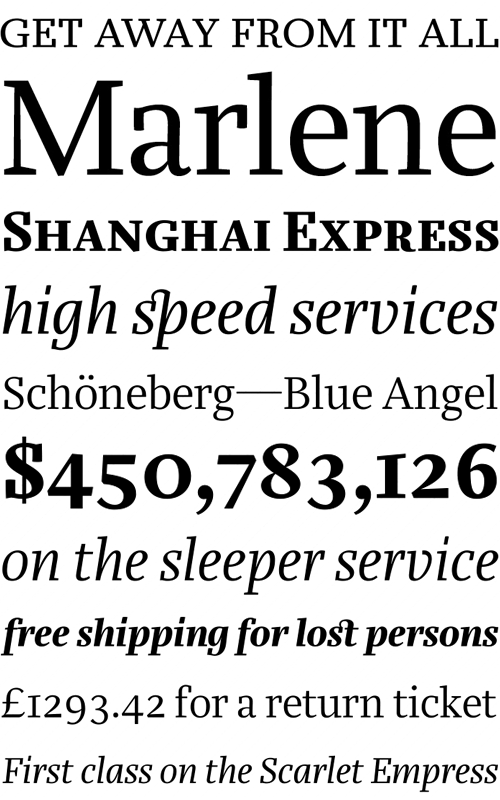
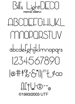
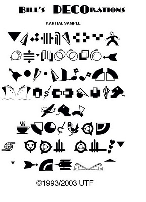
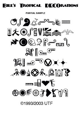
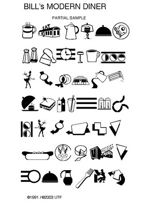
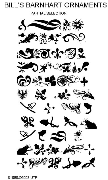
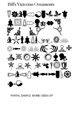
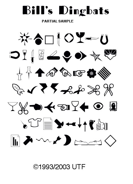
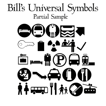
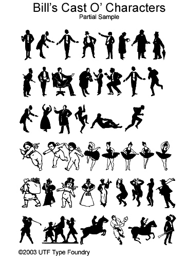
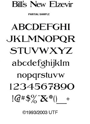
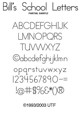
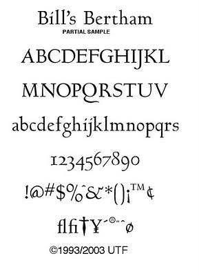
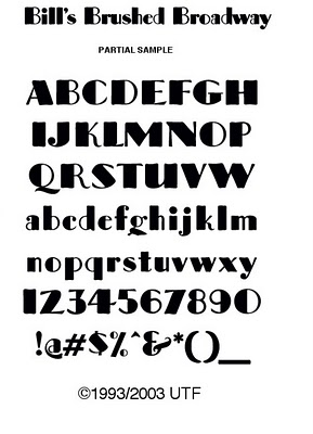
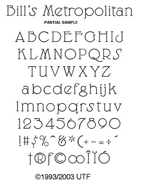
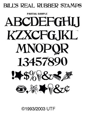
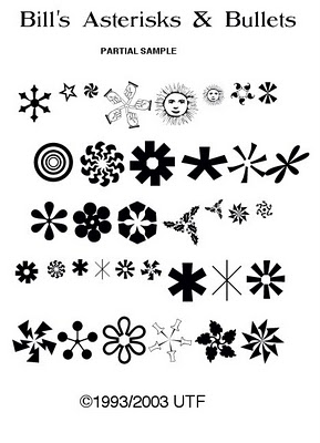
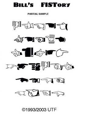
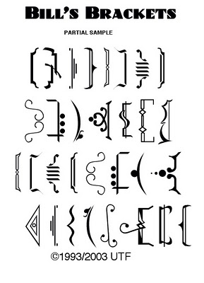
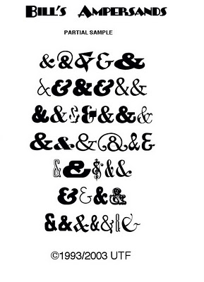
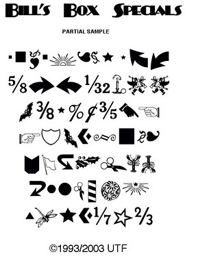
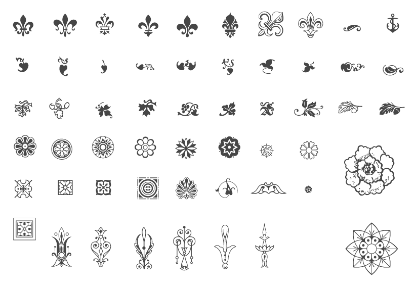