| | |
AJPT
[Alan Jay Prescott]
|
 Pottstown (Philadelphia)-based designer and PostScript font hacker who ran Prescott Design and now Alan Jay Prescott Typography, but was also involved in other ventures such as the Black Walnut Winery. Originally from Greenfield, MA, he graduated from Saddleback College, and worked for some time as a typesetter in New York. He advertizes himself as a leader in PostScript Open Type Font development specializing in the revival of print-only letterforms into digital typographic materials. He operates as APT and more recently as AJPT. In 2019, he announced that he would stop making typefaces altogether. His work can be partitioned into time periods. For this reason, Prescott's oeuvre is split over several pages:
 - His late period (2017-2019). In these three years, he showcased his work on Facebook, and was mainly involved in reving 19th century typefaces, about half of which were from the Victorian era. The annotations in the list below are quoted from Prescott's pages.
- Absolution Cursive (2017). When I was a typesetter in New York City, I had one of the largest collections of typefaces from CompuGraphic's library available for setting. One of the faces I never used in two decades of work was a rather ungainly decorative font called Abel Cursive. Apparently it was designed by Bernie Abel (perhaps one of CompuGraphic's employees) and I'm not sure it got much use, since I don't recall seeing it anywhere except my type catalog. Before I sold my equipment and closed my business for good, I made a scan of every typeface at 72-point size that I owned for future development, if there ever came a time to work on something crazy like that. Most of those 2,000 scans were lost when I changed computers a long time ago, but Abel Cursive survived and I made a down-and-dirty mow-and-blow font back then. I have recently worked on it extensively to make it usable as a multilingual slightly redesigned font in OTF format. I would classify it is as neo-Victorian medium-contrast decorative italic. It is definitely an oddball and may never see use.
- Algol (2017). Based on a scan from Dan X. Solo, Algol is a vastly expanded character set for Algernon, a typeface that clearly presages Machine and other "octics." I don't have any source material for the original design, but it may have been a Dan Solo original.
- Aloysius and Aloysius Ornamented (2017). This is a digital revival of the original Algonquin, cut by J.F. Cumming in the late 1880s for the Dickinson Type Foundry in Boston. While this was not my most challenging project, it was a doozy.
- Alpenhorn Roman (2017). Another oddball typeface is revived here, renamed from the design called Alpine by Henry Schuenemann for the Cleveland Type Foundry in the 1880s. Buried in the "gingerbread" of this weird face is technically a Latin serif, but otherwise it is an entirely unique letterform for which I had a heart soft enough to revive here in digital form.
- Androgen Roman (2017). I know next to nothing about this ultra-geometric blackletter called Anderson that I found displayed in a Dan X. Solo catalog, but it is another oddball that is attractive and very simple to revive in digital format. It is one of those projects I would recommend to a beginning revivalist who wanted to cut his or her teeth on a moderate challenge after mastering some basic tools in font development software.
- Angolan Text (2017). I found Angular Text in a Solo catalog and revived it as a digital font with diacritics and other characters for expanded typesetting possibilities. It was designed by Herman Ihlenburg in 1884 for MacKellar, Smiths & Jordan, which information I found in a link from Tom Cruz for a fellow named Toto who revived the font as well; he has several glyphs I do not have and I like his showing better. Interesting to see what others have done with the exact same typeface and scan and some research for tantalizing missing glyphs...kudos.
- Antiochia Series (2017). This collection of typefaces represents a revival of several bold slab-serif wood types with the name Antique that are related. Their individual histories will follow at another time, but note that several here are useful derivatives that add to the variety of this letterform's impact.
- Azurine Roman (2017). Azurine is a digital revival of a typeface known as Aztec, drawn by an unknown designer for the Union Type Foundry before 1889.
- Beltane Roman (2017). The very complicated story behind the work on this revival is too long for this space (and perhaps too boring to most), but suffice it to say that this letterform started out in 1886 as drawn by the great Herman Ihlenburg as Artistic and assigned to MacKellar Smiths & Jordan. Dan Solo called this face Belmont but only showed caps and was suspect anyway. I was able to find specimens elsewhere and a motherlode of other interesting things in the Inland Printer. I developed my first full-featured OTF using this typeface and designed Greek and Cyrillic glyphs as well. I also fitted it out with a set of small caps to make a font that now has 4,000 glyphs for nearly every non-Asian language. To top it off, Robert Donona revived the decorative caps for this typeface, an excruciating task that I once considered for myself but was lucky enough to have this other crazy person take up. The number of hours dedicated between Robert and myself in reviving this complete series digitally is probably unprecedented.
- Bernhard Swirl (2019). This is a digital revival of the letterform of the same name. It is equipped only with the upper case, an ampersand, a spacer dingbat and the numerals. The numerals are quirky, not only in design, but the fact that they seem to have been intended as old-style figures with the exception for the 4 and 7. Lucian Bernhard is either the designer of this limited-use typeface or inspired a reworking of his "wobbly" poster typefaces for which he is known as an innovator. I have reworked the scanned samples I had used as templates and drew them with a little more consistency than the originals to improve color on the page.
- Bireme Roman (2017). Below is a digital revival of a typeface called Bijou. As I have come to understand, several people have revived this face already. It is similar to Flirt in many respects. I will update information as I come across it, but I wanted to post my version here for your appreciation.
- Blackguard (2018). This is a digital revival of a typeface known as Black Cap. William E. Loy writes that Black Cap was designed and cut by Charles H. Beeler Jr. for MacKellar, Smiths & Jordan. The earliest-known commercial specimen was advertised in the January 1891 edition of The Inland Printer, so he probably created it in 1890.
- Blackminster (2017). One of the more interesting treatments of blackletter forms in the 19th century is this beauty called Black No. 544 designed by Henry Brehmer in 1889, who assigned the rights to Bruce Type Foundry. Originally I was unable to locate certain key glyphs in this font, but they were graciously supplied by others in our crazy network of type geeks. More information on the people behind these projects will follow in other articles.
- Bleak (2017). Bleak is a series based closely on a typeface called Stark. As with nearly all typeface names, there are several unrelated fonts developed in recent years that bear no resemblance to this gorgeous sans serif.
- Brotherly Roman (2017). Among many "antiqued" letterforms developed in the late 19th century, Ben Franklin was offered by Keystone Type Foundry in Philadelphia. Several glyphs were missing from my best showing of the font, but I was luckily able to find them, as well as logotypes, two ornaments, several alternate characters and some punctuation. There had already been a digital revival of this typeface kicking around as shareware in the 1990s, but it was very poorly drawn and incomplete. I believe it has been rendered nicely and consistently here for posterity.
- Busker Contour (2017). Burlesque was the name given by Solo to a typeface originating through Caslon or Figgins around 1843 and shown in German specimens a couple of years later.
- Cane Gothic (2018). Cane Gothic was designed and cut by Edwin C. Ruthven c.1886; he patented it in March–April 1886 and assigned the rights to David Wolfe Bruce (son of George Bruce, holder of the first design patent in US history). The Bruce catalog number is unknown. The tradename Cane Gothic, an apt description of the caning patterned background, may have been assigned by Dan X. Solo, who had revived the face for his photo-lettering service, but it has previously been considered impossible for digitizing. Although the average character in this font contains something like 3,000 Bézier control points, it turned out to be doable once I figured out the original mathematics that Ruthven must have used to guide his design objectively. It is digitized for posterity and I thank Anna Allen once again for the patent specimen (No. 16,643) indicating, if extremely faintly, five missing glyphs from my otherwise excellent scan. Thus I've generated the border glyphs and a pound Sterling symbol to augment this letterform. As far as I can determine, this character set is complete, and I have generated three fonts in order to accommodate chromatic typesetting with very little effort.
- Cantini Casual (2019). This is a digital revival of the typeface of the same name (or at least that is the name Solo gave it in the type specimen book from which it was scanned). It is a great example of the exuberant fancy characters that came to ascendance during the 1960s and 1970s. It is a medium-weight Latin italic with unusual decorative details in addition to crazy swash choices. I do not have any information on the history of this trippy face, but it is likely it was revived at some time in the recent past. It includes a large number of alternate glyphs as well.
- Capulet (2017). This is a revival of a typeface called Caprice that was patented in 1888 by Arthur M. Barnhart and assigned to Barnhart Bros. & Spindler of Chicago. This letterform is a prime example of the explosion in design ideas occurring before the turn of the century, hundreds of which remain to be translated into digital format.
- Carmenite Roman (2017). This beautiful digital revival covers a letterform drawn by the Bauer Type Foundry of Stuttgart, Germany sometime before 1896. It was originally called Carmen and has been referred to as Carmencita in the Solo books.
- Centrum Text (2017). This is my digital revival of one of the more complex decorated blackletters, among my favorite and most difficult projects to work on and just finished today. It is identified as Celebration Text on p. 18 of Solo's "Gothic and Old English Alphabets." The lowercase for this letterform is also presented for two other typefaces, Testimonial Text and Innsbruck in his larger catalog, presenting some confusion. But I believe all three were drawn by the same designer, although I have no idea how old they are. The lowercase may simply have been used for all three decorated capitals, since they are a very good match. Intentional, who knows? It is a real beauty and I'm going to perhaps revive the other two in this triplet of great examples of decorated capitals.
- Chapterhouse Roman (2017). This is an interesting typeface known as Ecclesiastic from Caslon around 1870. It was also known as Albion and Chapel Text No. 30. Most of those names were applied to completely unrelated designs, adding to the confusion that permeates typographic development and history to this day (and only gets worse over time). There are probably more alternate characters out there, but this is the best showing I could make with the resources I have and it is now available from me as a digital font.
- Chapterhouse Roman (2017). This is an interesting typeface known as Ecclesiastic from Caslon around 1870. It was also known as Albion and Chapel Text No. 30. Most of those names were applied to completely unrelated designs, adding to the confusion that permeates typographic development and history to this day (and only gets worse over time). There are probably more alternate characters out there, but this is the best showing I could make with the resources I have and it is now available from me as a digital font.
- Clarence Roman and Dotted (2017). Clarence Roman is a revival of Clown Alley and Clarence Dotted that of Cooktent (also called No. 515). Wood typeface Cooktent comes from W.H. Page before 1890 and the other looks to be a back-formation from it.
- Commissioner Script (2017). The typeface known as Commercial Script was designed by Morris Fuller Benton in the early twentieth century and enjoyed widespread use for decades. There have been many variations from other foundries, varying mostly in contrast; but as far as I know there was ever only one rather bold weight produced. I have redesigned the letterforms for consistency on the way to producing the ten weights shown here. It is interesting to see the font in lighter weights that accentuate the beauty lurking in this standard, and the heavier weights to see that the design still holds up under even heavier lifting.
- Courtesan Roman (2017). Among the dozens of wood types I have revived digitally is Courier, here called Courtesan. Many of these letterforms have been revived by others, all slightly different in their interpretations. More information on wood types will follow in articles I plan to write in the future on various areas of interest in the field of revival in particular and typography in general.
- Cranston Ornamented (2017). This is one of the most difficult digital revivals I have worked on. It started as Crayon, another masterful design from the prolific Ihlenburg, available at MSJ in 1885. There are sister fonts in an Open and a Solid that differ slightly in design and will be available from me at some point in the future.
- Creekside Playful and Calligrapic (2018). These are two digital casual scripts of my own creation based loosely on hand-drawn types from the 1950's. One is a calligraphic interpretation and the other is a more mono weight design that is a bit more slanted, both available for multi-language setting.
- Criticism (2017). This is a digital revival of Critic, a typeface designed by William F. Capitain in the mid-1880s with rights assigned to Marder, Luse & Co. Several logotypes had been designed for this letterform and many alternate glyphs. I added a few of my own, as well as diacritic marks, for balance to this surprisingly modern face that can be rendered multilingually as well.
- Crosby Roman (2017). This is a digital revival of the typeface known as University Text, designed in 1862 and shown by MacKellar, Smiths & Jordan in 1869 as Crosier. It was also known much later as Morningside. It is a stylized Latin with great charm.
- Crossan Roman (2017). This is digital multilingual OTF revival of a typeface called Cross Gothic, another one of those unique, nearly unusable letterforms I adore. I got a million of 'em.
- Cullane Roman (2017). Cullane is a digital revival of Herman Ihlenburg's Culdee, patented in 1885 and offered through MSJ. Others helped me scour the literature for missing glyphs and no one is sure we've got them all, but this is a wonderful showing of what we think is available until something randomly shows up in the future.
- Currier (2018). J.B. Lieberman, Ph.D. identifies it as Deberny & Peignot Lettres Ombrés Ornés (ornamented shaded letters) and adds that it was originally cut by Gillé in 1820, thus making it one of the oldest typefaces I have revived digitally. It is an exuberantly decorated engraved shadowed heavy-weight Egyptian.
- Danuvius (2017). Danube is the original name for this letterform, again found in a Solo catalog, and its links with medieval letterforms is obvious despite the trends toward modernization at the time it was first produced. I otherwise have no information on this face.
- Devonian Roman (2017). This is a digital revival of a wood typeface known as DeVinne. More information updated later.
- Dorothy Series (2017). The original Doric Chromatic was designed as a wood typeface and made its appearance in the United States in the 1850s, though it probably got its start in France in the 1840s according to Rob Roy Kelly.
- Doughboy Roman (2017). This series of decorative caps is shown as Dodge City in Solo. I am not sure it is very old; it may very well have been a photographically slanted version of an older wood typeface in the Thunderbird category with flourishes added on at the same time. This has been revived before because of its simplicity, but I made my own version a little more consistent and they make attractive drop caps.
- Enclave Roman and Expanded (2017). These two related digital revivals represent Enchorial in two versions. The roman came out of the Caslon Type Foundry in 1884 and was extremely popular (sometimes known as London). Petzendorfer showed the expanded Enchorial around 1903.
- Esteban (2017). Esteban is an original design I developed around 2010, named after the recently deceased Esteban Arriaga, a leading seascape painter in the area of Málaga in Spain. It is a medium-contrast sans serif produced in nine weights plus italics. Currently it is available only for the Macintosh OS, but an OTF cross-platform font is anticipated.
- Euclid, Euclid Initials,Euclastic, Elberon, Astral, and Auroral (2018). Elberon existed by November 1886 from Cleveland Type Foundry in The Inland Printer. Euclid (a lighter version of Elberon with a few different glyphs) is an obvious derivative from Illinois Type Founding Co. in Chicago in August 1890. Euclid appears with several Euclid Initials, a full sample of which appears as "Grant Iniitials" from Minnesota Typographic Co. Auroral (basically a shaded form of Elberon) appears in January 1887 from Central type foundry. Astral, also from Central type foundry, (the almost exact shading concept) whose base form is a condensed, heavier form than Euclid) appears in December 1886. Euclastic is my name for a complete set of weights, from a Hairline at the extreme end of lightness, through Black at the other extreme, using redesigned examples of Euclid and Elberon.
- Farmerboy and Farmergirl (2017). Although these two typefaces have both been called Fargo in the past, they are distinctly not the same letterform despite sharing some characteristics. They are both probably late 1850s, early 1860s and some sources say they are German. In any case, two interesting oddballs with no usage in the last century-and-a-half are revived digitally by AJPT.
- Fastidious Series (2017). The typeface known as Fashion started out in 1876 and was patented by Andrew Little for A.D. Farmer & Son. There are a total of five related typefaces in the same design: the prototype, condensed, ornamented, antique and extra-condensed. It turned out that the samples I had available when I originally revived these two were rather suspect and I have to consider going back to these and try to figure out what the "real" glyphs are. I believe that the Solo ornamental showing was rather a hatchet job on the base font, so I consider these two on hold pending further research, but they are interesting to view how they are so far.
- Flare Serif Striped (2018). This is a digital revival of a face called Ornamented 1,079. This over-the-top candy-cane-with-curls design was created by Henry Brehmer, who patented it in December 1884–January 1885. The application was submitted and approved on the same days as Ornamented No. 1,077 (Hermann Ihlenburg), and the rights to both were assigned to David W. Bruce of the Bruce TF (New York) [USPTO D15748]. It was advertised in The Inland Printer of October 1885. Thanks again to Anna Allen Conroy for the background on Ornamented 1,079 and for the patent samples giving a good idea of the design of glyphs missing from the catalogs. I have produced AE and OE ligatures as well as a decent set of diacritical marks for setting in a few important languages, but it is not at OTF font at the moment and exists only as PostScript for Mac only.
- Flippant Roman (2017). This fun font is a revival of a typeface known as Flirt. Although it has that 1960s feel, like many fonts popular then, I believe it has a much older pedigree. I will supply more information as I come across it. (There is currently an unrelated script font called Flirt on the market now, designed in 2009.)
- Fusion (2017). i developed three weights (including small caps) for the popular typeface Futura, all of them lighter than the Futura Light that is widely available. You can never be too thin.
- Gallantry Roman (2017). The earliest known specimen of the original Gazelle is found in the 1893 catalog of ATF in Cleveland and designed by Henry Schuenemann. This digital revival has multilingual capabilities and is quite unusual, demonstrating again the almost limitless possibilities of type design over the centuries.
- Gamut (2017). The Gamut series of very condensed sans serifs is based on a wide range of typefaces that all began with the letter "G": Galaxy, Gable, Garfield, Giant, Gamma, etc. (Their italics began with the letter "E", perhaps to come at a later time). I produced these typefaces under the same name to keep them all in one place, all ten weights that are floating around somewhere undigitized until now. They are currently available from me as Mac-only fonts, but OTF may be developed over time. They are members of the large "family" of typefaces whose members can be difficult to separate, such as the Helveticas, Trade Gothics, Standard Gothics, etc. I believe this was a well-designed condensed face that has nice nuances.
- Gironde and Gironde Extended (2017). Giraffe is the original name for this digital revival. It has been difficult to find a complete character set for this typeface, as I'm sure whatever existed in the roman also existed for the extended version. I revived what I could find, but it is a rather simple design and other characters can be imagined that are congruent with what is seen here. I'm not sure how much use these two oddball typefaces got in their time, but they were designed by Charles Beeler, Jr. in 1891for MacKellar , Smiths & Jordan.
- Gothic Decorated (2018). This is my temporary name for the digital revival of a typeface once called Ornamented 1,078. In the past couple of weeks, I have revived the "ornamenteds" on either side of this number. I have no information on this other than that it appears in the Inland Printer of October 1885 from George Bruce's Son & Co. TF in New York City.
- Goudy Flare Extra Bold (2019). This is a digital revival of another typeface in the Goudy superfamily, titled originally as simply Goudy Flare. I don't know the provenance of this particular letterform, but it was found in a Solo publication and could very well be one of his own creations, since I have never seen it used in print. It turns out that this is a modification of Goudy Old Style Extra Bold, and so I was able to find a suitable digitized version that matched the base forms very closely and modified the existing characters to accommodate these rather simple swashes. A reader added: "Goudy Flair was created by Mr. Phil Martin of Alphabet Innovations, that is he took Goudy Extra Bold and added swashes to this."
- Goudy Long Fancy (2019). This is a digital revival of the typeface of the same name, again another addition to the large Goudy family. There is a tremendous selection of swashes and alternate characters in this font, especially the upper case. It is an extra bold italic Goudy whose slant is less steep than normal for this family. There are no figures or punctuation provided for this letterform; those provided in the scan from which I worked were incorrect, and possibly back-formations from a different Goudy, so they were not produced for this version.
- Goudy Swash Heavy Italic (2019). This is a digital revival of the typeface of the same name. There are literally hundreds of revivals of letterforms in the Goudy "family" of typefaces. Nearly every foundry has produced its own version of this popular form, with many nuances between them. There are many weights, italics, various alternate characters and swashes galore, but I haven't seen a revival of this particular set of gorgeous swashes and alternates. Thus, I worked on very good printed samples, perhaps from a photolettering catalog half a century ago.
- Goudytype Antique (2019). This is digital revival of a typeface designated as Goudytype in a Solo catalog, with a slight twist. There is no punctuation for this font, but several nice swash alternates, a dollar sign and an ampersand. I decided to draw this as an "antique," because the ink spread in the original lent itself to this sort of treatment. Although a bit tedious, it can be used in the same way as other faces, such as Packard, Benjamin Franklin, Caslon Antique, Papyrus (heaven forbid) and others. Although one would assume this is in the Goudy superfamily, there are some characteristics that set it apart. The stresses and some other features are rather reminiscent of Palatino. And the slant is so slight as to make it unlike both typefaces' italics.
- Gracile (2019). Gracile is based closely on Greyhound Script, but has been expanded and standardized to include weights on either side of the two available in Solo. It is a semi script, since not all characters can be joined, and thus has a more casual feel. It is a strictly monoweight letterform in all six stroke thicknesses, with several alternate glyphs. There are digital versions in two medium strokes available from others, but those I was able to locate are rather poorly realized despite having diacritical marks for foreign languages. They can readily be designed and added to my interpretations, but I have chosen to do this later if anyone requires them.
- Griego Wood Series (2017). Several typefaces classified as Grecian were produced in wood for large sizes. Here I show Full Faced (William Page, 1859); Condensed and X Condensed (Wells & Webb/L. Johnson, 1846); X Condensed Bold (probably handmade, Nebraska, before 1885), and XX Condensed (John Cooley, 1859). I had revived some of these digitally years ago, but I revisited them recently and gave them a real facelift. They have undoubtedly been revived before because of their relative simplicity.
- Grosgrain (2017). This is a revival of a typeface called Grotesque No. 120. The lineage of the most famous typeface in the world, Helvetica (and, sort of, Arial) is evident in the early "grotesques." Although there are distinct differences in many of the characters of this very light typeface designed for mostly display use with alternate flourished glyphs, its resemblance to the later sans serifs of the twentieth century is striking. Marder, Luse & Co. of Chicago shows this face in 1885. Another similar typeface from around the same time called Circular Gothic is even closer to the Helveticas and derivatives of today. The alternate characters are revived from the sister font called Grotesque Fancy.
- Grounded Series (2017). I have revived Abramesque again, this time in congruence with the series from which it originated, thus it is called Grounded Ornamented. The original types started with Gothic Rounded. There was a Roman, an Outline, an Open and an Ornamented. The story behind these beauties is (as usual) too long, but briefly, information from Anna Allen: Old Bowery and Abramesque were originally called Rounded Open and Rounded Ornamented and have led interesting lives. Nicolette Gray identifies them with Caslon c1844. As a teenager, Rounded Open visited the Bruce TF (c1854), where she was called Ornamented No. 1007. After a suspected Bruce facelift as Gothic Round Shaded (≤1869), she was reintroduced by ATF as Old Bowery in 1933. McGrew writes, “Old Bowery is an ATF revival, in 1933 and again in 1949, of Round Shade No. 2, originated by Bruce , one of its predecessor companies, about 1854, as Ornamented No. 1007.“ Only an ornamented version, different from Abramesque and not illustrated by Gray, is shown in Bruce 1856. At a recent Oak Knoll event, Nick Sherman shot a photo of the page in Caslon's 1844 catalog showing Rounded, the solid prototype of these faces (not documented by Gray) and shared it at flickr.com. Albert-Jan Pool (designer of DIN and keen historian of sans-serif faces) observed that the footer is dated “September 1836,” so it was reprinted (probably as a stereotyped page) from an earlier Caslon publication. Until then, the earliest specimen examined by THP is shown in Caslon 1841. All agree that, so far, it is the earliest-known rounded sans-serif face in history—and this pleasingly plump family of three is as appealing today as ever! Of a very similar wood-type face tradenamed Gothic Round, Kelly reports: “First shown by George Nesbitt in his 1838 specimens. … The Nesbitt design was an Outlined or Rimmed Gothic Round. The Caslon Foundry issued several Gothic Round designs, of which an ornamented one (Abramesque), in particular, came into general usage in America around mid-century.” George Nesbittt, a New York printer, distributed wood types produced by Edwin Allen (Windham, CT ). Sherman adds that “Miguel Sousa at Adobe is in the process of making a digital revival of this face (Gothic Round|Old Bowery) for the Hamilton Wood Type Foundry.”
- Heraldry Roman (2017). This is a digital revival of a typeface called Heraldic, patented by John K. Rogers in 1880, an agent of the Boston Type Foundry.
- Hinterland (2017). Attached is a revival of an exuberant, heavy sans serif called Hibernian in Solo's catalogs. I've included alternate glyphs that I know of, but there may be some floating out there somewhere. The origin of this typeface is obscure, but there is some evidence it may have been from Genzsch & Heyse around 1893 according to one knowledgeable source.
- Hopscotch Roman (2017). Hopscotch is a revival of a wood typeface known as Hopkins.
- Jackdaw (+Open) (2017). This is a revival of a wood typeface known as Jackpot in Solo's catalogs, but was originally named Tuscan Shade No. 1. I have also produced a derivative called Jackdaw Open. Otherwise, I have little information on this bizarre beauty.
- Jeffers Contour (2017). Another decorative cap discovered as Jeffrey in a Solo catalog has been digitally revived here.
- Jeremiad (2018). A digital revival of Jenson Old Style, a typeface cut by Hamilton with the permission of American Type Founders in 1906. It has undoubtedly been revived before, as many wood types already have, but this is my interpretation and has been given a measure of consistency without losing its charm. I post this now, but it was produced a couple of years ago and I overlooked posting
- Joshua Contour (2017). I found a rather odd display typeface called Joseph in a Solo catalog, and it seems not to have a history longer than that, so who knows?
- Juvenilia Roman (2018). Juvenilia is a revival of a semiserif medium-weight typeface called Jumbo. Anna Allen's description follows: This slick stylized sans serif was designed and patented by Ernst Lauschke in 1887; he assigned the rights to Arthur M. and Alson E.Barnhart. This letterform is very unusual in having the tops of the characters generally devoid of the expected serif. Overall the design has medium contrast, which would be expected of a serif face. Several characters reflect missal-style influences (e.g. T, M), which was common for the time, but they are sprinkled in with standard types. The ampersand is influenced by wood types of the era. It is a distinctly odd species, another Lauschke innovation and unique.
- Katy Beth (2017). I discovered in the Inland Printer typefaces called Katherine and Elizabeth that were identical to each other and I was able to piece together a complete set of glyphs between the two to make a full digital revival.
- Kodiak (2017). Kodiak is a revival of Komet, an exuberant calligraphic sans serif produced by Roos & Junge Type Foundry around 1902
- Latchkey Roman (2018). This is a digital revival of Lattice, a face designed by Carl/Charles E.Heyer (1841 Berlin–1897 Chicago). He patented it in October–December 1883 and assigned the rights to Arthur M. and Alson E. Barnhart by name (the firm was not yet incorporated). Among other things, his unique hooked C was probably inspired by the hint of a hook in Copley (a sign-painter face dated before or in 1877 and cut by J.F. Cumming in 1881-1884). As Heyer's talent flourished at BBS (Chicago, 1868–1929), he led his new employer from one loathed by traditional TFs for bartering stolen designs for newspaper advertising space to one at the forefront of truly innovative display types. In the history of this TF historically regarded as great, he conceived at least 50% of their designs. Thanks to Anna Allen for the background on Lattice. Thanks to Dan X. Solo for the complete specimen, which although inconsistent and ink-heavy for some characters, was complete as far as I know. I have substantially reworked this typeface to bring a consistency for modern-day typesetting, but it is entirely faithful to the original cutting. Several of the characters are adventurous for their time (the C and ampersand, for example).
- Latin Fancy (2018). The Latin Fancy Engraved Shade version of these three fonts (the two others are derivatives) started life as Ornamented No. 1,077. Thanks again to Anna for the research that follows and for a patent specimen that gave a very rough idea of glyphs that did not appear in the catalog showings. It has ben digitally revived for posterity and is available for now as Mac-only. It appeared in October 1885 in the Inland Printer. Herman Ihlenburg, usually associated with MacKellar, Smiths & Jordan (Philadelphia), designed and cut this sizzling all-caps Latin face for the Bruce TF (New York). The patent application, submitted and approved on the same days as the one for Ornamented No. 1,079 (Brehmer), was likewise assigned to David W. Bruce (New York) [USPTO D15752]. A caveat for purists out there: The "A" has been drawn to compensate for a cutting or design error that appears in all examined versions of the typeface. No alternate has been provided for the misdrawn A.
- Lipo Caps Series (2017). Lipo Caps is a typeface series whose members are related in the sense that they have never existed as digital fonts (as far as I know), they are hand-lettered (probably by the same person), they were unlikely ever to have been developed as typefaces at the time they were drawn, and they were found in the same publication of bizarre letterforms. I have given them consistency without sacrificing the hand-drawn qualities and produced two versions of each one that I found, five fonts altogether (with "undecorated" versions as the lower-case keystrokes in each case). It is interesting to see great drawing technique that nevertheless never resulted into typography until now.
- Livornese Roman (2018). This is a digital revival of Livonia, an art nouveau-inspired typeface for which I have no information. There is a full set of alphanumerics, but no punctuation. It is a monoweight bold condensed sans serif with minimal descenders and an x-height that is at the maximum allowed visual percentage of cap height. This is another example of a face I revived in the 1990s but has been tightened up considerably for consistency and professional typesetting.
- Lubricious (2018). This strictly monoweight rounded sans serif typeface was referred to as Lute Medium in a Dan X. Solo publication, but I otherwise have no information on this letterform. It is influenced by the Art Nouveau movement and I have drawn a plausible Light and Bold as well; it seems that either one or both must have existed if it was referred to as a medium and I have made a rough guess as to the stroke weight. I think this face is quite pretty and has several innovations that are not over the top.
- Luring Series (2017). Luring is a faithful rendition of MacKellar , Smiths & Jordan's Luray and patented by Charles H. Beeler around the mid-1880s. Because the lining work in each was different depending on the point size of the metal type used (in order to achieve the same visual "grayness" when printed), I have developed each of these in such a way that when the same size is selected for each font, the optimal relative size is actually produced. The same technique was used for the equally challenging typeface called Tinted.
- Luscious (2017). This is a revival of a typeface called Lulubelle found in Solo's catalogs. It has been rendered in 7 weights, several of which correspond to known weights of this interesting sans serif condensed Art Deco-influenced letterform.
- Maggie Tried (2018). This is my digital revival (there have been others) of a typeface called Margit. According to sources I believe to be reliable, it was designed in 1969 by Phil Martin. An inquiry from a follower of this page generated a look back at a face I had once revived in the 1990s, but it was not as well-rendered as it could have been. I started from scratch and brought it back to life in a way more congruent with my current skills. It is a lovely example of letterforms developed in the late 1960s and early 1970s.
- Maltic (2018). In the six original sizes advertised and an additional three sizes to fill the gaps: This is a revival of the typeface by the same name, since it may not have been patented or trademarked by anyone until further notice. This typeface may never have been used and certainly is rather odd, but it can be seen that it must be one of the oldest forerunners of typefaces that were built from discrete "pieces" into a dot pattern, presaging the use of pixelation on monitors a hundred years later, as well as many other examples of typefaces built from pixels, dots, rectangles, stars and numerous other doodads and dingbats. In this case, the strict grid is violated for diagonals and many other interesting work-arounds; there are actually three different shapes used to build this geometric sans serif letterform. Information by Anna Allen: "Maltic is an interesting sans-serif face built from geometric motifs, was shown by the Illinois Type Foundry in The Inland Printer edition of December 1886. The specimen is marked patented, but extensive THP research finds no verification of this claim. This typeface is a complete mystery to me, as is the Illinois TF [Chicago, 1872–1892]… Annenberg (who bewails the lack of history details) reports that it was originally a distributor for the BruceTF (New York) and no record exists of any types that were originated by the Illinois Type Foundry. A showing of ornamental borders in the August 1890 edition of The Inland Printer advertises that they were Western Agents for Conner (New York) types as well."
- Margarethe (2017). It is hard to believe, but the original typeface was shown by Eduard Haenel (Berlin) in 1847 and was later adopted by American type houses. Eventually it was called Marble Heart, but most samples show only the upper case. Eventually I was ably to put together a large character set for multilingual setting after a rare, complete lower case specimen was discovered. This digital revival also covers typefaces variously known as Ornamented No. 11, 13 and 33. It is an early forerunner of faces known as grotesques (sans serifs that resemble Helvetica, Standard Gothic, etc.) This is another very difficult drawing exercise, but made all the more enjoyable after valuable sleuthing for missing glyphs by Anna at Type Heritage Project.
- Minster (2018). Minster was yet another style ground-breaker by Herman Ihlenburg, who patented the design in May–June, 1878 with assignment to MacKellar, Smiths & Jordan. This rimmed dual-case ornamented Latin beauty was consistently shown by MSJ and by ATF as late as 1897. It was also distributed by the Franklin TF (Cincinnati) [aka Allison & Smith]. Charles H. Smith, foreman, was the son of Lawrence Johnson's former partner (Johnson & Smith, 1833–1843). It has been digitally revived for posterity and took about two weeks to produce the full set of glyphs. Thanks to J. Choi and Anna Allen for very good specimens of printed materials.
- Molto (Fiorito, Ombreggiato and Nero) (2018). Molto Fiorito is a digital revival of MoléFoliate, whose history below has been researched by Anna Allen. Ombreggiato is a derivative with just the shadow, and Nero is the central characters adapted for separate setting, Bodoni or Didone letterform with high contrast and thin slab serifs. It has been produced in multiple sub-fonts for a wide variety of pin-register multicolor setting. Researching the topic on Fonderie Générale (Paris, 1834–1912) raised some perplexing questions about the history of this famous ornamented Didone. Twentieth-century historians attribute the design to Joseph Moléin c1819. Indeed, the conservative styling is compatible with fonts intended for title pages of scholarly and literary books, mainstay of the publishing industry during this period. The 1835 catalog issued by Tarbé (Molés successor) states that text, titling and display faces are offered therein. Even so, none resembling MoléFoliate is shown by any Molésuccessor in five digital specimen books dated 1835–1896. On the contrary, surface ornamentation is limited almost exclusively to Tuscans and Egyptians. Jaspert et al. (2001) note the then-current letterpress font source as Stephenson Blake & Co. Ltd. (Sheffield). Millington explains that the face was "redrawn by S.L. Hartz from a design by the Parisian typefounder Molé". Sem L. Hartz was associated with the Enschedé TF (Haarlem). SB introduced it in 1958 as "An Exotic Display Type". Did Molétransfer rights to this design before Tarbé's acquisition in 1835? If so: to SB? Enschedé? Another TF in existence at the time? Did Moléhimself design the leafy ornamentation attributed to him today? Or… Did Hartz superimpose his own concept on the surface of a MoléDidone roman? An anonymous developer digitized free revivals of this font and a matching plain one in 1997. They are difficult to find now [and are poorly executed].
- Montrose Roman (2017). Montrose is a display typeface with many interesting features, an example of numerous "banner style" letterforms produced at the time, such as Stephen Ornate and Arboret. It was called Motto (a design claimed by John P. Rogers for the Boston Type Foundry in 1879) and I understand there is still a typesetter who has the original metal matrices. Mine was produced from rather poor scans, so some interpretation was necessary. It came out quite nicely, but not quite exacting enough for some standards. It is definitely of historical interest.
- Moocher Roman and Moocher Open (2018). These digital revivals are based on Moorish and Moorish Open as described below: Moorish was designed, cut and patented by German immigrants Julius Schmohl and Ernst Lauschke, who assigned the rights to Barnhart Brothers & Spindler in April–May 1891. Commercial specimens consistently showed Moorish Open on the same page or in a spread. As advertised, this handsome stylized Latin was meant for multi-color effects.
- Morton Roman (2017). It is plausible for reasons too long to explain here that Ludwig S. Ipsen of Boston designed the typeface known as Mother Hubbard sometime before 1886 when it was offered by Dickinson Type Foundry. There were numerous swashes and alternate characters for this typeface, and I'm certain some will never be discovered. (The unadorned caps of this font bear a close resemblance to Monopol from Petzendorfer in 1903 and I have heard a rumor that a lower case alphabet was designed in modern times. As with many typefaces, the stories behind the letters are sometimes fascinating to those who are interested to know more.)
- Muralla Text (2017). This is a digital revival of Music Hall text. I have no information about it except that it appears in one of Dan X. Solo's publications, but it is quite pretty. Robert Donona added: "This was called Teuton Text, shown in MacKellar, Smiths & Jordan type specimen books, it is also shown in the 1898 book entitled Shriftatlas by Ludwig Pfetzendorfer of German and also shown in some German Printing periodicals entitled Archiv für Buchdruckerkunst by Alexander Waldow, this publication ran from 1864 to the early 20th century."
- Mystica (2019). Mystica was found in a Dan Solo publication on swash alphabets. It consists of the upper and lower case only, but is a very pretty example of a slightly quirky calligraphic letterform that appears to have been hand-drawn. There are several features that I retained when digitizing, and there are others I standardized without sacrificing the overall feel. I'm not sure whether this was ever really a typeface; until now it probably would have been classified as ephemera.
- National Pride (2018). This is a digital revival of a typeface known as National or National Gothic that is surprisingly old, and more surprisingly, not digitized until now despite being a rather obvious project. It was completed a few weeks ago, but it required a little massaging to get a few parameters more in line with afterthoughts I had. Thanks to Anna again for research and some good specimens to go with mine. In his correspondence with William E. Lo , German immigrant Julius Herriet Sr. (then in his 80s, with a life-long career in type design/cutting) recalled producing this face during the few years he worked in Philadelphia. As was customary at the time, his boss, the "hyper-active" Lawrence Johnson, patented it in 1856 [USPTO D760]. Johnson's patent affidavit explains that the design was geared to chromatic separations for printing with blue and red inks with white paper as the third color. What a great idea 150+ years later! Incidentally… It is said that Mr. Johnson [1801-1860] "worked himself to death." In the process, he promoted three of his employees to partners and groomed them to succeed him: Thomas MacKellar, John F. Smith and Richard Smith (sons of his first partner, Johnson & Smith). Together with Peter A. Jordan (the CFO of his time), these men built on Johnson's foundation to become the "largest and most celebrated type foundry in the world."
- New Orange (2017). New Orange is a revival of a typeface called New Orleans but originally called Romantiques No. 3 in catalogs from the 19th century. The Decorated is the original design and the roman is one I created for special interest. Like many of these decorative typefaces from the 19th century, they can be produced as dual fonts for chromatic separations on special request.
- Nile (2017). Nile is an original work based loosely on typefaces called Egyptians, particularly that of VGC. I've greatly expanded the possibilities of this letterform by generating 8 weights with accompanying italics and small caps, suitable for a wide range of languages as well as English, both text and display.
- Nova Sandra Script (2017). Novelty Script has been revived as Nova Sandra. I've produced the typeface as an Extra Light, Light, Roman, Medium, Bold, Extra Bold and Black. (The Bold is a revival of the Novelty Script available from specimens.) The six other weights were added as an extra-special challenge. It is a beautiful connected script that has many unusual quirks unique to this design. There are several alternate characters and I have supplied a full set of “beginning forms” as well. I have also created a reasonable set of punctuation that did not exist in the original. It is a connected script, and therefore, one of the most difficult projects to undertake.
- Octic Latin Drop Shade (2018). This is my digital revival of a typeface that started out life around 1884 at Illinois Type-Founding as Octagon Shaded. Several typefaces over the years have had "Octagon" somewhere in their name, but this is really an octic Latin with distinctive features such as a certain curviness where one would expect linearity, so not a true octagon type, and it in any case has a Latin serif, which was itself applied differently in later Latin designs. It has a wonderful drop shade that gives it great depth. There is no known lowercase for this font and the showing in Inland Printer was nearly complete.
- Octuple (2017). This is a digital revival of a very old wood typeface called Octagon, which seems to have been first shown by George Nesbitt in specimens from 1838, believed to have its origins in France.
- Partisan Ornamented (2017). One of the most challenging projects I've undertaken in the digital preservation of antique letterforms is this remarkable typeface that started off as a reference to "French 1838" and what Figgins showed as Parisian in 1843. Johnson & Smith showed it as Ornamented in 1841, but it was also known elsewhere as Dandy and Ornate No. 6. The principal trouble (beyond the sheer work involved in reviving this monster) lies in assembling anything like a complete character set. Showings in catalogs for nearly all typefaces have been several letters and perhaps a figure or two, but it is often impossible to get enough glyphs from even a dozen showings; Q, X, Z, J are commonly not shown. I revived the letter N to see whether it was even feasible to start the project and estimated it would take two months to complete, even if the missing letters could be found. Beyond my wildest dreams, several people were able to track down every missing letter and even the numerals and the AE and OE ligatures, in varying degrees of resolution from ancient catalogs. I was able to generate this type over many enjoyable, hellish hours.
- Pattycake Condensed (2017). Attached is a digital revival of a lovely monoweight casual serif font called Pastel Condensed. I have seen revivals of this typeface, but I believe mine is a more complete and consistent version, and includes diacritical characters for setting in a wide variety of languages.
- Paymaster Roman (2017). This wood typeface was called Painter's Roman and cut by both Page and Wells, being made available in the 1870s. It was revived a while ago by a major font developer with many glyphs added, but my cut retains some of the quirkiness of the sample I had available from Rob Roy Kelly's masterpiece, American Wood Type 1828–1900. Its numerous specimens are the source of many of my wood type digitizations.
- Pencilings (2018). Pencilings has been digitally revived in three versions known to exist. Pencilings One was originally shown as Paragon Pencilings. Pencilings Two was originally shown as Paragon Pencilings No. 2 and uses the same caps as Pencilings with the lower case characters at 75% the size of No. 1 and with different cuts; both showings have several ligatures and alternates. Pencilings Three is a rendition of Solo's version, which was much heavier and was shown in "Grunge Alphabets" on page 65. The alphabet I scanned for One and Two is shown by Marder, Luse & Co., January 1885 in The Inland Printer. This is a lovely if somewhat inconsistent example of early explorations of typefaces that mimicked handwriting, particularly printing as opposed to calligraphy or penmanship. As such, these irregular examples are sometimes called casuals, a large group that includes brushes and bounces.
- Pisa Semiscript (2017). A seldom-used font available from Bitstream, Piranesi Italic is nevertheless a lovely letterform whose designer I do not know. I have discovered that there was also a bolder version at some time in the past, but have never seen it except in type catalogs existing before digital typography, so quite rare. Despite its being called an italic, there never was a "Piranesi Roman." I have produced nine weights, both lighter and heavier than the original, completely redrawn for consistency and available in OpenType PostScript multilingual cross-platform fonts.
- Precocious (2017). Preciosa was the original name for this little gem and it dates from around 1898 from Bauer & Co. in Stuttgart. It has been fonted before as freeware from Klaus Johansen of Svendborg, Denmark, but did not include lowercase. I'm not quite sure the lowercase I came across is the one designed for that face, as it comes from a Solo catalog, and occasionally he used lowercase alphabets from other faces to accompany his perhaps all-caps blackletter fonts, so who knows? More on that subject later as I revive a couple other drop-cap Gothic beauties whose lowercase characters are the same.
- Protagonist (2018). This series is a digital revival of a face known as Program. Thanks to Anna Allen for the following research as well as a few critical scans from materials I didn't have in my possession: According to William E. Loy, this typewriter-like Egyptian was designed and cut by William F. Capitain [1851–1915]. Carl Müler, an executive of Marder, Luse & Co. (Capitain's employer since November 1874), patented the design in November 1881–April 1882 and assigned the rights to [USPTO D13862]. Contrary to USPTO regulations effective in 1874, he got away with identifying the intended commercial tradename. It was advertised in The Inland Printer of April 1885. In February–May 1885, Capitain himself patented Inclined Program, a dual-case back-slant derivative [USPTO D161054]. Like Program, it was shown in the Marder, Luse catalogs issued in 1889 and 1890. Unlike Müler, he retained the rights.
- Rochelle (2017). This series is intended as an extension of Herb Lubalin's 1970 creation, Ronda. It has always been available in several weights, but I extended the utility of this face to some lighter forms as well as the inclusion of small caps (except in the bold).
- Rose Madder (2017). This is another example of reviving a letterform that may never have been a typeface. It was found unnamed in Carol Belanger Grafton's "Bizarre & Ornamental Alphabets" on pp. 96–97.
- Rosemary Series (2017). Rosemary is a revival of various Roman woods found in "100 Wood Type Alphabets," by Rob Roy Kelly. Ornamented (p. 230) first shown by George F. Nesbitt in 1838 specimens (Shadow and Expanded are derivatives); X Condensed (p. 234) same Nesbitt; Condensed (p. 233) same; Extended (p. 231) same; Roman (p. 232) first shown by Darius Wells 1828.
- Ruinous Titling (2018). This is a digital revival of a face called Parable that appears in one of Dan X. Solo's publications. It would be strange if no one has revived this face, and I do so solely as a demonstration of how it is that people get into doing the sort of work I do, even as an occasional hobby and nothing more. With the right software and a little determination to learn something new, the average person can produce a typeface in a few hours, albeit one this simple and lacking anything more than the capital letters. It whets a lot of folks' appetites for something more challenging, but rarely ending up where I am at a level of astonishing self-inflicted pain! The typeface was less than two hours from turning on the scanner, through drawing and spacing to a usable font.
- Rye Roman (2017). This is a digital revival of a typeface identified as Ryan Jackson on p. 85 of Solo's "Victorian Display Alphabets," but I have found no other reference so far as to its origins before that publication. Technically, it is a moderately decorated low-contrast Latin.
- Saluzzo font (2017)> Giambattista Bodoni, one of the first rockstars of typography and printing, flourished in the latter half of the eighteenth century in Parma, Italy. His fans included Benjamin Franklin, Napoleon and Pope Pius VII. The typeface we know as Bodoni has been developed by numerous foundries, particularly in the late twentieth century, no two of which are identical. It has generally been drawn as a high-contrast serif and was itself based on some of the transitional forms originating in Baskerville's studios at the time Bodoni ran his printing business. I have developed a unique Bodoni myself, slightly lower in contrast to render it more readable at smaller sizes. I have produced the letterform in Open Type PostScript format for cross-platform use in eleven different weights, italics and small caps (in the roman only), for a total of 33 multilingual fonts. Saluzzo is named for Bodoni's birthplace in Italy.
- Santa Claus (2018). This is a self-named digital revival of Santa Claus and Santa Claus Initials, both No. 1 and No. 2. This irresistible pair of fun faces was introduced by Central TF in the December 1885 edition of The Inland Printer. A patent pending notice was displayed in at least one commercial specimen; no such patent exists and none was claimed in the post-ATF catalog issued by the Central /Boston TFs in 1892. According to policies of the US Patent and Trademark Office in effect at the time, Santa Claus was positively new, novel and non-obvious and absolutely worthy of a design patent. No approved applications for design patents were filed by Central executives nor assigned by others after 1886. Apparently this notice was of the "beware of the (non-existent) dog" variety. The designer is unknown. William E. Loy does not account for Santa Claus in his biographies of Gustave F. Schroeder or Nicholas J. Werner, Central's staff type designers/punch-cutters until 1889, when they partnered an independent business. In 1891, Schroeder moved to California; he and Werner continued to contract design commissions from Central and other clients.
- Saprophyte Roman (2018). Saprophyte is a digital revival of a typeface that started out as Ornamented No. 1060. Thanks to Anna Allen for the commentary on its provenance. This Latin gingerbread face was designed and patented by Julius Herriet, Sr. in 1878–1879. He assigned the rights to David Wolfe Bruce , the last family member involved with the Bruce TF. After the USPTO established the trademark division in 1870–1874, the Bruce TF switched from naming its new faces to numbering them. Presumably, this expedient circumvented payment of additional attorney and registration fees. The name Safari may have been dubbed by Dan X. Solo. Those comparing my version with Solo's and the patent specimen will find there to be discrepancies with Solo. The patent specimen was poor but indicated significant changes that occurred by the time Solo had samples. I went as best I could by indications from the patent application of 1878 in regards to overall form and design and had to rely on Solo for only several details. It is my creation based on the information I have available and is nevertheless stunning and unique.
- Shifty Wide (2017). Shifty is a revival of a typeface identified as Shimmer Wide in Solo's "Victorian Display Alphabets," p. 88. I don't otherwise know the origin of this letterform, but because of its regularity I don't believe this was a wood type, or at least the version I'm seeing comes from a metal face that may have been based on a wood design. There is a resemblance to Antique Tuscan No. 1, a wood face from the 1850s.
- Snitch Script (2017). Based squarely on one of the most familiar scripts, Snell Roundhand, my version has several major design changes. Charles Snell developed this letterform many decades ago and it was translated by Matthew Carter into phototype in the mid-1960s with a total of three weights made available. I have developed a total of 12 weights of this very difficult connected script, all the way from a Hairline to an Extra Black, beyond the ranges previously available—keeping in mind that this form has some very different glyphs in place of the originals, and quite a bit of standardizing in ways the original designer would perhaps find offensive. But I love it, so there.
- Solomonic, Cliffhanger and Deerfield (2017). I revived Solar, Climax and Dearborn Initials consecutively, since they had been shown in many catalogs adjacent to one another and were offered by Barnhart Brothers & Spindler in the late 1880s. They are decidedly modern-looking display faces, and as I always say, all of our best ideas were stolen by designers of the past!
- Spiral Swash (2019). This is a digital revival of the typeface of the same name, found in one of Solo's publications. Technically it is a higher-contrast extra-bold, wide, extreme flare-serif with ball swashes. It is reminiscent of the Euclids I revived last year and would work well as drop caps with the entire range of undecorated forms from that revival. It is equipped with a very nice range of alternate characters, but there is no punctuation supplied. I don't know the designer of this face or the time period, but it looks to be something that would have appeared in a photolettering catalog in the late 1960s and early 1970s.
- Springfield Roman (2017). This is a revival of a previously undigitized typeface called Spangle in some catalogs but has been also named Uncle Sam, Carnet de Bal, Ornate No. 3, Ornamented No. 851 and Romantiques No. 1; which demonstrates with one font the tremendous problem in type identification. In any case, it's hard to believe this was designed in the 1830s by Laurent & de Berny of Paris, calling it Ornamented No. 1071.
- Sprinkle Roman (2017). Based on the original typeface called Spring, this is a display letterform that I digitized a few years ago from one of Dan X. Solo's catalogs. It is notable for containing a huge number of alternate characters that make it a lot of fun to work with for a distinctly retro feel. Also called Bonaparte by Photo-Lettering, and Radiant Flair by OptiFont.
- Stakeholder Roman (2017). This wood typeface was called Staccato by Solo, but was originally released as Tuscan Extended by W.H. Page before 1872. I suspect this is another letterform that has been revived by others.
- Stengel Roman (2018). This is a digital revival of Sterling. There have been other unrelated typefaces with the same name, but the history of Sterling follows. Again, thanks to Anna Allen for the sleuthing: A far cry from ATF Sterling (Morris F. Benton, 1917), this suave stylized Latin has just the right slinky curves! The designer, Charles E. Heyer, reprises his trend-setting hooked C and extends the style to the G with a new interpretation for this stunning all-caps alphabet [with two alternates, an E and an L]. His patent application was promptly approved in September–October 1890; rights were assigned to Barnhart Brothers & Spindler, his employer since 1878. It was shown by BBS until at least 1909. A few of my own comments on this letterform follow. For its time, it is certainly a departure from standard interpretations of alphabets. To begin with, we are finding terminals in some of the characters that are unexpected, swashes where we would expect traditional terminals. The A is square with a swash crossbar, echoed in the H, and the H itself is like the M and H in being bandy-legged. The W is practically an inverted M. The J and the U are very wide. All characters are quite a bit wider than usual, in line with Clipper, which it resembles in some respects; but the question mark is super-condensed. The A, B, E, F, H, P and R have compressed upper stories, giving the face a top-heavy look, which became very popular in the Art Nouveau craze. The curves are much thicker than expected, perhaps a bit outside acceptable for good color, so a high contrast in places where you would not expect. The serif is minimal and difficult to discern in my specimens, so I interpolated somewhat. Its modern sort-of-equivalent look is like Newtext, Americana or the modern Copperplates. I worked mostly from the patent specimen, because it was quite different from all the printed materials I examined.
- Stigmata (2018). Only rock-solid project management, determination and a tolerance for tedium will get a typographic revivalist though the gantlet in bringing back to life one of the most complex typefaces ever designed, Stipple. The history of this unique letterform is provided by Anna Allen as follows: The brilliant Herman Ihlenburg completed design of this masterpiece in 1889; in January–February 1890, he patented it and assigned the rights to MacKellar, Smiths & Jordan [USPTO D19660]. Concurrently, he patented a set of related ornaments for line finials and a semi-rectangular frame [USPTO D19659]. The earliest commercial specimen examined was shown in the June 1890 edition of The Inland Printer by Shniedewend & Lee Co., then MSJ's Chicago agent. Widely considered unvectorizable, it was thus a challenge I undertook because the number of good specimens was high enough to consider the challenge. The rest of the story of this revival is too long and technical to relate, so I will describe this is as a maximally decorated modified bold Latin banner typeface. Just one of these characters contains around 2,000 data points, close to the maximum possible to create a font that will not crash. Thanks to all and sundry for a few rare specimens and particularly the US Patent Office for its poor but complete specimen of the 48-point characters; and several others for the serendipitous discovery of a couple important 36-point characters. The bang, question, period, comma and colon were designed by me to make the font more usable. Stipple is now available for the first time in 130 years.
- Sundog (2019). This 9-weight series is a revival of a typeface shown as Sunningdale (in three weights from Dan X. Solo). It is a slab face Egyptian italic with very nice swashes, but there is no punctuation for this letterform. It contains a large range of alternate characters. Although I don't know the origin of this typeface, it is almost certainly the same designer as Whitley Sans, revived most recently by me. The lighter weights in this series are almost strictly monoweight, but there is an increase in contrast from Light through Heavy, as in the original forms.
- Sunnybrook Script (2019). This is a very light monoweight upright semiscript of my own design with a lot of features found in traditional scripts of 150 years ago. The exuberant swash capitals are very loosely based on Flemish Script but have been modified a great deal and standardized across several glyphs. It can be set in a wide variety of languages.
- Superior (2018). This is a digital revival of Superior, whose first showing I have as April 1886 from Great Western Type Foundry in Chicago. It is a slightly decorated extra-light condensed Latin existing only in caps as far as I can tell. There is a full set of numerals and minor punctuation. Superior is a rather simple revival in relative terms and requires only a few hours because of that simplicity and paucity of other glyphs. It has perhaps been revived by other developers, but I am not sure.
- Tanglewood (2017). This revival ranks in the top five of the most difficult projects I've undertaken, not only because of the sheer amount of work involved in drawing the characters but in addition because of the number of glyphs that happened to be available. The name of this face was originally offered as Conner Ornamented No. 43, patented by James M. Conner in 1881. My undying thanks must go to Robert Donona, who supplied an incredibly good specimen from Graphic Compositions, Inc.'s phototype specimen book wherein the typeface is called Tangier. Diacritical marks, superior and inferior characters and basically enough glyphs to complete a large OTF file were evident in the specimen. Specimens of such completeness are rare in the world of typography, but having them available for viewing makes the revival process a time-consuming, if satisfying, venture. It required an absolutely stupid amount of time to finish. Several people have said this is my magnum opus...so far at least!
- Tasty Gothic (2018). This is a digital revival of typefaces variously known as Tasso, Gotham and No. 205). 1890 (Tasso, Gotham), Barnhart Bros. & Spindler; 1895 (No. 205) George Bruce's Son. Some hunting around was necessary to find missing glyphs, but my version appears to contain everything that was originally designed for this very pleasant monoweight gothic.
- Tender Regard (2018). This is a digital revival of a graceful letterform originally known as Tendril. The design for Tendril was patented by Herman Ihlenburg [1843–1905] in 1878. Along with Camelot (Goudy-Phinney/ATF Boston 1900), his application was one of the fastest-approved in 19th-century history. Rights were awarded in less than three weeks during November and assigned to MacKellar, Smiths & Jordan [MSJ ] of Philadelphia.
- Thursday Roman (2017). Attached is my digital revival of Thurston, a letterform appearing in one of Dan Solo's numerous type specimen books. I don't have any information on the source of this form, but like other postings here, this will be updated at some point in the future for the curious. This face is strongly reminiscent of the Peignot types, sans serifs with relatively strong contrast, but in this case with quirky ornamentation.
- Tiberius (2017). Tiberius is a revival of a typeface called Tirolean. This is another strange letterform that has distinct Art Nouveau influences, but I'm not at all sure of the history of this face except that it was found in a Solo catalog.
- Tinting Series (2017). Tinting is a faithful rendition of MacKellar, Smiths & Jordan's Tinted and patented by Charles H. Beeler around 1885. Because the lining work in each was different depending on the point size of the metal type used (in order to achieve the same visual "grayness" when printed), I have developed each of these in such a way that when the same size is selected for each font, the optimal relative size is actually produced. The same technique was used for the equally challenging typeface called Luray.
- Trinitro (2018). This super-sophisticated stylized Latin (known originally as Trinal) was patented by British immigrant William F. Capitain [b1850] of Chicago in September–October 1888. The Marder Luse Type Foundry (a.k.a. Chicago Type Foundry ), his employer since 1874, advertised it in The Inland Printer edition of November 1888. It was shown by ATF until c1900. Trinal has been digitized, containing many of the variously decorated characters that make up a large font. I am not at all sure I found everything, and it took the sleuthing of several other fanatics to find anything like a final set of everything that may have been produced.
- Tunbridge Shadow Ornamented (2017). This is a revival of Tungsten, another oddball ornamented style probably originating in the late 19th century.
- Unitary Roman (2017). Unitary is a revival of a wood type published as Unique. I have no other information as to the provenance of this typeface except that it was taken from a Dan X. Solo publication.
- Valor Shade and Rimmed Shade (2017). These digital revivals started out in 1847 at V & J Figgins and there were several other variants in wood type at the time. Van Horn, Zebra and Tuscan Condensed Shade were other names used over the years, but the latter best describes the letterform. This is a moderately challenging revival that can be made available for chromatic separations, as many of these complicated characters were intended originally.
- Venetian Tulip Wood (2018). The story of this revival is unfolding, but to make it short, this was digitized from a very large point-size specimen of what purports to be wood type from Kelly's collection. But upon further investigation, it is unclear whether this sample was a drawing made from an impression (or printed specimens) or whether it is an actual impression of wood type itself. I suspect the former, but it is indeed a legitimate typeface (and an important early 19th-century face) that existed in several different decorated forms. It is unclear which came first, the metal or the wood letterform. Technically this is an exuberantly decorated drop-shadow concave Tuscan.
- Vicarage Initials (2017). This challenging revival took many hours to complete for digital font use, but well worth it. Vatican Initials was found in a Solo publication and much has been done here to achieve consistency of color and design without sacrificing the nuances of this rare beauty.
- Warpath (2017). Warpath is a revival of a wood typeface called Wampum in Dan Solo's publication; otherwise, I don't know the provenance of this letterform.
- Whitestone Sans (2019). This is a digital revival of a very unusual face called Whitely Sans, found in a Solo publication. It is a medium-weight sans serif italic with very nice swashes and an interesting treatment of shading. There is a wide variety of alternate glyphs, including rare "ending forms," several of which I produced on my own to make it a little more consistent with typefaces supplied with ending forms.
- Wood Types Numbers 154, 500, 506, 508 & 510 (2017). These are five unrelated wood types that were occasionally used in foundries setting metal type because of their availability in large sizes. No. 154 is a modified Tuscan; Nos. 508 and 510 are flared sans serifs; and Nos. 500 and 506 are Latins. Like most wood types, the character availability was usually quite limited.
- The free sans typeface families done in 2003: Clemente, Ultima, Passion Sans (a Peignotian family).
- His 19th century series, all made in 1995 or 1996: APT New Abramesque, APT New Alferata (psychedelic), APT New Armenian, APT New Belmont (Victorian), APT New Brenda, APT New Cabinet, APT New Caprice, APT New Dawson, APT New Euclid, APT New Linden, APT New Madison, APT New Moorish, APT New Mystic, APT New Rollo (Victorian), APT New Slapstick (wooden plank font), APT New Spiral, APT New Stephen Ornate, APT New Teahouse, APT New Viola, APT Novelty Script.
- The wood type collection of Alan Jay Prescott.
- APT Antique Wood Double Outline Shaded 1995, APT Antique Wood Extended 1996
- APT Caslon Wood w: Alts 1996
- APT Clarendon Wood Extended 1996
- APT Columbian Wood w: Alts 1996
- APT Courier Wood 1997
- APT Doric Wood 1995
- APT Gothic Wood (+Alts) 1997
- APT Grecian FullFaced Wood 1996
- APT Jenson Old Style Wood 1996
- APT Kurilian Wood w: Decorated Alts 1997
- APT Modified Gothic Wood Cond 1997
- APT New Venetian Wood 1996
- APT New Woodcut Shaded Initials 1995 (Houtsneeletter)
- APT Roman Wood 1994-1995
- APT Tuscan Antique Wood (+Alts) 1995-1996
- APT Tuscan Concave Wood 1996-1997
- APT Tuscan Contour Wood 1996
- APT Tuscan Gothic 1 Wood 1996, APT Tuscan Gothic 2 Wood Cond w: Alts 1996, APT Tuscan Gothic 3 Wood Cond w: Alts 1997, APT Tuscan Gothic Pointed Wood w: Alts 1997 (Ironwood)
- APT Tuscan Italian Wood 1997
- APT Unique Wood 1995
- APT Wood 1995-1997
- APT Wood No. 501 1996 (orig Wm.H. Page 1887), APT Wood No. 508 1997, APT Wood No. 51 1997, APT Wood No. 510 1997, APT Wood No. 515 1996
- Stencil typefaces designed in 1995 and 1996: APT Crystal Ship (1995), APT New Acapulco Light (1995; after the phototype Acapulco Light VGC), APT New Alpha Midnight (1996; after a typeface from 1969 sold by John Schaedler), APT New Beans w/ Alts (1996, after Beans by Dieter Zembsch, 1973), APT New Checkmate (1995---not a stencil type, really, but rather a modular typeface; after the film type Checkmate), APT New Zephyr (1996).
- Computer fonts designed in 1995 and 1996: APT Bugsy (1995), APT New Quote (1996: bilined).
- Art nouveau typefaces designed in 1995 and 1996: APT New Abbott (1995; after Joseph W. Phinneys' abbott Old Style, 1901), APT New Ambrosia (1995, after Peter Schnorr's 1898 Jugendstil typeface), APT New Baldur (1996; after Baldur by Schelter (1895) and Julius Klinkhardt (1903)), APT New Jagged w/ Alts (1996), APT New Jason (1996), APT New Livonia (1996), APT New Margit w/ Alts (1996), APT New Nightclub (1995), APT New Quaint (1995), APT New Quaint Open (1995).
- Decorative typefaces designed between 1995 and 1997: The Bizarre series (decorative caps), Advertisers Gothic PD (2010: a large family based on Robert Wiebking's ugly original from 1917), APT Antique, Crayon PDS (2013, a decorative Victorian family), APT Caslon 76 (1997, based on a Compugraphics original), APT Feinen Inline (1997, after Henry Mikiewicz, 1983), APT Millais (1995, unknown origin), APT New Abel Cursive (1996, a revival of Bernie Abel's Abel Cursive (Compugraphic, 1974)), APT New Artcraft (1996), APT New LSC Book (1996, after a 1970 original by Lubalin Smith Carnese), APT New Classic Rubber Stamp (1996: based on DeVinne by G.F. Schroeder, 1890; F.W. Goudy 1898), APT New Hearst (1995, based on an original from Inland Type Foundry, 1901, which was famously ripped off from Goudy; the Italic was by Carl Schraubstadter, 1904), APT New Ticonderoga (1995-1996), APT New Woolly West (1995), APT Horizon Initials (1995), APT New Gill Floriated (1995), Old Gothic Initials Plain (1995: Lombardic caps), Pfister Bible Gothic APT Cameo (1997, blackletter caps), APT Saint Nick (1995: snow-themed caps), APT Black Dog (1995), APT Blacksmith Heavy (1995), APT New Airedale (1995, after an original tattoo / poster from the 1930s), APT New Blade Display w/ Alts (1996), APT New Cugat (1995; a wedge serif letterpress emulation typeface), APT New Fieldstone (1995), APT New Static (1995), APT New Trump Gravur (1995; after Georg Trump, 1954), APT New Yagi Bold (1996), APT New Courtier Italic (1996, Vanity Fair), APT New Harlequin (1996), APT New June (1996, after Fournier le Jeune).
- Avant Garde typefaces: APT Avant Garde Alts and Display (1997), APT Lubalin Graph Alts (1997; to be used with BT Lubalin Graph, Ed Benguiat, 1974).
Local download of some of his fonts. [Google]
[More] ⦿
|
Alan Jay Prescott
[AJPT]
|
 [More] ⦿
|
Alba Durana
|
Barcelona-based designer (b. 1986) who made the strong bold typeface Dakats (2010), and the ornamental Lombardic typeface Aribau (2010). Home page. [Google]
[More] ⦿
|
Alexandra Leopoldovna Gophmann
|
 Russian designer of typefaces who collaborates with Ivan Zeifert and specializes in revivals, cyrillizations and beautiful digitizations, some of them done with Anatole Gophmann. There have been complaints about her practice of borrowing fonts from type designers without asking. One typophile writes: I have cracked open fonts she claims as hers, Bolero, Bickham and others, she has copied and pasted glyphs, copyright data, added Cyrillic and changed the copyright string. As an example, Angelica is a copy of Alejandro Paul's Miss Fajardose. Alejandro has drawn the numerals in his font in 2004 to accompany the letters found in an old catalog of alphabets. There is no other source of the numerals, and Angelica has them. Michael Clark writes: I initiated a battle with the illustrious Alexandra "Bitch" from Russia who has renamed Pouty (FontBureau) and copyrighted [it as] Bolero. She and her partner Anatoly shithead. Available on Fonts101.com for anyone who wants it free. The ass's site, Jagdesh, is in Pakistan and we cannot touch him. 260+ viewings and 140+ downloads. Let's see that is 1400$ I will never see! Others have complained as well about her practice of taking and extending fonts without permission. Anyway, her "fonts" are:
 - A: Adine_Kirnberg (2005, the Cyrillic version), Advokat Modern (2008), Afisha, Afisha Cap, Agatha-Modern, AlexandraScript, Amadeus, American Text C, American-Retro (2008), Ametist [based on Lorelei] (2008), AmpirDeco, Andantino-script (2008), Andantinoscript, Anfisa Grotesk (2008), Angelica, Annabelle, Antikvar (2008), Antikvar Shadow (2008), Antonella Script (2008), Antonella Script X (2008), Antract, Aquarelle, Ariadnascript, Ariston-Normal, Arkadia (2008), Arkhive, Arlekino, Art-Decoretta (2008), Art-Decorina (2008), Art-Metropol, Art-Nouveau Initial (2008), Art-Nouveau1895, Art-Nouveau1895-Contour, Art-Nouveau1900, Art-Nouveau1910, Art-Victorian (2008), ArtNouveau-Bistro, ArtNouveau-Cafe, Artemis Deco (2008), Artemon (2008, psychedelic), Arthur Gothic, Artist-Modern, Astoria Deco (2008), Atlas Deco A (2008), Atlas Deco B (2008), Auction, Augusta One, Augusta Two, AvalonMedium.
- B: Ball-Point Pen, Bankir-Retro, Barocco Floral Initial (2008), Barocco Initial (2008), Baron Munchausen, Batik Deco (2008), Belukha, BelukhaCapital, BickhamScriptAltFour, BickhamScriptAltOne, BickhamScriptAltThree, BickhamScriptAltTwo, BickhamScriptOne, BickhamScriptThree, BickhamScriptTwo, Birusa (2008), Bodoni Initials (2008), Boleroscript, Bonapart-Modern, Briolin, Brokgauz&Efron, Brokgauz&Efron-Italic.
- C: Caberne, Cafe Paris C, Calligraph-Medium, Campanella (2008), Capitol Deco (2008), Carmen, Carolina, Casanova (art nouveau) (2008), Cassandra, Castileo (2008), Certificate of Birth (2008), Chocogirl (2008), ClassicDecor (ornaments), Classica-One (2008), Classica-Two (2008), Cleopatra (2008), Conkordia (2008), Cordeballet, Corinthia, Corleone, CorleoneDue.
- D: Dama Bubey (grunge) (2008), Debut (art deco in the style of Broadway) (2008), Decadance Cursiv (2007), Decor Initial (2009: decorative caps, a Cyrillic extension of a typeface by Pampa Type), Decor Line (2008), DeutschGothic (blackletter), Donaldina (2008).
- E: Edisson (blackletter), Egipet-Bold, Ekaterina_Velikaya_One (2005), Ekaterina_Velikaya_Two (2005), English Rose (2008), EnglishScript, EseninscriptOne, EseninscriptTwo, Evgenia Deco (2008).
- F: Fairy Tale (2008), Fantasia (2008), Fata Morgana, Favorit, Favorit Grotesk (2008), Flamingo (2008), Fortuna Gothic FlorishC (2009, blackletter).
- G: Geisha (2006), Gertruda Victoriana (2008), Globus (2006), Gloriascript, Goudy Decor InitialC (2009, ornamental caps), Goudy Decor ShodwnC, Goudy OrnateC, Graceful Mazurka (2008).
- H: HeatherScriptOne, HeatherScriptTwo, HeinrichText, Hogarth_script (2005).
- I: Isabella-Decor, Italy-A (2008), Italy-B (2008), Izis One (monoline sans), Izis Two.
- K: Kabriolet Decor (2009), Kamelia (2009, Victorian face), Kareta-A (2007), Kareta-B (2008), KarnacOne, KarnacTwo, Konkord-Retro, Konrad-Modern (2008), Konstrukto-Deco (2008) (2008), Kot Leopold (2008), Kumparsita.
- L: Lastochka (2008), Le Grand, Leokadia Deco (2008), Lombardia, Lombardina One, Lombardina Two, Lombardina-Initial-One (2008), Lombardina-Initial-Two (2008), Lombardina-One-Roman (2008), Lombardina-Two (2008), Ludvig_van_Bethoveen (sic) (2005).
- M: Majestic X-2, Majestic-, MajesticX, Malahit-Bold, Margaritascript, Marianna, MarkizdeSadscript, MartaDecor One and Two, MartaDecorTwo, Martina Script C, Masquerade (2008), Matilda, Matreshka, Maya (2008), Medieval English, Melange Nouveau (2008), Menuetscript, Metro Modern, Metro Retro B (2008), Metro Retro C (2008), Metro-Retro A (2008), ModernistNouveau, ModernistOne, ModernistThree, ModernistTwo, ModernoNouveau, ModernoOne, ModernoThree, ModernoTwo, Modestina (Victorian), Mon Amour Two (both jointly copyrighted with David Rakovsky) (2008), Mon Amoure One (2008), Monte-Carlo, Monte-Kristo, Monti-Decor A B, Moonlight, Moonstone, Moonstone Stars, Morpheus, Moulin Rouge (2008).
- N: Nocturne (2005), Nostalgia (2008).
- O: Old Comedy, OldBoutique, Olietta-script-BoldItalic (2008), Olietta-script-Lyrica-BoldItalic (2008), Olietta-script-Poesia-BoldItalic (2008), Orpheus, Ouverture Script (2004, calligraphic).
- P: Parisian, Picaresque One, Picaresque-Two (2008), Pilotka (2008), Plimouth, Port-Arthur (2008), Poste Retro (2008), Postmodern One, Postmodern Two, Promenad Deco (2008), Prospect-Deco (2008), Pudelina (2008), Pudelinka (2008).
- R: Red Sunset, Regina Kursiv (2008), Renaldo Modern, Rochester, RochesterLine, RockletterSimple, RockletterTransparent, Romantica Script, Romashka Deco (2008), Romashulka (2008), Rondo Ancient One (2008), Rondo Ancient Two (2008), Rondo Calligraphic (2008), Rondo Twin (2008), Rosa Marena, Rosalia (2008), RosamundaOne-Normal, RosamundaTwo, Rotterdam, Rubius, Rurintania (sic) (2005).
- S: Samba DecorC (2006), San Remo, Sapphire C (2008), Scriptorama (a clone of Scriptina), Secession-Afisha, Sevilla Decor X, SevillaDecor, Sladkoeshka (2008), Stereovolna (2008), Stereovolna Black (2008), Stradivari Script (2008), Stradivari Script [the Latin part copyrighted by Grosse Pointe Group] (2008), Stravinski Deco (2008).
- T: Taverna, Teddy Bear [Latin by House Industries] (2008), Telegraph, TelegraphLine, TelegraphShodwn, TelegraphSmall, Terpsichora (2008, psychedelic), Theater (2009, Victorian), Theater Afisha, Topaz, Trafaret Kit (2008), Trafaret Kit Hatched (2008), Trafaret Kit Transparent (stencil) (2008), Traktir-Modern, Traktir-Modern3-D, Traktir-ModernContour, Turandot.
- V: Valentina (2008), Variete (2008), VenskiSadTwo-Medium, VenskisadOne-Medium, Vera Crouz, VeronaGothic (blackletter), VeronaGothicFlourishe (blackletter), Veronica-script-One (2008), Veronica-script-Two (2008), Victorian-Gothic-One (2007), Victorian-Gothic-Two (2008), Victoriana, Vizit (2010, engraved face).
- W: Wolfgang Amadeus Mozart (2005), Wonderland (2008), Wonderland Star (2008).
- Z: ZanerianTwo, [Google]
[More] ⦿
|
Alter Littera
[José Alberto Mauricio]

|
 Spanish foundry, est. ca. 2009, and on the web since 2012. It is located in Madrid. Alter Littera's fonts and web site are designed and managed by José Alberto Mauricio, who holds a doctorate degree in Economics and Business Administration, and is Associate Professor of Econometrics at the Universidad Complutense de Madrid.
 Alter Littera produces and markets opentype fonts reviving some of the most beautiful bookhands from medieval Western manuscripts, as well as some of the finest European and North-American typefaces from the mid-fifteenth through the early-twentieth centuries. The "Bookhand", "Oldtype" and "Initials" font collections cover gothic and/or blackletter letter forms. The typefaces: - Gutenberg (B42-type) A (Johann Gutenberg, Mainz, ca. 1455). Includes the full set of special characters, alternates and ligatures from The 42-line Bible. Under development.
- Gutenberg (B42-type) B (Johann Gutenberg, Mainz, ca. 1455). Includes the full set of special characters, alternates and ligatures from The 42-line Bible. Published as Gutenberg B in 2012, this is a clean, smooth rendition of the B42-type used by Johann Gutenberg in his famous 42-line Bible. The font includes a comprehensive set of special characters, alternates and ligatures, plus Opentype features, that can be used for typesetting (almost) exactly as in Gutenberg's Bible and later incunabula. He says: The main historical sources used during the font design process were high-resolution scans from several printings of Gutenberg's Bible. Other sources were as follows: Kapr, A. (1996), Johann Gutenberg - The Man and his Invention, Aldershot: Scolar Press (ch. 7); De Hamel, C. (2001), The Book - A History of The Bible, London: Phaidon Press (ch. 8); Füssel, S. (2005), Gutenberg and the impact of printing, Burlington: Ashgate (ch. 1); and Man, J. (2009), The Gutenberg Revolution, London: Bantam (ch. 7).
- Gutenberg (B42-type) C (Johann Gutenberg, Mainz, ca. 1455). Includes the full set of special characters, alternates and ligatures from The 42-line Bible. Published in 2012 as Gutenberg C, this is a slightly roughened version of the Oldtype "Gutenberg B" Font, simulating irregularities and ink spreads associated with old metal types, papers and parchments.
- Psalterium (Psalter-type) (Peter Schoeffer, Mainz, 1457). Includes the full set of special characters, alternates and ligatures from The Mainz Psalter (Psalterium Moguntinum). He writes: A clean, smooth adaptation of the magnificent gothic types used by Johann Fust and Peter Schöffer in their famous Mainz Psalter (Psalterium Moguntinum) of 1457, also used in their Canon of the Mass (Canon Missae) of 1458, and in their Benedictine Psalter (Psalterium Benedictinum) of 1459. [Although these works were published after Gutenberg's break with Fust, it is generally agreed that Gutenberg was working along with Fust and Schöffer on the Mainz Psalter while the 42-line Bible was still being printed.] In addition to the usual standard characters for typesetting modern texts, the font includes a comprehensive set of special characters, uncial initials (adapted from both the Mainz Psalter and early sixteenth-century Dutch types by Henric Pieterszoon), alternates and ligatures, plus Opentype features, that can be used for typesetting (almost) exactly as in the Mainz Psalter and later incunabula.
- Oude Hollandse (Henric Pieterszoon "Lettersnijder", Antwerp, 1492). Under development.
- French Textura (Joos Lambrecht, Ghent, 1541). Under development.
- Flamand A (Hendrik van den Keere, Antwerp, 1571). Under development.
- Flamand B (Hendrik van den Keere, Antwerp, 1571). Under development.
- Nederduits (Johann M. Fleischmann, Haarlem, 1733). Under development.
- Psalter Gotisch (Benjamin Krebs Nachfolger, Frankfurt am Main, 1890). Under development.
- Manuskript Gotisch (Bauersche Giesserei, Frankfurt am Main, 1899). Under development.
- Munthe Schrift (Gerhard Munthe, Offenbach am Main, 1904), Under development.
- Deutsche Schrift (Rudolf Koch, Offenbach am Main, 1910). Includes both normal and large, ornamental capitals (two sets), plus several finial characters and ornaments from Koch's original designs. He writes:A comprehensive and faithful rendition of Rudolf Koch's first release, usually referred to as "Fette Deutsche Schrift" or "Koch-Schrift". In addition to the regular character set, the font includes a large number of alternates and ligatures, plus two sets of ornamental initials (Initialen mit Zierstrichen und Punkten zur Koch-Schrift, and Initialen zur halbfetten deutschen Schrift). The main sources used during the font design process were a sample page from Hendlmeier, W. (1994), Kunstwerke der Schrift, Hannover: Bund für Deutsche Schrift und Sprache (p. 164), and several specimen sheets from the Gebrüder Klingspor Type Foundry for Koch's Deutsche Schrift type family.
- Maximilian (Rudolf Koch, Offenbach am Main, 1914). Includes normal, small (Klein), and roman (Antiqua) capitals, plus ornamental capitals and alternates (Zierbuchstaben). Under development.
- Wilhelm Klingspor Schrift (Rudolf Koch, Offenbach am Main, 1925). Includes both normal (wide) and narrow capitals, plus the full set of alternates, ligatures and finial characters from Koch's original designs.
- Caslon Gotisch (D. Stempel A.G., Frankfurt am Main, 1926). Produced in 2012 as Caslon Gotisch, it is a faithful adaptation of the "Caslon-Gotisch" type acquired (among several other types) by D. Stempel A.G. in 1919 from the Leipzig printer Wilhelm E. Drugulin, and further developed by Stempel in later years. Details: In addition to the usual standard characters for typesetting in modern Western languages, the font includes a comprehensive set of special characters, alternates and ligatures, plus Opentype features, that can be used for typesetting as in antique writings and printings. The main sources used during the font design process were as follows: A sample page from Typographische Mitteilungen - XXIII Jahrgang - Heft 2 (1926), and a sample page from Hendlmeier, W. (1994), Kunstwerke der Schrift, Hannover: Bund für Deutsche Schrift und Sprache (p. 37).
- Gótico Cervantes (Fundición Tipográfica Richard Gans, Madrid, 1928). Under development.
- Wallau (a rotunda by Rudolf Koch, Offenbach am Main, 1930). Includes German, Uncial, and Ornamental capitals. Under development.
- Alter Gothic (Alter Littera, Madrid, 2012), or Alter Gothisch. This is Alter Littera's first original design. They write: Two specific sources must be acknowledeged: (1) the "Black" type from William Caslon's A Specimen of Printing Types (1785), and (2) the "Caslon Gotisch" type by D. Stempel A.G. (1926).
- Gothic A. After late Carolingian and early Gothic manuscripts (12th century). Under development.
- Gothic B. After Erhard Ratdolt's Lombardic Capitals (1491). Under development.
- Gothic C. After Henric Pieterszoon's Uncials (1508). A comprehensive set of initials (usually referred to as Uncials, Lombardic Initials, or Lombards) of the Germanic variety, designed after Henric Pieterszoon's Gothise Monnikke Letteren as appearing in Enschedé, J. (1768), Proef van Letteren, Haarlem (p. 120); also mentioned as Great Primer Uncials and 2-line Brevier Uncials in Vervliet, H.D.L. (1968), Sixteenth-Century Printing Types of the Low Countries, Amsterdam: Hertzberger (pp. 54-55, and 212-213).
- ATF Cincinnati, ATF Caxton, ATF Missal. From American Type Founders Company's American Specimen Book of Type Styles (1912). Under development.
- Initials Bergling (2012, Alter Littera) is a comprehensive set of initials (usually referred to as Uncials, Lombardic Initials, or Lombards) of the French variety, adapted from Bergling's book Art Alphabets and Lettering (Second Edition) (1918, Chicago: Blakely-Oswald Printing Company).
- Bergling B. From J.M. Bergling's Art Alphabets and Lettering (1918). Under development.
- Morris. From William Morris's The Kelmscott Chaucer (1896). Under development.
- Initials ATF Cloister (2012). After F.W. Goudy's Cloister Initials (1917).
- Roman Square Capital. From 1st century B.C. onwards. Under development.
- Roman Rustic. 1st to 6th centuries. Under development.
- Uncial. 3rd to 6th centuries. Under development.
- Artificial Uncial. 6th to 10th centuries. Under development.
- Roman Half-Uncial. 3rd to 9th centuries. Under development.
- Insular Majuscule. 6th to 9th centuries. Under development.
- Insular Minuscule. From 6th century onwards. Under development.
- Luxeuil Minuscule. 7th and 8th centuries. Under development.
- Beneventan Minuscule. 8th to 13th centuries. Under development.
- Carolingian Minuscule. 8th to mid-12th centuries. Under development.
- Early Gothic. 11th and 12th centuries. Under development.
- Gothic Textura Quadrata. 13th to 15th centuries. Under development.
- Gothic Textura Prescisus. 13th to 15th centuries. Under development.
- Gothic Rotunda. 12th to 16th centuries. Under development.
- Gothic Littera Bastarda. From 13th century onwards. Under development.
- Fraktur. From 15th century onwards. Under development.
- Humanistic Book Script. From 15th century onwards. Under development.
- Humanistic Cursive. From 15th century onwards. Under development.
- ATF Missal Caxton (2012): A comprehensive set of initials, frames and borders, adapted from American Type Founders (ATF) Company's American Specimen Book of Type Styles, Jersey City, 1912 (pp. 944-5). The font contains over one hundred glyphs, including clean renditions of both Missal Initials and Caxton Initials, plus adaptations of Department Store Initials and French Cast Squares. Caxton Initials were first designed by F. Goudy in 1905. Missal Initials is originally due to Will Bradley in 1904.
- Alter Headletter (2012). An original from Alter Littera in the style of Century Bold Condensed.
- The Oldtype Gutenberg A Font (2012, free) is a free abridged edition of the full-featured Gutenberg B and Gutenberg C fonts.
[Google]
[MyFonts]
[More] ⦿
|
Ana Sanfelippo
|
 Argentinian illustrator, calligrapher and graphic designer based in Buenos Aires. Creator of the part calligraphic part Lombardic text family Almendra (2011, free at Google Web Fonts). Almendra, which has been suggested by Ana for use in children's books, won an award at Tipos Latinos 2012 in the typeface family category. It was her graduation typeface at FADU-UBA. In 2012, Google Web Fonts published Almendra Display and Almendra Small Caps. CTAN page for TeX support.
 Ruluko (2012, Google Web Fonts) is a free typeface created by Ana Sanfelippo, A. Díaz and M. Hernández. Google: Ruluko is a typeface designed to aid those learning to read. The shapes you see are related to the handwriting typically used at schools in Argentina. The concept is that those who have learned to read this handwriting style may recognise this type style more easily than other typefaces often used in this context. But as a warm and stylish sans serif text type, you may use Ruluko for any purpose. Ruluko won an award in the text category at Tipos Latinos 2012. In 2012, Ana Sanfelippo and Alejandro Inler published the fashion mag didone typeface Elsie at Google Web Fonts. It was accompanied by Elsie Swash Caps. Yoshimi Regular won an award at Tipos Latinos 2014. Fontsquirrel link. Behance link. [Google]
[More] ⦿
|
Annette Ward
[PC Crafters (was: Provo Craft)]
|
[More] ⦿
|
Anthony Nash
[Classic Font Company]
|
[MyFonts]
[More] ⦿
|
Anthony Robinson
|
 UK-based creator (b. 1967) at FontStruct in 2008 of Metal Vampire (athletic lettering meets vampire), Moonbase Tokyo (neat futuristic oriental simulation), Sir Robin's Minstrels (blackletter), Starscraper (techno), Moonmonkey (outline LED font), First.
 In 2010, he added the non-FontStruct typefaces Chromium (a great special effect face), Clawripper, Dirty Play, HairyMonster, HairyMonsterSolid, Punched, and Slasha, mostly inspired by blood, guts, and murders. Static Buzz (2010) is a texture face. Newcastle (2010) is a castle-themed alphabet. Blinger (2010) is a star-studded outline face. New York Punk (2010) is grungy. Dinosaurs (2011) is a dingbat face. NUFC Shield (2011) is a shield face. Zombified (2011) and Sound Sample (2012) are grunge typefaces. Rollerball 1975 (2012) is the font used in the Rollerball movie. Western Show Caps (2012) is a Western circus font. Stoned (2012) evokes letters carved in stone. In 2013, Robinson published the textured athletic lettering font Robbie Rocketpants, Airlock, Cargo Bay (a great army stencil, with a negative letter option), Dogma (a grungy Lombardic face), and the grungy blackletter typeface Flesh Wound. MDMA (2013) is a halftone simulation texture face. Barbarian (2013) is an alphading typeface on the theme of swords. Camouflage (2013) is a textured typeface. Atheist (2013) is an outline typeface. Power (2013) is inspired by lettering on pwer buttons. Witching Hour (2013) is a halloween font. Dystopian Future (2013) is a grungy typeface. Olde Stencil (2013) is a stenciled blackletter typeface. Anonbats (2013) has scanbats and dingbats related to the famous hacker group Anonymous. Creature Feature (2013) is a slimy typeface. Ka Blamo (2013) is a comic book font. Beer Goggles (2013), Supercreep (2013), KaBoing (2013), Gloop (2013, an oil slick face), Voodoo Vampire (2013) and Ye Olde Oak (2013) are textured typefaces. Anti Everything (2013) is a blood drip typeface. PCB (2013) is a printed circuit board font. Dickensian Christmas (2013) is a decorative Christmas font. Typefaces from 2014: Spondulix (hacker type), War Wound, Lasso of Truth, Counter Dial. Typefaces from 2015: English Football Club Badges, Fuzzy Cops, Kick to the Face (oriental simulation). Typefaces from 2016: Squeal Piggy. Typefaces from 2019: Footy Scarf. Dafont link. Aka Anfa. Home page. Another URL. FontStruct link. [Google]
[More] ⦿
|
Aring Typeface
[Måns Grebäck]
|
 Måns Grebäck (Aring Typeface, Örebro, Sweden) is a prolific Swedish designer (b. Lindesberg, Sweden, 1990), who lives in Borlänge, Sweden. Måns Grebäck has a bachelor's degree in graphic design from the University of Dalarna (2012). In 2010, he went commercial, and started selling fonts through MyFonts. In 2011 he started Mawns Design. In 2013, that was renamed to Aring Typeface. In 2011 he already had over seven million downloads of his fonts, which were featured at websites such as Dafont and Myfonts. He also does custom type work. His typefaces, both free and commercial:
 - Acryle Script (2014).
- Actonia (2016). A monoline script.
- Adielle (2018).
- Aerofoil (2017). A vintage bottom-heavy script.
- Airways (2016). A signage script.
- Akayla Script (2018). Calligraphic.
- Aliey (2021). A 4-style Victorian copperplate serif.
- Aliment (2018). A sharp geometric sans.
- Amertha (2020). a fat finger font.
- Amplify (2013). A signage script.
- Angars Runes (2019: medieval, with gothic cathedral curves).
- Angilla Tattoo (2013). A connected spurred tattoo typeface. Followed by Angilla Script (2020).
- Antlers (2012). A calligraphic script.
- Aquate Script (2019).
- Arachnids (2011, graffiti face)
- Artely Inks (2016).
- Artisual Deco (2021). Pure art deco.
- Artographie (2020). An all caps art deco typeface family.
- Atelas (2015). Signage type, baseball script.
- Atures (2018). Futuristic and monoline.
- Autograf (2015) and Autografia (2021). Signature typefaces.
- Ave (2016) in styles called Ave Utan, Ave Betwan and Ave Fedan. A family of baseball scripts.
- Avelana. A connected script.
- Backpack (2014). A thick signage script typeface.
- Backyard (2016). A blackletter typeface.
- Barkants (2011, elegantly hand-printed family).
- Barley Script (2017). A signage script.
- Baystar Script (2021).
- Beautiful Trouble (2012). A rabbit-eared upright connected script.
- Beaked Tyrant (2014). A copperplate calligraphic script.
- Beckasin (2011, signage face)
- Before The Rain (2011, calligraphic) Before The Rain Arabic (2016).
- Belladio (2021). An urban script.
- Bellino (2018).
- Bezar (2020). A script.
- Billion Dreams (2020, by Mans Grebäck and Rangga Subekti). A heavy signage script.
- Billion Stars (2013). A tattoo script font.
- Bira (2012). A retro connected brush / signage script.
- Blaak (2019).
- Black Fox (2014). A sirupy brush face.
- Black Signature (2021). A bold signature font.
- Black Larch (2016) and Dark Larch (2016).
- Bloc Boy (2016). Like handwriting.
- Blockography (2011). A sketched typeface.)
- Block Talk (2011, with Zaydek Michels-Gualtieri)
- Blods (2011, a great blotty brush face)
- Blueberry Script (2017; with Noah Kinard).
- Botanink (2011)
- Bouncy (a cartoon font).
- Bourdos2022). A script typeface.
- Brannboll (2011, baseball signage face), Brannboll NY (2013), Brannboll Connect (2020), Brannboll Stencil (a baseball script) (2020).
- Bready (2011). A retro signage script with art nouveau aroma.
- Brev Script (2014). A connected secretary hand from the 19th century.
- Bronze Script (2014).
- Brother Tattoo (2012).
- Bumblebees (2012). A plump curvy script.
- Bunya (2016). A geometric slightly deco sans typeface family.
- Calendary Hands (2012).
- Caligraf (2020).
- Canela Bark (2015, co-designed with Luis Miguel).
- Caneletter Sans and Script (2013). Upright unconnected and connected scripts.
- Cantona Script (2019).
- Canyon (2021). A wide elliptical sans in 18 styles, featuring a coathanger lower case f.
- Capoon (2018). A ten-style sans family.
- Caprica Sans (2014) and Caprica Script. A plump script.
- Caravela (2020). A pirate map script.
- Casat Cap (2017). An all caps brush typeface family.
- Caster (2019). A heavy poster script.
- Castro Script (2012).
- Catchland (2021). A retro baseball script.
- Celebrater (sic) (2012). An oily font.
- Cellos Script (2013).
- Centeria Script (2012).
- Channel (2011, connected upright script)
- Chapel Script (216). For signage.
- Characteristic (2011).
- Chavenir (2011).
- Chinal (2018).
- Choko (2011, released in 2016). Chocolate and cream-themed decorative typeface.
- Christmas Miracle (2018), Christmas Reign (Tuscan, all caps) (2020), and Christmas Sparkle (2018).
- Chrysante (2020). A monoline flowing pen script.
- Clear Line (2012). A fat finger / signage typeface.
- Clipper Script (2011).
- Clothe (2017).
- Coneria Script (2012). A connected script.
- Conture Script (2018). Elegant, classical, and with exaggerated capitals.
- Crackin (2011).
- Crunchy (2016). An upright connected script.
- Cruz Quaste (2020). A handcrafted blackletter typeface.
- Cubest (2021). A squarish monospaced techno family.
- CutScript (2011, connected script).
- Danbury (2022). A speed-emulating sans.
- Dark Crow (2020). a dry brush script.
- Dollie Script (2013).
- Ebbing (2018).
- Echinos Park Script (2012).
- Ederson (2018). A vintage signage script.
- Ekologie Hand (2012).
- Ekorre 2021). Aa vintage decorative serif.
- Elaya Script (2019). A creamy signage script.
- Electronics (2017). A retro signage script.
- Elevate (2016).
- Emiral Script (2017). A baseball script.
- Encina Script (2016). A thin calligraphic typeface.
- Enlighten (2011)
- Delinquente (2012).
- Denigan (2011, hairline)
- Equal Sans (2012).
- Espesor Olas (2011, fine hand-printed calligraphic family)
- Esplanade Script (2015, by Mario Arturo).
- Ethernal (2017). A connected script.
- Europe Underground (2010, geometric sans with a hairline weight).
- Fabulous (2017) and Fabulous Gold (2017). Signage script.
- Falkin Sans (2016), Falkin Script (2016), Falkin Serif (2016).
- Faltura (2011, constructivist), Faltura Alien (grunge), Faltura Guerra (grunge)
- Faltura Animals (2011)
- Feathergraphy Decoration (2011, calligraphic).
- Duera (2016). A variable width sans typeface family.
- Fargo (2021). A cursive script.
- Fat Wandals (2018). A graffiti font.
- Feathergraphy Clean (2011).
- Fibography (2013). A caps typeface composed of fibers.
- Filbert Brush (2012), Filbert Color (2013, a soft brush font).
- Finition (2017). A connected brush script.
- Fireplace (2020). A connected script.
- Firstly (2020). A flowing calligraphic signature script.
- First Lyrics (2011).
- First Reign (2022). A medieval typeface. Second Reign (2022), Third Reign (2022) and Fourth Reign (2022) are further medieval typefaces.
- Flighter (2018). A retro airplane font.
- Fondy Script (2018).
- Frankentype (2013). An all-caps brush typeface for signage.
- From Skyler (2016).
- Funkygraphy (2011, fat and counterless).
- Gecko (2015, a fine creamy signage script).
- Geza Script (2017). A great angular almost Arabic-looking script.
- Ghang (2011, graffiti family).
- Gingo (2020). A script.
- Goatskin Brush (2015). A great brush typeface.
- Golden Hopes (2021). A signature script.
- Gonzi (an 31-style sans). Published in 2021.
- Graced Script (2016). A wide calligraphic connected brush script.
- Grandi (2016). A ten-style display sans.
- Gready (2021). A fat signage script.
- Greback Grotesque (2012). The Thin is very very thin.
- Gretoon (2011, cartoon family)
- Griphite (2018). A rough brush typeface.
- Guld Script (2015).
- Habanero (2016). A fat signage typeface.
- Handtalk (2010, silhouettes)
- Harbell (2013).
- Hard Block (2011, Western slab face).
- Hastafi (2022). An 8-style sharp-edged display serif.
- Haydon Brush (2016).
- Heavy Rain (2021). Decorative initials, and an all caps wedge serif.
- Hemicube (a wide squarish all caps sans) (2020).
- Hemmet (2013). A signage script.
- Hierograf (2016). A layered textured handcrafted poster typeface family.
- Hitalica (2011).
- Honeymoon (2017). A connected script.
- Housegrind (2013, connected script).
- House of the Dragon (blackletter). Published in 2021.
- Hoyle (2020). A slab serif.
- Hundred Miracles (a signage script). Published in 2021.
- Impregnable (2013). A connected script.
- Indiana Script (2017). A baseball script.
- Inked Bones (2019). a hand-painted blackletter font.
- Intrique Script (2013). A baseball script.
- Isle Body (2019), Isle Headline (2019).
- Jacked Eleven (2011), Jacked Eleven Highlight (2011), Jack Pirate (2020: a tattoo blackletter typeface), January Script (2013).
- Jaymont (2018). A sharp-edged wedge serif typeface family.
- Jengotan (2021). A dry brush script.
- Jumper (2021). A 13-style sans. Free download for personal use only.
- Kandira (2018). A sleek sans family.
- Kanvas (2020). A script typeface.
- Kerater (2011, sans)
- Lace 2.0 (2012). A thin connected script co-designed with Matteo Milazzo.
- Lacosta (2020). A signage script.
- Kompar (2018).
- Krinkes (2015, baseball script). A connected swashy signage script.
- Kurri Island (2020).
- Lakesight (2014). A connected script.
- Larch (2016). A crisp script typeface.
- Largelake (2021). A signage script.
- Las Enter (2013). A neon light script.
- Leaders (2020). A blackletter font.
- Ledare (2021). A 14-style bold and expressive sans.
- Letric (2021).
- Let Me Ride (2011)
- Levitee (2011, a lively connected script).
- Lighthouse (2013). A bold high-contrast script face.
- Lina Script (2012). A tattoo script done with Vicky Mardian.
- Lourino (2018).
- Low Casat (2017) and Low Casat Fat (2017).
- Lyrics Movement (2011, tall-ascendered hand).
- Lyster (2020).
- Mandoul Script (2021) and Mandoul Black (2021: a brush script).
- Mainland (2018). A sans family.
- Mainstream (2017). Graffiti style.
- Manofik (a 4-style warm retro serif with a coathanger lower case f; for Latin, Cyrillic and Arabic). Published in 2021.
- Martyric (2014, brush script),
- Masteries (2013). A connected formal script.
- Mastoc (2014).
- Mauritz Caps (brushed) and Mauritz (a great wild script family), both published in 2021. Followed by Mauritz Sans (a brush script with a strong personality and a cartoon vibe) in 2022.
- Mean Casat (2018).
- Medish Script (2018). A great calligraphic handwriting typeface.
- Together with Noah Kinard, he designed the calligraphic typeface Melay Script (2016).
- Middle Ages (2019). A Lomardic blackletter in Regular and Deco styles.
- Milasian Circa (2015) and Milasian. A connected script.
- Merry Christmas (2015). A retro script in Flake and Star styles. Followed in 2017 by the color script font Merry Christmas Color.
- Milkyway Hotel (art deco sans).
- Miraikato Hand (2022) and Miraikato Script (a rustic script) (2022).
- Mistuki (2015). An oriental brush simulation font.
- Mochary (2016). A signage or tattoo script.
- Molly Sans (2019). Caps only.
- Monsta Tag (2013): a graffiti font.
- Motion Picture (2013). A heavy connected retro script.
- Mount (2012).
- MAWNS Graffiti (2010) and MAWNS Serif (2010)
- MAWNS Handwriting (2010).
- Made With B (2011, sketched face).
- Mardian (2012). A calligraphic tattoo script done with Vicky Mardian.
- Markera (2011, marker pen family)
- Many Weatz (2011)
- Mawns Rock (2011)
- Monoment (2011). A fat upright connected script.
- Moneymachine (2022).
- Monosphere (2012-2016). A futuristic monospaced typeface.
- Murality (2022). A readable graffiti or mural typeface.
- Myteri Tattoo (2021) and Myteri Script (2021: a calligraphic script).
- Nacinth (2020). A script.
- Nino Script (2018). A tattoo font.
- Nobella (2021). A retro baseball script.
- Normale (2014). A set of distressed typewriter fonts.
- Notera (2014). A connected handwriting font. Followed by Notera 2 in 2018.
- Odenburgh (2020). A medieval calligraphic typeface.
- Optien (2011, techno face)
- Ordinatum (2011, a severe sans).
- Original Black (2021). A fat blackletter typeface.
- Ornamental Versals (2011, ornamental caps)
- Painter (2016). A sign painting script.
- Patched (2021).
- Pennybridge 1563 (2010, blackletter)
- Pharmount (2014). A calligraphic connected script.
- Phraell (2013). A great italic formal calligraphic script with optional swashes.
- Pigeon (2016).
- Pineapple (2012).
- Plates Napery (2015).
- Plicata (2016).
- Pligo (2016). A balloon or cartoon font.
- Preside (2017).
- Prime Script (2012).
- Prognostic (2011)
- Qaskin (2015). A semi-formal connected script typeface with Black and White (outlined) styles.
- Qhuman (2021). A 6-style Victorian serif.
- Qraxy (2016). Quache Variable (2020) and Quache (2020). A 28-style flexible sans family.
- Quanton (2022). An 8-style angular serif.
- Querino Sans (2019). A very bold sans. Followed by Querino Script (2019).
- Quickier Pro (2012). A swashy calligraphic script face.
- Quincho Script (2016).
- Quintal Script (2021). A retro signage font.
- R-2014 (2011, LED face).
- Rabento (2021). A 6-style condensed display slab serif.
- Race Fever Pro (2015, in Brush and Pen versions) and Race Fever Brush (2015).
- Radio 187.5 (2010, techno family)
- Rakoon (2014). A creamy ultra-fat upright script. Followed by Rough Rakoon in 2016.
- Rangly (2017-2018). A paint roll font.
- Raspberry Script (2017).
- Recorda Script (2013). A formal calligraphic script.
- Reditum (2014). A decorative script.
- Reeler (2014, with Noah Kinard).
- Remachine Script (2013). Retro signage script. In 2020, Mans added Remachine Script Arabic.
- Respective (2011, calligraphic script, +Swashes).
- Respondent (2021). A script.
- Rider (2011, a 30-style "versal" sans family)
- Ringer (circle and arc-based sans)
- Ristella (2017). A baseball script.
- Rivera 2022). A narrow sans in 10 styles.
- Rodrigues (2021). A script typeface.
- Roona Sans (2018: modernist and organic curves).
- Ropest (2018). A rope font.
- Roskrift (2011, calligraphic; + Roskrift Clean).
- Rougant (2021). An organic display font.
- Roughen (2020).
- Rurable (2015).
- Ruthless Wreckin (graffiti typefaces), Ruthless Drippin' (dripping paint family)
- Safir Script (2016). A fat baseball script.
- Saker Sans (2017).
- San Andre (2021) and San Andreas (2021), the free version. A baseball script.
- Santa Claus (2019). A blackletter typeface, accompanied by Santa Claus Deco, a snow crystal font.
- Scantype (2016).
- Sculptor's Hand (2011, connected chancery hand).
- Second Lesson (2022). A wide script.
- Second Lyrics (2011, Treefrog-style handwriting)
- Sequal (2020). Graffiti style.
- Sicret (2020) and Sicret Mono (2020). An all caps family.
- Servin' for Salute (2011)
- Shaded Larch (2016).
- Sharpe (2019). A sharp-edged high-contrast serif typeface family. See also Sharpe Variable (2020).
- Shenandoah (flowing signage script).
- Shimes (2015).
- Shipped Goods (2011). A copperplate calligraphic script.
- Shortbrush (2011)
- Signerica (2011, connected flowing hand)
- Sketchica (2011, sketchy face)
- Skyzhi (2016). An advertising headline typeface.
- Society Editor (2013, connected script).
- Snacker Comic (2013).
- Snowstreet (2013, an octagonal typeface) and Snowy (2013).
- Some Weatz (2011, calligraphic, copperplate; +Swashes)
- Sonika (2018).
- South African (2014). A movie poster brush typeface.
- Southern Aire (2013, connected script face).
- Specify (2016). A 40-style sans family. Download, free for personal use.
- Spoken (2019). A graffiti font.
- Sponger (2021). In the VAG Round genre.
- Square Worm (2011)
- Stackyard (2015). A script.
- Stainy (2013). A signage script.
- Starella Script (2019) and Starella Tattoo (2019).
- Starge (2019).
- Starkey (2020).
- Stormland (2021). A wide monoplinear sans.
- Stormline (2021). All caps, wide and outlined.
- Strawberry Script (2017).
- String Lines (2018).
- Stroke Dimension (2011). A 3d typeface.
- Struck Base (2021). A baseball script.
- Suecos Locos (2011---yummy!).
- Sultan Cafe (2014). An interlocking poster typeface.
- Sunny Sam (2020). A script typeface.
- Sverige Script (2012). Calligraphic wedding font.
- Tall Casat (2018).
- Tamoro Script (2014).
- Taylor Hand (2020). A signature script.
- Tevegraphy (2011, elliptical)
- The Hills (2017).
- The World is Yours (2011, quaint)
- Throwupz (2011)
- Toley Hand (2019).
- Tipbrush Script (2011).
- Tomino (2016).
- Top Comic (2013). A very fat cartoon bubble face.
- Treehouse (2011, upright connected script; +Snowhouse for a snow-covered version)
- Tusch Touch 1 (2011)
- Two and Three (2011: a tattoo parlor blackletter family)
- Typographic Onedalism (2011, graffiti simulation face).
- Undergone (2014). Decorative and calligraphic.
- Unthrift (2015). A pen script.
- Vacer Sans and Vacer Serif (2016). The latter is a slab serif.
- Validity Script (2020, with Misti Hammers).
- Ventography (2013). A bold signage script.
- Vinho De Amora (2021). A vintage all caps wedge serif and a stencil version.
- Waiter (2017).
- Walk Da Walk One
- Wandals (2018). A graffiti font.
- Wankstaberg Battles (2010, a tall fat script)
- White Dream (2021). A retro script.
- White Larch (2016). A connected script typeface.
- Wholecar (2021). An unerground train graffiti typeface family.
- Wild Growth (2011).
- Wildline (2021).
- Winfield Script (2019).
- World Series (2021). A baseball script.
- Xtreem (2012) and Xtreem2 (2014).
- Yanty, Yanty Big, Yanty Script, and Yanty Script Big (2012).
- Yaquote Script (2014).
- Yaty (2019).
- Yoghurt (2011).
- Zoney (2021).
View Mans Grebäck's typefaces. Abstract Fonts link. Fontspace link. MyFonts link. Another URL. Dafont link. Klingspor link. Buy fonts directly from Måns Grebäck. Old URL. [Google]
[MyFonts]
[More] ⦿
|
Bartholomaeus Ghotan
|
Bartholomäus Ghotan was the foremost authority on printing liturgical texts in his era. He had previously worked as a priest at Magdeburg (Germany) where he learned about book printing and decided to start a new career. His clerical training made him an expert on the subject of liturgical books and he printed the very first missal, Missale Praemonstratense there in 1479. Ghotan moved to Lübeck and continued to make liturgical books. In 1486 he was invited to Stockholm where he printed several books for Swedish dioceses, including Missale Strengnense. In 1487 he had a disagreement with the government led by regent Sten Sture and returned to Lübeck where he printed Missale Aboense in 1488. Ghotan continued printing books in Lübeck for several years before deciding to open a printing shop at Novgorod in 1493. He probably died in Novgorod in 1494. Some suspect that he was killed in the disturbances caused by the conflict between the Hanseatic League and Czar Ivan the Great but the real cause of death is unknown. The letterforms of the digital font Missaali (2016, Tommi Syrjänen) are based on Missale Aboense. Ghotan followed the standard practice of the time and set the missal using textura, a type based on textualis formata that was the prevalent late-medieval script in Germany for the most valuable manuscripts. Thirty years earlier Gutenberg had used the same script for his famous bibles. Missale also has a number of large initials that are mostly set in the Lombardic style. [Google]
[More] ⦿
|
Bill Roach
|
 Ohioan Bill Roach (b. 1966) created the script typeface Goldilocks (2009, +Reprised), Hollow Roachian Futhark (2009, runic), Anfalas (bumpy poster font), and the techno typeface Glyphstream (2009).
 In 2012, he published a number of medieval style typefaces: Throrian, Mirkwood Chronicle, Gothic Birthday Cake, Elementary Gothic (+Bookhand), EG Dragon Caps, Renny Hybrid, Bruce, East Anglia (Lombardic). Abstract Fonts link. A second Dafont link. FontM link. [Google]
[More] ⦿
|
Bo Berndal
|
Swedish designer born in 1924 in Stockholm. He says of himself: Compositor, Linotype operator, teacher of typography. Type designer in a small matrix factory 1950-51. Calligrapher, book designer, author, lecturer and trade mark specialist. Now retired, but does type design as a hobby and to special orders for museums, ad agencies, companies and even to private persons. His typefaces: - Art Gallery (Monotype).
- Batory (T4).
- Batoswash (T4).
- Belltrap (1995, ITC).
- Benedict (uncial).
- Beowulf (uncial).
- Berndal (2003, Linotype).
- Boberia (1994, Linotype). A formidable didone text family with an antique bouquet.
- Boscribe (2005, Monotype).
- Bosis (1991, Monotype). A sans.
- Botobe (2011, T4). An informal script.
- Brigida (Monotype).
- Buccardi (1998, Monotype).
- Byngve (2004, Linotype). In the style of 15th century Italy.
- Caballero Script (2011, T4). Inspired by Spanish handwriting from the 15th and 16th centuries.
- Carl Beck Script (1992 Monotype).
- Cartesius (2006, T4). A beautiful 5-style family done at T4 in a mix of garalde and Venetian fashions.
- Linotype Dala (2002, Linotype). A Fraktur, accompanied by Linotype Dala Pics and Linotype Dala Borders.
- Eknaton (T4).
- Esseltube (Monotype).
- Euclides.
- Exlibris (1998, ITC).
- Frisans (2005, Monotype).
- Geometra (2011, T4).
- Gertrud (2006, T4). Based on 16th century calligraphy).
- Gianpoggio (1992).
- Golota (1998, Agfa).
- Grafilone (1994, Linotype). An avant-garde family that is almost illegible.
- Grantofte (1995, Monotype).
- Hagalind (2011, T4). A calligraphic connected script. Linotype Hieroglyphes One and Two (2002).
- Jerrywi (1994).
- Johabu (Monotype). A blackletter typeface.
- Lacko (Monotype)
- Lebensjoy (1994, Monotype).
- Logoform (Monotype).
- Magellan (1993, Monotype).
- Maricava (Monotype).
- Mixtra Roman (T4).
- Mixtra Sansserif (T4).
- Mixtra Slabserif (T4).
- Moorbacka (Monotype).
- Naniara (1998).
- Nordik (1992, Monotype). A revival of Genzsch Antiqua or Nordische Antiqua (1906, Genzsch & Heyse).
- Olaus Bandus and Olaus Magnus. Medieval scripts.
- Ornabo dingbats.
- Palekin (1994, Monotype).
- Pelegotic (2006, T4). An art deco inspired but minimalist sans.
- Picadyll (2011, T4). Art deco.
- PocketType (1994).
- Promemoria.
- Ringlingje.
- Sabellicus (1997, Monotype).
- Sergel (T4).
- Siseriff (2003, Linotype).
- SpaceKid (Monotype). Runes.
- Swing Bill (Monotype).
- Trotzkopf (1998).
- Tyma Garamont (T4).
- Unotype (1997, Monotype). Monospaced.
- Vadstenakursive (1989, Monotype). a blackletter typeface with almost Lombardic-looking capitals.
- Viger Spa (runes).
- Linotype Zurpreis (Linotype).
Pelle Anderson interviews Bo Berndal. Bitstream write-up. Agfa/Monotype write-up. Author of Typiskt typografiskt (Fisher and co, 1990). MyFonts page. Linotype page. MyFonts interview. FontShop link. Klingspor link. View Bo Berndal's typefaces. [Google]
[MyFonts]
[More] ⦿
|
Brian J. Bonislawsky
[Monogram Fonts Co]
|
 [MyFonts]
[More] ⦿
[MyFonts]
[More] ⦿
|
Castle Type
[Jason Castle]
|
 Designs by Jason Castle from San Rafael, CA, who studied psychology at Dominican University of California. He does custom font design and sells commercial typefaces through MyFonts and FontShop. Blog. These include:
 - A: AfrikaBorders, Afrika Motifs, Agency Open (M. F. Benton, 1934, revival Jason Castle), Agency Gothic Inline, Ampersands, Azbuka (2005, a heavy slab serif).
- B: Brasileiro (2007, an art deco face).
- Carisma (2007, a clean geometric sans), Carlos (art deco inspired by Elektra), Castle Fleurons, Chinoise (2008, based on hand lettering that is reminiscent of a style of ancient Chinese square-cut ideograms), Cloister Black, Copperplate Script, Cradley (2015, a Caslon titling family with Greek and Cyrillic, named after the birthplace of William Caslon).
- D: Deko Initials (1993, discontinued in 2007; based on NADA0 drawn in 1972 by Marcia Loeb), Dionisio (2008, didone).
- E: Eden (Bold, Light; originally designed by Robert H. Middleton in 1934).
- F: Fat Freddie, Futura CT and Futura CT Inline (2007, based on Futura ND, but discontinued after only a few weeks).
- G: Goudy Lombardy (Lombardic), GoudyStout, Goudy Text, Goudy Trajan (1994-2010, free; +alternates).
- H: Handsome (2002, nice finger dingbats, aka fists).
- J: Jensen Arabique (left field art deco, based on work of Gustav Jensen, 1933).
- K: Koloss (art deco).
- L: Latin CT (2008, 6 styles), Latin Wide, Laureat, Lise Informal (2008, hand-printed), Lombardy.
- M: Maximilian CS (Rudolf Koch, 1917), Metropolis Bold and Shaded (based on the 1932 Stempel cut as designed by W. Schwerdtner), Minotaur (2008, an original monoline design based on an Oscan votive inscription from the second century BC; looks like simulated Greek).
- N: Norberto (2009, an all-caps Bodoni; +Stencil).
- O: Ogun (2008, inspired by an Egyptian-style Russian block alphabet and useful for athletic lettering; formerly named Azbuka).
- P: Plantain (2002, a digital version of Plantin Adweight, a 1913 typeface by F. H. Pierpont), Plantain Stencil (2009), Progreso (2010, a condensed, unicase, serif gothic type design inspired by the hand-lettering on Russian posters from the 1920s).
- R: Radiant, Radiant Extra Condensed CT (both Radiants are revivals of Roger Middleton's typeface by that name, 1940), Ransahoff (2002, ultra condensed didone), Rudolf (1992, based on Rudolf Koch's German expressionist work such as Neuland).
- S: Samira (2008, art nouveau style; based on Peter Schnorr's Schnorr Gestreckt, from 1898), Shango (1993, based on Schneidler Initials by F.H.E. Schneidler (1936), and including a digital version of Schneidler Cyrillic (1992); extended in 2007 to Shango Gothic and in 2008 to a 3-d shadow version, Shango Chiseled, and in 2009 to Shango Sans), Sculptura (2005, an all caps typeface based on Diethelm's Sculptura from 1957), Sencia (2008, based on Spanish art deco stock certificate lettering from 1941), Sonrisa (2009, art deco family---Sonrisa Thin is free), Standard CT (a neo-grotesque family), Standard CT Stencil (2012: free).
- Tambor (Light, Black, Inline, Adornado) (1992) (note: Jason claims that it was remotely based on Rudolf, which in turn was based on calligraphy of Rudolf Koch), Trio (an art deco sansserif), Trooper Roman (discontinued).
- V: Vincenzo (2008, a slabby didone), Warrior (2009, a 3d font based on Ogun; +Shaded).
- X: Xavier (art deco family based on Ashley Crawford by Ashley Havinden, 1930, revival by Jason Castle in 1992).
- Z: Zagora, Zamenhof (2011: an all caps poster face with constructivist ancestry, named after the inventor of Esperanto), Zuboni Stencil (2009, Latin and Cyrillic, constructivist and perhaps even military).
Klingspor link. Behance link. View Jason Castle's typefaces. [Google]
[MyFonts]
[More] ⦿
|
Caxton Initials
|
A typeface made in 1905 by Frederic Goudy. D.J.R. Bruckner: The great San Francisco printer John Henry Nash was fond of this set of capitals, but Goudy considered it "a rather clumsy form of Lombardic capitals." American Type Founders issued it for many years. Mac McGrew: Caxton Initials were designed by Frederic W. Goudy in 1905. He says of them, "These are a rather clumsy form of Lombardic capitals. At this time had not given text letters much study and while the forms of these capitals are correct enough, they lack the delicate hairlines which I learned later are an important feature of letters of this kind." The font includes only the 26 letters shown and a small leaf ornament. Compare Lombardic Capitals. Digital versions: 1479 Caxton Initials (GLC), Caxton Initials (2012, Alter Littera). [Google]
[More] ⦿
|
Celebrity Fontz
[Jose Jimenez]
|
 Specializing in celebrity signature fonts, this Arcadia, CA-based foundry (est. 2008) is run by Jose Jimenez (b. Costa Mesa, CA, 1963). MyFonts link. It sells the following typefaces: Nursery Rhyme Initials (2004), Hire Me (2009), American Presidents (2008: a collection of all 44 U.S. Presidential signatures including Barack Obama), Signers of the Declaration of Independence (2008: a collection of all 56 signers of America's Declaration of Indepdendence).
 In 2009, they added Tough Dude (childish handwriting), Western Americana (famous signatures), and Coulant Classique (calligraphic). In 2010, he created a mix of calligraphy and brush in Classic Cool, as well as an ordinary hand-printed Wet Pussycat, and the all caps typefaces Snowflake Drop Caps, Crumpled Parchment (grunge), Mauro Poggi Ornamental Caps, and Flowery Drop Caps. Lil'Punk (2010) is a grungy hand-printed face. 20th Century German (2010), Maurice Dufrene Initials (2010, art nouveau) and Sassa Mixed (2010, inspired by Swiss art from 1939) are ornamental caps typefaces. First Ladies (2011) consists of signatures of first ladies. Parisian Ornamentals (2011) is an ornamental shadow caps typeface modeled after an alleged 1810 design by J. Gillé [ahem, Gillé died in 1789...]. Other 2011 designs: Landscape Alphabet, Hollywood Stars (signatures), American Revolution (signatures), American Authors. In 2012, he published Cartoon Characters Vol. 1, Medieval Times (illuminated caps), Pretzel Dough, Cats (alphadings), Bellflower (Victorian caps), Florid Renaissance (floriated caps), Victorian Ornamentals, Griffith Initials, Mother's Hand, Art Deco Flowery Initials (which are Victorian or art nouveau, and not really art deco in my view), Santerini Initials (inspired by Italian hand-etched designs dating back to 1839), 19th Century American Initials (art nouveau ornamental caps), Godfrey Sykes Initials (inspired by the decorations of Godfrey Sykes, whose work was greatly influenced by that of Raphael and Michelangelo), Alphabet of Death (a series of Northern-Renaissance-style woodcut letters based on the work of Hans Holbein the Younger), Lombardia Illuminata (Lombardic ornamental capitals), Straight Angles, Body Art (silhouettes), Italian Gothic (a full set of decorative initials inspired by 16th-century Italian calligrapher Giovanni Battista Palatino), Letters And Lace (ornamental caps), 26 Flowers (floriated drop caps), Brushwork (oriental brush face), Sfondo Fiorito (flourished caps). Typefaces from 2013: English Monarchs (signatures of British monarchs), Kitchen Utensils (ornamental caps), Devilish, Papillon Woodcuts (a digital revival of an ornate alphabet by French engraver Jean-Michel Papillon dating back to 1760). Typefaces from 2015: Kids at Play (ornamental caps). Klingspor link. [Google]
[MyFonts]
[More] ⦿
|
Christian Munk
|
 Danish designer (b. 1991), aka CMunk, who used FontStruct to create most of his typefaces. Dafont link.
 In 2008 he designed Flag Semaphore (+Smooth, Peace), Articulate, Font from NATO (military slab serif), Glockenwerk (pixel clock font), Glockenwerk Uhrzeit, Flags-and-NATO (dingbats), Font from NATO alpha, Tall, Flying-Circus (Western showtime typeface to imitate the Monty Python titling font), LCD-display, Simple (stencil font with 700 glyphs), TMNT, Tetris, sharp-pixels, Raster, Quad (nice stencil face), Inverted, Propaganda (Cyrillic font simulation), Empty Monospace, Pride, Stadium, Rounded, Dear God (script pixel face), Celtic Style. In 2009, he added 7x12 Pixel Mono, @bcde, Abstract Letter Patterns, Music, Texture, Diagonal, Gothic, Illusio, Unispace (typewriter type), Narrow Serif, Delta, Alien Double (great!), Donut, Flags-and-NATO, Simple-Fraktur-Initial, Simple-Fraktur, Texture, Friendly Serif, (+Soft), Invisible, Sharp, Heavy Diacritics, Concentrium, Continuous Digital Display, Elves, Pixies, Space Movie (+Ligatures), Flag Semaphore (+Smooth, +Peace), Articulate, BBT Biline Twist, Biline Twist, Empty Monospace, Unfix, Infix, Pride, Tyre Stencil (like tire threads---nifty...), and Overlap. FontStructions from 2010: Even (gridded), Brilliance, Slalom Vision, Quirky Serif, 7x12PixelMono, Ball Terminator, Gearbox, Prefix, Upside Down, Way Too Small (a minimalist pixel face), Butterfly, Ribbon Gymnastics, 2D Barcode, Horizon Stencil, Biline Twist, Blocktur, Symmetricus (alien writing?). FontStructions in 2011: 12 dice, Monotwist (tall, monospaced), Squarific (fat octagonal), Swirl (curly), Sweet (Victorian), Easter Eggs, 50 Fifty (experimental, geometric), Squarific (+Stencilious), Spiralix (spiral-themed for Latin and Cyrillic), Bloccus, Feet (monospaced). Creations from 2012: Düpbøl (German expressionist face), Slice, Blocktur, Alien Double, 7:12 serif (pixel face), Blick, Dry Heat (Isolates and Initials, Medials, Finals: an Arabic simulation family), FF9 Coin Slots, FF8 Untalic, FF7 w1de, FF6 Lean Mean, FF5 Bamana, FF4 Circulation, FF3 3times7, FF3 Runization, FF1 Glitchy, Squared, Puzzlish, Steep, Digitalis (octagonal), 50 Fifty (artsy and geometric), Monotwist, Infix. FF stands for Forgotten Fonts. Typefaces made in 2013: Ribbons And Banners, Digital Rome (pixel face), Censorship, Interlock, Bouma, Glaedelig Script, Hand XL Smooth, Vascomat, Spitzschtruct (emulation of Suetterlin), Neonic, Fish Scales, 7:12 Serif, Analogly, Squarific Fraktastic, Metro Sans (pixelish). Typefaces from 2014: Word Games, Shadows, Yuuroppuna pixel, Spines, Numbers, Tal Dansk, Zahlen Deutsch, Insular Typewriter, Nudge Nudge (dot matrix), 7:12 Serif (monospaced pixel font), Jovian, Squarafic Fraktastic, Computer Says No, Runic, Fluorescent (neon tube typeface). Typefaces from 2015: Hexagonia, Kapow (a comic book font), Fauxreign (a Thai emulation font). Typefaces from 2016: Ziplock (art deco), Vexillum (maritime signal flags). Typefaces from 2019: Drop Cap (Lombardic), Fun with Cubes (3d). [Google]
[More] ⦿
|
Clarence Pearson Hornung
[Dick Pape]
|
 Prolific author, b. 1899. His books include the typographically magnificent Handbook of Early Advertising Art, Mainly from American Sources (Dover, 2 volumes). The typeface Lexington is attributed to him, as Mac McGrew writes: Lexington is a font of shaded and decorated letters and figures, drawn for ATF by Wadsworth A. Parker in 1926, from a design by Clarence P. Hornung. It is an ornamental form of roman letter, with curly serifs, and tendrils at the ends of light strokes. It was recast in 1954, and copied in one size by Los Angeles Type.
 The book Early Advertising Alphabets, Initials and Typographic Ornaments (1956), edited by Clarence P. Hornung, led Dick Pape to creates these digital fonts in 2008: AltDeutsch, Amorette1889, ArabesqueDesign, BreiteEgyptienne (2008), BreiteverzierteClarendon, ChiswickPressGothicInitials, EarlyScrollAlphabet, EarlySignboards, EnglandInitials1880, ErhardDatdolt, FlorentineInitials, FlorentineInitialsReverse (2008), GothicChancery1880s, GothicClosedLetter (2009-2010, Lombardic), Hollandisch-Gothic (2010), JudendstilAlphabet (2009), LilyoftheValley, Papillon 1760 [First shown in Paris in 1760, and reprinted by Clarence P Hornung in Dover Pictorial Archive Series: Early Advertising Alphabets, Initials and Typographic Ornaments (1956, Dover Publications). Hornung's images inspired Pape's typeface], Phantasie (2009-2010), Romaine Midolline (2010), RomanPrintShaded (2010, ornamental roman caps), RusticAlphabet, SilhouetteInitials1880, TheTerrorsofNightLife, VerzierteAltGothic, VerzierteGothic, VictoriaGingerbread1890 (2007). Klingspor link. Download here. More direct link to Pape's digitizations. [Google]
[More] ⦿
|
Classic Font Company
[Anthony Nash]
|
 The Classic Font Company is a small foundry with absolutely gorgeous commercial fonts (often revivals of pen drawings) by Tony Nash (b. Bristol, 1944): Abby (blackletter family), Amadeus (1997), Batard, Bede, Byro, Carol (1997, blackletter family), Classic (2000-2002), Copper, Doodles (2000), El Cid (2000), Frameworks, Karen, Kells (celtic uncial), Prima, Priory (1997), Savoy (1997, a great bastarda font family accompanied by Savoy Frames), Scriptoria, Theodore (1995, blackletter font), Tuscany (Lombardic face), Versals (2000, Lombardic capitals). Plus 13 sets of fantastic caps (but not in font format) by Andy Jeffery. Based in North Somerset, UK.
 Not to be confused with the rip-off outfit "Classic Font Corporation, USA". Linotype link. Identifont lists these typefaces: Abby, Abby Hilite, Abby Lowlite, Abby Open, Abby Split, Amadeus, Carol, Classic, Copper, Doodles (CFC), El-Cid, FW-Leaves, Kells, Priory, Savoy, Theodore, Theodore Fancy, Tuscany (CFC), Versals. View Classic Font Company's typeface library. Klingspor link. [Google]
[MyFonts]
[More] ⦿
|
Claude Médiavilla
|
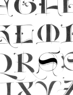 French type designer (b. 1948) who was born in the South of France. He studied typography, calligraphy and painting at the School of Fine Arts in Toulouse. He received the Prix Charles Peignot in 1982. In 1992, the President of France invited him to design the inscriptions for the royal tombs in the Basilique Saint Denis in Paris. He published Calligraphie (Imprimerie Nationale, 1993). Author of Calligraphy (Wommelgem, Belgium, 1996) and Histoire de la calligraphie française (Albin Michel, 2006; examples here). In 2009, with the help of Atelier des Signes, he created a typeface for the signage at Chateau de Fontainebleau. Additional URL. In 2010, Mediavilla cofounded Media type Foundry with Sonia Da Rocha and Joel Vilas Boas in Paris.
 His typefaces: - Galba: an elegant roman titling face, done at Mecanorma in 1987.
- Media Script (Mecanorma, 1985).
- Mediavilla (CCT, 1976).
- Mediavilla Script (Graphitel, 1986).
- Palazzo (Mecanorma, 1984).
- Tory (1991).
Examples of calligraphic alphabets drawn by him and shown in his Histoire de la calligraphie française (2006): Bastarda, Cancellaresca, Carolingian, Cursive gothic 1410, Luxeuil, Roman Capitals, Roman cursive 1st century, Roman cursive 4th century, Rustica 1st century, Textura 14th century, Textura 15th century, , Tourneure 15th century, Uncial 4th century. Klingspor link. [Google]
[MyFonts]
[More] ⦿
|
Dan X. Solo: Digitizations by Dick Pape
[Dick Pape]
|
Dick Pape based the following digitizations (2008-2010) of blackletter, art deco, Celtic, initial caps, and other ornamental typefaces shown by Dan X. Solo in his Dover books: DXSAlphaMidnight, DXSAlphaTwilight, DXSBeansBold, DXSBlackline (prismatic, art deco), DXSBoboBold, DXSBrusselsInitials, DXSBuckinghamInitials, DXSBust, DXSCharger, DXSCheckmate, DXSCorral, DXSDevon, DXSDevonian, DXSDudleyPNarrow, DXSFatCat, DXSFestival, DXSFrankfortInitials, DXSFuturaInline, DXSGrooviestGothic, DXSGuildhall, DXSHessNeobold, DXSHotline, DXSHuntingtonInitials, DXSJoyceBlack, DXSKupferInitials, DXSLampoon, DXSLeipzigInitials, DXSLeister, DXSLowenbrau, DXSMonogramStencil, DXSMonumentBold, DXSNottinghamInitials, DXSOrbit, DXSOttoHuppInitials, DXSPickfair, DXSPolly, DXSPotsdamInitials, DXSPrismaniaC, DXSPrismaniaP, DXSQuote, DXSRegalBlack, DXSRhythmBold, DXSRickyTick, DXSRoco (art deco), DXSSansSouci, DXSShadyDeal, DXSSheetSteel, DXSSilverShadowBlack, DXSStuttgartInitials, DXSTester, DXSThedaBara (counterless geometric art deco), DXSTulo, DXSTuxedo, DXSUrban (psychedelic), DXSVeronica, DXSWestmorland, DXSWienText, DXSYagiBold.bmp DXSYagiDouble, DXSYorkshireInitials, DXSZany, DXSZephyr. Images: DXSBlackline, DXSBust, DXSDudleyPNarrow, DXSGrooviestGothic, DXSJoyceBlack, DXSMonogramStencil, DXSPrismania'P', DXSRickyTick, DXSRoco, DXSSheetSteel, DXSTulo, DXSUrban, DXSYagiDouble, DXS Alpha Twilight, DXS Brussels Initials, DXS Kupfer Initials, DXS Lowenbrau, DXS Otto Hupp Initials, DXS Theda Bara, DXS Urban. Download page. [Google]
[More] ⦿
|
Dave Fabik
|
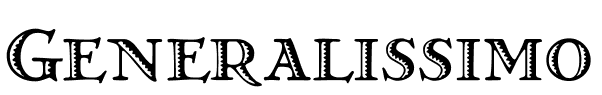 From Portland, OR, Dave Fabik's free truetype fonts. Includes fonts such as Slipstream, Willow (1995, Rennie Mackintosh style lettering), DungeonBlocksFilled (1995), GrekoDeco (1992, based on El Greco Adornado by Fundicion Richard Gans), SableBrush, RoughBrush, Zoom, Quainte, DeRoos Caps (Lombardic).
 Dafont link. Abstract Fonts link. [Google]
[More] ⦿
|
David Clegg
[The 1477 Font Foundry]
|
 [More] ⦿
|
David Fleming Nalle
[Scriptorium (Ragnarok Press, Fontcraft)]
|
 [MyFonts]
[More] ⦿
[MyFonts]
[More] ⦿
|
David Kettlewell
[New Renaissance Fonts (was: New Fontografia, or: David's Fontografia 2006)]
|
[MyFonts]
[More] ⦿
|
Dick Pape
[Dan X. Solo: Digitizations by Dick Pape]
|
[More] ⦿
|
Dick Pape
[Clarence Pearson Hornung]
|
 [More] ⦿
|
Doug Larson
[Illustration Ink (was: Lettering Delights)]
|
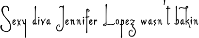 [MyFonts]
[More] ⦿
[MyFonts]
[More] ⦿
|
DSA und SR Site
|
Archive: BookAntiqua-BoldItalic, BookAntiqua-Italic, AvalonQuestRegularSWFTE, BadAcid, CelticHand, EmperorsScrawl, FrankensteinPlain, Ginko, HORROR, Jolt, KnightsQuest, Lombardic, OldEnglishNormal, Stinger, Tolkien, Baphomet, MariageNormal, CelticmdDecorativeWDropCaps, Diploma, Dragonwick, GargoyleSSi, KellyAnnGothic, LcdD, PapyrusLetPlain. [Google]
[More] ⦿
|
Electric Typographer
[Judith Sutcliffe]
|
Judith Sutcliffe (Audubon, IA) is the Electric Typographer (est. 1986, Santa Barbara, CA). She has made absolutely exquisite highly original typefaces, which are sold by many foundries and vendors, including Will-Harris. Her typefaces: Abelard (1988, mediaeval), LeonardoHand (Da Vinci's handwriting--greeeeaaaat), Lutahline (clean hand-printed family), ArabiaFelix, Petroglyph (nice dingbat series), AuntJudy, BlockParty, PetroglyphHawaii, ItalianAElectric, TaglienteInitials (another great calligraphic font), TommysType (letters on a clothesline), Kiilani, and Troubador (1988-1989, mediaeval) and Troubador Initials (1989). Atomic Type sells her fonts. Other fonts: Petroglyph Hawaii (1993), Daylilies, Greene, GreeneGreene, Insecta, Leaves, OldstyleChewed, Finfont, Flourish, Hawaii Set, Maskerade, Santa Barbara Electric (1989, a Lombardic / uncial face; + Barbara Svelte, + Barbara Plump), Schampel, Electric Stamps, Daly Hand, Kiilani, Mesopotamia (1992). Emodigi site. At Will-Harris House, we find these fonts by Judith Sutcliffe: Catastrophe, Tommy, Daly Hand and Daly Text (based on the casual calligraphy of Pacific Northwest artist George Daly), Finfont (fish), Daylilies, Leaves, Flourish (calligraphic family), Greene&Greene (architectral lettering), a Hawaiian set consisting of Kiilani, Hibiscus (alphadings), and RockArt dingbats, Insecta (dings), Oldstyle Chewed, Leonardo (neat handwriting of DaVinci simulated), Petroglyphs, Schampel (blackletter), Serpent, Maskerade (masks), Tagliente (nice old-fashioned lettering and caps). FontShop link. Another FontShop link. Klingspor link. [Google]
[MyFonts]
[More] ⦿
|
Eric Chimenti
|
Tustin, CA-based illustrator who created a wonderful Lombardic logotype called Siena in 2012. Behance link. [Google]
[More] ⦿
|
Ethan Paul Dunham
[Fonthead Design]
|
[MyFonts]
[More] ⦿
|
Flat-It
[Ryoichi Tsunekawa]
|
 Japanese foundry in Nagoya that offers free and commercial Latin fonts made by Ryoichi Tsunekawa, who also runs Bagel & Co, Dharma Type, HolidayType and Prop-A-Ganda. Most of his work was done at Flat-It. His typefaces:
 - 2021: Best Choice (a monospaced sans), Short Films (an art deco sans in twelve styles), Golden Decades (a 16-style sans that borrows from several sans genres).
- 2019: Mid Century Sans, Tamba Sans, Rama Gothic Rounded, Bio Sans Soft.
- 2018: Fairweather (clean sans), Kaneda Gothic (a basic severe condensed gothic), Vincente (a tall condensed display didone family).
- 2017: Calling Code (monospaced programming font), Commuters Sans (elegant wide sans), Mighty Slab, Rigid Square (octagonal), Taro.
- 2016: Bio Sans, Gomme Sans, Quiet Sans, Siro (sans).
- 2014: Pero (condensed rounded organic sans), Kiro (minimalist organic sans), Graphie (modern geometric sans), Compasse (semi-condensed sans), Como (rounded sans).
- 2013: Spoon (organic, rounded, monoline sans family), Antoinette Monogrammes (based on early 1900s embroideries by Janon Co; with frames), Clonoid (a sci-fi family that pays tribute to arcade game logos in 80s and 90s), All Round Gothic Demi (a sans based on perfect circles), Griffon (copperplate titling face), Antique Spenserian (based on Spencerian Script by Mackellar, Smiths and Jordan).
- 2012: Geom Graphic (a retro sci-fi family that can be considered as a squarish version of Eurostile), Sheepman (modular), House of Cards, Space Colony (a lovely monoline futuristic techno family), Rama Slab (an antiqued wood-style slab serif), Rama Gothic. An antiqued sans serif family that recalls the wood type era), Diamond Ring (an art deco typeface inspired by Japanese cosmetics-packaging designs and posters from the late 19th and early 20th centuries), Controller (techno meets organic in this rounded squaris sans family), Revolution Gothic (an extended version of PAG Revolucion), 2008, which was inspired by retro propaganda posters and wallpainting in Cuba from the 60s to 80s; Revolution Gothic P followed in 2014), Diamond Ring (art deco).
- 2011: Yummo (monoline organic sans), Sheepman (based on the wood type No. 506 of William Page), Onick (2011, an art deco neojaponist fat display face done for Wordshape), Shiva (2011, hairline sans), Mocha Mattari (2011, grunge), Dharma Slab (2011, inspired by 1800s-style wood type), Dharma Gothic (2011, +P), Rama Gothic (2011, also inspired by 1800s-style wood type), Dimensions (2011, squarish), Design System (2011, a large family based on 70s style techno typefaces), Speedometer (2011, condensed piano key face).
- 2010: Stereo Gothic (2010: an extended all caps slightly techno sans family), Behrensmeyer Vigesimals (2010, a pixel format connected script), Civilite Vigesimals (2010, pixelized Civilite), Flat10 Arts and Crafts (2010), Flat20 Hippies, Flat10 Segments (2010), Flat10 Antique (2010), Flat20 Gothic (2010), Flat20 Streamer (2009, pixelized ribbon font), Flat10 Fraktur, Flat10 holy, Flat10 Holly, Flat10 Stencil, Flat20 Headline, Flat10 Artdeco, Word From Radio (2008-2010). Cigarette (2007, Bauhaus/Peignot-style).
- 2009: African Elephant Trunk (2009), Concrete Script, Concrete Stencil (2009, a stencil calligraphic script), Perfect Magic (2009), HT Maison (2009, signage face), HT Farmacia (2009, connected school script), HT Espresso (2008, upright script), HT Cartoleria (2008, connected script), HT Cafe (2009), Sneaker Script (2009).
- 2007-2008: Bistro Mono (2007, an awkward monoline face), Thousands (2007), Balaghat (2008), Garash Script (2008, a Halloween face), Woodstamp (2008), Banana (2008, brush script), Rebel Train Goes (2007, a piano key font), Rouge (2007, an elegant lipstick-on-the-bathroom-mirror pair of typefaces), Yasashii (2007, a great geometric art deco Broadway-style family, famous for being used in Damien Chazelle's La La Land, the 2017 blockbuster movie), Lily Wang (calligraphic script), Nothing (2007), Garash (2007, Arabic simulation), Moon Star Soul (2007, Western saloon font), Grandes Vacances (+ Une, Deux) (2007), Pansy Bo (calligraphic), Dremie (2007, an art deco headline typeface with Open and Fill weights), Grandes Vacances (2007, based on 19th century billboard letters), Xesy (2007, a fantastic "ronde" high-contrast upright connected script), Deluta Black (2007, a soft blackletter), Cotoris (2007, a 4-style family that takes inspiration from Koch Antiqua and the art nouveau movement).
- 2006: Daisy Lau (calligraphic), Agedage Luxeuil (based on a monasteric script from the 8th century), Agedage Cancellaresca, Agedage Beneventan, Agedage Simple Versal (2006, Lombardic caps simplified), Amsterdam Modern (art nouveau influences), Flat10 [Holly, Holy, Stencil, Fraktur] (a set of pixel typefaces), Machiarge (a heavy connected brushed signage script), Chic Hand (connected script), Double Dagger (geometric stencil family), Fault (an art deco striped lettering face), Killernuts (headline serif typeface with brush stroke endings), Underconstructionism! (a rectangular look family with associated dingbats), Machia (decorative script), Kiwi (geometric hairline), Bagel (roundish comic book face), Jaguarundi (distressed), Boycott (distressed), Tokyotrail (futuristic techno family), Coconut (noisy outline face), Coconut Split, Fresh Tomato (LED simulation), El Piedra (letterpress emulation), Dried Tomato (LED simulation), Dutch Style, Mocha Harrar (great stencil face), 103 (experimental, Bank Gothic style), Airhead, ArealBlack, Awkward, BagelNew, BagelOld, Banbino, Bebas (2005, industrial sans), Bebas Kai (2014: free!), Bebas Neue (2010: free!), Bebas Neue Bold, Berlin89, Blackout (redesigned in 2011 as the ulta-narrow Dimensions), Boycott (grunge), Built-1970, Bunyan, Busted, Camera (2007), Canstop, Chiangmai (Thai simulation face), DBLline, Dijkstra, Dutchstyle, Fling, Graphite, Harcomaso, Hiexplosive, Hitech, Honeycomb, Junkmix, Kanatypo, KemikalHi, Machia (a calligraphic family), Meegoreng, Mikrob, Natsupopy, Overwork, Palsu, Plamo, Plasitico, REC001, REC002, REC003, Resistance, SQRT, STdigi (LED font), Shandy, Superstar, Tembaga, Tenaga, Tomodachi, Tragedia, Trucker, VRdigital, VRembroidery, Welcome2M, Workaholic, Zeebraa, plot-A, plot-K, Appendix 3, Gesso (grunge), Pusab (ultra round; one free weight), Sushitaro, Typewrong, Celtics Modern (a Celtic family of fonts). At T-26, he published CRZ (2006), Guppy, Ohana (octagonal), Picnica (2006), and Wearetrippin.
MyFonts link. Fontsquirrel link for their free fonts such as Bebas (2005, industrial sans), Boycott, Gesso, and Pusab. Typefaces from 2022: Senpai Coder, Madromit (a layerable futuristic font inspired by the early computer fonts), Tokyo Olive (art deco), Poipoi (a layerable 3d or bubblegum font). YWFT link. Bagel & Co. link. Klingspor link. Dafont link. Dafont link. Interview. View Ryoichi Tsunekawa's typefaces. Kernest link. Adobe link. [Google]
[MyFonts]
[More] ⦿
|
Fonthead Design
[Ethan Paul Dunham]
|
 FontHead Design (Wilmington, DE) sells cool fonts designed by Ethan Dunham (b. 1972, Glens Falls, NY), who now heads Fontspring. A partial list: Mother Goose (2008), Allise, GoodDogCool, Fontheads (dingbats), Randisious, Greyhound (1997, an arts and crafts face), Rochester, Samurai, AsimovSans, Gurnsey20, Scrawl, BadDog, Holstein, SlackScript, Bessie, SloppyJoe (gone?), Blearex, HandSkriptOne, SmithPremier, BlueMoon, HolyCow, SororityHack, Bonkers, HotCoffeeFont, SpillMilk, BraveWorld, Isepik, Sputnik, Brolga, TekStencil, Carnation, Mekanek (1995), Teknobe (1995), Merlin, Toucan Grunge (gone?), Tycho, TypewriterOldstyle, MotherGoose, Croissant, Democratika (now Americratika--I think Emigre forced FontHead to change the name), Noel (1996-1997, Lombardic all caps face, with an open version added), LillaFunk (gone?), Margo Gothic (gone?), Toddler (gone?), NoelBlack, WashMe, Diesel, Orion, Gritzpop, Pesto, BattleStation, CircusDog, Dandelion, DraftHand, Flowerpot, Navel, ShoeString, Stiltskin, ZipSonik. Plus JohnDoe, and old typewriter font. Free fonts: Font Heads (dings), Smith Premier, Vladimir, Tycho, Typewriter Oldstyle, ScareCrow, Millennia, SpillMilk, GoodDog, Holstein, Red Five. All formats, Mac and PC. In the comic font series, look for Stan Lee (now Comic Talk), FH Excelsior (now Titlex), Grimmy (now Flim Flam), and Kirby (now Grit).
 Dafont link. Fonts created in 1999: AppleSeed, Caterpillar, Chinchilla, ChinchillaBlack, ChinchillaDots, CrowBeak, CrowBeakLight, CyberMonkey, DanceParty, DingleHopper, FourScore, FourScoreTitling, Hopscotch, HopscotchPlain, Ladybug, Leaflet-Regular, LeafletBold, LeafletLight, ReadOut, ReadOutSuper, Smoothie, Swizzle, TwoByFour, VeryMerry. Made in 2001: ButterFinger, ButterFingerSerif, CatScratch, Catnip, FighterPilot, FrenchRoast, Handheld, HandheldItalic, HandheldRaised, HandheldRaisedItalic, HandheldRound, HandheldRoundItalic, Kingdom, OldGlory, Quadric, QuadricSlant. MyFonts page. In 2006, several dingbats fonts were added, such as the ClickBits Arrow series and the ClickBits Icon series. In 2008, he created InfoBits Things and InfoBits Symbols, Abigail, Assembler, Click Clack, Drawzing (children's font, crayon or chalk style), El Franco (grunge), Good Dog New (hand-printed), Helion (futuristic), Lead Paint (brush), Schema (architectural lettering), Skizzors (paper cut font), Tachyon (2008, techno, futuristic). Free font download. This place has Allise, Americratika, AppleSeed, AsimovSans, Asterix-Blink-Italic, Asterix-Blink, Asterix-Italic, Asterix-Light-Italic, Asterix-Light, Asterix, BadDog, BattleStation, Beckett, Bessie, BlackBeard, Blearex, BlueMoon, Bonkers, BraveWorld, Brolga, BrownCow, Carnation, CatScratch, Caterpillar, Chinchilla, ChinchillaBlack, ChinchillaDots, CircusDog, CornDog (2004), Croissant, CrowBeak, CrowBeakLight, CyberMonkey, DanceParty, Dandelion, Dannette-Outline, Dannette, DayDream, Democratika, Diesel, DingleHopper, DoomsDay, DraftHand, Flowerpot, Font-Heads, FourScore, FourScoreTitling, FunkyWestern, Goliath, GoodDog-Bones, GoodDog-Cool, GoodKitty, Greyhound, Grimmy, Gritzpop, GritzpopGrunge, Gurnsey20, HandskriptOne, Holstein-Bold, Holstein, HolyCow, Hopscotch, HopscotchPlain, HotCoffeeFont, HotTamale, Isepik, JohnDoe, JollyJack, Keener, Klondike-Bold, Klondike, Ladybug, Leaflet-Regular, LeafletBold, LeafletLight, LillaFunk, Log Jam (+Inline), MargoGothic, MarvelScript, MatrixDot-Condensed, MatrixDot, Mekanek, Merlin, Millennia, Mondo-Loose, MotherGoose, Navel, Network, Noel, NoelBlack, Oatmeal, Orion, Pesto, Randisious, ReadOut, ReadOutSuper, RedFive, Rochester, Samurai, Scarecrow, Scrawl, ShoeString, ShoeStringRound, SlackScript, SloppyJoe, SmithPremier, Smock, Smoothie, SororityHack, SpaceCowboy, SpillMilk, Sputnikk, StanLee-Bold, StanLee-BoldItalic, StanLee-Regular, Stiltskin, Submarine, Swizzle, TekStencil, Teknobe, Torcho, ToucanGrunge, TwoByFour, Tycho, Typewriter2, TypewriterOldstyle, VeryMerry, Vladimir, WashMe, Watertown-Alternate, Watertown-Black, Watertown-Bold, Watertown, ZipSonik-Italic, ZipSonik, ZipSonikSketch-Italic, ZipSonikSketch. Font Squirrel carries ElliotSix (simple handwriting), GoodDog (children's hand) and Millennia (squarish). In fact, in 2009-2010, Ethan Dunham became a very active web font persona, offering a commercial web font service, Fontspring, and a free font service, Fontsquirrel. Klingspor link. Creative Market link. [Google]
[MyFonts]
[More] ⦿
|
Fonts101: Lombardic
|
Fonts101 archived free fonts related to Lombardic. [Google]
[More] ⦿
|
Frederic Goudy: Digital typefaces
|
 A list of various digital typefaces that are based on Frederic Goudy's designs. The digital revivals include these fonts: Berkeley Oldstyle (Adobe), Goudy Old Style (Bitstream), LTC Goudy Oldstyle (Lanston Type Company), Copperplate (URW++), Copperplate Gothic (Linotype), LTC Pabst Oldstyle (Lanston Type Company), Goudy Handtooled (Monotype), Goudy Old Style (Monotype), LTC Goudy Ornate (Lanston Type Company), Italian Old Style (Monotype), Copperplate Gothic (Adobe), Goudy Ornate MT (Monotype), LTC Record Title (Lanston Type Company), LTC Goudy Text (Paul D. Hunt for Lanston Type Company; this includes LTD Goudy Text Lombardic Caps), LTC Goudy Initials (Lanston Type Company), LTC Remington Typewriter (Lanston Type Company), WTC Goudy Swash (URW++), LTC Kennerley (Lanston Type Company), LTC Deepdene (Lanston Type Company), Goudy Modern MT (Adobe), Hadriano (Monotype), Hadriano (Adobe), LTC Californian (Lanston Type Company), LTC Goudy Open (Lanston Type Company), Goudy Text (Monotype), Goudy Text (Adobe), LTC Goudy Handtooled (Lanston Type Company), Cloister Initials (GroupType), Hadriano (Linotype), LTC Camelot (Lanston Type Company), LTC Village No 2 (Lanston Type Company), LTC Powell (Lanston Type Company), LTC Forum Title (Lanston Type Company), Copperplate EF (Elsner+Flake), Goudy Handtooled EF (Elsner+Flake), Goudy Sorts (Monotype), ITC Berkeley Oldstyle (ITC), Goudy Trajan Pro (CastleType), Village (Font Bureau), Copperplate Gothic (Bitstream), Goudy Modern MT (Monotype), Copperplate Gothic Hand (Wiescher Design), Goudy Heavyface (Bitstream), Goudy Forum Pro (Ascender), LTC Goudy Sans (Lanston Type Company), Tickety Boo NF (Nicks Fonts), Friar Pro (Ascender), Franciscan Caps NF (Nicks Fonts), Scripps College Old Style (Monotype), Bertham Pro (Ascender), LTC Goudy Extras (Lanston Type Company), LTC Hadriano (Lanston Type Company), Goudy Stout CT (CastleType), National Oldstyle NF (Nicks Fonts), ITC Goudy Sans (1986, ITC), Goudy Handtooled (Linotype), LTC Italian Old Style (Lanston Type Company), Monotype Goudy (Monotype), Goudy Catalogue (Linotype), Goudy Catalogue (Bitstream), Goudy 38 (Red Rooster Collection), LTC Kaatskill (Lanston Type Company), Monotype Goudy Catalogue (Monotype), LTC Garamont (Lanston Type Company), Goudy Catalogue EF (Elsner+Flake), Californian FB (Font Bureau), Goudy Handtooled (Bitstream), Kennerley BQ (Berthold), Deepdene BQ (Berthold). [Google]
[More] ⦿
A list of various digital typefaces that are based on Frederic Goudy's designs. The digital revivals include these fonts: Berkeley Oldstyle (Adobe), Goudy Old Style (Bitstream), LTC Goudy Oldstyle (Lanston Type Company), Copperplate (URW++), Copperplate Gothic (Linotype), LTC Pabst Oldstyle (Lanston Type Company), Goudy Handtooled (Monotype), Goudy Old Style (Monotype), LTC Goudy Ornate (Lanston Type Company), Italian Old Style (Monotype), Copperplate Gothic (Adobe), Goudy Ornate MT (Monotype), LTC Record Title (Lanston Type Company), LTC Goudy Text (Paul D. Hunt for Lanston Type Company; this includes LTD Goudy Text Lombardic Caps), LTC Goudy Initials (Lanston Type Company), LTC Remington Typewriter (Lanston Type Company), WTC Goudy Swash (URW++), LTC Kennerley (Lanston Type Company), LTC Deepdene (Lanston Type Company), Goudy Modern MT (Adobe), Hadriano (Monotype), Hadriano (Adobe), LTC Californian (Lanston Type Company), LTC Goudy Open (Lanston Type Company), Goudy Text (Monotype), Goudy Text (Adobe), LTC Goudy Handtooled (Lanston Type Company), Cloister Initials (GroupType), Hadriano (Linotype), LTC Camelot (Lanston Type Company), LTC Village No 2 (Lanston Type Company), LTC Powell (Lanston Type Company), LTC Forum Title (Lanston Type Company), Copperplate EF (Elsner+Flake), Goudy Handtooled EF (Elsner+Flake), Goudy Sorts (Monotype), ITC Berkeley Oldstyle (ITC), Goudy Trajan Pro (CastleType), Village (Font Bureau), Copperplate Gothic (Bitstream), Goudy Modern MT (Monotype), Copperplate Gothic Hand (Wiescher Design), Goudy Heavyface (Bitstream), Goudy Forum Pro (Ascender), LTC Goudy Sans (Lanston Type Company), Tickety Boo NF (Nicks Fonts), Friar Pro (Ascender), Franciscan Caps NF (Nicks Fonts), Scripps College Old Style (Monotype), Bertham Pro (Ascender), LTC Goudy Extras (Lanston Type Company), LTC Hadriano (Lanston Type Company), Goudy Stout CT (CastleType), National Oldstyle NF (Nicks Fonts), ITC Goudy Sans (1986, ITC), Goudy Handtooled (Linotype), LTC Italian Old Style (Lanston Type Company), Monotype Goudy (Monotype), Goudy Catalogue (Linotype), Goudy Catalogue (Bitstream), Goudy 38 (Red Rooster Collection), LTC Kaatskill (Lanston Type Company), Monotype Goudy Catalogue (Monotype), LTC Garamont (Lanston Type Company), Goudy Catalogue EF (Elsner+Flake), Californian FB (Font Bureau), Goudy Handtooled (Bitstream), Kennerley BQ (Berthold), Deepdene BQ (Berthold). [Google]
[More] ⦿
|
Frederic William Goudy
[Goudy's typefaces]
|
[More] ⦿
|
Gary Munch
[MunchFonts]
|
[MyFonts]
[More] ⦿
|
Gebr. Klingspor: Schriftkartei
|
 In 1950, Gebr. Klingspor published a nice small booklet simply called Schriftkartei. The images below are from that book. [Google]
[More] ⦿
In 1950, Gebr. Klingspor published a nice small booklet simply called Schriftkartei. The images below are from that book. [Google]
[More] ⦿
|
Geofroy Tory
|
 Also Maistre Geofroy Tory de Bourges. Parisian printer, designer and engraver, 1480-1533. As designer and engraver he produced beautiful initials, borders, and illustrations. In Champ-fleury, auquel est contenu l'art et science de la vraie proportion des lettres antiques selon le corps et visage humain (Gilles de Gourmond, Paris, 1529), Geoffroy Tory compared the proportions in letters to proportions in the human body. The books treats the design of roman capitals and is critical of the work of Dürer. It was translated in English by George B. Ives, New York, in 1927. There also exists a facsimile, with introduction by John Jolliffe. East Ardsley, dated 1970. He was rewarded by François I with the title of Imprimeur du Roi in 1531.
 Octavo.com sells a CD of the original book. You can also view the text on-line. Essay in Spanish on his life. Page at Columbia University. A French thesis on Geoffroy Tory. PDF of Champ Fleury. Scans, images: Letter I superimposed on a human face, Lettres Fantastiques (caps made from tools), [continued], Lettres Imperialles et Bullatiques (capitals), [continued], Lettres Tourneures (Lombardian capitals), Construction of an S, Construction of a Z, Construction of an A, his Lettres Latines alphabet, Cadeaulx (blackletter caps), [continued]. There have been rather few attempts at making a typeface based on Tory's drawings from Champ Fleury. Gilles Le Corre (GLC) created 1529 Champ Fleury Initials (2010) for example. The text of that book, which was printed by Gilles de Gourmond in Paris, led Gilles Le Corre to develop the rough typeface 1529 Champ Fleury Pro. Christian Küsters designed AF Champ Fleury (1996). Michael Jacoby based his Vitruvia Titling (2016) on the Champfleury typeface. [Google]
[MyFonts]
[More] ⦿
|
Georg Giesecke
|
Georg Giesecke, of Schelter&Giesecke in Leipzig, patented many of their typefaces in the USA. A partial list (with PDFs of the patents): Akantrea (1883), Angel Caps (1888), Border Series 73 (1887), Boxed Alphabet (1881), Celtic Caps (1883), Gothic Initials (1883), Initials (1889), Italian renaissance 1883), Kartuschen Einfassung Serie 72 (1887), Lombardic (1885), Ornaments (1878), Script (1887), Shieldface A (1881), Shieldface Combination Pieces (1881), Silhouette Border Series 63 (1884), Zierschrift 1400 (1889). Ralph Unger says that his RMU Pergola was inspired by one of Georg Giesecke's designs. [Google]
[More] ⦿
|
George Williams
|
 George Williams's site (now defunct) site was a discovery! George Williams (b. 1959) wrote spline-generating code and then went on to produce several fonts with his software between 1987 and 1998:
 - Art nouveau style: Carmen, Ambrosia (1989), Fantaisie Artistique, Baldur, Monopol, Parisian, Peignot, Bocklin, Edda.
- Lombardic: Lombardic.
- Victorian: Caprice, Ringlet.
- Uncial: Uncial Animals, Roman Uncial Modern.
- Ornamental caps: Versal, Decorative, Square Caps, Extravagant Capitals, Floral Caps, Morris, Andrade.
- Display typefaces: Crystal, Flash, Cupola, Santa Barbara Streets (2013-2014; after the street signs in Santa Barbara, CA).
- Blackletter: Rotunda (1998), Bastarda, Textura Modern, Fractur (a remake of Wittenbach).
- Art deco: Piccadilly, Mirage (1999, prismatic).
- Calligraphic: Humanistic.
- Text: Caslon.
- Slab: Monospace.
- Sans: Caliban.
- Bamboo Gothic (2007).
- TIS620-2529 (a Thai font).
George Williams writes: I have been slowly working to provide free unicode postscript fonts for the three major groupings of styles used by European (Latin, Greek and Cyrillic anyway) type designs: serif, sans-serif and typewriter (or Times, Helvetica and Courier). Monospace is my approximation to Courier. Close examination will reveal that it is a bad copy of courier. Caslon Roman (1992-2001) is a serif font (designed by William Caslon in 1734), it's not a bad copy of Times, it's a bad copy of something else. Caliban is a bad copy of Helvetica. If Microsoft can call their version of Helvetica Arial, then Caliban seems appropriate for mine. Yet another URL. George Williams is best known as the inventor and creator of FontForge, the biggest and best free font editor today. It made him the darling of the Open Software community. Interview with OSP. Fontspace link. Dafont link. Abstract Fonts link. [Google]
[More] ⦿
|
GG Design
|
 Maryland-based graphic and type design company. Their typeface catalog in 2021 showed these fonts, most of which are ornaments or initial caps: Americana Ornaments, Angulatte, Art Nouveau Flowers, Art Nouveau Ornaments, Art Nouveau Ornaments, Birds Flying, Blooming Ornaments, Blue On Blue, Brashee, Bullish, Carefreed, Carved Initials, Charisma, Chiseled Initials, Cleancut, Cross Ornaments, Cross Stitch Basic, Cross Stitch Brazen, Cross Stitch Carefree, Cross Stitch Classic, Cross Stitch Coarse, Cross Stitch Cursive, Cross Stitch Delicate, Cross Stitch Diamond Monogram, Cross Stitch Discreet, Cross Stitch Display, Cross Stitch Elaborate, Cross Stitch Formal, Cross Stitch Gothic, Cross Stitch Graceful, Cross Stitch Majestic, Cross Stitch Medieval, Cross Stitch Monogram, Cross Stitch Noble, Cross Stitch Ornaments, Cross Stitch Regal, Cross Stitch Simple, Cross Stitch Solid, Cross Stitch Splendid, Dexterous, Diamond Monogram, Display Ardent, Display Art, Display Art One, Display Art Two, Display Black Serif, Display Brutal, Display Carlos, Display Chamfer, Display Crisp, Display Digits Eight, Display Digits Five, Display Digits Four, Display Digits Nine, Display Digits One, Display Digits Seven, Display Digits Six, Display Digits Ten, Display Digits Three, Display Digits Two, Display Dots & Squares, Display Dots Five, Display Dots Four Sans, Display Dots Four Serif, Display Dots One, Display Dots Seven, Display Dots Six, Display Dots Three Sans, Display Dots Three Serif, Display Dots Two Sans, Display Dots Two Serif, Display Explicit, Display Exquisite, Display, Display Gothic, Display Grungy, Display Haphazard, Display Intense, Display Plump, Display Prominent, Display Robust, Display Squares Two, Display Uncanny, Display University, Dooddle, Elegant Ornaments, Embossed Deep, Embossed Medium, Embossed Shallow, Fancy Flowers, Fast Hand, Fish Fresh, Flair Hand, Fleuron Ornaments, Floral Ornaments, Foliage Ornaments, Folk Art Flowers, GG Casual, GG Serif, Glorita, Gnarlee, Gothic Initials Eight, Gothic Initials Five, Gothic Initials, Gothic Initials Four, Gothic Initials Nine, Gothic Initials One, Gothic Initials Seven, Gothic Initials Six, Gothic Initials Three, Gothic Initials Two, Green On Green, Hand Lettered, HappyFont Hasty Hand, Heavy Duty, Heraldic Creatures, Holy Ornaments, Impossible Ornaments, Interlaced Ornaments, Isometric Initial Caps Bird's Eye, Isometric Initial Caps Worm's Eye, Isometric Ornaments, Just Bugs, Kruede, Leaf Assortment, Logotype, Magnificent Ornaments, Make Tracks, Mighty Oaks, Modest Ornaments, Neat Hand, Numbers Style One, Numbers Style Three, Numbers Style Two, Orange On Orange, Oriental Ornaments, Ornate Initials, Plant Assortment, Pleasant Hand, Precision, Printers Plant Ornaments, Pristine Light, Quilt Patterns Four, Quilt Patterns One, Quilt Patterns Three, Quilt Patterns Two, Rectilinear Ornaments, Rolling Ball Cursive, Rosette Ornaments, Serene, Shield Ornaments, Simple Serif, Slender, Smiling Faces, Snowflake Assortment, Spiral Ornaments, Sport Numbers, Star Assortment, Stature, Sweet Hand, Swiss Folk Ornaments Critters, Swiss Folk Ornaments Floral, Swiss Folk Ornaments -Geometric, Tight Hand, Time Clocks, Tree Assortment, Ultimate Ornaments, Veggie Fruit, Victorian Leaf Ornaments, Victorian Ornaments, Vigorous, White On White, Woozee. [Google]
[More] ⦿
Maryland-based graphic and type design company. Their typeface catalog in 2021 showed these fonts, most of which are ornaments or initial caps: Americana Ornaments, Angulatte, Art Nouveau Flowers, Art Nouveau Ornaments, Art Nouveau Ornaments, Birds Flying, Blooming Ornaments, Blue On Blue, Brashee, Bullish, Carefreed, Carved Initials, Charisma, Chiseled Initials, Cleancut, Cross Ornaments, Cross Stitch Basic, Cross Stitch Brazen, Cross Stitch Carefree, Cross Stitch Classic, Cross Stitch Coarse, Cross Stitch Cursive, Cross Stitch Delicate, Cross Stitch Diamond Monogram, Cross Stitch Discreet, Cross Stitch Display, Cross Stitch Elaborate, Cross Stitch Formal, Cross Stitch Gothic, Cross Stitch Graceful, Cross Stitch Majestic, Cross Stitch Medieval, Cross Stitch Monogram, Cross Stitch Noble, Cross Stitch Ornaments, Cross Stitch Regal, Cross Stitch Simple, Cross Stitch Solid, Cross Stitch Splendid, Dexterous, Diamond Monogram, Display Ardent, Display Art, Display Art One, Display Art Two, Display Black Serif, Display Brutal, Display Carlos, Display Chamfer, Display Crisp, Display Digits Eight, Display Digits Five, Display Digits Four, Display Digits Nine, Display Digits One, Display Digits Seven, Display Digits Six, Display Digits Ten, Display Digits Three, Display Digits Two, Display Dots & Squares, Display Dots Five, Display Dots Four Sans, Display Dots Four Serif, Display Dots One, Display Dots Seven, Display Dots Six, Display Dots Three Sans, Display Dots Three Serif, Display Dots Two Sans, Display Dots Two Serif, Display Explicit, Display Exquisite, Display, Display Gothic, Display Grungy, Display Haphazard, Display Intense, Display Plump, Display Prominent, Display Robust, Display Squares Two, Display Uncanny, Display University, Dooddle, Elegant Ornaments, Embossed Deep, Embossed Medium, Embossed Shallow, Fancy Flowers, Fast Hand, Fish Fresh, Flair Hand, Fleuron Ornaments, Floral Ornaments, Foliage Ornaments, Folk Art Flowers, GG Casual, GG Serif, Glorita, Gnarlee, Gothic Initials Eight, Gothic Initials Five, Gothic Initials, Gothic Initials Four, Gothic Initials Nine, Gothic Initials One, Gothic Initials Seven, Gothic Initials Six, Gothic Initials Three, Gothic Initials Two, Green On Green, Hand Lettered, HappyFont Hasty Hand, Heavy Duty, Heraldic Creatures, Holy Ornaments, Impossible Ornaments, Interlaced Ornaments, Isometric Initial Caps Bird's Eye, Isometric Initial Caps Worm's Eye, Isometric Ornaments, Just Bugs, Kruede, Leaf Assortment, Logotype, Magnificent Ornaments, Make Tracks, Mighty Oaks, Modest Ornaments, Neat Hand, Numbers Style One, Numbers Style Three, Numbers Style Two, Orange On Orange, Oriental Ornaments, Ornate Initials, Plant Assortment, Pleasant Hand, Precision, Printers Plant Ornaments, Pristine Light, Quilt Patterns Four, Quilt Patterns One, Quilt Patterns Three, Quilt Patterns Two, Rectilinear Ornaments, Rolling Ball Cursive, Rosette Ornaments, Serene, Shield Ornaments, Simple Serif, Slender, Smiling Faces, Snowflake Assortment, Spiral Ornaments, Sport Numbers, Star Assortment, Stature, Sweet Hand, Swiss Folk Ornaments Critters, Swiss Folk Ornaments Floral, Swiss Folk Ornaments -Geometric, Tight Hand, Time Clocks, Tree Assortment, Ultimate Ornaments, Veggie Fruit, Victorian Leaf Ornaments, Victorian Ornaments, Vigorous, White On White, Woozee. [Google]
[More] ⦿
|
Gilles Le Corre
[GLC --- Gilles Le Corre]
|
 [MyFonts]
[More] ⦿
[MyFonts]
[More] ⦿
|
GLC --- Gilles Le Corre
[Gilles Le Corre]
|
 French painter born in Nantes in 1950, who lives in Talmont St Hilaire. His fonts include 2010 Cancellaresca Recens (inspired by a chancery type of Francisco Lucas from the late 16th century), 2009 Handymade (comic book style), 2009 Lollipop (chancery style), 2009 GLC Plantin, 2009 Primitive (2009, a rough-edged roman script), 2008 Script 2 (2008), GLC Ornaments One (2008) and 2008 Xmas Fantasy (2008: blackletter). In 2008, he started GLC -- Gilles Le Corre and became commercial. Creative Market link. He is best known for his historic revivals:
 - 161 Vergilius (2010)
- 750 Latin Uncial (2010): inspired by the Latin script used in European monasteries from circa 5th to 8th, before the Carolingian style took over. The uppercases were mainly inspired by a 700's manuscript from Fécamp's abbey in France.
- 799 Insular (2010): inspired by the so-called insular style of Latin script that was used in Celtic monasteries from about 600 until 820.
- 825 Karolus (2009), and 825 Lettrines Karolus (2009).
- 1066 Hastings (2009).
- 1350 Primitive Russian (2012) was inspired by a Russian Cyrillic hand of Russkaja Pravda. It has rough-edged Latin charaters and many old Russian glyphs.
- 1420 Gothic Script (2008).
- 1431 Humane Niccoli (2010), after writings of Florence-based calligrapher Niccolo Niccoli (1364-1437).
- 1456 Gutenberg (2008, based on a scan of an old text). Followed by 1456 Gutenberg B42 Pro, which was based on the so called B42 character set used for the two Gutenberg Latin Bibles (42 and 36 lines).
- 1462 Bamberg (2008).
- 1467 Pannartz Latin (2009): inspired by the edition De Civitate Dei (by Sanctus Augustinus) printed in 1467 in Subiaco by Konrad Sweynheym and Arnold Pannartz, who was the punchcutter.
- 1470 Sorbonne (2010) was inspired by the first French cast font, for the Sorbonne University printing shop. The characters were drawn by Jean Heynlin, rector of the university based on examples by Pannartz. It is likely that the cutter was Adolf Rusch.
- 1470 Jenson-SemiBold (2008).
- 1475 BastardeManual (2008, inspired by the type called Bastarde Flamande, a book entitled Histoire Romaine (by Titus Livius), translated in French by Pierre Bersuire ca. 1475, was the main source for drawing the lower case characters).
- 1479 Caxton Initials (2009): inspired by the two blackletter fonts used by the famous William Caxton in Westminster (UK) in the late 1400s.
- 1483 Rotunda Lyon (2010): inspired by a Venetian rotunda found in a 1483 book called Eneide printed in Lyon by Barthélémy Buatier (from Lyon) and Guillaume Le Roy (from Liège, Belgium).
- 1484 Bastarda Loudeac (2008).
- 1470 Jenson Latin (2009), inspired by the pure Jenson set of fonts used in Venice to print De preparatio evangelica in 1470.
- 1491 Cancellarasca Normal and Formata (2009): inspired by the very well known humanist script called Cancellaresca. This variant, Formata, was used by many calligraphers in the late 1400s, especially by Tagliente, whose work was mainly used for this font.
- 1492 Quadrata (2008).
- 1495 Lombardes (2008): a redrawn set of Lombardic types, which were used in Lyon by printers such as Mathias Huss, Martin Havard or Jean Real, from the end of 14OOs to the middle of 1500s.
- 1495 Bastarde Lyon (2008, based on the font used in the "Conte de Griseldis" by Petrarque).
- 1499 Alde Manuce Pro (2010): inspired by the roman font used by Aldus Manutius in Venice (1499) to print Hypnerotomachia Poliphili, the well-known book attributed to Francesco Colonna. Francesco Griffo was the punchcutter. The Italic style, carved by Francesco Colonna, illustrates the so-called Aldine style.
- 1509 Leyden (2008; a Lombardic typeface inspired by the type used in Leyden by Jan Seversz to print Breviores elegantioresque epistolae).
- 1510 Nancy (2008, decorated initial letters was inspired by those used in 1510 in Nancy (France, Lorraine) for printing of Recueil ou croniques des hystoires des royaulmes d'Austrasie ou France orientale[...] by Symphorien Champion; unknown printer).
- 1512 Initials.
- 1514 Paris Verand (based on initial caps that Barthélémy Verand employed for the printing of Triumphus translatez de langage Tuscan en François.
- 1522 Vicentino (2011). Based on Ludovico Vicentino Arrighi's 1522 typeface published in La Operina.
- GLC 1523 Holbein (2010, after Hans Holbein's Alphabet of Death.
- GLC 1525 Durer Initials (2010). Sample R.
- 1529 Champ Fleury Pro and 1529 Champ Fleury Initials (2010): based on Geofroy Tory's original drawings and text face.
- 1532 Bastarde Lyon (2008, based on work by an anonymous printer in Lyon (France) to print the French popular novel Les Grandes et inestimables Chroniques du grand et enorme geant Gargantua).
- 1533 GLC Augereau Pro: inspired by one of Antoine Augereau's three roman typefaces: the Gros Romain size, used in 1533 to print Le miroir de l'&aciorc;me..., a poetic compilation by Marguerite de Navarre, sister of the French king François I.
- 1534 Fraktur (2009; inspired by the early Fraktur style font used circa 1530 by Jacob Otther, printer in Strasbourg (Alsace-France) for German language printed books).
- 1536 Civilité manual (2011). Based on a handwritten copy of Brief story of the second journey in Canada (1535) by French explorer Jacques Cartier.
- 1538 Schwabacher (2008, based on a font used by Georg Rhan in Wittemberg (Germany) to print Des Babsts Hercules [...], a German pamphlet against roman catholicism written by Johannes Kymeus).
- 1540 Mercator Script was inspired by an alphabet of Gerardus Mercator, who is known for his maps as well as his Literarum Latinarum, quas Italicas cursoriasque vocant, scribendarum ratio (1540).
- 1543 Humane Petreius (2012) was inspired by the typeface used in Nuremberg by Johannes Petreius for De Revolutionibus Orbium Coelestium, the well-known mathematical and astronomical essay by Nicolas Copernicus.
- 1543 German Deluxe (2009): a Schwabacher inspired by the sets of fonts used in 1543 by Michael Isengrin, printer in Basel, to print New Kreüterbuch, which is a book with numerous nice pictures, the masterpiece of Leonhart Fuchs, father of the modern botany.
- 1543 HumaneJenson-Bold (2008, after the typeface used in Vesalius' 1543 book De humani corporis fabrica).
- 1543 HumaneJenson-Normal (2008, same source).
- 1545 Faucheur (2011) is a rough garalde typeface that was inspired by the set of fonts used in Paris by Ponce Rosset, aka Faucheur, to print the story of the second travel to Canada by Jacques Cartier, first edition, printed in 1545.
- 1546 Poliphile (2009), inspired by the French edition of Hypnerotomachie de Poliphile ("The Strife of Love in a Dream") attributed to Francesco Colonna, 1467, and printed in 1546 in Paris by Jacques Kerver.
- 1550 Arabesques (2008, caps).
- 1557 Civilité Granjon (2010).
- 1557 Italique (2008, based on Italic type used by Jean de Tournes in Lyon to print La métamorphose d'Ovide figurée).
- 1565 Renaissance (2010), inspired by French renaissance decorated letters.
- 1565 Venetian Normal (2008, initial decorated letters that are entirely original, but were inspired by Italian renaissance engraver Vespasiano Amphiareo's patterns published in Venice ca. 1568).
- 1584 Rinceau (2008, a set of initial letters is an entirely original creation, inspired by French renaissance patterns used by Bordeaux printers circa 1580-1590).
- 1584 Pragmatica Lima (2011). Based on fonts used in 1584 by Antonio Ricardo to produce the first publication ever printed in Southern America.
- 1585 Flowery (2009): inspired by French renaissance decorated letters.
- 1589 Humane Bordeaux (2008, inspired by the Garamond fonts used by S. Millanges (imprimeur ordinaire du Roy) in Bordeaux ca. 1580-1590. The alphabets were used to reprint L'instruction des curés by Jean Gerson).
- 1590 Humane Warszawa is a rough-edged garalde typeface inspired by a font carved circa 1590 for a Polish editor.
- 1592 GLC Garamond (2008, inspired by the pure Garamond set of fonts used by Egenolff and Berner, German printers in Frankfurt, at the end of sixteen century. Considered the best and most complete set at the time. The italic style is Granjon's).
- 1610 Cancellaresca (2008, inspired by the Cancellaresca moderna type of 1610 by Francesco Periccioli who published it in Sienna).
- 1613 Basilius (2012) was based on the hand-drawn types used by Basilius Besler (Germany) for the carved plates of his botanical manual Hortus eystettensis.
- GLC 1619 Expédiée (2015). A grungy Civilté.
- 1621 GLC Pilgrims (2010).
- 1634 René Descartes (2009), based upon his handwriting in a letter to Mersenne.
- 1638 Civilité Manual (2010). Inspired by a French solicitor's document dated 1638.
- GLC 1648 Chancellerie (2011). Inspired by the hand-written 1648 Munster peace treaty signed by roi Louis XIV and Kaiser Ferdinand II.
- 1651 Alchemy (2010): a compilation created from a Garamond set in use in Paris circa 1651.
- GLC 1669 Elzevir (2011) was inspired by the font typefaces used in Amsterdam by Daniel Elzevir to print Tractatus de corde, the study of earth anatomy by Richard Lower, in 1669. The punchcutter was Kristoffel Van Dijk.
- GLC 1672 Isaac Newton (2012) is based on the hand of Isaac Newton.
- GLC Morden Map (2011). Based on an engraved typeface used on a pack of playing cards published by Sir Robert Morden in 1676.
- 1682 Writhed Hand: very irregular handwriting.
- 1689 GLC Garamond Pro (2010): inspired by Garamond fonts used in an edition of Remarques critiques sur les oeuvres d'Horace by DAEP, published in Paris by Deny Thierry and seprately by Claude Barbin.
- 1689 Almanach (2009): inspired by the eroded and tired fonts used by printers from the sixteenth century to the early years of twentieth for cheap or fleeting works, like almanacs, adverts, gazettes or popular novels.
- 1695 Captain Flynt.
- 16th Arabesques (2008, an exquisite ornamental caps scanfont).
- 1715 Jonathan Swift (2011). An example of the hand of Irish poet and novelist Jonathan Swift (1667-1745). It is a typical exemple of the British quill pen handwriting from about 1650-1720.
- GLC 1726 Real Espanola (2012). Based on the set of typefaces used by Francisco Del Hierro to print the first Spanish language Dictionary from the Spanish Royal Academy (Real Academia Española, Dictionario de Autoridades) in 1726. These transitional styles are said to have been the first set of official typefaces in Spain.
- 1741 Financiere (2009): inspired by the Fournier's font Financière. While it appears handwritten, it was in fact carved in 1741 by Pierre Simon Fournier le jeune and published in his Manuel Typographique in Paris (1764-1766).
- 1742 Frenchcivilite (2008).
- 1751 GLC Copperplate (2009), a 6-style family about which Gilles says: This family was inspired by an engraved plate from Diderot&Dalembert's Encyclopedia (1751), illustrating the chapter devoted to letter engraving techniques. The plate bears two engravers names: "Aubin" (may be one of the four St Aubin brothers?) and "Benard" (whose name is present below all plates of the Encyclopedia printed in Geneva). It seems to be a transitional type, but different from Fournier or Grandjean.
- 1756 Dutch (2011).
- 1776 Independence (inspired mainly from the font used by John Dunlap in the night of 1776 July 4th in Philadelphia to print the first 200 sheets of the Congress' Declaration of Independence establishing the United States of America).
- 1781 La Fayette (2010): a formal bâtarde coulée script with caitals inspired by Fournier (1781).
- 1785 GLC Baskerville (2011). Le Corre explains: The Baskerville's full collection was bought by the French editor and author Pierre-Augustin Caron de Beaumarchais who used it to print---in Switzerland---for the first time the complete work of Voltaire (best known as the Kehl edition, by the "Imprimerie de la société littéraire typographique"). We have used this edition, with exemplaries from 1785, to reconstruct this genuine historical two styles.
- 1786 GLC Fournier (2010), based on several books printed in Paris just before the Didot era set in. The Titling characters are based on hymns printed by Nicolas Chapart.
- 1790 Royal Printing (2009): inspired by various variants of Romain du Roy.
- 1791 Constitution (2011).
- 1792 La Marseillaise (2011). Based on the original manuscript of the French revolutionary song La Marseillaise which later became the French national hymn---it was composed in one night (April 25, 1792) by captain Rouget de Lisle.
- 1805 Austerlitz Script Light: a typical French handwriting style from that period, named after one of the few battles that Napoleon actually won.
- 1805 Jaeck Map (2011). Inspired by the engraved characters of a German map, edited in Berlin at the end of 1700s. The engraver was Carl Jaeck or Jaek (1763-1808).
- 1809 Homer (2011), a grungy typeface named after the "homer" message pigeons.
- 1815 Waterloo (2008): a handwriting typeface originating in Napoleon's government. Why do I feel that GLC is nostalgic for the era of Napoleon? Their own present dwarf-version of Napoleon is not exactly a huge success.
- 1820 Modern (2009) was inspired by a didone font used in Rennes by Cousin-Danelle, printers, for a Brittany travel guide.
- 1822 GLC Caslon (2010): inspired by a Caslon set used by an unknown Flemish printer from Bruges, in the beginning of 1800s, a little before the revival of the Caslon style in the 1840s.
- 1845 Mistress (2009): calligraphic script.
- 1848 Barricades Italic, a quill pen italic.
- 1859 Solferino (2009).
- 1863 Gettysburg (2008; inspired by a lot of autographs, notes and drafts, written by President Abraham Lincoln, mainly the Gettysburg address).
- 1864 GLC Monogram Initials (2011) was inspired by a French portfolio containing about two hundred examples of Chiffres---deux lettres, created for engravers and jewelers in Paris in 1864, and drawn by French engraver C. Demengeot.
- 1871 Victor Hugo (2011). Based on manuscripts from the final part of the life of Victor Hugo (1802-1885).
- 1871 Whitman Script (2008) and 1871 Dreamer Script (2008): inspired by manuscripts by American poet Walt Whitman. See also 1871 Dreamer 2 Pro (2012).
- 1880 Kurrentschrift (2010): German handwriting, based on late medieval cursive. It is also known as "Alte Deutsche schrift" ("Old German script"). This was taught in German schools until 1941.
- 1883 Fraktur (2009): inspired by fonts used by J. H. Geiger, printer in Lahr, Germany.
- 1885 Germinal: based on notes and drafts written by Émile Zola (1840-1902).
- GLC 1886 Romantic Initials (2012).
- 1890 Registers Script (2008): inspired by the French "ronde".
- 1890 Notice (2009): a fat didone family.
- 1902 Loïe Fuller (art nouveau face).
- 1906 Fantasio (2010): inspired by the hatched one used for the inner title and many headlines by the popular French satirical magazine Fantasio (1906-1948).
- 1906 French News: a weathered Clarendon-like family based on the fonts used by Le Petit Journal, a French newspaper that ran from 1863 until 1937.
- 1906 Fantasio Auriol (2010), inspired by the set of well known Auriol fonts used by the French popular satirical magazine Fantasio (1906-1948).
- 1906 Titrage (2009): a didone headline typeface from the same newspaper.
- Underwood 1913 (2007, an old typewriter font, whose commercial version is Typewriter 1913), and 1913 Typewriter Carbon (2008).
- 1920 French Script Pro (2010).
- 1920 My Toy Print Set, 1925 My Toy Print Deluxe Pro (2010): inspired by rubbert stamp toy print boxes called Le petoit imprimeur.
- 1968 GLC Graffiti (2009).
- 1917 Stencil (2009; with rough outlines).
- 2010 Dance of Death (2010): based on Hans Holbein's Alphabet of Death.
- 2009 Primitive (2016).
- 2009 GLC Plantin Pro (2016).
- 2010 Pipo Classic: a grungy typewriter slab serif family.
- 2010 Cancellaresca Recens (2016).
- 2011 Slimtype (2011, +Italic) and 2011 Slimtype Sans (2011): an old typewriter typeface.
Creative Market link. Fontspring link. [Google]
[MyFonts]
[More] ⦿
|
Goudy Text
|
A textura blackletter typeface designed by Frederic Goudy in 1928. D.J.R. Bruckner: Ultimately, Goudy said, this black face was based on the Gutenberg forty-two-line Bible, via letters he had made for lines in Typographica No. 5 and Elements of Lettering. "My drawings show a trait on the lower-case b, h, k, l, which properly belong only to the l. The trait is a little pointed projection on the left side of the straight stem of the l at the height of the lower-case middles and (I think) was used to differentiate the l from the figure one (1). In my ignorance I put a trait on the other straight ascending stems where it was not needed, a lapse I never expect to live down, although no one, as yet, has called me for it---praise be. Mac McGrew: Goudy Text or Goudy Black was designed and cut by Goudy in 1928. Its design began with the style of letter in Gutenberg's 42-line Bible, the first printed book, but evolved into a freely rendered Gothic letter (in the old sense), composite in form from various sources. Monotype sought permission to copy the face, and to change the name to Goudy Text, as it is now generally known. Goudy's Lombardic Capitals (q. v.) are designed and cast for use as alternates with this face. The shaded version was added by Monotype. Compare Cloister Black, Engravers Old English. Digital versions: Goudy Text (Monotype), Goudy Text (Adobe), LTC Goudy Text (Lanston Type Company), Goudy Text CT (CastleType), Opti Goudy Text (Castcraft). [Google]
[More] ⦿
|
Goudy's typefaces
[Frederic William Goudy]
|
 List of Goudy's typefaces, with dates, compiled by Paulo W.
 - 1896 Camelot.
- 1897 Unnamed, A Display Roman.
- 1898 DeVinne Roman.
- 1902 Pabst Roman.
- 1903 Pabst Italic, Powell, Village.
- 1904 Cushing Italic, Boston News Letter, Engravers Roman.
- 1905 Copperplate Gothics, Caxton Initials, Globe Gothic Bold, Caslon Revised.
- 1908 Monotype No. 38-e, Monotype No. 38-e Italic.
- 1910 Norman Capitals.
- 1911 Kennerley Old Style, Kennerley Open Caps, Forum Title.
- 1912 Sherman, Goudy Lanston.
- 1914 Goudy Roman.
- 1915 Klaxon, Goudy Old Style, Goudy Old Style Italic.
- 1916 Goudy Cursive, Booklet Old Style, National Old Style (often used in silent movies), Goudy Type.
- 1917 Advertisers Roman, An Unnamed Design.
- 1918 Kennerly Italic, Cloister Initials, Hadriano Title, Goudy Open, Goudy Modern.
- 1919 Collier Old Style, Goudy Modern Italic, Goudy Open Italic, Goudy Antique.
- 1921 Nabisco, Lining Gothic, Garamont, Garamont Italic, Goudy Newstyle. Mac McGrew: National Oldstyle was designed by Frederic W. Goudy for ATF in 1916. It is based on lettering he had done about fifteen years earlier for National Biscuit Company, hence the name. It was moderately popular for a while for publication and advertising display work, and for titles for silent motion pictures. Compare Nabisco.
- 1924 Goudy Italic, Italian Old Style, Italian Old Style Italic, Kennerly Bold, Kennerley Bold Italic.
- 1925 Goudy Heavy Face, Goudy Heavy Face Italic, Marlborough, Venezia Italic.
- 1926 Aries [image by Nikolas Matses].
- 1927 Goudy Dutch, Companion Old Style, Companion Old Style Italic, Deepdene, Record Title, Goudy Uncials.
- 1928 Deepdene Italic, Goudy Text.
- 1929 Strathmore Title, Lombardic Capitals, Sans Serif Heavy, Kaatskill, Remington Typewritter.
- 1930 Inscription Greek, Trajan Title, Sans Serif Light, Mediaeval, Hadriano Lower-case, Advertisers Modern, Goudy Stout, Truesdell.
- 1931 Truesdell Italic, Deepdene Open Text, Deepdene Text, Ornate Title, Sans Serif Light Italic, Deepdene Medium.
- 1932 Goethe, Franciscan, Deepdene Bold, Mostert, Village No. 2, Quinan Old Style, Goudy Bold Face, Goudy Book.
- 1933 Goudy Hudson, Goethe Italic, Deepdene Bold Italic.
- 1934 Saks Goudy, Saks Goudy Italic, Saks Goudy Bold, Hadriano Stone Cut, Village Italic, Hasbrouck.
- 1935 Tory Text, Atlantis, Millvale.
- 1936 Bertham, Pax, Mercury, Sketches Unnamed, Sketches Unnamed.
- 1937 Friar.
- 1938 University of California O.S., University of California Italic, New Village Text, Murchison.
- 1939 Bulmer.
- 1941 Scripps College Old Style.
- 1942 Goudy Thirty.
- 1943 Spencer Old Style, Spencer Old Style Italic.
- 1944 Hebrew, Scripps College Italic, Marlborough Text.
[Google]
[More] ⦿
|
Guy Oring
|
 Coauthor with Paul Carlyle of Letters and Lettering (1938), Layouts and Letterheads (1938) and Learning to Letter (1939).
 The former book was a big source of inspiration for Nick Curtis. For example, he created the typeface Shishka Bob NF (2005) based on the experimental calligraphy in that book. Type designers who were inspired by, revived or extended alphabets shown in Letters and Lettering include: [Google]
[MyFonts]
[More] ⦿
|
Harry Lawrence Gage
|
 Harry Gage lived in the village of Annisquam on Cape Ann, Massachusetts after he left corporate and academic life in the printing business. He produced a great deal of fine art in his later years---watercolors, designs for commemorative medals, and designs for the Christmas cards that were sent out by the village committee.
 Author of Vel Vet Show Cards (1924). Some of his alphabets can be seen in Thomas Woods Stevens's book Lettering (1916). All of the alphabets in the latter book were digitized by Dick Pape in 2012 and 2013, and are free and downloadable from this site: TWS Heavy Capitals 49, TWS Italian Gothic Caps 80 (Lombardic), TWS Renaissance Alphabet 39, TWS Robinson Caps 23, TWS Roman Caps 13, TWS Slab Capitals 22, TWS The Japanese 32. Futher digitizations of the 1916 alphabets include Jeff Levine's Tenement JNL (2020: of the Cooper Black style alphabet TWS Heavy Capitals 49), Da ABF Mafia's Yoshi Toshi (2003) and David Nalle's Yoshitoshi (2003), both of TWS The Japanese 32. [Google]
[More] ⦿
|
Hellmut G. Bomm
[HGB]
|
 [MyFonts]
[More] ⦿
[MyFonts]
[More] ⦿
|
Henric Pieterszoon Lettersnijder
|
Aka Henric Pieterszoon. Dutch letter cutter ("lettersnijder"), d. ca. 1511. He made a textura some time before 1492 Sixteenth Century Printing Types of the Low Countries (H.D.L. Vervliet, 1968) mentions that he was from Rotterdam, and cut letters. Occasionally, he printed as well, in Antwerp from 1496-ca. 1500, in Rotterdam from 1504 until 1509, and in Delft from 1508 until some time after 1511. It is estimated that he cut a third to half of all the type used in the Low Countries at that time. These typefaces, including the Textura, remained popular there from 1492 until about 1550-1560, when they were superseded by the blackletter type of Ameet Tavernier and Hendrik van den Keere. His son was Cornelis Henricszoon Lettersnijder, who also cut type, starting out in Delft. Digitizations: Oude Hollandse (2012, Alter Littera; after Henric Pieterszoon "Lettersnijder"'s 1492 typeface), Initials Gothic C (2012, Alter Littera, based on a 1508 type by Pieterszoon), English textura. [Google]
[More] ⦿
|
HGB
[Hellmut G. Bomm]
|
 HGB is Helmut G. Bomm's design studio. Bomm was born in 1948 in Backnang, Baden-Württemberg. Stuttgart-based type designer who publishes his type designs with Linotype and URW++.
 Catalog of some of his typefaces: - Jazz Ragtime (URW++).
- Joga (URW++), 2008. A stylish theatre headline face, art deco.
- HGB Grotesk (URW++), 2005. A geometric sans family.
- Klassika (URW++), 2004. A sans family with a nice 3d version, Klassika Bronze. Probably the same as HGB Klassika.
- Legal (Linotype), 2004. A 6-weight sans family that grew out of his HGB Grotesk which he made in the 1970s.
- Solo Mito (URW++), Solo Data (URW++).
- Schillerplatz (URW++), 2008. A condensed didone typeface.
- Rotate Modern (URW++), Rotate Nouveau (URW++), Rotate Klassik (URW++), 2004. Also, Rotata Mysticons (URW++), 2004.
- Neudoerffer Fraktur (Linotype), 2009.
- HGB Lombardisch (URW++), 2008. A Lombardic typeface.
- Linotype Nautilus (Linotype), 1999. A humanist sans based on a handwritten type used for the text Li. Das Helle, Klare from the I Ging. See also
- Nautilus Text (2009) and Nautilus Monoline (2009, Linotype).
- Baldur (URW++), 2004.
- Linotype Invasion (Linotype), 2002.
- Bommi (URW++), in styles called Bommi Carbon and Bommi Oxygen.
- Linotype Männeken Outline and Black (2002). Dingbats with funny guys, part of TakeType 4.
- Linotype Scott (Linotype), 1999, and Linotype Scott Venus (1999). Alien script-like typefaces.
- Linotype Humanistika (Linotype), 1997.
Exposition of his work in 2004 (site includes a bio). Linotype link. FontShop link. Klingspor link. View Hellmut Bomm's typefaces. [Google]
[MyFonts]
[More] ⦿
|
Hunt Brothers
[Walter Bernard "Ben" Hunt]
|
 Walter Bernard "Ben" Hunt (b. 1888, Greenfield, WI, d. 1970) was an American artist, outdoor educator and author. His books covered native American arts, woodworking, scouting, pioneering, jewelry making, metalworking, and calligraphy. Quoting wikipedia: Hunt was born in Greenfield, Wisconsin and grew up in a log cabin. He attended Milwaukee's South Division High School, but did not graduate, dropping out to become lithographic engraver at the Bruce Publishing Company. Hunt moved to Hales Corners, Wisconsin with his wife, Laura, in 1920. In 1924, Hunt, along with his father-in-law and his brother, Edwin C. Hunt, built a log cabin behind his home. The cabin, a 16x28-foot structure, made of tamarack logs, was the subject of Hunt's first article, How We Built Our Log Cabin. During the late 1930s, Hunt began to study the work of Native American artists. As part of his research, Hunt met with artists and leaders such as Nick Black Elk, Frank Smart (or Chief Gogeoweosh), and James F. "Buck" Burshears. Hunt shared his knowledge of "Indian lore" with Milwaukee's boy scout leaders and, in 1942, Hunt started writing articles for Boy's Life. He became a regular member of its staff, ultimately writing over 1,000 articles. Hunt's work for Boy's Life, led him to serve on the staff of the National Boy Scout Jamboree in 1950, 1953, 1957, and 1960.
 Edwin and Ben Hunt published Fifty Alphabets (1931), Lettering of Today (1935, revised in 1941), 60 Alphabets (1935, Bruce Publishing), and 101 Alphabets (1954, 1958). Several digital typefaces resulted from those publications. Grouped by type designer: - Pablo Mateu: HFF Hunts Deco (2012). Based on an alphabet designed by the Hunt Brothers in Lettering of Today.
- Nick Curtis: Moonshine Script NF (2004). A casual connected script patterned based on 60 Alphabets (Hunt Brothers, Bruce Publishing, 1935).
- Dick Pape created 11 fonts in 2012 that are based on 101 Alphabets, all named HuntBros101Plate followed by a plate number. Plate 02 is a Trajan typeface. Plate 5 is a Trajan face. Plate 6 is an art nouveau face. Plate 7 is a flared caps typeface. Plate 10 is a textured poster typeface. Plate 11 is an ornamental caps face. Plate 13 is a condensed caps face. Plate 14 could be considered as a Mexican vernicular typeface. Plate 18 is an antique italic face. Plate 25 is an upright script. Plate 26 Brush is fifties brush signage at its best. Plate 29 (octagonal), Plate 46 (Celtic), Plate 52 (German expressionist), Plate 54 Blackletter, Plate 56 (Lombardic), Plate 62 (uncial), Plate 63 Script, Plate 65 (Victorian ornamental caps), Plate 66 (Western typeface), Plate 74 (Mexican fiesta font), Plate 68 (Arabic simulation), Plate 71, Plate 76 (architectural lettering), Plate 77 (inline caps) and Plate 83 (stencil face) complete the collection.
Download some typefaces based on the latter publication. Flickr site sith images of 101 Alphabets, courtesy of Diane Zerr. Local download of 101 Alphabets. Download link for Pape's typefaces. [Google]
[More] ⦿
|
Identifont: Lombardic
|
Identifont lists fonts related to Lombardic Capitals. [Google]
[More] ⦿
|
Illustration Ink (was: Lettering Delights)
[Doug Larson]
|
 Lettering Delights (later renamed Illustration Ink) is a company founded by Doug Larson in 1994, and located in Pleasant Grove, UT. Before that, Doug was at WordPerfect Corporation. Lettering Delights specializes in scrapbook, handwriting, doodle and alphading fonts. MyFonts link. MyFonts sells the following fonts, made in 2007-2008: LD Chaver (faux Hebrew), LD Cottage (blackletter), LD Daffy, LD Castle (Lombardic), LD Christmas Ale (uncial), LD Appliquée, LD Count Fontula (a grungy blackletter), LD Absurd, LD Bohemian Filigree, and many more. The "LDJ" series is made by Jillustration. A more complete list, as of March 2009: DB Dainty Swirl, LD Bohemian Filigree, LD Honeydukes, LDJ Christmas Troll, DB Trees, DB Floridity, DB Frilly Frames, DB Animal Occasion, DB Roman Philosophy, LD Garbo, DB Flornaments, DB Post Master, LD Daffy, LDJ Flirt, DB Flower Power, LD Absurd, DB Fancy Flourishes, LDJ Exhibit, LDJ Crafty (2007), LD Lamestain, DB Borders Birthday, DB Journal Doodles, LD Dirty Drusillus, LD Unconventional, DB Circles-Frilly, DB Foliage, LD Kung Pow, LDJ Jill Bird, DB Spring Fling, LD Goober, DB Artsy, DB Girly Flowers, DB Girly Girl, DB Journaling Boxes, DB Falalalala Doodle, LD Rock Hero, LDJ Yuletide, LD Count Fontula, LD Hang Ten, LD Horror Movie, DB Bridal Doodles, DB Floragraphy, LDJ Silly Sister, LDJ Jillk And Cookies, DB Birthday Cheer, LDI Fancy Folk, LD Imagine That, TXT Bethlehem, LD Distorted Drusillus, LD Romeo, LD Ugly Duckling, DB Beach Doodles, DB Easter Bunny, DB Smartypants, LD Christmas Ale, LD Shmutz, LDJ Eccentric, LD Cottage, LD Roman Sketch, LD Flutter, LD Generation X, LDJ Whimsey, LDJ Bash, LDJ Hen Hand, LD Roman Engraving, LDJ Scribble Scriptish, DB Fleuries, DB Pit Stop, DB Post Stamp, LDJ Distressed Yuletide, LDJ Jillegible, LDJ Cool Play, LD Demure, LDJ Caper, LD Poco, LD Softy, LD This Way, DB Easter Fun Doodles, DB Family Tree, DB Fright Night, DB Frilly Paisley, DB Just For U, DB Wedding Book, LD Scary, LD Appliqué, LDJ Forever Friends, LD Castle, LDJ Jill Scratch, LD Puck, LD Chaver, DB Bugs, DB Doodledeedoo, DB Frilly Words, DB Girly Soccer, DB Once Upon A Time, DB Spooky Doodles, DB Vintage Halloween, DB 'Tis The Season Modern, DB 'Tis The Season Words, DB Buggy Christmas, DB Christmas Doodles, DB Christmas Fun Doodles, DB Circles -, DB Circles - Christmas, DB Snowflakes, LD Hoot. Additions in 2009: TXT Fat Hatch, TXT Santa Font, LD Deck The Halls, LD Heather, LD Astoria, LDJ Doodaddles, TXT Brush Script, LD Elementary, LDJ Jingleberry, LDJ Knick Knack, LDJ Sneezes, LDJ Snow Doodles, TXT Annesia, TXT Groovy Smooth, TXT Hoopla, LD Let It Snow, LDJ Ho Ho Snow, TXT Altius, TXT HunkaSpunk, TXT Jubulation, TXT Monkeyshine, TXT Long Hand, LD Painters Hand, TXT Soda Shoppe, TXT Stonewashed, TXT Antique Italic, LD Wait, LD Soccer Mom, LDJ Sweet Potatoes, Scrap Caps, TXT Romanesque, Scrap casual, TXT Scribbletti, TXT Sloppy Script, LDJ Billy Bob, LDJ Cool Cat, LD Wedding, TXT Menu Item, LD Red Hatters Hand, Scrap Twiggy, LD Lanky, TXT Modern Mom, TXT Nuptials, TXT Delicate Script, LDJ Fadoodle, LD Kiss The Cook, LD Kooky, LD Old Country, LD Remington Portable, LD Underwood 5 (old typewriter), TXT Personality, TXT Jersey, LD Wanted (Far West), LDJ Dear Santa, TXT Monique, TXT Old English (blackletter), LD Christmas Carol (blackletter), LDJ Cooligraphy, LDJ Elf writing, LDJ Friend Font, LD Harry, Scrap Brother, LDJ Squirrel Tracks, TXT Tough Love, TXT Small World, TXT Stitched, LDJ Elf Note, LD Engraved, Scrap Sloppy, LD Sidewalk Chalk, LDJ Story Stamp, LDJ Tickled Tourist, LD Little Buggy (2008), LD Platform Soul (2011), PN Finnegan Fine (2017), LD Laundry Night (2018).
 Images of some fonts made in 2010: LD Chaplin, LD Confucius, LD Cursive, LD Cursive Flourish, LD Eleanor Ray, LD Elegance, LD Gettysburg, LD Newborn Vampire, LD Twilight, LD Werewolf. The list of typefaces at Creative Fabrica at the end of 2018: Abomination, Americana Preserves, Aphrodisiac, Apple Crisp, Arachno Horror, Bane Existence, Batabulous, Beddie Bye, Belly Laughs, Bigshot Jitter, Blackbird Pie, Bomb Diggity, Boogieman, Bough Breaks, Bounce Print, Brainpop, Bread and Sugar, Build Me Up, Bunny Hop, Buttermilk, Canoodling, Carbohydrate, Catawampus, Chocolate Candies, Cilantro Leaf, Clacker Jax, Cookie King, Cranky, Cupcake Face, Destination Wedding, Deutschland, Doohickey, Dream Catcher, Earthlings Obey, Eat Your Vegetables, Enthusiasm Serif, Evil Olivia, Farmhouse, Fidgety, Finnegan, Finnegan Fine, Firefly, Frankenfont, Frapple, Gelato, Ghostwriter, Gingerbread Cake, Gladstick Thick, Gooey Gumdrops, Gooey Gumdrops Gorey, Gooey Gumdrops Script, Goose Pimples, Graham Cracking, Grumble, Half Baked, Halloween Bean, Halloween Elegance, Happy Haunted Holidays, Hatch It Inline, Hatch-it-all, Housewife, Hummingbird, Hustle Time, Imaginary Cherry Juice, Incandescent Bulb, Invitation Only, Jack Sprat, Jelly Doughnut, Just Hatched, Kick the Can Serif, Kicks and Giggles, LD Lost and Found, Ladyfinger, Laundry Night, Long Island, Long Island Independence, Lucky Star, Mabel Rose, Macaroni Salad, Magenta, Magnolia, Maunaloa, Megabite, Megajoule, Migelson, Millionaire Bachelor, Millionaire Bleeds, Mingle, Monkey Potluck, Moshing, Mother May I, Mousetrap, Mr. Brown Goes To Town, Necrophobia, Nether Lights, Newfangled, Night Fox, Nightliter, Oh My Gourd, Oogety Hand, PN Alphabet Soup, PN Banana Split, PN Banana Split Script, PN Breakfast Burrito, PN Juneberry, PN Neighborhood, PN Octopus Socks, PN Phat Script Sheen Duo, PN Shenanigan, PN Ski-Doozy and Ski-Dazy Font Duo, PN South Carolina, PN Epoisses de Bourgogne, Peach Mango, Peach Preserves, Peanut Butter and Honey, Peppermint, Playmate, Popsicle Dream, Positively, Pumpkin Patch, Pumpkin Pie, Radioactive, Radioactive Decay, Ragamuffin, Razzle Berry, Rejuvenation, Saddlesore, Said No One, Sand and Sea Drool, Saturday Duo, Say What, Scamper, Seagully, Sharky Pants, Sharkypants Pow, Shoofly, Shugarpie Honeybunch, Singleton, Smarty Pants, Spicy Margarita, Spiegel, Spine Chilling, Spooksville, Spotlight, Stars & Swirls Monogram Banner, Stinkbug, Storybrooke, Storybrooke Script, Sugar Britches, Sugar Cookie, Sugar Rush, Sugarcane, Sundance, Supercilious, Superlunacy, Sweater Weather Serif, Sweeter Dreams, Sweetie Face, The Dead Walk, Threadcount, Thurday's Child, Toastie, Tomatoes, Tombstone, Triassic Dinosaurs, Type Right, Unfortunate News Ooze, Unicorn Script Jitter, Whisk It, Yahoolagism, Yoga Master, ZP Beastly Gorgioso, ZP Bookaholic, ZP Frozen Lemonade, ZP Glue Stick, ZP Jack and Diane, ZP Jack and the Beanstalk, ZP Prehistoric Age, ZP Raisin Cookie, ZP Schnugguns, ZP Seaside, Zucchini Bread, Zweetie Curliecue. Typefaces from 2019: DB Lucky Sunshine. Typefaces from 2020: PN Sharkypants. Creative Fabrica link. View Doug Larson's typefaces. [Google]
[MyFonts]
[More] ⦿
|
Ingrimayne Type (was: The Bovine Rebellion)
[Robert Schenk]
|
 Ingrimayne Type was established in 1988 by Robert Schenk to sell his fonts via the web and via CDs such as the No-Hype Type CD (2500 typefaces in trueType and PostScript, with mostly original typefaces). Robert Schenk (b. 1946, Minnesota) lives in Rensselaer, IN. Before Ingrimayne, Schenk's type was distributed by Wayzata Technology. Free fonts at his site included Red Letter, Zirkle, Sallonext, Zarrow, Serpent.
 Specimen book. Alternate URL. Dingbat fonts: XPhyngern (1990, pointing fingers), XPointedDesert and XSimpleHands (1994, more fists), Schneeflaken (two snow fonts, now available as XSchneeFlaken), ComputerBugz (nice butterflies, now available as XCompuTerBuggz), Galaxies (around the theme of the sun and stars), GlitzyFlash (1990), Grandecort (1994), LeakOrLeach (1995), Baumfuss (1990), LeafMeAlone (leaves), StarsAndStripes, StarPieces, Fingers, SimpleHands, PointedDesert, IngyDing (1996, 3 dingbat fonts in the style of Zapf Dingbats; in 2010 overhauled into one 1400-ornament monster face, Ingy Ding MCD, containing smilies, arrows, Zapfian ornaments, dice, chess pieces, fists, weather dingbats, and so forth), IngyDingLeftovers. A list of fonts: - A: Aabced-Bold-Italic, Aabced-Bold, Aabced-Italic, Aabced-Regular, Aabced, AabcedBold, AabcedBoldItalic, AabcedExtraBold, AabcedItalic, AabcedRoman, AabcedXBold-Bold, AabcedXBold, Abagail-Regular, AbagailJackson, AccruedInterest, AcornSwash-Regular, AcornSwash, AcornSwashAltern-Regular, AcornSwashAltern, AcornSwashRoman, Accrued Interest, Albert Betenbuch (blackletter), AlbertBetenbuchExtrude, AllSmiles, AmericanMorseCodeIT, AnarckWarp, Anarckhie, AnarckhieBold, AnarckhieBoldItalic, AnarckhieDecayed, AnarckhieItalic, AnarckhieJiggled, AnarckhieRagged, AnarckhieShadow, AndrewAndreasBold, AndrewAndreasPlain, AndrewAndreasXBold, Andrew Andy College (athletic lettering), AndrewAndyStencil, AndrewAndyStencilBold, AndyEight, AntsyPantsy, ArgentBobSquish, Argenta, ArgentaBobbWig, ArgentaBobbed, ArgentaBold, ArgentabObbed, Asterx-Regular, Asterx, Auldroon-Regular, Auldroon (blackletter), AndrewAndyKactus, AntsyPantsy.
- B: Baker Half (2004, an experimental hexagonally designed family), Balboat-Regular, BalboatBold, BalboatPlain, Bannetters (2021: letters for tilted banners), Barefoot, BaumSquiggle, Baumfuss-Regular, Baumfuss, BaumfussTwo-Regular, BaumfussTwo, Bear Anark (2021: a 10-style slab serif), BearButteTBold, BearButteTBoldItalic, BearButteTItalic, BearButteTPlain, BearButteTSpecial, BeastlyFont, Bene, BeneCryptExtrude, BeneCryptine-Regular, BeneCryptine (blackletter), BeneCryptineDistorted, BeneScriptine-Regular, BeneScriptine (blackletter), BetterEuroika, BetterEuroikaBold, BetterEuroikaBoldItalic, BetterEuroikaHybrid, BetterEuroikaHybridBold, BetterEuroikaItalic, BetterIngriana, BetterIngrianaBold, BetterIngrianaBoldItalic, BetterIngrianaHybrid, BetterIngrianaHybridBold, BetterIngrianaItalic, BetterKamp, BetterKampBold, BetterKampBoldItalic, BetterKampItalic, BetterTypeRightBold, BetterTypeRightBoldItalic, BetterTypeRightItalic, BetterTypeRightMedium, BetterTypeRightPlain, BetterTypeRightThin, BetterTypeRightThinItalic, BetterTypeRiteSpec, BetterTypeRiteSpecBold, Big-Regular, BigBottom, Big Stripes Mono (2021), Bigtop-Regular, Bigtop, Bilevel, Billowed (2022), BiteOfApple, Bizaro, BizaroRES, Blockboys, Bluster Left, BobsExtraPictures, BobsStandardChess, Bouncer (2019), Bowling, Bright Ideas (2020: lightbulb alphadings), BringInTheFrowns, Brrrrr-Regular, Brrrrr, BuggyFont, BumberShoot.
- C: Caltic (2020), CemeteryWalk (2018), Cennerik-Bold, Cennerik-Regular, Cennerik, CennerikBold, CennerikEBold, CennerikExtraBold, CennerikPlain, CennerikSpiked, CennerikXBold-Bold, ChainLetterOne, ChainLetterTwo, CheckMateRES, ChessNut, ChessNutTwo, Chessterton, ChesstertonTwo, Circlet, Ckornoments (2020), Close Together (2020), CoffeeMug, Coffinated (2020: letters boxed into coffins), CompassOne, CompuTerBuggz, ConcavWarp, ConcavexCaps, ConcavexCapsWave, ConcavexStepper, CoughingNails, Court-Regular, CourtGesture, CourtJesterFrizzy, CrippledFont, CuthbMangle, CuthbeNick, Cuthbert.
- D: DavidBurry, DavidFarewell, DavidFarewellBold, David Farewell Stencil, Dear John, Demotte-Bold, Demotte-Regular, Demotte, DemotteBold, DemotteWarp, Dinner-Regular, Dinner, DinoTracks (2021), Dottie, DrivEddie, Dschoyphul.
- E: EdsDream, EdwardEdwinBold, EdwardEdwinPlain (1994, copperplate script), Eggad (2020), Eldroon, Erkball, ErkballBold, Euroika-Bold-Italic, Euroika-Bold, Euroika-Italic, Euroika-Regular, EuroikaBold, EuroikaBoldItalic, EuroikaItalic, EuroikaKamp, EuroikaKampBold, EuroikaKampBoldItalic, EuroikaKampItalic, EuroikaRoman, Euroika, Eyebel, EyebelBold, EyebelRuff.
- F: FabFours (2015, patterned typeface), Fangs ALot (2022), FansiPensle (1990, connected signage script), FansiPensleBold, FansiPenslePlain, FansiPensleTwo, FansiPensleTwoBold (1990), FansiPensleTwoPlain, Febdrei, FebdreiBold, Federhozen-Bold-Italic, Federhozen-Italic, Federhozen-Regular, Federhozen, FederhozenBold, FederhozenBoldItalic, FederhozenItalic, FederhozenPlain, FeggoliteDancing, FeggoliteDancingItalic, FeggoliteHatched, FeggoliteKeyed, FeggoliteMonoBold, FeggoliteMonoPlain, FeggoliteRuffled, Fezdaz, Fishhook, FiveOhOne, FiveOhTwo, FlagDayFour, FlagDayOne, FlagDayThree, FlagDayTwo, Fly High, FlyHighBold, FlyHighBoldItalic, FlyHighItalic, ForTheBirds, FourJuly, FourJulyG, FourJulyH, Framo-Regular.
- G: GLitzy, GLitzyBarbed, GLitzyPlain-Regular, GLitzyStripe, GLitzyVStriped, Galexica-Bold-Italic, Galexica-Bold, Galexica-Italic, Galexica-Regular, Galexica, GalexicaBold, GalexicaBoldItalic, GalexicaExtraBold, GalexicaItalic, GalexicaMono-Bold, GalexicaMono-Regular, GalexicaMono, GalexicaMonoBold, GalexicaMonoPlain, GalexicaPlain, GalexicaXBold-Bold, GlitzyCurl-Regular, GlitzyCurl, GlitzyFlash-Regular, GlitzyFlash, GlitzyJewel-Regular, GlitzyJewel, Gothamburg (blackletter), GothamburgBold, GothamburgShadowed, GothicHorror, GothicRock, GranCanaries, GrancMitSripes, GrandecortBold, GrandecortHoly, GrandecortMedium, GrandecortShadow, GretchenHelloBold, GretchenHelloPlain, Grundee.
- H: Hammered, HandanaBold, HandanaPlain, HandmadeFont, HeartMatrixed, Hermainita, HermainitaBold, HermainitaPlain, Hexonu (2020: hexagonal), HeyPumkin, HippityDippityBold, HippityDippityInline, HippityDippityPlain.
- I: IanSegoe, IggoliteMono, IngBurried, IngDingLeftover, Ingone, IngoneSaw, IngoneShadow, IngrianEuroikHybrid, IngrianEuroikHybridBold, IngrianEuroikaH, IngrianEuroikaHBold, IngrianEuroikaHBoldItalic, IngrianEuroikaHItalic, Ingriana, IngrianaBold, IngrianaBoldItalic, IngrianaCasual, IngrianaCasualBold, IngrianaCasualBoldItalic, IngrianaCasualItalic, IngrianaCasualPlain, IngrianaExtraBold, IngrianaItalic, IngrianaPlain, IngyArrows, IngyArrowsTwo, IngyDingThree, IngyDings, Ingy Star Tilings (2019), InsideLetters, InternationalMorseCodeIT, IrritationOne, IrritationTwo.
- J: JabcedHy, JabcedHyBold, JabcedHyBoldItalic, JabcedHyItalic, JasperSqueeze, JasperSqueezeBold, JasperSqueezeBoldItalic, JasperSqueezeEB, JasperSqueezeEBItalic, JasperSqueezeItalic, JenneriCurved, Jennerik, JennerikBold, JennerikExtraBold, JennerikInfml-Bold, JennerikInfml, JennerikInfmlBold, JennerikInfmlExtraBold, JennerikInfmlPlain, JennerikInfmlXBold, JennerikRoman, Jester, JesterRES (Tuscan), JesterTwo (Tuscan), Jestres, JetJanBoldItalicGray, the Jet Jane family [JetJaneButton, JetJaneMonoBold, JetJaneMonoBoldItalic, JetJaneMonoCapsBold, JetJaneMonoCapsPlain, JetJaneMonoCapsThin, JetJaneMonoItalic, JetJaneMonoPlain, JetJaneMonoThinBook, JetJaneMonoThinItalic].
- K: KampFriendshipBold, KampFriendshipBoldItalic, KampFriendshipItalic, KampFriendshipPlain, KampIngrianaH, KampIngrianaHBold, KampIngrianaHBoldItalic, KampIngrianaHItalic, KampIngrianaHybrid, KampIngrianaHybridBold, KampRipple, Karlisbad, KiddyChessFont, KlipJoint, Knaudens-Regular, Knaudens, Kneebls, KneeblsBold, KneeblsExtruded, KneeblsPlain, KneeblsRuffled, KneeblsThin, KnewFont, KnewFontBold, KnewFontJagged, KnewFontPlain, KnewFontWaisted, KnewFontWaistedBold, KnightMares, KolSpotted, KolStriped, KolkFizzy, Kolkman-Bold, KolkmanDimly, KolkmanGray, KolkmanShatter, KolkmanStriped, Kwalett (2020), Kwersity, KwersityBold, KwersityWider, KwersityWiderBold, Kwodsity, KyhotaBarbed, KyhotaOne, KyhotaTwo.
- L: LaserTrain, LaserTrainBold, LastBigFling, LastBigFlingBold, LastMinuteChess, Laudens, LeakorLeach, LeakorLeachLeft, LeefMeAlone, LeefMeAloneHoles, LeekorLeech, Lentzers (2020), Letrinth, LetterTrain-Regular, LetterTrain, LetterTrainBold, LetterTrainBoldItalic, LetterTrainItalic, LetterTrainPlain, Lettergical (1994, blackletter with Lombardic capitals), LettergicalWave, LetunicalBold, LetunicalInline, LetunicalNormal, LetunicalShadow, LetunicalWarp, Library-Italic, Library-Regular, Life After College (2008, athletic lettering family), LineDrive, LineDriveBold, LineDriveOutlined, LineDrivePlain, LineDriveShadow, Lopsickles (a Hobo-style top-heavy font) (2021).
- M: MITuscan, MMCheckered, MMDrawings, MMPattern, Mangaled, Masheen (1990, octagonal font), MasheenBold, MasheenConvicted, MasheenFlag, MasheenIIID, MasheenOutlined, MatthewTwo, MattsFastFont, MedicineShelf, MedievalGunslinger, MedievalGunslingerShadow, Metavoria (2021: playful), Minimalist-Regular, Minimalist, Minniesoda, MinniesodaBold, Modsten-Bold, Modsten-Regular, Modsten (stencil, 1990), ModstenBold, ModstenRoman, MoreTexture, MousyFont, MushmellowBold, MushmellowCactus, MushmellowOutline, MushmellowPlain, MuskitosCaps, MuskitosCapsShadDown, Myhota, MyhotaBarbed, MyhotaBold, MyhotaHatched, MyhotaHatchedBold, MyhotaPlain, MyhotaWithSpikes.
- N: NailsNStaples, NairobiNormal, NeedALilly, NerdishHex, NerdishHexBold, Neu Altisch (blackletter), NeuAltischBold, NeuAltischGray, NeuAltischPlain, NeuAltischShadLeft, NeuAltischShadow, NeuAltischWormEaten, NeuropolMedium, NewLaudens, NewLibrary, NewLibraryItalic, NewNerdShadowed, NewNerdishBold, NewNerdishPlain, NewNerdishThin, NoPainRight, NoPainRightBold, NopainLeft, NopainLeftBold.
- O: OakParkAve, OakParkAvePlain, OakParkBlvdPlain, OakParkExtruded, OakParkSpeckled, OakParkSquaRe, OakParkZiggy, OakParksTripped, Old Harold Ree (1992, a modification of PhederFract, which was a calligraphic fraktur typeface also by Schenk), OldHaroldReeBold, OldHaroldReePlain, Onyon (1997).
- P: PastedWarp, PattyDay, PawnShop, Pedestrian, PencilFat, PencilIn, PencilOut, PensleCaligraf-Bold, PensleCaligraf-Regular, PensleCaligraf, PensleCaligrafBold, PensleCaligrafPlain, PeterPierreBold, PeterPierreCondensed, PeterPierrePlain, PeterPierreXBold, Pheder Frack (blackletter), PhederFrackBold, PhederFrackDtsh, PhederFrackDtshBold, PhederFrackDtshThin, PhederFrackPlain, PhederFrackShadowed, PhederFrackThin, PhrackCack, PhrackSle, PhrackSleBold, PhrackSlePlain, Phraxtured (blackletter), PhraxturedDeutsch, PhraxturedPlain, PhraxturedShadowed, Phyngern, Pigknot, PigknotBold, PlainPensle, PlainPensleBold, PlainPensleBoldItalic, PlainPensleItalic, PlainPenslePlain, PlainPensleXBold, PlainPensleXBoldItalic, Porker, PorkerGrey, Poultry Sign (2020), PutMyFootDown, Pzytupid.
- Q: Qualettee, QualetteeBold, QualetteeMedium, Quatsity (2020), Quidic, QuidicHatched, QuidicHoley, QuidicItalic, QuidicRoman, QuidicShotUp, Quirtly, Qwatick (1992), QwatickBold, QwatickPlacard.
- R: Ranger (1996, octagonal), RangerWider, Rankensteen, Rataczak-Regular, RataczakBold, RataczakBoldItalic, RataczakCandied, RataczakCondItalic, RataczakCondPlain, RataczakExtraBold, RataczakItalic, RataczakRoman, RataczakSwash, Rauchens, Razephu, Red-Regular, RedLetter, Renslaer, RoomingHouse, Rosary, RosaryBold, RoundUp, RoundUpBold, RoundUpShadow, RoundWhy (2019: Western), RoundWhyBold, RummageSaleOne, Rumpled, RundigPencilBold, RundigPencilMedium, RundigPencilNormal, Rundigsburg (1994), RundigsburgBold, RundigsburgMedium, RundigsburgPlain, RundigsburgShadowLeft, RundigsburgShadowRight.
- S: SafetyPinned, Salloon, SalloonAStripe, SalloonCracked, SalloonHStripe, SalloonStripeBottom, SalloonStripeEnds, SalloonStripeMiddle, SalloonStriped, Saloon-Regular, SaloonExt, SaloonFrilled, Samsheriff (2020), Sansduski Mono (2022), Sansduski (squarish) (2022), Sansville, SansvilleBold, SarahfSlob, SarahfSlobItalic, SchneeFlaken, SchneeFlakenTwo, Screwged, Sdrawkcab-Regular, Sdrawkcab, Seasick, SeasickBold, SeasickMirror, SeasickMirrorBold, SeasonsGreetings, SeederChess, SeederChessSmall, Sergury, Serpent-Regular, ShadyCharacters, Sihmittree (2019), ShirlyUJest, SimpleChessFont, Sirpent, SJURecord (2019: blackletter), Skagwae, SkagwaeMono, Skigway, SkwareDots, SlimpiSquares, Slippery Fishes (2022), SmokeHausShadow, SmokeHaus (1998), SmokeHouseRough, SmokeHouseShatter, SmokeHouseWave, Snuggels (2020; hexagonal), Spicandspan, SquiggleRES, SquiggleRESBold, Stamper, Substance, SusiScript, SusiScriptBold, SusiScriptPlain, Swanville-Regular, Swanville, Swirlity, SwirlityBold, SwirlityScript, SwirlityText.
- T: Tape Up (2022: a tape font), Tescellations (2012), Tessie Letters (2019), Tessie Some More (2020), Tessie Dingies (2012), TOCinRings, TRGrunge, Tacky (2005), Talloween, TapedUp, Teapot (1999), Teethee, TessieSpinners, TessieMiscellaneous (2018), TessieMoreStuff (2018), TessieXtraBirds (2018), TessieMoreBirds, TessieAnimals, TessieBugs (2019), TessieOddsNends (2019), TessieStandingBirds (2018), TessieFlyingBirds (2018), TessiePuzzlePieces (2018), TexturesOne, TiedUp, Tieroh, TierohBold, TierohSans, TierohSansBold, Tinkerer, TiredOfCourier (1992, + Bold, +BoldItalic, +Italic, +Plain, +Thin, +ThinItalic), ToothBrush, TootsieBold, TuskcandyBold, TuskcandyInline, TuskcandyPlain, Twigglee-Regular, Twigglee (1990, inspired by the hand lettering on the plates in a 19th century book on ornaments by Owen Jones), TwiggleeBold, TwiggleePlain, TwiggleeWarped, TwoTonedStoned.
- U: UUeirdieBold, UUeirdieRoman, UUeirdieWarp, Undulate (a wavy typeface) (2021), Undulated (2021), Unikled, UnikledBold, UnikledPlain, UnikledSpotted, UnivoxAtomLight, UpsideDown, UrbanScrawl.
- V: ValManGal, Valenteena, ValenteenaBroken, ValentinaContour, Valentine-Regular, Valgal, ValgalBold, Vglee, Vinetters (2020), VunderScriptBold, VunderScriptPlain.
- W: WalcomeOne, WalcomeOneBold, Watchmaker, WatchmakerBold, WaterCloset, WaterWorksCaps (1992), WaterWorksCaps-Bold, WaterWorksCaps-Regular, WaterWorksCapsBold, WaterWorksCapsPlain, Weaving (2022), WeirdChessFont, Wetetque (1991, an all caps multiline family), WetetqueBold, WetetquePlain (1991), Whichit, WhichitBold, WhichitTwo, WhichitTwoBold, Woven (2022), WrenchedLetters, WurstCactus, WurstHassen, WurstchenDotted, WurstchenOutlined, WurstchenSplatted, WyomingMacroni, WyomingMacroniPegged, WyomingMacroniShadRight, WyomingMacroniShadowed, Wyoming Pastad (1994, Western slab face), WyomingPastadShadLeft, WyomingPastadShadowed, WyomingSpaghettiBold, WyomingSpaghettiPlain, Wyoming Strudel (Far West type).
- X: XBobsExtraPictures, XBobsStandardChess, XChessNut, XChessNutTwo, XChesstertonTwo, XCompuTerBuggz, XGalaxies, XGalaxyOne, XIngDingLeftover, XIngyArrows, XIngyArrowsBetween, XIngyArrowsTwo, XIngyDingIII, XIngyDingTwo, XIngyDings, XInterntnlMorseCodeIT, XKiddyChessFont, XKnightMares, XLaserTrainBold, XLaserTrainPlain, XLastMinuteChess, XLeef Me Alone (leaf dingbats), XMMCheckered, XMMDrawings, XMMPattern, XMattsAnimalsOne, XMoreTexture, XPatColumRow, XPatCzeckerz, XPawnShop, XPhyngern (fists), XPointedDesert, XRoomingHouse, XSchneeFlaken (1995), XSchneeFlaken, XSchneeFlakenTwo, XSeederChess, XSeederChessSmall, XSimpleHands, XStarPieces, XStarsAndStripesOne, XStarsAndStripesTwo, XStellaStern, XStellaSternBright, XSternStellaNight, XTexturesOne, Xahosch, Xaltid, XaltidBold, XaltidPlain. The X fonts are predominantly dingbats.
- Y: YahoschBold, YahoschMedium, YahoschPlain, YahoschWormy, Yassitf (2019: a sans), YngreEBStripe, Yngreena, YngreenaBold, YngreenaBoldItalic, YngreenaExtraBold, YngreenaItalic, YngreenaPlain, Youbee, YoubeeBold, YoubeeBoldItalic, YoubeeItalic, YoubeeShadow.
- Z: Zarrow-Regular, Zarrow, ZcriptBold, ZcriptPlain, Zebraw, ZebrawOS, Zigzaggy (2021), ZimpleBlack, Zimric (2020), ZirkStressed, ZirkleOne-Bold, ZirkleOne-Regular, ZirkleOne, ZirkleOneBold, ZirkleOneRoman, ZumbelsburgBold, Zumbelsburg (blackletter, 1996).
Klingspor link. Dafont link. Abstract Fonts link. View Robert Schenk's typefaces. View Ingrimayne's typeface library. [Google]
[MyFonts]
[More] ⦿
|
Intellecta Design (or: Monocracy Types)
[Paulo W]
|
 Intellecta Design is a design company in Brazil run by Paulo W (b. 1970) from Recife. In 2020, he also set up Monocracy Types. Paulo W is a gaúcho (Brazilian southerner), with interests in multiple areas, including poetry (he has published the digital opus Magical Book), graphic design and, most recently, type design.
 Dafont link. MyFonts. MyFonts link. Abstract Fonts link. YWFT link. Behance link. Blog. Home page. Fonthaus. Monotype. Eshops. Facebook. Flickr. Klingspor link. Wordpress. Devian tart. T26. Linkedin. Identifont. Linotype. ITC. Faces.co. His typefaces: - Free fonts: Inductive Resonance (2014: connected script), Retrodings (+Two, 2014), Living In The Past (outlined Tuscan face), Rough Ornaments Free (2014), CornPop Three (borders), Too Good To Be True (2013, retro script), Blanchard Inland (2013), Living Together (2013), Arresto (2013, brush script), Hertziano (2013, non-connected fat script), Japanese Tourist (2013), Nouveau Never Dies Free (2013), The Beat Goes On (2012, fifties script), Stencix (2012), Figgins Brute Trash (grunge), Fontaniolo Beveled (2011, ornamental caps), Czech Gotika (2011), Random Dingbats (2011), Victorian Free Ornaments (2011), Rustic (2011), Armorial (2011), Woman Silhouettes (2011), The Nile Song (2010, hieroglyphics), Smith Typewriter (2009), Sign Flags (2010, semaphore dingbats), Senectus Morbus (2010), MesoAmerica (2010, Indian symbols), ClassicSketches (2010, dingbats), Columns (2010, dingbats of Greek and Roman columns), EasyCuneiform (2010), EasyLombardicTwo (2010), EasyOpenFace (2010, blackboard bold style), Egidia (2010), Significante (2010, dingbats with, e.g., gender symbols), WhiteDominoes (2010, domino pieces), Easy Heraldics (2010), Intellecta Heraldics (2010), Heraldic Devices (2011), KidingsFree (2010, dingbats), RoughTuscan (2010), The French (2009, Fleur de Lys dings), AprendizCaligrafico (2010), Volitiva (2006, Trajan caps and chancery lower case, all based on work by Ludovico Vicentino Arrighi), Gaivota (2006), KurrentKupferstichThin (2006), PaulKlein (2010), PaulKleinTwo (2010), PortuguesArcaicoLectura (2005), ReproxScript (2009, based on Jerry Mullen's Repro Script from 1953-1954), RickGearyHomage (2007, scanbats), WestBalaio (2006, ornamental caps), Corto Maltese (2006, scanbats), Renaissance Coiffure (2006), Renaissance Ornaments (2007), Renaissance Shoes (2012, free), TTF Tattoef (2006, tattoo-inspired dingbats), ExperiTypo5 (2006), Lower Metal (2006), Geometric Serif PW (2006), Geometric (2006), Geometric Petras PW (2006), War II Warplanes (2005), Carbono (2005), Times New Vespasian (2005), BoldBold (2005), Vengeance (2005), Doppleganger (2005), Chancelaresca (2005), Cursivo Saxonio (2005), Gotische Minuskel 1269 (2005: a Kanzlei Schrift after Dekan Hermann zu Soest, 1269) and Guto Lacaz (2005, dingbats).
- Richard Gans revival project: Gans Tipo Adorno, Gans Lath Modern, Gans Titular Adornada (2006), Gans Ibarra (2006, after Carlos Winkow's Elzeviriano Ibarra), Gans Antigua (2006), Gans Antigua Manuscrito (2006), Gans Radio Lumina (2006), Gans Fulgor (2006), Gans Carmem Adornada (2006), Gans Italiana (2006, extensive Italian-style slab serif family), Gans Titania (2007), Gans Titania Adornada (2007), Gans Titular (2007), Gans Gotico Globo (2007: 9 styles by Iza W), Gans Royality (2007: 3 styles by Iza W), Gans Headpieces (2008), Gans Rasgos Escritura (2010: filets---followed in 2011 by Rasgos Escritura Nuevos), Gan Esquinazos (2010, frames), Gans Blasones (2010, shields), Gans Neoclassic Fleurons (2008), Gans Classical Fleurons, Gans Ding.
- Wood-inspired typefaces: Dead Wood Rustic (2007), Taranatiritza (5 wood type styles, after William Hamilton Page), Majestade (2007, by Iza W---two Tuscan style typefaces), Decorative Tuscanian (2007), Concave Tuscan (2010, wood type), Palermo (2007, by Iza W---Tuscan style family), Teatro (2009, Tuscan), Bruce Double Pica (2009, Tuscan; the Beveled weight is free), Antique Extended (2010, slab serif wood type), Dark Wood (2009, gothic), Dark Wood Beveled (2011).
- Charles Bluemlein's script revivals: Bluelmin Kisaburo (2013), Bluelmin Ralph (2012), Bluelmin Ronald (2012), Bluelmin Sandsfort (2012) and Bluelmin Benedict (2012). (2012).
- Blackletter: Salterio (2012, +Trash, +Three, +Gradient, +Shadow, +Shadow Two), Leothric (2011, bastarda), Bruce 532 Blackletter (2011, after George Bruce), Schneider Buch Deutsch (2007, +Trash, +Shadow, +Shadow Two), Schneidler halb fette Deutsch (2009, +Beveled), Schneidler Zierbuchstaben, Hostetler Fette Ultfraktur Ornamental (2007, blackletter caps), Gothic 16 CG (2007), Gothic 16 CG Decorative (2007, blackletter caps), Schneidler Grobe Gotisch (2008, Iza W, T-26), Allerlei Zierat (2008, ornament fonts based on a 1902 catalog of Schelter & Giesecke), Allerlei Zierat Capitals (2007), Psalter Gotisch (2009, a blackletter after the Benjamin Krebs blackletter face by the same name, ca. 1890), Münster-Gotische (2009, a blackletter family after a 1896 typeface by the same created by Schelter&Giesecke), Koberger N24 Schwabacher (2007), Student's Alphabet (2007, blackletter), Like Gutemberg Caps (2007), Nürnberg Schwabacher, Gotische Frame (2007: four framed blackletter styles by Iza W), Gotische (2007: ten ornate blackletter styles by Iza W), Gothic Garbage, Gothic Shadow, Gothic Trashed, Gothic Flourish (2009), Gotica Moderna (octagonal, blackletter), AltDeutsch (2007, four severe blackletter fonts by Iza W), Fin Fraktur, Gotische Bouffard, Heimat RGS, Gothic Handtooled Bastarda (2006), HostetlerFetteUltfrakturOrnamental (2007, blackletter caps), Gothic Handtooled Bastarda (2006).
- Historical revivals: Pantographia (2010: a digitization, as is, of several alphabets from Edmund Fry's Pantographia, 1799), Caslon2000, Caslon B, Delamotte Large Relief (2010), Figgins Brute (2007: 8 heavy Egyptian styles by Iza W based on Figgins' 1817 specimen book), Erased Figgins Brute (2007), Gras Vibert (2007, a didone family; followed by Gras Vibert Two in 2009).
- Erotic or human alphabets: American Way of Life (2011), Roman Silhouettes (2011), Silvestre Weygel (2007, named after Martin Weygel'a erotic alphabet from 1560, which in turn was based on Peter Flötner's 1534 alphabet), Gravure (caps typeface made of human silhouettes), Innocence (2007, dingbats of girls).
- Medieval chancery hand: Portugues Arcaico (2005, three medieval handwriting styles), Kurrent Kupfertisch (2006, a medieval hand done with Fernanda Salmona), Dovtrina Christam 1622 (authentic old manuscript face), Catania (2007, exquisite medieval caps in 3 styles by Iza W).
- Typewriter typefaces: Remix Typewriter (2012), Smith Trash (2012), Neo Bulletin (2010, +Trash), Remington PW (old typewriter face), Olivetti Linea (old typewriter face), Erased Typewriter 2 (2007: 4 styles by Paulo W), RIP Typewriter (2009), Shadow Typewriter (2007), Underwood Typewriter (by Iza W).
- Calligraphic: Broken Kiss (2015), Derniere Script (2015), Bradstone Parker Script (after Zaner's penmanship), Jan van den Velde Script (2011, based on the penmanship of Jan van den Velde as illustrated in vna den Velde's 1605 book Spieghel der schrijfkonste; developed jointly by Paulo and Iza W), Penabico (2010, with Iza W); Penabico is a free interpretation of the copperplate script styles to be found in the Universal Penman, London, 1741, by George Bickham---it contains over 1500 calligraphic glyphs and 250 ornaments. Samples of Penabico: i, ii, iii, iv, v, vi, vii, viii, ix), Easy Calig, Intellecta Mixed Script (2008), Spencerian Constancia (2008), Calligraphia Latina Soft4 (2010, quilled ornaments), Intellecta Script commercial (2009), Spencerian By Product (2009), Spencerian Palmer Penmanship Pro (2010), Indenture English Penman (2010), Calligraphia Latina (2008-2010, in weights called Soft2, Dense, 3, Soft4, Mixed, Square Edition).
- Victorian, Edwardian: Engel (2007, by Iza W in 15 styles that have a 1870s look), Compendium (Victorian), Costado (2009, a Victorian / Western face).
- Ornamental caps: Campi (2009), Doppel Mittel Lapidar Azure (2012), Musirte Antiqua (2012), The House of Usher (2012), Peterlon (2012), Dolphus Mieg Alphabet (2011, +Two), Dolphus Mieg Monograms (2011), Human Nature (2011), English Arabesque Revival 1900 (2011), Imprenta Royal Nonpareil (2011), XVI Century Shaw Woodcuts (2011), Ichweis Caps (2011), Cherubim Caps (2011), Rara Beleza (2011), Gothic 1880 Revival (2011), Angelicaps (2010), Unnamed Caps Two (2010), VertiCaps (2010) Rebimboca Caps (2010), Rebimboca Beveled (2012, free), Rebimboca Gradient (2012, free), Rebimboca Trash (2012, free), Rebimboca Outlined (2012, free), Republica Presente (2010), Speedball Metropolitan Caps (2010, after a design by Ross F. George), Nice Initials (2010), Morphelic (2010), DurerGotischCapitals (2010), Egmontian (2007, ornamental caps family), Saducismus Triumphatus (ornamental caps), Vogus (Victorian caps), Victorian Ornamental Capitals (2009) and Frompac 1889 Arabesque (2007) [both are classical arabesques published in Ludwig Petzendorfer's Schriften-Atlas. Eine Sammlung der wichtigsten Schreib- und Druckschriften aus alter und neuer Zeit nebst Initialen, Monogrammen, Mappen, Landeskarten und heraldischen Motiven fur die praktischen Zwecke des Kunstgewerbes, 1889], Lettrines Petin (+Ornée), Numa Initials (2006), Gradl Initialen, Vampirevich (2009, ornamental caps), Paulus Franck 1602 (2006, ornate caps), Geodec (2006, baroque caps), HostetlerFetteUltfrakturOrnamental (2007, blackletter caps), Cadels (2007, ornate caps by Iza W), Manuscript XIV Century (2007, by Iza W--four Lombardic caps), Merona (2007, by Iza W--ten Lombardic caps fonts), Selena (2007, by Iza W---ornate Victorian caps), Leyenda (great Victorian era ornamental caps), Mixed Capital Style (2007, caps), Lenda (2008, capitals), Kidnaped at Old Times (2008, ornamental caps, ransom note style), Mortised Capitals, Is Not ABrazilian Font (hand-printed blackboard bold caps), Robur The Conqueror (2009, ornamental caps), Georgia Capitals (2009), Decadence avec Elegance (exaggerated ornamental caps).
- The American Advertise series: American Advertise No. 9 (2008), American Advertise No. 17 (2007, 19th century caps), American Advertise 018 and 019 (2008), American Advertise Square Series (2007), American Advertise 003 (2012), American Advertise 004 (2010), American Advertise 005 (2010), American Advertise 006 (2010, alphadings), American Advertise 007 (2010, ornamental caps).
- Ornaments, fleurons: Transportation Dings *2015), Cornucopia of Dingbats Eight (2015), Animals Old Cuts Two (2015), Unpublished Ornaments Two (2013), Classix (2012), Cornucopia of Dingbats (2012-2014, +Two, +Three, +Four, +Five, +Six, +Seven), Cornucopia of Ornaments (2013; +Two, +Three, +Four, +Five, +Six, 2014), Cornucopia Caligrafica (2012), Vintage Hands (2012), Human Silhouettes (2012; +Free, 2013; +Two, 2013; +Human Silhouettes Three, 2013; +Four, 2013; +Five, 2014; +Six, 2014; +Seven, 2014; +Eight, 2014; +Nine, 2015), Easy Fleurons (2012), Floreale Two (2012), Neoclassic Fleurons Free (2011), Calligraphic Frames Soft (2011, +Two), Jugendstil Flowers Free (2011), Easy Ornaments (2011), Blasons (2011), Blasons Free (2012), Armorial (2011), Monograms Soft (2010, with Iza W), Easy Tiles (2010), Free Tiles (2010), Rough Fleurons Two (2010), Vegetable Breathe (2010), Corn Pop Plus (2010), Mortised Fleurons (2010), Mortised Ornaments (2011), Mortised Ornaments Free Two (2013), Golden Times (2010), Stahlhelme und Kronen (2010), Rough Fleurons (2006), Nouveau Never Dies (2009, ornaments), GeodecBruceOrnamented6 (2006, after a sample from the Bruce Type Foundry), Grave Ornamental (2006), BlackOrnaments (2008), Hera Hedelix (2009, ornamental tiles), Mortised Ornaments (2009), Soft Fleurons (2007), Half Flower (2007), Frames 1 (2007, by Iza W), Flower Essences, Micro Fleurons (2009), Naturella (2009, leaf and grape dingbats by Iza W), Black Fleurons (2010), Easy Fleurons Two (2011), Intellecta Borders (2008, by Iza W), Intellecta Style (2007, borders).
- Fonts made before 2007: Brute Aldine (2007, Western family), Bad Situation (2007, after a design by Freeman Delamotte from 1864), Benjamin Franklin (2007), Geodec Petras Enhanced (2006), Deutsche Poster (2006), FatFontGrotesk (2006), Orchis (2006, an art deco family by Iza W), Fantis (2006), Frompac (2006, with Iza W), Geodec Fog (2006), Intellecta Modern (2006), Intellecta Modern 2 (2006), Intellecta Romana Humanistica (2006), Advantage (2006, together with Iza W), Biza (2006, together with Iza W), Elegancy (2006, together with Iza W), Estiliza (2006, a sans family together with Iza W), Experitypo 4, Stairway to Heaven, Copperplate PW, Dings PW, Roger Dean, Gliphs PW, Luxeuil, Watchtower Bible 1965, Gabinete Portugues (11 fonts), Elara (2009), Xilografuras (dingbats), Beta, Alta, Paleolitica Nacional, Shakespeare Studs, Copperplate collection (5 fonts), Wine, Ampersamp, James Poem, Leal Conselheiro, Haeckel Enygma, Iza B, Of, Lementa (2006, ornate family), Pirates (dingbats), Wire Clip (2009), Divina Proportione (2009, dingbats), Tharagaverung (2007), Correo (2009, a nice manly bold face), Titivilus (2007, Roman lettering), Pirates De Luxe (2007, dingbats), Geodec Minuskel (2006), Geodec Spyral (2006), Copperplate Decorative (2006), Feosa (2006), Francesco Decorative (2006, Iza W), Geodec Petras Enhanced (2006), Ibarra Flourished (2006), Intellecta Decorative 017 (2006), Intellecta Decorative 018 (2006), Intellecta Slab Bold (2006), Kansas Decorative (2006), Pingente (2006), Sixties Living (2006), Caractere Doublet (2007), DeutschePosterSteinschrift (2007; by Iza W), Bailarina (2007), GP Casual Script (2007), Colonia Portuguesa (2007), Contouration (2007), Deco Experiment 3 (2007), Floresco (2007), Flower Jars (2007, by Iza W---a very nice idea), Frutisis (2007), Intellecta Monograms (2007: 19 monogram fonts by Paulo W), Intellecta Monograms Random Sample (2012-2013: several typefaces), Peloponeso (2007, by Iza W), Porcupine (2007, by Iza W), Southern Flight (2007, by Iza W---condensed), TTF TTTOEF 4 (2007, by Iza W---dingbats), GeodecBruceFlourished, HostetlerNormande, Victorian Ultra Parphernalia (2007), Angels (2007), Angels Free (2013), Mondrongo (2007), Oorlog (2007).
- Fonts in 2008: Das Riese (3d engraved caps, +Shadow), Economica (sans, T26), Antiqua Double 12, Bad Baltimore (+Beveled, +Typewriter), Calligraphia Latina (2008-2009, in weights called Soft2, Dense, 3, Mixed, Square Edition, Free), Fry's Alphabet, Grissom (bug dingbats, by Iza W), Latinish (by Iza W), Lettering Deco (by Iza W), Litho Romana Inland, Quadratta Serif (a slab serif by Fernando Diaz), TTF TATTOEF 7 (by Iza W).
- Fonts made in 2009: Eingraviert (engraved; scans: i, ii, iii), Eingraviert Beveled (2011), Greko Roman Oldstyle, Ortodoxa do oriente, Sans Square, Speedball (by Iza W, Victorian style), Speedball Western Letters (after Ross F. George's lettering), Elara (2009), Intellecta Roman Tall, Force Brute & Ignorance, Sunamy Caps, Starret, The Pilgrim (alphadings), Renaisperian (alphadings), Real Caps Two, Mateus Bold (4 bold styles), Intellecta Crafts (arts and crafts family), Bruce 1490, Bradley Dingies (five dingbat typefaces, after William H. Bradley), Allerlei Zierat Renaissance, Grave Plus, the grungy Monkey series (Victorian Monkey, Monkey Poesy, Monkey Messed Gutenberg Caps, Monkey Was Here, Monkey Insinuation, Monkey In The Middle Ages), Montezuma (dingbats), Grotesque and Arabesque, Calhambeque (old car dingbats), Eiger (2009, a 3d sketched headline face).
- Faces made in 2010: Polen, Pencraft (capitals were inspired in Swagger Capitals, an original design from Carl Stephen Junge, at Barnhart Brothers & Spindler; lowercase based Pencraft Specials, an ornamental variation of the Pencraft Oldstyle series, as displayed in the BBS catalog from 1922), Salamemingoe (children's hand), BarberPoles, Beware the neighbors (scary), BlackInitialText, CaligrafiaDivina, CornPop, CowboyHippie Pro, Grotesca3-D, Nardis, Senzacuore, Speedball Metropolitan Poster (2010, after a design by Ross F. George), TagWood, Tosca, TypographyTribute, Zooland, Bubbleboddy-Fat, bubbleboddylight-Light, Pretoria Gross (a Victorian family done with Iza W), Wood Font Five (wood plank font), Wood Font Four, Herr Foch (art nouveau), Rebimboca, Octagon French (a 3d beveled typeface due to George Nesbitt, 1838), Picuxuxo (retro futuristic, comic book style), Large Old English Riband, Ornamental Riband, Kidings (Dutch dingbats), Hostil (originally done in 2007: a headline family; followed by Hostil Shadow Two (free, 2012) and Hostil Gradient (free, 2012)), Grotesca, Heptagon French, Antiquariaat (condensed), Cortinado, Sanoxio (3d headline face), Violentia (grunge), Swirlies (spiral dings).
- Faces from 2011: Dia de los Muertos (fantastic skeletal masks), Inland Becker, Rasgos Escritura Nuevos, Jaggard (2007, a renaissance penmanship caps typeface modeled after Joachim Romann's Queen (1954-1956, Stempel)), Jaggard Two, Naive Ornaments Black, Augustus (+Beveled: roman letters), Sayonara (oriental simulation face; the Beveled style is free), Trash Barusa (inline ornamental face), Free Ribbons, Black Ornaments Three, Calligraphia Latina Soft 5, Heraldic Devices Premium, Ornate Blackboards, Benjamin Franklin Beveled, Baltimore Typewriter Beveled, Bernardo Beveled, Van den Velde Script (a free interpretation of the work of the famous master penman Jan van den Velde, found in the Spieghel der schrijfkonste, in den welcken ghesien worden veelderhande gheschrifften met hare fondementen ende onderrichtinghe (Haarlen, 1605)), Indenture English Penmanship, Penmanship Birds and Ornaments (2012), Beware The Neighboors Shadow (texture face), White Free (shadow face), Delamotte Large Relief Beveled.
- Typefaces made in 2012: Porosa, Presto, Derradeira (signage script), About Sweet Memories (brush script), Intellecta Ribbons, Irrelevante (beveled caps), Laus Sus Chris (Christian dingbats), Unpublished Ornaments, Heavy Squared Writing (brush face), Mezcla Titan, Sweet About (retro script), Publicité, Hard to read monograms, Free Medieval, Doctor Polidori (initial caps), Mixed Silhouettes (One through Five), Glosilla Castellana Cursiva (inline type family), Sayonax (a textured version of the oriental simulation typeface Sayonara), Wood Stevens (free), Rockabilly (fifties script), Interdite Script (heavy calligraphic face), Prismatica (free), Cristalid (free prismatic face), Zed Leppelin (free), Neo Bulletin Outline (free), Neo Bulletin College (2012), Victorian Free Ornaments (+Two), Spanish Army Shields (+Two), Varius Multiplex, Stephens Heavy Titling.
- Typefaces from 2013: Face of Yesterday (calligraphic script), Ribbon in the sky, Dreamer (a flowing upright semi-connected script), Vorname (blackletter), Barocque Capitals, Close To You (a rabbit-eared script), Wappen (heraldic shields), Eletroz (hand-printed), Morcrepito (blackletter), Metropolitan Poster Black, Animal Silhouettes, Intellecta Pointers and Hands, The Loyalist (script), Vonnegut (a left-leaning script), Perhaps Love (left-leaning script), So Lonely (script), Exposition (upright script), Plaster of Paris (connected script), Volstead (connected script), Versitia (connected script), Porongo (heavy brush script), Fat Fantasy, Das Krieg (soldier dingbats), Corn Pop Two (ornamental corners), Corn Pop Four, Corn Pop Five, Astrodings, Vulnavia Sans (comic book face), Capitular Heraldica, Mirella Initials Ornamntals (a swashy calligraphic script; with Iza W), Carpete (retro script), Free Writer, Round Hand, Exclusivite (fifties script), Hertz Oscillations (fat retro script), Heavy Rock (fifties script), Raindrops (retro script), Ralph Walker (ronde), Exiles (retro signage script), Mr. Richmond Caps (art nouveau alphadings), Berengard Caps Two.
- Typefaces from 2014: Prester John, Animals Old Cuts, Take a Pebble, Corn Pop Five (borders), Kidnapped at German Lands (ransom note font), Kidnapped at German Lands 2, Kidnapped at German Lands 3, Kidnapped at German Lands 4 (finished in 2016).
- Typefaces from 2015: Rogeer (script), Chart Moss, Eliensee, Speedball Ragged, State Bridge, Derniere Script, Grissom Four (dingbats of critters), Das Modern, Zona Pro (a sans family).
- Typefaces from 2016: Ares Modernos, Soldier William Holmes (vintage handwriting), Doctor Russel (script), Hollandisch Closed (blackletter), Rough Flowers (floral ornaments), Equis (crosses), Mattaaus (a counterless poster font), Holland Morleau (a Kanzlei style blackletter font), Rough Vignettes, Rechnung (a bejeweled didone), Alphabet Fantasie (decorative caps), Phantasinian (blackletter), Loosing Memory (blackletter), Laandbrau (blackletter), Lord Radcliff.
- Typefaces from 2019: Penmanship Feather.
- Typefaces from 2020: Victorian Alphabets (a weathered engraved money font; despite its name, this is just one alphabet), Mortised Vignettes, Mortised Caps, Monocracy Cuts And Clips, Sincelo Ornaments, Augusta Torino Ornaments (based on art nouveau ornaments from Societa Augusta Torino), Renouveau (art nouveau).
Typefaces from 2021: Gotteslob (blackletter), Cotton Mather (a medieval blackletter), Josef Wein Moderne Blackletter (after an alphabet by Josef Heim from the 1900 book Moderne Schriften / herausgegeben und verlegt von Josef Heim, Supernouveau (art nouveau ornaments). Showcase of Intellecta Design's fonts, numbering 554 as of early 2017. [Google]
[MyFonts]
[More] ⦿
|
Iza Wilma Lima Peixoto
|
 Iza W is a Brazilian type designer who works with Paulo W at intellecta Design. Klingspor link. She created Kocham (2008, an art deco geometric typeface with dots centered in all letters), Orchis (2006, Intellecta Design), an art deco famliy in the style of Broadway. Other fonts, done with Paulo W at Intellecta Design in 2006: Advantage, Biza, Elegancy, Estiliza, Frompac. She designed DeutschePosterSteinschrift, Alta (5 styles), Apolo Decorative (Victorian era caps), Ariana, Black, Cresciesco (roman times lettering), Drianh (late 19th century styles), Easy Callig, Evangeliaire Uncial, Geodec N9 (high contrast sans family), Glaciana (decorative caps), Grid, Half Flower 2, Laureatus (Lombardic), Malvinna, Paola Decorative (caps), Passo Borgo (the ultimate spiky dungeon family), Schneider Kontrast (a 15-style art deco and ornamental family based on F.H. Ernst Schneidler's Kontrast (1930, Weber)), and Questy (semi-slab serif) in 2007.
 Productions in 2008: Basilissa (flowery caps), Calligraphia Latina Soft, Chyrllene (curly Victorian family), Clea (caps), Fridha (undrerstated and 3d calligraphy), Hostetler Kapitalen 2, Litho Romana Inland (a caps family), Ogden (calligraphic), Olivetti Typewriter (5 styles), Syl (frilly Victorian caps), Tissot (2008, fine caps), Triball (headline blackletter family), TTF TATTOEF 8 (tattoo dings). MyFonts says The mysteriously-named Iza W shares most of the development activities at Intellecta Design with Paulo W. She specializes in revivals of historic advertising types, specifically metal and wood display types of the Americas, from the early 19th to mid 20th century. and lists these fonts at the end of 2008 as having been designed by her: Advantage, Agua (2007, an extension of Heinrich Maehler's 1931 font, Salut), Alta, AltDeutsch, Anatomy, Antiqua Shaded, Apolo Decorative, Ariana, Basilissa, Biza, Black, Boliche, Bruce Borders, Bruce Flourished, Bruce Hairline, Bruce Miscelania, Bruce Ornament, Cadels, Calligraphia Latina Soft, Catania, Centennial Script Fancy (+Three), Chancelaresca Spanola, Chyrllene, Clea, Cleo (Lombardic ornamental caps), Cresciesco, Deco Experiment 2, Deco Experiment 3, Deco Experiment 4, Deco Experiment 5, Deco Experiment 6 (2007), Deco Experiment 7, Deutsche Poster Steinschrift, Donald, Drianh, Easy Callig, Egipcia, Elara (2009), Elegancy, Engel, Estiliza, Evangeliaire Uncial, Faroeste, Feosa, Figgins Brute, Fin Fraktur, Flower Essences, Flower Jars, Fofucha (2007, a psychedelic typeface modeled after Seymour Chwast's Artone from 1968), Frames 1, Francesco Decorative, Fridha, Frompac, Fry's Alphabet, Furniet Roman (2008, after Fournier), Gans Animals, Gans Carmen Adornada, Gans Cornucopia, Gans Gotico Globo, Gans Italiana, Gans Royality, Gans Sport Club, Gans Titania, Gans Titular Adornada, Gans Transportation, Gans Vessels Fishes, Geodec Bruce Ornamented (2006, a tribute to George Bruce), Geodec Minuskel, Geodec N9, Geodec Petras Enhanced, Glaciana, Gloo Biloo (2010, spooky alphading face), Gothic Handtooled Bastarda, Gotische, Gotische Frame, Gottar (blackletter), Gradl Initialen, Grid, Grissom (insect dingbats), Grolier (caps), Grolier Beveled (2011, free at Dafont), Half Flower, Hannover, Hostetler Kapitalen, Imperio Romano (2009, roman heads), Intellecta Bodoned (+Two, +Trash), Intellecta Borders, Intellecta Crowns (royal crowns), Intellecta Grotesca Compacta, Intellecta Slab Bold, Intellecta Square, Intellecta Typewriter, Intellecta Typewriter 2, Japonesa (2010, oriental simulation), Julisa Script, Kocham, Latinish, Laureatus, Lettering Deco (2008, art deco, +Shadow), Litho Romana Inland, Littler Serifada, Magro, Majestade, Malvinna, Manuscript XIV Century, Merona, Missal, Monograms Soft (2010, with Paulo W), Naturella (2009, leaf and grape dingbats), Neretta (2008, +Italic), Numbers, Ogden, Olivetti Typewriter, Orchis, Palermo, Paola Decorative, Peloponeso, Porcupine, Questy, Remington Elite Typewriter, Samuello, Schneider Kontrast, Schneidler Zierbuchstablen, Schwandner Versalia (2010, ornamental caps based on an alphabet by Austrian penman Johann Georg von Schwandner), Schwandner Black Fleurons (2010), Schwandner Ornaments (2010), Selena, Sinfonia, Southern Flight, Speedball, Standard Typewriter, Suciellid, Sunamy (oriental simulation, after lettering by Ross F. George), Surrey (2008), Syl, Tissot, Tondella, Triball, TTF TATTOEF 4, TTF TATTOEF 6, TTF TATTOEF 7, TTF TATTOEF 8, Tuska, Underwood Typewriter (+Underscore), Uthan, Versatile Initials, Victorian Exotical Capitals, Warp, Woodball, Yanna, Zooth. From 2009: Calligraphia Latina Soft3, Cantate (+Beveled), Remington Weather (old typewriter), Xyla (caps), Polen, Polen Two (2007), Arrius (calligraphic), Catilina, Pentagraph (upright connected script), Renania (calligraphic), Renania Double Line (free), Samantha (caps), Silius Engraved (caps), Stencil Intellecta (+Trash), Tatooyn, Urszula (caps), Victorio (caps), Elfort (formal calligraphy after Poppl Exquisite, a typeface by Friedrich Poppl), Pretoria Gross (2009), Holy Church (2009, blackletter), Holy Church Fleurons (2009), Single Silhouettes (2009). Typefaces done in 2010: Penabico (a calligraphic script; with Paulo W), Baltimore Typewriter (a great typewriter family, with a black-on-white typewriter keys style added), Izouda (an art deco Broadway-style beauty), Bernardo (an italic family, with swash initials thrown in, named after Lucian Bernhard), Netuno, Supermarket (shop signage family), Bruce Influence (interpretation of Great Primer Ornamented No. 30, from the Bruce's TypeFoundry 1869 catalog), Pretoria Gross (a Victorian family done with Paulo W), Reliant (2010, with Dmitrij Greshnev: a free interpretation of Bernhard Schönschrift (Lucian Bernhard) and Liberty, which was designed by W.T. Sniffin for ATF in 1927, following the original designs by Lucian Bernhard), Reliant Limited (2012, free version). Gostosinhos (2010) are hilarious faces put together in a dingbat font. Centennial Onaments (2010) was done with Paulo W. Calligraphic Birds is pure penmanship.  Fonts done in 2011: Ambrose Bierce Daned Font (ornamental caps), Menina Carinhosa (floriated caps), Menina Formosa (floriated caps), Menina Espinhosa (2011), Menina Graciosa Ornaments (2011, +Two), Menina Poderosa Ornaments (2011), Azalleia (floriated caps), Azalleia Ornaments, Naoko (a fantastic oriental simulation face), Bestiario (calligraphic penmanship dingbats based on the work of English writing master John Seddon, 1644-1700), Seddon Penmans Paradise Capitals (elaborate caps along the lines of Bestiario), Dolphus-Mieg Monograms (after a 1901 book by the Dollfus-Mieg company), Imprenta Royal Nonpareil, Dia de los muertos (2011), Naive Ornaments (2011), Eingraviert Dutch Capitals (2011). Fonts done in 2011: Ambrose Bierce Daned Font (ornamental caps), Menina Carinhosa (floriated caps), Menina Formosa (floriated caps), Menina Espinhosa (2011), Menina Graciosa Ornaments (2011, +Two), Menina Poderosa Ornaments (2011), Azalleia (floriated caps), Azalleia Ornaments, Naoko (a fantastic oriental simulation face), Bestiario (calligraphic penmanship dingbats based on the work of English writing master John Seddon, 1644-1700), Seddon Penmans Paradise Capitals (elaborate caps along the lines of Bestiario), Dolphus-Mieg Monograms (after a 1901 book by the Dollfus-Mieg company), Imprenta Royal Nonpareil, Dia de los muertos (2011), Naive Ornaments (2011), Eingraviert Dutch Capitals (2011).
Creations in 2012: Spirulina, Promotion Script, Soft Ornaments (+Two, +Three, +Four, +Five, +Six, +Seven, +Eight, +Nine, +Ten, +Eleven, +Twelve, +Thirteen, +Fourteen, +Fifteen, +Sixteen, +Seventeen, +Eighteen, +Nineteen, +Twenty, +21), Soft Garden (ornaments), The Black Shapes, Sabor Words, Sabor Digital (textured), Sabor Rasgos Escritura (upright connected script), Floreart (floral dingbats), Mirella Script (French bastarda penmanship script), Soft Flowers, Derriey Vignettes (after Charles Derriey), Gracious Azaleas (flowery dings). Design from 2013: Bruce Ornaments Collection, Invitation Script (after the calligraphy of Andrade de Figueiredo, 1722), Mirella Initials Ornamentals (a swashy calligraphic script done with Paulo W), Menina Graciosa (ornamental caps), Menina Gostosa (Loira (caps), Morena (calligraphic), Ornamentos (floral)), Alien Trees. [Google]
[MyFonts]
[More] ⦿
|
Jason Castle
[Castle Type]
|
 [MyFonts]
[More] ⦿
[MyFonts]
[More] ⦿
|
Jim Fordyce
|
 Or James Fordyce. Type designer active ca. 1993, possibly located in Kosciusko County, IN. His typefaces were free, and can be found in many places. Font Squirrel link.
 A list of his creations: - Blackletter typefaces: Deutsch Gothic (1994), Diamond Gothic (1995), Wellsley (1994).
- Art nouveau style: Cabaret (1993).
- Semi-blackletter: Greenowic-Narrow (1993), renamed Lombardic Narrow (1993).
- Independence, a fourth of July type of font. In the same spirit, he made Stars and Stripes (1993) and Patriot (1993).
- Poseidon (1993). Recreated by Nick Curtis as Herzog von Graf.
- Lombardic: King Arthur (1993), Geschlossen Gotik Kaps (1993, aka Altmark), Lubeck (1993), Curled Serif (1993).
- Fatty, roundish: Pleasantly Plump, Rounded Informal (1994---this has an fat art nouveau look).
- Pompeii Caps (1993).
- Virginia (1999).
- Gothic typefaces: Bloody, Angular.
- Shadow typefaces: Shadowed Serif, White Bold (1994).
- Wavy.
Abstract Fonts link. [Google]
[More] ⦿
|
Jim Strachan
[St. Rachan Typeworks]
|
[More] ⦿
|
John A. Hern
[The Happy Greyhound]
|
[More] ⦿
|
John G. Ohnimus
|
Denver-based artist. Author of Henderson's Sign Painter (1906, R.H. Henderson, Newark, NJ). R. Henderson published the related text Henderson's Sign Designs and Alphabets (1905). His own alphabets in this text include Church Text (Lombardic), Modern Egyptian, Architectural, Initial Letters, and Heavy Sign Script. Local download of the former text [692MB]. Digital revivals: [Google]
[More] ⦿
|
John M. Bergling
|
 Great American calligrapher and engraver. He wrote several books, including Engraving Designing Etching (1914), Heraldic Designs & Engravings (1913), Heraldic Designs for Artists and Craftspeople, Ornamental Designs and Illustrations">, Art Monograms and Lettering (1912, 1916) and Art Alphabets and Lettering (1914, 1918, 1923). He was Master Engraver with the renowned C.D. Peacock jewelers in Chicago around 1900. Creator of many art alphabets, Bergling is also noted for state seals of the United States and many seal crests of foreign countries. His great-grandchildren set up Bergling Publishing and are selling directly or through Amazon most of his oeuvre.
 Digital fonts based on Bergling's work: - One Good Urn NF (2005, Nick Curtis) is based on his art nouveau lettering from 1914.
- Morocco (1914) provided the caps of Funky Tut NF (2005, Nick Curtis), and Keramic Text (1914) provided the lower cases characters of the latter font.
- Chantilly Lace NF (2005, Nick Curtis) uses uppercase letters by Bergling and lowercase letters by Roland W. Paul.
- His Nibs NF is a digital font by Nick Curtis (2007) based on the calligraphy of Bergling, ca. 1914.
- Carson Monogram (2009, Brian J. Bonislawsky) is based on Bergling's New Antique 53 from the book Art Monogram and Lettering.
- Bergling (2010, Scriptorium) is a floriate script based on Bergling's work. Other (art nouveau style) Scriptorium fonts based on Bergling include Boetia, Belgravia, Bosphoros and Beaumains (2011).
- LHF Bergling Panels (2012, John Davis) is based on Bergling's work.
- Initials Bergling (2012, Alter Littera) is a comprehensive set of initials (usually referred to as Uncials, Lombardic Initials, or Lombards) of the French variety, adapted from Bergling's book Art Alphabets and Lettering (Second Edition) (1918, Chicago: Blakely-Oswald Printing Company).
- In 2011, J.M. Bergling's work inspired John Studden's monogram fonts LHF Monogram Circle, LHF Monogram Diamond, and LHF Monogram Oval.
- MFC Ambeau Monogram (2019, Monogram Fonts Co). Based on the decorative art nouveau alphabet called American Beauty in Art Alphabets and Lettering).
- MFC Decatur Monogram (2020, Monogram Fonts Co). Based on an alphabet seen in J.M. Bergling's book Monograms and Engraving Alphabets (1914).
- Bergling Nouveau Display (2020, Steve Harrison).
- Skaliwag Display (2020, Steve Harrison).
- Allotropic (2022, The Flying Type). An art nouveau font that loosely draws inspiration from an untitled alphabet drawn in 1914 by J.M. Bergling.
[Google]
[MyFonts]
[More] ⦿
|
John Paul Gereaux
|
Tattoo artist in Florida, b. 1969, whose business is Vicious Ink. He posted 21 free fonts in 2011 at Dafont all at once. Many of these have calligraphic or Celtic influences. There are of course several blackletter and illuminated caps typefaces, as one would expect in a tattoo parlor. The fonts were all made in 2010: Pauls3-DTribal, PaulsBloodSweat&Tears, PaulsCelticFont1, PaulsCelticFont2, PaulsCelticFont3, PaulsCircusFont (Lombardic), PaulsEstherFont (tattoo style), PaulsFancyScript, PaulsGothicCurls, PaulsGraffitti, PaulsHeartlessFont, PaulsIlluminatedCelticFont, PaulsKanjiFont-Bold (oriental simulation), PaulsPoisonFont-Italic, PaulsRansomNoteFont, PaulsRealCelticRuneFont, PaulsSUPERFont, PaulsSinnerFont, PaulsSouthPacific, PaulsSwirlyGothicFont, PaulsWhimsyFont, Paul's Bloody, Paul's Weight, Paul's California (a fun script). Klingspor link. [Google]
[More] ⦿
|
Jorge Moron
|
Spanish designer of these free fonts in 2017: JMH Alfabeto Petiso, JMH Moreneta Dingbats, JMH Cajita, JMH Elixir, JMH Mariana Blanca (fun children cartoon font), JMH Paz, JMH Strigoi II, JMH Carrera, Vortice, JMH Crypt, JMH Tales, JMH Linart Caps II, JMH Bamboo Caps (oriental simulation font), JMH Lee West, JMH Mejana, Tuscan Caps, JMH Katan (based on the titling in the Katan comics), JMH Noreneta (Lombardic), JMH Ado, JMH Eeerie Dingbat, JMH Eeerie Out, JMH Eeerie, JMH Horror, JMH Harry Dickson Subs, JMH Memorias Dingbats, JMH Memorias SH One, JMH Select Terror, JMH Harry Dickson One, JMH Harry Dickson Two, Monsters Among Us Dingbats. Typefaces from 2018: JMH PR (a cartoon font family), JMH Halloween 2017, JMH Pulp Paperback (comic book font), JMH Typewriter (+Mono, +Dry Bold, +Thin), JMH Jezail, JMH Wolfa (dry brush), JMH Beda, JMH Sindbad, JMH Euryale, Julidoodles 3yrs (doodles by his 3-year old daughter), JMH Holy Bible, JMH Celaeno, JMH Extra Wide, JMH Arkham, JMH Moreneta Divine (heavy blackletter), JMH Cthulumbus, JMH Mummy, JMH Belicosa, JMH Canasta, JMH Saloon, JMH Extra, JMH Super Science, JMH Shadow. Typefaces from 2019: JMH Poudre, JMH Rodeo Caps 3, JMH Rodeo Cies Caps II, JMH Comics, JMH Espinosa (+Ornaments), JMH Typewriter Sans, JMH Ava, JMH Sherlock Dingbats, JMH Espinosa Ornaments, JMH Espinosa Bold, JMH Pets Caps, JMH Robotus, JMH Alien Sound, JMH Elixir Shadow, JMH Abedesa, JMH Moreneta Caps II (Lombardic). Typefaces from 2020: JMH Korak (a stone age font). It appears that some fonts (now removed from my list) were rip-offs. These included JMH Psychedelic Caps, which is a blatant copy of Keith Bates's Wes Wilson. [Google]
[More] ⦿
|
Jose Jimenez
[Celebrity Fontz]
|
 [MyFonts]
[More] ⦿
[MyFonts]
[More] ⦿
|
José Alberto Mauricio
[Alter Littera]
|
 [MyFonts]
[More] ⦿
[MyFonts]
[More] ⦿
|
JTHZ.com software productions
[Julius B. Thyssen]
|
 Julius B. Thyssen (from Amsterdam) and Hens Zimmerman run this site (which used to be called Immortalware), where you can download 15 Truetype fonts, among which one handwriting font made by Julius. Now also a huge zip file with 16 new fonts: Corrodated-J, Dolenzo-J (antiqued serif), Elliottland-J (Lombardic influences), Fucked-OlympiaJ (1991, old typewriter), Incendiak-J, Julius-BThyssen (handwriting), Kylie 1996-J (inspired by Tango by Colin Brignall, 1974), Nostra-2003J (after Jim Pearson's Creedmore), Radium-Day-AfterJ (chalky face), Rugklacht-J, Salernomi-J, Scalactic-J, Systematic-NewJ, Thyssen-JItalic, Thyssen-J. All fonts made between 1995 and 1998. [Google]
[More] ⦿
Julius B. Thyssen (from Amsterdam) and Hens Zimmerman run this site (which used to be called Immortalware), where you can download 15 Truetype fonts, among which one handwriting font made by Julius. Now also a huge zip file with 16 new fonts: Corrodated-J, Dolenzo-J (antiqued serif), Elliottland-J (Lombardic influences), Fucked-OlympiaJ (1991, old typewriter), Incendiak-J, Julius-BThyssen (handwriting), Kylie 1996-J (inspired by Tango by Colin Brignall, 1974), Nostra-2003J (after Jim Pearson's Creedmore), Radium-Day-AfterJ (chalky face), Rugklacht-J, Salernomi-J, Scalactic-J, Systematic-NewJ, Thyssen-JItalic, Thyssen-J. All fonts made between 1995 and 1998. [Google]
[More] ⦿
|
Judith Sutcliffe
[Electric Typographer]
|
[MyFonts]
[More] ⦿
|
Julien Chazal
|
Frenchman who has a wonderful historic overview of the calligraphic styles. Here are his categories: - Renaissance, starting with Gutenberg, and the re-use of Greek and Roman architecture and lettering. It has the chancery hand (or italic) and the humanist (or antiqua). But also in this category are the ronde (upright curvacious scripts), the Flemish cursive (stunning calligraphy) and the fine or modern chancery.
- Gothic, or medieval, alphabets: Primitive gothic (S, T, U, V), textura (P, Q, R), cursive gothic (D, E, F, G, H), bastarda (A, B, C), rotunda (M, N, O), and Fraktur (I, J, K, L). Chazal adds to these six groups the Lombardian (lettre tourneure: A, B, C, D, E, F, G), the tourneure gestuelle (modern hand-printed version of the Lombardian: A, B, C), and the lettres cadeaux (overly ornamental caps).
- Anglaises: voluptuous and difficult calligraphy.
- Gestuelles in modern calligraphy: the cola pen, the tire-ligne, the flat nib, and the pointed nib.
Additional scans of his work: The letter G | Happy 2005 | Abcdefg | Fine chancery alphabet | Lettres cadeaux | Starting alphabet for the lettres cadeaux | Trial 1 | Trial 2 | Trial 3. [Google]
[More] ⦿
|
Julius B. Thyssen
[JTHZ.com software productions]
|
[More] ⦿
|
Karin Skoglund
|
Born in Stockholm in 1954. Designer whose fancy caps and uncial fonts will soon be developed in cooperation with David Kettlewell. The first one in this series is Karins Lombardy Caps (2006). MyFonts link. [Google]
[MyFonts]
[More] ⦿
|
Keith Bates
[K-Type]
|
 [MyFonts]
[More] ⦿
[MyFonts]
[More] ⦿
|
Klaus-Peter Schaeffel
[KPS Fonts]
|
 [More] ⦿
|
KPS Fonts
[Klaus-Peter Schaeffel]
|
 Swiss calligrapher in Basel who made and sells various medieval and historically important script fonts. Dedicated page. These included the paleographic (PAL) series and the KPS series. He lives in Ühlingen--Birkendorf, Germany. His fonts are uniformly of high quality and are usefl for illustrating historical alphabets.
 His early commercial collection: KPS Anglaise (calligraphic script), KPS Antiqua (+Kapitälchen), KPS Capitalis (classic Trajan caps), KPS Cicero, KPS Epona (calligraphic), KPS Fein (hand-printed), KPS Hand (calligraphic), KPS Horaz (calligraphic), KPS Iris (calligraphic), KPS Petit (calligraphic), KPS Plinius, KPS Spitzfelder, KPS Vitruv (calligraphy), PAL Bastarda, PAL Cancellaresca, PAL Carolina, PAL Gotisch, PAL Humanistica, PAL Lombarden, PAL Quadrata, PAL Rotunda, PAL Rustica, PAL Textura, PAL Uncialis, PAL Uncialis Roemisch, Weissranken Initialen, Ranken Initialen (Celtic capitals). Since September 2013, all of his fonts are free. They were renamed and have conveniently the date of original creation in the font name. The fonts dated in the 1990s and 2000s are new typefaces or creative revivals by Klaus-Peter. The list of revivals: 0100DeBellisMacedonicis [Pre-uncial letters from the fragment "de bellis macedonicis", ca. 1st century], 0300Petros [Greek hand from the oldest surviving copies of St. Peter's epistles, dated 3th / 4th century], 0362Vitalis [Roman Minuscule Cursive from the so called Vitalis letter, written before 362 on papyrus (Strasburg)], 0480VergiliusRomanus [Capitalis Rustica from the Vergilius Romanus written in Rome, ca. 480], 0500VergiliusSangallensis [Capitalis Quadrata from the Vergil fragments in Stiftsbibliothek St.Gallen], 0512Dioskurides [Greek Uncials from the Vienna Dioskurides (about 512)], 0746Beda [from Beda Venerabilis: Historia ecclesiastica gentis Anglorum, Northumbria, dated 746], 0800Kells [Half Uncials from the Book of Kells], 0800Remedius [So called "Lombardic-Raetic Minuscule" from Codex 348 of the Stiftsbibliothek St. Gallen], 0800 Theophanes [Greek Hand after a 9th century Theophanes manuscript], 0850CarolinaTours [Carolingian Minuscule], 0850Carolinaundulata [Carolingian Minuscule from the Scriptorium of Tours], 0864Folchart [St. Gall Carolingian from the Folachart Psalter], 1012Otto [Late Carolingian Minuscule from the Perikopes of Heinrich II, written at the Reichenau, donated to the dome of Bamberg in 1012], 1258FridericusII [Gothic Rotunda from the falcon book of Emperor Friedrich II, Southern Italy 1258-1266], 1400Wenzel [Bohemian Textura from Vienna], 1450Sebastos [Humanistic Greek hand from Homer, Ilias, Vatican Library], 1455GutenbergB42 [Gothic Textura types from the 42 line Gutenberg Bible], 1458GutenbergB36 [Gothic Textura types from the 36 line Gutenberg Bible], 1470Jenson [an antiqua by Nicolas Jenson], 1475HumanisticaCursiva [Humanistic Cursive of the kind Bartolomeo Sanvito of Padua wrote, after Cod. Pal. Lat. 1508], 1480Humanistica [Humanistic Book Hand from Valerius Maximus: Facta et dicta memorabilia, ca. 1480-1485. The calligraphy is attributed to Antonio Sinibaldi from Florence and the titling capitals to Bartolomeo Sanvito from Padua], 1483Koberger [Incunabula type from the Koberger Bible, printed in Nuremberg in 1483], 1485Grueninger [Incunabula type from the Grueninger Bible, printed in Strasburg in 148], 1493SchedelRotunda [Incunabula type from the Latin edition of Hartmann Schedel's World Chronicles, printed by Koberger at Nuremberg in 1493], 1501Manutius [First printed Italic Antiqua by Aldus Manutius (Venice 1501)], 1513Gebetbuch [Fraktur from Emperor Maximilian's Prayer Book, printed in Augsburg in 1513], 1517Gilgengart [Fraktur type from Emperor Maximilian's 1517 private print "Gilgengart"], 1517Teuerdank [Fraktur type from Emperor Maximilian's "Teuerdank", printed at Augsburg in 1517], 1519NeudoerfferFraktur [Fraktur alphabet from a woodblock model in Johann Neudoerffer the Elder's Calligraphy book "Fundament", Nuremberg 1519], 1739Bickham [Copperplate or running hand after models from "The Universal Penman" by George Bickham, printed in London 1743], 1741Bickham [Bickham's round hand from Universal Penman], 1782Thurneysen [Baroque Antiqua Type of J. Jacques Thourneysen fils, Basel 1782]. Original versions by Schaeffel, with date of design in the font name: 1999Anglaise1, 1999Anglaise2, 1999Cancellaresca, 1999Carolina (Carolingian minuscule), 1999Livius, 1999LiviusBold, 1999LiviusItalic, 1999LiviusSmC, 1999LiviusTitel, 1999Ovidius, 1999Stylus, 1999Textualis, 2000Bastarda, 2000Cicero, 2000Humanistica, 2000Plinius, 2000PliniusItalic, 2000Seneca-Italic, 2000Seneca, 2000TextualisFormata, 2000Uncialis, 2001RotundaFormata, 2002Cato, 2002Horatius, 2002Vitruvius, 2003Epona, 2003Lombarden, 2004CapitalisQuadrata, 2004CapitalisRustica, 2004Iris, 2004UncialisQuadrata, 2004UncialisRomana, 2008-Noeuds-1 [for making Celtic knots], 2008-Noeuds-2, 2008-Noeuds-3, 2009Xenophon, 2010Filigrane, 2010Gouttes, 2010Labyrinthe [squarish], 2010Pointu [a calligraphic blackletter], 2010Vergilius [a great calligraphic face]. Old URL. [Google]
[More] ⦿
|
K-Type
[Keith Bates]
|
 K-Type is Keith Bates' (b. 1951, Liverpool) foundry in Manchester, UK, est. 2003. Keith works as an Art&Design teacher at a Salford High School. They custom design type, and sell some of their own creations.
 Commercial typefaces: - Adequate (2012). A basic geometric monoline sans family.
- Adventuring (2010, comic book style)
- Alan Hand (2005, based on some blobby lettering, handwritten by printer and mail artist, Alan Brignall)
- Alex (2002-2004)
- Alright (2004, cursive script)
- Anna (2002-2007).
- Argot (2019). Characterized by square counters, this typeface family exhales brutalism and industrialism. See also Argot Machine (2019).
- Artist Hand (2019).
- Axis
- Bank of England (2012, blackletter): Bank of England is loosely based on blackletter lettering from the Series F English twenty pound banknote introduced in 2007. The font also takes inspiration from German Kanzlei (Chancery) typefaces and the 17th century London calligrapher, John Ayres.
- Banks & Miles (2018). Inspired by the geometric monoline lettering created for the British Post Office in 1970 by London design company Banks & Miles, a project initiated and supervised by partner John Miles, which included Double Line and Single Line alphabets. The new digital typeface is a reworking and extension of both alphabets.
- Barbica (2015). A glyphic typeface.
- Bricola (2020).
- Brush Hand New (2013): Brush Hand New is a full font based on a copy of Flash Bold called Brush Hand marketed by WSI in the 1990s and more recently distributed through free font sites. Brush Hand was an anonymous redrawing of Flash which simplified, slightly lightened, smoothed out ragged edges, and improved the legibility of the original classic created by Edwin W. Shaar in 1939.
- Building&Loan (2007, engaved face)
- Bigfoot (2005, a Western font based on the slab capitals used by Victor Moscoso in his 1960s psychedelic rock posters)
- Bolshy (2009)
- Bolton750 (2003, a mechanical typeface done with John Washington).
- Chancery Lane (2021). An italic text typeface that is based on chancery scripts.
- Charles Wright (2016). A set of fonts based on the UK license plate fonts.
- Chock (2009)
- Circa (geometric sans)
- Cloudbuster (2019). Inspired by Imre Reiner's Corvinus Skyline of 1934.
- Club.
- Coinage Caps (2017). Coinage Caps is a trilogy of small caps fonts based on the roman lettering used for the designs of British coinage. Coinage Caps Eric Gill is a regular weight, spur serif style drawn by Eric Gill for silver coin designs in the 1920s which were rejected by the Royal Mint. Coinage Caps Humphrey Paget is a medium weight serif based on the lettering of Thomas Humphrey Paget, designer of the Golden Hind Halfpenny first struck in 1937. This font simulates the soft, slightly rounded corners of the minted letterforms. Coinage Caps Kruger Gray is a glyphic, flare serif font typical of the bold style engraved by George Kruger Gray for numerous British and Commonwealth coins during the 1920s and 30s. This font also simulates the slightly rounded corners of the minted letterforms.
- Collegiate (2009)
- Component (2012). A font for lost civilizations and dungeon rituals.
- Context (experimental)
- Credit Card (2010, font for simulating bank cards)
- Curwen Sans (2018). A monoline sans from the early 1900s originally created for in-house use at the Curwen Press in London.
- Cyberscript (2006, connected squarish face)
- Deansgate (2015). Deansgate and Deansgate Condensed are based on the clearest and most distinctive of the sans-serif letterforms used on Manchester street nameplates, and easily identified by a pointy Z and pointed middle vertices on M and W.
- Designer
- Digitalis
- English
- Enamela (2013). Keith writes: Enamela (rhymes with Pamela) is based on condensed sans serif lettering found on vitreous enamel signage dating from the Victorian era and widely used in Britain for road signs, Post Office signs, the plates on James Ludlow wall postboxes, railway signs, direction signs and circular Automobile Association wayfinding plaques throughout the first half of the twentieth century. The original model goes back to Victorian times, ca. 1880.
- Engravia (2018). Engravia is a didone display typeface supplied in three varieties of engraving---Inline, Shaded and Sawtooth---plus a plain basic font.
- Example (2017). A workhorse neo-grtesque typeface family.
- Excite
- Flip (2011), a western grotesk billboard face.
- Flyer (2009, techno)
- Frank Bellamy (2009, an all-capitals family based on the hand lettering of English artist Frank Bellamy, who is most famous for his comic art for Eagle and TV21, and his Dr Who illustrations for Radio Times)
- Future Imperfect
- Gill New Antique (2003)
- Greetings
- Helvetiquette
- Hapshash (2010): an all capitals font inspired by the 1960s psychedelic posters of British designers Hapshash and the Coloured Coat (Michael English and Nigel Waymouth), in particular their 1968 poster for the First International Pop Festival in Rome. A dripping paint font.
- Irish Penny (2016). An uncial typeface based on the lettering from Percy Metcalfe's influential pre-decimal coinage of Ireland, the Barnyard Collection.
- Ivan Zemtsov (2009)
- Kato (2007, oriental simulation face)
- Keep Calm (2015). A geometric sans inspired by a British war poster from 1939.
- Keith's Hand
- Klee Print (2010, Klee Print is based on the handwriting of American artist Emma Klee)
- Latinate (2013). A vintage wedge serif wood style typeface, and a rough version.
- Lexie (an improved or "adult" version of Comic Sans) and Lexie Readable (2006, modified in 2015). Keith writes: Lexie Readable (formerly Lexia Readable) was designed with accessibility and legibility in mind, an attempt to capture the strength and clarity of Comic Sans without the comic book associations. Features like the non-symmetrical b and d, and the handwritten forms of a and g may help dyslexic readers.
- Licencia (2016). A blocky typeface inspired by the tall, soft-cornered lettering on vehicle licence and registration plates world-wide.
- Londinia (2016).
- Matchbox
- Max
- Ming
- Modernist Stencil (2009).
- Monterey Pop (2020). A psychedelic / popart typeface based on Tom Wilkes's poster lettering for the Monterey International Pop Festival in June 1967.
- Mythica (2012). A slightly condensed lapidary roman with copperplate serifs.
- Modulario (2010): a contemporary sans.
- New Old English (2010, blackletter)
- Norton (2006)
- Nowa (2004, a play on Futura)
- NYC (octagonal)
- Openline (2008, an art deco pair)
- Oriel Chambers Liverpool: A Lombardic small caps font based on the masonry lettering on Peter Ellis's 1864 building, Oriel Chambers, on Water Street in Liverpool.
- Pentangle (2008, based on album lettering from 1967)
- Pixel
- PixL (2002-2004)
- Plasterboard (2004-2005)
- Pop Cubism (2010) is a set of four texture fonts, combining elements of cubism and pop art.
- Poster Sans (2006). A wood type family based on Ludlow 6 EC. See also Poster Sans Outline.
- Rick Griffin (2006, more psychedelic fonts inspired by a 1960s Californian artist)
- Rima (2020). A stencil typeface with heavy slabs.
- Roundel (2009, white on black)
- Runestone (2010, runic).
- Sans Culottes (2008, grunge)
- Serifina
- Solid State (2008, art deco blocks)
- Solus (2004, a revival of Eric Gill's 1929 typeface Solus which has never been digitized; read about it here)
- Stockscript (2008, down-to-earth script based on the pen lettering of the writer, Christopher Stocks)
- Susanna (2004)
- Ticketing (2011): pixelish.
- Total and Total Eclipse (2004, squarish display typefaces based on the four characters of Jaroslav Supek's title lettering for his 1980s mailart magazine, Total)
- Transport New (2009: a redrawing of the typeface designed for British road signs. In addition to the familiar Heavy and Medium weights, Transport New extrapolates and adds a previously unreleased Light weight font originally planned for back-lit signage but never actually applied. Originally designed by Jock Kinneir and Margaret Calvert beginning in 1957, the original Transport font has subtle eccentricities which add to its distinctiveness, and drawing the New version has involved walking a tightrope between impertinently eliminating awkwardness and maintaining idiosyncrasy.)
- Union Jack (octagonal)
- Victor Moscoso (2008, psychedelic)
- Wanda (2007, art nouveau)
- Waverly
- Wes Wilson (2007, psychedelic, inspired by 1960s psychedelic poster artist Wes Wilson).
- 3x5
- Zabars (2001): a Western face.
His free fonts: - Blue Plaque (2006: a distressed font based on English heritage plaques)
- Blundell Sans (2009)
- Celtica (2007) has Celtic influences
- Dalek (2005, stone/chisel face: Dalek is a full font based on the lettering used in the Dalek Book of 1964 and in the Dalek's strip in the TV21 comic, spin-offs from the UK science fiction TV show, Doctor Who. The font has overtones of Phoenician, Greek and Runic alphabets). See also Dalek Pinpoint (2018).
- Designer Block (2006)
- Flat Pack (2006)
- Future Imperfect (2006, grunge)
- Gommogravure (2005)
- Greetings (2006), Greetings Bold (2006)
- Insecurity (2005, experimental) won an award at the 2005 FUSE type competition.
- International Times (2006, inspired by the masthead of the International Times underground newspaper of the 1960s and 1970s)
- Keep Calm (2011). Related to London Underground.
- Kindersley Sans (2017). A modernized version of David Kindersley's 1950s type used for many street name plates in Britain, about which Bates writes: Kindersley Sans is a humanist sans-serif that conserves the Gill-inspired character and some of the calligraphic qualities of Kindersley's lettering, it retains the Roman proportions and its Britishness, but traditional prettiness and intricacy are discarded in favour of a clean modernity.
- Klee Capscript (2005: based on the handwriting and capitals drawn by artist Emma Klee (USA) for her Color Museum Mail Art invitation. The upper case is based on Emma's capitals and the lower case is freely adapted from her script)
- Lexia and Lexia Bold (2004)
- MAGraphics (2004)
- Magical Mystery Tour (2005, outlined shadow face), Magical Mystery Tour Outline Shadow (2005), Magica (2015, a serifed titling typeface family).
- Mailart (2004), Mailart Rubberstamp (2004), Mailart Rubberstamp Sans (2018).
- Mandatory (2004, a UK number plate font based on the Charles Wright typeface used in UK vehicle registration plates).
- McKnight Kauffer (2021). A retro poster font in the style of poster artist Edward McKnight Kauffer.
- Motorway (2015), a companion typeface to Transport, the British road sign lettering. This is an extension of an original design by Jock Kinneir and Margaret Calvert: The Motorway alphabet was created for the route numbers on motorway signage, and is taller and narrower than the accompanying place names and distances which are printed in Transport. However, for Motorway Jock Kinneir and Margaret Calvert created only the numbers 0 to 9, the capitals A, B, E, M, N, S and W, ampersand, slash, parentheses and a comma. So, although the lettering made its first appearance on the Preston bypass in 1958, K-Type Motorway is the first complete typeface and contains all upper and lower case letters, plus a full complement of punctuation, symbols and Latin Extended-A accented characters. As with the Transport alphabet the starting point was Akzidenz Grotesk, Motorway taking inspiration from condensed versions. Changes were mainly driven by a quest for legibility, resulting in some reduced contrast between horizontal and vertical strokes, and Gill-esque straight diagonal limbs on the 6 and 9, and high vertex for the M.
- Penny Lane (2014). A a sans serif derived from twentieth-century cast-iron signs displaying Liverpool street names.
- Possible (2020). A 10-style mini-serif typeface.
- Provincial (2014). A Victorian set of outline fonts.
- Ray Johnson (2006-2008)
- Roadway (2005, based on New York roadside lettering).
- Romanica (2017). A humanist sans.
- Sam Suliman (2020). A condensed squarish typeface which was inspired by lowercase lettering on a Sarah Vaughan album cover designed by Sam Suliman in 1962. Suliman was born in Manchester, England in 1927. After working for McCann Erikson in London, he moved to New York where he took on freelance work designing album covers, particularly celebrated are his striking minimalist designs for jazz records. He moved back to England in the early 1960s, designing many book jackets, film titles and fabrics, also working in Spain and India before settling in Oxford in the 1980s.
- Savor (2011). An art nouveau family.
- Sgt Peppers Lonely Hearts Club (2014).
- Sinkin Sans (2014, free) and Sinkin Sans Narrow (2015, commercial). Open Font Library link.
- Soft Sans (2010)
- Subway Ticker (2005)
- Taxicab (2016). A squarish style.
- This Corrosion (2005).
- Toppler (2018). A modern and full range top-heavy cartoon font family that includes a Popdots style. Bates was striving to improe on 1990s clasics such as Baby Kruffy (Ben Balvanz), Comix Heavy (WSI) and Startling (Dave Bastian).
- Wildcat (2016). An athletics typeface family.
- Zinc (2018). A monoline sans with diagonal nubs.
- Colnage Caps Kruger Gray (2018). Coinage Caps is a trilogy of lapidary small caps fonts based on the Roman lettering used for the designs of British coinage.
- Dalek Pinpoint (2018). Based on Dalek comic book lettering from the 1960s.
- Icky Ticket Mono (2018). IckyTicket Mono is a monospaced font based on the coarsely printed numbering from 1960s bus tickets.
- Sexbomb (2018). A psychedelic typeface family.
- Mancunium (2019). A monoline sans family.
- Straight Line (2020). An outlined font with chamfered corners and straight edges, possibly useful as a blackboard bold type.
- We The People (a blackletter font based on the peamble of the American constitution).
- Bowdon (2021). A six-style warm, Bodoni-inspired English Modern, influenced by the 1930s lettering of designer Barnett Freedman.
- Oxford Street (2021). A condensed grotesque with horizontal and vertical stem terminals; it is a street a signage font that began as a redrawing of the capital letters used for street nameplates in the borough of Westminster, which in turn were designed in 1967 by the Design Research Unit using custom lettering based on Adrian Frutiger's Univers 69 Bold Ultra Condensed.
Custom / corporate typefaces: With Liverpool-based art director Liz Harry, Bates created a personalized font, loosely based on Coco Sumner's handwritten capitals, for the band I Blame Coco. Medium and Semibold weights of Gill New Antique were commissioned by LPK Design Agency. Stepping Hill Hospital and Bates created Dials, a pictorial font to help hospital managers input data about improvements. A custom font was designed for Bolton Strategic Economic Partnership. Abstract Fonts link. View Keith Bates's typefaces. Dafont link. Yet another URL. Fontspace link. Fontsy link. Behance link. [Google]
[MyFonts]
[More] ⦿
|
Linotype Textur
|
Linotype sells Textur Lombardisch and Textur Gotisch DFR without providing any information about its sources. Furthermore, for those thinking that they are buying two different fonts, be warned that the lowercases are identical. [Google]
[More] ⦿
|
Ludwig&Mayer
|
 Big German foundry active in the first half of the 20th century. It was absorbed by Neufville in 1984, which will make its typefaces available in digital form. Type designers and typefaces:
 - House typefaces: Allemannia Fraktur (1908, or: Alemannia Fraktur; a digital revival in 2018 by Mew Varissara Ophaswongse), Allright (1936), Altenburger Gotisch (1928), Aristokrat Zierbuchstaben (1911: digital revival by Dieter Steffmann in 2002), Bastard Mediaeval, Beatrice (1931), Chic, Cochin (1922), Commerciale, Die Mode (1914-1915), Diplomat (1964, see the digital version Diploma by Hans van Maanen, 2009), Excelsior (1914, script face), Firmin Didot (1929), Hallo (1956), Kombinette (1932), Kupferplatte (1950), Largo (1939), Magnet (1951), Manolo (art nouveau: revival in 2019 by Ralph Unger as RMU Manolo), Nelson (1902, art nouveau), Wren, Samson Script, Luminous, Behrens. Kudos Kaps NF (2006, Nick Curtis) is a set of five nice ornamental caps and associated alphabet and border sets, including a Lombardic set, and an engraved set--they are based on typefaces from the Ludwig&Mayer library.
- Albert Christoph Auspurg: Rasse (1924), Mona Lisa (1930), Brigitte (1935), Krimhilde (1934)
- Hans Bohn: Allegro (1936-1937)
- Jakob Erbar: Erbar-Grotesk (1922-1930), Lucina, Lumina, Lux, Phosphor, Koloss (1923), Candida (1936, a mediocre didone family), Feder Grotesk (1910), Fette Feder Grotesk, Erbar
- Hace Frey: Charleston (1967, Alphonse Mucha-style display face)
- G. Germroth: Germroth-Deutsch (1935, blackletter)
- Erhard Grundeis: Achtung (1932)
- Karlgeorg Hoefer: Stereo (1968), Permanent (1962), Headline (1964), Elegance (1968), Big Band (1974)
- Walter Höhnisch: Tempo (1930), Werbeschrift Deutsch (1933), National (Fraktur, 1933-1934), Schräge National (1937), Skizze (1935, a script face), Stop (1939), Antiqua die Schlanke (1938-1939), Express (1952), Candida Italic (1937), Slender (1939)
- Heinrich Jost: Aeterna (or Jost Mediaeval, 1927)
- Walter Ferdinand Kemper: Colonia (1938-1939, a humanist sans)
- Wilhelm Krause: Professor-Krause-Fraktur (1930, blackletter)
- Paul Eduard Lautenbach: Prägefest (1926)
- Richard Ludwig: Augenheil (1908)
- Helmut Matheis: Charme (1957-1958, calligraphic), Slogan (1959, connected script), Primadonna (1956, a formal script), Matheis Mobil (1960), Compliment (1965, an angular vertical script)
- Joshua Reichert: Reichert-Gotisch (1930s).
- Imre Reiner: Contact (Deberny&Peignot, 1952; Ludwig&Mayer, 1968 (according to Jaspert), and 1963 according to others), Corvinus (ca. 1932), Stradivarius (1945)
- Lorenz Reinhard Spitzenpfeil: Welt-Fraktur (1910), Werk-Fraktur (1918)
- Alfred Riedel: Domino (1954: a fat face)
- Georg Schiller: Lyrisch (1907)
- Arthur Schulze: Werbekraft (1926)
- Ilse Schüle: Rhapsodie (1949-1951, bastarda)
- Johannes Schweitzer: Dominante (1959)
- Francesco Simoncini: Aster (or Aster Simoncini, 1958), Life (1965), Armstrong (1970), Simoncini Garamond (1961)
- K. Sommer: Dynamo (1930)
- Hans Wagner: Altenburger Gotisch (1928, Fraktur font), Welt (1931, slab serif), Wolfram (1930, a heavy upright italic).
- Eugen Weiss: Hoelderlin (1937-1938, blackletter)
[Google]
[MyFonts]
[More] ⦿
|
Manfred Klein
[TypOasis, 2002]
|
 [MyFonts]
[More] ⦿
[MyFonts]
[More] ⦿
|
Manfred Klein
[Manfred Klein: Blackletter, Fraktur, Rotunda]
|
 [MyFonts]
[More] ⦿
[MyFonts]
[More] ⦿
|
Manfred Klein
[Manfred Klein: Decorative caps and initials]
|
[MyFonts]
[More] ⦿
|
Manfred Klein
[TypOasis 2003]
|
 [MyFonts]
[More] ⦿
[MyFonts]
[More] ⦿
|
Manfred Klein: Blackletter, Fraktur, Rotunda
[Manfred Klein]
|
 Manfred's fascination with blackletter and its German roots is apparent from the tens of typefaces he designed that are either revivals of historic typefaces or playful and not so playful extensions. Here we go:
 - ArthritishSpringtime
- BarlosRandom, BarlosRandomRings
- BarlosiusEdged (2007)
- Bastarda-K, BastardaButtonsBeta, BastardaMajuskel1300, BastardusSans
- BauernFraktur (2004, after the 1911 original by Bauersche)
- BayreuthFraktur, Bayreuther-BlaXXL (2005, a variation of Schneidler's Bayreuth)
- BigBroken, BigBrokenTwo
- BigElla
- Brahms-Gotisch (2005, with Petra Heidorn: a revival of Heinz Beck's 1937 typeface at Genzsch&Heyse)
- BrokenAlphabetTradition, BrokenBrainsFrax, BrokenCapsJumperB, BrokenHand-Bold, BrokenHand, BrokenHandLight, BrokenRoman-Bold, BrokenSansCaps, BrokenSansCapsJumper, BrokenWoodtypes, BrokentTraditionRound
- BruchRund
- BruchschriftMK
- Burte-Fraktur
- Burtine (2003: handwritten freestyle version of Burte Fraktur, 1928), Burte-Fraktur, Burtinomatic, Burtinomatic-DemiBold
- Burtinomatic-DemiBold, Burtinomatic
- CancellerescA
- CantaraGotica
- Cantzley Inverse Caps (2007), CantzleyAD1600 (2005)
- CaslonishFraxx
- ClaudiusImperator
- Clausewitz-Fraktur (2005). Designed in memory of Klaus Burkhardt.
- CaslonishFraxx
- ClaudiusImperator
- CowboyCaxton
- Cuxhaven Initials Round (2006), CuxhavenFraktur (2006), CuxhavenInitials (2006), CuxhavenTimes (2002). All named in honor of Petra Heidorn, who is from Cuxhaven.
- DecadentaFrax (2007)
- DirtyThinkwitz (2003). In honor of his good friend Klaus Burkhardt.
- DizzyBrokenWritten
- DolbyFraxCaps (2005)
- DornspitzGrotesk
- DoubleBrokenTextura
- Druckschrift-Initialen
- DrunkenSailor (2006)
- DuerersMinuskeln
- ElectrUnciale (2005)
- ElephantaBlack (2006)
- FatFreeFrax
- FlyingHollander (2005)
- FracturiaSketched, FracturiaSketchedCaps
- FraktKonstruct, FraktSketch, FraktSketchFS, FraktalConPablos, FrakturInRings (2007), FrakturInitials07 (2007), FrakturNitials (2006), FrakturaFonteria, FrakturaFonteriaSlim (2006)
- FrakturCondensedHeadline, FrakturCondensedHeadlineExtra
- FraxBoxes, FraxBricKs, FraxBrix, FraxHandwritten-RoundCaps, FraxHandwritten, FraxHandwrittenXtrem-Medium, FraxInCage, FraxInCageLeftOblique, FraxInCageRightOblique, FraxInitials, FraxMouseSketches, FraxxSketchQuill
- FrungturaFS
- GGothiqueMK
- GermanFatman (2006)
- GingkoFraktur (2006)
- GoldenSwing
- GotenborgFraktur (2007)
- GothicLetters (2007)
- Gotic Caps (2006), GoticaBastard, GotischeMajuskel, GothicMajuscles
- GotikaButtons (2005, after Imre Reiner's Gotika from 1933)
- GutenbergsGhostypes, GutenbergsTraces
- HamletOrNot, HamletTobeornot
- HansFraktur
- HansSachsCaps (2007)
- HansSchoenspergerRandomish
- HappyFrax (2006)
- Haunted-Normal, HauntedBricks
- Heimat
- Holland Gotisch (with Petra Heidorn; a revival of Nederduits by Johann Michael Fleischmann, ca. 1750)
- ImresFraktur, ImresFraxCaps (2007)
- Incunitials
- IronFraktur
- JessicaPlus
- JoeCaxton
- JohannesBricks, JohannesButtons-02, JohannesGDiamonds, JohannesGLastTraces (2007), JohannesTraces
- Jugendstil (2006)
- KaiserRotbartCaps (2007)
- KL1CiviliteEdges
- Kl1RheumaticFraktur
- KleinSchwabach (2005)
- KleinsBrokenGotik (2006)
- KlungerCaps (2006)
- Leibniz-Regular
- LombardPlattfuss, Lombardic
- LookBrokenTypes
- LuFraktorsoBroad
- LudwigHohlwein (2006)
- LufrakturBricks (2006)
- LutherDuemille, LutherMousedrawn-Bold, LutherMousedrawn
- MKBritishWriting
- MK Broken Types (2006)
- MKFraxConstr (2007)
- MKImresTshirtsA
- MKalligFrax, MKalligFrax-MediumItalic
- MKancellerescaCaps (2005)
- MKantzley (2005), MKanzleiCaps-One (2006)
- MKapitalisRusticaMedium
- MKaslonTextura
- MoKsford, MoKsfordBold, MoKsfordDemiBold, MoKsfordExtraLight, MoKsfordLight
- MonAmourCaps (2006), MonAmourFraktur-Broken (2006), MonAmourFrakturRegular
- MonksWriting
- MorbusParcinsonFraxx
- MorscheKnochen
- MountFirtree
- MousefraKtur
- Münchner-Fraktur (2005). A revival of Renaissance Fraktur by Heinz König, 1885, Genzsch&Heyse.
- MyElectronicSchwabach
- NeuGothic-Bold
- Neudoerffer, NeudoerfferScribbleQuality. Both codex style typefaces are from 2003. Manfred writes that Neudoerffer is an unaltered version of the original Neudoerffer Initialen from 1660.
- OKsfordBadFat, OKsfordItalic
- OldTypographicSymphony-Regular, OldTypographicSymphony-Round
- PopFraxFrankfurt (2007), PopFraxFrankfurtCondensed (2007)
- PrinzEugen
- Potsdam (2005, a revival of a 1934 typeface by Robert Golpon)
- Prothesis-Black, Prothesis-Caribiqu, Prothesis-Caripix
- RandomFrax
- ReadableGothic
- RememberReinerFS
- RotundaEspagna
- Schaftstiefel Kaputt (2003)
- SchmaleGotischMK, SchmalfetteGotisch
- SchneidlerSchwabacher, SchneidlerSolitaires, SchneidlerSolitairesRound
- Schwabach, SchwabachDuemille, SchwabachScribbels, SchwabachScribbelsSecond
- ScribbledFrakturX-Heavy (2006)
- SketchedCassiusBroken
- SmallEdgedFrax (2006)
- Snoutlike (2003)
- SpaceWinningFrax (2007)
- TizonaDance
- TshirtsForFrax
- TypoasisBoldGothic (2003)
- VanDoesburgBrokenFS
- VeryBrokenFrax
- WaldarbeiterGotisch
- WeimarInline
- WeissGotischRandom
- Weissgotnitials (2005, based on Weiss's Lichte Initialen, 1935)
- WittewittMajuscles-Flourish, WittewittMajuscles-FlourishBricks
- WrittenFrax (2007)
Download page. Download all these fonts in onze zip file.               
[Google]
[MyFonts]
[More] ⦿
|
Manfred Klein: Decorative caps and initials
[Manfred Klein]
|
 Capitals are a favoritre playground for illustrators, drawers, and artists. They go beyond just mere type. So, to no one's surprise, Manfred Klein has created well over one hundred initial caps typefaces: AlkoInitials, AlkoInitialsFramed, AnarchoCaps, Arabuttons, Archeologicaps, ArtNouveauCaps, BreezedCapsBoldOblique, BrokenSansCaps, CapitalisTypOasisMedium, CapsMKS, CapsRandomish, CapsRandomishBricks, CassandraTwo, ChaosStripesCaps, ChristianInitials, CircleInitialsFreeshape, ClassiCapsBricksBlack, ClassiCapsC, ClassiCapsShields, ClassiCapsXmas, ClassicRomanCaps, ClassicaCaps, ClownNormal, ConstrAccident, ConstruCaps, CorrodetClassicaps, CorrodetInitials, CrazyConstructor, CuneateCaps, CuxInitials, CuxhavenInitialsRound, DeKonitials, DeconstructionCaps, DelitschInitialen, DelitzschCaps, DevilsAlphabets, DirtyHatchCaps, DodgesCaps, DolbyFraxCaps, DotCapsMK, DotsCapsTwo, DrunkenConstructor, DuodezInitialen, EaglesButtons, ErikGCapsSkInvers, ErikGCapsSketches, Ermir-Normal, FatFloralphabetXperimental, FifthCenturyCaps, FilledABC, FloRaTialen, FlorAlphabet-Bold, Florabetic, FloralOne, FloralTwo, FloralalphaLight, FloraliaCaps, FlowerPower, FlowerPowerRound-Medium, ForJeffTwo, FragmentCaps-Cross, FragmentCapsRound-Medium, FrakturInitials07, GaraNitials, GaraNitialsFramed, GaranitialRings, Glitter, GlitterOblique, GoticCaps, GoticaCaps, GotikaButtonsDrei, GotikaButtonsOne, GotikaButtonsTwo, GoudamentBricks, GriffosSCapsFont, HansSachsCaps, HansSachsCapsTwo, HansSchoensCapsInGrid, ImresCorrodetCaps, ImresCorrodetCapsInvers, Incunitials, InitialenFramedMK, JahnsCaps, JahnsCapsRound50, JugendstilCaps, JuliusCaesarBlack, KaiserRotbartOneCaps, KaiserRotbartTwoCaps, KleinFeodoraCaps, KleinsWrittenCaps, KlungerCaps, KochsLongCapsSquares, LambordicCaps, LeiterplattenSans, LetterBuildings, LetterBuildingsTHREE, LettersAnimales, LettersBats, LinoCapsA, LinoCapsAR, LinocapsB, LinocapsBR, LombardInitials, LombardiCaps-Round, LombardiCaps, LucaPacioliCaps, LucaPacioliRough, MKapitalisRusticaMedium, MKapsMixed, MKidge, Magyarish, MammothishCaps, ManFont, MaximilianAntiquaSmallCaps, Mighty-Normal, MightyContour-Black, MightyShadowBlack, MightySpecial-Normal, MightyWindyBlack, MonAmourCapsAprilFraktur, MultiCapsOne, MultiCapsTwo, NeoPanFrames, NeudoerfferScribbleQuality, NoisyButtons, OldConstructedCaps, OldiesButGoodies, OrnamentalInitial, OrnamentalInitialButtons, OszillCapsSecond, OszilloCapsFirst, ParmaInitialenMK, PetitFleurLight, PetitFleurNormal, PixCaps, PixCapsRound, PixCapsShadow, PixCapsWinding, PreRomanCaps, QuaNauticale_Initials_No1, QuaNauticale_Initials_No2, QuaNauticale_Initials_No3, QuadratZiffernNegativ, QuadrataRoma-MediumOblique, QuasimodoCaps, ReliefCaps-Italic, ReliefCaps, RememberCassandre, RememberManhattanBolkd, RememberManhattanSeptember, RememberScribbledTypes, RodGauApesInitials, RodgauCaps, RomanGridCaps, RomanaCapsClassicSquares, SaltoOne-Normal, SaltoTwo-Normal, SchneidlerSchwabachInitials, SchnoerkelCaps, SchoenspergerCaps, Schraffura, SerifsCaps, SilvestreInitials, SilvestreInitialsSquares, SnowCupsCaps, Solitaire, Solitaires, SomeCapsStories, StoneCapsIngrid, TangoMacabre, Tangoasis, TokayMK, TokayOSeven, ToleCaps, TornielloInitials, Torynitialen, TorynitialenInversed, TorysToolsFS, ToscanButtons, ToskanaCapsRound, TrajanSmallCaps, TrajanusBriX-Invers, TrajanusBricks, TrajanusBricksXtra, TwilightCaps, TypOasisInitials, TypoGhosts, VForVictory, VariationsForImre, VaticanianInitials, VenetianBlind, VenetianBlindInverse, VespasianCaps, VespasiansFlorials, VictorianInitialsOne, WalNussCaps, WeimarCaps, WieynkCapsRound, WindyCityCaps, ZagzagCaps, ZebralCaps, ZebralSketchedCapsItalic, ZierCaps.
 Download page. Download all these fonts in onze zip file. [Google]
[MyFonts]
[More] ⦿
|
Måns Grebäck
[Aring Typeface]
|
 [MyFonts]
[More] ⦿
[MyFonts]
[More] ⦿
|
Misha Vlasov
|
Or Mikhail Vlasov. Verona, Italy-based designer of these typefaces: - From 2017: Fast Gothic, Gothic Ornamental, Minimum Sharpness, Modern Stencil, Fast Left Hand Script, Ordine and Textura Nouveau.
- From 2021: Goratrix (a death metal blackletter font), Vedrana (a stylish sans), Ondina (a display italic), B Sign (an industrial stencil font for Latin and Cyrillic), Arina (a display serif for Latin and Cyrillic inspired by the (Slavic) ustav style).
- From 2022: Rotunda Divina (a rotunda blackletter), Braleyhlex (a medieval / Lombardic font inspired by a Verdun altarpiece in Klosterneuburg), Kelsi (a bubble graffiti font).
[Google]
[More] ⦿
|
Monogram Fonts Co
[Brian J. Bonislawsky]
|
 Commercial foundry, est. 2009 by Brian J. Bonislawsky (Las Vegas, NV), known for his participation in the Astigmatic One Eye Typographic Institute, the Breaking the Norm Font Library, VersusTwin Type Foundry, and Foundry-X. Most of the fonts done after 2013 were in cooperation with Jim Lyles. Fonts made in 2009 include MFC Franklin Corners (based on Metal Corners from the 1889 "Convenient Book of Specimens" from Franklin Type Foundry in Cincinnati), MFC Manoir Monogram (2009, Victorian initials), MFC Bijou Monogram, MFC Escutcheon Monogram, MFC Pantomime Monogram, MFC Peony Monogram (2009), MFC Vice Monogram (an Art Deco letterset (capitals only) from a 1915 publication by Cartier-Bresson of Paris), MFC Viper Monogram (based on Hollywood Combination Initials, found in a 1934 ATF book), MFC Carson Monogram (from Art Monogram and Lettering by J.M. Bergling, Vol. 1, Fifth Edition, 1912), MFC Semicirculus Monogram, MFC Royaume Monogram (after lettering from the 1884 Ames' Guide to Self Instruction in Practical and Artistic Penmanship by Daniel T. Ames), MFC Bindi Monogram (after a 1915 publication by Cartier-Bresson of Paris), Carson Monogram (a letter set from the book Art Monogram and Lettering by J.M. Bergling, Vol. 1, Fifth Edition published in 1912, where it was simply labeled New Antique 53), Noir Monogram (after the "Pearl" letterset from the 1854 Becker's Ornamental Penmanship and Draughtsman's Letter Book by George J. Becker), Distinto Borders (after the Black&White and Running Borders from the 1906 Abridged Keystone Type Foundry Specimen Book), Tagliato Monogram (after a decorative letterset (capitals only) from the 1899-1900 Treatise on Embroidery, Crochet and Knitting booklet by M. Hemingway&Sons Silk Co), Mouchoir Monogram, Memoriam Initials (based on University Initials in the 1934 Book of American Types by ATF), Moissanite Monogram (based on Diamond Combination Monograms from the same book), MFC Monarchy Initials (based on Diamond Combination Monograms from the same book), Morningside Monogram and Neuport Monogram (both based on letters found in the 1934 Book of American Types by American Type Founders), Diamant Monogram, Distinto Borders (based on borders found in the 1906 Abridged Keystone Type Foundry Specimen Book), Ruse Monogram (an all caps typeface based on DeRoos Inline), MFC Tagliato Monogram (from the 1899-1900 Treatise on Embroidery, Crochet and Knitting booklet by M. Hemingway&Sons Silk Co), and Tryst Monogram. MFC Franklin Corners (2009) is a series of three border dingbat fonts.
 MFC Hills Medieval (2010) was developed from an overly ornamental blackletter type specimen found in the 1882 Hills Manual of Social and Business Forms. The interesting Victorian outline family Sappho Monogram (2010) was inspired by an alphabet set from the book, Monograms and Alphabets for Combination by Dollfus Mieg&Cie, first published in the 1890s. Typefaces from 2012: MFC Bruce Corners. Typefaces from 2013, all done with Jim Lyles: MFC Baelon Monogram (an 800-character monster font with outlined spurred letters from Dollfus Mieg's book, ca. 1890), MFC Bontebok Monogram, MFC Carnivale Monogram (known as Romantiques No. 3 and Ornate No. 2), MFC Thornwright Monogram (from the Manuel de Broderies No. 179 by N. Alexandre & Cie. from the late 1800s), MFC Zulu Monogram (an African-themed font inspired by Bibliothèque D.M.C: Alphabets et Monogrammes 2nd Series), MFC Jewelers Monogram (based on a decorative alphabet designed in 1901 by Marcus Goldsmith, an inventor of elegant accessories), MFC Verre Monogram, MFC Triangulus Monogram (based on a vintage publication called "Bibliotheque D.M.C: Alphabets et Monogrammes 2nd Series"), MFC Chaoxiang Monogram, MFC Fantasie Monogram, MFC Mastaba Monogram, MFC Voyeur Monogram (based on Broadway Monogram Initials in Book of American Types (1893, ATF)), MFC Haute Monde Monogram, based on Elite Monogram Initials in Book of American Types (1893, ATF)), MFC Budding Monogram, MFC Hardwood Monogram, MFC Almond Monogram, MFC Brass Rules Petit (based on filets from the Franklin Type Foundry), MFC Damask and MFC Damask Flourish (by Brian J. Bonislawsky and Jim Lyles, a Victorian capitals and floriated caps pair of typefaces based on Oxford No. 2 from the 1893 catalog of the Cleveland Type Foundry). Typefaces from 2014: MFC Medieval Monogram (a Lombradic caps typeface based on Book of American Types (1934, American Type Founders)), MFC Chaplet Monogram (from Dessins de Broderies---Album No. 486 (Sajou, late 1800s)), MFC Capulet Monogram (based on Monograms and Alphabets for Combination (Dollfus Mieg & Cie, 1890s)), MFC Klaver Monogram, MFC Billow Monogram (from Manuel de Broderies No. 179 by N. Alexandre & Cie. from the late 1800's), MFC Aldercott Monogram (by Brian J. Bonislawsky and Jim Lyles, after a 1901 alphabet by Marcus Goldsmith, an inventor of elegant accessories of personal nature). Typefaces from 2015: MFC Tattersaw Monogram, MFC Livermore Monogram (based on Victorian alphabets shown in Charles J. Strong's The Art of Show Card Writing, 1907), MFC Ringold Monogram (based on Strong's Book of Designs, 1917), MFC Petworth Monogram, MFC Piege Monogram, MFC Gilchrist Initials, MFC Gilchrist Monogram, MFC Arteaga Borders One, MFC Arteaga Borders Two, MFC Arteaga Borders Three, MFC Brass Rules Grand (based on Franklin Type Foundry's brass rules in Convenient Book of Specimens, 1889). Typefaces from 2016: MFC Diresworth Monogram (based on an alphabet set from the book, Monograms and Alphabets for Combination by Dollfus Mieg & Cie, first published in the 1890's), MFC Spindler Borders, MFC Imperator Monogram (based on Monograms and Alphabets for Combination by Dollfus Mieg & Cie, 1890s), MFC Mercer (an initials set from the book Monograms and Alphabets for Combination by Dollfus, Mieg & Cie, first published in the 1880s), MFC Botanical Borders (based on a collection of border treatments from the 1886 Spécimens de caractères d'imprimerie by E. Houpied a Paris), MFC Diamondside Monogram, MFC Redding Monogram (a highly ornate lettering style from Letters and Lettering by Carlyle & Oring), MFC Rodizio (a layered chromatic typeface family inspired by wood types by William H. Page), MFC Falconer Monogram, MFC Glencullen Monogram, MFC Bruce's Corners Two (based on Metal Corners found in Specimens of Printed Types (1882, Bruce Type Foundry)), MFC Westport Monogram, MFC Arkena Monogram (art nouveau font based on Strong's Book of Designs (1917)). Typefaces from 2017: MFC Enschede Borders (based on floral borders in the 1904 Ornamenten Hoofdlijsten en Sluitstukken book by Joh. Enschedé & Zonen, Haarlem), MFC Keating Monogram (based on Monograms and Alphabets for Combination (1890s, Dollfus, Mieg & Cie)). Typefaces from 2018: MFC Stencil Borders Six, MFC Elmstead Monogram and MFC Endeavor Monogram (both based on Dollfus, Mieg & Cie, 1890s), MFC Blossom Monogram (a chromatic layering font), MFC Buttergin Monogram (based on Tuscan typeface shown in Letters and Lettering by Carlyle & Oring), MFC Stencil Borders Five, MFC Stencil Borders Four, MFC Stencil Borders Three, MFC Stencil Borders Two, MFC Stencil Borders One (all by Brian Bonislawsky), MFC Diamondstack Monogram, MFC Sansome Monogram (an art nouveau typeface based on John F. Irwin's Rustic Roman from 1906). Typefaces from 2019: MFC Joliet Monogram (2019: based on a vintage McCalls Kaumagraph Transfer), MFC French Roman (an all caps typeface based on French Roman Light in an 1899 lettering publication by International Correspondence Schools), MFC Diamerrick Monogram (diamond-shaped monograms), MFC Ambeau Monogram (2019, based on the decorative art nouveau alphabet called American Beauty in J.M. Bergling's Art Alphabets and Lettering, 1914), MFC Diamas Monogram (diamond-shaped monograms), MFC Nadall Medieval (an uncial/blackletter font based on Bernd Nadall's Faust from 1898). Typefaces from 2020: MFC Patisserie Monogram (from Letters and Lettering by Carlyle & Oring), MFC Decatur Monogram (after an alphabet seen in J.M. Bergling's book Monograms and Engraving Alphabets). Typefaces from 2021: MFC Deco Diamond Monogram. View the typefaces made by Brian Bonislawsky. Typefaces from 2022: MFC Heathcliff Monogram (2022: rhombic monograms). Creative Market link. [Google]
[MyFonts]
[More] ⦿
|
Morula Type (or: Type01 Foundry, or: T1 Foundry)
[Valerio Monopoli]
|
 Barcelona-based designer of these typefaces:
 - Gatwick or MRL Gatwick (2019, Pangram Pangram). He writes: Gatwick is a wide incise sans that grows in funkiness as it gains weight. Vaguely vintage and fiercely syncopated, it is the perfect choice when it comes to displaying names of kung fu movie stars, pretentious yachts and sci-fi convention speakers.
- MRL Curata.
- MRL Giro (2019). A seriously ink-trapped typeface with some tapering of the stems.
- Skeleton.
- MRL Migra (2019). A sharp-serifed text typeface. Published at Pangram Pamgram as Migra Serif (2020), now a 16-style spiky serif typeface inspired by the features in migratory birds.
- Plotwist Serif (2019). A transitional (Times-Roman-like) typeface.
- Arcuata.
- Pillow (2019). A geometric sans.
- Quasar Grotesk (2019).
- T1 Korium (2021). A soft condensed (variable) display typeface and sharp, even angry, counters. And variable fonts.
- Pangram Sans V2 (2021). With Mathieu Desjardins of Pangram Pangram. This font has 144 styles, and a 3-axis variable font version. Followed by Pangram Sans Rounded (2021).
- Gil Modern (2022, CAST). Gil Modern is a distinctive low-contrast display typeface featuring Lombardic / Basque capitals and rounded lowercase letters also suitable for small-size typesetting. Inspiration came from a medieval parody developed within the context of the Catalan Art Nouveau movement. Gil Modern is named after Pau Gil i Serra, the patron of the Hospital de la Santa Creu i de Sant Pau in Barcelona, a masterpiece of the Catalan art nouveau movement in the late part of the 19th century.
- PP Rader (2021, free at Pangram Pangram). An experimental typeface that mixes art nouveau with DIN with a stunning result.
Type department link. [Google]
[More] ⦿
|
MunchFonts
[Gary Munch]
|
 Gary Munch (born 1953) is the Stamford, CT-based principal of MunchFonts. He teaches at Norwalk Community College and at the University of Bridgeport Shintaro Akatsu School of Design.. His typefaces:
 - GMAhuramazda (runes).
- Calligraphic.
- Candara (2005), a flared typeface done for Microsoft's ClearType project. Candara received a TypeArt 05 award.
- GMChanceryModern.
- Munch produced three new Cherokee fonts in 2011 in response to a request by Joseph Erb, of language technology and education services at the Cherokee Nation: Chancery Modern ProCherokee (a sleek sans serif semi-cursive font), Neogrotesk Cherokee (a multipurpose workhorse design), and Munch Chancery Cherokee (a calligraphic font that resembles handwriting). The Cherokee Nation is using Munch Chancery at its Cherokee Immersion School.
- GMClavier.
- GMDuomo.
- Linotype Ergo.
- The 8-weight didone font family GMFidelio is my favorite.
- Finerliner (linked handwriting).
- GMGlobe.
- GMHieroglyphic.
- GMHyperspace.
- GMLondinium (1993, a blackletter face), and GM Londinium Versals (a Lombardic face).
- GMMage.
- GMMedallion. An architectural writing font made in 1997.
- GMMeter.
- GMMunchfonts.
- GMMunchies.
- GMNanogram.
- GMPepRally.
- GMPrentice.
- Linotype Really (1997). An almost-didone family with Cyrillic and Greek extensions for which he received an award at the TDC2 2001 competition, and obtained third prize at the 3rd International Digital Type Design Contest by Linotype Library. It was updated to Really No2 in 1999.
- GM SPQR. A Trajan type family.
- UrbanScrawlButtah, UrbanScrawlChill, UrbanScrawlDown, UrbanScrawlFly.
- GM Wodensday.
Klingspor link. FontShop link. Linotype link. Old home page. Showcase of Gary Munch's fonts. [Google]
[MyFonts]
[More] ⦿
|
MyFonts: Lombardic typefaces
|
A small collection of commercial Lombardic typefaces. [Google]
[More] ⦿
|
New Renaissance Fonts (was: New Fontografia, or: David's Fontografia 2006)
[David Kettlewell]
|
David Kettlewell (b. Edinburgh, Scotland, 1946, d. Bollstabruk, Sweden, 2011) moved to Sweden in 1984 to take the role of head of music at a college. He was soon putting his musical and linguistic talents to researching and performing early Swedish church and choral music. He was a guest lecturer at four of Sweden's universities and for a period a professor at Tartu University in Tallin, Estonia. He worked from his forest farmhouse in Bollstabruk, Northern Sweden. Kettlewell also ran Fontografia, a medieval and calligraphic type site featuring subpages on Ludovico Vicentino [degli Arrighi], Giovambattista Palatino, and Giovanniantonio Tagliente. He also told us why Fontlab is so much better than Fontographer when developing fonts from scans. Obituary. David Kettlewell is a harper, renaissance musicologist and conductor who illuminate his work with text and type. His own work through New Renaissance Fonts is mostly with medieval and renaissance scripts, calligraphic alphabets and ornamental capitals. Direct acess. MyFonts link for New Renaissance. Klingspor link. Free fonts: AliceScrolltipRoman, AndersFancyCapitals, AndersPlainCapitals, BickhamSwashCaps, Cartouches, CelticNoadProtoype, Chiswickblack, DagmarIlluCaps, Davies-RomantiqueCaps, DaviesIlluminatedcapitals, DaviesRoundhand, DaviesSapphire, DeBeauChesneRoman, FantasiaCaps, GothicCaps, KarinsFreeLombardyCaps (2006, with Karin Skoglund), KingRichard2Caps, Kurbits3, Lettreornee, LubnaCaps, NesbittDecoratedCaps-Medium, RicksClassicItalic, RicksDecoratedUncial-Medium, RicksFolkloreRoman, RicksRelaxedHand-Italic, Samuel, SevilliaDancingText, Sevilliastandingtext, Sevilliatiles, ShawDecoratedInitials1, ShawDecoratedInitials4-Medium, Taliente-IlluCaps, WestminsterMemorialBrasses-Medium. Other fonts (some no longer available or shown): Soest St. Mary (2006, decorative capitals from embroidery work in a German church), Kurbits, Samuel, Celtic Noad, Dagmar IlluCaps, Lettre ornée, Phalesiodecor (medieval caps, 1998), American Uncial (adaptation of a URW font), FinalRomanfat or FatRoman50 (adaptation of an RWE font), Marshall (made from an 1822 parchment). Some fonts are developed in conjunction with Richard Bradley. Others involved more loosely include Adam Twardoch, Karin Skoglund, Dagmar Varaksits and Anders Rosen. MyFonts offers fonts like Chiswick Illuminated Caps (2009, Lombardic), Alice Scrolltip (2006), Albrecht Fraktur (2011), Edward's Uncial 1904 (2011, after an alphabet drawn by Edward Johnston), Davids Roundhand, Karins Lombardy Caps, Sevillia (2006, with Richard Bradley), and Soest St Mary. View the New Renaissance Fonts library. [Google]
[MyFonts]
[More] ⦿
|
Nicholas Granata
|
UK-based cdesigner of the grungy Lombardic typeface Drunk Monk (2021). [Google]
[More] ⦿
|
Paulo Heitlinger
|
 Portuguese author of Tipografia: origens, formas e uso das letras (2006, Paulo Heitlinger, Lisbon) and Alfabetos, Caligrafia e Tipografia (2010, Lisbon). Born in Lisbon, he studied nuclear physics in Germany. He lectured on communication design at the Universidade do Algarve. His pages (in Portuguese) are quite complete, with a great glossary, a beautiful section on the history of type, a mag called Cadernos de Tipografia, links to type design in the world in general, and in Brazil, Spain and Portugal in particular, and more general information on type. Font-making how to. Useful timeline of 16th century writing manuals. An absolute must. He has also created or revived a number of typefaces, which can be bought on-line.
 An incomplete list of his typefaces: - Sinalética: A sober serif typeface for excellent legibility.
- CantoneirosRegular (2008), Cantoneiros-Thin (2008): art deco / avant-garde.
- Transito (2008): the famous 1930s stencil face of Jan Tschichold at Lettergieterij Amsterdam, with reinvented forms for f, g and y. [Note: the pic on the right-hand-side is Transito, as grabbed from Heitlinger's page---the grammatical error is not mine.]
- Sturmblond-Medium (2008): Revival of simple lettering of Herbert Bayer.
- Bayer Condensed: Revival of simple lettering of Herbert Bayer.
- Imperatorum (2008)
- Ratdoldt (2008): a blackletter typeface made from scans, and attributed to Erhard Ratdolt.
- Valentim (2008): a blackletter typeface made from scans of the book Vita Christi. Named after Valentim Fernandes, a printer active in Lisbon, ca. 1480-1519.
- Incunabulo Normalizado (2008): a blackletter typeface made from scans of the book Vita Christi.
- Uhertype-Medium (2007): Revival of another Bauhaus era typeface, by Joost Schmidt.
- Arkitekto: A Bauhaus style piano key font based on an image found in a book of Kurt Weidemann.
- His Spanish collection includes Bastarda de Francisco Lucas, a versão espanhola da Cancelleresca italiana do século XVI. Um ponto alto da Caligrafia del Siglo de Oro.
- Redondilla de Francisco Lucas, a penmanship font based on Arte de Escribir (1577).
- Gótica Rotunda Gans.
- Juan Bravo, based on azulejos (tiles).
- Segovia, a titling font.
- Centauro, a decorative font.
- Kurrsiva, inspired by scripts from the 1960s.
- Deco de Avila, an avant-garde face.Bertrand (2008): an art deco typeface patterened after the shop sign of Livraria Bertrand in Chiado, Lisbon.
- Rotunda:
- Visigotica: based on the calligraphic writings of the 10th and 11th centuries. This font has many alternates. Based on scans of a text of the 10th century called Actas de Concilio de Caledonia de 451. Styles: Imperatorum, Isidoro.
- Typefaces based on the calligraphic work of Francisco Lucas, 1570: Bastarda de Lucas Italic (2009), Bastarda de Lucas (2009), Redondilla de Lucas (2009).
- Uncialis (2009): a Lombardian type based on a 16th century model of Giralde de Prado.
- Escolar Portugal (Fino, Forte) and Escolar Brasil are school fonts of the "upright connected script" style that were made in 2008. For more on didactic fonts, read the booklet Caderno de Tipografia e Design Nr. 14 (March 2009).
[Google]
[More] ⦿
|
Paulo W
[Intellecta Design (or: Monocracy Types)]
|
 [MyFonts]
[More] ⦿
[MyFonts]
[More] ⦿
|
Pawel Burgiel
|
 Kielce, Poland-based type designer who was born in 1971 in Kielce. Since 2010 he has been working as a freelance graphic and type designer. He created these typefaces:
 - Peppo (2012). A feisty informal script family.
- Arsinoe (2012). A condensed geometric typeface noted for its unorthodox long ascenders and low x-height.
- Althea (2015). Free.
- Ethlinn. A Gaelic uncial typeface.
- Carbonium (2015) and Carbonium OSF (2015). Cursive text typefaces.
- Longa Iberica (2015). A tall-ascendered mediaeval typeface.
- Uranos (2016). A geometric display typeface.
- Fusione (2016). A scribbly multiline typeface.
- Rufus Script (2016). A connected penmanship font inspired by Palmer method of business writing.
- Hamerslag (2017). A very condensed serif typeface.
- PB Roman Uncial IIc (2018).
- PB Capitalis Rustica IVc (2018). A fourth century roman calligraphic script.
- PB Carolingian Xc (2018). A Carolingian miniscule typeface that imitates manuscripts from the 10th century.
- PB Beneventan XIc (2018). In the style of the Beneventan minuscule (also called Lombardic, Casinense, Langobarda, Littera Longobarda and Longobardisca) from southern Italy found in 11th century manuscripts.
- PB Roman Uncial Vc (2018). Based on Roman uncial writing style found in manuscripts from the 4th and 5th centuries.
- Red Amaretto (2018). A nibbed pen font.
[Google]
[MyFonts]
[More] ⦿
|
PC Crafters (was: Provo Craft)
[Annette Ward]
|
 Publisher of scrapbook fonts, made roughly between 2000 and 2008, including fonts by Jill Webster, Amy Dott, Annette Ward, Deena Rutter, Kathy Griffiths, Debbie Lewis, Lorie Lakey, Rebecca Carter, Pat Olson, Rebecca Hogue, Anne Fetzer, Leere Aldrich, Fayette Terlow, Kristen Cook, Cara Bradshaw and Julie Young.
 The fonts: AllOccasionsNormal, CountrysideNormal, FourSeasonsNormal, GardenPartyNormal, HolidaysNormal, PC1776, PC50sSpin, PCAloha, PCAlphabetSoup, PCAmericana, PCAnderson, PCAngelHandwriting, PCAntique, PCApril, PCArrows, PCArtNouveau, PCAugust, PCBabyCurls, PCBaby, PCBackwards, PCBakesale, PCBalloon, PCBalloons, PCBandages, PCBang, PCBarney, PCBauble, PCBeachBum, PCBeachFront, PCBeachParty, PCBeached, PCBeads, PCBeccaBrush, PCBedrock, PCBerrySprig, PCBestFriends, PCBigStickOutline, PCBigStick, PCBingoDots, PCBirdhouse, pcBirthdayCard, PCBlackJackOutline, PCBlackJack, PCBlack, PCBlanketStitch, PCBlimp, PCBlockItalic, PCBloom, PCBoldOutline, PCBold, PCBorders, PCBotanicalStraight, PCBoxy, PCBoysToyz, PCBright, PCBrita, PCBubbleBath, PCBubbleDot, PCBubbleHearts, PCBubble, PCBugTracks, PCBugs, PCBunnyDash, PCBurlap, PCButterflight, PCButtons, PCBuzzyBee, PCCJ, PCCalendar, PCCalico, PCCallihan, PCCampus, PCCandlewick, PCCandyCane, PCCandyStripes, PCCandyman, PCCarolee, PCCartoon, PCCasual, PCCatScratch, PCCelebrate, PCCelebrations, PCCelestial, PCCereal, PCChalk, PCCheck, PCCheer, PCChessieDash, PCChessie, PCChicksFont, PCChildish, PCChopsticks, PCChowmein, PCChristmasVillage, PCChubby, PCChunkyDash, PCChunkyJumbled, PCChunky, PCChuva, PCClassicEnglish, PCClouds, PCClubhouse, PCCocoa, PCComicStripBlack, PCComicStrip, PCConfetti, PCConnected, PCCookieCrumbs, PCCookieDough, PCCookieFilling, PCCookieTime, PCCool, PCCountry, PCCountryside, PCCozy, PCCrackled, PCCrazed, PCCrazySerif, PCCream, PCCremeBrulee, PCCrossStitch, PCCupid, PCCurl, PCCurls, PCCurlyQue, PCCurlz, PCCursive, PCCurved, PCCutiePie, PCDaddyLongLegs, PCDancer, PCDangleStar, PCDashed, PCDashes, PCDashingDiva, PCDazzleOutline, PCDazzleTremor, PCDazzle, PCDecember, PCDented, PCDinosaur, PCDiva, PCDivertido, PCDoodle, PCDotWriter, PCDot, PCDotsandBows, PCDots, PCDoubleLine, PCDoubleTick, PCDoubleVisionMonogram1, PCDrop, PCDucky, PCEarthquakeOutline, PCEarthquake, PCEasterEgg, PCEggy, PCEightBall, PCElegantDots, PCEli, PCFabric, PCFall, PCFallingStars, PCFancy, PCFebruary, PCFernLeaf, PCFiesta, PCFillItIn, PCFlipFlop, PCFlourish, PCFlowerBed, PCFlowerGarden, PCFlowerGirl, PCFlower, PCFlowery, PCFolk, PCFootballWhite, PCForgetMeNot, PCFoundationHand, PCFreshEggs, PCFriendlyDots, PCFriends, PCFriendship, PCFunkyBits, PCFunkyBlack, PCFunkyFlowers, PCFunky, PCGarden1, PCGarden2, PCGardenFlower, PCGardenPacket, PCGardenSeedGiftPacket, PCGarden, PCGardenia, PCGeoAngles, PCGermanText, PCGhostly, PCGirly, PCGoo, PCGoofy, PCGraffitiOutline, PCGrandmasGarden, PCGrass, PCGreetings, PCGroovyOutline, PCGroovy, PCGrowingVines, PCGuenevere, PCGypsy, PCHalloween, PCHannahsHand, PCHappyTalk, PCHardball, PCHarvestGrain, PCHarvestMoon, PCHarvest, PCHawaiianHut, PCHeartDrops, PCHeartStrings, PCHeartBeat, PCHearts, PCHeavenSent, PCHeavyTrim, PCHolidayGlow, PCHoliday, PCHollyberries, PCHoneyvilleFill, PCHoneyville, PCHookLine, PCHotdog, PCHug, PCInaHeartBeat, PCInthePines, PCInformalFormal, PCItalicLines, PCItalic, PCJackOLantern, PCJam, PCJanuary, PCJennPen, PCJuly, PCJumpRope, PCJune, PCJustRosie, PCKaesKasual, PCKennedy, PCKeyhole, PCKickPlate, PCKid, PCKidsWingDing, PCKidz, PCKimmi, PCKindHeart, PCKnobbish, PCKoolSkool, PCLADoodles, PCLadyBugDots, PCLadyBug, PCLadyBugTracks, PCLadybugGarden, PCLadybugz, PCLaughter, PCLaundry, PCLeaves, PCLeere, PCLet'sLeave, PCLewisDot, PCLewis, PCLicorice, PCLights, PCLights, PCLilac, PCLine, PCLinedPlaid, PCLinesandLoops, PCLis, PCLittleBear, PCLittleGrace, PCLittlePrincess, PCLittleSquiggles, PCLog, PCLombardicLimbo, PCLoopDeLou, PCLooped, PCLoopie, PCLoring, PCLorisans, PCMadison, PCMallow, PCMarch, PCMarkerSwirl, PCMarshmallow, PCMay, PCMeadow, PCMelon, PCMeringue, PCMichelle, PCMismatch, PCMissThom, PCMonster, PCMotherDear, PCMotion, PCMouse, PCMummBasicNormal, PCMummNeoClassic, PCMunchkin, PCNatalie, PCNature, PCNeedles, PCNoodleBaby, PCNovember, PCOctober, PCOldEnglish, PCOldWorldScript, PCOutline, PCOvertheMoon, PCOveralls, PCPaintbrush, PCPaisleyGarden, PCPaperChop, PCPaperClip, PCPaperClips, PCPartyFun, PCPartyTime, PCParty, PCPatchScraps, PCPawPrint, PCPencil, PCPenmanship, PCPeppermint, PCPetiteDot, PCPicketFence, PCPigPen, PCPigtail, PCPilgrims, PCPinWheel, PCPizazzOutline, PCPizazz, PCPlainJane, PCPlayful, PCPlaytime, PCPoint, PCPolkadot, PCPoodleDoodle, PCPopstick, PCPosiePoints, PCPosie, PCPretty, PCPrimitiveStitch, PCPuff, PCPuffy, PCPumpkinpatch, PCPuppy, PCQTOutline, PCQT, PCQTip, PCQuack, PCQuiltBlocks, PCQuilting, PCRagdoll, PCRagtime, PCRandsomNote, PCRatatat, PCRazzle, PCRebeccaUncial, PCRebecca, PCRebsWrit, PCRectangle, PCRecycle, PCRideEmCowboy, PCRings, PCRockBlock, PCRockingShip, PCRodIron, PCRoman, PCRope, PCRosebush, PCRosemary, PCRoundAbout, PCRoundup, PCRuler, PCSaltboxHill, PCSantaSuit, PCSaucy, PCScarecrow, PCScarecrows, PCSchoolDays, PCScrapWood, PCScratchPad, PCScratch, PCScrawledDelight, PCScript, PCSeaBreeze, PCSeaside, PCSeasons, PCSeedling, PCSeeds, PCSellersSwirls, PCSeptember, PCSewingScraps, PCShadowHut, PCShamrockDark, PCShamrockLight, PCShamrock, PCSheSellsShells, PCShells, PCShimmyDot, PCSimple, PCSimplicitee, PCSketchbook, PCSketched, PCSkool, PCSmoochie, PCSnapdragon, PCSnowCaps, PCSnowDay, PCSnowFlake, PCSnowballs, PCSnowfall, PCSnowflake, PCSnowflakes, PCSnowmen, PCSommerset, PCSpaghetti, PCSpangled, PCSpecialDay, PCSpeckle, PCSpiceRack, PCSpice, PCSplinters, PCSpookIt, PCSpooky, PCSports, PCSpotted, PCSpringBliss, PCSpring, PCSpringish, PCSquareLoop, PCSquiggle, PCSquirrelly, PCStamps, PCStarOrnament, PCStar, PCStarsNStripes, PCStarsandStripes, PCStars, PCStencil, PCStitch, PCStitches, PCStitching, PCStockings, PCStoneScript, PCStraight, PCStrawberries, PCStretch, PCStringy, PCStripedRibbon, PCStroke, PCSuitcase, PCSunnyDay, PCSunnyFlowers, PCSuperHappyFunFun, PCSurfboard, PCSwayin, PCSweet, PCSweetie, PCSwirlyQ, PCSwish, PCSwissCheese, PCTallSwirl, PCTape, PCTaylor, PCTeaCupParty, PCTeeTime, PCThanksElegance, PCTheme, PCThickDots, PCThickSwirls, PCThickandThin, PCThick, PCThicky, PCThread, PCThumbtack, PCTidings, PCToolman, PCToothpaste, PCToothpics, PCTrainChain, PCTree, PCTrueLove, PCTwiggi, PCTwinkleStar, PCTwistedRibbon, PCType, PCTypewriter, PCUSA, PCUnevenCrazy, PCUnevenOutlines, PCUneven, PCVavoom, PCVegetableGarden, PCVine, PCViola, PCVogue, PCWacky, PCWatermelon, PCWave, PCWeb, PCWedgie, PCWetNoodle, PCWhimseyHolly, PCWhimsey, PCWideAngle, PCWiggle, PCWild, PCWilla, PCWillabella, PCWindswept, PCWinterWeather, PCWinter, PCWired, PCWish, PCWishes, PCWitchesToe, PCWitches, PCWoodenLetters, PCWooden, PCWoodland, PCYearbook, PCYellowSands, PCYoungstuff, PCZebra, PCZesty, PCZigZag, PCZiggyZag, pcApples&Pears, pcAutumn, pcBabyStar, pcBearFairies, pcBeautifulApril, pcBlackMarker, pcBlockParty, pcBlownOver, pcCandyCorn, pcCandyCorn, pcCatchAStar, pcFallDeco, pcFishingTrip, pcFlowerPot, pcFlowerPower, pcGirlFriends, pcGiveThanks, pcHolidayLights, pcHomeGrown, pcJust4Girls, pcKeyPad, pcLoveLetter, pcMothersDay, pcMothersLove, pcMyValentine, pcNewBeginnings, pcNoel, pcPamperMe, pcPartyFlower, pcPeppermintCandy, pcPilgrimHats, pcPilgrimScript, pcRibbon, pcRooster, pcRoosters, pcSnowmanScript, pcSpringTime, pcSunflower, pcTeddyBear, pcVictorianHome, pcVictorianScript, pcWinter'sGarden, pcWinterNewYears, pcWoodSticks, pcYouGoGirl. Old link to the shareware fonts. [Google]
[More] ⦿
|
Peter Baker's old English page at the University of Virginia
[Peter S. Baker]
|
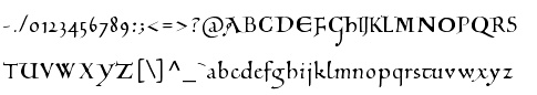 Peter S. Baker, an English professor at the University of Virginia, offers free TrueType and PostScript fonts. these include:
 - Anglo-Saxon Caps.
- Beowulf-1 (1995, a pseudo-Gaelic face; BeowulfOT dates from 2018).
- Bury Caps (2014, free at OFL). This decorative typeface was inspired by the display capitals in the 12th-century Bury Bible.
- The elegant Carolingian typeface Eadui (2010), a reproduction of English Caroline Minuscule as written by Eadui Basan, a scribe at eleventh-century Christ Church, Canterbury.
- Elstob (2018-2019). A variable font for for medievalists. He writes: The Elstob font, named for Elizabeth Elstob (1683-1756), a celebrated early scholar of Old English language and literature, is based on the Double Pica commissioned by Bishop John Fell (1625-1686) for the use of the Oxford University Press. Wherever possible, it is modeled on a specimen book printed in 1925 with type cast in the 1890s from the seventeenth-century matrices; digital images from the 1693 and 1706 Fell specimen books served as backup, and also an early eighteenth-century folio in which a lengthy dedication was printed in Fell's Double Pica. The type doesn't have a great reputation: the typographer Stanley Morison thought it amateurish in comparison with the excellent Fell English. However, its angular character (especially its flat or flattish serifs with minimal or no brackets) makes it well suited to adaptation as a variable font.
- Interlace Set (2015). A dingbat font for making Hiberno-Saxon interlace patterns.
- The important and well-designed Junius family (1996, modern hybrid Gaelic). This led to Junicode, the working name of a Unicode font for medievalists. The fonts in the latter project are Junicode-Bold, JunicodeItalic, Junicode (2002), and are by Peter S. Baker and Briery Creek Software. André G. Isaak writes: Junicode isn't the only free font for mediaevalists out there, but it's certainly one of the two most well-designed ones (the other being Andron Scriptor). I used to teach courses on the history of English and I used Junius (the predecessor of Junicode) for many of my handouts because I preferred it to all of the commercial fonts which I had looked at. In 2020, Junicode was rebuilt into JuniusX or Junicode New.
Alternate URL. Dafont link. Open Font Library link, where he is known as psb6m. Fontspace link. Link to his foundry, Thornbec Staefwyrhtan. Github link. [Google]
[More] ⦿
|
Peter S. Baker
[Peter Baker's old English page at the University of Virginia]
|
 [More] ⦿
|
Philip Bouwsma
|
 Type designer born in Boston in 1948 who created many exquisite designs such as Alexia (1992), Sallando Italic, Dorothea or Cresci Rotunda. His work shows the influence of masters such as Arthur Baker.
 View Philip Bouwsma's typefaces. [Google]
[MyFonts]
[More] ⦿
|
Pia Frauss
|
 German designer (whose real name is Marianne Steinbauer) of these beauuuuuuutiful (free) fonts:
 - Francisco Lucas Llana Regular (2003, chancery hand). Pia writes: Written in Madrid in 1570, by a man called Francisco Lucas. He classified it as a Bastarda; but actually, it is a humanist cursive -- the type of writing that is mostly known under the name of Chancery.
- Francisco Lucas Brioso Regular (2003, medieval hand). Also based on Francisco Lucas.
- WirWenzlawRough (2003). Pia writes: This is a genuine Bastarda, written at Prague in the year 1400, at the chancery of one Wenzlaw who was king of Bohemia and Roman king. His elixir of life was booze, his first occupation fighting off a brother who tried and retried to have him dethroned for insanity, his favourite pasttime having people drowned in the Moldava, and his only claim at immortality causing thereby the death of a court clerk called John of Pomuk, who afterwards became renowned as a saint.
- XenippaRegular (2003). Absolutely original Rotunda capitals mixed in with French Bastarda.
- XirwenaRegular (2003). A swash font invented by Pia.
- Dei Gratia (2005): This font is rather closely based on a charter issued in 1275 by Rudolf of Hapsburg (the first of his house to make it on the German throne).
- JaneAusten (2005): handwriting based on Jane Austen's hand.
- Tagettes and Tagettes Plus (2005): Pia writes Tagettes&TagettesPlus are the type of Italian chancery cursive of the 16th and 17th century that is mostly called Cancellaresca. Swashes galore!
- Xiparos (2005): an extract of some German charters issued nine hundred years ago by Henry, the last of the Salic kings. This medieval typeface was followed by Xiparos Lombard (2005).
- XiBeronne (2005): "XiBeronne is, of course, plain Black Letter -- at least as far as the lower case glyphs are concerned. They were inspired by a very beautiful and very celebrated French manuscript written at the beginning of the 15th century, containing -- and splendidly illustrating -- Gaston Phoebus' Book of the Hunt."
- EtBoemieRex (2007): a 14-th century blackletter face. Boemie means Bohemia...
- Tycho's Recipe: based on the Antiqua used by Peter Payngk (Denmark, 1575-1645) or his helpers in copying astronomer Tycho Brahe's recipe against the plague, ca. 1610.
- Love's Labour (2007): a blackletter based on a sample that Pia Frauss suspects is due to Michael Baurenfeind, ca. 1716.
- aeiou (2007): a blackletter based on the chancery used by the Hapspurg's who reigned from 1440 to 1493.
- XalTerion (2007): another blackletter.
- Mala Testa (2012). A chancery hand based on a writing sample titled Lettere piacevolle taken from A booke containing divers sortes of hands, published by J. de Beauchesne and J. Baildon, in 1571.
- Mitre Square (2012). A script typeface based on a handwriting dsample from the files of the Jack The Ripper case in 1888.
- Son of Time (2012). Based on the handwriting of Giovanni Borgia (Joan Borja), duke of Gandia, who was the son of a pope and the grandfather of a saint.
- Tycho's Elegy (2012). Based on the chancery hand of Tycho Brahe (1597, Denmark).
Dafont link. Yet another URL. Klingspor link. Abstract Fonts link. [Google]
[More] ⦿
|
Proportional Lime
[Shane Brandes]
|
 Oberlin, OH-based foundry of Shane Brandes (b. Lakefield, MN, 1974), who made the historic semi-blackletter revival Augsburger2009 (2009), which was inspired by one of Ernhardt Ratdolt's (1442-1528) many beautiful typefaces. Ratdolt was a printer from Augsburg, hence the name. River Liffey (2009) is based on a typeface used by James Williams an Irish printer active in Dublin during the late 18th century. Rising Sun (2009, blackletter) was inspired by Gering and Remboldt's work during the late 1490s in Paris.
 Charlemagne (2010) is an imaginary medieval script. Fleurious (2010) are ornaments. Sweynheym Pannartz (2010) is modeled after an example Conrad Sweynheym and Arnold Pannartz used in their early printing venture in Subiaco, Italy which began around 1465. Ballard (2010) was inspired by a font used by Henrie Ballard, who operated on Fleet Street at the Signe of the Bear in London from ca. 1597-1608. White Now (2010) is a music note font. Enn'agrammaton (2010) is a cryptographic font. Pluton (2010) is a fixed width font with over 1400 glyphs. Old Venexia (2010) simulates an irregular medieval type. Black Tie (2010) is a simple monoline sans family. Azabercna (2010) is based on gothic principles. Alchimistes (2010) is a medieval symbol face, while Florati (2010) provides a set of ornamental caps. Wappenstein (2010) is an angular stone-carved face: The font Wappenstein was inspired by the carving on a memorial stone located in Paderborn, Germany. The stone was a Epitaph of the Brenkener family, and the carver is known as the Meister des Brenkener Familienepitaphs. The carving, dating to 1562, currently is curated by the Erzbischöfliches Diözesanmuseum in the city of Paderborn and was originally in the Brenkener Pfarr Kirche. Boston 1851 (2010) is based on a stereotype used by Wier and White, Printers of Boston, that was created by the New England Stereoype Foundry under the auspices of Hobart and Robbins, also of Boston. Cruxially (2010) is a 500-glyph dingbat font with crosses. Gaspardo (2011) is an art deco display face. Anguillette (2011) is a quaint grungy face. Ernst (2011) is a very simple but large hand-printed face. The blackletter typeface Schoeffer (2011) is based on Typ.7:146/148G also known as Gesellschaft für Typenkunde plate no. 258, by Peter the Younger (son of Peter Schoeffer), cut ca. 1509-1520. Printers in Marks is a printer mark dingbat typeface created in 2011. Cat E Poultry (2011) is a scanbat typeface of cats. Lucas Brandis (2011) is based on section headings used by printer Lucas Brandis, the first printer to operate in the city of Lübeck around 1473. Creations in 2012: Vine Street, Nicolaus Kesler (a blackletter type based on one of the typefaces of Basel-based Nicolaus Kessler, 15th century), Modality Antiqua (straight-edged and mechanical), Martin Crantz (2012: Martin Crantz (or sometimes Krantz) of the three, including Ulrich Gering and Michael Friburger, that set up a press at the Sorbonne in 1470 was likely the fellow who had the technical know how how to cast the type itself, hence the name of this new typeface that is based on his work.). Modality Antiqua and Modality Novus are explorations of the octagonal principle. Zainer is a rough-edges renaissance era typeface named after Augsburg-based printer Günther Zainer who was active from 1468 until 1478. Swine And Roses is based on a Free Mason script. Ammurapi is a Ugaritic script face. Typefaces from 2013: Michael Wenssler (an incunabula / blackletter typeface based on Michael wenssler typeface from 1482), Andreae (a Fraktur based on a 16th century font by Hieronymus Andreae, who first worked as woodblock cutter and then became a publisher in the city of Nuremberg until his death in 1565), Dropsomaniacal (Lombardic), Therhoernen (grungy medieval script after a Cologne-based printer Arnold Therhoernen, active from 1470 until 1483), Rusch (a 1000-glyph revival of a late 15th century antiqua by Adolf Rusch von Ingweiler, who was active in Strasbourg from 1460 until 1489), Gutknecht (a Schwabacher based on a font used by Jobst Gutknecht, a printer in Nuremburg from 1514 until 1542). The rough blackletter typeface Kachelofen and Konrad Kachelofen are named after Konrad Kachelhofen, a printer in Leipzig active from 1482 until 1529. Albrecht Pfister (2013) is a textura typeface based on Biblia Paperum, which was printed by Pfister in Bamberg, ca. 1460. Amerbach 883 (2013) is a rotunda typeface based on a typeface by Basel-based printer and typefounder Johann von Amerbach, who was active from 1477 until 1513. Typefaces from 2014: Willie Caxton (a blackletter used by William Caxton in his 1476 edition of Chaucer's Canterbury Tales), Azabercna, Lion of Antwerp (an incunabula typeface: Gerard Leeu met his untimely end in a work-related altercation in 1492. He was a notable printer in both the cities of Gouda and Antwerp. This font typeface is based on the "Die gesten of gheschienisse van romen" typeface, ca. 1481.), Hildegardis (an alphabetic cipher that was invented in the 12th century by Hildegard von Bingen to obscure a language called Lingua Ignota. The exemplar was found in the Riesencodex), Lady Vittoria (vampire script based on a German cross stitch pattern from the 1870s), Trowel. Typefaces from 2016: Holle There (a re-cut of a typeface that Lienhart Holle used in his epic edition of Ptolemy's Cosmographia that dates to the early 1480's, even predating italics). Typefaces from 2017: Archbishop (based on the legal documents of Archbishop Arnold von Selenhofen, who granted Hildegard von Bingen and her nuns rooms at the Rupertsberg Monastery in the year 1150), Schoensperger Der Altere (after a blackletter font used by the first female printer, Anna Ruuml;gerin, who was Johann Schönsperger der Altere's sister; Johann was a famous printer in Augsburg, Germany, during the last 20 years of the 15th century). Typefaces from 2018: Zell (a rough blackletter based on 15th century German typeface by Ulrich Zell), Captain Cookie (based on the original font used to print a short history of Captain Cook's exploits around the world), Adelheid (a great curly blackletter based on a 16th century Swiss publication), Feodorov (named after Russia's first printer, Ivan Feodorov). Creative Market link. Klingspor link. [Google]
[MyFonts]
[More] ⦿
|
Raphaela Heuer
|
During her studies, Trier, Germany-based Raphaela Heuer designed the semi-Lombardic typeface Atlastina (2017), which is based on an ancient stone tablet found in the Cathedral of Trier. [Google]
[More] ⦿
|
Richard Beatty
|
 Richard Beatty (Colorado) died on May 14, 2018. He made beautiful fonts, often revivals and interpretations of old typefaces and calligraphic designs, and was influenced by Frederic Goudy. In the 1990s, he operated as Richard Beatty Designs, making over 500 typefaces. Most were only for private or corporate use. Richard's typefaces:
 - Baxter New Style (1988), Baxter Old Style (1988)
- Beatty Victoriana (1991): a set of five Victorian era fonts---Wanted, Spiral, Recherché, Hermosa and Childs (1985). Hermosa and Childs are nearly art nouveau. Childs is a revival of an 1892 typeface by Hermann Ihlenburg. Puzzling note: the Linotype catalogue says that Kismet was designed in 1879 by John F. Cumming. When you look at Spiral by Richard Beatty, you find a close copy of Kismet; Beatty says it's an "edited version of Kismet", but he holds the copyright. Is this another case of legal cloning? Finally, Wanted is based on an ATF typeface, Fantail, that was already shown in 1889 by the Franklin Type Foundry.
- Benjamin (2002, BeattyType): from sketches by Ed Benguiat.
- BernardsHand (beautiful medieval hand)
- Borders (1990, some designed by R. Mitchell and R. Beatty)
- Calligraph Initials (1997): a Lombardic face.
- Childs. After a design from 1893 by Hermann Ihlenburg.
- Civilite
- Cooper
- Desdemona (1994, +Black): art nouveau
- Doric
- Doves Type (2006). After the famous Venetian typeface designed by Emery Walker and T.J. Cobden-Sanderson, 1900.
- Duchy Blackletter, Duchy Initials (2002): A blackletter typeface based on a sketch by Ed Benguiat of Benton's Dutch Initials.
- Elizabeth RB. After Frederic Goudy, 1900.
- Elizabeth (1994, BeattyType): An all caps almost uncial face.
- Fanny Mitchell, Fanny Mitchell Initials (2005).
- GeneralMenou
- Goodhue (2005).
- Goudy Claremont (1993: based on Scripps College Old Style, 1941).
- Goudy Italian Old Style (1992).
- Goudy Mediaeval (1992).
- Goudy Saks (1990: based on a typeface designed in 1934 by Goudy for Saks Fifth Avenue in New York).
- Hermosa (1991). a Victorian typeface.
- Kennerley Old Style (1986, after Goudy's 1911 design)
- Jensen Eusebius, Jensen Eusebius New Style (1989). A Venetian typeface.
- 11LivingstonJCL
- Lucianard
- Mediaeval Calligraphy
- Ornaments (based on 1928 figures drawn by E. Adler)
- Overdressed (2002): based on a sketch by Edward Benguiat for his Phototype Company.
- Prairie Poster (Plain, Fancy): arts and crafts face.
- Quillsong (calligraphic)
- Recherché (1991). A curly Victorian typeface.
- Rene Louis (1992)
- Rolls Royce.
- Spiral (1991). Revival of John F. Cumming's Victorian typeface.
- Troyer
- University Old Style. After Frederic Goudy, 1938.
- Velda (2005, connected hand): the handwriting of Velda Burgess Will, classmate of the designer.
- Wanted RB (1991). A western font.
- White Tie, White Tie Relaxed (2005): roman lettering.
[Google]
[More] ⦿
|
Richard William Mueller
|
 Designer from Elkader, IA (or is he from Garnavillo, IA?), b. 1956. No web page, but the fonts, mostly made in the early 1990s, were collected by CybaPee at TypOasis for your downloading pleasure. His typefaces:
 - AdvertMF, AdvertMFItalic. Ultra-heavy brush lettering.
- AkashiMF (1993). Oriental simulation font.
- AltenglischMF
- AmbrosiaMF (1995). Art nouveau.
- AndreasPenMF, AndreasPenMFBold
- AnglesMF. Beveled letters.
- ApolloMF-Shadow, ApolloMF (1994-1997). Victoriana.
- ArgosMF
- AtlantisMF
- BaileyMF (1997).
- BlackCastleMF. A rounded blackletter.
- BodieMFFlag, BodieMFHolly (1995). An American flag font.
- BolideMF. A brush font.
- BrandyMFScript (1993).
- BravoMF (1994). A script typeface inspired by a 1945 font by E.A. Neukomm.
- BurntMF. Halftone textured letters.
- CamelotMF, CamelotMFBold (1995).
- CarnivalMFOpen, CarnivalMFOpenShadow, CarnivalMFRimmed
- Casual-Regular, CasualContactMF, CasualMarkerMF (1994). Marker pen fonts.
- CignoMF. A delicate script.
- Cinema-Regular
- ClubMF
- CoffeeTinMFInitials. Western circus font.
- CreditCards. Dingbats.
- GFCristateMF (1997). Borders and dingbats, published by Garagefonts.
- DaisyMF
- DipperMF, DipperMFDemiBold
- DirectionsMF (1995).
- DragonflyMF
- EarthquakeMF. Broken letters.
- EddaMF. Art nouveau.
- EdisonMF (1995). Pure Victoriana.
- ElectMF (1997).
- FanfareMFFancy. Art nouveau.
- FantasticMFInitials, FantasticMFModern
- FarleyMF (1994).
- FlamesMF
- FleetingMF
- FranconiaMF (1994).
- GingerMF (1997). Late Victorian, early art nouveau.
- GrangeMF
- GreetingsMF
- GuttenbergMF (1995). Victorian.
- HayStackMFWide
- HeeHawMF
- HoffmanMF
- InkHighlight
- Knockout-Regular, KnockoutMFInitials
- KompaktMF
- LavaMF (1994).
- LegrandMF
- LongEarsMF
- MaizeMF
- MamaMF
- MantelMF
- MeltdownMF
- MercuriusMF
- NewDayMFScript
- OceanViewMFInitials
- OmegaMF-Bold, OmegaMF (1994).
- PaintPeelMFInitials
- ParchmentMF
- PenMarkMFBold (1995).
- PinewoodMF
- PlymouthMF
- PollockMF (1995). Marble-filled artsy display letters.
- PoloBrushMF (1993).
- PosturesMFInitials
- Primitive
- ProtestSignMF (1995).
- QuaintMF
- RaggedMF (1996).
- ReefMF (1994).
- SantaMonciaMF
- Sexy-MF
- SixtiesMF (1993). A psychedelic font.
- SophieMF (1995). Art nouveau.
- SpeedlineMF
- SpiritsMF
- StarshineMF
- StereoMF
- SteveMF (1997).
- StowawayMF
- SwingtimeMF (1995).
- TamboScriptMF
- TarantellaMF. An insect-themed decorative typeface.
- TitaniaMF
- TolkienUncialMF
- TomahawkMF (1995).
- TradingPostMFBold
- TumbleweedMF
- TuscanMFNarrow
- UncleBobMF-Shadow, UncleBobMF (1993).
- VassarMF
- VeronaScriptMF
- WaverlyMF
- WetPaintMF (1996).
- WindsweptMF
- WishMF (1997). Art nouveau.
- WizardryMF-Contour, WizardryMF (1997). Art nouveau.
Abstract Fonts link. Klingspor link. Dafont link. Fontspace link. [Google]
[More] ⦿
|
Robert Schenk
[Ingrimayne Type (was: The Bovine Rebellion)]
|
 [MyFonts]
[More] ⦿
[MyFonts]
[More] ⦿
|
Roger White
|
Type designer from Staffs, UK. His 114 free creations, all done between 1992-1998, include AmertonOutline, AmertonOutlineItalic, Cambridge (a copy of University Roman), Cardiff, CardiffBold, CardiffBoldItalic, CardiffItalic, Carolus, CarolusItalic, Circled, Colton, ColtonSmallCapitals, Curborough, CurboroughBold, CurboroughBoldItalic, CurboroughItalic, Derrington, Dresden, Dublin, DublinBold, DublinHollow, Dunstall (art nouveau), Fradley, FradleyBlack, FradleyBold, FradleyBoldItalic, FradleyExtended, FradleyExtendedItalic, FradleyItalic, FradleyNarrow, FradleyNarrowItalic, FrysOrnamented, GloucesterOpenFace, Gresham, Hanch, HanchBold, HanchBoldItalic, HanchItalic, HanfordScript, Jana, Jarrow (uncial), KeeleDecorated, Lancaster (blackletter), Libra, LongdonDecorative, Loxley, Lydian, Milford, MilfordBlack, MilfordBold, MilfordBoldItalic, MilfordCondensed, MilfordCondensedBold, MilfordCondensedBoldItalic, MilfordCondensedItalic, MilfordHollow, MilfordItalic, MilfordLight, MilfordLightItalic, Milwich (Lombardic), NationalFirstFont, NationalFirstFontDotted, NationalPrimary, NationalPrimaryDotted, Newborough, NewportGothic, NewportGothicItalic, Newtown, NewtownBold, NewtownBoldItalic, NewtownItalic, Orgreave, OrgreaveBold, OrgreaveBoldItalic, OrgreaveExtendedBold, OrgreaveExtendedBoldItalic, OrgreaveExtendedItalic, OrgreaveExtendedNormal, OrgreaveItalic, Oxford, Plymouth, QueensPark, QueensParkBold, QueensParkBoldItalic, QueensParkItalic, Rochester, Rosart, StoweOpenFace, StoweTitling, StoweTitlingItalic, SudburyBook, SudburyBookBold, SudburyBookBoldItalic, SudburyBookItalic, SudburyLight, SudburyLightItalic, Swansea, SwanseaBold, SwanseaBoldItalic, SwanseaItalic, TamworthGothic, Telford, TelfordHollow, TelfordHollowItalic, TelfordItalic, Tiverton, TrajanusRoman, Tutbury (blackletter), TutburyBold, TutburyBoldItalic, TutburyItalic, Typewriter, TypewriterBold, WrexhamScript, WrexhamScriptLight, Yoxall, YoxallBold, YoxallBoldItalic, YoxallItalic. Many of these are text families, both sans (like Milford) and serif (like Fradley). The collection is largely a revival or an extension of historic typefaces. Specialty styles covered by him include blackletter (Derrington, Lancaster, Rochester), ornamental caps (Dresden), calligraphic scripts (Hanford Script, Wrexham Script), uncial (Libra) and medieval (Milwich). Fontspace link. Dafont link. Abstract Fonts link. [Google]
[More] ⦿
|
Roland John Goulsbra
|
UK-based creator of the children's handwriting fonts AgrafieLL (1994) and Agrafie Alexie LL (1994), both available from Linotype. He also made Linotype Textur Gotisch (2002) and Linotype Textur Lombardisch (2002, a textura). Linotype link. FontShop link. [Google]
[MyFonts]
[More] ⦿
|
R-Type (or: Rui Abreu)
[Rui Abreu]
|
 R-Type was founded by Rui Abreu in 2008. Rui graduated from FBAUP (Faculdade de Belas Artes da Universidade do Porto) in 2003. He has been working as an interactive media designer in different design agencies, and he has been designing typefaces. Based in Porto, he created Tirana (2006, sans family at T26), Catacumba (2007, a gorgeous bold didone titling face, T26; in 2009 at Fountain/PsyOps), Cifra (2006, a lovely ten weight sans family, T26), Nomada (2007, a monoline slab serif), Salto Alto (2006, avant garde sans family, with octagonal influences), Foral (2008, monoline slab serif; published by Fountain in 2010), and Forma (2006, stencil family, T26).
 In 2008, he published Orbe (Fountain), an exotic all-caps blackletter inspired by Portuguese and Lombardic calligraphy [it deservedly won an award at TDC2 2009; Orbe Pro at MyFonts], Gesta (2008, sans family), Gesta Condensed (2012), Gesta Semi Condensed (2012), Gira Sans (2012, a grotesque family), Foral Pro (2011, an elliptical slab serif), Catacumba (2011, a high-contrast ball terminal wedge serif family), Aria Pro (2011, a delicate high-contrast transitional serif family), Forma Solid (T26). In 2013, Rui published Aria Text (a rational (transitional) toned-down version of Aria that comes in three sets of optical sizes, G1, G2, and G3), the geometric sans family Azo Sans and Azo Sans Uber, a geometric sans with a humanist element. Grafolita Script (2013) is a connected typeface family that borrows ideas from signage scripts. Typefaces from 2014: Litania (medieval-style typeface with roman capitals, Lombardic capitals, and Carolingian minuscules; nice fists accompany the type), Signo (a dynamic sans serif with reverse contrast, designed for editorial and branding). Signo won an award in the TDC 2015 Type Design competition. Typefaces from 2015: Montblanc (a custom sans for the Montblanc company that won the IF Design award in 2015), Usual (a neutral sans with large x-height). In 2010, Peter Bruhn started a typeface but he died before it was finished. In 2015, Rui Abrey and Göran Söderström finished it as Bruhn Sans (Fountain Type). In 2010 Peter was commissioned to design a wordmark for the documentary Harbour of Hope. The type was to ellicit Malmö's harbor, and Peter found inspiration from the painted type of industrial tankers docked in his hometown. Typefaces from 2016: Grifo, Symbio and Symbio Arabic (at Typotheque; prize winner at Granshan 2016), Sul Sans (a geometriclly constructed sans with features frequently seen on signs and buildings in Portugal). Typefaces from 2017: Sul Mono (a typewriter style), Grifito, Grifinito (condensed versions of the sharp-edged display typeface Grifo), Aquino (by Rui Abreu and Ricardo Santos; a display calligraphic stencil typeface inspired by a liturgic book made by Portuguese friar Tomas Aquino in 1735). Typefaces from 2018: Gliko Modern (an award winner at the Type Directors Club's Type Design Competition 2019). Typefaces from 2019: Flecha (a sharp and streamlined old-style typeface made for editorial design that won an award at 23TDC in 2020), Staff (a neo-grotesk from X Wide to XXX Condensed). Typefaces from 2020: Flecha Bronzea (M, L: the condensed version of Flecha). Typefaces from 2021: Azo Super (a heavy display font), Staff Grotesk (a low key sans family derived from Abreu's 2019 font, Staff), Gineto (a grotesque developed from the brevier size of Gothic no. 4, a nineteen century design by the New York type foundry Farmer, Little & Co), Chassi (in three optical sizes, S, M and L: a revival of Garamond as a genre, slightly reinterpreted for our times; I duisagree though with the word "slightly"). MyFonts interview in August 2013. MyFonts page. T-26 page. Old home page. Klingspor link. Fountain Type link. View Rui Abreu's typefaces. [Google]
[MyFonts]
[More] ⦿
|
Rui Abreu
[R-Type (or: Rui Abreu)]
|
 [MyFonts]
[More] ⦿
[MyFonts]
[More] ⦿
|
Ryoichi Tsunekawa
[Flat-It]
|
 [MyFonts]
[More] ⦿
[MyFonts]
[More] ⦿
|
Sabrina Mariela Lopez
[Typesenses]
|
 [MyFonts]
[More] ⦿
[MyFonts]
[More] ⦿
|
Scriptorium (Ragnarok Press, Fontcraft)
[David Fleming Nalle]
|
 Dave Nalle was born in Beirut on March 19, 1959, and died on February 13, 2021 from COVID in his home town of Manor, Texas. From his wiki page: Dave Nalle is a political writer, game author and font designer who was active in the early history of the development of the internet. Nalle was at one time Chairman of the Republican Liberty Caucus, a group that promotes libertarianism within the Republican Party, Senior Politics Editor at Blogcritics online magazine, and was the CEO of Scriptorium Fonts. Obituary [PDF] by Steve Jackson at the Daily Illuminator. Obituary by Shannon Appelcline at RGG Net. Obituary [PDF] at Dungeon Master Magazine.
 A creative and prolific designer, he has made hundreds of beautiful (often historic) fonts. His outfit, Scriptorium (based near Austin, TX, est. 1989), also does custom font and logo design. At some points, Scriptorium was also known as Ragnarok Press and Fontcraft. It specializes in artsy and ancient typefaces. Some subset of the fonts is made by Michael Scarpitti. Free font demos. Images of his best selling fonts. Special subpages: - Three free fonts: Onuava (a mini-serifed hybrid fixed-width font), Divona (sans), Sirona (based on Lombardic calligraphy).
- Lombardic: Aneirin, Benevento (8th century Lombardic), Cymbeline, Fabliaux, Formidable, Locksley.
- Decorative initials such as the 20th century sign lettering initials set Pencraft Initials (2009), New Saxon Initials (2016, based on work by F.G. Delamotte), Delamotte Initials One (2016), Delamotte Initials Two (2016), Holly Initials (2010, based on Real PenWork (1880s, Knowles and Maxim), Vyones (2010), Vergennes (2001), Cascade (2009), Bergling (2010; based on initials by John M. Bergling).
- Steampunk typefaces: Clockwork, Gearhead, Gears, Verne, Draughtwork, Belgravia, Boetia, Blackthorn, Linthicum, Good-fellow, Necromantic, Mephisto.
- Wild West fonts: Academy, Alcalde, Atkinson Boomtown (2009, after the lettering of Frank Atkinson), Atkinson Eccentric (2009), BigIron, Cibola, Del Norte, Lachesis, Perdido, Plowright, Primer, Riudoso, Niederwald, San Lorenzo (2011, with a Mexican and Tuscan look), Stonehouse, Manquo, Rochambeau, Purcell, Vaquero.
- Arabic simulation fonts: Samaritan is based on the poster lettering of Alphons Mucha from his poster for the play La Samaritan. Serendib and Waziri are based on the hand lettering of René Bull from his edition of the Arabian Nights. Caliph (1993) is derived from Ernst Schneidler's classic Legende font, with variant characters based on his original lettering. Also: Satampra, Jerash, Samarkand, Isfahan.
- Celtic fonts: the fonts include Constance, Durrow (1993, traditional rendering of Insular Minuscule calligraphy), Malvern, Glendower (based on the most common lettering in the Book of Kells), Knotwork (caps based on Celtic knots), Alba Text (modernized text font based on Celtic uncial lettering), Lindisfarne (based on a square uncial style), Stonecross (1997, derived from Celtic cross and gravestone inscriptions), Celtic Spirals (dingbats), Celtic Borders font (lets you combine key strokes to form decorative borders; many frames and borders are original Celtic designs by Arts&Crafts period artists like Evelyn Paul and Louis Rhead), Spiral Initials, Brigida (based on Rudolph Koch's interpretation of a squared uncial), Macteris Uncial, Coverack (heavy non-traditional uncial), Dahaut (modernized uncial), Dunsany, Glendower, Morgow (1999, spiral uncial), Teyrnon (elaborate spurred uncial), Padstow (heavy uncial), Vafthrudnir (2011, uncial), Sualtim and Columba (decorative initials based on characters found in the Book of Kells), Albemarle (2001).
- Oriental simulation fonts: Yoshitoshi (2003, based on the 1900-style writing by Yoshi Toshi.
- Gothic fonts, including Alt Gothic, Koch Gothic, Barnabas (2011), Sternhagen (2014), Montgisard (2010, roman capitals with blackletter lower case), Serenissima, Gelderland, Alcuin, Monumental, Goldwork, Waldeck, Roncesvalles, Montressor (2010, ornamental blackletter capitals), T4C Beaulieux (1998, a free copy here), Bastarda (2011), Burgundian, Cadeaulx, Collins Old English, Courtrai, Descant, Ereshkigal, Faustus, Franconian (1993, a Schwabacher), Froissart (2000), Ghost Gothic, Katisha, Koch Gothic, Ligeia, Magdeburg, Magdelena, Melusine, Pyle Gothic, Rheingold, Sanctum, Stuttgart Gothic (2010), Textura, Theodoric, Yngling (2002).
- German expressionist: Dromon.
- Renaissance fonts: Monumental Gothic, Caswallon (a Caslon family), humanist cursive (Palmieri, Castiglione and Hanes Italic), quirky Italian cursives (Fiorenza and Alleghieri), a Roman style hand-lettered font (Rudolfo and Rudolfo Swash), a Trajan-style Roman lettering (Hadrianus), a classic flourished cursive (Trinculo) and a set of floral intials from the Quattrocento (Fraticelli).
- Modern poster fonts: Ascelon, Bilitis, Cosmic Dude, Dromon, Ducatus Rough, Eglantine (after Central Type Foundry's Quaint Roman), Ekberg (2002, based on Samuel Welo's posters), Fortinbras, Hamilton, Jambon, Oblivion, Posada (2008, based on the poster lettering of Mexican artist José Guadalupe Posada), Squiffy, Suspicion, Magnin (2003).
- Mapmaker fonts: building elements are available in Basilica; Ortelius is a map dingbat font; Queensland (based on lettering by artist and calligrapher Eric Sloane), is bold, hand-drawn and reminiscent of medieval writing on maps. There are also Brandywine, Daresiel, Hesperides, Longhorne, Windlass (1996), and Cityscape. Orford (2008) is based on samples of hand lettering from a 1693 manuscript collected by Lewis Day in his classic book on historical paleography, Alphabets Old and New.
- Calligraphic fonts: Albemarle (2001), Azariel, Moncrief (2011, based on the calligraphy of J.M. Bergling), Pavane, Rasael (2009), Abdiel (2005), Roncesvalles, Gazardiel (2003, connected script), Spoonbill (2003, arts and crafts), Macteris (Roman uncial font), Antioch Uncial (Roman uncial font), Burgundian (Classic black letter font), Franconian (993, a classic black letter font), Castiglione (Attractive Renaissance lettering), Cicero (Roman Rustica font), Formidable (1993, very bold late medieval / Lombardic style), Collins Old English (Classic Old English style gothic), Corbei Uncial (Roman uncial font), Cymbeline (late medieval lettering), Durrow (Standard insular minuscule uncial font), Theodoric (Classic black letter font), Gazardiel, Ghost Gothic (Unusual gothic font), Glendower (Uncial font based on Book of Kells), Gloriana (Interesting hand lettering style), Folkard (from the hand-lettering of Charles Folkard), Offenbach Chancery, Ranegund Merovingian Courthand, Benevento (8th century Lombardic), Hesperides.
- Art deco typefaces: Imperatore (2018: based on a hand lettered design from California art deco master designer Pedro de Lemos in the 1920s), Speakeasy (2018), Gates of the West (2018), Lyceum (2014), Borealis (2009), Criterion (2011), Illuminata, Madding (2009, a bold poster font that grew out of Aventine), Alexandrine (2009), art Deco Stencil (2009, based on samples of Art Deco stencil lettering by Pedro Lemos), Falmouth.
- Art nouveau typefaces: Acadian, Agravain (2009), Amphitryon (2009), Ariosto, Asphodel, Averoigne, Beaumains (2011, based on J.M. Bergling's lettering), Beauvoir, Belgravia (based on J.M. Bergling), Bernhardt (based upon the lettering of the Czech art-nouveau artist Alphonse Mucha), Bentham, Berenicia, Boetia (2003, based on J.M. Bergling's lettering), Bruges, Bucephalus (1993), Burd Ellen (2009), Butterfield (1993; in Alfred Roller's style), Cafe Society (2018), Curetana, Damariscotta, Elsene (2011, based on lettering by early 20th century illustrator Clara Elsene Peck), Elysian, Exotique, Flaubert, Gaheris, Ganelon, Gehenna, Goodfellow, Grammophon (2019: a bold Jugendstil poster font), Harbinger, Huyot (2016, after Georges Auriol's types), Jugendstil Kunsthand (2003), Lysander, Maginot (1993; after Peter Schnorr, 1898), Munich (after the Munchner Jugend magazine), Norumbega, Odeon, Ormandine (2010), Pantagruel, Phaeton, Reggio, Rochmbeau, Rockne (2009), Rudolfo, Setebos, Sprite, Summerisle, Sylphide (2005), Undine, Valentin (2008), Vambrace (2010), Walhal, Wendingen (2016), Wormwood (2018), Zeitschrift (2016, based on the Ver Sacrum magazine).
- Modern poster fonts: Field Day (2003), Ascelon, Bilitis, Cosmic Dude, Dromon, Ducatus Rough, Eglantine (after Central Type Foundry's Quaint Roman), Ekberg (2002, based on Samuel Welo's posters), Fortinbras, Hamilton, Jambon, Oblivion, Squiffy.
- Constructivist fonts: Krasny Mir (2009), Vrubel, Structura (1997).
- Futuristic fonts: Alecto, Angelus, Circuit, Culdrose, Gearhead, Ironclaw, Parika, Sanhedrin, Semiramis (1997), Slither, Structuro, Yazata, Adastra (dings).
- Borders and ornaments. These include New Arets and Crafts Borders (20912, based on The Calendar of Golden Thoughts (Barse and Hopkins Publ, 1911).
- Boneyard fonts: Undertaker (2014), Antrobus (2010), Sepultura (2002), Halloweenies, Dementia, Boneyard, Skull and Bones, Malagua (1999-2013), Paleos (2002, from titling of B movies in the cave girl genre), Carmilla, Abaddon, Black Cow (1998), Valdemar, Cuede, Ligeia, Mayhem, Mephisto, Golgotha, Sanguinary, Ironworks, Moravia, Gehenna, Nosegrind (2005, graffiti), Corpus, Ghostly.
- School fonts: Schoolhand (2010).
- Arts and Crafts movement (late Victorian period, 19th century), based on work and lettering by Walter Crane, William Morris, Charles Rennie Mackintosh and Elbert Hubbard. The Arts&Crafts movement was enormously influential on the works of designers, artists and architects of the 20th century, and inspired the Art Nouveau and Art Deco movements. Fonts include William Morris' Kelmscott (based on Morris' Troy type), and True Golden, fonts from the Glasgow branch of the movement like Chelsea Studio (1997), which is based on Charles Rennie Mackintosh's lettering, fonts from the Roycrofters of New York like Semiramis and Ganelon, fonts based on Walter Crane's work such as Crane Gothic, Pencraft Initials (2009) and Walter Crane, and even fonts from the California Arts&Crafts period of the early 1900s like Coloma. Other typefaces: Jesse M. King (refreshed in 2015, and based on hand lettering from a frontispiece design by Glasgow-based Jessie King who was known for her lavish book covers), Aylward, Palmyra (based on work by the Roycrofters, a design community founded by Elbert Hubbard), Aylward (2010, Victorian), Hyacinth Initials, Spoonbill, Adresack (1996: inspired by the arts and crafts lettering styles of designers like Charles Rennie MacKintosh and Jessie M. King), Brandywine, Changeling (2009, based on lettering by fairy artist Fanny Railton), Goddard, and Advertising Gothic (2003), Valentin, Gaheris, Agravain (2009). Delaguerra (2001-2009) is based on a lettering style originating in the California Arts&Crafts period commonly associated with Mission Style. It is still in common usage in signage at historical sites in California.
- Victorian: Beaumarchais, Berenicia, Bilibin, Brandywine, Brigidis, Curetana, Durendal, Elphinstone, Flaubert, Folkard, Gjallarhorn, Gloriana, Hermia, Ironclaw, Magnus.
- Typewriter: Fontcraft Courier.
- Anthroposophic: Ekberg (2002, based on a sample of poster lettering by Samuel Welo).
- Medieval fonts of Scriptorium, critiqued by Marc Smith, page 65: Batwynge is based on lettre gffe by Geofroy Tory (1529), and not on an illuminated manuscript of the tenth century as claimed by Scriptorium. Perigord (1993) is based on a Carolingian alphabet drawn by Ernst Bentele in 1952. Allencon is a calligraphic font based on an interpretation of 6th century Ostrogothic Italian calligraphy.
Some selected fonts: Finchley (psychedelic), Captain Kidd (2012, an original font design based on the title lettering from the classic pirate movie starring Charles Laughton), Aerobrush (2011), Fondry Ornament (2009), Atkinson Egyptian (2008, after the lettering of Frank Atkinson), Verne (2008: remade in 2020 into Covid19), Goldwork (almost blackletter), BigBlok (2010), LetterpressGothic (2010), Plymouth (2010, in the style of Cooper Bold), Broadley (2008, an architecturally inspired script based on lettering by British architect and designer C.F.A. Voysey), Locksley (2004, medieval lettering), Tuscarora (curly lettering), Fiorenza (Renaissance calligraphy), Hesperides (old colonial calligraphic script), Angelus (beautifully printed monospaced script), Esperanza (1996, connected medieval handwriting), Ithuriel (2002), Alleghieri (2002), Hamilton (2002), Spiral Initials, Zothique (great font, based on hand lettering from a map of Clark Ashton Smith's fantasy world of Zothique), Reynard (semi-Celtic), Daresiel (elegant script), Caliph (1992, Arabic simulation), Bassackwards, Rosalinde (1999, handwriting), Arakne (2000, connected handwriting), Falconis (by Michael Scarpitti), Asrafel (semi-Celtic), Swithin (2004), Tyrfing (Art Nouveau/Fraktur, 1999), Waldeck (2008, blackletter), Woburn Initials, Stampwork, Draughtwork, Roughwork (a codex font derived from Nalle's own True Golden which is based on a=n earlier typeface by arts and crafts master William Morris), Melusine (gothic calligraphy), Corbei (uncial), Niederwald (hand lettering), Gjallarhorn (great uncial), Gaiseric (early medieval uncial), Taranis (1987, an uncial first drawn as a font for the cover of the old Ysgarth roleplaying system), De Bellis (roman era, by Michael Scarpitti), Engravers Gothic, Monimental Initials, Sanhedrin (Enemy of the State font), Vespasiano (roman capitals, by Michael Scarpitti), Bilitis, Hendrix (2002), Collins OE (old English), Samedi, Praitor, Evadare (1993, based on a character set which was hand calligraphed by Rudolf Koch), Koch Fantasie (1993), Black Cow (1998). Zothique, Ruritania, Mariner (2004, based on hand lettering originally done by Willy Pogany), Trinculo (a swinging cursive font), Texas Star (2002), Octavian (antique demi-serif font), Ruffian (antique type font), Ascelon (thin sans serif font), Munich (title lettering from Munchner Jugend magazine), Necromantic (bizarre bold titling font), Titania (romantic decorative lettering font), Oberon (bold romantic font), Knotwork, Guede (1993), Pullman, Purcell (Victorian circus poster style font), Allegheny, Carmilla, Malagua (1999-2013), Ardenwood, Platthand, Buccaneer, Cochin Archaic (2010), Boswell (1994), Guilford (based on lettering by artist and calligrapher Eric Sloane), Death Ray (2012, constructivist), Alecto (futuristic), Candlemas (2003), Bridgeport (2003, based on lettering by artist and calligrapher Eric Sloane), Medieval Tiles (2003), Linthicum (2003), Draughtwork (2003), Yngling (Fraktur, 2003), Rheingold (elaborate Fraktur: Music Hall Text elsewhere; see also Teuton Text, Cincinnati Type Foundry, 1877), Kidd (2003), Belgravia (2004), Peck Shields (2004), Scrawlies (2000, handcrafted), Albrecht Durer Gothic (2004), Orpheus (2004), InduXtrial (2004, a grunge face), Yoshitoshi (2003), Veronique (2004), Veneto (2006), Vidilex (1993, monospaced), Abelarde (2006), John Speed (1993: a mapmaker font), Furbelow (2006), Estoril (2006), Tangle, Aventine (sans), Texas Star (2002), Groningen (Bauhaus design), Nevins Hand, Scrapple (2011, Victorian, ornamental), Leodegar (2011, based on samples of 7th century Frankish hand lettering), Candlemass (2012). Fonts from 2013: Doge (a Venetian font based on a J.M. Bergling revival), Original Django (after the titling font in Quentin Tarantino's movie Django Unchained). Fonts from 2014: Highball, Carillon (based on a typeface by Samuel Welo), Edifice (based on lettering by J.M. Bergling). Fonts from 2015: Gods of Mars (an inline sci-fi typeface), Rykov (based on a 1930s Ukrainian constructivist style; Latin and Cyrillic), Vie Moderne (French art deco), Dahlgren, Grand Concours (art deco), Tantalus, Power Tie (art deco), Marquis Greeking. Fonts from 2016: Ekberg Modern (based on lettering samples by Samuel Welo from poster designs of the 1920s), Knuckleduster, Tzaphkiel, Sarandiel, Primrose Initials, Elizabethan Script (chancery style), Zeitschrift (an art nouveau font based on the Ver Sacrum magazine), Wendingen (Dutch deco), Memento Mori (Tuscan), Rounders (art deco). Fonts from 2017: Buzzmill (wooden plank font), Pumpkin Patch Initials, Talinn, Reliquary, Nopalito, Scattershot (script). Typefaces from 2018: Marionettas (a Mexican horror movie poster font), Fascination, Architextura, Santa Sangre, Glyphos. Typefaces from 2019: Cafe Corso (art nouveau), Comic Classix. Fnts released in 2020: Epigramatic (based on lettering by Dard Hunter for the Roycroft Press in the early 1900s), Cryptos (graffiti). Klingspor link. Abstract Fonts link. Dafont link. View David Nalle's typefaces. Scriptorium's library. [Google]
[MyFonts]
[More] ⦿
|
Shane Brandes
[Proportional Lime]
|
 [MyFonts]
[More] ⦿
[MyFonts]
[More] ⦿
|
Sonja Steiner-Welz
|
 Author of Von der Schrift und den Schriftarten (Reinhard Welz Vermittler Verlag, Mannheim). These have a history of type and lettering, instructions on lettering (e.g., stroke guide for Antiqua Majuskeln, Lombardische Versalien, and Gotische Majuskeln), some type specimen (mainly German, from the early part of the 20th century), some alphabets, drawn by her, information on the German school scripts, and a German type and lettering glossary: i, ii, iii, iv. It was probably published between 1956 and 1959.
 In 2010-2012, Dick Pape created a number of (mostly caps-only) typefaces based on that book. These include SSWAntiquaPionsel, SSWAntiquaVersalien (a caps set based on Ludovico Vicentino, 1523), SSWCelticAntiquaOutline, SSWFederAntiqua, SSWHollowScript, SSWHolz (Lombardic caps), SSWJensonsAntiqua, SSWLeopoldAntiqua, SSWLombardischeVersalien, SSWMannheimOrnament, SSWPlakatschrift (a useful outline alphabet), SSWRoundPrinting, SSWRusticAlphabet, SSWRusticScript, SSWSchablonenschrift (Bauhaus-style stencil face), SSWUrbanAntiqua-Versal, SSWWoodcuts. Download Pape's fonts here. [Google]
[More] ⦿
|
St. Rachan Typeworks
[Jim Strachan]
|
Free fonts by Jim Strachan (Canada): Bibliotheque, Cigarstore, D'Italia (nice stencil font), Mumblypegs (1999), Medieval Scribish (1999, Lombardic), Stampede (1999). Several medieval fonts. [Google]
[More] ⦿
|
Tadelus Wastowicz
|
Designer from Sewickley, PA, who created an exaggerated ornamental Lombardic face in 1959. He made a pointed pen font in 1965. [Google]
[More] ⦿
|
Ted Staunton
|
 Born in Lincoln, UK, in 1942, Ted Staunton lives in Surrey, BC, and designs type. After serving a five-year apprenticeship as a hand compositor (1958-1963) with the Lincolnshire Publishing Co., he spent three years (1963-1966) at Leicester College of Art&Design, graduating in type design. After spending some time in London working for Penguin, Hamlyn and other book publishing houses, he emigrated to Canada in 1970, working for Mitchell Press and Hemlock Printers in Vancouver before opening his own design business and letterpress printing shop, Sherwood Graphics, in 1984. In 1991 he published a private press book, The Lincolnshire Poacher, illustrated with his own wood-engravings. Some of his fonts were used privately on transfer lettering sheets and cast in metal for hand typesetting at his private press, Sherwood Letterpress. His typefaces are mostly published bi P22:
 - In 2003, P22 launched Staunton's Sherwood Type Collection, a beautiful ensemble of revivals: Afton (2003), Albemarle (2008: connected script), Albion (2003), Albion Italic, Amelia (2003: ornamental caps in the style of William Morris), Aragon (2003: Victorian), Avocet Light (1985: chancery script originally named Avoca), Canterbury (2006, +Caps A, Caps B, Caps C, Pro), Elven (2003), Floriat (2003: floriated ornaments), Founders (2003), Freely (2002), Kaz (2008, between architecture and Comic Sans), Kaz Thin, P22 Kelly Pro (2009, Celtic style uncial), Latimer (2002), Lindum (2000; based on his Lindum Titling from 1967), Mayflower (2002: medieval lettering), Mayflower Italic, Mayflower Smooth (2009), Mercian (2003), Plymouth (2001), Roanoke Script (2002, a rough texture typeface; Albemarle is the smooth version), 1722 roman (2002), 1722 italic, Sherwood (2002), Sparrow (2001), Symphony (1987), Tyndale (2002), and Tyndale Xtras (2002: Arabesque ornaments).
- Typefaces from 2004: Merton, P22 Ruffcut and P22 Spooky (blackletter).
- Typefaces from 2005: the Staunton Script (package P22), which includes handwritten style typefaces that simulate the period spanning between the English Civil War (1640s) and the Victorian Era (1839-1901): Virginian, Royalist, Grosvenor, Grenville, Elizabethan, Broadwindsor, Chatham. Staunton Script was first drawn in 1981.
- Typefaces from 2006: P22 Phantasmagoria (a wedge serif inspired by Viking runes), P22 Regina (calligraphic).
- Typefaces from 2011: Bix, Brigid.
- Typefaces from 2013: the spurred typeface Ridley, which is based on his Avalon Text (2002).
- Typefaces from 2014: P22 Amelia Jayne (which has a classical roman, with several sets of initial caps).
- Typefaces from 2015: P22 Clementine (sans, curly: pure Victoriana), P22 Ringwell (Victorian).
- Typefaces from 2019: P22 Kingsclere. Inspired by a 17th century tombstone inscription in the town of Remedios, Cuba.
- Typefaces from 2020: P22 Ridley (a spurred medieval typeface, named for Nicholas Ridley and similar in style to Staunton's Latimer font), P22 Tuscaloosa (P22: a hybrid Tuscan typeface).
- Typefaces from 2021: P22 Araminta (a Tuscan Victorian font).
- Undated roman: Bentley.
- Undated sans: Witham Light.
- Undated initial caps: Arabella Initials, Florabunda (floriated Lombardic caps).
- Undated blackletter: Luther, Yeoman.
- Undated Victorian typefaces: Arabella.
- Undated scripts: Guildford, Hykeham Swash, Nadine, Saluki.
- Undated text typeface: Crossroad.
Klingspor link. P22 link. View Ted Staunton's typefaces. [Google]
[MyFonts]
[More] ⦿
|
The 1477 Font Foundry
[David Clegg]
|
 Founder of Atelier Zero Ltd and The 1477 Font Foundry in London. In 2012, he designed the squarish typeface Voona 1. He also drew several beautiful caps typefaces including the frilly Age of Decadence.
 Typefaces from 2018: Blow Ted, Prim & Proper, More Say Ache, Reubenesqueish, Into Minds, Stay The Sway, Whoa Van, Hurley Curley, Blow Red, Surfer Zoil, Organic Too, Splish Splosh, Triffids Day Off, Slab Square Rounded, Game of Stones, Dark Ages (a handcrafted Lombardic typeface), Not Quite Wright, Globular, InGrid, Magna Sea, And Gloves Axe On, Big Bold Chunky, Boing The Dots, Made Evil (decorated textured caps), Big Chunk, Jiggery Shrubbery, Re Twig, Pet Redish, Rub Her Side Lamp, Eye Wood Knot (wooden plank font), Jabby Rocky (Flintstone font), Phat Belle (plump psychedelia), Sir Riff Rough (curly), Stripe Bend, Stripe Bend Finesse, All Over The Shop, Not My Indent. [Google]
[More] ⦿
|
The Bloody Gospel--Fonts
|
Archive with about 20 gothic/scary/bloody fonts. Featuring Visitation, Evil Clown, Lombardic, Punker Chicks in Leather Jackets, Black forest and CreepyGirl. [Google]
[More] ⦿
|
The Happy Greyhound
[John A. Hern]
|
The Happy Greyhound is John Hern's metal type foundry in Coeur d'Alene, Idaho. It sells and ships metal type, including an interesting-looking Heintzemann Fraktur [after Karl Heintzemann], and nice sets of initials such as the John Alden Initials, Ben Franklin Initials, Lombardic Initials, and Massey Initials, as well as several great border sets. [Google]
[More] ⦿
|
Thomas Wood Stevens
|
 Early 20th century designer of letters, who was associated with the Carnegie Institute of Technology, Pittsburgh. Author of Lettering (1916, The Prang Company, New York).
 Alphabets from his 1916 book include Art Nouveau Capitals, Italic Capitals, Italic Lowercase, Modern Script Italics, Modern German Italic Capitals, Modern Round Gothic, Uncial (based on a 14th century manuscript), Venetian Modern Capitals, Roman Lowercase, Modern German. PDF file of his 1916 book. Digital remakes include Wood Stevens (2012, Intellecta). In 2012 and 2013, Dick Pape digitized many of the typefaces discussed in Lettering (1916). They are freely downloadable from this site. The typefaces in Dick's collection are attributed as follows: - No artist: TWS Brush Caps 31, TWS Capitals from Coins 15,
- Harry Lawrence Gage: TWS Heavy Capitals 49, TWS Italian Gothic Caps 80, TWS Renaissance Alphabet 39, TWS Robinson Caps 23, TWS Roman Caps 13, TWS Slab Capitals 22, TWS The Japanese 32 [note: see also Yoshi Toshi, 2003, by Da ABF Mafia, and Yoshitoshi, 2003, by David Nalle].
- Norman P. Hall: TWS Heavy Modern 30.
- Oswald Cooper: TWS Long Ascenders 36.
- Ned Hadley: TWS Modern Caps 24, TWS Modern French 25.
- Helen E. Hartford: TWS Modern German Capitals 28.
- Charles H. Barnard: TWS Modern Roman 05.
- F. G. Cooper: TWS Modern Roman Bold 37.
- William A. Dwiggins: TWS Modern Roman Caps 32, TWS Variation on Georgian.
- Guido Rosa: TWS Outline Caps 21.
- George W. Koch: TWS Roman Wide Pen 33.
Commercial revivals include he slab serif Nouveau Lettering JNL (2019, Jeff Levine). [Google]
[More] ⦿
|
Tommi Syrjänen
|
 Finnish designer of the free typeface Missaali (2016). Missaali (CTAN link) is a package that contains the free OpenType/PS Textura font Missaali and a style file for using it with XeLaTeX. He explains: Textura is based on the textus quadratus form of the textualis formata that late medieval scribes used for the most valuable manuscripts. The font Missaali is based on Textura that Bartholomew Ghotan used to print missals and psalters in the 1480s. The letters were scanned and recreated from a facsimile reprint of Missale Aboense that Ghotan printed for the Turku diocese in 1488. The font has two intended use cases: (i) as a Gothic display font; and (ii) for emulating late-medieval manuscripts.
 In 2021, he designed the free medieval revival typeface Aboensis, which contains over 500 glyphs, including Lombardic capitals in one and two colors. He writes: Aboensis is a free unicode OpenType font that is intended for emulating late-medieval documents. The font is an example of a 15th century book cursive hand that was used in the Scandinavian countries. The main source for the glyphs is Codex Aboensis, a richly-illustrated law book written in the 1430s. The font also includes a number of glyphs taken from other roughly contemporary manuscripts. The largest group of them are cursive initials taken from The Black Book of Abo Cathedral that was compiled around the end of the 15th century. As medieval cursive is very difficult to read for modern readers, this font is not really suitable for any normal practical purposes. Instead, it is aimed for users who want to recreate medieval-looking documents with a computer. The font has two sets of initials. The rst ones are in the Lombardic style and are taken from Codex Aboensis. [Google]
[More] ⦿
|
Torbjørn Eng
[Torbjørn Engs typografisider]
|
[More] ⦿
|
Torbjørn Engs typografisider
[Torbjørn Eng]
|
 Pages on Norwegian typography maintained by Torbjørn Eng. He designed Frisianus (1994-1995), a gorgeous script font based on lettering of Gerhard Munthe (1904), which has some Lombardic influences in the capitals, and a totally blackletter set of minuscules. There is also an absolutely gorgeous fat display typeface called Norges Alphabet (1990), which may or may not be available to the general public. It is supposed to represent all that is good about Norwegian values; quality, minimalism, contrast, originality. Eng discusses fonts that are appropriate for Norwegian [article from 1993]. [Google]
[More] ⦿
Pages on Norwegian typography maintained by Torbjørn Eng. He designed Frisianus (1994-1995), a gorgeous script font based on lettering of Gerhard Munthe (1904), which has some Lombardic influences in the capitals, and a totally blackletter set of minuscules. There is also an absolutely gorgeous fat display typeface called Norges Alphabet (1990), which may or may not be available to the general public. It is supposed to represent all that is good about Norwegian values; quality, minimalism, contrast, originality. Eng discusses fonts that are appropriate for Norwegian [article from 1993]. [Google]
[More] ⦿
|
Typesenses
[Sabrina Mariela Lopez]
|
 Typesenses was founded in 2009 by Sabrina Lopez in Ramos Mejìa, near Buenos Aires. Since 2021, its fonts can be licensed via The Type Founders. Sabrina Lopez (b. 1987) graduated from FADU, University of Buenos Aires. Her typefaces include:
 - Lady Elizabeth Grant (2008). Developed during her studies at FADU / UBA.
- With Maximiliano Sproviero, she created Aphrodite Pro (2009, +Slim), a calligraphic family in the style of Alejandro Paul's famous Affair.
- From 2009 until 2011, she worked on the fancy copperplate calligraphic script family Parfumerie Script. This typeface won an award at Tipos Latinos 2012.
- In 2012, she joined the Google Web Font craze, and published the free copperplate script face Rouge Script.
- In 2013, she published Wishes Script (2013), a connected ligature-rich typeface with adapted ornaments and borders for use in greeting cards and wedding invitations. It comes with a Trajan-inspired style called Wishes Script Caps. Winner of an award at Tipos Latinos 2014.
- Euphoria Script (2013). A free Google Web font.
- Fantasy and Fantasy Caps (2014) is an elegant set of medieval fonts that includes two styles of Lombardic caps. It could also be used for wedding scripts and monograms.
- Blend (2015). A large handcrafted type system, layered and with dingbats. Blend won an award at Tipos Latinos 2016.
- Limon (2017). This fresh hand-made font collection was hand-drawn by Sabrina Lopez, with the collaboration of Sol Suarez (who illustrated the dingbats) and Guido Ferreyra (who made the font production and programming of the script font). It took 18 months to complete. Winner at Tipos Latinos 2018 of a type design award for Limon.
- Dress (2018). A layered Victorian Tuscan circus style typeface family.
- The signage script Christmas Time 2019 (2019).
- Chonky (2020). A bold retro signage script in Regular and Poster styles.
[Google]
[MyFonts]
[More] ⦿
|
TypOasis, 2002
[Manfred Klein]
|
 The fonts produced in 2002 by Manfred Klein: Bauhouse, ClassiCaps Xmas 2002, GGothique MK, Lombardic, Mouse Traces, Music Elements, DreiDreiDreiBlack, Griffo's Font, Noisy Buttons, Hamlet ToBeOrNot, Oszillo Caps, Cave Paintings, Rodgauer (a CODEX-like font), Prinz Eugen (medieval font), DreiDee Sketches, Typo Cubes, AustralBats, RoundMouseBats, Torynitialen, Wood Cutted, FlowerPower, Graf Typo (a CODEX-like family), Solitaire, Breeze, Eyes, Lead Types Heap, Petit Fleur, ABCari, Floralalpha, Karlas ABC-Start, OliJo Bold, Athena Handwritten, The BroadWay, MK Squares, Incunitials, Luc's Plants, Monte Petito, Before Alphabets 4, Threedimensional, Blind Reading, Zebral Caps, Before Alphabets 3, Braille Latin, Tangoasis, Katrins (handwriting of Katrin Dillmann, Manfred's daughter), Laurens Erste (handwriting of Laurens Dillmann, Manfred's grandson), Tangodoni, Typesetters TV, Unscreen, Caps MKS, Haunted, Mouse Scribbles, RunishMK, Fatsans, Rotten Script, Stormy, Strong Dots, Caro Mio, Reduce 2 Max, Pudels Kerning, Cheerio, Gersans, ArabDances (Arabic simulation font, with Cybapee), Slab Serif Written, Shalom (Hebrew simulation), Bloxx Serif, Kara Ben Nemsi (an Arabic simulation font), Remember Cassandre, Wieynk Caps Round, Fragment Caps, Golden Swing, Tango Macabre (a gorgeous font in which letters are made with skeletons), Eye Beings, Frax Handwritten, HotsBlots, Latin China (oriental lettering), Dinos Fragments, HotchPotch, SketchBats, AmorE, Chinawestern (oriental simulation), Valentine Flies, AmorEatPersia, AmorEmoticons, Artfacts, The Kiddies, ConstrAccident, Kochs Roots, AnimSilhous, Framed Frax Caps, K-Arrows, GridEx Gallery, K-Arrows B, Swinging Petidoni, Big Swinging SlabS, Relief Caps, Shapes 1-3, Petitscript, Shapes Four, Fullsize Sans, Petitscript Italic, Shapes A 1-3, Imperium Serif, Big Broken, Semaphore, MKalligFrax, Pix Caps, Slabsoft, Windy City, Slabsoft, Windy City, Timeless, Against Rules, Berolina, FabCreatures, CookinDada, FoodnDrinks One, HabSpass-HaveFun, Mighty, Klammeraffen Italic, Elefontitis Xtreme, Cairotiqua Freestyle, Eastereggs, Cave People, RandoMiKa, Big Ella, Hands Subversive 1+2, Build Your Own People, Antroposofia, EasterChicken, GridRiding, Irish Sketches, KidPicts, MatrixbuK, Dornspitz Grotesk, PeaceBats, Arte FS, Eagles Buttons, BlowinInWind, Cave Popart, Karla 1B, Crosses, SharkJockey, Toscanienne, SilhousTwo, Kleins Three Pixel, Religionen, Shapes One-Popart, Shapes Two, ShapesTwo, QuickBats, QuickWritten, KidsDrawings, QuickBats 1.1, Shapes Strokebrushes, SteepQuickHand, Steepiqua, Sleepklill, Steepodoni, New Aliens, SteepTypewriter, CarpetParts, Fourfeeters, Steepidien, Yumiya Arrows, HotHats FS, Eyes Gallery, Steeprump, Zebra Shapes, GrafFitty, KidsArt, Klones, Belly Sans Condensed, Tshirts Springtime, Landscapes, Pastfuturum, typOasis Uncial, ABC Thru, Parma Petit, SpaceLiving, FS Funkturm, TorysTools, Aero Sans, MouseToons, Parma Petit Outline, KL1 MonoCaseKrux, Remember Reiner, Frungtura FS, Perforation Strip, Weimar, Gothic Caps, HumanPartsPoetry, Archetypo Bricks, Human Parts, Big Dots, Spiders Club, MirrorBlack, Mirror Chicken, MonoMouse, MousefraKtur, AmericanNatives, DaVincy Cut, Mouse Liturgic Sketches, MKlunger FS, Waldoni New Torsi, Bradburys Shadow Paseo, Horses, Jessica Plus, Farm Animals, Fat Free Frax, BugsNFriends, Gut Joe Black, People Sketches, Human Parts, Cycling, MousePen, Unknown Heads, NowTheWeather, Qbicle MK, Strange Friends, AfroBats, AmNativeTwo, Bayreuth Fraktur, FingerSinging, Cuxhaven Times, Schwabach Duemille, Balloons, MathRosetts, Folks, Frankophile, Caslonish Fraxx, Has Bodoni Scribbled, Peace Damaged, Wrong Types Shadows, AnimaliaScissored, Bredda, Variations In Geo Dur, QuarrelerPlus, Montages Surrealistiques, Twinset Sans, The Muscle Fetish, Mammothisch, Animali Silhouetti, EleFontissimo, Neopan, Animals Two, Loopings, Logovals, Spiderish FS, Jugendstil FS, LucSan Faces, Crazy Written, Luc Plants Growin Again, Klein Hollywood, For Kids, Total Krass, Pesces Bizarri, Headbirthes Two FS, Stampede, Tribut to Warhol, DadaSchwitters, Van Doesburg, KleinScribere, MK Uncilae, FranKlein, Tschich and Near Jan Tschich (unicase type suggested by Jan Tschichold in 1929), MK Logo Sketches, Something FS, Stencilia, Kritzel Three, Steep Oldstyle, Steepimbo, Cairotiqua Light, SteepSlab, Toms Beings (a great!!!! collection of critters), FraktSketch, MouseGrafitty, Luther Stencil, RudolfsBats, Blackberry Plants, Circus Klein, Klein Reunion, Squashed Random, Strokey, Uncial Buttons, WaComToon, JohannesButtons, BlackWhiteGrids, Johannes Buttons / Bricks+Traces, MAntiKwa, Vehicles, EyesNStrokes, Babelfish Children, Chaos, MKarolingish, Swiss Cheese, Archibeta, Frankly Spoken, Hardware, Neptunia, Rotunda Espagna, Hardware, Arabuttons, Bodoni Flying, Eggheads Crying, PopNonsens, ScrapTiqua, St Dinah, Confusica, Crazygrams, Human Redesign, Crazyness, MKorsair, Big Caesar, MoveU, MyMedieval, RodauButtons, RodauButtonsInverse, Owls&Friends, Obliqua Romana, Oggi Angular, JohG Diamonds, Ornamen, SlabStick, Morbus Parkinson Fraxx, FolksTypo, AidaSerifaCondensed, Big Cheese, Viecher, MKOCR, Decollagena, Concrete Poets, Swinging Sans, KlausBFraktur, Peitinho, Openbuttons, MCapitals, Cavebats 1-4, BonSans, Folks, Gotica Caps, SketchesForPainting, XmasSketches, FolksCircleNegative, FolksCirclePositive, FolksDecoon-Light, KarlasBats, KleinSlabSerif, KleinSlabSerifBold, CantaraGotica (Fraktur), Logomatique (experimental, minimalist), LogomatiqueShadow, LogomatiqueBold, WorkWithGrids1202, WorkWithGridsButtons, WorkWithGridsRandom, WorkWithGridsStageC, Living Yesterday, Xmas 2002, Schneesterne, CaveBats 1A+2B, Nautilus, LateBirds, SpiralusKrux, SpiralusFaces, Smokescreen (with Petra Heidorn). [Google]
[MyFonts]
[More] ⦿
The fonts produced in 2002 by Manfred Klein: Bauhouse, ClassiCaps Xmas 2002, GGothique MK, Lombardic, Mouse Traces, Music Elements, DreiDreiDreiBlack, Griffo's Font, Noisy Buttons, Hamlet ToBeOrNot, Oszillo Caps, Cave Paintings, Rodgauer (a CODEX-like font), Prinz Eugen (medieval font), DreiDee Sketches, Typo Cubes, AustralBats, RoundMouseBats, Torynitialen, Wood Cutted, FlowerPower, Graf Typo (a CODEX-like family), Solitaire, Breeze, Eyes, Lead Types Heap, Petit Fleur, ABCari, Floralalpha, Karlas ABC-Start, OliJo Bold, Athena Handwritten, The BroadWay, MK Squares, Incunitials, Luc's Plants, Monte Petito, Before Alphabets 4, Threedimensional, Blind Reading, Zebral Caps, Before Alphabets 3, Braille Latin, Tangoasis, Katrins (handwriting of Katrin Dillmann, Manfred's daughter), Laurens Erste (handwriting of Laurens Dillmann, Manfred's grandson), Tangodoni, Typesetters TV, Unscreen, Caps MKS, Haunted, Mouse Scribbles, RunishMK, Fatsans, Rotten Script, Stormy, Strong Dots, Caro Mio, Reduce 2 Max, Pudels Kerning, Cheerio, Gersans, ArabDances (Arabic simulation font, with Cybapee), Slab Serif Written, Shalom (Hebrew simulation), Bloxx Serif, Kara Ben Nemsi (an Arabic simulation font), Remember Cassandre, Wieynk Caps Round, Fragment Caps, Golden Swing, Tango Macabre (a gorgeous font in which letters are made with skeletons), Eye Beings, Frax Handwritten, HotsBlots, Latin China (oriental lettering), Dinos Fragments, HotchPotch, SketchBats, AmorE, Chinawestern (oriental simulation), Valentine Flies, AmorEatPersia, AmorEmoticons, Artfacts, The Kiddies, ConstrAccident, Kochs Roots, AnimSilhous, Framed Frax Caps, K-Arrows, GridEx Gallery, K-Arrows B, Swinging Petidoni, Big Swinging SlabS, Relief Caps, Shapes 1-3, Petitscript, Shapes Four, Fullsize Sans, Petitscript Italic, Shapes A 1-3, Imperium Serif, Big Broken, Semaphore, MKalligFrax, Pix Caps, Slabsoft, Windy City, Slabsoft, Windy City, Timeless, Against Rules, Berolina, FabCreatures, CookinDada, FoodnDrinks One, HabSpass-HaveFun, Mighty, Klammeraffen Italic, Elefontitis Xtreme, Cairotiqua Freestyle, Eastereggs, Cave People, RandoMiKa, Big Ella, Hands Subversive 1+2, Build Your Own People, Antroposofia, EasterChicken, GridRiding, Irish Sketches, KidPicts, MatrixbuK, Dornspitz Grotesk, PeaceBats, Arte FS, Eagles Buttons, BlowinInWind, Cave Popart, Karla 1B, Crosses, SharkJockey, Toscanienne, SilhousTwo, Kleins Three Pixel, Religionen, Shapes One-Popart, Shapes Two, ShapesTwo, QuickBats, QuickWritten, KidsDrawings, QuickBats 1.1, Shapes Strokebrushes, SteepQuickHand, Steepiqua, Sleepklill, Steepodoni, New Aliens, SteepTypewriter, CarpetParts, Fourfeeters, Steepidien, Yumiya Arrows, HotHats FS, Eyes Gallery, Steeprump, Zebra Shapes, GrafFitty, KidsArt, Klones, Belly Sans Condensed, Tshirts Springtime, Landscapes, Pastfuturum, typOasis Uncial, ABC Thru, Parma Petit, SpaceLiving, FS Funkturm, TorysTools, Aero Sans, MouseToons, Parma Petit Outline, KL1 MonoCaseKrux, Remember Reiner, Frungtura FS, Perforation Strip, Weimar, Gothic Caps, HumanPartsPoetry, Archetypo Bricks, Human Parts, Big Dots, Spiders Club, MirrorBlack, Mirror Chicken, MonoMouse, MousefraKtur, AmericanNatives, DaVincy Cut, Mouse Liturgic Sketches, MKlunger FS, Waldoni New Torsi, Bradburys Shadow Paseo, Horses, Jessica Plus, Farm Animals, Fat Free Frax, BugsNFriends, Gut Joe Black, People Sketches, Human Parts, Cycling, MousePen, Unknown Heads, NowTheWeather, Qbicle MK, Strange Friends, AfroBats, AmNativeTwo, Bayreuth Fraktur, FingerSinging, Cuxhaven Times, Schwabach Duemille, Balloons, MathRosetts, Folks, Frankophile, Caslonish Fraxx, Has Bodoni Scribbled, Peace Damaged, Wrong Types Shadows, AnimaliaScissored, Bredda, Variations In Geo Dur, QuarrelerPlus, Montages Surrealistiques, Twinset Sans, The Muscle Fetish, Mammothisch, Animali Silhouetti, EleFontissimo, Neopan, Animals Two, Loopings, Logovals, Spiderish FS, Jugendstil FS, LucSan Faces, Crazy Written, Luc Plants Growin Again, Klein Hollywood, For Kids, Total Krass, Pesces Bizarri, Headbirthes Two FS, Stampede, Tribut to Warhol, DadaSchwitters, Van Doesburg, KleinScribere, MK Uncilae, FranKlein, Tschich and Near Jan Tschich (unicase type suggested by Jan Tschichold in 1929), MK Logo Sketches, Something FS, Stencilia, Kritzel Three, Steep Oldstyle, Steepimbo, Cairotiqua Light, SteepSlab, Toms Beings (a great!!!! collection of critters), FraktSketch, MouseGrafitty, Luther Stencil, RudolfsBats, Blackberry Plants, Circus Klein, Klein Reunion, Squashed Random, Strokey, Uncial Buttons, WaComToon, JohannesButtons, BlackWhiteGrids, Johannes Buttons / Bricks+Traces, MAntiKwa, Vehicles, EyesNStrokes, Babelfish Children, Chaos, MKarolingish, Swiss Cheese, Archibeta, Frankly Spoken, Hardware, Neptunia, Rotunda Espagna, Hardware, Arabuttons, Bodoni Flying, Eggheads Crying, PopNonsens, ScrapTiqua, St Dinah, Confusica, Crazygrams, Human Redesign, Crazyness, MKorsair, Big Caesar, MoveU, MyMedieval, RodauButtons, RodauButtonsInverse, Owls&Friends, Obliqua Romana, Oggi Angular, JohG Diamonds, Ornamen, SlabStick, Morbus Parkinson Fraxx, FolksTypo, AidaSerifaCondensed, Big Cheese, Viecher, MKOCR, Decollagena, Concrete Poets, Swinging Sans, KlausBFraktur, Peitinho, Openbuttons, MCapitals, Cavebats 1-4, BonSans, Folks, Gotica Caps, SketchesForPainting, XmasSketches, FolksCircleNegative, FolksCirclePositive, FolksDecoon-Light, KarlasBats, KleinSlabSerif, KleinSlabSerifBold, CantaraGotica (Fraktur), Logomatique (experimental, minimalist), LogomatiqueShadow, LogomatiqueBold, WorkWithGrids1202, WorkWithGridsButtons, WorkWithGridsRandom, WorkWithGridsStageC, Living Yesterday, Xmas 2002, Schneesterne, CaveBats 1A+2B, Nautilus, LateBirds, SpiralusKrux, SpiralusFaces, Smokescreen (with Petra Heidorn). [Google]
[MyFonts]
[More] ⦿
|
TypOasis 2003
[Manfred Klein]
|
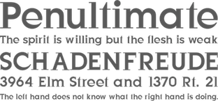 Manfred Klein's typefaces from 2003: FictionBeings, MK Silhouetta Round, FlyOnYou, Karlas Bats, Maenneken, Spiralish Two, WhoIsTheTerrorist, Avanti Dilettanti, Aggressors Bats, Aztecish, Corrodet, Lorbeer, BastardusSans, BaumWell, Bodonitown, WellrockSlab, Cassandra, PreventiveWarOval, Damagedpixfont, EuropeanTypewriter, KarlasStrokemen, PreventiveWarQuestion, Birds With Types, Cubism Creatures, MourningTrauer, BirdsXtreme, BirdsToolbox, WantedTerrorists, TheRoots, MK Latino Plain, AndBullets, Androidish, BirdsToolbox, BookHeads, CorrodetClassicaps, Damagedpixfont, LateBirds, LateBirdsFS, LateBirdsThree, MKStencilsansBlack, MatisseTraces, MexiKOrnaments, MkLatinoPlain, NonCommercial, PreventiveWarQuestion, QuickBirds, SpiralusFaces, SpiralusKrux, TheRoots, WantedTerrorists, WhereIsTheBirdsDealer, BlueMoonsByDay, BlueMoonsInverse, BruchschriftMK, HalfsAreEnoughLatin, Latine, RandomFrax, Solitaires, SuperSansMKringel, SuperSansStrange, WildBirds, AreHalfsEnough, GeometricWanderlust, HeadfeetersPartialDisturbed, LuziFer, MouseStrokes3D, MouseStrokesCont, MouseStrokesInverseShadow, OlisWebButtonsInvers, PeaceThruGuns, SaulsRandomBirds, Fragmenta, Remi Wacom, Crazy World, Democratic Peace Warriors, OrnithoLogics, People, HelloCleoPetra, VertigoComic, Romi Petito (Miro drawings imitated), LogoFacesToolbox, WirewalkersVertigo, AidaSerifObliqueMedium, BuddhasBigArmy, GridExerciseSerif, Guernica38Remember, LogoFacesArtists, LogoModaRoma, LogoModels, LogoModelsBowToBoss, Silhouettes03, SteepTypewriterMedium, SuddenFall, WoodTypesMK, BrokenSans, FutstencilSerif, MKTypobricks, SegmentaSans, WhyMar, Xperimentypo FS, HouseGhosts, MKEyeMinals, StrangeBeings, AlwaysBig, Old Constructed Caps, Fat Floralphabet, MannohK Serif, TheyWasNiceMurdersAlways (an anti-war font basic on Guernica), DadaDa, FrancoforteSerifus, Arrowbytes, DingsbumsBats, HeadsTorsi, VollkegelSerif, NiceMurders, Burklein, Comicontemporary, ConstrxiaBlackInline, DadasDreams, EgyptAxt, KleinBricksNegative, AntiquaInGrid, GiveMeFive, Bitsbats, SilhouettesInGrids, BigSlabHammer, BurkleinOblique, JustOldFashion, KleinsanBold, Oliver, Gipfelkoepfe, HolySimplicity, Standing Buttons, 52 Letters, FriendlyFire, Lettersoup, Manga Axt, SplinterMKaps, GiambattistaVsPetit, TypoGhosts, ZagZag, MotionTools, MouseDroodles, Topnotches, TypoAnarchycalEyes, LaCittaShadow, Venezia, ReadingHelpersInvers, RoughRockys, SchulVokalDots, Analphabetism, Circularia, HalfCircleAlphabetXP, Multistrokes, Unzialish, ChildrenDingbats, EveryPictureTellsAStory, OgiRema, CrazyCrazySans, Sketched Alphabet, HerrCoolesWriting, Julius Caesar Black, AliensNew, PadBats, WaPicts, ImperiumLatineSerif, KleinsForgottenRoman, Helixal, MKDrawings, MKDrawingsPeople, FriendlyFireBullets, BirdsAndOtherBeings, Pinocchionish, PointGallery, Spiralicus, AfroDesigns, Frontal, MangaMaterial, NiceNeighbours, HerdeckeSans, ParmaCrazy, QuadrigAlphabetTwo, HellasDust, WildBradoni, Sketchiqua, FragmentuM, LogoHalfnHalf, MKSzene, Neudoerffer, StrokesNBullets, CircusStars, Facialish, Kleerikale, Kleinkeys, OnKleesTraces, NearAldus, NearJanTschich, Climbers, Krakelfabet, Amoebats+Climbats, ClimbersPhantasies, Karlas, Anarchists, Masks, SpaceCrew, Latins, Characters, FrontalButtons, GernKleinThree, MouseScribbles, Scannings, KidsFirstPrintFont, CuneyChars, VenetianBlind, MKartoonKoepfe, MouseAsBrush, SilhouFaces, TaurusCowboys, ShakeySlabserif, BodoniXT, EyelecBats, HowDrawAFish, Klill-LightTallX, MissingLinks, SansBroadway, Serifsketchia, SprayersFriends, LetterBuildings, SpaceAttacks, MouseAsPainter, MouseLearnMiro, CybaPee, ConstrxiaBlack, LetterBuildingsRoundContrast, RunningLetters, ZenFrax, ZenFraxCondensed, Gestures, HotJuly, JulySketches, KleinsBirds10, RoundHeads, SketchedBats, CybaPeeBlack, MKSansTallX, MKSerifTallX, BlaxxerifaBeta, CyclopsBlax4Dirk, Cyclop, EclectHeads, Graphis, TheManyMKFaces2, PetitLatin, Bowing, BowingInverse, ElectronicFaces, MKSansTallXMedium, MKSerifTallXMedium, ConstruCaps, PhantasticBeings, SpaceBeings, Traffic, HopeRound, Artefakte, AstroBats, AstroBatsFS, AstrobatsTwo, BabelSans-Bold, BabelSans-BoldOblique, BabelSans-Oblique, BabelSans, CalendarDigits, Drivers, DynamicBeings, FloralOne, FloralTwo, GreekArt, JamboRound, LinoCapsA, LinoCapsAR, LinocapsB, LinocapsBR, LombardiCaps-Round, LombardiCaps, LosAngeles, OsterinselPlus, PixCaps, PixCapsRound, PixCapsShadow, SecretWriting, SlabTallX-Medium, SlabTallX, SportsCartoons, ToolsMK, TypoSlabserif-Light, WeLoveAmericasWisdom, Pixelsplitter, Gonzales Sans, Spiralanautics Two, Circulum, Handiqua, typOasis-Initials, Griddies, InCrossFires, MKreatures, Weapons, Imprimerie, FarmersWrite, MKPixelProject, VeryOblique, AgroFont, SketchedMen, Imprimerie Bold, FoolOnTheHill, FoolsThree, TeleCom, AllesNurGeklaut, MKImprovisations, ZigZagOne, ZigZagTwo, ZigzagAnimals, RunishQuill, DomesticAnimals, HappyBirthday, KLEINigkeiten, TypoLatinSerif, DoodlesWritten, PointerSisters, QuadratZiffern, TypoShadows, MonAmourFraktur, SchaftstiefelKaputt, Birds11, Impossibile, PersonaRondo, Brandomi, GeoSansLight (based on Futura), LatinCondensed, AidaOopsXtra, BodoBlackSquares, BodoDisks, ThreeDeeTwoBeta, TypoBoxesRdTwo, Let'sDance, SilhouettesSocled, StoneAgeFeelings, BorisBlackBloxx (used by Brisbane for its branding), BorisBlackBloxxDirty, Latinia, JonasFragments, WildThingShadow, BallettAbsurdo, CarneVale, CatsDogs, HalloWien, Völkerfreundschaft, OldSansBlack, SteinAntikLight, AntiquaInGrid, SteinAntik, AnimalsMeetings, ArteAfrique, BraveOldWorld, Minidom, MonsTheSecondA, MonsTheSecondB, NipponsMonsBats, SpontanoCondenso, Stadtmusikanten, WacoGraphireSketches, KlitschKOtiqua, IronFraktur, Mons03Beta, Mons04, Pointillism Toolbox, BlackGapSans, DingsUndDas, DingsUndDasRunde, Faces, ForAlchemistsOnly, HalloWienTheTramps, MediaevalBats, MonsTheFifth, Peacetiqua, PickABack, TheTrampsTrash, Abstracta-Bold, AbstractaGrid, EdgedFaces, EdgedFacesKantig, HelloViennaMacabre, Menschen, SchulVokalDotless, Tremolo-DemiBold, Tremolo, Typomolecule, WacoFaces, DirtyThinkwitz, GetierAnimalish, Katrina-Normal, KleinsTypesoup, Koepp, Movieboards, NeudoerfferScribbleQuality, NewEarthCitizens, NewsRoar, OldTypographicSymphony-Regular, OldTypographicSymphony-Round, RupturedSans, SketchesByDuerer, SketchesInTypoasis, SlimSansSerif-Bold, SlimSansSerif, Snoutlike, Squaredances, Wacollection, Wacominals, AntikWaCom, FraxBrix, MKBritishWriting, MKRunes-Light, MKRunes, PointsNDotsImprovisations, DadaGrid, ReadItOrDada, VisualImpressions, AugenEyes, DuerersMinuskeln, GothicMajuscles, KyrillaSansSerif-Black, KyrillaSansSerif-Bold (Cyrillic simulation), LombarDuerer, Mdoodled, WittewittMajuscles-Flourish, WittewittMajuscles-FlourishBricks, ScribbleABit, DadaMeetsStoneage, HarpersBizarre, KarawaneSilhous, KritzelBirds, LightUnciale, Look, Nonserif-Regular, PalatinosTypeSoup, SansXHigh, StoneAgeAgain-Normal, TypoasisBoldGothic, UnderlineMonospace, Wacomedians, AbstractConcretLogo, Animalia, AnimaliaTwo, ClassizismAntiquaBook, HansFraktur, IrishUnciAlphabet, MBats, MKBats, Olivia-Normal, SlabserifXhigh, SuprematismFour, SuprematismOne, SuprematismThree, SuprematismTwo, TypesAntiques, WasWoodcuts, AnimalShadows, ArtGoesPixeled, BellaMusica, BirdsOThree, BlaxxConPersona, CaricaturesHeads, CartoonHeads, Children, FraxInCage, FraxInCageLeftOblique, FraxInCageRightOblique, HansSchoensCapsInGrid, HollaMediaeval-Bold, HollaMediaeval-BoldOblique, HollaMediaeval-Oblique, HollaMediaeval, KleinFeodoraCaps, Leibniz-Regular, NewEarthResidents, OtherPeople, PickUpBats, VierfachRund, WacomicCondensed-Medium, WysiwygBats, XmasBalls. [Google]
[MyFonts]
[More] ⦿
Manfred Klein's typefaces from 2003: FictionBeings, MK Silhouetta Round, FlyOnYou, Karlas Bats, Maenneken, Spiralish Two, WhoIsTheTerrorist, Avanti Dilettanti, Aggressors Bats, Aztecish, Corrodet, Lorbeer, BastardusSans, BaumWell, Bodonitown, WellrockSlab, Cassandra, PreventiveWarOval, Damagedpixfont, EuropeanTypewriter, KarlasStrokemen, PreventiveWarQuestion, Birds With Types, Cubism Creatures, MourningTrauer, BirdsXtreme, BirdsToolbox, WantedTerrorists, TheRoots, MK Latino Plain, AndBullets, Androidish, BirdsToolbox, BookHeads, CorrodetClassicaps, Damagedpixfont, LateBirds, LateBirdsFS, LateBirdsThree, MKStencilsansBlack, MatisseTraces, MexiKOrnaments, MkLatinoPlain, NonCommercial, PreventiveWarQuestion, QuickBirds, SpiralusFaces, SpiralusKrux, TheRoots, WantedTerrorists, WhereIsTheBirdsDealer, BlueMoonsByDay, BlueMoonsInverse, BruchschriftMK, HalfsAreEnoughLatin, Latine, RandomFrax, Solitaires, SuperSansMKringel, SuperSansStrange, WildBirds, AreHalfsEnough, GeometricWanderlust, HeadfeetersPartialDisturbed, LuziFer, MouseStrokes3D, MouseStrokesCont, MouseStrokesInverseShadow, OlisWebButtonsInvers, PeaceThruGuns, SaulsRandomBirds, Fragmenta, Remi Wacom, Crazy World, Democratic Peace Warriors, OrnithoLogics, People, HelloCleoPetra, VertigoComic, Romi Petito (Miro drawings imitated), LogoFacesToolbox, WirewalkersVertigo, AidaSerifObliqueMedium, BuddhasBigArmy, GridExerciseSerif, Guernica38Remember, LogoFacesArtists, LogoModaRoma, LogoModels, LogoModelsBowToBoss, Silhouettes03, SteepTypewriterMedium, SuddenFall, WoodTypesMK, BrokenSans, FutstencilSerif, MKTypobricks, SegmentaSans, WhyMar, Xperimentypo FS, HouseGhosts, MKEyeMinals, StrangeBeings, AlwaysBig, Old Constructed Caps, Fat Floralphabet, MannohK Serif, TheyWasNiceMurdersAlways (an anti-war font basic on Guernica), DadaDa, FrancoforteSerifus, Arrowbytes, DingsbumsBats, HeadsTorsi, VollkegelSerif, NiceMurders, Burklein, Comicontemporary, ConstrxiaBlackInline, DadasDreams, EgyptAxt, KleinBricksNegative, AntiquaInGrid, GiveMeFive, Bitsbats, SilhouettesInGrids, BigSlabHammer, BurkleinOblique, JustOldFashion, KleinsanBold, Oliver, Gipfelkoepfe, HolySimplicity, Standing Buttons, 52 Letters, FriendlyFire, Lettersoup, Manga Axt, SplinterMKaps, GiambattistaVsPetit, TypoGhosts, ZagZag, MotionTools, MouseDroodles, Topnotches, TypoAnarchycalEyes, LaCittaShadow, Venezia, ReadingHelpersInvers, RoughRockys, SchulVokalDots, Analphabetism, Circularia, HalfCircleAlphabetXP, Multistrokes, Unzialish, ChildrenDingbats, EveryPictureTellsAStory, OgiRema, CrazyCrazySans, Sketched Alphabet, HerrCoolesWriting, Julius Caesar Black, AliensNew, PadBats, WaPicts, ImperiumLatineSerif, KleinsForgottenRoman, Helixal, MKDrawings, MKDrawingsPeople, FriendlyFireBullets, BirdsAndOtherBeings, Pinocchionish, PointGallery, Spiralicus, AfroDesigns, Frontal, MangaMaterial, NiceNeighbours, HerdeckeSans, ParmaCrazy, QuadrigAlphabetTwo, HellasDust, WildBradoni, Sketchiqua, FragmentuM, LogoHalfnHalf, MKSzene, Neudoerffer, StrokesNBullets, CircusStars, Facialish, Kleerikale, Kleinkeys, OnKleesTraces, NearAldus, NearJanTschich, Climbers, Krakelfabet, Amoebats+Climbats, ClimbersPhantasies, Karlas, Anarchists, Masks, SpaceCrew, Latins, Characters, FrontalButtons, GernKleinThree, MouseScribbles, Scannings, KidsFirstPrintFont, CuneyChars, VenetianBlind, MKartoonKoepfe, MouseAsBrush, SilhouFaces, TaurusCowboys, ShakeySlabserif, BodoniXT, EyelecBats, HowDrawAFish, Klill-LightTallX, MissingLinks, SansBroadway, Serifsketchia, SprayersFriends, LetterBuildings, SpaceAttacks, MouseAsPainter, MouseLearnMiro, CybaPee, ConstrxiaBlack, LetterBuildingsRoundContrast, RunningLetters, ZenFrax, ZenFraxCondensed, Gestures, HotJuly, JulySketches, KleinsBirds10, RoundHeads, SketchedBats, CybaPeeBlack, MKSansTallX, MKSerifTallX, BlaxxerifaBeta, CyclopsBlax4Dirk, Cyclop, EclectHeads, Graphis, TheManyMKFaces2, PetitLatin, Bowing, BowingInverse, ElectronicFaces, MKSansTallXMedium, MKSerifTallXMedium, ConstruCaps, PhantasticBeings, SpaceBeings, Traffic, HopeRound, Artefakte, AstroBats, AstroBatsFS, AstrobatsTwo, BabelSans-Bold, BabelSans-BoldOblique, BabelSans-Oblique, BabelSans, CalendarDigits, Drivers, DynamicBeings, FloralOne, FloralTwo, GreekArt, JamboRound, LinoCapsA, LinoCapsAR, LinocapsB, LinocapsBR, LombardiCaps-Round, LombardiCaps, LosAngeles, OsterinselPlus, PixCaps, PixCapsRound, PixCapsShadow, SecretWriting, SlabTallX-Medium, SlabTallX, SportsCartoons, ToolsMK, TypoSlabserif-Light, WeLoveAmericasWisdom, Pixelsplitter, Gonzales Sans, Spiralanautics Two, Circulum, Handiqua, typOasis-Initials, Griddies, InCrossFires, MKreatures, Weapons, Imprimerie, FarmersWrite, MKPixelProject, VeryOblique, AgroFont, SketchedMen, Imprimerie Bold, FoolOnTheHill, FoolsThree, TeleCom, AllesNurGeklaut, MKImprovisations, ZigZagOne, ZigZagTwo, ZigzagAnimals, RunishQuill, DomesticAnimals, HappyBirthday, KLEINigkeiten, TypoLatinSerif, DoodlesWritten, PointerSisters, QuadratZiffern, TypoShadows, MonAmourFraktur, SchaftstiefelKaputt, Birds11, Impossibile, PersonaRondo, Brandomi, GeoSansLight (based on Futura), LatinCondensed, AidaOopsXtra, BodoBlackSquares, BodoDisks, ThreeDeeTwoBeta, TypoBoxesRdTwo, Let'sDance, SilhouettesSocled, StoneAgeFeelings, BorisBlackBloxx (used by Brisbane for its branding), BorisBlackBloxxDirty, Latinia, JonasFragments, WildThingShadow, BallettAbsurdo, CarneVale, CatsDogs, HalloWien, Völkerfreundschaft, OldSansBlack, SteinAntikLight, AntiquaInGrid, SteinAntik, AnimalsMeetings, ArteAfrique, BraveOldWorld, Minidom, MonsTheSecondA, MonsTheSecondB, NipponsMonsBats, SpontanoCondenso, Stadtmusikanten, WacoGraphireSketches, KlitschKOtiqua, IronFraktur, Mons03Beta, Mons04, Pointillism Toolbox, BlackGapSans, DingsUndDas, DingsUndDasRunde, Faces, ForAlchemistsOnly, HalloWienTheTramps, MediaevalBats, MonsTheFifth, Peacetiqua, PickABack, TheTrampsTrash, Abstracta-Bold, AbstractaGrid, EdgedFaces, EdgedFacesKantig, HelloViennaMacabre, Menschen, SchulVokalDotless, Tremolo-DemiBold, Tremolo, Typomolecule, WacoFaces, DirtyThinkwitz, GetierAnimalish, Katrina-Normal, KleinsTypesoup, Koepp, Movieboards, NeudoerfferScribbleQuality, NewEarthCitizens, NewsRoar, OldTypographicSymphony-Regular, OldTypographicSymphony-Round, RupturedSans, SketchesByDuerer, SketchesInTypoasis, SlimSansSerif-Bold, SlimSansSerif, Snoutlike, Squaredances, Wacollection, Wacominals, AntikWaCom, FraxBrix, MKBritishWriting, MKRunes-Light, MKRunes, PointsNDotsImprovisations, DadaGrid, ReadItOrDada, VisualImpressions, AugenEyes, DuerersMinuskeln, GothicMajuscles, KyrillaSansSerif-Black, KyrillaSansSerif-Bold (Cyrillic simulation), LombarDuerer, Mdoodled, WittewittMajuscles-Flourish, WittewittMajuscles-FlourishBricks, ScribbleABit, DadaMeetsStoneage, HarpersBizarre, KarawaneSilhous, KritzelBirds, LightUnciale, Look, Nonserif-Regular, PalatinosTypeSoup, SansXHigh, StoneAgeAgain-Normal, TypoasisBoldGothic, UnderlineMonospace, Wacomedians, AbstractConcretLogo, Animalia, AnimaliaTwo, ClassizismAntiquaBook, HansFraktur, IrishUnciAlphabet, MBats, MKBats, Olivia-Normal, SlabserifXhigh, SuprematismFour, SuprematismOne, SuprematismThree, SuprematismTwo, TypesAntiques, WasWoodcuts, AnimalShadows, ArtGoesPixeled, BellaMusica, BirdsOThree, BlaxxConPersona, CaricaturesHeads, CartoonHeads, Children, FraxInCage, FraxInCageLeftOblique, FraxInCageRightOblique, HansSchoensCapsInGrid, HollaMediaeval-Bold, HollaMediaeval-BoldOblique, HollaMediaeval-Oblique, HollaMediaeval, KleinFeodoraCaps, Leibniz-Regular, NewEarthResidents, OtherPeople, PickUpBats, VierfachRund, WacomicCondensed-Medium, WysiwygBats, XmasBalls. [Google]
[MyFonts]
[More] ⦿
|
Valerio Monopoli
[Morula Type (or: Type01 Foundry, or: T1 Foundry)]
|
 [More] ⦿
|
Walter Bernard "Ben" Hunt
[Hunt Brothers]
|
[More] ⦿
|
William Caxton
|
William Caxton, the first English printer, was born in the Weald of Kent, in 1420, 1421 or 1422. In 1438, he became apprenticed to Robert Large, a leading textile merchant who became the mayor of London the following year. After Large's death in 1441, Caxton moved to Bruges, and built a successful textile business. By 1463 he became acting governor of the Merchant Adventurers in the Low Countries. Caxton was hired as an advisor to Charles the Bold's new duchess, the former Princess Margaret of York, sister of Edward IV. It was at the request of the duchess Margaret that he resumed his abandoned translation of a popular French romance, The Recuyell of the Historyes of Troye from the French of Raoul le Fèvre. After spending a year in Cologne learning the art of printing, Caxton returned to Bruges and set up a printing press, where he published his translation of The Recuyell, the first printed book in the English language, around 1474. His next publication, The Game and Play of Chess Moralised (1476), was a translation of the first major European work on chess, and was the first printed book in English to make extensive use of woodcuts. In 1476, he returned to England and set up a printing shop at Westminster at the sign of the Red Pale. Here, Caxton published such major works as Troilus and Creseide, Morte d'Arthur, The History of Reynart the Foxe, and The Canterbury Tales. Over the course of 14 years, he printed more than 70 books. The typefaces used by Caxton were all varieties of blackletter or gothic type. His earlier works were set in an early form of French lettre bâtarde. By 1490, he had acquired a more round and open typeface, a textura originally used by the Parisian printer Antoine Verard and later favored by Caxton's successor, Wynkyn de Worde. He died in 1491 in Westminster. Many fonts were named after Caxton, such as the Lombardic-styled Caxton Initials (1905, Frederic Goudy, ATF, revived by Alter Littera in 2012), and the ITC Caxton Roman family. His life's story can be found in Typophiles Chapbook: William Caxton and His Quincentenary (John Dreyfus). See also the Typographic Archives (1999). [Google]
[MyFonts]
[More] ⦿
|
William H. Bradley
|
 Book designer, poster designer and typographer, born in Boston (1868). He died in 1962. His typefaces include the following:
 - Abbey Text (1895, A.D. Farmer).
- Bradley (ATF, 1895). This blackletter typeface was cut into a wood type by Hamilton in 1900.
- A beautiful unnamed lettering for the Inland Printer (1891-1892).
- He drew the Bradley Series and licensed it to American Type Founders in 1895. That blackletter design was copied and issued by the Inland Type Foundry (as "St. John") and by A.D. Farmer&Son Type Founding Co (as "Abbey Text", still 1895). Also in 1895, Hermann Ihlenburg at ATF made the Germanic-language version of the Bradley Series. Several German foundries had metal versions of his 1895 series under the names Halbfette Altgotisch, Altfettgotisch and Amerikanische Altgotisch, such as Bauersche Giesserei and Schelter & Giesecke (1903). Digital revivals: Fyne Fish NF (Nick Curtis, 2009), Bradley Pro (2005, Ralph Unger at Profonts), Bradley DJR (2018, David Jonathan Ross). Bradley was used by Disney in its Sleeping Beauty Castle.
- Priory Black (ATF, 1897-1898) is said to be due to Bradley. In 1904, ATF introduced a modernized version called Cloister Black (or Cloister Text), designed by Joseph W. Phinney or Morris F. Benton.
- Bradley Roman and Italic saw the light in 1901 when Bradley was writing Peter Poodle, Toymaker to the King, and these typefaces are known as the Peter Poodle types.
- In 1904, he co-designed Antique Bold with J.W. Phinney and Morris Fuller Benton at ATF.
- His Bewick Roman series (1904) has gorgeous ligatures (tt, ct, and so on). Mac McGrew: Bewick Roman was designed by Will Bradley in 1904 and issued by ATF the following year. It is a quaint display type with a number of unusual characteristics. Several capitals have both wide and narrow versions, although generally the typeface is rather narrow; there are also several tied charac$Gters and ornaments in the font, as was common with nineteenth-century designs. Compare Rogers, Vanden Houten.
- Wayside Roman and Italic. Mac McGrew: Wayside Roman and Italic were shown by ATF in 1900, as a handsome interpretation of modern typeface similar to Scotch Roman, but without the heavier capitals of the latter face. Some sources say the designer was Will Bradley, but this is disputed by other authorities, and most likely it is a revival of an older face. It was not in regular production very many years, but special castings have been made at times. Some figures appear to be oversize---6, 7, and 9 in the specimen shown here---but this is a characteristic of the font, although not uniform from one size to another. Also compare Oxford, Bell.
- In 1904, he created the beautiful Chap-Book series (Cuts, Borders, Directors (pointing fingers), Guidons (unbelievable parentheses)), as well as the Mission Toys Ornaments, all at ATF. Thereafter followed Missal Initials, Wayside Borders (1904), Wayside Ornaments (1904), Cloister Borders (1905), Cloister Initials (1905), Indian Borders (before 1908). Some of his ornaments made it to American Pi NF (2006, Nick Curtis) and to the five-font-set Bradley Dingies (by Paulo W, 2009). Mac McGrew: Missal Initials were issued by ATF in 1904; their design has been ascribed to Will Bradley. Derived from fifteenth-century sources, each letter is designed to fill a square area. Compare Caxton Initials, Lombardic Initials. For a digital version of Missal Initials, see Initials ATF Missal Caxton (2012, Alter Littera).
- Bradley Initials (1934). For a degital version, see Glenda de Guzman's Bradley Intials (1994, Font Bureau).
- Vanity (1921-1930) is custom type he made while he was art director.
- His last group of typefaces was Bradley Combination Ornaments, made in 1952 for Steve Watts, type merchandising director of the American Type Founders Company.
- Roman alphabet by Bradley.
Fontshop link. A Booklet of Designs (1915, New York) contains many of his interesting drawings for typefaces. [Google]
[MyFonts]
[More] ⦿
|
W.R. Symms
|
Author of The Art of Illuminating As Practised in Europe from the Earliest Times (1860, Day and Son, Lithographers to the Queen, London). Examples from that book: 14th century Lombardic, 15th century chancery. [Google]
[More] ⦿
|
Yoann Minet
|
 Graduate of Ecole Estienne in Paris, who lives in Paris, where is the lead designer at Production Type. Yoann Minet (b. 1988, Tulle) created many typefaces:
 - Typefaces from 2015: Zahrah (a ten-style didone published by Indian Type Foundry), Granville (a Peignotian sans by Jean-Baptiste Levée).
- Typefaces from 2014: Minotaur [Minotaur won an award in the TDC 2015 Type Design competition], Minotaur Sans (extended in 2017 to Minotaur Lombardic and Minotaur Lombardic Sans), Countach (Countach, the tough compact sans supercharged with brawn & brains. Developed for The Crew, a critically acclaimed auto racing video game, Countach evokes the muscular and mechanical dynamics of fast cars and urban adventure. ; developed by Superscript2, J.-B. Levée, Sandra Carrera and Irina Smirnova).
- 2013, DSAA Design Typographique, Ecole Estienne, Paris: Traulha (wedge serif with horizontal stress), Ostia. Traulha is available from Extra Brut.
- 2012-2013, DSAA2 Design Typographique, Ecole Estienne, Paris: De Malfête (after a roman by Garamond in 1530, and an italic buy Simon de Collines), Grotique Gothesque.
- 2012, apprenticeship with Ludovic Balland: Stanley (a retail typeface at Optimo co-designed with Ludovic Balland), Theater Basel (a bespokle typeface done with Ludovic Balland), Swiss Art Awards (a font developed with Ludovic Balland for the identity of the Swiss Art Awards).
- 2011-2012, DSAA1 Design Typographique, Ecole Estienne, Paris: Capitale (a sans done under the direction of Franck Jalleau), Forez (a high-contrast wayfinding font for the chalet de François Mauriac in Saint-Symphorie).
- 2007-2011, Ecole de Communication Visuelle or (ECV) in Bordeaux, France: Bernadette (handwriting font based on the writing of Yoann's mother), Oxymore (2010, slab serif).
- 2012-2013: Ostia Antica is commissioned by Maquettes et Mise en pages designed and is co-designed bt Hugo Anglade, Laure Afchain and Thomas Petitjean for the exhibition catalogue Pasolini Roma in 2013. Extended in 2018 to a large retail family, which is available from Extra Brut.
- In 2014, he created Clifton Regular, a revival of Athenian (1896, British Type Foundry). This type is similar to Fantail (ATF, and Franklin Type Foundry, 1889). Published at 205 Corp.
- In 2014, he made the bespoke typeface Stratos with art direction by Emmanuel Labard. Stratos was retailed in 2016 and won an award in the TDC Typeface Design competition in 2017.
- In 2016, as Black Foundry, Jeremie Hornus, Gregori Vincens, Yoann Minet, and Roxane Gataud (and possibly Riccardo Olocco) designed the free Google web font Atma for Latin (in comic book style) and Bengali.
- In 2016, Google Fonts published the free Latin / Bengali signage font Galada (2015). It is based on Pablo Impallari's Lobster (for Latin). The Bengali was developed as a studio collaboration by Jeremie Hornus, Yoann Minet, and Juan Bruce at Black Foundry in France. Github link.
- Dr (2017, Production Type). A display sans typeface family that is deliberately weird.
- Droulers (2017). A monospaced display type for Bureau Brut.
- Totentanz (2017). A playful didone done for Bureau Brut.
- At Production Type in 2018, he cooperated with Jean-Baptiste Levée and Quentin Schmerber on Cardinal Classic and Cardinal Fruit, a large transitional typeface family. With Quentin Schmerber's help, he also published the 5-style text typeface Sainte Colombe in 2018. The tightly set and high impact photojournalism typeface family Cardinal Photo was added in 2020.
Interview by Ligature.ch. Personal home page. Behance link. [Google]
[MyFonts]
[More] ⦿
|


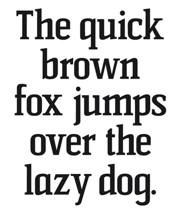
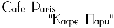
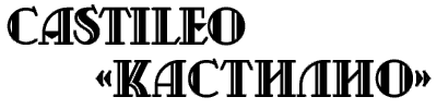
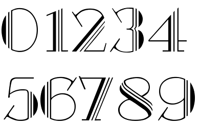
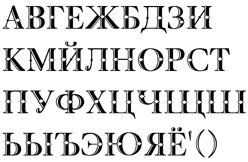
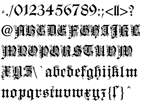
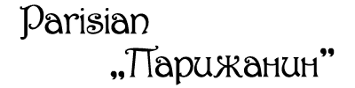
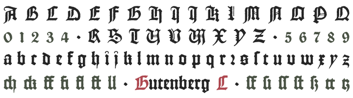
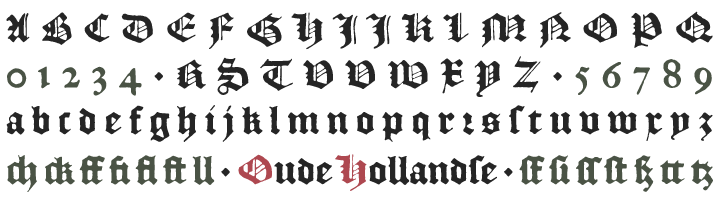
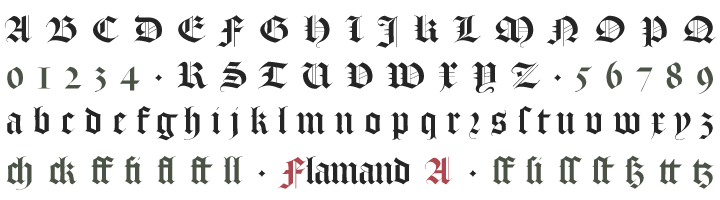
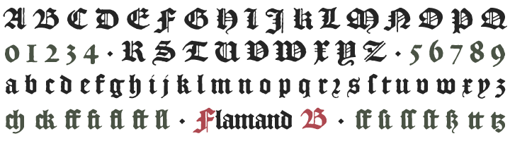
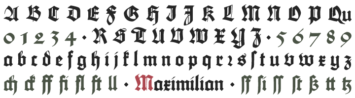
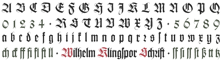
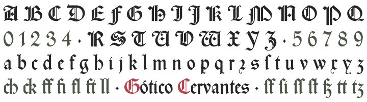
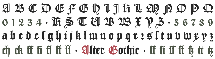
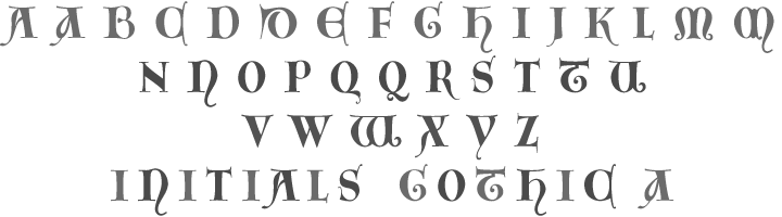
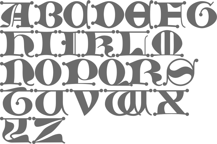
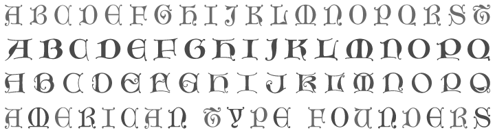
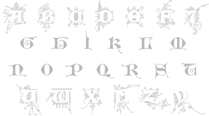
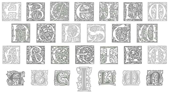
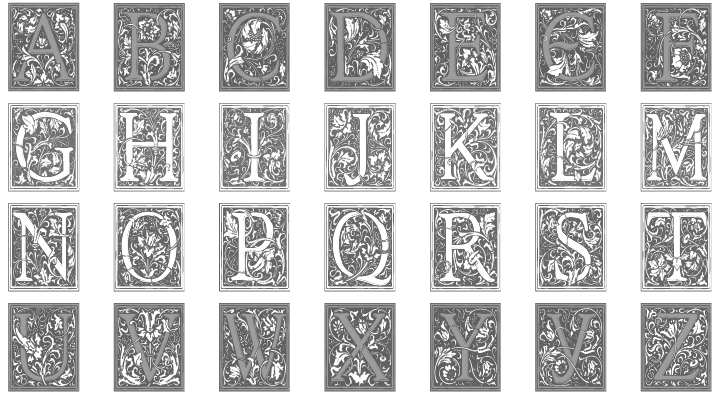
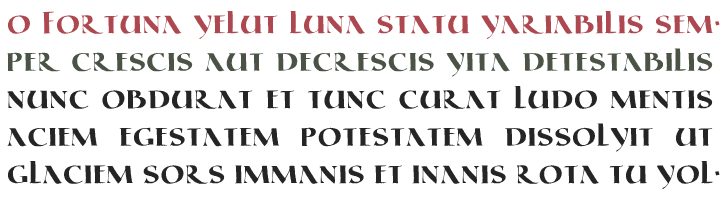
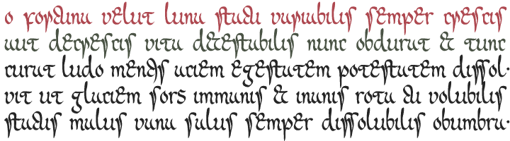
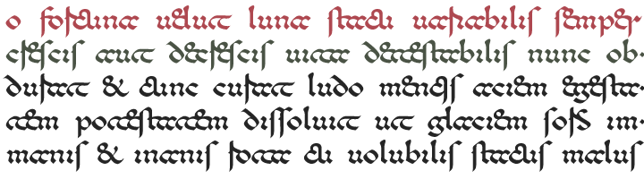
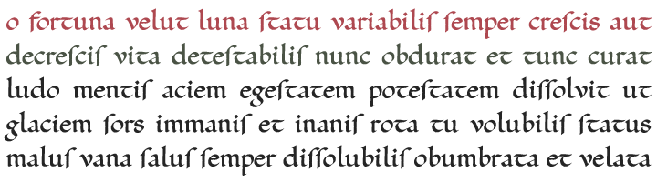
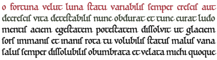
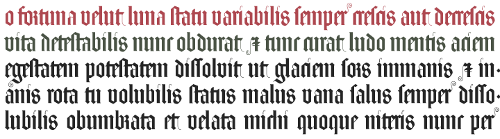
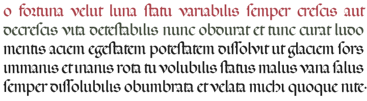
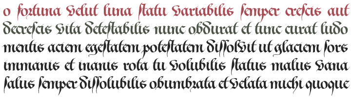
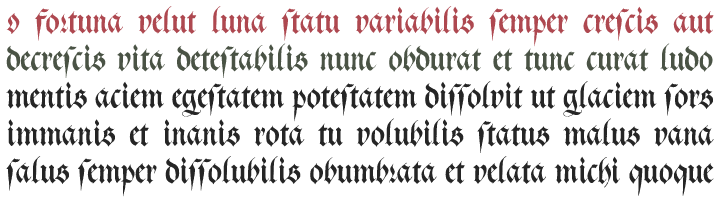
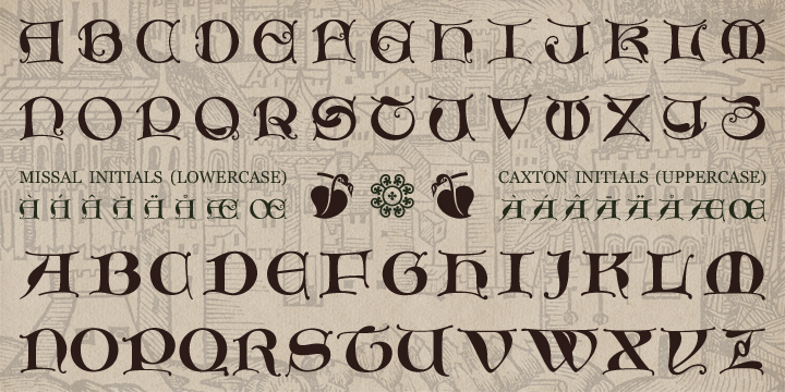
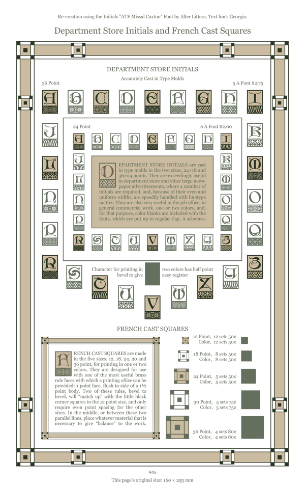
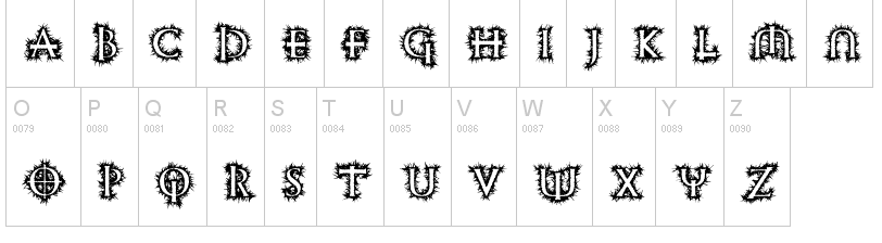
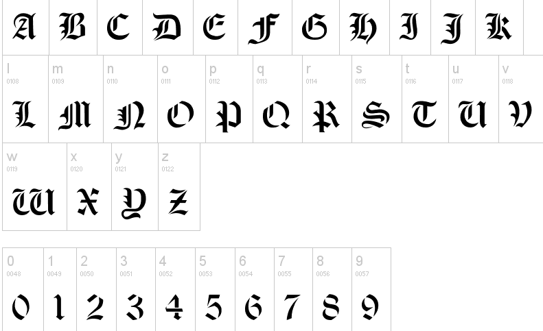
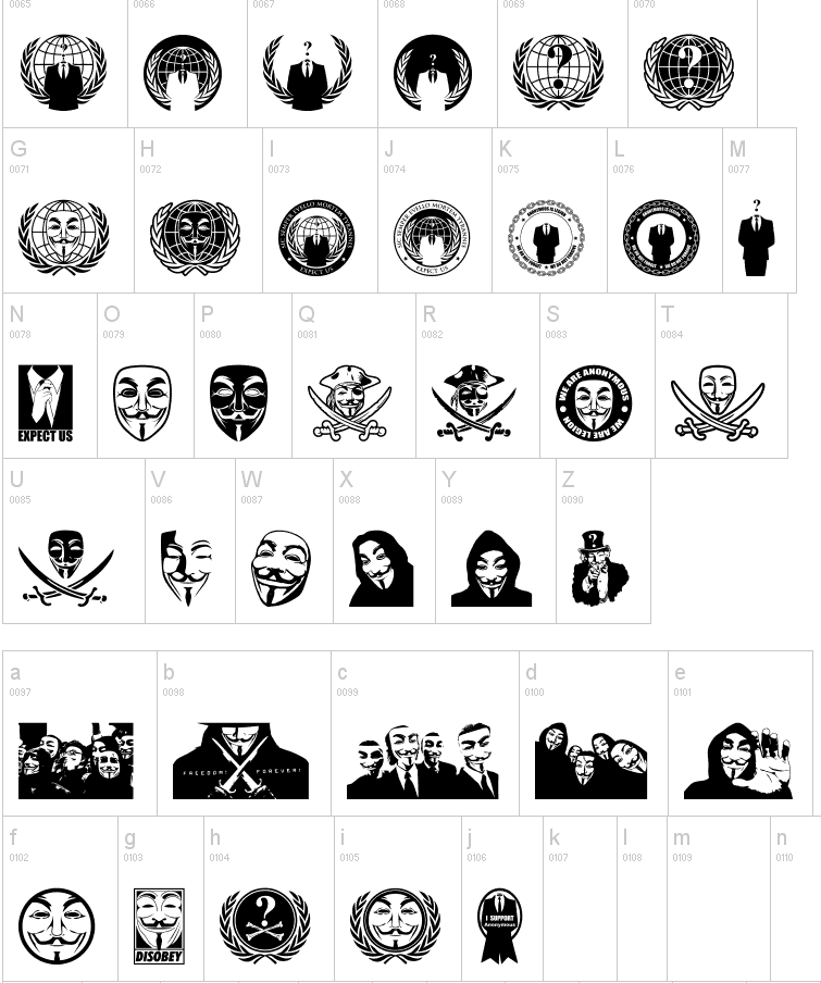
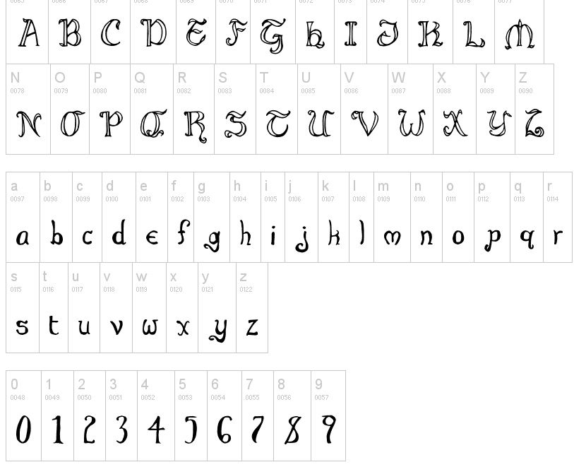
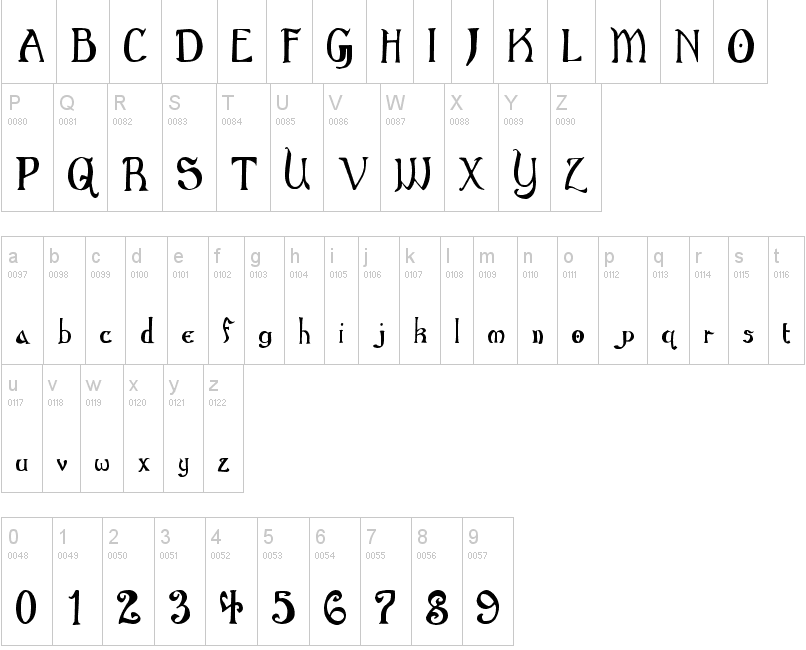
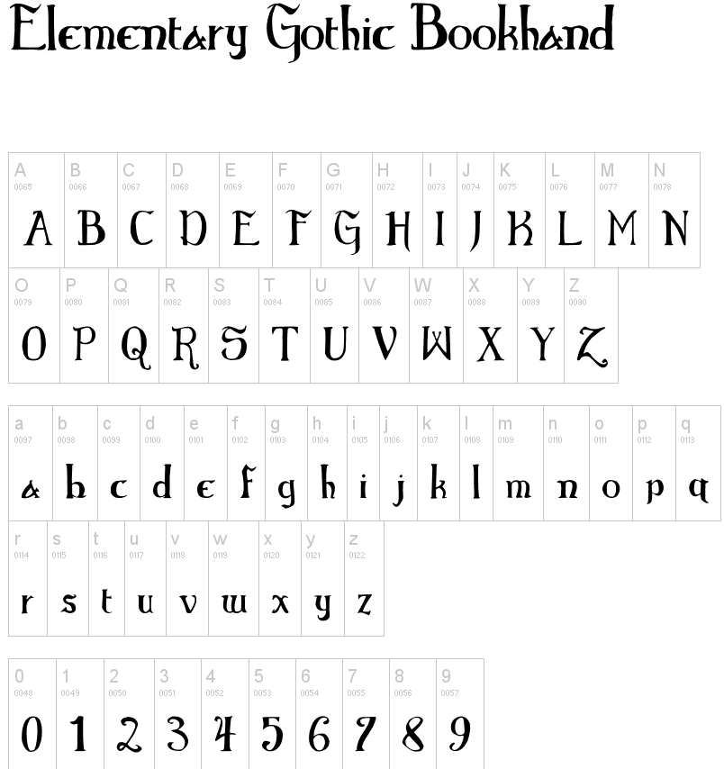
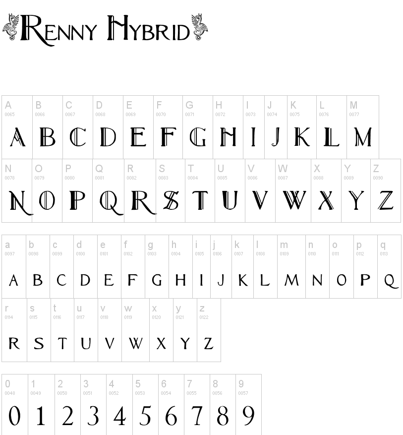
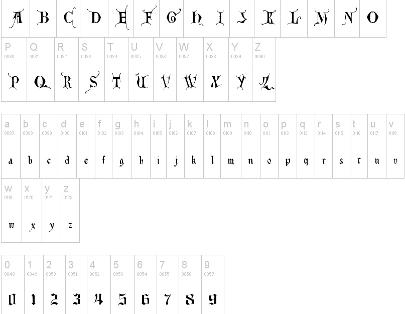
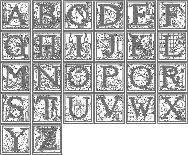
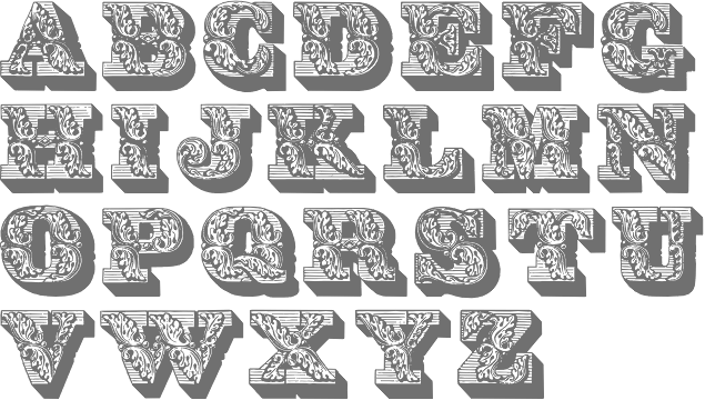
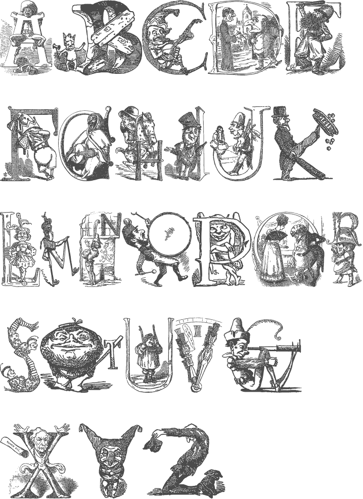
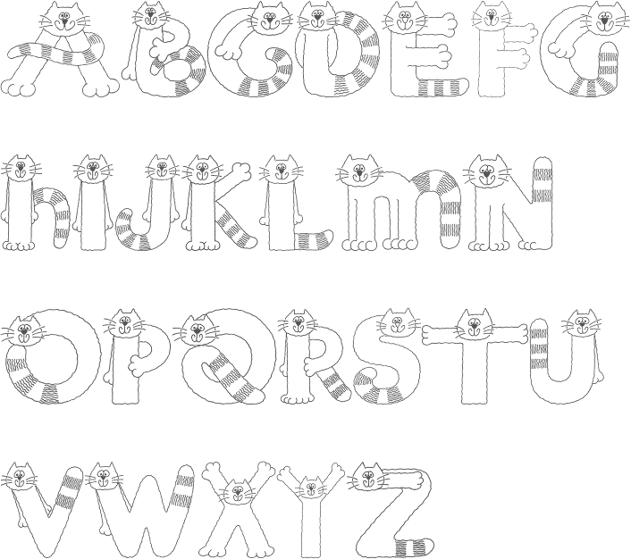
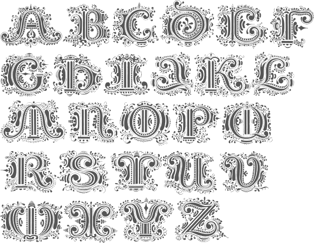
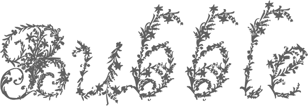
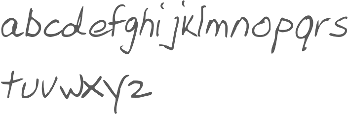
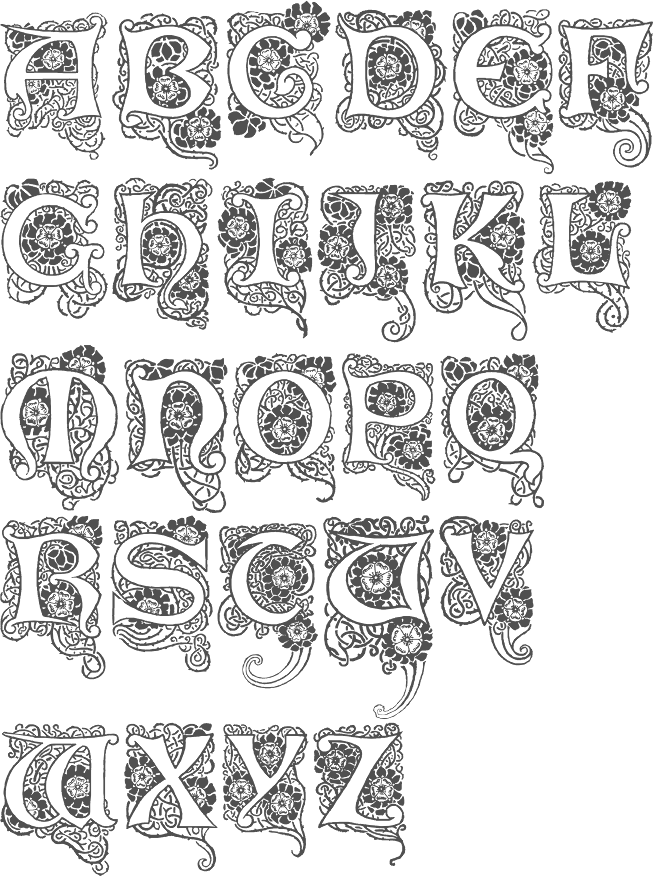
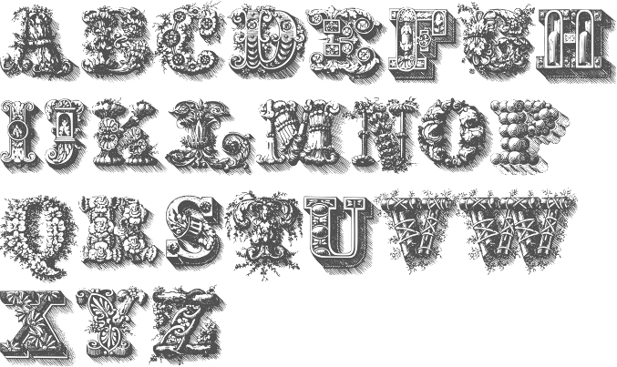
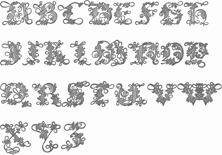
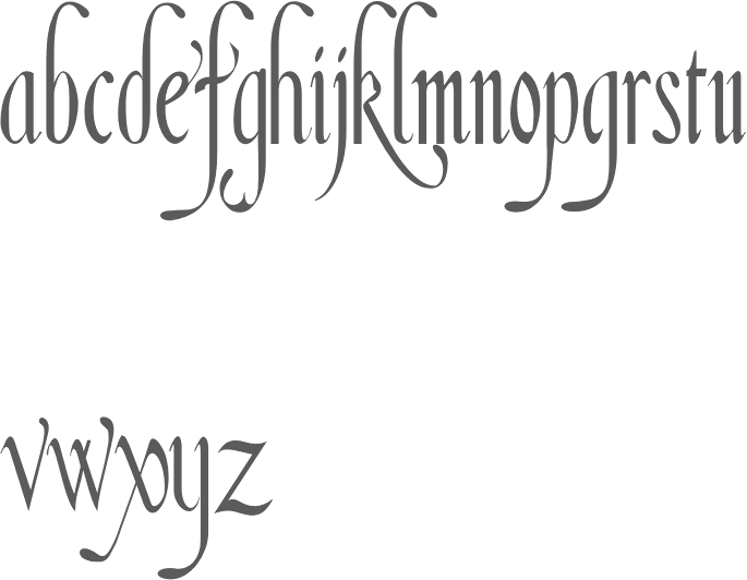
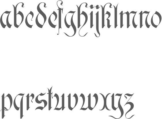
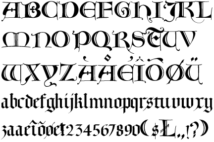
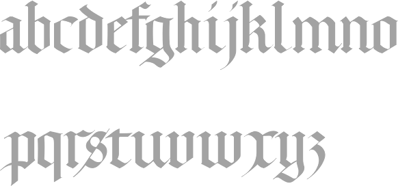
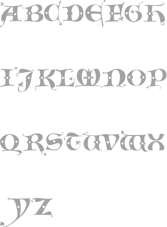
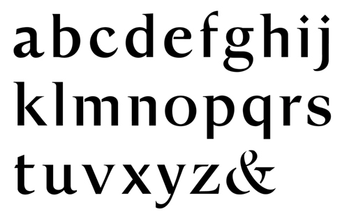
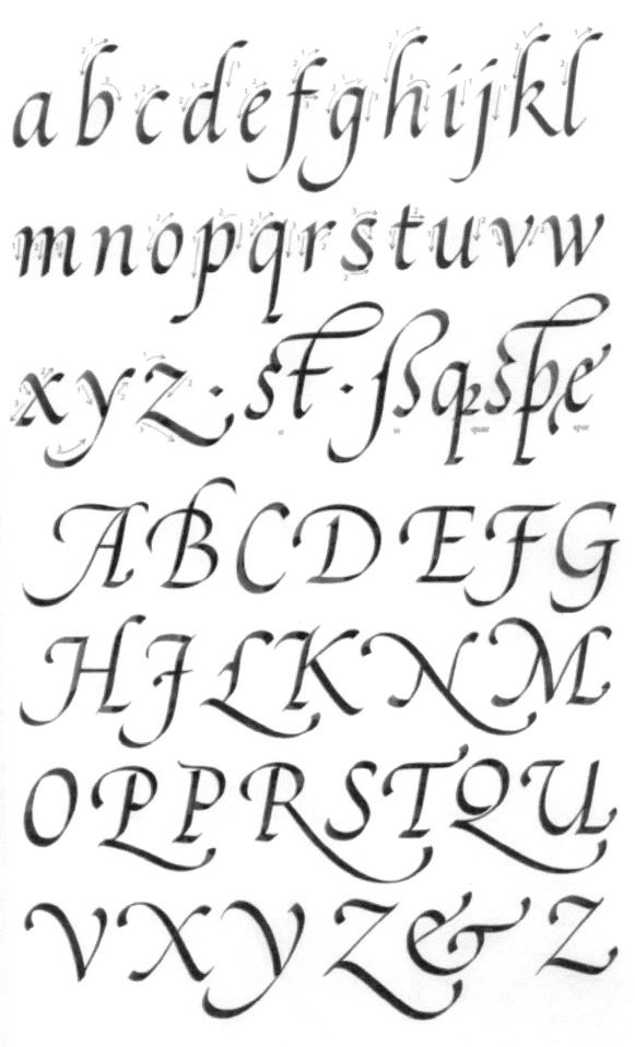
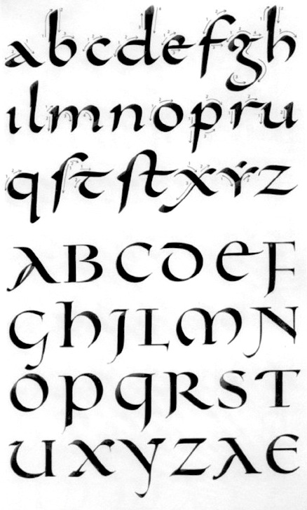
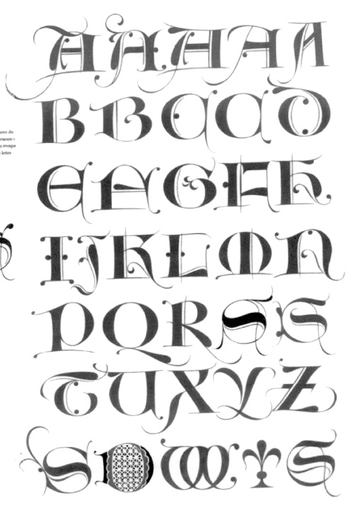
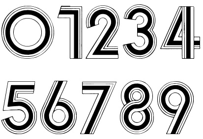
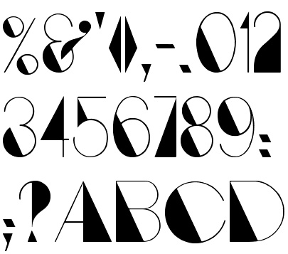
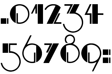
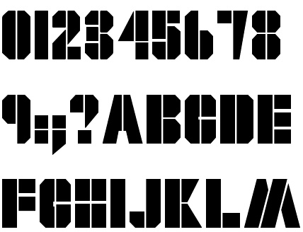
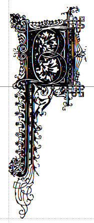
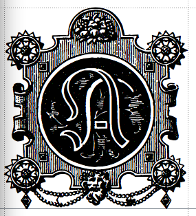
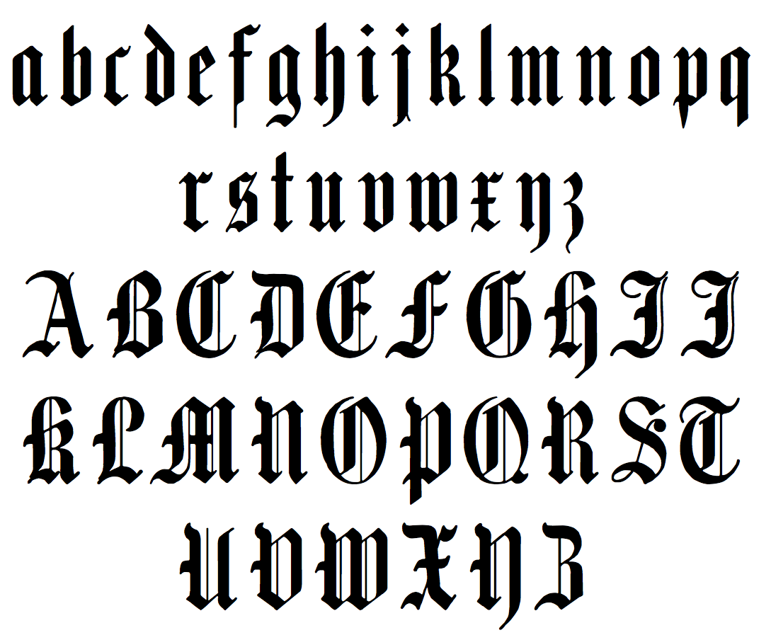
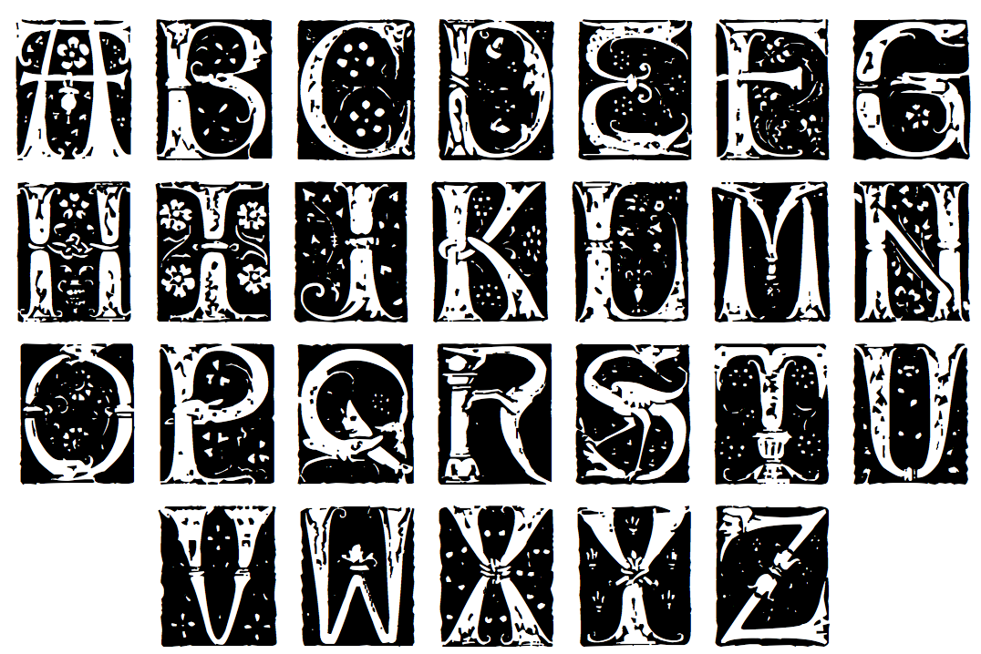
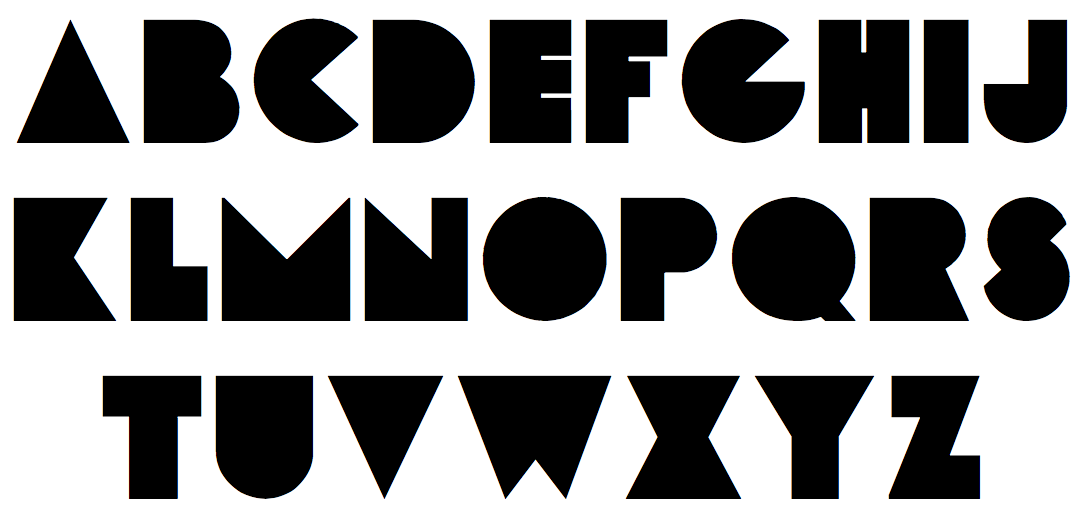
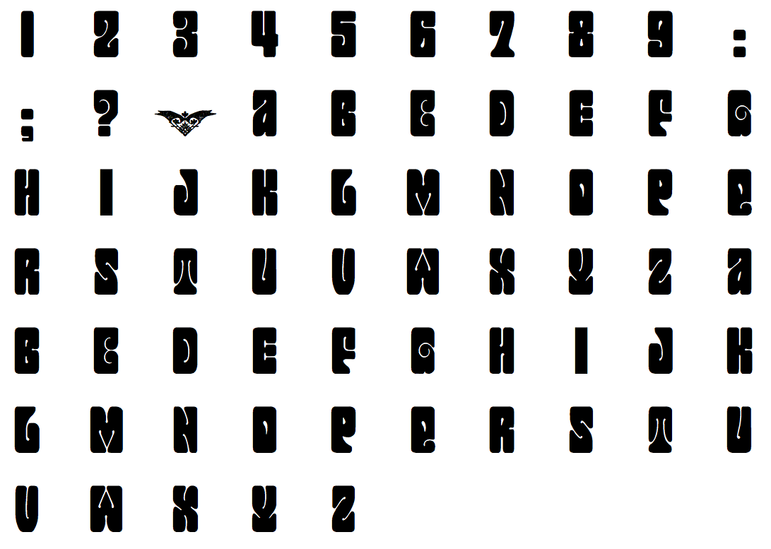
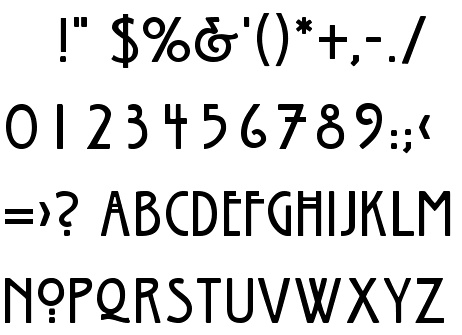
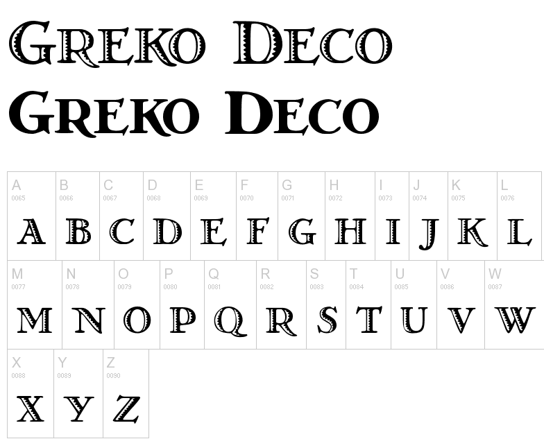
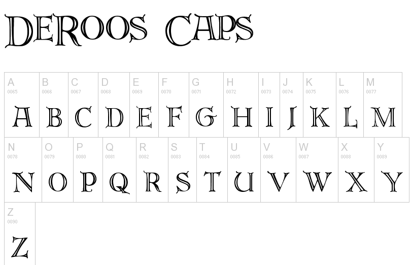
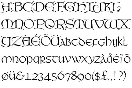
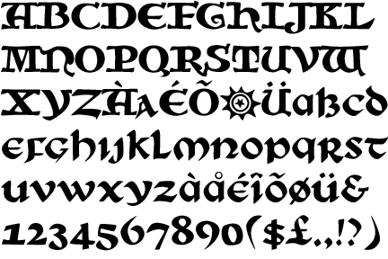
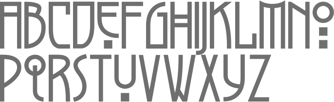
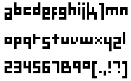
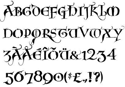
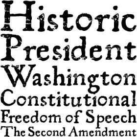
![[continued]](GeoffroyTory1529-LettresFantastiques2.jpg)
![[continued]](GeoffroyTory1529-LettresImperialles+Bullatiques2.jpg)
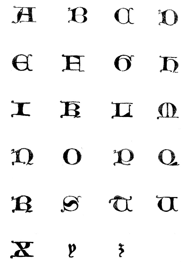
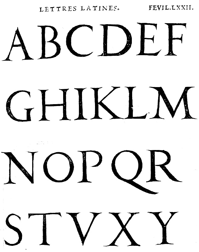
![[continued]](GeoffroyTory1529-cadeaulx2.jpg)
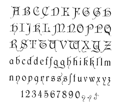
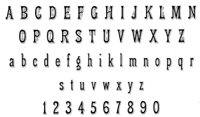
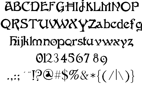
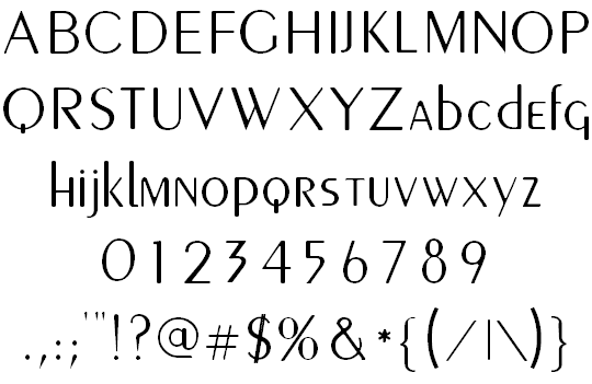
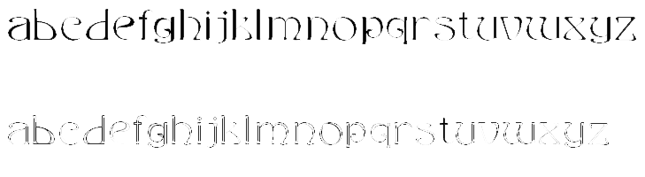
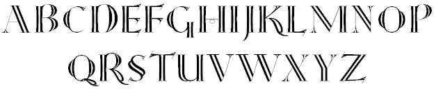
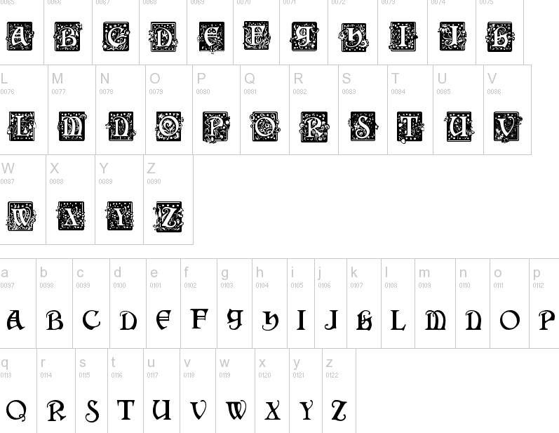
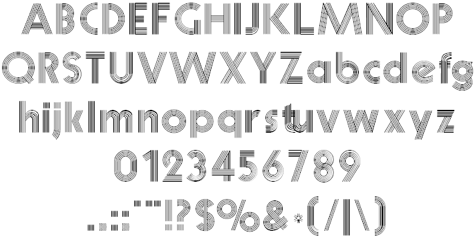
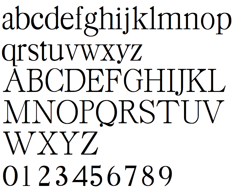
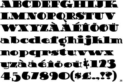
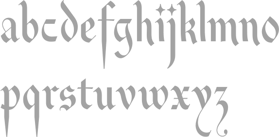
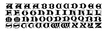
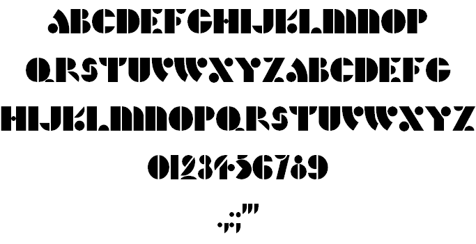
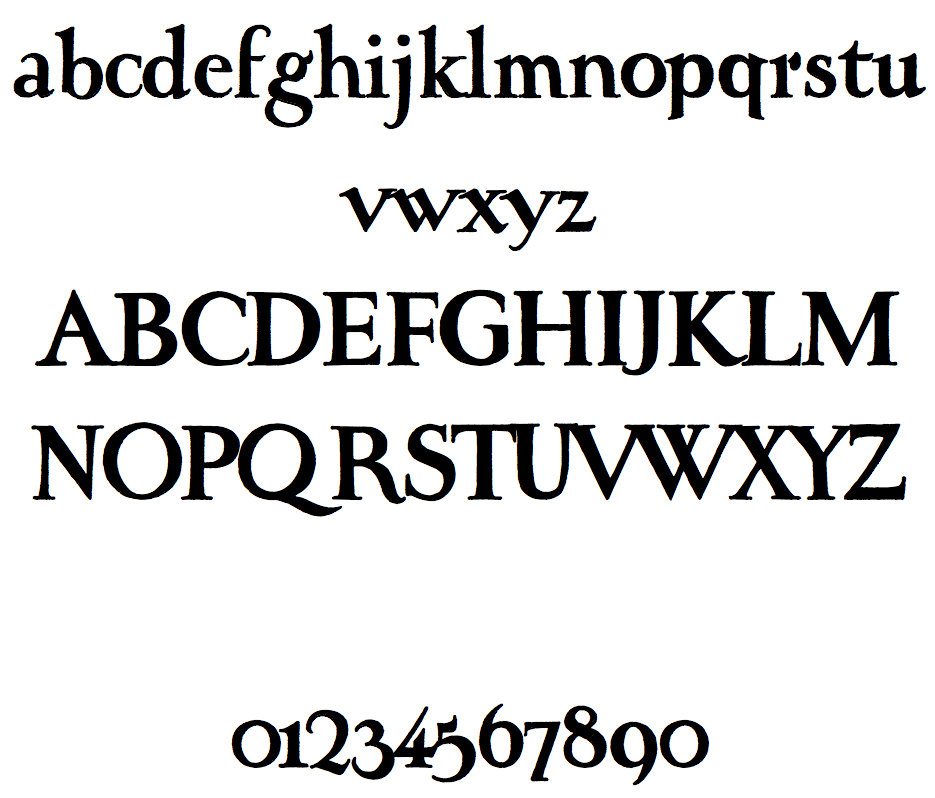
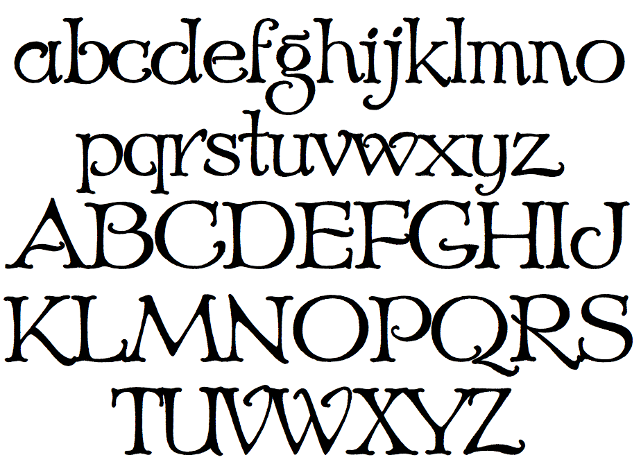
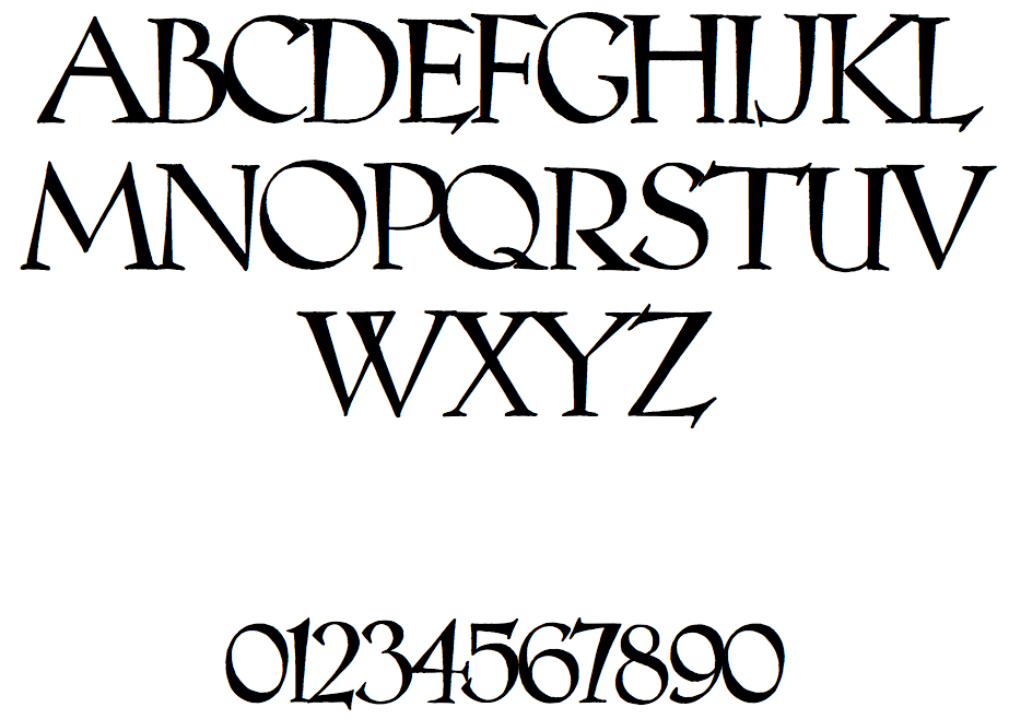
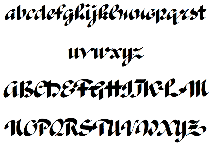
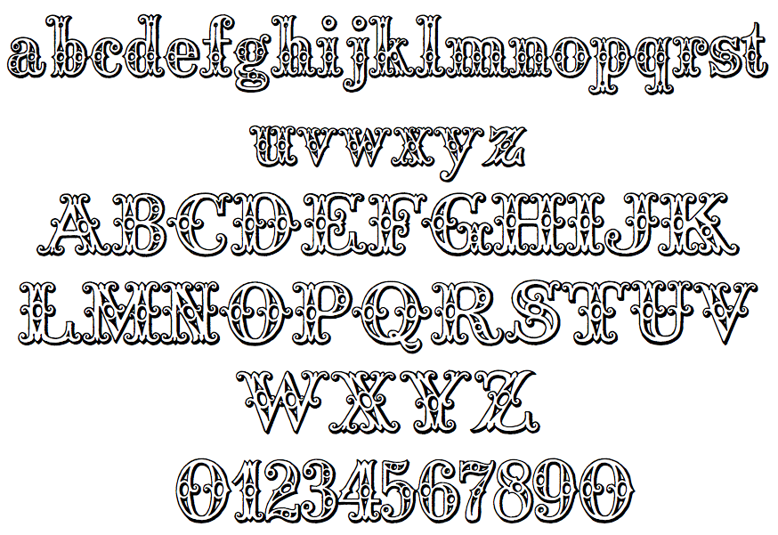
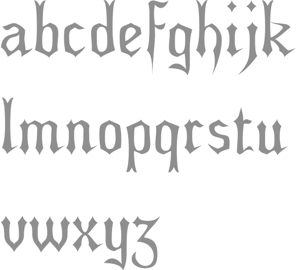
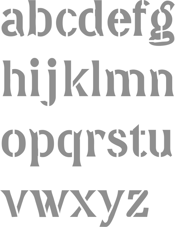
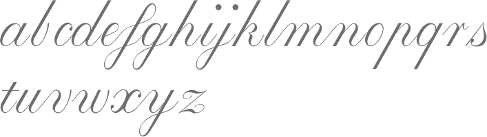
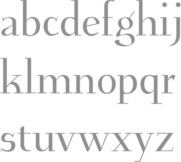
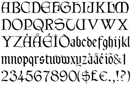
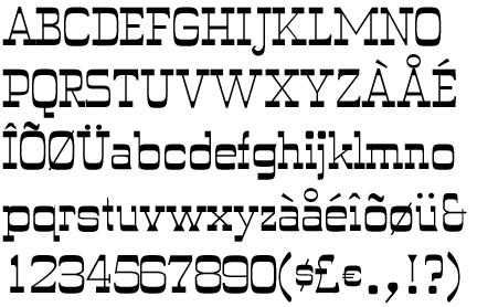
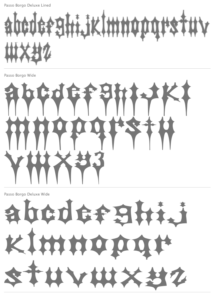
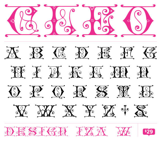
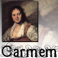
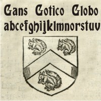
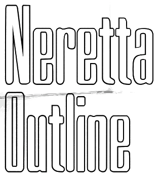
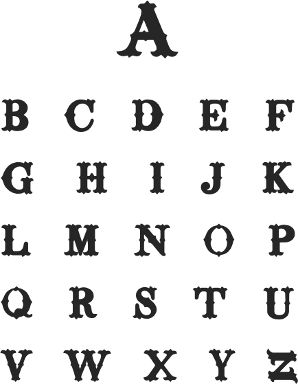
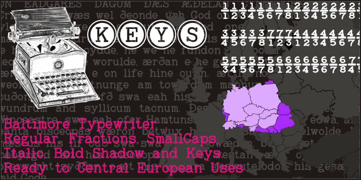
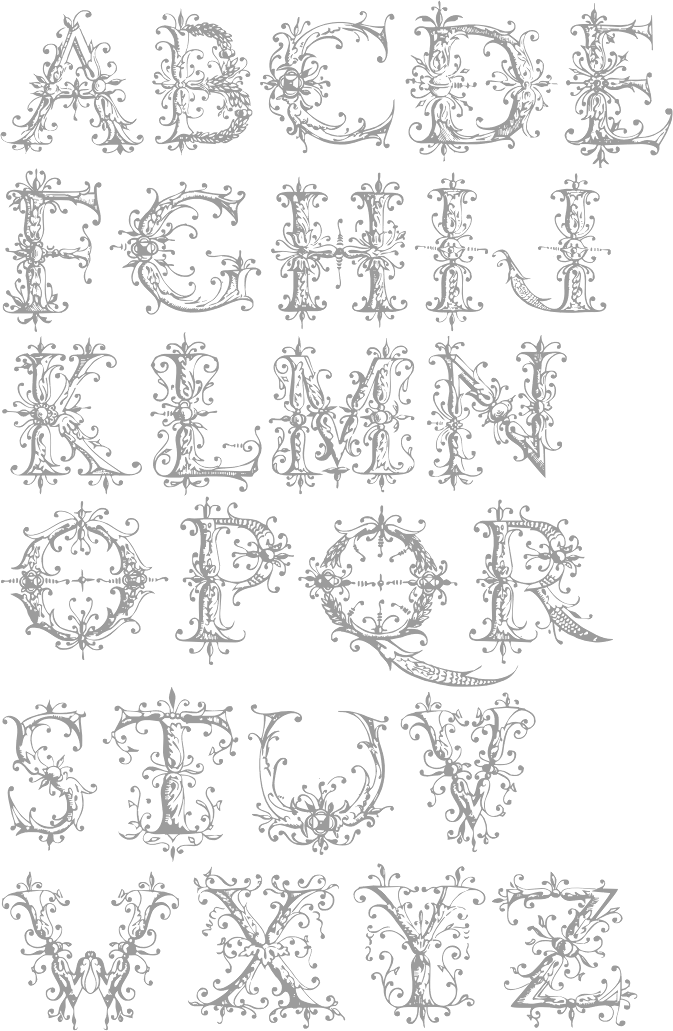
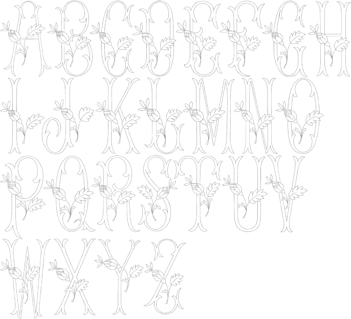
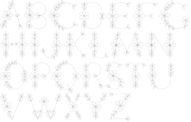
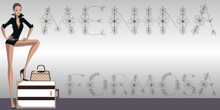
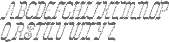
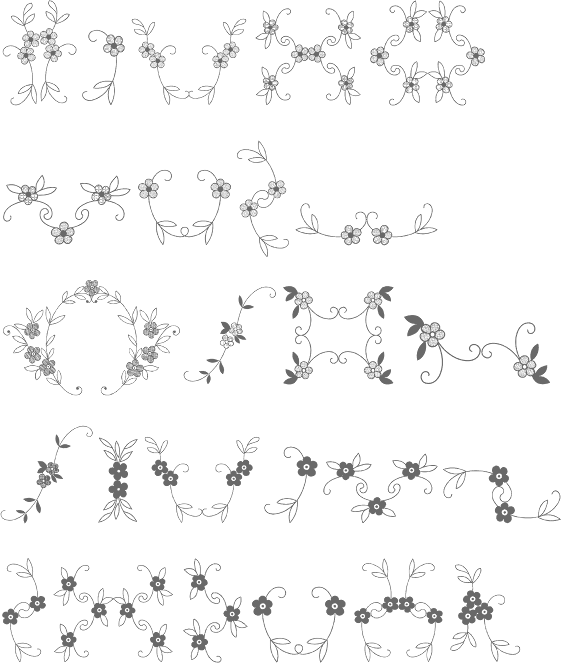
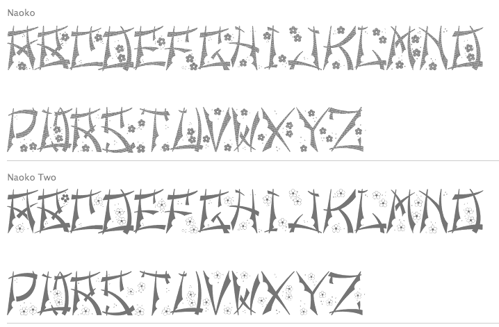
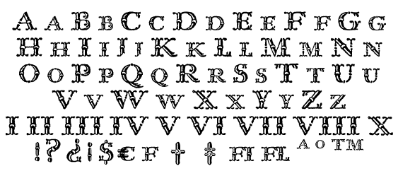
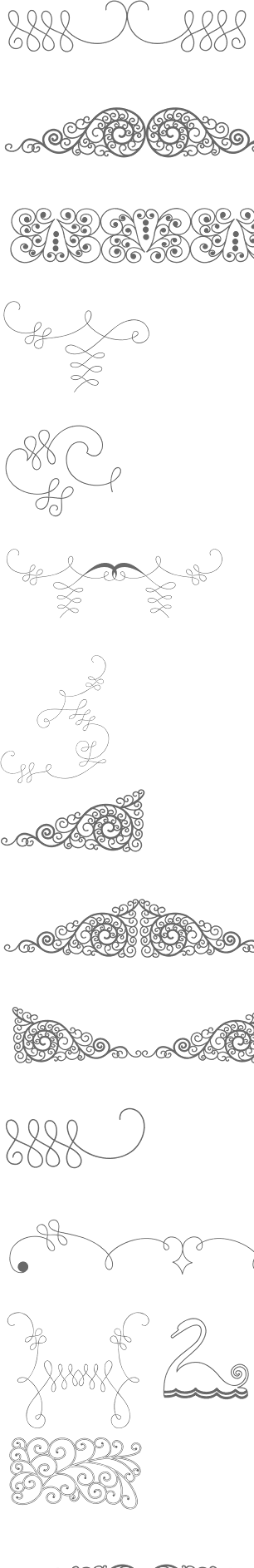
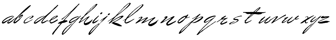
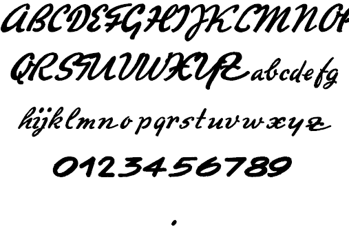
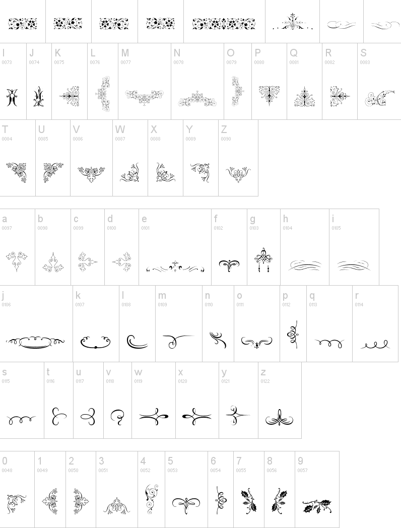
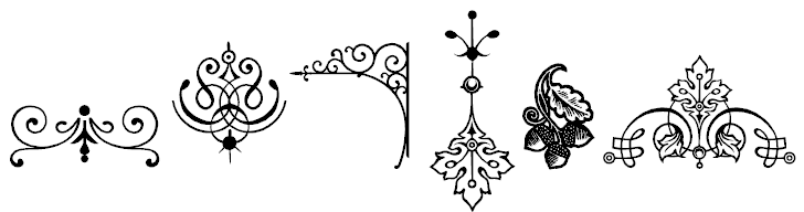
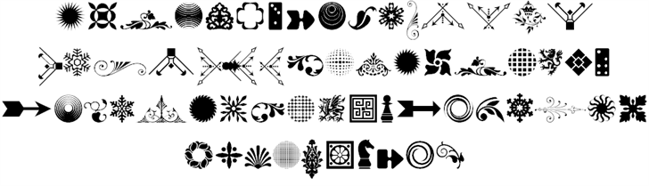
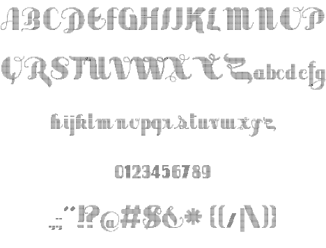
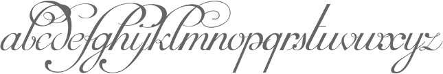
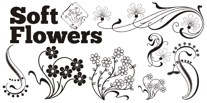
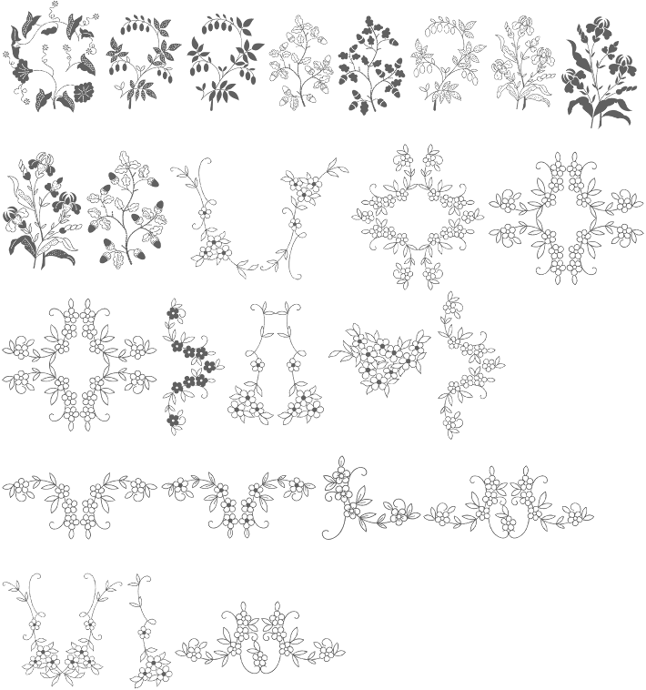
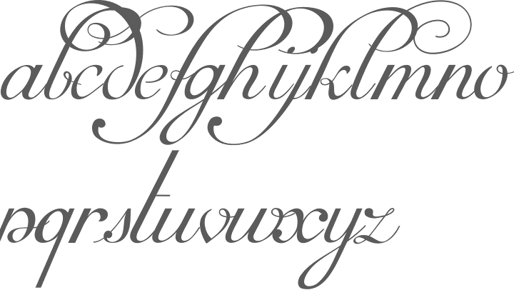
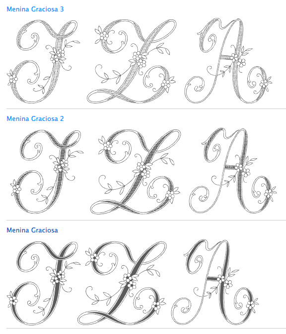
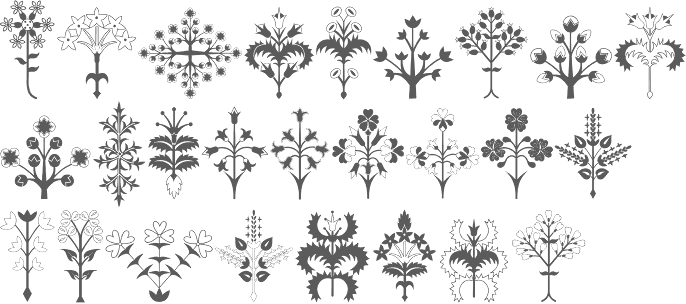
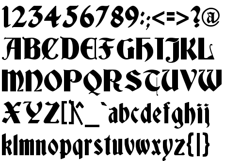
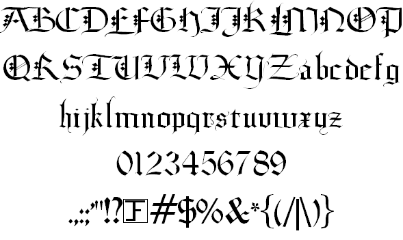
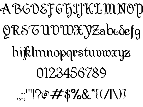
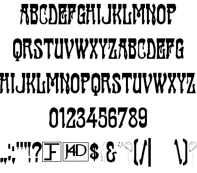
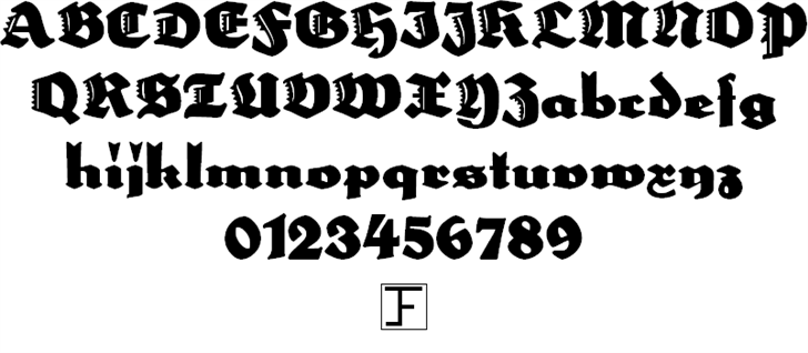
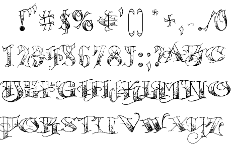
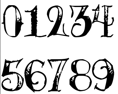
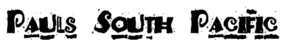
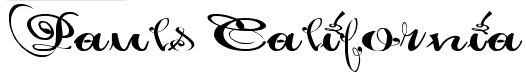
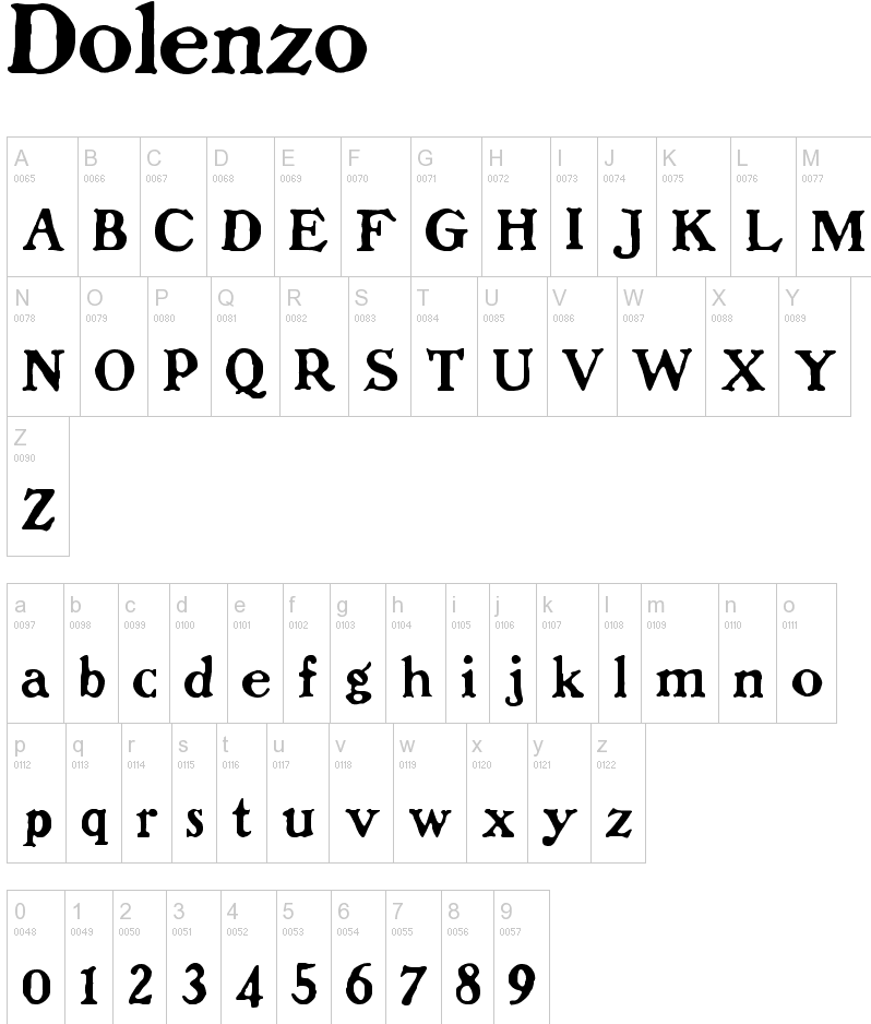
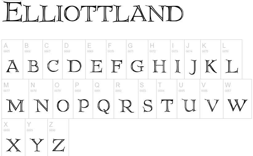
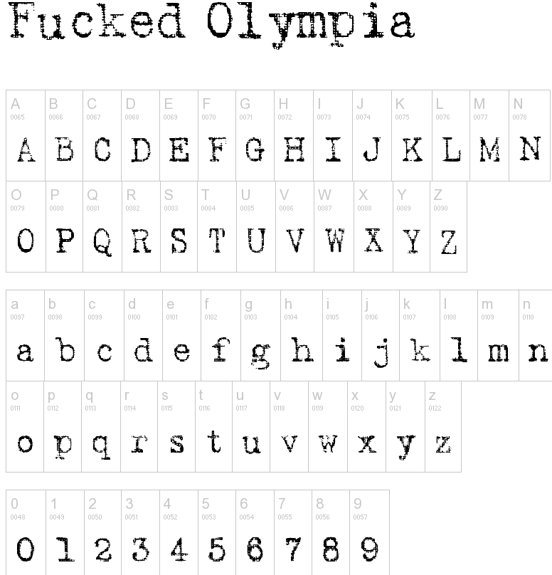
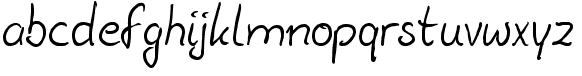
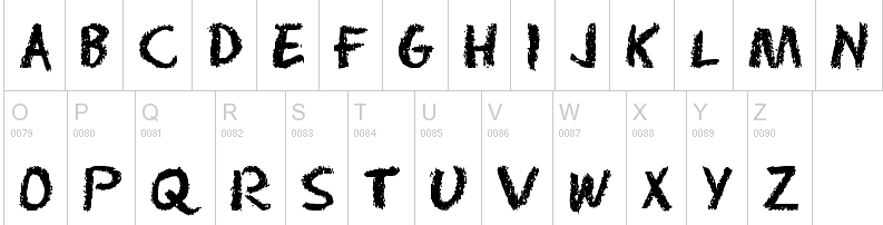
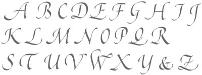
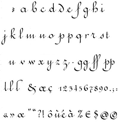
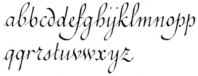
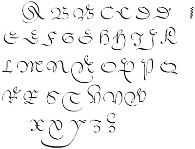
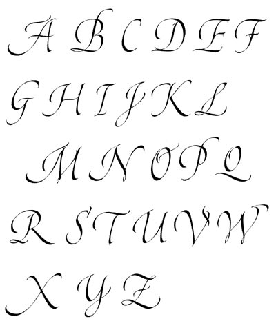
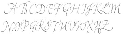
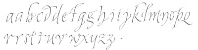
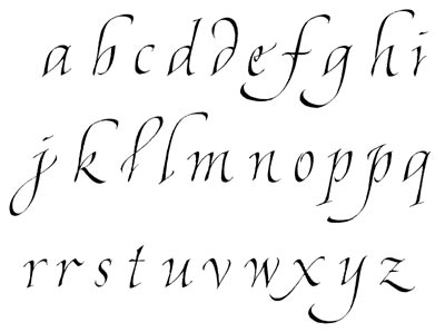
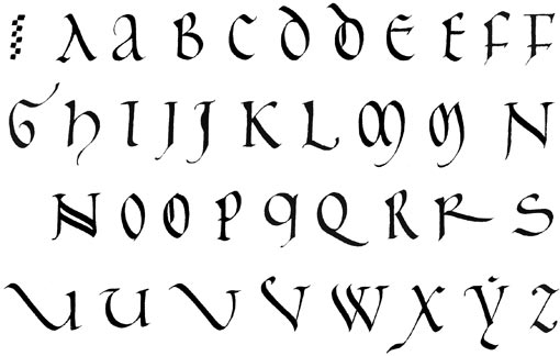
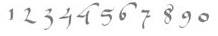
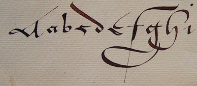
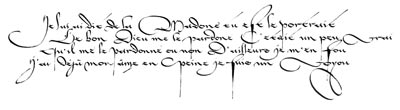
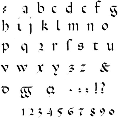
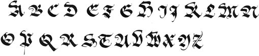
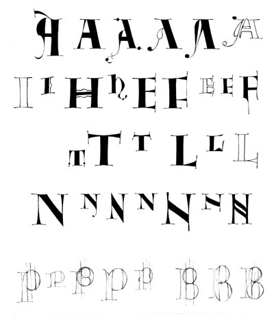
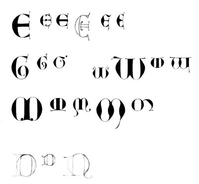
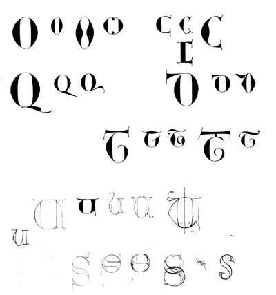
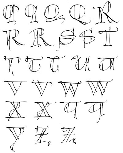
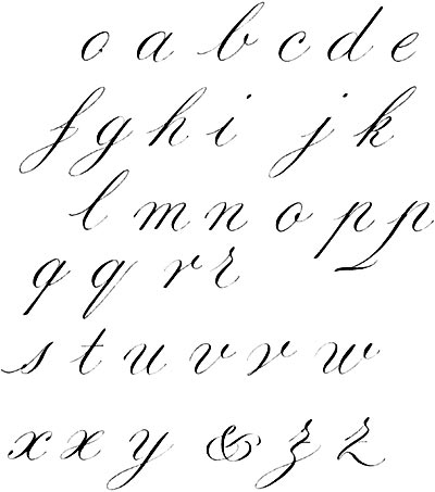
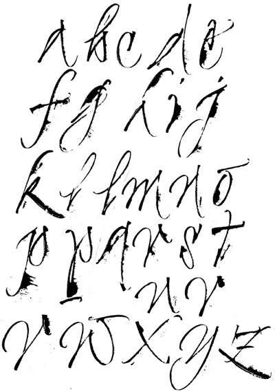
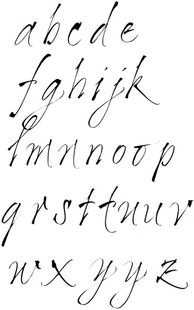
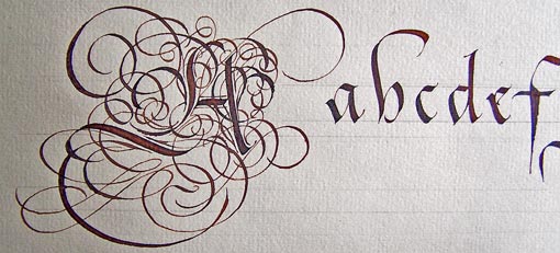
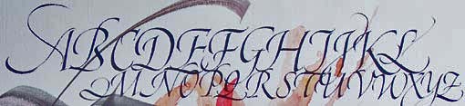
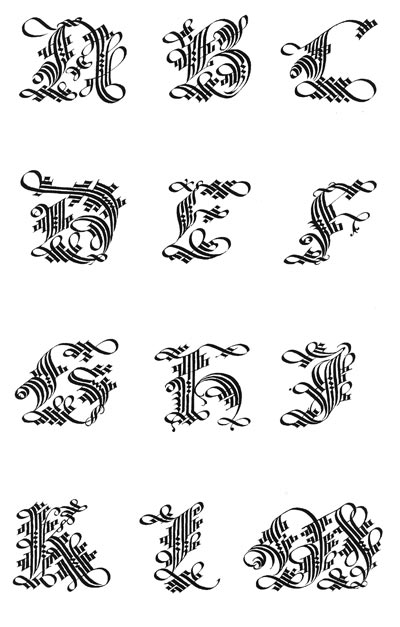
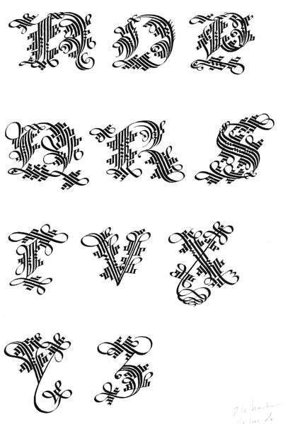
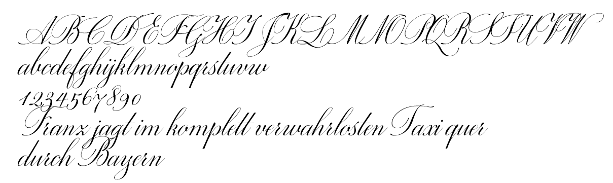
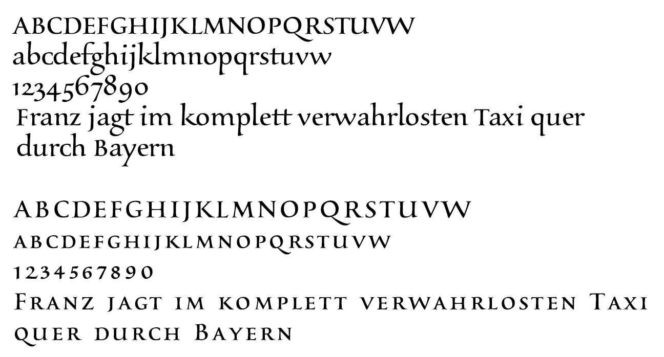
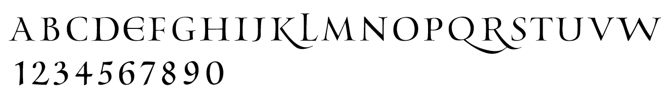
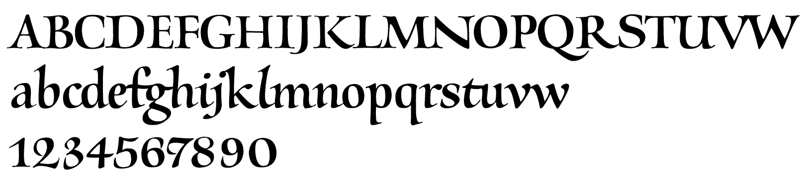
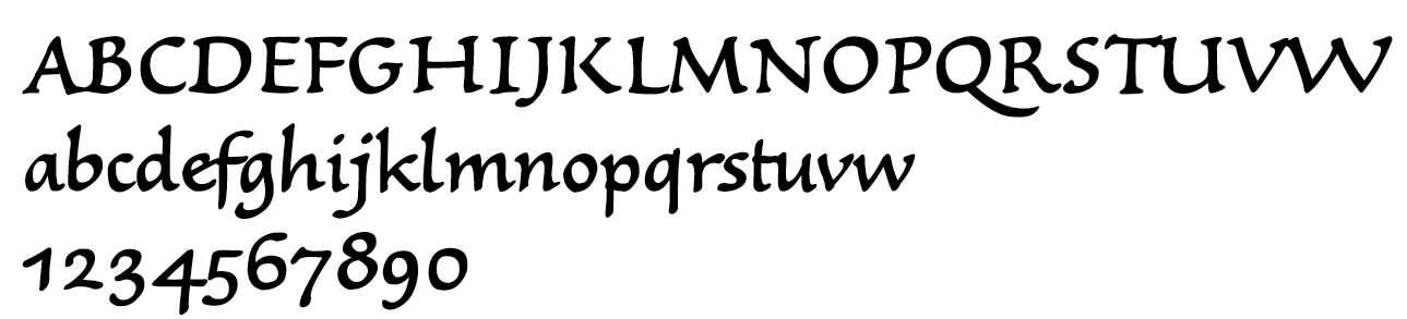
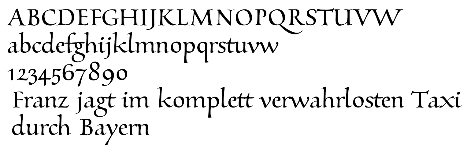
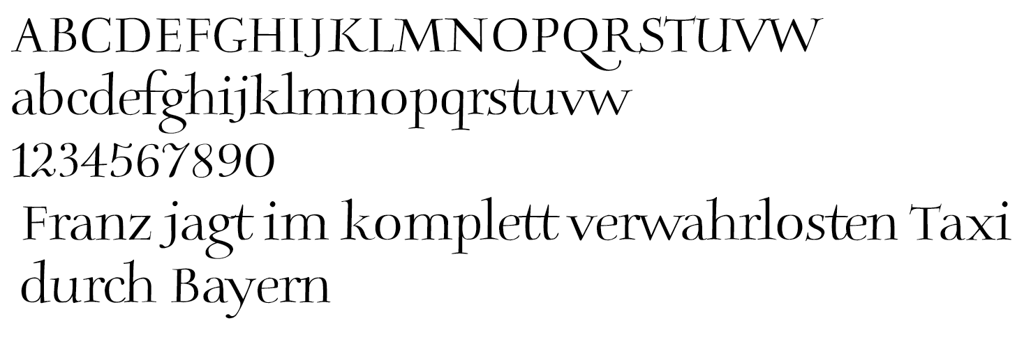
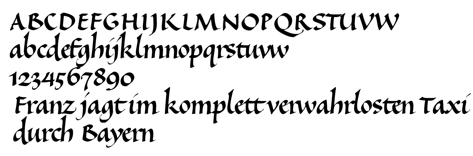
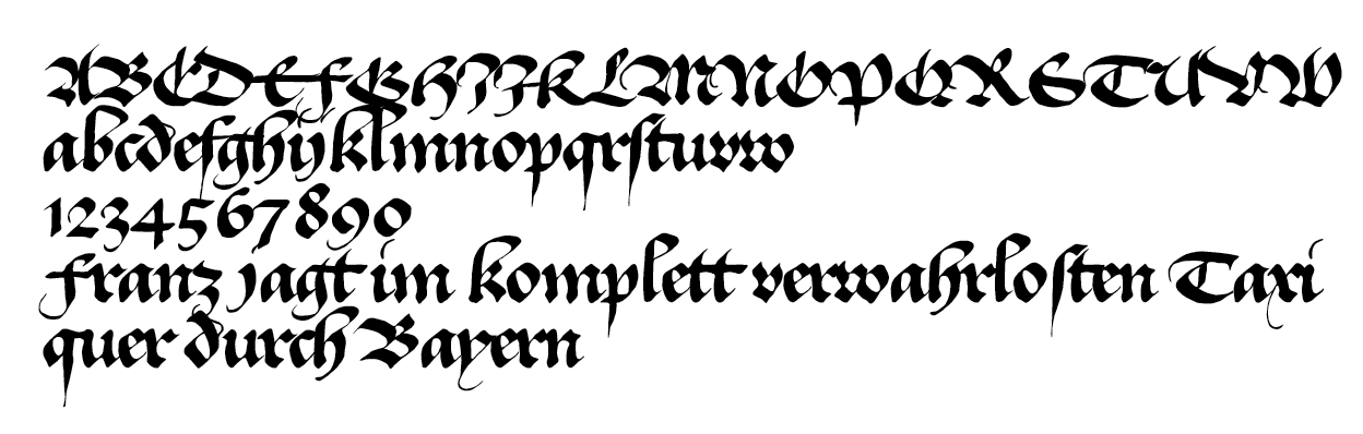
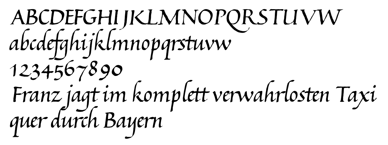
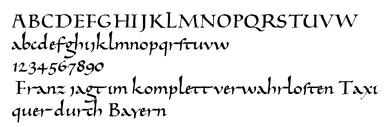
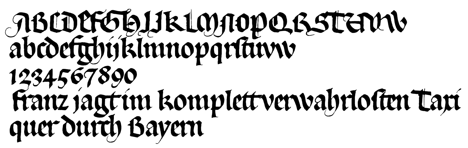
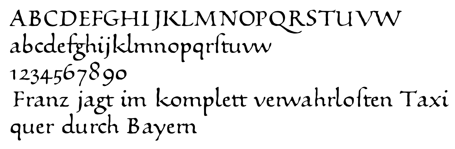
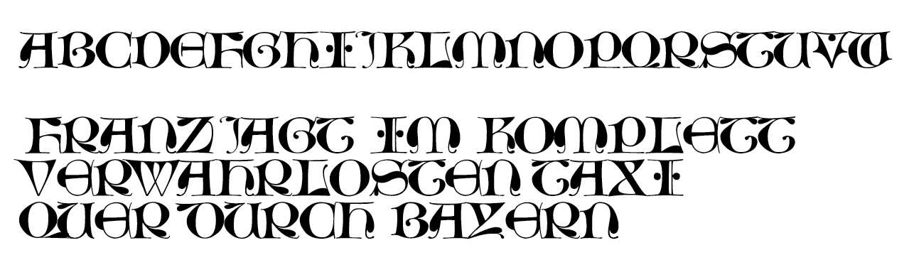
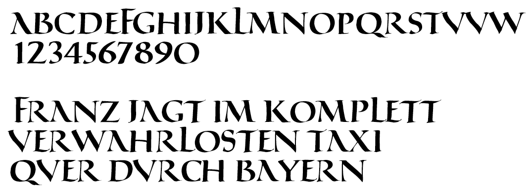
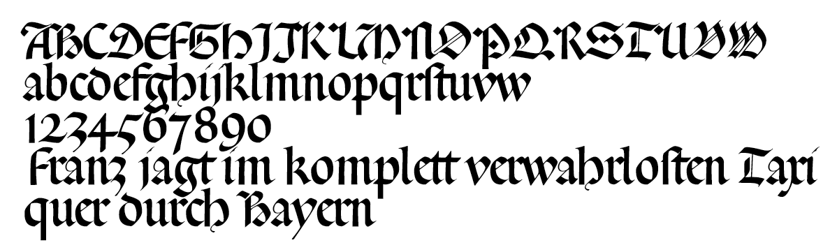
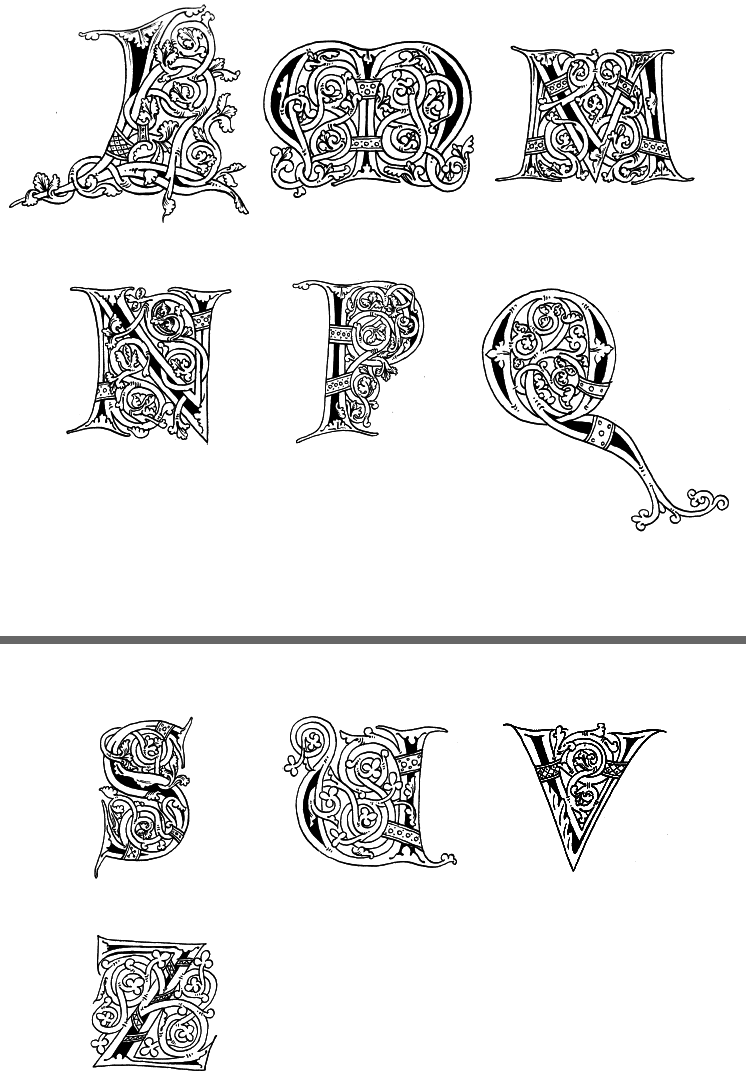
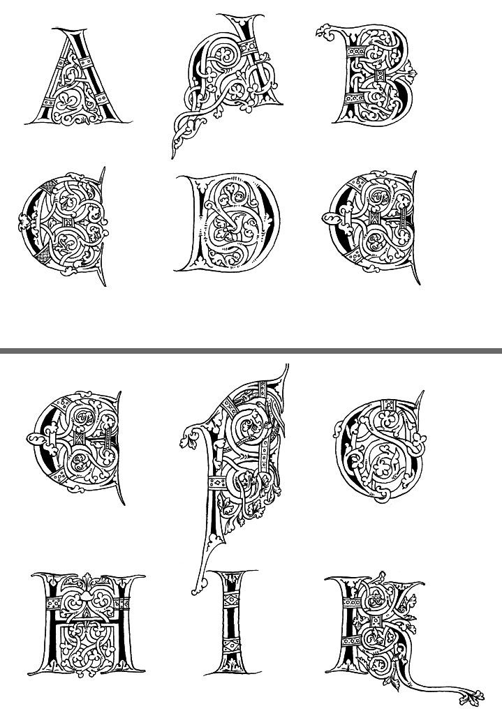
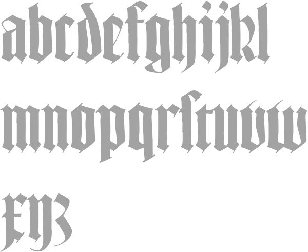
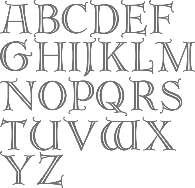
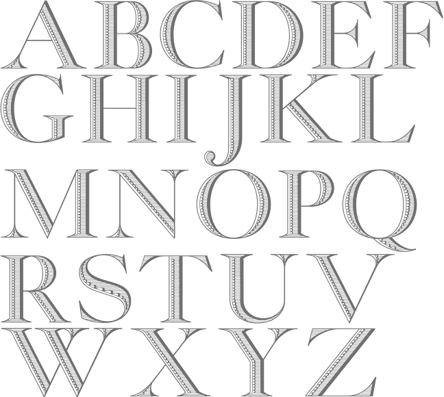
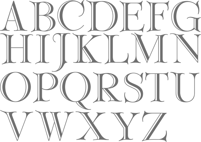
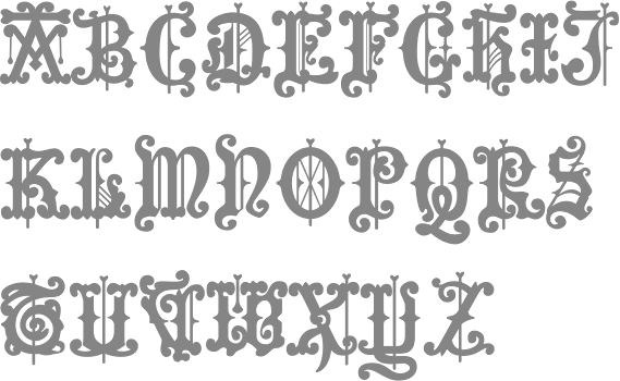
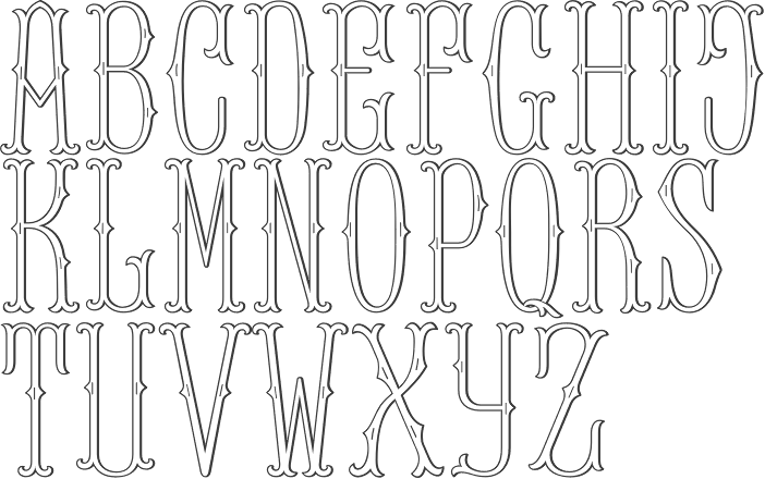
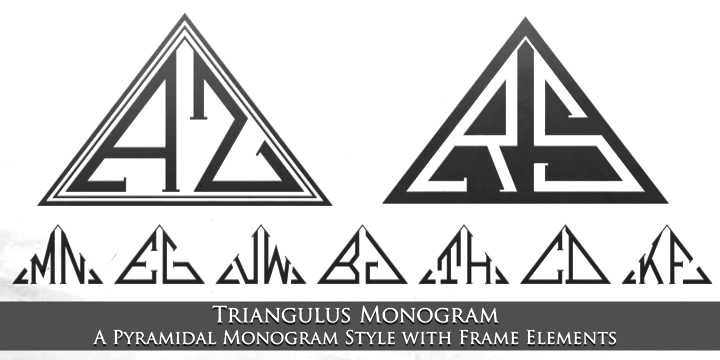
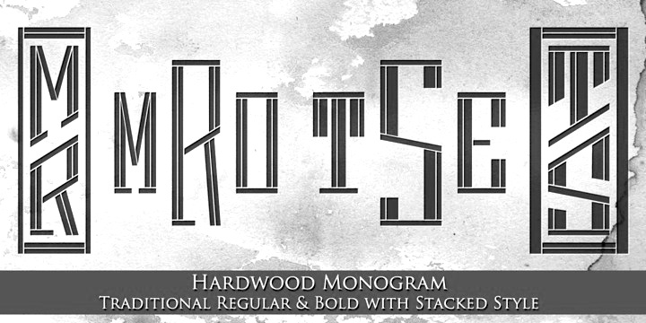
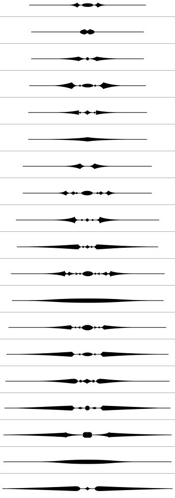
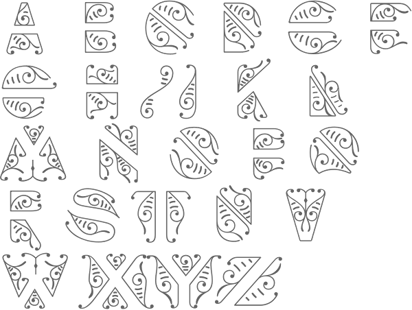
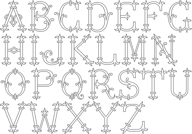
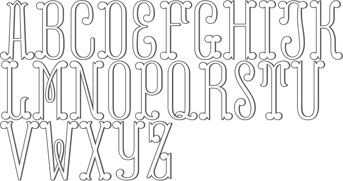
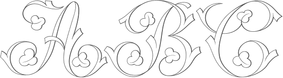
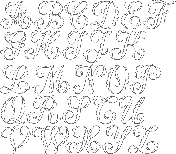
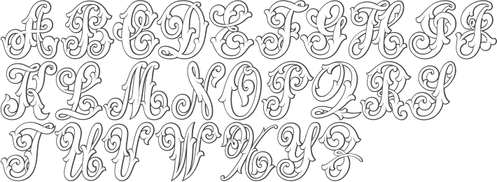
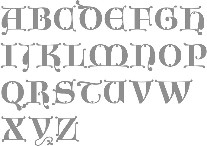
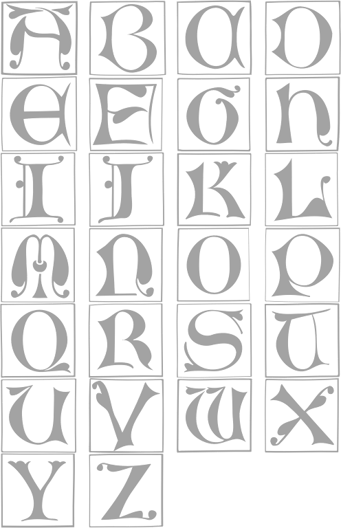
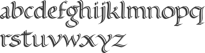
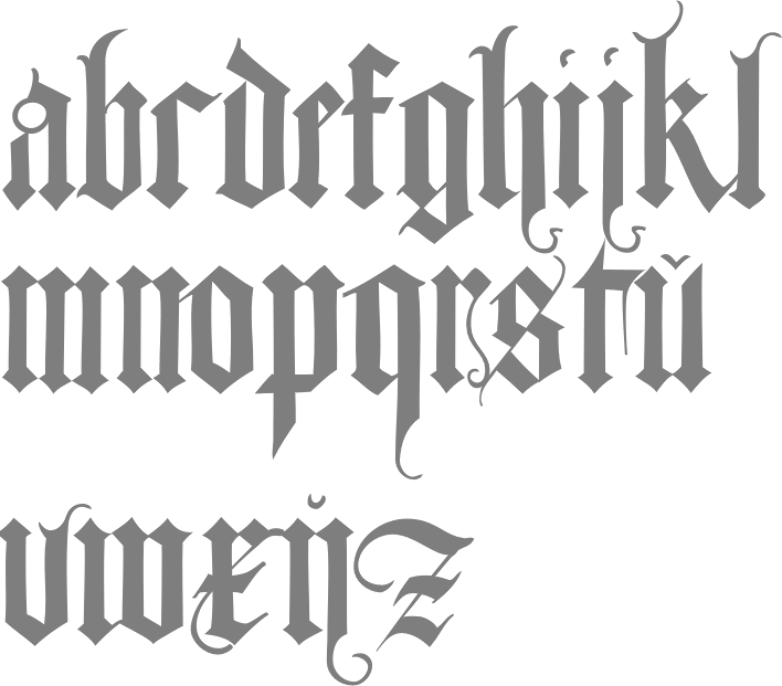
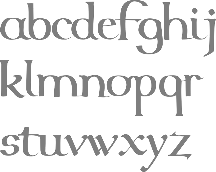
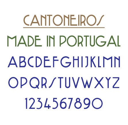
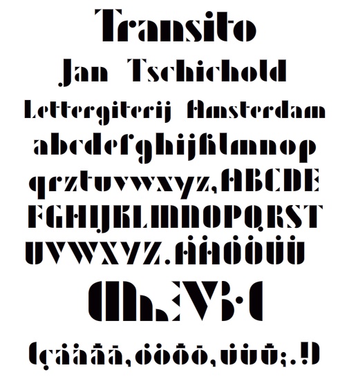
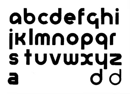
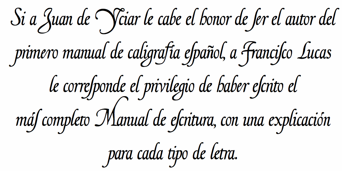
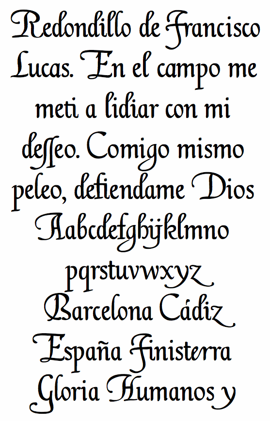
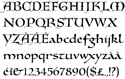
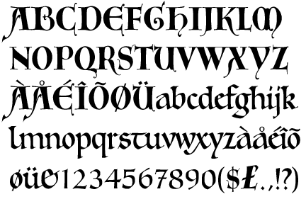
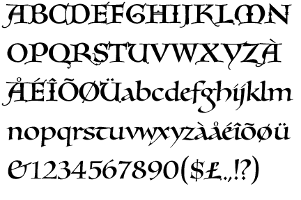
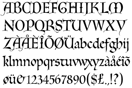
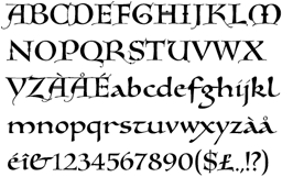
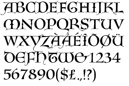
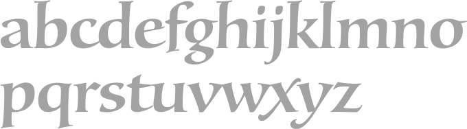
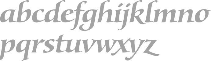
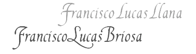
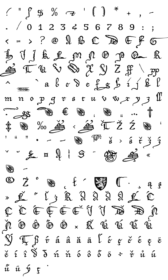
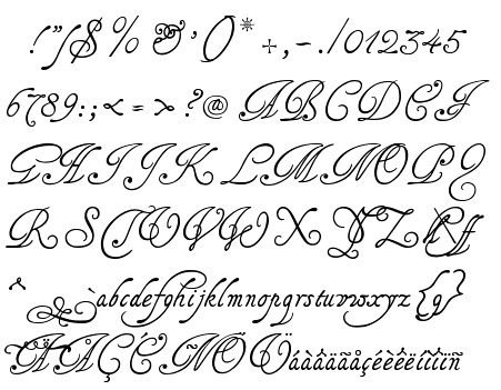
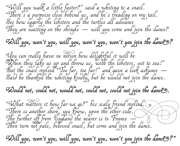
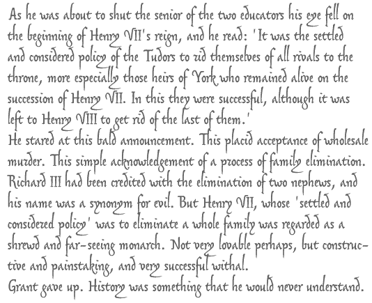
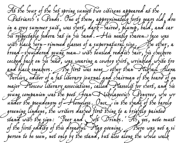
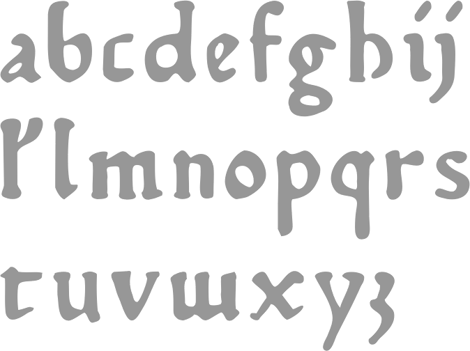
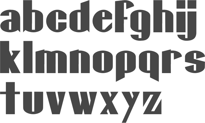
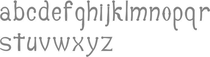
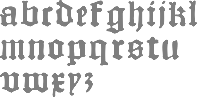
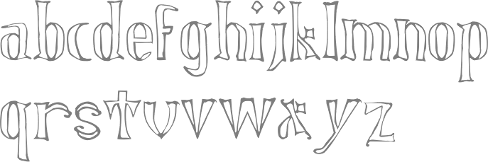
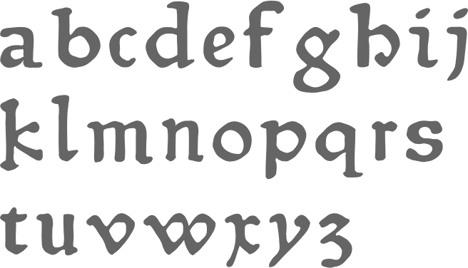
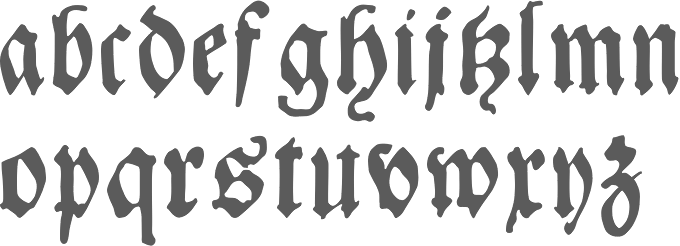
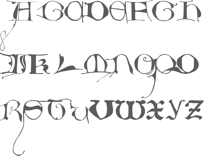
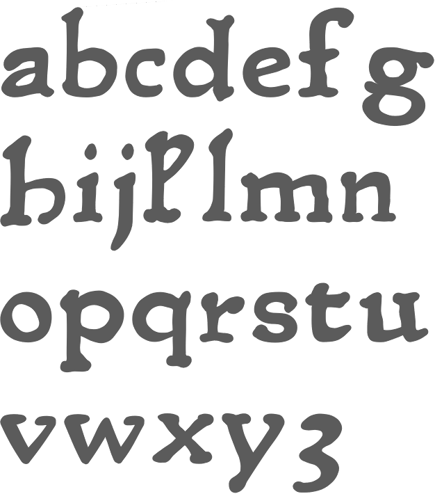
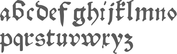
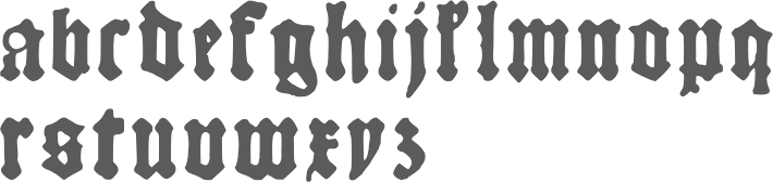
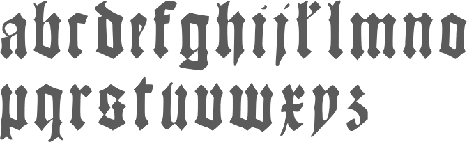
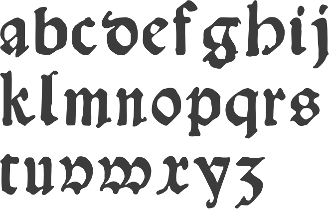
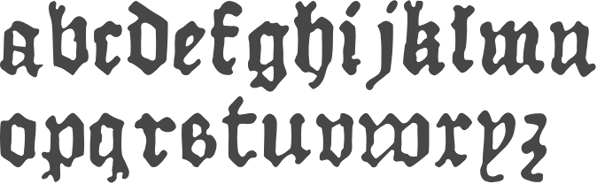
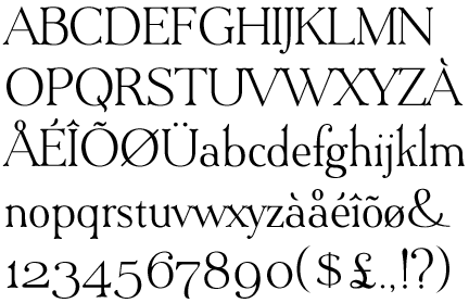
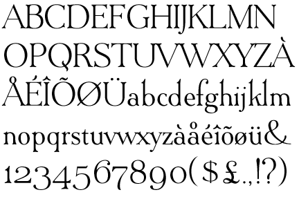
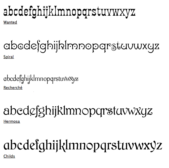
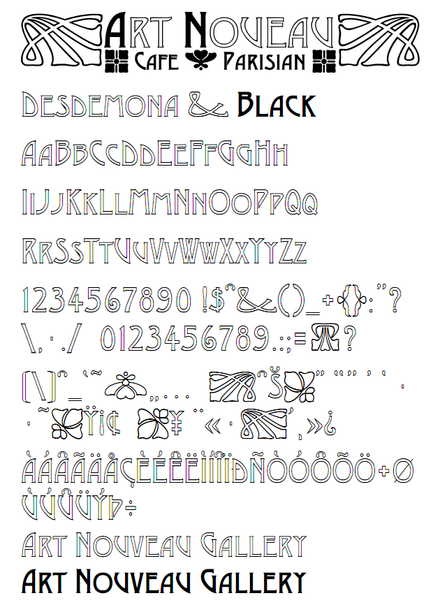
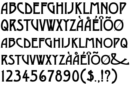
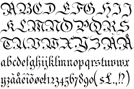
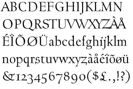
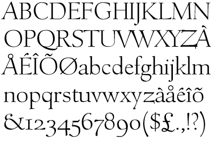
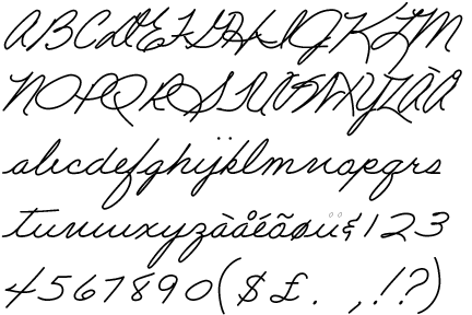
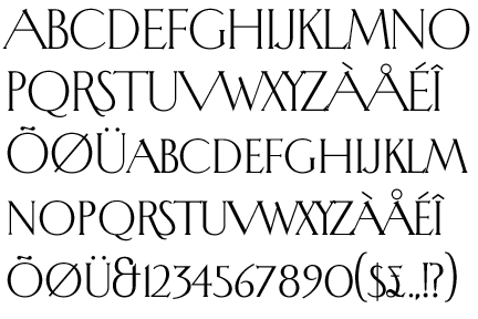
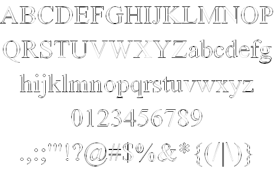
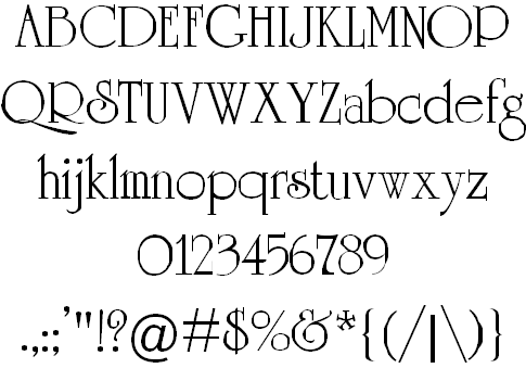
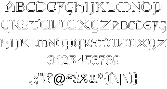
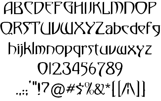
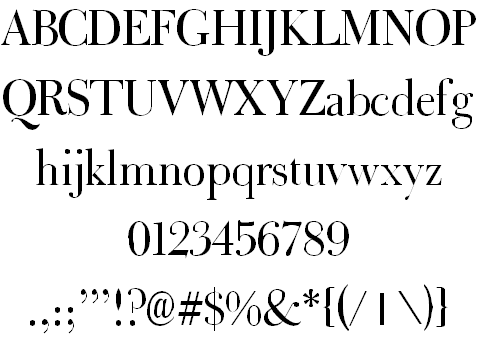
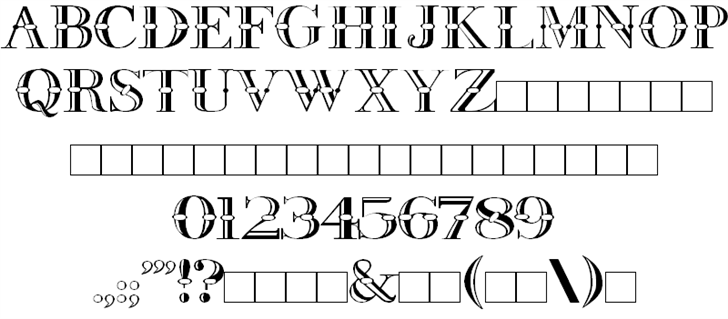
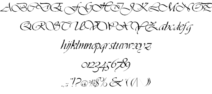
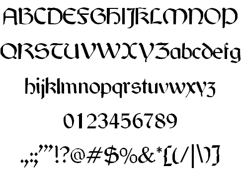
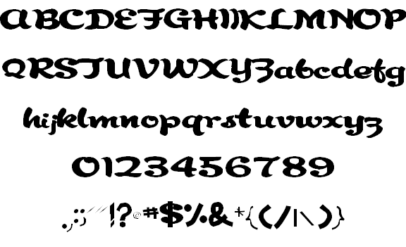
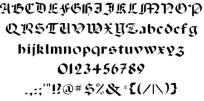
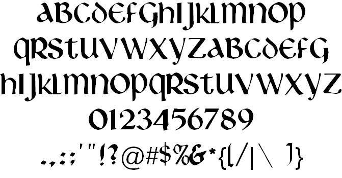
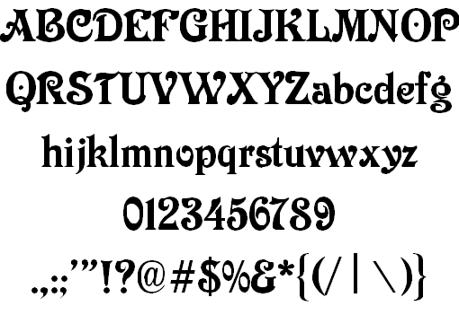
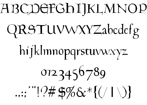
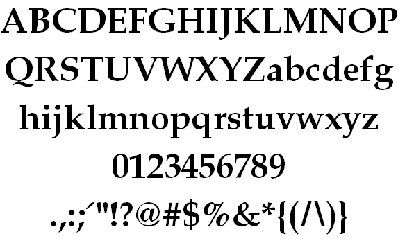
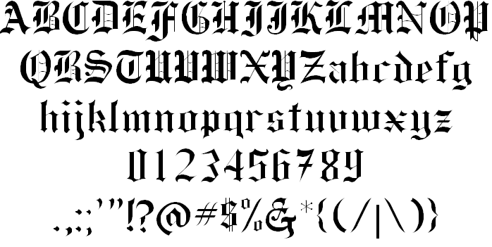
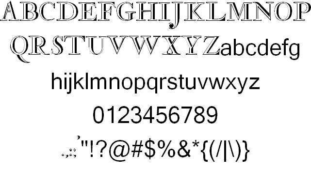
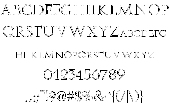
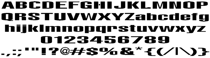
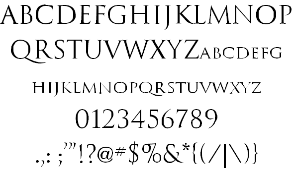
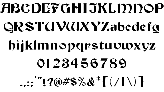
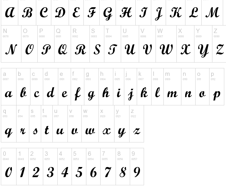
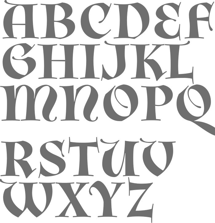
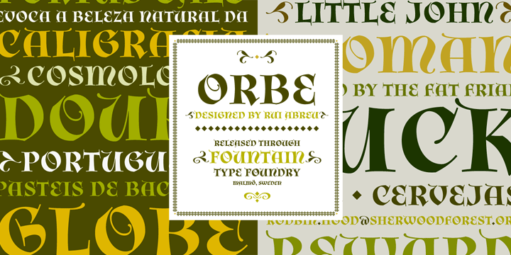
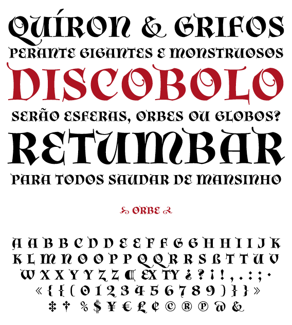
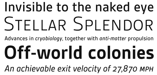
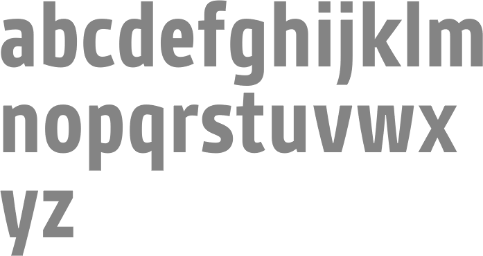
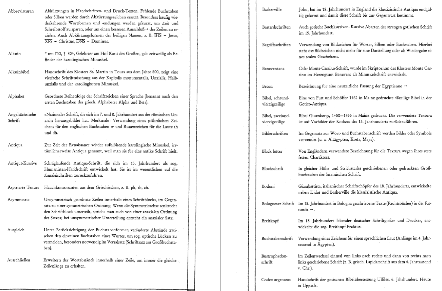
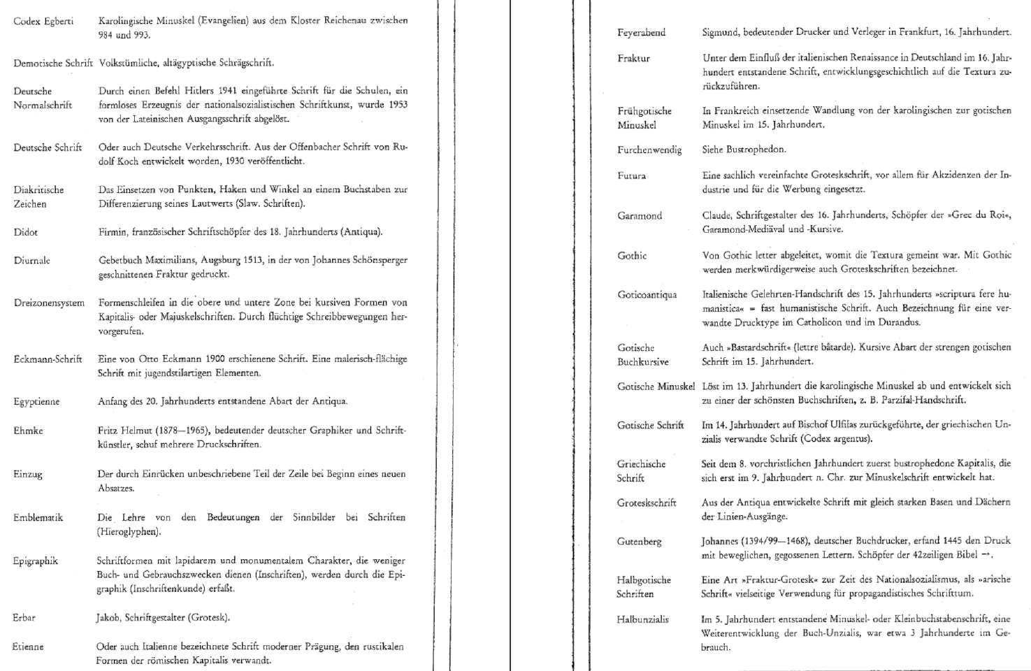
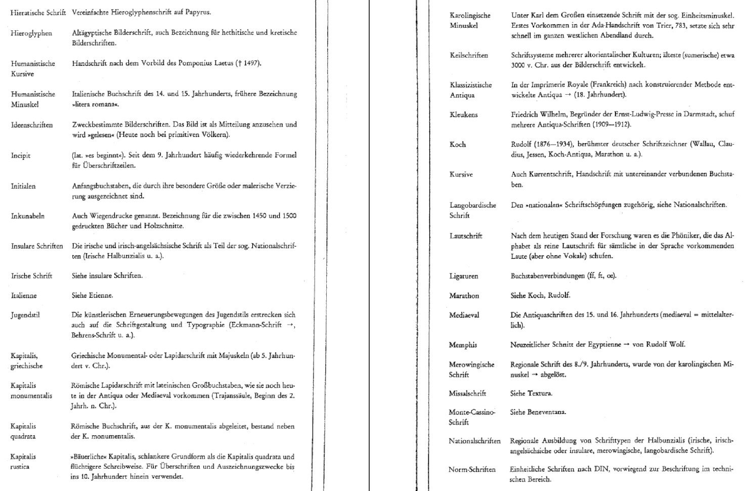
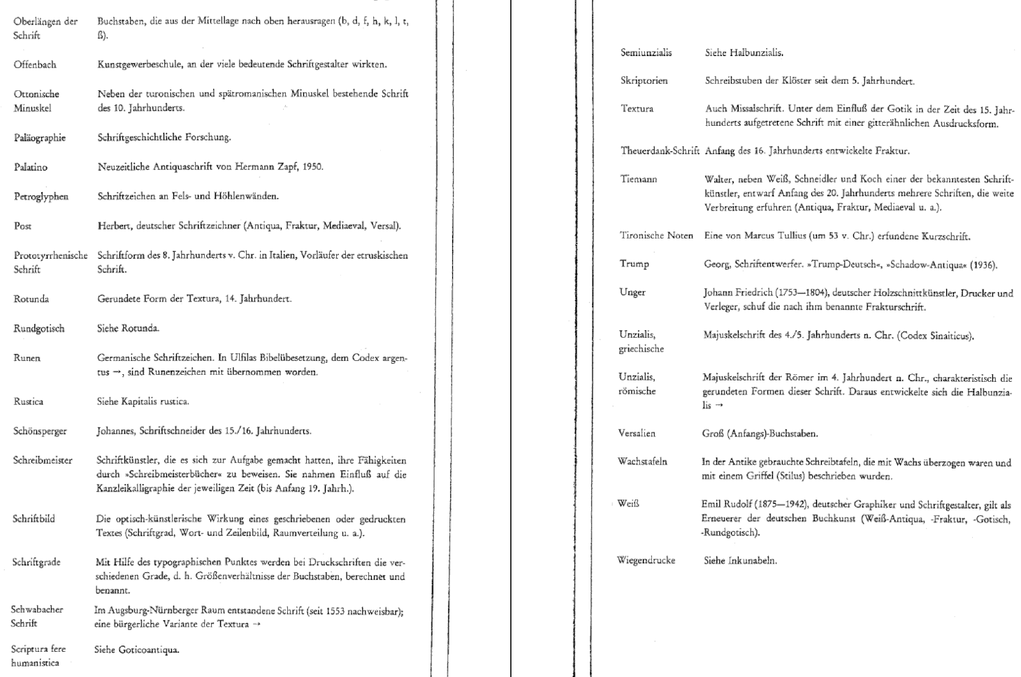
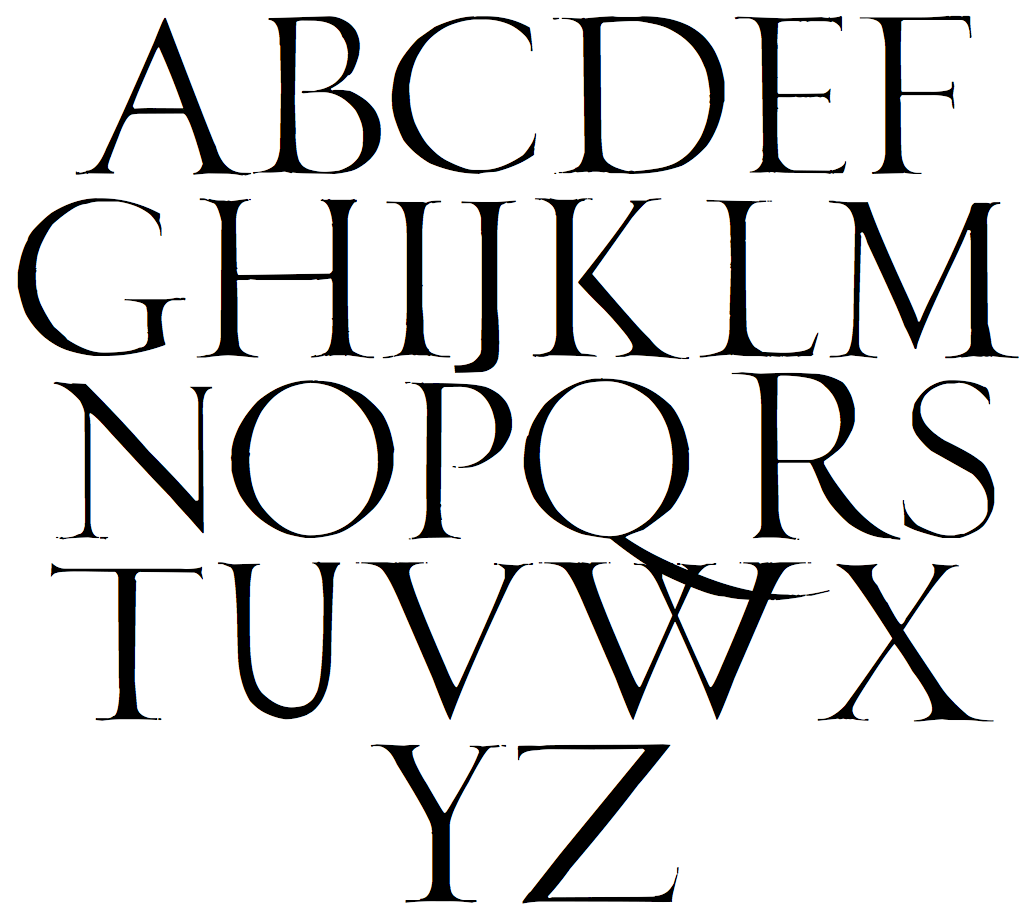
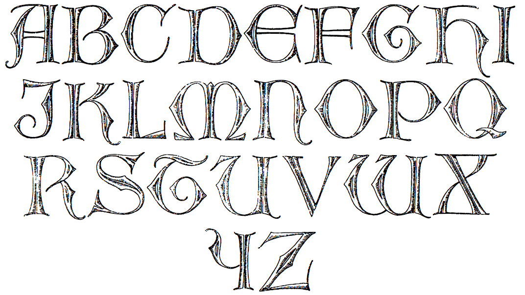
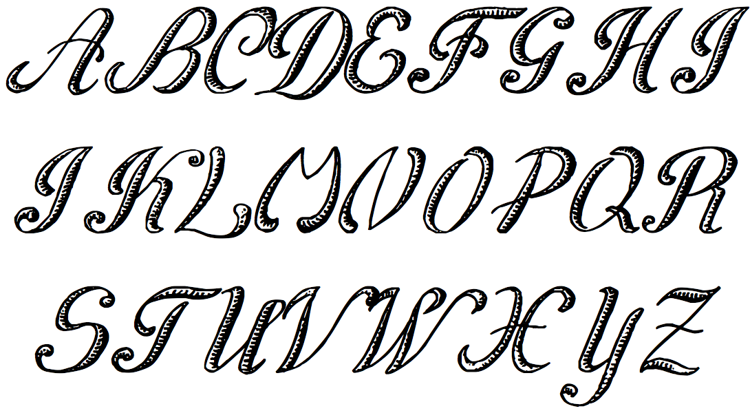
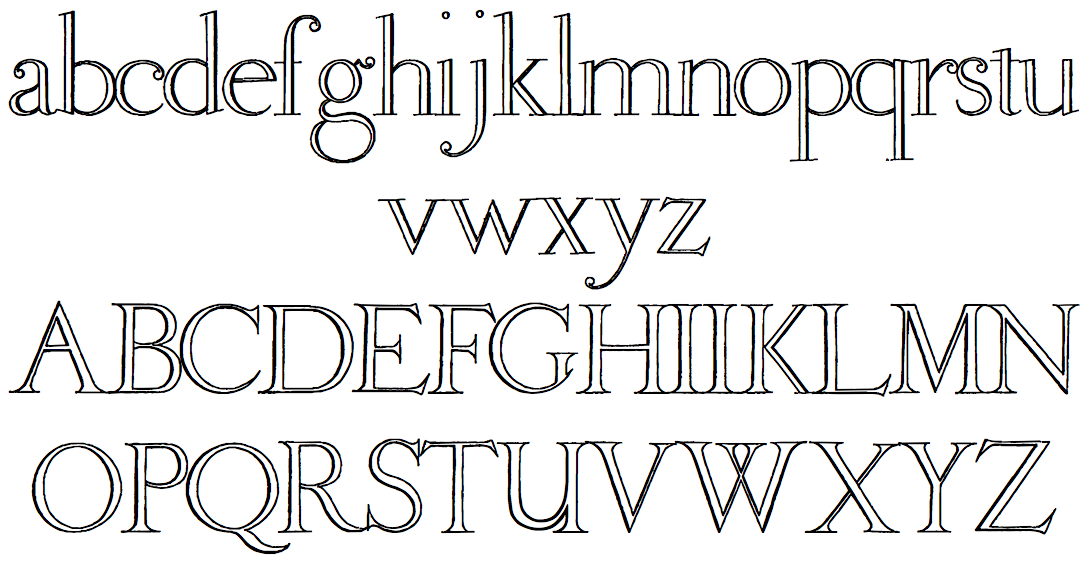
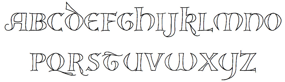
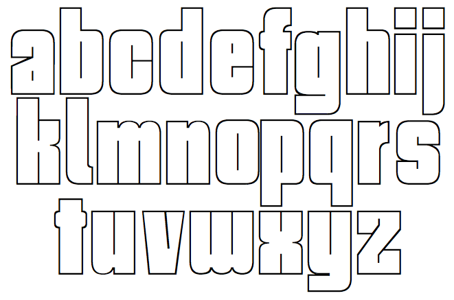
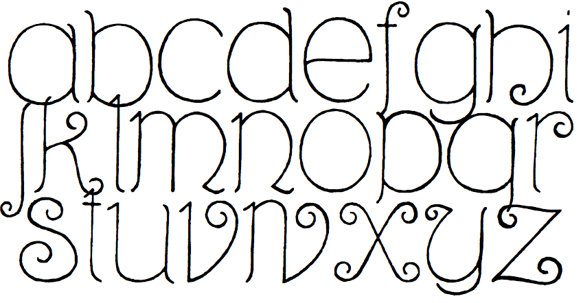
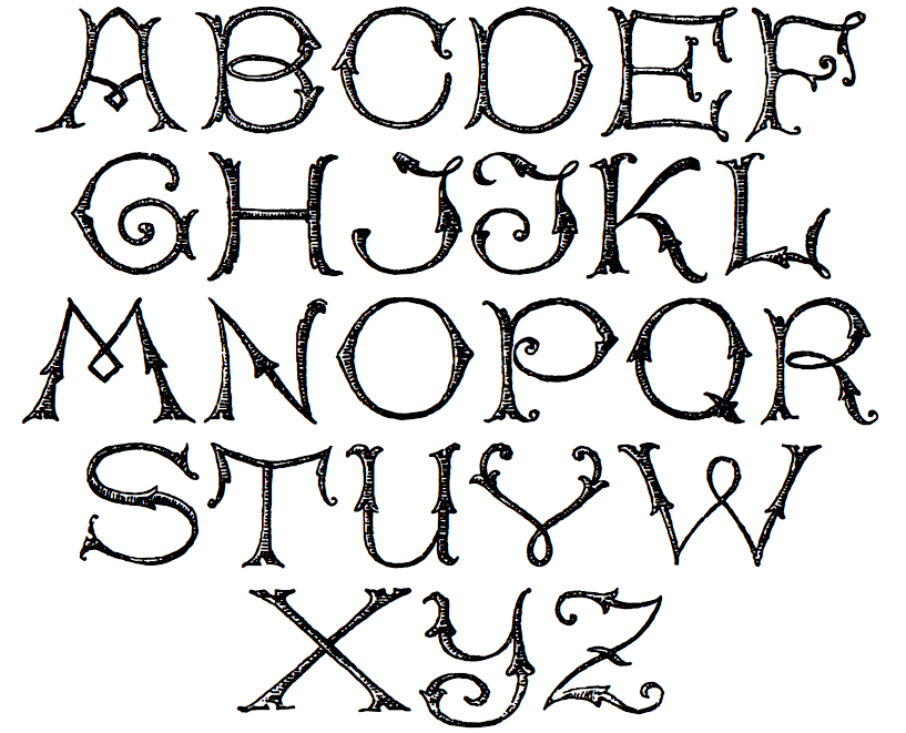
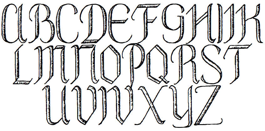
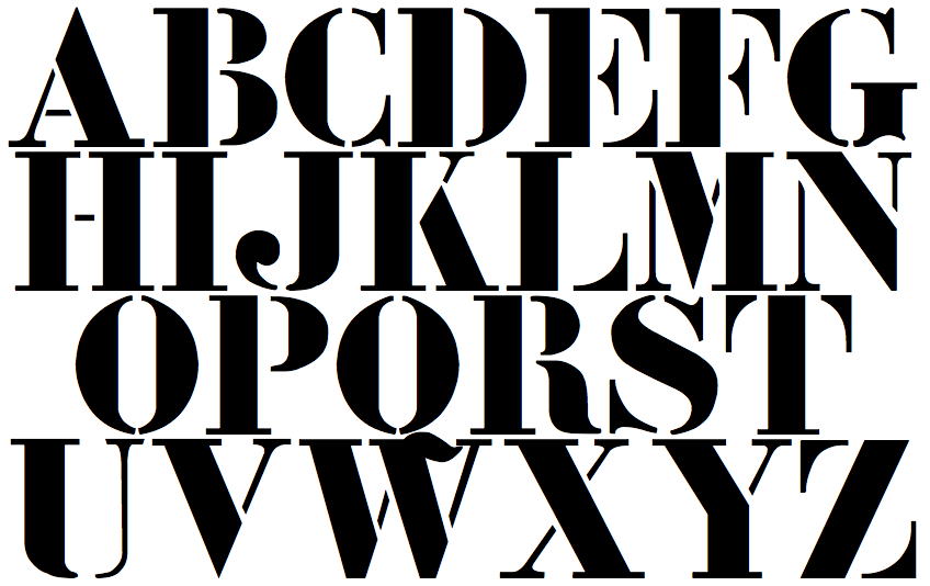
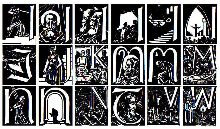
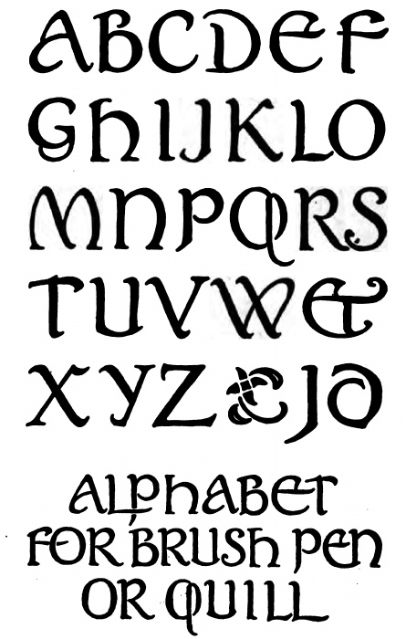
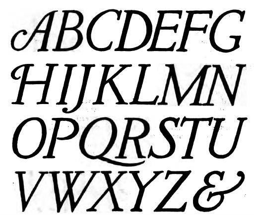
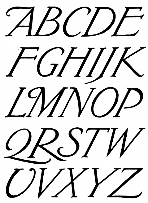
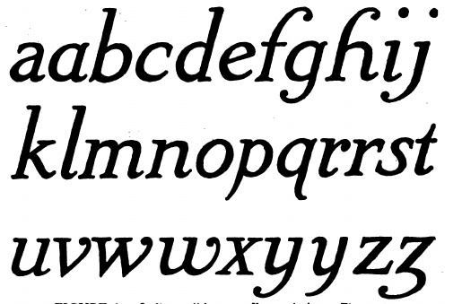
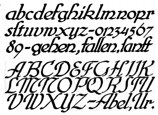
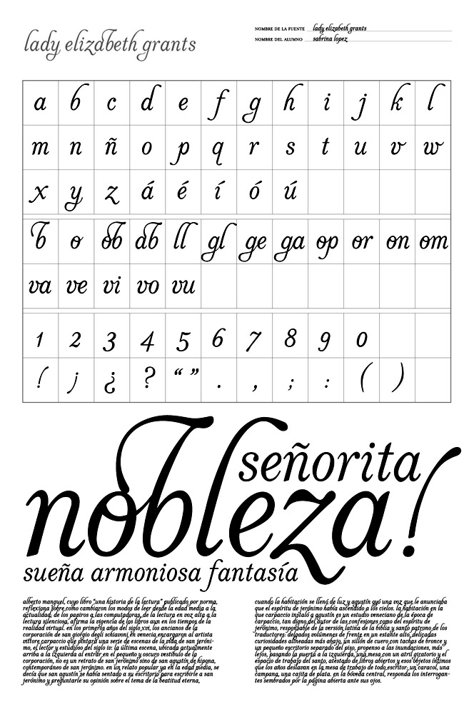
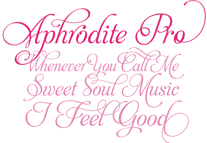
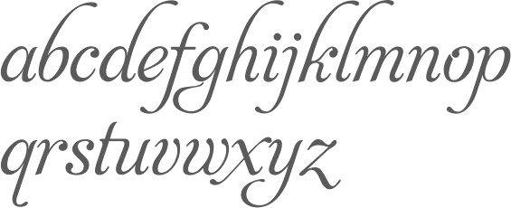
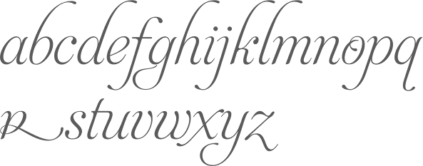
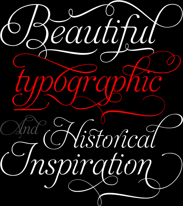
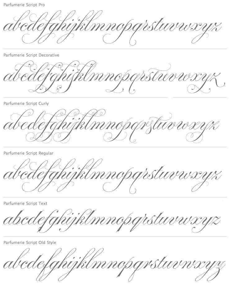
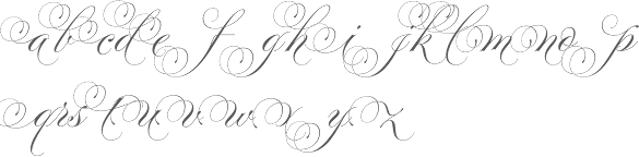
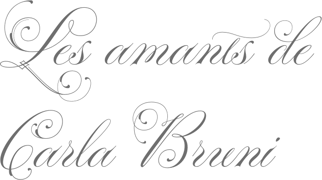
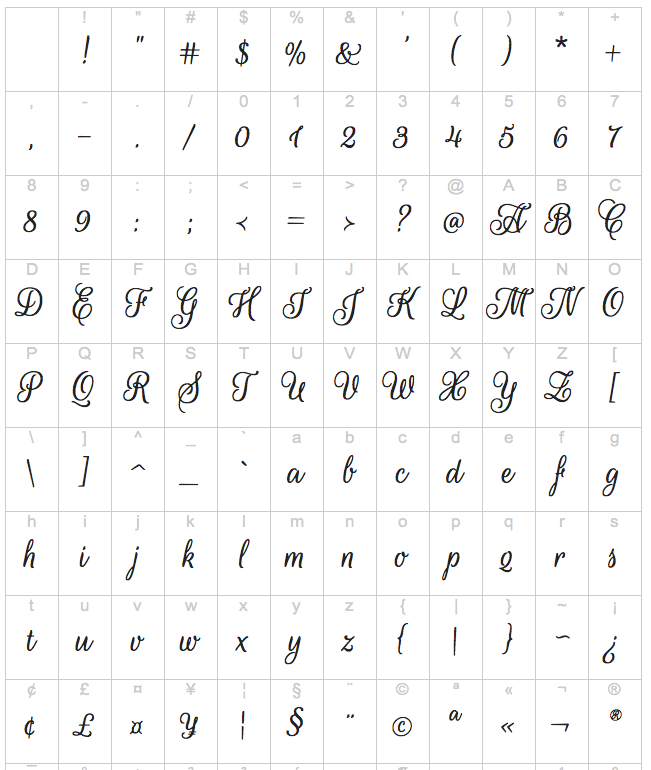
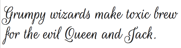
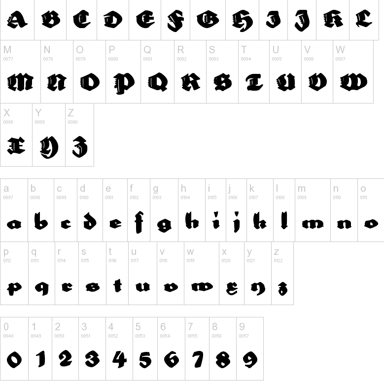
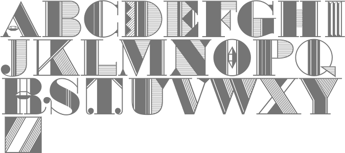
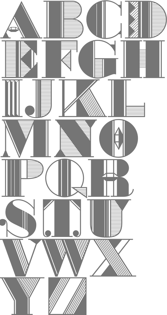
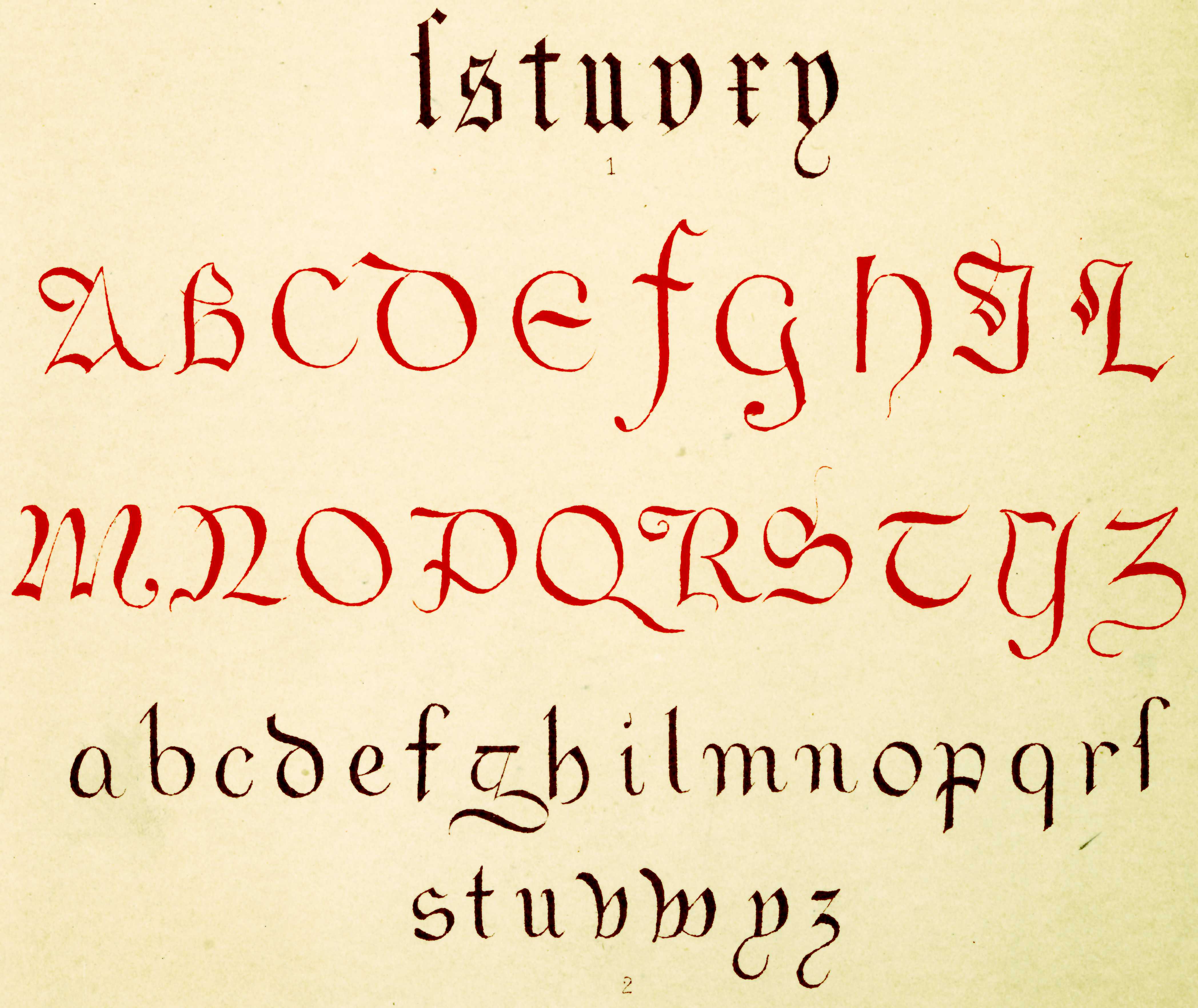
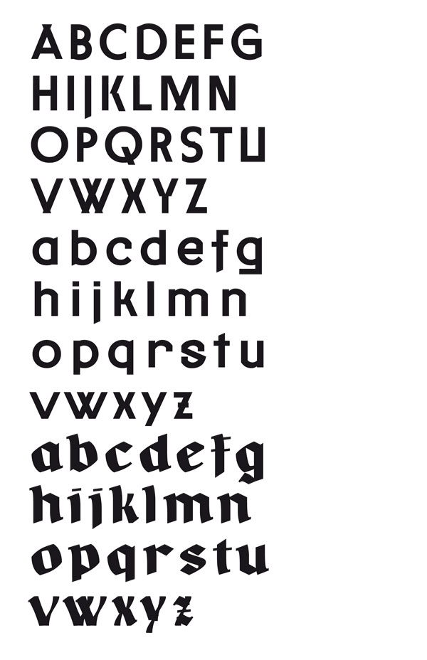
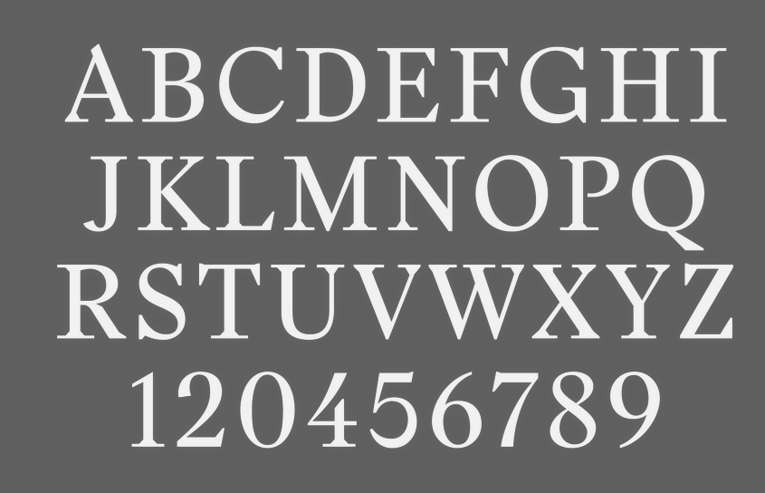
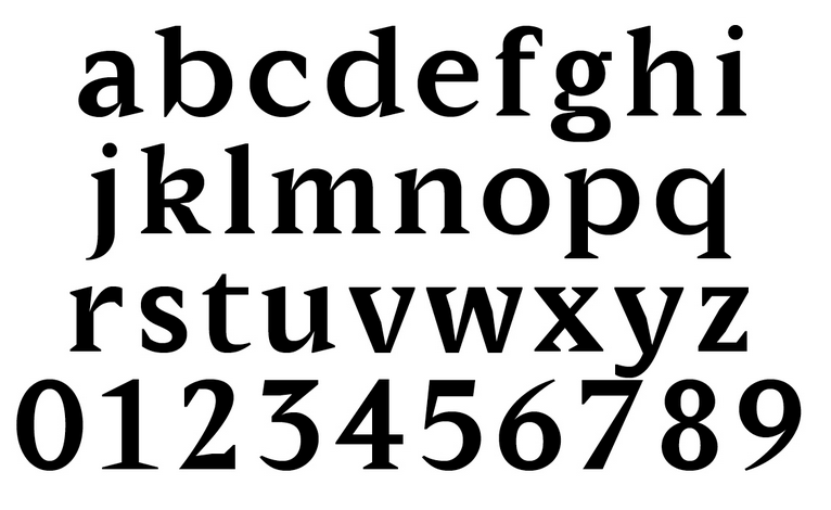
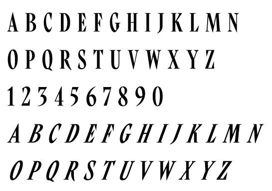