| | |
A. J. Sedlak
[Zebra Type]
|
[More] ⦿
|
ABC Types Collection (was: ABC Types, Absolutetype)
[Tony Mayers]

|
ABC Types Collection is Tony Mayers' foundry. Identifont link. Tony produced film titles in London's West End. He learned the craft of phototypesetting. In 1979, he moved to Manchester, where he founded The Quick Brown Fox Company. In 2021, ABC Types Collection joined The Type Founders. He created Concept Crisis (grunge face), Concept Sans, De-Generation, Generation Gothic, Generation Graffiti, Generation Headline, Generation Lost, Generation Open, Generation Pixel, Generation Uncial, Monolith Roman (2004), Monolith Sans, Poster Gothic, Ranger, Society, and Text Gothic. Before ABC Types, he ran Absolutetype, where he sold the typefaces mentioned above. The typefaces are now digitally available from Cedars, PA-based International Type Founders (ITF), which was created by Steve Jackaman. The latest address for ABC Types was in Cedars, PA. It is identical to that of ITF. Tony Mayers has died. Ascender also sells its collection. Klingspor link. [Google]
[MyFonts]
[More] ⦿
|
Adam Leisenring
|
 As a student at Kutztown University, Lewisberry, PA-based Adam Leisenring designed the attractive display or poster typeface Basswood (2015). He writes: Basswood is a high-contrast attention grabber. It's loud and somewhat obnoxious, shouting its message at the reader in a deep, booming voice. Basswood takes up two seats on the bus, and gets sweaty when it has to climb a lot of stairs, but its low center of gravity makes it hard to knock over. Calling to mind slab-serif wooden type styles from the Industrial Revolution era, Basswood is actually based off of the shape of a spinning fishing reel. Basswood takes its name from a family of trees, also called Lime or Linden trees. The wood of the basswood tree is commonly used in fishing lures. It's lightweight but strong, which also makes it a popular choice for electric guitar bodies, as well as woodwind instruments and drum shells. Basswood was also historically used to make shields by ancient Germanic tribes. Behance link. [Google]
[More] ⦿
As a student at Kutztown University, Lewisberry, PA-based Adam Leisenring designed the attractive display or poster typeface Basswood (2015). He writes: Basswood is a high-contrast attention grabber. It's loud and somewhat obnoxious, shouting its message at the reader in a deep, booming voice. Basswood takes up two seats on the bus, and gets sweaty when it has to climb a lot of stairs, but its low center of gravity makes it hard to knock over. Calling to mind slab-serif wooden type styles from the Industrial Revolution era, Basswood is actually based off of the shape of a spinning fishing reel. Basswood takes its name from a family of trees, also called Lime or Linden trees. The wood of the basswood tree is commonly used in fishing lures. It's lightweight but strong, which also makes it a popular choice for electric guitar bodies, as well as woodwind instruments and drum shells. Basswood was also historically used to make shields by ancient Germanic tribes. Behance link. [Google]
[More] ⦿
|
Adam Petras
|
Graphic designer in Pittsburgh, PA, who created the decorative caps Anatomy Typeface in 2014. Behance link. [Google]
[More] ⦿
|
Adella Guo
|
During her studies in Pittsburgh, PA, Adella Guo created the charcoal typeface Beatnik (2016, with Lily Fulop at CMU). [Google]
[More] ⦿
|
Ai Photographics
|
Photographer in Philadelphia, PA. Creator of the display sans typeface Duma Font (2014). [Google]
[More] ⦿
|
A.J. Marx
|
Aka chickenmeister. Located in Pennsylvania, A.J. Marx created the monospaced programming font Smooth Bunny (2009). [Google]
[More] ⦿
|
AJPT
[Alan Jay Prescott]
|
 Pottstown (Philadelphia)-based designer and PostScript font hacker who ran Prescott Design and now Alan Jay Prescott Typography, but was also involved in other ventures such as the Black Walnut Winery. Originally from Greenfield, MA, he graduated from Saddleback College, and worked for some time as a typesetter in New York. He advertizes himself as a leader in PostScript Open Type Font development specializing in the revival of print-only letterforms into digital typographic materials. He operates as APT and more recently as AJPT. In 2019, he announced that he would stop making typefaces altogether. His work can be partitioned into time periods. For this reason, Prescott's oeuvre is split over several pages:
 - His late period (2017-2019). In these three years, he showcased his work on Facebook, and was mainly involved in reving 19th century typefaces, about half of which were from the Victorian era. The annotations in the list below are quoted from Prescott's pages.
- Absolution Cursive (2017). When I was a typesetter in New York City, I had one of the largest collections of typefaces from CompuGraphic's library available for setting. One of the faces I never used in two decades of work was a rather ungainly decorative font called Abel Cursive. Apparently it was designed by Bernie Abel (perhaps one of CompuGraphic's employees) and I'm not sure it got much use, since I don't recall seeing it anywhere except my type catalog. Before I sold my equipment and closed my business for good, I made a scan of every typeface at 72-point size that I owned for future development, if there ever came a time to work on something crazy like that. Most of those 2,000 scans were lost when I changed computers a long time ago, but Abel Cursive survived and I made a down-and-dirty mow-and-blow font back then. I have recently worked on it extensively to make it usable as a multilingual slightly redesigned font in OTF format. I would classify it is as neo-Victorian medium-contrast decorative italic. It is definitely an oddball and may never see use.
- Algol (2017). Based on a scan from Dan X. Solo, Algol is a vastly expanded character set for Algernon, a typeface that clearly presages Machine and other "octics." I don't have any source material for the original design, but it may have been a Dan Solo original.
- Aloysius and Aloysius Ornamented (2017). This is a digital revival of the original Algonquin, cut by J.F. Cumming in the late 1880s for the Dickinson Type Foundry in Boston. While this was not my most challenging project, it was a doozy.
- Alpenhorn Roman (2017). Another oddball typeface is revived here, renamed from the design called Alpine by Henry Schuenemann for the Cleveland Type Foundry in the 1880s. Buried in the "gingerbread" of this weird face is technically a Latin serif, but otherwise it is an entirely unique letterform for which I had a heart soft enough to revive here in digital form.
- Androgen Roman (2017). I know next to nothing about this ultra-geometric blackletter called Anderson that I found displayed in a Dan X. Solo catalog, but it is another oddball that is attractive and very simple to revive in digital format. It is one of those projects I would recommend to a beginning revivalist who wanted to cut his or her teeth on a moderate challenge after mastering some basic tools in font development software.
- Angolan Text (2017). I found Angular Text in a Solo catalog and revived it as a digital font with diacritics and other characters for expanded typesetting possibilities. It was designed by Herman Ihlenburg in 1884 for MacKellar, Smiths & Jordan, which information I found in a link from Tom Cruz for a fellow named Toto who revived the font as well; he has several glyphs I do not have and I like his showing better. Interesting to see what others have done with the exact same typeface and scan and some research for tantalizing missing glyphs...kudos.
- Antiochia Series (2017). This collection of typefaces represents a revival of several bold slab-serif wood types with the name Antique that are related. Their individual histories will follow at another time, but note that several here are useful derivatives that add to the variety of this letterform's impact.
- Azurine Roman (2017). Azurine is a digital revival of a typeface known as Aztec, drawn by an unknown designer for the Union Type Foundry before 1889.
- Beltane Roman (2017). The very complicated story behind the work on this revival is too long for this space (and perhaps too boring to most), but suffice it to say that this letterform started out in 1886 as drawn by the great Herman Ihlenburg as Artistic and assigned to MacKellar Smiths & Jordan. Dan Solo called this face Belmont but only showed caps and was suspect anyway. I was able to find specimens elsewhere and a motherlode of other interesting things in the Inland Printer. I developed my first full-featured OTF using this typeface and designed Greek and Cyrillic glyphs as well. I also fitted it out with a set of small caps to make a font that now has 4,000 glyphs for nearly every non-Asian language. To top it off, Robert Donona revived the decorative caps for this typeface, an excruciating task that I once considered for myself but was lucky enough to have this other crazy person take up. The number of hours dedicated between Robert and myself in reviving this complete series digitally is probably unprecedented.
- Bernhard Swirl (2019). This is a digital revival of the letterform of the same name. It is equipped only with the upper case, an ampersand, a spacer dingbat and the numerals. The numerals are quirky, not only in design, but the fact that they seem to have been intended as old-style figures with the exception for the 4 and 7. Lucian Bernhard is either the designer of this limited-use typeface or inspired a reworking of his "wobbly" poster typefaces for which he is known as an innovator. I have reworked the scanned samples I had used as templates and drew them with a little more consistency than the originals to improve color on the page.
- Bireme Roman (2017). Below is a digital revival of a typeface called Bijou. As I have come to understand, several people have revived this face already. It is similar to Flirt in many respects. I will update information as I come across it, but I wanted to post my version here for your appreciation.
- Blackguard (2018). This is a digital revival of a typeface known as Black Cap. William E. Loy writes that Black Cap was designed and cut by Charles H. Beeler Jr. for MacKellar, Smiths & Jordan. The earliest-known commercial specimen was advertised in the January 1891 edition of The Inland Printer, so he probably created it in 1890.
- Blackminster (2017). One of the more interesting treatments of blackletter forms in the 19th century is this beauty called Black No. 544 designed by Henry Brehmer in 1889, who assigned the rights to Bruce Type Foundry. Originally I was unable to locate certain key glyphs in this font, but they were graciously supplied by others in our crazy network of type geeks. More information on the people behind these projects will follow in other articles.
- Bleak (2017). Bleak is a series based closely on a typeface called Stark. As with nearly all typeface names, there are several unrelated fonts developed in recent years that bear no resemblance to this gorgeous sans serif.
- Brotherly Roman (2017). Among many "antiqued" letterforms developed in the late 19th century, Ben Franklin was offered by Keystone Type Foundry in Philadelphia. Several glyphs were missing from my best showing of the font, but I was luckily able to find them, as well as logotypes, two ornaments, several alternate characters and some punctuation. There had already been a digital revival of this typeface kicking around as shareware in the 1990s, but it was very poorly drawn and incomplete. I believe it has been rendered nicely and consistently here for posterity.
- Busker Contour (2017). Burlesque was the name given by Solo to a typeface originating through Caslon or Figgins around 1843 and shown in German specimens a couple of years later.
- Cane Gothic (2018). Cane Gothic was designed and cut by Edwin C. Ruthven c.1886; he patented it in March–April 1886 and assigned the rights to David Wolfe Bruce (son of George Bruce, holder of the first design patent in US history). The Bruce catalog number is unknown. The tradename Cane Gothic, an apt description of the caning patterned background, may have been assigned by Dan X. Solo, who had revived the face for his photo-lettering service, but it has previously been considered impossible for digitizing. Although the average character in this font contains something like 3,000 Bézier control points, it turned out to be doable once I figured out the original mathematics that Ruthven must have used to guide his design objectively. It is digitized for posterity and I thank Anna Allen once again for the patent specimen (No. 16,643) indicating, if extremely faintly, five missing glyphs from my otherwise excellent scan. Thus I've generated the border glyphs and a pound Sterling symbol to augment this letterform. As far as I can determine, this character set is complete, and I have generated three fonts in order to accommodate chromatic typesetting with very little effort.
- Cantini Casual (2019). This is a digital revival of the typeface of the same name (or at least that is the name Solo gave it in the type specimen book from which it was scanned). It is a great example of the exuberant fancy characters that came to ascendance during the 1960s and 1970s. It is a medium-weight Latin italic with unusual decorative details in addition to crazy swash choices. I do not have any information on the history of this trippy face, but it is likely it was revived at some time in the recent past. It includes a large number of alternate glyphs as well.
- Capulet (2017). This is a revival of a typeface called Caprice that was patented in 1888 by Arthur M. Barnhart and assigned to Barnhart Bros. & Spindler of Chicago. This letterform is a prime example of the explosion in design ideas occurring before the turn of the century, hundreds of which remain to be translated into digital format.
- Carmenite Roman (2017). This beautiful digital revival covers a letterform drawn by the Bauer Type Foundry of Stuttgart, Germany sometime before 1896. It was originally called Carmen and has been referred to as Carmencita in the Solo books.
- Centrum Text (2017). This is my digital revival of one of the more complex decorated blackletters, among my favorite and most difficult projects to work on and just finished today. It is identified as Celebration Text on p. 18 of Solo's "Gothic and Old English Alphabets." The lowercase for this letterform is also presented for two other typefaces, Testimonial Text and Innsbruck in his larger catalog, presenting some confusion. But I believe all three were drawn by the same designer, although I have no idea how old they are. The lowercase may simply have been used for all three decorated capitals, since they are a very good match. Intentional, who knows? It is a real beauty and I'm going to perhaps revive the other two in this triplet of great examples of decorated capitals.
- Chapterhouse Roman (2017). This is an interesting typeface known as Ecclesiastic from Caslon around 1870. It was also known as Albion and Chapel Text No. 30. Most of those names were applied to completely unrelated designs, adding to the confusion that permeates typographic development and history to this day (and only gets worse over time). There are probably more alternate characters out there, but this is the best showing I could make with the resources I have and it is now available from me as a digital font.
- Chapterhouse Roman (2017). This is an interesting typeface known as Ecclesiastic from Caslon around 1870. It was also known as Albion and Chapel Text No. 30. Most of those names were applied to completely unrelated designs, adding to the confusion that permeates typographic development and history to this day (and only gets worse over time). There are probably more alternate characters out there, but this is the best showing I could make with the resources I have and it is now available from me as a digital font.
- Clarence Roman and Dotted (2017). Clarence Roman is a revival of Clown Alley and Clarence Dotted that of Cooktent (also called No. 515). Wood typeface Cooktent comes from W.H. Page before 1890 and the other looks to be a back-formation from it.
- Commissioner Script (2017). The typeface known as Commercial Script was designed by Morris Fuller Benton in the early twentieth century and enjoyed widespread use for decades. There have been many variations from other foundries, varying mostly in contrast; but as far as I know there was ever only one rather bold weight produced. I have redesigned the letterforms for consistency on the way to producing the ten weights shown here. It is interesting to see the font in lighter weights that accentuate the beauty lurking in this standard, and the heavier weights to see that the design still holds up under even heavier lifting.
- Courtesan Roman (2017). Among the dozens of wood types I have revived digitally is Courier, here called Courtesan. Many of these letterforms have been revived by others, all slightly different in their interpretations. More information on wood types will follow in articles I plan to write in the future on various areas of interest in the field of revival in particular and typography in general.
- Cranston Ornamented (2017). This is one of the most difficult digital revivals I have worked on. It started as Crayon, another masterful design from the prolific Ihlenburg, available at MSJ in 1885. There are sister fonts in an Open and a Solid that differ slightly in design and will be available from me at some point in the future.
- Creekside Playful and Calligrapic (2018). These are two digital casual scripts of my own creation based loosely on hand-drawn types from the 1950's. One is a calligraphic interpretation and the other is a more mono weight design that is a bit more slanted, both available for multi-language setting.
- Criticism (2017). This is a digital revival of Critic, a typeface designed by William F. Capitain in the mid-1880s with rights assigned to Marder, Luse & Co. Several logotypes had been designed for this letterform and many alternate glyphs. I added a few of my own, as well as diacritic marks, for balance to this surprisingly modern face that can be rendered multilingually as well.
- Crosby Roman (2017). This is a digital revival of the typeface known as University Text, designed in 1862 and shown by MacKellar, Smiths & Jordan in 1869 as Crosier. It was also known much later as Morningside. It is a stylized Latin with great charm.
- Crossan Roman (2017). This is digital multilingual OTF revival of a typeface called Cross Gothic, another one of those unique, nearly unusable letterforms I adore. I got a million of 'em.
- Cullane Roman (2017). Cullane is a digital revival of Herman Ihlenburg's Culdee, patented in 1885 and offered through MSJ. Others helped me scour the literature for missing glyphs and no one is sure we've got them all, but this is a wonderful showing of what we think is available until something randomly shows up in the future.
- Currier (2018). J.B. Lieberman, Ph.D. identifies it as Deberny & Peignot Lettres Ombrés Ornés (ornamented shaded letters) and adds that it was originally cut by Gillé in 1820, thus making it one of the oldest typefaces I have revived digitally. It is an exuberantly decorated engraved shadowed heavy-weight Egyptian.
- Danuvius (2017). Danube is the original name for this letterform, again found in a Solo catalog, and its links with medieval letterforms is obvious despite the trends toward modernization at the time it was first produced. I otherwise have no information on this face.
- Devonian Roman (2017). This is a digital revival of a wood typeface known as DeVinne. More information updated later.
- Dorothy Series (2017). The original Doric Chromatic was designed as a wood typeface and made its appearance in the United States in the 1850s, though it probably got its start in France in the 1840s according to Rob Roy Kelly.
- Doughboy Roman (2017). This series of decorative caps is shown as Dodge City in Solo. I am not sure it is very old; it may very well have been a photographically slanted version of an older wood typeface in the Thunderbird category with flourishes added on at the same time. This has been revived before because of its simplicity, but I made my own version a little more consistent and they make attractive drop caps.
- Enclave Roman and Expanded (2017). These two related digital revivals represent Enchorial in two versions. The roman came out of the Caslon Type Foundry in 1884 and was extremely popular (sometimes known as London). Petzendorfer showed the expanded Enchorial around 1903.
- Esteban (2017). Esteban is an original design I developed around 2010, named after the recently deceased Esteban Arriaga, a leading seascape painter in the area of Málaga in Spain. It is a medium-contrast sans serif produced in nine weights plus italics. Currently it is available only for the Macintosh OS, but an OTF cross-platform font is anticipated.
- Euclid, Euclid Initials,Euclastic, Elberon, Astral, and Auroral (2018). Elberon existed by November 1886 from Cleveland Type Foundry in The Inland Printer. Euclid (a lighter version of Elberon with a few different glyphs) is an obvious derivative from Illinois Type Founding Co. in Chicago in August 1890. Euclid appears with several Euclid Initials, a full sample of which appears as "Grant Iniitials" from Minnesota Typographic Co. Auroral (basically a shaded form of Elberon) appears in January 1887 from Central type foundry. Astral, also from Central type foundry, (the almost exact shading concept) whose base form is a condensed, heavier form than Euclid) appears in December 1886. Euclastic is my name for a complete set of weights, from a Hairline at the extreme end of lightness, through Black at the other extreme, using redesigned examples of Euclid and Elberon.
- Farmerboy and Farmergirl (2017). Although these two typefaces have both been called Fargo in the past, they are distinctly not the same letterform despite sharing some characteristics. They are both probably late 1850s, early 1860s and some sources say they are German. In any case, two interesting oddballs with no usage in the last century-and-a-half are revived digitally by AJPT.
- Fastidious Series (2017). The typeface known as Fashion started out in 1876 and was patented by Andrew Little for A.D. Farmer & Son. There are a total of five related typefaces in the same design: the prototype, condensed, ornamented, antique and extra-condensed. It turned out that the samples I had available when I originally revived these two were rather suspect and I have to consider going back to these and try to figure out what the "real" glyphs are. I believe that the Solo ornamental showing was rather a hatchet job on the base font, so I consider these two on hold pending further research, but they are interesting to view how they are so far.
- Flare Serif Striped (2018). This is a digital revival of a face called Ornamented 1,079. This over-the-top candy-cane-with-curls design was created by Henry Brehmer, who patented it in December 1884–January 1885. The application was submitted and approved on the same days as Ornamented No. 1,077 (Hermann Ihlenburg), and the rights to both were assigned to David W. Bruce of the Bruce TF (New York) [USPTO D15748]. It was advertised in The Inland Printer of October 1885. Thanks again to Anna Allen Conroy for the background on Ornamented 1,079 and for the patent samples giving a good idea of the design of glyphs missing from the catalogs. I have produced AE and OE ligatures as well as a decent set of diacritical marks for setting in a few important languages, but it is not at OTF font at the moment and exists only as PostScript for Mac only.
- Flippant Roman (2017). This fun font is a revival of a typeface known as Flirt. Although it has that 1960s feel, like many fonts popular then, I believe it has a much older pedigree. I will supply more information as I come across it. (There is currently an unrelated script font called Flirt on the market now, designed in 2009.)
- Fusion (2017). i developed three weights (including small caps) for the popular typeface Futura, all of them lighter than the Futura Light that is widely available. You can never be too thin.
- Gallantry Roman (2017). The earliest known specimen of the original Gazelle is found in the 1893 catalog of ATF in Cleveland and designed by Henry Schuenemann. This digital revival has multilingual capabilities and is quite unusual, demonstrating again the almost limitless possibilities of type design over the centuries.
- Gamut (2017). The Gamut series of very condensed sans serifs is based on a wide range of typefaces that all began with the letter "G": Galaxy, Gable, Garfield, Giant, Gamma, etc. (Their italics began with the letter "E", perhaps to come at a later time). I produced these typefaces under the same name to keep them all in one place, all ten weights that are floating around somewhere undigitized until now. They are currently available from me as Mac-only fonts, but OTF may be developed over time. They are members of the large "family" of typefaces whose members can be difficult to separate, such as the Helveticas, Trade Gothics, Standard Gothics, etc. I believe this was a well-designed condensed face that has nice nuances.
- Gironde and Gironde Extended (2017). Giraffe is the original name for this digital revival. It has been difficult to find a complete character set for this typeface, as I'm sure whatever existed in the roman also existed for the extended version. I revived what I could find, but it is a rather simple design and other characters can be imagined that are congruent with what is seen here. I'm not sure how much use these two oddball typefaces got in their time, but they were designed by Charles Beeler, Jr. in 1891for MacKellar , Smiths & Jordan.
- Gothic Decorated (2018). This is my temporary name for the digital revival of a typeface once called Ornamented 1,078. In the past couple of weeks, I have revived the "ornamenteds" on either side of this number. I have no information on this other than that it appears in the Inland Printer of October 1885 from George Bruce's Son & Co. TF in New York City.
- Goudy Flare Extra Bold (2019). This is a digital revival of another typeface in the Goudy superfamily, titled originally as simply Goudy Flare. I don't know the provenance of this particular letterform, but it was found in a Solo publication and could very well be one of his own creations, since I have never seen it used in print. It turns out that this is a modification of Goudy Old Style Extra Bold, and so I was able to find a suitable digitized version that matched the base forms very closely and modified the existing characters to accommodate these rather simple swashes. A reader added: "Goudy Flair was created by Mr. Phil Martin of Alphabet Innovations, that is he took Goudy Extra Bold and added swashes to this."
- Goudy Long Fancy (2019). This is a digital revival of the typeface of the same name, again another addition to the large Goudy family. There is a tremendous selection of swashes and alternate characters in this font, especially the upper case. It is an extra bold italic Goudy whose slant is less steep than normal for this family. There are no figures or punctuation provided for this letterform; those provided in the scan from which I worked were incorrect, and possibly back-formations from a different Goudy, so they were not produced for this version.
- Goudy Swash Heavy Italic (2019). This is a digital revival of the typeface of the same name. There are literally hundreds of revivals of letterforms in the Goudy "family" of typefaces. Nearly every foundry has produced its own version of this popular form, with many nuances between them. There are many weights, italics, various alternate characters and swashes galore, but I haven't seen a revival of this particular set of gorgeous swashes and alternates. Thus, I worked on very good printed samples, perhaps from a photolettering catalog half a century ago.
- Goudytype Antique (2019). This is digital revival of a typeface designated as Goudytype in a Solo catalog, with a slight twist. There is no punctuation for this font, but several nice swash alternates, a dollar sign and an ampersand. I decided to draw this as an "antique," because the ink spread in the original lent itself to this sort of treatment. Although a bit tedious, it can be used in the same way as other faces, such as Packard, Benjamin Franklin, Caslon Antique, Papyrus (heaven forbid) and others. Although one would assume this is in the Goudy superfamily, there are some characteristics that set it apart. The stresses and some other features are rather reminiscent of Palatino. And the slant is so slight as to make it unlike both typefaces' italics.
- Gracile (2019). Gracile is based closely on Greyhound Script, but has been expanded and standardized to include weights on either side of the two available in Solo. It is a semi script, since not all characters can be joined, and thus has a more casual feel. It is a strictly monoweight letterform in all six stroke thicknesses, with several alternate glyphs. There are digital versions in two medium strokes available from others, but those I was able to locate are rather poorly realized despite having diacritical marks for foreign languages. They can readily be designed and added to my interpretations, but I have chosen to do this later if anyone requires them.
- Griego Wood Series (2017). Several typefaces classified as Grecian were produced in wood for large sizes. Here I show Full Faced (William Page, 1859); Condensed and X Condensed (Wells & Webb/L. Johnson, 1846); X Condensed Bold (probably handmade, Nebraska, before 1885), and XX Condensed (John Cooley, 1859). I had revived some of these digitally years ago, but I revisited them recently and gave them a real facelift. They have undoubtedly been revived before because of their relative simplicity.
- Grosgrain (2017). This is a revival of a typeface called Grotesque No. 120. The lineage of the most famous typeface in the world, Helvetica (and, sort of, Arial) is evident in the early "grotesques." Although there are distinct differences in many of the characters of this very light typeface designed for mostly display use with alternate flourished glyphs, its resemblance to the later sans serifs of the twentieth century is striking. Marder, Luse & Co. of Chicago shows this face in 1885. Another similar typeface from around the same time called Circular Gothic is even closer to the Helveticas and derivatives of today. The alternate characters are revived from the sister font called Grotesque Fancy.
- Grounded Series (2017). I have revived Abramesque again, this time in congruence with the series from which it originated, thus it is called Grounded Ornamented. The original types started with Gothic Rounded. There was a Roman, an Outline, an Open and an Ornamented. The story behind these beauties is (as usual) too long, but briefly, information from Anna Allen: Old Bowery and Abramesque were originally called Rounded Open and Rounded Ornamented and have led interesting lives. Nicolette Gray identifies them with Caslon c1844. As a teenager, Rounded Open visited the Bruce TF (c1854), where she was called Ornamented No. 1007. After a suspected Bruce facelift as Gothic Round Shaded (≤1869), she was reintroduced by ATF as Old Bowery in 1933. McGrew writes, “Old Bowery is an ATF revival, in 1933 and again in 1949, of Round Shade No. 2, originated by Bruce , one of its predecessor companies, about 1854, as Ornamented No. 1007.“ Only an ornamented version, different from Abramesque and not illustrated by Gray, is shown in Bruce 1856. At a recent Oak Knoll event, Nick Sherman shot a photo of the page in Caslon's 1844 catalog showing Rounded, the solid prototype of these faces (not documented by Gray) and shared it at flickr.com. Albert-Jan Pool (designer of DIN and keen historian of sans-serif faces) observed that the footer is dated “September 1836,” so it was reprinted (probably as a stereotyped page) from an earlier Caslon publication. Until then, the earliest specimen examined by THP is shown in Caslon 1841. All agree that, so far, it is the earliest-known rounded sans-serif face in history—and this pleasingly plump family of three is as appealing today as ever! Of a very similar wood-type face tradenamed Gothic Round, Kelly reports: “First shown by George Nesbitt in his 1838 specimens. … The Nesbitt design was an Outlined or Rimmed Gothic Round. The Caslon Foundry issued several Gothic Round designs, of which an ornamented one (Abramesque), in particular, came into general usage in America around mid-century.” George Nesbittt, a New York printer, distributed wood types produced by Edwin Allen (Windham, CT ). Sherman adds that “Miguel Sousa at Adobe is in the process of making a digital revival of this face (Gothic Round|Old Bowery) for the Hamilton Wood Type Foundry.”
- Heraldry Roman (2017). This is a digital revival of a typeface called Heraldic, patented by John K. Rogers in 1880, an agent of the Boston Type Foundry.
- Hinterland (2017). Attached is a revival of an exuberant, heavy sans serif called Hibernian in Solo's catalogs. I've included alternate glyphs that I know of, but there may be some floating out there somewhere. The origin of this typeface is obscure, but there is some evidence it may have been from Genzsch & Heyse around 1893 according to one knowledgeable source.
- Hopscotch Roman (2017). Hopscotch is a revival of a wood typeface known as Hopkins.
- Jackdaw (+Open) (2017). This is a revival of a wood typeface known as Jackpot in Solo's catalogs, but was originally named Tuscan Shade No. 1. I have also produced a derivative called Jackdaw Open. Otherwise, I have little information on this bizarre beauty.
- Jeffers Contour (2017). Another decorative cap discovered as Jeffrey in a Solo catalog has been digitally revived here.
- Jeremiad (2018). A digital revival of Jenson Old Style, a typeface cut by Hamilton with the permission of American Type Founders in 1906. It has undoubtedly been revived before, as many wood types already have, but this is my interpretation and has been given a measure of consistency without losing its charm. I post this now, but it was produced a couple of years ago and I overlooked posting
- Joshua Contour (2017). I found a rather odd display typeface called Joseph in a Solo catalog, and it seems not to have a history longer than that, so who knows?
- Juvenilia Roman (2018). Juvenilia is a revival of a semiserif medium-weight typeface called Jumbo. Anna Allen's description follows: This slick stylized sans serif was designed and patented by Ernst Lauschke in 1887; he assigned the rights to Arthur M. and Alson E.Barnhart. This letterform is very unusual in having the tops of the characters generally devoid of the expected serif. Overall the design has medium contrast, which would be expected of a serif face. Several characters reflect missal-style influences (e.g. T, M), which was common for the time, but they are sprinkled in with standard types. The ampersand is influenced by wood types of the era. It is a distinctly odd species, another Lauschke innovation and unique.
- Katy Beth (2017). I discovered in the Inland Printer typefaces called Katherine and Elizabeth that were identical to each other and I was able to piece together a complete set of glyphs between the two to make a full digital revival.
- Kodiak (2017). Kodiak is a revival of Komet, an exuberant calligraphic sans serif produced by Roos & Junge Type Foundry around 1902
- Latchkey Roman (2018). This is a digital revival of Lattice, a face designed by Carl/Charles E.Heyer (1841 Berlin–1897 Chicago). He patented it in October–December 1883 and assigned the rights to Arthur M. and Alson E. Barnhart by name (the firm was not yet incorporated). Among other things, his unique hooked C was probably inspired by the hint of a hook in Copley (a sign-painter face dated before or in 1877 and cut by J.F. Cumming in 1881-1884). As Heyer's talent flourished at BBS (Chicago, 1868–1929), he led his new employer from one loathed by traditional TFs for bartering stolen designs for newspaper advertising space to one at the forefront of truly innovative display types. In the history of this TF historically regarded as great, he conceived at least 50% of their designs. Thanks to Anna Allen for the background on Lattice. Thanks to Dan X. Solo for the complete specimen, which although inconsistent and ink-heavy for some characters, was complete as far as I know. I have substantially reworked this typeface to bring a consistency for modern-day typesetting, but it is entirely faithful to the original cutting. Several of the characters are adventurous for their time (the C and ampersand, for example).
- Latin Fancy (2018). The Latin Fancy Engraved Shade version of these three fonts (the two others are derivatives) started life as Ornamented No. 1,077. Thanks again to Anna for the research that follows and for a patent specimen that gave a very rough idea of glyphs that did not appear in the catalog showings. It has ben digitally revived for posterity and is available for now as Mac-only. It appeared in October 1885 in the Inland Printer. Herman Ihlenburg, usually associated with MacKellar, Smiths & Jordan (Philadelphia), designed and cut this sizzling all-caps Latin face for the Bruce TF (New York). The patent application, submitted and approved on the same days as the one for Ornamented No. 1,079 (Brehmer), was likewise assigned to David W. Bruce (New York) [USPTO D15752]. A caveat for purists out there: The "A" has been drawn to compensate for a cutting or design error that appears in all examined versions of the typeface. No alternate has been provided for the misdrawn A.
- Lipo Caps Series (2017). Lipo Caps is a typeface series whose members are related in the sense that they have never existed as digital fonts (as far as I know), they are hand-lettered (probably by the same person), they were unlikely ever to have been developed as typefaces at the time they were drawn, and they were found in the same publication of bizarre letterforms. I have given them consistency without sacrificing the hand-drawn qualities and produced two versions of each one that I found, five fonts altogether (with "undecorated" versions as the lower-case keystrokes in each case). It is interesting to see great drawing technique that nevertheless never resulted into typography until now.
- Livornese Roman (2018). This is a digital revival of Livonia, an art nouveau-inspired typeface for which I have no information. There is a full set of alphanumerics, but no punctuation. It is a monoweight bold condensed sans serif with minimal descenders and an x-height that is at the maximum allowed visual percentage of cap height. This is another example of a face I revived in the 1990s but has been tightened up considerably for consistency and professional typesetting.
- Lubricious (2018). This strictly monoweight rounded sans serif typeface was referred to as Lute Medium in a Dan X. Solo publication, but I otherwise have no information on this letterform. It is influenced by the Art Nouveau movement and I have drawn a plausible Light and Bold as well; it seems that either one or both must have existed if it was referred to as a medium and I have made a rough guess as to the stroke weight. I think this face is quite pretty and has several innovations that are not over the top.
- Luring Series (2017). Luring is a faithful rendition of MacKellar , Smiths & Jordan's Luray and patented by Charles H. Beeler around the mid-1880s. Because the lining work in each was different depending on the point size of the metal type used (in order to achieve the same visual "grayness" when printed), I have developed each of these in such a way that when the same size is selected for each font, the optimal relative size is actually produced. The same technique was used for the equally challenging typeface called Tinted.
- Luscious (2017). This is a revival of a typeface called Lulubelle found in Solo's catalogs. It has been rendered in 7 weights, several of which correspond to known weights of this interesting sans serif condensed Art Deco-influenced letterform.
- Maggie Tried (2018). This is my digital revival (there have been others) of a typeface called Margit. According to sources I believe to be reliable, it was designed in 1969 by Phil Martin. An inquiry from a follower of this page generated a look back at a face I had once revived in the 1990s, but it was not as well-rendered as it could have been. I started from scratch and brought it back to life in a way more congruent with my current skills. It is a lovely example of letterforms developed in the late 1960s and early 1970s.
- Maltic (2018). In the six original sizes advertised and an additional three sizes to fill the gaps: This is a revival of the typeface by the same name, since it may not have been patented or trademarked by anyone until further notice. This typeface may never have been used and certainly is rather odd, but it can be seen that it must be one of the oldest forerunners of typefaces that were built from discrete "pieces" into a dot pattern, presaging the use of pixelation on monitors a hundred years later, as well as many other examples of typefaces built from pixels, dots, rectangles, stars and numerous other doodads and dingbats. In this case, the strict grid is violated for diagonals and many other interesting work-arounds; there are actually three different shapes used to build this geometric sans serif letterform. Information by Anna Allen: "Maltic is an interesting sans-serif face built from geometric motifs, was shown by the Illinois Type Foundry in The Inland Printer edition of December 1886. The specimen is marked patented, but extensive THP research finds no verification of this claim. This typeface is a complete mystery to me, as is the Illinois TF [Chicago, 1872–1892]… Annenberg (who bewails the lack of history details) reports that it was originally a distributor for the BruceTF (New York) and no record exists of any types that were originated by the Illinois Type Foundry. A showing of ornamental borders in the August 1890 edition of The Inland Printer advertises that they were Western Agents for Conner (New York) types as well."
- Margarethe (2017). It is hard to believe, but the original typeface was shown by Eduard Haenel (Berlin) in 1847 and was later adopted by American type houses. Eventually it was called Marble Heart, but most samples show only the upper case. Eventually I was ably to put together a large character set for multilingual setting after a rare, complete lower case specimen was discovered. This digital revival also covers typefaces variously known as Ornamented No. 11, 13 and 33. It is an early forerunner of faces known as grotesques (sans serifs that resemble Helvetica, Standard Gothic, etc.) This is another very difficult drawing exercise, but made all the more enjoyable after valuable sleuthing for missing glyphs by Anna at Type Heritage Project.
- Minster (2018). Minster was yet another style ground-breaker by Herman Ihlenburg, who patented the design in May–June, 1878 with assignment to MacKellar, Smiths & Jordan. This rimmed dual-case ornamented Latin beauty was consistently shown by MSJ and by ATF as late as 1897. It was also distributed by the Franklin TF (Cincinnati) [aka Allison & Smith]. Charles H. Smith, foreman, was the son of Lawrence Johnson's former partner (Johnson & Smith, 1833–1843). It has been digitally revived for posterity and took about two weeks to produce the full set of glyphs. Thanks to J. Choi and Anna Allen for very good specimens of printed materials.
- Molto (Fiorito, Ombreggiato and Nero) (2018). Molto Fiorito is a digital revival of MoléFoliate, whose history below has been researched by Anna Allen. Ombreggiato is a derivative with just the shadow, and Nero is the central characters adapted for separate setting, Bodoni or Didone letterform with high contrast and thin slab serifs. It has been produced in multiple sub-fonts for a wide variety of pin-register multicolor setting. Researching the topic on Fonderie Générale (Paris, 1834–1912) raised some perplexing questions about the history of this famous ornamented Didone. Twentieth-century historians attribute the design to Joseph Moléin c1819. Indeed, the conservative styling is compatible with fonts intended for title pages of scholarly and literary books, mainstay of the publishing industry during this period. The 1835 catalog issued by Tarbé (Molés successor) states that text, titling and display faces are offered therein. Even so, none resembling MoléFoliate is shown by any Molésuccessor in five digital specimen books dated 1835–1896. On the contrary, surface ornamentation is limited almost exclusively to Tuscans and Egyptians. Jaspert et al. (2001) note the then-current letterpress font source as Stephenson Blake & Co. Ltd. (Sheffield). Millington explains that the face was "redrawn by S.L. Hartz from a design by the Parisian typefounder Molé". Sem L. Hartz was associated with the Enschedé TF (Haarlem). SB introduced it in 1958 as "An Exotic Display Type". Did Molétransfer rights to this design before Tarbé's acquisition in 1835? If so: to SB? Enschedé? Another TF in existence at the time? Did Moléhimself design the leafy ornamentation attributed to him today? Or… Did Hartz superimpose his own concept on the surface of a MoléDidone roman? An anonymous developer digitized free revivals of this font and a matching plain one in 1997. They are difficult to find now [and are poorly executed].
- Montrose Roman (2017). Montrose is a display typeface with many interesting features, an example of numerous "banner style" letterforms produced at the time, such as Stephen Ornate and Arboret. It was called Motto (a design claimed by John P. Rogers for the Boston Type Foundry in 1879) and I understand there is still a typesetter who has the original metal matrices. Mine was produced from rather poor scans, so some interpretation was necessary. It came out quite nicely, but not quite exacting enough for some standards. It is definitely of historical interest.
- Moocher Roman and Moocher Open (2018). These digital revivals are based on Moorish and Moorish Open as described below: Moorish was designed, cut and patented by German immigrants Julius Schmohl and Ernst Lauschke, who assigned the rights to Barnhart Brothers & Spindler in April–May 1891. Commercial specimens consistently showed Moorish Open on the same page or in a spread. As advertised, this handsome stylized Latin was meant for multi-color effects.
- Morton Roman (2017). It is plausible for reasons too long to explain here that Ludwig S. Ipsen of Boston designed the typeface known as Mother Hubbard sometime before 1886 when it was offered by Dickinson Type Foundry. There were numerous swashes and alternate characters for this typeface, and I'm certain some will never be discovered. (The unadorned caps of this font bear a close resemblance to Monopol from Petzendorfer in 1903 and I have heard a rumor that a lower case alphabet was designed in modern times. As with many typefaces, the stories behind the letters are sometimes fascinating to those who are interested to know more.)
- Muralla Text (2017). This is a digital revival of Music Hall text. I have no information about it except that it appears in one of Dan X. Solo's publications, but it is quite pretty. Robert Donona added: "This was called Teuton Text, shown in MacKellar, Smiths & Jordan type specimen books, it is also shown in the 1898 book entitled Shriftatlas by Ludwig Pfetzendorfer of German and also shown in some German Printing periodicals entitled Archiv für Buchdruckerkunst by Alexander Waldow, this publication ran from 1864 to the early 20th century."
- Mystica (2019). Mystica was found in a Dan Solo publication on swash alphabets. It consists of the upper and lower case only, but is a very pretty example of a slightly quirky calligraphic letterform that appears to have been hand-drawn. There are several features that I retained when digitizing, and there are others I standardized without sacrificing the overall feel. I'm not sure whether this was ever really a typeface; until now it probably would have been classified as ephemera.
- National Pride (2018). This is a digital revival of a typeface known as National or National Gothic that is surprisingly old, and more surprisingly, not digitized until now despite being a rather obvious project. It was completed a few weeks ago, but it required a little massaging to get a few parameters more in line with afterthoughts I had. Thanks to Anna again for research and some good specimens to go with mine. In his correspondence with William E. Lo , German immigrant Julius Herriet Sr. (then in his 80s, with a life-long career in type design/cutting) recalled producing this face during the few years he worked in Philadelphia. As was customary at the time, his boss, the "hyper-active" Lawrence Johnson, patented it in 1856 [USPTO D760]. Johnson's patent affidavit explains that the design was geared to chromatic separations for printing with blue and red inks with white paper as the third color. What a great idea 150+ years later! Incidentally… It is said that Mr. Johnson [1801-1860] "worked himself to death." In the process, he promoted three of his employees to partners and groomed them to succeed him: Thomas MacKellar, John F. Smith and Richard Smith (sons of his first partner, Johnson & Smith). Together with Peter A. Jordan (the CFO of his time), these men built on Johnson's foundation to become the "largest and most celebrated type foundry in the world."
- New Orange (2017). New Orange is a revival of a typeface called New Orleans but originally called Romantiques No. 3 in catalogs from the 19th century. The Decorated is the original design and the roman is one I created for special interest. Like many of these decorative typefaces from the 19th century, they can be produced as dual fonts for chromatic separations on special request.
- Nile (2017). Nile is an original work based loosely on typefaces called Egyptians, particularly that of VGC. I've greatly expanded the possibilities of this letterform by generating 8 weights with accompanying italics and small caps, suitable for a wide range of languages as well as English, both text and display.
- Nova Sandra Script (2017). Novelty Script has been revived as Nova Sandra. I've produced the typeface as an Extra Light, Light, Roman, Medium, Bold, Extra Bold and Black. (The Bold is a revival of the Novelty Script available from specimens.) The six other weights were added as an extra-special challenge. It is a beautiful connected script that has many unusual quirks unique to this design. There are several alternate characters and I have supplied a full set of “beginning forms” as well. I have also created a reasonable set of punctuation that did not exist in the original. It is a connected script, and therefore, one of the most difficult projects to undertake.
- Octic Latin Drop Shade (2018). This is my digital revival of a typeface that started out life around 1884 at Illinois Type-Founding as Octagon Shaded. Several typefaces over the years have had "Octagon" somewhere in their name, but this is really an octic Latin with distinctive features such as a certain curviness where one would expect linearity, so not a true octagon type, and it in any case has a Latin serif, which was itself applied differently in later Latin designs. It has a wonderful drop shade that gives it great depth. There is no known lowercase for this font and the showing in Inland Printer was nearly complete.
- Octuple (2017). This is a digital revival of a very old wood typeface called Octagon, which seems to have been first shown by George Nesbitt in specimens from 1838, believed to have its origins in France.
- Partisan Ornamented (2017). One of the most challenging projects I've undertaken in the digital preservation of antique letterforms is this remarkable typeface that started off as a reference to "French 1838" and what Figgins showed as Parisian in 1843. Johnson & Smith showed it as Ornamented in 1841, but it was also known elsewhere as Dandy and Ornate No. 6. The principal trouble (beyond the sheer work involved in reviving this monster) lies in assembling anything like a complete character set. Showings in catalogs for nearly all typefaces have been several letters and perhaps a figure or two, but it is often impossible to get enough glyphs from even a dozen showings; Q, X, Z, J are commonly not shown. I revived the letter N to see whether it was even feasible to start the project and estimated it would take two months to complete, even if the missing letters could be found. Beyond my wildest dreams, several people were able to track down every missing letter and even the numerals and the AE and OE ligatures, in varying degrees of resolution from ancient catalogs. I was able to generate this type over many enjoyable, hellish hours.
- Pattycake Condensed (2017). Attached is a digital revival of a lovely monoweight casual serif font called Pastel Condensed. I have seen revivals of this typeface, but I believe mine is a more complete and consistent version, and includes diacritical characters for setting in a wide variety of languages.
- Paymaster Roman (2017). This wood typeface was called Painter's Roman and cut by both Page and Wells, being made available in the 1870s. It was revived a while ago by a major font developer with many glyphs added, but my cut retains some of the quirkiness of the sample I had available from Rob Roy Kelly's masterpiece, American Wood Type 1828–1900. Its numerous specimens are the source of many of my wood type digitizations.
- Pencilings (2018). Pencilings has been digitally revived in three versions known to exist. Pencilings One was originally shown as Paragon Pencilings. Pencilings Two was originally shown as Paragon Pencilings No. 2 and uses the same caps as Pencilings with the lower case characters at 75% the size of No. 1 and with different cuts; both showings have several ligatures and alternates. Pencilings Three is a rendition of Solo's version, which was much heavier and was shown in "Grunge Alphabets" on page 65. The alphabet I scanned for One and Two is shown by Marder, Luse & Co., January 1885 in The Inland Printer. This is a lovely if somewhat inconsistent example of early explorations of typefaces that mimicked handwriting, particularly printing as opposed to calligraphy or penmanship. As such, these irregular examples are sometimes called casuals, a large group that includes brushes and bounces.
- Pisa Semiscript (2017). A seldom-used font available from Bitstream, Piranesi Italic is nevertheless a lovely letterform whose designer I do not know. I have discovered that there was also a bolder version at some time in the past, but have never seen it except in type catalogs existing before digital typography, so quite rare. Despite its being called an italic, there never was a "Piranesi Roman." I have produced nine weights, both lighter and heavier than the original, completely redrawn for consistency and available in OpenType PostScript multilingual cross-platform fonts.
- Precocious (2017). Preciosa was the original name for this little gem and it dates from around 1898 from Bauer & Co. in Stuttgart. It has been fonted before as freeware from Klaus Johansen of Svendborg, Denmark, but did not include lowercase. I'm not quite sure the lowercase I came across is the one designed for that face, as it comes from a Solo catalog, and occasionally he used lowercase alphabets from other faces to accompany his perhaps all-caps blackletter fonts, so who knows? More on that subject later as I revive a couple other drop-cap Gothic beauties whose lowercase characters are the same.
- Protagonist (2018). This series is a digital revival of a face known as Program. Thanks to Anna Allen for the following research as well as a few critical scans from materials I didn't have in my possession: According to William E. Loy, this typewriter-like Egyptian was designed and cut by William F. Capitain [1851–1915]. Carl Müler, an executive of Marder, Luse & Co. (Capitain's employer since November 1874), patented the design in November 1881–April 1882 and assigned the rights to [USPTO D13862]. Contrary to USPTO regulations effective in 1874, he got away with identifying the intended commercial tradename. It was advertised in The Inland Printer of April 1885. In February–May 1885, Capitain himself patented Inclined Program, a dual-case back-slant derivative [USPTO D161054]. Like Program, it was shown in the Marder, Luse catalogs issued in 1889 and 1890. Unlike Müler, he retained the rights.
- Rochelle (2017). This series is intended as an extension of Herb Lubalin's 1970 creation, Ronda. It has always been available in several weights, but I extended the utility of this face to some lighter forms as well as the inclusion of small caps (except in the bold).
- Rose Madder (2017). This is another example of reviving a letterform that may never have been a typeface. It was found unnamed in Carol Belanger Grafton's "Bizarre & Ornamental Alphabets" on pp. 96–97.
- Rosemary Series (2017). Rosemary is a revival of various Roman woods found in "100 Wood Type Alphabets," by Rob Roy Kelly. Ornamented (p. 230) first shown by George F. Nesbitt in 1838 specimens (Shadow and Expanded are derivatives); X Condensed (p. 234) same Nesbitt; Condensed (p. 233) same; Extended (p. 231) same; Roman (p. 232) first shown by Darius Wells 1828.
- Ruinous Titling (2018). This is a digital revival of a face called Parable that appears in one of Dan X. Solo's publications. It would be strange if no one has revived this face, and I do so solely as a demonstration of how it is that people get into doing the sort of work I do, even as an occasional hobby and nothing more. With the right software and a little determination to learn something new, the average person can produce a typeface in a few hours, albeit one this simple and lacking anything more than the capital letters. It whets a lot of folks' appetites for something more challenging, but rarely ending up where I am at a level of astonishing self-inflicted pain! The typeface was less than two hours from turning on the scanner, through drawing and spacing to a usable font.
- Rye Roman (2017). This is a digital revival of a typeface identified as Ryan Jackson on p. 85 of Solo's "Victorian Display Alphabets," but I have found no other reference so far as to its origins before that publication. Technically, it is a moderately decorated low-contrast Latin.
- Saluzzo font (2017)> Giambattista Bodoni, one of the first rockstars of typography and printing, flourished in the latter half of the eighteenth century in Parma, Italy. His fans included Benjamin Franklin, Napoleon and Pope Pius VII. The typeface we know as Bodoni has been developed by numerous foundries, particularly in the late twentieth century, no two of which are identical. It has generally been drawn as a high-contrast serif and was itself based on some of the transitional forms originating in Baskerville's studios at the time Bodoni ran his printing business. I have developed a unique Bodoni myself, slightly lower in contrast to render it more readable at smaller sizes. I have produced the letterform in Open Type PostScript format for cross-platform use in eleven different weights, italics and small caps (in the roman only), for a total of 33 multilingual fonts. Saluzzo is named for Bodoni's birthplace in Italy.
- Santa Claus (2018). This is a self-named digital revival of Santa Claus and Santa Claus Initials, both No. 1 and No. 2. This irresistible pair of fun faces was introduced by Central TF in the December 1885 edition of The Inland Printer. A patent pending notice was displayed in at least one commercial specimen; no such patent exists and none was claimed in the post-ATF catalog issued by the Central /Boston TFs in 1892. According to policies of the US Patent and Trademark Office in effect at the time, Santa Claus was positively new, novel and non-obvious and absolutely worthy of a design patent. No approved applications for design patents were filed by Central executives nor assigned by others after 1886. Apparently this notice was of the "beware of the (non-existent) dog" variety. The designer is unknown. William E. Loy does not account for Santa Claus in his biographies of Gustave F. Schroeder or Nicholas J. Werner, Central's staff type designers/punch-cutters until 1889, when they partnered an independent business. In 1891, Schroeder moved to California; he and Werner continued to contract design commissions from Central and other clients.
- Saprophyte Roman (2018). Saprophyte is a digital revival of a typeface that started out as Ornamented No. 1060. Thanks to Anna Allen for the commentary on its provenance. This Latin gingerbread face was designed and patented by Julius Herriet, Sr. in 1878–1879. He assigned the rights to David Wolfe Bruce , the last family member involved with the Bruce TF. After the USPTO established the trademark division in 1870–1874, the Bruce TF switched from naming its new faces to numbering them. Presumably, this expedient circumvented payment of additional attorney and registration fees. The name Safari may have been dubbed by Dan X. Solo. Those comparing my version with Solo's and the patent specimen will find there to be discrepancies with Solo. The patent specimen was poor but indicated significant changes that occurred by the time Solo had samples. I went as best I could by indications from the patent application of 1878 in regards to overall form and design and had to rely on Solo for only several details. It is my creation based on the information I have available and is nevertheless stunning and unique.
- Shifty Wide (2017). Shifty is a revival of a typeface identified as Shimmer Wide in Solo's "Victorian Display Alphabets," p. 88. I don't otherwise know the origin of this letterform, but because of its regularity I don't believe this was a wood type, or at least the version I'm seeing comes from a metal face that may have been based on a wood design. There is a resemblance to Antique Tuscan No. 1, a wood face from the 1850s.
- Snitch Script (2017). Based squarely on one of the most familiar scripts, Snell Roundhand, my version has several major design changes. Charles Snell developed this letterform many decades ago and it was translated by Matthew Carter into phototype in the mid-1960s with a total of three weights made available. I have developed a total of 12 weights of this very difficult connected script, all the way from a Hairline to an Extra Black, beyond the ranges previously available—keeping in mind that this form has some very different glyphs in place of the originals, and quite a bit of standardizing in ways the original designer would perhaps find offensive. But I love it, so there.
- Solomonic, Cliffhanger and Deerfield (2017). I revived Solar, Climax and Dearborn Initials consecutively, since they had been shown in many catalogs adjacent to one another and were offered by Barnhart Brothers & Spindler in the late 1880s. They are decidedly modern-looking display faces, and as I always say, all of our best ideas were stolen by designers of the past!
- Spiral Swash (2019). This is a digital revival of the typeface of the same name, found in one of Solo's publications. Technically it is a higher-contrast extra-bold, wide, extreme flare-serif with ball swashes. It is reminiscent of the Euclids I revived last year and would work well as drop caps with the entire range of undecorated forms from that revival. It is equipped with a very nice range of alternate characters, but there is no punctuation supplied. I don't know the designer of this face or the time period, but it looks to be something that would have appeared in a photolettering catalog in the late 1960s and early 1970s.
- Springfield Roman (2017). This is a revival of a previously undigitized typeface called Spangle in some catalogs but has been also named Uncle Sam, Carnet de Bal, Ornate No. 3, Ornamented No. 851 and Romantiques No. 1; which demonstrates with one font the tremendous problem in type identification. In any case, it's hard to believe this was designed in the 1830s by Laurent & de Berny of Paris, calling it Ornamented No. 1071.
- Sprinkle Roman (2017). Based on the original typeface called Spring, this is a display letterform that I digitized a few years ago from one of Dan X. Solo's catalogs. It is notable for containing a huge number of alternate characters that make it a lot of fun to work with for a distinctly retro feel. Also called Bonaparte by Photo-Lettering, and Radiant Flair by OptiFont.
- Stakeholder Roman (2017). This wood typeface was called Staccato by Solo, but was originally released as Tuscan Extended by W.H. Page before 1872. I suspect this is another letterform that has been revived by others.
- Stengel Roman (2018). This is a digital revival of Sterling. There have been other unrelated typefaces with the same name, but the history of Sterling follows. Again, thanks to Anna Allen for the sleuthing: A far cry from ATF Sterling (Morris F. Benton, 1917), this suave stylized Latin has just the right slinky curves! The designer, Charles E. Heyer, reprises his trend-setting hooked C and extends the style to the G with a new interpretation for this stunning all-caps alphabet [with two alternates, an E and an L]. His patent application was promptly approved in September–October 1890; rights were assigned to Barnhart Brothers & Spindler, his employer since 1878. It was shown by BBS until at least 1909. A few of my own comments on this letterform follow. For its time, it is certainly a departure from standard interpretations of alphabets. To begin with, we are finding terminals in some of the characters that are unexpected, swashes where we would expect traditional terminals. The A is square with a swash crossbar, echoed in the H, and the H itself is like the M and H in being bandy-legged. The W is practically an inverted M. The J and the U are very wide. All characters are quite a bit wider than usual, in line with Clipper, which it resembles in some respects; but the question mark is super-condensed. The A, B, E, F, H, P and R have compressed upper stories, giving the face a top-heavy look, which became very popular in the Art Nouveau craze. The curves are much thicker than expected, perhaps a bit outside acceptable for good color, so a high contrast in places where you would not expect. The serif is minimal and difficult to discern in my specimens, so I interpolated somewhat. Its modern sort-of-equivalent look is like Newtext, Americana or the modern Copperplates. I worked mostly from the patent specimen, because it was quite different from all the printed materials I examined.
- Stigmata (2018). Only rock-solid project management, determination and a tolerance for tedium will get a typographic revivalist though the gantlet in bringing back to life one of the most complex typefaces ever designed, Stipple. The history of this unique letterform is provided by Anna Allen as follows: The brilliant Herman Ihlenburg completed design of this masterpiece in 1889; in January–February 1890, he patented it and assigned the rights to MacKellar, Smiths & Jordan [USPTO D19660]. Concurrently, he patented a set of related ornaments for line finials and a semi-rectangular frame [USPTO D19659]. The earliest commercial specimen examined was shown in the June 1890 edition of The Inland Printer by Shniedewend & Lee Co., then MSJ's Chicago agent. Widely considered unvectorizable, it was thus a challenge I undertook because the number of good specimens was high enough to consider the challenge. The rest of the story of this revival is too long and technical to relate, so I will describe this is as a maximally decorated modified bold Latin banner typeface. Just one of these characters contains around 2,000 data points, close to the maximum possible to create a font that will not crash. Thanks to all and sundry for a few rare specimens and particularly the US Patent Office for its poor but complete specimen of the 48-point characters; and several others for the serendipitous discovery of a couple important 36-point characters. The bang, question, period, comma and colon were designed by me to make the font more usable. Stipple is now available for the first time in 130 years.
- Sundog (2019). This 9-weight series is a revival of a typeface shown as Sunningdale (in three weights from Dan X. Solo). It is a slab face Egyptian italic with very nice swashes, but there is no punctuation for this letterform. It contains a large range of alternate characters. Although I don't know the origin of this typeface, it is almost certainly the same designer as Whitley Sans, revived most recently by me. The lighter weights in this series are almost strictly monoweight, but there is an increase in contrast from Light through Heavy, as in the original forms.
- Sunnybrook Script (2019). This is a very light monoweight upright semiscript of my own design with a lot of features found in traditional scripts of 150 years ago. The exuberant swash capitals are very loosely based on Flemish Script but have been modified a great deal and standardized across several glyphs. It can be set in a wide variety of languages.
- Superior (2018). This is a digital revival of Superior, whose first showing I have as April 1886 from Great Western Type Foundry in Chicago. It is a slightly decorated extra-light condensed Latin existing only in caps as far as I can tell. There is a full set of numerals and minor punctuation. Superior is a rather simple revival in relative terms and requires only a few hours because of that simplicity and paucity of other glyphs. It has perhaps been revived by other developers, but I am not sure.
- Tanglewood (2017). This revival ranks in the top five of the most difficult projects I've undertaken, not only because of the sheer amount of work involved in drawing the characters but in addition because of the number of glyphs that happened to be available. The name of this face was originally offered as Conner Ornamented No. 43, patented by James M. Conner in 1881. My undying thanks must go to Robert Donona, who supplied an incredibly good specimen from Graphic Compositions, Inc.'s phototype specimen book wherein the typeface is called Tangier. Diacritical marks, superior and inferior characters and basically enough glyphs to complete a large OTF file were evident in the specimen. Specimens of such completeness are rare in the world of typography, but having them available for viewing makes the revival process a time-consuming, if satisfying, venture. It required an absolutely stupid amount of time to finish. Several people have said this is my magnum opus...so far at least!
- Tasty Gothic (2018). This is a digital revival of typefaces variously known as Tasso, Gotham and No. 205). 1890 (Tasso, Gotham), Barnhart Bros. & Spindler; 1895 (No. 205) George Bruce's Son. Some hunting around was necessary to find missing glyphs, but my version appears to contain everything that was originally designed for this very pleasant monoweight gothic.
- Tender Regard (2018). This is a digital revival of a graceful letterform originally known as Tendril. The design for Tendril was patented by Herman Ihlenburg [1843–1905] in 1878. Along with Camelot (Goudy-Phinney/ATF Boston 1900), his application was one of the fastest-approved in 19th-century history. Rights were awarded in less than three weeks during November and assigned to MacKellar, Smiths & Jordan [MSJ ] of Philadelphia.
- Thursday Roman (2017). Attached is my digital revival of Thurston, a letterform appearing in one of Dan Solo's numerous type specimen books. I don't have any information on the source of this form, but like other postings here, this will be updated at some point in the future for the curious. This face is strongly reminiscent of the Peignot types, sans serifs with relatively strong contrast, but in this case with quirky ornamentation.
- Tiberius (2017). Tiberius is a revival of a typeface called Tirolean. This is another strange letterform that has distinct Art Nouveau influences, but I'm not at all sure of the history of this face except that it was found in a Solo catalog.
- Tinting Series (2017). Tinting is a faithful rendition of MacKellar, Smiths & Jordan's Tinted and patented by Charles H. Beeler around 1885. Because the lining work in each was different depending on the point size of the metal type used (in order to achieve the same visual "grayness" when printed), I have developed each of these in such a way that when the same size is selected for each font, the optimal relative size is actually produced. The same technique was used for the equally challenging typeface called Luray.
- Trinitro (2018). This super-sophisticated stylized Latin (known originally as Trinal) was patented by British immigrant William F. Capitain [b1850] of Chicago in September–October 1888. The Marder Luse Type Foundry (a.k.a. Chicago Type Foundry ), his employer since 1874, advertised it in The Inland Printer edition of November 1888. It was shown by ATF until c1900. Trinal has been digitized, containing many of the variously decorated characters that make up a large font. I am not at all sure I found everything, and it took the sleuthing of several other fanatics to find anything like a final set of everything that may have been produced.
- Tunbridge Shadow Ornamented (2017). This is a revival of Tungsten, another oddball ornamented style probably originating in the late 19th century.
- Unitary Roman (2017). Unitary is a revival of a wood type published as Unique. I have no other information as to the provenance of this typeface except that it was taken from a Dan X. Solo publication.
- Valor Shade and Rimmed Shade (2017). These digital revivals started out in 1847 at V & J Figgins and there were several other variants in wood type at the time. Van Horn, Zebra and Tuscan Condensed Shade were other names used over the years, but the latter best describes the letterform. This is a moderately challenging revival that can be made available for chromatic separations, as many of these complicated characters were intended originally.
- Venetian Tulip Wood (2018). The story of this revival is unfolding, but to make it short, this was digitized from a very large point-size specimen of what purports to be wood type from Kelly's collection. But upon further investigation, it is unclear whether this sample was a drawing made from an impression (or printed specimens) or whether it is an actual impression of wood type itself. I suspect the former, but it is indeed a legitimate typeface (and an important early 19th-century face) that existed in several different decorated forms. It is unclear which came first, the metal or the wood letterform. Technically this is an exuberantly decorated drop-shadow concave Tuscan.
- Vicarage Initials (2017). This challenging revival took many hours to complete for digital font use, but well worth it. Vatican Initials was found in a Solo publication and much has been done here to achieve consistency of color and design without sacrificing the nuances of this rare beauty.
- Warpath (2017). Warpath is a revival of a wood typeface called Wampum in Dan Solo's publication; otherwise, I don't know the provenance of this letterform.
- Whitestone Sans (2019). This is a digital revival of a very unusual face called Whitely Sans, found in a Solo publication. It is a medium-weight sans serif italic with very nice swashes and an interesting treatment of shading. There is a wide variety of alternate glyphs, including rare "ending forms," several of which I produced on my own to make it a little more consistent with typefaces supplied with ending forms.
- Wood Types Numbers 154, 500, 506, 508 & 510 (2017). These are five unrelated wood types that were occasionally used in foundries setting metal type because of their availability in large sizes. No. 154 is a modified Tuscan; Nos. 508 and 510 are flared sans serifs; and Nos. 500 and 506 are Latins. Like most wood types, the character availability was usually quite limited.
- The free sans typeface families done in 2003: Clemente, Ultima, Passion Sans (a Peignotian family).
- His 19th century series, all made in 1995 or 1996: APT New Abramesque, APT New Alferata (psychedelic), APT New Armenian, APT New Belmont (Victorian), APT New Brenda, APT New Cabinet, APT New Caprice, APT New Dawson, APT New Euclid, APT New Linden, APT New Madison, APT New Moorish, APT New Mystic, APT New Rollo (Victorian), APT New Slapstick (wooden plank font), APT New Spiral, APT New Stephen Ornate, APT New Teahouse, APT New Viola, APT Novelty Script.
- The wood type collection of Alan Jay Prescott.
- APT Antique Wood Double Outline Shaded 1995, APT Antique Wood Extended 1996
- APT Caslon Wood w: Alts 1996
- APT Clarendon Wood Extended 1996
- APT Columbian Wood w: Alts 1996
- APT Courier Wood 1997
- APT Doric Wood 1995
- APT Gothic Wood (+Alts) 1997
- APT Grecian FullFaced Wood 1996
- APT Jenson Old Style Wood 1996
- APT Kurilian Wood w: Decorated Alts 1997
- APT Modified Gothic Wood Cond 1997
- APT New Venetian Wood 1996
- APT New Woodcut Shaded Initials 1995 (Houtsneeletter)
- APT Roman Wood 1994-1995
- APT Tuscan Antique Wood (+Alts) 1995-1996
- APT Tuscan Concave Wood 1996-1997
- APT Tuscan Contour Wood 1996
- APT Tuscan Gothic 1 Wood 1996, APT Tuscan Gothic 2 Wood Cond w: Alts 1996, APT Tuscan Gothic 3 Wood Cond w: Alts 1997, APT Tuscan Gothic Pointed Wood w: Alts 1997 (Ironwood)
- APT Tuscan Italian Wood 1997
- APT Unique Wood 1995
- APT Wood 1995-1997
- APT Wood No. 501 1996 (orig Wm.H. Page 1887), APT Wood No. 508 1997, APT Wood No. 51 1997, APT Wood No. 510 1997, APT Wood No. 515 1996
- Stencil typefaces designed in 1995 and 1996: APT Crystal Ship (1995), APT New Acapulco Light (1995; after the phototype Acapulco Light VGC), APT New Alpha Midnight (1996; after a typeface from 1969 sold by John Schaedler), APT New Beans w/ Alts (1996, after Beans by Dieter Zembsch, 1973), APT New Checkmate (1995---not a stencil type, really, but rather a modular typeface; after the film type Checkmate), APT New Zephyr (1996).
- Computer fonts designed in 1995 and 1996: APT Bugsy (1995), APT New Quote (1996: bilined).
- Art nouveau typefaces designed in 1995 and 1996: APT New Abbott (1995; after Joseph W. Phinneys' abbott Old Style, 1901), APT New Ambrosia (1995, after Peter Schnorr's 1898 Jugendstil typeface), APT New Baldur (1996; after Baldur by Schelter (1895) and Julius Klinkhardt (1903)), APT New Jagged w/ Alts (1996), APT New Jason (1996), APT New Livonia (1996), APT New Margit w/ Alts (1996), APT New Nightclub (1995), APT New Quaint (1995), APT New Quaint Open (1995).
- Decorative typefaces designed between 1995 and 1997: The Bizarre series (decorative caps), Advertisers Gothic PD (2010: a large family based on Robert Wiebking's ugly original from 1917), APT Antique, Crayon PDS (2013, a decorative Victorian family), APT Caslon 76 (1997, based on a Compugraphics original), APT Feinen Inline (1997, after Henry Mikiewicz, 1983), APT Millais (1995, unknown origin), APT New Abel Cursive (1996, a revival of Bernie Abel's Abel Cursive (Compugraphic, 1974)), APT New Artcraft (1996), APT New LSC Book (1996, after a 1970 original by Lubalin Smith Carnese), APT New Classic Rubber Stamp (1996: based on DeVinne by G.F. Schroeder, 1890; F.W. Goudy 1898), APT New Hearst (1995, based on an original from Inland Type Foundry, 1901, which was famously ripped off from Goudy; the Italic was by Carl Schraubstadter, 1904), APT New Ticonderoga (1995-1996), APT New Woolly West (1995), APT Horizon Initials (1995), APT New Gill Floriated (1995), Old Gothic Initials Plain (1995: Lombardic caps), Pfister Bible Gothic APT Cameo (1997, blackletter caps), APT Saint Nick (1995: snow-themed caps), APT Black Dog (1995), APT Blacksmith Heavy (1995), APT New Airedale (1995, after an original tattoo / poster from the 1930s), APT New Blade Display w/ Alts (1996), APT New Cugat (1995; a wedge serif letterpress emulation typeface), APT New Fieldstone (1995), APT New Static (1995), APT New Trump Gravur (1995; after Georg Trump, 1954), APT New Yagi Bold (1996), APT New Courtier Italic (1996, Vanity Fair), APT New Harlequin (1996), APT New June (1996, after Fournier le Jeune).
- Avant Garde typefaces: APT Avant Garde Alts and Display (1997), APT Lubalin Graph Alts (1997; to be used with BT Lubalin Graph, Ed Benguiat, 1974).
Local download of some of his fonts. [Google]
[More] ⦿
|
Alan Hernandez
|
During his studies in Philadelphia, Alan Hernandez designed a stencil typeface (2016). [Google]
[More] ⦿
|
Alan Jay Prescott
[AJPT]
|
 [More] ⦿
|
Alan Meeks
|
 Prolific type designer, b. London, 1951. Alan started working in 1970 for Graphic Systems as a lettering artist. In 1975, he joined Letraset as the Senior Type Designer and Studio Manager where he was responsible for all the artwork produced by the Letraset studio. During his tenure at Letraset, he designed over 40 popular typefaces, including Bramley, Candice, Bickley Script and Belwe. Most of these typefaces also showed up in the Scangraphic collection. Together with type director Colin Brignall, Alan contributed to the success of Letraset. All the original typographic artwork produced at Letraset was produced by hand cutting the fonts in Rubylith, a highly-skilled technique known as stencil cutting. Alan was responsible for training the entire Letraset studio in this art. Most of the original Letraset artwork has now been archived at St. Brides Printing Library, London. Today, Alan works independently, specializing in all facets of corporate identity including type design, typography, packaging, and development of logos and symbols.
 His oeuvre (sold via MyFonts) includes: - Letraset: Aardvark (with Colin Brignall, 1969). Also see Aargau (Softmaker).
- Font Factory: Chalfont (2003: similar to Antique Olive), Brigade (classic roman), Fairway (curly sans), Copacabana (italicized roman).
- Elsner&Flake fonts: Bramley, Cabaret, Candice, Chesterfield, Einhorn (1980, Scangraphic, a revival of a 1931 typeface by Heinrich Maehler called Salut), Frankfurter (1978-1981, with Nick Belshaw and Bob Newman; for digital versions, see Farnham by Infinitype and F821 Deco by SoftMaker), Galadriel (1975; specimen; another specimen), Glastonbury, Knightsbridge, Plaza, Princetown (athletic lettering font done in 1981 based on Princetown by Dick Jones at Letraset), Rialto, Shelley, Tarragon (1981, art nouveau).
- ITC fonts: Algerian Condensed, Ambrose, Belwe Mono, Bertie, Bickley Script, Burlington (1985), Cabaret, Campaign (stencil), Cancellaresca Script (1982), Champers, Claude Sans, Dynamo Shadow (1977), Fashion Compressed (1986, Letraset: a fashion mag didone typeface), Flamme (1993), Follies (1991), Frankfurter (1978-1981, with Nick Belshaw), Glastonbury (1979), Inscription, Jazz, Lightnin' (1994), Limehouse Script (1986), Locarno (1986), Malibu (1992), Plaza, Ragtime, Regatta Condensed, Savoye, Shelley, Tannhauser (1988), Varga (1991), Waterloo Bold (1987).
- Letraset fonts: Aachen, Ambrose (1985), Belwe Mono (1989), Bertie (1985, a Mexican simulation face), Bickley Script, Burlington (1985), Campaign, Champers, Claude Sans (1988), Fashion Compressed, Flamme, Follies, Inscription, Jazz (1992, art deco), Lightnin, Limehouse Script, Locarno, Malibu, Ragtime, Regatta Condensed, Savoye (1992), Tannhauser, Varga, Waterloo Bold.
- Linotype fonts: Aachen, Algerian, Belwe Mono, Bertie, Bickley Script (1986), Bramley, Burlington, Cabaret (1980), Campaign, Cancellaresca Script, Candice, Champers (1991), Chesterfield, Claude Sans, Dynamo, Einhorn, Fashion, Flamme (script), Follies, Frankfurter, Galadriel, Gill Display Compressed, Glastonbury, Inscription (1994), Jazz (1992), Kestrel (1985, a connected signage script at Letraset based on Commercial Script; Ralph Unger's 2011 typeface Faulkner Pro is based on Kestrel; see also Kestrel Script (2010), Meeks's own digital version, its informal version Falcon Script (2013), and Subflux's Ballpark Weiner), Knightsbridge, Lightnin, Limehouse Script, Locarno, Malibu, Plaza (1975), Plaza, Ragtime (1987), Regatta Condensed, Rialto, Savoye, Shelley, Tannhauser, Tarragon, Varga.
- Typefaces from 2011: Dublin (a Celtic typeface), Chalky.
- Typefaces from 2014: Pinot Grigio Modern (a modern rounded multi-style update of Peignot, originally designed in 1937 by A. M. Cassandre), Falcon Script.
- Typefaces from 2015: Park Lane (a classicitalic roman).
- Typefaces from 2017: British Empire (a colonial typeface).
- Typefaces from 2018: Arequipa (a titling font), Independence Script (a cursive script loosely based on the Declaration of Independence; co-designed with calligrapher Satwinder Sehmi), Witchcraft. A classic roman.
- Typefaces from 2019: Aquitania Script (calligraphic).
- Typefaces from 2020: Bodoni Elegant. An 8-style family in Bodoni's style with oh so slight curves thrown in.
- Typefaces from 2021: Pantomime (a heavy monolinear script).
- URW++ revivals: Glastonbury (2009).
- Allan Meeks collection (Cedars, PA): Astoria (2006, miniserifed family based on Gill Sans), Astoria Sans (2011), Astoria Classic (2016), Astoria Classic Sans (2017, with a Peignotian feel), Brigade (2003, serif family), Copacabana (2004, based on Goudy Old Style Italic), Vatican (2005, a calligraphic typeface characterized by the sharp edge style of Arthur Baker), Colosseum (2008, a sans based on Trajan roman and influenced by Friz Quadrata), Chalfont (2003, a News Gothic style typeface with thinned strokes near the bottom---strange and somewhat unattractive), Fairway (2003, a quirky sans), Chalfont Roman (2020), Spartacus (2014), Winterfell (2019).
- Custom type: Benson&Hedges, Lilt, The Woolmark Company, Somerfield, Tarmac, Clearstream.
Galadriel, Kornelia and Sparky are floating around freely in cyberspace. FontShop link. Linotype link. View Alan Meeks's typefaces. Yet another page with Alan Meeks's typefaces. Klingspor link. [Google]
[MyFonts]
[More] ⦿
|
Alan Ronn
|
Alan Ronn has his own foundry in Pittsburgh, PA. [Google]
[MyFonts]
[More] ⦿
|
Alejandra Estrada
|
Mexican graphic designer and illustrator who is based in Philadelphia, PA. In 2017, she created the sans serif typeface Funny Tell. Creative Market link. [Google]
[More] ⦿
|
Alëna Steiger
|
During her studies at Liberty University in Philadelphia, PA, Alëna Steiger created the tuxedoed typeface Pushkin (2014). [Google]
[More] ⦿
|
Alex Foley
|
During studies at University of the Arts, Alex Foley (Philadelphia, PA) created an untitled typeface (2014). [Google]
[More] ⦿
|
Alex J. Purdy
|
Alex Purdy is a visual communicator and illustrator, and type enthusiast, who lives in Delaware. He graduated from the University of the Arts in Philadelphia, earning his BFA graphic design in 2003. He made nice hand-drawn fonts (images only on his web page: lightning stencil, illuminati font, flim flam, puzzle stencil, old school wifi), and created many modular/octagonal fonts (computer destroy, prick, impalia, boxcutter, bubble deco,&plasmasoft). His illustrated caps font called Hypertype, done with Luke Ramsey in 2008, is a piece of art. [Google]
[More] ⦿
|
Alex Stauffer
|
Student at York College of Pennsylvania, who lives in Boyerstown, PA. He created the handlettered Barber (2011). [Google]
[More] ⦿
|
Alexander Kay
|
 Type designer and punchcutter, b. Edinburgh, Scotland, 1827, d. Philadelphia, 1905. Born Alexander Thompson MacKaye, he apprenticed with a bookbinding tools manufacturer, and went to London in 1850, where he worked for punch-cutting expert John Skirving. He cut typefaces for English typefounders such as Henry Caslon, Vincent Figgins, and the Stephenson Blake company. After that, he joined L. Johnson&Co. in Philadelphia in 1854, where he changed his surname from MacKaye to Kay. He stayed with L. Johnson&Co (later Binny&Ronaldson, then MacKellar, Smith&Jordan) for 40 years, until he lost much of his sight to cataract. His most famous typefaces are Binny Old Style and Ronaldson Old Style (1884, MacKellar, Smith&Jordan). Ronaldson Old Style, which is characterized by beaks on the top serifs, is generally considered to be the first typeface designed in North America.
 Berry, Johnson and Jaspert write: Ronaldson Old Style (Monotype, 1903) is an old face practically identical with Old Style. Originally cut in 1884 by the American founders, MacKellar, Smiths & Jordan, and no doubt named after one of the original founders of their house, James Ronaldson. It is easily distinguished by the beak-like serifs on the capitals and lower case and by the squared-up shoulders of m and n. The type can be converted to Old Style No. 1 by changing a few characters. In the italic the serifs are more normal and the design becomes very like Old Style italic. The Monotype Corporation's version has short ascenders and descenders and capitals not rising above the ascenders. Mac McGrew: Ronaldson Old Style was designed and cut by MS&J in 1884, and subsequently copied by various other foundries. It was notable for the exaggerated serifs on a number of letters, and the name is now associated with these peculiarities, which were also applied to various other typefaces in the nineteenth century. Monotype cut a reasonably good copy of the foundry face, although modified to fit mechanical requirements, while Linotype cut a set of conversion characters which could be substituted for the regular characters of Old Style No.7. A similar set of conversion characters was cut for Linotype and Intertype Old Style No.1 (q.v.), which is a somewhat lighter face. Keystone called its version Keystone Old Style. Other versions of Ronaldson did not last long into the twentieth century. Digital revivals of Ronaldson Old Style: - Ronaldson Regular (2006-2008). By Patrick Griffin at Canada Type.
- Ronaldson Pro (2021). A revision and extension of Griffin's 2006 font, Ronaldson Old Style. It now has four weights and two variable fonts.
- Fitzronald (2013) by Lars Törnqvist.
Digital revivals of Binny Old Style include Monotype's as Binny Old Style MT. [Google]
[MyFonts]
[More] ⦿
|
Alianny Cabrera Tapia
|
Philadelphia-based designer of the squarish typeface Enders Game (2014) which was finished during her studies. [Google]
[More] ⦿
|
Allyson Hawk
|
During her studies in Fogelsville, PA, Allyson Leigh hawk created the counterless display typeface Blackout (2013). [Google]
[More] ⦿
|
Alyssa Garcia
|
During her studies at the Art Institute of York, PA, Alyssa Garcia (Long Valley, NJ) created the Dubset typeface (2013, display). [Google]
[More] ⦿
|
Alyssa Saftlas
|
Huntingdon Valley, PA-based creator of a squarish typeface and a copperwire-inspired typeface called Copper in 2014. [Google]
[More] ⦿
|
Andrea de Carlo
|
Lehigh Vallaey, PA-based designer of the handcrafted typeface Kid On The Mountain (2016). Dafont link. [Google]
[More] ⦿
|
Andrew Briggs
|
Creator of the playful typeface Domino (2013), created during his studies in York, PA, by putting domino pieces together. [Google]
[More] ⦿
|
Andrew Childs
[Andrew Childs Typography]
|
[More] ⦿
|
Andrew Childs Typography
[Andrew Childs]
|
New York-based designer of the beautiful Internal Serif Bold, and of Printmaster (2002). While you are at it, check out his unbelievable work at AC/AC in Philadelphia, especially his web page for the Morimoto restaurant. He also made an unitled workhorse-type bitmap face, Pug (2004, another great bitmap face), and the great bitmap/pixel families Dumont (2004), Fourte (2004), Ledger (2004), Certive (2004), Düsseldorf (2004, a pixel serif family, including a slab serif), an unnamed cursive pixel face (2004), and Bitley (2004, a pixel serif face!). Andrew is one of the grandmasters of pixel typography. [Google]
[More] ⦿
|
Andrew R. Baker
|
Graphic designer from York, PA, who created Shard (2003). [Google]
[More] ⦿
|
Andy Mangold
|
 Born and raised in West Chester, PA, near Philadelphia, he is a student at the Maryland Institute College of Art. Aka Cocoi Anouk.
 In 2010, he created the gorgeous ultra-fat didone watch number set called Pompadour (free). It has already been used tens of times, including in this poster by Jay Schaul (2011). Pompadour can be downloaded/bought at Lost Type Coop. Fontspace link. [Google]
[More] ⦿
|
Anesis Kim
|
Philadelphia, PA-based designer of the hipster typeface Stardaze (2015). [Google]
[More] ⦿
|
Angela Riott
|
Digital artist in Erie, PA. She illustrates (check Le French and Chris & Morgan, 2012) and she designs type (check her first font, a dada style typeface without a name, 2012). [Google]
[More] ⦿
|
Anibal Rivera
|
Creator of the futuristic typefaces Fima (2010) and Blokoin (2010). Anibal is an illustrator and graphic designer in Mount Wolf, PA. [Google]
[More] ⦿
|
Annie Seighman
|
During her studies at Penn State University in State College, PA, in 2013, Annie Seighman designed an unnamed display typeface. [Google]
[More] ⦿
|
Archibald Binny
|
Archibald Binny (ca. 1762-1838) was a punchcutter from Edinburgh who emigrated to Philadelphia in 1795, where he met James Ronaldson, a businessman also from Edinburgh. In 1796, they started Binny&Ronaldson, the first real American type foundry. In 1809 and 1812, they published America's first specimen books. [Google]
[MyFonts]
[More] ⦿
|
Arthur Ritzel
|
Ritzel (b. Offenbach, 1910, d. 2002) headed the letter drawing office at Stempel from World War II until his retirement in the late 1960s. He was responsible for the redrawing of Haas Neue Grotesk into Helvetica. German designer of Rotation (1971, Linotype), now available at Adobe and Linotype, and named after the rotation newsprint machine for which is was particularly suited. Linotype states: The font displays the influence of Old Face design and gives newsprint a feeling of lightness and elegance. Hunt Roman was cut in steel by Arthur Ritzel between 1961 and 1963, and cast by the Stempel foundry in Frankfurt in four sizes only, 12, 14, 18 and 24 points. It was designed as a private typeface for Mrs. Rachel McMasters Miller Hunt, The Hunt Botanical Library in Pittsburgh/Pennsylvania. Used with special permission by Jack Stauffacher, The Greenwood Press, San Francisco, and Sebastian and Will Carter, The Rampant Lions Press, Cambridge/England. Linotype link. [Google]
[MyFonts]
[More] ⦿
|
Ashley Card
|
Perkasie, PA-based designer of the sharp-edged stencil typeface Angles (2016). Behance link. [Google]
[More] ⦿
|
Ashley Schaffer
|
During her studies at Kutztown University, PA, Ashley Shaffer created the artsy display typeface Meiosis (2013), which was inspired by the paintings of Tsuji Megumi. [Google]
[More] ⦿
|
AshleyKat Pander
|
York, PA-based designer of the school project painted look font Sprout (2013) and of Glub Glub (2013). [Google]
[More] ⦿
|
Ashly Pepple
|
Graphic designer and illustrator in Pittsburgh, PA, who created the art deco typeface Bad Hat in 2017. [Google]
[More] ⦿
|
Astigmatic One Eye
[Brian J. Bonislawsky]
|
 Astigmatic One Eye (AOE) has lots of nice original fonts by Brian J. Bonislawsky (b. 1973, Pittsburgh, PA). Many are free, others are not. AOE joined Font Brothers Inc in 2006. Brian Bonislawsky currently lives in Las Vegas, NV.
 Fontsquirrel link. Dafont link. Fontspace link. A partial list of the AOE fonts made in 2011: Engagement (2011, a free brush script at Google Web Fonts), Fascinate (2011, an art deco typeface at Google Web Fonts; +Inline), Original Surfer (2011, a free Google Web Font inspired by a vintage advertisement for the "California Cliffs Caravan Park"), Smokum (2011, a Western / Italian face), Yellowtail (2011, signage face), Redressed (2011), Special Elite (2010, a free old typewriter face), Aclonica (2011). Typefaces from 2008 or before: Horseplay AOE (2008, Western style), Cake and Sodomy AOE (2008), Good Eatin AOE (2008), Paradiso AOE (2008, inspired by logotype of the Paris Resort and Casino in Las Vegas), Montelago AOE (2007, a script inspired by the logotype of the Mirage Resort and Casino in Las Vegas), Jack Chain AOE (2007), Henhouse (2007), Schnitzle (2007), Luxurian AOE (2007, inspired by the logo of the Luxor Hotel&Casino in Las Vegas), Digital Disco AOE (2007), Mighty Tuxedo AOE (2007), Makeshift AOE (2007), Clarity AOE (2007, slab serif headline; + grungy version), Red Pigtails AOE (2007), Run Tron 1983 (2002), Eyeliner AOE (2006, Tekton-like), Mother Hen (2007), Gloversville (2007, comic book style), Mighty Tuxedo AOE (2007, condensed sans), Quick Handle AOE (2007), Surfing Bird (2007), Hydrogen (2004), Hardliner (2004, fifties diner style), Big Ruckus (2004), SS Antique No. 5 (2004), Europa Twin (2003), EuroMachina (2003, techno), Lord Rat (2003: papercut sans), Love Anxiety (2003), BuzzSaw (2003), Skullbearer (2003, skull dingbats), Beatnick Blue (2002), Geisha Boy (2002), Mardi Party (2002), Midcrime (2002), Ocovilla (2002), Ruthless (2002), Saltie Doggie (2002), Whiskers (2002), Royal Gothic, Family, Eggit, Jericho, Wild Monkeys (2002), 5FingeredGothSW, AlienArgonautAOE, AlphaMackAOE, AmphibiPrint, AngiomaAOE, AntiChristSuperstar, AntiChristSuperstarSW, AstigmaSolid, BigLimboAOE, BigLimbodOutAOE, BoneRollAOE, BoneRollAOEBold, BoundAOE, BrailleAOE, BulletBallsAOE, ButterflyChromosome, ButterflyChromosomeAOE, ButtonButton, ButtonButtonAOE, CType, CTypeAOE, CelticLionAOE-Bold, CelticLionAOE-BoldItalic, CelticLionAOE-Italic, CelticLionAOE, CharailleAOE, ChickenScratch, ChickenScratchAOE, ClunkerAOE, ClunkerAOE-Bold, CropBats, CropBatsAOE, CropBatsIIAOE, DarkNightAOE, DeadGrit, DeliveryMatrixAOE, DetourAOE, DigitalDiscoAOE, DigitalDiscoAOEOblique, DingleBerries, DoggyPrintAOE, DraxLumaAOE, DungeonKeeperII, DungeonKeeperIIBold, DungeonKeeperIIItalic, EggItAOE, EggitAOE-Italic, EggitOutlineAOE, ElectricHermes, ElectricHermesAOE, ElectricHermesAOECharge, FearAOE, FilthAOE, FishyPrintAOEOne, FishyPrintOneAOE, FishyPrintTwoAOE, FutharkAOE, FutharkAOEInline, FutharkAOEInline, GateKeeperAOE, Ghoulish Fright AOE (2006), GlagoliticAOE (1999, grungy glagolitic), GorgonCocoonAOE, Gotik, GreyAlienSW, HAL9000AOE, HAL9000AOEBold, HAL9000AOEBoldItalic, HAL9000AOEItalic, HandageAOE, HandageAOEBold, HauntAOE, HybridLCDAOE, IDSupernovaSW, IslanderAOE, JokerWildAOE, KillMeCraig, KillMeCraigAOE, Kinderfeld, KittyPrint, KittyPrintAOE, Kornucopia, KornucopiaAOE, LinusFace, LinusFaceAOE, LinusPlayAOE, LinusPlaySW, Lochen, LovesickAOE, Manson, MasterPlan, Mervale Script Pro (2012: a brushy script based on the 1940's Fawcett Publications Mary Marvel comic), Microbe, MooCowSW, MotherlodeLoadedAOE-Italic, MotherlodeLoadedAOE, MotherlodeStrippedAOE-Italic, MotherlodeStrippedAOE, MysterioSWTrial, NightmareAOE, OrnaMental, Pantera, PapaManoAOE, PenicillinAOE (described as a bacterial stencil typeface), PixelGantryAOE, PixelGantryAOEBold, PixelGantryAOEBoldItalic, PixelGantryAOEHeavy, PixelGantryAOEHeavyItalic, PixelGantryAOEItalic, PixelGantryHiliteAOE, PixelGantryHiliteAOEItalic, PoppyAOE, PoseidonAOE, Prick, QuiltedAOE, QuiltedAOEBlack, QuiltedTrial, RippleCrumb, RippleCrumbUltraCon, ROCKY, ROCKYAOE, RustedMachineSW, SSExpAntiqueAOE, Schizm, Schrill, SchrillAOE, SchrillAOEOblique, Scrawn, ScrawnAOE, ScrawnCyrAOE, ScrawnKOI8AOE, ScrewedAOE, ScrewedAOEOblique, ScrewedSW, SeaweedFireAOE, SenthAOE, ShampooSW, ShottyTransferTrial, SkinnerAOE, SlurCrumb, SpatCrumb, SpikeCrumbGeiger, SpikeCrumbSwizzle, SpikeCrumbSwollen, SteelcapRubbingTrial, StruckSW, StrutterAOE, SunspotsAOE, SurferComicTrial, TRANSHUMANALPHABET10, TRANSHUMANKATAKANA20, TannarinAOE, TannarinAOEOblique, TibetanBeefgardenAOE, TibetanBeefgardenAOE, TouristTrapAOE, TransponderAOE, TransponderGridAOE, UglyStickAOE, VanguardIIIAOE-Bold, VanguardIIIAOE-BoldOblique, VanguardIIIAOE-Oblique, VanguardIIIAOE, Ventilate, VentilateAOE, Y2KPopMuzikAOE, Y2KPopMuzikOutlineAOE, YoungItchAOE, ZeichensSW, ZenoPotionAOE, Zombie, BeatnikBlueAOE, BeatnikBlueFillAOE, GeishaBoyAOE, MardiPartyAOE, MindCrimeAOE, OcovillaAOE, PolynesianTouristAOE, RuthlessAOE, SaltyDoggieAOE, SpruceAOE, WhiskersAOE-Oblique, WhiskersAOE, WhiskersAltCapsAOE-Oblique, WhiskersAltCapsAOE (2002), Habitual, Automatic (techno), Bitrux, Filth (an eerie brush script), Cake&Sodomy, Gulag, Bad Comp, Detour, Alien Argonaut, Dark Night, GateKeeper (Halloween font), Gargamel Smurf, Invocation, Neuntotter, Geisha Boy, Saratoga Slim, Gobe, Stingwire, Lavatype, Tapehead, Islander, Clunker, Digelectric, Gargamel, Krulo-Tag, Krelesanta, SurferComic, Bound, Culture Vulture, Intruder, Cavalier, Anoxia, Synchrounous (IBM logo style lettering), Luna, Data Error, Lunokhod, Jericho. There are many techno and gothic fonts. Kill Me Craig is the first 26 death scene dingbat font (scenes by Craig Dowsett). KittyPrint takes the LinusFace font concept to more realistic cat head dingbats. Krelesanta (not free) is a funky font inspired by the band Kreamy Electric Santa. The free ButtonButton is useful for making buttons. Lovesick AOE is a scrawly, lovelorn typeface, i's dotted with hearts. Strutter AOE is based on the KISS logo. Senth AOR is a runic font. Charaille is one of the many dot matrix fonts. Cavalero is inspired by the logotype of the Chevy Cavalier. At Bitstream in 2001, AOE published Cavalero, Stingwire and Tannarin. And in 2002, he published the comic book font Big Limbo, Euro Machina BT and Islander there. Bio at Bitstream. In 2005, Bonislawsky and Sandler realeased 500 fonts, via Bitstream and MyFonts, under the label Breaking The Norm. In 2006, Astigmatic published their typewriter collection, which includes Military Document, Bank Statement, State Evidence Small Caps, State Evidence, Urgent telegram, Library Report, Overdrawn Account, Customs Paperwork, Incoming Fax and Office Memorandum. From the bio and various pieces of information, one is led to believe that Brian was born in Poland, and now lives in Miami, but that may be wrong. In 2010, he placed a free font at the Google Directory, Syncopate. Along the same lines, we find the derived square serif typeface Stint Ultra Condensed (2011, Google Web Fonts) and Stint Ultra Expanded (2012). In 2011, several other typefaces followed there, like Ultra (fat didone), Maiden Orange, Special Elite (2010, a free old typewriter face), Just Another Hand, Crushed, Luckiest Guy (comic book face), Aclonica, Redressed, Montezuma (a curly connected upright script), Devonshire (brush script), Fondamento (calligraphic lettering), Yellowatil (connected retro script), Righteous (free at Google Web Fonts: inspired by the all capitals letterforms from the deco posters of Hungarian artist Robert Berény for Modiano), Ribeye and Ribeye Marrow> (cartoon and/or tattoo style lettering---free at Google Web Fonts), Spicy Rice (2011, free festive display typeface at Google Web Fonts). Contributions in 2012: Marcellus (2012, Trajan, flared roman, at Google Fonts and CTAN), Eagle Lake (a free calligraphic font at Google Web Fonts), Uncial Antiqua, Jim Nightshade (2012, free at Google web fonts), Dynalight (2012, a retro script inspired by a vintage luggage tag for the Southern Pacific 4449 Daylight steam locomotive), Yesteryear (a retro script loosely based on the title screen from the 1942 film The Palm Beach Story), Parisienne (Google Web Fonts: casual connected script based on a 1960s ad for bras), Shojumaru (Google Web Fonts: an oriental simulation typeface inspired by a poster for the Marlon Brando movie Sayonara), Berkshire Swash (Google Web Fonts), Audiowide (Google Web Fonts), Romanesco (Google Web Fonts: a narrow calligraphic style), Galindo (Google Web Fonts), Oregano (Google Web Fonts: based on cartoon style lettering of calligrapher and logo designer Rand Holub. This style of hand lettering adorned many retro brochures and advertisements of the late 40's through the 1960's), Peralta (Google Web Fonts: an Egyptian comic book face), Eagle Lake (Google Web Fonts: calligraphic), McLaren (Google Web Fonts: comic book style alphabet), Freckle Face, Hanalei Fill, Hanalei [Polynesian bamboo or tiki lettering], Purple Purse, Margarine, Risque, Clicker Script [image], Stalemate [a gracious script, by Jim Lyles for AOE], Mouse Memoirs, Quintessential [Google Web Fonts: chancery hand], Bigelow Rules, Englebert [Google Web Fonts: from the title screen of the 1930's film titled Der blue Engel, starring Marlene Dietrich], Sacramento [Google Web Fonts: connected script]. Typefaces from 2013: Freckle Face (grunge), Grand Hotel, Purple Purse (Purple Purse draws its inspiration from a vintage Ivory Soap ad from the 1950's. Somewhat of a cross between Bodoni and Pixie, this font finds that it never truly takes itself seriously). Stiggy & Sands is the American type foundry of Brian Bonislawsky and Jim Lyles, est. 2013. Their first commercial typefaces, all jointly designed, are Luckiest Guy Pro (a fat comic book font based on vintage 1950s ads) and Marcellus Pro (a flared roman inscriptional typeface with both upper and lower case, originally published in 2012 by Astigmatic). Typefaces from 2014: Franken Jr AOE Pro (inspired by the title screen from the 1966 Hanna Barbera cartoon Frankenstein Jr), Good Eatin Pro AOE (inspired by the title screen from the 1942 Warner Bros. cartoon Dog Tired), Ghostkid AOE Pro (comic letter style). Typefaces from 2015: Shanks Antique 5 AOE (after the newspaper typeface Memorial (1865, Stevens, Shanks & Sons)), Reliquaire AOE (a somber blackletter typeface inspired by Memorial (1881, Boston Type Foundry)). Typefaces from 2016: Mailuna Pro AOE (a gothic sans), Kentish AOE Pro (art deco). Reardon AOE (a digitization of a film typeface called Joyce Black by LetterGraphics), Berkmire AOE (1970s style robot-inspired techno font), Blackheath Pro AOE (this typeface started as a digitization of a film typeface called Roberts Square by LetterGraphics), Delaware Pro AOE (art deco), Rutland AOE (a futuristic font that is a digitization of a film typeface called Maccaro by LetterGraphics). In 2016, Brian J. Bonislawasky and Jim Lyles published the rugged octagonal mega typeface family Tradesman at Grype. In 2017, they added the art deco typeface Cowling Sans AOE (which is based on alphabet from "Lettering for Commercial Purposes" by Wm. Hugh Gordon). In 2018, they published the letterpress emulation typeface Prison Pro, Pink Sangria (50s style movie font), Manic Tambourine, Motenacity (a Martian cartoon font), the old typewriter font Office Memorandum Pro, and the Flintstone font Strongman. Typefaces from 2021: Klutz AOE Pro (a condensed all caps beatnik font), Data Error AOE Pro (based on early dot matrix printers), Customs Paperwork AOE Pro (based on the NuMode Type No. 61 vintage typewriter), Rinzler AOE Pro (a great stencil font that revives LetterGraphics' Caren), Restraining Order AOE Pro (an old typewriter font), Brazarri AOE Pro (an Aztec emulation font based on MacKeller, Smiths and Jordan's Bizarre from 1884). View Astigmatic's typeface library. View the typefaces made by Brian Bonislawsky. Fontsquirrel link. Dafont link. Fontspace link. Creative Market link. [Google]
[MyFonts]
[More] ⦿
|
Austin Dimmig
|
During his studies at York College Of Pennsylvania, Perkasie, PA-based Austin Dimmig designed the hexagonal typeface Hexface (2016, FontStruct). [Google]
[More] ⦿
|
Austin Perri
|
Philadelphia, PA-based designer of the modular futuristic typeface Beams (2016). Behance link. Dafont link. [Google]
[More] ⦿
|
BBco
|
Pennsylvanian creator of the free hairline font Perle de Rosée (2013) and the scratchy Scrawny Norah (2016).. Dafont link. [Google]
[More] ⦿
|
Benjamin Irwin
|
Bethlehem, PA-based designer of the lively hand-printed font Birwin Pro (2016). Behance link. [Google]
[More] ⦿
|
Beth Huegel
|
Graphic design student in Philadelphia, who made the display typeface Salber (2012). [Google]
[More] ⦿
|
Beth Shirrell
|
Designer and illustrator. A graduate of Tyler School of Art's MFA graphic and interactive design program, she spent her formative years in Louisville, Kentucky. Currently she teaches at Philadelphia University and moonlights as a freelance designer and illustrator. Her Kalakari alphabet (ornamental caps with an Indian look) is simply stunning. It received the first place award in the 2009 AIGA Center for Cross-Cultural Design Competition. [Google]
[More] ⦿
|
Bill Blakefield
[William Stremic]
|
[More] ⦿
|
Binny&Ronaldson
[James Ronaldson]
|
In 1796, Archibald Binny (ca. 1762-1838) and James Ronaldson (1769-1841 or 1842) (some say 1768-1842) started the first permanent American type foundry in Philadelphia in 1796, called Binny&Ronaldson. James, a business man from Edinburgh was the financial fhalf of the pair. In 1809 and 1812, they published America's first specimen book. The only complete copy of this book is at the Rare Book and Manuscript Library of Columbia University, and is entitled A specimen of metal ornaments cast at the letter foundery of Binny and Ronaldson (20 pages, printed by Fry and Kammerer, Philadelphia, USA, 1809) and Specimen of printing types from the foundry of Binny & Ronaldson (1812, Philadelphia, Fry and Kammerer, printers). Local download of the 1812 book. James Ronaldson published Specimen of Printing Type, from the Letter Foundry of James Ronaldson, Successor to Binny&Ronaldson; Cedar, Between Ninth and Tenth Streets, Philadelphia (Philadelphia: J. Ronaldson, 1822). Acquired by Johnson&Smith in 1833, it became L. Johnson&Co. in 1843, and finally MacKellar, Smiths&Jordan in 1867. The latter company was the largest typefounder in America when in 1892 it was amalgamated with many others into ATF. About digital typefaces that are derived: MyFonts sells Isabella, a font by ATF/Kingsley that can be traced back to Binny&Ronaldson. It also offers Really Big Shoe NF (Nick Curtis, 2009), which is based on Ronaldson's Oxford. Dick Pape published the free fonts Binny & Ronaldson English Two Line Orn (2010), Binny & Ronaldson Great Primer Two Pica (2010), and Binny & Ronaldson Primer Two Line Orn (2010). [Google]
[MyFonts]
[More] ⦿
|
Brama Computing
[L. Jake Jacobson]
|
Brama Computing has two Cyrillic fonts for Slavists: "Constantin" and "Methodius" in TrueType and Type One formats. Designed by L. Jake Jacobson in 1994 at the University of Pittsburgh. [Google]
[More] ⦿
|
Bree Rice
|
Designer and marketer in Pittsburgh, Pennsylvania. At Type Cooper 2021, she developed Allegheny, a condensed slab serif that is inspired by vintage type previously displayed in historic Pittsburgh advertisements and signs from the late 1800s and early 1900s. [Google]
[More] ⦿
|
Brian Hoff
[The Design Cubicle]
|
[More] ⦿
|
Brian J. Bonislawsky
|
Born in 1973 in Pittsburgh, PA, Brian Bonislawsky has been involved in many type design projects and created many foundries. - He started out and became known for Astigmatic One Eye Typographic Institute (or: AOE, or: Astigmatic One Eye, or: Astigmatic), which offered about half of its large collection of fonts for free. Fontspace link. FontShop link. Astigmatic is located in Las Vegas, NV.
- Versus Twin was established by Brian Bonislawsky and Brian Jaramillo in 2004. It produced about 12 typefaces in all.
- Breaking The Norm (or: BTN) was started by Brian Bonislawsky and Stuart Sandler ca. 2005. It offers about 500 typefaces, many of which are in a handwritten style.
- Monogram Fonts Co. (or: MFC) was started ca. 2005, and is also located in Las Vegas, NV. It specializes in monogram-style fonts, whichare often ornamental and/or Victorian.
- In 2007, Debi Sementelli and Brian set up Correspondence Ink, which saw its first font, Belluccia, appear on MyFonts in 2011.
- In 2010-2011, Brian placed some free fonts at the Google Directory.
Klingspor link. View the typefaces made by Brian Bonislawsky. [Google]
[MyFonts]
[More] ⦿
|
Brian J. Bonislawsky
[Astigmatic One Eye]
|
 [MyFonts]
[More] ⦿
[MyFonts]
[More] ⦿
|
Brian M. Zick
|
 Tennessee-based type designer, b. 1991, PA, who died on February 24, 2023. Before moving to Tennessee, he was based in Newton County, AR. Brian Zick's typefaces include the Times-Roman like family Neuton (2010-2011, which contains both Latin and Hebrew versions; free at Google Web Fonts). Other typefaces by Zick: the Helvetica clone Zikketica (2010), Alpine Text (2011, a sans), Lubitel (2011, Hebrew face), Takt (2011), Recut (2011) and the ultra-fat titling font Zut (2010).
 Kernest link. My own link to him. Google font directory link. Font Squirrel link. Devian tart link. [Google]
[More] ⦿
|
Brian Nikonow
|
Brian Nikonow (b. Pennsylvania) is a graphic designer. Creator of a compass and ruler typeface in 2012. [Google]
[More] ⦿
|
Brian Stout
|
Philadelphia, PA-based designer of the pixelish typeface Pixit (2017). [Google]
[More] ⦿
|
Bruce S. Cridlebaugh
[Highway Sign of the Week]
|
[More] ⦿
|
Bruce Shanker
|
Bruce Shanker is from Warminster, PA. At Kensington High in Philadelphia, he designed ClassifiedDingbats in 1993. Other fonts by him: KensingtonDingbats, KensingtonExtraDingbats, QueueBall, StarsOfDavid, Eightball, KensingtonGeometry. He published sometimes under the name "Font Depot". Most of his fonts are also in the zip file here. [Google]
[More] ⦿
|
Bruce Type Foundry
[George Bruce]
|
Founded in New York in 1813, and acquired by ATF in 1901, this foundry made fonts such as Bruce Old Style (now Bitstream), Madisonian (now available from Présence Typo), Ornamented No. 1007 (Mac McGrew: Old Bowery is an ATF revival, in 1933 and again in 1949, of Round Shade No.2, originated by Bruce, one of its predecessor companies, about 1854, as Ornamented No. 1007.), and Old Style 7 (Linotype, Adobe). Also called D.&G. Bruce, George Bruce, George Bruce&Co., George Bruce's Son, George Bruce's Son&Co., and V.B. Munson. They published a 592-page specimen book in 1901: Bruce Type Foundry: Our Handy Book of Types, Borders, Brass Rule and Cuts, Printing Machinery&General Supplies.. In 1869, George Bruce (b. 1791, Edinburgh, Scotland; d. 1866, New York) published An abridged specimen book Bruce's New York Type-Foundry (1869), now available as a free Google book. Page with specimen of Great Primer Ornamented No. 5, Meridian Black Open (blackletter), Canon Teutonic Ornamented, Small Pica No. 2, Double Pica Graphotype, all taken from An Abridged Specimen of Printing Types Made at Bruce's New-York Type-Foundry (1868) and stolen from Luc Devroye's web site. Fists by the Bruce Foundry. Revivals: Bruce Ornamented No. 6 was digitized by Iza W from Intellecta Design in 2006 as GeodecBruceOrnamented. Gold Rush (2008, FontMesa) is a family of Western style typefaces based on a Bruce type family from 1865. FontMesa also made Belgian (2008) based on a Bruce Type Foundry design from the 1860s. Bruce 532 Blackletter (2011, Paulo W, Intellecta Design) is an excessively ornamental blackletter face. Michael Hagemann's slab serif family Gold (2011) is based on Bruce's Gold Rush (1865) after removing the shadows. RMU Bowery (2019, Ralph M. Unger revives Old Bowery). [Google]
[MyFonts]
[More] ⦿
|
Bruno Forcine
|
During his studies at Philadelphia University in Philadelphia, PA, Bruno Forcine created the experimental typeface Bromos (2014), which was named after the chemical element bromine. [Google]
[More] ⦿
|
Bryan Thompson
|
 Bryan Thompson (Bryan Willis Design, Philadelphia, PA) created the fashionably thin typeface Willis in 2014. [Google]
[More] ⦿
Bryan Thompson (Bryan Willis Design, Philadelphia, PA) created the fashionably thin typeface Willis in 2014. [Google]
[More] ⦿
|
Bunley Lim
|
Philadelphia, PA-based designer of the techno typeface Krypton (2016). Behance link. [Google]
[More] ⦿
|
Burim Loshaj
[Loshaj Foundry]
|
[MyFonts]
[More] ⦿
|
Caitlin H
|
Edinboro, PA-based designer of the display typeface Sugarcube. [Google]
[More] ⦿
|
Caleb Finn
|
During his studies at Kutztown University, Caleb Finn designed Kahnstruct (2018), which is based on the architectural work of Louis Kahn. [Google]
[More] ⦿
|
Caroline Voorhis
|
Harrisburg, PA-based designer of the modular typeface Curre (2015). [Google]
[More] ⦿
|
Casey Glidden
|
Student in Kutztown, PA, who started some type designs in 2012. Behance link. [Google]
[More] ⦿
|
Cassey Baker
|
 Cassey Baker (Philadelphia) went on an experimental tour, and created a beautiful multilined multihued geometric typeface called Arc Nemesis Rainbow Display Typeface (2012). [Google]
[More] ⦿
Cassey Baker (Philadelphia) went on an experimental tour, and created a beautiful multilined multihued geometric typeface called Arc Nemesis Rainbow Display Typeface (2012). [Google]
[More] ⦿
|
Catherine Bauer
|
FontStructor from York, PA, who made The Drew Effect (2012). [Google]
[More] ⦿
|
Ceilidh Smith
|
As a student at State College, PA, Ceilidh Smith (Hoboken) created Disjointed Font (2015). She is now based in Texas. [Google]
[More] ⦿
|
Chad Rife
|
During his studies in Philadelphia, Chad Rife designed a dot matrix typeface (2016). [Google]
[More] ⦿
|
Chang Liu
|
During her studies at CMU in Pittsburgh, PA, Chang Liu created a decorative caps typeface (2015). [Google]
[More] ⦿
|
Chantel McNamara
|
Graphic design student in Greensburg, PA. During her studies in 2012, she designed an unnamed geometric typeface inspired by the London Millennium Footbridge. [Google]
[More] ⦿
|
Charissa Pellegrini
|
During her studies in Pittsburgh, PA, Charissa Pellegrini (California, PA) created a ball-terminal display typeface (2014). Earlier, she created DecoDots (2013). Old Behance link. [Google]
[More] ⦿
|
Charles Borgerding
|
Kutztown, PA-based art director and illustrator. In 2010, he drew a blackletter alphabet called Kutztown Fraktur. [Google]
[More] ⦿
|
Charles Henry Beeler
|
Type designer, b. 1855 Philadelphia, d. 1934. He made a condensed sans serif issued by Mackellar, Smiths & Jordan foundry in 1887, and digitally revived as Roundhead by Dan Solo (Solotype). In fact, this type already appears in an 1883 specimen book by Mackellar, Smiths & Jordan. For a second revival of Roundhead, see LevellerNF (2014, Nick Curtis). Still at Mackellar, he created a fist-based alphading typeface in 1891. Hansard (1887) and Telegraph (1895), Victorian designs, were also revived by Dan Solo. Manifesto Bold (2003, Dan Solo) is a further revival. Google patent link. MyFonts catalog. Klingspor link. Patent office link. [Google]
[MyFonts]
[More] ⦿
|
Charles Voegtle
[Webfoot]
|
[More] ⦿
|
Charles W. Heergeist
|
Type designer in Philadelphia who patented a flared serif typeface in 1898. The Keystone Type foundry issued this as Admiral (see their 1906 specimen book, pp. 121-131). Well, a cautionary note: the people patenting the typefaces of a foundry were often not the designers, but the owners or managers, so it is not 100% certain that Heergeist designed Admiral. Emerge BF (2009, John Bomparte) was inspired by Admiral, c.1900. For a free digital version, we had to wait until 2012, when Stylus made a free typeface called Heergeist. That font was renamed Admiral Davy Jones a few days later by Stylus. [Google]
[More] ⦿
|
Chase Monico
|
Hanover, PA-based designer of a blocky constructivist font poster in 2016, which is based on a font made using FontStruct. [Google]
[More] ⦿
|
Chelsea Gassert
|
Pottsville, PA-based Chelsea Gassert's pentagon-shaped Katto font (2015) was heavily inspired by Swedish architecture. Behance link. [Google]
[More] ⦿
|
Chelsea Monico
|
At FontStruct, Chelsea Monico created the spurred Tuscan typeface Gothic Thorn (2015). Link to her work by Hannah McDevitt (Reading, PA). [Google]
[More] ⦿
|
Chess group at the University of Pittsburgh
|
Archive of many chess fonts, like the Utrecht font and several of Marroquin's fonts. Mirror. [Google]
[More] ⦿
|
Chicago O'Hare
[Matt Soar]
|
Matt Soar points out a good one: the O'Hare airport sign is set in the typeface Chicago: There's a scene early on in the movie Meet the Fockers where Ben Stiller and his bride-to-be fly off to see her parents. The establishing shot (above) cleverly reminds us exactly which city they're leaving. Which brings us to the big, helpful sign: first, it was clearly comped in during post-production; and, second, it's typeset in, wait for it, Chicago. Now there's inspired design for you. Chicago - the font, not the city - was designed in 1983 as a system font for the Apple Macintosh by Susan Kare. Its design has absolutely nothing to do with the city of the same name. In fact, according to Kare herself, the set of fonts she designed for Apple "were named after Philadelphia suburbs", until management decided otherwise. The moral, as ever, is: don't select type based on its name. [Google]
[More] ⦿
|
Chris E. Lozos
[Dezcom Typefaces]
|
 [MyFonts]
[More] ⦿
[MyFonts]
[More] ⦿
|
Chris Fishlock
|
During his studies in Philadelphia, Chris Fishlock designed a modular typeface (2016). Behance link. [Google]
[More] ⦿
|
Chris Letterle
|
Designer in Indiana, PA, who created the free< handcrafted typeface Block in 2018. [Google]
[More] ⦿
|
Chris M. Kraski
|
Chris Kraski was born in 1983 and lives in Pittsburgh, PA. Dafont link. Creator of the free pixelish typeface Ray Vasaurus (2011, FontStruct). Aka bobakraski. [Google]
[More] ⦿
|
Chris Paveglio
|
A young graphic designer from Lancaster, PA, Chris Paveglio designed the Khan family (free, truetype, Mac and PC). [Google]
[More] ⦿
|
Chris Uhren
|
During his studies at Robert Morris University, Pittsburgh, PA-based Chris Uhren designed the connect-the-dots typeface Asterism (2016). [Google]
[More] ⦿
|
Christian LeStrange
|
Philadelphia-based designer of the modular typeface Scorpio Regular (2017). [Google]
[More] ⦿
|
Christian Schwartz
|
 Christian Schwartz was born in 1977 in East Washington, NH, and grew up in a small town in New Hampshire. He attended Carnegie Mellon University in Pittsburgh, Pennsylvania, where he graduated in 1999 with a degree in Communication Design. After graduation, he spent three months as the in-house type designer at MetaDesign Berlin, under the supervision of Erik Spiekermann. In January 2000, he joined Font Bureau. Near the end of 2000, he founded Orange Italic with Chicago-based designer Dino Sanchez, and left Font Bureau in August 2001 to concentrate full-time on developing this company. Orange Italic published the first issue of their online magazine at the end of 2001 and released their first set of typefaces in the beginning of 2002. Presently, he is an independent type designer in New York City, and has operated foundries like Christian Schwartz Design and Commercial Type (the latter since 2009). He has designed commercial fonts for Emigre, FontShop, House Industries and Font Bureau as well as proprietary designs for corporations and publications. In 2005, Orange Italic joined the type coop Village.
 His presentations. At ATypI 2004 in Prague, he spoke about "The accidental text face". At ATypI 2006 in Lisbon, he and Paul Barnes explained the development of a 200-style font family for the Guardian which includes Guardian Egyptian and Guardian Sans. FontShop's page on his work. Bio at Emigre. At ATypI 2007 in Brighton, he was awarded the Prix Charles Peignot. Jan Middendorp's interview in October 2007. Speaker at ATypI 2009 in Mexico City, where he announced his new type foundry, simply called Commercial. FontShop link. Font selection at MyFonts. A partial list of his creations: - FF Bau (2001-2004): Art direction by Erik Spiekermann. Released by FontShop International. He says: Bau is based on Grotesk, a typeface released by the Schelter&Giesecke type foundry in Leipzig, Germany at the end of the 19th century and used prominently by the designers at the Bauhaus. Each weight was drawn separately, to give the family the irregularity of the original, and the Super is new.
- Neutraface (2002, House Industries) and Neutraface Condensed (2004). Art directed by Ken Barber and Andy Cruz. MyFonts offers Neutraface Slab Text, Neutraface Slab Display, Neutraface Display and Neutraface Text. Schwartz states: Neutraface was an ambitious project to design the most typographically complete geometric sans serif family ever. We didn't have many actual samples of the lettering that the Neutras used on their buildings, so it ended up taking a lot of interpretation. There was no reference for the lowercase, so it's drawn from scratch, looking at Futura, Nobel, and Tempo for reference. Stephen Coles reports: Reminiscent of the recent FB Relay and HTF Gotham, Neutraface is an exaggerated Nobel with nods to Bauhaus and architectural lettering. Yes, and maybe Futura? Maggie Winters, Ioana Dumitrescu, Nico Köckritz, Nico Kockritz and Michelle Regna made great Neutraface posters.
- Neutraface No. 2 (2007), discussed by Stephen Coles: By simply raising Neutrafaces low waist, most of that quaintness is removed in No. 2, moving the whole family (which is completely mixable) toward more versatile, workhorse territory. This release is surely Houses response to seeing so many examples of Neutraface standardized by its users. Also new is an inline version. Who doesn't love inline type? It so vividly recalls WPA posters and other pre-war hand lettering. There are other heavy, inlined sans serifs like Phosphate, but one with a full family of weights and text cuts to back it up is very appealing. A typophile states: Designed by Christian Schwartz for House Industries, Neutraface captures the 1950s stylings of architect Richard Neutra in a beautiful typeface meant for application on the screen, in print, and in metalwork. If you are ever in need of a classy retro face, they don't get any more polished than this.
- At House Industries, Christian Schwartz, Mitja Miklavcic and Ben Kiel co-developed Yorklyn Stencil.
- Farnham (2004, Font Bureau) and Farnham Headline (2006, Schwartzco). Commissioned by Esterson Associates and de Luxe Associates. Winner of an award at TDC2 2004. Based on work by Johannes Fleischman, a German punchcutter who worked for the Enschedé Foundry in Haarlem in the mid-to-late 1700s. Schwartz: Truly part of the transistion from oldstyle (i.e. Garamond) to modern (i.e. Bodoni) Fleischman's romans are remarkable for their energy and "sparkle" on the page, as he took advantage of better tools and harder steel to push the limits of how thin strokes could get. In the 1800s, Fleischman's work fell into obscurity as tastes changed, but interest was renewed in the 1990s as digital revivals were designed by Matthew Carter, the Hoefler Type Foundry, and the Dutch Type Library, each focusing on a different aspect of the source material. I think the DTL version is the most faithful to the source, leaving the bumps and quirks inherent to metal type untouched. I've taken the opposite approach, using the source material as a starting point and trying to design a very contemporary text typeface that uses the basic structure and character of Fleischman without duplicating features that I found outdated, distracting, or unttatractive (i.e., the extra "spikes" on the capital E and F, or the form of the y).
- FF Unit (2003-2004, Fontshop, designed with Erik Spiekermann). A clean and blocky evolution of FF Meta intended as a corporate typeface for the Deutsche Bahn (but subsequently not used).
- Amplitude (2001-2003, Font Bureau), Amplitude Classified and Amplitude Headline. A newspaper-style ink-trapped sans family, unfortunately given the same name as a 2001 font by Aenigma. Winner of an award at TDC2 2004. The typeface selected by the St Louis Post Dispatch in 2005. One of many agates (type for small text) successfully developed by him. This page explains that they've dumped Dutch 811 and Bodoni and Helvetica and Franklin Gothic and News Gothic (whew!) for various weights of Amplitude, Poynter Old Style Display and Poynter Old Style Text. AmplitudeAubi was designed in 2002-2003 by Schwartz and Font Bureau for the German mag AutoBild.
- Simian (2001, House Industries): SimianDisplay-Chimpanzee, SimianDisplay-Gorilla, SimianDisplay-Orangutan, SimianText-Chimpanzee, SimianText-Gorilla, SimianText-Orangutan. Designed at Font Bureau. Art Direction by Ken Barber and Andy Cruz. Schwartz: "Although Simian's roots are in Ed Benguiat's logos for the Planet of the Apes movies, Simian wound up veering off in its own direction. The display styles look very techno, and we really went nuts with the ligatures, since this was one of House's first Opentype releases."
- Publico (2007): A predecessor of Guradian Egyptian. Schwartz writes: During the two year process of designing the typeface that would eventually become Guardian Egyptian, Paul Barnes and I ended up discarding many ideas along the way. Some of them were decent, just not right for the Guardian, including a serif family first called Stockholm, then renamed Hacienda after the legendary club in the Guardian's original home city of Manchester. Everyone involved liked the family well enough, but it didn't fit the paper as the design evolved, and several rounds of reworking left us more and more unsure of what it was supposed to look like. In the summer of 2006, Mark Porter and Esterson Associates were hired to redesign Publico, a major Portuguese daily newspaper, for an early 2007 launch. He asked us to take another look at Hacienda, to see if we might be able to untangle our many rounds of changes, figure out what it was supposed to look like in the first place, and finish it in a very short amount of time. Spending some time away from the typeface did our eyes a world of good. When we looked at it again, it was obvious that it really needed its "sparkle" played up, so we increased the sharpness of the serifs, to play against softer ball terminals, and kept the contrast high as the weight increased, ending up with an elegant and serious family with some humor at its extreme weights. As a Spanish name is not suitable for a typeface for a Portuguese newspaper, Hacienda was renamed once more, finally ending up as Publico. Production and design assistance by Kai Bernau. Commissioned by Mark Porter and Esterson Associates for Publico
- Austin (2003): Designed by Paul Barnes at Schwartzco. Commissioned by Sheila Jack at Harper's&Queen.
- Giorgio (2007): Commissioned by Chris Martinez at T, the New York Times Sunday style magazine. Small size versions produced with Kris Sowersby. Not available for relicensing. A high contrast condensed "modern" display typeface related to Imre Reiner's Corvinus. Ben Kiel raves: Giorgio, like the fashion models that it shares space with in T, the New York Times fashion magazine, is brutal in its demands. It is a shockingly beautiful typeface, one so arresting that I stopped turning the page when I first saw it a Sunday morning about a year ago. [...] Giorgio exudes pure sex and competes with the photographs beside it. The designers at T were clearly unafraid of what it demands from the typographer and, over the past year, kept on finding ways to push Giorgio to its limit. Extremely well drawn in its details, full of tension between contrast and grace, it is a typeface that demands to be given space, to be used with wit and courage, and for the typographer to be unafraid in making it the page.
- Empire State Building (2007): An art deco titling typeface designed with Paul Barnes for Laura Varacchi at Two Twelve Associates. Icons designed by Kevin Dresser at Dresser Johnson. Exclusive to the Empire State Building.
- Guardian (2004-2005): Commissioned by Mark Porter at The Guardian. Designed with Paul Barnes. Not available for relicensing until 2008. Based on an Egyptian, this 200-style family consists of Guardian Egyptian (the main text face), Guardian Sans, Guardian Text Egyptian, Guardian Text Sans and Guardian Agate.
- Houston (2003): Commissioned by Roger Black at Danilo Black, Inc., for the Houston Chronicle. Schwartz: As far as I know, this typeface is the first Venetian Oldstyle ever drawn for newspaper text, and only Roger Black could come up with such a brilliant and bizarre idea. The basic structures are based on British Monotype's Italian Old Style, which was based on William Morris's Golden Type. The italic (particularly the alternate italic used in feature sections) also borrows from Nebiolo Jenson Oldstyle, and there is a hint of ATF Jenson Oldstyle in places as well.
- Popular (2004): Commissioned by Robb Rice at Danilo Black, Inc., for Popular Mechanics. An Egyptian on testosterone.
- Stag (2005): Commissioned by David Curcurito and Darhil Crooks at Esquire. Yet another very masculine slab serif family. Schwartz writes I showed them a range of slab serifs produced by French and German foundries around 1900-1940, and synthesized elements from several of them (notably Beton, Peignot's Egyptienne Noir, Georg Trump's Schadow, and Scarab) into a new typeface with a very large x-height, extremely short ascenders and descenders, and tight spacing. Also, we find Stag Sans (2007, Village) and Stag Dot (2008, Village).
- Plinc Hanover (2009, House Industries). A digitization of a blackletter font by Photo Lettering Inc.
- Fritz (1997, Font Bureau). Schwartz: "Fritz is based on various pieces of handlettering done in the early 20th century by Ozwald Cooper, a type designer and lettering artist best known for the ubiquitous Cooper Black. Galapagos Type foundry's Maiandra and Robusto are based on the same pieces of lettering."
- Latino-Rumba, Latino-Samba (2000, House Industries). Art Direction by Andy Cruz. Designed with Ken Barber. Jazzy letters based on an earlier design of Schwartz, called Atlas (1993).
- Pennsylvania (2000, FontBureau). A monospaed family inspired by Pennsylvanian license plates. Schwartz: "Thai type designer Anuthin Wongsunkakon's Keystone State (1999, T26) is based on the exact same source."
- Plinc Swiss Interlock (by Christian Schwartz and Adam Cruz for House Industries). Based on originals by PhotoLetteringInc.
- Luxury (2002, Orange Italic, co-designed with Dino Sanchez). Gold, Platinum and Diamond are the names of the 1930s headline typefaces made (jokingly) for use with luxury items. The six-weight Luxury family at House Industries in 2006, contains three serif text weights called Luxury Text, as well as three display typefaces, called Platinum (art deco), Gold, and Diamond (all caps with triangular serifs).
- Los Feliz (2002, Emigre). Based on handlettered signs found in LA.
- Unfinished typefaces: Masthead, Reform, Bitmaps, Bilbao, Boyband, Addison, Elektro, Sandbox, Vendôme, Bailey.
- Fonts drawn in high school: Flywheel (1992, FontHaus), Atlas (1993, FontHaus, a "a fairly faithful revival of Potomac Latin, designed in the late 1950s for PhotoLettering, Inc"), Elroy (1993, FontHaus), ElroyExtrasOrnaments, Hairspray (1993, "a revival of Steinweiss Scrawl, designed in the mid-1950s by Alex Steinweiss, best known for his handlettered record covers": HairsprayBlonde, HairsprayBrunette, HairsprayPix, HairsprayRedhead), Twist (1994, Precision Type and Agfa), Zombie (1995, Precision Type and Agfa), Morticia (1995, Agfa/Monotype), Gladys (1996, an unreleased revival of ATF's turn-of-the-century Master Script).
- Ant&Bee&Art Fonts (1994-1995): three dingbat fonts, Baby Boom, C'est la vie, and Raining Cats&Dogs, based on drawings by Christian's aunt, Jill Weber. Released by FontHaus.
- Digitizations done between 1993-1995: Dolmen (Letraset), Latino Elongated (Letraset), Regatta Condensed (Letraset), Fashion Compressed (Letraset), Jack Regular (Jack Tom), Tempto Openface (Tintin Timen).
- Hand-tuned bitmap fonts: Syssy, Zimmer's Egyptian, Elizzzabeth, Newt Gothic, Trags X, Tibia, Fibula, Tino, Digest Cyrillic (based on Tal Leming's Digest). Free downloads of the pixel typefaces Newt Gothic, Tibula and Fibia here.
- At Village and Orange Italic, one can get Local Gothic (2005), now in OpenType, a crazy mix of Helvetica Bold, Futura Extra Bold, Franklin Gothic Condensed and Alternate Gothic No. 2. It is a collection of alternates one can cycle through---thus a for of randomization.
- FF Oxide (2005), a Bank Gothic style stencil family. FF Oxide Light is free!
- Graphik (2008), a sans between geometric and grotesk made for thew Wallpaper mag. Kris sSwersby writes: In a sweltering typographic climate that favours organic look-at-me typefaces bursting with a thousand OpenType tricks, Graphik is a refreshing splash of cool rationality. Its serious, pared-back forms reference classic sans serifs but remain thoroughly modern and never get frigid. Any designer worth their salt needs to turn away from the screen&pick up the latest copy of Wallpaper magazine. There you will find one of the most beautiful, restrained sans serifs designed in a very long time. See also Graphik Wide (2018).
- In 2011, he created a 22-style revival of Helvetica called Neue Haas Grotesk (Linotype), which offers alternates such as a straigt-legged R and a differently-seriffed a. It is based on the original drawings of Miedinger in 1957.
Schwartz also made numerous custom fonts: [Google]
[MyFonts]
[More] ⦿
|
Christina Minopoli
|
Christina Minopoli (Philadelphia, PA) is a graduate of Philadelphia University. She created the dusty script typeface Swarm (2013). [Google]
[More] ⦿
|
Christine DiChiara
|
In 2012, Christine DiChiara (Scranton, PA) will graduate from York College of Pennsylvania with a BA degree in graphic design. She created the hand-printed typeface Jane (2011, FontStruct). [Google]
[More] ⦿
|
Christopher Saur
|
Christopher Saur (1695-1758) began a successful German-American printing business in the American Colonies in 1738, from Pennsylvania to Georgia. He printed the first bible in America (in German, in Germantown (!), 1743), using a Fraktur font from Frankfurt's Luther Foundry. He is credited with the first type specimen printed in America, ca. 1740, Philadelphia. Check also his almanac from 1754. [Google]
[More] ⦿
|
Christopher Young
|
Michael Everson claims that a certain Christopher Young from Pittsburgh first digitized Gaeilge in 1991, based on the Celtic font Newman. This Christopher Young is not the same as the Australian designer of Elisa. [Google]
[More] ⦿
|
Claudia Reese
|
Graphic designer in Pittsburgh, PA, who created Pinstripe Suit (2014), a tuxedoed art deco typeface. [Google]
[More] ⦿
|
Clinton C. Canan
|
 The Columbus, OH-based Zaner-Bloser Company published a penmanship book to celebrate the life of a Zanerian scholar, C.C. Canan, C.C. Canan Collection of Penmanship---The Canan Book (1921, The Zaner-Bloser Company, Columbus, OH). Clinton C. Canan was a penman born in Pleasantville, PA, in 1873. In bad health, he died at a young age in 1904 in Bradford, PA. Sull writes about him that he was equaled by no living penman in delicate, accurate, free-hand ornamental penmanship. He attended the Zanerian College in 1893, and taught penmanship for two years at Cleary College in Ypsilanti, MI. Later he taught penmanship at Cedar rapids Business School in Iowa and at the Shissler College in Norristown, PA. Samples of his penmanship: i, ii, iii. Letterhead. [Google]
[More] ⦿
The Columbus, OH-based Zaner-Bloser Company published a penmanship book to celebrate the life of a Zanerian scholar, C.C. Canan, C.C. Canan Collection of Penmanship---The Canan Book (1921, The Zaner-Bloser Company, Columbus, OH). Clinton C. Canan was a penman born in Pleasantville, PA, in 1873. In bad health, he died at a young age in 1904 in Bradford, PA. Sull writes about him that he was equaled by no living penman in delicate, accurate, free-hand ornamental penmanship. He attended the Zanerian College in 1893, and taught penmanship for two years at Cleary College in Ypsilanti, MI. Later he taught penmanship at Cedar rapids Business School in Iowa and at the Shissler College in Norristown, PA. Samples of his penmanship: i, ii, iii. Letterhead. [Google]
[More] ⦿
|
Clinton H. Clark
|
American penman, b. New York, 1864, d. 1937. He taught in business schools in san Antonio, TX, Buffalo, NY, Hutchinson, KS, and Sioux City, IA. From 1916 until his death he was at the Strayer's Business School in Philadelphia. In 1893 he won first prize in a world-wide contest conducted by the Penman's Art Journal. Author of The Clinton Clark Scrapbook. Parts two and three are here and here. [Google]
[More] ⦿
|
Cody Bannon
|
Hazleton, PA-based designer of the outlined typeface Goober (2014). [Google]
[More] ⦿
|
Cody Isachsen
|
York, PA-based designer (at York College of Pennsylvania) of the modular typeface Candy Flush (2019). [Google]
[More] ⦿
|
Collins&M'Leester
|
Philadelphia-based foundry, also called E. Starr&Son, and North American Type Foundry. [Google]
[More] ⦿
|
Connor Riccardi
|
York, PA-based FontStructor who made the extra-condensed display typefaces Riccardi No. 1 (2013) and Riccardi Sans (2013), which were inspired by the narrow art deco typefaces of the 1930s. [Google]
[More] ⦿
|
Corporate Signature Fonts
|
Arrow (Bold, Medium) is a free corporate type family at PPG Industries in Pittsburgh. [Google]
[More] ⦿
|
Correspondence Ink
[Debi Sementelli]
|
Correspondence Ink was set up in 2007 by Brian Bonislawsky (b. 1973, Pittsburgh, PA) and Debi Sementelli (b. Erie, PA). Together, they created the formal calligraphic family Belluccia (2011). Belluccia Ornaments has plenty of wedding invitation dingbats to accompany the font. Belluccia Bold was published in 2014. Typefaces from 2012: DomLovesMary (a wedding script family) is named in memory of Dominic and Mary Sementelli, Debi's in-laws. In 2015, Brian Bonislawsky and Debi Sementelli co-designed Fratello Nick. In 2013, Debi Sementelli started Debi Sementelli Type Foundry. Creative Market link. Klingspor link. [Google]
[MyFonts]
[More] ⦿
|
Courtney Fisler
|
Cartoonist in Philadelphia and/or New Jersey (b. 1992), who created the dot matrix typeface Bokeh (2013). Dafont link. [Google]
[More] ⦿
|
Craig Welsh
|
 Born in 1971, Craig Welsh is professor at Marywood University since 2000, where he teaches the history of graphic design. Designer who runs Go Welsh Design in Lancaster, PA. Walsh contacted Alvin Lustig's widow, AIGA Medalist Elaine Lustig Cohen (NY) to suggest collaborating on a complete typeface based on the few existing characters of Alvin Lustig's geometric typeface Euclid (1939). Together Lustig Cohen and Welsh, utilizing Alvin's existing grid, created all the necessary characters, punctuation and glyphs, and renamed the font HWT Lustig Elements. The face has been cut as wood type by Hamilton Wood Type & Printing Museum in 2015, and there is a digital version from P22 in 2016. [Google]
[MyFonts]
[More] ⦿
Born in 1971, Craig Welsh is professor at Marywood University since 2000, where he teaches the history of graphic design. Designer who runs Go Welsh Design in Lancaster, PA. Walsh contacted Alvin Lustig's widow, AIGA Medalist Elaine Lustig Cohen (NY) to suggest collaborating on a complete typeface based on the few existing characters of Alvin Lustig's geometric typeface Euclid (1939). Together Lustig Cohen and Welsh, utilizing Alvin's existing grid, created all the necessary characters, punctuation and glyphs, and renamed the font HWT Lustig Elements. The face has been cut as wood type by Hamilton Wood Type & Printing Museum in 2015, and there is a digital version from P22 in 2016. [Google]
[MyFonts]
[More] ⦿
|
CuneiformComposite
[Steve Tinney]
|
A University of Pennsylvania site where a great free cuneiform font, CuneiformComposite (2004-2007) can be found. It was created and is maintained by Steve Tinney. Alphabetician and font designer Michael Everson of Evertype corrected many glyph problems. [Google]
[More] ⦿
|
Dan Winter
|
Pittsburgh, PA-based creator (b. 1995) of the grungy typeface Rat Scratch Tall (2015). [Google]
[More] ⦿
|
Dan Gneiding
|
 Senior graphic designer at Urban Outfitters, and a sometimes adjunct professor at Philadelphia University. His typefaces:
 - Ribbon Numerals and Ribbon (2011, Lost Type). Free display typefaces.
- Dude (2012, Lost Type). A reverse contrast Western typeface described by Dan as follows: Whiskey drinking, train hopping, fist fighting, hard loving, prison breaking, men and women, who poured their hearts out in song. See also Dude Hank Pro (2014).
- Lehigh (2017, Lost Type). A slab serif typeface in six weights.
Behance link. [Google]
[More] ⦿
|
Dan M. Zadorozny
[Iconian Fonts]
|
 [More] ⦿
|
Danae Jones
|
York, PA-based designer of Mackerel (2018). [Google]
[More] ⦿
|
Daniel Giangiulio
|
Eagleville, PA-based designer of the modular typeface Archenemy (2012). [Google]
[More] ⦿
|
Daniel Rossino
|
Graduate of Kutztown University, class of 2017. Allentown, PA-based designer of the all caps techno typeface family Stealth (2017). Behance link. [Google]
[More] ⦿
|
Danielle McShea
|
Designer of Top Hat (2013), a versatile display face. This was done while Danielle was studying at Kutztown. She is located in Pocono Pines, PA. [Google]
[More] ⦿
|
Dave Greenawalt
[Immortal Graphics]
|
[More] ⦿
|
Dave Scheponik
|
Graphic designer for the Pittsburgh Penguins. For a refresh of the Pittsburgh Penguins brand in 2019, he designed a new sports font. [Google]
[More] ⦿
|
David J. Birnbaum
[Repertorium Fonts]
|
[More] ⦿
|
David Ramsay
|
David Ramsay Jr. studied at Millersville University of Pennsylvania, class of 2013. Creator of the free display font Wind Tunnel (2013). The free experimental font Cutupica (2013) was created by taking capitals from Helvetica Bold, diving each character into quadrants, and rotating opposing quadrants 180 degrees. Behance link. [Google]
[More] ⦿
|
Debi Sementelli
[Correspondence Ink]
|
[MyFonts]
[More] ⦿
|
Deja-Nicole Stokes
|
Graphic designer in Philadelphia, who created the experimental typeface Fondue (2012). [Google]
[More] ⦿
|
Dezcom Typefaces
[Chris E. Lozos]
|
 Chris Lozos (aka Dezcom and Dezcom Typefaces) is a Washington, DC-based (well, now Falls Church, VA-based) graphic designer and Vietnam veteran, b. 1944, Pittsburgh, PA. He studied Design at Carnegie Mellon University where he earned a BFA in Graphic Design (1966). While at CMU, he studied with calligraphers Arnold Bank and Howard Glasser, who both brought out the love of historic letter-forms and learned to set hot metal type in the Laboratory Press established there by Jack Stauffacher. Chris also was influenced by guest professors Hermann Zapf, Rudy DeHarek, Martin Krampen and Gui Bonnsieppe (of the HfG Ulm). He attended Graduate School in Visual Communication Design at the Ohio State University from 1972 through 1974.
 His typefaces: - Dez Petranian (2013). A warm text typeface designed for story-telling, and related to Souvenir.
- Des Squeeze Pro (2013). A great condensed display family with large x-height. The Pro version of Des Squeeze (2009).
- Dez Weimar Plakat (2013). Inspired by a 1923 Weimar Bauhaus / constructivist exhibition poster. This is a finished version of Weimar Plakat 1923 Pro (2006-2007). See also here.
- Dez Yinznat Stencil (2012). A military stencil dedicated to the industrial past of Pittsburgh.
- Dez Quo Vadis Titling (2010).
- Dez Boulder (2010).
- The bold headline typeface family Dez Squeeze (2009, +Fat). Discussions: Squeeze, Fat Squeeze.
- Leporello (2004).
- The semi-techno typeface Align Sans (2005).
- Now (2005). A geometric sans family with several novel ideas, which was followed by Now Bold (2006), Now Regular, Now Light, Now Gaunt Display (hairline) and Dez Now Sans (2018), about which he writes: A humanistic typeface family that was begun in 2005 by Chris Lozos of Dezcom. Since then, it has been nurtured, revised, and expanded to include 12 weights in both upright roman and true italics totaling 24 variations.
- The sans families Boulder Ego and Boulder Alter Ego (2006).
- Tovarich.
- Froggy (2006).
Flickr page. . [Google]
[MyFonts]
[More] ⦿
|
Diane Faye Zerr
|
Reading, PA-based designer. [Google]
[More] ⦿
|
Dustin Kemper
|
Tenfold Visual is Dustin Kemper's Philadelphia-based design studio specializing in branding, graphic design, web design, art direction, and digital illustration. Dustin created the occult alchemic typeface Dark Harbor (2012), and the display typeface Solid Gold (2012). Behance link. Behance link. [Google]
[More] ⦿
|
DVM Publications
[Steven Powell]
|
Steven Powell's Pennsylvania-based company. Designers and sellers (for 40USD) of the Kidnotes font: notes with letters embedded in them for students. Also made Metronome and MetTimes: "A collection of number sets and built-in music characters combined with MetTimes lets you mix text with markings and music symbols without changing fonts." Free demo fonts for Kidnotes, Metronome and DVMarticulations. Alternate URL. [Google]
[More] ⦿
|
Dylan Winters
|
Graphic Designer born and raised in Pittsburgh specializing in sports identity, logo design and branding. In 2014 he graduated from California University of Pennsylvania with a Bachelor of Science in Graphic Design. As Dylan Winters Design in Uniontown, PA, he sells the slabby display typeface Aquilae Slab Serif (2015). Creative Market link. [Google]
[More] ⦿
|
Earl A. Lupfer
|
Born in Irvona, PA, in 1890, Earl Lupfer studied at the Zanerian College of Penmanship in 1908 and 1908, and joined the faculty there afterwards. He taught penmanship into the 1950s and was known as an inspirational teacher. He was the last principal of the Zanerian College. He died in 1974. [Google]
[More] ⦿
|
Ebilkitti
|
Designer (b. 1990, Pennsylvania) of the gothic lettering typeface Doom (2003). [Google]
[More] ⦿
|
Edward Rondthaler
|
 New Yorker, b. Bethlehem, PA, 1905. In 1928, Rondthaler and Harold Horman cofounded Photo-Lettering Inc in New York City---it started for real in 1936. An excellent typographer, he cofounded ITC in 1970 with with Herb Lubalin and Aaron Burns.
 Editor/author of Life with Letters--As They Turned Photogenic, and Alphabet thesaurus; a treasury of letter designs (1960, Reinhold, NY). Volume 3 was published in 1971. In 1975 he was awarded the TDC Medal, the main prize of the Type Directors Club. In 2007, House Industries made this funny clip. Sadly, Ed died in August 2009. [Google]
[MyFonts]
[More] ⦿
|
Edwin C. Ruthven
|
Type designer (b. 1811) from Philadelphia, who filed some designs with the US patent office. All were assigned to MacKeller Smiths&Jordan. These include an unnamed ornamental blackletter (1881), Shadowed Sunbeams (1878), He also filed this for David Wolfe Bruce of New York: an unnamed blackletter (1888), an unnamed texture face (1886). With Rudolph Gnichwitz, he created an unnamed border type in 1889 for the Mather Manufacturing Company of Philadelphia. [Google]
[More] ⦿
|
Elaine Biss
|
Lancaster, PA-based designer of Kiddie Sampler (2011) and Elaine (2006, curly hand-printed face). In 2012, she went commercial via Creative Market. Her fonts there include Kiddie Things Dingbats and Victoriana Caps (2012). Fontspace link. [Google]
[More] ⦿
|
Elaine Guidero
|
Elaine Guidero earned an M.S. in geography from Penn State, with a thesis on spatial cognition. As a graduate student in geography at the Pennsylvania State University, Elaine Guidero brings together cartography and typography. Her dissertation in 2013-2014 concerns timelessness and legibility in cartographic typography, with an emphasis on national mapping. Her other academic interests include cartographic design, the sociocultural aspects of authoritarian states, and geographies of consumption. Speaker at ATypI 2013 in Amsterdam: Typography and nationalism: the typographic landscape through a century of official cartography. [Google]
[More] ⦿
|
Eliot Truelove
|
American artist, b. 1988, located in Warminster, PA. Dafont link. Creator of the wooden plank font Stardew Valley (2019: based on the title font of the game Stardew Valley), the blackletter-inspired typefaces Lifecraft (2008, metal band face) and Kingdom Hearts (2008, tattoo face). [Google]
[More] ⦿
|
Eliza Good
|
Kunkletown, PA-based designer of the free handcrafted typeface Blue Sunn (2011). Behance link. [Google]
[More] ⦿
|
Elmer Ward Bloser
|
 Pennsylvanian penman, 1865-1929. He became penmanship instructor at G.W. Michael's Pen Art Hall in Oberlin, OH. The school and Bloser relocated to Delaware, OH. He worked briefly with Platt Spencer Rogers in 1885. He purchased a third interest in the Zanerian Art College in 1891---the latter was founded in 1888 by C.P. Zaner (who also had a third). The third third belonged to Zaner's cousin, Lloyd M. Kelchner. After Kelchner left, Zaner and Bloser were partners of the Zanerian College and the Zaner and Bloser Company. Zaner died in 1918 or 1919, and Bloser ran it by himself until his own death in 1929. He wasa gentle hard-working and talented penman and a great teacher. Bloser and Zaner were two of America's most influential penmen. Picture of Bloser, Zaner and Kelchner. [Google]
[More] ⦿
Pennsylvanian penman, 1865-1929. He became penmanship instructor at G.W. Michael's Pen Art Hall in Oberlin, OH. The school and Bloser relocated to Delaware, OH. He worked briefly with Platt Spencer Rogers in 1885. He purchased a third interest in the Zanerian Art College in 1891---the latter was founded in 1888 by C.P. Zaner (who also had a third). The third third belonged to Zaner's cousin, Lloyd M. Kelchner. After Kelchner left, Zaner and Bloser were partners of the Zanerian College and the Zaner and Bloser Company. Zaner died in 1918 or 1919, and Bloser ran it by himself until his own death in 1929. He wasa gentle hard-working and talented penman and a great teacher. Bloser and Zaner were two of America's most influential penmen. Picture of Bloser, Zaner and Kelchner. [Google]
[More] ⦿
|
Elysse Ricci
|
Designer in Philadelphia, who is working on a thin pointy typeface called Smee (2012). Dribble link. [Google]
[More] ⦿
|
Elz Cummings
|
Graphic designer in Oxford, PA, who made the avant-garde typeface Cut Narrow (2011). [Google]
[More] ⦿
|
Emigre
[Zuzana Licko]
|
 Sacramento, CA-based foundry established in 1984 by Zuzana Licko (b. 1961, Bratislava) and Rudy Vanderlans. They were "in" during the grungy early 1990s, but ran out of steam and out of fashion around the turn of the century. They had their own magazine, and were in the limelight in the 1990s. Massimo Vignelli famously said at a meeting: Emigre is the worst thing that ever happened to this country. It's unbelievable the damage they have done. A total disaster. [Laughter] You laugh, but you should cry.
 Lea Chapon's thesis at Estienne in 2006 was entitled Emigre : typographie et critique de la typographie---strangely, it was removed from the school's web site---Emigregate? The typophiles are not gentle with their critique. In the collection, we find these fonts: Arbitrary (1992), Awkward (1991), Berkeley (1990), Citizen (1990), Elektrix (1990), EmigreEight (1990), EmigreFifTeen (1990), EmigreFourTeen (1990), EmigreTen (1990), EmperorEight (1990), EmperorFifTeen (1990), EmperorNineTeen (1990), EmperorTen (1990), IndustrySans, KubotaFont (1991), Lunatix (1990), Marvelous (1991), Matrix (1988-1991), NeoTheo, Oblong (1990), STICadillac (1990), Sample (1990), Senator (1990), Simplex, TemplateGothic (1991), TotallyGlyphic (1990), TotallyGothic (1990), Transportation (1990), UniversalEight (1990), UniversalNineTeen (1990), VariexBold (1990), VariexLight (1990), VariexRegular (1990), Zenith (1990). Also, by designer: - Nancy Mazzei and Brian Kelly: Backspacer (1993).
- Zuzana Licko: BaseMono (1997, a monospaced family), BaseNine (1995), BaseTwelve (1995), Dogma (1994), Filosofia (1996, Emigre's (unicase) version of Bodoni), Hypnopaedia (1997), Journal (1993), the Lo-Res family (pixel fonts at sizes 9, 12, 15, 21, 22, 28, made in 2001), Modula (1990-1995), MrsEaves (1996, Emigre's version of Baskerville), Mr Eaves Sans (2009), Mr Eaves Modern (2009), Narly (1993), Program OT (2013, a rounded sans family), Quartet (1993), SodaScript (1995), Solex (2000), Tarzana (1998), Triplex (1990), Whirligig (1994).
- Bob Aufuldish and Eric Donelan: BigCheese (dings, 1993), ZeitGuys (1994, funny dingbats).
- John Hersey: Blockhead (1995, Alphabet and Illustrations), Thingbat (1995).
- Conor Mangat: BoksHeavy (1994), BoksThin (1994), Platelet (1994, inspired by California license plate systems---organic and quite dysfunctional).
- John Downer: Brothers (1999), Council (1999), Triplex Italic (1990), Vendetta (1999).
- Sibylle Hagmann: Cholla (1999).
- Frank Heine: DallianceFlourishes (2001), DallianceRoman (2001), DallianceScript (2001), Motion (1993), OaklandEight (1990), OaklandFifTeen (1990), OaklandSix (1990), OaklandTen (1990), Remedy (1992).
- P. Scott Makela: DeadHistory (1994).
- Miles Newlyn: Democratica (1992-1993), Missionary (1992), SabbathBlack (1994).
- Rodrigo Cavazos: EideticNeo (2000).
- Jonathan Barnbrook: Exocet (1992), Manson (1993), Mason (1993).
- Edward Fella: FellaParts (1993), Outwest (1993).
- Jeffery Keedy: KeedySans (1991).
- Mark Andresen: NotCaslonOne (1995).
- Claudio Piccinini: Ottomat (1996).
- Rudy VanderLans: Suburban (1994).
Alternate URL. View Zuzana Licko's typefaces. Alphabetical listing of Zuzana Licko's typefaces. [Google]
[MyFonts]
[More] ⦿
|
Emily Birsa
|
During her studies at York College of Pennsylvania in 2017, emily Birsa designed the fun silhouette alphabet Oxter. [Google]
[More] ⦿
|
Emily Conti
|
During her studies at California University of Pennsylvania in California, PA, Emily Conti (Manor, PA) created the display typeface Distraction (2014). [Google]
[More] ⦿
|
Emily Schlotter
|
During her studies in Kutztown, PA, Emily Schlotter designed a colorful font, PM21 (2018), which is based on Piet Mondrian's style. [Google]
[More] ⦿
|
Emily Schmid
|
During her studies at Kutztown University of Pennsylvania, Emily Schmid designed a blocky Le Corbisier-inspired typeface in 2017. [Google]
[More] ⦿
|
Emir Bukva
|
Student in Edinboro, PA, who is working on this typeface. He is also working on Kaled Sans (2006), partly inspired by City and Briem's Akademi. [Google]
[More] ⦿
|
Emma Will
|
Pittsburgh, PA-based creator of a few hand-printed poster typefaces in 2014. [Google]
[More] ⦿
|
Emmanuel Adjei
|
Graphic designer at Emanart in Scranton, PA, who created a decorative alphabet in 2014. [Google]
[More] ⦿
|
Eric Karnes
|
Eric Karnes is an American graphic and poster designer and educator, who taught at Drexel University in Philadelphia, PA. Graduate of the MATD program at the University of Reading, class of 2020. His graduation typeface was Practicum, a no-nonsense serif workhorse designed for complex text settings, covering both Latin and Arabic. [Google]
[More] ⦿
|
Erica Arantowicz
|
During her studies in 2013 at York College of Pennsylvania in Collegeville, PA, Erica Arantowicz created the typeface T3ch over at FontStruct. [Google]
[More] ⦿
|
Erica Hartman
|
Erica Hartman (Oley, PA) is an illustrator and type designer. The stitchy typeface Salem (2012) is based on an alphabet cross stitch inspired by the ladies of the womens guild at Salem, her home town. Salem was made with the aid of FontStruct. [Google]
[More] ⦿
|
Erica Slough
|
During her studies in Lancaster, PA, Erica Slough designed the display typeface Pisces (2014). [Google]
[More] ⦿
|
Erica Yohman
|
During her studies, Greensburg, PA-based Erica Yohman designed the grungy typeface Tasseography (2017). [Google]
[More] ⦿
|
Erin Burkett
|
Pittsburgh-based singer and songwriter who via Chank's place produced her own handwriting as a (free) font, called GFY Erin Burkett (2004, at Chank's). [Google]
[More] ⦿
|
Ettie Kim
[Ettie Kim Studio]
|
[MyFonts]
[More] ⦿
|
Ettie Kim Studio
[Ettie Kim]
|
Ettie Kim Studio is the creative studio of Ettie Kim, a graphic designer and calligrapher based in Philadelphia, PA. In 2020, she created the calligraphic typeface Ettielier. [Google]
[MyFonts]
[More] ⦿
|
Eva Surany
|
Eva Surany is from Philadelphia. She designed the free typewriter typeface Dusseldorf (2004). [Google]
[More] ⦿
|
Evan Iuzzolino
|
During his studies at Temple University's Tyler School of Art in Philadelphia, PA, Evan Iuzzolino designed the Peignotian typeface Distend (2019). [Google]
[More] ⦿
|
Evertype (was: Everson Typography)
[Michael Everson]
|
Michael Everson's (b. Norristown, PA, 1963) brilliant pages on Celtic and other languages and on font standards, featuring the following sub-pages: - CeltScript describes Michael's contributions to unicode in general and to Celtic typography in particular. He created (commercial) Celtic fonts such as Gaillimh (1989, bitmap font), Ceanannas (1993), Duibhlinn (1993, after Monotype Series 24), Everson Mono Gaelic (1995, hybrid sans), Acaill (1997, based on the Watts type, an early 19th century transitional angular form of Gaelic type; it was renamed and further developed into a unicode-compliant typeface called Dumha Goirt in 2011), Corcaigh (1997), Darmhagh Underwood (1993, a "rough" monowidth font based on the typeface used on the old Underwood manual typewriter), and Loch Garman (1999, after Baoithin, Colm Ó Lochlainn). He is working on Cluain (Gaelic modern grotesque), Cois Life (his take on the hybrid Queen Elizabeth type), Darmhagh (Underwood), Doolish (Gaelic modern round, after Biggs), Lóbháin (after Louvain), Páras (after the Paris type).
- Everson Mono is a huge free monospaced font family started in 1994, but still being adjusted in 2010. As Michael puts it, Everson Mono is a simple, elegant, monowidth font. I designed it primarily to make glyphs available in support of all the non-Han characters in the Basic Multilingual Plane of ISO/IEC 10646-1 (BMP = Unicode, if you prefer), though I hope that users may find it a pleasant alternative to Courier and Monaco for general purposes, e-mail, and so forth. I have found it quite legible at sizes as small as 4 points. It is lighter and a bit looser than Courier.
- Ogham fonts created by Michael Everson (and free for download): Beith-Luis-Nion, Pollach, Maigh Nuad, Craobh Ruadh, Everson Mono Ogham, Cog, Crosta. Mac and PC. This page also has TITUS Ogham by Jost Gippert, and Ragnarok Ogham by David F. Nalle from Scriptorium.
- Inuktitut fonts designed by Everson include Allatuq (1998, hand-printed glyphs), Everson Mono Inuktitut, Jiniiva Maanaku, Naamajuttaaqqauq, Sikaagu.
- The Sutton signwriting fingerspelling fonts created by Everson are free.
- List of language lists.
- Fonts for the Sami language of the Barents region.
- Gaelic Typefaces: History and Classification.
- Armenian encoding on the web.
Elsewhere, one can find rare Everson creations such as Musgrave (1994). MyFonts sells these typefaces: - Allatuq.
- Ceanannas.
- Duibhlinn.
- Timenhor.
- Loch Garman. Everson: : Loch Garman is based on Baoithmn, designed by Viktor Hammer and Colm Ó Lochlainn; Baoithmn was based on Hammerschrift, which was related to Hammer's American Uncial -- though Loch Garman is more authentic Gaelic font than American Uncial. He continues: American Uncial sucks. It is inauthentic and it's not even attractive. It has a "dot" on the i (which it shouldn't) which makes it look like an í (which it doubly shouldn't). Hammer Uncial isn't much better. In my own view, the only one of Hammer's Uncials that I have seen that was any good was Pindar, and then only in its reworking as Baoithín (with Colm ÓÓ Lochlainn).
- Teamhair (1993). A monowidth font based on the typeface used on the old Sears Tower Gaelic manual typewriter.
- Teamhair Tower (1999). The rough version of Teamhair.
- Dumha Goirt.
- Corcaigh.
- Doire (1993). A monowidth font based on the typeface used on the old Royal Gaelic manual typewriter.
- Doire Royal (1999). A rough version of Doire.
- Darmhagh Underwood.
His bio, in his own words: Michael Everson, based in Westport, Co. Mayo, is an expert in the writing systems of the world. He is active in supporting minority-language communities, especially in the fields of character standardization and internationalization. He is one of the co-authors of the Unicode Standard, and is a Contributing Editor and Irish National Representative to ISO/IEC JTC1/SC2/WG2, the committee responsible for the development and maintenance of the Universal Character Set. He is a linguist, typesetter, and font designer who has contributed to the encoding in of many scripts and characters. In 2005 and 2006 his work to encode the Balinese and N'Ko scripts was supported by UNESCO's Initiative B@bel programme. Michael received the Unicode "Bulldog" Award in 2000 for his technical contributions to the development and promotion of the Unicode Standard. Active in the area of practical implementations, Michael has created locale and language information for many languages, from support for Irish and the other Celtic languages to the minority languages of Finland. In 2003 he was commissioned by the United Nations Development Programme to prepare a report on the computer locale requirements for Afghanistan, which was endorsed by the Ministry of Communications of the Afghan Transitional Islamic Administration. He prepared a number of fonts and keyboard layouts for Mac OS X 10.3 (Panther). Michael moved to Tucson, Arizona at the age of 12. He studied German, Spanish, and French for his B.A. at the University of Arizona (1985), and the History of Religions and Indo-European Linguistics for his M.A. at the University of California, Los Angeles (1988). He moved to Ireland in 1989, and was a Fulbright Scholar in the Faculty of Celtic Studies, University College Dublin (1991). In 2010, he made Timenhor, a Latin-script font whose glyphs are based on the uncial letterforms of Coptic manuscripts. Speaker at ATypI 2010 in Dublin. Speaker at ATypI 2011 in Reykjavik. Dafont link. View Michel Everson's commercial typefaces. [Google]
[MyFonts]
[More] ⦿
|
Evolution Publishing and Manufacturing
|
Commercial site (Evolution Publishing and Manufacturing, Huntingdon Valley, PA) offering four old Italian Scripts: Etruscan, Oscan, Umbrian, Volscian. 15 USD per font. Mac only. [Google]
[More] ⦿
|
FrakturWeb
[Joel Clemmer]
|
This explains the mostly handwritten Fraktur documents and folk art practiced by Pennsylvania Germans principally from the mid-eighteenth to the mid-nineteenth centuries. By Joel Clemmer in St. Paul, MN. [Google]
[More] ⦿
|
Frank Kleinsorge
|
At The Pennsylvania State University, Frank Kleinsorge (State College, PA) designed the flared sans typeface Alpha Omega (2017). [Google]
[More] ⦿
|
Frederick Lee
|
 At University of the Arts, Philadelphia, PA, Frederick Lee created the all caps fashion mag style typeface Claire (2014), which is named after his mother. In 2015, he created the geometric sans typeface Kano. Behance link. [Google]
[More] ⦿
At University of the Arts, Philadelphia, PA, Frederick Lee created the all caps fashion mag style typeface Claire (2014), which is named after his mother. In 2015, he created the geometric sans typeface Kano. Behance link. [Google]
[More] ⦿
|
Fritz Janschka
|
Austrian artist (b. 1919) affiliated with the Wiener Schule des Phantastischen Realismus, who created exquisite detailed drawings of figures involved in any imaginable form of intercourse. These are mainly initial caps, such as in Ulysses Alphabet (Dortmund, 1983). From 1949 until 1984, he was a professor at Bryn-Mawr-College in Philadelphia. [Google]
[More] ⦿
|
Gabby Shelley
|
During her studies at Kutztown University in Kutztown, PA, Gabrielle Shelley created Schematic (2013), a typeface family based on electrical circuitry. [Google]
[More] ⦿
|
GalloFonts (was: Graphics by Gallo)
[Gerald Gallo]
|
 GalloFonts is part of Graphics by Gallo, founded in 1974 by Gerald Gallo (b. Lucernemines, PA, 1941), and based in Bethesda, MD. The fonts: Bullish (squarish), Display Brutal Rough (2015), Display Black Serif Rough (2015), Pristine Light (2014: caps only squarish sans family), Display Pump (2014), Display University (2005, athletic lettering), Angulatte Light, Angulatte Medium, Angulatte Bold, Anniversary Seals (2003), Basic Bullets, Blooming Ornaments (2008), Brashee Regular, Brashee Bold, Calendar Font One, Calendar Font Two, Calendar Font Three, Carved Initials, Chiseled Initials, Cleancut, Dexterous (2010, art nouveau), Diamond Monogram - 2 Characters, Diamond Monogram - 3 Characters, Display Black Serif (2010, angular), Display Dots Five (2010), Display Dots Six (2010), Display Grungy (2010), Display Robust (2010), Dooddle, Embossed Shallow, Embossed Medium, Embossed Deep, GG Casual Light (2002, was Gallo Casula: hand printing family), GG Casual Medium, GG Casual Bold, GG Dingbats (was Gallo Dingbats, like Zapf Dingbats), GG Serif (1993, was Gallo Serif), Geometric Arrows, Geometric Ornaments, Gnarlee, Greetings, Home Sweet Home, Isometric Initial Caps - Bird's Eye View (1994), Isometric Initial Caps - Worm's Eye View, Isometric Ornaments, Jackolantern Assortment (2002) Just Bugs, Kruede Light, Kruede Regular (handwriting), Kruede Bold, Leaf Assortment (1994), Leaves Falling, Logotype, Magnificent Ornaments (2006, Victorian era decorations), Make Tracks (2002, animal footprints), Number Ornaments, Numbers 0-99 Style One - Circle Negative, Numbers 0-99 Style One - Circle Positive, Numbers 0-99 Style One - Diamond Negative, Numbers 0-99 Style One - Diamond Positive, Numbers 0-99 Style One - Square Negative, Numbers 0-99 Style One - Square Positive, Numbers 0-99 Style Two - Circle Negative, Numbers 0-99 Style Two - Circle Positive, Numbers 0-99 Style Two - Diamond Negative, Numbers 0-99 Style Two - Diamond Positive, Numbers 0-99 Style Two - Square Negative, Numbers 0-99 Style Two - Square Positive, Numbers 0-99 Style Three - Circle Negative, Numbers 0-99 Style Three - Circle Positive, Numbers 0-99 Style Three - Diamond Negative, Numbers 0-99 Style Three - Diamond Positive, Numbers 0-99 Style Three - Square Negative, Numbers 0-99 Style Three - Square Positive, Ornate Initials - Style One (2002), Ornate Initials - Style Two, Ornate Initials - Style Three, Pleasant Hand Light (2002) Pleasant Hand Medium, Pleasant Hand Bold, Precision, Rolling Ball Cursive, Serene (1993), Slender, Smiling Faces, Snowflake Assortment (1994), Snowflakes Falling (2001), Sport Numbers, Star Assortment (2002), Stature (2010, compressed sans), Swiss Folk Ornaments - Critters&Things, Swiss Folk Ornaments - Floral, Swiss Folk Ornaments - Geometric, Time Clocks, Woozee, Display Prominent (2005), Ultimate Ornaments (2005), Cross Ornaments (2005), Heraldic Creatures (2006), Victorian Leaf Ornaments (2006: great!), Quilt Patterns One (2007), Holy Ornaments (2007), Oriental Ornaments (2007), Gothic Initials One through Six (2007-2008), Interlaced Ornaments (2007), Modest Ornaments (2008), Art Nouveau Flowers (2008), Art Nouveau Ornaments (2008), Quilt Patterns Two (2008), Display Gothic (2008, blackletter), Plant Assortment (2008), Birds Flying (2009), Happy Go Lucky (2009, Victorian), Fish Fresh (2009), Display Dots One (2009, dot matrix face), Display Art Two and Three (2009, art nouveau alphabets), Display Dots Two Serif and Sans (2009, dot matrix typefaces), Display Dots Three Serif and Sans (2009), Display Dots Four Serif and Sans (2009), Display Robust (2010), Quilt Patterns Three and Four (both 2009), Gothic Initials (Seven, Eight, Nine: 2009), Carefreed (2009, a Halloween script?), Glorita (2009, casual condensed sans), Fancy Flowers (2010), Rectilinear Ornaments (2010), Display Brutal (2010, grunge), Cross Stitch Graceful (2010), Cross Stitch Regal (2011), Cross Stitch Formal (2010), Cross Stitch Discreet (2010), Cross Stitch Classic (2010), Display Dots Seven (2011), Cross Stitch Majestic (2011), Cross Stitch Elaborate (2011), Cross Stitch Medieval (2011), Cross Stitch Ornaments (2013), Display Squares One and Two (2011, gridded or dot matrix typefaces), Display Digits One through Seven (2011), Display Crisp (2012, octagonal), Blue on Blue (2012, shadow face), Green on Green (2012, 3d shadow face), White on White (2012), Orange on Orange (2012, a 3d shadow face), Victorian Ornaments (2012), Printers Plant Ornaments (2012, a floral typeface), Simple Ornaments, Numbers Style Three Diamond Positiv Regular (2012), Charisma (2013, inspired by the hand lettering used by draftsmen and architects), Display Explicit (2013), Display Uncanny (2013, unicase), Display Carlos (2013, a piano key typeface), Mighty Oaks (2013, stylized oak leaves), Sweet Hand (2014), Fast Hand (2014), Medallion Ornaments (2016), Vigorous (2016, octagonal), Heavy Duty (2016, a bold condensed sans), Tight Hand (2016), Hasty Hand (2016), Neat Hand (2016), Bullish (2017), Impossible Ornaments (2018: based on Escher's ideas), Flair Hand (2018), Severe (2018: squarish).
 Typefaces from 2022: Flashie (technio caps), Illustrious (chamfered caps), Sturdie (condensed, squarish), Jubilant (squarish), Noteworthy, Sensuous (art deco), Loftie (chamfered caps), Pudgie, Brilliante (squarish), Fervent (an all caps condensed slab serif), Bevelle (a beveled chamfered slab serif), Lankie (a gas pipe font), Rotunde (a blocky sans), Rigide (a 6-style squarish sans). View Gerald Gallo's typefaces. [Google]
[MyFonts]
[More] ⦿
|
Gary Ritchie
|
Designer of Coales Black (2005). He lives in Pittsburgh, PA. [Google]
[More] ⦿
|
Gavin Fiorina
|
Designer from Pennsylvania, b. 1985. Dafont link. Creator of the modular geometric typeface Hemisphere GRF (2012), the squarish typeface Gavetica (2012), and the triangularly patterned typeface Trinista GRF (2012). [Google]
[More] ⦿
|
George B. Walsh
[GreekKeys]
|
[More] ⦿
|
George Bruce
|
 Type-founder (b. Edinburgh, Scotland, 1781, d. New York City, 1866). He and his brother David emigrated to the United States, where they started the Bruce Type Foundry in New York City in 1813. David was precoccupied with a new printing process, stereotyping, while George was the type-founder who created many beautiful and refined designs. Together, they invented a useful type-casting machine. In 1865, George Bruce published An abridged specimen of fonts of type. In 1848, they published Specimens of printing types / cast by Geo. Bruce&Co. Samples of typefaces: Bruce Script and Bruce Copperplate Script (1842 and 1858), Bruce Copperplate Script No. 2003 (1857), Bruce Italian Swash Script No. 2007 (1858), Victoria Textura (1865).
 Quoting From Appleton's Cyclopedia of American Biography, edited by James Grant Wilson and John Fiske. 6 vols. New York: D. Appleton and Company, 1887-1889.: Bruce, George, type-founder (proprietor of the Bruce foundry), born in Edinburgh, Scotland, 5 July, 1781: died in New York City, 6 July, 1866. He immigrated to the United States, where his brother David had preceded him in July, 1795, and at first attempted to learn the bookbinder's trade, but, his master being tyrannical and exacting, he left him, and by his brother's persuasion apprenticed himself to Thomas Dobson, printer in Philadelphia. In 1798 the destruction of Dobson's office by fire, and the prevalence of yellow fever, led the brothers to leave the city. George had yellow fever at Amboy, but recovered through his brother's care. The two went to Albany and obtained employment there, but after a few months returned to New York. In 1803 young Bruce was foreman and a contributor to the Daily Advertiser, and in November of that year printer and publisher of the paper for the proprietor. In 1806 the two brothers opened a book printing office at the corner of Pearl street and Coffeehouse slip. The same year they brought out an edition of Lavoisier's Chemistry, doing all the work with their own hands. Their industry and personal attention to business soon brought them abundant employment, and in 1809, removing to Sloat lane, near Hanover square, they had nine presses in operation, and published occasionally on their own account. In 1812 David went to England, and brought back with him the secret of stereotyping. The brothers attempted to introduce the process, but encountered many difficulties, which it required all their ingenuity to surmount. The type of that day was cast with so low a beveled shoulder that it was not suitable for stereotyping, as it interfered with the molding and weakened the plate. They found it necessary, therefore, to cast their own type. They invented a planing-machine for smoothing the backs of the plates and reducing them to a uniform thickness, and the mahogany shifting-blocks to bring the plates to the same height as type. Their first stereotype works were school editions of the New Testament in bourgeois, and the Bible in nonpareil (1814 and 1815). They subsequently stereotyped the earlier issues of the American Bible society, and a series of Latin classics. In 1816 they sold out the printing business, and bought a building in Eldridge street for their foundry. Here, and subsequently in 1818, when they erected the foundry still occupied by their successors in Chambers Street, George gave his attention to the enlargement and development of the type-founding business, while David confined his labors to stereotyping. In 1822 David's health failed, and the partnership was dissolved. George soon relinquished stereotyping, and gave his whole attention to type-founding, and introduced valuable improvements into the business, cutting his own punches, making constantly new and tasteful designs, and graduating the size of the body of the type so as to give it a proper relative proportion to the size of the letter. In connection with his nephew, David Bruce, Jr., he invented the only typecasting machine That has stood the test of experience, and is now in general use. His scripts became famous among printers as early as 1832, and retained their pre-eminence for a generation. The last set of punches he cut was for a great primer script. He was at the time in his seventy-eighth year, but for beauty of design and neatness of finish, the type in question has rarely been excelled. Mr. Bruce was a man of large benevolence, of unflinching integrity, and great decision of character. He was president for many years of the Mechanics' Institute, and of the type-founders' association, and an active member of and contributor to, the historical society, St. Andrew's society, the typographical society, and the general society of mechanics and tradesmen. [Google]
[MyFonts]
[More] ⦿
|
George Bruce
[Bruce Type Foundry]
|
[MyFonts]
[More] ⦿
|
George Buxton Lothian
[Lothian Type Foundry]
|
[More] ⦿
|
George J. Becker
|
 Philadelphia, PA-based author of The American system of penmanship ... In ... ten numbers (1842, Uriah Hunt and Son, Philadelphia), Becker's System of Penmanship, Comprising Manual and Elementary Excercises, Business and Epistolary Writing, and Ornamental Penmanship. In Twelve Numbers. No. 10 (1856, Uriah Hunt and Son, Philadelphia), Becker's Ornamental Penmanship (1854), and Ornamental Penmanship Analytical and Finished Alphabets (1854, Uriah Hunt and Son), a lettering manual.
 In 2013, James Puckett (Dunwich Type Founders) revived five typefaces from this manual as digital typefaces in his Becker Gothics collection. They include Egyptian, Egyptian Rounded, Stencil, Tuscan and Concave. All have Western and wood type influences. In 2009, Becker's 1854 book was used by Monogram Fonts Co in the creation of Noir Monogram (2009), which was based on Becker's Pearl type. Downloads of his 1854 book: University of Michigan scan. For a Facsimile, see Becker's ornamental penmanship. A series of analytical and finished alphabets [FACSIMILE]. Free PDF file of the latter book. In 1993, Dover reprinted 23 complete alphabets in Ornamental Calligraphy [With 50 Plates] (Dover Books on Lettering, Graphic Arts & Printing). Local download of his 1854 book. [Google]
[MyFonts]
[More] ⦿
|
Gerald E. Stahl
|
Type designer in New York City who created a display face in 1969 for Pennwalt Corporation in Philadelphia. Google patent link. [Google]
[More] ⦿
|
Gerald Gallo
[GalloFonts (was: Graphics by Gallo)]
|
 [MyFonts]
[More] ⦿
[MyFonts]
[More] ⦿
|
Gerald Giampa
[Lanston Type Co]
|
 [MyFonts]
[More] ⦿
[MyFonts]
[More] ⦿
|
Gibbs Mason
|
American designer of the art nouveau typeface Vanden Houten (1904, Keystone Foundry, Philadelphia). This font was remade by Dan X. Solo as Dutch Treat at Solotype. [Google]
[MyFonts]
[More] ⦿
|
Giovanni Frias
|
During his studies at Philadelphia University, Giovanni Frias created the experimental typeface Ravenna (2014), which was inspired by flocks of birds in Denmark's black sun. [Google]
[More] ⦿
|
GreekKeys
[George B. Walsh]
|
Greek font information from the American Philological Association. It used to carry the unicode font Athena Roman. GreekKeys for Macintosh is a product providing easy keyboard input and specialized fonts for scholars of ancient (polytonic) Greek. First produced in 1984, GreekKeys has long provided a widely-used custom encoding for polytonic Greek, but now also supports and advocates Unicode as the proper standard for polytonic Greek in the future. GreekKeys is owned and distributed by the American Philological Association, a non-profit professional organization of North American classical scholars. GreekKeys is currently maintained and revised by Donald Mastronarde, Professor of Classics at the University of California, Berkeley. The original GreekKeys for Macintosh dates back to 1984, and was designed and distributed by George Walsh of the Department of Classics of the University of Chicago. He died in 1989, and the next year his wife, Susan M. Kastendiek (the eponym for the original name "SMK") donated the program to the American Philological Association. Since then it has been largely the responsibility of Jeffrey Rusten to update and answer questions about GreekKeys. The site was at Cornell University, but at some point it moved to Berkeley. [Google]
[More] ⦿
|
Gregory Falconi
|
 Graphic designer in Philadelphia, who created a Trajan typeface in 2014. Behance link. [Google]
[More] ⦿
Graphic designer in Philadelphia, who created a Trajan typeface in 2014. Behance link. [Google]
[More] ⦿
|
Gregory Wood
|
Philadelphia, PA-based designer of the film noir script font Boulevard (2018). [Google]
[More] ⦿
|
Hal Schiffman
|
Professor emeritus of Dravidian Linguistics and Culture Dept. of South Asia Studies, University of Pennsylvania. Tamil subpages. Codesigner with Thomas Ridgeway and Vasu Renganathan of wntamil, a free font for Tamil, ca. 1990. He writes: I worked together with Tom Ridgeway to design this font, at my instigation, since I needed it for my dictionary, and he knew METAFONT. (He did not know Tamil, although he did know Hindi.) We spent many Friday mornings designing the glyphs. He would write the code and run the program, and I would then critique it, and then we would run it again until we had an acceptable glyph. But I realize he thought of himself as the sole developer, which is why he registered it in his name. Afterwards we tweaked some of the glyphs, and Vasu Renganathan worked on later versions, too, so the authors of this font should be listed as myself, Ridgeway, and Vasu Renganathan. [Google]
[More] ⦿
|
Haris Merzihic
|
 Graphic designer based in Pittsburgh, PA. In 2019, he created the free (unkerned) geometric sans typeface Sauber to celebrate 100 years of German modernism and the Bauhaus movement. [Google]
[More] ⦿
Graphic designer based in Pittsburgh, PA. In 2019, he created the free (unkerned) geometric sans typeface Sauber to celebrate 100 years of German modernism and the Bauhaus movement. [Google]
[More] ⦿
|
Hello Brio Studio
[Jennifer Coyle]
|
Jennifer Coyle (Hello Brio Studio) is the Philadelphia, PA-based designer of the handcrafted blackboard bold typeface Sweet Pineapple (2014, tweetware). Other creations include hand-drawn dingbat sets such as Doodlebots (2014), Doodled Vector Icons (2014), Drink + Cocktail Vector Illustrations (2014), and Doodled Animals (2014). In 2015 she made Yellow Canary (handcrafted all caps font), Sunny Side Up, Paperweight (handcrafted poster font), Elbow Room, Everything Is Golden (brush font), and Doodled Coffee Icons. Typefaces from 2016: Homebrew. Jennifer runs Hello Brio studio. Behance link. Hello Brio Studio. Creative Market link. Another Creative Market link. [Google]
[More] ⦿
|
Hermann Ihlenburg
|
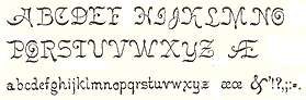 German-American type designer (b. 1843, Berlin) who apprenticed at the Trowitzsch & Son type foundry in Berlin, and then worked as a punchcutter in Dresden and at the G. Haase & Sons foundry in Prague. After positions at the Flinsch foundry in Frankfurt, the Battenburg foundry in Paris, and the Fonderie Haas in Basel, Ihlenburg moved to the United States in 1866 to work for the L. Johnson & Company foundry in Philadelphia, which became MacKellar, Smiths & Jordan some time later. Specializing in ornamental (Victorian) fonts and borders, he designed over eighty typefaces for that Mackellar and a few more for American Type Founders after it purchased MacKellar, Smiths & Jordan in 1901. Ihlenburg became an American citizen in 1874, and died in Philadelphia in 1905. He will be remembered as the prototypical Victorian type designer.
 His typefaces at MacKellar: - American (1876), Angular Text (1884, a Victorian blackletter at MacKellar, Smiths & Jordan; digitally interpreted by Toto in his free font K22 Angular Text (2012) and by Alan Jay Prescott as Angolan Text (2017)), Arboret (1884), Arboret No. 2 (1885), Archaic (1888), Artistic (1886), Attic (1879). Artistic was revived by Alan Jay Prescott in 2017 as Beltane Roman. He wrote: this letterform started out in 1886 as drawn by the great Herman Ihlenburg as Artistic and assigned to MacKellar Smiths & Jordan. Dan Solo called this face Belmont but only showed caps and was suspect anyway. I was able to find specimens elsewhere and a motherlode of other interesting things in the Inland Printer. I developed my first full-featured OTF using this typeface and designed Greek and Cyrillic glyphs as well. I also fitted it out with a set of small caps to make a font that now has 4,000 glyphs for nearly every non-Asian language. To top it off, Robert Donona revived the decorative caps for this typeface, an excruciating task that I once considered for myself but was lucky enough to have this other crazy person take up. The number of hours dedicated between Robert and myself in reviving this complete series digitally is probably unprecedented.
- Bijou (1883: digital copies include Bangle (1990-1991, FontBank), Riccio Display Script by Southern Software (1994, SSi, SSK), Grebe (1994, by an anonymous designer) and Mexacali by Swfte), Black Ornamented (1873), Broadgauge Ornate (1868: a spurred Western typeface at MacKellar Smiths & Jordan; revived by Michael Hagemann), Byzantine (1868).
- Centennial Script (1874, a spectacular high-contrast script digitized in 2007 by Canada Type and in 2011 as a free font called Mortem Stylus by Stylus, and by Intellecta Design as Centennial Script), Chaucer (1883), Childs (1892, revived by R. Beatty, and by Ingo Preuss as Daring), Circular Black (1883), Columbian (1891), Columbus (1890: for metal recuts, see Victor Hugo by Nebiolo and Columbia (1909) by Urania); for digital revivals, see Cristoforo by Thomas Phinney, 2012, Cristoforo (2012) by SoftMaker, F37 Drago (2021, Rick Banks) and Colombo by Ingo Preuss), Columbus No.2, Columbus Outline (1892), Copperplate (1877), Crayon (1886), Culdee (1885).
- Dado (1882), Drapery Border (1876), Dynamo (1891).
- Elliptical Border (1878), Eureka Text (1870, blackletter), Eureka Shaded (1870).
- Ferdinand (1892, now at Dover), Filigree (1878), Fillet (1890), Flourish Ornaments (1884).
- Glyptic, Glyptic No. 2 and Glyptic Shaded (1878), Gothic Ornate (?), Greenback (1871), Grolier (1887), Gutenberg (1888).
- Houghton (ca. 1880). Same as Edison. Revived by Jim Spiece as Edison Swirl SG.
- Illuminated and Illuminated No. 2 (1876), Isabella (1892, a bastarda face; digital version at Agfa, Adobe, and Linotype, 2001), Italic Copperplate (1878).
- Japanesque and Japanesque No. 2 (1877, oriental simulation typefaces), Johnson (1892).
- Lady Text (1884, blackletter), Lippincott (before 1895).
- MediaevalText and Mediaeval Text Ornate (1870, blackletter), Minaret (1868), Minster (1878), Mortised and Mortised No. 2 (1884).
- Newfangle (1892, revived in 2015 by Nick Curtis as Newfangle NF), Nymphic (1889 [Ruffa says 1884], revived by Barmee in Secesja Pro (2013), and by Paul D. Hunt (2004), who published it as Kilkenny (2005, P22)).
- Obelisk (1881), Oxonian (1881). Digital revival of Obelisk in 2014 by Robert Donona.
- Pencraft (1885; digital revival in 2013 by Robert Donona), Pencraft No.2, Phidian (1870, redone by Dan X. Solo), Philadelphian (1867; digital revival by Michael Hagemann as Philadelphian in 2020), Pynson (1887).
- Quenn Bess Script (1882).
- Radiant (1876), Radiant Antique (1876: a money font), Radiated (1871), Relievo (1878), Relievo No. 2 (1879), Rimpled (1895), Ringlet (1882, the prototypical Victorian typeface; Dan X. Solo and George Williams made different digital versions in 1998 which are both also called Ringlet), Romanesque (1874).
- Sansom Script (1888), School Text (1876), Spiral (1890, revived by R. Beatty), Stipple (1890), Stylus and Stylus No. 2 (1883).
- Tendril (1878), Tilted (1886), Treasury (1874), Treasury Open (1875).
- Unique (1874), Unique No. 2 (1875).
- Zinco (1891, revived by Jim Spiece in 2002 as Zinc Italian SG).
At ATF: Taylor Gothic (1894), Schoeffer Old Style (1897: revived and extended by Alfonso Garcia in 2020 as Spirits), Roundhand Series (1902), Post Oldstyle Roman No. 2 (1901---possibly made by E.J. Kitson and/or Guernsey Moore), Post Oldstyle Italic (1901), Ihlenburg Series (1900?), Bradley Series (1895-1897, now at Dover), American Italic (1902). Ludlow offers a digital version of Hannibal. Comments on some typefaces by Mac McGrew: - American Italic is a heavy, novel design by Herman Ihlenburg introduced by ATF in 1902, as a companion to Columbus, which had been designed for ATF's MacKellar Smiths&Jordan branch in 1892. The italic survived its roman mate, being shown by itself in 1906, but was gone by 1912. It is essentially a nineteenth-century design.
- Bradley (or Bradley Text) was designed by Herman Ihlenburg-some sources credit it to Joseph W. Phinney--from lettering by Will H. Bradley for the Christmas cover of an Inland Printer magazine. It was produced by ATF in 1895, with Italic, Extended, and Outline versions appearing about three years later. It is a very heavy form of black-letter, based on ancient manuscripts, but with novel forms of many letters. Bradley and Bradley Outline, which were cut to register for two-color work, have the peculiarity of lower alignment for the caps than for the lowercase and figures, as may be seen in the specimens; Italic and Extended align normally. The same typeface with the addition of German characters (some of which are shown in the specimen of Bradley Extended) was sold as Ihlenburg, regular and Extended. Similar types, based on the same source and issued about the same time, were St. John by Inland Type Foundry, and Abbey Text by A. D. Farmer&Son. They were not as enduring as Bradley, which was resurrected for a while in 1954 by ATF. Also compare Washington Text.
- Round Hand was designed for ATF about 1900, and has been ascribed to Herman Ihlenburg. It has the appearance of handwriting with a broad pen, but letters are not quite connected.
- Schoeffer Old Style [No.2] was designed by Herman Ihlenburg for ATF in 1897. It is typical of a number of typefaces of the day-a plainly lettered roman with small, blunt serifs. Some references list Schoeffer Condensed, cut in 1902; this is probably the typeface shown a little later as Adver Condensed (q.v.). On Linotype, Schaeffer Oldstyle was called Elzevir No.2.
In 2021, Noah Bryant set out to revive many of Ihlenburg's Victorian typefaces. Ihlenburg at the Rochester Institute of Technology's Cary Graphic Arts Collection. [Google]
[MyFonts]
[More] ⦿
|
Highway Sign of the Week
[Bruce S. Cridlebaugh]
|
Bruce S. Cridlebaugh (Prisma Inc, Pittsburgh, PA) created USHighwaysOldStyleBCBA in 2000. 5USD shareware, all formats. [Google]
[More] ⦿
|
Hindi Page at Upenn
|
Free Hindi fonts Jaipur and Xdvng. Hindi alphabet shown and explained. For other Indic languages at the South Asia Studies Department of the University of Pennsylvania, see here. One of the people there is Richard J. Cohen. [Google]
[More] ⦿
|
Holly Press
|
Student at Pennsylvania College of Art & Design in 2013 who is based in Reading, PA. Designer of the alchemic typeface Revamp (2013). [Google]
[More] ⦿
|
Holly Tillman
|
FontStructor in York, PA, who made the geometric typeface Geometrix (2013). [Google]
[More] ⦿
|
Holly Tonini
|
Graduate of Point Park University in Pittsburgh, who works as a photographer. Creator of the hand-printed typeface Cordelia (2013). Fontspace link. [Google]
[More] ⦿
|
Howard Pyle
|
Howard Pyle was one of the most renowned illustrators of the 19th century. His work was widely published in adventure novels, magazines and romances. He was the founder of the Brandywine school and artists colony in Chadd's Ford (Pennsylvania), where he taught artists like N. C. Wyeth, Frank Schoonover and Thornton Oakley their craft. Scriptorium's Pyle collection includes a selection of fonts based on Pyle's original lettering, such as Pyle Gothic (based on his black letter style from Arthurian works), Courthand (based on the lettering in his Lady of Shalott), Buccaneer (from his pirate lettering) and Pyle Initials (a set of his decorative initials). [Google]
[More] ⦿
|
I Can Be Your Type
[Zachariah Nelson]
|
 Zachariah Nelson (I Can Be Your Type) studied graphic design at Philadelphia University. Clayton, NJ-based designer of the curly flared caps typeface Void (2012). Damian (2012) is based on geometric elements of Futura and Univers. Maritote (2012) is in the style of the art deco typeface Broadway. Gridlock Light (2012) is a squarish typeface. He also designed a set of hand-printed typefaces that are meant to express moods: Fleeting, Anxious, Calm. [Google]
[MyFonts]
[More] ⦿
Zachariah Nelson (I Can Be Your Type) studied graphic design at Philadelphia University. Clayton, NJ-based designer of the curly flared caps typeface Void (2012). Damian (2012) is based on geometric elements of Futura and Univers. Maritote (2012) is in the style of the art deco typeface Broadway. Gridlock Light (2012) is a squarish typeface. He also designed a set of hand-printed typefaces that are meant to express moods: Fleeting, Anxious, Calm. [Google]
[MyFonts]
[More] ⦿
|
Ian Bates
|
Born in 1989, Ian Bates (iBates Designs) is a Graphic Design major at York College of Pennsylvania. He is from Fort Salonga, NY. FontStructor who made Blacktop (2010) as part of a typography project in school. Behance link. [Google]
[More] ⦿
|
Ian Pickett
|
Ian Pickett (Philadelphia, PA) designed Cubed (2013, a 3d typeface). [Google]
[More] ⦿
|
Iconian Fonts
[Dan M. Zadorozny]
|
 Born in Philadelphia and a resident of McKinney, Texas, Dan Zadorozny's creations at Iconian. He is a prolific type designer who specializes in techno and sci-fi typefaces. Dafont link. Fontsy link. Abstract Fonts link. Font Squirrel link. His fonts in alphabetical order:
 - #44 font (2002), 00Starmap (2001, pixel font), 1968 Odyssey (2016), 1st Cav (2008), 1st Enterprises (2017), 2-Tech, 21 Gun Salute (2013), 2nd Amendment (2007, guns), 2nd Amendment 2050 (2009, more gun silhouettes), 2Toon, 300 Trojans (2008, comic book family), 4114 Blaster (2008, futuristic), 5th Agent (2008, techno), 7th Service (2002), 8th Element (2013), 911Porscha, 98 Bottles of Beer (2016).
- Achilles, Action-Men (2008), Action Women (2008, female outlines), Aegis (2010, Greek simulation family), Aetherfox (2013), AirCobra (2002), Aircruiser (2011, trekkie family), AirForce (planes and copters), Airstrike (2013), Airstrip One (2003), Aldo's Moon, Aldo's Nova, Alexis (2001), Alien League, Alpha Century (2020), Alpha Men (2015), Alpha Sentry, Alpha Taurus (2007, octagonal, athletic lettering), Amalgam, American Kestrel (2019), Americorps (2012), Ampire (2019), Anakefka (2009, ultra-fat family), Annapolis (2016), Antietam (2015), Antikythera (2013, Greek simulation face), Antilles (2009, sans family), Arctic Guardian (2019), Argosy, Arilon (2008), Armed Lightning (2017), Army Rangers (2013, octagonal), Assassin Nation (2015, scary and perhaps referring to the "tradition" of school shootings in the USA), Astro Armada (2020: sci-fi), Astropolis (2009), Atlantia (2012, futuristic), Avenger (2008, futuristic).
- Babes&Bond (2009, erotic silhouettes), Babe-alicious (2002, erotic outlines), Bad Axe (2017), Bad Robot (2007, computer game look), Bal-Astaral (2016, octagonal), Bamf (2011, techno family), Banjin (2016), Banshee Pilot (2016), Barcade (2018), Battlefield, Battleworld (2016), Beam Rider, Beam Weapon (2015), Beastian (2011), Behemoth (2018), Ben Zion (2008, Hebrew simulation), Berserker (2008, grunge), Beta Biergärten (2008), Big Blue Bug (2021), Bio-disc, Bio-discSolid, Bio-discThin, Bionic Comic (2002), Bionic Type (2002), Birds of a Feather (2007, dingbats), Black Bishop (2015), Black Gunk (2016), Blade Singer (2021), Blizzard Shaft (2020), Block, Blood Crow (2009), Blood Drenched (2020), Bloodlust (2011, dripping blood face), Blue Cobra (2020), Blue July (2009), Body Swipers (2014, Halloween font), Bog Beast (2013), Bomber Escort (2020), Boomstick (2015), Borgsquad (2014, mechanical/octagonal), Bretton (2018), Brin Athyn (2008, uncial/Celtric), Broken Cyborg (2019), Bronic (2004), Bubble Butt (2014, bubblegum typeface), Buchanan (2016), Buddy Champion (2015), Bummer (2007, octagonal), Bushido (2008, oriental simulation), Butch and Sundance (2013), Buttons the Bear (2008, children's hand), Byte Police.
- Camp Justice (2018), Capella (2011, a wide techno family), Capricus (2018), Captain Canaveral (2019), Carnival Corpse (2016), CasperComics, Centaurus (2015), Chardin Doihle (2008), a useful informal handprinting family), Charlemagne, Charlie's Angles (2018: octagonal), Charmling (2019), Cheyenne Hand (2008), Chicago Express (2016), Christendom, Classic Cobra (2016), Clubber Lang (2013, grungy), Cobalt Alien (2015), C.O.D.E.R. (2012), Coffin Stone (2019: a stone age font), College Collage (2017), Colony Marines (2017), Colossus (2011, old chipped stone look), Combat Droid (2019), ComicBookCommando, ComicFX, Commonwealth, Concielian, Concielian Break (2015), Concielian Classic (2018), Concielien Jet (2015), Contour of Duty (2016), Corinthian, Count Suckula (2015, horror font), Covert Ops (2012, army stencil), Coyote Deco (2007, art deco), Crappity-Crap-Crap (2007), Crazy Ivan (2017: constructivist), Creepy Crawlers (2015, horror font), Crime Syndicate (2013), Crixus (2011, a squarish sans that includes an athletic lettering style), Cro-Magnum (2003), Cruiser Fortress (2016), CryUncial, Cyberdyne (2016), Cyberia (like Soviet: neat Russian imitation letters), Cyborg Rooster (2015), Cydonia Century (2017), Cyrus The Virus (2012, grungy, hand-printed).
- DS Man, Daedalus (2008), Daemonicus (2012), Dagger Dancer (2020), Dameron (2016), Dangerbot (2016), Danger Flight (2015), Dan Stargate (2008), Dan'sHand, Dark Alliance (2014), Dark Dominion (2019), Dark Hornet (2020: a great blocky mechanical typeface family), Dark Horse (nice brush font), Darklighter (2018), Darkwind, Dassault (2013), Deathblood (2014, Halloween font), Deathshead (2019: a metal band font), Deceptibots (2019: stencil), Defcon Zero (2016), Dekaranger (2015), Delta Phoenix (2019), Delta Ray, Demon Priest (2013), Department-K, DepartmentH, Deranian (2008), Devil's Tongue (2019), Detonator, Devil Summoner (2014), DiegoCon (2004), Digital Desolation (2014), Ding-o-saurs (2007), Direktor (2008, Cyrillic simulation techno), Dire Wolf (2013), Disco-Dork, Disco Deck (2005), Disco Duck, Discotechia (2015), Dodger, Dokter Monstro (2017: a great fat hand-painted typeface), Domino Jack (2016, an octagonal stencil typeface), Domino Mask Condensed (2016), Dotcom (2002), Drafting Board (2008), Drafting Table (2008), Dragon Order (oriental simulation), Dread Ringer (2015), Drid Herder (2002), Drive (2015, techno font), Droid-Lover (2008), Drone Tracker (2016), Drosselmeyer (my favorite), Dusk Demon (2020: grungy).
- Eagleclaw (2009), Eaglemania, Eagle Strike (2015), Early Warning (2021), Earth Orbiter (2016), Earthrealm (2013), Earthshake (2013), Earth's Mightiest (2002), East West (2015, constructivist), Echo Station (2017), Eco-files, Edge Racer (2917), Egg Roll (2016, oriental simulation), Elastic Lad (2020), Eldebaran (2012), Elder Magic (2009), Election Day (2009), Elephant Gun (2021), Elite Danger (2017), Emissary (2014, sci-fi), Empire Crown (2011, blackletter), Enduro, Ensign Flandry, Ephesian (2007), Eridanus (2015, octagonal / mechanical), Erin Go Bragh (2009, Celtic/uncial), Escape Artist (2015), Eskindar (2013), Eternal Knight (2013), Eurofighter (2015), Eva Fangoria (2018: a dripping blood font), EverettSteele'sHand, Excelerate, Excelsior, Excelsior Comics, Exedore (2008), Exoplanet (2013, techno), Extechchop (2005), Eyes Only (2018).
- Factor (2016), Falconhead, Falcon Punch (2015), Famous Spaceships (2007), Famous Spaceships 2 (2019), Fanfare Ticket (2018: dot matrix family), FantasticCreatures, Fantazian (2003), Fantom (2009, bad handwriting), Federal Blue (2019), Federal Escort (2014), Federal Service (2011), Federapolis (2008, octagonal techno face), Fedyral (2019), Fedyral-II (2019), Feldercarb (2003, octagonal font), Ferret Face (2013), Fiddler's Cove (2012), Fight Kid (2009), Final Front (2019), First Order (2001), Flash Rogers (2016), Flesh Eating Comic (2013, grunge), Flight Corps (2008, techno/pixelish), FlyingLetaherneck (2002), Force Commander (2019), Force Majeure (2016), Foreign Alien (2020), Foucault (2014, uncial), Fox on the Run (2018), Fox on the Run Academy (2018: athletic lettering), Frank-n-Plank (2013, a wooden plank font), Freakfinder (2014: Halloween font), Free-Agent (2008), Freedom Fighter (2013, stencil), From Bond With Love (2014: military stencil), Front Runner (2019), Frost Giant (2019), Frozen Crystal (2016, LED font), Funk Machine (2016, a great ultra-black techno family of typefaces), FunnyPages, Furiosa (2019), Future Forces (2015), Futurex Grunge (2005).
- Galactic Storm (2014), Galant, Galaxy-1 (2008), Galaxy Far Far Away (2009, futuristic dingbat font), Galaxy Force (2014), Galga (2008, futuristic), Gamma Sentry, Gemina (2011, sci-fi / techno family), Gemina2 (2013), Generation Nth, Gentleman Caller (2014), GeoBats (2007), Gearhead (2013, octagonal), Ghost Clan (2014), GI Incognito (2012), Global Dynamics (2014), Globe Trekker (2021), Goalie (2008, hockey mask alphading), Goblin Creek (2016: Halloween font), Gods of War, Gotharctica (2015, blackletter for horror flicks), Governor (2017), Graffiti Street (2019), Grand National (2015), Grand Sport (2015), Graymalkin (2011, trekky), Grease Gun (2012), Grendel's Mother, Grim Ghost (2013), Ghoulish Intent (2016: Halloween font), Grimlord (2009), Groovy Smoothie (2018), Guardian (2008), Guardian-Laser (2008), Guardian-Pro (2008), Guardian-Shadow (2008), Gunner Storm (2015), Gunrunner (2016: techno), Gunship, Gunship V2 (2002), Gypsy Killer (2013), Gyrfalcon.
- Hadriatic (2008, roman lettering), Half Elven (2013), Halfshell Hero (2013), Hall of Heroes (2007), Halo, Hanging Tree (2019: a wood print emulation font), Han Solo (2013), Hard Science (2019), Harrier (2002), Hawkmoon (2011), Head Human (2021), Heavy Copper (2020), Heavy Falcon (2019), Hello Copters (2013: helicopter dingbats), Hemogoblin (2017: spooky font), Heorot (2009, stone age fonts), Hermetic Spellbook (2017: alchemic), Heroes Assemble (2011), Heroes Assemble Dingbats (2014: all Avenger characters), Hero Worship (2021), Hexgon (2018), Hexkey (2020), Highrise Heaven (2007, city skyline dingbats), Hip Pocket (2014: psychedelic), Hitchblock (2017), Hollow Point (2015), Holly Dingle (2015), Holy Empire, Home Base (2020), Homemade-Robot, Holo Jacket (2016), Homebase (2020: heavy, octagonal), Homelander (2020), Homeworld (2003), Homeworld Translator (2003), Hong Kong Hustle (2015), Horroroid (2015), Horroween (2013, Halloween font), Hot Kiss (2017: paint splatter font), Howlin Mad (2017), Hula Hoop Girl (2019), Hulkbusters, Hydronaut (2019), Hydro Squad (2014), Hyper Vyper (2019: octagonal), Hypno Agent.
- Iapetus (2014, sci-fi), Icebox Art (2012), iChrono (2018), IWantMyTTR!, Iconian (2002), Iconified, iDroid (2020), Illuminati, Illumino (2016), Imaginary Forces (2008, mythical dingbats), Imperial Code (2003, Startrek style face), Imperium, Incubus, Incubus-Italic (2008), Incubus-Shadow (2008), Indigo Demon (2017), Infinity Formula (2003, super techno), Infobubble, Inhumanity (2014), I-House Edition (2014), Inspector General (2020), Instand Zen (2016: Halloween font), Inter Bureau (2019), Interceptor (2008), Interdiction (2012), Intergalactic (2017), International Super Hero (2002), Intrepid, Iron-Cobra (2008), Iron Forge (2012).
- Jack's Candlestick (2013), Jackson, Jannisaries, Jedi Special Forces (2012), Jeebra (2018), Jerusalem (1999, Hebrew font simulation)[see also here], Jetta, JettaTech, Jetway (2012, a stencil face), Johnny Torch (2012), Joy Shark (2018), Judge, Judge Hard, Jugger Rock (2018), Justice (2009), Jumpers (2017), Jumptroops (2003-2015), Justinian.
- Kahless, KameraDings (2009), Kangaroo Court (2018), KarateChop (2009), Kartoons (2008), Katana, Kaylon (2019), Kennebunkport (2013, script), Keystone (pixel font), Khazad-Dum (2011), Kid Cobalt (2008, comic book face), Kinex, King Commando (2011), King's Ransom, Kinnihuman (2020: dingbats), Knievel, KnightsTemplar, Kittrick (2019: a heavy octagonal type), Knock Furious (2003, dingbats), Kobold (2008, futuristic), Kondor (2013), Kountry Kodes (2008, international license plate lettering), Kovacs (2018), Kovacs-Spot (2016), Kreature Kombat (2018), Kreeture (2002), Kubrick (2008).
- Lamprey (2012, techno family), LandShark (2001), LandWhale (2001), Laredo Trail (2013, a Western face), Laser Corps (2020), Laserian, Laser Wolf (2018), Law and Order (2005, dingbats), League Wars (2013, sci-fi stencil), Leatherface (2013), LED Sled (2016, LED font), Left-Hand Luke (2016), Legacy Cyborg (2019), LegalTender, Legion, Legionnaires (2017: silhouettes), Legio Sabina (2017), Lethal (2014), Liberty Island (2013, sci-fi), Liberty Legion (2015), Lifeforce (2018), Light Brigade (2018), Lightsider (2011, Star Trekkish family), Lincoln Lode, Livewired (2015, sci-fi), Lionel (2009), Low Gun Screen (2008, a totally square screen type family), Lincoln Chain, Lionheart, Lobo-Tommy (2008), Lord of the Sith, Loveladies, Low Gun Screen (2008, screen face), Lux Contra Tenebras (2018: a fat Textura typeface).
- Machiavelli, Mad Marker, Magic Beans (2007), Major Force (2016), Mandalore (2019: squarish), Marathon-II, Marathon, Marsh Thing (2014, Halloween font), Masked Marvel (2002), Master Breaker (2017), Masterdom (2004), Merri Christina (2015, children's hand), Metal Storm 3D (2008), Metronauts (2013), Metroplex, MetroplexLaser, MetroplexShadow, Michaelmas, Michigan (2015), Milk Bar (2003), Micronian (2008, extensive pixel-based family), Military-RPG (2008), Mindless Brute (2015), Miracle Mercury (2017), Missile Man (2002, futuristic), Miss Amanda Jones (2004, brush style), Mister Twisted (2018), Mobile Infantry, Modi Thorson (2013, techno), Monsterama (2011, scary face), Monster Hunter (2017), Montroc (2015: squarish and varsity style), Moon Dart (2008), Moon Runner (2016), Morse Kode, MorseNK, Motorama (2018: car maker icons), Movie Gallery (2008, dingbats), Mrs. Monster (2013, Halloween brush font), Mystery Mobile (2015), Mystic Singler (2008, rough brush face).
- Nathan Brazil (2013, art deco), National Express (2003), Native Alien, Navy Cadet (2016), Nemesis Enforcer (2013), Neo-Geo (like the letters on the Neon cars), Neo Navy (2015), Neuralnomicon, Neuralnomicon (2018), Neutron Dance (2020), New Come Title (2016), New Mars (2015), New York Escape (2015), Nextwave (2014), NGC 292 (2020), Nick Turbo (2001), Nicomedia (2020), NifeFite, NifeFiter, NifeFites, Nightchilde (2013), Nightmare Alley (2016: Halloween font), Nightrunner (2008, sci-fi), Night Traveler (2020), Nightwraith (2011, techno family), Ninja Garden (2018), Ninjas (2002), Nobody's Home (2014: poster font), NoloContendre, Northstar (2014), Nostromo, Nuevo Passion (2013), Nyet (2002, Soviet letter simulation).
- Oberon, Oberon-Deux, Obsidian Blade (2020), Obsidiscs (2003, dingbats), Oceanic Drift (2013), October Guard (2013, Cyrillic simulation face), Odinson (2007, runes), Oh Mighty Isis (2014, Greek simulation family), Olympic Carrier (2017), Olympicons (2003), Omega 3 (2010, futuristic), Omega Flight (2020), Omega Force (2013, octagonal / mechanical), Omega Sentry, Omni Boy (2019), OmniGirl (2003, techno), Opilio (2012), Opus Magnus (2013, metal band font), Opus Mundi (2015), Oramac (2004), Ore Crusher (2013), Oubliette (2020), Outlands-Truetype (2001), Outrider (2013), Overstreet Bible (2014, hand-printed), Ozda (2011, a fat techno family with several horizontally striped styles), Ozymandias.
- Psyonic VII (2012), Paladins (2015), Pandemonious Puffery (2002), Parker's Hand (2002, handwriting), Peace & Houston (2019: squarish), Pepperland (2019), Perdition, Peregrine, Phantacon (2017), Phaser Bank (2008, techno), Philadelphia, Philly Dings (2003), Phoenicia (2015), Piper Pie (2007), Pistoleer (2011), Planet N (2016), Planet S, Planet X, Player 1 Up (2012: architectural family), Pocket Ball (2016, dot matrix style), Pocket Monster (2016), Police Cruiser (2013), Postmaster, Power Lord (2011), Predataur (2019), Presley-Press (2007), Press Darling (2012), Procyon, Prokofiev (2009, rounded and squarish), Promethean (2008), Protoplasm, Prowler (2013), Pseudo Saudi (1999, Arabic simulation), Psycho Butcher (2014, ransom note font), PuffAngel, Pulsar Class (2018), Pulsar Class Solid (2018), Pulse Rifle (2009), Punch (2020), Pyrabet.
- QTs (2013: erotic silhouettes), Quake-&-Shake, Quantum of Malice (2013), Quark Storm (2013), Quarrystone (2015), Quartermain (2002), Quasar Pacer (2018), Quasitron (2009, futuristic), Quatl (2002, an Inca font), Queen&Country (2009), Quest Knight (2009), Questlok, Quicken (2013, horizontal stencil), Quickening (2014), QuickGear (2019), Quickmark (2004), Quick Quick (2019), Quick Strike, QuickTech, Quill Sword (2016: soft blackletter style).
- RCMP, Racket Squad (2017), RadZad, Radio-Space, Raider Crusader (2016), Raise Your Flag (2013), Range Paladin (2018), Ranger Force (2020), Realpolitik, Rebecca, Rebel Command (2012, Star Trek family), Redcoat (2008, blackletter), Red Delicious (2019), Redline (2015), Red Rocket (2011, techno), Red Undead (2016: Halloween font), Regulators, Renegado (2014), Replicant, Repulsor (2013, pixelish), Rhalina (2011, a nice upright script), Rhinoclops (2019), Righteous Kill (2009), Right Hand Luke (2016), Robo Clone (2018), Robotaur (2008), Rocket Junk, Rocket Pop (2016), Rocket Type (2002), Rockledge (2019: an eroded stone look font), Rogue-Hero, Roid Rage (2003), Ro'Ki'Kier (2008), Rosicrucian (2009, stone age font), Royal Samurai (2018), Rubber Boy (2013, poster font family), Rumble Tumble (2020: a rough military stencil), Rune Slasher (2019).
- Sable Lion (2002), Sagan (2008, futuristic), Samurai Terrapin (2018: blocky), Scarab, ScarabScript, Sci-Fi (2008), SDF (2013), Sea-Dog, Searider-Falcon (2008), Secret Files (2011), Sever, Shablagoo (2015: thick creamy poster font), Shining Herald (2013), Shogunate (2019: a heavy octagonal typeface), Singapore Sling (2014), SisterEurope, Skirmisher (2014), Sky Cab (2017), Skyhawk (2014), Sky Marshal (2015), Sky Ridge (2020), Snubfighter (2009, sci-fi), Soldier (2011), Soloist (2018), Sound FX (2003), Soviet, Space Cruiser, Space Junker, Space Ranger (2013), Space Runner (2019), Spartaco (2016), Speed Phreak (2020), Speedwagon (2015), SPQR (2008, grunge roman), Spy Agency (2012), Spy Lord (2001), Starcruiser (2019), Starduster (2011), Star Eagle (2014), Star Fighter (2017), Star Guard (2019), Star Navy (2009: dingbats), Star Nursery (2018, fat stencil), Stranger Danger (2014: grunge), Strike Fighter (2017), Strikelord (2011, trekkie family), Stuntman, Subadai Baan (2013), Super Commando (2015), Super Soldier (2014, silhouettes), Super Submarine (2017: stencil), SuperUltra911, Superago (2002), Swordtooth (2017).
- Talkies (2008, dingbats), Tarrget (2013, based on the Tekken "Tag Tournament" logo), Taskforce (2008), Tauro (2012), Team America (2014), Team Galaxy (2020), Tele-Marines, Tempest Apache (2018), Terra Firma, Terran, Terror Babble (2017), Texas, Texas2, The Immortal (2019), TheRifleman, The Shire (2009), The Shooter (2012: gun dingbats), Texas Ranger (2014: Western font), Thundergod, Thundergod II (2013), Thunder-Hawk (2011, an aviation techno face), Thunderstrike (2016), Thunder Titan (2017), Thunder Trooper (2017: stencil), Tigershark (2013), Timberwolf (2011), Time Warriors (2007), Tokyo Drifter (2016), Tool (2012, dingbats of tools), Toon Town Industrial (2005, comic book font), Tower Ruins (2014: stencil), Tracer (2015), Trajia (2008, a techno/stencil/athletic lettering family), TransAmerica (2015), Traveler (2008), Travelicons (2009), Travesty (2003, scrawly handwriting), Trek Trooper (2008, Startrek font), Trigger Man (2013, octagonal and mechanical), Trireme (2011, Star trek family), Tristram (2008, uncial), Troopers (2011, futuristic), Trueheart (2009, Celtic), Turbo Charge (2016), Turtle Mode (2020: heavy octagonal), Tussle (2002), Typeecanoe (hand-printed), Typhoon (2013).
- Uberholme, Uberholme Lazar (2001), UFO Hunter (2009), Uglier Things (2018), Ultra 911, Ultramarines (2013), Underground Rose (2014, connect-the-dots), Union Gray (2015), Unisol, United Palanets (2014), UniversalJack, Uno Estado (2009, constructivist), Urban Defender (2019), U.S.A., US Angel (2017), USArmy, US Army II (2013), US Marshal (2012), US Navy (2007), U.S.S. Dallas (2008), Usuzi.
- Valerius (2009, uncial), Valiant Times (2021), Valkyrie (2008), Valley Forge (2008), Vampire Bride (2016: Halloween font), Vampire Games (2001), VariShapes (2001), Viceroy of Deacons (2016), Vicious Hunger (2014, grunge), Victory Comics (2017), VideoStar, Vigilante Notes (2003), Viking Squad (2015, stencil), Villain Team-Up (2020: a fat finger font), Vilmos Magyar, Vindicator (2012, techno), Virgin Hybrid (2014), voxBOX, Voortrekker Pro (2009: octagonal and athletic lettering family), Vorpal (2012: sci-fi stencil face), Vorvolaka (2013), Voyage Fantastique (2013), VX Rocket (2014, fat octagonal face), Vyper (2008, futuristic stencil).
- War Eagle (2009), Warlock's Ale (2014), War Machine, War Priest (2012), Warp Thruster (2013: military or Star Trek stencil), Warrior Nation (2011), Wars of Asgard (2009), Watchtower (2012), Weaponeer (2008, military lettering), Ween Dings (2918: Halloween dingbats), Were-Beast (2008), Westdelphia (2015, blackletter), Western Rail (2015), Wet Works (2013, grungy stencil), Whatafont, Ensign Flandry (2003), Whiskey Bravo (2003), Whovian (2015, scanbats of all Dr. Who characters owned by the British Broadcasting Corporation), Wiccan Ways (2020: alien writing), Wicker Man (2017), Wildcard (2011, Star trek family), Wimp Out (2004), Winter Solstice (2016), Wolf Brothers (2015), Wolf's Bane (+II, +Super-Extended, 2013), Woodgod (2013), Worldnet (great), Worm Cuisine (2016), Write Off, Writer's-Block, WyldStallyns.
- Xaphan (2003), XBones (2018), XCryption (1999, a hacker face), X-Fighters (2014), XPED, Xcelsion (2002), Xeno Demon (2017), Xenophobia, Xephyr, Xeppelin (2005, zeppelin dingbats), X-Grid (2008), Xiphos (2007), Xmas Xpress (2013), Xoxoxa, X-Racer (2012).
- Yahren, Yamagachi 2050 (2019), Yama Moto (2009: oriental simulation), Yankee Clipper (2011), Yay USA (2013), Year 2000, Year3000 (2001), Yellow Jacket (2002), Yeoman Jack (2021), Y-Files (2016), Yiroglyphics (2004), Yorstat (oriental simulation), Younger Brothers (2014), Younger Blood (2017), Young Frankenstein (2013), Young Patriot (2019: squarish), Youngtechs (2008, futuristic), Yukon Tech, Yummy Mummy (2018).
- Za's Vid (2001, pixel font), Zado (2002, dot-matrix font), Zakenstein (2011, caps only grunge), Zamboni Joe (2002, hand-printed)), Zealot (2008), Zee Lance, Zen Masters (2002, pixelish), Zero Prime (2019), Zeta Reticuli (2019), Zeta Sentry (2009, techno/futuristic), Zirconian (2021), Zollern (2013), Zombie Control (2013: a bloody paint drip face), Zone Rider, Zoologic (2009, animal dingbats), Zoomrunner (2016), Zounderkite (2017), Zyborgs, Zymbols.
[Google]
[More] ⦿
|
Ilze Spilde
|
Reading, PA-based designer of the Stick To Your Gums alphabet (2017, with Ana Cuvo). Behance link. [Google]
[More] ⦿
|
Immortal Graphics
[Dave Greenawalt]
|
Youngwood and/or Trauger, PA-based foundry offering Dave Greenawalt's shareware fonts from the late 1990s or 2000: Chrispy, Drippy, Distress, Madfont, Erode, Spannge, Spatter, DistressUltra. [Google]
[More] ⦿
|
Insomnia
[Sam Panico]
|
Free Mac fonts at this foundry: Macabro, Shirley Doe, Santo versus Blue demon, Plinko, Vampiro Psicosis, Sierra, Dos Caras. The fonts are by Sam Panico, a Pittsburgh-based publisher of Insomnia Magazine, and maker of the old Mil Mascaras dingbat font of masked wrestlers. [Google]
[More] ⦿
|
International TypeFounders Inc.
|
Consortium of about 50 independent typefounders, offering 7000+ typefaces. Formed in 1995 by Steve Jackaman. [Google]
[More] ⦿
|
Ish Adames
|
Ish Adames, a graphic designer and photographer in Philadelphia, PA, designed the titling sans typeface Duma in 2013. Behance link. [Google]
[More] ⦿
|
Ismael Adames
|
Philadelphia-based designer of the free geometric sans typeface Duma (2014) and the free Duma Bold (2014). Behance link. [Google]
[More] ⦿
|
It's Alive!
|
The Type Directors Club conference on type on-screen, held on 21 April 2001 at Drexel University in Philadelphia. [Google]
[More] ⦿
|
J. Horace McFarland
|
Pennsylvania printer, 1853-1948. Designer of French Round Face&Italic. [Google]
[More] ⦿
|
J. Howe&Co.
|
Stereotype foundry in Philadelphia. Specimen book: A Specimen of Metal Ornaments and Job Type, Cast, and for Sale, at the Stereotype Foundry of J. Howe, Corner of Crown and Callowhill Streets, Philadelphia (Philadelphia: Jedediah Howe, 1823). J. Howe&Co. was one of the leading nineteenth-century American stereotype foundries. Jedediah Howe outlines the advantages of stereotyping which had come under attack from traditional type founders. [Google]
[More] ⦿
|
Jaclyn Scafidi
|
During her studies in Drexel Hill, PA, Jaclyn Scafidi created the frilly typeface Mercury Vapor (2014). [Google]
[More] ⦿
|
Jacob Judge
|
At Mansfield University of Pennsylvania, Pocono Pines, PA-based Jacob Judge designed the angry death metal typeface Violent Tendencies (2016). Behance link. [Google]
[More] ⦿
|
Jacqueline Y. Maddox
|
Ardmore, PA-based graduate of Philadelphia University, class of 2014. She created the tornado-inspired display typeface Twisted in 2014, [Google]
[More] ⦿
|
Jake Crawford
|
 Harrisburg, PA-based designer of the circle-based typeface California Bungalow (2011). Chameleon (2011) is a wonderful extra-condensed piano key/octagonal face. [Google]
[More] ⦿
Harrisburg, PA-based designer of the circle-based typeface California Bungalow (2011). Chameleon (2011) is a wonderful extra-condensed piano key/octagonal face. [Google]
[More] ⦿
|
Jake Hartline
|
Philadelphia, PA-based designer of Gradient Bubble (2017). [Google]
[More] ⦿
|
James Hultquist-Todd
[James Todd (or: JTD Type)]
|
 [MyFonts]
[More] ⦿
[MyFonts]
[More] ⦿
|
James J. Frazier
|
Doylestown, PA-based comic artist. Creator of the comic book typeface Comic James (2011). Dafont link. [Google]
[More] ⦿
|
James Ronaldson
[Binny&Ronaldson]
|
[MyFonts]
[More] ⦿
|
James Todd (or: JTD Type)
[James Hultquist-Todd]
|
 Chicago, IL, and/or Fredonia, NY, and/or Philadelphia, PA-based designer, who runs James Todd Design.
 Creator of the text family Garvis (2012), which was inspired by didones and the Dutch Fleischmann types. In 2013, he designed the wood type revival family HWT Unit Gothic for Hamilton Wood Type Foundry. The Unit Gothic series was released by Hamilton Manufacturing Co. in 1907, and comprises a flexible range of widths from compressed to very wide. In 2015, he published the contemporary didone optically corrected typeface family Essonnes [MyFonts link]. In 2016, James Todd designed the 6-style sans typeface family Cresta and his garalde take on the (normally didone) fat faces, Gastromond. In 2017, he co-designed Biwa and Biwa Display, a grotesk typeface family, with Ian Lynam. Typefaces from 2018: Chapman (a large Scotch roman typeface family with lots of pizzazz), Stack. Typefaces from 2019: Elfreth (an informal blackletter), Glot (a 10-style flared terminal sans family by James Todd and Ian Lynam; see also Glot Round from 2020). In 2021, he was part of a big effort by P22 to revive and extend Johnston's Underground to P22 Underground Pro [13 styles: Richard Kegler (1997), Paul D. Hunt (2007), Dave Farey (2021), James Todd (2021) and Patrick Griffin (2021) contributed at various stages]. In 2021, he released Cambium---a text family based on roman inscriptional lettering in which special attention was paid to trhe lowercase---at Future Fonts. YTypefaces from 2022: Oculi. Behance link. Dribble link. Old Fontspring link. Old URL. Future Fonts link. [Google]
[MyFonts]
[More] ⦿
|
Jamie Slater
|
 FontStructor in Pittsburgh, PA, who created the heavy octagonal (athletic lettering) typeface Gabe (2014). [Google]
[More] ⦿
FontStructor in Pittsburgh, PA, who created the heavy octagonal (athletic lettering) typeface Gabe (2014). [Google]
[More] ⦿
|
Janene Dunbar
|
During her graphic design studies in Pittsburgh, Janene Dunbar created a display typeface (2014). [Google]
[More] ⦿
|
Jason Carne
|
 Owner and Creative Director at Lettering Library, Wentworth Institute of Technology, Saylorsburg, PA. Head honcho, with Drew Melton, at Carmel Type. In 2015, Jason Carne and Drew Melton co-designed the large condensed titling typeface family Skyward and wrote: Robust, towering, and geometrically refined, Skyward is a surefire classic cocktail of equal parts utility and elegance. They also cooperated on the wood style Western typeface Lumber Co (2015) and the nostalgic Railroad Co (2015; inspired by the iconic ultra-extended letter styles that lined the exteriors of many early 20th century passenger train cars).
 Typefaces from 2016: Mosler (a Fort Knox slab serif in four styles: Safe, Strongbox, Vault, Fortress), Alchemist (with Drew Melton). Typefaces from 2017: Motor City, Sundown (Jason wries: Designed with the gig poster in mind, Sundown is a throwback to the Fillmore West golden age of psychedelic rock and summertime fun.). Typefaces from 2019: Capstone, Botanist (Victorian: at Typeverything). Typefaces from 2020: Reverb (Jason writes that with the gig poster in mind, Reverb is a throwback to the Fillmore West golden age of psychedelic rock and summertime fun). Behance link. Creative Market link. Jason Carne's home page. [Google]
[MyFonts]
[More] ⦿
|
Jason Fagone
[Soup.Type]
|
[More] ⦿
|
Jason Reed
|
Pittsburgh, PA-based creator of Kenosha (2004, a serif face). [Google]
[More] ⦿
|
Jay Klomp
[The Red Rocket Rebellion]
|
[More] ⦿
|
Jeff Stiefel
|
Philadelphia-based graphic designer, who created Scrimshaw (2012), a typeface that was inspired by famine and hunger. [Google]
[More] ⦿
|
Jeffrey Larrimore
|
Graphic designer based in Colorado but originally from Philadelphia. Creator of the iFontMaker font Handvelica (2010, hand-printed). [Google]
[More] ⦿
|
Jen Zweiger
|
During her studies at Kutztown University in Kutztown, PA, Jen Zweiger created the decorative typefaces Armory Sharp and Armory Ornate (2013): Armory is a typeface based on and inspired by weaponry from around the world including halberds, scimitars, taiaha, dao, falchions, naginatas and a number of other swords and polearms. [Google]
[More] ⦿
|
Jennifer Asbury
|
Delta, PA-based designer of Deco Funk (2016) and Equality (2017). [Google]
[More] ⦿
|
Jennifer Coyle
[Hello Brio Studio]
|
[More] ⦿
|
Jennifer Kaplan
|
Philadelphia, PA-based creator of Black & Blonde (2013). Behance link. [Google]
[More] ⦿
|
Jennifer Klinedinst
|
Freelance graphic designer in York, PA, who created the geometric solid typeface Ectomorphic (2015). [Google]
[More] ⦿
|
Jeremy Nelson
|
Designer in West Chester, PA, and Hattiesburg, MS, who specializes in sports and athletics, both for branding and type design. He created the custom display typefaces Surge (2016, an elliptical techno typeface) and Origin (2016, inspired by native American patterns). In 2017, he released an octagonal athletic lettering font for the 2017 NHL All Star Game that is based on the famous Hollywood sign. He also published the free athletic typeface Ridgeline in 2017. In 2018, he published the free squarish sans typeface Apex Mk02, and the free fighter pilot typeface Yeager. In 2019, he added the free squarish techno font family Apex Mk03. Typefaces from 2020: Redwing (octagonal, inspired by hockey lettering). Typefaces from 2021: Toboggan, (a partly free speed-themed geometric sans family; 14 styles). [Google]
[MyFonts]
[More] ⦿
|
Jeremy Torres
|
Graduate of The Art Institute of York Pennsylvania, who lives in Harborcreek, PA. In 2015, he designed Spikey Type. [Google]
[More] ⦿
|
Jess Matthews
|
Pittsburgh, PA-based designer of The Underwater Alphabet (2016). [Google]
[More] ⦿
|
Jess Ysais
|
Jess Ysais (Philadelphia, PA) used paper cut letters to construct a dadaist typeface called Feist Metals (2012). Behance link. [Google]
[More] ⦿
|
Jesse H. Gerard
|
Circa 2009, Jesse Gerard (b. 1985) studied industrial design at University of the Arts in Philadelphia. He created the handwriting typeface Write like Jess (2008), which can be downloaded from Dafont. [Google]
[More] ⦿
|
Jesse Rinyu
|
Print production specialist at the Wharton School in Philadelphia, PA, who created Helmet Display (a modular typeface) in 2015. [Google]
[More] ⦿
|
Jessica Cunningham
|
During her studies in Philadelphia, PA, illustrator Jessica Cunningham created a map of France (2016) with handcrafted map lettering. She also drew a set of drop caps (2015). Behance link. [Google]
[More] ⦿
|
Jessica Eversmeyer
|
During her studies at Philadelphia University, Jessica Eversmeyer created the lava lamp typeface Magnesium (2014). [Google]
[More] ⦿
|
Jessica Farnish
|
Graduate of La roche College in Pittsburgh, 2009. Creator of the display typeface The Casualties (2012). [Google]
[More] ⦿
|
Jessica Kort
|
For a school project in Evans City, PA, Jessica Kort combined Bauhaus 93, Charlemagne STD, and Savoye LET to create a typographic miscarriage called TriFont (2013). [Google]
[More] ⦿
|
Jessica Strohecker
|
During her studies at Kutztown University in Kutztown, PA, Jessica Strohecker designed Nova Essence (2017). She explains: Inspired by a Calvin Klein perfume bottle, Nova Essence captures the essence of a customizable font. It is a decorative, geometric sans serif that offers a dynamic range design choices from layers to colors. [Google]
[More] ⦿
|
Jewell Richardson
|
During her graphic design studies at Philadelphia University, Jewell Richardson created the Balmy display typeface (2013). [Google]
[More] ⦿
|
Jillia Segraves
|
Graduate of Art Institute of Pittsburgh, class of 2015. Williamsport, PA-based designer of a handcrafted typeface (2015). Behance link. [Google]
[More] ⦿
|
Joe Gillen
|
Joe Gillen (Lotus Design Studios, Pittsburgh, PA) created the custom display typefaces Basskick (2013) and WAV in 2013. [Google]
[More] ⦿
|
Joel Chase
|
During his graphic design studies at University of the Arts in Philadelphia, PA, Joel Chase created the compass-and-ruler roman caps typeface Allen (2014). [Google]
[More] ⦿
|
Joel Clemmer
[FrakturWeb]
|
[More] ⦿
|
Joel Kirckhoff
|
Cartoonist and graphic designer in York, PA. He created the experimental typeface Jet Fuel (2011). [Google]
[More] ⦿
|
Joel Ouellette
|
Joel Ouellette (Philadelphia, PA) created VertType (2012), a squarish modular typeface for which he was inspired by halfpipe skateboarding. [Google]
[More] ⦿
|
John Baine
|
Scottish type founder from Edinburgh who was active during the second half of the 17th century. He started out in St. Andrews in 1742 in partnership with Alexander Wilson when thwey co-founded the Wilson Foundry there, but moved in 1744 to Glasgow and in 1749 to London (when his partnership with Wilson ended) and in 1768 to Edinburgh. In 1787, he published "A Specimen of Printing Types, By John Baine&Grandson in Co", and emigrated to Philadelphia, where he set up a foundry. The elder Baine died in 1790, and his grandson continued until 1799, when he sold the equipment to Binny&Ronaldson for $300. [Google]
[More] ⦿
|
John Bieber
[Pennsylvania Dutch Fraktur gallery]
|
[More] ⦿
|
John F. Cumming
|
 Massachusetts-based punchcutter, b. 1852, Harrisville, PA.
 - Typefaces at the Boston Type Foundry: Albino (1882), Autograph Script (1884), Bank Note Roman and Italic (1870), Banner (< 1883), Binner Gothic (< 1898), Century (1884), Cheque (1882), Clark Script (1884), Copley (1886), Dresden (1882), Duerer (1889), Facade (1892), Kismet (1879, the ultimate Victorian typeface), London (< 1885), Lubeck (1884), Magnolia Script (1884), Morris, Munich (1882), Record (1881), Rubens (1884), Skinner Script (1885), Soudan (1884), Syrian, Weimar (1886).
- Typefaces at the Dickinson Type Foundry (also in Boston): Algonquin and Algonquin Ornamented (1888), Caxton Title, Colonial (1887), Elandkay (1892), Florentine Old Script (1884), French Cursive, Globe. Gothic Script (1891), Gothic Slope, Grady (< 1891), Howland (1892), Jagged Series (1881), Karnac (1884, Victorian), Masonic Text (1890), Mother Hubbard (1885), Outing Series (1888, revived by Nick Curtis as Pique-Nique NF in 2014), Quaint (1888), Renaissant (1880, a Victorian typeface revived in 2014 by Nick Curtis as Renaissant NF), Satanick (1897), Skjald (1890), Stenograf (1890), Vertical Script (1897), Virile (1890), Visible Speech.
- Typefaces at the Hansen Type Foundry: Viking Old Style No. 3 (1899).
Comment by Mac McGrew on Howland: Howland was introduced by Dickinson in 1892 as a "companion series to DeVinne." The same design was called DeVinne Condensed (No.3) by Keystone Type Foundry, but differs from the De Vinne Condensed issued by other sources. Howland Open followed in 1894; it was copied by Linotype as Condensed Outline and suggested through the 1940s as a display typeface for classified advertising pages which banned bold types. Compare DeVinne Condensed, MacFarland Condensed. Some digitizations exist: the nice fat pre-art deco typeface Binner is offered by Linotype, Elsner & Flake (as Binner EF), and Monotype (as Binner Poster MT). Kismet was digitized by Linotype and separately by Richard Beatty as Spiral. Viking Old Style No. 3 was revived in Ingvaeonic-Oldestyle (2007, Nick Curtis)). Howland was revived by Elizabeth Carey Smith as Howland New. Jenson Oldstyle No. 2 (1893) was designed by J.W. Phinney and cut by John F. Cumming. Linotype link. FontShop link. Klingspor link. [Google]
[MyFonts]
[More] ⦿
|
John Wilbur Langdon
|
 A type designer and teacher from Philadelphia (b. 1946-d. 2026, San Luis Obispo, CA) who liked to play with words. He taught typography and logo design classes at Moore College of Art and Design from 1985 to 1988 and at Drexel University from 1988 to his retirement in 2015. He lived in Darby, Woodbury, Wenonah, and Philadelphia before moving to California in 2016.
 His Exocet-style typeface Flexion won an award at TDC2 2007. Developed with the help of Hal Taylor, it is discussed here. Flexion is a spurred medieval Da Vinci code-style typeface family originally meant for movie credits. It was published by Red Rooster. Obituary in the Philadelphia Inquirer. [Google]
[MyFonts]
[More] ⦿
|
John Woodward
|
Lancaster, PA-based designer of Wim (2015), a squarish typeface named in honor of Wim Crouwel. Behance link. [Google]
[More] ⦿
|
Jon Pfeifer
|
During his studies at the California University of Pennsylvania, Jon Pfeifer (Venetia, PA) created the dot matrix typeface Grid Lock (2014). [Google]
[More] ⦿
|
Jon Young
|
Jon Young was born in Pittsburgh, PA and studied graphic design at American University in Washington, DC. He did design projects for Bally Design, Staples and Charles, Philadelphia Museum of Art, Detroit Institute of Art, Phil's Fonts, University of Pittsburgh, and the World Movement for Democracy, and specializes in front end development, visual design, and typography. He is presently based in Madrid, Spain. At TypeParis 2017, Jon developed the text typeface Fuqua and wrote: Fuqua is a text typeface dedicated to the city of Pittsburgh, Pennsylvania. It references the character and personality of its people, its industrial history, and the identity of its football team, the almighty Steelers. [Google]
[More] ⦿
|
Jonathan Macagba
[Prototype-NY (was: Handcraftedfonts)]
|
[MyFonts]
[More] ⦿
|
Jose Ayala
|
Graphic designer in Philadelphia, who created the fable-themed font Whimsical (2014). [Google]
[More] ⦿
|
Jose Pause Carrero
|
At the Art Institute of Pittsburgh in 2017, Jose Pause Carrero designed the techno / war movie typeface Invasion. Behance link. [Google]
[More] ⦿
|
Joseph Espinoza
|
Upper Darby, PA-based graphic designer. In 2020, he created the display sans typeface Overt. [Google]
[More] ⦿
|
Joseph Kral
[Kral Typefaces]
|
[MyFonts]
[More] ⦿
|
Joseph Manno
|
Aka The Italian Stallion, Joseph Manno (Pittsburgh, PA) designed the handwriting typeface Manno (2005). Alternate URL for downloading. [Google]
[More] ⦿
|
Josh Fallon
|
During his studies at Pennsylvania State University in University Park, PA, Joshua Ryan Fallon created the hairlined typeface Versa Condensed (2013). [Google]
[More] ⦿
|
Joshua Downey
|
York, PA-based designer of Blokus (2014, FontStruct) and Blackmar (2014, stencil typeface, FontStruct). This typeface was finished during his studies at York College of Pennsylvania. Joshua is originally from Manchester, MD. FontStruct link. [Google]
[More] ⦿
|
Joshua Holmes
|
Graphic designer in York, PA, who created the custom typeface Boomerang (2013) and the interlocking octagonal typeface TF1 (2017). [Google]
[More] ⦿
|
J.P. Bender
|
 For a project at the University of the Arts in Philadelphia, J.P. Bender designed the all caps art nouveau typeface Navetteur (2017) and the Trajan caps typeface Voyager (2017). [Google]
[More] ⦿
For a project at the University of the Arts in Philadelphia, J.P. Bender designed the all caps art nouveau typeface Navetteur (2017) and the Trajan caps typeface Voyager (2017). [Google]
[More] ⦿
|
Julie Jarrett
|
Philadelphia, PA-based designer of the handcrafted typeface Cashly (2016). Aka Aloha Philly. Creative Market link. [Google]
[More] ⦿
|
Justin Kostelansky
|
 Pittston, PA-based creator of Grecian Gunslinger (2012, octagonal and slabby), Kostel Infinity Sans (2012, gaspipe typeface), Defiance (2012, a didone headline typeface designed for photographer Ronald N. Tan's upcoming book "Defiance"), Hedron (2012, octagonal and slabby), and Kostel Slab Serif (2012).
 Behance link. [Google]
[MyFonts]
[More] ⦿
|
Kani Sanchez
|
York, PA-based designer of the pixel typeface Pixel Empires (2016). [Google]
[More] ⦿
|
Kareem Wilson
|
As a student at the Art Institute of Pittsburgh, Kareem Wilson designed the decorative caps typeface Rizbot (2016) for a book cover. [Google]
[More] ⦿
|
Karen Ackoff
|
Designer of the delicate font Russell at Alphabets Inc., and of Russell Oblique (1994, Adobe). Karen Ackoff has a BFA in Illustration from the Philadelphia College of Art and an MFA in Medical Illustration from the Rochester Institute of Technology. She has worked as Scientific Illustrator at the National Museum of Natural History, Smithsonian Institution in Washington, DC. She presently teaches and coordinates the Graphic Design program at Indiana University South Bend. She is available for freelance commercial artwork and fine arts commissions. Klingspor link. [Google]
[MyFonts]
[More] ⦿
|
Karishma Pinto
|
During her studies in Philadelphia, PA, Karishma Pinto designed a colorful geometric solid typeface (2017). [Google]
[More] ⦿
|
Karl Nayeri
[Prime Graphics (was: PolyType)]
|
[MyFonts]
[More] ⦿
|
Karli Kowal
|
Erie, PA-based designer of the display typeface Dots (2015). [Google]
[More] ⦿
|
Katelyn Cataldo
|
During her studies at The Art Institute of Pittsburgh, Katelyn Caraldo (Pittsburgh, PA) created the outlined display typeface Circus (2014). Behance link. [Google]
[More] ⦿
|
Katie Burns
|
 During her studies at the Antonelli Institute of Graphic Design and Photography in Philadelphia, PA, Katie Burns created a grid-based typeface (2016). [Google]
[More] ⦿
During her studies at the Antonelli Institute of Graphic Design and Photography in Philadelphia, PA, Katie Burns created a grid-based typeface (2016). [Google]
[More] ⦿
|
Katie Hatz
|
Designer of the drop caps alphabet Anthropologie Holiday (2014). Behance link. [Google]
[More] ⦿
|
Katie Leech
|
Philadelphia-based designer of several modular typefaces, all called Mood (2015). Behance link. [Google]
[More] ⦿
|
Kayla Bryer
|
During her studies at Kutztown University in Pennsylvania, Kayla Bryer designed the decorative typeface Ghetto Blaster (2013). [Google]
[More] ⦿
|
Kayla Garpstas
|
Lancaster, PA-based designer of the modular display typeface Thunderstruck (2017). Behance link. [Google]
[More] ⦿
|
Kaylyn Gustafson
|
Graduate of Kutztown University of Pennsylvania. Philadelphia, PA-based designer of the coffee cup stain-themed circular typeface Bialetti (2018), which is named after the inventor of the espresso machine, Alfonso Bialetti. [Google]
[More] ⦿
|
Keith Blackshear
|
Darby, PA-based designer of the octagonal typeface Bitmap (2015). [Google]
[More] ⦿
|
Keith Pinkston
|
Pittsburgh, PA-based designer of the bilined octagonal typeface Kapped Sans (2014), a project finished during his studies at The Art Institute of Pittsburgh. [Google]
[More] ⦿
|
Kelcey Benne
|
Subway maps were the inspiration for the layered typeface system Subterranean (2013) by Kelcey Benne. Kelcey lives in Adamstown, PA. [Google]
[More] ⦿
|
Kelley Reed
|
Kelley Reed (b. 1982) lives in Pittsburgh, PA. She runs Reed Design. In 2010, she created the hand-printed typeface Simply Kelley. [Google]
[More] ⦿
|
Kelly Mehok
|
Pittsburgh, PA-based designer of the display typeface African Dance (2014). Behance link. [Google]
[More] ⦿
|
Kelsey Bernstein
|
Designer who created the modular typeface Spacebound (2013). Student at York College in York, PA, class of 2014. [Google]
[More] ⦿
|
Kelsey Cates
|
During her graphic design strudies at Rutgers University, Philadelphia, PA-based Kelsey Cates created the handcrafted typeface My Dear Diary (2015). [Google]
[More] ⦿
|
Kelsey Pledger
|
During her studies at Robert Morris University in Pittsburgh, PA, Kelsey Pledger created the cartoonish typeface Down With The Thickness (2014), which is inspired by the Dr. Seuss books. [Google]
[More] ⦿
|
Kendra Miller
|
York, PA-based designer of Hexface (2015, a hexagonal typeface) and Microtrippy (2015, a circuit font). [Google]
[More] ⦿
|
Kerrie DeFelice
|
At York College of Pennsylvania (class of 2019), Kerrie DeFelice designed the deco typeface Wayne (2016). [Google]
[More] ⦿
|
Kevin Cornell
|
 Illustrator and designer from Philadelphia. With Randy Jones, he created Phaeton (2009, Umbrella Type and later, Toad Fonts), a high-waisted hand-drawn font with lots of pizzazz. Nina Stoessinger: Oh I like how Phaeton makes my favorite web site feel like an old medicine cabinet with emaille drawer knobs ... slightly twisted. Theunis De Jong talks about the steam punk genre of which Phaeton is an example. Klingspor link. [Google]
[More] ⦿
Illustrator and designer from Philadelphia. With Randy Jones, he created Phaeton (2009, Umbrella Type and later, Toad Fonts), a high-waisted hand-drawn font with lots of pizzazz. Nina Stoessinger: Oh I like how Phaeton makes my favorite web site feel like an old medicine cabinet with emaille drawer knobs ... slightly twisted. Theunis De Jong talks about the steam punk genre of which Phaeton is an example. Klingspor link. [Google]
[More] ⦿
|
Kevin May
|
Erie, PA-based creator of the round monoline organic sans typeface Apollo (2013). Behance link. [Google]
[More] ⦿
|
Keystone Type Foundry
|
 Philadelphia-based foundry, 1888-1917. The history of this short-lived foundry was told by James Eckmann in The Keystone Type Foundry, 1888-1917: a reprint [from] Printing&graphic arts, volume VI, number 1, February 1958 (Lunenburg, Vermont: The Stinehour Press, 1958). Their work appeared in Keystone Type Foundry, 1901 (362 pages), Abridged specimen book, type: nickel-alloy on universal line comprising a price list of types, borders, leads and slugs, brass rule, brass galleys; miscellaneous cuts and general supplies for printers (1906, 636 pages, see also here, here and here), A book of Keystone type typefaces (2nd ed., Philadelphia, ca. 1920), Catalogue and specimen book. Keystone products, consisting of type, material, furniture, complete line of miscellaneous supplies for printers and publishers, machinery and wood goods (Philadelphia, ca. 1910), See also Keystone Products Catalogue and Specimen Book, Consisting of Type, Material, Furniture, Complete Line of Miscellaneous Supplies for Printers and Publishers, Machinery and Wood Goods (1915).
 Typefaces: Admiral, Ayer (Mac McGrew: Ayer was introduced by Keystone Type Foundry in 1909, which said it was "named for F. Wayland Ayer, founder of Keystone Type Foundry and the great advertising agency which bears his name." The non-kerning italic was added in 1910.), Ben Franklin, Ben Franklin Condensed, Ben Franklin Open, Bulletin, Caslon Adbold, Caslon Adbold Extended, Caslon Adbold Extra Condensed, Caslon Bold, Caslon Bold Condensed, Caslon Bold Extended, Caslon Bold Italic, Caslon Lightface, Caslon Lightface Condensed, Caslon Lightface Italic, Caslon Title Extended, Charcoal, Charter Oak (1899), Compressed Gothic, Condensed Lining Gothic, Crayonette, Elite Typewriter, Gothic Condensed No. 3, Gothic No. 102, Gothic No. 114, Harris Italic (1910), Harris Roman (1909), Herculean Gothic, Italia Condensed (1906), John Alden Decorative Initials (1906), John Hancock, John Hancock Condensed, John Hancock Extended, John Hancock Outline, Keystone Gothic, Laureate (1906: revived in 2012 by Isabel Urbina), Lining Antique [Keystone], London Gothic (1910 or earlier), New Model Remington Typewriter, Outline, Outline Condensed, Remington, Remington Typewriter, Round Gothic (1884), Skeleton Lining Gothic, Skeleton Lining Gothic No. 19, Smith Premier, Title Gothic [Title Gothic No. 9, Condensed Title Gothic No. 11], Venezia, Washington Text (1902, blackletter), Washington Text Shaded. Digital pictures I took from the Specimen Book of Type (1903): Bulletin, Keystone Bikes, Boldface Cellini, Crayonette Open, Keystone Cyclers, Encore, Lining Antique, Lining Gothic, Outing Initials, Remington Typewriter, Remus, Ronde Initials, Salem (a wedge serif revived in 2021 by Latinotype as Osbourne), Venezia, Victoria Italic, Worcester. Catalog A-C, Catalog C-P, Catalog P-Z. Digitizations: - Miletus Grotesk (2021, Mario Feliciano) revisits Standard Gothic (1906).
- The slab serif John Hancock (ca. 1903) and condensed slab serif John Hancock Condensed (ca. 1917, Lanston Monotype) were digitized as Hancock RR (1994) and Hancock Pro (2017) by Steve Jackaman (Red Rooster).
- The Remington typewriter typefaces (ca. 1905) were digitized as Secret Service Typewriter RR (2002) by Steve Jackaman (Red Rooster).
- Roman TyresRR (1997) was made by Steve Jackaman (Red Rooster).
- Poor Richard RR is based on a Keystone design from 1919, namely Ben Franklin, Ben Franklin Condensed, Ben Franklin Open (named after Benjamin Franklin's "Poor Richard Almanack"). There is also a free font Poor Richard (1994, Projective Solutions).
- Jeff Levine's Keyden Drop Caps JNL (2021) is a set of slab serif framed capitals based on John Alden Initials, shown in the 1906 edition of the Keystone Type Foundry specimen book.
- Caslon FB (1992, Font Bureau) comes with this text: Our familiar Caslon Bold headletters were invented around the turn of the twentieth century in the United States and were only loosely based on William Caslons romans. The best of the Caslon Bolds originated at the Keystone Type Foundry of Philadelphia, whose Caslon Bold Condensed appeared about 1905, probably drawn by R.F. Burfeind. Jill Pichotta revised his Bold Condensed&drew the Bold Extra Condensed.
- Gibbs Mason designed the art nouveau typeface Vanden Houten (1904) at Keystone. This typeface was remade by Dan X. Solo as Dutch Treat at Solotype.
- Emerge BF (2009, John Bomparte) is a flare serif typeface that was inspired by Admiral, c.1900.
- Old Softy NF (2010, Nick Curtis) is a soft round typeface based on Round Gothic (1884).
- Charter Oak is similar to Royal Gothic (Stevens Shanks & Sons). For a digital revival, see Gothic Grotesk JNL (2020, Jeff Levine) or OPTI Charter Oak (by Castcraft).
Comments by Mac McGrew: - On Harris Roman: Harris Roman was announced by Keystone Type Foundry in 1909. It was "named in honor of the late Joel Chandler Harris, author of Uncle Remus." It is a plain modernized roman, somewhat similar to Century Expanded. In 1910 Harris Italic was added; it was designed to be cast without kerns. Advertising claimed, "Non-kerning italics will save endless annoyances and losses resulting from broken letters, and the purchase price is the same as any other type of our make."
- On Charter Oak: Charter Oak is a heavy, inclined gothic introduced by Keystone in 1899. There is a fair amount of contrast, and round letters are flat sided or nearly so. London Gothic (q.v.) was a comparable upright face, and Royal Gothic of the 1880s from another foundry is quite similar. Compare Doric Italic.
- On London Gothic: London Gothic was issued by Keystone Type Foundry in 1910 or earlier, but is virtually a duplicate of Royal Gothic, shown by Marder, Luse&Co. in 1887. It is similar to the same founder's Charter Oak series, but upright. Although the italic typeface survived Keystone's acquisition by ATF in 1919. London Gothic does not appear to have done so. See Charter Oak.
[Google]
[More] ⦿
|
Kimberly Weakley
|
Graphic designer in York, PA, who created the retro-futuristic typeface Lunar (2012). [Google]
[More] ⦿
|
Kira McGarrity
|
Downingtown, PA-based designer of the vintage art nouveau script typeface Hocus Pocus (2015), which was created for the movie Hocus Pocus. [Google]
[More] ⦿
|
Kosal Sen
[Philatype]
|
 [MyFonts]
[More] ⦿
[MyFonts]
[More] ⦿
|
Kral Typefaces
[Joseph Kral]
|
Born in Faribault, MN in 1974, Joseph Kral designs and sells his own typefaces. He lives in Pittsburgh. He founded Kral Typefaces (now defunct), and co-founded the Test Pilot Collective. His typefaces: AtariBaby (1998), Braille (1999), OCRJ (1998), OCRK (1998, monospaced family), Twin Sites, Xerxes (1998), Lakestreet (1998), JoesFoot (1998), Mechanical (1999), Kaliberuckus (2002, dot matrix), Pyrotechnics (1998), Saarikari (1998, rounded sans), Quayzaar (2002, a squarish font), Tricon (2002, unfocused pixel font), Shaolinstyle (1998), Stick26 (1998), Tryptomene (1998). At GarageFonts around 1996, he made HannahBad, Kindee, Kral, Pooty. Behance link. Home page. Klingspor link. View Joe Kral's typefaces. [Google]
[MyFonts]
[More] ⦿
|
Kristen Magee
|
Western Pennsylvania-based designer of Wreath Monograms (2018) and I Heart Cupcakes (2018: dingbats). [Google]
[More] ⦿
|
Kristen Saxty
|
During her studies in Philadelphia, PA, Kristen Saxty designed a modular typeface (2016). [Google]
[More] ⦿
|
Kurt Halvorsen
|
York, PA-based designer of Halvorsen Script (2018). [Google]
[More] ⦿
|
L. Jake Jacobson
[Brama Computing]
|
[More] ⦿
|
L. Johnson Type Foundry
[Lawrence Johnson]
|
Philadelphia-based foundry, which evolved in 1833 from the remnants of Binny&Ronaldson, which was established in 1796. Lawrence Johnson, its founder, died in 1860, and the L. Johnson Type Foundry became MacKellar, Smiths and Jordan, also located in Philadelphia. Their work is described in the MacKellar book entitled 1796-1896: One hundred years, Mackellar, Smiths and Jordan foundry (1896). Specimens can be found in The printers' handy book of specimens, exhibiting the choicest productions of every description made at the Johnson type foundry (1876) as well as in The book of specimens of plain and fancy printing types, borders, cuts, rules, &c. manufactured at L. Johnson&company's foundry. Established 1796. Proprietors. Thos. MacKellar, John F. Smith, Richard Smith, Peter A. Jordan (1865). [Google]
[More] ⦿
|
Lanston Monotype Machine Company
[Tolbert Lanston]
|
Extinct but influential foundry from the 19th and 20th centuries. P22, the present owner of the Lanston collection, writes: The Lanston Monotype Company was founded in Philadelphia at the end of the nineteenth century by Tolbert Lanston (d. 1913). In 1887 he received his first patent for a mechanical typesetting device. Later refinements led to the Monotype casting machine and the emergence of the Lanston Monotype Company as one of the most renowned type supply companies in the world. The Monotype caster was revolutionary and along with other automated typesetting machines helped to usher in a new age of printing technology. Typesetting had, until this time, remained the same as Gutenberg's first hand-set movable type. In the late 1800s, Tolbert Lanston licensed his technology to an English sister company and became a major international force, competing with the Mergenthaler company, whose Linotype was a slightly different approach to the same problem. Both cast type from molten lead alloy on demand, fresh for each job, then recycled it. But whereas the Linotype cast whole lines (or slugs) at a time, the Monotype cast single letters, composing them into a page with an action that is a joy to behold. Lanston Monotype grew rapidly with America's pre-eminent type designer Frederic Goudy as art director from 1920 to 1947. The type library was directed by Sol Hess, who also designed some of the typefaces. The Philadelphia-based company eventually parted ways with its English counterpart. The thriving English Monotype became simply known as Monotype. By contrast Lanston went through mixed fortunes and lost ground to Mergenthaler. A long-lasting labor dispute interfered with production and servicing of the Monomatic (an absolutely incredible typesetting machine) according to the man who would later own the company, master printer Gerald Giampa. Customers were upset, and the firm was sold on several times until American Type Founders bought it in 1969. Giampa continues the story: "They stopped manufacturing casters because they had always competed with their foundry sales. Then it became a department of Hartzel Machine Works that also manufactured moulds and re-built casters. Then on to Mackenzie and Harris, a type foundry in San Francisco, then purchased by myself and re-located in Vancouver." Lanston continued supplying the American market for monotype casters until January 21, 2000, when the hot-metal component of Lanston was tragically destroyed by a tidal wave. After this time Giampa, who was one of the earliest developers of PostScript fonts, focussed much more on digitization. Under his stewardship, Lanston's classic typefaces were digitized in a style that was true to the sources, which are the brass and lead patterns from which the metal type was made. The company relocated to Finland, then back to Canada. In November 2004 P22 type foundry of Buffalo, NY acquired Lanston Type. P22 studios will re-master Lanston's fonts, including the classic designs of Frederic Goudy and Sol Hess, along with newer designs by such contemporary masters as Jim Rimmer, Dave Farey, and Gerald Giampa himself. The Monotype specimen book of type typefaces (1922, Philadelphia) is a specimen book that is now on the web. View the typefaces designed by Lanston. [Google]
[MyFonts]
[More] ⦿
|
Lanston Monotype: Typewriter typefaces
|
 The typefaces shown in The Monotype pony specimen book of type typefaces, rules, ornaments & borders (Lanston Monotype Machine Company, Philadelphia, 1921) include Monotype-No17L, Monotype-No70L-Elite, Monotype-No70L-Remington, Monotype-No72L-Reproducing Typewriter, Monotype-No170L-SmithPremier, Monotype-No270L-Underwood, Monotype-No272L-Royal, Monotype-No370L-Remington. [Google]
[More] ⦿
The typefaces shown in The Monotype pony specimen book of type typefaces, rules, ornaments & borders (Lanston Monotype Machine Company, Philadelphia, 1921) include Monotype-No17L, Monotype-No70L-Elite, Monotype-No70L-Remington, Monotype-No72L-Reproducing Typewriter, Monotype-No170L-SmithPremier, Monotype-No270L-Underwood, Monotype-No272L-Royal, Monotype-No370L-Remington. [Google]
[More] ⦿
|
Lanston Type Co
[Gerald Giampa]
|
 The Lanston Type Co was based in PEI, Canada, moved in 2002 to Vancouver, and moved later that year to Espoo, Finland. In 2004, Lanston was sold to P22. Its fonts can be licensed via P22 and The Type Founders. It has classic and wonderful offerings such as Albertan, Bodoni, Caslon, Deepdene (Frederic Goudy, 1929-1934; see D690 Roman on the SoftMaker MegaFont XXL CD, or URW Deepdene, or Barry Schwartz's Linden Hill (a free font)), Goudy Oldstyle, Jacobean Initials, Kennerly, Kaatskill, Water Garden and Jefferson Gothic. Owned by Gerald Giampa (b. 1950, d. Vancouver, 2009), who wrote me this: Frederic Goudy worked for us for 29 years. We manufactured Monotype casters and keyboards. The English sister company sold casters to England and the Commonwealth and we sold to the Americas and wherever else practical. Tolbert Lanston, our founder, was the inventor of Monotype. We still sell matrices and were punching them until several years ago. Soon we expect to have the equipment moved and operational once again. We are placing it into America's largest printing museum which is in Andover close to Boston. However there is a possibility that it will end up in Hull Québec. Our previous type director was Jim Rimmer of Vancouver, noted type designer. He designs, cuts and cast type in lead. Our typeface Albertan was designed by Jim and is very successful. John Hudson and Ross Mills of Tiro were directly inspired by our facilities in Vancouver. I encouraged them towards type design. The beautiful Bodoni 26 (unicase) can be bought at FontShop. Atlantic 35 (1909-1935) is a modern family first used by the Atlantic Monthly in 1909.
 The fonts: Albertan No. 977, Albertan Bold No. 978, Albertan Title No. 980,&Inline No. 979, Bodoni No. 175, Bodoni Bold No. 2175, Bodoni 26 (a Lanston unicase based on an interpretation by Sol Hess), No. 175, Caslon Old Style No. 337, Caslon Bold No's 637,&537, Deepdene No. 315, Figures Square No. 132, Flash No. 373, Fleurons C, Fleurons Granjon Folio, Fleurons Folio One, Forum No. 274, Francis No. 982, Garamont No. 248, Globe Gothic No's 240,&239,&230, Goudy Initials No. 296, Goudy Old Style No. 394, Goudy Thirty No. 392, Goudy Village (#2) No. 410, Hadriano Stone-Cut No. 409, Hadriano Title No. 309, Jacobean Initials, Jefferson Gothic No. 227, Jenson Old Style No. 508, Kaatskill No. 976, Kaufmann (Lanston Swing Bold) No. 217, Kennerley Old Style No. 268, Metropolitan No. 369, Obelisk No. 2577, Pabst Old Style No. 45, Pabst Old Style Open, Spire No. 377, 20th Century No. 605, Vine Leaves C, Vine Leaves Folio One, Vine Leaves Folio Two, Water Garden Ornaments. P22 writes this about Lanston: In the late 1800s, Tolbert Lanston licensed his technology to an English sister company and became a major international force. Lanston grew rapidly with America's pre-eminent type designer, Frederic Goudy, holding the position of art director from 1920-1947. The Philadelphia-based Lanston Monotype eventually parted ways with its English counterpart. English Monotype became simply known as Monotype from that time forth. Lanston was acquired by American Type Founders in 1969. After a series of other owners, the company found its way to master printer Gerald Giampa, who moved it to Prince Edward Island in 1988. During its time of transition, Lanston continued supplying the American market for monotype casters until January 21, 2000, when the hot-metal component of Lanston was tragically destroyed by a tidal wave. Giampa was one of the earliest developers of PostScript fonts. After the loss, he focused on digitization to an even greater extent. Under his stewardship, Lanston's classic typefaces were digitized in a style that was true to the sources, which are the brass and lead patterns from which the metal type was made. The past few years have seen Giampa and Lanston travel from Canada to Finland, and back again. Now, Lanston has completed another journey back to the United States to come under the care of a new steward: P22. Giampa is answering the call of the sea. He has traded his type founder's hat for that of a ship's captain to sail the northern Pacific coast. During his shore leaves, Giampa will act as typographic consultant to Lanston-P22. The P22 Lanston collection (2005-2006) was designed wih the help of people such as Paul Hunt and Colin Kahn. It includes these typefaces: - LTC Archive Ornaments (2014, Richard Kegler and Miranda Roth).
- LTC Artscript.
- LTC Athena.
- LTC Bodoni 175. Digital version by Paul Hunt. This is supposed to be close to the original Bodoni.
- LTC Bodoni 26.
- LTC Bodoni Bold.
- LTC Broadway. By Sol Hess.
- LTC Californian.
- LTC Camelot.
- LTC Caslon Remix.
- LTC Caslon.
- LTC Christmas Ornaments.
- LTC Circled Caps.
- LTC Cloister.
- LTC Creepy Ornaments.
- LTC Deepdene.
- LTC Figures.
- LTC Flash.
- LTC Fleurons Garamont.
- LTC Fleurons Granjon.
- LTC Fleurons Rogers.
- LTC Forum Title.
- LTC Fournier Le Jeune. A decorative all caps combines the font designed by Simon Fournier for the Peignot Foundry in 1768 with a more elaborate "Vogue Initials" caps offered by ATF in the 1920s.
- LTC Garamont.
- LTC Glamour. LTC Glamour was originally released by Lanston Monotype in 1948. It is based on Corvinus, designed by Imre Reiner. P22 designer Colin Kahn has added some unusual variants.
- LTC Globe Gothic.
- LTC Goudy Extras.
- LTC Goudy Handtooled.
- LTC Goudy Heavyface.
- LTC Goudy Initials.
- LTC Goudy Modern.
- LTC Goudy Oldstyle.
- LTC Goudy Open.
- LTC Goudy Ornate.
- LTC Goudy Sans. Goudy Sans Bold was originally designed by Fredric Goudy in 1922 as a less formal "gothic" and finished in 1929. The light was designed in 1930 and the Light Italic in 1931. Colin Kahn digitized them in 2006 to make a 6-style Goudy Sans family at P22/Lanston, which includes a Goudy Sans Hairline.
- LTC Goudy Text.
- LTC Goudy Thirty.
- LTC Hadriano.
- LTC Halloween Ornaments.
- LTC Hess Monoblack.
- LTC Holiday Ornaments.
- LTC Holly Leaves.
- LTC Italian Old Style (2007, by Paul Hunt, after Goudy Italian Oldstyle, 1924). Remastered in 2011 by Paul Grieshaber as LTC Italian Old Style Pro: LTC Italian Old Style is not to be confused with the English Monotype font also called "Italian Old Style", which is an earlier design from 1911 based on William Morris's Golden Type that is based on Nicholas Jenson's Roman face. Goudy went back to Jenson's original Roman and other Renaissance Roman typefaces for his inspiration and the result is what many consider to be the best Renaissance typeface adapted for modern use. Bruce Rogers was one of the biggest admirers of Italian Old Style and designed the original specimen book for Italian Old Style in 1924 using his trademark ornament arrangement. These ornaments are now contained in the pro versions of the Roman styles- Regular Pro and Light Pro.
- LTC Jacobean Initials.
- LTC Jefferson Gothic.
- LTC Jenson. LTC Jenson Oldstyle was designed by J. W. Phinney of the Dickinson Type Foundry in 1893 and is based on Morris's Golden Typeface. This remastered set features a true italic based on the 1893 ATF italic version as well as a newly digitized Jenson Regular (P22) and Jenson Heavyface (P22) based on Phinney's design of 1899.
- LTC Kaatskill. The italic was completed by Jim Rimmer.
- LTC Kennerley.
- LTC Keystone Ornaments.
- LTC Law Italic (Lanston's digital version from 2006). Mac McGrew: Law Italic is said to have originated as an imitation of formal styles of penmanship used for legal documents. The most common of several substantially different varieties is ATF's Law Italic No. 520, which originated with Marder, Luse about 1870. Several of the capitals are swash-like, while lowercase f and g have distinctive shapes. It has long thin serifs and sharp contrast between thick and thin strokes. Inland called the same design Caledonian Italic. Hansen had Barrister Italic. Monotype's Law Italic No. 23 is a sloped roman, somewhat similar to Ronaldson. Other Law Italics are obsolete.
- LTC Metropolitan.
- LTC Nicolas Cochin.
- LTC Obelysk Grotesk. A reconstruction of Sol Hess's Spire (1937) (digital versions first by Gerald Giampa and then by Colin Kahn).
- LTC Octic Gothic.
- LTC Ornamental Initials. Floriated caps.
- LTC Ornaments Animalia.
- LTC Ornaments One.
- LTC Ornaments Three.
- LTC Ornaments Two.
- LTC Pabst Oldstyle.
- LTC Powell.
- LTC Record Title.
- LTC Remington Typewriter.
- LTC Spire.
- LTC Squareface. By Sol Hess.
- LTC Swing Bold.
- LTC Tourist Gothic. By Sol Hess.
- LTC Twentieth Century.
- LTC Village No 2.
- LTC Vine Leaves.
- LTC Water Garden Ornaments.
- LTC Winchell (2021, Richard Kegler). A revival of Inland Type Foundry's Winchell (1906).
Fonts can be purchased from MyFonts where all fonts have the prefix LTC. Obituary of Giampa and links to obituaries. Catalog of the Lanston typeface library. View the typefaces designed by Lanston. A more extensive page of Lanston Monotype typefaces. [Google]
[MyFonts]
[More] ⦿
|
Larry E. Yerkes
[Vigilante Typeface Corporation (was: WolfBainX)]
|
[More] ⦿
|
Lascaris
[Rolf Noyer]
|
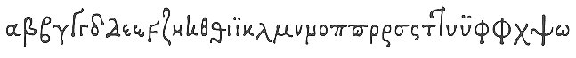 Lascaris is the foundry of Rolf Noyer in Philadelphia. The first typeface by Noyer is Lascaris (2010): Lascaris is a digital rendition of Janus Lascaris' type of 1494-1496, one of the earliest extant non-Aldine polytonic Greeks. The accompanying Roman, quirky and rich in color, was modeled on humanist types of late 15th century Florentine incunabula.
 In 2021, he published Textus Receptus, a historical revival based on the Roman and Greek types used by Johann Bebel (and later also Michael Isengrin) in Basel in the 1520s. Noyer writes: The Roman is a low-contrast medium-to-heavy Venetian reminiscent of Jenson or Golden Type. The unusual polytonic Greek, not previously digitized, is lighter in weight and supplied with all the ligatures and variants of the original. Yet when used without historial forms the Greek has a surprisingly contemporary feel: it is quirky and playful as a display face, but still easily legible in running text. Bebel's Greek extended and refined the one used for the first printed Greek New Testament, Desiderius Erasmus's Novum Instrumentum Omne, published in Basel in 1516 by Johann Froben. The name of the font was chosen in honor of this edition, which was so influential that it was later called the Textus Receptus, serving as the basis for Luther's German Bible in 1522 and much subsequent scholarship for over 300 years. Following 16th century practice, Textus Receptus contains 130 ligatures and stylistic alternates for Greek, accessible either with OpenType features or with five stylistic sets. The Greek capitals, often printed bare in early editions, have been equipped with accents and breathings for proper polytonic or monotonic typesetting. The Roman includes both standard and historical ligatures along with the abbreviations and diacritics typically employed in early printed Latin. For expanded language coverage it has the entire unicode Latin Extended range and part of Latin Extended-B. The capital A is surmounted by a horizontal stroke, as in some 16th century Italian designs, and the hyphen and question mark have both modern and historical form variants. [Google]
[MyFonts]
[More] ⦿
|
Laura Moyer
|
Laura Moyer (Lancaster, PA) created the decorative typeface Sea Garden (2013). Behance link. [Google]
[More] ⦿
|
Laura Shirley
|
California, PA-based designer of Zebra (2014). [Google]
[More] ⦿
|
Laura Stark
|
Laura Stark is a graphic designer in Wilkes-Barre, PA. For a school project at Savannah College of Art and Design in 2013, she created the geometric typeface Geofont. [Google]
[More] ⦿
|
Lauren Bauer
|
During her studies in 2013 at York College of Pennsylvania in Collegeville, PA, Lauren Bauer created a font over at FontStruct. [Google]
[More] ⦿
|
Lauren Pezzica
|
Ephrata, PA-based designer of a curly typeface (2014) during her studies at California University of Pennsylvania. [Google]
[More] ⦿
|
Lauren Teamann
|
As a student based in Irwin, PA, Lauren Teamann designed an unnamed hybrid typeface in 2013. [Google]
[More] ⦿
|
Lawrence Johnson
[L. Johnson Type Foundry]
|
[More] ⦿
|
Leeroy Kun Young Kang
|
Visual artist in Philadelphia, PA. He created a 3d skeletal typeface in 2011. [Google]
[More] ⦿
|
Leslie Flournoy
|
West Chester, PA-based designer of the funky retro typeface Canopy (2013) during her studies art Penn State university in University Park, PA. [Google]
[More] ⦿
|
Lewis Pelouze
[Lewis Pelouze]
|
Philadelphia-based foundry, also called Philadelphia Type Foundry, Lewis Pelouze&Son, and Louis Pelouze&Co. It was founded by Lewis Pelouze (b. 1807), after he had worked for some time at the Ronaldson Type Foundry in Philadelphia (ca. 1834). Lewis Pelouze was sold to ATF in 1892. [Google]
[More] ⦿
|
Lewis Pelouze
[Lewis Pelouze]
|
[More] ⦿
|
Lily Gongaware
|
During her studies at California University of Pennsylvania, Lily Gongaware (Pittsburgh, PA) designed the art deco typeface Diaphanous (2018). [Google]
[More] ⦿
|
Lindsay Derecola
|
 Boyertown, PA-based creator of the decorative caps typeface family Royal Decorum (2014). [Google]
[More] ⦿
Boyertown, PA-based creator of the decorative caps typeface family Royal Decorum (2014). [Google]
[More] ⦿
|
Lindsay Miller
|
During her studies in York, PA, Lindsay Miller designed MessUp (2013, FontStruct). [Google]
[More] ⦿
|
Lindsey Gemmill
|
 Graduate of York College in York, PA, who lives in Cockeysville, MD. Creator of Beaux (2012), a curly monoline script face. [Google]
[More] ⦿
Graduate of York College in York, PA, who lives in Cockeysville, MD. Creator of Beaux (2012), a curly monoline script face. [Google]
[More] ⦿
|
Linn Ruiz-Goubert
|
During her studies, Linn Ruiz-Goubert (Pittsburgh, PA) created the display typeface Pollock (2013), which was created by dripping paint with various tools, a technique made famous by the artist Jackson Pollock after whom it is named. [Google]
[More] ⦿
|
Lisa Rohrbaugh
[Set City]
|
[More] ⦿
|
LisaBeth Weber
|
New Hope, PA-based artist, writer, musician, and consultant, known for her handmade Cause Pins. She is also an illustrator and photographer. In 2008, LisaBeth was selected by the office of Congressman Patrick Murphy to create an ornament for the White House Christmas Tree. Designer of the hand-printed typeface ITC Weber Hand in 1999. FontShop link. Linotype link. [Google]
[MyFonts]
[More] ⦿
|
Liu Han
|
Pittsburgh, PA-based designer who is affiliated with the University of Pittsburgh Medical Center. Creator of the outline typeface Pittsburgh (2017). [Google]
[More] ⦿
|
Lloyd M. Kelchner
|
American penman (1862, Light Street, PA-1948, Seattle, WA). Author of Complete Compendium of Plain Practical Penmanship (1901). He studied at G.W. Michael's Pen Art Hall in Oberlin, OH, in the early 1880s. In 1883 he met C.P. Zaner and E.W. Bloser. Bloser and Kelchner taught in Delaware, OH, and in Cleveland, OH. In 1889, Kelchner purchased a half interest in the Zanerian College of Penmanship in Columbus, OH. He sold his interest in 1892 and left for teaching positions in Dixon, IL, and later in Des Moines, IA. In 1909, he moved to Seattle to teach at Seattle Business College. [Google]
[More] ⦿
|
Loshaj Foundry
[Burim Loshaj]
|
 Burim Loshaj's Albanian type foundry, Loshaj Foundry, was established in 2013. It later moved to Erie, PA.
 His first typeface is the condensed octagonal Pillar (2013). In 2014, he designed the sci-fi typeface Interstellar (Latin, Greek and Cyrillic) and the squarish typeface Cinderblock. The shadow typeface South Central (2016) is inspired by the garffiti of some gangs in Los Angeles. Typefaces from 2019: Cubit. Dafont link. Creative Market link. [Google]
[MyFonts]
[More] ⦿
|
Lothian Type Foundry
[George Buxton Lothian]
|
Type foundry that operated in New York from 1829-1842, founded by the eccentric George Buxton Lothian (d. 1851), a perfectionist with an incurable temper, but also one of the finest type founders of his generation. Before 1829, he had worked with John Watts (the first stereotyper of the United States), with Collins and Hanna, in his own foundry in Pittsburgh with the help of Peter C. Cortelyou (1819-1820), with the David and George Bruce Type Foundry, and again in his own foundry, Lothar&Pell (which existed from 1822-1823, with investor Alfred Pell). The equipment of the plant was bought by Peter Cortelyou in 1850. [Google]
[More] ⦿
|
Louisa Smith
|
State College, PA-based designer of Union Pacific 1942 (2016). Louisa explains: This is my first font project---an all-caps display sans serif, based on hand-drawn lettering in a 1942 ad for Union Pacific. It's perfectly imperfect, intentionally impersonating the flaws of hand lettering, to bring a retro vibe to your projects. Perfect for retro logos. Behance link. [Google]
[More] ⦿
|
Loveis Wise
|
Illustrator in Philadelphia, PA. Designer of decorative Valentine's Day Dropcaps (2017). [Google]
[More] ⦿
|
Luda Ronky
|
 Reading, PA-based designer of a wonderful ironwork-inspired piece of lettering entitled Syrup (2016). [Google]
[More] ⦿
Reading, PA-based designer of a wonderful ironwork-inspired piece of lettering entitled Syrup (2016). [Google]
[More] ⦿
|
Mac McGrew
|
 Author of American Metal Typefaces of the Twentieth Century (New Castle, Delaware, Oak Knoll Books, 1996), which describes every known American typeface designed and cast in metal during the 20th century. See also here and here. M.F. McGrew (1912-2007) was also the author of over 300 articles on typography, which ran in trade journals. He was born in Chattanooga, TN, grew up in Pennsylvania, and died in Pittsburgh. His 500-strong book collection was donated to The Museum of Printing in North Andover, Massachusetts, near Boston, where the public can consult them. [Google]
[More] ⦿
Author of American Metal Typefaces of the Twentieth Century (New Castle, Delaware, Oak Knoll Books, 1996), which describes every known American typeface designed and cast in metal during the 20th century. See also here and here. M.F. McGrew (1912-2007) was also the author of over 300 articles on typography, which ran in trade journals. He was born in Chattanooga, TN, grew up in Pennsylvania, and died in Pittsburgh. His 500-strong book collection was donated to The Museum of Printing in North Andover, Massachusetts, near Boston, where the public can consult them. [Google]
[More] ⦿
|
Maci Roos
|
Pottsville, PA-based designer of the handcrafted typefaces Blossom (2017) and Kaleidoscope (2017). [Google]
[More] ⦿
|
MacKellar, Smiths and Jordan
[Thomas MacKellar]
|
Philadelphia-based foundry, which evolved in 1860 from the Johnson Type Foundry (upon Lawrence Johnson's death that year), which in turn evolved from Binny&Ronaldson (est. 1796). The proprietors were Thomas MacKellar (1812-1899), John F. Smith, Richard Smith, and Peter A. Jordan. MacKellar became the top exporter and producer of type in the 1870s. It united with 22 competitors in 1892 to become ATF (American Type Founders Co). Faces cut by them include the garalde Ronaldson Old Style (1884), named after James Ronaldson, one of its founders, and Campanile (1879). Monotype issued its own version of this typeface in 1903 with short ascenders and capitals the size of these ascenders. Jim Spiece did a revival of a classic Victorian typeface and calls it Zinc Italian SG (2002). The Victorian decorative typeface Ornamented No.5 (1888) was digitized and extended in 2007 by Nick Curtis as Vidalia Sunshine NF. Hermann Ihlenburg was one of their main punch cutters and type designers. Michael Hagemann made a blackletter typeface Spanish Main (2009) after an 1896 typeface called Sloping Black. The 1882 blackletter typeface Borussian was digitized by Nick Curtis and is called McKellar Borussian NF (2009). Hickory (2009, Michael Hagemann) is a revival of an unnamed ornamental Western font dating back to 1852 and was sold through a few different type foundries including Bruce, MacKellar Smiths&Jordan and James Conner's Sons. Monastic (see the1892 book Compact Specimen Book, page 280) was digitized by Toto as K22 Monastic (2010). Brazarri AOE Pro (2021, Astigmatic One Eye) is a revival of the Aztec emulation font Bizarre from 1884. Lining Gothic in their 1892 catalog inspired Jeff Levine's Order Form JNL (2021). An extra condensed serif typeface from that same 1892 catalog was revived by Jef Levine as Catalog Sheet JNL (2022). Specimen books include Specimens of original printing types cast by the patentees MacKellar, Smiths&Jordan co (ca. 1890), Specimens of printing types: ornaments, borders, corners, rules, emblems, initials, &c (1892, Philadelphia), Specimens of Printing Types (1890), 20th edition of the Compact Specimen Book (1892), Specimens of printing types, borders, cuts, rules, &c. MacKellar, Smiths&Jordan (1868), Specimens of printing types ornaments, borders, corners, rules, emblems, initials, &c. (1892), and Specimens of printing types made by the MacKellar, Smiths&Jordan co., type founders and electrotypers (1889). Also worthy of exploration is 1796-1896: One hundred years, Mackellar, Smiths and Jordan foundry (1896). Study and listing of their typefaces by yours truly. [Google]
[MyFonts]
[More] ⦿
|
Madison O'Neil
|
While studying at Kutztown University (Kutztown, PA), Madison O'Neil designed the woodsy typeface Varmint (2013). Dafont link. [Google]
[More] ⦿
|
Marco Rocha
|
Graphic designer in Philadelphia. He created a type design system called Stem Cells (2012). I am not sure that the rounded octagonal typeface for this project is his. [Google]
[More] ⦿
|
Margo Hurst
|
Margo Hurst (Philadelphia, PA) created the dusty typeface Sort Sol in 2013. Behance link. [Google]
[More] ⦿
|
Maria Reguero
|
During her studies at Pennsylvania State University in State College, PA, Maria Reguero designed the display typeface Milk (2016). [Google]
[More] ⦿
|
Mariah Hertz
|
 York, PA-based student designer of the squarish modular typefaces Convoy (2014: FontStruct) and Relief (2012, shadow type). Behance link. FontStruct link. [Google]
[More] ⦿
York, PA-based student designer of the squarish modular typefaces Convoy (2014: FontStruct) and Relief (2012, shadow type). Behance link. FontStruct link. [Google]
[More] ⦿
|
Marina Hill
|
During her graphic design studies, California, PA-based Marina Hill created the display typeface Senator (2013). [Google]
[More] ⦿
|
Mark Carnival
|
Graphic designer in Philadelphia, PA, who created the sci-fi typeface Comet Sans (2012). [Google]
[More] ⦿
|
Mark Norris
[ZIGZAG.NET (was Urban Design Inc)]
|
[More] ⦿
|
Marsh Wise
|
Fort Loudon, PA-based creator of the military fonts CrappyWehrmachtTypewriterBold (1996), SS-Runes, WWIIGermanTacSymbols (1998). [Google]
[More] ⦿
|
Martha Rushworth
|
Pittsburgh, PA-based designer of an all caps sans typeface in 2017. [Google]
[More] ⦿
|
Martin L. Parker
[Parquillian Design]
|
[MyFonts]
[More] ⦿
|
Mary Braun
|
During her studies, Mary Braun (Philadelphia, PA) designed the modular typeface Farro (2016). [Google]
[More] ⦿
|
Matt Blaisdell
|
 Edinboro, PA-based creator of the free EPS format all caps sans titling family Nova (2014: Regular, Inline, Thin). [Google]
[More] ⦿
Edinboro, PA-based creator of the free EPS format all caps sans titling family Nova (2014: Regular, Inline, Thin). [Google]
[More] ⦿
|
Matt Braun
[Wood Type Revival]
|
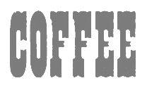 [More] ⦿
|
Matt Catanzaro
|
Scranton, PA-based designer of the critter font Cretext (2018). [Google]
[More] ⦿
|
Matt Griffin
[Rare Letterpress Wood Type]
|
[More] ⦿
|
Matt Lazar
|
Graduate of California University of Pennsylvania, who lives in Pittsburgh, PA. Creator of Funhouse (2014) and Pokerface (2014). [Google]
[More] ⦿
|
Matt Soar
[Chicago O'Hare]
|
[More] ⦿
|
Matthew Roop
|
During his studies at The University of the Arts, Philadelphia, PA-based Matthew Roop designed the roman caps typeface Prima Serif (2016). [Google]
[More] ⦿
|
Max Richard Kaufmann
|
Letterer, typographer, McCalls magazine art director. American designer (b. 1904, Philadelphia) of two typefaces at ATF, both boring designs without any vision. Klingspor link. Linotype link. Typedia link. FontShop link. His typefaces: - The ugly script font Kaufmann (Bold, Script) done in 1936 at ATF. Digital versions abound. Check, e.g., KaufmannSB (Scangraphic), KaufmannBT (Bitstream), Kaleidoscope (Infinitype / SoftMaker). McGrew: Kaufmann Script and Kaufmann Bold are a pair of monotone connecting scripts designed by Max R. Kaufmann for ATF in 1936. The joints are well managed to provide the appearance of smooth, flowing handlettering, while presenting a contemporary look and a high degree of legibility. Swing Bold on Monotype appears to be an exact copy of Kaufmann Bold, and its availability on that system has increased its popularity and usefulness. Compare Gillies Gothic; Brush. Also see Balloon.
- The comic book typeface Balloon (1939, ATF). Aka Lasso (1939, Tetterode). Available as BalloonEF from Elsner&Flake, Balloon by URW++, Balloon SB by Scangraphic Type, Balloon Pro (2016) and Balloon No 2 (2019) from Softmaker, Balloon by Mecanorma, Freehand 041 and later Balloon from Bitstream, Balloonist from SF, and Bassoon from Corel. Bold and ExtraBold were also made by Kaufmann. Mac McGrew: Balloon is a family of italic capitals in three weights, designed in 1939 for ATF by Max R. Kaufmann. They feature a plain, unadorned, hand lettered appearance, as though carefully drawn with a brush or a round lettering pen; in fact the working name of the series in the foundry was Speedball Light, Bold, and Extra Heavy, for a popular brand of lettering pens. Although featuring capital alphabets only, they are cast on Art line, which gives them an unnecessarily large shoulder. But this allows them to be used with the lowercase of the same designer's Kaufmann Script, which matches the two lighter weights. The name apparently comes from the "balloons" used to enclose conversation in comic strips. Compare Cartoon.
[Google]
[MyFonts]
[More] ⦿
|
Maxfield Parrish
|
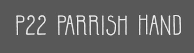 P22, which sells Parrish Roman, Parrish Hand and Parrish Extras (dingbats), writes this about the Phildalphia-born artist Maxfield Parrish: Maxfield Parrish (1870-1966), whose career spanned nearly ninety years, holds a unique place in American art and culture. He was enormously accomplished and successful in both fine art and commercial endeavors. Parrish's hand-drawn letters were a significant part of his works, which bridged the familiar with a startling otherworldliness. P22 has created the Parrish font set in cooperation with the National Museum of American Illustration. See also here. Character made a font called MaxfieldParrish140 in 2007 and writes this: From an incomplete (no "N") hand-drawn alphabet by Maxfield Parrish. See figure 140 of "Letters&Lettering" by Frank Chouteau Brown, 1921. This is a different source than the P22 Parrish font family. Examples of Parrish's lettering: Modern American letters, Modern American capitals. Maxfield died in 1966 in Plainfield, NH. [Google]
[MyFonts]
[More] ⦿
P22, which sells Parrish Roman, Parrish Hand and Parrish Extras (dingbats), writes this about the Phildalphia-born artist Maxfield Parrish: Maxfield Parrish (1870-1966), whose career spanned nearly ninety years, holds a unique place in American art and culture. He was enormously accomplished and successful in both fine art and commercial endeavors. Parrish's hand-drawn letters were a significant part of his works, which bridged the familiar with a startling otherworldliness. P22 has created the Parrish font set in cooperation with the National Museum of American Illustration. See also here. Character made a font called MaxfieldParrish140 in 2007 and writes this: From an incomplete (no "N") hand-drawn alphabet by Maxfield Parrish. See figure 140 of "Letters&Lettering" by Frank Chouteau Brown, 1921. This is a different source than the P22 Parrish font family. Examples of Parrish's lettering: Modern American letters, Modern American capitals. Maxfield died in 1966 in Plainfield, NH. [Google]
[MyFonts]
[More] ⦿
|
Maxwell Pokrzywa
[MPOK Imageworks]
|
[More] ⦿
|
mdoak
|
PA-based creator of Bella (2009, FontStruct). [Google]
[More] ⦿
|
Mecanorma
|
 French graphics lettering company initially involved in instant lettering (made by Trip Productions), and some original typeface designs. From 1989 until 1994, Mecanorma worked with another Dutch company Visualogik to create digital versions of their typefaces, all having MN in their names. Monotype licensed and digitized some of Mecanorma's typefaces. In 1995, Mecanorma got out of graphics and stepped into home decoration. In 1999, Trip Productions, a Dutch Company located in Lisse, purchased the Mecanorma brand and what was left of the company. In 2004, International TypeFounders from Cedars, PA, licensed the typefaces from Trip Productions and released them as the Mecanorma Collection. Since 2021, there also is a Mecanorma Collection at The Type Founders.
 Their collection includes some great fonts: Access, Artdeco, Artworld, BalloonMN, Brio, BusoramaMN, Campus, CardCamio, Carplate, CaslonAntiqueVL, ChocMN, CircusMN, ComicStripMN, DynamoMN, Galba, Globe-Gothic-Outline, Glowworm, Jackson, LibraMN, MtPlacard, Ortem, Renault, RoslynMN, Sayer, SayerScriptMN, SquashMN, Sully-Jonquieres, Watch-Outline. You can also buy through Atomic Type. Projected new URL, which I am afraid will never be activated because in 1999, the company was bough by the Dutch company Trip Productions. MyFonts sells these typefaces: Access, American Uncial, Anatol, Arnold Bocklin (art nouveau), Artdeco, Artworld (an embossed font), Aster, Balloon (brush font), Blippo Black, Brio, British Inserat, Brush, Bulletin Typewriter, Caligra (blackletter), Campus (athletic lettering), Cardcamio, Carplate, Caslon Antique, Celtic (in the style of University Roman), Chicago (dot matrix / marquee typeface), Chinon, Choc (brush script), Circus (Western font), Classic Script (a copperplate calligraphic script), Comic Strip, Commercial Script, Contest, Cooper Black, Dubbeldik, Dynamo, Egyptienne, Estro (Western font), Eurostile, Forelle, Fumo Dropshadow MN, Galba (Trajan typeface), Globe Gothic, Glowworm (a bubblegum font), Gothique (blackletter), Hansson Stencil, Hillman, Hotel (multilined art deco), Isonorm, Jackson, Jubilee Lines (an engraved money font), Latina, Leopard, Libra (uncial), Michelina (anthroposophic), Milton, Mistral, Normalise Din, Old Style, Olive, Orator, Organda, Ortem, Polka (a brush typeface), Renault, Rondo (retro script), Roslyn, Sayer Interview (old typewriter font), Sayer Script, Sayer Spiritual, Squash, Stencil, Stop (stencil typeface), Studio, Swaak Centennial (pure art nouveau), Tzigane, Viant, Vivaldi, Voel Beat (beveled), Watch Outline (LED font), Windsor, Zambesi (African look font). Designers include Albert Boton, J.H. Crook, Jan van Dijk, J. Dresscher, Roger Excoffon, U. Fenocchio, L. Fumarolo, William Gillies, N. Glason, Lennart Hansson, B. Jaquet, K. Kochnowicz, J. Larcher, C. Mediavilla, José Mendoza y Almeida, L. Meuffels, Aldo Novarese, Georges Renevey, F. Robert, Manfred Sayer, M. Schmidt, J.P. Thaulez, J. Werner and Bogdan Zochowski. The Western slabby font Figaro MT (2004) is ascribed to Mecanorma. A list culled from the web: AccessMN-Bold, AccessMN-Medium, AmericanUncialMN, AnatolMN, ArnoldBocklinMN, ArtdecoMN, ArtworldMN, AsterMN-Demi, AsterMN-Roman, BalloonMN-Bold, BalloonMN-ExtraBold, BlippoBlackMN, BrioMN, BritishInseratMN, BritishInseratMNCondensed, BrushMN, Bulletin-Typewriter, BusoramaMN-Bold, CaligraMN, CampusMN, CardcamioMN, CarplateMN, CaslonAntiqueVL, CelticMN-Bold, CelticMN-Italic, CelticMN, CenturyMNCondensed-BoldItalic, CenturyMNCondensed-Bold, CheltenhamMN-Book, CheltenhamMN-BookItalic, CheltenhamMN-Ultra, ChicagoMN, ChinonMN, ChocMN, CircusMN, ClassicScriptMN, ComicStripMN-Italic, ComicStripMN, CommercialScriptMN, ContestMN, Cooper-Black-Italic, Cooper-Black-Outline, CooperBlackMN, CushingMN-Book, CushingMN-Heavy, CushingMN-HeavyItalic, CushingMN-Medium, DubbeldikMN, DynamoMN-Bold, DynamoMN-Medium, DynamoMN-Shadow, EgyptienneMNCondensed-Bold, ElanMN-Extended, ElanMN-Light, ElanMN-Medium, EnrouteVL, ErasMN-Book, ErasMN-Demibold, ErasMN-Ultra, ErasMN, EstroMN, EurostileMN-Extended, EurostileMN-ExtendedBold, EurostileMN-Medium, FidelioMN, FolioMN-Bold, FolioMN-Extrabold, ForelleMN, FranklinGothicMN-Book, FranklinGothicMN-BookItalic, FranklinGothicMN-Heavy, FrizQuadrataMN-Bold, FrizQuadrataMN, Fumo-DropshadowMN, FuturaBlackMN, GalbaMN, Gillies-Gothic-Bold, Gillies-Gothic-Light, Gillies-Gothic-Ultra-Shadow, Gillies-Gothic-Ultra, GlobeGothicMN-Bold, GlobeGothicMNCondensed-Bold, GlobeGothicMNOutline, GlowwormMN, GlowwormMNCompressed, GorillaVL-Bold, GothiqueMN, HanssonStencilMN-Bold, HanssonStencilMN, HillmanMN, HillmanMNCondensed, HotelMN, IrishUncialVL, IsonormMN, Italia-Bold, Italia-Book, Italia-Medium, JacksonMN, JubileeLinesMN, LatinaMN, LeopardMN, LibraMN, MRunic-Condensed, MSwingBold, MachineMN-Bold, MachineMN, MichelinaMN, MiltonMN-Demibold, MistralVL, MtPlacard-Condensed, NormaliseDinMN, OklahomaState, OliveCompactMN, OliveMNBold, OliveNordMN, OratorMN, OrgandaMN-Bold, OrgandaMN, OrtemMN, PascalMN, PolkaMN-Bold, PolkaMN, PopplExquisitMN, PopplExquisitMN-Alternative, RenaultMN, RenaultMNBold, RondoMN, RoslynMN-Bold, RoslynMN-Bold, RoslynMN-Outline, RoslynMNMedium, SaphireMN, SayerMN-Interview, SayerScriptMN-Black, SayerScriptMN-Bold, SayerScriptMN-Light, SayerSpiritualMN-Italic, SayerSpiritualMN, SloganMN, SquashMN-Outline, SquashMN, StencilAntiqueMN, StencilAntiqueVL, StencilMN, StencilMNOutline, StopMN, StudioMN, SullyJonquieresMN-Bold, SullyJonquieresMN, SwaakCentennialMN, Syntax-Bold, Syntax-Roman, ToucheVL, TziganeMN, ViantMN-Bold, VivaldiMN, VoelBeatMN, WashSymbolVL-Light, WatchMN-Outline, WindsorMN, WindsorMNElongated, ZambesiMN. MyFonts link. View Mecanorma's typefaces. [Google]
[MyFonts]
[More] ⦿
|
Medialoot
[Tony Thomas]
|
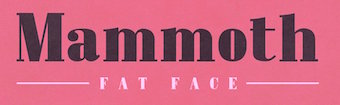 Graphics cooperative in Philadelphia that sells some fonts. These include:
 - From 2019: Elouise, Ragnarok (rune emulation font), Dalston (monoline script).
- From 2018: Oakwood (rustic), Drive-in (inline), Annabelle (script), Aviator (art deco caps), Outdoors (a park signage font), Maria Signature, Fault (a glitch font), Neon Tubes Cursive.
- From 2017: Lipstick (handcrafted), Oak Barrel, Listicons, Circle Monogram Font, Mammoth (a formal didone, tending towards the fat face genre).
- From 2016: Monarchy Rough, Neon Tubes (a paperclip font), Shoreditch.
- From 2015: Andea (+Clean, +Rounded, +Rough).
- From 2014: Monarchy (a tall humanist meets slab serif font family by Birmingham, UK-based Tony Thomas), Asche, Meddle (rounded sans), Viro (humanist sans by Tony Thomas).
- From 2013: Operator, Sketch Slab, SkooledSerif.
- From 2012: Monsters, Jamie's Hand, On Air (a retro radio or broadcasting font, art deco style)Sketch-It.
Most fonts are made by Nathan Brown (Austin, TX). Medialoot's community manager is Jenn Coyle (Philadelphia, PA). Behance link for Tony Thomas. Creative Market link. [Google]
[More] ⦿
|
Meg Paradise
|
Meg Paradise (b. Scranton, PA) and Lauren Sheldon created the typeface for this flowery Chopard poster (2010). Meg lives in New York City. [Google]
[More] ⦿
|
Mel Rodgers
|
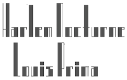 Assistant Professor of Graphic Design at York College of PA, who studied at Maryland Institute College of Art. Fontstructor who made Glyphorama (2012), a beautiful condensed high-contrast squarish piano key typeface. It was renamed Gropius. [Google]
[More] ⦿
Assistant Professor of Graphic Design at York College of PA, who studied at Maryland Institute College of Art. Fontstructor who made Glyphorama (2012), a beautiful condensed high-contrast squarish piano key typeface. It was renamed Gropius. [Google]
[More] ⦿
|
Melanie Coggio
|
During her studies, Melanie Coggio (Sydney, Australia) created Grooove (2014). [Google]
[More] ⦿
|
Melanie Sloan
|
Interior architect and graphic designer in Pittsburgh, PA. Creator of the slabby pooster typeface Blake (2012), which is based upon Rockwell. [Google]
[More] ⦿
|
Mic Rogers
|
Mic Rogers (Philadelphia, PA) graduated in 2016 from Atlanta's Georgia State University with a degree in Art. He created these typefaces in 2014: Zerone (techno typeface), Bastic 4.5 (hand-printed), Prime Cru (thin techno stencil), and Marathon (LED emulation). Behance link. [Google]
[More] ⦿
|
Micaelie Bremer
|
As a student at Penn State, State College, PA-based Micaelie Bremer designed a display typeface in 2016. [Google]
[More] ⦿
|
Michael Everson
[Evertype (was: Everson Typography)]
|
[MyFonts]
[More] ⦿
|
Michael Ferrante
|
During his studies in Kutztown, PA, Michael Ferrante created the turn of the century Parlour typeface (2013). [Google]
[More] ⦿
|
Michael Spina
[Phantasmic Design]
|
[More] ⦿
|
Michaela Staton
|
 Michaela Staton is a type and graphic designer interested in type, editorial design, branding, and design education. She currently designs for Penn State University and holds a BA in Graphic Design from Anderson University and an MA in Typeface Design from the University of Reading in the United Kingdom, class of 2020. Her graduation typeface was Magistra. Magistra is a Latin / Arabic / Greek transitional typeface family designed for publications with complex typographic situations.
 She also designed a Fournier revival together with Ryan Williamson and Radek Lukasiewicz during a workshop with Michele Patané and Riccardo Olocco at the University of Reading. [Google]
[More] ⦿
|
Michelle Restrepo
|
Pennsylvanian graphic designer. She made the inline headline typeface Ladyhawke (2010, FontStruct). [Google]
[More] ⦿
|
Michelle Rowekamp
|
Graphic designer in Pittsburgh, PA, who created the experimental typeface Disassemble (2015). It was obtained by combining bits and pieces of Baskerville, Century Gothic, and Braggadocio. [Google]
[More] ⦿
|
Mickey Rossi
[SUBFLUX experiment]
|
[More] ⦿
|
Mike McDougall
[Random fonts]
|
[More] ⦿
|
Mike McDougall
|
Nova Scotian who works at GrammaTech in Ithaca, NY. Mike McDougall (ex-University of Pennsylvania Ph.D. student) created a random type 3 font called Tekla (1994) as an undergraduate student at McGill University, under the supervision of Luc Devroye. He used several handwritten samples as parents to create random offspring. A companion article entitled Random Fonts for the Simulation of Handwriting has appeared in "Electronic Publishing" in 1995. See also here. [Google]
[More] ⦿
|
Miles DeCoster
[Potato Fonts]
|
[More] ⦿
|
Miller Designworks' Font Flake
|
A very nice interactive program by Philadelphia's Miller Designworks that makes a snowflake out of someone's initials printed in a given font. [Google]
[More] ⦿
|
Mind Killer Ink (MKI)
[Tim Hastings]
|
Pittsburgh, PA-based designer of the horror movie font MKI Deathmetal (2015) and the brush script font MKI Metal (2015). In 2016, he designed Burning Churches. Behance link. Creative Market link. Behance link. [Google]
[More] ⦿
|
Mohl Design
[Ryan Mohl]
|
Graphic designer in Philadelphia, PA. In 2019, he published a copperplate style custom typeface. [Google]
[More] ⦿
|
Molly Fehr
|
As a student in Brooklyn, New York, Molly Fehr [who grew up in Philadelphia] created the floriated caps typeface Botanical (2015). Behance link. [Google]
[More] ⦿
|
MPOK Imageworks
[Maxwell Pokrzywa]
|
Maxwell Pokrzywa (MPOK Imageworks) is the creator of Grimey (2009, Fontcapture) and MPOK Hand (2009, Fontcapture). Born in 1988, the designer lives in Pittsburgh. Facebook page. [Google]
[More] ⦿
|
MyFonts: Keystone Type Foundry
|
MyFonts hit list for revivals of typefaces from the Keystone Type Foundry. [Google]
[More] ⦿
|
Nakeyisha Aisha Huddleston
|
During her studies at The Art Institute of Pittsburgh, where she is a cohort of the class of 2015, Nakeyisha Aisha Huddleston (Chicago, IL) designed the art deco typeface Gatsby (2014). Behance link. [Google]
[More] ⦿
|
Nathan Brown
[Trailhead Design (was: Graphic Monkee, or: We Graphics)]
|
 [More] ⦿
|
National Type Foundry
|
Foundry in Pittsburgh, active in the first part of the 20th century. There was also a National Type Foundry in Bridgeport, CT [The Inland Printer, 1922]. [Google]
[More] ⦿
|
Neon Type Foundry
|
Typefounders of Chicago (or: Castcraft) acquired the Neon Type Foundry (Pittsburgh) in 1959. The Neon Type Division of Typefounders of Chicago (Castcraft) published a specimen book in 1962 which can be downloaded from Archive.Org in two 1 GB parts: Part I, Part II. See also here and here. [Google]
[More] ⦿
|
Nhan Ly
|
Philadelphia, PA-based designer of New Age Deco (2020) and Ndot (2020). [Google]
[More] ⦿
|
Nicholas Gotch
|
Nicolas Gotch (aka TheLostMayan) from Avoca, PA, created Slippery Joe (1999), a handprinting font. He also made the horned letter font Hellbound (2001). Both are free. [Google]
[More] ⦿
|
Nick Gorbey
|
During his studies at York College of Pennsylvania, Nick Gorbey (Secane, PA) designed a squarish font using FontStruct (2016). [Google]
[More] ⦿
|
Nicole Fenn
|
During her studies, York, PA-based Nicole Fenn designed the modular display typeface Venezia (2016, FontStruct). [Google]
[More] ⦿
|
Nicole Stettner
|
Newtown, PA-based student-designer of a pearly caps typeface (2014) based upon the queen of diamonds in a deck of cards. [Google]
[More] ⦿
|
Nitehawk Jarrett
|
Designer of the Mac font Drow Runes based on the Dark Elven Runes created by TSR for use with AD&D. And of R'zal'Shii, based on the Drakmarian language which was created by Nitehawk Jarrett back in 1989. Based in Hazleton, PA. [Google]
[More] ⦿
|
Noah Bryant
|
Noah Bryant is a typographer and photographer, based Philadelphia, PA. He graduated from Rochester Institute of Technology. In 2021, Noah Bryant revived several ornamental Victorian typeface by Hermann Ihlenburg. [Google]
[More] ⦿
|
Noah Kinard
|
 Red Lion, PA-based designer of a free set of vector format icons called Softee Icons (2013), and the commercial typefaces Avante (2014), Reeler (2014, with Mans Grebäck at Aring Type), Willow (2014, multiline neon tube font), Koil (2014), Nello (2014), Wear (2014), Chili (2014), Oil Field (2014, rounded sans), Stout (2014), Ale (2014), Indie (2014, outlined face), and Ale Pro (2014).
 Typefaces from 2015: Urethane, Hijinx (rounded handcrafted sans caps typefaces), Mortyr Black (blackletter). Typefaces from 2016 in his Tradesman series include Driver, Goblet (blackletter), Gallows (blackboard bold), Deere and Cordial. Together with Mans Grebäck at Aring Type, he designed the calligraphic typeface Melay Script (2016). Still in 2016, he designed the all caps sans typefaces Himalayan (pixelish), Makers Sans, Ale Ligs, Driver, Ranchero (modular), Golden Nugget, Frank, Frankie, Franklin and Graver, the rounded poster typefaces Creature, Cordial and Mill Smith, the connected script typeface Vivien, and the blackletter typeface Sandoval. Typefaces from 2017: Starlite, Slab Sans, Slab Sans Stencil, Ironire (occult blackletter), Charter Sans, Blueberry Script (with Mans Grebäck), Dockhouse (rounded all caps sans). Typefaces from 2018: Misty Forest (pixel font), Roses (8-bit pixel font). Behance link. Creative Market link. [Google]
[MyFonts]
[More] ⦿
|
Noah Marcuse
|
 Graphic design student at Temple University, who is related to the social progress fighter Herbert Marcuse (b. Berlin, 1898, d. Germany, 1979). Designer in 2021, during his studies, of the muscular all caps sans typeface Boltzzv8 (2021). [Google]
[More] ⦿
Graphic design student at Temple University, who is related to the social progress fighter Herbert Marcuse (b. Berlin, 1898, d. Germany, 1979). Designer in 2021, during his studies, of the muscular all caps sans typeface Boltzzv8 (2021). [Google]
[More] ⦿
|
NONBook
[Ryan Maelhorn]
|
NONBook is Ryan Maelhorn's foundry located in Bellefonte, PA. Ryan Maelhorn (b. 1978, State College, PA) created the free font Mob (2012, bold sans), the commercial Mob Pro (2012), and Bounce (2012). In 2014, he published the grungy typeface Mottle. Dafont link. Home page. [Google]
[MyFonts]
[More] ⦿
|
Parquillian Design
[Martin L. Parker]
|
Parquillian Design (Washington, DC) is the foundry (est. 2010) of Philadelphia-born graphic and web designer Martin Parker, who specializes in typography, calligraphy, and world languages. He created Parquillian (2011, a rounded blackletter face) and the Cambodian simulation typeface Anglo Angkor (2012). Futurum Parqez (2014) is the first collaborative font for Parquillian Design. Jose V. Lopez conceived the idea ca. 1975, and collaborated almost 40 years later with Parquillian to implement it into a digital typeface. It is a square-shaped frame out of which the letters are cut using the fewest strokes possible while maintaining legibility. Klingspor link. Behance link. [Google]
[MyFonts]
[More] ⦿
|
Pedro Madera
|
During his studies in 2016, Pedro Madera (Lancaster, PA) designed the experimental coat hanger-inspired typeface Hanger. [Google]
[More] ⦿
|
Pennsylvania Dutch Fraktur gallery
[John Bieber]
|
John Bieber shows some Fraktur examples (for birth certificates and other official documents.mostly hand-drawn) used by Pennsylvanian Germans [Google]
[More] ⦿
|
Peter Hanley
|
Peter Hanley's fonts: Bärloch Regular, Dropus Capus, Schmutzy Degraded (1999), Oblok Regular (1999), LEBENangst (1999). Peter is at Temple University, Philadelphia, PA. [Google]
[More] ⦿
|
Petty Artist
|
Pennsylvanian creator (b. 1989) of the artificial language font Hylian (2009) and of A Petty Font (2009, handwriting). [Google]
[More] ⦿
|
Phantasmic Design
[Michael Spina]
|
Michael Spina (Phantasmic Design, Emmaus, PA) made the old typewriter font 3000 in 1996. He also created LoveLetterTW (a typewriter font). Alternate URL. [Google]
[More] ⦿
|
Philatype
[Kosal Sen]
|
 Kosal Sen (b. 1982, Philadelphia) is a graphic and identity designer, aka Koleslaw. He used to live in Philadelphia, but is now in Anaheim, CA.
 - His early typefaces, some of which were free, include the graffiti typeface Drupal (2005), Unnamed Sans (2009), "Kosal Says Hy" (sic, 2003), Olney (2010, a basic square sans), Gravity Sans (2010, slab serif; +GravityNova, GravitySupernova), Merge (2011, a plumpish round monoline sans family), Philly Sans (2008, comic book style face) and the comic book typeface Arfmoochikncheez (2006).
- In 2009, he founded Philatype. At Philatype [Twitter link], he created Olney (2010; inspired by the Bank Gothic style; Olney Light is free), Ryno Slab (2009, macho), Markup (2007, a fresh hand-printed comic book style face), Gravity (2010, slab serif), Tryst (2013, transitional: free download), Lovato (2014, a 5-style wedge serif family with a free Lovato Light style), and Merge (2011, free). Merge Pro Greek and Cyrillic (2012) are co-designed with Elexei Vanyashin.
- Creator of this heavy slab face (2006) in true Western wood type style.
- Regalia (2014) is a heavy angular typeface.
- Sen is a free 3-style geohumanist sans.
- Toddle (2015): a sans modeled after Google's logo.
- In 2016, he started work on Grotesque MetaUltra.
- Regalia (2018). Inspired by Emigre's typeface Brothers.
- Tylerwolf (2018). An architectural marker font.
- In 2021, he released the octagonal typeface Brothers Circus.
- Lansen (2021).
- Bourse (2021). An all-caps wedge serif typeface based on the letters adorning the entrance of the historic Philadelphia Bourse building. Has a chiseled version as well. .
Kosal was embroiled in a minor controversy. He claimed that Wilton's commercial font Shallow (2005) was based on Kosal Says Hi. Wilton subsequently removed it from its site. Also called Typophilesal Ko, and Koleslaw. 1001 Fonts link. Klingspor link. Behance link. Dafont link. Behance link. Fontspring link. Alternate URL. Creative Market link. [Google]
[MyFonts]
[More] ⦿
|
Potato Fonts
[Miles DeCoster]
|
Kutztown University's Miles DeCoster offers these free fonts, all potato cut: Spud (1997), Spud Slab (1997), Taters (1998), Potato Head (1999), Home Fries (2002), Yukon (2010). DeCoster is a professor in the Communication Design Department. All fonts are made by the techique of potato printing. [Google]
[More] ⦿
|
Prime Graphics (was: PolyType)
[Karl Nayeri]
|
Sports glyphs, dingbats, ornaments, by Karl Nayeri, made in 1993 at PolyType, now Prime Graphics. Nayeri studied at University of Paris I (Panthéon-Sorbonne) and Institute of Technology of Tehran. He now lives in West Palm Beach, FL. His fonts: Polytype-Optix, PolytypeAllure, PolytypeAnimals, PolytypeArrowtek, PolytypeArtdeco, PolytypeBirds, PolytypeBusIcon, PolytypeCorners, PolytypeCorners, PolytypeFruits, PolytypeHolidays, PolytypeImages, Polytype Leisure (2004), PolytypeOptyx, PolytypeOrnaments, PolytypePatterns, PolytypeVegetables. MyFonts sells these typefaces by Nayeri: Achiva, Arius, Aviana, Balboa, Betique, Bohemian, Boracho, Bristol, Exvoto, Fouras, Fulton, Janus, Kaptiva, Montique, Polyma, Polytype Animals, Polytype Images, Polytype Birds, Polytype Ornaments, Polytype Sports, Polytype Fruits, Polytype Arrowtek, Polytype Leisure, Polytype Business Icons, Polytype Vegetables, Polytype Allure, Polytype Holidays, Polytype Art Deco, Polytype Optyx, Polytype Corners, Polytype Artimus I Frames, Polytype Artimus II Frames, Polytype Brutus I Frames, Polytype Brutus II Frames, Polytype Dumas I Frames, Polytype Dumas II Frames, Polytype Medoc I Frames, Polytype Medoc II Frames, Polytype Numa Frames, Polytype Patterns, Shiraz, Signum, Sombrero, Soraya (2004, avant garde), Vasco, Vitalique, Wichita, Woko, Xerxes, Yakima, Zealous. For a period of time, he permitted distribution of his library to International Type Fonders, but now his fonts can be bought from MyFonts. The typophiles raised an argument about Soraya (2004), which seemed very close to Cirkulus (Michael Neugebauer, Letraset). Klingspor link. Images of some of Nayeri's typefaces. Catalog. The Prime Graphics typeface library. [Google]
[MyFonts]
[More] ⦿
|
Prototype-NY (was: Handcraftedfonts)
[Jonathan Macagba]
|
 Original fonts, clip art, signature fonts by New Yorker (and ex-Philadelphian) Jonathan Macagba, and Gregory La Vardera. Macagba used to run Handcraftedfonts, then Adcrobatics, and finally Prototype-NY. Most fonts are shareware. Look for Weather (great weather icons), Dotleaders, Talkballoons, Starburst, Rulesfont, Smileyface, MostlyWaves, MorseCodeFont, MetrolinerCaps (1994, Handcraftedfonts Co: an inline caps typeface), Instantlogo, Hobofont, Handyfont, Logofont, Freudfont, and Buncholines. Original, and high-quality creations!
 Jonathan also made commercial fonts available via Phil's Fonts, such as the interesting Murder Mystery Font, EdoFont (great Japanese decoratives), Frankenfont, Frankenfont Careers, FunToUseFonts, HF American Diner (a 3d shadow typeface), Broadstreet, Exposition, Antique Row, Doodle, Libris (great!!!), Edofont (Japanese crests), Newgarden (more!!), and Poster. At Umbrella Type, he published Exposition and Exposition Rounded (2004, a type revival influenced by an Italian poster designed by Leopoldo Metlicovitz in 1906 for the opening of the Simplon Tunnel), Libris (2004, a great and very clean revival of a 12th century Spanish script), and Poster (2004, partially influenced by Egon Schiele's hand-lettered poster for the 1918 Vienna Secession. He also makes custom fonts, logos and signatures. Dafont link. Klingspor link. FontShop link. [Google]
[MyFonts]
[More] ⦿
|
Quaker City Type Foundry
|
Metal type foundry in Honey Brook, PA, still operational in 2007. It is located at 2019 Horseshoe Pike, Honey Brook, PA 19344. Some of its types are listed here. [Google]
[More] ⦿
|
Rachael Pisarcik
|
 Rachael Pisarcik (Pittsburgh, PA) designed the display typeface Robot (2013). [Google]
[More] ⦿
Rachael Pisarcik (Pittsburgh, PA) designed the display typeface Robot (2013). [Google]
[More] ⦿
|
Rachel Elisabeth
|
Erie, PA-based creator of Puremotif (2007, a Fontifier font). Download not functional. [Google]
[More] ⦿
|
Rachel Emmel
|
During her studies at The Art Institute of York, Pennsylvania, Rachel Emmel designed the art deco typeface Best of British (2013) for which she was inspired by the stripes and angles of the Union Jack. Behance link. [Google]
[More] ⦿
|
Rachel Lauren Adams
|
 Rachel Adams (R Lauren Designs, Pennsylvania) Savannah, GA) created the sketched typeface Lemonade (2013), the hand-printed typeface Kyoritsu Dengyo (2013), the art deco typeface Sunspots (2013), and the shadow typeface Without A Trace (2013). Vegan Pizza (2013) is a hand-drawn typeface.
 Fontspace link. Dafont link. [Google]
[More] ⦿
|
Rachel Tiscione
|
During her studies, Rachel Tiscione (State College, PA) designed the display typeface Twine (2017), which is derived from Didot. [Google]
[More] ⦿
|
Random fonts
[Mike McDougall]
|
Mike McDougall (ex-University of Pennsylvania Ph.D. student) created a random type 3 font called Tekla (1994) as an undergraduate student at McGill University, under the supervision of Luc Devroye. Tekla uses several handwritten samples as parents to create random offspring. Tekla's letters vary every time a character is needed. A type 3 font of unique versatility, Tekla may be used to simulate drunkenness, and, as the sample shows, varying degrees of instability on one page. His font has a "craziness" parameter, by which we could actually extrapolate beyond the convex polyhedron determined by the master fonts. It should prove useful in testing character recognition software. A companion article entitled Random Fonts for the Simulation of Handwriting has appeared in "Electronic Publishing" in 1995. See also here. Source code of the font. Additional URL. [Google]
[More] ⦿
|
Rare Letterpress Wood Type
[Matt Griffin]
|
Matt Braun and Matt Griffin (Pittsburgh, PA) are interested in digitizing some old letterpress wood types from original specimen. Their first font, Fatboy Husky (2011), is free. Matt Griffin is one of the founders of the design firm Bearded. He also teaches letterpress printing to young designers at Carnegie Mellon University. Matt Braun is a senior designer at Bearded and letterpress printer. [Google]
[More] ⦿
|
Rebecca Beall
|
York, PA-based designer of Pixel Pieces (2016). [Google]
[More] ⦿
|
Rebecca Dippel
|
FontStructor who designed the squarish typefaces Mesh (textured), Robo and Dippo in 2013. This was achieved during her graphic design studies in York, PA. [Google]
[More] ⦿
|
Rebecca Shaffer
|
Dover, PA-based FontStructor who made the display typeface Sona (2013) during her studies. Behance link. Aka rshaffe8. [Google]
[More] ⦿
|
Rebecca Stanley
|
Harborcreek, PA-based graphic design student at California University of Pennsylvania who created typefaces such as Hello Dear (2013) and Get Out (2012). [Google]
[More] ⦿
|
Red Rooster Collection (was: Red Rooster Type Foundry)
[Steve Jackaman]
|
 Red Rooster is a Cedars, PA-based foundry run by Steve Jackaman (b. 1954, Greenwich, London). Steve started out at London's Face Photosetting. Red Rooster was founded in Philadelphia in 1990 and has about 500 fonts, mostly complete text families in the classical mould, revivals of Ludlow and other foundries, and revivals of fonts by Canadian designer Les Usherwood from the phototypesetting era.
 Families of fonts: - Alexon (1993, by Les Usherwood), Alghera Pro (1996, Pat Hickson), Alphabet Soup (2007, a delicatessen signage typeface based on an 80s font he did while at Typographic House in Boston), Alys (calligraphic), Appleyard (1992, A. Pat Hickson), Aquarius (2007, based on a VGC font by that name), Argus (1992, Les Usherwood and Paul Hickson)
- Badger, Bannock Brae Gothic, Banque Gothique, Barnsley Gothic (2017, a copperplate relate to Steelplate Gothic), Bassuto, Beckenham (1992, Les Usherwood and Paul Hickson), Bellini (an Egyptian family), BlockGothic (1996, Steve Jackaman at the Rabbit Reproductions Type foundry), Bodoni Black Condensed (after R.H. Middleton, 1930), Bodoni Campanile Pro (1998 and 2017, after R.H. Middleton, 1930), Byron
- Cameo, Canterbury, Canterbury Old Style (1992, by Ray Vatter and Steve Jackaman after a 1920 original by Morris Fuller Benton at ATF), Canterbury Old Style Pro (2017, a remastering by Steve Jackaman), Canterbury Sans (a tall-ascender sans family based on the 1920-1926 design by Morris Fuller Benton for ATF), Casablanca (1997, avant-garde typeface based on Carlos Winkow's Electra), Caslon Extra Condensed (based on a Ludlow face), TCCentury (1996, Les Usherwood and Steve Jackaman at the Rabbit Reproductions Type foundry), Century New Style, Chamfer Gothic (after a condensed Ludlow typeface, ca. 1898), Chase, Chelsea (1993, Les Usherwood and Steve Jackaman), Claremont, Coliseum (1992, by A. Pat Hickson and Julie Hopwood for ITF). Steve Jackaman completely redesigned, redrew, and improved the Coliseum family in 2017 and called it Coliseum Pro. That redesign also produced the sister typefaces Clydesdale and Torpedo), Commander (1994, Steve Jackaman), Consort (1994, Steve Jackaman), ConranScript, Creighton (2009, a sans family), Coronet (after a 1937 typeface by R.H. Middleton).
- Dominus, Dundee (1993, A. Pat Hickson), Dungeon (based loosely on a VGC design by Dick Jensen, Serpentine, 1972).
- El Paso (2011, a Western/Mexican simulaton typeface based on El Paso from the Face Photosetting collection), Elston, Equestrienne, Erasmus, EuropaGrotesque, Extension
- Faust (1993: based on a 1958 typeface by Albert Kapr), Flexion Pro (2007, by Hal Taylor and John Langdon), Florentine Cursive (after a 1956 script by R.H. Middleton), ForumTitling, Franklin Gothic Pro (2011, with Ashley Muir), French Fries (2017, handcrafted), Frenchy.
- Garamond RR Light (after a 1929 typeface by R.H. Middleton), Gargoyle RR (Based on an Adrian Williams design, circa 1976 and Brook Type in 1903 designed by Lucien Pissarro for his private press, Eragny Press), GilmoreFahrenheit, GilmoreSansExtBolExtCondTitl, Gothic Extension, Gothic Medium Condensed (after a 1939 Ludlow typeface), GoudyY38, Grand Canyon (2002, a condensed slab serif family based on wood type). GroveScript
- Hancock Pro (2017), Hauser Script (after a 1934 Ludlow font by Georg Hauser), Helium (1994, a mini slab serif face), Hess Old Style (1993, a revival of the garalde typeface Hess Old Style by Sol Hess for Lanston, 1920-1923), Honduras
- Inverness, Iron Maiden RR
- Jardine, Javelin, Jolly Roger (2003, a digitization of a 1970 font by Phil Martin), Jubilee
- Keyboard, Kingsley, Kingsrow
- Leighton, Lesmore, Los Alamos (2007, a condensed sans companion of Grand Canyon), Lodestone Pro (2017; based on Marvin (1970) by Face Photosetting).
- Madrid (based on Nacional, a 1941 typeface by Carlos Winkow), Maximo, Mechanic Gothic DST, Megaphone, Motorcross (2008, after an art deco font from 1930 by Ludwig&Mayer)
- NewJohnston
- PallMall, Phoenix Pro (2011: after Morris Fuller Benton's condensed typeface Phenix American, 1935), Phosphate (based on Phosphor by J. Erbar, 1922-1930; contains a nice Inline; Phosphate Pro Solid and Inline was done with Ashley Muir in 2010), Pipeline, Poor Richard, Portobello (loosely based on Aldo Novarese's Pontecorvo)
- Quest
- Radiant RR (after a 1938 typeface by R.H. Middleton), Railroad Gothic Pro (2017: an American caps-only grotesque based on a Ludlow original, ca. 1900), Raleigh, RRRaleighGothic, Razor Bill (based on the original typeface from Face, London, circa 1972), Ribbit, RivoliInitials
- Rocklidge Pro (2011, with Ashley Muir). Based on Jana (Richard D. Juenger, VGC, 1965).
- Roman Tyres (1997).
- SaintLouis, Salzburg, Schiller Antiqua (based on Nacional's Hispalis), Sandbox (2017, after a typeface from the Robert D. DeLittle Foundry, ca. 1888), Schindler, Secret Service Typewriter (2002, based on a 1905 proof of an early Remington typewriter font from the Keystone Type Foundry), Shinn, Shortwave Gothic, Silverado, Sinclair, Sphinx (1992, Steve Jackaman, based on a 1925 design by Deberny&Peignot), Stanhope, Steelplate Gothic Pro (1993 and 2017: a copperplate gothic based on Robert Wiebking's original, ca. 1918), Stirling, Superba Pro (1992 and 2017, after Hass's Superba, 1928-1930), Sycamore
- TCAdminister (1994, Les Usherwood and Steve Jackaman), Tempo, Thingbat, TitanicCondensed, Triple Condensed Gothic (a movie credit font)
- Ultraduck, Ultra Modern RR (after a 1928 art deco typeface by Douglas McMurtrie).
- Venezuela (2000, Mexican simulation face, based on Albert Auspurg's Vesta from 1926, created by Pat Hickson), Veronese
- Waverly, Willard Sniffin Script (2007, based on Willard Sniffin's 1930s ATF brush script called Keynote)
- Yeoman Gothic
- Xctasy Sans (2002, an avant-garde family influenced by the 1960s typeface Design Fineline)
FontShop link. MyFonts link. Text listing of their typefaces. Alphabetic catalog of the Red Rooster typeface library [large web page warning]. [Google]
[MyFonts]
[More] ⦿
|
REESweb (University of Pittsburgh)
|
Lots of informative links related to Slavic languages, maintained by Karen Rondestvedt at the University of Pittsburgh. [Google]
[More] ⦿
|
Reich, Starr&Co
|
Stereotype printers and letter founders in Philadelphia. Specimens published in 1818. [Google]
[More] ⦿
|
Repertorium Fonts
[David J. Birnbaum]
|
Project led by David Birnbaum at the University of Pittsburgh: The Repertorium of Old Bulgarian Literature and Letters was conceived as an archival repository capable of encoding and preserving in SGML (and, subsequently, XML) format archeographic, palaeographic, codicological, textological, and literary-historical data concerning original and translated medieval texts represented in Balkan Cyrillic manuscripts. The Repertorium project grew out of an initiative of David J. Birnbaum (University of Pittsburgh), Andrej Bojadiev (University of Sofia), Milena Dobreva (Institute of Mathematics, Bulgarian Academy of Sciences), and Anisava Miltenova (Institute of Literature, Bulgarian Academy of Sciences) in 1994, with early SGML development assistance from Berend Dijk and Harry Gaylord (both then of the University of Groningen). Sub-page with several free fonts for early Cyrillic: Menaion and Menaion Medieval (Victor Baranov), Lazov and Lazov Bold (Rumjan Lazov), Dilyana (Ralph Cleminson), Kliment Std (Sebastian Kempgen), Titus Cyrillic and Titus Cyberbit Basic. [Google]
[More] ⦿
|
Richard Ronaldson
|
Philadelphia-based typographer. One of his slab serifs from 1824 was revived by Richard Wikstrom under the name Alamo Slab. [Google]
[More] ⦿
|
Richard Smith
|
 Richard Smith was one of the owners of the Philadelphia-based foundry MacKellar, Smiths and Jordan, which evolved in 1860 from the Johnson Type Foundry, which in turn evolved from Binny&Ronaldson. The proprietors were Thomas MacKellar (1812-1899), John F. Smith, Richard Smith, and Peter A. Jordan. MacKellar became one of the foundries merged into ATF in 1892.
 He patented typefaces such as Cameo (1874), Plain Shade (1874) and Light Shade (1874). The latter decorative typeface appeared in Dan X. Solo's The Solotype Catalog of 4,147 Display Typefaces on page 17 as Night Shade. The first known digital version of this typeface was Nigel SadeSH (1993, Soft Horizons). Other versions include Shadowed Serif (1994, James Fordyce), Cameo Antique (2009, by Character), and Outstanding (2012, Bobistheowl). In 2016, Bobistheowl published Cabbagetown, a large typeface family started in 2014. It extends Light Shade in many directions, and is digitally fine-tuned. A penmanship script by Richard Smith from 1878 was revived in 2015 by George Thomas at Liberty Type Foundry as Smith Spencerian. [Google]
[More] ⦿
|
Richelle Szypulski
|
Graduate of Point Park University in Pittsburgh who lives in Lower Burrell, PA. Creator of Polka Party (2013). Fontspace link. [Google]
[More] ⦿
|
Rick Valicenti
|
 Rick Valicenti was born in 1951 in Pittsburgh, PA. After working for The Design partnership in Chicago, he founded R. Valicenti Design in 1981. Later, in 1989, he founded Thirst/3st, an internationally recognized design firm. The type design section of Thirst is Thirstype. Rick Valicenti is based in Barrington, IL. The White House honored Valicenti in 2011 with the Smithsonian Cooper-Hewitt National Design Award for Communication Design. In 2006, he received the AIGA (American Institute of Graphic Arts) Medal, the highest honor of the graphic design profession, for his sustained contribution to design excellence and the development of the profession.
 Rick designed Commerce (1992, with Greg Thompson, Font Bureau), Punch (1999, pixel family done by Valicenti and Gregg Brokaw), Ooga Booga (1993, with Greg Thompson), Bronzo, UltraBronzo, and Love. In FUSE 4, he published Uck 'n Pretty. In 2002, Rick and Chester designed the sans serif family Infinity (20 weight architectural drawing family) and Alexey (2002, free stencil font family, with Chester Jenkins). Handjob (2002, with Brian McMullen) is a gorgeous set of capitals made out of wire-meshed hands. Twiggies (with Dakota Brown) is a free set of EPS-format caps made from twigs. Other creations: Apex Serif (2003, with Chester Jenkins, Constellation / Village), Apex Sans (2004, a 40-style sans family done with Chester Jenkins, Constellation / Village), EZ (2003), a monospaced family, and Veejay (2003, a funny dingbat family done with Chad Johnston). Books abut Valicenti include Art with Function: The Design of Rick Valicenti (Paul Carlson). Klingspor link. FontShop link. [Google]
[MyFonts]
[More] ⦿
|
Rob Hungerman
|
Cincinnati, OH-based Rob Hungerman (b. Pittsburgh, PA) studied at the University of Dayton, OH (class of 2014) and Cincinnati State (class of 2017). In 2016, he designed the oriental simulation typeface California Roll. [Google]
[More] ⦿
|
Rob L. Callahan
|
Free handwriting fonts Callahan (1996) and Ludwig LooseBraids (1996, based on the handwriting of Robin Campbell) by Rob Callahan. Doctoral student at Philadelphia's Temple University. [Google]
[More] ⦿
|
Robert Gerlach
|
Greensburg, PA-based designer, b. 1973. Creator of the athletic lettering typeface Station 232 (2009). [Google]
[More] ⦿
|
Roberto Aviles
|
York, PA-based designer of the squarish typeface Fat Cap (2016). [Google]
[More] ⦿
|
Rodney J. Decker
|
Galilee is a Greek sans serif font by Rodney J. Decker (professor at Baptist Bible Seminary in Clarks Summit, PA). He writes: "My goal is a screen-optimized font for use in a web browser. The optimized (i.e., manually hinted, including delta hinting) is nearly finished, and then I will convert it to a full Unicode font, hopefully within the next year. There is also a related page with Unicode info regarding polytonic Greek here". He created Galilee Unicode Gk font (2003-2004), a sans serif font that is designed to complement Trebuchet. See also here. [Google]
[More] ⦿
|
Rolf Noyer
[Lascaris]
|
 [MyFonts]
[More] ⦿
[MyFonts]
[More] ⦿
|
Ruark Brumbaugh
|
Altoona, PA-based American designer (b. 1984) of the lightning strike typeface Lightning Strike (2008) and of Knight Nifty 9 (2013). [Google]
[More] ⦿
|
Rudolph Gnichwitz
|
Type designer from Ashbourne, PA, who filed some designs with the US patent office. With Edwin C. Ruthven, he created an unnamed border type in 1889 for the Mather Manufacturing Company of Philadelphia. He made a curly Victorian face in 1890. In 1889, he made an art nouveau face. [Google]
[More] ⦿
|
Rudolph Gnichwitz
|
Ashbourne, PA-based designer for Mather Manufacturing Co of several typefaces between 1889 and 1898. [Google]
[More] ⦿
|
Ryan Degnan
[The Dynasty]
|
[More] ⦿
|
Ryan Kotar
|
Design student at Robert Morris University in Pittsburgh, PA. He created the experimental typeface Wired (2012). [Google]
[More] ⦿
|
Ryan Maelhorn
[NONBook]
|
[MyFonts]
[More] ⦿
|
Ryan Mohl
[Mohl Design]
|
[More] ⦿
|
Sabina Guyiri
|
Graphic designer in Philadelphia who designed the decorative outlined typeface Nocchella (2016). [Google]
[More] ⦿
|
Sabrina Hecht
|
During her studies in State College, PA, Sabrina Hecht designed the art deco typeface Carraway (2016). [Google]
[More] ⦿
|
Sallie Harrison
|
Designer from Philadelphia. The squarish and trendy City Slick typeface (2011) was created for a poster for Oobe's Apparel Sale. Behance link. [Google]
[More] ⦿
|
Sam Mickley
|
During her studies at Kutztown University in Pennsylvania, Sam Mickley (Northampton, PA) designed a thin display typeface called Deviate (2016). [Google]
[More] ⦿
|
Sam Panico
[Insomnia]
|
[More] ⦿
|
Samantha DeLuca
|
 During her studies in 2014 at Philadalphia University, Samantha DeLuca created the Likwid typeface. [Google]
[More] ⦿
During her studies in 2014 at Philadalphia University, Samantha DeLuca created the Likwid typeface. [Google]
[More] ⦿
|
Sasha Prood
[Sasha Prood Studio]
|
[More] ⦿
|
Sasha Prood Studio
[Sasha Prood]
|
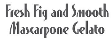 Sasha grew up just outside of Philadelphia, PA, and trained at Carnegie Mellon's School of Design, St. Gallen, Switzerland's Schule fur Gestaltung and Cooper Union's typeface design certificate program, Type@Cooper (2011-2012). She is a full-time freelance designer, illustrator and artist who currently resides in Brooklyn, NY. In 2010, she drew several (watercolor and other) painted alphabets. At Type@Cooper in 2012, she designed the art deco typeface Breccia. In 2013, she drew Glutton For Life Alphabet and Microscopic Organism Alphabet. Behance link. [Google]
[More] ⦿
Sasha grew up just outside of Philadelphia, PA, and trained at Carnegie Mellon's School of Design, St. Gallen, Switzerland's Schule fur Gestaltung and Cooper Union's typeface design certificate program, Type@Cooper (2011-2012). She is a full-time freelance designer, illustrator and artist who currently resides in Brooklyn, NY. In 2010, she drew several (watercolor and other) painted alphabets. At Type@Cooper in 2012, she designed the art deco typeface Breccia. In 2013, she drew Glutton For Life Alphabet and Microscopic Organism Alphabet. Behance link. [Google]
[More] ⦿
|
Scott Ferguson
|
Kutztown, PA-based designer (b. 1982) of the fancy caps typeface Abusive Pencil (2007). [Google]
[More] ⦿
|
Sean Miller
|
During his studies at Kutztown University, Sean Miller (Danieldsville, PA) created the modular typeface Snuggle (2014). [Google]
[More] ⦿
|
Set City
[Lisa Rohrbaugh]
|
Several freeware/shareware dingbat fonts by Lisa Rohrbaugh from Red Lion, PA: SC By the Sea, SC Hearts, SC Dividers, Southwest Design Set, Sets1, Sets2, Solarity, Stained Glass, Executive Buttons, ButtonsNBars, Buttons. Many commercial dingbat fonts: Whimsies, Surrounds, Setups, Maske A Splash, Button-Ups, Fanci-Fools, Surrounds Set 1, Snow Crustals. Her SetCity.com site closed in 2003. Dafont link. [Google]
[More] ⦿
|
Seth Povich
|
Graphic designer in Pittsburgh, PA, who created the free display typeface DisThyme (2017), which is inspired by Travis Howell's Raleigh font. Behance link. [Google]
[More] ⦿
|
Shannon Armstrong
|
York, PA-based student-designer (at York College of Pennsylvania) of the display typeface Down Low (2014). [Google]
[More] ⦿
|
Sid Borne
|
FontStructor of the dot matrix typeface 5 Cent Game (2010). Borne Programming. [Google]
[More] ⦿
|
Silvio Napoleone
|
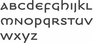 Silvio is the Toronto-based designer of ITC Napoleone Slab (2001) and the Greek simulation font family ITC Medea (2003). He also published FF Hydra (2002), an extensive family. He graduated from the Philadelphia College of Art in 1993, and is currently working at Crescent Design Consultants in Toronto. There is a slight question as to whether ITC Medea was based on the source code of UnciTronica (Manfred Klein, AI, 1994). [Google]
[MyFonts]
[More] ⦿
Silvio is the Toronto-based designer of ITC Napoleone Slab (2001) and the Greek simulation font family ITC Medea (2003). He also published FF Hydra (2002), an extensive family. He graduated from the Philadelphia College of Art in 1993, and is currently working at Crescent Design Consultants in Toronto. There is a slight question as to whether ITC Medea was based on the source code of UnciTronica (Manfred Klein, AI, 1994). [Google]
[MyFonts]
[More] ⦿
|
Sol Hess
|
 American typographer and type designer, b. 1886, Philadelphia, d. 1953. He was a man with class and style, who influenced many through his work. He managed the Lanston library from early in the 20th century (he joined Lanston in 1902) until the second World War. He created many of its typefaces himself, and commissioned many from Frederic W. Goudy. His typefaces (LTC stands for Lanston Type Company):
 - Alternate Gothic Modernized.
- LTC Artscript (Lanston Monotype, 1940; digital version in 2005 at P22/Lanston). McGrew: Artscript is a delicate calligraphic letter designed by Sol Hess for Monotype, which calls it "an attempt to convert into rigid metal the graceful penmanship of the ancient scribe. ..based on the writing of Servidori of Madrid (1798)." It was designed in 1939 but not released until 1948, because of wartime restrictions. It is a pleasing design for limited use, but its delicacy requires special care in handling. Compare Heritage, Lydian Cursive, and Thompson Quillscript.
- In 1928, he created the now famous Broadway Engraved. P22 writes: LTC Broadway was originally designed by Morris Benton. Sol Hess added a lower case in 1929 and also drew Broadway Engraved for Lanston Monotype. That font is now available in digital format from LTC/P22. Other digital fonts include OPTI Broadway Engraved from Castcraft, Broadway Inline (Softmaker), B820 Deco (Softmaker), B821 Deco (Softmaker), Deco 901 (Bitstream) and Bravo (Corel).
- Bodoni 26: a unicase interpretation of Bodoni by Hess at Lanston, designed by Giampa; digital version at P22/Lanston in 2005.
- Bodoni No. 175 (remastered in 2006 by Paul Hunt).
- LTC Bodoni Bold.
- Bruce Old Style No. 31: a transitional font at Lanston Monotype in 1909. Now a Bitstream face. Based on Bruce Old Style No. 20 from Bruce Foundry (1869).
- Linotype states that Sol Hess is responsible for a version of Cochin Bold (1921): Georges Peignot designed Cochin based on copper engravings of the 18th century and Charles Malin cut the typeface in 1912 for the Paris foundry Deberny&Peignot. The font is named after the French engraver Charles Nicolas Cochin (1715-1790) although its style had little to do with that of the copper artist's. The font displays a curious mix of style elements and could be placed as a part of the typographical Neorenaissance movement. Cochin is especially large and wide and was very popular at the beginning of the 20th century. Note: Cochin is now sold by Linotype, Adobe, Monotype, URW++ and Bitstream (as Engravers' Oldstyle 205).
- English Caslon no 37.
- Flash.
- Goudy Bible (1948). Mac McGrew: Goudy Bible is a modification of Goudy Newstyle (q.v.), adapted by Bruce Rogers with the assistance of Sol Hess for use in the Lectern Bible Rogers designed for World Publishing Company in 1948.
- Goudy Bold Swash.
- Goudy Heavyface Open (1926) and Condensed (1927). Mac McGrew: Goudy Heavface and Italic were designed by Goudy in 1925 in response to a strong request by Monotype for a distinctive typeface on the order of the very popular foundry Cooper Black. Such typefaces had little appeal for Goudy, and he always felt that Monotype was disappointed in his efforts, but the result is more informal than other similar types, and has had considerable popularity. Note the extra set of figures and the unusual number of tied characters and ornaments in the font. Goudy Heavyface Open is a variation produced by Monotype in 1926, probably designed by Sol Hess, who designed Goudy Heavyface Condensed in 1927. Compare Cooper Black, Ludlow Black, Pabst Extra Bold. See LTC Goudy Heavyface, or Goudy Heavyface (Bitstream).
- Hadriano Stone-Cut.
- Hess, Hess Bold (1910). Mac McGrew: Hess Bold was designed by Sol Hess for Monotype about 1910, as a companion typeface for Goudy Light, drawn earlier by Frederic W. Goudy. Of medium weight, it accurately reflects the characteristics of the lighter face with a high degree of legibility, but neither typeface is distinguished. There is also an italic by Hess.
- Hess Monoblack. A great display poster typeface that looks like a hand-drawn version of Nicolas Cochin. Mac McGrew: Hess Monoblack is a Monotype typeface that no doubt was drawn by Sol Hess, but it has not been found in any accounts of his work nor in the regular specimen books. The showing here is reproduced from Monotype's "specimen on request" sheet; no other information has been found except that there are only two sizes with seventy-seven characters each, a practical minimum for cap-and-lowercase fonts. Compare Greco Bold. See P22/Lanston for a digital version called LTC Hess Monoblack done by Paul Hunt in 2005.
- Hess New Bookbold (1946). Mac McGrew: Hess New Bookbold was designed for Monotype in 1946 by Sol Hess. with italic the following year; both were released in 1948. An adaptation of Garamond Bold, the typeface was reproportioned to fit a new standard arrangement which was intended to make it readily available for use with several standard oldstyle typefaces still in common use at the time, but little use seems to have been made of it. Ascenders and descenders are shorter than in Garamond, anticipating later phototype trends, weight is slightly greater, and letters are more tightly fitted.
- Hess Old Style (1920-1923). Mac McGrew: Hess Old Style was designed about 1920 (one source says 1912) by Sol Hess for Monotype, which says it was modeled after a typeface shown by Nicolas Jenson about 1479. It is neat, but does not have much in common with Centaur, Cloister, and other typefaces based on Jenson's work. However, it is a little heavier than most of them and so works to good advantage on smooth papers. The italic followed in 1922. Revived by Steve Jackaman in 1993 as Hess Old Style RR.
- Hess Neobold (1933-1934). Mac McGrew: Hess Neobold was designed by Sol Hess for Monotype in 1934. It is a narrow, bold, and very squarish gothic with small serifs, designed for attention-getting display in a style of the day, but never made in more than one size. Compare Airport Tourist (Futura Display), Othello.
- Hess Title (+Italic, 1910). Mac McGrew: Hess Title and Italic were the first type designs drawn by Sol Hess. Produced in 1910 as advertising types, they were designed for and first used by a prominent New York department store. Only the roman was made in display sizes.
- Italian Old Style Wide.
- Janson.
- LTC Jefferson Gothic: an adaptation of News Gothic Extra Condensed drawn by Sol Hess in 1916; digital version at P22/Lanston in 2005. Mac McGrew: Jefferson Gothic was originally Monotype's copy of News Gothic J Extra Condensed, using the same foundry name. In 1916 Sol Hess designed several alternate round capitals; matrix fonts include both styles of these letters, but no lowercase. Baltimore Type called it Tourist Extra Condensed. Compare Phenix.
- Kennerley Open Caps.
- Laurentian.
- Martin (+Italic). Mac McGrew: Martin and Italic are listed as a Monotype production of 1945, adapted by Sol Hess from old sources, but no specimen or further information has been found.
- New Bookman.
- Onyx Italic (1939, for Monotype). The italic version of Gerry Powell's 1937 ATF typeface Onyx, a condensed version of Poster Bodoni.
- Pendrawn (1934). Mac McGrew: Pendrawn was designed for Monotype about 1933 by Sol Hess. It retains much of the quality of sixteenth-century hand-lettering, and is generally modem in character without the severity typical of most modem types. Serifs are long and thin, slightly concave, but those at the top of lowercase stems are slanted as in oldstyle types. Stems taper slightly toward the ends, and figures are hanging. Round letters tend toward an egg shape, with the small end down. It has been made only in two sizes: regular 36-point as a complete font and 36H4 as oversize capitals only.
- Postblack Italic.
- Post-Stout Italic.
- Poster or Hess Poster. Mac McGrew: Poster or Hess Poster is a heavy, narrow, very compact gothic designed by Sol Hess for Monotype. Its general appearance suggests a contemporary serifless design but in fact there is a slight hint of serifs. The slightly splayed M and the single-bowl g are suggestive of British grotesques. Ascenders and descenders are short, giving a large x-height, and the typeface is closely fitted.
- Slimline (1939). Mac McGrew: Slimline was designed by Sol Hess in 1939 for Monotype. It is a lightweight, very narrow, monotone typeface with tiny serifs and a number of alternate round characters. It has had some use for stationery. Compare Huxley Vertical.
- Spire (1937): a condensed didone, see the digital LTC Spire in the Lanston collection. Mac McGrew: Spire is a modernization of the old modern roman extra-condensed style. drawn by Sol Hess for Monotype in 1937. There is no lowercase, but there are several alternate round characters. Compare Greenwich, Modern Roman Extra Condensed, also Empire, Slimline. Spire is also the name of a dissimilar BB&S face, cut in 1898 or earlier and shown as late as 1927. Spire has been digitized/revived by Ann Pomeroy under the same name for FontHaus and then Group Type. LTC Obelysk Grotesk was designed by the Lanston Drawing Office in the late 1980s. This typeface is a reconstruction of Spire. The skeleton of Spire Roman stands with the serifs removed. Like Spire, this font has no lower case, but does offer alternate cap styles in some of the lower case positions.
- Squareface (1940). Now available digitally as LTC Squareface from LTC/P22. Mac McGrew: Squareface was designed by Sol Hess in 1940 as a variation of Stymie Extrabold. A number of characters are the same for both typefaces, but normally round letters have been squared considerably, with only slightly rounded corners. It makes a vigorous display face, and harmonizes well with other square-serif designs.
- Stationers Gothic (1942-1948). Mac McGrew: Stationers Gothic Light and Bold were designed by Sol Hess for Monotype in 1942, and Medium in 1944, but wartime and post-war conditions delayed their release until 1948. They are similar to the Bank Gothics. following a style of squared letter popular for copperplate engraved stationery and announcements, and in effect constitute a more contemporary form of the style typified by Copperplate Gothics. Like the others, there are several sizes on each of several different bodies, making various cap-and-small-cap combinations easily practical.
- Style Script (1940). Mac McGrew: Style Script was designed by Sol Hess for Monotype in 1940. It is a popular bold thick-and-thin cursive style, which has had considerable use in advertising. It is somewhat like the earlier Coronet Bold of Ludlow, but heavier and with a greater x-height; some characters seem to make a conscious effort to differ.
- Stymie.
- Tourist Gothic (Lanston, 1909; now available digitally as LTC Tourist Gothic from LTC/P22). Mac McGrew: Tourist Gothic is a Monotype copy of Modern Condensed Gothic with a set of several round alternate caps designed by Sol Hess in 1928. (Sizes under 14-point continued under the Modern Condensed Gothic name, without the alternates.) In 1938 Hess drew a matching Tourist Gothic Italic, which added to the popularity of the face, although it lacks the round characters. The Outline Gothic Medium Condensed (or Franklin Gothic Condensed Outline) from some sources is actually an open version of Tourist Gothic. Tourist Extra Condensed of Baltimore Type is a copy of Phenix (q.v.) in 24- to 48-point sizes, and is Jefferson Gothic (q.v.) in larger sizes.
- Twentieth Century was designed by Hess between 1936 and 1947 as a monoline version of Paul Renner's Futura. Mac McGrew: Twentieth Century is Monotype's copy of Futura (q.v.), and in display sizes is essentially an exact copy, while composition sizes are only slightly modified. Several additional versions were drawn for Monotype by Sol Hess, including Twentieth Century Bold Italic and Extrabold Italic in 1937, Extrabold Condensed Italic in 1938, Ultrabold in 1941, Ultra bold Condensed in 1944, and Medium Condensed Italic and Ultra bold Italic in 1947. Some of these weights have different names than their counterparts in the original Futura series or other copies; see the list under Futura for comparison of these names as well as technical data. The main version is sold by Monotype as Twentieth Century MT. The digital type foundry Lanston, or LTC, sells LTC Twentieth Century. Hess Gothic Round NF (2008, Nick Curtis) is based on Twentieth Century. The design was reinterpreted by Herb Lubalin as Avant Garde in the 1970s. Curtis' version softens the harsh geometry of the original designs with rounded line endings. Revivals and derivations of Twentieth Century Poster include Renard Moderne NF (2010, Nick Curtis).
- Ward (1942). McGrew: ard or Montgomery Ward is an adaptation by Sol Hess in 1942 of Memphis Light, specially redesigned for use in the large catalogs of that mail-order company. Strokes are lightened a bit, and the x-height is increased slightly. It was cut by Monotype for private use. One reference says there were light and medium weights; another says there were roman and italic in normal width and also an extended version. The latter account seems more authentic.
Digital descendants of Sol Hess: LTC Hess Monoblack (Lanston Type Company), Hess Old Style (Red Rooster Collection), Hess Gothic Round NF (Nicks Fonts), Twentieth Century (Monotype), LTC Squareface (Lanston Type Company), Broadway Engraved SH (Scangraphic Digital Type Collection), Bruce Old Style (Bitstream), LTC Jefferson Gothic (Lanston Type Company), LTC Spire (Lanston Type Company), LTC Swing Bold (Lanston Type Company), LTC Artscript (Lanston Type Company), LTC Twentieth Century (Lanston Type Company), LTC Tourist Gothic (Lanston Type Company), Renard Moderne NF (Nicks Fonts), Goudy Heavyface (Bitstream), Broadway (Monotype), LTC Broadway (Lanston Type Company), Broadway (Linotype), LTC Hadriano (Lanston Type Company), Cochin (Linotype), LTC Bodoni 175 (Lanston Type Company), Stymie (Bitstream), Engravers Oldstyle 205 (Bitstream), LTC Bodoni 26 (Lanston Type Company), LTC Obelysk Grotesk (Lanston Type Company), Century Gothic (Monotype), Spire (GroupType), Havel (T4), Alternate Gothic Pro Antique (Elsner+Flake). Klingspor link. FontShop link. Linotype link. [Google]
[MyFonts]
[More] ⦿
|
Soup.Type
[Jason Fagone]
|
Now defunct foundry. It had free fonts by Jason Fagone of Penn State University. They include Monko (handwriting), Monko Blocky, Pianissimo, Blade, Young Zaphod, Velour, Velodrome, Electric Circus, Trapped Family, Font4TheDumped, Torpedo, BachelorPad, 4Decibels and Falling (handwriting of Andy Wagner). [Google]
[More] ⦿
|
Starnix17
|
Pennsylvania-based young man (b. 1990) who published his own handwriting as MyHandwriting (2005). [Google]
[More] ⦿
|
Stephanie Oltman
|
During her studies at Kutztown University, Collegeville, PA-based Stephanie Oltman created the decorative typeface heasantry (2015). [Google]
[More] ⦿
|
Steve Jackaman
[Red Rooster Collection (was: Red Rooster Type Foundry)]
|
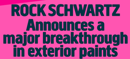 [MyFonts]
[More] ⦿
[MyFonts]
[More] ⦿
|
Steve Tinney
[CuneiformComposite]
|
[More] ⦿
|
Steven Powell
[DVM Publications]
|
[More] ⦿
|
Steven R. Zimmermann
|
Designer of an unnamed labyrinthine typeface in 2013, which was done while studying graphic design at PCAD (Pennsylvania College Of Art and Design). [Google]
[More] ⦿
|
Stu Ohler
|
Graphic designer in Pittsburgh, who is working on display typefaces like Whale tail (2011) and this mini-slabbed headline face (2011). Dribble link. [Google]
[More] ⦿
|
SUBFLUX experiment
[Mickey Rossi]
|
 Mickey Rossi graduated in 1986 from the Philadelphia College of the Arts. He then worked in Maryland and Virginia, such as at AOL in Dulles, VA, and is a creative director in Atlanta, GA since2004.
 He offers these free typefaces under the Subflux label: Alpha Male Modern (1997), AthleticSupporter, BallparkWeiner (connected fifties script), BarBenderBold, BobbiTheHippie, BongoFraktur (in Koch's Neuland style), CargoCrate (stencil), CollegeBoy (athletic lettering), FlandersRideItalic, FlandersRide, Fleetwilly, FlyTrapExtended, Hair Brush, HighlightsCondensed, Helga Broad, Hilda Broad, JimThorpeHigh (octagonal / mechanical), LevelFourteenDruid (medieval), LifestyleCondensed (avant garde), NotANumber, On That Shark (angular), RetroSuperSkinny (Peignotian), SatansMinions, Scrawlly, Scritchy Eye, Zerengetti (African look), ZiggyStandard. Rossi calls himself also "Loveless". Dafont link. Klingspor link. Abstract Fonts link. [Google]
[More] ⦿
|
Sune Matras
|
Digital artist in Philadelphia, PA, and/or New York City, whose web sie is in Denmark. He created the modular geometric typeface Pictobob (2010) and the hand-printed Pops (2013). Dafont link. Behance link. [Google]
[More] ⦿
|
Susan Johnson
|
Susan Johnson, a creative director in Philadelphia, created a custom art deco typeface called ContAversy (2012) for shirts of a Philadelphian clothing company. She studies at Rutgers University. [Google]
[More] ⦿
|
Susan Kare
|
Born in 1954 in Ithaca, NY, Susan designed some of the original bitmap fonts for the original Mac in 1983-1984, including Chicago, New York, Monaco (download), FiveDots, Geneva, Cairo (dingbat font), LosAngeles, Athens and San Francisco (1984, ransom note font), while being a Creative Director at Apple (1982-1985). For Danger Research, she created the bitmap fonts Hamilton 5, Hamilton 6, Waverley 5, Waverley 6, Bryant 7 (2000). Interview with Cybergrrl. Atomic Media sells these pixel fonts of hers: Kare Five Dots (family), Ramona (script pixel font), Harry, Everett, Kare Six Dots (family), Biology (dings), Kare Dingbats, MiniFood, Ned, Sampler. MyFonts catalog. Interview. She explains the choice of names for the original Mac fonts: The first Macintosh font was designed to be a bold system font with no jagged diagonals, and was originally called "Elefont". There were going to be lots of fonts, so we were looking for a set of attractive, related names. Andy Hertzfeld and I had met in high school in suburban Philadelphia, so we started naming the other fonts after stops on the Paoli Local commuter train: Overbrook, Merion, Ardmore, and Rosemont. (Ransom was the only one that broke that convention; it was a font of mismatched letters intended to evoke messages from kidnappers made from cut-out letters). One day Steve Jobs stopped by the software group, as he often did at the end of the day. He frowned as he looked at the font names on a menu. "What are those names?", he asked, and we explained about the Paoli Local. "Well", he said, "cities are OK, but not little cities that nobody's ever heard of. They ought to be WORLD CLASS cities!" So that is how Chicago (Elefont), New York, Geneva, London, San Francisco (ransom note font), Toronto, and Venice (Bill Atkinson's script font) got their names. Kare is also known for the original set of Mac icons. The Apple fonts shown below are outline fonts made by Bigelow & Holmes on commission, based on Susan Kare's original pixel fonts. Susan Kare did not design the outline fonts sold by Apple at MyFonts. [Google]
[MyFonts]
[More] ⦿
|
Susan Young
|
During her studies at Art Institute of Pittsburgh Online, Susan Young created the handcrafted poster typeface Schindler's List (2015), which is based on the titling in the ads for Steven Spielberg's movie. [Google]
[More] ⦿
|
Sydney Schollenberger
|
During her studies at Kutztown University, Topton, PA-based Sydney Schollenberger created the elegant display typeface Composure (2015). [Google]
[More] ⦿
|
Tad Stauffer
|
Pennsylvanian designer (b. 1980) of Hairpiece (2006, curly handwriting). Alternate URL. [Google]
[More] ⦿
|
Tadelus Wastowicz
|
Designer from Sewickley, PA, who created an exaggerated ornamental Lombardic face in 1959. He made a pointed pen font in 1965. [Google]
[More] ⦿
|
Tae Kim
|
Philadelphia, PA-based designer of a Trajan caps typeface in 2015. [Google]
[More] ⦿
|
Tanner Panetta
|
During his studies at Tyler School of Art in Philadelphia, PA, Tanner Panetta designed the prismatic multiline typeface Apollo 11 (2016). Behance link. [Google]
[More] ⦿
|
Tanner Scipio
|
Graphic designer in Orlando, FL, whon is from Tannersville, PA. He created the alchemic typeface Fornix (2012). [Google]
[More] ⦿
|
Taylor Bono
|
During her arts studies in Leechburg, PA, Taylor Bono designed Pineapple Font (2017). [Google]
[More] ⦿
|
Taylor Schmidt
|
 During his studies in Harrisburg, PA, Taylor Schmidt created Breaking Bad Icons (2013). [Google]
[More] ⦿
During his studies in Harrisburg, PA, Taylor Schmidt created Breaking Bad Icons (2013). [Google]
[More] ⦿
|
Ted Czyzewski
|
 Pennsylvanian creator of an unnamed didone all caps face (2011). No downloads. [Google]
[More] ⦿
Pennsylvanian creator of an unnamed didone all caps face (2011). No downloads. [Google]
[More] ⦿
|
Ted Slesinski
|
Philadelphia-based creator (b. 1985) of the free icon fonts Social Font Face (2013) and Just Vector (2013). Fontspace link. Dafont link. [Google]
[More] ⦿
|
The Creative Agency
|
Studio in Wilkes-Barre, PA. One of their specialties is type design. These typefaces were announced in 2013 (and will soon be available for purchase): Boardwalk typeface (a condensed slab inspired by 1950's boardwalk signage), Full Service (a fashionable sans with oodles of contrast), Milan Sans (another fashionable sans, almost in the style of Peignot), Propaganda (based on WWII posters). Behance link. [Google]
[More] ⦿
|
The Design Cubicle
[Brian Hoff]
|
Typography and design blog and tips by Brian Hoff (Philadelphia, PA), started in 2008. Topics discussed include beautiful ampersands, and typical typographical mistakes. [Google]
[More] ⦿
|
The Dynasty
[Ryan Degnan]
|
Ryan Degnan from Pennsylvania posts his shareware creations here: for now, just the grunge font Regime. Others planned as well. [Google]
[More] ⦿
|
The Pennsylvania Sumerian Dictionary
|
Developers with Bitstream of this family of fonts in 2003: Lynn-Sans-Bold, Lynn-Sans-Bold-Italic, Lynn-Sans-Italic, Lynn-Sans, Lynn-Sans-Mono-Bold, Lynn-Sans-Mono-Bold-Italic, Lynn-Sans-Mono-Italic, Lynn-Sans-Mono, Lynn-Serif-Bold, Lynn-Serif-Bold-Italic, Lynn-Serif-Italic, Lynn-Serif. Apparently, these are all based on Bitstream Vera. [Google]
[More] ⦿
|
The Red Rocket Rebellion
[Jay Klomp]
|
 Easton, PA-based creator of the stackable retro typeface Henrickson (2014)---recreating the ambiance of the gas stations in a Route 66 road movie. Schoolmarm (2014) is a hand-drawn irregular slab serif typeface. Elixir No 1 (2014) is a spurred Victorian typeface. Creative Market link. [Google]
[More] ⦿
Easton, PA-based creator of the stackable retro typeface Henrickson (2014)---recreating the ambiance of the gas stations in a Route 66 road movie. Schoolmarm (2014) is a hand-drawn irregular slab serif typeface. Elixir No 1 (2014) is a spurred Victorian typeface. Creative Market link. [Google]
[More] ⦿
|
Theodore Wagner
|
Philadelphia, PA-based designer for Mather Manufacturing Co of a blackletter typeface in 1897. [Google]
[More] ⦿
|
Theresa Quedenfeld
|
Lancaster, PA-based designer of Holiday Fat Face (2017). [Google]
[More] ⦿
|
Thomas MacKellar
|
Hymn writer and typefounder (b. New York City, 1812, d. Philadelphia, 1889). At age 14, MacKellar entered the printing company of Harper Brothers. In 1833, he moved to Philadelphia, Pennsylvania, and joined the type foundry of Johnson&Smiths as a proofreader. He subsequently became a foreman, then a partner, in the firm, which from 1860 was known as MacKellar, Smiths and Jordan. [Google]
[More] ⦿
|
Thomas MacKellar
[MacKellar, Smiths and Jordan]
|
[MyFonts]
[More] ⦿
|
Thomas Wood Stevens
|
 Early 20th century designer of letters, who was associated with the Carnegie Institute of Technology, Pittsburgh. Author of Lettering (1916, The Prang Company, New York).
 Alphabets from his 1916 book include Art Nouveau Capitals, Italic Capitals, Italic Lowercase, Modern Script Italics, Modern German Italic Capitals, Modern Round Gothic, Uncial (based on a 14th century manuscript), Venetian Modern Capitals, Roman Lowercase, Modern German. PDF file of his 1916 book. Digital remakes include Wood Stevens (2012, Intellecta). In 2012 and 2013, Dick Pape digitized many of the typefaces discussed in Lettering (1916). They are freely downloadable from this site. The typefaces in Dick's collection are attributed as follows: - No artist: TWS Brush Caps 31, TWS Capitals from Coins 15,
- Harry Lawrence Gage: TWS Heavy Capitals 49, TWS Italian Gothic Caps 80, TWS Renaissance Alphabet 39, TWS Robinson Caps 23, TWS Roman Caps 13, TWS Slab Capitals 22, TWS The Japanese 32 [note: see also Yoshi Toshi, 2003, by Da ABF Mafia, and Yoshitoshi, 2003, by David Nalle].
- Norman P. Hall: TWS Heavy Modern 30.
- Oswald Cooper: TWS Long Ascenders 36.
- Ned Hadley: TWS Modern Caps 24, TWS Modern French 25.
- Helen E. Hartford: TWS Modern German Capitals 28.
- Charles H. Barnard: TWS Modern Roman 05.
- F. G. Cooper: TWS Modern Roman Bold 37.
- William A. Dwiggins: TWS Modern Roman Caps 32, TWS Variation on Georgian.
- Guido Rosa: TWS Outline Caps 21.
- George W. Koch: TWS Roman Wide Pen 33.
Commercial revivals include he slab serif Nouveau Lettering JNL (2019, Jeff Levine). [Google]
[More] ⦿
|
Tilda Rose Sladek
|
Philadelphia-based Illustrator, originally from Finland. In 2017, she designed the colorful decorative caps alphabets Prototype and Shoe. [Google]
[More] ⦿
|
Tim Chrepta
|
 Designer of the grotesque fonts Orbit Text and Orbit Display (2013). This was a special project for Orbit, a network company. New York City and Ledgewood, New Jersey-based graphic designer who graduated from the University of the Arts, Philadelphia.
 Under the tutelage of Andy Clymer (HFJ), he created an unnamed revival font in 2013. Behance link. [Google]
[More] ⦿
|
Tim Hastings
[Mind Killer Ink (MKI)]
|
[More] ⦿
|
Tne Other Anonymous
|
Pittsburgh-based creator (b. 1980) of the dingbat fonts Fnord-Hodge and Fnord-Podge (2006). On another site, he claims to be born in 1973 and to live in Fife, Scotland. Home page. Names used include Toa, Synaptyx and Nurbldoff. [Google]
[More] ⦿
|
Tolbert Lanston
[Lanston Monotype Machine Company]
|
[MyFonts]
[More] ⦿
|
Tony Mayers
[ABC Types Collection (was: ABC Types, Absolutetype)]
|
[MyFonts]
[More] ⦿
|
Tony Thomas
[Medialoot]
|
[More] ⦿
|
Torriya Hershey
|
Manheim, PA-based designer of Fishy Typeface (2013). Behance link. [Google]
[More] ⦿
|
Trailhead Design (was: Graphic Monkee, or: We Graphics)
[Nathan Brown]
|
 Free fonts by Nathan Brown (Texas; was Philadelphia, PA), mostly handcrafted, grungy or sketched: WG-Analog, WG-Angeles, WG-Cascade, WG-Donovan-Title, WG-Dunste, WG-Fortune, Freestone, WG-Gilded-Hand, WG-Goodbye, WG-Grux-Regular, WG-Grux, WG-Halloh, WG-Handy-Icons, WG-Hudson-Slab, WG-Legacy-Edition, WG-Marshall, WG-Of-Concrete, WG-OffSet-Title, WG-Phased, WG-QuickHand, WG-Scriballistic, WG-Semplice-Regular, WG-Semplice, WG-Sequence, WG-Sideshow, WG-SilverLeaf-Regular, WG-SilverLeaf, WG-Skratched, WG-Statik, WG-Underneath, WG-Watchtower, WG-Whitley-Scribble, WG-Wild-Spaces. The We Graphics main page also contains commercial fonts by Nathan Brown, who also runs Graphic Monkee out of Austin, TX.
 Commercial fonts from 2015: North Western (nature trail signage font set, + dingbats). Commercial typefaces from 2016: Varsity Scratched, Time To Run (inky grungy style), Alamosa (script). In 2016, he also designed Little Fox, Junior High Blocky Notebook Font and Trailhead. Typefaces from 2017: Tangerine Outlined (blackboard bold), Goliad, Runaway. Typefaces from 2018: Spindrift (signature font). Graphic Monkee home page. Creative Market link. Behance link. Creative Market link for Trailhead Design. [Google]
[More] ⦿
|
Tricia Treacy
|
Tricia Treacy has been running her own letterpress design studio, Pointed Press, creating custom book and print work for commercial clients, international artists, designers and writers since 2000. Using a combination of digital and analog methods, she collaborates on conceptual projects with a range of artists and designers. She has taught graphic design, letterpress and book arts at the University of Pennsylvania, the University of Delaware and the Mason Gross School of the Arts. Tricia is currently an Assistant Professor of Design at Appalachian State University in North Carolina. Speaker at ATypI 2012 Hong Kong: Vista Sans wood type project. [Google]
[More] ⦿
|
TypeCon 2020
|
TypeCon 2020 was going to take place from August 12 until August 16, 2020, at the Marriott Philadelphia. Because of the corona virus,it has been canceled. TypeCon 2021 wil take place in Philadelphia from August 16 until August 21. [Google]
[More] ⦿
|
TypeCon 2021
|
TypeCon 2021 was originally scheduled to take place in Philadelphia from August 19th until August 22nd. However, it was decided to move to a virtual conference, to be held from the 21st until the 24th of October 2021. The program this year centers around type history and type education. Speakers include Potch Auacherdkul, Jan Ballard, John Berry, Kate Brangan, Anne Brown, Noah Bryant, Yvonne Cao, Laura Chessin, Albert Choi, Kristen Coogan, Andrew Davies, John Downer, Hannes Famira, Setareh Ghoreishi, Erica Holeman, Richard Hunt, Taekyeom Lee, Ivy Yixue Li, Ian Lynam, Dermot Mac Cormack, Charmaine Martinez, Darren McManus, Frida Medrano, Jess Meoni, Aoife Mooney, Meri Page, Jason Pamental, Ashley Pigford, Tiffany Prater, Mehrdad Sedaghat Baghbani, Renée Seward, Christopher Sleboda, Natalie Snodgrass, Perrin Stamatis, and Alex Trochut (keynote speaker). The main program. Despite many big name sponsors like Adobe and generous small foundries like Mark Simonson, and despite the virtual nature of the meeting, there still is a conference fee. We also note the absence of Monotype in the list of sponsors. [Google]
[More] ⦿
|
Typefaces available from US foundries
|
List of all (metal) typefaces available for sale from these six US typefounders: - M & H Type (Mackenzie & Harris), 1802 Hays Street, San Francisco, CA 94129
- Swamp Press, 15 Warwick Road, Northfield, MA 01360
- Barco Type (F & S Type Founders Inc.), 237 S. Evergreen, Bensenville, IL 60106
- Quaker City Type Foundry, 2019 Horseshoe Pike, Honey Brook, PA 19344
- Michael and Winifred Bixler, Box 820, Skaneateles, NY 13153
- Harold Berliner, Printer, P.O. Box 6, Nevada City, CA 95959
[Google]
[More] ⦿
|
Tyson Auchter
|
Ty Auchter (b. 1983) lives in Pennsylvania. At Devian Tart, he designed the pixel font Stitches (2001). See also here. [Google]
[More] ⦿
|
Van Fos Type foundry
|
 Type foundry located in Philadelphia, PA, which published Specimen Booklet of handy Low Priced Type Fonts. [Google]
[More] ⦿
Type foundry located in Philadelphia, PA, which published Specimen Booklet of handy Low Priced Type Fonts. [Google]
[More] ⦿
|
Victoria Cumer
|
While studying at Point Park University in Pittsburgh, Victoria Cumer designed the hand-printed typeface Incense Pepermints Two (2013). Fontspace link. [Google]
[More] ⦿
|
Victoria Jeffries
|
During her studies at Philadelphia University, Victoria Jeffries designed the display typeface Bessemer 200 (2014). She writes: 2013 marked the 200th birthday of English inventor Henry Bessemer. The American Iron & Steel Institute and the National Iron & Steel Heritage Museum celebrated Bessemer’s contributions to 19th century steel production with a display typeface and poster inspired by his life. Bessemer 200 comes on two weights, solid and outline. [Google]
[More] ⦿
|
Victoria Williams
|
During her studies at Philadelphia University, Chalfont, PA-based Victoria Williams created the display typeface Balancim (2014). [Google]
[More] ⦿
|
Vigilante Typeface Corporation (was: WolfBainX)
[Larry E. Yerkes]
|
Over 100 original fonts by the prolific Allentown, East Pennsylvania-based tattoo artist Larry E. Yerkes, aka WolfBainX, b. 1969. His work include many comic book typefaces, a few grunge fonts, several macho fonts, and some smudged typewriter fonts. Many fonts are in a style one could call tattoo fonts. Several fonts come in 4 to 8 weights. His fonts: VTC#9pt1of, VTCAllWashedUp, VTCAnglika, VTCAngoraChik, VTCAntiqueFizz, VTCBadDataTrip, VTCBadDrip, VTCBadHangover, VTCBadLuck, VTCBadNausea, VTCBadPaint, VTCBadPlating, VTCBadVision.ttf VTCBadWhipit, VTCBelialsBlade3d, VTCBoseephus, VTCCoppaKroma, VTCDizplaced, VTCEmbrace, VTCFunkinFrat, VTCFuzzyPunkySlippers, VTCGoblinHand, VTCJezzabelBimbo, VTCJoeleneHand, VTC Komika Headliner, VTCKomixationRegular, VTCKrinkle-Kut, VTCLettererPro, VTCLiquorCrystalDisplay, VTCLo-Down, VTCOldAsCrap, VTCOptika, VTCPizzOff, VTCPunkettePumps, VTCScreamItLoud, VTCSeeJoBend, VTCSeeindubbledointriple, VTCSikleCell, VTCStressedHand, VTCSubwaySlam, VTCSundaykomix, VTCSuperMarketSale, VTCSwitchbladeRomance, VTCTribal, VTCVictorianLint, VTCeltiaKeys, VTCeltiaSpirals, VTVBadJudgement, WBXKomiX, the comic book fonts GrannyT (3 weights, smudged typewriter), Lucidite (grunge family), Nero, Komik, Domin8, the grunge fonts Flack and ListenJenn, VTCNightOfTheDeadCorruptCaps, VTCNightOfTheDrippyBentCaps, VTCNightOfTheDrippyDead, VTCNightOfTheDrippyDeadCaps, VTCNightOfTheDrippyDeadFatCaps, VTCNightOfTheDrippyDeadOuttie, VTCNightOfTheDrippyLowCaps, VTCNightOfTheOozieDeadCaps, VTCNightOfTheStretchedDead, VTCNightOfTheWackedDead, Scar, Tribal, and Scrawl. Windows TrueType. Vigilante has joined forces with Apostrophic Labs to make Tribal (2001) and Komika (2001), a 50-font family for comics. In 2008, he published VTC-OldeSchoolTattoo-One. In 2009, that was followed by VTC-Bad Tattoo Hand One, VTC Nue Tattoo Script (calligraphic), VTCTattooScriptTwo (2013), and VTC-Roughed Up. Creations in 2010: VTC-TribalThreeFree, VTC Bad English, VTC Sumo Slasher, VTC KomikSkans, VTC Freehand Tattoo One, VTC Roughed Up, VTC Bad Tattoo Hand One, VTC-BadEnglischOne, VTC-BadTattooHandOne, VTC-FreehandTattooOne, VTC-KomikSkans-One, VTC-KomikSkans-Two, VTC-KomikaHeadLinerChewdFat, VTC-KomikaHeadLinerChewdUp, VTC-KomikaHeadLinerOne-Bold, VTC-KomikaHeadLinerOne-BoldItalic, VTC-KomikaHeadLinerTwo-Bold, VTC-KomikaHeadLinerTwo-Outline, VTC-KomikaHeadLinerTwo-Shadow, VTC-KomikaHeadLinerTwo-Wide, Komika Krak, VTC-SumiSlasherOne-Italic, VTC-SumiSlasherOne-SmallCaps, VTC-SumiSlasherOne, VTC-SumiSlasherOneSkinned, VTC-SumiSlasherOneSkinnedRaw, VTC-TribalThreeFree. Typefaces from 2013: VTC Garage Sale Axis, VTC Garage Sale (+Outlined), VTC Tattoo Script Three, VTC Karnival Fat (cartoon font). Catalog. Klingspor link. Dafont link. MySpace link. Fontspace link. Abstractfonts link. [Google]
[More] ⦿
|
W. Jamison Anton
|
 During his studies at Philadelphia University, W. Jamison Anton designed the great straight-edged poster typeface Chlorine (2014). [Google]
[More] ⦿
During his studies at Philadelphia University, W. Jamison Anton designed the great straight-edged poster typeface Chlorine (2014). [Google]
[More] ⦿
|
Walter Wray
|
Born in Panama City in 1951, Walter Wray now lives in Pennsylvania. He created the foliated Victorian display typeface Midsummer (2012). [Google]
[More] ⦿
|
Wayne J. Stettler
|
Son of a signpainter, b. 1934, Allentown, PA, d. 2011 Blue Bell, PA. He studied advertising design at the Philadelphia College of Art. Creator of photype typefaces such as Neil Bold (1966, VGC), which was the source of inspiration for Alejandro Paul's Mobley Sans (Umbrella Type), Neil Bold (2010, Patrick Griffin, Canada Type), Nick Curtis's Elephunky NF (2011), and Jas Rewkiewicz's Armstrong (B&P Foundry). He also created Stettler (1965, VGC). Neil Bold also had an outline version called Open. Patrick Griffin explains: That typeface was very popular with jazz and blues labels. Photo-Lettering knocked it off within 2 months of its release by VGC. This was Wayne Stettler last typeface ever; some say it's because he saw it knocked off and just gave up on type altogether. Also some people say the only reason it won in that type design contest was to actually try to convince Stettler to get back into type design. It never happened, he went into garment design and manufacturing shortly after that contest. Klingspor link. [Google]
[MyFonts]
[More] ⦿
|
Webfoot
[Charles Voegtle]
|
Charles Voegtle (Webfoot), a web designer from Philadelphia, PA, created the art nouveau dingbat typeface OldArtWF (2004), WFHandFontsWithdots (2004), and HandFontWithDotsItalicByWF (2004). [Google]
[More] ⦿
|
Westcott & Thomson, Inc. for Fotosetter or Fototronic composition
|
Photo-type era company in Philadelphia located on 1027 Arch Street. I located an image of their typefaces that are lookalikes/i> (by their own admission) of famous typefaces: Biretta is Bembo, Elegane is Palatino, Galaxy is Uniers, Laurel is Caledonia, Medallion is Melior, Plantina is Plantin, Vega is Helvetica, and Zenith is Optima. [Google]
[More] ⦿
|
William Dana Orcutt
|
Book designer, typographer and author (b. 1870, West Lebanon, d. 1953, Boston). Designer of French Round Face&Italic, Humanistic, Laurentian, Suburban French&Italic, and Verona. McGrew comments on each face: - Suburban French is one of Monotype's first independent recreations of typefaces from classic sources abroad. It was cut about 1911 at the suggestion of J. Horace MacFarland, prominent Pennsylvania printer, and was adapted to Monotype under the supervision of MacFarland and William Dana Orcutt, a well known typographer and book designer in New England. Its source is said to have been a Didot oldstyle first cut about 1804, but the Monotype typeface was first introduced under the name of Bodoni Roman. The double serifs at the top of lowercase vertical strokes are a distinguishing feature. Compare French Round Face.
- Verona is ATF's adaptation about 1951 of Bologna, which had been cut by Stephenson Blake in England in 1948. It is said to have been cut from Stephenson Blake's drawings, but lining figures were drawn to replace the hanging figures which Stephenson Blake had featured. The name was changed to avoid having disrespectful printers call it "baloney," yet retaining an Italian connotation. At the time ATF did not realize that Stephenson Blake had in turn adapted the design from an earlier ATF face, Humanistic (q.v.), drawn by William Dana Orcutt in 1904. With or without its later modifications, which are minor, this typeface retains more of the appearance of hand-lettering than almost any other cut in metal, and composes into a beautiful page with properly close spacing. Compare Freehand, Motto, Heritage, Thompson Quillscript. Incidentally, when ATF took Verona as a new name for Stephenson Blake's Bologna, they also overlooked the fact that Stephenson Blake uses the name Verona for their copy of BB&S-ATF's Munder Venezian.
- French Round Face, originally called Didot Roman or simply Modern, was one of the first revivals of the typefaces cut by Firmin Didot in France about 1784. This was cut for Monotype in 1910, under the direction of J. Horace MacFarland and William Dana Orcutt. The italic is unusual in that some lowercase letters have serifs like the roman. No. 16 on Linotype and Intertype is similar but heavier. Compare Suburban French.
- Humanistic was designed by William Dana Orcutt and privately cast by ATF in 1904 for the University Press, Cambridge, Massachusetts. It is a careful rendering into type of the round humanist writing of the Renaissance period, based in particular on the 1485 manuscript of Antonio Sinibaldi's Virgil in the Laurentian Library at Florence, Italy. This is considered by some to be hand-lettering in its most beautiful form, and occurred after the development of roman types as we know them. In 1940 this type was adapted to Monotype keyboard composition, under the direction of Orcutt and Sol Hess, the 21-point size being used for a large edition of Science and Health. The Monotype cutting, known as Laurentian closely follows the foundry version, including some but not all of the original alternate characters. A few years later the design was modified by Stephenson Blake in England, and issued as Bologna; this in turn was adapted by ATF as Verona (q.v.).
Note: Humanistic/Verona were digitally extended in 2006 by Ray Larabie as Mikadan (Typodermic). Klingspor link. [Google]
[More] ⦿
|
William E. Fink
|
Designer and art director, b. 1905, Philadelphia, who worked as art director for The Ladies' Home Journal. He created the skyline typeface Greenwich (1940, Ludlow). [Google]
[More] ⦿
|
William K. McChesney
|
 Pennsylvanian designer of fonts at Garagefonts, including the Livery family (2000) and Spring Creek (2002). At T-26, he created Violette (2007), a condensed and severe Spanish inquisition style family, Nexus (2007, a clean sans family), Yipe (2008, T-26, architectural lettering), Nox (2007, a basic geometric sans family), the Western saloon font Peyote Slab Serif (2007), McChesney (2008, heavy display sans), Yipe (2008, flared; comic book style) and the Tuscany-eared Teaberry (2007).
 Klingspor link. FontShop link. View William McChesney's typefaces. [Google]
[MyFonts]
[More] ⦿
|
William Stremic
[Bill Blakefield]
|
William Stremic may also be known as Bill Blakefield. Designer of Airport Black. The reason for that uncertainty about the name is this paragraph written by mac McGrew: Most of this series [Airport Gothic] is the first American copy of Futura, which originated in Germany in 1927, designed by Paul Renner for Bauer. One source says it was cut from original Futura drawings, smuggled out of that country, but it seems more likely that matrices were made by electrotyping the imported type. An extrabold weight, Airport Black, was cut by Baltimore about 1943; information on this cutting is scarce and contradictory- one account says it was designed by Bill Stremic or Bill Blakefield, another that it was designed by Carl Hupie (or Hooper), and cut by Herman Schnoor. There is also Airport Black Condensed Title and Airport Broad. The latter is a modification of Airport Black, cut 50 percent wider on the pantagraph by Herman Schnoor. Baltimore later cast some of its Airport series from Monotype Twentieth Century matrices, and in a few cases listed both series. Airport Relief, Baltimore 299, is English Monotype Gill Sans Cameo Ruled, while Airport Tourist, Baltimore 602, is Futura Display, cast from electrotype mats of the German foundry type. [Google]
[More] ⦿
|
William T. Geissinger
|
Pittsburgh, PA-based designer of an art nouveau typeface in 1917. [Google]
[More] ⦿
|
Wood Type Revival
[Matt Braun]
|
 Foundry specializing in digital versions of old wood type. Set up in 2011 by Matt Griffin, all font licenses refer to Bearded, which has offices in Pittsburgh, Pennsylvania and Montpelier, Vermont. Matt Griffin is a designer and co-founder of Bearded, and teaches in the School of Design at Carnegie Mellon University. He also has a great love for letterpress printing, which he acquired while attending Indiana University in Bloomington, Indiana, where he received a BFA in Graphic Design. Bearded writes: Matt Braun and Matt Griffin wanted to collect lost and forgotten old wood type from the 1800s and revive those typefaces as digital fonts for modern designers. Matt Braun is a senior designer at Bearded and letterpress printer. They first operated Rare Letterpress Wood Type as a kickstarter. After some time, they started the foundry Wood Type Revival.
 Their typefaces include - Concave Tuscan (2015). Concave Tuscan was first shown as wood type under the name Gothic Tuscan by William H. Page in James Conner's Sons Typographic Messenger (1866). Almost all the major manufacturers of the 19th century offered a version of Gothic Tuscan.
- Cosmopolitan (2016).
- Delittle Chromatic (2016). DeLittle Chromatic was issued by DeLittle of York around the turn of the century under the name No. 56/54.
- WTR Fat Boy (2011). Fatboy is derived from a widespread (no pun intended) typeface of the 19th century, commonly known as Antique Extended. It was first seen in print as wood type in 1838 in George Nesbitt's First Premium Wood Types Cut by Machinery.
- WTR French Clarendon Ornamented (2011). The original design for French Clarendon Ornamented first appeared in print in the catalogs of the type manufacturer Young&Morgans (who was later purchased by Morgans&Wilcox Mfg Co) between 1876-1880. M&W was later purchased by Hamilton Mfg Co in 1897. Hamilton then offered this typeface under the name No 3026.
- French Octagon (2011). French Octagon was first shown by Morgans & Wilcox Manufacturing Co. in their 1884 Condensed Specimen Book of Wood Type.
- Grecian Light Face (2016). This revives Light Face Grecian by David Knox & Co. in 1858.
- WTR Gothic Open Shaded (2011). Gothic Open Shaded was first seen in George Nesbitt's First Premium Wood Types, Cut by Machinery (1838). This cut of Gothic Open Shaded most closely matches a design first cut by Young&Morgans between 1876-1880. Once Morgans&Wilcox was acquired by Hamilton Manufacturing Co. (1897), they listed the typeface as No. 3238.
- WTR Gothic Outline (2016).
- WTR Roycroft (2011). The arts and crafts typeface Roycroft was originally created by Miller & Richard under the name Teutonic and is shown in their 1909 catalog. It is a hand-carved typeface.
- Planned is Grecian Light Face.
Creative Market link. [Google]
[More] ⦿
|
Zach Manbeck
|
During his studies at the University of the Arts in Philadelphia, PA, Zach Manbeck designed a beatnik alphabet called Krazy Kraft Lady (2016). Behance link. [Google]
[More] ⦿
|
Zachariah Nelson
[I Can Be Your Type]
|
[MyFonts]
[More] ⦿
|
Zachary Nisen
|
Hatboro, PA-based designer of a few typefaces in 2017, including a dot matrix typeface. [Google]
[More] ⦿
|
Zebra Type
[A. J. Sedlak]
|
From North Versailles, PA, A.J. Sedlak's free fonts include Spiny, superpalazzo and Diade. [Google]
[More] ⦿
|
Zhuoshi Xie
|
Zhuoshi Xie (Pittsburgh, PA) created Labels Alphabet in 2013. I do not think that this a real typeface, as she explains: Using file labels as the medium, Zachary Bergeron and I created an optically illusional alphabet. Behance link. [Google]
[More] ⦿
|
ZIGZAG.NET (was Urban Design Inc)
[Mark Norris]
|
ZIGZAG.NET is a Philadelphia-based graphic design and web development company. Free fonts made by Mark Norris: Markie Bold, Strai, Funk, Thinas Thin. They also make logos and design brochures and such. PC and Mac, type 1 and truetype. [Google]
[More] ⦿
|
Zuzana Licko
[Emigre]
|
 [MyFonts]
[More] ⦿
[MyFonts]
[More] ⦿
|

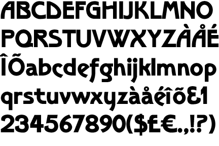
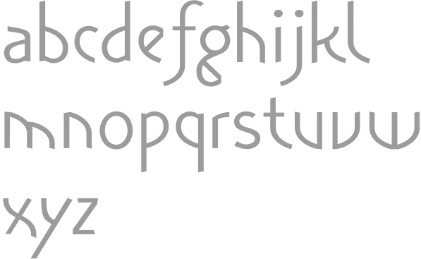
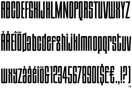
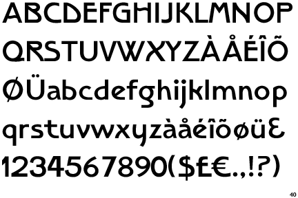
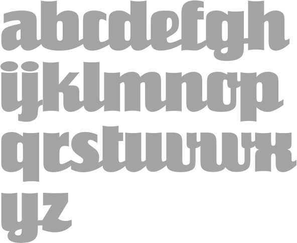
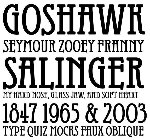
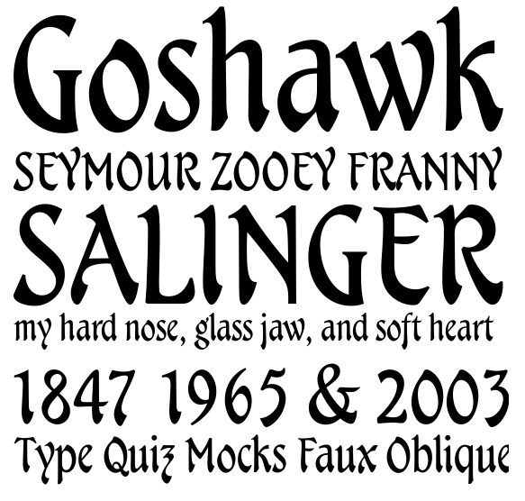
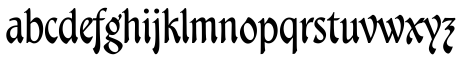
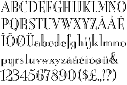
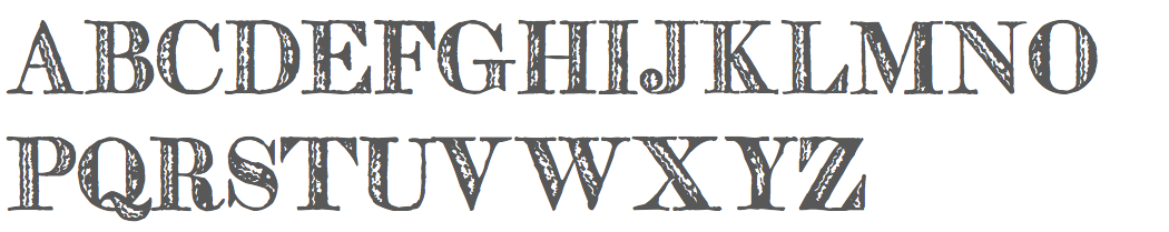
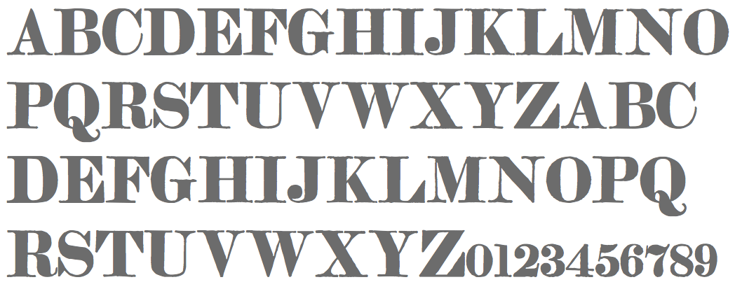
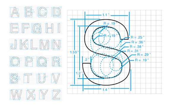
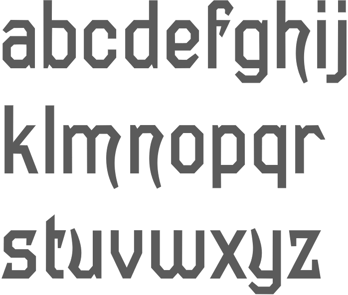
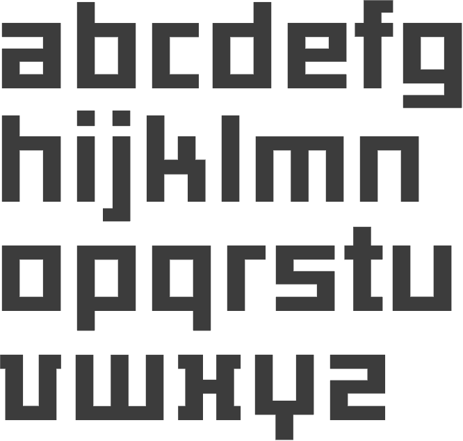
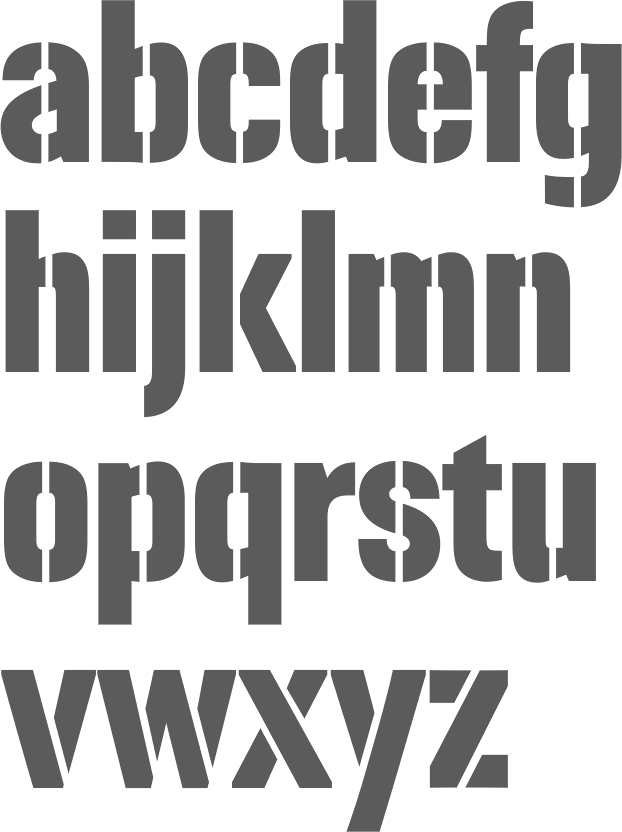
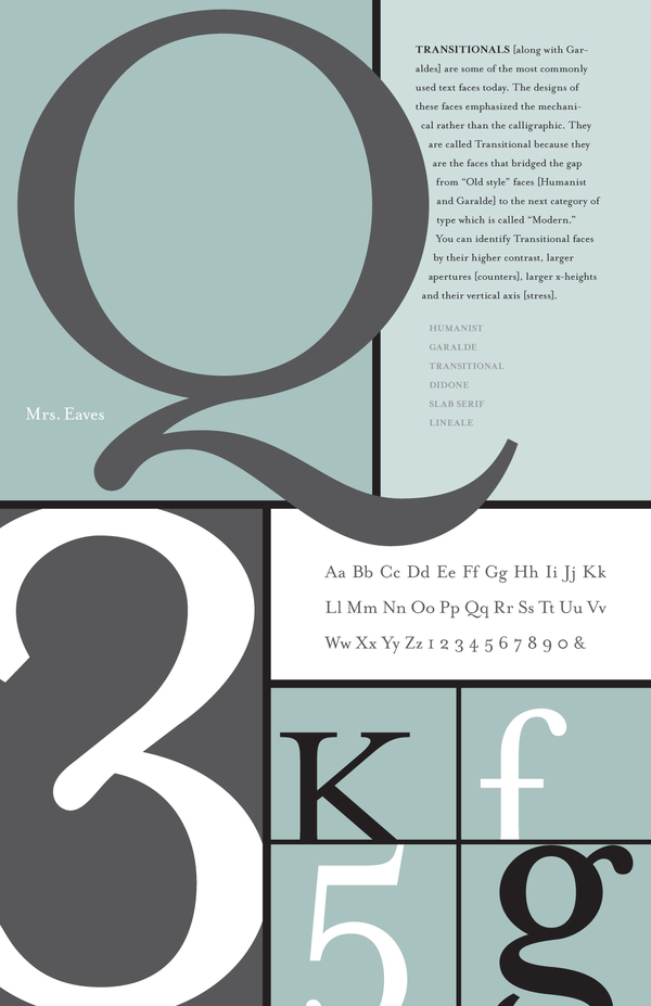
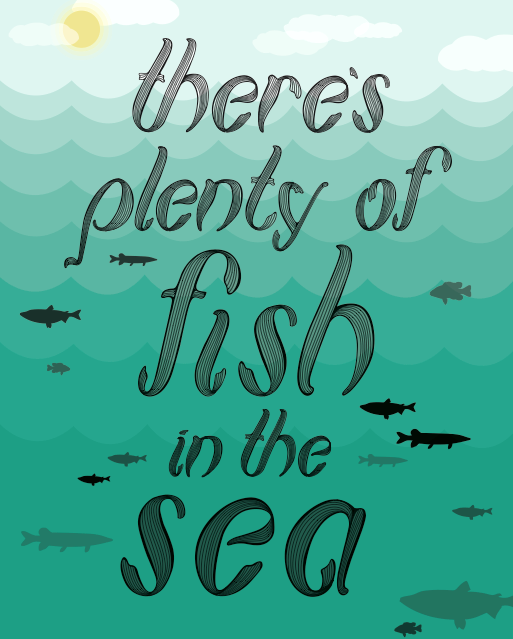
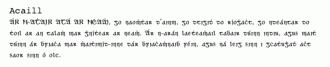
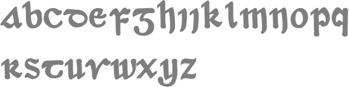
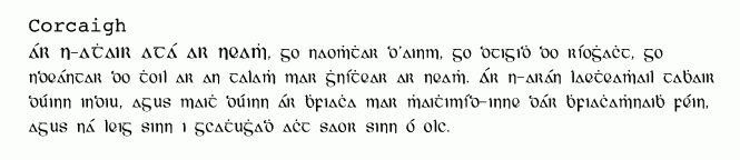
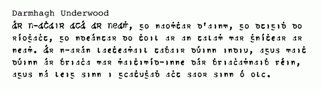
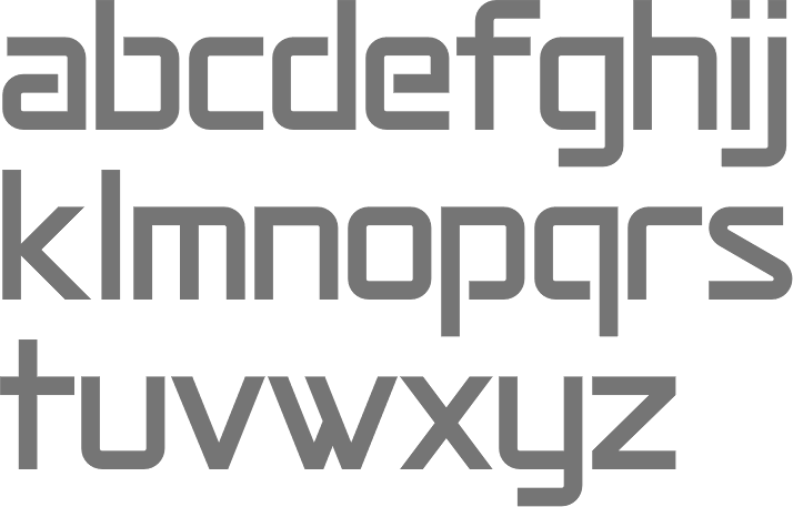
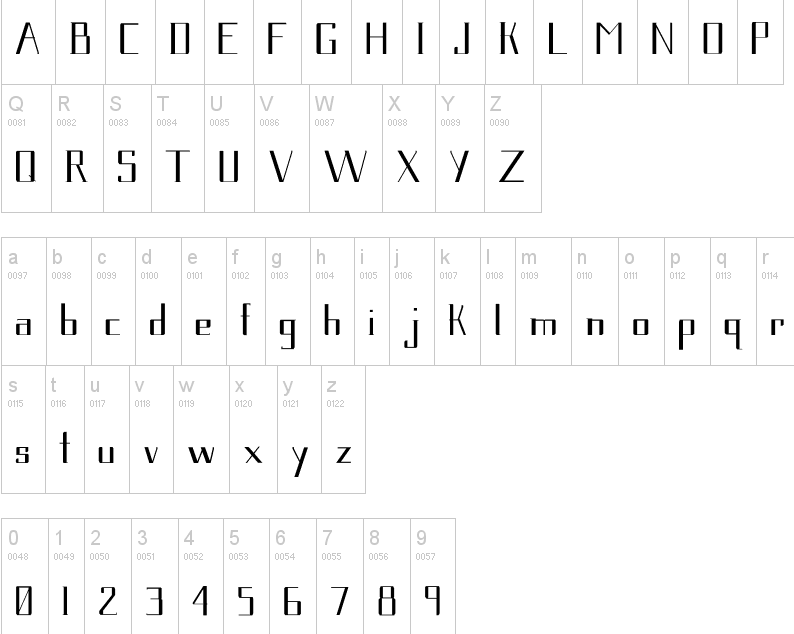
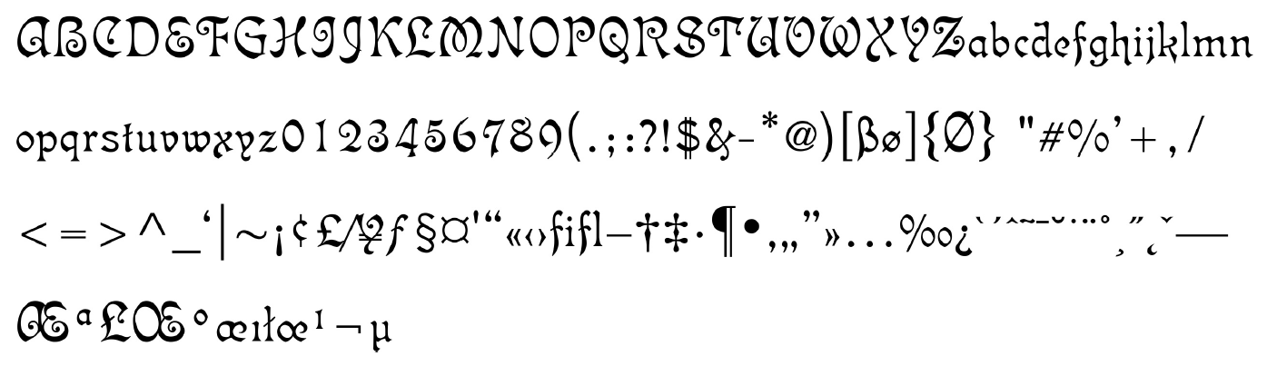
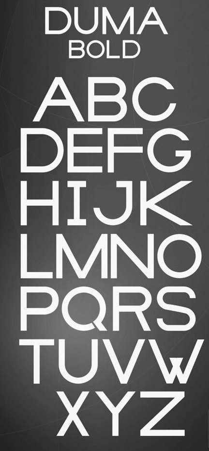
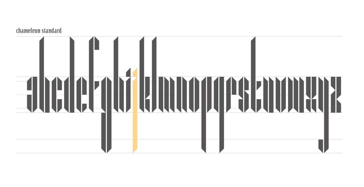
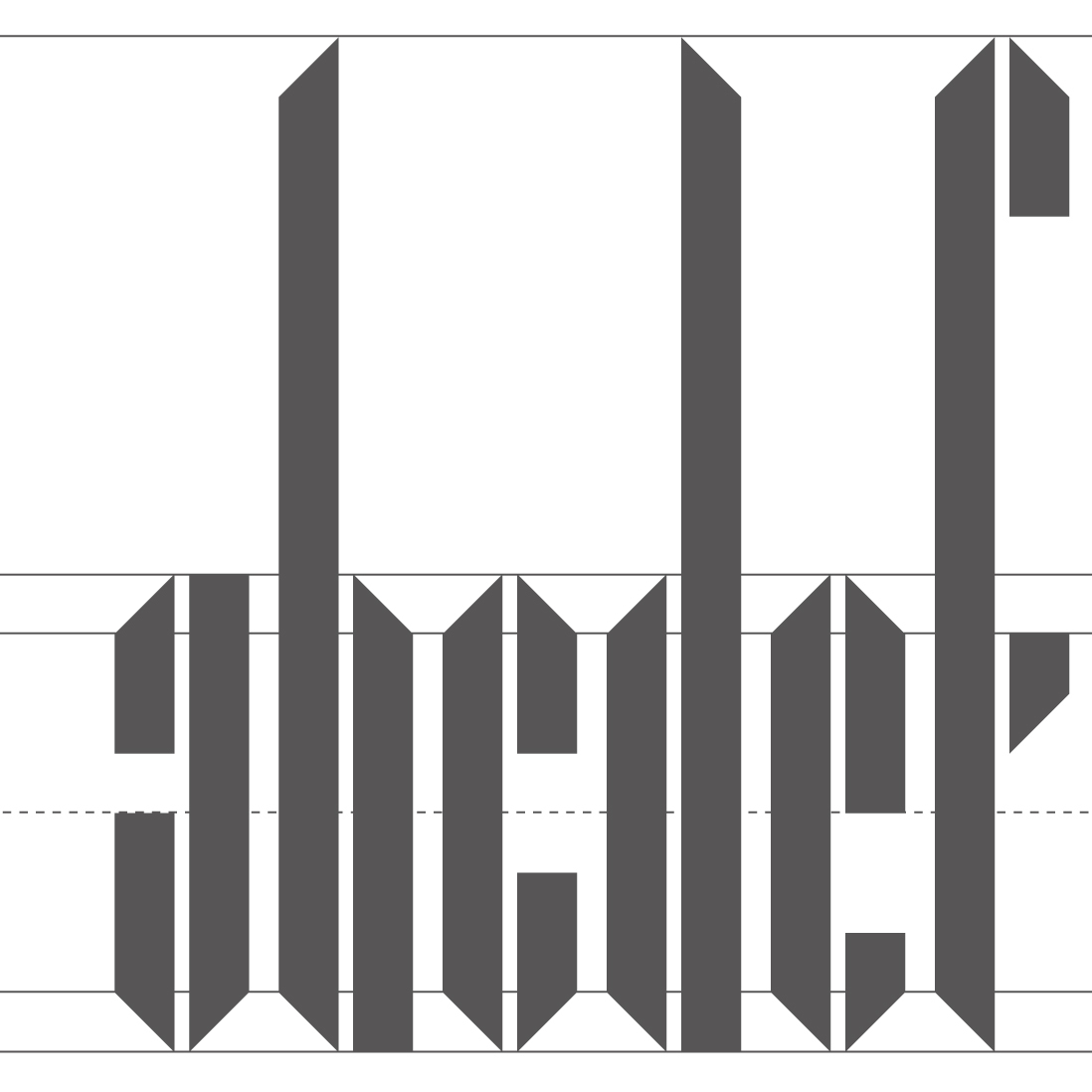
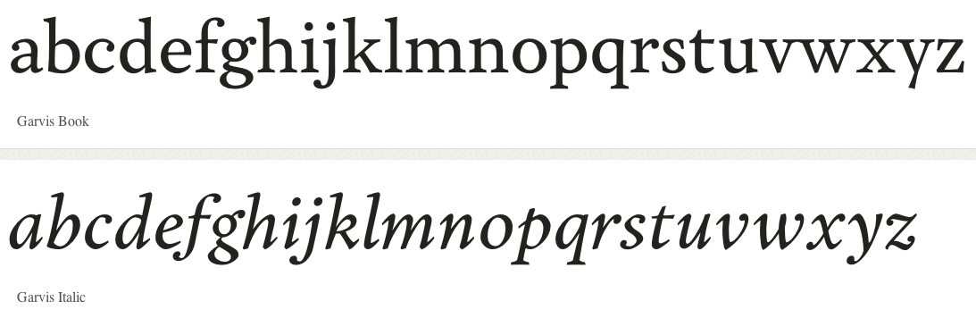
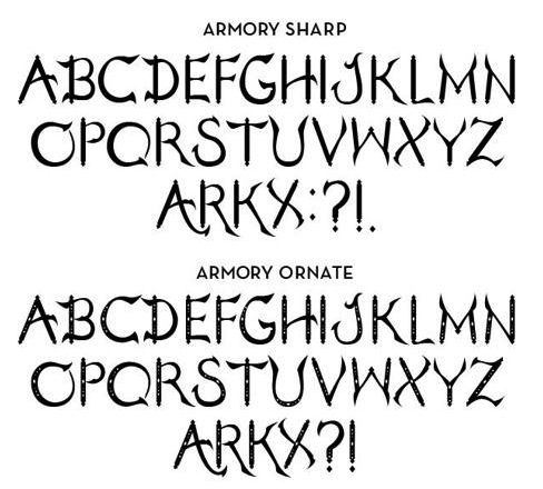
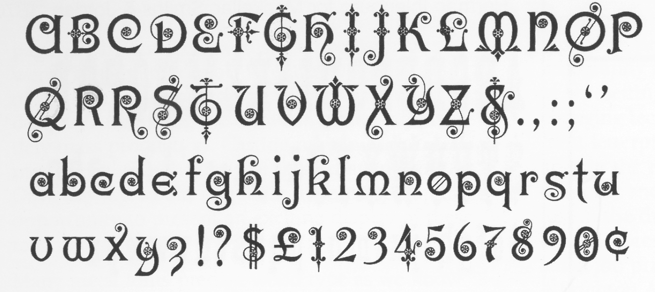
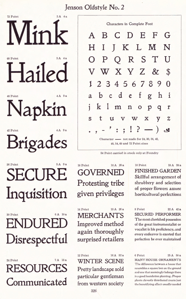
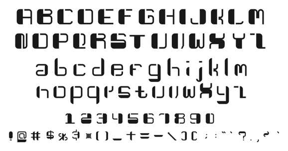
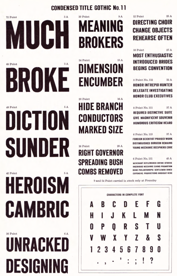
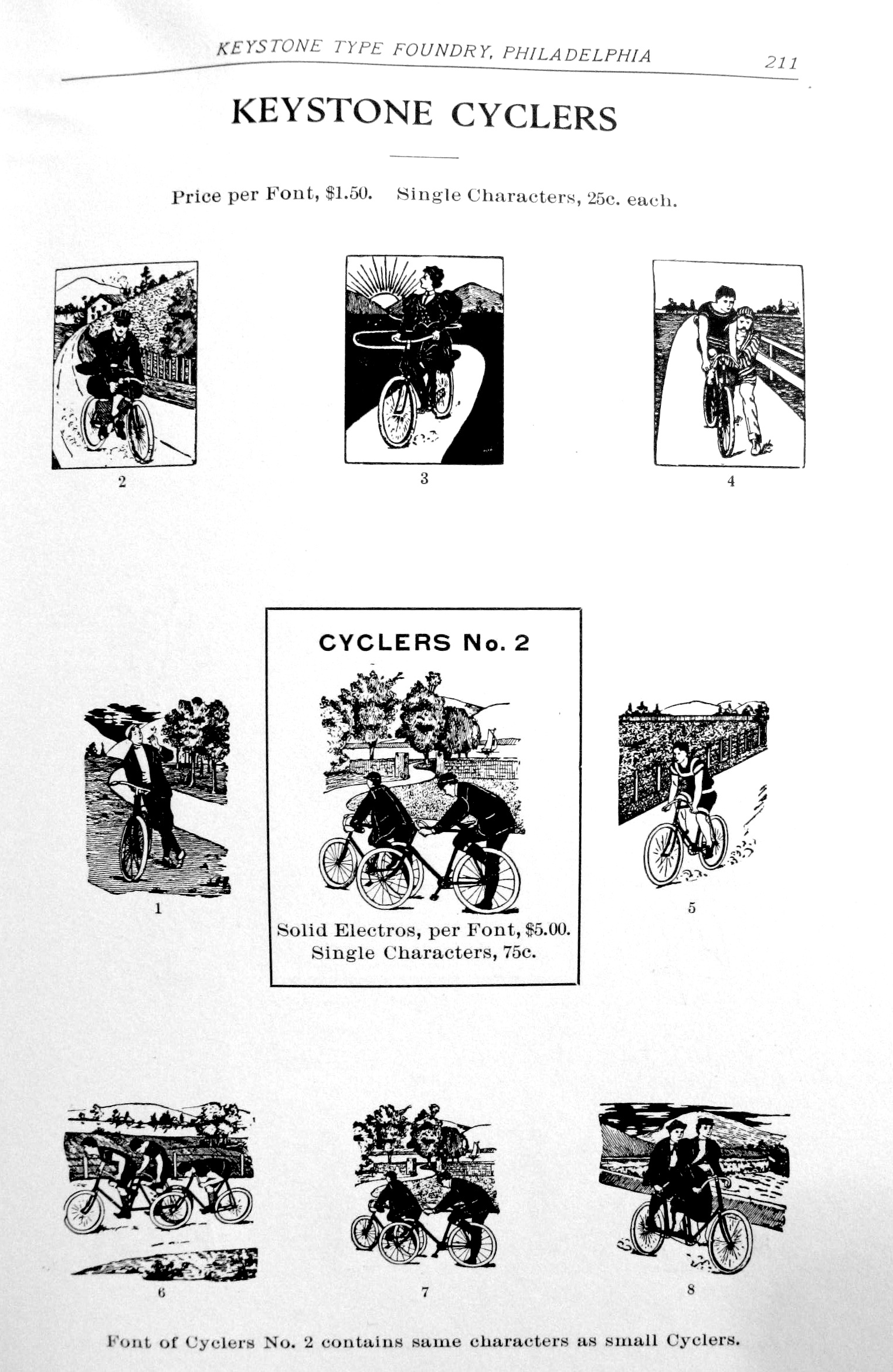
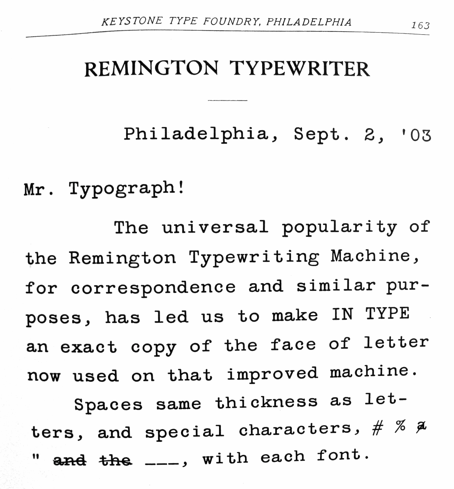
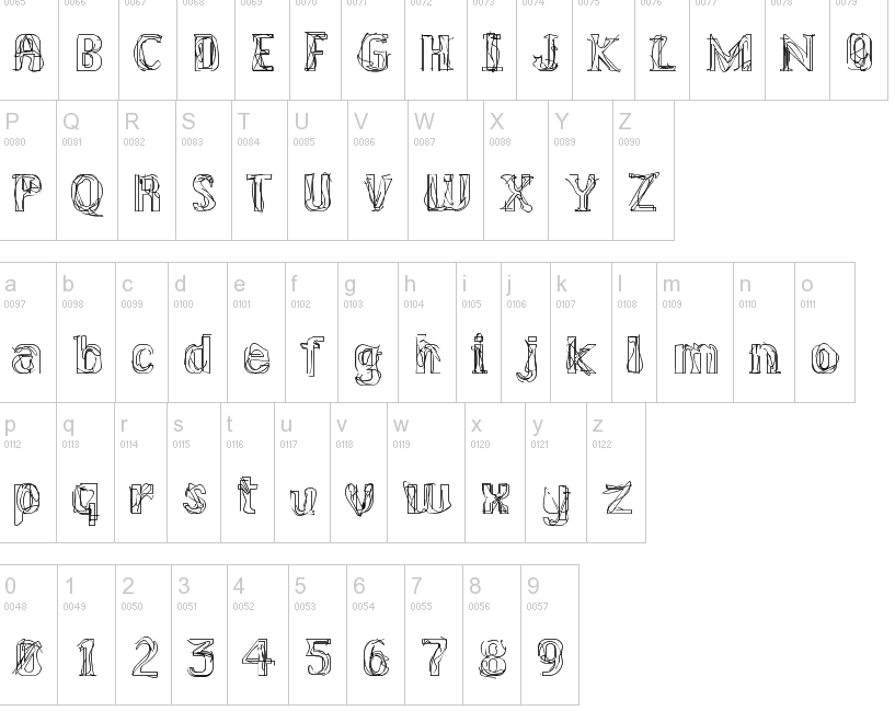
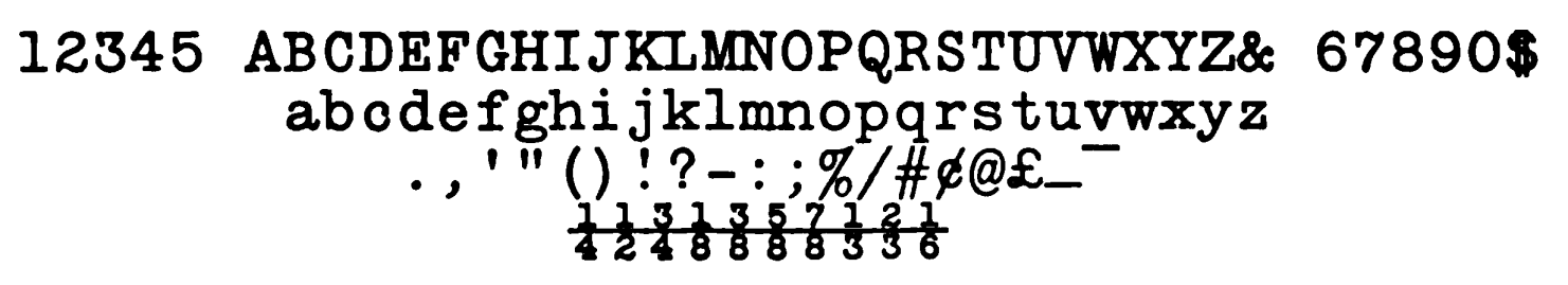
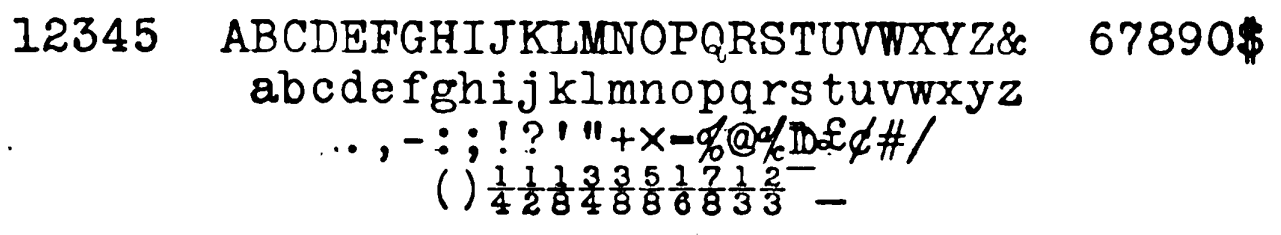
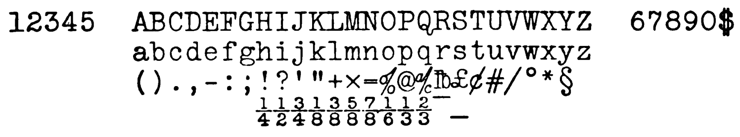
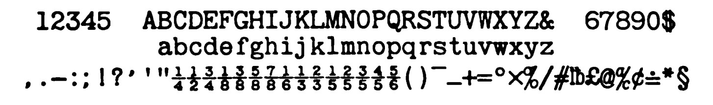
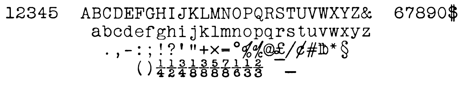
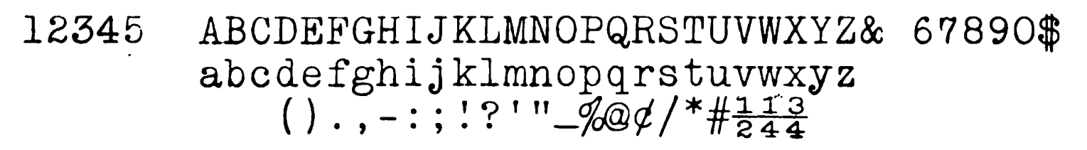
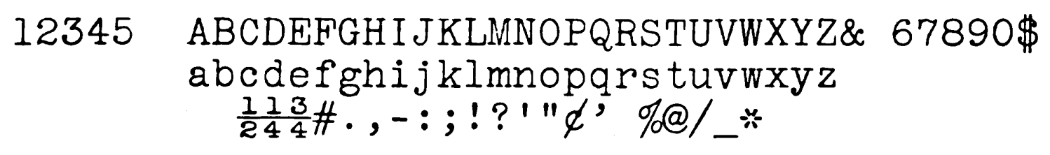
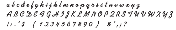
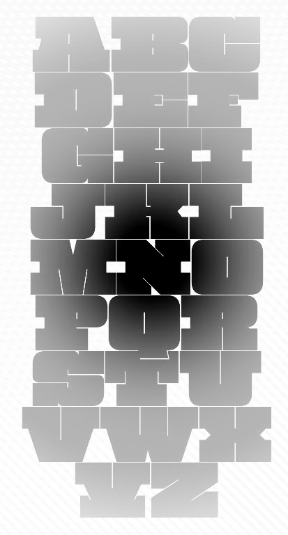
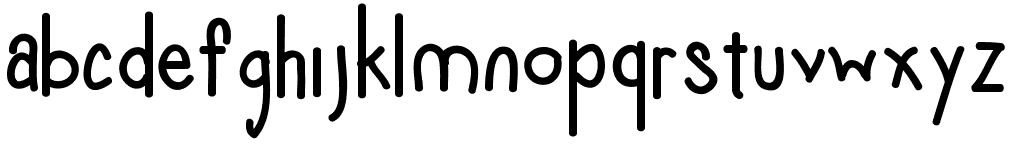
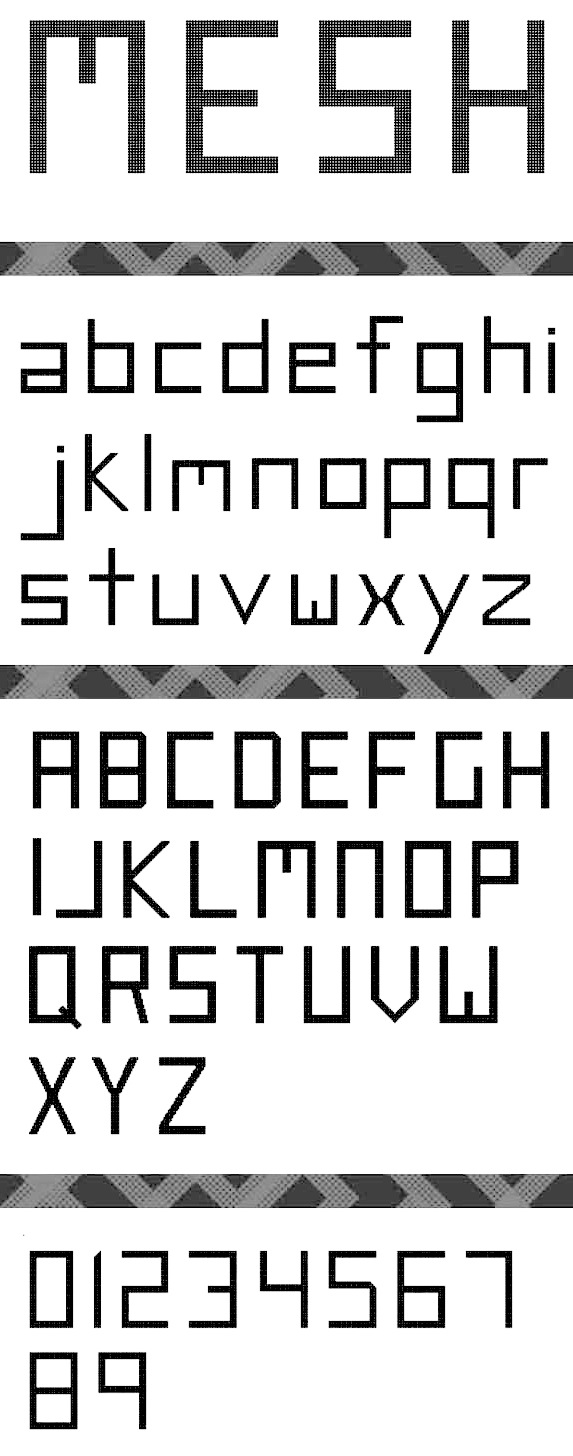
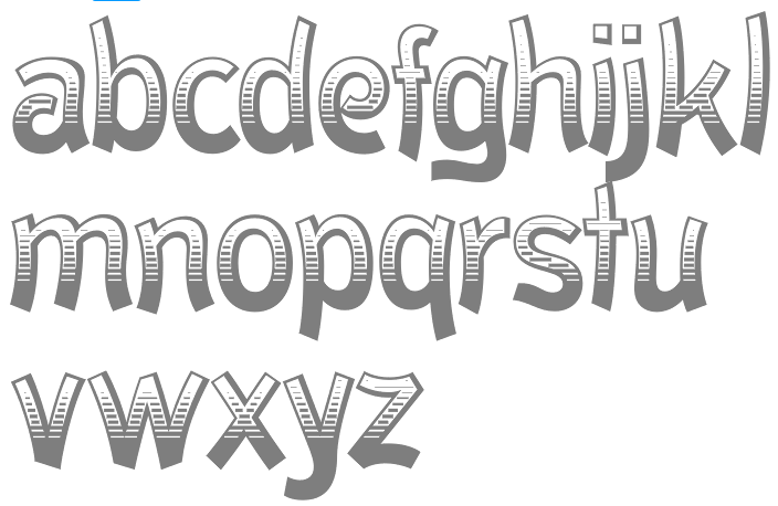
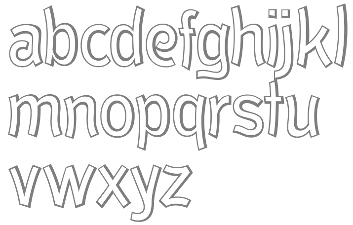
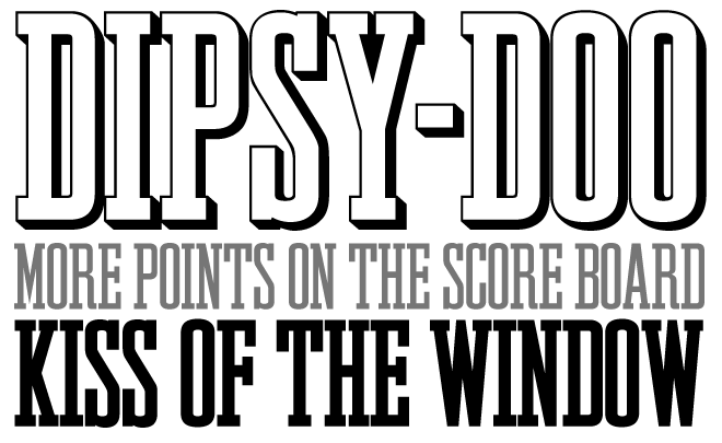
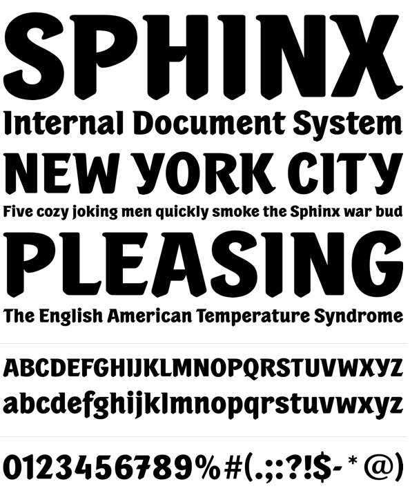
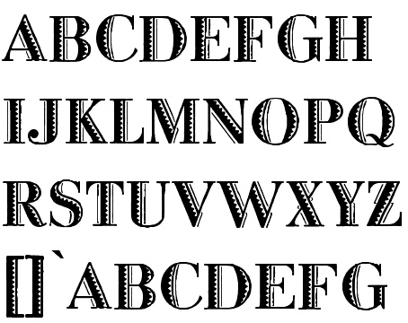
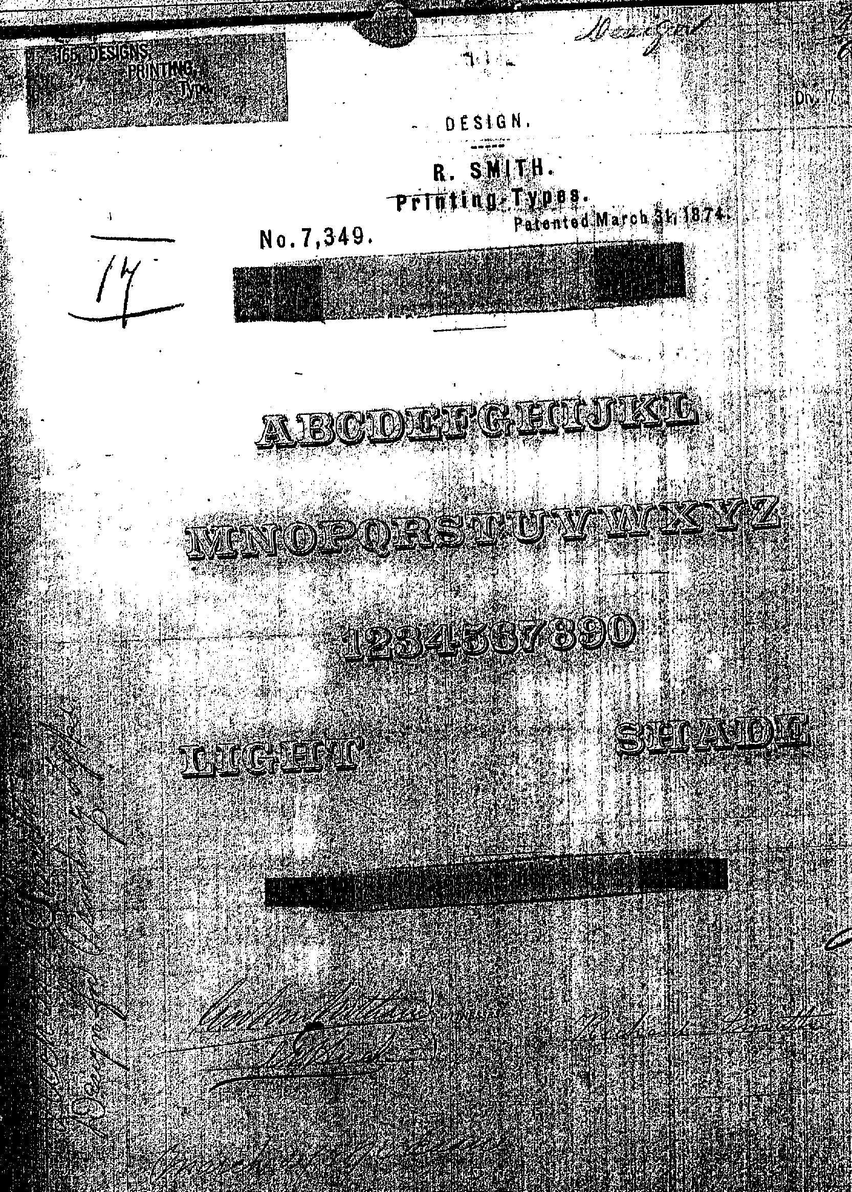
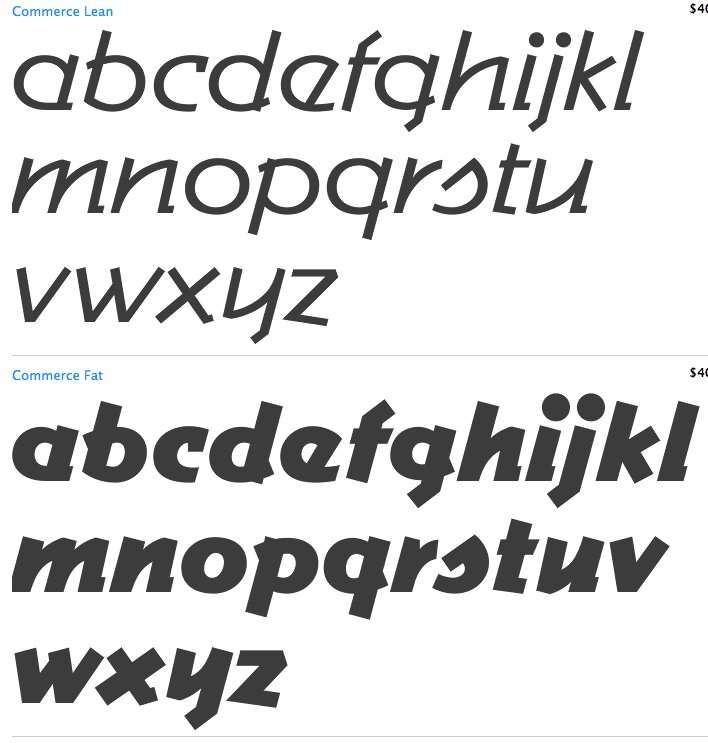
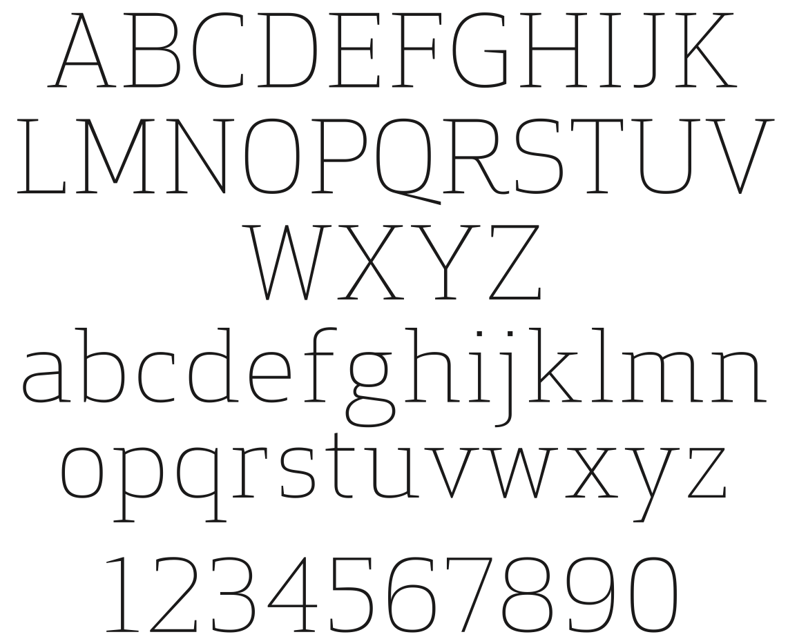
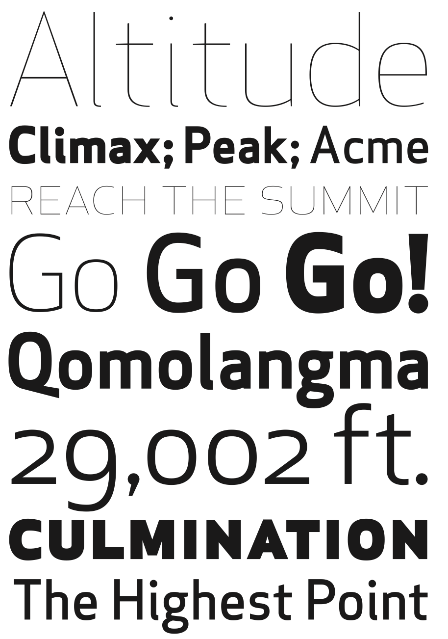
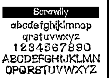
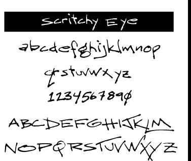
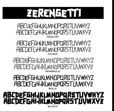
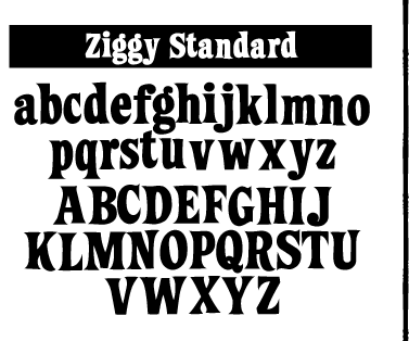
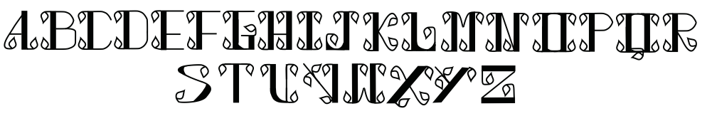
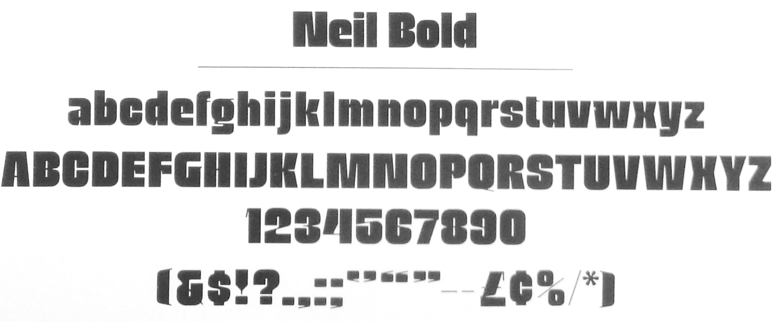
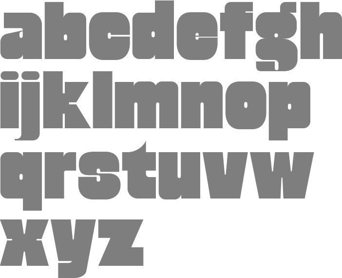