TYPE DESIGN INFORMATION PAGE last updated on Thu Apr 16 21:45:08 EDT 2026
FONT RECOGNITION VIA FONT MOOSE

|
|
|
|
|
Type in Austria | ||
|
|
|
|
SWITCH TO INDEX FILE
7ptfonts
| Vienna-based designer (b. 1987) of the free pixel typefaces Blau7pt, Gelb7pt, Rot7pt, Schwarz7pt, all made between 2003 and 2007. [Google] [More] ⦿ |
A. Rohrboeck
| |
AB Studio
|
In 2020, he released Alore (a thin mini-serifed typeface). [Google] [MyFonts] [More] ⦿ |
Acute Studio
|
Creator of the hairline face Opium (2010) characterized by teardrop terminals. Creator of Paige (2011), developed at the tipoRenesansa 3rd international type design workshop in Ljubljana, Slovenia. This is an attractive and bouncy papercut display face. Marge (2011) is edgy and highly legible even at very small sizes---it was developed at the tipoRenesansa 2nd international type design workshop. Paige Italic (2012) was done at tipoRenesansa 4 and TypeClinic 5 (2012). Her KABK graduation typeface was Editura (2013), a a type family for serious publications, magazines, as well as non-fiction books. At The 8th International Typeclinic in 2014, she continued work on an untitled text typeface. At Die Gestalten, she published Paiper, an extraordinarily balanced and readable 6-style text family with angular flared glyphs that are genetically related to folded paper strips. In 2014, Diana collaborated on the design of HF Stencil with Bold Monday and Studio Thonik. Made for Holland Festival, HF Stencil is based on Glaser Stencil. In 2016, Diana published Equitan Sans and Equitan Slab at Indian Type Foundry, marrying industrial era rustiness with modern functionality. In 2017, she designed Tiny Sans and Albert Samuels Clock Type. Codesigner in 2017 with Samo Acko and Sabina Chipara of the typefaces Passenger Display (2017) and Passenger Serif (released in 2019: a Clarendon). Passenger Display is a high-contrast didone-style font family. It is intended for use in headlines, signs, or posters. Passenger Display is a high-contrast didone-style font family. It is intended for use in headlines, signs, or posters. In 2019, Diana Ovezea and Samo Acko added Passenger Sans, which is characterized by horizontal and vertical terminal strokes and small apertures, and delivers a relaxing read in long texts. With Sabina Chipara, she co-designed the 8-weight simplified sans family Bega at Indian Type Foundry. Diana Ovezea also published the sharp-edged 14-style Matteo in 2017. At Future Fonts, she published Bizzarrini (together with Sabina Chipara) and Silverspoon, ca. 2018. She writes about the wonderful Bizzarrini: Though the idea originates from a Stefan Schlesinger ad sketch for a Paris couture house, we straightened up this typeface and made it seem engineered and sharp. It gets its name from the Bizzarrini Manta, a wedge-shaped concept car designed in 1968 by Giorgetto Giugiaro. Bizzarrini has extremely long wedge serifs. Following Schlesinger's sketch, it features very tall capitals with an out-of proportion middle-line (very big heads on S, B and R). Silverspoon is a contemporary take on Copperplate Gothic. In 2019, she released the connected monoline sans script Akin (done with Sabina Chipara) and the geometric sans family Matteo at Indian Type Foundry. Typefaces from 2020: Silverknife (a tall and skinny version of Silverspoon), Capra (a headline typeface with a bouncy baseline. This project started as a one-day challenge to recreate a piece of lettering on the Glass Menagerie poster designed by David Klein in 1958). At Fontshare, Diana Ovezea and Sabina Chipara released the free calligraphic script Britney. In 2021, Barbara Bigosinska, Rafa Buchner and Diana Ovezea set up Blast Foundry. At Blast Foundry, she published Granblue, a great experimental typeface family for boxing titles. Typefaces from 2022: Duplet (a 14-style geometric sans with a techno vibe; by Diana Ovezea and Rafal Buchner at Indian type Foundry), Duplet Rounded (also 14 styles), Duplet Open (the 14-style companion of Duplet). Home page. Behance link. Future Fonts link. [Google] [MyFonts] [More] ⦿ |
Adam Katyi
| |
Adler's Dings
| Adler's Dings shut down. In an earlier life, we could find here, from Vienna, Ursula Adler's commercial dingbat fonts: "LaMorte" dingbat fonts (13 fonts in all, and counting), Kick-a-ding (3), Roll-a-ding (3), Ring-a-ding (3), Divide-o-rama (3). 25 USD per 3-font set (truetype for Mac and PC). Other fonts: Butterbees, Reboot1, Abracadabra, Hidden Ghosts, Trinsomnia, U-Mix-U, DaDoodle, Stars No Stripes, Daymares. TypOasis (the link on the left) has a back-up of her non-commercial fonts. Her collection is now here: it has LaMorte 1 to 9, 11, 12, Abracadabra 1, Butterbees, Da Doodle, Daymares, Hidden Ghosts, Insanity Stroke, Reboot 1, Stars no Stripes, Trinsomnia, and U-Mix-U. Alternate URL. [Google] [More] ⦿ |
Artist of the Viennese Secession, 1861-1927. [Google] [More] ⦿ | |
| |
Alex Buka (Archy Studio, in Vienna, Austria, and Marina del Rey, CA) created Designosaur (2012, a bold sans typeface). Dafont link. [Google] [More] ⦿ | |
Graphic designer from Tyrol who is based in Hamburg and Vienna. Creator of the modular display typeface Modul (2013). Behance link. [Google] [More] ⦿ | |
Graphic designer in Vienna, Austria, who created the minimalist sans typeface Älskling in 2017. [Google] [More] ⦿ | |
In 1903, Roller drew a great psychedelic calendar for Ver Sacrum, which can be seen today at Letterform archive. His style of lettering can best be described as squares of roughly even size, with curvy inner cuts placed to create the shape of letters. Matthijs Herzberg refers to it as Curvy Block Lettering. The secessionist movement dissolved in 1905, and Alfred Roller moved on to theater set design, a craft in which he flourished. His Curvy Block Lettering style resurfaces in the 1960s in the era of psychedelia, and in particular in the work of Wes Wilson. In 2015 Nick Curtis created the psychedelic / art nouveau typeface Versacrum NF, which is based on the hand-lettering of Alfred Roller for Ver Sacrum magazine in 1903. Other revivals include Roller Poster (2006, HiH), Libido (2021, Matthijs Herzberg), Viatge Quimic by Joan Mas and Preta (2017) by Maximiliano Sproviero. Wikipedia page. [Google] [MyFonts] [More] ⦿ | |
Brno-born architect (1872) who worked in München and Vienna and died in 1969. Some of his lettering. [Google] [More] ⦿ | |
Alois Ritter Auer von Welsbach (b. Wels, Austria, 1813, d. Vienna, 1869) was a typographer and printer for the state. He was famous for special techniques for "nature printing". Michael Everson Conjectures that he made the Gaelic typefaces Vienna A (also called Altirisch A, Altkeltisch) ca. 1845 and Vienna B (also called Altirisch B or Neukeltisch) ca. 1845. The former typeface is a manuscript face, while the latter is Gaelic uncial round. [Google] [More] ⦿ | |
| |
Andreas Brandstetter
| |
Andreas Koller
| |
Andreas Pohancenik
| |
On his page, Vienna-based Andreas Scheiger shows several interesting illustrations from The Evolution of Type. Home page. [Google] [More] ⦿ | |
| |
Andreas Wastian
| |
Andrej Waldegg
| |
Andrew Der
| A. Rohrboeck (Andrew Der) is the Austrian creator of the free techno typeface Fatman (2014). [Google] [More] ⦿ |
Vienna-based graphic and web designer. In her work, I found one interesting typographic example, FontBot (2009). Home page. [Google] [More] ⦿ | |
Creator of the free typefaces Nymeria (2013) and Ylvie Script (2013, connected script). Anja (b. 1991) is based in St. Pölten, Austria. [Google] [More] ⦿ | |
Vienna-based graphic designer who created the text typeface family Diamant Serif during her studies in 2016. [Google] [More] ⦿ | |
Austrian type designer. During TypeClinic 5 in 2012 in Trenta, Slovenia, she created Oachakatzerl, an angular serif typeface inspired by linguistic contrasts, in particular the sharpness and softness of the German language as spoken in Austria. [Google] [More] ⦿ | |
During her studies at New Design University, St. Pölten, Austria, Anna Yu created the floriated typeface Leafy (2014). [Google] [More] ⦿ | |
Typesetter at Schiftgiesserei Poppelbaum in Vienna. In 1912, he designed Mönch (Antiqua, Kursiv, Zirkular, Antiqua Halbfett, Antiqua Extended, Jönisch) at Poppelbaum. Author of Die österreichischen graphischen Gewerbe zwischen Revolution und Weltkrieg 1848-1918, Wien 1986 (?). [Google] [More] ⦿ | |
Arno Kathollnig
| |
Villach, Austria-based typographer, who made a few great Bauhaus style posters in 2010, such as Bauhaus Hajo Rose, dedicated to the forgotten Bauhaus artist Hans Joachim Rose. [Google] [More] ⦿ | |
AstroSym
| Peter Schmitt (Institut für Mathematik, Universität Wien) is the designer of the metafont AstroSym between 1992 and 2002. [Google] [More] ⦿ |
Atelier Olschinsky
|
In 2017, he published the bespoke typeface BirdYard, the free AO Grotesk (with poygonal outlines), free display sans typeface family Matol, the free geometric solid typeface AOX, which comes in Stencil and Regular styles, the free polygonal typeface family AO Mono, and the free monospaced Minimal Mono. Typefaces from 2020: Kaomo (monlinear, monospaced), AO Mono (polygonal). Behance link. [Google] [More] ⦿ |
Six Thai truetype fonts in this small archive: DBThaiText, DBThaiTextBold, DBXThaiText, DBXThaiTextBold, Surin, ThaiBangkokDJA. [Google] [More] ⦿ | |
Austrian designer of the sticky tape typeface Indu (2016). [Google] [More] ⦿ | |
Page with typography links by Bernd Ennsfellner from Austria. [Google] [More] ⦿ | |
During her studies at the the Viennese Graphic School "die Graphische", Belinda Swoboda created the pixel typeface Swoxel (2014). [Google] [More] ⦿ | |
Benedikt Bramböck studied visual communication in Austria and Switzerland and type design in The Hague. He interned and later was employed by Fontshop International in Berlin. Since 2015 he works for Alphabet Type and is part of the team behind Berlin's Typostammtisch. Speaker at ATypI 2016 in Warsaw. [Google] [More] ⦿ | |
He is part of the team behind Berlin's Typostammtisch. Linkedin link. [Google] [More] ⦿ | |
Benjamin Buchegger
| |
Vienna, Austria-based designer of the monospaced triangulated metro signage-inspired Ooh Bahn (2020). [Google] [More] ⦿ | |
Vienna-based Austrian designer (b. 1983) of Juristl Demibold Reduced (2005). Blog. [Google] [More] ⦿ | |
Salzburg, Austria-based designer of Quimo (2015). [Google] [More] ⦿ | |
Type and graphic design competition, open to typefaces designed in Germany, Austria and Switzerland. Past winners were often selected for certain corporate projects, not for type design per se. The type awards since 2006 are on-line. The competitions are numbered. For example, 2013 is the 45th competition. [Google] [More] ⦿ | |
Bernd Flickinger
| |
| |
Bertold Löffler (1874-1960) studied at the Kunstgewerbeschule in Vienna (1890-1900) under Carl Otto Czeschka. Working as a freelance illustrator from 1900, he contributed to the art journals Meggendorfer Blätter, Ver Sacrum, Die liebe Augustin, Lucifer, and Danauland. Together with Michael Powolny he founded the Wiener Keramik in 1906 and then joined the Wiener Werkstätte in 1907 after collaborating on the graphics and ceramic tiles for the Cafe Fledermaus. [Google] [More] ⦿ | |
Austrian designer of the experimental typeface Urbana Ltd (2009), which won an award at the TDC2 2010 type design competition in the category of display typefaces. [Google] [More] ⦿ | |
Behance link. Old URL. Ultratypes link. [Google] [More] ⦿ | |
Nice page on the history of blackletter fonts. By Austrian Birgit Stehno. [Google] [More] ⦿ | |
Austrian studio that created an alphabet of design classics in 2012. [Google] [More] ⦿ | |
Julia (aka "boobearsarse") is the Austrian designer of the fat brush typeface One Direction (2012: named after a music band). [Google] [More] ⦿ | |
Polish type and graphic designer, b. 1935. He graduated from the Academy of Fine Arts in Warsaw under Henryk Tomaszewski in 1961. In 1967, he received Tadeusz Trepkowski's WAG Award and from the 1970s on he worked as Hernyk Tomaszewski's assistant at the Academy of Fine Arts. Best known for his film posters, he lived in Vienna, and then moved to Lower Austria, where is is a painter. At Mecanorma in the early 1970s, he made Zelek Black, Zelek Shadline, Zelek Bold, and Zelek Boldline. Zelek Black looks twisted and almost geometrically impossible. Dan X. Solo in his Dover book "Moderne Alphabets" shows an identical face, renamed Zelda. In 2009, Zelek pops up again in a slightly reworked version by Simon Griffin for Wired UK. Typophile discussion. Dick Pape made a series of Zelek revivals including Zelel Shadline, Zelek Black, Zelek Bold, Zelek Bold Reflection, and Zelek Bold Line. The Russians have their own versions, starting with a 1987 semi-clone by G. Klikushin, which in turn inspired the 1993 face---far removed from Zelek's Zelek---, New Zelek about which its publisher Paratype writes: The typeface was developed at TypeMarket in 1993 by Alexey Kustov on the base of artworks of Viktor Kharyk and Lidia Kolesnichenko (1979), that were developed as a Cyrillic adaptation of the typeface of Bronislav Zelek, Mecanorma. The multicolor layered typeface Bron was published in 2014 by Swiss type designer Jeremia Adatte. In consultation with Zelek, Three Dots Type (Marian Misiak) in Poland did a revival called New Zelek Pro. Klingspor link. Biography at Culture.pl. [Google] [MyFonts] [More] ⦿ | |
Buero Bauer
|
In 2021, Erwin Bauer, Mischa Herzog and Daniel Schaffer co-designed Mono To Go, a monospaced typeface with a constructed, grid-based body and a playful spirit. It is entirely based on modular pieces such as circles and other simple geometric shapes. Erwin Bauer's home page. [Google] [MyFonts] [More] ⦿ |
Brixlegg, Austria-based creator of the free vector format rounded sans typeface SNO (2017). [Google] [More] ⦿ | |
Johann Christoph Carl Faulmann or Karl Faulmann, b. Halle an der Saale, Germany, 1835, d. Vienna, Austria, 1894. In his Geschichte der Schrift: Von den Hieroglyphen bis heute (2002), Harald Haarmann describes Faulmann as a pioneer in the study of writing in the 19th century. He writes that when Carl Faulmann published his Illustrierte Geschichte der Schrift in 1880, his work was the first universal history on the subject and stood alone on the academic landscape of the day. Carl Faulmann initially trained to be a typesetter. His travels led him to Munich, where in 1854 he saw shorthand types from the Royal Court and State Printers in Vienna. Faulmann was inspired by the experience to develop similar versions for Franz Xaver Gabelsberger's stenography system which was popular in the southern part of Germany. In 1855 he became typesetter for foreign languages at the court in Vienna. After four years he resigned from state service and worked as a stenography teacher and typesetter. On the side he continued to augment his language skills auto-didactically, learning Hebrew, Persian and Sanskrit, among others. He wrote various works on linguistic fundamentals that were re-issued for decades. In 1884, Carl Faulmann was named professor of stenography at the University of Vienna. A complete compendium of his work can be found in this German wikipedia page. His books include
| |
In the late 19th century, Dr. Carl Hrachowina (1845-1896) taught at the Arts and Crafts School in Vienna. Among his students were Franz von Matsch and Gustav Klimt. He selected and published a series of study aids. Author of Initialen, Alphabete und Randleisten verschiedener Kunstepochen (1897, Carl Graeser, Vienna), and of Vorlagen für das Kunstgewerbe 1. Band. Künstliches Alphabet von J. Th. de Bry (1886, Carl Graeser, Vienna). Downloads of his 1897 books: Archive.org, local. [Google] [More] ⦿ | |
Czeschka designed Olympia (1914; Klingspor mentions 1929 for Olympia 1 and 1931 for Olympia 2), Czeschka Antiqua (1914: an art nouveau style face) and Czeschka (1914, a grotesk) at Genzsch&Heyse. In 2022, Alejandro Paul (Sudtipos) revived and expanded Olympia as Wienerin with the inclusion of numerous alternative signs and ligatures, and the addition of a variable font. [Google] [MyFonts] [More] ⦿ | |
Austrian graphic designer, who taught drawing and typography in Vienna. He died in 1983. Creator of Forte (Agfa-Monotype, 1962), a bold unconnected signage script. For another (free) interpretation, see Chyrllene K's Forte (2013). Linotype link. FontShop link. Klingspor link. [Google] [MyFonts] [More] ⦿ | |
Viennese graphic designer. Creator of Universia Sans (2012). [Google] [More] ⦿ | |
At Schriftlabor, she was involved in the Traction project (2017). Traction was originally conceived and designed by Swiss astronomer Christian Thalmann. Chiara Mattersdorfer and Miriam Suranyi expanded, completed and produced the font family. This typeface sports signature serifs, soft edges and a fluid, organic design. [Google] [MyFonts] [More] ⦿ | |
| |
Designer at RGB107,6 of Stikker99, a font that simulates lettering sewed on clothes. [Google] [More] ⦿ | |
Christian Lang
| |
Innsbruck-based Austrian designer of the techno typeface Jethose (2002). Old home page. [Google] [More] ⦿ | |
Christian Spindler
| |
Graz, Austria-based designer of Spoon (2013), a sans serif typeface developed during Typeclinic 6 in 2013 for use in small print or on web pages. Behance link. [Google] [More] ⦿ | |
Graz, Austria-based designer of the text typeface Lawine (2020). [Google] [More] ⦿ | |
Salzburg, Austria-based designer of the needle-and-thread-inspired typeface Florence (2015). [Google] [More] ⦿ | |
Graphic designer, illustrator and makeup artist from Salzburg, Austria. In 2017, she designed the handcrafted typeface Bodyline. Behance link. [Google] [More] ⦿ | |
| |
| |
Austrian type designer. In 2018, Michael Hochleitner, Christoph Schütz, Simon Liesinger and Franziska Weitgruber co-designed Gretel Script at Typejockeys. This optically sized three-style typeface is based on the hand of calligrapher Natascha Safarik. [Google] [MyFonts] [More] ⦿ | |
Christoph Zeugswetter
| |
Viennese graphic&communication-design student. Creator of the octagonal family Tekursina (2011). [Google] [More] ⦿ | |
Graz, Austria-based designer of Kigeling (2013-2014), a typeface developed during Typeclinic 6 and Typeclinic 7 in 2013 for use on photographs. At Typeclinic 2015, she created Kigeling Italic. Behance link. [Google] [More] ⦿ | |
A project by Stefan Hagel at the Austrian Academy of Sciences in Vienna, CTE is a universal (Windows, Mac) text editor for many languages. It has a battery of fonts for various languages, such as Hebrew and Arab. [Google] [More] ⦿ | |
During his studies at New Design University in Krems an der Donau in Austria, Claus Grünstäudl designed the typeface Tau, or rope (2013). Tau can be bought at Ten Dollar Fonts. | |
Vienna-based company which designed these fonts in 1994: WIPFirstLady, WIPGrandMa, WIPMachoMan, WIPMoneyMaker, WIPSugarBaby, WIPSymbol, WIPThePresident. [Google] [More] ⦿ | |
Constantin Demner
| |
Cornelius Veith
| |
Corridor
|
|
Designer at RGB107,6 of Cosima's Erdbeeren (handwriting). [Google] [More] ⦿ | |
Vienna, Austria-based designer of the sans typeface Trias Politica, which comes with sans (Excequi), slab serif (Legis) and monospaced (Judicium) versions. [Google] [More] ⦿ | |
Dagohbert
| Vienna, Austria-based designer (b. 1964) of Brooks (2016: Peignotian), Plagiata (2016, a modular sans typeface) and Bernd (2016, a stylish script typeface). Typefaces from 2017: Antaris St CF (stencil), Antaris CF, Madame Flacon (inspired by the logo of Marionnaud Parfumeries). Dafont link. Devian Tart link. Store where one can buy some of his fonts. [Google] [More] ⦿ |
Austrian designer who created the handwriting font Dani (2006). [Google] [More] ⦿ | |
Student at the New Design University in Krems an der Donau, Austria, in 2012-2013. His first typeface is called Modulschrift Darling (2012). In 2013, he made the script typeface Helena. [Google] [More] ⦿ | |
Daniel Bretzmann
| |
Viennese type designer who cooperates at Typisch Beton. He is working on a typeface called Ziegel Mono. [Google] [More] ⦿ | |
His first release, the extensive Parka family of sans typefaces, started as part of his graduation project and benefited from the support of type designers Günter Gerhard Lange and Georg Salden. The Parka family was extended to 12 styles in 2008 and 2009, and was published by Font Bureau in 2010. Bergamo (2012) is a comprehensive angular book typeface. He studied in the Typemedia program at KABK Den Haag, class of 2012. His graduation project there is a typeface called Dato (Sans, Serif). Dato Serif is slightly angular and reads well at small sizes. In 2021, Fontwerk published his 18-style (+a variable font with weight and slope axes) family West, produced with the help of Andreas Frohloff and Christoph Koeberlin. Perraudin started development of the geometric sans West in 2013, and used it in the wayfinding system developed by Studio Gourdin and Capitale for Dresden's Gemäldegalerie Alte Meister. [Google] [MyFonts] [More] ⦿ | |
| |
| |
Vienna, Austria-based designer. In 2019, Birgit Palma and Daniel Triendl co-designed the colorful textured caps typeface Kenya. [Google] [More] ⦿ | |
Graduate of the University of Applied Sciences in Graz, and presently, graphic designer in Graz, Austria. Designer of the art deco typeface Café Central (2016). Behance link. [Google] [More] ⦿ | |
Vienna-based designer of the display typeface Sliced (2012), and of the ultra-geometric experimental typeface Black Apex (2012). Behance link. [Google] [More] ⦿ | |
Tumblr link. [Google] [More] ⦿ | |
| |
Vienna-based designer (aka Agitprop) of The Great IT (2005), an octagonal techno font. [Google] [More] ⦿ | |
Austrian designer of a few signature / handwriting fonts of famous people. These include Franz Kafka (2009, handwriting; made with Fontcapture) and Hillary (2015, after Hillary Clinton). Home page. Dafont link. [Google] [More] ⦿ | |
Dayflash
| Christian Lang (Austria) went commercial in 2010 at MyFonts as dayflash. His first typefaces there were Signque (2010, a monoline geometric sans that uses only lines and pieces of circles), Rotundus, Rotundus Rounded (2010) and Pandtos (2010, elliptical). [Google] [MyFonts] [More] ⦿ |
Deeait Creates
| Mathias Doblhammer (DeeAit) is a graphic designer and illustrator from Vienna, His typefaces include Benchmark (2007), Fashion Victim (2009, hairline avant-garde face), Bowler (2008, rounded and ultra-fat), the octagonal / rhombic typeface Symbolis (2012), and Lazy Fox (2009, connected octagonal experiment). [Google] [More] ⦿ |
Vienna, Austria-based designer of Donauweibchen (2018, FontStruct). FontStruct link. [Google] [More] ⦿ | |
Depart
| Leonhard Lass (Depart) is the Austrian designer of the pixel typefaces rktr6cd, rktr6rg, rktr6scd, rktr7scd, rktr9num (2000). [Google] [More] ⦿ |
Der Graph
| Typographer and graphic designer Paulus M. Dreibholz was born in 1977 in Graz, Austria. In order to study communication design he moved to London, where, after obtaining a Bachelor degree in graphic and media design from the London College of Printing, and a Masters degree in communication design from Central Saint Martins College of Art and Design, he founded The Atelier for Typography and Graphic Design in London in 2003. Creator of Christoffel-Book (2008, sans; done with Emma Williams), Nilo-Enrico (2007, monospace), and Eam (2005, octagonal face). [Google] [More] ⦿ |
The German handwriting model for schools (Deutsche Schreibschrift) was also adopted in Austria as these examples from 1953 (due to Professor Alois Legruen) and 1971 show. [Google] [More] ⦿ | |
DF Type (or: Fischbachpresse)
|
Rialto won an award at the TDC2 Type Directors Club's Type Design Competition 2002. Soon to release a sans serif family called Linea. [Google] [More] ⦿ |
Diana Ovezea
| |
Didi E. Murnig
| |
| |
| |
Images of Naraganda: i, ii, iii, iv, v, vi, viii. [Google] [More] ⦿ | |
Hruza runs Dominik Hruza studio in Vienna, Austria. Designer of the old typewriter font Lettera32 (2002), a simulation of Olivetti Pica. He also made Behrens Neue Capitals (2004), the graffiti font Tag.Do (2003), Courier Sans Stencil (2007) and Miinnora (2003), a font in the style of Amelia. Dafont link. [Google] [More] ⦿ | |
Dominik Krotscheck
| |
| |
During his studies at New Design University St. Pölten, Vienna, Austria-based Dominik Reichartzeder designed the striking modular typeface Schlossberg (2016). [Google] [More] ⦿ | |
During his studies in Vienna, Dominik Rummerstorfer created the sans typeface Apfelbaum (2013) and Thunfischdose (2013). Behance link. [Google] [More] ⦿ | |
Tirol, Austria-based designer of the fuzzy handcrafted typeface Peaches (2017). [Google] [More] ⦿ | |
Dots & Stripes Type
|
Thomas designed Aniuk (2010, a miniserifed rounded family for logos and posters) and Premi&eaciute;ra (2009, a book serif). His lettering for wine bottles won an award at TDC55. In 2014, he designed the very roundish sans typeface Freude, which was originally developed for the album artwork of the Austrian musician Tombeck. Vito (2015) is a 60-style sans family by Thomas Gabriel described as follows: Masculine and sporty for adrenaline junkies, reliable and elegant for serious typographers, but with a touch of bling for high snobiety. We rediscover Vito in 2016 at VitoDots & Stripes. Klingspor link. Interview by MyFonts in 2014. [Google] [MyFonts] [More] ⦿ |
When you download eBuch, you get these school fonts: Schulschrift95 (2001, Edelweiss), Druckschrift95 (1997, Edelweiss). [Google] [More] ⦿ | |
Edin Abdiu
| |
Edin's Art Studio
| Linz, Austria-based designer of these handcrafted (mostly brush) typefaces in 2018: Berlin Lives (dry brush), Steyr, Reid, Lynn, Jorik, Jora (dry brush), Hayes, Ened, Danata, Aidana, Neilella, Hyllus, Dionisia, Davis, Correia, Momina, Ryder, Norene, Maxene, Leilani, Hailee, Dory, Calista, Genus, Correia, Davis. Aka Edin Ab. Typefaces from 2019: Simone, Ramina, Barbara, Andronika, Elisenda, Valentina, Saturnia, Hanna, Francisca, Dominik, Aubrielle, Samantha, Farrand, Castianiera. [Google] [More] ⦿ |
| |
Ekke Wolf
| |
Austria-based designer of Christopher Hand (2007, handwriting) and VonFont (2007, a pirate-themed font based on the classic VonDutch logo). Alternate URL. [Google] [More] ⦿ | |
During her studies in Graz, Austria, Elisabeth Oleschak created Fold Font (2014, an origami typeface) and Geometric Font (2014). Behance link. [Google] [More] ⦿ | |
Vienna, Austria-based student-designer of Cracelique (2018), Teardrop (2018), Geometrics (2014) and Fold (2014). [Google] [More] ⦿ | |
Visual designer who is studying at FH Vorarlberg in Dornbirn, Austria. Behance link. He created the informal hand-printed typeface Curva (2011---a competitor for Comic sans?) while visiting the University of Monterrey, Mexico. Jochum does not speak Polish. [Google] [More] ⦿ | |
Graduate in Graphics from the ISIA in Urbino with a thesis titled Graphica Programmata. From 1999 to 2002 he collaborated as designer with Nofrontiere Design in Vienna. Lives and works in Vienna, Austria. He spoke at ATypI 2005 in Helsinki on Ortho-Type, a type project about 3d typefaces. His collaborators on that project were Mikkel Crone Koser and Paolo Palma. [Google] [More] ⦿ | |
Erik Spiekermann
| |
Born in 1887 in Vienna, Austria, Ernst Deutsch first worked as a costume designer and studied under Gustav Klimt. In Paris, he worked on costumes for Coco Chanel, before moving to the United States in 1929, where he changed his name to Ernst Dryden and was employed from 1933 onwards as a costume designer for Universal, Columbia and Selznick in Hollywood. He died in Los Angeles in 1938. Designer of Tango Kursiv (1913, +Fett; aka IKA Schriften), and the prototypical silent movie fonts Tango Antiqua (1913), and Tango Antiqua Halbfett (1916), all published by J. Klinkhardt in Leipzig. Digital revivals by Nick Curtis (Rhumba Script NF: free revival of Tango Kursiv) and Oliver Weiss (Walden Font) (WF Paletti, 2016-2017). [Google] [More] ⦿ | |
Erwin K. Bauer
| |
| |
| |
Eva Frey (Vienna, Austria) created Rotonda Roman (2013, a serifless didone), and Rotonda Text Sans and Serif (2013). She studied at the New Design University Sankt Pölten, from 2010 until 2013. [Google] [More] ⦿ | |
Codesigner, with Apostrophe at Apostrophic Laboratory, of NineteenTenVienna, and designer at the L'ab of the geometric logo font Sindrome (2001). Born in Vienna in 1963. [Google] [More] ⦿ | |
Fabian Pfeifhofer
| |
During her graphic design studies in Linz, Austria, Fabienne Plangger, now based in Barcelona, created the experimental typefaces Silk Paper Font (2013), Old Spice (2013, a rune simulation font), Marbling (2013), Rorschach (2013) and YO (2013). In 2014, she released a Juan Miro-style typeface. [Google] [More] ⦿ | |
Face Type
|
Facetype's typeface library. See also here. View Marcus Sterz's typefaces. Klingspor link. Behance link. Fontspring link. [Google] [MyFonts] [More] ⦿ |
In 2012, Roland Hörmann and Felix Auer co-designed the refined didone fashion mag display typeface Aquus (+the outline version, Aquus Linearis), which was published by Phospho. [Google] [MyFonts] [More] ⦿ | |
Ffenoc is a language developed by Josef Jahn and Franz Ivancsich in 1998. Ffenoc consists of a set of substitute characters as well as a whole new language complete with vocabulary, grammar and syntax. Free font Ffenoc (SDT Austria). [Google] [More] ⦿ | |
Fidel Peugeot
| |
Fidel Peugeot
| |
Fischer Enterprises
|
|
Austrian designer of the experimantal circle-based typeface Polaroid (2020). [Google] [More] ⦿ | |
Florian Kriegner
| |
Graphic designer from Salzburg, Austria. In 2010, he created the counterless display typeface Moztom. Behance link. [Google] [More] ⦿ | |
At the 15th Typeclinic, held in 2017, Florian Payer (Vienna, Austria) designed the calligraphic sans typeface Karotto Sans. Behance link. [Google] [More] ⦿ | |
Florian Rastbichler is the Vienna-based creator of the extensive free typeface families Korneuburg Display (2012) and Korneuburg Slab (2013). Behance link. Dafont link. [Google] [More] ⦿ | |
Austrian designer of the tag font New York Nights (2010). [Google] [More] ⦿ | |
Fontastic
| Andreas Koller is a Senior Creative Technologist at Skype in London, designing, researching and prototyping product innovation and tools. In 2014 he graduated from the Information Experience Design MA programme at Royal College of Art. Before that he studied at Salzburg University of Applied Sciences. A specialist in generative and algorithmic art and design, he created the free software Fontastic: Fontastic is a library for creating font files in TTF and WOFF format which you can then use in any design program or website. It allows one to make fonts based on data, sensors, live feeds, or any other algorithm, or manipulate existing fonts to create one's own version. Fontastic was designed to make it as easy as possible to create a font in Processing. Under the hood, it uses doubletype, a Java font editor that builds font files according to the TrueType format, and sfntly to create Web Open Font Format files. [Google] [More] ⦿ |
Fontdesign by Fidel Peugeot
| |
Austrian art nouveau era painter, 1880-1932, who took the Czech citizenship in 1919. His Viennese Secession poster for the Kaiserjubiläums Möbel Ausstellung (a furniture exhibition during the Kaiser's Jubilee) inspired David Kerkhoff to design Fiebiger Eins (2013) and Fiebiger Zwei (2013). Fiebiger has many traits of the arts & crafts movement. Biography at the University of Magdeburg. [Google] [More] ⦿ | |
During her studies at New Design University St. Pölten, Austria, Franziska Denk (Vienna, Austria) created the modular straight-edged typeface Modulschrift Pythagoras (2015). [Google] [More] ⦿ | |
| |
Franziska created the text typeface Porta Serif and the science journal text typeface Sphera in 2014. Her graduation typeface at KABK in 2016 is the expressionist Kaligari. It comes in six styles---in its genre, it is the best digital German expressionist typeface published to date. In 2018, Michael Hochleitner, Christoph Schütz, Simon Liesinger and Franziska Weitgruber co-designed Gretel Script at Typejockeys. This optically sized three-style typeface is based on the hand of calligrapher Natascha Safarik. Still in 2018, she published Gig at Future Fonts. Gig is monolinear retro felt pen script in the style of Roger Excoffon's Banco. Typefaces from 2019: Antonia (a crisp variable headline text typeface by Franziska Weitgruber and Michael Hochleitner at Typejockeys; a 64-style font family with optical sizing from headline H1, H2, and H3 to Text, with a variable font added to the mix), Roba (a typeface family in which Franziska experiments with stress and counter-stress, form and counter-form), Nikolai (an elegant display family released at Fontwerk). Nikolai started out as a revival of Nebiolo's Jenson but became a sharp-edged hyper-modernized version of that Venetian type. Future Fonts link. [Google] [MyFonts] [More] ⦿ | |
Austrian designer of Monotype Gerhilt (2003), a pixel face. Dafont link. [Google] [More] ⦿ | |
Author of The Mystic Art of Written Forms: An Illustrated Handbook for Lettering (Salzburg: Neugebauer Press, 1980), and Bibliophile, Buchgraphik, Schriftgraphik (Salzburg, Austria: Verlag Neugebauer Press, 1983). Typefaces influenced by his style:
| |
Austrian artist (b. 1919) affiliated with the Wiener Schule des Phantastischen Realismus, who created exquisite detailed drawings of figures involved in any imaginable form of intercourse. These are mainly initial caps, such as in Ulysses Alphabet (Dortmund, 1983). From 1949 until 1984, he was a professor at Bryn-Mawr-College in Philadelphia. [Google] [More] ⦿ | |
Austrian type designer. In 2021, she published the 6-style mini-serifed typeface Convey (a 6-style text typeface) at Wannatype. [Google] [MyFonts] [More] ⦿ | |
He explains: The source for the letterforms is a scan of a specimen known as the Berner specimen, which, composed in 1592 by Conrad Berner, son-in-law of Christian Egenolff and his successor at the Egenolff print office, shows Garamont's roman and Granjon's italic fonts at different sizes. Hence the name of this project: Egenolff-Berner Garamond. Also planned are polytonic Greek, IPA and ornaments. In 2017, Octavio Pardo entered the EB Garamond project. The fonts can now be downloaded from Github. For Valentine's Day, a certain Bryn replaced the o and the tittles by hearts, and called the font Better EB Garamond (2017). Designer of the free font OMW Ayembedt (2013): Ayembedt is a font aiming to recreate the symbolic typeface called Daedric, found in the Elder Scrolls video game series, most notably in The Elder Scrolls III: Morrowind. Klingspor link. Open Font Library link. CTAN download of EB Garamond. Google Plus link. Duffner's Github link. [Google] [More] ⦿ | |
Supernett (2019) and Supernett CN (2013, Facetype) are huge font families based on hand-drawn versions of Helvetica. They have 4700 glyphs and many opentype features. In 2014, he created the hand-lettered poster series Pinto. In 2015, Georg published the Opentype-feature-laden 2600+-character Mila Script Pro at FaceType. Typefaces from 2017: Pinto No 2 (hand-drawn), Sofa Sans Hand. Typefaces from 2019: Sofa Serif Hand. Klingspor link. Creative Market link. [Google] [MyFonts] [More] ⦿ | |
Vienna-based designer and illustrator who created the great typographic poster Zeig Dich in 2014. Behance link. [Google] [More] ⦿ | |
Georg Schober's typeface Diamant (2013) is inspired by Brazilian pixacao. It was created during his graphic design studies in Vienna. He also designed the sans typeface families Nargio (2013) and Nargio Sans (2013). [Google] [More] ⦿ | |
Gerhard A. Bachmaier
| |
At TU Graz, Austria, in the late nineties, Gernot Stangl designed abc, an experimental Roman-Cyrillic font. [Google] [More] ⦿ | |
GF Fonts
| Free original fonts and an occasional commercial font by Austria's Lorenz Goldnagl: old typewriter font family GF Halda, labeler family GF Ordner, and the sans serif headliner font GF Vienna. Classy-looking fonts. Recent additions: GF Becker (thick round letters), GF Hubert Caps, GF Gesetz (scanned Fraktur font), GF Krater, GF Fuffiger (modern Gothic font), GF Matilda (handwriting). Alternate URL. Yet another URL. [Google] [More] ⦿ |
Giada Coppi was a partner of LS graphic design, a studio that he founded in Milan together with Italian designers Marta Bernstein, Alberto Cantone, Paolo Ciampagna, and Emanuela Conidi. Now located in Vienna, she created the gridded typographic poster ManyVal 08 in 2008. [Google] [More] ⦿ | |
Rialto won an award at the TDC2 Type Directors Club's Type Design Competition 2002. Soon to release a sans serif family called Linea. From 1995 until 2001, he taught calligraphy and typography at the College for Communication and Media Design in Pöchlarn, Vienna and St. Pölten, Austria. He cuts letters in stone. At ATypI in Rome in 2002, he spoke about Rialto. Working on df Stilo (2006). [Google] [MyFonts] [More] ⦿ | |
Giovanni de Faccio
| |
Designer of free grunge, signpainting or comic book style typefaces: Grantcookyfont, Granterodedfont, Grantmessyfont, Grantscrapfont, grant_solidsober. All fonts were made in 2008. Grant is from Tongue in the north of Scotland, but moved to Innsbruck, Austria. [Google] [More] ⦿ | |
Gringotype
| Vienna-based designer of the handcrafted typeface KW29 (2016). Creative Market link. [Google] [More] ⦿ |
Vienna-based designer of FH Joanneum (2008), a corporate information design sans typeface for the university of music and performing arts in Graz, Austria. This was a school project. Behance link. [Google] [More] ⦿ | |
Austrian FontStructor of Kreuzstich1847 (2011), a script pixel face. [Google] [More] ⦿ | |
Celebrated painter (1862-1918) who cofounded the Viennese Secession and its flagship magazine, Ver Sacrum. He briefly worked for the Wiener Werkstätte. [Google] [More] ⦿ | |
H. Pollhammer is the creator with Herbert Pesendorfer of the Schulschrift 69 and Schulschrift 95 families (Austrian school writing). Residing in Salzburg. See also here. Alternate URL where one can find Schuschri69-0, Schuschri69-1, Schuschri69-4, Schuschri95-0, Schuschri95-1. [Google] [More] ⦿ | |
Hannes Siengalewicz
| |
Hans Renzler
| |
Austrian graphic designer, who created the grunge typefaces Rocky (1997, Garcia Fonts) and Janson Text (1997, Garcia Fonts). [Google] [More] ⦿ | |
Shareware (30 Aussie $) and payware barcode fonts (code 128, code 39, codabar, EAN/UCC-8, EAN-13) by HardSoft Solutions of Toowoomba, Queensland. Check also this shareware EAN13 font. Contact: Stefan Ludvig (Austria). Old code 39 font (free). [Google] [More] ⦿ | |
Hartwig Poppelbaum
| |
During her studies in Vienna, Austria, Helene Krieger designed the sans typeface Rimanka (2019). [Google] [More] ⦿ | |
German type designer, b. 1942, Austria, d. 2018, Japan. He started out apprenticing as a typesetter. In the 1960s, he studied in the Basel School of Design in Switzerland under the direction of Emil Ruder, Kurt Hauert and Robert Buchler. Schmid went on to West Berlin and then Stockholm (where he created covers for journal Grafisk Revy). Schmid traveled extensively and worked in Canada, Germany, Sweden, and Japan, before relocating to his permanent home in Osaka in 1977. This was where he developed his iconic design aesthetic that blends European and Japanese elements. One of his most notable works was the brand identity for Japanese sports drink Pocari Sweat, which is still in use in East Asia, Southeast Asia, and the Middle East today. Schmid wrote several essays about typography for global design magazines including Baseline, Idea, and Typografische Monatsblätter. His books include Typography Today, Helmut Schmid: Design is Attitude and Japanische Typographie und Schweizer Typographie, published in Comedia, edition 03-1, 2003. [Google] [More] ⦿ | |
Dedicated web site. FontShop link. Picture. Klingspor link. Revivals of his work:
A list of commercial typefaces based on Herbert Bayer's work. [Google] [MyFonts] [More] ⦿ | |
Herbert Lindinger (b. 1933, Wels, Austria) was an industrial and graphic designer at the Ulm School of Design in Ulm, Germany. In operation from 1953 to 1968, this school was very influential in design education. He is known for designing several trains and trams, such as the TW 6000 in Germany. The logo of the University of Hannover was designed by him. Since 1971, he was professor and director at the Institute of Industrial Design at the Leibniz University Hannover. Lindinger designed the monospaced typefaces Sirio (12 pitch) and Ulm (10 pitch) for Olivetti's typewriters. For a digital revival of Sirio, we refer to Josh Young's Sirio (2014). Additional link. [Google] [More] ⦿ | |
Austrian designer of Linotype Reducta (1997), a condensed Bauhaus-style font with gothic cathedral design elements. FontShop link. [Google] [MyFonts] [More] ⦿ | |
| |
Designer at RGB107,6 of the handwriting font LaCuisinette. [Google] [More] ⦿ | |
Austrian site offering two Mac PostScript fonts in shareware format, InternationalPhonemic and PhonemicTwo. [Google] [More] ⦿ | |
Hungarumlaut (was: Cila Design)
|
Behance link for Cila Design. Cila Design. Behance link for Hungarumlaut. Type Today link. Yet another Behance link. [Google] [MyFonts] [More] ⦿ |
Igor Labudovic
| |
iGraphicz-Fonts
| Free and commercial fonts by Ilse Siengalewicz from Kitzbühel, Austria: 2daysinVienna, Arco, BabyBird4, Bucco, CoPunto3b, H.Fielding, Incognito, Kappa, SnowFont, The-Crash, Tosay, ArtofNoise, aSena [a beautiful free handwriting font, 2001], AskYourself, Carneval, Crollo, CrossOver, Dicko, Draht, Fly2, Font03, Fractal [free!], FullMoon, Gap, GenFood, Giovedi [free!], GoodMorning, Font, Justgetit [free!], KnowHim, Laxx, LittleFont, Lonesome, Lo!, Nobodyneeds, Oftwundereichmich, Outofcontrol, PaperCut, Patago, PinkMarker, Points, RugDug, ShortDay, SnowFont [free!], SoFar, Stopit!, ThreeLines, TwoBoxes, Xmas special, Y2K. 5 or 10 USD per font. Some absolutely magnificent typefaces here, such as FullMoon, StopIt, and ArtOfNoise, all mostly based on experimental handwriting. Warning: tons of pop-ups and jack-in-the-boxes. [Google] [More] ⦿ |
IIID
| The International Institute for Information Design (IIID) was founded to develop research and practice in optimizing information and information systems for knowledge transfer in everyday life, business, education and science. It is located in Austria, and its current director is Peter Simlinger. In 2010, Erik Spiekermann and IIID published a new official type family for Austrian traffic signs, called Tern (for Trans- European Road Network). It contains both standard sans stryles and pixel versions for screens. The styles are called TernVMSonefour, TernVMStwozero, TernVMStwofour, TernVMSthreeone, Tern Regular, Tern Narrow, and Tern Italic. Tern can be purchased by the general public. Study (PDF). [Google] [More] ⦿ |
| |
Ike's Lab
|
In 2013, Michael designed Luminat Sans and Luminat Slab Serif, both available from Ten Dollar Fonts. At Ultratypes, he published the Bauhaus sans typeface Arnicae. Old Behance link. [Google] [More] ⦿ |
IL Fonts
|
Still at Facetype, he cooperated with Michael Hager on Stanley Slab (2012), which is an interpretation of wood type combined with the idea of modern stencils. Stanzer (2010, a unicase typeface done with Michael Hager) is an interpretation of wood type combined with the idea of modern stencils. Vendetta (2011) is a multilingual sans & serif text type family that supports Latin and Cyrillic. Wiener is an upright italic created with a bamboo-pen. Typo Passage is a high-contrast piano key display typeface. This is a modification of an original typeface by Mischa Zog at Erwin Bauer's office. In 2013, he graduated from the MATD program at the University of Reading. His graduation typeface was Salom [peace]: Salom is a type family for complex, yet lively typography, supporting Arabic, Hebrew and Latin. The purpose of this typeface is to balance all three scripts in equal harmony, keeping in mind their individual cultural heritage. Salom is designed to bridge challenging typography with the outspoken voice of the streets. The family comes in Light, Regular, Semi Bold, Bold and Black, every weight in three styles, Roman, Italic and Stencil. Salom was published at Schriftlabor as a retail typeface in 2018. In 2014, Hans Renzler, Dmitrij Ritter and Igor Labudovic co-designed the sans serif and slab serif pair of typefaces Donau Neue and Donau Alte. In 2016, Manuel Radde and Igor Labudovic joined forces for the development of the multiline OCL family of fonts and icons, where OCL stands for Open Commons Linz. These were developed for the city of Linz, and are distributed freely: The use, reproduction, alteration, or adaptation of the digital resources is expressly allowed. Still in 2016, he published the custom creamy signage typeface Almdudler and the 1930s style display typeface Schatzhauser. Typefaces done at IL Fonts:
|
Ilse Siengalewicz
| |
Printer and type founder in Vienna who was commissioned to design typefaces by the Imprensa Nacional portuguesa around 1850. [Google] [More] ⦿ | |
Information-technology Promotion Agency (or: IPA)
|
|
Ini Prochazka
| |
Inkyland
| Sonne Stangl (Inkyland, Austria) created the handcrafted typeface Foxy in 2016. [Google] [More] ⦿ |
Archive with some fonts for ancient Greek and other ancient languages, located at the Leopold-Franzens Universität Innsbruck: Grecs-duroiWG, GreekOldFaceC, GreekOldFace, Greek, TITUSIndoiranischBold, TITUSIndoiranischBold, TITUSIndoiranischItalic, TITUSIndoiranischNormal, Korinthus, Korinthus, Korinthus-Italic, persische-Keilschrift, SILGalatiaBold, SILGalatia, StandardGreekBold, StandardGreekBoldItalic, StandardGreekItalic, StandardGreek, TekniaGreek, WP-GreekCentury, Aisa-Plain, Aisa-Bold, Aisa-Italic, Athenian, BaTimesAkkadBold, BaTimesAkkadBoldItalic, BaTimesAkkadItalic, BaTimesAkkad, Angaros, MilanGreek, Sgreek-Medium. [Google] [More] ⦿ | |
Iris Kirchner
| |
Designer with E. Mader of NouveauRicheHeavy, a turn of the century Viennese lettering font. [Google] [More] ⦿ | |
Graz-based designer of Glamour, Magenta, Sarajevo, 1996. No other information available. [Google] [More] ⦿ | |
During his studies in Vienna, Austria, Jacob Ritt created the alchemic typeface Tapir (2013), which he desribes as follows: Tapir is a monospaced, post-contemporary, runic, angular, weird, font. [Google] [More] ⦿ | |
Viennese foundry whose production can be seen in 75 Schriften gezeigt von der Offizin Jahoda&Siegel in Wien (1937). [Google] [More] ⦿ | |
| |
Vienna-based designer of Galactica S (2012), a family of pixelish and dot matrix sci-fi typefaces. [Google] [More] ⦿ | |
Austrian designer of the display sans typeface family Rika (2019). [Google] [More] ⦿ | |
Austrian calligrapher and penman (1716-1791) who created many calligraphic alphabets, often of capitals. MyFonts link. Author of Calligraphia Latina (1755), reprinted by Dover in 1958. This book has twelve full alphabets, over 300 initials and many exquisite borders and frames. Samples from that book: i, ii, iii, iv, v, vi, vii. Digital remixes: Schwandner Versalia (2010, Iza W, Intellecta Design). [Google] [MyFonts] [More] ⦿ | |
Offenbach-based foundry. Elsewhere I read that it was based in Austria, and taken over in 1905 by H. Berthold AG. [Google] [More] ⦿ | |
Noted Viennese printer and typographer. Type specimen from his 1760 book of specimen. [Google] [More] ⦿ | |
Johannes König
| |
Johannes Krenner
| |
Johannes Krenner JoKer Design
|
In 2018, Kreener published Cristal Ttris and the LED fonts Cristal True and Cristal Text. Typefaces from 2019: Cristal Crumble, Cristal Stitches. [Google] [MyFonts] [More] ⦿ |
Johannes Lang
| |
| |
Vienna, Austria-based designer, b. 1979. Creator of the modular sans typeface Coconut Express 01 (2016). Dafont link. Creative Market link. [Google] [More] ⦿ | |
Author of the art nouveau era book Moderne Schriften / herausgegeben und verlegt von Josef Heim (Vienna and Leipzig, 1900). Local download. One of the alphabets in this book was digitally revived by Paulo W as Josef Wein Moderne Blackletter (2021). [Google] [More] ⦿ | |
Read about his participation in the Viennese Secession. [Google] [MyFonts] [More] ⦿ | |
Joseph Maria Olbrich (b. 1867, Troppau, Austria, which today is Opava in the Czech Republic; d. Düsseldorf, Germany, 1908, from leukemia) was an Austrian architect, and co-founder of the Vienna Secession artistic group, which was formed in 1897 by a number of Austrian painters, sculptors, and architects who had resigned from the Association of Austrian Artists, including Gustav Klimt, Koloman Moser, Josef Hoffmann, Joseph Maria Olbrich himself, Max Kurzweil, Otto Wagner, and others. His architectural works, especially his exhibition buildings for the Vienna and Darmstadt Secessions, have had a strong influence on the development of the Art Nouveau Style. Like most architects of that period, he drew several alphabets, such as these Modern German capitals. Nick Curtis designed Olbrich display NF based on a 1907 typeface by Joseph Maria Olbrich. [Google] [More] ⦿ | |
At the 15th Typeclinic, held in 2017, Judith Heimhilcher (Vienna, Austria) designed the text typeface Storyteller. [Google] [More] ⦿ | |
Austrian designer of the (free) architectural drawing font Erdapfel (2006). He says about himself: I am a graphic designer with my own design studio "designation" located in the south of Austria. My main areas at work are corporate design, communication and advertising design as well as media design. [Google] [More] ⦿ | |
Austrian Juergen Krausz recognizes typefaces like no one else. Ask him. He also designed UniCons (2000, OFL), which consists of common user interface icons. Home page at Grafik Krausz. [Google] [More] ⦿ | |
Vienna-based designer of Chiaro (2012), a sturdy modular display typeface designed for her Bachelors thesis. [Google] [More] ⦿ | |
Neusiedl am See, Austria-based designer of the modular typeface Chiaro Regular (2017). [Google] [More] ⦿ | |
Vienna, Austria-based creator of the hand-printed typefaces Julia V2 (2017), Handwriting CR (2016) and Julia Vintage (2013). [Google] [More] ⦿ | |
Sankt Pölten, Austria-based designer of the condensed display typeface Lillemor (2018). [Google] [More] ⦿ | |
Linz, Austria-based designer of the geometric modular typeface Module (2018), which has a stencil substyle. [Google] [More] ⦿ | |
His typefaces include Klinger Antiqua (1919, Emil Gursch) and Klinger Type (1925-1927, Schriftguss). Digitizations of his work: Jim Spiece created SG Veranda Poster (+Caps) in 2001. Its elegant letters go back to Julius Klinger and Willy Willrab. Based on fabric lettering by Klinger from 1925, Andrew Leman created a type family called Julius Klinger (2003). Nick Curtis designed Toot Sweet NF after a 1912 poster design by Klinger. Klingspor link. Anita Kühnel's page on his posters. Vienna Secession link. [Google] [MyFonts] [More] ⦿ | |
| |
K. u. K. Hof-Schriftgiesserei Poppelbaum
|
|
Illustrator and designer in Kilb, Austria. She created the soft-corner poster typeface Katinka (2011). [Google] [More] ⦿ | |
Karl Brendler
| |
Karl Brendler&Söhne
| Type foundry in Vienna, active in the last part of the 19th century. Examples of their typefaces: Desdemona (art nouveau), Elefanta (art nouveau), Fette Venezia (flared display face), Venezia. About Desdemona: we find it in the 1981 and 1986 Letraset rub-down catalogs. Digital fonts include a 1992 version by David Berlow at Font Bureau and a 1994 typeface by Richard Beatty, also called Desdemona. Nick Curtis published Elefantasia NF (2012), which is based on Elefanta. [Google] [MyFonts] [More] ⦿ |
Swiss designer at RGB107,6 of the handwriting font Omen. [Google] [More] ⦿ | |
Designer (b. 1958, Vienna) of Mainorm (Berthold, 1986, a squarish italic family). [Google] [More] ⦿ | |
During her Graphic Design studies at Central Saint Martins in London, American / Austrian Kat Gilbert created a modular stencil typeface (2013) and a triangular experimental typeface called Sparkle Tune or Sparkling Tunes (2013), which was custom-made for a music band. She also made a stencil typeface in Phil Baines's course in 2013. In 2018, she designed the triangulated typeface Gridlocked. [Google] [More] ⦿ | |
Katharina Nussbaumer
| |
Austrian designer of the humanist sans typeface Impala (2014), which was developed at Typeclinic in 2014. [Google] [More] ⦿ | |
Slovenia designer of the didone typeface Mucek (2014). [Google] [More] ⦿ | |
Purkersdorf, Austria-based designer of the modular monoline sans typeface family Tauy (2017, FontStruct). [Google] [More] ⦿ | |
Kiris Artworks
|
Behance link. Hellofont link. [Google] [More] ⦿ |
Kolo LP (1996, Garrett Boge and Paul Shaw) was inspired by and named after Koloman Moser. Similarly, we find PiS Lietz Germion (2013), a rounded script in the style of Viennese Jugendstil about which its designer, Hannes Siengalewicz writes: Kolo Moser is dancing an absinthe infused poster-polka! You should too!. Vienna Workshop (2012) by David Kerkhoff is an art nouveau typeface based on some of the artwork produced by Vienna Workshop artists, in particular that of Koloman Moser. [Google] [More] ⦿ | |
Co-founder and creative director of Bruch-Idee&Form in Graz, Austria. Designer of the angular serifed text typeface Rosa (2014), which was developed at Typeclinic in 2014. At Typeclinic 2015, he designed Rosa Text Italic. Typeclinic 12th International Type Design Workshop in 2016, he added Rosa Black Italic. At the 13th Typeclinic in Slovenia in 2016, he extended the Rosa family. Behance link. [Google] [More] ⦿ | |
Langustefonts
|
In 2013, Johannes Lang and Stefan Ellmer co-designed the free display typeface Brevier Viennese. It is based on a Victorian typeface called Viennese by the Fann Street Foundry from 1874. In 2014, Johannes Lang and Stefan Ellmer revived the frilly Victorian typeface Stencil Gothic [MyFonts link] originally designed by John West in 1885. In 2014, Stefan Ellmer and Johannes Lang cofounded Ellmer Stefan & Johannes Lang. Alternate URL. [Google] [MyFonts] [More] ⦿ |
Innsbruck, Austria-based designer of the experimental modular typeface Circus (2018). [Google] [More] ⦿ | |
At New Design University, Vienna, Austria-based Laura Anna designed the modular typeface Caelum (2017). [Google] [More] ⦿ | |
Tyrol, Austria-based designer of the connected script typeface Alpenglück (2017). [Google] [More] ⦿ | |
Laurens Art Ramsenthaler
| |
Laurenz Feinig, designer and craftsman, was born 1982 in Bregenz, Austria. He explored various schools and fields of working and has been studying since 2001. He made the humanist sans typeface Telegramo (2011, Volcano), which is characterized by an extreme x-height. Several styles were added, including many slabby ones. For example, Telegramo C Bold is very much like a fat typewriter face. He explains: Telegramo is modeled on a historic telegraph from Belgrade to Vienna in 1914. The original archetypal character set consists of lowercase letters and numerals only. Uppercase letters and special characters were added after careful research. Contact pressure variations of the rudimentary type writing machine are directly imitated in the three weights: the regular weights edges are sharp, medium edges are rounded and the bold letters can nearly be called soft. Klingspor link. Volcano Type link. [Google] [MyFonts] [More] ⦿ | |
Free school fonts: Schulschrift95 (2001, Edelweiss), Druckschrift95 (1997, Edelweiss), MM Schuldruck (2001, Judex). Alternate URL. [Google] [More] ⦿ | |
Leo Kainradl (1872-1943) was a member of the Vienna Club of Seven and is best known for his work as a graphic artist. He drew illustrations for The Meggendorfer Blätter and became the editor for the magazine Fliegende Blätter. He also illustrated children's books for J.F. Schreiber and designed a series of postcards for Philipp & Kramer. [Google] [More] ⦿ | |
Leonhard Lass
| |
Graz, Austria-based designer of the crisp compass-and-ruler typeface Aristocratic Display (2018). [Google] [More] ⦿ | |
Lettering Garage
|
In 2012, he published Leberkaas Grotesque (Ten Dollar Fonts), Justus, a blackboard bold typeface family, and Walden, a tall hand-printed poster typeface available from Ten Dollar Fonts. Still at Ten Dollar Fonts, he published these typefaces in 2013: Mandag (sans titling face), Fredag (another sans face), Pista (a successful inline titling face), Selador (Ten Dollar Fonts), Strassenbahn (a sans based on text in Vieenese tramways). Typefaces from 2014: Justus (a blackboard bold / tattoo font), Warpath (vintage hand-drawn typeface). Typefaces from 2015: Work Hard, Live Well (handcrafted poster typeface). Typefaces from 2016: Stoa Sans (inspired by stone wall engravings and stoic philosophy), LK Better Days (a free Victorian signage typeface). Typefaces from 2017: Ultra Sunshine family (handcrafted; consisting of Handsy, Frandsy and Garage Script), Dromeus (octagonal). Behance link. Dafont link. Klingspor link. Creative Market link. [Google] [More] ⦿ |
Liber Type Foundry
| Andreas Wastian (Liber Type Foundry, est. 2010) is an Austrian type designer, b. 1973, Sao Paulo, Brazil. His typefaces include Liber Serif (a 14-style family) and Liberix (a pixel font family). He writes: was inspired by Silica from Sumner Stone, Egyptienne from Adrian Frutiger, Floris from Lucas de Groot, Le Monde from Jean-François Porchez and of course the Garamond. [Google] [MyFonts] [More] ⦿ |
Modling, Austria-based creator of the angular two-style display typeface Daisy (2013). [Google] [More] ⦿ | |
Forchtenstein, Austria-based graphic design student who created Bagala (2016). [Google] [More] ⦿ | |
In 2017, Viktor Solt-Bittner designed the industrial sans typeface family Attorney as a custom font for a law firm. It has unconventional---even threatening--- serifs and some hard corners. The typeface was produced by Schriftlabor's type director, Lisa Schultz, and will be enjoyed by hordes of heartless lawyers. Plantago. Viktor Solt-Bittner drew logo sketches for an insurance company in 2014. After they rejected the design, he turned the sketches into a font family. Later, in 2018, Plantago was expanded, developed and completed by Schriftlabor's type directors Franziska Hubmann and Lisa Schultz. June (2019) by Lisa Schultz and Ross Hammond at Schriftlabor is a 16-style low contrast sans family with humongous counters and a small x-height. Two variable fonts are offered as well. June Pro is a 20-style extension and update in 2021. In 2021, Tamar Pilz and Lisa Schultz co-published Grimmig (a 10 style angular and gloomy typeface family by Lisa Schultz and Tamara Pilz) at Schriftlabor. Cargocollective link. [Google] [MyFonts] [More] ⦿ | |
Vienna-based student-designer of the constructivist typeface Fundamental Right Living Font (2015). [Google] [More] ⦿ | |
Lomofonts
|
The site disappeared after a few years. The Lomo font collection of 37 fonts can now be purchased from Linotype. [Google] [MyFonts] [More] ⦿ |
Lorenz Goldnagl
| |
Vienna-based designer of the ornamental caps typeface Diamond (2013). Behance link. [Google] [More] ⦿ | |
Design studio which made Karma Light (2009). [Google] [More] ⦿ | |
Vienna-based web designer. In 2021, he released Alius (a 12-style sans with a hybrid glyph set) and the 20-style sans family Candid, which is situated somewhere between the grotesque and geometric genes. [Google] [MyFonts] [More] ⦿ | |
Posters by Bernhard: An advertising exhibition in 1929 (with Fritz Rosen), Manoli Cigarettes (1912). Linotype link. FontShop link. Klingspor link. View Lucian Bernhard's typefaces. Showcasing the digital legacy of Lucian Bernhard. [Google] [MyFonts] [More] ⦿ | |
Rialto won an award at the TDC2 Type Directors Club's Type Design Competition 2002. [Google] [More] ⦿ | |
Vienna-based creator of the kitchen tile typeface Modulartype (2011). Luuisa studied at the Fashion Institute of Vienna (2006) and at the University of Vienna (2008), where she specialized in art history. Behance link. [Google] [More] ⦿ | |
During his studies in Vienna, Luka Rados designed the Braille-themed rounded sans typeface Braillon (2019). [Google] [More] ⦿ | |
| |
Cordale (2008) is a workhorse serif typeface jointly done with Fabio Luiz Haag at Dalton Maag. Cordale Corp, the corporate edition, includes Latin Extended A, Greek and Cyrillic characters sets. Setimo (2015) was co-designed by Fernando Caro, Ken Gitschier, Fabio Haag and Lukas Paltram at Dalton Maag, and won an award at Tipos Latinos 2016. [Google] [MyFonts] [More] ⦿ | |
Austrian designer of harrys-underwear (2008), fatsos-underwear (2008) and franks-underwear (2008). These are all grungy, and, eh, dirty. [Google] [More] ⦿ | |
Designer of Schmid-Fraktur (Österreichische Staatsdruckerei, Wien). [Google] [More] ⦿ | |
Vienna-based designer of the modular display typeface Tiefgang (2012). Behance link. [Google] [More] ⦿ | |
| |
Graz, Austria-based designer of the pixel typeface Hyperion Sans (2015, FontStruct). [Google] [More] ⦿ | |
Born in Poland in 1994, and now in Vienna, Marcin Zdrojewski created the free display typeface Szewederewo in 2015. Dafont link. [Google] [More] ⦿ | |
Marcus Sterz
| |
Maria Brachmanska is a designer and media producer based in Vienna, Austria. In 2021, she designed the elementary script typefaces Bullerby and Pumpkin Field. [Google] [MyFonts] [More] ⦿ | |
During her studies at NDU, Melk, Austria-based Maria Leichtfried created Flo Kursiv, Flo Serif and Flo Sans (2015). [Google] [More] ⦿ | |
Born in Vienna in 1950. Her CV says that she worked for ten years with the "United States Information Agency" in both Austria and the United States, and was involved in various writing systems (so... is this our first type designer cum spy?). Freelance designer since 1998. Designer of Airam LT (2002-2003, Linotype) and Quartan (2004, Linotype, an industrial even futuristic unicase family). FontShop link. Klingspor link. Linotype link. [Google] [MyFonts] [More] ⦿ | |
| |
Vienna, Austria-based designer of the curvy text typeface family Danza (2018). [Google] [More] ⦿ | |
During her studies in Vienna, Marina Dragicevic designed the angular typeface Bossy (2017). [Google] [More] ⦿ | |
Vienna-based designer of the serifed typeface Corallo (2014). [Google] [More] ⦿ | |
| |
Salzburg, Austria-based designer of the display typeface Decadence (2013). [Google] [More] ⦿ | |
Markus Fetz is an Austrian illustrator, graphic and type designer based in Lech. After studying in Vienna, he worked in the advertising industry for two years before starting his own business as a graphic designer and illustrator in 2013. In 2020 he moved back to his hometown where he set up his studio. Markus Fetz created his one-man foundry in 2019. His typefaces:
| |
Markus Hanzer
| |
Austrian type designer (b. Vienna, 1955) of FF Irregular (1994, Fontshop). He wrote a nice essay in 2004 on the need to innovate and create. Since 1995, he is associated with the design agency DMC in Vienna. Since 2001, he runs Typemuseum, a great pictorial archive of type used in hundreds of contexts all over Europe. FontShop link, where we find this bio: Markus Hanzer is one of the founders of the design agency "mira4". He worked for different TV channels, like SAT1, ARD, ORF, Phoenix, Premiere, ATV, RBB or ZDF while also focusing on a series of complex issues involving mobile communication, interactive television and the internet for Deutsche Bank, Allianz, Bertelsmann, Verizon Wireless, and others in the field of trademark communication. He teaches at the University of Applied Arts in Vienna and the college of MultiMediaArt in Salzburg. His book "Krieg der Zeichen" was published in May 2009. Klingspor link. [Google] [MyFonts] [More] ⦿ | |
Austrian business student and type designer who has his own foundry in Reith im Alpbachtal. He created the pixelish family Trigomy (2012). [Google] [MyFonts] [More] ⦿ | |
Markus Wäger
| |
Markus Wäger Designwerke
| Austrian photographer and digital artist. Markus Wäger designed the following fonts in 1999: MXCascade, MXJemalCaps, MXJemalItalic, MXJemal, MXOnyx (a MICR font?). DWBeispiel A (1998) is a corporate font. He also created the free fonts Deck Type (2006, unicase) and Lindau (2003), a minimalist severe rounded sans family, apparently (to me, at least) based on German car license plates. On his web site, we also find broken links to fonts called Twelve Bricks and Hasenfuss. Designer od DW Dornbirn (2002, pixelish), DW Egger Heavy (2006) and DW Emser Medium (2006). See also here. Old URL. Dafont link. Kernest link. [Google] [More] ⦿ |
During her graphic design studies in Vienna, Martha Schultz (Vienna, Austria) designed the uninterrupted monline blackletter typeface DeFraktur (2016). Behance link. [Google] [More] ⦿ | |
Martha Stutteregger (b. 1970) runs her own studio in Vienna. She teaches at the Akademie der Bildenden Künste in Vienna. Her typefaces include Number Two (1996) and Lord (1996) at lineto. Some of her fonts are based on sketches by Kurt Schwarz and Joseph Binder (1898-1972). In 1996, she designed Number Two, inspired by an early sans serif typeface called Berthold Schmale Runde Grotesk. Klingspor link. [Google] [More] ⦿ | |
Martin Tiefenthaler
| |
Martin Tiefenthaler
| |
Mathias Doblhammer
| |
Graz, Austria-based graphic designer. During his studies at University of Applied Sciences Graz (FH-Joanneum) in 2013, he designed the Alire transitional text typeface---the name à lire refers to the care taken to make the typeface highly legible. Behance link. [Google] [More] ⦿ | |
Vienna, Austria-based designer of Quartz Light (2020). [Google] [More] ⦿ | |
| |
Austrian type designer who is based in Vienna. At the 13th Typeclinic in Slovenia in 2016, Max Dunin designed Boshi (a shattered sans typeface). At the 15th Typeclinic, held in 2017, Max Dunin perfected his sans serif typeface Boshi. [Google] [More] ⦿ | |
Maximilian Huber
| |
Medienwerkstatt Mühlacker
| German commercial school font outfit based in Mühlacker. Free demo fonts. The categories: Lateinische Ausgangsschrift, Vereinfachte Ausgangsschrift, Schulausgangsschrift, Druckschriften, Druckschriften Bayern, Pädagogische Zeichensätze, Zeichensätze für die Mathematik, Weihnachtsfonts, Sekundarfonts. There are subpages for Swiss and Austrian school fonts. Of the many fonts, here are some made by Manfred Klein: KreuzWort, Norddruck, Sdfett, Vahalb, Veraus, Verfett. Ralf Lohuis (from Hünxe) made these fonts: Adam, Atlas, Bausteine, Blackwhite, Boxquestion, Domino, Eisenbahn, FlaggenABC, Geheim, Guitar, KreuzWort, Lapunkt, Lineatur, MatheRechner, MatheTangram, Meteo, Musik, Norddruck, Nordspur, Saspunkt, Sdfett, Sport, Telegraf, Trainee, Vahalb, VeenPikto, Veraus, Verfett, ZahlenABC. Subpage on school fonts. Christmas fonts made between 1999 and 2002, also by Lohuis: Fichten, Lichterglanz, Osterei, Schnee, Tannen, Verschneit, Weihnacht. Sub-page on Swiss school fonts where one finds CH Schrift 1 through 4, and Stein and Stein 1-Linie, Stein 2-Linie and Stein 4-Linie. At the Austrian school font sub-page, we find Druckschrift and Schulschrift 95. There is also a set of Suetterlin fonts. An alphabetic list: ABCKIDS, Abgedeckt, Animalabc, Anlaut, Anlautbilder 1, Anlautbilder 2, Astro, Atlas, Ausdruck, Babylon Keilschrift, Baerchen, Bausteine, BayernOutline, BayernSpur, Bayernband, Bayerndruck, Bayernf, Bayernfine, Bayernline, Bayernmiba, Bayernpunkt, Bayernpunktliniert, Bayernunter, Blackfoot, Blackwhite, Boxquestion, Braille, Briefmarken, CH-1_B, CH-1_L1, CH-1_L2, CH-1_L4, CH-1_R, CH-1_SPF, CH-1_Um, CH-1_ouL, CH-1_out, CH-1_pt, CH-1_ptL, CH-2_B, CH-2_L1, CH-2_L2, CH-2_L4, CH-2_R, CH-2_SPF, CH-2_Um, CH-2_ouL, CH-2_out, CH-2_pt, CH-2_ptL, CH-3_B, CH-3_L1, CH-3_L2, CH-3_L4, CH-3_R, CH-3_SPF, CH-3_Um, CH-3_ouL, CH-3_out, CH-3_pt, CH-3_ptL, CH-4_B, CH-4_L1, CH-4_L2, CH-4_L4, CH-4_R, CH-4_SPF, CH-4_Um, CH-4_ouL, CH-4_out, CH-4_pt, CH-4_ptL, Clocktime, DIN-Schrift Kapitalien, DIN-Schrift bold, DIN-Schrift capitals, DIN-Schrift italic, DIN-Schrift outline, DIN-Schrift shadow, DIN-Schrift, Dinosabc, Dontworry, Dontworry, Druck Au, Eisenbahn, Faces, Faraline, Fichten, First, FlaggenABC, Geheim, Gotisch unicial, Guitar, Gutenberg Druckschrift, Halloween Bilder, Halloween Schrift, Handschrift, Hieroglyphen Monumental, Hieroglyphen Papyrus, Hieroglyphen hieratisch, Isis, Kanzlei kursiv, Keys, Kontur, KreuzWort, Lahalb, Lapunkt, Lapunktliniert, Lateinaus, Latf, Latline, Latmiba, Latout, Lauflos, Launter, Lautgebueden, Lichterglanz, Lineatur, Linequestion, Lokos, Luftballon, Maps, Maramo, Math.Soma, Mathe.Adam, Mathe.Domino, Mathe.Euklid, Mathe.Euler, Mathe.EuroAdam, Mathe.Gaus, Mathe.Geobr, Mathe.Rechner, Mathe.Riese, Mathe.Tangram, Mathematik Bilder 1, Mathematik Bilder 2, Meteo, Mixed, Musik Notensatz, Musik, Noline, Nomiba, NordFaraFu, Norddruck, Nordf, Nordfine, Nordout, Nordpunkt, Nordpunktliniert, Nordspur, Nounter, Novokal, Osterei, Phoenizisch, Phonetic, Phonetic, Puzzle, Rounded bold Bold, Roemer, Saspunkt, Saspunktliniert, Schnee, Schuf, Schul 95, Schulaus, Schuline, Schulout, Schulunter, Schumiba, Schwunguebungen 1 Bilder, Schwunguebungen 2 Bilder, Schwunguebungen 3 Bilder, Schwunguebungen 4 Zeichen, Spiegel, Sport, Ste-1_1L, Ste-1_2L, Ste-1_4L, Ste-1_PL, Ste-1_Pt, Ste-1_SP, Ste-1_Um, Ste-1_bo, Ste-1_no, Ste-1_oL, Ste-1_ou, Ste-2_1L, Ste-2_2L, Ste-2_4L, Ste-2_PL, Ste-2_Pt, Ste-2_SP, Ste-2_Um, Ste-2_bo, Ste-2_no, Ste-2_oL, Ste-2_ou, Ste-3_1L, Ste-3_2L, Ste-3_4L, Ste-3_PL, Ste-3_Pt, Ste-3_SP, Ste-3_Um, Ste-3_bo, Ste-3_no, Ste-3_oL, Ste-3_ou, Suetterlin L2 outline, Suetterlin L4 outline, Suetterlin Lineatur 2, Suetterlin Lineatur 4, Suetterlin bold, Suetterlin normal, Suetterlin outline, Suetterlin, Suedout, Sueline, Suemiba, Sueddruck, Sueddrne, Sueddrnkt, Sueddrnktliniert, Sueddrur, Sueddrter, Tannen, Telegraf, Tiere, Tierspuren, Traffic, Trainee, Uhrzeit, Unterlinie, Vahalb, Valine, Vamiba, Vapuli, Vaunter, VeenPikto, Veraus, Veraus, Verbig, Verf, Verout, Verpunkt, Verpunktliniert, Verschneit, Weihnacht, WinkerABC, Xschrift, Zahlen.ABC, Zahlen.XYZ, Zetadrei, Zetaeins, Zetazwei. [Google] [More] ⦿ |
Professor at IDG Wien (Indogermanistik Wien) of the Instituts für Sprachwissenschaft der Universität Wien. She designed Aal, Aal-Bold, Aal-BoldKursiv, Aal-Kursiv, AalTimes, AalTimesNewRoman-Kursiv, Aatoch, AatochFett, Aatoch-BoldKursiv, AatochKursiv, Aaron, Aaron-Bold, Aaron-BoldKursiv, AaronKursiv, AaronPunkt, AaronPunkt-Kursiv, Agriech (based on a typeface of Peter J. Gentry&Andrew M. Fountain, 1993), Agriech-Kursiv, Amairgin, Amairgin-Bold, Amairgin-BoldKursiv, Amairgin-Kursiv, AmairginTimes, AmairginTimesNewRomanPS-ItalicMT, Aspgriech, Aspgriech-Kursiv, and Keltiberisch (2001, a runes font). No downloads. [Google] [More] ⦿ | |
Melville Brand Design
| Led by Michael Schmidt, with participation of Florian Brugger, Lars Hamsen and Johannes König (art director, b. 1979). This German design studio made the free font Melville Too Bold (2009). After Johannes König graduated from the University in Salzburg as a "Magister for Multimedia-Arts", he worked for Fantomas and Starshot Munich as a free-lance art director and illustrator. In 2010, Johannes published the art deco all caps typeface Abracadabra and the variable stroke size typeface Trick Pony at Volcano. In 2012, he created the alchemic typeface Mestizo, which was published by Volcano. Accius, Alerio and Amias are three substyles that deal with the basic geometric shapes, while the Balbo, Belus and Borba styles are for playful icons. Some of the guys are involved in Karlsruhe-based MAGMA Brand Design (Behance link). The successful Slanted magazine is published by MAGMA Brand Design. Home page. Klingspor link. Volcano Type link. [Google] [MyFonts] [More] ⦿ |
Graphic designer in Vienna, whose first typeface was Sibra (2015). Behance link. [Google] [More] ⦿ | |
Austrian type designer. At Facetype, Igor Labudovic cooperated with Michael Hager on Stanley Slab (2012), which is an interpretation of wood type combined with the idea of modern stencils. He also co-designed Stanzer (2010), a semi-stencil typeface. [Google] [MyFonts] [More] ⦿ | |
Michael Hochleitner
| |
Austrian designer, b. 1996, of the copperplate typeface Louda SC (2014). [Google] [More] ⦿ | |
Michael Leithner
| |
Austrian type designer (b. 1950), son of the famous calligrapher Friedrich Neugebauer. He designed these typefaces:
Controversy: Soraya (2004, by Karl Nayeri of Prime Graphics) seems like a copy of Cirkulus. FontShop link. [Google] [MyFonts] [More] ⦿ | |
Austrian designer of Palm fonts: for Greek: Helbetike, HelbetikeNarrow, Britannike and BritannikeBold. For Hebrew, his Palm fints include EnGedi and BeerSchebar. Finally, he created Makarios (Coptic), and Narrow (a slightly modified version of Narrowfont by Michael Nordström (micke@sslug.dk) and Robert O'Connor (rob@medicalmnemonics.com)). Home page. [Google] [More] ⦿ | |
Vienna-based designer of an experimental typeface in which each letter consists of about 300 smaller letters (2017). Behance link. [Google] [More] ⦿ | |
Mila Von Luttich was an Austrian painter and illustrator, 1872-1929. She mostly illustrated for the Viennese Secession era satirical magazine Meggendorfer Blätter in München. Her work is reminiscent of that of Viennese Secession artists Koloman Moser and Gottlieb Theodor von Kempf. She went on to illustrate many children's books. [Google] [More] ⦿ | |
| |
| |
| |
moon8type
| Austrian foundry of freelance designer Moona Niederdorfer, located in Vienna. Their first font is the grungy chalkboard font M8T Mamma Mia (2008). [Google] [MyFonts] [More] ⦿ |
Moona Niederdorfer
| |
Moritz Majce
| |
Motter Fonts (and Motter & Klapka OeG)
| Motter Fonts is a family business. In 1952 Othmar Motter, together with Hans Kaiser and Sylvester Licka, founded the graphic art studio Vorarlberger Graphik (VG). In 1999 Peter and Siegmund Motter, together with Rudolf Klapka founded Motter & Klapka OeG in Vienna, then in 2005 they relocated to Dornbirn. Their focus is on corporate design and corporate communication. Siegmund Motter designed Motter Air (at Motter Fonts). Publications at Motter Fonts include Othmar Motter. Leidenschaft und Brot. Ein Streifzug durch das Archiv der Vorarlberger Grafik (2019, Elias Riedmann, Triest Verlag), Subtext: Type Design (2017, Typographical Society Austria), and Othmar Motter. Eine Leidenschaft für Schrift (2011, Andreas Koop). [Google] [More] ⦿ |
A list of typefaces identified or tagged as Austrian over at MyFonts. [Google] [More] ⦿ | |
MyFonts hit list for fonts spawned by the Viennese Secession movement in the art nouveau era. See also here. [Google] [More] ⦿ | |
A list of digital typefaces on the theme of Vienna, i.e., typefaces related to Vienna's history, or to the Viennese Secession (art nouveau), or to type design as practiced in Vienna today. [Google] [More] ⦿ | |
| |
Natali Kalpakova (Graz, Austria) and Ijob Brandstätter (Graz, Austria) co-designed the fat Lucian Bernhard-inspired typeface Foerte in 2019. [Google] [More] ⦿ | |
NF Fonts (or: Nicole Fally Fonts)
|
She created the typeface Miss Informed there. It has Latin styles (regular, italic, connected script), as well as Hebrew styles (regular and script). The Latin has one-sided serifs to fit in with the Hebrew. The italic and script styles are soft, smooth and balanced. In 2011, she published Hammersmith One with Sorkin Type / Google Font Directory: Hammersmith One is a very low contrast typeface inspired by the Johnston UK lettering tradition. Hammersmith One shows the quirks of a somewhat naive, handmade, brush written letters including a wider than normal "e" and "s" as well as dark joins between stroke which are normally compensated for in type. The sources for this design have been adapted not just for type but specifically for use as a web type. This font works well to even smaller sizes than was originally expected. Nicole Fally's elegant art deco typeface Limelight (2011, Sorkin Type) can also be found on the Google Font Directory, as well as Ovo (2011). Vast Shadow (2011) is a Victorian slab serif advertising type. Pinyon Script (2011, Sorkin Type) is a (free) romantic round hand script style font. BUT (2012) was first drawn as a logotype for the magazine BUT Bilder und Texte, which was published by an experimentally-oriented non-commercial initiative. This fat poster / headline typeface became the first commercial typeface at NF Fonts. Oldenburg (2012, Google web fonts) is a slabby bouncy poster face. Stoke (2012, Google Web Fonts) is a semi-wide high contrast serifed text typeface. Rye (2012, Google Web Fonts) is a medium contrast design inspired by posters using wood type, and is in the Western style. Google Plus link. Klingspor link. Fontspace link. [Google] [MyFonts] [More] ⦿ |
Vienna-based designer of the school project (under Giovanni De Faccio) vernacular typeface Westbahnhof (2013), whhich is based on art nouveau lettering observed near Vienna's Westbahnhof. [Google] [More] ⦿ | |
Abbot Nicolaus Telegdi purchased the Vienna Jesuit press in 1577 and started to work immediately with its own worn typefaces. His first works were publications of his own speeches. These worn typefaces provided the inspiration in 2001-2013 for Amondo Szegi's antiqued typeface family Telegdi Pro. [Google] [More] ⦿ | |
Nicole Fally
| |
Aka MeLovesCandy, Nicole Fisher Lehner (Austria) created the graffiti typeface Eyes See Souls (2015). [Google] [More] ⦿ | |
Austrian graphic designer who studied Information Design and Communication Design at the University of Applied Sciences FH Joanneum in Graz. Graduate of the TypeMedia program at the Royal Academy of Art (KABK) in Den Haag, The Netherlands, class of 2020. Her graduation typeface was the macabre text family Ceres. [Google] [More] ⦿ | |
During her studies at FH Joanneum in Graz, Austria, Nina Friedl created the decorative caps typeface Obstsalat (2015). [Google] [More] ⦿ | |
Oesterreichische Schulschrift
| Oesterreichische Schulschrift: Austrian School Writing Letters developed in 1995 by Gerhard A. Bachmaier. In metafont format. [Google] [More] ⦿ |
Graz, Austria-based designer of Mur (2020). [Google] [More] ⦿ | |
Graz, Austria-based illustrator and graphic designer who created the display typeface Mur (2018). [Google] [More] ⦿ | |
| |
Oliver Polakovics
| |
Illustrator and graphic designer in Vienna, Austria, who created the free dot matrix typeface family Douchepac and the free renaissance antiqua font Lemour Serif (Latin, Greek and Curillic) in 2016. [Google] [More] ⦿ | |
Enrico Bravi's 3-d type project. Bravi graduated in Graphics at the ISIA in Urbino with a thesis titled Graphica Programmata. From 1999 to 2002 he collaborated with Nofrontiere Design in Vienna. He now lives and works in Vienna, Austria. Speaker at ATypI 2005 in Helsinki. [Google] [More] ⦿ | |
Oskar Kokoschka (b. 1886, Pöchlarn, Austria, d. 1980, Montreux, Switzerland) was an Austrian artist, poet and playwright best known for his expressionistic portraits and landscapes. Deemed a degenerate by the Nazis [Kokoschka had commissioned a life-sized sex doll in 1918 which he destroyed during a party], he fled to the United Kingdom in 1938, and lived in Ullapool, Scotland during the war. He became a British citizxen in 1946 and would only regain Austrian citizenship in 1978. He settled and died in Switzerland though. Typefaces based on his lettering include Grafiker (2013, a brush typeface loosely based on the work of designers Oskar Kokoschka (1886-1980) and Jean Carlu (1900-1997)), and Kokoschka (2012, Ricardo Marcin and Erica Jung). | |
Österreichische Staatsdruckerei is the Vienna-based state foundry and press around the start of the 20th century. Designers included R. Junk (who made Junk-Fraktur) and M. Schmid (who made Schmid-Fraktur). [Google] [More] ⦿ | |
The web site Motter Fonts is managed by Othmar's grandchildren, Peter and Siegmund. An excerpt from his obituary at FontShop: Motter was the first Austrian designer who managed to establish his type designs on the international scene. In the early 70s four of his headline typefaces were produced by Berthold and Letraset: the striking ornate display sans Motter Ombra; the aforementioned Motter Tektura, a constructed sans; the striking geometric all lowercase typeface Motter Alustyle; and the curvaceous bold display script Motter Femina. In the following years the all-round graphic designer interrupted his type design activities, profiling himself through international assignments as a logo designer, winning several competitions. | |
Othmar Motter
| |
Amstetten, Austria-based designer of the display typeface Schlachthof (2017). [Google] [More] ⦿ | |
Austrian designer of the hand-printed typeface Patrick Hand (2010). Patrick Hand is also available at Google Font Directory. Patrick Hand SC (for Latin and Vietnamese) was published in 2013 at Google Web Fonts. Klingspor link. Fontspace link. Google Plus link. [Google] [More] ⦿ | |
During his studies in Linz, Austria, Paul Katterl designed Plura Sans (2015-2016), together with Florian Weiermann. In 2017, he created Anarchy Grotesque. [Google] [More] ⦿ | |
| |
Behance link. Old URL. [Google] [More] ⦿ | |
Designer from Barcelona who made the fat poster typeface Pencuadra (2011). [Google] [More] ⦿ | |
Typefaces from 2013: Rhino Luz, Erasaur, Always Together, Aspergit (avant-garde sans family), Science Fair, Our First Kiss (upright monoline connected script), Marchesa, Marte (hairline avant-garde font), New Spirit (2013), Max And The Dust, Essence Sans (avant-garde sans), Moondance, Dalmais (Peignotian fashion mag face), Mers (circular arc font), Camieis (squarish face), Cliche 21 (avant-garde hairline sans), Old Cave (brush face), Aspargo (hand-printed), The Rainmaker (outlined 3d face), Skandar. Typefaces from 2014: Oxymorons, I Never Learn, Realize My Passion, Stark (geometric sans), Pistara (thin avant garde sans), Maloire, Arenq (bilined). Dafont link. Fontspace link. [Google] [More] ⦿ | |
Paulus M. Dreibholz
| |
Designer at RGB107,6 of the dingbat font Stukkie. [Google] [More] ⦿ | |
Peter Olschinsky
| |
Peter Schmitt
| |
German designer, b. 1987, Würzburg, who is now based in Graz, Austria. Creator of the grotesque typeface Mauren (2009, Avoid Red Arrows), Cogfit, Barbarossa (2008, folded type), Urinal (2008, nearly octagonal). Co-founder of Avoid Red Arrows, est. 2008 in Karlsruhe. More recent typefaces at Avoid Red Arrows include Plano. [Google] [More] ⦿ | |
Austrian designer. In 2008, he and Georg Schnitzer co-designed the human decorative caps set called Miss Alphabet. [Google] [More] ⦿ | |
Designer in 1976-1977 at Berthold of some phototypes. These include the elegant artsy display typefaces Austrian Watzlline (bi-line face), Fat Watzlline, Watzlcross (stencil, almost a kitchen tile face), Watzlsnap, Watzlform Full, and Watzlform Open. [Google] [More] ⦿ | |
Tyrol-based designer of the script typeface Hanni (2016). Creative Market link. [Google] [More] ⦿ | |
For a school project in Vienna in 2017, Philipp Doringer designed the handcrafted poster typeface Berlin. [Google] [More] ⦿ | |
Phospho
|
In 2007, he created Eltaus, an art nouveau font. Hörmann created the free brushy blackletter grunge typeface Adhesive Nr. Seven (2008), and the connected fifties style script typeface Luxus Brut (2009), and the simple handwriting family Neonoir (2010). In 2011, he published the graffiti typeface Whatka. In 2012, Roland Hörmann and Felix Auer co-designed the refined didone fashion mag display typeface Aquus (+the outline version, Aquus Linearis). In 2014, Roland completely reworked Luxus Brut and published Luxus Brut Sparkling, a luxurious high-contrast calligraphic script typeface. In 2015, he continued in the tradition of outstanding and striking display types by publishing Gloss Drop in the Treefrog genre. He writes: This is not a Barbie Script dolled up for the next beauty contest. It is imperfection and naivety dripping from every letter that makes this font stand out. An enviable choice for magazine headers, book covers or record covers. Works also well as a companion to hand-drawn or painted illustrations. Gloss Drop can even rock your wedding designs if they are seeking for something that makes a difference. Typefaces from 2018: Antipol (a reverse stress sans typeface family). [Google] [MyFonts] [More] ⦿ |
In 2013, he published the 4-style headline sans typeface family Alto. In 2014, he finished Bahn Pro Rough (a constructivist version of Bahn), Pire (a 1930s style grotesk family) and Haus Sans (Bauhaus style sans in six weights). Hellofont link. [Google] [More] ⦿ | |
PiS (was: Polenimschaufenster)
|
In 2008, Polenimschaufenster went commercial and became PiS (sic). The PiS fonts from before 2013 include PiS Lietz Lindham (2008, poster propaganda face, earlier called Lietz Lindau Hamburg (2006)), PiS Neo Print M319 (2008), PiS VinoZupa (2008, Wild West font based on a logo found on an old Slovenian bottle of brandy), PiS Hansch (2008, after graveyard lettering), PIS Coffee and Ghosts (2008, Halloween lettering based on the credit titles from the 1960s Edgar Wallace movie Der grüne Bogenschütze.), PiS Coffins and Ghosts (2008), and PiS Wallride (2008, grunge, brush). Typefaces from 2013: PiS Hans Hand Pro (hand-printed), PiS Lietz Berlham, PiS Lietz Parilon (heavy blackletter), PiS Creatinin Pro, PiS Lietz Germion (a rounded script in the style of Viennese Jugendstil---Hannes writes: Kolo Moser is dancing an absinthe infused poster-polka! You should too!), PiS Lietz Rathoga (a font for space hero comics). Typefaces from 2014: PiS Coalfield (scruffy scribbled typeface inspired by the expressive handwriting on various posters by Sister Corita Kent, an influential pop artist experimenting with serigraphs in the 60s), PiS Malefiz (inspired by the hand-drawn type on the package of the German 1960s version boardgame Malefiz, also known as Barricade or Barricata), PiS Penny Serenade (an all caps high-contrast Peignotian sans), PiS Wanderlust (a condensed sans headline typeface inspired by Die Schriften des Malers (1950), and by vintage hand painted signposts and guides found on hikes on the outskirts of Vienna). Typefaces from 2018: PiS Konzert (a bulky quirky all caps headline sans, inspired by letters found on a hand drawn polish poster from the 1960s), PiS Koernig (PiS Koernig is inspired by handwritten alphabets from Max Körner's book Das Neue Schriftenbuch (1949) which features bold and decorative retro style display type for use in sign painting and advertising. [Google] [MyFonts] [More] ⦿ |
P.K. Offenhuber
| |
Platz Wien (or: adfontes)
|
We rediscover him as a type designer at Facetype. In 2015, he published ocr-t, a great family of monoline and monolithic display sans typefaces. [Google] [MyFonts] [More] ⦿ |
Poster Type
| Poster Type is the one-man type foundry of Vienna-based designer Andrej Waldegg (b. 1975), who is the creator of Grafinc and Grafinc Rounded (2008), an ultra-fat display typeface with many nice ligatures. Another URL. [Google] [MyFonts] [More] ⦿ |
Austrian creator of the hand-printed rough all-caps typeface JohnFSebastian Lettering (2009). [Google] [More] ⦿ | |
Protofonts (and Loosy Design)
|
Free fonts from 2006 until 2007: Blabloosy (grunge), bubbles bubbles (grunge), Loosydings, LoosydingsExpert, UntitledRegular, Freestyle-pictos, loosy-Italic, loosy-regular, mashen-Semi-expanded-Bold, ruculus-Semi-expanded-ExtraBold, ruculus (rounded futuristic face), Skirules-Sans2 (grunge), skirules-Sans-Expanded-Medium (grunge), skirules-Sans-Expanded-Medium, spikes, staccato, wing. Typefaces from 2008: the grungy Dinstik. As Loosy Design, he also made the grunge typeface Malle (2007), Ambo Thin (2012: a monoline hipster script), loosydings-extended (2008) and the pixel typeface Blockline (2008). Creations in 2009: Slutotronic (dripping paint font), Illoosy (grunge), Training (dingbats), Camera (dings), Haloa-Heavy, Minuscula (uncial). Dafont link. Another URL. Link at Devian Tart. Loosy Design link. [Google] [More] ⦿ |
Archive with orthographic fonts. Included are KHK-Fibelschrift mit Linien, SchuDruck1 (österreichische Schuldruckschrift), Schuschri 95-0 (österreichische Schulschrift seit 1995), and Sütterlin. See also here. There is also some history of Austrian school fonts. [Google] [More] ⦿ | |
Radikal Rezearch
| Moritz Majce (Radikal Rezearch) is the Austrian designer of the grunge font Linotype Red Babe (1997), and of the grunge font GFNetbase (1998, Garagefonts) and of Wackelkontakt (Garagefonts). FontShop link. Klingspor link. [Google] [MyFonts] [More] ⦿ |
At ATypI 2013 in Amsterdam, he had two presentations. In the first one, he talked about the Mongolian and Balinese scripts, and showcased the first opentype Balinese typeface. His second talk dealt with the modern type design work flow (joint presentation with Georg Seifert). Rainer's own type designs include Traction (original design by Christian Thalmann), Plantago (2014), and Ammer Handwriting. His type productions (I guess he refers to the technical rather than the design aspects) include Acorde by Stefan Willerstorfer, Alena by Roland Stieger, Supernett by Georg Herold-Wildfellner, Adria Grotesk by Marcus Sterz, Martha by Lisa Schultz, Henriette by Michael Hochleither and abc Allegra by Jost Hochuli. Lawabo was conceived by Rainer Scheichelbauer (and possibly Viktor Solt-Bittner). Its minimalistic and rounded shapes are reminiscent of bathroom ceramics, hence the name. Schriftlabor designer Miriam Suranyi added bold and italic shapes, and produced the family in 2017. Speaker at ATypI 2014 in Barcelona. Speaker at ATypI 2016 in Warsaw and at ATypI 2018 in Antwerp. Schriftlabor link. Glyphs App link. [Google] [MyFonts] [More] ⦿ | |
Rainer Erich Scheichelbauer
| |
Ralf Lohuis
| |
Ralf Vollmann's page at the University of Graz is now defunct. It featured the Tibetan fonts: Esama, Esamb, Esamc, the Greek font "Greek", the Hebrew font "Hebrew", and the phonetic fonts IPARoman2, IPARoman1, SILDoulosIPA, SILDoulosIPA93Bold, SILDoulosIPA93BoldItalic, SILDoulosIPA93Italic, SILDoulosIPA93Regular, SILManuscriptIPA93Bold, SILManuscriptIPA93BoldItalic, SILManuscriptIPA93Italic, SILManuscriptIPA93Regular, SILSophiaIPA93Bold, SILSophiaIPA93BoldItalic, SILSophiaIPA93Italic, SILSophiaIPA93Regular. [Google] [More] ⦿ | |
Reinhold Kainhofer
| |
Vienna, Austria-based designer of the circle-based display typeface Bubbles (2019). Her Bildalphabet (2018) evokes op-art. [Google] [More] ⦿ | |
Renzler Design
|
In 2014, Hans Renzler, Dmitrij Ritter and Igor Labudovic co-designed the sans serif and slab serif pair of typefaces Donau Neue and Donau Alte. [Google] [MyFonts] [More] ⦿ |
RGB is Radio Galibasel. The site carried DIE GUTE FUER ALLE font collection by Fidel Peugeot (Vienna), Karl Rottweiler (Basel), Peggy Boon, Robi Watt, Hermine Demoriane, Quentin Magnus, Christian Anders, Betti Sauter, Feit F. Stauffer, Nadja Z, Cosima v. Gestern and the RGB107,6 crew (Vienna-based outfit): nice handwriting fonts for general use. It seemed like it was a free collection, but the download page was not operational. All this is moot now, as the original font site disappeared. The list of typefaces: Omen (Karl Rottweiler) is great, Gabel (by Fidel Peugeot) is a grunge font, Stukkie (by Peggy Boon) is normal handwriting, Ling (by Fidel Peugeot) is curly handwriting, Cuisinette (by Hermine Demoriane) is childish handwriting, Kanguruh (by Robi Watt) is hurried, HerrKlee (by Fidel Peugeot) is for graffiti, Mokka (by Fidel Peugeot) is for 8-year olds, the Waldmeister family (by Veit F. Stauffer) is for writing with chalk on trees, Sticker (by Christian Anders) is a disaster, Quentin Magnus der Wilde (by Fidel Peugeot) is so-so, Pirona (by Babette) is open and inviting hand-titling, BettisHand (by Betti Sauter) and Dr. R (by Dr. R) are regular handwriting fonts, Erdbeere (by Cosima von Gestern) is a doodling food-based dingbat font, Nadja's Trolle is so-so, and Trompete is Fidel Peugeot's Trumpet dingbat font. [Google] [More] ⦿ | |
Kufstein, Austria-based designer of the carefully designed display typeface Anitha (2014). [Google] [More] ⦿ | |
Vienna, Austria-based designer of the free thin monoline sans typeface family Curvy (2017). [Google] [More] ⦿ | |
| |
Righttype
| Righttype is a typeface design project by Daniel Bretzmann (from Germany) that was started 2004 in Vienna, Austria. Font families include Sola Minora (2008, blackboard chalk face), Raumstoff (2006-2007, a fat counterless logotype), Novatero (a lovely sans, 2006), Novatero-Monitoro (2006, pixel), rt screenloft8 (2004, pixel), Screenloft 8 (2007, pixel), and Start Today (2006). Dafont link. [Google] [More] ⦿ |
RK Ancient Fonts
| Free fonts for Sanskrit, Old Greek, Ugaritic, Meroitic, Oldpersian Cuneiform by Reinhold Kainhofer: RK-Meroitic-(Demotic), RK-Meroitic-(Hieroglyphics), RK-Meroitic-Transscript, RK-Persian-Cuneiform, RK-Sanskrit, RK-Ugaritic-Transscript, RK-Ugaritic. Kainhofer is based at Karl Franz University in Graz, Austria. Direct download. Dafont link. [Google] [More] ⦿ |
Robert Haas (b. 1898, Vienna, d. 1997, Valhalla, NY) studied at the Technischen Hochschule Wien and, under Rudolf Larisch, at the Wiener Kunstgewerbeschule. He started his private press Officina Vindobonensis in 1925 and emigrated to the USA in 1938, where he set up Ram Press in New York. Designer of the blackletter typeface Helen Fraktur (Monotype Serie Nr 308). [Google] [More] ⦿ | |
Austrian designer of FF Isonorm at FontFont in 1993. [Google] [MyFonts] [More] ⦿ | |
Austrian designer of the display typeface Gugelhupf (2017). [Google] [More] ⦿ | |
Designer at RGB107,6 of the handwriting font Kanguruh. [Google] [More] ⦿ | |
Roland Hörmann
| |
He created the Jugendstil font Weiner Grotesk, which was released by H Berthold AG of Berlin in 1912. That font was digitized as Darling Emily NF (Nick Curtis, 2009). Klingspor link. [Google] [MyFonts] [More] ⦿ | |
Viennese creator of Wiener Norm (2004-2013). This typeface is based on a 1923 type used to design the street signs in Vienna. Free download. Behance link. [Google] [More] ⦿ | |
Rudolf Junk (b. 1980, Vienna, d. Rakawinkel, Austria, 1943) studied at the University of Vienna and the Akademie der bildenden Künste in Vienna. In 1909, he joined the Österreichische Staatsdruckerei as graphic designer. From 1924 until 1943, he was director of the Graphischen Lehr- und Versuchsanstalt in Vienna. Designer of Junk-Fraktur (1914, Österreichische Staatsdruckerei, Wien) and of Junk Antiqua. In 2008, Alice Proché wrote ta diploma thesis at the University of Vienna entitled Das malerische Werk von Rudolf Junk. [Google] [More] ⦿ | |
Information about the books written by Rudolf von Larisch. [Google] [More] ⦿ | |
Digital descendants include Larisch (2007, HiH), an all-caps handlettered design based on the title page of Beispiele Kunstlerischer Schrift (1903). Samples of his work: an outline capitals alphabet, an art nouveau piece entitled Moderne Architektur. In 1995, Harald Suess wrote about him in die Deutsche Schrift, Nr. 117, volume 4: A | B | C | D | E. Klingspor link. [Google] [MyFonts] [More] ⦿ | |
London and Vienna-based designer of this sans face (2004). [Google] [More] ⦿ | |
Vienna, Austria-based lettering artist. Designer of the hand-drawn brush font Wendy (2019). [Google] [More] ⦿ | |
Graphic design student at the University of Applied Arts in Vienna. Before that, he was art director in his native Turkey (b. Izmir, 1989), where he studied computer engineering at Bahcesehir University. Behance link. Creator of the 3-weight type family Bled (2012), which has some rounded cornes and feels like a distant relative of DIN. A lot of design thought went into this typeface. We are promised a free download soon. Creator of the octagonal typeface family Tarnated (2012), which is based on vintage lettering by American artist Ed Ruscha. [Google] [More] ⦿ | |
Schriftlabor
|
|
screen-screen
| Screen-screen is a (defunct) Viennese foundry with commercial fonts by P.K. Offenhuber. These include Euree, a stylish Latin font family, with plenty of currency symbols. Euree Currency is free. [Google] [More] ⦿ |
Vienna, Austria-based designer of the free typeface Triangula Display (2016) and the free squarish typeface Raum (2016). In 2017, he published the techno typeface Plastik. Behance link. [Google] [More] ⦿ | |
Austrian designer of this didone semiserif (2005). [Google] [More] ⦿ | |
Vorarlberg, Austria-based designer of Terra Nova (2005), a gorgeous treasure map typeface based on lettering found on a map of the Americas from 1562 by Diego Gutierrez and the Dutch copperplate engraver Hieronymus Cock. In 2005, he also made Sofa (2005), a slab serif. In 2006, he added , the modular dingbat typeface Sofa and Sofa Italic. Renamed canapé serif some time later. Other typefaces by Nagel include Canapé (a roman, slab serif and sans serif family), Scriptum (a text face), Grass Script (brush based on the hand of Mario Lorenz), Classicismo (a futuristic didone), Space, and Iwan Reschniev (2008, a Bauhaus style geometric typeface after lettering by Jan Tschichold, 1930). In 2010, he revisited Tierra Nueva and published it at FDI. This true pirate ship font was found on a map of America, created by Spanish cartographer Diego Gutiérrez and Dutch engraver Hieronymus Cock in 1562. In 2012, Ralf Herrmann and Sebastian Nagel co-designed the Wayfinding Sans Pro family. This useful typeface was published at FDI. Canapé Serif (2013, FDI) has four styles. Microsite. MyFonts link. Flickr page. Klingspor link. [Google] [MyFonts] [More] ⦿ | |
Graphic designer in Vienna, who made an interesting tile system and font called Letterhex (2012). The result is a set of tiles or modules which can be used to generate a large variety of ornaments or words. Behance link. [Google] [More] ⦿ | |
Siegmund Motter
| |
FontStructor in Vienna who made BeCreative (2014). Behance link. [Google] [More] ⦿ | |
Graz, Austria-based designer of Graz T-Type (2014), a multiline typeface for traffic signage. Stratos Sans (2015) is inspired by geometric forms and the German Normschrift (DIN) that is typically used in architecture and engineering. [Google] [More] ⦿ | |
Austrian type designer. In 2018, Michael Hochleitner, Christoph Schütz, Simon Liesinger and Franziska Weitgruber co-designed Gretel Script at Typejockeys. This optically sized three-style typeface is based on the hand of calligrapher Natascha Safarik. [Google] [MyFonts] [More] ⦿ | |
After graduating from an Austrian Graphic Design College, she studied for three years at the University of Northampton, UK, and is scheduled to graduate there in 2011. She created an architectural typeface in 2011. [Google] [More] ⦿ | |
Sonne Stangl
| |
Multikey, Greek and other language software. Codesigner with Hildegund Mueller in 1997-1998 of Aisa Unicode. Stefan is with the Österreichische Akademie der Wissenschaften, Wien. Aisa Unicode is a proprietary font that does not contain a Latin alphabet. It is ncluded in the shareware utility MultiKey 4.0 (for Microsoft Word in Microsoft Windows). [Google] [More] ⦿ | |
Author of Voorbeelden van Moderne Opschriften voor Schilders en Tekenaars (NV Kosmos, Amsterdam). Cherries. Klingspor link. [Google] [MyFonts] [More] ⦿ | |
Stefan Willerstorfer
| |
Viennese graphic and fashion designer. Behance link. She drew the children's alphabet Cutie (2010). [Google] [More] ⦿ | |
Graz, Austria-based designer of the techno typeface Niescha (2016), the result of a crash course given by Lucas de Groot. [Google] [More] ⦿ | |
| |
Studio Elastik
| Studio in Vienna run by Constantin Demner. Constantin holds an MA from former LCP London College of Printing (now LCC London College of Communication) in MA Typo/graphic studies. Creator of some free fonts: LSTK Bembo (2012, a hand-drawn version of Bembo), LSTK Clarendon (2012, hand-drawn Clarendon), LSTK Gara Pen Tiny (2012, hand-drawn Garamond), LSTK Dayfly (2016, condensed headline grotesque). Dropbox page for downloads. Cargo Collective link. [Google] [More] ⦿ |
Foundry in Vienna that makes gorgeous commercial fonts for African languages. These pictograms are so nice that I will list each of them. The complete font set retails for about 1000 USD.
| |
Studio Upartig (or: Laurens Art)
| Laurens Art Ramsenthaler grew up in Graz, Austria. In 2022, he designed the 6-style rounded sans typeface Articulated. [Google] [MyFonts] [More] ⦿ |
Susanne Dechant (b. 1962) is a type designer based in Vienna. In 1992 she founded her studio Dechant Grafische Arbeiten, which specializes in typography for book and editorial design. She heads the Department of Graphic Design at the Werbeakademie Wien and lectures at Universität für bildende Künste, Vienna. At ATypI 2008 in St. Petersburg, her talk was entitled 50 women typographers in 50 years of ATypI. [Google] [More] ⦿ | |
Susi Rik (Vienna, Austria) used toilet paper to shape the glyphs, and then digitized them to make the display typeface Fency (2016). [Google] [More] ⦿ | |
| |
Takayuki Yato
| |
At Typeclinic 12th International Type Design Workshop in 2016, she designed the angry angular typeface Grimmig. In 2018, she graduated from the University of Reading's MATD program. Her graduation typeface, Kombucha, is a flexible type system with distinctive horizontal stress, designed to perform well for setting easy breezy online content. It covers Latin, Greek, Cyrillic and Nyiakeng Puachue Hmong. In 2021, Tamar Pilz and Lisa Schultz co-published Grimmig (a 10 style angular and gloomy typeface family by Lisa Schultz and Tamara Pilz) at Schriftlabor. [Google] [MyFonts] [More] ⦿ | |
Doctoral student at Technische Universität Wien specializing in data extraction from PDF files. He also works on parametrized fonts. [Google] [More] ⦿ | |
Austrian barcode company selling BarCode ActiveX Control and Developer-DLL (demo version for Windows available). All common linear types and 2D bar codes (MaxiCode, PDF417, DataMatrix) are available and also a SAP R/3 Barcode Extension is offered. Contact: Harry Schuller. [Google] [More] ⦿ | |
Pixel fonts (not downloadable) here include T-Gigafon, T-Megafon, T-Babyfon, T-Mikrofon, Telepong Regular, Telepong Bold, On-Off Condensed. "Telepong Inc. is a telecom start-up based in Pfaeffikon/Zürich, Switzerland and Vienna, Austria. It's main shareholders are UCP AG and the Lomographic Society, the camera maker." [Google] [More] ⦿ | |
MA Visual Communication student studying at the University of Arts in Linz, Austria, class of 2013 who is based in Aigen im Ennstal. Creator of Poldi (2011, an angular face), developed at the tipoRenesansa 3rd international type design workshop in Ljubljana, Slovenia, and at TypeClinic 5 in 2012 and at Typeclinic 6 in 2013 in Trenta, Slovenia. She explains: Poldi is based on the font Leopoldica, which I created for my bachelor's degree and is influenced by a 300 year old unique script-font from 1699. Universia Sans (2011) was designed at tipoRenesansa, 2nd international type design workshop. Behance link. [Google] [More] ⦿ | |
Vienna-based designer of the decorative caps typeface Talking Walls (2014). [Google] [More] ⦿ | |
Graphic designer in Vienna, who created the severe sans typeface Viennesienne (2014), which was inspired by art nouveau, Klimt, Loos, and Wagner. [Google] [More] ⦿ | |
Thomas Gabriel
| |
Behance link. [Google] [More] ⦿ | |
Is this link to the same Thomas Maier? Austrian graphic and type designer, b. Graz, 1973. He studied Experimental Visual Design at the University of Art and Industrial Design, 1994-2003, Since 2003, he has been working on a thesis on the development of typeface technologies. Speaker at ATypI 2006 in Lisbon and at ATypI 2007 in Brighton, where his talk is Stencils and lettering guides. Currently, Thomas is lecturer on typography and graphic design at the University of Art and Design in Linz (Austria). [Google] [More] ⦿ | |
During his studies at KISKA, Salzburg, Austria-based Thomas Sturm created the thin display typeface Gstanzl Battle (2014). [Google] [More] ⦿ | |
Originally from Vienna, he specialises in multi-script typeface design with an emphasis on the Arabic script. He lives in Paris. His Masters thesis researched the current state of Arabic newspaper type and typography and found acclaim by experts in the field (The current state of Arabic newspaper type and typography (2006, Reading: University of Reading)). Currently, he teaches type design at ESAD Amiens, France, and is a guest lecturer in the MATD program at the University of Reading. The typeface Nassim (Latin/Arabic, his project at the University of Reading in 2006) was awarded the 'Certificate of Excellence in Type Design' at the TDC 2007, won the first prize in the original typeface design category of the European Design Awards 07 and was shortlisted by the Design Museum London for the exhibition "Designs of the Year 2007" in the category typography. It will be published by Rosetta Type in 2011. Titus Nemeth's research covers technological, linguistic and interdisciplinary aspects of multi-script typography and typeface design. Ph.D. student at the University of Reading in 2012. Thesis topic: Arabic typography 1911-2011. In 2008, he worked as an assistant professor of Graphic Design at Virginia Commonwealth University in Doha, Qatar and continued his work as a freelance designer and consultant. Designer of the futuristic typeface Wallflower (2004; he calls it a humanist stencil) and of Fra Bartolomeo (2004, based on the lettering on a sketch by Italian renaissance artist Fra Bartolomeo). Working on this serif face (2005). His talk at ATypI 2008 in St. Petersburg: Tasmeem, a new software jointly developed by WinSoft and DecoType, offers new perspectives for Arabic typeface design. Titus Nemeth was invited by the developers to be the first third party designer to get insights of the system, its methodologies and to actually design for Tasmeem. He was asked to convert his existing Nassim typeface from an OpenType based rendering, to rendering within Tasmeem. Hiba Studio interview. At ATypI 2009 in Mexico City, he spoke about l'arabe maghrébin. Since 2009 Titus has been teaching typography in Amiens. His typeface Aisha (2009) won an award in the non-Latin category at TDC2 2010, and was published at Rosetta Type in 2010. He states: Aisha is a multi-script typeface for Arabic and Latin. While the Arabic design is a revival of a metal fount inspired by Maghribi calligraphy, the Latin design was newly conceived and drawn to echoe the feel and look of the Arabic. Samples of Aisha: i, ii, iii, iv, v, vi, vii, viii, ix. In 2011, Rosetta published Nassim and in 2016 Skolar Sans Arabic (as part of their large Sklolar Sans project). Codesigner with Joshua Darden of Omnes Arabic. Author of Arabic Type-Making in the Machine Age (Brill, 2017) and Arabic Typography: History and Practice (Niggli, 2022). Speaker at ATypI 2013 in Amsterdam. Speaker at ATypI 2016 in Warsaw on There is nothing Arabic about the Arabic script. Klingspor link. [Google] [MyFonts] [More] ⦿ | |
Salzburg, Austria-based creator of the modular typeface Dashbox (2013). [Google] [More] ⦿ | |
Vienna, Austria-based designer of the tweetware font Szwederowo (2015). [Google] [More] ⦿ | |
Typejockeys
|
His graduation typeface was Ingeborg, a readable didone text family created specifically for periodicals and books. I predict that Ingeborg will win many awards. [Note: Well, a year after my prediction, Ivo Grabowitsch declared it to be the best typeface of 2009, and TDC2 2010 awarded it as well] Other typefaces include Drunk Type (2008) and Tender (2008). Premiera (2009) is a type family made for small print. Henriette (2012) is a beautiful slab serif revival family motivated and developed as follows: In the 1920s the Viennese government decided to standardize the street signs across the city. A typeface was especially constructed for the purpose. It was available in a Heavy and a Bold Condensed version, to support short street names as well as longer ones. As the years went by, the typeface was adopted and redrawn by several enamel factories. These adaptations lead to variations on the design, and to the fact that there isn't a Viennese street sign font but 16 different versions. Henriette is not a digitization of any of those versions; rather, it is influenced by all of them. The italic versions are completely original and designed to accompany the Roman. Typefaces from 2014: Carabelle (roundish upright script based on Nebiolo's Calipso), Sauber Script (a warm signage script; for Cyrillic, see here), Freude (roundish script). Typefaces by Typejockeys in 2015: Vito (60 style sans family by Thomas Gabriel described by them as follows: Masculine and sporty for adrenaline junkies, reliable and elegant for serious typographers, but with a touch of bling for high snobiety). In 2018, Michael Hochleitner, Christoph Schütz, Simon Liesinger and Franziska Weitgruber co-designed Gretel Script at Typejockeys. This optically sized three-style typeface is based on the hand of calligrapher Natascha Safarik. Typefaces from 2019: Antonia (a crisp variable headline text typeface by Franziska Weitgruber and Michael Hochleitner at Typejockeys; a 64-style font family with optical sizing from headline H1, H2, and H3 to Text, with a variable font added to the mix), Post Sans (for Austrian Post; by Michael Hochleitner, Anna Fahrmaier and Stephan Kirsch). Corporate typefaces besides those mentioned above: Mautner Script (for Mautner Markhof), The Bank Script, Johannes Trapl (typographic development), Cafe Am Hof (lettering), Piatnik (lettering), Drei Script (a variable font for Three Hutchison), OMV Highlight (an inline font for Latin and Cyrillic). Typefaces from 2021: Win2Day (a lotto jackpot font). Flickr page. [Google] [MyFonts] [More] ⦿ |
Typemuseum
| A great pictorial archive of type used in hundreds of contexts all over Europe. Its director is Markus Hanzer from Vienna. Established in 2001. [Google] [More] ⦿ |
Typisch Beton
|
|
Typoatelier
| Arno Kathollnig's typography site from Villach, Austria (in German). Defective web pages. [Google] [More] ⦿ |
Typogenerator
| Great free on-line utility that generates a typo poster randomly using correlated images found by google. This is a student project by Katharina Nussbaumer, done in the summer of 2004 at the Fachhochschule Hagenberg in Austria. [Google] [More] ⦿ |
Typografische Gesellschaft Austria
| The Platz-Wien people in Vienna (Clemens Heider, Erich J. Monitzer, Gerhard Pany, Karen Schmitzberger, and Martin Tiefenthaler, their type specialist) founded this society in 2004. Their purpose is to organize lectures by international and national graphic/type designers (examples from 2004: Dirk Uhlenbrock, Paul van der Laan, Matthew Carter), schedule exhibitions, set up a type-related symposium, and plan workshops on type design. [Google] [More] ⦿ |
Ursula Adler
| |
URW's DIN-style typefaces include Engschrift DIN D, Fette Engschrift D, and Engschrift Austria D. [Google] [More] ⦿ | |
Designer at RGB107,6 of the handwriting font Waldmeister. [Google] [More] ⦿ | |
Var Sacrum (Sacred Spring) was the magazine of Austroia's Secessionist movement. It was published regularly every year from 1898 until 1903. PDF files scanned by the University of Heidelberg: 1898, 1899, 1900, 1901, 1902, 1903. [Google] [More] ⦿ | |
At tipoRenesansa, 4th international type design workshop (2012), she created Pandora Titling (Ritmo and Body). That work was continued in 2012 at TypeClinic 5, where she worked on art nouveau, Bauhaus and avant-garde style capital letters. Further work was done on Pandora at Typeclinic 6, Typeclinic 7 in 2013, and the 15th Typeclinic, held in 2017. [Google] [More] ⦿ | |
Graz, Austria-based freelance designer. She created Sunday Type in 2012. Behance link. [Google] [More] ⦿ | |
Designer who lives in Breitenfurt bei Wien, Austria. Her typefaces:
| |
Vicentino fonts
| Metafont fonts developed by Willibald Kraml in Vienna in 1992. There are three script fonts. A cursive shape, which is a slanted shape written with a wide-nibbed pen. A twist shape: a slanted shape with constant width. And a modern script shape: an upright shape with a forward sloping stress axis. They would mainly be suitable for display text. [Google] [More] ⦿ |
Hammer's uncials have been revived in Neue Hammer Unziale I (1988, Adobe) or New Hammer Uncial or American Uncial (for example at URW++ in 1993). See also Monotype's Uncial, Thomas E. Harvey's Gael (1993), and SoftMaker's Unziale (2012). Mac McGrew explains Andromaque's genesis: Andromaque is a cursive form of uncial letter, mixing Greek forms of aeklmnstz with Roman forms of the other letters, yet retaining legibility and harmony. The original size was cut by Victor Hammer and cast in France. The 14-point size was begun by Hammer, but left unfinished at his death. The font was completed by his long-time friend, R. Hunter Middleton, in the early 1980s, and cast by Paul H. Duensing. Paul Baker did a digital version of Andromaque in 1995. Hammer was forced to emigrate from Vienna to the USA in 1939, where he settled in Aurora, NY. His life is described in Victor Hammer. Artist and Craftsman (by Carolyn Hammer, Lexington, 1981) and in Notes on the Stamperia del Santuccio (by Carolyn Hammer, Lexington, 1963). Mac McGrew: American Uncial was designed and cut by hand by Victor Hammer in 1943. This artist, who was born in Austria, had built a reputation for craftsmanship as a type designer, punch cutter, and printer in Italy. In 1939 he became professor of fine arts at Wells College in Aurora, New York, where he cut punches for this face. Matrices were made and type was cast by the Dearborn Type foundry in Chicago, last of the small independent founders. Later the design was recut and cast by Klingspor in Germany. Uncial letters date to times before the common use of separate capital and lowercase alphabets. They are the basis for the lowercase of this font, to which Hammer has added a set of capitals. There is also a set of Initials, which follow mostly the lowercase design but with some modifications. Compare Hammer Samson Uncial, Worrell Uncial. [Google] [MyFonts] [More] ⦿ | |
The secession building displayed art from several other influential (art nouveau) artists such as Max Klinger, Eugene Grasset, Charles Rennie Mackintosh, and Arnold Bocklin. Secessionists not mentioned above include Josef Maria Auchentaller, Rudolph Bacher, Peter Behrens, Marcus Behmer, Adolf Böhm, Paul Bürck, Hans Christiansen, Johannes Cissarz, Carl Otto Czeschka, Josef Diveky, Max Fabiani, Remigius Geyling, Willi Geiger, Richard Gerstl, Albert Paris von Gütersloh, Josef Hoffmann, Ludwig Hohlwein, Moriz Jung, Gottlieb Theodor von Kempf, Julius Klinger, Leo Kainradl, Oskar Kokoschka, Max Kurzweil, Oskar Laske, Bertold Löffler, Heinrich Lefler, Mila Von Luttich, Burkhard Mangold, Carl Moll, Alphonse Mucha, Joseph Maria Olbrich, Bruno Paul, Joze Plecnik, Emil Preetorius, Erwin Puchinger, Alfred Roller, Malva Schalek, Egon Schiele, Othmar Schimkowitz, Jan Toorop, Heinrich Vogeler. Dedicated link. [Google] [More] ⦿ | |
Designer of Voluta Script (Adobe, 1998), ITC Johann Sparkling (ITC, 1998: a calligraphic script face), ITC Ballerino (ITC, 1999, a great calligraphic script), Leander Script (2012, Adobe) and FF Danubia (2002, an extensive didone text family). All his work has strong calligraphic influences with energetic swashes, rough contours, and looping ascenders and descenders. Plantago (2014). Viktor Solt-Bittner drew logo sketches for an insurance company. After they rejected the design, he turned the sketches into a font family. Later, in 2018, Plantago was expanded, developed and completed by Schriftlabor's type directors Franziska Hubmann and Lisa Schultz. In 2017, Viktor Solt-Bittner designed the industrial sans typeface family Attorney as a custom font for a law firm. It has unconventional---even threatening--- serifs and some hard corners. The typeface was produced by Schriftlabor's type director, Lisa Schultz, and will be enjoyed by hordes of heartless lawyers. FontShop link. MyFonts link. MyFonts catalog. Klingspor link. [Google] [MyFonts] [More] ⦿ | |
Salzburg, Austria-based designer of the modular typeface Trigona (2016). Behance link. [Google] [More] ⦿ | |
| |
Vorarlberger Graphik Studio
| Othmar Motter's Austrian studio, founded by him in 1951 in the town of Hard am Bodensee (Lake Constance). He specialized in poster design, and in the late 1960s, early 1970s, he turned to logo and type design. [Google] [More] ⦿ |
Wannatype (was: Typic)
|
Creator of Atlantic Sans and Atlantic Serif, both legible informal families, done in 2003 at URW++. There is also the grunge typeface Atlantic Sea Washed. Ekke designed the informal hand-drawn sans typeface Barack in 2012 at URW, to pay homage to Barack Obama. In 2017, after Trump's election, Ekke's nostalgia for better times and a decent past president shone through in Barack Pro. In 2013, Wolf designed Liebelei Pro Italic, and wrote: The typeface Liebelei has its roots back in 1932, when Vienna-based painter Rudolf Vogl created the poster for a movie called Liebelei after the popular play by Arthur Schnitzler. Only the title letters existed of that typeface. I loved the letters from first sight and proceeded by adventurously interpreting the missing characters. In 2015, he continued his nostalgic tour of Vienna with Calafati Pro (a connected cursive font named after magician Basilio Calafati (1800-1878) who worked in the Wiener Prater), Runde Wien (a rounded sans typeface family, including unicase styles), and Wien Pro (a vintage sans family withy Oblique, Superoblique and Unicase subfamilies). Typefaces from 2017 include Ermis Pro. Typefaces from 2019: Funny Toons (a rounded cartoon family by Ekke Wolf and Alexander Bobrov), ZAP (an all-caps monospaced and (almost) monolined typeface family). Typefaces from 2021: Convey (by Gabriele Lenz). Typefaces from 2022: Franzi (a 20-style neutral sans with large x-height that covers Latin, Greek, Cyrillic and phonetic IPA). Klingspor link. You Work For Them link. [Google] [MyFonts] [More] ⦿ |
German/Austrian on-line mag related to typography on the web. Edited by Wolfgang Schimmel, it has some nice discussions. [Google] [More] ⦿ | |
Site where one can download Schuschri95-0 (orthographic handwriting font by Hildehrad Pollhammer and Herbert Pesendorfer from Salzburg, 1995), MM (sans serif by Judex, 2001). [Google] [More] ⦿ | |
Willerstorfer Font Foundry
|
In 2014, Willerstorfer published the transitional text typeface family Sindelar. [Google] [MyFonts] [More] ⦿ |
Austrian art teacher who studied at the Akademie der bildenden Künste in Vienna. Born in 1806 in Neutitschein, he died in 1981 in Vienna. He was Professor at the Universität der bildenden Künste in Vienna. In 1943, he created the unpublished metal typeface Wega. Samples of Wega can be found in the Hessischen Landesmuseum. Klingspor link. [Google] [More] ⦿ | |
Willibald Kraml
| |
Jim Spiece created SG Veranda Poster (+Caps) in 2001. The elegant letters are said to go back to 1920s Viennese artists Julius Klinger and Willy Willrab. [Google] [MyFonts] [More] ⦿ | |
WIP Fonts
|
View Cornelius Veith's typefaces. [Google] [MyFonts] [More] ⦿ |
Wolfgang Ammer (b. 1953) is a renowned Austrian political cartoonist. Since 1981, he has worked for the Wiener Zeitung. He has also contributed to Asahi Shimbun, NRC Handelsblad, Die Welt, Frankfurter Allgemeine Zeitung and the International Herald Tribune. Wolfgang had his handwriting scanned and vectorized as Ammer Handwriting in 2018 by Miriam Suranyi and Rainer Erich Scheichelbauer at Schriftlabor. [Google] [MyFonts] [More] ⦿ | |
Wolfgang Hitzinger
| |
In 2011, he published the sans family Soleil at TypeTogether. This family is geometric with a twist---it features small asymmetries and optical corrections. In 2015, he added Soleil Magic Caps. His dissertation in 2004 was entitled Type Design in the Age of the Machine. The Breite Grotesk by J.G. Schelter & Giesecke. Klingspor link. [Google] [MyFonts] [More] ⦿ | |
Austrian type designer. He is claimed to have worked on Helvetica Neue with the support of Reinhard Haus, Erik Spiekermann and René Kerfante. [Google] [More] ⦿ | |
WRKSTT Graphicstudio (or: Xtoph)
|
Old URL. Old link for WRKSTT Graphicstudio. [Google] [MyFonts] [More] ⦿ |
www.dem.at
| Austrian design firm with a few free original fonts, such as Roundstraight and Screensix (a pixel font), which were designed by Feldkirchen, Austria-based Didi E. Murnig. Alternate URL. [Google] [More] ⦿ |
Austrian designer (b. 2000) of the pixel typeface Dico (2021). [Google] [More] ⦿ | |
YDT Fonts
|
|
Small shareware font archive in Austria. Some fonts are from shareware CDs. [Google] [More] ⦿ | |
Yvonne Diedrich
| |
Zehigel
| Zehigel Toe-Urchain is the persona of graphic designer Oliver Polakovics in Vienna, Austria. He designed the free transitional typeface Lemour Serif in 2013. [Google] [More] ⦿ |
zum Egon
|
In 2012, he created the layered font family Fudge. He also created the rounded sans typeface Dega (2012), as well as Pixelstuff (2012). In 2013, he created the layered sans family Furunkel. This arts-and-crafts typeface is characterized by the possibility of having different top, middle and bottom thirds of the capital letters. Later in 2013, he set up the commercial type foundry Dominik Krotscheck in Judenburg, Austria. His commercial typefaces include the layered system Furunkel (2013) and Floz (2014, a gaspipe sans). Free typefaces include Keel (2013) and Firty (2013). Typefaces from 2014: Schnipsl (a stackable paper cut-out typeface family), Clarke (at The Designers Foundry), Flounder (a condensed all-caps sans serif font), Flounder Pro. Typefaces from 2015: Rhea (condensed all caps sans serif fonts), Unfug Tight, Unfug Wiggly, Unfug Box (a nice fat handcrafted poster typeface). Typefaces from 2017: Agnes By Hand. Typefaces from 2019: Darlene (a Peignotian sans with rounded corners). Typefaces from 2020: Edith (a handmade serif type), Corso (an ultra condensed sans). [Google] [MyFonts] [More] ⦿ |
zwei
| Type designer from Austria. Creations include Vienna Remixed (Sans, italic, bold, blackletter, renaissance, baroque, rococo, classicist), Audrey Sans, Dkoder, Noise Full. In February 2008 he set up his new studio, zwei, to specialise in typography and type design. There one can find the type families Adele, Vienna (Sans, Renaissance, Baroque, Classicist and Blackletter), and Noise Full (pixel face). [Google] [More] ⦿ |

 Austrian type designer who founded AB Studio, ca. 2019. In 2019, he released
  Born close to the Black Sea coast in Romania, Diana moved to Austria as a child, where she attended the American International School. After graduating from the New Design University in St. Pölten, she worked as a graphic designer, mainly on book and corporate design projects. In 2013, she graduated from the
  [
[ Agata graduated from the Academy of Fine Arts in Poland, where she studied graphics and paintings. Presently, she is a graphic designer in Graz, Austria. She created colourful
  Austrian graphic designer, painter and lettering artist during the secessionist period, who lived from 1864 (b. Brünn, Mähren) until 1935 (d. Vienna). He was one of the founding members of the influential Vienna Secession for whom he designed
  Graphic designer in Innsbruck, Austria, who created the warm calligraphic teardrop-themed script typeface Vigna in 2018. [
 Berlin-based type designer, b. Vienna, 1974.
  Vienna, Austria-based design studio, est. 2002 by Peter Olschinsky and Verena Weiss. They published the type family Ato (2012), which has
  Benedikt Bramböck (Austria) studied visual communication in Dornbirn, Austria and Lucerne, Switzerland. After graduating in 2011, he moved to Berlin to work in the fields of exhibition design, graphic design and type (briefly, for FontShop), and is font engineer at Alphabet Type GmbH in Berlin since 2015. In the
  Hamburg-based
  Austrian graphic designer and illustrator located in Barcelona. Lecturer at FH Salzburg & EINA Barcelona since 2016. She created the ornamental caps alphabet
  Erwin Bauer is an Austrian type designer, and Buero Bauer is one of Austria's main design studios. At Volcano Type, Erwin Bauer published the art deco era stencil typeface
  Type and graphic designer, b. 1878, Vienna, d. 1960, Hamburg. From 1894 until 1899, he studied at the Akademie der bildenden Künste in Vienna. He was a member of the Vienna Secession in 1900 and joined the Wiener Werkstätte in 1905 where he created his most famous illustrated book, Die Nibelungen (1909). He taught at the Kunstgewerbeschule in Vienna (1902-07) and at the Kunstgewerbeschule in Hamburg (1907).
 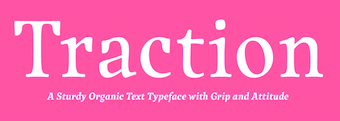 Chiara Mattersdorfer was born in Vienna and is a trained graphic designer. Before she joined Schriftlabor in 2015 as Austria's first employed digital punchcutter, she worked at an ad agency. Chiara is currently studying linguistics at the University of Vienna.
  Illustrator and professor in Boston, MA, who created many great typographic posters. He especially got a lot of mileage out of Donald Trump. [
 Vienna-based designer of the angular text typeface Lotti (2015), which is named after her grandmother. The typeface was used in a book about her life. During
  Disciple of Philipp Luidl, b. 1967, Munich, Germany. During his studies in Vienna, Christoph Reichelt designed the modular retro typeface Grande Coppi (2016). In 2021, he released
  [
[ Linz, Austria-based designer of these typeface families, ca. 2018:
 During his studies at New Design University, Daniel Schaffer (Vienna, Austria) created the carefully crafted typeface
  Daniel Schaffer studied at the Graphische Wien and works at Buero Bauer in Vienna since 2016. In 2021, Erwin Bauer, Mischa Herzog and Daniel Schaffer co-designed
  Salzburg, Austria-based creator of these typefaces:
  David Gobber is a graphic designer currently based in Basel, where he is finishing his graduate studies at the FHNW Academy of Art and Design. Before that, he studied Visual Communication under Fons Hickmann at the University of the Arts Berlin. He created the headline typeface Raster (2012, +Decorative), which was designed on a grid. In 2014, he created the nibbed pen typeface Pachner. His latest typefaces include Lucifer (a threatening text typeface) and SQ (a pixelish typeface). [
 DF Type is the Austrian foundry of Giovanni de Faccio and Lui Karner. Giovanni de Faccio (a calligrapher born in Venice in 1966) and Lui Karner made the very classy text family called
  [
[ Dina Bukva (Vienna, Austria) designed the ball terminal-laden didone typeface Farfalla in 2015. [
 Art director at
  Born in 1989, Dominic Vielnascher studies at NDU (New Design University) St. Pölten, Austria. His typefaces in 2011 include Naraganda (a beautiful low x-height arts and crafts family), an
  [
[ Graphic designer in Vienna, Austria. In 2015, he created the Lobo Lumitel typeface for the launch of a camera.
  Cofounder with Michael Hochleitner of
  Typefounder in Vienna around 1900. His work includes the art nouveau post-Victorian typefaces
  [
[ [
[ Erwin Krump was at the University of Art and Design in Linz, Austria, from 1986 to 1992. After that, he was active as type designer and sculptor. His typefaces include the delicate roman text typeface family
  Viennese painter, illustrator, industrial designer and graphic artist, b. 1875, d. 1944. Puchinger studied with the muralist and art professor Franz von Matsch (1861-1942), who worked on decorative art with Gustav Klimt. He worked in London, Prague and Paris as well as Vienna and collaborated with other major figures in Viennese art and design such as Ernst and Gustav Klimt and Otto Prutscher. At the end of his studies, he met Otto Wagner, Josef Hoffman, Joseph Maria Olbrich and Koloman Moser and joined the Vienna Secession. [
 Austrian foundry located in Vienna, est. in 2008 by
  Felix Auer is an art director, graphic designer and illustrator from Vienna. He graduated from dieGraphische in 2008. Since then he worked together with g-b.at in Vienna, at Twopoints.net in Barcelona, and at gantnerundenzi, Ogilvy & Mather, Himmer, Buchheim & Partner.
  Wolfgang Hitzinger (Fischer Enterprises) made a
 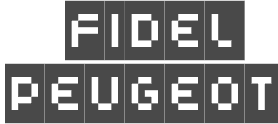 [
[ Franziska Hubmann was born in Vienna, Austria, and studied graphic, communication and type design there. She has worked as typographer and type designer ever since. She is associated with
  Based in Vienna, Austria, and/or Latsch, Italy, Franziska Weitgruber received her Bachelor's Degree in Graphic Design with a focus on type from the New Design University (NDU) Sankt Pölten, Austria in 2014. She also studied in the
  Austrian scribe and
  Austrian designer who is trying hard to give the free software world an excellent qualitatively competitive free Garamond family. At
  Type designer based in Vienna, Austria. Codesigner with Marcus Sterz at FaceType of a Victorian type family called
  Italian calligrapher and type designer from Venice who lives in Austria. Giovanni de Faccio (b. San Donà di Piave, Venezia, 1966) and Lui Karner run the Austrian foundry DF Type (or: Fischbachpresse). They made the very classy text family called
  [
[ [
[
 Herbert Pesendorfer is the creator with H. Pollhammer of the
  Adam Katyi, who hails from Sopron, Hungary, has three degrees. He has a BA from the University of West Hungary at Institute of Applied Arts, Sopron in 2010, and an MA from Moholy-Nagy Art and Design University, Budapest in 2012. In 2013, he graduated from the
  [
[ Natali Kalpakova (Graz, Austria) and Ijob Brandstätter (Graz, Austria) co-designed the
  Student at New Design University in Vienna. Creator of the display typeface
  Vienna-based type designer who joined
  A Japanese unit that created the free (type 1 format) IPAEX fonts in 2003-2011. They can be downloaded from the
  [
[ Or Jan Gabriel. Ecuadorian designer now based in Graz, Austria, of Fabio Slab (2019) and the reverse contrast sans typeface
  [
[
 [
[ Designer (with Fabio Luiz Haag) of a grotesque sans at Dalton Maag, 2007-2009, called
  Austrian artist (b. 1865, Vienna) who studied at the Vienna Academy, and became a Professor in Munich. Member of the Secession from 1898. He died in Grado, Italy, in 1949. A travel poster by Josef Maria Auchentaller in 1906 led Tom Wallace to design the avant garde / art nouveau all caps typeface
  Klinger was born in Dornbach near Vienna in 1876. He studied at Technologischen Gewerbemuseum in Vienna. In 1895, he found his first employment with the Vienna fashion magazine Wiener Mode. In 1896, he moved to München where he worked as an illustrator for the Meggendorfer Blätter and other magazines. From 1897 to 1902 he was a collaborator at the famous Jugendstil magazine Die Jugend. In 1897 he moved to Berlin, where he worked extensively as a commercial graphic artist until 1915. Together with the printing house Hollerbaum und Schmidt, he developed a new fashion of functional poster design that soon gained him international reputation. In 1912 he designed the poster for the Rund um Berlin air show in Johannisthal. In Berlin he also contributed to Das kleine Witzblatt, Lustige Blätter and Das Narrenschiff magazines. Beginning in 1918, Klinger designed the ads for Tabu cigarette rolling paper. According to Viennese police records, Klinger, who was Jewish, was deported to Minsk on June 2, 1942 together with his wife Emilie and killed the same year. Others have him die in Vienna in 1950.
  Jürgen Schwarz is an Austrian graphic designer based in Berlin. He graduated from Ortweinschule in Graz in 2004. He moved to Germany to study communication design at University of Applied Science, in Würzburg. In 2014, he was writing his Masters Thesis at University of Applied Science in Potsdam. Codesigner with Jakob Runge at TypeMe Fonts (and later TypeMates) of the slab serif typeface family
  Viennese foundry acquired in 1926 by D. Stempel AG (50%) and H. Berthold AG (50%). Designers of Original-Schwabacher (before 1925) and Messe-Gotisch (before 1925). Kurt Liebing made Liebing-Fraktur, also some time before 1925. A small timeline of the company:
  Iris Kirchner (Kiris Artworks, Graz, Austria) created the commercial EPS-format display typeface
  Koloman Moser (1868-1918) studied at the Akademie der bildenden Künst (1886-1892) and the at the Kunstgewerbeschule in Vienna (1893-1895). He began as an illustrator for the satirical magazine Meggendorfer Blätter in München. He was a founding member of the Vienna Secession in 1897 and later the artistic director for the Wiener Werkstätte in 1903. He taught at the Kunstgewerbeschule in Vienna until his death.
  Johannes Lang (Langustefonts) is a graduate of the
 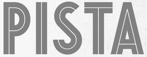 Maximilian Huber (Lettering Garage; and before that,
  Vienna-based graduate of the University of Applied Arts Vienna and the
  Vienna-born type designer who lived from 1883-1972, and whose real name was Emil Kahn. He died in New York, where he lived most of his life. He studied at the Munich Academy, which became a center of poster design. In 1910 he co-founded the magazine Das Plakat. During WWI he designed posters for the German War effort. In 1920 he was appointed as the first professor of poster design at The Akedemie der Kunst, Berlin. He moved to New York in 1923 and continued his poster work. He also continued his teaching at the Art Students League and at New York University.
  Vienna, Austria-based creator of a typographic R2D2 poster (2014). [
 Lukas studied graphic design and typography at New Design University in St P&oum;lten. Designer from Vienna, Austria, who joined Dalton Maag in 2009 where he presently serves as Creative Director in the London office. There he revived a typeface based on photographs of inscriptions in castle Hoch Osterwitz, which was designed by Austrian architect Paul Grueber in the early 1900s. Along with the architecture, Grueber also created the letterforms. Dalton Maag: Lukas initially struggled to harmonize the initial letterforms into a functioning typeface. The main challenge was to create a matching lowercase and other glyphs since the original was a caps-only design. Together with the team at Dalton Maag, Lukas eventually developed a two-weight font family for display purposes.
  Manuel Radde (b. 1979, Berlin) is an independent graphic designer based in Vienna since 2007. In 2016, Manuel Radde and Igor Labudovic joined forces for the development of the multiline OCL family of fonts and icons, where OCL stands for Open Commons Linz. These were developed for the city of Linz, and are distributed
  [
[ Gamlitz, Austria-based graphic designer. She studied at the New Design University in St. Pölten. Creator of
  During his studies in Vienna, Mark Ettenauer created the heagonal typeface Symbiosis Modulschrift (2014, with Giovanni di Faccio). [
 Austrian designer. At
 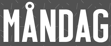 [
[ [
[ Miriam Suranyi graduated from the Graphische in Vienna with emphasis on typography. She works as a type producer at Schriftlabor and is part of the Glyphs-Team. Her typefaces:
  Mischa Herzog completed architectural studies at Vienna University of Technology. Since 2007, he is a designer and project leader with Buero Bauer In 2021, Erwin Bauer, Mischa Herzog and Daniel Schaffer co-designed
  Type designer Marcus Sterz (Vienna, Austria) collaborated with software developers Andrey Okonetchnikov and Juho Vepsäläinen who contributed their expertise in programming to create the coding (programming) font family Mono Lisa (2020). Priced at 345 Euros or over 400 dollars for 14 styles, the authors compare their font with the free fonts Fira Code, Source Code and Jetbrains Mono. [
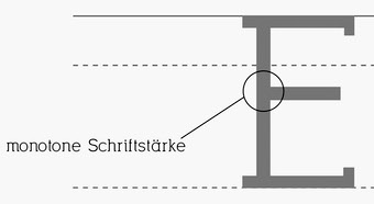 During her studies in Graz, Austria, Nadine Schach designed the slab serif typeface Garnitur (2017). [
 Nicole Fally started NF Fonts in 2012. She is an Austrian-born graduate of the type design program at the
  [
[ Viennese type designer (aka olewood), illustrator and graphic designer who cooperates at Typisch Beton.
  Austrian graphic and type designer (b. 1927, Austria, d. 2010, Hard, near Bregenz) who set up Vorarlberger Graphik Studio in 1951 in the town of Hard am Bodensee (Lake Constance) after graduating in 1950 from a graphic arts academy in Vienna. He specialized in poster design, and in the late 1960s, early 1970s, he turned to logo and type design.
  Graz, Austria-based student-designer of the clean sans typeface Cultura (2017).
  Graduate of New Design University in Austria, class of 2013, and the
  Aka Skomii. Austrian creator of the hand-printed typefaces
  [
[ Austrian foundry (est. 2008) located in Vienna, and run by
  Pier Francesco Martini (b. 1984), a graphic designer in Prato / Firenze, Italy, designs and sells typefaces. He created
  Originally, a free font foundry by
  New concept for the pricing and distribution of fonts suggested by Platz Wien, a graphic design group from Vienna. Email contact: Martin Tiefenthaler from Atelier Tiefenthaler. Martin Tiefenthaler teaches typography and semiotics at die Graphische in Vienna, Austria, and has been running his studio ID IID IIIDesign for 25 years, is co-founder of the Typographic Society Austria (tga), and studied the implications of capitalization in the Latin writing system on European thinking for his PhD, ca. 2000.
  Fabian Pfeifhofer is an Italian/Tirolian designer, b. 1984. Creator of Ugloosy (2007, grunge), Loosydings Extended (2008),
  Architect (b. 1892, Vienna, d. 1970, Wuppertal) who is considered as most representive of modernist architecture. Neutraface (2002, Christian Schwartz, House industries) is a stylish sans family that is based on Richard Neutra's architecture and design principles. [See this
  [
[ Austrian type designer, b. 1884, Vienna, d. 1972, Vienna. Painter of "primitive art" canvases and a commercial artist, noted for the design of books, calendars, diplomas and posters. Geyer worked as an in-house designer for the Zsolnay publishing house and, from 1942 to 1945, he taught at Graphischen Lehr und Versuchsanstalt in Vienna.
 Graduate of Fachhochschule Vorarlberg in 2004, where his Diplomarbeit was entitled
  Stefan Schlesigner was born in Vienna in 1896. He moved to the Netherlands in 1925, where he worked for Van Houten's chocolate, Metz department store, printing firm Trio and many other clients. He died in the gas chambers of Auschwitz in 1944. His typefaces:
  During her studies in Vienna, Stella Chupik created the promising sans typeface family
  For a project at New Design University, Salzburg, Austria-based Tabea Hornegger created the Indic simulation font Indira (2015, Light and Class styles).
  [
[ Austrian designer of
  [
[ Vienna-based designer of the art deco typeface
  Titus Nemeth runs TNTypography in Paris, and specializes in Arabic typeface design, typography and custom type. A 2006 graduate in the Master of Arts Typeface Design programme at the Department of Typography and Visual Communication, University of Reading, he also studied Arabic script at the École Supérier d'Art et de Design d'Amiens, France. Titus holds a PhD in Typography & Graphic Communication from the University of Reading, UK.
  Typejockeys is a graphic and type design company based in Vienna, Austria, established in 2008 by
  German design blog run by three designers from Vienna.
  Austrian graphic designer in Vienna who created the modular blackletter typeface
  Austrian designer, printer, type engraver and teacher (b. Vienna 1882, d. Lexington, 1967) who made mainly uncial typefaces at Klingspor such as Hammerschrift (1923, a modern pseudo-Gaelic uncial),
  The Vienna Secession---also known as the Union of Austrian Artists, or Vereiningung Bildender Künstler Österreichs---was formed in 1897 by a group of Austrian painters, sculptors, and architects who had resigned from the Association of Austrian Artists: Gustav Klimt, Koloman Moser, Josef Hoffmann, Joseph Maria Olbrich, Max Kurzweil,
  Or just Viktor Solt. Born in 1970, Viktor lives in Vienna. He teaches typography and handwriting at the Joanneum in Graz, works in information design and advertising, and is involved in 3-D animation.
  During her graphic design studies in Vienna, Viktoria Feilhammer created the display typeface Mila (2014). [
 Austrian type designer (b. 1972) who published with URW, but started his own type Vienna-basedfoundry, Ekke Wolf, which became Typic some time later, and most recently, Wannatype.
  Willerstorfer Font Foundry (est. 2010) is an independent font foundry based in Vienna, Austria, established by
  WIP stands for Write It Personal. WIP is a commercial handwriting font outfit based in Vienna, and run by
  Type design graduate from Reading who created
  Graphic designer in Vienna, Austria, aka xtoph and Chris Toph. His typefaces:
 Graphic designer in Brunn am Gebirge, Austria, b. 1989, who graduated in 2012 from the New Design University in St. Pölten. His thesis work was the sans typeface family
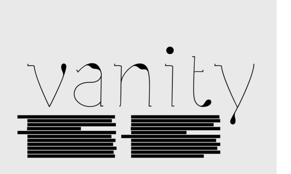
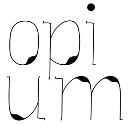
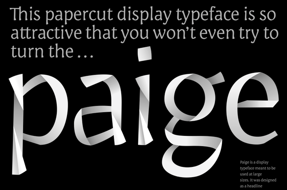
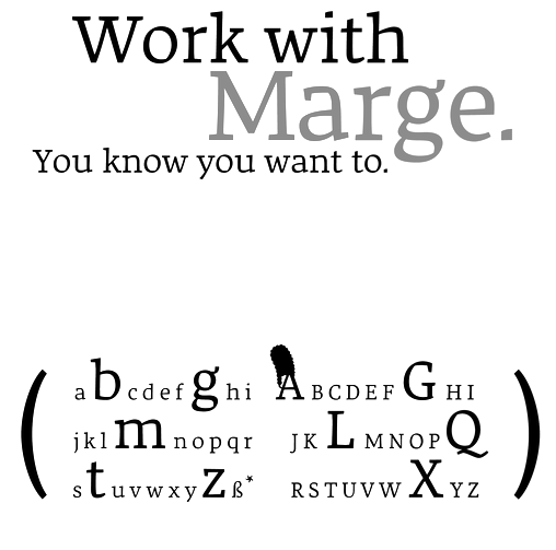
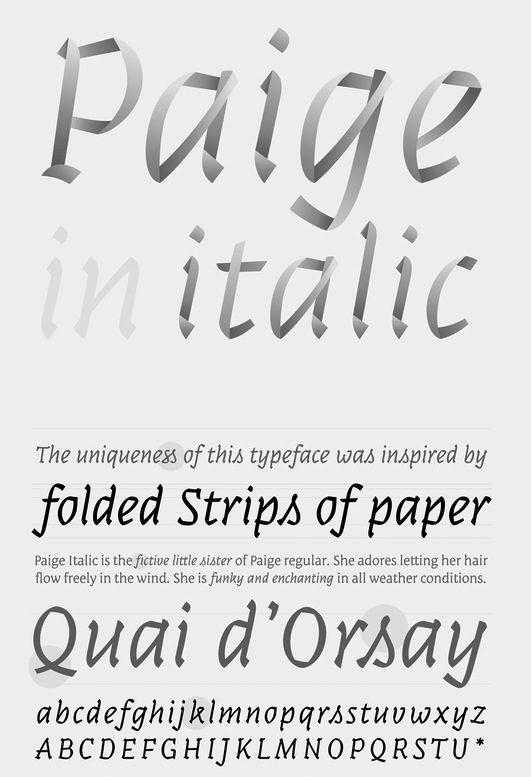
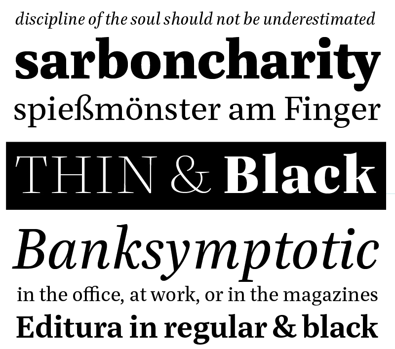
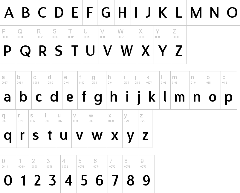
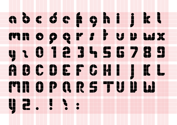
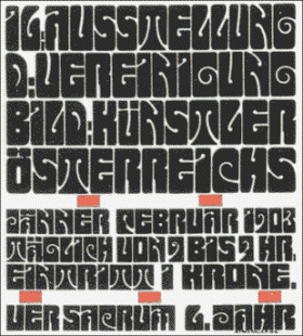
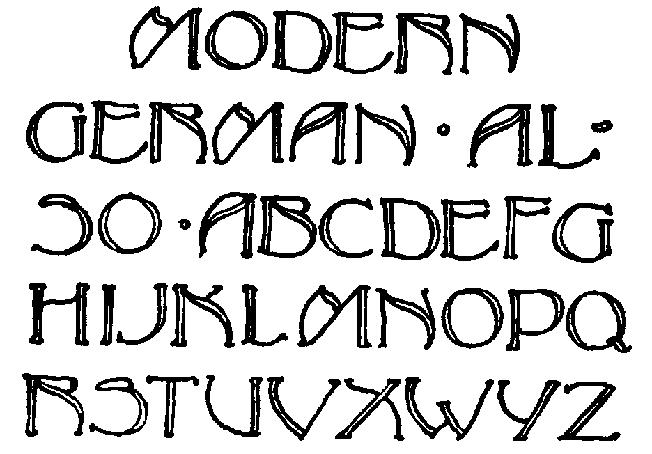
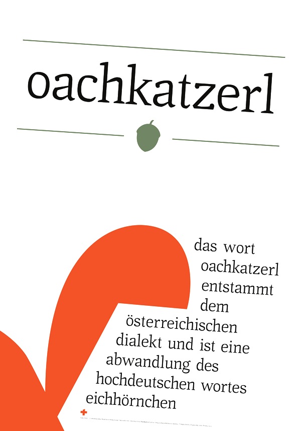
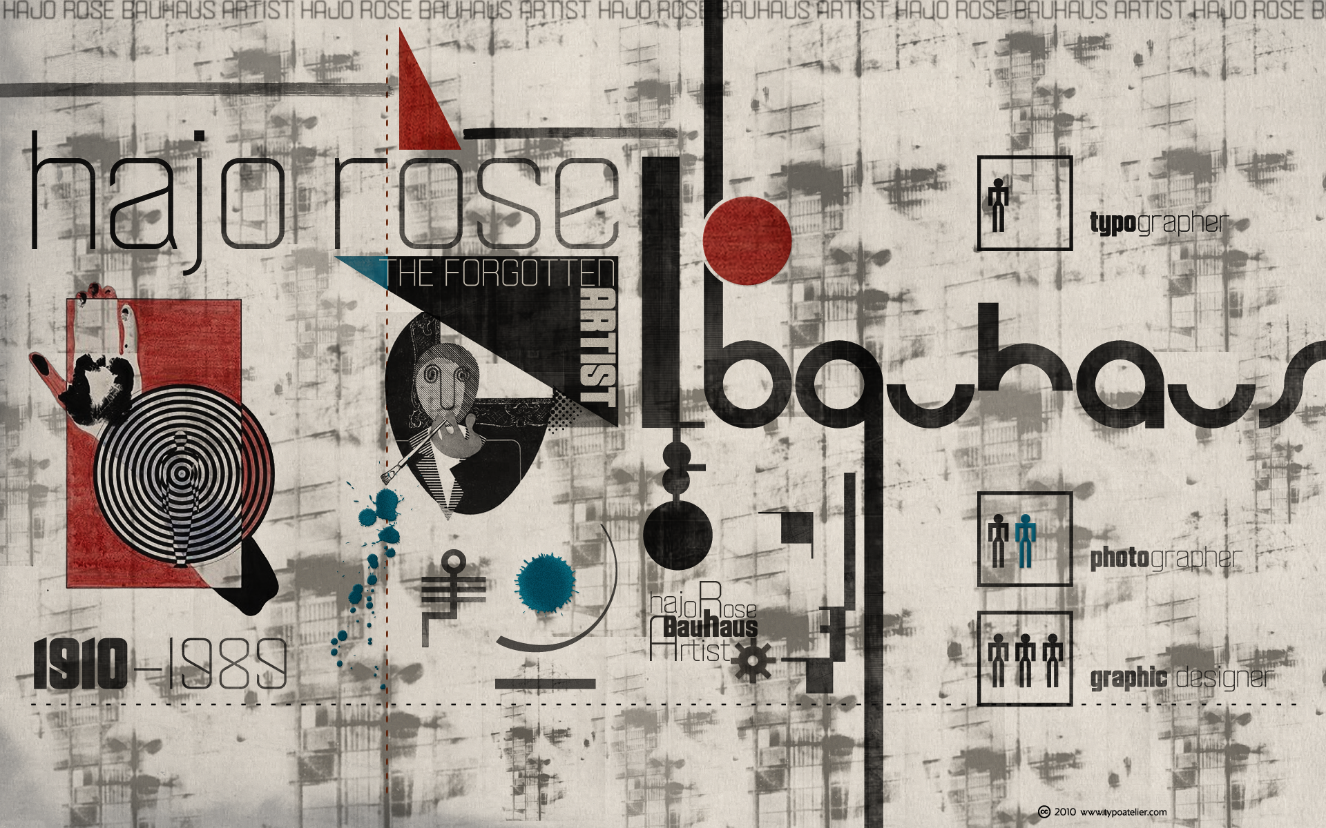
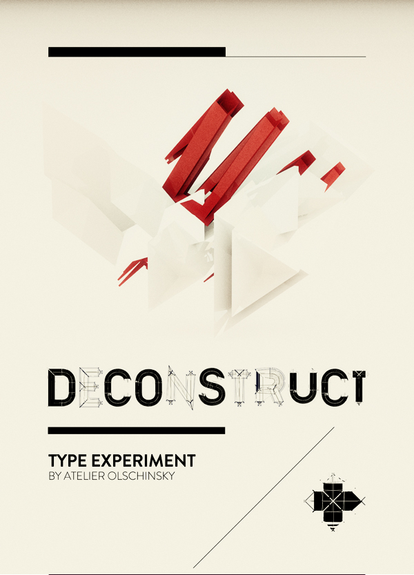
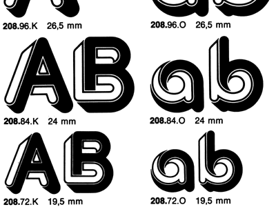
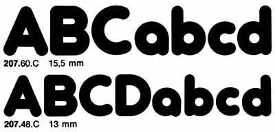
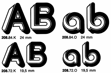
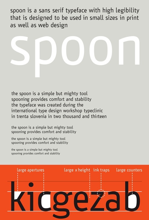
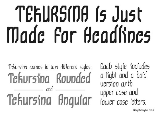
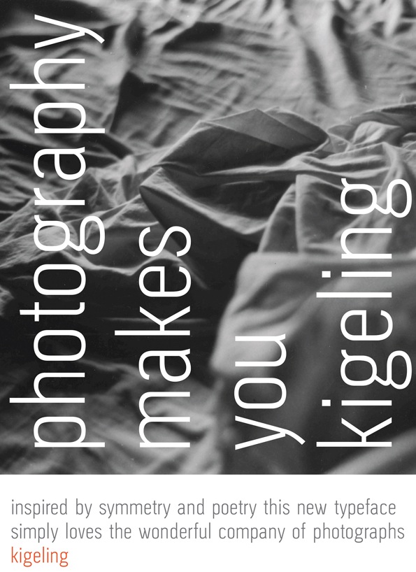
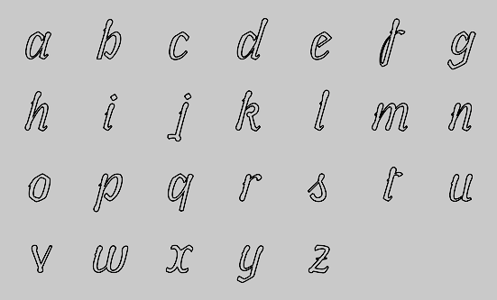
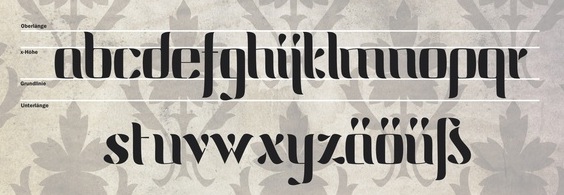
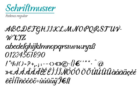
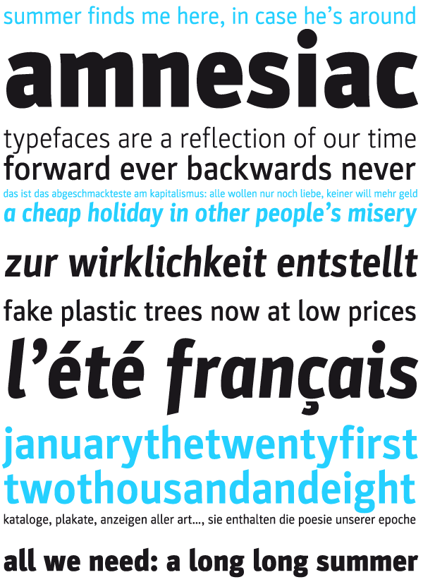
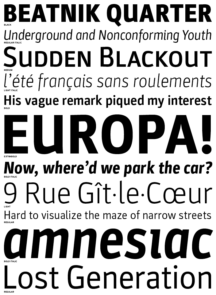
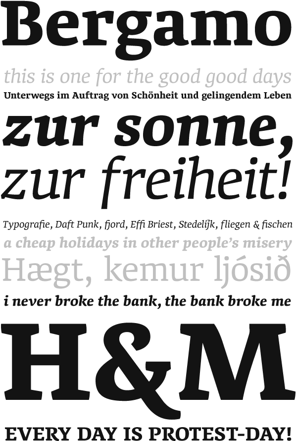
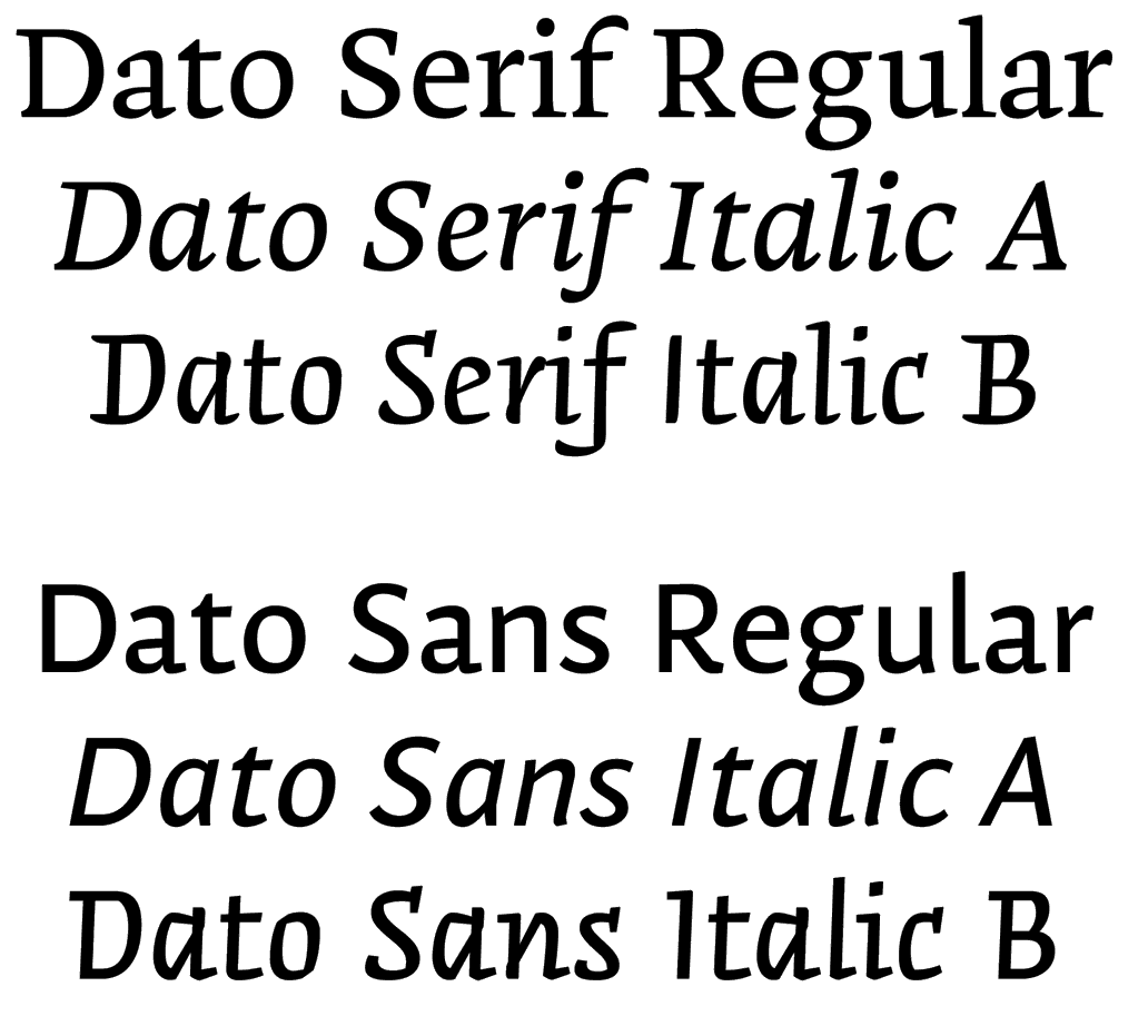
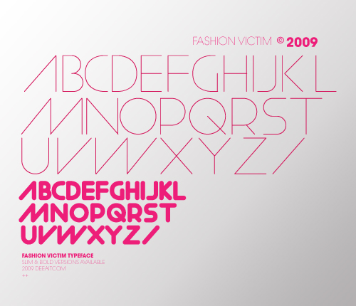
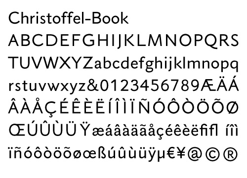
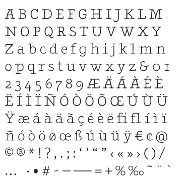
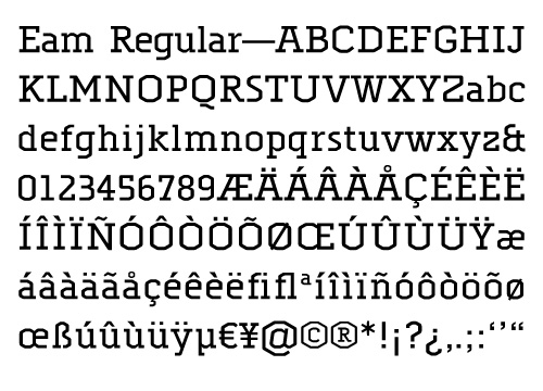
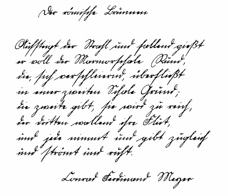
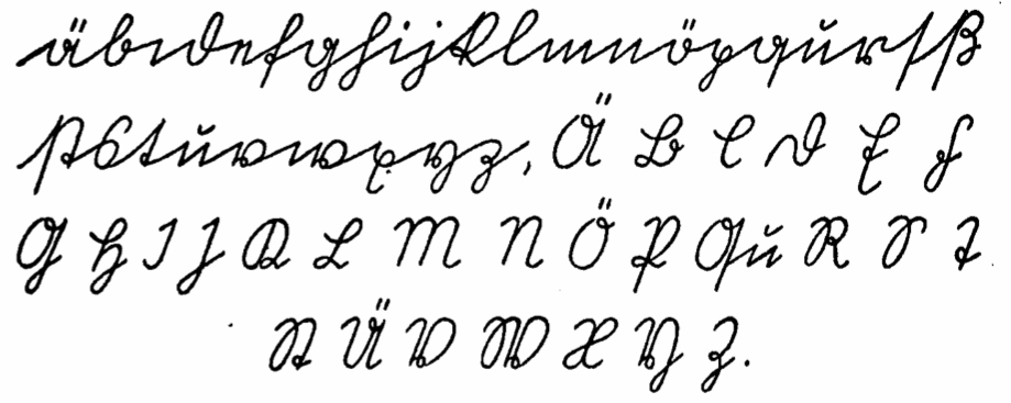
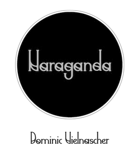
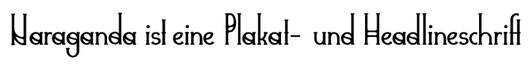
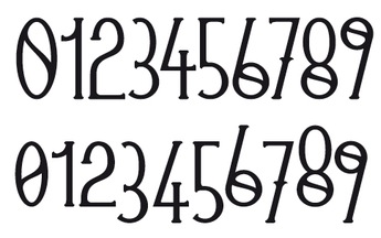
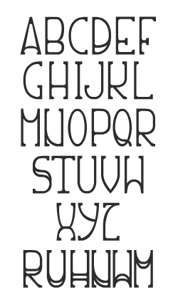
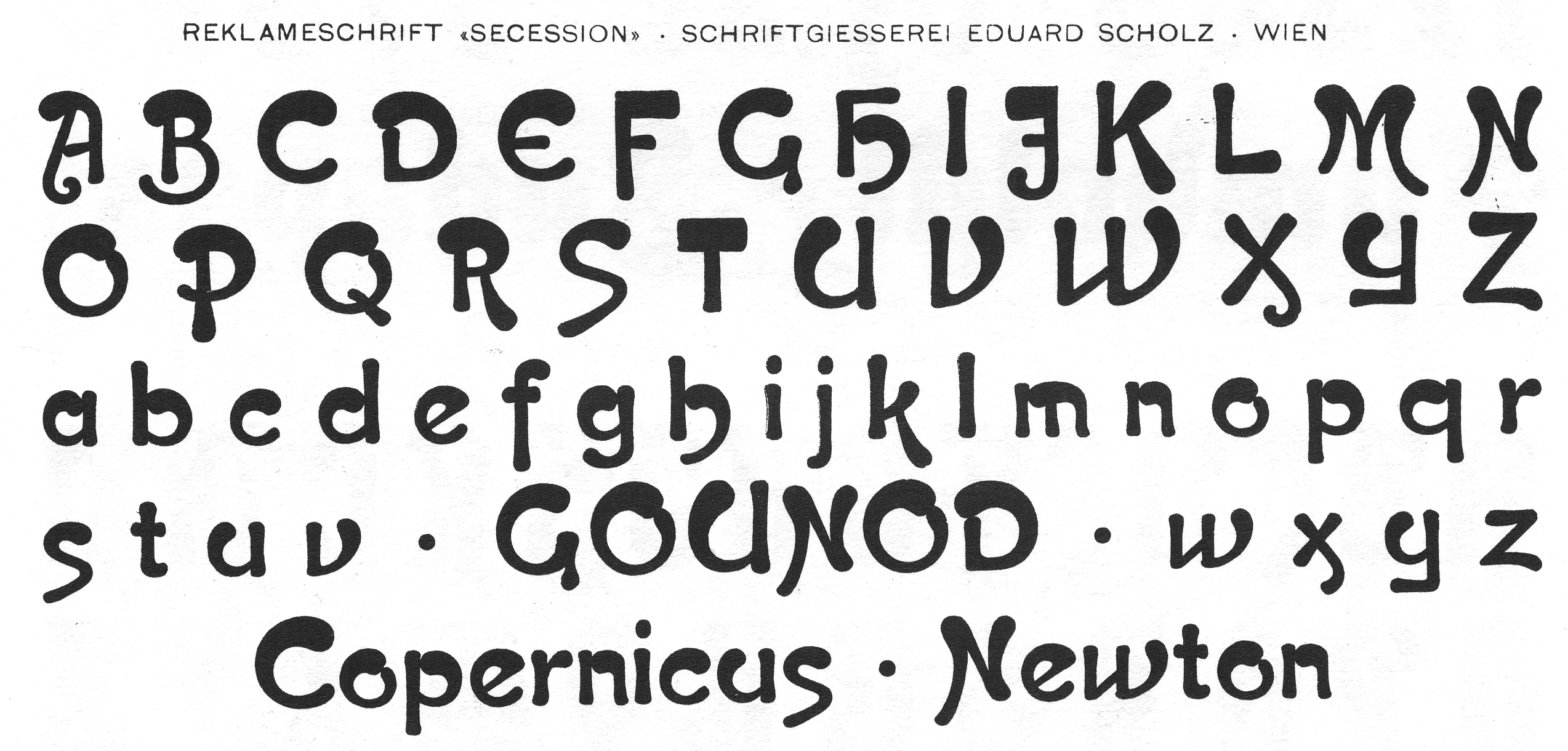
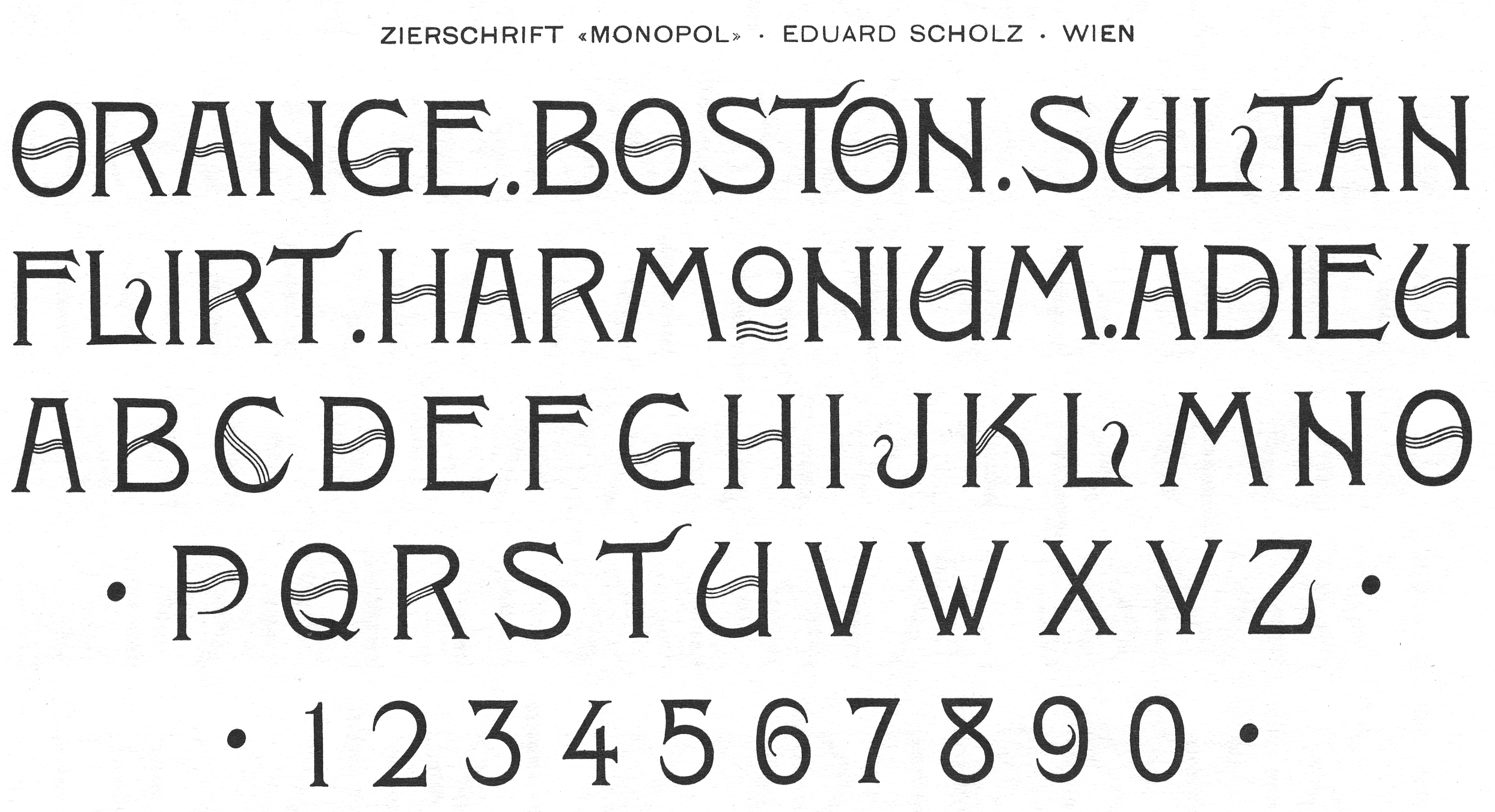
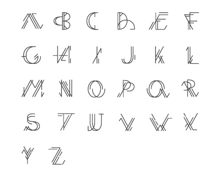
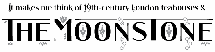
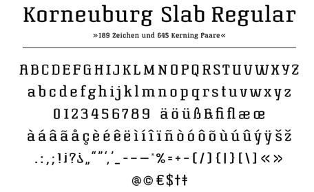
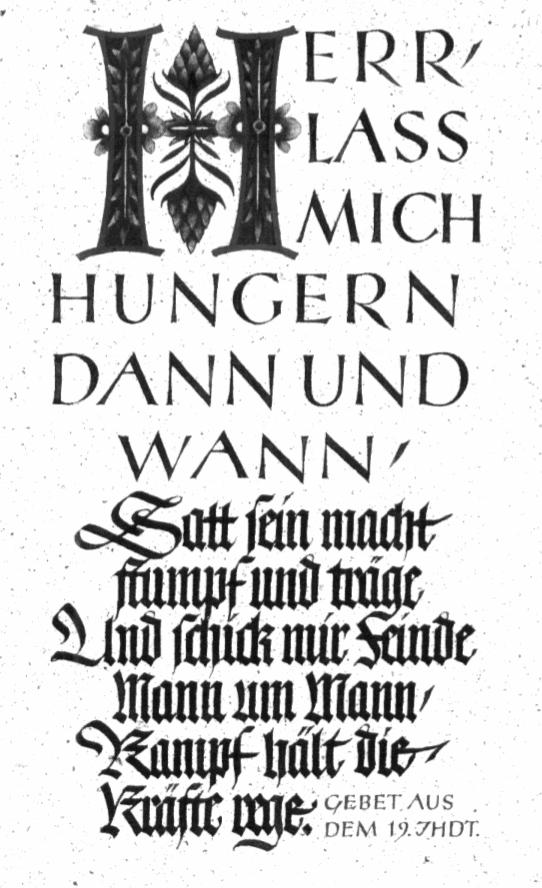
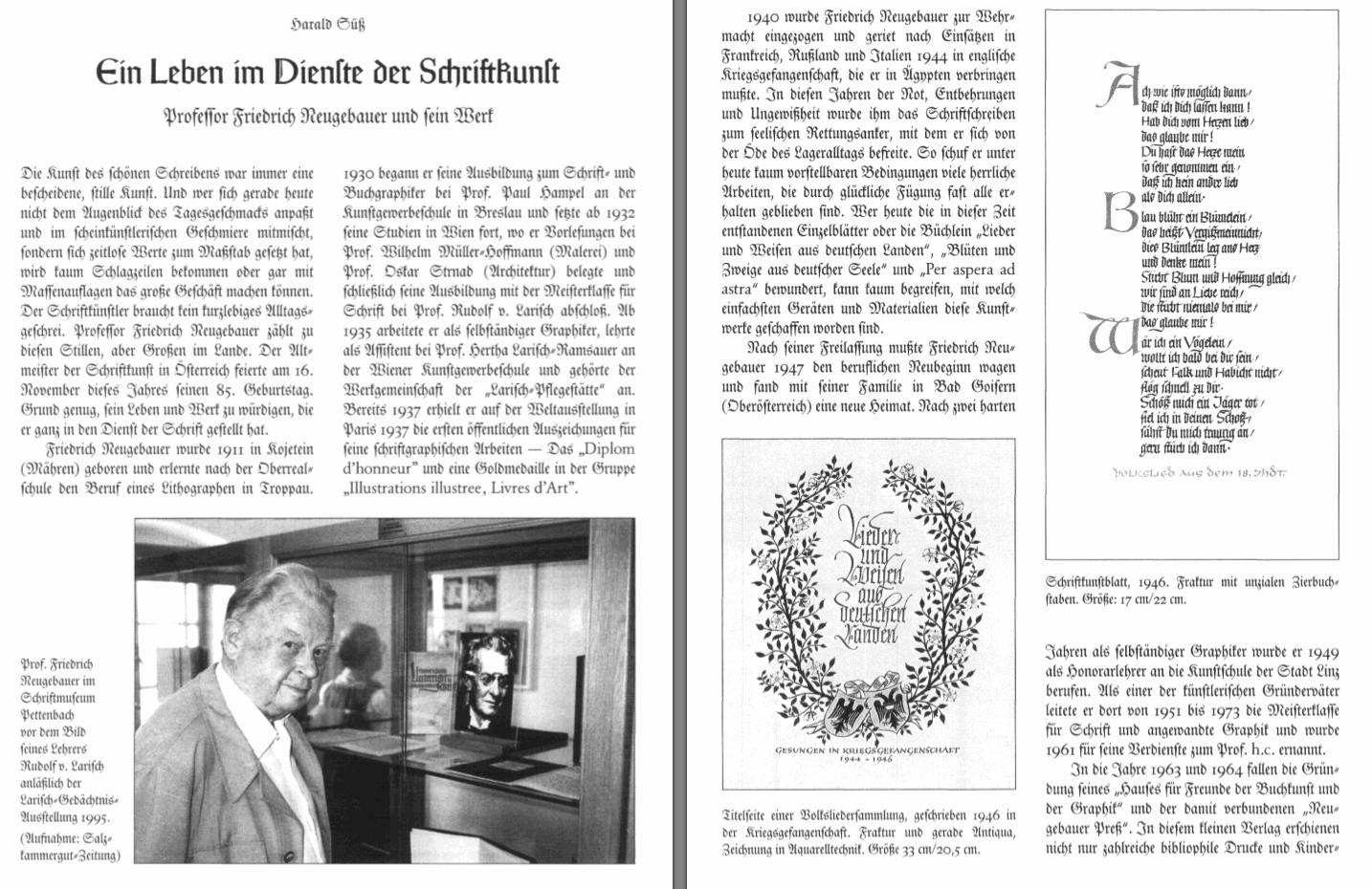
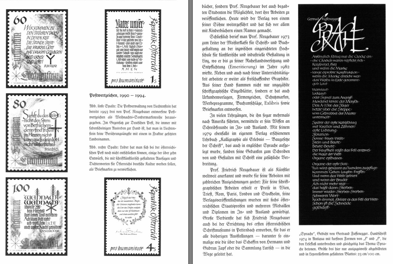
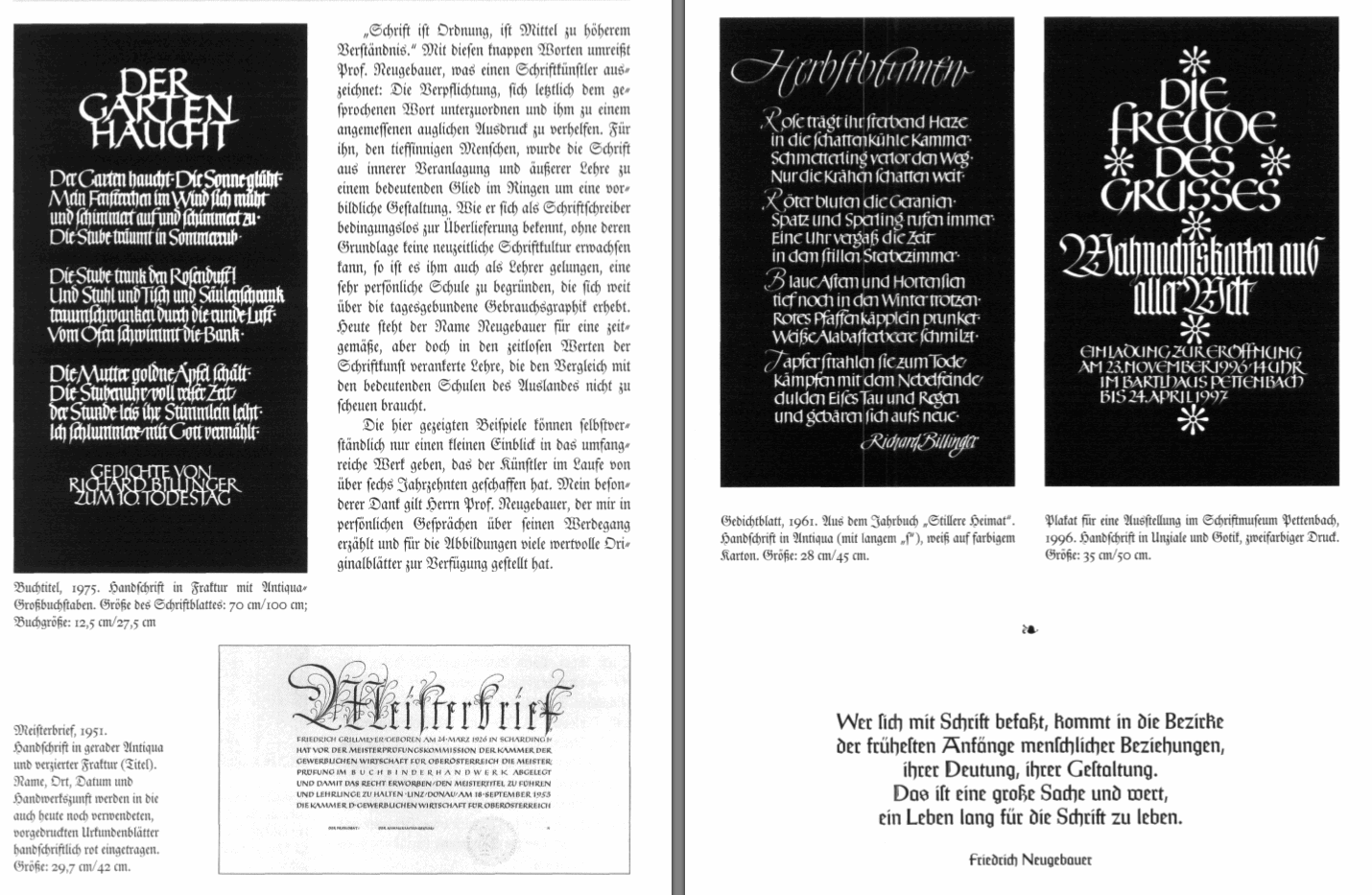
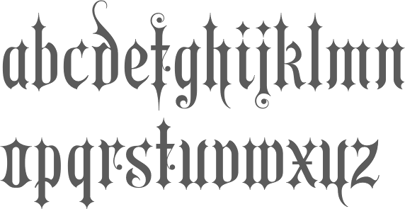
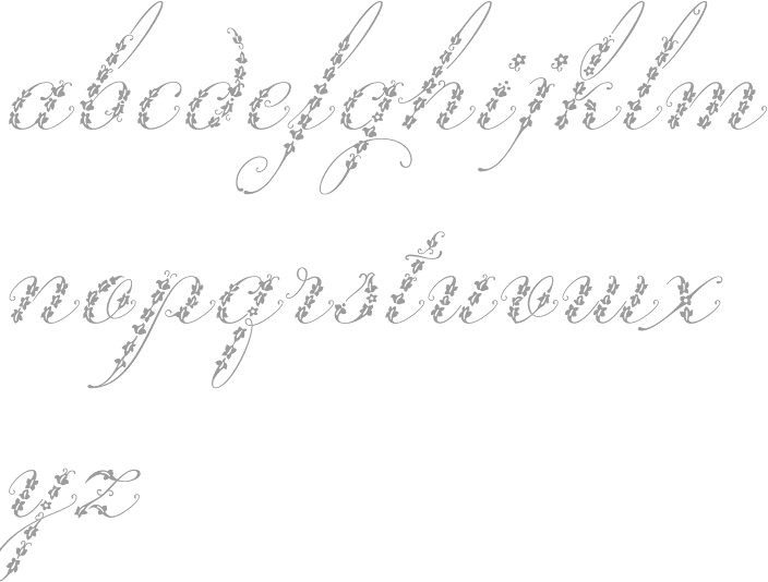
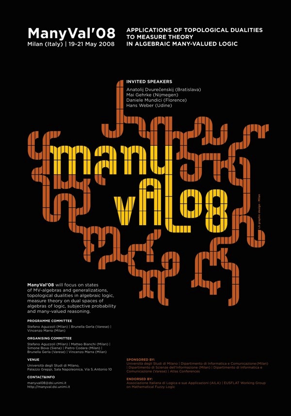
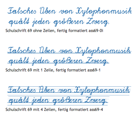
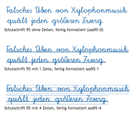
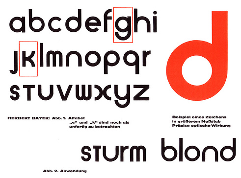
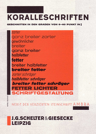
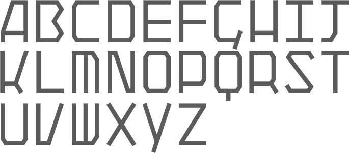
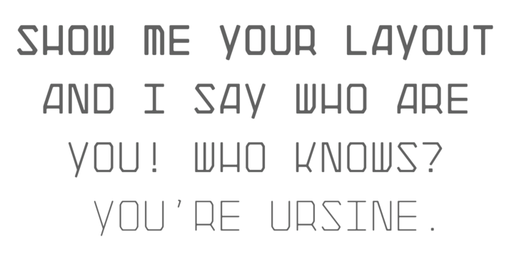
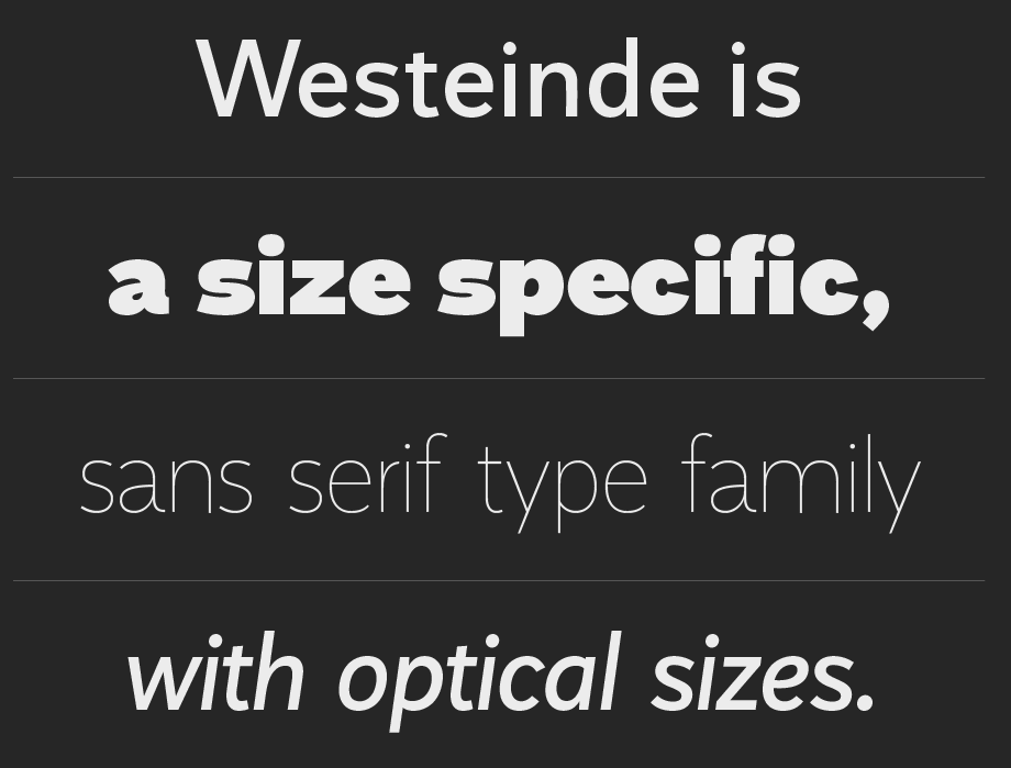
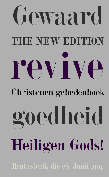
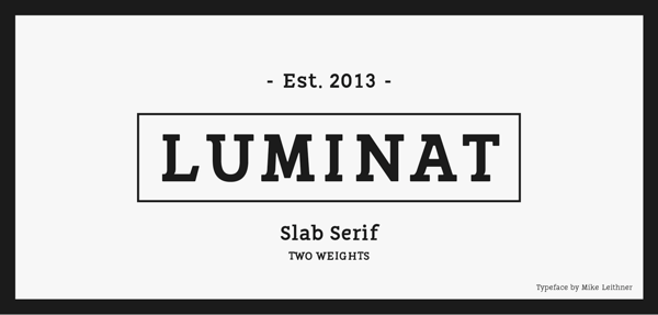
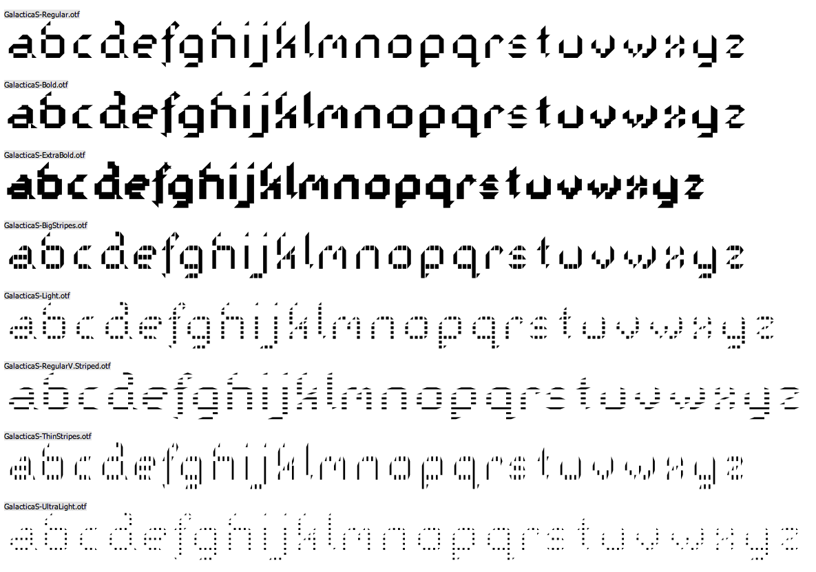
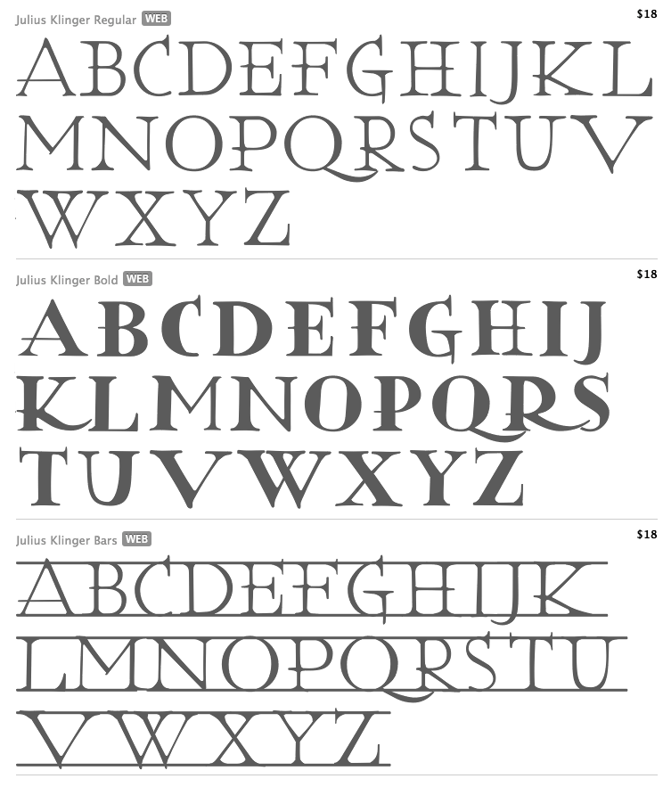
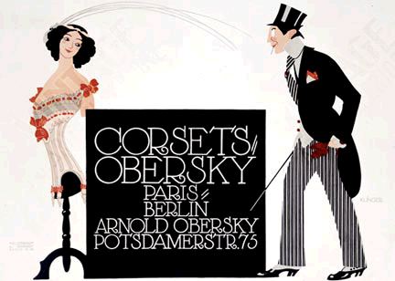
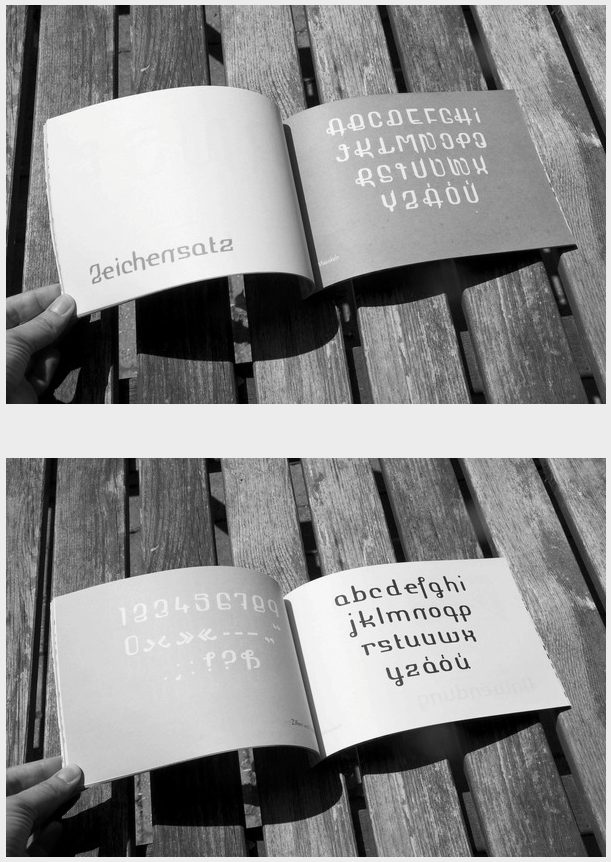
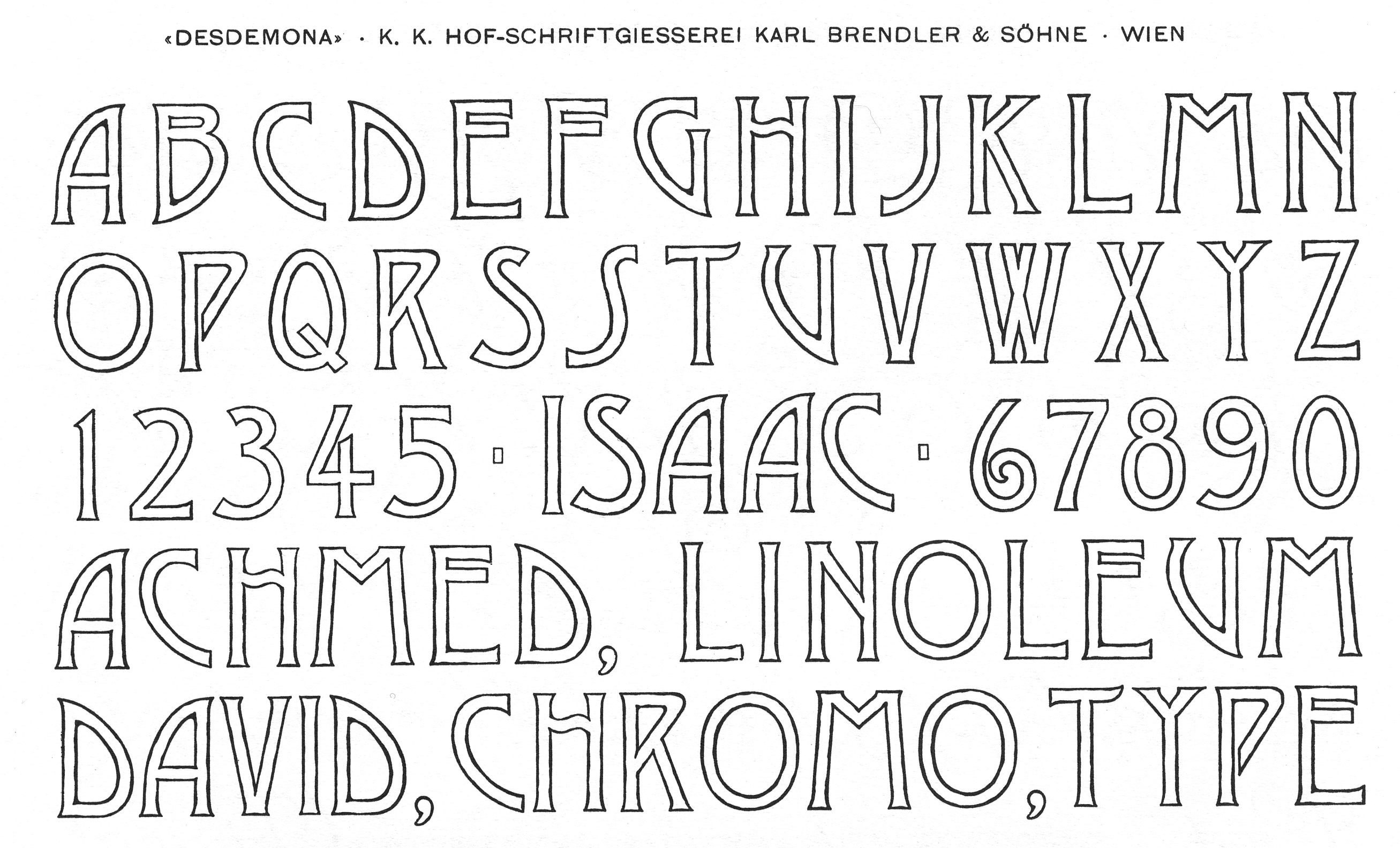
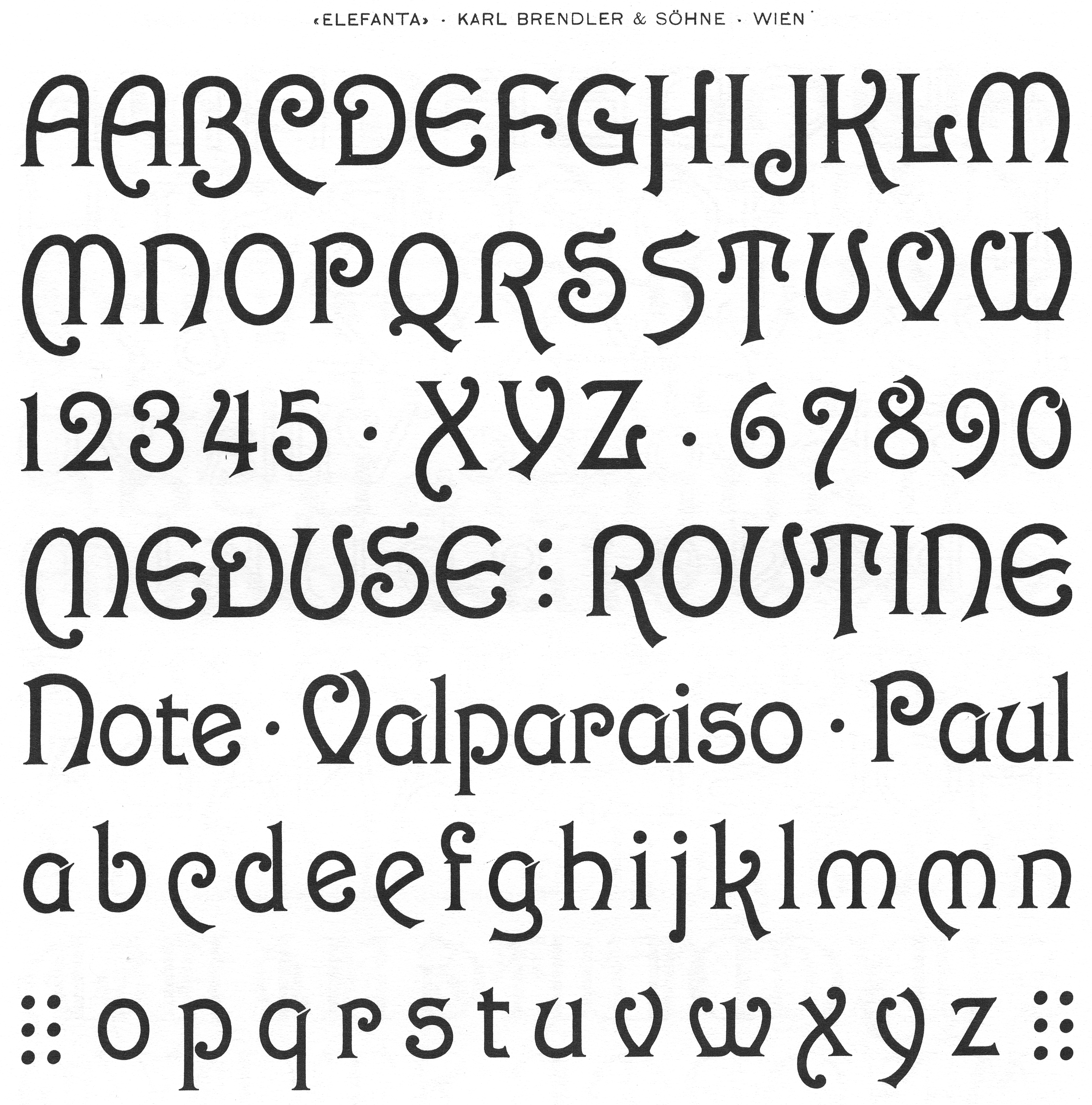
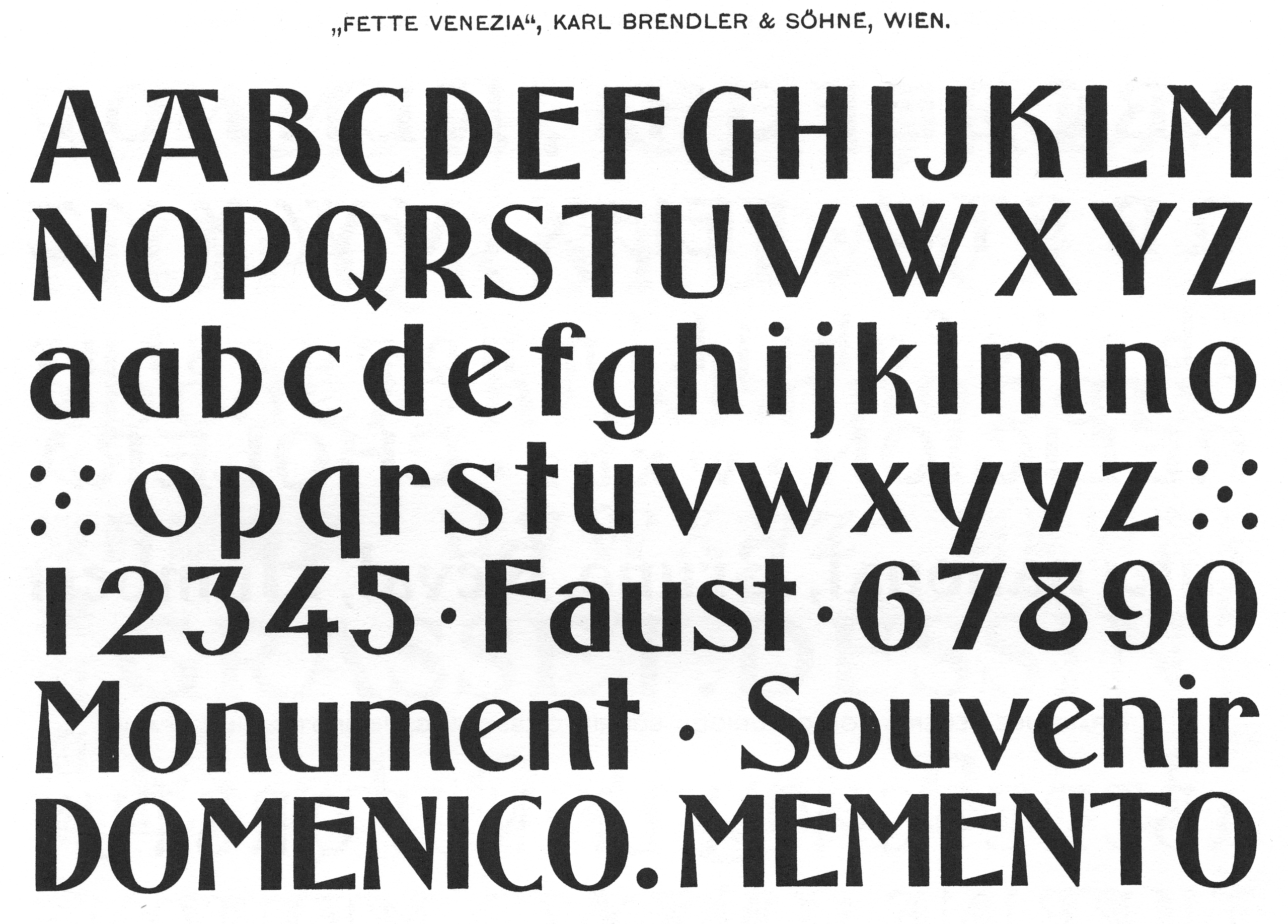
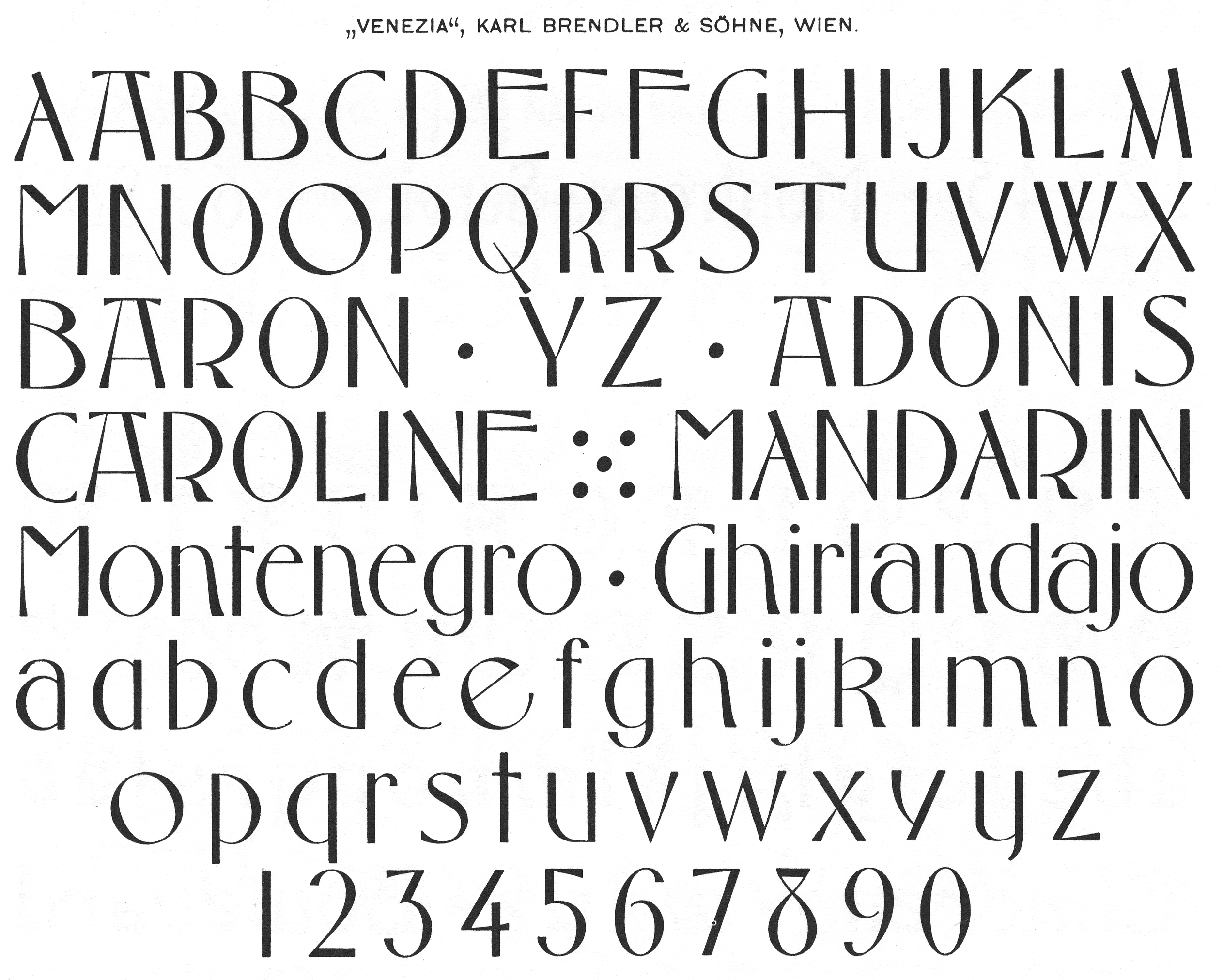
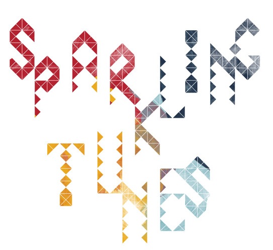
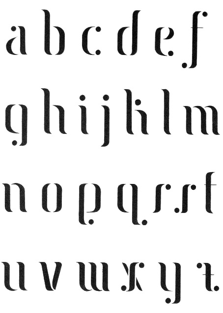
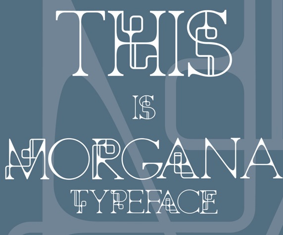
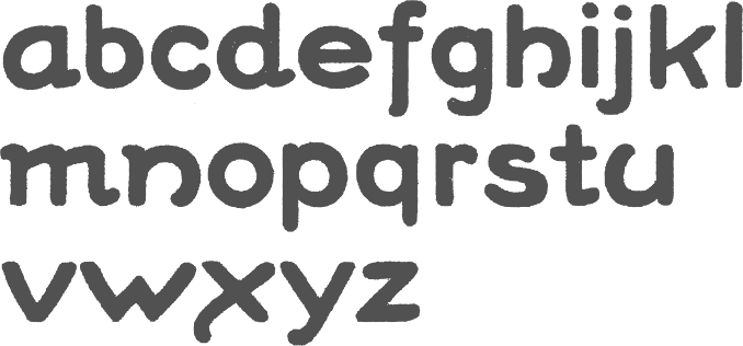
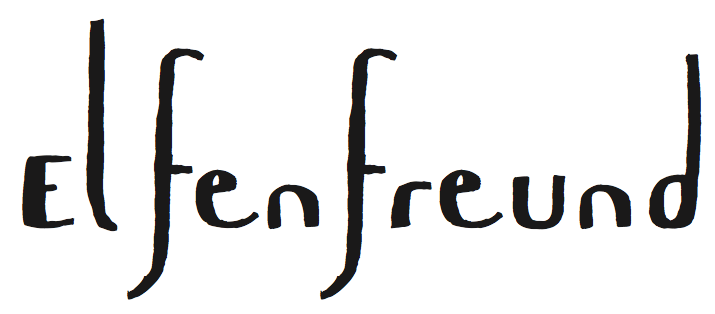
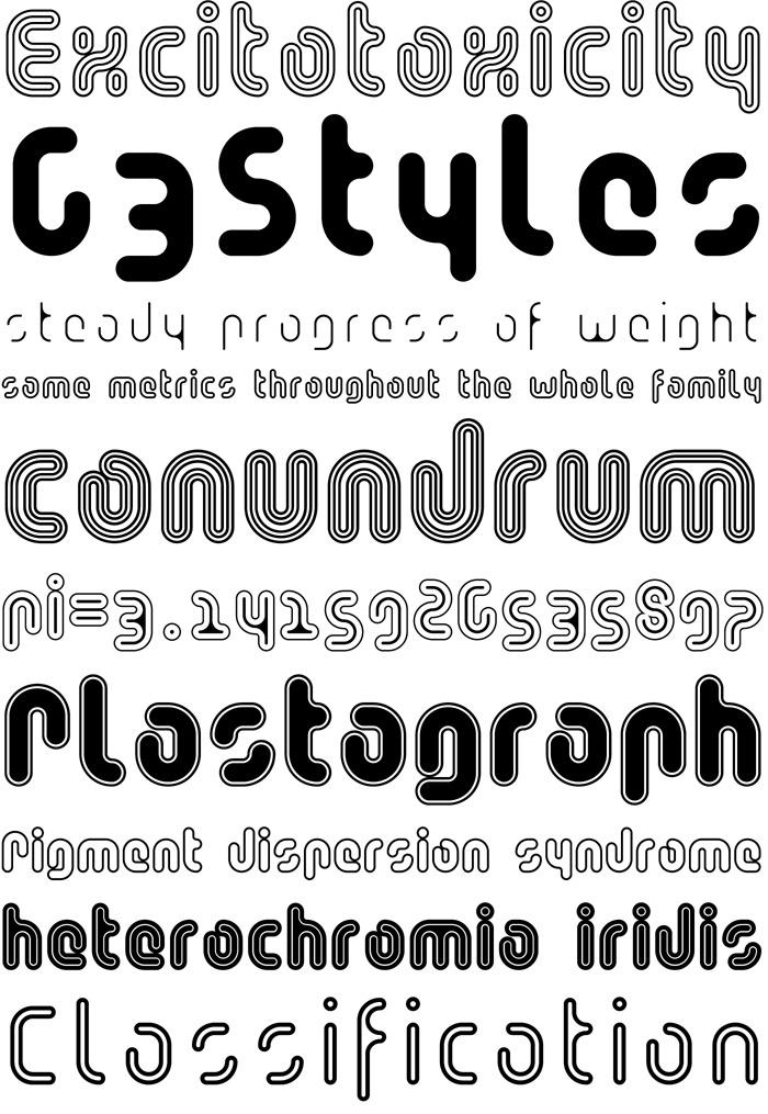
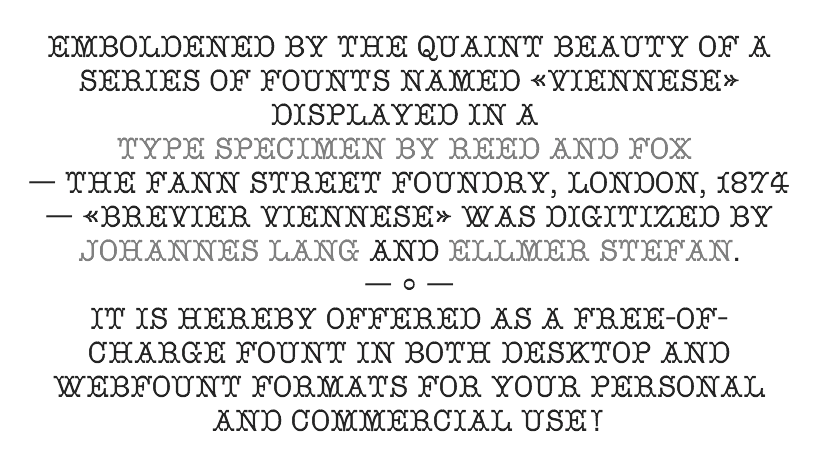
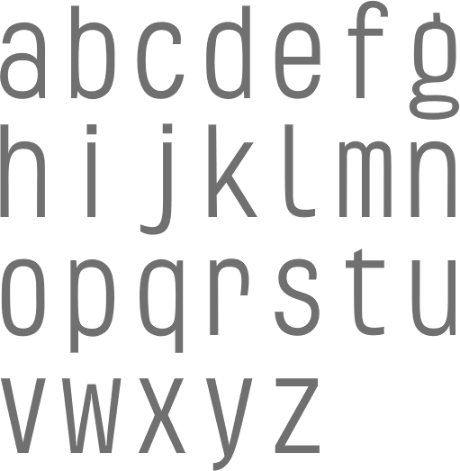
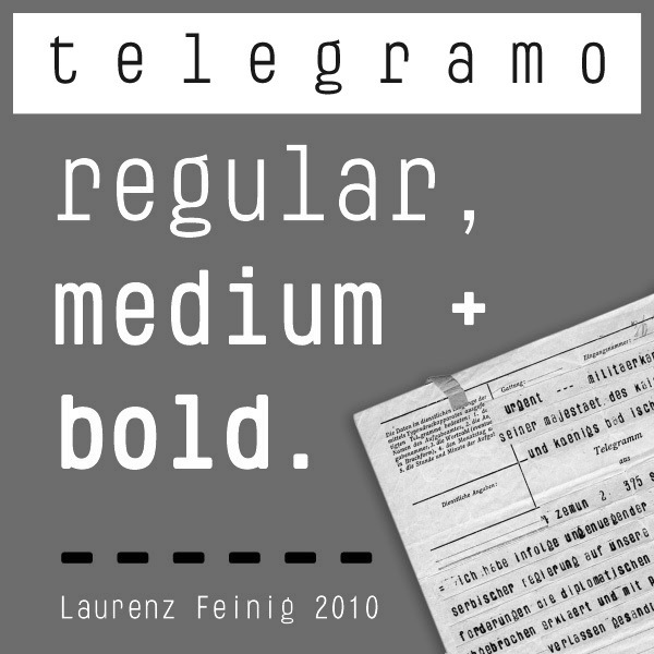
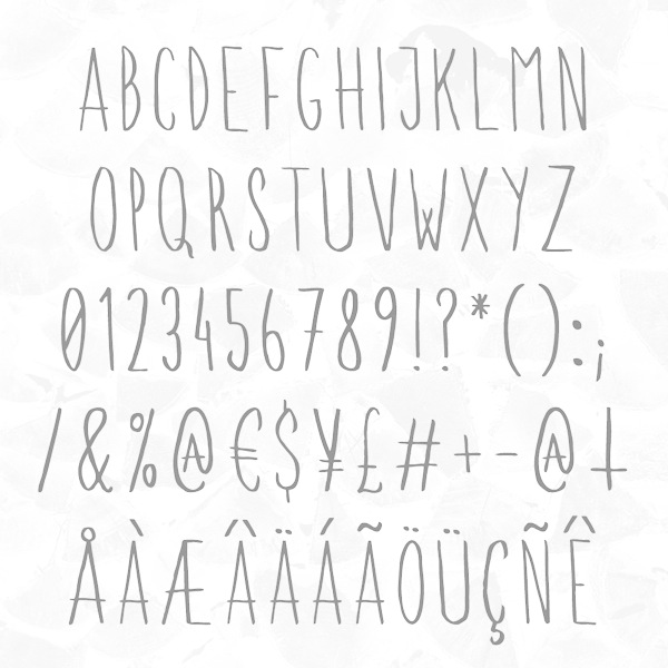
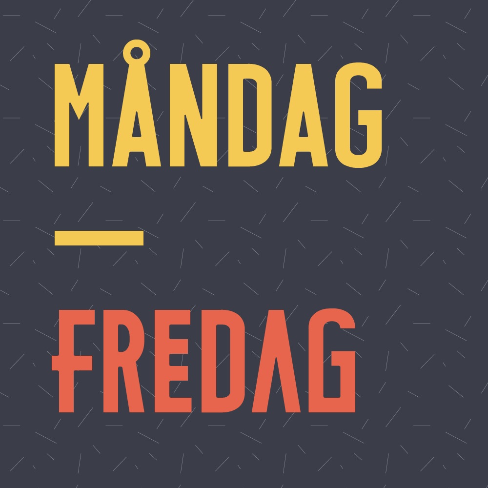
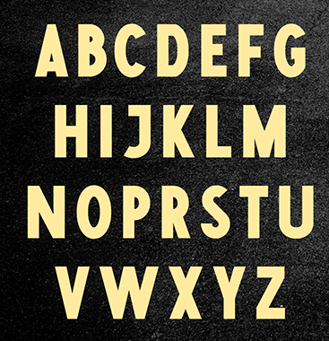
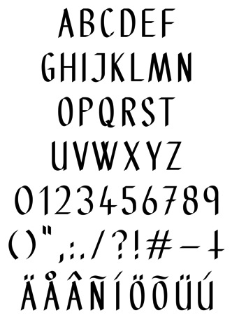
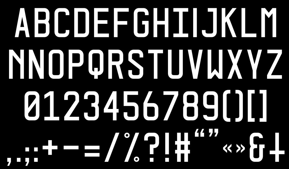
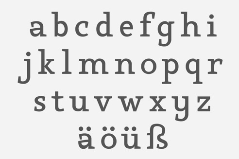
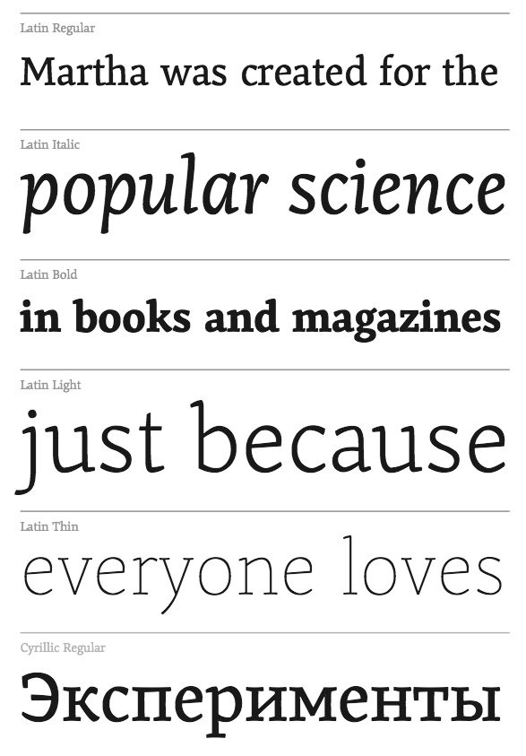
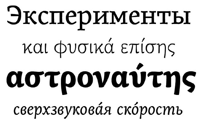
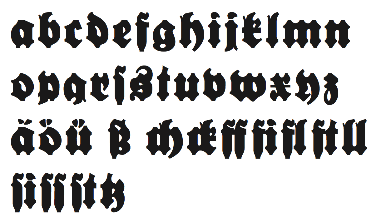
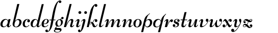
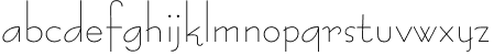
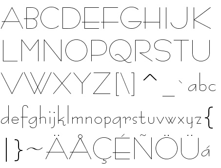
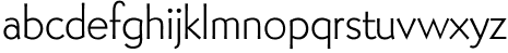
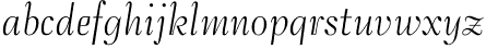
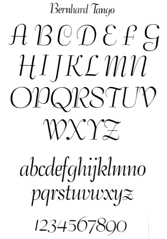
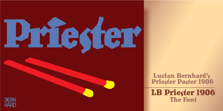
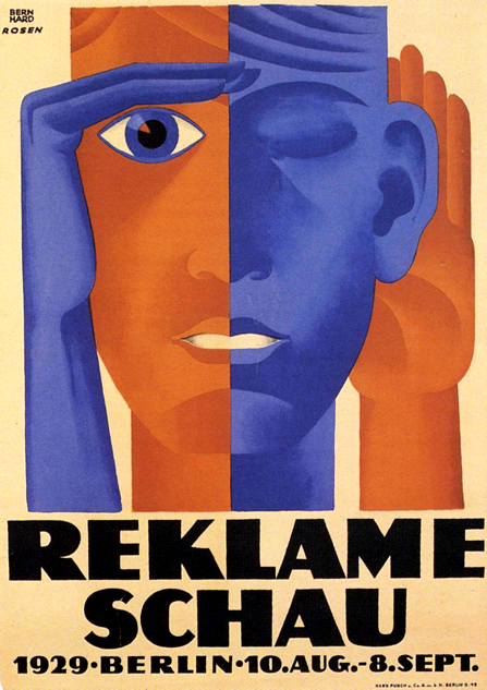
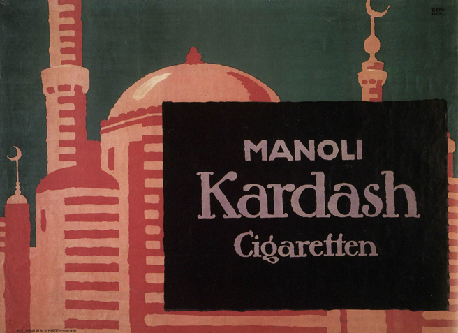
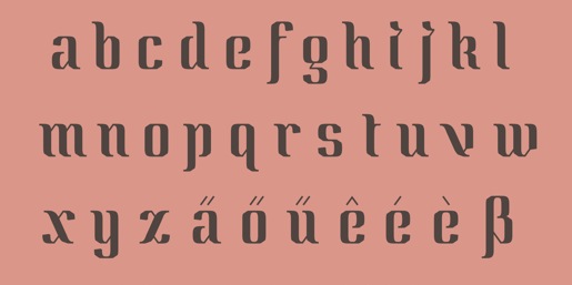
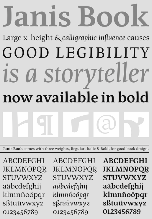
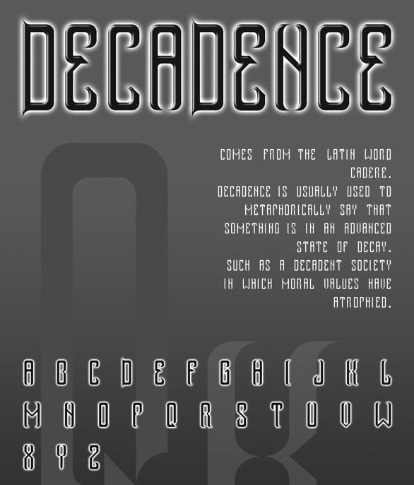
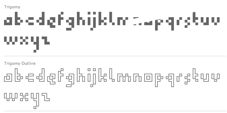
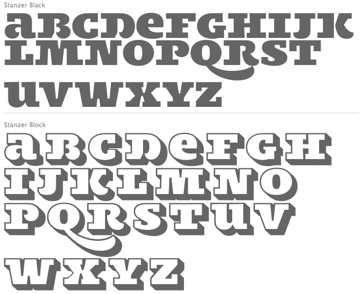
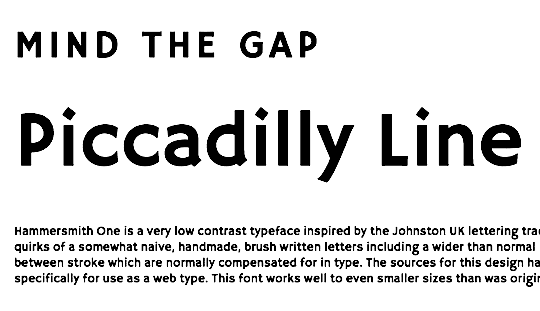
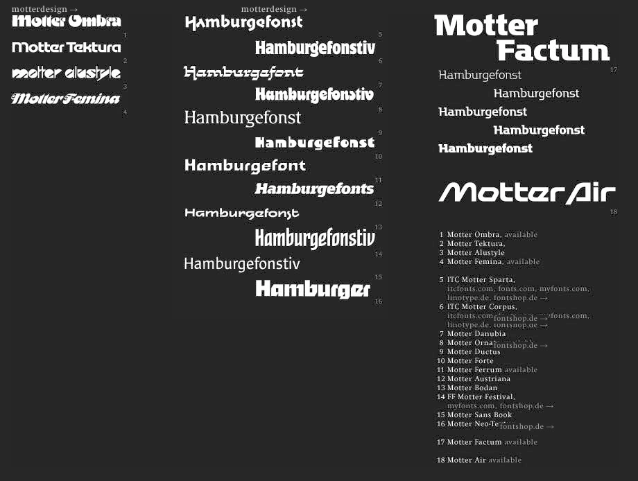
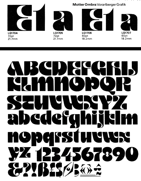
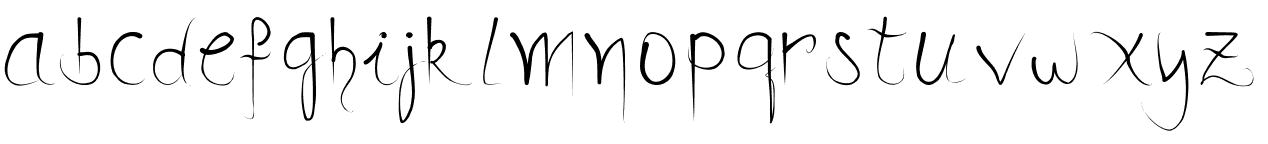
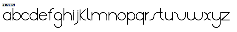
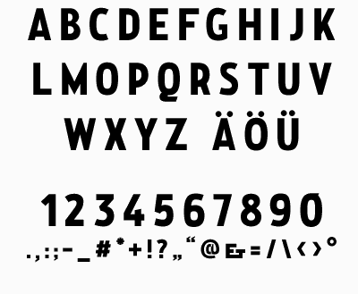
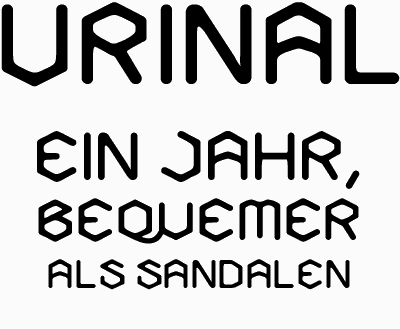
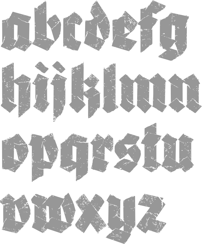
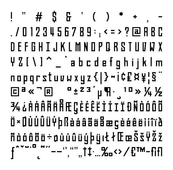
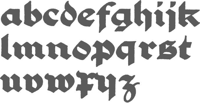
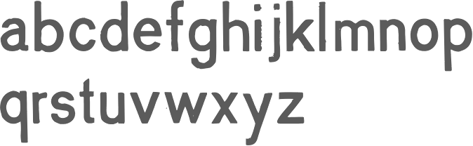
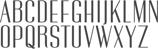
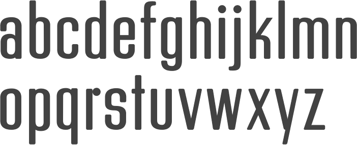
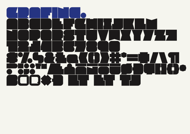
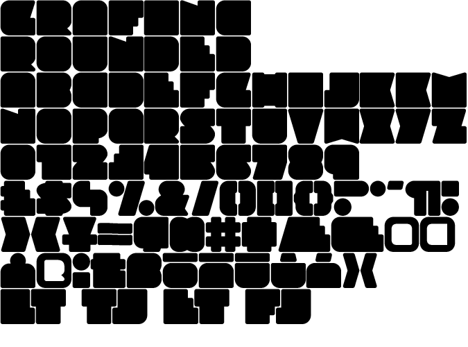
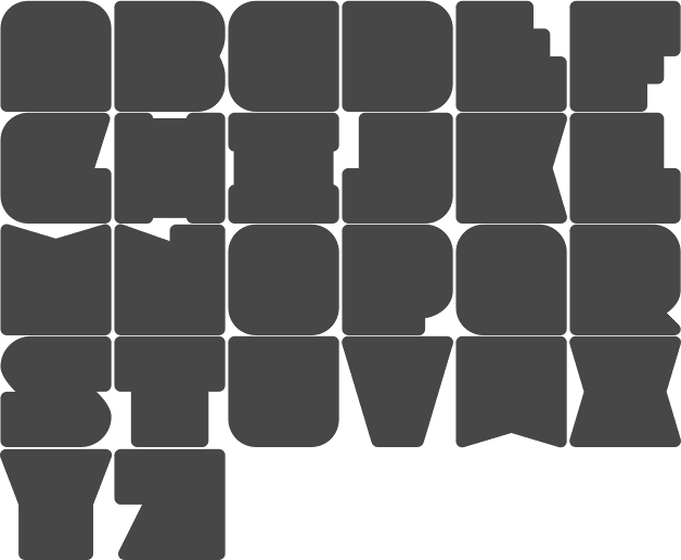
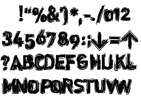
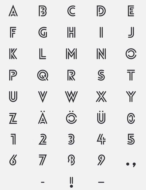
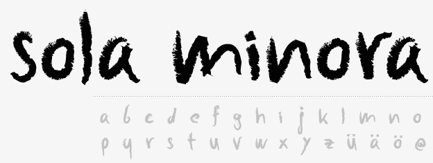
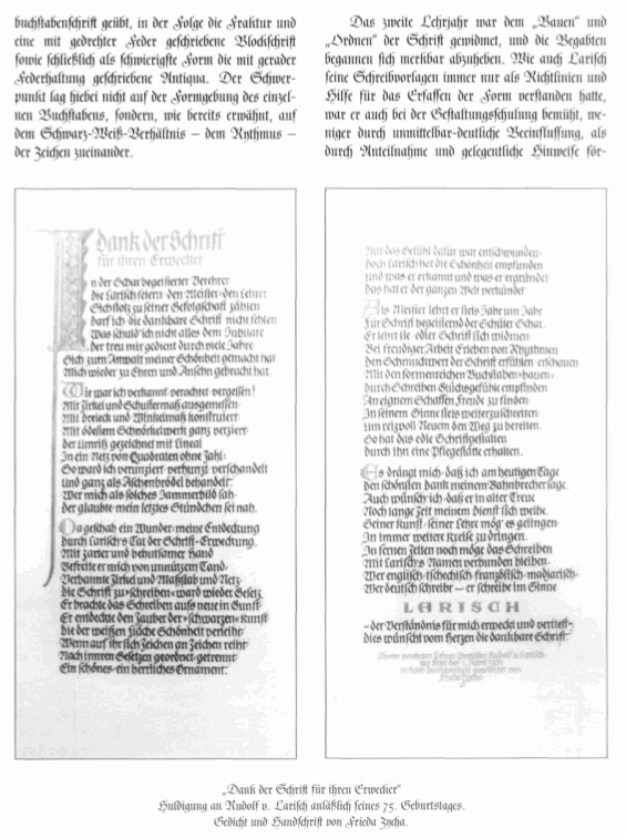
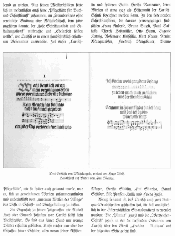
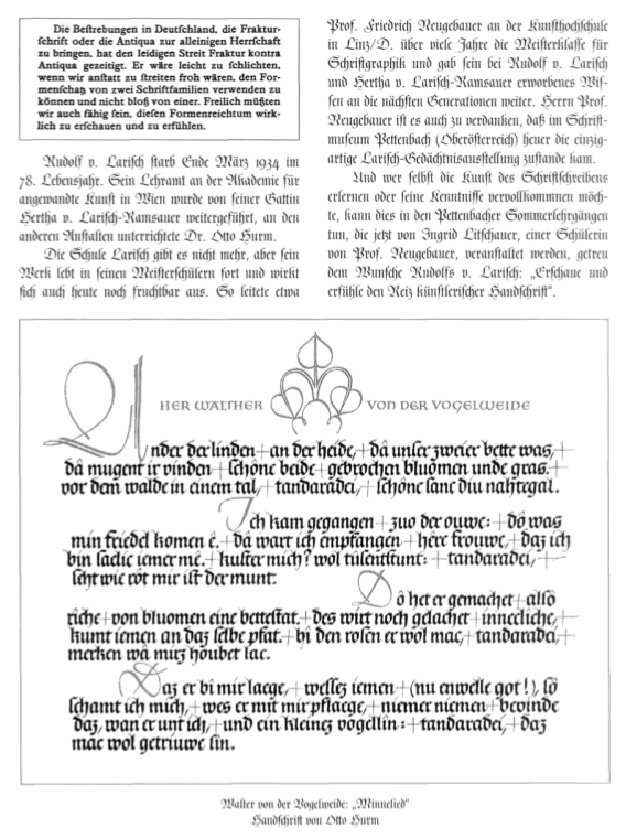
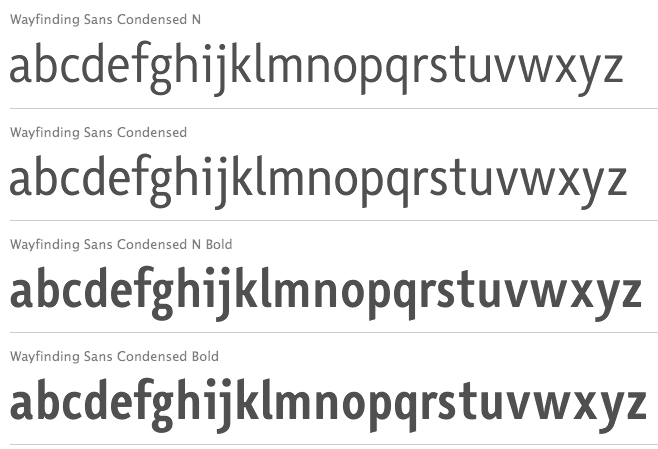
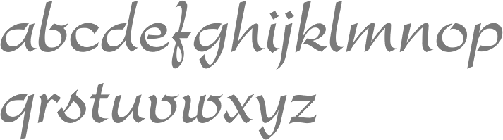
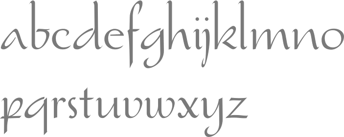
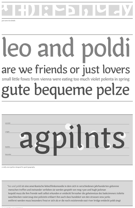
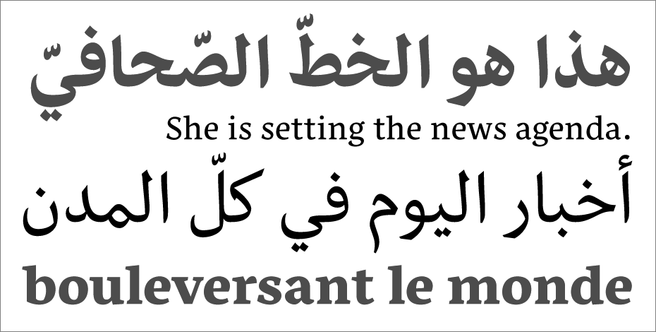
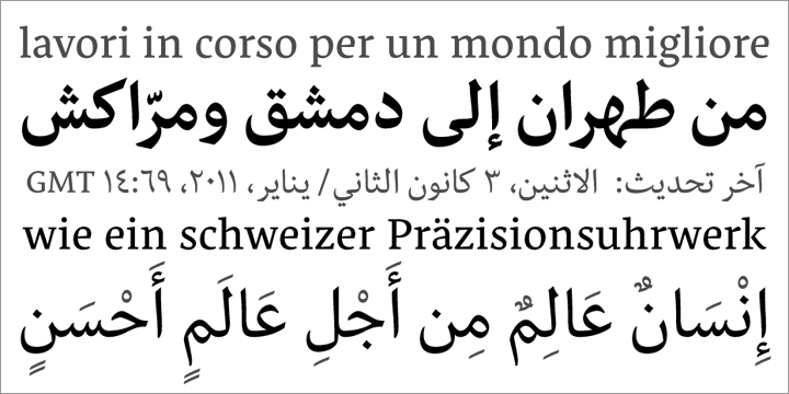
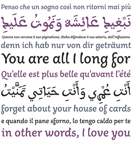
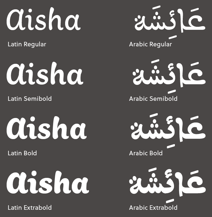
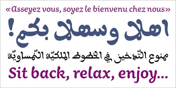
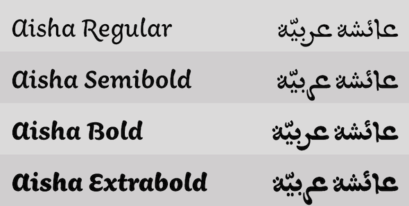
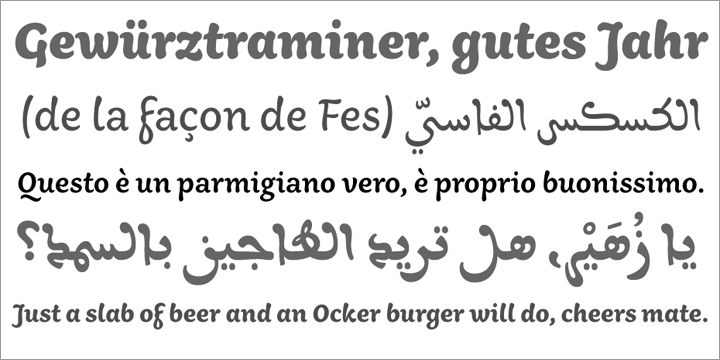
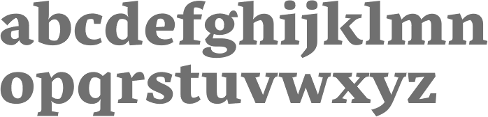
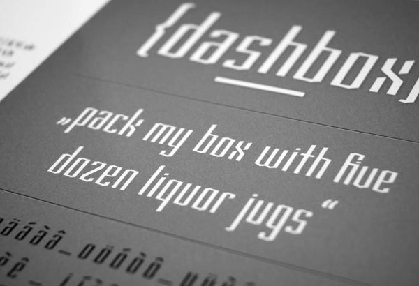
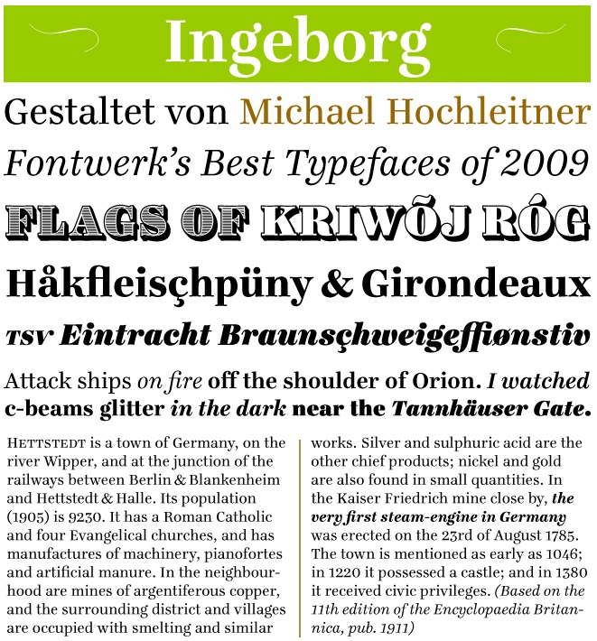
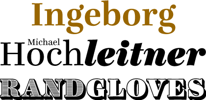
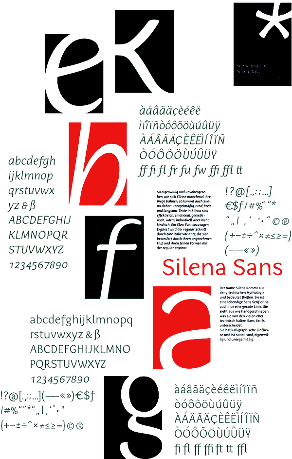
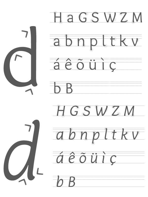
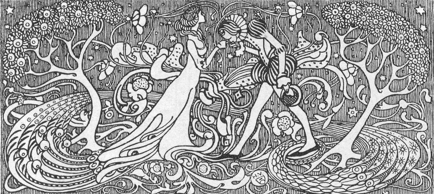
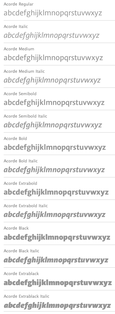
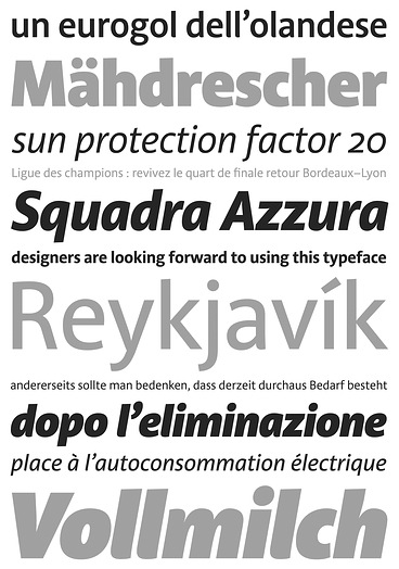
|
|
|
|