| | |
10four design
[Matt Heximer]

|
 10four design group was founded in 2002 by Sue Lepard and Matt Heximer in Vancouver. Matt Heximer and Sue both graduated from The Emily Carr Institute of Art and Design in 1994. Matt has held senior design and freelance positions in several Vancouver design firms.
 Designer of ElDiabloRegular, TechnoOrganic (1996), Swashbuckler-Script (1996), BitchinCamero (1996) at Garagefonts. He also created Halqemeylem Serif (1997) for the Stolo Nation, based on Majoor's Scala. The fonts at 10four design include Adanac (free, clean sans), Bitchin' Camaro (scratchy writing font), Devicq (based on the handwriting of actress Paula Devicq), Downsize, El Diablo (gothic), Lonely Cowboy, Lonely Cowpoke (2010), Mia Pets (dingbats), Swashbuckler, Techno Organic. In 2007, Matt published the free icon typeface Adanac that contains 62 Canadiana symbols. In 2014, Heximer created Sonovovitch, a unicase display typeface inspired by the Russian Constructivist movement and Soviet Cold War era propaganda. Although a faux Russian font, Sonovovitch has language support for the true Cyrillic alphabet. In 2016, Matt published the angular Preissig-style Millwright and explains that it is inspired by spunky DIY attitude and Industrial era hardware---an exercise in rendering glyphs with a rudimentary, hand-cut flavour. Behance link. FontShop link. Creative Market link. Klingspor link. [Google]
[MyFonts]
[More] ⦿
|
28fonts
|
Designer of grungy or hand-printed typefaces in 2014: Pepperoni Pizza, French Fries Apocalypse, Motherland (a grungy Cyrillic simulation typeface), Silent Broadcast (grunge), Undertaker, Soldier of the Dark, Oh My Oh La La yeah, One Two Mustard, Destroy the Enemy. In 2015, he made Against Modern Football, Walter Goes to America, The Day is My Enemy (tape font), Bring Me The Gummy Bears (ransom note font). In 2017, he/she designed Naughty Scratch. Home page. Dafont link. [Google]
[More] ⦿
|
Alberto Lopez
|
Graphic designer in Tijuana, Mexico, who created the Cyrillic simulation typeface Woods (2013). [Google]
[More] ⦿
|
Aleksandar Nikolovski
|
Rochester, NY-based designer of Aligned (2012), a typeface that was influenced by the shapes of the Cyrillic letters of the Orthodox church. One could call it a Cyrillic simulation typeface. [Google]
[More] ⦿
|
Alexander Bobrov
[Indian Summer Studio]
|
 [MyFonts]
[More] ⦿
[MyFonts]
[More] ⦿
|
Alexey Atapin
|
 Web designer in Saint Petersburg, Russia. His typefaces are often experimental and include:
 [Google]
[More] ⦿
|
Alphabetum
[Juan-José Marcos García]
|
Juan-José Marcos García (b. Salamanca, Spain, 1963) is a professor of classics at the University of Plasencia in Spain. He has developed one of the most complete Unicode fonts named ALPHABETUM Unicode for linguistics and classical languages (classical&medieval Latin, ancient Greek, Etruscan, Oscan, Umbrian, Faliscan, Messapic, Picene, Iberic, Celtiberic, Gothic, Runic, Modern Greek, Cyrillic, Devanagari-based languages, Old&Middle English, Hebrew, Sanskrit, IPA, Ogham, Ugaritic, Old Persian, Old Church Slavonic, Brahmi, Glagolitic, Ogham, ancient Greek Avestan, Kharoshti, Old Norse, Old Icelandic, Old Danish and Old Nordic in general, Bengali, Hindi, Marathi, Phoenician, Cypriot, Linear B with plans for Glagolitic). This font has over 5000 glyphs, and contains most characters that concern classicists (rare symbols, signs for metrics, epigraphical symbols, "Saxon" typeface for Old English, etcetera). A demo font can be downloaded [see also Lucius Hartmann's place]. His Greek font Grammata (2002) is now called Ellenike. He also created a package of fonts for Latin paleography (medieval handwriting on parchments): Capitalis Elegans, Capitalis Rustica, Capitalis Monumentalis, Antiqua Cursiva Romana, Nova Cursiva Romana (2014), Uncialis, Semiuncialis, Beneventana Minuscula, Visigothica Minuscula, Luxoviensis Minuscula, Insularis Minuscula, Insularis Majuscula, Carolingia Minuscula, Gothica Textura Quadrata, Gothica Textura Prescissa, Gothica Rotunda, Gothica Bastarda, Gothica Cursiva, Bastarda Anglicana (2014) and Humanistica Antiqua. PDF entitled Fonts For Latin Palaeography (2008-2014), in which Marcos gives an enjoyable historic overview. Alphabetum is not Marcos's only excursion into type design. In 2011, he created two simulation fonts called Sefarad and Al Andalus which imitate Hebrew and Arabic calligraphy, respectively. Cyrillic OCS (2012) is a pair of Latin fonts that emulate Old Church Slavonic (old Cyrillic). In 2013, he created Cuneus, a cuneiform simulation typeface. Paleographic fonts for Greek (2014) has ten fonts designed by Marcos: Angular Uncial, Biblical Uncial, Coptic Uncial, Papyrus Uncial, Round Uncial, Slavonic Uncial, Sloping Uncial, Minuscule IX, Minuscule XI and Minuscule XV. These fonts are representative of the main styles of Greek handwriting used during the Classical World and Middle Ages on papyrus and parchments. There is also a short manual of Greek Paleography (71 pages) which explains the development of Greek handwriting from the fourth century B.C. to the invention of printing with movable type in the middle of the fifteenth A.D. He wrote a text book entitled History of Greek Typography: From the Invention of Printing to the Digital Age (in Spanish; second edition, 2018). See also here and here. [Google]
[More] ⦿
|
Anastasia Dimitriadi
[DimitriAna]
|
 [MyFonts]
[More] ⦿
[MyFonts]
[More] ⦿
|
Andriy Dykun
[NREY]
|
 [MyFonts]
[More] ⦿
[MyFonts]
[More] ⦿
|
Antonio Medina
|
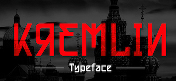 Jaen, Spain-based designer of the Cyrillic emulation and Stalinesque typeface Kremlin (2018) and the newspaper typeface Daily (2018). [Google]
[More] ⦿
Jaen, Spain-based designer of the Cyrillic emulation and Stalinesque typeface Kremlin (2018) and the newspaper typeface Daily (2018). [Google]
[More] ⦿
|
Antonio Vignali
[RM WD]
|
 [MyFonts]
[More] ⦿
[MyFonts]
[More] ⦿
|
Art deco typefaces by Nick Curtis: I
[Nick Curtis]
|
 Free art deco typefaces by Nick Curtis, made between 1997 and 2003. Nick Curtis also made commercial art deco typefaces, but these will be listed elsewhere.
 - AmstelHeavyNF (2002): based on this poster from 1926 by C. De Haas.
- AmsterdamTangram (2002): based on this poster by Joost Swarte from 1987 entitled "De wereldtentoonstelling van Joost Swarte".
- AnchorSteamNF (2002): based on a poster from 1923 by Wilhelm Poetter.
- Rainbow Bass (1982, Saul Bass) a vertically striped disco style design, was remade by Nick Curtis as Backstage Pass (1999, 2008).
- BeckerBlackNF (2002, 2007): Based on Alf R. Becker's lettering.
- BigAppleNF (2000, 2007).
- BoogieNightsNF, BoogieNightsShadowNF (2002, 2007): based on this poster from 1916 by Paul Hosch and Hans Melching. In 2009, CheapProFonts made a "pro" version.
- BoomerIngueNF (2002, 2007).
- Bric-aBraqueNF (1999, 2007). Bric-a-Braque was based on Cubist Bold (John W. Zimmerman, 1929).
- ChainsawGeometric (1999). Based on this alphabet by Draim (1928).
- ChippewaFallsNF (2002, 2007). Originally called Hiawatha. See this roadside photograph that inspired Nick.
- Coaster Poster (1999).
- DayPosterBlackNF, DayPosterShadowNF (2002, 2007).
- DebonairInlineNF (2000, 2007). The commercial Debonair Inline (2008) is an extension (uppercase, etc.) of Herbert Bayer's 1931 monocase typeface Architype Bayer, also known as the universal moderrn face.
- DecoBordersNF (1999) and DecoDingbatsNF (2000).
- Drumag Studio NF (2003, 2007).
- DustyRoseNF (2000), DustyRoseRevised (2007): Dusty Rose is an art deco typeface based on the logotype for the Dutch magazine Geillustreerd Schildersblad in 1940, by Anton Kurvers. The commercial Dusty Rose NF was published in 2008.
- EastMarket (1999), EastMarketTwoNF (2007).
- GradoGradooNF (2002, 2007): a Bauhaus-style font, based on this 1932 poster by Urbano Corva.
- Great Lakes (2003, 2007), GreatLakesShadowNF (2007): based on this poster by Peter Ewart (1935).
- Heavy Tripp NF, Heavy Tripp Ultra Bold (2001, 2007). Both Day Tripper NF and Heavy Tripp are based on Dignity Roman, a typeface from 1929 by art deco alphabet designer Alphonso E. Tripp.
- HeraldSquareNF, HeraldSquareTwoNF (2002, 2007): a font family based on a design by Welo shown in Studio Handbook for Artists and Advertisers (1927).
- High Five Jive NF, High Five NF (2001, 2007).
- Indochine NF (2003, 2007). Based on this poster by Joseph-Henri Ponchin (1931).
- Ironick-Normal (1999, 2007): an exaggerated Bernhard Modern.
- KerfuffleNF (2000, 2007). Based on this poster by Chris Van Der Hoef (1920).
- KismetNF. A free font. Based on this lettering.
- LabyrinthCapital, Labyrinth (1999, 2007). Based on this poster.
- MetroRetroNF (1999, 2007). MetroRetroRedux (2001, 2010) is a commercial version of that.
- Milton Burlesque NF (2000, 2007).
- Monkey Fingers NF (1999, 2007). Based on an alphabet by Otto Heim published in Farbige Alphabete (1925).
- MunchausenNF (2003, 2007). Based on a poster for an exhibition by Ludwig Heinrich Jungnickel (1911). This is inbetween art deco and art nouveau.
- NickerbockerNF (1999, 2007).
- NightcapCapital, Nightcap NF (1999, 2007). Based on Disque (A. Bardi, 1931).
- OdalisqueNF, OdalisqueRevised (2000, 2007). The commercial versions are Odalisque NF (2008) and Odalisque Stencil (2010). These art deco typefaces are based on Morris Fuller Benton's Chic (1927).
- ParkLaneNF, ParkLaneRevised (2000, 2007).
- PhattPhreddyNF (2001, 2007).
- PinballWhizNF (2002, 2007). Based on this logotype by Joost Swarte for the comic-strip series "Katoen + Pinbal" (1975).
- PlatonickNF (1999, 2007).
- PlugNickelNF (+Black) (1999, 2007): a reworking of Bremen Black, with small caps and a rather skeptical uppercase R added.
- RadioRanchNF (1999, 2007). Adolf Behrmann designed the classical display typeface Rundfunk at Berthold in 1928. This typeface was digitized by Nick Curtis as Radio Ranch NF.
- RaskalnikovNF (2003, 2007). A Cyrillic simulation typeface based on this poster.
- RialtoEngraved, Rialto NF (2000, 2007): a Broadway style art deco face.
- RiotSquadNF (2000, 2007). after a design by Otto Heim from Heim's 1925 book, Farbige Alphabete.
- RitzyRemixNF (2000, 2007). RitzyNormal is based on Tom Carnase's Busorama.
- Seaside Resort NF (2003, 2007). A bilined titling typeface based on a 1933 poster by Italy's Bertarelli Studios.
- SelznickNormal, SelznickRemixNF (1999, 2007). An art deco typeface inspired by movie theaters of the 1930s. Based on ITC Anna (1991, Daniel Pelavin).
- Sesquipedalian, SesquipedalianAlternates (2000, 2007). Inspired by a handlettered logo for Torre's Buckdruckerei in Vienna, circa 1919.
- Sid The Kid NF (1999, 2007).
- Skittles N Beer NF (2007) is based on handlettering on a 1929 brochure for the P&O British-India Steamship Line.
- Standing Room Only NF (1999, 2007). Modeled after Broadway, designed by Morris Fuller Benton for ATF in 1928, originally named Broadway Poster.
- Stony Island NF (2002, 2007). An adaptation of an art deco font called Chicago Modern, designed by lettering artist Alf Becker, whose designs graced the pages of Signs of the Times magazine from the late 30s into the 50s.
- StudebakerNF-Bold, Studebaker (1999, 2007). Based on the lettering on a package for True-Mark Brand Typewriter Ribbons, circa 1938, designer unknown.
- TaraBulbousCapital, TaraBulbousNF (1999, 2007). TaraBulbous NF (the commercial version is from 2008) is a fat-lettered font based on Carlyle-Oring lettering. See also here.
- TitanickDisplayNF (1999, 2007): a remake of the bold pin-striped trilined Dextor by L. Meuffels.
[Google]
[MyFonts]
[More] ⦿
|
Ata Syed
|
 Ata Syed (Karachi, Pakistan) has a dual identity at FontStruct, where he is one of the most prolific contributors. He is known there as thalamic and as minimum. Behance link.
 Typefaces made in in 2008 as thalamic: Hello (connected upright script), Epilogie (blocks), WimSoft (+U/C), Chunk Chip, Konstruct (Russian constructivism face), Sensei Says, FS Tributary, Twotype Font, Urge (fat octagonal), Subliminal, FS United One, The Game of Type, Anaximander Zooom!, Corrupt and Corrupt Ed (piano key stencil fonts), Blueprint, Monomum, Synergy, Insert Coin Italic, Write I Careful, Write I Casual, Write I Dump, Loop UC, Loop LC, Emergic, Prick!, Insert Coins Pixels, Retro Electro, Bubble Lab IJ, Bubble Lab Bang, A Needle Pulling Thread, Send, Scan (IBM logo look), Intermittent and Intermittent Sans (stencil typefaces), Melt x DR and Melt x tDR (dot matrix), Oval x DR and Oval x tDR (original design by theDesignersRepublic for Issey Miyake), On Grid, Indigo (almost blackletter), orange_2 (dot matrix), Scan (horizontal stripes), Bass, Grape (simple pixel face), Nachahmung and Nachahmung Block (fat and extra condensed, Wim Crouwel simulation typefaces), Nachahmung Block Serif, Conjunction, Interjection, Is It, Sangular (nice experiment), Anonon (nails in square letters), Purple and Purple Very (slab serif headline typefaces, pixelized), Arc Echo (biline and strutted), The Question (a fantastic 3d paper fold imitation face), FS Minimal (a fantastic ultra fat decorative face), FS FontStructor, Vibrant (multiline labyrinthine or op-art face), Writ (upright pixel script), Castor, Ooki (octagonal), Industrial, The I Flat, The I, Indiscrete, Analog (connected script), Dent (mechanical), Digital (connected script), Hello Hello, and Sensei Says. In 2009, he made Clone It, Entwined, C64, Helix, Fontsration, Bent, Stripe Zoo, Dull, Indent (stencil), Quartertined (kitchen tile), Firox, Orfix, A Priori, Ignore, Confused, S-Ookii, Ookii (octagonal), Very Becoming, Crisis Averted, Crisis (neat bold octagonal face), Penmanship, Up All Night, Sleep All Dayi, Chunk Chip, Grayletter (upright script), Soso, Mostly Harmless (textured face), Etched, La Cross, Twotype, Etched Bare, Aught (One, Two, Three), as: Inflate (Pop, Pfft, Puff, Poof), Istic, Very Becoming, Ignore, Ought, Balance, Broken, Dry Flat (dot matrix), La Cross, Etched (+Bare), Fontsration (+Refined: multilined beauties), FS Institutional (fat multiline face), FS Industrial, FS Pixelayers. Additions in 2010 as thalamic: fs Section, fs Reboot, fs Easy DNA Auto Stencil, fs Institutional (+Ho, +Elements), fs Quartertined, fs Stencil 2.0, fs Rivet, fs Intaglish, fs Dumb Italic, fs Loop Gap, fs GoTeam (stencil), fs ITilic, fs Kerplunk (Startrek face), fs Dumb Italic, fs Ribbon, fs Beringer, fs Ooki Woodcut, fs Croissant (stencil), fs 45 (octagonal stencil), fsXO, fs Pipe, fs Confused Less. Fonts from 2011 as thalamic: fs Xenon (a paperclip face), fs Instant, fs Twist, fs WIP (blackletter), fs Sparc, fs Reboot (texture face), fs Pod, fs Flute Tune, fs Special, fs Watch Out (stencil), fs Etched Nyle (labyrinthine face), fs No Kerning Required (2011, connected upright script). Creations in 2012 as thalamic: fs Flip, fs Mom, fs Noise, fs Noise II, fs Junk, fs You Are Here, fs Flash (outlined), FS Easy Too (paperclip face), FS Strict, FS Fix, fs in three (octagonal stencil face), fs Single, fs Wakarimasen, fs r-failed (white on black), fs Permutation X, fs Pan Am, fs Institutional, fs Institutional 2, fs Chunky (counterless), fs Grayletter (textured face), fsXply (op-art). Creations in 2013 as thalamic: fs So Not Right, fs Grid Urdu (pixel face), fs Not So Right, fs Six Sticks, fs Half (octagonal family), fs Bored, fs Make it Happen, fs Salvage, fs To Be Discarded, fs Connect (stencil), fs Whomp, fs Praxis, fs Fez (3d face), fs Input, fsTramp, fs Five Alive, fs Hote-Zyd (labyrinthine), fs Patterns (Layers, Quarters), fs Five Alive (origami font), fs Go To Sleep (retro speed font), fs Vaerktoj (inspired by the brand identity of Hoejmark Cycles), fs Permutation B, fs Jester, fs Permutation XII (op-art), fs Insatiable, fs Electronic, fs Carbon (a nice chequered face), fs When We Were Young (multiline typeface), fs Shogun Tiny (a lined kitchen tile typeface), fs Optical, fs When We Were Young (multilined), fs Slate, fs Shogun (gridded), fs Iie (+Filled), fs Blocky (dot matrix), fs Thalamic. Creations in 2014 as thalamic: fs Perhaps, fs Perhaps Perhaps, fs Stability (Turmoil, Flux), fs Industrial (an artsy fat dot matrix face), fs Rehash, fs Ah, fs Curly, fs So, fs Flint, fs ICK (blackboard bold style), fs Wiggle, fs Grid, fs Ah. Creations from 2015 as thalamic: fs B-Chain (bike chain font), fs Risque (art deco), fs Squangular (Impair, Square, Flair, Pair), fs Oval, fs MIP, fs Flower (kitchen tile face). Creations as minimum: fs Chips (2014), fs Oh (2014, piano key style), fs Stack (2014, +Overflow), fs llljjj (2014), fs Turn Off The Sun (2014, beveled), fs Zag (2013 textured), fs Zig (2013, textured), fs Mullions (2013), fs The Italic (2013), Gridlock (2009), Mingle Minx (2009), Mingle Co (2009), Mingle (2009, gridded letters), Bevel (2009, 3d beveled family), illiij (2009, multiline family), m.ove.r (2009, multiline family), Grayscale (2009, multiline family), fs Cubed (2010, 3d-face), Bas Relief (2009, 3d face), Silver (2009, 3d face), Tin (2009), Lead (2009), Bevel (2009), Bevel Just (2009), Bevel Just Shadowed (2009), Ceci n'est pas une vague (2009), A Fault in Reality (2009, optical effect font), Blit Slash (2009, experimental), Blit Hack (2009), Dot Dot Hex (2009), Super Black (2009), fs Overlap (2010), fs Fabric (2010, texture font), fs Original (2010), fs Ink Blot (2010), fs Dots and Dashes (2010), fs I Square (2010), fs Squared Up (2010), fs Super Black (2010), fs Unoriginal (2010), fs Minimum (2010, geometric stencil face), fs Pin and Thread (2010, stitching face), fs Shade (2012, 3d face). FontStructions from 2011: fs Perpetual (dotted line face), fs Slither, fs No Escape, fs Prompt (a DNA-inspired biochemical lab face), fs Plus H (horizontally striped face), fs Arc Test 2:2 (a modular blackboard bold face), fs V Simple (2010, textured face), fs Instant, fs Permutation V, fs Rehash Monoic (labyrinthine), fs Meta (texture face), fs Scroll, fs Scroll Not (stencil). FontStructions from 2012: fs Translucent (a texture face), fs Bank, fs Shade, fs Confined (white on black), fs Institutional (+Vo, +HeVe, +Ho, +He, +Ve: texture typefaces), fs Bang, fs Random (textured face), fs Random Pattern, fs Lead, fs Tin, fs Silver, fs Tungsten. Klingspor link. Abstract Fonts link. Behance link. [Google]
[More] ⦿
|
Attak Fonts
[Peter Korsman]
|
Attak is a two-headed graphic design firm formed in 2004 by Peter Korsman (b. 1982) and Casper Herselman. It is based in 's-Hertogenbosch, The Netherlands. In May 2016, Peter Korsman left Attak to start Autograph. Attak has some free and some commercial typefaces. Behance link. Their fonts, ca. 2009: AT AK-47, AT Babyfat, AT Blaser, AT Concours, AT Dienstuhr, AT Discipline, AT FFW, AT Helix, AT Hide and Seek, AT Hieronymus, AT Janus Kiep, AT Kerremus, AT Klaxon, AT Korsakopf, AT Litewriter, AT Mepper, AT Mohawk, AT Moker, AT Monoload, AT Muntel, AT Peetroleum, AT Praktikum, AT Promille, AT Ramseier, AT Riot, AT Sirca, AT Sirca alternate, AT Slyper, AT Snotnose, AT Streeep, AT Tabak, AT T'Atteljeej, AT TCB, AT Timeline, AT Trash Bold, AT Willi, AT With Machines, AT Zippora. Notable products: AK-47 simulates Cyrillic; Helix is a stencil face; Muntel and Concours are fat art deco typefaces; Practicum and Tabak are octagonal; Riot leaks blood; Sirca is based on arcs of circles; Streep is a multiline font. I presume that Peter is the main font designer in the team, as he already made fonts as early as 2003 for Burodestruct (see, e.g., BD Burner, BD El Max, BD Sirca, and BD Bardust, downloadable here). By 2017, their catalog includes AT AK-47, AT Baballero, AT Babyfat, AT Blaser, AT Concise, AT Concours, AT De Palm, AT Dienstuhr, AT Discipline, AT El Muerte, AT Falten, AT FFW, AT Ginn, AT Helix, AT Hide and Seek, AT Hieronymus, AT Hindenburg, AT Imperiale, AT Janus Kiep, AT Kerremus, AT Klaxon, AT Korsakopf, AT Kuhn, AT Litewriter, AT Mepper, AT Mohawk, AT Moker, AT Monoload, AT Muntel, AT Peetroleum, AT Praktikum, AT Promille, AT Ramseier, AT Riot, AT Sang Noir, AT Sirca, AT Sirca alternate, AT Slyper, AT Snotnose Heavy, AT Streeep, AT Syndicate, AT Tabak, AT tAtteljeej, AT TCB, AT Timeline, AT Trash Bold, AT Willem II, AT Willi, AT With Machines, AT Zippora, BD Bardust, BD Burner, BD El Max, BD Sirca. A more detailed breakdown per designer: - Tim van de Kimmenade: AT AK-47 (2005), AT Helix (2004), AT Trash Bold (2003).
- Peter Korsman: AT Babyfat (2006), AT Concours (2005), AT Korsakopf (2004), AT Ramseier (2004), AT Streeep (2005), AT TCB (2005), AT With Machines (2004).
- Casper Herselman: AT Blaser (2005), AT FFW (2004), AT FFW Stencil (2004), AT Mepper (2005, old typewriter font), AT Mohawk (2006), AT Praktikum (2004), AT Promille (2005), AT Riot (2004, blood drip font), AT T'Atteljeej (2008).
- Rutger Paulusse: AT Discipline (2008).
- Rens vanden Berge: AT Hide and Seek (2006, a great poster font).
Typefaces not listed here include AT Baballero (2013, Western), AT De Palm (2012, logo font for Café De Palm), AT Dienstuhr (2010), AT Ginn (2012), AT Imperiale (2012, a hipster font), AT Timeline (2010, Trajan) AT Sirca (2005), AT Sang Noir (2012, blackletter), AT Muntel (2005, Dutch art deco), AT Snotnose (2010, ink splatter script). [Google]
[More] ⦿
|
Benjamin Taschner
|
Muenchen, Germany-based designer of the Cyrillic simulation typeface Anom (2019). [Google]
[More] ⦿
|
Blambot!
[Nate Piekos]
|
 Blambot Comics Fonts was founded in 1999 by graphic designer and illustrator, Nate Piekos, and is located in East Providence, RI. Blambot has a huge number of original free comics fonts and balloons by Nate Piekos (East Providence, RI, b. RI, 1975). Comic Lettering is an alternate URL, where you can also order logo designs, custom fonts, and custom lettering. Fontspace link. The fonts:
 - 2021: Collect Em Now BB (a comic strip font), Spinner Rack Pro BB.
- 2020: Out of Line Pro BB, Ready for More BB, Nightmark BB, Tight Spot BB, Budrick BB, Flannel Shirt BB (a sans family).
- 2019: Tire Swing BB, Ready For Anything BB.
- 2018: Invulnerable BB.
- 2017: Collect Em All BB, Spinner Rack BB.
- 2016: Friend Or Foe Tall BB, Friend Or Foe BB, Astrogator BB, Out Of Line BB.
- 2015: Susurrus BB (sans family), Inkcantation BB (slightly creep jhand-drawn serif font), Blambastic BB, Brushzerker BB.
- 2014: Hundredwatt BB, Piekos Toons BB, Beelzebnrush BB, Astounded Round BB, Astounder Squared BB, Sleuth Serif BB, Crypto Creep BB, Wretched Remains BB (brushy Halloween font), Mech Effects 1 BB, We Come in Peace BB, Manga Master BB.
- 2013: Unearthed BB (Celtic), Always Angry BB, Sequentialist BB, Might Makes Right BB, Fight To The Finish BB, Palooka BB, ManlyMen BB, Trash Cinema BB, Bulletproof BB, Ticking Timebomb BB (LED font), Potty Mouth BB (dingbats), Vengeful Gods BB (Greek simulation face), Blowhole BB (fat finger font family), Shrunken Head BB, Perihelion (+Condensed: elliptical sans).
- 2012: Dungeon Dweller BB, Mark of the Beast BB (Halloween font), Monsterific BB, Tough as nails BB, Longbow BB (a rough-edged blackletter), Gamma Rays BB, Inkslinger BB (a true comic book style family), Saucer BB (sketch font), Smells Like Tacos BB, Mutant Academy BB, Destroy Earth BB, Mandroid BB, Fundead BB, Stupid Head BB, Spellbreaker BB, Elevations BB (2012, a blueprint typeface), Revenger BB (angular family).
- 2011: Silver Bullet BB (a fat hand-drawn blackletter face), Shallow Grave BB, Imaginary Friend BB, Highjinks BB, ShallowGrave BB, Quahog BB (angular, calligraphic), Mumble Grumble BB, Action Figure BB, Piekos FX Rough BB, ChainsawzBB, Heavy Mettle, Billy The Flying Robot BB, Longbox BB.
- 2010: Ninjutsu BB, Protest Paint BB, Rock Steady BB, Ladylike BB, Protest Paint BB (grunge), Tone Deaf BB, Clown Teeth BB, Irish Stout BB (beer label face), Sans Sanity BB, Straight To Hell, Unmasked, Piekos FX BB, Hometown Hero BB, Piekos Professional; BB, Big Bad Bold BB, Crash Landing, HoneyMead BB, Secret Origins (2010).
- 2009: Dragonbones BB, MeanStreets BB, Two Fisted BB, RedStateBlueState BB, Scream Queen, Fresh Meat BB, Gone Fission BB, Black Hole, Life Form, Crimewave BB, Firepower BB, Artists Alley BB, Stronghold BB, Village Idiot, Raging Red Lotus (2009, oriental simulation), Dwarven Axe BB, Silver Age BB, Flyboy BB (2009, techno), Giant Sized Spectacular BB (2009).
- 2008: Snake Oil Salesman (old typewriter face), Earthman and Earthman Extended (a nice 12-style retro sans family), Clairvoyant BB, KrakHead BB [one of my favorites], Blambot FXPro BB, Sangre BB, Dearly Departed BB, Boogers, Bada Boom BB, Old Crone BB (2008, bewitched style).
- 2007: Fire Fight BB, After Dark BB, Post Mortem BB, Fold and Staple BB (with Brandon J. Carr), Dunce Cap BB, DeathRattle BB, Potty Mouth BB, Dominatrix BB (grunge), Shore Leave BB (based on sailor tattoos), Cloudsplitter BB, Drawing Board (inspired by Tekton), Warhorse BB, Warmonger BB.
- 2006: Duty Calls BB, Hellfire BB, AveAveBB, Indie Star, Blamblam BB, Braaains BB (dingbats), Musashi BB, Atland Sketches, Double Life BB, SkinDeep BB, SkinDeep Swashes BB, Newsflash.
- 2005: KeelhauledBBBold, KeelhauledBB, MainframeBBBold, MainframeBB, Alter Ego BB, Entrails, Mastermind BB, Zooom BB, Whitechapel BB (handwriting), Sucker Punch, Crimefighter, 10c Soviet, CyranoBB, Praetorium, Spectre Verde, Hired Goons, Afterlife BB (2005, tall ascendered face), Seven Monkey Fury (oriental simulation face), Spectre Verde, FeedbackBB.
- 2004: Atland, Creative Block, Midnightsnack BB, Bloody Murder BB, Seven Swordsmen, Webletterer, Rackum Frackum, Oh Crud, CatholicSchoolGirlsBB, Antihero, Dark Arts, Bearded Lady BB, BottleRocket, Streetcred, Lowrider, Extra pickles (2004).
- 2003: Square Jaw BB, Shinobi, Bar Brawl, Holy Mackerel (2003, Craterface BB, Zombie Guts, Knuckle Sandwich, Workingman, Fat Stack BB, Santa's Big Secret, ArrMatey, Tokyo Robot, JackLanternBB, Perils of Piekos, Turntablz, Wicked Queen (2003, free), Golden Oldie, Badaboom, OhCrap, Whoop Ass, Damn Noisy Kids, Paperboy, Armor Piercing, Radioactive Granny, Sidekick International, Digital Strip, Mighty Zeo, Arcanum, Zud Juice, Ale&Wenches, Bar Brrawl, Bar Brawl BB, Armored Science BB, Blamdude, Shinobi, Man of Science, Sidekick BB (2003).
- 2002 and earlier: AndroidNation, Blambot-Custom, Blambot-Standard, Captain-Spandex, Casket-Breath, Concetta, Dupuy-Bold, Edible-Pet-II, Edible-Pet, Edible-PetInternational, Enchilada, Evil-Genius, Flat-Earth-Scribe, Gunhead-Chick, Lovecraft's-Diary, Mouth Breather, Mighty-Tomato, MonkeyChunks, Monkeyboy, Mummy-Loves-You, Mutant-Supermodel, Nate's-Choice, PiranhaSexual, Red-Right-Hand, Roboshemp, Space-Pontiff, Squeezy-Cheez, Urinetoast, Voodoo-Doll, YellaBelly, Zartz!, TwelveTonFishstick, TwelveTonSushi, A.C.M.E.-Explosive!-Bold, A.C.M.E.-Explosive!, GrungeUpdate, Mothership, Twelve-Ton-Goldfish, Whoop-Ass, WickedQueen BB, Winter-in-Gotham, 13 O Clock, ACMEInternational, ChroniclesofaHero, ChroniclesofaHeroBold, FanboyHardcore, KidKosmic, LetterOMatic, MangaTemple, GorillaMilkshake, Caeldera, Belizarius, Bottix, ChatteryTeeth, OrangeFizz, OrangeFizzItalic, Pythia, SpiritMedium. Direct access.
- Commercial fonts: Knuckle Sandwich, Utility Belt, Tentacle Jones, Rocketboy, Seargent Six-Pack, Secret Identity, Edible Pet 3, Piekostype, LintMcCree Mysteries, Doc Seismic, Mike Allred's AAA, AAARGH, Allred's Aliens Invade, Asteroids for Lunch, Action Away, Allred's Amazing Stupendous, ArmorPiercing, Mars Police, Irezumi, Holy Macxkerel, Hudson VC, CreepingEvil, BlambotPro (great), Creeping Evil, Rooftop Run, AAA Redmeat, Eurocomic, Comic Geek, Jack Armstrong (nice), Rivenshield (useful), Howard Bros (nice), Mighty Zeo, Cajun Boogie, Betty Noir, Sand Diego '02, Wrecking Ball, Miskatonic, Roswell Wreckage, WizardSpeak, Glass Jam, BucketOBlood, Three Arrows, Damn Noisy Kids, Humbucker, Oh Crap, Caveman, Blambot Casual, 10CentComics, BettyNoir, BigBlokeBB, BlamDudeBB, BlamDudeBBItalic, CajunBoogie, DetectivesInc, Irezumi, IrezumiItalic, SpiritMedium, VanHelsing.
Over 1000 free fonts here: 10CentSoviet, 10CentSovietBold, ACMEExplosive, ACMEExplosiveBold, ACMESecretAgent, ACMESecretAgentBold, ACMESecretAgentItalic, AleandWenchesBB, AleandWenchesBBBold, AndroidNation, AndroidNationBold, AndroidNationItalic, AnimeAce, AnimeAceBold, AnimeAceItalic, Arcanum, ArcanumBold, ArcanumItalic, ArmorPiercing, ArmorPiercing20BB, ArmorPiercing20BBItalic, ArmorPiercingItalic, ArrrMateyBB, BadaBoomBB, BattleLines, BettyNoir, BigBlokeBB, BlamDudeBB, BlamDudeBBItalic, BlambotCustom, Bottix, BottleRocketBB, BottleRocketBBBold, Caeldera, CajunBoogie, CatholicSchoolGirlsBB, ChroniclesofaHero, ChroniclesofaHeroBold, CreativeBlockBB, CreativeBlockBBBold, CrimeFighterBB, CrimeFighterBBBold, DamnNoisyKids, DarkArtsBB, DetectivesInc, DigitalStrip, DigitalStripBold, DigitalStripItalic, DwarfSpiritsBB, EvilGeniusBB-Bold, EvilGeniusBB, FanboyHardcore, FanboyHardcoreBold, FanboyHardcoreItalic, FatStackBB, FeastofFleshBB, FeastofFleshBBItalic, FeedbackBB, FeedbackBBItalic, FlyboyBB, GorillaMilkshake, GorillaMilkshakeItalic, Irezumi, IrezumiItalic, JackLanternBB, KeelhauledBB, KeelhauledBBBold, KidKosmic, KidKosmicBold, KidKosmicItalic, LetterOMatic, LetterOMaticBold, LetterOMaticItalic, MainframeBB, MainframeBBBold, MangaTemple, MangaTempleBold, MangaTempleItalic, MarsPolice, MarsPoliceItalic, MightyZeo20, MightyZeo20Bold, MightyZeo20Italic, MightyZeoCaps20, MightyZeoCaps20Bold, MightyZeoCaps20Italic, Miskatonic, MouthBreatherBB, MouthBreatherBBBold, NewsflashBB, OhCrap, OhCrudBB, OrangeFizz, OrangeFizzItalic, PraetoriumBB, PsiphoonBB, Pythia, RagingRedLotusBB-Italic, RagingRedLotusBB, RoswellWreckage, SanitariumBB, SantasBigSecretBB, SergeantSixPack, SevenMonkeyFuryBB, SevenSwordsmenBB, ShockTherapyBB-Italic, ShockTherapyBB, SpectreVerdeBB, SpectreVerdeBBBold, SpiritMedium, SwingSetBB, TurntablzBB, TurntablzBBBold, TwelveTonFishstick, TwelveTonSushi, Umberto, Vampiress, VillageIdiotBB, WarmongerBB, WebLettererBB, WebLettererBBBold, WhoopAss, WickedQueenBB, WizardSpeak, WizardSpeakWorn, Yoshitoshi, YoshitoshiBold, YoshitoshiItalic, ZudJuice, ZudJuiceBold, ZudJuiceItalic. Dafont link. Klingspor link. Fontspace link. View the Blambot typeface liubrary. [Google]
[MyFonts]
[More] ⦿
|
Bolt Cutter Design (or: Mahoney Fine Arts)
|
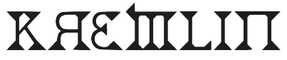 Creators in 2008 of a series of detailed free fonts: Eutemia (connected calligraphic script), Deborah Extra Ornaments, Prozac Buzz (grungy and neurotic), Phat Grunge Bold, Metal Macabre (scary), Kremlin-Advisor-Display-Kaps-Bold, Kremlin-Samovar-Extra-Bold, Kremlin-Samovar, KremlinAlexander-Bold, KremlinBolshevik-Bold, KremlinDuma-Bold, KremlinEmpire, KremlinGeorgianI3D, KremlinGrandDuke, KremlinKiev, KremlinOrthodoxChurch, KremlinStarets (all Cyrillic simulation typefaces), Deborah Fancy Dress (saloon font), Deborah (1880s style).
 Full list, at the end of 2008: AngstRidden (angst-ridden handwriting, dated 2002 under the label Mahoney Fine Arts), Bolt-Cutter-Light, Bolt-Cutter-Nasty, Bolt-Cutter, CSAR-Italic, CSARVESTMENT (illuminated caps), Bloody Irish Bastard or Congeal (2001), Deborah (Western), DeborahCondensed, DeborahExtrasOrnaments, DeborahFancyDress, Dominatrix, EutemiaI-Italic, EutemiaII-BoldItalic, EutemiaIII-BoldItalic, EutemiaOrnaments, GeneticEngine, GideonPlexus, KREMLINMINISTRY-DemiBoldItalic, Kremlin-Advisor-Display-Kaps-Bold, Kremlin-Samovar-Extra-Bold, Kremlin-Samovar, Kremlin-Soviet-Italic, Kremlin-Tsaritsa-Italic, Kremlin, KremlinAdviser, KremlinAlexander-Bold, KremlinBolshevik-Bold, KremlinComrade, KremlinCzar, KremlinDuma-Bold, KremlinEmperor-Bold, KremlinEmpire, KremlinGeorgianI3D, KremlinGrandDuke, KremlinImperial, KremlinKiev, KremlinKommisar, KremlinKourier-II, KremlinKourierII-Bold, KremlinMenshevik-Bold, KremlinMenshevik-BoldItalic, KremlinMinister-Black, KremlinMinister-Bold, KremlinMinister, KremlinMinisterBlack3D-Bold, KremlinOrthodoxChurch, KremlinPravda-Italic, KremlinPravda, KremlinPremier, KremlinStarets, KremlinSynod, MarquisDeSade, MarquisDeSadeAlternates, MarquisDeSadeOrnaments, Kremlin Chairman, Metal-Macabre, NewSymbolFont, ODINS-SPEAR-HOLLOW (2002, runes), ODINS-SPEAR (runic), OurSacredRights-Bold, PhatGrunge-Bold, Precious (calligraphic), StarmanCrusader, TEK-HED-AGGRESIVE (the TEK (techno) series is from 2003), tEK-HED-ANGRY, TEK-HED-BOLIMIC, TEK-HED-LAZY, TekHedRegular, ThorsHammerCarved (2008, chiseled look), csar, csarparadedress. Fonts from 2009: Vlad tepes II (creepy). Fonts from 2010: Sarcophagus. Fonts from 2012: Baris Cerin (a bastardized Garamond caps face). Fonts from 2013: Precious (connected formal script). Fontspace link. Open Font Library link for Tyler Schnitzlein. [Google]
[More] ⦿
|
Boris Dworschak
|
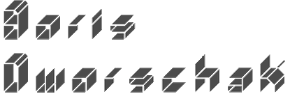 Pforzheim-based Boris Dworschak graduated in 2003 from the University of Applied Sciences in Pforzheim, Germany. Designer at Stereo Typehaus of Zentrale (2004, a 6-weight sans), Sanford Script (2004, curly), Partisan East (Cyrillic simulation face), Partisan West, Basic, Angel Dust (2004) and Master (2004).
 At [T-26], he designed Gaijin (2005, a great 3-d family, +Shadow), Raster (2002, a 10-weight rectangular lettering font family). In 2004, Boris joined Union Fonts, where you can get his typeface Dakar (2004). He started his own design studio, Boris Dworschak in 2004. In 2005, he founded dworschak&hoos with Heiko Hoos in Karlsruhe. He created the stencil typeface Exakt, and the mechanical typefaces Ikiru Sans and Ikiru Serif (2009) at Die Gestalten. Klingspor link. [Google]
[MyFonts]
[More] ⦿
|
Borutta (or: Duce Type)
[Mateusz Machalski]
|
 Borutta (or Duce Type) is the creative studio of über-talented Warsaw-based designer Mateusz Machalski (b. 1989), a graduate of Wydziale Grafiki ASP in 2014, and of Warsaw Academy of Fine Arts. His oeuvre is simply irresistible, charming and a worthy representative of the Polish poster style---witness Alergia (2016), Magiel Pro (2017) and Madiso (2017).
 He is the creator of the blackletter-inspired typeface Raus (2012), which also could pass for a Cyrillic simulation font. It was possibly made with Pawel Wypych. He also made Kebab (2012, a fat caps face), Duce (2012, art deco: withdrawn from MyFonts after Charles Borges complained that it was a rip-off of his own Gloria), Fikus (2012), Woodie (2012, a condensed rough wood type face), Polon (2012), Aurora (2012, a German expressionist poster face), Musli (monoline connected script), HWDP (2012, poster font), Wieczorek Script (2012, hand-printed), Hamlet (2012, a sword and dagger typeface, renamed to Prince), Caryca (2012, Cyrillic simulation, done with Pawel Wypych), Bezerro (2012, poster face), Bitmach (2012, pixel face), Meat Script (2012, a caps only market signage brush script), Krac (2012, a tall poster font), Hermes (2012: Ten Dollar Fonts), Berg (2012, a roughened blackletter face), Buldog (2012), Dudu (2012, tall condensed face). In 2012, Polish designer Wojciech Freudenreich and Mateusz Machalski combined forces to design the techno typeface SYN, which is based on an earlier De Stijl-genre alphabet by Freudenreich. In 2020, they released the free typeface family SYN Nova, which includes additional styles and a variable font. Machalski likes old wood types, which inspired him in 2012 to publish a wood type collection of weathered display typefaces: Condom, Hype, Whore, Banger, Buka. Elo (2012) and Duce (2012) are fat weathered wood types. Typefaces made in 2013: Wood Type Collection 2 (which includes Brie, Kaszti, Mader, Modi, Rena, Roast, Ursus), Zigfrid (headline face), Salute (letterpress style), Benito (a letterpress or geometric wood typeface), Bojo (heavy wood style poster face), Picadilly (heavily inktrapped open counter sans family), GIT (a manly headline sans), Lito (an eroded poster typeface), Haine (vernacular caps), Aneba (an organic sans family, renewed in 2016 as Aneba Neue), Vitali (sans), Korpo Serif (slab serif), Korpo Sans (elliptical family; +Greek, +Cyrillic). Typefaces from 2014: Adagio Slab, Adagio Serif, Adagio Sans (a superfamily not to be confused with the 2006 typeface Adagio Pro by Profonts), Adagio Sans Script, Adagio Serif Script, Adagio Slab Script, Tupperware Pro. Tupper Pro (42 styles) was designed by Mateus Machalski and the RR Donnelley team. Typefaces from 2015: Tupper Serif (again with RR Donnelley: a custom superfamily for pairing Latin, Cyrillic, Hebrew an Greek; for Tupperware), Vitali Neue, Legato Serif, Corpo Serif, Corpo Sans, Zigfrid, Picadilly (a great ink-trapped sans typeface family with an erect g). Typefaces from 2016: Nocturne (just like Magiel, this free typeface was designed as part of the Warsaw Types project: this wedge serif text typeface is inspired by the lettering on stone tablets commemorating the victims of World War II, and prewar Jewish shop signage), Favela (an experimental, geometric sans, for headline and fashion magazine use), Gangrena (a weathered typeface system co-designed with Ania Wielunska), Migrena Grotesque (earlier named Enigma Grotesque but probably in view of a clash with the name Enigma used by Jeremy Tankard changed to the appropriately named Migrena Grotesque), Alergia Grotesk (a take on the classical geometric grotesque style, in 60 weights, for Latin, Greek and Cyrillic), Alergia Remix (a hipster / hacker / Futura take on Alergia Grotesque). Typefaces from 2017: Nocturne Serif, Massimo (copperplate semi-serif influenced by New York; originally called Madison, they were frced to change the name to Massimo), Magiel Pro (a geometric display family influenced by Polish banners from the Russian occupatuon era, 1945-1989; it has a charming Black and a hairline, and covers Cyrillic too). A particularly intriguing project in 2017 was Bona, which set out to revive and extend Andrzej Heidrich's old typeface Bona. Mateusz Machalski contacted him for advice on the revival project. The resulting typeface families were published by and are available from Capitalics. The centerpiece is the warm and wonderful text typeface Bona Nova. It is supplemented by the extreme contrast typeface family Bona Title and the inline typeface family Bona Sforza. Participants in the project also include Leszek Bielski, Ania Wielunska and Michal Jarocinski. Google Fonts link for Bona Nova. Github link for Bona Nova. Typefaces from 2018: Bilbao (an innovative blend of sans, slab and mono genres in 18 styles), Cukier (a logo font family inspired by the vernacular typography from Zanzibar). In 2018, Mateusz Machalski, Borys Kosmynka and Przemek Hoffer co-designed the six-style antiqua typeface family Brygada 1918, which is based on a font designed by Adam Poltawski in 1918. Free download from the Polish president's site. The digitization was made possible after Janusz Tryzno acquired the fonts from Poltawski's estate. The official presentation of the font took place in the Polish Presidential Palace, in presence of the (right wing, ultra-conservative, nationalist, law and order) President of Poland, Andrzej Duda. Calling it a national typeface, the president assured the designers that he would use Brygada 1918 in his office. It will be used for diplomas and various other official forms. In 2021, with Anna Wielunska added to the list of authors, it was added as a variable font covering Latin, Greek and Cyrillic to Google Fonts. Github link. Typefaces from 2019: Gaultier (a sans family that is based on the styles of Claude Garamond, Robert Granjon and Eric Gill---a serifless Garamond and Gill Sans hybrid; includes a fine hairline weight), Aioli (a commissioned type system), Promo (a rounded sans family), Sigmund (the main style is inspired by the Polish road signage typeface designed in 1975 by Marek Sigmund: With the increase of weight, Sigmund turns into a geometric display in the spirit of vernacular typography from the signs of Polish streets; followed in 2022 by Sigmund Pro (15 styles)), Podium Sharp (based on Dudu, this 234-style family is a hybrid between different old Polish modular and geometric woodtypes such as Rex, Blok and Bacarat; note that 234=2x9x13, so fonts are numbered in Univers style from 1,1 (ultra-compressed hairline) to 9,13 (ultra expanded heavy)), Harpagan (an experiment in reverse and unusual stresses). Typefaces from 2020: Tyskie (a custom sans for Tyskie Magazine), Habibi Display (an ultra-fat display typeface inspired by bold Arabic headline typefaces), Podium Soft, Afronaut (an experimental Africa-themed font). In 2020, the team at Capitalics in Warsaw, namely Mateusz Machalski, Borys Kosmynka and Ania Wielunska, revived Adam Poltawski's Antykwa Poltawskiego (1928-1931) as Poltawski Nowy. Typefaces from 2021: Alfabet (a 20-style Swiss-inspired sans with narrow connectors, with support for Latin (+Vietnamese), Greek and Cyrillic scripts, including Ukrainian, Bulgarian and Serbian forms), Change Serif (a 10-style Robert Granjon-genre garalde designed as a part of Mateusz Machalski's PhD project, carried out in 2015-2021; the main goal was to create a typeface allowing for the typesetting of complex humanistic texts, containing many historical letterforms; each font contains 4000 glyphs and covers Latin, Cyrillic and Greek), Engram (a soft geometric sans family in 22 styles; close to his own earlier font, Enigma, 2016). Typefaces from 2022: Yalla (inspired by Arabic headline type). Home page. Behance link. Personal Behance link. Behance link for Duce Type. Another link. Fontsquirrel link. [Google]
[MyFonts]
[More] ⦿
|
Brett T. Johnson
[Simeon out West Foundry]
|
[MyFonts]
[More] ⦿
|
burodestruct (or: Typedifferent.com)
[Lorenz Lopetz Gianfreda]
|
 Lorenz Lopetz Gianfreda's foundry in Bern, Switzerland, est. 1994, called Burodestruct and Typedifferent.com.
 Free fonts include(d) the gorgeous GalaQuadra (by Angela Pestalozzi, 1999), Eject Katakana (1998), Dippex (1995, grunge font), Ticket (1995), Rocket 70 (1996), Ratterbit (1995, pixel font), Plakatbau (1995), Lodel Fizler (1996), Flossy (1995), Faxer (1995), Console Remix (1998), Cravt (1998, by "Katrin"), Stereotype (1998, by M. Brunner), Brockelmann (1995, free), Kristallo (1997, very original display face) and Billiet (1996). Other fonts: Acidboyz (1998), Alustar (1999), BD Asciimax (1999, ascii art font), BD Billding, Bdr_mono (1999), Brick (1996, like Kalendar), Cluster (1996), Console (1997), Doomed (1998), Eject (1998), Electrobazar (1995), Elside (1995), Globus (1996), Fazer (1996), Lofi (1997), Medled (1995), Paccer (1995), Solaris (1998), Spicyfruits_brush_rmx (1998, a nice high-contrast face), Spicyfruits_rmx, Wurst (free, by Heiwid, 2000), Relaunch (2000), Relaunch Katakana (2000, free), Rainbow (2000), DeLaFrance (2000, free, by Heiwid), Electronic Plastic (2000), Colonius (2001), Cash (2001), Cashbox (2001), Bilding (2001), Meter (2001), Mustang (2001), Bankwell (2001), BD Alm (2001), Balduin (2001), Tatami (2001, oriental look font), Hexades (2001, free), Nippori (2002, techno), Jura (2002), Bonbon (2002, free), Band (2002, free), Navyseals (2002, kitchen tile font), Ritmic (2002), BDR Mono (1999, OCR-like font), Mann (2003, ultra fat stencil), Aroma (2003), Zenith (2003), Nebraska (2003), BD Equipment (2004), BD El Autobus (2004), BD Unexpected (2004), BD Wakarimasu (2004, free kana face), BD Bernebeats (2004, futuristic), BD Deckard (2004), BD Spinner (2004), BD Victoria (2004), BD Designer (2004), BD Kalinka (2005, a curly ultra-fat display face), BD Equipment (2004), BD El Autobus (2004), BD Unexpected (2004), BD Varicolor (2005, stencil), BD Chantilly (2005), BD Memory (2005), BD Emerald (2005, beveled), BD Kalinka (2005, Cyrillic simulation), BD Extrwurst (2005), BD Aquatico (2005), BD Mandarin (2005), BD Polo (2005), BD Beans (2005), BD Tiny (2005, pixel face), BD Times New Digital (2006), BD Panzer (2006), BD Jupiter, BD Jupiter Stencil (2006), BD Pipe (2006), BDR Mono 2006 (2006), BD Fimo Outline (2007, free, by Nathalie Birkle), BD Bermuda (2007, experimental and geometric), BD Smoker (2007, psychedelic), BD Radiogram (2007), BD Mother (2007, exaggerated black Egyptian), BD Fimo Regular (2007, free), BD Demon (2007), BD Reithalle (2007, free), BD Halfpipe (2007, free), BD Broadband (2008, free; not to be confused with the much older fonts BroadbandICG or FLOP Design's Broadband), BD Viewmaster and BD Viewmaster Neon (2008), BD Electrobazaar (2008), BD Motra (2008, stencil), BD Virtual (2008), BD Spacy 125 (2008), BD AsciiMax, BD ElAutobus (2004), BD Equipment (2004), BD Ramen (2003), BD Retrocentric (2009), BDR A3MIK (2009, virile Latin and Cyrillic slab), BD HitBit (2009), BD Unicorse (2010, unicase and techno), BD Telegraph (2011), BD Schablone (2012, stencil face), BD Pankow (2013, stencil), BD Algebra (2014), BD Hiragana Kuro (2014), BD Qualle (2014, a fat poster typeface), BD Tribler (2015, a tribal font). Alphabetical listing of their pre-2015 free typefaces: Algebra, Alm, Apotheke, AsciiMax, Baldrian, Band, Bankwell, Bardust, Beans, Billding, Billiet, Bonbon, Brockelmann, Burner, Cash, Cashbox, Chantilly, Circo, Console, Console Remix, Cravt, Delafrance, Designer, Destination, Dippex, Eject Katakana, ElAutobus, Elmax, Elside, Equipment, Faxer, Fazer, Fimo, Flossy, Fluke, Galaquadra, Geminis, Halfpipe, Hexades, Hiragana Kuro, Jayn Fonta, Kristallo, Lodelfizler, Lofi, Medled, Meter, Mustang, Outline, Paccer, Pipe, Plakatbau, Plankton, Polo, Ragout, Ramen, Ratterbit, Reithalle, Relaunch, Relaunch Ktna, Rocket70, Sirca, Sirca Rmx, Solaris, Spacy125, Spicyfruits, Spinner, Stella, Stencler, Stereotype, Ticket, Times New Digital, TinyFont, Tribler, Unfold, Wakarimasu. Alphabetical listing of their pre-2015 commercial typefaces: A3mik, Acidboyz, Alustar, Aquatico, Aroma, Balduin, BDR Mono 2006, Bermuda, Bernebeats, Breakbeat, Brick, Broadband, Calamares, Central, Cluster (Corporate), Colonius, Deckard, Demon, Discount, Doomed, Edding850, Eject, Electrobazar 2008, Electronicplastic, Elk, Emerald, Endless, Extrawurst, Fontabello, Globus, Good Wood, Hell, Hitbit, Jupiter, Jura, Kalinka, Kameron, Kinski, Las Palmas, Mandarin, Mann, Memory, Mother, Motra, Naranino (2012: a children;s script), Navyseals, Nebraska, Nippori, Nokio, Orlando, Pankow, Panzer, Qualle, Radiogram, Rainbow, Retrocentric, Ritmic, Robotron, Schablone, Showlong, Smoker, St.Moritz, Stalker, Stonehenge, Sweethome, Tatami, Telegraph, Unexpected, Unicorse, Varicolor, Victoria, Viewmaster, Virtual, Wotka, Wurst, Wurst Directors Cut, Zenith. In 2015, Gianfreda designed BD Barbeaux (a condensed typeface with the fashionable chic of the French art nouveau or film noir). Typefaces from 2016: BD Kickrom Mono (LED emulation type). Typefaces from 2018: BD Westwork. Typefaces from 2020: BD Aubergin (an experimental poster font with Bauhaus elements), BD Microna (a pixelish variable font), BD Micron Robots (dingbats). Typefaces from 2021: BD Supper (a food packaging sans), BD Roylac (a stylish poster font that evokes modern furniture), BDRmono 2021 (hipster style techno). Alternate URL. Dafont link. Behance link. View the Typedifferent typeface library. [Google]
[MyFonts]
[More] ⦿
|
Christophe Badani
[Typophage]
|
 [MyFonts]
[More] ⦿
[MyFonts]
[More] ⦿
|
chr_s
|
 Designer who used FontStruct in 2009 to create Staring at the Sky, Early Bird Catches The Worm, Bernstein, Plaskett, Fimbriae, Hard Light, Inauguration, Kunchey Wide, Kunchey, Worst Seats in the House, Burden and 2x2 Struct (pixel-geometric art deco).
 Faces made in 2010: Sweet Henry (compact, rounded), Bobolink, Carapace, Riley (optical illusion face), Overfeed (Futura-inspired stencil), Corpus Torsion, Penkala, Mongrel, Guayule (attractive ultra fat didone), Filamentous, Dizygotic (squarish sans), Decorum (condensed display face). Faces from 2011: Sam Sleeps (in the style of Impact), Trepan, Tools of the Trade (dingbats). Typefaces from 2012: Pilaster (influenced by Yakov G. Chernikov), Pochoir (stencil face), Tourniquet. [Google]
[More] ⦿
|
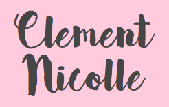
Clément Nicolle
[Stereotype (was: Zone Erogene, or Dasklem)]
|
 [MyFonts]
[More] ⦿
[MyFonts]
[More] ⦿
|
Corey Peace
|
Designer of Peggy Hill (2008, FontStruct), a rounded fat piano key face, Acts (2008, MICR face), L337 (2008, Cyrillic simulation face). [Google]
[More] ⦿
|
CybaPeeCreations (or: Typoasis)
[Petra Heidorn]
|
 CybaPee is the nom de plume of Petra Heidorn who lives near Hamburg. She has created many typefaces (listed below) between 1997 and 2005 and has cooperated with several type designers on interesting projects. She is undoubtedly best known for her successful web site Typoasis (discontinued in 2016), where one could download her own creations, and those of her many friends. Petra was also heavily involved in several attempts to revive blackletter fonts, in cooperation with Manfred Klein, Dieter Steffmann, Paul Lloyd and others. She organized several revivals of the typefaces of Rudolf Koch and Ernst Schneidler. She also managed the extensive web presence of Manfred Klein.
 In 2016, she allowed me to host her fonts on my site. Download page. Download all her fonts in one zip file. Her typefaces: - AlphanatismConHeads (2001). Stamped style.
- ArabDancesMediumItalic (2002). An Arabic simulation typeface done with Manfred Klain's assistance.
- Azimech (1999).
- Bauernschrift (2004). After a 1911 typeface from Bauersche Giesserei.
- Bayreuth (2003). A nice scan-version of Bayreuth Fraktur by Ernst Schneidler for C.E. Weber in 1932.
- Bibelschrift (2004). Codesigned with Manfred Klein, Bibelschrift revives a Fraktur from 1926-1928 used by the Bremer Presse, est. 1911. The Bremer Presse was bombed by the Americans in 1944.
- BirthdayGreetz (1999).
- Brahms Gotisch (2005). A blackletter typeface co-designed with Manfred Klein. It is a revival of a 1937 Genzsch&Heyse typeface designed by Heinz Beck.
- Burte Fraktur (2003). After Christian Heinrich Kleukens for the Mainzer Presse, 1928.
- CalliBrush (1999).
- Camouflage (1999). Textured.
- Chaos-Theorie (2000). A Halloween or vampire font.
- Charon (1999). An angry and / or scary typeface.
- Crystopian.
- CursedKuerbis (1999).
- Cyclin (2000). An ironwork font.
- DecoCaps (1999). Ornamental caps.
- DeutscheDruckschrift (2004). A revival of Heinz König's 1888 blackletter typeface for Genzsch&Heyse.
- DeutscherSchmuck (2004). Codesigned with Manfred Klein, this ornamental dingbat font is a revival and extension of the Schmuck für Deutsche Druckschrift by Eduard Ege, Genzsch and Heyse, 1922.
- DiamondDreams (1999). A pearly all caps typeface.
- Ellipsoideogram (2000). An italic headline sans.
- Epitough (1999). A sans.
- Extemplary (1999).
- Funtastique (1999). An exagerrated, almost bubbkly, art nouveau typeface.
- Gondoliere (2000). A light-hearted poster typeface.
- Gotika (2005). After Reiner's 1933 blackletter typeface for Bauer.
- Greex (1999). A Greek emulation typeface.
- Hans Sachs Gotisch (2005). Based on a typeface by that name of Albert Auspurg, 1911, Genzsch&Heyse.
- Hartwig-Schrift (2005). A blackletter typeface that revives Hartwig Poppelbaum's Hartwig Schrift from 1927-1928.
- Hasenchartbreaker (1999). A handcrafted typeface.
- Heimat (2005). After Wilhelm Weimar's Heimat from 1917, Genzsch&Heyse.
- HelvAssim (1999). A naughty take on Helvetica to needle Linotype.
- Hohenzollern (2004). Based on Carl Albert Fahrenwaldt's blackletter typeface for Bauersche Giesserei, 1902.
- HollandGotisch (2005). Designed together with with Manfred Klein, this is a revival of the textura typeface Nederduits (aka Fleischmann Gotisch) by Johann Michael Fleischmann, ca. 1750.
- InkyDinky (1999).
- IsleOfTheDead (1999). An angular handcrafted typeface reminiscent of the movie titling of Dr. Caligari.
- Jaecker-Schrift (2005). Revival of the 1912 blackletter typeface by Wilhelm Jaecker for D. Stempel.
- Kleukens-Fraktur (2004). A Schwabacher based on a design by Friedrich Wilhelm Kleukens, 1910.
- KrasniFellows (1999). An old Slavonic emulation typeface.
- KuehneRevised (2003). A blackletter typeface.
- LadyIce-Italic, LadyIce-SmallCaps, LadyIce, LadyIceRevisited, LadyIceRevisitedUpper. An organic monoline sans typeface family developed together with Apostrophe.
- Leibniz-Fraktur (2003). A Schwabacher typeface based on a house font at Genzsch & Heyse, 1912.
- LeontineLoew. A warm and plump informal typeface.
- LightBats (1999). Dingbats.
- Lupinus (1999).
- Lurzing-Initials (1997). A decorative caps typeface based on a 1908 typeface by Karl Lürzing that depicts naked figures.
- Manuskript Gotisch (2004). A revival of a 1514 Textura typeface by Wolfgang Hopyl, which was a house typeface at the Bauersche Giesserei in 1899.
- ModerneSchwabacher (2005). After a ca. 1900 typeface by the Otto Weisert foundry called Moderne Halbfette Schwabacher.
- MonkeyHouseParty (2001).
- MothproofScript (1999). A calligraphic typeface. The name is a take on frostmoth, one of Petra Heidorn's early aliases.
- MuseAsis (2002). Artsy fartsy.
- Napapiiri (1999).
- Neudeutsch (2004). After a 1900 original by Otto Hupp for Genzsch&Heyse.
- NeueFraktur, NeueFrakturExtraBold (2004). Revivals of typefaces by Johannes Wagner Schriftgiesserei in 1927.
- NinjaLine (2000). An outlined graffiti typeface.
- Nordland (2005). Based on a typeface by Heinz Beck for Trennert&Sohn, 1935.
- Oetztype (1999). German expressionist. Named after the Tyrolian Iceman, Oetzi.
- Oktoberfest (1999).
- Pachyderm (1999). A nice ultra-fat typeface.
- PeesCelticItalic, PeesCelticPlain, PeesCelticOutline (1999). Ornamental Celtic caps.
- Pegypta, Pegyptienne (1999). Hieroglyph-inspired typewriter fonts.
- PostmoderneFraktur (1999).
- Rammstein (1999). A tall condensed typeface.
- ResPublica (2000).
- RoteFlora (1999). Garffiti style typeface.
- RoyalGothic (1999). A swashy set of initials.
- SadLisa. A kitchen tile font designed to support Lisa Jenkins in a copyright battle.
- Sagittarius (1999). An arrowed typeface.
- SailingJunco (1999). A stencil typeface.
- Scalper-Bold, Scalper, ScalperInk (2001). Grunge style.
- SchmalfetteGotisch (2004). Codesigned with Manfred Klein, this semi-Textura typeface is based on a type of Ernst Schneidler.
- SchneidlerInitialen (2004). After F.H.E. Schneidler.
- Schneidler Schwabacher (2004). After F.H.E. Schneidler.
- SchwabachDeko (2005). This is Verzierte Schwabacher by Carl Kloberg, Leipzig, 1891. In 2005, Petra co-designed a similar revival of Verzierte Schwabacher with James Arboghast, simply called Verzierte Schwabacher. Her SchwabachDeko attempted to be as close as possible to the original.
- Scoglietto (1999). A text typeface.
- SerpentisBlack (2004). Digitization of a typeface by E.W. Tieffenbach for Officina Serpentis, 1913. This in turn is based on a Gotico-Antiqua by Peter Schoeffers (Mainz, 1462) which was refined in the late 15th century by Creussner and Koberger.
- SlimlinerMicro (1999).
- Smoke-Rasterized-Medium (2001). Degraded and textured.
- SoftAutumn (1999).
- Stoertebeker (1999). A mediaeval typeface with a rough outline.
- SunnySide (2000).
- Symphonie (2005). A digitization of Imre Reiner's Symphonie from 1938 (renamed Stradivarius in 1945).
- TaraType (1999). A lapidary typeface named after Petra's friend, Sabine Taranowski.
- Teutonia (2004). Based on a typeface by Roos & Junge, ca. 1900.
- TipTop (2004). Based on a typeface from Schriftgiesserei Julius Klinkhardt, Leipzig, ca. 1900. Virtually identical to Teutonia.
- ToolTime (1999). Dingbats.
- TypesourceFanclub (2001). A heavy semi-slab serif.
- Urdeutsch (2004). A rounded blackletter typeface based on Urdeutsch (1924-1925, Adolf Heimberg for Genzsch&Heyse).
- Vogeler Caps (2002). Based on Heinrich Vogeler's decorative blackletter caps typeface Jugendstil Initialen (1905).
- Weiss-Gotisch (2004). A revival of E.R. Weiss's typeface by that name, published in 1936 at the Bauersche Giesserei.
- WelcomeY2K (2000). A casual typeface.
- XmasTerpiece, XmasTerpieceSwashes (2001). A Fraktur font based on Rhapsodie by Ilse Schuele.
Dafont link. Klingspor link. Fontspace link. [Google]
[More] ⦿
|
CyberGraphics
[Jan Erasmus]
|
 Foundry, est. ca. 2009 in Johannesburg, South Africa, by Jan Erasmus. Jan currently resides in Johannesburg and taught font design for 10 years at University of Johannesburg and Stellenbosch University. His professional activities include typography, websites, brochure design, packaging, branding and type design. He also designed custom fonts for corporations of which Menyaka (for the FIFA world cup soccer 2010) and Nando's fast foods (1999; done together with Cross Colours) are the most noted.
 Jan's debut display font family was Thornface (1997, a beautiful medieval font). He then released Transition, Lalibela (2009, didone), Pixeluxe and Azania (Tuscan, Western). Other fonts include Sade (a relative of Garamond), Export Unicase (1999, stencil), Mzansi (2007, an African look font), Shaftciti (2008, military stencil), Pixeluxe (2010), Giramundo (2010), Transition (2006), Ethereum (2015, a Cyrillic emulation typeface). [Google]
[MyFonts]
[More] ⦿
|
Dan Bailey
[Fontosaurus]
|
[MyFonts]
[More] ⦿
|
Dan M. Zadorozny
[Iconian Fonts]
|
 [More] ⦿
|
Daniel Johnson
|
 Canadian type designer. His typefaces:
 - Aguardiente (2010, heavy sans).
- Deka (2010, a monospace font designed for very small display sizes).
- Didact Gothic (2010, a simple and readable sans i in the form most often used in elementary classrooms).
- He contributed to the GNU Freefont project. In particular, he created by hand a Cherokee range specially for FreeFont to be "in line with the classic Cherokee typefaces used in 19th century printing", but also to fit well with ranges previously in FreeFont. Then he made Unified Canadian Syllabics in Sans, and a Cherokee and Kayah Li in Mono. And never to be outdone by himself, then he did UCAS Extended and Osmanya. His GNU Freefont ranges:
- Armenian (serif) (U+0530-U+058F)
- Cherokee (U+13A0-U+13FF)
- Unified Canadian Aboriginal Syllabics (U+1400-U+167F)
- UCAS Extended (U+18B0-U+18F5)
- Kayah Li (U+A900-U+A92F)
- Tifinagh (U+2D30-U+2D7F)
- Vai (U+A500-U+A62B)
- Latin Extended-D (Mayanist letters) (U+A720-U+A7FF)
- Osmanya (U+10480-U+104a7)
- Grana Padano (2010).
- Judson (2010, designed for African literacy).
- Jura (2009). A sans family with support for Burmese, Cyrillic and Greek; redesigned and improved by Alexei Vanyashin in 2016; a variable font was added in 2019 by Mirko Velimirovic). Johnson explains: Jura is a family of sans-serif fonts in the Eurostile vein. It was originally inspired by some work I was doing for the FreeFont project in designing a Kayah Li range for FreeMono. (Kayah Li is a language used by a minority people group in Burma. Because the Burmese government suppresses the teaching of minority scripts, the Kayah Li script is taught only in schools in refugee camps in Thailand.) I wanted to create a Roman alphabet using the same kinds of strokes and curves as the Kayah Li glyphs, and thus Jura was born. Github link for Jura.
- Megrim (2010, a monoline drawing table sans).
- Pacaya (2013, a medium-weight sans).
- Pfennig (2010, an extensive humanist sans family).
- Rahel (2009, Hebrew).
- Sacco-Vanzetti (2009, sans).
- Stanislav Caps (2013).
- Travelogue (2008).
- Triad Postnaya (2010). An old Church Slavonic typeface and its Latin simulation twin. Free at the Open Font Library. Triod Postnaya attempts to mimic the typefaces used to publish Old Church Slavonic service books prior to the 20th century. It also provides a range of Latin letters in the same style.
Klingspor link. Fontspace link. Dafont link. Kernest link. Fontsquirrel link. Google Plus link. [Google]
[More] ⦿
|
Dima Pole
[Slovolitni de Grande Tartaria]
|
 [MyFonts]
[More] ⦿
[MyFonts]
[More] ⦿
|
DimitriAna
[Anastasia Dimitriadi]
|
 Athens, Greece-based designer of the free Latin / Greek handcrafted poster typeface Sunday (2014, Fontfabric) and the commercial poster typeface Silhouette (2014).
 In 2015, she and Iordanis Passas created the gorgeous Finos, which was inspired by Greek retro cinema (buy it here and check the free demo). Her second typeface of 2015 is the equally impressive deco script typeface family Magellan (in Deco and Script sub-styles). Marpesia (2015) is a connected calligraphic script typeface. Charming (2015) is a free spurred vintage tattoo typeface for Latin, Greek and Cyrillic. Adalberta (2015) is a great connected script typeface. Typefaces from 2016: Sketchbook Script (+Pro), Old Harbour (vintage lettering collection consisting of Blue waves, Blue waves striped, Captain's pipe, Captain's pipe Sans, Sailor's tattoo, Sailor's tattoo Sans, Old Ship, Old Anchor, Old Lighthouse, Seashells, Starfish, Old Harbour dingbats), Juvenile. Typefaces from 2017: Lady Marmalade (a textured, almost painted, coffee shop lettering font), Footbridge (brush script), Novaturient (Latin / Greek; a wild calligraphic font), Thirsty Heart. Typefaces from 2018: Hayao's Letters (fantastic drop caps that pay tribute to Hayao Miyazaki and his magical films), Chalky Letters (a multilayered font collection). Typefaces from 2020: French Armoire (a formal calligraphic typeface), Patmos Sans, Patmos Serif (an old Slavonic emulation typeface for Latin, Greek and Cyrillic). Typefaces from 2021: Folk Zodiac Signs. [Google]
[MyFonts]
[More] ⦿
|
Dmitrij Greshnev
[Green Type]
|
 [MyFonts]
[More] ⦿
[MyFonts]
[More] ⦿
|
Dmitry Goloub
|
 Russian type foundry, est. 2014 by Dmitry Goloub, the Moscow-based codesigner with Lucas Perdidaão of the free grid-based art deco typeface Bobber (2012, in ai format) and of Alpine (2014). From 2009 until 2010 and again in 2012, he lived in Firenze, Italy.
 Typefaces from 2013 include Bolognese Sans, Moor (multilined art deco family), Bobber Script, and Bread & Milk Sans. Genplan (2013) is a great free layered inline typeface for Latin and Cyrillic that is based on 1930s Soviet poster types. See also TT Genplan Pro (2014). Cittadino Symbols (2013) is a free rounded city traffic icon font related to a Milan subway project. In 2013, this was replaced, still for the Milan metro maps, by Meneghino Wayfind, a tweetware typeface that was influenced by PT Sans Caption. In 2015, Goloub created Ardent: Ardent is my Sergey Chekhonin-inspired typeface. Ardent is an attempt to prove that the bizarre Cyrillic letterforms of 20s are still decent for use in modern design, even in Latin script. It is highly ornamental and lapidary. Still in 2015, he designed the sans typeface family Intersans (a multilingual Swiss army knife sans), which supports Extended Latin, Extended Cyrillic (including Bulgarian and Serbian Cyrillic), Polytonic Greek, Armenian (Asomtavruli, Nuskha-khutzuri, Mkhedruli, Mkhedruli Mrglovani), Georgian and Hebrew. It also includes true italics, small caps, small caps italics and a lot of pictograms. Typefaces from 2020: Grrr (at Paratype, with Alexandra Korolkova: a techno family characterized by an oversized lower case f). Dmitry Goloub's home page. [Google]
[MyFonts]
[More] ⦿
|
Dmitry Tektov
[Tektov Dmitry Type]
|
[MyFonts]
[More] ⦿
|
egenckan
|
Designer who used FontStruct in 2008 to create Yangel, What?, Babba (his best face, a very fat creature), and Russian Beauty (Cyrillic simulation). [Google]
[More] ⦿
|
Eko Setiawan
[Emyself Design]
|
 [More] ⦿
|
Elideth Paola Gutierrez
|
 During her studies at the University of Monterrey in Mexico, Elideth Paola Gutierrez created Gotric (2014) by blending Chronicle Display Bold (Hoefler & Co) and Lucida Blackletter (Charles Bigelow & Kris Holmes).
 In 2017, she designed the Slavonic emulation typeface Haute Land (which was inspired by a logo created by visual artist Kukula in his presentation of the year 2015 Haute Debutante), and Blogger Sans Icons. [Google]
[More] ⦿
|
Emfoundry
[Jon Melton]
|
 Emfoundry is the micro font foundry of type designer Jon Melton, whose first degree in art dates back to 1984. It was created originally as part of his MA in Typographic Design postgraduate studies at the Cambridge School of Art within Anglia Ruskin University in 2007. Jon Melton is course leader for BA (Hons) Graphic Design at the CSA. His academic research as a senior lecturer at this university informs his work that focuses upon key moments in type design evolution.
 His typefaces are not commercially available, They inclde: - Fount Sans 1756 (2018), a revival typeface of the 18th century, the legacy for all the countless sans serif fonts today. Speaker at ATypI 2018 in Antwerp, where he explains that revival: The search for the origin of today's commercial sans serif typography has become something of a holy grail for type historians. The earliest known example of a deliberately geometrical serifless letterform was confirmed back in the late 1990s, on a plan-drawing title block for a new parliamentary building. It was produced whilst on the grand tour by the architect John Soane. Duly exhibited at the Royal Academy in 1779, it marked the start of Soane's utilising this then-radical letterform on his design drawings and for inscriptions on buildings. Prior to Soane's exhibited "Design for a British Senate House," there is a void. Scholars are aware that the sans serif originates within the letterforms of Greece and the informal inscriptions of the Roman Empire. But what inspired Sir John Soane to use it, for what appears to be the very first time?
- Cuban Revolt. Cuban Revolt was inspired by a plantation sugar sack from the 1960s, which utilised a sans serif letterform with modeling curves and counters created during a traditional hand-cut stencil process in silk screen printing. It has a constructivist feel.
- Russian Revolt. Russian Revolt was created via a regularization of the modeling of its comrade font Cuban Revolt. It is a faux-Russian display face with a range of contextually (Cyrillic) inspired alternate glyphs that reflect the experimental typography of dadaism, suprematism and constructivism.
- Cuba Libre & Cubana.
- English Open, or "Georgian English Open Initials & Titling". English Open was derived from the letterforms of metal engravers, and examples of these are readily found on armorial silver and maps produced over one hundred years earlier than the first available open typeface specimens. Its character follows the steel and copper plate engravers of the 18th century, and is ultimately informed by the open types of the period such as Cocaine, Moreau-Le-Jeune, Fournier, Fournier Le Jeune and Rosart.
- Empire Initials, Empire Initials mark the end of informed neoclassical and revivalist ornamentation, and the beginnings of ostentation and the over-adornment so representative of Victorian eclecticism. White-out decorated fat types were produced within a very short Late Regency period, from the 1820s-40s, of fevered expression within the decorative arts.
- English Vernacular. The letter is informed by generations of 17th and 18th century armorial silver and goldsmiths, glass engravers, topographic and political print gravurists, signwriters and our provincial stone carvers who developed English vernacular, the Georgian artisan letter.
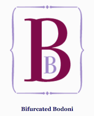
- Bifurcated Bodoni. EM Bifurcated Bodoni represents a missing piece of the typographic evolutionary puzzle, with its Archaic and Deviant alternates exhibiting tentative and restrained characters and ornamentation, such as median decoration, internal tracery cusping and Romanesque letter formations. [...] The transition has been increased and the proportions expanded pointing towards the predominant display Fat Faces of the period; while the serif bifurcates subtly to represent early tentative experiments within what became known as the Tuscan form.
- Classic Soane: Classic Soane is created in homage to the Regency architect Sir John Soane and his refined classical vernacular.
- Pure Soane Sans. Melton explains this inscriptional sans:,i>Pure Soane Sans forms part of a reappraisal of the Regency architects intensions for inscriptional letterforms following a recent discovery of an overlooked early Sans serif letter on a pair of gate houses in Norfolk. These buildings were recorded as erected between 1790-92 with two Greyhound statues including inscriptional motos on stone plynths contemporary to the building. The letters have distinctive widths and features, particularly the 'G' and 'J' which shares an idiosyncratic partial serif that is also seen on Soane's titling on the better known drawings for his proposed Norwich (Castle) Gaol. These features have provided the clues to a new Sans Serif Typeface firmly based upon the 18thC origin of the seref-less letter.
- Ogilby's Britannia (Britannia Regular, Britannia Italics, Britannia Swashes): Ogilby's Britannia reflects the engraved letterforms published in Britain's first Road Atlas published in 1675. John Ogilby employed numerous Surveyors, Weywisers (measuring wheel), Cartographers, Plate Engravers and Printers in the production of his revolutionary book. This typeface seeks to capture the engraver's vernacular of the 17th century, utilising the ichnographic ornaments and cartographic letterforms used on Ogilby's post roads strip maps, which applied a standardised unit mile for the very first time.
[Google]
[More] ⦿
|
Emyself Design
[Eko Setiawan]
|
 Denpasar, Bali-based designer of the connected script typefaces San Joaquin (2018), Lightober (2018), Lakeland (brush font), Winterskol (2018: formal calligraphy), Lofinight (2018), Faithless (2018: font duo), Anaheim Script (2018: free), Neira (2018) and Senja (2018), and the handcrafted typefaces Windasa (2018), Sarada (2018, a slab serif), Inku (2018, a slab serif) and Shinigami (2018: a haunting brush font). He also designed the blackletter typeface Fullerton (2018), the font duo Ourense (2018) and the flared terminal typeface Queenstown (2018).
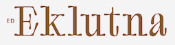
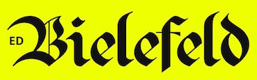
 Typefaces from 2019: Kurashiki Brush, Yerington, De Ginkgo (a stylish serif), San Francisco (font duo), Blue Lagoon (a bold sans and a glitch style called Wave), Sunset Road (a rounded blackletter), Alma Toran (a rotunda), Furano Gyo (a condensed slab serif), Furano (a condensed serif), Desuka Slab, Reschensee (a Speedball font), Swampcity, Novodevichi (Russian emulation font), Bielefeld (blackletter). Typefaces from 2020: ED Vitinia (blackletter), ED Ashglen Script, ED Northridge Sans (a 9-style sans), ED Lithosphere (a fashion mag serif), Candytuft (a thorny-serifed typeface), Bielefeld Next (blackletter), Black Orchid (blackletter), Balsamine Script, Lungwort (a text typeface), ED Celandine (blackletter), Cyrene Sans, Point Dume (a font duo), The Broads (a roman family), Failynn (thorny-serifed), Washboard (condensed), Fullerton Next (blackletter), Palmdale (a smooth script), Corbyn, Corbyn Serif (7 styles), Baliem (a blackletter), Kudoes, Logrono (a brush script), Silverdale, Pink Coast, Francoeur, Rosinweed, Nevers, Golden Cape. Typefaces from 2021: ED Phoebe, ED Lavonia (a stylish calligraphic script), ED Muglins (a display serif), ED Bienova, (a condensed display serif), ED Bedivere (a 10-style sans), ED Begonia (a blackletter with flower petal terminals and a jogging capital K), ED Cerfoglio (a serif), ED Daffodil (a Schwabacher with smooth edges), ED Faliraki (a modern gothic), ED Vacaville Script, ED Fettle, ED Ocher, ED Fettle Serif (10 styles), ED Morrigan (blackletter), ED Randgrid (a display serif), ED Sonar (a cursive typeface), ED Eklutna (a didone display serif with Q-tip terminals), ED Muskrat, ED Brigid (Celtic, uncial), ED Cretheus (a display serif), ED Fayetteville Script (calligraphic), ED Floriane Serif. Typefaces from 2022: Type department link. [Google]
[More] ⦿
|
Fernando Forero
[Fernando Forero Foundry]
|
 [MyFonts]
[More] ⦿
[MyFonts]
[More] ⦿
|
Fernando Forero Foundry
[Fernando Forero]
|
 Fernando Forero (b. 1978, Tunja) ran EisartGraphic.com together with Weronika Kwiatkowska, and moved from Bogota to Kalisz, Wielkopolska, Poland, where he started Fernando Forero Foundry. He is now located in Warsaw, where he works as a graphic and type designer and illustrator.
 Designer of Ishia Antiqua (2013, a cursive hand), Urbania (2013, a dusty face), Ilex (2012, hand-printed), Baltan (2012, a calligraphic script), Old Stamps (2011, scanbats), Boys and Girls (2011, dingbats), Aliovha (2011, a monoline elliptical sans), Old Nyleshina or Old Nyleshna (2010, roughened calligraphy), Vexa (2010, grunge), Ornamentus (2010, an interesting modular ornamental face), Melonella (2010, a medieval script), Cioran (2010, aged letters), Ornalia (2010), Selbst (2010, hand-printed caps), Nugg (2010, grungy), Feeda (2010, a curly face), Intuitiva (2010, grungy), Czarnulka (2010, script), Khamus (an earthy calligraphic face) and Últimos Ritos (a hybridization between the forms of the Cyrillic and Roman characters), two typefaces that won awards at Tipos Latinos 2008. He also made the grungy Refaxed (2008) and Efficient Fax Font (2010), and the experimental Aleah (2010) and Ovhol (2010). In 2014, Forero published the grungy letterpress emulation font family Asfalto. Devian tart link. Behance link. Another Behance link. Klingspor link. Old URL. [Google]
[MyFonts]
[More] ⦿
|
Finn Sködt
[Ultramarin]
|
[MyFonts]
[More] ⦿
|
Florin Florea
|
 Romanian graphic designer (b. 1963, Timisoara) who lives in Cluj-Napoca, and graduated in 1992 from the University of Arts and Design in Cluj-Napoca. He teaches in the Design Department of the University of Art and Design in Cluj-Napoca.
 Creator of these typefaces: - Columnion (2015). A free Greek column-inspired typeface designed together with Mihnea.
- Kogaion SC FR (2011). Medieval lettering.
- Friends (2009). A dandy serifed typeface.
- The calligraphic brush script Manualito Flo (2011).
- Archaic Romanesc and Archaic Cali. These typefaces are based on types found in Romanian calligraphy books from ca. 1930. See also ArchaicOrnamental (2009) which is based on a poster from 1975 by Aurelian Petrescu. Check also Alphabattle S (2010).
- The Arhaic series, all Latin typefaces in the old Slavonic style: Arhaic Miron Costin, Arhaic Boier (2012), Arhaic Atanasie, Arhaic Arnota.
- Manastirea Dealu.
Dafont link. Behance link. Fontspace link. Wordpress link. Abstract Fonts link. Home page. [Google]
[More] ⦿
|
Font Bundles
|
 London-based font vendor who started in 2015 or 2016, and carries mostly brush script typefaces. They are mainly pushing their own work.
 Typefaces from 2017: Treasure Script, Hastter Sontial script, Dealina (calligraphic script), Red Mist, Queen, Wishing Well, Highlights, Handy Man, Hey Betty, Polar Bear, Realtech, Golly Gosh, Magic Man, Ardina Script (by Ari Fadli), Rusty Bucket (dry brush), Dolly Script (calligraphic wedding script), Handstyles, Bouncy Hunter (spurred), Django (Western), Olivia Script, Questioned, Renegade, One Dance (calligraphic), Mammoth (script), Honey Bee, September Script (calligraphic), Amanda (calligraphic), Sandy Pro, Lilly Mae. Typefaces from 2018: Squishy, Squishy Extras (sea life dingbats), Billie Harley, Origami, Arkinay, Moscow (a Cyrillic emulation typeface), Bindi, Felt Tip, Christina, Park Ranger, Rembulan, Catchy Script, Champagne (brush and ink splatter), Azalea, Loft Yian (script), Love Candy, Wisdom Script, Montage (signage script), Bristol, Stephanie Jane (brush pen font), Glamorous Silhouette (font duo), Sun City (sans), Crackers, Sliders Script, Jaquilane (upright script), Gladis (formal calligraphic script), Wheatbread (monoline sans), Monstera (a stylish serif typeface), Sailor (tattoo font), Comic Boom (cartoon font), Kely Rose, Radical, Granger (brush font), New Type (prismatic), Sugar Script, Aloha Big Man, Magical Unicorn, Chocolove, Gentle, Roseland, Queensland (copperplate calligraphy), Pink Grapefruit, Jingle Boo, Old Press, Michigan (outline slab serif), Boulder Holder, Angelica (a creamy signage script), Anchor, Freshca (upright connected script), Zimbra (zebra-striped, by Alex Etewut), Adele, AlyshiaScript, BackStitch, BirthdayScript, Brat, BringHearte, CherryBlossom, Eastland, ElhammerBrush, Enyssala, Florva, GloomyDay, HappyBirthday, Heavenfield, Herbie, Junitha, Kayleigh, Mirantie, Mountiane, Nattalia, Quance, QuickBrush, Rafifi, Reebiolla, Rockets, SandyBeaches, Springer, Strangelove, TheCharlotte, Valentino, VictorianMonogram, WinterTime, Zebra. Typefaces from 2019: Radicals (signage script), Lovebird, Ridgeway, Lindale, Moscow, Anthem, Blackstar (blackletter), Maskoolin, Tatima, Hands Down, Monday Blues, September Script, Restuner, Mammoth, Hey Betty, Ciscopic, Hatterline, Jaiho Script, Diamonds, Indah Script, Amanda (calligraphic), Molyna, Mellow Line, Sandy, Renegade, Loveya Script, Angelina Script, Heilig, Dealicha, Allana. Typefaces from 2020: Sleeplesson, Nostalgia Script, Fb Super Fun, Fb Lawnmower, Fb Lovehearts, Fb Leonardo, Fb Fancycorgi, Fb Bananasandwich, Fb Doodled, Fb Mighty Spiky, Quirkle, Toasted Cinnamon, Loveya Doodle, Neon Light (a marquee font), Cliche, Zipper, Fb Mainland, Fb Strawberry, Fb Many Mondays, Fb CountryGirls, Fb Caramelong, Sausages (a chunky script). [Google]
[More] ⦿
|
Font City
[Igor&Kate Shipovsky]
|
 Font City is a Russian foundry headed by Igor (b. Volgograd, Tver (Russia), 1965) and Katherine (b. 1990, Russia) Shipovsky. Their typefaces cover Latin and Cyrillic:
 All font names starting with "City of" are identical to those starting with "Gorod", the Russian word for city. Font City was sued in August 2003 by Berthold because the foundry's name, Font City, is too close to Berthold's trademarked font name, "City". Hence the name change to Gorod. View Font City's typefaces. Klingspor link. MyFonts link for Katherine Shipovsky. [Google]
[MyFonts]
[More] ⦿
|
Fonteam International
[Marin Darmonkow]
|
Marin Darmonkow is the designer at Fonteam International of Refugee (2002), K-Taj (2002), Jaxon (2002), Inahurry (2002), Fontone (2002). He used to be located in St. Johns, New Foundland. Alternate URL. List of fonts at the site: Aga, Bordy, Clichet (stencil), Darmonkow, Dotmap, Fontone, GiaMagdalena, Grozen, Inahurry, Jaxon, Kitaj, Liveon, Moden A, Newold, Orthodox, Orthodox 2 (cyrillic simulation typefaces), Ossie 02, Pechat, Refugee, Repenton (gothic), Squaremap (pixel face), Sunny Samuel, Tutiin, Valerie ZD, Vetren Sans (elegant high contrast sans family), Vlast. [Google]
[More] ⦿
|
Fontikon
[Michela Graziani]
|
 Rome, Italy-based designer. In her Fontikon font project (2020), ishe has produced eight fonts, each with letters and culture symbols: Alchemy Complex, Adinkra Wisdom, Aztec Empire, Celtic Iron, Lovecraftian Neue, Japan Kamon, Viking Norse, Slavian Ustav.
 Her Symbolikon set (2020) contains over 800 symbols / icons from the following cultures: Adinkra, Africa, Alchemy, American Native Rock Art, Ashtamangala, Asia, Astrology, Aztec, Buddhism, Celtic, Central America, Central Europe, Chakra, Christianity, Egyptian, Flowers, Greek Mythology, Hopi, Inca, Islam, Lakota Sioux, Latvian, Lovecraftian Mythos, Maori, Mapuche, Maya, Mu, Norse, Norse Runes, North America, North Europe, Pacific Area, Sacred Geometry, Slavic, South America, South Europe, Taino, Tarot Major Arcana. [Google]
[More] ⦿
|
Fontosaurus
[Dan Bailey]
|
Fontosaurus (est. 1996) has about 75 original giftware fonts by Dan Bailey (b. Minnesota, 1972) from Eagan, MN and now Coon Rapids, MN: Blowfish (2001), Negotiated (2006), GhettoBooty (2003), Laika (2003), Amerinese, Heptathalon, Riffic (2002), XMR (2002), Amerikatakana (2002), Experimenta (2002), Tapdance (2002, a great ultra-high contrast Broadway face), Casual Roman (2002, not free), Casual Roman Capitals (2002, not free), Heater (2001), Crank (2001), Halloweenies (2001), GaramOrbital (2001), Microbial (2001, pixelized), Inception (20USD), Fallen Thyme (a hacker font: letters are overlayed in Chank Diesel's Thymesans), Candycorn Overdose (2001), Statebats (2001), Whackbats (2001), 5by (bitmap font for the Mac), Deadwrong (2001), Alien Artifact (2001), Hoodoo Two (2001), Noonan (2001), YChrome (2001), Martini (2001), DresdenFirestorm (2001), Backlash, Brainwave, Whiplash, BlockheadInsecure, Blockhead, BlockheadSpeedy, CancunSiesta, CitizenDick (double writing), CSDAnorexic, CSDMegabold, CSDNormal, CSDPhattie, Danwriting, Eagan, Ebola Jones (2001), FallenDirty, Fallen, KaffeinePsychosisHeavy, KaffeinePsychosis, LucidityNormal, LuciditySlasher, MankatoHalfwit (outlines), MarsColony, MyFriendPoopa, OralExpulsive, Preternatural, Psychoactives (great!), RadiationBurn, Soviet2002, Starvetica, 989MaxProtect, Ablative (2001), Crackaddict, Harleysville, Juggernaut, LoveBot (a mashed Times Condensed), Packer, Sexypants (reworking of Calligraphic 421), Shadowboxer, Skylab (2000), Arduous, Bewbz, BungholioSurprise, Crotchrot, Numatrix, Oddziab, RonnieRaygun, Rusch (2006), Runningback, 1978NYC, Erg, Exclaim, Gigaton, Grackle, Kiloton, MashedPotatoes, Megaton, Moonbase, Mullet, Pornstar, PornStarAcademy, Scumbucket, SnowCrash (hacker face), Speeddealer, SpringBreak, Statebats. Gumbo (2001) and Tirade (2001) are commercial. Does also custom work. At some point, it was part of the Chank Army, where Fontosaurus had the commercial pixel font Noonan (2002). Interview. Creator of Jantze (2003), a comic book font based on the cartoon The Norm by Michael Jantze, and whose profits will go to the Lance Armstrong Foundation. Dafont link. MyFonts link. [Google]
[MyFonts]
[More] ⦿
|
Galdino Otten
|
 Cartoonist from Recife, Brazil, b. 1966, whose sense of humor and artsistic prowess shine in his dingbat fonts. Dafont link. Fontsy link.
 Creator of the experimental Almost Sanskrit (2009), Zodiac Nice (2009, astrological symbols), Xilo in Zodiac (2009), Xilo-Cordel-Literature (2009, dingbats), Cordel Circo Mambembe (2010), Inside Issue (2009), Stretched Signature Flex (2009), Action of the time (2009, grunge), the dingbat typeface Ugly Cars (2010), the grunge typeface Capitão Galdino (2008), the grunge typeface Saltpeter-N-Fungus (2010), Texture Road (2010, more grunge), BSB DF 50 (2010, grunge), Fine Serif (2009), and the nice dingbat typeface Ochent Silibrina (2009). Fonts made in 2010: Sport 4 Ever (dingbats for Olympic Games), 60sPop (multiline face), DotSpot (dot matrix), IRON H METAL (tattoo, gothic), IngaStoneSigns (stone age glyphs), Ode2PasteUp (hand-printed), WideSquare (pixelish), ActionoftheTimeNewUL, BSBDF50, Haus-Sweet-Haus, INSIGHT-ISSUE-NEW, Movie Filmstrip, SquareChalk, Action Of The Time New (grunge), CordelValentine (dingbats), IngaStoneSigns (petroglyphs), SustainableAmazon, VeryDamaged (grunge), ParkTechCG (letters as in wired circuits), kidSWritten, Iron H MetallLight, LaceNice (knitted look), Ode2PasteUp, TextureRoad (grunge). Fonts from 2011: Booklet Cordel (sketched), Cordel Encarnado, Nuclear Accident (texture face), Noncircular (techno), Old Press (grunge), Old Typography (grunge). Fonts made in 2012: New Press (condensed sans family, +Eroded), Sketch Wall, Comic Gibi, Own Written, Comica BD (comic book shadow font), Cartoon Relief (a 3d cartoon typeface), Riscada Doodle (scratchy hand), Sketch Nice, Needlework Good (a stitching font), Biscuit Made, Just Skinny, Crazy Style, After Cheret (hand-drawn 3d shaded outline face), Spots in the mirror, TNT Xplosion, Escrita Toska (curly script), Cordel Movies (moviemaking dingbats), Fine N Tall, Cordel Groteska, From Street Art (free graffiti font), Sketch College (sketched athletic shirt font), Thin Press (grungy vernacular type), Sketch Serif, Relief BD, Maxxi Serif (very heavily slabbed serif face), Semi Cursive Gut, Sketch Coursive (sketch face), Salt Pet Non Eroded, Advanced Architecture, Very Fine Serif (a monoline Egyptian), Sketch Nothing, Freehand Nothing, Shark Attack (curly), Do Doodle, Maybe Pollock (dust texture face), Xilo Prosa (grunge), Thin Design, Amazon Palafita (hand-drawn 3d outline face), Snow Times, Snow Traces, USSR Army (rough army stencil with a Russian feel), Needlework US (stitch font), Old Scribe (Greek lapidary face), Nickel Bumpy, Soviet Style (stencil face), Top Modern (heavy slab serif), Lettering Set New, Carton East, Not Tuned TV (sketch font), Scar Bleed (scary font), Maxxi Dots (texture face, +Shadows), Dots Land Gotika (grungy blackletter), Stefanie Dots (textured letters), Karamuruh (textured caps), Broken Type (grunge: a glaz krak font), Touppeka (a Kafkaesque, tribal or painter's font), Old Dreams (grungy), Bad King (sketched typeface), False 3D (hand-printed 3d outline typeface), True2D, I Wrote All, Resistance Until The End. Typefaces from 2013: Serifa Comica (comic book slab), Press Style Serif (letterpress style), Press Style Large, Triatlhon In (sic: a Greek simulation face), Go 2 Old Western (grungy wood type), Old Serif Gut, Press Style (letterpress style typeface), Dust Serif, Thing Press, Thin Grotesk Serif, Before Collapse (glaz krak face), Stencil Style New (a military stencil), Damaged Serif, Press Serif Cool, Press Feeling, Sketch Toska, Link Parties, Almost Cartoon, Cartoon Toy, Toy Toy Toon, Fine Style (didone caps), Fine Sans (Peignotian), Beyond Blackboard, Forgotten Junk (grunge). Typefaces from 2014: Simply Rounded, Cartoon 2 Packages, Pain N Bleed, Yummy Lollipop, Hippie Movement, Rotunda Geo, Old Figaro Cursive, Cute Cartoon, Sketch Gothic School (sketched blackletter), Fine College (hatched athletic lettering face), Press Felling Eroded (letterpress emulation), School Book New (sketched), Stencil Cargo Army (military stencil), Fine Eroded, Grunge Poster, Education Is A Way, Cartoon Blocks, Cartoon Bones, Cursive Option, Odd Press (letterpress emulation), Cartoon Tunes, From Cartoon Blocks (3d), Hippie Movement, Yummy Lollipop, Needlework Perfect, Press Gutenberg (blackletter), Unic Calligraphy, Roundfed Eroded, Children's Book (outlined), Neon 2 News, Good Choice (shaded letterpress emulation), Cartoon 2 Us, O 10 Type, Dust West (grungy Western style), Comic Balloon, Caligraf 1435 (pirate era script), No Name Sans, Top Secret Stamp (grungy stencil), Fine Blackboard (blackboard bold, inline), Press Style Extra L (letterpress), Sounds Good (geometric sans), Sounds Eroded (shaded letterpress font), Cartoon Blocks Christmas, Street 2 Art (graffiti font). Typefaces from 2015: Snaps Taste (a grocery store or comic book font), Snaps Taste Christmas, Calligraphy Hand Made, Silly Aliens (dingbats), Sketch Match (3d, sketched), Cartoon 4 Sports (dingbats), Kids Book, Almost Japanese (oriental simulation font, +Comic, +Cartoon), Inga Stone Redesigned, Money Money Plus (engraved money font emulation), Thin Cool, Old N New Media (dingbats), Thinkers World (scanbats of famous intellectuals), Magical Cord, Quick Writing, Eroded 2 Much, Stencil Army WW I (military stencil), Stencil WW II (military stencil), D-Day Stencil (military stencil), Western Bang Bang (weathered Western font), Modern Serif, Modern Serif Eroded, Money Money (handcrafted engraved currency font), Almost Japanese Smooth (oriental simulation typeface), Write Righ, Ease Christmas (dingbats), Sketch Script Cool, Ficticcia College. Typefaces from 2016: Doodle Cafe Scents (dingbats), Christmas Cookies, Coffee Written, Soft Marshmallow, Niagra Faults, Sketch Toronto, Sketch Fine Serif, Sketch Handwriting, Typewriter Press, Typewriter Style, Sketch 3D, Maple 3 Cartoon (snow-covered letters). Typefaces from 2017: Crazy Krabs, Old Barbwire, Gregory Packaging, Ghost Army Stencil, Old Wise Sketch (sketched blackletter), Packaging Funny, Blackboard Restaurant, Kavernosa (bony typeface), Little Kid. Typefaces from 2018: 1927 Epoque, Cartoon Toy Turbo, Old Wise Lord (blackletter), Handmade Memories, Silly Cartoon, Old Press Original, Pet Shop, Cute Script, Dust West College (hatched), New Comic BD. Typefaces from 2019: Eco Bamboo (Cartoon, Fun), Karamuruh Turbo (all caps with a quilted texture), Cordel Junina, Cordel de Mangai (240 dingbats), Cordel Rustika. Typefaces from 2020: Beach Party Cartoon. [Google]
[More] ⦿
|
Gerry Chapleski
[words+pictures]
|
[MyFonts]
[More] ⦿
|
Gianluca Cassioli Qassjo
|
Italian airline pilot. Designer of the free Slavonic emulation font Tesserale Ecclesiastica (2016, iFontMaker). See also Tesserale Duro and Tesserale Qomfort. In 2017, he designed the rounded monospaced typewriter typeface Typetypo. [Google]
[More] ⦿
|
Gilles Le Corre
[GLC --- Gilles Le Corre]
|
 [MyFonts]
[More] ⦿
[MyFonts]
[More] ⦿
|
GLC --- Gilles Le Corre
[Gilles Le Corre]
|
 French painter born in Nantes in 1950, who lives in Talmont St Hilaire. His fonts include 2010 Cancellaresca Recens (inspired by a chancery type of Francisco Lucas from the late 16th century), 2009 Handymade (comic book style), 2009 Lollipop (chancery style), 2009 GLC Plantin, 2009 Primitive (2009, a rough-edged roman script), 2008 Script 2 (2008), GLC Ornaments One (2008) and 2008 Xmas Fantasy (2008: blackletter). In 2008, he started GLC -- Gilles Le Corre and became commercial. Creative Market link. He is best known for his historic revivals:
 - 161 Vergilius (2010)
- 750 Latin Uncial (2010): inspired by the Latin script used in European monasteries from circa 5th to 8th, before the Carolingian style took over. The uppercases were mainly inspired by a 700's manuscript from Fécamp's abbey in France.
- 799 Insular (2010): inspired by the so-called insular style of Latin script that was used in Celtic monasteries from about 600 until 820.
- 825 Karolus (2009), and 825 Lettrines Karolus (2009).
- 1066 Hastings (2009).
- 1350 Primitive Russian (2012) was inspired by a Russian Cyrillic hand of Russkaja Pravda. It has rough-edged Latin charaters and many old Russian glyphs.
- 1420 Gothic Script (2008).
- 1431 Humane Niccoli (2010), after writings of Florence-based calligrapher Niccolo Niccoli (1364-1437).
- 1456 Gutenberg (2008, based on a scan of an old text). Followed by 1456 Gutenberg B42 Pro, which was based on the so called B42 character set used for the two Gutenberg Latin Bibles (42 and 36 lines).
- 1462 Bamberg (2008).
- 1467 Pannartz Latin (2009): inspired by the edition De Civitate Dei (by Sanctus Augustinus) printed in 1467 in Subiaco by Konrad Sweynheym and Arnold Pannartz, who was the punchcutter.
- 1470 Sorbonne (2010) was inspired by the first French cast font, for the Sorbonne University printing shop. The characters were drawn by Jean Heynlin, rector of the university based on examples by Pannartz. It is likely that the cutter was Adolf Rusch.
- 1470 Jenson-SemiBold (2008).
- 1475 BastardeManual (2008, inspired by the type called Bastarde Flamande, a book entitled Histoire Romaine (by Titus Livius), translated in French by Pierre Bersuire ca. 1475, was the main source for drawing the lower case characters).
- 1479 Caxton Initials (2009): inspired by the two blackletter fonts used by the famous William Caxton in Westminster (UK) in the late 1400s.
- 1483 Rotunda Lyon (2010): inspired by a Venetian rotunda found in a 1483 book called Eneide printed in Lyon by Barthélémy Buatier (from Lyon) and Guillaume Le Roy (from Liège, Belgium).
- 1484 Bastarda Loudeac (2008).
- 1470 Jenson Latin (2009), inspired by the pure Jenson set of fonts used in Venice to print De preparatio evangelica in 1470.
- 1491 Cancellarasca Normal and Formata (2009): inspired by the very well known humanist script called Cancellaresca. This variant, Formata, was used by many calligraphers in the late 1400s, especially by Tagliente, whose work was mainly used for this font.
- 1492 Quadrata (2008).
- 1495 Lombardes (2008): a redrawn set of Lombardic types, which were used in Lyon by printers such as Mathias Huss, Martin Havard or Jean Real, from the end of 14OOs to the middle of 1500s.
- 1495 Bastarde Lyon (2008, based on the font used in the "Conte de Griseldis" by Petrarque).
- 1499 Alde Manuce Pro (2010): inspired by the roman font used by Aldus Manutius in Venice (1499) to print Hypnerotomachia Poliphili, the well-known book attributed to Francesco Colonna. Francesco Griffo was the punchcutter. The Italic style, carved by Francesco Colonna, illustrates the so-called Aldine style.
- 1509 Leyden (2008; a Lombardic typeface inspired by the type used in Leyden by Jan Seversz to print Breviores elegantioresque epistolae).
- 1510 Nancy (2008, decorated initial letters was inspired by those used in 1510 in Nancy (France, Lorraine) for printing of Recueil ou croniques des hystoires des royaulmes d'Austrasie ou France orientale[...] by Symphorien Champion; unknown printer).
- 1512 Initials.
- 1514 Paris Verand (based on initial caps that Barthélémy Verand employed for the printing of Triumphus translatez de langage Tuscan en François.
- 1522 Vicentino (2011). Based on Ludovico Vicentino Arrighi's 1522 typeface published in La Operina.
- GLC 1523 Holbein (2010, after Hans Holbein's Alphabet of Death.
- GLC 1525 Durer Initials (2010). Sample R.
- 1529 Champ Fleury Pro and 1529 Champ Fleury Initials (2010): based on Geofroy Tory's original drawings and text face.
- 1532 Bastarde Lyon (2008, based on work by an anonymous printer in Lyon (France) to print the French popular novel Les Grandes et inestimables Chroniques du grand et enorme geant Gargantua).
- 1533 GLC Augereau Pro: inspired by one of Antoine Augereau's three roman typefaces: the Gros Romain size, used in 1533 to print Le miroir de l'&aciorc;me..., a poetic compilation by Marguerite de Navarre, sister of the French king François I.
- 1534 Fraktur (2009; inspired by the early Fraktur style font used circa 1530 by Jacob Otther, printer in Strasbourg (Alsace-France) for German language printed books).
- 1536 Civilité manual (2011). Based on a handwritten copy of Brief story of the second journey in Canada (1535) by French explorer Jacques Cartier.
- 1538 Schwabacher (2008, based on a font used by Georg Rhan in Wittemberg (Germany) to print Des Babsts Hercules [...], a German pamphlet against roman catholicism written by Johannes Kymeus).
- 1540 Mercator Script was inspired by an alphabet of Gerardus Mercator, who is known for his maps as well as his Literarum Latinarum, quas Italicas cursoriasque vocant, scribendarum ratio (1540).
- 1543 Humane Petreius (2012) was inspired by the typeface used in Nuremberg by Johannes Petreius for De Revolutionibus Orbium Coelestium, the well-known mathematical and astronomical essay by Nicolas Copernicus.
- 1543 German Deluxe (2009): a Schwabacher inspired by the sets of fonts used in 1543 by Michael Isengrin, printer in Basel, to print New Kreüterbuch, which is a book with numerous nice pictures, the masterpiece of Leonhart Fuchs, father of the modern botany.
- 1543 HumaneJenson-Bold (2008, after the typeface used in Vesalius' 1543 book De humani corporis fabrica).
- 1543 HumaneJenson-Normal (2008, same source).
- 1545 Faucheur (2011) is a rough garalde typeface that was inspired by the set of fonts used in Paris by Ponce Rosset, aka Faucheur, to print the story of the second travel to Canada by Jacques Cartier, first edition, printed in 1545.
- 1546 Poliphile (2009), inspired by the French edition of Hypnerotomachie de Poliphile ("The Strife of Love in a Dream") attributed to Francesco Colonna, 1467, and printed in 1546 in Paris by Jacques Kerver.
- 1550 Arabesques (2008, caps).
- 1557 Civilité Granjon (2010).
- 1557 Italique (2008, based on Italic type used by Jean de Tournes in Lyon to print La métamorphose d'Ovide figurée).
- 1565 Renaissance (2010), inspired by French renaissance decorated letters.
- 1565 Venetian Normal (2008, initial decorated letters that are entirely original, but were inspired by Italian renaissance engraver Vespasiano Amphiareo's patterns published in Venice ca. 1568).
- 1584 Rinceau (2008, a set of initial letters is an entirely original creation, inspired by French renaissance patterns used by Bordeaux printers circa 1580-1590).
- 1584 Pragmatica Lima (2011). Based on fonts used in 1584 by Antonio Ricardo to produce the first publication ever printed in Southern America.
- 1585 Flowery (2009): inspired by French renaissance decorated letters.
- 1589 Humane Bordeaux (2008, inspired by the Garamond fonts used by S. Millanges (imprimeur ordinaire du Roy) in Bordeaux ca. 1580-1590. The alphabets were used to reprint L'instruction des curés by Jean Gerson).
- 1590 Humane Warszawa is a rough-edged garalde typeface inspired by a font carved circa 1590 for a Polish editor.
- 1592 GLC Garamond (2008, inspired by the pure Garamond set of fonts used by Egenolff and Berner, German printers in Frankfurt, at the end of sixteen century. Considered the best and most complete set at the time. The italic style is Granjon's).
- 1610 Cancellaresca (2008, inspired by the Cancellaresca moderna type of 1610 by Francesco Periccioli who published it in Sienna).
- 1613 Basilius (2012) was based on the hand-drawn types used by Basilius Besler (Germany) for the carved plates of his botanical manual Hortus eystettensis.
- GLC 1619 Expédiée (2015). A grungy Civilté.
- 1621 GLC Pilgrims (2010).
- 1634 René Descartes (2009), based upon his handwriting in a letter to Mersenne.
- 1638 Civilité Manual (2010). Inspired by a French solicitor's document dated 1638.
- GLC 1648 Chancellerie (2011). Inspired by the hand-written 1648 Munster peace treaty signed by roi Louis XIV and Kaiser Ferdinand II.
- 1651 Alchemy (2010): a compilation created from a Garamond set in use in Paris circa 1651.
- GLC 1669 Elzevir (2011) was inspired by the font typefaces used in Amsterdam by Daniel Elzevir to print Tractatus de corde, the study of earth anatomy by Richard Lower, in 1669. The punchcutter was Kristoffel Van Dijk.
- GLC 1672 Isaac Newton (2012) is based on the hand of Isaac Newton.
- GLC Morden Map (2011). Based on an engraved typeface used on a pack of playing cards published by Sir Robert Morden in 1676.
- 1682 Writhed Hand: very irregular handwriting.
- 1689 GLC Garamond Pro (2010): inspired by Garamond fonts used in an edition of Remarques critiques sur les oeuvres d'Horace by DAEP, published in Paris by Deny Thierry and seprately by Claude Barbin.
- 1689 Almanach (2009): inspired by the eroded and tired fonts used by printers from the sixteenth century to the early years of twentieth for cheap or fleeting works, like almanacs, adverts, gazettes or popular novels.
- 1695 Captain Flynt.
- 16th Arabesques (2008, an exquisite ornamental caps scanfont).
- 1715 Jonathan Swift (2011). An example of the hand of Irish poet and novelist Jonathan Swift (1667-1745). It is a typical exemple of the British quill pen handwriting from about 1650-1720.
- GLC 1726 Real Espanola (2012). Based on the set of typefaces used by Francisco Del Hierro to print the first Spanish language Dictionary from the Spanish Royal Academy (Real Academia Española, Dictionario de Autoridades) in 1726. These transitional styles are said to have been the first set of official typefaces in Spain.
- 1741 Financiere (2009): inspired by the Fournier's font Financière. While it appears handwritten, it was in fact carved in 1741 by Pierre Simon Fournier le jeune and published in his Manuel Typographique in Paris (1764-1766).
- 1742 Frenchcivilite (2008).
- 1751 GLC Copperplate (2009), a 6-style family about which Gilles says: This family was inspired by an engraved plate from Diderot&Dalembert's Encyclopedia (1751), illustrating the chapter devoted to letter engraving techniques. The plate bears two engravers names: "Aubin" (may be one of the four St Aubin brothers?) and "Benard" (whose name is present below all plates of the Encyclopedia printed in Geneva). It seems to be a transitional type, but different from Fournier or Grandjean.
- 1756 Dutch (2011).
- 1776 Independence (inspired mainly from the font used by John Dunlap in the night of 1776 July 4th in Philadelphia to print the first 200 sheets of the Congress' Declaration of Independence establishing the United States of America).
- 1781 La Fayette (2010): a formal bâtarde coulée script with caitals inspired by Fournier (1781).
- 1785 GLC Baskerville (2011). Le Corre explains: The Baskerville's full collection was bought by the French editor and author Pierre-Augustin Caron de Beaumarchais who used it to print---in Switzerland---for the first time the complete work of Voltaire (best known as the Kehl edition, by the "Imprimerie de la société littéraire typographique"). We have used this edition, with exemplaries from 1785, to reconstruct this genuine historical two styles.
- 1786 GLC Fournier (2010), based on several books printed in Paris just before the Didot era set in. The Titling characters are based on hymns printed by Nicolas Chapart.
- 1790 Royal Printing (2009): inspired by various variants of Romain du Roy.
- 1791 Constitution (2011).
- 1792 La Marseillaise (2011). Based on the original manuscript of the French revolutionary song La Marseillaise which later became the French national hymn---it was composed in one night (April 25, 1792) by captain Rouget de Lisle.
- 1805 Austerlitz Script Light: a typical French handwriting style from that period, named after one of the few battles that Napoleon actually won.
- 1805 Jaeck Map (2011). Inspired by the engraved characters of a German map, edited in Berlin at the end of 1700s. The engraver was Carl Jaeck or Jaek (1763-1808).
- 1809 Homer (2011), a grungy typeface named after the "homer" message pigeons.
- 1815 Waterloo (2008): a handwriting typeface originating in Napoleon's government. Why do I feel that GLC is nostalgic for the era of Napoleon? Their own present dwarf-version of Napoleon is not exactly a huge success.
- 1820 Modern (2009) was inspired by a didone font used in Rennes by Cousin-Danelle, printers, for a Brittany travel guide.
- 1822 GLC Caslon (2010): inspired by a Caslon set used by an unknown Flemish printer from Bruges, in the beginning of 1800s, a little before the revival of the Caslon style in the 1840s.
- 1845 Mistress (2009): calligraphic script.
- 1848 Barricades Italic, a quill pen italic.
- 1859 Solferino (2009).
- 1863 Gettysburg (2008; inspired by a lot of autographs, notes and drafts, written by President Abraham Lincoln, mainly the Gettysburg address).
- 1864 GLC Monogram Initials (2011) was inspired by a French portfolio containing about two hundred examples of Chiffres---deux lettres, created for engravers and jewelers in Paris in 1864, and drawn by French engraver C. Demengeot.
- 1871 Victor Hugo (2011). Based on manuscripts from the final part of the life of Victor Hugo (1802-1885).
- 1871 Whitman Script (2008) and 1871 Dreamer Script (2008): inspired by manuscripts by American poet Walt Whitman. See also 1871 Dreamer 2 Pro (2012).
- 1880 Kurrentschrift (2010): German handwriting, based on late medieval cursive. It is also known as "Alte Deutsche schrift" ("Old German script"). This was taught in German schools until 1941.
- 1883 Fraktur (2009): inspired by fonts used by J. H. Geiger, printer in Lahr, Germany.
- 1885 Germinal: based on notes and drafts written by Émile Zola (1840-1902).
- GLC 1886 Romantic Initials (2012).
- 1890 Registers Script (2008): inspired by the French "ronde".
- 1890 Notice (2009): a fat didone family.
- 1902 Loïe Fuller (art nouveau face).
- 1906 Fantasio (2010): inspired by the hatched one used for the inner title and many headlines by the popular French satirical magazine Fantasio (1906-1948).
- 1906 French News: a weathered Clarendon-like family based on the fonts used by Le Petit Journal, a French newspaper that ran from 1863 until 1937.
- 1906 Fantasio Auriol (2010), inspired by the set of well known Auriol fonts used by the French popular satirical magazine Fantasio (1906-1948).
- 1906 Titrage (2009): a didone headline typeface from the same newspaper.
- Underwood 1913 (2007, an old typewriter font, whose commercial version is Typewriter 1913), and 1913 Typewriter Carbon (2008).
- 1920 French Script Pro (2010).
- 1920 My Toy Print Set, 1925 My Toy Print Deluxe Pro (2010): inspired by rubbert stamp toy print boxes called Le petoit imprimeur.
- 1968 GLC Graffiti (2009).
- 1917 Stencil (2009; with rough outlines).
- 2010 Dance of Death (2010): based on Hans Holbein's Alphabet of Death.
- 2009 Primitive (2016).
- 2009 GLC Plantin Pro (2016).
- 2010 Pipo Classic: a grungy typewriter slab serif family.
- 2010 Cancellaresca Recens (2016).
- 2011 Slimtype (2011, +Italic) and 2011 Slimtype Sans (2011): an old typewriter typeface.
Creative Market link. Fontspring link. [Google]
[MyFonts]
[More] ⦿
|
Graham David Blakelock
[Grummedia]
|
[MyFonts]
[More] ⦿
|
Grant Hutchinson
|
Calgary-based designer (aka splorp) who created typefaces at Image Club Graphics, Adobe Studios, EyeWire, and Getty Images, while maintaining the storefronts of some of these places. He designed East Bloc Open (a Cyrillic simulation font), Mini Pics Classic (Image Club), Mini Pics Snowflakes (1997, ICG), Narrowband Prime, Schmutz Cleaned (ICG, 1996), Badloc (plus Bevel, Compression), Boca Raton (and Solid), Carver, Broadband, East Bloc Closed, Mini Pics ASL Alphabet, Mini Pics International, New Geneva Nine (and Nine Point), Schmutz Clogged, Schmutz Corroded, and Mini Pics Directional (AA, DA, RA, RT, SA, ST). He was also a type marketer at ICG, Adobe Studios, EyeWire, Getty Images, and most recently, Veer. He is a founding member of Veer. Alternate URL. Splorp.com is his blog. He describes hiw own life path as follows: - [1989] Every weekday afternoon, I would check out of my day job as a high school instructional assistant and head off to work a 4:00 pm to midnight shift, digitizing typefaces for a young, snappy company called Image Club Graphics. Image Club was founded the year the Macintosh was released and grew up alongside the "desktop publishing revolution" thing. Now I was building type into the night in a room full of brand new Mac II boxes.
- [2002] A group of friends and I started talking about a project we'd like to tackle. It was code named "Groundhog", with an obvious nod to the Bill Murray flick. Our idea was to focus on the gap that formed in the creative industry after Getty Images finally shuttered operations of EyeWire here in Calgary, and then left the carcass out to dry and shrivel for months on end. Groundhog became Veer.
- [2009] This Friday will be my last day at Veer. He left Veer, and seems to head off into retirement, but that will be hard to believe.
- And I was right: In 2009, he set up Typostrophe. He also is a contributing editor at Typedia.
Klingspor link. [Google]
[MyFonts]
[More] ⦿
|
Green Type
[Dmitrij Greshnev]
|
 Green Type is the foundry of creative Russian type designer Dmitrij Greshnev (b. 1975, Lengingrad). Still based in Leningrad, Dmitrij received a TypeArt 05 award for the display family Multicross (2003-2004), which can be bought at ParaType. He will win many more awards.
 His typefaces include Stopwatch (2010, LED face), Sokol (Old Slavonic Latin simulation face), Slavica (2010), Reliant (2010, with Iza W at Intellecta Design), Reliant Beveled (2012, free), Logistica (2010, army stencil), Danger (2010, another army stencil), Dusk Thin (2010), and Multicross (2003-2004, stitching font). Typefaces from 2011: Zoo300 (techno sans; +Shadow, +yrillic). Behance link. In 2012, he created Patriciana (a Peignotian typeface for Latin and Cyrillic) and Directo. Typefaces from 2013: Finch, Hypermarket (dirty typewriter). Typefaces from 2014-2015: Trali-Vali (a children's book or party font family), Moveo Sans (with Condensed and Extended subfamilies, 80 fonts in all covering Latin, Greek and Cyrillic), Artica Pro (a flared all-caps typeface family for Latin, Greek, and Cyrillic that is based on classical roman (Trajan) letterforms) and Artica Rough Pro (2015). Typefaces from 2016: Festa (a brush typeface for Latin, Greek and Cyrillic). Typefaces from 2017: Festa Classica (a happy all caps hand0crafted typeface family), Normative Pro (a neutral techno sans with glyphs tending towards the rectangular), Normative Lt. Typefaces from 2018: Streetline. Typefaces from 2019: Hubba (a modular squarish typeface family; has a variable font). Typefaces from 2020: Danger Neue (a military stencil). Typefaces from 2021: Fason (a flared fashion mag typeface family). Typefaces from 2022: Esquina Rounded (an octagonal typeface), Esquina College (an octagonal varsity typeface), Esquina Outline, Esquina Stencil (12 styles). Behance link. Creative Market link. Hellofont link. MyFonts link. Klingspor link. View Dmitry Greshnev's typefaces. [Google]
[MyFonts]
[More] ⦿
|
Grummedia
[Graham David Blakelock]
|
Ilkley, UK-based foundry of Graham David Blakelock (b. 1947, York, England). MyFonts sells his fonts. These include typefaces used in role playing games, often with a medieval look, all published in 2005: Fifteen36 (Venetian with rough edges), Fourteen64 (Venetian with rough edges), High German (blackletter), ItalicHand (inspired by 11th or 12th century Carolingian hand-drawn cursive), Old Russian (fake Cyrillic), Ye-As-Ta (rotated brush style caps), Good Taste (2006), Hieroglyph Informal (2006), Kanjur (2006, Indic simulation face), Mayan (2006, dingbats and Mayan-looking letters), Pepper (2006), Salt (2006). View Graham David Blakelock's typefaces. [Google]
[MyFonts]
[More] ⦿
|
Hannes Siengalewicz
[PiS (was: Polenimschaufenster)]
|
 [MyFonts]
[More] ⦿
[MyFonts]
[More] ⦿
|
Heitor Berguerand
|
Valinhos, Sao Paulo, Brazil-based designer (b. 1985) in 2020 of Kabarovsk (Cyrillic emulation), Holy Sans, LAL Proto, and Berguerand. [Google]
[More] ⦿
|
Heitor Berguerand
|
 Valinhos, Brazil-based designer of the fine pair of typefaces called Berguerand (2017), a calligraphic serif font and an accompanying sans. In 2018, he published the monoline Holy Sans, and the Cyrillic simulation / constructivist / supermacist font Kabarovsk. It was developed for the board game Kabarovsk. [Google]
[More] ⦿
Valinhos, Brazil-based designer of the fine pair of typefaces called Berguerand (2017), a calligraphic serif font and an accompanying sans. In 2018, he published the monoline Holy Sans, and the Cyrillic simulation / constructivist / supermacist font Kabarovsk. It was developed for the board game Kabarovsk. [Google]
[More] ⦿
|
Hydro 74
[Joshua M. Smith]
|
 Joshua M. Smith (Centerville, OH) runs Hydro74, which is located in Sanford and/or Orlando, FL. His typefaces take their themes often from metal rock bands, the goth scene, blackletter, and grunge. They can be bought at MyFonts or here. See also here. More direct access.
 His typefaces: Gestapo Dirty, Gestapo Tech, Terra Firma, Rehab, MissionUK, Messiahcom, Kogji, New York Corp, Texan, Grace For The Fallen. Free fonts include Beast, Broken74, Gatecrashertexan, Heresy, MeaniesThick, MegalomaniaItalic, MegalomaniaNormal, MilitarizeConform, MoogwaiItalic, MoogwaiNormal, MoogwaiThinOblique, OmnipotenceBlack, PietyBlack, Platipus, Proclivitydark, Proven, Resurrection, Revolution, Sacrafical, SailorJerry, Spitfire (2010, tattoo face), Submit, SubmitItalic, SubmitThinItalic, TripleXXX, Conform, Meanies, Megalomania, Moogwai, Platipus, Resurection, Revolution, Proven, Gate Crasher, Agnostic, Working Class hero (Western), Blasphemy, Disestarlishmentarianism, Napalm Vertigo, Black Mass (2005, blackletter / tattoo face). In 2009, he fired up his creative mind, and started working on a new batch of display typefaces: Muerte Black, West Coast Soul, Iron Fist, Nue Black, Uber Black (+Caps, blackletter), Le Venom (a phenomenal high-contrast art deco face), Avante (art deco, counterless), Nue Goth (blackletter), The Thickness (ultra fat), Script, Razor Black, Martyr Black, Sentry Black, Imperial Black, Thai Black, Dayton Black (racecar lettering), Slash Black (blood and guts font), Burial Black (blackletter), Cadaver Ink (gothic), Czar (hairline sans), Tramp Stamp, Wolfstien Electro (in the spirit of Sinaloa), Viper Black (scary), Catalyst Solid (ulta fat), Calypso (sans), Suture Slab (gothic), Venice Black (gothic), Black Mamba (metal rock band lettering, Cyrillic influences), Tyranny Gothic (blackletter), Blackmail Sect (more blackletter), Sailor Jerry (bilined), Napalm Vertigo (army stencil), Heresy Gothic (blackletter grunge), Working Class Hero (Western grunge), Golden Age, La Santisma Muerte (scary). Free typefaces at Legacy of Defeat, as of 2011: H74Cairissian, H74DemonRacer, H74EastZombieHigh, H74Federation, H74GhettoWolves (scary), H74InfectedZombies, H74Pistola, H74SnakeOilEmbossed, H74SnakeOilSolid (2011, constructivist), H74Spitfire, H74TheBlackBureau, H74TheGoldenDawn, H74TheGoldenDawnItalic, H74ThunderScript, H74ZombieAttack, Black Label Whiskey, H74 Cadaver Ink (2011, tattoo face), Cortez, Damn Hippies, H74 False Idols (2011), Heathen, Kremlin Ink, H74 Kustom Style (2011, a tattoo/graffiti font), Moscow Moonshine, San Loscisco (2011), Blood Tonic (2011), Snake Whiskey (2011), Time Is Money (2011), Valkyrie (2011), Viva Los Vatos (2011), Warriors (2011), West Coast Soul (2011), Yo Santos (2011). Commercial typefaces done in 2011: H74 Warriors (2011), H74 Viva Los Vatos (2011, cholo graffiti), H74 Snake Whiskey (2011, spurred Western face), H74 Norway Black (2011), H74 Her Majesty (2011, spurred face), H74 Muerte (2011), H74 Hellfire (2011, spurred family), H74 Luckys Flash (2011), H74 Le Venom (2011, art deco), H74 Dishonor, H74 Cobra (tattoo face), H74 Pistola (2011, a tattoo font), H74 San Loscisco, H74 Wizard Nip (brush), H74 Wizard Staff, H74 The Black Bureau (black slab serif headline face), H74 Zombie Allegiance, H74 Monniker, H74 El Librador, H74 Eastern Star, H74 Dead Empire, H74 Black Diamond, H74 Alcazar, H74 Corpse Black, H74 Corpse Paint. Production in 2012: Achilles, Bootleggers, Chingon, Hernandez, Kuso, Malice, Muerte Wolf, Pendejo, Pinche Muerte, The Order, Witness. Typefaces from 2013: The Pricks, Ocelot Piss, The Witches, Wizard Tit, Conquest, Wizard Dick, Riverside, Dirty Sanchez, Corpus Delicti, Warlock Ghetto Wolves, Spitfire. Typefaces from 2014: Thunder Pussy, The Kült, The Clap, Shit Script, Prison Bitch, Hëavy Mëtal, Fucktura Heavy, Fucktura Thin, Go Fuck YerSelf, Drop Anchor, Camp Cooter, Born to Lose. Typefaces from 2015: The Dirty Collection (Fucktura Thin, Brothel, Caracas, The Clap, Scalliwag, Cholo Fett, Camp Cooter, Drop Anchor, Born to Lose, Pillow Biter, Prison Bitch, Salty Sailor, Go Fuck Yerself, Heavy Metal, Fucktura Heavy, Fancy Fuck), Forty Thieves, Zombie Headshot, Fancy Fuck (a tattoo script), Emancipator. Typefaces from 2016: BloodCloth, Brothel, Dreamwave, GoldenDawn, HCholobakka, Mystic, Nomad, RazorBlack, RoyalBaron, Vahalla, Warlock. Typefaces from 2018, mostly military stencils, war game fonts and sci-fi typefaces: Bioroid, BlackOps, Cipher, Complx, CounterStrike, Crux, Crypto, DeathStrike, Destroid, Division, Epitaph, FirstAssault, Frontline, HouseHarkonne, Kuso, Merc, Protocol, Psyops, ReconDelta, RoboticSystem, SaintAnn, Section9, Shogun, Surrogate, System, Tachikomo, Tactical, Warmech. Typefaces from 2019: Recita (a solid oldstyle text typeface), Recita Sans, Interceptor, Mecha Unit 01 (octagonal), Ghost, Cataclysm, Protagonist (a tech / stencil font), Executioner, Kingslayer, Epitaph (stencil), Black Ops (a rough military stencil), Bioroid, Miami Viced. Dafont link. Legacy of Defeat is a related site with their free fonts. Behance link. Creative Market link. Klingspor link. [Google]
[MyFonts]
[More] ⦿
|
I Shot The Serif
[Matthew Welch]
|
 Original free fonts by American designer Matthew Welch: APLPLUS-Regular, AncientGeekRegular, BlackKnightRegular, CheatinRegular (experimental), College (athletic lettering), CollegeBold, CollegeCondensed, CollegeSemiCondensed, ElectricPickle, ElectricPickleBold, Far East (oriental simulation), Farewell, FatFingerRegular, Free3of9 and Free3of9Extended (1997, see also here and here), FuddRegular (1998, Cyrillic simulation), GoLong, Hit The Road, LEDRealRegular, LocustRegular (dingbats), NeverRegular, NewJobRegular, RushinRegular (1998, Cyrillic simulation font), SecretCode, Tiny (pixel face), TRTL, FrakturModern, KingsGambit, Mattbats, OneFortySevenRegular, WhiteRabbit, OddDog, Geek (Greek).
 In 2012, he added the constructivist typeface Propaganda, as well as Tinier (a pixel font), Stadium and Libby (an all-caps sans family). Dafont link. Fontspace link. Abstract Fonts link. [Google]
[More] ⦿
|
Iconian Fonts
[Dan M. Zadorozny]
|
 Born in Philadelphia and a resident of McKinney, Texas, Dan Zadorozny's creations at Iconian. He is a prolific type designer who specializes in techno and sci-fi typefaces. Dafont link. Fontsy link. Abstract Fonts link. Font Squirrel link. His fonts in alphabetical order:
 - #44 font (2002), 00Starmap (2001, pixel font), 1968 Odyssey (2016), 1st Cav (2008), 1st Enterprises (2017), 2-Tech, 21 Gun Salute (2013), 2nd Amendment (2007, guns), 2nd Amendment 2050 (2009, more gun silhouettes), 2Toon, 300 Trojans (2008, comic book family), 4114 Blaster (2008, futuristic), 5th Agent (2008, techno), 7th Service (2002), 8th Element (2013), 911Porscha, 98 Bottles of Beer (2016).
- Achilles, Action-Men (2008), Action Women (2008, female outlines), Aegis (2010, Greek simulation family), Aetherfox (2013), AirCobra (2002), Aircruiser (2011, trekkie family), AirForce (planes and copters), Airstrike (2013), Airstrip One (2003), Aldo's Moon, Aldo's Nova, Alexis (2001), Alien League, Alpha Century (2020), Alpha Men (2015), Alpha Sentry, Alpha Taurus (2007, octagonal, athletic lettering), Amalgam, American Kestrel (2019), Americorps (2012), Ampire (2019), Anakefka (2009, ultra-fat family), Annapolis (2016), Antietam (2015), Antikythera (2013, Greek simulation face), Antilles (2009, sans family), Arctic Guardian (2019), Argosy, Arilon (2008), Armed Lightning (2017), Army Rangers (2013, octagonal), Assassin Nation (2015, scary and perhaps referring to the "tradition" of school shootings in the USA), Astro Armada (2020: sci-fi), Astropolis (2009), Atlantia (2012, futuristic), Avenger (2008, futuristic).
- Babes&Bond (2009, erotic silhouettes), Babe-alicious (2002, erotic outlines), Bad Axe (2017), Bad Robot (2007, computer game look), Bal-Astaral (2016, octagonal), Bamf (2011, techno family), Banjin (2016), Banshee Pilot (2016), Barcade (2018), Battlefield, Battleworld (2016), Beam Rider, Beam Weapon (2015), Beastian (2011), Behemoth (2018), Ben Zion (2008, Hebrew simulation), Berserker (2008, grunge), Beta Biergärten (2008), Big Blue Bug (2021), Bio-disc, Bio-discSolid, Bio-discThin, Bionic Comic (2002), Bionic Type (2002), Birds of a Feather (2007, dingbats), Black Bishop (2015), Black Gunk (2016), Blade Singer (2021), Blizzard Shaft (2020), Block, Blood Crow (2009), Blood Drenched (2020), Bloodlust (2011, dripping blood face), Blue Cobra (2020), Blue July (2009), Body Swipers (2014, Halloween font), Bog Beast (2013), Bomber Escort (2020), Boomstick (2015), Borgsquad (2014, mechanical/octagonal), Bretton (2018), Brin Athyn (2008, uncial/Celtric), Broken Cyborg (2019), Bronic (2004), Bubble Butt (2014, bubblegum typeface), Buchanan (2016), Buddy Champion (2015), Bummer (2007, octagonal), Bushido (2008, oriental simulation), Butch and Sundance (2013), Buttons the Bear (2008, children's hand), Byte Police.
- Camp Justice (2018), Capella (2011, a wide techno family), Capricus (2018), Captain Canaveral (2019), Carnival Corpse (2016), CasperComics, Centaurus (2015), Chardin Doihle (2008), a useful informal handprinting family), Charlemagne, Charlie's Angles (2018: octagonal), Charmling (2019), Cheyenne Hand (2008), Chicago Express (2016), Christendom, Classic Cobra (2016), Clubber Lang (2013, grungy), Cobalt Alien (2015), C.O.D.E.R. (2012), Coffin Stone (2019: a stone age font), College Collage (2017), Colony Marines (2017), Colossus (2011, old chipped stone look), Combat Droid (2019), ComicBookCommando, ComicFX, Commonwealth, Concielian, Concielian Break (2015), Concielian Classic (2018), Concielien Jet (2015), Contour of Duty (2016), Corinthian, Count Suckula (2015, horror font), Covert Ops (2012, army stencil), Coyote Deco (2007, art deco), Crappity-Crap-Crap (2007), Crazy Ivan (2017: constructivist), Creepy Crawlers (2015, horror font), Crime Syndicate (2013), Crixus (2011, a squarish sans that includes an athletic lettering style), Cro-Magnum (2003), Cruiser Fortress (2016), CryUncial, Cyberdyne (2016), Cyberia (like Soviet: neat Russian imitation letters), Cyborg Rooster (2015), Cydonia Century (2017), Cyrus The Virus (2012, grungy, hand-printed).
- DS Man, Daedalus (2008), Daemonicus (2012), Dagger Dancer (2020), Dameron (2016), Dangerbot (2016), Danger Flight (2015), Dan Stargate (2008), Dan'sHand, Dark Alliance (2014), Dark Dominion (2019), Dark Hornet (2020: a great blocky mechanical typeface family), Dark Horse (nice brush font), Darklighter (2018), Darkwind, Dassault (2013), Deathblood (2014, Halloween font), Deathshead (2019: a metal band font), Deceptibots (2019: stencil), Defcon Zero (2016), Dekaranger (2015), Delta Phoenix (2019), Delta Ray, Demon Priest (2013), Department-K, DepartmentH, Deranian (2008), Devil's Tongue (2019), Detonator, Devil Summoner (2014), DiegoCon (2004), Digital Desolation (2014), Ding-o-saurs (2007), Direktor (2008, Cyrillic simulation techno), Dire Wolf (2013), Disco-Dork, Disco Deck (2005), Disco Duck, Discotechia (2015), Dodger, Dokter Monstro (2017: a great fat hand-painted typeface), Domino Jack (2016, an octagonal stencil typeface), Domino Mask Condensed (2016), Dotcom (2002), Drafting Board (2008), Drafting Table (2008), Dragon Order (oriental simulation), Dread Ringer (2015), Drid Herder (2002), Drive (2015, techno font), Droid-Lover (2008), Drone Tracker (2016), Drosselmeyer (my favorite), Dusk Demon (2020: grungy).
- Eagleclaw (2009), Eaglemania, Eagle Strike (2015), Early Warning (2021), Earth Orbiter (2016), Earthrealm (2013), Earthshake (2013), Earth's Mightiest (2002), East West (2015, constructivist), Echo Station (2017), Eco-files, Edge Racer (2917), Egg Roll (2016, oriental simulation), Elastic Lad (2020), Eldebaran (2012), Elder Magic (2009), Election Day (2009), Elephant Gun (2021), Elite Danger (2017), Emissary (2014, sci-fi), Empire Crown (2011, blackletter), Enduro, Ensign Flandry, Ephesian (2007), Eridanus (2015, octagonal / mechanical), Erin Go Bragh (2009, Celtic/uncial), Escape Artist (2015), Eskindar (2013), Eternal Knight (2013), Eurofighter (2015), Eva Fangoria (2018: a dripping blood font), EverettSteele'sHand, Excelerate, Excelsior, Excelsior Comics, Exedore (2008), Exoplanet (2013, techno), Extechchop (2005), Eyes Only (2018).
- Factor (2016), Falconhead, Falcon Punch (2015), Famous Spaceships (2007), Famous Spaceships 2 (2019), Fanfare Ticket (2018: dot matrix family), FantasticCreatures, Fantazian (2003), Fantom (2009, bad handwriting), Federal Blue (2019), Federal Escort (2014), Federal Service (2011), Federapolis (2008, octagonal techno face), Fedyral (2019), Fedyral-II (2019), Feldercarb (2003, octagonal font), Ferret Face (2013), Fiddler's Cove (2012), Fight Kid (2009), Final Front (2019), First Order (2001), Flash Rogers (2016), Flesh Eating Comic (2013, grunge), Flight Corps (2008, techno/pixelish), FlyingLetaherneck (2002), Force Commander (2019), Force Majeure (2016), Foreign Alien (2020), Foucault (2014, uncial), Fox on the Run (2018), Fox on the Run Academy (2018: athletic lettering), Frank-n-Plank (2013, a wooden plank font), Freakfinder (2014: Halloween font), Free-Agent (2008), Freedom Fighter (2013, stencil), From Bond With Love (2014: military stencil), Front Runner (2019), Frost Giant (2019), Frozen Crystal (2016, LED font), Funk Machine (2016, a great ultra-black techno family of typefaces), FunnyPages, Furiosa (2019), Future Forces (2015), Futurex Grunge (2005).
- Galactic Storm (2014), Galant, Galaxy-1 (2008), Galaxy Far Far Away (2009, futuristic dingbat font), Galaxy Force (2014), Galga (2008, futuristic), Gamma Sentry, Gemina (2011, sci-fi / techno family), Gemina2 (2013), Generation Nth, Gentleman Caller (2014), GeoBats (2007), Gearhead (2013, octagonal), Ghost Clan (2014), GI Incognito (2012), Global Dynamics (2014), Globe Trekker (2021), Goalie (2008, hockey mask alphading), Goblin Creek (2016: Halloween font), Gods of War, Gotharctica (2015, blackletter for horror flicks), Governor (2017), Graffiti Street (2019), Grand National (2015), Grand Sport (2015), Graymalkin (2011, trekky), Grease Gun (2012), Grendel's Mother, Grim Ghost (2013), Ghoulish Intent (2016: Halloween font), Grimlord (2009), Groovy Smoothie (2018), Guardian (2008), Guardian-Laser (2008), Guardian-Pro (2008), Guardian-Shadow (2008), Gunner Storm (2015), Gunrunner (2016: techno), Gunship, Gunship V2 (2002), Gypsy Killer (2013), Gyrfalcon.
- Hadriatic (2008, roman lettering), Half Elven (2013), Halfshell Hero (2013), Hall of Heroes (2007), Halo, Hanging Tree (2019: a wood print emulation font), Han Solo (2013), Hard Science (2019), Harrier (2002), Hawkmoon (2011), Head Human (2021), Heavy Copper (2020), Heavy Falcon (2019), Hello Copters (2013: helicopter dingbats), Hemogoblin (2017: spooky font), Heorot (2009, stone age fonts), Hermetic Spellbook (2017: alchemic), Heroes Assemble (2011), Heroes Assemble Dingbats (2014: all Avenger characters), Hero Worship (2021), Hexgon (2018), Hexkey (2020), Highrise Heaven (2007, city skyline dingbats), Hip Pocket (2014: psychedelic), Hitchblock (2017), Hollow Point (2015), Holly Dingle (2015), Holy Empire, Home Base (2020), Homemade-Robot, Holo Jacket (2016), Homebase (2020: heavy, octagonal), Homelander (2020), Homeworld (2003), Homeworld Translator (2003), Hong Kong Hustle (2015), Horroroid (2015), Horroween (2013, Halloween font), Hot Kiss (2017: paint splatter font), Howlin Mad (2017), Hula Hoop Girl (2019), Hulkbusters, Hydronaut (2019), Hydro Squad (2014), Hyper Vyper (2019: octagonal), Hypno Agent.
- Iapetus (2014, sci-fi), Icebox Art (2012), iChrono (2018), IWantMyTTR!, Iconian (2002), Iconified, iDroid (2020), Illuminati, Illumino (2016), Imaginary Forces (2008, mythical dingbats), Imperial Code (2003, Startrek style face), Imperium, Incubus, Incubus-Italic (2008), Incubus-Shadow (2008), Indigo Demon (2017), Infinity Formula (2003, super techno), Infobubble, Inhumanity (2014), I-House Edition (2014), Inspector General (2020), Instand Zen (2016: Halloween font), Inter Bureau (2019), Interceptor (2008), Interdiction (2012), Intergalactic (2017), International Super Hero (2002), Intrepid, Iron-Cobra (2008), Iron Forge (2012).
- Jack's Candlestick (2013), Jackson, Jannisaries, Jedi Special Forces (2012), Jeebra (2018), Jerusalem (1999, Hebrew font simulation)[see also here], Jetta, JettaTech, Jetway (2012, a stencil face), Johnny Torch (2012), Joy Shark (2018), Judge, Judge Hard, Jugger Rock (2018), Justice (2009), Jumpers (2017), Jumptroops (2003-2015), Justinian.
- Kahless, KameraDings (2009), Kangaroo Court (2018), KarateChop (2009), Kartoons (2008), Katana, Kaylon (2019), Kennebunkport (2013, script), Keystone (pixel font), Khazad-Dum (2011), Kid Cobalt (2008, comic book face), Kinex, King Commando (2011), King's Ransom, Kinnihuman (2020: dingbats), Knievel, KnightsTemplar, Kittrick (2019: a heavy octagonal type), Knock Furious (2003, dingbats), Kobold (2008, futuristic), Kondor (2013), Kountry Kodes (2008, international license plate lettering), Kovacs (2018), Kovacs-Spot (2016), Kreature Kombat (2018), Kreeture (2002), Kubrick (2008).
- Lamprey (2012, techno family), LandShark (2001), LandWhale (2001), Laredo Trail (2013, a Western face), Laser Corps (2020), Laserian, Laser Wolf (2018), Law and Order (2005, dingbats), League Wars (2013, sci-fi stencil), Leatherface (2013), LED Sled (2016, LED font), Left-Hand Luke (2016), Legacy Cyborg (2019), LegalTender, Legion, Legionnaires (2017: silhouettes), Legio Sabina (2017), Lethal (2014), Liberty Island (2013, sci-fi), Liberty Legion (2015), Lifeforce (2018), Light Brigade (2018), Lightsider (2011, Star Trekkish family), Lincoln Lode, Livewired (2015, sci-fi), Lionel (2009), Low Gun Screen (2008, a totally square screen type family), Lincoln Chain, Lionheart, Lobo-Tommy (2008), Lord of the Sith, Loveladies, Low Gun Screen (2008, screen face), Lux Contra Tenebras (2018: a fat Textura typeface).
- Machiavelli, Mad Marker, Magic Beans (2007), Major Force (2016), Mandalore (2019: squarish), Marathon-II, Marathon, Marsh Thing (2014, Halloween font), Masked Marvel (2002), Master Breaker (2017), Masterdom (2004), Merri Christina (2015, children's hand), Metal Storm 3D (2008), Metronauts (2013), Metroplex, MetroplexLaser, MetroplexShadow, Michaelmas, Michigan (2015), Milk Bar (2003), Micronian (2008, extensive pixel-based family), Military-RPG (2008), Mindless Brute (2015), Miracle Mercury (2017), Missile Man (2002, futuristic), Miss Amanda Jones (2004, brush style), Mister Twisted (2018), Mobile Infantry, Modi Thorson (2013, techno), Monsterama (2011, scary face), Monster Hunter (2017), Montroc (2015: squarish and varsity style), Moon Dart (2008), Moon Runner (2016), Morse Kode, MorseNK, Motorama (2018: car maker icons), Movie Gallery (2008, dingbats), Mrs. Monster (2013, Halloween brush font), Mystery Mobile (2015), Mystic Singler (2008, rough brush face).
- Nathan Brazil (2013, art deco), National Express (2003), Native Alien, Navy Cadet (2016), Nemesis Enforcer (2013), Neo-Geo (like the letters on the Neon cars), Neo Navy (2015), Neuralnomicon, Neuralnomicon (2018), Neutron Dance (2020), New Come Title (2016), New Mars (2015), New York Escape (2015), Nextwave (2014), NGC 292 (2020), Nick Turbo (2001), Nicomedia (2020), NifeFite, NifeFiter, NifeFites, Nightchilde (2013), Nightmare Alley (2016: Halloween font), Nightrunner (2008, sci-fi), Night Traveler (2020), Nightwraith (2011, techno family), Ninja Garden (2018), Ninjas (2002), Nobody's Home (2014: poster font), NoloContendre, Northstar (2014), Nostromo, Nuevo Passion (2013), Nyet (2002, Soviet letter simulation).
- Oberon, Oberon-Deux, Obsidian Blade (2020), Obsidiscs (2003, dingbats), Oceanic Drift (2013), October Guard (2013, Cyrillic simulation face), Odinson (2007, runes), Oh Mighty Isis (2014, Greek simulation family), Olympic Carrier (2017), Olympicons (2003), Omega 3 (2010, futuristic), Omega Flight (2020), Omega Force (2013, octagonal / mechanical), Omega Sentry, Omni Boy (2019), OmniGirl (2003, techno), Opilio (2012), Opus Magnus (2013, metal band font), Opus Mundi (2015), Oramac (2004), Ore Crusher (2013), Oubliette (2020), Outlands-Truetype (2001), Outrider (2013), Overstreet Bible (2014, hand-printed), Ozda (2011, a fat techno family with several horizontally striped styles), Ozymandias.
- Psyonic VII (2012), Paladins (2015), Pandemonious Puffery (2002), Parker's Hand (2002, handwriting), Peace & Houston (2019: squarish), Pepperland (2019), Perdition, Peregrine, Phantacon (2017), Phaser Bank (2008, techno), Philadelphia, Philly Dings (2003), Phoenicia (2015), Piper Pie (2007), Pistoleer (2011), Planet N (2016), Planet S, Planet X, Player 1 Up (2012: architectural family), Pocket Ball (2016, dot matrix style), Pocket Monster (2016), Police Cruiser (2013), Postmaster, Power Lord (2011), Predataur (2019), Presley-Press (2007), Press Darling (2012), Procyon, Prokofiev (2009, rounded and squarish), Promethean (2008), Protoplasm, Prowler (2013), Pseudo Saudi (1999, Arabic simulation), Psycho Butcher (2014, ransom note font), PuffAngel, Pulsar Class (2018), Pulsar Class Solid (2018), Pulse Rifle (2009), Punch (2020), Pyrabet.
- QTs (2013: erotic silhouettes), Quake-&-Shake, Quantum of Malice (2013), Quark Storm (2013), Quarrystone (2015), Quartermain (2002), Quasar Pacer (2018), Quasitron (2009, futuristic), Quatl (2002, an Inca font), Queen&Country (2009), Quest Knight (2009), Questlok, Quicken (2013, horizontal stencil), Quickening (2014), QuickGear (2019), Quickmark (2004), Quick Quick (2019), Quick Strike, QuickTech, Quill Sword (2016: soft blackletter style).
- RCMP, Racket Squad (2017), RadZad, Radio-Space, Raider Crusader (2016), Raise Your Flag (2013), Range Paladin (2018), Ranger Force (2020), Realpolitik, Rebecca, Rebel Command (2012, Star Trek family), Redcoat (2008, blackletter), Red Delicious (2019), Redline (2015), Red Rocket (2011, techno), Red Undead (2016: Halloween font), Regulators, Renegado (2014), Replicant, Repulsor (2013, pixelish), Rhalina (2011, a nice upright script), Rhinoclops (2019), Righteous Kill (2009), Right Hand Luke (2016), Robo Clone (2018), Robotaur (2008), Rocket Junk, Rocket Pop (2016), Rocket Type (2002), Rockledge (2019: an eroded stone look font), Rogue-Hero, Roid Rage (2003), Ro'Ki'Kier (2008), Rosicrucian (2009, stone age font), Royal Samurai (2018), Rubber Boy (2013, poster font family), Rumble Tumble (2020: a rough military stencil), Rune Slasher (2019).
- Sable Lion (2002), Sagan (2008, futuristic), Samurai Terrapin (2018: blocky), Scarab, ScarabScript, Sci-Fi (2008), SDF (2013), Sea-Dog, Searider-Falcon (2008), Secret Files (2011), Sever, Shablagoo (2015: thick creamy poster font), Shining Herald (2013), Shogunate (2019: a heavy octagonal typeface), Singapore Sling (2014), SisterEurope, Skirmisher (2014), Sky Cab (2017), Skyhawk (2014), Sky Marshal (2015), Sky Ridge (2020), Snubfighter (2009, sci-fi), Soldier (2011), Soloist (2018), Sound FX (2003), Soviet, Space Cruiser, Space Junker, Space Ranger (2013), Space Runner (2019), Spartaco (2016), Speed Phreak (2020), Speedwagon (2015), SPQR (2008, grunge roman), Spy Agency (2012), Spy Lord (2001), Starcruiser (2019), Starduster (2011), Star Eagle (2014), Star Fighter (2017), Star Guard (2019), Star Navy (2009: dingbats), Star Nursery (2018, fat stencil), Stranger Danger (2014: grunge), Strike Fighter (2017), Strikelord (2011, trekkie family), Stuntman, Subadai Baan (2013), Super Commando (2015), Super Soldier (2014, silhouettes), Super Submarine (2017: stencil), SuperUltra911, Superago (2002), Swordtooth (2017).
- Talkies (2008, dingbats), Tarrget (2013, based on the Tekken "Tag Tournament" logo), Taskforce (2008), Tauro (2012), Team America (2014), Team Galaxy (2020), Tele-Marines, Tempest Apache (2018), Terra Firma, Terran, Terror Babble (2017), Texas, Texas2, The Immortal (2019), TheRifleman, The Shire (2009), The Shooter (2012: gun dingbats), Texas Ranger (2014: Western font), Thundergod, Thundergod II (2013), Thunder-Hawk (2011, an aviation techno face), Thunderstrike (2016), Thunder Titan (2017), Thunder Trooper (2017: stencil), Tigershark (2013), Timberwolf (2011), Time Warriors (2007), Tokyo Drifter (2016), Tool (2012, dingbats of tools), Toon Town Industrial (2005, comic book font), Tower Ruins (2014: stencil), Tracer (2015), Trajia (2008, a techno/stencil/athletic lettering family), TransAmerica (2015), Traveler (2008), Travelicons (2009), Travesty (2003, scrawly handwriting), Trek Trooper (2008, Startrek font), Trigger Man (2013, octagonal and mechanical), Trireme (2011, Star trek family), Tristram (2008, uncial), Troopers (2011, futuristic), Trueheart (2009, Celtic), Turbo Charge (2016), Turtle Mode (2020: heavy octagonal), Tussle (2002), Typeecanoe (hand-printed), Typhoon (2013).
- Uberholme, Uberholme Lazar (2001), UFO Hunter (2009), Uglier Things (2018), Ultra 911, Ultramarines (2013), Underground Rose (2014, connect-the-dots), Union Gray (2015), Unisol, United Palanets (2014), UniversalJack, Uno Estado (2009, constructivist), Urban Defender (2019), U.S.A., US Angel (2017), USArmy, US Army II (2013), US Marshal (2012), US Navy (2007), U.S.S. Dallas (2008), Usuzi.
- Valerius (2009, uncial), Valiant Times (2021), Valkyrie (2008), Valley Forge (2008), Vampire Bride (2016: Halloween font), Vampire Games (2001), VariShapes (2001), Viceroy of Deacons (2016), Vicious Hunger (2014, grunge), Victory Comics (2017), VideoStar, Vigilante Notes (2003), Viking Squad (2015, stencil), Villain Team-Up (2020: a fat finger font), Vilmos Magyar, Vindicator (2012, techno), Virgin Hybrid (2014), voxBOX, Voortrekker Pro (2009: octagonal and athletic lettering family), Vorpal (2012: sci-fi stencil face), Vorvolaka (2013), Voyage Fantastique (2013), VX Rocket (2014, fat octagonal face), Vyper (2008, futuristic stencil).
- War Eagle (2009), Warlock's Ale (2014), War Machine, War Priest (2012), Warp Thruster (2013: military or Star Trek stencil), Warrior Nation (2011), Wars of Asgard (2009), Watchtower (2012), Weaponeer (2008, military lettering), Ween Dings (2918: Halloween dingbats), Were-Beast (2008), Westdelphia (2015, blackletter), Western Rail (2015), Wet Works (2013, grungy stencil), Whatafont, Ensign Flandry (2003), Whiskey Bravo (2003), Whovian (2015, scanbats of all Dr. Who characters owned by the British Broadcasting Corporation), Wiccan Ways (2020: alien writing), Wicker Man (2017), Wildcard (2011, Star trek family), Wimp Out (2004), Winter Solstice (2016), Wolf Brothers (2015), Wolf's Bane (+II, +Super-Extended, 2013), Woodgod (2013), Worldnet (great), Worm Cuisine (2016), Write Off, Writer's-Block, WyldStallyns.
- Xaphan (2003), XBones (2018), XCryption (1999, a hacker face), X-Fighters (2014), XPED, Xcelsion (2002), Xeno Demon (2017), Xenophobia, Xephyr, Xeppelin (2005, zeppelin dingbats), X-Grid (2008), Xiphos (2007), Xmas Xpress (2013), Xoxoxa, X-Racer (2012).
- Yahren, Yamagachi 2050 (2019), Yama Moto (2009: oriental simulation), Yankee Clipper (2011), Yay USA (2013), Year 2000, Year3000 (2001), Yellow Jacket (2002), Yeoman Jack (2021), Y-Files (2016), Yiroglyphics (2004), Yorstat (oriental simulation), Younger Brothers (2014), Younger Blood (2017), Young Frankenstein (2013), Young Patriot (2019: squarish), Youngtechs (2008, futuristic), Yukon Tech, Yummy Mummy (2018).
- Za's Vid (2001, pixel font), Zado (2002, dot-matrix font), Zakenstein (2011, caps only grunge), Zamboni Joe (2002, hand-printed)), Zealot (2008), Zee Lance, Zen Masters (2002, pixelish), Zero Prime (2019), Zeta Reticuli (2019), Zeta Sentry (2009, techno/futuristic), Zirconian (2021), Zollern (2013), Zombie Control (2013: a bloody paint drip face), Zone Rider, Zoologic (2009, animal dingbats), Zoomrunner (2016), Zounderkite (2017), Zyborgs, Zymbols.
[Google]
[More] ⦿
|
Igor&Kate Shipovsky
[Font City]
|
[MyFonts]
[More] ⦿
|
Indian Summer Studio
[Alexander Bobrov]
|
 Alexander Bobrov (Indian Summer Studio, or simply Indians, Moscow) designed the vintage didone typeface family Dodo (Latin and Cyrillic) from 2008-2012. This beautiful typeface is in a style similar to Nick Shinn's scotch Modern and Alexey Kryukov'sOld Standard but was developed independently based on old books from 1930s (printed with 1860s to 1910s metal type). His web site shows lots of calligraphic work, but also a few typefaces such as Oriental Font (2015), Photon Display (2014) and Trafareta (2015, stencil).
 Typefaces from 2016: Historical Stencil Font USSR 1980 (2016), Geometric Sans Serif, Tanuki, Curly Cyrillic Sans, Historical Geometrical Art Nouveau Study, Indian Stylized Cyrillic, Historical USSR (constructivist), IBM Selectric Typewriter, 1966 Olympia SF DeLuxe Cursive (typewriter font), Moscow Metro, Cynzel (cyrillization). Typefaces from 2019: Funny Toons (a rounded cartoon family by Ekke Wolf and Alexander Bobrov), Selectric Century (a Scotch Modern / Schoolbook typeface modeled after the famous IBM Selectric golfball font), Aldo New Roman (a modern version of the typeface cut by Francesco Griffo for Venetian printer Aldus Manutius around 1490AD). Typefaces from 2020: Air Force 30 Stencil (the official US military fonts/lettering used in U.S. Air Force, U.S. Army, U.S. Navy, U.S. Marine Corps, based on their technical specifications), Oriental Kaishu (all caps, oriental simulation), Selectric Melt, Air Force (the official US military fonts/lettering used by US Air Force, US Army, US Navy and US Marine Corps, designed based on the Military Standards and Technical Manual; covers Latin, Cyrillic and Greek), Stone Age (a neolithic font), Selectric Pyramid (a typefwriter font based on Rudolf Wolf's Memphis from 1929), Selectric (a 1315-glyph (!) revival of IBM's famous golfball typeface, Selectric), Dymond (a dymo label font). Typefaces from 2021: Science Fiction (rounded, squarish), USSR (a squarish Russian cold war propaganda font; Latin and Cyrillic), Age (squarish and rounded; for Latin and Cyrillic). [Google]
[MyFonts]
[More] ⦿
|
Ingo Krepinsky
[Typonauten]
|
[MyFonts]
[More] ⦿
|
Ivan Phillipov
[Neogrey]
|
 [More] ⦿
|
Jan Erasmus
[CyberGraphics]
|
[MyFonts]
[More] ⦿
|
Janie Marino
|
During her studies at the Kansas City Art Institute in 2014 in Kansas City, MO, Janie Marino created the serifed Cyrillic simulation typeface Kapitolina, which she advertizes as a typeface for the Czar. [Google]
[More] ⦿
|
Jérôme Rigaud
|
Swiss typographer at Fontnest (which he cofounded in 2002 with Pierre Schmidt&Fritz Menzer while studying at ECAL) who designed these fonts at Font Nest: Wellkrau (pixel face, with Peirre terrier and Aimée Hoving), TGV, Lafrui (a connected lettering font), Plan De Paris (lettering from an old plan of Paris), ScriptedPix (a connected screen font), Rhizompix (a screen font), Pix2x (an experimental screen font), CPC (screen font), Condpix (a screen font), Angula (angular face), Thin Flower, P-Text (sans; with Pierre Terrier), Handled_Matrix (a dirty screen font), Soul&Funk (2002), Russian (2002, a Cyrillic simulation font), After The Rain, mtrxs (with Sylvain Aerni: a dot matrix font), Helveliga (with Fabian Monod and Sylvain Aerni), Jawut OT (with Pierre Terrier, Franz Hoffmann, and Juerg Lehni), Circulaheute, Courrierbitmap. He is a digital editor and designer. With Pierre Schmidt and Fritz Menzer he created Electronest (a company). In 2008, he created the experimental type family Futura Domus. Alternate URL. Currently, Rigaud is a London-based artist, designer, digital editor and technologist producing both design and art work for companies, collectors, and institutions. He has a continuing interest in going beyond the traditional boundaries of the art, business, science and technology fields through hybrid collaborations. His type design blog. [Google]
[More] ⦿
|
Johnny Locke
|
 Designer who used FontStruct in 2008 to make the experimental typefaces JKLNo#1 through JLNo#7. JLNo#6 is a pixel face. In 2011, he made the mechanical industrial typeface Slabber.
 In 2012, Locke added the art deco typeface Broadway Love (and Broadway Love 2), Moscow Berlin (2012, a constructivist or Cyrillic simulation typeface), Rubicone (a stenciled Egyptian), Industry Stencil, Thakur, TipTap Decor, Karma, and Sketch6. [Google]
[More] ⦿
|
Jon Melton
[Emfoundry]
|
[More] ⦿
|
Joseph Bertocchio
|
 Born in Marseille (1907-1978), under the pseudonym of Berto, Bertocchio designed Berto in the 50s as a lithographer. In 2000, Christophe Badani made a modern day font based on it, called Berto. [Google]
[More] ⦿
Born in Marseille (1907-1978), under the pseudonym of Berto, Bertocchio designed Berto in the 50s as a lithographer. In 2000, Christophe Badani made a modern day font based on it, called Berto. [Google]
[More] ⦿
|
Joshua M. Smith
[Hydro 74]
|
 [MyFonts]
[More] ⦿
[MyFonts]
[More] ⦿
|
Juan Guillermo Navarro Barrios
[Zilap (or: Mr. Zilap, or Zilap Estudio)]
|
 [More] ⦿
|
Juan-José Marcos García
[Alphabetum]
|
[More] ⦿
|
Julius Woodard
|
 Born in Virginia in 1980 and based in Georgia, Julius Woodard designed the rounded squarish Cyrillic simulation typeface Moshka (2012) and its military sister, Moshka Stencil (2012).
 Dafont link. [Google]
[More] ⦿
|
Just in Type (was: Tipomovel)
[Tony de Marco]
|
 Just in Type (ex-Tipomovel) is a Brazilian foundry run by Tony de Marco (b. 1963) and his brother Caio de Marco in Sao Paulo since 2005. They were joined later by Diego Maldonado. Tony de Marco was an illustrator for Folha de S. Paulo, 1987-1994. He co-edits Tupigrafia with Claudio Rocha Franco.
 As a type designer, he created over 50 typefaces for the newspaper Noticias Populares, for America Online, and the magazines Moderna, Saraiva, FTD and Atica. Free fonts at the Tipomovel site included Ariana, Beabá, Bloco, CyberComix, Cyber Rounded, Cyber-Zinha, Digital Typewriter, Egly (my favorite--a Bodoni with curly serifs), Futura Vítima, Futura Vítima Bold, Futura Vítima Extra Bold, Games, Genoveva, Helvetica Backlight, Illinoise, Macmania Bold, Neurastenic, Notícias Populares, Oficina Bold, Pin ups, Pixel, Pravda, Sequestro, Simbolo, Splash, Stalin, Sumô, Super Braille (created for the Dorina Nowill Foundation), Times Change, Tipografia, Toxic Bodoni, Web Power, Zine. Samba LT (2003, Linotype, designed with Carlo de Marco; this art deco typeface was inspired by the lettering art of J. Carlos, a Brazilian illustrator during the early 20th century) won an award at the Linotype International Type Design Contest 2003. Just in Type typefaces include HallowHell Dingbats (2006, Halloween dingbats), Drop It (2005, dot matrix), Illinoise (2005, techno-grunge, by Tony and Caio de Marco), Kindergarten (a school font), Pixel Zoo (2008, dingbats), Inferno Dingbats (2008), Brazil Pixo Retro (2007, rune simulation), Fractal (2010), Concreta (2011, a stencil typeface in the style of Josef Albers, done with Niko Fernandez). In 2012, Tony de Marco and Diego Maldonado co-designed Garoa (a black rounded sans). Influenced by Herb Lubalin, it was derived from the free font Garoa Hacker Clube (done with Diego Maldonado). In 2014, Bernardo Faria and Tony de Marco created the masculine typeface family Terrorista, and wrote this blurb: Terrorista is a homage to everyone who fought against the Millitary Regime in Brazil from 1964 to 1985. The Terrorista Marighella features generous inktraps, fits perfect for small sizes. Terrorista Dilma has the same design as the Marighella, but without inktraps, made for display. The last typeface from the package is Terrorista Lamarca, stencil version. This is the font for the political propaganda machine. Completely in line with Tony's exuberant and delightfully mischievous views, he published Represent (2017), a typeface with sexual orientation symbols that can be compared with Luc Devroye's own Sekushii font from 2002. In 2019, Tony de Marco and Monica Rizzolli released the free octagonal typeface family Tomorrow at Just in Type. Github link. Open Font Library link. Typefaces from 2020: Letrix1 (a programmed experimental variable font). Typefaces from 2021: Just Pixo (a seven-weight pixacao font by Tony de Marco and Monica Rizzolli designed for monumental type sizes and vertical alignments, and released by Latinotype; +a variable font). Fontspace link. MyFonts link. Dafont link. Klingspor link. [Google]
[MyFonts]
[More] ⦿
|
Justin Nichol
|
 FontStructor (aka JustinOperable) who made the Soviet propaganda (and Cyrillic simulation) typefaces Red Menace (2009, Latin and Cyrillic) and Red Menace Outline (2008). He also made Troy Thin (2008). [Google]
[More] ⦿
FontStructor (aka JustinOperable) who made the Soviet propaganda (and Cyrillic simulation) typefaces Red Menace (2009, Latin and Cyrillic) and Red Menace Outline (2008). He also made Troy Thin (2008). [Google]
[More] ⦿
|
Kaer
[Roman Korolev]
|
 Roman Korolev (Kaer, Vologda, Russia) designed the wood stick brush typeface WoodStick in 2016.
 Typefaces from 2017: OneLine Bold (rounded fat color font). Typefaces from 2019: Antique Initials (regular and color; with a flower pattern), OneLine Overlap (a color font). Typefaces from 2020: Pagesso (a lava lamp font), Avery (a monolinear connected sans), Sailem (an inline art deco font), Old Stamp (a fingerprint font), Silvery (a display typeface on the theme of thick and thin), Blueberry Spot, Coffee Chalk (a textured typeface), Allegro (a blueprint type), Northern Monk (beveled), Westland (blackletter), Neon Line, Bronze (art deco, +color, +texture), Shtrih (dry brush), Geoline (sketched, textured), Flowline, Foliageant (floral, curly), Northern Runes (rune emulation), Neon (color font), Parallel Lines, Bronzen Abundance (a display family with textured and color options), Sharp Stroke (a heavy brush typeface), Renaissance Initial, Celtic Spiral, Lace Line. Typefaces from 2021: Atta Weird (a font for LSD addicts), Three Neon Lines, Dead Saint (a Halloween alphabet), Lockdown Christmas (a dot matrix font), Nordic Folk (a layerable typeface family with Scandinavian texture; plus Nordic Folk Icons), Hewy (a display typeface), Planny (a blueprint font), Sportlight (a speed font), Wesloy (a brush serif font), Carle (a 3d polygonal children's book font; +Shadow, +Colored), Absundo (a playful dual weight font), Wide Plump (a geometric solid typeface), Colton (a condensed boutique serif), Aztec Initials (+a colored version), Adrim (a thin floriated sans), Northern Monk (an inscriptional ustav-inspired typeface), Sogia (a decorative serif). Typefaces from 2022: Asl Line (an American Sign Language font). [Google]
[MyFonts]
[More] ⦿
|
Kostic Type Foundry
[Nikola Kostic]
|
 Nikola Kostic is a graphic design graduate from the Faculty of Applied Arts (Belgrade), 2003. He works as graphic and type designer in Belgrade, Serbia. Together with his father, type designer Zoran Kostic, he set up Kostic Type Foundry in 2010. His first commercial font there is the Old Slavonic simulation face Taurunum (2011). He also made the Battlefin text family (2011), the organic Pagewalker (2011), and the slab family Battleslab (2011).
 Typefaces from 2012: Kostic Serif (2012) is a classical transitional family co-designed by Nikola and Zoran. Argumentum is a balanced and stylish display face. Breakers is a sans typeface family that covers all weights, from Thin to Ultra. Its companion is Breakers Slab. Typefaces from 2013: Bicyclette (a wonderful sans family, from Thin to Black, with small x-height, wide spacing, and gentle understated rounding). Typefaces from 2014: Taurunum Ferrum (an octagonal iron and steel style typeface), Chiavettieri (a robust text typeface that won an award at Modern Cyrillic 2014), Briller (a gorgeous extra-wide display sans typeface in six weights). Typefaces from 2016: Mongoose (a great condensed sans serif made for posters, headlines and logotypes). Typefaces from 2017: Altivo (a wiorkhorse sans family with wide proportions, generous x-height, loose spacing, ink traps, large apertures and low stroke contrast, ideal for information design). Typefaces from 2018: Rizado Script (a great copperplate calligraphic script that coording to Kostic epitomizes la dolce vita: it won an award at the Type Directors Club's Type Design Competition 2019), Monotalic, Roc Grotesk (a sans serif grotesk inspired by American wood types). Typefaces from 2020: Allotrope (a 100-strong technical sans family ranging from Compressed to Wide). Klingspor link. Behance link. Behance link. Fontspring link. View the Kostic Foundry typeface library. [Google]
[MyFonts]
[More] ⦿
|
Krista Radoeva
|
 Krista Radoeva (b. Bulgaria) studied graphic design at Central Saint Martins College of Art & Design in London and type design at the KABK in Den Haag, class of 2013. She is based in London.
 In 2012, she created a beautifully integrated Latin / Cyrillic display typeface Moesia, with a tip of the hat to Old Slavonic. Her gradaution typeface at KABK was the rounded sketched broad nib stencil typeface Amanita (2013, Latin and Cyrillic). Speaker at ATypI 2013 in Amsterdam on the topic of the difference between Russian and Bulgarian Cyrillic. In 2014, the Society of Typographic Aficionados gave Krista Radoeva the 2014 SOTA Catalyst Award. Created in 2010, the award recognizes a person 25 years of age or younger who demonstrates significant achievement and future promise in the field of typography. In 2014, Maria Doreuli, Krista Radoeva, and Elizaveta Rasskazova co-designed Sputnik Display for Sputnik News. This organic sans typeface family covers Latin, and various brands of Cyrillic, including the ones used in Uzbekistan, Tajikistan, Abkhazia and Mongolia. In 2016, Krista Radoeva put the finishing touches on the luxurious fashion mag typeface FS Siena. Jason Smith had started drawing Siena 25 years earlier. It is delicate, oozes style, and shows touches of Peignot in its contrast.FS Siena that Jason Smith had started drawing 25 years earlier. It is delicate, oozes style, and shows touches of Peignot in its contrast. At Fontsmith, she published the joyful display typeface family FS Kim (2018). In 2021, Miles Newlyn, Riccardo Olocco and Krista Radoeva co-designed New Spirit, a 10-style typeface that revives the comfort food font Windsor. [Google]
[MyFonts]
[More] ⦿
|
Ksenya Kuznetsova
[Peliken]
|
 [MyFonts]
[More] ⦿
[MyFonts]
[More] ⦿
|
Laurent Girard
|
Designer at Union Type of Zograffi, a cool artistic typeface with Cyrillic undertones. [Google]
[More] ⦿
|
Leandro Nogueira
[Noinfonts]
|
[More] ⦿
|
Levi Halmos
[no image fonts]
|
 [MyFonts]
[More] ⦿
[MyFonts]
[More] ⦿
|
Lorenz Lopetz Gianfreda
[burodestruct (or: Typedifferent.com)]
|
 [MyFonts]
[More] ⦿
[MyFonts]
[More] ⦿
|
Luis Alberto Vargas Zuñiga
[Zootype Foundry]
|
[More] ⦿
|
Maelle Keita
[Thomas Boucherie]
|
 Maelle Keita is the second identity of Thomas Boucherie (Montpellier, France, b. 1977). The Maelle persona is a prolific Swiss creator of many free fonts, which are mainly calligraphic or connected scripts.
 Typefaces from 2017: Adventure of the Old Giant, The Curious Incident, The Fabulous Orchestra, The Butcher factory, Dancing in the Moonlight. Typefaces from 2016: La Bataille du Sanctuaire, The Quest of Discoveries, Sentimental Beach, October Quotes, Hercule vs Goliath, Band of Reality, Street Gathering, Alicia on the Enchanted Highlands, Adventures on the Mountains, League of Giant, Richard True Crime, Dragons and Chickens, The Elves And The Secret Garden, Pokerface, Gentleman on the Rainbow, La Pantoufle en Or (tattoo font), Bulles de Chocolats, Atlantide Starlight, The Golden Flower, Mr Fisherman and the Shoemaker, Catherine de Beaumont. In 2015, Maelle made Gravity of Love (white on black letters), Incredible Angel (beatnik style), The Red Horse, The Spaghetti Movie (Western font), The Hundred King, The King of Lost Towel, les Soeurs Samurai, Mr. Jackson Rankenstein, Mathilde Castleland (calligraphic script), Question and Love (calligraphic script), Chateaux des Olives (calligraphic script), Le Cachalot du Grand Nord (a hilarious funky font), Le Grimoire du Bonheur, The Constellation of Heracles, The Citizens, Secret of the Octopus, Fabulous Vikings, King Arthur (ribbon font), Mademoiselle Catherine, Alfred La Moule, Jackie Talks to You, Les Carottes Sont Fraiches, Claudette aime le Chocolat (connected dessert script), LA-CHAMBRE-77, LACHAMBRE67, LE BAL DES COCHONNES, LE BAL DES COCHONS, LE CABARET DES FOUS, LE SILENCE DES CAFARDS, La Tortue, Le-Jardin-de-Calista (strong brush typeface), ONLY IN THIS CASE, Stink on the Death (signage script). Before 2015, Maelle designed Black December (2014), Une Grenouille Le Soir (2014), La Kame A Leon (2014, heavy brush), The Best Things In Life Are Free (2014), Caviar De Lapin Blanc (2014), La Truite à Papa (2014), Mougatine (2014, a needle thread script), Chicken Chorizo (2014), Ventilla Stone (2014), Mademoiselle Camille (2014, swashy), Authentic Hilton (2014), Olympic Branding (2014), Le Laboratoire du Docteur Steak (2014), The Chicken Love Story (2014), Les Sorcières de la Lune Noire (2014), La Compagnie des Ombres (2014), Les Sensations de Cerise (2014), La Chatte à Maman (2014, a creamy script), Aligot de Mirabelle (2014, a great delicate calligraphic script), L'Antre du Corniche (2014, thin script), Caviar de Diane (2014, thin script), Karine Aime Les Chocolats (2014: a connected script), Death in the Shadow (2014: brush script), Akhenaton (2014: brush script), Mayumi Gumi (2014), Font For Children Indo (2014: dingbats), Anabelle Script (2014, a heavy brush script), Mademoiselle K (2014, a cursive typeface), Anacondas (2014, an upright connected script), Walker on the Moon (2014, connected script), Angelique ma douce Colombe (2014), Pomerole (2014), Paper For Your Ass (2014), Paper Towel (2014), Wolf in the City (2014), Dragon is Coming (2014), J'aime bien le dimanche (2014), Camelia (2014, grungy signage script), Kosmo Cat (2014, a stone age script), Ophelia Script (2014), Monkey Snake (2014), Ventilla Script (2014), Slow Motion (2014), Ail et Fines Herbes (2014: hairline script), Mister Fish : upright curly script (2014), Elephant (2014), Nemo One (2014), Royal Chicken (2014, signage script), Nenuphar of Venus (2013), There Can Only Be One Breaver Im It (2013: flourishes), Ruskof (2013, grunbgy Cyrillic simulation face), Kawaii Food Font (2013, dingbats), Chouette Alors (2013, owls), Eglantine (2013, upright script), Zentai Itacha (2013), Magnolia (2013), God Bless America (2013), Jack And The Beanstalk (2013, upright connected script), Halloween Trick (2013, dingbats), Noyeux Joel (2013, Christmas dings), Angel of Blood (2013), Matriochkas (2013), My Princess Likes A Frog (2013), Skate or Die (2013, dingbats), Chouette Alors (2013, owls), Sleep on the moon (2013), Animox (2013, teddy bear dingbats), It Was A Good Day (2013, ornaments and filets), Ordre de Depart (dot matrix face), Diane de France (2013, calligraphic), Serval (2013, script), Chicago Eskimo (2013, fat outlined signage face), Quality Street (2013, vintage signage script), From The Moment (2013, frames), Arabia (2013, upright connected script), Hector Le Dragon (2013), Fantom Better (2013), Mont Royal, Coccinelle, Ponctuation, Miel & Abeille, La Petite Puce, Yo te amo pero en secreto, Conjecture (a sketch font), Coloscobik (2013, a marquee face), Ejaculator, This Is Not A Font, Tell Me A Secret (2013), Chocolate Cake (2013, plump outline face), Eglantine (2013), Ornamind (2013, floral dingbats), La Grosse Cochonne (2013), Toyzareux (2013, bubblegum font), Oliver Tue Les Fourmis (2013), Two Fingers King (2013, an ornamental blackletter), Piragniac (2013), Marguerite (upright connected script), Gulliver, Arakphobia (2013, a spiderweb font), Gelatina Elemente (connected script), Zenzai Itacha (oriental simulation), Atlas Eternal 78 (2013), Serial MKV 1 (2013), The Black Manba (2013), Gang Bang Crime (2013, a dripping paint font), La Grenouille Verte Qui Devient Toute Rouge (2013), Aracme Waround (2013), Zoa Elephantesque (2013), Estrela Fulguria 1748 (2013, calligraphic), Cirus Quantum Solace (2013), Paint All Time (2013), Jumbo Burn (2013), Allo t'as pas de shampoing, Helene Queen K (2013, script), Not Only The Quake (2013, script), One Day Before Rain (2013), Bullet Campus (2013), Eternal Call (2013, swashy calligraphic font), Kill The Panda (2013, a textured blackletter face), Trash Butterfly (2013, ornamental caps) and In Secret I Love You (2013, hand-printed), A Sweet Melody My Lady (a circular font), Lady Solarus Queen 1789. Fontspace link. Dafont link. [Google]
[More] ⦿
|
Mahatma Putri
|
Indian designer. She created two Latin typefaces in 2012, Rushing Russian (Russian simulation font), and Kalamanthana (ornamental). [Google]
[More] ⦿
|
Marcus McCallion
[Undt Typefaces]
|
 [MyFonts]
[More] ⦿
[MyFonts]
[More] ⦿
|
Marin Darmonkow
[Fonteam International]
|
[More] ⦿
|
Mart Van Elzen
|
Designer at Typolis in Antwerpen, Belgium, who lives in Kontich. Creator of If, a very interesting font that might be considered a simulation of Cyrillic. She also made Ana. [Google]
[More] ⦿
|
Marta Balcer
|
During her studies in Poznan, Poland, Marta Balcer designed the old slavonic emulation typeface Baba Jaga (2017) for a board game. [Google]
[More] ⦿
|
Mateusz Machalski
[Borutta (or: Duce Type)]
|
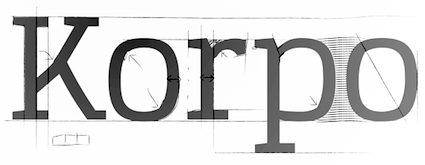 [MyFonts]
[More] ⦿
[MyFonts]
[More] ⦿
|
Mathias Guaraldo
|
Designer in 2019 of Actrice, Dusty Ranch, Rhino Sans, Sunglass (script), Pricedrop (a supermarket font), Guaraldo (all caps, display sans) and She Rocks (a weathered all caps headline typeface). In 2020, he released Bandito, the De Stijl Cyrillic emulation typeface Ozobarof, the handcrafted Colombina, the all caps titling font Gin and Soda, and the bold font Santa Eliza. [Google]
[More] ⦿
|
Matt Heximer
[10four design]
|
 [MyFonts]
[More] ⦿
[MyFonts]
[More] ⦿
|
Matteo Federico Bologna
[Mucca Design (or: Mucca Typo)]
|
 [More] ⦿
|
Matthew Welch
[I Shot The Serif]
|
 [More] ⦿
|
Mehmet Reha Tugcu
|
 Mehmet Reha Tugcu (Tugcu Design Company, Istanbul, Turkey) designed these typefaces:
 - In 2020: Calamity (squarish), Blight (a spurred typeface), Kasumi (a rounded all caps sans), Nezuko (a Saul Bass style poster font), Avalon (a glitch font), Anima (a horror font), Belmont (medieval), Starforge (sci-fi).
- In 2019: Bios (octagonal), Magnate (a trilined art deco typeface), Megaton (a great stencil typeface), Polaris (cyber typeface), Quartz (art deco), Visage (an all caps titling sans), Solaire, Cinderheart (a cutout typeface), Osiris (a sci-fi typeface), Pandemic (dry brush), Loki (a comic book font), Coven, Valencia (an art deco font).
- In 2018: Mistlock, Wraith (a super wide sci-fi typeface), Sojourn, Gore (blocky), Grind (grunge), Junkdog, Wisteria (foliated caps), Brigmore, Lash (a free weathered font), Halcyon, Kusanagi (futuristic), Periwinkle, Minerva (art deco).
- In 2017: Vera (a vintage all caps typeface), Odachi (a free rough brush font), Quas, Stargaze (retro-futuristic), Derelict (a macho octagonal typeface), Noatun (hispter sans), Nigma (dry brush), Wisp, Honeysuckle (watercolor brush), Kohm (vintage), Nectar (sans), Emporia (art deco), Drip, Ghoul, Voyager (trekkie font), Heatwave, Njord (a hipster sans), Robinson (a free poster typeface family with various texture styles), Grimtotem (handcrafted).
- In 2016: Ico (multilined, labyrinthine), Nikopol (comic book style), Aoki (rounded sans), Jotunheim (rune emulation typeface), Hikou (sans), Quas, Brigmore (art deco sans), Sumac (hand-painted), Okami (rough brush font), Björn (a sharp-edged Scandinavian sans), Grind (eroded style), Equinox (sans), Bonfire, Covenant (brush font), Cormier (art deco).
- In 2015, he created Beast (brush font), Glaive (inspired by metal rock), Prospekt (a squarish headline typeface family), Primal (a squarish futuristic typeface), Muertos (a cartoon font named after Day of the Dead), Brigand (spurred Western font), Fairwind (rounded all caps sans), Portico (layered multi-style all caps headline sans typeface), Ironclad (art deco), Cred, Muertos, Beast (brush face), Mecha 08 (a free futuristic typeface), Robinson (vintage newspaper titling typeface with many styles such as Regular, Shadow, Press, Rough, Oblique, Distorted, Urban, Corroded, Diagonal, Inline, Outline), Bronco (+Inline), Centauri (futuristic), Omicron (circle-based sans), Hyperion (futuristic), Atone (a brush font), Venge (a fashionable sans), Thiket (an interlocking poster typeface), Phage (a free squarish font), Fenrir, the Soviet propaganda typeface Sputnik, the brush typeface Veritus, the retro-futuristic Dagon, the stencil typeface Ember, the tall condensed typeface Ogre (+Inline), the art deco / avant garde typeface Metropolis, the free display typeface family Geist, the hipster typeface Pandora, the handcrafted typeface Saryn, the techno sans typeface Helios, the stylish art deco typeface Fontaine (+Rough, +3D), free inline typeface Timber, the great inline slab serif typeface Decurion, and the commercial typefaces Solaris (fururistic), Sledge (grungy black sans), Behemoth, Zephyr (sans), and Manticore (brush).
- In 2021: Witch (a Halloween font), Scourge (a grungy rune simulation font), Azurite (a sci-fi font), Monolith.
Behance link. Creative Market link. [Google]
[More] ⦿
|
Michael Parson
[Typogama]
|
 [MyFonts]
[More] ⦿
[MyFonts]
[More] ⦿
|
Michael Wallner
[The Type Fetish]
|
 [MyFonts]
[More] ⦿
[MyFonts]
[More] ⦿
|
Michela Graziani
[Fontikon]
|
[More] ⦿
|
Mikhail Efremov
|
Tula, Russia-based designer and art director, who created the (Latin) Cyrillic simulation face Samovar (2016). Samovar also has a Cyrillic version. [Google]
[More] ⦿
|
Misha Panfilov
[Russian Fonts]
|
 [MyFonts]
[More] ⦿
[MyFonts]
[More] ⦿
|
Mucca Design (or: Mucca Typo)
[Matteo Federico Bologna]
|
 Born in Milan in 1965, Matteo Federico Bologna emigrated to the United States, where he founded Mucca Design in 1999, a company involved in logos, type, and corporate identity. He teaches font design at the Parsons School of Design in New York.
 His typefaces include Food Mucca, Hair Updown, Littoria, Filo Mucca, Mirra Mucca (gorgeous lettering), Mongo Mucca, Rigid Mucca, Rubens Mucca, Vox Mucca, Egizio Mucca, Latina Mucca, Joung Mucca and Pravda (cyrillic simulation font). Free fonts: Geo Mucca, Fax Mucca, Melt Mucca, Updown Mucca, Pepina Mucca (curly lettering). Mucca Design custom-designed Balazs, Decora, Moranda Serif and Grotesque, One Atlantic (a slabbed Garamond done by Joshua Darden), Faux Cyrillic (done for Manhattan's Pravda restaurant), Victoria's Secret Logotype. At iFontMaker, he did ItalianoAMano, and ItalianoAManoPieno. In 2015, he created the industrial squarish vernacular typeface NoExit. Originally designed for the Chicago Athletic Association Hotel, its inspiration was an old sign that said STAIRWAY found the hotel's old building. In 2017, Mucca Design (via Schriftlabor) created the custom typeface Sephora (Sans, Serif). [Google]
[More] ⦿
|
Myfont.de
|
German font archive with about 2500 fonts. Contains this Faux Cyrillic archive: Gagarin, Perestroika, Russian (Manfred Klein), Kyrilla (Manfred Klein), Konspiracy Theory (Pizza Dude). [Google]
[More] ⦿
|
MyFonts: USSR
|
Some fonts were tagged as being related to the USSR over at MyFonts. Mostly, these are fonts that were in fashion during the Cold War era. The list of CCCP fonts is very similar. See also this list of typefaces tagged as communist. [Google]
[More] ⦿
|
Nate Piekos
[Blambot!]
|
 [MyFonts]
[More] ⦿
[MyFonts]
[More] ⦿
|
Neale Davidson
[Pixel Sagas (was: Protoform Project, and Fontshack)]
|
 [More] ⦿
|
Neogrey
[Ivan Phillipov]
|
 Ivan Phillipov (Neogrey, also written as Ivan Filipov) has offices in Plovdiv, Bulgaria and Turkey. He designed the techno typefaces Research Remix (1993), Neogrey (2004) and Red October (2004, inspired by Soviet poster art; can be used for Cyrillic simulation; followed by Red October Stencil, 2009). Release Yourself (octagonal), Research Remix (rounded octagonal), Arkitech Light, Discophat and Neogrey Medium appeared in 2009. In 2011, he published Artitech Round and Syntha.
 In 2012, the free round monoline typeface Syntha and the techno typeface Arkitech Medium were published. Multicolore (2012) is a free EPS-format round sans typeface for coloring (a monochromatic version is free in truetype format). In 2013, he designed Arkitech Bold and in 2019 Arkitech Stencil. In 2014, he created the free roundish squarish typeface Ronduit (+Capitals). Typefaces from 2015: Tricolore (multicolored rounded sans), Lausanne (a free font inspired by the Prada and Louis Vuitton fashion house logos). In 2017, he designed a free color font called Color Tube. Typefaces from 2019: Konstruktor (constructivist), Red October Eroded, Arkitech Stencil. Typefaces from 2020: Syntha Nova (a free round sans advertized as the electronic music font), Fattern (a free color font with textures and patterns influenced by Romero Britto's work). Typefaces from 2021: Cimero Pro (a free color SVG font). Alternate URL. Dafont link. Fontspace link. Abstractfonts link. Behance link. Creative Fabrica link. [Google]
[More] ⦿
|
Nick Curtis
|
Nick Curtis (b. Chicago, 1948) lived in Texas from 1952-1997, and lives since 1997 in Gaithersburg, MD and Alexandria, MD. From ca. 1990 onwards, he has been designing fonts, first for free, and then commercially. He had a great reputation as a "revivalist" type designer, with a particular interest in retro fonts and art deco types. In 2003, his site had become too popular and too expensive to maintain, and thus he went commercial as Nick's Fonts. In 2013, he stopped making fonts, and donated his collection of rare books and type material to the University of Virginia. Interview. Complete list of names and other info, maintained by Sander de Voogt. Interview in which we learn about his fondness for Corel Draw as a type design tool. Near the end of 2012, he posted this comment on his web site: Fifteen years ago, I embarked on a wonderful voyage of discovery, when I created my very first font with Fontographer 3.15. My maiden voyages were, frankly, rather clunky and amateurish, but I have been told that they showed promise. Well, sure enough, thanks to the diligent (and patient) efforts of Ilene Strizver, I polished up my craft enough to sell my humble efforts---first as a sideline business and, since 2006, as my full-time job. In total, I have produced over eleven hundred fonts---almost five hundred of them freeware fonts, which I conservatively estimate have been downloaded and enjoyed by over three million people worldwide. Unfortunately, this past year has brought a series of unanticipated setbacks, culminating in the loss of my wife's beautiful mind and soul to the scourge of alcoholism. In an effort to generate extra income to cover the expenses for her long-term care, I have proposed a number of, I believe, innovative ways to revamp the online font business; unfortunately, those efforts have fallen flat, primarily due to the professional font community's abject fear of crossing the $165 million Elephant in the Room. I even offered a special discount rate of 75% off retail price for full-time students of Typohile Forum. To date, there have been zero takers. Hell: even the webfont kit of one of my own fonts which I purchased from myfonts.com turned out to be an empty folder. Talk about a run of bad luck. Which leaves my with you, dear readers. If you or someone you know has had fun or made a buck from my humble efforts throughout the years, please donate whatever you can---even a lousy dollar would help---to help me out. I would greatly appreciate it. Home page. Dafont link. FontShop link. Klingspor link. Abstract Fonts link. View the typefaces designed by Nick Curtis. [Google]
[MyFonts]
[More] ⦿
|
Nick Curtis
[Art deco typefaces by Nick Curtis: I]
|
 [MyFonts]
[More] ⦿
[MyFonts]
[More] ⦿
|
Nick Curtis
[Nick Curtis: Commercial typefaces]
|
[MyFonts]
[More] ⦿
|
Nick Curtis: Commercial typefaces
[Nick Curtis]
|
Nick Curtis (b. Chicago, 1948) lived in Texas from 1952-1997. Since 1997, he is in Gaithersburg, MD and Alexandria, MD. Since the 1990s, he has been designing fonts, first for free, and then commercially. He had a great reputation as a "revivalist" type designer, with a particular interest in retro fonts and art deco types. In 2003, his site had become too popular and too expensive to maintain, and thus he went commercial as Nick's Fonts. Interview. Free downloads at TypOasis. Complete list of names and other info, maintained by Sander de Voogt. Interview in which we learn about his fondness for Corel Draw as a type design tool. Home page. His free fonts are listed elsewhere. On MyFonts, he says this about himself: Nick's Fonts is a modest little foundry dedicated to the preservation of our rich typographic heritage. Most of the foundry's designs are based on authentic historical sources, gleaned from the massive collections of the Library of Congress. If you are looking for a font that captures the essence of the Wild West, the Gay Nineties or the Jazz Age, look here first: if it is not in the catalog, it will be soon. [Google]
[MyFonts]
[More] ⦿
|
Nico Doerle
|
 Freiburg im Breisgau, Germany-based designer of the free constructivist faux Cyrillic typeface Revoluzia (2017). [Google]
[More] ⦿
Freiburg im Breisgau, Germany-based designer of the free constructivist faux Cyrillic typeface Revoluzia (2017). [Google]
[More] ⦿
|
Nikola Kostic
[Kostic Type Foundry]
|
 [MyFonts]
[More] ⦿
[MyFonts]
[More] ⦿
|
no image fonts
[Levi Halmos]
|
 Free fonts by Hungarian type and graphic designer Levi Halmos [or: Levente Halmos], made between 1997 and 2001: AlienGhost2, Aliens, Anabolic Spheroid (2001, revived but alas commercialized by Roger S. Nelsson in 2009 as Anabolic Spheroid Pro), Aztec, Baby Universe (2000), Bateman, Bedlam Remix (2001), Bitsumishi (Bitsumishi Pro (2009) appeared at CheapPro Fonts; Bitsumishi Pro v2 followed in 2012), Butch, Byblostie, CHELIVES, Caddy (1996), CelticGaramond, CelticGaramondthe2nd, Chemistry, Coolthreepixels, Crystal Clear, Danube (techno, geometric), DataTransfer, Dredwerkz, ElephantMan, Escape Pod Normal, FUTURE, Faceplant, Finchley (1998), FreakShow, Gagarin (2001, a Cyrillic simulation and constructivist family), GraveDirt, Guevara, Haiku, Helldorado (2001, Western), Hibernate (2000), Iamsimplified, Indochine (2002, oriental letter simulation), IronLeague (2002, a Jonathan Barnbrook style face), Ivanbats, Ivanhoe, KabosGyula, Kalocsai Flowers Pi (2001), Kenzo, KingKikapu, Kozmonauta (2000), Kozmonauta2, Krizia Uomo (1995, art deco; later renamed Krizi Amo Pro in 2011, probably under pressure from Uomo), Leonardo (1996, a constructed face), Lefferts Corner (2001), LicenzPlate, Lousitania (2001, square-serifed), MagyarSerif, MarshGas, MathmosOriginal, Mutter (a stitch font), Niobium [Niobium Pro (2010, with Roger S. Nelsson) is used for signage and wayfinding in the new Mbombela Stadium built for the FIFA World Cup 2010], Nordic (2001; the Pro version appeared in 2010), Nushto (2000), Olympus (Greek simulation face), Peex (dot matrix family), Phatguy, PiratesGold (made commercial in the CheapProFonts collection of Roger S. Nelsson in 2009), Poison Berries (2000), PresidenteTequila (2000), RakettaFromMars (2001, fifties style futurism), Rammstein, RammsteinRemix (2001, constructivist), RedheadGoddess (2000), RedwildoderRotwild, Resurrection, Runningshoe, Sarkozi Line Patterns Pi (2001), Scully (scanbats), ScumoftheEarth (2000), Shazbot, Slither (1998), SmartSexy, SmartandSexy, Snake Venom (2000, Mexican simulation face), SpaceWorm (2000, futuristic), Sporty, Stonebridge, Subatonik, Sulphur (2000, a typeface influenced by gothic cathedrals), Tank Junior (2001), TerraX, Thrust (2000, Star Trek face), TickyFont, Treasure Island (2001, rounded with a semi-Greek look), TrustThisOne, TwoGunJohann (2000), TypeKnight (2001, with hairline serifs), VicePresidente (2001, Mexican simulation face), VoodooDolls, Voodoo Spirits (2001, wiggly hand), WeepingItalic, WhoulNormal, Zombieball.
 Myfonts link. Roger S. Nelsson (Cheapprofonts) and Halmos extended Danube and Celtic Garamond in 2009 as Danube Pro and Celtic Garamond Pro, respectively. Fontspace link. Font Squirrel link. Dafont link. View Levi Halmos's commercial typefaces. [Google]
[MyFonts]
[More] ⦿
|
Noinfonts
[Leandro Nogueira]
|
Noinfonts is the foundry of Brazilian type designer and teacher Leandro Nogueira, who is based in Sao Paulo. He studied graphic design at UNESP Baura from 1996-2001. Leandro designed these fonts: - Nabirinto, a labyrinthine experimental typeface.
- Merlim, a vernacular gothic typeface.
- Broto.
- Bzorro, a tattoo font.
- Cavinette, a condensed hand-printed typeface.
- Nadaco, a techno / signage typeface.
- Nasfaia.
- Natelle, a bubblegum typeface.
- Neurostyle (+Condensed).
- Nilarab, an Arabic simulation typeface.
- Noin and Noin Minus, a hyper-experimental sci-fi pair of typefaces.
- No Playground.
- Naskov (Cyrillic simulation face).
- Nuneline.
- Nelitza, a sci-fi typeface.
- Newold, a rounded monoline sans.
- Nix and its swashy version, Nixoton.
- Nongalilei.
- Nother.
- Nuglube.
[Google]
[More] ⦿
|
NREY
[Andriy Dykun]
|
 Makeevka, Donetsk, Ukraine-based designer of these typefaces in 2017: Vector Waves, Quasimodo (a free spurred and curvy decorative display typeface), Courtney (monoline script), Lumberjack (blackletter; see also Lumberjack Zombie in 2019), Marvin (a 10-font Marvin Heemeyer-inspired bulldozer and wrench font family with a free heavy slab serif), Awakening (signage script), Bang Bang, Round Compound, Rot Shield (blackletter), Rust (spurred), Furious, Dry Brush, Balalaika (Cyrillic emulation typeface), Moustache, Barbara (script), Arigato, The Pontifice (blackletter), Amsterdam, Megapolis (inline), Megapolis Black Bold (free, for Latin and Cyrillic), Phoenix Gothic, Brush Pen, Nround (rounded sans), DieCunst (free connected script).
 Typefaces from 2018: Fontuna (+stencil), Sansterdam (a geometric condensed grotesk with a few deco styles), Ethna (a fashion mag sans typeface family), Voguer Sans (a free Latin / Cyrillic display typeface with fashion applications in mind), Ravenholm (an expressionist blackletter), Jorick (vintage, Latin and Cyrillic), Ultravog and Ultravog Glitch Black (extreme contrast stencil styles: free), Walpurgis Night, Voguer (a high-contrast fashion mag font), Voguer II (didone-inspired, accompanied by a script typeface). Typefaces from 2019: Anicon Sans, Anicon Slab, Thephir (a variable cursive typeface), Oblique Rain (monoline script), Skiff (a quaint almost painted sans), Cadency (a monoline script), Waymar (Serif and Script font duo; include the textured caps typeface Waymar Ornate and the blackboard bold style Waymar Outline), Phagoth (blackletter), Gunhill (a vintage font family that includes blackboard bold styles), Heartland (Script & Sans), Marvin Slab. Typefaces from 2020: Calmius, Calmius Sans. Calmius Sans has Oppo (reverse contrast), Low and High (Peignotian) subfamilies, all experiments on contrast. Typefaces from 2021: Quartell Round (a squarish typeface), Asterlight (a steampunk font), Barosa (inspired by the slavonic style, all glyphs in this typeface have the same height). Graphicriver link. Behance link. Newest Behance link. Dafont link. [Google]
[MyFonts]
[More] ⦿
|
Okami Tegra
|
 Graduate of Amur State University Of Humanities And Pedagogy, class of 2016, Komsomolsk-on-Amur, Russia-based designer of a wonderful Latin / Cyrillic typeface that is based on Old Slavonic writing (2016). [Google]
[More] ⦿
Graduate of Amur State University Of Humanities And Pedagogy, class of 2016, Komsomolsk-on-Amur, Russia-based designer of a wonderful Latin / Cyrillic typeface that is based on Old Slavonic writing (2016). [Google]
[More] ⦿
|
Oleg Macujev
[Omtype]
|
 [MyFonts]
[More] ⦿
[MyFonts]
[More] ⦿
|
Oleg Stepanov
|
 Aka Youhhou. Tbilisi, Georgia and now, Moscow-based Russian designer of Splinter (2016), Jazzy B (2015, a beatnik font), Maika (2015, great brush script for Latin and Cyrillic), Sciences Icons (2015), Shields Icons (2015), Marks (2015: icons), New Marker (2015), Barrier Display Font (2014, a hipster Latin typeface), Simple Stamp (2014, a free poster font), IT Business Icons (2015) and Oriental Icons (2014).
 Typefaces from 2017: Jeeks (a funky comic book typeface in all caps), Mick (2017, hand-drawn typeface inspired by 1980s graffiti), Fedot (a polyustav emulation font). Typefaces from 2018: Bubbaloon (bubblgum font), Blockbox, Badwulf (a hand-lettered display typeface), Sandy, Pirate Station, NewMarker, Level Up (pixelish), Helgis Black (an expressive display typeface inspired by album covers of progressive and psychedelic rock bands of the 70s). Creative Market link. ?u=mostrecent">Another Creative Market link. Behance link. [Google]
[MyFonts]
[More] ⦿
|
Omtype
[Oleg Macujev]
|
 Omtype is Oleg Macujev's Russian foundry and studio (est. 2008) located in Novokuznetsk in the Kemerovskaja region of Siberia, or more lately in Telbes, Russia. Graphic and type designer, calligrapher and typographer Oleg Macujev was born in Novokuznetsk in 1984. He graduated from Lomonosov Moscow State University (design of mass media specialization). In 2004-2007 he studied at the Alexander Tarbeev Type Design Workshop of Moscow State University of Printing. From 2004 to 2009 Oleg worked as a graphic designer in different Moscow design studios and publishing houses. In 2007-2008 he also lectured on type and calligraphy at the National Institute of Modern Design. He received the second prize for excellence in type and graphic design in a student competition organized by ParaType for his Epiphany typeface (2008). He has obtained the Certificate of Excellence in Type Design at the Modern Cyrillic 2009 competition for the Epiphany and Fry typefaces. Since 2009 he has been living in Novokuznetsk and working as a freelance graphic designer. Samples of his calligraphy. Alternate URL. Behance link. His name is also written Oleg Matsuev. Klingspor link. His great collection of typefaces:
 - Default (2010). A condensed monospaced sans for Latin and Cyrillic.
- Epiphany (2008). A monoline script based on Old Russian skoropis (cursive writing) of the 15th, 16th and 17th centuries. Award winner at Paratype K2009).
- Fry (2008). A comic book style typeface that won an award at Paratype K2009 under the name Fray, and a Certificate of Excellence in Type Design at the Fry ProModern Cyrillic 2009 competition. Fry also received Second Prize in the display typeface category at Granshan 2011. Fry Pro (Latin, Greek, Cyrillic) was released in 2013. Oleg writes about this round sans: Fry was developed in 2008 specially for the Sky-Fish company (fish and seafood dealer). This type is designed for small texts and has a friendly and a fairytale historic flavor. Fry takes the openness and dynamism of humanist sans serif, the simple and softness of lubok's letters (primitive style) and the fluidity of shallow marine fry.
- Lansere. An art-deco typeface inspired by lettering of Russian graphic artist, painter and sculptor Evgeniy Lansere (1875-1946), whose name is also spelled Eugene Lanseray.
- Mamontov (2007-2008). A wood type with large incisions for ink traps. It has 25 weights and is based on Clarendon, except that the serifs are asymmetric (missing on one side). Mamontov won an award at Modern Cyrillic 2014.
- Pich (2014). Hand-drawn, almost a comic book typeface.
- Ryba Kit (Fish-whale). Designed for large headlines and display typography, and based on halfustav handwriting.
- Siberian (2013). A geometric unicase sans serif inspired by Russian avant-garde typography and old Siberian runic scripts (Orkhon-Yenisey script): The idea was to create a typeface so simple, cold and beautiful as the snow in Siberia. This typeface with its numerous stylistic sets could be used for Cyrillic simulation. Siberian won an award at Modern Cyrillic 2014.
- Slovolitnaya (2008). A pixel typeface based on the old forms of Cyrillic and works of the Russian style artists like Mihail Vrubel and Ivan Bilibin, who revived these forms in their design in the beginning of the 20th century.
Typeface catalog. Behance link. [Google]
[MyFonts]
[More] ⦿
|
Open City Design
[Phil MacIsaac]
|
 Charlottetown, Prince Edward Island-based designer of the free rounded retro typeface Narwhal (2018), the expressionist blackletter typeface Krautrock (2018), the free blackletter typeface Scotland (2018) and the free handcrafted typeface Soviet League (2018).
 Free typefaces from 2019: Norilsk, Chernobyl (Cyrillic simulation), Kaiser (a rounded blackletter), Campaign, Revolucion (constructivist), Oligarchy, Contraband (a free monoline script), Viking, Myrkvior (rune emulation), Vintage74, Art Nuvo (psychedelic, art nouveau). Typefaces from 2020: Vanity (a free German expressionist typeface), Nordic Club (a national park typeface), Shogun (a gaspipe font), Contraband (a monolinear font duo), Pariah (a rounded heavy blackletter). Dribble link. Open City Design link. [Google]
[More] ⦿
|
Owen Turley
|
Designer of the irregular handwriting font Scurville (2003), the artsy and futuristic Solange (2004), the fantastic art deco family Krome (2004; this includes Krome Pipe, Krome Solid and Krome Tubular as special subfamilies), the fat display typeface Direktor (2004, Cyrillic simulation), and Prima09 (2009, squarish, painted face). DaFont site. Alternate URL. Catalog. [Google]
[More] ⦿
|
P22 Type Foundry
[Richard Kegler]
|
 Richard Kegler's fun Buffalo-based foundry, which he founded in 1995 together with his wife, Carima El-Behairy. Currently, on staff, we find type designers James Grieshaber and Christina Torre. In 2004, it acquired Lanston Type. P22 has some great unusual, often artsy, fonts. In 2021, P22 jopined The Type Founders as a distribution outlet.
 The fonts are: Industrial Design (an industrial look font based on letters drawn by Joseph Sinel in the 1920s---this font is free!), LTC Jefferson Gothic Obliquie (2005, free), Sinel (free), P22Snowflakes (free in 2003 and P22 Snowflakes (retail) in 2020, finishedd by Richard Kegler and Terry Wüdenbachs), Acropolis Now (1995, a Greek simulation typeface done with Michael Want), P22 Albers (1995; based on alphabets of Josef Albers made between 1920 and 1933 in the Bauhaus mold), Arts and Crafts (based on lettering of Dard Hunter, early 1900s, as it appeared in Roycroft books), Ambient, Aries (2004, based on Goudy's Aries), Arts and Crafts ornaments, Atomica, Bagaglio (Flat, 3D; in the style of Il Futurismo), P22 Basel Roman (2020, Richard Kegler: an update of a 2015 typeface, P22 Basel, based on a garalde font used by Johannes Herbst (aka Ioannes Oporinus) in 1543 to publish Andreas Vesalius' On the Fabric of the Human Body (De humani corporis fabrica) in Basel), Bauhaus (Bauhaus fonts based on the lettering of Herbert Bayer), Bifur (2004, Richard Kegler, after the 1929 original by Cassandre), Blackout, P22 Brass Script Pro (2009, Richard Kegler; based on an incomplete script fond in a booklet from Dornemann&Co. of Magdeburg Germany, ca. 1910 entitled Messingschriften für Handvergoldung; for years, P22 and MyFonts claimed that Michael Clark co-designed this, but Michael does not want any credit, as he did only about 20 letters), Cage (based on handwriting and sketches of the American experimental composer John Cage), P22 Casual Script (2011, Richard Kegler, a digitization of letters by sign painter B. Boley, shown in Sign of the Times Magazine), Cezanne (Paul Cezanne's handwriting, and some imagery; made for the Philadelphia Museum of Art), Child's Play, Child's Play Animals, Child's Play Blocks, Constructivist (Soviet style lettering emulating the work of Rodchenko and Popova), Constructivist extras, Czech Modernist (based on the design work of Czech artist Vojtech Preissig in the 20s and 30s), Daddy-o (Daddy-o Beatsville was done in 1998 with Peter Reiling), Daddy-o junkie, Da Vinci, Destijl (1995, after the Dutch DeStijl movement, 1917-1931, with Piet Mondrian inspired dingbats; weights include Extras, P22 Monet Impressionist (1999), Regular and Tall), Dinosaur, Eaglefeather, Escher (based on the lettering and artwork of M.C. Escher), P22 FLW Exhibition, P22 FLW Terracotta, Folk Art (based on the work of German settlers in Pennsylvania), Il futurismo (after Italian Futurism, 1908-1943), Woodtype (two Tuscan fonts and two dingbats, 2004), P22 Woodcut (1996, Richard Kegler: based on the lettering carved out in wood by German expressionists such as Heckel and Kirchner), Garamouche (2004, +P22 Garamouche Ornaments; all co-designed with James Grieshaber), GD&T, Hieroglyphic, P22 Infestia (1995), Insectile, Kane, Kells (1996, a totally Celtic family, based on the Book of Kells, 9th century; the P22 Kells Round was designed with David Setlik), Koch Signs (astrological, Christian, medieval and runic iconography from Rudolf Koch's The Book of Signs), P22 Koch Nueland (2000), Larkin (2005, Richard Kegler, 1900-style semi-blackletter), London Underground (Edward Johnston's 1916 typeface, produced in an exclusive arrangement with the London Transport Museum; digitized by Kegler in 1997, and extended to 21 styles in 2007 by Paul D. Hunt as P22 Underground Pro, which includes Cyrillic and Greek and hairline weights), Pan-Am, Parrish, Platten (Richard Kegler; revised in 2008 by Colin Kahn as P22 Platten Neu; based on lettering found in German fountain pen practice books from the 1920s), P22 Preissig (and P22 Preissig Calligraphic, 2019), Prehistoric Pals, Petroglyphs, Rodin / Michelangelo, Stanyan Eros (2003, Richard Kegler), Stanyan Autumn (2004, based on a casual hand lettering text created by Anthony Goldschmidt for the deluxe 1969 edition of the book "...and autumn came" by Rod McKuen; typeface by Richard Kegler), Vienna, Vienna Round, Vincent (based on the work of Vincent Van Gogh), Way out West. Now also Art Nouveau Bistro, Art Nouveau Cafe and the beautiful ornamental font Art Nouveau Extras (all three by Christina Torre, 2001), the handwriting family Hopper (Edward, Josephine, Sketches, based on the handwriting styles of quintessential American artist Edward Hopper and his wife, Josephine Nivison Hopper, and was produced in conjunction with the Whitney Museum of American Art), Basala (by Hajime Kawakami), Cusp (by James Grieshaber), P22 Dearest (calligraphic, by Christina Torre and Miranda Roth), Dwiggins (by Richard Kegler), Dyrynk Roman and Italic (2004, Richard Kegler, after work by Czech book artist Karel Dyrynk), Gothic Gothic (by James Grieshaber), La Danse (by Gábor Kóthay;), Mucha (by Christina Torre), Preissig Lino (by Richard Kegler), P22Typewriter (2001, Richard Kegler, a distressed typewriter font), the William Morris set (Morris Troy, Morris Golden, Morris Ornaments, based up the type used by William Morris in his Kelmscott Press; 2002), Art Deco Extras (2002, Richard Kegler, James Grieshaber and Carima El Behairy), Art Deco Display, the Benjamin Franklin revival font Franklin's Caslon (2006), Dada (2006) and the Art Nouveau font Salon (bu Christina Torre). In 2006, Kegler added Declaration, a font set consisting of a script (after the 1776 declaration of independence), a blackletter, and 56 signatures. Many of the fonts were designed or co-designed by Richard Kegler. International House of Fonts subpage. Lanston subpage (offerings as of 2005: Bodoni Bold, Deepdene, Flash, Fleurons Granjon, Fleurons Garamont, Garamont, Goudy Thirty, Jacobean Initials, Pabst, Spire). Bio and photo. In-house fonts made in 2008 include Circled Caps, the Yule family (Regular, Klein Regular, Light Flurries, Heavy, Klein heavy, Heavy Snow, Inline; all have Neuland influences). Kegler / P22 created a 25-set P22 Civilité family in 2009 based on a 1908 publication from Enshedé, the 1978 English translation by Harry Carter, and a 1926 specimen also from Enshedé. P22 Declaration (Script, Signatures, Blackletter, 2009) is based on the lettering used in the 1776 Declaration of Independence. At ATypI 2004 in Prague, Richard spoke about Vojtech Preissig. Speaker at ATypI 2010 in Dublin, where he presented Making Faces: Metal Type in the 21st Century about which he writes: This film has the dual aim of documenting the almost-lost skill of creating metal fonts and of capturing the personality and work process of the late Canadian graphic artist Jim Rimmer (1931-2010). P22 type foundry commissioned Mr. Rimmer to create a new type design (Stern) that became the first-ever simultaneous release of a digital font and hand-set metal font in 2008. At ATypI 2011 in Reykjavik, he showed Making Faces. Typefaces from 2014: LTC Archive Ornaments (Richard Kegler and Miranda Roth). Typefaces from 2020: Showcard Script (by Terry Wüdenbachs, based on an original of Beaufont at the Hamilton Wood Type Museum, custom designed by the Morgan Sign Machine Company of Chicago). Typefaces from 2021: P22 Glaser Houdini (a layerable family, after Glaser's Houdini from 1964), P22 Glaser Babyteeth. Kegler writes: In 2019, P22 Type Foundry met with Milton Glaser (1929-2020) to initiate the official digital series of typefaces designed by Glaser in the 1960s and 70s. P22 Glaser Babyteeth is the first family released in the series. Milton Glaser's inspiration for his Babyteeth typeface came from a hand painted advertisement for a tailor he saw in Mexico City. He was inspired by that E drawn as only someone unfimilar with the alphabet could have concieved. So he set about inventing a completelly ledgible alphabet consistant with this model. P22 Glaser Babyteeth was based on original drawings and phototype proofs from the Milton Glaser Studios archives. Over the years there have been many typefaces that borrowed heavily from the Glaser designs, but these are the only official Babyteeth fonts approved by Milton Glaser Studio and the Estate of Milton Glaser. The solid and open versions are designed to overlap for two-color font effects and can even be mixed and matched for multi layer chromatic treatments. In 2021, he published the 3d art deco shadow font P22 Glaser Kitchen which is based on Big Kitchen (1976). MyFonts interview. View Richard Kegler's typefaces. View the IHOF / P22 typeface library. [Google]
[MyFonts]
[More] ⦿
|
Patricia Stocheci
|
 Oslo, Norway-based designer of the monospaced Cyrillic simulation typeface Arhaic (2015) and of Impossible Letters (2015, Escherian characters). Behance link. [Google]
[More] ⦿
Oslo, Norway-based designer of the monospaced Cyrillic simulation typeface Arhaic (2015) and of Impossible Letters (2015, Escherian characters). Behance link. [Google]
[More] ⦿
|
Peliken
[Ksenya Kuznetsova]
|
 Or Ksenia Kuznetsova. Moscow-based designer of the tribal patterned color typeface Aleut (2018) and the dry brush typeface Drum (2018).
 In 2018, she added the stars-and-stripes color font America, the color ransom font Anon, the color font Mexifont, and the children's book font Hands Up. Typefaces from 2019: Handsup (a children;s book color font), Catsme (a cat-themed opentype SVG font), Crochet (an opentype SVG font). Typefaces from 2020: Branch (a Latin / Cyrillic typeface whose Latin component could be used for slavonic emulation purposes). [Google]
[MyFonts]
[More] ⦿
|
Peter Korsman
[Attak Fonts]
|
[More] ⦿
|
Petra Heidorn
[CybaPeeCreations (or: Typoasis)]
|
 [More] ⦿
|
Phil MacIsaac
[Open City Design]
|
 [More] ⦿
|
PiS (was: Polenimschaufenster)
[Hannes Siengalewicz]
|
 Originally, a free font foundry by Hannes Siengalewicz (b. 1980), who studied MultiMediaArt, and who is based in Vienna. Typefaces include Stutter (2007, stitched letters), NeoPrint M319 (2006, destructionist), Cinquenta Mil Meticais, Creatinin PAP, Dinarjev Republika (2004, Cyrillic simulation face), Hans Hand, Hans Bold, Manastirka Punjeno, Sexton Sans (2004, destructionist face), Sexton Serif (2004), Union Agrochemicals, Zwiefalter Klosterbräu (script). Lietz Alexander Nero (2005) is free.
 Dafont link. In 2008, Polenimschaufenster went commercial and became PiS (sic). The PiS fonts from before 2013 include PiS Lietz Lindham (2008, poster propaganda face, earlier called Lietz Lindau Hamburg (2006)), PiS Neo Print M319 (2008), PiS VinoZupa (2008, Wild West font based on a logo found on an old Slovenian bottle of brandy), PiS Hansch (2008, after graveyard lettering), PIS Coffee and Ghosts (2008, Halloween lettering based on the credit titles from the 1960s Edgar Wallace movie Der grüne Bogenschütze.), PiS Coffins and Ghosts (2008), and PiS Wallride (2008, grunge, brush). Typefaces from 2013: PiS Hans Hand Pro (hand-printed), PiS Lietz Berlham, PiS Lietz Parilon (heavy blackletter), PiS Creatinin Pro, PiS Lietz Germion (a rounded script in the style of Viennese Jugendstil---Hannes writes: Kolo Moser is dancing an absinthe infused poster-polka! You should too!), PiS Lietz Rathoga (a font for space hero comics). Typefaces from 2014: PiS Coalfield (scruffy scribbled typeface inspired by the expressive handwriting on various posters by Sister Corita Kent, an influential pop artist experimenting with serigraphs in the 60s), PiS Malefiz (inspired by the hand-drawn type on the package of the German 1960s version boardgame Malefiz, also known as Barricade or Barricata), PiS Penny Serenade (an all caps high-contrast Peignotian sans), PiS Wanderlust (a condensed sans headline typeface inspired by Die Schriften des Malers (1950), and by vintage hand painted signposts and guides found on hikes on the outskirts of Vienna). Typefaces from 2018: PiS Konzert (a bulky quirky all caps headline sans, inspired by letters found on a hand drawn polish poster from the 1960s), PiS Koernig (PiS Koernig is inspired by handwritten alphabets from Max Körner's book Das Neue Schriftenbuch (1949) which features bold and decorative retro style display type for use in sign painting and advertising. [Google]
[MyFonts]
[More] ⦿
|
Pixel Sagas (was: Protoform Project, and Fontshack)
[Neale Davidson]
|
 Free original designs, often with a science fiction feel, by Neale Davidson (b. 1971). Does some custom font work. Adventure.
 Neale Davidson's typefaces: - 4E Dings (based on those used in WotC's 4E Dungeons and Dragons game).
- AdventureNormal (1998), AdventureSubtitlesNormal, Alpha Mutation (2012, based on the title logo to the 2011 version of "Gammaworld"), Algol (2013, based on the logo for R Talsorian's "Mekton Zero" role-playing game), Alternity, Amuro (2013, +Condensed: an ocragonal typeface), Anayanka (2013, Cyrillic simulation font), Ancient Thorass (2013), Angel Arms (2012, a shothole font), Anglo Celestial (2014, connect-the-dots typeface), Anglorunic (2011), AngloYsgarth (2014), Angolmois (2013, based on the Hasbro 'Dark Energon' exclusive toy line), Armorhide (2013, sci-fi face), Arneson (2013), Artifact (2011; became Ravenwood), Aurebesh (2013, based on the WEG version of Star Wars Imperial Writing).
- Bantorain (2013, spurred), Barazhad (2014, flourished, runic typeface based on the demonic and occult and necrotic languages from Wizards of the Coast's Dungeons and Dragons game), BattleBeasts (2000), Bayformance (2014), Beastformer (2011, based on the long-ago logo of Hasbro's "Battle Beasts"), Bayformance (2014), Beast Wars (2011, based on the logo of the show of the same name), Betazed (2013, for Star Trek betazoids), Bidan (2013, constructivist), Bienvenu (2011, pixel face), Blitzwing (2013, octagonal family), Blofeld (2013, a distressed font based on the title logo of Exile's cult-classic "Evil Genius"), Bloomingworth (2013), Braddington (2013, art deco), Britannian (2014, runes), Broadmoor (2012, art deco).
- Callie Mae (2013: a rounded organic sans), Cardosan (2013, runic script), Carlton (2012), Celestial, Chapleau (2012, art deco), Chinyen (2005, oriental simulation), Clark (2013), Classic Robot (2011), Coburn (2013: military stencil), Colony Wars (replaced by Gallonigher), Comic Book, Constitution Class Hull, Convoy (2011, based on the logo for "Armada" and "Robots in Disguise"), Counterfire (2014, stencil), Crichton (2013, an avant-garde font based on the title logo from the "Farscape" television series), 2015 Cruiser (2013, based on the police-car lettering used in the move "Back to the Future II"), Crystal Deco (2008, based on the logo for much of the merchandising for "Indiana Jones and the Crystal Skull"), CuniformEnglishNormal, Cyberfall (2013, octagonal / mechanical typeface based on the logo of the console game "Fall of Cybertron"), Cybertron Generations (dingbats, now replaced by Transdings), Cybertron Metals, Cybertron OpCode (2014), Coulson (2014, stencil), Cyberverse (2011, futuristic), Cyrodiil (2014).
- Daedra (2012: based on the Elder Scrolls series of games), Dai Atlas (2013, based on the original Transformers logo from Hasbro), DalelandsNormal (a Celtic typeface based on the lettering used in early TSR Dungeons and Dragons products), Datacron (2013: based on the Fall of Cybertron toyline), Davek (2014, based on the dwarven and "under-mountain" runic scripts found in Wizards of the Coast's Dungeons and Dragons fourth edition role-playing game), Decahedron (2012), Destronic Graffiti (2013), Dethek Stone (2011, runes), DiamondFantasyNormal, Dinobots (based on the Dinobots logo from Hasbro's Beast Machines line), Dodecahedron (2012), Downlink (2013, techno), Dragonmaster, Droid (2015), Dunkin and Dunkin Sans (2012, based on the rounded fat letters of the Dunkin Donuts logo), Dovahkiin (2013), dPoly (2013, polyhedra and game dingbats), Duodecahedron (2012), Dwemer (2013), Dynotherm (2013, a heavy octagonal face).
- Eladrin (2011, based on the third edition version of the Elven font used in Dungeons and Dragons), Electrorocket (2012, art deco), Elminster, Emotion Engine (2012, based on the Playstation 2 logo from Sony), Empanada (2013), Emulator (based on the old Nintendo game font), Energon (2011), Equestria (2012: based on the My Little Pony Line), Erte (2013), Espruar (2011, based on the Elvish script found within TSR's "2nd Edition: Dungeons and Dragons" Forgotten Realms Elvish script), Eurocorp (2012, based on the logo and menus within the classic "Syndicate Wars" game from Bullfrog Entertainment), Exodite Distressed (2013, a custom design for LPJ's "Neo-Exodus" Pathfinder campaign world), Explorien (2014), Eyvindr (2014, rune simulation font).
- Falmer (2013), Fhokki (2014), Flipbash (2012, an octagonal typeface that is based on the logo of Hasbro's Bot Shots), Flynn (2011, futuristic stencil face), Fontana (2011, techno-futuristic), Fractyl (2013, used for the Predacons' speaking bubbles in the BotCon "Ground Zero" comic in 1997), Furmanite (2011).
- Gaiking (2012: Based on the logo of Mattel's Giant Robot toyline, Shogun Warriors), Galaxy Force (2011, based on Hasbro's Transformers: Cybertron logo), Gallonigher (was Colony Wars), Gamedings, Gargish (2013), Gargoyles, Garriott (2013, runic), Geddes (2011, art deco sans related to Futura), Gemcut (2013), Generation Two, GIColton (2014), GiediAncientAutobot (2014), GiediDecepticonGraffiti, GiediGoldenDisk, GiediMaximal, GiediPredacon, Gin Rai (2011, based on the logo of Hasbro's latter-era "Generation One" Transformers series), Gold Box (2012, a pixel typeface based on the in-game lettering from the classic SSI "Gold Box" game collection, featuring Dungeons and Dragons: Pool of Radiance, Curse of the Azure Bonds, and so on), Gosub (2011, a pixel typeface similar to the on-screen lettering of the Timex Sinclair), Gotham Nights (2011, based on the lettering used in "Batman: The Animated Series"), Green Martian (2013), Gutcruncher (2011, based on the logo from the famous Blood Bowl game), Graalen (2013: an alien-glyph typeface based on the Andorian writing found in Last Unicorn Games' Among the Clans supplement for their Star Trek: Roleplaying Game).
- Harker (2013), Harpers (runes), Hauser (octagonal, futuristic; Former "Action Force", based on the logo of GI Joe), Hellpoint (2013, based on some of the plate markings founds in IDW's "Transformers" comic series), Hetfield (2013: a spurred typeface), Hexahedron (2012: dice), Hexahedron Rounded (2013), Hyperspace (2012, thin monoline octagonal, based on the original Atari vector font from Battlezone, and on Asteroids).
- Imaki (2011, futuristic; was Cybertron Metals; based on the logo of the Japanese Beast Wars Metals series), Indiana (2012, from the titling for the Indiana Jones movies and comics), Instruction (2012, monospaced and monoline caps typeface for engineering applications), Interceptor (2014, sci-fi), Invaders (2012, based on posters for the 1960s movie), Iokharik (2014, a Mandarin-stylized runic typeface based on the language described in Wizards of the Coast's Dungeons and Dragons), Iori (2013, octagonal stencil family).
- Jedi (2012: Star Wars logo font), JediHollowNormal, JediSolidNormal, Jefferies (former Constitution Class Hull, based on the original Star Trek Enterprise lettering), Jhiaxus (2011, based on the logo of "Transformers: Generation Two"), Joystick (2011, based on the lettering used from Sears' Tele-Games cartridges), Jumpman (2012, based on the logo of the original Donkey Kong game from Nintendo).
- Kanno (a geometric sans formerly called Sharon Apple), Kargi (2014), Kentaurus (2013, Greek simulation typeface; he writes: This 'microgramma-like' font is based on the "Kentaurus" writing found within Franz Joseph's "Star Trek: Technical Manual"), Ketchum (2011, a comic book typeface based on the logo of the popular Pokemon franchise), Kehdrai (2014), Kreon (2011, a round techno typeface based on the logo of Hasbro's Kre-O line).
- LaBoeuf (2011, techno: based on Indiana Jones subtitles), Laser Rod (2011, based on the Transformers line), Lassiter (2012, a spurred Western typeface), Lorre (art deco).
- Mage Script (2013), Majel (2013, an avant-garde typeface), Majoram (2012, a hairline avant garde typeface), Majoram Serif (2012), Manga (2011, oriental simulation), Mara's Eye (2013, based on the lettering used on Disneyland's Indiana Jones "Forbidden Eye" ride), Marston (2013, on the title logos of numerous Spaghetti westerns), Masterforce, MasterforceHollow, MasterforceSolid, MaximalBeasts, Maximus, Mechalock (2013, based on the "Combiners" subline logo from Hasbro's "Robots in Disguise" Transformers series), Mech Tech (2013, based on Hasbro's "Transformers: Dark of the Moon's" toys' "Mech Tech" logo), Medabots (based on the Hasbro toy line), Megatron (2011, based on the logo of the live-action Transformers movies), Microgramma Extended (later replaced by Probert), Minerva (2012: based on the logos used for Shout's releases of Transformers: Headmasters, Masterforce, and Victory), Mission GT-R (2013, based on Takara's "Transformers: GT-R"), Mode X (2012, based on lettering from classic "Mode X" games of the early 1990s), Modern Cybertronic (2013: an alien-dings font based on Jim Sorenson's "Ancient Autobot" script), Modern Destronic (2013: based on Jim Sorensen's "Ancient Decepticon" script), Modern Iaconic (2014: based on the 'runic' letting found in Transformers: Legacy), Mons Olympia (2014, sci-fi), Montalban (2011, based on the title credits of Star Trek II: The Wrath of Khan), Moria (runes), Morse Tech, MysticEtchingsNormal.
- Nakadai (2011, a unicase techno font based on Hasbro's Transformers: Prime figures), Neo Gen (2011, based on the logo for the SD Gundam series of games), Neostar (2012, sci-fi), Neverwinter (2011, based on the logo of the popular "Neverwinter Nights" computer game from Bioware) (see also here), Night Warrior, Nippon Tech (faux oriental), Nite Club (2011, dot matrix), Nyctographic (2014).
- Octohedron (2012), Okuda (formerly Okudagrams; based on the LCARS characters from Star Trek: The Next Generation), Omnicron, Ophidian, Optic (2011), Optimus (2011, based on the original Transformers logo from Hasbro), Orion (2012, a techno-style font based on the "Robots in Disguise" logo from Hasbro's 2012 Transformers toyline), Overseer (2011).
- Pacmania (2013), Palisoc (2013), Pcap Terminal (2014, sci-fi face), Phoenixians (2012: based on the logo of Centuri's Phoenix arcade game), Pixel Cowboy (2015), Pixel Musketeer (2013, based on Sony's Wild Arms and Wild Arms 2 games for the Playstation), Pixel Azure Bonds (2015), Pixel Combat (2015), Pixel NES (2013: based on screen fonts of Colecovision, Timex Sinclar, Nintendo, SimTech's ModeX VGA, Tandy Color), Planewalker (formerly called Magic Cards. Based on the text used in older Magic: The Gathering cards), PlanewalkerDings (2014), Plavsky (2013), Pokemon, Politik (2014, constructivist), Powerpuff (based on the logo of "The Powerpuff Girls" from Cartoon Network), PredaconBeasts, Probert (replaces Microgramma Extended), Protoculture (2012, based on the franchise logo of Robotech).
- Qijomi (2013), Quintanar (2011), Quantum (2013: based on the title credits of the James Bond movie "Quantum of Solace").
- Rapier Zero (2013), Ravenwood (2011), Razorclaw (2013: based on the logo of the Beast Hunters Transformers line), Reanaarian (2014), Reconstruct (2013), Red World (2014), Regen (2012: a science-fiction font based on the logo used on the cover of the Transformers: Regeneration One comics), Rellanic (2014), Renegade (2013, techno stencil, based on FASA's "Renegade Legions" gaming line), Resavy (2012, a Broadway style art deco beauty), Rio Oro (2012, a Far West Tuscan marquee font), Robot Masters (now called Takara), Roddenberry (2011, based on the StarTrek logo), Roughknight (formerly Materia Arms. Based on the Wild Arms 5 video game logo---it simulates wood type and is Western in concept), RubCaps (2013), RunicEnglishNormal.
- SandsofFireNormal, Schnaubelt (2011, rounded technical caps face), Semphari (2014), SharpAvienne (2014), Sierra Madre (2012: an avant-garde typeface based on the Sierra Madre casino's logo from Fallout: New Vegas: Dead Money), Silverball Oblique (2012, LED font), Simple Runes, Sinescript (2013), SkeksisNormal, Skir, Sorenson (2013, a stencil typeface), StarburstPips (2014), StarcraftNormal, Starfleet (2004), Stark (2012: based on the title logo of the Iron Man and Iron Man 2 movies), Steamcog Caps (2013), Steampuff (2012), Steamwreck (2012), Steiner (2014), Sternbach (2011), Straczynski (2011, based on the opening credits for the classic television series "Babylon 5"), Strongarm (2014, based on the title logo of Hasbro's Transformers: Robots in Disguise (2015) line), Suchet (2013: a nice art deco typeface inspired by the material of BBC Production's legendary "Poirot" series starring David Suchet), Symtext (2012, a faux 5x5 bitmap font based on the lettering used in early VGA games, such as Syndicate).
- Taibaijan (faux Arabic), Takara (former Robot Masters; based on the "Robot Masters" logo from Takara's Transformers), Tandysoft (2011, based on the old typeface of the MC-10 computer), Tellarite (2013: based on the canonical glyphs of the "Tellarite" language from Paramount's Star Trek franchise), Tetrahedron (2012), Thorass (runes), Thundara (the old name was Thundercats), Tirolese (2013, an alien glyph font), Tonopah (2012, western font), Toril (2011), Transdings (replaces Cybertron Generations: based on Transformers logos from Hasbro), Transformers, TransformersHollowNormal, TransformersSolidNormal, Transmaidens, Transmetals (based on Hasbro Inc's, "Beast Wars: Transmetals" logo), Trek Arrowheads (2013), Trek Arrowcaps (2013), Tsa Script (2011, based on logos used within TSR's classic "Dragon Magazine"), Turok (2011, based on the logo of the "Turok" video game), Turtles (2011, based on the popular classic "Teenage Mutant Ninja Turtles" logo; for an extension, see Dieter Steffmann's Turtles), Twobit (2013, LCD font).
- Vector Sigma (2011, based on the secondary "Beast Machines" logo), Vecna (2014), Videopac (2013, a stencil typeface based on a Philips gamme from the 1970s), Virtucorp (2014), Visionaries, Visitor Script (2013), Volkoff (2013, a Russian style tencil face).
- Warlords (2011, based on the logo of the game series), Whitestone (2014, octagonal), Whittle (2013, octagonal), Winslett (2012, Far West face), Wreckers (2013, octagonal).
- XBall (2013, loosely based on several title logos from Electronic Arts's (EA's) sports gaming titles).
- YsgarthEnglishNormal (2011, almost blackletter).
- Zarathos (2012, based on the titles for the Ghost Rider movie series), Zebulon (2013, sci-fi typeface based on the title logo of TSR's classic "Star Frontiers" game series), Zentran (2013, based on the Zentraedi glyphs found in Harmony Gold's "Robotech" franchise).
- Typefaces from 2014: Rebellion, Politik (squarish).
- Typefaces from 2015: Diner Bold, RPM, Pixel Calculon, Pixel Intv, Pixel Digivolve (based loosely on the title logo from the classic Digimon), Mechfire (military stencil and octagonal styles), Aurabesh Cantina (Star Wars font), Huggy Bear, Sigma Five, dPoly Block Dice, dPoly Imperial, dPoly Steampips (steampunk genre), Pixel Gosub, Pixel Symtext, Strongarm (circled glyphs), Chromia, Pixel Countdown, Pixel Tactical, Pixel Azure Bonds, Pixel Combat, Pixel Cowboy, IDroid.
- Typefaces from 2016: Hastings (art deco), Timepiece, Norfolk (octagonal; based on US Navy ship lettering), Nuffle (slab serif), Nuffle Dice, Outland (octagonal), Subspace (based on the early logo for CBS/Paramount's 2017 Star Trek television series), Spellweaver Nodes (a simple runic connect-the-dots font based on Dragon Magazine's fantasy hieroglyphics), Gobotronic (based on a design from Jim Sorenson, Gobotronic is a symbolic interpretation of the language of Hanna-Barbera's own take on robots in disguise), Kaplah (angular sans), Brainstorm, Manhattan Tower, Persis, Exostencil, Phelps (based on the Mission Impossible series), Inquisitor (insipired by the Dark Heresy sub-titles from Fantasy Flight Games), Steamwheel (steampunk style), Horizon, Thirty-Seven (art deco), Draconis (loosely on the title logos of Wizards of the Coast's Dungeons and Dragons: Fifth Edition game line).
Dafont link. See also here and here, here, and here. Klingspor link. Abstract Fonts link. Devian Tart link. Fontspace link. [Google]
[More] ⦿
|
Richard Kegler
[P22 Type Foundry]
|
 [MyFonts]
[More] ⦿
[MyFonts]
[More] ⦿
|
Ridtype (was: Ridwanfil, or: Fontype Studio)
[Ridwan Fadilah]
|
Bogor, Indonesia-based designer, b. 1997, of the fat finger font Created (2019), the monoline script typeface Tanda Tangan (2019), the LED emulation typeface Ebrasie (2019), the Cyrillic emulation typeface Jantung (2019) and the decorative display typeface Zabur (2019). Typefaces frm 2020: Deluxe, Fontype Hand, Lorean, Setander, Turbiedity (a glitch font). Typefaces from 2022: Guminert (a 12-style geometric sans with a tall x-height). Creative Fabrica link. [Google]
[MyFonts]
[More] ⦿
|
Ridwan Fadilah
[Ridtype (was: Ridwanfil, or: Fontype Studio)]
|
[MyFonts]
[More] ⦿
|
RM WD
[Antonio Vignali]
|
 Graphic designer designer, b. 1959, Parma, Italy. He studied at the Art Institute in Parma. After graduation in 1983 from the Urbino ISIA Academy, Antonio spent 20 years working as Senior Art Director and Creative Director for various international advertizing agencies in Milan (Pirella Lowe, Armando Testa, Young & Rubicam).
 In 2016, he designed the calligraphic typeface Gerolinda. This OpenType-feature-laden typeface family, at 1900 glyphs per weight for six weights, leaves all other calligraphic typefaces from the past decade in the dust. It is as if the Italian penmen from the renaissance period are being reborn through Antonio's hand. In fact, he intended something very specific---the recreation of an Italian gentlewoman's hand (his own words). One of his projects was inspired by the Italian Futurismo artists in the early 1900s whose style is close to Italian art deco. Typefaces in the project include Italiano Doc (2018), Italiano Fushion Color (2021: the color version of Italiano Fushion) and Italiano Fushion New (2021: all caps). Typefaces from 2018: Ziletti Pop (a layerable pre-psychedelic font influenced by Girolamo Ziletti (1552-1583) in Venice) and Eletric Lady (a light copperplate calligraphic script). In 2020, he published Parmesan Revolution (a didone with mirrored letters, perhaps in the hope of emulating Cyrillic), Venice Revolution, Jannson Map (a wonderful 18th century map font about which Antonio writes: This font is inspired by Johannes Janssonius, well known as Jan Janszoon or Jan Janssonius (b. Arnhem, 1588, d. Amsterdam, 1664), a Dutch cartographer, publisher and engraver who was married to Hondius's daughter. He authored many masterpieces of cartography just like Willem Blaeu and Hondius). [Google]
[MyFonts]
[More] ⦿
|
Rodrigo Gonzalez
[Southype]
|
[More] ⦿
|
Roman Korolev
[Kaer]
|
[MyFonts]
[More] ⦿
|
Russian Fonts
[Misha Panfilov]
|
 Misha Panfilov (Russian Fonts, St. Petersburg, Russia) created the free Cyrillic simulation Latin/Cyrillic font Tsarevich (2014). Later in 2014, he published Pribambas (free poster font), Shadow (a strong sans), Galaktika (a rounded sci-fi typeface), the free hand-drawn typeface Beryozki (Latin & Cyrillic) and the free poster typeface Fantazyor.
 In 2016, he designed the Latin / Cyrillic display typeface Ogonyok, the Latin / Cyrillic typeface Gora (+Stencil) and the free constructivist / art nouveau / pre-Petrine Latin / Cyrillic typeface Dobrozrachniy (with Aleksander Moskovskin). Typefaces from 2017: RF Rostin (monospaced, ideal for programming), RF Rufo (condensed sans), Krabuler (a fun free children's book or comic book font; free; by Cyril Mikhailov and Misha Panfilov), RF Barbariska (handcrafted and friendly). Typefaces from 2018: RF Tone (a geometric sans with short descenders), RF Dewi. Typefaces from 2019: RF Takt (a geometric sans). Behance link. Home page. Creative Market link. Behance link for Russian Fonts. [Google]
[MyFonts]
[More] ⦿
|
Sebastian Schubmehl
|
 Trier, Germany-based designer of these typefaces:
 - Mohyla Sans (2019). A heavy modular tombstone font for Latin and Cyrillic.
- Muzey (2019). A fantastic sketched typeface.
- Novos Grotesk and Novos Roman Serif (2020). Created at Hochschule Trier in August 2019 under the supervision of professor Andreas Hogan and Sven Fuchs.
- Oh Boi (2019). A dry brush font.
- Zabuta (2019). A typeface inspired by a cyrillic alphabet found on an old stone in front of the Museum of Ancient Ukrainian Books in Lemberg / Lviv, Ukraine.
[Google]
[More] ⦿
|
Simeon out West Foundry
[Brett T. Johnson]
|
Brett T. Johnson (b. Loveland, CO, 1972) runs Simeon out West Foundry in Englewood, CO. He sells fonts based on ideas from Byzantine, Ge'ez and old slavonic scripts, and Eastern Orthodox manuscripts. Brett Johnson was born in Loveland, CO, in 1972. The creations: Typewriter Olympia SM8 (2016, based on old Olympia SM and SF typewriters fromthe 50s and 60s), Radonezh (2016, old Slavonic simulation font family), Simeon's Handwritten Blackletter (2008), Pseudo-Hellenic (2008, a Greek and Latin didone pair), Tiblisi (2008, a Georgian simulation face), Pentopolis (2008, based on an ancient Coptic script), Svati Sava (2008, a Serb-look font), Muscovite Manuscript (2005), Pravoslavnie (2005), Alexandria (2005), Alaskaya (2006), Svati Nikolai (2005), Thebes (2005), Suzdal (2005), Kniga Molitva (2005), Vladimir (2005), Scetis (2005), Adis Ababa (2008). Colonial Press (+Italic) (2008) is based on work by William Caslon I (1692-1766). Klingspor link. [Google]
[MyFonts]
[More] ⦿
|
Slovolitni de Grande Tartaria
[Dima Pole]
|
 Dima Pole (Slovolitni de Grande Tartaria, Yalta, Russia) is a Russian type designer [as a joke, he claimed on Behance to be from Russellstown, Ireland and on Hellofont he said that he was in Berjozovskii, Iceland].
 Designer of the clean sans typeface Hinton (2016), the lapidary typeface Gor (2016), and the handcrafted typefaces Pocherk 26, Zelo (calligraphic), Rusich, Etruria (based on Etruscan inscriptions, this handcrafted font tries to accurately simulate the writing of the Etruscans; published in 2018), Hors, Fufluns, and Fufluns Luna. Most of his fonts cover both Latin and Cyrillic. In 2017, he designed Garuspik (ultra-condensed; in Krug, Original and Kvadrat styles), Konung, which is a mixture of various medieval central European styles for Latin and Cyrillic. He also designed the contrast-rich typeface Retra, the blackletter typeface Getman, the eroded typeface family Hors, the Celtic typeface Keltichi, and the angst-ridden Dubrove (which was inspired by Moravian angular type design of 1930-50s) in 2017. Typefaces from 2018: Tartaria, Osovec (a wedge serif text typeface in one style), Maribor, Vinneta (a Latin / Cyrillic italic). Typefaces from 2019: Arkaim (East Slavic simulation style). [Google]
[MyFonts]
[More] ⦿
|
Southype
[Rodrigo Gonzalez]
|
Chilean designer of the Easter dingbat fonts Easter Eggs ST (2014) and UnTaRot ST (2014). Other free typefaces from 2014 include Shapes St, Stupenda ST, Grafeno (connect-the-dots), Puente Estrecho (hairline), Tipo Capital, Cuadrada (dot matrix style), Apurado Royitto (arched typeface), Brillante, Novation Box, Rudasteria, Presidiario (horizontally striped typeface), Puente Nuevo, Rockmia ST (a glaz krak face), Boceto ST (outlined typeface), Puente Bueno ST, Open 24 Display ST (LED font), Iniciales ST, Floreada ST, Concadenado ST, Phantom ST, Santiago Sans ST, Es La Dura WN ST, Ledsitex ST, Imnova ST, Cinema ST, Cathedral ST, And Run ST (textured caps typeface), Older ST (textured face), Asrelurio ST, Hearts ST, Other Display ST (LED font), Salpicado ST, Adornada ST, Extragna Rara ST, Fichas ST, LED Simple ST (dot matrix font), Dominos ST, News Papers, Our Display ST (LED emulation), Lineal Simples ST, Cuadradex Simple ST (hexagonal face), Edournida ST (a textured typeface), Tripleled ST (dot matrix), Bicolors ST, Absolutamente Rou ST, Flowers ST, Leders (dot matrix), Old Computer ST, Rounded Display ST, Lediz (dot matrix face), Alien Faces ST, Westranga (textured), Rostros y Emociones (smilies), Filligrees and Ornaments ST, Demionatibu and Cube Face ST. Typefaces from 2015: Shapes ST (kaleidoscopic ornaments), Questra Extra ST. Typefaces from 2016: Viexa Barbuda, Justo St, Mala Vida St, Hypnossia St (textured), Boulding Work St (textured), Hand Faces St, Astronomic Signs St, Alien Bats St, Snowflakes St, The Misty South, Discotheque St (trilined), Qualentaro Wallmapu St (textured), New Russia 2108 St (Cyrillic emulation typeface), Comics of South, Puntiyisca (textured), Calendulia (textured), The LED Display dot matrix style), My Older Life St, Xmasbats St, Merry Xmas St (alphadings), The Guns Smoke St, Cubox 3D St, Mr Techly St, Coming Soon St (movie font), Old Burlesque St, The Neckbreaker St, Big Daddy St, Chinese Wok Food St (oriental simulation type), Extra Gro St (3d, outlined), Halloween Scare St, Humongous of Eternity St, La Que Cuelga St, Litle Simple St, Metalo Of South St, Mostera St, My Valentine Now St, Panda Power St, Pumpkin Halloween St (pumpkin alphadings), Shadded of South, Sheriff of South St, The Flaggy St, Big Daddy St, Digital Play Hollow St, Digital Play Italic St (LED font), Digital Play St (LED font), Happy Balloon St (alphadings), Humongous of Eternity St, Notarized Openly Script Oblique, Notarized Openly Script St (comic book style), Panda Power St, Sheriff of South St, Antique Quest St, Blockys St (3d blocks), Comely St, Data Cards St, Don Moise St, Jackdaws Love St, Maxter Board St (dot matrix), Moderna Disco St, Pointed Laid St (dot matrix), Recoleta Sans St, SS Barracuda St (a great grungy style), Score Board St (dot matrix), Second Flowers St, The Drunked Man St, The Flowers St, The Inbox St, The Outbox St, Thempo New St, And Love st, Another Faces St, DhonJako St, DoubLe CoLor St, EasterFont St, Granite Rock St, Monster oF South Hollow St, Monster oF South St Italic, Monster oF South St, Satanyc Demoniac St, Tenebrous St, The South Flag St, UltraLED St, Halloween Party St, The Display St (LED font), Good Idea St (alphadings), Mi Nuevo Display St (dot matric), Otra Mas Stf, Fantasmytas St (alphadings), Urban Tribal STF, Foontastica St, Del Recuerdo St, Cuadritos St, I Love St (Valentine's Day alphadings), Eskimporce VSF (textured). Typefaces from 2017: The Quick Frog St, Shadded South St (shadow font), Consequad St, Warmerous St, The Bad Times St, The Jack Brown St (multilined), Alphin Merytous St, News Board St, Eat at Joe's St (marquee font), Any Meritous St, The Quick South St, Kasquiwane St, Jux Kadabra St, Flowered, It's Scary Now, Cooler South, Icons South, Glass & Bottles (dingbats), Squarex (octagonal). Typefaces from 2018: Scarythin St, New Led Display St, My Display St (LED font), Petroleum St (grunge), Blade Gunner 2049 St. Typefaces from 2019: Zodiac. [Google]
[More] ⦿
|
Stefán Kjartansson
|
 Designer (b. Siglufjordur, Iceland), who got a BA in graphic design from Iceland Arts in 1993, and lived in Reykjavik. He took a job in Atlanta, GA, designing for CNN.com. In the next five years, Stefan worked his way from interactive designer to creative director. He co-founded the interactive agency Armchair, and has directed projects such as Coca-Cola's M5.
 His typefaces: - GOR (1996) at GarageFonts, an English font with a Cyrillic/Armenian feel, expanded to a ten-font family in 2002.
- In 2001, he designed the Reykjavik font family at Psy/Ops. Pick up four free weights from The European Space Agency's site.
- In 2010, he created the Armchair Modern family of elliptical sans typefaces, from AGauge (hairline) to EGauge (very fat and yummy)---Armchair Modern was derived from the logo created for Armchair Media Group by Stefan Kjartansson. Its shape is influenced by the long elliptic forms of furniture and TV tubes. The design is ultra-modern, reminiscent of work by Mark Newson and Arne Jacobsen furniture. Homepage at Armchair Media.
- At YouWorkForThem, he published Black Sabbath (2008), an elegant ultra black slab serif typeface.
- Cumulus and Foam (2010) is totally experimental, with shapes that evoke both plastic and sex.
- In 2015, he designed the tall ultra-condensed typeface family Cinderblock.
YWFT link. MyFonts link. FontShop link. [Google]
[MyFonts]
[More] ⦿
|
Stefan Krer
|
German designer at Typonauten of the Dimitri family (2001, Cyrillic simulation and dingfbats). [Google]
[More] ⦿
|
Stefan Krömer
|
Cofounder (b. 1975, Bueckeburg) and type designer at Typonauten, a Bremen-based commercial font foundry started in 1998. Creator of SingapurFlash, SingapurHeavy, SingapurHeavyColor, SingapurLight, SingapurLightExpert, SingapurWords in 2003, a collection of dingbats and fun tattoo scripts that evoke Asia. Codesigner in 2005 with Ingo Krepinsky of Toon Town (2005, a comic book face). Creator of the grotesk family Sheffield (2003) and of the Cyrillic simulation font Dimitri (2001). In 2006, he added the Witchfinder family (2006), which has handwritten scripts, and fonts for alchemy, astrology, icons, demons, and necronomicons. In 2007, he co-designed the brush font series BMovie Retro with Ingo Krepinsky and Florian Schick. Creator (with Gunnar Link and Ingo Krepinsky) of Royal Oak Decor (Victorian ornaments), Royal Oak Sans (2009, Edwardian headline sans) and Royal Oak Serif (Western headline face). Klingspor link. [Google]
[MyFonts]
[More] ⦿
|
Stereotype (was: Zone Erogene, or Dasklem)
[Clément Nicolle]
|
 Stereotype is Clément Nicolle's web outfit. He designed these (free) fonts between 2004-2006: 3grammes5, BagpackDemo (grunge), Base02 and Base05 (grunge; this one dates from 2009 though), FrakturikaDemo, Fleur Aux Dents (happy dingbats, by Damien Raymond), Barrio 30 (degraded stencil face), Heroin07 (2008, grunge), Base 05 (stitching font), Madredeus, MarcelleScript, MarcelleSwashes, MigraineSans, MigraineSerif, Perestroika (Cyrillic font simulation), Petiote, Phonetica, Reclame, Sodium'76. Fleur aux Dents was designed by Damien Raymond. Today (2008) is a connected diner style script. Morgenstern (2008) is a wiry font.
 Dasklem (Zone Erogene) was a French foundry (est. 2002) in Nancy also founded by Clément Nicolle. At Dasklem, he created nice typefaces (with repetitions from the list already mentioned above) such as Frakturika (2004), Phonetica (2003, a semi-phonetic unicase face), C'dans l'air, Irreversible, Migraine Sans (2002), Migraine Serif (2002, unicase), Fleur aux Dents (dingbats by Damien Raymond), 3 Grammes 5 (2002), Arriere Garde (2002), Base 02 (2002), Perestroika (Russian simulation face), Petiote (2003, pixel face), Marcelle (2004, fifties style baseball script), Madredeus, ReclameDingbats, Bagpack (grunge), Barrio 30 (grunge), Morgenstern (electrical circuit font), Today (2008, signage script), Heroin 07 (2008, grunge), Base 05 (2009, grunge). The most recent typefaces: Bugeater (2013, textured typeface), Docktrin (2014, a spurred letterpress-style typeface), Huntress (2015, grungy letterpress style), Wasted (2015, a connected retro script), Bakery (2015, curly script), Bernadette (2016, signage script), Master of Break (2016, free signage script), Magnolia Sky (2016, a wonderfully irregular curly script), Marguerite (2016, signage script), Beyond The Mountains (2016), Mark My Words (2016), Thinking of Betty (2016, retro signage script), Bernadette (2016), Thinking Of Betty (2016, a retro signage script), Bernadette Rough (2017), Work In Progress (2017), Mustardo (2017, signage script), Gloss And Bloom (2017, dry brush), La Guapita (calligraphic), Rose of Baltimore (calligraphic), Broadcast Matter (2017, dry brush script), Mocking Bird (2017, signage script), Hotel de Paris (2017, beveled), Julietta (2017, script based on the lettering of Stéphane Lopes), Meat Buckets (2017, a nervous signage script), Strawberry Blossom (2018: script), Jasmine and Greentea (2018: script), Grand Adventure (2018: script), Silver Charm (2018: script), The Breakdown (2018: script), Rosetta Black (2018: brush style), Rosetta Color (2018: SVG color font), The Perfect Christmas (2018: a starry font), Strawberry Blossom (2019: watercolor brush), Madame (2019: signage script), Mollywood (2019), Badass Moon (2019), Rotten Mangos (2019: made from a fudenosuke brush pen; a renaming of Badass Moon?), Snowballs (2019: Magnolia Sky with snowflakes), Mondaine. Typefaces from 2020: Yellowstone (an inky script), Holly and Berries (a Christmas font), Halloweek (a dripping blood font). Typefaces from 2021: Bergamote (script), Leaves&Ground. Older (dead) URL. Dafont link. The foundry survives as Stereo Type (since about 2005). Another Dafont link. Yet another link. Klingspor link. Abstract Fonts link. Creative Market link. [Google]
[MyFonts]
[More] ⦿
|
Suomi Type Foundry
[Tomi Haaparanta]
|
 Tomi Haaparanta (b. Vaasa, Finland, 1967) is a Finnish type designer and art director. He created many great fonts, and founded Suomi Type Foundry in 2005. Speaker at ATypI 2005 in Helsinki. MyFonts link. FontShop link. Klingspor link. His typefaces, suboptimally grouped:
 - Typefaces from 2016: Suomi Hand Script.
- Typefaces from 2015: Tool (a classic, narrow and clean sans serif family with seven weights), Triangle (wedge serif typeface), Tip (a modulated sans).
- Typefaces from 2013: Abandon (a basic sans family), This (a rounded family), Abiding (slab serif).
- Typefaces from 2012: SciFly (a free rounded sans commissioned by Flyerzone).
- Typefaces from 2011: Tow (a headline font family), Grumpy Black (Black 24 is based on the headline typeface ITC Grouch (1970, Ronne Bonder and Tom Carnase), and the other styles are increasingly of higher contrast).
- Creations in 2010: Tenner (very plump and round, good for signage), Tart Heavy (fat slabs to drool over), That (a display family, +Open, +Irregular, +Bold), Thud (an industrial belt octagonal/mechanical family), Steelworks (a sturdy mechanical sans), Taste This (sans family), Telltale, Titillation (rounded), Tide (connected script emulating ink flow), Taffee (narrow sans), Televisio, Tournedot (a very cute and lively semi-serif headline face), Tempest, Tristan (hand-printed), Cider Script, Toffee Script (after an art nouveau typeface called Regina Cursive, which was published by H. Berthold Messinglinienfabrik und Schriftgiesserei around 1895). Tonsure Script (a high-contrast connected script), Ticketbook (for movie posters), Suomi Sans (a family with special counters).
- Creations in 2009: Tar (rounded sans family), Marimekko (a slab family for a Finnish clothing company, adapted from its 1954 Olivetti typewriter roots), Vektori (monoline octagonal), Kaapeli (Tomi's take on Kabel), Suomi Slab Serif (related to American Typewriter), Marimekko Sans, Tee Franklin (gothic sans family, made for The British Vogue---check out the light weight; done with Brian Kaszonyi), Tobacco (octagonal, based on drawing program emulation), Pannartz (based on a scan of a 1476 text by Sweynheim&Pannartz), Suomi Hand (FontShop), That (4-weight serif family), Talbot (connected script patterned after the Talbot car logo), Taint (modular ink trap face), Tailor (slab serif), Tink, Tale 40, Tale 20, Story 40, Story 20 (all pixel fonts), Tictac (a 3D face), Giro (done on purpose to mimic the ugly Giro d'Italia geometric logo font), Tame (rounded sans), Suomi Script, Explosion (grunge).
- Creations in 2007: Caxton Script (blackletter).
- At ITC: ITC Tetra (2005, squarish face), ITC Tomism (2005, modeled after Church Slavonic), ITC Tyke (2004, a take on Cooper Black).
- At Psy-Ops: Temporal, Torus.
- At T-26: Talmud (1998, faux Hebrew), TyrantRoman (1998, an Exocet-style face, T-26), Tumbler, Torino-Book, Tonic, Terylene, Tension, Teebone, Task-Toobig, Target (2004), Tantalus, Aged (1999), and Taper (2009, slab serif), the experimental sans families Target Recut (2004).
- At FUSE: FutuRoman (FUSE95).
- Tang (2004, an anti-inkbleed sans family done for very small point sizes).
- At Agfa Creative Alliance: Tangerine, Teethreedee, Twinkle.
- With Klaus Haapaniemi and Brian Kaszonyi: the 15-font War family in 1999-2000.
- At Linotype: TeebrushPaint LT Std (2003).
- Game (family).
- Tubby.
Dafont link. View Tomi Haaparanta's typefaces. [Google]
[MyFonts]
[More] ⦿
|
Tagir Safayev
|
 Tagir Safayev is a Russian type and graphic designer. He created more than one hundred fonts, among which ITC Stenberg (1997, Cyrillic simulation face), which was originally called Rodchenko (a stencil font). Tagir Safayev is also active in book design and advertising. From 1991 until 2003 he worked as a type developer for ParaType. In 1995 he received the Rodchenko Award of the Society of Designers of Russia for Rodchenko typeface [look for Rodchenko here (italic version) and here, or for the ParaType family (1996-2002)]. He is a member of the Moscow Artists Union and of the Association Typographique Internationale (ATypI), and a co-founder of the Type Designers Association, Moscow. He won an award at Bukvaraz 2001 for Serp'n'Molot (2001, meaning hammer and sickle; forms inspired by lettering of Sergey Chekhonin (1878-1936)). Professor of the National Design Institute of the Designers Union of Russia. Teacher at the Higher Academic School of Graphic Design in Moscow. Currently staff designer at ParaType in Moscow. Faces: Bloc (designed at ParaType in 1997 by Tagir Safayev for advertising and display typography; based on Block of H. Berthold, 1908 by Heinz Hoffmann), Black Grotesk (1997, based on Gasetny Chorny ("Newspaper Black"), of the O.I. Lehmann foundry, St.Petersburg, 1874, and Kompakte Grotesk (Haas)), PT Courier (1990, ParaGraph), PT Courier Monotonic Greek (1990), PT Courier Polytonic Greek (1990), PT DIN Condensed (1997), Birch (1995, handwriting, ParaGraph), PT FreeSet (1991-2000, based on the Frutiger typeface family), LEF Grotesque (1999), PT Epsilon (1995, handprinting), Etienne (Kremlin Pro (2010, Paratype), PT Hermes (1993; Based on Placard MT Condensed typeface (Hermes Grotesk by Wilhelm Woellmer, 1911) of the Lange type foundry (St.-Petersburg), an adaptation of Hermes Grotesk, of the Woellmer type foundry (Berlin, 1911). This sans serif with its old-fashion stability looks well in advertising and display typography), Bitstream Humanist Cyrillic 521 (1999), PT Plain Script (1995, comic book lettering), PT Irina (1995, caps-only comic book face), ITC Kabel Cyrillic (1993, after the Original Kabel, 1976, Vic Caruso), Frutiger (1992, after the 1976 original), Meta+ Cyrillic (2000), Mirra (1999), ITC New Baskerville Cyrillic (1993, ParaGraph), ITC Banco (2000: the Cyrillic version of the font by Phill Grimshaw, 1997, which in turn was based on Roger Excoffon's Banco at Fonderie Olive in 1952), Bank Gothic (1997: a Cyrillic version of the 1930-1933 original by Morris Fuller Benton at ATF), ITC Officina Sans Cyrillic (1995), PT Proun (1993, a Cyrillic version of Choose One/Ten), PT Rodchenko (1996), ITC Stenberg (1997), ITC Stenberg Inline (1997), Swift Cyrillic (2002), PT Yanus (1999, originally created as a corporate identity for Aeroflot), PT Unovis (2001, inspired by the Russian avant garde of the 1920s), this unfinished Cyrillic version of Trajan (1994-1996), and Serp n'Molot (2001). At ATypI 2008 in St. Petersburg, he spoke about the various Cyrillic adaptations of Cheltenham done in the last century, prior to his own Cyrillic extension for NYTimes Cheltenham, done in 2008.
 View Tagir Safayev's typefaces. [Google]
[MyFonts]
[More] ⦿
|
Tanya Lyashenko
|
Kyiv, Ukraine-based designer of the old Slavonic emulation typeface Kalinka Malinka (2015, FontStruct), which covers Latin and Cyrillic. At FontStruct, she is known as Gutiusha. Behance link. [Google]
[More] ⦿
|
Tektov Dmitry Type
[Dmitry Tektov]
|
Ramenskoye, Russia-based type designer making Latin / Cyrillic fonts. In 2021, he released TD Stargorod (a Slavonic emulation font) and the all caps art deco typeface TD Kinoteatr. Typefaces from 2022: TD Kareliya (an unusual display typeface for Latin and Cyrillic), TD Pobeda (a pixelish poster typeface for Latin and Cyrillic), TD Empire (a tall accidental font), TD Fabrika (a sports font for Latin and Cyrillic). Typefaces from 2022: TD Skazka (an old Slavonic font for Latin and Cyrillic). [Google]
[MyFonts]
[More] ⦿
|
The Type Fetish
[Michael Wallner]
|
 Born in Minneapolis, MN, in 1967, Michael J. Wallner (now in St. Paul, MN) graduated from the College of Visual Arts. In 2001, he set up The Type Fetish.
 His typefaces include Pushki Pro (2011, a slabby poster typeface based on some hand lettering found on a Russian poster), Lard Pro (2011, very fat and high-contrast typeface; +Greek, +Cyrillic), Brogue (2009), Casualties Pro (2009, grunge), Kari Sans (alyered typeface family), Fabricate (2007, fururistic), Idiot Boy (2010, grunge), Numbskul (2007, grunge), Parcel (2007, grunge), Reverend Jim (2007, handwriting; with Jim Laitinen), Recreant (1998, grunge), Used (2002, grunge), Calligraphy-Unicase (2007), Commuter (2008, gridded letters), Fabricate-Inline, Fabricate-Regular, Fabricate-Thin (2009, techno family), Grimm (2008, a German expressionist blackletter), Fucsimile (2009---no idea what this is), S4QUFX (2009, dot matrix face), Amrep 026, Borough Pro (2010, random width squarish sans set), Broken Vows, Casualties, Cheapo, Cubage, Dimentia, Discharge (grunge), DIY-One (2002), DIY-Two (2002), Dimerit, Filth, Fucsimile (degraded fax or old typewriter), Insurgent (2009, grunge), Kaaos (2005, eroded stencil), Maim, Nascent, Quadrate, Refuse (2009, grunge), Sabotage, Squarish, Straphanger (2009, dot matrix face), The Crew (stencil font), Universally Corrupt, Whore, Xiphoid and Zen Arcade. Michael did not publish any fonts between 2011 and 2018. In 2018, he returned with a mammoth 50-font layerable typeface family, Apnea, which are based on old painted signs. MyFonts.Com is selling the fonts. The free font Sabotage (2002) can be downloaded here. Dafont link. Klingspor link. Behance link. Hellofont link. Home page. [Google]
[MyFonts]
[More] ⦿
|
Thomas Boucherie
[Maelle Keita]
|
 [More] ⦿
|
Tomato Košir
|
 Prolific Slovenian graphic designer (b. 1978, Kranju) who made the typefaces Geotip (1998, geometric experiment), Grotesca (1998), Russia (1999, Cyrillic simulation font), Stisca (1999), Walbotomy (2000, Walbaum letters rotated to make other letters), Circularum (2000), Quadra (2000, a squarish font), QuadraII, Mikona (2000) and J477 (2000, underbelt and uppercut, left and right versions of minimalist ideas). He is designing the corporate identity of the Ministry of Culture of the Republic of Slovenia. Designer of the sans typeface Finting (2006).
 Cofounder of the TipoBrda type design conferences, held annually since 2006 in Slovenia. From 2010 until 2012, he organized four type design workshops in Slovenia called tipoRenesansa. From 2012 onwards, these events were renamed TypeClinic. They are typically held in February and August of every year. Creator of the futuristic experimental typeface Laufr during the design workshop TipoBrda in 2008. From 2011 until 2013, he designed the didone family Rastignac (+Italic). Rastignac Bold appeared in 2014 and the excellentissimo didone fashion mag beauty Rastignac Black in 2015. He finished his master's degree in 2007 at the Department for Design, Academy of Fine Arts and Design in Ljubljana. In 2010 he became Assistant Professor at Academy of Fine Arts and Design in Ljubljana. In the same year, he created Spacioneza. Other typefaces, designed ca. 2016: Mikona, Quadra, QuadraII, Stiska, Walbotomy, Circularum, Geotip, Grotesca, Russia (constructivist, or Cyrillic simulation font). . Behance link. Lolita Band poster (2010). [Google]
[More] ⦿
|
Tomi Haaparanta
[Suomi Type Foundry]
|
 [MyFonts]
[More] ⦿
[MyFonts]
[More] ⦿
|
Tony de Marco
[Just in Type (was: Tipomovel)]
|
 [MyFonts]
[More] ⦿
[MyFonts]
[More] ⦿
|
Typesgal
|
 Hungarian designer of commercial fonts (from 2012 onwards, as Typesgal), located in Puspokhatvan, Hungary:
 - Bar D (2012). A geometric sans serif.
- BarQ (2012). A geometric sans family.
- Yerninde (2012), a softened blackletter, and its grunge version, Varaninde (2012).
- Dirnaith (2012, grungy army stencil), Roth Dirnaith (2012), and Laden Dirnaith (army stencil). Awery (2012) is a more civil stencil face.
- Blood and Blade (2012). A gothic blackletter pair of typefaces.
- Carannorov (2012). Followed by the spurred version called Sigil (2012).
- Miog (2012). A hand-printed typeface.
- Coire Italic (2012). A cursive script.
- Lissain (2013). A decorative pair of Bodoni typefaces.
- Selya (2013). A calligraphic script.
- Ganton (2013). A fat didone.
- Carten (2013). A retro signage script.
- Ranyeski (2014, Cyrillic simulation).
- Trumpit (2014).
- Litoland (2014). Based on texts of old American litographic maps from the 1920s.
- Arellion (2015). A pearly script typeface.
- Elley (2015). A signage script.
- Doriel (2016).
- Sewstain (2018).
Dafont link for Typesgal. Facebook link. [Google]
[More] ⦿
|
Typogama
[Michael Parson]
|
 Typogama is the personal foundry of Swiss designer Michael Parson (b. Geneva, Switzerland, 1979), who published these fonts in 2003 as part of Linotype's Taketype 5 collection: Anlinear LT Std Bold, Anlinear LT Std Light, Anlinear LT Std Regular, Arabdream LT Std (Arabic simulation face), ClassicusTitulus LT Std, Hexatype LT Std Bold, Morocco LT Std, Jan LT Std, Ned LT Std, Pargrid LT Std Cross, Pargrid LT Std Regular, Pargrid LT Std Trash, Piercing LT Std Bold, Piercing LT Std Code, Piercing LT Std Regular, Raclette LT Std.
 Most of Parson's fonts cover both Latin and Cyrillic. In 2004, he made Clans (T-26, blackletter) and Boulas (T-26). In 2006, he released these at T-26: Boutan (Indic simulation face), Heraldry (dingbats), Palm Icons (dingbats for golf), Wingbat (aircraft dingbats). In 2007, still at T-26: Heraldry, Thunderbolt 73 through 76 (from techno stencil to techno sans). In 2008, at T26: Ealing (geometric sans family, with a hairline), Bauhau (6 weights), Jane (a rounded sans in 12 weights), Quean, Halja (a modular sharp-edged blackletter with illuminated capitals), Faddish (a high-contrast vogue family), Big Boy (11 styles, a slab family from grunge to regular, accompanied by BigSigns, a hand sign font). Fonts from 2010: Tinsel (condensed), Rusty (Latin / Cyrillic constructivist typeface inspired by snowboarding), Vindaloo (+Outline, T26), Kimbo (octagonal slabby family), Cyrus (for Latin, Greek and Cyrillic), Calvin (a monoline sans family, +Hairline), Checkpoint (rounded display sans that won an award at Modern Cyrillic 2014), Fuera (2011: a bilined typeface, T26). In 2013, he published Selecta (an organic rounded sans, T26), Thunderbolt (an octagonal army style typeface family with a military stencil, T-26), Xcetera (2011), Ignorance (an American 19th century style penmanship font), Psalta (an octagonal blackletter typeface), Nadsat (a geometric display sans with some interlocking letters), Cobono (organic sans), Prox (sans face), Zurika (a wonderful crazy script face), Faddish (T26: a fashion mag typeface), Heraldry (T26), Cedi (YWFT: a hand-printed typeface family with huge multi-character ligature set to simulate real handwriting), Tcho (T26: a soft rounded sans family that covers Latin, Thai, Arabic, Greek and other scripts), Dejecta (a striking scratched titling face, T26), Nedo (2011, a bold prismatic display typeface inspired by the work of Nedo Mion Ferrario in Venezuela), Quam (2012, an elliptical sans family), Pictypo (2012, a useful icon typeface). In 2014, he updated the interlocking poster display typeface Tinsel (T26---original from 2010) and published the fantastic cartoon / comic book typeface family Bangbang. Siggy (2014) is a funky typeface. Lale (2014), which won an award in the TDC 2015 Type Design competition, uses the opentype features to set up a font system for flowers. Jane (2014) is a rounded sans typeface family. Vulgat (2014) is a vibrant display typeface based on uncial letterforms. Elsuave is a free rounded piano key typeface. Typefaces from 2015: Chickenz, Framez, Jackazz, Raubam (free), Martinaz (signage script). Typefaces from 2016: Auro (rounded sans), Dejecta (rough and ragged), Apollonius (a swashy didone), Rosengarten (vintage type influenced by Lucian Barnhard), Deleplace (influenced by didones), Furius (Tuscan style). Typefaces from 2017: Kurstiva (an informal sans family), Banja (a plump signage script), Bignoy (Wild West, modernized), Kimbo (octagonal), Mensrea (organic sans with beveled, inline, and various layered and graffiti styles), Nibbles (a food truck-inspired dingbat typeface), Huggy (an art nouveau typeface influenced by the work of Heinrich Heinz). Typefaces from 2018: Brinnan (a wide sans), Zoltana (a floriated, abll terminal-laden fancy titling typeface), Genesa, Kufin (a free Kufic emulation typeface), Madden (an angry dry brush poster typeface). Typefaces from 2019: Ahsing (oriental look font), Convexion (a creamy display typeface), Vidocq (based on 19th century woodcut styles). Typefaces from 2020: Fiducia (inspired by the first Swiss banknotes), Gorgonzo (a creamy bold typeface designed for attention grabbing headlines), Thrifty (a clean minimalist sans family). Typefaces from 2021: Oildale (an oily and creamy display typeface), Conica (a fine extra bold condensed poster typeface). Typefaces from 2022: Xotor (a double-inline or prismatic font with octagonal outlines). Behance link. Klingspor link. Hellofont link. MyFonts link. View Michael Parson's typefaces. [Google]
[MyFonts]
[More] ⦿
|
Typonauten
[Ingo Krepinsky]
|
 Ingo Krepinsky (b. 1976, Eschwege) graduated in 2000 from Fachhochschule Hannover, and in 20903 from Hochschule für Künste Bremen, where he specialized in typography. He is a cofounder and type designer at Typonauten, a Bremen-based commercial font foundry started in 1998 (together with Christoph Hanser and Stefan Krömer). MyFonts sells these fonts: Freakshow (2005, grunge), Nautilo Font System (2002, a futuristic font family), Oklahoma (2003, Wild West, handpainted look; the Pro version from 2012 was done with Gunnar Link), Toon Town (2005, a comic book typeface done with Stefan Kroemer), B-Movie Retro (2007 a brush font series with Florian Schick and Stefan Kroemer), B-Movie Splatter (2007, a grunge version of that family).
 Newsletter (2007) is an extensive no-frills sans family influenced by fonts like OCR-B and DIN. Newsletter Stencil was published at Volcano Type. Creator (with Gunnar Link and Stefan Kroemer) of Royal Oak Decor (Victorian ornaments), Royal Oak Sans (Edwardian headline sans) and Royal Oak Serif (Western headline face). Other commercial fonts: Dimitri (Cyrillic simulation), Flarrow, Grebbelinsky (nice dingbats), Killvetica, Litterae Diaboli, Mosaixxs, Nautilo (pixel font), Navtilo (pixel font), R2D2 (futuristic), Sheffield (sans), Singapur (2002, a gambling dingbat font), Oklahoma (2002, Egyptienne), Transarc, Uxmal (unicase with Mexican ornaments), Weimar (Bauhaus style), Estelec (Cyrillic simulation), Trixel (2002, free pixel font), Sport1, Spacelord (2013, sci fi face). In was waiting for this moment, but in 2015, Typonauten published the free slogan typeface Je Suis Charlie. Other free fonts include the dingbat face BremerSchriftkoffer (2010). View the typefaces made by Typonauten. Klingspor link. Dafont link. View the Die Typonauten typeface library. [Google]
[MyFonts]
[More] ⦿
|
Typophage
[Christophe Badani]
|
 Christophe Badani (b. 1969, Marseilles) is a French type designer. He resides in Boulogne-Billancourt, France. His typefaces:
 - Ambre Script (1999). Based on Carolingian forms.
- Berto (2000, +Decoration). A digitization of a 1950s Cyrillic simulation typeface by Joseph Bertocchio (1907-1978), which has, in addition, nice ornaments.
- IndexLT (1998).
- Romaine.
- Linotype Rough (1998).
- Theo.
- Transilienne.
- Trevor.
- Custom fonts: Akerys, Alstom (2007, a sans typeface done with Stephane Gabrielli), BD Asterix (2003-2005), Ciboulette (2006, script done for Auchan), Darty Sans (for Darty; with Stephane Gabrielli), Eurodatacar (2007: a stencil typeface done with Stephane Gabrielli), Fédération Française de Basketball (or FFBB; read about it here), Graphèmes (2007, a sans typeface done with Stephane Gabrielli), Lacoste Sans (2002, for Lacoste; The typophiles find it too close to TheSans), Lancômes (2004, a hairline connected script), Lune de Miel (handwriting, 2002, for YSA; has many alternate double and triple letter combinations, and tries to simulate real handwriting), MAAF, Peugeot (done in 2009 with Stephane Gabrielli), Pimkie, Roland Garros (+Serif) (2015; the stunning family is also called just RG), Seenk (2005, with J.-B. Levée), Sogea, Ubisoft (2003, developed in collaboration with the Seenk agency (design&MixMedia studio) for the video game company Ubisoft: it won the "Trophée d'Or" award at the Intergraphic Congress in Paris in January 2004, and consists of Ubisoft Imagine, Ubisoft Petz, Ubisoft Text, Ubisoft Title One & Ubisoft Title Two), Vinci Sans and Vinci Serif (2007, with Stephane Gabrielli), Weber.
- Jo (2013). A swashy set of capitals.
- VTF Mister Pixel and VTF Mister Pixel Tools (2003-2011, at Velvetyne).
- Elior (2014). A corporate typeface.
- GACD (2016): custom type.
- Vinci Script (2016). A custom script for Vinci. The Arabic was designed by Mathieu Réguer.
- Trends Tag (2016). A custom sans.
- Eurodatacar (2016). A rounded stencil typeface.
- Cloche d'Or (2016). Custom all caps alphabets for Minale Design Strategy Brussels. Designed by Christophe Badani (lead), Maha Mouidine, and Léo Guibert. It includes Normal, Hatch, Inline Bright, Inline Dark, Stencil and Outline styles.
- DS (2017). A didone typeface family for DS Atomobiles. By Serge Cortési and Christophe Badani.
- Veuve Clicquot Ponsardin (2018). A commissioned typeface foor the champagne company--by Christophe Badani and Stéphane Gabrielli.
- Pllafont (2018). A bespoke typeface for Palladium.
Christophe runs Typophage, a type activity center. Interview with Planete Typographie. Some of his fonts are also at Typotek. In 2004, he joined Ultra Pixel Fonts, where he made the pixel typeface Mr. Pixel. His historical pages explain about things such as Quadrata (first century roman lettering). Dafont link. Klingspor link. FontShop link. Linotype link. Badani's personal site. Behance link. Christophe Badani at Velvetyne. [Google]
[MyFonts]
[More] ⦿
|
Ultramarin
[Finn Sködt]
|
Ultramarin is the foundry of Danish designer Finn Sködt from Knebel (b. 1944, Aarhus), who created fonts such as Solaris (2011, slightly contrasted grotesk), Mentor (2011, fat pixel face), Q3 (2011, pixelish), Black Currant (2011, squarish), Zinar (Russian letter simulation, 1995), Empty Alphabet (experimental, 1998), Antikva (1999, a classic roman stone inscription alphabet), Primus Light (sans, 1994), and Black Currant (a compact sans made in 2000 for the Society of Bookcraft in Denmark). MyFonts link. Old URL. [Google]
[MyFonts]
[More] ⦿
|
Undt Typefaces
[Marcus McCallion]
|
 Marcus McCallion (Undt Typefaces) is a one-man British commercial foundry located in Brighton (and now, London). He is affiliated with MyFonts. Since 2001 Marcus Leis Allion (formerly McCallion, b. London, 1971) has worked alongside Jonathan Barnbrook producing typefaces, corporate identities, and graphic design. Marcus is also Art Director of the copyleft record label LOCA Records. He also lectures at Kingston University.
 His fonts include Pills (2004, experimental), Punched (2004, experimental display face), Perfect Drug (a liquid face), Pleasure, Prevail, Prey for Satan, Priceless, Propaganda (German or Cyrillic simulation font), Pukka (squarish pixel face) and Puritan (geometry to the extreme). At Linotype, he published Marcu San. At Virus Foundry, he made Hopeless Diamond (2007, an exquisite 3d family), Expletive (2001, a great upright connected script), Echelon (2001, a paperclip type), Olympukes (2004, with Jonathan Barnbrook, was a free dingbat font at Fontshop), Olympukes 2012, State Machine (2004), Tourette and Tourette Extreme (2005, with Jonathan Barnbrook), and Regime (2009, a heavy slab serif family; with Barnbrook). In 2009, Marcus McCallion became Marcus Leis Allion. Twitface (2010) is a typeface system built from various Twitter profile pictures. In 2013, he created Pass-T and Pass-U, two gridded typefaces that are based on the matrix systems used on the tram and the U-Bahn in Berlin. Behance link. Speaker at ATypI 2011 in Reykjavik. Klingspor link. Behance link. [Google]
[MyFonts]
[More] ⦿
|
Vic Fieger
[Xaviera Comics]
|
 [MyFonts]
[More] ⦿
[MyFonts]
[More] ⦿
|
Victor Kudakwashe Bagu
[Victorius Graphics]
|
[More] ⦿
|
Victor Kudakwashe Bagu
|
Designer of the free constructivist Cyrillic simulation grunge font VKB KonQa (2006), about which he writes that My typeface was influenced by Communism, Land Politiks, War and Grunge in Afrika. Victor Bagu (b. 1982) lives in Harare, Zimbabwe. Alternate URL. He operates under the label Victorius Graphics. [Google]
[More] ⦿
|
Victorius Graphics
[Victor Kudakwashe Bagu]
|
Harare, Zimbabwe-based designer (b. 1982) of KonQa (2006), a grunge Cyrillic simulation face. [Google]
[More] ⦿
|
Vladimir Nikolic
|
 Belgrade, Serbia-based designer (b. 1981) of these typefaces:
 - The dingbat fonts Canavarlar (2020: funny men), Haircut (2020: women's hairdos), Ornament Borders (2020), Gourdy (2020: birds), Lizards (2020), Mantra (2020), All Star (2020), Speel (2020), Soavely (horses) (2020), Forma (2020), Hell Beasts (2020), Mistresses (2020), Paraiso (2020), Crow (2020), Traverser (2020: crosses), Cats (2020), Dogs (2020), Negative-Heads (2020), Otu (2020), Wakazi (2020), Risk (2020), Wurm (2020), Beard Man (2020), Hoder (2020), Damen (2018), Damen 2 (2020), Foliga (2020), Solo Drinker (2020), Congress (2020), Farmacy (2020), Elections (2020), Emergency (2020), VN Arrows (2020), Hexagonos (2020), Automobiles (2020), Cars (2020), Emoji Boom (2020), Bestia (2020), Aliens (2020), Insect (2020), Bytost (2020), Monstero (2020), Aveto (2020), Dancing Cat (2020), Atradimas (2020), Womanhood (2020), Figur (2020: an alien insect font), Halfwits (2020), Silly Donkey (2020), Crazy Monkey (2020), Round Masks (2020), The Quick Dog (2020), Flying Birds (2020), Maskid (2020), Monstra (2020), Bull Skulls (2020), War Items (2020), Public Transport (2020), Loomad (2020), Mokhabiso (2020: African patterns), Record (2020), Mulher (2020), Heroez (2020), Bulls (2020), Madarak (2020: birds), Bold People (2020), Munari (2019: a collection of drawings based on Bruno Munari's book "Artista e designer" from 1966), Screws (2019), White Mouse (2019), Schepselen (2019), Glatze (2019), Crosses (2019), Chefs (2019), Diamond Blocks (2019), Hexagons (2019), Maumbo (2019), Circles (2019), Enfeite (2019), Pigs (2019), Mythos (2019), Kreaturen (2019), Baby Alien (2019), Body Moving (2019), Various Boys (2019), Lines and Objects (2019), Mouvman (2019), Watch (2019), Credit Card (2019), Cycles (2019), Devil Emoji (2019), Fare (2019), Mund (2019), Labbra (2019), Circular Ornaments (2019), Cranium (2019), Ugok (2019), Ansigter (2019), Tsim (2019), Schmetterlinge (2019), Jungfrau Maria (2019: religious icons), Knights Helmets (2019), Kinderskizzen (2019), Wolves (2019), Various Cats (2019), Owls (2019), Spiral Object 3D (2019), Zodiac Signs (2019), Cyborg (2019), Duck (2019), Cat 3D (2019), Object 3D (2019), Circle and Line (2019), Various Girls (2019), Dulcet (2019), Erotic Symbols (2019), Frauen (2019), Pierre the Vampire (2019), Robotter (2019), Middle Finger (2019), Claudio The Cat (2019), Medusa (2019), Veggie (2019), Pablo (2019), Fishes (2019), Dream of Picasso (2019), Stam (2019), Animality (2019), Ink Drops (2019), Faces (2019), Bayan (2019), Froggy (2019), Senhoras (2019), Diamondo (2019), Skallen (2019: skulls), Swimmers (2019), Churches (2019), Easter Icons (2019), Lippen (2019), Gullar (2019), Bankwesen (2019), Creatures with Horns (2019), Vehicles (2019), Various Hands (2019), 3D Animals (2019), Abantu (2019), Herr (2019), Menge (2019), Funny Aliens (2019), Mustachos (2019), Kids Drawings (2019), Tierfarm (2019), Troep (2018), Women Heads (2018), Cats and Dogs (2018), Wanita (2018), Eyez (2018), Animales (2018), Peoples (2018), Mobile Icons (2018), Controllers (2018), Womano (2018), Lost in Space (2018), Blumen (2018: flowers), Tetriso (2018), Snowflake (2018), Meine (2018: masks), Horoscopicus (2018), Esoterica (2018), Astrologicus (2018, astrolical symbols), Abbild (2018: African masks), Being (2018: monsters), Gebell (2018), Headed (2018), Falter (2018), Filling (2018), Anichka (2018), Cyclopia (2018), Buggus (2018), Opa (2018), Messe (2017), Head of Idol (2018), Diavolo Nero (2017: funny silhouettes).
- The boxed or encircled alphabets Audience Capitals (2020), Galileo (2020), Compare (2020), Compare-Light (2020), Hexagonas (2020), Select (2020), Before (2020), Before-Dark (2020), Boxes (2020), Boxes-Extravagant (2020), Boxes-Fancy (2020), Calf-Negative (2020), Capital-Relationship (2020), Pyxidas (2020), Capitalica (2020), Tundra (2020), Ordinary Capitals (2020), Broadway Capitals (2020), Browser Capitals (2020), Capitalismo (2019), Schwarzenberg Capitals (2019), Retrospective Capitals (2019), Official Capitals (2020), Impression (2020), Oriental (2020), and Letters in Circles (2018).
- Shadowed caps: Cleopatra (2021), Farmers Market (2021), Erkekler (2021), Assignation (2021), Greek Tragedy (2021), Distorted (2021), Lightshow (2021), Credenza (2021), Ragusa (2021), Comunismo (2021), Scordia (2021), Gazelle (2021), Organ (2021), Strizhi (2021), Umoya (2021), Ninja Justice (2021), Unlimited (2021), Unicorns (2021), Labyrinth (2021), True Artisans (2021), Poker (2021), Donald (2021), Ferrari (2021), Booster (2021), Madness (2021), Favorita (2021), Vitamin (2021), Robot (2021), Robust (2021), Engine (2021), Whether (2021), Nucleus (2021), Trunk (2021), Ombre (2021), Viscosus (2021), Jewelry (2021), Verge (2021), Pursue (2021), Keener (2021), Visor (2021), Korvo (2021), Squash (2021), Scum (2021), Darker (2021), Education (2021), Cimice (2021), Tomb (2021), Bambola (2021), Calla (2021), Rump (2021), Complex (2021), Razor (2021), Driveller (2021), Karambol (2021), Princino (2021), Berger (2021), Adopted (2021), Bugbear (2021), Samara (2021), Talisman (2021), Waterway (2021), Megabus (2021: a marquee font), Roller (2021), Numerica (2020), Bond (2020), Gloom (2020: a marquee font), Chalkboard (2020: sketched), Unboxing (2020: techno), Antennas (2020), Secca (2020), Umfo (2020), Sabbia (2020), Squirrel (2020), Byzan (2020), Debtor (2020), Bridge (2020), Familie (2020), Lake (2020), Roma (2020), Tissue (2020), Bombay (2020), Osteology (2020), Restroom (2020), Speaker (2020), Bebika (2020), Center (2020), Gismo (2020), Fierce (2020), Gambler (2020), Afterparty (2020), Birdbrain (2020), Boner (2020), Divine (2020), Gelatin (2020), Lost (2020), Marshland (2020), Quadri (2020), Shadow (2020), Stairs (2020), Superba (2020), Techno (2020), Underman Book (2020), Wired Capitals (2020), Fineliner (2020), Fictive Kinship (2020), Exotica (2020), Ural (2020), Devianza (2020), Kultur (2020), Unmute (2020), Antiqua (2020), Chains (2020), Scheme (2020), Stumble (2020), Aroma (2020), Beans 2 (2020), Cover (2020), Cronica (2020), Fundament (2020), Horna (2020), Loce (2020), Mademoiselle (2020: art nouveau), Melodia (2020), Penny (2020), Taikun (2020), Assault (2020), Athletica (2020), Baraka (2020), Brassica (2020), Builder (2020), Chancellery (2020), Gwara (2020), Pliez (2020), Recinzione (2020), Right (2020), Rimes (2020), Seal (2020), Service (2020), Scorpions (2020), Terraces (2020: American flag font), Wedding Cabbage (2020), Wild Girl (2020), Tragedy (2020), Indos (2020), Starfish (2020), Vintage (2020), Adriatica (2020), Funeral (with American flag texture) (2020), Voleur (2020), Calzino (2020), Peshkop (2020), Metzger (2020), Asshole (2020), Puppet (2020), Broeksel (2020), Hals (2020), Escort (2020), Vortex (2020), Dades (2020), Boild Hedgehog (2020), Mermer (2020), Grower (2020), Rainbow (sketched) (2020), Baise (2020), Necklace (2020), Angels (2020), Smuggler (2020), Dommage (grungy) (2020), Squalor (2020), Fusto (2020), Course (2020), Fisheye (2020), Baiser (2020), Banda (2020), Cantaloupe (2020), Canto (2020), Begriff (2020), Trapeze (2020), Arabeska (2020), Silver (2020), Wasco (2020), Kosaken (2020), Triangle (2020), Banquet (2020), Demode Capitals (2020), Cultus Capitals (2020), Idiot Capitals (2020), Granary Capitals (2020), Liberta (2020), Montblanc (2020), Granary (2020), Blanket (2020), Tuyaux (2020), Wolf (2020), Comeback (2020), Oliba (2020), Idiot (2020), Trailer (2020), Bricks (2020), Toys (2020), Luxury (2020), Hertz (2020), Signal (2020), Serenada (2020), Kurven (2020), Schnecke (2020), Mona (2020), Sierra (2020), Search (2020), Tranchante (2020), Eccentric (2020), Fast (2020), Mosquito (2020), Speed-of-Light (2020), Thanks (2020), Album (2020), Boyhood (2020), Ending (2020), Trend (2020), Universal-Serial-Bus (2020), Fixed (2020), Kings (2020), Holiday (2020), Range (2020), Numbers (2020), Shipman (2020), Officer (2020), Video (2020), Order (2020), Route (2020), Cosa-Nostra (2020), Clowns (2020), Unique (2020), Voyeur (2020), Shape (2020), Brigadier (2020), Allora (2020), Spartacus (2020), Advisor (2020), Ambis (2020), Cables (2020), Genesa (2020), Horse (2020), Laptop (2020), Pork (2020), Mafioza (2020), Mucho (2020), Athens (2020), Audience (2020), Rotor (2020), Mundo (2020), Olympus (2020), Border (2020), Scale (2020), Survival (2020), Trouble (2020), Turnabout (2020), Catharsis (2020), Parade (2020), Discoteque (2020), Rude (2020), Fame (2020), Safran (2020), Ausweis (2020), Mechanica (2020), Moscowian-Party (2020), Beers (2020), Strengthen (2020), Tempo (2020), Unreal (2020), Poetico (2020), Bach (2020), Bach-Fat (2020), Energy (2020), Alexandra (2020), Basket (2020), Cushion (2020), Model (2020), Organiser (2020), White (2020), Anabela (2020), Cannibal (2020), Casablanca (2020), Castle (2020), Control (2020), Crazy (2020), Crazy-Gradient (2020), Emotion (2020), Honey-Bunny (2020), Knockout (2020), Linearo (2020), Murmure (2020), Polished (2020), Reon (2020), Sparrow (2020), Storms (2020), Street-Stars (2020), Franchise (2020), Pencil (2020), Ruanda (2020), Pepito (2020), Megalomania (2020), Rouleaux (2020), Frozen (2020), Together (2020), Saldo (2020), Museum (2020), Network (2020), Hunk (2020), Cultus (2020), Creator (2020), Flow (2020), Blocchi (2020), Possession (2020), Bad Germans (2020), Discounted (2020), Traversal (2020), Mangalica (2020), Murmansk (2019), Summer Candy (2019), Question (2019), Second Channel (2019), 3D Models (2019), Memory (2019), Computer (2019), Diversity (2019), Elastic Letters (2019), Businessman (2019), Kuchen (2019), Demode (2019), Objective (2019), Medication (2019), Nonsense (2019), Plagiat (2019), Toledo (2019), Tricks (2019), Common (2019: a trompe-l'oeil font), Mafia (2019), Releases (2019), Extradition (2019), Shoot To Kill (2019), Groowing (2019), Enough (2019), President (2019), Silence (2019), Dressed (2019), Already (2019), Hocus Pocus (2019), Password (2019), Ready (2018) and Messages (2017).
- The ornamental caps typefaces Mahal (2021), Stamp (2021), Hell Door (2021), Tangram (2021), Custom (2021), Remake (2021), Studio (2021), Adagio (2021), Oxidizer (2021), Mondial (2021), Paraglide (2021), Tattoo (2021), Developer (2021), Dama (2021), Lobby (2021), Gabaritos (2021), Sence (2021), Ombre (2021), Cresa (2021), Anniversary (2021), Wire (2021), Triton (2021), Lamina 92021), Hangup (2021), Years (2020), Dowry (2020), Sephora (2020), Jewels (2020), Straightforward (2020), Dance (2020), Necklace (2020), Maria (2020), Taxi2 (2020), Outlaw (2020), Combat (2020), Chewed (2020), Fantasy (2020), Observation (2020), Cure (2020), Pioneer (2020), Near (2020), Kleid (2020), Unitas (2020), Tomato (2020), Blader (2020), Canal (2020), Baked Snails (2019), Alcoholic (2019), Bonjour (2019), Zylinder (2019), Phenomenal (2019), Surfaces (2019), Success (2019: as in De Stijl), Retailer (2019: multilined), Havana (2019: multilined), Mechanismo (2019) and Pencil Letters (2019).
- The display typefaces Trader (2020), Oysters (2020), Furious Ride (2020), Portfolio (2019), Pontos (2019), Swordsman (2019), Regular (2019), Andrey (2019), Retrive (2019), Connected (2019), Locator (2018), Tracking (2018), Iceberg (2018: snow-capped letters), New Amsterdam (2018), Ana (2018), Enemy (2018), New Yorkers (2018), Happy Day at School (2018), Focused (2018), Modish (2018), Beholder (2018) and Principality (2017).
- The alphadings Birthdays and Parties (2021), Bahanalia (2020), Icecreams (2020), Brailler (2020), Night Dreams (2020), Flower Capitals (2020), Jingle Bells (2020), Neuron Capitals (2020), Easter Time (2020), Hearts and Arrows (2018), Penguins (2018), Kitties (2018), Doggy (2018), Teddy Bears (2018), International Capitals (2018), Aafia Capitals (2018), Answer Capitals (2018), Beholder Capitals (2018).
- The circuit font Simple Repairs (2021).
- The 3d typefaces Sharp (2021), Edited (2021), Three Dimensions (2020), Rental (2020), Shiny Blocks (2020), Turbulence (2020), Labor (2020), Worship (2020), Fantasy-3D (2020), Zucker (2020: stacked blocks) Perfetto (2020), Rude-3D (2020), Lover (2020), Kasten (2020), 3D Models (2019), Tricks (2019) and Metallic (2019).
- The multiline typefaces Yiphi (2021), Porker (2020), Formula (2020), Laguna (2020), Hypochondria (2020), Majestic (2020), Vibes (2020), Tubes (2020), Yogurt (2020), Turkish (2020), Question (2019), Pancake (2019), Remained (2017), Liquidrom (2018), Second Channel (2019), 3D Models (2019), However (2019), Confarreatio (2018) and Fudged (2018).
- The textured typefaces Incompetent (2021), Autumn (2021), Sangria (2021), Studio (2021), Kino (2021), Elixir (2021), Espace (2020), Mistress (2020), Heritage (2020), Silicone (2020), Hornettio (2018), Ignorant (2018), Americans (2020: the American flag embedded into the glyphs), Pollution (2020), Jakob (2019), Diversity (2019), Townscape (2019), Patriotic (2019: American flag theme), Meshes (2018), Complained (2019), Duration (2018) and its solid counterpart, Duration Book (2018).
- The Slavonic emulation typeface Russian Land (2017) and the Cyrillic emulation typefaces Monarch (2021), Cold War (2021), Beograd (2020), Ukrainian Princess (2019), Territory (2019), Kalinka (2019), Rubles (2018), Maniac (2018), Jurij (2018), Kachusha (2018), Soviet Program (2018), Armenia (2017), Fontograd (2018) and Russian Spring (2017).
- The constructivist typefaces Tokarev (2017), Russiano (2018), Suggested (2018), Hungaria (2018) and Schwachsinn (2018).
- Art deco typefaces: Cavalier (2021), Performer (2021), Angelica (2019), Protocol (2019), Retrospective (2019), Leculier (2018, after an alphabet in Georges Leculier's art deco lettering book from ca. 1930), Better (2018), Critical (2017).
- Art deco caps: Reverse (2020), Bathroom (2019), Idiotism (2019).
- The chess fonts Schach (2020) and Wisdom Chess (2020).
- The weather icon font Weather Symbols (2020).
- The decorative sans typefaces Shock (2021), Energia (2021), Pitviper (2021), Nemesis (2021), Addiction (2021), Nehad (2021), Chewer (2021), Nightfall (2021), Gourmet (2021), Flipside (2021), Layered Letters (2019), Imbecile (2019), Answer (2018), Hours (2018), Abandoned (2018), Sea Gardens (2017), Forvertz (2018), Yeysk (2018) and Closeness (2018).
- Sans: Wollicht (2021), Ministro (2021), Lonely (2021), Noix (2021), Messina (2021), Samara (2021), Rickrack (2021), Broadcaster (2021), Catamaran (2021), Official (2019).
- Comic book fonts: Reset (2021).
- Artsy fonts: Hornstick (2021), Kikundi (2021), Shanghai (2021), Skewed (2021), Company (2021), China (2020).
- The headline sans typefaces Finance (2020), Marija (2020), Fashion (2020), Magazine (2020), Policemen (2020), Impressum (2019), Educated Deers (2019), Hindenburg (2019) and Fixation (2018).
- The rounded organic sans typefaces Hofmann (2020), Adelino (2020), Available (2018) and Biysk (2018).
- The handcrafted typefaces Diana (2020), Flood In London (2019), Milord (2018), Sex and Breakfast (2018), Sweet Handwrite (2018), Industrial Revolution (2018), Oh Maria (2017), Sofija (2017) and Travelling (2017).
- The bubblegum typefaces Roller (2020), Jellies (2020), Designero (2019), Bubblicious (2019) and Icecreamer (2017), and its oily companions Gummy (2018) and Liquid (2018).
- The heavy deco typefaces Guest (2019), Bigger (2018), Hours (2018), Intransitive (2018: Dutch deco), Theatrical (2017) and Consequences (2017).
- The beveled fonts Iron (2020), Rising (2020), Novgorod (2020), Troy (2020), Fake Hope (2019), Diamond Ring (2019), Playback (2018) and Member (2018).
- The starred caps typefaces Farmers Market (2021), Donald (2021), Citizen (2021), Wizard (2021), Adrenaline (2021), Diabolo (2021).
- The stencil fonts Browser (2019), Serbia (2019), Belgrado (2019), Further (2019), Generals (2018), Mayor (2018) and Olga (2018).
- The semi-stencil all caps typefaces Restaurant Menu (2019), Queen Dea (2019), Latest (2019) and Large (2019).
- The fat rounded sans typefaces Guest (2019) and Subscribe (2019).
- The Western fonts Newlywed (2020) , Tombola (2019), Permission (2019), Alexander (2019), Retrosonic (2019), Kasplysk (2019).
- The experimental typeface Typo Layer (2019).
- The German expressionist outline typeface Robert (2018).
- Current Moment (2019): a digitized "Zuccini" plate by Frits Jonker.
- The LED fonts Remaster (2021), Ringing (2022), Gigabytes (2020), Error (2020) and Technology (2018).
- The octagonal athletic lettering fonts Academy (2021), Junk (2020), Barbara (2019), Soccer (2020), and Soccer League (2018) and the outlined athletic font Onderneming (2018).
- Leculier (2018). After an alphabet in Georges Leculier's art deco lettering book from ca. 1930.
- The speed fonts Live News (2020) and Speed Racing (2019).
- Essere (2018).
- The squarish typefaces Archipelago (2021), Haine (2020), Augsburg (2020), Legionary (2020), Cyber Princess (2019), Professor (2019), Layers (2018) and Cataclysmo (2017).
- Driving Around (2018).
- The decorative floral caps typefaces Floral Capitals (2018) and Narcissus (2018).
- Gradientico (2018). A textured didone.
- The Greek simulation font Meteora (2018).
- Griddy Blocks (2018) and Blocky Letters (2018).
- Decorattio (2018).
- Ordinary (2018) and Mina is Gone (2018).
- The trilined typeface Trio (2017).
- The connected handwriting typeface Eric's (2016).
- The military typefaces Login (2018), Commanders (2017) and Hunt (2017, after an alphabet by the Hunt Brothers in their 1930s book Lettering of Today).
- The neon typeface Bubble 3D (2017), and the neon and shadow font family Magia (2019).
- Schaeffer (2017). A revival of the famous multiline typeface Fatima (1933, Karl Hermann Schaefer).
- The grungy typefaces Horizont (2020), Cosmas (2020), Drunk Millionaire (2019), Leave No Fingerprints (2018), Haziness (2017) and Victorious (2017).
- The molecular typeface Neuron (2019).
- The inline caps typefaces Panther (2021), Africa (2021), Look (2019) and Speed (2019).
- The inline typefaces Green (2020), Bernard (2020), and Games (2017).
- The display serif typefaces Kandinsky (2021), Funia (2021), Army Guys (2021), Hoodie (2019).
- The marquee typefaces Squad (2021), Grotto (2021), Megabus (2021), Plagiat (2019), Dropped (2019), Casino (2018) and Chicago (2018).
- The layerable marquee font Rockefeller (2018).
- Movie fonts: Film Letters (2018).
- The outlined typeface Important (2018).
- The white-on-black typeface Circusant (2019).
- The didone typeface Vogue (2018).
- The geometric solid typeface family Ivan (2019).
- The geometric sans typeface Occupied (2017).
- Rise of Kingdom (2017).
- Cartoonish (2017).
- Hesitation (2017). A rounded handcrafted poster font.
- Leben and Leben Shadow (2018).
- Braillenum (2018).
- The condensed grotesks Around (2020), Heinrich (2019) and Schwarzenberg (2019).
- Schreibmaschine (2017). A dusty old typewriter font.
- The vintage initial caps typefaces Nautiica 3d (2018), Fantasy Capitals (2018) and Herne Capitals (2018).
- The Arabic emulation typefaces Bayram (2020) and Sinbad (2018).
- Herne (2018).
- Passage (2018).
- Knotty (2018).
- The Mexican style font Mexicanera (2018), Dilemma (2018: Mexican Calavera skulls), and Mexican Tequila (2018).
- The techno typefaces Flight 21 (2019), Cyber Princess (2019), Passionate Relationship (2019), Neighbor (2018), Bombardment (2018) and Leprosy (2018).
- The avant-garde typeface Typolino (2018).
- Regensburg (2018).
- The ultra-fat typefaces Crime (2020), Owners (2018) and Housebreak (2019).
- The prismatic typefaces Jumble (2020), Boogie Woogie (2019), Running (2019), Bigger Italic (2018; based on Bigger Book), Linerine (2018) and Cosmology (2018).
- Failed (2018).
- The codex typefaces Grille (2020), Compass (2020) and Measurements (2018).
- Damages (2018).
- The circle-themed fonts Sparks (2020) and Condition (2018).
- The textured typefaces Mitesser (2020), Object (a meshed font) (2020), Noisy Walk (2020), Brightness (2020), Mistress (2020), Heritage (2020), Silicone (2020), Hornettio (2018) and Ignorant (2018).
- The oriental simulation fonts Dasvidaniya Book (2020), Pearl Harbor (2020), Chinese Dragon (2019), Sudoku (2019), Hiroshima (2019) and Kamikaze (2018).
- Monograms: Quintete (2020), Formogram (2020), Diamond Monogram (2020), Ribbon-Monogram (2020), Bulged Monogram (2020), Monogramus (2019), Blocky Monogram (2018) and Monograma (2018).
- Blackletter: Bramble Princess (2021), Drunks (2021), Cosmopolite (2020).
- Fists: The-Point (2020).
- Scanbats: Retro-People (2020), Vladimir (2019: Putin scanbats), Portraits de Femmes (2019: scanbats), Notre Dame and Notre Dame de Paris (2019: scanbats), Hollywood Actors (2019: scanbats), European Leaders (2018: scanbats), Trumpolina (2018: Trump scanbats).
- Word fonts: Black-Lives-Matter (2020).
- Plank fonts: Wooden Planks (2020).
- The outlined typefaces Carwash (2020), Hypno (2020), George (2020), 3D Letters (2018), Milk & Chocolate (2018: trilined), Czar (2018), Classica (2018) and Created (2018).
- The glitch fonts Elderberry (2021), Sparkle (2021), Eclairages (2021), Nectar (2021), Check Your Connection (2020), Horizons (2020) and Searching For Signal (2019).
- The glaz krak font Smashed (2018).
- The circus font Amigo (2020).
- The kitchen tile font New Message (2020).
- The 3d dingbats typefaces Basic Objects (2020: geometric shapes) and Jigsaw Puzzles 3D (2018).
- The modular typefaces Orenburg (2018), Broadway (2018) and Assyrian (2018).
- Escher style: Illusion (2019), Vologda (2019).
- Slinky typefaces: Rings (2020), Zylinder (2019), Pipes (2019).
- Lombardic caps: Moher (2020), Dublin (2020), Moderno (2020).
- Ransom note caps: Today (2020).
- Artistic font: Meute (2020).
- Halftone fonts: Tourner (2020), Cinquecento (2020), Devotion (2020), Gulliver (2020), Bamboo (2020).
- Ornaments: Adornos (2020).
- Antique caps: Grandes (2020), Reveler (2020: from Draughtsman's Alphabets (1877) by Hermann Esser)).
- Funny faces: Isitolo (2020).
- Angular caps: Milk (2020), Strike (2020), Worldwide (2020).
- Tall sans caps: Bungler (2020), Shakeout (2020).
- Mecano typefaces: Shakers (2020).
- Titling sans: Steinberg (2020).
- Titling serif: Love (2020).
- Break (2020).
- China (2020).
Creative Fabrica link. [Google]
[More] ⦿
|
Walter van Rijn
|
 At Walter van Rijn's site, called Symbiotext, one finds a description of his Symbiote projects. One of these led to the grunge-style typeface Symlogidins (2012, free at OFL). This sans typeface is partially based on OSP-DIN.
 In 2014, Walter van Rijn created the Latin/Cyrillic typeface Putintin, showing both languages at the same time. He explains: If you type on a Latin keyboard the Latin letters appear on top and on a line underneath appears the Cyrillic, creating two lines of text at the same time. Please double the font size to get a readable text. If you type on a Cyrillic keyboard the Cyrillic appears on top with the Latin underneath. Putintin was created in response to the Russian annexation of the Crimea, which clearly breached UN resolutions and memoranda affirming Ukraine's territorial integrity, which Russia signed as well. To be precise, Resolution 2625 of 24 October 1970 and the Budapest Memorandum of 5 December 1994 (the Memorandum on Security Assurances in Connection with Ukraine's Accession to the Treaty on the Non-Proliferation of Nuclear Weapons). OK now it is confirmed that the UN is dead, we need to re-establish East West communication, for which I propose this font. It is free at Open Font Library. This typeface remixes work by Harrisson, Pierre Huyghebaert, Femke Snelting, Ivan Monroy-Lopez, Yi Jiang, Nicolas Malevé and Ludivine Loiseau. In 2016, in keeping with socially relevant type design, he published Sym Being Human, and writes: I have inserted words within the capitals of this digital font. Words which are only readable by us, humans, and not by the computers which use the font. The words relate to the human rights and freedoms as they are formulated in the Universal Declaration of Human Rights 1948. Open Font Library link. Home page. [Google]
[More] ⦿
|
words+pictures
[Gerry Chapleski]
|
Gerry Chapleski (b. Bahamas, 1957) used to make fonts under the names Gerry Chapleski Design and Editable Graphics. His foundry is now called Words++Pictures, and is located in Broomfield, CO. He specializes in grungy modifications of well-known styles. MyFonts sells these typefaces: Alien, Andalusia, Ave Maria, Babino, Babushka (2001), Bastante, Basterg, Blogger, Bodacious, Cabra, Chefic, Chiva, Circuit, Classico, Coalities, Cobrag, Conduct, Constitution, Cordoba, Crate, Curse, Decon, Domo, Dupe, Flash, Flute, Function, Geek, Geo, Geomed, Gross, Grotto, Gus, Highway, Hippie, Houdini, Ingots, Jose, Kinko, Kunkeltown (a stencil font), Kutztown, Leubner (2002), Lifer, Limbo, Liturgy, Marta, Mencilbold, Minsk (2001, like Babushka, a gorgeous Cyrillic imitation font), Moda, Muchobastante, Mypure, Obelika, Onesystem, Preacher, Prodigy, Qwerty, Random, Readme, Rescue, Seviche, Shrek, Sign, Spam, Spike, Student, Sweat, Topogigio (2002), Totti, Version2, Vindex, Vivacious, Zocrab. View Gerry Chapleski's typefaces. Klingspor link. Freeware fonts: Crate (a stencil font, 2001), Circuit (2001), Alien (2002), Onesystem (2002), Vindex (2002), Shrek (2002), Seviche (2001), Flute (stencil, 2001) and Supa (2002, OCR font). Fonts not listed above: Bank, Blanco, Blip, Bodega, Boot, Caslost, Deconstruct, Dente, Lagrima, Life, Liquor, Recog, Stenciloni, Tainted, Verve. [Google]
[MyFonts]
[More] ⦿
|
Xaviera Comics
[Vic Fieger]
|
 American graphic designer (b. 1982) located in Medway, MA, who has created many free fonts, and some low cost commercial fonts. He is also known for his web comic, Dubmarine. Until 2006, all his fonts were free, but starting in 2006, he started selling them via MyFonts.
 In 2004, he created Airstrip Four, AlphaEcho, Boston Traffic (a freestencil typeface), Breakaway, CarbonType (old typewriter), Corporate HQ, DataControl (nice octagonal face), DataControlUnifon, Delta Echo, Eurocentric, FormerAirline, GangofThree (oriental simulation), Helsinki (comic book font), IonicCharge (LCD simulation), JamPact, KarmaticArcade, KnowYourProduct (stencil), LandSpeedRecord, MajorSnafu (stencil; Major Snafu Pro (2012) is a cooperation with Cheap Pro Fonts), NervousRex, Osaka-SansSerif (techno), PillboxOpaque (dripping blood face), QuickEndJerk, Refrigeration, SiameseKatsong, Tetroserbogia, Umbrage, Virgo01, Whitehall1212, Xenophone (+Pro version in 2011), Yukarimobile, ZonaArmada. In 2005, he designed FrauleinUnifon, Fraulein, Fraulain II, Fraulein Hex, NukuNuku (oriental simulation face), OffshoreBankingBusiness, PlannedObsolescence, TerryScript, Wunderbar, YachtingType, Zero&Zero-Is, Xerography, FrauleinHex, ICBMSS20, ICBMSS25 (stencil typefaces), Hydrogen Type, Gumbercules, Kremlin (Cyrillic letter simulation; followed in 2010 and 2014 by Kremlin Pro and Kremlin II Pro at CheapProFonts), Johnny Homicide, Lilac Malaria, Motorway, Offshore Banking Business, Planned Obsolescence, Nuku Nuku Paradiso (Asian simulation), Quadrophonic, Ruth Script, Shoplifter (ransom note font), Under Influence (scratchy face), Viva Allende, KarmaticRevolution (with Mike "Karma" Alkire), RanmorianStd-B (artificial language script) and Ex (kana). His 2006 additions, still free: Big in America, Maxine Script, Gisele Script, Siamese Katsong (oriental simulation), Pokopen, Grecian Formula (Greek simulation), Edo (brush; this became Edo Pro in 2010), Armalite Rifle (grunge stencil; a Pro version followed in 2010), Ruth Script, Terry Script, Oil Age Heiroglyphs (grunge), Nyamomobile (gorgeous futuristic stencil face), Q-Bert's Funeral, Xtreme Chrome, Fawn Script, Ukiah Caps (a hip all caps face), Banzai (fake Japanese), 106 Beats That, Azudings1, Fawn Script, Freelance Kamchatka, and Daisy Script. Commercial fonts: Sixpak (2008, pixel face), Jaipur (2007, Indic script simulation), Santa Mensch (2006, brush face), Celonius Mark XIX (2006 geometric design), Argon Type (2006, futuristic), India Echo (2007, futuristic), How to Consume Oxygen (2007, grunge), Statue Of Liberty's Underwear (2007, Russian constructivist style), Moon Corps (2007, katakana), Underwood Champion (2008, free distressed typewriter), Heavy Data (2008, a computer simulation face). Perlmutter (2008) is a Hebrew and Yiddish font designed for the purpose of legibility at great distance (included are niqqud, letters with dagesh, punctuation, sheqel sign, and aleph-lamed ligature). In 2009, he created Edifice Wrecks (graffiti), Damon Script (comic book face) and Maritime Flags and Curses (dingbat face). Fonts made in 2010: Single Sleeve. In 2015, he created Extended Play. Fonts at FontStruct in 2009: Newhome (LED simulation). Free fonts made in 2011: Death to Smudgey (grunge), Lino Chisel (2011). Fontsy link. Font Squirrel link. Fontspace link. Kernest link . Devian Tart link. FontM link. Dafont link. Aka Xaviera Comics. [Google]
[MyFonts]
[More] ⦿
|
Zilap (or: Mr. Zilap, or Zilap Estudio)
[Juan Guillermo Navarro Barrios]
|
 Juan Guillermo Navarro Barrios runs the design and illustration studio Zilap in Medellin, Colombia. In 2014, he created the hipster typeface Zilap Normal. In 2015, with the cooperation of LJ Design, he created the free futuristic typeface TRG Zilap and the alchemic occult typeface Zilap Geometrik. Zilap Tribu (2016) is an alchemic African tribal font, Zilap Oriental (2016) is an alchemic oriental simulation font, Zilap Corporative (2016) is designed for corporate indentities, Zilap Natural (2016) is a rounded sans typeface, Zilap Alien (2016) is an alien dingbat font, and Zilap Espacial (2016) is an alchemic space era font. Gabi Barnat designed the tribal font Zilap Barnat in 2016. Zilap Marine (2016) is a wavy display typeface. Zilap Urban (2016) is a funky hipster typeface.
 Typefaces from 2017: Zilap Sound (hipster style), Zilap Precolombino, Zilap Mystery, Zilap Combat, Zilap Africa, Zilap Monograma, Zilap Black Storm, Zilap Nitro (a racetrack font), Zilap Evolution, Zilap Deep Sleep. Typefaces from 2018: Zilap Sensitive, Zilap Russia (constructivist, Cyrillic simulation), Zilap Exclusive (pearled), Zilap Orion (futuristic). It is unclear if Juan Navarro is the same as Luis Jaramillo, because his fonts are published under Luis Jaramillo's label, LJ Design. Typefaces from 2019: Zilap Destiny. Typefaces from 2020: Zilap Romance. Fontspace link. Facebook link. Fontspace link. LJ Design Studios link. [Google]
[More] ⦿
|
Zootype Foundry
[Luis Alberto Vargas Zuñiga]
|
Chilean type foundry offering both free and commercial fonts. It was founded by Rodrigo Araya Salas and Luis Alberto Vargas Zuñiga (Stigma Studio) in Santiago, Chile, in 2013. Rodrigo Araya Salas is also known in the type community as Rodrigo German, the founder of RAS Design. The name Zootype should not to be confused with the trademarked name of Victor Garcia's award-winning font Linotype Zootype (1997). In fact, it is quite surprising that the Linotype lawyers have not caught up on this. Read up on the history of Victor Garcia's typeface. - Free fonts: Laika (2013, a Cyrillic simulation comic book typeface by Rodrigo Araya), Monster Happy (2013, Rodrigo Araya), Guakala (2013, Rodrigo Araya).
- Pay fonts: Maze (2013, Luis Alberto Vargas), Mona (2013, a fat rounded sans by Rodrigo Araya), Könga (2013, a plump display sans by Rodrigo Araya and Andrey Kudryavtsev that won an award at Tipos Latinos 2016), Pony (2013, Rodrigo Araya), Alboroto (2013, a hand-drawn poster typeface by Rodrigo Araya), Loyola (2013, a titling sans by Rodrigo Araya).
Dafont link. Behance link. Another Behance link. [Google]
[More] ⦿
|
Zoran Kostic
|
Zoran Kostic (b. Belgrade, 1947) graduated from the Faculty of Geodesy of Belgrade University and completed post graduate studies of photogrammetry at ITC Enschede, The Netherlands. He started out as a programmer for geodesy and photogrammetry, and then opened a DTP studio in Yugoslavia in 1987. In 1987, out of necessity, he designed a PostScript Cyrillic font in type 3. He cyrillicized many Latin typefaces: AvangardaCyr (Avantgarde), DINGraverCyr (DINEngshrift), ErazmoCyr (Eras), FuturCyr (Futura), FuturCyrCond (Futura Condensed), GilesCyr (GillSans), HelvetiaCyr (Helvetica), HelvetiaCyrCond (Helvetica Condensed), LitografCyr (Lithos), LubalinCyr (LubalinGraf), MasinaCyr (Industria). He also made these original typefaces: DesignerRound (Cyrillic and Roman), Resavac, KosticSans (Cyrillic and Roman), KosticSerif (Cyrillic and Roman), Sketch (Cyrillic and Roman), Oktoih. Oktoih is one of the few fonts that reproduce the earlist Slavonic printings. Designs at Linotype: Linotype SimpleSquare (Cyrillic and Roman) and Linotype DesignerSquare (Cyrillic and Roman), as well as Lapidary Capitals (2005, roman capitals), WhySquare (2004) and JustSquare (2004). The Square series, 56 weights in all, were designed during the Serbian war in 1999. So was the monoline geometric sans family Designer RD (1999). In cooperation with the Belgrade typographer Djordje Zivkovic who designed them, he made FlahScript, Garamond, LepiScript, Manasija, Naisus, Ravanica, Traian. Finally, he published "HilandarskiUstav", which was reconstructed on the basis of handwriting gospels "Cetvorojevandjelje of Patriarh Sava IV", found at the Monastery Chilandarios, Mount Athos, in the 14 century. It is a font with 4.356 glyphs and symbols. Old URL. He made the Old Slavic scripts Monah (6.400 characters), Glagoljica and Gradjanica. Together with his son Nikola Kostic, he set up The Kostic Type Foundry in 2010 in Belgrade, Serbia. He co-designed the Old Slavonic simulation face Taurunum with Nikola Kostic in 2011. Batke (2011) is a rounded sans family. Kostic Serif (2012) is a classical transitional family co-designed by Nikola and Zoran. Behance link. Klingspor link. Fontspring link. View the Kostic Foundry typeface library. [Google]
[MyFonts]
[More] ⦿
|

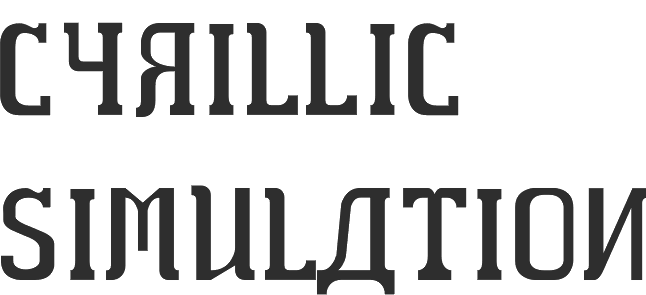
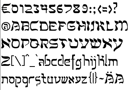
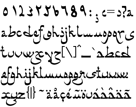
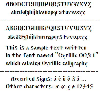
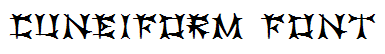
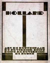
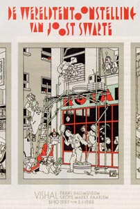
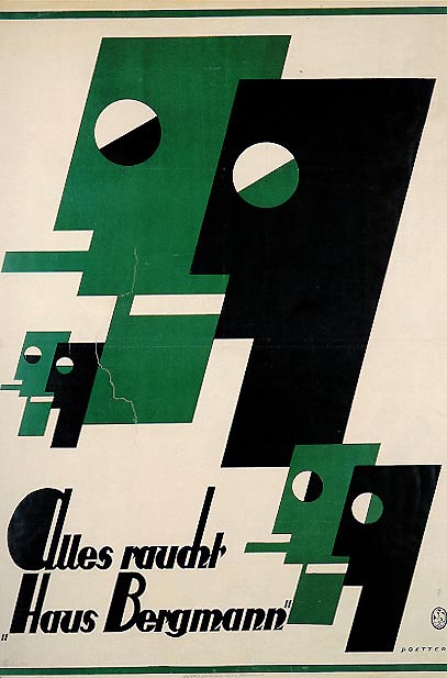
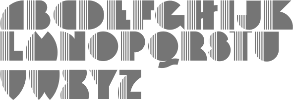
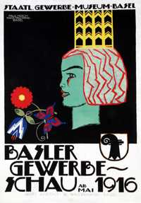
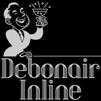
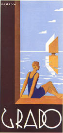
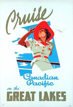
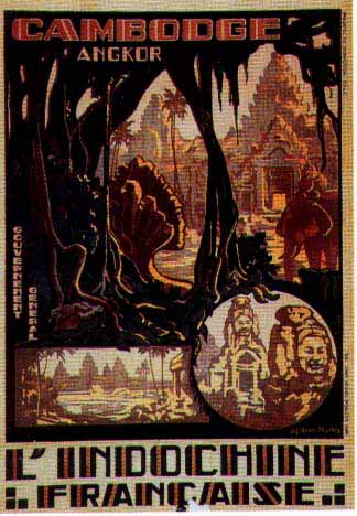
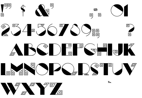
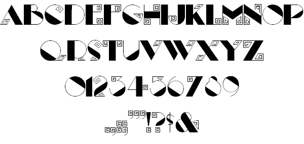
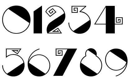
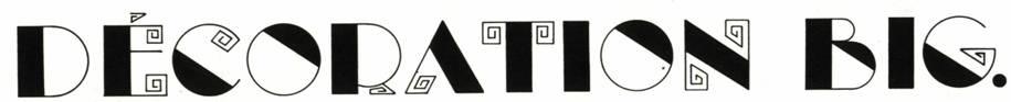
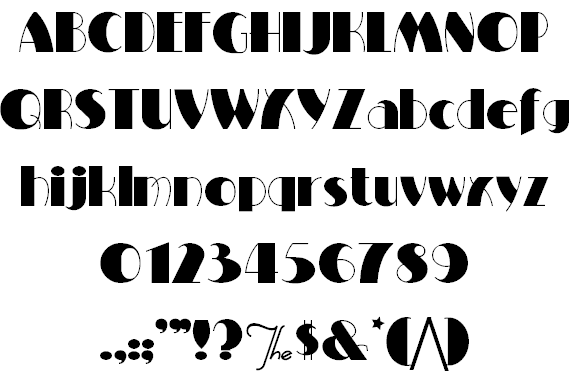
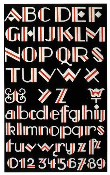
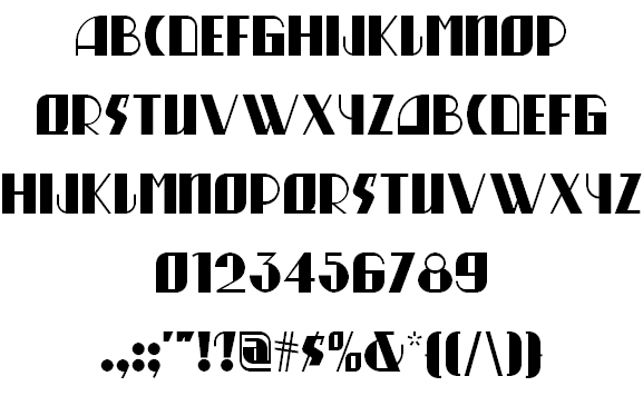
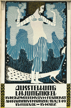
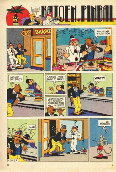
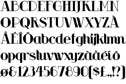
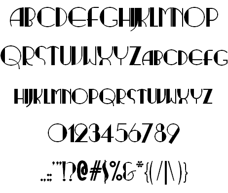
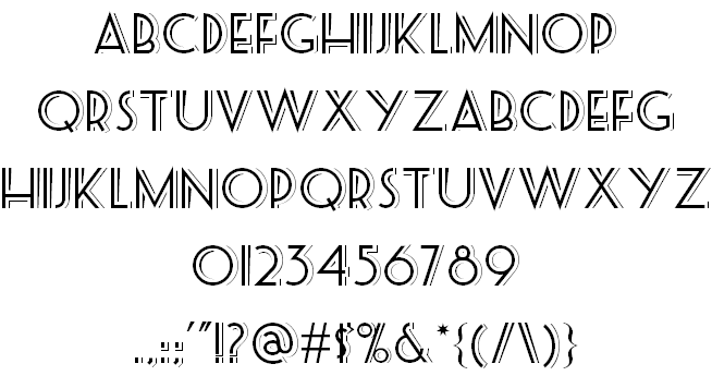
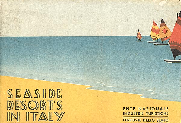
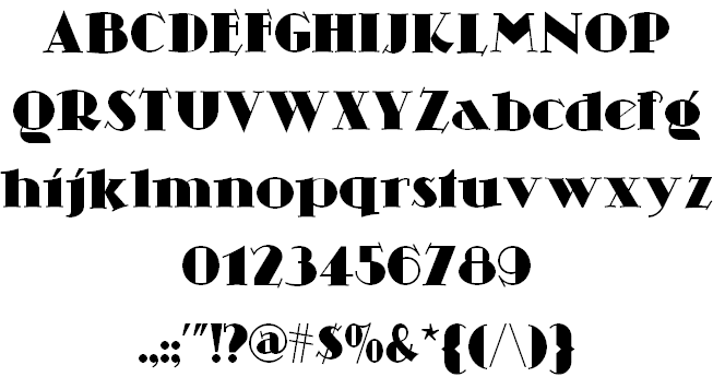
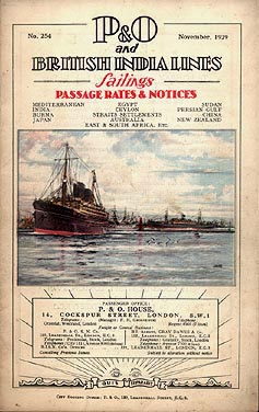
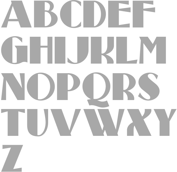
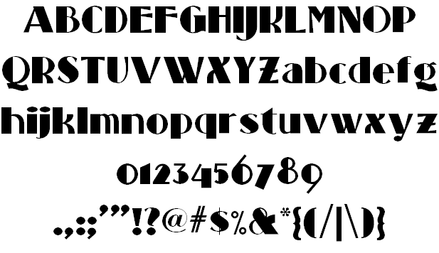
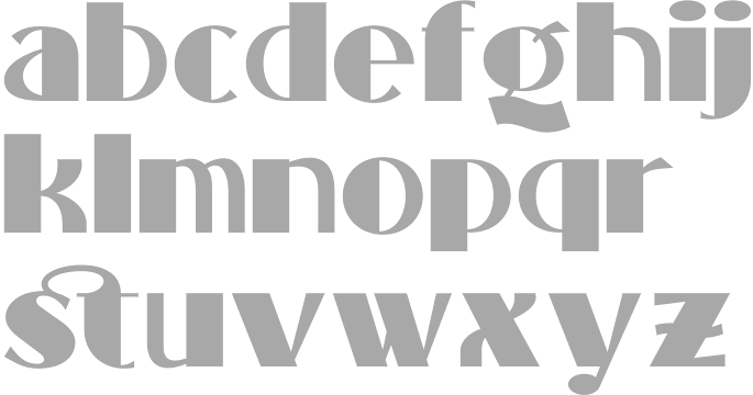
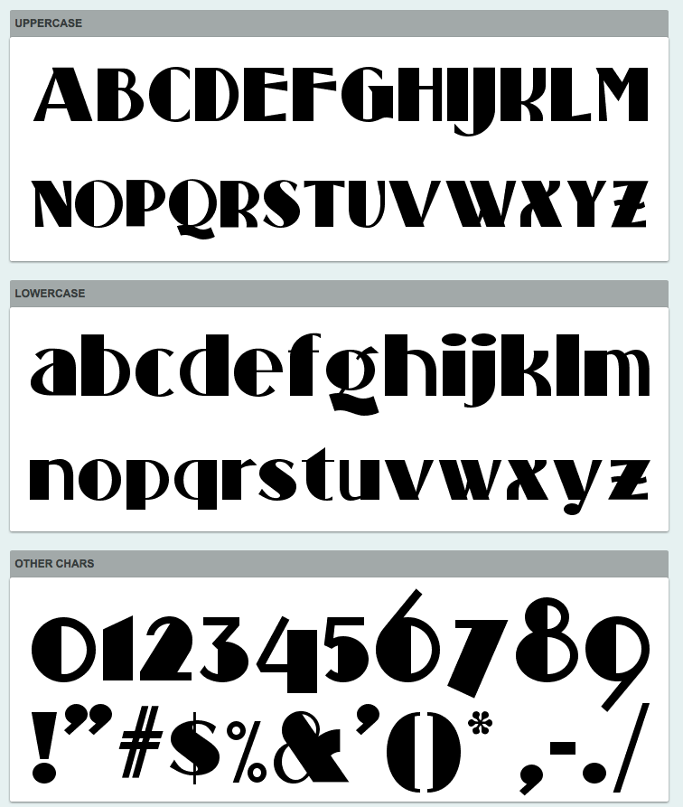
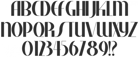
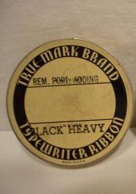
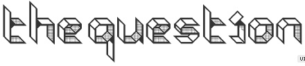
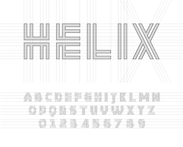
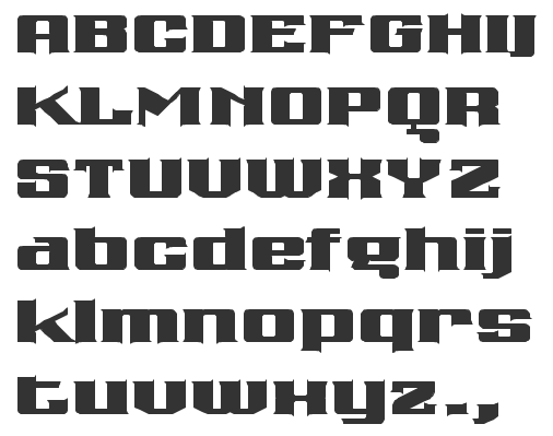
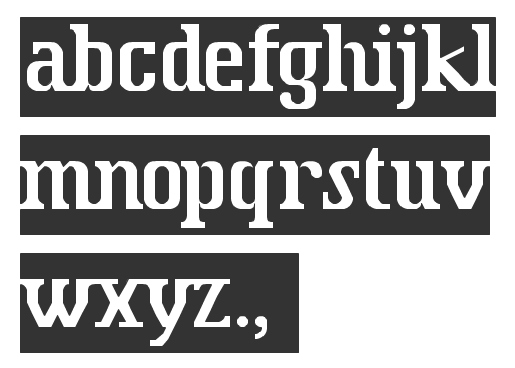
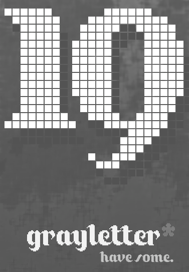
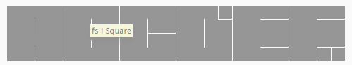
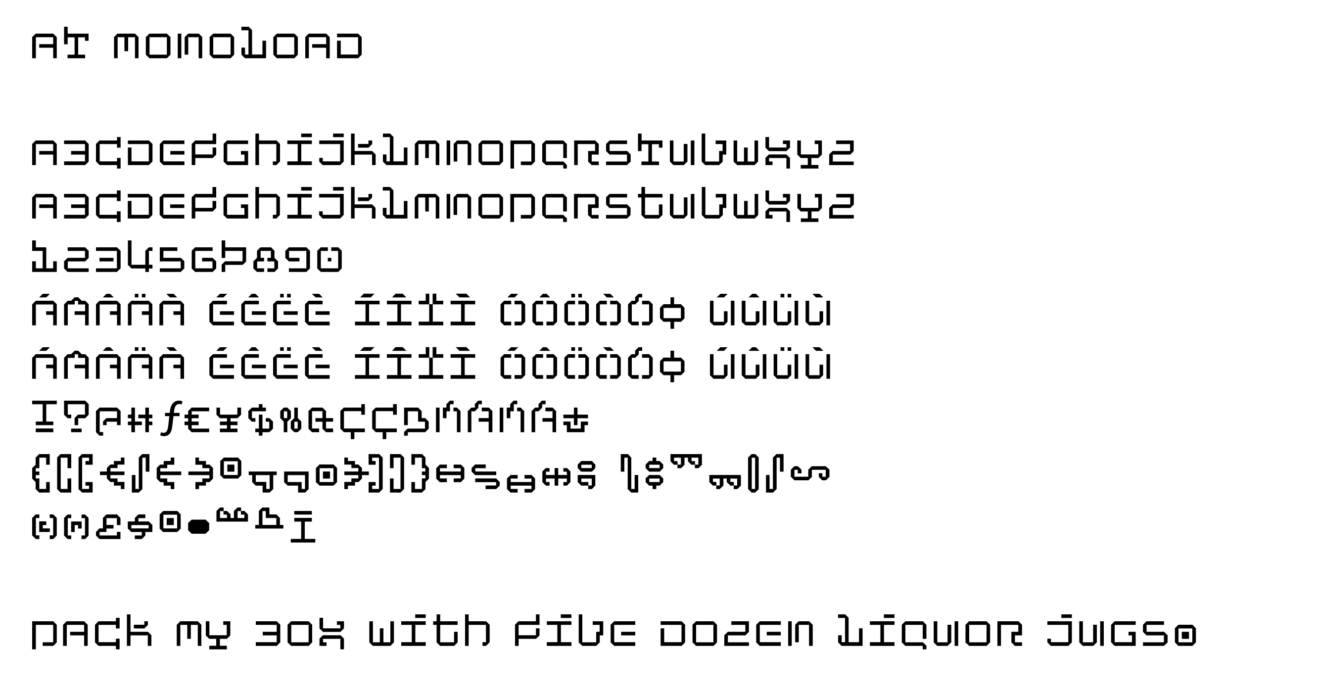
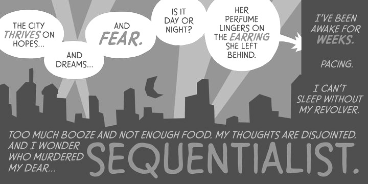
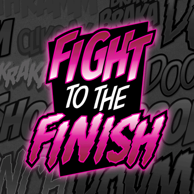
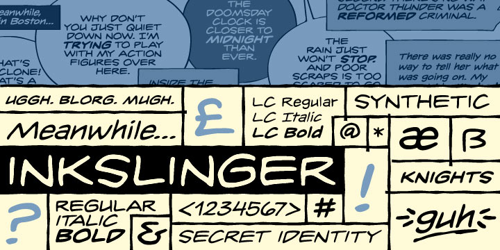
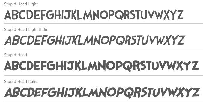
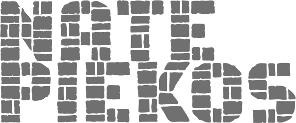
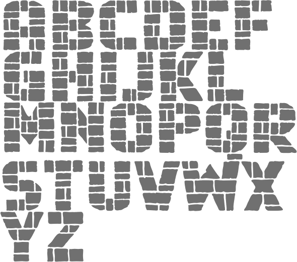
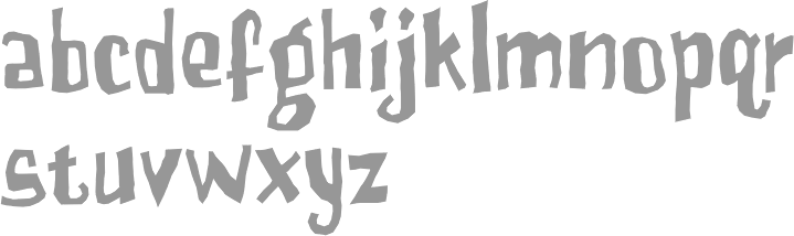
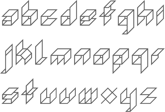
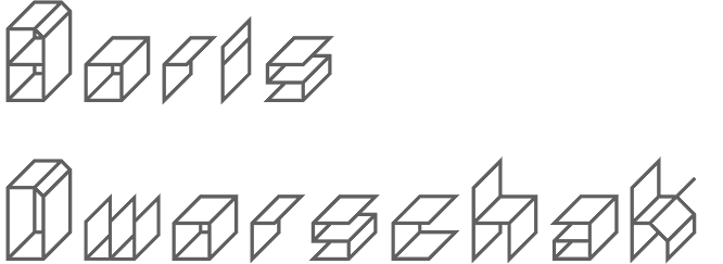
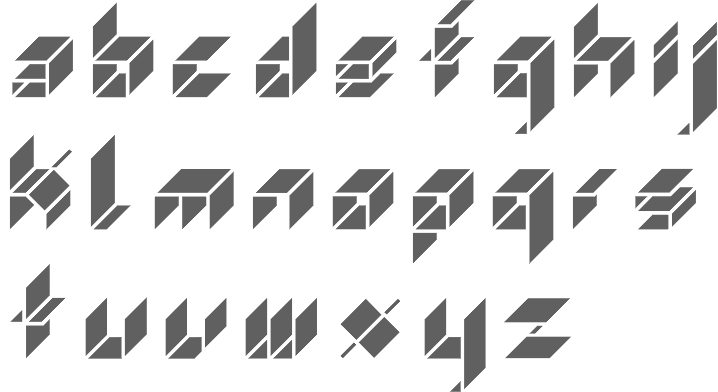
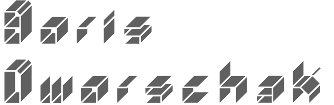
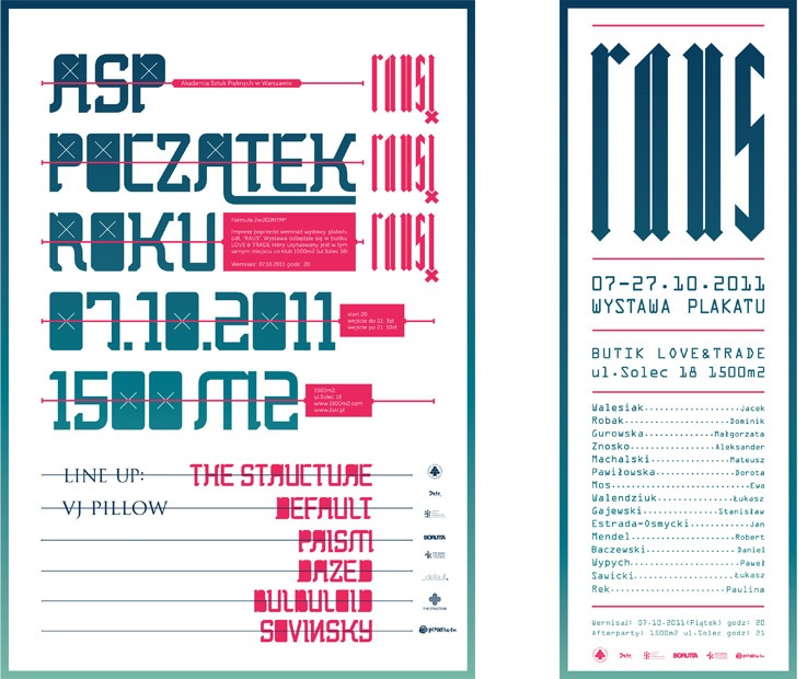
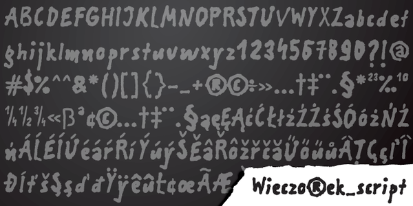
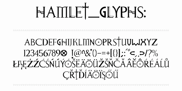
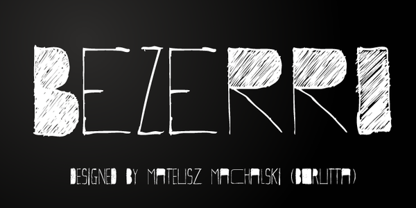
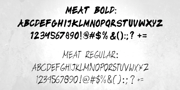
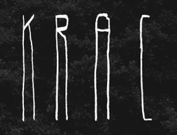
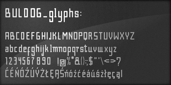
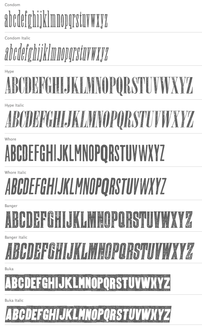
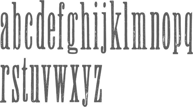
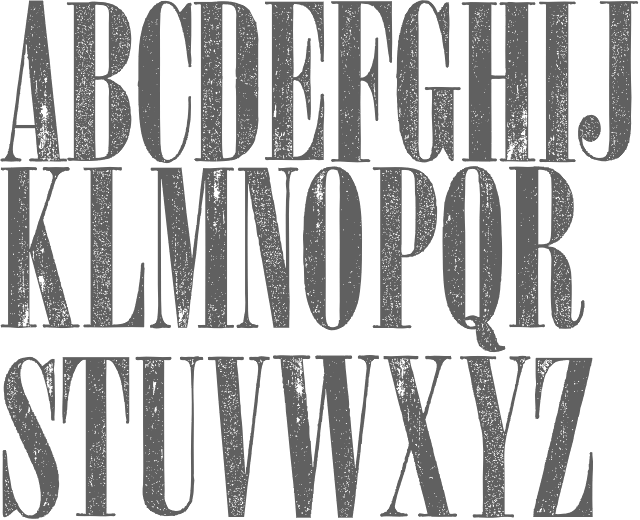
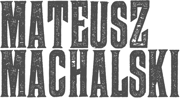
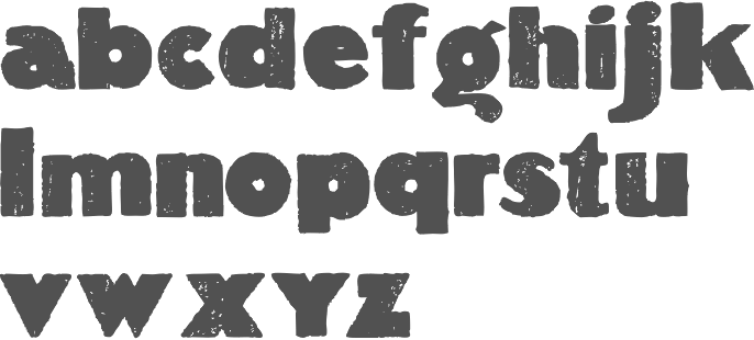
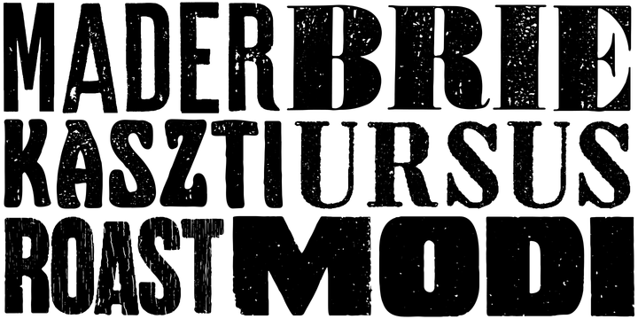
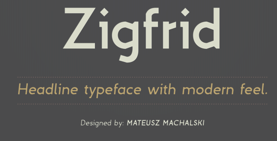
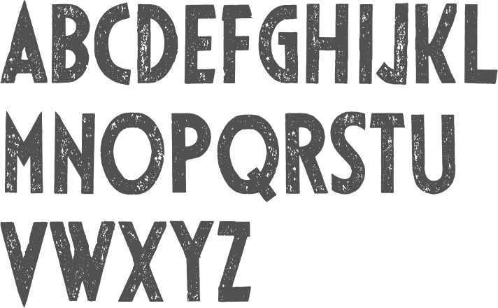
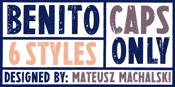
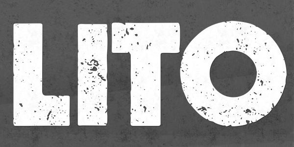
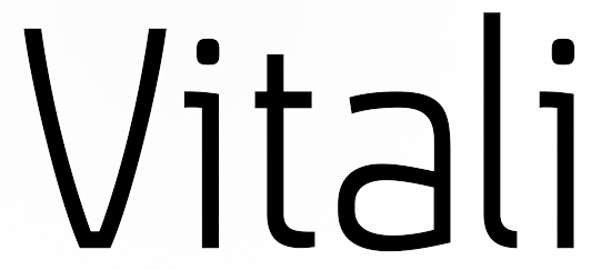
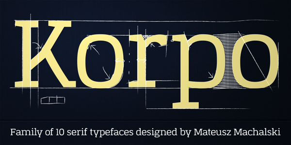
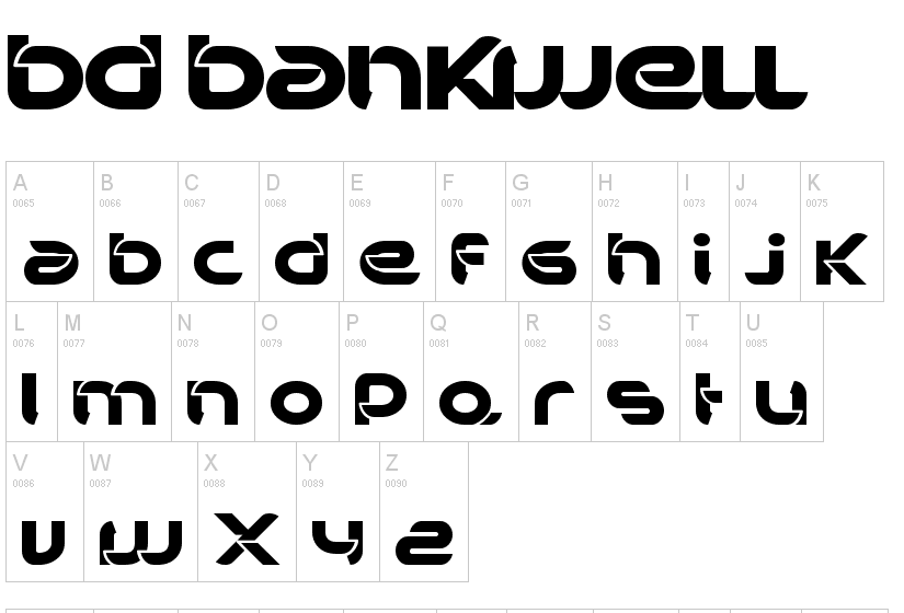
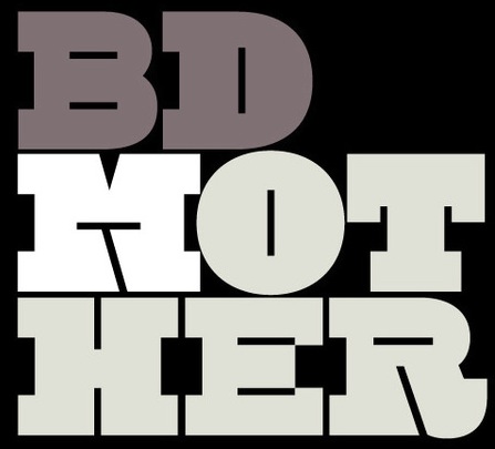
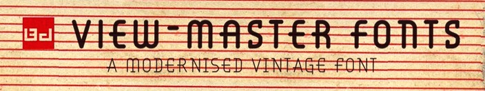
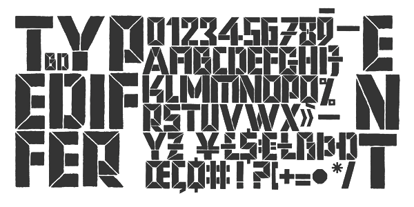
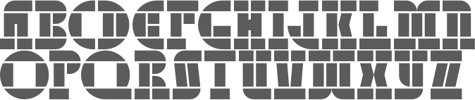
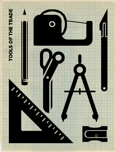
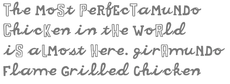
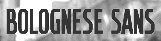
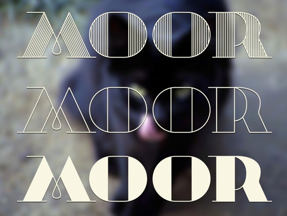
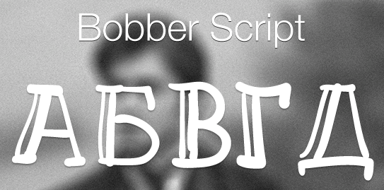
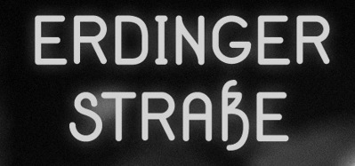
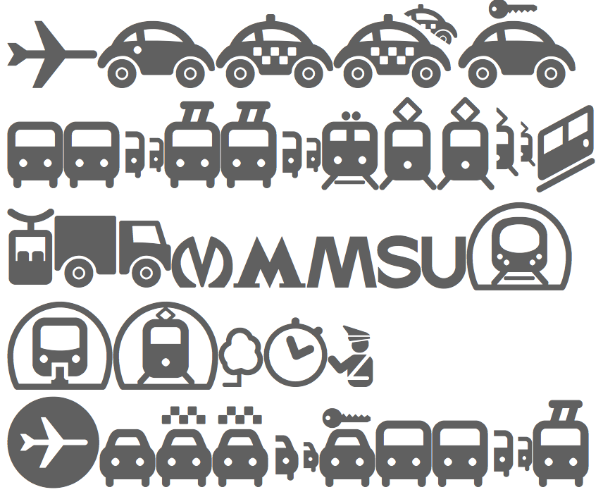
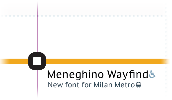
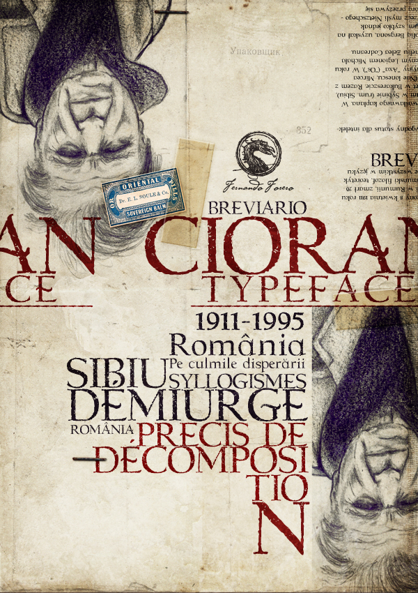
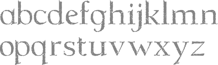
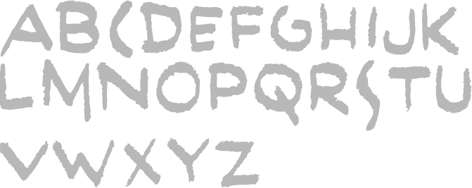
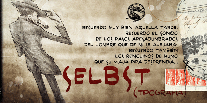
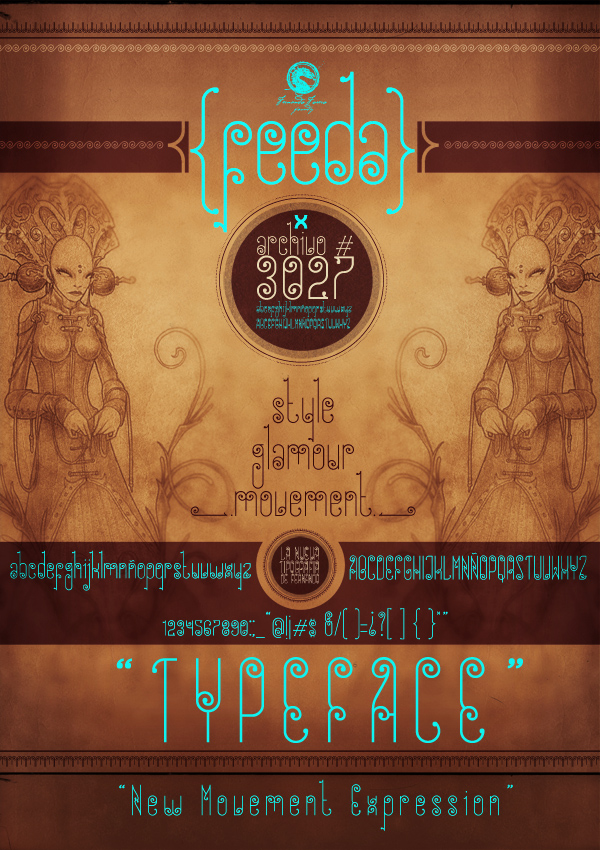
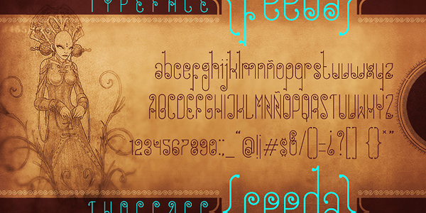
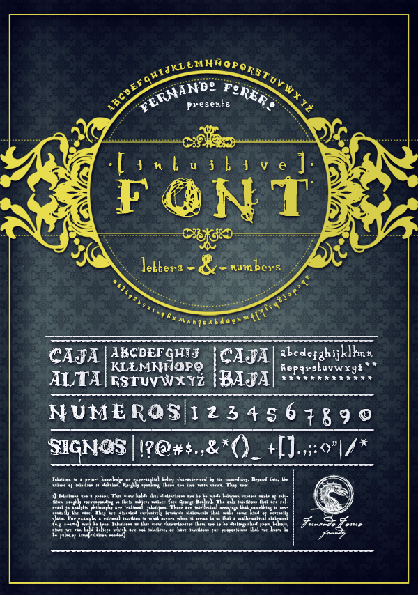
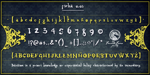
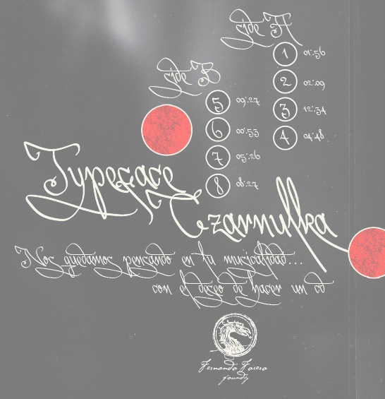
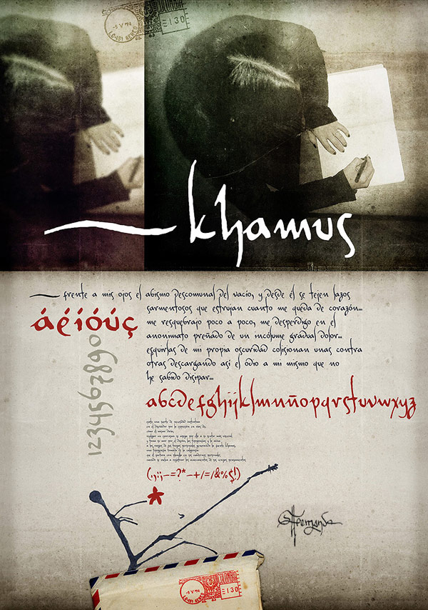
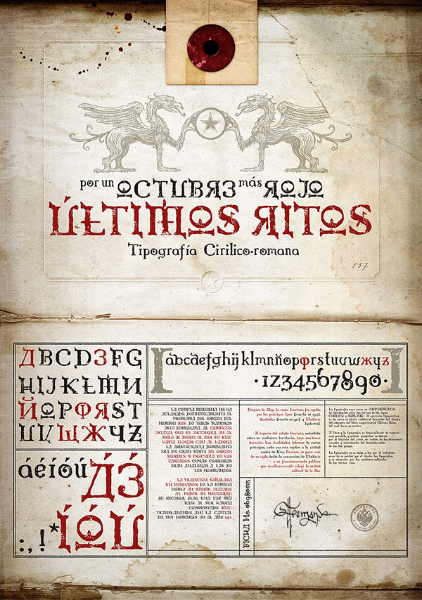
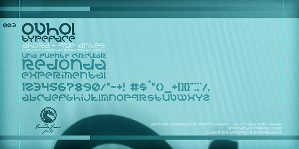
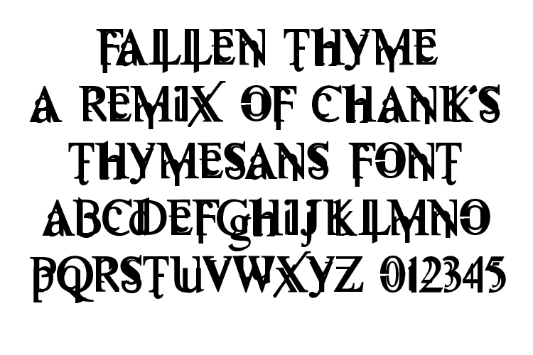
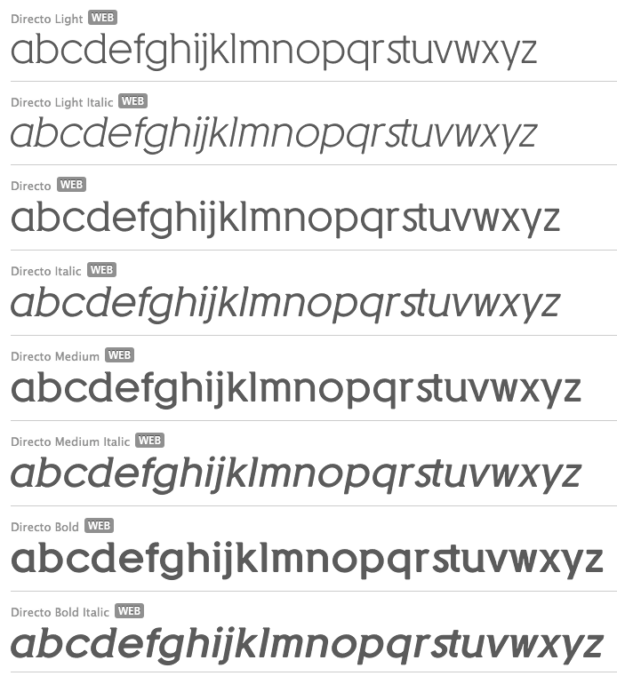
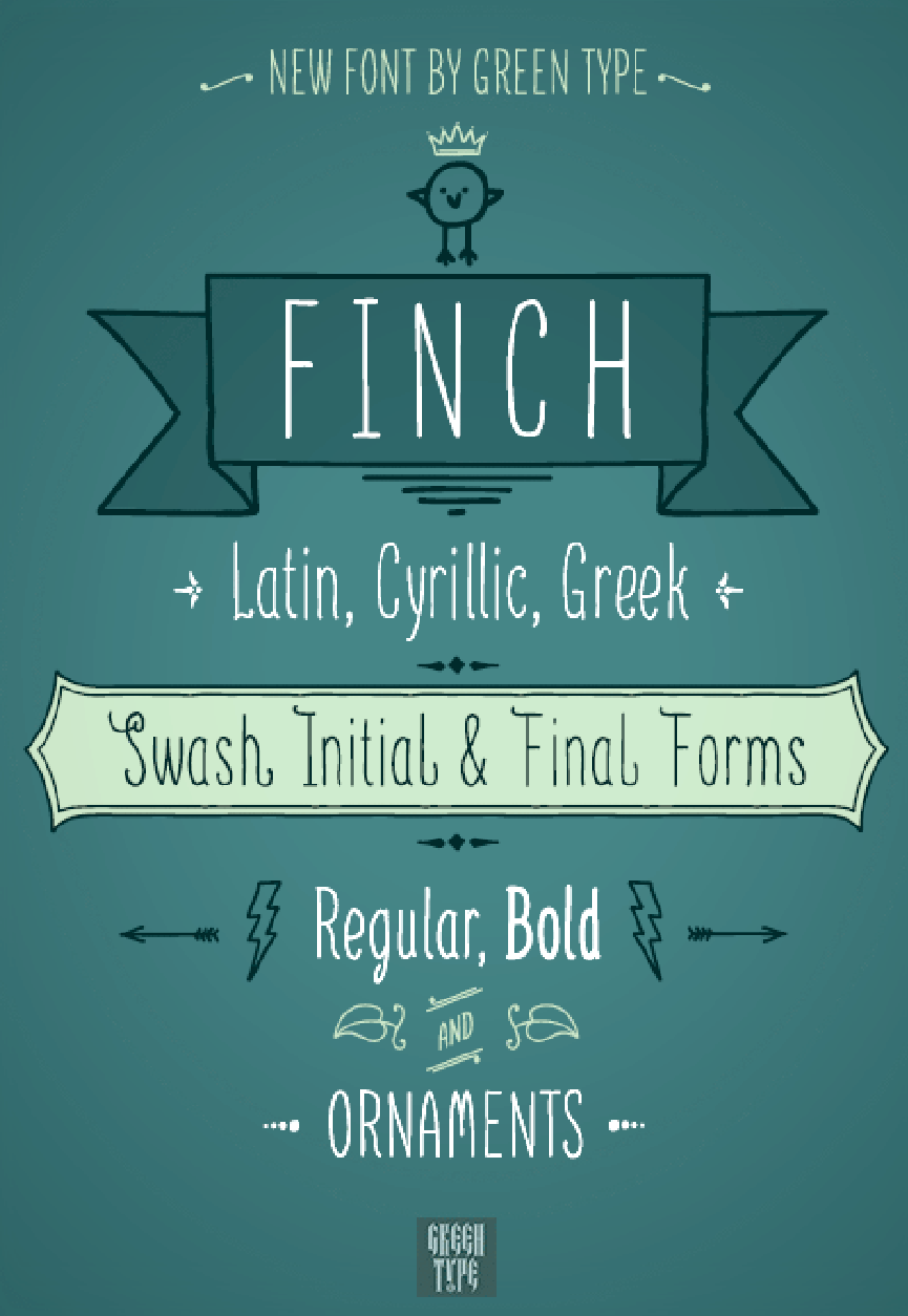
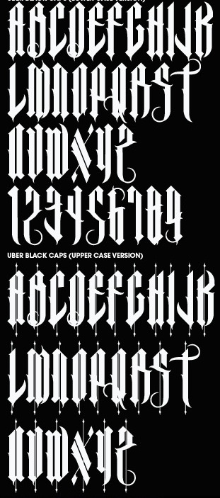
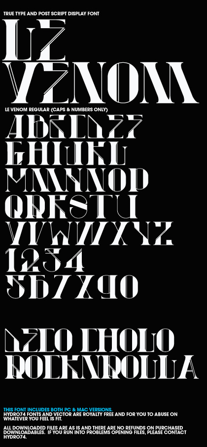
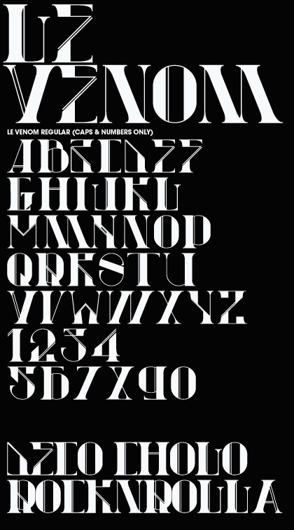
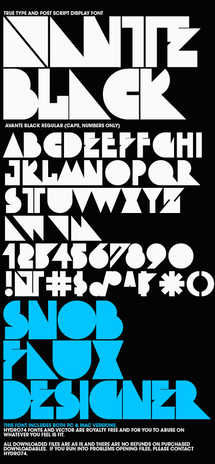
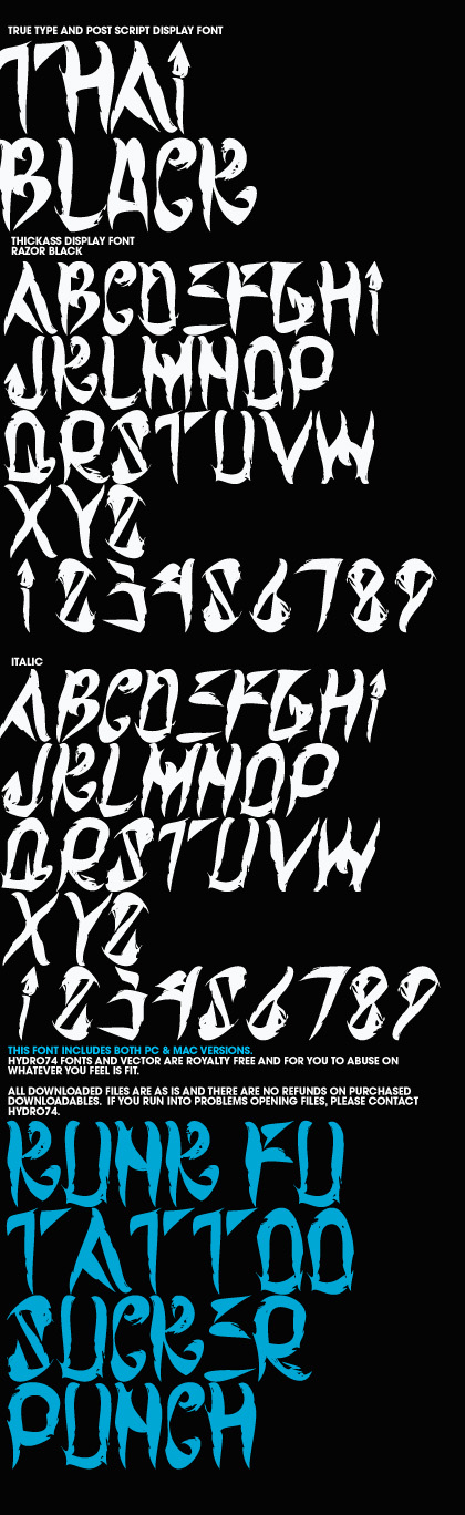
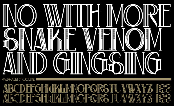
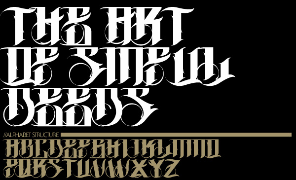
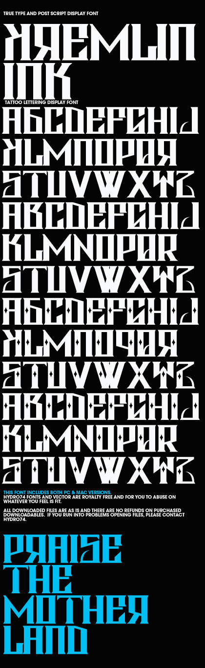
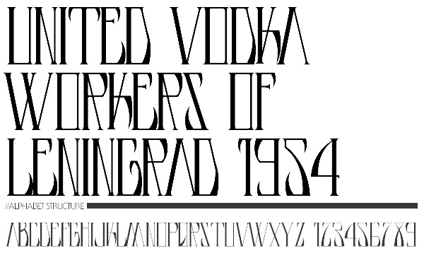
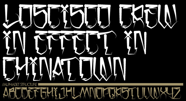
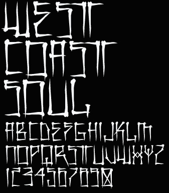
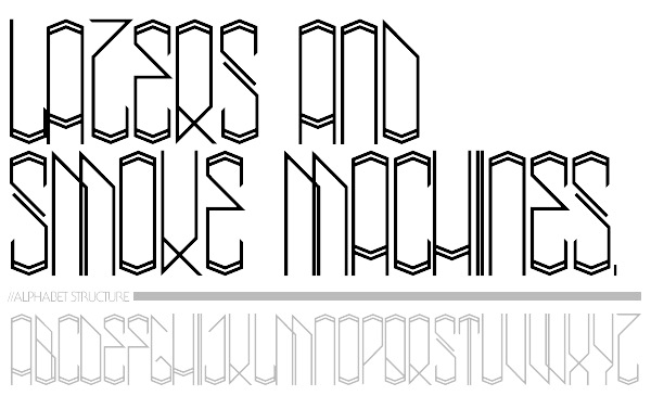
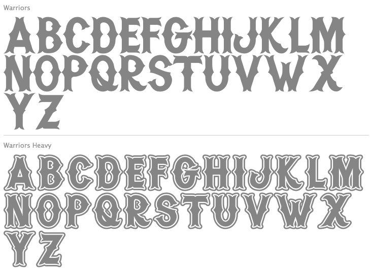
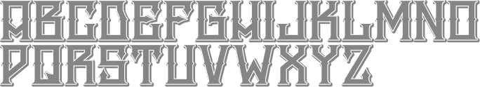
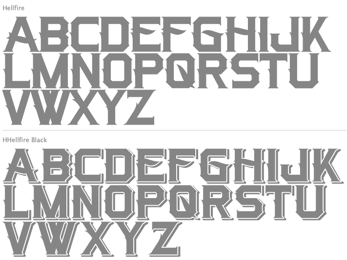
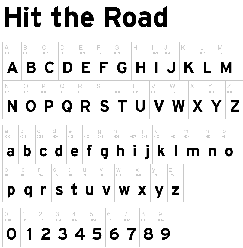
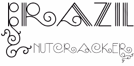
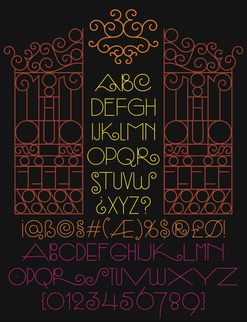
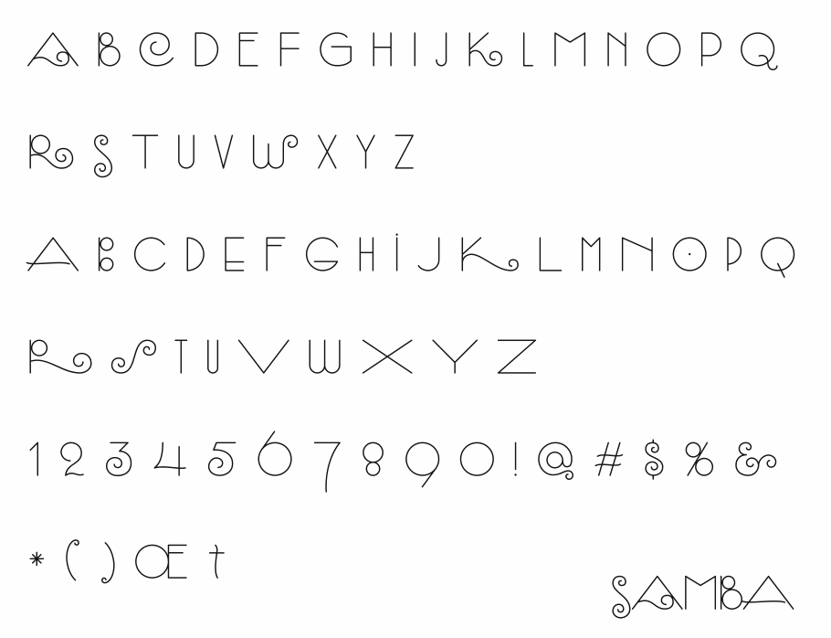
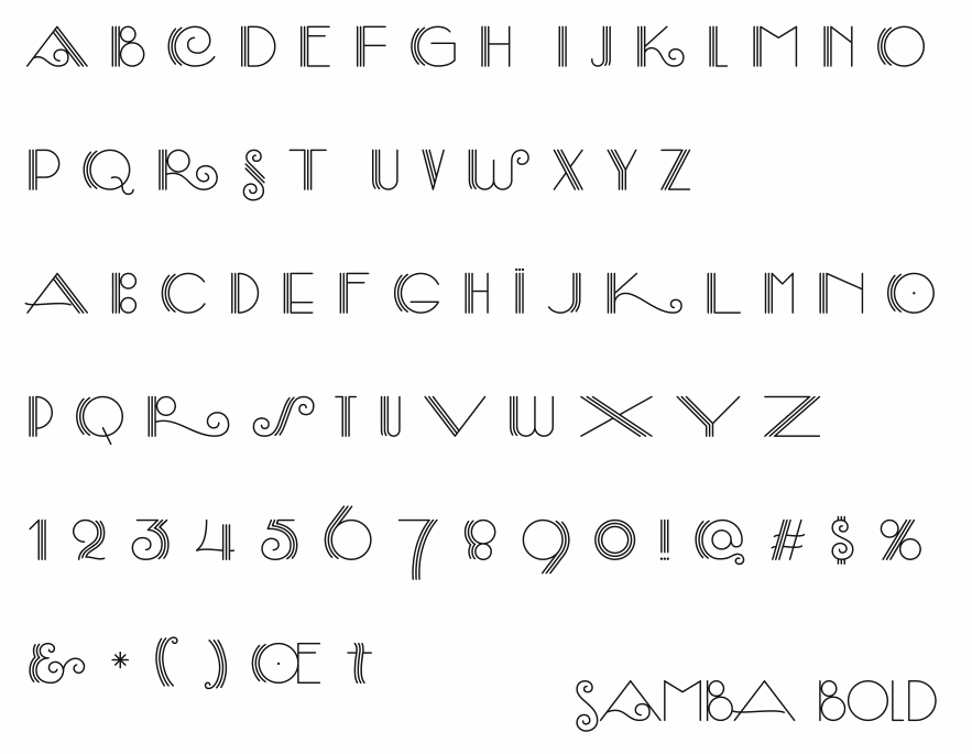
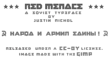
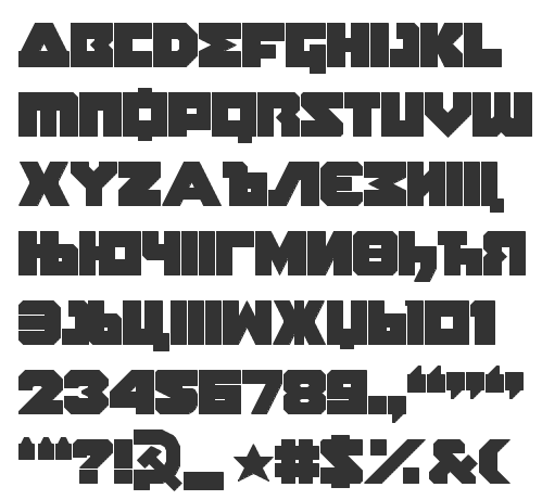
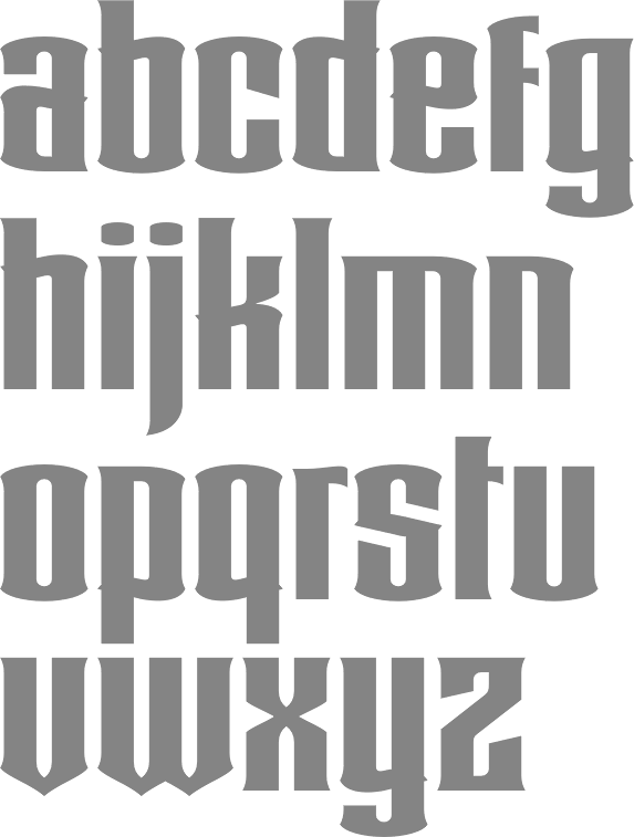
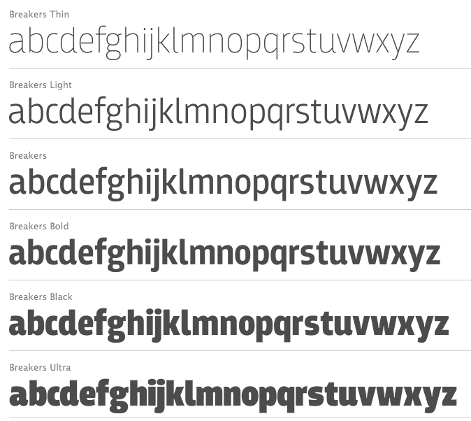
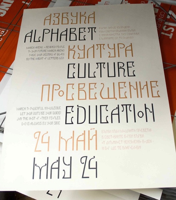
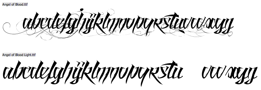
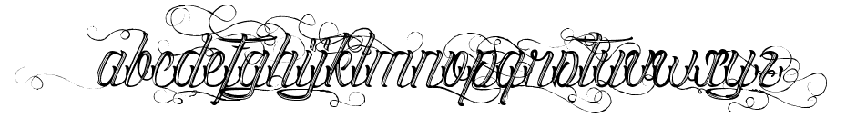
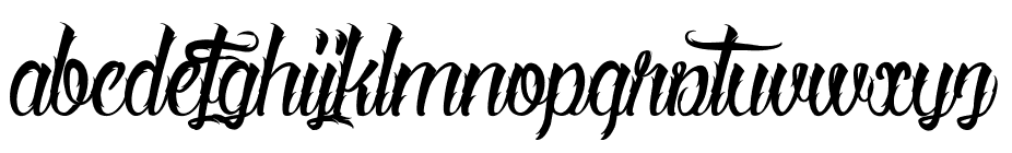
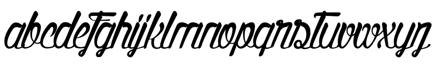
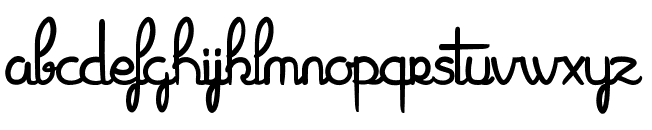
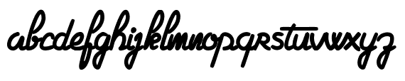
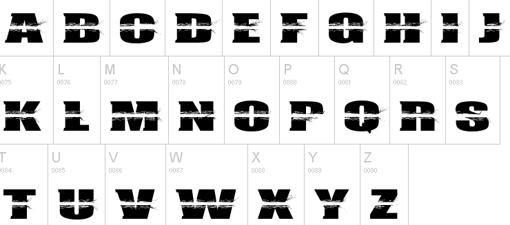
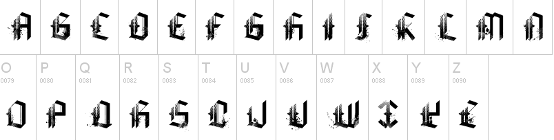
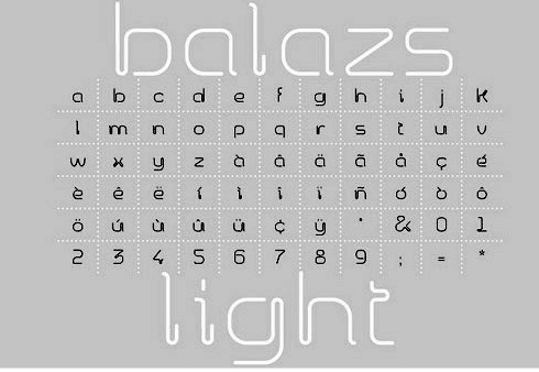
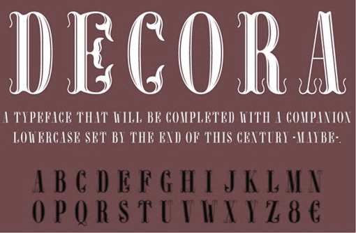
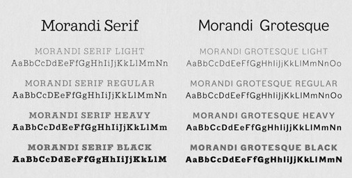
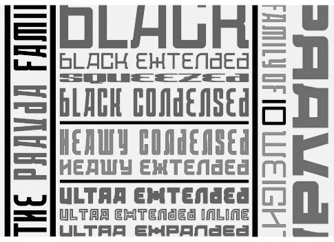
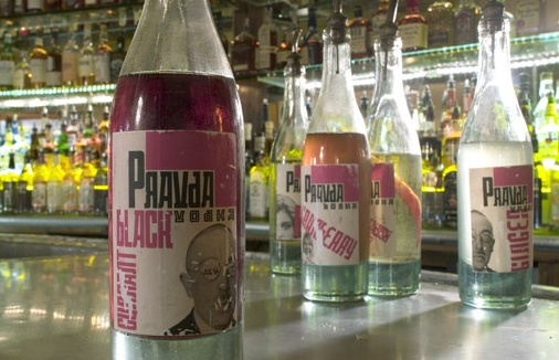
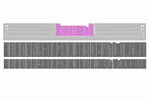
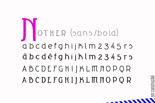
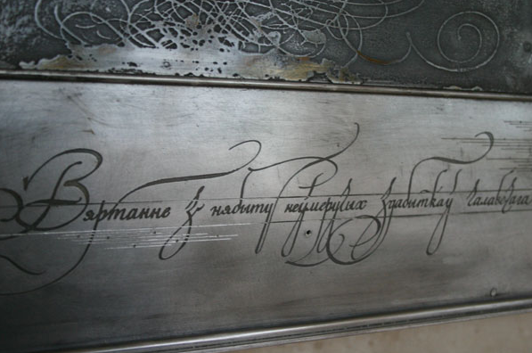
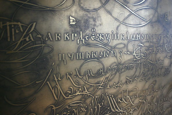
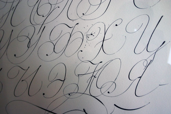
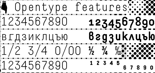
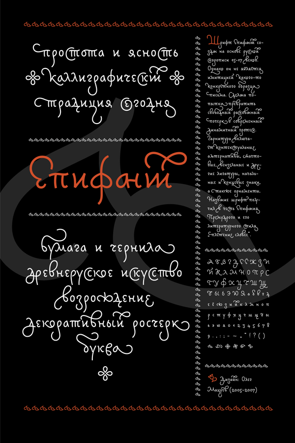
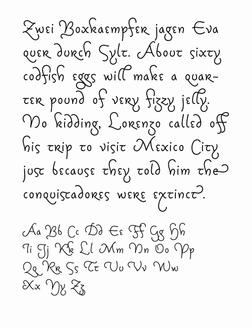
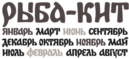
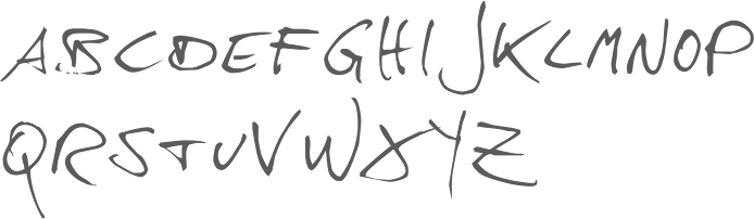
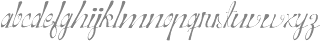
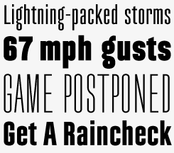
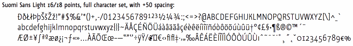
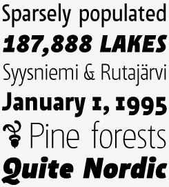
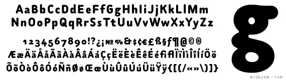
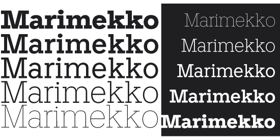
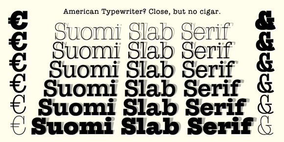
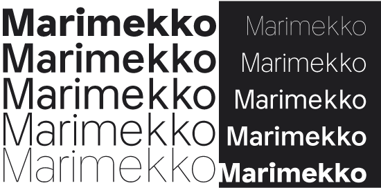
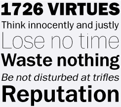
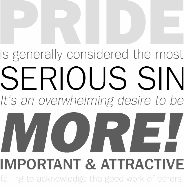
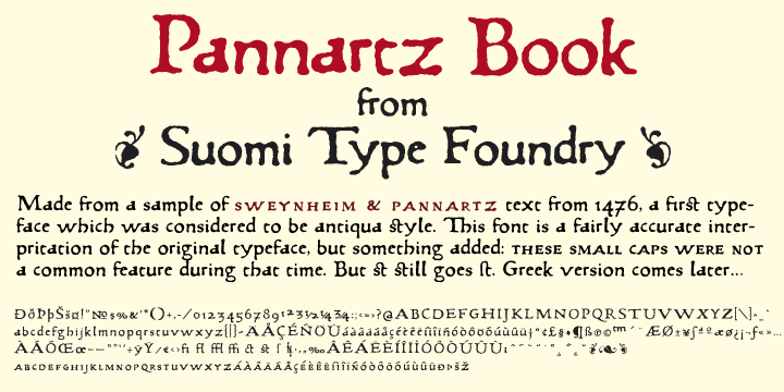
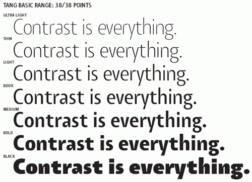
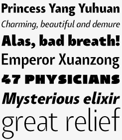
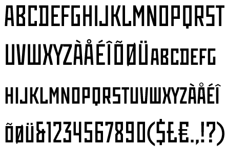
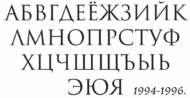
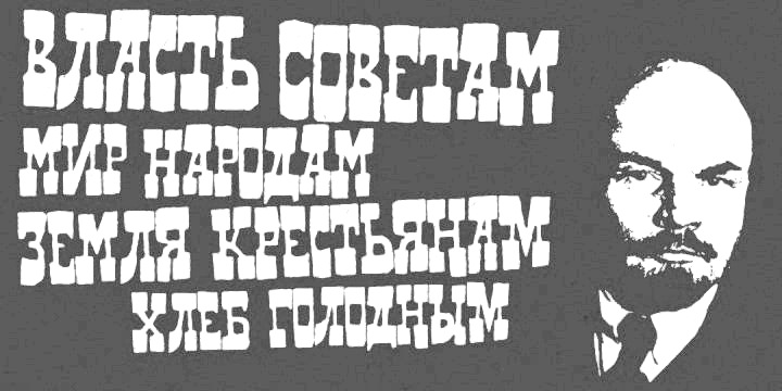
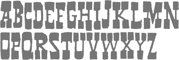
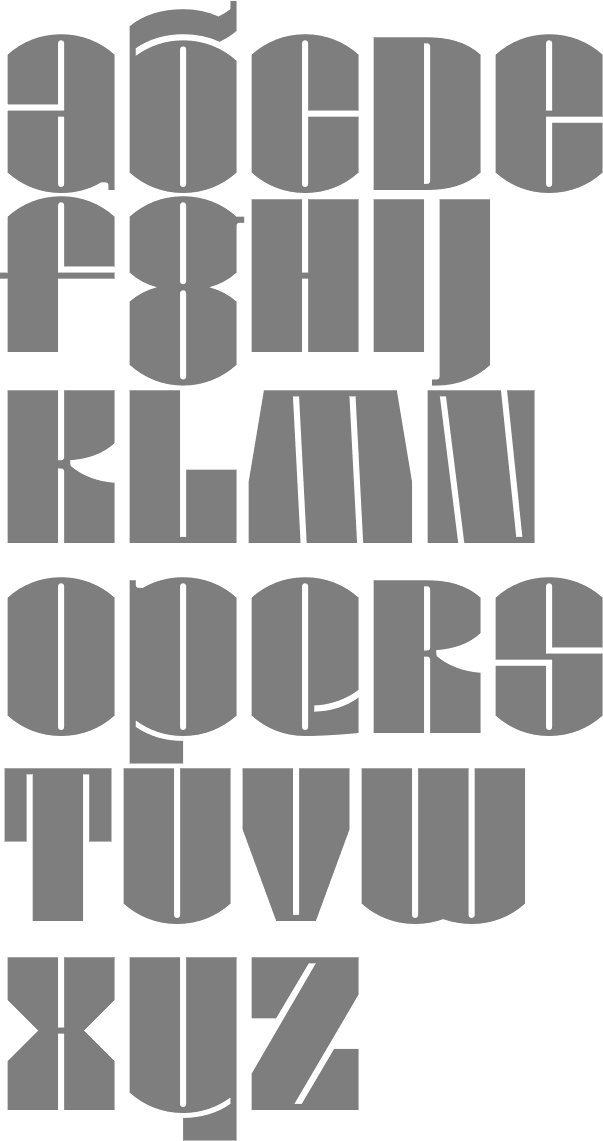
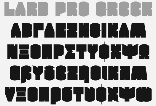
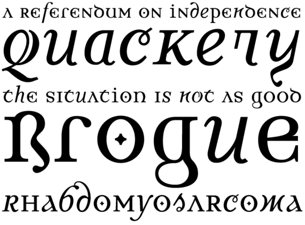
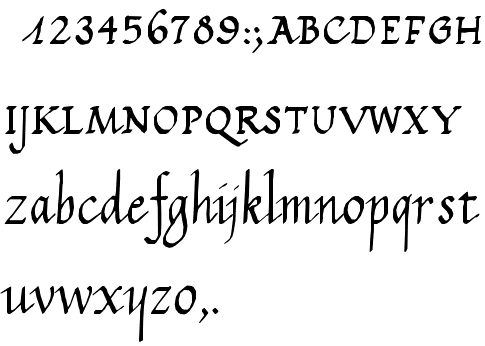
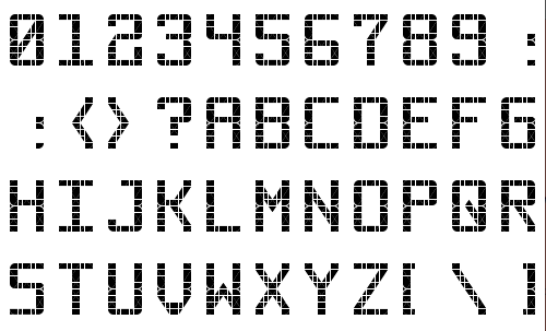
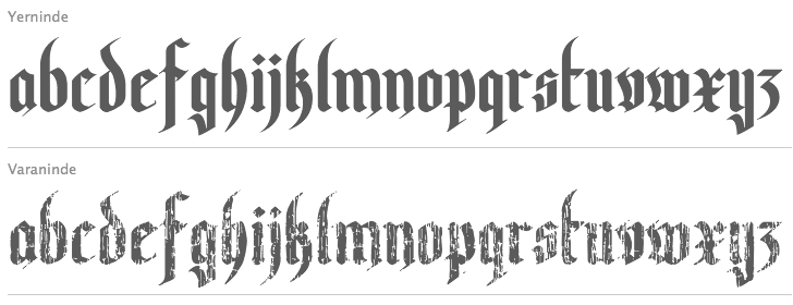
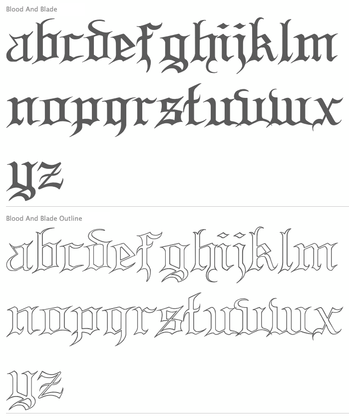
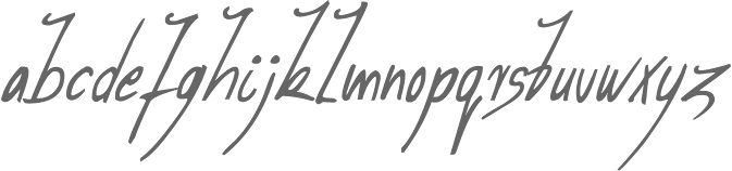
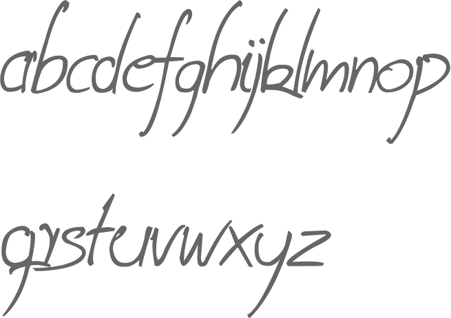
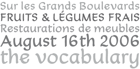
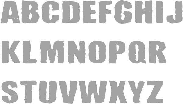
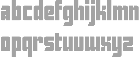
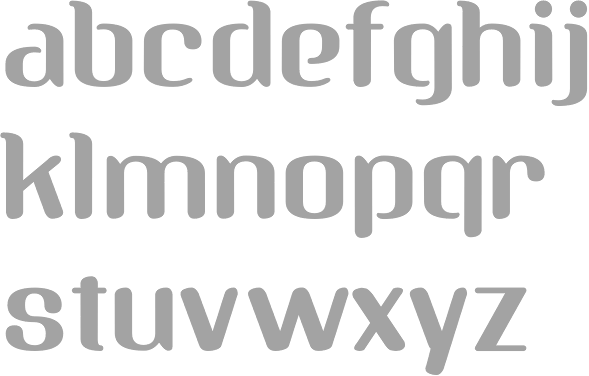
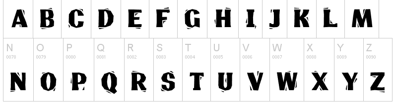
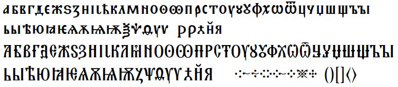
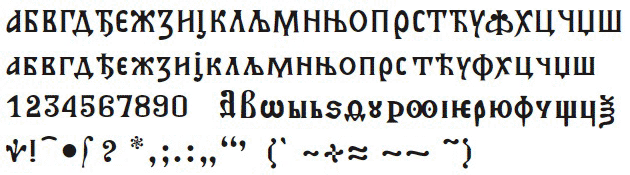