| | |
2D Typo
[Lukyan Turetskyy]

|
 Lviv-based Ukrainian designer (b. 1979) of the octagonal stencil typeface Depot Trapharet (2006, brutalist), and of the free car rallye dingbat typeface Rallye Symbols (2008). Dafont link.
 In 2010, he went commercial as 2D Typo. The first typeface at 2D typo was the modular pixelish Pressure Drop 2D (2010). This was followed by Ornamental Deco 2D (2010, art deco ornaments), Rally Symbols 2D (2010), Mascaron2D (2010, by Iryna Korchuk), Depot Trapharet 2d (2010, a stencil based on the tram lettering in Lviv), Ascetic 2D (2005-2010), Hutsulyandiya (2010, extraordinary ornaments by Iryna Korchuk), Simeon (2010, calligraphic), Cranked Pipe 2D (2011), Tripyllia 2D (2011, ornaments of the neolithic Trypillya culture), and Ukrainian Barokko (2010, a calligraphic typeface by Genadij Zarechnjuk), Historism Border (2011, border ornaments), Moreske 2D (2012, ornaments), Geomanticus (2012, modular squarish sans). Typefaces from 2013: Bandelwerk (borders), Digital Stitch, Modern Wave (ornaments based on Alphonse Mucha), Hopferian (Roman caps after engravings by Daniel Hopfer (1470-1536)---typeface completed with help of Mariya Sokil), Simple Ribbon (art nouveau dingbats). In 2014, he created Angusto (an elegant narrow shaded display typeface family), Vindemiam (ornamental borders), Squamish (ornamental borders), UA Map (maps of Ukraine dingbats) and Bohemian Border. In 2014, Dmitry Rastvortsev, Lukyan Turetsky, and Henadij Zarechnjuk cooperated on the design of the free Latin / Cyrillic handwriting typeface Kobzar KS, which is based on the handwriting of Taras Shnvchenko, a famous Ukrainian poet, artist and philosopher. Typefaces from 2015: Finetitle (ornaments for headers), Gothic Herbarium (a floriated ornamental font based on the Gothic Revival ornaments developed by Augustus Pugin (1812-1852)), Old Depot (rough stencil), Francesca (decorative caps). Typefaces from 2016: Geometric Harmony (geometric ornaments), Dubster (which he describes as a technocratic modular font). Typefaces from 2017: Military Symbols. Typefaces from 2018: Strapwork (four ornamental typefaces with friezes, borders and motifs modeled after Balthasar Bos (1554) and 16th century mannerism). Typefaces from 2020: Lo Fi Copy (grungy and pixelish). Typefaces from 2021: Kolm Keltek (classical ornaments), Microdot (a dot matrix font). [Google]
[MyFonts]
[More] ⦿
|
A. Pat Hickson
|
 Britsh designer for ITF, most of whose fonts were mainly published by Red Rooster. After 2017, she started contributing to her husband's foundry, London Type. List (all ITF/Red Rooster unless otherwise specified):
 - Alghera Pro (1996): hand-printed, based on a handwritten Portuguese wine label design.
- Alys (1995): Calligraphic.
- Appleyard (1992): based on an old Monotype design, Prumyslava.
- Badger (1992): comic book style. In 2010, this was Steve Jackaman and Ashley Muir as Badger Pro.
- Basset, Basset Five, Basset Four, Basset One, Basset Six, Basset Three (1997): headline family.
- Bellini (1992): a garalde typeface based on Progreso (1923, Richard Gans Foundry). See Veer, where the font is sold as "Bellini". Linotype sells Greco (DsgnHaus, 1996) which according to some typophiles really is Progreso.
- Byron (1992, by Paul and Pat Hickson): a calligraphic font originally cut in the 1980s for QBF based on a design in Printing Types of the World (1931, Pitmans). Later redone in digial form as LDN Piccadilly (2019) at London Type.
- Coliseum (1992, ITF), co-designed with Julie Hopwood. Steve Jackaman completely redesigned, redrew, and improved the Coliseum family in 2017 and called it Coliseum Pro. That redesign also produced the sister typefaces Clydesdale and Torpedo.
- Dundee, Dundee Condensed (1993), inspired by the various headlines used in children's comic books in England, published by D.C. Thompson of Dundee, Scotland.
- Erasmus (1992): based on a design of Sjoerd Hendrik de Roos, 1923, Amsterdam Foundry.
- Forum Titling (1994): based on the Frederick Goudy design first shown in 1912, which was produced as a foundry typeface by Lanston Monotype in 1924.
- Gilmore Fahrenheit and Gilmore Sans (1992): ugly typefaces based on Eric Gill designs.
- Grove Script (1992).
- Javelin (1994): a connected fifties diner typeface in the style of Continental Railway Magneto Bold, Parkway Hotel, Permanent Waves, and Raceway.
- ITC Mona Lisa (ITC, 1992, and Elsner&Flake, 1991), ITC Mona Lisa Recut (ITC, 1991): an interpretation of a 1930 tall modern type by Albert Auspurg for Ludwig&Mayer.
- Rivoli Initials. Based on the William T. Sniffin design for ATF, circa 1928.
- Roller, Roller Shadow (1997): based on Iberica by Carlos Winkow for Fundicion Nacional, ca. 1942.
- Sinclair Script (1992).
- Stirling (1992).
- Venezuela (2000, Red Rooster) is a decorative Mexican simulation font based on the typeface Vesta by Albert Auspurg, circa 1926.
- Heseltine (2014) was designed by Paul & Pat Hickson in Text & Titling weights. The Heseltine typeface family was originally produced as a gift from Haymarket Media Group to Lord Heseltine for his 75th birthday.
- London Belgravia (2019, by Paul and Pat Hickson). An art deco sans.
- With Paul Hickson, she designed the floriated initial caps font LDN Garamond Initials (2020), which accompanies Paul's LDN Garamond (2020), which is a faithful revival of Claude Garamond's typeface.
MyFonts link. FontShop link. Klingspor link. [Google]
[MyFonts]
[More] ⦿
|
Aaron Thadathil
|
Pickering, Ontario-based designer of the floral caps typeface Acid Trip (2016). Behance link. [Google]
[More] ⦿
|
Aby Krreto
|
Graphic designer in Mexico City who created the leafy environmental cause typeface AK Nature in 2014. [Google]
[More] ⦿
|
Aditiyo Dwi Putranto
[Creaditive Design]
|
[MyFonts]
[More] ⦿
|
Adriana Vigil
|
Santa Rosa, CA-based designer of a floriated caps typeface in 2015. Adriana grew up in Northern California. [Google]
[More] ⦿
|
Affenprinz Belmondo
[Büro Sequenz]
|
[More] ⦿
|
Agnese Pagliano
[Little Asshole]
|
[More] ⦿
|
Ahmad Zulfikar Ali
[Zet Design (or: Afredo.fk, or: Seventype)]
|
[MyFonts]
[More] ⦿
|
Airunreal
[Pavel Storchilov]
|
Stalingrad, Russia-based designer of the free AI and EPS-format Eco font (2017), which consists of foliated caps. Behance link. Creative Market link. [Google]
[More] ⦿
|
Airunreal
|
Designer of the vector format leaf font Eco (2021). [Google]
[More] ⦿
|
AJPT
[Alan Jay Prescott]
|
 Pottstown (Philadelphia)-based designer and PostScript font hacker who ran Prescott Design and now Alan Jay Prescott Typography, but was also involved in other ventures such as the Black Walnut Winery. Originally from Greenfield, MA, he graduated from Saddleback College, and worked for some time as a typesetter in New York. He advertizes himself as a leader in PostScript Open Type Font development specializing in the revival of print-only letterforms into digital typographic materials. He operates as APT and more recently as AJPT. In 2019, he announced that he would stop making typefaces altogether. His work can be partitioned into time periods. For this reason, Prescott's oeuvre is split over several pages:
 - His late period (2017-2019). In these three years, he showcased his work on Facebook, and was mainly involved in reving 19th century typefaces, about half of which were from the Victorian era. The annotations in the list below are quoted from Prescott's pages.
- Absolution Cursive (2017). When I was a typesetter in New York City, I had one of the largest collections of typefaces from CompuGraphic's library available for setting. One of the faces I never used in two decades of work was a rather ungainly decorative font called Abel Cursive. Apparently it was designed by Bernie Abel (perhaps one of CompuGraphic's employees) and I'm not sure it got much use, since I don't recall seeing it anywhere except my type catalog. Before I sold my equipment and closed my business for good, I made a scan of every typeface at 72-point size that I owned for future development, if there ever came a time to work on something crazy like that. Most of those 2,000 scans were lost when I changed computers a long time ago, but Abel Cursive survived and I made a down-and-dirty mow-and-blow font back then. I have recently worked on it extensively to make it usable as a multilingual slightly redesigned font in OTF format. I would classify it is as neo-Victorian medium-contrast decorative italic. It is definitely an oddball and may never see use.
- Algol (2017). Based on a scan from Dan X. Solo, Algol is a vastly expanded character set for Algernon, a typeface that clearly presages Machine and other "octics." I don't have any source material for the original design, but it may have been a Dan Solo original.
- Aloysius and Aloysius Ornamented (2017). This is a digital revival of the original Algonquin, cut by J.F. Cumming in the late 1880s for the Dickinson Type Foundry in Boston. While this was not my most challenging project, it was a doozy.
- Alpenhorn Roman (2017). Another oddball typeface is revived here, renamed from the design called Alpine by Henry Schuenemann for the Cleveland Type Foundry in the 1880s. Buried in the "gingerbread" of this weird face is technically a Latin serif, but otherwise it is an entirely unique letterform for which I had a heart soft enough to revive here in digital form.
- Androgen Roman (2017). I know next to nothing about this ultra-geometric blackletter called Anderson that I found displayed in a Dan X. Solo catalog, but it is another oddball that is attractive and very simple to revive in digital format. It is one of those projects I would recommend to a beginning revivalist who wanted to cut his or her teeth on a moderate challenge after mastering some basic tools in font development software.
- Angolan Text (2017). I found Angular Text in a Solo catalog and revived it as a digital font with diacritics and other characters for expanded typesetting possibilities. It was designed by Herman Ihlenburg in 1884 for MacKellar, Smiths & Jordan, which information I found in a link from Tom Cruz for a fellow named Toto who revived the font as well; he has several glyphs I do not have and I like his showing better. Interesting to see what others have done with the exact same typeface and scan and some research for tantalizing missing glyphs...kudos.
- Antiochia Series (2017). This collection of typefaces represents a revival of several bold slab-serif wood types with the name Antique that are related. Their individual histories will follow at another time, but note that several here are useful derivatives that add to the variety of this letterform's impact.
- Azurine Roman (2017). Azurine is a digital revival of a typeface known as Aztec, drawn by an unknown designer for the Union Type Foundry before 1889.
- Beltane Roman (2017). The very complicated story behind the work on this revival is too long for this space (and perhaps too boring to most), but suffice it to say that this letterform started out in 1886 as drawn by the great Herman Ihlenburg as Artistic and assigned to MacKellar Smiths & Jordan. Dan Solo called this face Belmont but only showed caps and was suspect anyway. I was able to find specimens elsewhere and a motherlode of other interesting things in the Inland Printer. I developed my first full-featured OTF using this typeface and designed Greek and Cyrillic glyphs as well. I also fitted it out with a set of small caps to make a font that now has 4,000 glyphs for nearly every non-Asian language. To top it off, Robert Donona revived the decorative caps for this typeface, an excruciating task that I once considered for myself but was lucky enough to have this other crazy person take up. The number of hours dedicated between Robert and myself in reviving this complete series digitally is probably unprecedented.
- Bernhard Swirl (2019). This is a digital revival of the letterform of the same name. It is equipped only with the upper case, an ampersand, a spacer dingbat and the numerals. The numerals are quirky, not only in design, but the fact that they seem to have been intended as old-style figures with the exception for the 4 and 7. Lucian Bernhard is either the designer of this limited-use typeface or inspired a reworking of his "wobbly" poster typefaces for which he is known as an innovator. I have reworked the scanned samples I had used as templates and drew them with a little more consistency than the originals to improve color on the page.
- Bireme Roman (2017). Below is a digital revival of a typeface called Bijou. As I have come to understand, several people have revived this face already. It is similar to Flirt in many respects. I will update information as I come across it, but I wanted to post my version here for your appreciation.
- Blackguard (2018). This is a digital revival of a typeface known as Black Cap. William E. Loy writes that Black Cap was designed and cut by Charles H. Beeler Jr. for MacKellar, Smiths & Jordan. The earliest-known commercial specimen was advertised in the January 1891 edition of The Inland Printer, so he probably created it in 1890.
- Blackminster (2017). One of the more interesting treatments of blackletter forms in the 19th century is this beauty called Black No. 544 designed by Henry Brehmer in 1889, who assigned the rights to Bruce Type Foundry. Originally I was unable to locate certain key glyphs in this font, but they were graciously supplied by others in our crazy network of type geeks. More information on the people behind these projects will follow in other articles.
- Bleak (2017). Bleak is a series based closely on a typeface called Stark. As with nearly all typeface names, there are several unrelated fonts developed in recent years that bear no resemblance to this gorgeous sans serif.
- Brotherly Roman (2017). Among many "antiqued" letterforms developed in the late 19th century, Ben Franklin was offered by Keystone Type Foundry in Philadelphia. Several glyphs were missing from my best showing of the font, but I was luckily able to find them, as well as logotypes, two ornaments, several alternate characters and some punctuation. There had already been a digital revival of this typeface kicking around as shareware in the 1990s, but it was very poorly drawn and incomplete. I believe it has been rendered nicely and consistently here for posterity.
- Busker Contour (2017). Burlesque was the name given by Solo to a typeface originating through Caslon or Figgins around 1843 and shown in German specimens a couple of years later.
- Cane Gothic (2018). Cane Gothic was designed and cut by Edwin C. Ruthven c.1886; he patented it in March–April 1886 and assigned the rights to David Wolfe Bruce (son of George Bruce, holder of the first design patent in US history). The Bruce catalog number is unknown. The tradename Cane Gothic, an apt description of the caning patterned background, may have been assigned by Dan X. Solo, who had revived the face for his photo-lettering service, but it has previously been considered impossible for digitizing. Although the average character in this font contains something like 3,000 Bézier control points, it turned out to be doable once I figured out the original mathematics that Ruthven must have used to guide his design objectively. It is digitized for posterity and I thank Anna Allen once again for the patent specimen (No. 16,643) indicating, if extremely faintly, five missing glyphs from my otherwise excellent scan. Thus I've generated the border glyphs and a pound Sterling symbol to augment this letterform. As far as I can determine, this character set is complete, and I have generated three fonts in order to accommodate chromatic typesetting with very little effort.
- Cantini Casual (2019). This is a digital revival of the typeface of the same name (or at least that is the name Solo gave it in the type specimen book from which it was scanned). It is a great example of the exuberant fancy characters that came to ascendance during the 1960s and 1970s. It is a medium-weight Latin italic with unusual decorative details in addition to crazy swash choices. I do not have any information on the history of this trippy face, but it is likely it was revived at some time in the recent past. It includes a large number of alternate glyphs as well.
- Capulet (2017). This is a revival of a typeface called Caprice that was patented in 1888 by Arthur M. Barnhart and assigned to Barnhart Bros. & Spindler of Chicago. This letterform is a prime example of the explosion in design ideas occurring before the turn of the century, hundreds of which remain to be translated into digital format.
- Carmenite Roman (2017). This beautiful digital revival covers a letterform drawn by the Bauer Type Foundry of Stuttgart, Germany sometime before 1896. It was originally called Carmen and has been referred to as Carmencita in the Solo books.
- Centrum Text (2017). This is my digital revival of one of the more complex decorated blackletters, among my favorite and most difficult projects to work on and just finished today. It is identified as Celebration Text on p. 18 of Solo's "Gothic and Old English Alphabets." The lowercase for this letterform is also presented for two other typefaces, Testimonial Text and Innsbruck in his larger catalog, presenting some confusion. But I believe all three were drawn by the same designer, although I have no idea how old they are. The lowercase may simply have been used for all three decorated capitals, since they are a very good match. Intentional, who knows? It is a real beauty and I'm going to perhaps revive the other two in this triplet of great examples of decorated capitals.
- Chapterhouse Roman (2017). This is an interesting typeface known as Ecclesiastic from Caslon around 1870. It was also known as Albion and Chapel Text No. 30. Most of those names were applied to completely unrelated designs, adding to the confusion that permeates typographic development and history to this day (and only gets worse over time). There are probably more alternate characters out there, but this is the best showing I could make with the resources I have and it is now available from me as a digital font.
- Chapterhouse Roman (2017). This is an interesting typeface known as Ecclesiastic from Caslon around 1870. It was also known as Albion and Chapel Text No. 30. Most of those names were applied to completely unrelated designs, adding to the confusion that permeates typographic development and history to this day (and only gets worse over time). There are probably more alternate characters out there, but this is the best showing I could make with the resources I have and it is now available from me as a digital font.
- Clarence Roman and Dotted (2017). Clarence Roman is a revival of Clown Alley and Clarence Dotted that of Cooktent (also called No. 515). Wood typeface Cooktent comes from W.H. Page before 1890 and the other looks to be a back-formation from it.
- Commissioner Script (2017). The typeface known as Commercial Script was designed by Morris Fuller Benton in the early twentieth century and enjoyed widespread use for decades. There have been many variations from other foundries, varying mostly in contrast; but as far as I know there was ever only one rather bold weight produced. I have redesigned the letterforms for consistency on the way to producing the ten weights shown here. It is interesting to see the font in lighter weights that accentuate the beauty lurking in this standard, and the heavier weights to see that the design still holds up under even heavier lifting.
- Courtesan Roman (2017). Among the dozens of wood types I have revived digitally is Courier, here called Courtesan. Many of these letterforms have been revived by others, all slightly different in their interpretations. More information on wood types will follow in articles I plan to write in the future on various areas of interest in the field of revival in particular and typography in general.
- Cranston Ornamented (2017). This is one of the most difficult digital revivals I have worked on. It started as Crayon, another masterful design from the prolific Ihlenburg, available at MSJ in 1885. There are sister fonts in an Open and a Solid that differ slightly in design and will be available from me at some point in the future.
- Creekside Playful and Calligrapic (2018). These are two digital casual scripts of my own creation based loosely on hand-drawn types from the 1950's. One is a calligraphic interpretation and the other is a more mono weight design that is a bit more slanted, both available for multi-language setting.
- Criticism (2017). This is a digital revival of Critic, a typeface designed by William F. Capitain in the mid-1880s with rights assigned to Marder, Luse & Co. Several logotypes had been designed for this letterform and many alternate glyphs. I added a few of my own, as well as diacritic marks, for balance to this surprisingly modern face that can be rendered multilingually as well.
- Crosby Roman (2017). This is a digital revival of the typeface known as University Text, designed in 1862 and shown by MacKellar, Smiths & Jordan in 1869 as Crosier. It was also known much later as Morningside. It is a stylized Latin with great charm.
- Crossan Roman (2017). This is digital multilingual OTF revival of a typeface called Cross Gothic, another one of those unique, nearly unusable letterforms I adore. I got a million of 'em.
- Cullane Roman (2017). Cullane is a digital revival of Herman Ihlenburg's Culdee, patented in 1885 and offered through MSJ. Others helped me scour the literature for missing glyphs and no one is sure we've got them all, but this is a wonderful showing of what we think is available until something randomly shows up in the future.
- Currier (2018). J.B. Lieberman, Ph.D. identifies it as Deberny & Peignot Lettres Ombrés Ornés (ornamented shaded letters) and adds that it was originally cut by Gillé in 1820, thus making it one of the oldest typefaces I have revived digitally. It is an exuberantly decorated engraved shadowed heavy-weight Egyptian.
- Danuvius (2017). Danube is the original name for this letterform, again found in a Solo catalog, and its links with medieval letterforms is obvious despite the trends toward modernization at the time it was first produced. I otherwise have no information on this face.
- Devonian Roman (2017). This is a digital revival of a wood typeface known as DeVinne. More information updated later.
- Dorothy Series (2017). The original Doric Chromatic was designed as a wood typeface and made its appearance in the United States in the 1850s, though it probably got its start in France in the 1840s according to Rob Roy Kelly.
- Doughboy Roman (2017). This series of decorative caps is shown as Dodge City in Solo. I am not sure it is very old; it may very well have been a photographically slanted version of an older wood typeface in the Thunderbird category with flourishes added on at the same time. This has been revived before because of its simplicity, but I made my own version a little more consistent and they make attractive drop caps.
- Enclave Roman and Expanded (2017). These two related digital revivals represent Enchorial in two versions. The roman came out of the Caslon Type Foundry in 1884 and was extremely popular (sometimes known as London). Petzendorfer showed the expanded Enchorial around 1903.
- Esteban (2017). Esteban is an original design I developed around 2010, named after the recently deceased Esteban Arriaga, a leading seascape painter in the area of Málaga in Spain. It is a medium-contrast sans serif produced in nine weights plus italics. Currently it is available only for the Macintosh OS, but an OTF cross-platform font is anticipated.
- Euclid, Euclid Initials,Euclastic, Elberon, Astral, and Auroral (2018). Elberon existed by November 1886 from Cleveland Type Foundry in The Inland Printer. Euclid (a lighter version of Elberon with a few different glyphs) is an obvious derivative from Illinois Type Founding Co. in Chicago in August 1890. Euclid appears with several Euclid Initials, a full sample of which appears as "Grant Iniitials" from Minnesota Typographic Co. Auroral (basically a shaded form of Elberon) appears in January 1887 from Central type foundry. Astral, also from Central type foundry, (the almost exact shading concept) whose base form is a condensed, heavier form than Euclid) appears in December 1886. Euclastic is my name for a complete set of weights, from a Hairline at the extreme end of lightness, through Black at the other extreme, using redesigned examples of Euclid and Elberon.
- Farmerboy and Farmergirl (2017). Although these two typefaces have both been called Fargo in the past, they are distinctly not the same letterform despite sharing some characteristics. They are both probably late 1850s, early 1860s and some sources say they are German. In any case, two interesting oddballs with no usage in the last century-and-a-half are revived digitally by AJPT.
- Fastidious Series (2017). The typeface known as Fashion started out in 1876 and was patented by Andrew Little for A.D. Farmer & Son. There are a total of five related typefaces in the same design: the prototype, condensed, ornamented, antique and extra-condensed. It turned out that the samples I had available when I originally revived these two were rather suspect and I have to consider going back to these and try to figure out what the "real" glyphs are. I believe that the Solo ornamental showing was rather a hatchet job on the base font, so I consider these two on hold pending further research, but they are interesting to view how they are so far.
- Flare Serif Striped (2018). This is a digital revival of a face called Ornamented 1,079. This over-the-top candy-cane-with-curls design was created by Henry Brehmer, who patented it in December 1884–January 1885. The application was submitted and approved on the same days as Ornamented No. 1,077 (Hermann Ihlenburg), and the rights to both were assigned to David W. Bruce of the Bruce TF (New York) [USPTO D15748]. It was advertised in The Inland Printer of October 1885. Thanks again to Anna Allen Conroy for the background on Ornamented 1,079 and for the patent samples giving a good idea of the design of glyphs missing from the catalogs. I have produced AE and OE ligatures as well as a decent set of diacritical marks for setting in a few important languages, but it is not at OTF font at the moment and exists only as PostScript for Mac only.
- Flippant Roman (2017). This fun font is a revival of a typeface known as Flirt. Although it has that 1960s feel, like many fonts popular then, I believe it has a much older pedigree. I will supply more information as I come across it. (There is currently an unrelated script font called Flirt on the market now, designed in 2009.)
- Fusion (2017). i developed three weights (including small caps) for the popular typeface Futura, all of them lighter than the Futura Light that is widely available. You can never be too thin.
- Gallantry Roman (2017). The earliest known specimen of the original Gazelle is found in the 1893 catalog of ATF in Cleveland and designed by Henry Schuenemann. This digital revival has multilingual capabilities and is quite unusual, demonstrating again the almost limitless possibilities of type design over the centuries.
- Gamut (2017). The Gamut series of very condensed sans serifs is based on a wide range of typefaces that all began with the letter "G": Galaxy, Gable, Garfield, Giant, Gamma, etc. (Their italics began with the letter "E", perhaps to come at a later time). I produced these typefaces under the same name to keep them all in one place, all ten weights that are floating around somewhere undigitized until now. They are currently available from me as Mac-only fonts, but OTF may be developed over time. They are members of the large "family" of typefaces whose members can be difficult to separate, such as the Helveticas, Trade Gothics, Standard Gothics, etc. I believe this was a well-designed condensed face that has nice nuances.
- Gironde and Gironde Extended (2017). Giraffe is the original name for this digital revival. It has been difficult to find a complete character set for this typeface, as I'm sure whatever existed in the roman also existed for the extended version. I revived what I could find, but it is a rather simple design and other characters can be imagined that are congruent with what is seen here. I'm not sure how much use these two oddball typefaces got in their time, but they were designed by Charles Beeler, Jr. in 1891for MacKellar , Smiths & Jordan.
- Gothic Decorated (2018). This is my temporary name for the digital revival of a typeface once called Ornamented 1,078. In the past couple of weeks, I have revived the "ornamenteds" on either side of this number. I have no information on this other than that it appears in the Inland Printer of October 1885 from George Bruce's Son & Co. TF in New York City.
- Goudy Flare Extra Bold (2019). This is a digital revival of another typeface in the Goudy superfamily, titled originally as simply Goudy Flare. I don't know the provenance of this particular letterform, but it was found in a Solo publication and could very well be one of his own creations, since I have never seen it used in print. It turns out that this is a modification of Goudy Old Style Extra Bold, and so I was able to find a suitable digitized version that matched the base forms very closely and modified the existing characters to accommodate these rather simple swashes. A reader added: "Goudy Flair was created by Mr. Phil Martin of Alphabet Innovations, that is he took Goudy Extra Bold and added swashes to this."
- Goudy Long Fancy (2019). This is a digital revival of the typeface of the same name, again another addition to the large Goudy family. There is a tremendous selection of swashes and alternate characters in this font, especially the upper case. It is an extra bold italic Goudy whose slant is less steep than normal for this family. There are no figures or punctuation provided for this letterform; those provided in the scan from which I worked were incorrect, and possibly back-formations from a different Goudy, so they were not produced for this version.
- Goudy Swash Heavy Italic (2019). This is a digital revival of the typeface of the same name. There are literally hundreds of revivals of letterforms in the Goudy "family" of typefaces. Nearly every foundry has produced its own version of this popular form, with many nuances between them. There are many weights, italics, various alternate characters and swashes galore, but I haven't seen a revival of this particular set of gorgeous swashes and alternates. Thus, I worked on very good printed samples, perhaps from a photolettering catalog half a century ago.
- Goudytype Antique (2019). This is digital revival of a typeface designated as Goudytype in a Solo catalog, with a slight twist. There is no punctuation for this font, but several nice swash alternates, a dollar sign and an ampersand. I decided to draw this as an "antique," because the ink spread in the original lent itself to this sort of treatment. Although a bit tedious, it can be used in the same way as other faces, such as Packard, Benjamin Franklin, Caslon Antique, Papyrus (heaven forbid) and others. Although one would assume this is in the Goudy superfamily, there are some characteristics that set it apart. The stresses and some other features are rather reminiscent of Palatino. And the slant is so slight as to make it unlike both typefaces' italics.
- Gracile (2019). Gracile is based closely on Greyhound Script, but has been expanded and standardized to include weights on either side of the two available in Solo. It is a semi script, since not all characters can be joined, and thus has a more casual feel. It is a strictly monoweight letterform in all six stroke thicknesses, with several alternate glyphs. There are digital versions in two medium strokes available from others, but those I was able to locate are rather poorly realized despite having diacritical marks for foreign languages. They can readily be designed and added to my interpretations, but I have chosen to do this later if anyone requires them.
- Griego Wood Series (2017). Several typefaces classified as Grecian were produced in wood for large sizes. Here I show Full Faced (William Page, 1859); Condensed and X Condensed (Wells & Webb/L. Johnson, 1846); X Condensed Bold (probably handmade, Nebraska, before 1885), and XX Condensed (John Cooley, 1859). I had revived some of these digitally years ago, but I revisited them recently and gave them a real facelift. They have undoubtedly been revived before because of their relative simplicity.
- Grosgrain (2017). This is a revival of a typeface called Grotesque No. 120. The lineage of the most famous typeface in the world, Helvetica (and, sort of, Arial) is evident in the early "grotesques." Although there are distinct differences in many of the characters of this very light typeface designed for mostly display use with alternate flourished glyphs, its resemblance to the later sans serifs of the twentieth century is striking. Marder, Luse & Co. of Chicago shows this face in 1885. Another similar typeface from around the same time called Circular Gothic is even closer to the Helveticas and derivatives of today. The alternate characters are revived from the sister font called Grotesque Fancy.
- Grounded Series (2017). I have revived Abramesque again, this time in congruence with the series from which it originated, thus it is called Grounded Ornamented. The original types started with Gothic Rounded. There was a Roman, an Outline, an Open and an Ornamented. The story behind these beauties is (as usual) too long, but briefly, information from Anna Allen: Old Bowery and Abramesque were originally called Rounded Open and Rounded Ornamented and have led interesting lives. Nicolette Gray identifies them with Caslon c1844. As a teenager, Rounded Open visited the Bruce TF (c1854), where she was called Ornamented No. 1007. After a suspected Bruce facelift as Gothic Round Shaded (≤1869), she was reintroduced by ATF as Old Bowery in 1933. McGrew writes, “Old Bowery is an ATF revival, in 1933 and again in 1949, of Round Shade No. 2, originated by Bruce , one of its predecessor companies, about 1854, as Ornamented No. 1007.“ Only an ornamented version, different from Abramesque and not illustrated by Gray, is shown in Bruce 1856. At a recent Oak Knoll event, Nick Sherman shot a photo of the page in Caslon's 1844 catalog showing Rounded, the solid prototype of these faces (not documented by Gray) and shared it at flickr.com. Albert-Jan Pool (designer of DIN and keen historian of sans-serif faces) observed that the footer is dated “September 1836,” so it was reprinted (probably as a stereotyped page) from an earlier Caslon publication. Until then, the earliest specimen examined by THP is shown in Caslon 1841. All agree that, so far, it is the earliest-known rounded sans-serif face in history—and this pleasingly plump family of three is as appealing today as ever! Of a very similar wood-type face tradenamed Gothic Round, Kelly reports: “First shown by George Nesbitt in his 1838 specimens. … The Nesbitt design was an Outlined or Rimmed Gothic Round. The Caslon Foundry issued several Gothic Round designs, of which an ornamented one (Abramesque), in particular, came into general usage in America around mid-century.” George Nesbittt, a New York printer, distributed wood types produced by Edwin Allen (Windham, CT ). Sherman adds that “Miguel Sousa at Adobe is in the process of making a digital revival of this face (Gothic Round|Old Bowery) for the Hamilton Wood Type Foundry.”
- Heraldry Roman (2017). This is a digital revival of a typeface called Heraldic, patented by John K. Rogers in 1880, an agent of the Boston Type Foundry.
- Hinterland (2017). Attached is a revival of an exuberant, heavy sans serif called Hibernian in Solo's catalogs. I've included alternate glyphs that I know of, but there may be some floating out there somewhere. The origin of this typeface is obscure, but there is some evidence it may have been from Genzsch & Heyse around 1893 according to one knowledgeable source.
- Hopscotch Roman (2017). Hopscotch is a revival of a wood typeface known as Hopkins.
- Jackdaw (+Open) (2017). This is a revival of a wood typeface known as Jackpot in Solo's catalogs, but was originally named Tuscan Shade No. 1. I have also produced a derivative called Jackdaw Open. Otherwise, I have little information on this bizarre beauty.
- Jeffers Contour (2017). Another decorative cap discovered as Jeffrey in a Solo catalog has been digitally revived here.
- Jeremiad (2018). A digital revival of Jenson Old Style, a typeface cut by Hamilton with the permission of American Type Founders in 1906. It has undoubtedly been revived before, as many wood types already have, but this is my interpretation and has been given a measure of consistency without losing its charm. I post this now, but it was produced a couple of years ago and I overlooked posting
- Joshua Contour (2017). I found a rather odd display typeface called Joseph in a Solo catalog, and it seems not to have a history longer than that, so who knows?
- Juvenilia Roman (2018). Juvenilia is a revival of a semiserif medium-weight typeface called Jumbo. Anna Allen's description follows: This slick stylized sans serif was designed and patented by Ernst Lauschke in 1887; he assigned the rights to Arthur M. and Alson E.Barnhart. This letterform is very unusual in having the tops of the characters generally devoid of the expected serif. Overall the design has medium contrast, which would be expected of a serif face. Several characters reflect missal-style influences (e.g. T, M), which was common for the time, but they are sprinkled in with standard types. The ampersand is influenced by wood types of the era. It is a distinctly odd species, another Lauschke innovation and unique.
- Katy Beth (2017). I discovered in the Inland Printer typefaces called Katherine and Elizabeth that were identical to each other and I was able to piece together a complete set of glyphs between the two to make a full digital revival.
- Kodiak (2017). Kodiak is a revival of Komet, an exuberant calligraphic sans serif produced by Roos & Junge Type Foundry around 1902
- Latchkey Roman (2018). This is a digital revival of Lattice, a face designed by Carl/Charles E.Heyer (1841 Berlin–1897 Chicago). He patented it in October–December 1883 and assigned the rights to Arthur M. and Alson E. Barnhart by name (the firm was not yet incorporated). Among other things, his unique hooked C was probably inspired by the hint of a hook in Copley (a sign-painter face dated before or in 1877 and cut by J.F. Cumming in 1881-1884). As Heyer's talent flourished at BBS (Chicago, 1868–1929), he led his new employer from one loathed by traditional TFs for bartering stolen designs for newspaper advertising space to one at the forefront of truly innovative display types. In the history of this TF historically regarded as great, he conceived at least 50% of their designs. Thanks to Anna Allen for the background on Lattice. Thanks to Dan X. Solo for the complete specimen, which although inconsistent and ink-heavy for some characters, was complete as far as I know. I have substantially reworked this typeface to bring a consistency for modern-day typesetting, but it is entirely faithful to the original cutting. Several of the characters are adventurous for their time (the C and ampersand, for example).
- Latin Fancy (2018). The Latin Fancy Engraved Shade version of these three fonts (the two others are derivatives) started life as Ornamented No. 1,077. Thanks again to Anna for the research that follows and for a patent specimen that gave a very rough idea of glyphs that did not appear in the catalog showings. It has ben digitally revived for posterity and is available for now as Mac-only. It appeared in October 1885 in the Inland Printer. Herman Ihlenburg, usually associated with MacKellar, Smiths & Jordan (Philadelphia), designed and cut this sizzling all-caps Latin face for the Bruce TF (New York). The patent application, submitted and approved on the same days as the one for Ornamented No. 1,079 (Brehmer), was likewise assigned to David W. Bruce (New York) [USPTO D15752]. A caveat for purists out there: The "A" has been drawn to compensate for a cutting or design error that appears in all examined versions of the typeface. No alternate has been provided for the misdrawn A.
- Lipo Caps Series (2017). Lipo Caps is a typeface series whose members are related in the sense that they have never existed as digital fonts (as far as I know), they are hand-lettered (probably by the same person), they were unlikely ever to have been developed as typefaces at the time they were drawn, and they were found in the same publication of bizarre letterforms. I have given them consistency without sacrificing the hand-drawn qualities and produced two versions of each one that I found, five fonts altogether (with "undecorated" versions as the lower-case keystrokes in each case). It is interesting to see great drawing technique that nevertheless never resulted into typography until now.
- Livornese Roman (2018). This is a digital revival of Livonia, an art nouveau-inspired typeface for which I have no information. There is a full set of alphanumerics, but no punctuation. It is a monoweight bold condensed sans serif with minimal descenders and an x-height that is at the maximum allowed visual percentage of cap height. This is another example of a face I revived in the 1990s but has been tightened up considerably for consistency and professional typesetting.
- Lubricious (2018). This strictly monoweight rounded sans serif typeface was referred to as Lute Medium in a Dan X. Solo publication, but I otherwise have no information on this letterform. It is influenced by the Art Nouveau movement and I have drawn a plausible Light and Bold as well; it seems that either one or both must have existed if it was referred to as a medium and I have made a rough guess as to the stroke weight. I think this face is quite pretty and has several innovations that are not over the top.
- Luring Series (2017). Luring is a faithful rendition of MacKellar , Smiths & Jordan's Luray and patented by Charles H. Beeler around the mid-1880s. Because the lining work in each was different depending on the point size of the metal type used (in order to achieve the same visual "grayness" when printed), I have developed each of these in such a way that when the same size is selected for each font, the optimal relative size is actually produced. The same technique was used for the equally challenging typeface called Tinted.
- Luscious (2017). This is a revival of a typeface called Lulubelle found in Solo's catalogs. It has been rendered in 7 weights, several of which correspond to known weights of this interesting sans serif condensed Art Deco-influenced letterform.
- Maggie Tried (2018). This is my digital revival (there have been others) of a typeface called Margit. According to sources I believe to be reliable, it was designed in 1969 by Phil Martin. An inquiry from a follower of this page generated a look back at a face I had once revived in the 1990s, but it was not as well-rendered as it could have been. I started from scratch and brought it back to life in a way more congruent with my current skills. It is a lovely example of letterforms developed in the late 1960s and early 1970s.
- Maltic (2018). In the six original sizes advertised and an additional three sizes to fill the gaps: This is a revival of the typeface by the same name, since it may not have been patented or trademarked by anyone until further notice. This typeface may never have been used and certainly is rather odd, but it can be seen that it must be one of the oldest forerunners of typefaces that were built from discrete "pieces" into a dot pattern, presaging the use of pixelation on monitors a hundred years later, as well as many other examples of typefaces built from pixels, dots, rectangles, stars and numerous other doodads and dingbats. In this case, the strict grid is violated for diagonals and many other interesting work-arounds; there are actually three different shapes used to build this geometric sans serif letterform. Information by Anna Allen: "Maltic is an interesting sans-serif face built from geometric motifs, was shown by the Illinois Type Foundry in The Inland Printer edition of December 1886. The specimen is marked patented, but extensive THP research finds no verification of this claim. This typeface is a complete mystery to me, as is the Illinois TF [Chicago, 1872–1892]… Annenberg (who bewails the lack of history details) reports that it was originally a distributor for the BruceTF (New York) and no record exists of any types that were originated by the Illinois Type Foundry. A showing of ornamental borders in the August 1890 edition of The Inland Printer advertises that they were Western Agents for Conner (New York) types as well."
- Margarethe (2017). It is hard to believe, but the original typeface was shown by Eduard Haenel (Berlin) in 1847 and was later adopted by American type houses. Eventually it was called Marble Heart, but most samples show only the upper case. Eventually I was ably to put together a large character set for multilingual setting after a rare, complete lower case specimen was discovered. This digital revival also covers typefaces variously known as Ornamented No. 11, 13 and 33. It is an early forerunner of faces known as grotesques (sans serifs that resemble Helvetica, Standard Gothic, etc.) This is another very difficult drawing exercise, but made all the more enjoyable after valuable sleuthing for missing glyphs by Anna at Type Heritage Project.
- Minster (2018). Minster was yet another style ground-breaker by Herman Ihlenburg, who patented the design in May–June, 1878 with assignment to MacKellar, Smiths & Jordan. This rimmed dual-case ornamented Latin beauty was consistently shown by MSJ and by ATF as late as 1897. It was also distributed by the Franklin TF (Cincinnati) [aka Allison & Smith]. Charles H. Smith, foreman, was the son of Lawrence Johnson's former partner (Johnson & Smith, 1833–1843). It has been digitally revived for posterity and took about two weeks to produce the full set of glyphs. Thanks to J. Choi and Anna Allen for very good specimens of printed materials.
- Molto (Fiorito, Ombreggiato and Nero) (2018). Molto Fiorito is a digital revival of MoléFoliate, whose history below has been researched by Anna Allen. Ombreggiato is a derivative with just the shadow, and Nero is the central characters adapted for separate setting, Bodoni or Didone letterform with high contrast and thin slab serifs. It has been produced in multiple sub-fonts for a wide variety of pin-register multicolor setting. Researching the topic on Fonderie Générale (Paris, 1834–1912) raised some perplexing questions about the history of this famous ornamented Didone. Twentieth-century historians attribute the design to Joseph Moléin c1819. Indeed, the conservative styling is compatible with fonts intended for title pages of scholarly and literary books, mainstay of the publishing industry during this period. The 1835 catalog issued by Tarbé (Molés successor) states that text, titling and display faces are offered therein. Even so, none resembling MoléFoliate is shown by any Molésuccessor in five digital specimen books dated 1835–1896. On the contrary, surface ornamentation is limited almost exclusively to Tuscans and Egyptians. Jaspert et al. (2001) note the then-current letterpress font source as Stephenson Blake & Co. Ltd. (Sheffield). Millington explains that the face was "redrawn by S.L. Hartz from a design by the Parisian typefounder Molé". Sem L. Hartz was associated with the Enschedé TF (Haarlem). SB introduced it in 1958 as "An Exotic Display Type". Did Molétransfer rights to this design before Tarbé's acquisition in 1835? If so: to SB? Enschedé? Another TF in existence at the time? Did Moléhimself design the leafy ornamentation attributed to him today? Or… Did Hartz superimpose his own concept on the surface of a MoléDidone roman? An anonymous developer digitized free revivals of this font and a matching plain one in 1997. They are difficult to find now [and are poorly executed].
- Montrose Roman (2017). Montrose is a display typeface with many interesting features, an example of numerous "banner style" letterforms produced at the time, such as Stephen Ornate and Arboret. It was called Motto (a design claimed by John P. Rogers for the Boston Type Foundry in 1879) and I understand there is still a typesetter who has the original metal matrices. Mine was produced from rather poor scans, so some interpretation was necessary. It came out quite nicely, but not quite exacting enough for some standards. It is definitely of historical interest.
- Moocher Roman and Moocher Open (2018). These digital revivals are based on Moorish and Moorish Open as described below: Moorish was designed, cut and patented by German immigrants Julius Schmohl and Ernst Lauschke, who assigned the rights to Barnhart Brothers & Spindler in April–May 1891. Commercial specimens consistently showed Moorish Open on the same page or in a spread. As advertised, this handsome stylized Latin was meant for multi-color effects.
- Morton Roman (2017). It is plausible for reasons too long to explain here that Ludwig S. Ipsen of Boston designed the typeface known as Mother Hubbard sometime before 1886 when it was offered by Dickinson Type Foundry. There were numerous swashes and alternate characters for this typeface, and I'm certain some will never be discovered. (The unadorned caps of this font bear a close resemblance to Monopol from Petzendorfer in 1903 and I have heard a rumor that a lower case alphabet was designed in modern times. As with many typefaces, the stories behind the letters are sometimes fascinating to those who are interested to know more.)
- Muralla Text (2017). This is a digital revival of Music Hall text. I have no information about it except that it appears in one of Dan X. Solo's publications, but it is quite pretty. Robert Donona added: "This was called Teuton Text, shown in MacKellar, Smiths & Jordan type specimen books, it is also shown in the 1898 book entitled Shriftatlas by Ludwig Pfetzendorfer of German and also shown in some German Printing periodicals entitled Archiv für Buchdruckerkunst by Alexander Waldow, this publication ran from 1864 to the early 20th century."
- Mystica (2019). Mystica was found in a Dan Solo publication on swash alphabets. It consists of the upper and lower case only, but is a very pretty example of a slightly quirky calligraphic letterform that appears to have been hand-drawn. There are several features that I retained when digitizing, and there are others I standardized without sacrificing the overall feel. I'm not sure whether this was ever really a typeface; until now it probably would have been classified as ephemera.
- National Pride (2018). This is a digital revival of a typeface known as National or National Gothic that is surprisingly old, and more surprisingly, not digitized until now despite being a rather obvious project. It was completed a few weeks ago, but it required a little massaging to get a few parameters more in line with afterthoughts I had. Thanks to Anna again for research and some good specimens to go with mine. In his correspondence with William E. Lo , German immigrant Julius Herriet Sr. (then in his 80s, with a life-long career in type design/cutting) recalled producing this face during the few years he worked in Philadelphia. As was customary at the time, his boss, the "hyper-active" Lawrence Johnson, patented it in 1856 [USPTO D760]. Johnson's patent affidavit explains that the design was geared to chromatic separations for printing with blue and red inks with white paper as the third color. What a great idea 150+ years later! Incidentally… It is said that Mr. Johnson [1801-1860] "worked himself to death." In the process, he promoted three of his employees to partners and groomed them to succeed him: Thomas MacKellar, John F. Smith and Richard Smith (sons of his first partner, Johnson & Smith). Together with Peter A. Jordan (the CFO of his time), these men built on Johnson's foundation to become the "largest and most celebrated type foundry in the world."
- New Orange (2017). New Orange is a revival of a typeface called New Orleans but originally called Romantiques No. 3 in catalogs from the 19th century. The Decorated is the original design and the roman is one I created for special interest. Like many of these decorative typefaces from the 19th century, they can be produced as dual fonts for chromatic separations on special request.
- Nile (2017). Nile is an original work based loosely on typefaces called Egyptians, particularly that of VGC. I've greatly expanded the possibilities of this letterform by generating 8 weights with accompanying italics and small caps, suitable for a wide range of languages as well as English, both text and display.
- Nova Sandra Script (2017). Novelty Script has been revived as Nova Sandra. I've produced the typeface as an Extra Light, Light, Roman, Medium, Bold, Extra Bold and Black. (The Bold is a revival of the Novelty Script available from specimens.) The six other weights were added as an extra-special challenge. It is a beautiful connected script that has many unusual quirks unique to this design. There are several alternate characters and I have supplied a full set of “beginning forms” as well. I have also created a reasonable set of punctuation that did not exist in the original. It is a connected script, and therefore, one of the most difficult projects to undertake.
- Octic Latin Drop Shade (2018). This is my digital revival of a typeface that started out life around 1884 at Illinois Type-Founding as Octagon Shaded. Several typefaces over the years have had "Octagon" somewhere in their name, but this is really an octic Latin with distinctive features such as a certain curviness where one would expect linearity, so not a true octagon type, and it in any case has a Latin serif, which was itself applied differently in later Latin designs. It has a wonderful drop shade that gives it great depth. There is no known lowercase for this font and the showing in Inland Printer was nearly complete.
- Octuple (2017). This is a digital revival of a very old wood typeface called Octagon, which seems to have been first shown by George Nesbitt in specimens from 1838, believed to have its origins in France.
- Partisan Ornamented (2017). One of the most challenging projects I've undertaken in the digital preservation of antique letterforms is this remarkable typeface that started off as a reference to "French 1838" and what Figgins showed as Parisian in 1843. Johnson & Smith showed it as Ornamented in 1841, but it was also known elsewhere as Dandy and Ornate No. 6. The principal trouble (beyond the sheer work involved in reviving this monster) lies in assembling anything like a complete character set. Showings in catalogs for nearly all typefaces have been several letters and perhaps a figure or two, but it is often impossible to get enough glyphs from even a dozen showings; Q, X, Z, J are commonly not shown. I revived the letter N to see whether it was even feasible to start the project and estimated it would take two months to complete, even if the missing letters could be found. Beyond my wildest dreams, several people were able to track down every missing letter and even the numerals and the AE and OE ligatures, in varying degrees of resolution from ancient catalogs. I was able to generate this type over many enjoyable, hellish hours.
- Pattycake Condensed (2017). Attached is a digital revival of a lovely monoweight casual serif font called Pastel Condensed. I have seen revivals of this typeface, but I believe mine is a more complete and consistent version, and includes diacritical characters for setting in a wide variety of languages.
- Paymaster Roman (2017). This wood typeface was called Painter's Roman and cut by both Page and Wells, being made available in the 1870s. It was revived a while ago by a major font developer with many glyphs added, but my cut retains some of the quirkiness of the sample I had available from Rob Roy Kelly's masterpiece, American Wood Type 1828–1900. Its numerous specimens are the source of many of my wood type digitizations.
- Pencilings (2018). Pencilings has been digitally revived in three versions known to exist. Pencilings One was originally shown as Paragon Pencilings. Pencilings Two was originally shown as Paragon Pencilings No. 2 and uses the same caps as Pencilings with the lower case characters at 75% the size of No. 1 and with different cuts; both showings have several ligatures and alternates. Pencilings Three is a rendition of Solo's version, which was much heavier and was shown in "Grunge Alphabets" on page 65. The alphabet I scanned for One and Two is shown by Marder, Luse & Co., January 1885 in The Inland Printer. This is a lovely if somewhat inconsistent example of early explorations of typefaces that mimicked handwriting, particularly printing as opposed to calligraphy or penmanship. As such, these irregular examples are sometimes called casuals, a large group that includes brushes and bounces.
- Pisa Semiscript (2017). A seldom-used font available from Bitstream, Piranesi Italic is nevertheless a lovely letterform whose designer I do not know. I have discovered that there was also a bolder version at some time in the past, but have never seen it except in type catalogs existing before digital typography, so quite rare. Despite its being called an italic, there never was a "Piranesi Roman." I have produced nine weights, both lighter and heavier than the original, completely redrawn for consistency and available in OpenType PostScript multilingual cross-platform fonts.
- Precocious (2017). Preciosa was the original name for this little gem and it dates from around 1898 from Bauer & Co. in Stuttgart. It has been fonted before as freeware from Klaus Johansen of Svendborg, Denmark, but did not include lowercase. I'm not quite sure the lowercase I came across is the one designed for that face, as it comes from a Solo catalog, and occasionally he used lowercase alphabets from other faces to accompany his perhaps all-caps blackletter fonts, so who knows? More on that subject later as I revive a couple other drop-cap Gothic beauties whose lowercase characters are the same.
- Protagonist (2018). This series is a digital revival of a face known as Program. Thanks to Anna Allen for the following research as well as a few critical scans from materials I didn't have in my possession: According to William E. Loy, this typewriter-like Egyptian was designed and cut by William F. Capitain [1851–1915]. Carl Müler, an executive of Marder, Luse & Co. (Capitain's employer since November 1874), patented the design in November 1881–April 1882 and assigned the rights to [USPTO D13862]. Contrary to USPTO regulations effective in 1874, he got away with identifying the intended commercial tradename. It was advertised in The Inland Printer of April 1885. In February–May 1885, Capitain himself patented Inclined Program, a dual-case back-slant derivative [USPTO D161054]. Like Program, it was shown in the Marder, Luse catalogs issued in 1889 and 1890. Unlike Müler, he retained the rights.
- Rochelle (2017). This series is intended as an extension of Herb Lubalin's 1970 creation, Ronda. It has always been available in several weights, but I extended the utility of this face to some lighter forms as well as the inclusion of small caps (except in the bold).
- Rose Madder (2017). This is another example of reviving a letterform that may never have been a typeface. It was found unnamed in Carol Belanger Grafton's "Bizarre & Ornamental Alphabets" on pp. 96–97.
- Rosemary Series (2017). Rosemary is a revival of various Roman woods found in "100 Wood Type Alphabets," by Rob Roy Kelly. Ornamented (p. 230) first shown by George F. Nesbitt in 1838 specimens (Shadow and Expanded are derivatives); X Condensed (p. 234) same Nesbitt; Condensed (p. 233) same; Extended (p. 231) same; Roman (p. 232) first shown by Darius Wells 1828.
- Ruinous Titling (2018). This is a digital revival of a face called Parable that appears in one of Dan X. Solo's publications. It would be strange if no one has revived this face, and I do so solely as a demonstration of how it is that people get into doing the sort of work I do, even as an occasional hobby and nothing more. With the right software and a little determination to learn something new, the average person can produce a typeface in a few hours, albeit one this simple and lacking anything more than the capital letters. It whets a lot of folks' appetites for something more challenging, but rarely ending up where I am at a level of astonishing self-inflicted pain! The typeface was less than two hours from turning on the scanner, through drawing and spacing to a usable font.
- Rye Roman (2017). This is a digital revival of a typeface identified as Ryan Jackson on p. 85 of Solo's "Victorian Display Alphabets," but I have found no other reference so far as to its origins before that publication. Technically, it is a moderately decorated low-contrast Latin.
- Saluzzo font (2017)> Giambattista Bodoni, one of the first rockstars of typography and printing, flourished in the latter half of the eighteenth century in Parma, Italy. His fans included Benjamin Franklin, Napoleon and Pope Pius VII. The typeface we know as Bodoni has been developed by numerous foundries, particularly in the late twentieth century, no two of which are identical. It has generally been drawn as a high-contrast serif and was itself based on some of the transitional forms originating in Baskerville's studios at the time Bodoni ran his printing business. I have developed a unique Bodoni myself, slightly lower in contrast to render it more readable at smaller sizes. I have produced the letterform in Open Type PostScript format for cross-platform use in eleven different weights, italics and small caps (in the roman only), for a total of 33 multilingual fonts. Saluzzo is named for Bodoni's birthplace in Italy.
- Santa Claus (2018). This is a self-named digital revival of Santa Claus and Santa Claus Initials, both No. 1 and No. 2. This irresistible pair of fun faces was introduced by Central TF in the December 1885 edition of The Inland Printer. A patent pending notice was displayed in at least one commercial specimen; no such patent exists and none was claimed in the post-ATF catalog issued by the Central /Boston TFs in 1892. According to policies of the US Patent and Trademark Office in effect at the time, Santa Claus was positively new, novel and non-obvious and absolutely worthy of a design patent. No approved applications for design patents were filed by Central executives nor assigned by others after 1886. Apparently this notice was of the "beware of the (non-existent) dog" variety. The designer is unknown. William E. Loy does not account for Santa Claus in his biographies of Gustave F. Schroeder or Nicholas J. Werner, Central's staff type designers/punch-cutters until 1889, when they partnered an independent business. In 1891, Schroeder moved to California; he and Werner continued to contract design commissions from Central and other clients.
- Saprophyte Roman (2018). Saprophyte is a digital revival of a typeface that started out as Ornamented No. 1060. Thanks to Anna Allen for the commentary on its provenance. This Latin gingerbread face was designed and patented by Julius Herriet, Sr. in 1878–1879. He assigned the rights to David Wolfe Bruce , the last family member involved with the Bruce TF. After the USPTO established the trademark division in 1870–1874, the Bruce TF switched from naming its new faces to numbering them. Presumably, this expedient circumvented payment of additional attorney and registration fees. The name Safari may have been dubbed by Dan X. Solo. Those comparing my version with Solo's and the patent specimen will find there to be discrepancies with Solo. The patent specimen was poor but indicated significant changes that occurred by the time Solo had samples. I went as best I could by indications from the patent application of 1878 in regards to overall form and design and had to rely on Solo for only several details. It is my creation based on the information I have available and is nevertheless stunning and unique.
- Shifty Wide (2017). Shifty is a revival of a typeface identified as Shimmer Wide in Solo's "Victorian Display Alphabets," p. 88. I don't otherwise know the origin of this letterform, but because of its regularity I don't believe this was a wood type, or at least the version I'm seeing comes from a metal face that may have been based on a wood design. There is a resemblance to Antique Tuscan No. 1, a wood face from the 1850s.
- Snitch Script (2017). Based squarely on one of the most familiar scripts, Snell Roundhand, my version has several major design changes. Charles Snell developed this letterform many decades ago and it was translated by Matthew Carter into phototype in the mid-1960s with a total of three weights made available. I have developed a total of 12 weights of this very difficult connected script, all the way from a Hairline to an Extra Black, beyond the ranges previously available—keeping in mind that this form has some very different glyphs in place of the originals, and quite a bit of standardizing in ways the original designer would perhaps find offensive. But I love it, so there.
- Solomonic, Cliffhanger and Deerfield (2017). I revived Solar, Climax and Dearborn Initials consecutively, since they had been shown in many catalogs adjacent to one another and were offered by Barnhart Brothers & Spindler in the late 1880s. They are decidedly modern-looking display faces, and as I always say, all of our best ideas were stolen by designers of the past!
- Spiral Swash (2019). This is a digital revival of the typeface of the same name, found in one of Solo's publications. Technically it is a higher-contrast extra-bold, wide, extreme flare-serif with ball swashes. It is reminiscent of the Euclids I revived last year and would work well as drop caps with the entire range of undecorated forms from that revival. It is equipped with a very nice range of alternate characters, but there is no punctuation supplied. I don't know the designer of this face or the time period, but it looks to be something that would have appeared in a photolettering catalog in the late 1960s and early 1970s.
- Springfield Roman (2017). This is a revival of a previously undigitized typeface called Spangle in some catalogs but has been also named Uncle Sam, Carnet de Bal, Ornate No. 3, Ornamented No. 851 and Romantiques No. 1; which demonstrates with one font the tremendous problem in type identification. In any case, it's hard to believe this was designed in the 1830s by Laurent & de Berny of Paris, calling it Ornamented No. 1071.
- Sprinkle Roman (2017). Based on the original typeface called Spring, this is a display letterform that I digitized a few years ago from one of Dan X. Solo's catalogs. It is notable for containing a huge number of alternate characters that make it a lot of fun to work with for a distinctly retro feel. Also called Bonaparte by Photo-Lettering, and Radiant Flair by OptiFont.
- Stakeholder Roman (2017). This wood typeface was called Staccato by Solo, but was originally released as Tuscan Extended by W.H. Page before 1872. I suspect this is another letterform that has been revived by others.
- Stengel Roman (2018). This is a digital revival of Sterling. There have been other unrelated typefaces with the same name, but the history of Sterling follows. Again, thanks to Anna Allen for the sleuthing: A far cry from ATF Sterling (Morris F. Benton, 1917), this suave stylized Latin has just the right slinky curves! The designer, Charles E. Heyer, reprises his trend-setting hooked C and extends the style to the G with a new interpretation for this stunning all-caps alphabet [with two alternates, an E and an L]. His patent application was promptly approved in September–October 1890; rights were assigned to Barnhart Brothers & Spindler, his employer since 1878. It was shown by BBS until at least 1909. A few of my own comments on this letterform follow. For its time, it is certainly a departure from standard interpretations of alphabets. To begin with, we are finding terminals in some of the characters that are unexpected, swashes where we would expect traditional terminals. The A is square with a swash crossbar, echoed in the H, and the H itself is like the M and H in being bandy-legged. The W is practically an inverted M. The J and the U are very wide. All characters are quite a bit wider than usual, in line with Clipper, which it resembles in some respects; but the question mark is super-condensed. The A, B, E, F, H, P and R have compressed upper stories, giving the face a top-heavy look, which became very popular in the Art Nouveau craze. The curves are much thicker than expected, perhaps a bit outside acceptable for good color, so a high contrast in places where you would not expect. The serif is minimal and difficult to discern in my specimens, so I interpolated somewhat. Its modern sort-of-equivalent look is like Newtext, Americana or the modern Copperplates. I worked mostly from the patent specimen, because it was quite different from all the printed materials I examined.
- Stigmata (2018). Only rock-solid project management, determination and a tolerance for tedium will get a typographic revivalist though the gantlet in bringing back to life one of the most complex typefaces ever designed, Stipple. The history of this unique letterform is provided by Anna Allen as follows: The brilliant Herman Ihlenburg completed design of this masterpiece in 1889; in January–February 1890, he patented it and assigned the rights to MacKellar, Smiths & Jordan [USPTO D19660]. Concurrently, he patented a set of related ornaments for line finials and a semi-rectangular frame [USPTO D19659]. The earliest commercial specimen examined was shown in the June 1890 edition of The Inland Printer by Shniedewend & Lee Co., then MSJ's Chicago agent. Widely considered unvectorizable, it was thus a challenge I undertook because the number of good specimens was high enough to consider the challenge. The rest of the story of this revival is too long and technical to relate, so I will describe this is as a maximally decorated modified bold Latin banner typeface. Just one of these characters contains around 2,000 data points, close to the maximum possible to create a font that will not crash. Thanks to all and sundry for a few rare specimens and particularly the US Patent Office for its poor but complete specimen of the 48-point characters; and several others for the serendipitous discovery of a couple important 36-point characters. The bang, question, period, comma and colon were designed by me to make the font more usable. Stipple is now available for the first time in 130 years.
- Sundog (2019). This 9-weight series is a revival of a typeface shown as Sunningdale (in three weights from Dan X. Solo). It is a slab face Egyptian italic with very nice swashes, but there is no punctuation for this letterform. It contains a large range of alternate characters. Although I don't know the origin of this typeface, it is almost certainly the same designer as Whitley Sans, revived most recently by me. The lighter weights in this series are almost strictly monoweight, but there is an increase in contrast from Light through Heavy, as in the original forms.
- Sunnybrook Script (2019). This is a very light monoweight upright semiscript of my own design with a lot of features found in traditional scripts of 150 years ago. The exuberant swash capitals are very loosely based on Flemish Script but have been modified a great deal and standardized across several glyphs. It can be set in a wide variety of languages.
- Superior (2018). This is a digital revival of Superior, whose first showing I have as April 1886 from Great Western Type Foundry in Chicago. It is a slightly decorated extra-light condensed Latin existing only in caps as far as I can tell. There is a full set of numerals and minor punctuation. Superior is a rather simple revival in relative terms and requires only a few hours because of that simplicity and paucity of other glyphs. It has perhaps been revived by other developers, but I am not sure.
- Tanglewood (2017). This revival ranks in the top five of the most difficult projects I've undertaken, not only because of the sheer amount of work involved in drawing the characters but in addition because of the number of glyphs that happened to be available. The name of this face was originally offered as Conner Ornamented No. 43, patented by James M. Conner in 1881. My undying thanks must go to Robert Donona, who supplied an incredibly good specimen from Graphic Compositions, Inc.'s phototype specimen book wherein the typeface is called Tangier. Diacritical marks, superior and inferior characters and basically enough glyphs to complete a large OTF file were evident in the specimen. Specimens of such completeness are rare in the world of typography, but having them available for viewing makes the revival process a time-consuming, if satisfying, venture. It required an absolutely stupid amount of time to finish. Several people have said this is my magnum opus...so far at least!
- Tasty Gothic (2018). This is a digital revival of typefaces variously known as Tasso, Gotham and No. 205). 1890 (Tasso, Gotham), Barnhart Bros. & Spindler; 1895 (No. 205) George Bruce's Son. Some hunting around was necessary to find missing glyphs, but my version appears to contain everything that was originally designed for this very pleasant monoweight gothic.
- Tender Regard (2018). This is a digital revival of a graceful letterform originally known as Tendril. The design for Tendril was patented by Herman Ihlenburg [1843–1905] in 1878. Along with Camelot (Goudy-Phinney/ATF Boston 1900), his application was one of the fastest-approved in 19th-century history. Rights were awarded in less than three weeks during November and assigned to MacKellar, Smiths & Jordan [MSJ ] of Philadelphia.
- Thursday Roman (2017). Attached is my digital revival of Thurston, a letterform appearing in one of Dan Solo's numerous type specimen books. I don't have any information on the source of this form, but like other postings here, this will be updated at some point in the future for the curious. This face is strongly reminiscent of the Peignot types, sans serifs with relatively strong contrast, but in this case with quirky ornamentation.
- Tiberius (2017). Tiberius is a revival of a typeface called Tirolean. This is another strange letterform that has distinct Art Nouveau influences, but I'm not at all sure of the history of this face except that it was found in a Solo catalog.
- Tinting Series (2017). Tinting is a faithful rendition of MacKellar, Smiths & Jordan's Tinted and patented by Charles H. Beeler around 1885. Because the lining work in each was different depending on the point size of the metal type used (in order to achieve the same visual "grayness" when printed), I have developed each of these in such a way that when the same size is selected for each font, the optimal relative size is actually produced. The same technique was used for the equally challenging typeface called Luray.
- Trinitro (2018). This super-sophisticated stylized Latin (known originally as Trinal) was patented by British immigrant William F. Capitain [b1850] of Chicago in September–October 1888. The Marder Luse Type Foundry (a.k.a. Chicago Type Foundry ), his employer since 1874, advertised it in The Inland Printer edition of November 1888. It was shown by ATF until c1900. Trinal has been digitized, containing many of the variously decorated characters that make up a large font. I am not at all sure I found everything, and it took the sleuthing of several other fanatics to find anything like a final set of everything that may have been produced.
- Tunbridge Shadow Ornamented (2017). This is a revival of Tungsten, another oddball ornamented style probably originating in the late 19th century.
- Unitary Roman (2017). Unitary is a revival of a wood type published as Unique. I have no other information as to the provenance of this typeface except that it was taken from a Dan X. Solo publication.
- Valor Shade and Rimmed Shade (2017). These digital revivals started out in 1847 at V & J Figgins and there were several other variants in wood type at the time. Van Horn, Zebra and Tuscan Condensed Shade were other names used over the years, but the latter best describes the letterform. This is a moderately challenging revival that can be made available for chromatic separations, as many of these complicated characters were intended originally.
- Venetian Tulip Wood (2018). The story of this revival is unfolding, but to make it short, this was digitized from a very large point-size specimen of what purports to be wood type from Kelly's collection. But upon further investigation, it is unclear whether this sample was a drawing made from an impression (or printed specimens) or whether it is an actual impression of wood type itself. I suspect the former, but it is indeed a legitimate typeface (and an important early 19th-century face) that existed in several different decorated forms. It is unclear which came first, the metal or the wood letterform. Technically this is an exuberantly decorated drop-shadow concave Tuscan.
- Vicarage Initials (2017). This challenging revival took many hours to complete for digital font use, but well worth it. Vatican Initials was found in a Solo publication and much has been done here to achieve consistency of color and design without sacrificing the nuances of this rare beauty.
- Warpath (2017). Warpath is a revival of a wood typeface called Wampum in Dan Solo's publication; otherwise, I don't know the provenance of this letterform.
- Whitestone Sans (2019). This is a digital revival of a very unusual face called Whitely Sans, found in a Solo publication. It is a medium-weight sans serif italic with very nice swashes and an interesting treatment of shading. There is a wide variety of alternate glyphs, including rare "ending forms," several of which I produced on my own to make it a little more consistent with typefaces supplied with ending forms.
- Wood Types Numbers 154, 500, 506, 508 & 510 (2017). These are five unrelated wood types that were occasionally used in foundries setting metal type because of their availability in large sizes. No. 154 is a modified Tuscan; Nos. 508 and 510 are flared sans serifs; and Nos. 500 and 506 are Latins. Like most wood types, the character availability was usually quite limited.
- The free sans typeface families done in 2003: Clemente, Ultima, Passion Sans (a Peignotian family).
- His 19th century series, all made in 1995 or 1996: APT New Abramesque, APT New Alferata (psychedelic), APT New Armenian, APT New Belmont (Victorian), APT New Brenda, APT New Cabinet, APT New Caprice, APT New Dawson, APT New Euclid, APT New Linden, APT New Madison, APT New Moorish, APT New Mystic, APT New Rollo (Victorian), APT New Slapstick (wooden plank font), APT New Spiral, APT New Stephen Ornate, APT New Teahouse, APT New Viola, APT Novelty Script.
- The wood type collection of Alan Jay Prescott.
- APT Antique Wood Double Outline Shaded 1995, APT Antique Wood Extended 1996
- APT Caslon Wood w: Alts 1996
- APT Clarendon Wood Extended 1996
- APT Columbian Wood w: Alts 1996
- APT Courier Wood 1997
- APT Doric Wood 1995
- APT Gothic Wood (+Alts) 1997
- APT Grecian FullFaced Wood 1996
- APT Jenson Old Style Wood 1996
- APT Kurilian Wood w: Decorated Alts 1997
- APT Modified Gothic Wood Cond 1997
- APT New Venetian Wood 1996
- APT New Woodcut Shaded Initials 1995 (Houtsneeletter)
- APT Roman Wood 1994-1995
- APT Tuscan Antique Wood (+Alts) 1995-1996
- APT Tuscan Concave Wood 1996-1997
- APT Tuscan Contour Wood 1996
- APT Tuscan Gothic 1 Wood 1996, APT Tuscan Gothic 2 Wood Cond w: Alts 1996, APT Tuscan Gothic 3 Wood Cond w: Alts 1997, APT Tuscan Gothic Pointed Wood w: Alts 1997 (Ironwood)
- APT Tuscan Italian Wood 1997
- APT Unique Wood 1995
- APT Wood 1995-1997
- APT Wood No. 501 1996 (orig Wm.H. Page 1887), APT Wood No. 508 1997, APT Wood No. 51 1997, APT Wood No. 510 1997, APT Wood No. 515 1996
- Stencil typefaces designed in 1995 and 1996: APT Crystal Ship (1995), APT New Acapulco Light (1995; after the phototype Acapulco Light VGC), APT New Alpha Midnight (1996; after a typeface from 1969 sold by John Schaedler), APT New Beans w/ Alts (1996, after Beans by Dieter Zembsch, 1973), APT New Checkmate (1995---not a stencil type, really, but rather a modular typeface; after the film type Checkmate), APT New Zephyr (1996).
- Computer fonts designed in 1995 and 1996: APT Bugsy (1995), APT New Quote (1996: bilined).
- Art nouveau typefaces designed in 1995 and 1996: APT New Abbott (1995; after Joseph W. Phinneys' abbott Old Style, 1901), APT New Ambrosia (1995, after Peter Schnorr's 1898 Jugendstil typeface), APT New Baldur (1996; after Baldur by Schelter (1895) and Julius Klinkhardt (1903)), APT New Jagged w/ Alts (1996), APT New Jason (1996), APT New Livonia (1996), APT New Margit w/ Alts (1996), APT New Nightclub (1995), APT New Quaint (1995), APT New Quaint Open (1995).
- Decorative typefaces designed between 1995 and 1997: The Bizarre series (decorative caps), Advertisers Gothic PD (2010: a large family based on Robert Wiebking's ugly original from 1917), APT Antique, Crayon PDS (2013, a decorative Victorian family), APT Caslon 76 (1997, based on a Compugraphics original), APT Feinen Inline (1997, after Henry Mikiewicz, 1983), APT Millais (1995, unknown origin), APT New Abel Cursive (1996, a revival of Bernie Abel's Abel Cursive (Compugraphic, 1974)), APT New Artcraft (1996), APT New LSC Book (1996, after a 1970 original by Lubalin Smith Carnese), APT New Classic Rubber Stamp (1996: based on DeVinne by G.F. Schroeder, 1890; F.W. Goudy 1898), APT New Hearst (1995, based on an original from Inland Type Foundry, 1901, which was famously ripped off from Goudy; the Italic was by Carl Schraubstadter, 1904), APT New Ticonderoga (1995-1996), APT New Woolly West (1995), APT Horizon Initials (1995), APT New Gill Floriated (1995), Old Gothic Initials Plain (1995: Lombardic caps), Pfister Bible Gothic APT Cameo (1997, blackletter caps), APT Saint Nick (1995: snow-themed caps), APT Black Dog (1995), APT Blacksmith Heavy (1995), APT New Airedale (1995, after an original tattoo / poster from the 1930s), APT New Blade Display w/ Alts (1996), APT New Cugat (1995; a wedge serif letterpress emulation typeface), APT New Fieldstone (1995), APT New Static (1995), APT New Trump Gravur (1995; after Georg Trump, 1954), APT New Yagi Bold (1996), APT New Courtier Italic (1996, Vanity Fair), APT New Harlequin (1996), APT New June (1996, after Fournier le Jeune).
- Avant Garde typefaces: APT Avant Garde Alts and Display (1997), APT Lubalin Graph Alts (1997; to be used with BT Lubalin Graph, Ed Benguiat, 1974).
Local download of some of his fonts. [Google]
[More] ⦿
|
Akenlee Type
[Lee Aken]
|
Chinese foundry, est. 2019. In 2019, Lee Aken published the leafy display typeface Lancet Aken. [Google]
[MyFonts]
[More] ⦿
|
Alan Jay Prescott
[AJPT]
|
 [More] ⦿
|
Alejandra Vindas
|
 Graphic designer and illustrator in san Jose, Costa Rica, who created several decorative caps alphabets, such as Plants (2016) and Mushrooms (2016). [Google]
[More] ⦿
Graphic designer and illustrator in san Jose, Costa Rica, who created several decorative caps alphabets, such as Plants (2016) and Mushrooms (2016). [Google]
[More] ⦿
|
Alephcorp
|
Graphic design studio in Tehran, Iran, est. 2012. They made several Latin display typefaces, like Line Art Font (2015, a multiline typeface) and a pixel font (2015). They designed the free floral decorative caps typefaces Haeckel (2016) and Je Suis Charlie (2014). Behance link. [Google]
[More] ⦿
|
Alex Frukta
[Nord Collective (or: Fontfirma)]
|
 [More] ⦿
|
Alex Liebold
[Context Foundry]
|
 [MyFonts]
[More] ⦿
[MyFonts]
[More] ⦿
|
Alexey Dombrovskiy
|
Alexey Dombrovskiy was born in 1964 in Russia (Uzlovaya, Tula region). He graduated from the Tula Polytechnical Institute in 1986. He works in book design. He cooperates with various publishing houses and designs books for the Russian Academy of Sciences, the Russian Entomological Society, the Moscow State University, the Tula State University, and printed matter for the Bolshoi Theatre, the Moscow Kremlin Museums, the State Hermitage Museum. Author of some articles on the history of initials, a topic about which he spoke at ATypI 2008 in St. Petersburg. In that talk, he covered these phases of initial caps development in Russia: - Cyrillic printed initial caps by 15-17th centuries as the Civil prototype.
- First slavic capitals as serif (1494).
- Francisco Scorina's modernization of Cyrillic type and capital letters (1517-1525).
- Gothic motives in Moscow floriated letters by Ivan Fyodorov and his followers (1564-1677).
- Alternative Cyrillic typefaces at Moskovia's western remote area (17th cent.).
- Sobornoye Ulozhenie by czar Alexey Mikhaylovich: Ltin style of capital letters in Russian corpus juris (1649).
- The Civil type's initials in Peter the Great's editions (1708-1725).
[Google]
[More] ⦿
|
Alina Statsenko
|
Toronto-based designer of the decorative floral caps typeface Botanic (2017). [Google]
[More] ⦿
|
Aline Susanto
|
Jakarta, Indonesia-based designer of Lopburi (2015), a display typeface influenced by sunflowers. [Google]
[More] ⦿
|
Alisovna
|
Designer of the scrapbook fonts Amelie (2018: floriated), Ginger, Hygge (2017: a textured Scandinavian party font for Latin and Cyrillic) and Chalk (2019: an SVG font). [Google]
[More] ⦿
|
Amber Kuivenhoven
[Lovely Bird Digital]
|
[More] ⦿
|
Ambika Chowdhry
|
 For a school project at Lasalle College of the Arts, Singapore, interor architecture design student Ambika Chowdhry created the floriated ornametal caps typeface Bach Minuet Badinerie (2015). Behance link. [Google]
[More] ⦿
For a school project at Lasalle College of the Arts, Singapore, interor architecture design student Ambika Chowdhry created the floriated ornametal caps typeface Bach Minuet Badinerie (2015). Behance link. [Google]
[More] ⦿
|
Amor Villanueva
|
 Creator of the all caps floriated outline typeface Florum Ipsum (2012). [Google]
[More] ⦿
Creator of the all caps floriated outline typeface Florum Ipsum (2012). [Google]
[More] ⦿
|
Ana Babii
|
 Irkutsk, Siberia-based designer of Simple Ink (2016, brush script), Double Ink (2016), Grunge Dry Brush (2016), Sponge (2016, a high-contrast calligraphic script), Christmas Snowy (2016), Grunge Stamp (2016), Simple Handdrawn (2016), Grunge Display (2016: a dry brush font), Grunge Display Formal (2016), Rhubarb Pie (2016), Yndina (2016, script), Boriska (2016, watercolor grunge), 3D Sketch Font (2016), Blooming Sally (2016), Pride & Prejudice (2016), Ribbon Display (2016), Melted Font (2016), Leaves Display Font (2016, a floral decorative caps typeface), Concept Round Font (2016), Quick Handwritten Font (2016), Snabbyshoe (2016, grungy handcrafted typeface), the Latin typeface Old Typewriter (2016), Old Destroyed Typewriter (2016), Retro Typewriter (2016), and Heart Font (2016).
 Typefaces from 2017: Grunge Dry Brush (an extension of her 2016 typeface), Ink Brush, Bold Brush, Bold Grunge Display, Dry Brush, Bold Dry. [Google]
[More] ⦿
|
Ana Bangueses
|
 Graphic designer in Barcelona who made the floriated caps typeface Herbarium (2014). [Google]
[More] ⦿
Graphic designer in Barcelona who made the floriated caps typeface Herbarium (2014). [Google]
[More] ⦿
|
Ana Garcia Royo
|
During her design studies in Barcelona, Ana Garcia Royo created the foliate typeface Leaf (2014). [Google]
[More] ⦿
|
Ana Parracho
[Ana's Fonts]
|
 [MyFonts]
[More] ⦿
[MyFonts]
[More] ⦿
|
Ana's Fonts
[Ana Parracho]
|
 Paris-based Portuguese designer (b. 1990) of the free old typewriter typeface Ana's Rusty Typewriter (2013) and the sans typeface Squiggly Asta (2013). In 2014, she made Night Still Comes (a 4-style serif family), a serif typeface family in four styles, Candlebright (blackletter), Mystery Typewriter, Strangeways (brushed), and Calling Cards (sans). In 2015, she created the informal typefaces Rough Notes and Chalk Marks. In 2016, she designed the connected script typeface Better Phoenix.
 Typefaces from 2017: Reckless (thick brush), Bloxhall (art deco titling sans), Delirium (brush style), Blue Fires, Unexpected Typewriter, Wild Creatures (brush script), A Pompadour (11 styles, from retro sans to display), Night Wind Sent. Typefaces from 2018: These Days (brush SVG font), Soft Notes (blackletter), Popless (Serif, Script), Pitch or Honey, Be Cool, Honolulu (a hand-drawn blackboard bold typeface), Floret, Landslide, Bellevue (brush), BigRiver (+Script), Farewell Angelina (a display family in Sans, Serif and Text substyles), Siren Song, Something Exquisite (signature font). Typefaces from 2019: Amateur Typewriter, Be Cool, Big River (Sans, Script), Soul Drifter, Fletcher Typewriter, Rockford, Gumball (sans), Unika (a signature font). Typefaces from 2020: Thesis Typewriter (an old typewriter font family), The Voyager (a decorated full-bodied sans), Leaves and Twigs (dingbats), Notes and Quotes, Honey and Smoke, Summer Days (a monoline fat finger font), Smoke Signals, Secretary Typewriter, Clockwise (a friendly sans), Calling Cards (a condensed sans), Pitch Or Honey, Porchlight (a text typeface inspired by vintage French types). Typefaces from 2021: Little Things (a children's hand), Moon And Stars (handwriting and doodle bats), Dramatico Script (a rough-edged chancery script), Populaire Typewriter, Garden Song (a handcrafted text typeface), Morning Magpie (a fat finger font). Typefaces from 2022: Handy Typewriter, Linoblox (a linocut font; +Ornaments). [Google]
[MyFonts]
[More] ⦿
|
Anastasia Feya
|
Russian designer of these handcrafted typefaces in 2017: Cute Monsters, Horror Story, Autumn Blessings, Hello Fall, Christmas Fonts, Summer Flowers, Hello Summer Cutout, Stars and Types, Aleksandr (children's hand), Lily Bloom (floriated alphabet). Typefaces from 2018: Star Studded, Raccoon Chubby, Naturia (floriated), The Mermaid Story, Squishy. Typefaces from 2019: Fireworks, Mellow Soldier, This Is Love, Surprise Party. Christmas Mornings. Creative Fabrica link. [Google]
[More] ⦿
|
Anastazja Sygula
|
Warsaw, Poland-based designer of the floral caps typeface FlorN (2014). [Google]
[More] ⦿
|
Andre Recinto
|
San Diego, CA-based designer of the floriated caps typeface Entanglement (2015). [Google]
[More] ⦿
|
Andrea Peet
|
Lima, Peru-based designer of the flowery caps typeface Retablo (2014). Behance link. [Google]
[More] ⦿
|
Andreas Brunelius
[Gustav & Brun]
|
[MyFonts]
[More] ⦿
|
Andreas Seidel
[astype.de (or: Astype)]
|
 [MyFonts]
[More] ⦿
[MyFonts]
[More] ⦿
|
Andreia Silva
|
Aveiro, Portugal-based designer of a handcrafted decorative floral alphabet in 2016. Behance link. [Google]
[More] ⦿
|
Andrew Buckle
[Graphicxtras]
|
[More] ⦿
|
Andrew Pixel (was: Timm Design)
[Andrew Timothy]
|
 Estonian graphic designer who created these (mostly display sans or decorative serif style) typefaces:
 - In 2017: Heraldry (decorative caps), Spacious (sci-fi).
- In 2019: Orlande, Mjölnir (a runic or Nordic script emulation), Ravenstar, Cyber (a mosaic font), Carmina Burana, Great Glory (brush), Galileo (serif), Galilei (script), Living Dream (font duo), Marie (sans), Curie (script), Pomino (a tall stylish serif), Chara (Sans+Serif), Moccha (Sans+Serif), Turin (Sans+Serif), Torres, Rustic Jack, Alchemy, Bushel (a spurred Tuscan typeface), Misty Meadow, Fiver (prismatic), Heleen Script, Xavier, Saint James, Vernazza (a condensed sans/serif pair), Torres (a free sans and Slab pair).
- In 2020: Tiny Twig, Claro, Grove, Black Echo, Porto, Reval, Decora (geometric, art deco), Laura, Crasus, Cecilia Octavia, Rosalia, Boutique Serif, Flora, Magic Spell, Flare, Starglow, Sunday Sunshine.
- In 2021: Alfa (sci-fi, stencil), Beauté.
- In 2022: Polygon (triangulated), Verdant (a foliated font), Freco (a wedge serif), Wild Dreams.
Envato link. [Google]
[More] ⦿
|
Andrew Timothy
[Andrew Pixel (was: Timm Design)]
|
[More] ⦿
|
Anmark
[Anna Markovets]
|
Homel, Belarus-based type designer. In 2017, she released the handcrafted typefaces Arumit, Poplava, Jopsy, Spaigo, Sputra, Munigva, Nimbostratus, Millennials, Tatima and Scopanik. Typefaces from 2018: Magic Ivy (a floral font), Queenly (a signature font), Forgotten Melody (script), Autumn Embrace, Le Jardin (floral), Quaint Garden, Gentle Whisper (calligraphic, woith a Floral style), Odour (a calligraphic font with floral caps), Jubilation, Limerence (a free calligraphic typeface with floriated caps), Snip (a paper cutout typeface), Cranberry Jam, Seascape Script, Imperfect, Herbarium, High Spot, Malanko (a geometric color font). Typefaces from 2019: Melancholie (a great handwriting font), Quaint Garden, Magic Ivy (a leafy decorative script), Star Dust, Deja Vu (Clean, Ink), Allure And Grace, Melancholie (a signature script). [Google]
[MyFonts]
[More] ⦿
|
Anna Markovets
[Anmark]
|
[MyFonts]
[More] ⦿
|
Anna Merkusheva
|
Izhevsk, Russia-based designer of an exquisite floral drawing alphabet in 2019. [Google]
[More] ⦿
|
Anna Ozerina
|
 Russian designer of a magnificent set of 600 (vector format) vintage frames and emblems (2016), and of 350 Line Business Icons (2016). In addition, she designed the brush typefaces Bobervons (2016) and Momentique (2016) and the script typeface Likonder (2016). [Google]
[More] ⦿
Russian designer of a magnificent set of 600 (vector format) vintage frames and emblems (2016), and of 350 Line Business Icons (2016). In addition, she designed the brush typefaces Bobervons (2016) and Momentique (2016) and the script typeface Likonder (2016). [Google]
[More] ⦿
|
Anna Szonn
|
 Graphic designer in Gemmingen, Germany, who created the brush script typeface Mishelle (2017), and several sets of icons such as Clothing Icons and Gold Crown Icons. In 2018, she published Fashionable and Blooming Alphabet. [Google]
[More] ⦿
Graphic designer in Gemmingen, Germany, who created the brush script typeface Mishelle (2017), and several sets of icons such as Clothing Icons and Gold Crown Icons. In 2018, she published Fashionable and Blooming Alphabet. [Google]
[More] ⦿
|
Anna Yu
|
During her studies at New Design University, St. Pölten, Austria, Anna Yu created the floriated typeface Leafy (2014). [Google]
[More] ⦿
|
Annie Konst
|
 Icon designer. Some of her icon sets in her 2021 catalog: Woodland, Picasso, Matisse, Tropical Matisse, Rural Folk, Halloween, Boho Soul, Wild West, Western, Australian Animals, Plantlovers, Orange Chill, Halcon Libre, Antique, Zodiac, Face To Face, Totemica, Flora, Mermaids, Magic Stellar Insects. [Google]
[More] ⦿
Icon designer. Some of her icon sets in her 2021 catalog: Woodland, Picasso, Matisse, Tropical Matisse, Rural Folk, Halloween, Boho Soul, Wild West, Western, Australian Animals, Plantlovers, Orange Chill, Halcon Libre, Antique, Zodiac, Face To Face, Totemica, Flora, Mermaids, Magic Stellar Insects. [Google]
[More] ⦿
|
Anniksha Beejan
|
Anniksha Beejan, a graphic designer and illustrator in Port Louis, Mauritius, created a fresh and colorful floriated ornamental caps typeface (2012). [Google]
[More] ⦿
|
Ann-Katrine Johansson
|
Dublin, Ireland-based designer of the floral typeface Overgrown (2013). [Google]
[More] ⦿
|
Anthony Bayoneto
|
Brooklyn, NY-based designer. Created of the floriated caps typeface Flourish (2013). Behance link. [Google]
[More] ⦿
|
Anugraha Design
[Cina Catteau]
|
 Pokhara, Nepal-based designer whose work is characterized by bold colorful geometric patterns and constructions. Typefaces from 2017 include Roam (which Cina calls a tribal type) and the color font Beach Towel.
 In 2017, she also published a wood type collection: - Barn Raising. A sturdy sans-serif in regular and rounded.
- Prairie. A perfectly square geometric serif, in inline and regular.
- Broad Sheet. A wide slab serif with 1.5:1 proportions. This one has a western flair but is simple enough to work for a variety of projects.
- Prize. An ornate slab serif with a circus / carnival vibe.
- Extra extra. A quirky slab serif most like 1900s printmaking letters.
Creative Market link. [Google]
[More] ⦿
|
April Pascua
|
April Pascua is a graphic design student at Pratt Institute. She resides in Brooklyn, NY. April created the floriated roman capitals typeface Dandi (2012). [Google]
[More] ⦿
|
arausidp
|
Indonesian designer of these display typefaces in 2021: Bear Cub, Best Friend (dog-themed letters), Big Little Creatures, Cat Lady (cat-themed letters), Dino Rush, Pencil Case, Rose Road (textured with floral patterns), Stalker Mode (a scary font), Teen Summer, This Holiday Season (a Christmas font). [Google]
[More] ⦿
|
aRc (or: Azelea Rodgers Creations)
[Azelea Rodgers]
|
 aRc was established in 2008 by Azelea Rodgers (b. 1974, The Philippines). It is located in Lathrop, CA.
 A graduate from Skyline College, she created the alphabet tracing font Kerp (2008) for kids in pre-kindergarten. She also made Rosebud (2008, letters composed of thorny rose stems), Asvet Mono (2009, a playful stencil), Azelea (2009), Edil Script (2010), Laureen (2010, a calm calligraphic script), Alexy (2011, a ribbon script), and Lelet Script (2009). [Google]
[MyFonts]
[More] ⦿
|
Arthur Baker
[Arthur Baker Designs (or: Glyph Systems)]
|
 [MyFonts]
[More] ⦿
[MyFonts]
[More] ⦿
|
Arthur Baker Designs (or: Glyph Systems)
[Arthur Baker]
|
 American calligrapher in Andover, MA, who worked for many foundries, and ran several studios. He ran Glyph Systems in Andover, MA, and before that, Alpha Omega and Maverick Designs. Baker grew up in Berkeley, CA, and attended school on the West Coast and New York City. After serving in the U.S. Army, he studied under calligrapher Oscar Ogg and had private lessons with George Salter and Tommy Thompson. Some of Baker's earliest designs were made available through Photo-Lettering Inc., and his first widely-available commercial typeface was published in 1965. Baker's first book was published in 1973. Arthur Baker died in 2016 at the age of 86. Tribute by Allan Haley. His typefaces were all calligraphic:
 - Amigo (Adobe), Amigo (Linotype). Designed by Arthur Baker in 1989 for Agfa Compugraphic, Amigo is based on spontaneous pen lettering and an exaggerated calligraphic look.
- Arrows (Arthur Baker). Made in 1995.
- Baker Signet (Monotype), Baker Signet (Bitstream), Baker Signet (Adobe), Baker Signet (Linotype). Originally designed as a photo type in 1965 for VGC, it was Baker's first commercial design. Baker Signet features in the word Coke on the Coca Cola bottles. Halley writes: Tall ascenders and angled weight transfer show a subtle foundation in late 15th century typefaces. Baker Signet can also be found at VGC as Baker Argentina No 1 (1976) and Baker Danmark One (1976). Baker Signet, in its display text weights, was at the basis of Sigvar (Softmaker).
- Calligraphica (Arthur Baker), Calligraphica (IHOF). Created in 1995.
- Cold Mountain (Arthur Baker). Designed in 1995.
- Collier Script (Arthur Baker). Designed in 1995.
- Daybreak (Arthur Baker). Designed in 1995.
- Duckweed (Arthur Baker), Duckweed Sans (Arthur Baker). Designed in 1995.
- Feathers (Arthur Baker), Fishface (Arthur Baker), Florettes (Arthur Baker), Flowery (Arthur Baker), Hands (Arthur Baker). Designed in 1995.
- Hiroshige Sans (Arthur Baker), Hiroshige (Adobe). Hiroshige was designed in 1986 by Cynthia Hollandsworth of AlphaOmega Typography, Inc. The typeface was originally commissioned for a book of woodblock prints by nineteenth-century Japanese artist Ando Hiroshige, whose work influenced many impressionist artists. Hiroshige Sans (Arthur Baker) followed in 1995.
- ITC Tiepolo (ITC), ITC Tiepolo (Adobe). Tiepolo was designed at AlphaOmega Typography for the International Typeface Corporation in 1987.
- Kigali (Arthur Baker), Kigali (Adobe). Designed by Arthur Baker in 1994 for URW, Kigali is a wide-bodied display type with bold, uneven pen-drawn strokes that taper dramatically downward. There also is a textured version called Kigali ZigZag.
- Marigold (Monotype), Marigold (Adobe). Marigold was first released by Agfa Compugraphic in 1989.
- Mercator (Arthur Baker), Mercator (IHOF). Designed in 1995. Based on the lettering of Flemish map maker Gerardus Mercator (1512-1594).
- The Maverick Designs Collection (1994): New Amigo (Arthur Baker), New Marigold (Arthur Baker), New Oxford (Arthur Baker), New Pelican (Arthur Baker), New Visigoth (Arthur Baker).
- Oakgraphic (Arthur Baker). Designed in 1995.
- Oxford (Adobe). Designed for Agfa Compugraphic in 1989. It is a robust and lively non-connecting script with several bi-form characters.
- P22 Matador (IHOF). P22 Matador (2007) is a contemporary Roman font based on the manuscript tradition (digitized by Michael Clark).
- Pelican (Linotype), Pelican (Adobe). Released by Agfa Compugraphic in 1989.
- Plumes (Arthur Baker). Designed in 1995.
- Sassafras (Arthur Baker), Sassafras (Adobe). Designed for URW in 1995, Sassafras is based on the natural inline effect created when writing with a split-metal nibbed pen.
- Swirls (1994), Swooshes (1994). Ornaments.
- Visigoth (Adobe), Visigoth (Linotype). Visigoth was created in 1988 by Arthur Baker for AlphaOmega Typography. He designed it specifically for setting the text of A Dante Bestiary published in 1989 for Ombondi Editions in New York.
Some explanations by Freddy Nader: The Baker Argentina and Danmark typefaces were variations on his Signet. Baker originally made Signet for Headliners International in the 1960s, where he worked full time. In 1972 he was approached by VGC and told that they would pay him royalties as well if he made the same typeface for them. Royalties were a relatively new thing back then - Tommy Thompson was the very first person to ever earn royalties in type (in 1944 for his Thompson Quill script for Photo Lettering Inc), and he wasn't a type designer per se, he was a calligrapher. Lured by the idea of royalties coming his way from two different directions for the same face, Baker did a Signet for VGC. When Bob Evans, owner of Headliners, found out, he threatened to sue VGC for trademark infringement (copyright for typefaces was unheard of at the time - every major photo type house had "similar" fonts, and whenever someone got exclusives made by outside designers under a royalty program, it was only a matter of weeks before they were knocked off and changed slightly by other type houses, big and small). So in order to avoid a trademark infringement lawsuit, VGC called their typeface Baker Signet, instead of just Signet, and went further by asking Arthur Baker to make a lighter version and a condensed version. The lighter version was called Baker Argentina, the condensed version was called Baker Danmark. The "Number One" prefix was added to both so that when the inevitable knockoffs happened, type buyers would know which type was made first. About Baker Sans, Freddy writes: The Baker Sans was a knockoff of Helvetica. It was a massive family of a lot of fonts, rendered very ugly by camera stretching and slanting. Eddie Bauer used it as their corporate typeface for a long time in order to avoid the expensive fees of licensing Helvetica. Tim Ryan ended up digitizing it for Arthur Baker in the mid 1990s for a lot of money. That digital version is now being sold by ITF under one of its many companies (either Arthur Baker Design, or Arthur Baker Designs, or maybe Maverick Designs). MyFonts link. Klingspor link. View Arthur Baker's typefaces. Linotype link. MyFonts page. Another MyFonts page. And still another MyFonts page. FontShop link. View Arthur Baker's typefaces. [Google]
[MyFonts]
[More] ⦿
|
ASDDF
[Corinne Ang]
|
 Asddf is a typographic practice founded in 2021 by Corinne Ang, a Filipino graphic and type designer based in Brooklyn, NY and Providence, RI, where she studied at the Rhode Island School of Design. In 2020, she released Mononbloc Sans and Fluoral. During a workshop at Type Cooper 2021, she developed Trickle, which she explains as follows: Trickle is a bastardisation of the italic form. The simple aim of it was to create a vivacious, lively rhythmic display typeface that utilised the calligraphic italic ductus as a jumping point. [Google]
[More] ⦿
Asddf is a typographic practice founded in 2021 by Corinne Ang, a Filipino graphic and type designer based in Brooklyn, NY and Providence, RI, where she studied at the Rhode Island School of Design. In 2020, she released Mononbloc Sans and Fluoral. During a workshop at Type Cooper 2021, she developed Trickle, which she explains as follows: Trickle is a bastardisation of the italic form. The simple aim of it was to create a vivacious, lively rhythmic display typeface that utilised the calligraphic italic ductus as a jumping point. [Google]
[More] ⦿
|
Aslam Othman
|
Indonesia-based designer of the floriated typeface Vinegraphy (2020). [Google]
[More] ⦿
|
astype.de (or: Astype)
[Andreas Seidel]
|
 Astype.de is a German foundry started in 2003 by illustrator and type designer Andreas Seidel (b. 1975, bad saarow, near Berlin, Germany). He lives in Cottbus, Germany. In 1998, he obtained a Masters degree in business administration. In 2007, he and Ingo Preuss set up The German Type Foundry. In 2017, he joined the initial crew at Fust & friends. The typefaces:
 - One of his first typefaces was Crayfish (originally a URW font, but withdrawn by Seidel from URW in 2002). Crayfish is a display type originally designed for an American Football club. The Crayfish typefaces are sold as Thunder Bold and Titan Bold.
- Check his nice weather symbols (not a font).
- He finished Ornaments Thanksgiving and the great ASTYPEOrnaments-WineGrape A (2004).
- He is working on 14th century initials (2003).
- He created Sattler (2003): Joseph Kaspar Sattler, one of the great German art nouveau artists created these nice initials in 1897 for the famous royal monumental book project Die Nibelunge for the Reichsdruckerei Berlin. Only 200 exclusive signed masterpieces were printed in four years from 1900 till 1904. Joseph Sattler was the art director, type designer and designer in one person. The Reichsdruckerei showed samples of the unfinished work in 1900 at the world exhibition in Paris to advertise the high craftsmanship of the German presses.
- He made Heraut (2003), an art nouveau lettering typeface based on a 1901 design of Hermann Hoffmann called Herold Reklameschrift.
- He created Sveva AS Versal (2003, art nouveau).
- About Missa Solemnis, he writes: Solemnis was designed by Günter Gerhard Lange and first cut in metal 1953 (this is the date he quotes himself, other sources mention 1950 or 1952). It seems to be one of his earliest typeface designs that he had done as a freelancer for H. Berthold AG in Berlin. [...] Missa Solemnis AS is a new, remastered and extended version of Mr Lange's typeface. The font is available in the OpenType format and comes in two styles: 1953 and 2003. The 1953 style contains all characters of the original metal type, as well as a few additions. [...] The 2003 cut is more delicate and makes extensive use of the OpenType format. It contains over 650 glyphs, covering Roman-based languages of Western and Central Europe. His Solemnis inspired Simeon AS (2003), a 650-glyph uncial style face.
- In 2004, he created Missale Incana, an interpretation of a typeface from Herbert Thannhaueser.
- Still in 2004, he created ASTYPE Ornaments Christmas A2 and ASTYPE Ornaments Christmas A. These were followed in 2005 by ASTYPE Ornaments Christmas B.
- He made Missale Lunea (2004). This has astroligical symbols, moon phases and medieval characters.
- In 2005, the exquisite calligraphic script typeface Gracia was added, consisting of Gracia No. 44, 45, 54 and 55 (graceful calligraphic script), and Gracia Solo.
- Paola is a redesigned, new interpretation of a brush typeface from Carl Rudolf Pohl.
- He made Adana (2005): The roots of Adana going back to the year 1930, to the Berlin-based German graphic designer Wilhelm Berg. His typeface can be interpreted as an answer to Lucian Bernhards Schönschrift. The Initials are nearly close to the original drawings but the Circular typeface was changed dramaticly. Excentric, unusual forms and loops were changed to fit todays needs. Due to the lack of a corresponding Roman letter form, the Regular version was designed including small caps, fitting the contrast and swinging shapes of Adana Circular. Both typefaces play well together in all kinds of adverts, as well with designs like Bodoni or Didot.
- Alea AS Initials (2005) is a floral faced based on the drawings of Maria Ballé.
- Taiko (2006). A revival of Otto Arpke's Arpke Antiqua (1928, copperplate).
- ASTYPE Ornaments Accolades A (2007), and ASTYPE Ornaments Accolades C (2011).
- GTF Toshna Std (2008, German Type Foundry) is a garaldic type family in three optical weights, after a 1955 family called Tschörtner-Antiqua by Hellmuth Tschörtner that was very popular in the DDR.
- Secca (2009, German Type Foundry) is a simple sans family rooted in early German grotesque type designs. See also Secca Soft (2014) and Secca Stencil (2015).
- Nepos (2010) is an experimental modular type kit consisting of ready-made typefaces and a set of special BUILD fonts to build your own letters and ornaments. These BUILD fonts can be used on layers with different colors and overprinting for special effects. The effects like Antiplex can be considered as kitchen tiles. There are also color inversions and stencil types.
- Secca Saloon (2011) is a versatile ornamental Western family.
- Popsil (2011) is a white-on-black hand-printed poster face.
- Ademo (2011) is a classic shaded layered 3d caps face, based on two typefaces designed by Carl Albert Fahrenwaldt that were published in 1931-1932 by Schriftguss AG.
- Wood Bonnet Antique No.7 (2012) is based on real vintage wood type blocks from Switzerland.
- VTG Stencil US No. 4 (2012) is based on plate US No. 4 from New York Stencil Works. This revolving stencil-plate was invented by Eugene L. Tarbox and patented in 1868. The military stencil fonts VTG Stencil US No. 2 (+Ornaments), VTG Stencil US No. 51, VTG Stencil UK No. 76, VTG Stencil Germany No. 101 (2014, modeled after historic blackletter stencil plates from Bavaria), and VTG Stencil US No. 72 followed in 2014. In 2016, he added Vtg Stencil DIN.
- VTG Stencil Germany No. 1 (2013) is a set of nicely executed didone stencil typefaces based on real models used in Germany from 1871-1918 and later. There is a Sketch style.
- Wood Poster Eight (2015) is a free wood type slab serif.
- Alea Initials (2017, floriated caps).
- Wood Bonnet Grotesque No 4 (2017).
- The Vtg Stencil France series (2017) in substyles Vtg Stencil France No1, Vtg Stencil France No3 and No. 5.
- The expressionist typeface Alarm (2017, Fust & Friends), which is based on an old design of Heinz König also called Alarm (1928, at Trennert).
- Presto (2017, Fust & Friends), a revival of a script by Helmut Matheis (1970).
- Vtg Stencil Italy No2 (2018).
- Rocaie (2018). Decorative caps base on antique rococo letters from a gilding workshop.
- Wood Heinz No.4 (2019). Wood Heinz No.4 offers up to four printed look variations of all the Latin base letters and figures. An OpenType letter rotator is programmed into the fonts to emulate the randomness of wood type printing. Also: Wood Heinz No.2 (2019).
- Missale Solis (2019). An uncial typeface that overhauls Missale Lunea (2004).
- Vtg Stencil UK No2 (2019).
- Vtg Stencil Marsh (2020). Based on one inch stencils, cut by a Marsh machine. Marsh was an American stencil machine maker in the 1920s.
- Bonnet Grotesque Narrow (2020). A condensed grotesque family.
Behance link. Creative Market link. Fust & Friends link. Klingspor link. Home page. See also here. View Andreas Seidel's typefaces. [Google]
[MyFonts]
[More] ⦿
|
Augustus Welby Northmore Pugin
|
Augustus Welby Northmore Pugin (1812-1852) was an English architect, designer, artist and critic, chiefly remembered for his pioneering role in the Gothic Revival style. His work culminated in the interior design of the Palace of Westminster. Pugin designed many churches in England, and some in Ireland and Australia. Pugin designed several blackletter and uncial style alphabets ca. 1844. His Gothic Revival ornaments influenced the design of the digital typeface Gothic Herbarium (2015, Lukyan Turetskyy). [Google]
[More] ⦿
|
Awevillo
|
Brisbane, Australia-based designer (b. 1987) of the florally decorated typeface Carnivora Flora (2014). [Google]
[More] ⦿
|
Ayah Hariri
|
During her studies in Amman, Jordan, Ayah Hariri designed a floriated decorative caps typeface (2016). [Google]
[More] ⦿
|
Azelea Rodgers
[aRc (or: Azelea Rodgers Creations)]
|
[MyFonts]
[More] ⦿
|
BAM Creative Studio (or: Shoutbam)
[Jimbo Bernaus]
|
 Zagreb, Croatia-based designer of Flor (2019: a layerable floral font), Valent (2019, vintage logo style) and Fog Type (2017). Shoutbam link. Link for art diirectpor Tea Sokac. [Google]
[More] ⦿
Zagreb, Croatia-based designer of Flor (2019: a layerable floral font), Valent (2019, vintage logo style) and Fog Type (2017). Shoutbam link. Link for art diirectpor Tea Sokac. [Google]
[More] ⦿
|
Bannigan Artworks
[Todd M. Hallock]
|
 Based in Perry, OK, Bannigan Artworks was founded in 1998 by Todd Hallock (b. 1969). His fonts include Arts&CraftsGS (2001, inspired by decorative lettering by Glaswegian illustrator Jessie Marion King (1876-1949) and by the Scottish style of Charles Rennie Mackintosh (1868-1928). This font was published by Jack Yan), Renaissance Caps (2005, floriated), Celtic Knots-BA (2002), Celtic BA (2003), Celtic Ornaments BA (2008), Christianity BA (2004, Christian symbols), and the futuristic font Hallock.
 Home page on Celtic Art. Agfa/Monotype sells Hallock, Celtic-BA and Celtic Knots. At MyFonts, we find the Keltic caps typeface Medieval Caps BA (2006), Left Hand BA (2007) and Art Nouveau 2 BA (2007). Archibald BA (2009) is inspired by the art nouveau lettering of Archibald Knox (1864-1933), a designer for Liberty&Co. from the Isle of Man. In 2014, he created Arts and Crafts Sans BA. In 2015, Todd published Circle BA. Klingspor link. View Todd Hallock's typefaces. [Google]
[MyFonts]
[More] ⦿
|
Barrett Reid-Maroney
|
 London, Ontario-based designer of these display typefaces in 2020: Agate, Blake, Briar (wavy, organic), Personify, Allusion (art deco), Allegory (art deco, all caps), Saltford (an industrial octagonal typeface family), Ephemera, Metaphor (a polygonal typeface).
 Typefaces from 2021: Gemini (a condensed and vey stylish display typeface), Kafka (a struggling decorative typeface partly inspired by Wes Anderson's extravagant style), Arras (a dramatic display typeface), Rae (a sharp-edged display typeface), Erga (a display typeface), Kore (a display font). Shop. [Google]
[More] ⦿
|
Bayu Suwirya
[Illushvara]
|
[MyFonts]
[More] ⦿
|
Beatrice Tamagnini
|
London, UK-based designer of the floriated caps typeface Naturale (2018), which was created during a course taught by the Riccardo Olocco at the University of Bolzano, Italy. [Google]
[More] ⦿
|
Beckii Adel
|
Montreal-based designer. During her studies at Concordia University, she created the free floriated caps typeface Floralism (2013), a font whose glyphs are shaped like in Novecento, one of the "in" typefaces of early 2013. Its decoration is inspired by art nouveau and psychedelia from he 1960s. Behance link. [Google]
[More] ⦿
|
Bellafonts
[Michelle Grewe]
|
 GabbySol Neterprise dba Bellafonts is a foundry, est. 2011, in Mineral Wells, WV, by Michelle Grewe. She created the beautiful cat dingbat font Cat Crypt (2009, free at Dafont), the dingbat typefaces Diaper Bag (2011) and Leprechaun Vomit (2011). In 2014, she added the scrawly children's font Gabby (based on the hand of a first-grade student) and the dingbat typeface Floral Flush.
 Dafont link. [Google]
[MyFonts]
[More] ⦿
|
Bhim Dutta
|
During his studies at Indian Institute of Technology, Guwahati, India-based Bhim Dutta designed the floral caps typeface Modern N. 20 in 2018. [Google]
[More] ⦿
|
Black Lotus
[Riska Kurniawan]
|
Aceh, Indonesia-based designer of these sometimes eerie display typefaces in 2019: Neo Thomasy, Queen of Sahara, The Jungle, The Viper Stone (a vampire script with a monogram style), Droidlady, Soulring, Braxica Lily, Arch Diary, Avenomous, Oscar, Neptunes (octagonal, sci-fi, stencil). In 2020, he designed Berliana Elemixia (a scriptish display typeface) and the rustic spurred Victorian typeface Asteric Vintage. Typefaces from 2021: Sweet Honey (a scrapbook script), Fathiyya Script (calligraphic), Atjeh Night (a lava lamp typeface), Holy Mordigan (cursive; with calligraphic undertones), The Stacy (an upright retro signage script), Arcandias Downtown (a decorative serif), The Florest (floriated caps). [Google]
[MyFonts]
[More] ⦿
|
Bobby Haiqalsyah
|
 Melbourne-based illustrator and lettering artist, b. Indonesia. Work by him include a poster called Flourish (2013), Robin Gordon Drop Cap (2013) and a set of floriated numerals for AMP Bank (2013).
 Behance link. [Google]
[More] ⦿
|
Bonez Designz
[Fiona Clarke]
|
 Fiona Clarke (aka Dead Duckling, Fie Clarke, and Bonez Designz) lives in Birmingham, UK, where she studied at Birmingham City University. She created the angular typeface Do You Like My Font Andy (2011), Cubee (2011, very fat and cubic), Boutique (2011, grunge), Anorexia (2011, a shrieky scribbled face), Time to Scribble (2011, sketched face).
 In 2012, Fiona added Bonez, A Gothique Time (grungy blackletter). Typefaces from 2013: Bernadette, Inky (heavy brush), Nebula, Harsh Hand. Typefaces from 2014: Mary (art deco), Bernadette. In 2015, she made Gothic Scribble (inky script), Sun & Rain, Apotheque, Bernadette Display, Bitter Sweet (a blackletter tattoo font) and Mary Outline. Typefaces from 2016: Sun + Rain, Anti, Anti Display. Typefaces from 2017: Farbe (dry brush script), Nineteen43 (a decorative didone pushed to extreme contrast), Maeve (art deco influenced by the didone style). Typefaces from 2018: Night Braille. Typefaces from 2020: Nineteen43 (a decorastive didone pushed to extreme contrast), Dias de Follaje (a floral sans). Dafont link. Devian Tart link. Behance link. Another Behance link. Dafont link [Google]
[MyFonts]
[More] ⦿
|
Brand Carry
[Diana Elkina]
|
Diana Elkina (Brand Carry) is a designer in Sofia, Bulgaria. She created the flower dingbat typeface Bloomy in 2010. In 2017, she designed the simple sans typeface Anika. . Behance link. Klingspor link. [Google]
[MyFonts]
[More] ⦿
|
Brenna Ricci
[One Line Design]
|
[MyFonts]
[More] ⦿
|
Brian J. Bonislawsky
[Monogram Fonts Co]
|
 [MyFonts]
[More] ⦿
[MyFonts]
[More] ⦿
|
Briston Eden
|
 Creator of the hand-printed floriated caps typeface Font of Eden (2012, iFontMaker). [Google]
[More] ⦿
Creator of the hand-printed floriated caps typeface Font of Eden (2012, iFontMaker). [Google]
[More] ⦿
|
Bruce Rogers
|
 Albert Bruce Rogers was a celebrated American type and book designer (b. 1870, Linnwood, IN, d. 1957, New Fairfield, CT). A graduate from Purdue in 1890, he worked in book design. It was not until 1901 that he cut his first typeface, Montaigne, a Venetian style typeface named for the first book it appeared in, a 1903 limited edition of The Essays of Montaigne. In 1912, Rogers moved to New York City where he worked both as an independent designer and as house designer for the Metropolitan Museum of Art. It was for the Museum's 1915 limited edition of Maurice de Guérin's The Centaur that he designed his most famous type-face, Centaur (1914). Like Montaigne, it was based on the Venetian typefaces of Nicolas Jenson. Wikipedia: Rogers considered this typeface to be a substantial improvement on his early Montaigne, both because his design had matured and because, on the advice of Frederic Goudy, he had employed Robert Wiebking as the punch-cutter, and Rogers used Centaur extensively for the rest of his career. The Centaur was produced by Rogers in Dyke Mill at Carl Rollins' Montague Press and is now one of the most collectible books ever printed.
 In subsequent years, he designed books for Mount Vernon Press, and Harvard University Press, and served as typographic advisor at Lanston Monotype. To produce the Oxford Lectern Bible for Oxford University Press, an italic complement to Centaur was needed. Wikipedia: As he did not feel capable of designing the sort of chancery typeface that he thought appropriate, Rogers chose to pair Centaur with Frederic Warde's Arrighi, a pairing retained to this day. Rogers died in New Fairfield, CT, and donated his books and papers to Purdue University, where they are in the Beinecke Rare Book and manuscript Library. His typefaces: - Montaigne (1901, privately cast). Punches cut by John Cumming. Mac McGrew: Montaigne was designed by Bruce Rogers in 1901, and privately cast for the Riverside Press in Cambridge, Massachusetts. It was derived from one page printed in the noted type of Nicolas Jenson, and made in one size only, approximately 16-point, with punches cut by John Cumming of Worcester. Massachusetts. Compare Jenson, Cloister, Centaur, Eusebius.
- Centaur (original) (1914). Development continued until 1931. Privately cast by Barnhart Brothers&Spindler. Matrices cut by Robert Wiebking of the Western Type Foundry. Centaur is a modern version of Nicolas Jenson's Venetian typeface Centaur. There are many digital age descendants of Centaur. Bitstream got that ball rolling with Venetian 301 (Cyrillic version by Dmitry Kirsanov, Paratype, 2006), and SoftMaker has its Cambridge Serial (2010). Type families called Centaur exist at Adobe, Monotype and Linotype. Related typefaces, but without Centaur's flaring, include Phinney Jenson (Tom Wallace) and Nicolas Jenson SG (Spiece Graphics). See also Centurion, Centus (URW), Coelacanth (2014, a free 36-style typeface family by Ben Whitmore), and Arrighi Italic .
- Centaur (Monotype) (1929, Monotype Ltd. and Mackenzie&Harris). Matrices re-cut for machine composition by British Monotype. Further developments based on or related to this typeface: LTC Metropolitan (Lanston; with Frederick Warde; also called Metroplitan Oldstyle; digital version by Lanston/P22), Poster (1918-1919), Goudy Bible (1947, designed with the collaboration of Sol Hess for Lanston Monotype). Mac McGrew: Centaur was designed by Bruce Rogers in 1914, based on the beautiful roman type first used by Nicolas Jenson in 1470, and a refinement of Mon- taigne (q.v.), designed a decade earlier by Rogers. Centaur was first cut by Robert Wiebking of BB&S as a private type for the Museum Press of the Metropolitan Museum of New York. In 1929 it was recut under the joint sponsorship of Lanston Monotype and Monotype Corporation, England, but issued only by the latter. Some critics have called it the best recutting of the Jenson letter. Arrighi (q.v.) was cut as an italic companion to Centaur. Compare Cloister, Eusebius, Italian Old Style, also Jenson. Discussion of Centaur by Don Hosek. About Centaur Monotype (1929), and its digital version, Dean Allen writes: Like Bembo, released for the Monotype machine the same year, Centaur was an exceptionally beautiful and eminently readable revival of Renaissance type. Unfortunately, the producers of the digital version made a common mistake: the shapes are based on the most basic starting point of Bruce Rogers designs. These designs were intended for metal type that would press into paper, the ink spreading as it absorbed into the fibre. The resulting printed shapes had a good deal more visual force than the original designs. The process was total: design anticipating application. This version of Centaur suffers from the perfection of the process of digital design and offset printing: the original shape is printed coldly intact, and thus its very difficult to set a well-made page in Centaur. In 2014, Jerry Kelly and Misha Beletsky coauthored The Noblest Roman (RIT Cary Graphic Ars Press) on the history of Centaur types by Bruce Rogers. The blurb: The history of the Centaur type, likely the most important American typefeace ever designed, has been recounted untold times in very general terms, following the official version of events, purported by its designer in several publications. Yet, as the new research by Jerry Kelly and Misha Beletsky shows, there is a number of gray areas to the story. The new data, culled from archival documents, some unpublished, as well as from a variety of published sources presents this important design and its history in a new light.
- LTC Fleurons Rogers (2005, P22 / Lanston) is a digital font based on fleurons drawn by Rogers.
Linotype link. FontShop link. Klingspor link. [Google]
[MyFonts]
[More] ⦿
|
Bryan Matsuo
|
During his studies, Trujillo, Peru-based Bryan Matsuo designed the floriated typeface Arbol de Cerezo (2017). [Google]
[More] ⦿
|
Büro Sequenz
[Affenprinz Belmondo]
|
 Sankt Gallen, Switzerland-based studio with seven participants: Anna Furrer, Andrea Nolli, Moni Rimensberger, Joa Schmied, Sascha Tittmann, Jürg Waidelich, Amanda Züst. Designers of these free typefaces: Lietz Block (2008, heavy poster sans), Hedge Flow (2008, floriated), Nordstern (2004, a simple organic sans family in Hell, Normal and Dunkel, designed by Rolf Benjamin Fleischmann), Marsmonster (2005, rounded techno style by Affenprinz Belmondo).
 In 2008, they published the hairy multiline typeface Mink and the linocut emulation typeface Linostate. They also designed the blackletter typeface Heinrich. [Google]
[More] ⦿
|
Caitlin Dominy
|
 During her studies at Rhodes University in Johannesburg, South Africa, Caitlin Dominy designed the decorative caps typeface Retro Rockwell (2016) and the floriated textured all caps typeface Lace (2016). [Google]
[More] ⦿
During her studies at Rhodes University in Johannesburg, South Africa, Caitlin Dominy designed the decorative caps typeface Retro Rockwell (2016) and the floriated textured all caps typeface Lace (2016). [Google]
[More] ⦿
|
Calvin Drews
[Digital Studio (or: Digital Hustler; was: Drifter Studio, or: Everdrifter)]
|
[More] ⦿
|
Carlos Matteoli
[Q-BO]
|
 [MyFonts]
[More] ⦿
[MyFonts]
[More] ⦿
|
Carlyn Walsh
|
Wichita, KS-based designer of the floral typeface Perennial (2017). [Google]
[More] ⦿
|
Carmelinne Sanga
|
Las Vegas, NV-based designer of the floral caps typeface Flow (2017). [Google]
[More] ⦿
|
Caroline Cooper
|
Adelaide-based creator of a floriated caps typeface in 2013 for the Adelaide Botanic Gardens. [Google]
[More] ⦿
|
Cecilia Payseur
|
Graphic designer in Charlotte, NC, who during her internship with Arzberger Stationers, created some caps typefaces in 2011; Flora (floriated), Suzy (oriental simulation), Caroline (calligraphic), Sassie (Victorian), and a blackletter face. [Google]
[More] ⦿
|
Celebrity Fontz
[Jose Jimenez]
|
 Specializing in celebrity signature fonts, this Arcadia, CA-based foundry (est. 2008) is run by Jose Jimenez (b. Costa Mesa, CA, 1963). MyFonts link. It sells the following typefaces: Nursery Rhyme Initials (2004), Hire Me (2009), American Presidents (2008: a collection of all 44 U.S. Presidential signatures including Barack Obama), Signers of the Declaration of Independence (2008: a collection of all 56 signers of America's Declaration of Indepdendence).
 In 2009, they added Tough Dude (childish handwriting), Western Americana (famous signatures), and Coulant Classique (calligraphic). In 2010, he created a mix of calligraphy and brush in Classic Cool, as well as an ordinary hand-printed Wet Pussycat, and the all caps typefaces Snowflake Drop Caps, Crumpled Parchment (grunge), Mauro Poggi Ornamental Caps, and Flowery Drop Caps. Lil'Punk (2010) is a grungy hand-printed face. 20th Century German (2010), Maurice Dufrene Initials (2010, art nouveau) and Sassa Mixed (2010, inspired by Swiss art from 1939) are ornamental caps typefaces. First Ladies (2011) consists of signatures of first ladies. Parisian Ornamentals (2011) is an ornamental shadow caps typeface modeled after an alleged 1810 design by J. Gillé [ahem, Gillé died in 1789...]. Other 2011 designs: Landscape Alphabet, Hollywood Stars (signatures), American Revolution (signatures), American Authors. In 2012, he published Cartoon Characters Vol. 1, Medieval Times (illuminated caps), Pretzel Dough, Cats (alphadings), Bellflower (Victorian caps), Florid Renaissance (floriated caps), Victorian Ornamentals, Griffith Initials, Mother's Hand, Art Deco Flowery Initials (which are Victorian or art nouveau, and not really art deco in my view), Santerini Initials (inspired by Italian hand-etched designs dating back to 1839), 19th Century American Initials (art nouveau ornamental caps), Godfrey Sykes Initials (inspired by the decorations of Godfrey Sykes, whose work was greatly influenced by that of Raphael and Michelangelo), Alphabet of Death (a series of Northern-Renaissance-style woodcut letters based on the work of Hans Holbein the Younger), Lombardia Illuminata (Lombardic ornamental capitals), Straight Angles, Body Art (silhouettes), Italian Gothic (a full set of decorative initials inspired by 16th-century Italian calligrapher Giovanni Battista Palatino), Letters And Lace (ornamental caps), 26 Flowers (floriated drop caps), Brushwork (oriental brush face), Sfondo Fiorito (flourished caps). Typefaces from 2013: English Monarchs (signatures of British monarchs), Kitchen Utensils (ornamental caps), Devilish, Papillon Woodcuts (a digital revival of an ornate alphabet by French engraver Jean-Michel Papillon dating back to 1760). Typefaces from 2015: Kids at Play (ornamental caps). Klingspor link. [Google]
[MyFonts]
[More] ⦿
|
Cenz Qobbal
|
 Malaysian designer (b. 1984) based in Petaling Jaya.
 Creator of these typefaces in 2012: Afro, Stitches (stitch font), Pop Jazz, Galah Panjang, Bunga Cengkih, Senandung Malam (Victorian all caps family), Kunang Kunang, Raja Drama (hairline avant garde sans), Piring Hitam (Peignotian sans), Dayang Senandung (hairline caps), Kaberet (a squarish outlined typeface), Kata Bidalan (hairline sans), Halusinasi (hallucination), Pak Pandir, Primadona, Mohsuri, Badang (a strong sans), Si LuNcai (monoline geometric sans), Kata Bidalon (a hairline avant garde sans), ContenG (grungy), Chempaka, Retak Seribu, Batik Indo (a textured typeface), Berus Rambut Kuda, Usang (sketched face), Songket (textured caps), Ugly Hand Writing, Dedaun (floriated), The Garden (ornamental caps), Seni Pop (a textured typeface), Modern Kerawang (ornamental caps), Cakar Ayam (scratchy hand), Sticky Notes, and Kerawang (ornamental caps). Typefaces from 2013: Selari (bilined), Haru Biru (bilined). Behance link. [Google]
[More] ⦿
|
Charis Ng
|
Singapore-based designer of the floriated caps typeface Pulpeta (2013). [Google]
[More] ⦿
|
Charles Gibbons
[Oddsorts]
|
 [MyFonts]
[More] ⦿
[MyFonts]
[More] ⦿
|
Charlotte Gonzalez
|
During her studies at HDK in Gothenburg, Sweden, Charlotte Gonzalez created the Eucalyptus Leaf Alphabet (2015). [Google]
[More] ⦿
|
Chimerique
[Merilin Vrachovska]
|
 Aalborg, Denmark-based designer of the smooth script typefaces Coconut (2018), Banana (2018) and Pumpkin (2018), and the floral caps typeface Blossom (2018). [Google]
[More] ⦿
Aalborg, Denmark-based designer of the smooth script typefaces Coconut (2018), Banana (2018) and Pumpkin (2018), and the floral caps typeface Blossom (2018). [Google]
[More] ⦿
|
Chiquita Clarissa
|
Surabaya, Indonesia (and more recently, Bremen and then Berlin, Germany)-based designer of the decorative caps typeface Flowery Font (2014) and the needlecraft font Aska (2016). Earlier, she made the typographic poster Tribute to Bjork (2012). Blog. [Google]
[More] ⦿
|
Christian Gamba Pardo
|
Designer in Bogota, Colombia, who made the street art icon typeface Calle26 (2016) and the flowery icon font Aguadija (2015-2017). [Google]
[More] ⦿
|
Christian Gamba Pardo
|
Freelance Colombian designer who specializes in lettering, editorial design, and illustration. He produced several icon fonts related to topics of nature and Colombian culture: Aguadija (2020: floral icons based on orchids), Calle 26 (2020: based on graffiti art by Guache, Toxicomano and DjLu). [Google]
[MyFonts]
[More] ⦿
|
Christian Gross
|
 Interface design student at FH Potsdam, Germany. He created the simple monoline display sans Canela (2011, 26zeichen). Leaves (2099) is a floriated ornamental caps typeface.
 Behance link. Typecache link. [Google]
[More] ⦿
|
Christianne Abigael
|
During her studies at Nanyang Academy of Fine Arts in Singapore, Christianne Abigael created the wonderful pearl-studded (or floriated) decorative typeface Daisy (2015). [Google]
[More] ⦿
|
Chyrllene Albuquerque
|
 Aka Chyrllene K. Daughter of Iza W, who designed many typefaces at Intellecta Design starting in 2010. She studied applied mathematics and graphic design, and works as COO of Intellecta Design. In 2013, she wrote a thesis entitled Revival Tipografico at Faculdades Integradas Barros Melo, Brazil. Based in Recife, Brazil, she is credited with these typefaces:
 - Naive Ornaments (2012, with Iza W).
- Calligraphic Birds (2012, with Iza W).
- ABC Hand (2011). A sign language face.
- Pencraft (2010): a penmanship typeface with uppercase based on Swagger Capitals (Carl Stephen Junge, at Barnhart Brothers&Spindler), and lowercase based on Sidney Gaunt's Pencraft Oldstyle series (1914), as displayed in the BBS catalog from 1922.
- Eingraviert Dutch Capitals (2009). An engraved typeface.
- Vintage Hands (2012). A set of fists and penman's hands.
- Bonsai Paufo (2010): a dingbat face.
- Floreart (2012). With Iza W.
- Jugendstil Flowers (2011).
- Libertee Ornaments (2011): an elegant art nouveau typeface done with Paulo W.
- MesoAmerican (+Two) (2011): native Indian dingbat typefaces.
- Tribalism (2011): three typefaces with ornaments and fleurons, done together with Iza W and Paulo W.
- Cripto (2011). With Paulo W.
- Soft Garden (2012). With Iza W.
- Bruce 1065 Soft Serifs (2011). Very Victorian. With Iza W.
- Victorian Advertizing (2011).
- Gothic Revival Layered (2012). One of the first layered blackletter typefaces anywhere.
- Forte (2013) is a fee brush font in the style of Forte MT (1962, Carl Reissberger).
- Tribalism (2011). Three fonts with penmanship-style flourishes.
- Enchiridion (2012).
- Azalleia Ornaments (2012). With Iza W.
Behance link. [Google]
[MyFonts]
[More] ⦿
|
Cina Catteau
[Anugraha Design]
|
 [More] ⦿
|
Claire Scully
|
London-based graphic designer who created the commercial typefaces Nature Club (2012), Feather (2012, a caps face) and Anemone (2012, floriated initials) at The Type Foundry. [Google]
[More] ⦿
|
Claire92
|
Student at UWE, Bristol, UK, who made the floriated caps typeface Vintage Mechanism (2011, FontStruct). [Google]
[More] ⦿
|
Claudia Canovas
[La Petite Prune]
|
[More] ⦿
|
Claudia Ripanti
|
Claudia Ripanti (Bologna, Italy) used the outlines of DIN Black to make the ornamental Flowers typeface in 2011. [Google]
[More] ⦿
|
Clément Barbé
[Studio B (or: La Station B)]
|
 [MyFonts]
[More] ⦿
[MyFonts]
[More] ⦿
|
Cleveland Type Foundry
|
 Foundry in Cleveland that existed from 1875 until 1892, when it was absorbed by ATF. It was also called H.H. Thorpe Mfg. Co. They published Catalogue and Book of Specimens From the Cleveland Type Foundry. The H.H. Thorp Mfg. Co., 147 St. Clair Street, Cleveland, Ohio (176 pages, 1880), Catalogue and Price List of Type and Material (ATF 1893 Specimen) (1893), and Catalogue and book of specimens of type typefaces and printing material and machinery (1895).
 Its original designs include Koster Initials and Litho (a curly Victorian typeface digitally revived by Nick Curtis in 2007 as Cleveland Litho NF; Curtis says that it comes from an 1898 specimen book but that contradicts the ATF date). Another Curtis revival, Yum Yum NF (2008) is said to be based on Mikado from an 1893 Cleveland specimen book. And in 2008, Nick Curtis continued with a revival of the geometric display typeface Morning Glory (1893), and a revival of Oxford called Really Big Shoe NF (2009). One of Central type foundry's most famous typefaces is the faux-Chinese font Chinese (1883, later called Mandarin). In 2010, Nick Curtis redid Geometric, a typewriter style face, and called it Linndale Square NF. In 2013, the Victorian capitals typeface Oxford No. 2 (from the 1893 catalog) provided the inspiration for the digital typeface MFC Damask (Brian J. Bonislawsky and Jim Lyles, Monogram Fonts Co). MFC Damask Flourish (2013) is a floriated caps typeface from the same source. [Google]
[More] ⦿
|
Context Foundry
[Alex Liebold]
|
 Context Foundry is run by Alex Liebold out of Savannah, GA. Alex Liebold's typefaces include:
 - Monster Party (2007). Monster-themed caps.
- Cougher (2008-2010). A grotesque based on the lettering of Edward McKnight Kauffer and vintage travel posters
- Fresh Produce (2008). A hand-painted signage typeface by Greg Christman.
- Ghoulies (2008). A ghost-themed all-caps alphabet, drawn by Greg Christman.
- Montreal (2008). A fat counterless typeface by Jenna Holcombe.
- Eric Schwartzwelder drew Chiropractor (2008), a bold mechanical face, and the display typeface Jayhawker (2014).
- Elise (2014). A layered flourished all caps typeface.
He also runs 414 General Store with Courtney Burroughs. [Google]
[MyFonts]
[More] ⦿
|
Corinne Ang
[ASDDF]
|
[More] ⦿
|
Crafting Space
[Irina Smal]
|
 Artist and illustrator based in Odessa, Ukraine, who specializes in handcrafted typefaces. Her catalog in 2021 showed Arenosa (a weathered serif), Avocado (2019), Colet (a 3-style geometric sans, 2018), Feuillue (floriated), Lemon (a rounded sans from 2019), Louventery, Lovely Pear, Marvelous Peach, Pastel and Rugged. [Google]
[More] ⦿
Artist and illustrator based in Odessa, Ukraine, who specializes in handcrafted typefaces. Her catalog in 2021 showed Arenosa (a weathered serif), Avocado (2019), Colet (a 3-style geometric sans, 2018), Feuillue (floriated), Lemon (a rounded sans from 2019), Louventery, Lovely Pear, Marvelous Peach, Pastel and Rugged. [Google]
[More] ⦿
|
Creaditive Design
[Aditiyo Dwi Putranto]
|
Indonesian designer who released the script typefaces Sparkling Winter (a scrapbook script), Black Manta Brush, Dopetta (a wide calligraphic script), Heavier (a bold marker pen font), Mommy and Baby (for scrapbooks), Gabriel Auste (an inky script), Ladies, Easter Bunnytail (a scrapbook script), Ladylove (a Valentine's Day script), Berthalia and Still Love in 2021. He released Cute Bubble (a playful font), Cartoon Town, Blood Scratch (a dry brush horror script), Chistmas Joyful (alphadings), Kallisty (an inky and wild calligraphic script), Spooky Flames, Spooky Halloween (a horror font), Realtime Gamer (an all caps font for video games), the script typeface Aqille and the floral typeface Aqille Monogram in 2021. [Google]
[MyFonts]
[More] ⦿
|
Creativeqube Design
[Lucy Chugg]
|
 Hamilton, Victoria, Australia-based designer of Torquay Hotel (2015, a great dry brush typeface), Tropical Nights Script (2015), Blitzen (2015, a scribbly outlined typeface), White Snowfall Script (2015), Third Storey (2015, +Brush, +Regular, +Marker), Twisted Willow (2015, a connected exaggerated script), Saltywaters (2015, an attractive brush script), Operation 22 (2015), Sideline Bold (2015), Sideline Hollow (2015), Juicy Brush (2015), Blushingly (2015, a brushy wedding script font), Thystle Leaf (2015), La Bambiny (2015: painted Treefrog style script), Sweet Dreamer Script (2015, children's hand), the fat brush typeface Coalface (2015) and the curly fat brush scripts Wonderlicious (2015) and Rumpledrop (2015).
 Typefaces from 2016: Boltis, Tantrums, Favoured (rough brush), Goatfish, Odd Socks, Passion Fruits, Boom&Farrow, Blissfully, Snowblown (a chunky marker font), Loganberry, Roll Off, Shakeoff (dry brush), Grainger, Irish Brogue, Saltie Sea, Gorgeously You, Yellow Gold, Seriously Rad (brush font), Sorrella Script, Woodend retro, Roamfest Brush Script, Doctors Scrawl script, Needle & Thread, Rabbit Fur (brush type), Moonlit harvest, Quickly Script, Multiculture, Lusciously, Listless, Lemony Zest, Liberty & Love, Lemonade Fizzo, Illabarook Script, Humongous, Hot Chips, Going Slow, Aberfoyle Park Script, Strike One, Lovers Avenue, Glen Thompson, Sing Aloud, Berry Shortcake, Yellow Taxi, Shopwreck (dry marker font), Faithful True, Flattering, Zombie Zone, Feathertop, Jellybeans, Show+Tell, Swizzlesticks, Label Marker, Hello Journal, School Blackboard, Life+Laughter, Holiday Chaos, Silverwaves, Bjorn Rider (marker font), Affectionate Brush (crayon font). Typefaces from 2017: Soundbound, Trescott, Tyndust Script, Wallower Script, Berry Merry, Beautiful Lights Script, Song of the River Script, Oh Mistletoe Script, Holiday Joy, Jingle Joy, Holiday Coffee Script, Cheerful Elf Script, Journey's Inn (brush), Ice Castle, Frosted Cupcake, Oh Surrender Script, Moonlight Sailing Script, Justify Brush Script (dry brush), Just Maria Script, Falling Pumpkins Script, Bright Soul Script, Blossomie Script, Joy Flight Script, Loving Saskia (watercolor brush), Blue Liquid, Lemons Soda Script, Southerner (dry brush script), Theodoria Script (tall swashy calligraphic typeface), Highline, Southfall Script (formal calligraphy), Serial Catch, Travelling Abroad, Warrenson Script, Saturday Rock, Indulgence Script, Cottage Gardens Script, Spoonfull Script, Pattersonville Script (signature font). Typefaces from 2019: Abiding Love, Lightheartedly (a signature script), Bright Glow Script, Bloom of Life, Enjoying Life, KindSoul SVG Script & Serif, Quest, Roverback, Route Nine Script, Cozi Glow, Consequat, Quick Scrawl Script, Abiding Love, Darling Rosie (font duo), Fernando Willow Heart, Gather Collector's Edition, Greater Things, Isle of Skye Script, Oakwood Beach Script, Ross Creek (a dry brush script), Santiago Vincent, South & North, Studio Baked, Surfers Paradise, Terminal Four Modern, Wonderful Time Script. Typefasces from 2020: Vintage Stylist. Typefaces from 2021: More Aloof (psychedelic), Bourdeilles France (script), Ello (+floral patterns), Emilia-Romagna Script, Olive Branch, Quanta La Oranj (an ink bleed display serif), Rainger Serif. [Google]
[More] ⦿
|
Da Only Aan
|
Surabaya, Indonesia-based designer, b. 1987, of these typefaces in 2017: Clone Line, Blitz, Genio Script, Rhythm Script, Luzhniki, Cendana, Wow, Single, Mantra, Lovable, Eruption, Finger Dance, Never Old, Bravo, Funday, Lexa Sans, Supernova, Ventura sans, Lol Signature, Frysca, Granite, Signsation, Addictive, Magic Wave, Vallent (sans), Signora, Magic Wave, Signature Talk, Alexis, Prologue, Bullet, Red Blood, Talkin Talk, Tsamina, Jealous Boy, Almost Soul Mate, Romantic Story, Alayhome Dirty, Angle Silence, Wave of Love, Sleeping Child, Move On, Hompimpa, Cheap Road, Cheerful, Stay Close, Wholess Script, Morning Painters, Slow Down Script, Empty Family, Jumping Pack, Signaspies (signature font), Private Emotion, Cubby Cheeks, Lonely, Cat Cute, Thin Man, Sheep Horn, Angelie, Aza (brush script), Wrong Way, Solid, Swirling, Slash, Child Write, Ink Scratches, Stalk, Being Lazy, Longitudinal End, Unchained, Curbside, Naura, Lay, Elastic, and Ladies Sky. Typefaces from 2018: Dilan Signature, Syndrom, Ground (rounded sans), Glass, Flowrish (floriated), Aline (multiline), Salting (script), Sellow, Marion, Melting, Move Closer, Reflection, Cavalry, Sway Script, Chenthini, Vero, Inner, City, Break, Bat Hill. Typefaces from 2019: Pring, Racheto (bilined), Alusans, Tooth (Tuscan), Apache, Analyst (stencil), Amblas (geometric monoline sans), Nona (oriental look), Pieces, Black Forest (textured caps), Drops. Typefaces from 2020: Barella, Bound, Fillet, Gigs, Greysia, Playon, Rindang, Squad, Tuman, Ampera, Asolola, Britania, Coobra, Focus, Force, Gopoh, Rumput, Black Boxes, Canthink, Garage, Ledre, Pashion, Vonari, Ambyar, Bendoyo, Bergomi, Buroq, Cydro, Gresix, Langgam, Laron, Risole, Super Fans, Trailer. [Google]
[More] ⦿
|
Danee She
|
Moscow-based designer of the decorative floral caps typeface Ghzel (2016), Daneehand (2017), Patch (2017: sketched, hatched), Pole Cho (2020: handwriting), and Benoti Grunge (2020: brush font). [Google]
[More] ⦿
|
Daniel Junior
|
Sao Paulo, Brazil-based designer of the floriated ornamental caps typeface Baroque (2012). [Google]
[More] ⦿
|
Daniel T. Ames
|
American penman. Author of Compendium of Practical and Ornamental Penmanship (New York, ca. 1883) and Ames' Guide to Self-Instruction in Practical and Artistic Penmanship (1884). The latter book contains some explicit alphabets: Roman, Italic Roman, Gothic, German text, Old English, Church Text, Medieval, Egyptian, German Round Hand, Marking and Rustic (elaborate caps). One of the initial caps in that text led Robert Fauver to create the free font Dirty Ames (2006). In 1890, Ames wrote Ames' Book of Flourishes. Handdrawn portrait of Ames found in "Real Pen Work" (1881, Knowles and Maxim). [Google]
[More] ⦿
|
DCO (or: dcoxy medina, or: Atelier Oxydes)
[Greg Médina]
|
 DCO (or: dcoxy medina, or: Atelier Oxydes) is Greg Médina. Atelier Oxydès is located in St Maurice de Cazevieille, France. He specializes in very funny drawings. Creator of these typefaces in 2012: the fun figurine dingbat typefaces called Alien DCO and Warrior DCO, the hilarious typeface dingbat fonts Zombiz and Teubé, Bubbledco, Profilsdco, Ovni (futuristic dingbats), Punkskull DCO (2012), and the kaleidoscopic Formes (2012).
 Typefaces from 2013: Felicity (ornaments), Gross Brush (grunge), Dark Forest, Follow The Arrow, Snow for Santa, Eat My Cookie, Cooking Set (dingbats), Florality, Big Bang Comix, Babydoll (geometric monoline sans, with a shadow style), Dirty Macadam, Elegance Two (frames), My Sweet Sunshine, Lucie Mandragore, Pimp My Christmas (dingbats), Magic Kiss, Women and Shoes, Halloween Bell, Dust Scratches, Elegance (ribbon ornaments), Dumbass Town, Meaning of Life, Life Style Memory, Tribal Tattoo Addict, Ornaments Soul, Lost Area, Funny Toys, Space Dude, Sick Crew, Teubé 5, Teubé 3, Teubé Hat, Teubé Bot, Plastic Pets, Girl Power, Alien Dude, Formes 2, Alien DCO2, Teubé2. Typefaces from 2014: Gants de Soie, Anne Exilum, Kaboom & Bang, Dcoxy Stamp (a baby-themed dingbat font), Rooster Serif, King Rooster (constructivist), Speak Easy, Skater Girls Rock, TheCinthia Edito, Bad Spirit, Birdy Game (creamy typeface), Shell Gate (tattoo font), Mandala Home, Macaroni&Cheese, Holy Moly (rounded comic book sans), Delphine et Mathias Script (tattoo font), Limonade de Camomille (signage script), Indians Lives (signagecscript), Ether Cute Poison (signage script), Tartare de Violettes (vampire or tattoo script), Karl Wright Script, Bubble & Soap, Break The Silence, Spooky Night, Right Balance, Peanut Butter Cookies, Rabbit Hole (brush script), Smile Parade, Radio Trust, Oakland Sista, Dust & Blast, Psycho (weathered shadow typeface), Bowling Shoes (connected script), Ornament Mix (dingbats), Shuriken Dance Like A Tiger (script), Arthus Hightone (tattoo script), Dark is the Night, City of Angel, From Brush to Caps, Donovan Quidaw (a ronde), Not A Drope (brush face), Karl Wright, Kerala Quest, Rock and Roll Street, Ray Morgan Style, Wind of Change, Mama Love, Mama Punch (athletic lettering), Queen Luna, Kelly Brush The World, Shadow Boxing (an upright connected script), Header Ornament, Sweet Dreamz, Zombie Morning (brush typeface), Dragonfly on my Nose, Estella Cello, Djah Beat, Roses Kingdom (uopright connected script), Buddha Moon, War Brush, Icarus Kharma, Cheese Cake, Badiane (upright loopy script), Meny Please, Young Shark (spurred typeface), Keep It Up (heads), Purple Shadow (Victorian decorative typeface), Tears of Joy (flourishes), Hilarious, Teubé Tribute. Typefaces from 2015: Radical Beat (tattoo script), Raisin des Sables (script), Bandits (tattoo script), Vinegar Stroke, Mad Rats, Sliced by Hand, Ready to Ride, Chardons, Mr Sunshine, Chardons Brush, Gueules de Loup, Atlantic Mail (rhythmic script), Daily Quantum, La Maison de Papier, Friday Night (supermarket signage style), Butter Kings (tattoo script), Lady Bohemia (tattoo script), Kilowatts, Akodia (a lava lamp typeface), Moustache Club, Brioche au Potiron (avant garde sans), Bisous (signage script), Deadly Inked (tattoo script), Spider Monkey (poster font), Qualité Deluxe Platinium (signage script), Distillated, Blood Shade, Ribambelle (thin script), Burning Man, Amandes Salées (tattoo script), Bring Me That Glyph (alchemic), Mad Potato Bill, Authentic Ratatouille, Fugu + Maki (a great set of thin-veined poster fonts), Une Sale Histoire de Yak (script), Pamela Wants to Ride, Sani Andrew des Kiwis, Grilled Chicken, Ancestral Katana Sword, Magic Bean Salade, Alice And The Wicked Monster, Rhum Banane, Honey Moon (borders and filets), Rookies Showtimes (signage font), Digging The Grave. Typefaces from 2016: Watch Out (brushed typeface), America Stars, Grown Localy (sic), Winter in Alaska (glaz krak style), Dusty Muffin, Gillie & Hilda, Chatelain des Radis, Manhattan Avenue (heavy script), Seasider, Suburban Pledge, Baldaquin, Original Woody, Your Fear (vampire script), Drone Nation, Big Car Short Gun, Cameltoe Kalypse, Doctor Cosmicucumber, La Cithare (connected script), Agatha Needs Flesh (script), Bostella (script), Jonquilles, La Cité des Mille Reines, Shotgun, Thunder Strike, Atelier Omega, Aldebaran, Bichette, Bulldozer (brush font), La Citadelle des Papillons. Typefaces from 2017: Polibrush (monoline sans), Endless Wall, Chicken Socks, Barry Kades, Sansaul Petronika, Stubborn Shark, Sharky & Meduza, Oblivion (script), Brainfish Rush, Summer Fever, Bethanie Snake, Last Shade (weathered), Raku (heavy brush), Lily of the Valley, The Bully (grungy signage script), Stick & Kick, Sketch (brush script), Joly Death (blood drip type), Bambino, Gatalike, Lucia (connected monoline script), Gatalike, Island of Dreams, Snow Riders, Amtrash, Stardust (signage script). Typefaces from 2018: Mustardy, Wawie Patch, Anathematise, Delich (an SVG dry brush font), Sweet Spot (doodles), Detrimental, Shitzu & Porko (a comic book font family), Detective Bildo, Daylight & Moonlight (brush script), Deadline Countdown, Rotten Pumkin (sic), Rhapsodize, Chunks (heavy script), Shenanigans (dry brush), Cassandre, Ridiculous, Slam, Lithium Hill (dry brush), Litchis Island (a painted script), Snowballs City, Litchis on Velvet, Brainfish, Burglar, Action Protocol, Snowballs Season, Shania & Heinz (brush script), Slamers, Madera studio, Chaude Sourie, Barber Street. Typefaces from 2020: Pickle Juice, Klaxon Gaston, Mezalia Sumatra (hatched), Bozos (squarish), Niktalope, Livie (a fat finger script), Ornamentis, Artisanalerie, Marbles Trick, Komou, Black Swan, Historic Seattle, Iconic Poopies (yes, poop-shaped icons!), Thurdy Sticks, House Marker, Zorgho, Blue Mist, Dreambats (dingbats), Strike Block (dingbats), Esteban+Solina, Rusty+Gosh. Typefaces from 2021: Shelter (script), Seekers, Game On (sketched, 3d), Green Room (a marquee font), Madame Viviane (script), Lemon Sangria (inline), Chicken Pot Pie (arched), Wombats (squarish), Chico Rocket (inline), Red Bee (a half-black typeface). Dafont link. Old URL. [Google]
[More] ⦿
|
Decorated Initials
[Stephen Coles]
|
Stephen Coles's list of decorated initials: [Google]
[More] ⦿
|
Deduk Suandana
[Made Deduk]
|
 [MyFonts]
[More] ⦿
[MyFonts]
[More] ⦿
|
Diana Elkina
[Brand Carry]
|
[MyFonts]
[More] ⦿
|
Diana Gross
|
Aka DD. Creator of these free typefaces in 2015: DeeDee Squiggles and Ties (connect-the-dots typeface), DeeDee Scribble, DeeDee Flowers, DeeDee Koolaid, DD Hearts, DeeDee Stretch. [Google]
[More] ⦿
|
Diana Hlevnjak
|
Zagreb, Croatia-based designer of the vector fonts Animal Typography (2016), Drop Cap (2016, colorful flower-themed initials) and Blurred (2016). In 2017, she designed Spring Alphabet and Modern Tribe. Behance link. Creative Market link. Her company is called Polar Vectors. [Google]
[More] ⦿
|
Dick Pape
[Dick Pape: Clipart DeSign Ultimate Ornaments Mega Pack]
|
 [More] ⦿
|
Dick Pape
[Dick Pape: February 2013]
|
 [More] ⦿
|
Dick Pape
[Turkish Designs: Digitizations by Dick Pape]
|
[More] ⦿
|
Dick Pape
[Dick Pape: ornamental typefaces]
|
 [More] ⦿
|
Dick Pape: Clipart DeSign Ultimate Ornaments Mega Pack
[Dick Pape]
|
 In 2013, Dick Pape digitized the ornaments in the Clipart DeSign Ultimate Ornaments Mega Pack. The typefaces: CMP AdvancedScrollDesigns1, CMP AdvancedScrollDesigns2, CMP AdvancedScrollDesigns3, CMP AdvancedScrollDesigns4, CMP AdvancedScrollDesigns5, CMP AdvancedScrollDesigns6, CMP CelticDesigns, CMP ChineseFlorals1, CMP ChineseFlorals2, CMP CircleDings, CMP CircleFloralFrames, CMP ClassicFriezeDesigns, CMP ClassicScrolls1, CMP ClassicScrolls2, CMP ClipartDecoWomen, CMP CornerDesigns1, CMP CornerDesigns2, CMP DesignBorders1, CMP DesignBorders2, CMP DesignBorders3, CMP DesignBorders4, CMP EnhancedScrollDesigns, CMP ExquisiteAnimals, CMP ExquisiteBirds, CMP ExquisiteLadies, CMP FancyPanels1, CMP FancyPanels2, CMP FloralDesigns1, CMP FloralDesigns2, CMP FloralDesigns3, CMP FloralDesigns4, CMP FloralDings, CMP FloralFrieze1, CMP FloralFrieze2, CMP FloralPanels1, CMP FloralPanels2, CMP FlowerBaskets, CMP FlowerOrnaments1, CMP FlowerOrnaments2, CMP FlowerOrnaments3, CMP FlowerOrnaments4, CMP FlowerOrnaments5, CMP FlowerOrnaments6, CMP HandDrawnRibbons1, CMP HandDrawnRibbons2, CMP HangingSigns, CMP IndiaDesigns, CMP JapaneseFloralDesigns, CMP Medallions1, CMP Medallions2, CMP MexicanDesigns, CMP ModernDesignElements, CMP ModernScroll1, CMP ModernScroll2, CMP ModernScroll3, CMP OrnamentalBullets1, CMP OrnamentalBullets2, CMP OrnamentalBullets3, CMP OrnamentalBullets4, CMP OrnamentalDings, CMP OrnamentalPanels1, CMP OrnamentalPanels2, CMP OrnamentalPanels3, CMP OrnamentalPanels4, CMP OrnamentalPanels5, CMP OrnamentalPanels6, CMP OrnamentalPanels7, CMP OrnamentalPanels8, CMP RectangleFlorals1, CMP RectangleFlorals2, CMP RenaissanceScrolls, CMP RibbonsWithFlorals, CMP RuleLineDesigns1, CMP RuleLineDesigns2, CMP RuleLineDesigns3, CMP RuleLineDesigns4, CMP RuleLineDesigns5, CMP ScrollDesigns1, CMP ScrollDesigns2, CMP Shields, CMP SignPanels1, CMP SignPanels2, CMP SignShapes, CMP SimpleFloralOrnaments1, CMP SimpleFloralOrnaments2, CMP SimpleFloralOrnaments3, CMP SimpleFloralOrnaments4, CMP SimpleFloralOrnaments5, CMP SimpleFloralOrnaments7, CMP SimpleFloralOrnaments8, CMP SimpleFloralOrnaments9, CMP SimpleRibbons, CMP SnowFlakes, CMP TinyDesignElements1, CMP TinyDesignElements2, CMP TinyDesignElements3, CMP TinyDesignElements4, CMP TinyDesignElements5, CMP TinyDesignElements6, CMP TornParchments, CMP TornParchmentsFloral, CMP UltimateOrnaments6, CMP UrbanDesignElements, CMP WroughtIronDesigns1, CMP WroughtIronDesigns11, CMP WroughtIronDesigns2, CMP WroughtIronDesigns3, CMP WroughtIronDesigns4, CMP WroughtIronDesigns5, CMP WroughtIronDesigns6, CMP WroughtIronDesigns7, CMP WroughtIronDesigns8, CMP WroughtIronDesigns9, CMP WroughtIronDesignsJ.
 Download here. [Google]
[More] ⦿
|
Dick Pape: February 2013
[Dick Pape]
|
 In February 2013, Dick Pape published a number of typefaces grouped together here. Local download page. The typefaces:
 - Blok: A beautiful negative font originally designed by Jarrik Muller for Neo2 magazine in 2011.
- Bogart Heavy: An elegant fat round sans.
- Darabo: An avant-garde typeface.
- DarkHerald (2011): A collection of caps based on Stylus fonts.
- ElegantFloralDesigns:
- FancyRansomInitials (2011).
- GridDrops (2012): Black squares.
- HandDrawnIcons.
- IguanaMedium: A stiff thin slab serif.
- Kabel ABC: A paperclip font.
- Lettres Majuscules Fantasie, Lettres Minuscules Fantasie: Based on Modèles de Lettres D'Art Nouveau (E.A. Ducompex, Imp. Firmin Didot & Cie, Paris), where these caps are called Lettres incrustées dorées.
- Masks2.
- MatchBoxes: match boxes from Finland and Portugal.
- Noel's Thes: "The" refers to the word "The".
- PLM Posters: A beautiful set of travel posters from 1926 called Paris-Lyons-Mediterranée Travel Posters.
- Pre-Roman Carolingian Caps.
- Pre-Romanesque 031, Pre-Romanesque 032, Pre-Romanesque 033, Pre-Romanesque 034, Pre-Romanesque 035.
- Roman Rustic Capitals A, Roman Rustic Capitals B:
- Simple Block Stencil: A Bauhaus-style stencil.
- Speedy.
- Steamboat Shaded: A Western shadow font.
- Union Jack Rough, Union Jack Smooth.
[Google]
[More] ⦿
|
Dick Pape: ornamental typefaces
[Dick Pape]
|
 Ornamental typefaces made in 2008-2010 by Dick Pape: 2 Cute 4 U (+Block), Abstract Alphabet (2009), Aged Ornaments (2009), Ancient Mortises (2008), Angel Alpha (2009), Angelica Alpha (2009), Ani-Red Jello Alpha (2009), Antique Alphabet (2009), Arabesque Design (2009), Art Deco Dingbat Images (2010), Art Deco Frames (2010), AlphabetArt, AndrewHolmesArtA, AndrewHolmesArtB, AndrewHolmesArtC, AndrewHolmesArtD, AndrewHolmesArtE, AndrewHolmesArtF, Angel Alpha, Angelica Alpha, Ani Red Jello Alpha (2009), AvonInitials, BritishAirwaysNumbers, CaFaitDur, CelticDesignDark, CelticDesigns-Light, Continnental, EckenFlowerBorders, GermanGothicManuscript, KafkaFlourishes, LaxtonCommonRevival, NiceOldAlphabet, Portent, RomanoAlphabet, Weissranken-Initialen, Babylon Initials (2009), Bird Drawings Alphabet (2008), Black Buttons (2010, +Bold), Bold Cameo (2009), Bubble Gum (2010, +Condensed, +Extended), Bultaco (2010, after the motorcycle brand), Cardio Black and White (2010, ECG-inspired), Charcoal family (2010, crayon typefaces), Checkerboard (2010), Chinese Flowers (2008), Chiswick Press (2007), Chocolate Type (2011), ChrisGreen (2010), Calligraphia Latina (2010), Dough (2011), Electronic Alphabet (2011), Elo (2010), EstupidoEspezial1, EstupidoEspezial2 (2010, based on the Hoefler Swash variant of OCR_A), TokoFont, Clip People (2010), Clothes Pin Font, Compass Rose (2008), Coptic Letters (2010), Cubes, Cups, Cute Lolo Animals, Dark Herald (2011, Celtic caps), Dave's Glyphs, Design Images, Digital Auto Sampler, Drinking Scenes, Drinking Utensils, DunHuang Art, Eating Signs, EcoLeaf, Eduardo Recife, Eggs And Milk, Eroding Alphabet Italic (2010), Extra Initials, Extra Ornaments, Fantasy Butterflies, Fantasy Dragon FX, Fantasy Monster Skulls, Far Away Places Images, Festival Books Borders, Festival Books Initials, Festival Books Ornaments, Fire Letters, Fire Letters Cameo, Fire Letters Monospaced, Fire Letters Monospaced, Floral Initials, Florentine Initials, Florentine Initials Reverse, Flower Panels, Flower Panels Outline, Flower Vines, Fresh Fish, Funky (2010), Funny Numbers, Furore Mexican (2011), Futorisugi Face, Garden Nouveau Initials, Gill Canterbury Capitals (2011), Give me a break, Gothic Metal Initials, Goudy Initials, Graph Glyphs (2010), Halbfette Egyptienne (2008), Hat Dance Alpha, Haunted Initials (2010), Hellenic Sketch (2010), Hollandisch-Gothic (2008), Holly Alpha, Hula Ribbon, Hula Ribbon 2, Hula Ribbon1, Humanistic Alphabet 106 Italic (2011), Humanistic Alphabet 108 (2011, uncial), India Designs, Irina Batkova HRG (2010, based on Giger's paintings), Japanese Design Parts, Japanese Design Templates A, Japanese Design Templates B, Jugendstil A, Jugendstil B, Kelt Ornaments 1, Kelt Ornaments 2, Kleft Bold (2011, dot matrix face), Lichte Jonisch, Madeleine Shaded (2010), Mayan Affixes A, Mayan Affixes B, Mayan Main Signs A, Mayan Main Signs B, Mayan Profiles, Mc Call's Magazine, Metal Branches (2010), Mimbres Pottery, Moderne-Zelda (2010, after a Dan X. Solo alphabet), Moderne-Zelda Black, More Drinkings Scenes, Mostly Fish, Moto Bykes, Mythological&Fantastic I, Mythological&Fantastic II, Mythological&Fantastic III, Mythological&Fantastic IV, Mythological&Fantastic V, Mythological&Fantastic VI, Mythological&Fantastic VII, Native Designs-Mexico&Peru 1, Native Designs-Mexico&Peru 2, Native Designs-Mexico&Peru 3, New Music, Objects of Nature, Old English Images, Ondawall Versal (2011, Celtic), Panels&Frames, Parapam (2010), Pinto Inline (2010, +Speckled), Random Doodles, RangeMurata, Rankin-Initialen, Really Black Alphabet (2010), Robu Bold (2010), Rons Old Patterns, Rons Old Patterns Bare, Rosart Initials, Rustic Alphabet, Sacon Inititals, Saks (2010, bilined), Schmale Jonisch, Sea Shells of Nature, Shuttershock Vector Demo, Simple Alphabet, Simple China Images, Simple Doodles, Snails&Slugs, Softsquare, Some Guitars, Soviet Founders, Soviet Life Posters I, Soviet Life Posters II, Soviet Life Posters III, Soviet Life Posters IV, Soviet Propaganda Posters, Splish-Splash (2009), Strange Black Blobs, Tauba Auerbach, The Goetia, Tribal Dividers, Tribal Flames, ViaFaceDon Black, ViaFaceDon Black Hats, ViaFaceDon Outline, ViaFaceDon Speckled, Victorine (2010, Tuscan typeface), Viking Design A, Viking Design B, White Buttons Bold (2010), Wood Type Cheltenham Bold (2010), ZEart Designs, Zelek, Zelek Black, Zelek Boldline, Zelek Shadline.
 From 2012: French Onion. Download here. [Google]
[More] ⦿
|
Dieter Steffmann
|
 FontShop was the name of Dieter Steffmann's foundry in Kreuztal, Germany (not to be confused with the FontShop foundry and font vendor). He made about 600 self-proclaimed "old-fashioned" fonts, and among these many Fraktur fonts. His site became too expensive to run, and was for about two decades hosted by Typoasis. His fonts can now de downloaded afrom 1001 Fonts. Alternate URL. Current list of fonts. See also here. New stuff. Fontspace link. A nice essay about Fraktur fonts accompanies the fonts. News. As Dieter puts it: I am not a designer but I add missing letters to public domain fonts in order to get a complete character set and I hint the fonts and create new weights (shadow, inline etc.) His Christbaumkugeln font, and how it was made. The font families:
 - Acorn Initialen (2000), Adine Kirnberg (2000, after David Rakowski's Adine Kirnberg Script, 1991), AI Parsons (1999: a simple conversion to truetype of AI Parsons (1994, Inna Gertsberg ans Susan Everett), which in turn revived Will Ransom's Parsons from the 1920s), Albert Text (2000), Alpine (2000), Altdeutsche Schrift (1998: a rotunda), Alte Caps (2000: white on black), Alte Schwabacher (2000, +Shadow), Ambrosia (2000), American Text (2000: a blackletter), Aneirin (2000: Lombardic), Angel (2000: an ironwork font), Anglican Text (2000: a frilly blackletter), Angular (1999: +Inline, +Shadow), Ann-Stone (2000: boxed art nouveau caps), Antique No. 14 (2000: fuzzy hand-crafted letters), Arabella (2000: script), ArabesqueInitialen (2002), Argos George (1999, an art nouveau font after Georges Lemmen's George-Lemmen-Schrift (1908); Steffmann added Argos Geirge Contour), Aristokrat Zierbuchstaben (2002, after a house font at Ludwig&Mayer, 1911), Ariston Script (2000: a formal calligraphic script), Art Nouveau Initialen (1999), Attic Antique, Augusta (2000: a rotunda; +Shadow).
- Baldur (2000: art nouveau; +Shadow, +RoughSliced; after a schelter typeface from 1895), Ballade Bold (2002, a Schwabacher font based on Ballade Halbfette designed by Paul Renner in 1937; +Contour, +Shadow), Barock Initialen (2002: an incomplete decorative initials typeface), Becker (1999; +Shadow, +Inline), Beckett-Kanzlei (2001), Behrens-Schrift (2002: an art nouveau-inspired blackletter typeface based on an original by Peter Behrens), Belshaw (2000: a Victorian decorative serif), Belwe (2002, after an original by Georg Belwe, 1913; Gotisch, Vignetten), Benjamin Franklin Antique (2000, after a warm wood type designed in 1991 by Walter Kafton-Minkel simply called Benjamin), Berlin Squiggle Condensed, Bernhard Schmalfett, Bier und Wein Vignetten (2002, based on drawings from the Bauersche Giesserei), Billboard, Bizzaro, Black Forest (2000, blackletter; +Text, +ExtraBold), Black Knight (1999: blackletter), Blackletter (2001; +ExtraBold, +Shadow), Blackwood Castle (2000: an almost Lombardic blackletter; +Shadow), Breitkopf Fraktur (2000), Bretagne Gaelic (1999), Brian James Bold (2000, +Contour), Bridgnorth, Broadcast Titling (2000, 3d caps), Broadway Poster, Brock Script (2000: formal calligraphic script).
- Cabaret (2000: all caps, +Contour, +Shadow), Campanile (2000: Victirian), Camp Fire (2000: wooden plank font), Canterbury Old English (2001: blackletter), Cardiff (2000: textured caps), Cardinal (2000: almost Lombardic; +Alternate, +Anglican), Carmen (1998: art nouveau style; +Shadow), Carrick Caps (2000), Caslon Antique, Caslon Fette Gotisch, Cavalier (2000), Celtic Frames (2000), Celtic Hand (2000), Challenge (2000; +Contour, +Shadow), Chelsea (2000: a serif), Chopin Script (2000, a formal penmanship script identical to Polonaise), Christbaumkugeln (1999: art nouveau alphadings consisting of Christmas ornaments), Chursächsische Fraktur, Cimbrian (2001: blackletter), Circus Ornate Caps (2001, a Western or circus font), Cloister Black Light (2001: blackletter), Coaster Black (2001, +Shadow), Coelnische Current Fraktur (2000), Colchester Black (2001: an ornamental blackletter), College, Courtrai (2000: a decorative blackletter), Coventry Garden, Cruickshank (2000: art nouveau caps).
- Damn Noisy Kids (2002: a heavy brush font), Davy's Dingbats, Debussy, Decorated Roman Initials (2003), Deutsch Gotisch (2002: an expressive blackletter font; +Dutesch Gotisch Heavy, +Outline, +Shadow), Deutsche Uncialis (+Shadow) (2000), Deutsche Zierschrift (2002, after Rudolf Koch, 1919-1921), Devinne Swash (2000), Digits (2000), Direction (2000: letters with embedded arrows), Dobkin Script (2000: after David Rakowski, 1992, Domino, Domo Arigato (1999: oriental emulation), Dover, Driftwood Caps (2000: a wooden plank font), Due Date (2000: a grungy stencil typeface), Duerer Gotisch (2001), Duo Dunkel (+Licht), Durwent (2001: a rotunda).
- Easter Bunny (after a 1994 font by Apropos Creations), Easter Egg (2001; after a 1994 font by Apropos Creations), Eckmann Initialen (2002, after the famous art nouveau typeface from 1900 by Otto Eckmann), Eckmann Plakatschrift (2002), Eckmann-Schrift (2002), Eckmann Titelschrift (2002), Eckmann Schmuck (2002), Egyptienne Zierinitialen (2002), Egyptienne Zierversalien (2002), Ehmcke-FrakturInitialen (2002), Ehmcke-Schwabacher Initialen (2002), Eichenlaub Initialen (2000), Eileen Caps (2000; after David Rakowski, 1992), Eisenbahn (2002, based on train vignettes at Bauersche Giesserei), Elzevier Caps (2000; after David Rakowski), Enge Holzschrift (2000; +Shadow), English Towne Medium (2000: a Fraktur), Epoque (1999; an art nouveau typeface; +Shadow, +Inline), Erbar Initialen, Estelle, Evil of Frankenstein, Express (1999).
- Faktos (1998; a rip-off of Cory Maylett's Faktos, 1992; +Striped, +Contour, +Shadow), Fabliaux (2000: Lombardic caps), Fancy Card Text (2000: a textura), Fat Freddie (2000: a fat all caps font; +Shadow, +Outline), Faustus (2000: a Schwabacher), Fenwick Woodtype (blackletter: 2001), Fette Caslon Gotisch (2001), Fette Deutsche Schrift (2002, a revival of a Rudolf Koch font from 1908), Fette Egyptienne, Fette Haenel Fraktur (2000), Fette Kanzlei (2002), Fette Mainzer Fraktur (2001), Fette Steinschrift (2002), Fette Thannhäuser (2002; after Herbert Thannhäuser, 1937-1938; +Schattiert), Fette Trump Deutsch (20002, after Georg Trump, 1936), Firecat, Flaemische Kanzleischrift (2000: calligraphic), Flowers Initials (2000: floriated caps), Forelle (2002: a retro script; +Shadow), Fraenkisch Spitze Buchkursive (2002; after Lorenz Reinhard Spitzenpfeil, 1906), Fraktur Coelnische Current (2000), Fraktur Schmuck (2001: ornaments), Fraktur Shadowed (2001), Fraktur Theuerdank (2000: a Schwabacher), Frederick Text (2001: a blackletter), Futura Script.
- Gabrielle (1999: a retro script), Ganz Grobe Gotisch (2000), Gebetbuch Fraktur (2000: a Schwabacher), Gebetsbuch Initialen (2001), Germania (2001, a revival of the 1903 blackletter typeface by Heinz König called Germania as well), Germania-Versalien, Gille Fils Zierinitialen (2002, after Gillé Fils, ca. 1820), Gingerbread Initials (Victorian initials, after an original from ca. 1890), Globus, Gloucester Initialen (2001), Gorilla Black (2000: rounded elephant feet font), Gotenburg A+B (2002, after Friedrich Heinrichsen), Gothenburg Fraktur (2000), Gotische Initialen (two different sets with the same name, one from 2000 and one from 2002), Gotisch Schmuck (2002, Fraktur), Goudy Initialen (2000), Goudy Medieval (2000), Goudy Thirty (2000), Grange (1999), GrenzschInitials (2001), Grusskarten Gotisch (2001), Gutenberg Textura (2000).
- Haenel Fraktur Fett, Hansa (1999: art nouveau), Hansa Gotisch (2001: a textura), Hansen (1998; +Contour, +Shadow), Happy Easter (1994, by Apropos Creations: art deco caps), Harrowgate (2001: a textura), Hazard Signs (2000), Headline Text (2001: a textura), Hercules (1999: art nouveau), Herkules (2004: art nouveau), Hermann-Gotisch (2002; after an original by Herbert Thannhaeuser, 1934), Herold (2002), Hippy Stamp (2000: after rubber stamps from the 1960s), Hoedown (2000; +Shadow), Holla (2001; after Rudolf Koch), Holidayfont, Holtzschue(2000: a circus font, after David Rakowski, 1992), Honey Script (2000: a retro script), Horror Dingbats (2000; after Letters from the Claw, 1998), Houtsneeletter, Humboldt Fraktur (2002-2005; after a Schwabacher font by Hiero Rhode, 1938; +Zier, +Initialen).
- Iglesia Light (2002), Iron Letters (2000), Isadora Original.
- Jan Brad, Journal Dingbats, Jahreskreis (seasonal dingbats, 2002), JSL Blackletter Antique (2000, by Jeffrey S. Lee), Jugendstil Fraktur (originally designed by Heinz Koenig, 1907-1910), Jugendstil Ornamente (2002, art nouveau ornaments, after Schelter & Giesecke).
- Kabinett Fraktur, Kaiserzeit Gotisch (2001), Kanzle (2001)i, Kanzlei Initialen (2002), Kalenderblatt Grotesk (2000), Kashmir (2001: an arts and crafts typeface), Kinder Vignetten (2002), KingsCross (2001: blackletter), Kinigstein Caps (2000: art nouveau initials after David Rakowski, 1990), Klarissa (2000), Kleist Fraktur + Zierbuchstaben (2002, after Walter Tiemann, 1928), Koch Antiqua (2002), Koch Antiqua Zierbuchstaben (2002), Koch Initialen (2000, after Rudolf Koch, 1922), Koenigsberger Gotisch (2001), Koenig-Type (2002; a Jugendstil Fraktur originally designed by Heinz Koenig, 1907-1910), Kohelet (2001), Koloss, Konanur Kaps (2000, after David Rakowski, 1991), Kramer, Krone Bold.
- La Negrita (2000, +Shadow), Latina (2001: script), Lautenbach (2001, +Zierversalien), Legrand (1999: art nouveau), Lemiesz (2000), Lettres ombrées ornées (2002, based on a typeface by Schriftgiesserei J. Gillé, 1820), Linolschrift (2000, +Heavy, a linocut font as in the Munch paintings), Lintsec (2000, a stencil typeface, after David Rakowski, 1992), Liturgisch + Zierbuchstaben (2002, after Otto Hupp, 1906), Logger (2000, after David Rakowski, 1991), Lohengrin Fraktur (2000), Long Island Antiqua, Louisianne (1998-2000: +Contour, +Shadow; a bold upright connected script), Ludlow Dingbats (2000, after Ludlow, 1930), Luthersche Fraktur (2000).
- Mainzer Fette Fraktur, Marker Felt (2001), Marketing Script (1999, +Shadow, +Inline), Marlboro (2000), Maximilian (2002, a Fraktur font and decorated caps based on Rudolf Koch, 1914; +Zier), Mayflower Antique (2000), Mediaeval Caps (2000), Medici Text (2002: an ornamental blackletter), Menuetto (1994, after K.R. Field), Messing Lettern (2000), Metropolitain (2000, an art nouveau font like the ine used for the Paris metro; +Contour, +Condensed), Middle Saxony Text (2001), Moderne Fraktur (1999), Monats-Vignetten (2002, based on drawings by Franz Franke for Bauersche Giesserei, 1920), Montague (2000), Monument (2002, after Oldrich Menhart, 1952), Mordred (2000), Morgan Twenty-Nine (1999: Victorian caps), Morris Roman Black (2002, after William Morris, 1893), Morris Initialen (2000, after William Morris).
- Napoli Initialen (2000), Neptun Gotisch (1999), Neugotische Initialen (2002, after an original from 1890), North Face (2000), Nougat (2000), Nougat Nouveau Drop Caps (2000), Nubian (after Walter T. Sniffin's font from 1928).
- Olde English, Old English Five (2000: blackletter), Old Town (2000: Western), Old London (2000: blackletter).
- Packard Antique (2000), Paganini Text (2000: blackletter), Pamela (2000: an ornamental blackletter), Paris Metro (1998; +Outline), Parsons Heavy (2000, after Bill Ransom, 1918), Paulus Franck Initialen (2002), Penelope (2000, Victorian), Peter Schlehmil (2002, after Walter Tiemann, 1918-1921), Peter Schlemihl Fraktur, Picture Alphabet (2000; after an original from 1834), Pilsen Plakatschrift (2000), Pinewood (2000, like wooden branches), Pinocchio (based on a psychedelic typeface by Gustav Jaeger, TypeShop, 1994), Plakat-Fraktur (2001), Plakat Antiqua, Plastisch (2002: ornamental caps), Plastische Plakat Antiqua (2002), Plum Script (2000: an upright script)), Pointage (2000; after David Rakowski, 1992), Polonaise (1999: a formal calligraphic script), Polo Semi (2000), Powell Antique (2000), Prince Valiant (1999: blackletter), Printer's Ornaments One (after Blake Haber, 1994), Prisma (2003, a four-line typeface inspired by Rudolf Koch's Prisma), Progressive Text (2001), Puritan (2000, +Swash).
- Quentin Caps (2001: Tuscan).
- Rediviva (2002), Rediviva Zierbuchstaben (2002: a Schwabacher font after a 1905 typeface at Benjamin Krebs designed by Franz Riedinger), Reeperbahn (1999; aka Rope), Regatta Relief, Reiner Script, Relief Grotesk (2003), Revue Decor, Reynold Art Deco (2000: arts and crafts; +Contour), Rheinische Fraktur (1999: after a 1905 Stempel font called Arminius Fraktur and Rheinische Fraktur), Rio Grande, Rockmaker (2000, after David Rakowski, 1992), Roland 92000. +Shadow, +Contour), Rolling No. 1 ExtraBold (2000), Roman Antique (+Italic) (2000), Romantik Initialen (2000), Romantiques (2002: ornamental caps, perhaps a circus font), Rondo, Rosemary Roman (2001: a great calligraphic script based on Rosemary Hall's Rosemary Roman), Roskell (1998: a poster font, +Bold, +Shadow), Roslyn Contour (2000), Rossano (2000, +Shadow), Rothenburg Decorative (2000: a frilly blackletter), Rothenburg Fraktur, Royal Initialen (1999), Roycroft Initials (2000), Rudelsberg (Schrift, Initialen, Schmuck: a typeface family in Munch Jugendstil style, based on Otto Eckmann's Eckmann from 1901).
- Saddlebag Black (2000: Western), Saloon ExtraBold, Saltino, Salto, Sans Plate Caps (2000), San Remo (2000: a Parisian art nouveau typeface), Sans Serif Shaded (2000, after a font by Stephenson Blake), Savings Bond, Schampel Black (2001: a blackletter), Schmalfette Fraktur (2000; +Schattiert), Schluss-Vignetten (2002, also from Bauersche Giesserei), Schmale Anzeigenschrift + Zierbuchstaben (2002, after Rudolf Koch's Deutsche Anzeigenschrift, 1916-1923), Schmuck Initialen (2001), Schwabacher (2002), Sebaldus-Gotisch (2002, a blackletter after H. Berthold's Sebaldus Gotisch from 1926), Sentinel (decorative caps from 2001), Sesame (2000, +Shadow), Shaded (2002, a take on Sans Serif Shaded by Stephenson, Blake & Co. Ltd., Sheffield), Sholom (1999: Hebrew emulation), Showboat Caps (2000), Shrapnel (2000: in the font, we find a reference to David Rakowski, 1992), Siegfried (2001, art nouveau, based on a typeface by Wilhelm Woellmer), Simplex, Sixties, Snowtop Caps (2001), Starburst (2000; after a 1990 font by David Rakowski), Steelplate Textura (2002), Stencil Display, Subway (2001: Black, Shadow), Supermarkt.
- Tanach (2003: Hebrew emulation), Tannenberg (Fette Gotisch, Fett, Umrandet, Schattiert: after Emil Meyer, 1933-1935), Thannhaeuser Fette Fraktur, Thannhäuser Zier (2002; original by Herbert Thannhauser, 1937/38), Theuerdank Fraktur (2000; after Schoensperger's Theuerdank, 1517), Thorne Shaded (2002, a shaded didone based on a Robert Thorne design of 1810), Tierkreiszeichen (2002, zodiac signs, based on drawings by Franz Franke for Bauersche Giesserei), Tintoretto (2000, after a Schelter & Giesecke original), Titania (2001; after Titania by Haas, 1906), Titling Roman Antique, Tobago Poster (2001; +Shadow), Tone And Debs (2002; after a 1991 snow capped font by D. Rakowski; identical to Snowtop Caps in 2001), Tonight (2002: a marquee font), Topic, Toskanische Egyptienne Initialen (2003: after a 1889 font by Schelter & Giesecke), Transport Pictorials, Tribeca (2001, after a David Rakowski original), Trocadero Caps, Trucker Style ExtraBlack, Turtles (2000; an extension of Turtles by Neale Davidson), Typographer Caps (2000), Typographer Fraktur (2002), Typographer Gotisch (2002), Typographer Holidayfont (2002: Christmas dingbats), Typographer Rotunda (2002), Typographer Subway (2011), Typographer Textur (2002, Fraktur), Typographer Uncial Gotisch (2002), Typographer Woodcut Initials (2002), Typographer's Schmuck-Initialen.
- Uechi Gotisch, Uncialis Deutsche, Unger Fraktur Zierbuchstaben (2002; after an ornamental caps typeface by Julius Nitsche done in 1908), Unicorn (2000).
- Vadstena Rundgotisch, Varah Caps, Ventura Bold (2000), Verve (+Shadow, 2000), Victorian Initials (2001), Victorian Text (2001), Viking (2000), Vivian (2000, +Shadow), Vogeler Initialen (2002, aka Vogeler Caps), Volute (1999: art nouveau caps).
- Walbaum Fraktur (after Justus Erich Walbaum, 1800), Wallau Deutsch, Wallau Rundgotisch, Wallau Unzial and Wallau Zierbuchstaben (2002; originals by Rudolf Koch 1925-1930), Walthari Text, Washington Text, Waterloo Relief, Wave, Weiß Initialen (2000), Weiss Lapidar (2002, revival of a typeface by Emil Rudolf Weiss), Weiss Rundgotisch (1998; Bold and Shadow), Werbedeutsch (2002, original by Herbert Thannhaeuser, 1934), Westminster Gotisch (2001: Lombardic), Wharmby (2000, a shadow font), White Bold (2003, a shadow font), Wieynk Fraktur (2002, +Initialen, + Caps Round; after a Schwabacher by Heinrich Wieynck, 1912), Wieynk Fraktur Vignetten (2001), Will-Harris Caps (2002, after David Rakowski, 1992), Woodcut.
- Yellow Submarine (1995; after Stanley Davis's Amelia, 1966), Yentus (2001: Hebrew emulation), Yonkers (2001: a Rundgotisch font), Yorktown (2000: a Western wood type emulation font).
- Zallman Caps (2000, after David Rakowski, 1991), Zentenar Fraktur (2003: after Friedrich Hermann Ernst Schneidler, 1937), Zentenar Zier (2002; after F.H.E. Schneidler, 1937), Zierinitialen 1 (2002, after an original from ca. 1800), Zierinitialen Two (2002; based on Deutsche Zierschrift by Rudolf Koch), Ziffern und Pfeile, Zither Script, Zodiac Pictorials.
A set of TeX service files for many of the decorative caps fonts was published by Maurizio Loreti from the University of Padova. The collection is now also available in OpenType. 1001Fonts link. Fontsquirrel link. Dafont link. Fontspace link. Abstract Fonts link. Home page. [Google]
[More] ⦿
|
Digital Studio (or: Digital Hustler; was: Drifter Studio, or: Everdrifter)
[Calvin Drews]
|
Aka Everdrifter, Calvin Drews and Noi Minggu. Kota Kinabalu, Malaysia-based designer of the fairytale and/or vampire script font Grym Story (2015), the counterless Republik (2016), the brushed typeface Ocean Six (2016, free at Pixel Surplus), and the pen script font Sleeks (2016). In 2017, he designed the decorative floral caps typeface Floral Secret Island. In 2018, under the alias Noi Minggu, (s)he designed the free brush font Shallou, the font duo Skyline Adventure and the cursive typeface Budapest in 2018. Typefaces from 2019: Sanrossi Sonata, Luscious Script, Quinn, Seraphina Script, Picanto (floral font), Hugging Hippo, Marisole (grungy vintage style), Celeste, Lighthouse Script, Key West, Insatiable, Lenka, Tiki Time, Riley (dry brush script). Typefaces from 2020: weirdos (Script, Serif). [Google]
[More] ⦿
|
Digital Typeface Studio (was: Evas Unique Fonts)
[Eva Barabasne Olasz]
|
 Aka Eva Barabas, and as Digital Studio. Ireland-based designer of Zenfyrkalt (2015, decorative textured caps), Papyrus EBO (2015), and Cirkus (2015, curly font).
 In 2016, she designed Kristaly (connected script), Rubican (connected script), FlypFlop (thin connected script), Dingfleur (floral dingbats), Dingsprinkle (ornaments), Lacy (textured), Coalpen, Digi Stamps One (flowery ornaments), the textured typefaces Leaffy (decorative caps) and Hyppolit, the ornamental typeface Zending, Karykas, the curly script Pyktor, Symca, Dood Leafs, Pypats, the textured typeface Zensyrom, Doodlowers, Doodletters, Woodys, the stylish display typeface Lynzer, the curvy Roucorns, the sans typeface Dyane, the pendant typeface Proxanys, the display typeface Chowes, the bubble-themed Amydor, the textured typefaces Sanzen and Bubbles, the sketched typeface Stone Story, the handcrafted Clarissa, Cally Script and Sanlabello, the mask dingbat font MaskbyEBO, the curly decorative all caps typefaces Zsylett and Zsynor, Rythmus and Popcorn. Typefaces from 2017: Maudlyn (script), Hakyt (script), Atyla (script), Welga, Bynda (script), Kylets (script), Martyn (script), Balton (handcrafted), Zengo (ornamental caps), Chyga (Victorian, curly), Geryta, Leafyction, Edyra (textured caps), Simpla (textured caps), Digidon (textured caps), Trefay (calligraphic script), Fonix (textured caps), Haloven (Halloween font), Sylabus, Icing Cookies, Clarissa, Floryan (floriated caps), Flory Anna, Nebulo, Storyteller (floriated didone), Mandings, Zenyth, Beadwork, Eszty (calligraphic), Divat, Kahir (exquisite decorative caps), Zen3, Moaren (sketched), Moare (fingerprint texture), Stone Story (textured), Stampy, Wyllam, Dyane (sans), Manuell (a heavy display didone), Labrint (textured), Zenone (textured decorative initial caps), Zensyrom (textured caps), Marmelad, Filigran (a textured didone), Chamylle (leafy font), Balloony (comic book style), Bemydor (textured caps), Eggshell Mosaic (textured caps), Portabell (textured caps), Stampy Light (outlined shadow typeface), Tendrils (textured caps), Retrograph (textured caps), Digizen (textured all caps typeface). Typefaces from 2018: Lamor (heart-themed textured caps), Zentyp (decorative textured initials), Square Frames, Seamless Patterns, Tiptak, Adetar, Seryfan, Blysher, Katalyn, Agrifan, Bokretan, Hebydia (calligraphic), Westyler (script), Pepitas, Sthencyl (script), Bykars (curly), Hegran (Victorian, with curls), Monogram Framer, Grafyk, Orhydea (upright script), Denka (textured caps), Dathyn, Agrish, Olyber, Sayes Script, Layers (with snowy TV screen texture), Dafodyl, Rubynt, Ofaly, Gudlak, Natyl, Vytorla Mix (curly script), Gaby, Kiraly, Meybi (heart script), Sofye, Emryt, Vytorla, Sybelia, Alyfe, Bigdey, Amagh. Typefaces from 2019: Gitar, Feba, Arthegos (script), Quilty (script), Trinyta, Lyra (textured caps), Astoria, Judyth, Artopyl, Stokyt, Janzen (tribal texture caps). Typefaces from 2020: Storyk (script), Pegro Stencil, Framed Monograms, Beprity Stencil (a script), Direkt Stencil, Dings, Sati, Hapyster, Stager, Lathyn, Welga, Agrifan, Atyla, Hegran (curly Victorian), Orhydea (a rabbit ear script), Dyobar (a stencil font), Cytar, Valtin (decorative caps for Valentine's day). Creative Market link. Creative Fabrica link. [Google]
[More] ⦿
|
Diogo Ramoreira
[Diogo Ramos Moreira]
|
[More] ⦿
|
Diogo Ramos Moreira
[Diogo Ramoreira]
|
 Buenos Aires-based designer of the floral caps typeface Amazonia (2015). [Google]
[More] ⦿
Buenos Aires-based designer of the floral caps typeface Amazonia (2015). [Google]
[More] ⦿
|
Diyos
[Yus Wardi]
|
 Yus Wardi (Diyos) is the Indonesian designer of these typefaces:
 - 2015: The script typefaces Eagle and Ashokaya.
- 2016: Shafia (or Shaphia: an über-curly script), Sielvie (calligraphic), Frizal (textured), Artika, Answer (an art nouveau style typeface), Nowela (script), Flora (floral font), and Hawana (handwriting font).
- 2017: Viona (conneced script), New Sofia (curly script).
Creative Market link. [Google]
[More] ⦿
|
D.M. Rachmath
[DMR Studio (or: Aksaratype Industries)]
|
 [MyFonts]
[More] ⦿
[MyFonts]
[More] ⦿
|
DMR Studio (or: Aksaratype Industries)
[D.M. Rachmath]
|
 DM Rachmath, also written D.M. Rahmath and Rahmat (DMR Studio, Cianjur / Bandung, Indonesia), designed the hipster typeface Parantina (2017), the Balencha family of display typefaces (2017), the stencil typeface Beklon (2017), the vintage logo font Kalalua (2017), the hipster typeface Terazcho (2017), the layered Western textured typeface Baroschi (2017), the spurred typefaces Elago (2017) and Elagonian (2017), the free vintage display typefaces La Pontane (2016-2017) and La Pontane Deconia (2017), and the Victorian typeface LHF Sorangeun (2017).
 Typefaces from 2018: Morowali, Kaliandra, Diantos, Jailolo (a rebel or sports font family), Persib Sasm (octagonal sports font; free demo), Veranomata (multishade font), Bieliko (prismatic), Nonami (great-looking athletic lettering fonts), Nonamiako, Naratas (athletic lettering), Kamarita (a logo font family), Axina (stencil), Hasya d'Ellena (formal calligraphy). Typefaces from 2019: Beklon, Vietara, Tiaso (an athletic shirt typeface), BRQ (shadow typeface), Gharisan (octagonal). Typefaces from 2020: Sima Maung (an octagonal athletic lettering font family that includes a few shadow styles), Leafco (floriated, textured), Pentacone (molecular, prismatic), Pollenca (script), Floresque (a multiline caps typeface), Garbello (a shadow font), Elago (a sports font), Boyana (a monoline script), Scada (a shadow font), Romansha (a display type), Nevota (an all caps sans), Mamberamo (a creamy script), Manawi (a creamy script). Aka DMR Studio and DMR Art Studios, and as Aksaratype Industries). Home page of Aksaratype Industries. [Google]
[MyFonts]
[More] ⦿
|
Drako Mallafoglia
|
 During his studies in Bologna, Italy, Drako Mallafoglia designed the foliate typeface Leafont (2014), the art deco typeface Security (2016), Dots (2016), and the upright ornamental copperplate-inspired didone typeface Cupcake (2016). [Google]
[More] ⦿
During his studies in Bologna, Italy, Drako Mallafoglia designed the foliate typeface Leafont (2014), the art deco typeface Security (2016), Dots (2016), and the upright ornamental copperplate-inspired didone typeface Cupcake (2016). [Google]
[More] ⦿
|
Echo Foxx Studios
[Kristie Drews]
|
Michigan (was: Los Angeles)-based designer of the outlined handcrafted typeface Tropikal (2016), the floral caps typeface Rhea (2017), and Into The Wilderness (2017). In 2018, she designed the ink splatter font duo of Forest and Pine (free demo). [Google]
[More] ⦿
|
Ed Creative
[Edy Suryadi]
|
Aceh, Indonesia-based designer (b. 1994) of these mostly script typefaces in 2018: Melloe, Speedes, Avisto, Melliana, Dara, Opera Brush, Epiq, Little Garden (floriated font), Ramoon, Patraovila (font duo), Estadia, Ecuador, Dellia Script, Mystery, Sintiya. Typefaces designed in 2019: - The sans typefaces Meuligoe, Mellodi, Romance, Rangoe,
- The swashy sans typefaces Salsa, Meulageum, Natural, Meulage, Historyal, and Adeliya.
- The display typefaces Magfirah, Opiko, Qirana, Rangoe, Torta, Wellington, Florida, Qirana, Rossa, Rollex, Nurhaliza, Opiko, Sweet Chocoloate, and Little Garden.
- The script typefaces Dasmita, Patraovila, Roman Care, Mulia, Donya, Merissa, Lovely Natasya (font duo), Rostman Nigeria, Celosia, The Law of Love, Omelet, Dotting, Melliana, Dara, and Epiq.
- The handcrafted Ramoon, Bunyan Babe, Novita, America, Melloe, Kingdom, Mona, Opera.
- The chalk typeface Evor.
- The stencil typeface Avisto.
Typefaces from 2020: Ufaira (a brush font), Black Heart (didone), Dolittle (didone), Morelia (grungy), Massey, Astrakhan. Typefaces from 2021: Bortolotto (a condensed monolinear display sans), Venesia (an all caps sans with tribal texture). This place used to be called fontsme. [Google]
[MyFonts]
[More] ⦿
|
Edric Studio
[Ega Nugraha]
|
 Known as Edric Studio, Renata Insan C, M. Nouval, and Ega Nugraha. Bandung, Indonesia-based designer of mainly modular typefaces. He created these typefaces in 2017: Nine Tail, Meatballs (a layered signage script), Rohman, Roundfra (a modular typeface), the preppy handlettered typeface Mirinia, the brush font Hummer, the deco typeface Coet, the script typefaces Ghost (smooth and with high contrast), Ora et Labora, and Lisna, the handcrafted Sild, the marker font Winkdeep, the brush script Oppy Sahra, Cully Mac, Terry Bruce, Gliford, and the art deco sans typeface Allorta.
 Typefaces from 2019: Ghost (a high-contrast script), Cully, Trumans Script, Rowland, Nairi Amber (Sans, Script), Qalin, Allorta, Rowland (sans), Flower Adaline, Rowland Caligraphy, Axton, Dezert, Kempton Serif, Kempton Sans Serif, Kempton Handwritting, Stanwick, Fornever, Victorisa, Anamelia, Oldwin Script, Old Excalibur, The Afford, Aldith, Bigboby, Victorisa Script, Aldith Script, Cully, Ethelyne, Allorta (an art deco sans), Atthia, Gladwin (a connect-the-dots font), Gladwin Script, Cyttah, Thiaga (a font duo), Neolion (sci-fi style), Trumans (Shadow, Stencil, Script), Qalin (Sans, Script), Stanwick (+Calligraphy), Holea, Livingston (Sans, Serif, Signature), Haston, Accelerare, Lionello (sans+script), Brian Worth, Kempton (font trio), Amorica (Sans, Script), Northcliff (slab serif, +Stencil, +Shadow, +Outline), Stella Alpina, The Lekker (spurred), Xharp (sci-fi), Joscelynn, The Champ, Mery Qolby, Twopath, Aldora (a monoline sans), Coet (rounded sans), Alfrida, Brian Worth (slab serif), Funny Samurai (oriental simulation font), Rohman, Zorgeous, Alaqua (rounded sans), Sam, Green Aila, Goldin Finance (sans), Saila Nurissalma, Fositif (monoline script), Twopath, Dezert, Louise Ann (script). Typefaces from 2020: Acilla Tristan, Aftermoon (a lively script), Aghnesta Sans, Aghnesta Signature, Aghnesta, Aldira, Alican, Aneetha Sans, Aneetha, Angel Valley, Angemurphy Blackletter, Angemurphy, Anindya Meita, Ariesta Moon, Arsya Edelwiess (sic), Ashelynn Sweet Sans, Aslina Ohio, Ayesha Burns, B Luna Piena, Badass Holliday (+Sans), Barnetta, Because of You, Belagiana Flowers (+Sans), Bhalbino, Birdella, Black Suit, Blind Heart, Bolliver, Breezy Bolton (+Sans), Bufferly Serif, Burning Sun, Calderdale, Callion, Canvashead, Cardolith, Carllis, Catherina, Cattily, Cerys Everett, Chairmate, Chameeta, Charlyn Rushmoor, Cheeks Rosy Script, Cheeks Rosy, Chill Friend, Choerunnisa, Cifans Bell, Claressa, Crush on You, Daisy Facthory, Damiola, Daysave, Dazz Place Display, Delafinka, Denique, Devllin, Dewebeauty, Donellia, Doughnuts, Dreamy Melodies, During Dusk, Eberta Light, Exninja Caligraphy, Exninja, Explore Sky (Greek simulation), Extraordinary U (a signature font), Ezhilan Aliqua, Fangirliya, Feliciana, Flow Perfect, Fly Feather Script, Gamila, Gapbrooth, Garan Fox, Gemintang, Ghaniya Holmy, Ghivton, Ghostlike, Ginger Bread, Ginger Spice, Gladwin (a connect-the-dots font), Gloria Beauty, Gonlotus Fangwell Script, GonlotusFangwell Dry Brush, Goodselves, Goshty Doll, Great Devotion, Greatest Show, Great March, Greentler, Guritno Script, Guritno, Happy Nature, Happy Sweety, Hasita Hillary, Haston, Hatching Love, Hazelnut Smooth Handwriting, Heluzenut, Herist, Hilliard, Himponis (a signature script)Holla Hearth, Jellita, Jenoshark Feiya, Jillfester, Kandis Marsh Script, Kanya, Karllia, Kate Raymond Script, Kathreen Smith, Keira Dreamer (+Sans), Kelana Morris, Kellia Wakeup Script, Kellista, Kelsey Wilson, Kiarina, Lamish Caritta, Lauliya, Leading Role, Leonita, Lighten Up (upright script), Long Knive, Look Down, Lorieta, Lovic, Lovic, Machaela (monoline script), Mallisa, Maxwell Leonard, Meiriona, Meisya Emilia, Mile Green, Mind Notes, Mirinia, Modya Tea, Moody Star, Morachinno, Most Sense, My Illutions, Myron Hector, Naiyana, Naminasae, Neolion, New Gladish Fancy, Nhadiem Elans, Nicollia, Nicolls, Nielsen Owen Script, Night Feel (wild calligraphy), Nikeisha, Ninabell, No Offense (a signature script), North Mount Script, Nothan (stencil), Ogorphy, Ogowey, Only Friend (a signature script), Oppy Sahra, Orla Fiola Script, Orla Fiola, Oscar Wright, Overa, Pancake Batter, Peace Boy Serif, Peace Boy, Pep Talk, Photogenics, Plaza Avenue, Pubarash Lulu, Qailla Gloam, Quinnesha, Rainray Serif, Rainray, Rashean (a rough brush font), Raysha Moonly, Redalle, Reyburn (+Script), Right Attitude Sans, Right Attitude, Rottorant, Rubicela, Saeela Nuary Serif, Saeela Nuary, Sandwell (+Sans), Secret Feeling, Selfies Script, Sellby Ridge, Selvillia Dreamer (+Sans), Semiora, Sendayu, Serameyer (a signature font), Sevastyan, Shaimaa Script, Shamora, Sheinman, Sheira, Shimponia, Sillmy Sans, Sillmy, Simple Harmony, Snoorks, Squirrel Boys, Stay Big, Straight White, Sunaiko Haines, Sunny November, Swag Ghost, Syllia, Tantra (stencil), Tantra Script, Tantra, Telly Humble Sans, Telly Humble, Thalia Hillary Script, Thalia Hillary, The Billie Monlly Sans, The Billie Monlly, The Moyanka, Thiaga Script, Thifa, Think Dreams, Thipany, Timitty Sans, Treated Good, Vanellofa, Velasquis Tamyra Script, Velasquis Tamyra, Vender Rustime Display Grunge, Vender Rustime Script, Veronica Elena, Verwalter (a great modern rounded sans). Vlorens Flower Script, Vlorens Flower, Waringtons (+Script), Washllo, Wavaca, Wednesday Night, White Chunti, White Honey (+Sans), Within Life, Wolf Rubeus, Wolven Shevana, Wooslight, Wubby Kitten, Xabiya, Xander Bruce, Xenia Urshina, Yhasmeera, Yofanka (a brush script), Yoforia, Zainiver, Zakilla, Zeanica, Zephira. Typefaces from 2021: Flower Leaf, Gladiator Arena (grunge), Hang Stick, Happy Rhino, Dalisha (script), Kinasih (a signature script), Cute Lovely, Cool Glasses, Simple Couple, Bright Summer (script), Battles Bridge (a spurred beer bottle font), Grand Estonia (script), Judicious, Brookville (calligraphic), Salisbury (script), Airframe (a monoline sans family by Widiyanti & Suci Anita), Hardenburg, Beechlands (a dry brush font), Racemate (a racecar font), Wedding Dream (calligraphic), Lifebest, Snowbare, Ice Breaking, Botanic, Seychelles (a monoline script), Juicely (script), The Empire, Monice (a rounded organic sans), Cartoonery, Beckley (brush script), Happy Moon, Rayesha Moony (a calligraphic script), Black Sting (a blackletter font), Triumphal, Strong Iron, Brockley, Chubby Toon, Super Shining (a signature script), For Kids, Rashyid, During Dusk, Rubicela, Gloria Beauty, During Dusk, Seaways, Close Distance, Yofanka, Pep Talk Script, Whether Fark, Lighten Up, Crush On You, Fairy Style, Ninabell, Aftermoon, Doughnutz, Great March, Goodselves, Extraordinary U, Dreamy Melodies, Canvashead, Mile Green, Colorful Glazed, Dazz Place Display, Treated Good, Night Feel, Plaza Avenue, Sheinman, Gingar Bread Script, Himponis, Semiora, Naminasae, Within Life, Stay BIG, No Offense, Only Friend, Black Suit, Zeanica, Krisward, Firlands House, Jazz One Script, Infinity Gown, Jazz One, Mighty Duck, Good Smells, Nice Tune, Nebula Starry, Social Trend, Slang Outfit, Leading Role, Eberta, Matchmaking, Lux Rose, Eberta Script, First Heart, Siblings Love, Mad Galaxy Script, Ghostlike, Mad Galaxy, Go Come Sans Serif, Go Come, Pink Tinge, Overall Deep, Pink Sun, Siblings Love Sans, Roxanne Elea, Young Boy, Thahiyat, Eleanor Satnight Script, Bardlove, Nadheva, Manly Dack, Khensin, Brusly Name Signature, Freakouts, Hermony, Blankspot, Stepballoon, Lansbury Goulding, Bevernice, Horror Type, Without Love (script), Crushing (font duo), Breaking Dawn, Sugar Roll, Hanry Potter (sic) (script), Bestnine, Fine Todey (sic), Havelberg (a monolinear script), Lushyana (an inky script), Catch You, Woolymood (calligraphic script), Seaways (a monoline script), April Dance, Hitz Girlz. Typefaces from 2022: Hello Bhessy, Luvi Hollis, George Asher, Curly Planet, City Halle (script), Night Lover (a fashion mag typeface), Ivanka Rachel (a fat finger script), Fire Foxes, Captain Jerry (a cartoon font), Kathleen Tico, Clock Crown, Saturday Moon (font duo), West Houston (script). [Google]
[More] ⦿
|
Eduard Ege
|
 München-based painter and graphic designer who designed type for Genzsch&Heyse, b. 1893, Stuttgart, d. 1978, München. He studied under Julius Dietz at the Kunstgewerbeschule München, and studied as well at the Kunstgewerbeschule Stuttgart. Eduard Ege made these typefaces:
 - Basalt (1926). A pre art deco all caps typeface.
- Ege-Schrift (1921, Genzsch&Heyse). Jaspert, Berry and Johnson mention 1927. Seemann says 1923. Ege Schrift NF (2011, Nick Curtis) is a faithful revival of Ege-Schrift according to Curtis.
- Ege Schmuck (1922, Genzsch&Heyse): ornaments for the Deutsche Druckschrift (Heinz König, 1888). A digitization and extension called DeutscherSchmuck was done by Manfred Klein and Petra Heidorn in 2004. Manfred added Druckschrift Initialen also in 2004.
- Fiori Schmuck (for C.E. Weber): floral decorations.
[Google]
[More] ⦿
|
Edy Suryadi
[Ed Creative]
|
[MyFonts]
[More] ⦿
|
Ega Nugraha
[Edric Studio]
|
 [More] ⦿
|
Elizabeth (Libby) Swofford
|
During her studies at Miami University (Oxford, OH), Libby Swofford (Cincinnati, OH) designer of a hand-painted floral alphabet in 2016. [Google]
[More] ⦿
|
Elizabeth Ruzicka
|
 During her studies, Uherske Hradiste, Czechia-based Elizabeth Ruzicka designed the floriated decorative caps typeface Ex Natura (2016). [Google]
[More] ⦿
During her studies, Uherske Hradiste, Czechia-based Elizabeth Ruzicka designed the floriated decorative caps typeface Ex Natura (2016). [Google]
[More] ⦿
|
Emiki
|
Creator of Elvebet (2011, iFontMaker), a hand-printed typeface with floriated initial caps. [Google]
[More] ⦿
|
Emily Johnston
|
Nanaimo, BC-based student designer of the decorative caps typeface Flora (2014). [Google]
[More] ⦿
|
Emily Spadoni
[Emily Spadoni]
|
 Plainville, Massachusetts-based Emily Spadoni (b. 1979), runs her own foundry, simply called Emily Spadoni. She specilaizes in scripts, and in partucular, curly, frilly, mischievous scripts and vavoom vampire handwriting. In 2014, she made these hand-printed typefaces: Drawing With Markers, Peanutbutter Smoothies (curly), What I Want For Christmas, Sweethearts Love Letters (curly script), Strawberry Whipped Cream, Silver Bellybutton Ring (cute curly script), Betty, Pink Ladies and Peanutbutter (a curly teatime script), Tall Tulips, Doodle Dings 1 Birds Cages.
 Typefaces from 2015: Storybook, Fashionista Black, Sophia (brush script, free), Ke Aloha (Hawaiian vibe script), Fashionista (calligraphic connected script), Annabella Calligraphy Script (a great calligraphic curly wedding script typeface family), So Lovely, Velvet Berries (curly script), Butterfly Waltz Script (curly script), Secret Garden Script, Lettres Douces, Starstruck, Berrylicious, Portabello Script, Smoothie Shoppe (free), Sweet Peony, Margherite, Mirabella Script, Lilly Belle, Sweet Pea, Ballerina Script (curly script), Tippy Toes, Doodle Dings 2 Retro Flowers, Ralphie Brown (curly script), Because I Am Happy (hairline script), Give Me Some Sugar (a lovely boudoir-curly typeface), Dandelion Soup, Noteworthy (a connected signature script), Gardenia (+flower ornaments), Country Chic, Clementine, Daydreamer, Tickled Pink (very curly), Sugar Plums Script, Abigail Brush, Hello Sunshine Script, Ink Blossoms Script, Carried Away, and Beautiful Day. Typefaces from 2016: Lemons Mangos Sunshine (a swashy feature-laden script), Smoothie Shoppe (free), Romantic Script, Clementine Script. Typefaces from 2017: Dandelion Soup, Peony Blooms. Typefaces from 2018: Roseroot Cottage (a 22-style font collection). Typefaces from 2019: Bottoms Up Love. [Google]
[More] ⦿
|
Emily Spadoni
[Emily Spadoni]
|
 [More] ⦿
|
Erica Mallia
|
St. Paul's Bay, Malta-based designer of the free decorative caps typeface Petals (20178). [Google]
[More] ⦿
|
Erika Reid
|
New Zealand-based designer of the floraited caps typeface Fleur (2016). [Google]
[More] ⦿
|
ESI Designs
|
Creator of these display typefaces in 2017: Floral Mandala (textured caps), Promise, Kick Font, Simply Dotty (connect-the-dots), In The Clouds (watercolor brush). [Google]
[More] ⦿
|
Eva Barabasne Olasz
[Digital Typeface Studio (was: Evas Unique Fonts)]
|
 [More] ⦿
|
Eve Lyn Lau
|
Petaling Jaya, Malaysia-based designer of the floral caps typeface Hoppity (2017). [Google]
[More] ⦿
|
Fabien Guiraud
|
French graphic designer who is Fabulous Design. Behance link. He used Clarendon as an outline to make a floriated experimental typeface in 2010. [Google]
[More] ⦿
|
Fatema Buasallai
|
Galali, Bahrein-based designer of the decorative floral caps alphabet Sakura (2014) and the ornamental alphabet Anime (2014). She also created some pictograms in 2014. [Google]
[More] ⦿
|
Fatimah Dipi
[Kong Font (or: Gemes Font)]
|
[More] ⦿
|
Filia Ika Syilviani
[mycandythemes]
|
 [More] ⦿
|
Fiona Clarke
[Bonez Designz]
|
 [MyFonts]
[More] ⦿
[MyFonts]
[More] ⦿
|
Flavia Camargo
|
During her studies, Flavia Camargo (Sao Jose dos Pinhais, Brazil) designed the curly typeface Florence (2019). [Google]
[More] ⦿
|
Floral Studio
|
Jakarta, Indonesia-based designer of these script or scrapbook typefaces in 2019: Sophia Script (monoline; by Andika Fez), Prague Signatures, Dreamy Land (free), Mover (brush font), California (script), Joyful Botans. Typefaces from 2020: Mariano, Angeltown, Little Mount, Creation, Guide Lovely (a wild script). [Google]
[More] ⦿
|
Fontherapy
|
 Type foundry specializing in display type, with a weakness for textured fonts. Publisher of these typefaces as of 2019: Ampera, Analyst, Antic, Akasia (textured), Alasans, Aloha (rounded sans), Alusans, Amblas, Ambyar, Apache, Arsiran, Asolola, Black Forest, Bound, Bisix, Bitink, Black Boxes, Britania, Brocolli, Bubble, Canthink, Clorofiil, Coblosans, Cooland, Calista, Checker, Comixs, Coobra, Coretz, Cotton Candy, Cumils, Darling, Darling Lovable, Diestya, Direction, Drops, Drought, Dymbrud, Exclude, FastaR, Fillet, Flowrish, Focus, Force, Fragile, Gedung, Gigs (layered, octagonal), Gopoh, GresiX, Gubeng v.1, Gubeng v.2, Gazebo, Gelish, Greysia (floral), Hiking (spurred), Ion Plus, Ink Scribble, Intens, Kaleng, Laron, Lotus, Lucky Line (multiline), Mandalika, Moca, Madrosah, Morse (copperplate style), Mosaic (textured), Nona, Oldiest, Pleaster, Pashion, Pentol, Pieces, Pinky (rounded sans), Plank, Playon, Prabu, Pring, Queens, Quicker, Robeck, Roman, Rubber, Racheto, Reactive, Red Blood, Risole, Rooti, Salmoon, Sealand, Squad, Squash, Squash EffecT, Super FanS, Safira, Serifah, Silo, Starled, Susans, Susteria, Threemore (sketched), Tooth, Trailer, Tuman, Tevos, Tornado, Trobost, Velove, Villa, Wave, WinteR, Wood (textured), Wooden, Xania, Zebra. [Google]
[More] ⦿
Type foundry specializing in display type, with a weakness for textured fonts. Publisher of these typefaces as of 2019: Ampera, Analyst, Antic, Akasia (textured), Alasans, Aloha (rounded sans), Alusans, Amblas, Ambyar, Apache, Arsiran, Asolola, Black Forest, Bound, Bisix, Bitink, Black Boxes, Britania, Brocolli, Bubble, Canthink, Clorofiil, Coblosans, Cooland, Calista, Checker, Comixs, Coobra, Coretz, Cotton Candy, Cumils, Darling, Darling Lovable, Diestya, Direction, Drops, Drought, Dymbrud, Exclude, FastaR, Fillet, Flowrish, Focus, Force, Fragile, Gedung, Gigs (layered, octagonal), Gopoh, GresiX, Gubeng v.1, Gubeng v.2, Gazebo, Gelish, Greysia (floral), Hiking (spurred), Ion Plus, Ink Scribble, Intens, Kaleng, Laron, Lotus, Lucky Line (multiline), Mandalika, Moca, Madrosah, Morse (copperplate style), Mosaic (textured), Nona, Oldiest, Pleaster, Pashion, Pentol, Pieces, Pinky (rounded sans), Plank, Playon, Prabu, Pring, Queens, Quicker, Robeck, Roman, Rubber, Racheto, Reactive, Red Blood, Risole, Rooti, Salmoon, Sealand, Squad, Squash, Squash EffecT, Super FanS, Safira, Serifah, Silo, Starled, Susans, Susteria, Threemore (sketched), Tooth, Trailer, Tuman, Tevos, Tornado, Trobost, Velove, Villa, Wave, WinteR, Wood (textured), Wooden, Xania, Zebra. [Google]
[More] ⦿
|
FontStruct Game Competition 2016
|
Near the end of 2016, FontStruct held a game font competition on the theme of Love. The winners: [Google]
[More] ⦿
|
Francesco Bonvecchio
|
Graphic designer and illustrator in Trento, Italy, who created the floral caps typeface Sprout (2016). [Google]
[More] ⦿
|
Franzi Draws
[Franzi Paetzold]
|
 Illustrator and type designer based in Berlin. Designer of the floriated caps typeface Bahor (2019), the arts and crafts typeface Elodie (2018), the free handcrafted font Caroni (2018). In 2021, she extended Caroni to an 18-style commercial family.
 Typefaces from 2022: Moonless (a hand-crafted font duo). Fontsquirrel link. [Google]
[MyFonts]
[More] ⦿
|
Franzi Paetzold
[Franzi Draws]
|
[MyFonts]
[More] ⦿
|
Frederic William Goudy
|
 One of the great type designers of the twentieth century, 1865-1947. Born in Bloomington, IL, he made over 125 typefaces. He founded the Village Press with Will H. Ransom at Park Ridge, IL, in 1903. From 1904 until 1906, it was in Hingham, MA, and from 1906-1913 at 225 Fourth Avenue, New York City, where a fire destroyed everything except the matrices on January 10, 1908. From 1913 until 1923, it was located in Forest Hill Gardens, Long Island, and from 1923 until his death in 1947 at Deepdene, in Marlborough-on-Hudson, NY. He was an art consultant for Lanston Monotype from 1920-1940.
 His life's work and his ideas on typography can be found in his great book, Typologia, Studies in Type Design \& Type Making (1940, University of California Press, Berkeley), but his views are already present in Elements of Lettering (1922, The Village Press, Forest Hill Gardens, New York). His own work is summarized, shown and explained in his last book, A Half-Century of Type Design and Typography 1895-1945, Volume One (1946, The Typophiles, New York). See also Frederic Goudy by D.J.R. Bruckner for Harry N. Abrams Publishers, New York. In 1936, Frederic Goudy received a certificate of excellence that was handlettered in blackletter and immediately stated, Anyone who would letterspace blackletter would steal sheep. He also wrote: All the old fellows stole our best ideas, and Someday I'll design a typeface without a K in it, and then let's see the bastards misspell my name. His 116 fonts include - Camelot (1896, Dickinson Type Foundry). He sold another design in 1897 to that foundry, but it was never published. McGrew writes: Camelot or Camelot Oldstyle was the first typeface designed by Frederic W. Goudy. He offered it to Dickinson Type Foundry (part of ATF) in Boston, which accepted it and sent him $10, twice what he had modestly asked for it. This was in 1896; it was apparently cut and released the following year as drawn, without lowercase. In February 1900 a design patent was issued in the names of Goudy and Joseph W. Phinney, and assigned to ATF. Phinney was a well-known designer for Dickinson-ATF, and apparently it was he who added the lowercase alphabet. Its success encouraged Goudy to make a distinguished career of type designing, and this typeface was included in ATF specimen books as late as 1941. Compare Canterbury.
- De Vinne Roman (1898)
- Copperplate (1901): See Copperplate Gothic Hand (2009, Gerd Wiescher), Copperplate URW, or Copperplate EF (Elsner&Flake).
- Pabst Roman (1902)
- Village (1902). Some say 1903. Village was originally designed by Frederic Goudy in 1903 for Kuppenheimer & Company for advertising use, but it was decided it would be too expensive to cast. It was later adopted as the house face for Goudy's and Will Ransom's Village Press. The matrices were cut and the type cast by Wiebking. The design was influenced by William Morris's Golden Type. This Venetian typeface was digitized by David Berlow (1994, FontBureau), by Paul D. Hunt (2005), and by Steve Matteson (2018), who simply called his revival Village. Hunt's version was eventually released in 2016 by P22 as LTC Village. Ivan Louette (Belgium) is working on a fine version of Village as well.
- Bertham (1936), his 100th typeface, named for his wife, Bertha.
- Copperplate Gothic (ATF, 1905): The Bitstream version was done by Clarence Marder.
- Goudy Old Style (ATF, 1914-1915): A 15% heavier weight was made by Morris Fuller Benton in 1919. Bitstream and URW++ sell that as Goudy Catalogue. See also Goudy Catalogue EF (Elsner&Flake), Bitstream's Goudy Old Style, Scangraphic's Goudy Old Style SB (2004), Infinitype's Goudy Old Style, Bitstream's Venetian 522, and Softmaker's G790.
- ATF Cloister Initials (1917-1918). This was revived digitally by several foundries: Alter Littera did Initials ATF Cloister (2012). Group Type created Cloister Initials (2006).
- Goudy Handtooled (1916): A decorative font. Elsner&Flake and Bitstream have a digital version. The Bitstream version used to be called Venetian 523.
- Goudy Modern (Lanston, 1918): Goudy Modern MT is the Agfa-Monotype version. Adobe's version is confusingly called Monotype Goudy Modern.
- Hadriano (1918): Agfa-Monotype has a digital version, as does Adobe.
- Goudy Heavyface (ATF, 1925-1932): Created as a possible competitor of Cooper Black. Bitstream has a digital version.
- Goudy Newstyle (1921): additional letterforms are provided to distinguish different pronunciations. This legible semi-Venetian typeface was cut by Wiebking and recut in 1935. It was sold to Monotype in 1942. Revival by Steve Matteson in 2018 as Newstyle.
- Italian Oldtyle (+Italic) (ca. 1925): made after Dove, Monotype's president, prompted Goudy to make a Venetian typeface to compete with ATF's Cloister Old Style.
- Venezia Italic (1925), to accompany Venezia. George W. Jones of the English Linotype company had it made by Linotype.
- Aries (1925-1926): a kind of blackletter typeface in the style of Subiaco done for Spencer Kellogg for his new private press (he never used it).
- Goudy Dutch: based on handwriting on an envelope from Holland. Goudy lost the drawings.
- Companion Old Style and Italic
- Deepdene (1927). See D690 Roman on the SoftMaker MegaFont XXL CD, 2002. Deepdene became a Berthold font, and at Berthold it was digitized and refreshed by G.G. Lange from 1982-1983. URW also has a Deepdene family. But above all, one could pick up a free two-style revival by Barry Schwartz, Linden Hill (2010, OFL). View various Deepdene implementations.
- Goudy Text (1928). Based on the textura blackletter types of by Johann Gutenberg in the fifteenth century, Goudy Text has a narrow, ordinary lowercase. It can be used in display advertising and on certificates and invitations. Goudy Text is a "blackletter" type first used in 1928 by Goudy in a Christmas card from type cast at his own foundry. Among the digital versions, see LTC Goudy Text (P22 and Lanston; by Paul D. Hunt; this family includes LTC Goudy Text Lombardic Caps) and Goudy Text CT (Jason Castle).
- Kaatskill (1929, Lanston Monotype): a beautiful old style figures font originally done for an edition of Rip van Winkle. Mac McGrew: Kaatskill is a private typeface designed and cut by Frederic W. Goudy for use in an edition of Rip Van Winkle which he made for The Limited Editions Club, in 1929. Goudy says that what he had in mind was merely to design a type "as simple, legible, vigorous, clear, and effective in detail as could, and which would at the same time show no note of strangeness in the mass. ...I feel that Kaatskill owes nothing in its design to any existing face. and the type therefore is as truly an American type as anything so hidebound by tradition as type can be." It is named for the Catskill mountains, which were the locale of Goudy's home and workshop as well as of the story. See Trajan Title.
- Remington Typewriter (1929)
- Kennerley (1930) (see his book A Novel Type Foundery for specimens). The Berthold foundry, where the types can now be bought in digital form, mentions the dates 1911-1924.
- Ornate Titling (1931). See LTC Goudy Ornate (Lanston) and Goudy Ornate (2002, Ascender).
- Kennerley Bold and Bold Italic, and Kennerley Open Caps, to accompany Kennerley Old Style.
- Goudy Heavy Face (+Italic), made to please Harvey Best, the successor of Dove at Lanston Monotype.
- Marlborough (1930s): a typeface whose design was sold in 1942 to Monotype, but nothing came of it.
- Tory Text (1935). A blackletter typeface inspired by the lettre batarde used by Geoffroy Tory in his Champs Fleury.
- University (of California) Old Style (1938). Also called Californian (1938). A commercial version of this is ITC Berkeley Oldstyle by Tony Stan (1983). Font Bureau published FB Californian (1994, Carol Twombly, David Berlow, Jane Patterson).
- Bulmer (1939)
- Goudy Sans: ITC Goudy Sans (1986), LTC Goudy Sans (2006, Colin Kahn), Goudy Elegant (SoftMaker), Moon Cresta (Ray and Chikako Larabie, 2010) and Goudy Sans EF (now gone?) are digital revivals of Goudy's Goudy Sans family from 1929. GoudySorts MT, an Agfa Monotype font consisting of beautiful ornaments.
- Goudy Thirty. Mac McGrew: When Monotype suggested that Goudy design a type that that company might bring out after his death, to be called Goudy Thirty (from the newspaper term for the end of a story), he thought of a design he had started for a western college. That commission had fallen through, so the design was unfinished. Then, as Goudy relates, "This design struck me as particularly adapted to the purpose. As I worked on it I had determined to make it, as far as I was able, my last word in type design, a type in which would give my imagination full rein, and a type by which as a designer would be willing to stand or fall." Completed in 1942, it was kept under cover by Monotype and not released until 1953-long after his death in 1947. But he designed several types after this one, so it was not the last one from his hands. Goudy Thirty is a fine recreation of a fifteenth-century round gothic, excellent for period pieces. For digital versions, see LTC Goudy Thirty (Lanston, now P22 Lanston) and Goudy Thirty (a free font by Dieter Steffmann).
- Nabisco (1921).
- Garamont (1921).
- Goudy Initials. These are floriated caps.
- New Village Text (1938). A hybrid consisting of the capitals of Tory Text and the lower case of Deepdene.
Several foundries specialize in Goudy's types. These include P22/Lanston, which has an almost complete digital collection, Ascender Monotype, and Castle Type, which offers Goudy Trajan (2003), Goudy Text, Goudy Stout and Goudy Lombardy. WTC Goudy was digitized ca. 1986 by WTC. Links: Bio by Nicolas Fabian. Alternate URL. Andrew R. Boone's article on Goudy in Popular Science, 1942. Goudy's typefaces listed by Paulo W. Obituary, May 13, 1947, New York Times, Time Magazine, November 6. 1933, Amy Duncan's thesis at BSU entitled "Howdy Goudy: Frederic W. Goudy and the Private Press in the Midwest", A 2009 lecture on Goudy by Steve Matteson (TypeCon 2009, Atlanta), Melbert B. Cary Jr. collection of Goudyana. Wikipedia: List of typefaces designed by Frederic Goudy. Linotype link. FontShop link. [Google]
[MyFonts]
[More] ⦿
|
Freeject
|
 Jayapura, Papua, Indonesia-based designer of Hellend (2019: a brush font), GOBR (2019: a display sans), Flola (2019: a great floral caps typeface), Grime (2019). [Google]
[More] ⦿
Jayapura, Papua, Indonesia-based designer of Hellend (2019: a brush font), GOBR (2019: a display sans), Flola (2019: a great floral caps typeface), Grime (2019). [Google]
[More] ⦿
|
Gaëlle Jordahn
|
Nantes, France-based designer of the decorative caps typeface Calendrier Végétal (2015) and of the bilined typeface Flow (2015). [Google]
[More] ⦿
|
Galaxie Maria
|
Artist and designer in manila, The Philippines. In 2015, she created the floriated decorative caps alphabet Natura. Behance link. [Google]
[More] ⦿
|
Geckodude (or: Sleepy Gecko)
[Steve Harrison]
|
 Steve "Gecko" Harrison of the Sleepy Gecko Chillout Bar on Cam Nam island off Hoi An, and also Danang, Vietnam, b. 1952, designed these typefaces:
 - Rocodecoco (2019). An art deco, Broadway style typeface based on a hybrid of Grock (1935) and Roco (1973).
- Motter Alustyle. After a 1972 font by Othmar Motter.
- Rabbit Moon (2019). Based on a few glyphs drawn by Kenneth Anger for an alternative film).
- In 2020, he did a proper revival of Gene Eidy's iconic oriental simulation typeface Sukiyaki (1968, Lettergraphics), which can be downloaded here.
- Together with Blair Massey, he designed the Victorian typeface Brand New Memorial (2020), which improves on Dan Solo's Memorial
- Razor Face (2020). A revival of the spurred film font Scott Gothic (Photolettering). Free download.
- Castaway (2020). A huge improvement and extension of Dan X. Solo's Stowaway, in Inline, Fill, Solid and Outline styles. Free download.
- Alpha Nouveau (2020). A free all caps art nouveau typeface based on old signage.
- Bergling Nouveau Display (2020). An ornamental art nouveau typeface based on an alphabet by John M. Bergling (1923). Download.
- Skedaddle (2020). An all caps sans. Download.
- Balsamic Display (2020). A tall all caps display serif. Download.
- Snicket Initials (2020). After an alphabet called Initial Letters by John O. Ohnimus (1906). Download.
- Typefaces modeled after Ross F. George: Doolally (2020; Ross F. George, 1938), Dawdling (2020; Ross F. George, 1935), Dawdling Snowflake (2020; Ross F. George, 1935), Bogeyed (2021: art deco), Faffinabout (2021).
- Seraphime (2017). Download.
- Skaliwag Display (2020). A decorative art nouveau typeface inspired by an alphabet in John M. Bergling's Art Alphabets and Lettering (1914, 1918, 1923). Download.
- Astrologos (2021). An exquisite zodiac symbol font.
- Cordwrangler (2021). A display typeface inspired by Kenneth Williams from the "Carry On" movies.
- Lettres Ornes Blonde, Lettres Ornes Noire and Lettres Ornes Lignes (2021). Three exquisite decorative caps typefaces modeled after Joseph Gillé's Lettres Ornées (1820).
- Ruffinit (2021). An alphabet for emulating mural signage.
- Floral Poppl (2021). Steve's attempt to decorate one of the Friedrich Poppl faces, making it all flowery.
- Odessa (2021). A joyous and prototypical art nouveau typeface.
- Hullabaloo (2021). A nearly art nouveau typeface from Dan X. Solo's treasure chest of oldies but goodies.
- Doubleback Display (2021). A revival and clean-up of a Letraset rub down lettering typeface.
- The prismatic typeface family Stripes (2021). This is an enormous expansion of the similarly named typeface Stripes (1972, Tony Wenman), which was made available by Letraset for dry-transfer lettering as part of Letragraphica 11 in 1973. It comprises eleven fonts from a nine-stripe version (note: Wenman had eight prismatic lines) down to a solid one-line version. Along the same lines, he created the prismatic typefaces Sixty Eight and Sixty Eight Plus (2021) based on Lance Wyman's lettering for the 1968 Mexico Olympics.
- Schlubert Rounded and Schlubert Round Stencil (2021). Two squarish typefaces.
- Vermin (2021). Based on an old typeface called Voodoo.
- Geometricfix Eighteen and GeometricfixThirtySix (2021). Textured typefaces based on geometric / techno designs by Brazilian designer Danilo Gusmão Silveira.
[Google]
[More] ⦿
|
Gennadii Korchuganov
[Ink & Brush Art]
|
[More] ⦿
|
Gert Wiescher
[Wiescher Design]
|
 [MyFonts]
[More] ⦿
[MyFonts]
[More] ⦿
|
Gezegen Balta
|
Bursa, Turkey-based graphic designer who made the floriated typeface Herseydir (2013). [Google]
[More] ⦿
|
GG Design
|
 Maryland-based graphic and type design company. Their typeface catalog in 2021 showed these fonts, most of which are ornaments or initial caps: Americana Ornaments, Angulatte, Art Nouveau Flowers, Art Nouveau Ornaments, Art Nouveau Ornaments, Birds Flying, Blooming Ornaments, Blue On Blue, Brashee, Bullish, Carefreed, Carved Initials, Charisma, Chiseled Initials, Cleancut, Cross Ornaments, Cross Stitch Basic, Cross Stitch Brazen, Cross Stitch Carefree, Cross Stitch Classic, Cross Stitch Coarse, Cross Stitch Cursive, Cross Stitch Delicate, Cross Stitch Diamond Monogram, Cross Stitch Discreet, Cross Stitch Display, Cross Stitch Elaborate, Cross Stitch Formal, Cross Stitch Gothic, Cross Stitch Graceful, Cross Stitch Majestic, Cross Stitch Medieval, Cross Stitch Monogram, Cross Stitch Noble, Cross Stitch Ornaments, Cross Stitch Regal, Cross Stitch Simple, Cross Stitch Solid, Cross Stitch Splendid, Dexterous, Diamond Monogram, Display Ardent, Display Art, Display Art One, Display Art Two, Display Black Serif, Display Brutal, Display Carlos, Display Chamfer, Display Crisp, Display Digits Eight, Display Digits Five, Display Digits Four, Display Digits Nine, Display Digits One, Display Digits Seven, Display Digits Six, Display Digits Ten, Display Digits Three, Display Digits Two, Display Dots & Squares, Display Dots Five, Display Dots Four Sans, Display Dots Four Serif, Display Dots One, Display Dots Seven, Display Dots Six, Display Dots Three Sans, Display Dots Three Serif, Display Dots Two Sans, Display Dots Two Serif, Display Explicit, Display Exquisite, Display, Display Gothic, Display Grungy, Display Haphazard, Display Intense, Display Plump, Display Prominent, Display Robust, Display Squares Two, Display Uncanny, Display University, Dooddle, Elegant Ornaments, Embossed Deep, Embossed Medium, Embossed Shallow, Fancy Flowers, Fast Hand, Fish Fresh, Flair Hand, Fleuron Ornaments, Floral Ornaments, Foliage Ornaments, Folk Art Flowers, GG Casual, GG Serif, Glorita, Gnarlee, Gothic Initials Eight, Gothic Initials Five, Gothic Initials, Gothic Initials Four, Gothic Initials Nine, Gothic Initials One, Gothic Initials Seven, Gothic Initials Six, Gothic Initials Three, Gothic Initials Two, Green On Green, Hand Lettered, HappyFont Hasty Hand, Heavy Duty, Heraldic Creatures, Holy Ornaments, Impossible Ornaments, Interlaced Ornaments, Isometric Initial Caps Bird's Eye, Isometric Initial Caps Worm's Eye, Isometric Ornaments, Just Bugs, Kruede, Leaf Assortment, Logotype, Magnificent Ornaments, Make Tracks, Mighty Oaks, Modest Ornaments, Neat Hand, Numbers Style One, Numbers Style Three, Numbers Style Two, Orange On Orange, Oriental Ornaments, Ornate Initials, Plant Assortment, Pleasant Hand, Precision, Printers Plant Ornaments, Pristine Light, Quilt Patterns Four, Quilt Patterns One, Quilt Patterns Three, Quilt Patterns Two, Rectilinear Ornaments, Rolling Ball Cursive, Rosette Ornaments, Serene, Shield Ornaments, Simple Serif, Slender, Smiling Faces, Snowflake Assortment, Spiral Ornaments, Sport Numbers, Star Assortment, Stature, Sweet Hand, Swiss Folk Ornaments Critters, Swiss Folk Ornaments Floral, Swiss Folk Ornaments -Geometric, Tight Hand, Time Clocks, Tree Assortment, Ultimate Ornaments, Veggie Fruit, Victorian Leaf Ornaments, Victorian Ornaments, Vigorous, White On White, Woozee. [Google]
[More] ⦿
Maryland-based graphic and type design company. Their typeface catalog in 2021 showed these fonts, most of which are ornaments or initial caps: Americana Ornaments, Angulatte, Art Nouveau Flowers, Art Nouveau Ornaments, Art Nouveau Ornaments, Birds Flying, Blooming Ornaments, Blue On Blue, Brashee, Bullish, Carefreed, Carved Initials, Charisma, Chiseled Initials, Cleancut, Cross Ornaments, Cross Stitch Basic, Cross Stitch Brazen, Cross Stitch Carefree, Cross Stitch Classic, Cross Stitch Coarse, Cross Stitch Cursive, Cross Stitch Delicate, Cross Stitch Diamond Monogram, Cross Stitch Discreet, Cross Stitch Display, Cross Stitch Elaborate, Cross Stitch Formal, Cross Stitch Gothic, Cross Stitch Graceful, Cross Stitch Majestic, Cross Stitch Medieval, Cross Stitch Monogram, Cross Stitch Noble, Cross Stitch Ornaments, Cross Stitch Regal, Cross Stitch Simple, Cross Stitch Solid, Cross Stitch Splendid, Dexterous, Diamond Monogram, Display Ardent, Display Art, Display Art One, Display Art Two, Display Black Serif, Display Brutal, Display Carlos, Display Chamfer, Display Crisp, Display Digits Eight, Display Digits Five, Display Digits Four, Display Digits Nine, Display Digits One, Display Digits Seven, Display Digits Six, Display Digits Ten, Display Digits Three, Display Digits Two, Display Dots & Squares, Display Dots Five, Display Dots Four Sans, Display Dots Four Serif, Display Dots One, Display Dots Seven, Display Dots Six, Display Dots Three Sans, Display Dots Three Serif, Display Dots Two Sans, Display Dots Two Serif, Display Explicit, Display Exquisite, Display, Display Gothic, Display Grungy, Display Haphazard, Display Intense, Display Plump, Display Prominent, Display Robust, Display Squares Two, Display Uncanny, Display University, Dooddle, Elegant Ornaments, Embossed Deep, Embossed Medium, Embossed Shallow, Fancy Flowers, Fast Hand, Fish Fresh, Flair Hand, Fleuron Ornaments, Floral Ornaments, Foliage Ornaments, Folk Art Flowers, GG Casual, GG Serif, Glorita, Gnarlee, Gothic Initials Eight, Gothic Initials Five, Gothic Initials, Gothic Initials Four, Gothic Initials Nine, Gothic Initials One, Gothic Initials Seven, Gothic Initials Six, Gothic Initials Three, Gothic Initials Two, Green On Green, Hand Lettered, HappyFont Hasty Hand, Heavy Duty, Heraldic Creatures, Holy Ornaments, Impossible Ornaments, Interlaced Ornaments, Isometric Initial Caps Bird's Eye, Isometric Initial Caps Worm's Eye, Isometric Ornaments, Just Bugs, Kruede, Leaf Assortment, Logotype, Magnificent Ornaments, Make Tracks, Mighty Oaks, Modest Ornaments, Neat Hand, Numbers Style One, Numbers Style Three, Numbers Style Two, Orange On Orange, Oriental Ornaments, Ornate Initials, Plant Assortment, Pleasant Hand, Precision, Printers Plant Ornaments, Pristine Light, Quilt Patterns Four, Quilt Patterns One, Quilt Patterns Three, Quilt Patterns Two, Rectilinear Ornaments, Rolling Ball Cursive, Rosette Ornaments, Serene, Shield Ornaments, Simple Serif, Slender, Smiling Faces, Snowflake Assortment, Spiral Ornaments, Sport Numbers, Star Assortment, Stature, Sweet Hand, Swiss Folk Ornaments Critters, Swiss Folk Ornaments Floral, Swiss Folk Ornaments -Geometric, Tight Hand, Time Clocks, Tree Assortment, Ultimate Ornaments, Veggie Fruit, Victorian Leaf Ornaments, Victorian Ornaments, Vigorous, White On White, Woozee. [Google]
[More] ⦿
|
Gilles Le Corre
[GLC --- Gilles Le Corre]
|
 [MyFonts]
[More] ⦿
[MyFonts]
[More] ⦿
|
Giuseppe Salerno
[Resistenza]
|
 [MyFonts]
[More] ⦿
[MyFonts]
[More] ⦿
|
GLC --- Gilles Le Corre
[Gilles Le Corre]
|
 French painter born in Nantes in 1950, who lives in Talmont St Hilaire. His fonts include 2010 Cancellaresca Recens (inspired by a chancery type of Francisco Lucas from the late 16th century), 2009 Handymade (comic book style), 2009 Lollipop (chancery style), 2009 GLC Plantin, 2009 Primitive (2009, a rough-edged roman script), 2008 Script 2 (2008), GLC Ornaments One (2008) and 2008 Xmas Fantasy (2008: blackletter). In 2008, he started GLC -- Gilles Le Corre and became commercial. Creative Market link. He is best known for his historic revivals:
 - 161 Vergilius (2010)
- 750 Latin Uncial (2010): inspired by the Latin script used in European monasteries from circa 5th to 8th, before the Carolingian style took over. The uppercases were mainly inspired by a 700's manuscript from Fécamp's abbey in France.
- 799 Insular (2010): inspired by the so-called insular style of Latin script that was used in Celtic monasteries from about 600 until 820.
- 825 Karolus (2009), and 825 Lettrines Karolus (2009).
- 1066 Hastings (2009).
- 1350 Primitive Russian (2012) was inspired by a Russian Cyrillic hand of Russkaja Pravda. It has rough-edged Latin charaters and many old Russian glyphs.
- 1420 Gothic Script (2008).
- 1431 Humane Niccoli (2010), after writings of Florence-based calligrapher Niccolo Niccoli (1364-1437).
- 1456 Gutenberg (2008, based on a scan of an old text). Followed by 1456 Gutenberg B42 Pro, which was based on the so called B42 character set used for the two Gutenberg Latin Bibles (42 and 36 lines).
- 1462 Bamberg (2008).
- 1467 Pannartz Latin (2009): inspired by the edition De Civitate Dei (by Sanctus Augustinus) printed in 1467 in Subiaco by Konrad Sweynheym and Arnold Pannartz, who was the punchcutter.
- 1470 Sorbonne (2010) was inspired by the first French cast font, for the Sorbonne University printing shop. The characters were drawn by Jean Heynlin, rector of the university based on examples by Pannartz. It is likely that the cutter was Adolf Rusch.
- 1470 Jenson-SemiBold (2008).
- 1475 BastardeManual (2008, inspired by the type called Bastarde Flamande, a book entitled Histoire Romaine (by Titus Livius), translated in French by Pierre Bersuire ca. 1475, was the main source for drawing the lower case characters).
- 1479 Caxton Initials (2009): inspired by the two blackletter fonts used by the famous William Caxton in Westminster (UK) in the late 1400s.
- 1483 Rotunda Lyon (2010): inspired by a Venetian rotunda found in a 1483 book called Eneide printed in Lyon by Barthélémy Buatier (from Lyon) and Guillaume Le Roy (from Liège, Belgium).
- 1484 Bastarda Loudeac (2008).
- 1470 Jenson Latin (2009), inspired by the pure Jenson set of fonts used in Venice to print De preparatio evangelica in 1470.
- 1491 Cancellarasca Normal and Formata (2009): inspired by the very well known humanist script called Cancellaresca. This variant, Formata, was used by many calligraphers in the late 1400s, especially by Tagliente, whose work was mainly used for this font.
- 1492 Quadrata (2008).
- 1495 Lombardes (2008): a redrawn set of Lombardic types, which were used in Lyon by printers such as Mathias Huss, Martin Havard or Jean Real, from the end of 14OOs to the middle of 1500s.
- 1495 Bastarde Lyon (2008, based on the font used in the "Conte de Griseldis" by Petrarque).
- 1499 Alde Manuce Pro (2010): inspired by the roman font used by Aldus Manutius in Venice (1499) to print Hypnerotomachia Poliphili, the well-known book attributed to Francesco Colonna. Francesco Griffo was the punchcutter. The Italic style, carved by Francesco Colonna, illustrates the so-called Aldine style.
- 1509 Leyden (2008; a Lombardic typeface inspired by the type used in Leyden by Jan Seversz to print Breviores elegantioresque epistolae).
- 1510 Nancy (2008, decorated initial letters was inspired by those used in 1510 in Nancy (France, Lorraine) for printing of Recueil ou croniques des hystoires des royaulmes d'Austrasie ou France orientale[...] by Symphorien Champion; unknown printer).
- 1512 Initials.
- 1514 Paris Verand (based on initial caps that Barthélémy Verand employed for the printing of Triumphus translatez de langage Tuscan en François.
- 1522 Vicentino (2011). Based on Ludovico Vicentino Arrighi's 1522 typeface published in La Operina.
- GLC 1523 Holbein (2010, after Hans Holbein's Alphabet of Death.
- GLC 1525 Durer Initials (2010). Sample R.
- 1529 Champ Fleury Pro and 1529 Champ Fleury Initials (2010): based on Geofroy Tory's original drawings and text face.
- 1532 Bastarde Lyon (2008, based on work by an anonymous printer in Lyon (France) to print the French popular novel Les Grandes et inestimables Chroniques du grand et enorme geant Gargantua).
- 1533 GLC Augereau Pro: inspired by one of Antoine Augereau's three roman typefaces: the Gros Romain size, used in 1533 to print Le miroir de l'&aciorc;me..., a poetic compilation by Marguerite de Navarre, sister of the French king François I.
- 1534 Fraktur (2009; inspired by the early Fraktur style font used circa 1530 by Jacob Otther, printer in Strasbourg (Alsace-France) for German language printed books).
- 1536 Civilité manual (2011). Based on a handwritten copy of Brief story of the second journey in Canada (1535) by French explorer Jacques Cartier.
- 1538 Schwabacher (2008, based on a font used by Georg Rhan in Wittemberg (Germany) to print Des Babsts Hercules [...], a German pamphlet against roman catholicism written by Johannes Kymeus).
- 1540 Mercator Script was inspired by an alphabet of Gerardus Mercator, who is known for his maps as well as his Literarum Latinarum, quas Italicas cursoriasque vocant, scribendarum ratio (1540).
- 1543 Humane Petreius (2012) was inspired by the typeface used in Nuremberg by Johannes Petreius for De Revolutionibus Orbium Coelestium, the well-known mathematical and astronomical essay by Nicolas Copernicus.
- 1543 German Deluxe (2009): a Schwabacher inspired by the sets of fonts used in 1543 by Michael Isengrin, printer in Basel, to print New Kreüterbuch, which is a book with numerous nice pictures, the masterpiece of Leonhart Fuchs, father of the modern botany.
- 1543 HumaneJenson-Bold (2008, after the typeface used in Vesalius' 1543 book De humani corporis fabrica).
- 1543 HumaneJenson-Normal (2008, same source).
- 1545 Faucheur (2011) is a rough garalde typeface that was inspired by the set of fonts used in Paris by Ponce Rosset, aka Faucheur, to print the story of the second travel to Canada by Jacques Cartier, first edition, printed in 1545.
- 1546 Poliphile (2009), inspired by the French edition of Hypnerotomachie de Poliphile ("The Strife of Love in a Dream") attributed to Francesco Colonna, 1467, and printed in 1546 in Paris by Jacques Kerver.
- 1550 Arabesques (2008, caps).
- 1557 Civilité Granjon (2010).
- 1557 Italique (2008, based on Italic type used by Jean de Tournes in Lyon to print La métamorphose d'Ovide figurée).
- 1565 Renaissance (2010), inspired by French renaissance decorated letters.
- 1565 Venetian Normal (2008, initial decorated letters that are entirely original, but were inspired by Italian renaissance engraver Vespasiano Amphiareo's patterns published in Venice ca. 1568).
- 1584 Rinceau (2008, a set of initial letters is an entirely original creation, inspired by French renaissance patterns used by Bordeaux printers circa 1580-1590).
- 1584 Pragmatica Lima (2011). Based on fonts used in 1584 by Antonio Ricardo to produce the first publication ever printed in Southern America.
- 1585 Flowery (2009): inspired by French renaissance decorated letters.
- 1589 Humane Bordeaux (2008, inspired by the Garamond fonts used by S. Millanges (imprimeur ordinaire du Roy) in Bordeaux ca. 1580-1590. The alphabets were used to reprint L'instruction des curés by Jean Gerson).
- 1590 Humane Warszawa is a rough-edged garalde typeface inspired by a font carved circa 1590 for a Polish editor.
- 1592 GLC Garamond (2008, inspired by the pure Garamond set of fonts used by Egenolff and Berner, German printers in Frankfurt, at the end of sixteen century. Considered the best and most complete set at the time. The italic style is Granjon's).
- 1610 Cancellaresca (2008, inspired by the Cancellaresca moderna type of 1610 by Francesco Periccioli who published it in Sienna).
- 1613 Basilius (2012) was based on the hand-drawn types used by Basilius Besler (Germany) for the carved plates of his botanical manual Hortus eystettensis.
- GLC 1619 Expédiée (2015). A grungy Civilté.
- 1621 GLC Pilgrims (2010).
- 1634 René Descartes (2009), based upon his handwriting in a letter to Mersenne.
- 1638 Civilité Manual (2010). Inspired by a French solicitor's document dated 1638.
- GLC 1648 Chancellerie (2011). Inspired by the hand-written 1648 Munster peace treaty signed by roi Louis XIV and Kaiser Ferdinand II.
- 1651 Alchemy (2010): a compilation created from a Garamond set in use in Paris circa 1651.
- GLC 1669 Elzevir (2011) was inspired by the font typefaces used in Amsterdam by Daniel Elzevir to print Tractatus de corde, the study of earth anatomy by Richard Lower, in 1669. The punchcutter was Kristoffel Van Dijk.
- GLC 1672 Isaac Newton (2012) is based on the hand of Isaac Newton.
- GLC Morden Map (2011). Based on an engraved typeface used on a pack of playing cards published by Sir Robert Morden in 1676.
- 1682 Writhed Hand: very irregular handwriting.
- 1689 GLC Garamond Pro (2010): inspired by Garamond fonts used in an edition of Remarques critiques sur les oeuvres d'Horace by DAEP, published in Paris by Deny Thierry and seprately by Claude Barbin.
- 1689 Almanach (2009): inspired by the eroded and tired fonts used by printers from the sixteenth century to the early years of twentieth for cheap or fleeting works, like almanacs, adverts, gazettes or popular novels.
- 1695 Captain Flynt.
- 16th Arabesques (2008, an exquisite ornamental caps scanfont).
- 1715 Jonathan Swift (2011). An example of the hand of Irish poet and novelist Jonathan Swift (1667-1745). It is a typical exemple of the British quill pen handwriting from about 1650-1720.
- GLC 1726 Real Espanola (2012). Based on the set of typefaces used by Francisco Del Hierro to print the first Spanish language Dictionary from the Spanish Royal Academy (Real Academia Española, Dictionario de Autoridades) in 1726. These transitional styles are said to have been the first set of official typefaces in Spain.
- 1741 Financiere (2009): inspired by the Fournier's font Financière. While it appears handwritten, it was in fact carved in 1741 by Pierre Simon Fournier le jeune and published in his Manuel Typographique in Paris (1764-1766).
- 1742 Frenchcivilite (2008).
- 1751 GLC Copperplate (2009), a 6-style family about which Gilles says: This family was inspired by an engraved plate from Diderot&Dalembert's Encyclopedia (1751), illustrating the chapter devoted to letter engraving techniques. The plate bears two engravers names: "Aubin" (may be one of the four St Aubin brothers?) and "Benard" (whose name is present below all plates of the Encyclopedia printed in Geneva). It seems to be a transitional type, but different from Fournier or Grandjean.
- 1756 Dutch (2011).
- 1776 Independence (inspired mainly from the font used by John Dunlap in the night of 1776 July 4th in Philadelphia to print the first 200 sheets of the Congress' Declaration of Independence establishing the United States of America).
- 1781 La Fayette (2010): a formal bâtarde coulée script with caitals inspired by Fournier (1781).
- 1785 GLC Baskerville (2011). Le Corre explains: The Baskerville's full collection was bought by the French editor and author Pierre-Augustin Caron de Beaumarchais who used it to print---in Switzerland---for the first time the complete work of Voltaire (best known as the Kehl edition, by the "Imprimerie de la société littéraire typographique"). We have used this edition, with exemplaries from 1785, to reconstruct this genuine historical two styles.
- 1786 GLC Fournier (2010), based on several books printed in Paris just before the Didot era set in. The Titling characters are based on hymns printed by Nicolas Chapart.
- 1790 Royal Printing (2009): inspired by various variants of Romain du Roy.
- 1791 Constitution (2011).
- 1792 La Marseillaise (2011). Based on the original manuscript of the French revolutionary song La Marseillaise which later became the French national hymn---it was composed in one night (April 25, 1792) by captain Rouget de Lisle.
- 1805 Austerlitz Script Light: a typical French handwriting style from that period, named after one of the few battles that Napoleon actually won.
- 1805 Jaeck Map (2011). Inspired by the engraved characters of a German map, edited in Berlin at the end of 1700s. The engraver was Carl Jaeck or Jaek (1763-1808).
- 1809 Homer (2011), a grungy typeface named after the "homer" message pigeons.
- 1815 Waterloo (2008): a handwriting typeface originating in Napoleon's government. Why do I feel that GLC is nostalgic for the era of Napoleon? Their own present dwarf-version of Napoleon is not exactly a huge success.
- 1820 Modern (2009) was inspired by a didone font used in Rennes by Cousin-Danelle, printers, for a Brittany travel guide.
- 1822 GLC Caslon (2010): inspired by a Caslon set used by an unknown Flemish printer from Bruges, in the beginning of 1800s, a little before the revival of the Caslon style in the 1840s.
- 1845 Mistress (2009): calligraphic script.
- 1848 Barricades Italic, a quill pen italic.
- 1859 Solferino (2009).
- 1863 Gettysburg (2008; inspired by a lot of autographs, notes and drafts, written by President Abraham Lincoln, mainly the Gettysburg address).
- 1864 GLC Monogram Initials (2011) was inspired by a French portfolio containing about two hundred examples of Chiffres---deux lettres, created for engravers and jewelers in Paris in 1864, and drawn by French engraver C. Demengeot.
- 1871 Victor Hugo (2011). Based on manuscripts from the final part of the life of Victor Hugo (1802-1885).
- 1871 Whitman Script (2008) and 1871 Dreamer Script (2008): inspired by manuscripts by American poet Walt Whitman. See also 1871 Dreamer 2 Pro (2012).
- 1880 Kurrentschrift (2010): German handwriting, based on late medieval cursive. It is also known as "Alte Deutsche schrift" ("Old German script"). This was taught in German schools until 1941.
- 1883 Fraktur (2009): inspired by fonts used by J. H. Geiger, printer in Lahr, Germany.
- 1885 Germinal: based on notes and drafts written by Émile Zola (1840-1902).
- GLC 1886 Romantic Initials (2012).
- 1890 Registers Script (2008): inspired by the French "ronde".
- 1890 Notice (2009): a fat didone family.
- 1902 Loïe Fuller (art nouveau face).
- 1906 Fantasio (2010): inspired by the hatched one used for the inner title and many headlines by the popular French satirical magazine Fantasio (1906-1948).
- 1906 French News: a weathered Clarendon-like family based on the fonts used by Le Petit Journal, a French newspaper that ran from 1863 until 1937.
- 1906 Fantasio Auriol (2010), inspired by the set of well known Auriol fonts used by the French popular satirical magazine Fantasio (1906-1948).
- 1906 Titrage (2009): a didone headline typeface from the same newspaper.
- Underwood 1913 (2007, an old typewriter font, whose commercial version is Typewriter 1913), and 1913 Typewriter Carbon (2008).
- 1920 French Script Pro (2010).
- 1920 My Toy Print Set, 1925 My Toy Print Deluxe Pro (2010): inspired by rubbert stamp toy print boxes called Le petoit imprimeur.
- 1968 GLC Graffiti (2009).
- 1917 Stencil (2009; with rough outlines).
- 2010 Dance of Death (2010): based on Hans Holbein's Alphabet of Death.
- 2009 Primitive (2016).
- 2009 GLC Plantin Pro (2016).
- 2010 Pipo Classic: a grungy typewriter slab serif family.
- 2010 Cancellaresca Recens (2016).
- 2011 Slimtype (2011, +Italic) and 2011 Slimtype Sans (2011): an old typewriter typeface.
Creative Market link. Fontspring link. [Google]
[MyFonts]
[More] ⦿
|
Goh Yam Whee
[Strange Design]
|
[More] ⦿
|
Graphicfresh (was: Sameeh Store, or Sameeh Media)
[Muhammad Husni Haikal]
|
 Bireuen, Aceh, Indonesia-based designer of these typefaces:
 - In 2022: Cagey (a gret bold poster font with a retro vibe).
- In 2021: Mores (a playful minimalist sans), Middle Name (a hipster font that only uses circular arcs and straight lines), Saikon (handcrafted), Jadey (a flattop display typeface), Mages (a fashion mag typeface), Amibata (monoline script), Miyoshe (a thin inky script), Daesung, Almonde, Tamrin, Brown Carlson, Brown austin, Frost (SVG brush), Ribons (sic), Sally Garden (script).
- In 2020: Barqon (handcrafted), Utera (with halftone texture), The Melsa, Arjona (for children's books), Ryden, Kenzira (a hand-drawn art deco font), Kionsa.
- In 2019: Sketching (dry brush), Coklat Sunda (a formal monoline script), Oregano (a monolinear vintage rounded sans), Vetto Cosellza, Asmiyati (an inky "wild" calligraphic script), Green Narcu, Nastar (script), Cristik (a pixel typeface), Wolfer (a weathered vintage font), Roger (an all caps sans), Rehab (partially a hacker font), Ansbach, Antigua Presidente, Bersihkan (a free watercolor brush SVG font), Masculin (a signature script), Almeda, Aversa (SVG dry brush font), Cardus Brush (a dry brush SVG font), Faceback (SVG brush), Bellevue, Green, Muiden Castle, Vernal Park, Super, Crepes French (stone cut, existentialist), Corma, Atjeh, Hallo Schatz, Valued, Crops.
- In 2018: Pray Hard Now (an SVG brush font), Ripon (font duo), Adenium (a floriated decorative caps font), Aamazing Boombs (brushy SVG font), Posey (weathered vintage type), Kamikaze (signature script), Shoot (SVG brush font), English (a high-contrast thick script), Calcio (a free ultra-condensed sans), Biren, Banda, Ankara (signature script), South Korea (font duo), Edmund (an all caps vintage sans), Rotterdam, Sweet Yell, White Apparel, Quick, Nastar Script, Brush Action.
- In 2017: Luna (sans), Indonesia (slab serif), Texas, Original, Aglow, Aglow Serif, Madison, Ornexo, Rehab (hipster style), Caos (inline), Gope (bilined, all caps), Draw Yoour Brand, Sabang Island (sans), Norman (thick brush), Paradise (tall signature script), Must Have (handcrafted), Newark (an all caps block serif titling typeface), Emma (connected script), Bemand (modular, techno), Sweet Heart, Don't Lebay, Cristik (pixelish), Brand, Gorden (horizontally striped, filled and outlined versions).
- In 2016: Oxigen (an all caps inline typeface), Serpong (graffiti font), Gunoc, Manuvers (a bilined titling sans), Houster Script, Aspal (all caps roman typeface), Ronies, Drawsans, Bezaen (hipster sans), Dotcom (sans), Zeky (a stylish sans), Nixmat (a rounded monoline logo typeface), Alaska, the handcrafted typefaces Mabroc (a great inline typeface), Mr Haikal, Brush Action, Hibernate, Spine, Our Serif Hand, Our Hand, Billiony, Rainday, Kerape and Banda, the deco typefaces Ambisi, Bigboz and Karomah, the stencil typeface Abang, the minimalist sans typeface Axon, the straight-edged Sakap, the blocky typefaces Box and Aucall, Newstyle, and the techno typefaces Magz, Newtype and Arabuwa.
Aka Ceo Haekal. Creative Market link. Personal web site. Graphicriver link. Graphicfresh home page. Dafont link. [Google]
[MyFonts]
[More] ⦿
|
Graphicxtras
[Andrew Buckle]
|
Graphicxtras by Abneil Software Ltd sells sets of dingbat fonts including Abstract fonts, Animal fonts, Border fonts, Arrow fonts, Christmas, Circle fonts, Crescents, Cross fonts, Doodle fonts, Dots, Easter Eggs, Flower fonts, Frame fonts, Goth, Halloween, Hearts, Lines, Overlays, People silhouettes, Polygons, Rosettes, Round Font, Scrap Book, Spirals, Stars, Swirls, Tiles etc, Tribal, Type, Wedding, Buttons, Checkerboard designs. They were made by Andrew Buckle between 2008 and 2011. [Google]
[More] ⦿
|
Greg Médina
[DCO (or: dcoxy medina, or: Atelier Oxydes)]
|
 [More] ⦿
|
Guilherme Constant
|
Art director in Ribeirao Preto, Brazil, who designed the intergalactic typeface Stellar (2015) and the foliate typeface Leaf (2015). [Google]
[More] ⦿
|
Gustav & Brun
[Andreas Brunelius]
|
 Swedish type designer associated with Jagjavi and later Gustav & Brun. See Andreas Gustavsson, who is possibly one and the same. Typefaces:
 View Andreas Brunelius's typefaces. Creative Market link. View all their typefaces. [Google]
[MyFonts]
[More] ⦿
|
Harpreet Pahwa
|
Graduate of the MIT Institute of Design, Pune. For her graduation project, Harpreet Pahwa (Delhi, India) designed The Living Forest (2016), a decorative set of floriated capitals. [Google]
[More] ⦿
|
Haxon
[Shokouh Razavi]
|
New York City-based designer of the decorative floral caps alphabet Magic Forest (2017). Behance link. Behance link for Shokouh Razavi. [Google]
[More] ⦿
|
Hendrik D.L. Vervliet
|
 Prolific Belgian type expert (b. 1923, Antwerp; d. 2020) who graduated in philology from the University of Leuven. He became adjunct director of the Museum Plantin-Moretus in Antwerp and was on the board of governors of the Plantin Instituut voor Typografie, which he helped renovate after the second worrld war together with Albert J.M. Pelckmans. Vervliet became librarian and lecturer at the University of Antwerp, and professor at the University of Amsterdam. Obituary that uses a text by Ludo Simons at the Plantin Instituut voor Typografie. Considered as the world's top expert on 15th and 16th century typography, Vervliet leaves a wealth of books on type from the renaissance era, and book history in general. Author of
 - Sixteenth-Century Printing Types of the Low Countries. With a Foreword by Harry Carter, Amsterdam: M. Hertzberger, 1968. This book has 267 facsimile-illustrations depicting 147 typespecimens. It was translated from the Dutch manuscript by Harry Carter.
- Civilité Types (with Harry Carter, 1966, Oxford, University Press), for The Oxford Bibliographical Society).
- Cyrillic & oriental typography in Rome at the end of the sixteenth century: an inquiry into the later work of Robert Granjon (1578-90) (1981, Berkeley Poltroon Press, 55+3 pages).
- The Palaeotypography of the French Renaissance Selected Papers on Sixteenth-Century Typefaces (Library of the Written Word, 2008, and Leiden: Koninklijke Brill NV, 2008). This is a 565-page 2-volume oeuvre about which the publisher writes: This collection of thirteen essays examines sixteenth-century type design in France. Typefaces developed during this period were to influence decisively the typography of the centuries which followed, and they continue to influence a great many contemporary typefaces. The papers' common goal is to establish the paternity of the typefaces described and critically to appraise their attributions, many of which have previously been inadequately ascribed. Such an approach will be of interest to type historians and type designers seeking better-documented attributions, and to historians, philologists, and bibliographers, whose study of historical imprints will benefit from more accurate type descriptions. The papers and illustrations focus on the most important letter-cutters of the French Renaissance, including Simon de Colines, Robert Estienne, Claude Garamont, Robert Granjon, Pierre Haultin, and also include a number of minor masters of the period.
- French Renaissance Printing Types: A Conspectus (New Castle, Delaware, and London: Oak Knoll Press, The Bibliographical Society, and The Printing Historical Society 2010). This conspectus aims at surveying exhaustively and regardless of aesthetics, all Roman, Italic, Greek, Hebrew, and Arabic typefaces made in France during the sixteenth century. Such a survey will be of interest to historians, bibliographers, and philologists wishing to identify the types used in the imprints they are investigating, as well as to type historians or type designers wishing to base their attributions on documentary evidence. The conspectus consists of introductory chapters on the sources available, the evolution of sixteenth-century type-casting and letter-engraving, biographical notices of 17 punchcutters (both famous ones, such as Colines, Garamont, Granjon, and lesser known ones, such as Vatel, Gryphius, or Du Boys) and the methodology used. The main part of the book consists of the facsimiles of 409 typefaces (216 Romans, 88 Italics, 61 Greeks, 41 Hebrews, 2 Arabics, and one phonetic) each with a short identifying notice, describing their letter family, size, punchcutter (or eponym), their first appearance in books or type-specimens, the surviving materials such as punches or matrices, and finally (for about two-thirds of them), the recent literature. Every typeface has been illustrated, several with multiple examples of their use.
- Vine Leaf Ornaments in Renaissance Typography: a survey (2012, New Castle, Delaware: Oak Knoll Press and HES & DE GRAAF Publishers). Oak Knoll writes about this 416-page book: This new survey deals with the birth and early history of the typographical ornament commonly known as a vine leaf or Aldine leaf. Starting in 1505, the introduction sketches the fleurons beginnings in handwritten form onwards to printed epigraphical handbooks. These small ornaments originated as type-cast sorts in the first decade of the sixteenth century in Augsburg and Basle at presses that attended to the interests of a humanist reading public. From the 1520s onwards, the design evolved into an all-purpose decorative motif fitting for any publication. Venice and Paris designers, such as Garamont and Granjon, cut new designs that can still be found in most digital fonts today. The main part of this book is a comprehensive catalogue of all sixteenth-century type-cast vine leaf designs. It provides a descriptive notice of each fleuron, irrespective of its aesthetic merit or country of origin.
- Robert Granjon, letter-cutter, 1513-1590: An oeuvre-catalogue (New Castle, Delaware: Oak Knoll Press, 2018, 200 pages).
- Granjon's Flowers Am Enquiry into Granjon's, Giolito's, and De Tournes' Ornaments, 1542-1586 (New Castle, Delaware: Oak Knoll Press, 2016, 248 pages). The contents include a chronology of Granjon's ornaments (1544-1586), ornaments used by Gabriele Giolito in Venice (1542-1550), and flowers and ornaments used by de Tournes in Lyons (1544-1577). Appendices include illustrated lists of ornaments by size, width, and date.
- Post-incunabula en hun uitgevers in de Lage Landen: een bloemlezing gebaseerd op Wouter Nijhoff's L'art typographique. Post-incunabula and their publishers in the Low Countries: a selection based on Wouter Nijhoff's L'art typographique (Den Haag-Boston-London: Martinus Nijhoff, 1978, 205 pages).
- Gutenberg of Diderot? De typografie als factor in de wereldgeschiedenis (Deventer: Van Loghum Slaterus, 1977, 33 pages). This is the speech he gave when he became professor of book history at the University of Amsterdam on May 16, 1977.
- Liber librorum : 5000 jaar boekkunst (by Hendrik D. L. Vervliet, Fernand Baudin and Herman Liebaers, Brussel: Uitgeverij Arcade, 1972). The French translation: Liber librorum: cinq mille ans d'art du livre., Bruxelles: Arcade, 1972. Engelse vertaling: The book through five thousand years London-New York: Phaidon, 1972. Duitse vertaling: Liber librorum: 5000 Jahre Buchkunst, Genève: Weber, 1973.
- Reproductions of Christopher Plantin's Index sive specimen characterum 1567 & Folio specimen of c. 1567, together with the Le Bé-Moretus Specimen, c. 1599 (by Hendrik D. L. Vervliet ans Harry Carter, London: Bodley Head, 1972).
- The type specimen of the Vatican Press 1628. A facsimile with an introduction and notes by H.D.L. Vervliet (by Andrea Brogiotti and Hendrik D. L. Vervliet, Amsterdam: Menno Hertzberger, 1967).
- Orientaliste [1882-1967] Specimen (by Hendrik D. L. Vervliet and René Draguet, Leuven: Drukkerij Orientaliste, 1967, 64 pages).
- Danfrie Reconsidered. Philippe Danfrié's (d. 1606) Civilité Types, in: The Library, vol 21:1, pp. 3-45, 2020.
Wikipedia link. [Google]
[More] ⦿
|
Hery Setyadarmawan
[Hydric Design]
|
[MyFonts]
[More] ⦿
|
Hollie Sehrt
|
Creator of the floriated typefaces Hollis (2013) and Hollis Vintage (2013, an antiqued version of Hollis) at Design23. She also created the delicately withered typeface Casse (2013) at Design23. [Google]
[MyFonts]
[More] ⦿
|
Hydric Design
[Hery Setyadarmawan]
|
 Bali, Indonesia-based designer of Sunchilla (a bold script) (2020).
 Typefaces from 2021: Milli (a swashy creamy serif), Kyra Vaglo (a decorative typeface with floral elements inspired by Asian Skunk Cabbage). [Google]
[MyFonts]
[More] ⦿
|
Ibelis Garzon
|
Barcelona, Spain-based designer of the colored floriated caps alphabet Sellos Naturales (2019). [Google]
[More] ⦿
|
Ieva Ozola
|
Prague, Czechia-based student-designer of the floriated caps alphabet Botanical (2016), which is inspired by the flora of Tenerife. [Google]
[More] ⦿
|
Illushvara
[Bayu Suwirya]
|
 Denpasar, Bali-based designer, b. 1989, of Love Santa (2019), Candy (2019), Hello Kids (2019), Round Light (2019: free), the curly scipt typeface Brandalls (2019) and the Greek emulation font Surfbreaks (2019, + Surf Breaks Swash).
 Typefaces from 2020: Brown Peanut, Karisa House (hand-printed, all caps), Angela Sweet, Gold Brush, Winter Swash, Violetdays, Christ Moon , Cerellia (an upright script with attractive ascenders), Silver Rocky (a dry brush script), Sans Autumn, Diamond Pride (a clean needle-anbd-thread script), Baking Pastry, Jimuella, Eye Monsta, Allamanda, Flintoye, Fully Moon, Spooky Green, Lemon Rolls, Honey Butterfly, Small Bunny, Foliage Monogram, Afilia, Berthan, Black Halloween, Eye Monsta, Leafing, Meowcats, Slabs, The Roseville (a fat finger font), Vintage Parker Leafing. Typefaces from 2021: Dragons Gravity, Neon Magic (a neon font), Woodyland (hand-crafted), Rainy Candy (a scrapbook font), Valo (a tuxedoed typeface), Pinky Scream (a horror font), Valley (script), Jelly Billy (a children's font), Rushline (an all caps brush font), Enjoy Things (a scrapbook font), Crafty Notes (scrapbook font), Kidy Smile (a monolinear children's font). Typefaces from 2022: Boldies (a stylized bold serif), Retro Bawl (retro and hand-crafted). Creative Fabrica link. [Google]
[MyFonts]
[More] ⦿
|
Ilya Kazakov
|
Illustrator in Moscow. Behance link. Creator of the floriated caps typeface De Flore (2012). [Google]
[More] ⦿
|
imagex
|
 Frenchman (b. 1957) who started making fonts in 2010, after a career in illustration, comics, and video games. In 2010, he created the free fonts BabyJo (pixel face), Bayday, Chrom (beveled face), LaPresse (grunge), Muffaroo, Poppy, Poppydot, Spacecard, Strokewith, Strokeless, ToonLand (comic book lettering), ToonLandBlack, ToonLandShad, TrashToys (grunge), WorldColors (3d face).
 In 2011, he published Francobelge (comic book face), Freepress (grunge), Gamix (Western titling face), Inmyroom (dingbats), Majestrick (calligraphic), Onomatopaf (comic book dings), Outerzone, OuterzoneB, Starz (dingbats), Stenstreet (grunge), Tram, Tramix (texture face), TrashToys02, War-Lettersn, Mixagex, Massive Dynamite (grunge), Not Well (grunge), Actu, Blck, Gling (texture face), HeRioz (silhouettes), Brightoon (cartoonish brush face), Muzo (ink spill face), Sharpy, Space Shop (dingbats), Pulp Dance (hand-printed), Essef (art deco), Retro Sign (grunge), Labo (grunge), Exhausted, Komikoz, Puzzled, Toonimals (dings), Penstriped (sketch face), Cashier (grungy), Dan Hand, Hardwell (grungy caps), Colleged (athletic lettering), Goodjean (jeans texture face), Seaside Things (dingbats), Real Tek (techno), Zou (3d hand-printed caps), Painter, Border Line (grunge), Handout (grunge), Tract (grunge), Pulpatone (grunge), Logos I Love, Pal Antic (chancery hand), Twent (fat rounded display face), DoodFlow (dingbats), Afro Add (texture face), Crump (grunge), Big White, Dark Room (grunge), Manifesto (grunge), Tacketil (a FontStruct font), Otto Land (sketch face), Over (outline face), Under (brush dings), Baskertown (grunge), Nursery Tale, Panic (texture face), BlackNDot (ink spill face), Beyond (striped display face), Advert, Car Crash (grunge), Heartz, Starsteel, Smart Faces, Blackflag (a brushed blackletter), Dock 51 (grungy stencil), Lead (3d face). In November 2011, he created a number of texture typefaces: Hotöcop, Pal Mod, Speedy (sketch face), Thirties Gold, Sunset GP. Further 2011 typefaces: Poptivi, Shadow Mole, Super Modern Black. Faces from 2012: Remanence, Winter Days (dingbats), Nowharehouse (grunge), Snuff (grunge), Cup of Tea (3d shadow face), Talk of the wall. Typefaces from 2012: Egirlz (dingbats), Art Post (white on black poster lettering), Volutes (copperplate calligraphic script), From me 2 you (curly script), PS I Love You, Kolossal (caps only), Kraash, Alexandre (3d engraved headline face), Monstres de poche (dingbats), Alternate (grunge), Warning, Dreams (brush face), Headline Crack, Bump Pad (textured typeface), Carton (grungy white-on-black stencil face), Maybe maybe Not, Frames n Riboons (sic), Blackboard (sketched face), Logotronik (a 3d techno face), Big Bad Dogs (dingbats), Libre Expression (engraved copperplate typeface), Mecagothix (textured blackletter face), Destroy, Destroy Helpers, Buy More, Things we said (curly face), Lost Saloon (Tuscan), Salon de Coiffure (beveled), Brighton Pier (grunge), Motel Vacancy (grunge), Bates Shower (dripping blood typeface), Venus Furs (texture typeface), Showmen, True Men Tattoos (dingbats), Quicker (sketch font), Romanum Est (grungy Trajan face), Also (scratchy letters), Lazy Day (3d font), Pusher, Hard Dumb, The Idiot, Overflowing (grunge), Fast Foont (sketched), Melange (grunge), Jumbo Parade (circus font), Happy Monsters, Zozox (experimental), Magic Sound (packaging typeface), Arena Mascaras (dingbats), Top View (3d face), Flagadoum, Last King Quest, Rhythm n Blacks (textured face), Troll Sketched, Superpoz (a 3d painted typeface of exceptional beauty), HalloCuties (Halloween font), Gothik Steel (circus font), Silvestre Relief (3d titling face), Just Like That (comic book face), Numero 10 (athletic lettering), Tet de Mor (skulls), Facelook, Xmas Dad, Instant Marker, Ragtimer, Punk Dots (textured face), Onomato Vlam (comic book balloons), 8th Cargo (textured mechanical octagonal face), Zu Kabarett (creepy curly German expressionist face), Unusual Day One, Happy New One (party font), Xmas Doods, Xmas Doods 2, Higher, Usual Day One, Team 401 (athletic lettering), Doonga (comic strip letters), Killer's Move. Typefaces from 2013: Them (fat brush), Ghost Code, Tiny Heroes (figurines), Over There (sci-fi), Higher than High, Abandon (sketched face), Broken Hearts, True Stories, A wolf at the door (wood style poster face), Elo Hand, Bots n Droids (dingbats), Toonimals 2 (dingbats), Halftoned Backup (textured face), Novlang (textured poster face), Come With Us, Ptits Pirates (pirate figurines), Board Dudes (skateboard dingbats), Big Bro's Watch (grungy), Doonga Slash (comic book face), Round About, Signz, Lethal League (grungy athletic lettering), Dark Times, Dandy Hat Trick, tardots (textured typeface), Dinoz (dinosaur dingbats), Big Surprise (fat script), Comix Loud, Arlequin, Fanzine Title, Scotch Taped, Phoenix (dingbats), Rock's Death (grunge), Tuamotu (textured), Trees Friends (dingbats), King Arthur Legend (blackletter), Fairy Strange, Flame On, Mystery, Money Go Round (ransom note font), Seven of One, Captain's Talk, Peaches en Regalia (sketch font), Wrong Board (textured or crayon typeface), Subito (comic book face), Extra Sales (signage face), Gimme Danger (grunge stencil), Alphabet City (graffiti font), Raleigh Rock, Rysky Lines, Splash, Good Vibers (comic book figurines), Tequilla Sunrise (3d shadow face), Graphers Blog, Star Waves, Splash, Action Comics, Wild Trails (wood plank typeface), Tiki Club (dingbats), Bad Striped (sketched face), Come With Me (paint drip face), Famous Oldies (textured face), Girly Toons (dingbats), Eshop Advert, Full Pack 2025, Dickson's Tale (a great grungy caps face), Hand Typewriter, Campus Relief (athletic lettering), ZalienZ (dingbats), Manga Style (oriental brush), Journal du Soir (letterpress emulation), Royal Delight (3d sketched face), Gothix Fate, Lettrisme (a letterpress ransom note font), NYC Zone 123 (graffiti face), Tedz (teddy bear dingbats), Merry Xmas, Last Day On Earth (textured typeface). Typefaces from 2014: Dite Alla Giovine (flared cursive script), Heavy Gothik (textured blackletter), Comix Bubbles, King of Scotland (textured), Lazy Sketch, Arabica Export (coffee bag texture), Scream Again, Season of the Witch, Soul Festival, Back Ride 342, Cheap-Potatoes, Nine-Feet-Under (grunge), Remingtoned-Type, Search'n-Destroy, Starz-2, Vanished, On The Roof (or: On The Tops), Mad Groove Blast, Another Brick (textured face), Destination Future, Perversionist, Dex's Jobs (Treefrog-style typeface), Ptit Coeur d'Amour, Mickey's School (athletic lettering), One Way or Another (a hand-drawn poster typeface), Californian Cars (license plates), Building State Empire, Back on Lime (shadow face), Next Ups (graffiti face), PatchFun (textured face), Railway to Hells, Shut'em Down, Misunderstanding, Another Brick (textureface), Perversionist (grunge), Destination Future, Linographer, Polish Posterisation, For Girls Only, Half Price 4 You (sketched typeface), Secret Agency (bad ink grunge), Player One (a grungy baseball Script), Raw Notice, Home Mad Popsters, No Silly Walk There, Bad Coma (lovely grunge), Dark Net Warrior (grunge), Cowboy Movie (Western font), Palm Beach (textured typeface), Search n Destroy (textured), Carnaval de mai, Variations (textured), Black Jeans (weathered font), City of Light, Santa's Air Mail (snow-capped letters), Cheap-Potatoes, Nine-Feet-Under, Remingtoned-Type, Search'n-Destroy, Starz-2, Vanished. Typefaces from 2015: Snake Jacket, Big Campus (athletic lettering), Penball Wizard, When The Eagles Dare, Urban Brush Zone (graffiti font), Wild West Pixel, World Black Shadow, Next Custom, Irresponsible Direction (grunge), Doodle Gum (textured), Posthuman (textured), Red Zone (glaz krak face), Smasher 312 (graffiti font), Columbine (dripping blood font), Tarentula's Web, Just Like This (retro funk), Eastern Brush (oriental brush typeface), Pulp Headlines (grungy typeface), War is Over (letterpress emulation), Thirties Relief, Flowers Power (sic) (floral caps), Direct du Gauche (inky brush), Jackpot (3d, sketched), Numero 10 Clean (athletic lettering), Lace Dreams (textured), Right Chalk (chalky crayon font), Lazy Sketch Black, Golden Age (shaded pixel font), Swamp Death (textured), Astounding News, Heavy Metal Rocking, Fifties Movies, Grunge Strokes 01, Cosmik Orchestra, Paysley Sports (sandy athletic lettering), No Safety Zone (grungy stencil), Quicksands (textured), Break It Down (glaz krak font), Naughty Cartoons, Mad Groove Clean (athletic lettering), Outlaw Stars (grungy Western face), Space Comics, Dirty Bowl 86 (athletic lettering), Cheap Potatoes Black (imitating pototo printing?), ExtraBlur (textured), Backside Air, Megalopolis, Curse of the Zombie, After the Goldrush, Avantgardiste 1934, Easy Fashion (textured), Free Thinking's Murder (textured), Phantom Zone (zombie texture), Snake In The Boot, Checkpoint Charlie (grungy stencil), For Girls Only Bold, Playing In The Mood (piano key face), Intergalactik Airlines, Les Mystères de Paris, Season of the Witch Black (blackletter), Resistance Is Futile (a great textured mechanical typeface), On The Tops Lights (matinee signage), Strawberry Fields, Serif of Nottingham, OnomatoBom (cartoon smaks). Typefaces from 2016: Dynamix (a shaded comic book typeface), Black Santa (snowy letters), Astral Delight, Mr. Headlines (titling sans), Sister Spray, Shaka Pow (cartoon font), Jack in the Box, Glitter Campus (athletic lettering), Ghost Crazy (heavy brush), Prezident, Flowers Kingdom (psychedelic), Galaxy Corps (octagonal stencil), Stitchn School, Brown Shoes, Armagedon (dry brush), Smasher 312 (graffiti style), Bad Stories, Master Droid, Heavy Metal Box (grungy letterpress), Outerspace Shoping (sic), Extros Backstage (squarish), Jelly Crazies (jellybean font), Black and White Banners, Ballad of Dwight Frye (grungy), Crazy Sixties, SciFi Movies, Maximum Strength (athletic lettering), Evanescente (sketched typeface), Urban Ghost, Vif Argent (watercolor brush script), Demolition Crack (textured), How to Disappear, Public Market, Pyjama Party, Magician Rings (modular sans), Pale Blue Eyes (brush script), All The Mad men (sketched), Dixociative (white-on-black), White Flame (octagonal typeface), Asian Delight (oriental brush emulation), Candy Shop, Barb Wire Club, Super Weird, My Socks Line. Typefaces from 2017: Scoubidou Rap, Good Morning (cartoon font), Graphik Arts (textured), Danger Zone Warning, Love The One You're With, Are You Hung Up (textured), Keys of Paradise, Mr Headlines Fancy, Game of Brush, Powerful, Ghost Shadow, Quick Menu Boards, Urban Fresh Air, Cheer Lace Leader (textured), Cracked Code (grunge), Very Simple Chalk, Fluo Gums, Very Popular, Personal Service, Blind Signature (crayon font), Blood n Guts, Quarterback Fight (octagonal athletic lettering), Supersonic Rocketship, Reboot Crush, Strange Path (dry brush font), Heroes Legend, Cache-Tampon, Championship (a great horizontally striped typeface), Silver Age Queens, Strange Tales. Typefaces from 2018: Play With Fire, Scrunched, Megalomaniac Headliners, Craps of Paper (white on black), All Things Must Pass (textured), Presque Normal, Interfearence, Pop of the Tops, Universal Knowledge, Digital College, Cold Turkey (a handcrafted horror font), Strange Magic, Grandissimo, Best Prices (sketched), Magician's Daughter, Children's Theater (textured), Magnifico, Lethal Slime, Pop of the Pops, Slow Death, Folk Festival, Strange Marvel, Strong Impact (octagonal), Heavy Metal Blight, Mango Slice, Are You Jimmy Carl Black, Strange Clowns, Mechanical Animals, Fast Forward, Spanish Castles, Vintage Warehouse, Swamp Black, Pixelmania, Enigma key, Vlump (wooden plank font), Guns n Flash Comix, Black Streamer, East Border (military stencil), Bot Craftshop, Super Quick, Don't You Know?, Return of the Flash, Only The Strong (weathered athletics font), Hands Up, Strange Shadow, White on Black, Ed Wood Movies. Typefaces from 2019: Inner Mounting Flame, Playtimes, Game Commands (white on black), Magic Spots (with a spotted texture), Vanishing (with a halftone effect), State Secret (squarish), All My Stitches (a hospital font), Lightyear Design, Ancient Ad, African Style (textured with African patterns), Secret Planet (sci-fi), Universal Ignorance, Give Peace a Chance, Hard Punk Gothic, Vraoum (speed emulation font), Galaxy Travels, Megapoliscape, Red Signal, Perfect Mystery (dry brush), Many Years Ago (mechanical, octagonal), Vintage Display (textured caps), Space Sport (textured, octagonal), Dancing Days, Steam Punk, Splatch (comic book font), Rear Defender (octagonal, stencil), Ghost Factory, Kids Magazine. Typefaces from 2020: Bright Star (sci-fi), Fiesta Rumba (a matinee font), Sergeant Rock (a stencil typeface), Tricky Hearts (a vampire font), Organic Brand, Campus Riot (grungy), Crazy Love Song, Shiny Signature, Evil Highway, Slightly Eroded, Lightyear Shadow, City Player (graffiti), Night of the Deads (a horror font), Ka Blam (an all caps cartoon font), Unforgettable, Corrupted File (grungy, pixelish), Urban Heroes (a dripping paint font), Victorian Art Magic Remains, Kid Games, Restricted Area (a dripping paint stencil), Dark Poestry, Platinum Sign, Tacos de Tijuana (a Mexican party font), Retro Shine, Lower East Side (a graffiti font), Holidays Homework (a chalk font), Deep Shadow, Finger Printed, Crushed (a glaz krak typeface), Bing Bam Boum, Stars Fighters (a Star Trek font). Typefaces from 2021: Baby Party, Shadow Of The Deads, Big Bad Bugs, Boldfinger (bold caps), Paperback Writer (sketched), Comics Tricks, Charming Sixties, Squarely, Mad King Games, Back to School (a varsity font), Youtube Star (an oily typeface), Silver Medal (beveled), Cosmic Blaster. [Google]
[More] ⦿
|
Ink & Brush Art
[Gennadii Korchuganov]
|
Vladivostok, Russia-based designer of these handcrafted typefaces in 2018: Magic (curly font), Chef, Hard Brush, Invitation, Black Arrow, Black Monogram, Sherlock, Savage, Dark Street, Elegento, Floral ABC (floral caps), Funny, Wild & Free, Lengthy. [Google]
[More] ⦿
|
Innire
[Polina Chistyakova]
|
Designer of White Mint (a whimsical serif), Immensity (2021: a stylish decorative semi-serif), Signature of Incognito (a tall and quite elegant signature script) (2021), Golden Leaves (2021, a floriated small x-height serif), Herben (2021, a floriated serif) and Late Fall (2021), a stylish serif typeface that is accompanied by the floriated Late Fall Floral. [Google]
[MyFonts]
[More] ⦿
|
Intellecta Design (or: Monocracy Types)
[Paulo W]
|
 Intellecta Design is a design company in Brazil run by Paulo W (b. 1970) from Recife. In 2020, he also set up Monocracy Types. Paulo W is a gaúcho (Brazilian southerner), with interests in multiple areas, including poetry (he has published the digital opus Magical Book), graphic design and, most recently, type design.
 Dafont link. MyFonts. MyFonts link. Abstract Fonts link. YWFT link. Behance link. Blog. Home page. Fonthaus. Monotype. Eshops. Facebook. Flickr. Klingspor link. Wordpress. Devian tart. T26. Linkedin. Identifont. Linotype. ITC. Faces.co. His typefaces: - Free fonts: Inductive Resonance (2014: connected script), Retrodings (+Two, 2014), Living In The Past (outlined Tuscan face), Rough Ornaments Free (2014), CornPop Three (borders), Too Good To Be True (2013, retro script), Blanchard Inland (2013), Living Together (2013), Arresto (2013, brush script), Hertziano (2013, non-connected fat script), Japanese Tourist (2013), Nouveau Never Dies Free (2013), The Beat Goes On (2012, fifties script), Stencix (2012), Figgins Brute Trash (grunge), Fontaniolo Beveled (2011, ornamental caps), Czech Gotika (2011), Random Dingbats (2011), Victorian Free Ornaments (2011), Rustic (2011), Armorial (2011), Woman Silhouettes (2011), The Nile Song (2010, hieroglyphics), Smith Typewriter (2009), Sign Flags (2010, semaphore dingbats), Senectus Morbus (2010), MesoAmerica (2010, Indian symbols), ClassicSketches (2010, dingbats), Columns (2010, dingbats of Greek and Roman columns), EasyCuneiform (2010), EasyLombardicTwo (2010), EasyOpenFace (2010, blackboard bold style), Egidia (2010), Significante (2010, dingbats with, e.g., gender symbols), WhiteDominoes (2010, domino pieces), Easy Heraldics (2010), Intellecta Heraldics (2010), Heraldic Devices (2011), KidingsFree (2010, dingbats), RoughTuscan (2010), The French (2009, Fleur de Lys dings), AprendizCaligrafico (2010), Volitiva (2006, Trajan caps and chancery lower case, all based on work by Ludovico Vicentino Arrighi), Gaivota (2006), KurrentKupferstichThin (2006), PaulKlein (2010), PaulKleinTwo (2010), PortuguesArcaicoLectura (2005), ReproxScript (2009, based on Jerry Mullen's Repro Script from 1953-1954), RickGearyHomage (2007, scanbats), WestBalaio (2006, ornamental caps), Corto Maltese (2006, scanbats), Renaissance Coiffure (2006), Renaissance Ornaments (2007), Renaissance Shoes (2012, free), TTF Tattoef (2006, tattoo-inspired dingbats), ExperiTypo5 (2006), Lower Metal (2006), Geometric Serif PW (2006), Geometric (2006), Geometric Petras PW (2006), War II Warplanes (2005), Carbono (2005), Times New Vespasian (2005), BoldBold (2005), Vengeance (2005), Doppleganger (2005), Chancelaresca (2005), Cursivo Saxonio (2005), Gotische Minuskel 1269 (2005: a Kanzlei Schrift after Dekan Hermann zu Soest, 1269) and Guto Lacaz (2005, dingbats).
- Richard Gans revival project: Gans Tipo Adorno, Gans Lath Modern, Gans Titular Adornada (2006), Gans Ibarra (2006, after Carlos Winkow's Elzeviriano Ibarra), Gans Antigua (2006), Gans Antigua Manuscrito (2006), Gans Radio Lumina (2006), Gans Fulgor (2006), Gans Carmem Adornada (2006), Gans Italiana (2006, extensive Italian-style slab serif family), Gans Titania (2007), Gans Titania Adornada (2007), Gans Titular (2007), Gans Gotico Globo (2007: 9 styles by Iza W), Gans Royality (2007: 3 styles by Iza W), Gans Headpieces (2008), Gans Rasgos Escritura (2010: filets---followed in 2011 by Rasgos Escritura Nuevos), Gan Esquinazos (2010, frames), Gans Blasones (2010, shields), Gans Neoclassic Fleurons (2008), Gans Classical Fleurons, Gans Ding.
- Wood-inspired typefaces: Dead Wood Rustic (2007), Taranatiritza (5 wood type styles, after William Hamilton Page), Majestade (2007, by Iza W---two Tuscan style typefaces), Decorative Tuscanian (2007), Concave Tuscan (2010, wood type), Palermo (2007, by Iza W---Tuscan style family), Teatro (2009, Tuscan), Bruce Double Pica (2009, Tuscan; the Beveled weight is free), Antique Extended (2010, slab serif wood type), Dark Wood (2009, gothic), Dark Wood Beveled (2011).
- Charles Bluemlein's script revivals: Bluelmin Kisaburo (2013), Bluelmin Ralph (2012), Bluelmin Ronald (2012), Bluelmin Sandsfort (2012) and Bluelmin Benedict (2012). (2012).
- Blackletter: Salterio (2012, +Trash, +Three, +Gradient, +Shadow, +Shadow Two), Leothric (2011, bastarda), Bruce 532 Blackletter (2011, after George Bruce), Schneider Buch Deutsch (2007, +Trash, +Shadow, +Shadow Two), Schneidler halb fette Deutsch (2009, +Beveled), Schneidler Zierbuchstaben, Hostetler Fette Ultfraktur Ornamental (2007, blackletter caps), Gothic 16 CG (2007), Gothic 16 CG Decorative (2007, blackletter caps), Schneidler Grobe Gotisch (2008, Iza W, T-26), Allerlei Zierat (2008, ornament fonts based on a 1902 catalog of Schelter & Giesecke), Allerlei Zierat Capitals (2007), Psalter Gotisch (2009, a blackletter after the Benjamin Krebs blackletter face by the same name, ca. 1890), Münster-Gotische (2009, a blackletter family after a 1896 typeface by the same created by Schelter&Giesecke), Koberger N24 Schwabacher (2007), Student's Alphabet (2007, blackletter), Like Gutemberg Caps (2007), Nürnberg Schwabacher, Gotische Frame (2007: four framed blackletter styles by Iza W), Gotische (2007: ten ornate blackletter styles by Iza W), Gothic Garbage, Gothic Shadow, Gothic Trashed, Gothic Flourish (2009), Gotica Moderna (octagonal, blackletter), AltDeutsch (2007, four severe blackletter fonts by Iza W), Fin Fraktur, Gotische Bouffard, Heimat RGS, Gothic Handtooled Bastarda (2006), HostetlerFetteUltfrakturOrnamental (2007, blackletter caps), Gothic Handtooled Bastarda (2006).
- Historical revivals: Pantographia (2010: a digitization, as is, of several alphabets from Edmund Fry's Pantographia, 1799), Caslon2000, Caslon B, Delamotte Large Relief (2010), Figgins Brute (2007: 8 heavy Egyptian styles by Iza W based on Figgins' 1817 specimen book), Erased Figgins Brute (2007), Gras Vibert (2007, a didone family; followed by Gras Vibert Two in 2009).
- Erotic or human alphabets: American Way of Life (2011), Roman Silhouettes (2011), Silvestre Weygel (2007, named after Martin Weygel'a erotic alphabet from 1560, which in turn was based on Peter Flötner's 1534 alphabet), Gravure (caps typeface made of human silhouettes), Innocence (2007, dingbats of girls).
- Medieval chancery hand: Portugues Arcaico (2005, three medieval handwriting styles), Kurrent Kupfertisch (2006, a medieval hand done with Fernanda Salmona), Dovtrina Christam 1622 (authentic old manuscript face), Catania (2007, exquisite medieval caps in 3 styles by Iza W).
- Typewriter typefaces: Remix Typewriter (2012), Smith Trash (2012), Neo Bulletin (2010, +Trash), Remington PW (old typewriter face), Olivetti Linea (old typewriter face), Erased Typewriter 2 (2007: 4 styles by Paulo W), RIP Typewriter (2009), Shadow Typewriter (2007), Underwood Typewriter (by Iza W).
- Calligraphic: Broken Kiss (2015), Derniere Script (2015), Bradstone Parker Script (after Zaner's penmanship), Jan van den Velde Script (2011, based on the penmanship of Jan van den Velde as illustrated in vna den Velde's 1605 book Spieghel der schrijfkonste; developed jointly by Paulo and Iza W), Penabico (2010, with Iza W); Penabico is a free interpretation of the copperplate script styles to be found in the Universal Penman, London, 1741, by George Bickham---it contains over 1500 calligraphic glyphs and 250 ornaments. Samples of Penabico: i, ii, iii, iv, v, vi, vii, viii, ix), Easy Calig, Intellecta Mixed Script (2008), Spencerian Constancia (2008), Calligraphia Latina Soft4 (2010, quilled ornaments), Intellecta Script commercial (2009), Spencerian By Product (2009), Spencerian Palmer Penmanship Pro (2010), Indenture English Penman (2010), Calligraphia Latina (2008-2010, in weights called Soft2, Dense, 3, Soft4, Mixed, Square Edition).
- Victorian, Edwardian: Engel (2007, by Iza W in 15 styles that have a 1870s look), Compendium (Victorian), Costado (2009, a Victorian / Western face).
- Ornamental caps: Campi (2009), Doppel Mittel Lapidar Azure (2012), Musirte Antiqua (2012), The House of Usher (2012), Peterlon (2012), Dolphus Mieg Alphabet (2011, +Two), Dolphus Mieg Monograms (2011), Human Nature (2011), English Arabesque Revival 1900 (2011), Imprenta Royal Nonpareil (2011), XVI Century Shaw Woodcuts (2011), Ichweis Caps (2011), Cherubim Caps (2011), Rara Beleza (2011), Gothic 1880 Revival (2011), Angelicaps (2010), Unnamed Caps Two (2010), VertiCaps (2010) Rebimboca Caps (2010), Rebimboca Beveled (2012, free), Rebimboca Gradient (2012, free), Rebimboca Trash (2012, free), Rebimboca Outlined (2012, free), Republica Presente (2010), Speedball Metropolitan Caps (2010, after a design by Ross F. George), Nice Initials (2010), Morphelic (2010), DurerGotischCapitals (2010), Egmontian (2007, ornamental caps family), Saducismus Triumphatus (ornamental caps), Vogus (Victorian caps), Victorian Ornamental Capitals (2009) and Frompac 1889 Arabesque (2007) [both are classical arabesques published in Ludwig Petzendorfer's Schriften-Atlas. Eine Sammlung der wichtigsten Schreib- und Druckschriften aus alter und neuer Zeit nebst Initialen, Monogrammen, Mappen, Landeskarten und heraldischen Motiven fur die praktischen Zwecke des Kunstgewerbes, 1889], Lettrines Petin (+Ornée), Numa Initials (2006), Gradl Initialen, Vampirevich (2009, ornamental caps), Paulus Franck 1602 (2006, ornate caps), Geodec (2006, baroque caps), HostetlerFetteUltfrakturOrnamental (2007, blackletter caps), Cadels (2007, ornate caps by Iza W), Manuscript XIV Century (2007, by Iza W--four Lombardic caps), Merona (2007, by Iza W--ten Lombardic caps fonts), Selena (2007, by Iza W---ornate Victorian caps), Leyenda (great Victorian era ornamental caps), Mixed Capital Style (2007, caps), Lenda (2008, capitals), Kidnaped at Old Times (2008, ornamental caps, ransom note style), Mortised Capitals, Is Not ABrazilian Font (hand-printed blackboard bold caps), Robur The Conqueror (2009, ornamental caps), Georgia Capitals (2009), Decadence avec Elegance (exaggerated ornamental caps).
- The American Advertise series: American Advertise No. 9 (2008), American Advertise No. 17 (2007, 19th century caps), American Advertise 018 and 019 (2008), American Advertise Square Series (2007), American Advertise 003 (2012), American Advertise 004 (2010), American Advertise 005 (2010), American Advertise 006 (2010, alphadings), American Advertise 007 (2010, ornamental caps).
- Ornaments, fleurons: Transportation Dings *2015), Cornucopia of Dingbats Eight (2015), Animals Old Cuts Two (2015), Unpublished Ornaments Two (2013), Classix (2012), Cornucopia of Dingbats (2012-2014, +Two, +Three, +Four, +Five, +Six, +Seven), Cornucopia of Ornaments (2013; +Two, +Three, +Four, +Five, +Six, 2014), Cornucopia Caligrafica (2012), Vintage Hands (2012), Human Silhouettes (2012; +Free, 2013; +Two, 2013; +Human Silhouettes Three, 2013; +Four, 2013; +Five, 2014; +Six, 2014; +Seven, 2014; +Eight, 2014; +Nine, 2015), Easy Fleurons (2012), Floreale Two (2012), Neoclassic Fleurons Free (2011), Calligraphic Frames Soft (2011, +Two), Jugendstil Flowers Free (2011), Easy Ornaments (2011), Blasons (2011), Blasons Free (2012), Armorial (2011), Monograms Soft (2010, with Iza W), Easy Tiles (2010), Free Tiles (2010), Rough Fleurons Two (2010), Vegetable Breathe (2010), Corn Pop Plus (2010), Mortised Fleurons (2010), Mortised Ornaments (2011), Mortised Ornaments Free Two (2013), Golden Times (2010), Stahlhelme und Kronen (2010), Rough Fleurons (2006), Nouveau Never Dies (2009, ornaments), GeodecBruceOrnamented6 (2006, after a sample from the Bruce Type Foundry), Grave Ornamental (2006), BlackOrnaments (2008), Hera Hedelix (2009, ornamental tiles), Mortised Ornaments (2009), Soft Fleurons (2007), Half Flower (2007), Frames 1 (2007, by Iza W), Flower Essences, Micro Fleurons (2009), Naturella (2009, leaf and grape dingbats by Iza W), Black Fleurons (2010), Easy Fleurons Two (2011), Intellecta Borders (2008, by Iza W), Intellecta Style (2007, borders).
- Fonts made before 2007: Brute Aldine (2007, Western family), Bad Situation (2007, after a design by Freeman Delamotte from 1864), Benjamin Franklin (2007), Geodec Petras Enhanced (2006), Deutsche Poster (2006), FatFontGrotesk (2006), Orchis (2006, an art deco family by Iza W), Fantis (2006), Frompac (2006, with Iza W), Geodec Fog (2006), Intellecta Modern (2006), Intellecta Modern 2 (2006), Intellecta Romana Humanistica (2006), Advantage (2006, together with Iza W), Biza (2006, together with Iza W), Elegancy (2006, together with Iza W), Estiliza (2006, a sans family together with Iza W), Experitypo 4, Stairway to Heaven, Copperplate PW, Dings PW, Roger Dean, Gliphs PW, Luxeuil, Watchtower Bible 1965, Gabinete Portugues (11 fonts), Elara (2009), Xilografuras (dingbats), Beta, Alta, Paleolitica Nacional, Shakespeare Studs, Copperplate collection (5 fonts), Wine, Ampersamp, James Poem, Leal Conselheiro, Haeckel Enygma, Iza B, Of, Lementa (2006, ornate family), Pirates (dingbats), Wire Clip (2009), Divina Proportione (2009, dingbats), Tharagaverung (2007), Correo (2009, a nice manly bold face), Titivilus (2007, Roman lettering), Pirates De Luxe (2007, dingbats), Geodec Minuskel (2006), Geodec Spyral (2006), Copperplate Decorative (2006), Feosa (2006), Francesco Decorative (2006, Iza W), Geodec Petras Enhanced (2006), Ibarra Flourished (2006), Intellecta Decorative 017 (2006), Intellecta Decorative 018 (2006), Intellecta Slab Bold (2006), Kansas Decorative (2006), Pingente (2006), Sixties Living (2006), Caractere Doublet (2007), DeutschePosterSteinschrift (2007; by Iza W), Bailarina (2007), GP Casual Script (2007), Colonia Portuguesa (2007), Contouration (2007), Deco Experiment 3 (2007), Floresco (2007), Flower Jars (2007, by Iza W---a very nice idea), Frutisis (2007), Intellecta Monograms (2007: 19 monogram fonts by Paulo W), Intellecta Monograms Random Sample (2012-2013: several typefaces), Peloponeso (2007, by Iza W), Porcupine (2007, by Iza W), Southern Flight (2007, by Iza W---condensed), TTF TTTOEF 4 (2007, by Iza W---dingbats), GeodecBruceFlourished, HostetlerNormande, Victorian Ultra Parphernalia (2007), Angels (2007), Angels Free (2013), Mondrongo (2007), Oorlog (2007).
- Fonts in 2008: Das Riese (3d engraved caps, +Shadow), Economica (sans, T26), Antiqua Double 12, Bad Baltimore (+Beveled, +Typewriter), Calligraphia Latina (2008-2009, in weights called Soft2, Dense, 3, Mixed, Square Edition, Free), Fry's Alphabet, Grissom (bug dingbats, by Iza W), Latinish (by Iza W), Lettering Deco (by Iza W), Litho Romana Inland, Quadratta Serif (a slab serif by Fernando Diaz), TTF TATTOEF 7 (by Iza W).
- Fonts made in 2009: Eingraviert (engraved; scans: i, ii, iii), Eingraviert Beveled (2011), Greko Roman Oldstyle, Ortodoxa do oriente, Sans Square, Speedball (by Iza W, Victorian style), Speedball Western Letters (after Ross F. George's lettering), Elara (2009), Intellecta Roman Tall, Force Brute & Ignorance, Sunamy Caps, Starret, The Pilgrim (alphadings), Renaisperian (alphadings), Real Caps Two, Mateus Bold (4 bold styles), Intellecta Crafts (arts and crafts family), Bruce 1490, Bradley Dingies (five dingbat typefaces, after William H. Bradley), Allerlei Zierat Renaissance, Grave Plus, the grungy Monkey series (Victorian Monkey, Monkey Poesy, Monkey Messed Gutenberg Caps, Monkey Was Here, Monkey Insinuation, Monkey In The Middle Ages), Montezuma (dingbats), Grotesque and Arabesque, Calhambeque (old car dingbats), Eiger (2009, a 3d sketched headline face).
- Faces made in 2010: Polen, Pencraft (capitals were inspired in Swagger Capitals, an original design from Carl Stephen Junge, at Barnhart Brothers & Spindler; lowercase based Pencraft Specials, an ornamental variation of the Pencraft Oldstyle series, as displayed in the BBS catalog from 1922), Salamemingoe (children's hand), BarberPoles, Beware the neighbors (scary), BlackInitialText, CaligrafiaDivina, CornPop, CowboyHippie Pro, Grotesca3-D, Nardis, Senzacuore, Speedball Metropolitan Poster (2010, after a design by Ross F. George), TagWood, Tosca, TypographyTribute, Zooland, Bubbleboddy-Fat, bubbleboddylight-Light, Pretoria Gross (a Victorian family done with Iza W), Wood Font Five (wood plank font), Wood Font Four, Herr Foch (art nouveau), Rebimboca, Octagon French (a 3d beveled typeface due to George Nesbitt, 1838), Picuxuxo (retro futuristic, comic book style), Large Old English Riband, Ornamental Riband, Kidings (Dutch dingbats), Hostil (originally done in 2007: a headline family; followed by Hostil Shadow Two (free, 2012) and Hostil Gradient (free, 2012)), Grotesca, Heptagon French, Antiquariaat (condensed), Cortinado, Sanoxio (3d headline face), Violentia (grunge), Swirlies (spiral dings).
- Faces from 2011: Dia de los Muertos (fantastic skeletal masks), Inland Becker, Rasgos Escritura Nuevos, Jaggard (2007, a renaissance penmanship caps typeface modeled after Joachim Romann's Queen (1954-1956, Stempel)), Jaggard Two, Naive Ornaments Black, Augustus (+Beveled: roman letters), Sayonara (oriental simulation face; the Beveled style is free), Trash Barusa (inline ornamental face), Free Ribbons, Black Ornaments Three, Calligraphia Latina Soft 5, Heraldic Devices Premium, Ornate Blackboards, Benjamin Franklin Beveled, Baltimore Typewriter Beveled, Bernardo Beveled, Van den Velde Script (a free interpretation of the work of the famous master penman Jan van den Velde, found in the Spieghel der schrijfkonste, in den welcken ghesien worden veelderhande gheschrifften met hare fondementen ende onderrichtinghe (Haarlen, 1605)), Indenture English Penmanship, Penmanship Birds and Ornaments (2012), Beware The Neighboors Shadow (texture face), White Free (shadow face), Delamotte Large Relief Beveled.
- Typefaces made in 2012: Porosa, Presto, Derradeira (signage script), About Sweet Memories (brush script), Intellecta Ribbons, Irrelevante (beveled caps), Laus Sus Chris (Christian dingbats), Unpublished Ornaments, Heavy Squared Writing (brush face), Mezcla Titan, Sweet About (retro script), Publicité, Hard to read monograms, Free Medieval, Doctor Polidori (initial caps), Mixed Silhouettes (One through Five), Glosilla Castellana Cursiva (inline type family), Sayonax (a textured version of the oriental simulation typeface Sayonara), Wood Stevens (free), Rockabilly (fifties script), Interdite Script (heavy calligraphic face), Prismatica (free), Cristalid (free prismatic face), Zed Leppelin (free), Neo Bulletin Outline (free), Neo Bulletin College (2012), Victorian Free Ornaments (+Two), Spanish Army Shields (+Two), Varius Multiplex, Stephens Heavy Titling.
- Typefaces from 2013: Face of Yesterday (calligraphic script), Ribbon in the sky, Dreamer (a flowing upright semi-connected script), Vorname (blackletter), Barocque Capitals, Close To You (a rabbit-eared script), Wappen (heraldic shields), Eletroz (hand-printed), Morcrepito (blackletter), Metropolitan Poster Black, Animal Silhouettes, Intellecta Pointers and Hands, The Loyalist (script), Vonnegut (a left-leaning script), Perhaps Love (left-leaning script), So Lonely (script), Exposition (upright script), Plaster of Paris (connected script), Volstead (connected script), Versitia (connected script), Porongo (heavy brush script), Fat Fantasy, Das Krieg (soldier dingbats), Corn Pop Two (ornamental corners), Corn Pop Four, Corn Pop Five, Astrodings, Vulnavia Sans (comic book face), Capitular Heraldica, Mirella Initials Ornamntals (a swashy calligraphic script; with Iza W), Carpete (retro script), Free Writer, Round Hand, Exclusivite (fifties script), Hertz Oscillations (fat retro script), Heavy Rock (fifties script), Raindrops (retro script), Ralph Walker (ronde), Exiles (retro signage script), Mr. Richmond Caps (art nouveau alphadings), Berengard Caps Two.
- Typefaces from 2014: Prester John, Animals Old Cuts, Take a Pebble, Corn Pop Five (borders), Kidnapped at German Lands (ransom note font), Kidnapped at German Lands 2, Kidnapped at German Lands 3, Kidnapped at German Lands 4 (finished in 2016).
- Typefaces from 2015: Rogeer (script), Chart Moss, Eliensee, Speedball Ragged, State Bridge, Derniere Script, Grissom Four (dingbats of critters), Das Modern, Zona Pro (a sans family).
- Typefaces from 2016: Ares Modernos, Soldier William Holmes (vintage handwriting), Doctor Russel (script), Hollandisch Closed (blackletter), Rough Flowers (floral ornaments), Equis (crosses), Mattaaus (a counterless poster font), Holland Morleau (a Kanzlei style blackletter font), Rough Vignettes, Rechnung (a bejeweled didone), Alphabet Fantasie (decorative caps), Phantasinian (blackletter), Loosing Memory (blackletter), Laandbrau (blackletter), Lord Radcliff.
- Typefaces from 2019: Penmanship Feather.
- Typefaces from 2020: Victorian Alphabets (a weathered engraved money font; despite its name, this is just one alphabet), Mortised Vignettes, Mortised Caps, Monocracy Cuts And Clips, Sincelo Ornaments, Augusta Torino Ornaments (based on art nouveau ornaments from Societa Augusta Torino), Renouveau (art nouveau).
Typefaces from 2021: Gotteslob (blackletter), Cotton Mather (a medieval blackletter), Josef Wein Moderne Blackletter (after an alphabet by Josef Heim from the 1900 book Moderne Schriften / herausgegeben und verlegt von Josef Heim, Supernouveau (art nouveau ornaments). Showcase of Intellecta Design's fonts, numbering 554 as of early 2017. [Google]
[MyFonts]
[More] ⦿
|
Ioan Decean
[Pixaroma]
|
 [More] ⦿
|
Irina Chikovnaya
|
 Belarussian designer of these vector format fonts in 2017: Constellation (triangulated caps), Flower Embroidery, Chalk, Iridescent, Biscuit, Space (3d mesh font), Embroidery. [Google]
[More] ⦿
Belarussian designer of these vector format fonts in 2017: Constellation (triangulated caps), Flower Embroidery, Chalk, Iridescent, Biscuit, Space (3d mesh font), Embroidery. [Google]
[More] ⦿
|
Irina Smal
[Crafting Space]
|
[More] ⦿
|
Iryna Korshak
|
Graphic designer in New York City who created the Times-Roman-inspired floriated typeface Tenar in 2015. [Google]
[More] ⦿
|
Isabell Serrano
|
American designer of the floriated typeface Emergence (2019). [Google]
[More] ⦿
|
Ivanna Ivashka
[Ivanna Pleshkova]
|
Or Ivanna Pliskova. Moscow-based illustrator, who designed these decorative typefaces in 2018: Lazy Meow, Ivanka, Backstage (outlined, bilined), Watermelon (color font), Magnolia (floral caps) and Folk Kit. In addition, she drew several sets of floral and other icons, such as in her Romantic Collection. [Google]
[More] ⦿
|
Ivanna Pleshkova
[Ivanna Ivashka]
|
[More] ⦿
|
Iza Wilma Lima Peixoto
|
 Iza W is a Brazilian type designer who works with Paulo W at intellecta Design. Klingspor link. She created Kocham (2008, an art deco geometric typeface with dots centered in all letters), Orchis (2006, Intellecta Design), an art deco famliy in the style of Broadway. Other fonts, done with Paulo W at Intellecta Design in 2006: Advantage, Biza, Elegancy, Estiliza, Frompac. She designed DeutschePosterSteinschrift, Alta (5 styles), Apolo Decorative (Victorian era caps), Ariana, Black, Cresciesco (roman times lettering), Drianh (late 19th century styles), Easy Callig, Evangeliaire Uncial, Geodec N9 (high contrast sans family), Glaciana (decorative caps), Grid, Half Flower 2, Laureatus (Lombardic), Malvinna, Paola Decorative (caps), Passo Borgo (the ultimate spiky dungeon family), Schneider Kontrast (a 15-style art deco and ornamental family based on F.H. Ernst Schneidler's Kontrast (1930, Weber)), and Questy (semi-slab serif) in 2007.
 Productions in 2008: Basilissa (flowery caps), Calligraphia Latina Soft, Chyrllene (curly Victorian family), Clea (caps), Fridha (undrerstated and 3d calligraphy), Hostetler Kapitalen 2, Litho Romana Inland (a caps family), Ogden (calligraphic), Olivetti Typewriter (5 styles), Syl (frilly Victorian caps), Tissot (2008, fine caps), Triball (headline blackletter family), TTF TATTOEF 8 (tattoo dings). MyFonts says The mysteriously-named Iza W shares most of the development activities at Intellecta Design with Paulo W. She specializes in revivals of historic advertising types, specifically metal and wood display types of the Americas, from the early 19th to mid 20th century. and lists these fonts at the end of 2008 as having been designed by her: Advantage, Agua (2007, an extension of Heinrich Maehler's 1931 font, Salut), Alta, AltDeutsch, Anatomy, Antiqua Shaded, Apolo Decorative, Ariana, Basilissa, Biza, Black, Boliche, Bruce Borders, Bruce Flourished, Bruce Hairline, Bruce Miscelania, Bruce Ornament, Cadels, Calligraphia Latina Soft, Catania, Centennial Script Fancy (+Three), Chancelaresca Spanola, Chyrllene, Clea, Cleo (Lombardic ornamental caps), Cresciesco, Deco Experiment 2, Deco Experiment 3, Deco Experiment 4, Deco Experiment 5, Deco Experiment 6 (2007), Deco Experiment 7, Deutsche Poster Steinschrift, Donald, Drianh, Easy Callig, Egipcia, Elara (2009), Elegancy, Engel, Estiliza, Evangeliaire Uncial, Faroeste, Feosa, Figgins Brute, Fin Fraktur, Flower Essences, Flower Jars, Fofucha (2007, a psychedelic typeface modeled after Seymour Chwast's Artone from 1968), Frames 1, Francesco Decorative, Fridha, Frompac, Fry's Alphabet, Furniet Roman (2008, after Fournier), Gans Animals, Gans Carmen Adornada, Gans Cornucopia, Gans Gotico Globo, Gans Italiana, Gans Royality, Gans Sport Club, Gans Titania, Gans Titular Adornada, Gans Transportation, Gans Vessels Fishes, Geodec Bruce Ornamented (2006, a tribute to George Bruce), Geodec Minuskel, Geodec N9, Geodec Petras Enhanced, Glaciana, Gloo Biloo (2010, spooky alphading face), Gothic Handtooled Bastarda, Gotische, Gotische Frame, Gottar (blackletter), Gradl Initialen, Grid, Grissom (insect dingbats), Grolier (caps), Grolier Beveled (2011, free at Dafont), Half Flower, Hannover, Hostetler Kapitalen, Imperio Romano (2009, roman heads), Intellecta Bodoned (+Two, +Trash), Intellecta Borders, Intellecta Crowns (royal crowns), Intellecta Grotesca Compacta, Intellecta Slab Bold, Intellecta Square, Intellecta Typewriter, Intellecta Typewriter 2, Japonesa (2010, oriental simulation), Julisa Script, Kocham, Latinish, Laureatus, Lettering Deco (2008, art deco, +Shadow), Litho Romana Inland, Littler Serifada, Magro, Majestade, Malvinna, Manuscript XIV Century, Merona, Missal, Monograms Soft (2010, with Paulo W), Naturella (2009, leaf and grape dingbats), Neretta (2008, +Italic), Numbers, Ogden, Olivetti Typewriter, Orchis, Palermo, Paola Decorative, Peloponeso, Porcupine, Questy, Remington Elite Typewriter, Samuello, Schneider Kontrast, Schneidler Zierbuchstablen, Schwandner Versalia (2010, ornamental caps based on an alphabet by Austrian penman Johann Georg von Schwandner), Schwandner Black Fleurons (2010), Schwandner Ornaments (2010), Selena, Sinfonia, Southern Flight, Speedball, Standard Typewriter, Suciellid, Sunamy (oriental simulation, after lettering by Ross F. George), Surrey (2008), Syl, Tissot, Tondella, Triball, TTF TATTOEF 4, TTF TATTOEF 6, TTF TATTOEF 7, TTF TATTOEF 8, Tuska, Underwood Typewriter (+Underscore), Uthan, Versatile Initials, Victorian Exotical Capitals, Warp, Woodball, Yanna, Zooth. From 2009: Calligraphia Latina Soft3, Cantate (+Beveled), Remington Weather (old typewriter), Xyla (caps), Polen, Polen Two (2007), Arrius (calligraphic), Catilina, Pentagraph (upright connected script), Renania (calligraphic), Renania Double Line (free), Samantha (caps), Silius Engraved (caps), Stencil Intellecta (+Trash), Tatooyn, Urszula (caps), Victorio (caps), Elfort (formal calligraphy after Poppl Exquisite, a typeface by Friedrich Poppl), Pretoria Gross (2009), Holy Church (2009, blackletter), Holy Church Fleurons (2009), Single Silhouettes (2009). Typefaces done in 2010: Penabico (a calligraphic script; with Paulo W), Baltimore Typewriter (a great typewriter family, with a black-on-white typewriter keys style added), Izouda (an art deco Broadway-style beauty), Bernardo (an italic family, with swash initials thrown in, named after Lucian Bernhard), Netuno, Supermarket (shop signage family), Bruce Influence (interpretation of Great Primer Ornamented No. 30, from the Bruce's TypeFoundry 1869 catalog), Pretoria Gross (a Victorian family done with Paulo W), Reliant (2010, with Dmitrij Greshnev: a free interpretation of Bernhard Schönschrift (Lucian Bernhard) and Liberty, which was designed by W.T. Sniffin for ATF in 1927, following the original designs by Lucian Bernhard), Reliant Limited (2012, free version). Gostosinhos (2010) are hilarious faces put together in a dingbat font. Centennial Onaments (2010) was done with Paulo W. Calligraphic Birds is pure penmanship.  Fonts done in 2011: Ambrose Bierce Daned Font (ornamental caps), Menina Carinhosa (floriated caps), Menina Formosa (floriated caps), Menina Espinhosa (2011), Menina Graciosa Ornaments (2011, +Two), Menina Poderosa Ornaments (2011), Azalleia (floriated caps), Azalleia Ornaments, Naoko (a fantastic oriental simulation face), Bestiario (calligraphic penmanship dingbats based on the work of English writing master John Seddon, 1644-1700), Seddon Penmans Paradise Capitals (elaborate caps along the lines of Bestiario), Dolphus-Mieg Monograms (after a 1901 book by the Dollfus-Mieg company), Imprenta Royal Nonpareil, Dia de los muertos (2011), Naive Ornaments (2011), Eingraviert Dutch Capitals (2011). Fonts done in 2011: Ambrose Bierce Daned Font (ornamental caps), Menina Carinhosa (floriated caps), Menina Formosa (floriated caps), Menina Espinhosa (2011), Menina Graciosa Ornaments (2011, +Two), Menina Poderosa Ornaments (2011), Azalleia (floriated caps), Azalleia Ornaments, Naoko (a fantastic oriental simulation face), Bestiario (calligraphic penmanship dingbats based on the work of English writing master John Seddon, 1644-1700), Seddon Penmans Paradise Capitals (elaborate caps along the lines of Bestiario), Dolphus-Mieg Monograms (after a 1901 book by the Dollfus-Mieg company), Imprenta Royal Nonpareil, Dia de los muertos (2011), Naive Ornaments (2011), Eingraviert Dutch Capitals (2011).
Creations in 2012: Spirulina, Promotion Script, Soft Ornaments (+Two, +Three, +Four, +Five, +Six, +Seven, +Eight, +Nine, +Ten, +Eleven, +Twelve, +Thirteen, +Fourteen, +Fifteen, +Sixteen, +Seventeen, +Eighteen, +Nineteen, +Twenty, +21), Soft Garden (ornaments), The Black Shapes, Sabor Words, Sabor Digital (textured), Sabor Rasgos Escritura (upright connected script), Floreart (floral dingbats), Mirella Script (French bastarda penmanship script), Soft Flowers, Derriey Vignettes (after Charles Derriey), Gracious Azaleas (flowery dings). Design from 2013: Bruce Ornaments Collection, Invitation Script (after the calligraphy of Andrade de Figueiredo, 1722), Mirella Initials Ornamentals (a swashy calligraphic script done with Paulo W), Menina Graciosa (ornamental caps), Menina Gostosa (Loira (caps), Morena (calligraphic), Ornamentos (floral)), Alien Trees. [Google]
[MyFonts]
[More] ⦿
|
Jay Roerade
|
 Plymouth, UK-based artist and designer, who created a decorative floral caps alphabet in 2014. Behance link. [Google]
[More] ⦿
Plymouth, UK-based artist and designer, who created a decorative floral caps alphabet in 2014. Behance link. [Google]
[More] ⦿
|
Jennifer Zoleta
|
Graphic design student at the University of Illinois at Chicago, who created the floral typeface Parol (2014). [Google]
[More] ⦿
|
Jessica McCarty
[Rare Bird Font Foundry]
|
[MyFonts]
[More] ⦿
|
Jigna Patel
|
Creator of a roman floriated initials typeface in 2012. [Google]
[More] ⦿
|
Jill De Haan
|
Graphic designer who runs De Haan Art in Salt Lake City, UT. She created the all caps Floral Alphabet in 2013. Behance link. [Google]
[More] ⦿
|
Jillian Hobbs
|
Web designer in New York City, who created the floral decorative caps typeface Les Bois (2014). Behance link. [Google]
[More] ⦿
|
Jimbo Bernaus
[BAM Creative Studio (or: Shoutbam)]
|
 [More] ⦿
|
Jiri Nvk
|
Jiří Novák (b. 1973) is the Czech FontStructor whose fonts in 2011 include Repropolis, Cyklopilot (a nice Peignotian face), Duotwin (De Stijl stencil face), Polystereon (counterless, octagonal), Plexilesk (square stencil), Naocetka (pixelish), Motodidakt (pixelish), Kultivar (stencil), Autogramot, and Uradia (octagonal). In 2012, he made Sadorost and Rototuc (stencil face). In 2013, he created PolystereonAB2416 and PolystereonAD2416, In 2015, he published MuratoporAA24, MandatetrinkaAC60 and MandatetrinkaAA60. His floral typeface Floriituta won an award in the 2016 Love Competition at Fontstruct. It was extended in the years following this award. In 2017, one of his best typefaces was the graph-theoretic font Mocholata AA55. [Google]
[More] ⦿
|
John Arne Van Nordby Agaid
|
Norwegian design student at Norges Kreative Fagskole in Oslo. Creator of a floriated caps alphabet in 2012, and the typeface Creativity in 2011. Devian tart link. Behance link. [Google]
[More] ⦿
|
John M. Bergling
|
 Great American calligrapher and engraver. He wrote several books, including Engraving Designing Etching (1914), Heraldic Designs & Engravings (1913), Heraldic Designs for Artists and Craftspeople, Ornamental Designs and Illustrations">, Art Monograms and Lettering (1912, 1916) and Art Alphabets and Lettering (1914, 1918, 1923). He was Master Engraver with the renowned C.D. Peacock jewelers in Chicago around 1900. Creator of many art alphabets, Bergling is also noted for state seals of the United States and many seal crests of foreign countries. His great-grandchildren set up Bergling Publishing and are selling directly or through Amazon most of his oeuvre.
 Digital fonts based on Bergling's work: - One Good Urn NF (2005, Nick Curtis) is based on his art nouveau lettering from 1914.
- Morocco (1914) provided the caps of Funky Tut NF (2005, Nick Curtis), and Keramic Text (1914) provided the lower cases characters of the latter font.
- Chantilly Lace NF (2005, Nick Curtis) uses uppercase letters by Bergling and lowercase letters by Roland W. Paul.
- His Nibs NF is a digital font by Nick Curtis (2007) based on the calligraphy of Bergling, ca. 1914.
- Carson Monogram (2009, Brian J. Bonislawsky) is based on Bergling's New Antique 53 from the book Art Monogram and Lettering.
- Bergling (2010, Scriptorium) is a floriate script based on Bergling's work. Other (art nouveau style) Scriptorium fonts based on Bergling include Boetia, Belgravia, Bosphoros and Beaumains (2011).
- LHF Bergling Panels (2012, John Davis) is based on Bergling's work.
- Initials Bergling (2012, Alter Littera) is a comprehensive set of initials (usually referred to as Uncials, Lombardic Initials, or Lombards) of the French variety, adapted from Bergling's book Art Alphabets and Lettering (Second Edition) (1918, Chicago: Blakely-Oswald Printing Company).
- In 2011, J.M. Bergling's work inspired John Studden's monogram fonts LHF Monogram Circle, LHF Monogram Diamond, and LHF Monogram Oval.
- MFC Ambeau Monogram (2019, Monogram Fonts Co). Based on the decorative art nouveau alphabet called American Beauty in Art Alphabets and Lettering).
- MFC Decatur Monogram (2020, Monogram Fonts Co). Based on an alphabet seen in J.M. Bergling's book Monograms and Engraving Alphabets (1914).
- Bergling Nouveau Display (2020, Steve Harrison).
- Skaliwag Display (2020, Steve Harrison).
- Allotropic (2022, The Flying Type). An art nouveau font that loosely draws inspiration from an untitled alphabet drawn in 1914 by J.M. Bergling.
[Google]
[MyFonts]
[More] ⦿
|
John Ryder
|
Prolific British author (b. 1917), who published, e.g., A suite of fleurons : or a preliminary enquiry into the history&combinable natures of certain printers' flowers (London : Phoenix House, 1956). Pictures, including cover page. The typeface Fleurons A (developed by S. G. Moye, 1991-1993) is based on A Suite of Fleurons by John Ryder. [Google]
[More] ⦿
|
Jonathan Griffiths
|
Graphic design student at the University of Salford, UK. Creator of Floristry (2012), an ornamental caps typeface with Helvetica outlines and a floriated interior. Salford Type Foundry link. [Google]
[More] ⦿
|
Jordan Lindsay
|
Illustrator in Adelaide, Australia, who created a floriated caps alphabet in 2014. Behance link. [Google]
[More] ⦿
|
Jordi Manero Pascual
[Woodcutter Manero]
|
 [More] ⦿
|
Jose Jimenez
[Celebrity Fontz]
|
 [MyFonts]
[More] ⦿
[MyFonts]
[More] ⦿
|
Jose Tijerin
|
Jose Tijerin (b. 1966) is based in Madrid. In 2015 he created the free fairytale typeface Dark Elf, Silver Leaves, Hojas de Plata (floriated typeface), and Aaerea Brick. Dafont link. [Google]
[More] ⦿
|
Joseph Makeda
|
Designer of the floriated typeface Tightline (2015). [Google]
[More] ⦿
|
Josh Krecioch
|
Milwaukee, WI-based designer (as a student based in Oconomowoc, WI) of the great Opentype SVG-format floral caps typeface Posy (2018). [Google]
[More] ⦿
|
Julia Canton
|
During her studies in Porto Alegre, Brazil, Julia Canton designed a floriated all caps typeface (2018). [Google]
[More] ⦿
|
Julia Holdnack
|
Designer of Jury Duty (2016), a typeface made while waiting to be called for jury duty. Kalopsia (2016) is a flowery typeface. The Eighteenth Amendment (2017) tries to evoke the spirit of the prohibition in the United States. In 2018, she designed the monoline sans typeface The Second Choice. [Google]
[More] ⦿
|
Julia Shironina
|
 Saint Petersburg, Russia-based designer of the floral caps typeface Intober (2017). [Google]
[More] ⦿
Saint Petersburg, Russia-based designer of the floral caps typeface Intober (2017). [Google]
[More] ⦿
|
Juliana Pedemonte
|
 Colorblok founder Juliana Pedemonte's illustration and motion graphic work first appeared on VH1, MTV and Nickelodeon Latin America in 2003. Born in Bahia Blanca, Argentina, she studied at the University of Buenos Aires. In 2018, with Alejandro Paul at Sudtipos, she designed the Memphis-style color font Ponche in 2018. In 2019, she published the floral decorative color SVG font Wild Bloom at Sudtipos. [Google]
[MyFonts]
[More] ⦿
Colorblok founder Juliana Pedemonte's illustration and motion graphic work first appeared on VH1, MTV and Nickelodeon Latin America in 2003. Born in Bahia Blanca, Argentina, she studied at the University of Buenos Aires. In 2018, with Alejandro Paul at Sudtipos, she designed the Memphis-style color font Ponche in 2018. In 2019, she published the floral decorative color SVG font Wild Bloom at Sudtipos. [Google]
[MyFonts]
[More] ⦿
|
Justin Ford
|
 Nashville-based designer of an unnamed flourished typeface. [Google]
[More] ⦿
Nashville-based designer of an unnamed flourished typeface. [Google]
[More] ⦿
|
KA Designs
[Kaitlynn Albani]
|
KA Designs is Kaitlynn Albani's shop on the web. She created these handcrafted typefaces in 2018: Earthy, Beautiful Awakening, Gingerbread Cookies, Mink Beach (SVG font), Grateful, Chic, Jellyfish, Haunted House, Cozy, Harvest, Winter Wonderland, Literally, Jingle Bells, Iced Coffee, November, Animal Crackers, All the Thangs, Country Market, Scarecrow, Hayride, Superstitious, Sweet Dreams, Pinecone, Autumn Sky, Cake Batter, Birthday Cake, Sprinkled Donut, Handwritten Monogram, lackout, Mimosa, Safari, Frosting, Timeless, Creep it Real, Sloth Life, Halloween, Fragments, Sky, Starfish, Blueberry Lemonade, Snicker, Mademoiselle, Effortless, Seashore, Beach Shop, apple Cider, You Gon Learn, Apple Pie, Pumpkin Season, Winter Wishes, Little Bird, Sunshine, Oatmeal, Kandi, North Pole (a doodle font), Bamk (a cartoon font), Fall Fun, Sassy, Country Farmhouse, Skipjack, Sidewalk, Boardwalk (textured, almost tattoo style), Chalkboard, Maryland, Mishap, Kashing, Adventure (doodles), Pink Flamingos, Charming, Skeleton, Cloudy, Kiwi Smoothie, Whaley Fun, Lemondrop, Ghost Tales, Karrilee, Ladybug, Saturday, Honeydew, Floaties, Dream (floral caps), Cookie Monster, Nora, Sailboat, Bearly, Fall Breeze, Ocean, BlueberryShake, Calm, Wishful, Summertime, Fairytale, Dotty, Spring, The Park, Farm House, Going Camping, Bright Lights, Vanilla Cupcake, The Bakery, Cheesecake, Kate Johnson (signature script), Foxtrot, Dotty, Dairytale, Wishful, Bonfire, Calm, Cats+Dogs, Spring Sunshine, Mason, Water Park, Lumineuse (a nice art deco typeface), Raspberry, Forest Friends, Alpine Forest, Everlasting, One Teaspoon, Bonfire, Blushed, Farmhouse, Twigs, Summer Break, Fanactus (cacti), Sophisticated Outfit, Koalifications, Whimsy, Cookie Jar, Unicorn Wishes, Lots of Love, Believe, Tropical (dingbats), Alpaca My Lunch, Very Berry Smoothie, Valentine (dingbats), Tuesday, Spring Fling (doodle font), Gingerbread, Calm, Baked Goods, Park, Bearly Awake, Moonwake, Grateful, Blooming, Friday, Lakehouse, Beautiful Awakening, Sophisticated, SaltWater, Serendipity, All the Things (doodles), Monday Blues, Sunday Morning (fat finger font), Silence, Pink Lemonade, Lemonade, Hoptrot, Blueberry Shake, Lynchburg, Alpenglow, Darlington Park, The Lighthouse, Extraordinary, In Lust. Typefaces from 2019: Absolutely, Amsterdam, Arrows, Asteroid, Beautiful Disaster, Believe, Birthday Cake, Black Kitten, Bloomy, Builder, Bunny Ears, Butterflies, Cinnamon, Cloud Nine, Dandy Dandelions, Day Dreamer, Fairytales, Fancactus, Friendship (comic book font), Grapefruit, Guilty, Guilty, Handwritten Font Bundle Harvie, Hey Style, Hi Valentine, Island Tea, Joy & Hugs, La Vie (dry brush), La Vie, Little Bear, Little Kitty, Little Reindeer, Logan Ann, Lovebirds, Lucky Charm, Marvelous, Melon, Merry and Bright, Mintsy, Molly & Elroy, One Wish, Pink Polka, Pink, Sassy, Saturday, Sky, Snickerdoodle, Starburst, Sugar Cupcake, Sugar and Nutmeg, Sweet Dreamer, Sweetheart, The Scarlett, The Shaker, Things (dingbats), Ultimately, Unlikely Friends, Valencia Font, Valentine's Day Font, Walking on Mars, Washington, Wildflowers, Wink (cartoon font), Wonderful (cartoon font). Typefaces from 2020: Silverway. Typefaces from 2021: Harlots (a thin monoline script and sans font duo), Magic Charm. Typefaces from 2022: The California (decorative serif), Like Totally (psychedelic), Limited Edition (psychedelic), Moonstone Style (script), Alysar (calligraphic), Barley (a scrapbook script), Moonshire (a scrapbook script), Wild Mango (a modern display serif). [Google]
[More] ⦿
|
Kadu Supanik
|
 Kadu Supanik (Joinville, Brazil) created the free hand-printed script typeface Rose (2013). In 2014, he created the free social media icons font family Sozialize, the warm commercial sans typeface family Elisabeth and the ornamental caps typeface Windflower.
 Typefaces from 2015: Vintage Break (letterpress emulation). Behance link. Creative Market link. Gumroad link. [Google]
[More] ⦿
|
Kaer
[Roman Korolev]
|
 Roman Korolev (Kaer, Vologda, Russia) designed the wood stick brush typeface WoodStick in 2016.
 Typefaces from 2017: OneLine Bold (rounded fat color font). Typefaces from 2019: Antique Initials (regular and color; with a flower pattern), OneLine Overlap (a color font). Typefaces from 2020: Pagesso (a lava lamp font), Avery (a monolinear connected sans), Sailem (an inline art deco font), Old Stamp (a fingerprint font), Silvery (a display typeface on the theme of thick and thin), Blueberry Spot, Coffee Chalk (a textured typeface), Allegro (a blueprint type), Northern Monk (beveled), Westland (blackletter), Neon Line, Bronze (art deco, +color, +texture), Shtrih (dry brush), Geoline (sketched, textured), Flowline, Foliageant (floral, curly), Northern Runes (rune emulation), Neon (color font), Parallel Lines, Bronzen Abundance (a display family with textured and color options), Sharp Stroke (a heavy brush typeface), Renaissance Initial, Celtic Spiral, Lace Line. Typefaces from 2021: Atta Weird (a font for LSD addicts), Three Neon Lines, Dead Saint (a Halloween alphabet), Lockdown Christmas (a dot matrix font), Nordic Folk (a layerable typeface family with Scandinavian texture; plus Nordic Folk Icons), Hewy (a display typeface), Planny (a blueprint font), Sportlight (a speed font), Wesloy (a brush serif font), Carle (a 3d polygonal children's book font; +Shadow, +Colored), Absundo (a playful dual weight font), Wide Plump (a geometric solid typeface), Colton (a condensed boutique serif), Aztec Initials (+a colored version), Adrim (a thin floriated sans), Northern Monk (an inscriptional ustav-inspired typeface), Sogia (a decorative serif). Typefaces from 2022: Asl Line (an American Sign Language font). [Google]
[MyFonts]
[More] ⦿
|
Kaitlynn Albani
[KA Designs]
|
[More] ⦿
|
Kaligra.co (was: Newflix, Icarus Bro, and Artlantis)
[Kurt Harahap]
|
 Aka Icarus Bro and as Newflix, est. 2017. Medan, Indonesia-based designer of the geometric sans typefaces Gerald (2017), Gerald Round (2017), Amora Sans (2017), Gaston (2017) and Louisa (2017), and the decorative floriated caps typeface Winter Color (2017).
 Typefaces from 2018: Floresto (an interlocking sans), The Florest (another vintage interlockig sans), Western Lake, Uicon (icon sets), Farmer, Snowy, The Northwest, George, George Round, Enriq (a fashion mag sans, +Round), Victoria (sans), The Nomads, Brewski (vintage type), Oregon Vintage, Lighthouse (Sailor Rounded), The Sailor, Jenny, Maxim Sans. Typefaces from 2019: Marisa, Wanderlust, The Riverfall, Karin, Larosa Sans, Carose (sans), Las Valles, Carino (sans). Typefaces from 2020: Mikela (decorative serif), Lamore, Rosie Sans, Kelly (decorative serif), Hipster Script, Taylor, Snowy Floral (a color font). Harahap also made many icon sets, such as Gamers, Galaxy, Fruits, E-Commerce, Christmas, Agriculture, Adventure. Typefaces from 2021: Valky Wolgen (a decorative serif) or simply Valky. Typefaces from 2022: Kelly (a display typeface with large rhombic tittles), Larosa (a stylish all caps sans). [Google]
[MyFonts]
[More] ⦿
|
Kandella's Art
|
Siberia-based designer of display typefaces. These include Cameron (2021: stylish caps), Dream Catcher (2020: tribal, alchemic), Flora (2021: floriated caps), Cathleen (2021: a stylish hipster font), Dekart (2021: an art deco piano key typeface), and Spring Tales (2020). [Google]
[More] ⦿
|
Karl Klimsch
|
 Type designer, born in 1867 according to some sources [this must be wrong!]. He created Flinsch-Germanisch (1876, Flinsch), a blackletter face. In 1877, he created some decorative typefaces at Klinkhardt, called Zierschriften. One of his ornamental typefaces from 1869 was revived by Paul Lloyd as the free fonts Saraband Lettering and Saraband Initials (2002). In 1878, he published Zierschriften von Karl Klimsch Band I. Dover republished two books by this author: 2,100 Victorian Monograms (1994), and Florid Victorian Ornament (1977). [Google]
[More] ⦿
Type designer, born in 1867 according to some sources [this must be wrong!]. He created Flinsch-Germanisch (1876, Flinsch), a blackletter face. In 1877, he created some decorative typefaces at Klinkhardt, called Zierschriften. One of his ornamental typefaces from 1869 was revived by Paul Lloyd as the free fonts Saraband Lettering and Saraband Initials (2002). In 1878, he published Zierschriften von Karl Klimsch Band I. Dover republished two books by this author: 2,100 Victorian Monograms (1994), and Florid Victorian Ornament (1977). [Google]
[More] ⦿
|
Karla Lopez
|
Monterrey, Mexico-based creator of a floriated caps typeface in 2012. [Google]
[More] ⦿
|
Kat Donoghue
|
At Vega school in Johannesburg, South Africa, Kat Donoghue designed the floral caps typeface Human Nature (2018). [Google]
[More] ⦿
|
Kate
|
Graphic designer and illustrator in Moscow. She created William Klein Font (2012, named in honor of the photographer, and inspired by his New York 1955 series of photos of skyscrapers), and The Big Air Font (2012, ornamental caps). In 2012, she also published a few cosmic fonts as well as the decorative caps typeface Red Flower (2012). In 2013, Kate created the connected font Conjoint. [Google]
[More] ⦿
|
Keegan Crawford
|
Durban, South Africa-based designer of the decorative plant-themed typeface iJusi Afrika (2017). [Google]
[More] ⦿
|
Keira McGovern
[Salt and Pepper Designs]
|
 [More] ⦿
|
Keith R. Field
|
Pointe Claire, Quebec-based designer of the elegant freeware font Menuetto (1994; available from the FontFreak site and revived by Dieter Steffmann), Floralies (1994), and Obtuse Highlight. [Google]
[More] ⦿
|
Khairal Anwar
|
Johor Bahru, Malaysia-based designer of the foliate typeface Nastaleaf (2015). [Google]
[More] ⦿
|
Khaled Aldousari
|
 Designer (b. 1990, Kuwait) of the free dingbat typefaces Camera Fotograami (2019), Fotograami Lamp Islamic (2018), Fotograami Shuruq (2018), Fotograami Hearts (2016) and Fotograami Flower (2016). [Google]
[More] ⦿
Designer (b. 1990, Kuwait) of the free dingbat typefaces Camera Fotograami (2019), Fotograami Lamp Islamic (2018), Fotograami Shuruq (2018), Fotograami Hearts (2016) and Fotograami Flower (2016). [Google]
[More] ⦿
|
Khurasan
[Syaf Rizal]
|
 Aka Khurasan and Jalembe. Aceh, Indonesia-based designer of the free typeface Alamak (2014). In 2015, he made Jomblo Ngenes (comic book script) and Si Brot (heavy brush face). Typefaces from 2016 include Lefina (curly serif typeface), Carlita Script, Creaphy (a brushed Halloween font), Reybro, Moyko (Asian brush emulation), Setialah, Jalani Script, Bijak Script and Labuhan (a lava lamp typeface).
 Typefaces from 2017: Felix, Vinyl Script, Millenials (sic), Happy Party, Licht Monoline Script, Qasmi Script, Hitam, Red Merah, Gloomy Night (Halloween font), Gloomy Line, Declara (script), Loveya (calligraphic), Rishtee Signature, Legenda, Indah Script, Exco (sans), Brat Brush, Hatake Brush, Otella Signature, Jaiho Script, Manda Script, Sanies Script, Wolca, Thesla Script, Thory (hipster style), Matta, Sanies Script, Beukah, Miliki, Starmix, Arlisa Script, Raport, Cebo, Tanda Signature, Nelvita Script, Aldine (script), Lexlox, Vallen, Aeron (brush font). Typefaces from 2018: Welcome 2019 (brush script), Memory of 2018, Big Snow (free), Cute Thing (font duo), Brotha Script (angular), Young Sprime (a glitch font and two Tokyo techno fonts), Get Happy, Pauline & Fairy, Christy & Snow, The Fables Knight, Rogeu (free), Gabuek Script, Foxlite (free dry brush script), Merova, Tempe (brush script), Hi Summer, The Timmy Script, Salah, Summer Back, Coffee and Cookie, Yehaa, Hello Guys, Sweet Bread, Angers Script, Scripto, Sebastrian, Razan Script (free), Viksi Script (free), Arrival, Qsans (layered), Allexis (signature font), Ariel (signature font), Esteh, Tahu (a free script typeface), Cakra Script, Orange Squash Script, Fresh Grapes, Levo Sans (layered), Reman (a free script font), Apalu (a free brush script), Asans (a sketched layered font), Klasic Script, Happy Party, Slavina Script, Abuget (free). Typefaces from 2019: Pinky Cat (script), Potato Chips (a painted font), Low Batt (a tape font), Hey Fun (a monoline marker pen font), Maquire (a brush face), Breaking Wild, The Brat, Expain, Snow Fairy, Beloved Daughter, Shelva, Henniver, Cold Climate, Friend White, Vixen Deer, Le Petit, Blue Fonts Sans, West Fighter (a dry brush script), Royal Fighter (brush), Smoke Attack (dry brush script), Blue Fonte, Cupid Deer, Blitzen Deer, Hey Comic, Prancer Deer, Comet Deer, Green Fonts, The Baby Monster (a stone cut font), Youth Power, Hey October (dry brush script), Stefont, Halloween Secret, Cute Maple (a great inline comic book font), Cute Jellyfish (a fine children's book font), Greywall, Hey August (dry brush script), Greywall, Great Fighter (brush), Angers Script, Nikolas+Pine, Sheppaloe, Youth Power (a dry brush font), Love Mint, Real Young (squarish caps), This July, Vontens (dry brush), Beloved Teacher, School Times, Tuckers (brush), Pig Year (+Sans, +Display), School Story, Wellfont (dry brush), Happy School (a fat marker font), Are You OK (dry brush), Sand Beach, Oh Now, Sheenaz (a signature font), Real Miami, Mother Day, Ranget, Lovea, Ohio (a high-contrast smooth brush script), Manda, Oh Now (brush style), Evident, Recoba (roman caps), Ariel Script, Sandiago (brush), Cavatelo (brush), Dream Meadow, Virale, Just Kelly Justine, Tempe, Galea (a floriated script), White Pinky, Fair Prosper, Real Ohio, Jatayu, Young Robust, Saitama, Rastazm (dry brush), Fontblitz (dry brush), Young Vigor (dry brush), Fonters (brush), Fontgrab (brush), Metal Pen, Tosca Pen, Blue Pen, Takota (a free brush font), Fontrust (dry brush), Goo Easter, Fontjek (a free thick brush script), Silver Pen, Coral Pen, Striverx (brush), Saltino (fat brush), Under Type (a heavy painted look), White Pen, Fake Serif (brush script). Typefaces from 2020: Ontel, Fresh Mango, Fresh Lychee, Vuldo (a condensed sans), Gila (a bold titling sans), Mini Story, Anjhay, Fresh Guava, Fresh Coconut (a cartoon font), Fresh Olive, Free License (a dry brush font), Avture, Marqez (dry brush), Gathan (dry brush script), Marie Clara, Clusive, Rehat, Angello, Shaumy (Arabic emulation), Baby Eliot, Baby Pilot, Wash Your Hand, Fontix (a dry brush script), Salazur, (a dry brush script) Alert Covid (grungy), Black Hold (brush), Arthure (brush script), Black Wipe, Asia Tiger, Enjoy Writing, Schagen, Antam, Alansky, Fontrue, Sentury, Rithem, Flashing, Great Sejagad. Typefaces from 2021: No Virus, Juliagar, Forturn, Masker Area, Hiatus (dry brush), Alphakind (a comic book typefacs). Home Page. Creative Fabrica link. Behance link. Dafont link. Creative Market link. Graphic River link. Newest Behance link. Fontspace link. Aka Matfine on Fontbundles. [Google]
[MyFonts]
[More] ⦿
|
Kitti Osborne
|
Designer of the floral typefaces Rose Garden (2019) and Butterfly Garden (2019). [Google]
[More] ⦿
|
Kong Font (or: Gemes Font)
[Fatimah Dipi]
|
 Surabaya, Indonesia-based designer of these typefaces in 2019: the plump almost bubblegum fonts Cookies Chip, Cookies Bold, Broom, Glowie, Bobba, New Cookies and Chiki, the cartoon fonts Cartoon Cookies, Dolpi, and Boebloe, the squarish (sci-fi) typefaces Klock, Mancha (+ Bold), Maxim, Blades, Kong, Forgotten, Warlock, Hi Jack (techno), Retrolab, Bagfresh and Rubrick, the oriental emulation typeface Japanola, the handcrafted typefaces Worflat Bold, Pramudya, Santuy, Ceetar, Sticky and Honnestly, the script typefaces Casofa, Claudia, Welldone, Baliday, Extendo, Peenguin, Natune, Adinda and Meraphy, the rounded monoline sans typeface Orcef, the horror blackletter font Dark Power, the brush font Must Brow, the monoline script font Chalisa Beauty, the gooey fonts Zumanie, Wildness, Histery, Halloweenkuy and Walktrought, the foliated typeface Leaf, the sports font Ancients Bold, the blackboard bold font Breader, the brush font Must Brow, the kawaii children's fonts Cookies Bold, Nino, Minnio, Kidstation and Bobba, the rounded sans fonts Wudsap Bold, Stikco, Polka, Himenz Bold and Goostt Bold, and the display typefaces Alpawolf Bold, Bagie, Incloud, Manohara and Bublo.
 Typefaces from 2020: Abiyu Chan, Alloystan, Amatemora, Archimate (squarish), Baby Lovely, Battle Andy, Beckhand, Better Tomorrow, Blossom, Blue Julieta, Boogie Worth (an oily font), Brasblus, Butter Cookies, Byorg (all caps, blocky), Caitlin Angelica (wild, calligraphic), Carrie Gallerie, Chambers (a logotype), Confused, Dobbystar, Falencia, Faster Bottom, First Time, Forsegi, Hotte Brush (a dry brush script), Humingson, Nattalya, Pather Times, Petter Story, Pinkerston, Raspberry, Raynoss, Reflisatta, Sambara, Sebbastian, Snooky, Spicy, Stay High, The Texterius (a decorative serif), Varenthin, Walterson, Winne Vinne, Better Jack, Billie Bonnie, Greenleaf, Gumy Monster, Hello Olivia, Insurgence, Livermore (a speckled brush font), Lunar (a monolinear sans), Malcolm (a decorative serif), Manggala, Margo, North Coast, Red Steel, Shaeila Maker (a fat finger font), Simply Sugary, Smith Mouth, (a speckled brush font) Westie Ametta, White Systemattic Duo, White Systemattic, Zepplines (blackletter), Riverflows (a titling serif), Birawa (monoline script), Bintari (script), The Lord Night (script), La Lemonti (a display serif), Amerggedon, The Purple Love (an upright rabbit ear script), Monsterize, Wolfraid (a brush horror font), Hellowin (a display serif), Agnostic, Arcades, Armstrong, Babyface, Baimbo, Baliday, Beam Box, Blackmore (stencil), Blasteran, Bleach, Chucky buck, Classic Rock Band, Comfortune, Deathmatch (blackletter), Dolphin, Eniceplay, Fatayah Irhami (YonTypeStudio), Greatwriten, Humingson, Juicy Luicy, Lovamarte, Mustbrow, Passifille, Playbrush, Rackles, Ravenborg, Reflected, Samhock, Sevarozi, Spicy, Thenacious, Threarer, Wallrous, Wamatto, Wish Good, California Sun (blackletter), Brutals, Cartoon Cookies (a comic book font), Chalisa, Chucky-buck, Deallisa, Forgotten, Gient, Hiluck, Jacob-and-son, Mahoney, Dunford Moore, Buon Umore, Bongus, Samble Tracie, Retrow Mentho, Gilmoore, England Signature, Fleepavlop, Runcrow, Jacksilver, Backstranger, Heroes (spurred), Eastwood (Tuscan), Jellyo, Wilson Hawk (all caps, headline), Stilere, Charles, Beastic (script), Quanto (script), Benzo (modular caps), Wynfors (octagonal, inline), Masicha (script), Gottam (script), Marthinoul (a signature script), Cointa (script), Japan Rementen (oriental emulation), Tallo Stick, Cempe West (modular), Guard, Dumie, Fishtail, Horroh (a barbed wire font), Cosiris Cure, Borju, Fortman, DeBamboo, Donaldson, Winchester, Alison Finch, Kind Monster, Dr. Ziemboz, Mr. Draculle, Khilifah, Lobots, Song of Coronos (calligraphic blackletter), Aline Signature, Hooded, Limonea, Articha, The Rambler, Blackbird (grocery store script), Cooldown, Legend (spurred), Gentleman (Victorian), Mechane (octagonal), Darker, Bestbrust, Kenarock (blackletter), Spidol (script), Yellosun (script), Skelbourne, Stixuits. Typefaces from 2021: Orange Signature, Lovelystory, Double Signature, Sunny Rommansa, Mas Karebet, Brillian, Hi Jack, Wonderfull, Ventus, Wellside, Keffie Austina, Broom, Minnio, Addison Affson, Adellicia, Adriana, Alberteen, Amongh Sein, Antoinete, Aurella, Aurely Lovely, Baby Coffee, Baby Doll, Babydoo, Bagstore, Battalion Commander, Beattrice, Black Pearl, Bobbey, Bobbi Jeffina, Boostone, Bricktown (roman capitals), Buckingham (spurred), Bunny Honey, Candywell, Charlotte Bella, Charlotte (a monoline script), Christaline, Christmas Bells, Christmas Glooves, Clutter Street, Cute Cartoon, Dakiens, Dakota Artha, Decembery, Demon Blade, Divalia, Ellanor, Envellope, Eternal Amsterdam, Extendo, Freakland, Frozzy Mosther, Gladiolus Display, Gladiolus Script, Glory Sunshine (a decorative serif), Hellilove, Hello Beloved, Heywolf, High Jersey, Hopkinson, Hoppe Dizzie, Iron Shark, Jackdean, Javassoul, Jeniffer, Jessica Mariolline, Katherinna, Katterine Rose, Kayonna, Kenthir, Kiss Boom, La Fleur, Leviathan, Lillian May, Lokey, Loving Gabriella, Luimp, Mackline, Margarett (a signature script), Margharita, Mecha (sci-fi), Miles Hunt (inline), Minigame, Mintmolly, Miss Amalia, Moonday, Morthwicks, Moulin, Mozzana, Mozzarella, Mutchin, My Happy, Nevla, Northwest Signature, Obsurd, Ocean Aubrey, Odessa, One January, Palesik (eerie), Peenguin, Pollutant, Queency, Rayanne, Ressoven, Road Light, Road Sunshine, Rodano, Rosaffina, Rosanna, Rosemary Jasmine, Rubeckia, Sabrina, Schofield, Shaffari, Sharlene, Shean Holmes, Skylark (squarish), South Forest, Stable, Sunnday, Taylorsit, The Blester, Timeline, Victoria, Wimter White, Wishleman, Youth Wright, Zanden. Creative Fabrica link. [Google]
[More] ⦿
|
Kristi
|
Creator of the hand-printed typeface Flower Font (2011, iFontMaker). [Google]
[More] ⦿
|
Kristi Weber
|
Graduate of the University of Califiornia at Santa Barbara. Designer of a floral alphabet in 1983 simply called Kristi's Caps. [Google]
[More] ⦿
|
Kristie Drews
[Echo Foxx Studios]
|
[More] ⦿
|
Kumbee Choi
|
 New York City-based illustrator and designer who drew an ornamental floriated alphabet called Pencil Letters (2011). [Google]
[More] ⦿
New York City-based illustrator and designer who drew an ornamental floriated alphabet called Pencil Letters (2011). [Google]
[More] ⦿
|
Kurt Harahap
[Kaligra.co (was: Newflix, Icarus Bro, and Artlantis)]
|
 [MyFonts]
[More] ⦿
[MyFonts]
[More] ⦿
|
La Petite Prune
[Claudia Canovas]
|
Reus, Spain-based designer of Alice (2018: a floral caps typeface) and Beatrice (2018: a floral typeface). [Google]
[More] ⦿
|
Laura Heidotten
|
Saint Louis, MO-based designer of Gardener (2014), a typeface made out of weeds and modeled after Chaparral Pro. [Google]
[More] ⦿
|
Laura Moyer
|
Laura Moyer (Lancaster, PA) created the decorative typeface Sea Garden (2013). Behance link. [Google]
[More] ⦿
|
Laurel Beyers
|
Brooklyn, NY-based illustrator and graphic designer who created the floriated typeface Merci Beaucoup (2015). Behance link. [Google]
[More] ⦿
|
Lauren Ashpole
[The Living End]
|
 [MyFonts]
[More] ⦿
[MyFonts]
[More] ⦿
|
Lauren Filzenger
|
San Diego, CA-based student-designer of the initial caps typeface Flower Sans (2015). Behance link. [Google]
[More] ⦿
|
Lee Aken
[Akenlee Type]
|
[MyFonts]
[More] ⦿
|
Lejla Krevic
[Okaway Designs]
|
[More] ⦿
|
Lephant Hope
|
Bandar Seri Begawan, Brunei-based designer of the handcrafted flowery font Wild Sakura (2015). [Google]
[More] ⦿
|
Letitia Thirapathi
|
Letitia Thirapathi Appadu (Townsville, Australia) created Futura Floral (2011) by filling the glyphs of Futura with art nouveau style flower ornaments. Behance link. [Google]
[More] ⦿
|
Letterhead Studio VV Fonts
[Vsevolod Vlasenko]
|
 Letterhead Studio is located in Moscow. One of its designers is Vsevolod Vlasenko (b. 1981), who graduated from Stroganov Moscow State University of Arts and Industry, Master of Design program, in 2005. He is currently located in Prague, where he is senior designer at Live Ocean. He created these typefaces:
 - Dreamland Roman (2008-2009). Curly letters.
- Unhooked Roman and Johnny The Hook Roman (2008-2009).
- Bookvarium (2010). A playful didone.
- Insomnia (2007). A slightly curly almost upright script.
- Unhooked Cyrillic (2014).
- Noodle (2014).
- Light Dreams (2015). A hyper-curly floriated font.
- Dictio (2018).
- Artuso (2021). A tall modulated all caps display typeface that Blake Edwards would have used in the Pink Panther series had it been available back then.
Behance link. His graphic design and photography studio. Live Ocean link (Vilnius, Lithuania). [Google]
[MyFonts]
[More] ⦿
|
Lilly Rocha
|
Graphic designer in Los Angeles, who created the floral typeface Talavera in 2017. [Google]
[More] ⦿
|
Lisa Sierpinska
|
During her studies at KYAMK, Helsinki, Finland-based Lisa Sierpinska designed Floral watercolor Font (2017). Behance link. [Google]
[More] ⦿
|
Little Asshole
[Agnese Pagliano]
|
Berlin-based designer of the mostly free fonts Little Cut (2010), Little Retro (2011), Little Hand (2011, hand-printed), Little Wave (2011), Little Space (2011, octagonal), Little Line (2011), Little Techno (2011: fat and counterless), Little Brush (2011), Little Flower (2011, floriated), Little Future (2011), and the techno typefaces LA Type 01 (2011), LA Type 02 (2011), LA Type 03 (2011), LA Type 04 and LA Type 05 (2011) and LA Type 06 (2011). In 2016, she published the display font series Future, Little Retro (free), Little Flower (free), Cut, Mellow, Blurred and Retro. Handmade Font link. Klingspor link. Behance link. [Google]
[More] ⦿
|
Livia Leonardo
|
 During her studies in jakarta, Indonesia, Livia Leonardo designed the floral typeface Potehi (2015), which is based on Wayang Potehi and Indonesian symbolism. [Google]
[More] ⦿
During her studies in jakarta, Indonesia, Livia Leonardo designed the floral typeface Potehi (2015), which is based on Wayang Potehi and Indonesian symbolism. [Google]
[More] ⦿
|
Livy Long
|
Lettering artist and illustrator ot Hallmark cards in Kansas City, MO. Designer of the floriated Table Numbers (2017). Behance link. [Google]
[More] ⦿
|
Louis Perrin
|
 French punchcutter (1795-1865) who lived in Lyon. He designed Lyons Titling (1846, a roman titling font published by Chiswick Press) and Augustaux, about which René Ponot published a book, Louis Perrin: L'Enigme des Augustaux (Editions des Cendres, Paris, 1998). The book contains a history of Perrin as a printer and typographer, with special attention to Perrin's Augustaux type. It contains two fold-out Augustaux type specimens and several examples of Perrin's printing in black-and-white. The preface is by Fernand Baudin, and it is printed in Perrin type redesigned by L'Atelier National de Création Typographique in 1986. See also Etude sur Louis Perrin, Imprimeur Lyonnais (Editions des Cendres, Paris, 1994) by Jean-Baptiste Monfalcon.
 The Elzevir style of typeface originated with Louis Perrin. Hrant Papazian writes: While I was looking for something else I ran into the single most important publication about Perrin that I know of: Audin's book on the 1923 Perrin exhibition in Lyon. It's quite rare - it seems only 61 copies were printed. There's a very extensive text (120 pages), a complete catalog of works, and some great facsimiles (as well as actual prints -like pressmarks- from Perrin's own engravings). The paper is very yellowed though. There are two things in there that will probably interesting you most: A facsimile of Perrin's famous specimen sheet, showing two sizes that are basically Marquet's designs: the 11 and the second 14. Some scans shown below were published by Hrant Papazian. Digital typefaces directly linked to Louis Perrin include the all caps typeface Grand Central by Tobias Frere-Jones (1998, Font Bureau), and the great contemporay revival of Augustaux by Mathieu Cortat simply called Louize (2013, +Display). Aventine (2018, Stephen French) is an oldstyle typeface based on Perrin's Lyons Capitals. FontShop link. Bibliography: Laurent Guillo: Louis-Benoit Perrin et Alfred-Louis Perrin, imprimeure à Lyon 1823-1865-1883 (1986, Mémoire, Ecole Normale Supérieure des Bibliothèques, Villeurbanne). [Google]
[MyFonts]
[More] ⦿
|
Lovely Bird Digital
[Amber Kuivenhoven]
|
Amber Kuivenhoven (b. 1993; aka Lovely Bird Digital or Amber Does Freelancing, Alphen aan den Rijn, The Netherlands) created these handcrafted typefaces in 2015: the sketch font Its a Sketch, the handcrafted font Patrick, the water bubble font Retro Bubble, the pointilist typeface Sophia Hearts, Catalina, Tessa (floriated) Fairy, Lets Call Her Tally, Jessica Pearson, Jamy, Sophia Hearts, Patrick, Revival, Shakira, Lucy, Santiago 9 - 9, Hey Bas + Hey Bas Uncrossed, Thinly Armored, Itsa Sketch, Ennis, Brienel, Prickly Bush, Starry Night, Retro Bubbles, Budgie Dingbat, Coffee Shop Icons. In 2018, she published the bird dingbat typeface Budgies. Home page. [Google]
[More] ⦿
|
Lovett Design
[Rachel Lovett]
|
Dallas (and before that, Houston), TX-based designer of the floral typeface Juniper (2018) and the beveled typeface Star Man (2017). [Google]
[More] ⦿
|
Luan Tran
|
 Senior designer in Ho Chi Minh City, Vietnam. Creator of two teardrop-themed all-caps vector format typefaces in 2013, Elegance and Lovers. In 2013, he created the curly serif caps typeface Romance, the decorative didone typeface Venus (2013), Floral Typeface (floral caps), and the ball terminal typeface Noble. He also created a set of icons for Octavian Back Office (2013). [Google]
[More] ⦿
Senior designer in Ho Chi Minh City, Vietnam. Creator of two teardrop-themed all-caps vector format typefaces in 2013, Elegance and Lovers. In 2013, he created the curly serif caps typeface Romance, the decorative didone typeface Venus (2013), Floral Typeface (floral caps), and the ball terminal typeface Noble. He also created a set of icons for Octavian Back Office (2013). [Google]
[More] ⦿
|
Lucia Antruego
|
 Valladolid, Spain-based designer of Risueña (2018: a friendly informal sans), Natura (2017: textured floral caps), and a children's book alphabet (2018). [Google]
[More] ⦿
Valladolid, Spain-based designer of Risueña (2018: a friendly informal sans), Natura (2017: textured floral caps), and a children's book alphabet (2018). [Google]
[More] ⦿
|
Lucia Gomez Alcaide
|
Malaga, Spain-based designer of a decorative set of letters simply called Floral Alphabet (2016). Behance link. [Google]
[More] ⦿
|
Lucia Ronderos
|
 Aka Lu Ronderos. Lucia is a visual communication designer who studied at the National University of La Plata. During 2015-2017, she was part of the first Masters in Typography cohort at the University of Buenos Aires. In 2016, Micaela Novarini and Lucia Ronderos designed the Nordic style display typeface family Agatha (TipoType and Underground). This typeface comes in Regular, Outline and Blossom (floral, textured) styles.
 In 2018, she published Elisetta at Sudtipos. This type family of 6 fonts was specially crafted to write, edit and compose music sheets, lyrics, texts and notes. Winner at Tipos Latinos 2018 of a type design award for Elisetta. In 2019, she published Frambuesa at Sudtipos. [Google]
[MyFonts]
[More] ⦿
|
Lucy Chugg
[Creativeqube Design]
|
 [More] ⦿
|
Lucy Sansom
|
Lucy Sansom (aka Fluoresecent Eyes) is based in the UK, where she studies at Kingston University. She created Futura Floriated (2012) and Kallos (2012, dot matrix font). [Google]
[More] ⦿
|
Lukyan Turetskyy
[2D Typo]
|
[MyFonts]
[More] ⦿
|
M. Moullet
|
 Author of 100 Alphabets Publicitaires Dessinés par M. Moullet (1946, Editions Caboni, Bruxelles). Alphabets from that book include Letters in relief, Fancy Character, Ornamental Antique (art deco), Fancy Antique (multiline art deco), Fancy Antique 2 (a different style altogether), Pochoir (stenciled).
 Some of Moullet's fonts were digitized by Dick Pape in 2011 and 2012 and can be downloaded here. Pape's fonts: FAA3DLettresEnRelief, FAAAllongees, FAAAllongeesBold, FAAAntiqueAllongee, FAAAntiqueGrasse, FAAAntiques, FAAAntiquesGrasses, FAABaroque3DInitiales, FAABlockLettresEnRelief, FAACameoHollow, FAACaracteresdeFantaisie, FAAChevauchantes, FAACubiques, FAAEcossaises, FAAEcritureGrasseEmoussee, FAAEgyptienneGrasse, FAAEgyptiennesEmoussees, FAAFantaisie, FAAFantaisieBlaireau, FAAFantaisieHardi, FAAFantaisieHaut, FAAFantasio, FAAFloralGothiqueInitiales, FAAFrenchMecane, FAAItalianHeavySlab, FAALettresAuCrayonItalic, FAALiberty, FAANormandes, FAANormandesAllongees, FAAOmbreeEnRelief, FAAOnciale, FAAOrientales, FAAPochoir, FAARomainClassique, FAARomainTypographique, FAScenesPaysannes, FAASerifEgyptienne, FAAVetteFantasieAntieke. Download page. Jeff Levine revived some of Moullet's typefaces: Silly Behavior (2019), Old Sport JNL (2018), Relaxation JNL (2017), Peppermill JNL (2017), Script Spot Initials JNL (2017), French Lettering JNL (2017), Martial Arts JNL (2017, an oriental simulation font), Relaxation JNL (2017). [Google]
[More] ⦿
|
Madalina Tantareanu
|
 Graduate of the Design Department of the National University of Art in Bucharest, Romania. Born in Bucharest, she lives and studies in Valencia, Spain. In collaboration with Angelica Acosta Otero and Jorge Morales, in 2013, she created a decorative caps typeface as a proposal for an illustration congress in Valencia. She also created a few floriated initials in 2013. She also creative a decorative techno typeface in 2013. [Google]
[More] ⦿
Graduate of the Design Department of the National University of Art in Bucharest, Romania. Born in Bucharest, she lives and studies in Valencia, Spain. In collaboration with Angelica Acosta Otero and Jorge Morales, in 2013, she created a decorative caps typeface as a proposal for an illustration congress in Valencia. She also created a few floriated initials in 2013. She also creative a decorative techno typeface in 2013. [Google]
[More] ⦿
|
Made Deduk
[Deduk Suandana]
|
 Or Deduk Suandanaipande, or Suandana Ipandemade, or Anggun Suandewi, or Suandana I Pande Made, or Pande Made, who publishes his fonts under the labels Made Deduk (est. 2016) and Type Class Heroes (est. 2022). Bali, Indonesia-based designer of the free display typefaces Merthy (2016, calligraphic script), Druchilla (2016), Breathe Karma (2016), Carrinady (2016: an all caps sans family), (2016), Rowdy (2016), Chandry (2016, connected script), Old Alpha (2016), Autumn Leaves (2016, textured with a floral pattern) and Anggun (2016).
 Typefaces from 2017: Die Hard (inspired by graffiti), Hamer, Harley (script), Pink Gladiolus, Madeleine (ultra-wide sans), Draconian (grungy caps), Amandella (calligraphic), Strong Bold (ink splash script), Jet Pilot (squarish), Bright Beauty (creamy connected script), In Blossom (watercolor brush script), Triumph Wheels, Budhayanti, Moonchrome (a monoline script), Claiborne, Geovana (a monoline script), Wild River, Sugar Candy (free signature font), Bilody Rainan (brush), Amandella (calligraphic), The Dark Titan (a textured typeface family). Typefaces from 2018: Donatello (signage script), Justify (spurred), Nightype, Violaceous, Pierce, Thrones, Homerun (signage script), Skytree (brush script). Typefaces from 2019: Merthy Script, The Dark Titan, Sugar candy (monoline script), Reingttoon (dry brush), Justify (a spurred tattoo font family), Bonthing (calligraphic), Chameron, Raegan (a brush script), Triumph Wheels (spurred, vintage), Inner Beauty, Reff Devil, Shergine (formal calligraphy), Sweet Yellow, Daniels Signature, Maddison Signature, Sophia Bella, Concetta Kalvani (a signature script / serif font duo), Chronicle (a layerable Victorian typeface), Nakone (a black fashion mag typeface), Gisbon (brush script), Marchello, Keshya (a dry brush script) (script), The Delicate, Sophia Bella (signature script), Munrolane (an extended techno or car grill typeface), Bethsy, Breath Karma (free), Bilody Rainan (free), Allison Tessa (script), The Phamelo (brush script), Majestic Romance (a monoline script). Typefaces from 2020: Mollie Rocky (a decorative art nouveau font), Hacky (an 18-style condensed display serif with a slight art nouveau feel), Wild River (a grungy and sturdy display typeface), Catellos (a display serif), Marlyn (with 73 styles, the largest floriated luxury serif typeface family to date), El Katana (a luxury serif), Delvon (a condensed organic sans), Sugar Candy, Pink Gladiolus , Primatama (a luxury serif), Black Elliot (a dry brush script), Sweet Harley Script, Challista (a signature script), Roman Morrissey (a dry brush script). Typefaces from 2021: Victory History (a single-height decorative typeface), Raque (an all caps display serif), Nirma (an expressive deco typeface), Heavy (a bold flared display font), Mothra (a semi-psychedelic display typeface), Kittenish (a playful retro cartoon font), The Strattos (a great interlocking cartoon font; perhaps a bit too complex to be used in children's books), Dino Moose (for children's books), Graves (a 9-style display family), Singa (a 53-style squarish display typeface), Marga (a decorative typeface), Pacho (a powerful angular display typeface), Nicla (a signage script). Graphicriver link. Creative Market link. Creative Fabrica link. [Google]
[MyFonts]
[More] ⦿
|
Maelle Keita
[Thomas Boucherie]
|
 Maelle Keita is the second identity of Thomas Boucherie (Montpellier, France, b. 1977). The Maelle persona is a prolific Swiss creator of many free fonts, which are mainly calligraphic or connected scripts.
 Typefaces from 2017: Adventure of the Old Giant, The Curious Incident, The Fabulous Orchestra, The Butcher factory, Dancing in the Moonlight. Typefaces from 2016: La Bataille du Sanctuaire, The Quest of Discoveries, Sentimental Beach, October Quotes, Hercule vs Goliath, Band of Reality, Street Gathering, Alicia on the Enchanted Highlands, Adventures on the Mountains, League of Giant, Richard True Crime, Dragons and Chickens, The Elves And The Secret Garden, Pokerface, Gentleman on the Rainbow, La Pantoufle en Or (tattoo font), Bulles de Chocolats, Atlantide Starlight, The Golden Flower, Mr Fisherman and the Shoemaker, Catherine de Beaumont. In 2015, Maelle made Gravity of Love (white on black letters), Incredible Angel (beatnik style), The Red Horse, The Spaghetti Movie (Western font), The Hundred King, The King of Lost Towel, les Soeurs Samurai, Mr. Jackson Rankenstein, Mathilde Castleland (calligraphic script), Question and Love (calligraphic script), Chateaux des Olives (calligraphic script), Le Cachalot du Grand Nord (a hilarious funky font), Le Grimoire du Bonheur, The Constellation of Heracles, The Citizens, Secret of the Octopus, Fabulous Vikings, King Arthur (ribbon font), Mademoiselle Catherine, Alfred La Moule, Jackie Talks to You, Les Carottes Sont Fraiches, Claudette aime le Chocolat (connected dessert script), LA-CHAMBRE-77, LACHAMBRE67, LE BAL DES COCHONNES, LE BAL DES COCHONS, LE CABARET DES FOUS, LE SILENCE DES CAFARDS, La Tortue, Le-Jardin-de-Calista (strong brush typeface), ONLY IN THIS CASE, Stink on the Death (signage script). Before 2015, Maelle designed Black December (2014), Une Grenouille Le Soir (2014), La Kame A Leon (2014, heavy brush), The Best Things In Life Are Free (2014), Caviar De Lapin Blanc (2014), La Truite à Papa (2014), Mougatine (2014, a needle thread script), Chicken Chorizo (2014), Ventilla Stone (2014), Mademoiselle Camille (2014, swashy), Authentic Hilton (2014), Olympic Branding (2014), Le Laboratoire du Docteur Steak (2014), The Chicken Love Story (2014), Les Sorcières de la Lune Noire (2014), La Compagnie des Ombres (2014), Les Sensations de Cerise (2014), La Chatte à Maman (2014, a creamy script), Aligot de Mirabelle (2014, a great delicate calligraphic script), L'Antre du Corniche (2014, thin script), Caviar de Diane (2014, thin script), Karine Aime Les Chocolats (2014: a connected script), Death in the Shadow (2014: brush script), Akhenaton (2014: brush script), Mayumi Gumi (2014), Font For Children Indo (2014: dingbats), Anabelle Script (2014, a heavy brush script), Mademoiselle K (2014, a cursive typeface), Anacondas (2014, an upright connected script), Walker on the Moon (2014, connected script), Angelique ma douce Colombe (2014), Pomerole (2014), Paper For Your Ass (2014), Paper Towel (2014), Wolf in the City (2014), Dragon is Coming (2014), J'aime bien le dimanche (2014), Camelia (2014, grungy signage script), Kosmo Cat (2014, a stone age script), Ophelia Script (2014), Monkey Snake (2014), Ventilla Script (2014), Slow Motion (2014), Ail et Fines Herbes (2014: hairline script), Mister Fish : upright curly script (2014), Elephant (2014), Nemo One (2014), Royal Chicken (2014, signage script), Nenuphar of Venus (2013), There Can Only Be One Breaver Im It (2013: flourishes), Ruskof (2013, grunbgy Cyrillic simulation face), Kawaii Food Font (2013, dingbats), Chouette Alors (2013, owls), Eglantine (2013, upright script), Zentai Itacha (2013), Magnolia (2013), God Bless America (2013), Jack And The Beanstalk (2013, upright connected script), Halloween Trick (2013, dingbats), Noyeux Joel (2013, Christmas dings), Angel of Blood (2013), Matriochkas (2013), My Princess Likes A Frog (2013), Skate or Die (2013, dingbats), Chouette Alors (2013, owls), Sleep on the moon (2013), Animox (2013, teddy bear dingbats), It Was A Good Day (2013, ornaments and filets), Ordre de Depart (dot matrix face), Diane de France (2013, calligraphic), Serval (2013, script), Chicago Eskimo (2013, fat outlined signage face), Quality Street (2013, vintage signage script), From The Moment (2013, frames), Arabia (2013, upright connected script), Hector Le Dragon (2013), Fantom Better (2013), Mont Royal, Coccinelle, Ponctuation, Miel & Abeille, La Petite Puce, Yo te amo pero en secreto, Conjecture (a sketch font), Coloscobik (2013, a marquee face), Ejaculator, This Is Not A Font, Tell Me A Secret (2013), Chocolate Cake (2013, plump outline face), Eglantine (2013), Ornamind (2013, floral dingbats), La Grosse Cochonne (2013), Toyzareux (2013, bubblegum font), Oliver Tue Les Fourmis (2013), Two Fingers King (2013, an ornamental blackletter), Piragniac (2013), Marguerite (upright connected script), Gulliver, Arakphobia (2013, a spiderweb font), Gelatina Elemente (connected script), Zenzai Itacha (oriental simulation), Atlas Eternal 78 (2013), Serial MKV 1 (2013), The Black Manba (2013), Gang Bang Crime (2013, a dripping paint font), La Grenouille Verte Qui Devient Toute Rouge (2013), Aracme Waround (2013), Zoa Elephantesque (2013), Estrela Fulguria 1748 (2013, calligraphic), Cirus Quantum Solace (2013), Paint All Time (2013), Jumbo Burn (2013), Allo t'as pas de shampoing, Helene Queen K (2013, script), Not Only The Quake (2013, script), One Day Before Rain (2013), Bullet Campus (2013), Eternal Call (2013, swashy calligraphic font), Kill The Panda (2013, a textured blackletter face), Trash Butterfly (2013, ornamental caps) and In Secret I Love You (2013, hand-printed), A Sweet Melody My Lady (a circular font), Lady Solarus Queen 1789. Fontspace link. Dafont link. [Google]
[More] ⦿
|
Malale Jaramillo Fernandez
|
Cali, Colombia-based designer of two decorative all caps typefaces in 2018, Organik (based on a few modules in the spirit of Super Veloz) and mapale (floral). [Google]
[More] ⦿
|
Malgorzata Firgolska
|
Graphic designer in Warsaw, Poland. In 2016, she created a squarish typeface for her own identity. [Google]
[More] ⦿
|
Mali Rezai
|
Fort Collins, CO-based graphic designer who created the floriated caps typeface Lush (2012). Behance link. [Google]
[More] ⦿
|
Manfred Klein
[Manfred Klein: Decorative caps and initials]
|
[MyFonts]
[More] ⦿
|
Manfred Klein: Decorative caps and initials
[Manfred Klein]
|
 Capitals are a favoritre playground for illustrators, drawers, and artists. They go beyond just mere type. So, to no one's surprise, Manfred Klein has created well over one hundred initial caps typefaces: AlkoInitials, AlkoInitialsFramed, AnarchoCaps, Arabuttons, Archeologicaps, ArtNouveauCaps, BreezedCapsBoldOblique, BrokenSansCaps, CapitalisTypOasisMedium, CapsMKS, CapsRandomish, CapsRandomishBricks, CassandraTwo, ChaosStripesCaps, ChristianInitials, CircleInitialsFreeshape, ClassiCapsBricksBlack, ClassiCapsC, ClassiCapsShields, ClassiCapsXmas, ClassicRomanCaps, ClassicaCaps, ClownNormal, ConstrAccident, ConstruCaps, CorrodetClassicaps, CorrodetInitials, CrazyConstructor, CuneateCaps, CuxInitials, CuxhavenInitialsRound, DeKonitials, DeconstructionCaps, DelitschInitialen, DelitzschCaps, DevilsAlphabets, DirtyHatchCaps, DodgesCaps, DolbyFraxCaps, DotCapsMK, DotsCapsTwo, DrunkenConstructor, DuodezInitialen, EaglesButtons, ErikGCapsSkInvers, ErikGCapsSketches, Ermir-Normal, FatFloralphabetXperimental, FifthCenturyCaps, FilledABC, FloRaTialen, FlorAlphabet-Bold, Florabetic, FloralOne, FloralTwo, FloralalphaLight, FloraliaCaps, FlowerPower, FlowerPowerRound-Medium, ForJeffTwo, FragmentCaps-Cross, FragmentCapsRound-Medium, FrakturInitials07, GaraNitials, GaraNitialsFramed, GaranitialRings, Glitter, GlitterOblique, GoticCaps, GoticaCaps, GotikaButtonsDrei, GotikaButtonsOne, GotikaButtonsTwo, GoudamentBricks, GriffosSCapsFont, HansSachsCaps, HansSachsCapsTwo, HansSchoensCapsInGrid, ImresCorrodetCaps, ImresCorrodetCapsInvers, Incunitials, InitialenFramedMK, JahnsCaps, JahnsCapsRound50, JugendstilCaps, JuliusCaesarBlack, KaiserRotbartOneCaps, KaiserRotbartTwoCaps, KleinFeodoraCaps, KleinsWrittenCaps, KlungerCaps, KochsLongCapsSquares, LambordicCaps, LeiterplattenSans, LetterBuildings, LetterBuildingsTHREE, LettersAnimales, LettersBats, LinoCapsA, LinoCapsAR, LinocapsB, LinocapsBR, LombardInitials, LombardiCaps-Round, LombardiCaps, LucaPacioliCaps, LucaPacioliRough, MKapitalisRusticaMedium, MKapsMixed, MKidge, Magyarish, MammothishCaps, ManFont, MaximilianAntiquaSmallCaps, Mighty-Normal, MightyContour-Black, MightyShadowBlack, MightySpecial-Normal, MightyWindyBlack, MonAmourCapsAprilFraktur, MultiCapsOne, MultiCapsTwo, NeoPanFrames, NeudoerfferScribbleQuality, NoisyButtons, OldConstructedCaps, OldiesButGoodies, OrnamentalInitial, OrnamentalInitialButtons, OszillCapsSecond, OszilloCapsFirst, ParmaInitialenMK, PetitFleurLight, PetitFleurNormal, PixCaps, PixCapsRound, PixCapsShadow, PixCapsWinding, PreRomanCaps, QuaNauticale_Initials_No1, QuaNauticale_Initials_No2, QuaNauticale_Initials_No3, QuadratZiffernNegativ, QuadrataRoma-MediumOblique, QuasimodoCaps, ReliefCaps-Italic, ReliefCaps, RememberCassandre, RememberManhattanBolkd, RememberManhattanSeptember, RememberScribbledTypes, RodGauApesInitials, RodgauCaps, RomanGridCaps, RomanaCapsClassicSquares, SaltoOne-Normal, SaltoTwo-Normal, SchneidlerSchwabachInitials, SchnoerkelCaps, SchoenspergerCaps, Schraffura, SerifsCaps, SilvestreInitials, SilvestreInitialsSquares, SnowCupsCaps, Solitaire, Solitaires, SomeCapsStories, StoneCapsIngrid, TangoMacabre, Tangoasis, TokayMK, TokayOSeven, ToleCaps, TornielloInitials, Torynitialen, TorynitialenInversed, TorysToolsFS, ToscanButtons, ToskanaCapsRound, TrajanSmallCaps, TrajanusBriX-Invers, TrajanusBricks, TrajanusBricksXtra, TwilightCaps, TypOasisInitials, TypoGhosts, VForVictory, VariationsForImre, VaticanianInitials, VenetianBlind, VenetianBlindInverse, VespasianCaps, VespasiansFlorials, VictorianInitialsOne, WalNussCaps, WeimarCaps, WieynkCapsRound, WindyCityCaps, ZagzagCaps, ZebralCaps, ZebralSketchedCapsItalic, ZierCaps.
 Download page. Download all these fonts in onze zip file. [Google]
[MyFonts]
[More] ⦿
|
Mangai Padmanathan
|
During her studies, Mangai Padmanathan (Sungai Bulch, Malaysia) designed a calligraphic alphabet in 2016, and a floriated typeface in 2017. [Google]
[More] ⦿
|
Mari Drivdal Lie
|
Designer in Oslo who created Muridae (2012), a flowery ornamental caps typeface, and Borealis (2013, humanist sans). [Google]
[More] ⦿
|
Maria Ballé
|
Designer at the Bauersche Giesserei of fonts such as Ballé initials, a series of light floral initials. In the meantime, Andreas Seidel made a great digital version of this and called it Alea (2005). Not to be outdone, ARTypes created its own version, Maria-Ballé-Initials (2007). [Google]
[MyFonts]
[More] ⦿
|
Maria Camila Castro
|
During her studies at I U Cesmag, Pasto, Colombia-based Maria Camila Castro designed a floral alphabet (2017). [Google]
[More] ⦿
|
Maria Eduarda Machado de Souza
|
Industrial designer in Rio de Janeiro who created the foliate typeface Fonte Folha (2013). [Google]
[More] ⦿
|
Maria Kotciurzhinskaia
|
Russian designer of frilly and flowery decorations. She created the vintage calligraphic font Victoria's Letters in 2015 (Latin). Aka Fleur Art. [Google]
[More] ⦿
|
Masyafi Studio (or: Letterayu, Sasqia Creative, Ayyu, Sri Rahayu)
[Muhammad Yafinuha]
|
 Indonesian type designer who operates under a variety of names. His fonts comprise mainly handcrafted and script typefaces, and dingbats, including many floral icon sets. As of June 2021, the typefaces included AmoceliaRegular, BalineseRegular, BlackAngelsFreeRegular, Heylie, FunnyRabbitRegular, HappySummerRegular, HelloUnicorn, NeutoSansDemoRegular, RasidayRegular, RhenataDemoRegular, Aladin, Aldebara, Alphabet-Wave, Amoxan, ANGELA, animasi-eyes, Annabelle, Azhitromicin, Baby-Cute, Baby-doll, BALOTAK, Beautiful-leaves, BELAROSA, Black-Forest, Blue-ocean, Booster, Botana, Botani, Bougenville-flowers, broken-Heart, Browie, BUBBLE-BOBA, Butterfly, cakiss, Cattrine, Ceftriaxon, CellineHeylie, Charles, Cheerful-Year, Chocolate, Christmas, Coffee-Break, Coffee-Robusta, Crunchy, CUTE-LOVE, Cutes, Delicious-Food, Devil-Beside-You, DIAMOND, Digital-Marketing, Dingbata-Regular, Donuts, DrawingRainbow, Emerald, Emot, Euis, everybody, explore, Floralipart2, FLORENA, flowers, Flowery, FRIENDLY, Funny-Kids, Funny-Rabbit, Gendis-Flower, GEORGIOS, Golden-Pumpkin, Gravera, Greentea-Milkshake, Gupis, Happy-Christmas, Happy-New-Year, Happy-Shopping, Happy-Summer, Happy-weekend, Hello-Christmas, HelloUnicorn, Hellow-January, Hidrocloroquin, Hollster, Honeymoon, Jelline, JONS, Just-Friend, Kidos, kindergarten, Krriiukk, Leaf, Lets-go-to-school, Lighting, Lisan, Love-Bubbles, Lovely, Mandala-Clip-Art-Regular, Mandara-Regular, Manopo, Memoriam, Mennuah, Methilprednisolon, Michy, Miracle-Of-Christmas, Mom-cooking, MONOLOG, Moo-Milky, MOUW, My-Princess, Naturally, North-Star, NOTHING, ONE-MORE, One-Stripe, Outline, Photography, Pillow, Playground, Poco-poco, Pompom, POW-KIDS, Princess, PURPLE, PUZZLE, QIWQIW, Rannel, Rebuilt, Remember, Richeese, Rolling-door, Sana-sini, Sand, sandra, Sansan, Sansullin, Santa-Claus, Saranghae, Sarapan, Sarwendah, Say-Hello, Scarlove, Serenada, SHIZUKA, Sky-face, Solaria, Solatip, Squaress, Srengngee, StarBold, START-UP, Stay-story, Stricker, Stripe-Calm, Sunshine, Taro-Flowers, Thai-tea, Travelling, Tremor, Unicorn-Beautifull, UPNORMAL, wedding-knick-knacks, Welcome-Santa, WILD, Willy, Winner, Winter-Soraya, Wisconsin, Zara.
 Creative Fabrica link for Letterayu. [Google]
[More] ⦿
|
Matthew Ellero
|
Peterborough, UK-based designer of the ornamental Flower Alphabet (2013). Behance link. [Google]
[More] ⦿
|
Megan McNaught
|
During her studies at Illinois State University, Bloomington, IL-based Megan McNaught designed a flowery display typeface (2016) and a counterless handcrafted typeface (2016). [Google]
[More] ⦿
|
Megan Salgado
|
Graphic designer in Carlsbad, CA, who made the thin hand-drawn floriated typeface Flourish (2012). [Google]
[More] ⦿
|
Mehmet Reha Tugcu
|
 Mehmet Reha Tugcu (Tugcu Design Company, Istanbul, Turkey) designed these typefaces:
 - In 2020: Calamity (squarish), Blight (a spurred typeface), Kasumi (a rounded all caps sans), Nezuko (a Saul Bass style poster font), Avalon (a glitch font), Anima (a horror font), Belmont (medieval), Starforge (sci-fi).
- In 2019: Bios (octagonal), Magnate (a trilined art deco typeface), Megaton (a great stencil typeface), Polaris (cyber typeface), Quartz (art deco), Visage (an all caps titling sans), Solaire, Cinderheart (a cutout typeface), Osiris (a sci-fi typeface), Pandemic (dry brush), Loki (a comic book font), Coven, Valencia (an art deco font).
- In 2018: Mistlock, Wraith (a super wide sci-fi typeface), Sojourn, Gore (blocky), Grind (grunge), Junkdog, Wisteria (foliated caps), Brigmore, Lash (a free weathered font), Halcyon, Kusanagi (futuristic), Periwinkle, Minerva (art deco).
- In 2017: Vera (a vintage all caps typeface), Odachi (a free rough brush font), Quas, Stargaze (retro-futuristic), Derelict (a macho octagonal typeface), Noatun (hispter sans), Nigma (dry brush), Wisp, Honeysuckle (watercolor brush), Kohm (vintage), Nectar (sans), Emporia (art deco), Drip, Ghoul, Voyager (trekkie font), Heatwave, Njord (a hipster sans), Robinson (a free poster typeface family with various texture styles), Grimtotem (handcrafted).
- In 2016: Ico (multilined, labyrinthine), Nikopol (comic book style), Aoki (rounded sans), Jotunheim (rune emulation typeface), Hikou (sans), Quas, Brigmore (art deco sans), Sumac (hand-painted), Okami (rough brush font), Björn (a sharp-edged Scandinavian sans), Grind (eroded style), Equinox (sans), Bonfire, Covenant (brush font), Cormier (art deco).
- In 2015, he created Beast (brush font), Glaive (inspired by metal rock), Prospekt (a squarish headline typeface family), Primal (a squarish futuristic typeface), Muertos (a cartoon font named after Day of the Dead), Brigand (spurred Western font), Fairwind (rounded all caps sans), Portico (layered multi-style all caps headline sans typeface), Ironclad (art deco), Cred, Muertos, Beast (brush face), Mecha 08 (a free futuristic typeface), Robinson (vintage newspaper titling typeface with many styles such as Regular, Shadow, Press, Rough, Oblique, Distorted, Urban, Corroded, Diagonal, Inline, Outline), Bronco (+Inline), Centauri (futuristic), Omicron (circle-based sans), Hyperion (futuristic), Atone (a brush font), Venge (a fashionable sans), Thiket (an interlocking poster typeface), Phage (a free squarish font), Fenrir, the Soviet propaganda typeface Sputnik, the brush typeface Veritus, the retro-futuristic Dagon, the stencil typeface Ember, the tall condensed typeface Ogre (+Inline), the art deco / avant garde typeface Metropolis, the free display typeface family Geist, the hipster typeface Pandora, the handcrafted typeface Saryn, the techno sans typeface Helios, the stylish art deco typeface Fontaine (+Rough, +3D), free inline typeface Timber, the great inline slab serif typeface Decurion, and the commercial typefaces Solaris (fururistic), Sledge (grungy black sans), Behemoth, Zephyr (sans), and Manticore (brush).
- In 2021: Witch (a Halloween font), Scourge (a grungy rune simulation font), Azurite (a sci-fi font), Monolith.
Behance link. Creative Market link. [Google]
[More] ⦿
|
Meleana Giorgio
|
Canadian designer of Vector Flower Alphabet (2016), an all caps font in Adobe Illustrator format, as well as Blue Emojis (2016). Typefaces from 2017: Yoga Silhouettes (icons), Ghoul, Bloom, Make Your Mark (marker pen font). Creative Market link. [Google]
[More] ⦿
|
Melpomeni Chatzipanagiotou
[Menis Art]
|
[More] ⦿
|
Meni Chatzipanagiotou
|
Thessaloniki, Greece-based designer of the all caps typefaces Caps (2015), Flora Stamp (2015), Carnation Alphabet (2014), and Hand Type (2014). [Google]
[More] ⦿
|
Menis Art
[Melpomeni Chatzipanagiotou]
|
 Illustrator and graphic designer based in Thessaloniki, Greece, specializing in decorative initial caps. Examples:
 - Animal Alphabet (2016) is a collaboration project between Meni Chatzipanagiotou and Tympan Ink, a letterpress studio based in Melbourne, Australia. The concept of the project was to create a series of 27 letters featuring animals in their natural environment. The textured typeface is heavily floriated. Etsy link.
- Caps type (2014).
- Carnation Alphabet (2014).
- Floral Stamp Alphabet (2015).
- Numbers (2016).
- Trick Or Treat (2016).
[Google]
[More] ⦿
|
Merilin Vrachovska
[Chimerique]
|
[More] ⦿
|
Mica Connelly
|
Graphic designer in Carlisle and London, UK. Graphic Design student at the University of Cumbria. Inksplat (2012) is a typeface created by Mica for the cover of One Flew Over the Cuckoo's Nest (Ken Kesey, Penguin). In 2015, she made the floriated all caps typeface Botanical (2015). Behance link. [Google]
[More] ⦿
|
Micaela Novarini
|
In 2016, Micaela Novarini and Lucia Ronderos designed the Nordic style display typeface family Agatha (TipoType and Underground). This typeface comes in Regular, Outline and Blossom (floral, textured) styles. [Google]
[MyFonts]
[More] ⦿
|
Michael Jason Browers
|
 Duluth, MN-based designer (b. La Crosse, WI, 1977) of Ekkehard (2020: inspired by multiple blackletter typefaces that appeared in an 1862 printing of "The Doctrine of the Simple and the Power of the Powerless" by Hans Nielsen Hauge), Gladstone Street (2019), Jayce (2018, +Fleurons), Dulcyna Hand (2018), Bombastic (2010, grunge), Jeyran (2010, a blotchy hand-printed typeface done with Elnara Browers), Gladstone (2009, a readable blackletter), Diegeometrische (2008, a stencil for Latin and Cyrillic), Menim Elim (2007, cursive hand), Ellaroza (2007, gorgeous fleurons), Konscript (2007, old typewriter face), Geistig (2006, classical caps), Sophiazoya (2006, Victorian era ornaments), Dovshan (2007, more Victorian era ornaments), Loza (2006, curly antique face), Disjecta (2006, a shaken serif face), Formasi (2006, grunge face), Mehriban (2007, grunge), Mehriban Outline (2008), Squarefill (2008, grungy stencil), Squarefix (2008, grungy stencil), Wingbrush (2008), Somatica (2006, grunge) and Isoglyphics (2005, dingbats).
 MyFonts page. Alternate URL at MyFonts. View Michael Jason Browers's typefaces. [Google]
[MyFonts]
[More] ⦿
|
Michael Parson
[Typogama]
|
 [MyFonts]
[More] ⦿
[MyFonts]
[More] ⦿
|
Michel Bovani
|
 French designer of the (free) Fourier-GUTenberg package (dated 2003) for Latex, which includes a number of mathematical type 1 fonts that are new: Fourier-Alternate-Black, Fourier-Alternate-Bold, Fourier-Alternate-BoldItalic, Fourier-Alternate-Italic, Fourier-Alternate-Roman, Fourier-Alternate-SemItalic, Fourier-Alternate-SemiBold, Fourier-Math-BlackBoard, Fourier-Math-Cal, Fourier-Math-Extension, Fourier-Math-Letters-Italic, Fourier-Math-Letters, Fourier-Math-Symbols. By 2020, the package features Fourier-Orns (ornaments, including fists and fleurons) and opentype files.
 Fourier Gutenberg is derived from Adobe's Utopia font. [Google]
[More] ⦿
|
Michel Paré
|
Michel Paré studied graphic design and technique at the Art Academie Artibus, Utrecht, the Netherlands, and has worked as a graphic designer and web designer. He attended the Expert Class Type Design at the Plantin Institute of Typography in Antwerp, Belgium. Paré conducted research in the history of typographic ornaments, especially those of J.F. Rosart. In 2017-2018, Paré digitized 800 of Rosart's typographical ornaments and some of the 18th-century Belgian punchcutter's flourished capitals. The digitized ornaments and an accompanying publication will be published by the Dutch Type Library. Plantin Institute link. Speaker at ATypI 2018 in Antwerp (with Walda Verbaenen). [Google]
[More] ⦿
|
Michelle Grewe
[Bellafonts]
|
 [MyFonts]
[More] ⦿
[MyFonts]
[More] ⦿
|
Mickaël Emile
|
Paris, France-based designer of Fleuron (2021: a floriated sans; includes a fleuron dingbat font) and Clinker (2021: brutalist). [Google]
[More] ⦿
|
Mihran Miran
|
Yerevan, Armenia-based designer of a floral all caps Armenian alphabet (2018). [Google]
[More] ⦿
|
Mindofone Fonts
|
 Dallas, TX-based creator of the free art deco stencil typeface Glas Deco (2012), which is based on a specimen found in Hoffmanns Schriftatlas: Das Schriftschaffen der Gegenwart in Alphabeten und Anwendungen, Stuttgart 1930. Another download site. View the original.
 Creator of Mexico 86 (2011), a bilined headline typeface that was modeled after the Mexico 1986 World Cup logo font, which in turn was based on Avant Garde Extra Light. Free download at abfonts. Creator of Twin Mo 1 (2012, bilined). In 2013, he/she created Hadley Numerals (based on the numbers originally generated by Gunter Gerhard Lange for his Derby typeface), and Hadley Stencil (based on the letters originally generated by Gret Mengelt-Mergenthaler and Walter Ballmer for their Swiss typeface TEXPO). Free download. North Dallas Forty (2012, free) is based on the custom letters in the original 1979 movie posters and marketing materials for the film North Dallas Forty. In 2011-2012, Dick Pape created a number of free fonts based on designs pointed out to him by Mindofone, and he calls them his Mindofone collection, 86 files strong. They include French Alphabets (FA) and French Advertising Alphabets (FAA). The French Advertising Alphabets were designed by M. Moullet in Brussels in 1946. The FAA series: FAA3DLettresEnRelief, FAAAllongees, FAAAllongeesBold, FAAAntiqueAllongee, FAAAntiqueGrasse, FAAAntiques, FAAAntiquesGrasses, FAABaroque3DInitiales, FAABlockLettresEnRelief, FAACameoHollow, FAACaracteresdeFantaisie, FAAChevauchantes, FAACubiques, FAAEcossaises, FAAEcritureGrasseEmoussee, FAAEgyptienneGrasse, FAAEgyptiennesEmoussees, FAAFantaisie, FAAFantaisieBlaireau, FAAFantaisieHardi, FAAFantaisieHaut, FAAFantasio, FAAFloralGothiqueInitiales, FAAFrenchMecane, FAAItalianHeavySlab, FAALettresAuCrayonItalic, FAALiberty, FAANormandes, FAANormandesAllongees, FAAOmbreeEnRelief, FAAOnciale, FAAOrientales, FAAPochoir, FAARomainClassique, FAARomainTypographique, FAScenesPaysannes, FAASerifEgyptienne, FAAVetteFantasieAntieke. The FA series consists first of all of digitizations that are from a booklet by signpainter Roumond entitled 32 Alphabets Modernes, published in Paris by A. Charayron and Léon Duran, some time in the 1930s. Pape's 32 fonts are FAModerne0369, FAModerne0562a, FAModerne0562b, FAModerne0946aBold, FAModerne0946bBold, FAModerne1367a, FAModerne1367b, FAModerne2021a, FAModerne2021b, FAModerne2491a, FAModerne2491b, FAModerne2491c, FAModerne2491d, FAModerne4441, FAModerne5204, FAModerne5204a, FAModerne5204b, FAModerne5204c, FAModerne6183a, FAModerne6183b, FAModerne6518a, FAModerne6518b, FAModerne6518c, FAModerne6518d, FAModerne7287a, FAModerne7287b, FAModerne7666, FAModerne7798, FAModerne9002a, FAModerne9002b, FAModerne9321a, FAModerne9321b. The other fonts in the FA series are FAAntique2748, FAAntiqueShaded, FACondensedGothic, FACondensedReversedGothic, FAGillSignWritersGuide, FAGothicInitials, FAHerrickSignWriters, FAJeuSubstantoBold, FAPutti, FARoundSans4901, FAThin3394, FATransportReversed4858, FAUltraLight, FAVineInitials, FAWildFlowers. Further typefaces by Dick Pape: Cathedral (2011, a sketched expressionist face, based on Martin Wait), ColorLinesFont (2010, based on work by Anton Gridz), ColorOutLinesFont, FuroreMexicoCameo, FuroreMexicoNormal, FuroreMexicoPlain, FuroreMexicoWide. The Furore series was made in 2011 based on Furore No. 11 The Mexico Issue (Piet Schreuders, Amsterdam, 1978). Dick Pape font download page. [Google]
[More] ⦿
|
Mirène Etcheto
|
 Lille, France-based designer of the floriated typeface Yves Rocher Type (2015) which was based on the logo for Yves Rocher. Behance link. [Google]
[More] ⦿
Lille, France-based designer of the floriated typeface Yves Rocher Type (2015) which was based on the logo for Yves Rocher. Behance link. [Google]
[More] ⦿
|
Mirka Chrastinova
|
 Slovak designer, at the Juraj Chrastina foundry, of the connected monoline script typeface Sungarden (2017). She writes: Sungarden is a bouquet of about 400 handmade pics and floral ornaments, created to get along well with my collection of 12 playful sans serifs and a cute script. Sungarden Script is packed with ligatures and automatic initial and terminal forms accessed through contextual altrenates. Sungarden includes line illustrations of flowers, leaves, birds, hearts, arrows, snowflakes and various ornaments.
 IN 2018, she designed the children's book typeface Galiba. [Google]
[MyFonts]
[More] ⦿
|
MM Creatividad
|
Buenos Aires-based studio that designed a floriated all-caps typeface in 2015. [Google]
[More] ⦿
|
Molé Foliate
[Sem L. Hartz]
|
 Molé Foliate is a great floriated caps font designed by the Parisian founder Molé, with floral decorations inside the open typeface 3d letters Redrawn by S.L. Hartz at Stephenson Blake (1960) and/or Enschedé. Digital implementations include Mole Foliated (1997, unknown designer, free), [Google]
[More] ⦿
Molé Foliate is a great floriated caps font designed by the Parisian founder Molé, with floral decorations inside the open typeface 3d letters Redrawn by S.L. Hartz at Stephenson Blake (1960) and/or Enschedé. Digital implementations include Mole Foliated (1997, unknown designer, free), [Google]
[More] ⦿
|
Molly Fehr
|
As a student in Brooklyn, New York, Molly Fehr [who grew up in Philadelphia] created the floriated caps typeface Botanical (2015). Behance link. [Google]
[More] ⦿
|
Monica Li
|
During her studies in Sydney, Australia, Monica Li designed the floral decorative caps typeface Flora (2015) and the hairline sci-fi typeface Grandioso (2015). [Google]
[More] ⦿
|
Monica Silveira Paz
|
Designer of the floriated typeface Joseon (2021). [Google]
[More] ⦿
|
Monogram Fonts Co
[Brian J. Bonislawsky]
|
 Commercial foundry, est. 2009 by Brian J. Bonislawsky (Las Vegas, NV), known for his participation in the Astigmatic One Eye Typographic Institute, the Breaking the Norm Font Library, VersusTwin Type Foundry, and Foundry-X. Most of the fonts done after 2013 were in cooperation with Jim Lyles. Fonts made in 2009 include MFC Franklin Corners (based on Metal Corners from the 1889 "Convenient Book of Specimens" from Franklin Type Foundry in Cincinnati), MFC Manoir Monogram (2009, Victorian initials), MFC Bijou Monogram, MFC Escutcheon Monogram, MFC Pantomime Monogram, MFC Peony Monogram (2009), MFC Vice Monogram (an Art Deco letterset (capitals only) from a 1915 publication by Cartier-Bresson of Paris), MFC Viper Monogram (based on Hollywood Combination Initials, found in a 1934 ATF book), MFC Carson Monogram (from Art Monogram and Lettering by J.M. Bergling, Vol. 1, Fifth Edition, 1912), MFC Semicirculus Monogram, MFC Royaume Monogram (after lettering from the 1884 Ames' Guide to Self Instruction in Practical and Artistic Penmanship by Daniel T. Ames), MFC Bindi Monogram (after a 1915 publication by Cartier-Bresson of Paris), Carson Monogram (a letter set from the book Art Monogram and Lettering by J.M. Bergling, Vol. 1, Fifth Edition published in 1912, where it was simply labeled New Antique 53), Noir Monogram (after the "Pearl" letterset from the 1854 Becker's Ornamental Penmanship and Draughtsman's Letter Book by George J. Becker), Distinto Borders (after the Black&White and Running Borders from the 1906 Abridged Keystone Type Foundry Specimen Book), Tagliato Monogram (after a decorative letterset (capitals only) from the 1899-1900 Treatise on Embroidery, Crochet and Knitting booklet by M. Hemingway&Sons Silk Co), Mouchoir Monogram, Memoriam Initials (based on University Initials in the 1934 Book of American Types by ATF), Moissanite Monogram (based on Diamond Combination Monograms from the same book), MFC Monarchy Initials (based on Diamond Combination Monograms from the same book), Morningside Monogram and Neuport Monogram (both based on letters found in the 1934 Book of American Types by American Type Founders), Diamant Monogram, Distinto Borders (based on borders found in the 1906 Abridged Keystone Type Foundry Specimen Book), Ruse Monogram (an all caps typeface based on DeRoos Inline), MFC Tagliato Monogram (from the 1899-1900 Treatise on Embroidery, Crochet and Knitting booklet by M. Hemingway&Sons Silk Co), and Tryst Monogram. MFC Franklin Corners (2009) is a series of three border dingbat fonts.
 MFC Hills Medieval (2010) was developed from an overly ornamental blackletter type specimen found in the 1882 Hills Manual of Social and Business Forms. The interesting Victorian outline family Sappho Monogram (2010) was inspired by an alphabet set from the book, Monograms and Alphabets for Combination by Dollfus Mieg&Cie, first published in the 1890s. Typefaces from 2012: MFC Bruce Corners. Typefaces from 2013, all done with Jim Lyles: MFC Baelon Monogram (an 800-character monster font with outlined spurred letters from Dollfus Mieg's book, ca. 1890), MFC Bontebok Monogram, MFC Carnivale Monogram (known as Romantiques No. 3 and Ornate No. 2), MFC Thornwright Monogram (from the Manuel de Broderies No. 179 by N. Alexandre & Cie. from the late 1800s), MFC Zulu Monogram (an African-themed font inspired by Bibliothèque D.M.C: Alphabets et Monogrammes 2nd Series), MFC Jewelers Monogram (based on a decorative alphabet designed in 1901 by Marcus Goldsmith, an inventor of elegant accessories), MFC Verre Monogram, MFC Triangulus Monogram (based on a vintage publication called "Bibliotheque D.M.C: Alphabets et Monogrammes 2nd Series"), MFC Chaoxiang Monogram, MFC Fantasie Monogram, MFC Mastaba Monogram, MFC Voyeur Monogram (based on Broadway Monogram Initials in Book of American Types (1893, ATF)), MFC Haute Monde Monogram, based on Elite Monogram Initials in Book of American Types (1893, ATF)), MFC Budding Monogram, MFC Hardwood Monogram, MFC Almond Monogram, MFC Brass Rules Petit (based on filets from the Franklin Type Foundry), MFC Damask and MFC Damask Flourish (by Brian J. Bonislawsky and Jim Lyles, a Victorian capitals and floriated caps pair of typefaces based on Oxford No. 2 from the 1893 catalog of the Cleveland Type Foundry). Typefaces from 2014: MFC Medieval Monogram (a Lombradic caps typeface based on Book of American Types (1934, American Type Founders)), MFC Chaplet Monogram (from Dessins de Broderies---Album No. 486 (Sajou, late 1800s)), MFC Capulet Monogram (based on Monograms and Alphabets for Combination (Dollfus Mieg & Cie, 1890s)), MFC Klaver Monogram, MFC Billow Monogram (from Manuel de Broderies No. 179 by N. Alexandre & Cie. from the late 1800's), MFC Aldercott Monogram (by Brian J. Bonislawsky and Jim Lyles, after a 1901 alphabet by Marcus Goldsmith, an inventor of elegant accessories of personal nature). Typefaces from 2015: MFC Tattersaw Monogram, MFC Livermore Monogram (based on Victorian alphabets shown in Charles J. Strong's The Art of Show Card Writing, 1907), MFC Ringold Monogram (based on Strong's Book of Designs, 1917), MFC Petworth Monogram, MFC Piege Monogram, MFC Gilchrist Initials, MFC Gilchrist Monogram, MFC Arteaga Borders One, MFC Arteaga Borders Two, MFC Arteaga Borders Three, MFC Brass Rules Grand (based on Franklin Type Foundry's brass rules in Convenient Book of Specimens, 1889). Typefaces from 2016: MFC Diresworth Monogram (based on an alphabet set from the book, Monograms and Alphabets for Combination by Dollfus Mieg & Cie, first published in the 1890's), MFC Spindler Borders, MFC Imperator Monogram (based on Monograms and Alphabets for Combination by Dollfus Mieg & Cie, 1890s), MFC Mercer (an initials set from the book Monograms and Alphabets for Combination by Dollfus, Mieg & Cie, first published in the 1880s), MFC Botanical Borders (based on a collection of border treatments from the 1886 Spécimens de caractères d'imprimerie by E. Houpied a Paris), MFC Diamondside Monogram, MFC Redding Monogram (a highly ornate lettering style from Letters and Lettering by Carlyle & Oring), MFC Rodizio (a layered chromatic typeface family inspired by wood types by William H. Page), MFC Falconer Monogram, MFC Glencullen Monogram, MFC Bruce's Corners Two (based on Metal Corners found in Specimens of Printed Types (1882, Bruce Type Foundry)), MFC Westport Monogram, MFC Arkena Monogram (art nouveau font based on Strong's Book of Designs (1917)). Typefaces from 2017: MFC Enschede Borders (based on floral borders in the 1904 Ornamenten Hoofdlijsten en Sluitstukken book by Joh. Enschedé & Zonen, Haarlem), MFC Keating Monogram (based on Monograms and Alphabets for Combination (1890s, Dollfus, Mieg & Cie)). Typefaces from 2018: MFC Stencil Borders Six, MFC Elmstead Monogram and MFC Endeavor Monogram (both based on Dollfus, Mieg & Cie, 1890s), MFC Blossom Monogram (a chromatic layering font), MFC Buttergin Monogram (based on Tuscan typeface shown in Letters and Lettering by Carlyle & Oring), MFC Stencil Borders Five, MFC Stencil Borders Four, MFC Stencil Borders Three, MFC Stencil Borders Two, MFC Stencil Borders One (all by Brian Bonislawsky), MFC Diamondstack Monogram, MFC Sansome Monogram (an art nouveau typeface based on John F. Irwin's Rustic Roman from 1906). Typefaces from 2019: MFC Joliet Monogram (2019: based on a vintage McCalls Kaumagraph Transfer), MFC French Roman (an all caps typeface based on French Roman Light in an 1899 lettering publication by International Correspondence Schools), MFC Diamerrick Monogram (diamond-shaped monograms), MFC Ambeau Monogram (2019, based on the decorative art nouveau alphabet called American Beauty in J.M. Bergling's Art Alphabets and Lettering, 1914), MFC Diamas Monogram (diamond-shaped monograms), MFC Nadall Medieval (an uncial/blackletter font based on Bernd Nadall's Faust from 1898). Typefaces from 2020: MFC Patisserie Monogram (from Letters and Lettering by Carlyle & Oring), MFC Decatur Monogram (after an alphabet seen in J.M. Bergling's book Monograms and Engraving Alphabets). Typefaces from 2021: MFC Deco Diamond Monogram. View the typefaces made by Brian Bonislawsky. Typefaces from 2022: MFC Heathcliff Monogram (2022: rhombic monograms). Creative Market link. [Google]
[MyFonts]
[More] ⦿
|
Mooni Basha
|
Aden, Yemen-based designer of the Latin display typefaces Origami (2015, more a foliate font, actually) and Phobia (2015, an angry angular typeface). [Google]
[More] ⦿
|
Muhammad Husni Haikal
[Graphicfresh (was: Sameeh Store, or Sameeh Media)]
|
 [MyFonts]
[More] ⦿
[MyFonts]
[More] ⦿
|
Muhammad Sirojuddin
[Zet Design]
|
[MyFonts]
[More] ⦿
|
Muhammad Yafinuha
[Masyafi Studio (or: Letterayu, Sasqia Creative, Ayyu, Sri Rahayu)]
|
[More] ⦿
|
Muhammad Yoni
[Yon Type Studio]
|
[MyFonts]
[More] ⦿
|
mycandythemes
[Filia Ika Syilviani]
|
 Bandung, Indonesia-based hand-drawn type designer who created these brushy calligraphic typefaces in 2014: Dality, Ala Nice, Its Holiday, Calligrapheez, Chaotiq Modern Paint Brush, Dago (connected script).
 In 2015, Filia made the rough brush scripts JudgePat and Charisma, the free brush font Justin Road, the pretty connected paint brush script typeface Aishart, the wildly calligraphic Los Spiro, the scribbly Prestige Script, the brush typefaces Paris Light and Stylish Brush (formerly called Sunshine), Saturday (Hitz style calligraphic script), Blissful (script), Aura Blue (brush script), Tasty Two (a wild script), Donita Script (watercolor brush script), the script typefaces Mrs Glows and Crafty Script, and the brush font Away. Typefaces from 2016: Fabs and Stylish (calligraphic), Miss Daisy, Sofy, Spectra, Spectra Sans, Mrs. Stylish (a lively calligraphic typeface), Miss Mighty, Skylar, Say Gotcha (brush script), Fashion Crush (brush script), Dality (brush script), Birby (a great calligraphic script), Prestige Script, Modesty (connected brush script). Typefaces from 2017: C'est La Isabelly (script). Typefaces from 2018: Sugar Creates (nice script), Dearly Script, Jet Quinn (calligraphic script), Myst Apah (signature font), Gardenia (flower dings). Typefaces from 2019: Supernova, Craftylover. Typefaces from 2020: The Paris (script), The Paris Supernova (a display serif). Fontdaily link. [Google]
[More] ⦿
|
MyFonts: Floral typefaces
|
MyFonts selection of floral typefaces. Many of these are ornamental caps typefaces. See also here. [Google]
[More] ⦿
|
MyFonts: Flourished typefaces
|
MyFonts hit list for flourished typefaces, usually scripts. [Google]
[More] ⦿
|
Natalia Gudina
[Yudina Nata]
|
[More] ⦿
|
Natalia Perez Penagos
|
Bogota, Colombia-based design student who created Florecer Imaginario (2012), a floriated caps typeface. [Google]
[More] ⦿
|
Natanael Gama
[Ndiscover (or: DISCOVER, or Ndiscovered; was: Natenine Type)]
|
 [MyFonts]
[More] ⦿
[MyFonts]
[More] ⦿
|
Nathaliedoo
|
Creator of the iFontMaker fonts Flowery NC and Mainlevee NC (2010, hand-printed). [Google]
[More] ⦿
|
Natsuko Hayashida
|
 Born in Takamatsu, Kagawa-ken, Japan, in 1984, Natsuko is a Canadian-educated graphic designer who publishes most of her typefaces at Okaycat.
 She created the high school handwriting fonts Geisha Holiday (2008) and Exchange Student (2008, Okaycat), and the dingbat fonts Little Japan (2008, exquisite Japanese dingbats) and Trees of Africa (2008, Okaycat). Hand Cursive and Stitch Cursive (2009) are upright connected scripts. Ribbon Cursive (2009) was developed from Mercator's Italic Hand. 3D Blocky (2009) is a hand-drawn 3-D font done with Luke William Turvey at Okaycat. Art of Japanese Calligraphy (2009, Okaycat) is a kanji font with calligraphic glyphs developed in cooperation with calligrapher Shigeru Nomura. With Luke William Turvey, she did Rustic Stamp (2009, grungy). List of fonts as of the end of 2009: 3D Blocky, Art Of Japanese Calligraphy, Brush Writing OC, Courier Coco, Exchange Student, Geisha Holiday, Grunge Decay, Hand Cursive, Hand Writing OC, Japanese Brush Master, Japoneh, Little Japan (2008, dingbats), Porto, Ribbon Cursive, Rustic Stamp, Stitch Cursive, Trees Of Africa. Fonts made in 2010: Flower Sketch (dingbats; see Flower Sketch Neue in 2014), The Inlines, The Inlines No Inlines, Kanji OC (a Latin font with a brushed Kanji character in place of each letter), Super Hand, Country Charm (dingbats), Rocktopus, Asian Scroll (kanji face). Fonts from 2011: Okay Marker, Script Love (connected script), Muju (Asian brush script), Joopica (a grungy casual typeface done with Luke William Turvey), Okay Berry (connected script), Orchids (flower dingbats), Seashells (dingbats), Sumi (2011, a beautifully raw brush face), Mushrooms (2011), Azsitra (2011, handwriting), Right Hand (2011). Fonts made in 2012: Ferns (dingbats), Arco Web (hand-printed, with Luke William Turvey), Oracle Bone (based on ancient Chinese glyphs), Arco Dot (think "Dalmatian"), Azola (hand-lettered caps), Azsion (a sketch font), Flowertype (a pair of floriated typefaces), Azoe (hand-drawn all caps poster face), Christmas Cards (greetings and ornaments). Fonts from 2013: Swallowtail Butterflies, Flows, Flows Stencil, Komela (a curvy thin poster font), Arco Star (done with Luke William Turvey), Star Cursive, Cosmos Cursive, 3D Cocoro, Cocoro (a sketched handlettered display typeface done with Luke William Turvey), Anika (curly, scratchy hand-printed typeface), Birds (hairline drawings of birds), Azebra (textured script), 3D Cursive. Typefaces from 2014: Macchiato, Maple Lane Cursive, Forest Cursive (connected script), Azola (an elegant connected letter cursive script), Cat Talk (outlined font), Maple Lane, Maple Street (with Luke William Turvey), Shaqa (inline), Hiew (ball terminal-laden display typeface). Typefaces from 2015: Flaticons, Lawson (retro script). Typefaces from 2016: Cosmic Pattern (a connect-the-dots typeface), Canadian Animals, Lawson Vintage. Typefaces from 2017: Easy Hand. Klingspor link. [Google]
[MyFonts]
[More] ⦿
|
Ndiscover (or: DISCOVER, or Ndiscovered; was: Natenine Type)
[Natanael Gama]
|
 DISCOVER, Ndisvover, Ndiscovered (and before that, Natenine Type) is Natanael Gama's site in Lisbon (earlier, in Caldas da Rainha), Portugal. He joined The Type Founders in 2021.
 Born in 1988, Natanael's first font is Chumbo (2010). Joana Correia joined forces in Ndiscovered. In 2011, Natanel Gama designed Intimacy and Exo (free at Google Web Fonts). Free download. Exo is a rounded techno font family in 9 styles. See also Exo2 at Google Web Fonts, Open Font Library, and Fontspace. In 2015, he added the futuristic slab serif Exo Slab Pro and the beautiful rounded elliptical Exo Soft. A custom version of Exo2 was developed for Dutch Tv Channel BNNVARA in 2017. The free Ezarion (2018) completes the Exo2 family. In 2012, he added the roman inscription style typeface family Cinzel, classic, well-proportioned and just drop dead gorgeous. And free. See also Google Web Fonts and the CTAN site. There is also the Cinzel Decorative subfamily, and a flowery decorative caps version of this by Nguyen Luan (2018). Typefaces from 2013: Genica (a tweetware signage script). Typefaces from 2014: Genica Pro, Mangerica, Mangerica Italic. Definitely, a very Latin sans, described by Natanael as follows: This design incorporates different styles into a consistent look. A pinch of script, a little of geometric and some humanist shapes as well create a very distinguishable sans-serif. Typefaces from 2015: Taylor Sans (free at Open Font Library). In 2016, Joana Correia and Natanael Gama co-designed the Latin / Tamil typeface Arima Madurai (free at Google Fonts). Their Arima Koshi (2016) covers Tamil, Malayalam and Latin. In 2016, Joana Correia and Natanael Gama co-designed the connected typeface Tidy Script at Indian Type Foundry. Typefaces from 2017: Bruta Pro (Natanael Gama), Bruta Global (Natanael Gama), Artigo Global (a Venetian typeface by Joana Correia), Artigo Pro (a Venetian typeface by Joana Correia). Typefaces from 2018: Opake (an experimental typeface in which the outlines are made with a single continuous looping curve), Feltro (brush script), Mastro Sans, Square Grotesk (free at Open Font Library), Point (a great geometric sans), Nazare. Typefaces from 2019: Worker 3D, Ribbon Generator (free), Nazare Exuberant, Point Soft (a rounded sans family), Worker (an industrial all caps font family). Typefaces from 2020: Thrillers (a display typeface for crime novel titles), Gluy (a 20-style almost geometric sans family that has a splendid hairline weight and a vigorous black style), Mastro (a 72-style text family with optical sizing). Typefaces from 2021: Sinete (interlocking monograms), Fastpen (a monoline script). Fontsquirrel link. Fontspace link. Behance link. Creative Market link. Another Behance link. [Google]
[MyFonts]
[More] ⦿
|
Nicolas Gazut
|
Graphic designer and illustrator in Les Sorinières and Nantes, France. Creator of the sci-fi / paper fold typeface Oribinary (2012), of the bubblegum alphabet Blob (2013), and of the floriated decorative typeface Bloom (2013). Hellofont link. Behance link. [Google]
[More] ⦿
|
Nicole Cepeda
|
Designer from Santiago, Chile, b. 1989. Dafont link. Creator of the floriated caps typeface Magic Fleurons (2012). [Google]
[More] ⦿
|
Nicole Liu
|
During her studies at the Art Institute of Portland in Portland, OR, Nicole Liu created the display typeface N-Type (2014, sans) and Leaf (2014, a decorative foliate typeface). [Google]
[More] ⦿
|
Nicolee
|
Creator of the floriated typeface Ivy (2012, iFontMaker). [Google]
[More] ⦿
|
Nord Collective (or: Fontfirma)
[Alex Frukta]
|
 A joint venture by Alex Frukta (Moscow; b. 1992, Saint Petersburg) and Vladimir Tomin in New York City, est. 2014. Their first typeface is Nord (2014, free). Together, they they created all the (constructivist style) graphics and typography for a Russian documentary called Kronshtadt (2014).
 In 2015, they published the great free Latin / Cyrillic headline sans typeface Kolikö. Typefaces from 2016: Bonecrusher, Turum (free). Typefaces from 2017: Kankin (a free Hitchcock era movie font). In 2018, he designed the free font Kirke. Typefaces from 2019: Kengo (handcrafted). Typefaces from 2020: Oko (pixelish), Accent, Skepta (a spurred horror font family). Typefaces from 2021: Ioto Animation (Alex Frukta). Earlier typefaces by Alex Frukta added to the collection: Kaori (2010: floral caps), Silverfake (2012). [Google]
[More] ⦿
|
Nubefy
[Rosana Martinez]
|
Nubefy groups Ale Cota and Rosana Martinez. Based in Sao Paulo, Brazil, they designed the floral typefaces Spring Color (2018), Spring Noir (2018), Autumn Color (2018), Autumn Noir (2018) and Spring (2018), the decorative caps typeface Winter Light (2018), the wavy Copacabana (2017), the display typefaces Dark Forest and Green Forest (2017), the colorful Summer Bold (2017), Summer (2017), and Summer Light (2017, + dingbats). Home page of Rosana Martinez. [Google]
[More] ⦿
|
Octopi
[Paul Smith]
|
 Octopi is UK-based foundry of Paul Smith. He created the round black monoline sans typeface Ioana (2011), the Victorian typeface Ressonant (2012: this typeface was originally cut by Henry Brehmer of New York for the Dickinson Type Foundry of Boston ca. 1879 under the trade name Renaissant. John F. Cumming later cut a light-face derivative called Artistic) and Kill Me (2015, messy handwriting).
 Typefaces from 2017: Egypt Rose (floral decorative caps based on old woodcut font). Typefaces from 2018: Comtype (octagonal). Typefaces from 2020: Luben (a 5-style quirky serif with long fingernails). [Google]
[MyFonts]
[More] ⦿
|
Oddsorts
[Charles Gibbons]
|
 Charles Gibbons (b. 1967, Lynn, MA) received an MFA in graphic design from the Rhode Island School of Design. Gibbons spent much of the nineties as a designer for the University of Minnesota in Minneapolis and later as assistant professor of Graphic Design at the University of Wisconsin / Stout where he taught typography and publication design. In 2001, he joined the Library of Congress as the chief designer for the United States Copyright Office. Chuck has partnered with various typefoundries such as Bitstream, Filmotype, Sideshow, Tart Workshop, Device, and Cultivated Mind. The Ciao Bella ornaments he designed with Cultivated Mind's Cindy Kinash represent the first commercially available auto-chromatic fonts: each font can be set in two colors. Working with Stuart Sandler and Crystal Kluge at Tart Workshop, he developed the method by which their Aya Script delivers its characteristic curlicue ribbons. His types grace book covers, greeting cards, film titles, museum façades, and the seal of the United States Copyright Office. At present, he teaches typography and type design at Tufts University in Boston. In 2015, he set up Oddsorts. His typefaces, in more or less chronological order:
 - Aphasia BT (2000, Bitstream). He writes: A meeting of Byzantine and Art Deco forms, Aphasia began as a series of handwritten captions to accompany drawings in the early 1990s.
- At Oddsorts, he published Bradley Wayside and Bradley Chicopee in 2015: Begun in 2000 as a wedding gift for the designer's wife and used privately for years, they're finally available to the public. The fonts were inspired by the masterful art nouveau lettering of Will H. Bradley, whose posters for Ault & Wiborg printing inks and Victor Bicycles continue to draw collectors after more than a century. Wayside and Chicopee expand the twenty-odd characters Bradley drew into a comprehensive multiscript system that includes modern Greek and extended Cyrillic alphabets, ordinals, automatic fractions, and ornaments.
- In 2014, Charles Gibbons and Cindy Kinash co-designed Ciao Bella (first published at Cultivated Mind, and in 2016 at Oddsorts). It features a handcrafted copperplate script style, and several flower ornaments about which they write: The Ciao Bella ornaments he designed with Cultivated Mind's Cindy Kinash represent the first commercially available auto-chromatic fonts: each font can be set in two colors. What's truly innovative about Ciao Bella's ornaments is that most of the characters come in pairs that can be set in multiple colors without any stacking, layering, or aligning. They work in any application that supports kerning---even most word processors.
- Full Moon Suite (2001, Bitstream). Co-designed with Mary Trafton. Includes FM Black Cherry Moon, Alternate, Ligature, and Doubles. FullMoon BT won an award at the TDC2 2003 competition.
- Fleischmann BT Pro (2002). A family heralded by the typophiles as outperforming the DTL Fleischmann.
- Various Filmotype fonts for Stuart Sandler's Filmotype project. In 201, he designed the identical lively freestyle typefaces Filmotype Nemo (original from 1953), Filmotype Niro, and Filmotype Nero. The renaming was done under various scenarios of pressure. In 2011, he also made the signage typeface Filmotype Atlas. In 2012, he created the art deco fat didone typeface Filmotype Rose, and the fine brush letter signage typeface Filmotype Havana. Filmotype Adonis (2012) is a clean hand-drawn typeface. Filmotype Royal (2012) is a transitional typeface family. Typefaces from 2013: Filmotype Orlando (cartoonish), Filmotype Parade (cartoonish), Filmotype Zeal (a formal almost-copperplate script). In 2014, he added Filmotype Western (an italian, or reversed stress, typeface based on a Filmotype design from 1955), and in 2015 Filmotype Wand. Filmotype Maxwell (2019) is a revival of an interlocking Filmotype font from the 1960s.
- Greenleaf (2019).
- Local Market (2014). With Cindy Kinash. A hand-drawn collection of typefaces.
- True North (+Extras, +Textures: a vintage letterpress emulation set of fonts designed for posters and banners), 2014-2015. Done together with Cindy Kinash.
- Winooski (2015) is a fun cartoon typeface.
FontShop link. Oddsorts link. [Google]
[MyFonts]
[More] ⦿
|
Okaway Designs
[Lejla Krevic]
|
Graduate of Goldsmiths University. London-based designer of Herbal Alphabet (2019). [Google]
[More] ⦿
|
Ola Chtak
|
Moscow-based illustrator who drew a decorative floral alphabet in 2016. [Google]
[More] ⦿
|
Ole Sørensen
|
Designer of Bravo AV (2004, a sans face), Hikarigama (2003, oriental font simulation), Numerica Sans (2002, inspired by the Bauhaus movement), Unicratica (2002), Kotica (2002, a futuristic font), Bamboo (2002), Chai House (2002) and Syncratica (2002, a futuristic font), Copernican (2002, futuristic), Impressica (2002, distressed), Tribal (2004, a floriated caps version of Fedra Serif). [Google]
[More] ⦿
|
Olga Pavlova
[Olle Vita]
|
[More] ⦿
|
Olivia Linn Sørensen
|
Illustrator who studied at Savannah College of Art and Design. Based in Vejle, Denmark. In 2014, she drew some floriated drop caps. Behance link. [Google]
[More] ⦿
|
Olle Vita
[Olga Pavlova]
|
Kaliningrad, Russia-based designer of the vector format decorative caps typefaces Floral Font (2015) and Christmas Font (2015). [Google]
[More] ⦿
|
One Line Design
[Brenna Ricci]
|
American designer of Be Bowtiful (a flower-adorned script), Be A Star (a connect-the-dots font) (2020), the hand-printed typeface Be Me (2020) and the Valentine's Day font Be My Valentine (2020). [Google]
[MyFonts]
[More] ⦿
|
Outside The Line Fonts
[Rae Kaiser]
|
 Outside The Line Fonts was founded by Rae Kaiser (b. 1951, Marshfield, WI), and is based in Eau Claire, WI, on the shores of Lake Monona. Rae's fonts include
 - Typefaces from 2019: Wilderness and Home Collection(Architectural Lettering, Plz Print Bold Condensed, Best Regardz, Wilderness Doodles, Woodland Doodles, Dickybirds, Lake Vacation Doodles, House Doodles, Farm Doodles, Home Sweet Home Dingbats)
- Typefaces from 2016: Wilderness Doodles, Rae's Monogram Family (hand-lettered styles, and a set of dingbats called Rae's Monogram Doodles).
- Typefaces from 2015: Dear Rae, Love Dad (watercolor script), Dickybird Doodles.
- Typefaces from 2014: Nautical Doodles, Flourishes & Ornaments, Kitchen Doodles, Woodland Doodles.
- Typefaces from 2013: RSVP Brush (a fat brush face), Farm Doodles, Chicago Doodles, Happy Hour Doodles.
- Typefaces from 2012: Flower and Leaf Borders, New Orleans Doodles, Ultra Condensed, Birthday Doodles, Reading and Writing Doodles.
- Waikiki Doodles (2011), Vibrant Women (2011, female figure dingbat typeface done with Nancy Vala), London Doodles (2011), Woof (2011, dog silhouettes done with Nacy Vala), Lake Vacation Doodles (2011), Drop Cap One (2011), Cowboy Doodles (2011), Cordially Yourz (2011, hand-printed).
- Yuletide Doodles (2010), House Doodles (2010), Paisley and Swirl Doodles (2010), Fondly Yourz (2010, hand-drawn serif face), Paris Doodles (2010---a great dingbat face), Leaf Doodles (2010).
- Knitting And Sewing Doodles (2009), Just People (2010, with justine Childs), Just Shoes and Purses (2009), Sincerely Yourz (2009, child's hand), Flower Doodles (2009), Just Flower Pots (2009, dingbats; with Justine Childs), Just Christmas (2009, Xmas dings done with Justine Childs), Just Frames (2009: with Justine Childs), Frames and Borders (2009, followed by Frames and Borders Too, 2010).
- Wedding Doodles (2008, dingbats, followed in 2009 by Wedding Doodles Too), Hearts and Swirls (2008, heart dingbats), Fruit and Veggie Doodles (2008), Crowns (2008, with Justine Childs), Yourz Truly (2008), Font Doodles Too (2008, a 31-glyph food clipart dingbat font), Home Sweet Home Dingbats (2008), Hodgepodge (2008, +Handlettered, 2010), Dearest John (2008, handwriting), Doodles (2008), Diva Doodles (2008), Architectural Lettering (2008), Plz Script (2008, brush), Plz Print (2008, brush), BlobsBrushstrokesAndBalloons (2009), Baby Doodles (2008), Doodles Too (2008), Guy Doodles (2008), Party Doodles (2007), Party Doodles Too (2008).
- Christmas Doodles (2007, dingbats), Christmas Doodles Too (2008), Holiday Party Words (2007, comic book style letters), Fleurons of Paris (2007), Ornaments of Paris (2007), Heart Doodles (2007, followed by Heart Doodles Too in 2008).
- Coffee and Tea Doodles (2006), Diva Doodles Too (2006, fun diva dingbats), Justine (2006, with Justine Childs), Architectural Lettering (1999), Cross Stitch, Doodles, DoodlesTheAlphabet, Food Doodles, Fooddoodles, Hat Doodles (2006), Tall Skinny Condensed.
See also here. Agfa/Monotype sells Architectural Lettering, Cross Stitch, CurlyQ, Doodles, DoodlesTheAlphabet, Food Doodles, Holiday Doodles, Office Doodles, Plz Print, Plz Print Brush, Plz Print Bold Condensed, Plz Script, the hand-printed series (Best Regardz, Dearest John, Yourz Truly and Sincerely Yourz, 2009) and Tall Skinny Condensed (1999). MyFonts link. Font Bros link. MyFonts interview. Klingspor link. Creative Market link. View Rae Kaiser's typefaces. [Google]
[MyFonts]
[More] ⦿
|
Paruksheen Dhunjisha
|
Interior designer in Los Angeles. In 2015, she drew a decorative flowery all caps alphabet. [Google]
[More] ⦿
|
Paul Hickson
|
 British designer who was first associated with Red Rooster, and who co-founded London Type in 2017. Designer of these typefaces, mainly done at Red Rooster:
 Byron (1992, by Paul and Pat Hickson): a calligraphic font originally cut in the 1980s for QBF based on a design in Printing Types of the World (1931, Pitmans). Later redone in digial form as LDN Piccadilly (2019) at London Type. - LDN Merton Sans (2019, London Type) started out as a design by Paul Hickson's wife Pat, a typeface from the 1970's called Modern Lightline. This was based on an old ATF design called Lightline Gothic published by Face Photosetting.
- Wade Sans Light (1990, Latraset/ITC). A slightly flared sans with tall ascenders and small eyes.
- At Red Rooster Type foundry, he co-designed Argus (1992) and Beckenham (1993) with Les Usherwood.
- He revived a 1919 Keystone Type foundry design, Poor Richard, at Red Rooster. See this poster by Alessandra Magrini.
- Pat and Paul Hickson redesigned the Granby family, exclusively at Atomic Type.
- Eric Gill's Jubilee, created specially for the Silver Jubilee Wedding Anniversary announcement of George VI and Queen Mary, was revived at Red Rooster by Hickson as Jubilee.
- Keyboard revives a 1951 design. It is a condensed modern face.
- Basuto (2000) revives an original Stephenson Blake design, circa 1927.
- In 1994, he revived Rivoli Initials at Red Rooster, an original typeface by William T. Sniffin (1928, ATF).
- In 1997, he created Messe Grotesk. This is a fat poster typeface based on the Albert Auspurg design, circa 1921-1927.
- Leighton. Based on Lectura, a design by Dick Dooijes, Amsterdam Foundry, circa 1966.
- Venezuela RR (a Mexican-look face). Based on the typeface Vesta by Albert Auspurg, circa 1926.
- Honduras (a Mexican-look family). Based on the typeface called either Albert or Select by Albert Auspurg, circa 1936, Amsterdam Foundry. Paul also designed the alternates not available on the original design.
- Inverness. Based on posters from the 1930s.
- Equestrienne, originally designed by Les Usherwood, and digitally engineered by Paul Hickson. Les never released this completed typeface before his untimely death in 1983.
- Claremont, also originally designed by Les Usherwood, and digitally engineered by Paul Hickson. Les never released this typeface before his death in 1983.
- Lesmore, also originally designed by Les Usherwood, and digitally engineered by Paul Hickson. Les never released this typeface before his death in 1983.
- Stanhope, also originally designed by Les Usherwood, and digitally engineered by Paul Hickson. Based on a turn-of-the-century typeface of the same name. The foundry is believed to be Soldans&Payvers, circa 1904. London Belgravia (2019, by Paul and Pat Hickson). An art deco sans.
- London Clarendon Poster (2019).
- London Whitechapel (2019). An industrial strength bold headline sans.
- London Bloomsbury Old Style (2019). Called post-impressionist.
- LDN Garamond (2020). A faithful one-style (roman only) revival of Claude Garamond's typeface. Floriated initial caps (LDN Garamond Initials) by Paul and Pat Hickson.
FontShop link. Klingspor link. View Paul Hickson's typefaces. [Google]
[MyFonts]
[More] ⦿
|
Paul Smith
[Octopi]
|
[MyFonts]
[More] ⦿
|
Paulo Madeira
|
 Paulo Madeira (Tomar, Portugal) created the modular floriated typeface Kaya (2011). During the height of the Occupy Wall Street movement, he created a font for demonstrations and strikes called Monoquay (2011), a heavy and angry geometric sans. [Google]
[More] ⦿
Paulo Madeira (Tomar, Portugal) created the modular floriated typeface Kaya (2011). During the height of the Occupy Wall Street movement, he created a font for demonstrations and strikes called Monoquay (2011), a heavy and angry geometric sans. [Google]
[More] ⦿
|
Paulo W
[Intellecta Design (or: Monocracy Types)]
|
 [MyFonts]
[More] ⦿
[MyFonts]
[More] ⦿
|
Pavel Storchilov
[Airunreal]
|
[More] ⦿
|
Pixaroma
[Ioan Decean]
|
 Romanian designer of the angular typeface Rojenstone (2016), which is not unlike the scribal manuscript styles of the 15th century. He made these dingbat fonts in 2016: Halloweenbols, Flowerdinki, Heartsymo, Snowfliki, Holidaiki.
 Typefaces from 2017: Gabrielle Bloodkador (Halloween font), Wrathobia (eerie typeface), Symbols Font, Creative Market link. [Google]
[More] ⦿
|
Pixelbox Estudio Grafico
|
Asturianos, Spain-based designer of the decorative Plant Alphabet (2017). Behance link. [Google]
[More] ⦿
|
Polina Chistyakova
[Innire]
|
[MyFonts]
[More] ⦿
|
Preston Graphics
[Roy Preston]
|
 Roy Preston was born in London, and worked most of his life as an art director and graphic designer. He is a prolific type designer, who created original families such as Paldus and Prentis (great-looking Old Style families), Preston-Roman, and Handroy (handwriting).
 His Prentis won the gold prize in the 1999 Morisawa Awards International Typeface Design Competition. (Some Dutch are saying that it is too close to DTF Lexicon, but I disagree.) Other typefaces: Prescipio, Preference, Petal, Thorn, Quantum. Roy Preston published the Prenton RP humanist sans family in 2006 and the comic book style families Comixed RPO (2012) and Roy Hand RP (2007) at BluHead Studio. His masterpiece is the angular wedge serif family Krete, published by BluHead in 2012. In 2020, he released the foliate typeface family and the monoline script Samarquand Flowers at BluHead. View Roy Preston's typefaces. [Google]
[MyFonts]
[More] ⦿
|
Prio Nurokhim Aji
[Prioritype]
|
[MyFonts]
[More] ⦿
|
Prioritype
[Prio Nurokhim Aji]
|
Kebumen, Indonesia-based designer (b. 1997) of these typefaces in 2020: Arkaedos (a creamy script), Amtera (a fat finger font), Takidos (children's letters), Merilland, Tamword, Terasu Brush (a dry brush script), Chalk Perio (a chalk font), Diltoon (a cartoon font), , Savattera, Pecattes (a very dry brush script), Dhecalovia (a fat finger font), Launsela (a fat finger font), Super Love Christmas, Bevalonia, Butter Spoky, Super Love Christmas, Merilland, The Bonbon, Annila Script, Kagatsun, Frangstton, Sophomore, Reacter, Oliotton, Many Cheeks, Keyrannha (monoline script), Chatalisa, Dhecca House (a monoline script), Ligotra (all caps, Victoriana), Fagetone (a retro signage script), Gangsoka (an angry serif), the script font Meltinghones and the monoline script typefaces Caligendings and Frangstton. Typefaces from 2021: Flower Glory (a counterless kindergarten font), Delichan (a calligraphic script), Smile Darling (a decorative stencil), Fondest (a Peignotian sans with a hipster f), Mintage (a retro serif), Klender (a descendant of Cooper Black), Charming Smile (a plump painted font), Hey Tiny (a fat finger font that emulates a child's hand), Central Display, Street Ruins (a graffiti font), Bruskest (a bold dry brush script), Klemer Display (a flat top display typeface), Nectarine (a plump almost psychedelic font), The Burcey (a casual cutout typeface), Relation De Luxe (a rounded all caps sans characterized by many interlocking pairs), Qochy (a display font with elephant feet serifs), Urban Starblues (a graffiti font duo), Urban Java (a reverse stress Western font), Brugty (a bold display typeface in the Cooper Black / Windsor genre), Organic Peach (a fat finger font), Kosans (all caps), Magilio (in the trendy Windsor / Cooper Black style), Elkoga (an 8-style rounded wedge serif), Onedrips (a dripping paint font), Bilground (script), Dassie (an all caps display font), Sugar Smile, Roti Bakar (a sans with swirls), Dripping Drops (a dripping paint font), Apple Slices (a font duo), Dialog Anila, Goodwin Geraldine, Tropical Blooming (a scrapbook script), Bomb Da Gone (graffiti lettering), Fillings Urban (a plumpish graffiti font), Tratags (graffiti), Johny Palkons (letterpress emulation), Kickcore (a brush font), Lonely Girl (a fat finger font), Malistiona, Bittermoon (a fat finger script), Demilton (a heavy script). Typefaces from 2022: Amila Cuties, Cansetras (a tattoo blackletter), Codigra (a liquid serif), Distant Neighbors, Employed, Favorite Notification (a hipster serif), Getrok, Glemor (font duo), Niblick, Olasthy Script (a loopy script), Peach More, Pink Punk (a death metal font), Red Royale (blackletter), Shining Youth (ornamental caps with flowery texture), Sunday Bloom (a hand-drawn serif), Ditsa Calista (script), Brume Matinale (a sharp-edged display serif). [Google]
[MyFonts]
[More] ⦿
|
Q-BO
[Carlos Matteoli]
|
 Q-BO is the foundry of Carlos Daniel Matteoli, a type designer from Santiago del Estero, Argentina, b. 1980.
 Old URL. His typefaces, both free and commercial, often have a sci-fi or industrial component: - Djs Symbols (2011). A scanbat font of famous disc jockeys.
- Q-Bo (2011) is a fat typeface in which each glyph occupies a perfect square.
- 2Lines (2011) is a squarish bilined caps face.
- Equ (2011).
- Ovnis (2011, a flying saucer dingbat face).
- Voker (2011, +Rounded: a techno family) and Basica (2011; +Basica 2.0, 2012; +Basica Cartoon, 2014), Teio (2011), Sistema (2011), Ameba (2011) and Abix (2011) are techno typefaces.
- Bim (2011) is an outlined techno face. It was followed in 2012 by Bim Eroded.
- Hexa (2011) is an experimental hexagonal face.
- Cable (2011) is an experimental face.
- Crakos (2011) is slightly grungy.
- Kram (2011, +Espaciada) is a rounded techno / sci-fi / stencil face.
- Spac3 (2011, a sci-fi all caps face), Spac3 Selenium (2014), Spac3 Halftone (2012), Spac3 Destroyed (2011), Spac3 Neon (2011), and Spac3 Tech (2011, a tech stencil face), Spac3 Slim (2017).
- Digital (2011), Digital Cognitive (2011) and Digital Tech (2011): semi-pixelized.
- Bim (2011).
- Djs Symbols (2012). A scanbat of disc jockeys.
- Plig (2012) and Plig Nova (2012). An avant garde family.
- Capital (2012). A squarish all caps typeface.
- Zuber (2012), Zuber Stone (2012, a heavy chiseled textured typeface), Zuber Tech (2015), and Zuber Future (2012, a fat counterless octagonal typeface).
- Orena (2012-2016). A squarish caps-only futuristic typeface.
- Complex (2012). A block-serifed all caps typeface.
- Plig Nova (2012).
- Amirox (2012). A fat counterless typeface.
- Basica Industrial (2012). An industrial grunge face.
- Zian (2012). A fat rounded sans.
- Complex Bruja (2012).
- Voker Baxer (2012).
- Oxin (2012), Oxin Army (2013, stencil), Oxin War (2013), Oxin Brush (2013).
- Moiser (2013), Moiser Techno (2013, counterless), and Heavy Moiser (2013). A purely geometric sans.
- Argentina (2013). A copperplate style caps face, possibly created after a national soccer team lettering style. Followed in 2014 by the grungy Argentina Austral.
- Rixon (2013). A mechanical octagonal typeface.
- Gtek (2013). A sci-fi face. Followed by Gtek Broken (2014), Gtek Technology (2014), Gtek Nova (2014), Gtek Cavern (2015), and Gtek Minimal.
- Xenik (2014).
- Fiker (2014, squarish sci-fi face) and Fiker Futura (2014).
- Oki (2014). A blocky outlined typeface.
- Cerena (2015).
- Zian V15 (2015). A rounded techno sans.
- Begok (2015) and Begok v15 (2016). A techno sans.
- Kiwik (2017). A heavy display sans.
- Basica Cicionica (2017). A squarish techno typeface.
- Ertek (2017). A trekkie font.
- Abser 391 (2017). Straight-edged.
- Spac3 Slim and Spac3 Tech v17 (2019).
- Esba (2019).
- Basica (2020).
- Tauler (2020). A floriated typeface.
Creative Market link. Graphicriver link. [Google]
[MyFonts]
[More] ⦿
|
Rachel Lovett
[Lovett Design]
|
[More] ⦿
|
Rae Kaiser
[Outside The Line Fonts]
|
 [MyFonts]
[More] ⦿
[MyFonts]
[More] ⦿
|
Ramiz Guseynov
[TipografiaRamis]
|
 [MyFonts]
[More] ⦿
[MyFonts]
[More] ⦿
|
Ramneet Kaur
|
During her studies in Jaipur, India, in 2015, Ramneet Kaur created several typefaces, including a nature-inspired floriated font. [Google]
[More] ⦿
|
Rare Bird Font Foundry
[Jessica McCarty]
|
Seattle, WA-based foundry, est. 2017, that is dedicated to releasing only the highest quality hand-lettered fonts on the market. The co-founders are Jessica McCarty (of Magpie Paper Works) and "Tristan and Michelle" of Besotted Co. Their typefaces are calligraphic and hand-lettered based on samples of well-known calligraphers. The list: [Google]
[MyFonts]
[More] ⦿
|
Raul Ki Wong
|
Design student in Monterrey, Mexico, who created a floriated caps typeface in 2012. [Google]
[More] ⦿
|
Rena Martinson
|
 Rena and Ryan Martinson have created Yellow Design Studio, a type design and fine arts studio based in Sanibel, Florida.
 The Canvas Acrylic Megafamily (2016) by Yellow Design Studio consists of nine sub-families (39 fonts in all) designed by Ryan and Rena Martinson: Canvas Script (acrylic brush fonts with regular, heavy, and layered versions), Canvas 3D (a textured dimensional family), Canvas Curly (playfully sincere letterforms with unique layers), Canvas Inline (an eccentric unicase family), Canvas Text (casual sans and serif with accent layers), Canvas Basic Sans (all-caps acrylic geometric sans), Canvas Tiny (designed for very small typesettings), Canvas Icons (340 tasty shapes, icons and, seasonal elements), and Canvas Rena's Flowers (unique floral icons & patterns designed by Rena Martinson). Rena's main contribution is to the icons and floral elements in Canvas Rena's Flowers. [Google]
[MyFonts]
[More] ⦿
|
Resistenza
[Giuseppe Salerno]
|
 Giuseppe Salerno (aka Resistenza.es) is an Italian graphic designer, specializing in web design. He lived in Torino, Amsterdam, Madrid, and Valencia, and currently works in Valencia, Berlin and Turin. Studio Resistenza was cofounded by Giuseppe Salerno and Paco Gonzales.
 In 2010, he made the circular multiline face Afrobeat (+Light), the fat counterless typeface Vito Sans (2010), Wonderwall (2010, like a skeletal construction), the high-contrast art deco typeface Zaza (2010), and the pure Italian vintage art deco face Luxx (futurism). Other work: an art deco poster. Direct links to his fonts: Zaza, Afrobeat, Vito Sans, Luxx, Wonder Wall, Afrobeat Light. Creations from 2011: Ratatan, Bodoni At Home (a handpainted Bodoni), Arcanotype (2011, delicate caps, individually drawn using Chinese ink on Japanese calligraphy paper), Babushka (2011), Dolce Caffe (2011), Adelaida (hand-printed poster face), Monella (octagonal). Production in 2012: Ampersanders (a font with many ampersands), BLAQ (an ornamental blackletter caps typeface inspired by Henry W. Troy), The Bay (hand-printed all caps poster face), Bratislove (an artsy hand-drawn typeface), Modernissimo (decorative modern art-inspired caps), Clementina (hand-printed caps), Afrobeat Gothic (angular multiline face). Typefaces from 2013: Glob (bubblegum face), Archivio (slab serif family with very open counters), Mina (connected script), Monster Hand (brush script), Berliner Fraktur (a flat brush fraktur inspired by Rudolf Koch), The Luxx (a redesign of the 2010 art deco sans typeface Luxx---a comparable typeface is Mostra Nuova by Mark Simonson), Starburst (calligraphic gestural light script), Caramello Script, Copperlove (copperplate script), Yma Italic (retro script), Sonica Brush. Typefaces from 2014: Stencil Creek, Elastica (handcrafted typeface family), Elastica (hand-drawn poster family), Nautica (copperplate script, extended in 2018 to Nautica Sottile and the monoline version Nautica Line), Ingles (copperplate script), Peperoncino Sans (a decorative sans serif font system designed with a marker), Attica RSZ (inspired by Caslon Italian and Novarese's Estro), Montana (poster family, +Icona), Superb (a yummy creamy script, co-designed with Paco Gonzalez), Dolce Caffe 3D, Coming Home (a hairline curly script based on a childish handwriting), Rachele (a monoline connected script with a large x-height), The Crashed Fonts (a glaz krak family), Newland (inspired by Rudolf Koch's Neuland), Two Fingers (a funky hand-drawn family that includes, e.g., Two Fingers Bodoni, Two Fingers Courier, Two Fingers Poster [blackboard bold] and Two Fingers Script). Typefaces from 2015: Modern Love (brush script), Mela (a gorgeous pointed brush / walnut ink typeface), Turquoise (a calligraphic serif type influenced by capitalis romana; not to be confused with Ahmet Altun's Turquoise typeface from 2011; co-designed with Paco Gonzalez, it was extended in 2019 in Turquoise Inline, and a new version was added in 2021, Turquoise Tuscan), Mina Chic (a wide connected calligraphic fashion mag script), Natura (connected fountain pen script, with accompanying Notebook, Icons and Stamps (initial caps) styles), Stencil Creek (inspired by Akzidenz Grotesk and influenced by street signs of the North West Pacific), Quaderno (monoline upright signage script). Typefaces from 2016: Xmas Wishes, Gianduja (2016, a chocolate box script typeface family co-designed with Andrea Tardivo and Paco Gonzalez). Apero (a handcrafted emulation of sans and slab styles; the sans serif was inspired by vintage local liquor labels), Respect (a brush script sign painting typeface), Mentha (a calligraphic connected script typeface). Typefaces from 2017: Peperoncino Vintage, Shabby Chic (wide signature script), Merendina (rounded sans family), Adore You (dry brush script), Quaderno Slanted (monolinear connected script), Love Wins (a collection of signage type phrases), Beach Please (watercolor brush), Timberline (dry brush script), Orbita (stencil shadow), Modern Love Slanted (brush style), Gessetto (a chalk lettering family). Typefaces from 2018: Pesto Fresco (a wonderful 28-font layerable font family for use in hand-lettered posters), Instamood (a casual script), Auster (an unconventional flared and reverse contrast sans; followed in 2019 by Auster Rounded by Paco Gonzalez and Giuseppe Salerno, and in 2020 by Auster Variable), Smoothy (brush script), Voguing (a multiline typeface inspired by the movement and glamour of the 80�s and New York ballrooms scene), Beach Please Vintage, La Bodeguita (calligraphic), Contigo (with Paco Gonzalez; see also Contigo Vintage ), Story Tales (folklore style, with many choices of textures and possibility of layering), DreamTeam (multilined). Typefaces from 2019 co-designed by Paco Gonzalez and Giuseppe Salerno: the brush typefaces Pando Script and Parkour, the Tuscan family Royale, the chalk font Dolce Caffe Chalk, the brush script Batticuore, the bry brush script typeface Blue Jeans, the layered handcrafted sans typeface Dolcissimo, and the font duo Sunday Morning. Typefaces from 2019 by Giuseppe Salerno: SmoothyPro (with Paco Gonzalez), Auster Slab (a reverse stress slab). Typefaces from 2020: Vermouth (a layerable font based on Italian signs from the 1960s), Big Mamma (a hand-printed slab serif by Giuseppe Salerno and Paco Gonzalez), Suerte (a reverse contrast display type, inspired by Aldo Novarese's Estro; with Paco Gonzalez), Norman (a fashion mag typeface by Paco Gonzalez and Giuseppe Salerno), Royale Italic (Tuscan; with Paco Gonzalez), Groupie (a psychedelic delight), Hello Fresh (with Paco Gonzalez), Nostalgia and Nostalgia Flowers (with Paco Gonzalez), Tresor (a romantic flared sans; with Paco Gonzalez), Pesto Fresco Italic (with Paco Gonzalez). Typefaces from 2021: Industria Serif (54 styles; by Giuseppe Salerno and Paco Gonzalez), Guess What (hand-printed), Little Boxes (a fat finger font), Notes (a notebook script family), Annuario (an 48-style sans initially created for a calendar), Norman Stencil, Norman Variable, Videomusic (script), Norman Fat (a decorative high-contrast razor-sharp serif). Typefaces from 2022: Oddity (a stylish calligraphic script). His type blog is called It's Not My Type. Behance link. Creative Market link. Klingspor link. Creattica link. [Google]
[MyFonts]
[More] ⦿
|
Richardteoh Teoh
|
Ipoh, Malaysia-based designer of the floral caps typeface Pitcher Plant (2015). [Google]
[More] ⦿
|
Riska Kurniawan
[Black Lotus]
|
[MyFonts]
[More] ⦿
|
Robby Woodard
[WoodardWorks Type Design (was: Robby Woodard Design and Illustration)]
|
 [MyFonts]
[More] ⦿
[MyFonts]
[More] ⦿
|
Rodrigo Gomes de Oliveira
[Tupiniquim Design]
|
[More] ⦿
|
Rodrigo Gonzalez
[Southype]
|
[More] ⦿
|
Roman Korolev
[Kaer]
|
[MyFonts]
[More] ⦿
|
Rosana Martinez
[Nubefy]
|
[More] ⦿
|
Roy Preston
[Preston Graphics]
|
[MyFonts]
[More] ⦿
|
Sabina Kuljanova
|
Toronto-based designer of the floral typeface Flores (2014). [Google]
[More] ⦿
|
Sabrina Delgado
|
Student in Barcelona, who created the leafy display typeface Birch in 2017. [Google]
[More] ⦿
|
Salt and Pepper Designs
[Keira McGovern]
|
 London-based designer of these handcrafted typefaces in 2017: Wild Thorn, Perfect Thoughts (old typewriter), Rough and Tumble (cartoon style), Love Potion, Rogue, White Grotto, Black Glow, Wavepool, Bouncy.
 Typefaces from 2018: Rad Hyphen, Oliver, Young Moon, Charming & Beautiful, Olive Oil (dry brush), Qillow Script, Morning Simba (brush script), The Lied, Cake Pop, Lipstick Brush, Wonder Floral, Oh Monkey, Garden Flower, Soda Lime, Be Mine (heart font), Little Hearts, Disco Queen, Post & Love, Oh Captain. Typefaces from 2019: Patchwork, Love Sucks (inline), The Circus Font, Dustin (sans), Life O'Riley, Holiday Travel, Touchdown (atheletic lettering slab serif), Dino Sauce, Tough Serif, Lovebirds, Metro Uber (superduper geometric poster typeface), Dino Friends, Twilight, Floralist. Safari, Jelly Belly, The Flight, Playtime (for children's books), Lonely Lover, Bravo Sir (a tattoo font), Jungle, Chaming Foxes, Nighflashes, Millionaire, Fiesta, Touble (sans), Simplicity, Great Times, Hello Lijo, Forest Creatures, Air Balloon, Ginidino, Fairytales, Sunshine, Sun & Her Script, Dolly, Indigo, Funfair, Chunky Monkey (a fat rounded sans), With My Love Script, Thoughts Script, Fried Day, Think Music (a free brush font), Millionaire (a free script font), Wild&Folk Serif, Lonely Lover, Quill&Ink (a monoline sans), Tough Serif, Tough Fancy, Colombo Sans (a great fat geometric sans), Lolly Script, Willow Script, Pink Willow, Moderno sans, The Lollapalooza, Yesterday, Gorgeous (serif), Sailor Girl (blackboard bold). Typefaces from 2020: Agendra, Boom Comic, Colores (a curly font), Delicious, Fidencio, Finally Champions, Ice Cream Sundae, Lollypollen Trio, Luscious Lifestyle Duo, Moliton, Night Dreamer, Olivia, Pacific Beach, Sailing South Font Duo, Scroobius, Simone, The USA, Slingshot, Waw Monogram, Monsieur (cartoon style), Tumbled Serif, Easter Silhouette, Pattern Silhouette, Hearts Silhouette, Simply Lovely (script), Sunrise Silencio (font duo), Saxophone, Timberwood, Just Hello Script, Relationship, Amelia, Bilingual Serif, Sailing&Wishes, Sullington Script, Le Royale (an all caps monoline sans), Rastenoba Script, Avocado (a geometric sans), Ultimate Milestone (font duo), Kip&Val Script (monoline), The Love for Money, Forever Freedom, Colores (a refreshing playful font duo). Typefaces from 2021: Agendra Serif, Bilingual Serif, Celebrations, Charlebury Script, Fig & Lemon, Floralista, Flower Power, Forever Freedom, Gorgeous Serif, Hallenger Serif, Handmade Wanderlust, Harrington Layered, Into the Wild, Jungle Friends (a children's book font), London Serif, Lovers in London Serif Duo Luscious Lifestyles, Magnificent, Mambo Italiano, Milkshake, Monday Morning, Montage Serif, Novembra Serif, Oliva Serif, Radical, Romantic Script, Sailing & Wishes Script, Sailing South, Soulmates Script, Sunrise Silencio, Sunshine Tomorrow, The Wedding, Tumbled Serif, Wishlist, Dinosauce, On the Farm, Ocean Silhouette, Space Silhouette, Forest Silhouette, Fairies Silhouette, Unicorn Silhouette, Give Thanks Silhouette, Trick or Treat Silhouette, Tinsel & Glitter Silhouette. [Google]
[More] ⦿
|
Samantha Alva
|
Corona, CA-based designer of the decorative caps alphabet Wild Lavender (2017). [Google]
[More] ⦿
|
Samuel Louis "Sem" Hartz
|
 Dutch designer at Johan Enschedé en Zonen in Haarlem, whose work was also published by Stephenson Blake and Linotype. Born in Leiden in 1912, he died in Haarlem in 1995. He studied at the Academy of Fine Arts (Rijksakademie van beeldende kunsten) in Amsterdam, specializing in engraving. He joined Enschedé in 1936 where he would become art director. During the war, like many other Dutch Jews, he had to hide in closets and secret rooms. Sem writes about his time at Enschedé: As you know,I am a designer and engraver, mostly of postage stamps and banknotes, sometimes of books and dust-jackets, zegt Hartz, I have designed more than a hundred stamps and banknotes for The Netherlands, Belgian Congo, Luxemburg, Indonesia, United Nations etcetera. My practice has been to rough out the design and afterwards cut it immediately in steel or copper. For stamps I relied on the best lettering one could possibly get, Jan Van Krimpen. In 1953, he became professor at the Plantin Genootschap in Antwerp. Hartz made these typefaces:
 - Juliana (Linotype, 1958). The original commission by Walter Tracy dates back to 1952. Many penguin editions used Juliana. In 2006, Mathieu Lommen published Sem Hartz and the Making of Linotype Juliana (Inferno Press, Vancouver). Digitizations of Juliana include Juliana Text (Linotype) and Juliana Text by David Berlow at Font Bureau.
- Emergo (1949, Enschedé). A typeface that was never released. Hertz wrote The Emergo Type in PAGA, volume 2, number 3, pages 57-60, 1954. The article explains his cooperation and apprenticeship with Jan Van Krimpen and P.H. Rädisch (Van Krimpen's punch-cutter), and his hopes of using Emergo in his press and of his plans of spending time at Officina Bodoni in Verona with Giovanni Mardersteig.
- Molé Foliate (1960). Molé Foliate is a great floriated caps font designed by the Parisian founder Molé, with floral decorations inside the open typeface 3d letters. Redrawn in 1960 by Hartz at Stephenson Blake. A free digital version, Molé Foliated, was made in 1997 by an unknown designer.
- Panture (1971). A typeface designed for Enschedé's Pantotype system. Read about it in Ramiro Espinoza's interview in 2018 with Piet Jacobs.
Lines&Splines reports the famous line by Hartz about Jan van Krimpen, his predecessor at Enschedé: the story of Van Krimpen's life could be subtitled, From Angry Young Man to Angry Old Man (note: Van Krimpen did not get along with many people.) A collection of Hartz's correspondence and prints (from his own press, Tuinwijkpers) can be found at the University of Amsterdam. He also designed some Dutch postage stamps. Books by or about Hartz: - Sem Hartz: The Elseviers and their contemporaries: an illustrated commentary (1955, Joh. Enschedé & Zonen, Haarlem, Amsterdam/Brussels).
- Sem Hartz: Essays, compiled by Mathieu Lommen, 1992 (Serifpers, Amsterdam).
- Chr. de Moor [et al.]: S. L. Hartz in de grafische wereld, 1969.
- Mathieu Lommen: Letterontwerpers: gesprekken met Dick Dooijes, Sem Hartz, Chris Brand, Bram de Does, Gerard Unger, 1987>
- Mathieu Lommen: Sem Hartz and the making of Linotype Juliana, in: Quaerendo: a quarterly journal from the Low Countries devoted to manuscripts and printed books, vol. 36, 2006.
[Google]
[MyFonts]
[More] ⦿
|
Sand Plus (or: Nofalni)
|
Designer of these handcrafted all caps typefaces, all with a Western or national park identity: Larsim (2021), Blazing Sun (2019), Floravian (2020: with a set of flower dingbats), Solvor (2020), Swordhaven (2019). [Google]
[More] ⦿
|
Sandra Augstein
|
German designer who published Wald Ast (1996-2002, tree branch look face, Volcano Type) and Wald Blatt (1996-2002, a leaf-themed font, Volcano Type) together with Tanja Raststätter. Klingspor link. [Google]
[MyFonts]
[More] ⦿
|
Sarah Soraya Salim
|
During her studies in Sinagpore, Sarah Soraya Salim designed a floriated caps alphabet (2015). [Google]
[More] ⦿
|
Sarah Verdonck
|
Aarschot, Belgium based designer of the floriate typeface Yuck (2016). [Google]
[More] ⦿
|
Séamas Ó Brógáin
[Seirbhísí Leabhar]
|
[More] ⦿
|
Seamartini Graphics
|
Designer of Floral Letters (2015), Floral Alphabet (2016) and of many sets of icons. [Google]
[More] ⦿
|
Seirbhísí Leabhar
[Séamas Ó Brógáin]
|
 Séamas Ó Brógáin (Seirbhísí Leabhar) is an Irish type specialist based in Dublin. He has a page on type measurements, with a proposal for reform. His typefaces are all free:
 - Clara (2015). A text typeface created specially for printing A Dictionary of Editing (2015). The family includes italic, bold, bold italic, and small capitals, while the character set includes Greek, Cyrillic, phonetic and mathematical ranges, scribal abbreviations, and other specialist characters. CTAN link, with TeX support, maintaned by Daniel Benjamin Miller.
- Florea (2013). Floriated type borders based on a sixteenth century model.
- The traditional minuscule (angular) Celtic font Gadelica (2007). Based on the first authentic examples from the seventeenth century.
- Germanica (2010-2012). A textura quadrata typeface based on a model by Fust and Schöffer (ca. 1457).
- Valida (2012). A font for creating ISBN barcodes.
Old URL. [Google]
[More] ⦿
|
Selby Wainman
|
Selby Wainman (Derby, UK) created the curly Flower Font (2013). [Google]
[More] ⦿
|
Sem L. Hartz
[Molé Foliate]
|
[More] ⦿
|
Seth Mach
|
Graduate of the Master of Fine Arts program in Graphic Design at Savannah College of Art and Design (SCAD) in Savannah, GA, class of 2013. Now working as a designer in San Francisco. Creator of the floral ornamental caps typeface Botanical (2012). Stillis (2013) is a fluid roman face: "Stillis" is directly translated to the word "drip" in Latin, which plays off the fluidity of water and the arches on Roman aqueducts, such as Pont du Gard. In 2014, he created a decorative set of numerals called Math Is Beautiful. Behance link. [Google]
[More] ⦿
|
Shannon Van Pelt
|
Binghamton, NY-based designer of the floiate typeface Pixel Garden (2018). [Google]
[More] ⦿
|
Shawna Stobaugh
|
 Independence and/or Blue Springs, MO-based Shawna Stobaugh, who runs Nonna Illustration & Design, created these typefaces in 2015: Anna Mae, Mila Floral Fill, Siri Floral Elements, Siri Uppercase, Siri Floral Numbers. Nonna Design link. [Google]
[More] ⦿
Independence and/or Blue Springs, MO-based Shawna Stobaugh, who runs Nonna Illustration & Design, created these typefaces in 2015: Anna Mae, Mila Floral Fill, Siri Floral Elements, Siri Uppercase, Siri Floral Numbers. Nonna Design link. [Google]
[More] ⦿
|
Shelby Mitchell
|
Arlington, TX-based designer of a floral ornamental caps typeface in 2017. [Google]
[More] ⦿
|
Shilla Vip
|
Sidoarjo, Indonesia-based designer of the foliate display typeface Daun Jagung (2019) and the semi-stencil typeface Pecel (2019). [Google]
[More] ⦿
|
Shokouh Razavi
[Haxon]
|
[More] ⦿
|
Simone Provaas
|
As a graphic design student based in Eijsden, The Netherlands, Simone Provaas created a flower alphabet (2016). [Google]
[More] ⦿
|
Smily Pixel
|
 Tallinn, Estonia-based designer of a free vintage floral caps typeface in 2019. [Google]
[More] ⦿
Tallinn, Estonia-based designer of a free vintage floral caps typeface in 2019. [Google]
[More] ⦿
|
So Fujii
|
Graphic designer in London, who created the floral typeface Ornament in 2016. [Google]
[More] ⦿
|
Sophie Ghesquier
|
 Bordeaux, France-based designer of Hello (2018: a floriated stencil typeface), the ransom note font Chus (2018), and the experimental geomtric typeface Luna (2018). [Google]
[More] ⦿
Bordeaux, France-based designer of Hello (2018: a floriated stencil typeface), the ransom note font Chus (2018), and the experimental geomtric typeface Luna (2018). [Google]
[More] ⦿
|
Southype
[Rodrigo Gonzalez]
|
Chilean designer of the Easter dingbat fonts Easter Eggs ST (2014) and UnTaRot ST (2014). Other free typefaces from 2014 include Shapes St, Stupenda ST, Grafeno (connect-the-dots), Puente Estrecho (hairline), Tipo Capital, Cuadrada (dot matrix style), Apurado Royitto (arched typeface), Brillante, Novation Box, Rudasteria, Presidiario (horizontally striped typeface), Puente Nuevo, Rockmia ST (a glaz krak face), Boceto ST (outlined typeface), Puente Bueno ST, Open 24 Display ST (LED font), Iniciales ST, Floreada ST, Concadenado ST, Phantom ST, Santiago Sans ST, Es La Dura WN ST, Ledsitex ST, Imnova ST, Cinema ST, Cathedral ST, And Run ST (textured caps typeface), Older ST (textured face), Asrelurio ST, Hearts ST, Other Display ST (LED font), Salpicado ST, Adornada ST, Extragna Rara ST, Fichas ST, LED Simple ST (dot matrix font), Dominos ST, News Papers, Our Display ST (LED emulation), Lineal Simples ST, Cuadradex Simple ST (hexagonal face), Edournida ST (a textured typeface), Tripleled ST (dot matrix), Bicolors ST, Absolutamente Rou ST, Flowers ST, Leders (dot matrix), Old Computer ST, Rounded Display ST, Lediz (dot matrix face), Alien Faces ST, Westranga (textured), Rostros y Emociones (smilies), Filligrees and Ornaments ST, Demionatibu and Cube Face ST. Typefaces from 2015: Shapes ST (kaleidoscopic ornaments), Questra Extra ST. Typefaces from 2016: Viexa Barbuda, Justo St, Mala Vida St, Hypnossia St (textured), Boulding Work St (textured), Hand Faces St, Astronomic Signs St, Alien Bats St, Snowflakes St, The Misty South, Discotheque St (trilined), Qualentaro Wallmapu St (textured), New Russia 2108 St (Cyrillic emulation typeface), Comics of South, Puntiyisca (textured), Calendulia (textured), The LED Display dot matrix style), My Older Life St, Xmasbats St, Merry Xmas St (alphadings), The Guns Smoke St, Cubox 3D St, Mr Techly St, Coming Soon St (movie font), Old Burlesque St, The Neckbreaker St, Big Daddy St, Chinese Wok Food St (oriental simulation type), Extra Gro St (3d, outlined), Halloween Scare St, Humongous of Eternity St, La Que Cuelga St, Litle Simple St, Metalo Of South St, Mostera St, My Valentine Now St, Panda Power St, Pumpkin Halloween St (pumpkin alphadings), Shadded of South, Sheriff of South St, The Flaggy St, Big Daddy St, Digital Play Hollow St, Digital Play Italic St (LED font), Digital Play St (LED font), Happy Balloon St (alphadings), Humongous of Eternity St, Notarized Openly Script Oblique, Notarized Openly Script St (comic book style), Panda Power St, Sheriff of South St, Antique Quest St, Blockys St (3d blocks), Comely St, Data Cards St, Don Moise St, Jackdaws Love St, Maxter Board St (dot matrix), Moderna Disco St, Pointed Laid St (dot matrix), Recoleta Sans St, SS Barracuda St (a great grungy style), Score Board St (dot matrix), Second Flowers St, The Drunked Man St, The Flowers St, The Inbox St, The Outbox St, Thempo New St, And Love st, Another Faces St, DhonJako St, DoubLe CoLor St, EasterFont St, Granite Rock St, Monster oF South Hollow St, Monster oF South St Italic, Monster oF South St, Satanyc Demoniac St, Tenebrous St, The South Flag St, UltraLED St, Halloween Party St, The Display St (LED font), Good Idea St (alphadings), Mi Nuevo Display St (dot matric), Otra Mas Stf, Fantasmytas St (alphadings), Urban Tribal STF, Foontastica St, Del Recuerdo St, Cuadritos St, I Love St (Valentine's Day alphadings), Eskimporce VSF (textured). Typefaces from 2017: The Quick Frog St, Shadded South St (shadow font), Consequad St, Warmerous St, The Bad Times St, The Jack Brown St (multilined), Alphin Merytous St, News Board St, Eat at Joe's St (marquee font), Any Meritous St, The Quick South St, Kasquiwane St, Jux Kadabra St, Flowered, It's Scary Now, Cooler South, Icons South, Glass & Bottles (dingbats), Squarex (octagonal). Typefaces from 2018: Scarythin St, New Led Display St, My Display St (LED font), Petroleum St (grunge), Blade Gunner 2049 St. Typefaces from 2019: Zodiac. [Google]
[More] ⦿
|
Stef Roots
|
Graphic designer in Naucalpan de Juarez, Mexico, who studied at UNAM. In 2017, he designed Flower Alphabet. [Google]
[More] ⦿
|
Stefani Jessica
|
Bandung, Indonesia-based creator of the ornamental caps non-font alphabet Leaf and Flowers (2011). Aka Lunaetha. [Google]
[More] ⦿
|
Stephen Coles
[Decorated Initials]
|
[More] ⦿
|
Stephen Collier
|
San Jose, CA-based designer. Behance link. Creator of the floriated caps typeface Morris (2011). This typeface was based largely on work done at San Jose State University while completing a BFA degree in graphic design. [Google]
[More] ⦿
|
Stephen G. Moye
|
 Designer from Cranston, Providence, RI, b. 1947, who made these free typefaces:
 - Architext (1991). An octagonal typeface. Artlookin (1991) and Trooklern (1991) are identical.
- CiviRegular (a free version of Civilite by Moye and Beatty).
- Fleurons A (1991-1993). Based on A Suite of Fleurons by John Ryder.
- Goudy Hundred (1999). A rendering of Goudy's Bertham font, which in turn was named after Goudy's wife Bertha. The drawings and matrices were lost in a fire in 1939.
- Hook Read (1991).
- Kellnear (1991).
- Koch (1991). A rendering of Rudolf Koch's Antiqua.
- Lichtner (1991). Livia (1991) is identical. A Trajan pair of typefaces.
- Paddington (1997, a simulation of Edward Johnston's writing for the London Transport in 1918).
Author of Fontographer: Type by Design (MIS Press, 1995), a book set in Livingston, a font Moye designed himself. Moye was saddened by the demise of Fontographer at the hands of Macromedia, and elated by its resurrection at FontLab in 2005. He also wrote Tex TypeSpec [free PDF at CTAN]. Dafont link. Abstract Fonts link. [Google]
[More] ⦿
|
Steve Cloutier
|
 Quebec-based designer (b. 1971) in 2010 of the outline face Elégante and of the grunge typefaces Apocalypse Regular, Arbre, Autodestruction, Papineau (hand-printed), de Lorimier, Gardien d'herbe, Elusion (organic), Cataclysme (grunge), Wolfred Nelson (rubber stamp caps), Chénier (grunge), Crack and Bold, Fleur de Lys (dingbats that are useful pour mon pays), Manuscrit, Ancien (grungy inline face), Confusion, Patriote 1837 Regular, Arbre (hand-printed) and Cloutier Script (hand-printed).
 Typefaces created in 2011: Sioux Caps (ornamental caps: a scanbat face), Flower Cap (floriated caps), Damned (a grungy horror movie typeface), Sketch Me (a sketched face). Typefaces from 2012: Dill Francis, I Hate Futur, Fabrics (stitch font), Stucco, Children, Hacking Trashed, Flower (floriated caps), Arbre, Patriotes 1837, Damned Deluxe, Trashed Light (grunge), Leather (ornamental caps), Punk Rock Show, Crack And Bold, Ana Eve (grunge), British Museum 1490 (ornamental caps), Nature Font (grungy caps), Chenier (grunge), Mosaique (a textured typeface), Motor Pieces (commercial), Mixtec Codice (Maya, Aztec or Inca dingbats), Parkinson (grungy outlines), Ludger Duvernay, Monster, Sponge, Napoleon (a nice fat poster face), Negative Film, Nelson Old Newspaper, Fuck Autority (sic), Rene Levesque (hand-printed), First Nation (an Indian scanbat face), Pustule, Emilie (hand-printed caps), Papineau (hand-printed), Sixties, Dali, Midnight (brush face), Fairy Tale (ornamental caps), Tiger Balloon (African-themed), Rafael (fat poster face), Sacred Place (heavy poster family), Pistache Regular (unicase Plakat font), Morning Stress, Hippie Gypsy (ornamental caps), FBI Old Report (old typewriter face), Mitsouskos, Ten O Clock (a multiline hand-printed face), Strawbwrry, Jewels, CF Night of the Damned, CF One Two Trees (tree-themed), Hagadou (bejeweled letters), CF Punk Forever (white on black grunge), CF Anabelle (curly script), CF Samurai Bob, CF Marie-Eve, CF Christmas Shit, CF Pinceau (fat brush face), CF Deco 1492, CF Cracked Stone, CF Metropolis Serif, CF Punky, CF Snowball (snow-capped glyphs), CF Tuques, CF Revolution, CF Fashion, CF Tissus, CF Christmas Letters, CF Diamond (diamond-studded letters), CF Stencil Orama, CF Dallas Stars (stars and stripes face), CF Old Photograph Credit Font, CF Christmas Letters. Typefaces from 2013: CF National Stitches, CF Spaceship, Historia (sans caps), CF WireFrame, CF NaVia, CF Sortilege, CF Spirality, CF Charlie, CF Fredo Style, CF Little Monsters (alphadings), CF Tissus, CF I Love Montreal (fat finger face), CF Jungle, CF Paris (art deco caps), CF Marie Eve Cartoons, CF Circuit Electrique, CF Jack Story, CF Punk Attitude, CF Billabong, CF I Want To Believe Comp (grunge), CF Zombie Party (crayon or lipstick font), CF Life Is Beautiful (paint font), CF Gothika (grungy blackletter), CF Manifesto (painted letters), CF Rise of Nations, CF The Lost Batallion, CF Armageddon, CF Electronic Board, CF Old Typography (letterpress font), CF Modern 165, CF Hockey Players (dingbats published on the day the Montreal Canadians were humiliated, 6-1, by the Ottawa Senators in the Stanley Cup playoffs), CF Nelson Old Caracters (sic), Peru Adventure, CF Montreal High School (athletic lettering), Urban Life (textured font), CF Same Old Story (grunge), CF Plants And Flowers, CF Cant Change The World (clean, hand-printed), CF Jeanne Mance, CF Jeans Collection (textured), CF Alien Abduction, CF Rebelle (brush font), CF Jungle Adventure, CF Never Trust A Hippy, CF Anarchy (ransom note font), CF Life Is A Dream (grunge), CF Farwest, CF Typocraft, CF Politicians Killers (blood drip face), CF Technomania, CF Technorama, CF I Love Ugly Fonts, CF Ribbon, CF Tree Of Life, CF Revenge, CF Back to School, CF Nut And Bolts, CF Final Conflict (brush script), CF Nostalgia (brush face), CF Industrial Fabrics (textured face), CF Font Shading, CF Rock Age, CF Nouvelle France (antiqued alphabet), CF My Bloody Valentine, CF Ceinture Flechee (multilined typeface), CF Disappointed, CF Atlantide, CF Bucherons (texture face), CF Simon Marchessault (hand-printed), CF Haunted House (brush face), Gray Texture, CF Space Cowboy (textured typeface), CF Louis Cyr. Typefaces from 2014: CF Goliath, CF Alone on Earth, Stencil of Rama, Bad News (textured face), CF Xerography, CF Milk, CF Springtime, CF Crayons, CF Dwarf, CF Asshole Politicians, CF Old Milwaukee (spurred typeface), CF Paris Old Style (grungy Peignotian typeface), Creature of Darkness (textured typeface), Quebec Stamp (grungy stencil), Schizophrenia (neurotic typeface), La Belle Helene, CF William Wallace, CF Dots 521, CF LCD 521, CF America, CF Left Behind, CF Jacques Cartier, CF My Best Friend, Flowers of Destiny. Typefaces from 2015: CF Rise of Nation (bold poster typeface), CF Punk (grungy capitals), Baron Rouge, General Tao (oriental simulation font), CF Mother Board (circuit font), CF John Doe (sketched), CF Crayons de Plomb, CF US Army (textured type), CF White Trash (Treefrog style), CF Punk Rock Show, CF Denim Jeans, CF School Handwriting, CF Nuclear War (very grungy caps face), CF Jack Story, CF Civilisation Maya (textured typeface), CF Punk Is Not Dead, CF Calligraphia, CF Life Is A Dream (grungy textured font), CF Blueprint, CF Far West Regular, CF Samuel de Champlain, CF Azteques (Mexican decorative font)., CF Fleurs de Lys (dingbats), CF Chevalier de Lorimier (connected script), CF Bonaparte, CF Expedition, CF Boston Regular (casual script), CF Jacques Parizeau (a grungy font named after a racist and pompous former political figure in Quebec), CF Trash Zone (grungy stencil), CF I Dont Want To Grow Up, CF Metro Parisien (art deco), CF Craig Robinson, CF Paradise City, CF Great Destiny, CF Robert Nelson, CF Grand Nord (a snow-capped design), CF Green Monster (slab serif). Typefaces from 2016: CF Showbizz, CF Halloween (dripping blood font), CF La Sorciere Noire (vampire script), CF Green Corn (white on black), CF Engraved, CF Ghost Stories, CF Legends of the Fall, CF Bad Cops, CF Cherokee (wood block printing emulation), CF School Zone (crayon font), CF Snowboard Project (grunge), CF Oak Island, CF Peterson. Typefaces from 2017: I Robot, Christmas Stitch, Nightmare (dripping blood font), Tangerine (inline typeface), CF Klondike (spurred Western font), CF Letterpress Type, CF Brothers in Arms, CF Etoffe du Pays (a dusty typeface), CF Second Son, CF The Rock (textured), CF Old School, CF Pretty Trees. Typefaces from 2018: CF Le Dernier Empereur (oriental emulation), CF Sacred Planet, CF Glitch City, CF Remington Typewriter, CF Cyborg, CF Punk vs Cyborg, CF The Ocean Song (monoline connected script), CF Wild West (Tuscan), CF Three Dimensions, CF Mexicana. Typefaces from 2019: CF Le Grand Cirque (a circus font), CF Saturn 21, CF World at War (an old typewriter font), CF Night of Terror (a dripping blood font), CF Blackboard (a chlak font), CF Punk Fashion, CF Punk Songwriter. Typefaces from 2020: CF Punk Posters (a ransom note font), CF University of Nowhere (a grungy varsity font), CF Letterpress Type Two, CF Band of Brothers. [Google]
[More] ⦿
|
Steve Harrison
[Geckodude (or: Sleepy Gecko)]
|
 [More] ⦿
|
Steve Matteson
|
 Rochester Institute of Technology's School of Printing graduate who lived in California and in Holland, MI, and now resides in Louisville, Colorado. He was a disciple of Chuck Bigelow and Kris Holmes. MyFonts page on him. In 1990, he started work at Monotype in Palo Alto to create the Windows truetype core fonts Arial, Times New Roman and Courier New. He stayed with Monotype and then Agfa/Monotype until 2003 (when he was probably fired, but that is only an unreliable guess), directing type development from the design office in Palo Alto, CA. Bio at Agfa/Monotype. He has directed branding projects such as Agilent Technology's corporate sans serif and Microsoft's corporate font family 'Segoe'. At the same time, he was involved in producing bitmaps and outline fonts for cell phones and TV set top environments. He has worked extensively designing Greek, Cyrllic, Thai, Hebrew and Arabic alphabets to satisfy the requirements of customers such as IBM, Microsoft, Nokia, Sun and Sybase. In 2004, he co-founded Ascender Corporation in Northbrook, IL, where he remained Type Design Director until Ascender was bought by Monotype, where he now heads the type design team (12 people in all, as of 2013).
 CBC interview in 2012. Fontspace link. FontShop link. At ATypI 2011 in Reykjavik, he spoke on typefaces for Android OS. His typefaces: - Amanda.
- Andale Mono (Monotype), Andale Mono (Ascender). This is a monospace sans-serif typeface designed for terminal emulation and software development environments. It was originally created by Monotype. Andalé Mono was first distributed as an Internet Explorer 4.0 add-on under the name Monotype.com. In version 1.25 of the font, it was renamed to Andale Mono, distributed with Internet Explorer 5. It is often used by programmers, and is bundled with Mac OS X.
- Andy (Monotype), his first face, a design based on a friend's lefty handwriting. Published at Agfa's Creative Alliance.
- Arimo (2010). A free sans family at Google Web Fonts that is metrically compatible with Arial. TeX support and further downloads on CTAN.
- Ascender Sans Mono (2004-2008, Ascender). Metrically compatible with Courier New. Ascender Serif (2005, 4 styles) is metrically compatible with Times New Roman.
- Ascender Uni Duo is a fixed-width comprehensive Unicode-compatible font available with support for the Unicode Standard. Ascender Uni Duo is a 39MB TrueType font with approximately 53,000 glyphs. The Latin and related glyphs (designed by Steve Matteson) are Sans Serif, with Gothic ideographs drawn in Japanese style, and complementary styles for other scripts. There are also versions of Ascender Uni that provide localized support for Korean, Simplified Chinese and Traditional Chinese. OpenType layout support is included for Arabic (initial, medial, final, isolate, and required ligature forms, as well as basic mark positioning), and vertical writing for CJK locales (consisting mostly of Latin, symbol, punctuation, and kana glyph variants). Character Set: Latin-1, WGL Pan-European (Eastern Europe, Cyrillic, Greek and Turkish), Chinese, Japanese, Korean, Thai, Vietnamese, Hebrew, Arabic. Ashley Crawford.
- Ascender Sans (Ascender).
- Ascender Serif (Ascender).
- Ayita (2006, Ascender), a decorative sans family co-designed with Jim Ford.
- Bertham Pro (2009, Ascender). Four styles including Open, after Goudy's Bertham.
- Bierstdat (2021). A sans typeface that could replace Calibri later in 2021 as Microdoft's go-to font in Microsoft 365 apps.
- Blueprint (1993).
- Binner Gothic (Monotype).
- Blueprint (Monotype).
- Cambria (Ascender).
- Carnero (2019, Monotype). Steve describes this sans family as a feisty hybrid of precise geometry and calligraphic flair.
- Chicory (2006, Ascender). A calligraphic script face.
- (2010). A free family at Google Code that is metrically compatible with Courier New. See also OFL.
- Creepy (Ascender Corporation): a Halloween font designed with Carl Crossgrove.
- Curlz (1995, Monotype). Done with Carl Crossgrove, based on wrought iron on chairs.
- Dempster (2016, with Jim Ford at Ascender). The original iangular industrial design, by Jim Ford, goes back to 2010.
- Droid Sans Mono Pro (Ascender), Droid Sans Pro (Ascender), Droid Serif Pro (Ascender). and Droid Sans Mono: a font family designed in 2006-2007 by Steve Matteson at Ascender for Google's Android project, mobile phone software for handsets. Free download at CTAN.
- Dujour (2005, Ascender): an art deco revival of the 1930's typeface Independant by Joan Collette and Jos Dufour for Plantin. Compare with the free Independant by Apostrophic Labs.
- Endurance Pro (2009, Ascender): neo-grotesque sans. Endurance Pro Cond (Ascender).
- Facade (Monotype).
- Fineprint (Monotype). A design loosely based on his own penmanship ("on a good day"). Another Creative Alliance face.
- Friar Pro (2009, Ascender): Friar Pro is a revival of Frederic W. Goudy's "Friar" typeface. Goudy described this typeface design as a 'typographic solecism' as it combines a lowercase of half-uncial forms from the 4th through 7th centuries with an uppercase of square capitals from the 4th century. Friar was originally designed in 1937 and used to print a Christmas keepsake produced by Goudy and printer Howard Coggeshall. The fire that burned Goudy's studio in 1939 destroyed the drawings and matrices before many metal fonts were cast. Of all that was lost in the fire, Goudy once said he missed Friar the most.
- Futura Now (2020: a 107-style family by Steve Matteson, Terrance Weinzierl, Monotype Studio and Juan Villanueva, that includes variable fonts as well as subfamilies called Text, Display, Headline, Inline, Outline, Shadow and Script).
- Georgia Pro (Ascender).
- Gill Floriated Caps.
- Goudy Fleurons (2010, Ascender).
- Goudy Modern MT (Monotype).
- Goudy Ornate (2002). Unsure if Matteson made this or Carl Crossgrove.
- Kennerley. Based on Goudy's Kennerley family.
- Kidprint (Monotype).
- Kootenay (2006, Ascender), a sans family.
- LeBeau (Ascender): a signage font.
- Liberation Mono, Sans and Serif (2007-2009, Ascender). A set of free open source fonts done for Red Hat Inc.
- Lindsey Pro (2006, Ascender): a cursive script based on his niece's hand.
- Louisville Script (2008, Ascender): ordinary handwriting.
- Massif (2006-2011, Monotype). Odd name, since Jean Joveneaux made a font called Massif in 1957. How can Monotype get away with a trademark for this is beyond me.
- Mayberry (2008, Ascender): a 14-font sans family with extremely large x-height and strange proportions. Mayberry semibold is free. Mayberry Pro (Ascender).
- McZee, a Microsoft symbols font.
- Miramonte Pro (2006, Ascender). A geometric-meets-humanist sans after the typeface Marsuv Grotesk by Stanislav Marso at Grafotechna, 1960.
- Open Sans (2010, Ascender). A free family by Steve Matteson. See also at Google Fonts. In 2021, he added the rounded companion, Open Sans Soft (20 styles).
- Overpass and Overpass Mono (2011-2019), designed by Delve Withrington, Dave Bailey, and Thomas Jockin. A free open source sans font. The design of Overpass is an interpretation of the well-known Highway Gothic letterforms from the Standard Alphabets for Traffic Control Devices published by the U.S. Federal Highway Administration in 1948. It was created for Red Hat Inc. Dedicated web page. Link at Delve Fonts.
- Newstyle. Based on Goudy's 1921 typeface, Newstyle. See also Newstyle (2018, Steve Matteson).
- Pericles Pro (2005, Ascender): an Ascender typeface based on the work of Robert Foster who created the original for American Type Founders in 1934), a 433-glyph OpenType font for Greek simulation or stone cut looks.
- Pescadero Pro (2005, Ascender),
- Pescadero Pro: a serif face.
- Rockwell Team (Ascender): an athletic lettering face.
- Rebus Script (2009, Ascender): done with Terry Weinzierl.
- Scooter Script (2009, Ascender): comic book style face.
- Segoe Chess (Ascender), Segoe Mono (Ascender), Segoe TV (1997-2004, Ascender: done for MSNTV).
- Tinos (2010). A free serif family at Google Fonts that is metrically compatible with Times New Roman. Download at CTAN, where one also finds TeX support maintained by Bob Tennent. Nerd Fonts patch.
- Tipperary eText (2012-2013), Monotype.
- Titanium Motors (2012, Monotype), Titanium (2006, Ascender): techno typefaces.
- Truesdell (1994, Monotype): a revival and extension of the "lost" Goudy types cut in 1931. Also at Creative Alliance. Also includes Truesdell Sorts.
- Tucker Script (2009, Ascender): ordinary handwriting face.
- Twentieth Century Poster (2002), an art deco display font straight from the late 1920s.
- VAG Rounded Next (2018, Monotype). Developed under the direction of Steve Matteson, this revival of the 1979 classic corporate font of Volkswagen AG has new weights and adds support for Greek and Cyrillic. The MyFonts site co-lists Tom Grace as designer.
- Verdorgia (2010): an ugly duckling.
Klingspor link. Fontspace link. View Steve Matteson's typefaces. [Google]
[MyFonts]
[More] ⦿
|
Stevie Dutson
|
Orem, UT-based designer of Fern Alphabet (2016), a floral caps typeface based on the didone typeface Madrid by Antonio Rodrigues. Behance link. [Google]
[More] ⦿
|
Strange Design
[Goh Yam Whee]
|
Strange Design is Goh Yam Whee in Singapore. Intersections of circles, and only that, was used to create the outlines of the experimental but mathematically precise typeface Fleurmetry (2011) that was created by Goh Yam Whee (Singapore) in 2011. Stac (2013) is a 3d typeface. [Google]
[More] ⦿
|
Struvictory Art
[Viktoryia Strukouskaya]
|
 Struvictory Art (Hrodna, Belarus) is run by Viktoryia Strukouskaya and Viktor Strukovski. Most of their typefaces are jointly designed. Their creations include the patterned typeface Endless Hygge in 2017. In 2018, they designed the decorative Mexican flavor typeface Mexico, the textured Nordic Tale, the tribal font Solaris, the color font Jazz, the floral typeface Gardenia, Insectarium, Folk Tile, the alchemic typeface Majolica (released in 2019 as Maiolica), Rustic Spring, Africa, and the tribal African font Tabu.
 Typefaces from 2019: Runista, Runista Symbols, Wigwams, Aronia, Norwolk (a Nordic folklore font, +Symbols), Solarica (a tribal font family), Agnostic Font (a hipster font), Modesto (arts and crafts style font), Wigwam and Wigwam Symbols (a tribal font), Sealife. Typefaces from 2020: Moonwild (a celestial font and symbol set), Moonwild Decorative, Okaeri (a Japanese emulation foint), Quizles (a stencil serif), Doubleganger (a Peignotian typeface for fashion magazines that plays on two different widths), Hedonist (a great modern poster sans). Typefaces from 2021: Hygge Adore (a hairline slab serif), Geonica (a great geometric deco typeface), Le Tarot (a spurred celestial font), Stonage (stone age letters and patterns), Foliart (floriated, blackboard bold; originally called Foliar), Mystyline Decorative, Ajoure (a folk art font that includes a set of symbols). Typefaces from 2022: Nomad Decorative (a decorative boho font). [Google]
[MyFonts]
[More] ⦿
|
Studio B (or: La Station B)
[Clément Barbé]
|
 Paris-based graduate of ESAG Penninghen (where he took courses from, e.g., Muriel Paris) who made a custom typeface for the Housse de Racket band in 2012. Dinosaur (2012) can be bought at Ten Dollar Fonts. He also designed the thin display family Muerte (2012), the alchemic typeface Pharaon (2012, inspired by the Spielberg movie Indiana Jones : Raiders of the Lost Ark), the display typeface Tennis (2012), the volcano-shape-inspired Volcano (2012), and the wavy Sailor (2012).
 In 2013, he made the alhemic typeface Black. Hellofont link, where his fonts can be bought. In 2019, he set up Studio B and promptly released the icon set Tropical (2019) and the great art deco bold poster and display typeface Coquette (2020). In 2020, he designed the art deco typefaces Yangi, Helite and Richart, and the unicase display typeface Boala. Behance link for Clément Barbé. [Google]
[MyFonts]
[More] ⦿
|
Such A Nice Store
|
Designer of these display typefaces in 2017: Such A Nice Font, Such A Golden Font, Loulou, Such A Cute Font, Such An Elegant Font, Blossom (floral texture font). [Google]
[More] ⦿
|
Suzanne Alidina
|
Orlando, FL-based designer of the floriated caps typeface Fleurnacular (2014), which uses a Times New Roman outline. [Google]
[More] ⦿
|
Svetlana Vasilkovskaya
|
Designer of the poster typeface Brush Grotesque (2015) and the typeface family Knitted (2015). In 2016, she designed the Kafkaesque brush fonts Brush Grungy Thin and Brush Grungy Grotesque. Typefaces from 2020: Brash (a wild ink spill script), Britanic (a brush font), Thick Pen (a great painted letter font). Typefaces from 2021: Linden (floral), Ugly Sweater (knitted look), Knitted Christmas. [Google]
[More] ⦿
|
Svitlana Pototska
|
Kiev, Ukraine-based designer of a Latin floral caps typeface in 2020. [Google]
[More] ⦿
|
Swindler & Swindler
|
Two French illustrators, who started working in Grenoble in 2015. As part of their trade, they create delicately lettered pieces, and design some decorative floral alphabets. Behance link. [Google]
[More] ⦿
|
Syaf Rizal
[Khurasan]
|
 [MyFonts]
[More] ⦿
[MyFonts]
[More] ⦿
|
Tangmo Cecchini
|
New York City-based illustrator and designer. Creator of the floral and herbal Magical Ingredients Alphabet (2017). Behance link. [Google]
[More] ⦿
|
Tangmo Cecchini
|
 Graduate of Columbus College of Art & Design who lives in Mount Arlington, NJ. In 2016, he designed a decorative floral all caps alphabet. Behance link. [Google]
[More] ⦿
Graduate of Columbus College of Art & Design who lives in Mount Arlington, NJ. In 2016, he designed a decorative floral all caps alphabet. Behance link. [Google]
[More] ⦿
|
Tanja Rastätter
|
German designer, b. 1980, Karlsruhe. In 2006, she graduated from the Berufsakademie in Ravensburg. Thereafter, she worked for MAGMA Brand Design. She published ald Ast (1996-2002, tree branch look face, Volcano Type) and Wald Blatt (1996-2002, a leaf-themed font, Volcano Type) together with Sandra Augstein. Volcano Type link. [Google]
[MyFonts]
[More] ⦿
|
Tanvi Chunekar
|
Mumbai, India-based designer of the all caps floriated typeface Bangalore Font (2015). [Google]
[More] ⦿
|
Tatiana Cociorva
|
Bucharest, Romania-based designer of many sets of vintage frames, ornaments, flowers and borders, as well as snowflakes (2016). Her typefaces include Leafy Tales (2016: floral caps) and Cute Blunder (2017, handcrafted). Creative Market link. [Google]
[More] ⦿
|
Tatukiyo Sakaguti
|
 Osaka-based designer (b. 1981) who recreated Simon-Pierre Fournier Le Jeune's Modèles des caractères de l'imprimerie (1742, Paris). Download site. In 2014, he published the ornament set Kado 108Z, and recreated a set of botders and ornaments originally designed by Enschede and Sons in 1891. As Feel Design, he specializes in high quality textures and patterns.
 Typefaces incl;ude the didone Bodoni F (2016), which can be bought here. [Google]
[More] ⦿
|
Taylor Kolo
|
American designer of the floral-themed coloring font Dream Team (2018). [Google]
[More] ⦿
|
Ted Staunton
|
 Born in Lincoln, UK, in 1942, Ted Staunton lives in Surrey, BC, and designs type. After serving a five-year apprenticeship as a hand compositor (1958-1963) with the Lincolnshire Publishing Co., he spent three years (1963-1966) at Leicester College of Art&Design, graduating in type design. After spending some time in London working for Penguin, Hamlyn and other book publishing houses, he emigrated to Canada in 1970, working for Mitchell Press and Hemlock Printers in Vancouver before opening his own design business and letterpress printing shop, Sherwood Graphics, in 1984. In 1991 he published a private press book, The Lincolnshire Poacher, illustrated with his own wood-engravings. Some of his fonts were used privately on transfer lettering sheets and cast in metal for hand typesetting at his private press, Sherwood Letterpress. His typefaces are mostly published bi P22:
 - In 2003, P22 launched Staunton's Sherwood Type Collection, a beautiful ensemble of revivals: Afton (2003), Albemarle (2008: connected script), Albion (2003), Albion Italic, Amelia (2003: ornamental caps in the style of William Morris), Aragon (2003: Victorian), Avocet Light (1985: chancery script originally named Avoca), Canterbury (2006, +Caps A, Caps B, Caps C, Pro), Elven (2003), Floriat (2003: floriated ornaments), Founders (2003), Freely (2002), Kaz (2008, between architecture and Comic Sans), Kaz Thin, P22 Kelly Pro (2009, Celtic style uncial), Latimer (2002), Lindum (2000; based on his Lindum Titling from 1967), Mayflower (2002: medieval lettering), Mayflower Italic, Mayflower Smooth (2009), Mercian (2003), Plymouth (2001), Roanoke Script (2002, a rough texture typeface; Albemarle is the smooth version), 1722 roman (2002), 1722 italic, Sherwood (2002), Sparrow (2001), Symphony (1987), Tyndale (2002), and Tyndale Xtras (2002: Arabesque ornaments).
- Typefaces from 2004: Merton, P22 Ruffcut and P22 Spooky (blackletter).
- Typefaces from 2005: the Staunton Script (package P22), which includes handwritten style typefaces that simulate the period spanning between the English Civil War (1640s) and the Victorian Era (1839-1901): Virginian, Royalist, Grosvenor, Grenville, Elizabethan, Broadwindsor, Chatham. Staunton Script was first drawn in 1981.
- Typefaces from 2006: P22 Phantasmagoria (a wedge serif inspired by Viking runes), P22 Regina (calligraphic).
- Typefaces from 2011: Bix, Brigid.
- Typefaces from 2013: the spurred typeface Ridley, which is based on his Avalon Text (2002).
- Typefaces from 2014: P22 Amelia Jayne (which has a classical roman, with several sets of initial caps).
- Typefaces from 2015: P22 Clementine (sans, curly: pure Victoriana), P22 Ringwell (Victorian).
- Typefaces from 2019: P22 Kingsclere. Inspired by a 17th century tombstone inscription in the town of Remedios, Cuba.
- Typefaces from 2020: P22 Ridley (a spurred medieval typeface, named for Nicholas Ridley and similar in style to Staunton's Latimer font), P22 Tuscaloosa (P22: a hybrid Tuscan typeface).
- Typefaces from 2021: P22 Araminta (a Tuscan Victorian font).
- Undated roman: Bentley.
- Undated sans: Witham Light.
- Undated initial caps: Arabella Initials, Florabunda (floriated Lombardic caps).
- Undated blackletter: Luther, Yeoman.
- Undated Victorian typefaces: Arabella.
- Undated scripts: Guildford, Hykeham Swash, Nadine, Saluki.
- Undated text typeface: Crossroad.
Klingspor link. P22 link. View Ted Staunton's typefaces. [Google]
[MyFonts]
[More] ⦿
|
The Living End
[Lauren Ashpole]
|
 Free fonts made by Brooklyn, NY-based (and before that, Huntington Beach, CA-based) Lauren Ashpole (b. 1982, Corpus Christi, TX): Kremlinology (2012, constructivist), Bikes (2011, bike dingbats), Forgotten Playbill (2011), Sewing Patterns (2010, silhouette dingbats), Sewing Patterns 2 (2012), OrigamiBats (2010), Thirty-Nine Smooth (1997), A T&Love (1998, curly hand), Publicité d'Epoque (dot matrix face), Candy Randy (1998, party font), Horseshoes&Lemonade (1998, 2009: white on black letters), Horseshoes, Paper Hearts (2001), Scooby Doo (1998), Hecubus (1997, hand-printed), Starry Night (1998, 2009), Boo Boo Kitty (1997-1999: textured, for comic books), Scooby Doo (hand-printed), and Southbats (1998, dingbats of heads). Her font 39smooth (1997) can be found here.
 In 2011, she went commercial at MyFonts as Lauren Ashpole Foundry, located in Brooklyn, NY. Her fonts there include Starry Night (1998), Sewing Patterns (2010, silhouettes of women), Sewing Patterns 2 (2012), Origami Bats (2010), Horseshoes And Lemonade (1998), Forgotten Playbill (2011), Bikes (2011, dingbats), Paper Hearts (2012, a Valentine's Day font), and Candy Randy (1998). Typefaces from 2014: Hellmuth (2014, based on the Tuscan writing on the Hellmuth Building) . Typefaces from 2015: Herbaceous Border (2015, floral caps). Typefaces from 2016: Bar Book (dingbats), Parallel Lines. Typefaces from 2017: Sewing Patterns 3. Typefaces from 2018: Roundabout (a display type with circus font textures), Mistletoe (a color SVG font). Typefaces from 2019: Thornback (sketched). Typefaces from 2020: Sacremende (a chunky, slightly messy display font inspired by the retro California aesthetic and, in particular, old surf rock posters). Typefaces from 2021: Space Time (a starry stackable shadow font). Abstract Fonts link. [Google]
[MyFonts]
[More] ⦿
|
Thomas Boucherie
[Maelle Keita]
|
 [More] ⦿
|
Tikara Sari
|
Indonesia-based designer of script typefaces. Their catalog in 2022 showed Adoreline, Aneylea, Anoushka, Baby Dandelia, Burnette, Gabrielle, Hello Monday, Kate Banks, Many Loves, Molly Lips, Monogram Christmas, Monogram Donita (floriated caps), Monogram Molita, Monogram Natasha (floriated caps), Montysse, Rolish. [Google]
[More] ⦿
|
Time Peace
|
 FontStructor who made the horizontally-striped typeface Strobes (2012), Simplicity (2012), Smashel (2012), Extora (2012, textured face), Dead Stirrup (2012), Checker (2012), Slice (2012), and Tesla (2012, based on the logo of the electrical company Tesla).
 In 2013, we find Hearty (Valenttine's Day font), Anubis (retro futurism), Tockice (connect-the-dots), Swirl, Teeny Dots (dot matrix face), Specs (arrowed letters), Atlas Regul (art deco marquee face), Smash (dot matrix face), Steam (steam punk, mechanical), Apricot (dot matrix), Peach, Koverkav (tall connected script), Zastava (art deco), Syncopation (avant garde), Centrivid, Time Script, Grey Sans (a textured sans), Seriphagy, Mona, Lightheart (a Broadway style art deco face), Lower (tall ascenders), 2Time, DotoMagy (dot matrix face), Finolin, Remaster (horizontal stripes), Whimsy, Procol (vertical striping), Ceremonio (vertical striping), Island, and Quindle. In March 2013, he published Circles and wrote I finally nailed a perfect circle, which many consider the holy grail over at FontStruct. That is to say, the imperfections in the circle are only visible at large point sizes---quite an achievement. Typefaces from 2014: Cybertron, Puzzler, Just Peachy (blackboard bold), Bubble Pop, Pointy (arrowed face), Gypsy Train (bilined, frilly), Mad Hatter (card font), Origami, Pointers (hexagonal), Angled (deco), Owlarium, Blossum (floral), Jarvis (wooden plank font), Cocktail Bar, Circuit Breaker, Every Good Boy, Circus Comes to Towne (sic) (circus font), Fruit Stripes (art deco, striped). Typefaces from 2015: Cogsworth (connect-the-dots), Neomorph (techno). [Google]
[More] ⦿
|
Timoteo Werner
|
 Manaus, Brazil-based designer of the decrative floral all caps typeface Rebeca (2018). [Google]
[More] ⦿
Manaus, Brazil-based designer of the decrative floral all caps typeface Rebeca (2018). [Google]
[More] ⦿
|
Ting Lin
|
During her studies, Ting Lin (Queens, NY) designed the decorative floral caps typeface Flora (2016). [Google]
[More] ⦿
|
TipografiaRamis
[Ramiz Guseynov]
|
 Ramiz Guseynov was born in Russia and educated as an architect and graphic designer. After moving to the USA in 1991, where he worked as a graphic designer, Ramiz Guseynov became a part-time type designer who published his work at T-26. In 2004, he set up his own foundry, TipografiaRamis in Highland Park, IL.
 Klingspor link. Behance link. His typefaces: - Septa (2001).
- Alert (2002). A seven-weight octagonal font at T-26.
- Croog (2009) and Croog Pro (2018). A rounded monoline typeface family.
- Volt (2007). Mechanical, octagonal.
- Egon, a 6-style industrial slab serif family done in 2007-2010, was named after the great German architect, Egon Eiermann. Egon Sans followed in 2011. Egon Sans Condensed followed a few months later in 2011.
- Fermo TRF (2008). Geometric, angular, techno-stylish display typeface. The original Fermo was done in 2002 at T-26.
- Decima (2008). A sans family, followed in 2009 by Decima and Decima Mono, in 2011 by Decima Nova, and in 2014 by Decima Mono X. In 2015, Decima Pro, Decima Mono Round, and Decima Round were published. In 2017, he added Decima Mono Cyr.
- Fox TRF (2008). An upright italic, that was followed in 2008 by Fox Sans TRF and further updated in Fox Sans Pro (2016).
- Octa (2008) is a full 9-style octagonal family that includes two stencil styles.
- Dina (2008) is an impish sans family, accompanied by Dina Stencil (2008).
- Mymra Piano (2009) is a monoline serif Roman face, inspired by Charles Robinson lettering from the art nouveau period. Mymra Forte and Mymra Mono (2009) are related. Mymra (2017) is a rounded slab serif family.
- Neubau (2009) is a condensed geometric display family with sans and slab serif subfamilies, which took inspiration from Joost Schmidt's lowercase letters developed from 1925 until 1928 at Bauhaus Dessau. Neubau Grotesque (2010) is an elementary minimalist sans face. Neubau Serif is a slabby version8. Neubau Pro (2018) is an update.
- The Meez (2009). Experimental, techno.
- Pona (2010). A serifed text family with large x-height.
- Toscana (2010). A decorative floriated display font.
- Umbria (2010). A decorative display family.
- Ultima (2010, a rounded monoline display family). Extended in 2013 to Ultima Pro.
- Arlequin (2010).
- Cargo TRF (2010). A stencil family.
- Compass (2002, T-26). A very innovative 21-st century geometric didone family redone in 2009 as Compass TRF; +Stencil, 2010). This was followed by Compass Next and Compass St (the stencil version) in 2014.
- The simple sans family Bouclé (2010; +Loopy, a version with loops and curls). Followed in 2017 by Boucle2.
- Croog is a rounded geometric monoline typeface, built in three weights with true italics. Inspiration for this typeface was derived from FF Roice (2003, Alex Scholing).
- Silver Twig (2011). A flowing upright semi-connected script.
- Haggard (2011) and Haggard Nova (2017). An angular wedge serif family.
- DeeDee (2011) is a Latin/Cyrillic display family.
- Centima (2011): a geometric sans serif typeface family. Centima Mono (2012, monospaced) is well suited for editorial and information design. Upgraded in 2020 to Centima Pro .
- Fox Grotesque (2012) is a semi-sans family with interesting alternates. Followed in 2014 by Fox Grotesque Pro.
- RAMS (2013) is a retro grotesque.
- Colon and Colon Mono (2013) are slabbed typefaces that emulate typewriter typefaces.
View Ramiz Guseynov's typefaces. [Google]
[MyFonts]
[More] ⦿
|
Todd M. Hallock
[Bannigan Artworks]
|
[MyFonts]
[More] ⦿
|
Tshepo Mosoeu
|
Graphic designer in Johannesburg, South Africa, who created the free thin sans typeface Rhetoric (2015) and the free display typeface Grothika (2015). [Google]
[More] ⦿
|
Tupiniquim Design
[Rodrigo Gomes de Oliveira]
|
Sao Paulo, Brazil-based designer of the flower dingbat typeface Tupiniquim Flora (2010). [Google]
[More] ⦿
|
Turkish Designs: Digitizations by Dick Pape
[Dick Pape]
|
The ten fonts by Dick Pape under the name Turkish Designs (2008) Contain a selection of designs from Traditional Turkish Designs published by Dover Publications and from 670 Motifs from Iznik Pottery by Azade Akar, 1988. These typefaces have spirals, florals, cloud scrolls, pomegranates, tulips, roses and rosebuds, carnations, irises, hyacinths, cypresses, clusters of leaves (saz), vases and holy water flasks, rumi scrolls (arabesques), sailing ships and galleons, deers, fishes, peacocks, dragons and phoenixes, human figures and, of course, and harpy motifs. [Google]
[More] ⦿
|
[Deduk Suandana]
[MyFonts]
Typogama
[Michael Parson]
|
 Typogama is the personal foundry of Swiss designer Michael Parson (b. Geneva, Switzerland, 1979), who published these fonts in 2003 as part of Linotype's Taketype 5 collection: Anlinear LT Std Bold, Anlinear LT Std Light, Anlinear LT Std Regular, Arabdream LT Std (Arabic simulation face), ClassicusTitulus LT Std, Hexatype LT Std Bold, Morocco LT Std, Jan LT Std, Ned LT Std, Pargrid LT Std Cross, Pargrid LT Std Regular, Pargrid LT Std Trash, Piercing LT Std Bold, Piercing LT Std Code, Piercing LT Std Regular, Raclette LT Std.
 Most of Parson's fonts cover both Latin and Cyrillic. In 2004, he made Clans (T-26, blackletter) and Boulas (T-26). In 2006, he released these at T-26: Boutan (Indic simulation face), Heraldry (dingbats), Palm Icons (dingbats for golf), Wingbat (aircraft dingbats). In 2007, still at T-26: Heraldry, Thunderbolt 73 through 76 (from techno stencil to techno sans). In 2008, at T26: Ealing (geometric sans family, with a hairline), Bauhau (6 weights), Jane (a rounded sans in 12 weights), Quean, Halja (a modular sharp-edged blackletter with illuminated capitals), Faddish (a high-contrast vogue family), Big Boy (11 styles, a slab family from grunge to regular, accompanied by BigSigns, a hand sign font). Fonts from 2010: Tinsel (condensed), Rusty (Latin / Cyrillic constructivist typeface inspired by snowboarding), Vindaloo (+Outline, T26), Kimbo (octagonal slabby family), Cyrus (for Latin, Greek and Cyrillic), Calvin (a monoline sans family, +Hairline), Checkpoint (rounded display sans that won an award at Modern Cyrillic 2014), Fuera (2011: a bilined typeface, T26). In 2013, he published Selecta (an organic rounded sans, T26), Thunderbolt (an octagonal army style typeface family with a military stencil, T-26), Xcetera (2011), Ignorance (an American 19th century style penmanship font), Psalta (an octagonal blackletter typeface), Nadsat (a geometric display sans with some interlocking letters), Cobono (organic sans), Prox (sans face), Zurika (a wonderful crazy script face), Faddish (T26: a fashion mag typeface), Heraldry (T26), Cedi (YWFT: a hand-printed typeface family with huge multi-character ligature set to simulate real handwriting), Tcho (T26: a soft rounded sans family that covers Latin, Thai, Arabic, Greek and other scripts), Dejecta (a striking scratched titling face, T26), Nedo (2011, a bold prismatic display typeface inspired by the work of Nedo Mion Ferrario in Venezuela), Quam (2012, an elliptical sans family), Pictypo (2012, a useful icon typeface). In 2014, he updated the interlocking poster display typeface Tinsel (T26---original from 2010) and published the fantastic cartoon / comic book typeface family Bangbang. Siggy (2014) is a funky typeface. Lale (2014), which won an award in the TDC 2015 Type Design competition, uses the opentype features to set up a font system for flowers. Jane (2014) is a rounded sans typeface family. Vulgat (2014) is a vibrant display typeface based on uncial letterforms. Elsuave is a free rounded piano key typeface. Typefaces from 2015: Chickenz, Framez, Jackazz, Raubam (free), Martinaz (signage script). Typefaces from 2016: Auro (rounded sans), Dejecta (rough and ragged), Apollonius (a swashy didone), Rosengarten (vintage type influenced by Lucian Barnhard), Deleplace (influenced by didones), Furius (Tuscan style). Typefaces from 2017: Kurstiva (an informal sans family), Banja (a plump signage script), Bignoy (Wild West, modernized), Kimbo (octagonal), Mensrea (organic sans with beveled, inline, and various layered and graffiti styles), Nibbles (a food truck-inspired dingbat typeface), Huggy (an art nouveau typeface influenced by the work of Heinrich Heinz). Typefaces from 2018: Brinnan (a wide sans), Zoltana (a floriated, abll terminal-laden fancy titling typeface), Genesa, Kufin (a free Kufic emulation typeface), Madden (an angry dry brush poster typeface). Typefaces from 2019: Ahsing (oriental look font), Convexion (a creamy display typeface), Vidocq (based on 19th century woodcut styles). Typefaces from 2020: Fiducia (inspired by the first Swiss banknotes), Gorgonzo (a creamy bold typeface designed for attention grabbing headlines), Thrifty (a clean minimalist sans family). Typefaces from 2021: Oildale (an oily and creamy display typeface), Conica (a fine extra bold condensed poster typeface). Typefaces from 2022: Xotor (a double-inline or prismatic font with octagonal outlines). Behance link. Klingspor link. Hellofont link. MyFonts link. View Michael Parson's typefaces. [Google]
[MyFonts]
[More] ⦿
|
Vardo Design
|
Russian designer of Felicita (2016, a dynamic brush script), Brambles (2016, rush script), Brambles Spike (2016), Brambles Swashes (2016, floral dingbats), White Soul (2016), Doppio (2016, handcrafted), Belamora (2016), TrimMark (2016), Vegano Upper (2016) and StrawScript (2016). Creative Market link. [Google]
[More] ⦿
|
Vasil Stanev
[VSF (or: Vasil Stanev Foundry)]
|
 [MyFonts]
[More] ⦿
[MyFonts]
[More] ⦿
|
Vasiliy Uvarov
|
Quito, Ecuador-based designer who created the sketched 3d font Doodle (2015), the spurred athletic lettering font Sporty (2015), Retram (2015), Leafy (2015), and the textured all caps typeface Round Sketch (2015). In 2016, he designed the handcrafted typeface Autumn. Creative Market link. [Google]
[More] ⦿
|
Vectorian
[Vincent Le Moign]
|
 A vector ornament pack (EPS and AI formats) can be downloaded here. It was made by Vincent Le Moign from Rennes, France, who is now based in Chiang Mai, Thailand. There is an extensive set (for money) and a free sampler set. The ornaments are from George Bruce's catalog from 1882.
 In 2013, he published Printer's Paradise (430 frames and 179 seamless patterns, taken directly from George Bruce's Son & Co Type Catalog (1882)) and Luxurious Flourishes (543 ornaments and 179 frames taken from Specimen Album catalog, by the Charles Derriey French type foundry (1862)). There is also a list of links to free vintage fonts. [Google]
[More] ⦿
|
Vera Andreia Brito de Sousa
|
Graphic designer in Crestview, FL, who graduated from the University of North West Florida. In 2013, she created the floriated and teardropped typeface Dreia Elegante. [Google]
[More] ⦿
|
Veronika Starikova
|
Perm, Rusia-based designer of the medieval style Ancient Book Font (2016), which has a slavonic-themed set of initial caps. In 2017, she designed the vector decorative caps typeface Magic Garden. Typefaces from 2018: Blooming Garden (decorative initials), My India (super-decorative capitals). [Google]
[More] ⦿
|
Vertigo Kid
|
 Designer at FontStruct in 2009 of the creative typefaces Laters (texture), Masheensmith, Ratchet, Hairpin Turn, Masheenury (pipeline-inspired glyphs), Hyperblurr, Vortext and Circuit Bored. In 2010, he made Razorwing (futuristic) and Knutz & Boltz. In 2011, he created Konstrukt, a 3d technical caps face, and Konduitz.
 In 2012, he created Robot Raid (dingbats), Do Or Diode, Dark Arcanna, Hairpin Turn, Circuit Braker, Koily Kord, Kouch Kushion II, Kouch Kushion (monospaced and artistic), Flame Retarded, and Revoltage (a circuit font). In 2013, he made the traffic sign alphading typeface Road Rage, the penis font Dicktionary, the textured typeface Feedback attack, and the horizontally striped Bad Latitude. Typefaces from 2015: Zipper Teeth, Mad Caps. Typefaces from 2016: Block Party (3d). Typefaces from 2017: Pistons & Vinegar, Meanderthal, Mardi Goth. Typefaces from 2019: Best Buds (flowery alphadings). [Google]
[More] ⦿
|
Viananda Andrias
|
Viananda Andrias (Bandung, Indonesia) designed the Garutan Adiwijaya typeface in 2012. This type was based on patterns found in traditional garments (batik) from Garut, Indonesia. He also made the floriated typeface Rivaurum (2012). [Google]
[More] ⦿
|
Viktoryia Strukouskaya
[Struvictory Art]
|
 [MyFonts]
[More] ⦿
[MyFonts]
[More] ⦿
|
Vincent Le Moign
[Vectorian]
|
 [More] ⦿
|
Vincentius Kevin
|
Indonesia-based designer of the floral caps typeface Pring San Sedapur (2021). [Google]
[More] ⦿
|
Vitor Dias
|
Art direcrtor in Aracaju, Brazil. During his studies, he created the floriated typeface Arabescus (2014). [Google]
[More] ⦿
|
Vladimir Nikolic
|
 Belgrade, Serbia-based designer (b. 1981) of these typefaces:
 - The dingbat fonts Canavarlar (2020: funny men), Haircut (2020: women's hairdos), Ornament Borders (2020), Gourdy (2020: birds), Lizards (2020), Mantra (2020), All Star (2020), Speel (2020), Soavely (horses) (2020), Forma (2020), Hell Beasts (2020), Mistresses (2020), Paraiso (2020), Crow (2020), Traverser (2020: crosses), Cats (2020), Dogs (2020), Negative-Heads (2020), Otu (2020), Wakazi (2020), Risk (2020), Wurm (2020), Beard Man (2020), Hoder (2020), Damen (2018), Damen 2 (2020), Foliga (2020), Solo Drinker (2020), Congress (2020), Farmacy (2020), Elections (2020), Emergency (2020), VN Arrows (2020), Hexagonos (2020), Automobiles (2020), Cars (2020), Emoji Boom (2020), Bestia (2020), Aliens (2020), Insect (2020), Bytost (2020), Monstero (2020), Aveto (2020), Dancing Cat (2020), Atradimas (2020), Womanhood (2020), Figur (2020: an alien insect font), Halfwits (2020), Silly Donkey (2020), Crazy Monkey (2020), Round Masks (2020), The Quick Dog (2020), Flying Birds (2020), Maskid (2020), Monstra (2020), Bull Skulls (2020), War Items (2020), Public Transport (2020), Loomad (2020), Mokhabiso (2020: African patterns), Record (2020), Mulher (2020), Heroez (2020), Bulls (2020), Madarak (2020: birds), Bold People (2020), Munari (2019: a collection of drawings based on Bruno Munari's book "Artista e designer" from 1966), Screws (2019), White Mouse (2019), Schepselen (2019), Glatze (2019), Crosses (2019), Chefs (2019), Diamond Blocks (2019), Hexagons (2019), Maumbo (2019), Circles (2019), Enfeite (2019), Pigs (2019), Mythos (2019), Kreaturen (2019), Baby Alien (2019), Body Moving (2019), Various Boys (2019), Lines and Objects (2019), Mouvman (2019), Watch (2019), Credit Card (2019), Cycles (2019), Devil Emoji (2019), Fare (2019), Mund (2019), Labbra (2019), Circular Ornaments (2019), Cranium (2019), Ugok (2019), Ansigter (2019), Tsim (2019), Schmetterlinge (2019), Jungfrau Maria (2019: religious icons), Knights Helmets (2019), Kinderskizzen (2019), Wolves (2019), Various Cats (2019), Owls (2019), Spiral Object 3D (2019), Zodiac Signs (2019), Cyborg (2019), Duck (2019), Cat 3D (2019), Object 3D (2019), Circle and Line (2019), Various Girls (2019), Dulcet (2019), Erotic Symbols (2019), Frauen (2019), Pierre the Vampire (2019), Robotter (2019), Middle Finger (2019), Claudio The Cat (2019), Medusa (2019), Veggie (2019), Pablo (2019), Fishes (2019), Dream of Picasso (2019), Stam (2019), Animality (2019), Ink Drops (2019), Faces (2019), Bayan (2019), Froggy (2019), Senhoras (2019), Diamondo (2019), Skallen (2019: skulls), Swimmers (2019), Churches (2019), Easter Icons (2019), Lippen (2019), Gullar (2019), Bankwesen (2019), Creatures with Horns (2019), Vehicles (2019), Various Hands (2019), 3D Animals (2019), Abantu (2019), Herr (2019), Menge (2019), Funny Aliens (2019), Mustachos (2019), Kids Drawings (2019), Tierfarm (2019), Troep (2018), Women Heads (2018), Cats and Dogs (2018), Wanita (2018), Eyez (2018), Animales (2018), Peoples (2018), Mobile Icons (2018), Controllers (2018), Womano (2018), Lost in Space (2018), Blumen (2018: flowers), Tetriso (2018), Snowflake (2018), Meine (2018: masks), Horoscopicus (2018), Esoterica (2018), Astrologicus (2018, astrolical symbols), Abbild (2018: African masks), Being (2018: monsters), Gebell (2018), Headed (2018), Falter (2018), Filling (2018), Anichka (2018), Cyclopia (2018), Buggus (2018), Opa (2018), Messe (2017), Head of Idol (2018), Diavolo Nero (2017: funny silhouettes).
- The boxed or encircled alphabets Audience Capitals (2020), Galileo (2020), Compare (2020), Compare-Light (2020), Hexagonas (2020), Select (2020), Before (2020), Before-Dark (2020), Boxes (2020), Boxes-Extravagant (2020), Boxes-Fancy (2020), Calf-Negative (2020), Capital-Relationship (2020), Pyxidas (2020), Capitalica (2020), Tundra (2020), Ordinary Capitals (2020), Broadway Capitals (2020), Browser Capitals (2020), Capitalismo (2019), Schwarzenberg Capitals (2019), Retrospective Capitals (2019), Official Capitals (2020), Impression (2020), Oriental (2020), and Letters in Circles (2018).
- Shadowed caps: Cleopatra (2021), Farmers Market (2021), Erkekler (2021), Assignation (2021), Greek Tragedy (2021), Distorted (2021), Lightshow (2021), Credenza (2021), Ragusa (2021), Comunismo (2021), Scordia (2021), Gazelle (2021), Organ (2021), Strizhi (2021), Umoya (2021), Ninja Justice (2021), Unlimited (2021), Unicorns (2021), Labyrinth (2021), True Artisans (2021), Poker (2021), Donald (2021), Ferrari (2021), Booster (2021), Madness (2021), Favorita (2021), Vitamin (2021), Robot (2021), Robust (2021), Engine (2021), Whether (2021), Nucleus (2021), Trunk (2021), Ombre (2021), Viscosus (2021), Jewelry (2021), Verge (2021), Pursue (2021), Keener (2021), Visor (2021), Korvo (2021), Squash (2021), Scum (2021), Darker (2021), Education (2021), Cimice (2021), Tomb (2021), Bambola (2021), Calla (2021), Rump (2021), Complex (2021), Razor (2021), Driveller (2021), Karambol (2021), Princino (2021), Berger (2021), Adopted (2021), Bugbear (2021), Samara (2021), Talisman (2021), Waterway (2021), Megabus (2021: a marquee font), Roller (2021), Numerica (2020), Bond (2020), Gloom (2020: a marquee font), Chalkboard (2020: sketched), Unboxing (2020: techno), Antennas (2020), Secca (2020), Umfo (2020), Sabbia (2020), Squirrel (2020), Byzan (2020), Debtor (2020), Bridge (2020), Familie (2020), Lake (2020), Roma (2020), Tissue (2020), Bombay (2020), Osteology (2020), Restroom (2020), Speaker (2020), Bebika (2020), Center (2020), Gismo (2020), Fierce (2020), Gambler (2020), Afterparty (2020), Birdbrain (2020), Boner (2020), Divine (2020), Gelatin (2020), Lost (2020), Marshland (2020), Quadri (2020), Shadow (2020), Stairs (2020), Superba (2020), Techno (2020), Underman Book (2020), Wired Capitals (2020), Fineliner (2020), Fictive Kinship (2020), Exotica (2020), Ural (2020), Devianza (2020), Kultur (2020), Unmute (2020), Antiqua (2020), Chains (2020), Scheme (2020), Stumble (2020), Aroma (2020), Beans 2 (2020), Cover (2020), Cronica (2020), Fundament (2020), Horna (2020), Loce (2020), Mademoiselle (2020: art nouveau), Melodia (2020), Penny (2020), Taikun (2020), Assault (2020), Athletica (2020), Baraka (2020), Brassica (2020), Builder (2020), Chancellery (2020), Gwara (2020), Pliez (2020), Recinzione (2020), Right (2020), Rimes (2020), Seal (2020), Service (2020), Scorpions (2020), Terraces (2020: American flag font), Wedding Cabbage (2020), Wild Girl (2020), Tragedy (2020), Indos (2020), Starfish (2020), Vintage (2020), Adriatica (2020), Funeral (with American flag texture) (2020), Voleur (2020), Calzino (2020), Peshkop (2020), Metzger (2020), Asshole (2020), Puppet (2020), Broeksel (2020), Hals (2020), Escort (2020), Vortex (2020), Dades (2020), Boild Hedgehog (2020), Mermer (2020), Grower (2020), Rainbow (sketched) (2020), Baise (2020), Necklace (2020), Angels (2020), Smuggler (2020), Dommage (grungy) (2020), Squalor (2020), Fusto (2020), Course (2020), Fisheye (2020), Baiser (2020), Banda (2020), Cantaloupe (2020), Canto (2020), Begriff (2020), Trapeze (2020), Arabeska (2020), Silver (2020), Wasco (2020), Kosaken (2020), Triangle (2020), Banquet (2020), Demode Capitals (2020), Cultus Capitals (2020), Idiot Capitals (2020), Granary Capitals (2020), Liberta (2020), Montblanc (2020), Granary (2020), Blanket (2020), Tuyaux (2020), Wolf (2020), Comeback (2020), Oliba (2020), Idiot (2020), Trailer (2020), Bricks (2020), Toys (2020), Luxury (2020), Hertz (2020), Signal (2020), Serenada (2020), Kurven (2020), Schnecke (2020), Mona (2020), Sierra (2020), Search (2020), Tranchante (2020), Eccentric (2020), Fast (2020), Mosquito (2020), Speed-of-Light (2020), Thanks (2020), Album (2020), Boyhood (2020), Ending (2020), Trend (2020), Universal-Serial-Bus (2020), Fixed (2020), Kings (2020), Holiday (2020), Range (2020), Numbers (2020), Shipman (2020), Officer (2020), Video (2020), Order (2020), Route (2020), Cosa-Nostra (2020), Clowns (2020), Unique (2020), Voyeur (2020), Shape (2020), Brigadier (2020), Allora (2020), Spartacus (2020), Advisor (2020), Ambis (2020), Cables (2020), Genesa (2020), Horse (2020), Laptop (2020), Pork (2020), Mafioza (2020), Mucho (2020), Athens (2020), Audience (2020), Rotor (2020), Mundo (2020), Olympus (2020), Border (2020), Scale (2020), Survival (2020), Trouble (2020), Turnabout (2020), Catharsis (2020), Parade (2020), Discoteque (2020), Rude (2020), Fame (2020), Safran (2020), Ausweis (2020), Mechanica (2020), Moscowian-Party (2020), Beers (2020), Strengthen (2020), Tempo (2020), Unreal (2020), Poetico (2020), Bach (2020), Bach-Fat (2020), Energy (2020), Alexandra (2020), Basket (2020), Cushion (2020), Model (2020), Organiser (2020), White (2020), Anabela (2020), Cannibal (2020), Casablanca (2020), Castle (2020), Control (2020), Crazy (2020), Crazy-Gradient (2020), Emotion (2020), Honey-Bunny (2020), Knockout (2020), Linearo (2020), Murmure (2020), Polished (2020), Reon (2020), Sparrow (2020), Storms (2020), Street-Stars (2020), Franchise (2020), Pencil (2020), Ruanda (2020), Pepito (2020), Megalomania (2020), Rouleaux (2020), Frozen (2020), Together (2020), Saldo (2020), Museum (2020), Network (2020), Hunk (2020), Cultus (2020), Creator (2020), Flow (2020), Blocchi (2020), Possession (2020), Bad Germans (2020), Discounted (2020), Traversal (2020), Mangalica (2020), Murmansk (2019), Summer Candy (2019), Question (2019), Second Channel (2019), 3D Models (2019), Memory (2019), Computer (2019), Diversity (2019), Elastic Letters (2019), Businessman (2019), Kuchen (2019), Demode (2019), Objective (2019), Medication (2019), Nonsense (2019), Plagiat (2019), Toledo (2019), Tricks (2019), Common (2019: a trompe-l'oeil font), Mafia (2019), Releases (2019), Extradition (2019), Shoot To Kill (2019), Groowing (2019), Enough (2019), President (2019), Silence (2019), Dressed (2019), Already (2019), Hocus Pocus (2019), Password (2019), Ready (2018) and Messages (2017).
- The ornamental caps typefaces Mahal (2021), Stamp (2021), Hell Door (2021), Tangram (2021), Custom (2021), Remake (2021), Studio (2021), Adagio (2021), Oxidizer (2021), Mondial (2021), Paraglide (2021), Tattoo (2021), Developer (2021), Dama (2021), Lobby (2021), Gabaritos (2021), Sence (2021), Ombre (2021), Cresa (2021), Anniversary (2021), Wire (2021), Triton (2021), Lamina 92021), Hangup (2021), Years (2020), Dowry (2020), Sephora (2020), Jewels (2020), Straightforward (2020), Dance (2020), Necklace (2020), Maria (2020), Taxi2 (2020), Outlaw (2020), Combat (2020), Chewed (2020), Fantasy (2020), Observation (2020), Cure (2020), Pioneer (2020), Near (2020), Kleid (2020), Unitas (2020), Tomato (2020), Blader (2020), Canal (2020), Baked Snails (2019), Alcoholic (2019), Bonjour (2019), Zylinder (2019), Phenomenal (2019), Surfaces (2019), Success (2019: as in De Stijl), Retailer (2019: multilined), Havana (2019: multilined), Mechanismo (2019) and Pencil Letters (2019).
- The display typefaces Trader (2020), Oysters (2020), Furious Ride (2020), Portfolio (2019), Pontos (2019), Swordsman (2019), Regular (2019), Andrey (2019), Retrive (2019), Connected (2019), Locator (2018), Tracking (2018), Iceberg (2018: snow-capped letters), New Amsterdam (2018), Ana (2018), Enemy (2018), New Yorkers (2018), Happy Day at School (2018), Focused (2018), Modish (2018), Beholder (2018) and Principality (2017).
- The alphadings Birthdays and Parties (2021), Bahanalia (2020), Icecreams (2020), Brailler (2020), Night Dreams (2020), Flower Capitals (2020), Jingle Bells (2020), Neuron Capitals (2020), Easter Time (2020), Hearts and Arrows (2018), Penguins (2018), Kitties (2018), Doggy (2018), Teddy Bears (2018), International Capitals (2018), Aafia Capitals (2018), Answer Capitals (2018), Beholder Capitals (2018).
- The circuit font Simple Repairs (2021).
- The 3d typefaces Sharp (2021), Edited (2021), Three Dimensions (2020), Rental (2020), Shiny Blocks (2020), Turbulence (2020), Labor (2020), Worship (2020), Fantasy-3D (2020), Zucker (2020: stacked blocks) Perfetto (2020), Rude-3D (2020), Lover (2020), Kasten (2020), 3D Models (2019), Tricks (2019) and Metallic (2019).
- The multiline typefaces Yiphi (2021), Porker (2020), Formula (2020), Laguna (2020), Hypochondria (2020), Majestic (2020), Vibes (2020), Tubes (2020), Yogurt (2020), Turkish (2020), Question (2019), Pancake (2019), Remained (2017), Liquidrom (2018), Second Channel (2019), 3D Models (2019), However (2019), Confarreatio (2018) and Fudged (2018).
- The textured typefaces Incompetent (2021), Autumn (2021), Sangria (2021), Studio (2021), Kino (2021), Elixir (2021), Espace (2020), Mistress (2020), Heritage (2020), Silicone (2020), Hornettio (2018), Ignorant (2018), Americans (2020: the American flag embedded into the glyphs), Pollution (2020), Jakob (2019), Diversity (2019), Townscape (2019), Patriotic (2019: American flag theme), Meshes (2018), Complained (2019), Duration (2018) and its solid counterpart, Duration Book (2018).
- The Slavonic emulation typeface Russian Land (2017) and the Cyrillic emulation typefaces Monarch (2021), Cold War (2021), Beograd (2020), Ukrainian Princess (2019), Territory (2019), Kalinka (2019), Rubles (2018), Maniac (2018), Jurij (2018), Kachusha (2018), Soviet Program (2018), Armenia (2017), Fontograd (2018) and Russian Spring (2017).
- The constructivist typefaces Tokarev (2017), Russiano (2018), Suggested (2018), Hungaria (2018) and Schwachsinn (2018).
- Art deco typefaces: Cavalier (2021), Performer (2021), Angelica (2019), Protocol (2019), Retrospective (2019), Leculier (2018, after an alphabet in Georges Leculier's art deco lettering book from ca. 1930), Better (2018), Critical (2017).
- Art deco caps: Reverse (2020), Bathroom (2019), Idiotism (2019).
- The chess fonts Schach (2020) and Wisdom Chess (2020).
- The weather icon font Weather Symbols (2020).
- The decorative sans typefaces Shock (2021), Energia (2021), Pitviper (2021), Nemesis (2021), Addiction (2021), Nehad (2021), Chewer (2021), Nightfall (2021), Gourmet (2021), Flipside (2021), Layered Letters (2019), Imbecile (2019), Answer (2018), Hours (2018), Abandoned (2018), Sea Gardens (2017), Forvertz (2018), Yeysk (2018) and Closeness (2018).
- Sans: Wollicht (2021), Ministro (2021), Lonely (2021), Noix (2021), Messina (2021), Samara (2021), Rickrack (2021), Broadcaster (2021), Catamaran (2021), Official (2019).
- Comic book fonts: Reset (2021).
- Artsy fonts: Hornstick (2021), Kikundi (2021), Shanghai (2021), Skewed (2021), Company (2021), China (2020).
- The headline sans typefaces Finance (2020), Marija (2020), Fashion (2020), Magazine (2020), Policemen (2020), Impressum (2019), Educated Deers (2019), Hindenburg (2019) and Fixation (2018).
- The rounded organic sans typefaces Hofmann (2020), Adelino (2020), Available (2018) and Biysk (2018).
- The handcrafted typefaces Diana (2020), Flood In London (2019), Milord (2018), Sex and Breakfast (2018), Sweet Handwrite (2018), Industrial Revolution (2018), Oh Maria (2017), Sofija (2017) and Travelling (2017).
- The bubblegum typefaces Roller (2020), Jellies (2020), Designero (2019), Bubblicious (2019) and Icecreamer (2017), and its oily companions Gummy (2018) and Liquid (2018).
- The heavy deco typefaces Guest (2019), Bigger (2018), Hours (2018), Intransitive (2018: Dutch deco), Theatrical (2017) and Consequences (2017).
- The beveled fonts Iron (2020), Rising (2020), Novgorod (2020), Troy (2020), Fake Hope (2019), Diamond Ring (2019), Playback (2018) and Member (2018).
- The starred caps typefaces Farmers Market (2021), Donald (2021), Citizen (2021), Wizard (2021), Adrenaline (2021), Diabolo (2021).
- The stencil fonts Browser (2019), Serbia (2019), Belgrado (2019), Further (2019), Generals (2018), Mayor (2018) and Olga (2018).
- The semi-stencil all caps typefaces Restaurant Menu (2019), Queen Dea (2019), Latest (2019) and Large (2019).
- The fat rounded sans typefaces Guest (2019) and Subscribe (2019).
- The Western fonts Newlywed (2020) , Tombola (2019), Permission (2019), Alexander (2019), Retrosonic (2019), Kasplysk (2019).
- The experimental typeface Typo Layer (2019).
- The German expressionist outline typeface Robert (2018).
- Current Moment (2019): a digitized "Zuccini" plate by Frits Jonker.
- The LED fonts Remaster (2021), Ringing (2022), Gigabytes (2020), Error (2020) and Technology (2018).
- The octagonal athletic lettering fonts Academy (2021), Junk (2020), Barbara (2019), Soccer (2020), and Soccer League (2018) and the outlined athletic font Onderneming (2018).
- Leculier (2018). After an alphabet in Georges Leculier's art deco lettering book from ca. 1930.
- The speed fonts Live News (2020) and Speed Racing (2019).
- Essere (2018).
- The squarish typefaces Archipelago (2021), Haine (2020), Augsburg (2020), Legionary (2020), Cyber Princess (2019), Professor (2019), Layers (2018) and Cataclysmo (2017).
- Driving Around (2018).
- The decorative floral caps typefaces Floral Capitals (2018) and Narcissus (2018).
- Gradientico (2018). A textured didone.
- The Greek simulation font Meteora (2018).
- Griddy Blocks (2018) and Blocky Letters (2018).
- Decorattio (2018).
- Ordinary (2018) and Mina is Gone (2018).
- The trilined typeface Trio (2017).
- The connected handwriting typeface Eric's (2016).
- The military typefaces Login (2018), Commanders (2017) and Hunt (2017, after an alphabet by the Hunt Brothers in their 1930s book Lettering of Today).
- The neon typeface Bubble 3D (2017), and the neon and shadow font family Magia (2019).
- Schaeffer (2017). A revival of the famous multiline typeface Fatima (1933, Karl Hermann Schaefer).
- The grungy typefaces Horizont (2020), Cosmas (2020), Drunk Millionaire (2019), Leave No Fingerprints (2018), Haziness (2017) and Victorious (2017).
- The molecular typeface Neuron (2019).
- The inline caps typefaces Panther (2021), Africa (2021), Look (2019) and Speed (2019).
- The inline typefaces Green (2020), Bernard (2020), and Games (2017).
- The display serif typefaces Kandinsky (2021), Funia (2021), Army Guys (2021), Hoodie (2019).
- The marquee typefaces Squad (2021), Grotto (2021), Megabus (2021), Plagiat (2019), Dropped (2019), Casino (2018) and Chicago (2018).
- The layerable marquee font Rockefeller (2018).
- Movie fonts: Film Letters (2018).
- The outlined typeface Important (2018).
- The white-on-black typeface Circusant (2019).
- The didone typeface Vogue (2018).
- The geometric solid typeface family Ivan (2019).
- The geometric sans typeface Occupied (2017).
- Rise of Kingdom (2017).
- Cartoonish (2017).
- Hesitation (2017). A rounded handcrafted poster font.
- Leben and Leben Shadow (2018).
- Braillenum (2018).
- The condensed grotesks Around (2020), Heinrich (2019) and Schwarzenberg (2019).
- Schreibmaschine (2017). A dusty old typewriter font.
- The vintage initial caps typefaces Nautiica 3d (2018), Fantasy Capitals (2018) and Herne Capitals (2018).
- The Arabic emulation typefaces Bayram (2020) and Sinbad (2018).
- Herne (2018).
- Passage (2018).
- Knotty (2018).
- The Mexican style font Mexicanera (2018), Dilemma (2018: Mexican Calavera skulls), and Mexican Tequila (2018).
- The techno typefaces Flight 21 (2019), Cyber Princess (2019), Passionate Relationship (2019), Neighbor (2018), Bombardment (2018) and Leprosy (2018).
- The avant-garde typeface Typolino (2018).
- Regensburg (2018).
- The ultra-fat typefaces Crime (2020), Owners (2018) and Housebreak (2019).
- The prismatic typefaces Jumble (2020), Boogie Woogie (2019), Running (2019), Bigger Italic (2018; based on Bigger Book), Linerine (2018) and Cosmology (2018).
- Failed (2018).
- The codex typefaces Grille (2020), Compass (2020) and Measurements (2018).
- Damages (2018).
- The circle-themed fonts Sparks (2020) and Condition (2018).
- The textured typefaces Mitesser (2020), Object (a meshed font) (2020), Noisy Walk (2020), Brightness (2020), Mistress (2020), Heritage (2020), Silicone (2020), Hornettio (2018) and Ignorant (2018).
- The oriental simulation fonts Dasvidaniya Book (2020), Pearl Harbor (2020), Chinese Dragon (2019), Sudoku (2019), Hiroshima (2019) and Kamikaze (2018).
- Monograms: Quintete (2020), Formogram (2020), Diamond Monogram (2020), Ribbon-Monogram (2020), Bulged Monogram (2020), Monogramus (2019), Blocky Monogram (2018) and Monograma (2018).
- Blackletter: Bramble Princess (2021), Drunks (2021), Cosmopolite (2020).
- Fists: The-Point (2020).
- Scanbats: Retro-People (2020), Vladimir (2019: Putin scanbats), Portraits de Femmes (2019: scanbats), Notre Dame and Notre Dame de Paris (2019: scanbats), Hollywood Actors (2019: scanbats), European Leaders (2018: scanbats), Trumpolina (2018: Trump scanbats).
- Word fonts: Black-Lives-Matter (2020).
- Plank fonts: Wooden Planks (2020).
- The outlined typefaces Carwash (2020), Hypno (2020), George (2020), 3D Letters (2018), Milk & Chocolate (2018: trilined), Czar (2018), Classica (2018) and Created (2018).
- The glitch fonts Elderberry (2021), Sparkle (2021), Eclairages (2021), Nectar (2021), Check Your Connection (2020), Horizons (2020) and Searching For Signal (2019).
- The glaz krak font Smashed (2018).
- The circus font Amigo (2020).
- The kitchen tile font New Message (2020).
- The 3d dingbats typefaces Basic Objects (2020: geometric shapes) and Jigsaw Puzzles 3D (2018).
- The modular typefaces Orenburg (2018), Broadway (2018) and Assyrian (2018).
- Escher style: Illusion (2019), Vologda (2019).
- Slinky typefaces: Rings (2020), Zylinder (2019), Pipes (2019).
- Lombardic caps: Moher (2020), Dublin (2020), Moderno (2020).
- Ransom note caps: Today (2020).
- Artistic font: Meute (2020).
- Halftone fonts: Tourner (2020), Cinquecento (2020), Devotion (2020), Gulliver (2020), Bamboo (2020).
- Ornaments: Adornos (2020).
- Antique caps: Grandes (2020), Reveler (2020: from Draughtsman's Alphabets (1877) by Hermann Esser)).
- Funny faces: Isitolo (2020).
- Angular caps: Milk (2020), Strike (2020), Worldwide (2020).
- Tall sans caps: Bungler (2020), Shakeout (2020).
- Mecano typefaces: Shakers (2020).
- Titling sans: Steinberg (2020).
- Titling serif: Love (2020).
- Break (2020).
- China (2020).
Creative Fabrica link. [Google]
[More] ⦿
|
Vsevolod Vlasenko
[Letterhead Studio VV Fonts]
|
 [MyFonts]
[More] ⦿
[MyFonts]
[More] ⦿
|
VSF (or: Vasil Stanev Foundry)
[Vasil Stanev]
|
 Typographer and type designer in Sofia, Bulgaria, b. 1982, Sofia, who worked mostly for Svetoslav Simov's type foundry, Fontfabric, before setting up his own shop, VSF (Vasil Stanev Foundry).
 In 2010, he made the ornamental all caps Cyrillic typeface Orthodox. In 2011, he created the ornamental caps typeface Floralis (which was finished by Svetoslav Simov) and the experimental typeface Negativ. In 2012, he made Times New Roman Sans Serif. Nexa Rust is a set of 83 weathered letterpress emulation fonts that evolved from Nexa and Nexa Slab. This was a project by Radomir Tinkov, Ani Petrova, Svetoslav Simov and Vasil Stanev. In 2016 and 2017, he designed the mythological typefaces Bugazoo Letterbat and Etymonster, respectively. Typefaces from 2017: Combax (rounded sans), Tengwar Sindarin Latin and Cyrillic, Hel Grotesk Gothiq Cyr (a cyrillization of Kevin Yuen Kit Lo's Hel Grotesk), Celtic Cyr, Jardin Ornatis (decorated caps). Typefaces from 2018: Crona, Etymonster (a letterbat font), Mistnake (Halloween dingbats), Ergam, Cloch, Ufont (an aliens font), Needlephabet, Ornatis (a floriated caps alphabet for Latin, Cyrillic, Armenian and Hebrew). Typefaces from 2019: TDR (a heavy octagonal / mechanical typeface), Talljob, Moxic, Allebagra, Beejuice, Beltenebros, Pepo The Clown, Plump Fiction, Spartechno. Typefaces from 2020: Coque (a tall extra compressed font family). [Google]
[MyFonts]
[More] ⦿
|
Wiescher Design
[Gert Wiescher]
|
 Gert Wiescher was born in Braunsbach am Kocher, Germany, in 1944. Based in München, Gerd Wiescher designed many classy and classic Bodoni families, as well as New Yorker Type (1985). All of his typefaces are carefully fine-tuned and balanced. Wiescher founded first Munich Type and then Wiescher Design and Autographis. He is known as a hard, fast and prolific worker. His exquisite typefaces can be bought at MyFonts. Catalog of his bestselling typefaces. Interview in 2008. Wikipedia page. Creative Market link. List of typefaces:
 - Scripts: Prima Script (2017: for menus and cookbooks), Marmelade (2015, +Fruits, a set of dingbats), Triana (2014, a thin monoline penmanship script named after a Spanish sailor on the Pinta who in 1492 was the first to see America---in this case the Bahamas), Floral Script (2014, copperplate style script), Sherlock Script (2014: this comes with Sherlock Stuff (fingerprints) and Sherlock Stuff Dots (ink stains)), Felicita (2013, a swashy copperplate script), Vividangelo (2013, after the handwriting of a real person), Dreamline (2013, connected monoline cursive wedding scripts in A, B and C styles), Fiorentina (2012, a renaissance style script with 650 characters), Excelsia Pro (2012), Delicia Pro (2012, a fat brushy signage script), Nono (2011, formal swashy calligraphic family), Dyane (2011), Penn (2011), Lettera (2011, hand-drawn formal face), Tosca (2010, a high-contrast calligraphic typeface with 730 glyphs), Grandcafe (2010), Loulou (2010, curly and of extreme contrast), Schoolblock (2010, hand-printed school font), Grandezza (2010, calligraphic family; +Xtra), Sixtra (2010, a curly didone script), English Script (2010, classic Spencerian calligraphic script), Savage Initials (2009), Morning News (2009), Revolte (2009, a brush script for demonstration signs), Estelle (2009), Scriptofino (2008, 4 calligraphic styles to give Zapfino a run for its money), Exprima (2008), Daiquiri (2008), Lisa Bella, Lisa Fiore and Lisa Piu (2008, connected and calligraphic), Tati (2008), Movie Script (2007), Cake Script (2007), Eddy (2007, grungy calligraphy), Pointino (2007), Bohemio (2007, a great oriental-brush script), Artegio (2007, two calligraphic scripts), Xylo (2006, in the tradition of the 18th-century English calligrapher George Bickham and the 19th-century American calligrapher Platt Rogers Spencer), Tamara (2005, art-deco script based on some initials for Semplicita made in the 1930s by the Nebiolo foundry), Tecon, Ellida (2005, inspired by the elaborate scripts of 18th-century English calligrapher George Bickham, with additional influences from 19th-century American calligrapher Platt Rogers Spencer), Eloise (2009, a high-contrast version of Ellida), Nadine Script (2005, an elegant script inspired by a set of initials the French designer and artist Bernard Naudin drew for Deberny&Peignot in the 1920s), Royal Classic (2005, unbelievable script based on a design that has initially been comissioned by King Ludwig I of Bavaria for in-house-use), DesignerScript, Filzer Script (1995, handwriting), Futuramano-Condensed-Bold, Futuramano-Condensed, Futuramano-Plain, Futuramano-Thin, Giambattista, Scriptissimo-Plain, Scriptissimo-Forte, Scriptissimo-Swirls, Squickt (1989), Konstantin A, B and C (2005), Konstantin Forte (2005), MyScript, GrocersScript, Swanson (2006). Scriptissimo (2004) has versions named Start, Middle and End, tweaked for their position in the word, and there are plenty of ligatures. Check also Bodoni Classic Chancery (2007) and Bodonian Script (2012).
- Sans: Brute Sans (2018), Xpress (2018), Xpress Rounded (2019), Classic Sans (2017, a revival of Theinhardt Grotesk), Classic Sans Rounded (2017), Maxi (2017), Nic (2017), Azur (a large almost geometric sans famly with 1950s Roger Excoffon-style French flavours, called a Medterranean grotesk by Wiescher himself), Royal Sans (2017, after Theinhardt's Royal Grotesk---the forerunner of Akzidenz Grotesk--- from 1880), Docu (2016, a workhorse elliptical sans family), Viata (inspired by Bauhaus), Noticia (2016, in the Bauhaus tradition, with very pointy v and w, and a bipartite k; not to be confused with the 2011 Google Web Font Noticia Text by José Solé; followed in 2019 by Noticia Rounded), Avea (2015), Aramis, Nota Bene (2015: squarish, narrow, technical), Nota (2015, technical and cold: the rounded version, Nota Rounded, followed in 2019), Dylan Condensed (2014), Dylan Copperplate (2014), Supra (2013, grotesk: Supra Thin is free. See also Supra Condensed (2013), Supra Mezzo (2013, between regular and condensed), Supra Extended (2013), Supra Rounded (2015), Supra Classic (2014), and Supra Demiserif (2013, slab serif derived from Supra)), Dylan (geometric sans), Franklin Gothic Raw (2013, like Franklin Gothic but with raw, not rough, outlines, only visible at very large sizes), Blitz (2012, a flared family), Blitz Condensed (2012), Contra Sans (2011, which led to Contra Slab, Contra Condensed and Contra Flare), Vedo (2011, a Bauhaus style family that include a hairline weight), Germania (2011, a useful and beautiful monoline sans family), Geometa (2011, +Rounded, +Rounded Deco, +Deco: all based initially on Renner's Futura), Geometra Rounded (2011, a rounded family based on Futura and "much less boring than DIN"), Bombelli (2010, ultra-wide architect's hand), Bluenote Demi (2010, a grungy Franklin Gothic Condensed), Perfect Sketch (2010, sketched grotesque), Unita (2009), Antea (2009), Eterna (2009, sans with a swing), Pura (2008, an uncomplicated grotesk family), Purissima (2010, a decorated extension of Pura; +Bold), Copperplate Gothic Hand (2009, after a 1901 design by Goudy), Copperplate Alt (2011), Copperplate Wide (2011), FranklinGothicHandDemi (+Shadow), Franklin GothicHandCond (2009), Franklin Gothic Condensed Shadow Hand (2010), and Franklin Gothic Hand Light (2009, a hand-drawn version of Franklin Gothic), Papas (2005, sturdy, slightly curly), Julienne (2005, a condensed sans family; see the new versions Moanin and Julienne Piu, 2017), Cassandra (1996, an art deco style after Adolphe Mouron Cassandre), Futura Classic (2006), Cassandra Plus (2012), Ela Sans (2005, a large family), Mondial-Bold (2004), Mondial-Demi, Mondial-Light, Mondial-Medium, Mondial-Normal, Mondial-XBold, Monem-Bold, Monem-Medium, Monem-Normal, Monem-Roman.
 Serif: Imperia (2011, a Trajan column caps face), Monogramma (2012, a Trajan family for monograms), Imperium (2005, a precursor of Imperia with a Relief shadow style included), Hard Times (2011), Fat Times (2011, retraced Times), Elegia (2011, slightly Victorian family), Breathless (2010, a spiky family, inspired by nouvelle vague movie posters), Bodoni Classic 1, Bodoni Classic 2, Bodoni Classic 3, BodoniClassic-Condensed, BodoniClassic-Handdrawn, BodoniClassic-Swashes, BodoniClassic-Text, Bodoni Classic Deco, Bodoni Classic Swirls (2009), Bodoni Classic Pro (2011), Bodoni Classic Inline (2012), Bodoni Classic Fleurs (2014, ornamental caps), Bodoni Comedia (2010, one of my favorites: a funny "live one day at a time" curly Bodoni cocktail), Bodoni Classic Swing (2010), Bodoni Classic Free Style (2010, curly), Bodoni Classic Ultra (2010), La Bodoni Plain (+Italic, 2008), Take Five (2005, a jazzy take on Bodoni Classic), DonnaBodoniAa, DonnaBodoniBe, and DonnaBodoniCe (three scripts named after Bodoni's wife, Margharita dell'Aglio, who published his complete works, the Manuale Tipografico, in 1818, five years after his death), Edito, Robusta. A great series, some of which were originally published at Fontshop, see, e.g., FFBodoniClassic (1994). MyFonts: When the first of Wiescher’s Bodoni Classic fonts came out in the 1993, there was nothing like it. Up to then, virtually all Bodoni revivals had been given clear-cut forms and square serifs. But Bodoni’s originals from the late 1800s were never as straight and simplistic as is often assumed: they had rounded serifs and slightly concave feet. Wiescher digitized a wide range of Bodoni letterforms, including a wonderful script-like family called Chancery and a nice series of Initials. Having accomplished his mission twelve years later, he began making personal additions to the family, such as the more decorative Bodoni Classic Swashes. Recently a useful little family was added to the clan: LaBodoni is sturdier and less optically delicate than most Bodonis, and therefore more usable as a text face. Wiescher made Metra Serif (2009), Principe (2008) and Paillas (2009). Prince (2009) is a curlified didone. Serif: Imperia (2011, a Trajan column caps face), Monogramma (2012, a Trajan family for monograms), Imperium (2005, a precursor of Imperia with a Relief shadow style included), Hard Times (2011), Fat Times (2011, retraced Times), Elegia (2011, slightly Victorian family), Breathless (2010, a spiky family, inspired by nouvelle vague movie posters), Bodoni Classic 1, Bodoni Classic 2, Bodoni Classic 3, BodoniClassic-Condensed, BodoniClassic-Handdrawn, BodoniClassic-Swashes, BodoniClassic-Text, Bodoni Classic Deco, Bodoni Classic Swirls (2009), Bodoni Classic Pro (2011), Bodoni Classic Inline (2012), Bodoni Classic Fleurs (2014, ornamental caps), Bodoni Comedia (2010, one of my favorites: a funny "live one day at a time" curly Bodoni cocktail), Bodoni Classic Swing (2010), Bodoni Classic Free Style (2010, curly), Bodoni Classic Ultra (2010), La Bodoni Plain (+Italic, 2008), Take Five (2005, a jazzy take on Bodoni Classic), DonnaBodoniAa, DonnaBodoniBe, and DonnaBodoniCe (three scripts named after Bodoni's wife, Margharita dell'Aglio, who published his complete works, the Manuale Tipografico, in 1818, five years after his death), Edito, Robusta. A great series, some of which were originally published at Fontshop, see, e.g., FFBodoniClassic (1994). MyFonts: When the first of Wiescher’s Bodoni Classic fonts came out in the 1993, there was nothing like it. Up to then, virtually all Bodoni revivals had been given clear-cut forms and square serifs. But Bodoni’s originals from the late 1800s were never as straight and simplistic as is often assumed: they had rounded serifs and slightly concave feet. Wiescher digitized a wide range of Bodoni letterforms, including a wonderful script-like family called Chancery and a nice series of Initials. Having accomplished his mission twelve years later, he began making personal additions to the family, such as the more decorative Bodoni Classic Swashes. Recently a useful little family was added to the clan: LaBodoni is sturdier and less optically delicate than most Bodonis, and therefore more usable as a text face. Wiescher made Metra Serif (2009), Principe (2008) and Paillas (2009). Prince (2009) is a curlified didone. - Romain du roi: In 2008, Wiescher designed the two-style Royal Romain, which is based on the Romain du Roi of Philippe Grandjean, which was completed in 1745 after Grandjean's death by Grandjean's successor Jean Alexandre and Louis Luce. Wiescher: The Romain du Roi was for the exclusive use of the Louis XIV. It was never sold or given to any other king or government. The king of Sweden tried to scrounge a set, but the king refused. This font is the basic design for such famous fonts as the Fournier and Bodoni. Just so the Romain du Roi doesn't get lost in the digital turmoil I set out to redesign it in 2004 and finished now in early 2008. I did a lot of research in France's National Library. A good excuse to visit Paris is always welcome!!!
- Engravers: Dylan Copperplate (2014), Cavaliere (2010), Guilloche A (2009), Guilloche B (2013, op-art borders), CopperplateClassic-Plain, CopperplateClassic-Round, CopperplateClassic-Sans, Copperplate Classic Light Floral (2009), Cimiez-Bold, Cimiez-Roman (2004), Ela-Demiserif, Ela-Sans (2004), Eleganza (2008).
- Blackletter/Fraktur: Renais (2011, renaissance initials), Flipflop (2011), Fraktura and Fraktura Plus (2008), Royal Bavarian (2004, based on a typeface commissioned by King Ludwig 1st of Bavaria about 1834), Royal Blossom (2009), Royal Bavarian Fancy (2004), Bold Bavarian (2010, a heavy version of Royal Bavarian), Monkeytails (2008), Fat Fritz (2006, rounded endings), Ayres Royal (2005, blackletter typeface based on drawings of London's calligrapher John Ayres, ca. 1700; to be used with RoyalBavarian; followed in 2010 by BoldAyres).
- Slab serif: Slam Normal (2017), Slam Rounded (2017), Suez (2017: with extra tall ascenders and descenders), Egyptia (2010), Egyptia Rounded (2010).
- Typewriter: Lettera (2014), Lectra (2011), QuickType-Bold, QuickType-Plain, QuickType-Sans.
- Decorative: Tric (2017, art deco), Franklin Gothic Raw Semi Serif (2015), Frank Woods (2013, letterpress simulation based on Franklin Gothic Heavy), Ohio Bold (2012, a rough headline type in the tradition of Louis Oppenheim's Lo-Type from 1913), Viking Initials (2012), Cannonball (2012, a psychedelic typeface derived from a jazz record-sleeve for Cannonball Adderley), Byblos (2011, derived from the logo of St. Tropez's famous Hotel Byblos), Blockprint (2013, early 1900 German expressionist grunge face, renamed Bannertype after 24 hours), Ferrus (2010, inspired by Cassandre's Acier Noir, 1936), Petite Fleur (2009, flowery embellishments and the capitals of his redesigned Royal Romain, which in turn is based on the famous romain du roi), Glass Light (2012, a decoirative art nouveau type family based on Glass Light by Franz Paul Glass, 1912), Penstroxx (2009, 5 fonts that are based on the powerful, expressive Traits de plume (penstrokes) designed in Paris around 1930 by Alfred Latour), Liquoia A, B and C (2008, decorative scripts), Modernista (2008, an art nouveau headline face, based on an 1898 sample by Peter Schnorr), Ornata A, B, C, D, E, F and G (2008-2009: ornaments), Fleuraloha (2008), Floralissimo (2008: flowery ornaments), Frank Flowers (2011), Scrolls A (2010, penman's dingbats), Bacterio (2007), Alpha Bravo, Alpha Charlie, Alpha Echo (2006), Barracuda, Cacao (2005, fifties style), Cassandre Initials (2004, Elsner&Flake, after the 1927 original by Adolphe Mouron Cassandre), Contype, Fleurie (2005), Fleurons Two (2006), Fleurons Three (2006), Fleurons Four (2006), Fleurons Initials (2007), Fleurons Six (2008), Fleuron Labels (2008), HebrewLatino, Julius, Lunix (2006), MyHands, NewYorkerType (1985; extended in 2011 to NewYorker Plus, and in 2020 to New Yorker Type Classic and New Yorker Type Pro; after Rea Irvin's well-known typeface for The NewYorker), Venice Initials (2006, after a 15th century find, but Wiescher added about half of the caps), Ventoux, Vivian (2005), Woody.
- Pixel and/or futuristic: Nexstar (2013: this octagonal typeface is also useful or athletic lettering), Alpha Fox (2007), Alpha Juliet (2010), Alpha Papa (2010), Alpha Square (2010), Alpha Jazz (2010), Alpha Papa (2010, LED meets stencil).
- Stencil typefaces: Dripps (2010, handpainted, perhaps brutalist), Red Tape Plus (2014).
- Comic book fonts or brush fonts: Breezy (2015), Caboom (2014).
- Dingbats: Wayside Ornaments (2012), XX Century Ornaments (2012), Thistle Borders (2012), Greenaway Mignonettes (2012, after Kate Greenaway (1846-1901), author and illustrator of childrens books), Collins Florets (2012), Flourishes A (2010), Jingle Doodles (2010).
- Art deco: Trix (2017), Zelda (2017, named after F. Scott Fitzgerald's wife).
- Commissioned and special typefaces include a version of the logotype for the Munich's newspaper Abendzeitung, Maxi (variable width sans), NIC Grotesk, Tric (art deco), a Cyrillic version of Bodoni Classic for Vogue Moscow, a special Bodoni Classic for Ringier Publishers in Zurich, and Red Tape, a typeface that is on permanent exhibition at the German National Library in Leipzig.
- Typefaces from 2019: Elita (a condensed sqaurish typeface), Artis Sans, Sigma Condensed and Sigma (simplified readable sans families), Cosma (an elegant high-contrast text family with tapered upstrokes and crossbars, but otherwise didone roots), Quincy (a bebop typeface that started from some letterutouts), Phoebe (an elliptical techno family), Phoebe Rounded, Polygon A, Polygon I, Polygon X.
- Typefaces from 2020: Bullets Bannertype, Alpha One (a counterless experiment), Exec (a 14-style sans family), Exec Corners, Exec Demiserif, Penta (a grotesque family with large counters that make the ExtraLight style quite striking), Penta Rounded.
Author of many books, including Zeitschriften & Broschüren (Systhema-Verlag, München, 1990), Schriftdesign (Systhema-Verlag, München, 1991), and Blitzkurs Typografie (Systhema-Verlag, München, 1992). The following text was excerpted from his wikipedia page: At 14 years of age, Wiescher went to Paris to study fine art. He financed his stay by doing portraits on the Place du Tertre on Montmartre. In the sixties Wiescher studied graphic design at the Berlin Academy of Fine Arts. (Since November 2001, Berlin University of the Arts.) He financed his studies by sidewalk painting and drawing portraits. While doing sidewalk paintings, he met the typeface designer Erik Spiekermann, who inspired his love of this branch of design. After two years he quit his studies, and went to Barcelona where he worked at the offices of Harnden & Bombelli, for whom he designed the OECD-Pavilion of the 1970 Osaka World Expo. In 1972 he moved on to Johannesburg working as an art director at Grey and Young advertising . In 1975, he returned to Germany, working first for DFS+R-Dorland, and then for the "Herrwerth & Partner" ad agency. At Herrworth, he was involved in introducing IKEA into the German market. In 1977 he became a creative partner in the Lauenstein & Partner ad agency, creating mainly campaigns for large German retail chains. In 1982 he started his own design office, creating work for editors (Markt & Technik, Systhema and Langen-Müller-Herbig), computer companies (House of Computers, FileNet) and he worked for Apple Computers designing their publications (Apple-Age and Apple-LIVE). View Gert Wiescher's typefaces. Wikipedia link. [Google]
[MyFonts]
[More] ⦿
|
WoodardWorks Type Design (was: Robby Woodard Design and Illustration)
[Robby Woodard]
|
 Robby Woodard is the Fresno, CA-based designer of fonts at Garagefonts such as Clarice (2004, a lapidary semi-sans with 16 weights), Arbuckle (2001-2003, fat comic book style; see Black, Bright: bubblegum typefaces), Clairmont (2002, a huge sans serif family), Dixon (2001, a monoline sans family with a hairline weight, garagefonts), Elkhorn, Fargon (2002, avant-garde family), P22 Hedonic (2003, a delicate slab serif family; +a chiseled version), Montclaire (2003, an interesting way of adding serifs to a sans serif font) and Bancroft (2000). At the L'ab [dead link], he designed the avant garde family Ashby (2001). He is working on Wiggins (2004) and Laconic (2007, a severe-looking futuristic sans). Alternate URL. Other fonts: Inyo (a high contrast slab serif), Joachim (Basque style), Kritter (mythological dings), Veggieburger (cartoon caption font with hints of Tekton), Nudgewink (2010-2018, P22, a bouncy comic book face), Clarice (2001-2009, a lapidary (flared serif) family, Garagefonts). FontShop link. Myfonts link. Laconic and Veggieburger are free at Fontsquirrel.
 In 2019, he added extreme weights (from hairline weights to extra black weights) to Joshua Darden's popular Freight series: Freight Big Compressed Pro (2019, a sturdy rational newspaper masthead and book cover typeface by Robby Woodard and Phil's Fonts), Freight Display Compressed Pro (2019), Freight Text Compressed Pro (2019), Freight Sans HPro Hairlines, Freight Sans HCnd Pro Hairlines, Freight Sans HCmp Pro, Freight Sans UPro Ultra Black. Typefaces from 2020: P22 Posies (a six-font system for creating multi-colored floriated initial caps in the spirit of illuminated manuscripts), P22 Bangersfield (P22: a casual monoline comic book font designed to replace or compete with Comic Sans). Typefaces from 2021: Quirkwood (Canada Type: a reverse stress Western font; Canada Type describes it as a spaghetti western with Shazam and Wile E. Coyote cast in prominent starring roles, a bluegrass album of Edith Piaf covers). Typefaces from 2022: ,a href="https://canadatype.com/product/robbins/">Robbins (a soft flared slightly undulating sans). Fontspace link. Klingspor link. Kernest link. View Robby Woodard's commercial typefaces. [Google]
[MyFonts]
[More] ⦿
|
Woodcutter Manero
[Jordi Manero Pascual]
|
 Prolific Barcelona-based type designer. He started out by creating the counterless hand-printed typefaces Woodcutter Dripping Nightmare (2012) and Woodcutter MMXII (2012).
 In 2013, he created Gothic Winter (snow-capped blackletter), Woodcutter Anonymous (ransom note font; +part2, 2014), The Shining (movie scanbats), Woodcutter Optical Army (op-art), Viking Runes Shields, Fresh Blood, Pig Rules, Pole Dance, Music+Party, Asian Food, Deers (sic), Woodcutter Amor de Madre (curly tattoo font), Tattoo Vieja Escuela 1, 2 and 3, Origami (animal dingbats), Vintage Motorcycle Club (scanbats), Vintage Christmas (dingbats), Terry Richardson World (scanbats), Woodcutter Wire Fence, Woodcutter Points (textured face), Made in Spain 4, I Love 80s (dings), Drugs (drug paraphernalia dings), Barber Shop (dingbats), Woodcutter del Reves, Adventure Time, New York New York (1 and 2), Woodcutter Dripping Classic, Woodcutter Tinta China (ink splatter font), Woodcutter Cross, Nightmare on Social Media, Breaking Bad (scanbats), Fight Club (boxing scanbats), Boligrafo (sketched font), Robots, Luxury Brands, Woodcutter Buena Lettra, Barcelona (scanbats), Devoto (religious dingbats), Joker (dingbats), Woodcutter Typewritter (sic), Banksy (scanbats), Made in Spain 1, 2 and 3 (company logos), Animal City (funny dingbats), LSD Junior (a scary alphading font), Woodcutter Army (army stencil), Woodcutter El Día De Todos Los Santos (Mexican dingbats), Woodcutter Summer Shadows, and the monster dingbat typeface Woodcutter El Dia del Juicio. Still in 2013, he designed Woodcutter Black Square, DaPunk, Woodcutter Pollita Alegre (a penis font), Woodcutter Hungry Pig, and Woodcutter Hand Light. Typefaces from 2014: Hospital Icons, Woodcutter Rare Drawings, Headache, Irresistible (rounded sans), Doctor Garcia (textured), Violence, Hipster Icons, Saint Valentine's Day, Mister Manson, Casino (dingbats), Christian Icons, Christmas Icons, Hermes Manero, Beauty (dingbats), Art Icons & Tools, Clouds Mix, Malamadre (grunge), Offset Punk, Manos de Cerdo, Hotel Oriental, Basic Trip, Popeye (scanbats), Viva la Fiesta (flag alphadings), Street Stencil, Supermarket, Ebola Font, Vintage Halloween, Motel Imperial, Clothes, The Second World War (army stencil), Tahs On A Rope, Penis (dingbats), Regular Show (dingbats), Parkinsonism, The 70 Greatest Directors of All Time (scanbats), Smartphone (alphadings), Dripping, Chaos in Wisconsin, Saturno, Gym (dingbats), Angie, Antique Book, Black Rodeo, Gutierrez+, Matias-Font, Viejo-Oeste, Woodcutter-Prison-Tattoo, old+sailor, Italian Revolution, Kid Nightmare, Anderson (rough stencil), Manero (scratchy script), Tecno-Chaos (dot matrix font), Neverland, Martian Font, Radical Block, Woodcutter Delicada, Bon Appetit, Termica, Kandinsky, Hotel Paradiso, Seven Arts, Street Icons, Militaria (dingbats), Undergramo (poster font), Woodcutter Avispa, Fuego Fatuo, Other Space, Electrica Sals, Woodcutter Dramatica, Cocinitas (cooking dingbats), Bad Mother Fucker, Quentin Tarantino (scanbats), El Extraño, Fine Disorder, Woodcutter BCN Style (dripping blood font), Woodcutter Virus, Efectiva, Mogambo (fat brush), Duck Tape, Warriors, Cutre Glam, Woodcutter Sutill Shadow, Woodcutter Future, Rage, Woodcutter Negative, Manolo, Vegetables, Woodcutter Storm (lightning texture), Woodcutter Rare Drawings, Rustic Heavy Metal, Grass, Virgin Mary (scanbats), Laurus Nobilis (wreaths), Mister Bambu, Woodcutter Barcode, Conquest, Multimedia Icons, Preschool, Cursors, Woodcutter Kaos, Woodcutter Lines, Ukraine (constructivist), Meccano, Woodcutter Simple Font, Crux (crucifixes), Dolores (3d), Eyes, MoneyMoneyMoney, Made in Spain 5, Barcelona Mon Amour, New Society (a 3d shadow face), Federico (a hand-printed shadow typeface), Aranea (spider dings), Fifth Avenue (art deco), Beware of Pitbull, Dictators (scanbats), Woodcutter Vintage Cartoon, The American (textured face), Woodcutter Mixed Icons, Apple Japanese Keyboard, Vintage Classics Disney, Carnage College (blood splatter font), Vintage Porn (scanbats), Woodcutter Fontana (textured caps), Woodcutter Mixed Icons, Woodcutter Jet Set, Woodcutter Gothic Drama (blackletter), Woodcutter Relieve, Mixed Icons Vol. 1, Woodcutter Electric, Woodcutter Cloth, Street Style (graffiti font), Gothic Punk, Human Body Parts, Dirty Harry, Woodcutter Fine Sketch, Woodcutter Invisible, Miley Cyrus (scanbats), Old Guard, Circus and Fair, Comic Cover, Woodcutter Gigantismo, Clockwork Orange (scanbats), Dosmilcatorce, The Walking Dead (scanbats). Typefaces from 2015: Rude High School, Imprenta Gonzales (white on black), Estrategia (textured style), Monkey Business, Venganza (dripping blood font), Woodcutter Executive, Left Hand Comic (textured), Dirty News, Gorilla BCN (a great handcrafted athletic lettering typeface), Neo Protein (bio-grunge), Barrio-Santo (graffiti style), Periodic-Table-of-Elements, TerrorToons, Vanilla-Candy, Baseball-Icons, Boots, Fine-Homage, Jesus-Christ (religious icons), Lock, Meredith (texturted typeface), Neo-Victorian, Old-Europe (soft blackletter), White-Army (military stencil), HeadWear, Oil-Icons, Pollito-Peligroso (white-on-black letters), Taxi, The-Dentist, Planeta Zero (white-on-black letters), Cronenberg, Hell Bar, Horror Poster, Big Gipsy Bro, Peccatum (bloo drip font), Tempus Fugit (grunge), Indiana State (a great shaded titling face), DJ Icons, Gentleman Icons, Dope Crisis (textured), Bad Quality, Love and Hate, Smoking (dingbats), Phantom of the Opera (dripping blood font), Video Games (dingbats), Beauty Initials, Knife, Ciudad Capital, System Error (dot matrix font), Rejilla (gridded font), Punk Survival, Watches, Barrio Chino (grungy typeface), Delayed (dot matrix font), Impertinencia, Ecology, Anchor, Comic Sandchez, Beard, Globe Icons, Jalisco Company (handcrafted 3d typeface), Summer Icons, New Art Deco (textured art nouveau typeface), Gordita Alegre, Banned World, Pixel Chaos, Dirty Grunge, Metal Curvy, Jazz Club, One Percent, Profile, Scoreboard, Sentencia, The Octopus (silhouettes of octopi), New Sailor (tattoo script), Cleaner, Bear Icons, Woodcutter Trama, Manolete (wavy font), Skully (alphadings), Big Designer, Vintage Punk (white on black), Streets of Fire (textured), Nordica, Belle Epoque (art deco), Bakery, The Worlds Best Logos, Special Unit (textured typeface), Manifesto, Shooter, Woodcutter Carnage, Black Rain (sketched), Soft Addiction, Digital Camera Symbols, Surf, Tailoring, Palo Santo, Morbida (rounded athletic letters), Fine Shadows, The Woodcutter (dings), Experimento (textured typeface), Seven Sisters, Senior Citizen (dingbats), Hotel California, Woodcutter Hand 2015, Fire Department (scanbats), Dolor de Muelas [toothache], Hamburger, Vintage Mixed Vol 1 and 2, Torremolinos, Ol Torero (bullfight scanbats), Formula 1 (scanbats), Presidents of the United States of America, Furure Blood (dripping blood typeface), Wild West Icons, Maravillosos, Territorio (textured display face), Forced Flowers, Black Hole, The Death, Extra Fat (comic book font), Cristobal, Cirilico, Fuck Off (a very useful raised middle finger font), Mexican Skull (the best Mexican skull font anywhere), Old Nuremberg, Maria Dolores, China, Street College, Rodriguez, Tourism, Community, Oklahoma (varsity font), Smartphone Icons, Science Icons, Horse, Greek Mythology, Persiana (a Venetian blind font), Alcohol, Whatsap Emoticons, Library (possibly the best library icon font today), Candelita, Remember Me, Flamenco, Universidad 2015 (athletic lettering), Sneakers, Fire, Industrial Worker, Europe, Abstemious, Police, School, Paris, Savage Empire, Nautical (dingbats), Crusader (dingbats), Woodcutter MMXV, Rats, Monster Mash, 5th Avenue Stencil, Baby Icons, New Space, City Icons, Diamonds, Punkland, Temblores, Puttana Antique, Human Anatomy (dingbats), Guerra Santa, Winter Icons, Farm, NeoWriter, Russia. Typefaces from 2016: Woodcutter People Faces, Ear, Codociosa (grungy), Viking Hell, Simple Myopia (textured, halftone style), Bulbs, Emblem, Vegan Icons, Fleur de Lis, Pregnancy, Harley Davidson, Window, Owl, Native American Indians, The Toy Castle, Aristogramos Chernow, Mediogramo (monogram font), Yes Darling, Dilema Emocional (white on black), Original 301 (draftsman style), Emperador Oscuro (scribbly), Vespa (scanbats), Fine-Sheriff, Hard-Western, Olivia-Garcia (brush script), Woodcutter-Rude-Press (a great handcrafted poster typeface), Printing, Disabled Icons, Golf Icons, Electric Guitar Icons, Airport-Icons, Prudencia (pixel style), Rude-Basic, Stencil-Guerrilla, Tramita-club, Drone, Garden Icons, Feminine Hygiene, Psycho Dad, Intransigencia (textured), Fat Food Icons, Torrebruno, Home Appliances, La Pecosa (textured), Gyn Toons, Insect Icons, Bomb, Special Forces, Business, Irish, Female Underwear, Zombie Salad, Isometric Love, Dinastia (textured), Fireworks, Happy Birthday, Snake Mix, US Election, Spectrum, Extreme Simple, Drunk Sailor (tattoo font), Mountain (dingbats), Cafe Madrid (white on black), Celebration, Rabbit, Rude College, Words, Wingding Review, Transilvania (blood drip font), Tattoo Museum, El Arropeiro (dry brush font), TV (scanbats), Western Dead, Star Wuarras, File Types, Industrial Poison (grunge), Future War, Masacre Digital, Senor Domingo (grungy), Workout Routine (dingbats), Gipsy Bar, Finegrams (ornamental caps, monogram font), Diving (dingbats), Extupida, Dictadura, Euro Estilazo, Cul de Sac, Lions, Woodcutter Olla Barrejada, Cocaine, Monogramos, Gobierno (rounded sans), Maldita Comebolsas, Macho (spurred style), Eagle (great eagle-themed dingbats for East European coup d'etats ca. 1880), Fuck Love, Woodcutter Rocks (white on black), England (dingbats), Mechanic (garage mechanic dingbats), Rodaja (script), Le Petit Chaos, Old Deutschland (blackletter), Mister George, Cloud Candy, Ceporro, Old School Toons, Big Drama (fat poster style), Serial Font, Hotel Madriz, Lady Fiesta, Punk Army, Enfermo Rules, The Laguna, Casa Camaron, Mister Muerte (dripping blood font). Typefaces from 2017: Sea Life, Sushi Sushi, Destruccion, The Barrio Caps (blackletter for gangs), Prehistoric Paintings, Sumo, Hot Air Balloons, Woodcutter Self-Portraits, Manero Universe (grune), Digital Dark Sister (LED font), New Watch (LED style), Free Biker (spurred tattoo font), The King, Canada, Super Hero, Target Shooting, Smokeland, Rabia Absoluta, Infringement, Gifts Icons, Sprinkled (textured), Miopia Internacional, Chupapollas, Orientalismus (oriental emulation), Technopollas, Doctor Punk (ransom note font), Global Terror, Bananas Social Club, Wedding, Coffee Icons, Archeology, Graffiti Tags, Maquina de Escribir (old typewriter font), Little Candy Shop, Madre Superiora (script), Territorial, Diogenes, Cyber Tittle, Pain Explosion, Panchito Style, Lightning Bolt, Pixeland, Club Seven Espadas, Chandelier, Computer Mouse, Restroom, Wash Care, Hell Circus, Extraterrestre, Pix Punk, Lamp, Pizza, Pirate Style, Vacaciones, Hecatombe, Fuente Manerismo, La Cucaracha (white on black), Plastic Surgery, Mafia Mix, Dirty Classic Machine (old typewriter), Woodcutter Noise, Cokelines, Simple Cream, Vintage Poison, Lighter Icons, Pacific Break, Maldito Gringo, Bazar Costa, Doctor Satan (dripping blood font), Caja Fuerte (textured stencil typeface), Saint Peter (brush script), Bela-Lisboa, Ear, Future-Socialism (constructivist), Poop, Retro-Toons, Tattoo-Pro-Icons, Victorian-Gang, Woodcutter-Justice, Writing, Amusement-Park, Linoleum, Funny Barber (shaded), Decadence, Victorian Gang, Depalma (spurred sans), Bela Lisboa. Typefaces from 2018: La Gilda, Portugal Vintage, Call to Huesi, Wood Xmas, Black Empire (a fancy blackletter), Benedicto (a textured all caps typeface), Pixel Icons, Hysterical, Cadalso 74 (grunge), Gramitos, Negroni Chaos, Carajillo de Anis, Hail Disney, Pen Icons, Neo Spain (a glitch font), Adolfito, Anesthesia, Don Pasquale, The Imperial, Juanita Banana, Sovereignty, Bloody Winter (dripping blood font), Drunk College, Sunset Boulevard (shadow font), Miss Order (3d effect font), Burning Manero, Dirty War (a grungy military stencil), Press Division (a shadow font), Fight Team 18, Time To Dead (grunge), Woodcutter Clasica, La Nueva Vieja Escuela (a paint drip font), Woodcutter Animal Faces, Crochet (a softly spurred typeface), Marshal Manero, Nou Barris Bcn, Bad Things (a dripping blood font), Biker Vamp, Insuperable, Pain Shop, El Monstruo del Raval, Arabesque Ornaments, Fans, Tarraco City, Woodcutter Basic Viking (rune simulation), The Hurraca Company, Broken Press, Carnage 1974 (a dripping blood font), Manicomio Woodcutter (a very funny comic book style dingbat font), Amor (spurred), Rompetechos, Electric Punk, Happy Square, Bad Signal (a glitch font), Funny Death, Fresh Nieve (paint drip font), Rota en mil Pedazos (a glitch font), Perra Gorda, Goma de Mascar (a bubblegum font), Mister Love, La Deco Klan, Glitchland, Hackerchaos, Vicious Stencil, Hippie (dings), Skate (dingbats), Dinosaur Icons, Mastodontus, Alphaletras, Torito Style (a woven font), Problems in Wisconsin, Alarma Social, Rue Mademoiselle, Tree Icons, Go Go Sports, Rage Against Mom, Hell Kitchen, Black Order, Black Trident, Sale, War Times (dingbats), Ice Cream Icons, Bastardo, Titi Yayo Rules, Jailbreak, Britannia (blackletter), Venenosa (grungy letterpress), The Gallery (3d, sketched), El Puto Amo, Finolis, Lovegramos (monogram font), Smartwatch, Interferencias (glitch font), Hostage (ransom note font), Miss Antonia (grungy caps), Bocadilla de Mortelada, Bitcoin, Car Parts, Celtic Knots, Cock (rooster dingbats), Dubious Reputation, Funny Chaos, Garage Imperio (shaded, vintage), Geometriarquia (archeological stone font), Good Morning, Graphic Design (dings), Hard Core, HoldFast (spurred), MacizoCompany, Milk, New Gang (garage dingbats), Ninja and Samurai, PhayaThai (Thai emulation), Robotic Arm, Rotunda, Social Media Circled, Stone Block, Unicorn, Victorious (Victorian), Gypsyland, Modernist Chaos, Rata Negra, MMA Champ, Love Initials, Doctor Glitch, Mad College, E-Commerce (dingbats), Sheriff (dingbats), Outline Mix, Stencil Icons, Fairy Tales (dingbats), Alfabetizacion, Night Fever Again, Jodido & Noble, Woodcutter Oligarquia, Screwdriver, Baroque Explosion, Seville Kid, Huesitos, Hanging Party, Brave Grams, Tower of London (outlined, Tuscan), Quintanar de la Orden, Punk West, El Forastero, The Enemigo (ink splash font), El Camino, Finisterre (thin sans). Typefaces from 2019: Ho Chi Minh City, Retro Team, Brushland, Stamp Empire, The Drama Army (an irregular military stencil), Space Grunge, Disturbed (a glitch font), Dead Corporation, El Tito Adolfo (textured), Dirty Deco, Mister Black, Grunge Manifesto, Dark College, Indian casino (a striped Far West font), Heil West (Tuscan), Bonesitos (a bone font), Bad Santa Company, Felipe Segundo, Vanity Garden, Rough Blacky, Rough City (textured, weathered caps), California, Canarias, Chernobyl (weathered), Beauty Bee (an inky script), Chain Style (a bike chain font), Spaniard Soldier, The Matadero (a slimey font), Lapicero, The Minima, House Icons, La Distinguida, Fuente Jalisco, Cordoba, Extreme Glitch, Simulacro, Dies Irae Saloon, El Hispano (decorative Tuscan capitals), Senorita Esmeralda (Tuscan; white on black), Easy Listening, Cool Chaos, Guarrilla, Big Dealer (a grungy poster typeface), Lord British (decorative caps), Cantina Jalisco (Tuscan), Disco Paradiso (brush font), Dark Metal Institute, Asteroide, Bloody Office (dripping blood font), Los Chapters, Home Entertainment, Witch, Cemetery King (dripping blood font), Steel Soldier (a military stencil), Estreno (a dot matrix font), Cat Faces, Gears Icons, Flower Icons, Hardcore Poster, Northern Army (a military stencil), Casimiro, Pantano Gipsy (sic), Zodiac Mix, Insane Empire, Break Summer, Wood Hell Company, Merluza Company (a grungy typeface), Metalurgia Sexual, Aztec Icons, Cemetery Picnic, Pantano Thing, Falange Punk, Jupiter Team, Breakdance, Origaminator, Gothic Gotera, Friday 14, Wifi Icons, Parque del Buen Retiro, Bato Todo El Rato (a graffiti font), Neo Nacional (a shadow font), Capitan Morgan (a Tuscan pirate font), Habitacion 37, Santa Monica (a shadow font), Casino Bar (shaded font), El Boxeador, Attack the Block, Sister Ant, Hard Tree, Another Round, Charcuteria, Thor Gonzalez, Crappy Town (grungy), European War (eroded military stencil), Rock of Times (3d), Crazy Saigon (shaded), Diamondgrams (monograms), Humanoide 2014 (a dripping blood font), Cheddar Cheese (weathered type), Alberto ha Vuelto, Sweet Cake, Cortocircuito (a glitch font), Potorro Angular, Hijo Puta Peligroso (a 3d shadow font), Constitution, Mastodonte, Street Reich, Hispania Manero, Pureta, Pandora, Spray Letters, Roca de Escama, Fat Mom Rules, Thespian, Stencil Time, Isometria Club (3d), Meteoritox, Cinema Capitol, Barna Break, Scratch Night Team, The Estampada, Afterhours, B-Team, Caballito, Ampersand, Gothic Manus, Espana (spurred, Western), Circus Manerus (Tuscan circus font), Hood Army Stencil, Negative System, Positive System, Pagan Symbols, Andy Capp, American Sign Language, Tiki Idols, Greek Column, Maze, Euro Western, Speed Grams, Tiki Tako, Burgos City (waethered caps), The Company (inline caps), Waste Money (a striped money font), Speedy Retro (a circus font), La Rapidita (a speed emulation font), Chill-out Gang, Resistance (grunge), Normandy Squad (condensed military stencil), Last Round, Tecno Extrema, Madrid Grunge, Escabetxina, Face To Sun, Sailor Gonzalez (a tattoo font), Times Now (a codex font), Sergi Tete, Orgasm Co. Typefaces from 2020: Pocket Change, Basura Humana, Korean Icons, Construction Icons, Cowboy Manero (handcrafted, Western), National College, Big Junkie Joe, New World Order, Le Club Parisien, Hardcore Attitude (grungy), Orchestra Icons, Soccer Icons, Tennis, Billiard, Startup Icons, The Fortune, Imperator, La Ramera de Barcelona, The North Hell, Soccer Team, Traditional Punk (a ransom note font), Seismo Club (a glitch font), Ugly, Pistolas, Thailand Icons, Renderland (beveled), Traditional Tattoo Parlour, Retro Computer (halftone font), Vintage Glitch, Torquemada in da house, Louisiana Biker Shop, Le Casino Royale (vintage caps, almost Tuscan), Property of Thor, Los Angeles MMXX (a dripping blood blackletter), American Dreamer (a circus font), American Signs, Back To The Fantasy, Badass Draws, Ballooning, Barcelona Streets (a dripping paint font), Battle of Gettysburg, Bisturi Night Club (a marquee font), Born To be Strong (grungy), Bourbon Whiskey, Century Manero (blackletter), Crunch Motel, Decorative Stencil, Drunk Company, Fat Enterprise, Fellini Club, Gameboard, Gorilla Team, Grandma Rules (a stitching font), Grindcore Records (a scratchy font), Hygiene Icons, La Cebadita, Laia the Great Blondie, Latino Heart, Mass Hysteria, Neo Metropolis, Old Celtiberian (blackletter), Oscuro Club (a heavy grungy brush font), Pandemic&co, Poster Queen, Retro Killer (splattered blood font), Saint-Tropez, Sangre y Arena, Se Esta Lianado, Skate Brand (grungy), Spanish Nightmare (a glitch font), The Happy Bear, The Poster King (grungy), Trabello, Trapeze Artist, Western Samurai, City of Brussels, Daddy Ink (a dripping blood font), Conflictive, Albacete Team, Ornaments Salad, Strong Brain, Hand Shadows Icons, Hello Kitty, Bunker Lowercase (a blackletter), LSD Glitch, Rounder Dirty Team, Ole Torrero, Doctor Terror, Hello Chilly (a glitch font), Donuts Icons, Candy Icons, Holy Bible, Old Japanese, Gothic Notausgang, Adventure Magazine, Nordic Thunder, Black Metal, Franco Bros, Saigon Hotel, Piratas, English Bulldog, Mount Olympus (stone cut Greek emulation), Recreativos, Coronavirus, Dirty And Elegant (grungy), 18 Army (an army stencil), Dirty Streets (grungy), Dark Citizen (grungy), Wild Spain, Marbella, Woodcutter People Faces Vol2, Hawaiian Icons, Vietnam, Maps of USA, Comandante Glitch, Planets, Documenta (a shadow font), Ghetto Bros, Charnego (a wooden plank font), Westfalia (a blackletter), Oi!oi!oi! Party (a ransom note font), Bad Gringo (Tuscan), La Formalita, Sabandija Asquerosa, Woman Faces, Dark Tales, Model Woman Silhouettes, Super Impacto, Adolfo's Punk Restuarant, Virginia, Henry McCarty (a grungy western font), Neo Euskal Herria (a Basque font), Heartbreaking, Battery Icons, Space Rangers, Terremoto, La Distorsionada (a glitch font), New York Press (textured ultra fat caps). Typefaces from 2021: Retro Grunge West, The Bandido (spurred), Casino Madrid, Rosita's Dinner, Mom's Gang (a grungy slab serif), Las Brigadas (a military stencil), Typewriter Grunge, Fire Safety Icons, Zodiac Killer Code, Hearts Salad, American Offset (a halftone texture font) Schizoid Personality, Happy Ending (a dripping semen font), María Magdalen, Nuevo Orden Nacional, Future Shit, Carnage Movie Poster (brush), Big Holidays (counterless), San Judas Tadeo, The King Of Wall (a ransom note font), Graffiti City, Spanish College (a sports font), Campo De La Bota, History Icons, Gothic War, Rocking Bunny, White Storm, Police Department, Rebel Hero, Graphic Lady, La Casa Del Cementerio, Picapiedra (a 3d stone font), Barcelona Scared (a dripping blood font), Nightmare On Raval Streets, High Moon, The Lord of War, La Isla Tortuga (a pirate font), Carmen Polo Superstar (script), Napolitana, New Dimension (3d), Heavy Steel, Barna Hardcore, Fine Books (Initial caps), Descompensada (a ransom note font), Rifle Casual, Espana Imperial, Big Titles, La Costa Dorada is Spain, Brasil Icons, Indonesian Icons, Los Guripas (a grungy blackletter). [Google]
[More] ⦿
|
Yai Salinas
|
 Graphic designer from Buenos Aires, Argentina, at some point located in Madrid, Spain, who made the free purely geometric typeface called Geometric Way in 2010.
 In 2014, Yai made the free decorative caps typeface Craft (for craftsmen), the Greek-inspired caps typeface Hera and Destroy (2014: futuristic ornamental initials. Free download). In 2014, Tano Veron and Yai Salinas co-designed the free vector format colored display typeface Carioca. In 2015, Yai Salinas created the hipster typeface Hera, the free blueprint font Craft Font, free vector font Helana (color, all caps) and the free decorative caps typeface Sea. Typefaces from 2016: The free experimental draftsman typeface Lieben, the free textured ink-saving Arial GTI and Times GTI, the high contrast didone-inspired free fashion mag typeface Ginebra (revitalized in 2022 as GinZwei), the free decorative blackletter typeface Ethelvina, and the free thin connect-the-dots typeface Fina (which was designed for Design Hooks). Typefaces from 2017: Gaia (floral caps), Aires (a free color font at Fontself), the free textured color typeface Electra, the free colorful all caps Ariel Black typeface. Typefaces from 2018: Mercurio SVG (+color), Iris SVG, Russia 2018 (color fonts), Portugal, Sppain, Germany, England, France, Argentina, Flux (a nicely textured all caps color slab serif), Agatha (a free tall condensed slab serif). Typefaces from 2019: Margo (floral initial caps), Renata (a text family), Flora (textured caps), Easter (textured caps), Antiça, Crack (decorative caps), Christmas, Itze (a colorful textured all caps typeface), Demeter, Regia (floriated caps), Venus (free). Typefaces from 2020: Kaliope (a delicate and daring fashion mag display typeface), Acelga (a warm text typeface), Mora, Cut & Paste (a ransom note font), Nagy (Memphis-style exuberant capital letters), Block (3d), Konga (a wonderful color font). Typefaces from 2021: Mood Font (colourful and festive), Cleo (decorative caps). Flickr page, where she goes under the name Dopamina. Behance link. Dafont link. Creative Market link. [Google]
[More] ⦿
|
Yon Type Studio
[Muhammad Yoni]
|
Pemalang, Indonesia-based designer (b. 1996) of the free brush script typeface Zombiess (2019), the calligraphic typefaces Laurance (2019) and Elizabeth (2019), the script typefaces Live Love (2019) and Mattina (2020), and the free font duo Guttenfighter (2019: Serif, Signature). Typefaces from 2020: Bughia (a swashy decorative serif), Guttawa (a bold script), Satteck (a signature script), Dellima (calligraphic), Battur (script), Rindu, Sunflor (floral), Fatayah Irhami, Sleman, Busstan (a dry brush script), Hamble (a retro signage script). Typefaces from 2021: Sagha (a bold signage script). [Google]
[MyFonts]
[More] ⦿
|
Yudina Nata
[Natalia Gudina]
|
Icon designer. Her sets in 2021 include Cute Animals, Tropical Leaves, Autumn Patterns and Scandinavian Forest Animals. [Google]
[More] ⦿
|
Yumi Takeda
|
Portland, OR-based designer who created an untitled floriated caps typeface in 2014. Behance link. [Google]
[More] ⦿
|
Yus Wardi
[Diyos]
|
[More] ⦿
|
Zet Design
[Muhammad Sirojuddin]
|
Zet Design is the second foundry of Muhammad Sirojuddin, who also set up Lettersiro. Based in Yogyakarta, Indonesia-based designer, b. 1989, he designed these typefaces as Zet Design: Kachong (a rabbit ear script), Green Nature (2019: a leafy font). [Google]
[MyFonts]
[More] ⦿
|
Zet Design (or: Afredo.fk, or: Seventype)
[Ahmad Zulfikar Ali]
|
 Surabaya, Indonesia-based designer (b. 1988) of the brushed font Carocks (2019), the children's book font Kidplay (2019, at Zet Design), the 3d sketched font Doodletoon (2019), the futuristic typeface Allegias (2019, at Zet Design), the curly typeface Chattelyne (2019), the leafy font Green Nature (2019) and Arrowman (2019: gothic).
 Also, as there are perhaps two Zulfikar Ali's, the Aceh, Indonesia-based designer (b. 1990) of these script typefaces in 2017: Cumtbum (or Camtbum), Vathina Script (calligraphic), Alif Script. In 2018, he designed the signage script typefaces Dealova, Parent, Norty, Alongtime Script, and Alakita, as well as the decorative typeface Singel Parent Serif and the thin script Van Basten. In 2019, he designed the creamy brush scripts Insting, Camping and Wanita, the modular typeface Batavia Glamore, the wooden plank font Woodyssey, the horror brush script Realiztix, and the monoline scripts Daddy Doctor, Batavia Glamore Script and Dirgantara. Typefaces from 2020: Resolve, Khansa (an inky signature script), Hino Nagata, Roster, Estika (a brush script), Queen Mestalla (ornamental, Tuscan), Birthy (a decorative serif), Willgive (a display family), Alterous Display, Alterous Text (a bold, perhaps threatening, vintage typeface), Queenzy, The Brothers (exaggerated decorative), Funboo (a Halloween font), Restrick (a heavy decorative serif), Scratoon (a scratchy font), Pentoon, Doodletoon Pencil (3d, sketched), Aquaboy, Cartoonic (a bold monoline cartoonish font), Justheros (a bold display typeface), Quinlophe (a Valentine's Day font), Goodbees (a retro signage script), Radhistone (a florally decorated serif), Magnitudo (a signage script), Cute Frog, Kachong, Sakalangkong, Madina, Online. Typefaces from 2021: Wedef (a creamy signature script), Broost (a groovy script), Nugetto (a curly magic mushroom font), Quegos (a lava lamp font), Blastand (a techno typeface), Racesky (a speed font), Qoutiens (a signature script), Scratchman (a sketched font), Gerush (a fingerprint font), Grandix (a fat finger font). Typefaces from 2022: Stellafox (a stylish brush font). [Google]
[MyFonts]
[More] ⦿
|
Zia Jamel
|
Zia Jamel or Zia Sohel. Bangladesh-based designer of ZiaHW (2013, fat finger font), Leafs (2013, dingbats), Brush Moon, Christmas Go, Gerbera, and Arrow Symbols (2014). Typefaces from 2016: Fleurs (flower dingbats), Yarrow (outlined stencil). Dafont link. Home page. [Google]
[More] ⦿
|

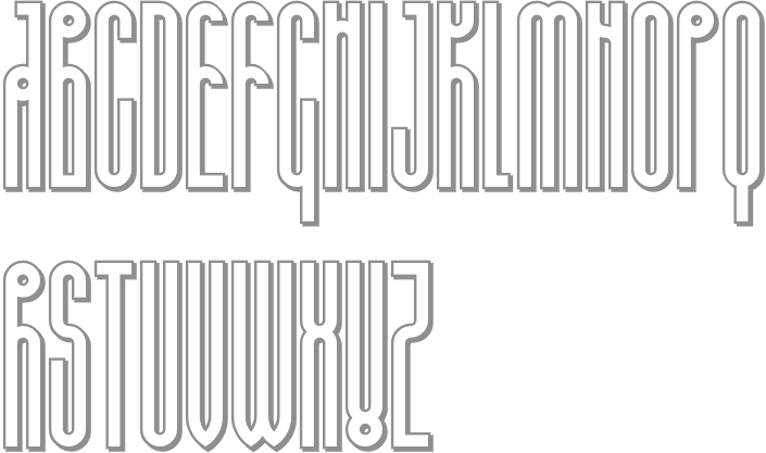
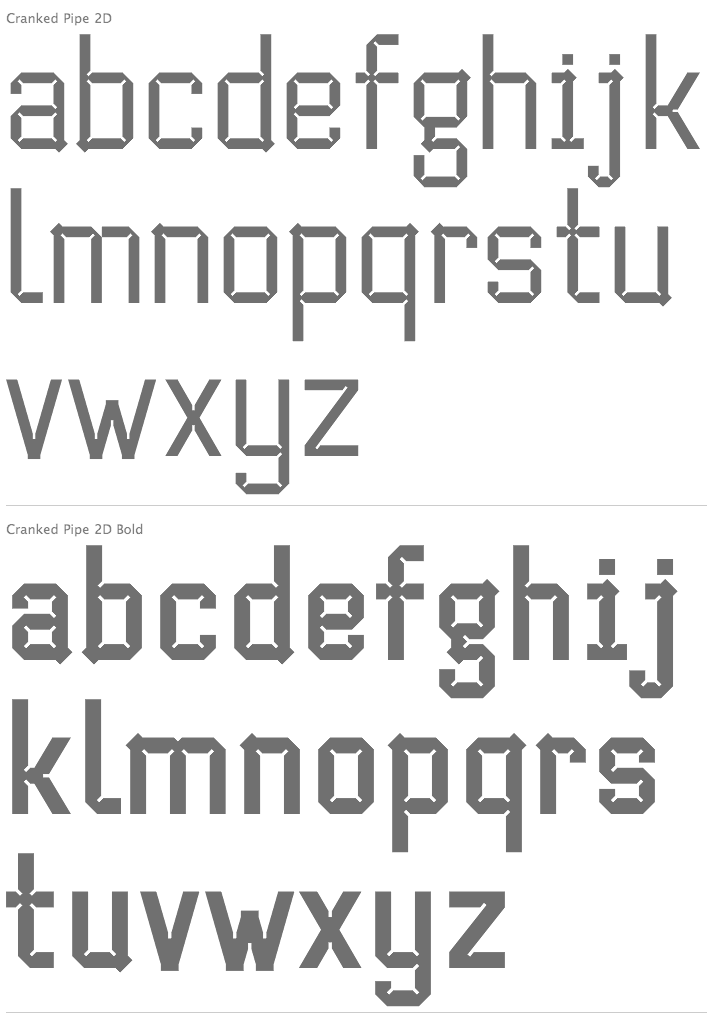
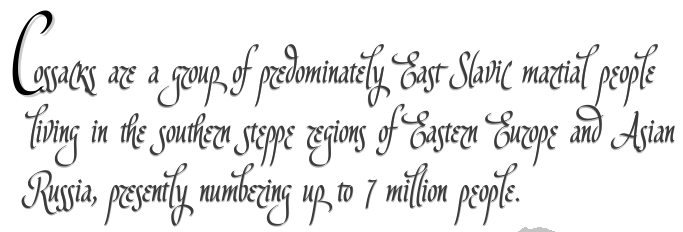
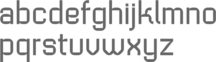
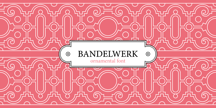
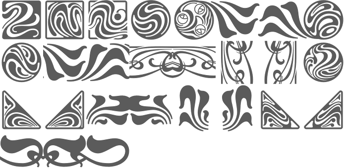
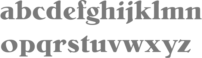
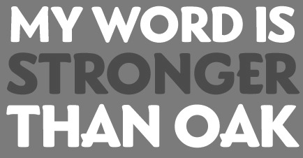
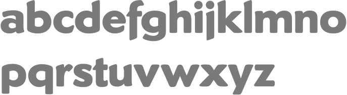
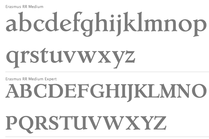
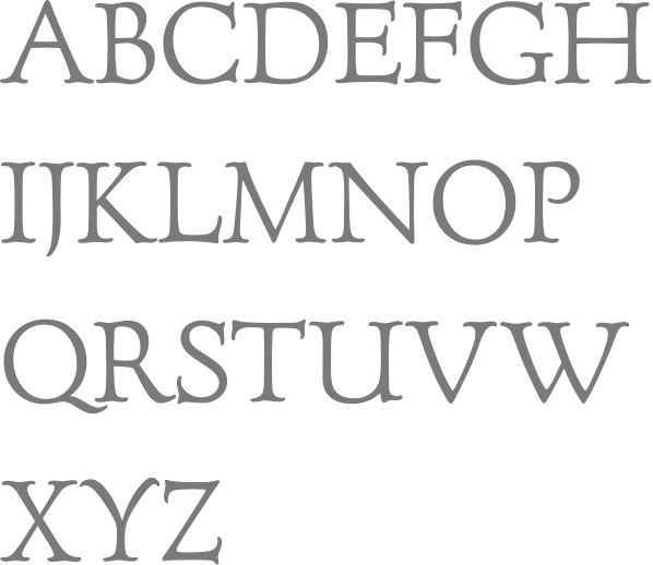
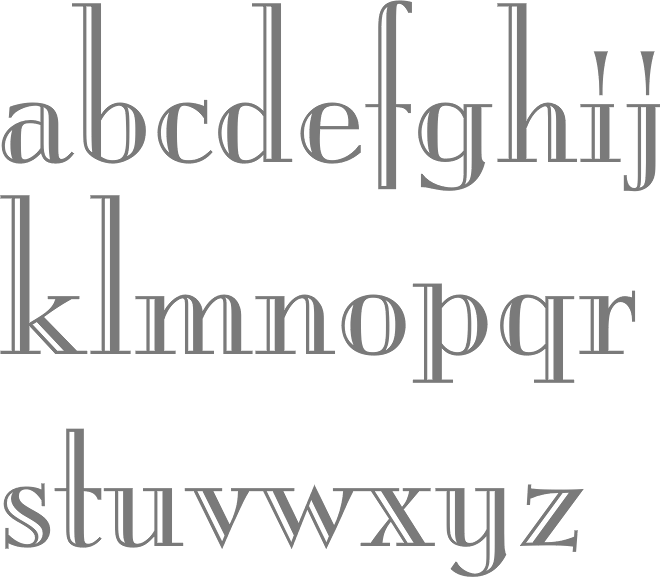
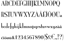
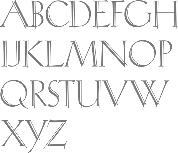
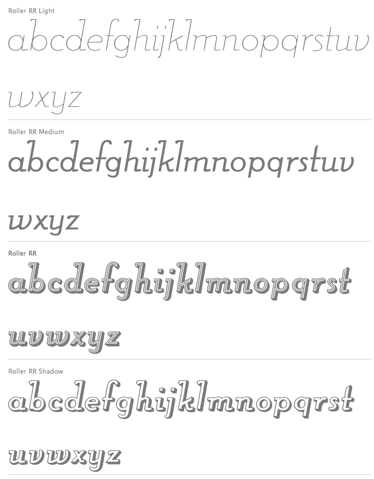
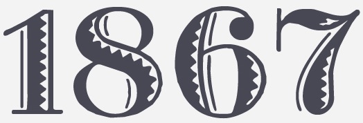
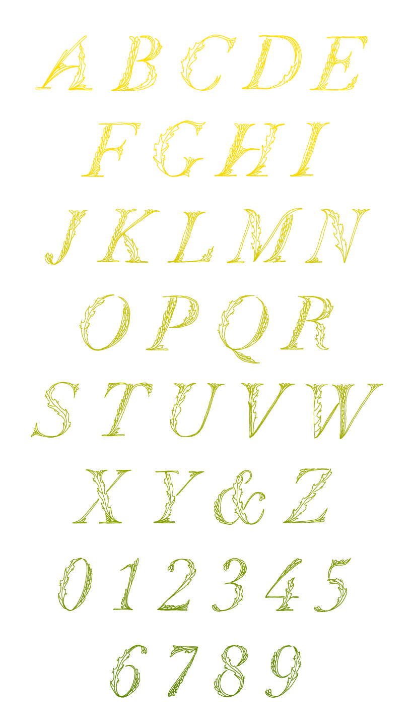
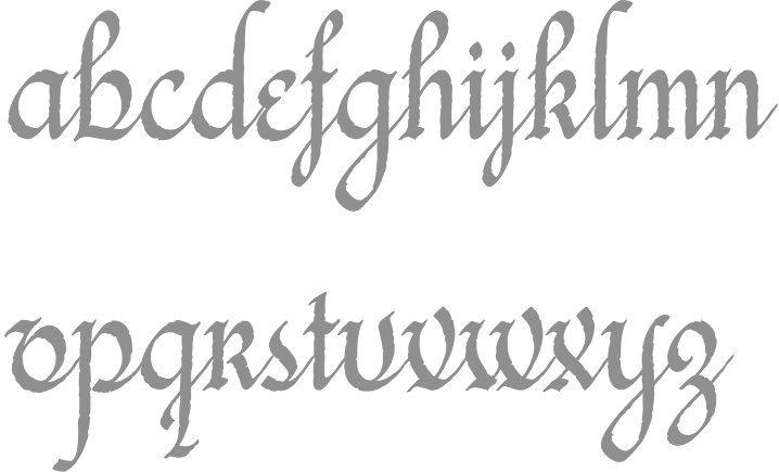
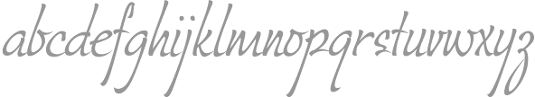
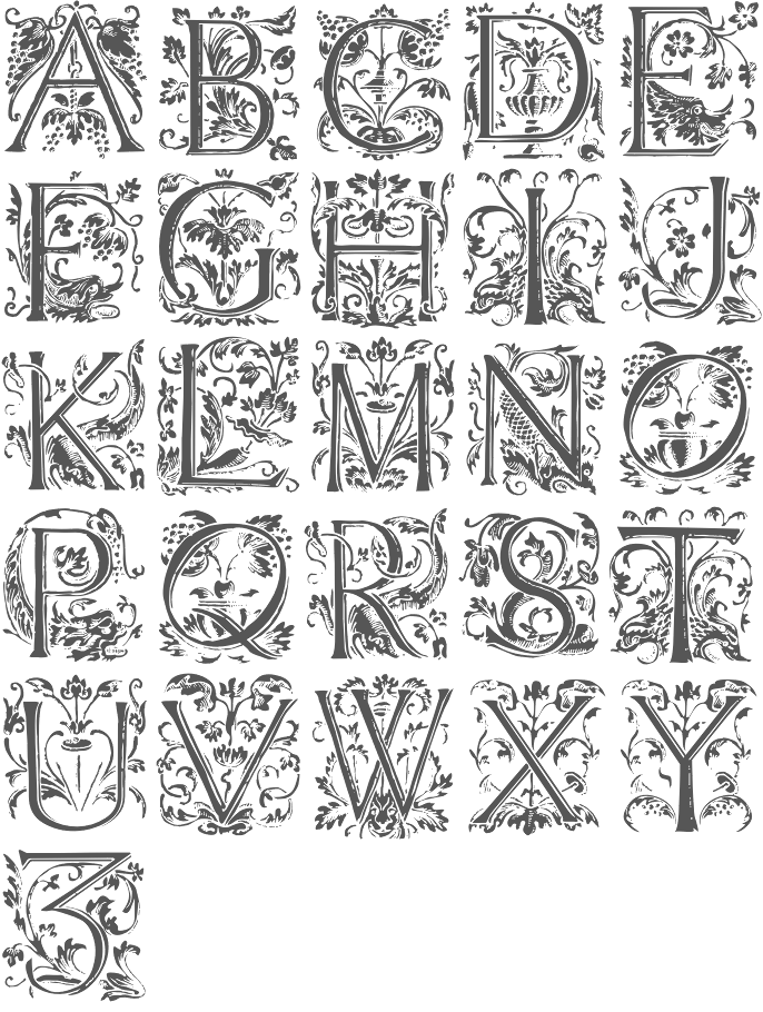
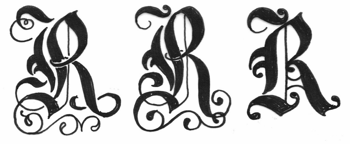
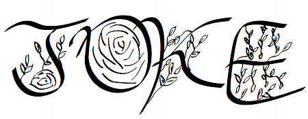
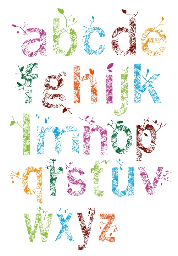
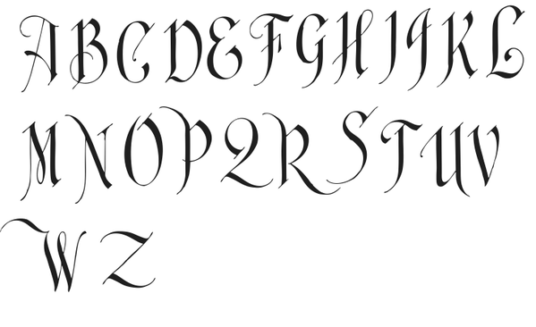
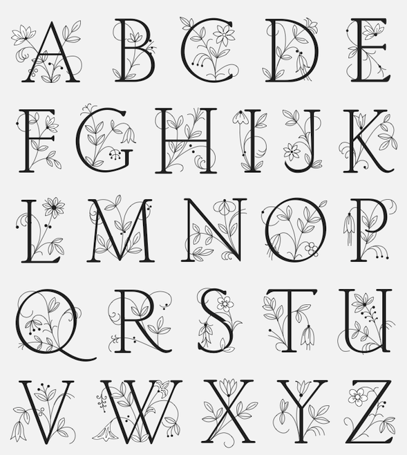
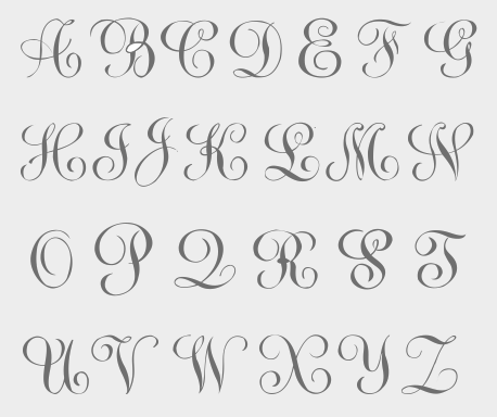
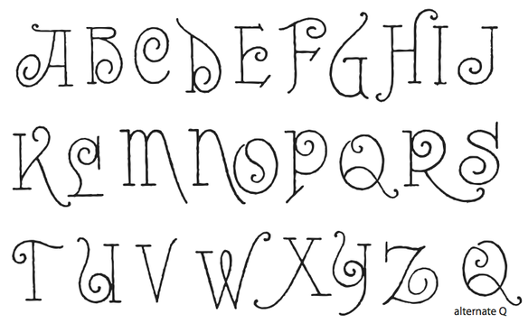
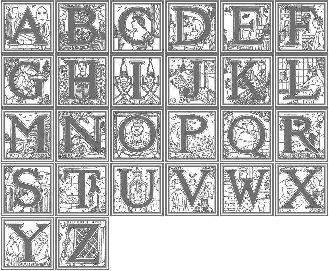
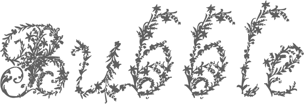
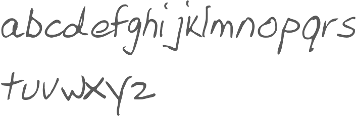
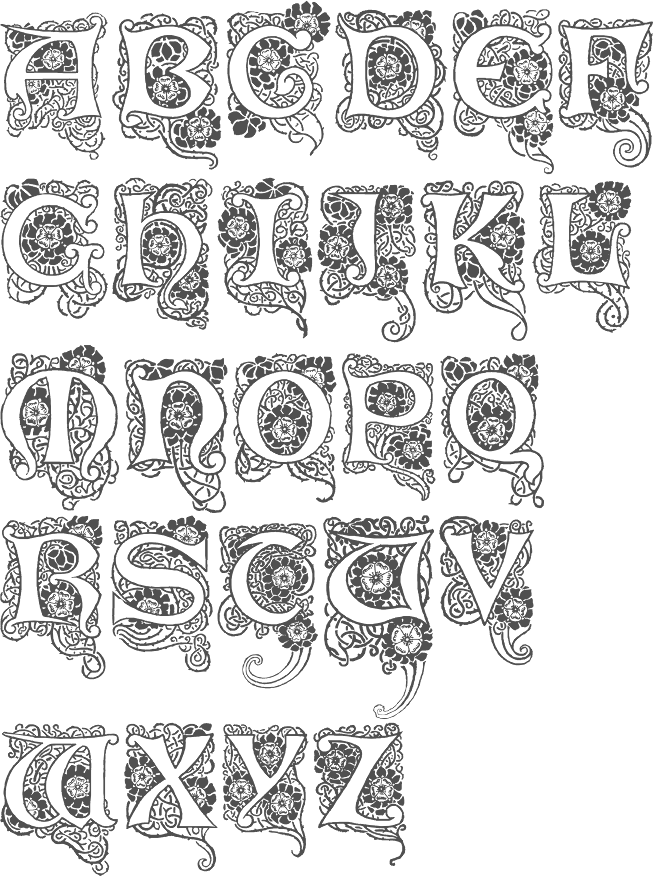
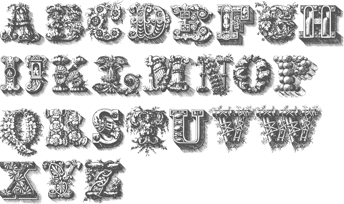
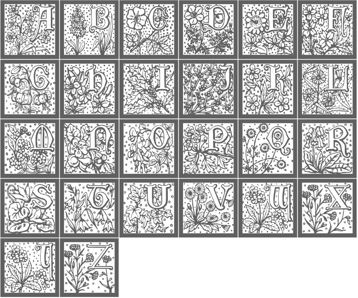
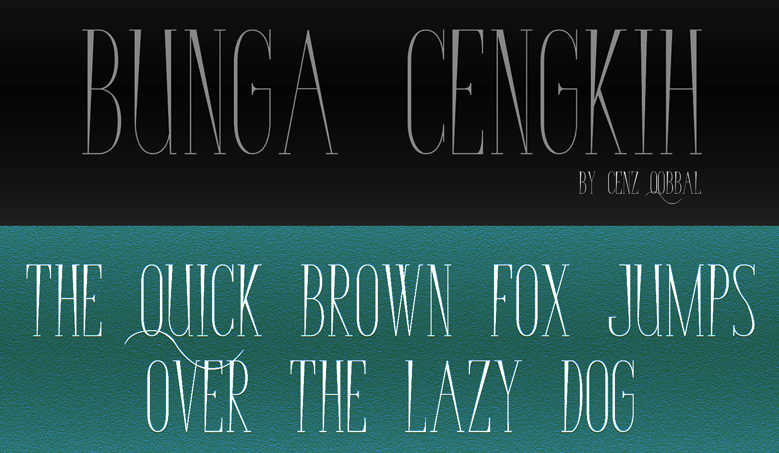
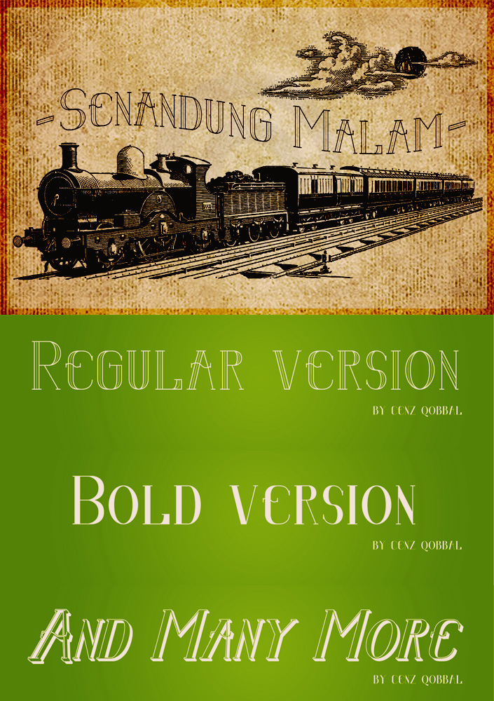
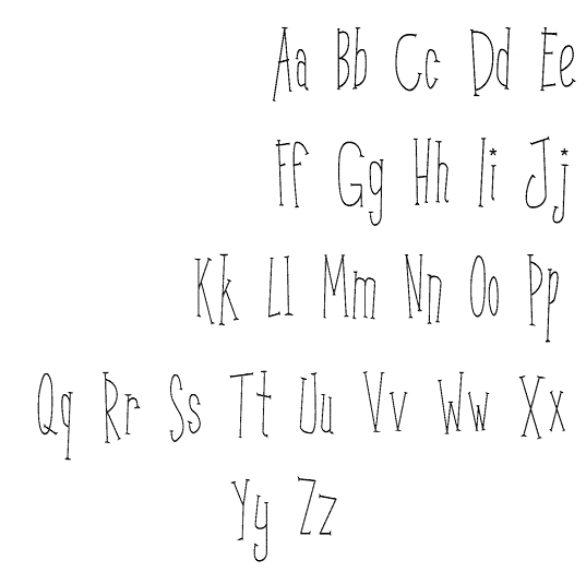
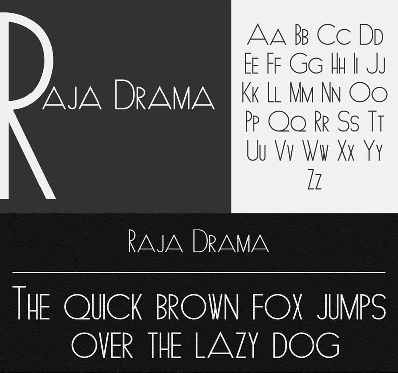
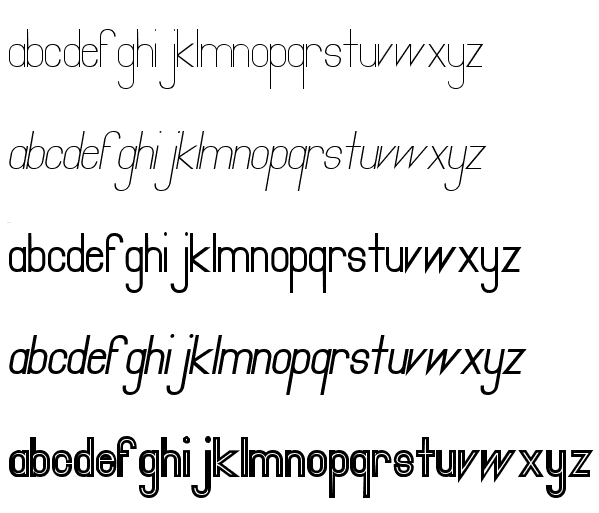
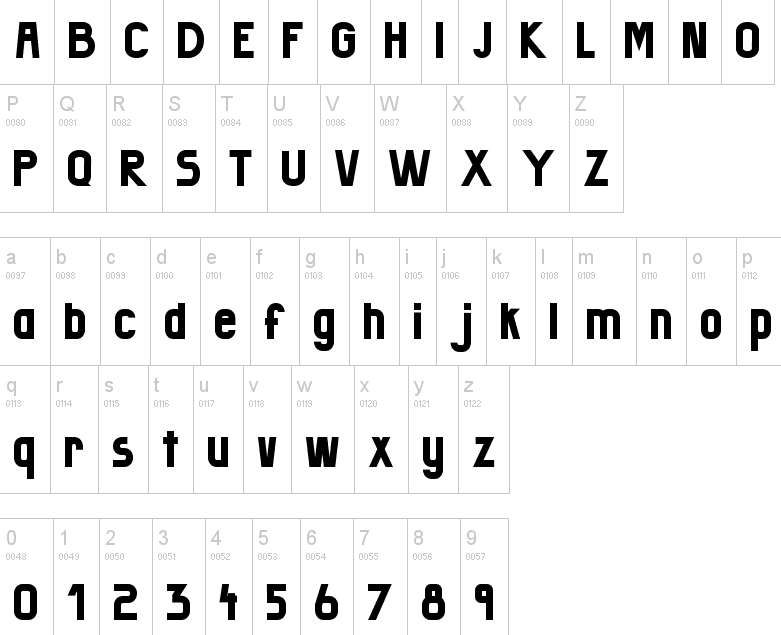
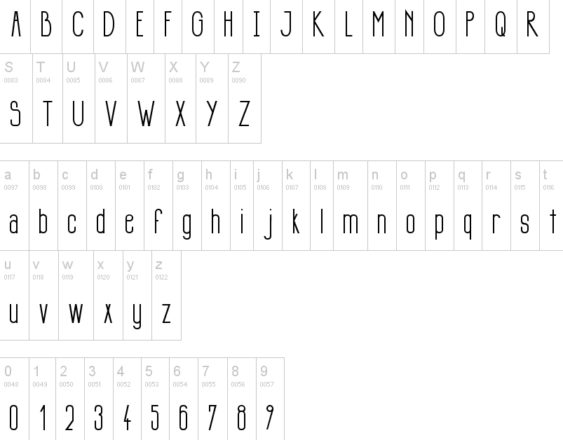
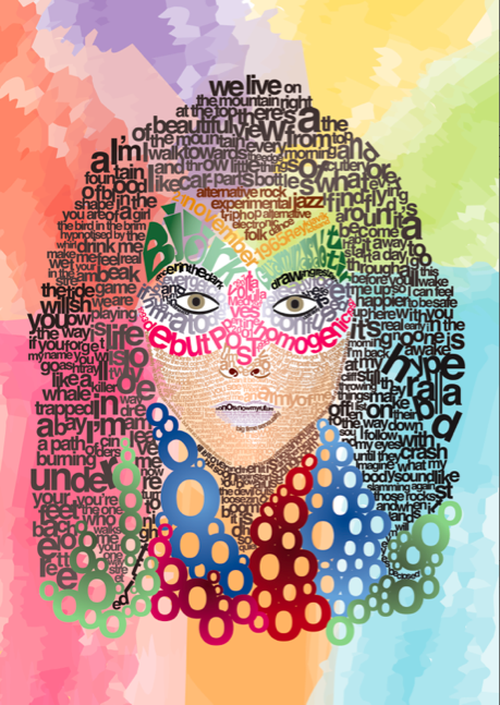
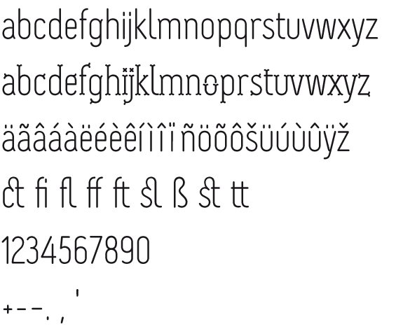
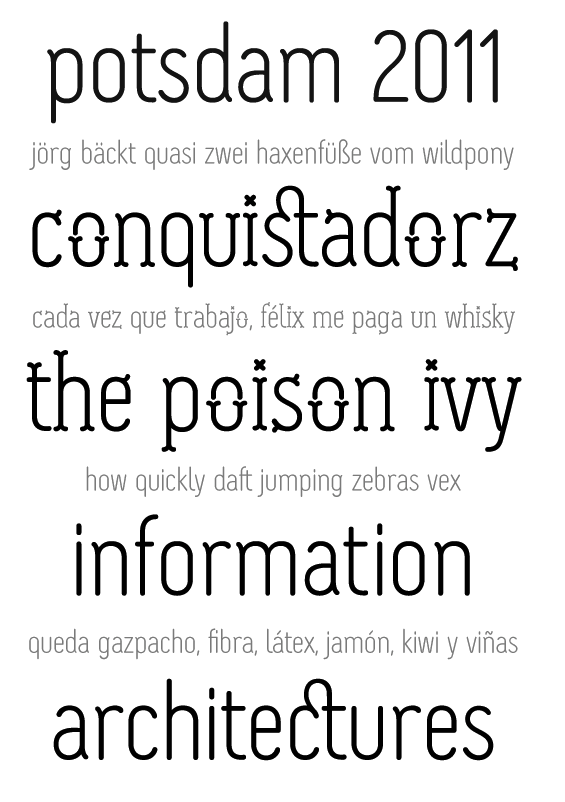
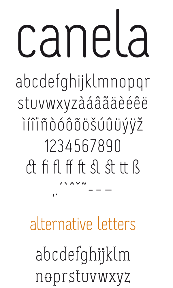
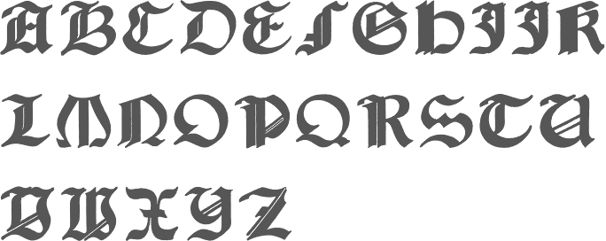
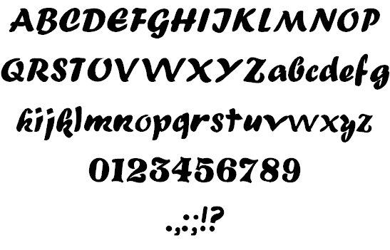
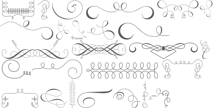
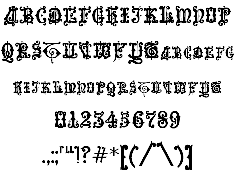
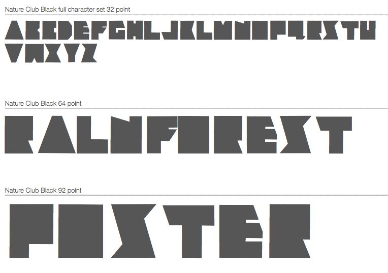
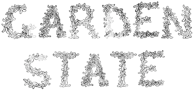
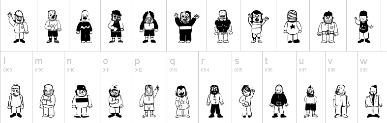
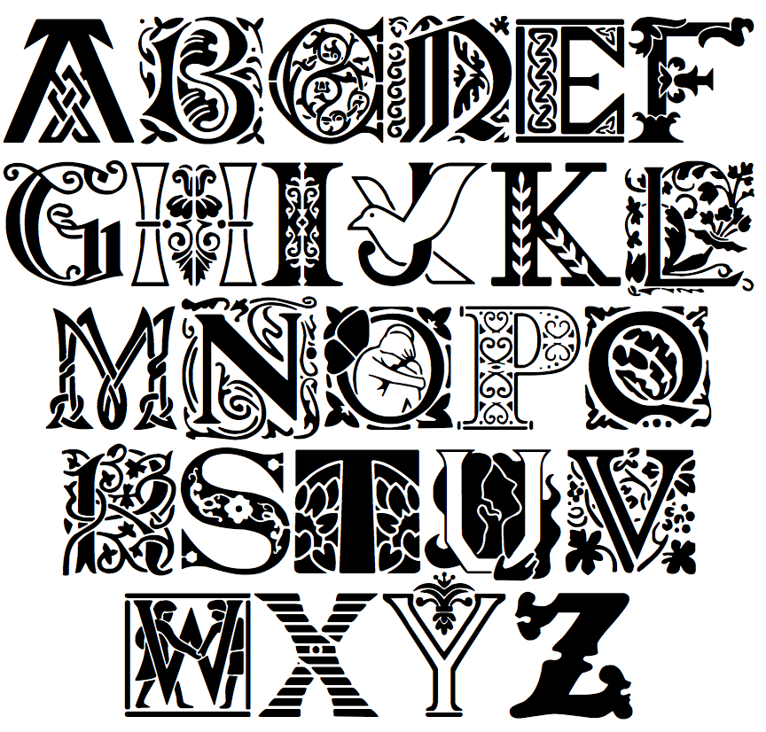
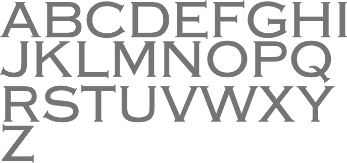
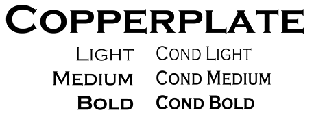
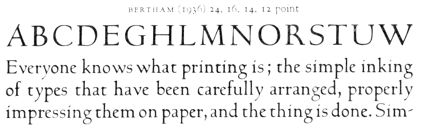
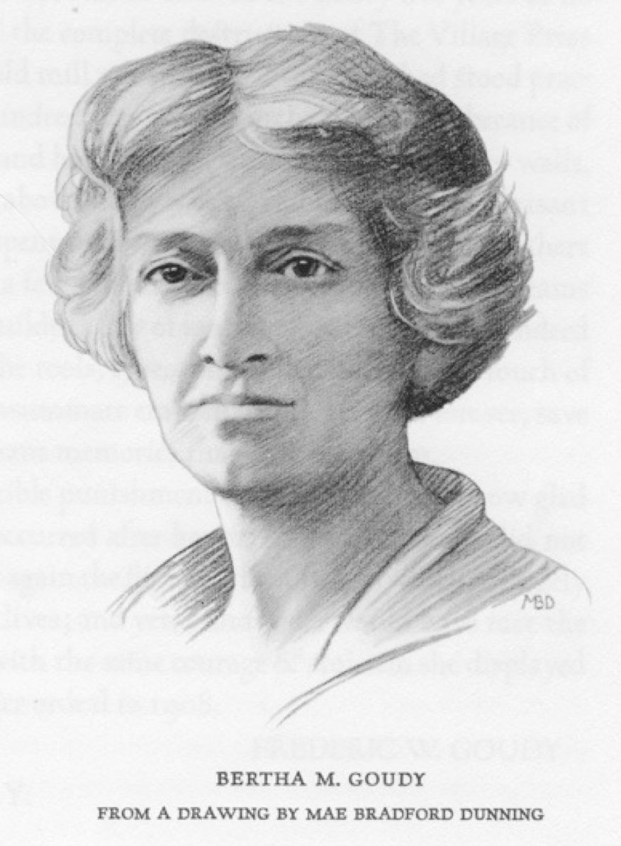
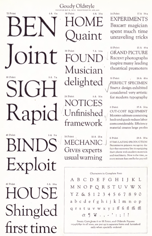
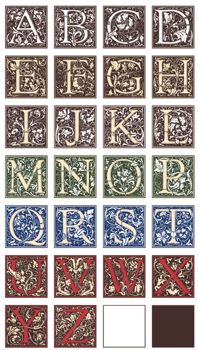
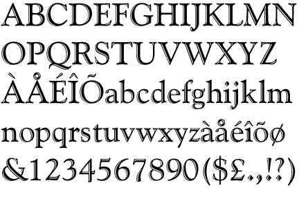
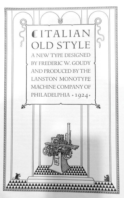
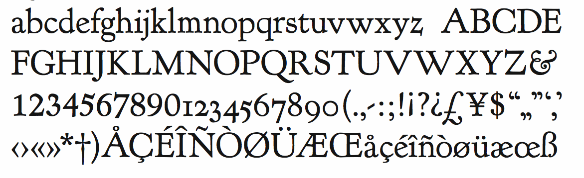
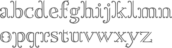
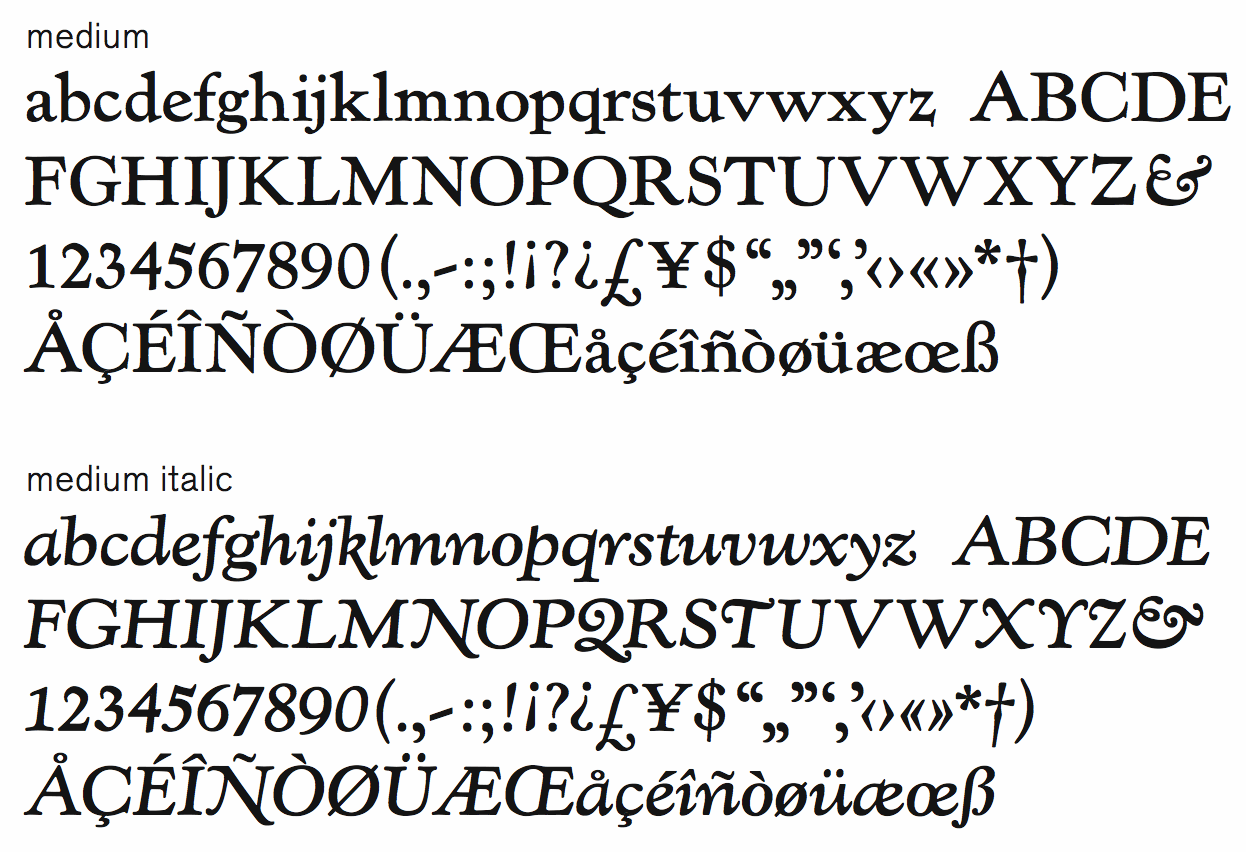
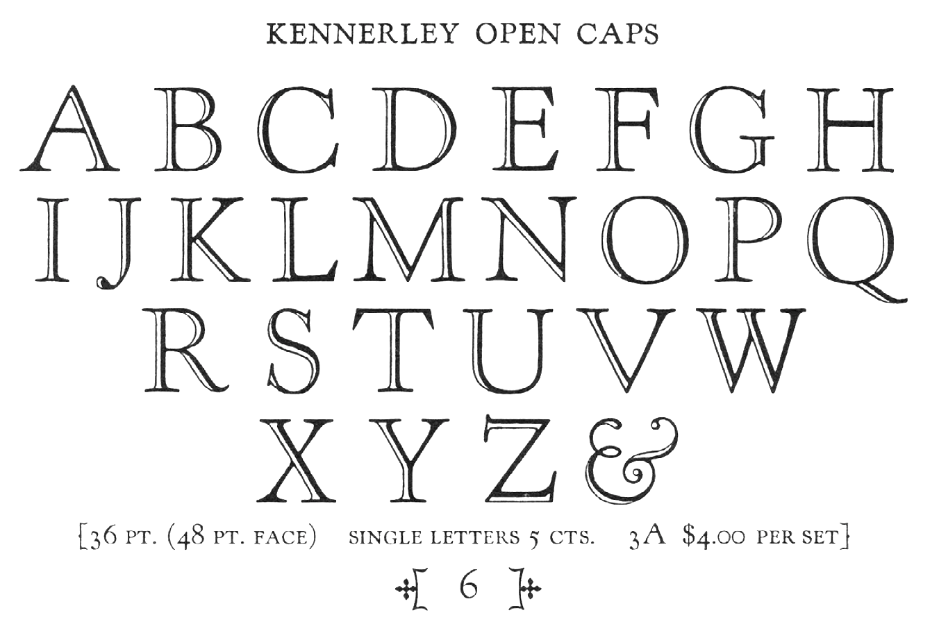
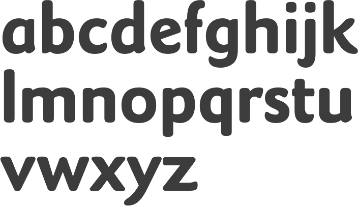
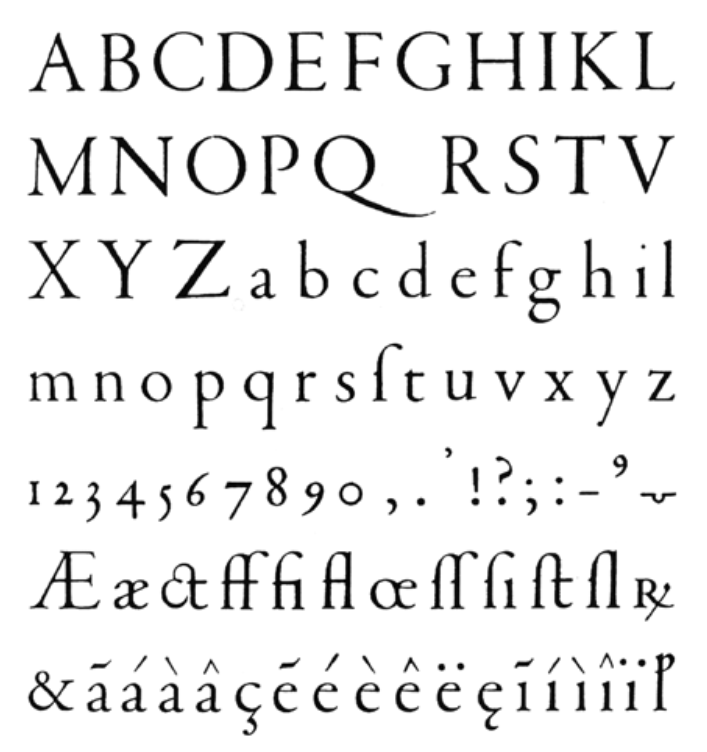
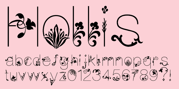
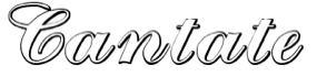
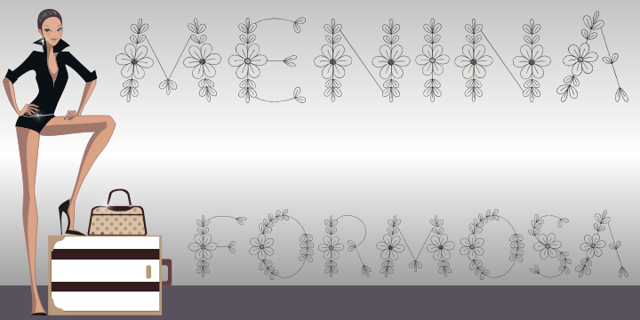
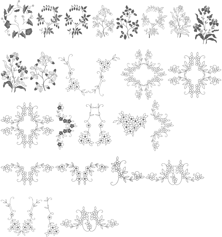
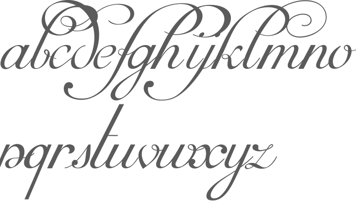
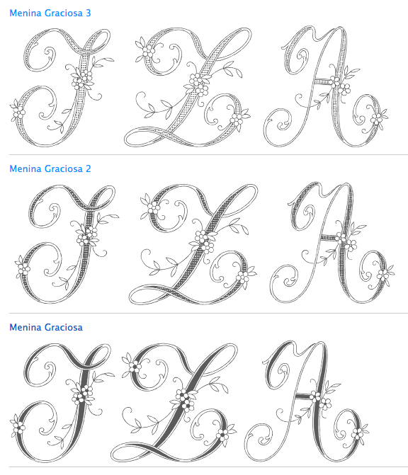
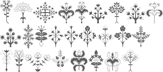
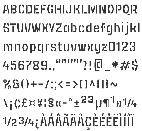
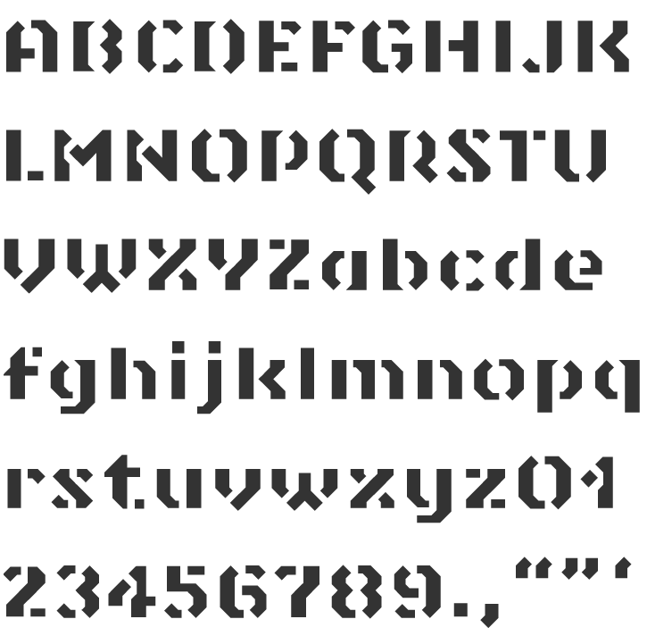
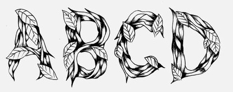
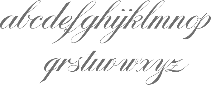
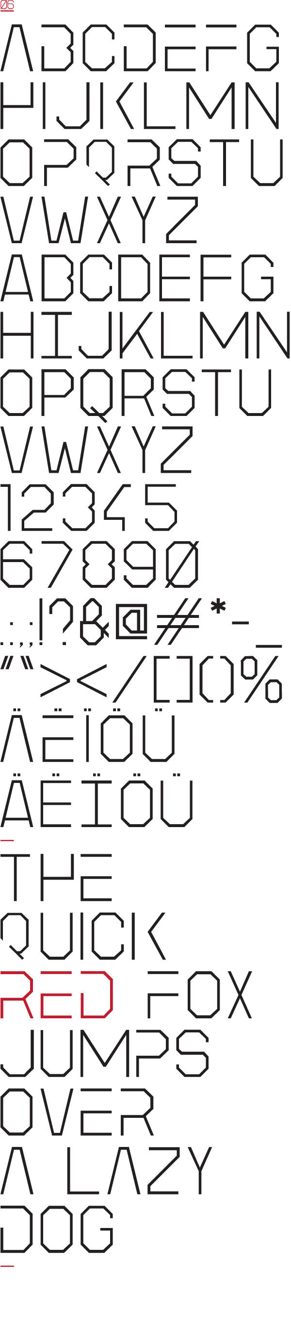
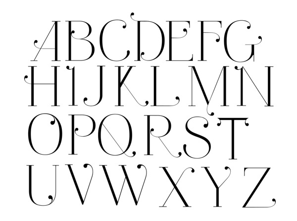
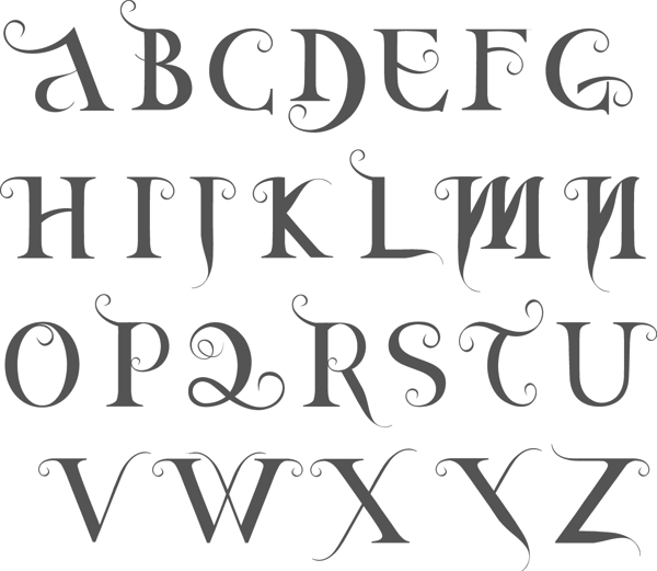
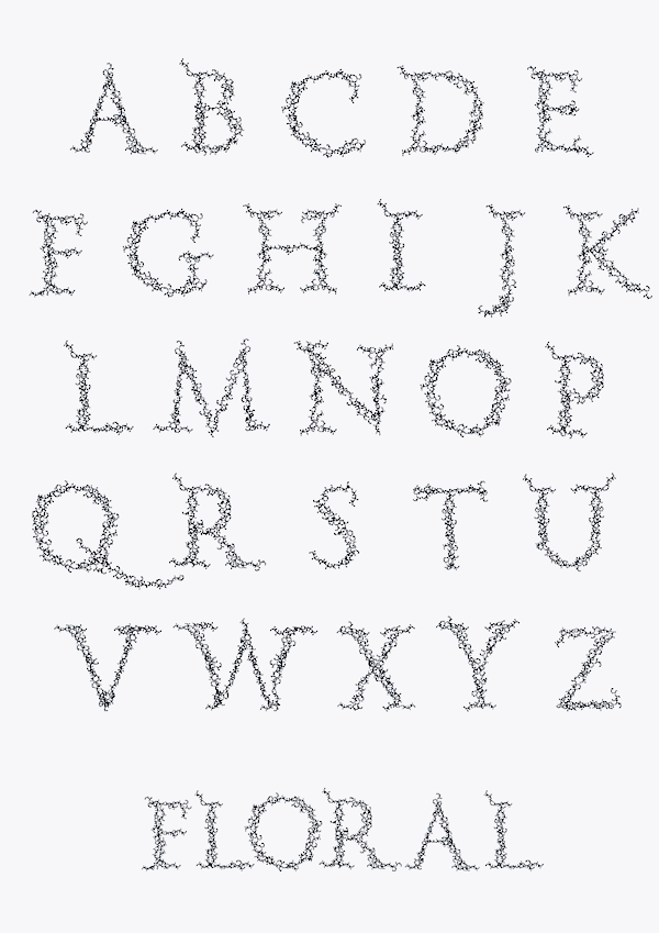
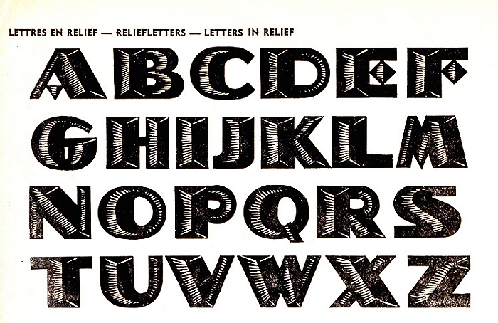
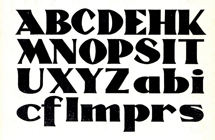
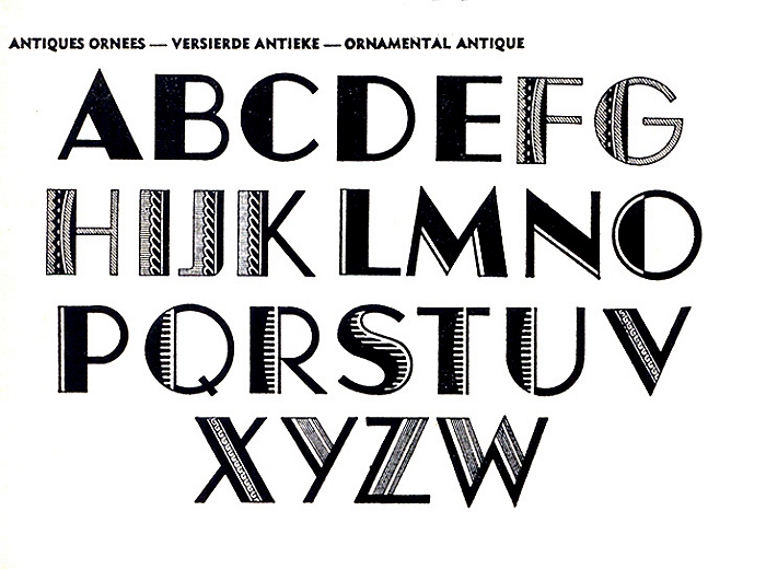
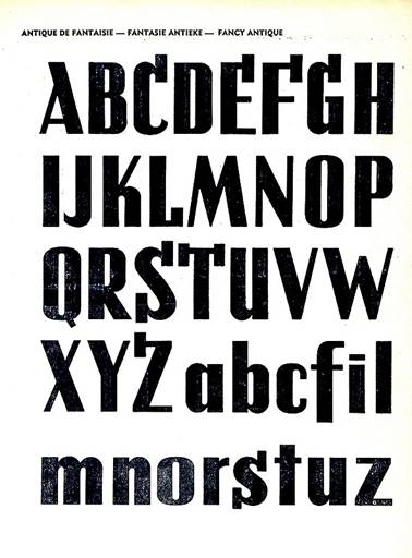
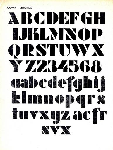
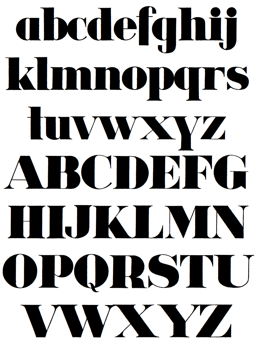
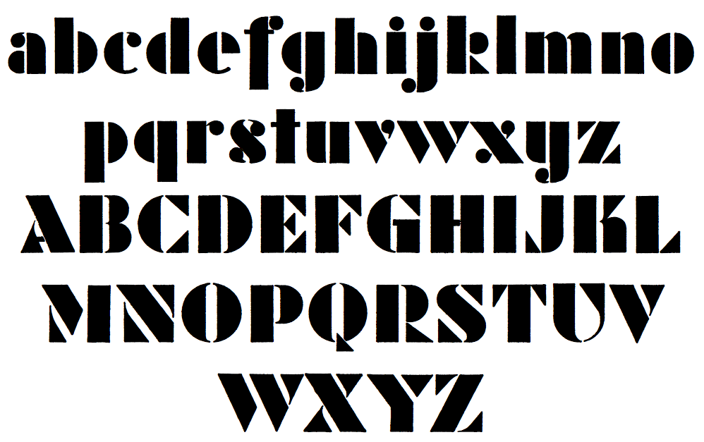
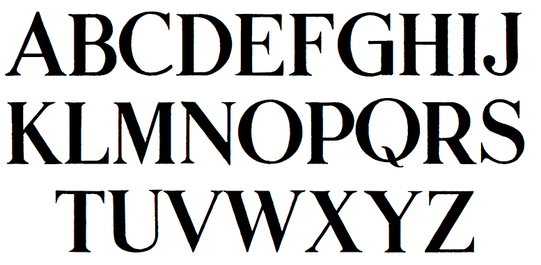
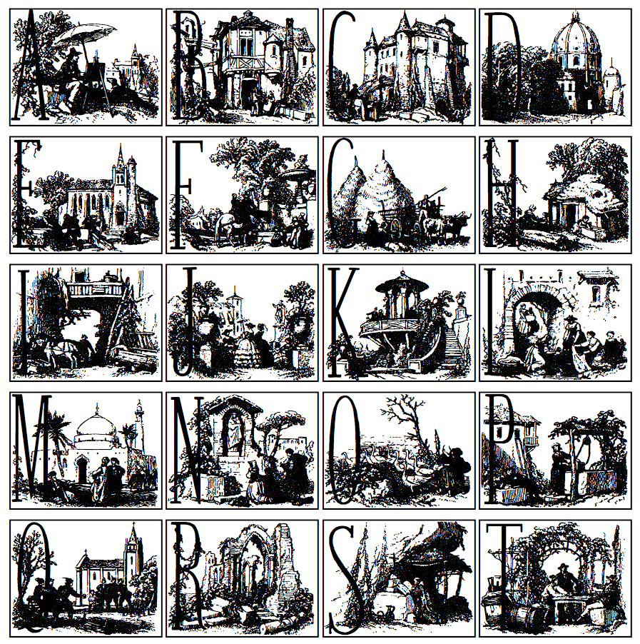
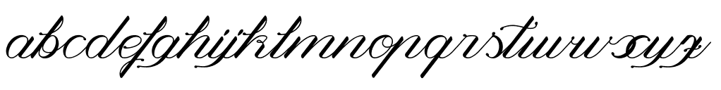
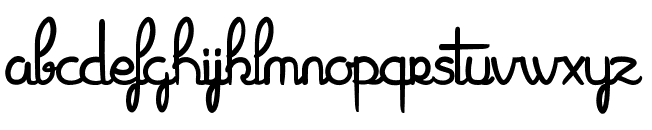
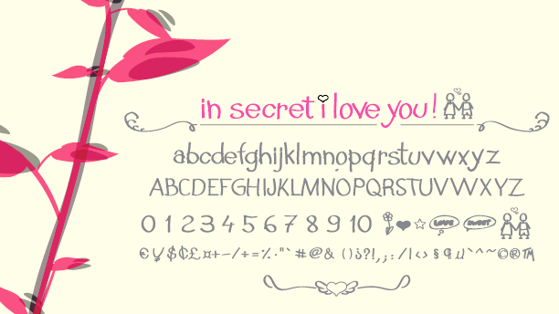
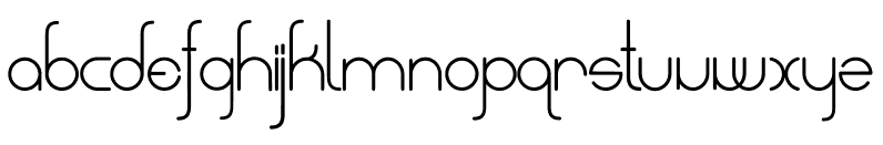
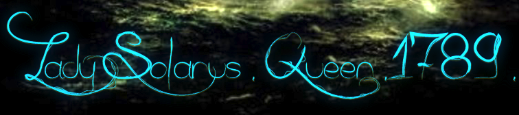
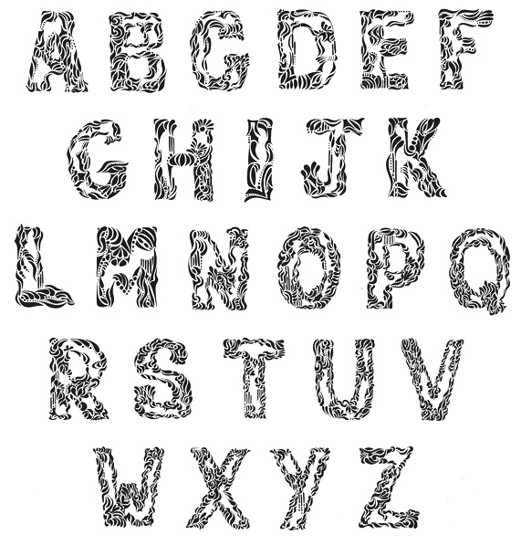
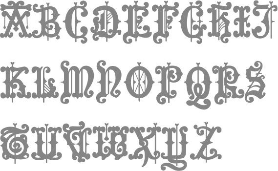
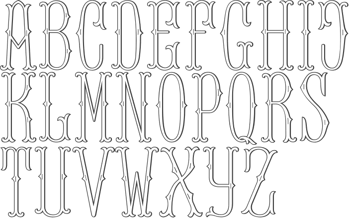
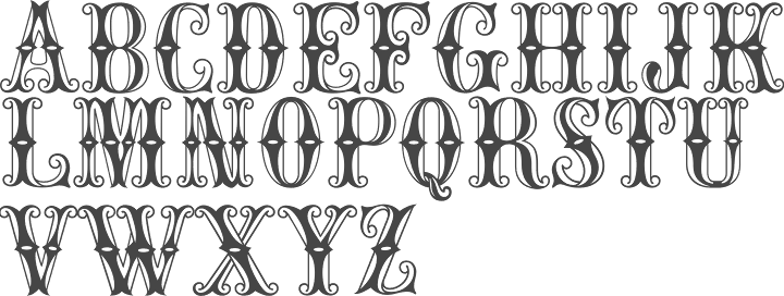
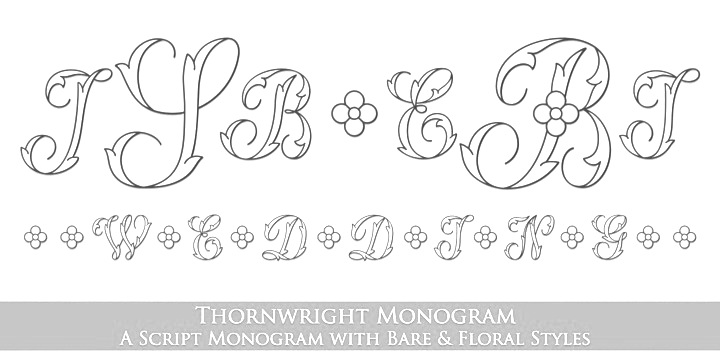
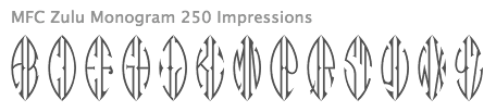
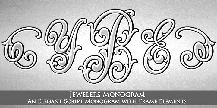
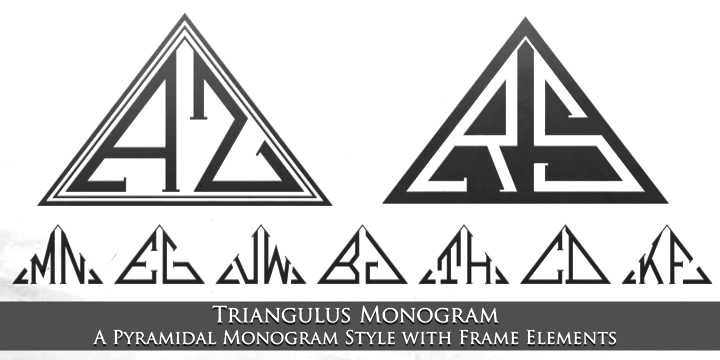
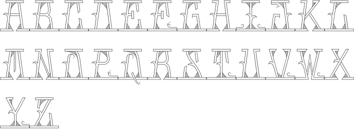
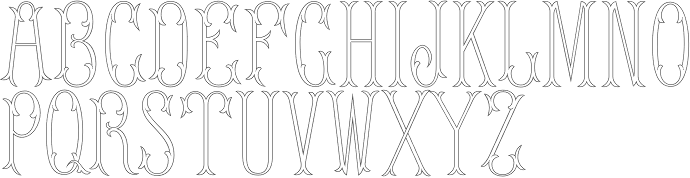
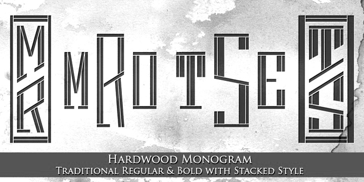
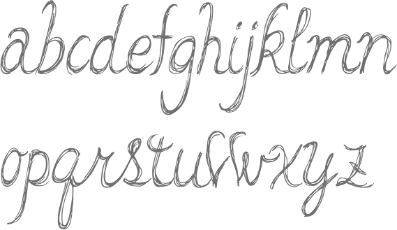
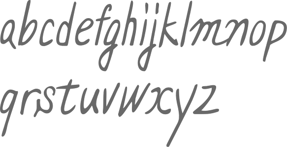
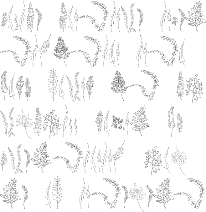
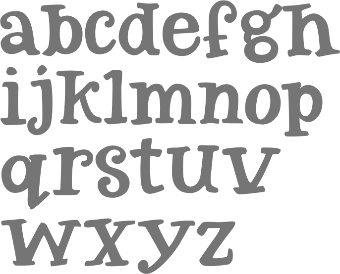
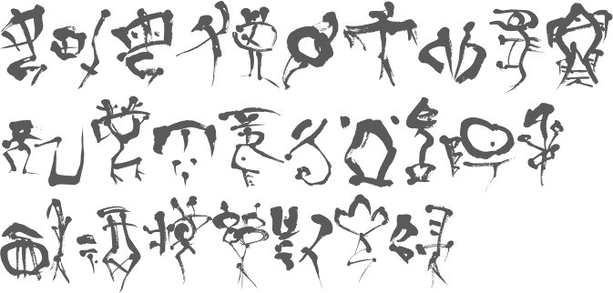
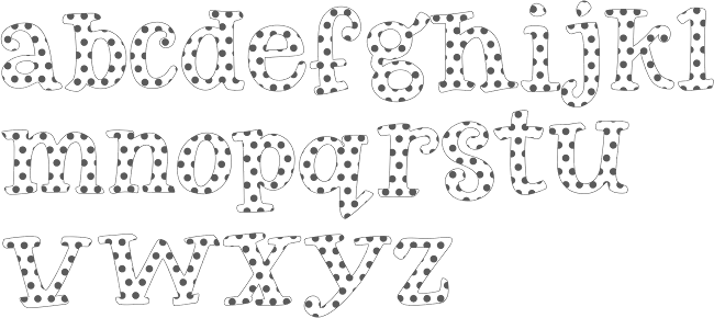
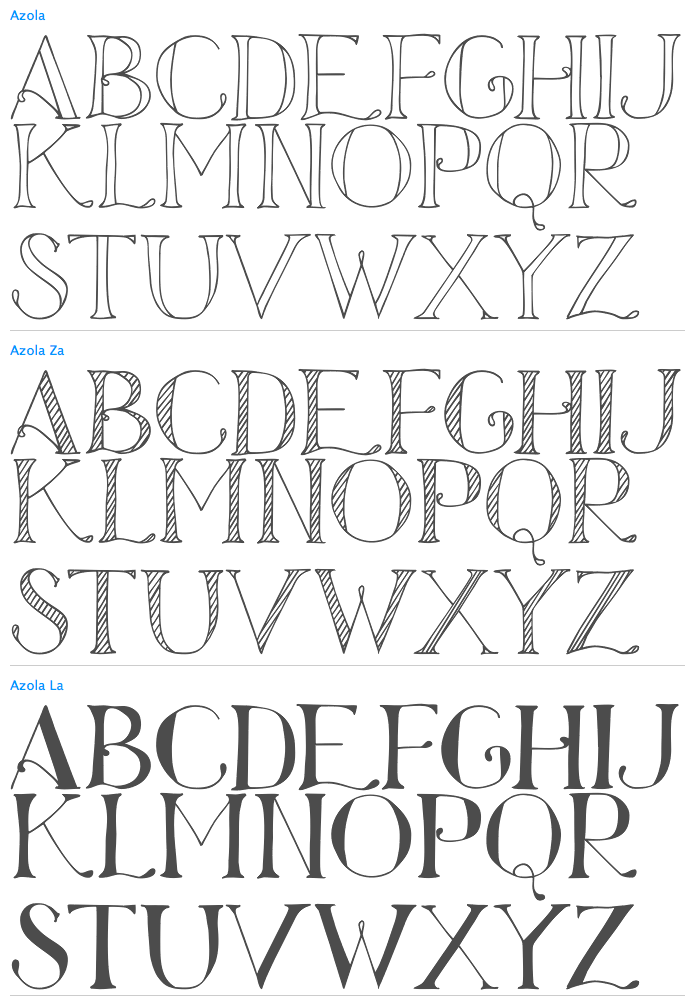
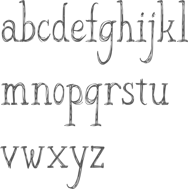
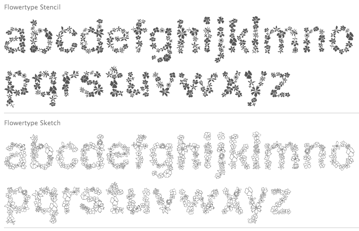
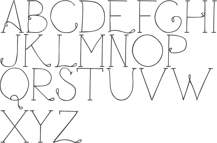
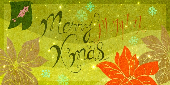
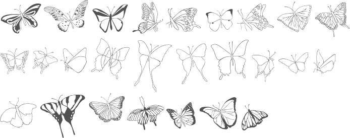
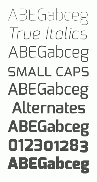
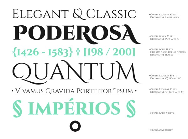
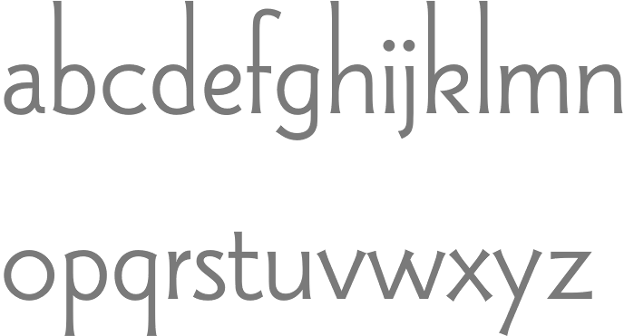
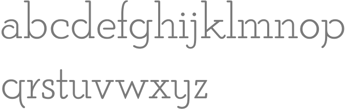
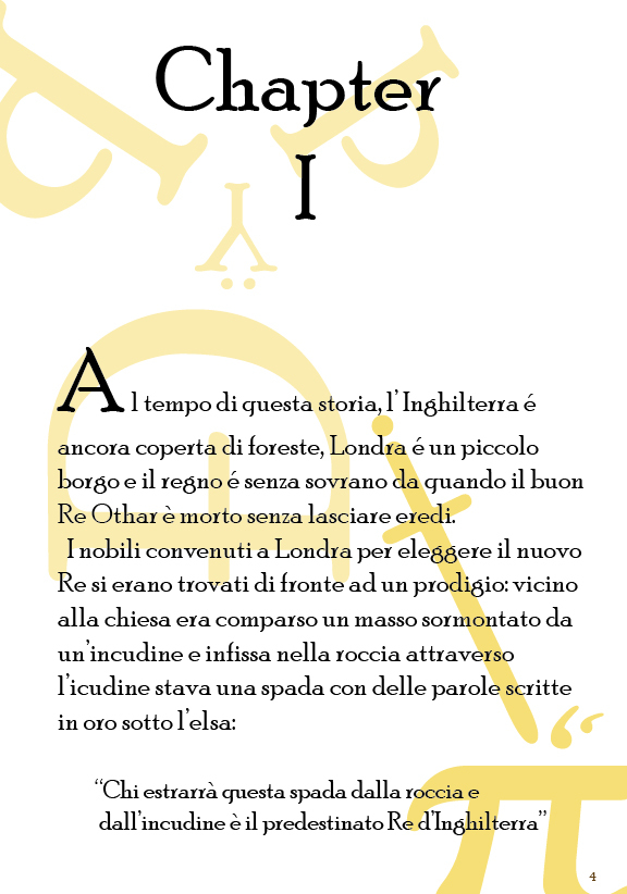
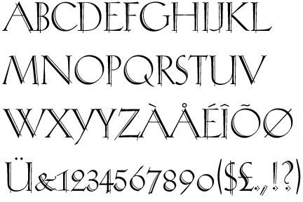
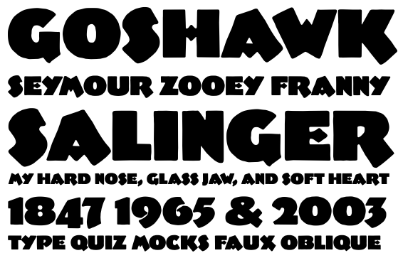
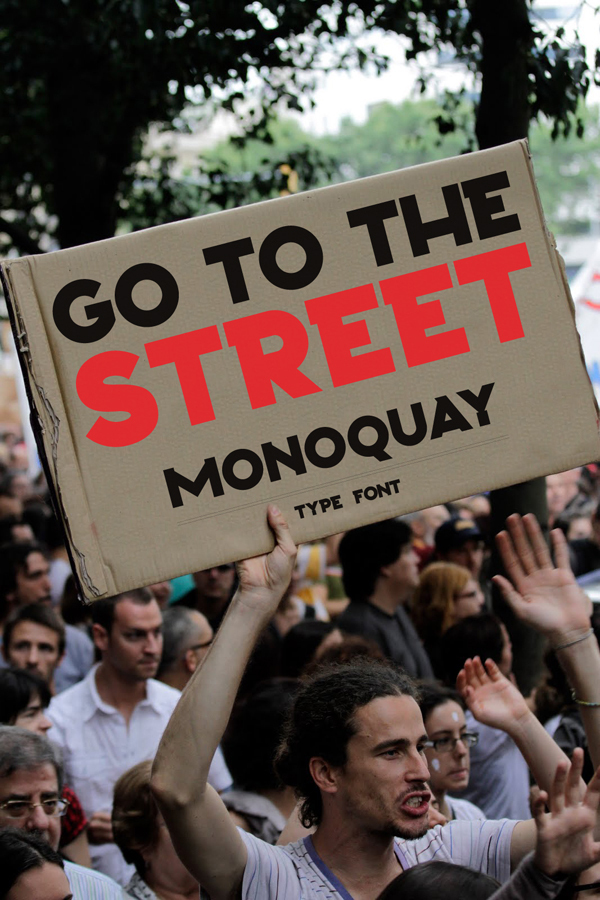
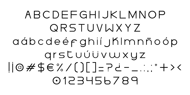
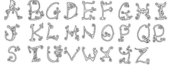
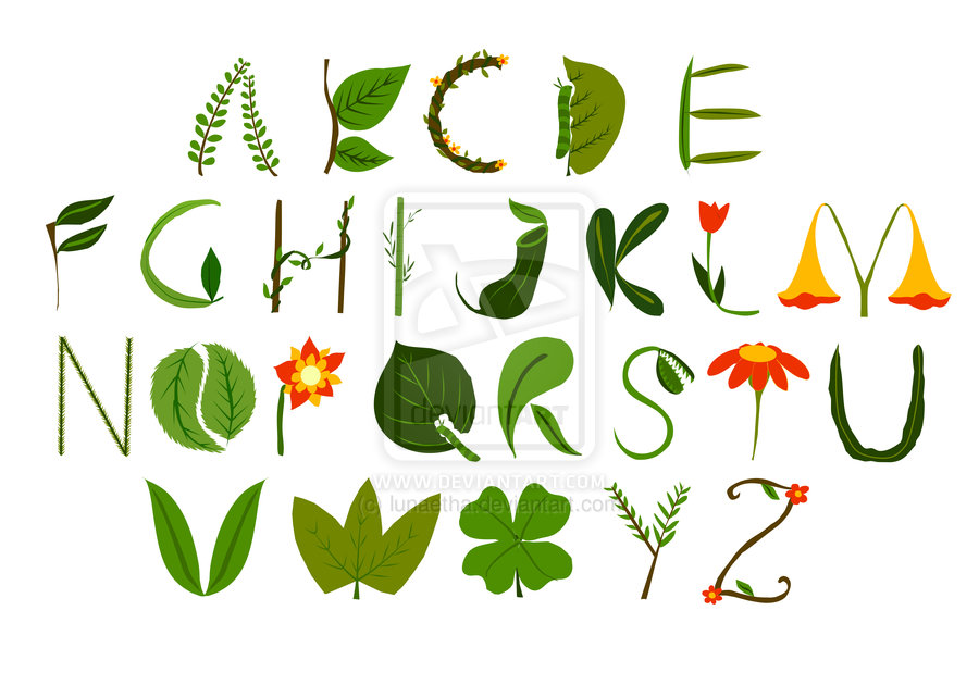
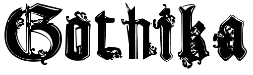
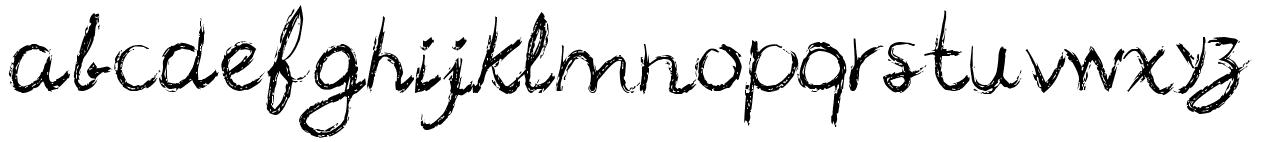
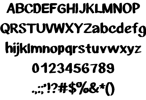
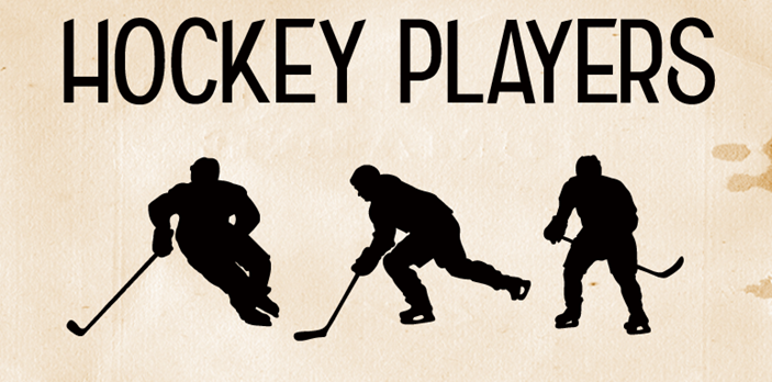
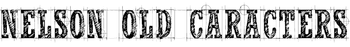
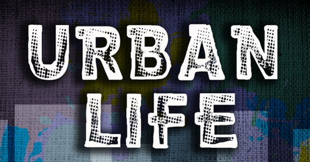
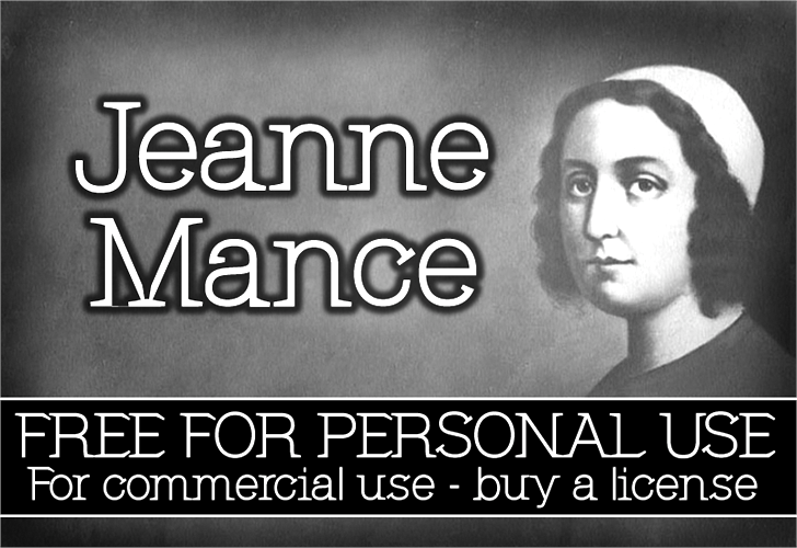
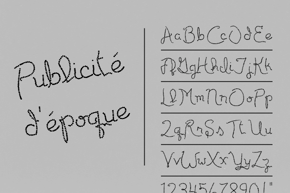
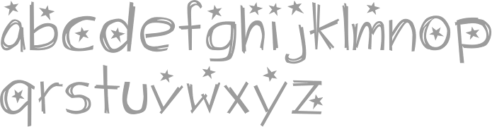
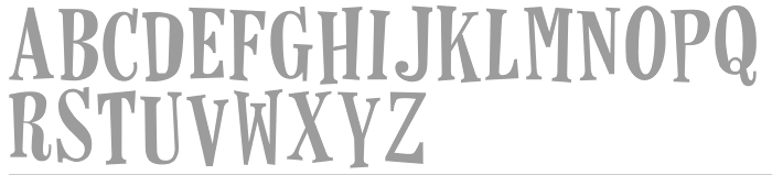
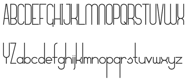
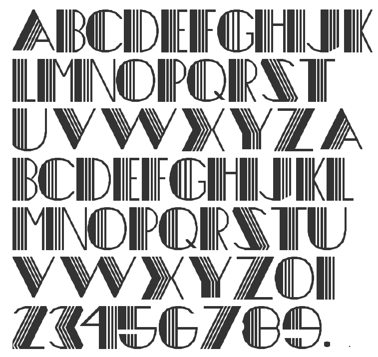
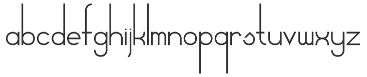
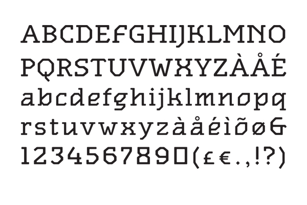
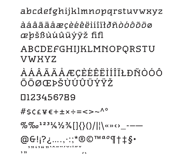
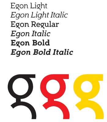
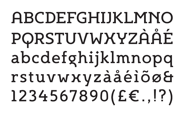
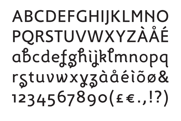
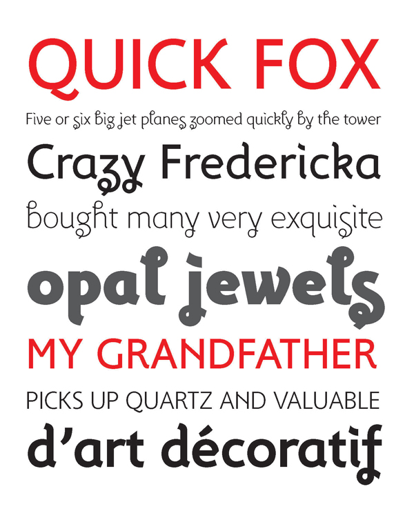
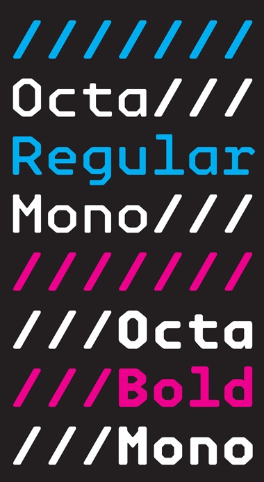
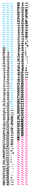
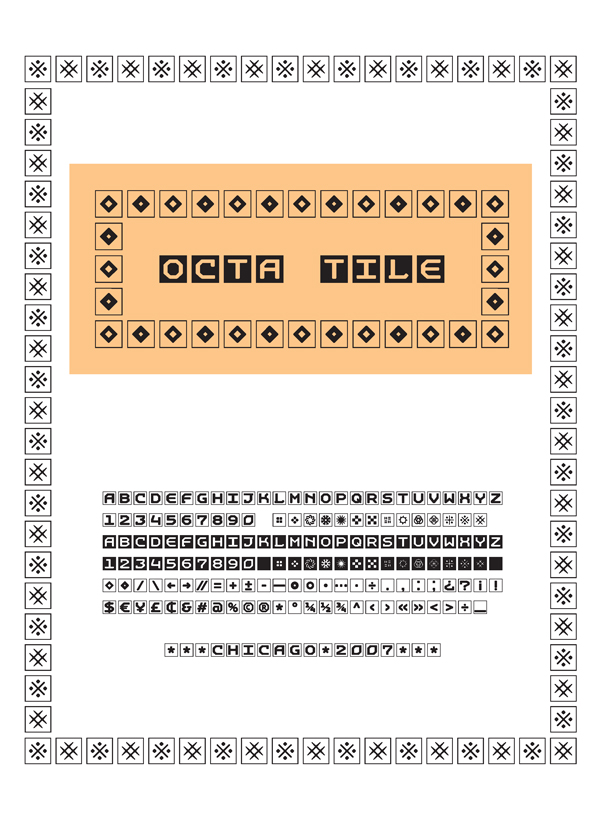
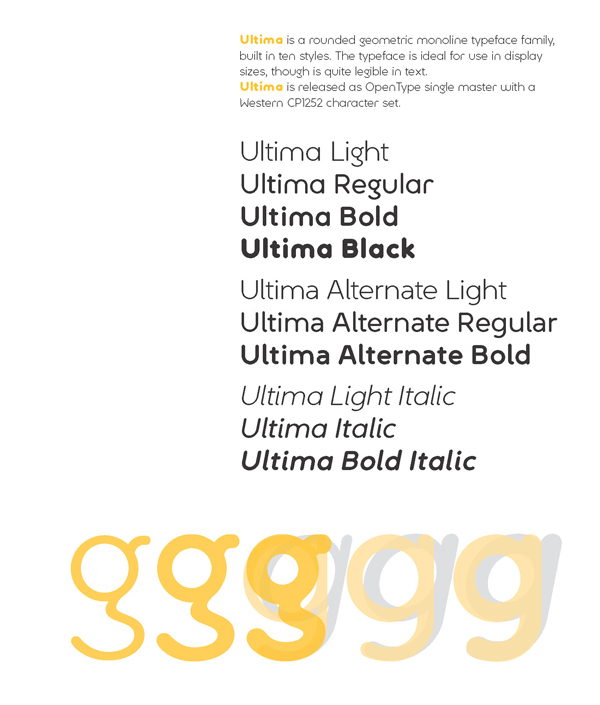
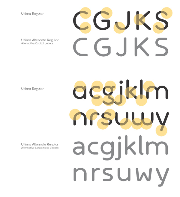
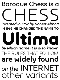
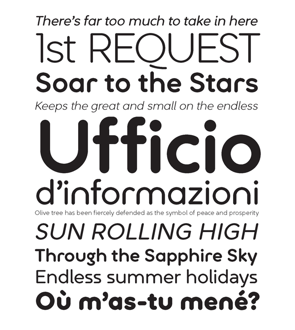
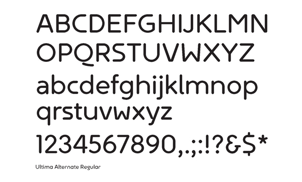
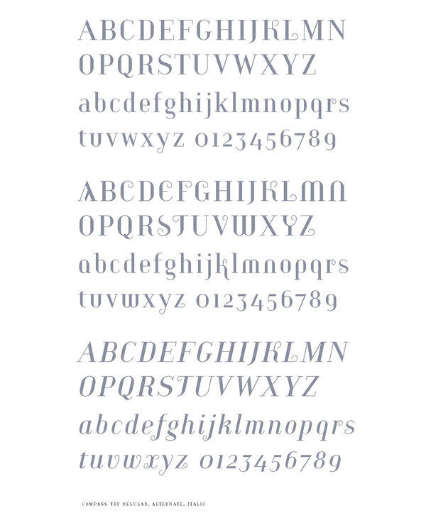
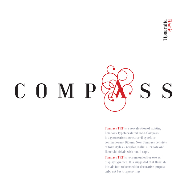
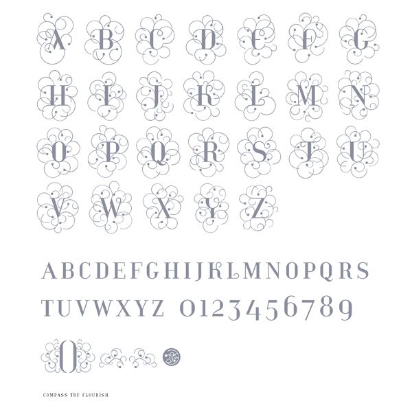
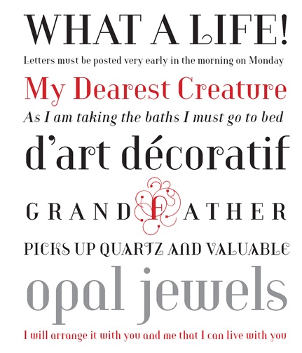
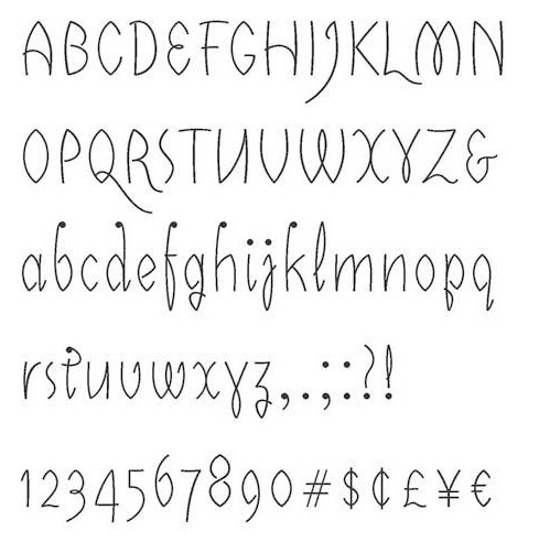
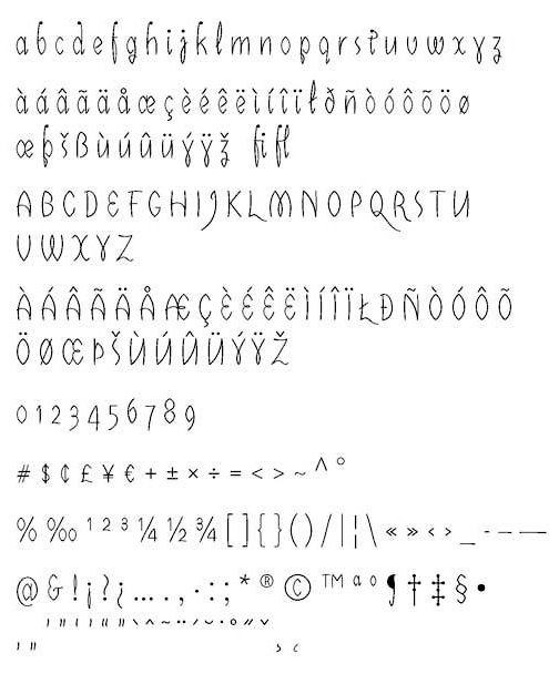
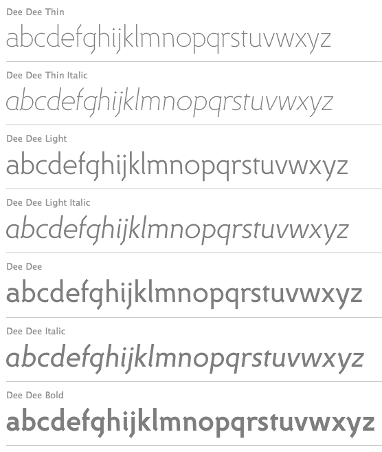
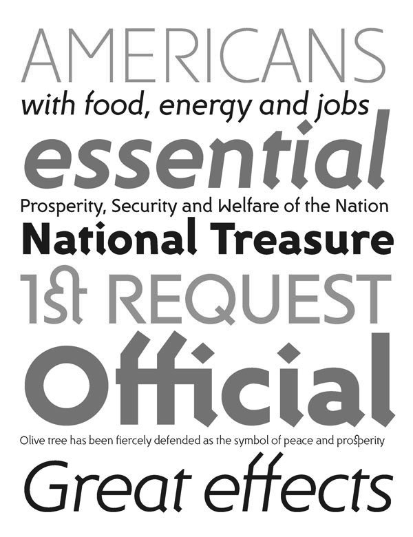
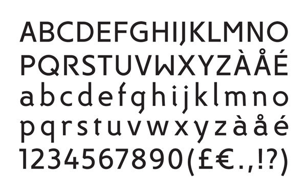
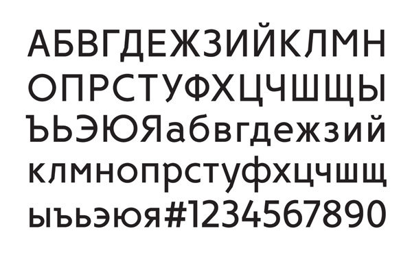
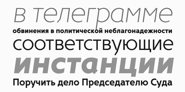
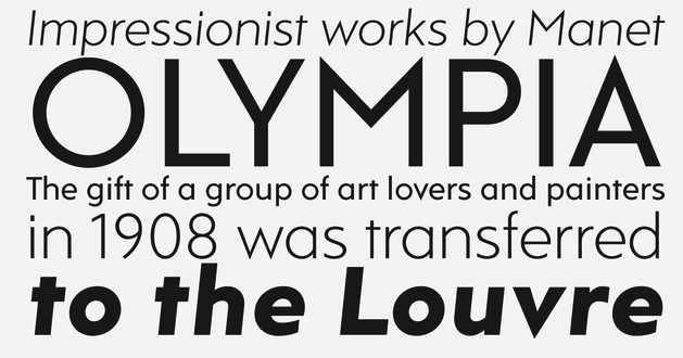
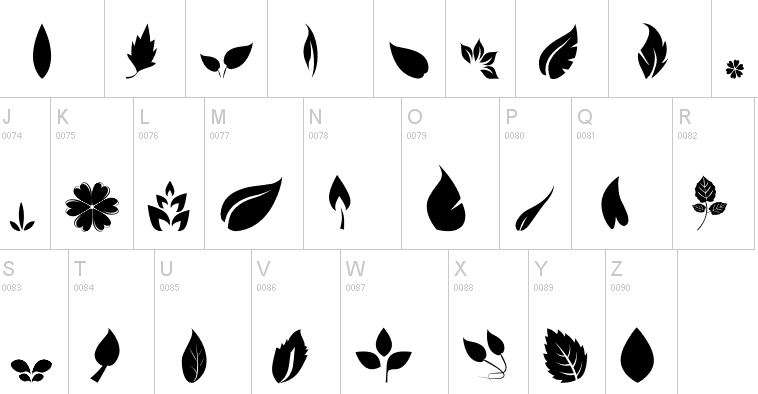