| | |
538Fonts
[Dan P. Lyons]
|
Or Daniel Lyons. American founder of Story Choice 102. Creator of the series The Rodfellows and Tequila and Cider, and the three family movies Greeny Phatom ABC's, The Rodfellows Marathon Movie, and Tequila and Cider 20-Episode Marathon. As a type designer active at FontStruct between 2014 and 2021. His typefaces there include DLEFS Lowblock (a squarish family), DLEFS Boulder, DLEFS Boxing (stencil), DLEFS Three Dee, DLEFS Initials (+Solid), DLEFS Mobile Gap (mosaic), DLEFS Shine, Corefont (Solid, Outlined) and Font (a kitchen tile font). At Fontspace, he showed 280 free fonts at the end of 2021, most of whgich were made around 2016: 4Music, 5-Text-Uppercase, 538EurofanEurovision, 538LyonsFont, 538LyonsLogoText, 538LyonsRounded, 6061, AFLD, AcerSupplement, AdigianaExtreme, AdigianaToybox, AdigianaUltra, AfricanCulture, Akalai, Anodyne, Armegoe, ArtificialBox, AutoToyfont, AverageCustomLevel2, AverageCustom, Azbuka-Lowers-538Lyons, Azbuka, BRFCaps, BSBTextClassic, BTTelecom, Backflash, Backstreet, BeachResort, BigOrangeCyrillic, Bloq, Blurry, Bubblewump, Burger-Queen, Busch-Three, CCColon, Cheese, Chevelure, Chicken-Butt, ChildsSans, Chompy, Circle-Outline, Cloud-World, Comial4448, ComialUnicode, Comial, ComicStrip, Condension-Pro, ConstructiveBuddy, Coolwonder, CountandSpell, Crayawn, CustomHandwriting#1, DLEDigital, DLE-Futuristic, DLEGeometWeb, DLEGeomet, Dan'sDisneyUI, DansDisney, Daniel'sHandwriting-BoldItalic, Daniel'sHandwriting-Bold, Daniel'sHandwriting-Italic, Daniel'sHandwriting, DanielDeluxe, DeejayDisco, DennorLight, Dennor, Dinamight, DobotoBlackItalic, DobotoBlack, DobotoBoldItalic, DobotoBold, DobotoItalic, DobotoLightItalic, DobotoLight, DobotoThinItalic, DobotoThin, Doboto, DokiLowercase, Doki, DooperWhooper, DressedlessProRegular, DressedlessRegular, Dressedless-Three, DuoCircle, E4ASCII, E4Craze, E4-Digital-(Lowercases), E4-Digital-Arcade-V2, E4DigitalCondensed, E4DigitalExtended, e4digitalv2, e4digitalv2, E4DigitalV2Hollow-Italic, e4digitalv2hollow, E4DigitalV2-Italic, E4-Digital-V2-Light-Italic, e4digitalv2light, e4digitalv2, EMEN-Text, EOne, EarlyHalloweenAdventures, EasterABCEggTwo, EatFreshLowercase, EatFresh, EgNew-Thick2, EgNew-Thick, EggsFor3Yrs, EgmontText-BoldItalic, EgmontText-Bold, EgmontText-Italic, EgmontTextLight, EgmontText, ElPerroYElGatoWords, ElPerroYElGatoWords, Election2016, E4DigitalFinal, Eurotype2016, EurovisionChoir2017, EurovisionSongContest2015V2, EurovisionVienna2015, Every-Movie-Every-Night, FS-Serif-Condensed, Familex, Fintaro, FlashingLights, Florid, Florid, FontCreatorProgram4-1, FreebrushScript, Fridays, Funhana (a wide sans from 2016), FunZone3Pro, FunZoneThree, FunZoneTwoAlternates, FunZone-Two-Bold-Italic, FunZoneTwo, FunZoneTwoCondensed, FunZoneTwoEPYEG, FunZoneTwoHelv, FunZoneTwo-Italic, FunZoneTwoLight, FunZoneTwo, FunZoneTwoProCondensed, FunZoneTwoProExtended, FunZoneTwoProRegular, FunZoneTwoSerifBold, FunZoneTwoSerifCondensed, FunZoneTwoSerifWide, FunZoneTwoSerif, FunZoneTwoWide, FunZoneTwo, Garde, Garinty, GarintySkew, HBOFamily, HalloweenTime, Handpower, Hargroty, Hearts, Hemico-Greek, High-Five-Techno, Highstruct, Hisel, History-Lowercase, Homestile, Hopscotch, Hotpepper, InsideOutLowercase, InsideOut, Into-the-Future, Irresistible-Hollywood, JonesCombo, JonesOutline, Jones, Kazuke, KidZonePro, KidZone, KidsClub, Kon-System, LateNite, Lecid, LegibSqueeze, Legibility, LifeIsARightTime, LifelogoEasy, LifelogoHard, Light-Your-Fire, Littoral, LivedMasNEW!WithNumbers, LyonsPrint, 629Supplement-V2, LyonsSecondaryBold, LyonsSecondaryLight, LyonsSecondaryRegular, LyonsSerifBlack, LyonsSerifBold, LyonsSerif-Italic, LyonsSerif, Lyons, MTVLowercase1, MTVLowercase2, Made-with-Paint, MandarianFood, Meerken, MemoriesAngular, MemoriesRoundBold, MemoriesRoundExtraBold, MemoriesRoundLight, MemoriesRound, Memories, Mentabrush, MicEdge, Mickorama, Mixmatch, MockLatin, More4-Logo, MoreFour-v2, MotivotaCombo, Motivota, MovieBill, Mraz, Musieer, MyShapes, NES-Lowercase, NES2, NeonFeel, NewFlourinaFontfor2014, New-LiteBulb, New-Walt-Disney-Font, NewWaltDisneyUI, Nine-Network-logo-font, Nine-Network-logo-font-v2, NiseBuschGardens2, NiseBuschGardens, NoUndo, Oilpainter, OrderPizza, OutofCn'R, POEFoo, POEGalaxy, POEHeadlineBold, POEHeadline-Italic, POEHeadlineOutline, POEHeadline, POEMonospace, POENewUnicaseMedium, POERedcoatNewBold, POERedcoatNew, POESansDemo, POESansDemo, POESansNewBlackItalic, POESansNewBlack, POESansNew-BoldItalic, POESansNew, POESansNew-Italic, POESansNew, POESansPro-BoldItalic, POE-Sans-Pro-Bold, POE-Sans-Pro-Condensed-Bold-Italic, POE-Sans-Pro-Condensed-Bold, POESansProCondensedItalic, POESansProCondensed, POE-Sans-Pro-ExpandedBoldItalic, POE-Sans-Pro-ExpandedBold, POESansProExpanded-Heavy-Italic, POESansProExpanded-Heavy, POESansProExpandedItalic, POESansProExpanded, POESansPro-Extra-Light-Italic, POESansProExtraLight, POESansPro-HeavyItalic, POESansProHeavy, POESansPro-Italic, POESansPro-Light-Italic, POESansProLight, POESansPro-MediumItalic, POESansPro-Medium, POESansPro-Semi-boldItalic, POESansPro-Semi-bold, POESansPro-ThinItalic, POESansPro-Thin, POE-Sans-Pro-Ultra-Condensed-Bold-Italic, POE-Sans-Pro-Ultra-Condensed-Bold, POESansProUltra-Condensed-Italic, POESansProUltra-Condensed, POESansPro, POEText, POEUnicaseCondensed, POEUnicaseToo, POEUnicase, POEVeticaMonospaceBold, POEVeticaMonospace, POEVeticaNewReincarnatedBoldItalic, POEVeticaNewReincarnatedBold, POEVeticaNewReincarnatedCondensedBold, POEVeticaNewCondensed, POEVeticaNew-Italic, POEVeticaNew-LightItalic, POEVeticaNewLightReincarnated, POEVeticaNewMediumItalicReincarnated, POEVeticaNewMediumReincarnated, POEVeticaNewMono, POEVeticaNewThinItalicReincarnated, POEVeticaNewThinReincarnated, POEVeticaNewReincarnated, POEVeticaUI, Paintbrush, Paramountain, Paris-France, Paul, Pelham, PennyPinch, PersonalFontMix, PlayoffsSerif, Playoffs, PoorLittlePeppina, PowerhouseSansBold, Powerhouse-Sans, PresarioText, Presario, Proudance, Radeon, RaiText1983Lowercase, RaiLowercaseRegular, Remedy, Retrahaus, RodfellowsWacky, RodscriptTwo, Rodscript, RollerCoaster, RollyOlly, RollySqueeze, RoundFitLowercaseExtended, Roundling, SM-Grid-Text-Rounded, ScriptME3, ScriptMENew-Bold, ScriptMENew, Scroller, Seez, Serioucity-3, Serioucity, Seuss, Sigg, SillyDilly, Simplicity, Simplicity, Smear, SomethingRandom, Spikes, Splotch, Starzy3, StarzyDarzylowercaseletters, StarzyDarzy, StoryChoiceSansSerif-BoldItalic, StoryChoiceSansSerif-Bold, StoryChoiceSansSerifHeavy-Italic, StoryChoiceSansSerifHeavy, StoryChoiceSansSerif-Italic, StoryChoiceSansSerifLight-Italic, StoryChoiceSansSerifLight, StoryChoiceSansSerif, StoryStrip, SuperMario286, TUBAn, TWOHeadline, TY, Technomite, Teereks, TeknoBeat, TeletoonLowercaseV2, TeletoonLowercase, TertiaryWriting, Thanksgiving2016, TheCheddarCakeFactory, TheRealWoman, TickleToesInfanity, TightMan, Tootall, ToySans, Trans-AtlanticFilm, Triangleshape, Tricrown, Turbo, Turkishye, Ursula, VertaboyAmore, Vertaboy, Weaselic, Wilde, Wood, WoodyDLE, Work-of-Fortress, World'sHeaviestFontEver, YG-Lowercase, YTV2000, YTVPresent, ZiricIsComing, dvcc, E4DigitalFinal, Vivendi-caps. [Google]
[More] ⦿
|
7N Types
[Situjuh Nazara]
|
 Indonesian creator in Jakarta (b. 1985). 7NTypes includes several designers, including Keithzo, but Situjuh Nazara is the founder and main contributor. Creator of The Amazing Grace (2012), Twofold Uncomplete Design (2012), Alighty Nesia (2012, an open geometric sans family), Gratis (2012, free headline sans), C7Nazara (2012) and Situjuh Hand (2012, a curly typeface).
 Typefaces from 2013: Hurufo+Numero (sans family), Yaahowu (a rounded sans family), Gobold, Bryana Aningsih Shara (upright script), Gpkn (circle-based monoline sans). Typefaces from 2014: Smoolthan (monoline organic sans), Remponk (multilined), Playsir (comic book typeface), Defonarts, Tulisan Tangan 74, Fortheenas_01, Evogria (bold and mechanical), Anysome, Blackplotan, Dotcirful (dot matrix typeface), Handgley, Brokeren (techno sans), Headsome&Modif. Typefaces from 2015: Manophiser (sans), Theodista Decally (upright connected script), Upbolters (a macho sans caps typeface). Typefaces from 2016: Cutrims (a polygonal typeface), Xacose. Typefaces from 2017: Blessing in Disguise, Chirota (handcrafted), Hastoler, Merysha-Italic, Merysha (serif), SHAOutline, ShareHappinessAround (rounded sans), SomethingLooksNatural, Tentram-Italic, Tentram, Reitam (sans), Myfrida, Ribeat (smooth brush), Etchas, Goeslim, JulySeventh, Justtellmewhat, Offerings, Prohandy, Reprineato, Steagisler, Stea, Miss Nealy, Hastro, Dialoegue, Kisah Ceritra, Chesan, Boxise, Creword, Breetty, Anydore (calligraphic), Brushaff, Budiyaya (brush), Brotherina (connected script), Chosence (sans family), Handycheera, Aulyars (calligraphic script), Molleat. Typefaces from 2018: Freshness, Christed, Xyling, Youthing October Fourteen, Kayskew October Eleven, Hoty, Friday October Twelve, Codian October Nine (art deco), Caboge, Stripe October Seven, Nesdate October Ten, Codian October Eight, Odian October Nine, Stripe Shadow October Seven, Clambake October Six, Lovina October Five, Grande October Four, Grande October Three, The October Two, The October One, Favoner One, Homade McRacken, Besta Baru, Srows, Sanson, Bestar, Kathen, Byby, Charilla, CuteBeSpecial, FriendlySchoolmates-Italic, FriendlySchoolmates, GirlsMarks, HeartWarming, HeartWarmingExtra, Kaylonick, LearnShareColaborate-Bold, Mergic, MOGrhythm, OpenMinded, OpenMindedInside, PassiontoAction, PassiontoActionSlant, TeamWork-Italic, TeamWork, Yessy, Feltarigo, Motira, Adelio Darmanto, Troche, Nicolera, Mantul, Yukikato, Gebrina, Veni, Onadio, Aliena, Gabelisa, Still Loving, Shink, Sottee, Milyone, Kelidya, Yuliya, Hestina, Masbro, Goday, Milgun, Togetha, Thisay, Dhitha, Charline, Briany, Candire, Arinda, Anglena, Abilya, Story of Super Boys, Richela Kids, Seelyn, Pulen, Podo Moro, Sri Muliyo, Neigfriste, Hardino (monoline script), Purple River, Yoshephin, Theola Kids, All Season, All Season Ornaments, Hello Teman, Attracted Monday, Cirquesa, Hopeitissed (signage script), Hettas, Certhas, Fattana, Qeiza, Having Fun, Flotta, Soe, Misses, Siry, Mommy's Kitchen, Thany, Mother's Touches, Create Something Today, Well Bred, Cheria, Beatific Margella, Hidea, Gobold Blocky, Riztteen, Stika, Bintar, Ginta, Menscho, Hilona, Dehasta Momentos, Mungkin, Shartoll Light, Robaga Rounded, Ingat, Ascota, Klapjo. Typefaces from 2019: Homazing, Pre (script), Millythea, Rough Rough, The Friday Stroke (brush script), Anu, Dearly Loved One, Khalifa, Vesetia, Blending Attraction, Lova Valove, Quotable, The Simple One, Matchinger, Touch Over Next, Waiting For, Being Love, Lova Valove Serif, Clawster, Hopia, Sanson, Being Love Sans, Back To Ancient Time, Protector, Mystag, Oreta, Dearly Loved Slab One, Yep, Nuaz (a stitching font), Bronice, Nesdate October Ten. Typefaces from 2020: Sheroo (beatnik style), Thank You So Much, Styla, Racy Mango, Josy Wine (spurred), Lonely Melody, Alegra, Alenor, Conformable, Sweet Hansan, River Script, Kevin Aprilio, Jorby, Maines, Say Yes, Fish Grill, Flash on Saturday Night, Literally Natural, Lady Nature, Joyful Story, Brush Hours, Daily Walker, Free Monday, Mila Bright, Marchone, Githo Love, Fondacy, Jumat, Brastagi, Christiany, Feltarigo, Gabelisa, Gibran, Baligle, Do It With Love (a Valentine's Day font), Vecoly, Delightious, Ataro, Anticed, Cherrythea, Merrycle, Twolank, Atozimple (a monoline sans), Bikito (a curly script), Tyfanie, Hilya, Lonnie. Dafont link. Web site. Creative Market link. Creative Fabrica link. Another Creative Fabrica link. And another Creative Fabrica link. [Google]
[More] ⦿
|
A New Machine
[Kent Swecker]

|
 Foundry, est. 2011, in Raleigh, NC, by Kent Swecker. A New Machine created the beautiful hairline hand-printed typeface Hair Line (2011), Sweck Sans (2011, a sans with some contrast and a large x-height), Unstable (2011, a paper cut face), the sketch typeface Crosshatch (2011), and the modular FontStruct-like typeface Model UR (2011).
 In 2012, he made Quarry (an outlined hand-drawn shadow font), Holt Sans (a Peignotian family), Unstable Slab, Mitosis (using bubbly dots), Radial (prismatic), and Airwave (techno). Typefaces from 2013: Benthic (decorative geometric caps), Tubbs (a beefy poster face), Dot To Dot (a dotted and lined pair of school fonts), Emjay (sketched blackboard bold typeface). Typefaces from 2014: Art Party (a festive hand-drawn typeface co-designed with with Erin Solomon), Carawan (a rounded sans family), Back and Forth, Fat Nib (splatter brush face), Smoot (whimsical typeface). Typefaces from 2015: El Guapo (a handcrafted typeface co-designed with Erin Solomon), Nervy, Current (thin connected script). Typefaces from 2016: Etymon (Skyline style), Big Trees (Victorian, Western), Igor (a beatnik style font). Typefaces from 2017: Down With The King (a great techno headline typeface). Typefaces from 2018: Thickness (hand-drawn), Chisel Brush, Dot to Dot, Dot To Dot Cursive (dotted line font, perhaps for teaching children in school). Typefaces from 2019: Artie Deco, Marie Jeanne. Klingspor link. [Google]
[MyFonts]
[More] ⦿
|
Aaron Sechrest
|
 Aka OKpants, Cleveland, OH-based Aaron Sechrest created the luxurious layered type system Leutner in 2016, and published it at Dustin Lee's type foundry, Retro Supply. Prismatic in nature, the designer calls it a hypnotic and sturdy geometric font system. Youtube movie about Leutner. [Google]
[More] ⦿
Aka OKpants, Cleveland, OH-based Aaron Sechrest created the luxurious layered type system Leutner in 2016, and published it at Dustin Lee's type foundry, Retro Supply. Prismatic in nature, the designer calls it a hypnotic and sturdy geometric font system. Youtube movie about Leutner. [Google]
[More] ⦿
|
Adam Hansel
|
Aalborg, Denmark-based graphic designer. He used the free font Talie as a model for his multiline typeface Mixed Ape (2013), which was designed for Mixed Ape Records. Behance link. [Google]
[More] ⦿
|
Adnan Souri
|
Riyadh, Saudi Arabia-based creator of a free prismatic multiline (Latin) vector font in 2012. Devian tart link. [Google]
[More] ⦿
|
Adrian Talbot
[Talbot Type]
|
 [MyFonts]
[More] ⦿
[MyFonts]
[More] ⦿
|
Agnes Jekli
[Momegraphic]
|
[More] ⦿
|
Ahmad Ramzi Fahruddin
[Arterfak Project]
|
 [MyFonts]
[More] ⦿
[MyFonts]
[More] ⦿
|
Ainsifont
|
 French digital type foundry, est. 2007, located in Lille. The type coop includes Stéphane Meurice, Xavier Meurice, Sébastien Delobel (the three founders), as well as Jérémie Perrin and Baptiste Servais.
 Commercial fonts include these made by Atelier Télescopique: Stone Heure (2007, multiline), Ader, Bepierre (pixel), Beye (pixel), Birinte (experimental), Boureuse (an elegant geometric sans), Byme, Capulco, Ciceron (dot matrix), Delory (clean sans), Dicion (dot matrix), Dixca (pixel), Fisher, Fluo (2012-2014, a stencil font by Xavier Meurice and Sébastien Delobel), Hic, Kune (sans family), Lailuya, Lienne, Mentable (dot matrix), Mento (clean sans), Merik, Miante, Micale, Mulette, Naconda, Nalfabait (dings), Natomi (techno), Nibalsmith (ultra-fat), Norak, Normal, Peindice, Rabik (paperclip face), Raoul, Rijsel (2013, sans), Rondie (kitchen tile), Rubal, Scard, Screenex, Stone Heure (prismatic), Singolo, Sphiquesy, Steroid, Stuce, Tino, Tomica, Treen, Varo, Velinge (dings), Veu, Vrette, Vure, Yoli (dings), Xatif, Zofage. Corporate typefaces by them include the Quechua family (for the sports company Quechua in Domancy, France), which consists of four typefaces, Bionnassay (for cross-country skiing), Forclaz (mountain hiking), Arpenaz (for recreational hiking) and Capcir (for Nordic skiing). News. [Google]
[More] ⦿
|
Ainsifont (was: Atelier Telescopique, or: Fonderie Nordik)
[Xavier Meurice]
|
 Fonderie Nordik was a French type foundry in Wasquehal near Lille, which published some fonts such as Tomica (2009, a geometric sans done for Wéo Télé Nord Pas de Calais), Le Dixca, Le Cicerond, LaNormal, La Lienne. Founded in 1998 by Xavier Meurice and Sébastien Delobel, it changed its name in 2007 to Atelier Telescopique and then to Ainsifont. Stéphane Meurice and Guillaume Berry are also involved.
 Font list: Font list: Scard (2000, Xavier Meurice), Stonehenge, Dixca (free pixel font), Fish, Delory, Lienne (2001, with Delobel), Bizeau, Raoul, La Cidulée, Ader (Xavier Meurice, 2002), Tex (2002, pixel font by Xavier Meurice), Normale (free), PSUS (Xavier Meurisse, 2000), Bépierre, Péro, SV01 (dings), Cicerond (free dot matrix font), Réka (2001, Meurice and Delobel), Nuk, Stéroide, Rosoir (2002, Xavier Meurice, dingbats), Equinox, Acropik, Wazemmes, Kune, Stoneheure (2001, Xavier Meurice), Sphiquesie (Xavier Meurice, 2002, an octagonal font), Nyctalope (2002). Xavier Meurice participates in the type cooperative Ainsifont in Lille. His typefaces there include: - The rounded sans typeface Fluo (2012, with Stéphane Delobel).
- AF Singolo (2012, with Stéphane Delobel). A stencil typeface created for Lille Design.
- Mento (2015, with Stéphane Delobel). Original from 2007.
- Playtime (2012-2018). A stackable sans typeface by Xavier Meurice and Sébastien Delobel.
- Raoul (2007, with Stéphane Delobel). Original created for the Kursaal in Dunkirk, and named in honor of Lille-based singer Raoul de Godewarsvelde.
- Rubal (2011).
- Screenex.
- Stone Heure (2011). A prismatic typeface.
[Google]
[More] ⦿
|
Ajith Rajan
|
Chartered accountant. Designer (b. 1993, Kerala, India) of Orust (2010, "rusty" grungy face), AjiHand (2011), Ugran (2013), Ambambo (2013, brushy caps), Aesthetica (2013, prismatic), Dingy Bird (2013, a great grungy brushy script), and Chisel Script (2010), Rough Treatment (2014). Old URL. Dafont link. Aka Ajith Rindia. Arts vs Accounting page. [Google]
[More] ⦿
|
Akihiko Seki
|
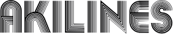 Designer of Aki Lines (1970, ITC), a delicate multiline Latin display face. It was used for Microsoft's logo in 1975. Digital versions include Linea and Akka. [Google]
[More] ⦿
Designer of Aki Lines (1970, ITC), a delicate multiline Latin display face. It was used for Microsoft's logo in 1975. Digital versions include Linea and Akka. [Google]
[More] ⦿
|
Alberto Alvarez
|
Medellin, Colombia-based designer of Mani (2018, prismatic caps) and Niyo (2018, a hyper-decorative typeface). [Google]
[More] ⦿
|
Alex Sheldon
[Match&Kerosene]
|
 [MyFonts]
[More] ⦿
[MyFonts]
[More] ⦿
|
Alex Trochut
|
 Brooklyn, NY-based grandson of Joan Trochut of Super-Veloz fame, b. 1981, Barcelona. After completing his studies at Elisava Escola Superior de Disseny in Barcelona, Alex established his own design studio in Barcelona before relocating to New York City.
 He is the codesigner with Andreu Balius of SuperVeloz (2005, TypeRepublic), a digital version of his grandfather's typeface. It won an award at the TDC2 2005 type competition. Balius says about this typeface originally created by Joan Trochut from 1920-1980: Super-Veloz could be considered as an Ornamental type design, but in its core it is an experimental typeface based on a set of modular features that, with the combining of its modules, a great range of typefaces, ornaments ---even illustrations---, could be made. That is perhaps the most interesting experiment in early modern type design ever made in Spain during the immediate years after the War. The lecture, considering the borders between type design and ornament design, will introduce the context where Joan Trochut's Super-Veloz was produced (from sketches to published brochures and speciments) in 1942. Also will explain how Super-Veloz works. It is really a "type-ornament" design that could be considered on the edge of what we call type design. Alex has created design, illustration and typography for a diverse range of clients: Nike, Adidas, The Rolling Stones, Katy Perry, BBC, Coca-Cola, Pepsi, The Guardian, The New York Times and Time Magazine. Alex Trochut's lettering must be seen to be believed---it has to be genetic transmission. Recurring themes include adorned initials and modular types. His numerical all-caps alphabet for British Airways is phenomenal and pushes the bling-bling to the fashionable extreme. Stunning dollar sign drawn by him in 2007 for Acido Surtido. In 2009, he published Neo Deco at HypeForType. Noteworthy type treatments of that year include Nixon and the Futurecraft logo. In 2012, he designed Trojan Font (like Trajan). He also did some stunning multiline alphabet for V Magazine. Also noteworthy is a swashy calligraphic logo for Wiz Khalifa and Atlantic Records. Typographic picture by TDC55. In 2013, Barcelona-based creative agency, Herraiz Soto commissioned Alex Trochut to create an original typeface collection titled Raw for Notegraphy. In 2017, he made the color font Megazero at Fontself in Opentype SVG format. In 2018, Alex Trochut and Sudtipos cooperated on Utopian and Dystopian. Utopian is a color font family based on primary colors and pure geometric shapes, influenced by Bauhaus and De Stijl. Dystopian, its black and white companion with square features of Renner's original Futura drawings, emits a darker look and evokes Trumpian gloom and doom. Behance link. Debutart link. Klingspor link. [Google]
[MyFonts]
[More] ⦿
|
Alexander Nedelev
[Typedepot]
|
 [MyFonts]
[More] ⦿
[MyFonts]
[More] ⦿
|
Alexander Wright
|
 Alexander Wright (Modo Visual, Caracas, Venezuela) created the hip alchemic display typeface Alicia (2012, HypeForType). It won an award at Tipos Latinos 2012.
 In 2014, he published the prismatic typeface Maquinista, which can be bought at Hype For Type. It won an award at Tipos Latinos 2014. Winner at Tipos Latinos 2018 of a type design award for Isografia. In 2015, together with Michelle Benaim Steiner, he co-founded In-House International Design in Austin, TX. In 2020, he released Troptical (a 48-style prismatic or op-art typeface), and he co-designed Ragtag (a ragtag of capitals) with Rodrigo Fuenzalida for In-House International. In 2020, Rodrigo Fuenzalida, Alexander Wright and Michelle Benaim Steiner co-designed the exaggerated reverse stress (or: Italian) typeface Pata Slab at In-House International. All uppercase characters were built to fit precisely inside a square, so they are all the same width and height. In 2022, Rodrigo Fuenzalida and Alexander Wright published the decorative angular typeface family Broker at In-House International. HypeForType link. [Google]
[MyFonts]
[More] ⦿
|
Alexandra Pavlenko
|
During her studies at the British Higher School of Design in Moscow, Alexandra Pavlenko created the dry brush font Archeology (2017), an onion print typeface (2017), the very fat poster font Play (2017) and the prismatic typeface Strips (2017). [Google]
[More] ⦿
|
Alexey Carlove
|
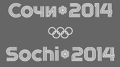 Alexey Carlove (Carlove Design) is the Dzerzhinsk, Russia-based creator of the tri-lined prismatic Latin / Cyrillic typeface Gorod Spotra (City of Sports), which is somehow related to the 2014 Winter Olympics in Sochi.
 Behance link. [Google]
[More] ⦿
|
Alexey Sirke
|
 Saint Petersburg, Russia-based designer of the decorative typeface Boroda (2019: stencil, and oriental emulation), Tetris (2019: pixelish) and Blender (2019: prismatic). All typefaces cover Latin and Cyrillic. [Google]
[More] ⦿
Saint Petersburg, Russia-based designer of the decorative typeface Boroda (2019: stencil, and oriental emulation), Tetris (2019: pixelish) and Blender (2019: prismatic). All typefaces cover Latin and Cyrillic. [Google]
[More] ⦿
|
Alina Stepanenko
|
Saint Petersburg, Russia-based designer of the experimental prismatic Cyrullic typeface simply called Decorative (2016). [Google]
[More] ⦿
|
Alvaro Melgosa
|
Montreal, Quebec (was: Madrid, Spain)-based designer of a prismatic set of initials in 2016. [Google]
[More] ⦿
|
Anastasia Allakhverdova
|
Prolific art director from Moscow who is now located in New York. Her work includes the fashion mag Latin/Cyrillic typeface Cadre (2014), the prismatic custom typeface Icon Face (2014, done for a make-up school) and a few other fashion industry fonts. Behance link. [Google]
[More] ⦿
|
Andrew Footit
[Arkitype (was: Virtue Creative)]
|
 [MyFonts]
[More] ⦿
[MyFonts]
[More] ⦿
|
Andrew Pixel (was: Timm Design)
[Andrew Timothy]
|
 Estonian graphic designer who created these (mostly display sans or decorative serif style) typefaces:
 - In 2017: Heraldry (decorative caps), Spacious (sci-fi).
- In 2019: Orlande, Mjölnir (a runic or Nordic script emulation), Ravenstar, Cyber (a mosaic font), Carmina Burana, Great Glory (brush), Galileo (serif), Galilei (script), Living Dream (font duo), Marie (sans), Curie (script), Pomino (a tall stylish serif), Chara (Sans+Serif), Moccha (Sans+Serif), Turin (Sans+Serif), Torres, Rustic Jack, Alchemy, Bushel (a spurred Tuscan typeface), Misty Meadow, Fiver (prismatic), Heleen Script, Xavier, Saint James, Vernazza (a condensed sans/serif pair), Torres (a free sans and Slab pair).
- In 2020: Tiny Twig, Claro, Grove, Black Echo, Porto, Reval, Decora (geometric, art deco), Laura, Crasus, Cecilia Octavia, Rosalia, Boutique Serif, Flora, Magic Spell, Flare, Starglow, Sunday Sunshine.
- In 2021: Alfa (sci-fi, stencil), Beauté.
- In 2022: Polygon (triangulated), Verdant (a foliated font), Freco (a wedge serif), Wild Dreams.
Envato link. [Google]
[More] ⦿
|
Andrew Timothy
[Andrew Pixel (was: Timm Design)]
|
[More] ⦿
|
Andrew Wagenhals
|
At SCAD in Savannah, GA, Andrew Wagenhals created the prismatic typeface Wagenhalia in 2015. Behance link. [Google]
[More] ⦿
|
Andy Clymer
|
 Andy Clymer grew up in Irvine, CA and studied at San Diego State University in 1998. At that time, he was working on Stencil Fraktur (2002). In 2004-2005, he studied type design in the Masters program of the KABK in Den Haag. He joined the typeface development department of Hoefler&Frere-Jones in New York in 2005. He has been an instructor in the Type@Cooper program in New York since 2011.
 From 2005 until 2018, Andy worked at the Hoefler&Co. type foundry, where he contributed to the typefaces Vitesse, Forza, Ideal Sans, Archer, Surveyor, and spearheaded the design of Operator and Obsidian (2015: a decorative copperplate engraved emulation typeface---various kinds of 3d illumination in Obsidian were obtained by an algorithmic process. In 2019, he co-developed Mingei Mono for the Mingei International Museum along with Yomar Augusto. In 2020, he released Tilt. Tilt is a family of (variable) typefaces inspired by three dimensional lettering found in storefront signage. Subfamilies: Tilt Neon (mimics the construction of neon tube lettering), Tilt Prism (based on prismatic lettering, cast or cut in a material), Tilt Warp (resembles peeling vinyl stickers). The variable fonts have two axes, horizontal rotation and vertical rotation. Github link. [Google]
[More] ⦿
|
Andy Song
|
Creator (1936-1995) of the following phototype fonts at Studio Hollenstein: Arc en ciel (multilined), Indigo (1972; ornamental, art deco), Or (1967: prismatic). Or was digitally extended in 2016-2020 by Arve Båtevik as Store Norske Tyggis. Indigo was revived as a colour remix in 2021 by Arve Båtevik as Store Norske Stilig. [Google]
[More] ⦿
|
Angelica Teran
|
 Maracaibo, Venezuela-based designer of the decorative prismatic all caps typeface Elephant (2015). Elephant was a school project. [Google]
[More] ⦿
Maracaibo, Venezuela-based designer of the decorative prismatic all caps typeface Elephant (2015). Elephant was a school project. [Google]
[More] ⦿
|
Ankita Victor
|
Bangalore, India-based designer of the free multiline typeface Boogie (2020) and the free font Isometric (2020). All fonts are in SVG format. [Google]
[More] ⦿
|
Anna Aksionova
|
 Vilnius, Lithuania-based designer of the prismatic op-art and art deco typeface Aks Font. [Google]
[More] ⦿
Vilnius, Lithuania-based designer of the prismatic op-art and art deco typeface Aks Font. [Google]
[More] ⦿
|
Anna Zakharchenko
[Anza Letters]
|
 [More] ⦿
|
Antony Rodriguez
|
Bogota, Colombia-based graphic designer who created the prismatic typeface Refrán (2012). [Google]
[More] ⦿
|
Anza Letters
[Anna Zakharchenko]
|
 Miass, Russia-based type designer offering mainly handcrafted script or brush fonts. Her typefaces from 2021: Fruity Morning (a color SVG font), Coffee Break, Gradient Quirky, Aster Glow, Vintage, WMN Power, Carnival (and party masks), Snowflake Christmas, Cupid, Vegan.
 Her typefaces from 2020: Orchid (an ornamented sans), Avocado (a stylish display serif), Wanderlust, Snowflake, Warmth (a retro brush font for Latin and Cyrillic), Sunshine, Breaking Rules (a paper cutout typeface), Feel Free, Bravo (a prismatic SVG font for Latin and Cyrillic), Virgo (a serif stencil), Grotesque, Ander, America, Quirky Spring (a playful rounded hand-drawn typeface), Retro Vibes. Typefaces from 2019: Nuova (a modern stencil family), Caramel (an upright script), Daenerys (a script and serif duo), Didone (an over-the-top swashy ball terminal didone), Mood Board (script), One Upon A Time (an octagonal and script font duo), Abstract, Summer in Paris (font duo), Nordic Dream, Organic, Poster (a heavy sans), Throne (a free dry brush SVG font), Primavera (brush script), Emotion Sans, Emotion SVG, Emotions Brush, Mobile (a modular sans), Fleuriste (a decorative duoline font), Lovely (a tall monoline script), School SVG, Aloha SVG (a watercolor script), Sport, Alpha & Omega (a signature script), Rio Love, Delight Grunge, Quirky, Oh My Child (textured). Typefaces from 2018: Protect, Shadow (an all caps fashion mag titling sans family in ten styles), Ultra Violet (sans), Fall in Love Script, White Christmas (a brushed SVG font), Golden Leaves Script, Alesya (script), Rush. [Google]
[More] ⦿
|
Arianna Canelon
|
Savannah, GA-based designer of the prismatic typeface Saxofon (2015). Behance link. [Google]
[More] ⦿
|
Arif Dwi
[Inopatype (or: Kotak Kuning Studio)]
|
 [MyFonts]
[More] ⦿
[MyFonts]
[More] ⦿
|
Arjun Makwana
|
 Illustrator and designer in Mumbai, India, who studied at M S University of Baroda, class of 2012. In 2017, he designed the experimental 3d typeface Imaginarium for the 3d printing company Imaginarium. This is possibly the first font that can be printed in 3 dimensions. [Google]
[More] ⦿
Illustrator and designer in Mumbai, India, who studied at M S University of Baroda, class of 2012. In 2017, he designed the experimental 3d typeface Imaginarium for the 3d printing company Imaginarium. This is possibly the first font that can be printed in 3 dimensions. [Google]
[More] ⦿
|
Arkitype (was: Virtue Creative)
[Andrew Footit]
|
 Andrew Footit (b. 1984) runs his own type foundry in Johannesburg, South Africa. He is also known as Arkitype. Until 2014, his type studio was called Virtue Creative and before that, Virtue84. In 2017, he set up Arkitype. His typefaces:
 - The very simple monoline rounded geometric typeface Modulus (2011). Updated to Modulus Pro in 2019.
- The stunning art deco typeface Vindeco (2011).
- Gigafont (2011): a free bubblegum font.
- FunFair (2012): hand-printed.
- Virtus Sans (2012): a clean 4-style sans family.
- the Western family Westro (2012, +Inline).
- The free rounded sans drafting font Struct (2013).
- The four-style vintage poster typeface The Woods (2013).
- The spurred letterpress typeface family Roper (2014). Roper evolved into the octagonal typeface family Hudson NY (2015) and Hudson NY Pro (2020). Hudson NY Regular, Serif and Slab are athletic lettering / octagonal typeface families.
- Bosk Hand.
- Roves (2016). A camping style set of fonts, including several stencil typefaces.
- Anchor Script (2016). Inspired by classic cursive connected handwriting.
- Navigator (2016). Inspired by the early explorers.
- Bowline Script (2016). A vintage monoline cursive script typeface.
- Saveur Sans (2017) and Saveur Sans Round (2017). A lovely sans typeface family that is inspired by art deco and French cafes.
- Comply Slab (2017). All caps and octagonal, with possible applications in athletic lettering.
- 3 Stripe Type (2017) and Adidas Nemeziz (2017). Prismatic typefaces.
- Technol (2018).
- Statewide (2018). An all caps squarish techno display sans family.
- ESPN Next (2018). An octagonal inline custom typeface. ESPN Heroes (2019) is a six-lined prismatic typeface.
- Poster Compressed (2019). A piano key typeface.
- Neumatic Compressed (2019), Neumatic Gothic Round (2020) and Neumatic Gothic (2019).
- Protrakt Variable (2019). Nine variable width all caps fonts, of different thicknesses.
- Coastal (2020). A twelve-style all caps sans.
- Compose. An 18-style minimalist sans with elliptical curves and quite open counters.
- Storica (2021). A 9-style all caps vintage serif.
Behance link. Creative Market link. Home page. View Andrew Footit's typefaces. Home page. [Google]
[MyFonts]
[More] ⦿
|
Art deco typefaces by Nick Curtis: II
[Nick Curtis]
|
 Commercial art deco typefaces by Nick Curtis.
 - Bessie Mae Moocho NF (2002). An art deco font based on handlettering found on a travel brochure for IMM Steamship Lines, circa 1927.
- Blitzkrieg NF (2011). A Lufthansa Airlines baggage label from 1936 provided the inspiration for this genuinely German typeface, with strong art deco influences.
- Blue Jay Way NF (2011). An art deco typeface inspired by Ross F. George. This typeface was used on the Beatles' original Magical Mystery Tour album.
- Boeuf au Joost (2003). Art deco based on work by comic book artist Joost Swarte.
- Boho à Gogo NF (2007): a multiline (op art?) typeface inspired by Bauhaus.
- Chalk and Cheese NF (2004). This art deco uppercase is based on 1930s lettering by French poster artist Charles Loupot (based on this art deco poster), and the non-art deco lowercase is based on 1910s lettering by German plakatmeister Ludwig Hohlwein.
- Chemin de Fer NF (2005). An art deco shadowed outline face.
- Chi Town NF (2008) is a heavy art deco creation that is based on a 1931 poster for the film The Man from Chicago.
- Coochie Nando NF (2011). An art deco shadow caps face, after a typeface called Kitchen by Milton Glaser.
- Dooijes Deco NF (2010). A 3-style art deco family in the style of Broadway, based on the Dick Dooijes tryptich, Carlton, Bristol (1929) and Savoy (1936).
- Duck Soup (2003, after a 1928 poster by Italian designer Neri Nanetti for Snob Cognac).
- Elektromoto NF (2011). This family takes its inspiration from two early Art Deco typefaces from Germany. The Normal version is based on Dynamo, designed by K. Sommer for Ludwig&Mayer in 1930, while the Narrow version is based on Stadion, designed by Erhard Grundeis for Die Schriftguß AG in 1929. Their common design motifs epitomize the Age of Streamline.
- Humpty Dumpling NF (2010). A fat art deco typeface based on an offering from the irrepressible M. Draim, seen in La Lettre dans le Décor&la Publicité Modernes, published by Monrocq Frères of Paris in 1932).
- Dusty Rose (2008) is an art deco typeface based on the logotype for the Dutch magazine Geillustreerd Schildersblad in 1940.
- Edgewise (2007), a quirky well-rounded post-art deco and pre-psychedelic face, uses ideas from Ryter Night (VGC).
- Ege Schrift NF (2011). a faithful revival of Ege-Schrift (1921, Eduard Ege), a mix between Mexican party lettering and art deco.
- Engel Stabenschrift NF (2008). In 1927, Ernst Engel created an art deco typeface which was revived by Nick Curtis as Engel Stabenschrift NF.
- Faerie Queen NF (2006). Based on an art deco typeface named Titania made in 1933 by Fundición Richard Gans.
- The Reed and Fox typefaces Viennese and Corinthian were combined in 2014 in Nick Curtis's digital typeface Genever NF.
- Gotham Rail Company NF (2002). Art deco based on an Italian travel poster from 1931.
- Great Lakes Shadow (2008) is an art deco typeface based on a 1930s travel poster for the Canadian pacific Railway.
- Hunky Dory NF (2014). A circus font after William H. Page's wood type Doric, ca. 1850.
- Jazzfest NF and Tinseltown NF (2009). Based on the 1932 art deco typefaces Newport and Hollywood, respectively, both designed by Willard T. Sniffin for ATF.
- Kharon Ultra (2009). An art deco typeface based on Ludlow Stygian.
- Kinkajou Stew (2003). Image of Kinkajou NF.
- Kirschwasser NF (2005). A bubbly art deco face.
- Korner Deli NF (2006, art deco).
- Kymmera Deco NF (2011). Revival and redesign of Rainbow Bass (1982, saul Bass).
- La Reyna Catalina NF (2006). An art deco face based on Aragón, designed by Enric Crous-Vidal.
- Legnano Cuneo NF and Legnano Sassari NF (2014). Italian art deco wood type.
- Linea Nera NF (2011). Based on Wolf Magin's Black Line (1976, Berthold).
- Lodewijk Gothic NF. After Elzevir Gothic (ATF, 1897).
- Luben Tunen (2008) is another art deco face.
- Madison Squared NF (2012).
- Mighty Ditey (2007): a mix between art deco and Peignot, this elegant typeface is based on a 1970s Photolettering typeface by Richard Nebiolo called Aphrodite, and competes with Riesling (1994, Bright Ideas) and Gillespie (2015, Darren Odden) as revivals of Aphrodite.
- Mogzilla NF (2007) is an ultra fat art deco face.
- Monte Carlo Script NF (2002). An art deco font based on a font called Médicis from a Deberny and Peignot catalog, circa 1920.
- Nip&Tuck (2006).
- Odalisque NF (2008, +Stencil, 2010) are art deco fonts based on Morris Fuller Benton's Chic (1927).
- OK Chorale (2003). An art deco typeface based on Carl Holmes' ABC of Lettering book.
- Orchard Street NF (2011, +Inline). A pair of art deco caps typefaces inspired by one of many posters produced by the WPA by anonymous artists during the 1930s.
- Pentaprism NF (2011). Part Futura, part Bauhaus, this 5-style family has multiline, inline, and other variants.
- Picture Postcard NF (2004: based on an alphabet by Alf Becker).
- Raconteur NF (2006-2008) is a wonderful art deco typeface that shouts gin fizz and high heels: it takes its inspiration from a 1923 ad for Piera Nova, designed by Hernando G. Villa.
- Quoi Chou NF (2006). An elegant and quite original beefed-up version of Bernhard Fashion by Lucian Bernhard.
- Radio Days (2008). An art deco typeface based on 1930s logotype lettering for Crosley Radios.
- Rassetta NF and Rassetta Swash Caps NF (2005). An art deco pair of typefaces originally designed by Willard T. Sniffin for American Type Founders in 1931 under the name Rosetti.
- Renard Moderne NF (2010). An art deco typeface inspired by Sol Hess's 1940s typeface Twentieth Century Poster.
- Resolute NF or USA Resolute NF (2009). An all caps fat headline typeface based on Morris Fuller Benton's Eagle, ATF, 1934.
- Retrorocket NF (2015). An art deco alphabet based on a French lettering chapbook entitled Art du Tracé Rationnel de la Lettre (1934, D. Duvillé).
- Salzmann Deco NF (2011) and Salzmann Deco Deco NF (2011), art deco and Mexican-themed typefaces, modeled after Max Salzmann's Dolmen (1921-1922) and Zierdolmen (1922), respectively.
- Secret Agent (2003). A pure art deco beauty based on this Loupot poster from 1919.
- Ski Alpin NF (2014). An art deco typeface based on a Swiss travel poster from 1927.
- Smart Frocks NF (2008). A Peignotian face, after a shop sign in London, ca. 1930. Designer unknown.
- Stony Island NF (2011). Based on an Alf R. Becker typeface from 1935 called Chicago Modern Thick and Thin.
- Suave Sam NF (2010). An art deco typeface after a 1930 alphabet by Samuel Welo.
- Tasneem (2007) is the ultimate art deco face, originally drawn by Gustav Jensen in 1931.
- Tiny Bubbles NF (2008). An art deco typeface inspired by an alphabet in Pen&Brush Lettering and Practical Alphabets (Blandford Press, Ltd., London, 1929).
- Top Kick NF (2011). Based on Concentra, a geometric marvel with several parallel and concentric lines making up the letters. Concentra was originally published in Schriftatlas: Alphabete von A bis Z .
- Turista Gorda NF (2009). Based on Baltimore Type Foundry's Airport Tourist, which in turn was influenced by Futura Display.
[Google]
[MyFonts]
[More] ⦿
|
Arterfak Project
[Ahmad Ramzi Fahruddin]
|
 Ahmad Ramzi Fahruddin (aka Ramzehhh and as Ramz Fahruddin, b. 1993) established Arterfak Project in 2015. He is the Palembang, Indonesia-based designer of the display typefaces Aidah (2015, spurred), Temenyut (2015, spurred), Basenglah (2015, a geometric solid typeface), Local Genius (2015), Oropitem (2015, blackletter), Cakmacak (2015), Maeninaja (2015), Yagitudeh (2015, a free doodle font), Cagar (2015, free), Pletakrutuk (2015) and Beguyur (2015), the free experimental techno typeface Semravut (2015), the lava lamp typeface Cagar (2015) and the free spurred vintage typeface Outromoro (2015).
 Typefaces from 2016: Anehena (a beveled ornamental typeface), Bongoknian (spurred), Sebasengan (sketched, arched, stitched, textured, eroded and embossed substyles), Sekatoon (Victorian), Bekelakar (Victorian), Sambeltigo, Wayawaya (free bilined art deco), Geroboktuo, Bedengkang, Ringam, Cindo Kato (spurred Victorian typeface), Ngopi Doken (a layered handcrafted typeface family), Bedesau (Victorian), Temenyut (spurred Victorian style), Sirugino (a spurred tattoo / blackletter type), Buyanbengak (spurred), Geradakan (dry brush type). Typefaces from 2017: Martinez (Tuscan), Hughoney, Rockrace, Monabelia (Victorian), Philosophiya, Love Quake, Childwood, Circulat Decorative Frames, Dakmodal, Yasaman, Bsakoja, Meringam, Besigetz (Victorian), Bedempank, Ngamboel (a modern inline), Jemahok (an inline typeface), Sirunian (decorative blackletter), Belinjangan (brush style), Cerudikan, Kanjian (Victorian deco). Typefaces from 2018: Mirandah (monoline, vintage), Subversia (Victorian), Bertha (a free display family that includes Shadow Line, Sans and Spurred substyles), Quickers, Marchelle (art deco), Lourena, Mellynda, Leophard (octagonal), Wishteria, Slashback, Katheryna, Febiolla, Tropicane, Maretha (a monoline script). Typefaces from 2019: Requeiro (a spurred inline vintage font), Mourich (an all caps display typeface), Newston (a tall condensed news headline typeface family), The Black Sugare (blackletter-inspired), Magnies (an elegant stencil), Hermona (a spurred vintage label font), Bronzier (a sports font), Mayhena (a monoline script), Amnestia (a vintage all caps typeface), Highrush (font duo), Humeira (for children's books), Montheim (retro signage font), Hodgeson (a slab serif family), Delaroca, (a spurred black metal band font) Banda Niera, Bargers Distressed (spurred, Victorian), The Realita, Newston (a compressed skyline-style font), Ariestha Script, The Black Square, Requiem (Victorian or rococo inline caps), Invasible, Ferguson (an almost monoline slab serif family), Mirenath (a rounded vintage monoline typeface), Afolkalips (a tribal painted font inspired by the Papuan culture), Mellandry, Masterson (a slab serif western font), Marsheila (art deco), Kanjian, Belinjangan, Sirunian (a decorative spurred typeface), Quickers, Marcheile (slightly art nouveau), Marcheile, Monabelia, Nourishe (a fashion mag sans). Typefaces from 2020: Trashbone, Burgery (a monolinear all caps children's book font), The Brande and Lotaline (a decorative serif), Rimba Andalas (a tribal font), Bronela (a decorative serif), Wonder Night (a beatnik font), Malinsha (a signage script), Marones (spurred, vintage, all caps), Katenila (a fat finger font), Meliana Script (a brush script), Romelio (sans / script pair), Bondrians (a vintage label font), Black Ravens (a dry brush font), Shinkoya (vernacular lettering), Brothership, Novante (stylish caps), Almatine Script (a flat pen calligraphic script, with perhaps a touch of Arabic script emulation), Almatine Sans, Wargate (a military stencil font family), Bragley (a cartoon font), Varino (a rounded unicase sans family), Ranille (a bold display serif), Neilvard (a vintage label font family), Nagietha, Khodijah (an Arabic emulation font), Sometimes Rough, Savaneta (a vintage all caps typeface), Valmera (a Peignotian sans), Hargalia (classic calligraphy), Cherione (a unicase font), Revans (a display sans). Typefaces from 2021: Larantuka (an informal font with a dancing baseline), Bolandes (a weathered monoline sans), Delauney (a formal art deco typeface), Chieezy Burger (grungy, vernacular), Ranmor (a vintage slab serif), Andalia (a signage script), Insiders (a dry brush script), Granesta (a dry brush font), Abigral (a Peignotian serif), Suzanstein (a dripping blood font), Broken Console (a retro video game pixel font), Naluka (a tiki or nature park font), Lovatine (a scrapbook script), Rushen (vintage caps in curvy, regular, distressed, stencil and shadow versions), Siegra (futuristic), Komersie (a bold supermarket font), Borensa (a reverse stress font), Rashavine (a dry brush font), Blankone (a brush font), Montagna (a monolinear script), Hadnich (a heavy signage script), Sallomae (a scrapbook font), Vankours (a dry brush font), Wonderful Melanesia (a decorative serif), Albertson (a Tuscan font), Rantika (a bold brush script), Rusthack (a stylish brush typeface), Mustopha (an upright typeface in arabesque style), Marviona (a marker pen font), Marviona (a marker pen font), Niquitta Mirzani (script), Shikamaru (emulating a Japanese brush), Mortend (a 5-style expanded all caps sans), Barlock (an all caps and spurred varsity font), Northash (stencil), Motteka (a beatnik font), Sharely (a brush font), Rompies (a condensed titling sans), Beardsons (a vintage label font), Broken Crush (dry brush). Typefaces from 2022: Bradrock (a vintage semi-Tuscan Western font), Market Written (a fat finger font), Almalik (Arabic emulation), Vanitha (a brush script), Rambors (prismatic caps with four parallel lines), The Last Shuriken (emulating Japanese), Warzone (an all caps echno / sci-fi font), Kalidony (calligraphic with heart-themed tittles), Lemands (a stocky condensed display typeface). Dafont link. Creative Market link. Behance link. Graphicriver link. Creative Fabrica link. [Google]
[MyFonts]
[More] ⦿
|
Arve Båtevik
[Store Norske Skriftkompani]
|
 [More] ⦿
|
Asier Gonzalez
|
Vitoria-Gasteiz, Spain-based designer of the multiline typeface AG (2017). [Google]
[More] ⦿
|
Aulia Al Farabi
[Incools Design Studio (or: Aol Scrachtzo)]
|
 [More] ⦿
|
Aya Al-Kotob
|
During her studies in Beirut in 2014, Aya Al-Kotob created experimental Latin and Arabic typefaces. [Google]
[More] ⦿
|
Baptiste Lavigne
|
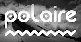 Parisian designer of the constructivist Kodage (2017), the rounded sans typeface Polaire (2017) and the prismatic typeface Linenn (2017). [Google]
[More] ⦿
Parisian designer of the constructivist Kodage (2017), the rounded sans typeface Polaire (2017) and the prismatic typeface Linenn (2017). [Google]
[More] ⦿
|
Belinda Ross
|
Brisbane, Australia-based designer of the multiline prismatic and chromatic typeface Everest (2015). Behance link. [Google]
[More] ⦿
|
Bonnie Cheng
|
Sydney-based designer who graduated in 2011 from the College of Fine Arts with a Bachelor of Design. Bonnie created the beautiful prismatic art deco typeface Strukture (2012). [Google]
[More] ⦿
|
Brand Design
[Enrique Teruel]
|
 Enrique Teruel was Orihuela, Spain-based designer of Line (2013, a prismatic typeface), and Helvetica Serif (2014). He joined or set up Brand Design in Madrid, where he now lives. [Google]
[More] ⦿
Enrique Teruel was Orihuela, Spain-based designer of Line (2013, a prismatic typeface), and Helvetica Serif (2014). He joined or set up Brand Design in Madrid, where he now lives. [Google]
[More] ⦿
|
Brian Guffey
|
Amarillo, TX-based creator of the prismatic caps typeface Retro F (2015) and the fun Rally Numbers (2016). Behance link. [Google]
[More] ⦿
|
Bruno Roda
|
Designer from Lisbon. He created the modular experimental typeface Pista (2010), which is based on sections of model car race tracks, and could be considered prismatic or op-art. Behance link. [Google]
[More] ⦿
|
Buildshape
[Mauro Paolozzi]
|
 Mauro Paolozzi (b. 1975) studied at Luzern School of Art and Design and graduated from the Royal Academy of Art in The Hague in 2000. After completing the postgraduate class Type & Media (2000-2001), he maintained a platform for audio and visual art in The Hague (2001-2006). He has also been teaching at Fachklasse Grafik in Luzern since 2001. At the Swiss type foundry Lineto, he was co-designer of both LL Prismaset A and LL Prismaset B, roughly between 2006 and 2019. LL Prismaset is based on Rudolf Koch's Prisma (Klingspor, 1930). Mauro has designed identities for cultural institutions such as Kulturbeiz Wohlen, Schloss Lenzburg, and the Swiss Federal Office of Culture. He ran Buildshape.
 In 2015, Raphael Koch and Mauro Paolozzi co-designed GT Cinetype at Grilli Type. This typeface has outlines consisting of many short straight line segments, thus mimicking the now obsolete pre-digital age technique of laser printing subtitles in movies. At small sizes, the font looks very smooth, but at larger sizes, the straight segments become apparent. His custom typefaces include Blindalley (2001), Backdoor (2001), Spins (200) and Panty Boy (2000), Scsibar (2000). [Google]
[More] ⦿
|
Burak Yurur
|
 Istanbul-based designer of a generative prismatic typeface in 2018. [Google]
[More] ⦿
Istanbul-based designer of a generative prismatic typeface in 2018. [Google]
[More] ⦿
|
Burhan Afif
[HansCo]
|
 [MyFonts]
[More] ⦿
[MyFonts]
[More] ⦿
|
Calango
[Jeroen Krielaars]
|
 Jeroen Krielaars (Calango) is a Dutch web designer in Amsterdam who made an animated prismatic geometric typeface called Moshun (2010). Krielaars created Moshun using the program Adobe After Effects in less than three days. Buy it exclusively from HypeForType.
 In 2011, he teamed up with Maria Jose Torrero Heredia from Mexico to create the latest addition to his typeface collection, the experimental and modular Binary 2.0. Typogami is another layered animated font made in 2011. In 2012, Jeroen released Webster, an animated font described as follows: Webster is an extensive animated typeface with a nerdy look. It comes with uppercase, lowercase, numbers, punctuation and special characters. All together it counts over a 150 glyphs. With 13 customizable features, you can create over a gazillion looks. That's right, over a gazillion! In 2014, Jeroen co-designed the animated octagonal typeface Magnus with Linn Fritz, and the animaited typeface Razor (Animography) with Jeffrey Schreiber. He created the animated rounded sans typeface family Mantis in 2014. In 2016, Jeroen Krielaars and Pablo Balcells co-designed the animated pixel typeface Pixelar based on Balcell's 2012 original. See also here. [Google]
[MyFonts]
[More] ⦿
|
Canwei Lai
|
 Graduate of Art Design College of Guangdong Industry Technical College in 2016. Art director and graphic designer in Guangzhou, China. As type designer he took commissions from Zcool. In 2017, he released Yishan Yuzhuan, which draws inspiration from Qin Lisi's Shushan Carved Stones. Also, in 2017, he had a hand in Zcool-YingShuTi (Zhongqi Electronic: free download). His graduation typeface was the experimental labyrinthine Chinese typeface Suo (2016). Also in 2016, he designed the molecular Chinese font Collective. [Google]
[More] ⦿
Graduate of Art Design College of Guangdong Industry Technical College in 2016. Art director and graphic designer in Guangzhou, China. As type designer he took commissions from Zcool. In 2017, he released Yishan Yuzhuan, which draws inspiration from Qin Lisi's Shushan Carved Stones. Also, in 2017, he had a hand in Zcool-YingShuTi (Zhongqi Electronic: free download). His graduation typeface was the experimental labyrinthine Chinese typeface Suo (2016). Also in 2016, he designed the molecular Chinese font Collective. [Google]
[More] ⦿
|
Capo Luiz
|
Goiana, Brazil-based graphic designer. He used simple programming for the creation of the multiline prismatic typeface Font Code (2013). Behance link. [Google]
[More] ⦿
|
cham08
|
FontStructor who made Movement (2011, a prismatic face). [Google]
[More] ⦿
|
Churchward Type
[Joseph Churchward]
|
 Joseph Churchward (b. Apia, Samoa, 1933) grew up in Samoa, and moved to New Zealand, where he founded a design studio in Wellington. He lived in Hataitai. He died in 2013 [Obituary by Jack Yan].
 His early type designs were released as photolettering through Berthold. In 2000, in partnership with Chank, his fonts are finally being converted to the standard electronic formats. In 1984, he won a Silver Prize at the Morisawa Awards competition. In 2009, he was made a life member of The New Zealand Designers Institute DINZ. MyFonts writes: Churchward Type started in 1962 as Joseph Churchward's freelance lettering service. Within six months he had generated enough work to move from his job as Senior Artist into setting up Churchward International Typefaces, which became one of the largest typesetting companies in New Zealand. In 1969 Joseph was asked to submit alphabet designs to Berthold Fototypes and saw immediate success. He later went on to sign distribution agreements with D.Stempel AG, Dr Böger Photosatz GmbH/Linotype, Mecanorma-Polyvroom B.V and Zipatone. He self-published a handful of original fonts in 1978 becoming the first and only company in New Zealand to publish original photo-lettering. Churchward International Typefaces was forced to close in June 1988 but Churchward Type lives on with a fresh set of independent releases. David Buck has taken on the role of digitisation. Joseph continues to draw alphabets and now has a stockpile of over 300 unique alphabets to his name. Catalog of Joseph Churchward's typefaces: - Chank sells ChurchwardHeading, ChurchwardSamoa, Churchward Maori, ChurchwardDesign5Line, ChurchwardBrush. See also Churchward Roundsquare (2002), which reminds me of Apostrophe's Toolego.
- At Berthold, he published Churchward 69 (1969, a fat face), Blackbeauty (1972; this psychedelic type inspired Nick Curtis's 2009 font, Strollin NF), and Churchward 70 (1970, a Bauhaus-style sans family).
- MyFonts sells Churchward Alien (2012), Churchward Maori (2004, frilly), Churchward Marianna (1969, an obese bubblegum typeface; Nick Curtis's Proud Mary NF (2010) is derived from it), Churchward Ta Tiki (2003), Churchward Asia (2003), Churchward Samoa (2003, 6-weight sans family), Churchward Maricia (a Western-style face), Churchward Brush (2006; copied by SoftMaker as Josephs Brush Pro), Conserif CW (2006, BluHead Studio), Churchward Heading (2007), Churchward Supascript (2007), Design CW (2006, BluHead Studio), Freedom CW (2006, BluHead Studio), Ta Tiki CW (2006, BluHead Studio), Churchward Newstype (2008, 8 styles, BluHead Studio), Churchward Chinatype (2008, 5 styles of oriental simulation glyphs), Churchward Heading (2011), Churchward Brush (2009, BluHead Studio), and Churchward Design Lines (1970, a prismatic multiline face), Churchward Montezuma (2012, an Aztec-inspired design digitized by BluHeadStudio), Churchward Legible.
- Churchward Tua (2014). A Western typeface published posthumously. Similarly, BluHeade published Churchward's 1996 geometric sans typeface Churchward Lorina in 2014.
- Churchward Isabella (2015). A geometric sans.
- Churchward 69 (2015, BluHead Studio). Churchward 69 is a ten-weight typeface family originally designed during the late 1960's, but published in 2015 by BluHead Studio.
- Churchward Typestyle (2022). By Bluhead Studio.
Klingspor link. View Joseph Churchward's typefaces. [Google]
[MyFonts]
[More] ⦿
|
Cilab Studio
|
 Montreal-based studio with a French-only web site. Designers of the gorgeous Split (2015), the geometric solid typeface Braziu (2015), the multilined prismatic art deco typeface Brooklyn Fat Black (2015) and the pixel typeface Pixies (2015). Behance link. [Google]
[More] ⦿
Montreal-based studio with a French-only web site. Designers of the gorgeous Split (2015), the geometric solid typeface Braziu (2015), the multilined prismatic art deco typeface Brooklyn Fat Black (2015) and the pixel typeface Pixies (2015). Behance link. [Google]
[More] ⦿
|
Clément Berthet-Bondet
|
Graphic design student in Lyon, who created an art deco prismatic typeface called Striped (2012). [Google]
[More] ⦿
|
Dan P. Lyons
[538Fonts]
|
[More] ⦿
|
Dan Schechner
|
 Designer from Richmond, VA (aka fontcollector) on whom I bestowed the title King of octagonal typefaces. Daniel Herbert Schechner was born in 1946 in Norfolk, VA, and died in 2016 in Richmond, VA.
 - He used FontStruct in 2008 to create the ultra fat octagonal typefaces ShortFatStrangerMono and TallDarkStrangerMono after his Bank Gothic-themed series called EZMonoA through EZMonoG. Other creations: MaxiFiveMono, MaxiFiveTallMono, MaxiFiveTooTallMono, CurvedFiveMono, SkinnyMinnieMono (think skinny and octagonal), KaleidoscopeMono (dingbats), NervosaMono (thin, angular and jittery). CourieresqueMono, HeavyMono, SuperHeavyMono, SkinnierMinnierMono, SkinniestMinniestMono, DiamondsMono, and LucDevroyeMono1 (based on my own Yonkaku fonts), PortraitMono (each character on an easel), PortraitText Mono, RollingStockInverseMono (characters on wheels), OctagonoMonoA, OctagonoMonoB, AmazonoMono (a macho octagonal face), BlackboardTallMono (white on black), ScoreBoardInverseMono, VarionoMono, TeflonoMono, SymmetronoMono (geometric patterns), VerticalSlatsMono, VerticalSlatsTallMono, BlackboardMono, BlackboardTallMono, SteepFifteenStretchMono, SteepFifteenSuperStretchMono, SteepFifteenMono, RockSolidMono, RockSolidStretchMono, RockSolidSuperStretchMono, YugoFiveUltraTallMono, KitchenTilesMono, PrimoMono, OctagonoMonoC (+Tall, +ExtraBold), LotsaDotsMono, OvaltinoMono, OctagonoPropC (+Tall).
- Fonts made in 2009: Bevel's Advocate Mono, Mammoth Mono, NovaMono (+Inverse), OctoMono, PortraitMono, GravitonoMono, PortraitTextSteepMono, XLMono, XLProportional, ScallopiniMonoInverse, BrickbatsMono (dingbats), IconoMono (white on black dings), KaleidoscopeMono, DiamondsMono, ShortFatStrangerMono, QuattroMono (+SC), OvaltinoMono, GargantuaMono, EdgeMono, FacetedSuperFiveStretchMono, MegaloMonoGrande, OctagonoMonoExtraBold (+SuperSteep), MegaloMono, KitchenTilesMono (#1, #2, #3), PrimoMonoTall, StereophoneMono (+Inverse), GrecoRomanoMono (+Ultimo), FacetedFiveMono, YugoFiveMono, TopsyCurvy, DiamondLinkMono, RunningOnEmpty.
- Fonts made in 2010-2011: BAP Solid (sturdy octagonal typeface), XLMonoAlt, XLProportionalAlt, Octagonico (octagonal inline face; +Dark), White Elephant 3 (2011, a 3d shadow face), White Rhino (outlined athletic lettering, Black Rhino), Albino Rhino (2011, black on white), Striped Rhino (2011), Curvilino (ultra-condensed), Rondino (2011, similar), BAPSolid (2011, octagonal).
- Fonts from 2012: BAP Outline, Big Hairline (octagonal hairline caps face).
- Fonts from 2013: Rondino Junior, Legibus Rex Mono (octagonal), Little Black Font (octagonal), Legibus Maximus (octagonal), Bevel's Advocate Proportional (prismatic typeface).
- Fonts from 2014: BAP Outline Stencil, BAP Solid Stencil, Curvilno Grande.
[Google]
[More] ⦿
|
Dan X. Solo
[Solotype]
|
 [MyFonts]
[More] ⦿
[MyFonts]
[More] ⦿
|
Dan X. Solo: Digitizations by Dick Pape
[Dick Pape]
|
Dick Pape based the following digitizations (2008-2010) of blackletter, art deco, Celtic, initial caps, and other ornamental typefaces shown by Dan X. Solo in his Dover books: DXSAlphaMidnight, DXSAlphaTwilight, DXSBeansBold, DXSBlackline (prismatic, art deco), DXSBoboBold, DXSBrusselsInitials, DXSBuckinghamInitials, DXSBust, DXSCharger, DXSCheckmate, DXSCorral, DXSDevon, DXSDevonian, DXSDudleyPNarrow, DXSFatCat, DXSFestival, DXSFrankfortInitials, DXSFuturaInline, DXSGrooviestGothic, DXSGuildhall, DXSHessNeobold, DXSHotline, DXSHuntingtonInitials, DXSJoyceBlack, DXSKupferInitials, DXSLampoon, DXSLeipzigInitials, DXSLeister, DXSLowenbrau, DXSMonogramStencil, DXSMonumentBold, DXSNottinghamInitials, DXSOrbit, DXSOttoHuppInitials, DXSPickfair, DXSPolly, DXSPotsdamInitials, DXSPrismaniaC, DXSPrismaniaP, DXSQuote, DXSRegalBlack, DXSRhythmBold, DXSRickyTick, DXSRoco (art deco), DXSSansSouci, DXSShadyDeal, DXSSheetSteel, DXSSilverShadowBlack, DXSStuttgartInitials, DXSTester, DXSThedaBara (counterless geometric art deco), DXSTulo, DXSTuxedo, DXSUrban (psychedelic), DXSVeronica, DXSWestmorland, DXSWienText, DXSYagiBold.bmp DXSYagiDouble, DXSYorkshireInitials, DXSZany, DXSZephyr. Images: DXSBlackline, DXSBust, DXSDudleyPNarrow, DXSGrooviestGothic, DXSJoyceBlack, DXSMonogramStencil, DXSPrismania'P', DXSRickyTick, DXSRoco, DXSSheetSteel, DXSTulo, DXSUrban, DXSYagiDouble, DXS Alpha Twilight, DXS Brussels Initials, DXS Kupfer Initials, DXS Lowenbrau, DXS Otto Hupp Initials, DXS Theda Bara, DXS Urban. Download page. [Google]
[More] ⦿
|
Daniel Lindholt
|
During his studies at the School of Visual Communication in Denmark, Copenhagen-born Daniel Lindholt designed the hypnotic prismatic typeface Hypno (2015). [Google]
[More] ⦿
|
Daniele Vignato
|
Vicenza, Italy-based designer of the prismatic typeface Cerchi (2013). [Google]
[More] ⦿
|
Danilo De Marco
|
 Web designer in Milano, Italy (and before that, Lugano, Switzerland, and Catania, Sicily), who created the didone typeface Rachel and the partly tweetware sans typeface family DDM in 2014. With Meedori Studio in Catania, he created the tweetware Futura-inspired caps-only typeface Meedori Sans (2015).
 In 2017, he designed the free wayfinding sans typeface Agané, which is based on Adrian Frutiger's Frutiger and Avenir, FF Transit by Erik Spiekermann and Bob Noorda's Noorda. With Giulia Gambino, he co-designed the free icon font Agane Icons. In 2018, Danilo De Marco and Giulia Gambino codesigned the free blackboard bold typeface K95 for K95, a communication and graphic agency based in Catania, Italy. In 2019, De Marco designed the didone display typeface family Herbert, which is named after Herbert Lubalin. Herbert Regular is free. Still at K95, he published Points & Lines (2019). Still in 2019, he also designed the free geometric color typeface Huber Alphabet, which is named in honor of Max Huber. [Google]
[More] ⦿
|
Darumo
[Roman Dementev]
|
 Russian designer in 2018 of these typefaces: Hillingdon, Summer of 76 (imitating the prismatic font of the Mexico City Olympics), Versot.
 Typefaces from 2019: Hogsmeade (a spooky font), CRT64 (a dot matrix font), Bisect (a glitch font). Typefaces from 2020: Gumzilla (a bubblegum font), No Signal (a glitch font). Typefaces from 2021: Rugfish (a playful chunky poster sans). [Google]
[MyFonts]
[More] ⦿
|
Dennis Ortiz-Lopez
|
 Prolific NY-based designer (born in East Los Angeles) who specializes in faithful revivals of old masters and logotype, in Latin and Hebrew. He made over 500 fonts including. He is also a translator and illuminator of Biblical period Hebrew and Aramaic. His clients include The Vatican (Pope John Paul II's Holocaust commemerative CD) and Hadassah, the Women's Zionist Organization of America. His specialties are translations worded in the language and style of the period in which the Biblical text was composed. His translation and enumeration of kabbalistic writings, otherwise known as Hebrew Mysticism and numerology, demonstrate the mathematical base of Biblical miracles.
 MyFonts wrote this analysis of his work: Dennis Ortiz-Lopez is a hugely talented New York type designer. lettering artist&typographer, with around 600 typefaces to his credit. Typographic quality in the magazine market doesn't get much better than Rolling Stone magazine---well, guess who was their typographer (as well as InStyle, Sports Illustrated, People, etc.). Dennis made a successful transition to the digital era around 1989, keeping up his prodigious output. Dennis is also known by his Hebrew name, Siynn bar-Diyonn. Dennis follows the footsteps of great American type designers such as Morris Fuller Benton and Herb Lubalin. And he likes contrasts, too: his typefaces are very narrow or very wide, very thin or very fat. If you love Franklin Gothic but always felt like it's not fat and wide enough. try [Google]
[MyFonts]
[More] ⦿
|
Derek Green
[Gawr Juhs]
|
[More] ⦿
|
Dess Bruseva
|
 Sofia, Bulgaria-based creator of the prismatic typeface Phantasy (2014). Behance link. [Google]
[More] ⦿
Sofia, Bulgaria-based creator of the prismatic typeface Phantasy (2014). Behance link. [Google]
[More] ⦿
|
Device
|
Designer in Barcelona, who created Pixel8 (2012) and Norpeck (2014: a prismatic typeface). [Google]
[More] ⦿
|
Dick Pape
[Dan X. Solo: Digitizations by Dick Pape]
|
[More] ⦿
|
Dick Pape
[Hula Fonts]
|
[More] ⦿
|
Didik Pratikno
|
 Yogyakarta, Indonesia-based creator (b. 1987) of the counterless architectural lettering typeface Ruler Elementary (2011), of Cool Stuff (2011, dingbats), of Djoewana (2011, dingbats), and of the flip clock typeface Solari (2011).
 In 2012, he made Munir (scanbat font with images of Munir Said Thalib, 1965-2004, one of Indonesia's most famous human rights and anti-corruption activists who was poisoned by an Indonesian government airline agent with arsenic on a flight to Amsterdam), Papan Kita (dingbats of Asian buildings), Sepeda (bicycle dingbats), Volkswagen (dingbats), Perangko Wayang, (shadow puppets) and Senyum (facial dingbats). Typefaces from 2013: Paralis (multiline, prismatic). Typefaces from 2014: Cermin Pahlawan (scanbats related to Hari Pahlawan), Toer (scanbats of Pramudya Ananta Toer, an Indonesian author and human rights activist who went to jail for his opinions). Typefaces from 2015: Sekar Arum (textured caps). Typefaces from 2016: Torajamatra (patterns), Ikatan (Indonesian symbols; inside the font, the designer is identifed as Rumah Joana). Typefaces from 2017: Tegel (dingbats with tile patterns). Dafont link. Fontspace link. [Google]
[More] ⦿
|
Diego Gandara
|
Vigo, Spain-based designer of the prismatic typeface Campus Simple (2018). This typeface is a decorative version of the University of Vigo's typeface Campus. His graduation typeface there was Gandara Roman (2018). [Google]
[More] ⦿
|
Diego Pinilla Amaya
|
 Graphic designer and art director at As If Magazine, Buenos Aires. For As If he created the prismatic op-art typeface Optic Alphabet (2015). He also designed a prismatic fantasy alphabet called Strings (2015) and the axonometric alphabet Axo (2016). Behance link. [Google]
[More] ⦿
Graphic designer and art director at As If Magazine, Buenos Aires. For As If he created the prismatic op-art typeface Optic Alphabet (2015). He also designed a prismatic fantasy alphabet called Strings (2015) and the axonometric alphabet Axo (2016). Behance link. [Google]
[More] ⦿
|
Dieter Steffmann
|
 FontShop was the name of Dieter Steffmann's foundry in Kreuztal, Germany (not to be confused with the FontShop foundry and font vendor). He made about 600 self-proclaimed "old-fashioned" fonts, and among these many Fraktur fonts. His site became too expensive to run, and was for about two decades hosted by Typoasis. His fonts can now de downloaded afrom 1001 Fonts. Alternate URL. Current list of fonts. See also here. New stuff. Fontspace link. A nice essay about Fraktur fonts accompanies the fonts. News. As Dieter puts it: I am not a designer but I add missing letters to public domain fonts in order to get a complete character set and I hint the fonts and create new weights (shadow, inline etc.) His Christbaumkugeln font, and how it was made. The font families:
 - Acorn Initialen (2000), Adine Kirnberg (2000, after David Rakowski's Adine Kirnberg Script, 1991), AI Parsons (1999: a simple conversion to truetype of AI Parsons (1994, Inna Gertsberg ans Susan Everett), which in turn revived Will Ransom's Parsons from the 1920s), Albert Text (2000), Alpine (2000), Altdeutsche Schrift (1998: a rotunda), Alte Caps (2000: white on black), Alte Schwabacher (2000, +Shadow), Ambrosia (2000), American Text (2000: a blackletter), Aneirin (2000: Lombardic), Angel (2000: an ironwork font), Anglican Text (2000: a frilly blackletter), Angular (1999: +Inline, +Shadow), Ann-Stone (2000: boxed art nouveau caps), Antique No. 14 (2000: fuzzy hand-crafted letters), Arabella (2000: script), ArabesqueInitialen (2002), Argos George (1999, an art nouveau font after Georges Lemmen's George-Lemmen-Schrift (1908); Steffmann added Argos Geirge Contour), Aristokrat Zierbuchstaben (2002, after a house font at Ludwig&Mayer, 1911), Ariston Script (2000: a formal calligraphic script), Art Nouveau Initialen (1999), Attic Antique, Augusta (2000: a rotunda; +Shadow).
- Baldur (2000: art nouveau; +Shadow, +RoughSliced; after a schelter typeface from 1895), Ballade Bold (2002, a Schwabacher font based on Ballade Halbfette designed by Paul Renner in 1937; +Contour, +Shadow), Barock Initialen (2002: an incomplete decorative initials typeface), Becker (1999; +Shadow, +Inline), Beckett-Kanzlei (2001), Behrens-Schrift (2002: an art nouveau-inspired blackletter typeface based on an original by Peter Behrens), Belshaw (2000: a Victorian decorative serif), Belwe (2002, after an original by Georg Belwe, 1913; Gotisch, Vignetten), Benjamin Franklin Antique (2000, after a warm wood type designed in 1991 by Walter Kafton-Minkel simply called Benjamin), Berlin Squiggle Condensed, Bernhard Schmalfett, Bier und Wein Vignetten (2002, based on drawings from the Bauersche Giesserei), Billboard, Bizzaro, Black Forest (2000, blackletter; +Text, +ExtraBold), Black Knight (1999: blackletter), Blackletter (2001; +ExtraBold, +Shadow), Blackwood Castle (2000: an almost Lombardic blackletter; +Shadow), Breitkopf Fraktur (2000), Bretagne Gaelic (1999), Brian James Bold (2000, +Contour), Bridgnorth, Broadcast Titling (2000, 3d caps), Broadway Poster, Brock Script (2000: formal calligraphic script).
- Cabaret (2000: all caps, +Contour, +Shadow), Campanile (2000: Victirian), Camp Fire (2000: wooden plank font), Canterbury Old English (2001: blackletter), Cardiff (2000: textured caps), Cardinal (2000: almost Lombardic; +Alternate, +Anglican), Carmen (1998: art nouveau style; +Shadow), Carrick Caps (2000), Caslon Antique, Caslon Fette Gotisch, Cavalier (2000), Celtic Frames (2000), Celtic Hand (2000), Challenge (2000; +Contour, +Shadow), Chelsea (2000: a serif), Chopin Script (2000, a formal penmanship script identical to Polonaise), Christbaumkugeln (1999: art nouveau alphadings consisting of Christmas ornaments), Chursächsische Fraktur, Cimbrian (2001: blackletter), Circus Ornate Caps (2001, a Western or circus font), Cloister Black Light (2001: blackletter), Coaster Black (2001, +Shadow), Coelnische Current Fraktur (2000), Colchester Black (2001: an ornamental blackletter), College, Courtrai (2000: a decorative blackletter), Coventry Garden, Cruickshank (2000: art nouveau caps).
- Damn Noisy Kids (2002: a heavy brush font), Davy's Dingbats, Debussy, Decorated Roman Initials (2003), Deutsch Gotisch (2002: an expressive blackletter font; +Dutesch Gotisch Heavy, +Outline, +Shadow), Deutsche Uncialis (+Shadow) (2000), Deutsche Zierschrift (2002, after Rudolf Koch, 1919-1921), Devinne Swash (2000), Digits (2000), Direction (2000: letters with embedded arrows), Dobkin Script (2000: after David Rakowski, 1992, Domino, Domo Arigato (1999: oriental emulation), Dover, Driftwood Caps (2000: a wooden plank font), Due Date (2000: a grungy stencil typeface), Duerer Gotisch (2001), Duo Dunkel (+Licht), Durwent (2001: a rotunda).
- Easter Bunny (after a 1994 font by Apropos Creations), Easter Egg (2001; after a 1994 font by Apropos Creations), Eckmann Initialen (2002, after the famous art nouveau typeface from 1900 by Otto Eckmann), Eckmann Plakatschrift (2002), Eckmann-Schrift (2002), Eckmann Titelschrift (2002), Eckmann Schmuck (2002), Egyptienne Zierinitialen (2002), Egyptienne Zierversalien (2002), Ehmcke-FrakturInitialen (2002), Ehmcke-Schwabacher Initialen (2002), Eichenlaub Initialen (2000), Eileen Caps (2000; after David Rakowski, 1992), Eisenbahn (2002, based on train vignettes at Bauersche Giesserei), Elzevier Caps (2000; after David Rakowski), Enge Holzschrift (2000; +Shadow), English Towne Medium (2000: a Fraktur), Epoque (1999; an art nouveau typeface; +Shadow, +Inline), Erbar Initialen, Estelle, Evil of Frankenstein, Express (1999).
- Faktos (1998; a rip-off of Cory Maylett's Faktos, 1992; +Striped, +Contour, +Shadow), Fabliaux (2000: Lombardic caps), Fancy Card Text (2000: a textura), Fat Freddie (2000: a fat all caps font; +Shadow, +Outline), Faustus (2000: a Schwabacher), Fenwick Woodtype (blackletter: 2001), Fette Caslon Gotisch (2001), Fette Deutsche Schrift (2002, a revival of a Rudolf Koch font from 1908), Fette Egyptienne, Fette Haenel Fraktur (2000), Fette Kanzlei (2002), Fette Mainzer Fraktur (2001), Fette Steinschrift (2002), Fette Thannhäuser (2002; after Herbert Thannhäuser, 1937-1938; +Schattiert), Fette Trump Deutsch (20002, after Georg Trump, 1936), Firecat, Flaemische Kanzleischrift (2000: calligraphic), Flowers Initials (2000: floriated caps), Forelle (2002: a retro script; +Shadow), Fraenkisch Spitze Buchkursive (2002; after Lorenz Reinhard Spitzenpfeil, 1906), Fraktur Coelnische Current (2000), Fraktur Schmuck (2001: ornaments), Fraktur Shadowed (2001), Fraktur Theuerdank (2000: a Schwabacher), Frederick Text (2001: a blackletter), Futura Script.
- Gabrielle (1999: a retro script), Ganz Grobe Gotisch (2000), Gebetbuch Fraktur (2000: a Schwabacher), Gebetsbuch Initialen (2001), Germania (2001, a revival of the 1903 blackletter typeface by Heinz König called Germania as well), Germania-Versalien, Gille Fils Zierinitialen (2002, after Gillé Fils, ca. 1820), Gingerbread Initials (Victorian initials, after an original from ca. 1890), Globus, Gloucester Initialen (2001), Gorilla Black (2000: rounded elephant feet font), Gotenburg A+B (2002, after Friedrich Heinrichsen), Gothenburg Fraktur (2000), Gotische Initialen (two different sets with the same name, one from 2000 and one from 2002), Gotisch Schmuck (2002, Fraktur), Goudy Initialen (2000), Goudy Medieval (2000), Goudy Thirty (2000), Grange (1999), GrenzschInitials (2001), Grusskarten Gotisch (2001), Gutenberg Textura (2000).
- Haenel Fraktur Fett, Hansa (1999: art nouveau), Hansa Gotisch (2001: a textura), Hansen (1998; +Contour, +Shadow), Happy Easter (1994, by Apropos Creations: art deco caps), Harrowgate (2001: a textura), Hazard Signs (2000), Headline Text (2001: a textura), Hercules (1999: art nouveau), Herkules (2004: art nouveau), Hermann-Gotisch (2002; after an original by Herbert Thannhaeuser, 1934), Herold (2002), Hippy Stamp (2000: after rubber stamps from the 1960s), Hoedown (2000; +Shadow), Holla (2001; after Rudolf Koch), Holidayfont, Holtzschue(2000: a circus font, after David Rakowski, 1992), Honey Script (2000: a retro script), Horror Dingbats (2000; after Letters from the Claw, 1998), Houtsneeletter, Humboldt Fraktur (2002-2005; after a Schwabacher font by Hiero Rhode, 1938; +Zier, +Initialen).
- Iglesia Light (2002), Iron Letters (2000), Isadora Original.
- Jan Brad, Journal Dingbats, Jahreskreis (seasonal dingbats, 2002), JSL Blackletter Antique (2000, by Jeffrey S. Lee), Jugendstil Fraktur (originally designed by Heinz Koenig, 1907-1910), Jugendstil Ornamente (2002, art nouveau ornaments, after Schelter & Giesecke).
- Kabinett Fraktur, Kaiserzeit Gotisch (2001), Kanzle (2001)i, Kanzlei Initialen (2002), Kalenderblatt Grotesk (2000), Kashmir (2001: an arts and crafts typeface), Kinder Vignetten (2002), KingsCross (2001: blackletter), Kinigstein Caps (2000: art nouveau initials after David Rakowski, 1990), Klarissa (2000), Kleist Fraktur + Zierbuchstaben (2002, after Walter Tiemann, 1928), Koch Antiqua (2002), Koch Antiqua Zierbuchstaben (2002), Koch Initialen (2000, after Rudolf Koch, 1922), Koenigsberger Gotisch (2001), Koenig-Type (2002; a Jugendstil Fraktur originally designed by Heinz Koenig, 1907-1910), Kohelet (2001), Koloss, Konanur Kaps (2000, after David Rakowski, 1991), Kramer, Krone Bold.
- La Negrita (2000, +Shadow), Latina (2001: script), Lautenbach (2001, +Zierversalien), Legrand (1999: art nouveau), Lemiesz (2000), Lettres ombrées ornées (2002, based on a typeface by Schriftgiesserei J. Gillé, 1820), Linolschrift (2000, +Heavy, a linocut font as in the Munch paintings), Lintsec (2000, a stencil typeface, after David Rakowski, 1992), Liturgisch + Zierbuchstaben (2002, after Otto Hupp, 1906), Logger (2000, after David Rakowski, 1991), Lohengrin Fraktur (2000), Long Island Antiqua, Louisianne (1998-2000: +Contour, +Shadow; a bold upright connected script), Ludlow Dingbats (2000, after Ludlow, 1930), Luthersche Fraktur (2000).
- Mainzer Fette Fraktur, Marker Felt (2001), Marketing Script (1999, +Shadow, +Inline), Marlboro (2000), Maximilian (2002, a Fraktur font and decorated caps based on Rudolf Koch, 1914; +Zier), Mayflower Antique (2000), Mediaeval Caps (2000), Medici Text (2002: an ornamental blackletter), Menuetto (1994, after K.R. Field), Messing Lettern (2000), Metropolitain (2000, an art nouveau font like the ine used for the Paris metro; +Contour, +Condensed), Middle Saxony Text (2001), Moderne Fraktur (1999), Monats-Vignetten (2002, based on drawings by Franz Franke for Bauersche Giesserei, 1920), Montague (2000), Monument (2002, after Oldrich Menhart, 1952), Mordred (2000), Morgan Twenty-Nine (1999: Victorian caps), Morris Roman Black (2002, after William Morris, 1893), Morris Initialen (2000, after William Morris).
- Napoli Initialen (2000), Neptun Gotisch (1999), Neugotische Initialen (2002, after an original from 1890), North Face (2000), Nougat (2000), Nougat Nouveau Drop Caps (2000), Nubian (after Walter T. Sniffin's font from 1928).
- Olde English, Old English Five (2000: blackletter), Old Town (2000: Western), Old London (2000: blackletter).
- Packard Antique (2000), Paganini Text (2000: blackletter), Pamela (2000: an ornamental blackletter), Paris Metro (1998; +Outline), Parsons Heavy (2000, after Bill Ransom, 1918), Paulus Franck Initialen (2002), Penelope (2000, Victorian), Peter Schlehmil (2002, after Walter Tiemann, 1918-1921), Peter Schlemihl Fraktur, Picture Alphabet (2000; after an original from 1834), Pilsen Plakatschrift (2000), Pinewood (2000, like wooden branches), Pinocchio (based on a psychedelic typeface by Gustav Jaeger, TypeShop, 1994), Plakat-Fraktur (2001), Plakat Antiqua, Plastisch (2002: ornamental caps), Plastische Plakat Antiqua (2002), Plum Script (2000: an upright script)), Pointage (2000; after David Rakowski, 1992), Polonaise (1999: a formal calligraphic script), Polo Semi (2000), Powell Antique (2000), Prince Valiant (1999: blackletter), Printer's Ornaments One (after Blake Haber, 1994), Prisma (2003, a four-line typeface inspired by Rudolf Koch's Prisma), Progressive Text (2001), Puritan (2000, +Swash).
- Quentin Caps (2001: Tuscan).
- Rediviva (2002), Rediviva Zierbuchstaben (2002: a Schwabacher font after a 1905 typeface at Benjamin Krebs designed by Franz Riedinger), Reeperbahn (1999; aka Rope), Regatta Relief, Reiner Script, Relief Grotesk (2003), Revue Decor, Reynold Art Deco (2000: arts and crafts; +Contour), Rheinische Fraktur (1999: after a 1905 Stempel font called Arminius Fraktur and Rheinische Fraktur), Rio Grande, Rockmaker (2000, after David Rakowski, 1992), Roland 92000. +Shadow, +Contour), Rolling No. 1 ExtraBold (2000), Roman Antique (+Italic) (2000), Romantik Initialen (2000), Romantiques (2002: ornamental caps, perhaps a circus font), Rondo, Rosemary Roman (2001: a great calligraphic script based on Rosemary Hall's Rosemary Roman), Roskell (1998: a poster font, +Bold, +Shadow), Roslyn Contour (2000), Rossano (2000, +Shadow), Rothenburg Decorative (2000: a frilly blackletter), Rothenburg Fraktur, Royal Initialen (1999), Roycroft Initials (2000), Rudelsberg (Schrift, Initialen, Schmuck: a typeface family in Munch Jugendstil style, based on Otto Eckmann's Eckmann from 1901).
- Saddlebag Black (2000: Western), Saloon ExtraBold, Saltino, Salto, Sans Plate Caps (2000), San Remo (2000: a Parisian art nouveau typeface), Sans Serif Shaded (2000, after a font by Stephenson Blake), Savings Bond, Schampel Black (2001: a blackletter), Schmalfette Fraktur (2000; +Schattiert), Schluss-Vignetten (2002, also from Bauersche Giesserei), Schmale Anzeigenschrift + Zierbuchstaben (2002, after Rudolf Koch's Deutsche Anzeigenschrift, 1916-1923), Schmuck Initialen (2001), Schwabacher (2002), Sebaldus-Gotisch (2002, a blackletter after H. Berthold's Sebaldus Gotisch from 1926), Sentinel (decorative caps from 2001), Sesame (2000, +Shadow), Shaded (2002, a take on Sans Serif Shaded by Stephenson, Blake & Co. Ltd., Sheffield), Sholom (1999: Hebrew emulation), Showboat Caps (2000), Shrapnel (2000: in the font, we find a reference to David Rakowski, 1992), Siegfried (2001, art nouveau, based on a typeface by Wilhelm Woellmer), Simplex, Sixties, Snowtop Caps (2001), Starburst (2000; after a 1990 font by David Rakowski), Steelplate Textura (2002), Stencil Display, Subway (2001: Black, Shadow), Supermarkt.
- Tanach (2003: Hebrew emulation), Tannenberg (Fette Gotisch, Fett, Umrandet, Schattiert: after Emil Meyer, 1933-1935), Thannhaeuser Fette Fraktur, Thannhäuser Zier (2002; original by Herbert Thannhauser, 1937/38), Theuerdank Fraktur (2000; after Schoensperger's Theuerdank, 1517), Thorne Shaded (2002, a shaded didone based on a Robert Thorne design of 1810), Tierkreiszeichen (2002, zodiac signs, based on drawings by Franz Franke for Bauersche Giesserei), Tintoretto (2000, after a Schelter & Giesecke original), Titania (2001; after Titania by Haas, 1906), Titling Roman Antique, Tobago Poster (2001; +Shadow), Tone And Debs (2002; after a 1991 snow capped font by D. Rakowski; identical to Snowtop Caps in 2001), Tonight (2002: a marquee font), Topic, Toskanische Egyptienne Initialen (2003: after a 1889 font by Schelter & Giesecke), Transport Pictorials, Tribeca (2001, after a David Rakowski original), Trocadero Caps, Trucker Style ExtraBlack, Turtles (2000; an extension of Turtles by Neale Davidson), Typographer Caps (2000), Typographer Fraktur (2002), Typographer Gotisch (2002), Typographer Holidayfont (2002: Christmas dingbats), Typographer Rotunda (2002), Typographer Subway (2011), Typographer Textur (2002, Fraktur), Typographer Uncial Gotisch (2002), Typographer Woodcut Initials (2002), Typographer's Schmuck-Initialen.
- Uechi Gotisch, Uncialis Deutsche, Unger Fraktur Zierbuchstaben (2002; after an ornamental caps typeface by Julius Nitsche done in 1908), Unicorn (2000).
- Vadstena Rundgotisch, Varah Caps, Ventura Bold (2000), Verve (+Shadow, 2000), Victorian Initials (2001), Victorian Text (2001), Viking (2000), Vivian (2000, +Shadow), Vogeler Initialen (2002, aka Vogeler Caps), Volute (1999: art nouveau caps).
- Walbaum Fraktur (after Justus Erich Walbaum, 1800), Wallau Deutsch, Wallau Rundgotisch, Wallau Unzial and Wallau Zierbuchstaben (2002; originals by Rudolf Koch 1925-1930), Walthari Text, Washington Text, Waterloo Relief, Wave, Weiß Initialen (2000), Weiss Lapidar (2002, revival of a typeface by Emil Rudolf Weiss), Weiss Rundgotisch (1998; Bold and Shadow), Werbedeutsch (2002, original by Herbert Thannhaeuser, 1934), Westminster Gotisch (2001: Lombardic), Wharmby (2000, a shadow font), White Bold (2003, a shadow font), Wieynk Fraktur (2002, +Initialen, + Caps Round; after a Schwabacher by Heinrich Wieynck, 1912), Wieynk Fraktur Vignetten (2001), Will-Harris Caps (2002, after David Rakowski, 1992), Woodcut.
- Yellow Submarine (1995; after Stanley Davis's Amelia, 1966), Yentus (2001: Hebrew emulation), Yonkers (2001: a Rundgotisch font), Yorktown (2000: a Western wood type emulation font).
- Zallman Caps (2000, after David Rakowski, 1991), Zentenar Fraktur (2003: after Friedrich Hermann Ernst Schneidler, 1937), Zentenar Zier (2002; after F.H.E. Schneidler, 1937), Zierinitialen 1 (2002, after an original from ca. 1800), Zierinitialen Two (2002; based on Deutsche Zierschrift by Rudolf Koch), Ziffern und Pfeile, Zither Script, Zodiac Pictorials.
A set of TeX service files for many of the decorative caps fonts was published by Maurizio Loreti from the University of Padova. The collection is now also available in OpenType. 1001Fonts link. Fontsquirrel link. Dafont link. Fontspace link. Abstract Fonts link. Home page. [Google]
[More] ⦿
|
Dinamo
[Johannes Breyer]
|
 Dinamo is a Swiss type foundry in Heiden established by Johannes Breyer and Fabian Harb after graduation from schools in Zurich, Basel and Amsterdam. Johannes and Fabian were visiting teachers at the Estonian Academy of the Arts, Tallinn. Johannes is teaching type design at University of the Arts Berlin (UDK) and HfG Offenbach. Fabian is lecturing typography at the School of Design St. Gallen. Their typefaces:
 - ABC Diatype (+Mono) (2020). A Swiss sans by Elias Hanzer, Johannes Breyer and Fabian Harb.
- Favorit (2014) and Favorit Mono (2017). A basic sans family by Johannes Breyer and Fabian Harb.
- Grow (2013). An experimental collaborative font family. Many of the members are multilined and even prismatic.
- The heavy sans typeface Heureka (2009-2013).
- Laica (2020). By Alessio D'Ellena.
- ABC Maxi (2020). A hipster typeface by Andree Praat, Johannes Breyer and Fabian Harb. They write: With an underlying skeleton referencing mid-century and post-modern Swiss designs---including Josef Müller-Brockmann's CWS word mark (1958) and Marlyse Schmid and Bernard Müller Swatch logo (1981)---ABC Maxi's forms can by altered and animated by the user, stretching from Hairline to Black to everything in-between.
- Pareto (2016). Western style typefaces by Erkin Karamemet, Fabian Harb and Johannes Breyer.
- Prophet (2016). Prophet is designed in 2016 by Johannes Breyer, Fabian Harb & Erkin Karamemet. Technical support and mastering by Chi-Long Trieu. It is inspired by Joseph Churchward's Georgina.
- In 2019, Johannes Breyer, Fabian Harb and Erkin Karamemet released Whyte and Whyte Inktrap at Dinamo.
- Custom typefaces for Kunsthalle Zurich (CH), Warp Records (UK), Elton John (US), Yale Architecture (US), Manifesta 11 (CH), Harvard Graduate School of Design (US), Universal Music (GER), IBA Thüringen (GER), Festival B:om (KR), Gagosian Gallery (US), Planet Mu/Knives (GER/UK), LayTheme (GER) or the German, Estonian and Cyprus Pavillions at the 55th and 56th Venice Biennale.
Johannes Breyer. Fabian Harb. [Google]
[More] ⦿
|
D.M. Rachmath
[DMR Studio (or: Aksaratype Industries)]
|
 [MyFonts]
[More] ⦿
[MyFonts]
[More] ⦿
|
DMR Studio (or: Aksaratype Industries)
[D.M. Rachmath]
|
 DM Rachmath, also written D.M. Rahmath and Rahmat (DMR Studio, Cianjur / Bandung, Indonesia), designed the hipster typeface Parantina (2017), the Balencha family of display typefaces (2017), the stencil typeface Beklon (2017), the vintage logo font Kalalua (2017), the hipster typeface Terazcho (2017), the layered Western textured typeface Baroschi (2017), the spurred typefaces Elago (2017) and Elagonian (2017), the free vintage display typefaces La Pontane (2016-2017) and La Pontane Deconia (2017), and the Victorian typeface LHF Sorangeun (2017).
 Typefaces from 2018: Morowali, Kaliandra, Diantos, Jailolo (a rebel or sports font family), Persib Sasm (octagonal sports font; free demo), Veranomata (multishade font), Bieliko (prismatic), Nonami (great-looking athletic lettering fonts), Nonamiako, Naratas (athletic lettering), Kamarita (a logo font family), Axina (stencil), Hasya d'Ellena (formal calligraphy). Typefaces from 2019: Beklon, Vietara, Tiaso (an athletic shirt typeface), BRQ (shadow typeface), Gharisan (octagonal). Typefaces from 2020: Sima Maung (an octagonal athletic lettering font family that includes a few shadow styles), Leafco (floriated, textured), Pentacone (molecular, prismatic), Pollenca (script), Floresque (a multiline caps typeface), Garbello (a shadow font), Elago (a sports font), Boyana (a monoline script), Scada (a shadow font), Romansha (a display type), Nevota (an all caps sans), Mamberamo (a creamy script), Manawi (a creamy script). Aka DMR Studio and DMR Art Studios, and as Aksaratype Industries). Home page of Aksaratype Industries. [Google]
[MyFonts]
[More] ⦿
|
Dwi Ahidian
[Lemonthe]
|
[MyFonts]
[More] ⦿
|
eat
[Eduardo Aire Torres]
|
 Born in Mexico in 1992, Eduardo Aire Torres graduated from Universidad Anahuac Mexico Norte in 2014 and followed the condensed type design program at the Cooper Unon in New York City in 2019, after have been formed in lettering and calligraphy by masters such as Gabriel Martínez Meave, John Downer and Brody Neuenschwander.Based in Mexico City, hHis typefaces include Musans Deco (2014), Malos Dingbats (2014) and the great Kanzlei-style ornamental blackletter typeface Blackletter Revolver (2014).
 As a member of the Sans Nom team (Eduardo Aire Torres, Gabriel "Pulpo" Rivero Cruz, Isaias Loaiza Ramirez, Jorge Campos Sanchez and Mario Balcazar) that participated in the Torneo Tipograifico in 2020, he co-designed the display family SN Abbatia. His graduation typeface at Type@Cooper was a slab serif, Paton (2020). Still in 2020, he designed the prismatic typeface Astripe Variable, inspired by Wyman's branding for the Mexico68 Olympic Games. [Google]
[More] ⦿
|
Eduardo Aire Torres
[eat]
|
 [More] ⦿
|
Egle Terminaite
|
Copenhagen-based designer of a prismatic typeface in 2017. Behance link. [Google]
[More] ⦿
|
Elvn Seet
|
London-based creator of the wavy prismatic typeface Rhythm (2014). [Google]
[More] ⦿
|
Emil Karl Bertell
[Fenotype]
|
 [MyFonts]
[More] ⦿
[MyFonts]
[More] ⦿
|
Empty Page Studio
[Lukasz Kulakowski]
|
Lukasz Kulakowski, a Polish graphic designer in Dublin and Baile Atha Cliath, Ireland, created the free typeface Mosaic Leaf (2011), which was inspired by Akzidenz Grotesk typeface. In 2012, he published Orbits (a prismatic multiline face, done with Zbyszek Czapnik). Typefaces from 2013 include the free display typeface Rhubarb Display Font (a condensed art deco sans caps family for Latin and Cyrillic done with Zbyszek Czapnik). In 2014, he created the tweetware font Christmas Time. Emptypage Studio is presently located in New York City. [Google]
[More] ⦿
|
Enrique Teruel
[Brand Design]
|
[More] ⦿
|
Erik Bertell
[Erik Jarl Bertell]
|
 Helsinki, Finland-based Erik Bertell graduated from Lahti Institute of Design. His fonts include Neon, Mama and Mama Round. Born in Helsinki in 1980, Erik was at first a type designer for Fenotype, which was founded by his brother Emil Bertell. He holds an MA in graphic design from aalto University in Helsinki. Around 2012, he set up his own foundry, simply called Erik Bertell.
 Erik's fonts EB Base Mono (2009, monospaced), EB Futuretro (2002, bilined art deco techno face), EB Neon (2002), EB Boogie Monster (2002, multiline prismatic op art family), EB Vintage Future and EB Humboldt (2002, ultra fat). EB Martin (2010) is, in his own words, a post modern take on several traditional blackletter types. EB Bellissimo Display (2010) is a rounded monoline geometric sans typeface family. EB Jessica (2011) is part typewriter, part cemetery. Typefaces from 2013: Steamer (which he calls a grimy grotesque), EB Vintage Future, EB Martin (blackletter), EB Jessica Condensed Book. Moomin (2015) is a custom typeface designed for the Moomin brand. It is based the type used in the early comic strips by Tove Jansson, the author and creator of the Moomins. Cavalier (2016) is an avant-garde sans in the style of the 1970s. Typefaces from 2018: Capital (a sans and serif family by Teo Tuominen, Erik Jarl Bertell and Emil Karl Bertell). Typeface from 2019: Portland (a reverse contrast typeface by Emil Bertell, Erik Bertell and Teo Tuominen), Taurus (an all caps logotype family by Emil Bertell, Erik Bertell and Teo Tuominen), Zeit (a transitional text typeface by Emil Bertell, Erik Bertell and Teo Tuominen), Avion (a sans family by Emil Bertell, Erik Bertell and Teo Tuominen), Fabrica (a decorative frilly didone by Emil Bertell, Erik Bertell and Teo Tuominen), Tapas (by Emil Bertell, Erik Bertell and Teo Tuominen: a Serif, Sans, Deco and Script collection), Galatea (a 48-style sans family by Erik and Emil Bertell), Well (Erik Bertell and Toni Hurme: a wavy custom display typeface for Well Coffee), Morison (a great 32-style wedge serif typeface by Erik and Emil Bertell and Teo Tuominen), Frank Sans (grungy). Typefaces from 2020: Laurel (by Teo Tuominen, Emil Bertell and Erik Bertell: a 4 style sans with amnay wedge elements), Resolve Sans (by Teo Tuominen, Emil Bertell and Erik Bertell: an extensive grotesk super family of 124 fonts: from compressed to extended, thin to black), Rockford Sans (2020: an 8-style geometric sans with large x-height and slightly rounded corners; Emil Bertell, Erik Bertell and Teo Tuominen), Walden (a heavy rustic serif typeface by Emil Bertell, Erik Bertell and Teo Tuominen), Klik (a geometric sans family with Bauhaus influences, by the dynamic trio of Emil Bertell, Erik Bertell and Teo Tuominen). Typefaces from 2021: Imagist (a 12-style sharp-edged serif by Emil Bertell, Erik Bertell and Teo Tuominen), Alonzo (a 24-style Peignotian sans by Emil Bertell, Erik Bertell and Teo Tuominen), Maine (a 12-style modernized book antiqua by Emil Bertell, Erik Bertell and Teo Tuominen), Lagom (a 16-style slab serif with some Clarendon charm; by Emil Bertell, Erik Bertell and Teo Tuominen), Wonder (a 12-style rounded serif in the style of Windsor; by Emil Bertell, Erik Bertell and Teo Tuominen), Grand Cru (a refined serif family with 36 styles; by Emil Bertell, Erik Bertell and Teo Tuominen). Link to Bond Creative Agency. Behance link. [Google]
[MyFonts]
[More] ⦿
|
Erik Jarl Bertell
[Erik Bertell]
|
 [MyFonts]
[More] ⦿
[MyFonts]
[More] ⦿
|
Erika Lourenco
|
As a design student in Curitiba, Brazil, Erika Lourenco created the prismatic typeface David Bowie (2014). [Google]
[More] ⦿
|
ESAL: Ecole Supérieure d'Art de Lorraine
|
 ESAL is the Ecole Supérieure d'Art de Lorraine in Metz. One can study type design there. The active group has established a site with some free fonts made by the students. The free typefaces posted in 2013 include Artemis (by Diane Rohn, 2012), Boom (by Cécile Etienne, 2012), Crypt (by Aude Schmittheisler, 2012: a squarish stencil face), Effilé (2012, by Valentin Mirouf), Escape (2012, by Estelle Bizet: a straight-edged typeface), Geomhotic (2012, by Isaline Rivery), Jyk (2012, by Jung Yoon Kim: straight-edged), Kazan (2012, a prismatic typeface by Eric Chapuis), Misenpli (2012, by Céline Kriebs: origami typeface), Morse (2012, a Morse-based typeface by Romuals Kabala), ODR (2012, a modular typeface by Audrey Pereira).
 The text family Messine (2012) was created as a cooperative project in workshops at ESAL led by Alejandro Lo Celso and Jérôme Knebusch. Contributors were Céline Kriebs, Romain Gamba, Bernard Gissinger, Aude Schmittheisler, Gaía Fyot, Eric Chapuis, Francis Ramel, Audrey Perreira, Fanny Woimant and Isaline Rivery. Image of Messine Titrage. Image of Messine Quotidienne. Facebook page. Their seminar series is called Let's Type. [Google]
[More] ⦿
|
Ewelina Gaska
|
 Warsaw-based graphic designer, who created the free dry brush typeface Mazak and the experimental decorative caps typeface New Color Font in 2015. In 2018, she designed a gorgeous abstract multiline poster alphabet. [Google]
[More] ⦿
Warsaw-based graphic designer, who created the free dry brush typeface Mazak and the experimental decorative caps typeface New Color Font in 2015. In 2018, she designed a gorgeous abstract multiline poster alphabet. [Google]
[More] ⦿
|
Fabian Harb
|
 Dinamo is a Swiss type foundry established by Johannes Breyer and Fabian Harb after graduation from schools in Zurich, Basel and Amsterdam. Johannes and Fabian are visiting teachers at the Estonian Academy of the Arts, Tallinn and regularly teach at UDK Berlin and University of Applied Sciences, St. Gallen. Their typefaces:
 - Favorit (2014). A basic sans family by Johannes Breyer and Fabian Harb. It was extended to Favorit Hangul by Mingoo Yoon in 2019.
- Grow (2013). An experimental collaborative font family. Many of the members are multilined and even prismatic.
- The heavy sans typeface Heureka (2009-2013).
- Pareto (2016). Western style typefaces.
- In 2019, Johannes Breyer, Fabian Harb and Erkin Karamemet released Whyte and Whyte Inktrap at Dinamo.
- ABC Maxi (2020, Dinamo). An experimental hipster-inspired gemetric sans family designed by Dinamo (Johannes Breyer and Fabian Harb) and Andree Paat).
- In 2020, Fabian Harb and Seb McLauchlan co-designed the extensive grotesque family Marfa at Dinamo. Marfa contains a monospaced subfamily, and comes with two variable fonts.
- Custom typefaces for Kunsthalle Zurich (CH), Warp Records (UK), Elton John (US), Yale Architecture (US), Manifesta 11 (CH), Harvard Graduate School of Design (US), Universal Music (GER), IBA Thüringen (GER), Festival B:om (KR), Gagosian Gallery (US), Planet Mu/Knives (GER/UK), LayTheme (GER) or the German, Estonian and Cyprus Pavillions at the 55th and 56th Venice Biennale.
- ABC Social done with the Dinamo team in 2021 as a retail version of a custom typeface designed by Fabian Harb and Tina Gabriel for the Australian periodical The Monthly in 2017. Harb writes: Dinamo's co-founder Fabian Harb himself first penned ABC Social as the custom display font for The Monthly, Australia's left leaning independent periodical covering politics, society, and culture. Over many years and many time zones, our super team has now extended it in all directions and for widespread release: Malte Bentzen worked on the very light styles, Fabiola Mejía on its monospaced family, Wei Huang on the regular and bold styles, Erkin Karamemet on Italics, with Rob Janes completing the mastering and production work.
Johannes Breyer. Fabian Harb. [Google]
[More] ⦿
|
Fabrizio Schiavi
[Fabrizio Schiavi Design (or: FSD)]
|
 [MyFonts]
[More] ⦿
[MyFonts]
[More] ⦿
|
Fabrizio Schiavi Design (or: FSD)
[Fabrizio Schiavi]
|
 Fabrizio Schiavi was born in Ponte dell'Olio in the Piacenza province in 1971. FSD Fabrizio Schiavi Design in Piacenza was opened in 1998. With Alessio Leonardi, he co-founded Fontology. He also co-launched the experimental graphics magazine Climax in 1994.
 Bio at FontFont where he made FF Mode 01, FF 0069, FF GeabOil, FF9600, FF Trade 01, FF Steel Mix, FF Steel Ring, FF Steel Jones. [T-26] designer of D44 (1994), Lithium (1994, dingbats), Moore895 (1994), Moore899 (1994), Sidewalker (1994), Exit (1988). Many of his typefaces are grungy such as Washed (1994). Some are minimalist, such as Monica Due (1999), Monica (1999), and Eco (2001, developed from a logo in the 70s for Ageco). The latter three fonts are very geometric in nature. Other fonts: Washed (1994), Parakalein, Aurora Nintendo (1995), Aurora CW (1995), Mode01 (1995), GeabOil (1995), 9600/0069 (1995), Fontology (1995), CP Company (2000: a corporate sans), FSDItems (2001), FSDforMantraVibes (2001), Pragmata (2001, monospace, designed for programs), PragmataFlash (2002, a pixel font), Pragmata Pro (2011, still monospaced), Sys (2002), SysFlash (2002, a pixel font), Sys 2.0 (2012, a condensed sans designed for very small print), Virna (2003, a multiline typeface for Italian MTV, discussed here). The Pragmata and Sys series were optimized for screen usage. In addition, Sys has many ink traps, so it prints well at small sizes, and is more legible than Verdana. He does some custom typeface design, such as the innovative sans serif family called CP Company (2000). Other clients include Al Hamra Complex Kuwait, Nike, MTV, YU, Beretta, Abitare magazine, Ferrari and Philip Morris. In 2007, he produced a stencil and signage font, Siruca (see also here), for the Al Hamra Complex, one of highest skyscrapers in the world, located in Kuwait. Siruca Pictograms (2008) is free. In 2015, he followed that up by a non-stencil rounded sans called Sirucanorm: Designed using golden ratio formulas, it's inspired to DIN and Isonorm typeface. In 2013, he published Sys Falso, Abitare Sans (30 weights, originally commissioned by the group Rizzoli Corriere della Sera. Abitare is an Italian magazine). Typefaces from 2014: Nove (a German expressionist typeface inspired by B movie typography: Nove freshly reworks exploitation film era movie poster lettering, refitting the genre to a contemporary audience. The expressive typeface was done for a Nike Italy spoof campaign featuring 1970s cult film director Enzo Castellari and a recently found film reel from his archives, featuring several current Italian athletes and American basketball star Kobe Bryant). The rounded sans typeface Widiba Bank (2015) was co-designed with Jekyll & Hyde in 2015 for the brand identity of the new bank of Gruppo Monte dei Paschi di Siena. In 2016, he designed the custom corporate typeface R&M in art nouveau style. In 2020, he released the (variable) retail version of CP Company called oook. In 2021, he released Nure (a 54-style sans font family that includes a three-axis (weight, optical, width) variable font). At ATypI in Rome in 2002, he spoke about the need for more fonts. Hellofont link. FontShop link. Font Squirrel link. Showcase of Fabrizio Schiavi's typefaces. [Google]
[MyFonts]
[More] ⦿
|
Fenotype
[Emil Karl Bertell]
|
 Fenotype, a Finnish type foundry, has the original (often techno) designs of Emil Bertell (b. 1983, Helsinki) and his brother Erik Bertell and wife Kea Bertell. Emil has been studying graphic design at University of Art&Industrial Design in Helsinki since 2004. He designed most of his typefaces during 2001-2004, and works as a freelance illustrator. Behance link.
 Typefaces made in 2002: Disco (prismatic), Lakmus, Valimo, FUTU, Test1, Foton Torpedo, Cheaptype, Personal Computer, Copycut, Unicode 0024, HKI Metro, HKI NightLife, Digital Kauno, Fenotravels (dingbats), Tivoli, Kosmonaut, 10124, JouluFonttiFenotype, Testi, 1laitos, 1120, 0629 (2002, a kitchen tile font), 0927, 0210, FTdingsprevi, Fenotypedings#lego3, Genotype, NeoPangaia, NeoPangaia 2, Nipponblocks, Pectopah, Personalcomputer, Pouttu, Samarin (2002, athletic lettering), Unicode0024, URALphat, URALthin, URAL, URAL3d (all Latin/Cyrillic fonts with incomplete punctuation though), Automania (multiline), Copycut, Halo, 222_2003, Tantor, Letters, Rikos, Lastu, ThreeTheHardWay, Bukkake, Halo. Emil's brother Erik designed Neon (paperclip face), Mama and Mama Round (paperclip typefaces). In private email, he calls himself Carl. The foundry evolved from 2theleft. Fonts made in 2003: Military Dingbats, 08 02 03 Fenotype, Projectsfenotype, Rock-it. Fonts made in 2004: Scandinavian Titan white, Scandinavian Titan, Acid Test 2, Acid Test (texture typefaces), 080203, Letters11, Linja, Projects, Rock it, Simpletype. Commercial typefaces: Sapluuna, Shortcut, Transeuro-Express, Omega-Uros, Fenotype Dings, Military Dingbats, Nippon Noodle. Typefaces made in 2004: Kolari, Kolari Light, FTfaces, Twisted Ontogenesis. Alternate URL. In 2005: RoundAbout, Nihilist Philosophy, Boogie Monster, Chunky Hunk (Western), Diy Typeface (kitchen tile style), Futuretro (stencil-like), 3TheHardWayOverrun, Pedant Dilettante, FT Rosecube, FT Blockbuster, 3TheHardWayRMX, Adios Gringo (Western face), Helsingfurt (3d oil glow face), Cream Soda (liquid), Thashed Paper Bag, Big Medium. In 2006: Rock It Deluxe (grunge), Cassette (dingbats), Kings Garden (Japanese trees as dingbats). MyFonts link, opened in 2009, where one can buy 080203, 3 The Hard Way Overrun, 3 The Hard Way RMX, Adios Gringo, Depth Charge, FT Helsingfurt, FT Roundabout, FT Scandinavian Titan, FT Twisted Ontogenesis, Ice Cream Soda, Kings Garden, Kolari, Nihilist Philosophy, Old Note, Rock It, November Script, and Majestic Mishmash (ransom note caps), Digital Kauno (2002, upright script), 10.12, EB Vintage Future, Fenotype Dingbats, FT Forest, FT Funghis, FT Military Dingbats, FT Weapon of Choice, Motel Xenia, URAL, Valima. Additions in 2010: Linguine (connected script), FT Telegraph (slab serif), FT Brush, FT Industry Machine, FT Giorgio, Killer Elephant (signage), FT Supervisor (ultra-condensed), FT Dead Mans Diary (scribbly), FT Grandpa Script (grunge calligraphy), FT Stamper (angular lettering), FT Tantor (fat, rounded), FT Bronson (fat display typeface with mustache dings thrown in), FT Master of Poster (bi-level display typeface with many ligatures and interlocking letters), FT Hidden Forest (tree dingbats), FT Mammoth (grotesque headline face), Rikos (futuristic), Squarendon Extra Bold (2010, a Clarendon), FT Moonshine Script (a Treefrog style face), Billboard (a hand-printed rounded caps family), EB Bellissimo Display (rounded monoline sans), Malamondo (an all caps display typeface with a large number of interlocking ligatures), Linja (2002 and 2010, a rounded ultra condensed family), Punavuori (2002 and 2010: a monoline sans family), Signor (2010, a rounded all caps family), Mrs. Lolita (connected script), Funghi Mania (mushroom dingbats), Funghi Mania Script, Darlington (very open upright connected script family), Archipelago (+Caps: an upright connected script), Tower (pieces that enable one to modularly construct towers when stacked; created as a school assignment at the University of Industrial Art&Design Helsinki in 2006), Monster (just as Tower but for monsters), Verna (informal face with ball terminals), Verner (2010, a connected script version of Verna), Verner (2010, a connected script version of Verna). Typefaces from 2011: Pepita Script (an upright connected script with small lachrymal terminals), Pepito (its nonconnected version), Barber (upright script family), Banzai Bros (a fat caps-only signage face), Mishka (an upright connected script with tear drop terminals). In 2012, he created Salamander Script, Taiga (connected upright script), Mercury Script (a set of upright connected script typefaces), Slim Tony (a bubblegum retro signage face) and Mercury Ornaments. Typefaces from 2013: No. Seven (a successful brushy signage or baseball script), Alek and Alek Ornaments (an upright signage script), Voyage (a vintage script), Barracuda Script (brushy signage face), Bonbon (signage script), Bonbon Ornaments, Scaramouche (a playful connected script). Typefaces from 2014: Larry (sturdy connected script), Silver (upright connected script), Powder Script, Peaches And Cream (creamy signage or baseball script), In and Out (a connected retro signage script), The Carpenter (a script family in the style of Mercury Script). Typefaces from 2015: HMS Gilbert (a collection of 14 hand-crfated vintage types), Lager (a signage script family with adaptable swashes and other opentype goodies), Vanilla Shot, Journey (a smooth and elegant vintage script family of four weights and a matching ornament set, packed with alternate characters, and, in Bertell's style, perfect connections between glyphs), Tea Biscuit (signage script), Skipper, Skipper (connected script), Frost (a signage typeface that is just right, a sure award winner), Monday (sign apinting typeface). Typefaces from 2016: Jazz Script, Fragola (sign painting font), Syrup (sign painting font), Cosmopolitan (monoline connected script), Bluebell (copperplate calligraphic script), Inkston (vernacular brush script together with the standard handcrafted sans and text styles), Beaujolais (brush script), Black Script (a heavy signage script), Beaujolais (an organic brush script), Cold Brew (signage script), Inkheart (tattoo style). Typefaces from 2017: Camper (monoline script, accompanied by Camper Print), Aether Rain (thin script), Thang, Big Fish, Bolton (Bolton Script and Bolton Script, and the degraded Bolton Print pack), Vodka (Slab, Sans, Pen and Brush), Poster Brush, Fresh Press (signage style), Praktika (grotesk), Praktika Rounded, Blossoms, Kitchen (sign painting brush), Letterpress Studio, Takeaway, Aether Rain, Pitcher (baseball script), Karu (a workhorse sans), Bluebell (calligraphic), Roster (signage script), Dog Days, Catsy, Alfons (in Script, Display, Sans, Serif, Tiki, Extras and Ornaments subfamilies), Cosmopolitan (monoline script and sans pair), Snooker (retro signage script), Salty (a creamy brushed signage typeface). Typefaces from 2018: Aster Script, Audrey (a monoline script and sans duo), Galatea (a 48-style sans family by Erik and Emil Bertell), Double Porter (an 18-style font collection with scripts, sans, and grunge faces thrown in the mix), Matchstick, Fruitos, Corner Deli (a layerable set of fonts in script and sans styles), Bayamo (a brush script done for Monotype), Sidecar (a connected monoline neon sign script, and a matching sans), Ginger John, Brush Marker, Shirataki (monoline soft pen script), Ash (a crayon font), Breakfast Script, Dallas Print Shop (a display family by Teo Tuominen and Emil Karl Bertell), Capital (a sans and serif family by Teo Tuominen, Erik Jarl Bertell and Emil Karl Bertell). Elixir, Maestri (a classical connected scrupt by Teo Tuominen and Emil Karl Bertell), Popcorn (brush script), Cherry (signage script), Goodwater, Signature Script, Kingfisher (a beer botle signage script), Sonder (brush script). Typefaces from 2019: Taurus (an all caps logotype family by Emil Bertell, Erik Bertell and Teo Tuominen), Ex Libris (a high contrast flared serif titling font), Riley (a retro sign painting script), Allison Script, Milky (a sign-painting brush script), Portland (a reverse contrast typeface by Emil Bertell, Erik Bertell and Teo Tuominen), Zeit (a transitional text typeface by Emil Bertell, Erik Bertell and Teo Tuominen), Boardwalk Avenue Rough (a monoline script and a weathered all caps sans), Avion (a sans family by Emil Bertell, Erik Bertell and Teo Tuominen), Yes Script, Gainsborough (script), Florian (a roman typeface with crisp edges and some contrast), Vogue Sans (a haute couture all caps contrast sans), Fabrica (a decorative frilly didone by Emil Bertell, Erik Bertell and Teo Tuominen), Chai (an expressive sans / serif hybrid), Rainmaker Script (monoline), Aequitas (a stylish sharp-edged roman typeface family), Tapas (by Emil Bertell, Erik Bertell and Teo Tuominen: a Serif, Sans, Deco and Script collection), Lawrence (a stylish roman typeface), Kallio Brush (a signage brush script), Morison (a great 32-style wedge serif typeface by Erik and Emil Bertell and Teo Tuominen), Felicity Serif (a juicy bold high-contrast serif), Las Palmas (Brush, Pen, Slab, Condensed), Honey Drops, Explorer, Boardwalk Avenue (a sans/script font duo), Skye (a heavy decorative didone), Leftfield (a retro baseball script), Steak And Cheese, Agile Sans (a humanist sans by Emil Karl Bertell, Erik Jarl Bertell, and Teo Tuominen), Punk Rocker, Silverline, Perfume (Pen, Brush and Sans), Hops And Barley, Allison. Typefaces from 2020: Laurel (by Teo Tuominen, Emil Bertell and Erik Bertell: a 4 style sans with amnay wedge elements), Omnipop (Sans, Brush, Script), Paper Tiger (a Victorian Script accompanied by a condensed flared serif in two weights and a chunky sans serif), Resolve Sans (by Teo Tuominen, Emil Bertell and Erik Bertell: an extensive grotesk super family of 124 fonts: from compressed to extended, thin to black), Gambler (a 14-style display type collection), Rockford Sans (2020: an 8-style geometric sans with large x-height and slightly rounded corners; Emil Bertell, Erik Bertell and Teo Tuominen), Slacker (a brush script), Grand Atlantic (a vintage display package), Magnolia (Brush, Serif), Walden (a heavy rustic serif typeface by Emil Bertell, Erik Bertell and Teo Tuominen), Klik (a geometric sans family with Bauhaus influences, by the dynamic trio of Emil Bertell, Erik Bertell and Teo Tuominen), Rose Garden Deluxe (a font duo), Felicity (a heavyweight display sans). Typefaces from 2021: Alonzo (a 24-style Peignotian sans by Emil Bertell, Erik Bertell and Teo Tuominen), Imagist (a 12-style sharp-edged serif by Emil Bertell, Erik Bertell and Teo Tuominen), Maine (a 12-style modernized book antiqua by Emil Bertell, Erik Bertell and Teo Tuominen), Briston (a bold creamy serif in the Windsor genre), Lagom (a 16-style slab serif with some Clarendon charm; by Emil Bertell, Erik Bertell and Teo Tuominen), Skillet (a chubby Cooper Black-genre typeface full of hedonism and joie de vivre), Kings Valley (a decorative serif), Shaker Script (monolinear), Wonder (a 12-style rounded serif in the style of Windsor; by Emil Bertell, Erik Bertell and Teo Tuominen), Ellie Script (a signature script), Dirty Sundae (a casual font), Grand Cru (a refined serif family with 36 styles; by Emil Bertell, Erik Bertell and Teo Tuominen), Kiosk (a 4-style vintage headline typeface family in Script and Sans versions). Typefaces from 2022: Blood Orange (in the Cooper Black / Windsor / Souvenir genre), Tomato Ketchup (supermarket kitsch in the fat rounded Windsor genre). Dafont link. Behance link. Creative Market link. MyFonts interview. View the Fenotype typeface library. View Emil Bertell's typefaces. [Google]
[MyFonts]
[More] ⦿
|
Feo Whatsthedealyo
|
Singapore-based designer of the triangle-based typeface Prismatry (2013). [Google]
[More] ⦿
|
Font Bundles
|
 London-based font vendor who started in 2015 or 2016, and carries mostly brush script typefaces. They are mainly pushing their own work.
 Typefaces from 2017: Treasure Script, Hastter Sontial script, Dealina (calligraphic script), Red Mist, Queen, Wishing Well, Highlights, Handy Man, Hey Betty, Polar Bear, Realtech, Golly Gosh, Magic Man, Ardina Script (by Ari Fadli), Rusty Bucket (dry brush), Dolly Script (calligraphic wedding script), Handstyles, Bouncy Hunter (spurred), Django (Western), Olivia Script, Questioned, Renegade, One Dance (calligraphic), Mammoth (script), Honey Bee, September Script (calligraphic), Amanda (calligraphic), Sandy Pro, Lilly Mae. Typefaces from 2018: Squishy, Squishy Extras (sea life dingbats), Billie Harley, Origami, Arkinay, Moscow (a Cyrillic emulation typeface), Bindi, Felt Tip, Christina, Park Ranger, Rembulan, Catchy Script, Champagne (brush and ink splatter), Azalea, Loft Yian (script), Love Candy, Wisdom Script, Montage (signage script), Bristol, Stephanie Jane (brush pen font), Glamorous Silhouette (font duo), Sun City (sans), Crackers, Sliders Script, Jaquilane (upright script), Gladis (formal calligraphic script), Wheatbread (monoline sans), Monstera (a stylish serif typeface), Sailor (tattoo font), Comic Boom (cartoon font), Kely Rose, Radical, Granger (brush font), New Type (prismatic), Sugar Script, Aloha Big Man, Magical Unicorn, Chocolove, Gentle, Roseland, Queensland (copperplate calligraphy), Pink Grapefruit, Jingle Boo, Old Press, Michigan (outline slab serif), Boulder Holder, Angelica (a creamy signage script), Anchor, Freshca (upright connected script), Zimbra (zebra-striped, by Alex Etewut), Adele, AlyshiaScript, BackStitch, BirthdayScript, Brat, BringHearte, CherryBlossom, Eastland, ElhammerBrush, Enyssala, Florva, GloomyDay, HappyBirthday, Heavenfield, Herbie, Junitha, Kayleigh, Mirantie, Mountiane, Nattalia, Quance, QuickBrush, Rafifi, Reebiolla, Rockets, SandyBeaches, Springer, Strangelove, TheCharlotte, Valentino, VictorianMonogram, WinterTime, Zebra. Typefaces from 2019: Radicals (signage script), Lovebird, Ridgeway, Lindale, Moscow, Anthem, Blackstar (blackletter), Maskoolin, Tatima, Hands Down, Monday Blues, September Script, Restuner, Mammoth, Hey Betty, Ciscopic, Hatterline, Jaiho Script, Diamonds, Indah Script, Amanda (calligraphic), Molyna, Mellow Line, Sandy, Renegade, Loveya Script, Angelina Script, Heilig, Dealicha, Allana. Typefaces from 2020: Sleeplesson, Nostalgia Script, Fb Super Fun, Fb Lawnmower, Fb Lovehearts, Fb Leonardo, Fb Fancycorgi, Fb Bananasandwich, Fb Doodled, Fb Mighty Spiky, Quirkle, Toasted Cinnamon, Loveya Doodle, Neon Light (a marquee font), Cliche, Zipper, Fb Mainland, Fb Strawberry, Fb Many Mondays, Fb CountryGirls, Fb Caramelong, Sausages (a chunky script). [Google]
[More] ⦿
|
Font Studio Four
[Paul Bokslag]
|
 Paul Bokslag is a Kilkenny, Ireland-based type designer.
 FontStructor (aka Four, or Font Studio Four) who made the dot matrix typeface Numbat (2012), the athletic lettering typefaces Atletica (2011) and Atletica Serif (2011), and the texture typeface Milky Way (2011). In 2011, he created Things That Go (car silhouette dingbat face). Faces from 2012: Crazy Fredericka (poster stencil face), Twisty, Remix Chinese Whispers, Toastbread (wavy, 3d) and Plywood (3d), Field Day (blackboard bold), Transfer Window (bilined), Walk in the woods (dot matrix face), Rock Paper Scissors (bilined), One Way Ticket (bilined), White Knight (outlined blackletter), Black Knight (blackletter), Shelf Life (stylish), Oystercatcher, Broken Promises (multiline typeface), Tarmac, Hibernation (German expressionist face), Glendalough (nibbed face), Tartan Permutations (multiline face), Return Flight, Orbital Flight, Quatermaster, Featherstone, Gorilla Republic, Granny's Bear Hunt (stencil), Detour Ahead (multiline face), Shanghai Express (angular), Cassiopeia, Camelopardalis. Creations in 2013: Solo, C Is For Cookie, Early Riser, Firelighter, Timberline (an angular script), Lupo, Polkastruct, Bridger, Six Quinces, Dompteuse, Scandalous, Lane Seven, Singel (cross stitching font), Shadowbox, Hide And Seek, Playroom, Realta 1, Glimpse, Sinistra, Crash Test Dummy, Flightpath, Close Shave, Popover, Switchboard (electrical circuit font), Black and Amber, Wavelength (prismatic), Sightline (multilined), Structurosa Outline, Sparky, Trasna (stencil), Hold Your Horses (Western), Lupo (a winner in the FontStruct Connected Script competition), Skate Park (multiline face), Circumscript, Blinker, Bobs Your Uncle, Snowcat (inline face), Cottage Industry (house silhouettes), Causeway, Springville, Longitude, Pebble Dash, Tulipano, Hitchhiker, Stretcher, Whalewatcher, Solituda, Carbonium, Railway Sleeper (shaded face), Bricklayer Sans, Candyfloss, Milvi, Bluebell Carpet, Pinball Dingo, Spinfish (blackboard bold), Pelicano (piano key typeface), Metropolaris, Glimpse. Typefaces from 2014: Thornbrush, Retro Pixel, Spacepixel, Level Rebel, Plutona, Blue Saloon, Seriosa, Bullwhacker, Spiegeltent, Stencilitis, Circumscript, Touchline Script, Brushland, Dordogna, Southbound, Things That Go (ar dingbats), Pacemaker Backslant, Hibernation (wood type emulation), Touchline Script, In Stitches, Stagefright, Process, Cabin Fever, Hamelin, Olingo, Black and Amber, Surftide, Move Over (stencil like Futura Black), Blackrock (rounded stencil), Windway (stencilish), Olingo (bubblegum face), a set of African-themed fonts (Bakelite, Amuletta, Spooner, Chevronel, Yellowhammer, Pinto), Rush Hour, Canario, Nova Zembla (sci-fi), Sleepless, Things That Go (vehicle dings), Cottage Industry (silhouettes of houses), Glimpse, Ticket to Ride (in the style of Tkachenko's Perfopunt), Oluna, Eyeliner, Linearo, Goldfinger, Permanent Black (fat rounded stencil), Solas (artsy dot matrix face). Typefaces from 2015: Structurosa Italic, Ketting, Panenka, Nook, Companero, Circularity (textured), Recap Stencil, Beach Street, Life Cycle, Waterway, Rock Paper Scissors, Microwave, The Pattern Exchange, Alphabetical Order, Bloem, Synopsis, Microwave, Marbello, Dustcloud, Timberline, Boxthorn. Typefaces from 2016: Proost, Blueback (a retro wood cut look). Typefaces from 2017: Appalachia, Chocomotion, CloseShave, CounterCulture (3d), Crocosmia (prismatic), FarewellOphelia, FromAToB, Hinterland, Madagascar (an art deco alphabet), Micrologue, PhoenixPark, PillowTalk, Roetsj, Shadowbox, Sinistra, Skatepark, Soulmates, Spacepixel, Stagefright, ThePatternExchange, Tulipano, UpsAndDowns, Velodrome. Typefaces from 2018: Hoek, Breach (paperclip style). Typefaces from 2019: Krabbel, Nollaig Shona (trilined), Night Swimming, Kwadrant, Soulpatch, Sylvestra. Typefaces from 2020: Bramble Pie (Western), Dialogue (prismatic), Greylock, Juggle, Tomorrow Never Comes (a great bubble font). Typefaces from 2021: Offstruct RGB (a color pixel font). Dafont link. Behance link. FontStruct link. Hellofont link. [Google]
[More] ⦿
|
Fontfabric
[Svetoslav Simov]
|
 Fontfabric is the foundry of Svetoslav Simov, a visual designer who is located in Sofia, Bulgaria, b. 1984. They design highly innovative typefaces that have lots of style and flair. Most fonts cover both Latin and Cyrillic. Until 2022, their fonts were sold through MyFonts, but gradually they switched to their own independent shop.
 - Typefaces from 2008: Cubic (3d face), Clou (cloud-like letters), Colo (double-lined and geometric), Snail, Blou (very thick and counterless letters).
- Typefaces from 2009: Uni Sans (first called United Sans), Kare (psychedelic), File (fat face), Zag (7-style monoline sans with tear drop terminals; it include Zag Drps and Zag Deco), Clou (cloudy letters), Facet (Black and Ultra: paper fold typefaces), Noveu (psychedelic, art nouveau), Pastel (brush face), Rolka (round ultra-fat and curly lettering), Val (rounded fat), Kvant (severe and octagonal), Duplex (fat techno), Avatar (ultra fat black), Dovde (bubbly, co-designed by Maria Karkova), LOT (fat art deco), MOD (ultra-fat), Oval (rounded sans), Quad (octagonal outline), Portal Strips and Portal Black (hyper-experimental geometric typefaces), Prisma (more ultra-fat experimentation) and Wigan (Wigan Thin and Bold of this paperclip typeface appeared in 2014).
- Creations in 2010: Hero (free sans family), Null (ultra fat, free), Aston (a modern high-contrast rounded display face), DAN (free piano key font; Dan Pro is not free though), Solomon (headline sans family) [Images of Solomon: i, ii, iii, iv, v, vi, vii, viii], Dox (ultra fat geometric poster face), Sudoku (a geometric display family with several biline and triline styles, done with Fontan2), VAL Stencil (a stencil in which repeating letters makes them tilt the other way; free), Code (2010, a fantastic monoline sans family; images: i, ii, iii, iv, v), Dekar (techno), Clipdings Web, Clipdings Travel, Clipdings Graphic Arts, Babydings, Artdings, Reader (Light, Bold: avant garde sans), SAF2010 (comic book/signage: well, Jan Erasms, the designer in 2006 of Menyaka for FIFA WC 2010 is not happy, calling SAF a blatant imitation), Age Free (free fat organic face), GOTA (a free fat finger sans face).
- Typefaces from 2011: Gabriel Sans (grotesk family), La Boheme (signage face), Qero Mite (an organic monoline sans), Code Pro (caps only clean sans headline family), Solomon Sans (a headline monoline sans family).
- Typefaces made in 2012: Nexa (a geometric sans in 16 styles), Nexa, Rex (free octagonal family for Latin and Cyrillic), Hagin (free), Intro (26-style superfamily in the Futura style) and Intro Inline (free Futura-style family for Latin and Cyrillic). Intro Condensed was created in 2014.
- Typefaces from 2013: Nexa Slab, Nexa Slab XBold, Nexa Slab Bold, Nexa Slab Book, Nexa Slab Light. [Recognize the typeface by the a and the g (an 8 with a small piece missing).
- Typefaces from 2014: Nexa Rust (a weathered letterpress emulation family of 83 typefaces by Radomir Tinkov, Ani Petrova, Svetoslav Simov and Vasil Stanev).
- Typefaces from 2015: Bronn Rust, Bronn Script and Bronn Rust Extras is a handcrafted collection of 22 typefaces created on the coat tails of the hugely popular Nexa Rust and other typefaces in the grungy worn letterpress and layering vogue. The roundish tightly set broad-ranged sans typeface family Panton is sure to make waves for years to come---it is the typeface for mobile devices. Sensa (2015, Radomir Tinkov and Svetoslav Simov) is a handcrafted 21-style family divided into the subfamilies Sensa Brush, Sensa Pen, Sensa Wild, Sensa Sans, Sensa Serif and Sensa Goodies.
View Fontfabric's typefaces. In 2015, Ani Petrova, Svetoslav Simov and Radomir Tinkov co-designed the 214-style mammoth font system Intro Rust, a rough version of Fontfabric's Intro. The fonts are partitioned over Intro Rust, Intro Script, Intro Head and Intro Goodies. Still in 2015, we find Nexa Script. In 2017, Plamen Motev and Svetoslav Simov co-designed Uni Neue, a total remake of Fontfabric's earler typeface Uni Sans (2009). Svetoslav Simov, Plamen Motev and the Fontfabric team (Vladislav Jordanov, Stan Partalev, Mirela Belova, Jacklina Jekova, Nikolay Petroussenko) produced Zing Rust, Zing Sans Rust and Zing Script Rust in the same year: it consists of 521 handmade typefaces. In 2018, Mirela Belova and Svetoslav Simov co-designed the 20-style geometric sans typeface family Mont. Svet Simov and Svetlin Balezdrov co-designed the humanist sans family Squad, and Simov published the free all caps flared terminal font Colus in 2018. Gilam was designed in 2018 by Ivan Petrov, Plamen Motev and Svetoslav Simov---it is based on DIN, but is more geometric and has obliquely cut terminals. In 2019, Svet Simov, Radomir Tinkov and Stan Partalev designed the 72-strong Noah family of geometric sans typefaces, which is partitioned into four groups by x-height from small (Noah Grotesque) to medium (Noah and Noah Text) to large (Noah Head). Codesigner of Mozer (2019, by Svetoslav Simov, Ani Petrova, Mirela Belova and Nikolay Petrousenko: a condensed headline sans family that covers Latin, Greek and Cyrillic; Mozer SemiBold is free). In 2021, Svetoslav Simov and Vika Usmanova dusted off the 18-style update of Mont called Mont Blanc. It has very short descenders and medium-sized ascenders, two variable styles, and some redesigned glyphs. Its biggest problem will be the name---surely, the famous Swiss pen maker Mont Blanc will complain sooner or later about its trademark. I am puzzled about MyFonts, which did not catch this problem when they announced the typeface. In 2021, Simov also co-designed Code Next (a 20-style geometric sans by Svetoslav Simov, Mirela Belova and Stan Partalev; it includes two variable fonts). Fontsquirrel link. [Google]
[MyFonts]
[More] ⦿
|
Fontherapy
|
 Type foundry specializing in display type, with a weakness for textured fonts. Publisher of these typefaces as of 2019: Ampera, Analyst, Antic, Akasia (textured), Alasans, Aloha (rounded sans), Alusans, Amblas, Ambyar, Apache, Arsiran, Asolola, Black Forest, Bound, Bisix, Bitink, Black Boxes, Britania, Brocolli, Bubble, Canthink, Clorofiil, Coblosans, Cooland, Calista, Checker, Comixs, Coobra, Coretz, Cotton Candy, Cumils, Darling, Darling Lovable, Diestya, Direction, Drops, Drought, Dymbrud, Exclude, FastaR, Fillet, Flowrish, Focus, Force, Fragile, Gedung, Gigs (layered, octagonal), Gopoh, GresiX, Gubeng v.1, Gubeng v.2, Gazebo, Gelish, Greysia (floral), Hiking (spurred), Ion Plus, Ink Scribble, Intens, Kaleng, Laron, Lotus, Lucky Line (multiline), Mandalika, Moca, Madrosah, Morse (copperplate style), Mosaic (textured), Nona, Oldiest, Pleaster, Pashion, Pentol, Pieces, Pinky (rounded sans), Plank, Playon, Prabu, Pring, Queens, Quicker, Robeck, Roman, Rubber, Racheto, Reactive, Red Blood, Risole, Rooti, Salmoon, Sealand, Squad, Squash, Squash EffecT, Super FanS, Safira, Serifah, Silo, Starled, Susans, Susteria, Threemore (sketched), Tooth, Trailer, Tuman, Tevos, Tornado, Trobost, Velove, Villa, Wave, WinteR, Wood (textured), Wooden, Xania, Zebra. [Google]
[More] ⦿
Type foundry specializing in display type, with a weakness for textured fonts. Publisher of these typefaces as of 2019: Ampera, Analyst, Antic, Akasia (textured), Alasans, Aloha (rounded sans), Alusans, Amblas, Ambyar, Apache, Arsiran, Asolola, Black Forest, Bound, Bisix, Bitink, Black Boxes, Britania, Brocolli, Bubble, Canthink, Clorofiil, Coblosans, Cooland, Calista, Checker, Comixs, Coobra, Coretz, Cotton Candy, Cumils, Darling, Darling Lovable, Diestya, Direction, Drops, Drought, Dymbrud, Exclude, FastaR, Fillet, Flowrish, Focus, Force, Fragile, Gedung, Gigs (layered, octagonal), Gopoh, GresiX, Gubeng v.1, Gubeng v.2, Gazebo, Gelish, Greysia (floral), Hiking (spurred), Ion Plus, Ink Scribble, Intens, Kaleng, Laron, Lotus, Lucky Line (multiline), Mandalika, Moca, Madrosah, Morse (copperplate style), Mosaic (textured), Nona, Oldiest, Pleaster, Pashion, Pentol, Pieces, Pinky (rounded sans), Plank, Playon, Prabu, Pring, Queens, Quicker, Robeck, Roman, Rubber, Racheto, Reactive, Red Blood, Risole, Rooti, Salmoon, Sealand, Squad, Squash, Squash EffecT, Super FanS, Safira, Serifah, Silo, Starled, Susans, Susteria, Threemore (sketched), Tooth, Trailer, Tuman, Tevos, Tornado, Trobost, Velove, Villa, Wave, WinteR, Wood (textured), Wooden, Xania, Zebra. [Google]
[More] ⦿
|
Gabriel Cunha
|
Born in 2001 in Fortaleza, Brazil, Gabriel Cunha created the free typeface X-Prism in 2014 and X-Prisma in 2015. Home Page. [Google]
[More] ⦿
|
Gaja Vicic
|
Graphic design student in Groningen, The Netherlands, who created the geometric prismatic typeface transition (2015). [Google]
[More] ⦿
|
Gatot Triardi Pramaji
[Typehead Studio]
|
[MyFonts]
[More] ⦿
|
Gawr Juhs
[Derek Green]
|
 Derek Green (Gawr Juhs, Edinburgh, Scotland) specializes in visual communication and branding. He offers some free fonts. In 2012, he made Embra, Rave87, Portabello (counterless), and Constellation (a dot matrix font).
 In 2013, he made Char, Impression and Gioma (a free Latin / Greek prismatic typeface created for a woman in southern Crete). In 2016, he designed the free all caps art deco typeface Decodent. Behance link. [Google]
[More] ⦿
|
Geckodude (or: Sleepy Gecko)
[Steve Harrison]
|
 Steve "Gecko" Harrison of the Sleepy Gecko Chillout Bar on Cam Nam island off Hoi An, and also Danang, Vietnam, b. 1952, designed these typefaces:
 - Rocodecoco (2019). An art deco, Broadway style typeface based on a hybrid of Grock (1935) and Roco (1973).
- Motter Alustyle. After a 1972 font by Othmar Motter.
- Rabbit Moon (2019). Based on a few glyphs drawn by Kenneth Anger for an alternative film).
- In 2020, he did a proper revival of Gene Eidy's iconic oriental simulation typeface Sukiyaki (1968, Lettergraphics), which can be downloaded here.
- Together with Blair Massey, he designed the Victorian typeface Brand New Memorial (2020), which improves on Dan Solo's Memorial
- Razor Face (2020). A revival of the spurred film font Scott Gothic (Photolettering). Free download.
- Castaway (2020). A huge improvement and extension of Dan X. Solo's Stowaway, in Inline, Fill, Solid and Outline styles. Free download.
- Alpha Nouveau (2020). A free all caps art nouveau typeface based on old signage.
- Bergling Nouveau Display (2020). An ornamental art nouveau typeface based on an alphabet by John M. Bergling (1923). Download.
- Skedaddle (2020). An all caps sans. Download.
- Balsamic Display (2020). A tall all caps display serif. Download.
- Snicket Initials (2020). After an alphabet called Initial Letters by John O. Ohnimus (1906). Download.
- Typefaces modeled after Ross F. George: Doolally (2020; Ross F. George, 1938), Dawdling (2020; Ross F. George, 1935), Dawdling Snowflake (2020; Ross F. George, 1935), Bogeyed (2021: art deco), Faffinabout (2021).
- Seraphime (2017). Download.
- Skaliwag Display (2020). A decorative art nouveau typeface inspired by an alphabet in John M. Bergling's Art Alphabets and Lettering (1914, 1918, 1923). Download.
- Astrologos (2021). An exquisite zodiac symbol font.
- Cordwrangler (2021). A display typeface inspired by Kenneth Williams from the "Carry On" movies.
- Lettres Ornes Blonde, Lettres Ornes Noire and Lettres Ornes Lignes (2021). Three exquisite decorative caps typefaces modeled after Joseph Gillé's Lettres Ornées (1820).
- Ruffinit (2021). An alphabet for emulating mural signage.
- Floral Poppl (2021). Steve's attempt to decorate one of the Friedrich Poppl faces, making it all flowery.
- Odessa (2021). A joyous and prototypical art nouveau typeface.
- Hullabaloo (2021). A nearly art nouveau typeface from Dan X. Solo's treasure chest of oldies but goodies.
- Doubleback Display (2021). A revival and clean-up of a Letraset rub down lettering typeface.
- The prismatic typeface family Stripes (2021). This is an enormous expansion of the similarly named typeface Stripes (1972, Tony Wenman), which was made available by Letraset for dry-transfer lettering as part of Letragraphica 11 in 1973. It comprises eleven fonts from a nine-stripe version (note: Wenman had eight prismatic lines) down to a solid one-line version. Along the same lines, he created the prismatic typefaces Sixty Eight and Sixty Eight Plus (2021) based on Lance Wyman's lettering for the 1968 Mexico Olympics.
- Schlubert Rounded and Schlubert Round Stencil (2021). Two squarish typefaces.
- Vermin (2021). Based on an old typeface called Voodoo.
- Geometricfix Eighteen and GeometricfixThirtySix (2021). Textured typefaces based on geometric / techno designs by Brazilian designer Danilo Gusmão Silveira.
[Google]
[More] ⦿
|
Gergely Bogányi
|
 Graphic designer in Budakeszi, Budapest, Hungary, who cofounded Typogravity Studio with Tamas Ilsinszki. Creator of the extreme contrast display typeface Slash Pro (2011), and the multiline prismatic typeface Grand Avant Garde (2011).
 In 2012, he designed Lineo Serif (thin geometric face). In 2013, he created a fantastic set of graph-based experimental capitals called Regenerative. Georabic (2013) is a calligraphic Arabic simulation font completely based on the principles of Arabic font design, i.e., with beginning, medial and end forms for each letter. He writes: Georabic Typface is my diploma work at Hungarian University of Fine Arts / Graphic Design Department. During my Erasmus studies in Istanbul I had the chance to learn a bit of Arabic language and typography and I realized that the logic of Arabic writing could be used for a calligraphic Latin typeface too. I started with calligraphy to find the right way to create the glyphs and the connections. [Google]
[More] ⦿
|
Gilberto Moya Perona
[Pisto Casero]
|
 [MyFonts]
[More] ⦿
[MyFonts]
[More] ⦿
|
Gleb Guralnyk
|
 Dnipropetrovsk, Ukraine-based designer of these typefaces in 2015: Odd Times (a vintage blackletter typeface), Brandy Label (a layered Victorian signage font), Smoking (a great Western layered poster font), Traveller, Letterhead (steampunk, vintage, Victorian), Age, Nataly Temper, Vintage Auto (a retro chrome automobile font), Golden Dust (a lava lamp font), Rusty Phoenix, Phoenix, the Victorian signage typeface Whiskey, Spirals, Biker (spurred inline font), the oily signage font Pin Up.
 In 2016, he designed Far Kingdoms (Victorian), Brass Heart (steampunk / Victorian), Big City Light (a vintage movie theater typeface), Lostamp (a weathered vintage rough stencil script), Kexman (calligraphic script), Loftype (creamy brush script), Shoelaces (monoline script), Tobacco Box (Victorian), Humblest, Whiskey Label (a great vintage Victorian headline font), Insane Fear (spurred), Falchion Edge (Victorian display typeface), Inside The Box (techno), Amber Taste (a layered Victorian beer label font; see also Amber Taste Pro (2020)), One Thin Line (a paperclip font), Bald Eagle (Victorian), Autumn Feel (brush script), Dirty Cartoon, Magic Curls, Winery, Bite Hard (beveled caps), Lovebus (psychedelic style), Column (layered Victorian), Golden Brush, Marine Fairytale (Victorian), and Old Story (handcrafted). Typefaces from 2017: Goodwine, Daub (EPS format brush alphabet), Rusted Bevel, Dirty Cartoon (a layerable cartoon font), Bald Eagle (vintage), La Belman (Victorian; see also La Belman Pro in 2020), Bright (creamy calligraphic), Winery, Magic Curls, Black Queen (Victorian style), Little Mess (dry brush), Lovebus (psychedelic), Bite Hard, Fiver (prismatic style), Sweet Rum (vintage), The Freaky Circus (Western circus font), Biker New (spurred), Flex Wire, Agress (graffiti style), Old Story, Rusted Brushpen (dry brush), Mosaic Pool, Ranch (vintage style with layered textures), Golden Dust, Letter Head, Limber (dry brush script), Patina, Craft Beer (a layered beer label font), Droptune (Victorian), Chimera Tail, Hardwatt (dry brush), Megawatt (signage script), Jamish (a handcrafted blackboard bold typeface), Oak Lumber, Odd Times (blackletter), Gunshot (an art nouveau display typeface), Bootleggers (a vintage label typeface), Brandy Label (vintage layered font), Smoking Typeface (vintage Western style, with layering). Typefaces from 2018: Shining Night (a marquee font), Scratches, Candy Shop (a multiline titling typeface), Nataly Temper (a crayon font), Anise Seeds, Lostamp (a great stamp font), Hicksons (retro signage script), Loftype (creamy script), Far Kingdoms (spurred vintage typeface), Predators Cuspid, Sweet & Fresh, Frantic (a vintage car typeface), Affair (Victorian), Falchion Edge (spurred vintage style), Lost in Space, Traveler (an interlocking vintage Tuscan display typeface), True Black, Late Frost, Inside The Box (an interesting double-width font), Magic Garden (curly style), Skater Girl (retro script). Typefaces from 2019: True Black (Tuscan), Nature Force, Sweettooth (script: 2018-2019), Rusted Bevel, Rusted Bevel, Fishermans Knot (a vintage label font started in 2018), Skater Girl (a heavy upright script), Cidrella, Western Shooter, Little Mess (a dry brush calligraphic script), Spirit Board (pure Victoriana), Ranch Vintage (shadowed, textured, vintage), Forged Fence (an ironwork font), Long Ride (an octagonal license plate font), Chimera Tail Rough, Patina. Typefaces from 2020: Sweet Ponch, Natural Heap (letters in laurels), Street Rush, Cally (a decorative Tuscan typeface), Sunny Bay, Harietta (a retro monoline script), Cheer Inside (a vintage font), Frizzy (a vintage label font), Asia Impact (simulating an oriental brush calligraphy), Exa Metline (an inline font), Hallie (a curly display typeface), No Rules, Parallax, Golden Treasure (a vintage ironwork font), Squidink, Bushman (an organic sans), Florry (a display sans), Propeller, Spirit Board (a layered circus font family), Lord Grayson (Victorian), Grayson (a tall gloomy monoline sans), Grayson Rough, Kaipara (a patterned all caps font), Classic Heritage (a Victorian or steampunk signage typeface), Anise Seeds (vintage softly spurred Tuscan caps), Candy Shop (vintage trilined caps), Plop, Practish (an experimental slab serif family), Everleigh (a stylish thin typeface), Everleigh Duo, Love Affair (vintage, perhaps art nouveau), Lost in Space (sci-fi), Sweet and Fresh. Typefaces from 2021: Dusky Rough (a Western or saloon font), Dusky Pub (a Western typeface with Tuscan features), Dusky Slab (a reverse stress Western font), Humblest Pro (an all caps display sans), Giftbox (a vintage label font). Typefaces from 2022: Simply Royal (layerable vintage caps with an engraved money look), Go Pop (pop art). [Google]
[MyFonts]
[More] ⦿
|
Greta Oszlanczi
|
Hungarian creator of the prismatic typeface Waves (2013) and of Steady Font (2013). [Google]
[More] ⦿
|
Gwenn Espejo
|
 Graphic designer and 3d modeler in Strasbourg, France, who created the hypnotic experimental decorative caps typeface Random Geometric (2015) by turning each glyph 360 degrees. [Google]
[More] ⦿
Graphic designer and 3d modeler in Strasbourg, France, who created the hypnotic experimental decorative caps typeface Random Geometric (2015) by turning each glyph 360 degrees. [Google]
[More] ⦿
|
Hans Christian Øren
|
 For Nike Consept Store in Oslo, Hans Christian Øren (Oh Yeah Studio, Oslo) designed the prismatic typeface Oslo (2018), which takes a bit after the logo font for the Mexico City Olympics. Earlier, he designed a hipster font for Nike USA. [Google]
[More] ⦿
For Nike Consept Store in Oslo, Hans Christian Øren (Oh Yeah Studio, Oslo) designed the prismatic typeface Oslo (2018), which takes a bit after the logo font for the Mexico City Olympics. Earlier, he designed a hipster font for Nike USA. [Google]
[More] ⦿
|
HansCo
[Burhan Afif]
|
 Yogyakarta, Indonesia-based designer (b. 1988) of the font duo Nesans and Nesans Signature (2019), the script fonts Sweet Love (2019: upright), Mondena (2019), The Bellinda (2019: calligraphic), Austin Capittal (sic) (2019: monoline script), Bread Store (2019) and Wrongler (2019), and the vintage (often, Victorian) display typefaces Blue Spirits (2019), Bandits (2019), Sonia (2019), Belgia (2019), Berlina (2019) and Berlin (2019).
 Typefaces from 2020: Blue Spiris, Grapine (Victorian), Ricasto (a signage script), Grizlie (an octagonal sports font), Madanira (a semi-formal script), Amellisa Ink, Anstec (a techno / sports font), Razen (a techno / sports font), Sourta (a speed emulation sports font), Abigile (an upright script), Off Side (all caps, brush), Bastina Sindey (a dry brush script), Bread Store, Feeling Blessed (an upright rabbit ear script), Meristmas, Mosteri (a fantasy font), Ateros (a sci-fi typeface), Aloner (a sci-fi font), Nucleo (a sci-fi font), Roline (prismatic), Tahu Bullats (a creamy signage script), Valentiqu (a curly upright script), Magic Funk (a psychedelic script), Letter Magic (a decorative serif), Craft Lovers, Magzo (a decorative serif), Belights, Cute Meow, Baking Pastry, Sweet Butter, Feeling Blessed, Baby Bunny Script, Misteri Caps, Carglos (blackletter), Traditian, Genta (a rounded bold all caps typeface), Beyond Stars, Off Side (brush), Santoriu, Hi Panda, Crows (a curly serif), Zeniq (a stencil font), Nucleo, Abigile, Blaster, Botania, Crunchy, Femina, Graphite, Holly Days, Hot Sauce, Just Swirls, La Fiesta, Lets Espresso, Little Baby, Magic Sparkle, Ricota, Secillia, Shinesy, Skid Rock, Stripline, The Englands, The Spectre, USA Nation, Magzo (a display serif indeed for food packaging and logos), Stabillo (a food logo brand typeface), Austina Capitton, Kora Kora, Mosherif (Regular, Tall, Short), Golden Stanbury (a signature script font duo), Risolla Calisto (a wild calligraphic typeface), Wild Wolf (brush), Balistone (a wild script), Glastia Monoline, Amorista (a rabbit ear script), Eastblue, Crimmy (a dry brush script), Buchery, Castel, The Begundals, Sambal Pedas (a dry brush script), Blastoic (a dry brush script), Queen Sea, Skid Rock, Platinum Signature, Sonita (a condensed decorative serif typeface). Typefaces from 2021: Bastro (a great obese short-necked retro display typeface), Romantic Serif, Pastel Orange (an elegant artsy ligature serif), Romantic Serif, Sunroll (fashion mag caps), Romla (a wide display serif), Magic Retro (a heavy magic mushroom typeface), Holingston (a dry brush script), Gopetter, Ballomont (handwriting), Astopher, Restoe Bumi (a handwriting font), Rotenfold (a script), Halima Sofira, Anastia Buttery (an inky signature script), Belighta (wild calligraphy), Bittle Birdy (an irregular typeface that will cause psychological damage), Magic Sparkle (a decorative all caps serif), Notted (an exaggerated fashion mag font loaded with smooth ligatures and featuring surprise gyhphs such as a lower case a that is a mirror of the lower case e). HansCo Studio. [Google]
[MyFonts]
[More] ⦿
|
Heather DiFiore
|
New York City-based designer of the prismatic / geometric typeface Extension (2016). [Google]
[More] ⦿
|
Hello Creative (or Hello Mart, or Hello Media)
[Margaret Harding Penney]
|
Saint Petersburg, FL-based web designer. Creator of the following commercial typefaces: - Roccio (2010, fat geometric face), Untoward (2010), Roco (2013, a slit font). Thes typefaces seem no longer available.
- Magik (2012, a geometric display face).
- Faceplant (2013).
- Boccaccio (2013, art deco, prismatic and multilined, named after the Belgian club Boccaccio Life, where New Beat was first played).
- Haext (2013, hand-printed; followed by Haext Pen and Haext Bold in 2015, Ten Dollar Fonts).
- In 2014, she created the Arabic simulation typefaces Maroque and Maroque Stencil: Maroque is a geometric type design inspired by the forms and pattern motifs found in Moroccan carpets, artwork and architecture. The pattern motifs most specifically associated with this font design are those found in the carpets of the Maghreb or Berber people of North Africa, these rugs have a kind of bold simplicity that appears decorative, detailed and grid-based.
Her companies are called Hellomart and Hello Creative Co. You Work For Them link. [Google]
[More] ⦿
|
Hikmet Guler
|
Hikmet Guler is a Turkish filmmaker, photographer and creative director currently based in Istanbul. Designer of the modular geometric typeface Dunn (2016) and the trilined prismatic typeface Dash (2016). [Google]
[More] ⦿
|
HorSujet YG
[Yael Gauffier]
|
 Yael Gauffier (HorSujet YG) is a French designer. His first typefaces are all prismatic and geometric, and explore the boundaries of what can be done in these styles. One might call it type as an art form. His typefaces include Souple (2013), Bronson (2013) and Optical (2013). Roulette (2013) and Je Suis Tellement Riche (2013) are quite experimental. Chiffres (2013) is a squarish techno outline typeface. Behance link. [Google]
[More] ⦿
Yael Gauffier (HorSujet YG) is a French designer. His first typefaces are all prismatic and geometric, and explore the boundaries of what can be done in these styles. One might call it type as an art form. His typefaces include Souple (2013), Bronson (2013) and Optical (2013). Roulette (2013) and Je Suis Tellement Riche (2013) are quite experimental. Chiffres (2013) is a squarish techno outline typeface. Behance link. [Google]
[More] ⦿
|
Hula Fonts
[Dick Pape]
|
Dick Pape digitized these typefaces in 2009-2010, based on a source called Hula Fonts: Acorn House, BallTerminals, CableScriptCameo, CableScriptRegular (a paperclip family), CableScriptThin, CableScriptThinCameo, CurbDesire, DiscoDeco, EcoLeaf (a piano key typeface), HulaRibbon1 (prismatic), HulaRibbon2, Softsquare. Download page. [Google]
[More] ⦿
|
Ilya Chalyuk
|
 Graphic and type designer from Moscow, b. 1985. Since 2005 he has been working in international advertising and creative agencies. Creator of the geometric typeface Discoteque (sic) (2012, +Poster, +Gold, +Hypnosis---a multiline version). [Google]
[MyFonts]
[More] ⦿
Graphic and type designer from Moscow, b. 1985. Since 2005 he has been working in international advertising and creative agencies. Creator of the geometric typeface Discoteque (sic) (2012, +Poster, +Gold, +Hypnosis---a multiline version). [Google]
[MyFonts]
[More] ⦿
|
Incools Design Studio (or: Aol Scrachtzo)
[Aulia Al Farabi]
|
 Banda Aceh, Indonesia-based designer, b. 1988. Creator of the handcrafted typefaces Archipelago (2015, a connected swashy script), Shintya (2015), Sambay (2015: a brush script), Silvia (2015), Matauro (2015, a watercolor brush), Almarhum (2015), Chocolava (2015, a fun creamy handcrafted typeface), Itaki (2015, a rough brush font), Egocentric (2014), and the curly connected script typeface Esmeralda (2015). He also designed the copperplate calligraphic script typeface Cimochi (2015).
 Typefaces from 2016: Jenny Simol (a signature typeface), Ipanema, Esse (brush script), Shaggie (script), Inkotsi (a rough sans serif). Typefaces from 2018: Vladiviqo, Apple Peach, Sanango (script), Bamboo, Original Sin, Manchuria (wavy prismatic caps). [Google]
[More] ⦿
|
In-House International
|
In-House International is an Austin,TX-based creative studio founded in 2011 by Alexander Wright. Michelle Benaim Steiner became a partner in 2015. In-House designs custom typefaces for branding and editorial projects and specializes in geometric experimental display fonts. In 2020, they released Ragtag (a ragtag of capitals by Rodrigo Fuenzalida and Alexander Wright) and Troptical (a 48-style prismatic or op-art typeface by Alexander Wright). In 2020, Rodrigo Fuenzalida, Alexander Wright and Michelle Benaim Steiner co-designed the exaggerated reverse stress (or: Italian) typeface Pata Slab at In-House International. All uppercase characters were built to fit precisely inside a square, so they are all the same width and height. In 2021, he released the 20-style modular strip typeface Snare (designed by Rodrigo Fuenzalida and Alexander Wright, it includes ten unicase styles). [Google]
[MyFonts]
[More] ⦿
|
Inna Serik
|
Kiev, Ukraine-based designer of a prismatic all caps Latin typeface in 2018. [Google]
[More] ⦿
|
Inopatype (or: Kotak Kuning Studio)
[Arif Dwi]
|
 Surabaya, Indonesia-based designer of these script typefaces in 2018: Shalmone Hunter (sketched), Metalurdo, Kiara Tosfa (or Qiara Tosfa; monoline script), Kidosplay, The Foughe Script, Langit Merah, Bro Rintto, Fiona Lattina.
 Typefaces from 2019: Carelo Brush, Greattong Brush, Rostering Brush, Cufis Decor, Breyhana, Hello Najwa, Lambresia (a wide connected retro script), Kampiun Samgor, Saghinores, Exarros (an all caps sans family for posters and display), Gadimon, Shagie Hodie, Sweaty Belvin, Johnie Horian (marker pen font), Abeganshi, Jarbomhollow (a fat finger font), The Senom (a dry brush font), Childhood Memories, William Dhatos, Kalvise Brushy, Rhogsainel, Diverplate, Sarodine, Aeroshodic, Montecarlito, The Baghotta Script, The Saxibrush, Aerocentrix, Thundergood (a shadow font), Garlobrush, Andolucia, The Labothings, The Miladiator, Hendangan, Roximura, Amostely Signature, Rhyndatton, Willingar Diary, Wildest Force, Hemondalisa (a shadow typeface), Black Roties (white on black), Broughesnaro, Bad Saturday, Anordighos, Clasicalderibbon, Marrocin Funnies (monoline marker pen font), Danisha Romance, Asimone Brush, Adelarsio, Sandrina, Baseboy Greek (a shadow font), Crash Mounty, Allingkug Wellany, Willyan Rocks, Empire Samgor, Almonthy Mirotas, Daywalker (a shadow font), Zombie Carshel (brush font), Dhagienol Sans (a shadow font), Kodinah Diary, Ramphobias, Kawula Muda, Asmelina Harley, Homenuli Shadow, Westtgonia Barneh, Youth Brush Daylight, Jacklyn Milner (blackboard bold), Bargeritho, Melankolis, Brush & Wedco, Kaldevaderibbon, The Lamontrush, Crosaline Hulok, Bughartta, Aliando Rocky, Holligrandina, Albeon Round (a rounded monoline sans), Gadrey Shadow, Beethoven Syinthesa, William Morittan (script), Morningdoodle, Mozaik Duren (a triangulated typeface), Brought The Style, Boldieso Lehonu, Lambresia. Puzzleboxs, Mycuteballon (a balloon alphading), Skallight Millagra (script), Casa de Amor, Armonela Black (a prismatic or toothpaste font), Rhomelia Strip, Go Speeds, Ortisan Signature, Allenattore (script), Black Hurricane, Aeromus Kirho (a handcrafted circus font), Ramen Noodle (prismatic), The Foughe Script, Bluck Amorhies, Dhuki Minerwo, Badminton Shadow, The Crost Horment, Lorden Holen (calligraphic script), The Black Cassanova (a shadow script), Alondria Bepah, The Capten Hoyda, Adelia Shawn (a monoline marker font), Southern Lourent, Southern Jannie, Anthoni Signature, Sarodime (calligraphic), Marmia (calligraphic), Blangkon Script. Typefaces from 2020: Thoderan Notes, Malliya Signature, Amelia Stanley (a wild calligraphic script), Miguella Charlotte (an elegant wild script), Almonthy Mirotas (a fat finger font), Haniberryku, Fruity Stories, Sweet Garnish, Renatta Walters, Rachel Lovelyn, Sugar Charm, Amirah Brillone, Donittan Story (a wild script), The Macksen (a bold script font). Typefaces from 2021: Marlina Garden (script), Hendangan (a bold signature script). Creative Fabrica link. [Google]
[MyFonts]
[More] ⦿
|
Intellecta Design (or: Monocracy Types)
[Paulo W]
|
 Intellecta Design is a design company in Brazil run by Paulo W (b. 1970) from Recife. In 2020, he also set up Monocracy Types. Paulo W is a gaúcho (Brazilian southerner), with interests in multiple areas, including poetry (he has published the digital opus Magical Book), graphic design and, most recently, type design.
 Dafont link. MyFonts. MyFonts link. Abstract Fonts link. YWFT link. Behance link. Blog. Home page. Fonthaus. Monotype. Eshops. Facebook. Flickr. Klingspor link. Wordpress. Devian tart. T26. Linkedin. Identifont. Linotype. ITC. Faces.co. His typefaces: - Free fonts: Inductive Resonance (2014: connected script), Retrodings (+Two, 2014), Living In The Past (outlined Tuscan face), Rough Ornaments Free (2014), CornPop Three (borders), Too Good To Be True (2013, retro script), Blanchard Inland (2013), Living Together (2013), Arresto (2013, brush script), Hertziano (2013, non-connected fat script), Japanese Tourist (2013), Nouveau Never Dies Free (2013), The Beat Goes On (2012, fifties script), Stencix (2012), Figgins Brute Trash (grunge), Fontaniolo Beveled (2011, ornamental caps), Czech Gotika (2011), Random Dingbats (2011), Victorian Free Ornaments (2011), Rustic (2011), Armorial (2011), Woman Silhouettes (2011), The Nile Song (2010, hieroglyphics), Smith Typewriter (2009), Sign Flags (2010, semaphore dingbats), Senectus Morbus (2010), MesoAmerica (2010, Indian symbols), ClassicSketches (2010, dingbats), Columns (2010, dingbats of Greek and Roman columns), EasyCuneiform (2010), EasyLombardicTwo (2010), EasyOpenFace (2010, blackboard bold style), Egidia (2010), Significante (2010, dingbats with, e.g., gender symbols), WhiteDominoes (2010, domino pieces), Easy Heraldics (2010), Intellecta Heraldics (2010), Heraldic Devices (2011), KidingsFree (2010, dingbats), RoughTuscan (2010), The French (2009, Fleur de Lys dings), AprendizCaligrafico (2010), Volitiva (2006, Trajan caps and chancery lower case, all based on work by Ludovico Vicentino Arrighi), Gaivota (2006), KurrentKupferstichThin (2006), PaulKlein (2010), PaulKleinTwo (2010), PortuguesArcaicoLectura (2005), ReproxScript (2009, based on Jerry Mullen's Repro Script from 1953-1954), RickGearyHomage (2007, scanbats), WestBalaio (2006, ornamental caps), Corto Maltese (2006, scanbats), Renaissance Coiffure (2006), Renaissance Ornaments (2007), Renaissance Shoes (2012, free), TTF Tattoef (2006, tattoo-inspired dingbats), ExperiTypo5 (2006), Lower Metal (2006), Geometric Serif PW (2006), Geometric (2006), Geometric Petras PW (2006), War II Warplanes (2005), Carbono (2005), Times New Vespasian (2005), BoldBold (2005), Vengeance (2005), Doppleganger (2005), Chancelaresca (2005), Cursivo Saxonio (2005), Gotische Minuskel 1269 (2005: a Kanzlei Schrift after Dekan Hermann zu Soest, 1269) and Guto Lacaz (2005, dingbats).
- Richard Gans revival project: Gans Tipo Adorno, Gans Lath Modern, Gans Titular Adornada (2006), Gans Ibarra (2006, after Carlos Winkow's Elzeviriano Ibarra), Gans Antigua (2006), Gans Antigua Manuscrito (2006), Gans Radio Lumina (2006), Gans Fulgor (2006), Gans Carmem Adornada (2006), Gans Italiana (2006, extensive Italian-style slab serif family), Gans Titania (2007), Gans Titania Adornada (2007), Gans Titular (2007), Gans Gotico Globo (2007: 9 styles by Iza W), Gans Royality (2007: 3 styles by Iza W), Gans Headpieces (2008), Gans Rasgos Escritura (2010: filets---followed in 2011 by Rasgos Escritura Nuevos), Gan Esquinazos (2010, frames), Gans Blasones (2010, shields), Gans Neoclassic Fleurons (2008), Gans Classical Fleurons, Gans Ding.
- Wood-inspired typefaces: Dead Wood Rustic (2007), Taranatiritza (5 wood type styles, after William Hamilton Page), Majestade (2007, by Iza W---two Tuscan style typefaces), Decorative Tuscanian (2007), Concave Tuscan (2010, wood type), Palermo (2007, by Iza W---Tuscan style family), Teatro (2009, Tuscan), Bruce Double Pica (2009, Tuscan; the Beveled weight is free), Antique Extended (2010, slab serif wood type), Dark Wood (2009, gothic), Dark Wood Beveled (2011).
- Charles Bluemlein's script revivals: Bluelmin Kisaburo (2013), Bluelmin Ralph (2012), Bluelmin Ronald (2012), Bluelmin Sandsfort (2012) and Bluelmin Benedict (2012). (2012).
- Blackletter: Salterio (2012, +Trash, +Three, +Gradient, +Shadow, +Shadow Two), Leothric (2011, bastarda), Bruce 532 Blackletter (2011, after George Bruce), Schneider Buch Deutsch (2007, +Trash, +Shadow, +Shadow Two), Schneidler halb fette Deutsch (2009, +Beveled), Schneidler Zierbuchstaben, Hostetler Fette Ultfraktur Ornamental (2007, blackletter caps), Gothic 16 CG (2007), Gothic 16 CG Decorative (2007, blackletter caps), Schneidler Grobe Gotisch (2008, Iza W, T-26), Allerlei Zierat (2008, ornament fonts based on a 1902 catalog of Schelter & Giesecke), Allerlei Zierat Capitals (2007), Psalter Gotisch (2009, a blackletter after the Benjamin Krebs blackletter face by the same name, ca. 1890), Münster-Gotische (2009, a blackletter family after a 1896 typeface by the same created by Schelter&Giesecke), Koberger N24 Schwabacher (2007), Student's Alphabet (2007, blackletter), Like Gutemberg Caps (2007), Nürnberg Schwabacher, Gotische Frame (2007: four framed blackletter styles by Iza W), Gotische (2007: ten ornate blackletter styles by Iza W), Gothic Garbage, Gothic Shadow, Gothic Trashed, Gothic Flourish (2009), Gotica Moderna (octagonal, blackletter), AltDeutsch (2007, four severe blackletter fonts by Iza W), Fin Fraktur, Gotische Bouffard, Heimat RGS, Gothic Handtooled Bastarda (2006), HostetlerFetteUltfrakturOrnamental (2007, blackletter caps), Gothic Handtooled Bastarda (2006).
- Historical revivals: Pantographia (2010: a digitization, as is, of several alphabets from Edmund Fry's Pantographia, 1799), Caslon2000, Caslon B, Delamotte Large Relief (2010), Figgins Brute (2007: 8 heavy Egyptian styles by Iza W based on Figgins' 1817 specimen book), Erased Figgins Brute (2007), Gras Vibert (2007, a didone family; followed by Gras Vibert Two in 2009).
- Erotic or human alphabets: American Way of Life (2011), Roman Silhouettes (2011), Silvestre Weygel (2007, named after Martin Weygel'a erotic alphabet from 1560, which in turn was based on Peter Flötner's 1534 alphabet), Gravure (caps typeface made of human silhouettes), Innocence (2007, dingbats of girls).
- Medieval chancery hand: Portugues Arcaico (2005, three medieval handwriting styles), Kurrent Kupfertisch (2006, a medieval hand done with Fernanda Salmona), Dovtrina Christam 1622 (authentic old manuscript face), Catania (2007, exquisite medieval caps in 3 styles by Iza W).
- Typewriter typefaces: Remix Typewriter (2012), Smith Trash (2012), Neo Bulletin (2010, +Trash), Remington PW (old typewriter face), Olivetti Linea (old typewriter face), Erased Typewriter 2 (2007: 4 styles by Paulo W), RIP Typewriter (2009), Shadow Typewriter (2007), Underwood Typewriter (by Iza W).
- Calligraphic: Broken Kiss (2015), Derniere Script (2015), Bradstone Parker Script (after Zaner's penmanship), Jan van den Velde Script (2011, based on the penmanship of Jan van den Velde as illustrated in vna den Velde's 1605 book Spieghel der schrijfkonste; developed jointly by Paulo and Iza W), Penabico (2010, with Iza W); Penabico is a free interpretation of the copperplate script styles to be found in the Universal Penman, London, 1741, by George Bickham---it contains over 1500 calligraphic glyphs and 250 ornaments. Samples of Penabico: i, ii, iii, iv, v, vi, vii, viii, ix), Easy Calig, Intellecta Mixed Script (2008), Spencerian Constancia (2008), Calligraphia Latina Soft4 (2010, quilled ornaments), Intellecta Script commercial (2009), Spencerian By Product (2009), Spencerian Palmer Penmanship Pro (2010), Indenture English Penman (2010), Calligraphia Latina (2008-2010, in weights called Soft2, Dense, 3, Soft4, Mixed, Square Edition).
- Victorian, Edwardian: Engel (2007, by Iza W in 15 styles that have a 1870s look), Compendium (Victorian), Costado (2009, a Victorian / Western face).
- Ornamental caps: Campi (2009), Doppel Mittel Lapidar Azure (2012), Musirte Antiqua (2012), The House of Usher (2012), Peterlon (2012), Dolphus Mieg Alphabet (2011, +Two), Dolphus Mieg Monograms (2011), Human Nature (2011), English Arabesque Revival 1900 (2011), Imprenta Royal Nonpareil (2011), XVI Century Shaw Woodcuts (2011), Ichweis Caps (2011), Cherubim Caps (2011), Rara Beleza (2011), Gothic 1880 Revival (2011), Angelicaps (2010), Unnamed Caps Two (2010), VertiCaps (2010) Rebimboca Caps (2010), Rebimboca Beveled (2012, free), Rebimboca Gradient (2012, free), Rebimboca Trash (2012, free), Rebimboca Outlined (2012, free), Republica Presente (2010), Speedball Metropolitan Caps (2010, after a design by Ross F. George), Nice Initials (2010), Morphelic (2010), DurerGotischCapitals (2010), Egmontian (2007, ornamental caps family), Saducismus Triumphatus (ornamental caps), Vogus (Victorian caps), Victorian Ornamental Capitals (2009) and Frompac 1889 Arabesque (2007) [both are classical arabesques published in Ludwig Petzendorfer's Schriften-Atlas. Eine Sammlung der wichtigsten Schreib- und Druckschriften aus alter und neuer Zeit nebst Initialen, Monogrammen, Mappen, Landeskarten und heraldischen Motiven fur die praktischen Zwecke des Kunstgewerbes, 1889], Lettrines Petin (+Ornée), Numa Initials (2006), Gradl Initialen, Vampirevich (2009, ornamental caps), Paulus Franck 1602 (2006, ornate caps), Geodec (2006, baroque caps), HostetlerFetteUltfrakturOrnamental (2007, blackletter caps), Cadels (2007, ornate caps by Iza W), Manuscript XIV Century (2007, by Iza W--four Lombardic caps), Merona (2007, by Iza W--ten Lombardic caps fonts), Selena (2007, by Iza W---ornate Victorian caps), Leyenda (great Victorian era ornamental caps), Mixed Capital Style (2007, caps), Lenda (2008, capitals), Kidnaped at Old Times (2008, ornamental caps, ransom note style), Mortised Capitals, Is Not ABrazilian Font (hand-printed blackboard bold caps), Robur The Conqueror (2009, ornamental caps), Georgia Capitals (2009), Decadence avec Elegance (exaggerated ornamental caps).
- The American Advertise series: American Advertise No. 9 (2008), American Advertise No. 17 (2007, 19th century caps), American Advertise 018 and 019 (2008), American Advertise Square Series (2007), American Advertise 003 (2012), American Advertise 004 (2010), American Advertise 005 (2010), American Advertise 006 (2010, alphadings), American Advertise 007 (2010, ornamental caps).
- Ornaments, fleurons: Transportation Dings *2015), Cornucopia of Dingbats Eight (2015), Animals Old Cuts Two (2015), Unpublished Ornaments Two (2013), Classix (2012), Cornucopia of Dingbats (2012-2014, +Two, +Three, +Four, +Five, +Six, +Seven), Cornucopia of Ornaments (2013; +Two, +Three, +Four, +Five, +Six, 2014), Cornucopia Caligrafica (2012), Vintage Hands (2012), Human Silhouettes (2012; +Free, 2013; +Two, 2013; +Human Silhouettes Three, 2013; +Four, 2013; +Five, 2014; +Six, 2014; +Seven, 2014; +Eight, 2014; +Nine, 2015), Easy Fleurons (2012), Floreale Two (2012), Neoclassic Fleurons Free (2011), Calligraphic Frames Soft (2011, +Two), Jugendstil Flowers Free (2011), Easy Ornaments (2011), Blasons (2011), Blasons Free (2012), Armorial (2011), Monograms Soft (2010, with Iza W), Easy Tiles (2010), Free Tiles (2010), Rough Fleurons Two (2010), Vegetable Breathe (2010), Corn Pop Plus (2010), Mortised Fleurons (2010), Mortised Ornaments (2011), Mortised Ornaments Free Two (2013), Golden Times (2010), Stahlhelme und Kronen (2010), Rough Fleurons (2006), Nouveau Never Dies (2009, ornaments), GeodecBruceOrnamented6 (2006, after a sample from the Bruce Type Foundry), Grave Ornamental (2006), BlackOrnaments (2008), Hera Hedelix (2009, ornamental tiles), Mortised Ornaments (2009), Soft Fleurons (2007), Half Flower (2007), Frames 1 (2007, by Iza W), Flower Essences, Micro Fleurons (2009), Naturella (2009, leaf and grape dingbats by Iza W), Black Fleurons (2010), Easy Fleurons Two (2011), Intellecta Borders (2008, by Iza W), Intellecta Style (2007, borders).
- Fonts made before 2007: Brute Aldine (2007, Western family), Bad Situation (2007, after a design by Freeman Delamotte from 1864), Benjamin Franklin (2007), Geodec Petras Enhanced (2006), Deutsche Poster (2006), FatFontGrotesk (2006), Orchis (2006, an art deco family by Iza W), Fantis (2006), Frompac (2006, with Iza W), Geodec Fog (2006), Intellecta Modern (2006), Intellecta Modern 2 (2006), Intellecta Romana Humanistica (2006), Advantage (2006, together with Iza W), Biza (2006, together with Iza W), Elegancy (2006, together with Iza W), Estiliza (2006, a sans family together with Iza W), Experitypo 4, Stairway to Heaven, Copperplate PW, Dings PW, Roger Dean, Gliphs PW, Luxeuil, Watchtower Bible 1965, Gabinete Portugues (11 fonts), Elara (2009), Xilografuras (dingbats), Beta, Alta, Paleolitica Nacional, Shakespeare Studs, Copperplate collection (5 fonts), Wine, Ampersamp, James Poem, Leal Conselheiro, Haeckel Enygma, Iza B, Of, Lementa (2006, ornate family), Pirates (dingbats), Wire Clip (2009), Divina Proportione (2009, dingbats), Tharagaverung (2007), Correo (2009, a nice manly bold face), Titivilus (2007, Roman lettering), Pirates De Luxe (2007, dingbats), Geodec Minuskel (2006), Geodec Spyral (2006), Copperplate Decorative (2006), Feosa (2006), Francesco Decorative (2006, Iza W), Geodec Petras Enhanced (2006), Ibarra Flourished (2006), Intellecta Decorative 017 (2006), Intellecta Decorative 018 (2006), Intellecta Slab Bold (2006), Kansas Decorative (2006), Pingente (2006), Sixties Living (2006), Caractere Doublet (2007), DeutschePosterSteinschrift (2007; by Iza W), Bailarina (2007), GP Casual Script (2007), Colonia Portuguesa (2007), Contouration (2007), Deco Experiment 3 (2007), Floresco (2007), Flower Jars (2007, by Iza W---a very nice idea), Frutisis (2007), Intellecta Monograms (2007: 19 monogram fonts by Paulo W), Intellecta Monograms Random Sample (2012-2013: several typefaces), Peloponeso (2007, by Iza W), Porcupine (2007, by Iza W), Southern Flight (2007, by Iza W---condensed), TTF TTTOEF 4 (2007, by Iza W---dingbats), GeodecBruceFlourished, HostetlerNormande, Victorian Ultra Parphernalia (2007), Angels (2007), Angels Free (2013), Mondrongo (2007), Oorlog (2007).
- Fonts in 2008: Das Riese (3d engraved caps, +Shadow), Economica (sans, T26), Antiqua Double 12, Bad Baltimore (+Beveled, +Typewriter), Calligraphia Latina (2008-2009, in weights called Soft2, Dense, 3, Mixed, Square Edition, Free), Fry's Alphabet, Grissom (bug dingbats, by Iza W), Latinish (by Iza W), Lettering Deco (by Iza W), Litho Romana Inland, Quadratta Serif (a slab serif by Fernando Diaz), TTF TATTOEF 7 (by Iza W).
- Fonts made in 2009: Eingraviert (engraved; scans: i, ii, iii), Eingraviert Beveled (2011), Greko Roman Oldstyle, Ortodoxa do oriente, Sans Square, Speedball (by Iza W, Victorian style), Speedball Western Letters (after Ross F. George's lettering), Elara (2009), Intellecta Roman Tall, Force Brute & Ignorance, Sunamy Caps, Starret, The Pilgrim (alphadings), Renaisperian (alphadings), Real Caps Two, Mateus Bold (4 bold styles), Intellecta Crafts (arts and crafts family), Bruce 1490, Bradley Dingies (five dingbat typefaces, after William H. Bradley), Allerlei Zierat Renaissance, Grave Plus, the grungy Monkey series (Victorian Monkey, Monkey Poesy, Monkey Messed Gutenberg Caps, Monkey Was Here, Monkey Insinuation, Monkey In The Middle Ages), Montezuma (dingbats), Grotesque and Arabesque, Calhambeque (old car dingbats), Eiger (2009, a 3d sketched headline face).
- Faces made in 2010: Polen, Pencraft (capitals were inspired in Swagger Capitals, an original design from Carl Stephen Junge, at Barnhart Brothers & Spindler; lowercase based Pencraft Specials, an ornamental variation of the Pencraft Oldstyle series, as displayed in the BBS catalog from 1922), Salamemingoe (children's hand), BarberPoles, Beware the neighbors (scary), BlackInitialText, CaligrafiaDivina, CornPop, CowboyHippie Pro, Grotesca3-D, Nardis, Senzacuore, Speedball Metropolitan Poster (2010, after a design by Ross F. George), TagWood, Tosca, TypographyTribute, Zooland, Bubbleboddy-Fat, bubbleboddylight-Light, Pretoria Gross (a Victorian family done with Iza W), Wood Font Five (wood plank font), Wood Font Four, Herr Foch (art nouveau), Rebimboca, Octagon French (a 3d beveled typeface due to George Nesbitt, 1838), Picuxuxo (retro futuristic, comic book style), Large Old English Riband, Ornamental Riband, Kidings (Dutch dingbats), Hostil (originally done in 2007: a headline family; followed by Hostil Shadow Two (free, 2012) and Hostil Gradient (free, 2012)), Grotesca, Heptagon French, Antiquariaat (condensed), Cortinado, Sanoxio (3d headline face), Violentia (grunge), Swirlies (spiral dings).
- Faces from 2011: Dia de los Muertos (fantastic skeletal masks), Inland Becker, Rasgos Escritura Nuevos, Jaggard (2007, a renaissance penmanship caps typeface modeled after Joachim Romann's Queen (1954-1956, Stempel)), Jaggard Two, Naive Ornaments Black, Augustus (+Beveled: roman letters), Sayonara (oriental simulation face; the Beveled style is free), Trash Barusa (inline ornamental face), Free Ribbons, Black Ornaments Three, Calligraphia Latina Soft 5, Heraldic Devices Premium, Ornate Blackboards, Benjamin Franklin Beveled, Baltimore Typewriter Beveled, Bernardo Beveled, Van den Velde Script (a free interpretation of the work of the famous master penman Jan van den Velde, found in the Spieghel der schrijfkonste, in den welcken ghesien worden veelderhande gheschrifften met hare fondementen ende onderrichtinghe (Haarlen, 1605)), Indenture English Penmanship, Penmanship Birds and Ornaments (2012), Beware The Neighboors Shadow (texture face), White Free (shadow face), Delamotte Large Relief Beveled.
- Typefaces made in 2012: Porosa, Presto, Derradeira (signage script), About Sweet Memories (brush script), Intellecta Ribbons, Irrelevante (beveled caps), Laus Sus Chris (Christian dingbats), Unpublished Ornaments, Heavy Squared Writing (brush face), Mezcla Titan, Sweet About (retro script), Publicité, Hard to read monograms, Free Medieval, Doctor Polidori (initial caps), Mixed Silhouettes (One through Five), Glosilla Castellana Cursiva (inline type family), Sayonax (a textured version of the oriental simulation typeface Sayonara), Wood Stevens (free), Rockabilly (fifties script), Interdite Script (heavy calligraphic face), Prismatica (free), Cristalid (free prismatic face), Zed Leppelin (free), Neo Bulletin Outline (free), Neo Bulletin College (2012), Victorian Free Ornaments (+Two), Spanish Army Shields (+Two), Varius Multiplex, Stephens Heavy Titling.
- Typefaces from 2013: Face of Yesterday (calligraphic script), Ribbon in the sky, Dreamer (a flowing upright semi-connected script), Vorname (blackletter), Barocque Capitals, Close To You (a rabbit-eared script), Wappen (heraldic shields), Eletroz (hand-printed), Morcrepito (blackletter), Metropolitan Poster Black, Animal Silhouettes, Intellecta Pointers and Hands, The Loyalist (script), Vonnegut (a left-leaning script), Perhaps Love (left-leaning script), So Lonely (script), Exposition (upright script), Plaster of Paris (connected script), Volstead (connected script), Versitia (connected script), Porongo (heavy brush script), Fat Fantasy, Das Krieg (soldier dingbats), Corn Pop Two (ornamental corners), Corn Pop Four, Corn Pop Five, Astrodings, Vulnavia Sans (comic book face), Capitular Heraldica, Mirella Initials Ornamntals (a swashy calligraphic script; with Iza W), Carpete (retro script), Free Writer, Round Hand, Exclusivite (fifties script), Hertz Oscillations (fat retro script), Heavy Rock (fifties script), Raindrops (retro script), Ralph Walker (ronde), Exiles (retro signage script), Mr. Richmond Caps (art nouveau alphadings), Berengard Caps Two.
- Typefaces from 2014: Prester John, Animals Old Cuts, Take a Pebble, Corn Pop Five (borders), Kidnapped at German Lands (ransom note font), Kidnapped at German Lands 2, Kidnapped at German Lands 3, Kidnapped at German Lands 4 (finished in 2016).
- Typefaces from 2015: Rogeer (script), Chart Moss, Eliensee, Speedball Ragged, State Bridge, Derniere Script, Grissom Four (dingbats of critters), Das Modern, Zona Pro (a sans family).
- Typefaces from 2016: Ares Modernos, Soldier William Holmes (vintage handwriting), Doctor Russel (script), Hollandisch Closed (blackletter), Rough Flowers (floral ornaments), Equis (crosses), Mattaaus (a counterless poster font), Holland Morleau (a Kanzlei style blackletter font), Rough Vignettes, Rechnung (a bejeweled didone), Alphabet Fantasie (decorative caps), Phantasinian (blackletter), Loosing Memory (blackletter), Laandbrau (blackletter), Lord Radcliff.
- Typefaces from 2019: Penmanship Feather.
- Typefaces from 2020: Victorian Alphabets (a weathered engraved money font; despite its name, this is just one alphabet), Mortised Vignettes, Mortised Caps, Monocracy Cuts And Clips, Sincelo Ornaments, Augusta Torino Ornaments (based on art nouveau ornaments from Societa Augusta Torino), Renouveau (art nouveau).
Typefaces from 2021: Gotteslob (blackletter), Cotton Mather (a medieval blackletter), Josef Wein Moderne Blackletter (after an alphabet by Josef Heim from the 1900 book Moderne Schriften / herausgegeben und verlegt von Josef Heim, Supernouveau (art nouveau ornaments). Showcase of Intellecta Design's fonts, numbering 554 as of early 2017. [Google]
[MyFonts]
[More] ⦿
|
Irene Vlachou
[Irene Vlachou Type]
|
[More] ⦿
|
Irene Vlachou Type
[Irene Vlachou]
|
 Or Eirini Vlachou, b. 1981, who works between Athens and Bristol, UK. Graduate of of Vakalo School of Art & Design in Athens and the University of Reading, where she earned the nickname Miss Fontlab before graduating there with a Masters in 2004. Type designer who used to be at POPtype in Athens. From 2013 to 2019 she was senior designer and variable font expert at Type-Together. From January 2020 she is back to full time freelancing Greek and variable fonts. In June 2019, together with Laurence Penney, she initiated the experimental project FauxFoundry, a webfont service offering fallback fonts, such that multiple scripts can be presented with reasonable fidelity to the web designer's intent, even when the primary font does not support those scripts. Currently working for Greek, thus providing Greek fallback fonts for fonts that do not contain Greek. The system takes measurements from Latin fonts that correspond with the set of parametric axes developed by Type Network. Her typefaces:
 - Prisma (2004). A typeface that covers both Latin and Greek.
- Colvert Greek (2012, Typographies.fr). Colvert is a joint effort of Irene Vlachou, Jonathan Fabreguettes (Perez), Kristyan Sarkis and Natalia Chuvatin.
- At Cannibal Fonts, she created the corporate typeface Ballisage Greek (2007), a Hellenization of Ballisage. With Panos Haratzopoulos of Cannibal, she also made the corporate typefaces Esquire Greek and Crank Greek (2004, for Esquire), and Amplitude and Franklin Antiqua Greek (2007, for Autobild).
- Designer of Parmigiano Greek (2012-2014), as part of the larger Parmigiano Typographic System of Riccardo Olocco and Jonathan Pierini.
- In 2017, in collaboration with Laurenz Brunner, she worked on the Greek counterpart of the Documentata exhibition identity font, Bradford Greek.
- Since 2017 she has been participating in the Google Summer of Code on behalf of the Greek Open Source Community, as a mentor on the Greek expansion of the libre fonts Arima Madurai, Cantarell and Eczar.
- In 2018, she published Stratos Greek at Production Type to complement Yoann Minet's Stratos from 2016.
- In 2018 together with Emilios Theofanous and Frank Grießhammer she reworked the Greek set of Source Serif Pro.
- At Type-Together she has engineered three variable fonts: Protipo Variable, Portada Variable and Bree Variable. Her other type projects at Type Together include Adelle Mono, Adelle Greek, Adelle Sans Greek, Alverata Greek, Athelas Greek, and Literata Greek.
- In early 2019, her Unica77 Greek was released by Lineto, a design in progress for almost two years in collaboration with Christian Mengelt from Team'77, Unica's original designers.
Speaker at ATypI 2019 in Tokyo on the topic of Parametric Fallback Fonts for the Web. Klingspor link. Cannibal Fonts link. Github link. [Google]
[More] ⦿
|
Ivan Moreno
[Jorge Iván Moreno Majul]
|
 Jorge Ivan Moreno Majul is a graduate of Centro de Estudios Gestalt. At some point, he joined Pampatype. Based in Veracruz, Mexico, he designed the sans typeface Fresca (2011, Google Fonts) and the multiline layered colored and animated typeface Antorcha (2010). Antorcha, which revives the famous 1968 Mexico Olympics font, won an award at Tipos Latinos 2012. His typeface Wixarika won a prize at Cuarta Bienal de Tipografía Latinoamericana Tipos Latino in 2010.
 Typefaces from2016: Teris, Palitroche Sans and Serif. Typefaces from 2018: Saudade, Octothorpe (prismatic and op-art, based on Tony Wenman's font Stripes released by Letraset in 1972; released at Pampa Type in 2020), Automata, Presta (after Lucian Bernhard's 1908 Priester poster). Winner at Tipos Latinos 2018 of a type design award for Octothorpe. Typefaces from 2019: Pone (striped: a revival of ATF's modular typeface system, Alpha-Blox, 1944). Typefaces from 2020: Animal (a free 5-person effort for a South American screen text typeface competition, by the Bedepecus team that consists of Laura Barron Rivera, Pedro Elias Sosa Montoya, Ulises Ricardo Ortiz Cisneros, Miguel Angel Contreras Cruz, and Jorge Ivan Moreno Majul). [Google]
[More] ⦿
|
J Foundry (was: Greyscale Type)
[Jason Vandenberg]
|
 Jason Vandenberg (Greyscale Type and later J Foundry, Toronto) licenses his fonts independently and through The Type Founders.
 He designed the 8-style Grey Sans family in 2013. Gia Tran and Jason Vandenberg created the decorative typeface Ella FY (2013, Fontyou). The slender display typeface Sérafine FY (2013) was co-designed by Jason Vandenberg, Jérémie Hornus and Alisa Nowak. At the end of 2013, Jason Vandenberg and Jérémie Hornus co-designed the groovy poster typeface Jack FY. In 2014, Adrien Midzic, Jason Vandenberg, Jérémie Hornus, Julien Priez and Alisa Nowak co-designed the creamy script Vanilla FY. It was renamed Vanille FY after a few days. Minuit FY (2014, by Jason Vandenberg and Gia Tran) is a beautiful angular angry calligraphic display typeface. Still in 2014, he published the Peignotian fashion mag typeface families Bodoni Sans, Bodoni Sans Display, and Bodoni Sans Text. Typefaces from 2015: Abrade (a 12-style geometric sans with medium x-height and perfect rhythm covering Hairline to Ultra). Typefaces from 2016: Fourth (a baseball or roundhand script family), Town (a 124-style all caps art deco and lettering typeface family with enormous potential). Town includes subfamilies for Display, Inline, Outline, Lines (prismatic), 3 Dimensional, Shadow, Text, Emboss, Stencil, Chic and Contrast, and can be used for layering. Typefaces from 2017: Colby (a workhorse hand-drawn sans family). Typefaces from 2018: Stash (signage script). Typefaces from 2019: Marsden (114 styles: a bold, no-nonsense Grotesque. It was designed for display, branding, advertising, packaging or anywhere a strong voice is needed. Marsden is built on a geometric foundation, with just enough warmth to keep the style confident and lively). Typefaces from 2020: Mello (an informal grotesque). Typefaces from 2021: Cutmark (a 60-style octagonal industrial typeface family that features common 45 degree chamfered corners, flattened ink traps and wide apex forms; Cutmark Variable contains the full family of styles in a single file with width, weight and slant axes). Typefaces from 2022: Sundry (44 styles; J Foundry's take on the early 20th century grotesque). Fontspring link. Behance link. Monotype link. [Google]
[MyFonts]
[More] ⦿
|
Jackson Kath
|
Gold Coast, Australia-based designer of the prismatic typeface Stripy Hype (2016). [Google]
[More] ⦿
|
Jacob Lawrie
|
Wellington, New Zealand-based designer of the prismatic logotype Party Down (2013), which was created for a kiwi lighting company. [Google]
[More] ⦿
|
James Goggin
[Practise]
|
 [More] ⦿
|
Jason Vandenberg
[J Foundry (was: Greyscale Type)]
|
 [MyFonts]
[More] ⦿
[MyFonts]
[More] ⦿
|
Jeff Levine
[Jeff Levine: Dingbats and Alphadings]
|
 [MyFonts]
[More] ⦿
[MyFonts]
[More] ⦿
|
Jeff Levine
[Jeff Levine: Additional typefaces]
|
 [MyFonts]
[More] ⦿
[MyFonts]
[More] ⦿
|
Jeff Levine: Additional typefaces
[Jeff Levine]
|
 This is a list of fonts by Jeff Levine not categorized anywhere else on my pages.
 - A: Adelanto JNL (2009), Adhesive Letters JNL (2011), Adhesive Serif Letters JNL (2015), Adventure Film JNL (2021: a casual sans based on the titles and credits for Texas Across the River, 1966), Afternoon Edition JNL (2015), Air Circus JNL, Aisle Seats JNL (2006, based on letters cut by the Redikut Letter Company of Hawthorne, CA), Album Cover JNL (2008), Alleway JNL (2012, a condensed sans), Allograph JNL (2007), Alphacal JNL (2008, outlined, and like Juneway JNL, based on water-applied decals once made by the Duro Decal Company (now Duro Art Industries) of Chicago), Alton JNL (2010: a bold display sans), Amateur Printer JNL (2007, grunge), Ampersorts JNL (2011: ampersands), And So Forth JNL (2011), Anecdote JNL (2009), Announcement Board JNL (2018: white-on-black), Antique Packaging JNL (2019: Victorian), Antique Price Tags JNL (2019), Arcaro JNL (2013, a calligraphic typeface based on the movie credits of the ABC TV series Naked City, 1958-1963, starring detective Frank Arcaro), Antique Show Card JNL (2018: based on an alphabet from the first Speedball Lettering Book in 1915), Arch Creek JNL (2010, an all caps revival of Beton), Ardball (2006), Arrevederci JNL (2018), Arrow Callouts JNL (2021: an arrow-themed alphading font), Art Deco Monograms JNL (2015), Arte Critique JNL (2009), Artist Colony JNL (2009), Arts District JNL (2014), Art Student JNL (2010), Art Techno JNL (2017), Astrospy JNL (2008: techno), Awkward Gothic JNL (2008), Axelby JNL (2013).
- B: Backpage Article JNL (2010), Bal Harbour JNL (2008), Balcony Seats JNL (2007, narrow retro sans), Ball Game JNL (2018), Bandmaster JNL (2021: based on the opening movie titles from the 1940 musical comedy Strike up the Band starring Judy Garland and Mickey Rooney), Barricade (2011, a great shadowed caps face), Bayview JNL (2008, based on Inland Type Foundry's Studley), Best Bet JNL (2014, a slab serif redesign of Beton), Bike Decals JNL (2008), Billing and Shipping JNL (2010), Bingo Player JNL (2010), Birch Beer JNL (2008), Bitmap Typewriter JNL (2017), Bit Part JNL (2017: extra condensed), Bit Player JNL (extra-condensed tall poster font) (2015), Bloktor Mosaik JNL (2007), Blue Parrot (2006), Bluesman JNL (2014: based on the lettering of the blues album "I'm Jimmy Reed" released on the legendary Vee-Jay label out of Chicago), Bold Display Sans JNL (2016: based on an imge in a Speedball book), Bonehead JNL (2013, bones), Bookkeeper JNL (2019: based on R. Hunter Middleton's slab serif, Karnak), Bookkeeping JNL (2019, like an extra bold version of R. Hunter Middleton's slab serif Karnak (1936)), Boss Jock JNL (2021: an informal font based on the title and credits from the 1965 film Strange Bedfellows), Box Lunch JNL, Brass Rail JNL (2015), Brazil Nut JNL (2015), British Cinema JNL (2021, based on the hand lettered titles and credits from the 1945 British film The Way to the Stars), British Vehicle JNL (2020; based on the UK license plate font created by Charles Wright in 1935; with Ahmed Eraqi), Broadcast JNL (2015), Broadletter JNL (2009), Brochure Sans JNL (2022: based on Sans Serif No.7 from the 1921 Miller & Richard type specimen book), Brogado (2006), Brookside JNL (2016), Brushmark JNL (2011), Brush Off JNL (2017), Bulk Weight JNL (2017), Bum Steer JNL (2015), Burger Joint (2006), Burger Royale JNL (2007), Burlesk Queen JNL (2020: blocked letters), Business Helpers JNL (2014), Business Letter JNL (2021: based on the squarish typeface Geometric in the 1894 catalog of the John Ryan Foundry in Baltimore, MD).
- C: Calendar Blocks JNL (2009), Calling Card JNL (2010), Callouts JNL (2011, in Circle and Square styles; white letters on black background), Canby (2006, a squarish caps face), Candle Wax JNL (2014, based on the movie poster for Bell, Book and Candle starring James Stewart), Cast And Crew JNL (2015, condensed monoline), Cast Shadow JNL (2010), Casual Lunch JNL (2009), Casual Friday JNL (2008, roman lettering), Casual Tune JNL (2015), Catalog Serif JNL (2015), Catalog Sheet JNL (2022: based on an extra condensed serif typeface from the 1892 MacKellar, Smiths & Jordan type foundry specimen book), Catch Words JNL (2009), Channel Tuning JNL (1999), Channel Surfing JNL (2010), Charlies Bar BQ JNL (2008, heavy slab serif), Charmer JNL (2014), Chive Turkey JNL (2007), Chunky Nouveau JNL (2020), Circuletter JNL (2016), Ciribiribin JNL (2014), Classification JNL (2015), Classroom JNL (2009), Cling Vinyl JNL (2009), Coal Train (2004), Cocktail Hour JNL (2016, a beatnik typeface based on the opening title for the 1962 Blake Edwards film Days of Wine and Roses starring Jack Lemmon and Lee Remick), Coffee Bar JNL (2021: a squarish typeface), Coldfield JNL (2008), College Nouveau JNL (2018), Colmar JNL (2018), Columnist JNL (2020, after Morris Fuller Benton's News Gothic, 1908, ATF), Commentary JNL (2010, almost typewriter type---easy on the eye), Composer JNL (2017), Concierge JNL (2014), Conscription JNL (2017), Corkboard JNL (2010: a rounded all caps family), Cornfield JNL (2008), Crepe Paper JNL (2018), Criminal Intent JNL (2018: based on the trailer of the 1942 movie Mr. and Mrs. North), Crown Heights JNL (2007, slab serif caps), Cruise Director JNL (2021: an inline typeface based on a hand-lettered title on the poster for the 1933 musical comedy film Melody Cruise), Courtship JNL (2018), Cover Letter JNL (2019), Curtain Up JNL (2018), Cyberglass (2010, techno), Cybrox JNL (2012, grunge).
- D: Dance Hall JNL (2011), Dance Lesson JNL (2015, a wedge serif in the style of Latin Wide), Rotisserie Menu JNL (2021: based on a 1928 menu for the restaurant Rotisserie Du Cardinal), Dangits JNL (2009), Danish Script Initials JNL (2019, based on letters designed by Copenhagen-born industrial artist and letterer Gustav Boerge Jensen (1898-1954), Date Book JNL (2021; based on the credits of the movie The Awful Truth, 1937), Decal (2006), Decalcomania JNL (2017), Deco Of Tomorrow JNL (2014), Deconstructed JNL (2012), Decorative Panels JNL (2009), Deco Template JNL (2018: squarish), Deerfield JNL (2006, Bank Gothic style), Department Store JNL (2019), Desk Jockey JNL (2008), Deskplate JNL (2011: an all caps copperplate font), Desk Job JNL (2018), Detective Client JNL (2021: based on the cast credits of the 1941 film, The Maltese Falcon), Detention JNL (2007, hand-printed), Diamond Callouts JNL (2019, letters in triangles), Diamond Jim (2010), Diamondwood JNL (2015, rhombic), Dip Pen JNL (2017, rounded, handcrafted), Disclaimer JNL (2010, condensed thin headline face), Display Board JNL (2020: based on Paul Renner's Futura Display from 1932), Display Inline JNL (2009), Displayced (2006, LED font), Display Roman JNL (2014), Doggone It JNL (2019: based on the movie posters for the 1962 film, Mono Cane), Do It Yourself JNL (2008), Doo Wop Initials JNL (2007), Doowop (2006), Dormitory Decals JNL (2009), Double Take JNL (2008), Drafting Class JNL (2021: based on an all caps alphabet in The Essentials of Lettering by Thomas E. French and Robert Meiklejohn (circa 1912)), Dreamy JNL (2017), Dual Line Roman JNL (2021: an inline titling typeface), Duonor JNL (2010), Durable JNL (2016, based on a 1940s cover of a catalog for the Duro Decal Company of Chicago).
- E: Eastport JNL (2019: an interpretation of Morris Fuller Benton's 1931 classic, Stymie Extra Bold), Eat More Fruit JNL (2016), Eccentric Sans JNL (2018), Edessa JNL (2009: chiseled stone look, faux Greek), Editorial Comment JNL (2009, grotesk caps-only headline face), Edits and Credits JNL (2008), Egg Farm JNL (2021: based on the opening titles and credits of the 1947 film comedy The Egg and I), Electric Newspaper JNL (2021: a dot matrix font based on the moving message board electric newspaper from 1931 installed by the Los Angeles Times---in partnership with the Richfield Oil Company---on its building), Electrostatic JNL (2017, textured), Elite Resort JNL (2017, slab serif), Elsinor (2006), Endless Journey JNL (2009), Ensemble Inline JNL (2014), Entitled JNL (2007, squarish as in Bank Gothic), Evening Edition JNL (2009), Evening Event JNL (2021; based on hand lettering from the title credits for the 1950 film All about Eve), Evening Paper JNL (2015), Evening Walk JNL (2018), Expressions (smilies).
- F: Factual JNL (2010,headline face), Fairgrounds (2006), Fancy Free JNL (2016: decorative caps), Fancy Show Card JNL (2021), Farragut JNL (2008, hairline geometric), Fastenating JNL (2012, paper clip font), Federal Agent JNL (2021: a condensed typeface based on the opening title of the 1959 premiere season of The Untouchables), Feltboard JNL (2008), Fence Post JNL (2012), Festival Nights (fancy letters), File Clerk JNL (2020, Jeff Levine: based on Cushing (1897)), File Folder JNL (2010, Bank Gothic style family), Film Crew JNL (2009), Fincastle JNL (2011, all caps sans titling face), First Responder JNL (2017: a left-slanted version of Catalog JNL), Flagstaff JNL (2010), Flatbush Beanery (2006), Flipboard JNL (2011), Flivver (2006, a slab-serif display font), Floor Tiles JNL (2009), Florida (2006, retro), Food Vendor JNL (2011), Fordham JNL (2011, all caps slab serif), Formal Invite JNL (2021: thin, condensed serif lettering found in a 1937 magazine ad for Chris Craft boats), Formal Notice JNL (2020: a revival of an alphabet by Samuel Welo in Studio Handbook for Artists and Advertisers), Frankly Plain JNL and Franky Ornate JNL (2010, all caps typefaces after Franklin Gothic), Frantic Pace JNL (2016, a bouncy retro party font), Free Form Retro JNL (2021: an all caps sans based on the titles and credits from the 1960 French film Le Passage Du Rhin), French Calligraphic JNL (2019), French Cinema JNL, French Serif Moderne JNL (2009), French Slab Serif JNL (2018: based on the 1934 French lettering instruction book L'Art du Tracé Rationnel de la Lettre), French Song JNL (2021: a whimsical typeface based on the titles and credits of the 1952 British comedy Song of Paris), Freunlaven JNL (2006, psychedelic), Front Row JNL (2017: a tall condensed typeface that reinterprets Morris Fuller Benton's Empire from 1937), Fruit Juice JNL (2020), Fun and Games (2011, a casual retro typeface redrawn from the lettering found on the cover of a 1935 Speedball Lettering Pen book).
- G: Gene Condensed JNL (2014), Generic Sans JNL (2022: modeled after Condensed Blair from the 1907 specimen book of the Inland Type Foundry), Generic Gothic JNL (2013: an interpretation of Franklin Gothic Condensed), Genesee JNL (2010), Gift List JNL (2016), Gift Wrap JNL (2014), Gilbert JNL (2011, after Eric Gill's sans), Go Home JNL (2017), Good Sport JNL (2019), Goose Creek JNL (2021: based on hand lettered credits from the 1942 British film comedy The Goose Steps Out), Go To Town JNL (casual inline type style) (2015), Gothic Grotesk JNL (2020; a revival of Royal Gothic (1930s, Stevens, Shanks & Sons), which in turn was based on Charter Oak (1899, Keystone Foundry)), Greenwich Village JNL (2014), Groovy 3D Caps JNL, Groovy Happening JNL (2005, psychedelic, in the style of Action Is), Groovy Summer (2006, a casual sans), Guadalajara JNL (2014, a Mexican party font), GummedAlphabet JNL (2011), Gummed Letters JNL (2010).
- H: Halavah Twist JNL (2007; see also its extension Zydeco JNL in 2009), Hallandale (2006), Halliday JNL (2013: an outlined typeface based on Beton Open Condensed), Handbills And Posters JNL (2015), Handmade Caslon JNL (2015), Handmade Dropshadow JNL (2010), Handmade Gothic JNL (2011, inspired by lettering samples in a 1941 Speedball Lettering Pen instructional booklet), Handmade Headline JNL (2018: a 1940s style typeface), Handmade Roman JNL (2011), Hand Stamped JNL (2006, rubber stamp look), Hanford (2010, a sans headline family), Hash and Beans JNL (2007), Headstone Roman JNL (2015), Hectonoid JL (2008), Heller Sans JNL (2019: after an experimental alphabet by Steven Heller), Highbrow Cafetorium JNL (2009), Hippie Comics JNL (2021: based on poster lettering in the 1920 edition of How to Paint Signs and Sho Cards by E. C. Matthews), Home Address JNL (2019), Home Economics JNL (2018), Home Room JNL (2009), Horse Puckey JNL (2008), Hotel Suite JNL (2017), Hoxie JNL (2008).
- I-J: Impecunious JNL (2017), Impressionable JNL (2012, based on a rubber stamp set), Incarceration JNL (2020), Industriality JNL (2015), Informational Gothic (2013: The Wood-Regan Instruments Company (Wrico) of New Jersey manufactured for decades a line of lettering kits called the Wrico Sign Maker. With only special ink pens, plastic templates and a template guide anyone could letter clean, clear signs, posters and notices. This typeface is based on one of those kits), Informational Sans JNL (2021: squarish, caps only), Initial Seals JNL (2012), Inkpad Letters JNL (2011), Inline Lettering JNL (2011, inspired by the opening title of a classic 1940s horror film, The Invisible Man's Revenge), Inlet JNL (2017), Inline Square JNL (2017), Innerspring JNL (2015), Intermediate JNL (2019: based on a home movie titling kit from circa the 1950s or 1960s called the Magna Tech Titler Number 312, modeled after Futura Bold), Interoffice Memo (2011), Intrigue JNL (2014, based on the hand-lettered movie titles from one of the William Powell / Myrna Loy Thin Man series of films), Island Time JNL (2015), Jalopy (2014), Jive Jump (2006), Jobseeker JNL (2011: hand-printed), Juneway (2006, modeled after a set of water-applied decals made by the Duro Decal Company of Chicago), Jungle Drums JNL (2017, African theme), Junior Printer JNL (2015), Just Great JNL (2016: angular display typeface).
- K-L: Katydid JNL (2015, a connect-the-dots typeface), Katz Pajamas JNL (2017), Keyden Drop Caps JNL (2021: a set of slab serif framed capitals based on John Alden Initials, shown in the 1906 edition of the Keystone Type Foundry specimen book), Key Largo JNL (2011, all caps slab serif), Lakeland JNL (2013), Kiddie Blokz JNL (2010), Kids Activities JNL (2017, handcrafted), Lamp Post JNL (2012, an interpretation of Post Old Style, ca. 1901), Last Date JNL (2018), Lasting Impression JNL (2008), Late Breaking News JNL (2016, headline sans), Late Hours JNL (2021: inspired by the hand lettered titles for the 1961 film The Children's Hour), Lecture Hall JNL (2012), Lefferts (2006, squarish display face), Legal Brief JNL (2021), Legal Eagle JNL (2017, with engraved lines), Les Folies JNL (2009, Victorian), Lettering Lesson JNL (2021: a bold serif typeface based on the 1922 instructional booklet from the St. Louis Show Card School), Lettering Pen JNL (2015, handcrafted), Library Book Initials JNL (2018: Library Book Initials JNL was modeled from examples of Sidney Gaunt's Publicity Initials; originally sold in metal type by Barnhart Brothers and Spindler as a companion to the Publicity Gothic typeface), Liebestraum JNL (2014, a decorative caps font), Limited Appeal JNL (2016), Linem Up (2010), Lobby Card JNL (2010), Local News JNL (2021: a condensed sans based on the hand lettered title for the 1954 film Power of the Press), Location JNL (2017), Longbranch Initials (2006, for decorative monograms), Longacre JNL (2013, fat rounded sans), Long And Thin Initials JNL (2015), Loose Leaf JNL (2010), Love Notes JNL (2011: alphadings), Luminum JNL (2007).
- M: Made in Japan (2014), Mailbox Letters JNL (2008), Main Feature JNL (2017, a marquee sans), Mainline JNL (2014), Manual Typewriter JNL (2017: allegedly after a 1933 example by Morris Fuller Benton), Manufactory JNL (2019, a wedge serif not unlike the ones used in advertizing in the late 19th century), Manufacturer JNL (2020: a reinterpretation of the Extra Bold Extended weight of Bauersche's Venus Grotesk (ca. 1907)), Marble Cutter JNL (2015, based on dies used for stamping text into marble headstones or other monuments manufactured by The Vermont Marble Company (Vermarco), which operated from the 1880s until 1976), Marching Band JNL (2019), Margate JNL (2013, based on water-applied decals manufactured in 1962 by the American Decalcomania Company for Goodyear), Marketing Strategy JNL (2017), Marking Device JNL (2014), Maryland JNL (2014), Matchbook JNL (2014: based on lettering on a matchbook from the Carrousel Restaurant in Miami Beach), Mayville JNL (2009), McCadden JNL (2013, inspired by the hand-lettered credits for the George Burns and Gracie Allen Show [1950-1958]), Meal Ticket JNL (2008, squarish), Merchandiser JNL (2010), Merchandising JNL (2014, brush signage script), Merchant Trade JNL (2020, after the Matthews Series by Inland Type Foundry, 1901), Merrymakers JNL (2020), Midnite Movie JNL (2017, inspired by the hand lettered title credits from the 1961 Hammer Pictures film Curse of the Werewolf), Millport (2006, squarish display face), Mimeograph Template JNL (2019: based on a plastic lettering guide manufactured by the Albert Blake Dick Company of Chicago), Misdirection JNL (2009), Mixed Messages JNL (2007, ransom note), Mocombo JNL (2010, an African look typeface that is a slightly modified version of one of the numerous alphabets created by the late Alf R. Becker for Signs of the Times Magazine during the period of the 1930s through the 1950s), Model Railroad JNL (2015), Moderator JNL (2013), Modern Appliances JNL (2014), Monoline Rounded JNL (2014), Monster Movies JNL (2018: a Halloween font), Monthly Meeting JNL (2013), Monthly Newsletter JNL (2011), Monthly Statement JNL (2018: based on the 1934 French lettering instruction book L'Art du Tracé Rationnel de la Lettre), Morning Edition JNL (2021), Morning Paper JNL (2015), Morningside Heights JNL (2015), Morningstar JNL (2012, named after Jeff's friend, Estella Dawn Roberts of Stella Roberts Fonts), Movieland JNL (2008), Movie Night JNL (2011), Movie Set JNL (2021: an all caps wedge serif based on a 1911 movie poster for the film How Bella Was Won), Movie Show JNL (2021: an all caps wedge serif based on a 1911 movie poster for the film How Bella Was Won), Moving Message JNL (2015, dot matrix typeface), Musical Arrangements JNL (2014), Musical Comedy JNL (2021: hand-printed), Musical Score JNL (2015), Music Course (2019), Mystery Show JNL (2018: modeled after the hand lettered titles found on various early episodes of the 1950s TV suspense program Alfred Hitchcock Presents).
- N: Naroid Initials JNL (2010, one of the most ultra-compressed sets of initials available in digital type), Narrow Minded JNL (2014), National Spirit JNL (2009), Newark JNL (2014: a strong slab serif), New Car Tag JNL (2020: based on the new license plates in Florida, which were introduced in 2018), Newsbreak JNL (2008), Newsbreaker JNL (2016; a vintage newspaper titling typeface), News Crew JNL (2017), Newshawk JNL (2007, a condensed sans), Newspaper Publisher JNL (2021: based on a headline in the 1917 edition of Logansport, Indiana Pharos-Observer), Newsprint JNL (2011), Newsreel Caps JNL (2014), Newsreel Text JNL (2021), News Ticker JNL (2021: based on the New York Times Square ticker operational in the 1930s), Newsworthy JNL (2011: a condensed headline sans), New Thin Roman JNL (2019, based on an alphabet called Compressed Roman in Essentials of Lettering, 1912), Nightcap JNL (2011), Nighthawk JNL (2009, a retro headline sans), No Entry JNL (2021: a bold blocky slab serif based on the hand lettered titles and credits from the 1958 war film The Young Lions), Nondescript JNL (2012), Nouveau Date JNL (2021: arts and crafts style), Nouveau Fashion JNL (2018), Nouveau Spur JNL (2019: neither art nouveau nor spurred), Nouveau Standard JNL (2018), Nouveau Handlettered JNL (2017), Nouveau Lettering JNL (2019, based on a 1916 slab serif alphabet by Thomas Wood Stevens), Nouveau Romance JNL (2017), Nouveau Roundcorner JNL (2015), Nouveau Square JNL (2017, squarish), Nouveau Standard JNL (2018), Nouveau Work JNL (2018), Nouveau Years JNL (2019), Nouveau Yorke JNL (2015), Novelty Nouveau JNL (2021), Now Playing JNL (2010).
- O: Oblogram JNL (2008, techno), Occidental Tourist JNL (2009), Odditype JNL (2006, computer simulation), Off Duty JNL (2021: based on the hand lettering from the titles and credits of the 1964 French film comedy Le Gendarme de Saint-Tropez), Office Staff JNL (2021: a version [with serifs added] of Popularity JNL---a condensed art deco design based on a popular typeface known as Radiant), Office Space JNL (2021: based on Condensed Edina from the 1921 Miller & Richard type specimen book), Office Work JNL (2021: a squarish typeface based on the title and credits of the 1965 film Mirage), Off The Wall JNL (2008). Old Bodoni Wide JNL (2016), Old Songs JNL (2018), Old Tijuana JNL (2018: in the serape style of pseudo-Mexican lettering found on ad designs of the 1930s and 1940s), Order Form JNL (2021: after MacKellar, Smiths & Jordan's Lining Gothic Extended from their 1892 catalog), Ordinary Gothic JNL (2017: gaspipe style), Outline Sans JNL (2018), Overnight JNL (2017), Oversimplified JNL (2019), Overton JNL (2017, based on early letter designs of Rudolf Wolf).
- P-Q: Pacific Atoll JNL (2021: a stylized slab serif type design based on the movie title lettering for the 1942 wartime film Pacific Rendezvous), Pacific Island JNL (2017: a tiki font based on the sheet music cover for the title song from the 1957 Marlon Brando movie Sayonara), Packaged Cookies JNL (2021; based on the first Oreo Sandwich package from 1923), Packaged Goods JNL (2016), Park Slope JNL (2014), Parfum de Paris JNL (2014), Paint Store JNL (2006), Parking Lot Sale JNL (2021: a flag font), Parkitechture (2006), Part and Parcel JNL (2009), Partial Eclipse JNL (2012), Patriotica JNL (2011, American flag face), Pavement JNL (2010, based on the extra-condensed lettering used on roadway information signs as revised by the U.S. Government in 2000), Pendraw Roman (2006), Pen Elegant JNL (2018, after an alphabet from a 1918 lettering instruction book by William Hugh Gordon), Pen Gothic JNL (2017: a rounded sans), Penmanshift JNL (2006, ronde style), Pen Nib Square JNL (2019), Penny Wise JNL (2017), Pen Sans Rounded (2019: based on a Speedball book from 1940), People Talk JNL (2021; a squarish all caps typeface based on a title card with cast credits for the 1935 movie The Whole Town Talking starring Edward G. Robinson and Jean Arthur), Performer JNL (2014, re-drawn from condensed hand lettering found on a piece of vintage sheet music), Personal Invitation JNL, Personalization (2019: a squarish typeface), Personal Note JNL (2011), Photo Developer JNL (2021), Picz JNL (2009), Pillow Puff JNL (2008, fluffy and cloud-like lettering), Pistol Twelve JNL (2008), Pitkin JNL (2006, a hand-lettered sans), Plastic Display JNL (2010, sketched from photo examples in an old sales promotion sheet for the Movitex Do-It-Yourself Plastic Sign Kit by Pryor Marking Products of Chicago), Plastic Template JNL (2011), Pleasantville JNL (2012, a condensed slab serif), Pocket Initials JNL (2008), Podunk JNL (2007), Political Poster JNL (2021: a condensed casual sans inspired by the hand lettering on a 1940 campaign poster for Franklin Delano Roosevelt), Pool Deck JNL (2015), Popstix JNL (2013), Pop Tune JNL (2014), Popularity JNL (2014, after Radiant), Port Of Call JNL (2015), Postal JNL (2009, white on black, as on stamps), Poster Contoured JNL (2018), Poster Pen JNL (2017), Poster Inline JNL (2014), Poster Plain JNL (2012), Poster Project JNL (2020), Post Production JNL (2021: a slab serif modeled after title card of the 1950 Humphrey Bogart and Gloria Grahame drama In a Lonely Place), Prehysteric JNL (2010), Presentation JNL (2011, a slabby family), Press Run JNL (2015, a reinterpretation of the classic typeface Cheltenham Condensed), Pricing Labels JNL (2010), Printed Letters (2006, made from stamped impressions made by a 1940s childrens sign making set), Printing Set JNL (2006, based on a rubber stamp alphabet), Printing Sorts JNL (2009), Prismatiq JNL (2009, shadow face), Privilege Sign JNL (2021: based on above-the-store signage for many newspaper stands, soda shops, candy stores, luncheonettes and pharmacies of the 1950s and early 1960s), Privilege Sign Two JNL (2021: based on decorative signage for many drive-ins, motels, food stores and other businesses of the 1940s), Promotional Copy JNL (2012), Proofreader JNL (2011, a rounded slab serif face), Prospect Heights JNL (2015), Public Notice JNL (2009), Public Transportation JNL (2008), Public Utility JNL (2012), Public Works JNL (2007: emulates the hand-cut lettering silk screened onto metal), Publication JNL (2010, a revival of DeVinne, 1890), Punch Tape JNL (2016, dot matrix font), Quick Meal (2019: a hand lettered interpretation of Morris Fuller Benton's 1905 design Miehle Extra Condensed Title), Quick Poster JNL (2019), Quick Response JNL (2015, based on QR codes), Quick Titling JNL (2019), Quorfid JNL (2010).
- R: Raccoon Coat JNL (2014), Radio Interference (2019: grungy), Radio Show JNL (2019: based on a logo from the TV show Car 54 Where Are You?), Rail Bum JNL (2016, basically Morris Fuller Benton's Hobo with slab serifs added), Railway Station (2019: a spurred wedge serif), Recording Artist JNL (2019), Record Jacket JNL, Recreation JNL (2013, outlined shadow face), Red Border Labels JNL (2015), Rendering (2011, architectural draftman's lettering), Reprint JNL (2013), Restaurant And Lounge JNL (2015, handcrafted), Retail Merchant (2006), Retail Monoline JNL (2021: a stylish thin headline typeface), Retail Packaging JNL (2019), Recruitment JNL, Retail Price JNL (2021, +Inline; for catchy price cards), Retail Shop JNL (2018: based on vintage New York City neon signage), Retirement JNL (2021: a flared headline typeface based on the hand lettered film credits for the 1937 movie Make Way for Tomorrow), Retro Packaging JNL (2018), Retro Resort JNL (2011), Reveler JNL (2019), Reverberation JNL (2011, horizontally striped face), Reverse Calendar Blocks JNL (2011), Rhineland Roman JNL (2017), Ritz Slab Serif JNL (2018), Road Picture JNL (2021: modeled after the hand lettered title and credits for the 1940 Bob Hope-Bing Crosby semi-musical comedy Road to Singapore), Roadside Diner JNL (2021: a signpainting font in the style of pre-war Miami), Rockaway JNL (2006, titling sans), Rock Concert JNL (2021; an all caps curly Victorian typeface inspired by the opening title and credits for the 1964 motion picture comedy Send Me No Flowers starring Rock Hudson, Doris Day, and Tony Randall), Roma Initial Caps JNL (2009), Rotisserie Menu JNL (2021: based on a 1928 menu for the restaurant Rotisserie Du Cardinal), Rough Print JNL (2012, rubber stamp lettering), Roundpoint Pen JNL (2011, based on instructional lettering found in an old Speedball Pen textbook), Roughshod (2006), Running Board JNL (2017, monoline, pen-lettered), Rural Route JNL (2010), Rustic Inn JNL (2014).
- S: Salad Bar JNL (2013), Sales Convention JNL (2021: a squarish typeface based on a menu printed in 1937 for the Starlight Room of the Waldorf-Astoria in New York City), Sales Pitch JNL (2014), Sales Slip JNL (2013), Sandcastle JNL (2011), Sans Poster Bold + 3D, Savings And Loan JNL (2014), Scandals JNL (2017), School Project JNL (2015, based on self-adhesive poster board letters once made by the E-Z Letter Stencil Company and sold under the name Quik Stik), Schoolroom JNL (2020: a school font based on the type style used for the Superior Sign and Chart Printer No. 929), School Age (2019: based on Trixy Toy Educator, a 1930s-era set of letters and numbers for teaching children, manufactured by the Durrel Company of Gardner, MA), Schoolyard Blues JNL (2018), Sea Cruise JNL (2015), Scoreboard JNL (2014: dot matrix typeface), Screentext JNL (2010, pixel), Screenwriter JNL (2021; based on the all caps hand lettered credits from the 1950 Humphrey Bogart film In a Lonely Place), Second Guess JNL (2017), Second Impression JNL (2008), Sennetarium JNL (2008, after lettering in a Charlie Chaplin movie), Semi Calligraphic JNL (2018), Sentzoff Coupon (2006, stitched), Series A Signage JNL (2018: this is based on Highway Gothic, also known as FHWA, by the United States Federal Highway Administration; the widths varied from A (condensed) to F (wide), but A was discontinued, hence the motivation to create Series A Signage), Serif Callouts JNL (2017), Sew What JNL (2010, stitching face), Shareholder JNL (2015), Shelf Numbers JNL (2008), Shelf Tags JNL (2017), Shicken Zoop JNL (2008, Hebrew), Shipping Carton JNL (2012), Sign and Poster JNL (2009, die-cut letters), Sign and Display JNL (2019: a companion of Sign and Poster), Shopkeeper JNL (2010, after a a vintage rubber stamp sign and chart printing set), Shopping Guide (2019), Short Subject JNL (2016, based on some hand-lettered title cards from various vintage Columbia Pictures two-reel comedies), Show Card Freehand JNL 2021; based on the title and credits for the 1951 Dick Powell and Rhonda Fleming film Cry Danger), Show Card Pen JNL (2021: based on an alphabet in the 1920 edition of How to Paint Signs and Sho Cards by E. C. Matthews), Show Card Sans JNL (2021: based on an alphabet in the 1922 book Modern Show Card Writing), Showmanship JNL (2017), Show Poster JNL (2021: A vernacular typeface based on a design from the 1960 edition of Samuel Welo's Studio Handbook for Artists and Advertisers), Shutterbug JNL (2021: a blocky typeface based on the signage of Jerry Lewis's Camera Exchange on Vine Street in Hollywood in 1950), Sightseeing Boat JNL (2021: based on the titles and credits for the 1966 romantic comedy The Glass Bottom Boat), Sign Expert JNL (2021: based on an alphabet in The Expert Sign Painter, 1922), Sign Studio JNL (2019: a multiline typeface modeled after an alphabet found in Martin Meijer's Album de Lettres Arti (1949)), Sign Template JNL (2015, based on one of the many plastic lettering guides manufactured by the now-defunct Wright-Regan Instrument Company also known as Wrico), Silent Film JNL (2021: a display slab serif used by the Uptown Theater in Wichita, Kansas, in 1928), Silent Movies JNL (2021; a rounded monolinear sans of the interbellum period), Silly Behavior (2019: a shaded bouncy letter font that revives a 1930 alphabet from 100 Alphabets Publicitaires dessinés par M. Moullet), Simplicity JNL (2014), Simply Grotesk JNL (2012, Peignotian), Simply Nouveau JNL (2017), Slab Compact JNL (2019), Sleuth JNL (2013, after the trailer for the 1936 movie After The Thin Man), Slim Chance JNL (2015, an ultra-narrow font based on an image of vintage packaging for Aquapruf Ear Drum Protectors), Slim Nouveau JNL (2017), Snack Shop JNL (2007, the retro diner look in a bold outline face), Snorkel JNL (2014), Snow Job JNL (2017, inspired by the hand-lettered titles for the 1964 Rankin-Bass animated holiday classic Rudolph the Red Nosed Reindeer), Socialite JNL (2009), Soda Fountain JNL (2015, bilined), Solid Serif JNL (2014), Songbook JNL (2014), Song Composer JNL (2017), Song Merchant JNL (2017), Song Plugger JNL (2014), Song Publisher JNL (2015), Song Stylist JNL (2016), Song Vendor JNL (2017), So Unusual JNL (2021: based on the hand lettered credits for the 1942 film comedy I Married a Witch), Southwest Serenade JNL (2015), Special Edition JNL (2021: based on a newspaper headline font used in 1924), Specimen Book JNL (2020: based on Lining Antique (1889. Illinois Type Foundry) and Central Lining Antique (1892, Central Type Foundry)), SplintersJL (2004), Sporting Event JNL (2021: a slab serif based on the title and credits of a British boxing film from 1953 called The Square Ring), Sportsboard JNL (2020: a flipboard font), Sport Shaded JNL (2009), Spring Fashion JNL (2010), Spring Season JNL (2020: textured caps), Spur Handlettered JNL (2008), Squarity JNL (2008), Stage Production JNL (2020), Stage Show JNL (2021: based on the movie credits for 9 Garcons...Un Coeur starring Edith Piaf), Stamp of Approval JNL (2007), Stamped Metal JNL (2012, beveled), Starlight Sans, Stationer JNL (2018), Stellator JNL (2006, a high-tech modular font), Stenographer JNL (2021: close to Bank Gothic Condensed), Stickball JNL (2017), Stonecut JNL (2014), Store Clerk JNL (2020: outlined), Store Tags JNL (2011), Streetcar JNL (2019: a vintage railroad wagon lettering font), Streeter JNL (2013, based on Beton Bold Condensed), Stylish Title JNL (2021: based on the cover title of the July 1935 issue of Harper's Bazaar), Subscription JNL (2018), Summer Holiday JNL (2021; based on the hand lettered production credits for the 1930 film Holiday), Summertime Breeze JNL (2021: based on the opening title sequence for the 1958 film The Long, Hot Summer), Sunlight JNL, Sunny South JNL (2015), Sunshine Susie JNL (2018), Supporting Cast JNL (2011), Surf Bum (2019), Swing Band JNL (2013: inspired by the title lettering from "Hi-De-Ho", a 1930s all-black cast film starring legendary bandleader Cab Calloway), Swing Vote JNL (2020: a beatnik font).
- T: Tabloid Edition JNL (2021: based on a headline newspaper font from UK's Daily Mail in 1918), Tabloid News (2019: an all caps condensed slab serif), Tabloid Press JNL (2015), Take Charge JNL (2016, based on the opening title card for the 1936 film The Charge of the Light Brigade starring Errol Flynn, Olivia de Havilland, Donald Crisp and David Niven), Tallahassee Chassis JNL (2007, modeled from a toy rubber stamp set imported from Japan), Tall And Narrow JNL (2015), Tamiami JNL (2009, Victorian, known as "Cuba"), Tea Bag JNL (2013), Tea Time JNL (2014), Technerd JNL (2011, a thin technical/mechanical face), Technopen JNL (2013: a rounded techno sans from a 1929 instructional booklet for the Esterbrook Drawlet Pens), Teenagers JNL (2021: a beatnik font that was inspired by the hand lettered opening credits for The Many Loves of Dobie Gillis, a teen-oriented television comedy that ran from 1959 to 1963 on CBS), Teen Years JNL (2021: a blocky sans inspired by the hand lettered name for the Joyce Records label (circa 1956)), Template Basic JNL (2021: a simple sans), Template Sans (2019: based on a lettering template by the Wright-Regan Instrument Company (Wrico)), Template Shadow (2019), Tenement JNL (2020: based on a Cooper Black style alphabet by Harry Lawrence Gage that was shown in Thomas Woods Stevens's book Lettering (1916)), Terrace JNL (2015), Terror JNL, That Stuff JNL (2009), Theater Lights JNL (2014), Theater Tickets JNL (2021: Based on the marquee signage for Detroit's Majestic Theater built in 1934), Theatrics JNL (2009, 3d face), Thin Mint JNL (2011), Thinly Disguised JNL (2016), Three Day Pass JNL (2009), Tiler JNL (2012, a gridded face), Title Block Sans JNL (2011, an avant-garde titling face), Too Much Information JNL (2007), Top Billing JNL (2008, dot matrix), Top Forty (2019: handcrafted), Topographic Sans JNL (2018: a mapmaking sans featured in a U.S. Army Corps of Engineers topographic drafting manual), Toucan Tango JNL (2007, multiline face), Tough Guy (2006, shaded titling face), Tough Stuff JNL (2008), Toy Decals JNL (2018), Toy Letters JNL (2018: based on die-cut letters and number by Village Toys (circa 1930s or 1940s)), Toyprint JNL (2009, grunge), Trade Journal JNL (2010), Trade Printer JNL (2007, Victorian-era sans emulation), Train Car JNL (2021: based on the hand-lettered opening credits of Alfred Hitchcock's Strangers on a Train (1951)), Transactive JNL (2007, dot matrix), Transcendental JNL (2017), Tribal Council JNL (2011, jungle lettering with a linocut look), Trilium JNL (2010, triline face), Tropicano JNL (2013, a wavy typeface), Tunesmith JNL (2014, Victorian), Twelve Oaks (2006), Two Cents Plain JNL (2012), Two Reeler JNL (2006; see also its follow-up typeface Positive Vibe JNL, 2007, both modeled after title cards of an early Charlie Chaplin movie), Two Step Nouveau JNL (2018), Type Catalog (2011, bilined all caps face), Typemonger JNL (2022: based on Two Line Sans Serif from the British type specimen book of Vincent Figgins (circa 1860)), Typesetter JNL (2011), Type Vendor JNL (2012), Typewriter Sans JNL (2015), Type Wronger JNL (2013, old typewriter typeface).
- U-V: Unpretentious JNL (2014), Urmeba JNL (2012, named after amoebas and co-designed with Ray Larabie; a barf font), Used Cars (2012), Utica JNL (2010, squarish all caps face), Vacation Resort JNL (2021: based on the hand lettered cast and production credits for the 1942 musicl comedy Holiday Inn starring Bing Crosby and Fred Astaire), Vaudevillian JNL (2017), Utility Signage JNL (2017), Vehicle JNL (2010, a condensed block font as for car plates), Vendor JNL (2010, Victorian era ribbon face), Vertical Roundpoint JNL (2011, found in a 1941 edition of the Speedball Lettering Pen instruction book and re-drawn digitally by Jeff Levine), Victorian Typewriter JNL (2020), Vintage Designs JNL (2009, dingbat which has some fists), Vintage Price Tags JNL (2015), Vododeo JNL (2014).
- W: Washington Heights JNL (2016), Wavely (2010), Weekend Date JNL (2020), Weeneez JNL (2011, wiener-shaped glyhs), Welcome Home JNL (2009), Werble JNL (2010), What A Night JNL (2018), Whoosh JNL (2007), Wild About Myself JNL (2015), Willoughby JNL (2006, based on 1950s toothpaste lettering), Window Sign JNL (2013), Wine Cellar JNL (2014), Winery JNL (2012: a soft-serifed caps face), Winkle Picker JNL (2021: a cut paper font based on the 1963 movie poster for an Italian documentary called Sexy Nudo), Winter Garden JNL (2017), Wireline JNL (2021: a paperclip font), Wire Mesh JNL (2009), Work Force JNL (2011), Wynwood JNL (2009).
- X-Y: Yankee Doodle Boy JNL (2017), Yard Sale JNL (2013), Yargo JNL (2009, hand-printed), Yayazout JNL (2008, fun titling face), Yorso Square JNL (2007).
- Z: Zera JNL (2007, intersecting rings), Zodor JNL (2010), Zoning Department JNL (2012), Zydeco JNL (2009).
[Google]
[MyFonts]
[More] ⦿
|
Jeff Levine: Dingbats and Alphadings
[Jeff Levine]
|
 Before 2006, Jeff Levine was mostly known for his free dingbats, having made over one hundred of them. He keeps making them, but now commercially, and less frequently. The list is long though:
  Dingbats: 50s Yesterdings, Action is the Sequel, ActionIsJL, Alpha Test, Another Dingbat Font JL, Antique Decorations JNL (2012), Antique Embellishments JNL (2009, nice 1800 style dings, including a great fist), Antique Ornaments JNL (2009), Antique Stencils JNL (2013), Apartment-Life-JL, Arrow Callouts JNL (2021: an arrow-themed alphading font), Artsy Parts JL, Attention Getters JNL (2009), Auto-Store-JL, Bachelor Pad, Bank-Visit-JL, Bijou, Boat Decals JNL (2008, squarish), BookshelfTitlesJL, BottomsUp!JL, Buttons-and-Switches-JL, Carnival Days, Cartoon Cavalcade (2014), City-Signs-JL, Classic Clips JNL (2015), Clown Alley JNL (2009, clown typefaces), Cobb-Shinn-Stock-Cuts (7 fonts), Collected-Dings-JL, Columbia Shuttle Memorial Font (2003), CroakersJL, DecoPics, Decorative Arrows JNL (2011), Decorative Elements JL, Dekka Dense, Desk Draswer JNL (2010), Ding Dong Dingbats, Dingdangits JNL, Dingfont100JL, Dingits JNL (2009, flags), DiskettesJL, Doctor's-Dings-JL, Dont Bug Me JNL (2009), Double Nines JNL (2011, a domino tile font), Drug-Store-Items-JL, ElectricalItemsJL, Embossing Seals JNL (2014), Error-MessagesJL, Even More Dings JL, FloorTilePatternsJL, FontCollectingJL (2003), Frantic, FunInTheSunJL, Funny-Faces-JL, Fun Signs JNL (2013: comprises twenty-six humorous signs from a 1930s-era sales list of products manufactured by the Koehler Sign Company of St. Louis, Missouri), Geometric Patterns JNL (2013), GoingPostalJL, Got A Ding For You JL, Graphic Arts JL, Grocery-Items-JL, Handbill JNL, Handy Dandies JNL (2014: fists), Hurricane-Preparations-JL, Ink Spots JNL (2013), It's Your Ding JL, JeffreyPrintJL (8 fonts), JewishCultureJL, Kilroy Was Here JL (very funny), Law-and-Order-JL, Leathercrafter JNL, Letter Delivery JNL (2014), Letterpress Assistants JNL (2015), Letterpress Assortment JNL (2016), Letterpress Cuts JNL (2015), Letterpress Embellishments JNL (2014), Letterpress Illustrations JNL (2015), Letterpressers JNL (2015), Letterpress Extras JNL (2014), Letterpress Helpers (2014), Letterpress Nostalgics JNL (2015), Letterpress Ornamentals JNL (2014), Letterpress Pieces JNL (2015), Letterpress Retro JNL (2015), Letterpress Sorts JNL (2016), Letterpress Stock Cuts JNL (2015), Lifeline, LittleBalerina, Loung-Lizards-Lite-JL, Message Helpers JNL (2014), Messages&Memos JL, Militaria JNL (2014), Miscellany JNL (2012), Mixed Bag O' Dings JL, Monthly Calendar JNL, Mordings JNL (2010: this includes weather dings, snow dingbats, and a beautiful quill), More Antique Stencils JNL (2013), More Printing Helpers JNL (2010, has some fists), Mr.MuellerJL, Old Favorites JNL (2009, fists), Old Labels JNL (2019), One Ding After Another JL, Opz Popz JNL (2019: 52 geometric dingbats), Outer Space JL, OuterSpace, Picnics-&-Parties-JL, Pictora JNL (2009, dings), Point Made JNL (2011, fists and arrows), Point of Sale JNL (2013), Point Taken JNL (2009, fists), Price Tag JNL (2011), Print Art JNL (2013: contains nice fists), Print Assistants JNL (2013), Print Damosel (2013), Print Embellishments JNL (2013), Print Enhancers JNL (2013), Printers Assistants JNL (2015), Printers Decorations JNL (2015), Printers Choice (2014), Printers Dingbats JNL (2015), Printers Drawer JNL (2015), Printers Helpers JNL (2015), Printers Helpmates JNL (2014, with many fists), Printers Impressions (2014), Print Helpers JNL (2013), Printers Leftovers JNL (2013), Printers Lot JNL (2014), Printers Parts JNL (2013), Printers Pictures JNL (2014), Printers Playthings JNL (2014), Printers Playtoys JNL (2014), Print Promoters JNL (2015), Print Sellers JNL (2015), Printers Stock Cuts JNL (2015), Printers Stuff JNL, Print Illustrations JNL (2013), Printing Extras JNL (2009), Printing Press Cuts JNL (2013), Printing Press Designs JLN (2013), Printing Press Elements JNL (2013), Print Marks JNL (2013), Print Oddities JNL (2014), Print Partners JNL (2014), Print Shop Classics JNL (2013), Print Shop Cuts JNL (2015), Print Shop Delights JNL (2015), Print Shop Parts JNL (2012), Print Shop Relics JNL (2014), Print Shop Sorts JNL (2015), Print Shop Treasures JNL (2015), Print Spots (2013), Printy Things JNL (2013), Prismatiq JNL, Rail Line JNL (2014), Ranger Ray's Rocketeers JL, Remnants-JL, Remnant Sorts JNL (2011: contains many nice fists and plumes), Screen Scrawls JL, Sendit Safely JNL (2010), Service Men JNL (2015), Shinn Kickers (2014: after Cobb Shinn's cartoon characters), Shopping Center JL, Sign Helpers JNL (2009, a collection of silhouette images carefully redrawn from two distinct sources, the Webway sogn kits of the Holes-Webway Company of St. Cloud, MN, and the cling vinyl sign kits made in the 1950s and 1960s by the Joseph Struhl Company (now known as Magic Master Industries)), Silhouettes&StuffJL, Silly-Symbology-II, Silly-Symbology-JL, SimplerTimesJL, Sixties Pin Buttons JNL (2018), Sixties Symbols JNL (2009), SmallTalkJL, Son of the Bride of Foo JL, Star Time, Star Time 3 and 4, Star Time Too, Storm-Track-JL, Sunbursts JNL (2013), SunDings, Sundings2JL, SymbologicaJL (2003, has smilies), TaxingMomentsJL, TeeVeeSet, Thataway JNL (2020: arrows), These Foolish Dings JL, Things-Collected-JL, TimePiecesJL, Toddler JNL, Top 40 JL, Trinkets JL, Tune Up JNL (2015: a musical symbol font), Typesetter Helpers JNL (2014), Typesetter Trinkets JNL (2014), Typesetter Treasures JNL (2014), Typesetter Ornaments JNL (2012), Type Toys JNL (2015), Type Warmers JNL (2015), Vintage Stencil Borders JNL (2016), Vintage Stencil Motifs (2014), VitaminShopJL, Voter JNL (2020), Whatzis JNL (2009, question marks), Winner-Take-All-JL. Dingbats: 50s Yesterdings, Action is the Sequel, ActionIsJL, Alpha Test, Another Dingbat Font JL, Antique Decorations JNL (2012), Antique Embellishments JNL (2009, nice 1800 style dings, including a great fist), Antique Ornaments JNL (2009), Antique Stencils JNL (2013), Apartment-Life-JL, Arrow Callouts JNL (2021: an arrow-themed alphading font), Artsy Parts JL, Attention Getters JNL (2009), Auto-Store-JL, Bachelor Pad, Bank-Visit-JL, Bijou, Boat Decals JNL (2008, squarish), BookshelfTitlesJL, BottomsUp!JL, Buttons-and-Switches-JL, Carnival Days, Cartoon Cavalcade (2014), City-Signs-JL, Classic Clips JNL (2015), Clown Alley JNL (2009, clown typefaces), Cobb-Shinn-Stock-Cuts (7 fonts), Collected-Dings-JL, Columbia Shuttle Memorial Font (2003), CroakersJL, DecoPics, Decorative Arrows JNL (2011), Decorative Elements JL, Dekka Dense, Desk Draswer JNL (2010), Ding Dong Dingbats, Dingdangits JNL, Dingfont100JL, Dingits JNL (2009, flags), DiskettesJL, Doctor's-Dings-JL, Dont Bug Me JNL (2009), Double Nines JNL (2011, a domino tile font), Drug-Store-Items-JL, ElectricalItemsJL, Embossing Seals JNL (2014), Error-MessagesJL, Even More Dings JL, FloorTilePatternsJL, FontCollectingJL (2003), Frantic, FunInTheSunJL, Funny-Faces-JL, Fun Signs JNL (2013: comprises twenty-six humorous signs from a 1930s-era sales list of products manufactured by the Koehler Sign Company of St. Louis, Missouri), Geometric Patterns JNL (2013), GoingPostalJL, Got A Ding For You JL, Graphic Arts JL, Grocery-Items-JL, Handbill JNL, Handy Dandies JNL (2014: fists), Hurricane-Preparations-JL, Ink Spots JNL (2013), It's Your Ding JL, JeffreyPrintJL (8 fonts), JewishCultureJL, Kilroy Was Here JL (very funny), Law-and-Order-JL, Leathercrafter JNL, Letter Delivery JNL (2014), Letterpress Assistants JNL (2015), Letterpress Assortment JNL (2016), Letterpress Cuts JNL (2015), Letterpress Embellishments JNL (2014), Letterpress Illustrations JNL (2015), Letterpressers JNL (2015), Letterpress Extras JNL (2014), Letterpress Helpers (2014), Letterpress Nostalgics JNL (2015), Letterpress Ornamentals JNL (2014), Letterpress Pieces JNL (2015), Letterpress Retro JNL (2015), Letterpress Sorts JNL (2016), Letterpress Stock Cuts JNL (2015), Lifeline, LittleBalerina, Loung-Lizards-Lite-JL, Message Helpers JNL (2014), Messages&Memos JL, Militaria JNL (2014), Miscellany JNL (2012), Mixed Bag O' Dings JL, Monthly Calendar JNL, Mordings JNL (2010: this includes weather dings, snow dingbats, and a beautiful quill), More Antique Stencils JNL (2013), More Printing Helpers JNL (2010, has some fists), Mr.MuellerJL, Old Favorites JNL (2009, fists), Old Labels JNL (2019), One Ding After Another JL, Opz Popz JNL (2019: 52 geometric dingbats), Outer Space JL, OuterSpace, Picnics-&-Parties-JL, Pictora JNL (2009, dings), Point Made JNL (2011, fists and arrows), Point of Sale JNL (2013), Point Taken JNL (2009, fists), Price Tag JNL (2011), Print Art JNL (2013: contains nice fists), Print Assistants JNL (2013), Print Damosel (2013), Print Embellishments JNL (2013), Print Enhancers JNL (2013), Printers Assistants JNL (2015), Printers Decorations JNL (2015), Printers Choice (2014), Printers Dingbats JNL (2015), Printers Drawer JNL (2015), Printers Helpers JNL (2015), Printers Helpmates JNL (2014, with many fists), Printers Impressions (2014), Print Helpers JNL (2013), Printers Leftovers JNL (2013), Printers Lot JNL (2014), Printers Parts JNL (2013), Printers Pictures JNL (2014), Printers Playthings JNL (2014), Printers Playtoys JNL (2014), Print Promoters JNL (2015), Print Sellers JNL (2015), Printers Stock Cuts JNL (2015), Printers Stuff JNL, Print Illustrations JNL (2013), Printing Extras JNL (2009), Printing Press Cuts JNL (2013), Printing Press Designs JLN (2013), Printing Press Elements JNL (2013), Print Marks JNL (2013), Print Oddities JNL (2014), Print Partners JNL (2014), Print Shop Classics JNL (2013), Print Shop Cuts JNL (2015), Print Shop Delights JNL (2015), Print Shop Parts JNL (2012), Print Shop Relics JNL (2014), Print Shop Sorts JNL (2015), Print Shop Treasures JNL (2015), Print Spots (2013), Printy Things JNL (2013), Prismatiq JNL, Rail Line JNL (2014), Ranger Ray's Rocketeers JL, Remnants-JL, Remnant Sorts JNL (2011: contains many nice fists and plumes), Screen Scrawls JL, Sendit Safely JNL (2010), Service Men JNL (2015), Shinn Kickers (2014: after Cobb Shinn's cartoon characters), Shopping Center JL, Sign Helpers JNL (2009, a collection of silhouette images carefully redrawn from two distinct sources, the Webway sogn kits of the Holes-Webway Company of St. Cloud, MN, and the cling vinyl sign kits made in the 1950s and 1960s by the Joseph Struhl Company (now known as Magic Master Industries)), Silhouettes&StuffJL, Silly-Symbology-II, Silly-Symbology-JL, SimplerTimesJL, Sixties Pin Buttons JNL (2018), Sixties Symbols JNL (2009), SmallTalkJL, Son of the Bride of Foo JL, Star Time, Star Time 3 and 4, Star Time Too, Storm-Track-JL, Sunbursts JNL (2013), SunDings, Sundings2JL, SymbologicaJL (2003, has smilies), TaxingMomentsJL, TeeVeeSet, Thataway JNL (2020: arrows), These Foolish Dings JL, Things-Collected-JL, TimePiecesJL, Toddler JNL, Top 40 JL, Trinkets JL, Tune Up JNL (2015: a musical symbol font), Typesetter Helpers JNL (2014), Typesetter Trinkets JNL (2014), Typesetter Treasures JNL (2014), Typesetter Ornaments JNL (2012), Type Toys JNL (2015), Type Warmers JNL (2015), Vintage Stencil Borders JNL (2016), Vintage Stencil Motifs (2014), VitaminShopJL, Voter JNL (2020), Whatzis JNL (2009, question marks), Winner-Take-All-JL. - Alphadings: Dentist (2020), Looky Here JNL (2009, alphadings), Love Notes JNL (2011), Sensual Initials JNL (2009, alphadings after his own French Art Initials JNL), Suninitials JNL (2008: alphadings), Eurasian Stenciinitials JNL (2010).
[Google]
[MyFonts]
[More] ⦿
|
Jeremie Barry
|
Parisian designer. Creator in 2012 of the curly geometric hairline typeface Ipsen for the pharmaceutical lab Ipsen. This is a tour de force, as the user can choose to use between one and seven oparallel lines to compose the glyphs. A beautiful blend from a monoline display typeface to a prismatic wonder. [Google]
[More] ⦿
|
Jeremy Mickel
[MCKL (was: Mickel Design)]
|
 [More] ⦿
|
Jeroen Krielaars
[Calango]
|
[MyFonts]
[More] ⦿
|
Jeruel Aaron Amar
|
Designer from Quezon City, The Philippines, b. 1993, who used FontStruct in 2009 to make Pointers and Pointersoft (pixel arrow fonts), Eleaves, AcidSpeed, Parallelofont (octagonal), Missing Block, Acid Square, The First Font, Danubee (organic), Thorns, ReilyBill Richkid, Tabloid, StillAliveForNow, StillAlive, and The Curve. In 2009, he added Unbranded, Nokia 6000, Quickening, Bump it up, Corte (3d shadow face), Unbranded, Piloton (techno; +Piloton G, 2012), Tahoma (pixel family), Raft, Paper Company (octagonal), Afro Style, Arko, 7th Service (stencil), Thorns, and Afro Superstar. In 2012, he created Afro Superstar, Malibata Neue, a modernized and simplified Baybayin/Alibata (ancient Filipino writing), Gumball. In 2014, he designed the free gravestone typeface Furgatorio and an ancient Filipino script font, Malibata (2014, FontStruct). In 2015, he added XOX, the futuristic Babayin typeface Maria Stellar, and the techno sans typefaces Dozer One and Dozer Two. In 2016, he designed the marker pen font Jeboy and the coffin font Furgatorio Sans. Typefaces from 2017: Alta (a fashion design sans). Typefaces from 2018: Matatas One (a free Baybayin typeface), Cubao (free; inspired by the signboards hanged on Jeepneys, SUVs, buses and other transport vehicles within and outside the Metro; in 2022, a variable font was added), Quiapo (handcrafted all caps sans), Alta Kratos (alchemic; with Jean Pierre Cruz). He explains the genesis of Quiapo which is based on signs hanging in jeepneys: Quiapo Free is a brush typeface dedicated to the Filipino sign makers, Jeepney drivers, and the daily commuters in the streets of Metro Manila and anywhere in the Philippines. Typefaces from 2019: Maria Stellar X (a futuristic font for Latin and Baybayin). Typefaces from 2020: Hayskul, Kawit (a brushed lava lamp font), Dangwa (brush script), HPB (a stylish all caps sans created for the Christian Fellowship Church founded in Plaridel, Bulacan, Philippines), and the Baybayin fonts Malibata Redux (prismatic), Titulo Tagalog, MKBYN Clara (cursive, pixelized), Malamaya. Typefaces from 2021: Goth Gothic (a free blackletter / tattoo font), Copula (a retro inline typeface). [Google]
[More] ⦿
|
Johannes Breyer
[Dinamo]
|
 [More] ⦿
|
Jonathan Ford
|
Graphic design student at Leeds Metropolitan University, UK, in 2012. He currently lives in Chesterfield, UK. Creator of Metria (2012, an experimental prismatic typeface), Rainbow (2012, another prismatic typeface), and Erinnerung (2012, a solemn blackletter typeface). I especially appreciate the anti-coke poster in his portfolio, which reads: For nine years the 450 workers at the Coca-Cola bottling plant in Guatemala City fought a battle for their jobs, their trade union and their lives. Three times they occupied the plant---on the last occasion for 13 months. Three General Secretaries of their union were murdered and five other workers killed. To celebrate the Olympics in London in 2012, he created a typeface based on the Olympic rings, using a circular grid system. The typeface is called Olympia (2012). In 2013, he created Core (an inline simple sans), Rounded Mod (geometric rounded circle-based sans), and Pixel. [Google]
[More] ⦿
|
Jonathan Gustin
|
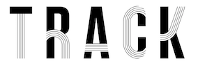 Jonathan Gustin (London, UK) created the multiline aptly named typeface Track (2017). Behance link. [Google]
[More] ⦿
Jonathan Gustin (London, UK) created the multiline aptly named typeface Track (2017). Behance link. [Google]
[More] ⦿
|
Jonathan Heter
|
During his studies at the University of Kansas in Lawrence, KS, Jonathan Heter designed a few free fonts in 2014: Barnstormer (a prismatic all caps, display typeface influenced by the stunt pilots of the early 20th century), Dogfighter, Wingwalker. [Google]
[More] ⦿
|
Jorge Iván Moreno Majul
[Ivan Moreno]
|
[More] ⦿
|
José Antonio Garrido Izquierdo
[Noem9 Studio]
|
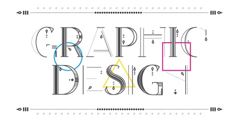 [MyFonts]
[More] ⦿
[MyFonts]
[More] ⦿
|
José Antonio Portillo Quispe
|
Lima, Peru-based designer of the prismatic typeface Toux (2013). [Google]
[More] ⦿
|
Joseph Churchward
[Churchward Type]
|
[MyFonts]
[More] ⦿
|
Joseph Parsons
|
Rotterdam-based British designer Joseph Parsons, of Joseph Parsons Design, created a beautiful art deco caps alphabet in 2013. He also designed the stylish art deco poster entitled Portfolio (2012). Behance link. [Google]
[More] ⦿
|
Jörg Schmitt
|
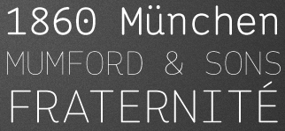 Designer (b. 1985, Marburg) at 26-plus Zeichen in Germany, who is based in Köln. He graduated from the University of Applied Sciences in Trier in 2010.
 In 2010, he designed Telegraph Sans and Telegraph Serif and Hellschreiber (2011, Sans and Serif), the latter at Die Gestalten. The name Hellschreiber originates from an old Siemens telegraph system (or Hell-Schreiber, named after Dr. Rudolf Hell). Both fonts have the look of typewriter type and were inspired by Courier. In 2012, Joerg started the Joerg Schmitt Foundry. His first typeface there is the pleasing rounded monospaced typewriter style sans family Ingrid Mono (from Hairline to Bold). Fansy (2013) is a prismatic typeface. In 2014, he created the (curly) ironwork typeface Snappy. In 2017, he published the very readable soft sans typeface Oblivian Grotesque and the sharp-edged Oblivian Text, which is characterized by a kneeling italic f. Klingspor link. Behance link. 36plus Zeichen link. [Google]
[MyFonts]
[More] ⦿
|
Julia Fedorenko
|
Photographer and designer in Krasnodar, Russia, who created the typefaces Olympic80 (2012, prismatic: on the theme of the Olympic circles), Texhnolyze (2012), Masonic (2012, created based on triangles only) and DROP (2012). In 2013, she created the pixel typeface Com City for a computer store in Krasnodar. [Google]
[More] ⦿
|
Julie Zhu
|
Auckland, New Zealand-based designer of the multiline art deco typeface [Google]
[More] ⦿
|
Justyna Litwinska
|
Warsaw-based designer of the prismatic typeface MyFont (2013). This was a school project for Andrzej Nowaczyk. [Google]
[More] ⦿
|
K Design
[Kristian Koh]
|
Graphic designer and illustrator in Manila, The Philippines. In 2017, he created the handcrafted Goblin, Hairy Potato and Random Luck, the comic book font Yehey, the adventure game font Braveheart, the free triangular sci-fi typeface Modern Tribe, the sci-fi typeface Kryxx, the free prismatic typeface Hello Earth. Typefaces from 2018: Cyborg, Gladiator, Twilight (brush script). [Google]
[More] ⦿
|
Kai Damian Matthiesen
|
During his Masters studies at the Royal College of Art in London, Kai Damian Matthiesen created Shadow Font (2014), Frankography (2015, a grungy hybrid typeface), Coercion (2015, prismatic), Snapshots (2015, octagonal textured caps) and Aby Warburg (2015). Behance link. [Google]
[More] ⦿
|
Karl Klingspor
[Klingspor (or: Gebrüder Klingspor)]
|
[MyFonts]
[More] ⦿
|
Katheryn Poling
|
During her studies in Fort Wayne, IN, Katheryn Poling designed the neon tube typeface Prism (2017). [Google]
[More] ⦿
|
Katie Fleming
|
Lawrence, KS-based designer of the prismatic school project font Parts Make The Whole (2014). [Google]
[More] ⦿
|
Katie Short
|
Henderson, NV-based designer of the prismatic typeface Zen (2015). [Google]
[More] ⦿
|
Kent Swecker
[A New Machine]
|
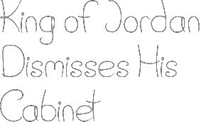 [MyFonts]
[More] ⦿
[MyFonts]
[More] ⦿
|
Kittiphat Sukamolson
[Star Plus Multiply]
|
[More] ⦿
|
Klingspor (or: Gebrüder Klingspor)
[Karl Klingspor]
|
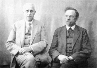 German foundry established in 1906 by brothers Karl Klingspor (1868-1950) and Wilhelm Klingspor (1871-1925) in Offenbach am Main. About half of its catalog consists of blackletter types (as listed in 2000 by Harald Süß), and many of its typefaces were designed by German über-designer Rudolf Koch. History (in German, PDF), resummarized here:
 - 1892: Carl Klingspor (1839-1903), the father, buys the Rudhardsche Gießerei in Offenbach am Main in 1892, which was originally founded in 1842 by Johann Peter Nees, Phillip Rudhard and Johann Michael Huck.
- 1899: Heinz König designs Walthari (a light Fraktur font).
- 1900: Otto Eckmann designs the Fraktur font Eckmann Schrift, and Kurt Wanschura (from Leipzig) designs the Fraktur font Offenbacher Schwabacher. Reform appears!
- 1901: Peter Behrens publishes Behrensschrift (art nouveau style). Offenbacher Fraktur appears too.
- 1902: Behrens Schrift by Peter Behrens. Fette Eckmann Schrift und Ziermaterial by Peter Behrens. Vignetten by Emil Doepler d.J., and Schmuck für Bücher und Akzidenzen by Robert Engels, München.
- 1903: Reform Kursiv.
- 1904: Karl and Wilhelm Klingspor become the sole owners of the Rudhardsche Gießerei. As a private typeface, they decide on Munthe Schrift by Norwegian Gerhard Munthe.
- 1905: Heinz König designs König Antiqua. Breitkopf Fraktur is published, based on the original design of Joh. Gottl. Immanuel Breitkopf (1719-1794). Also new is Auszeichnungsschriften für Fraktur, as well as Die Leidensstationen by Robert Engels.
- 1906: The form is renamed Gebr. Klingspor. Otto Hupp makes Liturgisch (another Fraktur font). Jugendschrift is published.
- 1907: Peter Behrens publishes Behrens-Kursiv.
- 1908: Peter Behrens publishes Behrens Antiqua. Otto Hupp makes Neue Anzeigen Schriften. Halbfette Reform is published.
- 1909: Otto Hupp makes Hupp Antiqua (a Basque "A" in here!), Hupp Unziale. Walter Tiemann designs Tiemann Mediäval.
- 1910: Rudolf Koch designs Fette Deutsche Schrift (Fraktur) and Fette Kochschrift (are these not the same?). Hupp Fraktur appears. The company publishes Kalender Bilder by Heinrich Vogeler.
- 1911: Tiemann makes Halbfette Tiemann Mediäval.
- 1912: Tiemann makes Tiemann Mediäval. Kursiv and Tiemann-Kursiv. Koch makes Halbfette Deutsche Schrift and Deutsche Schrägschrift.
- 1913: Peter Behrens publishes Behrens Mediäval. Koch makes Schmale deutsche Schrift.
- 1914: Rudolf Koch publishes Frühling, Maximilian Gotisch, Maximilian-Antiqua and Maximilian. Walter Tiemann makes Peter Schlemihl and Tiemann Fraktur.
- 1915: Klingspor acquires F. W. Aßmann and Wilhelm Gronau in Berlin.
- 1917: Albert Windisch makes Windisch Kursiv.
- 1919: Karl Michel designs Schraffierte Antiqua. Some cooperation is established with D. Stempel AG, which acquires some shares.
- 1920: Tierbilder-Probe is published.
- 1921: Rudolf Koch publishes Deutsche Zierschrift (Fraktur) and Magere deutsche Schrift. Walter Tiemann makes Narziß. The company publishes Elfenschmucjk, as well as Schräge Schwabacher. Leo Wackerle makes Kalender Bilder.
- 1922: Rudolf Koch designs Koch Antiqua and Koch Antiqua Kursiv. Otto Hupp publishes Deutsche Schrägschrift. Ernst Engel designs Mörike Fraktur, a private typeface just created for the Ernst Engel Presse.
- 1923: Rudolf Koch designs Koch Antiqua Kursiv and Neuland. Walter Tiemann designs Tiemann Antiqua.
- 1924: Koch designs Grosse Koch Antiqua, and Tiemann makes Tiemann Gotisch.
- 1925: Wilhelm Klingspor dies. Rudolf Koch designs Wilhelm-Klingspor-Schrift (Fraktur), and Victor Hammer creates an uncial font, Hammerschrift.
- 1926: Tiemann makes Tiemann Antiqua Kursiv and Koch publishes Klingsporschrift.
- 1927: Rudolf Koch designs Kabel.
- 1928: Rudolf Koch designs Neuland Licht. Walter Tiemann makes Kleist Fraktur.
- 1929: Rudolf Koch creates Zeppelin.
- 1930: Rudolf Koch designs Wallau (rotunda) and Jessen-Schrift (Fraktur).
- 1931: Heinrich Maehler makes Salut.
- 1932: Rudolf Koch designs Holla.
- 1934: Walter Tiemann makes Fichte Fraktur.
- 1935: Rudolf Koch creates Koch Kurrent.
- 1937: Rudolf Koch publishes Claudius.
- 1940: Rudo Spemann's Gavotte appears.
- 1944: A bombardment destroys a lot of material and drawings.
- 1950: Karl Klingspor dies. Walter Tiemann makes Offizin. According to Chronik und Stammfolge der Familie Klingspor (1989, Reinhard Klingspor and Gerhard Moisel), Karl Klingspor died on January 1, 1951, but everywhere on the web we find 1950.
- 1951: Karl Hermann Klingspor (1903-1986), son of Wilhelm, takes over the company.
- 1952: Karlgeorg Hoefer makes Salto.
- 1953: Karlgeorg Hoefer publishes Saltino. Victor Hammer makes Hammer Unziale. The Klingspor Museum in Offenbach is created.
- 1954: Hans Kühne designs Andreas Schrift (Fraktur) and Kühne Schrift (Fraktur). Joachim Romann makes Constanze (a formal script) and Queen. Alfred Finsterer designs Duo Licht and Duo Dunkel.
- 1955: Karlgeorg Hoefer makes Monsun.
- 1956: D. Stempel AG buys the remaining shares of Klingspor, and incorporates many of its types in its own catalog.
That library included typefaces by these designers: - H. Kühne: Andreas Schrift (1954, carried by Delbanco and Gerhard Helzel), Kühne Antiqua (1954), Kühne Schrift (1954), Stahl (1933-1939).
- P. Behrens: Behrens Antiqua (1907), Behrensschrift (offered by Intecsas as Sprecher Gothic), Behrens Initialen (called Sprecher Initials at Intecsas).
- Rudolf Koch: Claudius (carried by Delbanco), Deutsche Schrift (1910), Frühling (1917, carried by Delbanco), Deutsche Zierschrift (1921, offered by Delbanco and Gerhard Helzel), Holla (1932), Jessen-Schrift (1924-1929, carried by Delbanco), Kabel (1927, at Linotype now; called Geometric 231 at Bitstream, and Kalten at PrimaFont, and Koch Original at LetterPerfect), Koch Antiqua (1922, published by Linotype now; available from Alphabets Inc as AI Koch Antiqua MM; called Eva Antiqua SG at Spiece Graphics), Zeppelin (1929, available from Agfa now), Koch Kurrent (1935, offered by Delbanco), Koch Fraktur (offered by Delbanco, Gerhard Helzel, and Christian Richter), Marathon (1938), Maximilian (1917, available at Castle Systems, and carried by Delbanco), Maximilian-Gotisch (carried by Gerhard Helzel and by Walden Font), Neuland (1923, available from Linotype; available from Alphabets Inc as AI Koch Neuland, and at Bitstream as Informal 011, and at PrimaFont as Newfish, and at Keystrokes as Neuland inline), Prisma (1928; a multiline typeface revived in 2003 by Dieter Steffmann, and extended in the large family LL Prismaset at Lineto), Wallau (1926-1934, carried by Delbanco, and called Wal at PrimaFont), Wilhelm Klingspor-Schrift (1925, carried by Delbanco and Linotype; Wilhelm Klingspor-Gotisch is called Wilson at PrimaFont).
- J. Romann: Constanze (1954), Queen (1954, called Ferrante by Intecsas).
- Walter Tiemann: Daphnis (1929), Fichte Fraktur (1934-1939, carried by Delbanco and Gerhard Helzel), Kleist Fraktur (1928, revived by Dieter Steffmann in 2002, and carried by Delbanco), Narziss (1921, available from Font Bureau and Spiece Graphics as Narcissus), Offizin (1952), Peter Schlemihl (revived by Walden Font, and by Dieter Steffmann in 2002), Tiemann Mediäval (carried by Gerhard Helzel), Tiemann Antiqua (1923, now at Linotype).
- A. Finsterer: Duo licht/Duo dunkel (1954).
- O. Eckmann: Eckmann Schrift (1900, called Freeform 710 at Bitstream, and called Eckmann at Elsner&Flake, ScanGraphic, Linotype, URW++, Gerhard Helzel and Delbanco), Eckmann Initialen (called Jan Bent at Intecsas).
- Kurt Wanschura: Offenbacher Schwabacher (1900, Offered at Delbanco).
- H. König: Falstaff (1906).
- H. Schardt: Folkwang (1949).
- R. Spemann: Gavotte (1940, available from Linotype).
- V. Hammer: Hammerschrift (1923, available as Martel at Scriptorium), Hammer Unziale (1953). [Linotype has it as Neue Hammer Unziale. Agfa carries Uncial, which is really Neue Hammer Unziale. The Electric Typographer calls it Electric Uncial. Elsner&Flake have a version called American Uncial.]
- O. H. W. Hadank: Ornata (1943).
- H. Bohn: Orplid (1929).
- O. Hupp: Liturgisch (1906, carried by Gerhard Helzel), Hupp Antiqua (1909).
- F.K. Sallwey: Information breitfett (1958).
- A. Kumlien: Kumlien Antiqua.
- R. Bauer: Magnet (1906).
- K. Hoefer: Monsun (1955), Salto (1952, now at Linotype), Saltino (1953, carried by TypeRevivals), Saltarello (1954).
- H. Maehler: Salut (1931, version available from Agfa).
An unclassified condensed elongated Victorian fat face, Slimback-style, is Figura. No date known. View the Klingspor typeface library. [Google]
[MyFonts]
[More] ⦿
|
Kornel Faludi
|
 Graphic designer in Budapest, Hungary. Graduate of Loughborough University, class of 2018 (with a bachelor's degree), and Moholy-Nagy University of Art and Design in Budapest in 2021 (with a master's degree). At Loughborough University (UK), Kornel Faludi designed a set of generative typefaces (2016), i.e., typefaces that are very modular and computer-generated to a large extent. His typographic oeuvre is quite experimental. Many of his fonts use just basic geometric structures such as circles, arcs and rectangles.
 In 2019, he published Thin Stroke, Alien, the kitchen tile typeface Blocks, the organic typeface Swan, the blocky typeface Bagur, the prismatic typeface Baton, the rounded stencil typeface Stencil, the experimental typeface Geometric, the piano key typeface Darling, and the techno typeface Aquarius. Creator of these display typefaces between 2015 and 2021: Aquarius, Black (piano key style), Blocky (kitchen tiles), Computer, Futuristic, Geometric (prismatic), Martian, Organic, Sliced, Stencil, Striped, StrokeLine, Thinline. [Google]
[More] ⦿
|
Kristian Koh
[K Design]
|
[More] ⦿
|
Kristyna Koprivova
|
Nove Straseci, Czechia-based designer of prismatic and brush typefaces in 2015. Behance link. [Google]
[More] ⦿
|
Lance Wyman
|
 Designer who became famous because of his work on wayfinding and branding projects, and his designs for massive urban systems, airports, zoos, and museums. Over the course of his career he has created systems for the Mexico 1968 Olympics, Mexico City Metro, National Zoo, American Museum of Natural History, New York Penn Station, National Mall, Minnesota Zoo and Jeddah International Airport. Wyman taught corporate and wayfinding design at Parsons the New School for Design in New York for forty years, from 1973 until 2013. He lectures internationally and is still designing. The first compendium of his work, Lance Wyman: The Monograph, was published by Unit Editions.
 Creator of the identity, logos, fonts, and design elements for the Mexico 1968 Olympics in the op-art or prismatic style. The multilined font, called Mexico Olympic, is due to Photoscript Ltd (I think). A digital font inspired by it is Olio Inline (2012, Max Little). For a free version, see Steve Harrison's Sixty Eight and Sixty Eight Plus (2021). Wyman, who is a branding specialist based in New York City, is known for his many excellent icons and logos for companies and events. Born in Newark, NJ, he is a graduate of Pratt in Brooklyn with a degree in Industrial Design. He made the Tipo Metro font in 1969 for Mexico City's subway, an adaptation of Eurostile. That font was revived later as Metro DF by Harold Lohner. A pixel version of this (by Kemie, is called Balderas). Lance Wyman worked with Rick Banks at F37 Foundry on the design of F37 Wyman (2021), which showcases his famous lettering style that goes back to the 1968 Olympics. Bio. [Google]
[More] ⦿
|
Lara Sibson
|
American creator of the prismatic typeface Moonlight Prism (2014) and the display typeface Quincli Lace (2017). Behance link. [Google]
[More] ⦿
|
Lee Mundy
|
FontStructor who made Geo 11x11 Block (2013), Geo 11x11 Unblock, Geo 9x9 (2013, +Round, +Round Slice), Geo 5x5 Round (2013, +Slice), Geo 5x5 (2013, prismatic), Geo 5x11 (+Round: 2013), Futurebit 2 Pro (2013), Geocircle 5x5 (2013), Geoslice 9x9 (2013), Geoslice 5x5 (2013), Unoriginalpixel (2011) and Geospace (2011, dot matrix face). [Google]
[More] ⦿
|
Lee Schulz
[Yes Please]
|
[MyFonts]
[More] ⦿
|
Lemonthe
[Dwi Ahidian]
|
 Bandung, Indonesia-based designer (b. 1995) of these script typefaces in 2020: Calton Elegance (a Peignotian sans), Janelotus (an inky script), Destoria, Estrada Signature, Befront, Simfony Sign, Kaishou (brush style), Malona, Hamiltone Signature, Anthurium, Mondeylla, Belligiant, Southernsky. In addition, he made these fonts in 2020: Sachi (font duo), Visual Hollow (font trio), Kreis 8 (prismatic and slinky), Rosvelit (a display serif).
 Typefaces from 2021: Highes Signature (script), Patternly (a stocky monolinear script), Bluegold (script), Primal Signature, The Songket (script), Katagiri (script), Luthon Southard (a font duo), Fife Gallery, Sign Rathi (an inky signature script), Penguin Blush (a scrapbook font), Bostroom (a dry brush script), Sagata Normal (sans and script), Monosign (a monolinear signature script), Dontheus (an inky script), Magis Authentic. Typefaces from 2022: Satchell (a scrapbook script), The Billion (an inky signature script, accompanied by a monoline version), Hayken Script (signage script), Resonant Chilliner (font duo). [Google]
[MyFonts]
[More] ⦿
|
Les Graphiquants
|
 Graphic design studio in Paris, est. 2008. Designers include Maxime Tétard and Romain Rachlin. It is mainly involved in corporate identity and occasionally designs fonts for clients. Typefaces as of 2017 include Alsace (2012: modular all caps display typeface), Amsterdam (2012: an exercise in high contrast), Athènes (2009: experimental), Berline (2012: in Grotesk and Calligraphique substyles), Craft (2012: hipster style), Frankfort (2012), Intervalle (2016), Sofia (2011: Peignotian), Linbourg (2013), Rive (2010), and Lorraine (2011). [Google]
[More] ⦿
Graphic design studio in Paris, est. 2008. Designers include Maxime Tétard and Romain Rachlin. It is mainly involved in corporate identity and occasionally designs fonts for clients. Typefaces as of 2017 include Alsace (2012: modular all caps display typeface), Amsterdam (2012: an exercise in high contrast), Athènes (2009: experimental), Berline (2012: in Grotesk and Calligraphique substyles), Craft (2012: hipster style), Frankfort (2012), Intervalle (2016), Sofia (2011: Peignotian), Linbourg (2013), Rive (2010), and Lorraine (2011). [Google]
[More] ⦿
|
L.Harl Copeland
|
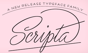 Phototype era American type designer. Jeremy Mickel created a digital version his (prismatic, beveled, roman caps) Trillium typeface in 2011 at the new digital PhotoLettering / House Industries. Copeland's original Trillium was done at Photo-Lettering, Inc. in 1960. He also designed Copeland Milo (a connected script) at PhotoLettering Inc.
 John Moore says that Copeland's style inspired him when he made Scripta Pro in 2014. [Google]
[More] ⦿
|
Lin Ling
|
Rio de Janeiro, Brazil-based designer of Square Monkey (2018). [Google]
[More] ⦿
|
Linda Fruits
|
Fort Lauderdale, FL-based designer of the prismatic Far Out Alphabet (2014) and the circle-based experimental typeface Circle Back (2015). Behance link. [Google]
[More] ⦿
|
Linh Phi
|
Hamburg, Germany-based designer of the multiline paperclip style typeface Lumi (2016). [Google]
[More] ⦿
|
Linlu Zhou
|
Madison, WI-based designer of the prismatic typeface Umbrella & Lantern (2015). [Google]
[More] ⦿
|
Little Fonts
[Max Little]
|
 Little Fonts is a type foundry in Norwich, UK, run by Max Little (b. London, 1986). Max Little studied graphic communication at Norwich University.
 Inspired by the work of Wim Crouwel, he designed the massive mechanical octagonal super-heavy stencil typeface Mass (2012). Loop and Loopo Stencil (2012) are circle-based stencil typefaces. Decode (2012) is a gorgeous art deco triplet of typefaces. Olio Bold (2012) is a geometric retro sans, while the multiline version, Olio Inline (2012) was inspired by the op-art of Lance Wyman's Mexico 1968 Olympic identity. In 2013, Little designed Spika (a straight-edges geometric monospace typeface). The angular metal rock band typeface We Are Rockstar (2013) is free. Typefaces from 2014: Note (brush family), Divert (outlined, constructed using the bended paperclip principle). Typefaces from 2015: Note (rough brush), Hazmat (stencil). Typefaces from 2017: Upside (all caps, art deco). Behance link. Home page. Creative Market link. [Google]
[MyFonts]
[More] ⦿
|
Lizy Gershenzon
[Vectro Type Foundry (was: Scribble Tone)]
|
 [More] ⦿
|
Louis Bastelica
|
During his studies at ESAG Penninghen, Paris-based Louis Bastelica (b. Toulouse) created a multiline typeface called The White Stripes (2013). [Google]
[More] ⦿
|
Lukasz Kulakowski
[Empty Page Studio]
|
[More] ⦿
|
Madisen Fedo
|
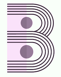 Phoenix, AZ-based designer of an experimental multiline typeface in 2016. [Google]
[More] ⦿
Phoenix, AZ-based designer of an experimental multiline typeface in 2016. [Google]
[More] ⦿
|
Mads Haugsted Rasmussen
|
Art director in Copenhagen. Norwegian creator of the prismatic typeface Seal (2012). Cargocollective link. Behance link. [Google]
[More] ⦿
|
Marc Valls
|
Barcelona-based designer of Network Type (2012), a multiline prismatic typeface that was influenced by Alex Trochut's Hyper Dunk. [Google]
[More] ⦿
|
Marcos Vinicius Machado de Oliveira
|
 Aka Marcos Oliveira. Porto Alegre, Brazil-based designer of a prismatic decorative set of initials in 2017, with some impossible Escher-style glyphs thrown in. [Google]
[More] ⦿
Aka Marcos Oliveira. Porto Alegre, Brazil-based designer of a prismatic decorative set of initials in 2017, with some impossible Escher-style glyphs thrown in. [Google]
[More] ⦿
|
Margaret Harding Penney
[Hello Creative (or Hello Mart, or Hello Media)]
|
[More] ⦿
|
Margaux Heylen
|
During her studies in Paris, Margaux Heylen designed the prismatic display typeface Prisme (2017). [Google]
[More] ⦿
|
Maria Lynam
|
Huddersfield, UK-based student-designer of a prismatic typeface in 2017. She also designed a colourful typeface that is based on Milton Glaser's Bob Dylan poster. Behance link. [Google]
[More] ⦿
|
Maria Magdalena Rybak
|
Prismatique (2011) is a noncommercial font inspired by the art deco vase Nanking from 1925---a bit in the Futurismo style. Home page at Verine Design in Lodz, Poland. [Google]
[More] ⦿
|
Maria Santos
|
Graphic designer in Sydney, Australia, who created a prismatic poster typeface in 2013 called Santos. Behance link. [Google]
[More] ⦿
|
Mariko Ebine
|
During her graphic design studies at Nottingham Trent University, Mariko Ebine (b. Tokyo) created a typeface family called Circus (2012), which consists of a prismatic typeface that was inspired by beams of light, and an art deco titling typeface. [Google]
[More] ⦿
|
Marilou Cayet
|
Paris-based designer of the prismatic typeface Est Ensemble (2017). [Google]
[More] ⦿
|
Mario Almaraz
|
Born in Monterrey, Mexico, in 1989, Mario Almaraz designed the prismatic art deco poster typeface New York in 2012. Behance link. [Google]
[More] ⦿
|
Mark Walters
[Type n Tings]
|
[More] ⦿
|
Marlène Latourre
|
Art director in Annecy, France, who created the prismatic all caps typeface Lido (2015). Behance link. [Google]
[More] ⦿
|
Maromaz
[Miguel Angel Rojas Meraz]
|
Zapopan, Mexico-based designer of Psyco Lover (2011), Hello Kinky Hello Foxy (2011, bubblegum font), Agony Lord (2012, an artsy condensed typeface) and Little Bird (2012, a playful bubble gum typeface). For GPHC Maromaz, he created the Itzel Flow Font (2013). Trantor (2013) is a bilined typeface. Vale (2014) is a brush typeface. Typefaces from 2017: Marian, Cuerda. Behance link. [Google]
[More] ⦿
|
Match&Kerosene
[Alex Sheldon]
|
 Match&Kerosene is Alex Sheldon's Detroit-based graphic design and typographic illustration company, est. 2008.
 Klingspor link. Behance link. Typefaces designed by Sheldon (b. Michigan, 1984) include Slab Sheriff (2009), Western, Kerosene Boxley (2009, a multiline art deco revival of a Solotype font; some say that it is based on a pair of 1972 alphabets by Marcia Loeb called Zig Zag and Rainbow), Kerosene Woodtype (2009), Kerosene Retroface, Kerosene Stereo (2009, revival of an Italian typeface from 1869), Kerosene Killowatt, White Wolf (2009, condensed horror movie face). Typefaces designed in 2011: Quimby (Copperplate Gothic style titling face), Black Bear (2011, straight-edged display family), Swifty (2011), Grizzly Bear (a set of 12 constructivist titling typefaces), Detroit (a modular family for superpositions), Prismatic (another superimposable multi-purpose family), Duotone (2011, Duotone is a layered font system that allows one to title two-tone headlines), Volcano Gothic (+Inline), Volcano Island (jungle look family), Lightyears. [Google]
[MyFonts]
[More] ⦿
|
Mathieu Brisard
|
Graphic designer in Paris, who created the delicate multilined typeface Echo (2012). Behance link. [Google]
[More] ⦿
|
Maurits den Held
|
Rotterdam-based designer. Home page of Desited Media. Creator of a great multiline / prismatic poster for North Sea Jazz (2012). [Google]
[More] ⦿
|
Mauro Paolozzi
[Buildshape]
|
 [More] ⦿
|
Max Little
[Little Fonts]
|
 [MyFonts]
[More] ⦿
[MyFonts]
[More] ⦿
|
Max Phillips
[Signal Type Foundry]
|
 [MyFonts]
[More] ⦿
[MyFonts]
[More] ⦿
|
Maxime Nugues
|
During her studies at ECV Bordeaux, Maxime Nugues designed the triline typeface Racer (2015). [Google]
[More] ⦿
|
MCKL (was: Mickel Design)
[Jeremy Mickel]
|
 Jeremy Mickel runs a design studio in Los Ange;les, where he moved to from Minneapolis in 2015. Before that, he was located in Brooklyn, New York and Providence, RI. Originally called Mickel Design, the studio and foundry was renamed MCKL in 2012. Mickel has taught at RISD and the Minneapolis College of Art and Design.
 He is working on this VAR-Rounded sans serif style face (2007) that was based on plastic cut letters seen in New York's subway. See also here and here. Mickel's typefaces: - Router (2008, Jeremy Mickel): a rounded sans family.
- Baro (2010, Chester Jenkins and Jeremy Mickel): Baro is inspired by memories of Antique Olive Nord, Roger Excoffon's landmark design originally commissioned for Air France in 1956. Nord, the heaviest weight of Antique Olive, was the starting point, but Baro shares DNA with other Village designs, including Apex New and Mavis.
- Eventide (2009, Jeremy Mickel): octagonal and 3d family based on ideas by Paul Carlyle in the early 1940s. That Carlyle typeface had also made it into the PhotoLettering collection in 1971. Eventide was developed into a family at House Industries under the art direction of Ken Barber and Christian Schwartz, and won an award at TDC2 2011.
- Superior (2010, Jeremy Mickel): a high-contrast transitional "nearly didone" face. Superior Title (2013) is described as a high-contrast missing link between Times and Bodoni. It was designed for fashion publications.
- Shift (2010, Jeremy Mickel): a slab serif family that won an award at TDC2 2011.
- Gonesh (2009, Jeremy Mickel): a great new sans family.
- Aero (2010, Village Type) was developed in cooperation with Chester Jenkins. This poster family, inspired by Excoffon's Antique Olive, was awarded at TDC2 2011.
- Letterboxes (2008). A stencil typeface that was part of a collaborative project with John Caserta at the Design Office.
- Plinc Flourish (a 2011 digitization by Jeremy Mickel for House Industries). Based on William Millstein's Millstein Flourish, an upright script first designed for PhotoLettering Inc in the early 1940s.
- Union (2011). A basic sans family, ideal for corporate design.
- Jeremy Mickel created a digital version L.Harl Copeland's (prismatic, beveled, roman caps) Trillium typeface [originally done at Photolettering] in 2011 at the new digital Photolettering / House Industries.
- Fort is a sans family published in 2012 by Village.
- Playoff Sans and Playoff Serif (2015).
- Adidas has partnered with MCKL to create an innovative suite of variable fonts. These fonts are being used across a wide spectrum of applications, including Creative Direction, Product Design, Graphics, Communications, Digital Experiences, and the brand campaign for the upcoming World Cup. In 2015, Mickel expansed the Adineue Pro family. In 2017 they started the first Adidas Variable Font, Adineue CHOP Variable, an octagonal athletic sans in a wide range of weights from hairline to black, and widths from extra-condensed to extra-wide. In 2018, Mickel embarked on Adineue Pro Variable.
- Rosa Sans (2019: by Jeremy Mickel and Pentagram). A free geometric grotesk (in their own words) sans family.
- Trust (2020). A flared typeface first used for the identity of the Commission on Presidential Debates (Trump versus Biden).
- Logic Monospace and Logic Monoscript (2020). Mickel writes: Logic Monospace takes inspiration from midcentury typewriter fonts, including IBM Selectric's Advocate and the ubiquitous Courier, with additional references in slab serifs like Stephenson Blake's Scarab. While there are many great script typewriter fonts, including Olympia and Aristocrat, Logic Monoscript is a novel creation, with few examples of true connecting monospace scripts in existence.
- Uber (2020). A custom job for Uber.
- Owners (2021). iJeremy explains: Owners is an expressive family of fonts that takes inspiration from the dynamic energy of handmade signage as seen around Los Angeles.
- RedHat Display, Text and Mono subfamilies. The open source fonts were originally commissioned by Paula Scher / Pentagram and designed by Jeremy Mickel / MCKL for the new Red Hat identity. Mickel writes: Red Hat is a fresh take on the geometric sans genre, taking inspiration from a range of American sans serifs including Tempo and Highway Gothic. The Display styles, made for headlines and big statements, are low contrast and spaced tightly, with a large x-height and open counters. The Text styles have a slightly smaller x-height and narrower width for better legibility, are spaced more generously, and have thinned joins for better performance at small sizes. In 2021 we added Light and Light Italic styles, and a Monospace family. Variable fonts with a weight axis are available. RedHat's official site.
Klingspor link. Village link. Speaker at ATypI 2018 in Antwerp. [Google]
[More] ⦿
|
Meagan Driscoll
|
 During her studies at St. John's University in Queens, NY, Meagan Driscoll designed the prismatic typeface Handmade (2015). [Google]
[More] ⦿
During her studies at St. John's University in Queens, NY, Meagan Driscoll designed the prismatic typeface Handmade (2015). [Google]
[More] ⦿
|
Mediumextrabold (or: M XB Foundry)
[Philip Cronerud]
|
 Commercial type foundry based in San Francisco. Their typefaces, some of which were made by Philip Cronerud:
 - From 2016: Edie Text, Maud (a fashion mag display typeface), Galleri.
- From 2015: Atelier (sans), Blanche, Practice (sans), Everyday (sans), Deursen (sans), North (serifed display typeface), Inkwell (sans).
- From 2014: System (monospaced system font), Wired (a display typeface inspired by Richard Kostelanetz rigorous arrays of lines and grids), Grotezk or MXB Grotesk (a geometric sans), Pavilion (a bespoke prismatic typeface for Printed Pages), Duplex (geometric sans).
[Google]
[More] ⦿
|
Mehmet Abaci
[Studio Typo]
|
 [More] ⦿
|
Melani Lleonart
|
Valencia, Spain-based designer of the multiline typeface Pattern Type (2013). [Google]
[More] ⦿
|
Melannie Manrique
|
Caracas, Venezuela-based designer of the multiline typeface Shine (2017) and a set of icons for wayfinding (2017). [Google]
[More] ⦿
|
Metis Digital Type Foundry (or: Studio Io, or: Metis Foundry; was: Volume2a)
[Simon Bent]
|
 Simon Bent from Melbourne (Metis Foundry, or: Studio Io; was: Volume2a) designed these typefaces in 2007-2008: Epsilon, Annual (modular, architectural), Tangerine, Deccade (experimental), Hoax [more scans: i, ii, iii, iv], Babylon (another modular experiment).
 In 2012, he created the geometric sans typeface Acumen, and the sans family Silence. He is working on Fragile, Terminal, Link, Recurrence (very experimental), Autonomy, Motor, Velcro, and Elevator. In 2013, he designed the sans typeface Figure. In 2016, he published the ultra-condensed blackletter typeface Optimum Compress in Textura style. In 2018, he published the great condensed brutalist octagonal typeface Texel, the experimental geometric typeface Pyxis (published by The Designers Foundry), and the geometric solid typeface Geometer. In 2019, he added the ultra-fat Dot19, the monoline experiment LXII, the modular Alexandro, the geometric sans typefaces Software and Gertrudes, and the sans font Mizzen. Typefaces from 2020: Geometer. Typefaces from 2021: LXII Display (a prismatic typeface). [Google]
[More] ⦿
|
Mia Ruiz
|
Mia Ruiz (Quezon City, The Philippines) created an untitled prismatic typeface in 2013. [Google]
[More] ⦿
|
Michael Gene Adkins
[The Fontry]
|
 [MyFonts]
[More] ⦿
[MyFonts]
[More] ⦿
|
Michael Parson
[Typogama]
|
 [MyFonts]
[More] ⦿
[MyFonts]
[More] ⦿
|
Michael Spitz
|
American graphic designer in Rijeka, Croatia. Designer of the ball terminal face Sumac (2010), the prismatic typeface Aviary (2011), Minor Slab and the self-described badass sans typeface On Ramp (2011, Lost Type), Leaden (2012), Anchor (2012). Behance link. Creattica link. Devian Tart link. [Google]
[More] ⦿
|
Michiel Terpelle
|
Arnhem, The Netherlands-based creator of Mahagony Script (2008, FontStruct), a calligraphic pixel script, and Excellent (2008, FontStruct), a kitchen tile typeface. In 2014, he created DataBits, Maender (a multicolored font for children's books), and an untitled 3d prismatic typeface. In 2015, he created the grid-based typeface Metric Font. FontStruct link. [Google]
[More] ⦿
|
Miguel Angel Rojas Meraz
[Maromaz]
|
[More] ⦿
|
Mohammed Shohail Bhuian
[Seemly Fonts (or: Fancy Fonts, Instagram Fonts, Comely Designs, or: Seemly Designs)]
|
[MyFonts]
[More] ⦿
|
Momegraphic
[Agnes Jekli]
|
Agnes Jekli (Momegraphic) is a graphic designer in Budapest, Hungary. She developed an impressive multiline prismatic typeface called Agiko (2012), which was created for a Rubik's cube style puzzle. The letters of the alphabet are put together in a modular fashion by rotating and shifting basic multiline elements. This was done in cooperation with Aniko Köhegyes. She created another geometric typeface in 2012. Behance link for Agnes Jekli. Behance link for Momegraphic. [Google]
[More] ⦿
|
Multiline fonts: Mike Yanega
|
Mike Yanega has the ultimate listing of multiline fonts. Let me group them for you: - Agfa/Monotype: Zeppelin.
- From the book Homage to the Alphabet: Churchward Metallic (also Italic), Dektiv, Aki Lines, Maxie Lined, Prismania K, Skin & Bones.
- FontBank: Skinny, Legerdemain (Elektrik), Neptune (Neon).
- George Williams: Mirage, Picadilly..
- Elsner + Flake: Pump Triline (+ Initials).
- ParaType: Dublon.
- Blue Vinyl: Macrame Super.
- T26: Kaa, Maxigroove, F-Groove 76, F-Groove 77, F-Groove 78, F-Groove 79, F-Groove 80, F-Groove 81, 21st Outline (+ Italic).
- DustBust: Dreamland, Vectroid Astro.
- Sparky Fonts: Thri.
- ITC: ITC Neon.
- Font-a-licious: Rolloglide, Supreme, Gemini Outline, Gemini 1972.
- Linotype: Labyrinth.
- Churchward Type: Churchward Design Lines.
- Fontlicker Fonts: Phatburner.
- You Work For Them: Trisect.
- DS4.Sale: DS Lane.
- Typotek: La Chaufferie (Basic, Basic Special, Super, Super Special).
- Fontomas: Mass Striped.
- Fenotype: 79 Retro.
- Nick Curtis: Buenos Aires.
- Ray Larabie: Mexcellent, Mexcellent 3D, Soul Mama, Street Cred.
- Red Rooster: Roller.
- C-Font: Crossbar.
- Fenotype: Automania.
- Miguel Hernandez (Atomic Media): Groobit.
- From a Spanish Letraset catalog: Oxford, Michel (by Michel Waxman), Stack, Stripes (1973), Optex (1970), Yagi Link Double (see picture here), Good Vibrations (1973, Trevor Hatchett).
- Axel Pfaender: Excellence (1997).
- Canada Type: Gala (Biline, Triline).
[Google]
[More] ⦿
|
MyFonts: Multiline typefaces
|
 Top multiline fonts at MyFonts. See also here and here. [Google]
[More] ⦿
Top multiline fonts at MyFonts. See also here and here. [Google]
[More] ⦿
|
MyFonts: Prismatic fonts
|
MyFonts pages on prismatic fonts. See also here. [Google]
[More] ⦿
|
Naghi Naghachian
[Naghi Naghashian]
|
 Naghi Naghashian's foundry (called Naghi Naghachian, with a c) is located in Frankfurt. Quoting MyFonts, where we can buy his fonts: Naghi Naghashian was born in Teheran. After completing his school education in Iran, he studied illustration and book design at the Hochschule für Gestaltung (HfG), an academy of design, in Offenbach, Germany. Thereafter he was engaged as art director in various advertising agencies in Germany, Switzerland and England. He also worked as a freelance graphic designer with focus on illustration and brand designing for leading producers of brand articles in Europe, and also for broadcasting stations in Germany and other European countries. He was occupied with theoretical work in the field of color and research in the passive perception of color and "after image" phenomena. He carried out an analysis of the letters of the Arabic alphabet and a definition of their structure, enabling him to design a number of modern types of Arabic script. He designed the monoline typeface Aban (2010), which covers Latin, Arabic, Persian and Urdu. Jasna (2010) is a monoline rounded family with the same support. Avesta Extra Bold (2010) and Anahita Extra Bold (2010) are headline typefaces. Bi Bi (2010) is a squarish (Bank Gothic style) typeface that also covers Arabic, Persian, and Urdu.
 Ahoura (2011) is an Arabic font family. Decora One (2011) is a curly ornamental all caps face. Decora Two (2011) is another ornamental caps face. Bamdad Extra Bold Condensed (2011) is an Impact-like typeface Bamdad that supports Latin, Arabic, Persian, and Urdu. Parsi (2011) is an elliptical sans family that supports Latin, Arabic, Persian, and Urdu. Novin (2011, +Shadow) is an elliptical typeface that supports Latin, Arabic, Persian, and Urdu. Typefaces from 2012: Parto (elliptical). Typefaces made in 2013: Iranica, Avid Pro, Nima (a Latin/ Arabic techno family named after Persian poet Nima Yooshij, 1896-1960), Decora Arabic, Decora Pro (and its Arabic / Farsi / Urdu companion, Parvin), Ekbatana (for Latin, Arabic, Farsi and Urdu), Apadana (for Latin, Arabic, Persian and Urdu), Roumi Pro (an elegant inline typeface), Surprise Pro (headline rounded sans), Mocca Pro, Nana Pro, Nana Rounded Pro, Nana Arabic, Petrol Stencil (an Arabic / Urdu / Latin stencil typeface), Kashi (2015: inspired by 16th century building decorations in Iran). Typefaces from 2013: Ostad Arabic. Typefaces from 2016: Naghashian, Golestan (supports Arabic, Persian and Urdu), Babak (a techno family for Latin, Arabic, Persian and Urdu), Ostad Pro, Elogium Pro. Typefaces from 2017: Afsoon, Afsane, Jekta, Pasargad, Kamane (Naskh style for Arabic, Persian and Urdu), Damavand. Typefaces from 2018: Bieta, Afshid, Pegah, Homayoon, Hafez, Dara, Homa (for Arabic, Farsi and Urdu), BaBa Rounded, BaBa. Typefaces from 2019: Nahid, Nameh (a single-weight sans), Gilan, Jaleh, Bauhaus Arabic. Typefaces from 2020: Golnama (a prismatic typeface for Arabic, Persian, Urdu and Latin), Esfand, Bonyad (modern kufi / geometric sans), Art Deco Arabic, Behtab. Author of Illustrated Quatrains of Omar Khayyam, Geometrie als Mysterium, and Design and Structure of Arabic Script. Klingspor link. MyFonts link. [Google]
[MyFonts]
[More] ⦿
|
Naghi Naghashian
[Naghi Naghachian]
|
 [MyFonts]
[More] ⦿
[MyFonts]
[More] ⦿
|
Natalie Harris
|
At Flagler College in St. Augustine, Florida, Natalie Harris designed the multiline typeface Dames Point (2017). [Google]
[More] ⦿
|
Natasha Jen
|
 Natasha Jen (BFA 2003) and her team at Pentagram designed the stretchable typeface Herita Geo in 2015 for the AIA New York Heritage Ball.
 Type designs from 2017: Closed Worlds (mechanical, octagonal; Closed Worlds is a new exhibition at the Storefront for Art and Architecture in New York), Open View Stencil (for the Boston-based venture capital firm Open View). In 2019, she released the multiline custom typeface family Building Cycles, and the custom pixel typeface Droit. Behance link. Pentagram link. [Google]
[More] ⦿
|
Nathan Gonzalez
|
Designer in Santos, Brazil, whose first typeface is the prismatic Titanium (2013). Devian Tart link. [Google]
[More] ⦿
|
Nathan Miller
|
 Cardiff, Wales-based illustrator and designer. In 2015, he created the trilined typeface Tokyo, which was influenced by the kanji neon sign of that metropolis. Behance link. [Google]
[More] ⦿
Cardiff, Wales-based illustrator and designer. In 2015, he created the trilined typeface Tokyo, which was influenced by the kanji neon sign of that metropolis. Behance link. [Google]
[More] ⦿
|
Nedo Mion Ferrario
|
 Designer and artist, b. Milan, 1926, d. Caracas, 2001. From MyFonts: Several Venezuelan generations had acquired very strong design, typographic and drawing knowledge due to the historical and artistic heritage left by Master Nedo Mion Ferrario. He spent big part of his life teaching and working on design. His passion for impossible figures and geometric optic illusions were the most valuable characteristics of his work. Most of his knowledge was obtained from his father, Emilio Mion Vianello, who dedicated his life to wood carve, a high profile job those day in Italy. Emilio studied in the Brera Academy in Milan and Nedo studied in the Commercial and Technical Institute of Milan between 1936 and 1940, and then in the Fine Arts Academy in the same city. At the end of the Second Word War, both of them decided to leave Italy due to the political situation in those days. Encouraged by the immigration Venezuelan politics they arrived in Caracas in 1950. Wiki.
 His work inspired Carlos Camargo Guerrero to create the Escheresque font Denedo (2001-2007). According to Camargo, Denedo is a font based in one of the impossible alphabets created by the Italian graphic designer Nedo Mion Ferrario during the 60's and 70's in Caracas, Venezuela, South America. Michael Parson designed the prismatic typeface Nedo in 2013 based on Ferrario's work. Klingspor link. [Google]
[MyFonts]
[More] ⦿
|
New Typography
[Vernon Adams]
|
 Vernon Adams (born England, 1967) was a furniture restorer, woodcarver and typeface designer. On August 24, 2016 Vernon Adams passed away from injuries sustained in a scooter accident in May of 2014. New Typography was his type design site. Vernon graduated in 2007 with an MA in type design from the University of Reading and lived in San Clemente, California. His wife Allison now holds the trademark and/or copyright to most of his fonts.
 He developed Mako (2007), a type family for text and image in magazines. Earlier, he created AutoPacHousehold. Nobile (2010) is part of the Google font directory. Through the Open Font Library, one can get the source Fontforge code for this open source sans family. About Mako, he writes that he submitted the font to Fontsmith, which sat on it for a while and rejected it, only to publish a few weeks later Lurpak, which according to Vernon is too similar to his rejected design. Free fonts at Google Code by Vernon, as of the end of 2010 include Coda (a heavy elliptical face), Nobile (mentioned above), Corben (a curvy bold typeface in the style of Cooper Black), and Gruppo (a thin sans). In 2011, he added Coustard (a slab serif family), Damion (connected signage script), Smythe (Victorian), Radley (display face), Oswald (a reworking of the Alternate Gothic style: see this dedicated page; Oswald was updated continually by Vernon Adams until 2014. Vernon added Light and Bold weights, support for more Latin languages, tightened the spacing and kerning and made many glyph refinements throughout the family based on hundreds of users' feedback. In 2016 the family was updated by Kalapi Gajjar and Alexei Vanyashin to complete the work started by Vernon, and support languages that use the Cyrillic script), Candal (sans), Pacifico (connected signage face), Bangers (comic book face), Anton (heavy sans), Bevan (a reworking of Beton, a traditional slab serif display typeface created by Heinrich Jost in the 1930s), Six Caps (a condensed headline face), Meddon (a display font created from the handwritten script of an Eighteenth century legal document), Rokkitt (an Egyptian), Paytone One (headline face), Holtwood One SC (wood block simulation face), Monofett (white on black), Carter One (casual face), Francois One (gothic sans), Sigmar One (think mid twentieth century pulp magazine advertising), Bigshot One, Metrophobic, Mako, Francois One, Nunito (rounded; CTAN link), Shanti, Sigmar, Muli (minimalist sans), Kameron (an Egyptian), Stardos Stencil, Bowlby One, Bowlby One SC (fat poster face), Tienne (serif), Monoton (a multiline face in the style of Koch's Prisma, 1931), Sancreek (emulating an ornamental wood font), Amatic SC (hand-printed poster family), Sancreek (a Tuscan face), Oswald (in the old Alternate Gothic tradition of sans typefaces---a free Google font; CTAN link), Rammetto (based on the Stephenson Blake uppercase display font Basuto, released in 1926), and Michroma (modeled after Microgramma). Typefaces made in 2012 include Bench Nine (Google Web Fonts: based on old Stephenson Blake typefaces), Oxygen (a sans typeface available from Google Web Fonts; forked in 2016 at Open Font Library as Comme and in 2017 as Oxygen Sans, with two new oblique styles), Oxygen Mono (Google Web Fonts), Norican (free script font at Google Web Fonts based in part on Stephenson Blake's Glenmoy from the 1920s), Cutive (free at Google Web Fonts, based on the IBM typewriter typefaces Executive and Smith-Premier), Pontano Sans (Google Web Fonts: a light basic sans), Trocchi (Google Web Fonts: derived from Nebiolo's Egiziano, and Caslon & Co's Antique No.4 and Ionic No.2), Seymour One (Google Web Fonts: derived from Sigma One), Anaheim (sans, Google Web Fonts), Cutive and Cutive Mono (Google Web Fonts: based on the typewriter typefaces of IBM's Executive and the older Smith-Premier). Typefaces from 2013: Mondo (sans), Anton (grotesque). In 2016, Jacques Le Bailly extended Nunito to a full set of weights, and an accompanying regular non-rounded terminal version, Nunito Sans. Another extension of Nunito is Iunito (2019, unknown designer). In 2020, Jacques Le Bailly, Cereal and Vernon Adams (posthumously) released the sans typeface family Mulish at Google Fonts. Mulish is a minimalist sans, designed for both display and text typography. It was initially drawn in 2011 by Vernon Adams under the name Muli and then refined until 2014. In 2017 the family was updated by Jacques Le Bailly to complete the work started by Vernon after he passed away, in collaboration with his wife Allison, an artist who holds the trademark on the typeface family name. In August 2019, it was updated with a variable font weight axis. Donations to Vernon's family. Memorial. Fontspace link. Dafont link. Google Plus link. Fontsquirrel link. Klingspor link. Github link. Fontsquirrel link. [Google]
[More] ⦿
|
Nghia Trung
|
In 2017, Nghia Trung (Hanoi, Vietnam) designed the prismatic racetrack-inspired Latin typeface Athletype. [Google]
[More] ⦿
|
Nick Curtis
[Art deco typefaces by Nick Curtis: II]
|
 [MyFonts]
[More] ⦿
[MyFonts]
[More] ⦿
|
Nick Curtis
[Nick Curtis: Typefaces from 2015]
|
[MyFonts]
[More] ⦿
|
Nick Curtis: Typefaces from 2015
[Nick Curtis]
|
 Typefaces made by Nick Curtis in 2015:
 - Bothas Ruhm NF. After Blockschrift (1897, Genzsch and Heyse).
- Chiselle NF. A revival of Rustikalis, a typeface designed for the VGC Phototypositor in the 1960s. See Rustikalis DT (1=2007, Malcolm Wooden) for the revival of the bolder version.
- Coins Coupes NF. Modeled after Chamfer, a 19th-century octagonal typeface by Barnhart Bros & Spindler.
- Doright Black NF. Based on Dudley Upright (Dan X. Solo, 1960s).
- Feedbag NF. Based on Horse Tank (Fotostar).
- Inland Edwards NF. Based on Nicholas J. Werner's Edwards (1895, Inland Type Foundry).
- Millrich Grange NF. A revival of the 19th century font Grange by Miller & Richards.
- Mitchell NF. A digital revival of the grotesque all-caps typeface Mitchell (1906, Inland Type Foundry), the bold version of Blair (1900, Inland Type Foundry).
- Newfangle NF. A Victorian typeface based on Newfangle (1892, Hermann Ihlenburg).
- Page Five Fifteen NF. After William H. Page.
- Retrorocket NF. An art deco typeface after D. Duvillé, 1934.
- Rockwall NF. After Aldine by William H. Page.
- Telecomm NF.
- Versacrum NF. A psychedelic / art deco typeface inspired by the lettering of Alfred Roller for the Ver Sacrum magazine in 1903.
- Old Number Ten NF. A revival of a typeface Gothic Number Ten by the Cincinnati Type Foundry.
- Terranova NF. A prismatic typeface based on Earth (Dan X. Solo).
[Google]
[MyFonts]
[More] ⦿
|
Nico Inosanto
[Nootype]
|
 [MyFonts]
[More] ⦿
[MyFonts]
[More] ⦿
|
Nih Studio
[Suci Anita]
|
 The names associated with Nih Studio are Nouval and Suci Anita. Designer(s) of these typefaces in 2020: Bagsman, Bitter Space, Bristteback, Buffalord (all caps, gothic), Buffalow, Climbup (by Fajar Saepul R & Sarah Suci P), Flatters (a tall and tight typerface by Widiyanti and Sarah Suci P), Fabulouscity (a font duo), Fairry Eastern Serif (a geometric sans), Fearcheer (+a multiline style; by Nouval and Suci Anita), Frighter, Gerth (a rounded sans family by Nouval and Suci Anita), Hamsterly, Hostiline (script), Hydrilla (a brush script typeface by Widiyanti and Sarah Suci P), Ofstrike (a script typeface by Widiyanti and Suci Anita), Paradisk (by Fajar Saepul R and Sarah Suci Pauziah), Pretty Real, Ruderup (brush), Stepped, Sweetish.
 Typefaces from 2021: Vienna Town (an interlocking font by Widiyanti & Sarah Suci Pauziah). Home page. [Google]
[More] ⦿
|
Nikolai Dobreff
|
During his studies in Hamburg, Germany, communication designer Nikolai Dobreff created the experimental prismatic typeface Minimalphabetically (2013). Behance link. [Google]
[More] ⦿
|
Nima H.K.
|
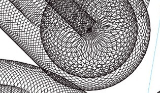 Graduate of York University, who is working as a graphic designer in Toronto. Creator of experimental typefaces such as Slinkyy (2014, prismatic), Workshop (2014, multilined) and Pigment (2014, hairline). Behance link. [Google]
[More] ⦿
Graduate of York University, who is working as a graphic designer in Toronto. Creator of experimental typefaces such as Slinkyy (2014, prismatic), Workshop (2014, multilined) and Pigment (2014, hairline). Behance link. [Google]
[More] ⦿
|
Noem9 Studio
[José Antonio Garrido Izquierdo]
|
 Noem9 Studio is an online studio created by Jose A. Garrido, a graphic designer who was born in Alcañiz, Teruel, Spain, in 1987, and lived in Zaragoza. Noem9 is currently based in London.
 He created Avanth (2012), a modular experimental typeface that is very useful for logos and titles. Typefaces from 2012 include Ballege (a partially free slab serif family that uses details often seen in college sports and that was inspired by the film MoneyBall by Bennet Miller). Typefaces from 2013: Chronic (a free alchemic / hipster font inspired by native American legends), Essay (a copperplate headline sans published by Avondale). In 2016, he made the custom prismatic typeface Happy Ending, and 36 days of Type (decorative caps). They also published the layered multiline retail typeface family eNeon (2016). Typefaces from 2017: Kick Off (based on sports graphics from the 1970s). Typefaces from 2029: Inndam (modular). Typefaces from 2020: Locker Numerals, Creattica link. Creative Market link. Behance link. Dafont link. Graphicriver link. [Google]
[MyFonts]
[More] ⦿
|
Nootype
[Nico Inosanto]
|
 Nootype (Nico Inosanto) is a Swiss type foundry in Neuchatel. Typefaces made in 2013 include Merry Scriptmas (free didone), the geometric sans family Radikal, and Selfico, which is characterized by a symmetric g and y. Selfica (2013) is the sans companion of Selfico.
 Fitigraf (2013) is a mix between a classical serif font and graffiti street art. Agilis (2013) is a free text typeface with bulging glyphs. Helia (2013) is a 16-style sans family. Helia Core (2013) is a companion typeface. Dorica (2013) is a 14-style sturdy stocky serif family optimized for small point sizes. Felice (2013) is a classic text family that defies classification. Retrostar (2013) is a sans typeface that mixes some humanism wirth art deco. Typefaces from 2014: Kleide (a scriptish typeface family). Typefaces from 2016: Primera (a wide sans), Stratic Script, Solanel (sans), Devinyl (a potpourri of all caps styles with Inline, Acier, Fold, Inline, Line, Vinyl and Stencil versions), Rubiesque (a mix of humanist and grotesque elements in a sans), Rubis (the serifes companion of Rubiesque). Typefaces from 2017: Solanel (sans). Typefaces from 2018: Qiproko (stencil). Typefaces from 2019: Bric Sans (octagonal; a college font family), Nicolette Script (by Nico Inosanto and Nicky Laatz), Bricbrac (octagonal and layered). Typefaces from 2020: Strikt Sans (an 8-style curvy sans), Lazare Grotesk. [Google]
[MyFonts]
[More] ⦿
|
Nour Sadat
|
Graphic designer in Cairo who designed the experimental multiline typeface Interlaced (2017). [Google]
[More] ⦿
|
Odile Morales
|
Saltillo, Mexico-based designer (b. 1988) of Pistyl (2011) and Rokyodil (2011). In 2014, she designed the prismatic multiline typeface Untrazuko. [Google]
[More] ⦿
|
Oleh Lishchuk
[Pepper Type]
|
 [MyFonts]
[More] ⦿
[MyFonts]
[More] ⦿
|
Ondrej Kahanek
|
 Koprivnice, Czechia-based designer, b. 1989, Bilovec, Czechia. His typefaces include Trendy Roma (2012, sans and slab), Steelovy (2011, art deco prismatic typeface), Inspiration (2011, a thin architectural typeface), and Spock (2011, modular, logical, and mini-slabbed). In 2014, he set up his own type foundry. In 2014, Ondrej created Zirkel, a geometric sans in 16 weights.
 Behance link. [Google]
[MyFonts]
[More] ⦿
|
Page Studio Graphics (or: Pixymbols)
[Roger Vershen]
|
 Page Studio Graphics is Roger Vershen's Oro Valley, AZ-based company specializing in symbols and symbol fonts, founded by him in 1986. Roger Vershen died in Tucson, AZ, in 2003.
 The fonts (grouped under the name PIXymbols) include ADA symbols v.2.0, Africa, Alphabox, Alphacircle, Ameslan (ASL), Antorff (blackletter), Antorff Fractions, Apothecary, Arrows, Astrology, Backstitch, Boxkey, BoxNLines, Braille grade 2, Casual, Chalk Casual, PIXymbols Chess, Command Key, Courex (typewriter family), Crossword, PIXymbols Deco Glass (2001), Digit&Clocks (+LED symbols), Dingbats&Online, DOSScreen, Fabric Care, FARmarks (Federal Aviation Regulations lettering), Flagman (semaphore), Fractions, Gridmaker, Highway Gothic (U.S. Department of Transportation's Standard Alphabets for Highway Signs), PIXymbols Highway Gothic 2002, Highway Signs (U.S. Department of Transportation), Hospital&Safety, LCD, Linea (2002, prismatic), Luna, Malkoff (calligraphic font), Marina, Meeting, Mejicana (2001, a Mexican party font), Menufonts, Morse, Musica (instruments), Newsdots, Orchestra, Passkey, Patchwork, PCx, Phone, PIXymbolsMusica, Prescott (2001, Western), Penman (2001, connected script), PrimerD (letters with lines), Recycle, Roadsigns, Shadowkey, Signet (family), Signet Shadow, Squared, Strings, Stylekey, Tolerances&Datum, Travel&Hotel, TV List, Unikey, US Map, Vershen (2001), Xcharting, Xstitch. They also sell EPS files of all Arms of Swiss cantons, and many nice initial caps. Look also for Faux Hebrew (simulated Hebrew), as part of the Faux package that also includes Faux Sanskrit, Faux Runic, Faux Hebrew, Faux Japanese, Faux Arabic, Faux Chinese and Faux Chinese Sans. Alternate URL. Previews at MyFonts. Klingspor link. View the Page Studio Graphics typeface library. [Google]
[MyFonts]
[More] ⦿
|
Pal Elekes
|
During his studis at Visual Arts Institute Eger (Hungary), Pal Elekes designed an experimental prismatic typeface (2017). [Google]
[More] ⦿
|
Patricia Murta
|
Coimbra, Portugal-based designer who created the modular display typeface Tulipa in 2013. Still in 2013, she created the prismatic concentric typeface US Channel. [Google]
[More] ⦿
|
Patrick Seymour
|
 Super-talented Montreal-based illustrator and digital artist. Home page. He created several modular typefaces in 2011.
 In 2012, he created Muse, Gotham Streets (a prismatic typeface), Slinky, Stencil, Tulipe (counterless), Bad Billy (multilined, art deco), The Great Carnival (beveled caps), Web Font (prismatic), Jump Jump Font (octagonal), Fashion (a horizontally striped typeface), OK (prismatic), The Aviator (horizontally striped poster face), La Bonne Aventure (prismatic and slightly art deco), the rope-themed typeface Noeud Marin, the shaded boat name typeface Bleu Marine, the multiline caps typeface Origami, the moustache-inspired caps typeface Mous Type (ornamental moustache-shaped capitals), the multilined display typeface Empire, the hand-drawn Une Typo Faite A La Main, and the prismatic typeface Anabelypster. After a bout of salmonella, he created Intestino, still in 2012. In Motion (2012) is an awesome prismatic art deco typeface. Images of his stunning work from 2011: i, ii, ii, iv, v, vi, vii, viii, ix, x. His Cathédrale project (2011) starts from a squarish face and transforms it gradually into one that contains the features of a cathedral. Creations in 2013: Shapes (geometric font), Gold Deco, Dentelle, Twist, Sleek (a thin slab serif), Say Say Say (multiline, prismatic, hypnotic), Metrick (a gridded typeface), Film Noir (an overlay type system), Tam Tam, Diner (a striped all caps typeface), Spot Light Font (prismatic), Flora, Bright Diamond, Incandescent, XVII (multilined display face), Konga (a multiline script), Shiny Diamond, Splash (paint font), Chicago (prismatic neon tube face), Taxi (a wonderful multiline typeface), Papale (religious symbology alphabet made to mock the papal system), Empreinte (pure op-art), Broken Arrow Font (multiline caps face), Liquid Paper Font, Sunset (prismatic), Boogie (Broadway-style art deco family), New Art Deco (prismatic art deco face), Poule de Luxe, Burnout (a prismatic typeface), Marble Maze Font, M Gagnon (ornamental caps influenced by the design work of Denis Gagnon). FontStruct fonts: Test3 (2012), Jump Jump 2 (2012). Typefaces made in 2014: Moiré, Decora, Magnetic, Noise (TV noise emulation), Yes (multilined font), Broderie (braided letters), SAS (multilined), Full House, Heart Font (prismatic), 1976 (inspired by the 1976 Olympic Games in Montreal), Gold (prismatic art deco typeface), Lace, Bike. Typefaces from 2015: Detour, Allie X, Grad Font, Duct Tape, Mint Julep (bilined art deco beauty), Hourglass, Stuntman (prismatic), La Dame de Coeur (playing card font), Fog. Typefaces from 2016: Road Free (a free prismatic font), Solitaire (card font), Joliette, Denis (named after Montreal's mayor, Denis Coderre), Montreal (a prismatic typeface based on the logo of the city of Montreal), Cherry Cola Font, Bro & Co (multilined art deco beauty), Macramee (multilined). Typefaces from 2017: The Simple Font (sans), Le Cabinet (multilined neo deco). Typefaces from 2018: Atrium (a sublime multiline art deco beauty), Pride (a color font to support the LGBT community). Typefaces from 2019: Columbarium (a beveled typeface), The Invisible Font, The Usual Font, Recettes d'Ici (handcrafted style for menu design), Vinyl (multiline), Gasoline (a gasoline spill textured font), Reflet, Mint Soda (a fashion mag extravaganza), Glamarrr (a sailor or pirate font). Typefaces from 2020: Siren (a wonderful mermaid-themed initial caps font, half Engravers MT and half mermaid), Homa (decorative caps), Luna (blocky caps), Chicken Bone, Happier (an all caps 3d color font), Dollara (a polygonal typeface), Stay Home, Mundo Disko (prismatic). Typefaces from 2021: Deliria, The National Bank Open font (created for a tennis tournament). Behance link. Hellofont link (for buying his fonts). Typefaces from 2022: Trumpets (deco caps). [Google]
[More] ⦿
|
Paul Bokslag
[Font Studio Four]
|
 [More] ⦿
|
Paul Cracknell
[Something and Nothing]
|
[MyFonts]
[More] ⦿
|
Paul Virlan
|
 Bucharest, Romania-based designer of the multiline decorative caps typeface Molda (2016) which is inspired by traditional weaves and cultural symbols from Eastern Europe. Creative Market link. Behance link. [Google]
[More] ⦿
Bucharest, Romania-based designer of the multiline decorative caps typeface Molda (2016) which is inspired by traditional weaves and cultural symbols from Eastern Europe. Creative Market link. Behance link. [Google]
[More] ⦿
|
Paulo W
[Intellecta Design (or: Monocracy Types)]
|
 [MyFonts]
[More] ⦿
[MyFonts]
[More] ⦿
|
Pedro Perfeito
|
As a student at Instituto Politecnico de Tomar in Portugal, Pedro Perfeito created the prismatic and shaded typeface family Broadway (2016) and the stencil typeface Gotham Rounded Curvas (2016). [Google]
[More] ⦿
|
Pepper Type
[Oleh Lishchuk]
|
 Odessa, Ukraine-baded designer of the Peignotian sans typeface Alethia Pro (2016, Mint Type) for Latin and Cyrillic. In 2016, Oleh Lishchuk and Andriy Konstantynov co-designed the rounded scientific or technical paper font Midpoint Pro. In 2017, they published the 64-style geometric grotesque sans-serif typeface family Opinion Pro, which is characterized by its extra-large x-height. Deposit Pro (2017) is a wide slab-serif family with low x-height.
 In 2018, Oleh published Rolleston (a rigid 42-style serif font family with peculiar spiky serifs), the music poster Latin / Cyrillic typeface family Stereonic (Mint Type) that features multiline, stencil, inline, contour, overline and underline styles. He published the programming font Vin Mono Pro in 2018 at Mint Type. Vin Mono Pro is a squarish monospaced font family with extra-large x-height and rounded corners. Related typefaces include Vin Sans Pro, Vin Slab Pro Typefaces from 2019: Ditch (octagonal), Spaceland (a minimalist sans), Alethia Next, Mazzard (a 54-style geometric grotesque with three different x-heights), Mazzard Soft. Typefaces from 2020: Daikon, Monospaceland (a 21-style monospaced monolinear organic sans), Mantonico (a small x-height transitional text family), Ruberoid (described as a squarish geometric sans-serif family reminiscent of Italian designs of 1950s and 1960s, but featuring considerably rounder shapes to give it a more contemporary feel), Geraldton (a geometric sans family), Shtozer (a chamfered typeface family). Typefaces from 2021: Zerno (an 18-style flared lapidary typeface family), Golca (a 16-style geometric sans for Latin, Greek and Cyrillic), Steclo (an 18-style tall condensed minimalist sans). [Google]
[MyFonts]
[More] ⦿
|
Peter Bilak
[Typotheque]
|
 [MyFonts]
[More] ⦿
[MyFonts]
[More] ⦿
|
Philip Cronerud
[Mediumextrabold (or: M XB Foundry)]
|
 [More] ⦿
|
Philip Kelly
|
 Type designer who runs Philip Kelly Digital Design in the UK. He worked for Letraset from 1969-1994 as a type designer. His type design work there included Arabic and Hebrew letterforms. From 1994 until 1997, he designed typefaces at Signus, and became an independent designer in 1997. His typefaces:
 - He redesigned University Roman in 1977 at the Latraset Studio based on Mike Daines's origina design of University Roman (1972), which is now offered in a myriad of digital libraries. See University Roman (ITC), University SB (Scangraphic Digital Type Collection), University SH (Scangraphic Digital Type Collection).
- Gillies Gothic Extra Bold Shaded (1982). See Gillies Gothic (ITC) and Gillies Gothic (Linotype).
- Cortez (1977). An exaggerated flashy copperplate. See Cortez (Linotype).
- Pump (1980). This family has rounded simple letterforms including a triline style. See Pump (Linotype) and Pump (ITC).
- Croissant (1978, ITC or Elsner+Flake). Rounded and almost an oriental simulation face. See Croissant SH (Scangraphic Digital Type Collection) and Croissant (Linotype).
- The often copied Algerian (1988). See, e.g., Algerian Condensed (Linotype), Algerian EF (Elsner+Flake) and Algerian SB (Scangraphic).
- Emporium (Letraset). A circus font.
- Spritzer (1987, Letraset). A shaded face.
- Impress (1983, Letraset).
- Sendai (2010). A gracious copperplate-influenced 6-weight sans family.
- Fantail (2012). An arts and crafts style all caps typeface inspired by an RO monogram used during a Roy Orbison concert at the now defunct Coconut Grove nightclub in Los Angeles.
- Elan Greek and Elan Cyrillic to match ITC Elan (1985, Albert Boton).
- Elegant hand-drawn numeral typefaces based on calligraphic samples by illustrator Sarah Jane Coleman (2009).
- The italics for IR Modena (IR stands for Inland Revenue).
- Calligraphic typefaces done for Mandalay in 2009.
- Sendai (2001-2010).
- Shiosai and Shiosai Calm (2015). Wavy display typefaces.
- Zipper (Letraset). This was not Kelly's design, in fact. He was a stencil cutter at the time and only partially cut it, under direction. He writes: I just recall that I worked under close direction, but what was the inspiration/idea I have no idea. Personally I would prefer not to be thought of as its designer as I never really liked it. See ITC Zipper (ITC) and Zipper (Linotype).
Linotype link. FontShop link. Klingspor link. Portfolio. Testimonial of Kelly's days at Letraset. View several digital typefaces based on Philip Kelly's designs. [Google]
[MyFonts]
[More] ⦿
|
Philippe Nicolas
|
 French graphic designer who lived in Perugia, Italy, and is now in Nantes, France. I would call him an experimental typographer. He likes experimenting, for example, with modular typeforms, as is apparent from his typefaces called Tubular Type, Type Lover, and Fold Type (2009). His Electro (2009) is supposed to look like your hair when you plug your fingers into the socket. Bang Bang type (2009, Western meets organic) and Frak type Abigaëlle (modular blackletter, 2009) and All Slab Western (2009) are further experimental typefaces.
 In 2014, he designed the beveled typefaces Vernacolare, Prism Rounded, Prism, and Old Prism, and the circle-based display typeface Neo Quadrata. Terzo (2014-2017) is a delightfully excentric compass-and-ruler typeface. Modula (2014) is a minimalist modular typeface. Behance link. Flickr page, where one can find more experimental types, like AbstractMin (2010), AbstractStruct (2010). Home page. [Google]
[More] ⦿
|
Photo-Lettering Inc
|
 A subsidiary/part of House Industries in Yorklyn, DE. I quote: Photo-Lettering was a mainstay of the advertising and design industry in New York City from 1936 to 1997. PLINC, as it was affectionately known to art directors, was one of the earliest and most successful type houses to utilize photo technology in the production of commercial typography and lettering. It employed such design luminaries as Ed Benguiat and sold type drawn by the likes of Herb Lubalin, Milton Glaser and Seymour Chwast as well as countless other unsung lettering greats. The company is best known by most of today's graphic designers for its ubiquitous type catalogs. Physically, the collection takes up about 1500 cubic ft (42 cubic meters) of space and consists of film negatives and positives of most of the 6500 fonts produced in the company's 55 years. There are also countless patterns, cartouches, borders and dingbats, all of which have been preserved in film negative form. Each negative is approximately 28 in (71 cm) by 5 in (13 cm) high. House Industries, a Yorklyn, Delaware-based independent type foundry, purchased the entire physical assets of Photo-Lettering in April of 2003. Through a partnership with Ken Barber, Christian Schwartz and Erik van Blokland, House Industries is carefully digitizing select alphabets from the collection and plans to offer them through a modern web-based interface. The Photo-Lettering interface has allowed us to reach beyond the rigid confines of typography to offer extended features such as layering, color control and multiple master interpolation over six axes. With some of the most talented minds in display typography behind this new display lettering system, users of the system will enjoy the same refined typography as the original Photo-Lettering customers.
 A snapshot of their production, as of mid 2012, in alphabetical order: - Atrax. A Mexican simulation typeface.
- Aztec. A videogame typeface.
- Banjo Playbill. A tear drop typeface.
- PL Barclay Outline.
- BenguiatBuffalo. By Ed Benguiat.
- BenguiatCaslon, BenguiatCaslonOutline, BenguiatCaslonPlain. By Ed Benguiat.
- BillSeeWhimsy.
- PL Brazilia (sans).
- Brickhouse.
- PL Britannia.
- Brixen.
- BrodovitchAlbro.
- Bubblegum, Bubblegum Drop.
- Carlyle Eventide. A 3d titling face.
- CarusoRoxy.
- Chicamakomiko.
- CopelandMilo. A connected script by L.H. Copeland.
- CopelandTrilliumFills, CopelandTrilliumOutline. A beveled prismatic typeface by L.H. Copeland.
- DARegatta. A flared didone.
- DAmicoGothic. A casual flared typeface.
- DavisonBaroque. A Western / Tuscan typeface.
- ExotiqueJSplit.
- FederalReserve.
- FederalTwelveDiagonal, FederalTwelveHorizontal. These are engraved copperplate typefaces.
- PL Fiorello (squarish sans).
- Galaxy Didot (based on a didone typeface by C.E. Coryn).
- Goliath. A fat Egyptian typeface with a wood style flavor.
- HanoverBold. A nice Fraktur typeface.
- HaslerCircus. A Tuscan circus font.
- HenrionBA. A beveled typeface with several layers.
- HouseGothicWide. A shaded unicase typeface.
- Housebroken. A two-layer stencil caps face.
- PL Latin.
- Mierop Inline. A bilined art deco typeface.
- Millstein Flourish. A beautiful tall-descender typeface.
- PL Modern Heavy Condensed.
- Neutra Inline, Neutra Thin. Neutra Thin is a phenomenal geometric hairline sans.
- Norton Slapstick. A wood simulation typeface by S.E. Norton.
- Norton Tape. A stencil paper-fold typeface by S.E. Norton.
- Quaint. After an ornamental typeface from 1938 by Paul Carlyle and Guy Oring.
- Quicksilver.
- Quintet. A calligraphic connected script
- Raymund Circus (+Inline, +Outlined).
- Smidgen. A signage face.
- Sodachrome.
- StanSlope.
- SuperstarScript. A bubblegum typeface.
- SwissInterlock.
- SwissTwoTone. A display sans with two layers.
- Tiki Palms.
- TimesSquare. A dot matrix typeface.
- Tuggle. An oil slick typeface.
- Voodoo House.
- PL Westerveldt. A sans revived by Monotype.
- WestBarnumUltra, WestBarnumUltraDrop. A fat Egyptian typeface by Dave West.
- WestBehemoth, WestBehemothItalic. Egyptian typefaces by Dave West.
- WestEmperorScript. A fat didone by Dave West.
- WestThud. A fat signage typeface by Dave West.
- West Elephant. By Dave West.
- West Italiano. A didone by Dave West.
- West Kerpow. A comic book typeface by Dave West, late 1960s. This was digitized in 2011 by Allen Mercer at House Industries as Plinc Kerpow.
- Worthe Numerals. Fat didone numerals revived by Ben Kiel at House Industries in 2012.
[Google]
[More] ⦿
|
Pim Kerssemakers
|
 Dutch creator of the outline typeface Kersse (2012) and the prismatic octagonal typeface Prismakers (2012).
 Dafont link. Behance link. [Google]
[More] ⦿
|
Pisto Casero
[Gilberto Moya Perona]
|
 Fine Arts graduate from UCLM (University of Castilla-La Mancha) in Spain, who works as a graphic designer in Cuenca, where he set up the Pisto Casero commercial type foundry in 2013, after a period of free font production. He worked at DO2 Magazine. Gilberto Moya Perona is the designer of most fonts at Pisto Casero, which in 2014 was based in Brno, Czechia.
 Typefaces from 2011: Paper Cube (3d, outlined), the ink spill typeface Sopa de Letras, the fat counterless typeface Minimal, the outline typeface I Am Online With U, the 3d hand-printed outline typeface Indietronica, the stencil pixel typeface Stencil 8Bit, Wet Arial (a beautifully executed type treatment face), and the 3d pixel typeface Chip Tunes. Typefaces from 2012: Awakened, Corrupted Democrazy (grungy), Czech Tales (a beautiful curly typeface inspired by traditional Czech fairytales), Neon Serif (multilined, prismatic), Democrazy (sans and serif with very tall ascenders). Typefaces from 2014: I Am Online With You (a connected outline font family). Typefaces from 2015: Santanelli (an all caps rounded hipster display typeface). Home page. Fontspace link. Dafont link. [Google]
[MyFonts]
[More] ⦿
|
Practise
[James Goggin]
|
Graduate of London's Royal College of Art in 1999, James Goggin (b. 1975) founded graphic design studio Practise in 1999 in London with his partner Shan James. James was art director of The Wire (2005-2008). In August 2010, Goggin moved to Chicago where he was Design Director at the Museum of Contemporary Art Chicago (2010-2013). Previously he was based in Arnhem, the Netherlands, working as course director and teacher at Werkplaats Typografie (2009-2010) and visiting lecturer at ECAL (Ecole cantonale d'art de Lausanne) (2009-2010). The studio Practise has been based in Providence, RI, since 2016 where James also teaches BFA and MFA Graphic Design at Rhode Island School of Design (RISD). Aka Jacques Gauguin and "Practise", he has worked in London, Auckland and Sri Lanka. His typefaces: - In 2001, he made the three-weight LL Courier Sans (+Mono) at Lineto.
- Between 2003 and 2014, James Goggin, Rafael Koch, Mauro Paolozzi, and Arve B%aring;tevik developed LL Prismaset A at Lineto, a redesign and extension of Rudolf Koch's Prisma (1930).
[Google]
[More] ⦿
|
Pravin Ahir
|
Creative designer in Mumbai who designed the prismatic op-art Latin typeface Squoil (2014), the Buds typeface (2014, a modification of Cooper Black), and the decorative dot matrix typeface Bandhani (2014). [Google]
[More] ⦿
|
Pure Design
|
London-based designer of the multiline typeface Spaceline (2017). [Google]
[More] ⦿
|
Quan Payne
|
Design director at Frost Design in Sydney and South Africa since 2007. Global Brand Design and Art Director for the London 2012 Olympic Games for Nike. Designer of quite a few (unnamed) typefaces in 2009-2012. These include several modular or experimental designs, a 3D typeface for Mr. Muz in Tasmania, an Escheresque typeface, a prismatic typeface, a didonbe typeface, and an op-art experimental typeface. [Google]
[More] ⦿
|
Rafa Goicoechea
|
 Barcelona-based designer of the alchemic typeface Mana Sans (2011). He writes: A commissioned display font I designed for the Mexican band Maná in late 2011. It was finally used for one of their songs on the new album, as part of the visuals for their live shows on the last tour around South America and USA. Available from Ultra Types.
 Other fonts by him from 2012 include Geoda (a geometrically designed font), Modula Mono (a monospaced bold organic caps set, available from Ten Dollar Fonts), Mana (alchemic), and Marina (this three-style text family is his final project for the Masters in Advanced Typography at EINA). In 2013, he designed the 900-glyph geometric display sans typeface Sifonn Pro (Ultra Types), which is loaded with interlocking pairs. There is a basic tweetware version. In 2015, he published Yorokobu Isometric for the Yorokobu cover---it is a 3d Escher-style typographic piece. In that year, he also made a set of travel / wayfinding icons called Trippeo, the circle-based Rotula Display. Typefaces from 2016: 36Dot (colorful 3d caps set), Bosanova (prismatic titling typeface). Behance link. Home page. Utratypes link. [Google]
[More] ⦿
|
Rafael Koch
[Raphael Koch]
|
[More] ⦿
|
Ralf Weissmantel
|
German designer of the paperclip font Linotype Contacta (1994) and the multiline hypnotic typeface Boogie (2003, Linotype). He worked as an art director for various international advertising agencies, and has led Corporate Design projects for firms such as Grey and MetaDesign. He is currently teaching graphic design at the Düsseldorf University of Applied Sciences. Boogie won an award at the Linotype International Type Design Contest 2003. Linotype link. Klingspor link. FontShop link. [Google]
[MyFonts]
[More] ⦿
|
Ralph Michael Unger
[RMU (Ralph Michael Unger Typedesign)]
|
 [MyFonts]
[More] ⦿
[MyFonts]
[More] ⦿
|
Raphael Koch
[Rafael Koch]
|
Raphael Koch or Rafael Koch, b. 1976. Raphael Koch (Blokes.ch, Switzerland) graduated in 1999 from Schule für Gestaltung Luzern, Switzerland. His Diploma work there, Transport, involved the development of several typefaces, and was part of a team effort by Urs Lehni, Peter Körner, Markus Wohlhüter and Rafael Koch. Koch co-designed the very original multiline / prismatic typeface family LL Prismaset A (2006-2013, Lineto, with James Goggin, Alex Rich, and Mauro Paolozzi) which is rooted in Rudolf Koch's Prisma (1930). LL Prismaset B (2017-2019) is a later extension. He co-designed Lego in 1999 at Lineto with Urs and Juerg Lehni. In 2015, Raphael Koch and Mauro Paolozzi co-designed GT Cinetype at Grilli Type. This typeface has outlines consisting of many short straight line segments, thus mimicking the now obsolete pre-digital age technique of laser printing subtitles in movies. At small sizes, the font looks very smooth, but at larger sizes, the straight segments become apparent. Koch co-founded Zurich based design agency Noir Associates in 2016. Since 2001, Rafael has been teaching at Fachklasse Grafik. [Google]
[More] ⦿
|
Raquel Rodriguez
|
Letterer and designer in Chicago, who created the prismatic op-art typeface Line Letters (2014). Behance link. [Google]
[More] ⦿
|
Richard Diaz Granados
[Stereo Type Haus]
|
[MyFonts]
[More] ⦿
|
Ridhwaan Moolla
|
 Designer in Perth, Australia, who created the prismatic typeface Leading Lines (2014). Behance link. [Google]
[More] ⦿
Designer in Perth, Australia, who created the prismatic typeface Leading Lines (2014). Behance link. [Google]
[More] ⦿
|
RMU (Ralph Michael Unger Typedesign)
[Ralph Michael Unger]
|
 Ralph M. Unger (b. 1953, Thuringia, East Germany) says this about himself at MyFonts: Typesetter from the composing stick via Linotype setting machines to the Mac. Jobs in various Thuringian printeries. Barred further education by Communist authorities due to political reasons. Imprisoned in East Germany. Since 1988 in the state of Baden-Wuerttemberg, former West Germany. Jobs in several newspaper printing houses as advertisement compositor. Own office since 1995, in Aalen, Baden-Wuerttemberg. He lives in Schwaebisch Gmuend, and was a freelance type designer for Profonts and URW++, where he contributed frequently to their libraries between 2002 and 2009. In 2009, he founded RMU. MyFonts link. I split his contributions into two groups, the URW / Profonts group, and the RMU group. The prefix FontForum refers to a subseries of URW++ fonts. Unless specifically mentioned, all the following fonts are at URW++ and/or Profonts:
 - FontForum Admiral Script (2005): revival of Middleton's Admiral script from 1953.
- Amitié (2009): a garalde family.
- Arabella Pro (2006): after the script by Arnold Drescher from 1936, published at Joh. Wagner.
- Fontforum Atrament (2006): architectural lettering. Do not confuse with a Suitcase Type Foundry font from 2003 by the same name.
- Atze (2010): a comic book family.
- Behrensschrift D (2007): after the jugendstil typeface Behrens Schrift, 1902, by Peter Behrens.
- FontForum Bernhard Script (2005): after Bernhard Script from the 1920s.
- Bradley (2005): blackletter, after the original by William H. Bradley.
- Breite Kanzlei (2007).
- Breitkopf Fraktur (2003): after the original by Johann Gottlob Immanuel Breitkopf, done in 1793.
- Brocken (2011) is a signage typeface inspired by a design of Volker Küster (1960s).
- Profonts Bureau (2010, Profonts): a minimalist rounded sans family.
- FontForum Calypso (2005): a revival of Roger Excoffon's Calypso (1958).
- Card Pro (2006): a decorative display based on Ella Cursief (1916, Sjoerd Hendrik de Roos, Lettergieterij Amsterdam).
- Chaweng (2006, Profonts): an oriental all caps simulation face.
- Civilite URW (2005).
- Compliment (2004, casual script). Based on a 1965 script by Helmu Matheis for Ludwig & Mayer.
- Cranach (2007): a blackletter typeface modeled after Kuenstler Gotisch from the Krebs Foundry.
- Dominante (2007): a serif family based on Johannes Schweitzer's font by that name, 1959.
- Dominique (2010, profonts): an informal typeface.
- FontForum URW Ecsetiras (2005): revival of Ecsetirás (Zoltan Nagy, 1967, a brush face).
- Edda Pro (2008). An art nouveau typeface that revives a Heinrich Heinz Keune typeface from 1900.
- Energia Pro (2008, Profonts): connected monowidth script, based on Arno Drescher's Energos from 1932.
- Estro (2003, Western lettering). Seems close to Nebiolo's Estro from the 60s.
- Eurobrush Pro (2007, Profonts): handwriting.
- EuroSans (2008).
- Euroscript Pro (2006, Profonts): school script typeface based on his own handwriting.
- Flashes (2007): a revival of Crous-Vidal's Flash, 1953.
- Fox (2007): a brush script based on W. Rebhuhn's original from the 1950s.
- Gamundia (2010): a calligraphic copperplate script inspired by Excoffon's Diane.
- Ganz Grobe Gotisch (2006): a fat blackletter modeled after the original by F.H.E. Schneidler.
- Gmuender Elan Pro (2011) is a 1950s style script face.
- Gradl Nr 1 (2008): based on hand-drawn art nouveau upper case characters by M. J. Gradl, ca. 1900.
- Graphique Pro (2008): shaded caps face, based on Graphique, which was originally created by Swiss designer Hermann Eidenbenz in 1945, and issued as hot metal font by Haas'sche Schriftgießerei. See also New Graphique Pro (2011).
- Handel Slab (2009): a 6-style extension of Trogram's 1980 typeface Handel Gothic.
- Hanseat (2010): a grotesque family done at Profonts. It was heavily inspired by Germany's official DIN 1451 Engschrift.
- Iova Nova (2007): based on Jowa Script, designed by J. Wagner in 1967.
- Profonts>Impression (2008): art deco.
- Jessen Schrift (2004): after the Rudolf Koch blackletter typeface by that name.
- FontForum URW Konzept Pro (2005): revival of Konzept (1968, Martin Wilke's handprinting face).
- Legende (2002): a script typeface based on the original typeface of Friedrich Hermann Ernst Schneidler (1937).
- Leipziger Antiqua. The original Leipziger Antiqua by Alfred Kapr at Typoart dates from 1971 until 1973. The digital version of Leipziger Antiqua was developed by Ralph M. Unger in 2005.
- Manuskript Antiqua (2005): after Oldrich Meinhart's Manuskript Antiqua.
- The Maszynysta family of heavy industrial sans typefaces (2010) have a textured style (Struktura), a Shadow, and a plain Roman.
- Maxim (2003, Profonts): The heavy brush typeface Maxim was originally designed by Peter Schneidler in 1956 for the Bauer foundry.
- New Bayreuth (2008): after Friedrich Hermann Ernst Schneidler's Bayreuth from 1932.
- Old Borders and Lines (2010). A free font.
- Ornella (2008): Jugendstil.
- Peter Schlemihl (2008, Profonts): a revival of a blackletter by Walter Tiemann.
- Pedell (2009): a casual script.
- Polo (2002): a brush face modeled after Carl Rudolph Pohl's Polo (1960).
- In 2012, Ivana Koudelkova co-designed the grungy headline typeface Retroactive Pro with Ralph M. Unger at Profonts.
- Fontforum Rhapsody (2006): a revival of Ilse Schüle's rotunda face.
- Roberta (2003): art nouveau typeface after obert Trogman's typeface for FotoStar.
- FontForum Signs and Symbols (2006).
- Splendor (2009): a revival of a brush script typeface by Wilhelm Berg, Schriftguss, 1930. See also Splendor Pro (2014).
- Sportowy (2009): an outline face.
- Stanford (2011). A sports lettering face.
- Stiletto (2006): a medieval script.
- Fontforum Stripes (2007): a multistripe op art display typeface based on a Letraset font from 1973 by the same name.
- Fontforum Thalia (2006): retro font.
- Tintoretto (2006): shadow display face based on an origonal by Schelter & Giesecke.
- Tip Top Pro (2008): a Julius Klinkhardt art nouveau typeface revival.
- FontForum Unciala (2005): a revival of Oldrich Menhart's typeface Unciala (1953, Grafotechna).
- Unger Chancery (2005).
- Unger Script (2003): based on H. Matheis' Slogan typeface designed for Ludwig&Mayer in 1957.
- Veltro (2007): after a 1931 original by G. da Milano at Nebiolo.
- Profonts Woodpecker (2008).
The list of RMU fonts: - Affiche (2017). A revival of Helios Reklameschrift of the Klinkhardt foundry.
- Aldo Manuzio (2017). After a house typeface from 1897 by Schelter&Giesecke.
- Amati Pro (2010): after Georg Trump's condensed didone face, Amati, 1951.
- Antiqua Florenz (2021). A revival and extension of Paul Zimmermann's Antiqua Florenz (1960, Ludwig & Mayer), which is based on Venetian romans.
- Avus Pro (2012). A sans family that extends Gert Wunderlich's Maxima (1970).
- Baroque Pearl (2016). A pearly typeface that revives Peter A. Demeter's Fournier Geperlt (1922, Schriftguss).
- Behrens Kursiv (2013). After a 1906 original by Peter Behrens.
- RMU Belvedere (2020). A revival of Heinrich Wieynck's art nouveau / fin-de-siècle typeface Belvedere (1906, Bauer).
- RMU Bison (2020). A revival of Julius Kirn's brush script Bison (1935-1938, C.E. Weber).
- Bernhard Blackletter (2016). After Lucian Bernhard's extrafette Bernhard Fraktur (1921).
- Bernhard Cursive Extra Bold (2010).
- Borghese (2015). An art nouveau font after a Schelter & Giesecke original from 1904.
- Borgis Pro (2012). A Clarendon-style text family.
- Boulette (2015, a fat creamy script).
- RMU Bowery (2019) A revival of Old Bowery (1933, ATF)).
- Bravura Pro (2013). After G.G. Lange's Publica.
- Bricklayers (2012). An original fat slab display face.
- Brillant (2009): art nouveau and ultra heavy.
- Butti (2011). A script family paterned after Fluidum (1951, Alessandro Butti, Nebiolo).
- Cable Condensed (2014). Based on Koch's Kabel.
- Caesar Pro (2011). A flared sans typeface after Caesar Schrift (1913, Georg Schiller, C.F. Rühl).
- Capitol Pro (2012). An art deco typeface based on Capitol (Karl Hermann Schaefer for Schriftguss, 1931).
- Carina Pro (2017). A calligraphic script typeface based on Rautendelein (1929, Schriftguss).
- Carla Pro (2013). A broad-nibbed script modeled after Ballantines Script (Elsner & Flake, 1974; see also Ballantines Serial by SoftMaker).
- Carlsbad (2018). A couple of art nouveau typefaces based on originals from 1895 by H. Berhold called Regina Cursiv and Hansa Cursiv.
- Caslon Gotisch (2009): after the original by William Caslon from 1763.
- Celebration (2009): blackletter.
- Circensis (2016). A Western circus font based on a concept of Fritz Richter.
- Claudius (2010): after a 1937 blackletter font at Klingspor.
- Constanze Pro (2012). A light cursive typeface based on Constanze (1954, Joachim Romann, Klingspor).
- Contact Pro (2010): after Contact, a 1963 font by Helmut Matheis.
- Dante Alighieri (2018). Based on a Schelter & Giesecke original.
- Daphnis (2016). A revival of Daphnis (1929, Walter Tiemann).
- Deutschmeister (2017). A textura blackletter typeface after Deutschmeister by Berthold Wolpe for Ludwig Wagner in 1934. (Some dispute that Wolpe made this font.)
- Diamant Pro (2012). A transitional serif face.
- Emilia (2016). Based on Weiss Antiqua (1928) by Emil Rudolf Weiss.
- Neue Echo (2016). Based on Echo for Schriftguss.
- Elbflorenz (2020). A revival of Albert Auspurg's display typeface Miami (1934, Schriftguss).
- Emilia Gotisch (2016). After Weiss Gotisch (1936) by Emil Rudolf Weiss.
- Emilia Fraktur (2021). A revival of Emil Rudolf Weiss's Weiss Fraktur (1913).
- Erler Titling (2015). After Erler Versalien (1953, Herbert Thannhaeuser for Typoart).
- Eurotech Pro (2011): a slabby techno family.
- Faulkner Pro (2011): a connected heavy signage script based on Alan Meeks's Kestrel.
- Fette Kanzlei (2019).
- Fette Unger Fraktur (2010).
- Fichte Fraktur (2020). After Walter Tiemann's Fichte Fraktur (1934).
- Fontanesi RMU. An ornamental caps typeface that revives Aldo Novarese's Fontanesi (2018).
- Forelle Pro (2010): after the original Forelle script typeface by Erich Mollowitz, 1936.
- Frankenberg Pro (2012). An antique script face.
- Gabor Pro (2014). A connected copperplate script.
- Gaby Pro (2017). A revival of Hans Möhring's script typeface Gabriele (1938 or 1947, C.E. Weber).
- Garamond Antiqua Pro (2015).
- RMU Gilgengart (2020). A revival of Hermann Zapf's Fraktur font Gilgengart (1938).
- Gillray Pro (2015). A copperplate script after Hogarth Script (by Harald Bröder for Typoart).
- RMU Gloria (2019). After Gloria (1898, Emil Gursch).
- RMU Gong (2020). Based on Arno Drescher's Super Grotesk Schmalfett first released in 1933 at Schriftguss.
- Gmuender Gravur (2011). A 3d shadow face. Gmuender Antiqua Pro (2015) is influenced by the metal font Imprimatur (1952-1955, Konrad F. Bauer and Walter Baum). Gmuender Kanzlei (2018) is a blackletter typeface.
- Goethe Fraktur (2022). A revival of a blackletter typeface by Wilhelm Woellmer (1905).
- Gravira (2021). A revival of Herbert Thannhaeuser's Gravira, released by Schelter & Giesecke in 1935 .
- Haenel Antiqua (2020, based on a 19th century antiqua by Eduard Haenel) and Haenel Fraktur (2011, after Haenel Fraktur, ca. 1840).
- Hanse Textura (2020). A revival of a textura by Hermann Zapf.
- RMU Helion (2020). A revival of the 3d titling typeface Helion (1935, Arno Drescher for Schriftguss Dresden).
- RMU Herkules (2019). After a late 19th century font by Bauer and Berthold called Reklameschrift Herkules.
- Hoelderlin (2018). After Eugen Weiss's Hoelderlin blackletter font (1937).
- Hoyer Script (2017). After Hanns Thaddeus Hoyer's Hoyer Schoenschrift (1939, Stempel).
- Hupp Fraktur (2016). After Otto Hupp, 1911.
- Impuls (2010): a brushy typeface based on Paul Zimmermann's Impuls (1945).
- Initials RMU One (2012) consists of revivals of Rudhardsche Initialen (Otto Eckmann, ca. 1900) and Walthari Initials (ca. 1900, Rudhardsche Giesserei). Initials RMU Two (2012) consists of revivals of Jubilaeumsinitialen (by Bauersche) and Augsburger Initialen (by Peter Schnorr, 1901).
- Jean Paul Fraktur (2021). A revival of Breitkopf's Fraktur font Jean-Paul-Schrift (1798).
- Jobs Gravure (2011). It had to happen---a few days after Steve Jobs' death, Unger released the beveled engraved typeface Jobs Gravure, which is an extension of Trump Gravur (1954, Weber).
- Jolly Polly (2012): a curly non-connected script face.
- Kis Antiqua Pro (2018). A revival of Hildegard Korger's Kis Antiqua at Typoart.
- Kleist Fraktur (2010): after Walter Tiemann's original.
- Kompress Pro (2013). Two compressed sans typefaces.
- RMU Kontrast (2021). An art deco typeface that revives Kontrast (1930, F.H.E. Schneidler at Weber).
- Koralle RMU (2018). A revival of Schelter and Giesecke's Koralle (1915).
- Korpus Pro (2014). A text typeface family. Followed later in 2014 by Korpus Sans Pro.
- Korpus Serif Pro (2021). A revival and extension of Timeless (Typoart) that covers Greek, Latin and Cyrillic.
- Leibniz Fraktur (2012) is modeled after the famous Genzsch & Heyse blackletter font.
- Lenbach (2021). Inspired by a German font from the Victorian era.
- Liliom Pro (2012). A beautiful fat didone typeface based on an original from the Fonderie Française.
- Lipsia Pro (2011). An angular serif family.
- Literatura Pro Book (2012).
- Litfass (2021). A revival of an art nouveau font by Flisch.
- Lutetia Nova (2014). A fresh two-style take on Jan van Krimpen's Lutetia (1924).
- RMU Luchs (2021). A redesign of Jakob Erbar's inline all caps art deco font Lux (Ludwig & Mayer, 1929).
- Luxor Pro (2010): a Victorian/Western display face.
- Lyrica (2014). A revival of the informal blackletter typeface Lyrisch (1907, Georg Schiller).
- RMU Magnet (2021). A redesign and revival of Magnet (1951, Arthur Murawski at Ludwig & Mayer).
- RMU Manolo (2019). Based on the art nouveau typeface Manolo (Ludwig & Mayer).
- Manutius Pro (2012).
- Meister Antiqua (2011, +Bold, +Book). A Typoart original from 1951 in the tall flared ascender serif genre, revived and extended.
- Mitropaschrift (2016). An octagonal original.
- Mobil Pro (2011). A semi-script typeface in the fifties style of Matheis.
- Monument (2010): a 3d shadow roman caps face created after Oldrich Menhart's Monument.
- Narziss (2018). A revival of Walter Tiemann's Narziss from 1921.
- RMU Neptun (2021). A revival and extension of the art nouveau typeface Neptun by Aktiengesellschaft fuer Schriftgiesserei und Maschinenbau, Offenbach.
- Neue Kurier (2011). Typoart's popular signage script font in a new, completely remastered version.
- Neue Muenchner Fraktur (2010).
- Neue Schwabacher (2021). After Albert Anklam's Neue Schwabacher (Genzsch & Heyse, 1876).
- Neue Thannhaeuser (2011).
- Old Towne Pro (2010): a Western font.
- RMU Omega (2020). After Omega, an art deco typeface by Friedrich Kleukens at Stempel in 1926.
- Orbis Pro (2016). A revival of Walter Brudi's shadow typeface Orbis (1953, Stempel).
- Orplid Pro (2019). a layerable typeface that revives and extends Hans Bohn's all caps Bauhaus era typeface Orplid (1929).
- Parcival Antiqua (2016). A revival of Parcival Antiqua (1926, Herbert Thannhaeuser).
- Parfum (2013). A low x-height script that was inspired by Howard Allen Trafton's Quick (1933, bauer).
- Parler Fraktur (2018). A revival of Friedrich Poppl's Poppl Fraktur.
- Parler Gotisch (2011). A blackletter face.
- RMU Pittoreske (2019). A decorative Victorian typeface.
- Plastica Pro (2015, a chiseled typeface inspired by a J. Lehmann design).
- RMU Pergola (2021). A vintage shadow typeface inspired by a late-19th century font of Georg Giesecke.
- Post Fraktur (2014) and Postillon (2014). After Herbert Post, 1933-1937.
- Primana Pro (2012). A seductive geometric grotesk family.
- Prinzess Gravur (2010): a blackletter typeface modeled after Prinzeß Kupferstichschrift (1905, Berthold).
- Prisma Pro (2011). Revival and extension of Rudolf Koch's multiline typeface Prisma (1931).
- Reklame Fraktur (2016). After Reklame Fraktur by Albert Christoph Auspurg, 1914.
- Reflex Pro (2018). All caps, with an inline style.
- Reznicek Pro (2011) is a post-Victorian pre-art nouveau typeface named after Ferdinand von Reznicek (1868-1909), one of the leading artists and illustrators of those times.
- Rekord Antiqua (2020). A revival of the art nouveau era text typeface Rekord Antiqua (1911, Wagner & Schmidt).
- Rhythmus Pro (2016). After a Schriftguss AG and Schelter&Giesecke original grotesk, and extended to cover Cyrillic.
- Ridinger Std (2012). Based on Riedingerschrift (Franz Riedinger, 1906, for Benjamin Krebs Succ.).
- Ronde Pro (2011): roundhand script.
- Royal Grotesque (2021). A revival of Wotan by Wagner & Schmidt, 1914. Did this typeface become RMU Royal Sans (2022)?
- Salzmann Fraktur (2019). A revival of Max Salzmann's blackletter font released by Schelter & Giesecke in 1912.
- Saskia Pro (2016). Revival of Jan Tschichold's Saskia (1931, Schelter & Giesecke).
- Schmale Anzeigenfraktur (2009): based on Koch's Schmale Deutsche Anzeigenschrift, 1923, Klingspor.
- Schmale Mediaeval (2020). Based on Schelter & Giesecke's Schmale Mediäval (1840).
- Schmuckinitialen (2009): an ornamental caps typeface in the art nouveau style based on Walthari Initials [Walthari (1899, Heinz König for the Rudhard'sche Giesserei) in the upper case and Eckmann Initials (ca. 1900, by Otto Eckmann, Germany's chief art nouveau type designer) in the lower case].
- Schreibmeister (2021). Ralph's interpretation of Arno Drescher's formal cursive typeface for Ludwig Wagner (1958, Leipzig).
- Schwabacher Book (2013).
- Sebaldus (2019). A heavy blackletter typeface, after Sebaldus Gotisch (1926, H. Berthold).
- Senatsfraktur (2020). After Friedrich Bauer's Senats Fraktur done in 1907 for Genzsch & Heyse.
- Concordia (2020). A revival of Sensation Schmalfett (1914, Heinrich Hoffmeister).
- Siegfried Pro (2017). A revival of the art nouveau typeface Siegfried (1900, Wilhelm Woellmer).
- RMU Skizze (2021). This revives Walter Höhnisch's script typeface Skizze (1935, Ludwig&Mayer).
- Staxx Pro (2013). A prismatic typeface.
- Staufer Gotisch (2015). An engraved blackletter typeface modeled after Herbert Thannhaeuser's Hermann Gotisch (Schriftguss, 1934).
- Steinschrift Pro (2015). A single style condensed sans serif.
- Sylphe Pro (2019). A vintage script font that revives Schelter & Giesecke's Isabel (not Sylphide, as claimed by him).
- Tablica (2017). After Karl-Heinz Lange's DDR telephone directory font Minima (1984).
- Thannhaeuser Fraktur (2013) is a redesign of Typoart's Thannhaeuser Fraktur.
- Thomasschrift (2014). A rustic typeface that revives and extends Thomas-Schrift by Friedel Thomas (1957-1958, Typoart).
- Titanschrift (2011). A yummy soft and fat display face.
- Tombola (2018). After an alphabet from the 1920s by Otto Heim.
- RMU Trianon, renamed RMU Trifels (2020). After Heinrich Wieynck's Trianon (1905, Bauersche Giesserei).
- Trocadero Pro (2010): an extension and revival of Trocadero Kursiv, 1927, Albert Auspurg, Trennert.
- Troubadour Pro (2010): In Medium and Engraved styles.
- Trump Deutsch (2011): a blackletter face, after the 1935 original by Georg Trump.
- Trybuna (2013). Based on Herbert Thannhaeuser's Liberta Antiqua (1958), but completely redrawn.
- Turnier (2019). A revival of G.G. Lange's derby (1952-1953).
- Tyton Pro (2013). A brush script after Heinz Schumann's famous 1964 Stentor.
- Typoskript Pro (2010): a revival of Hildegard Korger's Typoskript, first done at TypoArt in 1968.
- Unger Fraktur (2010): after a 1793 design by Johann Friedrich Unger; includes fett and mager.
- Walbaum Antiqua Pro (2013). A revival of Justs Erich Walbaum's didone classic.
- RMU Wallau (2019). After Rudolf Koch's rotunda typeface Wallau (1926-1934).
- Werbedeutsch (2021). A revival of the blackletter typeface Buchdeutsch (Ernst Schneidler, 1926).
- Wieynck Fraktur (2019). after Heinrich Wieynck's Wieynck Fraktur (1912).
- Wieynck Gotisch (2018). After Wieynck Gotisch (1926, Heinrich Wieynck).
- Zentenar Fraktur (2010): mager and halbfett; after the 1937 workhorse by Ernst Schneidler at Bauer.
- Zierfraktur (2010): after Deutsche Zierschrift, an engraved blackletter font that was cut by Rudolf Koch between 1919 and 1921 for Klingspor.
Ralph made some typefaces outside URW/Profonts and RMU, such as Stripes (2014, a prismatic typeface puvlished by Thinkdust). Klingspor link. View Ralph M. Unger's typefaces. [Google]
[MyFonts]
[More] ⦿
|
Robert Lomas
|
Robert Lomas (Lomas Design, Manchester, UK) created a multiline prismatic typeface called Groove (2012), and a 3d multiline typeface called Good Vibrations (2012). Behance link. [Google]
[More] ⦿
|
Roger Vershen
[Page Studio Graphics (or: Pixymbols)]
|
 [MyFonts]
[More] ⦿
[MyFonts]
[More] ⦿
|
Roman Dementev
[Darumo]
|
[MyFonts]
[More] ⦿
|
Ron Ruedisueli
[Sed4 Type Foundry (or: Sed4tives)]
|
 [More] ⦿
|
Rouli Diamond
|
 Athens, Greece and Barcelona-based graphic designer. He created the piano key stencil typeface MAP Stencil (2010, Latin and Greek), the prismatic typeface 3D (2012), and the alchemic typeface Stigma (2012).
 In 2013, Rouli designed the tall thin typeface Sentient Adult. Behance link. [Google]
[More] ⦿
|
Ruben Ferreira Duarte
|
Communication designer in Lisbon, Portugal, who created these typefaces in 2014: Caffein (stencil), Bludaneve (stencil), 2 Bee (monoline rounded sans), Rotas de Portugal (stencil), Arte no Feminino (dot matrix), Lusofonia (chromatic type), Caixa Alta (condensed sans), Horizontes Aventura (brush typeface). Typefaces from 2015: Crosslines (prismatic mulriline font family), Quarta Parede (origami font), Ponte Romana (sans). Behance link. [Google]
[More] ⦿
|
Rudolf Koch
|
 Great German type designer (b. Nürnberg, 1876; d. Frankfurt, 1934) who worked mainly at the Klingspor foundry. He founded the Offenbach Werkstatt in 1921.
 Many of his typefaces can be classified as German expressionist. These include Kabel (a sans), and Neuland (an angular poster face). An early Nazi sympathizer and supporter, Koch's fonts were heavily used by the Nazi regime. This page lists 158 royalty-free Christian symbols drawn by Rudolf Koch, a religious Lutheran, with the collaboration of Fritz Kredel (1900-1973) (see also here). His typefaces, with notes on digitizations: - Claudius (1931-1934, 1937, D. Stempel AG). His son Paul Koch followed Rudolf's instructions to make one weight in 1931-1934. Klingspor completed it in 1937. Delbanco (as DS-Claudius) and Klaus Burkhardt (1991) digitized it. Based on the latter, Manfred Klein made ClaudiusImperator (2001). Dieter Steffmann made Claudius, ClaudiusAlternate, and ClaudiusHeadline in 2003. Ralph M. Unger published Claudius in 2010.
- Deutsche Anzeigenschrift (1913-1914), Deutsche Anzeigenschrift schmal (1916-1923, D. Stempel AG). revivals include SchmaleAnzeigenschrift (2002) and SchmaleAnzeigenschriftZier (2002) by Dieter Steffmann, and Schmale Anzeigenfraktur (2009) by Ralph Unger. Later weights by Koch: Deutsche Anzeigenschrift eng (1923) , Deutsche Anzeigenschrift breit (1923, D. Stempel AG) , Deutsche Anzeigen. schmalhf. (1934, D. Stempel AG).
- Deutsche Schrift (1908-1921), consisting of Deutsche Schrift schmal (1913, Gebr. Klingspor), Deutsche Schrift fett (1910, Gebr. Klingspor), Deutsche Schrift mager (1918, Gebr. Klingspor) and Deutsche Schrift halbfett (1912, Gebr. Klingspor). Also known as Koch Fraktur. Revived by Gerhard Helzel as KochFrakturSchmaleHalbfette (2000), by Christian Richter as Rudolf Koch (2003), and by Delbanco as DS Koch Fraktur. It was a popular family, known in England as Oxford. For comparison, here is a phototype version. Deutsche Schrift fett, aka Fette Deutsche Schrift, was revived by Dieter Steffmann in 2002 (as Fette Deutsche Schrift) and by Alter Littera in 2012 as Deutsche Schrift.
- Deutsche Schrägschrift (1912, Gebr. Klingspor).
- Deutsche Werkschrift (1934, D. Stempel AG) and Deutsche Werkschrift hablfett (1934, D. Stempel AG): This is really the "mager" version of Deutsche Anzeigenschrift. Delbanco revived it digitally as DS Deutsche Werkschrift.
- Deutsche Zierschrift (1919-1921, Gebr. Klingspor). Revived as Dutesche Zierschrift (2002) and Zierinitialen> (2002) by Dieter Steffmann. See also Delbanco's DS Deutsche Zierschrift.
- Frühling (1913-1917, Gebr. Klingspor). A blackletter that seems to have been executed with a shaky hand---it is definitely one of Koch's weakest and ugliest designs. Incredibly, the revival gang was still eager to spring into action: it was revived and interpreted by Frantisek Storm in Monarchia. See also Delbanco's DS Frühling. For another revival, see Next Stringtime by Manfred Klein (2003). Frühling is sometimes called Kartenschrift.
- Geschriebene Initialen zur Grotesk (1930, Gebr. Klingspor).
- Grotesk Initialen (1933, Gebr. Klingspor). Paul Hayden Duensing made Koch Initials (metal).
- Holla (1932, Gebr. Klingspor). Digitized by Dieter Steffmann in 2001.
- Jessen Schrift (1924-1930) is a hybrid of gothic (blackletter) minuscules and roman capitals (including the characteristic Basque capital A) designed and cut without preliminary drawings in Offenbach am Main by Rudolf Koch for The Four Gospels, which was printed at the Klingspor press in 1926 and published by Koch himself. Formerly named Bibel-Gotisch, the type was developed between 1924 and 1929 as Peter Jessen Schrift and released as Jessen in several sizes by the Klingspor foundry in 1930. See DS-Jessen-Schrift (1998, Christian Spremberg), Peter Jessen Schrift (Delbanco), Jessica Plus (2002) and JessicaSerif (2003) by Manfred Klein, Peter Jessen Schrift Pro (Softmaker, 2016), and Jessen Schrift (2004, Ralph M. Unger). Jessen Mittel 14 and Jessen Cicero 12 were developed by Alexis Faudot and Rafael Ribas in 2016 during an ANRT workshop in Valence, France.
- Kabel (1927, Gebr. Klingspor), Klingspor's competing design for Paul Renner's Futura. The most famous digitization of this Koch Sans family is by Victor Caruso in ITC Kabel (1976), and with its exaggerated x-height, much larger than the original, it is a poor bastard. The modern Bitstream version is called Geometric 231. Softmaker calls it Koblenz. Poster by Jorge Martinez. At Linotype, Marc Schütz designed the large family Neue Kabel (2016) that revives Kabel by making it more consistent. This version overshadows all previous digital versions or extensions of Kabel. Dates of the various weights: Kabel Kursiv (1929, Gebr. Klingspor), Kabel groß (1928, Gebr. Klingspor), Kabel Kursiv groß (1930, Gebr. Klingspor), Norm Kabel (1930, Gebr. Klingspor): LinotypeLibrary, Kabel fett (1929, Gebr. Klingspor): LinotypeLibrary, Kabel schmal (1930, Gebr. Klingspor), Kabel schmalhalbfett (1929, Gebr. Klingspor).
- Koch Antiqua (or: Locarno) (1920-1922, Gebr. Klingspor). It was sold by Continental Type in the United States as Eve. This gorgeous tall-legged and flared typeface was designed in 1917, but cut in 1922. Koch Kursiv (1923, Gebr. Klingspor) is the Kursiv version of Koch Antiqua. See also Koch Kursiv groß (1929, Gebr. Klingspor) and Koch Antiqua fett (1926, Gebr. Klingspor: some give the date 1923-1924). Rivoli is a similar metal typeface. Digital versions include Rudolf Antiqua (2018, Now Type), Eva Antiqua, Eva SG (Spiece Graphics), Eva (Monotype), AIKochAntiqua (a multiple master font by Randall Jones for Alphabets Inc), Astaire Pro (2004, Bergslund Design, or Hackberry), Koch Altschrift (2004, Moorstation crew), Locarno (1985, Alan Meeks for Letraset), Kuenstler 165 (Bitstream), Koch Antiqua (Adobe, Linotype), Evadare (David Nalle), Hellen (2019, Genilson Lima Santos).
- Koch Kurrent (1933, Gebr. Klingspor). This is Koch's version of school scripts, a variant of his earlier proposal, Offenbacher Schrift (1927). It was only cut in 1935. See Rudolf Koch Kurrent at Delbanco .
- Koch Schrift (1909) is a Schwabacher first known as Neudeutsch and later as Koch Schrift. It was used by the Deutsche Reichsbahn, ca. 1930. For a digital revival, see, e.g., Koch Schrift (1998-2021) by Ingo Zimmermann.
- Marathon (1930-1938, Gebr. Klingspor). Digitized by Linotype in 2003 as Marathon LT (by Ute Harder, aka Frau Jenson), and by Softmaker a bit earlier. The best digital version is by the Koch Memorial team of Petra Heidorn under the name Romantha (a permutation of the letters) in 2003 (it preserves the original x-height better, for example).
- Maximilian Antiqua (1913-1917, Gebr. Klingspor). Digitization by Manfred Klein, who made Maximilian Antiqua (2003) and MaximilianAntiquaSmallCaps (2003). For an initial caps extension, see Typograf's Maximilian Antiqua Initialen (2015).
- Maximilian (Gotisch) (1914-1917, Gebr. Klingspor). Walden Font has a revival. See also Maximilian at Delbanco. Castletype made MaximilianCS. In 1995, Doug Olena revived it as Maximilian. Dieter Steffmann made Maximilian (2002) and Maximilian Zier (2002). Maximilian (2012) is due to Alter Littera. Drawings for Maximilian-Gotisch. Gerhard Helzel's revival from 1995. Stephen Miggas's revival is called Gothicus (2006).
- Neu Fraktur (1933-1934, Gebr. Klingspor): Koch's last Fraktur.
- Neuland (1923, Gebr. Klingspor) and Neuland licht (1928, Gebr. Klingspor), an outline version of Neuland. Neuland is all caps German expressionist typeface chiseled directly by Koch from metal. Copied by Monotype in 1929 as OthelloMT. Digitized by Linotype Library. Also digitized as Newland Black by Andrey Mel'man. In 1995, Doug Olena (Keystrokes) revived it as FFD Neuland (1995). A lower case and hair-serifed extension was created by Manfred Klein as On Kochs Roots (2002) and KochNeu-ExtraBlack (2003). Nick Curtis made Jungle Fever and Jungle Fever Shaded (2008) after Neuland. In 2010, Ian Lynam published yet another update, Neuerland. In 2013, Lazar Dimitrijevic created Cal Neuland Bold.
- Offenbach (1928-1934, Gebr. Klingspor). Made for display in church windows, Koch designed the "mager" weight (1931) and an uncial version. His student Hans Kühne finished the "halbfett" and the gothic after his death.
- Prisma (1928-1931, Gebr. Klingspor): A four-lined art deco face. Revived by Dieter Steffmann (2003-2004) as Prisma, and by Ralph Unger as Prisma Pro (2011). See also the 10-style typeface family LL Prismaset at Lineto (2003-2017, Mauro Paolozzi, James Goggin, Alex Rich, Arve Båtevik, and Raphael Koch).
- Stahl (1933-1939): Done with H. Kühne. Revived by J.F.Y.Daniel Gauthier (GautFonts) as StahlSteel (2003) and StahlSteelRiveted (2003).
- Wallau (1924-1932, Gebr. Klingspor), Wallau halbfett (1930, Gebr. Klingspor), Wallau fett (1935, Gebr. Klingspor), Wallau schmal (1934, Gebr. Klingspor). See Wallaby on the SoftMaker MegaFont XXL CD, 2002, or Wallau by Fraktur.de or DS Wallau by Delbanco, or Wallau (2012) by Alter Littera. Pictures by Dan Reynolds about Klingspor's Wallau speciman book (1939). Wallau, which comes in rotunda (Rundgotisch) and uncial, was named after Heinrich Wallau (1852-1925), a printer from Mainz. Originally, the typeface was going to be called Missale. Also revived by Dieter Steffmann (as WallauDeutsch-Bold (2002), Wallau Rundgotisch Heavy (2002), Wallau Rundgotisch OsF Heavy (2002), WallauUnzial-Bold (2002) and WallauZierBold (2002)) iand by PrimaFont.
- Wilhelm-Klingspor-Schrift. (1920-1926, Gebr. Klingspor): This was originally called Missal. To commemorate Wilhelm Klingspor, who died in 1925 from a war injury, it was renamed Wilhelm-Klingspor-Gotisch. Paul Hayden Duensing made a metal version under the latter name. Digitizations by Fraktur.de and Delbanco. See also Wilhelm-Klingspor-Schrift at LinotypeLibary, Wilhelm Klingspor Schrift (2012) by Alter Littera, Wilhelmschrift (2006) by Stephen Miggas, and Missal by Dieter Steffmann (2003). Matching decorative caps were made in 2004 by Paul Lloyd under the name Holzschnitt-Initialen.
- Zeppelin (1929, Gebr. Klingspor). This is a decorative (inline) version of Kabel. Revived as Zeppelin (2003, Dieter Steffmann) and Evadare (1993, David Nalle).
In 1984, Wolfgang Hendlmeier discussed the blackletter typefaces in Koch's oeuvre: A, B, C, D, E, F, G. Brief bio by Wolfgang Hindlmeier (1984). Koch's involvement in handwriting education in Germany led to these Schreibschrift examples from 1930 (also called Deutsche Verkehrsschrift), and to the development by Martin Hermersdorf of the Deutsche Schreibschrift for fourth graders in Bavaria in 1950. Wood engraving of Koch by Bernard Brussel-Smith. Publications by Rudolf Koch: - Die Schriftgießerei im Schattenbild, Offenbach 1918.
- Das Schreiben als Kunstfertigkeit, Leipzig 1921.
- Das ABC-Büchlein, Leipzig 1934.
- Das Schreibbüchlein, Kassel 1939.
- Klassiche Schriften.
- Das Zeichenbuch. This book contains 493 old-world symbols, monograms and runes and was reprinted in 1955 in the Dover Pictorial Archive Series as The Book of Signs.
- Das Blumenbuch.
References: - Gerald Cinamon: Rudolf Koch: Letterer, Type Designer, Teacher (2000, Oak Knoll Press and The British Library).
- Georg Haupt: Rudolf Koch der Schreiber, Leipzig 1936.
- Wilhelm H. Lange: Rudolf Koch, ein deutscher Schreibmeister, Berlin, Leipzig 1938.
- Oskar Beyer: Rudolf Koch. Mensch, Schriftgestalter und Erneuerer des Handwerks, Berlin 1949.
- Friedrich Friedl, Nicolaus Ott (Editor), Bernard Stein: Typography An Encyclopedic Survey of Type Design and Techniques Throughout History, Könemann Verlagsgesellschaft mbH.
Rudolf Koch's carved lettering inspired spin-offs like PGF Americas (2021, Pedro Gonzalez). FontShop link. Klingspor link. Biography by Nicholas Fabian. Bio at Linotype. Bio in German. The Koch Memorial page [now defunct] offered historical notes and many free revivals of his typefaces. View digital typefaces based on Rudolf Koch's work. [Google]
[MyFonts]
[More] ⦿
|
Rudolf Koch - Ein virtuelles Denkmal
|
 Dead link. Extraordinary pages by Petra Heidorn and her group of type designers (Manfred Klein, Dieter Steffmann, Daniel Gauthier, Paul Lloyd, Graham Meade and Harold Lohner) to commemorate the 70th year of Koch's death (1876-1934). The free fonts, revivals and interpretations include, by designer:
 - Dieter Steffmann: Claudius, ClaudiusAlternate, ClaudiusHeadline (2003), DeutscheZierschrift (2002), FettedeutscheSchrift (2002), Holla (2001), KochAltschrift-Bold, KochAltschrift, KochAltschriftAlt, KochAltschriftInitialen, KochAltschriftKursiv-Bold, KochAltschriftKursiv (2003), Maximilian (2002), MaximilianZier (2002), Missal (2003), Prisma (2003), SchmaleAnzeigenschrift, SchmaleAnzeigenschriftZier (2002), WallauDeutsch-Bold, WallauRundgotisch-Heavy, WallauRundgotischOsF-Heavy, WallauUnzial-Bold, WallauZierBold (2002), Zeppelin (2003).
- Manfred Klein: ClaudiusImperator (2001), JessicaPlus, JessicaSerif (2003), KochNeu-ExtraBlack (2003), KochWoodcut (2003), Kochfragments (2003), KochsBricksInvers (2004), KochsGries (2003), Kochwood-Light (2003), KochwoodQuill (2003), MaximilianAntiquaSmallCaps (2003), NextSpringtime (2003), OnKochsRoots (2002), RootsKochThree (2001), SacredOldSymbols (2003).
- Paul Lloyd: Holzschnitt-Initialen (2004).
- Daniel Gauthier: StahlSteel, StahlSteelRiveted (2003).
- Graham Meade: Rudolphin (2004), Rudolphin Oblique (2004).
- Graham Meade and Manfred Klein: ABC-LongLegs (2004).
- Harold Lohner: KochRivoli (2000).
- The entire team: Koch-Defrag (2003), Romantha (2003).
[Google]
[More] ⦿
|
Ruslan Khasanov
|
Ekaterinburg, Russia-based designer of Sauce Type (2014: experimental), Lumen Type (2012, experimental). Other experimental alphabets include Volna (2014, free, Vekta (2013; not to be confused with Neil Summerour's Vekta, and nor renamed Vetka: a prismatic compass-and-ruler font ideal for op-art), Superbugs (2012), Sunbeam (2012), MicroType (2011) and Magma (2012). Behance link. [Google]
[More] ⦿
|
Sara Ulrich
|
Designer in Budapest who created Moiré Type (2012, a multiline prismatic typeface). [Google]
[More] ⦿
|
Sarmad Hashmi
|
Sarmad Hashmi (Karachi, Pakistan) used the Inception movie title to create a prismatic alphabet in 2012. [Google]
[More] ⦿
|
Sascha Timplan
[Stereotypes.de]
|
 [MyFonts]
[More] ⦿
[MyFonts]
[More] ⦿
|
Sattar Nariman
|
Baku, Azerbaijan-based designer of a prismatic typeface in 2019. [Google]
[More] ⦿
|
Seb Neil
|
 Senior art director in Paris, France, who created the multiline prismatic typeface Maxam and the spurred display typeface Acan in 2018. [Google]
[More] ⦿
Senior art director in Paris, France, who created the multiline prismatic typeface Maxam and the spurred display typeface Acan in 2018. [Google]
[More] ⦿
|
Sed4 Type Foundry (or: Sed4tives)
[Ron Ruedisueli]
|
 Dutch professional music producer and audio engineer who founded his own record label. He also makes (mostly free) fonts. His work:
 - A FontStruct series called STF Letters op Maat, which attempts to recreate all alphabets designed by Dutch Bauhaus designer Jurriaan Schrofer (1926-1990). That list: STF Cutout 1985 (+Solid), STF JS Bevel (+Fill), STF Grafisch, STF Etage Aanduiding (17x17-Inline 1, 17x17-Inline 2, 17x17-Medium Fill, 17x17-Multiline, 17x17-Full Fill, 5x5 Matrix, Hi-res) [op-art, prismatic], STF Gemeentereiniging, STF Berlage (after the letters Schrofer originally designed for The "Beurs Van Berlage", a commodity market building located in the centre of Amsterdam. Later it was also digitalized and used to for the Dutch passport), STF Elevated (3d shadow typeface), STF Semiotica (Incised Outline, Incised, Book, Regular, Title), STF Sater, STF Sans Severe (Light, Heavy, Outlined, Multilines), STF Sans Rounded, STF Avant-Garde i10, STF Schrofer Modular Blocks, STF Social Human Trends (Outlined, Solid, Fill Isolated, Outined Isolated), STF Girokantoor, STF Marx (Solid, Striped), STF Squared Sans, STF Onleesbaar Alfabet (Stroke, Solid, Outlined), STF Bols Jaarverslag, STF Bredero (for the Bredero Bouwbedrijf), STF A.S.C. Communications, STF Connaissance et Langage, STF Paspoort, STF Last Warning (v1), STF Connected Squares (+Fill, +v2 Headline, +v2 Fill, +v2 Outline).
- Other FontStruct typefaces, now over 180 in all, made in 2017-2018. Included are STF Down Vote, STF Slab Inn (a Western font), STF Polygon Window (hexagonal), STF Kalender (based on a 1976 calendar with octagonal letters by Wim Crouwel), STF See You in 2019 (a tiled font), STF Uni (a varsity font), STF Geo Gothique, STF Tegel (a kitchen tile font), STF Don't Count on Me, STF Hyster (a modernist stencil), STF Der Zyklus, STF Scriptorium (blackletter), STF Paradox, STF Sutoraipu Origami Multiline, STF Sutoraipu Origami Filled Stencil, STF Futureline, STF Frescher (Escher-inspired), STF Whiskey-A-Go Go, STF Labrat (op-art, prismatic), STF Tranziztor, STF Otto Font Schirach (mosaic lettering), STF BFG (condensed piano key style), STF Ace of Maze, STF Amsterdam School, STF Neon Flux, STF Wendingen 1922 (based on a old brochure by Wendingen for the Internationale Theater Tentoonstelling Amsterdam 1922; letters designed by Hendricus Theodorus Wijdeveld (1885-1987)), STF Van Nelle (based on an early 1900's poster ad for Van Nelle coffee), STF Purple Maze, STF Militia Stencil, STF Idiocracy (stencil), STF Rode Draad, STF Praesens (based on the lettering found in the second issue of Polish avant garde architectural magazine Praesens), STF Fabricon (a De Stijl stencil; +Outline, +CrossSection), STF Defrag, STF Trilineae, STF Bolsjewie (constructivist), STF Kraftwerk (a tiled typeface; after a 2015 poster by Chuck Sperry for Kraftwerk), STF De Stijl, STF Portfolio Peeters (a tribute to Belgian modernist artist Jozef Peeters (Antwerp, 1895-1960), based on the folder art for his 1921 linocut portofolio), STF Sector 7 (military stencil).
- Pax Romana. Based on the capitalis monumentalis seen at the base of Trajan's Column.
- STF Espionaje. Inspired by the lettering found on a vintage sheet music cover art for "La Java bousculée" (1924).
- STF Oudvreugde's Ontwaken. Based on the Dutch deco lettering of Dutch graphic designer Frederika Sophia (Fré) Cohen (1903-1943). The letters were taken from a book cover design for the "Arbeiders-jeugdcentrale Amsterdam" which was published in 1924.
- Typefaces from 2019: STF Blauhaus (Bauhaus-inspired), STF Type O Negative, STF Bodidone, STF Textualis Batavicum (blackletter), STF Alhambra Blvd, STF Type O Negative, STF Ein Berliner, STF Geo Grotesque (in the style of TT Norms and LL Circular), STF Innercity (art deco), STF Photonia (futuristic), STF Square Grylls, STF Mizollen (labyrinthine), STF Mr Bob Doubalina, STF Plateau Disco (groovy), STF Uncialis Modularis (uncial).
- Typefaces from 2020: STF Schlanke Schöne, STF Care Sensitive.
FontStruct link. [Google]
[More] ⦿
|
Seemly Fonts (or: Fancy Fonts, Instagram Fonts, Comely Designs, or: Seemly Designs)
[Mohammed Shohail Bhuian]
|
Names associated with Seemly Designs and Comely Designs and Fancy Fonts and Seemly Fonts include Jamel E. Robin and Mohammed Shohail Bhuian. Bangladesh-based creator (b. 1984 or 1985) of Merry Christmas Go (2014, Christmas dingbats), Delphinium (2014, modular typeface), Calla (2014, ornamental letters; called Brush Moon inside the font), Christmas Go (2014, Christmas icons), Artindo (2014, rounded hand-printed sans) and Gerbera (2014, an experimental outline typeface). Typefaces from 2016: Crocus, Formiane (handcrafted), Xiovus (a rough brush face), Brown Foxy (a brush typeface), Burly Stain, Brown Crow, Funtos, Borsta (thick brush), Handwritten Artem, Burly, Goajubia, the handcrafted typefaces handwritten Artem and Vimofee, the grungy Grungoe, the outlined typeface Yarrow, the brush face Renbion, the sans typeface Carefaq. Typefaces from 2017: Shurjota, Admixes, Darkling, Daichi, Deadway (gothic), Dorathy, Funbox, Getrox, Kadence, Quinni, Radburn, Red Runner, Rishima Tint, Rishima (monoline hand-printed), Brave Rocker, Mantre, Marlys Wilson, Bixens, Anxious, Plucky, Terbium, Fraxinus, Leilani (sans), Gresan (signage), Isrety, Sinewy (rounded sans), Foglia, Josen, Meriana (hand-printed), Landis (dry brush), Radburn, Deadway, Bince Triex (rounded sans), Celibe (sans), Rodless, Axile, Bexirow, Jacsony (dry brush), Rantox, Dream Booker, Saburio, Nioxra, Waking Dreamer, Faegan (sans), Quenby, Jugsar (fat brush), Priopa, Tenure (grungy), Hardy Street, Noisette, Disjunct (grungy), Nigella, Xioxca (grungy), Goajubia Next, Rocky Here, Grand Dreamer (sans), Speedwell (text typeface), Scabiosa, Celosia, Gaillardia, Matthiola, Clarkia (dry brush), Jaxcos (prismatic), Jacsony (drybrush), Nelumbo. Typefaces from 2019: Sebqor, Sombir, Cherish Today, Rosbed, Bookish, Bonrin, Dokrak, Moorish Nonary, Notice Things, Single Step, Musicality, Axile, Funbox, Spring Season, Journey Planner, Rockwork, Notice Things, Finder, Caroos, Our Goal, Single Step, Rekobip, Mobstex, Bogwood. Typefaces from 2020: Leman, Valentine Dream, Thrive Xmas, Christmas Respite, Good Mood, Our Santa, Christmas Love, Supposition, Stay Happy, Christmas Tree, Nest, Mother Wonder, Autumn Arbor, Keep Smiling, Be Honest, Spread Beauty, Spread Joy, Happy Dreamer, Delighted Panda, Christmas Eve, Derivation, Be Kind, Dream Arranger, Enjoy Summer, Fallen Dreamer, Father, Follow Through, Hello Brilliant, Hello Christmas, Hello Halloween, Mermaid, My Father, Natural, Obsessed Halloween, Shadowy, Spooky Haunt, Spooky Regime, Summer Garden, Syncopator, Target (textured caps), Travel, Vacation Planner, Veritas Christmas, Welcome Everyday, Sweet Summer, Halloween Occurrence, Bomka, Floweret, Keqima, Mando, Qiko, Runner, Demure Dogma, Epoch (Bold/Light/Regular), Floret, Goodenia, Grand, Hello Brilliant, Jacsony, Plight (Bold/Light/Regular), Queenship, Scabiosa, Sombir, Mamma, Mammy, Momcare, Mother, Mother Special, Mother Wonder, Valentine Things, Autumn Happiness and Valentine Monster. Typefaces from 2021: Strong Passion (a scrapbook font), Striking Rainbow, Food Zone (a round vernacular caps font), Remind Him (hand-crafted), Monteya (a bold display serif), Our Happy Holiday, Sweet Daydream (hand-printed), Eerie House (a Halloween brush font), Scary Hours, Big Dreamer, Christmas Preference (hand-printed), Wake Up Now (a scrapbook font), Connect Christmas, Merry With Dream, Dark Misery, Spooky Sphere, Creepy Night (a brushed horror font), Happy Moment (all caps, handcrafted), Summer Motion, Inquisitive (handdrawn caps), Aim High, Hold On (an all caps brush font), Aim High, Positive Attitude, Take Chances, Hardy Mind, Pretty Magnolia, Summer Ink, Tidy Mom (a chalk font), Think Big, Precious Way, Just Believe (a marker pen font), Generous Monarch (a tall condensed dry brush typeface), Our Goodwill (hand-printed), Keep Me, Intense Emotion, Majestic Valentine (hand-drawn), Wow Darling (handcrafted), Love Taking, Love Radiate. Typefaces from 2022: Easter Discover (condensed, hand-printed), Instinct Question (a condensed all caps brush font), Summer Fable (handprinted), Cute Rabbit (a fat finger children's book font), How Lovely (hand-printed), Summer Splendor (casual, hand-crafted), Individual Thinking, See You Again (handprinted caps), Juicy Fruit. Some fonts are free at Dafont. Creative Market link for Jamel E. Robin. Fontspace link. Sellfy link. [Google]
[MyFonts]
[More] ⦿
|
Sentavio Creative
|
 Belize City, Belize and now New York City-based designer who specializes in high tech and futuristic type designs. He created Borgita (2021: a plump rounded display typeface), Cyberpunk (2021), Cyberto (2021: cyberpunk), Cyberia 3D (2021: a 3d customizable font), Spacegate (2020), the puffy or bubblegum font Funfood (2020), the calligraphic font Wayout (2020), the techno family Vortex (2020), the techno / paperclip font family Mazeline (2018), the signage script Lettercraft (2017), the robot and drone-inspired Robodron (2017), Gempire (2017), the rounded organic typeface Airy (2017), Radon (2017), the outline typeface Ply (2017), the paperclip typeface Garde (2017), the blackboard bold typeface Aberration (2016), the striped typeface Karma (2016), the logotype font Advio (2016), the ribbon or monogram font RibOne (2016), the tech font Line Tech (2016), the curly Wonderscript (2016), the prismatic typeface Lineat (2016, +Lineat III), the plump logotype Airy (2016), the bi-lined typeface Freeline (2016), the robot-inspired Stingo (2016), the display typeface Food Craft (2016), the bilined logo and monogram font Sentaline (2016), the script typefaces Curline (2016) and Article (2016), the children's font Happy Kids (2016), the futuristic font Digitalium (2016, +Condensed), the multiline titling typeface Sentagram (2015), Forest Line (2015, thin squarish headline sans), Sweet Ink (2015), and the ribbon typeface Sentaband (2015). Creative Market link. Behance link. Another Behance link. Graphicriver link. [Google]
[More] ⦿
Belize City, Belize and now New York City-based designer who specializes in high tech and futuristic type designs. He created Borgita (2021: a plump rounded display typeface), Cyberpunk (2021), Cyberto (2021: cyberpunk), Cyberia 3D (2021: a 3d customizable font), Spacegate (2020), the puffy or bubblegum font Funfood (2020), the calligraphic font Wayout (2020), the techno family Vortex (2020), the techno / paperclip font family Mazeline (2018), the signage script Lettercraft (2017), the robot and drone-inspired Robodron (2017), Gempire (2017), the rounded organic typeface Airy (2017), Radon (2017), the outline typeface Ply (2017), the paperclip typeface Garde (2017), the blackboard bold typeface Aberration (2016), the striped typeface Karma (2016), the logotype font Advio (2016), the ribbon or monogram font RibOne (2016), the tech font Line Tech (2016), the curly Wonderscript (2016), the prismatic typeface Lineat (2016, +Lineat III), the plump logotype Airy (2016), the bi-lined typeface Freeline (2016), the robot-inspired Stingo (2016), the display typeface Food Craft (2016), the bilined logo and monogram font Sentaline (2016), the script typefaces Curline (2016) and Article (2016), the children's font Happy Kids (2016), the futuristic font Digitalium (2016, +Condensed), the multiline titling typeface Sentagram (2015), Forest Line (2015, thin squarish headline sans), Sweet Ink (2015), and the ribbon typeface Sentaband (2015). Creative Market link. Behance link. Another Behance link. Graphicriver link. [Google]
[More] ⦿
|
Serj Nikolaev
|
Serj Nikolaev (Moscow) created a prismatic alphabet in 2013. Behance link. [Google]
[More] ⦿
|
Shamar Joseph
|
At Savannah College of Art & Design in Savannah, GA, Shamar Joseph designed the prismatic titling typeface Photon (2016). [Google]
[More] ⦿
|
Shane Hutton
|
Cookeville, TN-based designer of the prismatic typeface Tram (2017). Behance link. [Google]
[More] ⦿
|
Signal Type Foundry
[Max Phillips]
|
 Signal Type Foundry & Drawing Office is a type foundry in New York City, est. 2012 by Max Phillips (b. 1957, New York City), a typographer, graphic designer, toy designer, creative director and novelist who moved to Dublin, Ireland, in 2013 with his Irish spouse. His typefaces:
 - FF Spinoza Pro (2011). His first type design, developed over a period of eleven years. FontShop: With the goal of readability in mind, Phillips named the typeface after 17th century rationalist and lens-grinder Baruch Spinoza, a man whose job it was to help people see clearly. The type family is meant as an elegant workhorse, a classic text family with just enough individual character to hold its own in display sizes. It was inspired by mid-century German book typefaces like Trump Mediaeval and Aldus, and by the types of Nicolas Kis. The forms are narrow and economical, with open counters. The line is firm and distinct. Strong, thick strokes and serifs help it grip the page.
- Center (2013). A technical monoline sans typeface with soft lines. It is based on a round rectangle. Followed by Center Slab in 2016 and Center 2 in 2019.
- The prismatic / hypnotic multilined typeface Vibro (2011), an op-art font that received the Type Directors Club Certificate of Excellence in 2012.
- Pressio (2016). A condensed to wide wood-inspired sans typeface family. See also Pressio Stencil (2018).
- Baasic (2016). A standard sans typeface: Baasic was designed for Dublin-based design office aad. baasic, and was intended as a plain, hardworking grotesque---a simple tool for clear communication.
- Ballinger Mono and Ballinger (2018). Published by Signature Type Foundry, Max explains: Ballinger began life as a single-weight proprietary typeface called baasic [...] We have developed it into a fully-featured eight-weight family with matching italics. Sources include early 20th century jobbing sanses like Morris Benton's News Gothic, and Candia, a 70s-era typewriter face Josef Müller-Brockmann designed for Olivetti, which had unusually deep junctures that added energy to letters like m and n. The family takes its name from Raymond A. Ballinger, the great mid-century American designer, author of "Lettering Art in Modern Use," and champion of elegance and readability. Ballinger has large counters and a generous x-height. Followed in 2019 by Ballinger Condensed.
- Mortise (2019). A welcome addition to the slab serif genre by Sean Mongey and Max Phillips. Max writes that the long, slightly curved vertical serifs give it a raffish, mustache-twirling air.
- Sinter (2019). A gaspipe sans.
- Tenon (2019). A great sans based on Mortise. By Sean Mongey and Max Phillips.
- Dashiell (2020, Text, Bright, Fine). He writes that it is an attempt to combine the warmth and frankness of Caslon with the lucid elegance of Garamond.
[Google]
[MyFonts]
[More] ⦿
|
Simon Bent
[Metis Digital Type Foundry (or: Studio Io, or: Metis Foundry; was: Volume2a)]
|
[More] ⦿
|
Simon Cozens
|
Simon Cozens and his wife Henrietta are missionaries in Japan. Simon designed the garalde typeface Staverton (2015). In 2016, he released the free prismatic disco age font family Sunscreen (in styles called Unscreened, Triline, Pentaline and Septaline), and developed the elliptical sans typeface Coolangatta. He added the fat finger font My Town in 2020. [Google]
[More] ⦿
|
Simone Mariano
|
Graphic designer in Rome, who used Roger Penrose's Penrose tiling in the construction of a set of ornamental numbers in 2013. For the Order Of Architects, P.P.C. of Rome and Province and the Order Of Engineers of Rome, he created a prismatic caps typeface called Seventeen Lines (2012). [Google]
[More] ⦿
|
Situjuh Nazara
[7N Types]
|
 [More] ⦿
|
Smile
|
During his/her studies in Hanoi, Vietnam, "Smile" designed the prismatic Silver Loop Alphabet (2015) and the labyrinthine Golden Labyrimaze Alphabet (2015). [Google]
[More] ⦿
|
Solotype
[Dan X. Solo]
|
 Dover Press sold Oakland's Dan X. Solo's digitizations. Dan Solo (b. 1928, d. 2012) has collected over 13,000 sets of metal fonts, starting when he was 9 years old and growing up in Oakland, CA. Finally, in 2002, he stopped doing that and began converting all of his fonts to computer type. Solotype, his company, was established in Alameda, CA. He printed 30 books on fonts (with Dover), including The Solotype catalog of 4,147 display typefaces, and created hundreds of fonts. In 2007, Dan Solo retired from the font business. He died in 2012.
 Robert Trogman writes: I know Dan X. Solo personally. He ran a typographic studio in Berkeley for over 30 years. He had a large collection of film fonts, including some of my own. He created thousands of fonts and is now retired and is an avocational prestigitator. Copyrights have run out on most of his fonts. He also protected himself by creating pseudonyms on the questionable font names. Stuart Sandler confirms that many of the fonts in Solo's Dover books are in fact from the Filmotype collection, which Stuart is digitizing right now. Gene Gable writes: Dan Solo of Solotype in Berkeley was experimenting with photo type as early as 1945 and started doing optical special effects in the early '60s. And a number of the larger display-type shops developed their own techniques. But in terms of opening up new markets for display type (and giving designers more control over type setting), Visual Graphics and Letraset lead the way. These companies were proud of, and promoted, the fact that that their products could be used by non-typesetters with little training. Bio. He wrote about himself: Dan X. Solo The Solotype Archive was begun in 1942 when I was 14. I was a kid printer for several years before that. At 16, after a quick three months of training, I dropped out of school and went to work full time as a radio actor and announcer in San Francisco. (Easy to get jobs in those days, due to the war-induced manpower shortage.) In 1949 and 1950, I created a magic show which played West Coast theatres with some success. After that, back to broadcasting. By 1962, I was completely burned out on radio, so I decided to see if I could make a living with my collection of antique types, which numbered about a thousand fonts at that time. In 1962, I sent out 4,000 catalogs showing the type to ad agencies all over the U.S. The timing was perfect (no thanks to me) because there was developing at that time a renewed interest in the old types. Business took off immediately. The Solotype collection was one of four commercial collections at the time, but I seemed to have been more aggressive in marketing than the other chaps. (Well, Morgan Press certainly knew how to market.) Two years into the business, I began to collect alphabets on paper for conversion to photo lettering, which was just becoming mainstream in the type business. We closed the shop for a month every year and went on a type hunt, mostly in Europe where there didn't seem to be much competition among collectors. Other typographers couldn't understand how we could do this, but I believe it made people appreciate the resource we offered even more. Over the years, the collection became quite large. When I closed Solotype a couple of years ago, I got rid of about half the archive (because the fonts were dull, or already digitized, or for a variety of other reasons) leaving me with about 6,000 fonts on paper or film. In 1974, I began to supply Dover Publications with mechanicals for books of 100 alphabets on a particular theme. I did 30 of these books over the years, and 30 more of printers' ornaments, borders, and so forth. Sometime in the 1990s, Dover asked me to digitize books of 24 fonts each, to be sold with a disk in the back. I did 12 of these. The Dover relationship came to an end when Hayward Cirker, the owner and my special friend, died and the company was sold to another publisher. Dover felt that they had covered the type field thoroughly. Now in my old age, my wife and I have a mindreading act that is great fun and good for the ego. Even so, when not traveling, I digitize type for relaxation and enjoyment, but have made no effort to sell it. Until now. Solo's wood type/Western/ headline/ Victorian collection includes Acantha, Bindweed, Dime Museum (2004, a French Clarendon revived by ATF in 1933 under the name P.T. Barnum), Egyptian Oldstyle, Excelsis, Extravaganza, Rigney, Assay, Baraboo Banner, Beijing, Brevet (after a Victorian typeface from 1887 by Ernst Lauschke), Brussels, Cathedral, Cleopatra, Cognac, Crossroads, Dainty Lady, Dangerfield, Diablo, Dutch Treat, Grecian, Lord Mayor, Malibu, Minnesota, Moulin Rouge, Penny Arcade (1992, a Victorian face after an 1890 original called Mural by Boston Type Foundry), Trixie, Valerie, Valjean, and Zorro. Alaska is based on an 1890 design of Marder, Luse and co. Arcade imitates an 1888 design of Barnhart Brothers&Spindler. Bamboo (oriental simulation face) is based on a 1889 creation of Barnhart Brothers&Spindler. Behrens Antiqua and Behrens schrift are revival of early 20th century typefaces by Peter Behrens. Eccentric is a digitization of a 1898 arts and crafts typeface by Kingsley/ATF. Hansard is a revival of a display type published in 1887 by MacKellar, Smiths,&Jordan. Pekin is a digitization of a face, first designed by Ernst Lauschke in 1888 and issued by Barnhart Bros.&Spindler foundry in Chicago under the name Dormer, and revived by them in 1923 under the name Pekin. Charles Henry Beeler made a condensed sans serif issued by Mackellar, Smiths&Jordan foundry in 1887: it was digitally revived as Roundhead. Monument is a revival of a 1893 typeface by the Boston Type Foundry, but was also cast at the Central Type Foundry. Vienna Light is a delicate early 1900s type originally created by the German foundry of Schelter&Gieseke. Other designs: Bareback, Campaign (ca. 1970), Cigar Label (1997), Estienne, Farringdon (a western face), Goodfellow (digitization of wood type from 1895 found at Hamilton and probably due to W.H. Page), Harlem Text (blackletter), Houdini (ca. 1992), Memorial, Quadrille 2 (a simplified Tuscan face), Sparticus, Vanities (a Victorian type), Whirligig. In 2005, MyFonts added Seminary (after a Victorian font from 1885 by Bruce Type Foundry), Margie (formal script based on Marggraff Bold Script by the Dresden foundry vormalig Brüder Butter, 1920s), Fancy Dan, Bamberg (2005, after a condensed wood type from ca. 1850), Fat Face No. 20, French Ionic (quite ugly--based on an 1870 Clarendon derivative by the Cincinnati Type Foundry), Hearst Italic (based on a 1904 typeface by Carl Schraubstadter of the Inland Type Foundry), Hearst Roman (based on a typeface from the Inland Type Foundry allegedly stolen from a hand lettering job done by Goudy, acccording to Goudy himself), Tally Text (early photolettering type of the comic book style), Welcome 1 (based on Van Loey-Nouri's art nouveau typeface from 1900). A list of some digitized fonts: - Art Deco: Advertisers Gothic Light, Alex, Beverly Hills, Boul Mich, Capone Light, Chic (after Morris Fuller Benton's Chic, 1927), Clyde, Eagle Bold, Eagle Narrow, Eden Bold, Eden Light, French Flash, Gallia, Graybar Book, Grock, Matra, Modernique (art deco), Parasol, Parisian, Phoenix American, Plaza Suite, Publicity Gothic, Salut, Stymie Obelisk, Zeppelin.
- Victorian: Anglo, Arboret, Campanile, Chorus Girl, Fancy Celtic, Ferdinand, Floral Latin, Glorietta, Grant Antique, Gutenberg, Hogarth, Jagged, Katherine Bold, Lafayette, Meisteringer, Olympian, Phidian, Ringlet (1998, a Victorian typeface after an 1882 original by Hermann Ihlenburg), Romanesque, Rubens, Stereopticon, Templar, Wedlock, Zinco.
- Script/Cursive: Amapola, Artists Script, Carpenters Script, Certificate Script, Commercial Script, Conway (an architectural script), Elegance, Engrossing Script, Figaro, Flare, Gloria Script, Hanover, Helvetica Cursive, Holly, Kunsteler Bold, Liberty, Manuscript, Orion Script, Pantagraph Script (+No2, +No3), Park Avenue, Romany Script, Trafton Script, Typo Upright, University Script, Virginia Antique.
- Art Nouveau: Ambrosia, Argus, Artistik, Auriol, Baldur, Bocklin, Cabaret (2003, as in Murder She Wrote), Carmen, Childs, Edda Black, Excelsior, Francomia, Giraldon, Harrington, Isadora, Metropolitan, Murillo, Oceana, Odessa, Orbit Antique, Palmetto (2005; an art nouveau typeface based on a 1887 typeface called Palm from the A.D. Farmer Foundry), Siegfried, Skjald, Spartana, Titania.
- Gothic/Medieval: Academy Text, American Uncial, Antique Black, Becker Bold, Bradley, Castlemar, Celebration Text Fancy, Church Text, Engravers Old English, Frederick Text, Freehand, Hingham Text, Initials-Bradley and Caxton, Kanzlei Light, Lautenbach, Lautenbach Fancy Caps, Libra, Morris Black, Nicholini Broadpen, Rhapsodie Swash Caps, Scottford Uncial, Solemnis, Washington Text, Wedding Text.
- Celtic: Anglo Text, Camden Text, Chappel Text, Cimbrian, Colchester Black, Durer Gothic, Durwent, Fenwick, Genzsch Initials, Gloucester Initials, Gutenberg Gothic, Hansa Gothic, Harrowgate, Kaiser Gothic, Kings Cross, Konisburg, Malvern, Medici Text, Middlesex, Progressive Text, Tudor Text, Warwick, Westminster Gothic, Yonkers.
- Special-Effects Display Fonts: Azteca Condensed, Buddha (oriental simulation face, after a Schelter&Giesecke type), Burst, Campaign (1970), Chinatown (oriental simulation), Cigar Label (1997-2002), Colonial Dame, Contract Banner (2004, a take on Mezzotint from 1880), Direction, Fillet, Filmstar (1999), Firebug, Headhunter, Hollywood Lights, Igloo Solid, Import, Lariat, Needlepoint, Old Glory, Protest, Rustic, Scimitar (Arabic simulation face), Scoreboard, Skyline, Starburst, Sundown Shadow, Tableau, Tonight, Xerxes.
- Other: Acantha, Assay, Baraboo Banner, Beijing, Bindweed, Brevet (after a Victorian original by Ernst Laushke, 1887), Brussels (positioned inbetween Stephenson Blake's Flemish Expanded and Flemish Condensed), Cathedral, Cleopatra, Cognac, Crossroads, Dainty Lady, Dangerfield, Diablo, Dime Museum, Dutch Treat, Egyptian Oldstyle, Excelsis, Extravaganza, Grecian, Lord Mayor, Malibu, Minnesota, Moulin Rouge, Penny Arcade, Rigney, Trixie, Valerie, Zorro.
Images of selected typefaces: Agency Gothic, Alpha Midnight, Alpha Twilight, Anita Lightface (1977), Art Deco Display Alphabets, Ashley Crawford, Ashley Inline, Astur, Bamberg, Banco, Beans, Blackline, Bobo Bold, Braggadocio, Broadway Engraved, Busorama Bold, Busorama Light, Bust, Charger, Checkmate, Colonel Hoople, Corral, Dudley P Narrow, Dynamo, Earth (a futuristic / prismatic typeface revived by nick Curtis in 2015 as Terranova NF), Eclipse, Empire, Ewie, Fat Cat, Fatso, Festival, Futura Black, Futura Inline, Gillies Gothic Bold, Greeting Monotone, Grooviest Gothic, Hess Neobold, Hotline, Huxley Vertical, Inkwell Black, Joanna Solotype, Joyce Black, Koloss, Lampoon, Mania, Mania Contour A, Mania Contour B, Margit, Mindy Highlight, Modernistic, Monograms Stencil, Mossman, Neon, Neuland (+Inline), Phosphor, Piccadilly, Pickfair, Polly, Prismania P, Quote, Rhythm Bold, Shady Deal, Sheet Steel, Sinaloa. The Solotype Catalog is a file with information on Dan Solo's typefaces, annotated with remarks about name equivalences and digitizations. The original file was due to Thibaudeau, but typophiles on alt.binaries.fonts have added to it in 2010. PDF version. Excel version. Text version. See also here. View Dan Solo's typefaces. Another page on Solotype. Dan Solo's typefaces listed in decreasing order of popularity. View Dan Solo's typefaces. View Dan Solo's typefaces. [Google]
[MyFonts]
[More] ⦿
|
someshinzz.com
|
Japanese foundry. They published free fonts such as Honeydripper (2005, gothic), Someshin (futuristic), Bacon (2004, dripping blood letters), Soccer (2004, free soccer dingbats), Beeper (Western style), Ballet (2004, dingbats), Bunbury, Cecily, Fairfax, FairfaxSpottie, Gwendolen, JPhont, Locomo, MoncrieffShadow, Plant, Prism, Plymdale (2005, liquid), Cardew 3, 4 and 6 series (2005, horizontally striped typefaces). Alternate URL. [Google]
[More] ⦿
|
Something and Nothing
[Paul Cracknell]
|
 Auckland, New Zealand-based designer of Kia Ora (2020: a display typeface that features a Maori art curl or coil) and Linebacker (2020: a multiline, inline and solid font triplet advertized as an athletics typeface).
 Typefaces from 2021: Poxy (a sans typeface with water bubble texture), Swipe Write (a dry brush script). [Google]
[MyFonts]
[More] ⦿
|
Star Plus Multiply
[Kittiphat Sukamolson]
|
Thai designer (b. 1980) of the alien-look font We Are Alien (2006), the grunge typeface What The Hell (2005) and the multiline prismatic caps typefaces Talie (2007). He also made the handwriting typefaces Beamba (2004), kittyhandwrite01 (2004), Kob (2004), Numwaan (2004), TAZ (2007), Jabjai (2009, hand-printed and 3d), and Voodoodoll (2004). Aka Mr. Oak, his company is called Star Plus Multiply. All his designs are free and open source. Dafont link. Klingspor link. [Google]
[More] ⦿
|
Stephane P
|
Rose Hill, Mauritius-based graphic designer. In 2017, he created a gorgeous (free) all caps multiline typeface called Dubline and the free modular typeface Convext. In 2018, he published the free bilined typeface Lux Lineae. [Google]
[More] ⦿
|
Stereo Type Haus
[Richard Diaz Granados]
|
 Stereo Type Haus (or STH) is a commercial foundry in Brooklyn, NY, est. 2000, offering fonts by Rick D. Granados ((b. Miami, FL, 1970): Bucks (graffiti font), Bushwick (handwriting), Ballbuster, Bedford (2010, an award-quality dot matrix family inspired by mosaic lettering by Heins&LaFarge, architects of the IRT (Interborough Rapid Transit) in New York City: Bedford hints at the station names on platform walls which date back to 1904 but modernize it through a rigid grid system and rounded corners), Bockhold (2010, a humanist take on DIN), Broadcast (neat stencil face), Konstrukt (stencil), Construkt (2009, a unicase stencil), Falcon, Gran Torino, Roller Girl, Opera (2005, with Ros Knopov), Prisma 2012 (2010, an octagonal multiline face), Radiac (2010, a monoline squarish unicase face), Rukbat, Stylus, Schmearox, Tech Stencil (2000), Noise&Hum, STH Sirena (2006, inspired by hand-painted signage found in "Little Haiti" Miami, Florida), Boris Dworschak (Partisan East, Partisan West, Basic, Gaijin. Other designers include Nikola Djurek (Cornerset (pixel), Aiseman), Luis Valle&R.D. Granados (Lillian, a script face), Arnold Steiner (Statica, Organic Mechanic), Michael Clarke (Paris), Carlos Alfonso (Locut, 2Bit), Denise Wilton (Stereobitz, a stereo dingbat face), Nikola Djurek (Tribeca, Magasine, Soho, Novella) and unnamed author fonts such as Palleta, Rook, STH Kit 1, Stereobytes (audio dingbats), Stereobytes Vintage (hi-fi dings), Nomad (a deconstructivist stencil face).
 At FontStruct in 2009, he made the Victorian family Cartelle (+Inline), the pixel family Microdot, and Chico. Granados spends his time between New York City and Austin, Texas. Klingspor link. View Richard Granados's typefaces. [Google]
[MyFonts]
[More] ⦿
|
Stereotypes.de
[Sascha Timplan]
|
 Stereotypes is Sascha Timplan, a German type and graphic designer from Trier, b. 1979, who studied Communication Design at FH Trier.
 He created these typefaces: - 2009: St Substance, St Booka Shade (purely geometric), ST Moviehead, an ultra-condensed family (Dafont), St. Atmosphere (fat, rounded), St Transmission (free), St Shadowplay, St-Lorie (connected upright script), St Notorious (after the titling font in Hitchcock's Notorious---a beautiful high-legged serif face), St Technique, St Atmos (a commercial ink trap plaything), St Mika, Apfelstücke (a hookish face).
- 2010: St Marie (a nice free typewriter typeface), St Ryde, Fridge (casual sans family), St Frika, Friska.
- 2011: Elsa (sans), Villa Didot (this layered font family was created for the posters of the club VillaWuller).
- 2012: Florence (a swashy poster typeface that was also influenced by VillaWuller), St Transmission (industrial sans), Flenja (a narrow retro didone family), Christmas Numerals.
- 2013: Sarre (sans), Prism (prismatic, multiline typeface, influenced by Rudolf Koch's Prisma and Herb Lubalin's Avant garde).
- 2014: Timplan published a large antiqua family with wedge serifs in the heavier weights, Christel Text excepted, partitioned into three subfamilies, Christel Text, Christel Display, and Christel Poster. His main contribution in 2014 is the great Stereotesque (a grotesque family). Together with Lukas Bischoff, he created the athletic lettering typeface family Atletico.
- In 2016, Sascha Timplan and Lukas Bischoff published the handsome sans typeface family Golden Sans [no relationship with Tarin Yuangtrakul's Golden Sans from 2010 or Heitor Latosinski's Golden Sans from 2013]. Free Golden Sans Light demo.
Behance link. Blog. Klingspor link. Dafont link. Abstract Fonts link. Interview by MyFonts in 2014. Showcase of Sascha Timplan's fonts. [Google]
[MyFonts]
[More] ⦿
|
Steve Hanzic
|
 Designer in Sydney, Australia, who made the modular counterless display typeface Go (2012), and the elegant multiline bespoke typeface Flip (2012).
 In 2013, he created the prismatic typeface Pincer De. Behance link. Hellofont link. [Google]
[More] ⦿
|
Steve Harrison
[Geckodude (or: Sleepy Gecko)]
|
 [More] ⦿
|
Steven Alvarez
|
Atlanta, GA-based designer of the prismatic caps typeface Rhizome Alphabet Song (2014). [Google]
[More] ⦿
|
Steven Jockisch
|
Graphic designer in Brooklyn, NY, and now in Minneapolis, MN. While working at Mucca Design and under the creative direction of Matteo Bologna, he designed a typeface for the identity of an Atlantic City restaurant called Teplitzky's (2009). He also made the art deco prismatic numerals called Lined Numerals (2009). Behance link. [Google]
[More] ⦿
|
Store Norske Skriftkompani
[Arve Båtevik]
|
 Norwegian type designer, b. 1991, who graduated from Westerdals School of Art in Oslo in 2015 and ECAL in 2017. At ECAL in Lausanne, he finished an MA in Art Direction and completed an exhaustive comparative study of the Geometric Sans genre. He joined Lineto in 2017 and returned to Norway in 2020, where he set up his own commercial type foundry, Store Norske Skriftkompani, in Volda. His typefaces:
 - During his studies at Westerdals in Oslo, Arve Båtevik created the display typeface Toulouse (2014). Toulouse consists of a basic sans skeleton. Arve then added two weights, one in a 2 to 1 ratio, and one in a 1 to 2 ratio. This allows for some great designs for logos and posters.
- In 2015, from his then base in Zurich, he created Sagen Grotesk as an interpretation of Schelter Grotesk (after Schelter Breite Grotesk, 1886), and developed Passelig Sans from the bottom up.
- With Maura Paolozzi, he co-designed LL Prismaset A and B at Lineto (2003-2017). Both LL Prismaset A and LL Prismaset B are based on Rudolf Koch's Prisma (1930).
- LL Supreme (2020, Lineto). He writes: LL Supreme presents a new take on Paul Renner's Futura (1927). [...] Working against the current tendency of interpolating entire families, each cut of LL Supreme was drawn separately and, as a consequence, has its own identity.
- LL Ruder Plakatschrift. Done with Hans-Christian Pulver.
- Store Norske Jazz Book & Italic (2015-2020) and Store Norske Jazz (2021). A sans typeface inspired by Frutiger's Univers and Hoefer's Permanent. In the end it is closer to Univers and a bit more playful (which is not hard---Frutiger's fonts are hardly playful). He writes: Store Norske Jazz is a typeface well within the aesthetically dodgy territory of the contrasted sans serif.
- Store Norske Tyggis (2016-2020). A prismatic typeface that extends the phototype Or (1967, Andy Song for Studio Hollenstein).
- Store Norske Trafikk Medium & Italic (2014-2020). A constructed sans serif, based on the Norwegian road sign typeface Trafikkalfabetet (Karl Petter Sandbaek, 1965, for the Norwegian Public Roads Administration). Trafikkalfabetet is modeled after the German road sign typeface DIN 1451, and the British road sign typeface Transport.
- Store Norske Brus (2017-2020). Mecano-inspired letters.
- Store Norske Foto Book & Italic (2015-2020). A sans that pays homage to phototype.
- Store Norske Mekaniske (2020). A constructivist typeface based on the lettering on Akers Mekaniske Verksted's shipyard workshop in Oslo.
- Store Norske Maleri (2020): Store Norske Maleri is a remix of Ehmcke's Mediaeval (Designed in 1917, published by Schriftgiesserei D. Stempel AG in 1920). I find the original intriguing in many ways, especially how he managed to sneak so many circles, triangles and squares---while still maintaining a rough arts and crafts aesthetic. In my version the capitals are quite true to the original, although I did put some more circles, triangles and squares in there. The lowercase, numbers and the remaining characters deviate quite a bit from the original.
- Store Norske Stilig (2021). A colour remix and elaboration of a display phototype named Indigo by Andy Song (1936-1995), which was designed in 1972 for Studios Hollenstein Phototypo in Paris. In addition to the colour font, Stilig exists in Dark, Light, Solid and Open styles.
- Store Norske Funksjon (2021). A display colour geometric solid font, based on a lettering alphabet by Erich Mollowitz that was featured in Moderne Vindusreklame [Modern Window Advertisement] (1933, Knut Schjefstad in 1933), an instructional book on shop front decoration. Knut Schjefstad (1905-1943) is best known for playing the long neck banjo in Norway's first jazz orchestra Sixpence.
- Store Norske Ja (2021). A sans typeface that started out as a revival of Akzidenz Grotesk.
- Store Norske Samvirke (2020) is an all-caps typeface based on the lettering found on the Oslo Samvirkelag store in the Kampen city district.
- Store Norske Neon (2020-2021) is a remix of the Metall Standardbokstaver alphabet used by the sign makers at Neon Electric Limited AS, which was operational in the 1950s. Neon Electric was one of the main neon sign suppliers in Norway. They created signage for big events and important buildings, like the signs for the Oslo 1952 Winter Olympics and the Deichmanske Bibliotek [Oslo's Main Public Library].
- Store Norske Bygg (2020-2021) is a monospaced typeface based on a lettering found on the offices of Frimann Bye & Winsvold A, a mortar and construction supplier in Oslo, in the 1920s and 1930s.
- Store Norske Tango (2016-2021). A geometric typeface that sprung out of Arve Båtevik's MA diploma at ECAL in Lausanne. The project was based on Intertype Vogue (1930), the American response to the geometric wave in Europe in the 1920s. Store Norske Tango builds on Vogue's naiveté, according to Arve. It is more rude and playful, as it focuses on pure geometric shapes, with almost no optical correction. Most letters are nearly monolinear. The typeface has old school hyper slanted italics, often found in early sans serifs, offering two options for the degrees of tilt.
- Store Norske Magi (2021). A sans family.
- Store Norske Graut (2021). A wonderful rounded sans family that includes a Mono style.
- Store Norske Skandia (2021). Arve explains its roots: Store Norske Skandia is a remix of "Skiltskrift", a typeface made for the redesign of Norwegian National Railway (NSB) in 1977. In 1973, Knut Skuland became the director of NSB. The company's communication was eclectic, and he wanted to unify their visual identity. They first bought the rights to use the British Rail identity. Skuland spoke with the director of the Danish National Railways who had bought the same identity some years before. The Danish director convinced Skuland of the impact the identity would have on Norway's visual culture. Skuland then decided to put together a team to reshape the British Rail identity, to fit the Norwegian environment and frame of mind. He commissioned industrial designer Odd Thorsen, art historian and Alf 130e, and designers John Engen, Knut Harlem, Paul Brand, Ruedi a Porta and Arild Eugen Johansen. They redesigned everything from the trains and uniforms to the type and colours. Paul Brand collaborated with a paint factory in Nittedal, to produce a colour blue that would be dark enough to contrast the white type, but still bright enough to be perceived as blue in dark Norwegian lighting conditions. The typeface is similar to the British Rail Alphabet in weight, but is a lot softer and more geometric. Unfortunately, many of the people involved in the project have passed away. I have spoken with John Engen, Halvor Thorsen (son of Odd), Paul Brand, Ruedi a Porta and Arild Eugen Johansen and none of them have any clear answers to who actually designed the typeface. But if there ever was a Norwegian grotesk from the modernist era, this is it. The original typeface was a single bold cut made for signage, and for the rest of the identity they used Helvetica. I have extrapolated on the "Skiltskrift" design, and made it into a small family of three weights, with matching italics.
- Store Norske Baguette (2022). A primitive all caps sans based on several old French signage typefaces.
- Store Norske Stempel (2022). After an alphabet used for certain texts on old Norwegian license plates (See also Store Norske Jernskrift.)
- Store Norske Jernskrift (2022). Store Norske Jernskrift is a typeface based on the numbers found on old Norwegian number plates. He explains: On the 17th of january 1929, new regulations for car number plates took effect in Norway. They were referred to as Vertikal Jernskrift [vertical iron letters]. The design is similar to local hand painted roadsigns of the era. Most, if not all, were produced at Christiania Chablon & Stempelfabrikk (G. Enderle, 1904-1933) and Mignon Chablon & Stempelfabrikk (Jallik Johnsen, Wilh Olsen, 1931-1958).
Personal site. [Google]
[More] ⦿
|
Studio Typo
[Mehmet Abaci]
|
 Mehmet Abaci (b. 1978) is based in Istanbul. In 2014, he established Studio Typo, where one can buy his typefaces. Limited forms of the fonts can be downloaded fpr free from the Dafont site.
 Creator of the elegantly plump rounded sans typeface Vinyl Cuts (2013), Samatya (2013, a unicase piano key typeface), Boldie (2013), Laundry Day (2013, alphadings), and the wood log typeface Timbers (2013). Typefaces from 2014: Smush, Slim Fir (athletic lettering), Typonome, Typo Slab, Neons, E-Square (sci-fi typeface), Screamer, Typoline (piano key typeface), Omniblack (flared display face), Papillons (flared caps), Typoster (a great fat geometric slab serif typeface family accompanied by an equally great shaded outline style), Typo Comica (a family drawn to compete with Comic Sans), Tipo Press, Manyeto (calligraphic), Quatroline (prismatic typeface), Wardoom, Cabold Comic, Digiform, Akaju (oily fat typeface with lighting effects), Almira, Bonebastic, Comic White Rabbit, Sinema (a bit of retro movie art deco), Sober, Cali Brush, Tiny Plate, College Player, Smart Kid, Barbed, Wideroy, Angella (+outline: a poster family), Megi Sans. Typefaces from 2015: Bro 4D (outlined 3d capitals), Typo GeoSlab, H&B Sketch (a gorgeous sketched didone), Mixiva (a six-style athletic lettering slab serif family), Typo Sketch (sketched font), Malter Sans, Parole Script, Degaws (a great sketch font), Typo Comics, Gribal, Gribal Shadow, Early Times (a sans family), Quizma (an elegant sans family), Super Seven (shaded), Typo Slab Inline, Type Slab Irregular, Geoma (hairline geometric sans), Double Bubble (bubblegum typeface), Mona Bella, Typo Grotesk, Typo Grotesk Rounded, The Matic, Typografix (avant garde sans), Move X (techno family), Savaro Stencil (in the geometric style that is characteristic of Futura Black), MindBlue (sans), A Space. Typefaces from 2016: Wox Striped (multiline typeface), Wox Modelist (organic sans), Aprikas (sans), Meltix (techno sans family), Widolte (sans family), Mayeka, The Wireframe, Typo College (athletic lettering), Halftone Poster, Chocolate Bar (oily and gleaming), Type Round (circle-based sans typeface family). Typefaces from 2017: Zelta Six (octagnal), Wida Round (round sans), Prestij (geometric sans), Typo Style, Naughty Squirrel (fat poster typeface family that includes hatched and shadow styles), Typo Quik, Ageta (bubblegum style), Rock On (glaz krak typeface), Typo Square, Typo Angular Rounded, Planetium-X (monoline, techno), Big Pixel (octagonal), White Festive, Watchword Hairline. Typefaces from 2018: At the Midday, Typo Hoop (rounded circle-based sans family), Typo Longest (tall condensed sans), Maccos (a multilined font family), Asectica, Magettas (rounded monoline sans), Bluefish, Bluefish Eroded, Bluefish Scratched, Quesat (rounded sans), Quesat Striped. Typefaces from 2019: Manti Slab College, Pesta Stencil, Type Draft (a drafting font), Pages Grotesque (a caps only geometric sans), Typo Cut-Out, Swera, Minalis (futuristic). Typefaces from 2020: Typo Cut-Out Shaky, Typo Oval, Typo Formal (a tall monolinear sans), Typo Ring (circle-based, monolinear), Manti Slab, Manti Sans (+Fixed), Geco Strong (a fat sans), Tually, Slabten (an inline typeface), Minalis Double (an inline typeface). Home page. Fontspace link. [Google]
[More] ⦿
|
Stylus
|
Creator of the free grotesk font Egill Malt (2011). He also made the free Bifur-like art deco font FanarcStylusDisplay (2012), which is based on Jakob Nylund's vecor alphabet Soraya. ArchitectStylus (2011) is based on vector outlines of the alphabet Architectual Prismatic in signmaker ARKRamos's Catalog 2010. In 2012, he created Victorian Leafy and ITC Fat Face (Swash version). [Google]
[More] ⦿
|
Suci Anita
[Nih Studio]
|
 [More] ⦿
|
Svetoslav Simov
[Fontfabric]
|
 [MyFonts]
[More] ⦿
[MyFonts]
[More] ⦿
|
Talbot Type
[Adrian Talbot]
|
 Adrian Talbot (b. 1964, Worthing, Sussex, England) heads the type foundry Talbot Type in London. He made the Bauhaus-style Bremner family in 2000 for the visual identity of Mute Records.
 In 2012, he designed these typefaces: Kinghorn 205 (Egyptian), Kinghorn 105, Kamerik105 (+Kamerik 105 Cyrillic, 2014), Kamerik205 (an avant garde type family with many weights, including a hairline), Karben, KarbenMono (a mono-width sans family in the style of DIN), Karben 205 Mono, Karben 205, Karben 105, Karben 105 Mono, Kessel105, Kessel205 (a geometric sans family influenced by Futura; see also Kessel 105 Remix, 2016, and Karben 105 Stencil, 2016), Kettering105, Kettering205 (a slabby almost typewriter typeface influenced by Lubalin and similar avant garde styles), Kiruna (a legible and very open sans family), Kursk105, Kursk205 (constructivist), Kaleko 105 and 205 (Gill Sans-style sans families with large x-heights; see also Kaleko 105 Remix (2016) and Kaleko 105 Round Remix (2016), and the more geometric and medium x-height families Kaleko 105 Text and Kaleko 205 Text (2018)). Typefaces from 2013: Kilburn (a gothic sans serif), Kroppen Round (a geometric stencil), Kampen (square-spaced family), Kaleko 205 Round, Kaleko 105 Round. Typefaces from 2014: Kelso (an outline font with outlines that consist of a single continuous line), Klef (a geometric sans influenced by Avant Garde), Kenwyn (a playful bullet-holed Egyptian; +Stencil), Korbin (a semi-geometric grotesque family), Kandel 105 and 205 (geometric, tri-line, display and headline font). Typefaces from 2015: Kinsey. Typefaces from 2016: Keith (a sans family with layerable Umbra-like shadow styles), Korto (a geometric sans inspired by Futura and Avant-Garde). Typefaces from 2017: Kittle Round (stencil), Kittle Rough, Kitami (monoline sans), Keymer (a sans typeface family inspired by Margaret Calvert's Transport typeface), Keymer Thug (distressed), Keymer Radius (a rounded version), Keymer Block (a grungy version). Typefaces from 2018: Kessel 105 Text, Klamp 105 (a tall geometric sans with a handicapped g, followed in 2019 by Klamp 105 Mono), Klamp 205 (a tall geometric sans with a fine two-storeyed g, Klamp 205 Mono). Typefaces from 2019: K-haus 105, K-haus 205 (to celebrate 100 years of Bauhaus, an organic typeface family based on Herbert Bayer's universal alphabet), Kong Script. Typefaces from 2020: Koi (an inline / outline typeface close to a paperclip font), Kamerik 105 Text, Kamerik 205 Text. Typefaces from 2021: Kelso Round (a paperclip font), Benelux (a 10-style rounded monolinear sans). View Adrian Talbot's typefaces. [Google]
[MyFonts]
[More] ⦿
|
Tanner Panetta
|
During his studies at Tyler School of Art in Philadelphia, PA, Tanner Panetta designed the prismatic multiline typeface Apollo 11 (2016). Behance link. [Google]
[More] ⦿
|
Tassiane Castro
|
Tassiane Castro (b. Porto Alegre, Brazil) studied at PUC Camoinas and at SENAC. In 2014, she created the prismatic typeface Prisma. She is now based in Pelotas, Brazil. [Google]
[More] ⦿
|
Tessa Dottor
|
Toronto-based designer of the prismatic typeface Exodys (2013). [Google]
[More] ⦿
|
The Fontry
[Michael Gene Adkins]
|
 The Fontry is a Watts, OK, based outfit, est. 1992 by Michael Gene Adkins (b. 1965, OK) and James L. Stirling (b. 1964, OK): Digital type for computer-aided signmaking, with fonts designed for signmakers by signmakers.
 Since 2009, they have been producing various digitizations of alphabets designed by Alf R. Becker in the 1930s and 1940s. Gene Adkins designed ARB-187 Moderne Caps AUG-47 (2013, didone), ARB 85 Modern Poster JAN-39 (2011, after Modern Poster Script, 1939), ARB-70 (1995), ARB-67 (1998), ARB-66 Neon (2010, +Block, +Line), ARB-44 (1995), ARB-96 Jitter Display DEC-39 (1999), SCRIPT1 ARB-85 Poster Script Normal (2000), ARB-66 Neonline Block, ARB114 Hillbilly Roman JUN-41 Normal (1999), ARB-187 Moderne Caps AUG-47 CAS family (2009, a beautiful didone display face), the ARB 08 Extreme Roman AUG-32 CAS family (2009), ARB-218 Big Blunt (2010), ARB-218 Neon Blunt. Another product is the Wild Bunch Pak #3: Danthr Skal, Kastaka, Gas Bumps, Skrawl 613, Sharrpe Gothik, Levo Fraz, Kommerce, Stellar Spice, Infected Hurt. Wild Bunch Pak #2 (50 USD) has Marbles&Strings, Keetoowah, Peppermint, Ghixm (2008: a retrospective of the horror comics and movie posters of the 1960s and the 1970s), Klash, all outline fonts. In Wild Bunch Pak #1, look for Toxia. Race Pak #1 contains 5 chiseled fonts, including ARB67, Brannt Chiseled, Excursions, JLS Ultra, and Race Checkers. 50 USD. There are also Greek Pak #1 (12 Greek fonts for 25 USD, including GRK Orbit, GRK Universe City, GRK Albert, and GREK Bodnaut) and Signfaces Narrow Pak #1. At Garagefonts, Wild Larra, Wild Ruts, Wild Toxia, Wild Nobody families (1999), Jackport (2014, athletic lettering and Western typeface family). Adkins also designed the commercial font First Vision at GarageFonts in 1998. Review at &Type. List of the fonts on his CD. MyFonts sells FTY Garishing Worse (2011---there is a free version at Dafont), SCRIPT1 Team (2010), SCRIPT1 Toon (2010), SCRIPT1 Voodoo Script (1999-2009, signage script), What Sound Pounds (2009), WILD3InfectedHurtNormal (2010), WILD1 Firstvision (1997), WILD1 Larra (1997, grunge), WILD1 Nobod (1997, grunge), WILD1 Ruts (1997), WILD1 Toxia (1997) and the blackletter typefaces Ironhorse and Ironrider (2007), revivals of classic wood type typefaces. FontShop link. Some fonts are inspired by sign painter Frank H. Atkinson. These include the Broken Poster series done in 2010, FHA Modernized Ideal Classic (2011), and FHA Nicholson French (1999-2014: art nouveau). In 2008, The Fontry published the Greek Font Set, Copper Penny DTP (after Copperplate Gothic, but with lower case included), Droeming (an eerie family) and Earth A.D. (more eerie stuff, metallic, and with sharp serifs). It then generated a break-away subfoundry that carries fonts solely designed by James Stirling, Fontry West. Fontry West is located in Tulsa, OK. At MyFonts, these Fontry West fonts can be bought: Iron, WILD1 Firstvision, WILD1 Larra, WILD1 Nobody, WILD1 Ruts, WILD1 Toxia, WILD2 Ghixm, Greek Font Sets 1 and 2 (not Greek, only Geek-ish, made for fraternity use), and a large Comic Fanboy set which includes glyphs painted with stars and stripes (CFB1 American Patriot, CFB1 Captain Narrow, CFB1 Shielded Avenger, all made by Adkins). The CFB1AmericanPatriot family (2009), and the SCRIPT1 Rager Hevvy family (2009) are free here. JLS Overkill (2009, Bloque, Stencil, Grunge, Champion [athletic lettering], Hammer) is a sturdy family covering everything from SUV-strength stencils to grunge stencils and macho slab serif headline typefaces. After Disaster (2008), FHA Eccentric French Normal (2008, wood type after an alphabet created by Frank H. Atkinson in 1908), WHATSOUNDPOUNDS?Normal (2009) are free at Dafont. Sinder (2010) is a grunge face. FTY Konkrete (2010) is constructivist, and has a beveled weight. FTY Strategycide (2010-2018) is a similar severe headline sans family. Sinder (2010) and Demon Sker (2011) are free grunge typefaces. American Purpose (2011) is a grotesk family. American Purpose Casual and American Purpose Stripe (2011) are follow-ups. Garishing Worse (2011) is a casual bold face. Sharpe Gothik (2011) is hand-drawn. American Captain (2011, a manly retro squarish propaganda headline face; see also American Captain Patrius 02 FRE). Deathe Maach (2012) is a sturdy 6-style display family. Avengeance (2012) is a techno typeface. FHA Condensed French (2012, by Michael Gene Adkins and James L. Stirling) and FHA Nicholson French (1999-2014, art nouveau) are based on Frank H. Atkinson's examples. Typefaces from 2013: FHA Broken Gothic (a layered chiseled family done with James Stirling, based on Broken Poster by Frank H. Atkinson), FTY SKRADJHUWN (a flared family), Iron Man of War (with layering effects, +001Rivet), Iron Man of War 2 NCV, RACE1 Brannt (prismatic, beveled, art deco), FTY Skorzhen (mini-spurred), FTY Speedy Casual, FTY Skradjhuwn NCV (comic book family). Typefaces from 2014: FHA Tuscan Roman (2014, Michael Gene Adkins, James L Stirling), FTY Varoge Saro Noest. Typefaces from 2015: FHA Sign DeVinne (after a popular sign painting design by Frank H. Atkinson named after DeVinne). Typefaces from 2016: FTY Delirium (+Neon), Delirium NCV. Typefaces from 2017: FTY Galactic VanGuardian. Typefaces from 2021: Fty Old Sport (a slab serif athletic lettering font family, one of the best in this genre). Typefaces made by Fontry West. Typefaces by Mike Adkins. Fontspace link. Klingspor link. Dafont link. Abstract Fonts link. Creative Market link. [Google]
[MyFonts]
[More] ⦿
|
Todd Metrokin
|
A creative honcho in Washington, DC. Designer of Symfoni (2012), a rhythmic, artsy and curvy display typeface. Echoa (2013) is a prismatic typeface that is prtly op-art. Behance link. [Google]
[More] ⦿
|
Tofutype
[Tzu-yuan "Erik" Yin]
|
 Erik Yin (b. 1988) lives in Kaohsiung City, Taiwan. Creator of the gridded rhombic typeface Prism (2013) and the sans headline typeface ERKN (2013). ERKN covers Latin, Greek, Cyrillic, Hebrew, Armenian and Georgian. In 2014, he created the Latin typeface Coward. In 2015, he created the free thin sans typeface Jonah.
 In 2018, he addded the calligraphic oriental emulation font Goalthink and the modular typeface CubeFarm Latin (to accompany his Chinese font CubeFarm). Typefaces from 2019: Typori (a rounded sans). Dafont link. Behance link. Home page. [Google]
[More] ⦿
|
Tontcho Ponsoda Llopis
|
Madrid, Spain-based designer of the multiline 3d typeface Neo Tontchesca (2017) and the experimental typeface Fulgor (2017). Behance link. [Google]
[More] ⦿
|
Tony Wenman
|
 Designer of these Letraset phototype fonts:
 - Camellia (Linotype), orignial design from 1972. In digital form also at Elsner&Flake, or at URW, where it is called Camellia D (1994).
- Bottleneck SH (Scangraphic Digital Type Collection), ITC Bottleneck (ITC, 2001), Bottleneck (Linotype), a psychedelic typeface from 1972.
- Buster (Linotype), original design from 1972. A 3d display typeface with shadows.
- Stripes (1972): an 8-line typeface made available by Letraset for dry-transfer lettering as part of Letragraphica 11 in 1973. It was undoubtedly influenced by Lance Wyman's famous striped font for the 1968 Mexico City olympics. Digital revivals and extensions: Stripes (Thinkdust, 2009), Stripes (Ralph M. Unger, profonts, , 2006), Octothorpe (Ivan Moreno, Pampa Type, 2000) and the free font family Stripes (Steve Harrison, 2021). [Google]
[MyFonts]
[More] ⦿
|
Tyler Scott
|
Graphic designer who studied at the University Of Hertfordshire, UK. Based in London, he designed the prismatic 70s style typeface ELDIN 72 (2013). His description is worth noting: ElDIN '72 gains its inspiration from Letraset's 1972 typeface Stripes designed by Tony Wenman and my obsession with the little flick on the lower case Din 'l'. I must admit this is not an overly intellectual typeface and its inspiration comes from pretty questionable places. I would even go as far to say that majority of things from the 70s should be avoided when looking for design inspiration. However I have to be honest and say I like it. If nothing else I think that it demonstrates my anal attention to detail. Behance link. [Google]
[More] ⦿
|
Type n Tings
[Mark Walters]
|
Midlands, UK-based designer of the prismatic typeface TNT Battenberg (2020). Home page. [Google]
[More] ⦿
|
Typedepot
[Alexander Nedelev]
|
 Typedepot is a small type foundry currently based in Sofia, Bulgaria, founded by Alexander Nedelev (a graphic designer from Sofia, Bulgaria, b. 1984 (Dimitrovgrad)) and Veronika Slavova in 2009.
 Nedelev created the display typefaces Glide (2009, done with Veronika Slavova), Glide Sketch (outline version), and Slide (2009, ultra-condensed). With Veronika Slavova, he designed the multiline (prismatic) family Pista (2010) and the organic Oxo family (2010), which includes a stencil, Corki (2011, a condensed slab serif), and Oxo College Barrister Sans (2010) covers Latin, Greek, Eastern European languages, Cyrillic, Turkish and Baltic. Parallel (2010) is an ultra-condensed typeface for anorexics. Piron (2010, by Nedelev and Slavova) and Matilde (2010, by Nedelev and Slavova) are free. Banda (2011) is a 16-style semi-serif type family characterized by a tall x-height and rounded semi-serifs [one free weight]. Centrale Sans (2011, Slavova and Nedelev) is a modern sans family. Centrale Sans Condensed followed in 2012, and Centrale Sans Rounded in 2013. See also Centrale Sans Condensed Pro, Centrale Sans Inline, Centrale Sans Pro, all updated in 2016. Typefaces from 2017: Moreno (a large informal semi-serif typeface family with Rust and Rough subfamilies), Cormac (humanist sans). Typefaces from 2018: Lexis and Lexis Alt (a 36-strong humanist and geometric sans pair of typeface families). Typefaces from 2019: Corsa Grotesk (inspired by Avenir; includes great hairline weights). Typefaces from 2019: Plovdiv (a free font based on the handwriting of Plovdiv's citizens; most weights are by Alexander Nedelev; some were co-designed with Pavel Pavlov of Punkt; the Pictograms were designed by Georgi Vasilev together with Nedelev and Pavlov). Typefaces from 2021: Banda Nova (a 14-style rounded sans with large x-height and a supermarket vibe). Typefaces from 2022: Lens Grotesk (a neutral Swiss sans with low contrast covering Latin and Cyrillic; 16 styles and one variable font). Behance link. MyFonts link. Old URL. [Google]
[MyFonts]
[More] ⦿
|
Typehead Studio
[Gatot Triardi Pramaji]
|
Medan, Sumatra-based designer of these typefaces in 2022: - The 9-style sans typeface Librada Pro (a 9-style sans).
- Hollandia. An ornamental Victorian circus font.
- Neon Quebec.
[Google]
[MyFonts]
[More] ⦿
|
Typogama
[Michael Parson]
|
 Typogama is the personal foundry of Swiss designer Michael Parson (b. Geneva, Switzerland, 1979), who published these fonts in 2003 as part of Linotype's Taketype 5 collection: Anlinear LT Std Bold, Anlinear LT Std Light, Anlinear LT Std Regular, Arabdream LT Std (Arabic simulation face), ClassicusTitulus LT Std, Hexatype LT Std Bold, Morocco LT Std, Jan LT Std, Ned LT Std, Pargrid LT Std Cross, Pargrid LT Std Regular, Pargrid LT Std Trash, Piercing LT Std Bold, Piercing LT Std Code, Piercing LT Std Regular, Raclette LT Std.
 Most of Parson's fonts cover both Latin and Cyrillic. In 2004, he made Clans (T-26, blackletter) and Boulas (T-26). In 2006, he released these at T-26: Boutan (Indic simulation face), Heraldry (dingbats), Palm Icons (dingbats for golf), Wingbat (aircraft dingbats). In 2007, still at T-26: Heraldry, Thunderbolt 73 through 76 (from techno stencil to techno sans). In 2008, at T26: Ealing (geometric sans family, with a hairline), Bauhau (6 weights), Jane (a rounded sans in 12 weights), Quean, Halja (a modular sharp-edged blackletter with illuminated capitals), Faddish (a high-contrast vogue family), Big Boy (11 styles, a slab family from grunge to regular, accompanied by BigSigns, a hand sign font). Fonts from 2010: Tinsel (condensed), Rusty (Latin / Cyrillic constructivist typeface inspired by snowboarding), Vindaloo (+Outline, T26), Kimbo (octagonal slabby family), Cyrus (for Latin, Greek and Cyrillic), Calvin (a monoline sans family, +Hairline), Checkpoint (rounded display sans that won an award at Modern Cyrillic 2014), Fuera (2011: a bilined typeface, T26). In 2013, he published Selecta (an organic rounded sans, T26), Thunderbolt (an octagonal army style typeface family with a military stencil, T-26), Xcetera (2011), Ignorance (an American 19th century style penmanship font), Psalta (an octagonal blackletter typeface), Nadsat (a geometric display sans with some interlocking letters), Cobono (organic sans), Prox (sans face), Zurika (a wonderful crazy script face), Faddish (T26: a fashion mag typeface), Heraldry (T26), Cedi (YWFT: a hand-printed typeface family with huge multi-character ligature set to simulate real handwriting), Tcho (T26: a soft rounded sans family that covers Latin, Thai, Arabic, Greek and other scripts), Dejecta (a striking scratched titling face, T26), Nedo (2011, a bold prismatic display typeface inspired by the work of Nedo Mion Ferrario in Venezuela), Quam (2012, an elliptical sans family), Pictypo (2012, a useful icon typeface). In 2014, he updated the interlocking poster display typeface Tinsel (T26---original from 2010) and published the fantastic cartoon / comic book typeface family Bangbang. Siggy (2014) is a funky typeface. Lale (2014), which won an award in the TDC 2015 Type Design competition, uses the opentype features to set up a font system for flowers. Jane (2014) is a rounded sans typeface family. Vulgat (2014) is a vibrant display typeface based on uncial letterforms. Elsuave is a free rounded piano key typeface. Typefaces from 2015: Chickenz, Framez, Jackazz, Raubam (free), Martinaz (signage script). Typefaces from 2016: Auro (rounded sans), Dejecta (rough and ragged), Apollonius (a swashy didone), Rosengarten (vintage type influenced by Lucian Barnhard), Deleplace (influenced by didones), Furius (Tuscan style). Typefaces from 2017: Kurstiva (an informal sans family), Banja (a plump signage script), Bignoy (Wild West, modernized), Kimbo (octagonal), Mensrea (organic sans with beveled, inline, and various layered and graffiti styles), Nibbles (a food truck-inspired dingbat typeface), Huggy (an art nouveau typeface influenced by the work of Heinrich Heinz). Typefaces from 2018: Brinnan (a wide sans), Zoltana (a floriated, abll terminal-laden fancy titling typeface), Genesa, Kufin (a free Kufic emulation typeface), Madden (an angry dry brush poster typeface). Typefaces from 2019: Ahsing (oriental look font), Convexion (a creamy display typeface), Vidocq (based on 19th century woodcut styles). Typefaces from 2020: Fiducia (inspired by the first Swiss banknotes), Gorgonzo (a creamy bold typeface designed for attention grabbing headlines), Thrifty (a clean minimalist sans family). Typefaces from 2021: Oildale (an oily and creamy display typeface), Conica (a fine extra bold condensed poster typeface). Typefaces from 2022: Xotor (a double-inline or prismatic font with octagonal outlines). Behance link. Klingspor link. Hellofont link. MyFonts link. View Michael Parson's typefaces. [Google]
[MyFonts]
[More] ⦿
|
Typotheque
[Peter Bilak]
|
 Typotheque is an initiative of Peter Bilak and ui42 out of Bratislava (Slovakia), and later, The Netherlands: Typotheque is an Internet-based independent type foundry. It offers quality fonts for PC and Macintosh platforms in standard European character set and in CE (central european) character set. All fonts have full (european) character sets, are thoroughly tested and manually kerned.
 Typotheque also offers its own type utilities: AccentKernMaker and FontAgent. In 2000, with Stuart Bailey, Peter Bilak co-founded art and design journal Dot Dot Dot. Along with Andrej Kratky he co-founded Fontstand.com, a font rental platform. Peter is teaching at the Type & Media postgraduate course at the Royal Academy of Arts, The Hague. Free fonts: Remix Typotheque and RaumSüd. Commercial fonts: Fedra Sans (2001, 30 weights), Holy Cow (2000), Champollion (2000), Eureka (2000), Eureka Phonetik (2000), Eureka Arrows (2000), Eureka Glyphs (2000), Jigsaw (Light and Stencil, 2000, by Johanna Balusikova), Fedra Mono (2002), Fedra Bitmaps (2002), Fedra Serif (2003, 48 weights, with a characteristic shy female A, toes pointing inwards), Fedra Serif Display (2006) and Fedra Arabic (2006) . Greta (2006-2007, Greta Text and Greta Display) is a newspaper type family designed initially for the main Slovak newspaper, SME. Greta Text won an award at TDC2 2007. It is also being used by the Sunday Times (along with Sunday Times Modern by Emtype and Flama by M. Feliciano). Greta Symbol (2012) is a 10-style 1200-glyphs-per-style superfamily of symbols commonly used in newspapers, magazines and online publications. Finally, Greta Mono (by Peter Bilak and Nikola Djurek) saw the light in 2015. Codesigner with Daniel Berkovitz of Greta Sans Hebrew (2015), which won an award at TDC 2016 and was released in 2017. Greta Sans supports Latin, Greek, Cyrillic, Armenian, Arabic, Hebrew, Devanagari, Thai and Hangul. Greta Sans was designed by Peter Bilak, produced together with Nikola Djurek. Irina Smirnova designed the Cyrillic version. The Latin part has been published in 2012, the Cyrillic and Greek in 2015. In 2015, Greta Sans was recognised by the Tokyo TDC. The Arabic version was designed by Kristyan Sarkis and published in 2015. Greta Sans Devanagari was published in 2017, designed by Hitesh Malaviya at ITF under the supervision of Satya Rajpurohit. The Thai version was designed by Smich Smanloh from Cadson Demak, and published in 2019. This Hangul version was designed by Sandoll designers Yejin We and Jinhee Kim, and directed by Chorong Kim. In 2005, Collins Fedra Sans and Serif were published for use in the Collins dictionaries. A slightly modified version of Fedra Sans is used by the Czech Railways. In 2008, Peter Bilak, Eike Dingler, Ondrej Jób, and Ashfaq Niazi created the 21-style family History at Typotheque: Based on a skeleton of Roman inscriptional capitals, History includes 21 layers inspired by the evolution of typography. These 21 independent typefaces share widths and other metric information so that they can be recombined. Thus History has the potential to generate thousands of different unique styles. History 1, e.g., is a hairline sans; History 2 is Peignotian; History 14 is a multiline face; History 15 is a stapler face, and so forth. In 2009, Bilak published the extensive Irma (Sans, Slab) family, which includes a hairline. Typotheque's other designer is Johanna Balusikova. Collection of over 90 articles on type design by by Stuart Bailey, Michael Bierut, Peter Bilak, Andrew Blauvelt, Erik van Blokland, Max Bruinsma, David Casacuberta, Andy Crewdson, Paul Elliman, Peter Hall, Jessica Helfand, Steven Heller, Roxane Jubert, Emily King, Robin Kinross, Rosa Llop, Ellen Lupton, Martin Majoor, Rick Poynor, Michael Rock, Stefan Sagmeister, and Dmitri Siegel. In 2011, he created Julien, a playful geometric display typeface loosely inspired by the early 20th century avant-garde. It is based on elementary shapes and includes multiple variants of each letter. It feels like a mix of Futura, Bauhaus, and geometric modular design. Julien (2012) is a playful geometric display typeface loosely inspired by the early 20th century avant-garde. Karloff (2012, Typotheque: Positive, Negative, Neutral) is a didone family explained this way: Karloff explores the idea how two extremes could be combined into a coherent whole. Karloff connects the high contrast Modern type of Bodoni and Didot with the monstrous Italians. The difference between the attractive and repulsive forms lies in a single design parameter, the contrast between the thick and the thin. Neutral, the offspring, looks like a slab face. They were made by Peter Bilak, Nikola Djurek and Peter van Rosmalen. Lumin (2013) is a family that includes slab-serif, sans serif, condensed and display typefaces, and no attept is made to make them uniform in style. Lava (2013) is a magazine typeface originally designed for Works That Work magazine. It was extended to a multilingual workhose typeface family. It as extended in 2021 to Lava 2.0, at which time they added a variable version of Lava that does this size-specific tracking optimization automatically---Typotheque calls it optical spacing. By 2021, Lava covered Latin, Greek, Cyrillic, Devanagari, Telugu and Kannada. Typotheque collaborated with type designers Parimal Parmar, who drew the Devanagari; and Ramakrishna Saiteja, who drew Kannada and Telugu companions for Lava Latin, designed by Peter Bilak. For Musée des Confluences in Lyon, France, Typotheuqe designed the custom sans typeface Confluence (2014). For Buccellati Jewellery and Watches in Milan, Typotheque made the classy sans typeface Buccellati in 2013. In 2016, Peter Bilak, Nikola Djurek and Hrvoje Zivcic published the Uni Grotesk typeface family at Typotheque. It is based on Grafotechna's 1951 typeface Universal Grotesk, which in turn is based on 1934 design by Vladimir Balthasar. Noteworthy also is the prismatic style Uni Grotesk Display. In 2016, Peter Bilak designed the wayfinding sans typeface family November for Latin, Greek, Cyrillic and Hebrew. Its rounded version is October. November, co-designed by Peter Bilak, Irina Smirnova and Kristyan Sarkis, won two awards at Granshan 2017. November Stencil was published in 2018. The Q Project was conceived in 2016 by Peter Bilak, and published in June 2020. Nikola Djurek produced the Q Shape 01, loosely based on the Edward Catich's basic brush strokes from his book The Origin of the Serif: Brush Writing and Roman Letters. Bilak explains: The Q Project is a game-like [modular] type system that enables users to create a nearly infinite number of variations. Inspired by toys like Lego or Meccano, Q invites you to explore its vast creative space and discover not only new solutions, but also new problems. Q consists of ix uppercase Base fonts and 35 attachments that can be added as individual layers (Q Base and Serifs). It also comes with a variable font with a motion axis (Q Mechanic), as well as three levels of basic shapes that can be combined into new forms (Q Shapes). In 2021-2022, Typotheque custom-designed the humanist sans typeface NRK Sans for the Norwegian broadcaster, NRK. History won an award at ProtoType in 2016. Behance link. Typedia link. [Google]
[MyFonts]
[More] ⦿
|
Tzu-yuan "Erik" Yin
[Tofutype]
|
[More] ⦿
|
Underware
|
 Underware is a (typo)graphic design-studio which is specialized in designing and producing typefaces. These are published for retail sale or are specially tailor-made. The company was founded in 1999 by Akiem Helmling, Bas Jacobs and Sami Kortemäki. Since 2002 Hugo Cavalheiro d'Alte is also part of the studio. They are based in Den Haag, Helsinki and Amsterdam. In 2017, they joined Type Network.
 Bas Jacobs and Akiem Helmling designed Dolly (2001), a 4-font book typeface with flourishes, brushy, sturdy, Dutch. They created Sofa, a precursor of Sauna (2002; +Sauna Mono Pro), which won an award at the TDC2 2003 competition. In 2002, they made Stool for a Finnish printing house, Salpausselän Kirjapaino Ltd. Ulrika is a custom display typeface designed for Proidea Oy (a Finnish film and video production company). Unibody 8 and 10 (2003) is a free OpenType pixel font optimized for FlashMX. In 2004, they created Auto, about which they write: Auto is a sans serif typeface which has three different models of italics, each with its own flavour. The font family consists of 3 x 24 fonts. With its three italics, Auto creates a new typographic palette, allowing the user to drive through unknown typographic and linguistic possibilities. Auto is fully loaded with both full Western and Eastern European character sets. Auto won an award at the TDC2 2005 type competition. Additional material on the web page: a wonderful intro to type basics, and an intro to OpenType. In 2004, they published the comic book / signage family Bello, which won an award at the TDC2 2005 type competition. In 2005, Underware joined the type coop Village. In 2006, they published Fakir, a blackletter family with Hindi inspirations. Fakir won an award at TDC2 2007. Interview in 2008. In 2009, they published the connected script brush typeface Liza (+Text, Display, Caps, Ornaments), which has several versions for each letter. In 2015, Bas Jacobs, Akiem Helmling and Sami Kortemäki published the stencil family Tripper Pro. Zeitung Pro (2016) is a substantial sans family, designed for micro and macro use, with optical sizes, and a Zeitung Flex variable Opentype font to boot. Custom types: Stockmann Sans (2012, with Kokoro & Moi: for the Scandinavian department store), Kone (2012: for the elevator company), Mr. Porter (script with a dozen alternatives for each glyph to better simulate real handwriting; it was awarded at TDC 2012 and at Tokyo TDC 2012), Stool (Headline, Thin, Grand), Sauna Mono (for the Danish Jyske Bank), Fated (fat), Ulrika (rounded and informal, slightly plump: for Proidea Ltd, a Finnish video production company), Suunto (2012; for sports watches, i.e., Suunto's Cobra2, Vyper2 and Elementum). Underware received a prize in the TDC Tokyo Type Directorts Club 2020 awards for Grammato, a contribution in the area of animated and automated typography. Their typeface Y (2020) is an OpenType Variable Display typeface, based on higher order interpolation. It won an award at 23TDC. In 2021, Underware released Plakato Pro, a stencil family that expanded into the neon, outline, inline, video game, grunge, kitchen tile and prismatic versions. MyFonts interview. Type Network link. View Underware's typeface library. Speaker(s) at ATypI 2019 in Tokyo, where they introduce the notion of grammatography: writing with letters that are not prefabricated, but that react to the user and reader---grammatos. [Google]
[MyFonts]
[More] ⦿
|
Vectro Type Foundry (was: Scribble Tone)
[Lizy Gershenzon]
|
 Vectro Type Foundry is a Portland, OR-based type foundry with a curiosity for experimentation and technology. It is the type design branch of Scribble Tone (Portland, OR), which in turn was founded by Lizy Gershenzon and Travis Kochel. Lizy leads marketing and product strategy for Vectro. She is also a founder and owner of Future Fonts. During the last 10 years she has been a partner at Scribble Tone focusing on digital product design and strategy. She also contracts as a digital ux and product designer. Travis leads type design and direction for Vectro. He is also a founder and owner of Future Fonts. During the last 10 years he has been a partner at Scribble Tone focusing on type design and development.
 Warning: When I am on the Vectro site, my computer goes in overdrive and heats up, as if Vectro is an agent for bitcoin mining. I hope that this technical problem can be fixed. Their typefaces at Scribble Tone, Future Fonts and Vectro Type: - Skyward Sans (a free Hylian alphabet featured in Zelda's Skyward Sword).
- Kicker (2012-2018). A layerable neon light font.
- Iso (2018: a monospaced almost typewriter font). They write: It was inspired by old cameras, specifically Leicas and Nikons, which have really warm, slightly goofy, and tactile engraved text all over. Iso was renamed Vctr Mono in 2021.
- The experimental prismatic variable font Whoa (2019).
- Analog (2013, Travis Kochel). iA new take on wide industrial sans serifs.
- Kablammo (2022).
- Wildberry (2021, Travis Kochel). Based on the brushy lettering found on U.S. National Wilderness signage and trailhead signposts.
- Chartwell (2011, Travis Kochel).
[Google]
[More] ⦿
|
Verity Clarke
|
During her studies at UAL in London, Verity Clarke designed the prismatic typeface Moiré Alpha Slab (2014) and the sheared squarish typeface Left Behind (2015). [Google]
[More] ⦿
|
Vernon Adams
[New Typography]
|
 [More] ⦿
|
Vicente Rojo
|
Catalan artist, b. 1932, Barcelona, who works in Mexico. He studied drawing and sculpting. During the Franco persecution, Vicente and his father fled to Mexico City, and fell in love with the city and the country. Exiled Spanish graphic designer Miguel Prieto employed him---together, Vicente and Miguel would go on to have successful careers. In 1953, he became a director at the Instituto Nacional de Bellas Artes. After some socio-political art exhibitions, he became interested in geometric artforms. For the magazine Plural, Vicente designed a multiline op-art typeface in 1971. A very geometrical bespoke typeface was created in 1971 as well for the Fondo de Cultura Económica. Revivals of his typefaces include K22 Plural (2013, Toto). [Google]
[More] ⦿
|
Victor Gonzalez
|
 Los Angeles-based designer of these typefaces in 2019: Rex Modified (a multi-line modification of Fontfabric's Rex), Elftal (a soccer shirt font inspired by Wim Crouwel's grid method), Art Deceau (a soccer shirt font inspired by art deco). [Google]
[More] ⦿
Los Angeles-based designer of these typefaces in 2019: Rex Modified (a multi-line modification of Fontfabric's Rex), Elftal (a soccer shirt font inspired by Wim Crouwel's grid method), Art Deceau (a soccer shirt font inspired by art deco). [Google]
[More] ⦿
|
Viktorya Makovskaya
|
Minsk, Belarus-based designer of the geometric typefaces Dotted (2019: an interrupted glyph typeface with a molecular feel), Lines (2019), Area Lines (2019), the geometric solid typeface Area (2019) and the multiline typeface Cables (2019) for Cyrillic and Latin. [Google]
[More] ⦿
|
Vladimir Fedotov
[VP Creative Shop]
|
 [MyFonts]
[More] ⦿
[MyFonts]
[More] ⦿
|
Vladimir Nikolic
|
 Belgrade, Serbia-based designer (b. 1981) of these typefaces:
 - The dingbat fonts Canavarlar (2020: funny men), Haircut (2020: women's hairdos), Ornament Borders (2020), Gourdy (2020: birds), Lizards (2020), Mantra (2020), All Star (2020), Speel (2020), Soavely (horses) (2020), Forma (2020), Hell Beasts (2020), Mistresses (2020), Paraiso (2020), Crow (2020), Traverser (2020: crosses), Cats (2020), Dogs (2020), Negative-Heads (2020), Otu (2020), Wakazi (2020), Risk (2020), Wurm (2020), Beard Man (2020), Hoder (2020), Damen (2018), Damen 2 (2020), Foliga (2020), Solo Drinker (2020), Congress (2020), Farmacy (2020), Elections (2020), Emergency (2020), VN Arrows (2020), Hexagonos (2020), Automobiles (2020), Cars (2020), Emoji Boom (2020), Bestia (2020), Aliens (2020), Insect (2020), Bytost (2020), Monstero (2020), Aveto (2020), Dancing Cat (2020), Atradimas (2020), Womanhood (2020), Figur (2020: an alien insect font), Halfwits (2020), Silly Donkey (2020), Crazy Monkey (2020), Round Masks (2020), The Quick Dog (2020), Flying Birds (2020), Maskid (2020), Monstra (2020), Bull Skulls (2020), War Items (2020), Public Transport (2020), Loomad (2020), Mokhabiso (2020: African patterns), Record (2020), Mulher (2020), Heroez (2020), Bulls (2020), Madarak (2020: birds), Bold People (2020), Munari (2019: a collection of drawings based on Bruno Munari's book "Artista e designer" from 1966), Screws (2019), White Mouse (2019), Schepselen (2019), Glatze (2019), Crosses (2019), Chefs (2019), Diamond Blocks (2019), Hexagons (2019), Maumbo (2019), Circles (2019), Enfeite (2019), Pigs (2019), Mythos (2019), Kreaturen (2019), Baby Alien (2019), Body Moving (2019), Various Boys (2019), Lines and Objects (2019), Mouvman (2019), Watch (2019), Credit Card (2019), Cycles (2019), Devil Emoji (2019), Fare (2019), Mund (2019), Labbra (2019), Circular Ornaments (2019), Cranium (2019), Ugok (2019), Ansigter (2019), Tsim (2019), Schmetterlinge (2019), Jungfrau Maria (2019: religious icons), Knights Helmets (2019), Kinderskizzen (2019), Wolves (2019), Various Cats (2019), Owls (2019), Spiral Object 3D (2019), Zodiac Signs (2019), Cyborg (2019), Duck (2019), Cat 3D (2019), Object 3D (2019), Circle and Line (2019), Various Girls (2019), Dulcet (2019), Erotic Symbols (2019), Frauen (2019), Pierre the Vampire (2019), Robotter (2019), Middle Finger (2019), Claudio The Cat (2019), Medusa (2019), Veggie (2019), Pablo (2019), Fishes (2019), Dream of Picasso (2019), Stam (2019), Animality (2019), Ink Drops (2019), Faces (2019), Bayan (2019), Froggy (2019), Senhoras (2019), Diamondo (2019), Skallen (2019: skulls), Swimmers (2019), Churches (2019), Easter Icons (2019), Lippen (2019), Gullar (2019), Bankwesen (2019), Creatures with Horns (2019), Vehicles (2019), Various Hands (2019), 3D Animals (2019), Abantu (2019), Herr (2019), Menge (2019), Funny Aliens (2019), Mustachos (2019), Kids Drawings (2019), Tierfarm (2019), Troep (2018), Women Heads (2018), Cats and Dogs (2018), Wanita (2018), Eyez (2018), Animales (2018), Peoples (2018), Mobile Icons (2018), Controllers (2018), Womano (2018), Lost in Space (2018), Blumen (2018: flowers), Tetriso (2018), Snowflake (2018), Meine (2018: masks), Horoscopicus (2018), Esoterica (2018), Astrologicus (2018, astrolical symbols), Abbild (2018: African masks), Being (2018: monsters), Gebell (2018), Headed (2018), Falter (2018), Filling (2018), Anichka (2018), Cyclopia (2018), Buggus (2018), Opa (2018), Messe (2017), Head of Idol (2018), Diavolo Nero (2017: funny silhouettes).
- The boxed or encircled alphabets Audience Capitals (2020), Galileo (2020), Compare (2020), Compare-Light (2020), Hexagonas (2020), Select (2020), Before (2020), Before-Dark (2020), Boxes (2020), Boxes-Extravagant (2020), Boxes-Fancy (2020), Calf-Negative (2020), Capital-Relationship (2020), Pyxidas (2020), Capitalica (2020), Tundra (2020), Ordinary Capitals (2020), Broadway Capitals (2020), Browser Capitals (2020), Capitalismo (2019), Schwarzenberg Capitals (2019), Retrospective Capitals (2019), Official Capitals (2020), Impression (2020), Oriental (2020), and Letters in Circles (2018).
- Shadowed caps: Cleopatra (2021), Farmers Market (2021), Erkekler (2021), Assignation (2021), Greek Tragedy (2021), Distorted (2021), Lightshow (2021), Credenza (2021), Ragusa (2021), Comunismo (2021), Scordia (2021), Gazelle (2021), Organ (2021), Strizhi (2021), Umoya (2021), Ninja Justice (2021), Unlimited (2021), Unicorns (2021), Labyrinth (2021), True Artisans (2021), Poker (2021), Donald (2021), Ferrari (2021), Booster (2021), Madness (2021), Favorita (2021), Vitamin (2021), Robot (2021), Robust (2021), Engine (2021), Whether (2021), Nucleus (2021), Trunk (2021), Ombre (2021), Viscosus (2021), Jewelry (2021), Verge (2021), Pursue (2021), Keener (2021), Visor (2021), Korvo (2021), Squash (2021), Scum (2021), Darker (2021), Education (2021), Cimice (2021), Tomb (2021), Bambola (2021), Calla (2021), Rump (2021), Complex (2021), Razor (2021), Driveller (2021), Karambol (2021), Princino (2021), Berger (2021), Adopted (2021), Bugbear (2021), Samara (2021), Talisman (2021), Waterway (2021), Megabus (2021: a marquee font), Roller (2021), Numerica (2020), Bond (2020), Gloom (2020: a marquee font), Chalkboard (2020: sketched), Unboxing (2020: techno), Antennas (2020), Secca (2020), Umfo (2020), Sabbia (2020), Squirrel (2020), Byzan (2020), Debtor (2020), Bridge (2020), Familie (2020), Lake (2020), Roma (2020), Tissue (2020), Bombay (2020), Osteology (2020), Restroom (2020), Speaker (2020), Bebika (2020), Center (2020), Gismo (2020), Fierce (2020), Gambler (2020), Afterparty (2020), Birdbrain (2020), Boner (2020), Divine (2020), Gelatin (2020), Lost (2020), Marshland (2020), Quadri (2020), Shadow (2020), Stairs (2020), Superba (2020), Techno (2020), Underman Book (2020), Wired Capitals (2020), Fineliner (2020), Fictive Kinship (2020), Exotica (2020), Ural (2020), Devianza (2020), Kultur (2020), Unmute (2020), Antiqua (2020), Chains (2020), Scheme (2020), Stumble (2020), Aroma (2020), Beans 2 (2020), Cover (2020), Cronica (2020), Fundament (2020), Horna (2020), Loce (2020), Mademoiselle (2020: art nouveau), Melodia (2020), Penny (2020), Taikun (2020), Assault (2020), Athletica (2020), Baraka (2020), Brassica (2020), Builder (2020), Chancellery (2020), Gwara (2020), Pliez (2020), Recinzione (2020), Right (2020), Rimes (2020), Seal (2020), Service (2020), Scorpions (2020), Terraces (2020: American flag font), Wedding Cabbage (2020), Wild Girl (2020), Tragedy (2020), Indos (2020), Starfish (2020), Vintage (2020), Adriatica (2020), Funeral (with American flag texture) (2020), Voleur (2020), Calzino (2020), Peshkop (2020), Metzger (2020), Asshole (2020), Puppet (2020), Broeksel (2020), Hals (2020), Escort (2020), Vortex (2020), Dades (2020), Boild Hedgehog (2020), Mermer (2020), Grower (2020), Rainbow (sketched) (2020), Baise (2020), Necklace (2020), Angels (2020), Smuggler (2020), Dommage (grungy) (2020), Squalor (2020), Fusto (2020), Course (2020), Fisheye (2020), Baiser (2020), Banda (2020), Cantaloupe (2020), Canto (2020), Begriff (2020), Trapeze (2020), Arabeska (2020), Silver (2020), Wasco (2020), Kosaken (2020), Triangle (2020), Banquet (2020), Demode Capitals (2020), Cultus Capitals (2020), Idiot Capitals (2020), Granary Capitals (2020), Liberta (2020), Montblanc (2020), Granary (2020), Blanket (2020), Tuyaux (2020), Wolf (2020), Comeback (2020), Oliba (2020), Idiot (2020), Trailer (2020), Bricks (2020), Toys (2020), Luxury (2020), Hertz (2020), Signal (2020), Serenada (2020), Kurven (2020), Schnecke (2020), Mona (2020), Sierra (2020), Search (2020), Tranchante (2020), Eccentric (2020), Fast (2020), Mosquito (2020), Speed-of-Light (2020), Thanks (2020), Album (2020), Boyhood (2020), Ending (2020), Trend (2020), Universal-Serial-Bus (2020), Fixed (2020), Kings (2020), Holiday (2020), Range (2020), Numbers (2020), Shipman (2020), Officer (2020), Video (2020), Order (2020), Route (2020), Cosa-Nostra (2020), Clowns (2020), Unique (2020), Voyeur (2020), Shape (2020), Brigadier (2020), Allora (2020), Spartacus (2020), Advisor (2020), Ambis (2020), Cables (2020), Genesa (2020), Horse (2020), Laptop (2020), Pork (2020), Mafioza (2020), Mucho (2020), Athens (2020), Audience (2020), Rotor (2020), Mundo (2020), Olympus (2020), Border (2020), Scale (2020), Survival (2020), Trouble (2020), Turnabout (2020), Catharsis (2020), Parade (2020), Discoteque (2020), Rude (2020), Fame (2020), Safran (2020), Ausweis (2020), Mechanica (2020), Moscowian-Party (2020), Beers (2020), Strengthen (2020), Tempo (2020), Unreal (2020), Poetico (2020), Bach (2020), Bach-Fat (2020), Energy (2020), Alexandra (2020), Basket (2020), Cushion (2020), Model (2020), Organiser (2020), White (2020), Anabela (2020), Cannibal (2020), Casablanca (2020), Castle (2020), Control (2020), Crazy (2020), Crazy-Gradient (2020), Emotion (2020), Honey-Bunny (2020), Knockout (2020), Linearo (2020), Murmure (2020), Polished (2020), Reon (2020), Sparrow (2020), Storms (2020), Street-Stars (2020), Franchise (2020), Pencil (2020), Ruanda (2020), Pepito (2020), Megalomania (2020), Rouleaux (2020), Frozen (2020), Together (2020), Saldo (2020), Museum (2020), Network (2020), Hunk (2020), Cultus (2020), Creator (2020), Flow (2020), Blocchi (2020), Possession (2020), Bad Germans (2020), Discounted (2020), Traversal (2020), Mangalica (2020), Murmansk (2019), Summer Candy (2019), Question (2019), Second Channel (2019), 3D Models (2019), Memory (2019), Computer (2019), Diversity (2019), Elastic Letters (2019), Businessman (2019), Kuchen (2019), Demode (2019), Objective (2019), Medication (2019), Nonsense (2019), Plagiat (2019), Toledo (2019), Tricks (2019), Common (2019: a trompe-l'oeil font), Mafia (2019), Releases (2019), Extradition (2019), Shoot To Kill (2019), Groowing (2019), Enough (2019), President (2019), Silence (2019), Dressed (2019), Already (2019), Hocus Pocus (2019), Password (2019), Ready (2018) and Messages (2017).
- The ornamental caps typefaces Mahal (2021), Stamp (2021), Hell Door (2021), Tangram (2021), Custom (2021), Remake (2021), Studio (2021), Adagio (2021), Oxidizer (2021), Mondial (2021), Paraglide (2021), Tattoo (2021), Developer (2021), Dama (2021), Lobby (2021), Gabaritos (2021), Sence (2021), Ombre (2021), Cresa (2021), Anniversary (2021), Wire (2021), Triton (2021), Lamina 92021), Hangup (2021), Years (2020), Dowry (2020), Sephora (2020), Jewels (2020), Straightforward (2020), Dance (2020), Necklace (2020), Maria (2020), Taxi2 (2020), Outlaw (2020), Combat (2020), Chewed (2020), Fantasy (2020), Observation (2020), Cure (2020), Pioneer (2020), Near (2020), Kleid (2020), Unitas (2020), Tomato (2020), Blader (2020), Canal (2020), Baked Snails (2019), Alcoholic (2019), Bonjour (2019), Zylinder (2019), Phenomenal (2019), Surfaces (2019), Success (2019: as in De Stijl), Retailer (2019: multilined), Havana (2019: multilined), Mechanismo (2019) and Pencil Letters (2019).
- The display typefaces Trader (2020), Oysters (2020), Furious Ride (2020), Portfolio (2019), Pontos (2019), Swordsman (2019), Regular (2019), Andrey (2019), Retrive (2019), Connected (2019), Locator (2018), Tracking (2018), Iceberg (2018: snow-capped letters), New Amsterdam (2018), Ana (2018), Enemy (2018), New Yorkers (2018), Happy Day at School (2018), Focused (2018), Modish (2018), Beholder (2018) and Principality (2017).
- The alphadings Birthdays and Parties (2021), Bahanalia (2020), Icecreams (2020), Brailler (2020), Night Dreams (2020), Flower Capitals (2020), Jingle Bells (2020), Neuron Capitals (2020), Easter Time (2020), Hearts and Arrows (2018), Penguins (2018), Kitties (2018), Doggy (2018), Teddy Bears (2018), International Capitals (2018), Aafia Capitals (2018), Answer Capitals (2018), Beholder Capitals (2018).
- The circuit font Simple Repairs (2021).
- The 3d typefaces Sharp (2021), Edited (2021), Three Dimensions (2020), Rental (2020), Shiny Blocks (2020), Turbulence (2020), Labor (2020), Worship (2020), Fantasy-3D (2020), Zucker (2020: stacked blocks) Perfetto (2020), Rude-3D (2020), Lover (2020), Kasten (2020), 3D Models (2019), Tricks (2019) and Metallic (2019).
- The multiline typefaces Yiphi (2021), Porker (2020), Formula (2020), Laguna (2020), Hypochondria (2020), Majestic (2020), Vibes (2020), Tubes (2020), Yogurt (2020), Turkish (2020), Question (2019), Pancake (2019), Remained (2017), Liquidrom (2018), Second Channel (2019), 3D Models (2019), However (2019), Confarreatio (2018) and Fudged (2018).
- The textured typefaces Incompetent (2021), Autumn (2021), Sangria (2021), Studio (2021), Kino (2021), Elixir (2021), Espace (2020), Mistress (2020), Heritage (2020), Silicone (2020), Hornettio (2018), Ignorant (2018), Americans (2020: the American flag embedded into the glyphs), Pollution (2020), Jakob (2019), Diversity (2019), Townscape (2019), Patriotic (2019: American flag theme), Meshes (2018), Complained (2019), Duration (2018) and its solid counterpart, Duration Book (2018).
- The Slavonic emulation typeface Russian Land (2017) and the Cyrillic emulation typefaces Monarch (2021), Cold War (2021), Beograd (2020), Ukrainian Princess (2019), Territory (2019), Kalinka (2019), Rubles (2018), Maniac (2018), Jurij (2018), Kachusha (2018), Soviet Program (2018), Armenia (2017), Fontograd (2018) and Russian Spring (2017).
- The constructivist typefaces Tokarev (2017), Russiano (2018), Suggested (2018), Hungaria (2018) and Schwachsinn (2018).
- Art deco typefaces: Cavalier (2021), Performer (2021), Angelica (2019), Protocol (2019), Retrospective (2019), Leculier (2018, after an alphabet in Georges Leculier's art deco lettering book from ca. 1930), Better (2018), Critical (2017).
- Art deco caps: Reverse (2020), Bathroom (2019), Idiotism (2019).
- The chess fonts Schach (2020) and Wisdom Chess (2020).
- The weather icon font Weather Symbols (2020).
- The decorative sans typefaces Shock (2021), Energia (2021), Pitviper (2021), Nemesis (2021), Addiction (2021), Nehad (2021), Chewer (2021), Nightfall (2021), Gourmet (2021), Flipside (2021), Layered Letters (2019), Imbecile (2019), Answer (2018), Hours (2018), Abandoned (2018), Sea Gardens (2017), Forvertz (2018), Yeysk (2018) and Closeness (2018).
- Sans: Wollicht (2021), Ministro (2021), Lonely (2021), Noix (2021), Messina (2021), Samara (2021), Rickrack (2021), Broadcaster (2021), Catamaran (2021), Official (2019).
- Comic book fonts: Reset (2021).
- Artsy fonts: Hornstick (2021), Kikundi (2021), Shanghai (2021), Skewed (2021), Company (2021), China (2020).
- The headline sans typefaces Finance (2020), Marija (2020), Fashion (2020), Magazine (2020), Policemen (2020), Impressum (2019), Educated Deers (2019), Hindenburg (2019) and Fixation (2018).
- The rounded organic sans typefaces Hofmann (2020), Adelino (2020), Available (2018) and Biysk (2018).
- The handcrafted typefaces Diana (2020), Flood In London (2019), Milord (2018), Sex and Breakfast (2018), Sweet Handwrite (2018), Industrial Revolution (2018), Oh Maria (2017), Sofija (2017) and Travelling (2017).
- The bubblegum typefaces Roller (2020), Jellies (2020), Designero (2019), Bubblicious (2019) and Icecreamer (2017), and its oily companions Gummy (2018) and Liquid (2018).
- The heavy deco typefaces Guest (2019), Bigger (2018), Hours (2018), Intransitive (2018: Dutch deco), Theatrical (2017) and Consequences (2017).
- The beveled fonts Iron (2020), Rising (2020), Novgorod (2020), Troy (2020), Fake Hope (2019), Diamond Ring (2019), Playback (2018) and Member (2018).
- The starred caps typefaces Farmers Market (2021), Donald (2021), Citizen (2021), Wizard (2021), Adrenaline (2021), Diabolo (2021).
- The stencil fonts Browser (2019), Serbia (2019), Belgrado (2019), Further (2019), Generals (2018), Mayor (2018) and Olga (2018).
- The semi-stencil all caps typefaces Restaurant Menu (2019), Queen Dea (2019), Latest (2019) and Large (2019).
- The fat rounded sans typefaces Guest (2019) and Subscribe (2019).
- The Western fonts Newlywed (2020) , Tombola (2019), Permission (2019), Alexander (2019), Retrosonic (2019), Kasplysk (2019).
- The experimental typeface Typo Layer (2019).
- The German expressionist outline typeface Robert (2018).
- Current Moment (2019): a digitized "Zuccini" plate by Frits Jonker.
- The LED fonts Remaster (2021), Ringing (2022), Gigabytes (2020), Error (2020) and Technology (2018).
- The octagonal athletic lettering fonts Academy (2021), Junk (2020), Barbara (2019), Soccer (2020), and Soccer League (2018) and the outlined athletic font Onderneming (2018).
- Leculier (2018). After an alphabet in Georges Leculier's art deco lettering book from ca. 1930.
- The speed fonts Live News (2020) and Speed Racing (2019).
- Essere (2018).
- The squarish typefaces Archipelago (2021), Haine (2020), Augsburg (2020), Legionary (2020), Cyber Princess (2019), Professor (2019), Layers (2018) and Cataclysmo (2017).
- Driving Around (2018).
- The decorative floral caps typefaces Floral Capitals (2018) and Narcissus (2018).
- Gradientico (2018). A textured didone.
- The Greek simulation font Meteora (2018).
- Griddy Blocks (2018) and Blocky Letters (2018).
- Decorattio (2018).
- Ordinary (2018) and Mina is Gone (2018).
- The trilined typeface Trio (2017).
- The connected handwriting typeface Eric's (2016).
- The military typefaces Login (2018), Commanders (2017) and Hunt (2017, after an alphabet by the Hunt Brothers in their 1930s book Lettering of Today).
- The neon typeface Bubble 3D (2017), and the neon and shadow font family Magia (2019).
- Schaeffer (2017). A revival of the famous multiline typeface Fatima (1933, Karl Hermann Schaefer).
- The grungy typefaces Horizont (2020), Cosmas (2020), Drunk Millionaire (2019), Leave No Fingerprints (2018), Haziness (2017) and Victorious (2017).
- The molecular typeface Neuron (2019).
- The inline caps typefaces Panther (2021), Africa (2021), Look (2019) and Speed (2019).
- The inline typefaces Green (2020), Bernard (2020), and Games (2017).
- The display serif typefaces Kandinsky (2021), Funia (2021), Army Guys (2021), Hoodie (2019).
- The marquee typefaces Squad (2021), Grotto (2021), Megabus (2021), Plagiat (2019), Dropped (2019), Casino (2018) and Chicago (2018).
- The layerable marquee font Rockefeller (2018).
- Movie fonts: Film Letters (2018).
- The outlined typeface Important (2018).
- The white-on-black typeface Circusant (2019).
- The didone typeface Vogue (2018).
- The geometric solid typeface family Ivan (2019).
- The geometric sans typeface Occupied (2017).
- Rise of Kingdom (2017).
- Cartoonish (2017).
- Hesitation (2017). A rounded handcrafted poster font.
- Leben and Leben Shadow (2018).
- Braillenum (2018).
- The condensed grotesks Around (2020), Heinrich (2019) and Schwarzenberg (2019).
- Schreibmaschine (2017). A dusty old typewriter font.
- The vintage initial caps typefaces Nautiica 3d (2018), Fantasy Capitals (2018) and Herne Capitals (2018).
- The Arabic emulation typefaces Bayram (2020) and Sinbad (2018).
- Herne (2018).
- Passage (2018).
- Knotty (2018).
- The Mexican style font Mexicanera (2018), Dilemma (2018: Mexican Calavera skulls), and Mexican Tequila (2018).
- The techno typefaces Flight 21 (2019), Cyber Princess (2019), Passionate Relationship (2019), Neighbor (2018), Bombardment (2018) and Leprosy (2018).
- The avant-garde typeface Typolino (2018).
- Regensburg (2018).
- The ultra-fat typefaces Crime (2020), Owners (2018) and Housebreak (2019).
- The prismatic typefaces Jumble (2020), Boogie Woogie (2019), Running (2019), Bigger Italic (2018; based on Bigger Book), Linerine (2018) and Cosmology (2018).
- Failed (2018).
- The codex typefaces Grille (2020), Compass (2020) and Measurements (2018).
- Damages (2018).
- The circle-themed fonts Sparks (2020) and Condition (2018).
- The textured typefaces Mitesser (2020), Object (a meshed font) (2020), Noisy Walk (2020), Brightness (2020), Mistress (2020), Heritage (2020), Silicone (2020), Hornettio (2018) and Ignorant (2018).
- The oriental simulation fonts Dasvidaniya Book (2020), Pearl Harbor (2020), Chinese Dragon (2019), Sudoku (2019), Hiroshima (2019) and Kamikaze (2018).
- Monograms: Quintete (2020), Formogram (2020), Diamond Monogram (2020), Ribbon-Monogram (2020), Bulged Monogram (2020), Monogramus (2019), Blocky Monogram (2018) and Monograma (2018).
- Blackletter: Bramble Princess (2021), Drunks (2021), Cosmopolite (2020).
- Fists: The-Point (2020).
- Scanbats: Retro-People (2020), Vladimir (2019: Putin scanbats), Portraits de Femmes (2019: scanbats), Notre Dame and Notre Dame de Paris (2019: scanbats), Hollywood Actors (2019: scanbats), European Leaders (2018: scanbats), Trumpolina (2018: Trump scanbats).
- Word fonts: Black-Lives-Matter (2020).
- Plank fonts: Wooden Planks (2020).
- The outlined typefaces Carwash (2020), Hypno (2020), George (2020), 3D Letters (2018), Milk & Chocolate (2018: trilined), Czar (2018), Classica (2018) and Created (2018).
- The glitch fonts Elderberry (2021), Sparkle (2021), Eclairages (2021), Nectar (2021), Check Your Connection (2020), Horizons (2020) and Searching For Signal (2019).
- The glaz krak font Smashed (2018).
- The circus font Amigo (2020).
- The kitchen tile font New Message (2020).
- The 3d dingbats typefaces Basic Objects (2020: geometric shapes) and Jigsaw Puzzles 3D (2018).
- The modular typefaces Orenburg (2018), Broadway (2018) and Assyrian (2018).
- Escher style: Illusion (2019), Vologda (2019).
- Slinky typefaces: Rings (2020), Zylinder (2019), Pipes (2019).
- Lombardic caps: Moher (2020), Dublin (2020), Moderno (2020).
- Ransom note caps: Today (2020).
- Artistic font: Meute (2020).
- Halftone fonts: Tourner (2020), Cinquecento (2020), Devotion (2020), Gulliver (2020), Bamboo (2020).
- Ornaments: Adornos (2020).
- Antique caps: Grandes (2020), Reveler (2020: from Draughtsman's Alphabets (1877) by Hermann Esser)).
- Funny faces: Isitolo (2020).
- Angular caps: Milk (2020), Strike (2020), Worldwide (2020).
- Tall sans caps: Bungler (2020), Shakeout (2020).
- Mecano typefaces: Shakers (2020).
- Titling sans: Steinberg (2020).
- Titling serif: Love (2020).
- Break (2020).
- China (2020).
Creative Fabrica link. [Google]
[More] ⦿
|
VP Creative Shop
[Vladimir Fedotov]
|
 Bulgarian designer (b. 1991, Varna) of these typefaces in 2017: Nova (a great logo font), Selfish Script, Delicious Yellow Script, Emanuela (a charming upright calligraphic script), Mikaela Script, Sailor (handcrafted), Parrot, Octopus, Everest Script, Stork, Dork, Boxo, Pino.
 Typefaces from 2018: Cross Road, Desire, Marvin, Contraband (all caps display sans), Christmas (a ball terminal-laden font), Trixie, Musa, Vendée, Just Because, Splendor, Vovchik (art deco), Varna, Summer, Jane Doe, Opinio, Melancholy, MadHouse Sans, Rebel, Irina, Gentleman (art deco), Fancy, Rhino, Rimini, Tamira (high contrast luxury font), Aria (ultra-condensed), Elena, Good Wish, Kavaler (fashion mag typeface), April, Belinda Script, North East (high-contrast family), Golden Bird Serif (a fashion mag typeface), Dark Heart (an eerie typeface), Nova Logo, Maria (blackboard bold), Signature VP, Moderna, Hashtag, Fonatik, Sugar Serif, Spice Serif, Highway (vintage script), Ravenside (a fashion mag typeface family), Georgia (stylish), Pandora Display (piano key typeface), Desislava (a fashion sans with several selections of textures; the outline style is free), Young Rebel (a partially free spurred font duo), Alexandria (piano key style), Blu Purpl (a partly free sci-fi typeface family), Kalpazan (partly free: a tall condensed unicase font), Pinchik (a simple rounded sans), Echo (14-style squarish sans), Elephant (with a free Outline style), Golden Age (curly calligraphic script), Rose Gold (fashion mag serif), Godlike (monoline script). Typefaces from 2019: Propaganda, Mallie, Clementine Script, Phoeniks, Orenda (script), Monument, Rose Gold (a fashion mag typeface), Sunflower (+Script), Gentleman, Minibus, Lelushka (an inky brush script), Mondaze, Kindel (a stylish geometric typeface family), Kalorama (a font duo), Fabulist, Explorers, Errorist, Afterclap, Lotus Eater, Cute Animals, Black Gold (a stylish all caps typeface), Mantrum (brush), Highway (script), Exquisite, Belinda, Tamira, Pathway Script, Sunlight, Serendius, Portraits, Hysteria Script, Bock, Indigo, Bosnia (a monolinear all caps sans), Hippo Sans Serif, Zemarah (calligraphic), Portraits, Mooka Powder (font duo), Momentus, Searchlight, Dream (a fashion mag headline typeface), Melancholy, Knowhere (grunge), Elena (a luxury serif), Hashtag Moderna (a Peignotian sans), Musa Display, Ultimus and Ultimus Serif (fashion mag fonts), Alpha. Typefaces from 2020: Black Gold VP (a high contrast display font; with Plamen Petrov), Kompot (a condensed all caps decorative serif; co-designed with Plamen Petrov), Chalga VP (a decorative serif co-designed with Plamen Petrov), Ablation (a 6-style all caps geometric sans jointly done by Vladimir Fedotov and Plamen Petrov), Midnight Tales (vintage decorative caps jointly done by Vladimir Fedotov and Plamen Petrov), Akros (a fashion mag font by Vladimir Fedotov and Plamen Petrov), Daylight Dreams (a festive all caps typeface by Vladimir Fedotov and Plamen Petrov), Zink VP (a bold all caps sans by Vladimir Fedotov and Plamen Petrov), Billionaire Club (art deco caps; by Vladimir Fedotov and Plamen Petrov), Blackpaper (a negative space font by Vladimir Fedotov and Plamen Petrov), Metria Street (a monolinear condensed interlocking sans by Vladimir Fedotov and Plamen Petrov), Monday Boulevard (an all caps art deco typeface by Vladimir Fedotov and Plamen Petrov), Sombre (a negative space font by Vladimir Fedotov and Plamen Petrov), Bubbble Gum (a 10-style rounded monolinear sans by Vladimir Fedotov and Plamen Petrov), Equinox VP (a futuristic all caps font by Vladimir Fedotov and Plamen Petrov), Inertia (a logo font, with Plamen Petrov), Inure (a ball terminal typeface, with Plamen Petrov), Papillon VP (with Plamen Petrov), Bungalow VP, Fika VP (a rounded and modular typeface by Vladimir Fedotov and Plamen Petrov), Kavo Serif (a 5-style all caps didone by Vladimir Fedotov and Plamen Petrov), Kavo Inline (with Plamen Petrov), Kavo Sans (with Plamen Petrov), Silver Queen (a ball terminal typeface; with Plamen Petrov), Anteric, Agelast (all caps, futuristic sans), Quilin (decorative and swashy; with Plamen Petrov), Akros (an art deco serif typeface), Metria Street (art deco), Blackpaper (a font that experiments with negative space), Mischief (brush), Slang, Daylight Dreams, Kavo (a 17-style family), Midnight Tales, the tall slab serif Carnival VP (with Plamen Petrov), and the weathered Greenth (with Plamen Petrov). Typefaces from 2021, all by Vladimir Fedotov and Plamen Petrov: Aisling (a six-style ultra-compressed sans), Stolen Love (a 16-style fashion mag serif), Cruell (a high contrast ball terminal laden fashion headline typeface), Mother VP (a high-contrast fashion font with plenty of ball terminals), Magoa (a serif typeface with extreme contrast), Sorcha (a ball terminal display font by Vladimir Fedotov and Plamen Petrov), Stolen Love (a fashion mag font), Defect (grunge), Tacenda (grungy caps in SVG and OTF formats), Magoa serif (a ligature typeface), Sonder Serif (decorative, for fashion mags), Oldink (grungy), Arowen (grungy, SVG format), Cruell Serif (with ball terminals), Mother Serif (also a play on ball terminals), Derau (a bitmap SVG watercolor font), Akrasia (an SVG watercolor font), French VP (an all caps glamour font adorned with gigantic ball terminals; with Plamen Petrov), Perfectly Splendid (a ball terminals all caps typeface; with Plamen Petrov), Italian VP (a 21-style tall slab serif in which the bold weight is still thin by international standards), Huova (a decorative all caps serif), Kompot Slab, Kompot Display, Unique VP (a fashion mag titling font with many ligatures and swashes), Bronx (sans and inline), Monday Boulevard (an art deco typeface), Chalga VPoutline (a classy outline font), Mila VP (a disturbing sans & serif hybrid), Kompot Sans (an all caps titling sans), Avoqado (a 6-style all caps sans with features of DIN), Kuchek (a ligature-rich decorative serif). Typefaces from 2022: Forbidden Love (a condensed fashion mag serif), Vintage Mintage (a display serif), Lonely Moon VP (a delicate yet eerie typeface), Malinger VP (an elegnat display serif), Sign That (a wild script), Redmark. Enchanted Love (a 7-style display sans). Creative Market link. Graphicriver link. Personal web site. [Google]
[MyFonts]
[More] ⦿
|
Wenjun Wu
|
During her graduate studies at The University of Illinois at urbana-Champaign, Wenjun Wu created the prismatic typeface Meandering Stream (2014). Behance link. [Google]
[More] ⦿
|
William Vizcarra
|
Fontstructor who made the prismatic typeface Stella (2012), which was inspired by Frank Stella's work. [Google]
[More] ⦿
|
Xavier Meurice
[Ainsifont (was: Atelier Telescopique, or: Fonderie Nordik)]
|
 [More] ⦿
|
Yael Gauffier
[HorSujet YG]
|
 [More] ⦿
|
Yasin Yalcin
|
Bursa, Istanbul, Turkey-based designer of the geometric sans typeface family Manifest (2017), the free multiline typeface family Privus (2017), the free art deco (Peignotian) typeface Partem (2017) and the free all caps display sans typeface Monad (2017). Typefaces from 2018: Origin (a free hipster font). Typefaces from 2020: Federasyon (an uncomplicated sans). Behance link. Creative Market link. Graphicriver link. [Google]
[MyFonts]
[More] ⦿
|
Yes Please
[Lee Schulz]
|
Lee Schulz (Yes Please, Portland, OR) created these typefaces in 2012: Standard Shaded Sans (+Fill), Standard Shaded Slab (an octagonal set that could be used for athletic lettering), International (multiline, prismatic). In 2013, he added the baseball script typeface Delicious Pro. Workaday (2014) is Schulz's take on the classical American sans style. He writes: Inspired by the wildly varied history of early to mid 20th century American signage, aircraft markings and industrial shipping vernaculars, Workaday exudes a timeless, classic flavor packed with a personality perfect for graphic headlines, packaging, copy setting and much more! [Google]
[MyFonts]
[More] ⦿
|
Young Hyun Ahn
|
Digital artist in Seoul, who created the multilined geometric prismatic art deco Latin typeface Facetype (2012). [Google]
[More] ⦿
|
Yvonne Baier
|
German designer (b. 1983, Ulm) of the zebra-inspired rotor blade typeface Rotor (2009, Avoid Red Arrows). Klingspor link. [Google]
[More] ⦿
|
Zbyszek Czapnik
|
Polish codesigner with Lukasz Kulakowski of the free prismatic multiline typeface Orbits (2012). Typefaces from 2013 include Rhubarb Display Font (a condensed art deco sans caps family for Latin and Cyrillic done with Lukasz Kulakowski). Free download. [Google]
[More] ⦿
|
zuoyouer
|
Zhangzhou, China-based designer of a prismatic Latin typeface in 2014. Behance link. [Google]
[More] ⦿
|

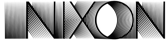
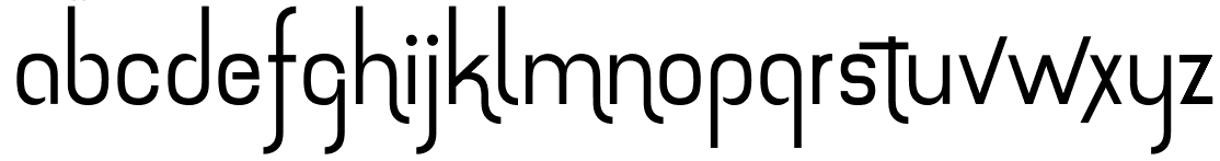
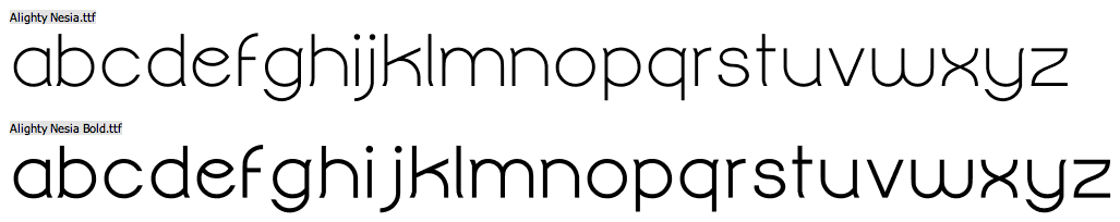
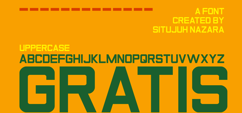
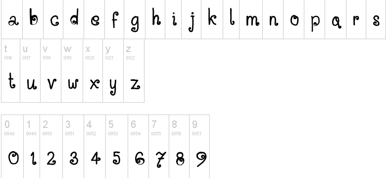
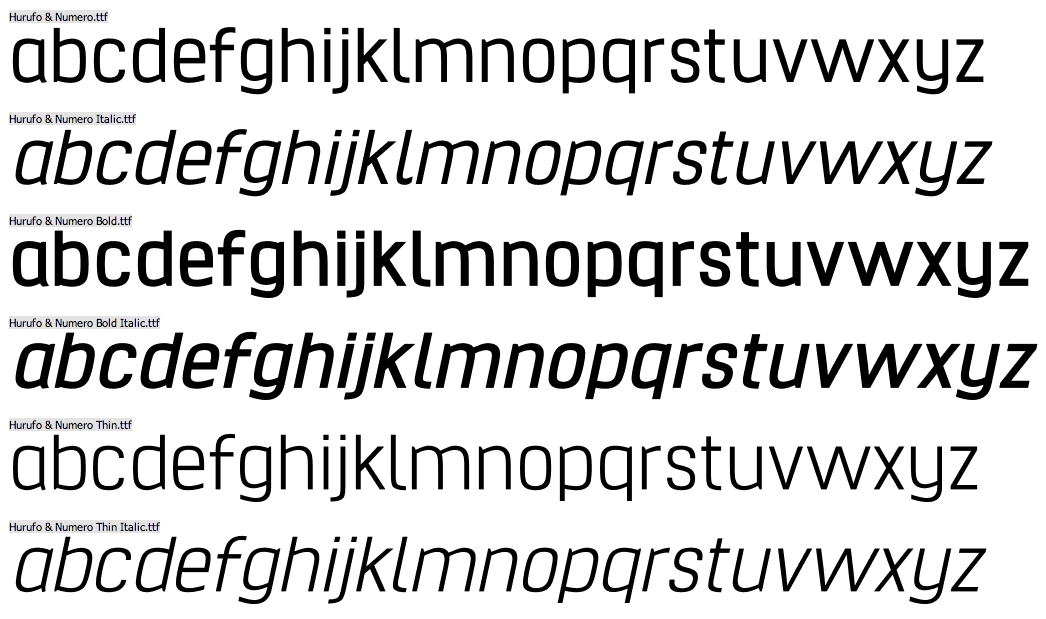
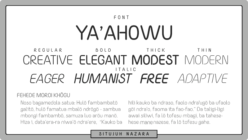
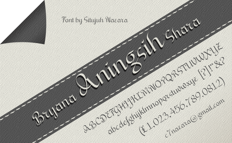
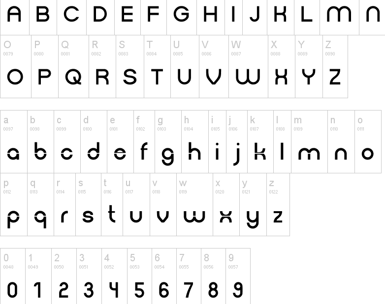
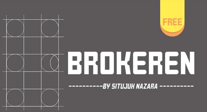
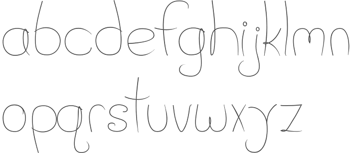
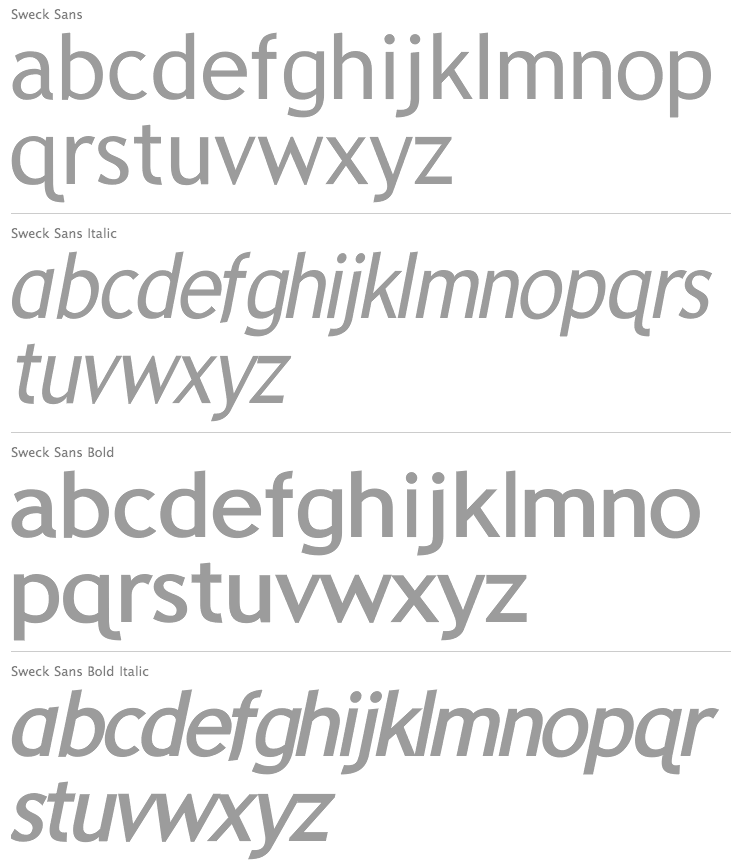
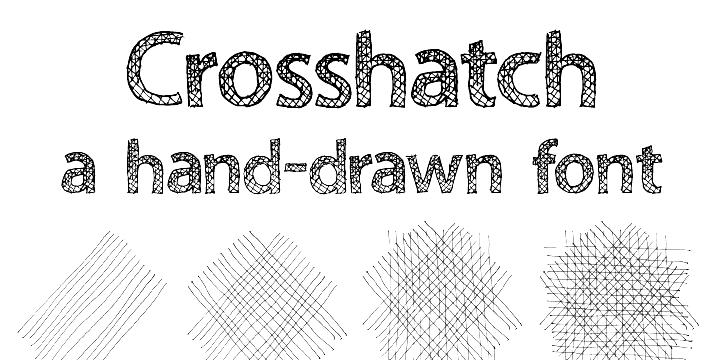
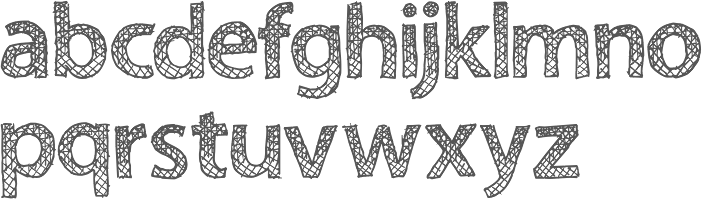
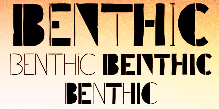
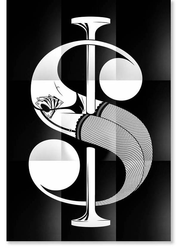
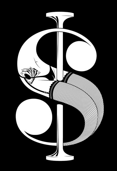
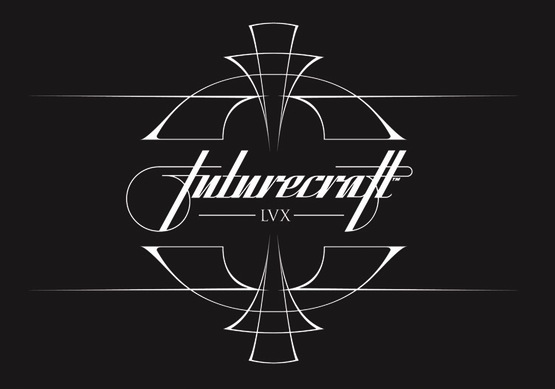
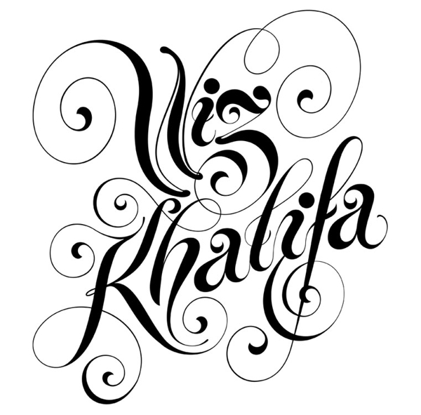
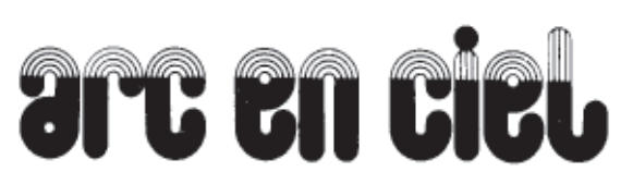
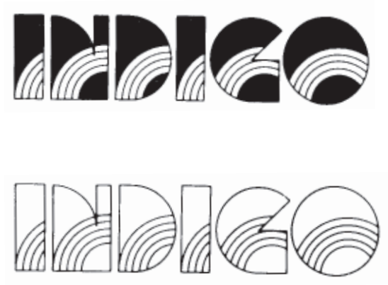
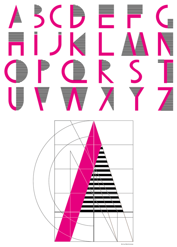
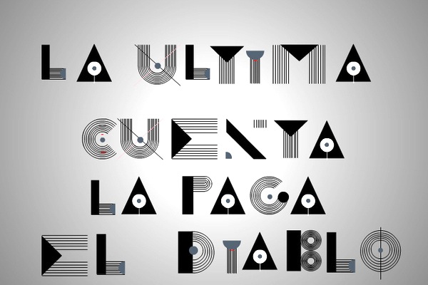
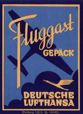
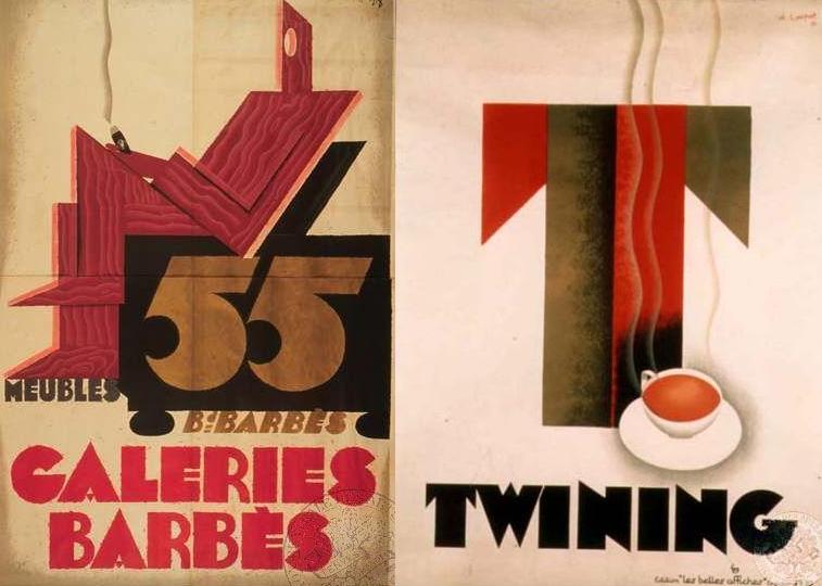
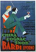
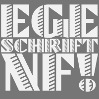
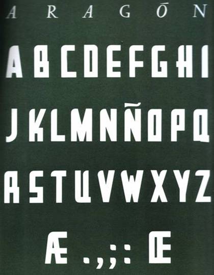
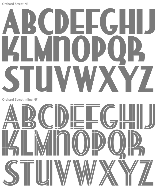
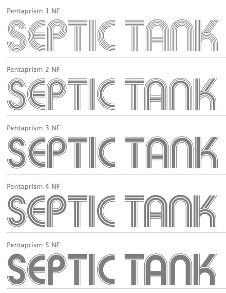
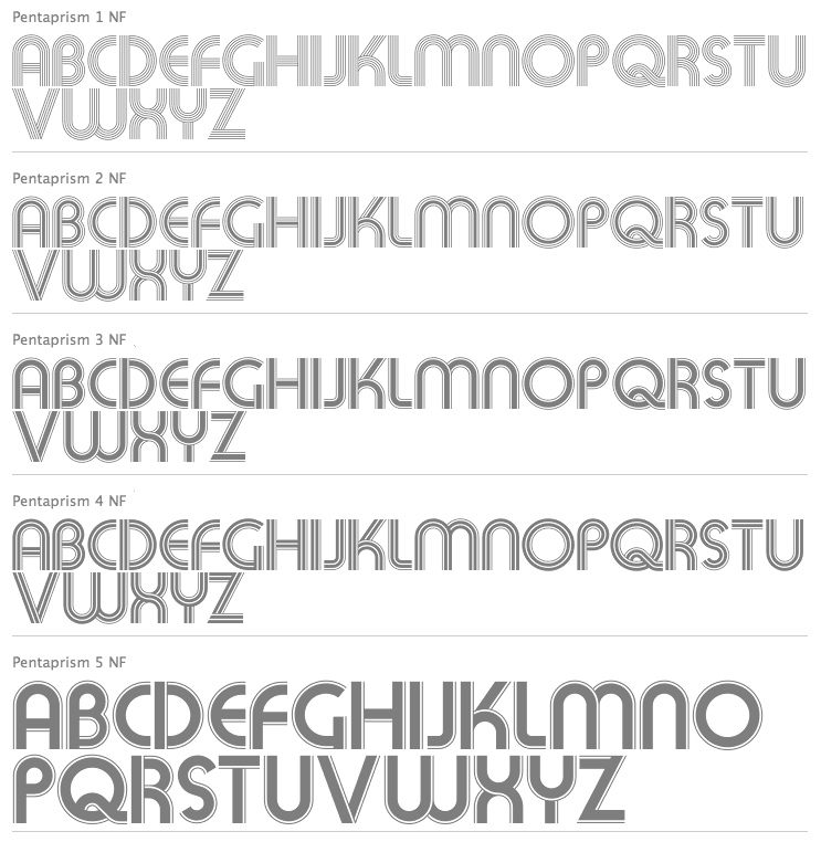
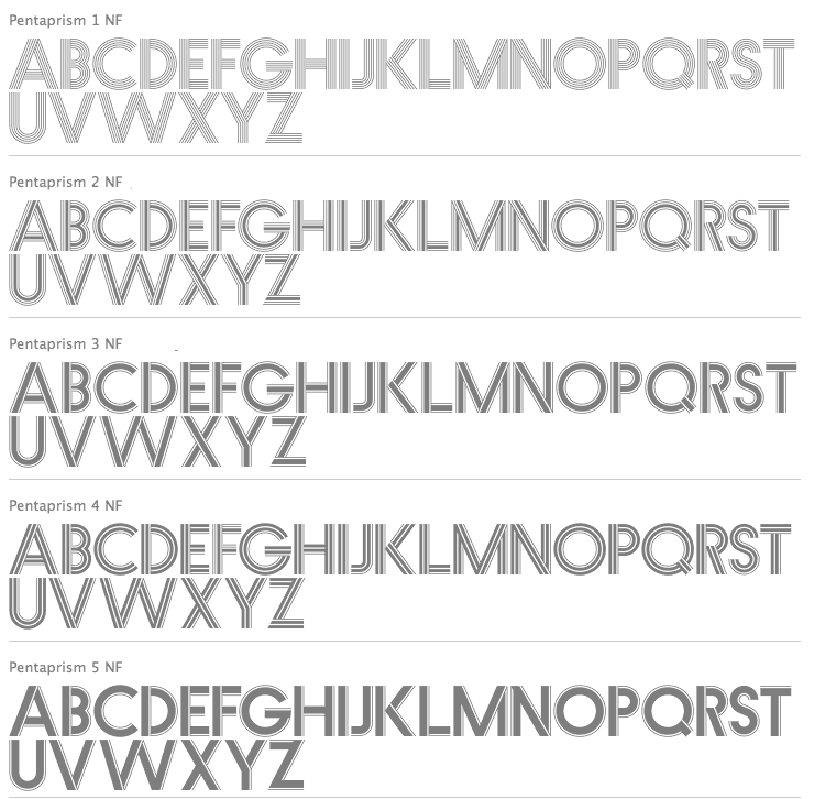
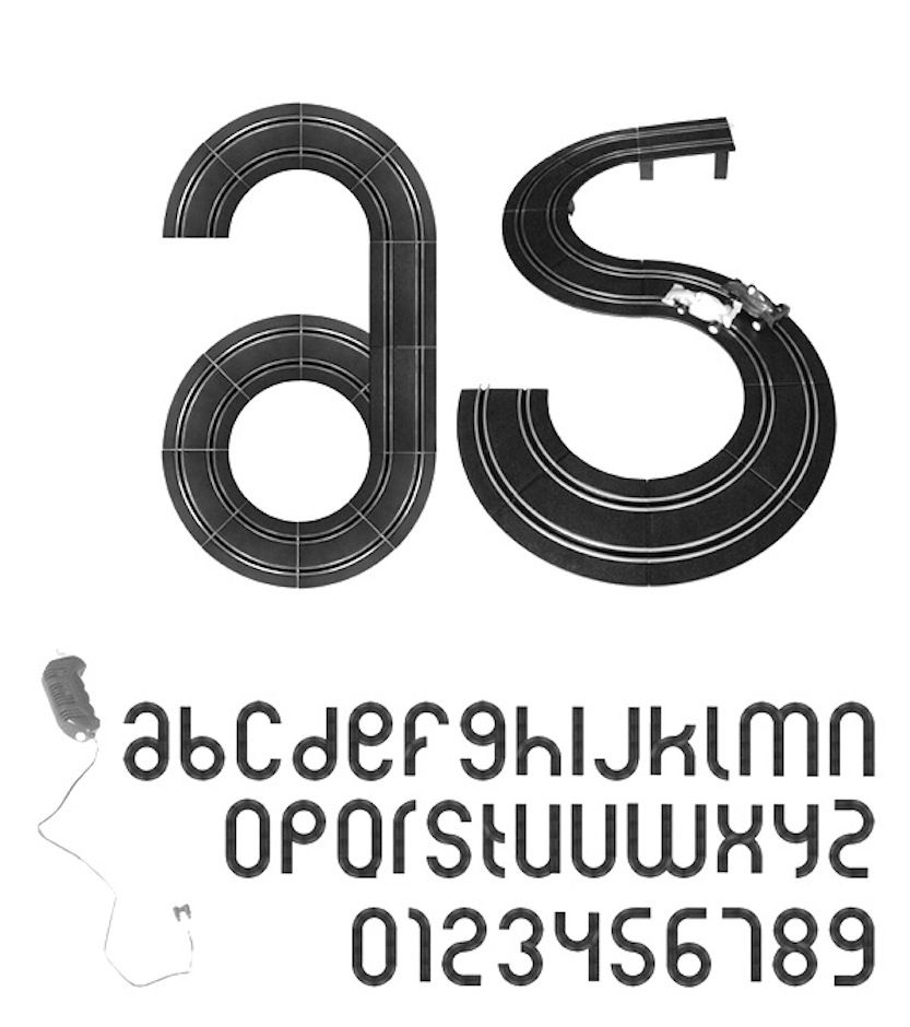
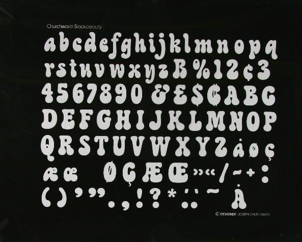
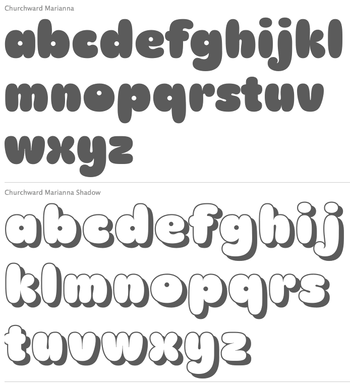
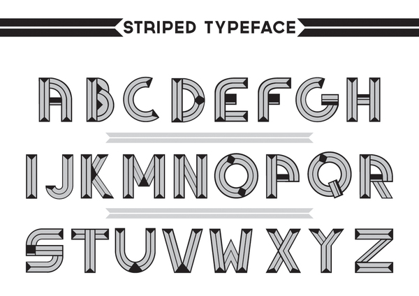
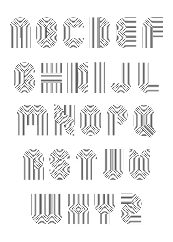
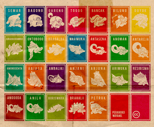
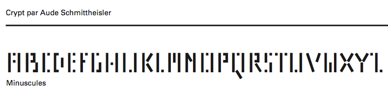
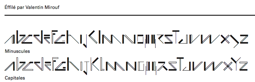
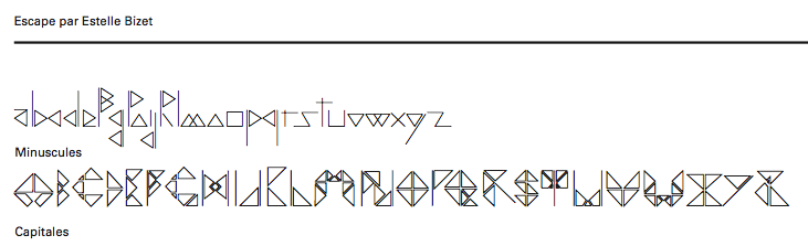
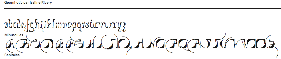
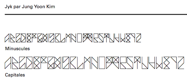
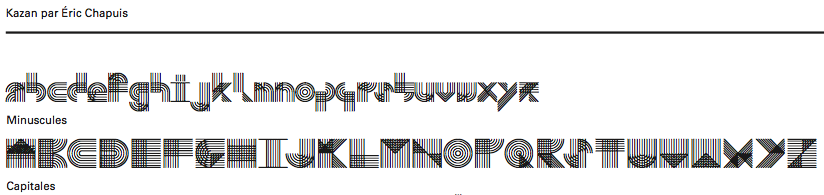
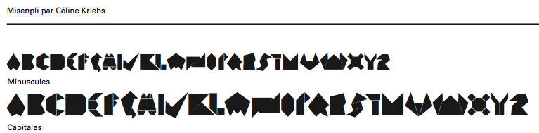
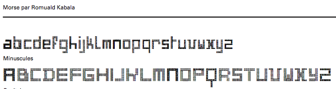
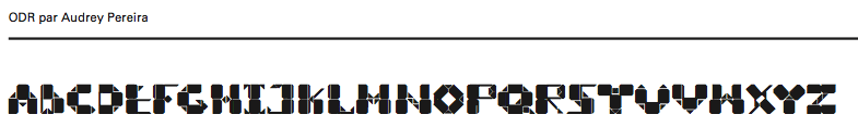
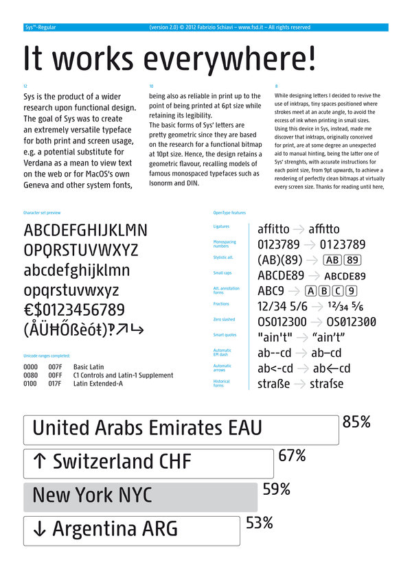
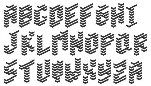
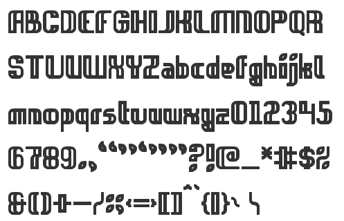
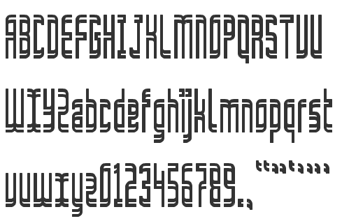
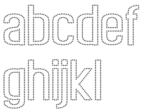
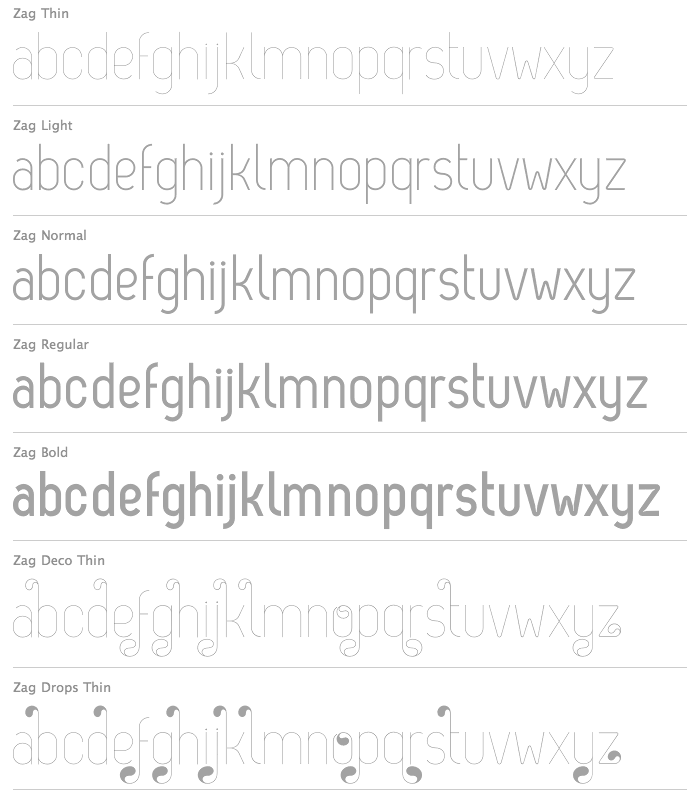
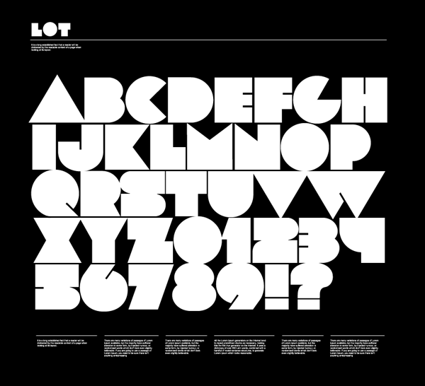
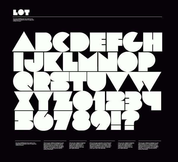
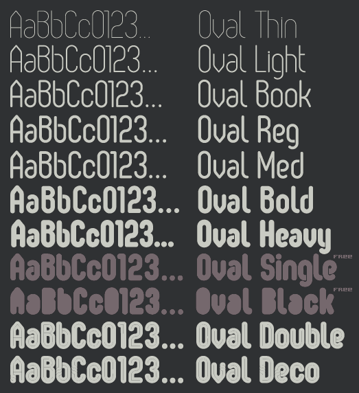
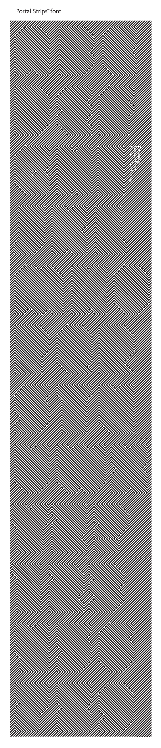
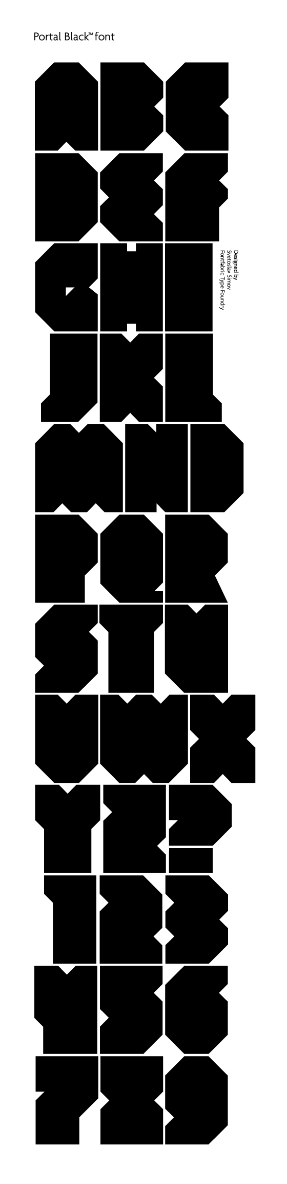
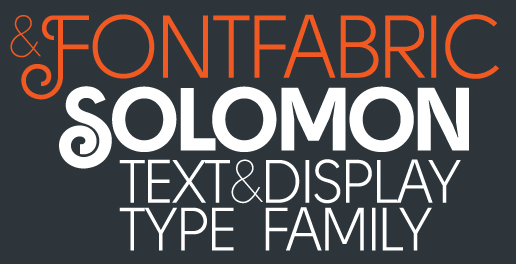
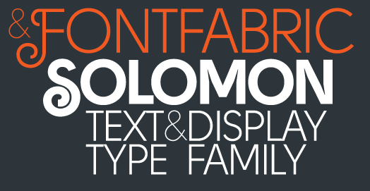
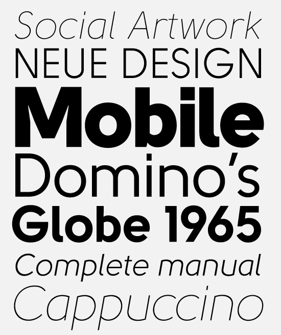
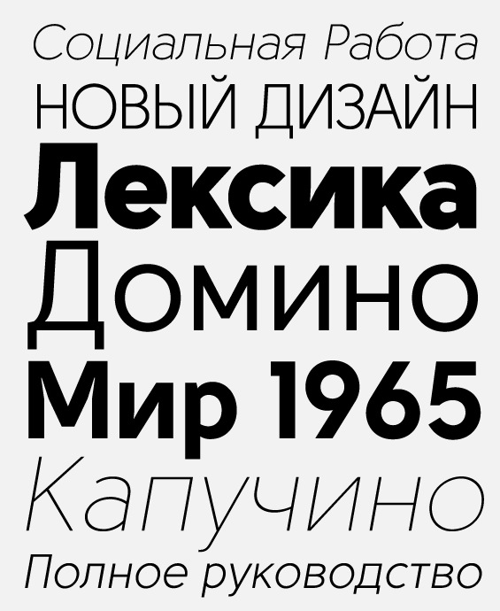
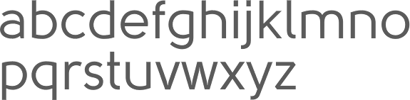
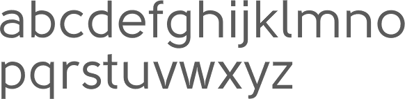
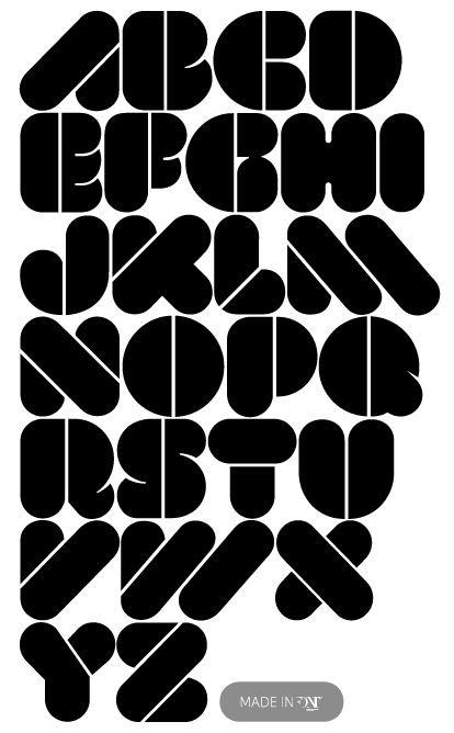
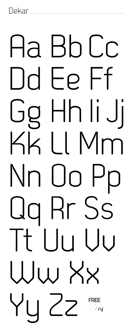
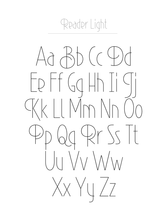
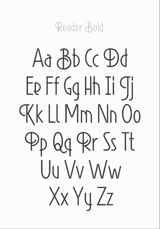
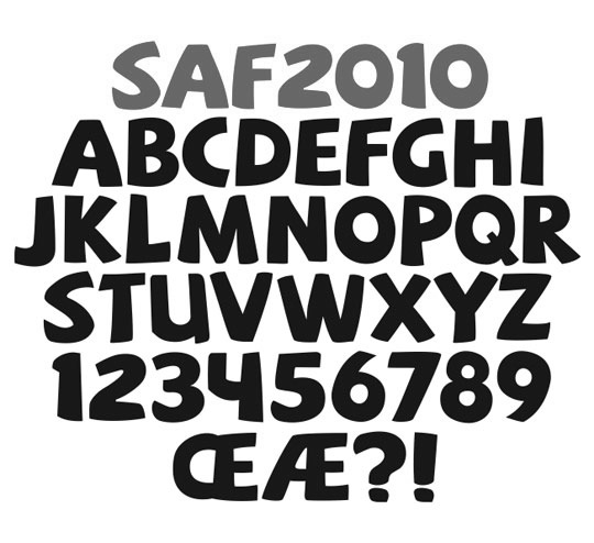
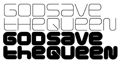
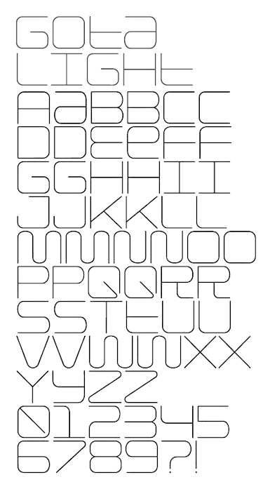
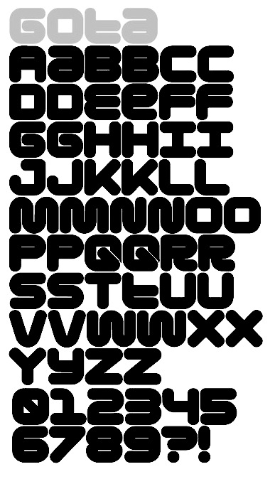
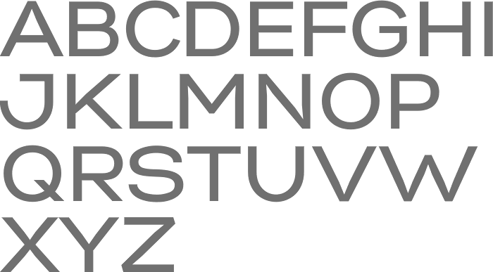
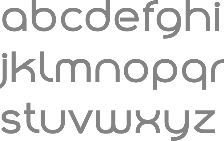
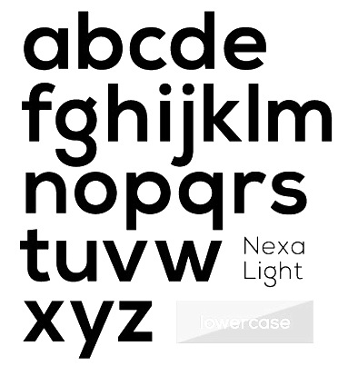
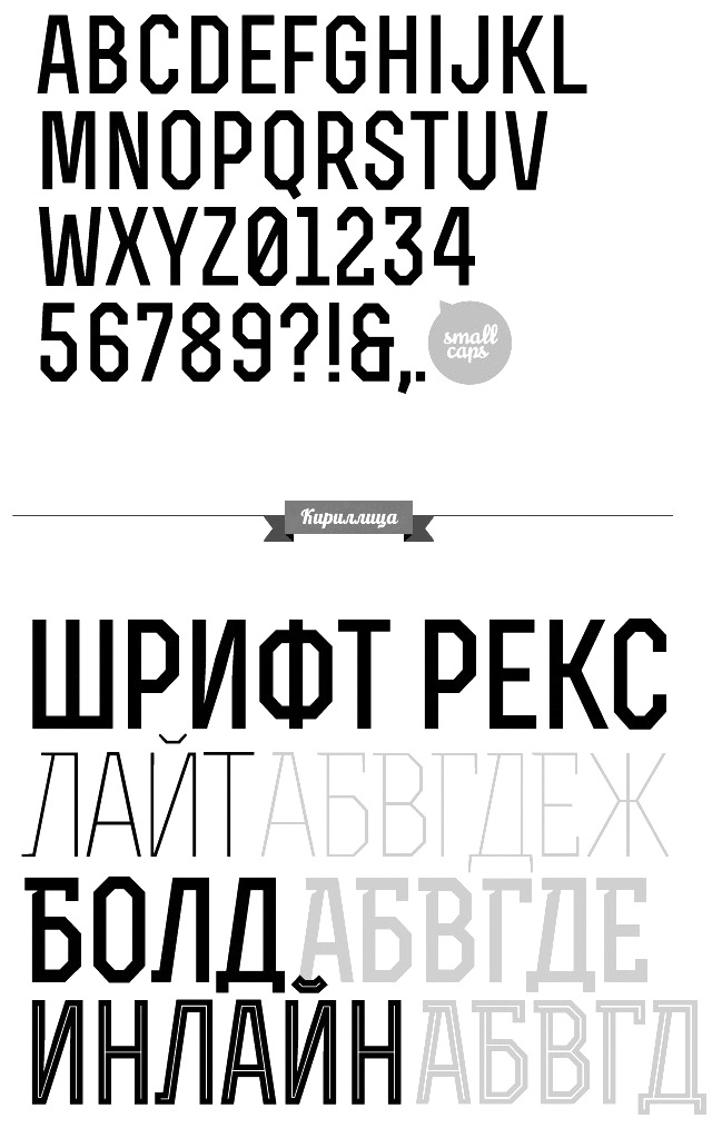
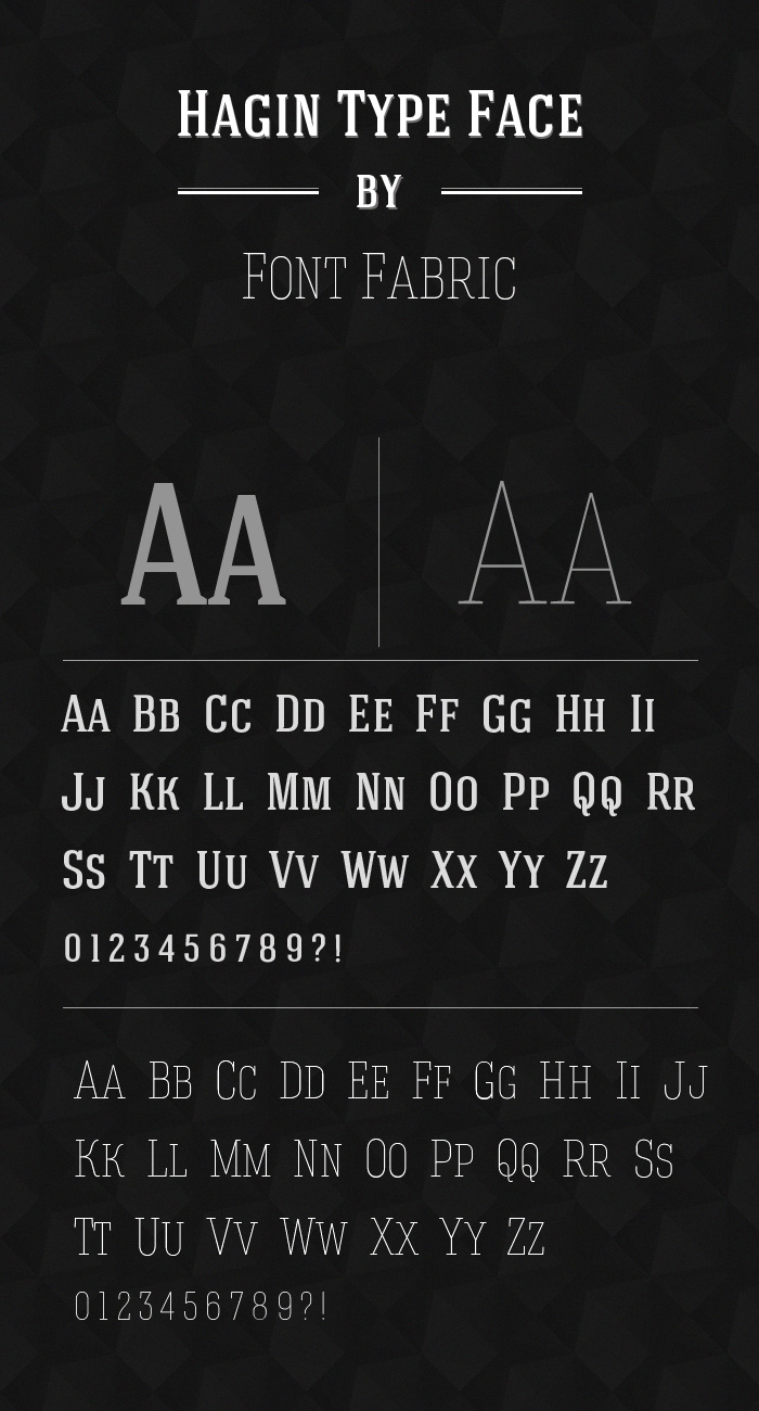
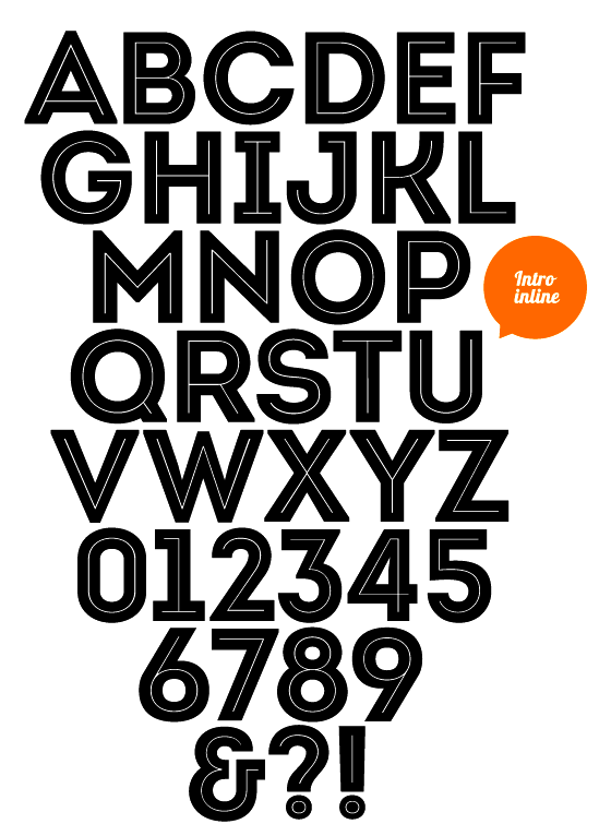
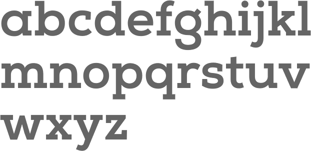
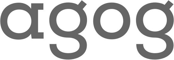
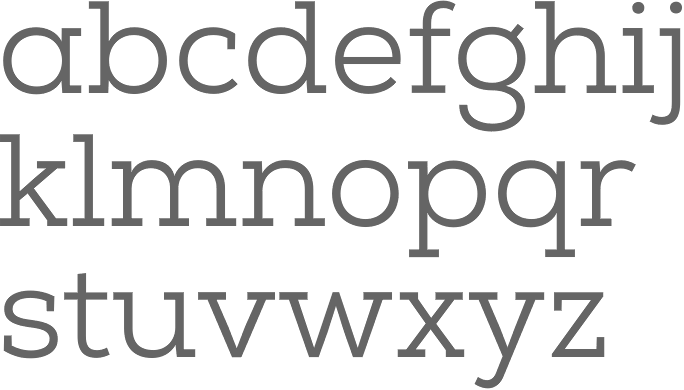
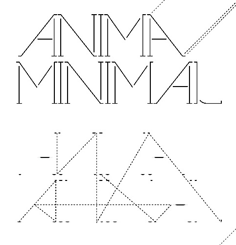
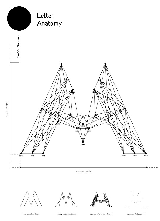
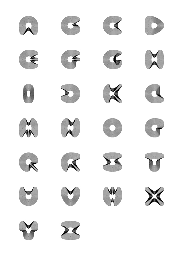
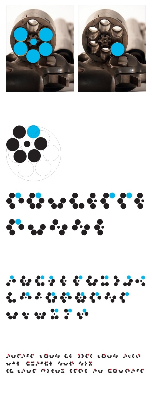
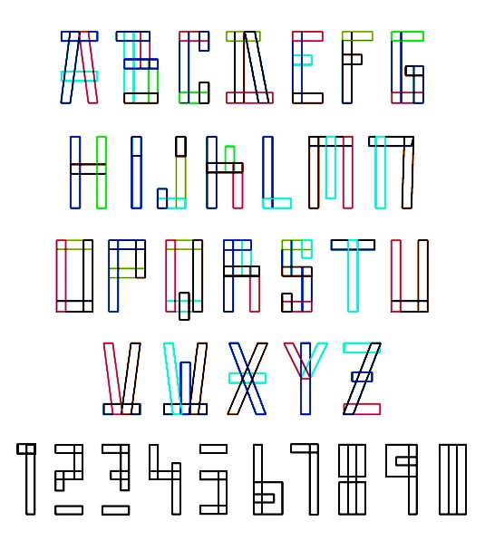
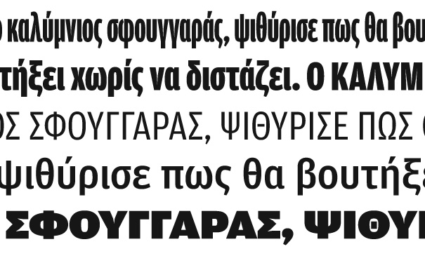
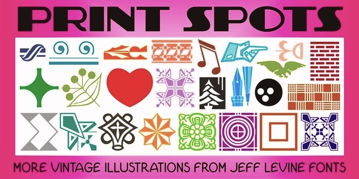
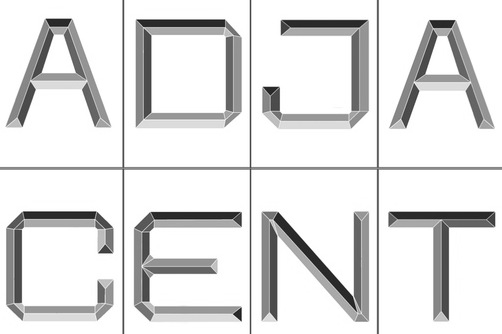
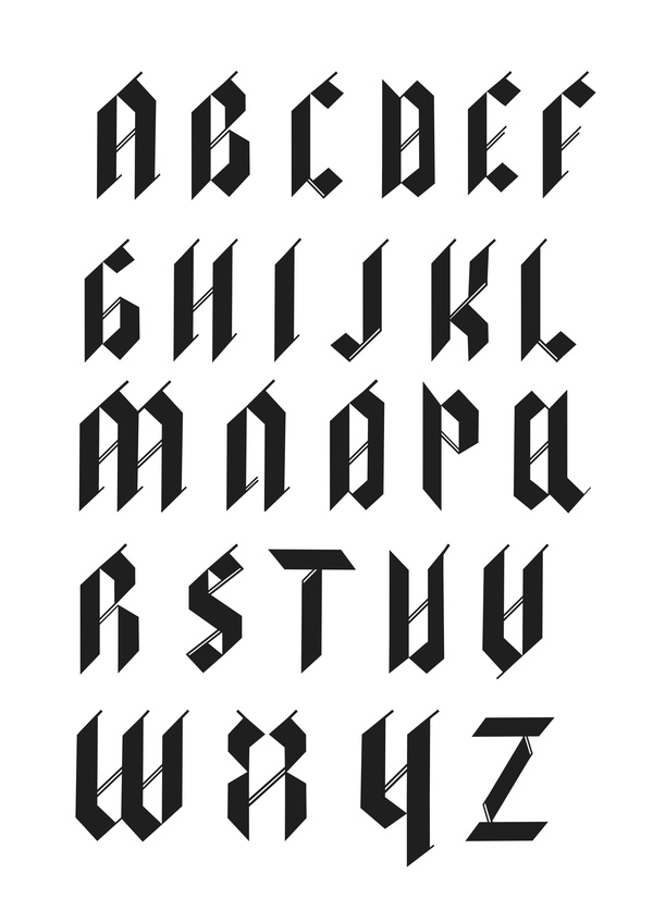
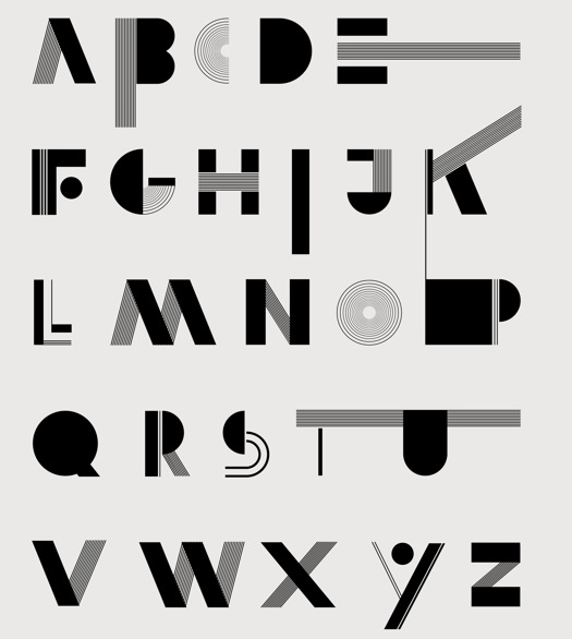
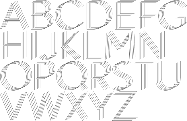
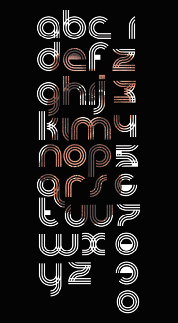
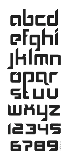
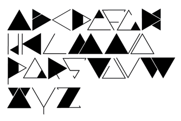
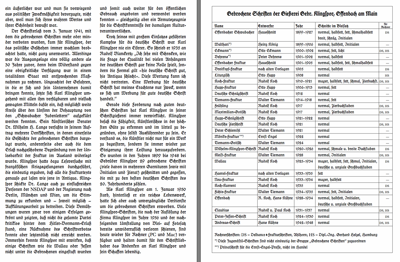
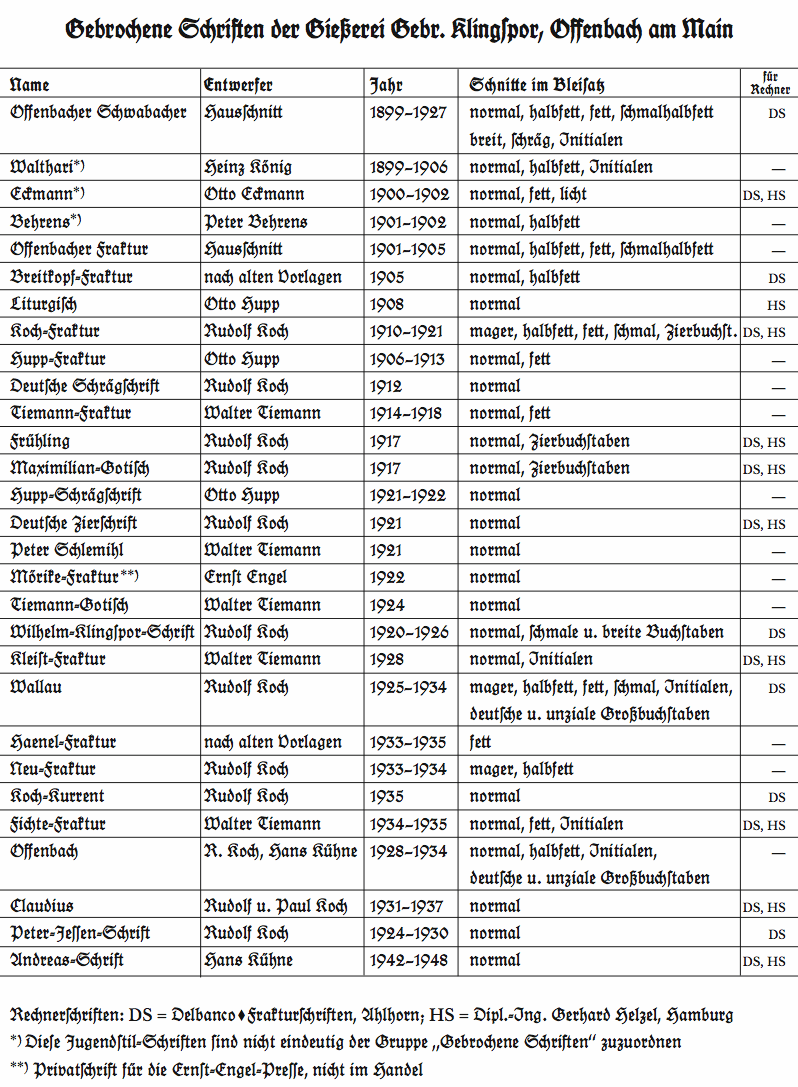
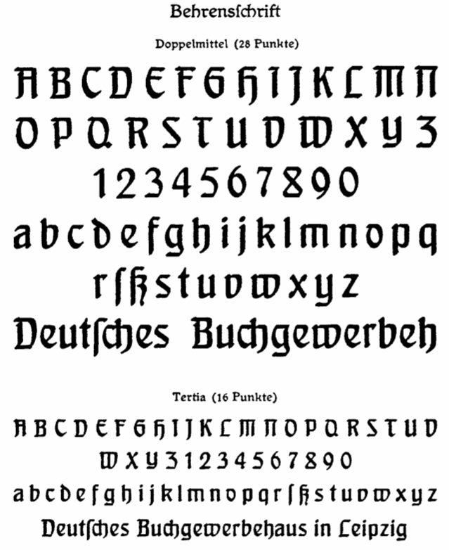
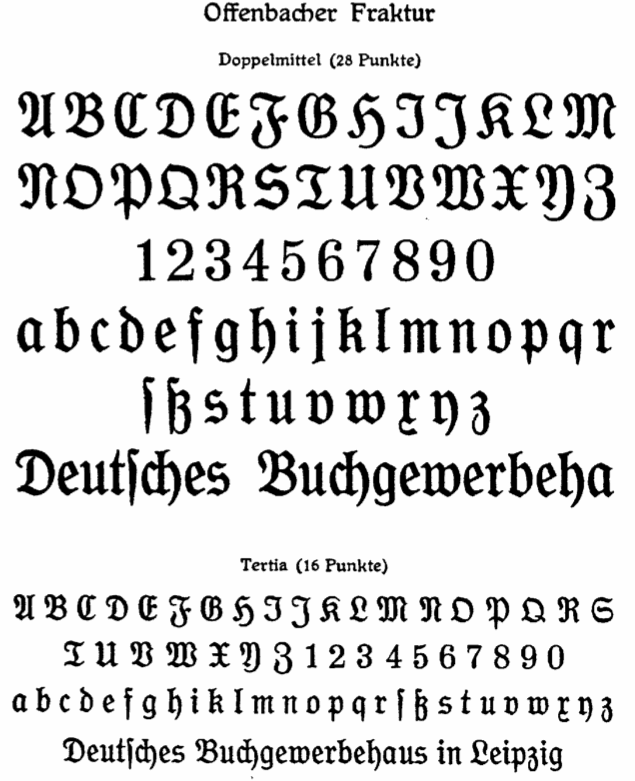
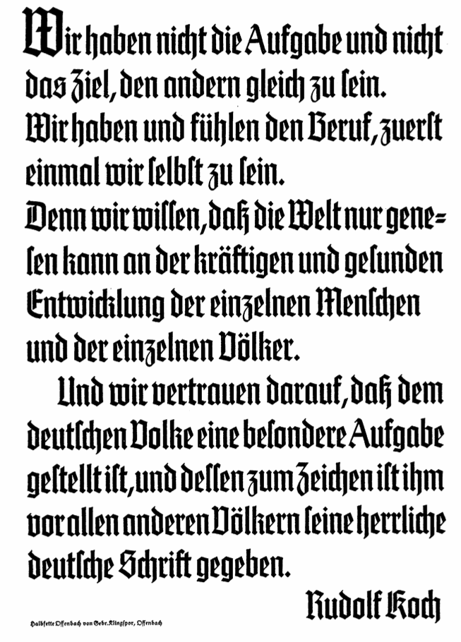
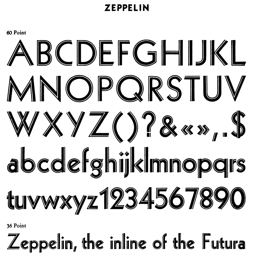
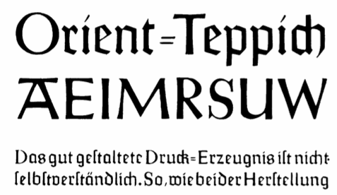
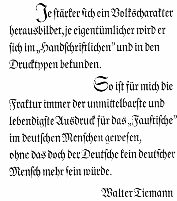
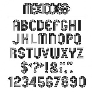
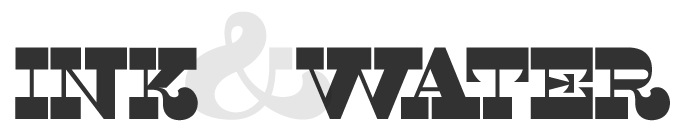
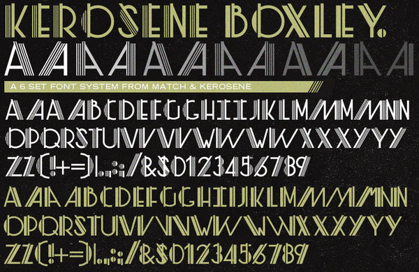
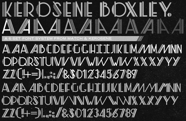
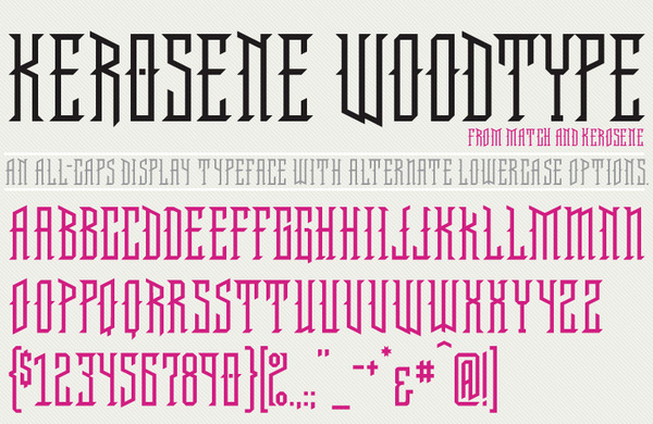
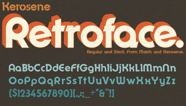
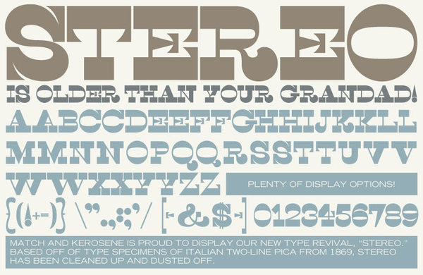
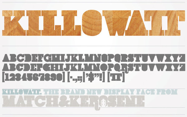
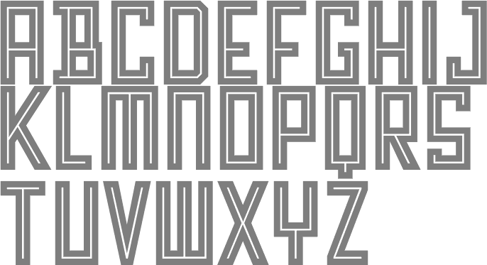
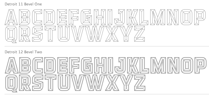
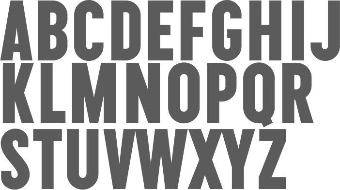
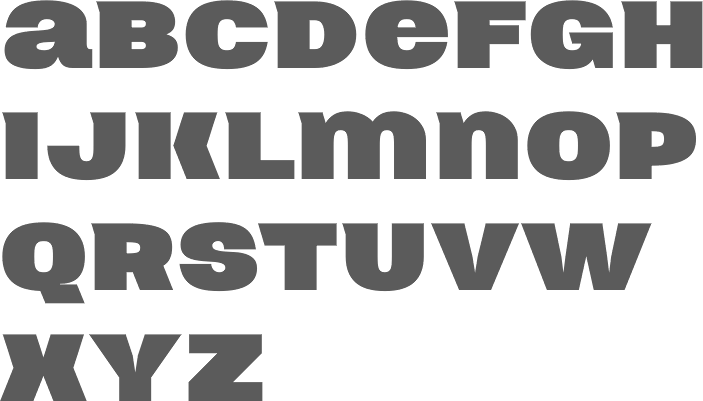
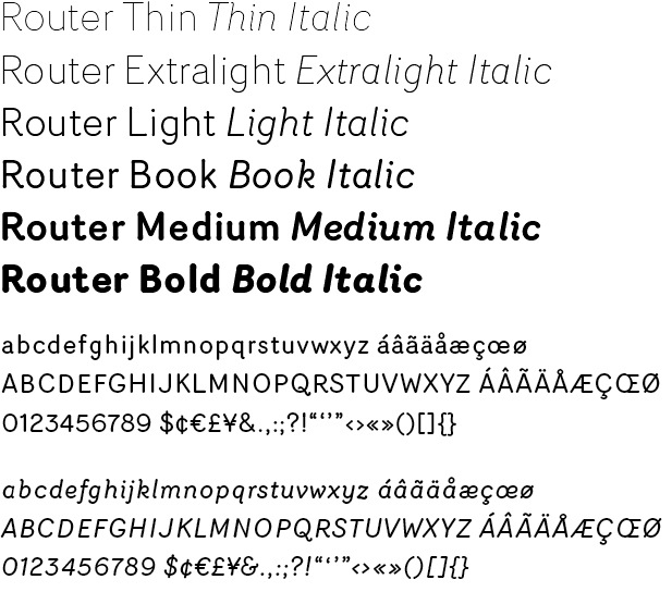
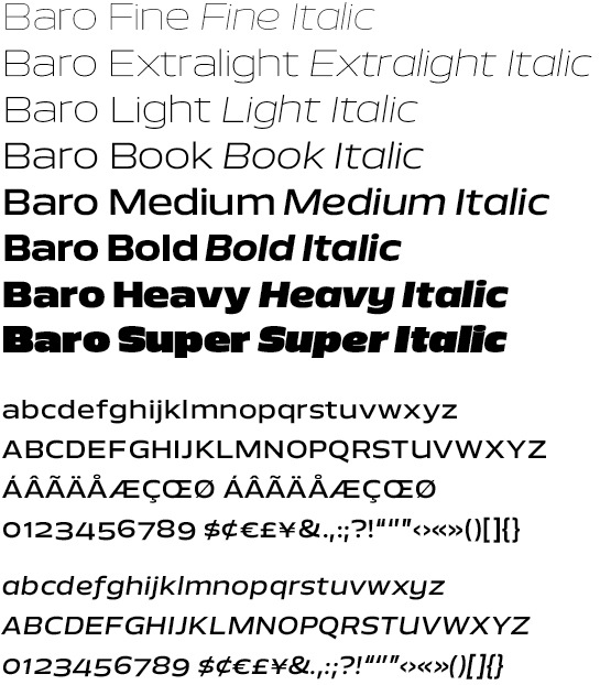
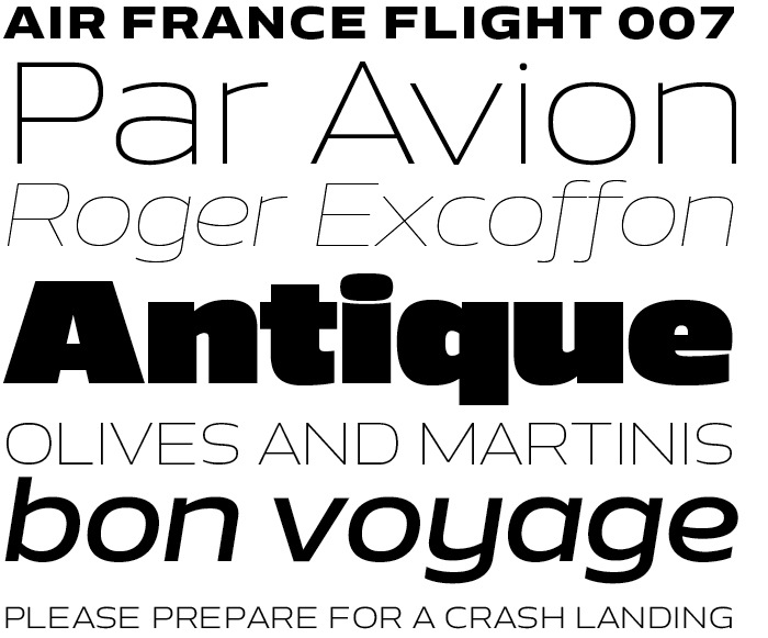
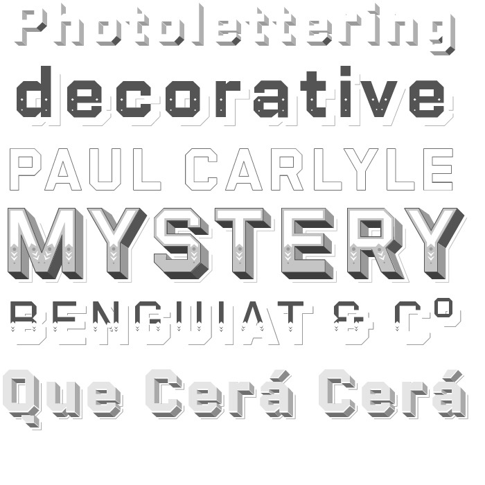
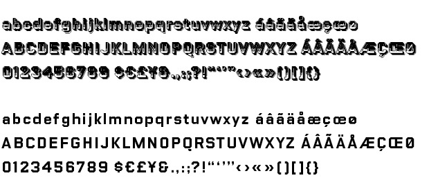
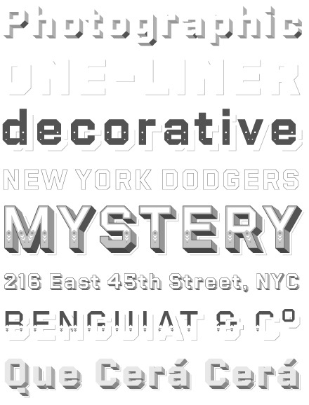
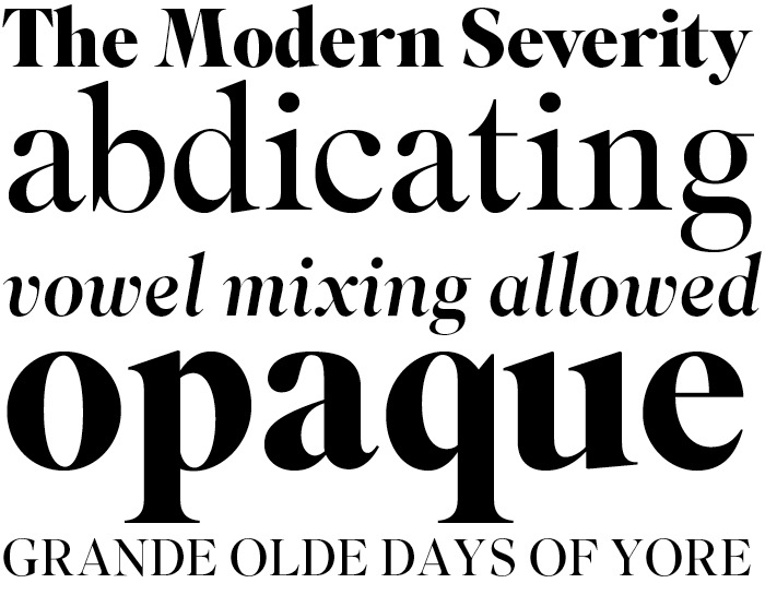
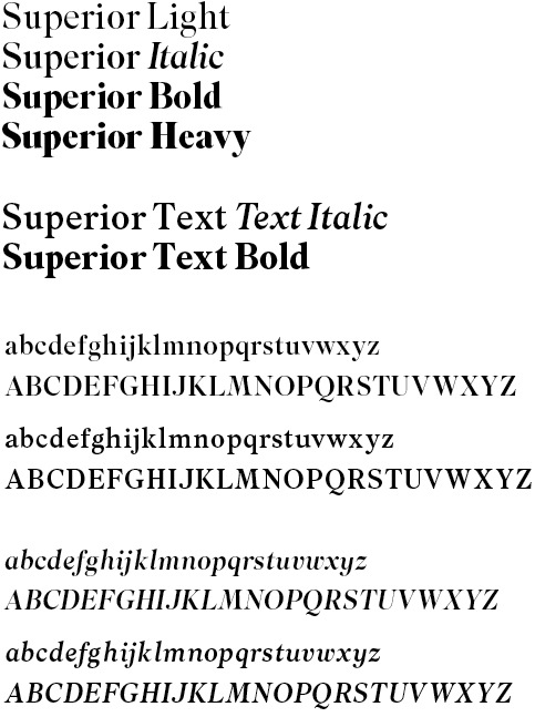
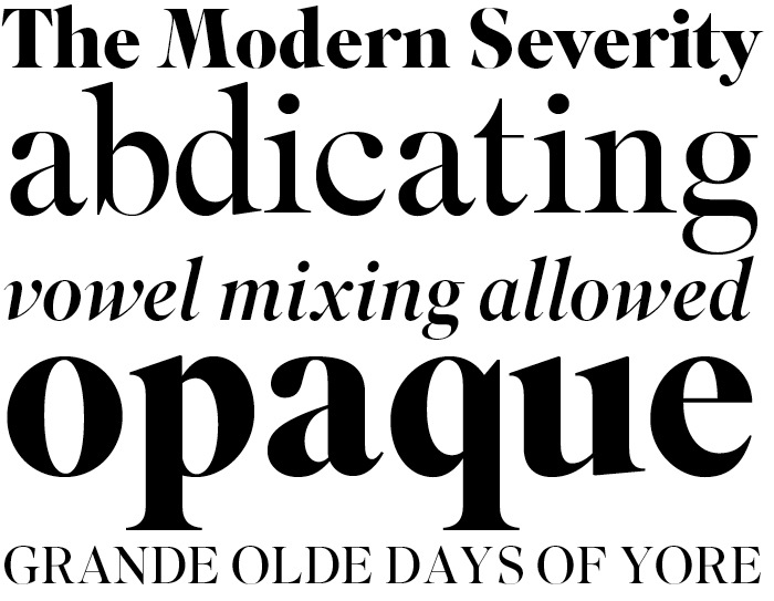
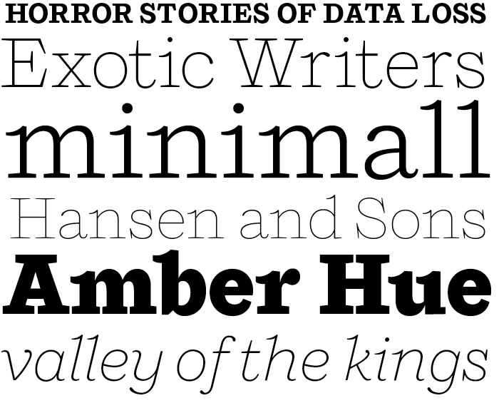
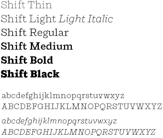
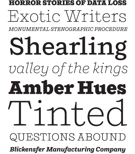
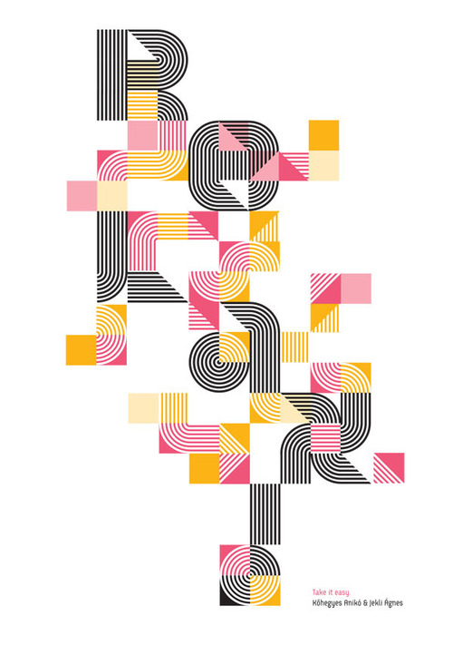
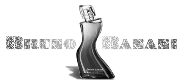
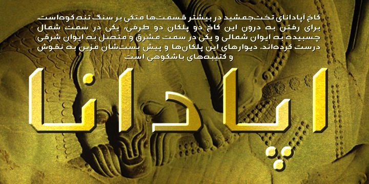
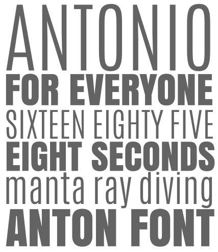
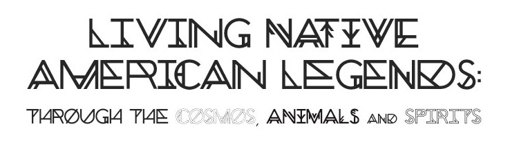
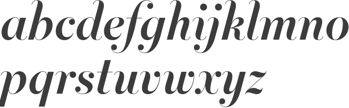
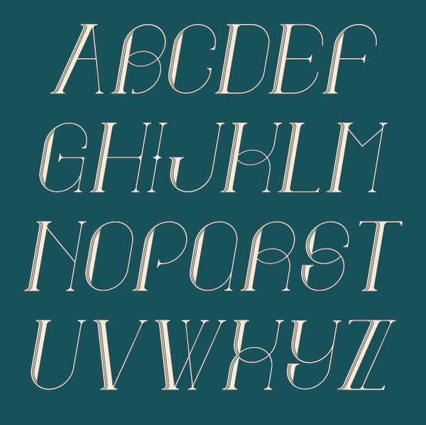
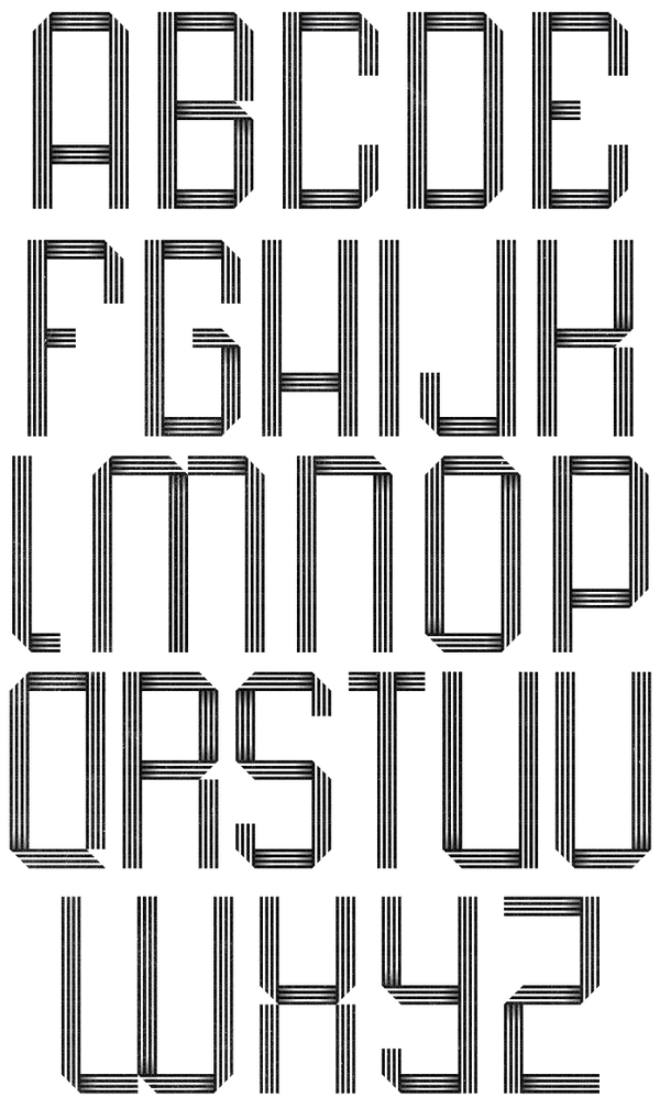
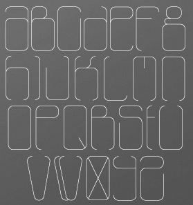
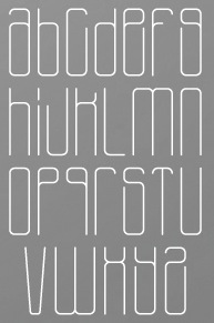
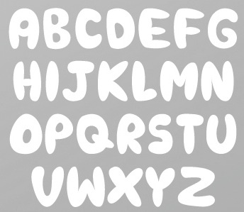
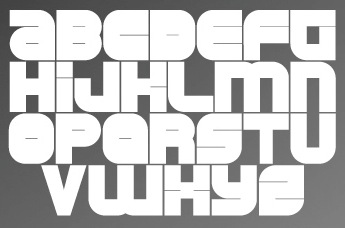
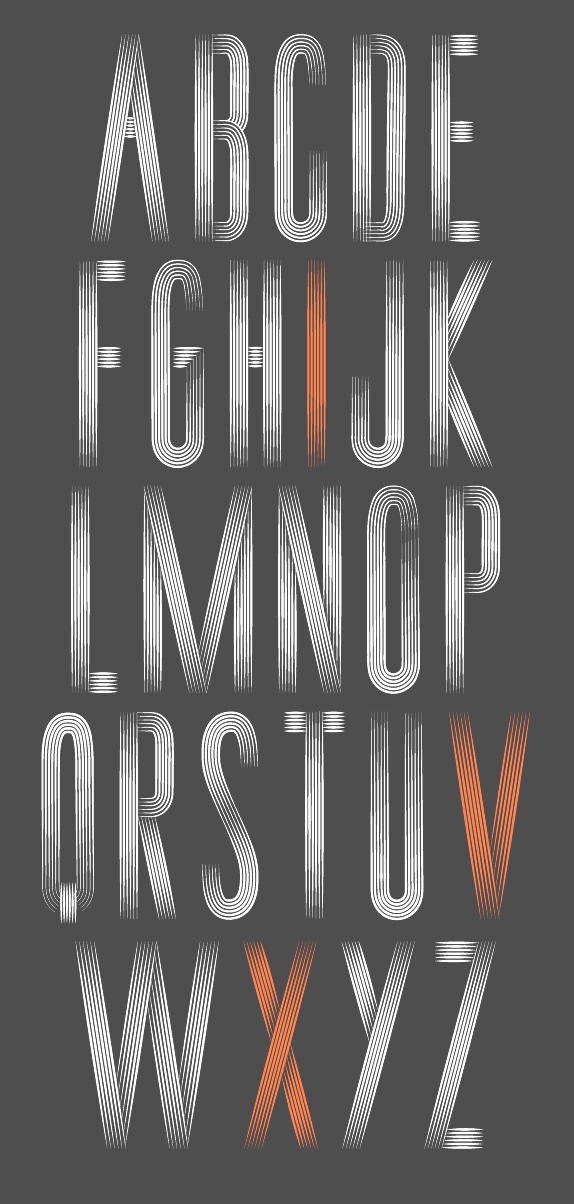
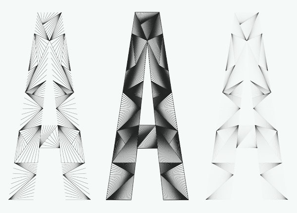
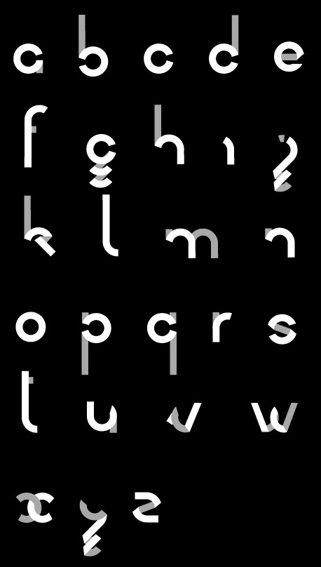
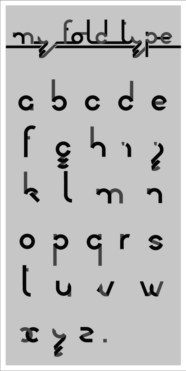
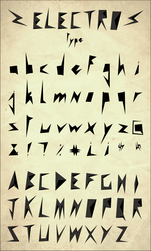
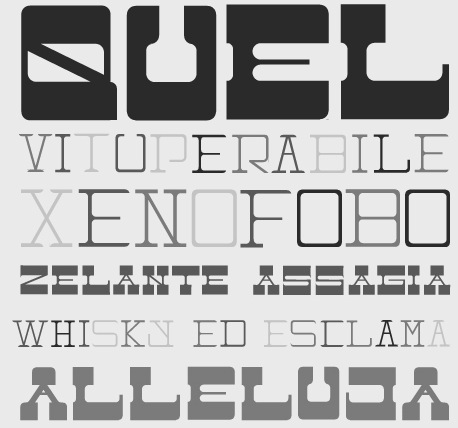
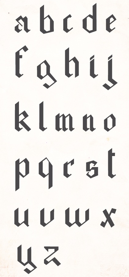
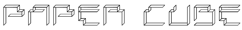
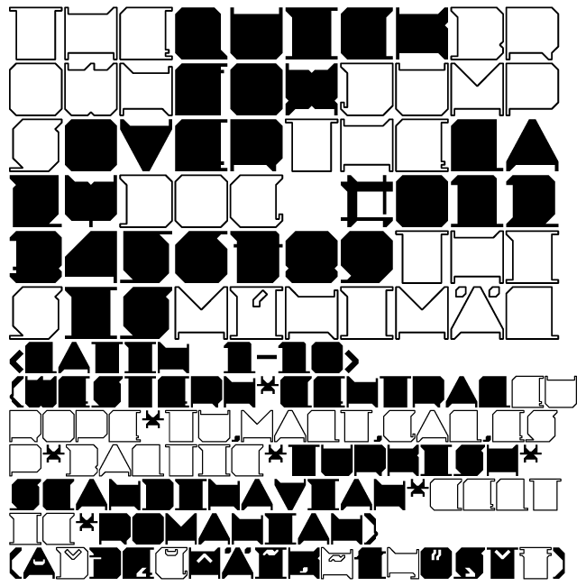
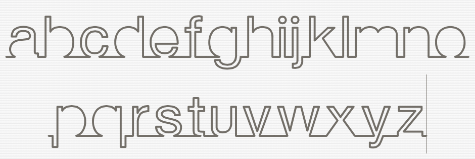
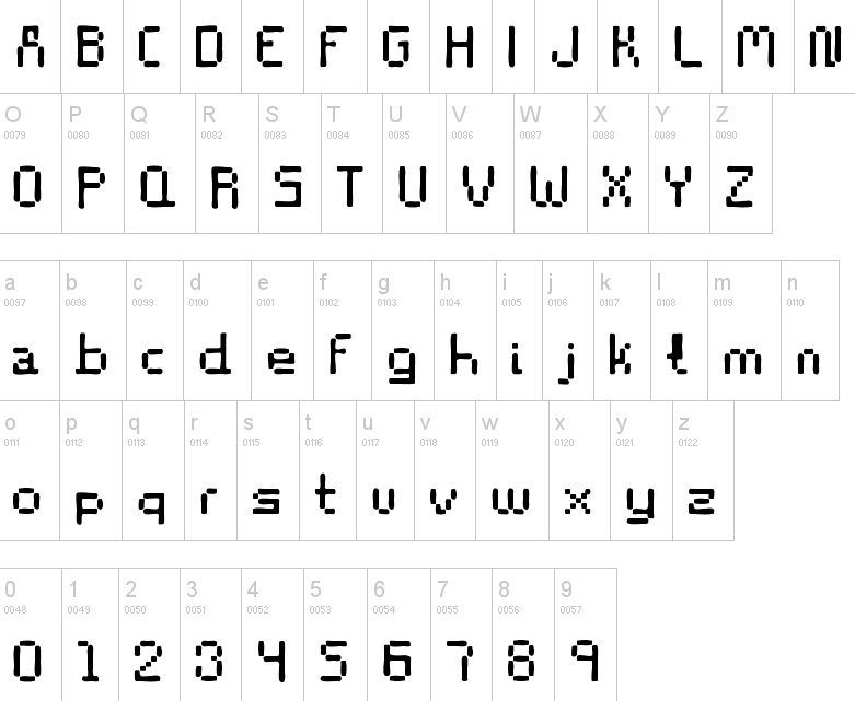
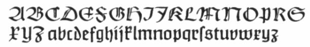
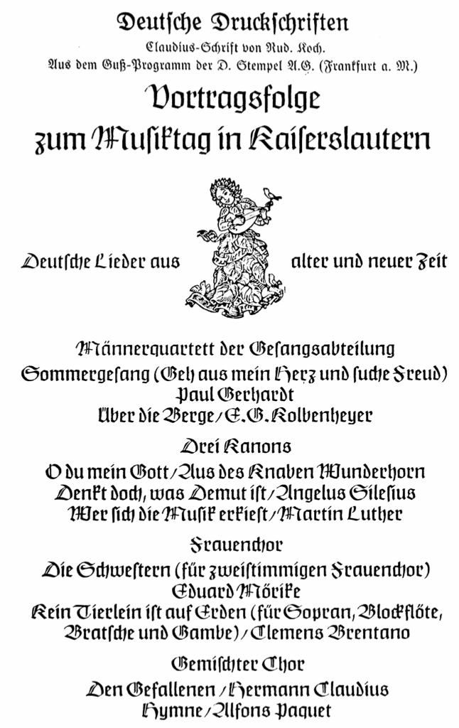
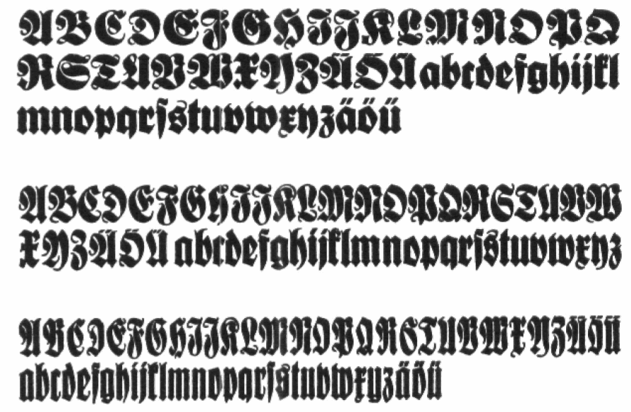
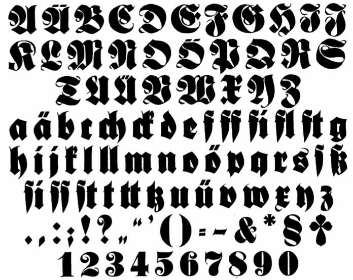
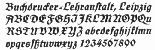
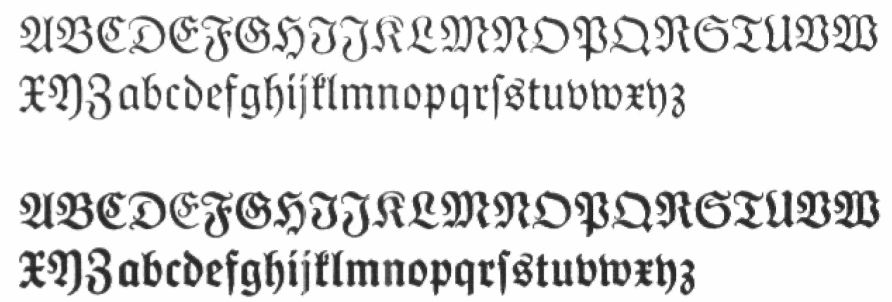
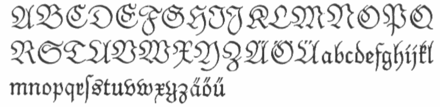
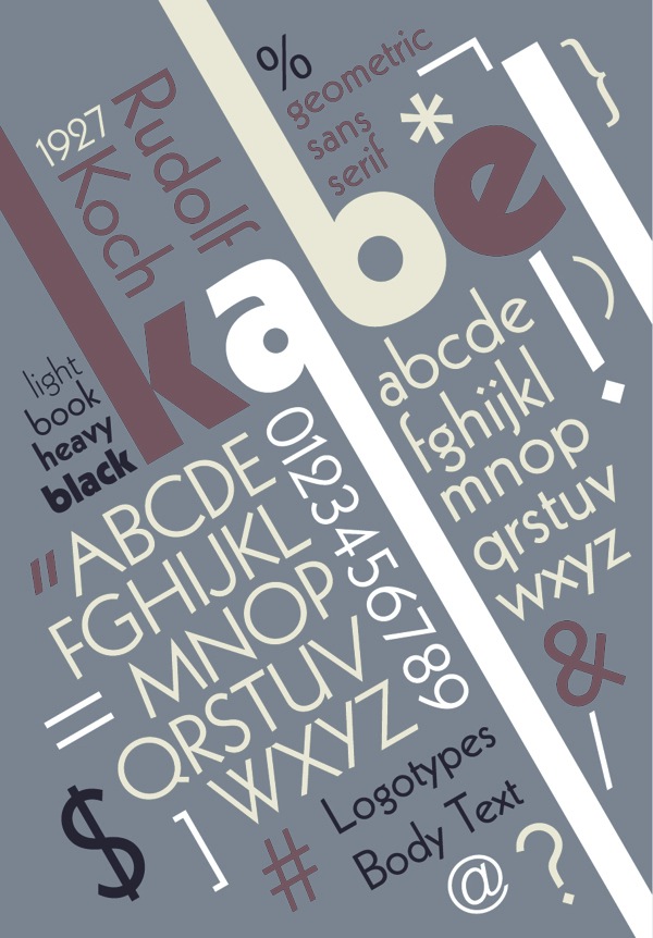
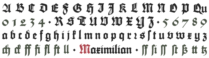
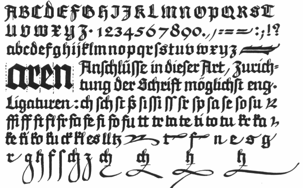
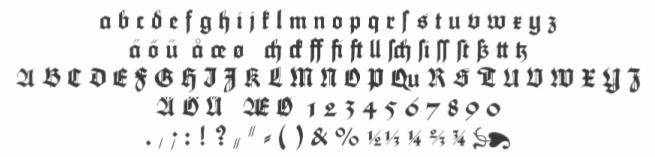
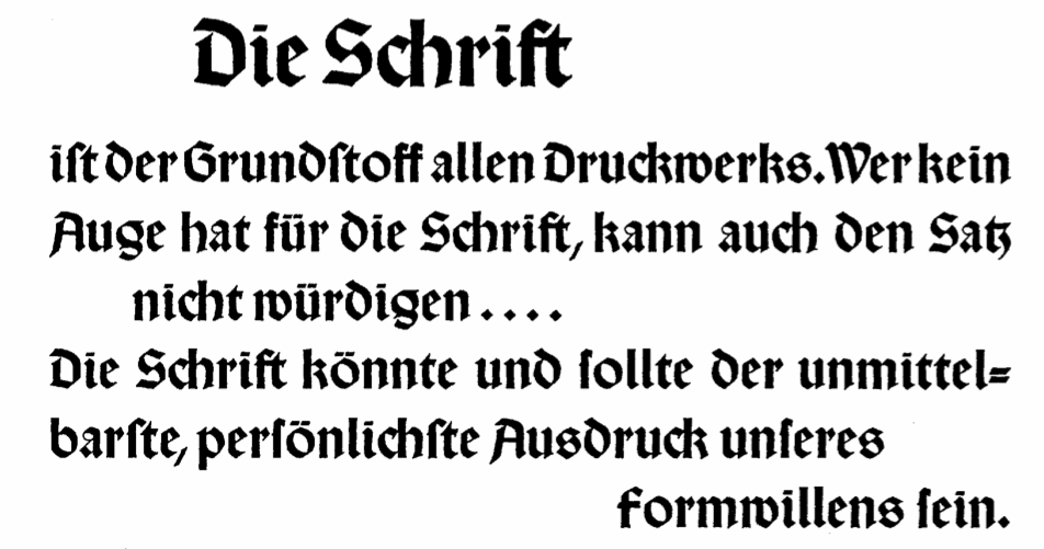
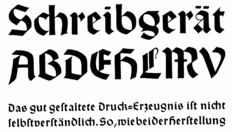
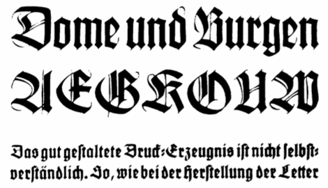
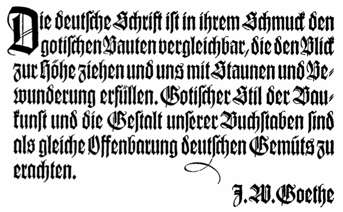
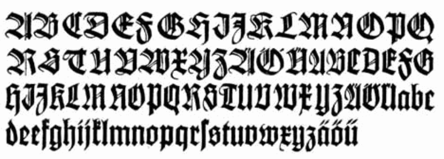
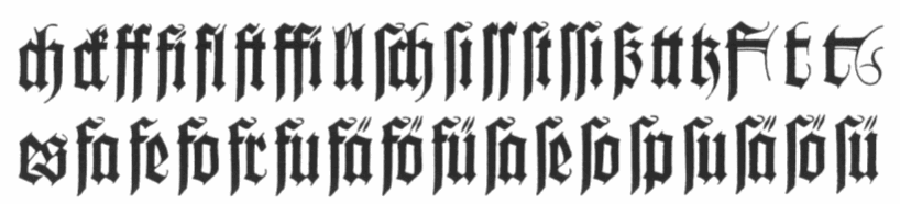
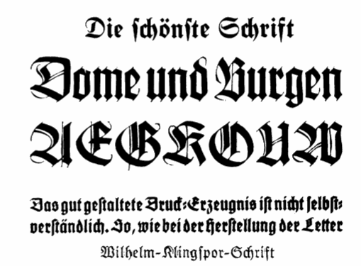
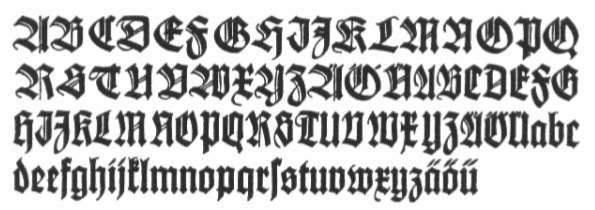
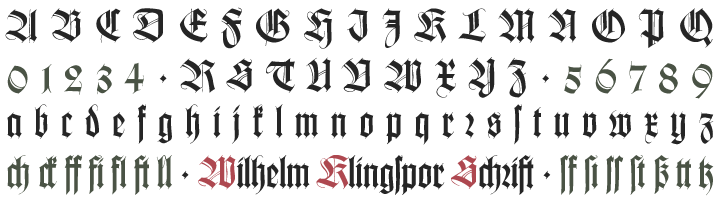
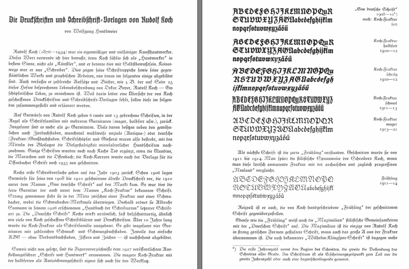
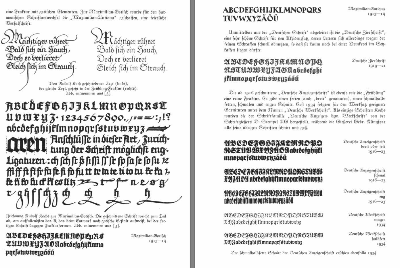
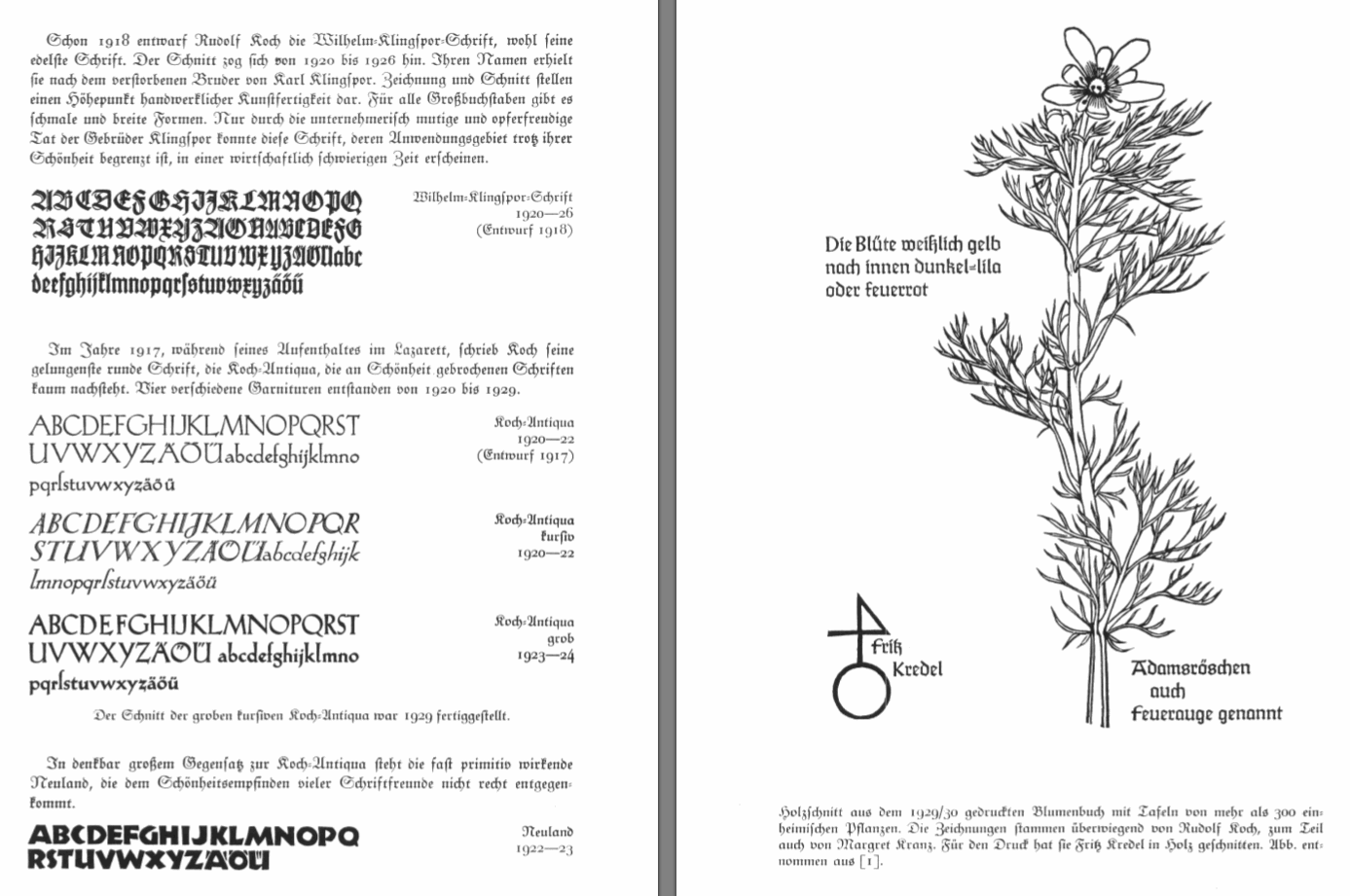
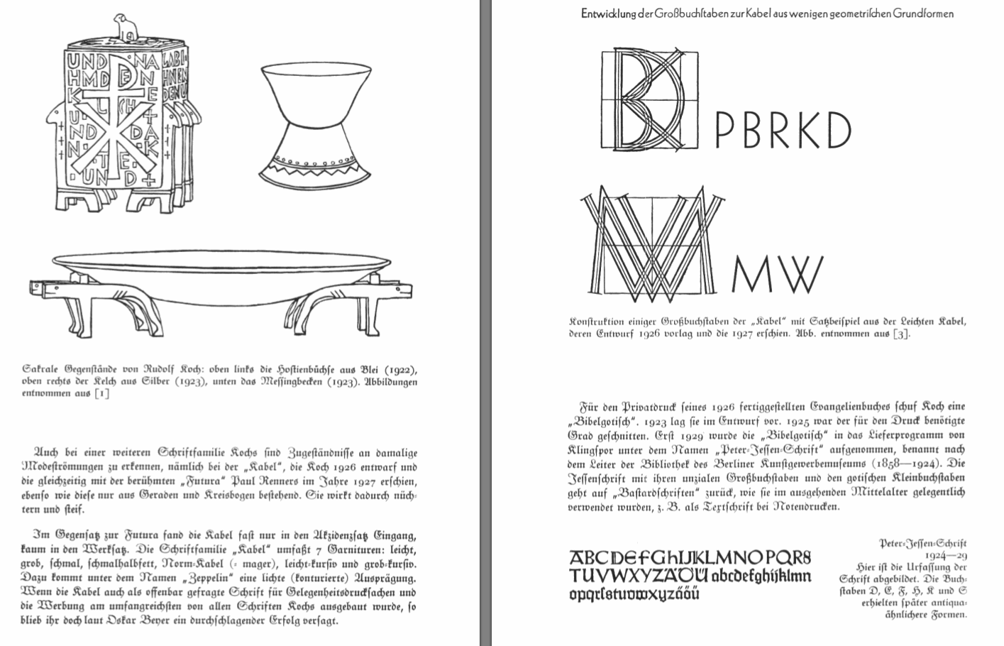
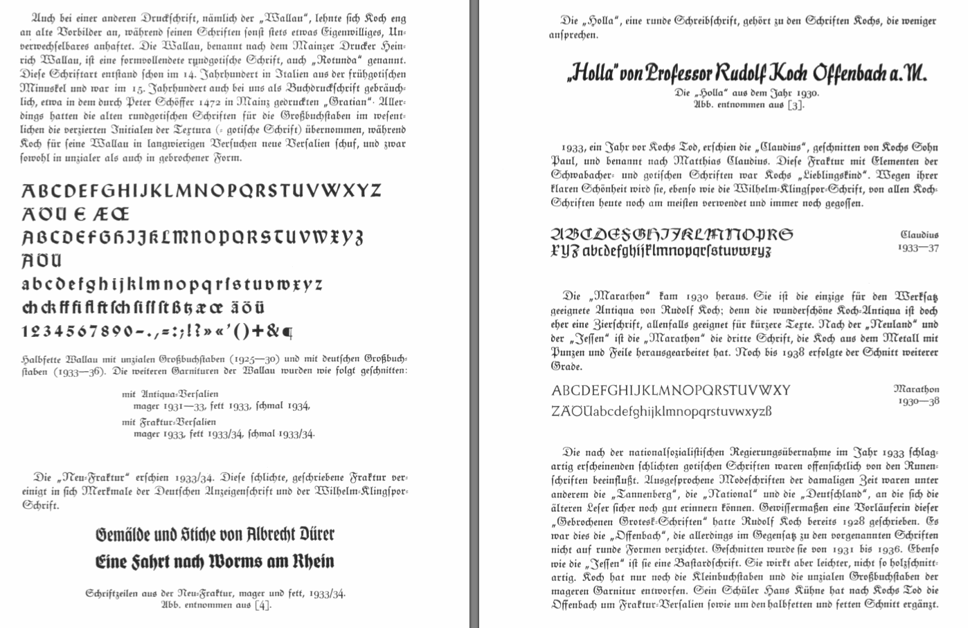
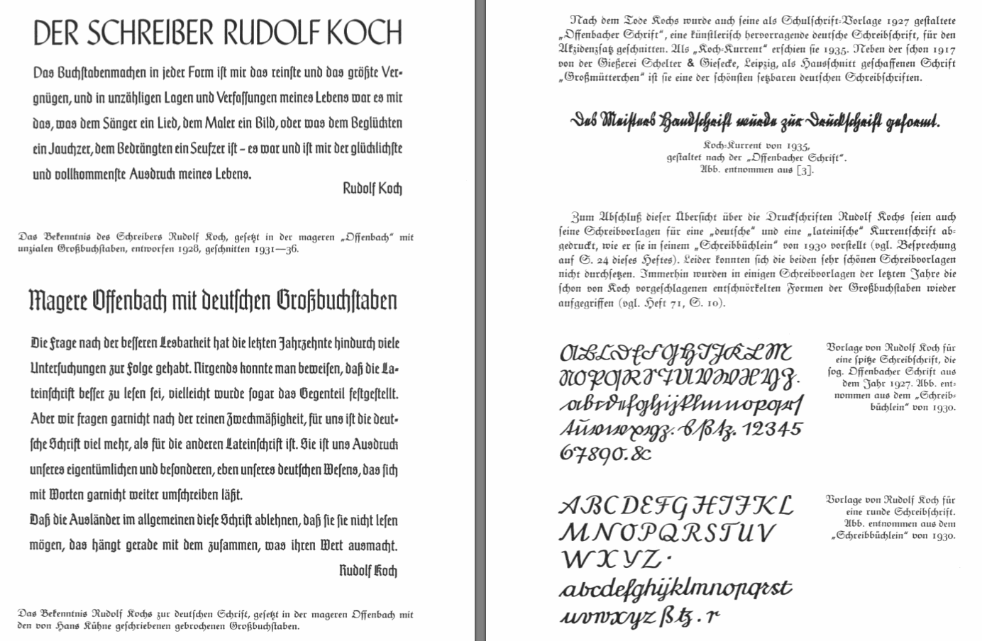
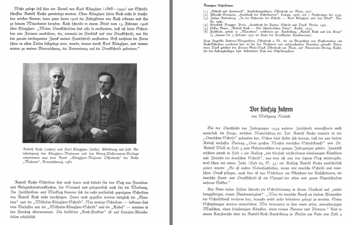
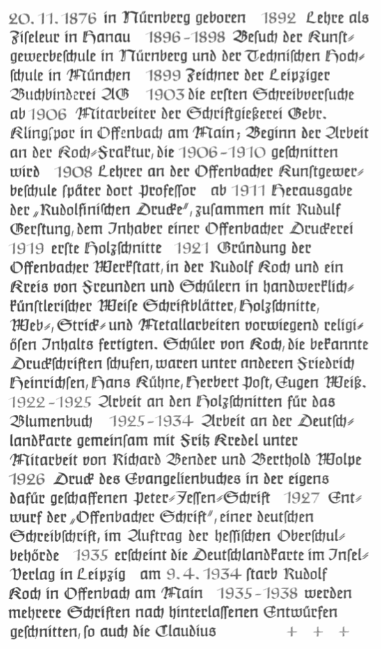
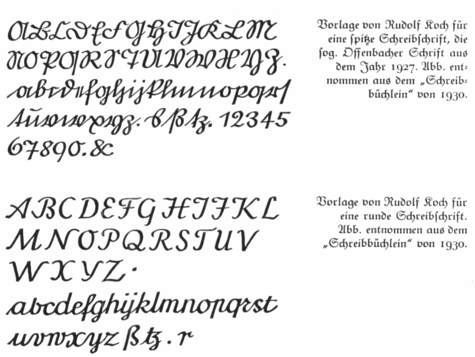
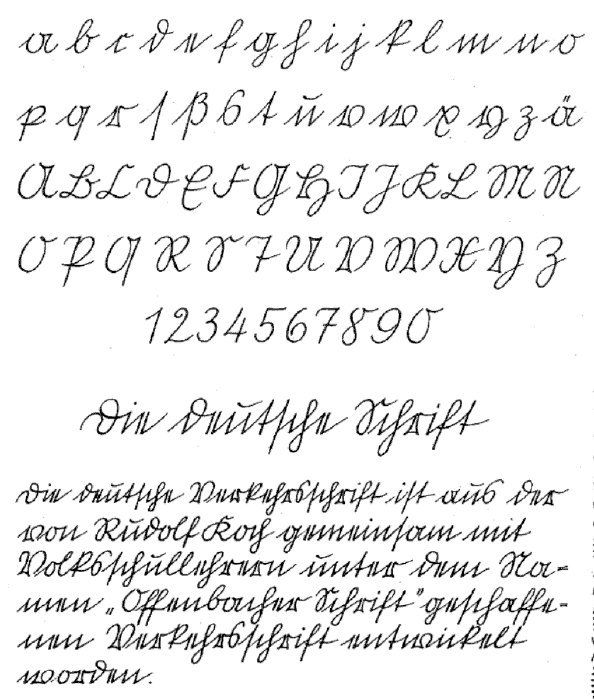
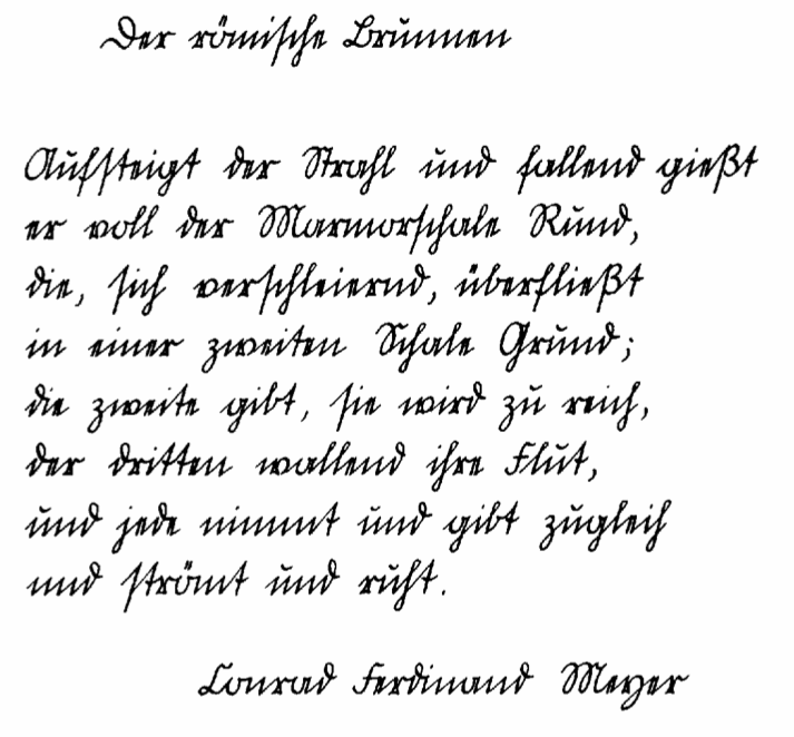
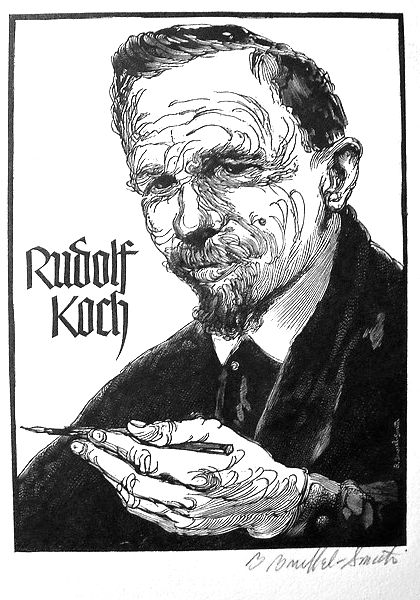
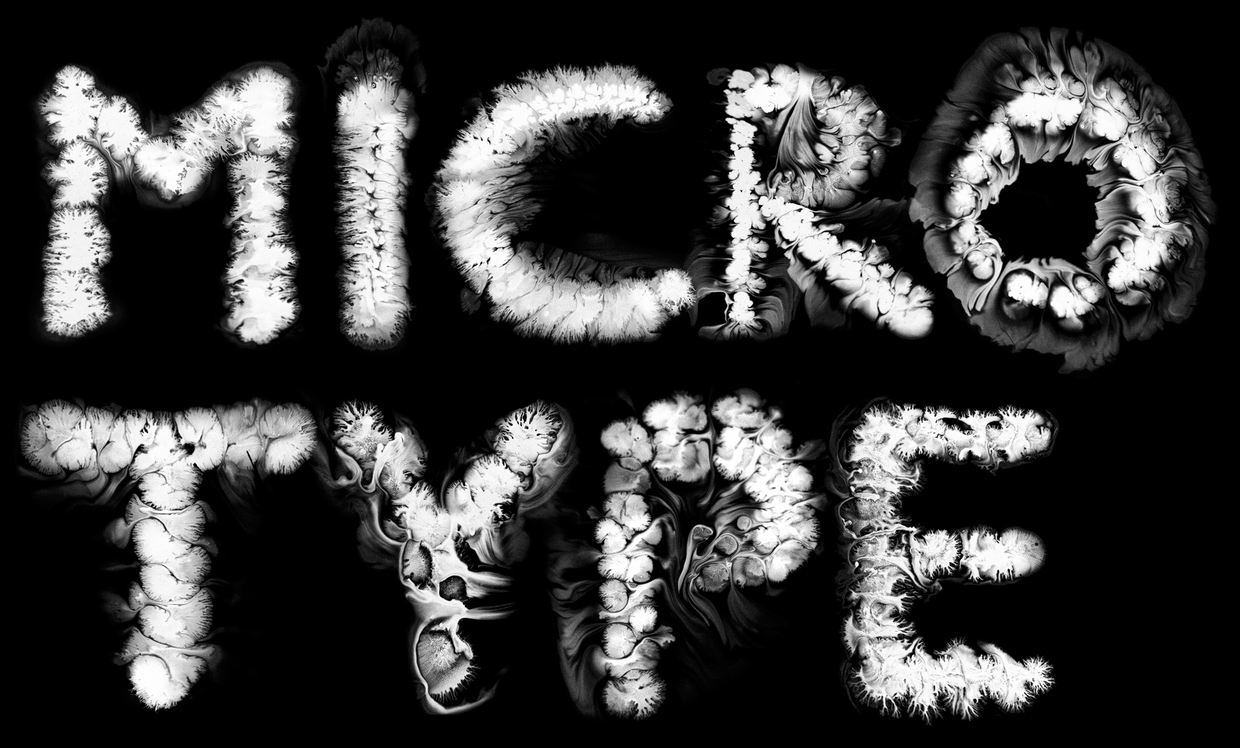
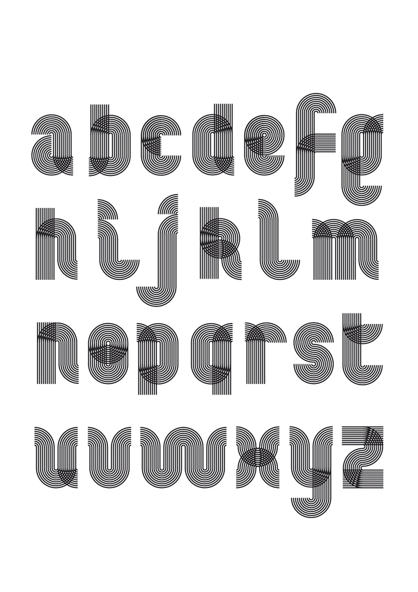
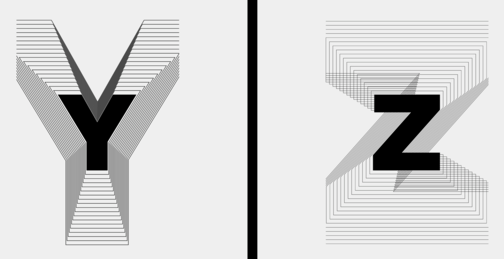
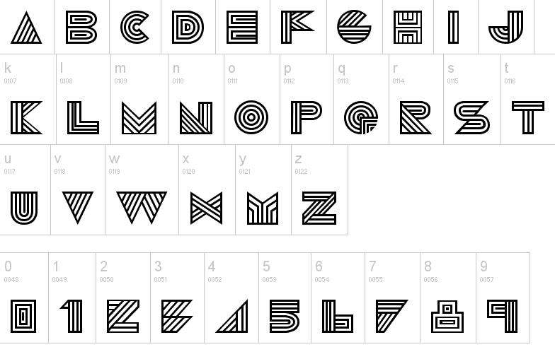
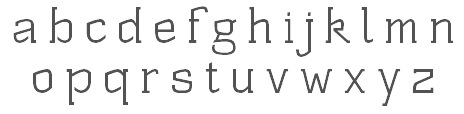
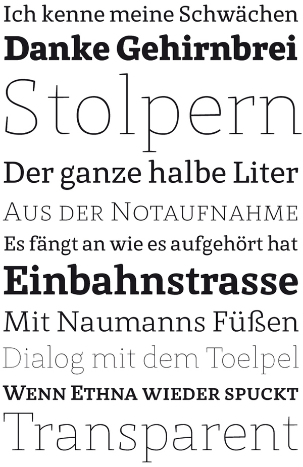
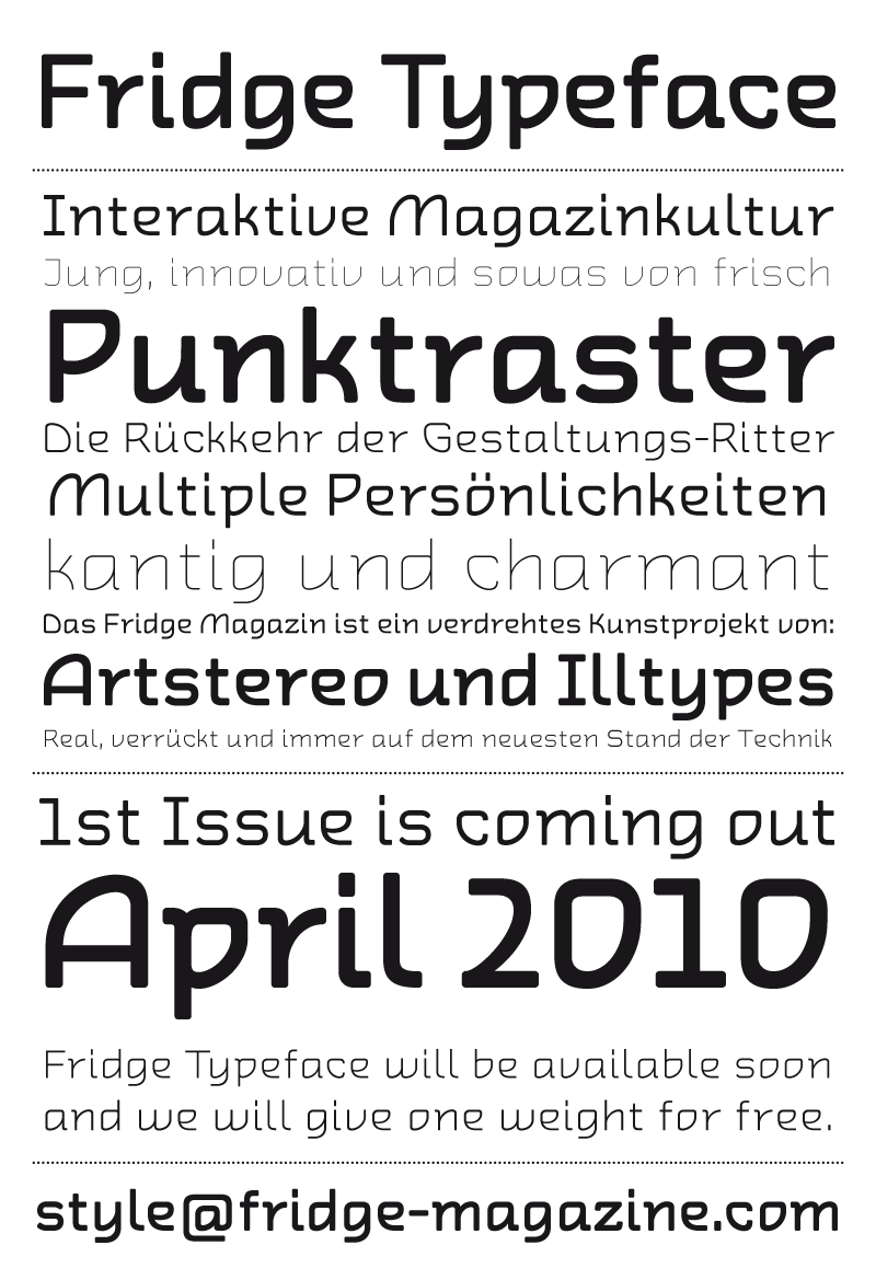
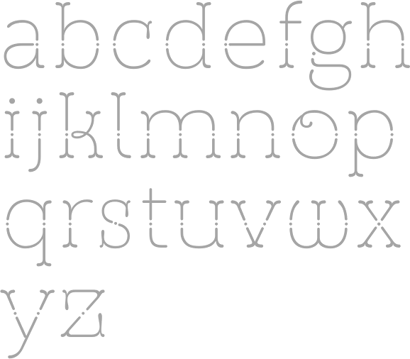
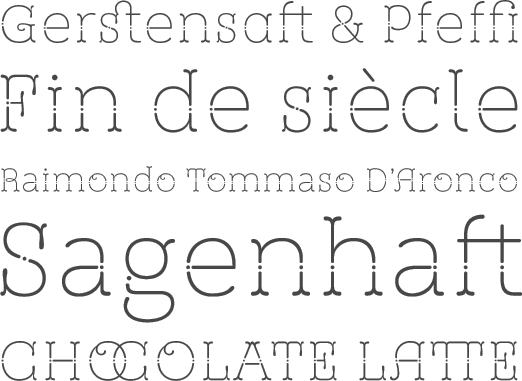
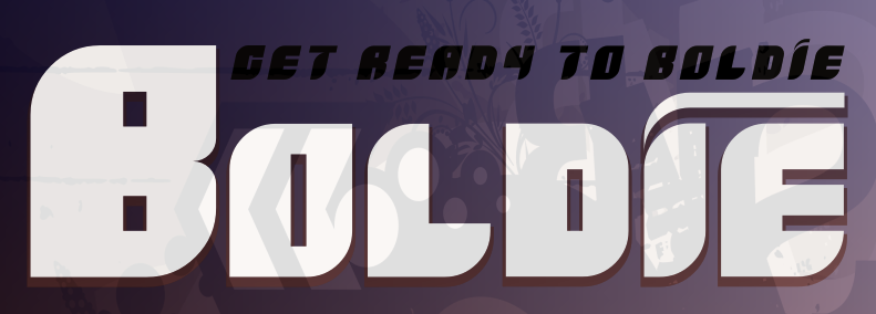
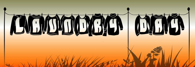
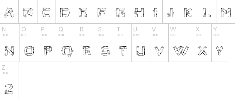
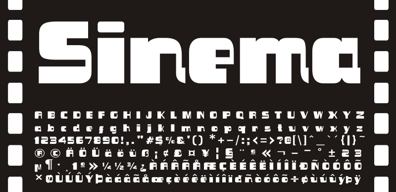
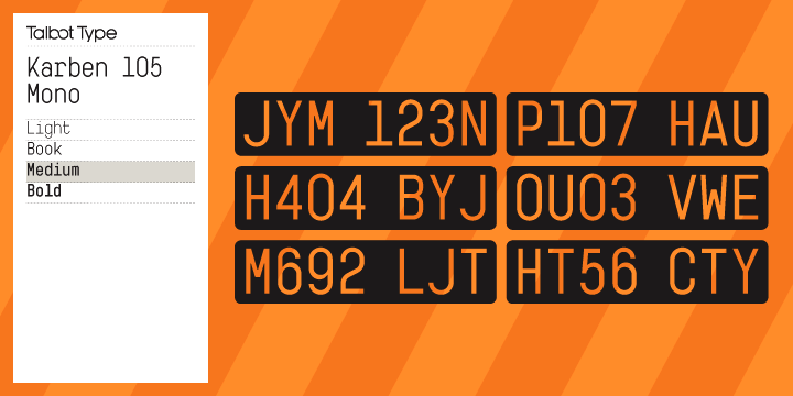
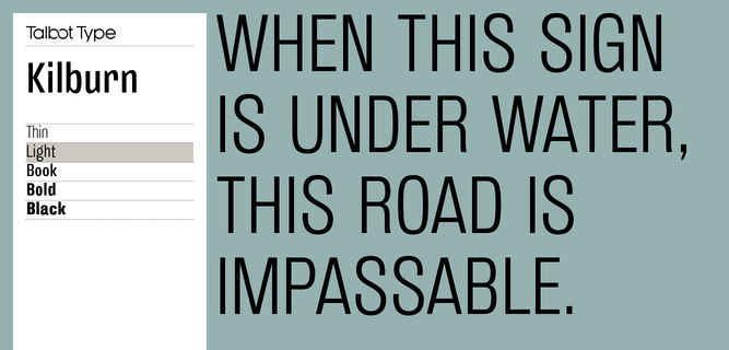
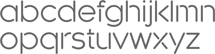
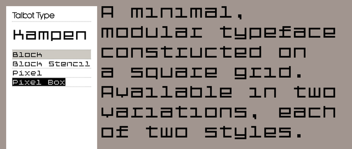
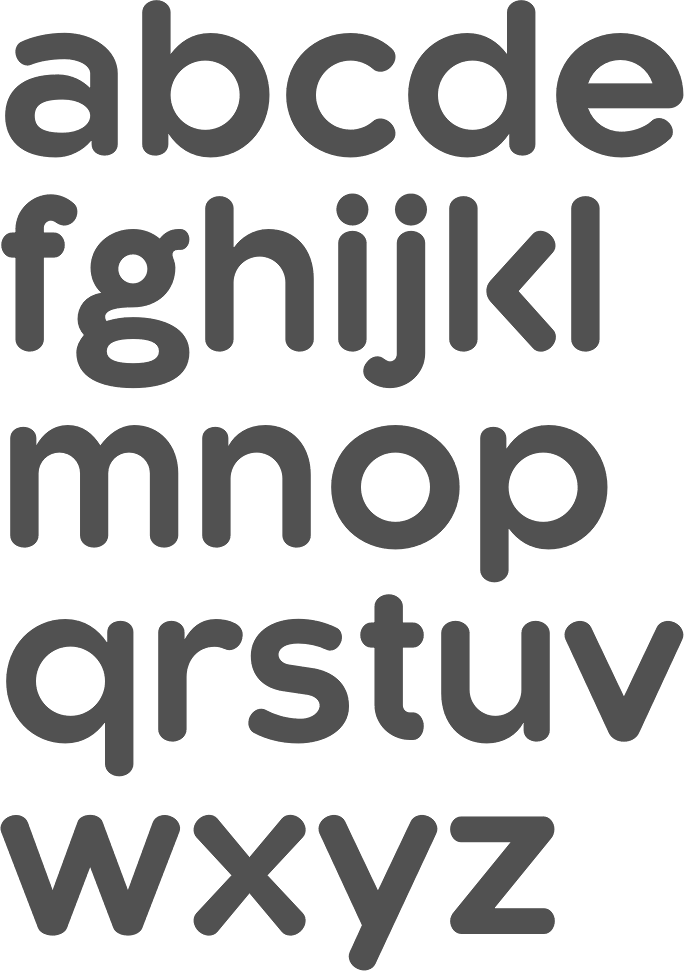
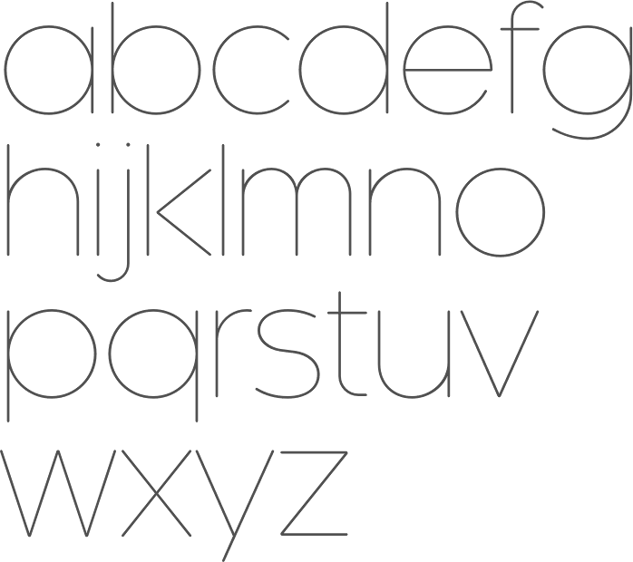
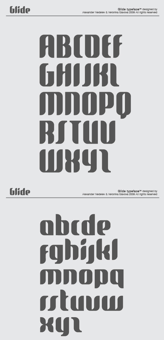
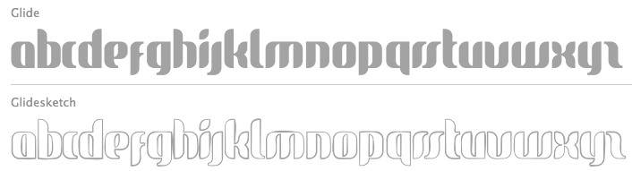
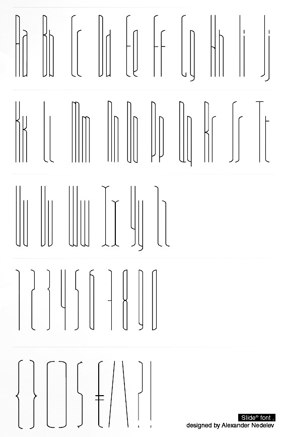
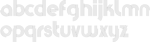
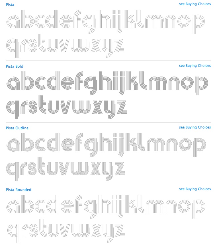
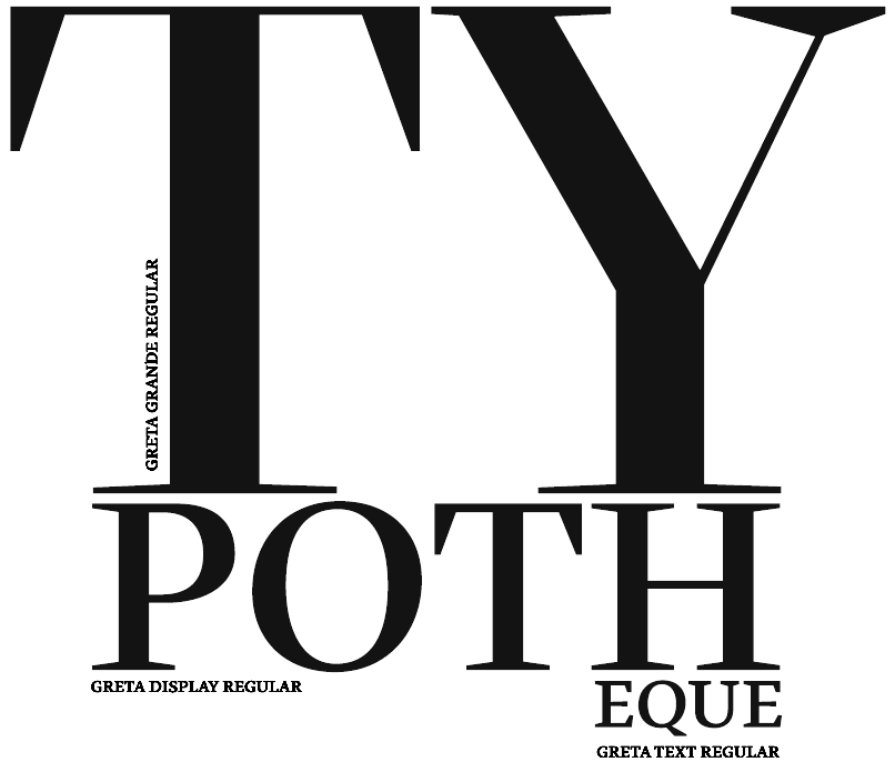
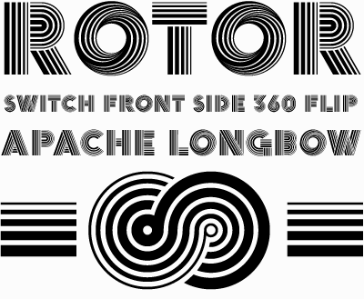
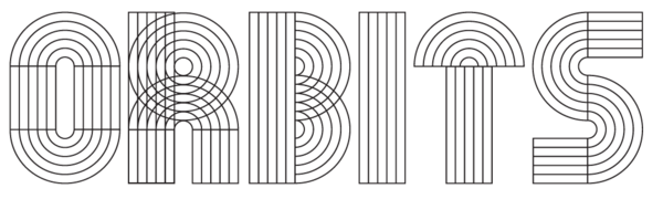