| | |
Abdul Malik Wisnu
[Almarkha Type]

|
 [MyFonts]
[More] ⦿
[MyFonts]
[More] ⦿
|
Adrian Frutiger
|
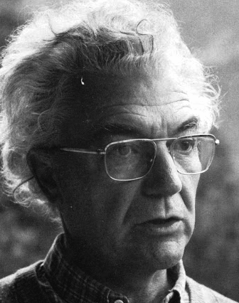 Famous type designer born in 1928 in Unterseen, Switzerland, who died in September 2015. He closely cooperated with Linotype-Hell AG, after having been artistic director at Deberny-Peignot in Paris since 1952. He established his own studio in 1962 with André Gürtler and Bruno Pfaftli. Art director for Editions Hermann, Paris 1957 to 1967. Frutiger lived near Bern, Switzerland, and was very interested in woodcuts. In 2009, Heidrun Osterer and Philipp Stamm coedited Adrian Frutiger Typefaces The Complete Works (Birkhäuser Verlag), a 460-page opus based on conversations with Frutiger himself and on extensive research in France, England, Germany, and Switzerland. Quote: Helvetica is the jeans, and Univers the dinner jacket. Helvetica is here to stay. He designed over 100 fonts. Here is a partial list:
 - Président (Deberny&Peignot, 1954). Digitized by Linotype in 2003.
- Delta.
- Phoebus (Deberny&Peignot, 1953).
- Element-Grotesk.
- Federduktus.
- Ondine (Deberny&Peignot, 1953-1954). The Bitstream version of this font is Formal Script 421. Adobe, Linotype and URW++ each have digital versions called Ondine. Bitstream's Calligraphic 421 is slightly different.
- Méridien (Deberny&Peignot, 1955-1957). Digitized by Adobe/Linotype in 1989.
- Caractères Lumitype.
- Univers (Deberny&Peignot, 1957). About the name, Frutiger wrote I liked the name Monde because of the simplicity of the sequence of letters. The name Europe was also discussed; but Charles Peignot had international sales plans for the typeface and had to consider the effect of the name in other languages. Monde was unsuitable for German, in which der Mond means "the moon". I suggested "Universal", whereupon Peignot decided, in all modesty, that "Univers" was the most all-embracing name!. Univers IBM Composer followed. In 2010, Linotype published Univers Next, which includes 59 Linotype Univers weights and 4 monospaced Linotype Univers Typewriter weights, and can be rented for a mere 2675 Euros. In 2018, Linotype added Univers Next Typewriter. In 2020, Linotype's Akira Kobayashi dusted off Univers Next Cyrillic and Univers Next Paneuropean.
- Egyptienne F (1955, Fonderie Deberny&Peignot; 1960, for the Photon/Lumitype machine).
- Opéra (1959-1961, Sofratype).
- Alphabet Orly (1959, Aéroport d'Orly).
- Apollo (1962-1964, Monotype): the first type designed for the new Monotype photosetting equipment.
- Alphabet Entreprise Francis Bouygues.
- Concorde (1959, Sofratype, with André Gürtler).
- Serifen-Grotesk/Gespannte Grotesk.
- Alphabet Algol.
- Astra Frutiger. A typeface variant of Frutiger licensed under Linotype. It is the font used on the highways in Switzerland.
- Serifa (1967-1968, Bauersche Giesserei). URW++ lists the serif family in its 2008 on-line catalog. Other names include OPTI Silver (Castcraft), Ares Serif 94, and Sierra. Bitstream published the digital typeface Serifa BT. But it is also sold by Adobe, Tilde, Linotype, URW++, Scangraphic, and Elsner & Flake. The slab serif is robust and is based on the letterforms of Univers.
- OCR-B (1966-1968, European Computer Manufacturers Association).
- Alphabet EDF-GDF (1959, Électricité de France, Gaz de France).
- Katalog.
- Devanagari (1967) and Tamil (1970), both done for Monotype Corporation.
- Alpha BP (1965, British Petroleum&Co.).
- Dokumenta (1969, Journal National Zeitung Suisse).
- Alphabet Facom (1971).
- Alphabet Roissy (1970, Aéroport de Roissy Charles de Gaulle).
- Alphabet Brancher (1972, Brancher).
- Iridium (1972, Stempel). A didone with slight flaring.
- Alphabet Métro (1973, RATP): for the subway in Paris.
- Alphabet Centre Georges Pompidou. The CGP typeface (first called Beaubourg) used in the Centre Georges Pompidou from 1976-1994 is by Hans-Jörg Hunziker and Adrian Frutiger, and was developed as part of the visual identity program of Jean Widmer. It is said that André Baldinger digitized it in 1997.
- Frutiger (1975-1976, Stempel, with Hans-Jörg Hunziker). In 1999, Frutiger Next was published by Linotype. In 2009, that was followed by Neue Frutiger (a cooperation between Frutiger and Linotype's Akira Kobayashi). In fact, Frutiger, the typeface was made for the Charles De Gaulle Airport in 1968 for signage---it was originally called Roissy, and had to be similar to Univers. It was released publically as Frutiger in 1976. The modern Bitstream version is called Humanist 777. Frutiger Next Greek (with Eva Masoura) won an award at TDC 2006. Other digital implementations of Frutiger: M690 (SoftMaker), Quebec Serial (SoftMaker), Frutus (URW), Provencale (Autologic), Frontiere (Compugraphic), Freeborn (Scangraphic), Siegfried (Varityper). In 2018, under the aegis of Akira Kobayashi, the Monotype Design studio published the 150-language superfamily Neue Frutiger World (including coverage for Latin, Greek, Cyrillic, Georgian, Armenian, Hebrew, Arabic, Thai and Vietnamese).
- Glypha (1979, Stempel). See Gentleman in the Scangraphic collection).
- Icône (1980-1982, Stempel, Linotype). Digitized by Linotype in 2003.
- Breughel (1982, Stempel; 1988, Linotype).
- Dolmen.
- Tiemann.
- Versailles (1983, Stempel).
- Linotype Centennial (1986). Based on Morris Fuller Benton's Clarendon typeface Century, Linotype Centennial was designed for Linotype's 100th birthday.
- Avenir (1988, Linotype). In 2004, Linotype Avenir Next was published, under the supervision of Akira Kobayashi, and with the help of a few others. In 2021, the Monotype team released Avenir Next Paneuropean (56 styles, by Akira Kobayashi). Avenir Next World, released by Linotype in 2021, is an expansive family of fonts that offers support for more than 150 languages and scripts. The subfamilies include Avenir Next Hebrew, Avenir Next Thai, Avenir Next Cyrillic, Avenir Next Arabic and Avenir Next Georgian. Avenir Next World contains 10 weights, from UltraLight to Heavy.
Contributors besides Adrian Frutiger and Akira Kobayashi: Anuthin Wongsunkakon (Thai), Yanek Iontef (Hebrew), Akaki Razmadze (Georgian), Nadine Chahine (Arabic), Toshi Omagari (Arabic) and Elena Papassissa (Greek, Armenian). Lovely poster by Ines Vital (2011). - Westside.
- Vectora (1991, Linotype).
- Linotype Didot (1991). See also Linotype Didot eText Pro (2013), which was optimized by Linotype for use on screens and small devices.
- Herculanum (1989, Linotype): a stone age font.
- Shiseido (1992).
- Frutiger Capitalis (2006, Linotype): a further exploration in the style of Herculanum, Pompeijana and Rusticana. Linotype trademarked that name even though at least five fonts by the name Capitalis already exist.
- Pompeijana (1993, Linotype).
- Rusticana (1993, Linotype).
- Frutiger Stones (1998, Linotype) and Frutiger Symbols.
- Frutiger Neonscript.
- Courier New, based on Howard Kettler's Courier, was one of Frutiger's projects he was involved in ca. 2000.
- AstraFrutiger (2002): a new signage typeface for the Swiss roads. Erich Alb comments: With a Frutiger condensed Type and illuminated signs during night it is mutch better readable.
- Nami (2008) is a chiseled-stone sans family, made with the help of Linotype's Akira Kobayashi.
- Neue Frutiger (2009, with Akira Kobayashi) has twice as many weights as the original Frutiger family.
- In 2019, the Linotype team released variable fonts for Frutiger's main typeface families, Avenir Next Variable, Neue Frutiger Variable, and Univers Next Variable.
Bio by Nicholas Fabian. Erich Alb wrote a book about his work: Adrian Frutiger Formen und Gegenformen/Forms and Counterforms (Cham, 1998). Winner of the Gutenberg Prize in 1986 and the 006 Typography Award from The Society for Typographic Aficionados (SOTA). Famous quote (from a conversation in 1990 between Frutiger and Maxim Zhukov about Hermann Zapf's URW Grotesk): Hermann ist nicht ein Groteskermann. A quote from his keynote speech at ATypI1990: If you remember the shape of your spoon at lunch, it has to be the wrong shape. The spoon and the letter are tools; one to take food from the bowl, the other to take information off the page... When it is a good design, the reader has to feel comfortable because the letter is both banal and beautiful. Frutiger's books include Type Sign Symbol and Signs and Symbols. Their Design and Meaning (1989, with Andrew Bluhm, published by Studio Editions, London; Amazon link). Linotype link. FontShop link. Adrian Frutiger, sa carrière française (2008) is Adèle Houssin's graduation thesis at Estienne. Klingspor link. Wikipedia link. View Adrian Frutiger's typefaces. View some digital versions of Avenir. Vimeo movie on Frutiger by Christine Kopp and Christoph Frutiger entitled "Der Mann von Schwarz und weiss: Adrian Frutiger". More Vimeo movies. [Google]
[MyFonts]
[More] ⦿
|
Adult Human Male
[Alex Hy]
|
 Adult Human Male is the type foundry of Malaysian designer Alex Hy, who is located in Berlin or Ireland. His Twitter account says that he is New York, Paris and Coolock. His Dafont account calls him Irish. Whatever. Alex has two aspects, a commercial one, expressed in his commercial foundry Adult Human Male, and a free one via his Squack site on Dafont.
 The commercial Alex created the grunge stencil typeface Butterworth (2011), the hand-drawn Teksi (2011), the monoline squarish family Ebdus (2011), Valis (2011, futuristic), and the thin avant garde monoline typeface New Slang (2011). Gordito (2011) is a graffiti style bubble font that says Smurf. In 2012, Alex published the poster caps typeface Areaman, Stink Lines (multilined typeface) and Penang (art deco signage typeface seen on Penang by the creator). Straights Light is a beautiful pair of bilined all caps typefaces. Dale Kids is a children's book typeface. Hokkien (2012) is an art deco typeface with Chinese influences. Mister Mustard is a chubby rounded art deco typeface. Barkley (2012) is a textured caps typeface with a chalk board feel. Liner Notes (2012) is a bilined hand-drawn typeface. Bartleby (2012) is a hand-drawn all caps display font. The free font foundry Squack has the hand-printed typefaces Barker Allcaps (2012), Scrapist (2012, sketched), Billy Boy (2011, 3d), Quito Chicken (2011, 3d), Fred Wild West (2011, a grungy western face), Coolock Black (2011), Zapftig (2011), Ringworm (2011), Suicide Draft (2011), National Granite (2011, a 3d stone chisel face), Whiskey Fingers (2010), Wank Hands (2010) and Middle Man (2010), and the irregular typefaces Zapftig (2011), Shock Corridor, Pollo Asado, Middle Woman, Ghost Words, Late Puberty, Parrannoyed (2010, ransom note face), the hairline typeface Rexic (2011), Black Grapes (2012), Chump (2012, hand-printed capitals), Areman OT (2012), and the grungy Skidmarks (2012). Typefaces from 2013: Salas (a chunky cartoon face), Rabid (a crayon font), Strokin (a great brush face---part charcoal part paint strokes), Bevel Hands, Bunk (a layered beveled type system absed on a monoline fat rounded sans, Bunk Base 2), Spengler (inline face), Vastra (Bauhaus style, organic), Swingers (curly and cartoonish), Chump Change, Treves Sans (crayon face), Quincey (2017). We read that the fonts are designed by EircomTest. Aka Squack, MiddleMan and Alex H. Dafont link. Creative Market link. Twitter link. Behance link. [Google]
[MyFonts]
[More] ⦿
|
Agus Muhammad
[Toko Press]
|
[More] ⦿
|
Ahmet Prosic
[Pro Studio]
|
[More] ⦿
|
Alex Hy
[Adult Human Male]
|
[MyFonts]
[More] ⦿
|
Alexander Bobrov
[Indian Summer Studio]
|
 [MyFonts]
[More] ⦿
[MyFonts]
[More] ⦿
|
Alexander Shimanov
[Shimanov Types]
|
 [MyFonts]
[More] ⦿
[MyFonts]
[More] ⦿
|
Alexandre Beanes
|
Brazilian designer of the free stone age typeface Beanesdrock (2015) and the counterless typeface Lola (2019). [Google]
[More] ⦿
|
Alistair McCready
|
 Auckland, New Zealand-based designer of the blackletter typeface Huia (2015) and the chiseled typeface Obelisk (2015) which references early colonial hand-cut granite plaques and slabs. In 2016, he designed the typeface Monolith. In 2017, he published the roman inscription typeface Kahu, which takes inspirationn from the typography of the ANZAC war memorials across New Zealand.
 Behance link. [Google]
[More] ⦿
|
Almarkha Type
[Abdul Malik Wisnu]
|
 Indonesian designer of the brush script Sometimes (2019), the high contrast serif typeface Quakiez (2019), the serif typeface Romerio (2019), the condensed all caps piano key typeface Romestone (2019), and the script typefaces Cherolina (2019), Photorichies (2019), Photography Script (2019), Retrochips (2019), Mountecarlo (2019: monoline), Beautinela (2019: monoline), Ophelie (2019, Script+Sans), Denalova (2019), Shelline (2019), and Mathelline (2019).
 Typefaces from 2020: Banana Juice, Bella Sweety, Bubble Bobble (a bubblegum font), Dear Sunshine, Oatlander (retro baseball script), Sweet Purple, Monieta (an inky and creamy rabbit ear script), Orange Milk (a playful handcrafted typeface), Rockbitz (a children's book font), Seathera, Avocado Creamy, Bolyvina, Charlie Angela (an inky calligraphic script), Lovemy, Chadelova (an enhanced script), Grumbear, The Mezirane, Charlotte Amalie, Crash Soul (a dry brush script), Costiera (a dry brush script), Handestonie (a monoline script), Mentality (a signage script), Technovier (a monolinear squarish sans), Antiquesta (a dry brush script), Belgium Catherine, Cronisse (a display serif), Pronave (an all caps display typeface), Uniser (condensed all caps sans), Westack (a display serif), Avone (a stencil serif), The Roletta (a dry brush script), Waluxe (a fashion mag all caps sans with flared stems), Dear Sunshine, Mikalotta (poster script), Walker Knight (a vintage all caps typeface), Towards (stencil), Cronisse (a decorative serif), Avaneonz (a neon font), The Heista Killer (a dry brush horror font), Someone (a dry brush font), Vicenza (an all caps skyline font), Bristone (a wide sans in six styles; perhaps for car tire ads), Shutterlocks (a dry brush script), Romantics (a creamy script), Revoxa, Yippie Yeah, Wonderful Day (calligraphic), Girly (a girly script), Kamelitta (a wild curvy script), Roadstore (a spurred vintage all caps typeface), Springloved (a paper cutout typeface and a a fine inline poster font), Saturated, Choxr, Blackheat (a super condensed all caps sans), Retrohols, Alibabe, Lordcorps (an octagonal sports or military font; with a stencil style), Headcorps (a sports shirt or military stencil font), Pineforest (with soft spurs), Airborne 86 (a military stencil), Orchide (a dry brush script), Beneficha (wild calligraphy), Radens (a retro bold signage script), Brokenz (a heavy condensed sans), Delninoys (a playful sans), Lorenza (sans), Elcatraz (Mexican simulation font), Hubby Bunny, Rosadetta (script), Swingsnug, Chickens Lovers, Rollinkland, Grumbear, Bubble Bobble (a bubblegum font), Blackheat (a heavy ultra condensed typeface), Brokenz (a muscular display sans), Lorenza (a fashion mag sans), Belgium Catherine (a signature script), Amazed Breath (script), Rockmore (a brush script), Empirez (an octagonal slab serif sports font), Amazed Breath. Typefaces from 2021: Neurock (pure sci-fi), The Cheelaved (spurred, Victorian), Headbears (a sports font), The Antique (a vintage typeface), Vespalogy (a vintage display font), Bestorika (a decorative serif by Abdul Malik Wisnu and Rivo Adriansyah), Quakerhack (a rough brush font), Balietta (a flowing script), Brothery (a retro signage script), Beauticella (a signature script), Glamorez (a luxurious serif), Reloaded (a military stencil font), Austragen (a bold sharp-edged display typeface), Bearetta (script), Keawneta (a display font), Racerz (a speed font), Stangith (a decorative serif co-designed with Rivo Adriansyah), Quick Letter (a wide signature script), Arcinoll (a graffiti font), Charlie Brocklin (a thin signature script), Retrolight (a multiline neon sign typeface), Mokalatte (a wild script), Thugolatz (an all caps typeface with many interlocking ligatures), Author Think (a signature script), Bionetha (calligraphic), Bouncyland (a stylish wild script), Little Knight (a scrapbook typeface), The Brushentica (a beautiful dry brush script), The Soulmate (a dry brush script), Bettawork (a dry brush script), Philips Dutcher (a signature script), Recons (a techno font), Heezpiero (futuristic), Milky Quaker (a playful supermarket font), Rostemary (a fat finger font), Therestone (a Flintstone font), The Checkmate, Chick Chack (a heavy rushed script), Retroman (an Italian Western font), Brown House (a national park font), Emeralde Chamerions (a serif and script duo), Redzein (an octagonal slab serif), Rostera (a bold script), Sketchup (a sketched font), Thealiens (a condensed all caps sans), Williesh (a meaty display serif), Amazing Sweety (a scrapbook font), Heellaaz (an all caps children's book font), Almeira, Americans Classy, The Corps 86 (a military stencil), Brexo (a techno font with solid and stencil versions), Romeline (a scrapbook font), Yippie Yeah (a rounded monolinear marker pen font), Avaneonz (a neon or paperclip font), Sangira (a stylish serif), The Blackheads (a bold script), Kandaline, Marinaga (a creamy brush script), Mochalosta (script), Morning Sweety, Rockmore (a bold script), Deloire (a 4-style all caps sans), Montelova (script), Quinger (a monolinear decorative serif), Wonderella, Wonderful Sunset, Bellachia (a scrapbook script), Choxr (a very condensed all caps sans), Keepsmile (a rounded children's book font), Lovely Sweetie (a scrapbook font), Melanista (a wild script), Rollinkland (a brush font), Bellamona (a monolinear script), Bettanesia (handwriting), Bonalisha (script), Overwave (wavy), Beautimy (a wild script), Melatie (a wild script), Memorita (a wild script), The Handnature (a Treefrog script), Heinch (a 5-style all caps sans), Sweetie Banana (a scrapbook script), Sweetie Moment (a wild calligraphic script), The Dear (a retro script), Winterline (a wild script), Young Evaline (a signature script), Salt + Pepper, Sindenetta (a signature script), Autumnilla, Bella Ciao, Rosadetta (a wild calligraphic script), Saturated (a wild calligraphic script), Wondiletta, Bubblez, Lovely Orange, Milkalotta, Luxoorea (a stylish fashion-model-skinny all caps typeface), Momotako (a paper cutout font), Neonblitz (a neon font), Unione Force (an octagonal sports or military font; with a stencil style), Westman (a Western font), Delamoore (an all caps high-contrast display serif), Delaproza (an all caps display serif), Kinglead (a cartoonish font), Modesfa (an all caps display serif), Hexore (a slab serif), Deluxes (a stylish display sans), Kenzomaru (an oriental brush font), Lumbero (wooden plank font), Pineforest (a Victorian label or sign painting font), Beneficha (a wild calligraphic script), Brokenz (a bold condensed sans), Orchide (a dry brush script), Revoxa (a 4-style sans), Romantics (script), Schein (a sans and slab serif pair), Someone (a dry brush script), Towards (a minimalist stencil font), Averox (a futuristic all caps sans), Chicken Lovers (a playful informal font), Hubby Bunny (a cute display sans), Swingsnug (an informal monolinear sans). As Typotypea">Typotypea, he published the script typeface Manthoels (2020) and the roman all caps typeface Stinker (2020). Typefaces from 2022: Signattimes (a signature script), Thematheka (a constructivist font published on the day Putin invaded Ukraine), Overbillions (a dry brush script), Brolachess (a stylish all caps semi-serif), Suntage (a wide vintage all caps font). Typefaces from 2021 published by Gassstype but made by Abdul Malik Wisnu: Ruthless (a heavy dry brush font), Timeless Nature (script), Unranked (a rough mural font). Creative Fabrica link. [Google]
[MyFonts]
[More] ⦿
|
Alphabet&Type
[Paolo Vannucci]
|
 Paolo Vannucci (Alphabet&Type, b. 1969, Punta Marina Terme) created the curly handwritten Halloween typefaces Afterlife, Evernight (2009) and Evernight Stargazer (2009).
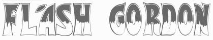
 He also has an interest in Startrekkery because he designed the typefaces Transformers Movie (2009) and Star Trek Future (2009). All these typefaces are free at Dafont and/or Fontspace. Alternate URL. In 2010, he did the free brush typeface Fronte del Porto, which is based on the Elia Kazan movie with Marlon Brando entitled On The Waterfront. There is also a commercial side of Alphabet&Type: In 2010, they published the angular family Antares, the bold organic typeface Minardi (+Collage), and the curly family Vannucci Antico. Metropolis (2010) is an angular typeface based on the titling of Fritz Lang's movie Capolavoro. Sabrina (2010) is taken directly from the Best movie by Billy Wilder, with Audrey Hepburn and Humphrey Bogart. An American in Paris (2010, or: UnAmericanoAParigi) is based on the font used in the movie by Vincente Minnelly, with Gene Kelly and Leslie Caron. Cleopatra (2011) is a chisel font with a Greek look, based on Cleopatra, the movie by Joseph L. Mankiewkz, starring Liz Taylor and Richard Burton. Il Grinta (2011) is the wedge serif titling font of True Grit, Henry Hathaway's movie starring John Wayne. The beautiful inline typeface Singapore (2011) after the titling in John Brahm's movie featuring Ava Gardner. Strade di Fuoco (2011) is based on the movie Streets of Fire by Walter Hill, with Diane Lane. Flash Gordon (2011) is based on the famous movie by Mike Hodges, starring Max Von Sydow. Amazing Spider Man (2011) is based on the Spiderman movie by Marc Web which featured Andrew Garfield. Captain America (2011) is based on the movie by Joe Johnston, with Chris Evans. Twilight New Moon (2009) is based on the Twilight movie. Electric Dreams (2011) is based on steve Barron's movie. Tintin (2011) is a comic book typeface based on Steven Spielberg's 2011 movie. Fantastic Four (2011) is a StarTrek style family that is based on the Tim Story movie. Faelorehn (2011) is a vampire script. Creations from 2012: Sherlock Holmes, Watson (based on Guy Ritchie's movie), Lucky Luke (after the successful Western comic book series by Morris and Goscinny), Danger Diabolik, Ghost Rider (based on the movie by Mark Steven Johnson, starring Nicolas Cage), Notorious (a brush font based on Notorious, a movie by Hitchcock starring Cary Grant and Ingrid Bergman), Cullen, Flower Header, Dorian Gray (from the movie by Oliver Parker starring Ben Barnes), Snow White (from Rupert Sanders's movie Snow White and The Huntsman). Typefaces made in 2013: Beastly (based on the David Barnz movie featuring Vanessa Hudgens), Top Gun (an octagonal typeface based on the movie with Tom Cruise), Manhattan (from Woody Allen's movie), Assassin (based on a Ubisoft video game). Typefaces from 2014: Dylan Dog (based on Kevin Munroe's movie starring Brandon Routh). [Google]
[MyFonts]
[More] ⦿
|
Andrei Olaru
[Kreativ Font]
|
[More] ⦿
|
Andres Aarik
|
Andres Aarik is a graphic designer and a student in Media and Advertisement design in Tartu, Estonia. Designer of the fat and wide typeface Hustler (2010) and the chiseled typeface Tode Ja Oigus (2009). Behance link. [Google]
[More] ⦿
|
Andri Juhaeri Sinaga
|
Designer of the free stone cut font Zubrutal (2018). [Google]
[More] ⦿
|
Anton Scholtz
[Scholtz Fonts]
|
 [MyFonts]
[More] ⦿
[MyFonts]
[More] ⦿
|
Astigmatic One Eye
[Brian J. Bonislawsky]
|
 Astigmatic One Eye (AOE) has lots of nice original fonts by Brian J. Bonislawsky (b. 1973, Pittsburgh, PA). Many are free, others are not. AOE joined Font Brothers Inc in 2006. Brian Bonislawsky currently lives in Las Vegas, NV.
 Fontsquirrel link. Dafont link. Fontspace link. A partial list of the AOE fonts made in 2011: Engagement (2011, a free brush script at Google Web Fonts), Fascinate (2011, an art deco typeface at Google Web Fonts; +Inline), Original Surfer (2011, a free Google Web Font inspired by a vintage advertisement for the "California Cliffs Caravan Park"), Smokum (2011, a Western / Italian face), Yellowtail (2011, signage face), Redressed (2011), Special Elite (2010, a free old typewriter face), Aclonica (2011). Typefaces from 2008 or before: Horseplay AOE (2008, Western style), Cake and Sodomy AOE (2008), Good Eatin AOE (2008), Paradiso AOE (2008, inspired by logotype of the Paris Resort and Casino in Las Vegas), Montelago AOE (2007, a script inspired by the logotype of the Mirage Resort and Casino in Las Vegas), Jack Chain AOE (2007), Henhouse (2007), Schnitzle (2007), Luxurian AOE (2007, inspired by the logo of the Luxor Hotel&Casino in Las Vegas), Digital Disco AOE (2007), Mighty Tuxedo AOE (2007), Makeshift AOE (2007), Clarity AOE (2007, slab serif headline; + grungy version), Red Pigtails AOE (2007), Run Tron 1983 (2002), Eyeliner AOE (2006, Tekton-like), Mother Hen (2007), Gloversville (2007, comic book style), Mighty Tuxedo AOE (2007, condensed sans), Quick Handle AOE (2007), Surfing Bird (2007), Hydrogen (2004), Hardliner (2004, fifties diner style), Big Ruckus (2004), SS Antique No. 5 (2004), Europa Twin (2003), EuroMachina (2003, techno), Lord Rat (2003: papercut sans), Love Anxiety (2003), BuzzSaw (2003), Skullbearer (2003, skull dingbats), Beatnick Blue (2002), Geisha Boy (2002), Mardi Party (2002), Midcrime (2002), Ocovilla (2002), Ruthless (2002), Saltie Doggie (2002), Whiskers (2002), Royal Gothic, Family, Eggit, Jericho, Wild Monkeys (2002), 5FingeredGothSW, AlienArgonautAOE, AlphaMackAOE, AmphibiPrint, AngiomaAOE, AntiChristSuperstar, AntiChristSuperstarSW, AstigmaSolid, BigLimboAOE, BigLimbodOutAOE, BoneRollAOE, BoneRollAOEBold, BoundAOE, BrailleAOE, BulletBallsAOE, ButterflyChromosome, ButterflyChromosomeAOE, ButtonButton, ButtonButtonAOE, CType, CTypeAOE, CelticLionAOE-Bold, CelticLionAOE-BoldItalic, CelticLionAOE-Italic, CelticLionAOE, CharailleAOE, ChickenScratch, ChickenScratchAOE, ClunkerAOE, ClunkerAOE-Bold, CropBats, CropBatsAOE, CropBatsIIAOE, DarkNightAOE, DeadGrit, DeliveryMatrixAOE, DetourAOE, DigitalDiscoAOE, DigitalDiscoAOEOblique, DingleBerries, DoggyPrintAOE, DraxLumaAOE, DungeonKeeperII, DungeonKeeperIIBold, DungeonKeeperIIItalic, EggItAOE, EggitAOE-Italic, EggitOutlineAOE, ElectricHermes, ElectricHermesAOE, ElectricHermesAOECharge, FearAOE, FilthAOE, FishyPrintAOEOne, FishyPrintOneAOE, FishyPrintTwoAOE, FutharkAOE, FutharkAOEInline, FutharkAOEInline, GateKeeperAOE, Ghoulish Fright AOE (2006), GlagoliticAOE (1999, grungy glagolitic), GorgonCocoonAOE, Gotik, GreyAlienSW, HAL9000AOE, HAL9000AOEBold, HAL9000AOEBoldItalic, HAL9000AOEItalic, HandageAOE, HandageAOEBold, HauntAOE, HybridLCDAOE, IDSupernovaSW, IslanderAOE, JokerWildAOE, KillMeCraig, KillMeCraigAOE, Kinderfeld, KittyPrint, KittyPrintAOE, Kornucopia, KornucopiaAOE, LinusFace, LinusFaceAOE, LinusPlayAOE, LinusPlaySW, Lochen, LovesickAOE, Manson, MasterPlan, Mervale Script Pro (2012: a brushy script based on the 1940's Fawcett Publications Mary Marvel comic), Microbe, MooCowSW, MotherlodeLoadedAOE-Italic, MotherlodeLoadedAOE, MotherlodeStrippedAOE-Italic, MotherlodeStrippedAOE, MysterioSWTrial, NightmareAOE, OrnaMental, Pantera, PapaManoAOE, PenicillinAOE (described as a bacterial stencil typeface), PixelGantryAOE, PixelGantryAOEBold, PixelGantryAOEBoldItalic, PixelGantryAOEHeavy, PixelGantryAOEHeavyItalic, PixelGantryAOEItalic, PixelGantryHiliteAOE, PixelGantryHiliteAOEItalic, PoppyAOE, PoseidonAOE, Prick, QuiltedAOE, QuiltedAOEBlack, QuiltedTrial, RippleCrumb, RippleCrumbUltraCon, ROCKY, ROCKYAOE, RustedMachineSW, SSExpAntiqueAOE, Schizm, Schrill, SchrillAOE, SchrillAOEOblique, Scrawn, ScrawnAOE, ScrawnCyrAOE, ScrawnKOI8AOE, ScrewedAOE, ScrewedAOEOblique, ScrewedSW, SeaweedFireAOE, SenthAOE, ShampooSW, ShottyTransferTrial, SkinnerAOE, SlurCrumb, SpatCrumb, SpikeCrumbGeiger, SpikeCrumbSwizzle, SpikeCrumbSwollen, SteelcapRubbingTrial, StruckSW, StrutterAOE, SunspotsAOE, SurferComicTrial, TRANSHUMANALPHABET10, TRANSHUMANKATAKANA20, TannarinAOE, TannarinAOEOblique, TibetanBeefgardenAOE, TibetanBeefgardenAOE, TouristTrapAOE, TransponderAOE, TransponderGridAOE, UglyStickAOE, VanguardIIIAOE-Bold, VanguardIIIAOE-BoldOblique, VanguardIIIAOE-Oblique, VanguardIIIAOE, Ventilate, VentilateAOE, Y2KPopMuzikAOE, Y2KPopMuzikOutlineAOE, YoungItchAOE, ZeichensSW, ZenoPotionAOE, Zombie, BeatnikBlueAOE, BeatnikBlueFillAOE, GeishaBoyAOE, MardiPartyAOE, MindCrimeAOE, OcovillaAOE, PolynesianTouristAOE, RuthlessAOE, SaltyDoggieAOE, SpruceAOE, WhiskersAOE-Oblique, WhiskersAOE, WhiskersAltCapsAOE-Oblique, WhiskersAltCapsAOE (2002), Habitual, Automatic (techno), Bitrux, Filth (an eerie brush script), Cake&Sodomy, Gulag, Bad Comp, Detour, Alien Argonaut, Dark Night, GateKeeper (Halloween font), Gargamel Smurf, Invocation, Neuntotter, Geisha Boy, Saratoga Slim, Gobe, Stingwire, Lavatype, Tapehead, Islander, Clunker, Digelectric, Gargamel, Krulo-Tag, Krelesanta, SurferComic, Bound, Culture Vulture, Intruder, Cavalier, Anoxia, Synchrounous (IBM logo style lettering), Luna, Data Error, Lunokhod, Jericho. There are many techno and gothic fonts. Kill Me Craig is the first 26 death scene dingbat font (scenes by Craig Dowsett). KittyPrint takes the LinusFace font concept to more realistic cat head dingbats. Krelesanta (not free) is a funky font inspired by the band Kreamy Electric Santa. The free ButtonButton is useful for making buttons. Lovesick AOE is a scrawly, lovelorn typeface, i's dotted with hearts. Strutter AOE is based on the KISS logo. Senth AOR is a runic font. Charaille is one of the many dot matrix fonts. Cavalero is inspired by the logotype of the Chevy Cavalier. At Bitstream in 2001, AOE published Cavalero, Stingwire and Tannarin. And in 2002, he published the comic book font Big Limbo, Euro Machina BT and Islander there. Bio at Bitstream. In 2005, Bonislawsky and Sandler realeased 500 fonts, via Bitstream and MyFonts, under the label Breaking The Norm. In 2006, Astigmatic published their typewriter collection, which includes Military Document, Bank Statement, State Evidence Small Caps, State Evidence, Urgent telegram, Library Report, Overdrawn Account, Customs Paperwork, Incoming Fax and Office Memorandum. From the bio and various pieces of information, one is led to believe that Brian was born in Poland, and now lives in Miami, but that may be wrong. In 2010, he placed a free font at the Google Directory, Syncopate. Along the same lines, we find the derived square serif typeface Stint Ultra Condensed (2011, Google Web Fonts) and Stint Ultra Expanded (2012). In 2011, several other typefaces followed there, like Ultra (fat didone), Maiden Orange, Special Elite (2010, a free old typewriter face), Just Another Hand, Crushed, Luckiest Guy (comic book face), Aclonica, Redressed, Montezuma (a curly connected upright script), Devonshire (brush script), Fondamento (calligraphic lettering), Yellowatil (connected retro script), Righteous (free at Google Web Fonts: inspired by the all capitals letterforms from the deco posters of Hungarian artist Robert Berény for Modiano), Ribeye and Ribeye Marrow> (cartoon and/or tattoo style lettering---free at Google Web Fonts), Spicy Rice (2011, free festive display typeface at Google Web Fonts). Contributions in 2012: Marcellus (2012, Trajan, flared roman, at Google Fonts and CTAN), Eagle Lake (a free calligraphic font at Google Web Fonts), Uncial Antiqua, Jim Nightshade (2012, free at Google web fonts), Dynalight (2012, a retro script inspired by a vintage luggage tag for the Southern Pacific 4449 Daylight steam locomotive), Yesteryear (a retro script loosely based on the title screen from the 1942 film The Palm Beach Story), Parisienne (Google Web Fonts: casual connected script based on a 1960s ad for bras), Shojumaru (Google Web Fonts: an oriental simulation typeface inspired by a poster for the Marlon Brando movie Sayonara), Berkshire Swash (Google Web Fonts), Audiowide (Google Web Fonts), Romanesco (Google Web Fonts: a narrow calligraphic style), Galindo (Google Web Fonts), Oregano (Google Web Fonts: based on cartoon style lettering of calligrapher and logo designer Rand Holub. This style of hand lettering adorned many retro brochures and advertisements of the late 40's through the 1960's), Peralta (Google Web Fonts: an Egyptian comic book face), Eagle Lake (Google Web Fonts: calligraphic), McLaren (Google Web Fonts: comic book style alphabet), Freckle Face, Hanalei Fill, Hanalei [Polynesian bamboo or tiki lettering], Purple Purse, Margarine, Risque, Clicker Script [image], Stalemate [a gracious script, by Jim Lyles for AOE], Mouse Memoirs, Quintessential [Google Web Fonts: chancery hand], Bigelow Rules, Englebert [Google Web Fonts: from the title screen of the 1930's film titled Der blue Engel, starring Marlene Dietrich], Sacramento [Google Web Fonts: connected script]. Typefaces from 2013: Freckle Face (grunge), Grand Hotel, Purple Purse (Purple Purse draws its inspiration from a vintage Ivory Soap ad from the 1950's. Somewhat of a cross between Bodoni and Pixie, this font finds that it never truly takes itself seriously). Stiggy & Sands is the American type foundry of Brian Bonislawsky and Jim Lyles, est. 2013. Their first commercial typefaces, all jointly designed, are Luckiest Guy Pro (a fat comic book font based on vintage 1950s ads) and Marcellus Pro (a flared roman inscriptional typeface with both upper and lower case, originally published in 2012 by Astigmatic). Typefaces from 2014: Franken Jr AOE Pro (inspired by the title screen from the 1966 Hanna Barbera cartoon Frankenstein Jr), Good Eatin Pro AOE (inspired by the title screen from the 1942 Warner Bros. cartoon Dog Tired), Ghostkid AOE Pro (comic letter style). Typefaces from 2015: Shanks Antique 5 AOE (after the newspaper typeface Memorial (1865, Stevens, Shanks & Sons)), Reliquaire AOE (a somber blackletter typeface inspired by Memorial (1881, Boston Type Foundry)). Typefaces from 2016: Mailuna Pro AOE (a gothic sans), Kentish AOE Pro (art deco). Reardon AOE (a digitization of a film typeface called Joyce Black by LetterGraphics), Berkmire AOE (1970s style robot-inspired techno font), Blackheath Pro AOE (this typeface started as a digitization of a film typeface called Roberts Square by LetterGraphics), Delaware Pro AOE (art deco), Rutland AOE (a futuristic font that is a digitization of a film typeface called Maccaro by LetterGraphics). In 2016, Brian J. Bonislawasky and Jim Lyles published the rugged octagonal mega typeface family Tradesman at Grype. In 2017, they added the art deco typeface Cowling Sans AOE (which is based on alphabet from "Lettering for Commercial Purposes" by Wm. Hugh Gordon). In 2018, they published the letterpress emulation typeface Prison Pro, Pink Sangria (50s style movie font), Manic Tambourine, Motenacity (a Martian cartoon font), the old typewriter font Office Memorandum Pro, and the Flintstone font Strongman. Typefaces from 2021: Klutz AOE Pro (a condensed all caps beatnik font), Data Error AOE Pro (based on early dot matrix printers), Customs Paperwork AOE Pro (based on the NuMode Type No. 61 vintage typewriter), Rinzler AOE Pro (a great stencil font that revives LetterGraphics' Caren), Restraining Order AOE Pro (an old typewriter font), Brazarri AOE Pro (an Aztec emulation font based on MacKeller, Smiths and Jordan's Bizarre from 1884). View Astigmatic's typeface library. View the typefaces made by Brian Bonislawsky. Fontsquirrel link. Dafont link. Fontspace link. Creative Market link. [Google]
[MyFonts]
[More] ⦿
|
Aulia Akbar
[Raretracks (was: Monodark)]
|
[More] ⦿
|
Australian aboriginal art by Dick Pape
[Dick Pape]
|
Dick Pape created these Australian aboriginal art typefaces in 2009: Aboriginal Art (A, B, C). Download here. [Google]
[More] ⦿
|
BeJota
[Bruno Jara Ahumada]
|
 Santiago, Chile-born type designer who graduated from Universidad de Santiago de Chile in 2015 and 2016. After work at the Museo de Arte Contemporaneo and Museo Nacional de Bellas Artes, he joined the Latinotype foundry in Santiago. He moved to Konstanz, Germany and set up his own type foundry, BeJota in 2021.
 In 2016, Bruno Jara Ahumada, Alfonso Garcia, Luciano Vergara, Daniel Hernandez and the Latinotype Team designed the roman square capital headline typeface family Assemblage. With Luciano Vergara, he designed the angular Jurassic park style typeface Los Lana Niu (2016). In 2018, inspired by Herb Lubalin's ITC Serif Gothic, Jorge Cisterna and Bruno Jara co-designed the layerable font family Lumiere at Latinotype. Typefaces from 2019: Galeria (Latinotype: a monoline slab serif typeface inspired by modern art gallery buildings, museums and cultural centers where organic forms and straight lines predominate). In 2019, Jorge Cisterna and Bruno Jara developed the vintage layerable typeface Blackberry (Los Andes). Blackberry is inspired by vintage packaging and old fashion ads. It has woodtype characteristics such as angular serifs, and light and diagonal curves. Typefaces from 2020: Diablito One (a two-font and four dingbat-font package by Rodrigo Araya Salas and Bruno Jara Ahumada), Galpon Pro (a great vernacular signage and/or comic book typeface for Latin, Greek and Cyrillic; with Rodrigo Araya Salas), Skippie (a comic book family by Andrey Kudryavtsev, Rodrigo Araya Salas, Bruno Jara Ahumada and Franco Jonas, and four sets of dingbats including Skippie Monster Lucha Libre and Skippie Monster Halloween). Typefaces from 2021: Rhein (an 18-strong rounded monoline sans family with a gorgeous inline style), Loyola Next (a 14-style sans by Rodrigo Araya Salas and Bruno Jara Ahumada), Showcase Sans (as part of a custom job for Vino Licensioso; this project includes sexy icons), Konstanz (an 8-style Bauhaus-inspired sans family), Picaflor (a titling or children's book typeface by Rodrigo Araya Salas and Bruno Jara Ahumada), Picaflor Soft (a fine national park or children's book family of organic sans fonts by Rodrigo Araya Salas and Bruno Jara Ahumada). Typefaces from 2022: Garvo and Garvo Poster (6 styles each; based on old Hollywood movie posters, vintage film credit designs; Garvo pays homage to Herb Lubalin's Serif Gothic font and is named after Greta Garbo). Linkedin link. [Google]
[MyFonts]
[More] ⦿
|
Bernard Philpot
|
Welsh creator of the irregular chiseled typeface ITC Bolthole (2008. ITC>). He writes: My father brought me to a small graveyard in the Welsh hills to show me two headstones carved by the great Eric Gill. I instantly fell in love with the beauty of the carving and the perfection of the letterforms. I still go back to marvel at these works of art. Philpot studied graphic design and typography at the London School of Printing, and soon after graduation started work in a large advertising agency in London. Klingspor link. [Google]
[MyFonts]
[More] ⦿
|
Bolt Cutter Design (or: Mahoney Fine Arts)
|
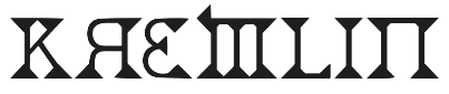 Creators in 2008 of a series of detailed free fonts: Eutemia (connected calligraphic script), Deborah Extra Ornaments, Prozac Buzz (grungy and neurotic), Phat Grunge Bold, Metal Macabre (scary), Kremlin-Advisor-Display-Kaps-Bold, Kremlin-Samovar-Extra-Bold, Kremlin-Samovar, KremlinAlexander-Bold, KremlinBolshevik-Bold, KremlinDuma-Bold, KremlinEmpire, KremlinGeorgianI3D, KremlinGrandDuke, KremlinKiev, KremlinOrthodoxChurch, KremlinStarets (all Cyrillic simulation typefaces), Deborah Fancy Dress (saloon font), Deborah (1880s style).
 Full list, at the end of 2008: AngstRidden (angst-ridden handwriting, dated 2002 under the label Mahoney Fine Arts), Bolt-Cutter-Light, Bolt-Cutter-Nasty, Bolt-Cutter, CSAR-Italic, CSARVESTMENT (illuminated caps), Bloody Irish Bastard or Congeal (2001), Deborah (Western), DeborahCondensed, DeborahExtrasOrnaments, DeborahFancyDress, Dominatrix, EutemiaI-Italic, EutemiaII-BoldItalic, EutemiaIII-BoldItalic, EutemiaOrnaments, GeneticEngine, GideonPlexus, KREMLINMINISTRY-DemiBoldItalic, Kremlin-Advisor-Display-Kaps-Bold, Kremlin-Samovar-Extra-Bold, Kremlin-Samovar, Kremlin-Soviet-Italic, Kremlin-Tsaritsa-Italic, Kremlin, KremlinAdviser, KremlinAlexander-Bold, KremlinBolshevik-Bold, KremlinComrade, KremlinCzar, KremlinDuma-Bold, KremlinEmperor-Bold, KremlinEmpire, KremlinGeorgianI3D, KremlinGrandDuke, KremlinImperial, KremlinKiev, KremlinKommisar, KremlinKourier-II, KremlinKourierII-Bold, KremlinMenshevik-Bold, KremlinMenshevik-BoldItalic, KremlinMinister-Black, KremlinMinister-Bold, KremlinMinister, KremlinMinisterBlack3D-Bold, KremlinOrthodoxChurch, KremlinPravda-Italic, KremlinPravda, KremlinPremier, KremlinStarets, KremlinSynod, MarquisDeSade, MarquisDeSadeAlternates, MarquisDeSadeOrnaments, Kremlin Chairman, Metal-Macabre, NewSymbolFont, ODINS-SPEAR-HOLLOW (2002, runes), ODINS-SPEAR (runic), OurSacredRights-Bold, PhatGrunge-Bold, Precious (calligraphic), StarmanCrusader, TEK-HED-AGGRESIVE (the TEK (techno) series is from 2003), tEK-HED-ANGRY, TEK-HED-BOLIMIC, TEK-HED-LAZY, TekHedRegular, ThorsHammerCarved (2008, chiseled look), csar, csarparadedress. Fonts from 2009: Vlad tepes II (creepy). Fonts from 2010: Sarcophagus. Fonts from 2012: Baris Cerin (a bastardized Garamond caps face). Fonts from 2013: Precious (connected formal script). Fontspace link. Open Font Library link for Tyler Schnitzlein. [Google]
[More] ⦿
|
Bomparte's Fonts
[John Bomparte]
|
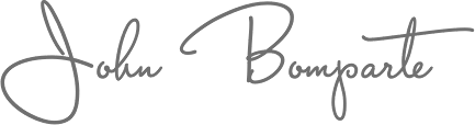 Bomparte's Fonts is John Bomparte's (b. Port of Spain, Trinidad, 1959) foundry in Wake Forest, NC. A graphic and type designer, John Bomparte was the assistant to, and a protege of renowned type designer Ed Benguiat, at the legendary Photo-Lettering Inc. It was there that John was surrounded by other great type designers such as Tony Stan, Vic Caruso, Vincent Pacella and Bob Alonso.
 John designed the art deco sans typeface Hamptons BF, and another art deco headline face, Take Two BF. In 2006, he published the 12-style family Blackletter Sans and the exquisite poster semi-Greek simulation art deco typeface Abstrak BF (modeled after a 1931 ATF font by Robert Foster called Abstract). In 2007, he surprises with the 1920s poster font Michelle BF, the hand-printed Brandy BF, its follow-up Johnny Script BF (2008), the quirky Freaky Frog BF, the dot matrix halftone effect font Subliminal BF, the frizzy Glow Gothic BF (2007), and the gorgeous swashy 3-style blackletter family Black Swan BF (2007). His 2008 typefaces: Jacky Sue BF (based on the hand of Jackie Geerlings), SoHo Nights BF, Hamburger Font BF (a rounded fat face), and the art deco sans serif typefaces Sidewalk Cafe BF (2008) and Hamptons BF (2 weights). Emerge BF (2009) is a flare serif inspired by Admiral, c.1900, from the Keystone Type Foundry. Freedom Writer BF (2009) is a connected handwriting script face. Danielle BF (2010) is hand-printed, based on the hand of Danielle Paradis. Factor BF (2010) is an electronic / futuristic / techno face. FingerSpeller BF (1994) is an American sign language typeface. Retroscript BF (2010) and Capistrano BF (2010) are beautiful connected scripts. In 2011, he added the fat felt tip pen typeface Sherbet BF and the funky rounded display typeface Dragonfly BF. In that same year, he published the stunted black wood type typeface Squat (BA Graphics, based on earlier work of or with Bob Alonso). Typefaces from 2012: Rockport BF (a gaspipe font inspired by 19th century wood types), Wilmington Script BF (an upright loopy connected script). In 2014, Seagrass BF, a connected script, and My Write Hand BF were published. Footloose (2015, BA Graphics) is a dynamic script typeface that was unfinished when Bob Alonso died. John Bomparte finished it. Typefaces from 2016: Shandy BF (a playful connected script). Typefaces from 2018: Petals BF. A flourished curvaceous ornamental didone. Typefaces from 2021: Between The Lines BF (a display typeface with some Super Veloz vibe). Klingspor link. Catalog of some of his commercial fonts. [Google]
[MyFonts]
[More] ⦿
|
Brian J. Bonislawsky
[Astigmatic One Eye]
|
 [MyFonts]
[More] ⦿
[MyFonts]
[More] ⦿
|
Bruno Duarte
|
 Lisbon, Portugal-based graphic designer who created the Greek mythology-inspired Greek emulation or brutalist typeface Arka (2016). Behance link. Creative Market link. [Google]
[More] ⦿
Lisbon, Portugal-based graphic designer who created the Greek mythology-inspired Greek emulation or brutalist typeface Arka (2016). Behance link. Creative Market link. [Google]
[More] ⦿
|
Bruno Jara Ahumada
[BeJota]
|
 [MyFonts]
[More] ⦿
[MyFonts]
[More] ⦿
|
Carl Crossgrove
[Terrestrial Design]
|
 [MyFonts]
[More] ⦿
[MyFonts]
[More] ⦿
|
Carl Peel
|
Worksop, UK-based designer of the pixelish typefaces Pliskin (2015) and Kenney (2015), the origami typeface Mathilda (2015), the caveman font Leonard (2015), the triangulated typeface Shelby (2014) and the grungy typeface Decking (2011). [Google]
[More] ⦿
|
Carol Twombly
|
 Born in 1959 in Concord, Carol Twombly studied at the Rhode Island School of Design and under Charles Bigelow at Stanford, and joined the Bigelow&Holmes studio for four years. In 1988, she joined Adobe and started designing typefaces. She was featured in 5 American Type Designers by Spurius Press. In 1994, she won the Prix Charles Peignot. In 1999, she retired from type design.
 Linotype link. FontShop link. Typophile link. A book about Twombly by Nancy Stock-Allen (Oak Knoll Press, Newcastle, 2016): Carol Twombly: Her Brief But Brilliant Career in Type Design. Her typefaces: - FB Californian (1987-1994, with David Berlow and Jane Patterson).
- Adobe Caslon (1990). Poster by Rachel McKay.
- Chaparral (1997).
- Charlemagne (1989).
- Lithos (1989, the famous stone-cut look face).
- Mirarae (1984). This typeface with its characteristic mid-eighties oversized x-height won her the Morisawa Gold Prize.
- Myriad (1992, with Robert Slimbach), Myriad Wild, Myriad Sketch, and Myriad Tilt.
- Nueva (1994, +Extended).
- Trajan (1989, Adobe).
- Viva (1993).
- The Western typefaces Pepperwood (1994), Rosewood (1994), Ponderosa (1990) and Zebrawood, all co-designed with Kim Buker Chansler and Carl Crossgrove. Pepperwood was patterned after a 1877 wood type by Vanderburgh, Wells and Company. [Caution: Some say that she did *not* co-design these typefaces, contradicting MyFonts and other sources.]
View the typefaces made by Carol Twombly. [Google]
[MyFonts]
[More] ⦿
|
Carolina Giovagnoli
|
 Born in Rosario, Argentina, in 1976, she studied type design at UBA in Buenos Aires from 2009 until 2010, and co-founded the type coop Huerta Tipográfica. Carolina is currently based in Berlin.
 Her graduation typeface at FADU-UBA, Andada, was awarded at the Second Bienal Iberoamericana of Design (BID 10) and at Tipos Latinos 2012. Andada is a warm text typeface designed specially for Argentinian and Paraguayan (Guarani) text. Andada is free at Google Fonts and Open Font Library. It was commercially released at Huerta Tipografica in 2020 as Andada ht Pro. In 2021, Google Fonts published Andada Pro. With Andrés Torresi, she developed Cambo (2011, Huerta Tipográfica), a family for Latin and Khmer [a free weight at Fontsquirrel]. Robots ht, which uses layering to construct robots, won an award at Tipos Latinos 2014. There is a useful accompanying font called Robots HT Arrows. Winner at Tipos Latinos 2018 of a type design award for Robots HT. In 2014, Huerta Tipografica published the free text typeface family Caladea which was designed by Carolina Giovagnoli and Andrés Torresi. Caladea is based on Lato and is metric-compatible with Microsoft's Cambria. In 2015, Andrés Torresi and Carolina Giovagnoli developed the Devanagari typeface family Sarali at Huerta Tipografica (free at Google Web Fonts). The Latin part is based on Torresi's Telex (2012). Sura (2015, Google Web Fonts) is a Devanagari typeface family designed by Carolina Giovagnoli. It is based on the original Latin typeface Andada, a serif typeface for text. Winner at Tipos Latinos 2018 of a type design award for Laura HT. In 2020, she designed the stone cut typeface Das ABC der Scheren. In 2021, she released Weg, an experimental font based on interweaved lines. [Google]
[MyFonts]
[More] ⦿
|
Carter & Cone
[Matthew Carter]
|
Boston-based company started in 1991 by Matthew Carter and Cherie Cone that published typefaces such as Mantinia, Elephant, Sophia (1993) and the beautiful Galliard CC. They produced type on commission for Apple (Skia), Microsoft (the screen fonts Verdana, Georgia, Nina and Tahoma), Time, Newsweek (Vincent, 1999), Wired, U.S.News&World Report, Sports Illustrated, The Washington Post, The Boston Globe, The Philadelphia Inquirer, The New York Times, El País and the Walker Art Center. In particular, these are their typefaces for The New York Times: NYT Cheltenham (2001, 2008-2014), NYT Franklin (2012-2014), NYT Imperial (2007, 2008-2014), NYT Karnak (1993-2014: Font Bureau and later Carter and Cone), NYT Stymie (1990-2014). MyFonts site. Type Network link. The Type Founders link. Linotype link. View Carter&Cone's typefaces. [Google]
[MyFonts]
[More] ⦿
|
Castle Type
[Jason Castle]
|
 Designs by Jason Castle from San Rafael, CA, who studied psychology at Dominican University of California. He does custom font design and sells commercial typefaces through MyFonts and FontShop. Blog. These include:
 - A: AfrikaBorders, Afrika Motifs, Agency Open (M. F. Benton, 1934, revival Jason Castle), Agency Gothic Inline, Ampersands, Azbuka (2005, a heavy slab serif).
- B: Brasileiro (2007, an art deco face).
- Carisma (2007, a clean geometric sans), Carlos (art deco inspired by Elektra), Castle Fleurons, Chinoise (2008, based on hand lettering that is reminiscent of a style of ancient Chinese square-cut ideograms), Cloister Black, Copperplate Script, Cradley (2015, a Caslon titling family with Greek and Cyrillic, named after the birthplace of William Caslon).
- D: Deko Initials (1993, discontinued in 2007; based on NADA0 drawn in 1972 by Marcia Loeb), Dionisio (2008, didone).
- E: Eden (Bold, Light; originally designed by Robert H. Middleton in 1934).
- F: Fat Freddie, Futura CT and Futura CT Inline (2007, based on Futura ND, but discontinued after only a few weeks).
- G: Goudy Lombardy (Lombardic), GoudyStout, Goudy Text, Goudy Trajan (1994-2010, free; +alternates).
- H: Handsome (2002, nice finger dingbats, aka fists).
- J: Jensen Arabique (left field art deco, based on work of Gustav Jensen, 1933).
- K: Koloss (art deco).
- L: Latin CT (2008, 6 styles), Latin Wide, Laureat, Lise Informal (2008, hand-printed), Lombardy.
- M: Maximilian CS (Rudolf Koch, 1917), Metropolis Bold and Shaded (based on the 1932 Stempel cut as designed by W. Schwerdtner), Minotaur (2008, an original monoline design based on an Oscan votive inscription from the second century BC; looks like simulated Greek).
- N: Norberto (2009, an all-caps Bodoni; +Stencil).
- O: Ogun (2008, inspired by an Egyptian-style Russian block alphabet and useful for athletic lettering; formerly named Azbuka).
- P: Plantain (2002, a digital version of Plantin Adweight, a 1913 typeface by F. H. Pierpont), Plantain Stencil (2009), Progreso (2010, a condensed, unicase, serif gothic type design inspired by the hand-lettering on Russian posters from the 1920s).
- R: Radiant, Radiant Extra Condensed CT (both Radiants are revivals of Roger Middleton's typeface by that name, 1940), Ransahoff (2002, ultra condensed didone), Rudolf (1992, based on Rudolf Koch's German expressionist work such as Neuland).
- S: Samira (2008, art nouveau style; based on Peter Schnorr's Schnorr Gestreckt, from 1898), Shango (1993, based on Schneidler Initials by F.H.E. Schneidler (1936), and including a digital version of Schneidler Cyrillic (1992); extended in 2007 to Shango Gothic and in 2008 to a 3-d shadow version, Shango Chiseled, and in 2009 to Shango Sans), Sculptura (2005, an all caps typeface based on Diethelm's Sculptura from 1957), Sencia (2008, based on Spanish art deco stock certificate lettering from 1941), Sonrisa (2009, art deco family---Sonrisa Thin is free), Standard CT (a neo-grotesque family), Standard CT Stencil (2012: free).
- Tambor (Light, Black, Inline, Adornado) (1992) (note: Jason claims that it was remotely based on Rudolf, which in turn was based on calligraphy of Rudolf Koch), Trio (an art deco sansserif), Trooper Roman (discontinued).
- V: Vincenzo (2008, a slabby didone), Warrior (2009, a 3d font based on Ogun; +Shaded).
- X: Xavier (art deco family based on Ashley Crawford by Ashley Havinden, 1930, revival by Jason Castle in 1992).
- Z: Zagora, Zamenhof (2011: an all caps poster face with constructivist ancestry, named after the inventor of Esperanto), Zuboni Stencil (2009, Latin and Cyrillic, constructivist and perhaps even military).
Klingspor link. Behance link. View Jason Castle's typefaces. [Google]
[MyFonts]
[More] ⦿
|
Celtibérica
|
 Foundry in Madrid. Their first commercial typefaces are Dura (2011), Manuscrita (2011, a script typeface inspired by 16th century Spanish scripts), Celtiberica (2011, chisel font) and Parque (2006, stone age face).
 In 2012, they made Manuscrita XVI. [Google]
[MyFonts]
[More] ⦿
|
Chloe Azuley
|
During her studies in Paris, Chloe Azuley created Outline Surf font (2014). She also made the sweeping brush typeface John Butler Trio (2014). [Google]
[More] ⦿
|
Comicraft (was: Active Images)
[Richard Starkings]
|
 Comicraft was founded by Richard Starkings and John Roshell in 1992. Located in Santa Monica and Los Angeles, they do lettering and design for the comic book industry and make comic book fonts. At one point they were also called Comic Book Fonts. The current presidents are Rita Simpson and Richard Starkings. Alternate URL. T-26 link. Creative Market link. Some fonts: Sanctum Sanctorum (2003), Grandguignol (2003), MagicalMysticalFour (2003), Smash (2003), Aztech, Joe Kubert, Gobbledygook, Meanwhile, Matinee Idol [Nick Curtis has a much nicer script font by the same name, sold by MyFonts], Manganese (Asian-lookalike by Richard Starkings), Altogether OOky (by John Roshell), AbsolutelyFabulous, Achtung Baby (1997, Richard Starkings: a brutalist typeface), Adamantium, Alchemite, AstroCity, AstroCity International, Bithead, BrontoBurger, CarryOnScreaming, Chills, ClobberinTime, Comicrazy, Destroyer, DivineRight, DoubleBack, DutchCourage (1995, an art deco family), Elsewhere (art nouveau), Flameon, Framistat (2000, JG), Frostbite, GrimlyFiendish, Hooky, Hellshock, IncyWincySpider, JimLee, JoeMad, KissAndTell, KissAndTell International (2000, JG), Meltdown, MonsterMash, PhasesOnStun, PulpFiction, ResistanceIs..., RunningWithScissors, SchoolsOut (1999, John Roshell), SezWho/SezYou, SpookyTooth, Spills, Splashdown, StandBy4Action, Stormtrooper, TheStorySoFar, ToBeContinued, Thrills, WildWords, WildWords International, YuleTideLog, Zoinks, ZAP Pack, Digital Delivery, Jeff Campbell (2000, by JG), Los Vampiros, DeadMansChest, Cutthroat International (2000), Rigor Mortis (2000, John Roshell), DangerGirl, Thingamajig, Red Star, Red Square, Drop Case, Too Much Coffee Man, NearMyth, Stonehenge, Golem and SwordsAndSorcerers (medieval or runes fonts). Their monster fonts collection includes MonsterMash, CarryOnScreaming, Chills, GooseBumps, CreepyCrawly, Grimly Fiendish, IncyWincySpider, SpookyTooth, Meltdown and TrickorTreat dingbats. In 2005, MyFonts started selling their collection. Fonts by Starkings include Achtung Baby, Carry On Screaming, Clobberin Time, Flame On, Goosebumps, Grimly Fiendish, Sez, Splashdown. The full font list: Absolutely Fabulous (1999), Achtung Baby (1997), Adam Kubert (2005), Adamantium (1999), Alchemite (1997), Altogether Ooky (1999, vampire script), Area51 (2005, an octagonal typeface with a military stencil)), Astro City (2005), Astronauts In Trouble (2005), Atomic Wedgie (2005), Aztech (2005), Battle Cry (2005), Battle Scarred (2005), Belly Laugh (2005), Biff Bam Boom (2005), Bithead (1997), Blah Blah Blah (2005), Bronto Burger (1996), Carry On Screaming (1996), Chatterbox (2005), Cheeky Monkey (2005), Cheese And Crackers (2005), Chills (1997), Clobberin Time (1995), Comicrazy (1995), Creepy Crawly (2005), Cutthroat (2005), Danger Girl (2005), Dave Gibbons (2005), Dead Mans (2005), Dear Diary (2005), Designer Genes (2005), Destroyer (1999), Digital Delivery (2005), Divine Right (1998), Doohickey (2005), Double Back (1998), Dreamland (2005), Drop Case (2005), Dutch Courage (1995), Elsewhere (1998), Euphoria (2005), Exterminate (1999), Face Front (2005), Flame On (1997), Forked Tongue (2005), Framistat (2005), Frostbite (1997), Girls Girls Girls (2005), Gobbledygook (2005), Golem (2005), Goosebumps (2005), Grande Guignol (2003), Grimly Fiendish (1998), Hedge Backwards (2005), Hellshock (1997), Hooky (1999), Hush Hush (2005), Hyperdrive (2005), Incy Wincy Spider (1996), Jeff Campbell (2005), Jeff Campbell Sketchbook (2005), Jim Lee (1998), Joe Kubert (2005), Joe Mad (1999), Kiss And Tell (1999), Ladronn (2005), Los Vampiros (1999), Manganese (1999), Matinee Idol (2005), Meanwhile (2005), Meltdown (1997), Mike Wieringo (2005), Monster Mash (1997), Near Myth (2005, a grunge face, since 2007 also at T26), Nuff Said (2005), Overbyte (2005), Paranoid Android (2005), Pascual Ferry (2005), Pass The Port (2005), Phases On Stun (1995), Primal Scream (2005), Pulp Fiction (1996), Red Square (2005), Red Star (2005), Resistance Is (1997), Rigor Mortis (2005), Rumble (1994), Running With Scissors (1997), Sanctum Sanctorum (1998), Santas Little Helpers (2005), Schools Out (1999), Sean Phillips (2005), Sentinel (2005), Sez (1998), Shannon Wheeler (2005), Shannon Wheeler (2005), Smash (2005), Snowmany Snowmen (2005), Soothsayer (2005), Spellcaster (2005), Spills (1997), Splashdown (1997), Spookytooth (2005), Stand By4 Action (1997), Stonehenge (2005), Stormtrooper (1997), Thats All Folks (2005), The Story So Far (1998), Thingamajig (2005), Thrills (1997), Tim Sale (1999), Tim Sale Brush (2005), Tim Sale Lower (2005), Timelord (2005), To Be Continued (2005), Too Much (2005), Tough Talk (2005), Treacherous (2005), Trick Or Treat (2005), Wall Scrawler (2005), Wiccan Sans (1999), Wiccan Serif (1999), Wiccan Special (1999, see also T-26), Wild And Crazy (1997), Wild Words (1995), Yada Yada Yada (2005), Yeah Baby (2005), Yuletide Log (1996), Zoinks (2005), Phil Yeh (2006), Zzzap (2006), Battle Damaged (2007), Speeding Bullet (2006), Foom (2007), Letterbot (2007), Timsale (2007), Cutthroat (2007), Framistat (2007), Area 51 (2007, techno, octagonal), CC Comicraft (2007), Ratatat (2008), Mad Scientist (2008), Monologous (2008, T-26), HolierThanThou (2008, T26), Elephantmen (2008, grunge typeface at T26), Storyline (2008, T-26), Primal Scream (2009, T-26), Spillproof (2009, T-26), Sign Language (2008), Moritat (2009, T-26, by John Roshell), Pass The Port (2009, T-26), Credit Crunch (2009), Elsewhere (2009, art nouveau), Code Monkey (2011, monospaced yet informal), Glitter Girl (2011, hand-printed), Rassum Frassum (2011, comic book face), Rocket Man (2011, a retro futuristic family), Spaghetti Western (2011, signage face), Sunrise Till Sunset (2012), Samaritan and Samaritan Tall (2013, with John Roshell).
 In 2014, John Roshell published the school font Dash To School. Typefaces from 2015: Samaritan Lower (by Richard Starkings and John Roshell), Dusk Till Dawn Buried (expressionist). Typefaces from 2016: Questionable Things (with John Roshell: a question mark font). Typefaces from 2017: Evil Schemes (by Richard Starkings and John Roshell), Regeneration, Obey Obey Obey (by Starkings and Roshell). Typefaces from 2018: Samaritan Tall Lower (by Starkings and Roshell), Blah Blah Upper (by John Roshell and Richard Starkings), Evil Doings (by Richard Starkings and John Roshell). Typefaces from 2020: Elektrakution (a Greek simulation font family by Richard Starkings and John Roshell), This Man This Monster (by John Roshell and Richard Starkings). Typefaces from 2021: Richard Starkings Brush (2021; a comic book typeface by Richard Starkings and John Roshell), Scoundrel (a comic book face by Richard Starkings and John Roshell). Creative Market link. View Comicraft's typefaces. Fontsquirrel link. [Google]
[MyFonts]
[More] ⦿
|
Corradine Fonts
[Manuel Eduardo Corradine]
|
 Manuel Eduardo Corradine Mora was born in Bogotá in 1973. He graduated from the School of Graphic Design of the National University of Colombia in 1996, and became a graphic designer. He started by custom-designing fonts and by making typefaces for his own company, Casa Papelera El Cedro (The Cedar Papermaking House), for printing invitation cards. With other designers like Carlos Fabián Camargo, John Vargas and César Puertas he formed Tipográfico in 2007 to strengthen the type discipline in Colombia. Corradine Fonts is Manuel Corradine's own foundry in Bogotá, Colombia, founded in 2006. Today, he is one of Colombia's principal type designers. He also teaches at Universidad Piloto de Colombia in Bogota.
 Fonts from 2007: Kidwriting (a family which includes Kidwriting Dingbats 1 and 2), Garabata (a fantastic handwriting face), Garabata Dingbats, Hexagona Digital, Quadrat (grunge), Quadrat Old (grunge), Quadrat Dirty (grunge), Quadrat Broken, Quadrat Ugly, Neogot (experimental, 8 styles). Fonts from 2008: Mucura (handwriting), Prissa (handwriting), Salpicon (a script), Cuento Serif (a bouncy hand-printed family), Memoria (brush script), Charco, Happy Day (comic book family with Happy Day Dingbats), Espectro (a swinging script with swashes and a Dingbats style), Furia (handwriting), Candelaria (based on house signs in the La Candelaria neighborhood of Bogotá), Old Village (1600's style), Old Village Ornaments, Rapidda (a successful simulation of quick handwriting), Hueca (an outline children's script), Antigua (an old swashbuckler family), Colegial (a great-looking hand script), Pincel (a fantastic paint brush family with accompanying splatter dingbats), Trazo (Corradine's handwriting), Arcos (a techno family), Caveman (a primitive stone-look type family), Rumba (two styles; an elegant flowing brush script), Parche (graffiti family), Elegance Monoline (a greeting card script typeface that won an award at Tipos Latinos 2008), Abuelito (script). Fonts from 2009: Helga (flowing script), Mussica (+Swash, +Antiqued: a delicate Victorian typeface; followed in 2017 by Mussica Italic), Guarapo (hand-printed), Toxic (futuristic stencil), Emotion (comic book face), Bloque 3D, Rock and Cola, Betco's Hand, Telefante (comic book family), Nancy's Hand (more comic book hand-printing), Alambre (multiline/paperclip), Sensual (calligraphic hand), Zape (in the style of Tekton), Antrax Tech (grunge), Masato (handwriting), Hu Kou (oriental simulation). Fonts fgrom 2010: Miel (a curly script), Oferta (a signage script), Corradine Handwriting (and Corradine Handwriting Italic, 2015), Alberto (connected hand), Changua (hand-printed). Fonts from 2011: Plebeya (2011, connected hand), Mimi's Hand Connected, Legendaria (an extensive connected calligraphic family). Fonts from 2012: Tecna (a techno family co-designed with Sergio Ramirez), Neuron (a fantastic 16-style rounded elliptical sans family created together with Sergio Ramirez), Bucanera Soft (blackletter), Bucanera Antiqued (grungy blackletter), Official (a simple monoline sans family), Almibar (a connected calligraphic Spencerian script), Eterea (a roman all-caps family), Eterea LC (the lower case set), Canciller (an italic roman, done with Sergio Ramirez), Quarzo (2012, a formal copperplate script done with Sergio Ramirez). Typefaces from 2013: Neuron Angled (still with Sergio Ramirez), Alianza Slab (a great-looking slab family), Alianza Italic and Alianza Script (a packaging font), all made jointly by Manuel Eduardo Corradine and Sergio Ramirez. Typefaces from 2014: Whisky (a large blackletter family with inlines and fills for layering co-designed with Sergio Ramirez; related to German expressionism, it won an award at Tipos Latinos 2016), Whisky Italics, Beauty Script (with Juan Sebastian Rincon), Emblema and Emblema Headline (tall-legged art deco sans family by Duvan Cardenas), Wild Pen (a 1200-glyph set of typefaces that can be used to simulate handwriting thanks to smart replacements in Opentype), Sinffonia (a thin informal typeface with oodles of choices for swashes). Typefaces from 2015: Be Creative (a vintage display typeface), Typnic (a varied handcrafted layered and script typeface family; rhymes with picnic), Typnic Headline Slab. Typefaces from 2016: Naugles (thick display face based on the Naugles logo), Scrans (a modern signage script), Bloque (heavy slab family), Bloque Italic. Typefaces from 2017: Cristal (layered, triangulated and beveled font family, including exquisite Cristal Dingbats and Cristal Frames), Almibar Pro (connected calligraphic script). Typefaces from 2018: Tierra Script, Pueblito (rustic style). Typefaces from 2019: Austera Text (a comfortable workhorse serif). Typefaces from 2020: Kidwriting Pro. Klingspor link. Behance link. Creative Market link. MyFonts link. Fontspring link. Font Squirrel link. View Corradine's typefaces. [Google]
[MyFonts]
[More] ⦿
|
Cristóbal Henestrosa
[Estudio CH]
|
 [MyFonts]
[More] ⦿
[MyFonts]
[More] ⦿
|
Cumberland Fontworks
[Samuel John Ross]
|
 Game writer, game designer, graphic artist, and the creator and owner of Cumberland Games & Diversions, b. Cumberland, MD, 1971. He lived in Austin, TX, but is in Denver, CO, since 2014. Typefaces by S. John Ross include Sex Nerd (2021), Guacamole Quickstep (2019), Cynocel Poster (2019), Monesque (2019), Flagstones (2018), Kentucky Fireplace (2016), Bad Guy Black (2015, an engraved currency font), Silvery Tarjay (2015), Iron and Brine (2015), Afton James (2015), Fountain Avenue (2013), Axe Handel (2013, grunge), Sans Sara (2011, geometric organic sans), Growly Grin (2011, grunge), Gelio (2011, Greek simulation family; +Pasteli), Shock Shimmy (2011), Gelio Greek Diner (2011, Greek simulation face), Rugged Ride (2010, a texture font), A Love of Thunder (2010), The Day That Love Came To Play, Unity Dances (2009), Knits and Scraps (2008), Heirany Slight (2007), Merchant Copy (2006), Hexpaper (commercial: font for printing out hex paper (for puzzles and such)), RisusLCBDingbats, RisusLCBKringlebats, TemphisSweatermonkey, HultogSnowdrift (2006), Hultog Engraved (2006), Encounter Critical, Erthe Gaming Systems (art nouveau), Tender Goliath (a heavy slab serif), Temphis Spidersilk (2005), Ten Ton Ballyhoo (2005, grunge), Vermin Magic (2005), Uneasy, Tombs of Rivulax, Almanac of the Apprentice (2005), Yemite Snow Letters (2005), Seven Miles to Heirany (2005), Bold Marker (2005), Apostate Cancer (2005), Bydee Man (2005, based on the handwriting of Austinite Brian Joseph), Uresia (2005, runic), Dragon Harbour (2005), A Kringle in Time (2004, Christmas dingbats), Vanthian Ragnarok (2004), Regal Demise (2004), Nobody Small (2004), Earwax Wit (2004), Always Joking (2004), Hill Country (2004), Barrel House (2004), Iron Lung (2004), Art Greco (2004, a stone cutter face), Powell and Geary (2004), Wolves Engraven (2003), Homespun (2003), Cup and Talon (2003), Glyphs of Hax (2003), Invader Candy (2003), Temphis Runes (2003, commercial), Temphis Laundry Marker (2012), Temphis Brick (2003), Temphis Knotwork (2003), Temphis Dirty (2005), Struck Dead (2003), Double Slug (2003), Oddbats (2003), Phaeton John (2003), Scrawlings (2003, a gothic font), FountainAvenue (2002), Pokethullu (2002), AtlasoftheMagi (2002), Skuntch (2001), Prison Walls (2002), Downtown Auto (2002), Arvigo (2002), Beccaria (2002, very old typewriter font), Cheap Seven Inches (2002), Nicotine Stains (2002), Apple Butter (2002), Merchant Copy (2006), Mexlar (2002), Eye Socket (2002), Spacedock Stencil (2001), Rutherford (2001), SPARKSScrapbook2001 (2001), Sparks ("from skeletal necromancers to doughty Dwarf warriors to Bigass Ogres to chicks with guns - and now an entire science-fiction set!"), Skull Salad (2001), The Temphis Runes (commercial rune font set), Cock Boat (2001, co-designed with Amy Miles), Marshmallow (2001, by his wife Sandra Ross), Yank (2001, handwriting, by Sandra Ross), Focal Deviance (2001), Darn Ya (2001, typefaces), Punkinhead (jack-o-lantern shaped letters), Rocket Yo-Ho (2001), Thunder Thighs (2001), Dirty Headline (2001, and Dirty Headline v2, 2012: The most successful of the Cumberland stress-fonts is an unlikely typographic hero, released as it was with huge chunks of even the basic U.S. keyboard set missing (it had no apostrophe, for example, and no smart-quotes). Why so limited? I built it for one thing and one thing only, so it only had what it needed. I never expected to see it spread across the globe on buses, TV and movie screens, book coves, web-banners, lottery tickets, signs and clothing. I also never expected it to introduce me to roller derby girls (a whole team of them!), or to hook me up with a pen-pal who means a lot to me, but it's done all those things and more.), Ninja Bootleg (2001), Face Front, Nameless Harbor, Martian Hull Markings (1999), ProtoRooftops (2001), Zarking (2001), Graalek, High Fiber (2001), LastUniform, Wolves&Ravens (2000), Wolves&Ruin (2003), Pigeon Street (2001), Gravel (2001), TheAlchemist (2001), Deco Freehand (2001), Archipelago (2001), Flagstones (commercial), Newfie (handwriting, by Sandra Ross), Hultog (2000), and Lunatic Regular (handwriting, 1999). 15 USD fontmaking service. At Apostrophic Lab in 2001, he designed FuturexApocalypse. The Temphis Runes font set is commercial.
 Fontspace link. Dafont link. Klingspor link. Abstract Fonts link. Wikipedia link. [Google]
[More] ⦿
|
Dan M. Zadorozny
[Iconian Fonts]
|
 [More] ⦿
|
Daniel Azopardo
|
Caracas, Venezuela-based designer of the rounded stone cut typeface Fantasy Abstract (2018). [Google]
[More] ⦿
|
Daniel Bonive
|
Cabudare, Venezuela-based designer of the weathered stone script font Terra Fabula (2016). [Google]
[More] ⦿
|
Daniel Marchbank
|
During his studies at Yoobee School of Design in Wellington, New Zealand, Daniel Marchbank created the straight-edged Carter (2015), a typeface inspired by the Carter Observatory. [Google]
[More] ⦿
|
Danko Thomas
[iDEA2Design]
|
[More] ⦿
|
Dathan Boardman
[Open Window]
|
 [MyFonts]
[More] ⦿
[MyFonts]
[More] ⦿
|
David Clegg
[The 1477 Font Foundry]
|
 [More] ⦿
|
David Phillips
|
Milton, FL-based designer of Sans Serifos (2014), a typeface in the style of Lithos (2014). [Google]
[More] ⦿
|
Deepak Singh Dogra
[Graphite Foundry]
|
 [MyFonts]
[More] ⦿
[MyFonts]
[More] ⦿
|
Deri Kurnia
[Trim Studio]
|
[MyFonts]
[More] ⦿
|
Dick Pape
[Australian aboriginal art by Dick Pape]
|
[More] ⦿
|
Dimas Prasetyo
[DM Studio (or: DM Letter)]
|
[MyFonts]
[More] ⦿
|
DM Studio (or: DM Letter)
[Dimas Prasetyo]
|
 Bandung, Indonesia-based designer of script typefaces. These include Bravalor (2018), St. Genoa (2018), Skelie Dancie (2018: a Halloween font), Lovely Puppy (2018), Pretty Pumpkin (2018), Gobbie Gobble (2018), Brioche (2018), The Graveyard (2018: Halloween font), The Royale (2018: an unconnected calligraphic script), Mister Boosty (2018: a children's book font), Swan Tales (2018), Chiko and Owlie (2018: another children's book font), Myrtle (2018), Unconnect (stencil), Arabica Vine (2018: free), Romanttica (2018: brush script), Brunella, Qlinsey, Camellia, Morning Glory, Gallant London, Gotmads, Gallant, Mary Quincy. He also designed the display sans typeface Trevor (2018).
 Typefaces from 2019: Cooless, Hear Memory, Ramstay Script, Simplicity, Cllarin, Spring Whisper, Lemon Torte, Ronallatie, Swally, Mistletoes, Parfait (brush script), Blocky, Bang Bang (signature script), Sparkling Bright, Spooky Webbie, Janethville, Omarta, Rawhill, Dead Skull, Gratefully, Bubble Mint, Ruthyne, Brightside, Sugar Bomb (a cartoon font), Cutie Monster, The Witch (a vampire font), Skellington Hollow (a Halloween font), Melted Monsters, Sethidy, St. Genoa, The Nightmare, Menzanine (speckled texture), SkitCut (scissor-cut letters), The Salvator (flared caps), Road Shot (Tuscan caps), Lodeh (blackletter), Stranger, Bloem Garden, Panacota, Ramtul (a signature font), Beauty Signature, Stone Age, Estella, Hellena, Katalia, Bigbang, Dream Unicorn, Hariston, Unicorn Magic, Bonjour, Madeleine, Fleur Bleue, Hikaru, Hippie Unicorn, Honey Lemon, Sour Crunch (comic book or supermarket sale style), Alamode, Puppy, Angry Monsta, Cutie Bunnie, Melvick (sans), Rosemary, Gothix (dry brush script), Amavos, Serenita, Graveyard Dingbats, Jelly Berry, Slubby Slurpy, Primrose, Spring, Saxophone, Beauty, St. Genoa, Bambang, Romanttica, Sanggria, Honey Beezy, Unicorn Magic, Sugar Bomb (beatnik style), Queeny, Bavalor (a weathered sans), Snow Deer, UnConnect, Tokyo Bay, Cupid Love, Hunny Bummy. Typefaces from 2020: Sushi Moshi (a cartoon font), Joyfull Summer, Happy Loves, Almond Caramel, Wild Hazelnut, Sugar Dream, Night Glow, 1000 Wishes Origami, Sophisticated Signature, Heart Memory, Omarta, Love Monday, Roasted Coconut, Spring Whisper, Sethidy, School Mania (3d, handcrafted), Sweet Bless, Aloha March, Blocky, Parfait, Secret Love, Heart Love, Delighted, Mistletoes, Hey Charlie, Mango Sticky, Sweet Lollipop, Brightside, Corgy Puppy, Monas, Hachiko, Spring Garden, Eighties, Modesty Script, Summer Llama, Wedges (a rounded handcrafted sans), Secret Love, Heart Love. Typefaces from 2021: Sparkling Bright, Shade Blue, Silky Smoke, Wonderful Magic, Winter Wishes, Best Jolly, Amigos, Spooky Webbie, Dead Skull, Scary Zombie, The Nightmare, Bubble Pink (textured), South Pond, Secret Nature, Pear Leaves, Snowy Night, Thanks Autumn, Hello Catto, Sunshine Wishes, Sunset Story, Scary House, La Rosie, Party Story, Lovely, Love Dream, Lost Island, Little Foxie, Rusty Lemon, Matcha Latte, Mister Rocky, Maple Honey, Meow Paw, Sakura Blossom, Jolly Dream, Gobbie Gobble, Flying Home, Dear Emily, Messy Berry, Gold Shine, Ruthyne, Purple Hope, Playful Delight, Sunday Beach, Cutie Shark, Crispy Corn, Chunky Bear, Jelly Party, Cookie Crisp, Chill Blood, El Cabestor (Tuscan, inline), Rosa (Peignotian), Gracias, Ronallatie, Wild Romance, Light Shade, Lemon Sorbet, Lemon Crush, Autumn Sunset, Blush Lovely, Artsy, Block Note, Sachlette Signature, Bambang Signature, Rock Boy (beatnik), Happy Pumpkins (alphadings), Gobbie Dingbats, Autumn Dingbats, Holland Dingbats, Carletone. Creative Fabrica link. [Google]
[MyFonts]
[More] ⦿
|
Edouard Spriet
|
 Graduate of L'École de communication visuelle in Lille, France, ca. 2014, who became art director at Production Type. Creator of the angular wedge serif titling caps typeface Ceremony (2015, with influences of stone cutting), the cursive typeface Unanime (2014) and the hybrid font Asylum (2015). Together with Clement Gillard, he created the rounded organic sans typeface Kimono (2015) for wayfinding applications---it uses the circle as a basic building block and is developed with chromatic use in mind.
 Typefaces from 2016: Cineris (an all caps lapidary typeface). Typefaces from 2017: Resonance. [Google]
[More] ⦿
|
Edward A. Leach
[Zachary Font Page]
|
[More] ⦿
|
Elan Ronen
|
Also written Ilan Ronen. He is an Israeli type designer. His typefaces: Klingspor link. Another MyFonts link. [Google]
[MyFonts]
[More] ⦿
|
Elling Lien
|
Editor of The Scope, an alternative magazine in St. John's, Newfoundland, Canada. Creator of Full Dece Sans (2011, comic book style), Scootch over Sans (2011), Middle Cove Beach Rocks (2011, a stone emalation face) and Half Cut Gothic (2011). Typefaces from 2013: Ukulele, Blockhead, Doublespeak (multiline typeface), Arm Fight. Dafont link. Fontspace link. Old URL. [Google]
[More] ⦿
|
Elvin Leblebici
|
Graduate of Anadolu University. Ankara, Turkey-based designer of the avant garde typeface Alien (2018), the paper cutout stone cut typeface Caveman (2018) and the hipster typeface Plien (2018). [Google]
[More] ⦿
|
Emilioyo CV
|
Creator of the chiseled font Patapon (2014). Fontspace link. [Google]
[More] ⦿
|
Engravers
|
 Engravers is a particularly elegant family at Agfa/Monotype, consisting of Burin Sans (wide and almost monoline) and Burin Serif, Solid Antique Roman, Artisan Roman, Burin Roman, Light Classic Roman, Classic Roman (stone cut look), Handle Oldstyle, Light Roman, and Medium Roman. The Engravers series is related to the Sackers series. [Google]
[More] ⦿
Engravers is a particularly elegant family at Agfa/Monotype, consisting of Burin Sans (wide and almost monoline) and Burin Serif, Solid Antique Roman, Artisan Roman, Burin Roman, Light Classic Roman, Classic Roman (stone cut look), Handle Oldstyle, Light Roman, and Medium Roman. The Engravers series is related to the Sackers series. [Google]
[More] ⦿
|
Erika Somogyi
|
Hungarian graphic designer who published the Flintstone or ex[ressionist font Jungle Display (2019). [Google]
[More] ⦿
|
Estudio CH
[Cristóbal Henestrosa]
|
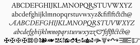 Cristóbal Henestrosa (Estudio CH, Tlalpan, Mexico) is the Mexican designer (b. 1979, Mexico City) who co-founded Círculo de Tipógrafos in Mexico. He is professor at four universities in Mexico and an award-winning type designer [read on for details]. Henestrosa has a bachelor's degree in graphic communications from the National School of Plastic Arts (ENAP) of the National Autonomous University of Mexico (UNAM), where his student project in 2003 was Espinosa, and a Master's degree in typographic design from the Center for Gestalt Studies, Veracruz, August 2009, where his thesis was entitled Fondo. La familia del Fondo de Cultura Económica. He is professor of typography and type design at UNAM. He has also taught at the National Fine Arts Institute's School of Design. In 2012, Cristobal Henestrosa, Laura Meseguer and José Scaglione coauthored Como Crear Tipografias (Brizzolis S.A., Madrid, Spain). He lives in Heroes de Padierna, Mexico.
 Designer of Espinosa, mentioned here. Author of Espinosa. Rescate de una tipografía novohispana (México, Designio, 2005), a book about Antonio de Espinosa, a 16th century Mexican typographer, who in all likelihood cut the Espinosa type. The commissioned text family Fondo (2007) won an award in the TDC2 2008 competition and at Tipos Latinos 2008 (for extensive type family). Creator of the angry hand-printed typeface Prejidenjia (2008, with Luis Novoa). Speaker at ATypI 2009 in Mexico City, where he introduced the work of 16th century printer Antonio de Espinosa to the world. Espinosa Nova (2009) won an award at TDC2 2010 and a grand prize at Tipos Latinos 2010. Guaca Rock (2009) is a stone chisel typeface based on the logotype of the rock band Botellita de Jerez. Gandhi (jointly designed with Raul Plancarte) won an award at Tipos Latinos 2012. Soberana Sans (Raúl Plancarte and Cristóbal Henestrosa), made for the Mexican Government in 2012-2013, won an award at Tipos Latinos 2014. Ayotzinapa (2015, by Raul Plancarte and Cristobal Henestrosa) won an award at Tipos Latinos 2016. His titling typeface Royal Charter won an award at Tipos Latinos 2018. This is a digital revival by Cristobal Henestrosa based on an experimental typeface named Charter, designed yet never fully finished by William Addison Dwiggins. It is an upright italic, unconnected script typeface, whose main features are a pronounced contrast, condensed forms and exaggerated ascenders. While Dwiggins worked on this project from 1937 to 1955, he only completed the lowercase and a few other characters. However, it was used to set a specimen in 1942 and a short novel in 1946. The sources that Cristobal used for Royal Charter (and later, Mon Nicolette) were the original sketches by WAD as well as printing trails kept at the Boston Public Library, and a copy of the 1946 edition of The Song-Story of Aucassin and Nicolette. This gorgeous typeface can be used successfully in headlines, subheads and short passages of text from 12 points onwards. It was published in 2020 as Mon Nicolette at Sudtipos, where the help of Oscar Yanez was acknowledged. Fontsy link. Mon Nicolette also comes in a variable format with weight and optical size axes. Dafont link. Klingspor link. [Google]
[MyFonts]
[More] ⦿
|
Exel Soriano
|
Mission Viejo, CA-based designer of Caveman (2019). [Google]
[More] ⦿
|
Faak and Paat Studio
[Julien Fesquet]
|
French design studio in Bordeaux set up in 2012 by Julien Fesquet and Benoit Baron, who were joined by Julien Taddei in 2013. Designers of the free display typeface Cascade Grotesk (2014), which is an experimental hybrid between Cascade Script and Brandon Grotesque. They also created the free high-contrast font Delicate (2014) and the free varied caps typeface 26 (2013). In 2016, they finished the Escher style typeface Deus. LVtiK (2017) is a take on Helvetica. Khodja (2016) is a piano key typeface. Slantit (2017) is an experimental stone cut typeface. Behance link. [Google]
[More] ⦿
|
Felipe Rodriguez
|
Montevideo-based designer who created 53 PNAV in 2012, the fattest font ever, together with Nicolas Branca. This typeface was chosen for the Type and identity of 53 Premio Nacional de Artes Visuales de Uruguay (Uruguayan national arts awards). In 2010, he made the dot matrix typeface Minima. Carlos (2012) is a chiseled face. In 2016, he designed the sans typeface Elemental. Behance link. Newer Behance link. [Google]
[More] ⦿
|
Fer Crow
|
Barcelona-based designer of the stone-chiseled Flintstone Font (2014) and of Trashfont (2014, a grungy stencil face). [Google]
[More] ⦿
|
Fontherapy (was: Typecoconut Studio)
|
Indonesian designer of the script typefaces Sweet Shine (2020: a fat finger font), Truw Way (2020), Mermaid Stories (2020), Callovia (2020), Madonna (2020: a signature script), Heartland (2020: drawn with calligraphic pens) and Catlove (2020). Typefaces as of 2021: Aggel Heart, Arthemiz, Bellova, Blacksun Vintage, Bladekill Font, Blank Magic, Blinkwomen, Browman, Chalk Study, Dinofont, Dream of Heartland, FT Getcode Pro, Funwork, Glory Sunset, Great Friends, Hello Doctor, Hollow City, Hopes Letter, Hotel Sans (arts and crafts style), Making Bomber, Mallika, Me Amanda, Mermaid Stories, Modern Deluxe, Modiz (an all caps sans), Mommy and Baby, Plankiss, Remember Moment, Rollingtime, Rosemate, Southlove, Stargod, Sweet Shine, Sweetball, Sweety Craft, Winlove. [Google]
[More] ⦿
|
Fontmenu.com
[Michel Bujardet]
|
Michel Bujardet (a Frenchman living in West Hollywood, CA) runs Matchfonts, and started Fontmenu.com in August 2001. Commercial fonts, and free demos in all formats. A partial list of fonts: - Square Text (old English).
- Block Letters (orthography for kids), Skryptaag (2001, educational).
- Boulons (letters made from nuts and bolts).
- Kindergarten (funny typefaces), Learning Handwriting (K2), Learning Cursive Handwriting (Grade 2-4), Japanese Hiragana-Katakana (Year 1).
- Morse code.
- Dictionary phonetic notation for pronunciation.
- The calligraphic fonts Chancellerie Moderne (1998, chancery hand), Oncial, Rodolphe, Willegha.
- The dingbat fonts Dinosotype, Matched Potato, Nahkt hieroglyphs, SilBooettes, Angelots, Sceaux, Seraphiques, Talismans.
- The monospaced fonts Bordofixed, Dactylographe (1997), Normafixed, Oloron fixed width screen font).
- The mathy fonts Oloron program, Hexalist and Numberslist.
- The handwriting fonts Charlotte, Louise, Mariette, Milko, Pierre, Quinze, Raoul, and Thibault.
- The pixel font 8-PinMatrix.
- The Bauhaus font BabyFace.
- The Chinese simulation font Chinoiseries.
- The LED fonts Diode, Cristolikid and Display.
- The Greek simulation font Grecques.
- The display fonts Zébrures (striped letters), Venitiennes, Ruban Dis-Moi, Parador, Osselets, Octogone, Metropolitain (art nouveau), Malabars, Halloween Match, Coulures, Chapou Relief, Candy Kane, Calebasse, Bujardet Freres and Big Bacon.
- The MICR font MICR E13B.
- The serif typefaces Baguad, Chap Clerk, Parlante, Presse, TSF&Co (art deco; +Heavy).
- The sans serif typefaces Bordini, Boum-Boum, Halotique (a sans family), Junien, and Normographe.
Alternate URL for his shareware typefaces. MyFonts link for his commercial typefaces. Alternate MyFonts link. Fontspace link. Dafont link. [Google]
[MyFonts]
[More] ⦿
|
Fontmunkások
[Gábor Kóthay]
|
 Gábor Kóthay (Fontmunkások) is a Hungarian type designer (b. 1962) who lives in Szeged. Gábor Kóthay's fonts include:
 - At T-26: Alphabet2, Alphabet4, Archetype, Axis No 1, Bacchus, and Tyrnavia in 2000, and the Roman inscription inspired family Minerva Modern, Minerva Display (a Roman family) in 2002. Also, Betabet sans, Betabet web, Gnosis (hairline italic), Oceanus (2004, hairline sans), Pelso (2004, hairline), Laureate (2004, hairline art deco), Picaresque (2004, irregular handwriting).
- At FONTana: LaDanse, Y2K, Domino, QwertyRegular and Luxury, all in 1999-2000.
- At P22: Driade (2005, Regular, Linea and Aged: calligraphic futuristic experiments), Zephyr (2001, curly; +Open Face), Schwarzkopf (2003, a Schwabacher face), La Danse (2001), Ambient (2001), the Schwabacher Fraktur font SchwarzKopf (2002), Caffe (2009: originally designed for the Artz Gallery Cafe in Budapest Hungary. The design is a contemporary handwriting style adapted from examples in lettering exercise books. It has been redrawn and expanded into six styles. The four weights were created by drawing the style using different mediums: Cappuccino in pen, Pastry in felt-tip, Lemonade in brush and Tobacco, the original, in pencil, and Poster and Poster Inline are additional styles).
- At PsyOps: the formal script Anglia (2001), Berill (2001), SchwarzKopf (2002, Fraktur) and Plexo (2001).
- At Job Art Studio (his own studio in Szeged, which he founded): Cats (free dingbats), Disasters (dingbats), Bubble (comic book font), 103 kék.
- At Fountain: Zanzibar (2003, nice script face), Incognito (2007, a typical old map typeface), Dessau (2007-2008, a collection of eleven Bauhaus and Bauhaus stencil styles).
- At Fontana: Zodiac, Tisza (2001-2007), a sans family. And Kinesis (2003), a sans typeface based on geometrically precise instructions.
- At Cinqueterre Type Foundry: Eva (wedge serif; sample, another sample).
- At Fontmunkások: Birdland (1999-2002), a minimalist face; Asphalt and Asphalt Signs (1996-2000), a slightly grungy set of fonts; Arcade (1999); Adagietto (2000); Flyer and Flyer Fossil (2002), a curly family.
- Custom typefaces: Aqua Futurist (2008): a hairline unicase sans family with uncial influences. It is unclear if he had a hand in the typography of stockings, which I found on his site.
Blog. Dafont link. FontShop link. [Google]
[More] ⦿
|
Francis Fonye
[Jack Oatley]
|
[More] ⦿
|
Frank Granados
|
During his studies at EESS, Frank Granados (Algeciras, Spain) designed the curvy typeface Arbolada (2018), which was inspired by Christian Schwartz's Amplitude. He also designed the Flintstone / tiki / font Rock Wave (2018). [Google]
[More] ⦿
|
Gábor Kóthay
[Fontmunkások]
|
 [More] ⦿
|
Galdino Otten
|
 Cartoonist from Recife, Brazil, b. 1966, whose sense of humor and artsistic prowess shine in his dingbat fonts. Dafont link. Fontsy link.
 Creator of the experimental Almost Sanskrit (2009), Zodiac Nice (2009, astrological symbols), Xilo in Zodiac (2009), Xilo-Cordel-Literature (2009, dingbats), Cordel Circo Mambembe (2010), Inside Issue (2009), Stretched Signature Flex (2009), Action of the time (2009, grunge), the dingbat typeface Ugly Cars (2010), the grunge typeface Capitão Galdino (2008), the grunge typeface Saltpeter-N-Fungus (2010), Texture Road (2010, more grunge), BSB DF 50 (2010, grunge), Fine Serif (2009), and the nice dingbat typeface Ochent Silibrina (2009). Fonts made in 2010: Sport 4 Ever (dingbats for Olympic Games), 60sPop (multiline face), DotSpot (dot matrix), IRON H METAL (tattoo, gothic), IngaStoneSigns (stone age glyphs), Ode2PasteUp (hand-printed), WideSquare (pixelish), ActionoftheTimeNewUL, BSBDF50, Haus-Sweet-Haus, INSIGHT-ISSUE-NEW, Movie Filmstrip, SquareChalk, Action Of The Time New (grunge), CordelValentine (dingbats), IngaStoneSigns (petroglyphs), SustainableAmazon, VeryDamaged (grunge), ParkTechCG (letters as in wired circuits), kidSWritten, Iron H MetallLight, LaceNice (knitted look), Ode2PasteUp, TextureRoad (grunge). Fonts from 2011: Booklet Cordel (sketched), Cordel Encarnado, Nuclear Accident (texture face), Noncircular (techno), Old Press (grunge), Old Typography (grunge). Fonts made in 2012: New Press (condensed sans family, +Eroded), Sketch Wall, Comic Gibi, Own Written, Comica BD (comic book shadow font), Cartoon Relief (a 3d cartoon typeface), Riscada Doodle (scratchy hand), Sketch Nice, Needlework Good (a stitching font), Biscuit Made, Just Skinny, Crazy Style, After Cheret (hand-drawn 3d shaded outline face), Spots in the mirror, TNT Xplosion, Escrita Toska (curly script), Cordel Movies (moviemaking dingbats), Fine N Tall, Cordel Groteska, From Street Art (free graffiti font), Sketch College (sketched athletic shirt font), Thin Press (grungy vernacular type), Sketch Serif, Relief BD, Maxxi Serif (very heavily slabbed serif face), Semi Cursive Gut, Sketch Coursive (sketch face), Salt Pet Non Eroded, Advanced Architecture, Very Fine Serif (a monoline Egyptian), Sketch Nothing, Freehand Nothing, Shark Attack (curly), Do Doodle, Maybe Pollock (dust texture face), Xilo Prosa (grunge), Thin Design, Amazon Palafita (hand-drawn 3d outline face), Snow Times, Snow Traces, USSR Army (rough army stencil with a Russian feel), Needlework US (stitch font), Old Scribe (Greek lapidary face), Nickel Bumpy, Soviet Style (stencil face), Top Modern (heavy slab serif), Lettering Set New, Carton East, Not Tuned TV (sketch font), Scar Bleed (scary font), Maxxi Dots (texture face, +Shadows), Dots Land Gotika (grungy blackletter), Stefanie Dots (textured letters), Karamuruh (textured caps), Broken Type (grunge: a glaz krak font), Touppeka (a Kafkaesque, tribal or painter's font), Old Dreams (grungy), Bad King (sketched typeface), False 3D (hand-printed 3d outline typeface), True2D, I Wrote All, Resistance Until The End. Typefaces from 2013: Serifa Comica (comic book slab), Press Style Serif (letterpress style), Press Style Large, Triatlhon In (sic: a Greek simulation face), Go 2 Old Western (grungy wood type), Old Serif Gut, Press Style (letterpress style typeface), Dust Serif, Thing Press, Thin Grotesk Serif, Before Collapse (glaz krak face), Stencil Style New (a military stencil), Damaged Serif, Press Serif Cool, Press Feeling, Sketch Toska, Link Parties, Almost Cartoon, Cartoon Toy, Toy Toy Toon, Fine Style (didone caps), Fine Sans (Peignotian), Beyond Blackboard, Forgotten Junk (grunge). Typefaces from 2014: Simply Rounded, Cartoon 2 Packages, Pain N Bleed, Yummy Lollipop, Hippie Movement, Rotunda Geo, Old Figaro Cursive, Cute Cartoon, Sketch Gothic School (sketched blackletter), Fine College (hatched athletic lettering face), Press Felling Eroded (letterpress emulation), School Book New (sketched), Stencil Cargo Army (military stencil), Fine Eroded, Grunge Poster, Education Is A Way, Cartoon Blocks, Cartoon Bones, Cursive Option, Odd Press (letterpress emulation), Cartoon Tunes, From Cartoon Blocks (3d), Hippie Movement, Yummy Lollipop, Needlework Perfect, Press Gutenberg (blackletter), Unic Calligraphy, Roundfed Eroded, Children's Book (outlined), Neon 2 News, Good Choice (shaded letterpress emulation), Cartoon 2 Us, O 10 Type, Dust West (grungy Western style), Comic Balloon, Caligraf 1435 (pirate era script), No Name Sans, Top Secret Stamp (grungy stencil), Fine Blackboard (blackboard bold, inline), Press Style Extra L (letterpress), Sounds Good (geometric sans), Sounds Eroded (shaded letterpress font), Cartoon Blocks Christmas, Street 2 Art (graffiti font). Typefaces from 2015: Snaps Taste (a grocery store or comic book font), Snaps Taste Christmas, Calligraphy Hand Made, Silly Aliens (dingbats), Sketch Match (3d, sketched), Cartoon 4 Sports (dingbats), Kids Book, Almost Japanese (oriental simulation font, +Comic, +Cartoon), Inga Stone Redesigned, Money Money Plus (engraved money font emulation), Thin Cool, Old N New Media (dingbats), Thinkers World (scanbats of famous intellectuals), Magical Cord, Quick Writing, Eroded 2 Much, Stencil Army WW I (military stencil), Stencil WW II (military stencil), D-Day Stencil (military stencil), Western Bang Bang (weathered Western font), Modern Serif, Modern Serif Eroded, Money Money (handcrafted engraved currency font), Almost Japanese Smooth (oriental simulation typeface), Write Righ, Ease Christmas (dingbats), Sketch Script Cool, Ficticcia College. Typefaces from 2016: Doodle Cafe Scents (dingbats), Christmas Cookies, Coffee Written, Soft Marshmallow, Niagra Faults, Sketch Toronto, Sketch Fine Serif, Sketch Handwriting, Typewriter Press, Typewriter Style, Sketch 3D, Maple 3 Cartoon (snow-covered letters). Typefaces from 2017: Crazy Krabs, Old Barbwire, Gregory Packaging, Ghost Army Stencil, Old Wise Sketch (sketched blackletter), Packaging Funny, Blackboard Restaurant, Kavernosa (bony typeface), Little Kid. Typefaces from 2018: 1927 Epoque, Cartoon Toy Turbo, Old Wise Lord (blackletter), Handmade Memories, Silly Cartoon, Old Press Original, Pet Shop, Cute Script, Dust West College (hatched), New Comic BD. Typefaces from 2019: Eco Bamboo (Cartoon, Fun), Karamuruh Turbo (all caps with a quilted texture), Cordel Junina, Cordel de Mangai (240 dingbats), Cordel Rustika. Typefaces from 2020: Beach Party Cartoon. [Google]
[More] ⦿
|
GautFonts
[J.F.Y. Daniel Gauthier]
|
 J.F.Y. Daniel Gauthier (GautFonts) was born in Montreal in 1964, and lives in Hamilton, Ontario. His fonts from 2005 and before include BarrelOfMonkeys, ChainFontOpen, ChangChang, ChangChangWoodcut, DirtyDarren, FireStarter, GriffinDucks, Jenna Myles, LollipopLettering, Lymphnodes, PooCorny, PooSmooth, Quake3ArenaBats (scanbats), SapphireSativa (2005), ZappaBats, Judas Priest (2004), Caviar Rancid (2004), BackPage (2003), BatFont (2003), MagicCatalog (2003), Samdan (2003), The One Ring (2003), The 3 Stooges (2003), Yahoo Font (2003), BikerBones, CBGBFont, Cortesia, DryGulchBlack, DryGulchOpen, FlyLegs, Frank, MissingLink, PotLand, Punk, SheCreature, SweetLeaf, ThaiPedicure, TypoNegative, VectorBlack, VoodooDollLetters, VoodooDolls, VoodooDollsPinned, ZappaBats, Griffin (2002), GriffinBold (2002), HeadHunter (2002), Montezuma (2002), MontezumaAncient (2002), MrBubbleFont (2002), PhoenixOne (2002), PhoenixTwo (2002), Spliffs (2002), SteelTown (2002), TattooLettering Black (2002), TattooLettering Open (2002), VladDraculBats (2002), Beatnik Hayseed (2002), ChangChang (2002, oriental lookalike), Crumb (2002), GearBox (2002), Happening (2002), LogFont (2002), Piranha (2002), Sardines (2002), Tilt-A-Whirl (2002), ChineseWatchShop (2002), DickVanDyke (2002), Göt (2002), KamikazeBats (2002), Springfield Tablets, AlphabetFridgeMagnets, Beethoven, BeethovenRough, BeethovenRougher, Bicycle (outlined), BicycleFancy, BoobToob, Burris (Old West font), BurrisGhostTown, BurrisShootOut, CBGB (pearly letters), Chain Font Black, CheapSign, ChickenFarm, CornFed, CrappyDan, CrappyDanLowercase, DimWitGauche, DimWitRight, Eastwood, FantasticFont, Fear, FearlessVampireKillers, FeltCrappyDan, FrootStand, GassyGaut, GauFontExposition (trilined), Gauts, GautsMotelLowerLeft, GautsMotelLowerRight, GautsMotelUpperLeft, GautsMotelUpperRight, Gearbox (geary alphading face), Göt (blackletter), HoaryGaut, Houdini, IncantationOne, IncantationTwo, IrwinAllen, JackOLantern, Jagged, JoeJack, KathleenLowercase, KathleenUppercase, KentuckyFriedFont, KentuckyFriedChickenFont (2004, signage), LeadType, LeadTypeBoldInked, MadScience, Moscoso (morphed Western titling font, psychedelic), OogieBoogie, OrganDonorGuts, OrganDonorSkin, PinkCandyPopcornFont, PooCorny, PooSmooth, Potland (marihuana alphadings), Punk, RapaNuiLetters, RapaNuiMoaiBats, RapaNuiMoaiFont, RedStar (2004, pretty handwriting based on the pen of Linda Cappel), RedStarBold, RockFont (Flintsones font?), Sasquatch, Sea Creature, Shaman, ShermlockMadstyle, ShermlockSolid, Shock, ShockThick, SpookyMagic, StagTickets, StartlingFont, TattooParlour (2004, scanbats), ToOsamaLoveGeorge, TypewriterKeys, Vector, WebPress, WebPressBold, Weird, WereWolf, ZootAllures. He has some comic book fonts, some dingbats, and several fonts around the theme of magic.
 Interview. Fontspace link. Dafont link. Klingspor link. [Google]
[More] ⦿
|
Gerard Gerry Keane
|
 Typographer and type designer from Waterford, Ireland, b. 1980. Creator of Riley (serif face), Round Riley (rounded serifless version of Riley), Deadly (stone chisel face), and Snap 2 Grid (2009, a gridded typeface done at FontStruct). Behance link.
 Dafont link. Home page. [Google]
[More] ⦿
|
Gerobuck (was: Koko Studio)
[Haris Anggar Setioko]
|
Or Anggar Setioko, or Haris Anggar. Tegal, Indonesia-based designer of these typefaces in 2019: Kalko Script, Kolum, Canabi (a brush font), Foxima (sans), Cosmix, Pasmin, Ikocya, Baron (dry brush), Takatuka, Bafaco (a signature font), Librush, Murako, Warko. Typefaces from 2020: Vuku (a chiseled or stone age font), Kasfa, Nestro, Beef (an unconnected dry brush script), Cosmix, Tabio, Rough Storms (grungy caps), Ninja (squreish), Storms (grungy caps), Haina (a connected script), Bagato, Abnada, Santoryu, Catatan (a marker pen font), Spydol, Bintale, Sanitasi, Hajad, Polarika, Beko (dry brush), Brushes (a brush script), Kamako, Mama, Balada, Charcoal, Pinksture (script). In 2022, he set up Gerobuck. His typefaces at Gerobuck include Brightag (a decorative serif) (2021) and Mothem (a headline sans) (2021). [Google]
[MyFonts]
[More] ⦿
|
Giemons
[Oghie Novianto]
|
 Or Oghi Novianto. Bandung, Indonesia-based designer of the brush typefaces Mons (2015), Eyepic (2015) and Wild Nature (2015).
 In 2016, he designed Spacethink, the grungy letterpress typeface Black Mask, the sketched typeface Baddest, the eroded marker typeface Lonsdale, the excellent poster typeface Brother, and the brush scripts Artur Script, Mars Attack, Flawless, Sekut, Bright Sight, Spacethink, Mighty, Blowing, Faithful and Damn Right, as well as the vintage handcrafted Antebellum. Typefaces from 2017: Burnout, The Elders, Alora, Sisterfields Script, Badger, Brashed, Organic, Martabak, Brownies, Mighty, Beauty Script (watercolor brush), Society Script (monoline script), Feminim Script, Attack Attack (comic book lettering), Nobbler (vintage lettered typeface). Typefaces from 2018: Estoria Script (SVG font), Butter Sweet (a horror brush font), Postcard Script, Silence Good (font duo), Hellprint, Brought, Shining Bright, Boxer (an effective handcrafted fat slab), Southeast, MilkAndShake, Hangover Script (calligraphic), Awakening Script, Macbeth (a free opentype SVG dry brush font). Typefaces from 2019: Be Bold, Paragon SVG, Dextone, Stars & Rabit Script, Fabrique SVG, Toast Bread Coffee. Typefaces from 2020: Rice Bowl (oriental enmulation font), Buster (a chiseled or papercut typeface), Jack Reacher (eerie), Path Black, Hooked. [Google]
[More] ⦿
|
Gomarice Font (or: Goma Shin)
[Shintarou Nakayama]
|
 Japanese foundry, est. in Fukuoka in 2005 by Shintarou Nakayama (Goma Shin), b. 1982. It offers these free fonts, many of which are in the grunge or techno styles: Steel Boy (2005, techno), Manzyu (2005, liquid), The Past (2004), Atama (2004, liquid), Atama Serif G (2010), BAT-MEN__G (2004), BIG-BURGER__G (2010), Ballpoint-Pen (2004), Beer-Cape__G (2006), Boro-Slim__G (2003), Boroboro (2003), Chocolate__G (2008), Coffee-&-Curry-Shop__G (2009), Edamame Western (2012), Fude-Enogu__G (2006), GOMA-STANDARD__G (2010), Gomadelic (2003), Gomanema (2007), Goth-Goma__G (2006), Kamone__G and Kamone 6 (2006-2011, heavy mechanical / octagonal face), Kamone 7 (2012, polygonal typeface), Kigasuru__G (2006), Marker__G (2004), MINI POP__G (2010), Mukasi_Mukasi__G (2003), Mukasi_Mukasi_a__G (2005), Rihapop__G (2006), Rocks__G (2004, stone face), Simple-Slum__G (2005, informal poster face), Steel-Boy__G (2005), Tomipop__G (2006), honey-bone__G (2007), kamone-2__G (2009), kamone-3__G (2010), Yaki Goma (2010), Goma Western (2010), Goma Western 2 (2012), Mousou Recode (2010, ultra fat rounded face), Hot-Chocolate__G (2011), Milk-Chocolate__G (2011), Syouwa Retro Pop G (2011), Spicy Curry Rice (2011), Sikakusimen (2011, fat and rounded), Nantoka Western (2011), Goma Cookie (2012), Sandome G (2012: a beautiful rounded sans display face), Morning Wasabi (2012, a rounded black headline face), Goma Standard 02 (fat and rounded), Doughnut Monster G (fat elliptical typeface), Kaiju Monster (2012), Fine Serif Hosomozi G (2012), Melting Ice Cream, Wasabi Gum (2013, bubblegum face), Soy Sauce Junky (2013), Cyankonabe G (2013: oriental simulation face), Kensuco Stencil G (2013), Omotenashi (2013), Old Book (2013), Rockin Record (2014), Morning Karashi (2014: a great poster typeface), Kamone 8 (2014: octagonal), Zombie Shooting (2014; for those who still believe that zombies can shoot), Goma Block (2015), Okuba Cloud (2015), Hyouzi Display (2015), The Past (2015), What's Love Konnamozi (2015), Shibuya Zero (2015, stencil), Atama Simple (2015), Game Music Love (2016, Western font), GType (2016), Game Continue 02 (2016), Marker2 (2016), Nanikano Capsule (2016), Usuazi Hosomozi (2016), Nandaka Western (2017), No Continue (2017, squarish), Kaizen Seisaku (2017), Gogono Cocoa Mochi (2018), Kirie Fu (2018), Mucha Wo Minagara Milk Tea (2018), Katamari Serif (2018: headline slab serif), Shmup in the Zone (2018: octagonal), Yatsurano Western (2018), Heysel Synthesizer (2018), Toy Block Maestro (2019: a Western font), Round Pop (2019: rounded sans), Tanomuze Cowboy (2019: Western style).
 Dafont link. [Google]
[More] ⦿
|
Graphicfresh (was: Sameeh Store, or Sameeh Media)
[Muhammad Husni Haikal]
|
 Bireuen, Aceh, Indonesia-based designer of these typefaces:
 - In 2022: Cagey (a gret bold poster font with a retro vibe).
- In 2021: Mores (a playful minimalist sans), Middle Name (a hipster font that only uses circular arcs and straight lines), Saikon (handcrafted), Jadey (a flattop display typeface), Mages (a fashion mag typeface), Amibata (monoline script), Miyoshe (a thin inky script), Daesung, Almonde, Tamrin, Brown Carlson, Brown austin, Frost (SVG brush), Ribons (sic), Sally Garden (script).
- In 2020: Barqon (handcrafted), Utera (with halftone texture), The Melsa, Arjona (for children's books), Ryden, Kenzira (a hand-drawn art deco font), Kionsa.
- In 2019: Sketching (dry brush), Coklat Sunda (a formal monoline script), Oregano (a monolinear vintage rounded sans), Vetto Cosellza, Asmiyati (an inky "wild" calligraphic script), Green Narcu, Nastar (script), Cristik (a pixel typeface), Wolfer (a weathered vintage font), Roger (an all caps sans), Rehab (partially a hacker font), Ansbach, Antigua Presidente, Bersihkan (a free watercolor brush SVG font), Masculin (a signature script), Almeda, Aversa (SVG dry brush font), Cardus Brush (a dry brush SVG font), Faceback (SVG brush), Bellevue, Green, Muiden Castle, Vernal Park, Super, Crepes French (stone cut, existentialist), Corma, Atjeh, Hallo Schatz, Valued, Crops.
- In 2018: Pray Hard Now (an SVG brush font), Ripon (font duo), Adenium (a floriated decorative caps font), Aamazing Boombs (brushy SVG font), Posey (weathered vintage type), Kamikaze (signature script), Shoot (SVG brush font), English (a high-contrast thick script), Calcio (a free ultra-condensed sans), Biren, Banda, Ankara (signature script), South Korea (font duo), Edmund (an all caps vintage sans), Rotterdam, Sweet Yell, White Apparel, Quick, Nastar Script, Brush Action.
- In 2017: Luna (sans), Indonesia (slab serif), Texas, Original, Aglow, Aglow Serif, Madison, Ornexo, Rehab (hipster style), Caos (inline), Gope (bilined, all caps), Draw Yoour Brand, Sabang Island (sans), Norman (thick brush), Paradise (tall signature script), Must Have (handcrafted), Newark (an all caps block serif titling typeface), Emma (connected script), Bemand (modular, techno), Sweet Heart, Don't Lebay, Cristik (pixelish), Brand, Gorden (horizontally striped, filled and outlined versions).
- In 2016: Oxigen (an all caps inline typeface), Serpong (graffiti font), Gunoc, Manuvers (a bilined titling sans), Houster Script, Aspal (all caps roman typeface), Ronies, Drawsans, Bezaen (hipster sans), Dotcom (sans), Zeky (a stylish sans), Nixmat (a rounded monoline logo typeface), Alaska, the handcrafted typefaces Mabroc (a great inline typeface), Mr Haikal, Brush Action, Hibernate, Spine, Our Serif Hand, Our Hand, Billiony, Rainday, Kerape and Banda, the deco typefaces Ambisi, Bigboz and Karomah, the stencil typeface Abang, the minimalist sans typeface Axon, the straight-edged Sakap, the blocky typefaces Box and Aucall, Newstyle, and the techno typefaces Magz, Newtype and Arabuwa.
Aka Ceo Haekal. Creative Market link. Personal web site. Graphicriver link. Graphicfresh home page. Dafont link. [Google]
[MyFonts]
[More] ⦿
|
Graphite Foundry
[Deepak Singh Dogra]
|
 Graphite is an Indian type foundry, est. 2015 by Deepak Singh Dogra in New Delhi. They offer commercial fonts via MyFonts and free fonts through Dafont. Their typefaces include the handcrafted stone age emulation poster typeface Armageda (2015, Graphite), the handcrafted typefaces Argone (2015) and Liniga (2015), Liniga Serif (2015), Geometos (2015, a geometric sans), Geometos Rounded (2015), Heavitas (2015, fat sans), and the grungy typefaces Blackore (2015) and Redgar (2015).
 Typefaces from 2016: Renogare and Renogare Soft (free sans), Argone LC (a handcrafted organic typeface family), Bumpo (ultra plump family). Typefaces from 2017: Agenor (an all caps sans display, not to be confused with Jean-Renaud Cuaz's Agenor from 1998 at Typorium), Gretaros (sans), Geometos Neue, Metrosant, Bumpo Soft. Typefaces from 2018: Renos Rough (distressed), Geometos Soft. Typefaces from 2019: Heavitas Neue (a typeface that mixes lowercase and uppercase in several ways), Aventra (a rounded sans), Aftika (a clean geometric sans typeface family), Joyto Soft (a cartoon font). Typefaces from 2020: Aftika Soft. Typefaces from 2021: Agenor Neue (seven styles), Agenor Neue (a rounded geometric sans seven styles), Gurdano (a great rounded sans family showing warmth and optimism). [Google]
[MyFonts]
[More] ⦿
|
Guguh Gumantoro
[Letter Stock (was: Gumacreative)]
|
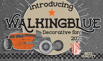 [MyFonts]
[More] ⦿
[MyFonts]
[More] ⦿
|
Han Lee
|
Designer of the stone cut font Block Awesome (2019). [Google]
[More] ⦿
|
Harbor Type
[Henrique Beier]
|
 Henrique Beier (Harbor Type, Porto Alegre, Brazil) is the designer of the excellent angular semi-calligraphic text typeface Garibaldi Regular, which won an award at Tipos Latinos 2014. In 2015 it was extended to a great 7-style typeface family. He writes: Garibaldi is a text typeface based on humanist calligraphy. It started with a desire to learn more about the origin of the strokes on humanist typefaces. It features a 20 degree axis, medium contrast based on translation and expansion, asymmetric serifs, and terminals related to the broad nib stroke.
 In 2014, he created the free font Densia Sans, which is condensed and has a tall x-height and some contrast. Graviola (2014) is a soft sans family, with possible applications in information design and wayfinding. It won an award at Tipos Latinos 2016. In 2016, he published Graviola Soft, an even softer version. He also published the fresh corporate sans typeface family Malva, which can be recognized by the typically Latin American curvy tail on the lower case a and l. Malva was a winner at Tipos Latinos 2018. A variable font option was added in 2019. In 2017, Henrique Beier published Rocher, a wonderful layered stone emulation font, Flintstone style. It won an award at Tipos Latinos 2018. He has a free variable color version with bevel and shadow axes, Rocher Color (2018). In 2019, Henrique Beier and Ana Leydner, assisted by Luisa Leitenperger, co-designed Kiperman at Harbor Type. This sturdy 4-style text typeface family pays homage to Brazil's publishing icon Henrique Leao Kiperman (d. 2017). Harbor Type also released the branding and packaging sans typeface family Dona in 2019. In 2020, Henrique Beier joined Fabio Haag Type, where he promptly published the circular sans family Igual. In 2021, he assisted with the engineering and design of Salva (Fabio Haag Type), a versatile workhorse sans family: Eduilson Coan was the lead designer. He was supported by the Fabio Haag Type team of Henrique Beier, Ana Laydner and Fabio Haag himself. Seiva (2021). Designed by Henrique Beier, Eduilson Coan and Fabio Haag, this distant relative of Didot is an exotic sans family. Partitioned into Text, Display and Poster subfamilies, it also welcomes variable font technology. [Google]
[MyFonts]
[More] ⦿
|
Haris Anggar Setioko
[Gerobuck (was: Koko Studio)]
|
[MyFonts]
[More] ⦿
|
Harry Poole
|
Graphic designer in London. During his stiudies at UCA Farnham in Surrey, England, he created Aztec (2012, an outline typeface with a stone cut look), Minty Modular (2012), King Modular (2012) and Current Cut (2012, arc and circle-themed typeface). [Google]
[More] ⦿
|
Hashim Padiyath Mohemmadali
|
Indian type designer (b. 1969) from Cochin in Kerala. He designed IndusLL (1994, a roman typeface with features of Lithos) for Linotype's TakeType library "based on the still undeciphered pictographic script of the Indus Valley civilization, circa 5000 BC". He designed the dingbat typeface Chihnangal, and the following commercial Malayalam fonts: Puthuma, Unniyarcha, Indulekha, Ravivarma, Ambili, Kingini, Thulasi, Orma, Harisri, Atham, Aarcha, Unniyarcha, Nila, Chirutha, Thumba, Vartha&Pampa. He studied under R.K. Joshi. He runs Design Difference, which has created these typefaces (text almost literally taken from their site): - While working at C-DAC Gist, Pune during 1993-1994, Hashim P M had designed the monoweight semi-condensed Indulekha in 6 variants (Normal, Oblique, Bold, Bold Oblique, Heavy and Heavy Oblique), the calligraphic script Ravivarma in 4 variants (Normal, Italic, Bold and Bold Italic) and the calligraphic serifed Ambili in 4 variants (Normal, Italic, Bold and Bold Italic) apart from Chihnangal a collection of Symbols and Cliparts pertaining to Kerala. Indulekha has become the most favourite display typeface in Malayalam, lapped up by advertisements and publications, Ravivarma is the chosen one for invitations and citations while Ambili retains its uniqueness as the first serif typeface in Malayalam and is used only when a touch of class is asked for.
- While working at Malayala Manorama, Kottayam during 1994-1997, Hashim P M had designed 8 exclusive Malayalam typefaces for them which are stile in use and determine their typographic flavour after several layout revamp exercises. Vartha, Kingini, Puthuma, Chirutha, Nila, Thulasi, Aarcha and Unniyarcha belong to text and display categories. Unniyarcha was used as a text typeface in the daily only for a brief time, while its display counterpart Aarcha is still their headline typeface along with Kingini. The group's other publications including Vanitha, Manorama Weekly, Balarama, Karshakasri, Bhashaposhini, Yearbook also use these typefaces.
- While redesigning Mathrubhumi Daily, its was imperative that their decadent typefaces were also given a contemporary flavour. They took up the challenge, cleaned up their half-century-old designs and made a whole new family out of it which was suited for web-offset printing on newsprint. Mathrubhumi 760 and 762 were the final products which take less space and prints better. For Mathrubhumi Weekly, a new monoweight typeface (Mathrubhumi 560) was created which worked well for text and display and which followed their unique keymap. The end result was so appealing that even the daily and some of their magazines have started using it extensively. Ambadi, a typeface they had developed earlier was used in the recent redesign of Mathrubhumi Weekly.
- Thejas, Malayalam's youngest daily wanted a brand new headline typeface to announce that they are different. Thejas, the headline typeface they designed for them is compressed and dark enough to stand out in the crowd. Instead of giving a lighter version of this, they designed Kadali, a second headline typeface which is more conventional, albeit with a semi-condensed form. Together they create the necessary visual tension in headlines, making Thejas one of the best-looking dailies in the language. Later they also developed an expanded version of Thejas for them.
- For the Signage design of Amrita Institute of Medical Sciences, Cochin they needed a typeface that matched with the Roman typeface wde had selected to use. They developed Amrita modifying Keli. Sakshi is inspired by communist wall-grafitti letters with a dripping paint-brush touch. Ambadi has curled terminals and ink-traps at junctions. Pingala is inspired by DIN Mittleschrift and its bare features.
- They had designed a headline typeface for Deepika daily (the oldest in Malayalam) when we undertook the redesign of the daily. Deepika (nee Atham) is a robust typeface with condensed form loosely inspired by Frankin Gothic. A Normal and Bold version with Oblique make a strong family. The typeface is still the main display typeface for the group's publications even after so many years. They consider it among one of their best type designs to date. They also licensed Orma on a non-exclusive basis to them during the project.
- The display typeface Mangalam was designed for Mangalam Group of Publications when wde redesigned their daily. Thick and thin and condensed in nature, the typeface is currently used by the group in all their publications. They have also licensed Pampa on a non-exclusive basis to Mangalam, which has also become a hot favourite in their publications.
- They developed Thumba as a corporate typeface for D C Books after wde used a draft version of it in the Malayalam CD-ROM Encyclopedia wde developed for them. The very modern Thumba is monoweight, sufficiently expanded and has a relaxed air about it. Regular, Bold and Heavy with their Obliques make a handsome family. Thumba is loosely inspired by Frutiger and is one of their best type designs to date. They had also licensed Pampa and Orma on a non-exclusive basis, for use in their publications. When they were redesigning and streamlining their corporate visual identity, they also put together their logos and symbols as a handy font D C Logos.
Klingspor link. FontShop link. Google Plus link. [Google]
[MyFonts]
[More] ⦿
|
Hatf Type
[Rendi Rochimah]
|
Indonesian designer of the script typefaces Jakarta Night, Matsuyama (2020: brush style), Summer Vacation (2020), Senopathi (2020: wild calligraphy), Safetread (2020). Typefaces from 2021: Fast Drift (a cartoon font), Night Action (bold informal caps), Ohayou Christmas (a comic book font), Nosy Ghost (bouncy caps), Santa On Duty (bouncy caps), Christmas Candy (textured), Classic Christmas (a bean font), Family Prosperity (script), Christmas Dream (textured for Christmas), Furious Night (a horror font), Loli Pop (bouncy capital letters), Santa Day (beatnik caps0, Xmas Bells. Typefaces from 2022: Ghost Place (a Halloween font), Valentine Street (a Valentine's day graffiti font), Hell Plants (a hellish typeface), Arts Glory (a graffiti font), Happy Sunshine (groovy, psychedelic), Missing Soul (a grungy font), Monster Inside (eerie), Parkour King (a graffiti font), Heart Memory (with heart-themed texture), Blank Idea (dancing caps), Funky Hype (a graffiti or Flintstone font), Love Live (a display typeface with heart-themed texture), New Year Page (dancing letters). [Google]
[MyFonts]
[More] ⦿
|
Heikki Morgan Hämäläinen
[Morganismi]
|
 [MyFonts]
[More] ⦿
[MyFonts]
[More] ⦿
|
Henrique Beier
[Harbor Type]
|
 [MyFonts]
[More] ⦿
[MyFonts]
[More] ⦿
|
Honza Steiner
|
Czech designer of Grabstein (2019: Handschrift, Sans, Gotik), Bar Forst (2019: script) and Stone Runes (2018). [Google]
[More] ⦿
|
HoPoYa Studio (or: Mikailain)
[Mahmud Fajar Rosyadi]
|
Indonesian dcesigner of Royal Knights (2020) and the Fred Flintstone font Dinotype (2020). [Google]
[More] ⦿
|
Iconian Fonts
[Dan M. Zadorozny]
|
 Born in Philadelphia and a resident of McKinney, Texas, Dan Zadorozny's creations at Iconian. He is a prolific type designer who specializes in techno and sci-fi typefaces. Dafont link. Fontsy link. Abstract Fonts link. Font Squirrel link. His fonts in alphabetical order:
 - #44 font (2002), 00Starmap (2001, pixel font), 1968 Odyssey (2016), 1st Cav (2008), 1st Enterprises (2017), 2-Tech, 21 Gun Salute (2013), 2nd Amendment (2007, guns), 2nd Amendment 2050 (2009, more gun silhouettes), 2Toon, 300 Trojans (2008, comic book family), 4114 Blaster (2008, futuristic), 5th Agent (2008, techno), 7th Service (2002), 8th Element (2013), 911Porscha, 98 Bottles of Beer (2016).
- Achilles, Action-Men (2008), Action Women (2008, female outlines), Aegis (2010, Greek simulation family), Aetherfox (2013), AirCobra (2002), Aircruiser (2011, trekkie family), AirForce (planes and copters), Airstrike (2013), Airstrip One (2003), Aldo's Moon, Aldo's Nova, Alexis (2001), Alien League, Alpha Century (2020), Alpha Men (2015), Alpha Sentry, Alpha Taurus (2007, octagonal, athletic lettering), Amalgam, American Kestrel (2019), Americorps (2012), Ampire (2019), Anakefka (2009, ultra-fat family), Annapolis (2016), Antietam (2015), Antikythera (2013, Greek simulation face), Antilles (2009, sans family), Arctic Guardian (2019), Argosy, Arilon (2008), Armed Lightning (2017), Army Rangers (2013, octagonal), Assassin Nation (2015, scary and perhaps referring to the "tradition" of school shootings in the USA), Astro Armada (2020: sci-fi), Astropolis (2009), Atlantia (2012, futuristic), Avenger (2008, futuristic).
- Babes&Bond (2009, erotic silhouettes), Babe-alicious (2002, erotic outlines), Bad Axe (2017), Bad Robot (2007, computer game look), Bal-Astaral (2016, octagonal), Bamf (2011, techno family), Banjin (2016), Banshee Pilot (2016), Barcade (2018), Battlefield, Battleworld (2016), Beam Rider, Beam Weapon (2015), Beastian (2011), Behemoth (2018), Ben Zion (2008, Hebrew simulation), Berserker (2008, grunge), Beta Biergärten (2008), Big Blue Bug (2021), Bio-disc, Bio-discSolid, Bio-discThin, Bionic Comic (2002), Bionic Type (2002), Birds of a Feather (2007, dingbats), Black Bishop (2015), Black Gunk (2016), Blade Singer (2021), Blizzard Shaft (2020), Block, Blood Crow (2009), Blood Drenched (2020), Bloodlust (2011, dripping blood face), Blue Cobra (2020), Blue July (2009), Body Swipers (2014, Halloween font), Bog Beast (2013), Bomber Escort (2020), Boomstick (2015), Borgsquad (2014, mechanical/octagonal), Bretton (2018), Brin Athyn (2008, uncial/Celtric), Broken Cyborg (2019), Bronic (2004), Bubble Butt (2014, bubblegum typeface), Buchanan (2016), Buddy Champion (2015), Bummer (2007, octagonal), Bushido (2008, oriental simulation), Butch and Sundance (2013), Buttons the Bear (2008, children's hand), Byte Police.
- Camp Justice (2018), Capella (2011, a wide techno family), Capricus (2018), Captain Canaveral (2019), Carnival Corpse (2016), CasperComics, Centaurus (2015), Chardin Doihle (2008), a useful informal handprinting family), Charlemagne, Charlie's Angles (2018: octagonal), Charmling (2019), Cheyenne Hand (2008), Chicago Express (2016), Christendom, Classic Cobra (2016), Clubber Lang (2013, grungy), Cobalt Alien (2015), C.O.D.E.R. (2012), Coffin Stone (2019: a stone age font), College Collage (2017), Colony Marines (2017), Colossus (2011, old chipped stone look), Combat Droid (2019), ComicBookCommando, ComicFX, Commonwealth, Concielian, Concielian Break (2015), Concielian Classic (2018), Concielien Jet (2015), Contour of Duty (2016), Corinthian, Count Suckula (2015, horror font), Covert Ops (2012, army stencil), Coyote Deco (2007, art deco), Crappity-Crap-Crap (2007), Crazy Ivan (2017: constructivist), Creepy Crawlers (2015, horror font), Crime Syndicate (2013), Crixus (2011, a squarish sans that includes an athletic lettering style), Cro-Magnum (2003), Cruiser Fortress (2016), CryUncial, Cyberdyne (2016), Cyberia (like Soviet: neat Russian imitation letters), Cyborg Rooster (2015), Cydonia Century (2017), Cyrus The Virus (2012, grungy, hand-printed).
- DS Man, Daedalus (2008), Daemonicus (2012), Dagger Dancer (2020), Dameron (2016), Dangerbot (2016), Danger Flight (2015), Dan Stargate (2008), Dan'sHand, Dark Alliance (2014), Dark Dominion (2019), Dark Hornet (2020: a great blocky mechanical typeface family), Dark Horse (nice brush font), Darklighter (2018), Darkwind, Dassault (2013), Deathblood (2014, Halloween font), Deathshead (2019: a metal band font), Deceptibots (2019: stencil), Defcon Zero (2016), Dekaranger (2015), Delta Phoenix (2019), Delta Ray, Demon Priest (2013), Department-K, DepartmentH, Deranian (2008), Devil's Tongue (2019), Detonator, Devil Summoner (2014), DiegoCon (2004), Digital Desolation (2014), Ding-o-saurs (2007), Direktor (2008, Cyrillic simulation techno), Dire Wolf (2013), Disco-Dork, Disco Deck (2005), Disco Duck, Discotechia (2015), Dodger, Dokter Monstro (2017: a great fat hand-painted typeface), Domino Jack (2016, an octagonal stencil typeface), Domino Mask Condensed (2016), Dotcom (2002), Drafting Board (2008), Drafting Table (2008), Dragon Order (oriental simulation), Dread Ringer (2015), Drid Herder (2002), Drive (2015, techno font), Droid-Lover (2008), Drone Tracker (2016), Drosselmeyer (my favorite), Dusk Demon (2020: grungy).
- Eagleclaw (2009), Eaglemania, Eagle Strike (2015), Early Warning (2021), Earth Orbiter (2016), Earthrealm (2013), Earthshake (2013), Earth's Mightiest (2002), East West (2015, constructivist), Echo Station (2017), Eco-files, Edge Racer (2917), Egg Roll (2016, oriental simulation), Elastic Lad (2020), Eldebaran (2012), Elder Magic (2009), Election Day (2009), Elephant Gun (2021), Elite Danger (2017), Emissary (2014, sci-fi), Empire Crown (2011, blackletter), Enduro, Ensign Flandry, Ephesian (2007), Eridanus (2015, octagonal / mechanical), Erin Go Bragh (2009, Celtic/uncial), Escape Artist (2015), Eskindar (2013), Eternal Knight (2013), Eurofighter (2015), Eva Fangoria (2018: a dripping blood font), EverettSteele'sHand, Excelerate, Excelsior, Excelsior Comics, Exedore (2008), Exoplanet (2013, techno), Extechchop (2005), Eyes Only (2018).
- Factor (2016), Falconhead, Falcon Punch (2015), Famous Spaceships (2007), Famous Spaceships 2 (2019), Fanfare Ticket (2018: dot matrix family), FantasticCreatures, Fantazian (2003), Fantom (2009, bad handwriting), Federal Blue (2019), Federal Escort (2014), Federal Service (2011), Federapolis (2008, octagonal techno face), Fedyral (2019), Fedyral-II (2019), Feldercarb (2003, octagonal font), Ferret Face (2013), Fiddler's Cove (2012), Fight Kid (2009), Final Front (2019), First Order (2001), Flash Rogers (2016), Flesh Eating Comic (2013, grunge), Flight Corps (2008, techno/pixelish), FlyingLetaherneck (2002), Force Commander (2019), Force Majeure (2016), Foreign Alien (2020), Foucault (2014, uncial), Fox on the Run (2018), Fox on the Run Academy (2018: athletic lettering), Frank-n-Plank (2013, a wooden plank font), Freakfinder (2014: Halloween font), Free-Agent (2008), Freedom Fighter (2013, stencil), From Bond With Love (2014: military stencil), Front Runner (2019), Frost Giant (2019), Frozen Crystal (2016, LED font), Funk Machine (2016, a great ultra-black techno family of typefaces), FunnyPages, Furiosa (2019), Future Forces (2015), Futurex Grunge (2005).
- Galactic Storm (2014), Galant, Galaxy-1 (2008), Galaxy Far Far Away (2009, futuristic dingbat font), Galaxy Force (2014), Galga (2008, futuristic), Gamma Sentry, Gemina (2011, sci-fi / techno family), Gemina2 (2013), Generation Nth, Gentleman Caller (2014), GeoBats (2007), Gearhead (2013, octagonal), Ghost Clan (2014), GI Incognito (2012), Global Dynamics (2014), Globe Trekker (2021), Goalie (2008, hockey mask alphading), Goblin Creek (2016: Halloween font), Gods of War, Gotharctica (2015, blackletter for horror flicks), Governor (2017), Graffiti Street (2019), Grand National (2015), Grand Sport (2015), Graymalkin (2011, trekky), Grease Gun (2012), Grendel's Mother, Grim Ghost (2013), Ghoulish Intent (2016: Halloween font), Grimlord (2009), Groovy Smoothie (2018), Guardian (2008), Guardian-Laser (2008), Guardian-Pro (2008), Guardian-Shadow (2008), Gunner Storm (2015), Gunrunner (2016: techno), Gunship, Gunship V2 (2002), Gypsy Killer (2013), Gyrfalcon.
- Hadriatic (2008, roman lettering), Half Elven (2013), Halfshell Hero (2013), Hall of Heroes (2007), Halo, Hanging Tree (2019: a wood print emulation font), Han Solo (2013), Hard Science (2019), Harrier (2002), Hawkmoon (2011), Head Human (2021), Heavy Copper (2020), Heavy Falcon (2019), Hello Copters (2013: helicopter dingbats), Hemogoblin (2017: spooky font), Heorot (2009, stone age fonts), Hermetic Spellbook (2017: alchemic), Heroes Assemble (2011), Heroes Assemble Dingbats (2014: all Avenger characters), Hero Worship (2021), Hexgon (2018), Hexkey (2020), Highrise Heaven (2007, city skyline dingbats), Hip Pocket (2014: psychedelic), Hitchblock (2017), Hollow Point (2015), Holly Dingle (2015), Holy Empire, Home Base (2020), Homemade-Robot, Holo Jacket (2016), Homebase (2020: heavy, octagonal), Homelander (2020), Homeworld (2003), Homeworld Translator (2003), Hong Kong Hustle (2015), Horroroid (2015), Horroween (2013, Halloween font), Hot Kiss (2017: paint splatter font), Howlin Mad (2017), Hula Hoop Girl (2019), Hulkbusters, Hydronaut (2019), Hydro Squad (2014), Hyper Vyper (2019: octagonal), Hypno Agent.
- Iapetus (2014, sci-fi), Icebox Art (2012), iChrono (2018), IWantMyTTR!, Iconian (2002), Iconified, iDroid (2020), Illuminati, Illumino (2016), Imaginary Forces (2008, mythical dingbats), Imperial Code (2003, Startrek style face), Imperium, Incubus, Incubus-Italic (2008), Incubus-Shadow (2008), Indigo Demon (2017), Infinity Formula (2003, super techno), Infobubble, Inhumanity (2014), I-House Edition (2014), Inspector General (2020), Instand Zen (2016: Halloween font), Inter Bureau (2019), Interceptor (2008), Interdiction (2012), Intergalactic (2017), International Super Hero (2002), Intrepid, Iron-Cobra (2008), Iron Forge (2012).
- Jack's Candlestick (2013), Jackson, Jannisaries, Jedi Special Forces (2012), Jeebra (2018), Jerusalem (1999, Hebrew font simulation)[see also here], Jetta, JettaTech, Jetway (2012, a stencil face), Johnny Torch (2012), Joy Shark (2018), Judge, Judge Hard, Jugger Rock (2018), Justice (2009), Jumpers (2017), Jumptroops (2003-2015), Justinian.
- Kahless, KameraDings (2009), Kangaroo Court (2018), KarateChop (2009), Kartoons (2008), Katana, Kaylon (2019), Kennebunkport (2013, script), Keystone (pixel font), Khazad-Dum (2011), Kid Cobalt (2008, comic book face), Kinex, King Commando (2011), King's Ransom, Kinnihuman (2020: dingbats), Knievel, KnightsTemplar, Kittrick (2019: a heavy octagonal type), Knock Furious (2003, dingbats), Kobold (2008, futuristic), Kondor (2013), Kountry Kodes (2008, international license plate lettering), Kovacs (2018), Kovacs-Spot (2016), Kreature Kombat (2018), Kreeture (2002), Kubrick (2008).
- Lamprey (2012, techno family), LandShark (2001), LandWhale (2001), Laredo Trail (2013, a Western face), Laser Corps (2020), Laserian, Laser Wolf (2018), Law and Order (2005, dingbats), League Wars (2013, sci-fi stencil), Leatherface (2013), LED Sled (2016, LED font), Left-Hand Luke (2016), Legacy Cyborg (2019), LegalTender, Legion, Legionnaires (2017: silhouettes), Legio Sabina (2017), Lethal (2014), Liberty Island (2013, sci-fi), Liberty Legion (2015), Lifeforce (2018), Light Brigade (2018), Lightsider (2011, Star Trekkish family), Lincoln Lode, Livewired (2015, sci-fi), Lionel (2009), Low Gun Screen (2008, a totally square screen type family), Lincoln Chain, Lionheart, Lobo-Tommy (2008), Lord of the Sith, Loveladies, Low Gun Screen (2008, screen face), Lux Contra Tenebras (2018: a fat Textura typeface).
- Machiavelli, Mad Marker, Magic Beans (2007), Major Force (2016), Mandalore (2019: squarish), Marathon-II, Marathon, Marsh Thing (2014, Halloween font), Masked Marvel (2002), Master Breaker (2017), Masterdom (2004), Merri Christina (2015, children's hand), Metal Storm 3D (2008), Metronauts (2013), Metroplex, MetroplexLaser, MetroplexShadow, Michaelmas, Michigan (2015), Milk Bar (2003), Micronian (2008, extensive pixel-based family), Military-RPG (2008), Mindless Brute (2015), Miracle Mercury (2017), Missile Man (2002, futuristic), Miss Amanda Jones (2004, brush style), Mister Twisted (2018), Mobile Infantry, Modi Thorson (2013, techno), Monsterama (2011, scary face), Monster Hunter (2017), Montroc (2015: squarish and varsity style), Moon Dart (2008), Moon Runner (2016), Morse Kode, MorseNK, Motorama (2018: car maker icons), Movie Gallery (2008, dingbats), Mrs. Monster (2013, Halloween brush font), Mystery Mobile (2015), Mystic Singler (2008, rough brush face).
- Nathan Brazil (2013, art deco), National Express (2003), Native Alien, Navy Cadet (2016), Nemesis Enforcer (2013), Neo-Geo (like the letters on the Neon cars), Neo Navy (2015), Neuralnomicon, Neuralnomicon (2018), Neutron Dance (2020), New Come Title (2016), New Mars (2015), New York Escape (2015), Nextwave (2014), NGC 292 (2020), Nick Turbo (2001), Nicomedia (2020), NifeFite, NifeFiter, NifeFites, Nightchilde (2013), Nightmare Alley (2016: Halloween font), Nightrunner (2008, sci-fi), Night Traveler (2020), Nightwraith (2011, techno family), Ninja Garden (2018), Ninjas (2002), Nobody's Home (2014: poster font), NoloContendre, Northstar (2014), Nostromo, Nuevo Passion (2013), Nyet (2002, Soviet letter simulation).
- Oberon, Oberon-Deux, Obsidian Blade (2020), Obsidiscs (2003, dingbats), Oceanic Drift (2013), October Guard (2013, Cyrillic simulation face), Odinson (2007, runes), Oh Mighty Isis (2014, Greek simulation family), Olympic Carrier (2017), Olympicons (2003), Omega 3 (2010, futuristic), Omega Flight (2020), Omega Force (2013, octagonal / mechanical), Omega Sentry, Omni Boy (2019), OmniGirl (2003, techno), Opilio (2012), Opus Magnus (2013, metal band font), Opus Mundi (2015), Oramac (2004), Ore Crusher (2013), Oubliette (2020), Outlands-Truetype (2001), Outrider (2013), Overstreet Bible (2014, hand-printed), Ozda (2011, a fat techno family with several horizontally striped styles), Ozymandias.
- Psyonic VII (2012), Paladins (2015), Pandemonious Puffery (2002), Parker's Hand (2002, handwriting), Peace & Houston (2019: squarish), Pepperland (2019), Perdition, Peregrine, Phantacon (2017), Phaser Bank (2008, techno), Philadelphia, Philly Dings (2003), Phoenicia (2015), Piper Pie (2007), Pistoleer (2011), Planet N (2016), Planet S, Planet X, Player 1 Up (2012: architectural family), Pocket Ball (2016, dot matrix style), Pocket Monster (2016), Police Cruiser (2013), Postmaster, Power Lord (2011), Predataur (2019), Presley-Press (2007), Press Darling (2012), Procyon, Prokofiev (2009, rounded and squarish), Promethean (2008), Protoplasm, Prowler (2013), Pseudo Saudi (1999, Arabic simulation), Psycho Butcher (2014, ransom note font), PuffAngel, Pulsar Class (2018), Pulsar Class Solid (2018), Pulse Rifle (2009), Punch (2020), Pyrabet.
- QTs (2013: erotic silhouettes), Quake-&-Shake, Quantum of Malice (2013), Quark Storm (2013), Quarrystone (2015), Quartermain (2002), Quasar Pacer (2018), Quasitron (2009, futuristic), Quatl (2002, an Inca font), Queen&Country (2009), Quest Knight (2009), Questlok, Quicken (2013, horizontal stencil), Quickening (2014), QuickGear (2019), Quickmark (2004), Quick Quick (2019), Quick Strike, QuickTech, Quill Sword (2016: soft blackletter style).
- RCMP, Racket Squad (2017), RadZad, Radio-Space, Raider Crusader (2016), Raise Your Flag (2013), Range Paladin (2018), Ranger Force (2020), Realpolitik, Rebecca, Rebel Command (2012, Star Trek family), Redcoat (2008, blackletter), Red Delicious (2019), Redline (2015), Red Rocket (2011, techno), Red Undead (2016: Halloween font), Regulators, Renegado (2014), Replicant, Repulsor (2013, pixelish), Rhalina (2011, a nice upright script), Rhinoclops (2019), Righteous Kill (2009), Right Hand Luke (2016), Robo Clone (2018), Robotaur (2008), Rocket Junk, Rocket Pop (2016), Rocket Type (2002), Rockledge (2019: an eroded stone look font), Rogue-Hero, Roid Rage (2003), Ro'Ki'Kier (2008), Rosicrucian (2009, stone age font), Royal Samurai (2018), Rubber Boy (2013, poster font family), Rumble Tumble (2020: a rough military stencil), Rune Slasher (2019).
- Sable Lion (2002), Sagan (2008, futuristic), Samurai Terrapin (2018: blocky), Scarab, ScarabScript, Sci-Fi (2008), SDF (2013), Sea-Dog, Searider-Falcon (2008), Secret Files (2011), Sever, Shablagoo (2015: thick creamy poster font), Shining Herald (2013), Shogunate (2019: a heavy octagonal typeface), Singapore Sling (2014), SisterEurope, Skirmisher (2014), Sky Cab (2017), Skyhawk (2014), Sky Marshal (2015), Sky Ridge (2020), Snubfighter (2009, sci-fi), Soldier (2011), Soloist (2018), Sound FX (2003), Soviet, Space Cruiser, Space Junker, Space Ranger (2013), Space Runner (2019), Spartaco (2016), Speed Phreak (2020), Speedwagon (2015), SPQR (2008, grunge roman), Spy Agency (2012), Spy Lord (2001), Starcruiser (2019), Starduster (2011), Star Eagle (2014), Star Fighter (2017), Star Guard (2019), Star Navy (2009: dingbats), Star Nursery (2018, fat stencil), Stranger Danger (2014: grunge), Strike Fighter (2017), Strikelord (2011, trekkie family), Stuntman, Subadai Baan (2013), Super Commando (2015), Super Soldier (2014, silhouettes), Super Submarine (2017: stencil), SuperUltra911, Superago (2002), Swordtooth (2017).
- Talkies (2008, dingbats), Tarrget (2013, based on the Tekken "Tag Tournament" logo), Taskforce (2008), Tauro (2012), Team America (2014), Team Galaxy (2020), Tele-Marines, Tempest Apache (2018), Terra Firma, Terran, Terror Babble (2017), Texas, Texas2, The Immortal (2019), TheRifleman, The Shire (2009), The Shooter (2012: gun dingbats), Texas Ranger (2014: Western font), Thundergod, Thundergod II (2013), Thunder-Hawk (2011, an aviation techno face), Thunderstrike (2016), Thunder Titan (2017), Thunder Trooper (2017: stencil), Tigershark (2013), Timberwolf (2011), Time Warriors (2007), Tokyo Drifter (2016), Tool (2012, dingbats of tools), Toon Town Industrial (2005, comic book font), Tower Ruins (2014: stencil), Tracer (2015), Trajia (2008, a techno/stencil/athletic lettering family), TransAmerica (2015), Traveler (2008), Travelicons (2009), Travesty (2003, scrawly handwriting), Trek Trooper (2008, Startrek font), Trigger Man (2013, octagonal and mechanical), Trireme (2011, Star trek family), Tristram (2008, uncial), Troopers (2011, futuristic), Trueheart (2009, Celtic), Turbo Charge (2016), Turtle Mode (2020: heavy octagonal), Tussle (2002), Typeecanoe (hand-printed), Typhoon (2013).
- Uberholme, Uberholme Lazar (2001), UFO Hunter (2009), Uglier Things (2018), Ultra 911, Ultramarines (2013), Underground Rose (2014, connect-the-dots), Union Gray (2015), Unisol, United Palanets (2014), UniversalJack, Uno Estado (2009, constructivist), Urban Defender (2019), U.S.A., US Angel (2017), USArmy, US Army II (2013), US Marshal (2012), US Navy (2007), U.S.S. Dallas (2008), Usuzi.
- Valerius (2009, uncial), Valiant Times (2021), Valkyrie (2008), Valley Forge (2008), Vampire Bride (2016: Halloween font), Vampire Games (2001), VariShapes (2001), Viceroy of Deacons (2016), Vicious Hunger (2014, grunge), Victory Comics (2017), VideoStar, Vigilante Notes (2003), Viking Squad (2015, stencil), Villain Team-Up (2020: a fat finger font), Vilmos Magyar, Vindicator (2012, techno), Virgin Hybrid (2014), voxBOX, Voortrekker Pro (2009: octagonal and athletic lettering family), Vorpal (2012: sci-fi stencil face), Vorvolaka (2013), Voyage Fantastique (2013), VX Rocket (2014, fat octagonal face), Vyper (2008, futuristic stencil).
- War Eagle (2009), Warlock's Ale (2014), War Machine, War Priest (2012), Warp Thruster (2013: military or Star Trek stencil), Warrior Nation (2011), Wars of Asgard (2009), Watchtower (2012), Weaponeer (2008, military lettering), Ween Dings (2918: Halloween dingbats), Were-Beast (2008), Westdelphia (2015, blackletter), Western Rail (2015), Wet Works (2013, grungy stencil), Whatafont, Ensign Flandry (2003), Whiskey Bravo (2003), Whovian (2015, scanbats of all Dr. Who characters owned by the British Broadcasting Corporation), Wiccan Ways (2020: alien writing), Wicker Man (2017), Wildcard (2011, Star trek family), Wimp Out (2004), Winter Solstice (2016), Wolf Brothers (2015), Wolf's Bane (+II, +Super-Extended, 2013), Woodgod (2013), Worldnet (great), Worm Cuisine (2016), Write Off, Writer's-Block, WyldStallyns.
- Xaphan (2003), XBones (2018), XCryption (1999, a hacker face), X-Fighters (2014), XPED, Xcelsion (2002), Xeno Demon (2017), Xenophobia, Xephyr, Xeppelin (2005, zeppelin dingbats), X-Grid (2008), Xiphos (2007), Xmas Xpress (2013), Xoxoxa, X-Racer (2012).
- Yahren, Yamagachi 2050 (2019), Yama Moto (2009: oriental simulation), Yankee Clipper (2011), Yay USA (2013), Year 2000, Year3000 (2001), Yellow Jacket (2002), Yeoman Jack (2021), Y-Files (2016), Yiroglyphics (2004), Yorstat (oriental simulation), Younger Brothers (2014), Younger Blood (2017), Young Frankenstein (2013), Young Patriot (2019: squarish), Youngtechs (2008, futuristic), Yukon Tech, Yummy Mummy (2018).
- Za's Vid (2001, pixel font), Zado (2002, dot-matrix font), Zakenstein (2011, caps only grunge), Zamboni Joe (2002, hand-printed)), Zealot (2008), Zee Lance, Zen Masters (2002, pixelish), Zero Prime (2019), Zeta Reticuli (2019), Zeta Sentry (2009, techno/futuristic), Zirconian (2021), Zollern (2013), Zombie Control (2013: a bloody paint drip face), Zone Rider, Zoologic (2009, animal dingbats), Zoomrunner (2016), Zounderkite (2017), Zyborgs, Zymbols.
[Google]
[More] ⦿
|
iDEA2Design
[Danko Thomas]
|
iDEA2Design is Danko Thomas' outfit in Croatia. He has some fonts, but I could not locate them. Alternate URL. One font is called identity (2002). [Google]
[More] ⦿
|
Indian Summer Studio
[Alexander Bobrov]
|
 Alexander Bobrov (Indian Summer Studio, or simply Indians, Moscow) designed the vintage didone typeface family Dodo (Latin and Cyrillic) from 2008-2012. This beautiful typeface is in a style similar to Nick Shinn's scotch Modern and Alexey Kryukov'sOld Standard but was developed independently based on old books from 1930s (printed with 1860s to 1910s metal type). His web site shows lots of calligraphic work, but also a few typefaces such as Oriental Font (2015), Photon Display (2014) and Trafareta (2015, stencil).
 Typefaces from 2016: Historical Stencil Font USSR 1980 (2016), Geometric Sans Serif, Tanuki, Curly Cyrillic Sans, Historical Geometrical Art Nouveau Study, Indian Stylized Cyrillic, Historical USSR (constructivist), IBM Selectric Typewriter, 1966 Olympia SF DeLuxe Cursive (typewriter font), Moscow Metro, Cynzel (cyrillization). Typefaces from 2019: Funny Toons (a rounded cartoon family by Ekke Wolf and Alexander Bobrov), Selectric Century (a Scotch Modern / Schoolbook typeface modeled after the famous IBM Selectric golfball font), Aldo New Roman (a modern version of the typeface cut by Francesco Griffo for Venetian printer Aldus Manutius around 1490AD). Typefaces from 2020: Air Force 30 Stencil (the official US military fonts/lettering used in U.S. Air Force, U.S. Army, U.S. Navy, U.S. Marine Corps, based on their technical specifications), Oriental Kaishu (all caps, oriental simulation), Selectric Melt, Air Force (the official US military fonts/lettering used by US Air Force, US Army, US Navy and US Marine Corps, designed based on the Military Standards and Technical Manual; covers Latin, Cyrillic and Greek), Stone Age (a neolithic font), Selectric Pyramid (a typefwriter font based on Rudolf Wolf's Memphis from 1929), Selectric (a 1315-glyph (!) revival of IBM's famous golfball typeface, Selectric), Dymond (a dymo label font). Typefaces from 2021: Science Fiction (rounded, squarish), USSR (a squarish Russian cold war propaganda font; Latin and Cyrillic), Age (squarish and rounded; for Latin and Cyrillic). [Google]
[MyFonts]
[More] ⦿
|
Iryna Trigubova
[Red Ink]
|
 [More] ⦿
|
Isis Imaging Corporation
|
Commercial fonts by this company are sold at Precision Type. There is the Midway font family, as well as the condensed didone titling typeface Ohsolong, and the stone age font Ice. [Google]
[More] ⦿
|
Ivan Vasilev
[RockBee]
|
[MyFonts]
[More] ⦿
|
Jack Oatley
[Francis Fonye]
|
Aka Brixdee, Bitty and peps1992. Dundee, UK-based designer (b. 1990) of the pixel / video game typefaces Rubber Down (2018), South Circle (2018), Phantomonia (2018), Razor Ephinea (2018), Scanline (2018), Square Mile (2018), Octavius (2018), Pix Riddim (2018), Little Conquest (2018: inspired by the type in Sid Meier's Colonization from 1994), Ikkle (2016), Ikkle4 (2018) and Little Monster (2015), Teachers Student (2018), North Square (2018, FontStruct), Rampart (2018), and the paperclip font Clippersnip (2018, a FontStruct typeface by Francis Fonye). Most fonts were made using FontStruct. Typefaces from 2019: Penguin, Computer Love, Queen Age, Etchstone, Velarah (octagonal), Medieval Scroll, Baby-Soft-Stitches, Rubber Wear, Space Horizon, Sky of Eden (a monoline sans), Acta Amour, Little Sweet Thing (an oily font), Clippersnip Office, The Ribbon Line, Ostelia (brush), Crayonara (a crayon font). Typefaces from 2020: Scary Monster, Crash (a shadow font), Fourth Gear, Delta Heavy, CRT Overscan, Speed Bolt, Bubblegum, Pixel Bit, Doomed (a pixel font), Moon Cheese, Bare Riddim, The Students Teacher, Skinny Headline, Aquatic Shellfish, Orbital (circle-based), Paper Mache, Pixel Inversions, Big Monster (a pixel font). [Google]
[More] ⦿
|
Jadli Zein Alabedeen
|
Or Djadli Zine El Abidine. Algerian designer of some typefaces. In 2009, he created the Latin / Arabic stone cut typefaces Djadli Tachkili (or Djadli Maghribi Djadid), which were programmed by Zakariah Saleh (Palestine). Free download. [Google]
[More] ⦿
|
Jaduger Design Studio (and: Twodollarshop)
[Mobaric Minhas]
|
 Mobaric Minhas is the Auckland, New Zealand-based designer of the old typewriter typeface families AMTW (2016), Typerighter (2016), Silk Remington Typewriter (2016), Silk Remington Pro (2020) and the vintage typeface Steadfast (2016). In 2016, he created the modular sans typeface Production, the display typefaces Whakatani and Whangarei, the techno sans typeface family Glorifie, the grungy letterpress font Handy, the grungy typeface Brushed, the high-contrast display typeface Manukao and the squarish typeface Manurewah.
 Typefaces from 2017: Ashial Chalky, Mibrush (dry brush script), Malo Script, Egyp (hieroglyphs), Cycle Font (bike scanbats), Tamaki Pro (grungy letterpress emulation typeface), Stone Age, Kabadi (a geometric headline sans), King's Initials, Handwriter (grungy). Typefaces from 2018: Gothink (an ultra-condensed sans family with solid and aged versions of all styles), Kula, Reformer (a tall condensed gothic sans). Typefaces from 2020: Kula (+Shadow: a 4-style poster serif), Typrighter V1. A substore of Jadugar Design Studio is Twodollarshop. MyFonts link. [Google]
[MyFonts]
[More] ⦿
|
James Geofrey Nunn
|
Graphic designer and typographer from Melbourne, Australia. Behance link. Creator of the geometric sans typeface Positano (2011). Corporate work includes the art deco typeface Butcher Florist done for Melbourne band Butcher Florist. Deer Sue is an experimental typeface with a prehistoric man theme. [Google]
[More] ⦿
|
James Grieshaber
[Typeco]
|
 [MyFonts]
[More] ⦿
[MyFonts]
[More] ⦿
|
Jan Willem Wennekes
[Zeptonn]
|
 [MyFonts]
[More] ⦿
[MyFonts]
[More] ⦿
|
Jason Castle
[Castle Type]
|
 [MyFonts]
[More] ⦿
[MyFonts]
[More] ⦿
|
Jay Cobs
|
Jay Cobs (Aix-en-Provence and Marseille, France, b. 1994) created the free typeface Abstract Labyrinth Rounded in 2013. Rockbuchet (2014) is a weird split personality typefaces created as a mixture of Rockwell Bold and Trebuchet MS. His chiseled rock font Rockfire (2015) is free. In 2018, he designed the free blackletter font DreiFraktur that is based on a hexagonal grid. Dafont link. Behance link. Tumblr link. FontStruct link. [Google]
[More] ⦿
|
Jeff Levine
[Jeff Levine: Additional typefaces]
|
 [MyFonts]
[More] ⦿
[MyFonts]
[More] ⦿
|
Jeff Levine: Additional typefaces
[Jeff Levine]
|
 This is a list of fonts by Jeff Levine not categorized anywhere else on my pages.
 - A: Adelanto JNL (2009), Adhesive Letters JNL (2011), Adhesive Serif Letters JNL (2015), Adventure Film JNL (2021: a casual sans based on the titles and credits for Texas Across the River, 1966), Afternoon Edition JNL (2015), Air Circus JNL, Aisle Seats JNL (2006, based on letters cut by the Redikut Letter Company of Hawthorne, CA), Album Cover JNL (2008), Alleway JNL (2012, a condensed sans), Allograph JNL (2007), Alphacal JNL (2008, outlined, and like Juneway JNL, based on water-applied decals once made by the Duro Decal Company (now Duro Art Industries) of Chicago), Alton JNL (2010: a bold display sans), Amateur Printer JNL (2007, grunge), Ampersorts JNL (2011: ampersands), And So Forth JNL (2011), Anecdote JNL (2009), Announcement Board JNL (2018: white-on-black), Antique Packaging JNL (2019: Victorian), Antique Price Tags JNL (2019), Arcaro JNL (2013, a calligraphic typeface based on the movie credits of the ABC TV series Naked City, 1958-1963, starring detective Frank Arcaro), Antique Show Card JNL (2018: based on an alphabet from the first Speedball Lettering Book in 1915), Arch Creek JNL (2010, an all caps revival of Beton), Ardball (2006), Arrevederci JNL (2018), Arrow Callouts JNL (2021: an arrow-themed alphading font), Art Deco Monograms JNL (2015), Arte Critique JNL (2009), Artist Colony JNL (2009), Arts District JNL (2014), Art Student JNL (2010), Art Techno JNL (2017), Astrospy JNL (2008: techno), Awkward Gothic JNL (2008), Axelby JNL (2013).
- B: Backpage Article JNL (2010), Bal Harbour JNL (2008), Balcony Seats JNL (2007, narrow retro sans), Ball Game JNL (2018), Bandmaster JNL (2021: based on the opening movie titles from the 1940 musical comedy Strike up the Band starring Judy Garland and Mickey Rooney), Barricade (2011, a great shadowed caps face), Bayview JNL (2008, based on Inland Type Foundry's Studley), Best Bet JNL (2014, a slab serif redesign of Beton), Bike Decals JNL (2008), Billing and Shipping JNL (2010), Bingo Player JNL (2010), Birch Beer JNL (2008), Bitmap Typewriter JNL (2017), Bit Part JNL (2017: extra condensed), Bit Player JNL (extra-condensed tall poster font) (2015), Bloktor Mosaik JNL (2007), Blue Parrot (2006), Bluesman JNL (2014: based on the lettering of the blues album "I'm Jimmy Reed" released on the legendary Vee-Jay label out of Chicago), Bold Display Sans JNL (2016: based on an imge in a Speedball book), Bonehead JNL (2013, bones), Bookkeeper JNL (2019: based on R. Hunter Middleton's slab serif, Karnak), Bookkeeping JNL (2019, like an extra bold version of R. Hunter Middleton's slab serif Karnak (1936)), Boss Jock JNL (2021: an informal font based on the title and credits from the 1965 film Strange Bedfellows), Box Lunch JNL, Brass Rail JNL (2015), Brazil Nut JNL (2015), British Cinema JNL (2021, based on the hand lettered titles and credits from the 1945 British film The Way to the Stars), British Vehicle JNL (2020; based on the UK license plate font created by Charles Wright in 1935; with Ahmed Eraqi), Broadcast JNL (2015), Broadletter JNL (2009), Brochure Sans JNL (2022: based on Sans Serif No.7 from the 1921 Miller & Richard type specimen book), Brogado (2006), Brookside JNL (2016), Brushmark JNL (2011), Brush Off JNL (2017), Bulk Weight JNL (2017), Bum Steer JNL (2015), Burger Joint (2006), Burger Royale JNL (2007), Burlesk Queen JNL (2020: blocked letters), Business Helpers JNL (2014), Business Letter JNL (2021: based on the squarish typeface Geometric in the 1894 catalog of the John Ryan Foundry in Baltimore, MD).
- C: Calendar Blocks JNL (2009), Calling Card JNL (2010), Callouts JNL (2011, in Circle and Square styles; white letters on black background), Canby (2006, a squarish caps face), Candle Wax JNL (2014, based on the movie poster for Bell, Book and Candle starring James Stewart), Cast And Crew JNL (2015, condensed monoline), Cast Shadow JNL (2010), Casual Lunch JNL (2009), Casual Friday JNL (2008, roman lettering), Casual Tune JNL (2015), Catalog Serif JNL (2015), Catalog Sheet JNL (2022: based on an extra condensed serif typeface from the 1892 MacKellar, Smiths & Jordan type foundry specimen book), Catch Words JNL (2009), Channel Tuning JNL (1999), Channel Surfing JNL (2010), Charlies Bar BQ JNL (2008, heavy slab serif), Charmer JNL (2014), Chive Turkey JNL (2007), Chunky Nouveau JNL (2020), Circuletter JNL (2016), Ciribiribin JNL (2014), Classification JNL (2015), Classroom JNL (2009), Cling Vinyl JNL (2009), Coal Train (2004), Cocktail Hour JNL (2016, a beatnik typeface based on the opening title for the 1962 Blake Edwards film Days of Wine and Roses starring Jack Lemmon and Lee Remick), Coffee Bar JNL (2021: a squarish typeface), Coldfield JNL (2008), College Nouveau JNL (2018), Colmar JNL (2018), Columnist JNL (2020, after Morris Fuller Benton's News Gothic, 1908, ATF), Commentary JNL (2010, almost typewriter type---easy on the eye), Composer JNL (2017), Concierge JNL (2014), Conscription JNL (2017), Corkboard JNL (2010: a rounded all caps family), Cornfield JNL (2008), Crepe Paper JNL (2018), Criminal Intent JNL (2018: based on the trailer of the 1942 movie Mr. and Mrs. North), Crown Heights JNL (2007, slab serif caps), Cruise Director JNL (2021: an inline typeface based on a hand-lettered title on the poster for the 1933 musical comedy film Melody Cruise), Courtship JNL (2018), Cover Letter JNL (2019), Curtain Up JNL (2018), Cyberglass (2010, techno), Cybrox JNL (2012, grunge).
- D: Dance Hall JNL (2011), Dance Lesson JNL (2015, a wedge serif in the style of Latin Wide), Rotisserie Menu JNL (2021: based on a 1928 menu for the restaurant Rotisserie Du Cardinal), Dangits JNL (2009), Danish Script Initials JNL (2019, based on letters designed by Copenhagen-born industrial artist and letterer Gustav Boerge Jensen (1898-1954), Date Book JNL (2021; based on the credits of the movie The Awful Truth, 1937), Decal (2006), Decalcomania JNL (2017), Deco Of Tomorrow JNL (2014), Deconstructed JNL (2012), Decorative Panels JNL (2009), Deco Template JNL (2018: squarish), Deerfield JNL (2006, Bank Gothic style), Department Store JNL (2019), Desk Jockey JNL (2008), Deskplate JNL (2011: an all caps copperplate font), Desk Job JNL (2018), Detective Client JNL (2021: based on the cast credits of the 1941 film, The Maltese Falcon), Detention JNL (2007, hand-printed), Diamond Callouts JNL (2019, letters in triangles), Diamond Jim (2010), Diamondwood JNL (2015, rhombic), Dip Pen JNL (2017, rounded, handcrafted), Disclaimer JNL (2010, condensed thin headline face), Display Board JNL (2020: based on Paul Renner's Futura Display from 1932), Display Inline JNL (2009), Displayced (2006, LED font), Display Roman JNL (2014), Doggone It JNL (2019: based on the movie posters for the 1962 film, Mono Cane), Do It Yourself JNL (2008), Doo Wop Initials JNL (2007), Doowop (2006), Dormitory Decals JNL (2009), Double Take JNL (2008), Drafting Class JNL (2021: based on an all caps alphabet in The Essentials of Lettering by Thomas E. French and Robert Meiklejohn (circa 1912)), Dreamy JNL (2017), Dual Line Roman JNL (2021: an inline titling typeface), Duonor JNL (2010), Durable JNL (2016, based on a 1940s cover of a catalog for the Duro Decal Company of Chicago).
- E: Eastport JNL (2019: an interpretation of Morris Fuller Benton's 1931 classic, Stymie Extra Bold), Eat More Fruit JNL (2016), Eccentric Sans JNL (2018), Edessa JNL (2009: chiseled stone look, faux Greek), Editorial Comment JNL (2009, grotesk caps-only headline face), Edits and Credits JNL (2008), Egg Farm JNL (2021: based on the opening titles and credits of the 1947 film comedy The Egg and I), Electric Newspaper JNL (2021: a dot matrix font based on the moving message board electric newspaper from 1931 installed by the Los Angeles Times---in partnership with the Richfield Oil Company---on its building), Electrostatic JNL (2017, textured), Elite Resort JNL (2017, slab serif), Elsinor (2006), Endless Journey JNL (2009), Ensemble Inline JNL (2014), Entitled JNL (2007, squarish as in Bank Gothic), Evening Edition JNL (2009), Evening Event JNL (2021; based on hand lettering from the title credits for the 1950 film All about Eve), Evening Paper JNL (2015), Evening Walk JNL (2018), Expressions (smilies).
- F: Factual JNL (2010,headline face), Fairgrounds (2006), Fancy Free JNL (2016: decorative caps), Fancy Show Card JNL (2021), Farragut JNL (2008, hairline geometric), Fastenating JNL (2012, paper clip font), Federal Agent JNL (2021: a condensed typeface based on the opening title of the 1959 premiere season of The Untouchables), Feltboard JNL (2008), Fence Post JNL (2012), Festival Nights (fancy letters), File Clerk JNL (2020, Jeff Levine: based on Cushing (1897)), File Folder JNL (2010, Bank Gothic style family), Film Crew JNL (2009), Fincastle JNL (2011, all caps sans titling face), First Responder JNL (2017: a left-slanted version of Catalog JNL), Flagstaff JNL (2010), Flatbush Beanery (2006), Flipboard JNL (2011), Flivver (2006, a slab-serif display font), Floor Tiles JNL (2009), Florida (2006, retro), Food Vendor JNL (2011), Fordham JNL (2011, all caps slab serif), Formal Invite JNL (2021: thin, condensed serif lettering found in a 1937 magazine ad for Chris Craft boats), Formal Notice JNL (2020: a revival of an alphabet by Samuel Welo in Studio Handbook for Artists and Advertisers), Frankly Plain JNL and Franky Ornate JNL (2010, all caps typefaces after Franklin Gothic), Frantic Pace JNL (2016, a bouncy retro party font), Free Form Retro JNL (2021: an all caps sans based on the titles and credits from the 1960 French film Le Passage Du Rhin), French Calligraphic JNL (2019), French Cinema JNL, French Serif Moderne JNL (2009), French Slab Serif JNL (2018: based on the 1934 French lettering instruction book L'Art du Tracé Rationnel de la Lettre), French Song JNL (2021: a whimsical typeface based on the titles and credits of the 1952 British comedy Song of Paris), Freunlaven JNL (2006, psychedelic), Front Row JNL (2017: a tall condensed typeface that reinterprets Morris Fuller Benton's Empire from 1937), Fruit Juice JNL (2020), Fun and Games (2011, a casual retro typeface redrawn from the lettering found on the cover of a 1935 Speedball Lettering Pen book).
- G: Gene Condensed JNL (2014), Generic Sans JNL (2022: modeled after Condensed Blair from the 1907 specimen book of the Inland Type Foundry), Generic Gothic JNL (2013: an interpretation of Franklin Gothic Condensed), Genesee JNL (2010), Gift List JNL (2016), Gift Wrap JNL (2014), Gilbert JNL (2011, after Eric Gill's sans), Go Home JNL (2017), Good Sport JNL (2019), Goose Creek JNL (2021: based on hand lettered credits from the 1942 British film comedy The Goose Steps Out), Go To Town JNL (casual inline type style) (2015), Gothic Grotesk JNL (2020; a revival of Royal Gothic (1930s, Stevens, Shanks & Sons), which in turn was based on Charter Oak (1899, Keystone Foundry)), Greenwich Village JNL (2014), Groovy 3D Caps JNL, Groovy Happening JNL (2005, psychedelic, in the style of Action Is), Groovy Summer (2006, a casual sans), Guadalajara JNL (2014, a Mexican party font), GummedAlphabet JNL (2011), Gummed Letters JNL (2010).
- H: Halavah Twist JNL (2007; see also its extension Zydeco JNL in 2009), Hallandale (2006), Halliday JNL (2013: an outlined typeface based on Beton Open Condensed), Handbills And Posters JNL (2015), Handmade Caslon JNL (2015), Handmade Dropshadow JNL (2010), Handmade Gothic JNL (2011, inspired by lettering samples in a 1941 Speedball Lettering Pen instructional booklet), Handmade Headline JNL (2018: a 1940s style typeface), Handmade Roman JNL (2011), Hand Stamped JNL (2006, rubber stamp look), Hanford (2010, a sans headline family), Hash and Beans JNL (2007), Headstone Roman JNL (2015), Hectonoid JL (2008), Heller Sans JNL (2019: after an experimental alphabet by Steven Heller), Highbrow Cafetorium JNL (2009), Hippie Comics JNL (2021: based on poster lettering in the 1920 edition of How to Paint Signs and Sho Cards by E. C. Matthews), Home Address JNL (2019), Home Economics JNL (2018), Home Room JNL (2009), Horse Puckey JNL (2008), Hotel Suite JNL (2017), Hoxie JNL (2008).
- I-J: Impecunious JNL (2017), Impressionable JNL (2012, based on a rubber stamp set), Incarceration JNL (2020), Industriality JNL (2015), Informational Gothic (2013: The Wood-Regan Instruments Company (Wrico) of New Jersey manufactured for decades a line of lettering kits called the Wrico Sign Maker. With only special ink pens, plastic templates and a template guide anyone could letter clean, clear signs, posters and notices. This typeface is based on one of those kits), Informational Sans JNL (2021: squarish, caps only), Initial Seals JNL (2012), Inkpad Letters JNL (2011), Inline Lettering JNL (2011, inspired by the opening title of a classic 1940s horror film, The Invisible Man's Revenge), Inlet JNL (2017), Inline Square JNL (2017), Innerspring JNL (2015), Intermediate JNL (2019: based on a home movie titling kit from circa the 1950s or 1960s called the Magna Tech Titler Number 312, modeled after Futura Bold), Interoffice Memo (2011), Intrigue JNL (2014, based on the hand-lettered movie titles from one of the William Powell / Myrna Loy Thin Man series of films), Island Time JNL (2015), Jalopy (2014), Jive Jump (2006), Jobseeker JNL (2011: hand-printed), Juneway (2006, modeled after a set of water-applied decals made by the Duro Decal Company of Chicago), Jungle Drums JNL (2017, African theme), Junior Printer JNL (2015), Just Great JNL (2016: angular display typeface).
- K-L: Katydid JNL (2015, a connect-the-dots typeface), Katz Pajamas JNL (2017), Keyden Drop Caps JNL (2021: a set of slab serif framed capitals based on John Alden Initials, shown in the 1906 edition of the Keystone Type Foundry specimen book), Key Largo JNL (2011, all caps slab serif), Lakeland JNL (2013), Kiddie Blokz JNL (2010), Kids Activities JNL (2017, handcrafted), Lamp Post JNL (2012, an interpretation of Post Old Style, ca. 1901), Last Date JNL (2018), Lasting Impression JNL (2008), Late Breaking News JNL (2016, headline sans), Late Hours JNL (2021: inspired by the hand lettered titles for the 1961 film The Children's Hour), Lecture Hall JNL (2012), Lefferts (2006, squarish display face), Legal Brief JNL (2021), Legal Eagle JNL (2017, with engraved lines), Les Folies JNL (2009, Victorian), Lettering Lesson JNL (2021: a bold serif typeface based on the 1922 instructional booklet from the St. Louis Show Card School), Lettering Pen JNL (2015, handcrafted), Library Book Initials JNL (2018: Library Book Initials JNL was modeled from examples of Sidney Gaunt's Publicity Initials; originally sold in metal type by Barnhart Brothers and Spindler as a companion to the Publicity Gothic typeface), Liebestraum JNL (2014, a decorative caps font), Limited Appeal JNL (2016), Linem Up (2010), Lobby Card JNL (2010), Local News JNL (2021: a condensed sans based on the hand lettered title for the 1954 film Power of the Press), Location JNL (2017), Longbranch Initials (2006, for decorative monograms), Longacre JNL (2013, fat rounded sans), Long And Thin Initials JNL (2015), Loose Leaf JNL (2010), Love Notes JNL (2011: alphadings), Luminum JNL (2007).
- M: Made in Japan (2014), Mailbox Letters JNL (2008), Main Feature JNL (2017, a marquee sans), Mainline JNL (2014), Manual Typewriter JNL (2017: allegedly after a 1933 example by Morris Fuller Benton), Manufactory JNL (2019, a wedge serif not unlike the ones used in advertizing in the late 19th century), Manufacturer JNL (2020: a reinterpretation of the Extra Bold Extended weight of Bauersche's Venus Grotesk (ca. 1907)), Marble Cutter JNL (2015, based on dies used for stamping text into marble headstones or other monuments manufactured by The Vermont Marble Company (Vermarco), which operated from the 1880s until 1976), Marching Band JNL (2019), Margate JNL (2013, based on water-applied decals manufactured in 1962 by the American Decalcomania Company for Goodyear), Marketing Strategy JNL (2017), Marking Device JNL (2014), Maryland JNL (2014), Matchbook JNL (2014: based on lettering on a matchbook from the Carrousel Restaurant in Miami Beach), Mayville JNL (2009), McCadden JNL (2013, inspired by the hand-lettered credits for the George Burns and Gracie Allen Show [1950-1958]), Meal Ticket JNL (2008, squarish), Merchandiser JNL (2010), Merchandising JNL (2014, brush signage script), Merchant Trade JNL (2020, after the Matthews Series by Inland Type Foundry, 1901), Merrymakers JNL (2020), Midnite Movie JNL (2017, inspired by the hand lettered title credits from the 1961 Hammer Pictures film Curse of the Werewolf), Millport (2006, squarish display face), Mimeograph Template JNL (2019: based on a plastic lettering guide manufactured by the Albert Blake Dick Company of Chicago), Misdirection JNL (2009), Mixed Messages JNL (2007, ransom note), Mocombo JNL (2010, an African look typeface that is a slightly modified version of one of the numerous alphabets created by the late Alf R. Becker for Signs of the Times Magazine during the period of the 1930s through the 1950s), Model Railroad JNL (2015), Moderator JNL (2013), Modern Appliances JNL (2014), Monoline Rounded JNL (2014), Monster Movies JNL (2018: a Halloween font), Monthly Meeting JNL (2013), Monthly Newsletter JNL (2011), Monthly Statement JNL (2018: based on the 1934 French lettering instruction book L'Art du Tracé Rationnel de la Lettre), Morning Edition JNL (2021), Morning Paper JNL (2015), Morningside Heights JNL (2015), Morningstar JNL (2012, named after Jeff's friend, Estella Dawn Roberts of Stella Roberts Fonts), Movieland JNL (2008), Movie Night JNL (2011), Movie Set JNL (2021: an all caps wedge serif based on a 1911 movie poster for the film How Bella Was Won), Movie Show JNL (2021: an all caps wedge serif based on a 1911 movie poster for the film How Bella Was Won), Moving Message JNL (2015, dot matrix typeface), Musical Arrangements JNL (2014), Musical Comedy JNL (2021: hand-printed), Musical Score JNL (2015), Music Course (2019), Mystery Show JNL (2018: modeled after the hand lettered titles found on various early episodes of the 1950s TV suspense program Alfred Hitchcock Presents).
- N: Naroid Initials JNL (2010, one of the most ultra-compressed sets of initials available in digital type), Narrow Minded JNL (2014), National Spirit JNL (2009), Newark JNL (2014: a strong slab serif), New Car Tag JNL (2020: based on the new license plates in Florida, which were introduced in 2018), Newsbreak JNL (2008), Newsbreaker JNL (2016; a vintage newspaper titling typeface), News Crew JNL (2017), Newshawk JNL (2007, a condensed sans), Newspaper Publisher JNL (2021: based on a headline in the 1917 edition of Logansport, Indiana Pharos-Observer), Newsprint JNL (2011), Newsreel Caps JNL (2014), Newsreel Text JNL (2021), News Ticker JNL (2021: based on the New York Times Square ticker operational in the 1930s), Newsworthy JNL (2011: a condensed headline sans), New Thin Roman JNL (2019, based on an alphabet called Compressed Roman in Essentials of Lettering, 1912), Nightcap JNL (2011), Nighthawk JNL (2009, a retro headline sans), No Entry JNL (2021: a bold blocky slab serif based on the hand lettered titles and credits from the 1958 war film The Young Lions), Nondescript JNL (2012), Nouveau Date JNL (2021: arts and crafts style), Nouveau Fashion JNL (2018), Nouveau Spur JNL (2019: neither art nouveau nor spurred), Nouveau Standard JNL (2018), Nouveau Handlettered JNL (2017), Nouveau Lettering JNL (2019, based on a 1916 slab serif alphabet by Thomas Wood Stevens), Nouveau Romance JNL (2017), Nouveau Roundcorner JNL (2015), Nouveau Square JNL (2017, squarish), Nouveau Standard JNL (2018), Nouveau Work JNL (2018), Nouveau Years JNL (2019), Nouveau Yorke JNL (2015), Novelty Nouveau JNL (2021), Now Playing JNL (2010).
- O: Oblogram JNL (2008, techno), Occidental Tourist JNL (2009), Odditype JNL (2006, computer simulation), Off Duty JNL (2021: based on the hand lettering from the titles and credits of the 1964 French film comedy Le Gendarme de Saint-Tropez), Office Staff JNL (2021: a version [with serifs added] of Popularity JNL---a condensed art deco design based on a popular typeface known as Radiant), Office Space JNL (2021: based on Condensed Edina from the 1921 Miller & Richard type specimen book), Office Work JNL (2021: a squarish typeface based on the title and credits of the 1965 film Mirage), Off The Wall JNL (2008). Old Bodoni Wide JNL (2016), Old Songs JNL (2018), Old Tijuana JNL (2018: in the serape style of pseudo-Mexican lettering found on ad designs of the 1930s and 1940s), Order Form JNL (2021: after MacKellar, Smiths & Jordan's Lining Gothic Extended from their 1892 catalog), Ordinary Gothic JNL (2017: gaspipe style), Outline Sans JNL (2018), Overnight JNL (2017), Oversimplified JNL (2019), Overton JNL (2017, based on early letter designs of Rudolf Wolf).
- P-Q: Pacific Atoll JNL (2021: a stylized slab serif type design based on the movie title lettering for the 1942 wartime film Pacific Rendezvous), Pacific Island JNL (2017: a tiki font based on the sheet music cover for the title song from the 1957 Marlon Brando movie Sayonara), Packaged Cookies JNL (2021; based on the first Oreo Sandwich package from 1923), Packaged Goods JNL (2016), Park Slope JNL (2014), Parfum de Paris JNL (2014), Paint Store JNL (2006), Parking Lot Sale JNL (2021: a flag font), Parkitechture (2006), Part and Parcel JNL (2009), Partial Eclipse JNL (2012), Patriotica JNL (2011, American flag face), Pavement JNL (2010, based on the extra-condensed lettering used on roadway information signs as revised by the U.S. Government in 2000), Pendraw Roman (2006), Pen Elegant JNL (2018, after an alphabet from a 1918 lettering instruction book by William Hugh Gordon), Pen Gothic JNL (2017: a rounded sans), Penmanshift JNL (2006, ronde style), Pen Nib Square JNL (2019), Penny Wise JNL (2017), Pen Sans Rounded (2019: based on a Speedball book from 1940), People Talk JNL (2021; a squarish all caps typeface based on a title card with cast credits for the 1935 movie The Whole Town Talking starring Edward G. Robinson and Jean Arthur), Performer JNL (2014, re-drawn from condensed hand lettering found on a piece of vintage sheet music), Personal Invitation JNL, Personalization (2019: a squarish typeface), Personal Note JNL (2011), Photo Developer JNL (2021), Picz JNL (2009), Pillow Puff JNL (2008, fluffy and cloud-like lettering), Pistol Twelve JNL (2008), Pitkin JNL (2006, a hand-lettered sans), Plastic Display JNL (2010, sketched from photo examples in an old sales promotion sheet for the Movitex Do-It-Yourself Plastic Sign Kit by Pryor Marking Products of Chicago), Plastic Template JNL (2011), Pleasantville JNL (2012, a condensed slab serif), Pocket Initials JNL (2008), Podunk JNL (2007), Political Poster JNL (2021: a condensed casual sans inspired by the hand lettering on a 1940 campaign poster for Franklin Delano Roosevelt), Pool Deck JNL (2015), Popstix JNL (2013), Pop Tune JNL (2014), Popularity JNL (2014, after Radiant), Port Of Call JNL (2015), Postal JNL (2009, white on black, as on stamps), Poster Contoured JNL (2018), Poster Pen JNL (2017), Poster Inline JNL (2014), Poster Plain JNL (2012), Poster Project JNL (2020), Post Production JNL (2021: a slab serif modeled after title card of the 1950 Humphrey Bogart and Gloria Grahame drama In a Lonely Place), Prehysteric JNL (2010), Presentation JNL (2011, a slabby family), Press Run JNL (2015, a reinterpretation of the classic typeface Cheltenham Condensed), Pricing Labels JNL (2010), Printed Letters (2006, made from stamped impressions made by a 1940s childrens sign making set), Printing Set JNL (2006, based on a rubber stamp alphabet), Printing Sorts JNL (2009), Prismatiq JNL (2009, shadow face), Privilege Sign JNL (2021: based on above-the-store signage for many newspaper stands, soda shops, candy stores, luncheonettes and pharmacies of the 1950s and early 1960s), Privilege Sign Two JNL (2021: based on decorative signage for many drive-ins, motels, food stores and other businesses of the 1940s), Promotional Copy JNL (2012), Proofreader JNL (2011, a rounded slab serif face), Prospect Heights JNL (2015), Public Notice JNL (2009), Public Transportation JNL (2008), Public Utility JNL (2012), Public Works JNL (2007: emulates the hand-cut lettering silk screened onto metal), Publication JNL (2010, a revival of DeVinne, 1890), Punch Tape JNL (2016, dot matrix font), Quick Meal (2019: a hand lettered interpretation of Morris Fuller Benton's 1905 design Miehle Extra Condensed Title), Quick Poster JNL (2019), Quick Response JNL (2015, based on QR codes), Quick Titling JNL (2019), Quorfid JNL (2010).
- R: Raccoon Coat JNL (2014), Radio Interference (2019: grungy), Radio Show JNL (2019: based on a logo from the TV show Car 54 Where Are You?), Rail Bum JNL (2016, basically Morris Fuller Benton's Hobo with slab serifs added), Railway Station (2019: a spurred wedge serif), Recording Artist JNL (2019), Record Jacket JNL, Recreation JNL (2013, outlined shadow face), Red Border Labels JNL (2015), Rendering (2011, architectural draftman's lettering), Reprint JNL (2013), Restaurant And Lounge JNL (2015, handcrafted), Retail Merchant (2006), Retail Monoline JNL (2021: a stylish thin headline typeface), Retail Packaging JNL (2019), Recruitment JNL, Retail Price JNL (2021, +Inline; for catchy price cards), Retail Shop JNL (2018: based on vintage New York City neon signage), Retirement JNL (2021: a flared headline typeface based on the hand lettered film credits for the 1937 movie Make Way for Tomorrow), Retro Packaging JNL (2018), Retro Resort JNL (2011), Reveler JNL (2019), Reverberation JNL (2011, horizontally striped face), Reverse Calendar Blocks JNL (2011), Rhineland Roman JNL (2017), Ritz Slab Serif JNL (2018), Road Picture JNL (2021: modeled after the hand lettered title and credits for the 1940 Bob Hope-Bing Crosby semi-musical comedy Road to Singapore), Roadside Diner JNL (2021: a signpainting font in the style of pre-war Miami), Rockaway JNL (2006, titling sans), Rock Concert JNL (2021; an all caps curly Victorian typeface inspired by the opening title and credits for the 1964 motion picture comedy Send Me No Flowers starring Rock Hudson, Doris Day, and Tony Randall), Roma Initial Caps JNL (2009), Rotisserie Menu JNL (2021: based on a 1928 menu for the restaurant Rotisserie Du Cardinal), Rough Print JNL (2012, rubber stamp lettering), Roundpoint Pen JNL (2011, based on instructional lettering found in an old Speedball Pen textbook), Roughshod (2006), Running Board JNL (2017, monoline, pen-lettered), Rural Route JNL (2010), Rustic Inn JNL (2014).
- S: Salad Bar JNL (2013), Sales Convention JNL (2021: a squarish typeface based on a menu printed in 1937 for the Starlight Room of the Waldorf-Astoria in New York City), Sales Pitch JNL (2014), Sales Slip JNL (2013), Sandcastle JNL (2011), Sans Poster Bold + 3D, Savings And Loan JNL (2014), Scandals JNL (2017), School Project JNL (2015, based on self-adhesive poster board letters once made by the E-Z Letter Stencil Company and sold under the name Quik Stik), Schoolroom JNL (2020: a school font based on the type style used for the Superior Sign and Chart Printer No. 929), School Age (2019: based on Trixy Toy Educator, a 1930s-era set of letters and numbers for teaching children, manufactured by the Durrel Company of Gardner, MA), Schoolyard Blues JNL (2018), Sea Cruise JNL (2015), Scoreboard JNL (2014: dot matrix typeface), Screentext JNL (2010, pixel), Screenwriter JNL (2021; based on the all caps hand lettered credits from the 1950 Humphrey Bogart film In a Lonely Place), Second Guess JNL (2017), Second Impression JNL (2008), Sennetarium JNL (2008, after lettering in a Charlie Chaplin movie), Semi Calligraphic JNL (2018), Sentzoff Coupon (2006, stitched), Series A Signage JNL (2018: this is based on Highway Gothic, also known as FHWA, by the United States Federal Highway Administration; the widths varied from A (condensed) to F (wide), but A was discontinued, hence the motivation to create Series A Signage), Serif Callouts JNL (2017), Sew What JNL (2010, stitching face), Shareholder JNL (2015), Shelf Numbers JNL (2008), Shelf Tags JNL (2017), Shicken Zoop JNL (2008, Hebrew), Shipping Carton JNL (2012), Sign and Poster JNL (2009, die-cut letters), Sign and Display JNL (2019: a companion of Sign and Poster), Shopkeeper JNL (2010, after a a vintage rubber stamp sign and chart printing set), Shopping Guide (2019), Short Subject JNL (2016, based on some hand-lettered title cards from various vintage Columbia Pictures two-reel comedies), Show Card Freehand JNL 2021; based on the title and credits for the 1951 Dick Powell and Rhonda Fleming film Cry Danger), Show Card Pen JNL (2021: based on an alphabet in the 1920 edition of How to Paint Signs and Sho Cards by E. C. Matthews), Show Card Sans JNL (2021: based on an alphabet in the 1922 book Modern Show Card Writing), Showmanship JNL (2017), Show Poster JNL (2021: A vernacular typeface based on a design from the 1960 edition of Samuel Welo's Studio Handbook for Artists and Advertisers), Shutterbug JNL (2021: a blocky typeface based on the signage of Jerry Lewis's Camera Exchange on Vine Street in Hollywood in 1950), Sightseeing Boat JNL (2021: based on the titles and credits for the 1966 romantic comedy The Glass Bottom Boat), Sign Expert JNL (2021: based on an alphabet in The Expert Sign Painter, 1922), Sign Studio JNL (2019: a multiline typeface modeled after an alphabet found in Martin Meijer's Album de Lettres Arti (1949)), Sign Template JNL (2015, based on one of the many plastic lettering guides manufactured by the now-defunct Wright-Regan Instrument Company also known as Wrico), Silent Film JNL (2021: a display slab serif used by the Uptown Theater in Wichita, Kansas, in 1928), Silent Movies JNL (2021; a rounded monolinear sans of the interbellum period), Silly Behavior (2019: a shaded bouncy letter font that revives a 1930 alphabet from 100 Alphabets Publicitaires dessinés par M. Moullet), Simplicity JNL (2014), Simply Grotesk JNL (2012, Peignotian), Simply Nouveau JNL (2017), Slab Compact JNL (2019), Sleuth JNL (2013, after the trailer for the 1936 movie After The Thin Man), Slim Chance JNL (2015, an ultra-narrow font based on an image of vintage packaging for Aquapruf Ear Drum Protectors), Slim Nouveau JNL (2017), Snack Shop JNL (2007, the retro diner look in a bold outline face), Snorkel JNL (2014), Snow Job JNL (2017, inspired by the hand-lettered titles for the 1964 Rankin-Bass animated holiday classic Rudolph the Red Nosed Reindeer), Socialite JNL (2009), Soda Fountain JNL (2015, bilined), Solid Serif JNL (2014), Songbook JNL (2014), Song Composer JNL (2017), Song Merchant JNL (2017), Song Plugger JNL (2014), Song Publisher JNL (2015), Song Stylist JNL (2016), Song Vendor JNL (2017), So Unusual JNL (2021: based on the hand lettered credits for the 1942 film comedy I Married a Witch), Southwest Serenade JNL (2015), Special Edition JNL (2021: based on a newspaper headline font used in 1924), Specimen Book JNL (2020: based on Lining Antique (1889. Illinois Type Foundry) and Central Lining Antique (1892, Central Type Foundry)), SplintersJL (2004), Sporting Event JNL (2021: a slab serif based on the title and credits of a British boxing film from 1953 called The Square Ring), Sportsboard JNL (2020: a flipboard font), Sport Shaded JNL (2009), Spring Fashion JNL (2010), Spring Season JNL (2020: textured caps), Spur Handlettered JNL (2008), Squarity JNL (2008), Stage Production JNL (2020), Stage Show JNL (2021: based on the movie credits for 9 Garcons...Un Coeur starring Edith Piaf), Stamp of Approval JNL (2007), Stamped Metal JNL (2012, beveled), Starlight Sans, Stationer JNL (2018), Stellator JNL (2006, a high-tech modular font), Stenographer JNL (2021: close to Bank Gothic Condensed), Stickball JNL (2017), Stonecut JNL (2014), Store Clerk JNL (2020: outlined), Store Tags JNL (2011), Streetcar JNL (2019: a vintage railroad wagon lettering font), Streeter JNL (2013, based on Beton Bold Condensed), Stylish Title JNL (2021: based on the cover title of the July 1935 issue of Harper's Bazaar), Subscription JNL (2018), Summer Holiday JNL (2021; based on the hand lettered production credits for the 1930 film Holiday), Summertime Breeze JNL (2021: based on the opening title sequence for the 1958 film The Long, Hot Summer), Sunlight JNL, Sunny South JNL (2015), Sunshine Susie JNL (2018), Supporting Cast JNL (2011), Surf Bum (2019), Swing Band JNL (2013: inspired by the title lettering from "Hi-De-Ho", a 1930s all-black cast film starring legendary bandleader Cab Calloway), Swing Vote JNL (2020: a beatnik font).
- T: Tabloid Edition JNL (2021: based on a headline newspaper font from UK's Daily Mail in 1918), Tabloid News (2019: an all caps condensed slab serif), Tabloid Press JNL (2015), Take Charge JNL (2016, based on the opening title card for the 1936 film The Charge of the Light Brigade starring Errol Flynn, Olivia de Havilland, Donald Crisp and David Niven), Tallahassee Chassis JNL (2007, modeled from a toy rubber stamp set imported from Japan), Tall And Narrow JNL (2015), Tamiami JNL (2009, Victorian, known as "Cuba"), Tea Bag JNL (2013), Tea Time JNL (2014), Technerd JNL (2011, a thin technical/mechanical face), Technopen JNL (2013: a rounded techno sans from a 1929 instructional booklet for the Esterbrook Drawlet Pens), Teenagers JNL (2021: a beatnik font that was inspired by the hand lettered opening credits for The Many Loves of Dobie Gillis, a teen-oriented television comedy that ran from 1959 to 1963 on CBS), Teen Years JNL (2021: a blocky sans inspired by the hand lettered name for the Joyce Records label (circa 1956)), Template Basic JNL (2021: a simple sans), Template Sans (2019: based on a lettering template by the Wright-Regan Instrument Company (Wrico)), Template Shadow (2019), Tenement JNL (2020: based on a Cooper Black style alphabet by Harry Lawrence Gage that was shown in Thomas Woods Stevens's book Lettering (1916)), Terrace JNL (2015), Terror JNL, That Stuff JNL (2009), Theater Lights JNL (2014), Theater Tickets JNL (2021: Based on the marquee signage for Detroit's Majestic Theater built in 1934), Theatrics JNL (2009, 3d face), Thin Mint JNL (2011), Thinly Disguised JNL (2016), Three Day Pass JNL (2009), Tiler JNL (2012, a gridded face), Title Block Sans JNL (2011, an avant-garde titling face), Too Much Information JNL (2007), Top Billing JNL (2008, dot matrix), Top Forty (2019: handcrafted), Topographic Sans JNL (2018: a mapmaking sans featured in a U.S. Army Corps of Engineers topographic drafting manual), Toucan Tango JNL (2007, multiline face), Tough Guy (2006, shaded titling face), Tough Stuff JNL (2008), Toy Decals JNL (2018), Toy Letters JNL (2018: based on die-cut letters and number by Village Toys (circa 1930s or 1940s)), Toyprint JNL (2009, grunge), Trade Journal JNL (2010), Trade Printer JNL (2007, Victorian-era sans emulation), Train Car JNL (2021: based on the hand-lettered opening credits of Alfred Hitchcock's Strangers on a Train (1951)), Transactive JNL (2007, dot matrix), Transcendental JNL (2017), Tribal Council JNL (2011, jungle lettering with a linocut look), Trilium JNL (2010, triline face), Tropicano JNL (2013, a wavy typeface), Tunesmith JNL (2014, Victorian), Twelve Oaks (2006), Two Cents Plain JNL (2012), Two Reeler JNL (2006; see also its follow-up typeface Positive Vibe JNL, 2007, both modeled after title cards of an early Charlie Chaplin movie), Two Step Nouveau JNL (2018), Type Catalog (2011, bilined all caps face), Typemonger JNL (2022: based on Two Line Sans Serif from the British type specimen book of Vincent Figgins (circa 1860)), Typesetter JNL (2011), Type Vendor JNL (2012), Typewriter Sans JNL (2015), Type Wronger JNL (2013, old typewriter typeface).
- U-V: Unpretentious JNL (2014), Urmeba JNL (2012, named after amoebas and co-designed with Ray Larabie; a barf font), Used Cars (2012), Utica JNL (2010, squarish all caps face), Vacation Resort JNL (2021: based on the hand lettered cast and production credits for the 1942 musicl comedy Holiday Inn starring Bing Crosby and Fred Astaire), Vaudevillian JNL (2017), Utility Signage JNL (2017), Vehicle JNL (2010, a condensed block font as for car plates), Vendor JNL (2010, Victorian era ribbon face), Vertical Roundpoint JNL (2011, found in a 1941 edition of the Speedball Lettering Pen instruction book and re-drawn digitally by Jeff Levine), Victorian Typewriter JNL (2020), Vintage Designs JNL (2009, dingbat which has some fists), Vintage Price Tags JNL (2015), Vododeo JNL (2014).
- W: Washington Heights JNL (2016), Wavely (2010), Weekend Date JNL (2020), Weeneez JNL (2011, wiener-shaped glyhs), Welcome Home JNL (2009), Werble JNL (2010), What A Night JNL (2018), Whoosh JNL (2007), Wild About Myself JNL (2015), Willoughby JNL (2006, based on 1950s toothpaste lettering), Window Sign JNL (2013), Wine Cellar JNL (2014), Winery JNL (2012: a soft-serifed caps face), Winkle Picker JNL (2021: a cut paper font based on the 1963 movie poster for an Italian documentary called Sexy Nudo), Winter Garden JNL (2017), Wireline JNL (2021: a paperclip font), Wire Mesh JNL (2009), Work Force JNL (2011), Wynwood JNL (2009).
- X-Y: Yankee Doodle Boy JNL (2017), Yard Sale JNL (2013), Yargo JNL (2009, hand-printed), Yayazout JNL (2008, fun titling face), Yorso Square JNL (2007).
- Z: Zera JNL (2007, intersecting rings), Zodor JNL (2010), Zoning Department JNL (2012), Zydeco JNL (2009).
[Google]
[MyFonts]
[More] ⦿
|
Jesse Andrew Tilley
|
Aussie designer (b. Melbourne) of the weird typeface Extreme Leet (2007). Why? He also made Scratchnessism (2007), Sound Board (2008), Lions Den and Starring (2008, kid's hands), Casual Script (2008, another child's handwriting font), and Guava Juice (2008). Alternate URL. In 2008, he went commercial and started selling his types at MyFonts. See also here. The typefaces there include the African theme/chiseled look font Rockband (2008), the 3d hand-printed typeface Tusk (2008), the 3-d outline family Alabaster (2009), the fat counterless typeface Overdrive (2010), the pixel typeface Milko (2011), and the hand-printed outline typeface Blubber (2008). Klingspor link. [Google]
[MyFonts]
[More] ⦿
|
J.F.Y. Daniel Gauthier
[GautFonts]
|
[More] ⦿
|
Joan Barjau
|
 Born in Barcelona in 1950, Joan Barjau is a graphic and type designer, cartoonist, illustrator, painter, and animator who taught at Eina in Barcelona from 1984-1993. Designer at type-o-tones in Barcelona who made Analfabeta Regular (1999, with Flavio Morais), Analfabeta Pics (1999, with Flavio Morais), Analfabeto (+Pics, 2007, another vernacular typeface done with Flavio Morais), Ebu Script (1991-2013, a technical script done with José Manuel Urós), Iva (1993-2007), Jeune Adrian (1997), MeMimas (1991-2007, upright connected script done with José Manuel Urós; a Spanish school script commissioned in 1991 by publisher Barcanova), MeMimasAlternate, the great Sniff (1995, poster family), Talqual (1997, handwriting), Tschicholina (1997, unicase font inspired by Tschichold), Xiquets Primitives (1995, dingbats), Zubizarreta (1997, an award winner at Bukvaraz 2001; Zubizarreta Tosca is clearly Kafkaesque; the whole family is a mix between Neanderthal simplicity and Basque toughness).
 In 2013, Joan Barjau published the cartoonish typeface family Sniff, which he first created in 1995. He writes: Joan Barjau used the pseudonym Sniff while working as a cartoonist for the Spanish satirical magazine El Papus, and Sniff is also the typeface based on the style of lettering he used for the balloons. Interview by MyFonts. FontShop link. MyFonts link. Klingspor link. [Google]
[MyFonts]
[More] ⦿
|
John Bomparte
[Bomparte's Fonts]
|
 [MyFonts]
[More] ⦿
[MyFonts]
[More] ⦿
|
John Roshell
|
 Designer (b. 1970, Mountain View, CA) of many (most) fonts at Comicraft, a comic book font outfit in Los Angeles, CA, a company he cofounded with Richard Starkings in 1992.
 Some fonts: Altogether OOky, Addams-AltogetherOoky, Addams-Capitals, Addams-Regular, CCBithead-Bark, CCBithead-Byte, CC Bryan Talbot (2008, created for Bryan Talbot's Alice in Sunderland), CCHooky-Open, CCHooky-Solid, CCAlchemite, CCChills, CCDigitalDelivery, CCDivineRight-Regular, CCDoubleBack-Future, CCDoubleBack-Past, CCElsewhere-Regular, CCFlameOn, CCFrostbite, CCGrimlyFiendish-Regular, CCJimLee, CCJoeMadInt, CCLosVampiros, CCMeanwhile, CCMeltdown, CCMonsterMash, CCSpills, CCSplashdown, CCStormtrooper (1997), CCTheStorySoFar-Regular, CCThrills, CCToBeContinued, WildAndCrazySFX. With Richard Starkings, he designed Achtung Baby (2001), Adamantium and DoubleBack in 2001 for Agfa/Monotype. Other designs: Dave Gibbons (2006), UpUpAndAway (2005), Forked Tongue (2005), Paranoid Android (2005), Snowmany Snowmen (2005), Gibbous (2006), Astronauts in Trouble, Chatterbox, Red Star, Tough Talk, Sean Phillips, Atomic Wedgie, Pass The Port, Divine Right, Shoutout, Battle Scarred, Danger Girl, Primal Scream, PhaseSonStun, Yeah Baby, Nuff Said (2005), Trick Or Treat, MonsterMash, CarryOnScreaming, Chills, Goosebumps, CreepyCrawly, GrimlyFiendish, IncyWincySpider, Spookytooth, Meltdown and TrickOrTreat dingbats, BiffBamBoom, Spellcaster, Cheese And Crackers, FaceFont, Hedge, Meanwhile, Wildwords International, Comicrazy, Storyline (2006), Happy Holidays (2007), Foom (2007). MyFonts sells these fonts by him: Adamantium, Alchemite, Altogether Ooky (vampire script), Area51, Aztech, Battle Cry, Bithead, Chills, Dave Gibbons, Dead Mans, Destroyer, Digital Delivery, Divine Right, Drop Case, Elsewhere, Euphoria, CC Fairy Tale (2007), Face Front, Fighting Words, Flame On, Foom, Frostbite, Gibbons Gazette (2009, Gobbledygook, Golem (2002), Grimly Fiendish, Happy Holidays, Hellshock, Hip Flask, Holier Than Thou, Hooky, Hyperdrive, Joe Kubert, Meanwhile, CCMild Mannered (2007), Monologous, Near Myth, Overbyte, Phat Boi, PhilYeh, Rough Tongue, Sanctum Sanctorum, Scott McCloud, Smash, Speeding Bullet, Spills, Splashdown, Spookytooth, Stonehenge Runes, Stormtrooper, Storyline, Thats All Folks, The Story So Far, Thingamajig, Thrills, Tim Sale, Tim Sale Brush, Timelord, Treacherous, Treasure Trove (2007), Up Up And Away, Wild And Crazy, Zzzap, Deadline (2007), Kickback (2007, with David Lloyd), Sticky Fingers (2007, scary). Typefaces made in 2008: Ratatatat (2008), CC Mad Scientist (2008), HammerHorror (2008), EnemyLines (2008, based on WWII lettering used by the nazis), Cutthroat Lower (2008), Philyeh (2008), Doohickey Lower (2008), CC Sign Language (2008, fruit vendor lettering). Typefaces made in 2009: SpillProof (2009), Slaphappy (2009), Hooky (2009, spraycan style), Long Underwear (2009), Digital Delivery (2009), Grande Guignol (2003, art nouveau), Bronto Burger (2009), Elsewhere (2009, art nouveau), Exterminate (2009, stone carving face), You Blockhead (2009), CC Rugged Rock (2009), Creations in 2010: Wild Words Lower (2010), Back Beat (2010), Rick Veitch (2010, based on the lettering of comic book artist Rick Veitch), Credit Extension (2010), Shiver (2010, with Richard Starkings), Shake (2010, with Richard Starkings), Elephantmen (2008-2010, squarish family). Contributions from 2011: Knobbly Knees, Ed McGuinness (comic book script family), Big Top, Clean Cut Kid, Dash Decent (a very round almost-bubblegum family), Fancy Pants (connected script), Goth Chic (blackletter). Fonts from 2012: Lunar Modular, Lunar Orbiter, Lunar Rover, Geek Speak, Ancient Astronaut, Totally Awesome (comic book caps face). Fonts from 2013: Samaritan and Samaritan Tall (with Richard Starkings), Ghost Town (a family of seven gold rush era typefaces), Colleen Doran (a comic book family: A Distant Soil is a classic bold and beautiful science fiction/fantasy comic book series by creator, writer, artist and letterer Colleen Doran. A Distant Soil is being remastered and re-released by those awfully nice chaps at Image Comics and Colleen commissioned Comicraft to create the definitive bold and beautiful Colleen Doran font, based on her original pen lettering), Mega City (an elliptical in-your-face advertising signage typeface family), Soliloquous (fat rounded hand-printed comic book family), Excalibur Stone, Excalibur Sword, Legendary Legerdemain (+Leggy), Cool Beans (beatnik font). Fonts from 2014: Shaky Kane (based on the comic books by that name), Resistance Is Lowered (techno), Hero Sandwich Ingedients, Hero Sandwich Combos (a layered set of informal typefaces combined in many ways), Monstrosity (a ghoulish typeface), HighJinks, Onomatopedia, Killzone, Killswitch, Killjoy. Fonts from 2014: Mike Kunkel (based on the hand of comic book artist Mike Kunkel). In 2015, John Roshell (Comicraft) created the comic book typeface family The Sculptor based on Scott McCloud's lettering. Other fonts from 2015 include AB Flock Poster, Hypnotique, Samaritan Lower (by Richard Starkings and John Roshell), Graveyard Smash, Maladroit, Extra Extra (pen-lettered newspaper headline font family), Merry Melody, Temporal Shift and Temporal Gap (computer emulation typeface), Temporal Shift and Temporal Gap Expanded, Temporal Shift and Temporal Gap Compressed, Danger Girl Hex (with Jeffery Scott Campbell), J. Scott Campbell Lower (with Jeffery Scott Campbell). Typefaces from 2016: Victory Speech Lower, Man Of Tomorrow, Thrills, Holy Grail, A Likely Story, Victory Speech, Questionable Things (with Richard Starkings), The Story Begins + Ends, Pixel Arcade (video game font), Schadenfreude (octagonal style), Vengeance Is Mine. Typefaces from 2017: Right In The Kisser, Music To My Eyes">, True Believer. Typefaces from 2018: Metcon (+a stencil version, Metcon Rx), Summer Fling, Samaritan Tall Lower (by Starkings and Roshell), Blah Blah Upper (by John Roshell and Richard Starkings), Ultimatum, Wuxtry Wuxtry (art nouveau), Single Bound (a sans), Evil Doings (by Richard Starkings and John Roshell), Prince of Darkness (a gothic layered font family), Empire State Gothic, Empire State Deco. Typefaces from 2019 by John Roshell: Whatchamacallit (a variable cartoon sans with weight, width and italic axes), Ask For Mercy, Excelsius, Space Race, When Suddenly. Typefaces from 2020: FX Machina (squarish, octagonal), Origin Story, Cybervox, CCQuigglesmith (a beatnik font), Ripped Bam Boom, Dynamic Duo, If This Be Doomsday, Elektrakution (a Greek simulation font family by Richard Starkings and John Roshell), Whatchamacallit, CCMighty Mouth, This Man This Monster (by John Roshell and Richard Starkings), Simply Marvelous, Meanwhile Uncial, Transylvanian (a jungle font), Shark Snack, Letterhack Sans, Letterhack Serif. Typefaces from 2021: Ultimatum MFV (a 21-style chamfered military typeface family including several stencil fonts), Grim N Gritty, Richard Starkings Brush (a comic book typeface by Richard Starkings and John Roshell), Scoundrel (a comic book face by Richard Starkings and John Roshell), Tall Tales (a fat finger font). Typefaces from 2022: Beyond Belief. Klingspor link. FontShop link. View John Roshjell's typefaces. [Google]
[MyFonts]
[More] ⦿
|
Jonathan Stephen Harris
[Tattoo Woo (or: JSH Creates, or: Smokewire)]
|
 [MyFonts]
[More] ⦿
[MyFonts]
[More] ⦿
|
Jorge Moron
|
Spanish designer of these free fonts in 2017: JMH Alfabeto Petiso, JMH Moreneta Dingbats, JMH Cajita, JMH Elixir, JMH Mariana Blanca (fun children cartoon font), JMH Paz, JMH Strigoi II, JMH Carrera, Vortice, JMH Crypt, JMH Tales, JMH Linart Caps II, JMH Bamboo Caps (oriental simulation font), JMH Lee West, JMH Mejana, Tuscan Caps, JMH Katan (based on the titling in the Katan comics), JMH Noreneta (Lombardic), JMH Ado, JMH Eeerie Dingbat, JMH Eeerie Out, JMH Eeerie, JMH Horror, JMH Harry Dickson Subs, JMH Memorias Dingbats, JMH Memorias SH One, JMH Select Terror, JMH Harry Dickson One, JMH Harry Dickson Two, Monsters Among Us Dingbats. Typefaces from 2018: JMH PR (a cartoon font family), JMH Halloween 2017, JMH Pulp Paperback (comic book font), JMH Typewriter (+Mono, +Dry Bold, +Thin), JMH Jezail, JMH Wolfa (dry brush), JMH Beda, JMH Sindbad, JMH Euryale, Julidoodles 3yrs (doodles by his 3-year old daughter), JMH Holy Bible, JMH Celaeno, JMH Extra Wide, JMH Arkham, JMH Moreneta Divine (heavy blackletter), JMH Cthulumbus, JMH Mummy, JMH Belicosa, JMH Canasta, JMH Saloon, JMH Extra, JMH Super Science, JMH Shadow. Typefaces from 2019: JMH Poudre, JMH Rodeo Caps 3, JMH Rodeo Cies Caps II, JMH Comics, JMH Espinosa (+Ornaments), JMH Typewriter Sans, JMH Ava, JMH Sherlock Dingbats, JMH Espinosa Ornaments, JMH Espinosa Bold, JMH Pets Caps, JMH Robotus, JMH Alien Sound, JMH Elixir Shadow, JMH Abedesa, JMH Moreneta Caps II (Lombardic). Typefaces from 2020: JMH Korak (a stone age font). It appears that some fonts (now removed from my list) were rip-offs. These included JMH Psychedelic Caps, which is a blatant copy of Keith Bates's Wes Wilson. [Google]
[More] ⦿
|
Jorgensen Fonts
[Per Baasch Jørgensen]
|
 Foundry in Copenhagen which sells the fonts made by Per Baasch Jørgensen: Escale (2010, humanist sans), Applejack (2008), Drakkar (2010, runic simulation face), FF Falafel (2002, simulation of Arabic), FF Bagel (2002 simulation of Hebrew), FF Holmen (2007, 19 styles in this didone family), Escale (sans). Other fonts by him include Versus (1994, his graduating project at EMSAT, Paris, a very fresh sans face).
 MyFonts link. Klingspor link. [Google]
[MyFonts]
[More] ⦿
|
Joseph Dawson
|
Santiponce, Sevilla, Spain-based designer, b. 1976, of Kids Club House (2019), Super Marker (2019), Angel Eyes (2019), Robotron (2019), Love Craft (2019), Comfy Chrisymas (2019), Cartoon Comic (2019), Love Nature (2019), Critical Role Play (2019), Holiday Chocolate (2019: outlined), Merry Christmas (2019), Mr. Machine (2019: an elliptical display sans), Happy Markers (2019), Playtime (2019), the balloon font Balloons (2019), the zombie font Scarify (2019), the stone age typeface Stompy (2019) and the handcrafted typefaces Certainly (2019), Stripes & Ribbons (2019), and Rum and Bones (2019). Typefaces from 2020: Mummy Halloween, Robot Go, Cute Notes, Remembers, Magic Hat, Hand Crafted, Cute Notes, Film Noir, Battle Star, Sound Wave, Day Display, Eye Spy, Cute 'n' Cuddly, Donut Quest, Sticks and Stones, Love Cats, Cabaret Display, Cartoon Comic, Balloon Craft, Sunshine Smile, Kids Play, Digital Squiggle, Space Adventure. Typefaces from 2021: Balloons, Happy Marker. Creative Fabrica link. [Google]
[More] ⦿
|
Jovan Gavrilovic
|
Creator of these free Latin / Cyrillic typefaces in 2004-2005: NK 123, NK 124 (uncial), NK 128, NK 138 (a Greek simulation face), VUK-44, Goran, Blagovest 2. The NK in these names refers to Nikola Kovanovic, who created the Cyrillic portions of all typefaces. [Google]
[More] ⦿
|
Juan Diosdado
|
Designer of the chiseled look typefaces Novus Scriptum (2001) and Bucky (2004). He lives in San Pedro Garza García in the state of Nueva Leon in Mexico. [Google]
[More] ⦿
|
Julien Fesquet
[Faak and Paat Studio]
|
[More] ⦿
|
Just Another Foundry (or: JAF34)
[Tim Ahrens]
|
 Just Another Foundry (or: JAF34) was established in 2005 by Tim Ahrens (b. 1976, Heidelberg, Germany). He studied architecture at the University of Kasrlsruhe and type design at the University of Reading (2007). He now lives in Oxford, where he works as a type designer and architect. His typefaces:
 - JAF Bernini Sans (2012). A winner at TDC 2013. A corporate humanist sans family consisting of tens of styles, from compressed to narrow and regular, and partitioned into a serious JAF Bernino Sans and a more playful JAF Bernina Sans. The ample choices, especially in degrees of compression, makes this a prime candidate for the 2012 Oscars.
- JAF Mashine (Just Another Foundry (2005). An octagonal / mechanical family.
- JAF Lapture (2004, Just Another Foundry), A redesign of Albert Kapr's (angular, calligraphic) Leipziger Antiqua of 1971.
- His MA project in Reading saw the development of Herb (2007), a hookish display face. Herb was extended in 2010 into a full family, which is still genetically linked to blackletters.
- Facit (2005, a sans family).
- Zalamander (2006). An angular comic book family.
- With Brian Jaramillo, he designed JAF Peacock from 2007-2010. It was inspired by the Flair typefaces of the 1970s and contains 1200 glyphs and alternates.
- JAF Domus Titling (2011). Designed with Shoko Mugikura, this is a rounded typeface with classical Roman proportions.
- In 2015, Shoko Mugikura and Tim Ahrens revived the squarish blackletter Johannes Type (Johannes Schulz at Genzsch & Heyse, 1933) as JAF Johannes.
- The sans serif family Linotype Aroma (1999), followed by Linotype Aroma No. 2 (2007).
At ATypI 2008 in St. Petersburg, he spoke about Font Remix Tools and on Optical Sizes. In 2010, he started a web font service. In 2011, I found his name listed as an employee of the web font service Typekit. Author of Size-specific Adjustments to Type Designs: An Investigation of the Principles Guiding the Design of Optical Sizes (2008, Mark Batty Publisher). Technical image from that book. Abstract Fonts link. MyFonts page. FontShop link. Linotype page. Home page. Creative Market link. Klingspor link. View Tim Ahrens's typefaces. [Google]
[MyFonts]
[More] ⦿
|
K22 Fonts
[Toto]
|
 Quezon City or Kyusi (Philippines)-based designer of revivals and opportunistic typefaces, who is quite active on newsgroups like alt.binaries.fonts. His production is impressive:
 - Typefaces from Dan Solo's books: Pluto Outline (2012), a 3d beveled typeface from page 82 of Solo's Outline Alphabets. K22 Angular Text (2012, an interpretation of Herman Ihlenburg's 1884 Victorian typeface Angular Text at MacKellar, Smiths and Jordan), K22 Helve Cursive (based on Helvetica Serif by Dan Solo; other digitizations include Pen Tip (WSI) and Renania (Intellcta)), K22 Spiral Swash (Victorian), K22 Athenian Wide (2011: K22 Athenian Wide is Athenian Wide on page 5 of Circus Alphabets: 100 Complete Fonts by Dan X. Solo; see also Tobias SSK), K22 TriLine Gothic (2011, a multiline art deco typeface based on Ross F. George's TriLine Gothic from 1956), K22 Timbuctu (2011: this is the Arabic simulation typeface Timbuctu on page 73 of The Solotype Catalog of 4,147 Display Typefaces and on page 95 of Special Effects and Topical Alphabets: 100 Complete Fonts by Dan X. Solo), K22 Didoni (2011, + Swash: a fat typeface based on Didoni from page 33 of Swash Letter Alphabets: 100 Complete Fonts by Dan X. Solo and also on page 140 of The Solotype Catalog of 4,147 Display Typefaces), K22 K22 Eureka (2010, based on Eureka from Dan X. Solo's book "Circus Alphabets, 100 Complete Fonts"), K22 Monastic (2010, based on Monastic from Victorian Display Alphabets by Dan X. Solo), Solo Ornaments (2003, based on Solo's books), K22 Eclair (2010, a decorative Western typeface Toto found in Dan X. Solo's book on Victorian alphabets, but which in fact dates back to Hans Brehmer in 1868), K22 Karnak Deco (2009, a slab serif based on Karnak Deco from the Moderne Alphabets by Dan X. Solo and published by Dover Publications in 1999).
- Revivals of Letraset phototypes: K22 Lucifer No. 1 (2012, a beveled neon-look face).
- Typefaces from 101 Alphabets (W. Ben. Hunt and Ed. C. Hunt, The Bruce Publishing Company, New York, 1958): Saisa (2011, art deco face), K22 Amihan (2011, an art deco face, after this original).
- MICR fonts: K22 GKW Computer (2011, a MICR font which is based on KW Computer from ATF, and looks very similar to Moore Computer), Auto Mission (2011, after Auto Mission was derived from the MICR font Automation Shaded on page 3 of Solo's Special Effects and Topical Alphabets, and is more complete than Otto Mason SH, the Soft Horizon digitization of Automation).
- Fonts based on work by Ross F. George: K22 TriLine Gothic (2011) is based on Tri-Line Gothic by Ross F. George in Speedball Text Book, 17th Edition, 1956.
- K22 Xanthus (2012, based on Xanthus Computer, a dry transfer (or rub-on) font from Mecanorma).
- K22 Stile Ballmer (2011, after an art deco typeface made by Walter Ballmer for Olivetti), Mallary (2011, based on Mallary from page 43 of Dan X. Solo's Moderne Alphabets).
- K22 Landi Linear (2011, after Nebiolo's Landi Linear).
- Le Pochoir (2011, an art deco stencil typeface (à la Futura Stencil) based on an alphabet from Plate 40 of La Lettre dans la Peinture et la Publicité by Jean Joveneaux, Paris, 1987), Le Pochoir Creux (2011), Lettre dans le decor (2011, based on an alphabet from "La Lettre dans le Decor et la Publicité Modernes").
- Splash Gordon (2011, +Inline; after the title of Flash Gordon, the movie).
- Soccer shirt fonts: Brooks Chile (2011, used by Chile in the 2010 world cup), SwitchImage FC Copenhagen (2011, used by FC Kopenhagen), Azmie WC2010 South Korea (2010), SwitchimageACMilan (2010), FCBarcelona (2010), Azmie WC2010 United States (2010), Azmie WC2010 England (2010), Azmie WC2010 Australia (2010), Azmie WC2010Brazil (2010, based on a vector image by Kuala Lumpur-based Azmie for the Brazilian World Cup team), Azmie WC2010Portugal, Azmie WC2010Netherlands, Azmie2Slovenija-2010, Real Madrid 2011 (2010), ABFonts RCD Mallorca 2012 (based on the shirts of Real Club Deportivo Mallorca, for the 2012-2013 season).
- K22 EricGill Shadow (2011, after Gill's 1929 face, Gill Sans Shadow 338; and K22 EricGill Shadow Line, an inline version).
- Sajou Fancy Gothic (2011, based on pages 3 and 4 of Sajou No. 236, a late 19th century French embroidery booklet).
- RAWB (2010, ultra fat family).
- Linyat Bilog (2010). A geometric monoline typeface.
- K22 Ambelyn Condensed (2010, based on Ambelyn Condensed, page 2 of Condensed Alphabets: 100 Complete Fonts by Dan X. Solo and also page 21 of The Solotype Catalog of 4,147 Display Typefaces where it is called Ambelyn), K22 Spiral Swash (2010, based on Spiral Swash from Dan X. Solo's Swash Letter Alphabets (p79)).
- Art Jam MakingFaces (2003, a great dingbat font based on designs found in Image Club Graphics' volume 30, called Art Jam).
- Town Sketches Bandstand (2003, based on volume 35 (Sketches On The Town)).
- Fonts based on Aridi's designs: Nabel Initials (2005, based on Marwan Aridi's Nabel from the Initial Caps Vol I), Anabel (2005, a simpler version of Nabel Initials), Blister Caps (2005, based on the Blister set from the Aridi Initial Caps Vol. 1), RegalAlt, RegalInitials (2005, based on the Regal set from the Aridi Initial Caps Vol. I), SpringAlt, SpringInitials (2005, based on the Spring set from the Aridi Initial Caps Vol. I), VictorianaAlt, VictorianaInitials (2005, based on the Victoriana set from the Aridi Initial Caps Vol. III), Tuscan Initials (2005, based on more of Marwan Aridi's alphabets), Napoli Initials (2009, more Aridi capitals), Gothic Initials (2009, Aridi-based), Romant Initials (2009, Aridi-based), Royal Initials (2009, Aridi-based), Stone Initials (2009, also based on Aridi).
- K22 You Know Who (2004, dingbats based on Dark Mark from the Harry Potter books).
- Gidget Cameo (2004).
- K22 Xerxes (2003, a stone carving typeface).
- Dover Birds (2012, based on the Birds Alphabet Coloring Book by Ruth Soffer, Dover Publications).
- K22 Spotty Face (2012, +Cyrillic) is a dot matrix font based on Tony Huggett's Spotty (Zipatone).
- K22 Gadget Lined (2012) is an art deco typeface based on Gadget Lined by Peter Bennett at Zipatone. See also K22 Gadget (2014).
- K22 Lawenta (2012). A teepee-styled typeface (check also Nick Curtis's Wigwam NF). He says: The font is based on the alphabet on page 63 of 101 Alphabets by W. Ben. Hunt and Ed. C. Hunt (The Bruce Publishing Company, New York, 1958).
- K22 My Didot (2012). This is one of three known digitizations of CBS Didot.
- K22 Aking Didot (2012). free.
- K22 Plural (2013) is a revival of the op-art font Plural made in 1971 by Vicente Rojo for the Mexican magazine Plural.
- Sabbath Paranoid (2018). It is based on the letters used in Paranoid, the 1970 album of Black Sabbath.
- UP Fighting Maroons (2018). An unreleased custom font based on the sports font on the shirts of the Fighting Maroons at the University of the Philippines. The original Fighting Maroons font, called Maroons (Sharp Strong, Wide) is an octagonal family by AJ Dimarucot, Joanna Malinis of Plus63 Design Co., and Dan Matutina of Plus63 Design Co.
Alternate URL. Fontspace link. Partial catalog from 2010. Dafont link. Abstract Fonts link. [Google]
[More] ⦿
|
Kate Ross Willink
|
Creator of Skoodle (2012, a fun rounded chiseled stone simulation face). [Google]
[More] ⦿
|
Keith Bates
[K-Type]
|
 [MyFonts]
[More] ⦿
[MyFonts]
[More] ⦿
|
Kelly Johnson
[Mad Hatter]
|
[More] ⦿
|
Kenny Krenzin
|
Designer of Castro (2000, has a hammer and sickle dingbat), Eclipse (2000, letters in black balls), Negatori (2000, chiseled look). Alternate URL. [Google]
[More] ⦿
|
Kenny Myers
|
Ventura, CA-based creator of the chiseled look typeface ABC (2012). [Google]
[More] ⦿
|
Khurasan
[Syaf Rizal]
|
 Aka Khurasan and Jalembe. Aceh, Indonesia-based designer of the free typeface Alamak (2014). In 2015, he made Jomblo Ngenes (comic book script) and Si Brot (heavy brush face). Typefaces from 2016 include Lefina (curly serif typeface), Carlita Script, Creaphy (a brushed Halloween font), Reybro, Moyko (Asian brush emulation), Setialah, Jalani Script, Bijak Script and Labuhan (a lava lamp typeface).
 Typefaces from 2017: Felix, Vinyl Script, Millenials (sic), Happy Party, Licht Monoline Script, Qasmi Script, Hitam, Red Merah, Gloomy Night (Halloween font), Gloomy Line, Declara (script), Loveya (calligraphic), Rishtee Signature, Legenda, Indah Script, Exco (sans), Brat Brush, Hatake Brush, Otella Signature, Jaiho Script, Manda Script, Sanies Script, Wolca, Thesla Script, Thory (hipster style), Matta, Sanies Script, Beukah, Miliki, Starmix, Arlisa Script, Raport, Cebo, Tanda Signature, Nelvita Script, Aldine (script), Lexlox, Vallen, Aeron (brush font). Typefaces from 2018: Welcome 2019 (brush script), Memory of 2018, Big Snow (free), Cute Thing (font duo), Brotha Script (angular), Young Sprime (a glitch font and two Tokyo techno fonts), Get Happy, Pauline & Fairy, Christy & Snow, The Fables Knight, Rogeu (free), Gabuek Script, Foxlite (free dry brush script), Merova, Tempe (brush script), Hi Summer, The Timmy Script, Salah, Summer Back, Coffee and Cookie, Yehaa, Hello Guys, Sweet Bread, Angers Script, Scripto, Sebastrian, Razan Script (free), Viksi Script (free), Arrival, Qsans (layered), Allexis (signature font), Ariel (signature font), Esteh, Tahu (a free script typeface), Cakra Script, Orange Squash Script, Fresh Grapes, Levo Sans (layered), Reman (a free script font), Apalu (a free brush script), Asans (a sketched layered font), Klasic Script, Happy Party, Slavina Script, Abuget (free). Typefaces from 2019: Pinky Cat (script), Potato Chips (a painted font), Low Batt (a tape font), Hey Fun (a monoline marker pen font), Maquire (a brush face), Breaking Wild, The Brat, Expain, Snow Fairy, Beloved Daughter, Shelva, Henniver, Cold Climate, Friend White, Vixen Deer, Le Petit, Blue Fonts Sans, West Fighter (a dry brush script), Royal Fighter (brush), Smoke Attack (dry brush script), Blue Fonte, Cupid Deer, Blitzen Deer, Hey Comic, Prancer Deer, Comet Deer, Green Fonts, The Baby Monster (a stone cut font), Youth Power, Hey October (dry brush script), Stefont, Halloween Secret, Cute Maple (a great inline comic book font), Cute Jellyfish (a fine children's book font), Greywall, Hey August (dry brush script), Greywall, Great Fighter (brush), Angers Script, Nikolas+Pine, Sheppaloe, Youth Power (a dry brush font), Love Mint, Real Young (squarish caps), This July, Vontens (dry brush), Beloved Teacher, School Times, Tuckers (brush), Pig Year (+Sans, +Display), School Story, Wellfont (dry brush), Happy School (a fat marker font), Are You OK (dry brush), Sand Beach, Oh Now, Sheenaz (a signature font), Real Miami, Mother Day, Ranget, Lovea, Ohio (a high-contrast smooth brush script), Manda, Oh Now (brush style), Evident, Recoba (roman caps), Ariel Script, Sandiago (brush), Cavatelo (brush), Dream Meadow, Virale, Just Kelly Justine, Tempe, Galea (a floriated script), White Pinky, Fair Prosper, Real Ohio, Jatayu, Young Robust, Saitama, Rastazm (dry brush), Fontblitz (dry brush), Young Vigor (dry brush), Fonters (brush), Fontgrab (brush), Metal Pen, Tosca Pen, Blue Pen, Takota (a free brush font), Fontrust (dry brush), Goo Easter, Fontjek (a free thick brush script), Silver Pen, Coral Pen, Striverx (brush), Saltino (fat brush), Under Type (a heavy painted look), White Pen, Fake Serif (brush script). Typefaces from 2020: Ontel, Fresh Mango, Fresh Lychee, Vuldo (a condensed sans), Gila (a bold titling sans), Mini Story, Anjhay, Fresh Guava, Fresh Coconut (a cartoon font), Fresh Olive, Free License (a dry brush font), Avture, Marqez (dry brush), Gathan (dry brush script), Marie Clara, Clusive, Rehat, Angello, Shaumy (Arabic emulation), Baby Eliot, Baby Pilot, Wash Your Hand, Fontix (a dry brush script), Salazur, (a dry brush script) Alert Covid (grungy), Black Hold (brush), Arthure (brush script), Black Wipe, Asia Tiger, Enjoy Writing, Schagen, Antam, Alansky, Fontrue, Sentury, Rithem, Flashing, Great Sejagad. Typefaces from 2021: No Virus, Juliagar, Forturn, Masker Area, Hiatus (dry brush), Alphakind (a comic book typefacs). Home Page. Creative Fabrica link. Behance link. Dafont link. Creative Market link. Graphic River link. Newest Behance link. Fontspace link. Aka Matfine on Fontbundles. [Google]
[MyFonts]
[More] ⦿
|
Kimya Gandhi
|
 Kimya Gandhi from Mumbai, India, holds a Bachelors degree in Communication Design from National Institute of Fashion Technology, Bombay (NIFT). She further went on to pursue specialization in the form of a post-graduate degree in Visual Communication at the Industrial Design Centre (IDC), IIT Bombay. Kimya interned with Linotype GmbH, Germany, in their font design department in 2010. Over the next several years she worked as a freelance designer for numerous type foundries catering to their multi-script requirements. She graduated from the TDi program at the University of Reading in 2012. Since 2015 she is a partner at Mota Italic in Berlin focusing on Indic and Latin designs for retail and custom corporate projects. Kimya teaches typography and type design at design institutes like Symbiosis Institute of Design and NIFT, and is currently designing and researching Indian script typefaces.
 In 2014, Kimya Gandhi and Rob Keller published the free Latin / Devanagari font family Vesper Devanagari Libre. An extension of Rob Keller's Vesper (2006), the Vesper Devanagari character set was completed in 2014. Vesper Devanagari Libre is a special web version that has been optimized for online use. Tiny details have been simplified and the character set is reduced for the perfect balance of beautiful web typography with fast page loading.is a special web version that has been optimized for online use. Tiny details have been simplified and the character set is reduced for the perfect balance of beautiful web typography with fast page loading. In 2015, she designed the Devanagari handwriting font Sharad 75, which was subsequently published in 2016 by Mota Italic. She writes: Rugwed Deshpande, of Setu Advertising wanted to commission the design of a typeface based on the handwriting of his father, Mr. Sharad Deshpande who has been a prolific copywriter for 50 years years and has been an intrinsic part of Setu. Rugwed explained how handwriting has been an important aspect of his copy-writing career. Her own handwriting was turned into a font in 2017, Maku. In 2019, she released the Devanagari / Gurmukhi / Latin stone-cut variable typeface Chikki at Mota Italic. [Google]
[More] ⦿
|
Konstantina Louka
[Nantia]
|
[MyFonts]
[More] ⦿
|
Kreativ Font
[Andrei Olaru]
|
Andrei Olaru (Kreativ Font, Bucharest, Romania, b. 1979) created the simplistic hand-printed typefaces Ultra, Ga Goo (a spermatozoid connect-the-dots face), Maria, Andrei and Oceania in 2013. Gross (2013) emulates a stone age look. Toranaga is an Asian bamboo stick typeface that was inspired by James Clavell's Shogun. Other typefaces include Handa (2014), Oceania and Andrei Pro (2014), which are all hand-printed. Kreativ Font is also a free font download site. Dafont link. Behance link. Creative Market link. [Google]
[More] ⦿
|
K-Type
[Keith Bates]
|
 K-Type is Keith Bates' (b. 1951, Liverpool) foundry in Manchester, UK, est. 2003. Keith works as an Art&Design teacher at a Salford High School. They custom design type, and sell some of their own creations.
 Commercial typefaces: - Adequate (2012). A basic geometric monoline sans family.
- Adventuring (2010, comic book style)
- Alan Hand (2005, based on some blobby lettering, handwritten by printer and mail artist, Alan Brignall)
- Alex (2002-2004)
- Alright (2004, cursive script)
- Anna (2002-2007).
- Argot (2019). Characterized by square counters, this typeface family exhales brutalism and industrialism. See also Argot Machine (2019).
- Artist Hand (2019).
- Axis
- Bank of England (2012, blackletter): Bank of England is loosely based on blackletter lettering from the Series F English twenty pound banknote introduced in 2007. The font also takes inspiration from German Kanzlei (Chancery) typefaces and the 17th century London calligrapher, John Ayres.
- Banks & Miles (2018). Inspired by the geometric monoline lettering created for the British Post Office in 1970 by London design company Banks & Miles, a project initiated and supervised by partner John Miles, which included Double Line and Single Line alphabets. The new digital typeface is a reworking and extension of both alphabets.
- Barbica (2015). A glyphic typeface.
- Bricola (2020).
- Brush Hand New (2013): Brush Hand New is a full font based on a copy of Flash Bold called Brush Hand marketed by WSI in the 1990s and more recently distributed through free font sites. Brush Hand was an anonymous redrawing of Flash which simplified, slightly lightened, smoothed out ragged edges, and improved the legibility of the original classic created by Edwin W. Shaar in 1939.
- Building&Loan (2007, engaved face)
- Bigfoot (2005, a Western font based on the slab capitals used by Victor Moscoso in his 1960s psychedelic rock posters)
- Bolshy (2009)
- Bolton750 (2003, a mechanical typeface done with John Washington).
- Chancery Lane (2021). An italic text typeface that is based on chancery scripts.
- Charles Wright (2016). A set of fonts based on the UK license plate fonts.
- Chock (2009)
- Circa (geometric sans)
- Cloudbuster (2019). Inspired by Imre Reiner's Corvinus Skyline of 1934.
- Club.
- Coinage Caps (2017). Coinage Caps is a trilogy of small caps fonts based on the roman lettering used for the designs of British coinage. Coinage Caps Eric Gill is a regular weight, spur serif style drawn by Eric Gill for silver coin designs in the 1920s which were rejected by the Royal Mint. Coinage Caps Humphrey Paget is a medium weight serif based on the lettering of Thomas Humphrey Paget, designer of the Golden Hind Halfpenny first struck in 1937. This font simulates the soft, slightly rounded corners of the minted letterforms. Coinage Caps Kruger Gray is a glyphic, flare serif font typical of the bold style engraved by George Kruger Gray for numerous British and Commonwealth coins during the 1920s and 30s. This font also simulates the slightly rounded corners of the minted letterforms.
- Collegiate (2009)
- Component (2012). A font for lost civilizations and dungeon rituals.
- Context (experimental)
- Credit Card (2010, font for simulating bank cards)
- Curwen Sans (2018). A monoline sans from the early 1900s originally created for in-house use at the Curwen Press in London.
- Cyberscript (2006, connected squarish face)
- Deansgate (2015). Deansgate and Deansgate Condensed are based on the clearest and most distinctive of the sans-serif letterforms used on Manchester street nameplates, and easily identified by a pointy Z and pointed middle vertices on M and W.
- Designer
- Digitalis
- English
- Enamela (2013). Keith writes: Enamela (rhymes with Pamela) is based on condensed sans serif lettering found on vitreous enamel signage dating from the Victorian era and widely used in Britain for road signs, Post Office signs, the plates on James Ludlow wall postboxes, railway signs, direction signs and circular Automobile Association wayfinding plaques throughout the first half of the twentieth century. The original model goes back to Victorian times, ca. 1880.
- Engravia (2018). Engravia is a didone display typeface supplied in three varieties of engraving---Inline, Shaded and Sawtooth---plus a plain basic font.
- Example (2017). A workhorse neo-grtesque typeface family.
- Excite
- Flip (2011), a western grotesk billboard face.
- Flyer (2009, techno)
- Frank Bellamy (2009, an all-capitals family based on the hand lettering of English artist Frank Bellamy, who is most famous for his comic art for Eagle and TV21, and his Dr Who illustrations for Radio Times)
- Future Imperfect
- Gill New Antique (2003)
- Greetings
- Helvetiquette
- Hapshash (2010): an all capitals font inspired by the 1960s psychedelic posters of British designers Hapshash and the Coloured Coat (Michael English and Nigel Waymouth), in particular their 1968 poster for the First International Pop Festival in Rome. A dripping paint font.
- Irish Penny (2016). An uncial typeface based on the lettering from Percy Metcalfe's influential pre-decimal coinage of Ireland, the Barnyard Collection.
- Ivan Zemtsov (2009)
- Kato (2007, oriental simulation face)
- Keep Calm (2015). A geometric sans inspired by a British war poster from 1939.
- Keith's Hand
- Klee Print (2010, Klee Print is based on the handwriting of American artist Emma Klee)
- Latinate (2013). A vintage wedge serif wood style typeface, and a rough version.
- Lexie (an improved or "adult" version of Comic Sans) and Lexie Readable (2006, modified in 2015). Keith writes: Lexie Readable (formerly Lexia Readable) was designed with accessibility and legibility in mind, an attempt to capture the strength and clarity of Comic Sans without the comic book associations. Features like the non-symmetrical b and d, and the handwritten forms of a and g may help dyslexic readers.
- Licencia (2016). A blocky typeface inspired by the tall, soft-cornered lettering on vehicle licence and registration plates world-wide.
- Londinia (2016).
- Matchbox
- Max
- Ming
- Modernist Stencil (2009).
- Monterey Pop (2020). A psychedelic / popart typeface based on Tom Wilkes's poster lettering for the Monterey International Pop Festival in June 1967.
- Mythica (2012). A slightly condensed lapidary roman with copperplate serifs.
- Modulario (2010): a contemporary sans.
- New Old English (2010, blackletter)
- Norton (2006)
- Nowa (2004, a play on Futura)
- NYC (octagonal)
- Openline (2008, an art deco pair)
- Oriel Chambers Liverpool: A Lombardic small caps font based on the masonry lettering on Peter Ellis's 1864 building, Oriel Chambers, on Water Street in Liverpool.
- Pentangle (2008, based on album lettering from 1967)
- Pixel
- PixL (2002-2004)
- Plasterboard (2004-2005)
- Pop Cubism (2010) is a set of four texture fonts, combining elements of cubism and pop art.
- Poster Sans (2006). A wood type family based on Ludlow 6 EC. See also Poster Sans Outline.
- Rick Griffin (2006, more psychedelic fonts inspired by a 1960s Californian artist)
- Rima (2020). A stencil typeface with heavy slabs.
- Roundel (2009, white on black)
- Runestone (2010, runic).
- Sans Culottes (2008, grunge)
- Serifina
- Solid State (2008, art deco blocks)
- Solus (2004, a revival of Eric Gill's 1929 typeface Solus which has never been digitized; read about it here)
- Stockscript (2008, down-to-earth script based on the pen lettering of the writer, Christopher Stocks)
- Susanna (2004)
- Ticketing (2011): pixelish.
- Total and Total Eclipse (2004, squarish display typefaces based on the four characters of Jaroslav Supek's title lettering for his 1980s mailart magazine, Total)
- Transport New (2009: a redrawing of the typeface designed for British road signs. In addition to the familiar Heavy and Medium weights, Transport New extrapolates and adds a previously unreleased Light weight font originally planned for back-lit signage but never actually applied. Originally designed by Jock Kinneir and Margaret Calvert beginning in 1957, the original Transport font has subtle eccentricities which add to its distinctiveness, and drawing the New version has involved walking a tightrope between impertinently eliminating awkwardness and maintaining idiosyncrasy.)
- Union Jack (octagonal)
- Victor Moscoso (2008, psychedelic)
- Wanda (2007, art nouveau)
- Waverly
- Wes Wilson (2007, psychedelic, inspired by 1960s psychedelic poster artist Wes Wilson).
- 3x5
- Zabars (2001): a Western face.
His free fonts: - Blue Plaque (2006: a distressed font based on English heritage plaques)
- Blundell Sans (2009)
- Celtica (2007) has Celtic influences
- Dalek (2005, stone/chisel face: Dalek is a full font based on the lettering used in the Dalek Book of 1964 and in the Dalek's strip in the TV21 comic, spin-offs from the UK science fiction TV show, Doctor Who. The font has overtones of Phoenician, Greek and Runic alphabets). See also Dalek Pinpoint (2018).
- Designer Block (2006)
- Flat Pack (2006)
- Future Imperfect (2006, grunge)
- Gommogravure (2005)
- Greetings (2006), Greetings Bold (2006)
- Insecurity (2005, experimental) won an award at the 2005 FUSE type competition.
- International Times (2006, inspired by the masthead of the International Times underground newspaper of the 1960s and 1970s)
- Keep Calm (2011). Related to London Underground.
- Kindersley Sans (2017). A modernized version of David Kindersley's 1950s type used for many street name plates in Britain, about which Bates writes: Kindersley Sans is a humanist sans-serif that conserves the Gill-inspired character and some of the calligraphic qualities of Kindersley's lettering, it retains the Roman proportions and its Britishness, but traditional prettiness and intricacy are discarded in favour of a clean modernity.
- Klee Capscript (2005: based on the handwriting and capitals drawn by artist Emma Klee (USA) for her Color Museum Mail Art invitation. The upper case is based on Emma's capitals and the lower case is freely adapted from her script)
- Lexia and Lexia Bold (2004)
- MAGraphics (2004)
- Magical Mystery Tour (2005, outlined shadow face), Magical Mystery Tour Outline Shadow (2005), Magica (2015, a serifed titling typeface family).
- Mailart (2004), Mailart Rubberstamp (2004), Mailart Rubberstamp Sans (2018).
- Mandatory (2004, a UK number plate font based on the Charles Wright typeface used in UK vehicle registration plates).
- McKnight Kauffer (2021). A retro poster font in the style of poster artist Edward McKnight Kauffer.
- Motorway (2015), a companion typeface to Transport, the British road sign lettering. This is an extension of an original design by Jock Kinneir and Margaret Calvert: The Motorway alphabet was created for the route numbers on motorway signage, and is taller and narrower than the accompanying place names and distances which are printed in Transport. However, for Motorway Jock Kinneir and Margaret Calvert created only the numbers 0 to 9, the capitals A, B, E, M, N, S and W, ampersand, slash, parentheses and a comma. So, although the lettering made its first appearance on the Preston bypass in 1958, K-Type Motorway is the first complete typeface and contains all upper and lower case letters, plus a full complement of punctuation, symbols and Latin Extended-A accented characters. As with the Transport alphabet the starting point was Akzidenz Grotesk, Motorway taking inspiration from condensed versions. Changes were mainly driven by a quest for legibility, resulting in some reduced contrast between horizontal and vertical strokes, and Gill-esque straight diagonal limbs on the 6 and 9, and high vertex for the M.
- Penny Lane (2014). A a sans serif derived from twentieth-century cast-iron signs displaying Liverpool street names.
- Possible (2020). A 10-style mini-serif typeface.
- Provincial (2014). A Victorian set of outline fonts.
- Ray Johnson (2006-2008)
- Roadway (2005, based on New York roadside lettering).
- Romanica (2017). A humanist sans.
- Sam Suliman (2020). A condensed squarish typeface which was inspired by lowercase lettering on a Sarah Vaughan album cover designed by Sam Suliman in 1962. Suliman was born in Manchester, England in 1927. After working for McCann Erikson in London, he moved to New York where he took on freelance work designing album covers, particularly celebrated are his striking minimalist designs for jazz records. He moved back to England in the early 1960s, designing many book jackets, film titles and fabrics, also working in Spain and India before settling in Oxford in the 1980s.
- Savor (2011). An art nouveau family.
- Sgt Peppers Lonely Hearts Club (2014).
- Sinkin Sans (2014, free) and Sinkin Sans Narrow (2015, commercial). Open Font Library link.
- Soft Sans (2010)
- Subway Ticker (2005)
- Taxicab (2016). A squarish style.
- This Corrosion (2005).
- Toppler (2018). A modern and full range top-heavy cartoon font family that includes a Popdots style. Bates was striving to improe on 1990s clasics such as Baby Kruffy (Ben Balvanz), Comix Heavy (WSI) and Startling (Dave Bastian).
- Wildcat (2016). An athletics typeface family.
- Zinc (2018). A monoline sans with diagonal nubs.
- Colnage Caps Kruger Gray (2018). Coinage Caps is a trilogy of lapidary small caps fonts based on the Roman lettering used for the designs of British coinage.
- Dalek Pinpoint (2018). Based on Dalek comic book lettering from the 1960s.
- Icky Ticket Mono (2018). IckyTicket Mono is a monospaced font based on the coarsely printed numbering from 1960s bus tickets.
- Sexbomb (2018). A psychedelic typeface family.
- Mancunium (2019). A monoline sans family.
- Straight Line (2020). An outlined font with chamfered corners and straight edges, possibly useful as a blackboard bold type.
- We The People (a blackletter font based on the peamble of the American constitution).
- Bowdon (2021). A six-style warm, Bodoni-inspired English Modern, influenced by the 1930s lettering of designer Barnett Freedman.
- Oxford Street (2021). A condensed grotesque with horizontal and vertical stem terminals; it is a street a signage font that began as a redrawing of the capital letters used for street nameplates in the borough of Westminster, which in turn were designed in 1967 by the Design Research Unit using custom lettering based on Adrian Frutiger's Univers 69 Bold Ultra Condensed.
Custom / corporate typefaces: With Liverpool-based art director Liz Harry, Bates created a personalized font, loosely based on Coco Sumner's handwritten capitals, for the band I Blame Coco. Medium and Semibold weights of Gill New Antique were commissioned by LPK Design Agency. Stepping Hill Hospital and Bates created Dials, a pictorial font to help hospital managers input data about improvements. A custom font was designed for Bolton Strategic Economic Partnership. Abstract Fonts link. View Keith Bates's typefaces. Dafont link. Yet another URL. Fontspace link. Fontsy link. Behance link. [Google]
[MyFonts]
[More] ⦿
|
Kyle Hathcoat
|
 American designer of the free typeface family Adumu (2017), a display typeface inspired by the wildness of Africa. He also designed Bracheos (2017), an all-caps display typeface inspired by prehistoric times.
 In 2019, he released the polygonal stone cut font Marinui (writing that Marinui is a tropical display typeface inspired by the islands of Polynesia) and Hypoxia (a grungy display typeface inspired by the rock music of the 1990s and bandaids). [Google]
[More] ⦿
|
Lars Bergquist
[Timberwolf Type]
|
 [MyFonts]
[More] ⦿
[MyFonts]
[More] ⦿
|
Laure Afchain
|
 Graduate from KABK, The Hague, 2009, Type and Media MA program. Her typefaces:
 - Malaussène (2009), a fun muscular display face, done as her graduation typeface at KABK. She says that her (large) family is designed for corporate identitities. It contains Malaussène Translation, Malaussène Expansion and Malaussène Sans as subfamilies, and is published by Die Gestalten in 2011. Examples: A | B | C | D | E | F | G | H.
- At KABK, she worked on a revival of the calligraphic typeface Meidoorn, originally designed in 1928 by Sjoerd Hendrik de Roos for The Heuvelpers.
- She was also at the Fine Arts School in Toulouse. Together with Alejandro Lo Celso, François Chastanet and Géraud Soulhiol, she designed the official typeface for the city of Toulouse, Garonne (2009, 4 styles).
- A handwriting font.
- The display family Pixat.
- Peno (2009), done in a class of Peter Verheul.
- A stone chisel/biline/paper cut experimental family Vampyr.
[Google]
[More] ⦿
|
Leonardo Vázquez Conde
[Macizo.com (or: Macizotype)]
|
[MyFonts]
[More] ⦿
|
Letter Stock (was: Gumacreative)
[Guguh Gumantoro]
|
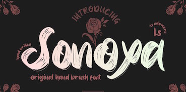 Bandung, Indonesia-based designer (b. 1982) of Masura (2016, brush style), Space Cake (2016, sci-fi style), Caroline Script (2016), Morning Fever (2016), Binzo (2016), Morning Cloud (2016, handcrafted), Rancha (2016: grungy style), Alkhali (2016), Gath Is A Robot (2015) and Scarlet (2015, textured typeface).
 Typefaces from 2018: Vanhala (Tuscan), Orchard, Solitaire, Founder (a thin script), Elanor, Callous (signature script), Keith (script), Subsky (script), Hamburger (artsy script), Smith (monoline rounded sans). Typefaces from 2019: Steven Mattew, Romansa (script), Pianicas, Infamous, Voltras, Faddox, Slayer Creeper (a dripping blood blackletter font), Hellioum (a balloon font), Grootten Beast (a wooden plank font), Lazarrous (beatnik), Salmounth (a clean script), Damaskush (a blackletter), Neurotic (spurred, blackletter), Maclucash, Neowave, Throoper, Maldivine, Morrisette (signage script), Descrendent (sans), Athlenstan, Hole Script, Cardigan, Lenox, Aero Space, Esentrik (over-decorated), Lethal (sans), Markwell (script), Hallmark, Fymous (signature script), Brighford (spurred), Bulb (a bubblegum font), Wavecraft. Typefaces from 2020: Flinch (a stone cut Flintstone font), Jack Miller (a signature script), Jaguar Jugglers (squarish, constructivist), Lazarrous (beatnik style), Jane Frediction, Grindmore (a calligraphic blackletter typeface), Descendent (a monolinear rounded coffee shop sans), Oliver Queen (a fat brush script), Orangutan, Chadwick (a Halloween font), Oakleaf, Buckles, Hackwell, Susan Brooks, Jacqueline, Alistair Morrison, Gibson Walsh, Slapstick, Monkey Werch, Rooselyn, Northway (lettering for outdoor or nature trail signage), Ghotana, Apija, Rawkin Pickles, Lockdown, Linger (a curly delight), Nuttyclash (a dry brush typeface), Ghosie, Kuro (a brush script). Typefaces from 2021: Bellamind (a decorative serif), Bingana (a playful typeface with oriental influences; appropriate for toys), Cheshire (sketched, textured), Creepycall, Croftler (a grungy athletic shirt font), Goldenwick (a vintage decorative serif), Karlburns (an ultra-decorative font by Vic Carless), Shorelly (an arts and crafts all caps serif), Walkingblue (a round vernacular slab serif), Garlicha (a great formal copperplate calligraphic font that unfortunately features a lower case r that can be confused with a lower case n), Hamingduck (copperplate calligraphy), Antucious (an ornamental serif), Monkeymod (a textured reverse srtress display font), Eightbit (a retro pixel font), Maloney West (art nouveau), Adamovick (a spurred Halloween font), Grindleaf (organic), Cronicalypse (a reverse stress elephant foot display font), Houston Palace (a monolinear retro script), Raceryouth (a weathered stencil font), Lyonade (a monolinear script based on retro motorbike posters), Alleysondust (a calligraphic script), Carlosberg (a spurred Victorian typeface), Clubeight (a trilined neon typeface that is reminiscent of Wyman's designs for the 1968 Olympics in Mexico), Slacksluger (a decorative inline typeface with medieval terminals), Beckmarine (a rough typeface inspired by retro cartoon and retro motorbike posters), Bullmars (a heavy font), Sinofluck (a stylish brush script inspired by a samurai poster), Scandlers (a dry brush script), Melvines (a thick paint brush font), Rockapolis (stencil), Lexaviers (a rune simulation font), Mylo (a dry brush typeface), Meckatler, Machiates (a vintage signage font), Fluxion (a dry brush script), Black Marilyn (blackletter), Palermosh, New Kids on the Font, Psychonaut (a reverse contrast, or even a Western, font), Black Valentine (a decorative blackletter), Buckles (a dry brush font), Smegh Mouth (a dry brush font), Armthadore, Brookland (a dry brush script), Khian Shantang (a decorative blackletter), Laekar (a hand-drawn blocky poster font), Schoutler (an ornamental fantasy font), Sonoxa (a heavy and creamy dry brush typeface), Classicloud (a decorative and festive blackletter). Typefaces from 2022: Gavin Zoo (a vintage decorative serif), Sallam (Arabic emulation), Sururim Maudunah (emulating Arabic), Ar Rayyan (Arabic emulation), Hollybucks (a round handprinted typeface), Mack Dutch (a weathered elephant foot serif), Obidel (a squarish vernacular typeface), Pinkerton (a playful cartoonish font), Sloopy Joe (a condensed sans with some curly terminals), Xylo Macloud (a decorative serif), Hickenwitch (a decorative serif), Parkwilson (a decorative serif), Buckedtalk (an inline blackletter typeface), Buckedtalk (an inline blackletter typeface). Creative Fabrica Script. [Google]
[MyFonts]
[More] ⦿
|
Linefab
|
 Designer of mostly display or techno or futuristic sans typefaces for Latin and Cyrillic. The list:
 - 2019: Stoptic (a full rounded sans), Adelina, Medium, Childling, Kerberos, Academy, Barbara, Doodler, Cave Age, Pixellance (pixelish), Ivanka, Dottle (dot matrix), Adriana, SpaceAge, Javier, Thumper, Bionic, Martian Luxury.
- 2018: Sweet Monkey , HelloDolly!, StoneAge, Spectre, StoryBook, Drenareon Display (octagonal), Colette, Jacqueline, Roller, SuperDario Pixel, Punto (dot matrix), Gennaro, Cosette, Ninova, Budapest Regular + Italic, Quad Display, Verona Display, Juvenile.
[Google]
[More] ⦿
|
Lithograph
|
Lithograph is a free lookalike of Twombly's Lithos. See also here, here, here and here. Corel also made a similar typeface, and also called it Lithograph. [Google]
[More] ⦿
|
Little Type Factory
[Neil Cattermole]
|
 Ipswich, UK-based designer of the rugged Flintstone typeface Rocky Ryder (2019), the papercut typeface Papier Couper (2019) and the handcrafted Bloopy (2019).
 Typefaces from 2020: Cartoon Kid, Rawbone, Billy Witch (a vampire script), My Star, Wham (a cartoon font), Decors (a decorative serif), Pobble, Monsta Rocka, Bombleberry, Whoosh (a cartoon font), Splatt (a cartoon font), Honey Hoops, Roller, Hoola Hoopa, Cobnut, Windmills (a lava lamp font), Squire (Master, Servant), Paper Phil, Wisper, Peejay (+Stripes), Rainbow Ryder. Typefaces from 2021: Fun Bone (a skulls and bones font), Jolly Jigsaw, Kid Cursive (a monolinear school script font). Behance links: Neil Cattermole, More Neil Cattermole, Little Type Factory. [Google]
[More] ⦿
|
Liz DeLuna
|
 American designer of these typefaces:
 - Litho Compressed (2016), which is a revival of a typeface designed by William Schraubstadter as Litho Condensed in 1908. Litho Compressed was published as part of the Litho Family by the Inland Type Foundry from 1907-1911 and the American Type Foundry in 1912. The Litho Family was intended to imitate a style of lettering popular with lithographers when lettering and designs were drawn on lithographic stones.
- Bequeath (2016). Liz explains: The Bequeath typeface is based on gravestone inscriptions carved by Uzal Ward between 1752 and 1792. Ward's lettering style was expressive with a tall x-height, curled finials and a trumpeted lower case t and f. For some of the glyphs alternates were created, in order to include some of the more atypical letter forms, like the slanted uppercase A. Glyphs were also created for the death heads and some of the other decorative flourishes on the headstones. The intention was to create a distinctive digital typeface for use in contemporary design contexts, with reverence to its historical roots.
- Bowery (2016). Liz: The Bowery typeface is based on letter forms carved into a stone plaque located in the Bowery Mission meeting room on the Lower East Side of Manhattan, dated ca. 1895. In creating the digital typeface design the intention was to retain the eclectic qualities and features of the carved letter forms while transforming them into a cohesive typeface. In order to address the idiosyncrasies inherent in the letter forms alternates were created for some of the glyphs.
[Google]
[More] ⦿
|
Lorenz Fidel Huchthausen
|
 Lorenz Fidel Huchthausen (aka Tylo at FontStruct) is a young graphic designer and artist from Berlin. At FontStruct, he created the 2d and 3d outline typefaces Solidblock, Solidblock 3D, Smoveblock and ZigNZag in 2010. Further typefaces made in 2010 include FS Stein (counterless), FS Jaze (angular face), Nareaves (modular kitchen tile face), FS Above Ferrofluid (texture face), Riss (white on black stone chisel face), Blockage, Blockswosh, AB CD, Handot (dotted), Zirc (circular), FS Zig n Zag, FS Blaze (counterless, geometric), Rabina Stripe (rounded slab), Swulsh (psychedelic), FS Zeta B (futuristic industrial face), FS Lehev, FS One Brick Pixel Font, FS Cushi, FS Karo (texture face), FS Raunpe, Elmant, FS Jasemone, FS Mortalers (texture face), FS Papier 3D, and Pseudobraille (dot matrix face).
 FontStructions from 2011: FS Fluze, FS Hommage a Frodo (3d face), FS Pixel Portrait (ultra-fat), FS Rinali (wavy), FS Gritta (a great stacked 3d face). [Google]
[More] ⦿
|
Lucas Franco
[Now Type]
|
 [More] ⦿
|
Luciano Vergara
[Mendoza&Vergara]
|
 [MyFonts]
[More] ⦿
[MyFonts]
[More] ⦿
|
Lukee Thornhill
|
Graphic designer and illustrator in London. Creator of the free stone age typeface Dino Font (2014, AI and EPS formats) and the free brush typeface The Cat Has A Hat (2014, inspired by Dr. Seuss's work). [Google]
[More] ⦿
|
Macizo.com (or: Macizotype)
[Leonardo Vázquez Conde]
|
Leonardo Vázquez is a graphic and type designer in Mexico City. After finishing his studies in Mexico City, Leonardo worked in several design studios and advertising agencies. In 1998 he settled in France where he studied at Atelier National en Recherche Tipographique in Nancy. Leonardo returned to Mexico in 2001, where he works in his own studio, Macizotype. His typefaces include: - Bunker (2005). A monolithic display face, which won an award at the TDC2 2005 type competition. It uses the rounded stone features found in Aztec sculptures and designs. >LI>Señal Mexico (2000). A Mexican highway signage typeface, with four styles called Rural, Nacional, Mediana and Asfalto. See also here. He writes that this was his first typeface and that it was conceived at Atelier National en Recherche Tipographique.
- Proteo (2005). A sans typeface.
- Lectura (2007). A text family in Regular, Negro and Versalitas styles designed for the Artes de Mexico Publishing House in Mexico City.
- Libre.
- In 2016, he made a custom typeface for the magazine Algarabia, together with Victoria Garcia Jolly. That typeface was further developed and published as a retail typeface in 2020 as Algarabia and Algarabia Seccion (with Luna Kindler).
Speaker at TypeCon 2007 and at ATypI 2009 in Mexico City and at ATypI 2013 in Amsterdam, where he introduces his Mayan transcription font Mayathan, and talks about the importance of designing typefaces for oral languages as a way of spreading their culture. [Google]
[MyFonts]
[More] ⦿
|
Mad Hatter
[Kelly Johnson]
|
Kelly Johnson ("Mad Hatter") is the American creator of the handwriting fonts Etched in a Desk (2008) and Leaky Closet (2008) and of Cydonia Sand Scribbles, aka Son't Read My Journal (2008). He also made Banana Spider (2008, stone chiseled look), Juneau (2008, 3d tin can box look), Cymptum (2005, ink run font). Kelly runs Mad Hatter Designs. Another URL. Dafont link. I do not know if this is the same designer, but this Kelly Johnson is a student at Anderson University who hails from from Greenville, SC. She created Goslon, which is a combination of Hoefler & Frere Jones's Gotham and William Caslon's Caslon. Her blog. [Google]
[More] ⦿
|
Maelle Keita
[Thomas Boucherie]
|
 Maelle Keita is the second identity of Thomas Boucherie (Montpellier, France, b. 1977). The Maelle persona is a prolific Swiss creator of many free fonts, which are mainly calligraphic or connected scripts.
 Typefaces from 2017: Adventure of the Old Giant, The Curious Incident, The Fabulous Orchestra, The Butcher factory, Dancing in the Moonlight. Typefaces from 2016: La Bataille du Sanctuaire, The Quest of Discoveries, Sentimental Beach, October Quotes, Hercule vs Goliath, Band of Reality, Street Gathering, Alicia on the Enchanted Highlands, Adventures on the Mountains, League of Giant, Richard True Crime, Dragons and Chickens, The Elves And The Secret Garden, Pokerface, Gentleman on the Rainbow, La Pantoufle en Or (tattoo font), Bulles de Chocolats, Atlantide Starlight, The Golden Flower, Mr Fisherman and the Shoemaker, Catherine de Beaumont. In 2015, Maelle made Gravity of Love (white on black letters), Incredible Angel (beatnik style), The Red Horse, The Spaghetti Movie (Western font), The Hundred King, The King of Lost Towel, les Soeurs Samurai, Mr. Jackson Rankenstein, Mathilde Castleland (calligraphic script), Question and Love (calligraphic script), Chateaux des Olives (calligraphic script), Le Cachalot du Grand Nord (a hilarious funky font), Le Grimoire du Bonheur, The Constellation of Heracles, The Citizens, Secret of the Octopus, Fabulous Vikings, King Arthur (ribbon font), Mademoiselle Catherine, Alfred La Moule, Jackie Talks to You, Les Carottes Sont Fraiches, Claudette aime le Chocolat (connected dessert script), LA-CHAMBRE-77, LACHAMBRE67, LE BAL DES COCHONNES, LE BAL DES COCHONS, LE CABARET DES FOUS, LE SILENCE DES CAFARDS, La Tortue, Le-Jardin-de-Calista (strong brush typeface), ONLY IN THIS CASE, Stink on the Death (signage script). Before 2015, Maelle designed Black December (2014), Une Grenouille Le Soir (2014), La Kame A Leon (2014, heavy brush), The Best Things In Life Are Free (2014), Caviar De Lapin Blanc (2014), La Truite à Papa (2014), Mougatine (2014, a needle thread script), Chicken Chorizo (2014), Ventilla Stone (2014), Mademoiselle Camille (2014, swashy), Authentic Hilton (2014), Olympic Branding (2014), Le Laboratoire du Docteur Steak (2014), The Chicken Love Story (2014), Les Sorcières de la Lune Noire (2014), La Compagnie des Ombres (2014), Les Sensations de Cerise (2014), La Chatte à Maman (2014, a creamy script), Aligot de Mirabelle (2014, a great delicate calligraphic script), L'Antre du Corniche (2014, thin script), Caviar de Diane (2014, thin script), Karine Aime Les Chocolats (2014: a connected script), Death in the Shadow (2014: brush script), Akhenaton (2014: brush script), Mayumi Gumi (2014), Font For Children Indo (2014: dingbats), Anabelle Script (2014, a heavy brush script), Mademoiselle K (2014, a cursive typeface), Anacondas (2014, an upright connected script), Walker on the Moon (2014, connected script), Angelique ma douce Colombe (2014), Pomerole (2014), Paper For Your Ass (2014), Paper Towel (2014), Wolf in the City (2014), Dragon is Coming (2014), J'aime bien le dimanche (2014), Camelia (2014, grungy signage script), Kosmo Cat (2014, a stone age script), Ophelia Script (2014), Monkey Snake (2014), Ventilla Script (2014), Slow Motion (2014), Ail et Fines Herbes (2014: hairline script), Mister Fish : upright curly script (2014), Elephant (2014), Nemo One (2014), Royal Chicken (2014, signage script), Nenuphar of Venus (2013), There Can Only Be One Breaver Im It (2013: flourishes), Ruskof (2013, grunbgy Cyrillic simulation face), Kawaii Food Font (2013, dingbats), Chouette Alors (2013, owls), Eglantine (2013, upright script), Zentai Itacha (2013), Magnolia (2013), God Bless America (2013), Jack And The Beanstalk (2013, upright connected script), Halloween Trick (2013, dingbats), Noyeux Joel (2013, Christmas dings), Angel of Blood (2013), Matriochkas (2013), My Princess Likes A Frog (2013), Skate or Die (2013, dingbats), Chouette Alors (2013, owls), Sleep on the moon (2013), Animox (2013, teddy bear dingbats), It Was A Good Day (2013, ornaments and filets), Ordre de Depart (dot matrix face), Diane de France (2013, calligraphic), Serval (2013, script), Chicago Eskimo (2013, fat outlined signage face), Quality Street (2013, vintage signage script), From The Moment (2013, frames), Arabia (2013, upright connected script), Hector Le Dragon (2013), Fantom Better (2013), Mont Royal, Coccinelle, Ponctuation, Miel & Abeille, La Petite Puce, Yo te amo pero en secreto, Conjecture (a sketch font), Coloscobik (2013, a marquee face), Ejaculator, This Is Not A Font, Tell Me A Secret (2013), Chocolate Cake (2013, plump outline face), Eglantine (2013), Ornamind (2013, floral dingbats), La Grosse Cochonne (2013), Toyzareux (2013, bubblegum font), Oliver Tue Les Fourmis (2013), Two Fingers King (2013, an ornamental blackletter), Piragniac (2013), Marguerite (upright connected script), Gulliver, Arakphobia (2013, a spiderweb font), Gelatina Elemente (connected script), Zenzai Itacha (oriental simulation), Atlas Eternal 78 (2013), Serial MKV 1 (2013), The Black Manba (2013), Gang Bang Crime (2013, a dripping paint font), La Grenouille Verte Qui Devient Toute Rouge (2013), Aracme Waround (2013), Zoa Elephantesque (2013), Estrela Fulguria 1748 (2013, calligraphic), Cirus Quantum Solace (2013), Paint All Time (2013), Jumbo Burn (2013), Allo t'as pas de shampoing, Helene Queen K (2013, script), Not Only The Quake (2013, script), One Day Before Rain (2013), Bullet Campus (2013), Eternal Call (2013, swashy calligraphic font), Kill The Panda (2013, a textured blackletter face), Trash Butterfly (2013, ornamental caps) and In Secret I Love You (2013, hand-printed), A Sweet Melody My Lady (a circular font), Lady Solarus Queen 1789. Fontspace link. Dafont link. [Google]
[More] ⦿
|
Mahmud Fajar Rosyadi
[HoPoYa Studio (or: Mikailain)]
|
[More] ⦿
|
Manfred Klein
[Manfred Klein's Fonteria]
|
[MyFonts]
[More] ⦿
|
Manfred Klein
[Manfred Klein: Stone-age look and chiseled typefaces]
|
[MyFonts]
[More] ⦿
|
Manfred Klein: Font Hosting
|
 In July 2017, Typoasis / Moorstation shut down. Run by Petra Heidorn out of Hamburg, Germany, it hosted her own fonts, as well as those of the popular and talented type designer and artist Manfred Klein (Frankfurt, Germany). Manfred, who was an active type designer from the late 1990s until about 2007, created over 3600 fonts in that period. Those fonts are now hosted at my site, thanks to Petra Heidorn. Manfred's oeuvre is too large to consume and analyze in one sitting or even one month.
 This zip file contains all his fonts. For those interested in particular styles, please visit this web page for downloads of individual fonts, or fonts grouped by these themes: 3d, Africa, aliens, animals, architecture, arrows, astrology, birds, calligraphy, cave style, codex, Christmas, dada, decorative caps, didone style, dingbats, display style, Egypt, eyes, fists, Fraktur, handcrafted typefaces, Karla, kids, Laurens, masks, medieval styles, Mexico, monsters, native themes, ornaments, painters, peace, people, pixel fonts, runes, Sans, serif, slab, stencil, stone age, typewriter, uncial, wood and woodcuts. [Google]
[More] ⦿
|
Manfred Klein: Stone-age look and chiseled typefaces
[Manfred Klein]
|
 Adonis-Bold, Athena, AthenaHandwritten, Cuneate, CuneyChars, Diogenes, GreeKish, HellasDust, JuliusCTwo, MCapitals, MouseStrokes3D, MouseStrokesCont, MouseStrokesInverseShadow, OldGreekButtons, Papercuts, PetitexBut-Bold, PetitexBut-Light, PetitixBut-Normal, Pompeji-Black, PompejiMK, PompejiPetit, Prehistoric, Prehistorish, QuickGreekBold, QuickJuliusC, RandomUnciale-Bold, Rehacles-Light, Rehacles-Medium, RomaCesare-Normal, RomaMonumentalBC, SteinAntik-Bold, SteinAntik-Light, SteinAntik, StoneAgeBatsBold, StonesAgeButtons, StrokeBorn-Bold, StrokeBorn, StrokesFonds, StrokesNBullets, Strokey-Bold, Strokey-VeryBold, Strokey-VeryVeryBold, StrokeyHand, Tremolo-DemiBold, Tremolo, Twiggy-Bold, Twiggy-Light, Zyprian.
 Download page. Download all these fonts in onze zip file. [Google]
[MyFonts]
[More] ⦿
|
Manfred Klein's Fonteria
[Manfred Klein]
|
 Frankfurt-based designer (b. 1932, d. 2018) whose creative output is so large that he deserves a separate web page. His URL at Moorstation from 2000-2007. New page on him by Florian Rochler. Font squirrel link. Dafont link. [Google]
[MyFonts]
[More] ⦿
Frankfurt-based designer (b. 1932, d. 2018) whose creative output is so large that he deserves a separate web page. His URL at Moorstation from 2000-2007. New page on him by Florian Rochler. Font squirrel link. Dafont link. [Google]
[MyFonts]
[More] ⦿
|
Manfred Sayer
|
Designer of Sayer Script (Berthold, 1984), which is identical to Mecanorma Sayer Script, a retro signage script family. He also designed Mecanorma Sayer, a degenerated typewriter face, Sayer Interview, and Mecanorma Sayer Spiritual, a chiseled display face. Klingspor link. View Manfred Sayer's typefaces. [Google]
[MyFonts]
[More] ⦿
|
Manuel Eduardo Corradine
[Corradine Fonts]
|
 [MyFonts]
[More] ⦿
[MyFonts]
[More] ⦿
|
Marianne Stoico
|
Roman designer of the free angular chiseled typeface Incise (2014). [Google]
[More] ⦿
|
Martha Blanch Pavia
|
During her graphic design studies in Barcelona, Martha Blanch Pavia created the rounded chiseled typeface Dolmen (2013). [Google]
[More] ⦿
|
Martin Benka
|
Slovak painter and illustrator, b. 1888, Kostoliste, d. 1971, Malacky. He is regarded as the founder of Modernist 20th century Slovak painting. His typefaces include a hexagonal typeface from 1956, and a stone-chiseled typeface from the 1940s. Lubomir Longauer wrote Martin Benka, the first designer of the Slovak National Myth. [Google]
[More] ⦿
|
Marty Bee
|
Marty Bee is a designer and medical illustrator in Sulphur, LA. He has designed both free and commercial typefaces. His commercial fonts are available from Plazm and T-26: Slumgullion (1993, a party headline font), Flowerchild, CropCircles, Gargantua, SonofStarmanA, StarmanPict. At Plazm, he did Cibola (1995, nice dingbats), Wet and Wilde (1994) and Three Rivers (1994), for example. Some more fonts: Wildside (1994, angular and gothic), Cheap Motel, Halloweenies, Flowerchild, Sangreal (1994, gothic), Scaredycat, SidTheSpider, Slasher (2000), Slumgullion (1993, ornamental caps), Space Cowboy, Stiletto (2000), Saguaro (2000, angular), Cactus Pete, MyShoes, Tropicana (1994, chiseled look), Trapping, Galleon, Goblin Moon (scary), Ghost Bayou (blood drip face), Big Bubba, Lafitte (2000, a didone display face), Daytripper, Contraband (grungy), Fat (1994, oriental simulation face), Fat Sushi, Beatnik, Kerouac (1994, a Kafkaesque face), PostModern Oblique (2000), PricklyPear (2000, angular and angry), AtomicSushi. The font WheresMarty by an unknown designer is named after the world-wide search for Marty. Where are you, Marty? Free fonts at Fontspace: Freakout, Frankenstein, Atomic Sushi (1999, oriental simulation face), Manzanita (1990), Hill William (2011, brush face), Kris Kris (2000, gothic; an even sharper and more condensed version of Stiletto), Porpoise (1994, pixelish). FontShop link. Moorstation link, where one can also find Calypso (1997, after Excoffon's Calypso, 1958), which Marty claims as not done by him. The Calypso typeface at that site was made by Martin Pfeiffer, in fact. Klingspor link. [Google]
[MyFonts]
[More] ⦿
|
Matt Craven
|
Creator in the UK (b. 1978) of the chiseled look typeface Jaggersaurus (2011). [Google]
[More] ⦿
|
Matthew Carter
|
 Matthew Carter (born in London in 1937, and son of Harry Carter) is one of today's most influential type designers. He trained as a punchcutter at Enschedé in 1956. In 1963 he was hired by Crosfield, a firm that pioneered the new technology of photo-typesetting, to lead their typographic program. He worked for Mergenthaler Linotype (1965-1981), and co-founded Bitstream Inc. with Mike Parker in 1981, adapting many fonts to digital technology. In January 1992, he founded Carter&Cone with Cherie Cone, and often collaborated with Font Bureau. In 1995, he won the Gold Prize at the annual Tokyo Type Directors Club competition for Sophia. In 1997, he received the TDC Medal for significant contributions to the life, art, and craft of typography. In 2010, he received a MacArthur grant. He lives in Cambridge, MA.
 John Berry on Carter's art (2002). Apostrophe comments on Berry's article. Interview. His fonts: - The Microsoft screen fonts Verdana (1996), Georgia (1996), Georgia Greek, Georgia Cyrillic, Nina and the humanist sans typeface Tahoma (1994). Georgia (in roman and italic only) is a screen version of Miller, Carter's Scotch design. Nina was designed to address the requirements on smaller screens such as phones, and was used in Windows Mobile smartphones before Microsoft switched to Segoe. The Greek and Cyrillic versions of Nina were developed by François Villebrod. Georgia Pro (2010, Ascender) was developed from Georgia with the help of Steve Matteson. For Verdana Pro (2010, Ascender), Carter was assisted by David Berlow and David Jonathan Ross.
- Apple's Skia (1993), a sans serif designed with David Berlow for Apple's QuickDraw GX technology, now called AAT. [Carter's Skia and Twombly's Lithos are genetically related.]
- Monticello (2003), based on Linotype's Monticello (1950), which in turn goes back to Binny&Ronaldson's Monticello from 1797, a typeface commissioned by Princeton University Press for the Papers of Thomas Jefferson. It is in the Scotch roman style.
- Miller (1997, Font Bureau), an extremely balanced family co-designed by Carter, Tobias Frere-Jones and Cyrus Highsmith. Carter explains: Miller is a Scotch Roman, a style that had its beginnings in the foundries of Alexander Wilson In Glasgow and William Miller in Edinburgh between about 1810 and 1820. It is considered that the punchcutter Richard Austin was responsible for the types of both Scottish foundries. Miller is a revival of the style, but is not based on any historical model. Now, there is also a 16-weight newspaper version, Miller Daily (2002), and an 8-weight Miller Headline (2002). This was followed by News Miller, a typeface designed for the Guardian. Note: Georgia (1996) is a screen version of Miller, and Monticello (2002) is a later modification. A comparison of these typefaces.
- Alisal (1995, +Bold).
- ITC Galliard (1978), a recreation of Robert Granjon's garalde letters. This typeface was originally conceived in 1965. Bringhurst recommends a Carter and Cone version of this font, called Galliard CC: it has old style figures and small caps. Further versions include Aldine 701 (Bitstream), Matthew (Softmaker), ITC Galliard Etext (2013, Carl Crossgrove, Linotype), and Gareth (Softmaker).
- The ITC Charter family (1987 for Bitstream and known as Bitstream Charter; licensed to ITC in 1993; see the Elsner&Flake version of ITC Charter). An upgraded commercial version was released by Bitstream in 2004 under the name Charter BT Pro.
- Vincent (1999), a font commissioned for use in Newsweek. It is named after Vincent Figgins, an English foundry owner and punch cutter who lived in the late 18th century.
- Walker (1994), designed for The Walker Art Center.
- Ionic Number One (1999, Carter&Cone).
- Mantinia (1993, Font Bureau), based on inscriptional forms, both painted and engraved, by the Italian renaissance artist Andrea Mantegna.
- Big Caslon (1994, Font Bureau), a display typeface based on the largest romans from William Caslon's foundry.
- Big Figgins (1992) and Big Figgins Open (1998, based on the decorative didone types shown in the specimens of Vincent Figgins of 1815 and 1817). Big Figgins was called Elephant and Elephant Italic in Microsoft's Truetype Fontpack 2.
- Sammy Roman (1996), loosely based on the 17th century romans of Jean Jannon. A beautiful typeface designed to accompany kanji and kana typefaces produced by Dynalab in Taiwan.
- Sophia (1993, Font Bureau), a mix with Greek, uncial and classical Roman influences.
- Shelley Script (1972), a family of formal scripts, split into Andante, Volante and Allegro. It is based on intricate English scripts of the 18th and 19th centuries attributed to George Shelley.
- Cochin (1977, at Linotype). MyFonts writes: In 1913 Georges Peignot produced a typeface based on Nicolas Cochin's eighteenth century engravings. In 1977, Matthew Carter expanded this historic form into a three part series.
- Bell Centennial (Linotype-Mergenthaler, 1975-1978), a legible heavily ink-trapped family designed by Matthew Carter as a replacement of Bell Gothic at Mergenthaler. There are also digital Linotype and Bitstream versions. AT&T commissioned the font to replace their previous typeface choice Bell Gothic for their 100th Anniversary.
- Cascade Script (1965-1966, Linotype, now also known as Freehand 471 BT in the Bitstream collection). Paratype's extension of Freehand 471 to Cyrillic is by Oleg Karpinsky (2011).
- New Century Schoolbook was designed from 1979-1981 in the New York Lettering office of Merganthaler Linotype based on Morris Fuller Benton's Century Schoolbook from 1915-1923. It was the second face, after New Baskerville, that was digitized and expanded using Ikarus (digital technology). The Bitstream version [Century Schoolbook] is a virtually exact copy, only being moved from a 54 unit to a 2000 or so unit design.
- Auriol (Linotype), an art nouveau family (including Auriol Flowers 1 and 2 and Auriol Vignette Sylvie) based on the lettering of the painter and designer Georges Auriol. MyFonts explains: Auriol and Auriol Flowers were designed by Georges Auriol, born Jean Georges Huyot, in the early 20th century. Auriol was a French graphic artist whose work exemplified the art nouveau style of Paris in the late 19th and early 20th centuries. In 1900, Georges Peignot asked Auriol to design fonts for Peignot&Sons. The resulting Auriol font was the basis for the lettering used by Hector Guimard for the entrance signs to the Paris Metro. It was re-released by Deberny&Peignot in 1979 with a new bold face, designed by Matthew Carter. These decorative fonts with a brush stroke look are well-suited to display settings. The Peignot drawing office insisted on a more normal appearance in the boldface, calling it Robur. Matthew Carter has returned to Auriol's original design for the whole series.
- Helvetica Greek (Linotype).
- Helvetica Compressed (Linotype, 1974, with Hans-Jörg Hunziker).
- Wilson Greek (1995), compatible with Miller Text, and based on a type cut by Alexander Wilson for the Glasgow Homer of 1756. See here.
- Olympian (1970, Linotype), designed for newspaper use. This is Dutch 811 in the Bitstream collection. The custom typeface Milne (Carter&Cone) done for the Philadelphia Inquirer is based on Olympian.
- Gando, a French "ronde" typeface based on the work of Nicholas Gando (mid 1700s), and designed for photo-typesetting at Mergenthaler by Carter and Hans-Jörg Hunziker in 1970. Very similar to Bitstream's Typo Upright.
- Fenway (1998-1999, Carter&Cone), commissioned by Sports Illustrated to replace Times Roman.
- Snell Roundhand (1965-1966): a connected cursive script based on the 18th-century round hand scripts from English writing masters such as Charles Snell. Early in the digital era, Matthew published this in the Bitstream collection as Roundhand BT. A Cyrillic version by Isabella Chaeva and Vladimir Yefimov was released by ParaType in 2013.
- Auriga (1970). (Wallis dates this in 1965 at Linotype.)
- CRT Gothic (1974).
- Video (1977).
- V&A Titling (1981).
- Deface (in the FUSE 18 collection).
- Madrid (2001), done for the Spanish newspaper El País.
- Milne, done for the Philadelphia Inquirer (a revised version of Olympian). Not available.
- Durham, a sans serif family for US News&World Report.
- Airport.
- Century 725 (Bitstream, for the Boston Globe: after a design by Heinrich Hoffmeister).
- For Microsoft: Georgia, Verdana, Tahoma (1994), Nina.
- Freehand 471 (Bitstream). A chunky slightly angular script.
- New Baskerville. [Matthew Carter says that this is wrongly attributed to him. It was directed by John Quaranta.]
- Postoni [or Post-Bodoni], for the Washington Post, which is still using it. See here.
- Le Bé, a Hebrew typeface that was used in the Pennyroyal Caxton Bible.
- Rocky (2008, Font Bureau, with Richard Lipton), for the Herald in Scotland.
- Time Caledonia.
- Wiredbaum, for WIRED.
- Wrigley (for Sports Illustrated). Matthew Carter designed Roster in the 1990s, and it was adopted as a display face for Sports Illustrated under the name Wrigley. Jesse Ragan was instrumental in later expanding the family from its original seven styles to the current 60. In 2015, Carter & Cone and Font Bureau released an expanded 60-style family of this typeface under the new name Roster.
- Benton Bold Condensed (for Time Magazine).
- Foreman Light (for the Philadelphia Inquirer).
- Newsbaum (for the New York Daily News).
- Carter Latin: Matthew was commissioned in 2003 to create a new design to be cut in wood type by the Hamilton Wood Type&Printing Museum in Two Rivers, WI. He came up with an all-caps, chunky, Latin-serif design.
- Times Cheltenham (2003), which replaces in 2003 a series of headline typefaces including Latin Extra Condensed, News Gothic, and Bookman Antique.
- The Yale Typeface (2004), inspired by the late fifteenth-century Venetian typeface that first appeared in Pietro Bembo's De Aetna, published by Aldus Manutius. This extensive family is freely available to members of Yale University.
- DTL Flamande (2004, Dutch Type Library), based on a textura by Hendrik van den Keere. Since 2018, available from URW++. Additions to DTL Flamande by Lukas Schneider.
- Meiryo UI, Meiryo UI Bold, Meiryo UI Bold Italic, Meiryo UI Italic (2004). Meiryo is a modern sans serif Japanese typeface developed by Microsoft to offer an optimal on screen reading experience and exceptional quality in print, as part of the Cleartype project. The Japanese letterforms are generously open and well-proportioned; legible and clear at smaller sizes, and dynamic at larger display sizes. The beauty of Meiryo is that it sets text lines in Japanese with Roman seamlessly and harmoniously. Meiryo was designed by a team including C&G Inc., Eiichi Kono, Matthew Carter and Thomas Rickner. It won a 2007 type design prize from the Tokyo Type Directors.
- Suntory corporate types (2003-2005), developed with the help of Akira Kobayashi and Linotype from Linotype originals: Suntory Syntax, Suntory Sabon, Suntory Gothic, Suntory Mincho.
- Rocky (2008, Font Bureau): A 40-style high contrast roman family that is difficult to classify (and a bit awkward). Developed with Richard Lipton.
- Carter Sans (2010, ITC), based on epigraphic letters used in inscriptions. Created for the identity of the Art Directors Club 2010 class of its Hall of Fame, one the laureates in the 2010 Hall of Fame. Codesigned by Dan Reynolds, this chiseled typeface is loosely based on Albertus.
- In 1997, he designed Postoni for the The Washington Post's headlines, a sturdy Bodoni.
- MS Sitka (2013). A typeface with six optical sizes that are chosen on the fly if an appropriate application is present. Developed at Microsoft with the help of John Hudson (Tiro Typeworks) and Kevin Larson (who carried out extensive legibility tests). German link. Typophile link. Sitka won an award at Modern Cyrillic 2014.
- Van Lanen Wood Type (Hamilton Wood Type, 2002-2013). Carter started work on the wood type in 2002, but technical accuracy issues postponed the implementation. Digital versions were finally done in 2013 by P22's Hamilton Wood Type.
- Big Moore (2014, Font Bureau): A 1766 specimen by Isaac Moore, former manager of Joseph Fry's foundry in Bristol, England, shows many types inspired by John Baskerville. But a century later, standardization had foisted inept lining figures and shortened descenders upon these designs. Matthew Carter remedies the tragedy with Big Moore. Oldstyle figures, full-length descenders, and historic swashes are restored to this regal serif in two styles. Big Moore won an award in the TDC 2015 Type Design competition.
- Role (2019, Sans, Slab, Serif, Soft). A superfamily published at Morisawa and Fontelier. Matthew Carter, Shotaro Nakano, and Kunihiko Okano co-designed Role Serif at Morisawa.
Speaker at ATypI 2013 in Amsterdam. Speaker at ATypI 2019 in Tokyo on the topic of Expressing Vocal Tones through Typography. Linotype link. FontShop link. Favorite quote: Watching me work is like watching a refrigerator make ice. Another quote: A typeface is a beautiful collection of letters, not a collection of beautiful letters. View Matthew Carter's typefaces. Matthew Carter's fonts. The typefaces made by Matthew Carter. See also here. Wikipedia page. Klingspor link. [Google]
[MyFonts]
[More] ⦿
|
Matthew Carter
[Carter & Cone]
|
[MyFonts]
[More] ⦿
|
Mendoza&Vergara
[Luciano Vergara]
|
 MendozaVergara is Luciano Vergara, a Chilean graphic designer from Concepcion (b. 1979), and his companion, Guisela Mendoza. Mendoza & Vergara is located in Santa Juana, Chile.
 Vergara created these typefaces between 2004 and 2010: the sans typeface Conce (2004), Pepona (2006, T-26, a pixel face), Sketch (2008, T-26), Trauco (2006, T-26, a wonderful display face), Otto (2006, T-26, another pixel face), Roket U (2007, T-26, rounded anthroposophic unicase typeface) and Hisla Negra (2004), the serif typeface Patua (2003; Patua One is free at Google Web Fonts), the pixel typeface Xerif (2004), the pixel typeface Sinaptix (2004), the pixel typeface UNXERIF (2004), the pixel typeface Don Paul (2004, named after Paul Renner), the liquid display typeface Revolución (2006), the pixel family Renex (2004) and the pixel typeface O'Higgins (2003). At Latinotype (which Vergara co-founded with Daniel Hernandez in 2007), he created the dingbat typeface Chilean Bugs (2006) (free at Dafont), as well as Patua (serif), Regia (2008, hairline condensed sans). At FontStruct, he experimented with Flaca (2008). At his Flickr site, check out more commercial typefaces: Fidel (strong sans), Regia and Trasans (two light, even hairline, sans typefaces), Biotech, Working on a short-ascendered sans typeface called Midas (2010). Typefaces from 2011: Biotech, Cachiyuyo (a pixel family), Machi (titling sans), Los Lana Pro (an angular poster face; a stone age font), Fidel Black (a strong rounded sans, +Stencil Black), Patagon (Latinotype: a rounded wood-inspired poster typeface done with Miguel and Daniel Hernandez), Suisside (a humanist sans). Typefaces from 2012: Julius Sans One (Google Web Fonts), Pantano Pro (Pantano is a handmade grunge typeface inspired by the rustic style of Amazonia), Antartida (an 8-style family at Latinotype), Antartida Rounded (a rounded sans family), Kahlo (2012, Latinotype, designed for magazine headlines), Frida (Latinotype: a Latin style hipster sans typeface), Schwager (a steampunk slab serif, followed by Schwager Sans in 2014). Typefaces from 2013: Estandar (a wayfinding sans published by Latinotype; the Regular is free), Estandar Rounded, Moderna Condensed (+Unicase: an organic sans family), Four Seasons (handwritten, with Guisela Mendoza), Pasarela, Kahlo Rounded (Latinotype). Moderna (a monoline organic sans, with unicase styles thrown in). Antartida Rounded Essential (2013) is a rounded sans by Luciano Vergara, done for Los Andes Type. Typefaces from 2014: Estandar Rounded (by Vergara, a rounded sans in 13 styles named after Standard Oil Company), Garden (a playful decorative set of typefaces), Darwin (2014, a 20-font sans family with multiple fathers; see also Darwin Office, 2014, Darwin Pro, 2017, and Darwin Rounded, 2018), DIY Time (hand-printed, with Coto Mendoza at Latinotype). Typefaces from 2015: Nordikka (a headline sans with large x-height and a Scandinavian feel; Latinotype), Styling (a simple almost techno sans family inspired by the aerodynamic curves and elliptical shapes of old cars and airplanes). Corporative Sans, Corporative Sans Rounded and Corportaive are large typeface familes created by the Latinotype Team in 2015. In particular, they were developed by Javier Quintana and Cesar Araya, under the supervision of Luciano Vergara, and Daniel Hernandez. With Bruno Jara, Luciano Vergara designed the angular Jurassic park style typeface Los Lana Niu (2016). In 2016, Mendoza Vergara (Cecilia Mendoza, Coto Mendoza and Luciano Vergara) published the script family Bach and the script/slab pair Matcha at Los Andes. In 2016, Bruno Jara Ahumada, Alfonso Garcia, Luciano Vergara, Daniel Hernandez and the Latinotype Team designed the roman square capital headline typeface family Assemblage. In 2017, Luciano Vergara published Niemeyer as a tribute to Brazilian architect Oscar Niemeyer, and the modular---almost sci-fi---sans typeface family Nizzoli as a tribute to Marcello Nizzoli. He also designed the 28-style Internacional in 2017-2018, following the Swiss grotesque examples. Typefaces from 2018: Alvar (a humanist sans family at Los Andes; italics designed with the help of Alfonso Garcia), Resort (Sans, Script, Ornaments). In 2019, Luciano Vergara and Alfonso Garcia co-designed Moderna Sans at Latinotype. It is an interpretation of American gothics like Alternate Gothic. Typefaces from 2020: Abstract (an eclectic serif family with post-pandemic tensions and existential angst; by Luciano Vergara at Los Andes), Aestetico (Luciano Vergara, Daniel Hernandez and Alfonso Garcia: a 54-style sans family having Formal and Informal subsets of fonts so that the family covers several sans genres), Spock (2020: a 48-style demi-sans demi-slab family by Luciano Vergara, Cesar Araya and Rodrigo Fuenzalida), Neogrotesk. P>Typefaces from 2021: Grotesco (advertized as a South American grotesk; in 20 styles). Klingspor link. Dafont link. Behance link. View Lucian Vergara's typefaces. Fontspring link. [Google]
[MyFonts]
[More] ⦿
|
Michail Semoglou
|
Thessaloniki-based ex-student at the University of Reading who designed Vergikios (2002), a Greek typeface with hellenized Latin letters as well. He co-founded Type Initiative with Canadian Keith Chi-hang Tam and joined the type coop Village in 2005. [Google]
[More] ⦿
|
Michal Cichy
|
Wroclaw, Poland-based designer of the stone cut typeface Cubrick (2018). [Google]
[More] ⦿
|
Michel Bujardet
[Fontmenu.com]
|
[MyFonts]
[More] ⦿
|
Mobaric Minhas
[Jaduger Design Studio (and: Twodollarshop)]
|
 [MyFonts]
[More] ⦿
[MyFonts]
[More] ⦿
|
Morganismi
[Heikki Morgan Hämäläinen]
|
 Morgan (whose real name is Heikki Juhani Hämäläinen) is an artist and gardener in Finland who was born in 1963 in Pälkäne.
 In 2010, he founded Morganismi (in Finland's Sysmä), and created the children's hand Morganshand, the petroglyph font Rock Painting, the retro futuristic typeface 2010 Outta Space (2010), and the insult-inspired dingbat typeface 1HarshLanguage. Morganismi (2010) is a primitive human alphabet. Kauhaatos (2010) is a scary gothic face. Fraught (+Icons, which includes some fists) (2010) is a rough hand-printed stencil face. Curser (2010) is an old typewriter face. Morgothick (2011) is described as follows: Morgothick is an ugly not-so-decorative blackletter font, hand-drawn like straight from the dark Middle Ages of drunk monks and dim chambers. Riipale (2012) is a font family with two sets of hand-drawn characters. Typefaces from 2013: However (ransom note font), Alph Deco (art deco outline font), Seriffi Morgan (an antiqued roman typeface). Typefaces from 2014: Snow Now. In 2015, Morganismi published the handcrafted typeface Nippon. Typefaces from 2016: Circus Minimus Pulex (+Icons). Typefaces from 2017: Sulawesi (an adventurous font imitating old map styles), Sulawesi Kuwa (dingbats). Typefaces from 2018: Ruutu (a funny faces font). Typefaces from 2021: Pandemizing (a COVID-themed alphabet). Typefaces from 2022: Alternasci (emulating medieval manuscript text, +Alchemia, +Magia, +Picturae dingbats; the upper case of Magia is the so-called Theban or Witch's Alphabet). View the typefaces made by Morganismi. [Google]
[MyFonts]
[More] ⦿
|
Muhammad Husni Haikal
[Graphicfresh (was: Sameeh Store, or Sameeh Media)]
|
 [MyFonts]
[More] ⦿
[MyFonts]
[More] ⦿
|
Muhammad Nazarudin
[Niznaztype (was: Em Nazar)]
|
[MyFonts]
[More] ⦿
|
MyFonts: Stone age typefaces
|
A list of stone age typefaces. [Google]
[More] ⦿
|
MyFonts: Stone cut typefaces
|
A list of stone cut typefaces. [Google]
[More] ⦿
|
Nantia
[Konstantina Louka]
|
Konstantina (Nado) Louka is a Ioannina, Greece and Luxembourg, Luxemburg-based illustrator. Designer of the vintage handcrafted Latin / Greek typefaces Luka (2015), Nadira (2015), Antio (an all caps hand-printed typeface) (2015), Nado (2015, brush font), and Nadirii Pro (2015), and the handcrafted typeface Evey (2015). Typefaces from 2016: Avae, Zanza, Miron, Nerres, Umy, Kold, Pagkaki (a stone-cut typeface), Muri (a fat finger font), Gluten Frei Script, Prokopis (tweetware, handcrafted), Kold, Oxya (a scratchy typeface), Melidia (a Latin / Greek brush script), True Mama (tattoo font). Typefaces from 2017: Petit Nuage (a signature script), One Little Font (children's script), Supergal (casual brush), Roodo (dry brush), Lil Baby (Latin and Greek calligraphy), Takhie (brush), Fontryl (a monoline script), Chubby Font, Tavernaki, Blanc Seing (a signature font), Marilia Pro (connected script). Typefaces from 2019: Nadoco, NF Nerres, NF Ananias, Lolotte (script), Noix (dry brush), NF Lukara. Typefaces from 2020: Beiko, Le petit cochon, Cacographie, Aiolos, La Lou, Akakios, Dead Inside (a children's hand-printed font), Nadah, AMA, Stamnaki, Taio, Stamnaki, Farfelue, Nadira Pro, Okeanos, Petit Nuage v2.0. Typefaces from 2021: Talonica (a monolinear signature script). [Google]
[MyFonts]
[More] ⦿
|
Neil Cattermole
[Little Type Factory]
|
 [More] ⦿
|
Neobyzantine
|
This site has the following polytonic Greek and Slavonic fonts: Miroslavljeva_Cirilica, CirilStudenica, MgGreekArchaic-Plain (actually a Greek simulation face, 1983), OdysseaF, SymbolGreekPF, UB-Byzantine-Italic, UB-Byzantine-Normal (Unibrain, 1993), ALBXHRNormal (Im Grhgorioy, 1994), NB-Byzantine-NB, CSvetiNIKOLANormal (Predrag Milivojevic, Belgrade, 1993). [Google]
[More] ⦿
|
Newton Ryan
[NR Productions]
|
[More] ⦿
|
NH Fonts
[Niskala Huruf]
|
Indonesia-based designer of script or handcrafted fonts. His catalog in 2022 included Amazingly Beautiful Lovely, Astronauta Script, Auntie Modern, Bakery Goods Fresh, Closely Related, Crafty Notes Modern, Fatefulness, Featly Note, History Sheeter, Library Records, Lucky Skirt, Notably Absent, Quietly Endure, Rickety Stairs, Safety Goggles (a Flintstone font, 2021), Scholarly Ambition, Shiny Flakes, Society Members, Story Element. [Google]
[More] ⦿
|
Nicolas Massi
[Tomo Fonts (was: We Are Tomo)]
|
 [MyFonts]
[More] ⦿
[MyFonts]
[More] ⦿
|
Nikita Kanarev
|
Or Nikita Kanryov. Graduate of Ilya Ruderman's course Type and Typography at the British Higher School of Art and Design in Moscow (2010-2011). He created Cyrillic versions for Baton Turbo and Aino, the official font for the brand of Estonia. Based in Barnaul, Siberia, Nikita Kanarev set up his own type foundry in 2014. Designer of - Srotsky (2014). A Latin/Cyrillic typeface that simulates stonecut lettering.
- Sirin (2014). A Latin / Cyrillic experiment with over 8000 ligatures.
- Co-designer with Yury Ostromentsky and Ilya Ruderman at CSTM Fonts of the 18-style exprimental typeface family Lurk (2020). It is based on an earlier version that was specially designed for the Russian youtuber Yury Dud.
- Archaism (2020, at Type Tomorrow). A variable mechanical inverse contrast grotesque with contrast and weight axes.
- Cyrillic versions for the following fonts: Baton Turbo, Aino (the free official font for the brand of Estonia).
Type Today link. Type Tomorrow link. [Google]
[MyFonts]
[More] ⦿
|
Niskala Huruf
[NH Fonts]
|
[More] ⦿
|
Niznaztype (was: Em Nazar)
[Muhammad Nazarudin]
|
 Indonesian type designer, operating as Em Nazar, Muhammad Nazar and Niznaztype. Typefaces from 2020: Neiva Flowers (a curly script), Kidyzen (a children's script), Escape Signature, Happy Boy (perhaps for comic books), Loveena, Aljameela (a monolinear marker pen font), Black Racer, Neonix (a fat monolinear modular sans), Redriver (called postmodern by its designer), Xelouaja, Krezna, Teatarick, Juliaguz, Dunk Godox.
 Typefaces from 2019: Catloekeys (brush), Brush Brezz, Zanzibar, Etnico (stone cut), Obey (a signature font), Gundos, Velosia, Ramesgo. Typefaces from 2018: the techno typeface Emporium and the curly script typeface Lacaruna DemiBold. In 2017, he operated as Niznaz at Graphicriver and published these typefaces that year: Azmatt, Icetea, Crazzon (chalk or crayon font), Exriver, Boxtoc, Oretz, Qoubizza, Stereoz. In 2016, he designed Hiroshio (an oriental simulation font) and Nexhope (a modular typeface). [Google]
[MyFonts]
[More] ⦿
|
Noe Araujo
|
 Graphic designer in Monterrey, Mexico, b. 1990, whose company is called Handcrafted Types.
 Creator of the free thin chisel font New Theory (2012), of the stick font SixSixSix (2013), and of the hand-drawn Dollar Lemonade (2013, yours for two dollars), Anke Sans (2014: a free geometric sans), Beeeer (2014, tweetware poster font), Giant (2014), California (2014), My Hand (2014), Raw Font (2014), and Composition (2014). In 2015, he made the watercolor brush script typefaces Arrows, Hawaii, Cafune Script, Karla Script, Michelle (free), Love Letter, Matilda, Natalie, Palapa, Heather and Wendy. Other typefaces from 2015 include Beeeer (poster type), Compass, Rustic (consisting of Things, Paper, Margot, Monsters, and Welcome Home), Akuma (heavy brush), Composition (hand-printed), Saints (a stick, or rune emulation font), Lorem Serif, Helena (watercolor brush script), Dakota (script), Convoy (handcrafted), Tomahawk (hand-drawn), Holga Script, and Emily (hand-drawn). Typefaces from 2016: Rapture (rough brush), Mono (futuristic), Big Sur (thin sans), Piedra & Stone, Tigers, Tiburon, Colorado, Super Normal, Brown Fox Script, Reading This, Frank, Nudos (script), Penny Handmade, Lula (brush style), Jamaica Script (brush font). Typefaces from 2017: Wild (dadaist), OK Regular, Ugo. Typefaces from 2018: Weekend, Destroyer (brush). Creative Market link. Behance link. Dafont link. Open Font Library link. [Google]
[More] ⦿
|
Now Type
[Lucas Franco]
|
 Brazilian type foundry run by Lucas Franco (Italian Brazilian, b. 2001), his father Claudio Rocha (Italian Brazilian, b. 1957) and his mother, Milena Mainieri (Italian Brazilian, b. 1969), which is currently based in The Netherlands. Their typefaces:
 - Comic Voss (2017): Alain Voss was a comics artist born in France, he spent his early life in Brazil, and moved to France in 1972. From 1975 he worked for the experimental Metal Hurlant, Tobiaze, parodies of famous comics characters such as Popeye, Asterix and Superman, the series Anarcity (influenced by Phillip K. Dick's work), and the strip Zensetos. He returned to Brazil in 1981, and during the rest of his life collaborated with Brazilian publishers. In 1982 he won the European Album of the Year Award for Adrénaline. Comic Voss is the work of digitalisation of the hand letters present is Alain Voss' comic books and graphic works. The font has an informal look and a slight inclination, that gives a sense of speed and unconventionality. The typeface has 4 weights (regular, medium, bold and black), 26 ligatures, arrows and a complete set with 256 glyphs.
- Antonio Maria (2017): Antonio Maria, a font by Claudio Rocha and Lucas Franco, takes its shapes from the lettering found in the cover of Afixação Proibida (Display Prohibited), a book by the Portuguese poet Antonio Maria de Lisboa (1928-1953). In fact, Antonio Maria was the leader-writer of Afixação Proibida, a collective manifesto from 1949, that initiated the surrealist movement in Portugal. It is an inverted-contrast typeface with 150 ligatures and a large character set.
- Ciclope (2017): Ciclope was launched during the 1930s by the Fonderia Tipografica Reggiani, a type foundry based in Milan. The font was created under the guidance of Guido Modiano, a modernist typographer. The typeface has a strong and bold look, characteristic of the Italian art deco style.
- Maggiore (2017): Maggiore, designed by Lucas Franco, takes inspiration from the 1930s Italian Art Deco style, with strong geometrical shapes, synthetic forms with no counters at all. The upper case keyboard keys offer straight and economical letterforms, while the lower case keyboard keys contain letterforms with subtle and angled nicks.
- Mefistofele. A revival in 2018 by Claudio Rocha and Lucas Franco of the modular stencil typeface Mefistofele (1930, Reggiani foundry).
- Rudolf Titling (Lucas Franco and Claudio Rocha), a typeface that won an award at Tipos Latinos 2018.
- Franco Titling (Lucas Franco). Winner at Tipos Latinos 2018 of a type design award.
- Agora Titling Extra Light (2018). By Claudio Rocha.
- Peterson Titling (2020). A condensed titling typeface with slab vertical serifs that pays homage to the Canadian jazz pianist Oscar Peterson.
- Franco Stone (2018-2020, Lucas Franco). A tapered display typeface. Buy it at CAST.
- Rudolf Antiqua and Rudolf Initials (2018). A faithful revival of Rudolf Koch's Koch Antiqua (1922). Followed by Rudolf Text (2017-2020, Lucas Franco and Claudio Rocha).
- Doctrine (2019-2020< Lucas Franco). Chiseled and almost uncial.
- Aurelio Titling and Aurelio Unicase (2018, Lucas Franco and Claudio Rocha). Originally, it was created as a logotype for the Ultima Forma design studio in the 1990s. Based on 19th century wood types. The unicase font is a Bradbury Thompson's Alphabet 26 reboot.
- Woodeco. An art deco wood type. No date. No designer.
- Georges Deco (2017, Lucas Franco and Claudio Rocha). Georges Deco is based on the ornate lettering found in the Art Deco lettering book, Modèles de Lettres Modernes, published in 1939 by the French interior designer Georges Léculier.
- Solferini (2019). A rounded squarish typeface by Natalia Solferini, Lucas Franco and Claudio Rocha, based on the lettering of Brazilian artist Gil Duarte (aka Binario Armada).
- Pierre Deco. A wide octagonal typeface inspired by letters in the title page of the 1929 edition of Vies imaginaires, a collection of twenty-two semi-biographical short stories by Marcel Schwob, published by French book club association Le Livre Contemporain, which showcases wood engravings by Pierre Bouchet of George Barbier's illustrations. No date. No designer identified.
- Entulho (2011-2018). A stencil typeface by Ricardo Mayer, Lucas Franco and Claudio Rocha.
- Scarpa Titling (2019, Claudio Rocha and Lucas Franco). An all caps typeface based on a nameplate found on the front door of a shoemaker in Treviso, Northern Italy.
- Anton (2020, by Claudio Rocha and Lucas Franco). An art deco typeface modeled after a Dutch deco type seen on the Anton Antonius Kurvers's cover of Wendingen in 1927.
- Spinface (2020). An experimental turned letter font by Claudio Rocha and Lucas Franco.
- Etna Futurist (2020, Claudio Rocha & Lucas Franco). Digital interpretation of Etna, a wood type produced by the Italian type foundry Xilografia Meneghello & Belluzzo, in the 1920s.
- Hendrik (2021, by Claudio Rocha & Lucas Franco). A revival of Simplex (Sjoerd Hendrik de Roos, 1937).
[Google]
[More] ⦿
|
NR Productions
[Newton Ryan]
|
St. Paul, MN-based designer of Amazona (2017, a stone age font) and Overdose (2017). Behance link. Creative Market link. [Google]
[More] ⦿
|
Oghie Novianto
[Giemons]
|
 [More] ⦿
|
Open Window
[Dathan Boardman]
|
 Dathan Boardman (Open Window) is an American type designer who lives in Eau Claire, WI, and was born in 1979. He went to UW Stout to get his BFA in Graphic Design.
 Fontspace link. Klingspor link. Fontsquirrel link. Google Plus link. His typefaces: - Afternoon Tea (2010), an art deco typeface that is inspired by a lettering specimen featured in Letters and Lettering by Paul Carlyle and Guy Oring published in 1938.
- Art Club (2013) and Art Club Roman (2014).
- Backlash (2015, Molly Jacques Erickson and Dathan Boardman). The next step in gonzo splatter lettering scripts.
- Baseline Script (2013). A thin-lined upright script.
- Caesar Dressing Pro (2011). A Greek simulation / stone chisel face.
- Calla Script (2017). By Molly Jacques and Dathan Boardman.
- Calligraffitti (2010). Free at Google Fonts.
- Clarendon Paint (2010).
- College Dropout (2010): a sketch typeface based on athletic lettering glyphs.
- Coming Soon and Calligraffiti (2010): free fonts at the Google Font Directory. The Pro versions are commercial.
- Cowboy Stories (2013).
- Deco and Deco Hatched (2010): art deco headline typefaces.
- Distinction (2020). A script released by Great Lakes Lettering.
- Doriss Girls (2013). A marquee typeface family.
- Farm Girl (2011). A hand-printed face.
- Gold Diggin (2011) hearkens back to posters from the Gold Rush Era.
- Grannys Greenhouse (2019). A beatnik font by David Cohen and Dathan Boardman).
- Hand of Joy (2011) is a thin connected script face.
- Headbanger (2012). A heavy metal album cover font.
- Jacky Hand. Based on the handwriting of a 6-year old child.
- Liquor Store (2019).
- Metal Mania (2012). A spurred heavy metal band font, free at Google Web Fonts.
- Miniver Pro (2011) and Miniver Air Raid Pro (2012) are based on the titling for the 1942 movie Mrs. Miniver.
- Pen Swan (2016).
- Raindrop (2017). A flirty handcrafted typeface family for editorial illustration.
- Rifleman (2012) is a painted wide-slabbed typeface.
- Shag Script (2011). Was this renamed Shrag Script?
- Sketchura (2011) is a sketch face.
- Skyline Hotel (2014).
- Some Assembly (2012). A rounded organic sans family.
- Spur Rust (2011) is a disheveled take on the spicy classic Hellenic Wide.
- Undercoat (2011). A painted version of Helvetica.
- Velvet Hammer (2014). A calligraphic script co-designed with Jen Maton.
- Wide Noise (2010) is grungy.
Great Lakes Lettering in Eau Claire, WI, showcases the type designs of Dathan Boardman and Molly Jacques Erickson. They jointly designed the illustrative handwriting font Frosted in 2012. In 2013, they co-designed the hand-drawn typefaces Saint Agnes and Icing, and the script typeface Kailey (2013). View Dathan Boardman's typefaces. Dafont link. Creative Market link. [Google]
[MyFonts]
[More] ⦿
|
P22 Type Foundry
[Richard Kegler]
|
 Richard Kegler's fun Buffalo-based foundry, which he founded in 1995 together with his wife, Carima El-Behairy. Currently, on staff, we find type designers James Grieshaber and Christina Torre. In 2004, it acquired Lanston Type. P22 has some great unusual, often artsy, fonts. In 2021, P22 jopined The Type Founders as a distribution outlet.
 The fonts are: Industrial Design (an industrial look font based on letters drawn by Joseph Sinel in the 1920s---this font is free!), LTC Jefferson Gothic Obliquie (2005, free), Sinel (free), P22Snowflakes (free in 2003 and P22 Snowflakes (retail) in 2020, finishedd by Richard Kegler and Terry Wüdenbachs), Acropolis Now (1995, a Greek simulation typeface done with Michael Want), P22 Albers (1995; based on alphabets of Josef Albers made between 1920 and 1933 in the Bauhaus mold), Arts and Crafts (based on lettering of Dard Hunter, early 1900s, as it appeared in Roycroft books), Ambient, Aries (2004, based on Goudy's Aries), Arts and Crafts ornaments, Atomica, Bagaglio (Flat, 3D; in the style of Il Futurismo), P22 Basel Roman (2020, Richard Kegler: an update of a 2015 typeface, P22 Basel, based on a garalde font used by Johannes Herbst (aka Ioannes Oporinus) in 1543 to publish Andreas Vesalius' On the Fabric of the Human Body (De humani corporis fabrica) in Basel), Bauhaus (Bauhaus fonts based on the lettering of Herbert Bayer), Bifur (2004, Richard Kegler, after the 1929 original by Cassandre), Blackout, P22 Brass Script Pro (2009, Richard Kegler; based on an incomplete script fond in a booklet from Dornemann&Co. of Magdeburg Germany, ca. 1910 entitled Messingschriften für Handvergoldung; for years, P22 and MyFonts claimed that Michael Clark co-designed this, but Michael does not want any credit, as he did only about 20 letters), Cage (based on handwriting and sketches of the American experimental composer John Cage), P22 Casual Script (2011, Richard Kegler, a digitization of letters by sign painter B. Boley, shown in Sign of the Times Magazine), Cezanne (Paul Cezanne's handwriting, and some imagery; made for the Philadelphia Museum of Art), Child's Play, Child's Play Animals, Child's Play Blocks, Constructivist (Soviet style lettering emulating the work of Rodchenko and Popova), Constructivist extras, Czech Modernist (based on the design work of Czech artist Vojtech Preissig in the 20s and 30s), Daddy-o (Daddy-o Beatsville was done in 1998 with Peter Reiling), Daddy-o junkie, Da Vinci, Destijl (1995, after the Dutch DeStijl movement, 1917-1931, with Piet Mondrian inspired dingbats; weights include Extras, P22 Monet Impressionist (1999), Regular and Tall), Dinosaur, Eaglefeather, Escher (based on the lettering and artwork of M.C. Escher), P22 FLW Exhibition, P22 FLW Terracotta, Folk Art (based on the work of German settlers in Pennsylvania), Il futurismo (after Italian Futurism, 1908-1943), Woodtype (two Tuscan fonts and two dingbats, 2004), P22 Woodcut (1996, Richard Kegler: based on the lettering carved out in wood by German expressionists such as Heckel and Kirchner), Garamouche (2004, +P22 Garamouche Ornaments; all co-designed with James Grieshaber), GD&T, Hieroglyphic, P22 Infestia (1995), Insectile, Kane, Kells (1996, a totally Celtic family, based on the Book of Kells, 9th century; the P22 Kells Round was designed with David Setlik), Koch Signs (astrological, Christian, medieval and runic iconography from Rudolf Koch's The Book of Signs), P22 Koch Nueland (2000), Larkin (2005, Richard Kegler, 1900-style semi-blackletter), London Underground (Edward Johnston's 1916 typeface, produced in an exclusive arrangement with the London Transport Museum; digitized by Kegler in 1997, and extended to 21 styles in 2007 by Paul D. Hunt as P22 Underground Pro, which includes Cyrillic and Greek and hairline weights), Pan-Am, Parrish, Platten (Richard Kegler; revised in 2008 by Colin Kahn as P22 Platten Neu; based on lettering found in German fountain pen practice books from the 1920s), P22 Preissig (and P22 Preissig Calligraphic, 2019), Prehistoric Pals, Petroglyphs, Rodin / Michelangelo, Stanyan Eros (2003, Richard Kegler), Stanyan Autumn (2004, based on a casual hand lettering text created by Anthony Goldschmidt for the deluxe 1969 edition of the book "...and autumn came" by Rod McKuen; typeface by Richard Kegler), Vienna, Vienna Round, Vincent (based on the work of Vincent Van Gogh), Way out West. Now also Art Nouveau Bistro, Art Nouveau Cafe and the beautiful ornamental font Art Nouveau Extras (all three by Christina Torre, 2001), the handwriting family Hopper (Edward, Josephine, Sketches, based on the handwriting styles of quintessential American artist Edward Hopper and his wife, Josephine Nivison Hopper, and was produced in conjunction with the Whitney Museum of American Art), Basala (by Hajime Kawakami), Cusp (by James Grieshaber), P22 Dearest (calligraphic, by Christina Torre and Miranda Roth), Dwiggins (by Richard Kegler), Dyrynk Roman and Italic (2004, Richard Kegler, after work by Czech book artist Karel Dyrynk), Gothic Gothic (by James Grieshaber), La Danse (by Gábor Kóthay;), Mucha (by Christina Torre), Preissig Lino (by Richard Kegler), P22Typewriter (2001, Richard Kegler, a distressed typewriter font), the William Morris set (Morris Troy, Morris Golden, Morris Ornaments, based up the type used by William Morris in his Kelmscott Press; 2002), Art Deco Extras (2002, Richard Kegler, James Grieshaber and Carima El Behairy), Art Deco Display, the Benjamin Franklin revival font Franklin's Caslon (2006), Dada (2006) and the Art Nouveau font Salon (bu Christina Torre). In 2006, Kegler added Declaration, a font set consisting of a script (after the 1776 declaration of independence), a blackletter, and 56 signatures. Many of the fonts were designed or co-designed by Richard Kegler. International House of Fonts subpage. Lanston subpage (offerings as of 2005: Bodoni Bold, Deepdene, Flash, Fleurons Granjon, Fleurons Garamont, Garamont, Goudy Thirty, Jacobean Initials, Pabst, Spire). Bio and photo. In-house fonts made in 2008 include Circled Caps, the Yule family (Regular, Klein Regular, Light Flurries, Heavy, Klein heavy, Heavy Snow, Inline; all have Neuland influences). Kegler / P22 created a 25-set P22 Civilité family in 2009 based on a 1908 publication from Enshedé, the 1978 English translation by Harry Carter, and a 1926 specimen also from Enshedé. P22 Declaration (Script, Signatures, Blackletter, 2009) is based on the lettering used in the 1776 Declaration of Independence. At ATypI 2004 in Prague, Richard spoke about Vojtech Preissig. Speaker at ATypI 2010 in Dublin, where he presented Making Faces: Metal Type in the 21st Century about which he writes: This film has the dual aim of documenting the almost-lost skill of creating metal fonts and of capturing the personality and work process of the late Canadian graphic artist Jim Rimmer (1931-2010). P22 type foundry commissioned Mr. Rimmer to create a new type design (Stern) that became the first-ever simultaneous release of a digital font and hand-set metal font in 2008. At ATypI 2011 in Reykjavik, he showed Making Faces. Typefaces from 2014: LTC Archive Ornaments (Richard Kegler and Miranda Roth). Typefaces from 2020: Showcard Script (by Terry Wüdenbachs, based on an original of Beaufont at the Hamilton Wood Type Museum, custom designed by the Morgan Sign Machine Company of Chicago). Typefaces from 2021: P22 Glaser Houdini (a layerable family, after Glaser's Houdini from 1964), P22 Glaser Babyteeth. Kegler writes: In 2019, P22 Type Foundry met with Milton Glaser (1929-2020) to initiate the official digital series of typefaces designed by Glaser in the 1960s and 70s. P22 Glaser Babyteeth is the first family released in the series. Milton Glaser's inspiration for his Babyteeth typeface came from a hand painted advertisement for a tailor he saw in Mexico City. He was inspired by that E drawn as only someone unfimilar with the alphabet could have concieved. So he set about inventing a completelly ledgible alphabet consistant with this model. P22 Glaser Babyteeth was based on original drawings and phototype proofs from the Milton Glaser Studios archives. Over the years there have been many typefaces that borrowed heavily from the Glaser designs, but these are the only official Babyteeth fonts approved by Milton Glaser Studio and the Estate of Milton Glaser. The solid and open versions are designed to overlap for two-color font effects and can even be mixed and matched for multi layer chromatic treatments. In 2021, he published the 3d art deco shadow font P22 Glaser Kitchen which is based on Big Kitchen (1976). MyFonts interview. View Richard Kegler's typefaces. View the IHOF / P22 typeface library. [Google]
[MyFonts]
[More] ⦿
|
Paolo Vannucci
[Alphabet&Type]
|
 [MyFonts]
[More] ⦿
[MyFonts]
[More] ⦿
|
Per Baasch Jørgensen
[Jorgensen Fonts]
|
[MyFonts]
[More] ⦿
|
Peter Rempel
[PR Fonts]
|
[MyFonts]
[More] ⦿
|
Peter S. Bryant
|
Designer of Rickshaw (1991), Andromeda, Flintstone (1988), LEDFont (1994), and LRegular. [Google]
[More] ⦿
|
Petris Design
|
Rijeka, Croatia-based creators of the stone cut style font CarFont (2015), which is used in the magazine Artip. Behance link. [Google]
[More] ⦿
|
Piet Zwart
|
 Dutch designer, b. 1885, Zaandijk, d. 1977, Wassenaar. Author of Cable Book (1925) and creator of many classic advertisements for the Netherlands Post Office (PTT). His work was influenced by Hungarian De Stijl artist Vilmos Huszar and Dutch architect Jan Wils, whom he met when he moved in 1913 to Voorbug. Wils had worked for Berlage. In 1913-1914, he studied at TU Delft and started his career with Berlage in Voorburg. From 1919 until 1922 he worked for Wils. In 1959, he received the Quellinus Prize in typography. The David Roellprijs followed in 1964. In 2000, Zwart was posthumously awarded the "Designer of the Century" award by the Association of Dutch Designers. From 1919 until 1933 he taught at the Rotterdamse Academie van Beeldende Kunsten en Technische Wetenschappen.
 Quoting Design Observer: Piet Zwart's work was multi-disciplinary and spanned the gamut of industrial design, typography, photography, and most notably graphic design. As an industrial designer, Zwart is best known for his design of the Bruynzeel modular kitchen in 1937, which is still available today. As a graphic designer, the work he produced for Nederlandse Kabelfabriek Delft (Dutch Cable Factory in Delft) and Dutch Postal Telegraph and Telephone Company (PTT) is arguably among the best known Dutch graphic design of the 20th century. His graphic design work clearly shows the influence of Constructivism and, though he was not a part of the De Stijl, his work reflects elements of this movement. Recurring themes are the use of repetitious patterns, lines, circles, primary colors, photomontage and explorations of experimental typography. Examples: Toneel Wij Nu, 1925, Kataloog PTT, 1924, Nutter margarine inpakpapier, 1923. Type revivals of Piet Zwart's typefaces include - Trio Grotesk (2012, Florian Schick at Bold Monday, and since 2020 at Type Network), a rounded sans family. It revives Zwart's Kaart Antieke from 1909.
- Rubber Vloeren (Ian Lynam, Wordshape). A geometric display typeface adapted from an alphabet used by Piet Zwart in the Netherlands for a series of advertisements for rubber flooring.
- Zoa Wassenaar (2013, David Rudnick).
- Monumental Grotesk (2016, Robin Mientjes, Tiny Type Co) is a stone-carving emulation typeface based on Piet Zwart's lettering for his architect friend, Hendrik Berlage.
[Google]
[MyFonts]
[More] ⦿
|
Pinisiart
|
Designer of fonts for children's books, comic books and cartoons. In 2021, Pinisiart's catalog included Brocil, Biggy Cut, Cougar, Capitan Mura, Cave Stone, Decoera, Fruit Juicer, Funicorn, Gravel Gang, Hog World, Happy Day, Jagged World, Klanktoon, Komikz, Kids Cut, Light Trail, Log Wizard, Pina Colada, Storytime, Tomcat, Torque Master, Teen Poem, and World of Spell. [Google]
[More] ⦿
|
Poole Foundry
[Wesley Poole]
|
Wesley Poole's foundry based in Kaneohe, HI, and established in 2006. Wesley Poole (b. California, 1952) was a sign painter and wine label designer in the Napa Valley (his companies were called Oasis Graphics and then Titus&Poole, and Poole Aert&Design) for almost 25 years before moving to Hawaii in 2002 due to multiple sclerosis. Typefaces: - Pagoda International (2006, designed with his son Samuel Poole). A comic book font based on the lettering of the Pagoda Hotel in Honolulu.
- Poole Standard (2006). A stylish headline face.
- Poole Chiselcut (2007). Digitization with the help of Rod Cavazos (PsyOps).
- Polynesiac (2007, Wesley and Samuel together). Simulation of Easter Island lettering.
- Jigger Statz (2007).
- Contempo Elan (Grand Script and Ornamental) (2006). A festive and assertive calligraphic script done by Wesley and Samuel Poole.
- Alphaluxe (2008). A calligraphic upright connected ronde script by Wesley and Samuel.
- Vingo (2006).
Klingspor link. [Google]
[MyFonts]
[More] ⦿
|
PR Fonts
[Peter Rempel]
|
 Peter Rempel (b. 1958) is a Winnipeg-based calligrapher. Nice graphic about classical roman types. He designed some exquisite shareware fonts: PR Uncial Creepy (2010), PR Agamemnon Bold (2008), PR-Uncial (2003), PR-UncialAltCapsExtended, PR-UncialAlternateCapitals (1998), Demo-ofGabrielCondensed, Demo-ofGabrielRegular, Demo-version:Gabrielextended, PR-CelticNarrow (1998), Magickal Signs, PR Runes (2000), PR Rune Stones (2000), Pi Rho Runestones (1998), PR Astrological (1998), PR Compass Rose (2007), PR Viking (2007; +Alternates) and Pirho Herakles (1998, an Etruscan-style or Greek simulation font). In preparation: PR Alchemyst, PR Snaggly, PR Monk's Holiday.
 He writes about himself: educated in music composition and visual design. In his family home, there were many wall plaques with German Bible verses, rendered in a variety of gothic and fraktur lettering styles. In the 1980s he discovered the art of calligraphy, first through the speedball lettering textbook, and later by joining the calligraphers Guild of Manitoba. He has studied a variety of lettering styles, but his strongest interest is in the letter styles of the Middle Ages, starting with the German Fraktur styles he knew from childhood, and extending back, into uncials, runic shapes, and the Classical Roman Letter. The Chancery cursive, or Italic hand, which to many people is synonymous with calligraphy, never held much interest for him. He released his first shareware fonts in 1996. In 2010, he went partially commercial. His first pay font is PR Pointers (2010, an arrows font). In 2011, he designed the commercial typefaces PR Mapping and PR Stars. In 2012, he published PR Arco (arcs for framing curved lines of text, in a style common on Victorian posters and almanac covers) and PR Hydra (a Greek simulation font). Typefaces from 2013 include PR Snowflakes 01, PR Bramble Wood 1 and 2, PR Valendoodle 01 (Valentine's Day ornaments), PR Swirlies (in series numbered 01 through 13), PR Swirlies Frames, PR HallowDoodles (Halloween dingbats), PR Nouveau Ornaments (art nouveau), PR Viking (a rune simulation face), PR Foxtail 01, PR Foxtail 02, PR Scrolls 03, 04 and 05 (2014), PR Sprucewood (2014), PR Swells One (2014), PR Xmas Doodles (2014), PR Hearts Take Wing 01, PR Mysticon 01 (star dingbats), PR Pointers 01 (arrows), PR Valknut (Norse god symbolism), PR Scrolls, PR Uncial (1998), PR Dim Sum (brush face), PR Columban (a Celtic uncial, named after Irish monk Columbanus), PR Columbian. Typefaces from 2014: PR Cauldron (a scary Celtic style font), Vanaheim (a flared display typeface influenced by Nordic runes). Typefaces from 2015: PR Hallow Doodles 03, PR Ex Cathedra (Trajan capitals). MyFonts link. MyFonts foundry link. Klingspor link. Fontsy link. Dafont link. Castles&Crypts link. [Google]
[MyFonts]
[More] ⦿
|
Présence Typo
[Thierry Puyfoulhoux]
|
Friendly French Agfa Creative Alliance designer (b. 1961) who lives in Baratier. He was an ex-student of José Mendoza at the Imprimerie Nationale à Paris. He started Présence Typo in 2000. He published numerous typefaces in various places: - ITC: ITC Korigan Light (1997), ITC Friz Quadrata Italic (2003, to complete the ITC Friz Quadrata of 1965), Friz Quadrata Bold Italic (1994).
- Agfa creative Alliance: Alinea (1995-1997).
- Présence Typo: Cicero (1995; Cicero2 is promised), Bebop (1996), Adesso (1999), Classica (a very elegant family, 1999), Classica Gallic (2001), Madisonian (1999), Tschichold (1999, the only lineale typeface by Tschichold drawn in 1933-1936 for the Uhertype photo-typesetting machine), Presence (1998), Prosalis (1998), Tangram (2001), Tuxedo (1999, a fun didone experiment), Kouros (2003, a Greek simulation font), Indigo Sans (2003), Indigo Serif (2003), Classica Prestige, BigTicy (2005), Ubik (2004, an 8-weight sans family), Diana and Princess (2004, calligraphic typefaces, after designs by Roger Excoffon in 1956). A.M. Cassandre's Cassandre (1968) was largely unfinished, after having been turned down by Berthold and Olivetti. It was finished in a revival of sorts (3 weights) by Thierry and is still called Cassandre (2003) [Cassandre Original includes only the letters drawn by A.M. Cassandre. Cassandre Normal and Bold are completed and expanded interpretations of the original drawings of 1968. Cassandre was the last typeface designed by the great poster artist and type designer A.M. Cassandre (1901-1968)]. Fonts available at MyFonts include Fusion Engraved, Fusion Standard, Laricio, Tandem, and Zipper, Placebo Sans (2003), Tuxedo (1999, a fun didone experimental face), Placebo Serif.
- Typotek: Tangram (1999, letters and dingbats made from triangles and squares), Présence (1999, sans serif), Classica (1999, serif), and Prestige (1999, serif).
- Custom fonts: Add Electric City, Add Iron, ITC Friz Quadrata Italic (2003, to complete the ITC Friz Quadrata of 1965), Père Castor Flammarion (designed for Flammarion by José Mendoza and digitized by Thierry), Option Italique (designed as an italic for Optima), ITC Korigan (uncial).
Klingspor link. FontShop link. Linotype link. View the typefaces designed by Thierry Puyfoulhoux. [Google]
[MyFonts]
[More] ⦿
|
Pro Studio
[Ahmet Prosic]
|
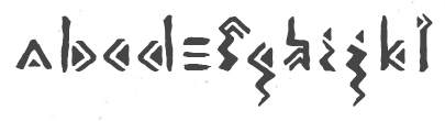 Bihac / Serajevo, Bosnia and Herzegovina-based designer of the free rough chiseled runic emulation typeface Land (2016), which was inspired by the Stecak monument and the old Bosnian script Bosancica. [Google]
[More] ⦿
Bihac / Serajevo, Bosnia and Herzegovina-based designer of the free rough chiseled runic emulation typeface Land (2016), which was inspired by the Stecak monument and the old Bosnian script Bosancica. [Google]
[More] ⦿
|
Quentin Girard
|
Graduate of EG in Brussels who works in Paris as a graphic designer. In 2017, he created Diakomistika, a typeface inspired by ancient roman and Greek stonecut fonts. [Google]
[More] ⦿
|
Raretracks (was: Monodark)
[Aulia Akbar]
|
Indonesian designer of these typefaces in 2017: Carita (round brush script with a glaz krak substyle), Borneo, Darker Time (stone chisel type), Mosqita, Segaris (curly). In 2018, he/she designed Merchants (a spurred vintage typeface), Ugly Jelly (textured), the poster typeface Barakuda, Bartholomew (Dutch deco), Raphaelum (a playful script), Tremore, Magnetum, Stabillum, Parisian (art nouveau), Chopio (a notebook font), Pristine (slab serif), Wilhelmina, Matheo Aans, and Grundschule (handcrafted). Creative Fabrica link. [Google]
[More] ⦿
|
Rasul Hasanov
|
 Designer and illustrator in Baku, Azerbaijan.
 He created the elegant Retro Baku (2018; for Latin and Cyrillic), the free experimental font Delogy (2018), a Cryptocurrency Icon set (2018), the free modular typeface Protos (2017), free stone age script Gobustan (2016: named after the 40,000 year old rock art found in Gobustan), the free gaspipe font Big Font AZ (2012), Gazal (2012) and Sharq (2012, Arab simulation face). Home page. Behance link. [Google]
[More] ⦿
|
Ray Larabie
[Typodermic]
|
 [MyFonts]
[More] ⦿
[MyFonts]
[More] ⦿
|
Red Ink
[Iryna Trigubova]
|
 Or Ira Trigubova. Kiev, Ukraine-based designer of these typefaces in 2017: the informal typeface School, Königreich (medieval blackletter calligraphic script), Sweetheart (a cutesy children's or Valentine's Day font), Coral Waves, Winter Story (handcrafted), Little Bee (+Sans: letters with bees buzzing around), Schönheit (connected script), Aisling (a monoline script), Rhapsody (connected script), Amanita, Star Dust (handcrafted), Urbano (dry brush), Tulip Garden, Meraki (a dotted ornamental sans).
 Typefaces from 2018: Paper Snow (a paper cutout font), Hunter House, Pop Art (including SVG fonts), Rivendell (uncial), Morning Tea, First Kisses (crayon SVG font), First Kiss (display sans), Summer Jelly (font duo), Fiesta (font duo: Script and Serif), Solomiya (tribal script for Latin and Cyrillic), Friday Feelings (font duo), Nightingale (calligraphy), Monogram (a set of five decorative caps fonts), Red Tomato (script), Alter Ego, Beloved. Typefaces from 2019: White Feather, English Channel (an elegant calligraphic font duo), Letter Home, Lettering Box, Rain Soul (SVG style), Rose Petals, Miracles (font duo), Tahiti Sand (a painted brush font in SVG format), Good Feeling, Little Girl, Stonehill, Broadway Lights (font duo), Love is Love (font duo), Summer Cat, Aztec Soul (a tribal / Aztec font). Typefaces from 2020: Just Imagine (blackletter). Creative Fabrica link. YWFT link. [Google]
[More] ⦿
|
Rendi Rochimah
[Hatf Type]
|
[MyFonts]
[More] ⦿
|
Richard Kegler
[P22 Type Foundry]
|
 [MyFonts]
[More] ⦿
[MyFonts]
[More] ⦿
|
Richard Starkings
[Comicraft (was: Active Images)]
|
[MyFonts]
[More] ⦿
|
Rino Avidar
|
Graphic designer in Tel Aviv. In 2019, he created the Latin stone cut typeface Epilepsy, and the Hebrew ransom note font Kolboinic. [Google]
[More] ⦿
|
Robbie de Villiers
[Wilton Foundry]
|
 [MyFonts]
[More] ⦿
[MyFonts]
[More] ⦿
|
Robert Foster
|
Designer, sculptor and type designer, b. 1895. His type designs include: - Foster Abstract (1931). Mac McGrew writes: Foster Abstract is a very heavy, serifless type of futuristic design, in which parts of some letters are suggested rather than actually presented. It was designed by Robert Foster in 1931, and matrices were cut by Frederic W. Goudy for private casting. Some letters are much like Sans Serif Extrabold. Compare Pericles. Foster Abstract was revived in 2006 by John Bomparte as Abstrak BF.
- Pericles (1934, ATF), a Greek simulation or stone cut style typeface. Mac McGrew writes about Pericles: Pericles is a distinctive font of sans-serif capitals designed in 1934 for ATF by Robert Foster, based on hand-lettering he had been doing for several years for magazine and advertising headlines. It is much more informal than other sans serifs of the time, such as Futura or Bernhard Gothic, with more of an inscriptional feeling. Some characters are derived from classical Greek forms. A 72-point size is said to have been cut but never issued. For an extension and digitization of Pericles, see Pericles Pro (2005, Ascender, Steve Matteson), a 433-glyph OpenType font. Pericles was reworked by Jim Rimmer as RTF Cadmus. P22 writes about this version: Rimmer's re-working of a design done by Robert Foster, a hand lettering artist. Foster's type, named Pericles, is a style that he used for a time in lettering magazines and advertising headings. The design is based closely on early inscriptional Greek, but is less formal than the sans types of Foster's time. Cadmus keeps the proportions of Pericles but is overall less quirky than the Foster design. A further extension (including Greek, Cyrillic and Hebrew) was done by Canada Type as Cadmus Pro (2016).
[Google]
[MyFonts]
[More] ⦿
|
Robert Martinez
|
Robert Martinez is associated with the Open Font Library (OFL). Free typefaces published by him at OFL include the modular typeface Ponyo (2012) and the counterless Flintstone style rock typeface Puk (2015). [Google]
[More] ⦿
|
RockBee
[Ivan Vasilev]
|
Graphic, web and typeface designer Ivan Vasilyev runs RockBee in Saint Petersburg, Russia. Creator of RockBee Monsters (2009), a bouncy ornamental hand-printed face. Other typefaces include RB Steel (2009, a modular metallic typeface), RB Teknokrat (2009), RB Teknon (2009, techno), RB Naftalin (2009, a free chiseled look face), RB Blockerter (2011), RB Bubble Flight (2012, bubblegum typeface). Behance link. MyFonts link. Klingspor link. Alternate URL. [Google]
[MyFonts]
[More] ⦿
|
Rodrigo Araya Salas
[Rodrigo Typo (was: RAS Design)]
|
 [MyFonts]
[More] ⦿
[MyFonts]
[More] ⦿
|
Rodrigo Typo (was: RAS Design)
[Rodrigo Araya Salas]
|
 RAS Design is Rodrigo German or Rodrigo Araya Salas, a designer from Santiago, Chile, b. 1987.
 Rodrigo Typo link. RAS Design link. Dafont link. Dafont linkNewer Dafont link. Behance link. Fontspace link. Fontsy link. Abstract Fonts link. Old URL. Creator of many hand-drawn free fonts. His typefaces from 2008 and 2009: Super (2009, for signage), Snow (2009), Mari (2009), El Cubano (2009, dingbats of typefaces), Mental Freak (2009, outline), Freak Animals (2009), Brigada Ramona Parra (2009, dingbats), Happie (2009, dingbats), Santiago Icono (2009), Icono Skate Dingbat (2009), 78 Skate (2009), The Sorden (2009), Estilo Urbano (2009, stencil), Tetris (2009), Techno (2009), Kona (2009, childish hand), Parody Logoskate (2009, dingbats), Fat Love (2009), La Rata Bizarra (2008), Tabla (2008), A Mano Alza (2009), Maribel (2009, handwriting), Stencil (2009), Rayando (2008, chalky writing), Klam, Loco TV, Monos Frekis (2008, funny dingbats), Tabla (2008), Happie (2009, more funny dingbats), Funny Icons (2009), Kiltro (2008, dog dingbats), Pokemona (dingbats), Maniatico (scratchy outlined hand), Bizarro 1 (outline hand), Chile (dingbats), Freaky (2008, dingbats), Esquiso (outlined handwriting), Crazy Ras (outlined and hand-printed), Skatelove (2008, dingbats), Los de Abajo (2008, dingbats), Logoskate (2008), David (2008, flowing ultra fat face), Destruccion (2008, grungy), Skateboarding (2008, ransom note face), Mike Valley (2008, skateboard dingbats), Rodney Mullen King (2009, skateboard dingbats), El Chavo del 8 (2008, scanbats), Grande Maradona (2008, scanbats), Saintfont (2009, hand-printed), New Tetris (2009), September 11 Icon (2009, a powerful set of dingbats), Icono BMX (2009, bike dingbats). Typefaces from 2010: Commando X (2010, a pixel dingbat typeface for computer games), Raya Irregular, Mari+David, Depressive Icon, Esquiso, Ego (2010), El Cubano (dingbats with typefaces), Barras Bravas (almost graffiti face), Globe Face (award winner at Tipos Latinos 2010). Fonts done in 2011: Logo Font, Buen Dia (ransom note face), Drugstore (blackletter), Condorita (dingbats), KingKöng (a nice fat letter comic book face), Rolo (fat letter face), Logo, Comando X (a pixelized dingbat typeface based on video games), Catbox (2011, fat and rounded), Joia (a thin octagonal face), Plop (a "hip hop font"). Typefaces from 2012: Designio (rounded sans family), Nollie, Rocka (triangulated), Mosku (paint or blood drip face), Gigio Italia Bizarre (dingbats), Conny Rocket, Retro Hand Type (stitched), Wood (wood type simulation), Tritona, Nollie, Zdravo Maria (children's hand), Bordados (stitched typeface). Typefaces from 2013: Mexe, Polly, Pintanina (+Pro) (comic book caps face; the Pro version appeared in 2015), Giger Free (inspired by the paintings of H.R. Giger), Rango (fat hand-printed face), Smile (fat signage face), Pequena (a fat finger typeface for children's books; in Latin, Greek and Cyrillic), Children One, Lollapalooza, BRP (dingbats), Koni Black, Cusco, Rorschach, Children One (poster font), Varial Hellflip, Marty (hand-drawn poster font for Latin and Cyrillic), Barricada [not to be confused with the Barricada font by Sudtipos]. Typefaces from 2014: Marty Spring, Munky Negra (a creamy signage typeface by Rodrigo Araya Salas and Raphael Rodriguez), Tobogan (ultra-black poster face), Lilirun, Peral, Zurita (brush face), Ruba, Street Animals (dingbats), NegritaPro (funky), Ruda (brush face), Muro (thick brush type), Cucho (signage typeface), BRC (hand-printed), Konga (a chocolaty creamy signage script originally from 2012), Pony, Guakala, Alboroto, Loyola (a cartoon script started in 2013, which won an award at Tipos Latinos 2018), Froh (an informal fat stencil), Paihuen Pro (Mapuche-inspired letters), Helenita (perhaps useful for children's books; see also Helenita Dos in 2017), Macabro (a great hand-lettered and weathered typeface family), Box10, Ria, Bototo. Typefaces from 2015: Mari+David, Good Friend (a primitive script), Galpon (a great vernacular signage and/or comic book typeface for Latin, Greek and Cyrillic; extended in 2020, with Bruno Jara Ahumada, to Galpon Pro), Smile Pro (a fat multi-style handcrafted poster family of exceptional beauty; together with Andrey Kudryavtsev), Ardilla Small (a rounded organic sans by Rodrigo Araya and Andrey Kudryavtsev), Konga Pro (based on his own creamy script, Konga, from 2012), Mari & David (poster typeface), Forest Puyehue, Skatista (handcrafted script and skateboard dingbats), Ruba Style, Janmeid, Forma (experimental, robotic), Australia Skate (vernacular type), Tobi Black (for comic books and children's books, +Greek, +Cyrillic), Tobi Dirt, Basural (experimental). Typefaces from 2016: Bowl, Aliengo (a fun Martian font family done with Andrey Kudryavtsev), Marty Two (a lovely handcrafted typeface, ideal for children's books), Minnie Play (a children's book typeface by Rodrigo Araya and Andrey Kudryavtsev), Camo (a layered typeface family by Rodrigo Araya and Andrey Kudryavtsev), Camo Dirt, Clarence World (with Andrey Kudryavtsev: a rounded cartoon font inspired by the logo of the Cartoon Network series Clarence; followed in 2017 by Clarence Two), Pequena Pro (+Cyrillic) (with Andrey Kudryavtsev), La Mona Kids, Konga Rock, Movskate (a skateboarding culture font by Rodrigo Araya, Juan Sepulveda and Patricio Gonzalez), La Mona Pro (72 styles: A feast of textures!). Typefaces from 2017: Hatter Display (a Halloween font), Hatter Display Pro (+extensive dingbats), Hatter Cyrillic Display, Macabro Danger (wall paint style), Checkin Script (with four sets of travel dingbats), Caleuche (a bold weathered typeface, with Andrey Kudryavtsev; but that coauthorship was altered in 2021 to Franco Jonas Hernandez), Pequena Neo, Bike Park, Bike Park Two, Kawaii RT, Clarence Two, Portena, Mi Cocina (restaurant icons and dingbats), Big Foot Forest, Clarence Cyrillic (by Rodrigo Araya and Andrey Kudryavtsev), Galpon Spring, Spike Bot (by Rodrigo Araya and Andrey Kudryavtsev), Forest Two. In 2018, Rodrigo Typo published these typefaces: Ding (a great fattish cartoon font, co-designed with Andrey Kudryavtsev and Franco Jonas; see also its extensions, Ding Pro (2019) and Ding Extra (2019)), Squick (a comic book / children's font family by Franco Jonas, Andrey Kudryavtsev and Rodrigo Araya), La Pica Pro (by Rodrigo Araya and Andrey Kudryavtsev), Catshape (dingbats by Rodrigo Araya), Tobi Pro (by Franco Jonas, Rodrigo Araya Salas, and Andrey Kudryavtsev), Spiro (a retro almost psychedelic lettering font based on the series The Boatniks; by Rodrigo Araya Salas and Andrey Kudryavtsev), La KonyBlack (by Rodrigo Araya and Andrey Kudryavtsev), Ruda Two, Nuby (Franco Jonas, Rodrigo Araya Salas and Andrey Kudryavtsev), Garita, Alquitran (based on pixacao), Alquitran Stencil and Alquitran Rust (by Francisco Paez, Rodrigo Araya Salas and Andrey Kudryavtsev), Rague Pro (a stone-cut font by Rodrigo Araya Salas and Andrey Kudryavtsev, which won an award at Tipos Latinos 2018). Typefaces from 2019: Hatter Halloween, Clarence Alt (a an almost bubblegum children's book sans by Franco Jonas, Rodrigo Araya Salas and Andrey Kudryavtsev), Nacho Rough, Naguel, Lolapeluza Two, Nacho (a Mexican party font by Rodrigo Araya and Franco Jonas). Typefaces from 2020: Minado Rough, Toretto, Diablito One (a two-font and four dingbat-font package by Rodrigo Araya Salas and Bruno Jara Ahumada), Clarence Inline (a plump informal typeface family by Rodrigo Araya Salas and Franco Jonas Hernandez), La Pica Bonus (a vernacular or supermarket style font and dingbat family by Andrey Kudryavtsev and Rodrigo Araya Salas), Ancoa Slanted (an angular display family in 15 styles; by Andrey Kudryavtsev, Rodrigo Araya Salas and Franco Jonas Hernandez), Ruina One (rough, distressed), fj Trance (a reverse contrast Egyptian by Rodrigo Araya Salas, Franco Jonas, Valentina Faundes and Jorge Morales Salas), Tunning (an all caps speed font), Skippie (a comic book family by Andrey Kudryavtsev, Rodrigo Araya Salas, Bruno Jara Ahumada and Franco Jonas, and four sets of dingbats including Skippie Monster Lucha Libre and Skippie Monster Halloween), Ancoa (an angular 19-style layerable typeface by Andrey Kudryavtsev, Rodrigo Araya Salas and Franco Jonas Hernandez). Typefaces from 2021: Rinno (a rounded geometric display family by Rodrigo Araya Salas and Franco Jonas Hernandez), Ripster, Elah (a children's book or supermarket font; with Andrey Kudryavtsev), Loyola Next (a 14-style sans by Rodrigo Araya Salas and Bruno Jara Ahumada), Clarence Pro (a vernacular supermarket font by Rodrigo Araya Salas and Franco Jonas Hernandez), Meche Pro (a 12-style ligature-rich poster typeface), Rambi, Willner (a 5-style display sans by Rodrigo Araya and Franco Jonas), Picaflor (a titling or children's book typeface by Rodrigo Araya Salas and Bruno Jara Ahumada), Picaflor Hand (by Rodrigo Araya), Picaflor Soft (a fine national park or children's book family of organic sans fonts by Rodrigo Araya Salas and Bruno Jara Ahumada). Vectorlove won an award at Tipos Latinos 2012. Mona won an award at Tipos Latinos 2014. View Rodrigo Typo's typefaces. [Google]
[MyFonts]
[More] ⦿
|
Roger Hartley
[Silver Graphics]
|
[More] ⦿
|
Rozikan Rozikan
[Twin Letter (or: Twin Design)]
|
[MyFonts]
[More] ⦿
|
Ruben Tarumian
|
 Ruben Tarumian, aka Ruben Hakobyan (b. 1963, Yerevan), is an Armenian architect and font designer, and son of architect Khachatur Hakobyan. In 1985 he graduated from the Faculty of Architecture and Construction of Yerevan Polytechnical Institute. He started designing typefaces in 1986. In 1989 he created one of the first computer fonts in Armenia, for Xerox Ventura Publishers. Since 2006 he is the chairman of NGO "Association of Type Designers".
 His typefaces include ArTarumianAnpuit (Rage Italic extension, I guess), ArTarumianBakhum, ArTarumianBarak (really BernhardFashionBT), ArTarumianErevan, ArTarumianGovazdItalic, ArTarumianGrig, ArTarumianHamagumar, ArTarumianKamar, ArTarumianPastar, ArTarumianAfrickian, ArTarumianAnpuit, ArTarumianGrqiNor, ArTarumianGrqiNorBold, ArTarumianGrqiNorBoldItalik, ArTarumianGrqiNorItalic, ArTarumianHeghnar, ArTarumianMHarvats, ArTarumian Ishkhan (for Latin and Cyrillic), ArTarumianMatenagir, ArTarumianMatenagirBold, ArTarumianMatenagirBoldItalic, ArTarumianMatenagirItalic, ArTarumianNorMatenagir. These fonts from 1994-1995 are Armenian generalizations of Latin fonts. Arian was created in 2007. In 2019, he published ArTarumianKhachatur (a fantastic architectural drafting or blueprint font) and ArTarumianVard (a lapidary or stone-carving font). Typefaces from 2020: Ar Tarumian Behrens Initialen (a revival of the art nouveau typeface Behrens Initialen by Peter Behrens; for latin, Cyrillic and Armenian), ArTarumianGrigNor (a comic book font). [Google]
[MyFonts]
[More] ⦿
|
Samuel John Ross
[Cumberland Fontworks]
|
 [More] ⦿
|
Samuel Poole
|
Son of Wesley Poole, born in California in 1984. Sam lives and works with his father Wesley in Hawaii, and has cooperated with him on these fonts that were published by Poole Foundry: - Pagoda International (2006, designed with his son Samuel Poole). A comic book font based on the lettering of the Pagoda Hotel in Honolulu.
- Poole Standard (2006). A stylish headline face.
- Poole Chiselcut (2007). Digitization with the help of Rod Cavazos (PsyOps).
- Polynesiac (2007, Wesley and Samuel together). Simulation of Easter Island lettering.
- Jigger Statz (2007).
- Contempo Elan (Grand Script and Ornamental) (2006). A festive and assertive calligraphic script done by Wesley and Samuel Poole.
- Alphaluxe (2008). A calligraphic upright connected ronde script by Wesley and Samuel.
- Vingo (2006).
[Google]
[MyFonts]
[More] ⦿
|
Sarah Lazarévic
|
 Ex-student at the Ecole Estienne in Paris (b. Estonia) whose diploma work consisted of the creation of typeface in the style of a first century typeface found in an archeological site near Millau in France. Graphic and type designer in the 15th arr. in Paris. Her early typefaces:
 - Métallo (2005): a futuristic text family.
- Vitalis (2005): titling stone-carved typeface in the style of a first century typeface found in an archeological site near Millau in France.
- Néva (2005): a Cyrillic didone face.
- Pop (2005).
Designer of the Fournier era family Rameau (2011, Linotype). Linotype writes: Sarah Lahzarevic is a graphic designer and typographer. She has worked for ten years with the photographer Max Yves Brandily. She is now working as a freelance graphic and type designer for clients such as the French Post Office (La Poste), Millau City Council and the International Francophone Organisation. She teaches graphics and typography at the Ecole Professionnelle Supérieure d'Arts Graphiques et d'Architecture de la Ville de Paris (Graduate Training School in Graphic Arts and Architecture in Paris). She is also developing her own work in copper-plate engraving. She derived the italics of Rameau from the manuscript of the opera Les fêtes de l'hymen et de l'amour, the music for which was composed by Jean-Philippe Rameau in 1747. Linotype: In the 18th century, musical compositions were published in the form of impressions from copper plates that had been hand-engraved in contrast with books and other texts, which were printed from moveable lead type. The italic letters of Rameau include many ligatures and are thus typical of the engraving style of the period. Linotype link. Klingspor link. [Google]
[MyFonts]
[More] ⦿
|
Scholtz Fonts
[Anton Scholtz]
|
 Scholtz Fonts was started by Anton Scholtz (b. Durban, 1941) in 1997. This South African design company is located in Durban, where the Zulu culture of the region has greatly influenced Anton's font design. Klingspor link
 Scholtz sells a fine selection of display types that ooze African themes. An alphabetical list: - Aarde (2005), Aarda Brush
- Ability (2009). Calligraphic
- Affable (2008). Calligrahic
- African Elegance
- African Gold (2007)
- African Jazz (2005)
- African Jungle (2007)
- African Patchwork (2008)
- African Pattern (2004)
- African Shield (2005). Patterned after the cow-hide shields of the Zulu tribe. Made by Anton and Merle Scholtz
- Afrimod
- AfroFlare
- African Textile (2007)
- Ala Kazam (2015)
- Always (2010). A fantastic swashy calligraphic face, and its multiline sister, Filigree, 2010
- Amaboxi (2007) or Amabokhisi. White on black
- Amanzi (1999)
- Aplomb (2008)
- Aqua Casual (2008)
- Arabesque (2009). A flowing calligraphic typeface
- Archivo (2011)
- Art Nouveau SCF (2008)
- Asakire (2006)
- Assegai (2007)
- Bad Girl (2008). Grunge
- Bakuba
- Baluba and Baluba Snake
- Banquet SCF (2007). Brush script
- Baobab
- Black Tie (2007)
- Blackout SCF (2008)
- Blythe (2009). Connected script
- Bongo
- Bongani (2008)
- Brazza (2008). Brush
- Brillig (2008). Informal hand
- Button (2008)
- Buzz (2008)
- Camy (2009). Hand-printed
- Carve (2008). Chiseled look
- Catholic Girls (2008). Script
- Centric (2007). Zebra-striped, or op art
- Certificate (2008). Calligraphic
- Collette (2007). After an art deco font called "Independant" designed in 1930 by Collette and Dufour
- Comical (2007)
- Coral (2008) and Coral Pro (2012)
- Crime Inc
- Crostini
- Debs (2013). Hand-printed
- Deco Doni (2011)
- Delikat (2010). A script, followed in 2013 by Thaun
- Doorn (1998), Doorn Body, Doorn Display
- DragonFyre (2008). Calligraphic
- Dufour (2011). After an art deco font called "Independant" designed in 1930 by Collette and Dufour
- Dusk Til Dawn (2012). Art deco
- Elegance SF (2005). Art deco
- Estravaganza (2012)
- Et Cetera (2015). A classy breezy connected script
- Excalibur SCF (2007). A beautiful rough-edged hand
- Fable (2007). A type family for wizards
- FadedRose
- Figment (2008)
- Filigree
- Fracture (2008). Glaz krak style
- Fragrance
- Gatsby SF
- Genevieve (2007). Calligraphic
- Genial (2009). A flowing connected script
- Giraffe Skin (2007)
- Girl Script (2008). Curly hand
- Girltalk (2008). Curly script
- Gladly (2016). A 17-style decorative and romantic typeface
- Gossamer (2011). A wedding script
- Greek (2008). Chiseled
- Groom (2007). A connected brush type
- Grunge Formal (2007), Grunge Piazza (2007), Grunge Standard (2009)
- Hard Rain (2007)
- HiTone. Niely handcrafted
- Hobi (2008). A ghastly script
- Honeybird (2011)
- Hoofer (2014). A mega family of retro scripts
- Iliad (2007)
- Inja
- Jazz
- Jolie (2015). A connected calligraphic script for romance and weddings
- Josephine (2007). Art deco
- Kassena (2006)
- Kau (2016)
- Klatter (2007)
- Kuba (2007). A tribal stencil
- Kunjani (2008). African look
- Lagos
- Leah (2008). Handwriting
- LeopardSkin (2005)
- Lovers Pro (2011). A fantastic calligraphic hand---ready for red carpet treatment
- Lualaba Snake (2007)
- Lumina (2008)
- Madrigalle (2011). A calligraphic wedding script
- Mafuta (2006)
- Makonde (2007)
- Manhattan Midnight
- Margaux (2013). A vintage 1900s script
- Martini Script (2011)
- Maypole (2007)
- Melodica (2012)
- Miss Donna (2009). A script typeface
- Mtwane (2009)
- Nocturne (2012). An art deco family based on work from the 1920s by Paul Carlyle and Guy Oring
- Noobia (2013). An inky pen font
- Nordika
- Oxamu (2009). A wonderful angular African-themed font
- Pacific Script (2011). A font inspired by an alphabet created by Howard Trafton in the 1930s
- Palm Court (2007). A Bauhaus typeface by Merle Scholtz
- Parchemin (2008). Parchment look
- Phat Chance (2008). Organic
- Piazza (2007)
- Proper (2008)
- Qotho (2010). An almost architectural sans family, done with Merle Scholtz
- Queen (2008). Nice handwriting
- Quirky and Quirky Kurlz (2013). A spidery script based on a book of etchings by British artist Graham Clarke
- Refresh A 1950s script
- Riposte (2009). A dynamic script
- Romi (2008). A thin calligraphic typeface
- Rondalia (2008)
- Sage Sage (2008). Brush script
- SandWriting (2007)
- Sangoma (2007)
- Scratch SCF (2007). A scratchy hand
- Scrittura (2011). Calligraphic. +Antiqua, +Fantasia
- Shapely (2010). Swashy calligraphic typeface
- Silken (2009). Calligraphic
- Siyabonga
- Silver Dagger (2007)
- Smart Casual (2007). An artsy architectural typeface by Merle Scholtz
- Sondela (2007)
- Spaza (2007). African look
- Sprig (2010). A signpainting typeface
- Stoan (2008)
- StoneWash (2008). Grunge
- Tabwa (2007) Inspired by Koch's Neuland, but on an African theme
- Tamboti
- Tertius (2008). Also, Tertius Romantic and Tertius Crenellated (2008). Scripts based on the Carolingian hand
- Thaun (2013)
- Thought (2009)
- Thystle (2010)
- Tokoloshe (2008)
- Toulouse (2007). Art nouveau handcrafted typeface
- Tshikona (2005). Hand-crafted
- Tsotsi (2007)
- Ubuvila (2004)
- Umkhonto (2003)
- Umoya (2009). Organic
- Utshani (2000). African theme
- WildSong (2010). A calligraphic script
- Woodcarve.
- Write Now (2008). Connected script
- WriteHand (2008)
- Yseult (2009). Script
- Zaire SF (2007)
- ZebraSkin (2007)
- Zest (2007)
- Zim (2007). Octagonal
View the typefaces designed by Anton Scholtz. [Google]
[MyFonts]
[More] ⦿
|
Shimanov Types
[Alexander Shimanov]
|
 Russian graphic designer, graffiti writer, and lettering artist, b. 1980, USSR.
 Typefaces from 2022: ST Titan (retro futuristic). He released these Latin / Cyrillic typefaces in 2020 and 2021: Druzhba (a retro bold display font), Komsomol (stylish retro grotesque), Kooperativ (Soviet poster), Petrovica (Russian Emperor), ST-Bubblegum (ultracondensed), ST-Departament (80-90s sci-fi), ST-Druzhba (retro bold display), ST-Gaidar (cartoonish; a Flintstone or chiseled rock font), ST-Nizhegorodsky (Neo Cyrillic), ST-SimpleSquare (simple square), ST-Tokyo (oriental emulation), ST Saturn (retro futuristic), Stengazeta (retro grotesque). In 2019, he designed Meteoritika (a retro science font) and Agitaciya (Soviet propaganda). [Google]
[MyFonts]
[More] ⦿
|
Shintarou Nakayama
[Gomarice Font (or: Goma Shin)]
|
 [More] ⦿
|
Silver Graphics
[Roger Hartley]
|
Company run by Roger Hartley, Pennington Gap, VA. The link went dead--its parent is The Design Center / DT&G. Some of the fonts are shown here: the Western fonts Hoedown and Laredo, the blackletter fonts Showcard, Water Lily, the caps font Penelope, the medieval script font Hemingway, the athletic lettering font Yorktown, and display typefaces Wellington (round hand calligraphy), Rumrunner, Rathskeller, Norseman, Almanac, Apothecary, Applegate, Archer, Archer Shadow, Carrie Lane, Dutch Master, Emporia, Flavius, Gigabyte and Hapsburg. All these are on their 60 USD CD called "The Great American Font Works", which has (had!) 132 nice decorative display fonts in all. In the old days, the font Jaclyn could be downloaded for free. The list of fonts, all made in the period 1992-1995: AceReporter-Bold, AceReporter-BoldItalic, AceReporter-Italic, AceReporter-Normal, Alchemy-Black, Alchemy-Bold, Alchemy-Light, Alchemy-Normal, Almanac, Antigone, Apothecary, Applegate, Archer, ArcherShadow, Aztek, Bandit, BaroniPoster, Bastion-Bold, Bastion-BoldItalic, Bastion-Italic, Bastion-Normal, Bebop, BerniesJukeJoint, BrightSky, CarrieLane, Chiaroscuro, Compute, Delphi, Derby, Duffy, DuffyInline, Durham, DutchMaster, Emporia, Entendre, Enterprise, EuroBold, Fairlane, Fatso, Figment, Flavius-Wide, Flynn, FlynnHollow, FriarTuck, Galaxy, Gigabyte, Gorky, GravureText, GuildSans-Bold, GuildSans-BoldItalic, GuildSans-Italic, GuildSans-Normal, Hapsburg, Hemingway, Hoedown, IBeam-Extruded, Inagodda, Ivanna-Mediaeval-Bold, Ivanna-Mediaeval-BoldItalic, Ivanna-Mediaeval-Italic, Ivanna-Mediaeval, Jaclyn, Jalopy, Jamaica, Jitterbug-Bold, Jitterbug-BoldItalic, Jitterbug-Italic, Jitterbug-Normal, Jitterbug, JitterbugB, JitterbugBO, JitterbugO, Kapanti, Kashmir, Kasparov, KeyWest, Keyclick, Krypton3, LED, Laredo, Layla, MardiGras, Marilyn, Matinee (their name for Busorama), Metro, Monica, NewWorldText, Norseman, Obsidian, Parade, Peacenik, Penelope, Phoebe, Pompeii, PompeiiB, PompeiiBold, Projectile, Publisher, Quasar, Radical, Rathskellar, Rathskeller, Recycler, RibaldEncounter-Bold, RibaldEncounter-Normal, Roundup, Rumrunner, Sailing-Freehand, Sanford, Satchmo, Scratch, Secret, Serenade, ShowBiz, Showcard, Sigmond, SilverDollar, SkinnyDip, Sophocles (Greekish stone-cut writing), Sport, StCroix, Sunshine-Bold, Sunshine, SunshineB, Superbowl, Taiwan, ThisEndUp, Toons, Tophat, TophatEngraved, TraciJo, TwinTubes, Twizzler, VanRose, WaterLily, Wellington, Westchester, Westside, Yorktown. [Google]
[More] ⦿
|
Silverleaf Studio
|
Silverleaf Studio is a Leicester-based graphic design consultancy studio. Cave paintings inspired them to create the typeface Wild. [Google]
[More] ⦿
|
Silvio Napoleone
|
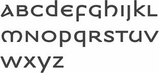 Silvio is the Toronto-based designer of ITC Napoleone Slab (2001) and the Greek simulation font family ITC Medea (2003). He also published FF Hydra (2002), an extensive family. He graduated from the Philadelphia College of Art in 1993, and is currently working at Crescent Design Consultants in Toronto. There is a slight question as to whether ITC Medea was based on the source code of UnciTronica (Manfred Klein, AI, 1994). [Google]
[MyFonts]
[More] ⦿
Silvio is the Toronto-based designer of ITC Napoleone Slab (2001) and the Greek simulation font family ITC Medea (2003). He also published FF Hydra (2002), an extensive family. He graduated from the Philadelphia College of Art in 1993, and is currently working at Crescent Design Consultants in Toronto. There is a slight question as to whether ITC Medea was based on the source code of UnciTronica (Manfred Klein, AI, 1994). [Google]
[MyFonts]
[More] ⦿
|
sisoowe
|
Creator of the Flinstone typeface Thick (2009). [Google]
[More] ⦿
|
Slobodan Jelesijevic
[Tour de Force Font Foundry]
|
 [MyFonts]
[More] ⦿
[MyFonts]
[More] ⦿
|
Smartfont
[Stanislav Hatznik]
|
Ukrainian designer of the techno typeface family Sfera (2018), which includes Sfera Stencil. Sfera was inspired by titanium bullet resistant combat helmets. Typefaces from 2019: Predictor (a modular piano key typeface), Writer Autograph (a monoline script). Typefaces from 2020: Flogotop (an 8-style titling sans family). Typefaces from 2021: Gorus (a 30-style all caps monolinear sans with industrial strength square counters), Bill Poster (with t he rhythm of a piano key font), Neosim (a cartoon or stone age font), Flogotop Logo Mark. [Google]
[MyFonts]
[More] ⦿
|
Sofia Alejandra
|
Mexican designer of the Greek emulation typeface Leppardy (2017). [Google]
[More] ⦿
|
Sos Sosowski
|
Polish designer (b. 1987) of the angular Flintstone typeface Allegro Cartoon (2015). Dafont link. [Google]
[More] ⦿
|
Spark-Ceresa
|
Type designer who created Mecanorma Zambesi, an ornate African-looking biline face. To be bought from URW. [Google]
[More] ⦿
|
Stanislav Hatznik
[Smartfont]
|
[MyFonts]
[More] ⦿
|
Stella Roberts
[Stella Roberts Foundry]
|
[MyFonts]
[More] ⦿
|
Stella Roberts Foundry
[Stella Roberts]
|
 Type designer in Sunrise, FL, who created a coop style foundry for a charity that pays for the medical bills of her siblings. Some typefaces are made by guest designers such as Jeff Levine, Ray Larabie, Matt Yow, and Brad O. Nelson. The list of typefaces:
 - Ali SRF (2012). By Ray Larabie.
- Austrual SRF (2012). By Jeff Levine: star dingbats.
- Big Jim Roberts SRF (2012). Named after Stella's father, this is a seventies retro face.
- Cardholder Dispute SRF (2012). By Ray Larabie, based on his own old freeware font Cardholder Dispute SRF.
- Consonant SRF (2012). By Jeff Levine based on an old Ray Larabie font.
- Dastardly Deeds SRF (2012). A stick font by Ray Larabie and Jeff Levine.
- Devama SRF (2012). A mini-stenciled typeface by Ray Larabie.
- Dirty Money SRF (2012). A dollar bill font designed by Brad O. Nelson.
- Femi SRF (2012): a black monoline grotesk caps face.
- Fenimore SRF (2012). An art deco typeface by Jeff Levine, related to hius own Theater District JNL.
- Fitz Sans SRF (2012). By Matt Yow.
- Hem and Haw SRF (2012). A stitching font by Ray Larabie based on his earlier typeface Stitchen.
- Infantry SRF (2012). By Jeff Levine, an update of his old freeware dingbat font Infantry (1999).
- Mancave SRF (2012). A stone age typeface by Jeff Levine.
- Marginal Notes SRF (2012). A hand-printed typeface by Ray Larabie.
- Mevada SRF (2012). By Ray Larabie.
- Ovala SRF (2012). By Ray Larabie.
- Playya SRF (2012). A graffiti tag font by Ray Larabie.
- Ranger Rays Rocketeers SRF (2012). By Jeff Levine, based on an old freeware space-age dingbat font.
- Seminar SRF (2012). Jeff Levine overhauled a Peignotian / Optima-style typeface by Ray Larabie.
- Transaction SRF (2012). A dot matrix font by Ray Larabie.
- Wesley SRF (2012). A Ray Larabie original.
- Wrenchworks SRF (2012). Ray Larabie and Jeff Levine cooperated to bring this mechanical octagonal outline face.
View the typefaces at Stella Roberts Foundry. [Google]
[MyFonts]
[More] ⦿
|
Steve Matteson
|
 Rochester Institute of Technology's School of Printing graduate who lived in California and in Holland, MI, and now resides in Louisville, Colorado. He was a disciple of Chuck Bigelow and Kris Holmes. MyFonts page on him. In 1990, he started work at Monotype in Palo Alto to create the Windows truetype core fonts Arial, Times New Roman and Courier New. He stayed with Monotype and then Agfa/Monotype until 2003 (when he was probably fired, but that is only an unreliable guess), directing type development from the design office in Palo Alto, CA. Bio at Agfa/Monotype. He has directed branding projects such as Agilent Technology's corporate sans serif and Microsoft's corporate font family 'Segoe'. At the same time, he was involved in producing bitmaps and outline fonts for cell phones and TV set top environments. He has worked extensively designing Greek, Cyrllic, Thai, Hebrew and Arabic alphabets to satisfy the requirements of customers such as IBM, Microsoft, Nokia, Sun and Sybase. In 2004, he co-founded Ascender Corporation in Northbrook, IL, where he remained Type Design Director until Ascender was bought by Monotype, where he now heads the type design team (12 people in all, as of 2013).
 CBC interview in 2012. Fontspace link. FontShop link. At ATypI 2011 in Reykjavik, he spoke on typefaces for Android OS. His typefaces: - Amanda.
- Andale Mono (Monotype), Andale Mono (Ascender). This is a monospace sans-serif typeface designed for terminal emulation and software development environments. It was originally created by Monotype. Andalé Mono was first distributed as an Internet Explorer 4.0 add-on under the name Monotype.com. In version 1.25 of the font, it was renamed to Andale Mono, distributed with Internet Explorer 5. It is often used by programmers, and is bundled with Mac OS X.
- Andy (Monotype), his first face, a design based on a friend's lefty handwriting. Published at Agfa's Creative Alliance.
- Arimo (2010). A free sans family at Google Web Fonts that is metrically compatible with Arial. TeX support and further downloads on CTAN.
- Ascender Sans Mono (2004-2008, Ascender). Metrically compatible with Courier New. Ascender Serif (2005, 4 styles) is metrically compatible with Times New Roman.
- Ascender Uni Duo is a fixed-width comprehensive Unicode-compatible font available with support for the Unicode Standard. Ascender Uni Duo is a 39MB TrueType font with approximately 53,000 glyphs. The Latin and related glyphs (designed by Steve Matteson) are Sans Serif, with Gothic ideographs drawn in Japanese style, and complementary styles for other scripts. There are also versions of Ascender Uni that provide localized support for Korean, Simplified Chinese and Traditional Chinese. OpenType layout support is included for Arabic (initial, medial, final, isolate, and required ligature forms, as well as basic mark positioning), and vertical writing for CJK locales (consisting mostly of Latin, symbol, punctuation, and kana glyph variants). Character Set: Latin-1, WGL Pan-European (Eastern Europe, Cyrillic, Greek and Turkish), Chinese, Japanese, Korean, Thai, Vietnamese, Hebrew, Arabic. Ashley Crawford.
- Ascender Sans (Ascender).
- Ascender Serif (Ascender).
- Ayita (2006, Ascender), a decorative sans family co-designed with Jim Ford.
- Bertham Pro (2009, Ascender). Four styles including Open, after Goudy's Bertham.
- Bierstdat (2021). A sans typeface that could replace Calibri later in 2021 as Microdoft's go-to font in Microsoft 365 apps.
- Blueprint (1993).
- Binner Gothic (Monotype).
- Blueprint (Monotype).
- Cambria (Ascender).
- Carnero (2019, Monotype). Steve describes this sans family as a feisty hybrid of precise geometry and calligraphic flair.
- Chicory (2006, Ascender). A calligraphic script face.
- (2010). A free family at Google Code that is metrically compatible with Courier New. See also OFL.
- Creepy (Ascender Corporation): a Halloween font designed with Carl Crossgrove.
- Curlz (1995, Monotype). Done with Carl Crossgrove, based on wrought iron on chairs.
- Dempster (2016, with Jim Ford at Ascender). The original iangular industrial design, by Jim Ford, goes back to 2010.
- Droid Sans Mono Pro (Ascender), Droid Sans Pro (Ascender), Droid Serif Pro (Ascender). and Droid Sans Mono: a font family designed in 2006-2007 by Steve Matteson at Ascender for Google's Android project, mobile phone software for handsets. Free download at CTAN.
- Dujour (2005, Ascender): an art deco revival of the 1930's typeface Independant by Joan Collette and Jos Dufour for Plantin. Compare with the free Independant by Apostrophic Labs.
- Endurance Pro (2009, Ascender): neo-grotesque sans. Endurance Pro Cond (Ascender).
- Facade (Monotype).
- Fineprint (Monotype). A design loosely based on his own penmanship ("on a good day"). Another Creative Alliance face.
- Friar Pro (2009, Ascender): Friar Pro is a revival of Frederic W. Goudy's "Friar" typeface. Goudy described this typeface design as a 'typographic solecism' as it combines a lowercase of half-uncial forms from the 4th through 7th centuries with an uppercase of square capitals from the 4th century. Friar was originally designed in 1937 and used to print a Christmas keepsake produced by Goudy and printer Howard Coggeshall. The fire that burned Goudy's studio in 1939 destroyed the drawings and matrices before many metal fonts were cast. Of all that was lost in the fire, Goudy once said he missed Friar the most.
- Futura Now (2020: a 107-style family by Steve Matteson, Terrance Weinzierl, Monotype Studio and Juan Villanueva, that includes variable fonts as well as subfamilies called Text, Display, Headline, Inline, Outline, Shadow and Script).
- Georgia Pro (Ascender).
- Gill Floriated Caps.
- Goudy Fleurons (2010, Ascender).
- Goudy Modern MT (Monotype).
- Goudy Ornate (2002). Unsure if Matteson made this or Carl Crossgrove.
- Kennerley. Based on Goudy's Kennerley family.
- Kidprint (Monotype).
- Kootenay (2006, Ascender), a sans family.
- LeBeau (Ascender): a signage font.
- Liberation Mono, Sans and Serif (2007-2009, Ascender). A set of free open source fonts done for Red Hat Inc.
- Lindsey Pro (2006, Ascender): a cursive script based on his niece's hand.
- Louisville Script (2008, Ascender): ordinary handwriting.
- Massif (2006-2011, Monotype). Odd name, since Jean Joveneaux made a font called Massif in 1957. How can Monotype get away with a trademark for this is beyond me.
- Mayberry (2008, Ascender): a 14-font sans family with extremely large x-height and strange proportions. Mayberry semibold is free. Mayberry Pro (Ascender).
- McZee, a Microsoft symbols font.
- Miramonte Pro (2006, Ascender). A geometric-meets-humanist sans after the typeface Marsuv Grotesk by Stanislav Marso at Grafotechna, 1960.
- Open Sans (2010, Ascender). A free family by Steve Matteson. See also at Google Fonts. In 2021, he added the rounded companion, Open Sans Soft (20 styles).
- Overpass and Overpass Mono (2011-2019), designed by Delve Withrington, Dave Bailey, and Thomas Jockin. A free open source sans font. The design of Overpass is an interpretation of the well-known Highway Gothic letterforms from the Standard Alphabets for Traffic Control Devices published by the U.S. Federal Highway Administration in 1948. It was created for Red Hat Inc. Dedicated web page. Link at Delve Fonts.
- Newstyle. Based on Goudy's 1921 typeface, Newstyle. See also Newstyle (2018, Steve Matteson).
- Pericles Pro (2005, Ascender): an Ascender typeface based on the work of Robert Foster who created the original for American Type Founders in 1934), a 433-glyph OpenType font for Greek simulation or stone cut looks.
- Pescadero Pro (2005, Ascender),
- Pescadero Pro: a serif face.
- Rockwell Team (Ascender): an athletic lettering face.
- Rebus Script (2009, Ascender): done with Terry Weinzierl.
- Scooter Script (2009, Ascender): comic book style face.
- Segoe Chess (Ascender), Segoe Mono (Ascender), Segoe TV (1997-2004, Ascender: done for MSNTV).
- Tinos (2010). A free serif family at Google Fonts that is metrically compatible with Times New Roman. Download at CTAN, where one also finds TeX support maintained by Bob Tennent. Nerd Fonts patch.
- Tipperary eText (2012-2013), Monotype.
- Titanium Motors (2012, Monotype), Titanium (2006, Ascender): techno typefaces.
- Truesdell (1994, Monotype): a revival and extension of the "lost" Goudy types cut in 1931. Also at Creative Alliance. Also includes Truesdell Sorts.
- Tucker Script (2009, Ascender): ordinary handwriting face.
- Twentieth Century Poster (2002), an art deco display font straight from the late 1920s.
- VAG Rounded Next (2018, Monotype). Developed under the direction of Steve Matteson, this revival of the 1979 classic corporate font of Volkswagen AG has new weights and adds support for Greek and Cyrillic. The MyFonts site co-lists Tom Grace as designer.
- Verdorgia (2010): an ugly duckling.
Klingspor link. Fontspace link. View Steve Matteson's typefaces. [Google]
[MyFonts]
[More] ⦿
|
stillerhimmel
|
German designer of the stone chisel font Capitalis Goreanis (2009). [Google]
[More] ⦿
|
Stone Age
|
An all caps stone age / Flintstones typeface created in 1994 by Bitstream. [Google]
[More] ⦿
|
Stone age fonts
|
By stone age fonts (this page), we mean fonts that could have been carved in stone by primitive men--these are necessarily angular typefaces with few curves. A prime example is Adobe's Lithos, designed by Carol Twombly. There is a way of looking at these typefaces as faux Greek (or: simulating Greek), as ancient Greek inscriptions have that same angular construction. [Google]
[More] ⦿
|
Struvictory Art
[Viktoryia Strukouskaya]
|
 Struvictory Art (Hrodna, Belarus) is run by Viktoryia Strukouskaya and Viktor Strukovski. Most of their typefaces are jointly designed. Their creations include the patterned typeface Endless Hygge in 2017. In 2018, they designed the decorative Mexican flavor typeface Mexico, the textured Nordic Tale, the tribal font Solaris, the color font Jazz, the floral typeface Gardenia, Insectarium, Folk Tile, the alchemic typeface Majolica (released in 2019 as Maiolica), Rustic Spring, Africa, and the tribal African font Tabu.
 Typefaces from 2019: Runista, Runista Symbols, Wigwams, Aronia, Norwolk (a Nordic folklore font, +Symbols), Solarica (a tribal font family), Agnostic Font (a hipster font), Modesto (arts and crafts style font), Wigwam and Wigwam Symbols (a tribal font), Sealife. Typefaces from 2020: Moonwild (a celestial font and symbol set), Moonwild Decorative, Okaeri (a Japanese emulation foint), Quizles (a stencil serif), Doubleganger (a Peignotian typeface for fashion magazines that plays on two different widths), Hedonist (a great modern poster sans). Typefaces from 2021: Hygge Adore (a hairline slab serif), Geonica (a great geometric deco typeface), Le Tarot (a spurred celestial font), Stonage (stone age letters and patterns), Foliart (floriated, blackboard bold; originally called Foliar), Mystyline Decorative, Ajoure (a folk art font that includes a set of symbols). Typefaces from 2022: Nomad Decorative (a decorative boho font). [Google]
[MyFonts]
[More] ⦿
|
Sudiotype
|
Designer in 2019 of Water Spring, Bainai and Brexistone (a Flintstone font). [Google]
[More] ⦿
|
Sultan Fonts
[Sultan Mohammed Saeed]
|
 Aden, Yemen-based designer of several typeface at Sultan Fonts (est. 2003 by Sultan Mohammed Saeed), which is run by Sultan Maqtari [I do not know the relationship between Sultan M. Saeed and Sultan Maqtari though]. Sultan Mohammed Saeed Noman was born in Aden in 1962. He was the first to computerize Musnad (Old South Arabian Writing System) in Unicode (at the Linguistic Department of the University of California 2007). He developed more than 90 Arabic font between 2000 and 2017. Author of the book Sultan's Fonts (2009). He developed a Naskh typeface that simulates Quran publishing. In addition, he taught graphics at several institutes, such as CISCO, New Horizons, Balfaqih.
 Typefaces from 2013 until 2014: Nizar (a Latin/Arabic script typeface), Sahareeg, Pumice, SF Change (2012; a cursive typeface for Latin, Arabic, Urdu, and Farsi; an award winner at The 2014 Horouf Type Design Competition; see also SF Change Pro (2020)), Hussein. Typefaces from 2016 include SF Mada. Typefaces from 2017: SF Tobba, SF Old South Arabian, SF Yazan (inspired by oriental kufi and Qairawani kufi), SF Sultan. Typefaces from 2018: Sultan Ruqah (for Arabic, Persian, Urdu, Uthmani, and Kurdish), SF Marwa, SF Droob7 (original from 2014, covering Arabic, Persian, Urdu and Latin), SF Mabsut (an Arabic typeface in the style of Maghribi (Moroccan Mabsut)), SF Saggar (SF Saggar is a Naskh style Arabic typeface that is inspired by an alphabet written by the calligrapher and artist Mohamed Said Al-Saggar in the 1970s to simplify Arabic printing), SF Nizar (2014-2018: a Latin / Arabic Ruqah style typeface based on the handwriting of poet Nizar Qabbani; followed in 2020 by Sultan Nizar Pro), SF Handwriting (a set of school fonts for Latin and Arabic). Typefaces from 2019: SF Abyan (for Arabic, Persian, and Urdu), SF Khaled. Typefaces from 2020: SF Manchit, SF Pumice. Typefaces from 2021: Plain (an 18-style variable Arabic font by Sultan Maqtari), SF News, SF Article (Arabic and Latin). Typefaces from 2022: SF Hussein (a Flintstone font), SF Liberty VF (the variable font versions of SF Liberty), SF Liberty (a workhorse organic sans in 18 static styles). [Google]
[MyFonts]
[More] ⦿
|
Sultan Mohammed Saeed
[Sultan Fonts]
|
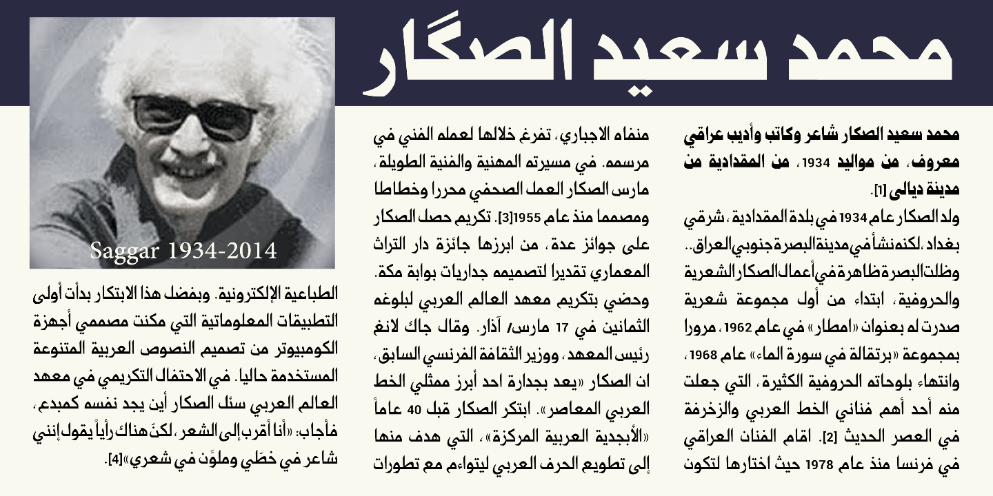 [MyFonts]
[More] ⦿
[MyFonts]
[More] ⦿
|
Svetlana Kovylina
|
During her studies at BHSAD in Moscow, Svetlana Kovylina designed Stone (a great Cyrillic display typeface). [Google]
[More] ⦿
|
Syaf Rizal
[Khurasan]
|
 [MyFonts]
[More] ⦿
[MyFonts]
[More] ⦿
|
Syamsinar Kusumawardani
|
During her studies at Limkokwing University in Kuala Lumpur, Malaysia, Syamsinar Kusumawardani created the chiseled typeface Nahuati (2014). [Google]
[More] ⦿
|
Tarcisio Benevides
|
Sao Paulo, Brazil-based designer of the Greek simulation typeface Kasibue (2015). He explains that it is actually influenced by the simplicity of Amazon tribes. Behance link. [Google]
[More] ⦿
|
Tattoo Woo (or: JSH Creates, or: Smokewire)
[Jonathan Stephen Harris]
|
 Tattoo Woo (or: Smokewire) is American tattooist Jonathan Harris. He also runs JSH Creates.
 In 2011, he created the curly gothic tattoo typefaces Hot Chocolate Latte, League of Ages, Royal Inferno, Tribal Times and Tribal Dragon, and the spiky typeface Quasari (2011). He also made Jelly Swirls (curly), Highway to hell, What a mess (grunge), Pixie Moon, Sword Thrasher, Starship XXXII (Star Trek face), Christmas Snow (art nouveau snowcapped glyphs), and Jazzy Caveman (a stone age face). Typefaces created in 2012: Bright Star Tonight, Harristoon, a crayon series (Crimes Times Six, Colored Crayns, XXX Dirty Jokes XXX, Harris Wear, Black Crayon), Alien Mutations Begin, Vineyard Magazines, Forbidden Land (scratchy face), Way Gardens (flowery script), Pencil Shading, Cartoon Shadow, Heart Shapes, Sassy Stark, Back to School, Black Eye Peas, Silly People, Street Art (a great ink splatter font), Heartbroken, Jen Luves Ben Forever, Heart Broken, Catalina, Anywhere but home, Holly Christmas, Kringley Christmas (dingbats), Seasons Greetings, Cheese Cake, Abraham Heights, Call me maybe (sketch font), Lydia Puente (calligraphic script), Tribal Script, The Daily Bread (a beautiful ronde), Naughty Nights, a set of four Asian brush style typefaces (Japanese Style, All Yoko, Chinese Asian Style, Chinese Takeaway), Hey Cutie, Zing Easy (brush), Kids Play, Keep It Simple (loopy script), Standing Tall (anguished Kafkaesque typeface), The Abandoned Treasure (brushy caps face), The Mocking Bird, Nighty Nights, Road Trip, Been Hanging Around, Divided Nations, Dodger Gear, The Best Night (brush), Stencil Brush (brush), Quite Chocolatey, Round About (stitch font), Physics Teacher, Madman Howling, Love Sequel, Cross Out, My Mistake, Colours of Autumn, Da Streets (graffiti face), Hard Fox (stencil brush), You Are Precious (curly script), The Blue Oasis, Dysfunctional Family (brush face), Lovely Excuse (brush family), No Fear (brush face), Dead End, The Art Show (brush face), Comical Smash, The Quick, The Lost Paintings, Stone Age, Eyeliner Tattoo, Sketch Pad, Art Class (spilled paint face), Ink Studio, Stay Holy Okay, Water Park (bubblegum face), Urban Jungle, Geez Seriously (curly typeface), Crazy Weekend, Slimeball, Real People, A Brush No, Beware of the Hogs (blood drip typeface), Definitely Maybe, Draw Freehand, Bloodthirsty (blood drip font), Zombie Slayer (blood drip font), Your Bloody Choice (blood drip font), Barn Animals, Comic Strip, Scribble Fun (textured face), Boom Shanker, Girly Punk, Pucky, Spray Break, Font Insane, Fairground, Last Breath (2012), Follow Your dreams, Together Again, Drawing Guides, Death Branch, Panda Spots, Fuzzy Bear, Threadz Needle, Homeboy, Hairs Dens Bag, Primitive Alien, Bonney Lass, Cake Nom (3d and shaded), Headshop (psychedelic), Tribal Butterflies (dings), Tribal Dragons Tattoo Designs, Tribal Animals Tattoo Designs, Abstract Alien Symbols, Jewelry Design Shapes, Wander Ball, Love Hue, The Fat Store, Chooka Zoon (bubblegum face), Happy Roxy, Hearts and Stars, Arcade Book, Teaspoon Display (swashy calligraphic face), Ready Black (another swashy calligraphic face), The Lodger Rang (gothic script), Sketch Book, Sketchline, Drafting, Last Breath (tattoo font), Drawing Pad, Child's Play, Design Bubble, A Stitch Plus Nine, Ming in Bling (comic book shadow face), You Are Something (curly script), Hot Pink, How To Do Something (comic book face), I Love What You Do, Get Wet. Typefaces from 2013: Seaside Heights, Falling Rain, Ace Records, Today People, Night Adder, Squicky (curly font), No Messin (scratchy brush), Wrong Tracks, Postcard From Mars, Aluminum Trucks (script), Life Azures, The Waddys, The Angels, Oliver Richards (brush face), Arabic Magic, Messenger, Anxiety Management, Basterds, Beep Beep, Suburban Legends, Street Wild, Abreviater, Snowmania, Yak Shamash, Booday, Everyday Mayhem, Mega Team, Beaty Pagent (sic), Monster Unleashed, Hopeless Place, Alley Cat, The Lovers, Crazy Rascals, Golden Star, Gimme Your Love, Every Freakin Night (a sketched poster face), Big Top, Hopeless Place, The Lovers, Alley Cat, Queenie Beebie, Swirly Shirley (curly script), Dark World (scratchy face), Fun House (sketched face), Ultimate Chaos, Wake Me Up, Find A Way, Fat Tats (signage script), Big Winks, Nothing To Lose (blood drip typeface), Art Brewery (brush font), Holiday Blues (scratchy brush), Punked Out, The Jolly Rancher, Quite Mighty, Smudgie Crayon, Squiggley Brown, Morning Star (brush face), No Talking Allowed, Butter Finger (scratchy typeface), Mad Beef (thin script), Dinosaur, Reed of Love (a textured script face), First Grader, School Holiday (brush script), Spin Head (sketched face), Russian Roulette, Blah (brush face), Eating You Alive (brush face), Christians United (brush face, same as Blah), Beginning of Summer (brush face), Something Strange (blood drip font), Messy Script, Broken Ink, Car Wash, Head Case (a very curly script), Barn Owl, Ruff Ruff, Shadow Jumper, Barn Oil, Phantom Ghost, Tardy Kid, Scrapbooking, Fiesta Time, Science Project, Oh No Not Again, Oh Shit (brushy), Teaser Houses, Eternal Fascination (connected script), Shades of Black, Bingo Bangos (brushy script), Street Fighter, Marker Pen (brush), Home and Away (brush), Spring Cleaning, Scribble Table, Sound Heart, Imagination Station (a heavy brush face), Teddy Bear, Good Day, Easy Rider (retro script), Silent Reaction, Today is the Oldest and Youngest (tall condensed script), Brush Strokes, Texas (brush), Messing About (scratchy hand), Kindergarten (hand-printed), Oh No (dusty typeface), Art Studio, Crazy Horse (great grungy brush), Time Machine, Strings and Things (sketched typeface), Twisted Brother, Big Easy, Egyptian Nights, Demolished, Lazy Girls, Angels Message (pixie dust script), Medieval Queen, Kings and Queens (swashy script), Admiration Pains, Confetti Stream, Hill Billies (signage face), Sweet Heart, Manhunter, Beware of the dog, Kiss Me Quick (Valentine's Day script), Atomic Number (a chalky dusty typeface), Potted Balls, The Boatman (graffiti font), Dead Island (brush face), Age to Age (swashy brush), Sticky Things (brush face), Lasting Love, Beware of the Zombies, Skyscraper, Coffee House, Rough Rider (fat brush face), The Green Life, National Cartoon (sketched 3d face), True Lies (brush face), Heron's Nest (sketched), Freaky Friday, Be There Soon, Praying Angel, Leap of Faith (graffiti brush), Beginning Yoga (brush script), Tims Grocery Store, Biogalaxy, Funga Donga Binge, Sketchbook Challenge, Arsonist, Say No to Drugs, Frizzled Planet, Decayed in Sixty Seconds. Typefaces from 2014: Believer Fever (tattoo script), Millennium (sketched font), Everything Holiday (tattoo script), Angel Warriors, Ghetto Master, Going Rogue (3d, hand-printed), Times Are Hard (brush), Oliver Twist (fat brush), Story Book (brush face), Rockers, Berty Script, Broken Promise (textured all caps typeface), Paranoid Freak (a great scratchy typeface), Nitya HK (or: Drawing Practice: a sketch font), Early Bird, British Quest, Crazy Thoughts (fat brushy script), Teenage Dreams, Renegades (hairy, grungy), The Pits (crayon font), Always Beside You (tattoo script), Greed (fat brush), Sea Reef, Sandy Bay, Fun Crayon, Mother in Law (caryon brush), Asylum Mansion (fat brush), Taking Notice, Basquiat, The Beach, Open Hours, Paranoia (brush typeface), Beast of Avalon, Motives, The Hit, Air Heads, Painted Lady (brush script), Born Wild (fat brush), Rebel Beat, Across the Road (script), Zentaiges (script), Fearing Madness (tattoo font), Rags to Riches (a great brush face). Typefaces from 2015: Merry Christmas Tree, Christmas Trees Celebration, Fun Christmas Trees, Ocean Rotation, Street Sound (thick brush), Without Notice (thick brush font), Slowed Down (brush font), Girlfriend (sketched shaded beauty), The Others Are Here (scary brush font), Government Torment (brush font), Love Rock, Skid (charcoal brush), Redrum (grungy brush), Charcoal, Home School (textured), Mona Shark (textured 3d typeface), Cookie Dough, Minimum Loss, Moonstreet, Friday Lovers, Broken Dreams, Cutie Pie, Freedom Fighters, Cooperation Nest, Magic Pies (rough brush script), Rain Tax. Typefaces from 2016: Loads of Love, Personal Delinquent, The Right Thing, Devastated (scratchy style), Broken Ground, Slimed, Cartoon Madness (sketched), Anything For You, Sketchy Script, Beautiful Vampires (scratchy), Think Nothing, Barn House (paint or blood drip typeface), Thready Bear, Get Richer, Bedrock, Chocolate Smoothie, Running Scared, Truly Yours, Coffee Mocha, Abrahams Wish, Dicey Slices, Forbid Nothing, Cartoon Freak, The Oyster Bar, Nowadays, Rough Script, Messy Artist, Fun Things, Bubble Bash (grungy), Yeti Fety (dry brush script), Kahuna Island (a tropical island font), Dancing on the Beach, Consistency Measures, Dead Wood (dry brush), Regent Way, Last Feast, Steppers, Oily. Typefaces from 2017: Wishing Well, Darkside of the Morning, From Nowhere, Wreak Havoc, Rocky Bottoms, Shock Horror, Signatures, Elyse, Stew Tuesdays (brush script), Majestic Mansion, Chasing Magnolia. Typefaces from 2018: Queens Perfume, Shiny Pimple, Belly Queens, Martian Vacation, School's Out (sketch font), Brush Pains (dry brush), Death Valley (dry brush), Steady Rain (crayon font), Blinkets, Trap Beats, Chicken Fajitas, Knackers, Regal Eagle. Typefaces from 2019: Sketchy Night (a dry brush font), Royal Riot (dry brush), Questionary (a chalk font), Holly Hood, Squiggles, Pirate Scripts, Mutation Patient, Futures Past, Monster Reading (sketched), Metal Head, Ghosting, Wear and Tear, Rain Shower (textured), Ring Master, Yellow Rose, Splat Attack, Crazy Hearts (dingbats), Margarita, Black Brush, Ghost Story, Chalk Stick, Spiritual Ritual (textured), Farty Breath, When in Rome (brush), Crazy Metro, Swirly Tops (curly). Typefaces from 2021: Crimes Times Six (a dry brush font), Sticky Pops. Fontspace link. Dafont link. Abstract Fonts link. Fontspace link for Smokewire. Link to Smokewire. Fontspace link for Jonathan harris. [Google]
[MyFonts]
[More] ⦿
|
Terrestrial Design
[Carl Crossgrove]
|
 Terrestrial Design is Carl Crossgrove's web site. Crossgrove graduated from Rochester Institute of Technology in Printing /Typography, and has shown a life-long interest in calligraphy and lettering. Now based in San Francisco, he has worked at Adobe, where he designed the Multiple Master hand-printed (semi-Celtic or stone-carved) families Reliq (1998), Reliq Std Active and Reliq Std ExtraActive in 2002, and where, with the help of Kim Buker Chansler and Carol Twombly, he co-designed the Western fonts (Adobe's Wood Series) Origami (hookish, in the expressionist style of Menghart and Preissig), Pepperwood (1994), Ponderosa (1990), Rosewood (1994) and Zebrawood (1994). He was also active at ITC (ITC Minska, 1996) and Agfa Monotype (Origami, a Menhart or Preissig style family; and Mundo Sans, 2002: a 14-weight humanist family, which includes a fantastic hairline sans).
 Other fonts by Crossgrove include Othello (2002, with Steve Matteson), Wakerobin (based on hand-painted billboards, posters and signage lettering of the mid-19th century), Scripsit (which was named Judges' Choice in Serif Magazine's 1996 type design competition), Tarantella Script, Ranunculus, Penmark, Curlz MT (1995, Monotype; with Steve Matteson). Beorcana (2006) is a 28-part serifless roman in the style of Optima or typefaces like Albertus, Stellar, Tiepolo, Barbedor, Lydian and Amira. In the making since 1992, this flared calligraphic book typeface was released by Monotype in 2006. Stephen Coles states: Beorcana is Crossgrove's best and most complete design yet. I can declare from personal experience that it is beautifully drawn and sets very well, small or large, thanks to three optical size masters. It will be a hit with fans of calligraphic sans serifs like Optima. It won an award at TDC2 2007 and was one of the best types of 2007. Florian Hardwig writes: The typeface has no serifs, yet its the opposite of a grotesque. It exhibits the rhythmic contrast and the humanist proportions of a renaissance roman. Its letters please with vividly dancing forms in every detail. However, this obvious calligraphic derivation never seems inappropriately fancy even the spruce swash italics are down-to-earth in a convenient way. The Thin isn't anemic and the Ultra isn't heavy-handed. Crossgrove really knows his stuff. Beorcana Pro (2006-2013) comes in Regular, Display and Micro styles. Nebulon (2008) is an organic typeface that won an award at TDC2 2009. This retro-futuristic, soft superelliptical display sans-serif design was renamed Biome a year later. With Rod McDonald, he created Egyptian Slate (2009, Monotype). Linotype published ITC Galliard Etext in 2013, after the 1978 garalde typeface by Matthew Carter called ITC Galliard. It lists Carl Crossgrove as its designer. In 2014, Crossgrove published the Burlingame typeface family at Monotype. He calls this sans collection sturdy, muscular and decisive. From 2003 until 2014, he designed the OEM Monotype font Halesworth Etext. In 2017, he published the comic book typeface family Cavolini at Monotype. Still in 2017, Karl Leuthold, Juan Villanueva and Carl Crossgrove co-designed the breezy script typeface Sagrantino (Monotype) in Regular, Highlight and Shadow substyles. In 2018, Monotype's Carl Crossgrove, Charles Nix, Juan Villanueva and Lynne Yun co-designed Walbaum, a reimagined superfamily with 69 total fonts, in five optical sizes. Monotype writes: Walbaum was meticulously crafted by Monotype's Carl Crossgrove, Charles Nix, and Juan Villanueva to bring Justus Erich Walbaum's high contrast didone style masterpiece to the 21st century. Walbaum has over 600 glyphs with OpenType typographic features like small capitals, old style and lining figures, proportional and tabular figures, fractions and ligatures. Also included in the family are three decorative and ornament fonts. At the end of 2018, he published the rough-edged calligraphic typeface Amarone at Monotype. Typefaces from 2019: Mundo Serif (Monotype). Linotype page. Adobe's page. MyFonts page. FontShop link. Klingspor link. View Carl Crossgrove's typefaces. [Google]
[MyFonts]
[More] ⦿
|
Terry Biddle
|
 Graphic designer and illustrator, type designer, writer and humorist, who studied TV and film at Howard University in Washington, DC, and communications design at the Pratt Institute in New York. He creates comic book style typefaces for his work. These include the layered chiseled 3d typeface family Bizzle Chizzle (2006-2015). [Google]
[MyFonts]
[More] ⦿
Graphic designer and illustrator, type designer, writer and humorist, who studied TV and film at Howard University in Washington, DC, and communications design at the Pratt Institute in New York. He creates comic book style typefaces for his work. These include the layered chiseled 3d typeface family Bizzle Chizzle (2006-2015). [Google]
[MyFonts]
[More] ⦿
|
The 1477 Font Foundry
[David Clegg]
|
 Founder of Atelier Zero Ltd and The 1477 Font Foundry in London. In 2012, he designed the squarish typeface Voona 1. He also drew several beautiful caps typefaces including the frilly Age of Decadence.
 Typefaces from 2018: Blow Ted, Prim & Proper, More Say Ache, Reubenesqueish, Into Minds, Stay The Sway, Whoa Van, Hurley Curley, Blow Red, Surfer Zoil, Organic Too, Splish Splosh, Triffids Day Off, Slab Square Rounded, Game of Stones, Dark Ages (a handcrafted Lombardic typeface), Not Quite Wright, Globular, InGrid, Magna Sea, And Gloves Axe On, Big Bold Chunky, Boing The Dots, Made Evil (decorated textured caps), Big Chunk, Jiggery Shrubbery, Re Twig, Pet Redish, Rub Her Side Lamp, Eye Wood Knot (wooden plank font), Jabby Rocky (Flintstone font), Phat Belle (plump psychedelia), Sir Riff Rough (curly), Stripe Bend, Stripe Bend Finesse, All Over The Shop, Not My Indent. [Google]
[More] ⦿
|
The PAP Type foundry
[Theod. Paraskevopoulos]
|
Major Greek type foundry, est. 1956, which reached its peak in the mid 1960s. Part of its 1964 type specimen catalog was republished in Hyphen (vol. 4(1)), 2003. They made 176 different Latin alphabets and even more Greek character sets. It was located in Athens and run by Theod. Paraskevopoulos. There are nice selections of Greek stone-cut style typefaces, script typefaces (Kerkyraika, Olympiaka), modern type (Neukro 1960, Perfekt), Egyptian typefaces, sans typefaces (Korinthiaka, Nettas, Iphigeneias), brush typefaces (Arcadia III), text typefaces (Pelasgika, Elzevir), fun display type (Byzantina, Aiolika Stena, Astoria, Orpheus, Greco 1100B), Western type (Epidaurou), caps display type (Nikes, Olumpic Leuka, Ioulias, Rodiaka, Bersaliana Stena), unicase (Athenaika) and typewriter type (Makedonika Leuka). [Google]
[More] ⦿
|
Théo Guillard
|
 Toulouse and now Paris, France-based freelance designer, who created Izy (2014), Autumn (2014, a textura face), Easy (2014, a fat display typeface), and Gerhard (2014, a take on Bernhard Gothic, 1930).
 In 2016, he designed the inline didone typeface Zina at Indian Type Foundry and Fontshare. In 2017, Jérémie Hornus, Théo Guillard, Morgane Pambrun, Alisa Nowak and Joachim Vu co-designed Bespoke Sans, Bespoke Serif and Bespoke Slab at Fontstore / Fontshare. In 2020, Bespoke Stencil was added. In 2018, he designed the great angular typeface Sharpie Script (free at Fontshare). Guillard won the bronze medal in the Latin category at the 22nd Morisawa Type Design competition in 2019 for Easy. In 2019, he released Carmin at Future Fonts. Carmin is like a hipsterized uncial. In 2020, he published the fat stone cut calligraphic typeface Grenat. Future Fonts link. Zodiak (2021, Jérémie Hornus, Gaetan Baehr, Jean-Baptiste Morizot, Alisa Nowak, and Théo Guillard at Fontshare) is a free 24-style text family with Century-like newspaper roots and sturdy bracketed slab serifs that was originally named Claire (2020). Gambarino (2016-2021, Fontshare). A condensed, single-weight serif face for headlines. [Google]
[MyFonts]
[More] ⦿
|
Theod. Paraskevopoulos
[The PAP Type foundry]
|
[More] ⦿
|
Thierry Puyfoulhoux
[Présence Typo]
|
[MyFonts]
[More] ⦿
|
Thomas Boucherie
[Maelle Keita]
|
 [More] ⦿
|
Thomas Hadfield
|
During his studies, Whitby, Ontario-based Thomas Hadfield created the wide handcrafted typeface Wavybone (2015, free), the free Red Wood (2015), the chiseled typeface Altamira (2014), the spurred Western typeface Rollin (2014) and the biological font Roots (2014). Behance link. [Google]
[More] ⦿
|
Tiago Pereira
|
Graphic designer and typographer in Curitiba, Brazil. Creator of the beautiful unicase avant garde typeface Repo Type (2010), the Barnbrookish typeface Vicctoria (2010), and the Peignotian typeface RBSC (2010). Behance link. Another Behance link. He is credited with the free chisel font Nosewritten (2009, a Greekish typeface created without using any hands; see Unique Types). Behance link. [Google]
[More] ⦿
|
Tim Ahrens
[Just Another Foundry (or: JAF34)]
|
 [MyFonts]
[More] ⦿
[MyFonts]
[More] ⦿
|
Timberwolf Type
[Lars Bergquist]
|
 Lars Bergquist is the Swedish type designer (b. 1936) who runs Timberwolf Type in Sollentuna, just outside Stockholm. Bergquist designed numerous successful text families and display typefaces, including the free Beryll typeface. In 2016, the collection moved over to (was bought by?) 3IP. Some offerings:
 - Old Style romans: Sarabande (1998; based on Jean Jannon's famous "Garamond" of 1621), Pavane (1998, based on a text typeface by Rudolf Koch), Philomela (2000, also at PsyOps), Montrachet (2002, Fountain: a garalde family), Monteverdi (Fountain: with Granjon's Plantin Ascendonica italic).
- Baroque/transitional: Leyden, Leyden News (PsyOps, 2000), Baskerville 1757 and Baskerville Caps (1998; winner of a Bukvaraz award in 2001, available at Type Quarry).
- New Style Romans: Millennium, Eleonora (1999), Prospero (1998, a didone family), Waldstein (2003, Fountain: a Scotch typeface).
- Sans typefaces: Millennium, Millennium Sans, Millennium Linear, New Millennium, New Millennium Sans and New Millennium Linear (2000).
- Display typefaces: Diorite (2005, a calligraphic angular family), Corsiva Italica (2003), Paracelsus (2003, Fountain: a modern version of Schwabach), Foliant Blackletter (German 15th C Textur), Zeppelin Bauhaus Gothic, Berserk Scandinavian runes, Escorial (at PsyOps), Paestum (2001, a Greek simulation family), Sekhmet (2000), Praetorian, Pressroom (2003), Proconsular, Palaestra (the latter three are inspired by informal, painted Roman wall writing), Triumphalis Caps (also inspired by Roman imperial inscriptions), Bucintoro (1999, a modern version of the rotunda blackletter), Midnight (2000; a neon light/ blackboard bold family), Karolin Fraktur (at Psy/Ops: Fraktur modeled after the Bible of King Charles XII, printed in Stockholm in 1703), Rococo Titling (2001, ornate titling caps based on work done by Jacques-François Rosart (1714-1777) and Pierre Simon Fournier (1712-1768), and the Renaissance family Ronsard (at PsyOps, 2000).
Some fonts are available at Fountain, Psy/Ops and Type Quarry. Bukvaraz gave him an award for Absolut Type, a classic Renaissance family, so I wonder if that is not the same as Baskerville 1757. Lars says that Absolute Vodka complained, so the type is sold by Psy/Ops as Aalborg (2002). He published Whitenights at Linotype in 2003. FontShop link. Klingspor link. [Google]
[MyFonts]
[More] ⦿
|
Tina Smith
|
 Tina Smith is an independent art director and designer in New York City who specializes in typography-driven branding, editorial design, and art direction. She has worked on brand identities, campaigns, editorial design, films, websites and packaging for Google, The New York Times, and Target. She also has an independent practice of lettering and type design. She holds a BFA in Graphic Design from Montana State University and studied at The Cooper Union in 2018 and 2019. Her typefaces:
 - Porphyry (2021). A lapidary display typeface inspired by chiseled, stonework forms.
- Fizia (2021). Fizia is a display typeface with sharp, angular terminals developed between 2018 and 2021.
- A fantastic display alphabet, ca. 2021.
[Google]
[More] ⦿
|
Toko Press
[Agus Muhammad]
|
Designer of commercial display typefaces. Typefaces from 2021: Avenida (art deco), Beach Vibe, Big Jano (a children's book font), Bozart, Burges, Casa Pinada, Caveman (a stone cut font), Claire Story, Comication (a children's book font), Corduroy (retro), Creampuff, Dudley, Girls Story, Hood Rulez (a graffiti font), Kinderplay, Larman, Mark Squad (a graffiti font), Marmalede (sic) (art deco), Mars Landing (futuristic), Maximum Profit, Morton (a techno / space font), Musandam (Arabic emulation), Overfield, Paint on the Wall, Paleo Kids (a children's book font), Planet 37 (sci-fi), Quick Blast (a graffiti font), Quickstarter, Raiden King, Rebelious (a graffiti font), Sheriff Bounce (a natural park font), Sound of Nature, Space Explorer, (sci-fi) Travel Journal, Victorius. [Google]
[More] ⦿
|
Tokokoo Studio
|
 Malang, Indonesia-based designer of these free fonts in 2020: Jungle Adventurer, Fun Blob, Pure Joy, Saikyo (oriental simulation), Okashi (oriental emulation), Chubby and Groovy (psychedelic), Your Groovy Font (psychedelic), Flowerista, Sasha Play (beatnik), Quirky Scandi (beatnik), Happy Hints, Your Doodle Font, The Bomb Sound (octagonal), Black Knight (a horror font), Enigmatic (futuristic), Ethnique (patterned), Gameria (paper cutout), Karl Zone (modular), La Pirata, Monocoque (squarish), Organico, Quincy Jhons (brushed), Sunrize (oriental emulation), Ungai (oriental emulation), White Pearl (spurred), Woody Wood (a plank font).
 Commercial fonts from 2020: Boho Lifestyle, Chuckle Some (a cartoon font), Fifth Grader, Gumdrop, Monstarize, Scary & Spicy, Sharp Shooter (a stencil font), Tricky Jimmy, Sgt John O (a military stencil), Tharwat (Arabic emulation), Rakhisa. Catalog as of 2021: Attack of Monster, Aye Matey, BLACK KNIGHT, BRAZIE, Big Shout Bob, Blobber (a children's book font), Boho Lifestyle, BoldenVan, Bowreghul, Bronson, CEDRIC, CHINGCHAY, CHUCKLESOME, Cartoo, Cartos, Chibold, Child Dream, Chubby and Groovy, Clint Marker, Cocola (a plump children's book font), Cotton Cloud, Crestone, Cute Dolphin, DJADOEL, Dale Adventure, Dankosaurus, EL PIRATOS, ENIGMATIC, ETHNIQUE, El Durango, FUZION, Feeling Good, Fifth Grader, Frisky Puppy, Fun Blob, GAMERIA, Girly Minnie, Green Tea, Gruesome, Gruvilicious (psychedelic), Guava Candy, HOT GRILL, Hakuno, Happy Hints, Hey June, JUGGLER, Jagatraya, Jungle Adventurer, Kartooni (a cartoon font), Kiddy Play, Knuckle Ball, LUPINES, La Pirata, Light and Airy, MALIBU, MAUIKEA, Military Kid (a military stencil for children's books), Miss Nelly, Monstarize, Mummified, Munsteria, Nordic Light, OKASHI, PAMPARAY, POPKORN, Party Kids, Phataya, Pitchfork, Pure Joy, Quirki Scandi, RAMONES, RETRO BADGER, Rakhisa (Arabic emulation), Rebel Nation, River Adventurer, Rock Boulder, Rocky Age (a 3d Flintstone font), SAIKYO, SGT. Jhon O, SHARKBIT, SOPHIA, STARBLASTER, SUNRIZE, Sasha Play, Scary And Spicy, Scary Feet, Scrubland, Sharpshooter, Shockwave, Skreeble, Smithsonian, Snowy Season, Southpaw, Spicy Tuna, Spotnik, Starlight, Street Ruler, Stupendous Jack, TRAVELNESIA, Terbaang, Tharwat, The Bomb Sound, The Flesh, The Hound (a black display typeface), The Outskirts (a double-width font), The Tide, Tingee, Tree D Wannabe, Tricky Jimmy, UNGAI, Vintagio Classico, White Pearl, Wizardry Night (beatnik), Wolfskin, Wooden Log, Woodpecker, Woody Wood, Your Doodle Font, Your Groovy Font, Zombified, Zoombieland. [Google]
[More] ⦿
|
Tomo Fonts (was: We Are Tomo)
[Nicolas Massi]
|
 Argentinian digital type cooperative foundry run by Nicolas Massi. The fonts published by Tomo Fonts were made by a variety of people. Tomo Fonts created the handcrafted poster typefaces Tomo Claire (2015), Tomo Joseph (a slab serif), Tomo Ernest (a white on black dadaist ransom note font), and Tomo Zomba Pro (2015, described as retro horror).
 Typefaces from 2018: Tomo Acuario. Typefaces from 2019: Tomo Bossa (a cartoon font for Latin and Cyrillic), Tomo Haraka, Tomo Fango (a comic book font). Typefaces from 2020: TOMO Ziguret (a fat finger font), TOMO Sponge, Tomo Pillo (an expressive blocky typeface), Tomo Trompa Pro (a retro poster font), Tomo Catcher (tall, handcrafted), Tomo Tosca (a stone age font), Tomo Dora Sans (tall, handcrafted), Maryhoid (a casual all caps sans), Mindwalk (a casual hand-printed font), Unione (a geometric sans in 24 styles), Unione GX (a variable font version of Unione). Typefaces from 2021: Tomo Nara (a cartoon font). Github link for Nicolas Massi. [Google]
[MyFonts]
[More] ⦿
|
Toto
[K22 Fonts]
|
 [More] ⦿
|
Tour de Force Font Foundry
[Slobodan Jelesijevic]
|
 Slobodan Jelesijevic (b. 1951) is a Serbian type designer, born and based in Gornji Milanovac, Serbia. He graduated with a degree in graphic communication and lettering from the Faculty of Applied Arts, University of Arts, Belgrade. He is a typeface and graphic designer and illustrator, and teaches graphic communication at the Faculty of Art in Nis, Serbia. In 2009, he and Dusan Jelesijevic founded Tour de Force.
 In 2009, he designed ITC Nova Lineta (chiseled look font), ITC Pino (a bouncy light-hearted typeface designed for a children's magazine), Belco (a sans and slab serif by Slobodan Jelesijevic), Punkerro Crust (a delicious scratchy type by Dusan Jelesijevic), Qiltray (handwriting for long texts), Horrorama (rough brush signpainting face), Oblik and Oblik Serif (by Slobodan), Rough the Type (2009, hand-printed), and Znak Symbols. Typefaces from 2010: Demis (a decorative typeface by Slobodan), Oblik Classic (by Slobodan--an organic sans family), Oblik Bold, Trubadur (a triangularly serifed typeface by Slobodan). In 2012, he made Kvadra (a slabbed family), Vezus (a flared sans family characterized by a capricious w) and Prored (an elegant sans family). In 2013, he published Vezus Serif, which was followed in 2014 by Vezus Serif Texture. In 2014, Slobodan finished the sans typeface family Galeb and Galeb Texture. Typefaces from 2015: Jeles (a rounded didone typeface family with large x-height). Typefaces from 2016: Galeb Stencil, Galeb Stencil Texture. Typefaces from 2018 by Slobodan: Dopis (a neo-grotesque). Typefaces from 2019 by Slobodan: Artartika (Sans, Slab: high-waisted). Typefaces from 2020: Jumbox (a 5-style ragtag poster typeface family). MyFonts link. Klingspor link. Agfa/Monotype link. Fontspring link. Catalog in 2010. [Google]
[MyFonts]
[More] ⦿
|
Trim Studio
[Deri Kurnia]
|
Madiun, Indonesia-based designer of Jiggle (2018), Square (2018) and Kisha Serif (2018). Typefaces from 2019: Breath (a heavy monoline script), Madeline (a semi-formal script), Hungaria (script), Frequen, Hinge (a minimal sans serif), Cats Delight, Backpacker, Marsha (script), Mount Rock (a Flintstone font), Fruitel, Crescendo, Bunbun, Homestay, Flamingo (a free monoline script), Specialist, Tomcat (monoline marker pen font), Kekasih, December (monoline script), Andaman. Typefaces from 2020: Winter Star, Christmas Tree, Child (a chilren's book font), Quezal (script), Agane (a simple monolinear sans), Bearish, Grizly, Tomcat (a fat finger font), Husky, Baskety, Swirly, Brother, Molly. Personal Behance page. Typefaces from 2021: Scary Night (a Halloween font), Skillbone (a horror font), Plastic Toys (an informal typeface). Typefaces from 2022: Quote Notes (a notebook font), Hampers (a hand-crafted blackboard bold font). [Google]
[MyFonts]
[More] ⦿
|
Trine Rask
|
 Danish designer Trine Rask lived in Den Haag from 2003-2004, as a graduate student at the KABK. In her final project there, she designed North (published in 2008 by LazyDogs), a book typeface suiting the textimage of the four Scandinavian languages, Danish, New Norwegian, Bokmal and Swedish.
 Trine Rask teaches type design at The Danish School of Media and The Danish Design School in Copenhagen. Author of Skriftdesign - øvelser på papiret (2009). In 2009, Trine went commercial at MyFonts. Her early fonts include Tommy Slim (2003, an all caps font to be used at 48 points and above), Case (a casual printed face), Pixel, Covergirl (2006, a stylish upright connected script for the fashion industry), Jewel (extra heavy with large contrast), and Brandts (sans serif). Her rounded typeface family Rum (2009) won an award at TDC2 2010). Rum is not named after the drink, but is just Danish for "room, space". In 2010, she published Rum Sans, a humanist modular sans serif to accompany Rum. In 2021, she added a poster version, Rum Plakat. In 2012, Trine designed Bornholm Tejn, named after the Tejn village on the rocky Danish island of Bornholm. It is a rough stone-cut polgonal typeface. It was followed some time later in 2012 by Bornholm Sandvig, in 2013 by Bornholm Dondal (stone-cut emulation) and in 2016 by the lowercase variant, Bornholm Tejn Low. She also published Rum Serif that year. In 2013, she finished Bornholm Allinge (chiseled stone face). Rum Sans (a humanist sans in 11 styles) and Rum Soft Sans (11 styles) were part of the commercial typeface library at Incubator / Village, but showed up in 2021 at MyFonts. Typefaces from 2019: Matita Geometric (a 5-style humanist geometric typeface designed with mathematics in mind), Matita Connected, Matita Written (hand-printed to teach handwriting), Slik. Typefaces from 2020: Matita Informal. Typefaces from 2022: Rum Silhouette. [Google]
[MyFonts]
[More] ⦿
|
Twin Letter (or: Twin Design)
[Rozikan Rozikan]
|
 Semarang, Indonesia-based designer (b. 1990) of these script typefaces in 2020 (except if explicitly described otherwise): Alaymen, Amazing Qukers, Angles, Antoge, Aquatic (all caps, for children's books), Aragel, Arcade, Arumi, Babang, Babie, Back Home, Ballyst, Barier Signature, Barrets, Bathi, Be Crafter, Bebast, Bester Keefi, Betroly, Big Dreams (an informal monolinear sans), Bigswash, Billark, Bintank, Bojimtes, Bounce Emaciated, Bregedel, Bregudul, Broqi (a supermarket pricing font), Butany, Confirm (an almost monolinear display sans), Cute Funny, Dashing (a bold monolinear sans), Dawned (a bold monolinear sans), Duffel Bag, Ematane (a comic book font), Entog (an oriental brush font), Fabrik, Fairy, Festina (a monolinear display sans), Flower Signature, Galont, Galvendish, Gamking (a cartoon font), Gathers, Gayeng, Gerdingan, Gigihpu, Gineva, Glamor Signature, Golden Dance, Gongbar, Good Butter, Gorgeous Girl, Gostab, Grabah, Great Safira (Productype), Grefy, Helena, Hight Attrida, High Beginning, High Mount (a confident all caps sans), Hindigo, Honzo, Inner Vintage (a fat script), Jagiq, Jirut, Juwita Night, Kanagif, Kentya, Kreteg, Kuebeg, Maybe, Megamind, Moduss, Necis (a one-style geometric sans), Nesting (a comic book font), Nicky Script, Nimble (an almost monolinear display sans), Nwgate, Olive Remaine, Podoradog, Qoprol Roll, Quenty Yellow, Rapid Squad, Rasia, Rawyfi, Raxey, Renanty, Restrict, Resty (a creamy script), Right Beginning, Rolam (a cartoon font), Roytafa, Sadist, Seatyio (a signage script), Settikef, Shorter, Slab Barrets Script, Slaras, Sleeky, Soegja (a modular sans), Sutiya, Swedish, Sweet Dream, Swingset, Tapak Diana, Teny (a comic book font), Tetteg Heart, The Best, The Lesson, The Penyet, The RainK (a comic book font), Thumbler, Verbally, Viable Logic (sans), Wasyek, Weetton, Yahatsu, Yegufet.
 Typefaces from 2021: Dezaru Faux (Japanese emulation), Kesora Faux (emulating Japanese), Qatora Faux (emulating Japanese), Tadashi Faux (emulating Japanese), Jinkay Faux (spoof Japanese), Kitetsu Faux (spoof Japanese), Decaf (a graffiti font), Jatiny (a graffiti font), Bukama (emulating Japanese), Gayana Faux (oriental emulation), Jansina (emulating a Japanese brush font), Jumiko Faux (oriental emulation), Qewur (a brush script), Qoroshi (Japanese emulation), Zoysia (for graffiti; also called Reach You Graffiti Font), Ramisa Faux (emulating Japanese), Usagi Faux (emulating Japanese), Bamew (a bean font), Cutney (round and playful, as for children's video games), Hekaz (a stone / chiseled graffiti font), Mareka Japanese Style (emulating Japanese), Menor (a graffiti font), Suxan (graffiti), Bejo (a thick Japanese brush script for Latin), Bomadha (a Japanese emulation font), Hamiba (a Japanese emulation font), Hogata (a Japanese emulation font), Jakosta (a Japanese emulation font), Kogama (a Japanese emulation font), Okasa (a Japanese emulation font), Revoka (a Japanese emulation font), Sukoro (a Japanese emulation font), Caskey (a graffiti font), Payu (a graffiti font), Swath Trees (a bubblegum font), Arogun (a graffiti font), Dark Light (a graffiti font), Esgard (grunge), Gowes (a bold display font inspired by graffiti), Kinger (a graffiti font), Sambar (a graffiti font), Sujoka (emulating Japanese), Angombe (a bold graffiti font), Cagtus (a cactus emulation font), Pethuk (a bamboo-themed font), Backeth (a vernacular park signage font), Danki (a video game font), Geyalu (a scrapbook font), Qindars (a playful font, perhaps to illustrate children's books), Semanko (a hand-crafted 3d font with watermelon texture), Laout Beauty (a bean font), Black Foroth (a bold display font), Dino Jumps (a children's cartoon font), Thertole (a Flintstone font featuring many interlocking pairs), Weroth (a rounded informal sans), Allay (a bold rounded hand-printed typeface), Good Castyll (a chunky hand-crafted font), Siller (a supermarket or cartoon font), Adigussto, Boostnia (a signature script), Bossthy (an upright script), Rydhesti (a thin script), Sethasso (a wild script), Adiystas (a script font), Roothinkyu (a fine script with small x-height and heavy contrast), Soothing (a script), Miguna (a clean sans), Anethysta (a bold upright script), Bosskuy (a brush script), Outedis (script), Radish (script), Shyness (script), Jreng (textured caps), Jukotha (painted caps), Brefa (stamp emulation), Digofa (an organic sans), Feruka (a titling sans), Gadeg (a stocky monolinear mini-serif), Jacbos (a polygonal Jurassic Park font), Jefith (a vintage condensed headline font), Radugo (a stamp emulation font), Goda (a geometric sans with some techno features), Brifa (a bold monolinear serif), Cathra (an experimental interlocking sans), Sajola (a poster sans), Therok (a display sans), Waghu (a casual sign painting sans), Bequest (a display sans), Giroji (hand-printed), Petugas (a bold script), Barbeque (a marker pen font), Gamy (squarish), Gasted (octagonal), Langith (a wide monolinear sans), Stigo (a wide monolinear sans), Telone (a squarish monolinear sans), Thole (a wide monolinear sans), Acmatic (emulating the techno style of the 1980s), Bosan (a monolinear sans), Abesif (an artsy display sans), Amenable (a heavy organic monolinear geometric typeface) Battiest, Ramesty (an upright script), Astringe, Bentto (a bold monolinear sans), Bewitched, Asegunt (a fat finger font), Destain (upright handwriting), Estung (a sturdy sans serif), Gabust (an upright script), Newest (an upright script), Goldest (an upright rabbit ear script), Sovett (script). Typefaces from 2022: Ashety (an 18-style squarish techno sans), Atiku (an 18-strong stylized sans family), Buwah (emulating Arabic), Dovens (a wide soft-cornered sans with 16 weights), Rowit (emulating Arabic), Syakifah (emulating Arabic), Jiwez (emulating Arabic), Fakodi, Kuzimy (emulating Arabic), Rikafu (emulating Arabic), Zekat (emulating Arabic), Ahuta (emulating Arabic), Asyatu (emulating Arabic), Benar (a squarish sans), Kastibu (emulating Arabic), Qojarun (emulating Arabic), Godysun (emulating Arabic), Kebagh (emulating Arabic), Makwus (emulating Arabic), Qobliyah (emulating Arabic), Edangu (emulating Arabic), Keswah (Arabic emulation), Bassun (emulating Arabic), Gavora (a modular bold sans with a sci-fi touch), Sungar (a wide sans), Katuku (emulating Arabic), Kufwan (emulating Arabic), Rosyidun (emulating Arabic), Mageri (a modern display typeface), Puntodewa (a quirky sans), Akuina (a modern sans with 18 styles), Lancar (a display sans), Sharung (an 18-style sans), Gediya (a forceful bold display sans), Mugio (a wide 18-style sans), Asetin (a stressful sans) Madeni (a flared sans), Akute (sans), Dahyu (sans), Fhayu (sans), Metuo (octagonal), Racoti (a 4-weight geometric display sans), Viprox (an informal monolinear sans), Moveri (a sans with blocky miniserifs), Mulane (sans), Agree (an experimental sans), Benah (a plump hand-crafted typeface), Mantrap (a display sans), Remhu (a stylized sans), Sadyan (a bold display sans), Segira (a display font), Sogeh (a rounded squarish sans), Gefuh, Gurinda, Rebog (a rounded monoline sans), Zimeta (a sans), Efrida (a modulated sans), Haigo (a bold rounded monoline sans),Kimora (a medium weight rounded monoline sans), Mondera (sci-fi), Refinu (an 8-style monoline sans), Akisa (Japanese emulation), Badora (Japanese emulation), Eragu (Japanese emulation), Mixiwa Faux (Japanese emulation), Nesuka Faux (Japanese emulation), Onari Faux (Japanese emulation), Samuri (Japanese emulation), Toneri (Japanese emulation). Creative Fabrica link. [Google]
[MyFonts]
[More] ⦿
|
Typeco
[James Grieshaber]
|
 James Grieshaber earned a BFA in Graphic Design from Rochester Institute of Technology. Based first in Rochester, NY, and then in Chicago, IL, and then again in Rochester, Grieshaber ran Typeco, a typographic services and solutions company established in 2002. James Grieshaber (b. Detroit, 1967) most recently was on staff of P22 Type Foundry, where he designed many type families and helped establish International House of Fonts. He has been honoured with an award of Excellence in Type Design from Association Typographique International (ATypI) for his Gothic Gothic (2004, blend of blackletter and English style), and by TypeArt'05 (for Operina Cyrillic). Designer and Co-editor of the Indie Fonts book series, Grieshaber now teaches typography at RIT and runs Typeco. MyFonts sells his fonts now. YouWorkForThem sells the Super Duty family (stencil), Glyphic Neue, the Trapper families, Chunk Feeder, Gothic Gothic and Cusp. Identifont page. FontShop link. Behance link. Details on some of his typefaces:
 - Gothic Gothic (2001), an extended blackletter co-designed with Christina Torre. In 2004, he received an award of Excellence in Type Design from Association Typographique International (ATypI) for his Gothic Gothic type design.
- The Glyphic Neue display family was inspired by the Op Art style of lettering in the United States that ran rampant in many photo type houses in the 1960's and 1970's---I like to call it the "piano key style".
- Chunkfeeder (2002) is a beautiful monospaced octagonal OCR-like family.
- Cypher (2003, an LED/LCD family) has 24 weights. Of these, Cypher7 is free.
- Duty (2002) is a sans typeface co-designed at T26 with Lee Fasciani.
- The stencil family Super Duty (2004) has 8 variations. There are also techno variant called Superduty Condensed, Superduty Regular, Superduty Narrow and Superduty Text.
- Cusp (2001-2005): a techno display family with 18 weights, including an LED style, art deco styles and Cusp De Stijl.
- Trapper (2004) is an 8-weight exaggerated ink trap font family which comes in Trapper Round and Trapper Sharp versions.
- Zaftig (2008, Typeco) is a super-fat face.
- P22 Operina (2003, in Romano, Corsivo and Fiore versions) is based on Vicentino Ludovico degli Arrighi's calligraphy used in his 1522 instructional lettering book La Operina da Imparare di scrivere littera Cancellarescha. This book contains what is considered to be the earliest printed examples of Chancery Cursive. P22 Operina won an award at TypeArt 05. Operina Pro contains over 1200 glyphs. In 2010, Paulo Heitlinger compared P22 Operina favorably to another digital chancery font, Poetica (by Robert Slimbach, Adobe), which, according to him [and I agree], lacks vigor and dynamism.
- P22 Posada (2003, with Richard Kegler): based on lettering of Mexican printmaker José Guadalupe Posada (1851-1913) that was used for some of his posters and broadsides.
- P22 Arts and Crafts Tall (1995, art nouveau), P22 Arts and Crafts Hunter (1995). Both based on alphabets by Dard Hunter, 1908-1910.
- P22 Art Deco Chic (2002), based on the Art Deco hand lettering of Samuel Welo, ca. 1930. P22 Art Deco Display (2002) is a Broadway style face.
- Churchy (2002).
- He offered (offers?) a handwriting font service for 100 USD. Free trial typeface Reenie Beanie (2002). Signature font service for 50 USD. Reenie Beanie (2002) is now offered (as a joke, I assume) as part of the Google open font directory (for free web fonts).
- P22 Garamouche (2004, with Richard Kegler). Comes with Garamouche Ornaments (2004).
- Segoe Print (2006, Monotype Imaging). [Isn't this Googlee's competition?] This is an informally hand-printed typeface co-designed with Brian Allen, Carl Crossgrove, James Grieshaber and Karl Leuthold at Ascender.
- P22 Cezanne Pro (2006). Has over 1,200 glyphs.
- P22 Yule (2005; Heavy, Inline): a stone chisel family with a hint of Neuland.
- P22 Numismatic (2005): originally offered by the Devinne Press, and based on ornaments and letters used by 15th and 16th century engravers of seals and coins; however it looks very much like Otto Hupp's Numismatisch (1900, Genzsch&Heyse).
- Black Ops One (2011) is a military stencil face, available at the Google Font Directory.
- Short Stack (2011) is Grieshaber's free contribution to the Comic Sans genre. It was published by Sorkin Type and can be downloaded from Dafont.
- Atomic Age (2011) is a free font at Google Font Directory. It was inspired by 1950s era connected scripts seen on nameplates of American cars.
- Sarina (2011). A connected script published by Sorkin Type.
- Supermercado One (2011, Google Font Directory) is a low contrast semi geometric typeface inspired by naive industrial letters. More a signage typeface than a web font.
- Typeco Grecian (2012, FontStruct) is loosely based on a Wells & Webb Grecian style woodtype circa 1846.
- Typeco De Stijl (2012, FontStruct) is based on Van Doesburg's De Stijl magazine's name plate in 1923. Typeco Topaz Serif Tall (2012, FontStruct) is a pixel typeface. Typeco New Wave (2012, FontStruct) is an op art party font.
- Metamorphous (2012, Sorkin Type) borrows its arches from Gothic cathedrals---it was inspired by Jonathan Barnbrook and by the free font Morpheus. Google font download.
- HWT Geometric (2013, Hamilton Wood Type Foundry) is a squarish wood type family: Geometric began its life as a metal typeface from the Central Type Foundry, circa 1884. Soon after, this design was officially licensed to Morgans & Wilcox and was shown in their 1890 catalog in Regular, Light and Condensed Light variations. After acquiring Morgans & Wilcox, Hamilton Manufacturing offered Geometric Light Face Condensed as their own No 3020 and the Geometric Light Face as No 3021. HWT Geometric has been expanded digitally to include a Regular Condensed version.
- Trattatello (2014). An Apple system font.
- HWT Archimedes (2017, P22). A revival of the Page No. 122 wood type called Mansard Ornamented, done together with Richard Kegler (P22) and Virgin Wood Type. They write: This new digital version is a simultaneous release with Virgin Wood Type and features a variety of styles including the standard screw head option plus a Phillips head, hex/Allen wrench head, and even the vexing Apple pentalobe tamper resistant star screw. As a bonus, the screwheads themselves are accessible via a glyph palette, so you can put the screws to Comic Sans, or any other font, if you so desire.
Klingspor link. Google Plus link. Behance link. Fontsquirrel link. [Google]
[MyFonts]
[More] ⦿
|
Typodermic
[Ray Larabie]
|
 Ray Larabie (b. 1970, Ottawa, Canada) ran Typodermic in Mississauga, ON, which opened in the Fall of 2001. In 2006, it moved to Vancouver, BC, and in 2009 it moved on to Nagoya, Japan. Dafont page. Ray Larabie has been making fonts since 1996, but those early fonts were freeware. His pre 2001 fonts are grouped under the label Larabie Fonts. In 2001, he set up Typodermic. Latest additions.
 The Typodermic fonts: - 2022: Biphoton (a monospaced sans with the same proporions as Letter Gothic 12), Valve (an industrial muffler shop font), Deception (a sub-pixel typeface with ten captivating effects---Deception Array (wide blocks), Deception Bars (text viewed through lenticular glass), Deception Blocks (as in heavy JPEG degradation), Deception Diamonds, Deception Lines (for a grayscale effect), Deception Particles, Deception Plusses, Deception Process (simulates grayscale LCD text or a thermal printer on the fritz), Deception Scanline (television picture tube text rendering), Deception System (1-bit dithering gone haywire)), Monofonto (a monospaced sans), Encercle Draft (permitting users to create numbers in borders), Encercle Sans, Heavy Heap (a groovy psychedelic typeface with a scorching look, reminiscent of 1960s hot-rod culture and die-cast toy vehicles), Ggx89 (a 48-style tightly spaced Swiss style sans family).
- 2021: Quadrillion (a 12-style rounded monoline sci-fi family), Mochon (a wall writing or chalk font based on the lettering of Donald Mochon, dean of the RPI School of Architecture until 1966; the Mochon samples were provided by an ex-student of Mochon, Karl A. Petersen), Steelfish Hammer (a subtly rustic version of Larabie's most popular typeface, Steelfish), Wavetable (sci-fi), Xyzai (an LED emulation font, described by Ray Larabie as a hardcore, Y2K-style techno typeface), Geoparody (a 12-style squarish typeface inspired by a late 1960s font called Anonymous), Typewriter Spool (122 fonts, modeled after the Underwood No. 5 typewriter font).
- 2020: Gravtrac (a 56-style condensed to crushed slab serif family inspired by mid-twentieth century classics like Univers 59 Ultra-Condensed, Helvetica Inserat and Compacta; +Greek, +Cyrillic), Vinque Antique (a rustic handcrafted blackletter in eight styles).
- 2019: Dealerplate (17 license plate styles for various states and provinces in the USA and Canada, current as of 2019; included are California, New York, New Jersey, Ohio, Illinois, Pennsylvania, Florida, Maryland, Michigan, Wisconsin, Massachusetts, Missouri, Washington, North Carolina, Virginia, Quebec, and Ontario), Kenyan Coffee Stencil, Good Timing, Steelfish Rounded, Bitcrusher (a consumer electronics / techno font), Galderglynn 1884 (a nineteenth-century style sans-serif typeface that exp[ands his Galderglynn Esquire).
- 2018: Cybermontage, Crack Man (a pac man font), Propaniac (a 1980s-style postmodern typeface inspired by a Pointer Sisters record sleeve which was designed by Shoot That Tiger Creative Services), Zelega Zenega, Spectrashell.
- 2017: Minicomputer (MICR style), Squirty, PCTL9600, PCTL4800 (retro techno), Ultraproxi (semi-monospaced and influenced by the high speed computer printers from the 1950s to 1970s), Toxigenesis (techno sans), Venus Rising, Vanchrome (a compact sans-serif headliner with chromatic layers), Krait (a layered geometric typeface designed for architectural display), Xylito (a layered font for chromatic or 3d effects).
- 2016: Refuel (octagonal, based on military aircraft markings), Expressway Soft (a sans-serif font family inspired by the U.S. Department of Transportation's FHWA Series of Standard Alphabets, also known as Highway Gothic), Conthrax (squarish, techno), Cornpile (cartoonish), Electric, Evensong (art deco), Fledgling (a very tall typeface), Gymkhana (sans), Remissis (sans), Sunday Evening (a reverse contrast typeface), Meloche (Meloche is a unique grotesque sans-serif typeface influenced by hand-painted French signs of the late nineteenth century. It's available in 7 weights and obliques).
- 2015: Canada 150 (a custom font for the Canadian government; see here, here, this coverage regarding the Inuktitut part of the font, and this reaction by the curmudgeons in Toronto who complain that Ray did this work for free), Autoradiographic (sans family), Built Titling (for compact headlines), Chickweed Titling (cartoon titling font), Cardigan Titling (flared headline face), Bench Grinder Titling, Kleptocracy Titling, Palamecia Titling (rounded black comic book typeface), Quasix Titling, Galderglynn Titling (all caps sans family from hairline to black), Mixolydian Titling, Stormfaze (a sci-fi font started in 1996 and finished in 2015), NK57 Monospace (a 60-style programmer typeface), Gargle, Athabasca (a sans family designed for the rugged Canadian oil patch).
- 2014: Mesmerize (a large free sans family), Kingsbridge (a large slab serif family with sharp points on the A, M, N, V and W), Manbow (a layered geometric art deco display font which includes solid, clear, stripe, polka-dot and screen patterns), Breamcatcher (an all caps art deco font inspired by the piano sheet music for With Every Breath I Take which was featured in the Bing Crosby/Kitty Carlisle musical comedy film, Here is my Heart), Kilsonburg (Dutch deco based on an old Vogue magazine cover), Uchiyama (poster typeface), Goldsaber (art deco design), Vexler Slip (unicase), Rakesly, Dacquoise, Pretender, Rimouski (a rounded geometric font family), Nulshock (techno), Recharge (techno/industrial font), Interrogator Stencil, Strange Alphabets (arts and cratfs font), Angerpoise Lampshade (free).
- 2013: Numbers With Rings, Shookup (funky cartoon font), Pastrami on Rye (cutout comic book style), Chickweed, Built (a condensed headline sans), Fluctuation (a softly rounded elliptical sans family), Astrochemistry (sci-fi, techno with rounded edges), Snasm (sci-fi).
- 2012: Engebrechtre (2000-2012), Die Nasty (1999-2012: free), Strasua (1999-2012), Planet Benson (1997-2012), Husky Stash (1998-2012), Barbatrick (1999-2012: a speed emulation font), Zero Hour (1997-2012), Urkelian (1998-2012: very condensed), Zolasixx (inspired by the video game Zaxxon), Ampacity (neon font), Chromakey (a space deco headline font inspired by box art classic video games including Matrix Marauders and Magical Chase), Disassembler (1980s style bitmap font), Zerbydoo (a dot matrix family), Superego (a geometric-techno font inspired by the cabinet graphics for the 1981 Stargate arcade game), Rukyltronic (a set of dot matrix typefaces), Nerdropol (pixel family), Gulkave (rounded pixel font), Cyclopentane, Palamecia (a fat finger poster face), Gameness (a 1990 retro industrial deco font), Camulogen (headline face), Color Basic (a pixel typeface inspired the by TRS-80 Color Computer), Triac Seventy One (a funky face), Acroyear (retro all-caps headline font), Troll Bait, Strenuous (unicase), Permanence (a retro=futuristic font based on Alvin Toffler's cover of Future Shok, 1970), Clockpunk (octagonal and quaint), Battlemaze (trekkie face), Mixolydian (industrial sans).
- 2011: Ugocranis (a brutalist typeface), Clipwave, Wheaton (MICR-inspired), Mango Scribble, TRS Million (dot matrix face), Ugogranis (constructivist), Gomoku (paper cut face), From The Internet.
- 2010: Cranberry Gin (2010, octagonal), Restore (all caps, geometric sans), From The Stars (an elliptical techno family done with Chikako Larabie), Thrusters (space age face), Dream Orphanage, Dream Orphans (2000-2012), Kengwin (rounded slab serif), Gleaming The Cube (Greek simulation face), Vectipede (a slab serif family), Great Escape (an elliptical sans family), Subrocs (connected script), Hackensack (with Chikako Larabie), Polarband (bilined stackable headline face), Naked Power, Special Forces (a great macho slab serif headline face---watch for awards to roll in), Warugaki (handpainted), Warmer, Honfleur (art deco; with Chikako Larabi), Voivode (a headline typeface done with Chikako Larabie), Hachimitsu (Asian look face, done with Chikako Larabie), Kadeworth (rounded retro look sans, done with Chikako Larabie), Gnuolane Jump (2010, with Chikako Larabie), Markerfield (brush), Board of Directors (Bank Gothic style family, done with Chikako Larabie), GGX88 (a Swiss sans family), Body Goat, Reversal, Gord (techno), Computechnodigitronic (LED, LCD geek-look font), Bench Grinder, Inklea (a bubbly face), Skygirls (retro brush script), Gloss (a paint brush typeface based on Champion, 1957, G.G. Lange), Galderglynn Esquire.
- 2009: Maqui (an industrial headline sans family), Zingende (art deco family: caps only), Misadventures, Gaz (large retro sans family), Acrylic Brush, Enamel Brush (a digitization of Catalina, 1955, Emil J. Klumpp), DDT (neutral sans), Thump (fat, casual), Desperate Glamour, Pricedown (an update of his free 1990s font, patterned after the lettering on The Price Is Right show), Mitigate (monoline and slabbed; has some typewriter styles), Catwing, Walken (slab serif stencil), Silicone (soft rounded sans family), Movatif (sans), Gunplay (a stencil family inspired by the poster for the 1972 Steve McQueen/Ali MacGraw film The Getaway), Fragile Bombers (octagonal), Forgotten Futurist (techno sans, 19 styles), Bullpen (slab serif), Coolvetica (35 styles), Duality, Good Times, Strenuous, Shlop (paint-drip style), Dirty Baker's Dozen (stencil), Junequil (VAG Rounded style), Owned (graffiti), Domyouji, Threefourtysixbvarrel (stencil), Enacti, Uniwars (futuristic, 16 styles).
- 2008: Madawaska (a rugged slab serif), Ebenezer (grunge), Gnuolane Stencil, Raincoat, Report School (avant garde sans), Jesaya, Carouselambra (art nouveau), Debusen (rounded), Barge (military font), Renju (2008, potato or rubber stamp print face), Otoboke (handlettered), Hit (informal hand), R6 D8 (futuristic sans family), Rexlia (an octagonal machinistic family), Hybrea (a display sans with TV screen rounding), Sweater School, Tussilago (2008, a neutral sans family), Presicav (extended sans), Hover Unit, Addlethorpe (grunge), Scheme (rounded sans), Usurp (bouncy poster lettering), Negotiate (technical sans family), Divulge, Sewn, Gnoulane (condensed sans), Moja, Teeshirt (old typewriter face), Pound (art deco marries grunge), Graveblade (heavy metal font), Synthemesc (psychedelic anti-Starbucks font), Chysotile (white on black grunge), Cardigan (sans), Gurkner (balloon style), Reagan (grunge).
- 2007: Tight (a copy of Dean Morris's 1976 Letraset chrome font Quicksilver), Headlight, Meloche (a 3-style grotesk), Octin Spraypaint (grunge stencil), Octin Vintage (grunge), Bouffant (script), Octin Prison (stencil), Octin Sports (octagonal), Octin College (octagonal, for sports jerseys), Octin Stencil (free octagonal font family), Burnaby Stencil (stencil), Superclarendon, Conceal, Ohitashi, Stud (grunge), Bristles (grunge), Skirt, Cotton (grunge), Kelvingrove (a bit of copperplate gothic, rounded and shaved), Augustine, Containment, Snowa, Veriox, Scrubby, Transmute, Sheaff, Injekuta (techno), Rinse (grunge), Polyflec, Domyouji (square sans), Winthorpe (old style), Cutiful (script), Flyswim (grunge), Dirtstorm (spray-painted stencil), Shnixgun (grunge), Neuzon (grunge), Oxeran (old typewriter), PRINTF (grunge all caps monospaced), Akazan (sans), Nyxali (a metal tag face), Nesobrite (25 styles of Bank Gothic lookalikes), Meloriac (a heavy headline sans inspired by Futura), Walnut (graffiti face), Gnuolane (a narrow superelliptical sans), Edifact (a damaged computer font), Darkheart, Stampoo (squarish), Raymond (rough script), Hayate (oriental look), Telephoto. The entire Octin series is free at DaFont.
- 2006: Octynaz (grunge), Paltime (ornamented), Jolie Ecriture Desard (children's hand), Mango (comic book face), Desard (child's hand), Bulltoad, Lerku (eroded serif), Charbroiled (also eroded), Ceroxa (eroded stencil), Nagomi (a chiseled-look Asian font based on calligraphy of Chikako Suzuki from Nagoya), Whiterock, Yellande, Chilopod (a futuristic typeface inspired by the logo from the 1980s videogame, Atari Centipede), Order, Goldburg (based on a typeface by George Bowditch, 1957), Laserjerks (2006, brutalist), Milibus (futuristic), Bonobo (serifed), Ohitashi, Sarasori (TV-tube shaped typeface in the style of Oban), Structia (an octagonal family), Betaphid (octagonal), Gendouki (futuristic stencil), Slugger (athletic lettering), Marianas (a gorgeous art deco face), Lineavec (octagonal), Corzinair (serif family), Buxotic (a great caps face), Cinecav X (for closed caption TV and DVD), Salsbury (comic book face), Lonsdale (loosely based on a font called Parkway Script, which was designed by Emil Hirt in 1964), Alepholon (futuristic), Kwokwi, Mikadan (a tribute to Stephenson Blake's Verona from 1948, which was in turn based on William Dana Orcutt's Humanistic from 1904), Marion (2012: a beautiful transitional family adopted as a standard Mac OS X font), Quasix (hookish), Skraype (grunge stencil), Bleeker (casual lettering), Linefeed (monospaced line printer font), Draculon (a casual typeface inspired by the letterforms of William Orcutt's humanist font from 1904 which was in turn based on an Italian manuscript from 1485), Mahavishnu (a mix between 1970s psychedelics and art nouveau), Doradani (a corporate identity sans family), Korotaki (futuristic).
- 2005: Beat My Guest, Kadonk (a Halloween face), Report (a VAG-Rounded style face), Croteau (a poster face), Heroid (ook face), Barrista (informal script), Wyvern (sans serif), Wubble (like puddles of water), Caryn (casual script), Folder (a rigid sans family), Venacti (a futuristic family), Xenara (a keyboard lettering family), Emory (a destructionist sans family), Ligurino (neat sans&serif family), Biondi (update of Copperplate Gothic; followed in 2010 by Biondi Sans; these copperplate style typefaces are in the style of AT Sackers), Byington (Trajan column lettering), Sayso Chic, Expressway (28 weights, a highway signage family), Algol (pixel type), Meposa (fat display face), Tandelle (condensed), Vigo, Maychurch, Mecheria, Vactic (dot matrix), Zosma, Topstitch, Windpower, Llandru, Soap (a creative extension of Cooper Black, with dingbats), Kleptocracy (1999-2005), Owned, Rimouski (sans), Burnstown Dam (2005, a wooden plank font), Sinzano (sans with opentype ligatures galore; compare, e.g., House Ed Interlock), Zamora.
- 2004: Affluent, Threefortysixbarrel (stencil face), Tank, Telidon (dot matrix face), Funboy, Neuropol X, Neuropol Nova, Mufferaw (comic book face), Larabiefont, Zekton (techno), Strenuous 3D, Silentina (advertised as "a silent movie font"), Amienne (brush script), Fenwick Outline (free), Betsy Flanagan (1998, a keyboard face), Boopee (children's handwriting), Pirulen (in the general Bank Gothic style), Zalderdash.
- 2003: Zupiter, Blue Highway.
- Before 2002: the dot matrix family Telidon, Telidon Ink, Butter Belly, Almonte (1999), the architectural font Jillican (octagonal), Snowgoose, Bomr, Pakenham, Neuropol, Nasalization, Fenwick, Kleptocracy DLX, Sui Generis, Dirty Bakers Dozen (faded stencil), Minya Nouvelle, Asterisp, Chinese Rocks, Jillsville (great artsy Courier), Ulian, Wevli (including Wevli Dingbats), Sappy Mugs (funny mugshots), Sofachrome (1999, inspired by Pontiac car emblems), Eden Mills (1999).
MyFonts interview. Fontspace link. Fontspring link. Catalog of the typefaces in the Larabie Fonts collection. Klingspor link. Catalog of the Typodermic library in decreasing order of popularity. Extensive (large page warning) Typodermic catalog. Font Squirrel link. Creative Fabrica link. Fontsquirrel link. Fontdaily link. [Google]
[MyFonts]
[More] ⦿
|
Urja Dwivedi
|
During her studies in Baroda, India, Urja Dwivedi designed the counterless stone cut typeface Slabxtor (2019). [Google]
[More] ⦿
|
Viktoryia Strukouskaya
[Struvictory Art]
|
 [MyFonts]
[More] ⦿
[MyFonts]
[More] ⦿
|
Welab
|
Studio in Belo Horizonte, Brazil. They made the free fonts Nosewritten (2009, a Greekish face, Unique Types), Baurete (2009, a fat liquid bubble letter face), Prima09 (2009, a wall paint style face). Behance link. [Google]
[More] ⦿
|
Wesley Poole
[Poole Foundry]
|
[MyFonts]
[More] ⦿
|
William Doherty
|
Dublin, Ireland-based designer of Legacy (2014), a typeface inspired by old stone-carved lettering found on two headstones in the Kiltane graveyard in North Mayo, Ireland. [Google]
[More] ⦿
|
Wilson Thomas
|
 Designer (aka Funk King, b. Fort Knox, KY) who lives in Orlando, FL, and/or Apopka, FL. He used FontStruct in 2008-2009 to make over 550 decorative fonts, and became one of the world's top experts on FontStruct, FontShop's on-line font editor. Most of his fonts were withdrawn in 2012. He did a few commercial typefaces at his commercial foundry, Funk King. His creations include
 - A Bit Eccentric.
- Alphabots
- Alphadings: Picnic Basket (2014), Rat Race (2014), Pod Invasion (2014), On Hangers (2012, a commercial series that includes Pants on Hangers, etc), Dog Tag, Black Bird, Easter Egg Dots, Ser Egghead T. handlebar, Ovoidotta (now called Sniff), Play Book, BuddhaBuddha, Swizzle Sticks, Computer Backplate, Milky Way, Sprout, Football, Clapboard (for movie makers), Teed Off, Book Stack, Speaker Box, Ant Farm, Sound and Vision, Speaker Grill, Tom Tom, Caged Type, Conga Lounge, Spinal, Add Van, Frostruct, Picket Fence, Regatta, Cranestruct, Impossible Alphabet, Igloo Village, Mortar Board, Jack, Marionette, Golden Gate (+Short, +Solid), Crossed, Eff U ("the finger"!), Tall Big Top, Jackpot, Skulls&Cross Bones Redux, Crosshairs, Drama Club, Good Day Sunshine, Butterfly, Steps and Windows, Heartbroken, O Christmas Tree, Christmas Lights, Candle, Supper Time (alphadings of plates), Sands of Time (alphadings of hour glasses), Fishbones (commercial since 2012), Handy (alphading with hands), Hang Ten (feet alphadings) and High Five (hand alphadings), Armade and Ghost Ship Armada (ship alphadings), Cut Here (stitching alphadings), Schematic (electric circuit alphading), Masquerade, Mortar Board, Gear Bits, Gearswork, Hi-Lo Gears, Gears, Resistor, Gear Shift, Castle, Castle with Flags, Antique Keys, Rounded Keys, Pods, Piano Keys (+Alt, +Correct), Framework, Dixieland Jazz, Spats, and City of New Orleans (the last three are alphdings based on the same Victorian alphabet), Saturn, Piggy Bank, Voodoo Doll, Dice, Fist Bump.
- Antennas, Antennas Outline
- Antiquity
- Arcostellati, Arcostellato, Arcangolo, Arcontorno (2011): a blackletter family.
- Architect, Ruled, Gridworks, Blueprint (Solid, Dashed), Quadular (+Serif), Isometric Modified (+Light, +Bold Outline), Isometric (a 3d gridded family: +Basic Latin, +Basic Latin Lite, +More Latin, +Bold, +Black).
- Art deco: Arc Neuvo (rounded letters), Arc Nuevo (2012, commercial), Toneelschuur (based on the letterhead created for the Theatre Toneelschuur Haarlem), Shift (bold), Eye Spy (this says Peter Sellers), Mod Squad.
- Atomic.
- Avenue, Avenue Alphabet (white on black).
- Badge
- Ball And Chain (neat), Ball Bearings.
- Balls and Bats
- Banjo (2012).
- Barber Shop
- Barcoded
- Basket
- Beachwear (horizontally striped)
- Beat Block, Beat Box.
- Beatnik.
- Beltway.
- Birdseye
- Birdsteps
- Bitten
- Blackletter: Abbey
- Blanket Serif Caps, Blanket Sans Serif
- Block Inline Block
- Block Mosaic (great gridded letters)
- Blockheads
- Blood Sweat&Tears
- Bolla Fratturato (2011): outlined blackletter face.
- Bolt, Bolted
- Bon Mots.
- Break, Balance Beam, After Party (2010).
- Bubble Zwrap (2010).
- Build A Bridge
- Buzz Kill
- Cafe Fumante.
- Carp Black, Carp Blanc
- Caterpillar, Tall Caterpillar.
- Cattails
- Chain Gang, Krazy King
- Channel
- Check Mate (checkered flag font).
- Cherry Bomb.
- Chubby
- Cinder Block (2010): a 3d typeface with texture thrown in.
- Circuit Board Solid, Circuit Board Outline, Circuit Board Outline Numbers, Circuit Board Simple, Micro Clean, Microcircuitz, Circuit Board Simple, Schematode (2013).
- Circus Maximus Outline
- Cirquela (2012). a non-FontStruct font, this is his first hand-printed typeface.
- Clean
- Cobblestones
- Code Hijack (2014).
- Compass (+Plain)
- Connected scripts: Cruise, Jet Cruise (2009), Notched Script (upright, connected), Rough Script (italic, connected), square Script (pixelish, connected).
- Computer Backplate, Milky Way.
- Contempole
- Crimped Pincushion (2010).
- Crispy Inline (classy)
- Crooked Marker, Marker
- Crop Circles
- Crownbar.
- Curls And Twirls
- Cut Here
- Daisies (nice rounded square letters with painted daisies)
- Decoscriptic, Decoish.
- Diamonds Are Forever, Liberty (dot amtrix fonts)
- Didactic fonts: Back to School.
- Digital, Digital Whimsy (gorgeous fonts in which the meat of the glyphs is made up of 0's and 1's), Digital Italics, Digital Non-italics.
- Dingbats: Digital Biz Bitz (2012), Capitalist Pictograms (2012), Kapitalist Kit (2011), Weather System (2011), Twelve Days of Christmas (2010), Learning For Business (2010), Calder Symbols (2010), Mad Aliens (2010), FSEmoticons, Maven Pictograms, Temp (weather dings), Sports Wave, Bullet Arrows
- Dinner at 8
- Diode
- Directional
- Ditier Cycles (2010): a grunge version of J. Hughes's Dirt Cycles.
- Disco Ball, Disco Salvation.
- Doggie Tracks (2010).
- Dollars and Cents.
- Domestic Bliss (+Solid), Blissful Hearts (Valentine's Day alphadings).
- Domino, Dominodot
- Dot matrix fonts: Belly Button (2013), Fandangle (2013), Trace Remains (2013), Billiards (2013), Pome (2013), Cow Poke (2013), Rouletto (2014), Crawler (2014), Zephyrelli (2012), Yoyo (2012), Carousel (2011), Corsivo Punti (2011), Wisp (2011), Amusement (2011), Menagerie (2011), Junk (2011), Iphont (white on black dot matrix face), Lyrical (dot matrix script), Petits Pois, Elli, Industrial Magic, Wind Chime, Domestic Bliss (2010, +Serif, +Sans Serif), Ying Yang (2009)
- Double Decker
- Eau de Kerning.
- Efficiency (2010).
- Eiffel family: mechanical.
- Electrifunkified (2013).
- Emergency
- eq Regular, eq Radio Waves, eq Tight.
- Erector Set (2010).
- Extension Cord
- Fairy Tale (curly)
- Fantastic
- Fast Cars, Fast Lane, Fast Forward
- Fifty Famous Fairy Tales (bi-lined and bejeweled)
- Flair Ornate, Flaired Script, Flair, Flaired
- Floor Plan
- Flash (gridded face)
- Folk Art (wooden plank simulation)
- Font Troll
- Fractal, Wireframe, Hemisphere, Origami (now Mummification): experiments in glyph partitioning.
- Funk, Funky palms
- Gancio (2014). Hand-drawn.
- Gemstone (letters in a mosaic)
- Glyphs made from broken objects: Broken Combs, Broken Glasses
- GI Joe
- Grain
- Graphont
- Grid1, Grid2, Pas De Grille Pli Isométrique (+Plombé), Grille Noir Pli Isométrique (+Plombé), Grille Intrépide Pli Isométrique (+Plombé), Grille Facile Pli Isométrique (+Plombé).
- Grunge typefaces: Feather (2010).
- Gummy (2010).
- Happily Ever After (2010).
- Heath Robinson (gorgeous mechanical font).
- Hexcavated (2010).
- High Anxiety.
- High Wire (dotted).
- Honeycomb Black (hexagonal).
- Horizontally Phased (like IBM logo from afar), Vertically Phased, Field Goal.
- Hot Diggity Dog (2010): a monoline rounded sans.
- Void.
- Inline: Hi-Fi Deco, Track (+Filled), Crispy Inline
- Imperfect Optical Experiment.
- Ironside, Ironworks.
- Isomixed (+Inline, +Inverted, +Light, +Inline Light), Isomixerd Moire (nine textured styles).
- Jacks (2010): a stitching font.
- Jeannie
- Jelly Bean series: I's, Wide, O's, Split
- Jetsons (futuristic).
- Jolly Swash 9+Tall, +Tall Wide Tail).
- Kaleidoscope, Kaleidoscope Solid
- Kitchen tile typefaces: MadisonAveAvenue (2010), Edgar Fernhout (2012).
- Lace
- Ladder
- Last Days Of Summer, Endless Summer, Beach.
- Lattice, Lattice Black
- Lean
- Leaves
- l-e-display
- Little Miss Muffet.
- Loom.
- Love, Love Letters
- Martini
- Metroliner and Metroliner Deluxe.
- MICR fonts: Wedge Solid.
- Mike
- Mitered, Zietgeist: striped 3d typefaces.
- Modal.
- Modern Ancient (chiseled font imitation)
- Molecular (+Complex, +Complex 1), Dense Molecular Complex (1 through 5), Molecular Architecture, Tessellation 1 (+Continuous), Tessellation 2.
- Monkey Bars.
- Montreal (+Italics)
- Monumental, Less Monumental,
- Mortar Booted (+Thick, Separated, Mission, Booted Mission).
- Mouthy
- Music fonts: Fret Full (2010), Fret Station (2010).
- MyBlock
- Mystere (2012, grunge).
- Necklace
- Ninja.
- Oblique
- Octovision Remix
- Open&Shuttered Day, Open&Shuttered Night
- Oriental simulation/look: Shoji Pixel, Shoji Stage&Screen Soapbox, Chinese Democracy, Asian Influence.
- Origami City (2010): formerly Simply Elevated Black. Simple Elevation (2012) is in the same family.
- Outline Habitat
- Ozmosis (2014), Ozian (2014), Cardinal (2014), Emblem (2014), Oblio (2014), Hollow Branch (2014)
- Pallina (2010, + Stampino, +Diluente).
- Palm, Tall Palm
- Paperclip typefaces: Neue Werner Paperclip (2012).
- Patterns
- Pavers
- Piccadilly (2010).
- Pipes
- Pisa.
- Pixel Dust, Pixels Dusted, Zogg Domination (video game font)
- Plaid
- Pop Arc (2010). In the same style: Conveyor Belt, Milk Bottle, Cookie Cutter, Erector Set (2010).
- Popsicle Sticks (nice vertically striped glyphs).
- Playbook (2010).
- Power Grid, Power Gridlocked
- Process This (2010) and Flowcahrt (2010): based on graphs of computer programs.
- Pump Boys (2010).
- Puzzle
- Quagmire (2010)
- Radio Waves
- Razorback Block
- Receipt (2012): a dot matrix face.
- Regular Habitat
- Relativity
- Remixintag (2011, a clone of Wallachia by Intaglio).
- Repeat
- Ribbodini (2010, ribbon font).
- Riveted
- Road Trip
- Sausalito Nautica (2011).
- Say What? (Exaggerated ink trap face)
- Scaffoldini (2010): a 3d gridded face. Followed by Scaffo (2012), Scaffoldini Senza Griglia (2010), Scaffoldini Ascendente Contrario SG, Scaffoldini Ascendente Senza Griglia, Scaffoldini Contrario Senza Griglia, Scaffoldini Ascendente, Scaffoldini Contrario, and Scaffoldini Ascendente Contrario, Scaffoldini Prospettico (+Contrario, +SG).
- Scichosis.
- Scripts: Diode (+Dioded, Diodoubled, Diodocked, Diodedocked, Diodiced), Scherzando, Fontstitution, Rough Script, Scriptilicious, Whipped Cream, 45 Degrees, Script Town (2013), Aloha (2013), Sinal Strength (2013), Ink Well (2013).
- Skulls, Skully
- Slice N dice
- Skyscraper.
- Small Wonder, Small World
- Snowflake (2010).
- Soap.
- Sole
- Soma (2009): 3d letters mades from cubes.
- Spooky Eyeballs (2009).
- Squiggles
- Stained Glass, Stained with Cross
- Starburst
- Stencil fonts: GI Joe (2012, military), Kid's Stencil (white on black), Black Tie, Matchstick, Stensei, Stencillated, Tri-Fold, Tri-Fold Cut, Tri-Fold Rounded, Stencil, Stencil Plate, Stencil Face, Semi Stencil, Psuedo Stencil, Psychedelic Stencil.
- Stitching fonts: Cross Worded (2013), Cut Here (2014), Sampler
- T-Shirts on a Clothesline
- Swamp Frog and Tadpole: artsy fat letters
- Swamp Funk, Mojo (curly letters)
- Swatches.
- Tabular
- Tall Habitat
- Techno look: Technified, Slick, Tangential (2010).
- Tanqueray (2010): octagonal face.
- Teepee (wood look)
- Tennis themed: Racket, Net Ball, World Cup.
- Tetrominoes Black (2010): a 3d typeface cloned from TP2 Marriott's Tetrominoes.
- Textile
- Texture fonts: Global (2011, globes), SS Half Tone (One, Two, Three), SS Watermark, SS Silk Screen (2010). These brush texture typefaces were cloned from Swifted Strokes by Mike Lee. Tramarada (2011) has a stunning woven look.
- Thalistic.
- The Adventure of the Dancing Men (2011, dingbats).
- The Big Top
- The Real McCoy
- Tiki.
- Time
- Timpani, Timpaniless, Timpaniblok, Alien Crop Circles (outer space face).
- Toothpaste (2011): imitating oozing toothpaste.
- Trapezoidot, Zoidot, Dotz (dotted typefaces).
- Upright connected scripts: Madie (2009)
- Valentine's fonts: Hearts and Flowers, Hearts and Arrows, Keys to your Heart, Bed of Hearts
- Vapors and Mirage: evaporating glyphs.
- Vibration (2010). This multiline typeface was followed by Echo (2010).
- Victorian fonts: Alouette, Swamp Funk
- Void.
- Waveform
- WPA Household Arts Stripes, WPA Household Arts Chex, WPA Household Arts (poster stencil face)
- Wee The People, Small World.
- Werner Paperclip (2009), Paperclip (2010): paperclip typefaces after a 1974 original by Ad Werner.
- Western fonts: Bolo (2010), Bow Tie (2010), Bowl (2010), Western Doodle, Sparky, Buckaroo, Diamond Buckaroo, Saloon and Desert Rose. Western style alphadings: Cart Before The Horse, Wagon Train
- Weird
- White on black typefaces: Tabs, Dot Keys, Rounded Keys, Block Keys, Keys.
- Wiggles
- Wim Crouwel-related fonts: Unknown Crouwel #1, Edgar Fernhout (2012: a Wim Crouwel tribute font in kitchen tile style taken from a 1963 poster), Kalender 1976 Letters (octagonal based on a Wim Crouwel calendar from 1976), Kalender 1976, Brusselmans (based on a Wim Crouwel poster), Rabobank (based on a Wim Crouwel poster), Brabant (based on a Wim Crouwel poster)
- Woodcut, Woodcut Recut, Woodcut Banjo.
- Woven.
- Wrenched
- Yay Team
- Zebeast (Zebra-striped letters)
- Zodiac Block
In 2012, he added these fonts at MyFonts: Architect, Black Tie, Carousel, Check Mate, Cobblestones, Cruise, Dog Tag, Edgar Fernhout (2012), Fifty Famous Fairy Tales, Fratturato Digitale (pixelish blackletter face), Ghost Town, Jackpot, Jelly Bean, Keyboard, Kingdom (a castle font), Lagniappe (Victorian), Lyrical, Madie, Matchstick, Menagerie, Q Typ, Scaffo, Sprinkle, Stained Glass, Stencillated, Stensei (stencil), Sweet Valley, Toothpaste, Vibration MF, Yoyo, Zephyrelli. Typefaces from 2013 (no longer freely downloadable!): Pome (dot matrix), Cow Poke (dot matrix), Sausalito Nautica, Cut Here (stitching typeface), Belly Button (dot matrix face), Rouletto (bejeweled typeface), Picnic Basket (alphadings), Fandangle (dot matrix), Trace Remains (dot matrix), Billiards (dot matrix), Cross Worded, Script Town, Schematode (connect-the-dots), Electrifunkified, Aloha, Signal Strength, Ink Well, Satellite, Supper Time (alphadings), Mike (alphadings), Licorice, Conga Lounge OF, Monkey Bars, Daisies, Fractal OF (textured face), Saloon OF, Ball and Chain, Say What. Typefaces from 2014: the multilined or inline typefaces Ozmosis, Ozian, Cardinal, Hollow Branch, Emblem, and Oblio. The alphading typefaces Rat Race and Picnic Basket. The pearly dot matrix typeface Rouletto and Crawler. The video game typefaces Pod Invasion and Zogg Domination. The stitching typeface Cut Here. The pixelized typeface Code Hijack. Klingspor link. Dafont link. Fontspace link. Additional URL. Myfonts link. MyFonts foundry link. View Wilson Thomas's commercial typefaces. [Google]
[MyFonts]
[More] ⦿
|
Wilton Foundry
[Robbie de Villiers]
|
 The Wilton Foundry, which started out in Wilton, CT, but is now in Chattanooga, TN), was founded in 2003 by Robbie de Villiers. It published the semi-stencil typeface EM (2018), Brew (2018), Context Regular (2017: a condensed inline typeface), Målestok (an octagonal logo font family), Yotta (2017, a thin monoline sans specially designed for the fashion retail industry), Werk Serif (2017), Clareza (2016, a clean geometric sans), Leuk (2016, a playful sans), Maker (2015, a fresh rectangle-studded techno-display typeface), Saluzzo (2015, a contemporary calligraphic stencil interpretation of Bodoni), Twine (2014, a warm rounded stencil type inspired by the Plantin typeface which in turn is based on Robert Granjon's Gros Cicero of the 16th century), Cielo (2012, a sans family with some contrast), Marcus (2012, a roman type family in the Trajan style), Typetonic (2011, techno), Skript (2011, a stencilish script), Vallassina (2011, like a child's hand), Bellezza (2010), Pagina (2010, humanist sans), Rijk (2010, calligraphic), Saycheez (2009), Chamber (2009, serif face), Ciseaux (2009), Terzo (2009, calligraphic), Werk (2009, 12-style sans family), Velouté (2008, script), Diario (2009, blackboard script), Carnegie Classic (2009, calligraphic), Ziro (2008, almost a comic book font), Suzie Q (2007, hand-printed), Brasserie (2007, connected script), Chateau (2007, calligraphic script), Pointe (2007, a blackboard script), Atto Sans (2007), Santa Cruz (2007, a serifed headline face), Marzipan (2007, a whimsical script), Spark (2007), Fete (2006, formal script), Flax (2006), Portfolio (2005), Cyan (2006, a compact serif typeface reminiscent of Trajan; updated in 2016 as Cyan Neue), Ceres (2009, related to Cyan), Cyan Sans (2006), Petronella (2006, medieval script), Pezzo (2006, calligraphic script), Canette (2006, calligraphic script), Vecta Serif (2005), Vecta (2005, sans family; also published in 2006 as Vecta DT (DTP Types)), Cinnamon (2005, children's handwriting), Cilantro (2005, fun handwriting, and its niece Hanna (2008)), Misspink (2005, stone-age simplicity), Brown Fox (2005, script), Celsius (2005, felt tip face), Plumage (2007, formal high contrast calligraphy), Plato (2005, faded roman caps), Diplomat (2006, calligraphic), Duet (2004, calligraphic; also published in 2006 as Duet DT (DTP Types)), Spark (2005), Anno Rex (2005), Hampton, SCelsius, Gluestick, Duet Bold (2005, calligraphic), Duet-Flourishes (2004), Duet2Deux, Duet-Regular (2005), Nobodi Bodoni (2005), About Face (2004, script), Benjamin (2003, a geometric sans), Paella (2005), Boondoggle (2005, curly face), Monotonose (2004), Password (2004), LoosieGoosie (2004), Pippin (2005, transitional serif), Carnegie (2004, calligraphic), LatextBold (2003), ModusBoldItalic (2003), Nantucket (2004), Nicolas (2005), Oslo (2005, a legible sans family), Sepia (faded look), Belair.
 Chatype is a geometric slab serif typeface family designed in 2012 for the city of Chattanooga, TN, by Robbie de Villiers and Jeremy Dooley. Unio (2012) is a rounded slab family designed to be sturdy and legible. In 2017, Wilton Foundry published Yotta, Marcus, Chateau, Pagina, Plato, Beurre, Vecta Serif, Cyan Neue, Buckle, Suzie, Unio, Attic Sans, Blau (hand-chiseled, angular text typeface) and Taglio, a contemporary calligraphic interpretation of incised or inline engraving or carving. Typefaces from 2018: Chartre, EM, Mijne, Brew, De La Croix (a stencil sans inspired by the works of Eugène Delacroix, leader of the Romantic School) , Halla (a light monoline sans). Typefaces from 2019: Kular (monospaced), Zentral (an awesome 2-style sculptural font with the angularity of old Czech masters such as Preissig and Menhart). Typefaces from 2020: Obo Regular (a diamond-studded display typeface), Rito (monospaced). Home page. View Robbie de Villiers' typefaces. Home page. [Google]
[MyFonts]
[More] ⦿
|
WLM Fonts
[Wolf Lambert]
|
 Wolf Lambert (WLM Fonts) is the designer in Tielt, Belgium, of these free fonts in 2012: Jason's Bowling, Number 19000, Begin From A, Banana, Exodus Gothic, Fixton Gothic, WLM Boring Old Teletext, WLM Connecto, WLM Poster Type, WLM Sketch Cool, WLM Small Caps, WLM Robbe Sans (octagonal), WLM Future Round, WLM Hello Sans, Display Gothic (a large textured or neon sign family), Fondel, WLM Road Sans, Hook Gothic, Festival (marquee typeface family), Headline Gothic (octagonal), Fontstruct Gothic, WLM 1F (octagonal), King Sans (+Stencil: mechanical), WLM Slab Serif, Wood Block One, 4th Street Sans, Ice Sans, WLM Nova Sans (pixelized), WLM Grid Font, WLM The Quick Brown Fox (a chiseled face), WLM Pixel Party (a set of 22 pixel fonts), WLM The Font Troll, Yent Notes, Kilimanjaro One, WLM Happy Icons, Number 18000, Soft Micro (techno font), Let's Go Digital (an LED typeface), Autocars & Rolling Bikes (sans), Cool Book Sans, Midas Script, WLM Smileyface, Silent Film Frame, WLM Black, WLM Idea, Thomas Sans, and Wolf Sans (rounded sans family), Dolores Cortez (brush font), WLM Exvwreff, WLM Web Iconized.
 Some of his fonts are made with FontStruct. Typefaces made in 2013: Perfect Pixel, Script Test, WLM Groovy, WLM Modern Sans, Simonschrift (fat finger typeface), Moonphase (pixel face), WLM Braille, WLM Stencils, Alien Alphabet, Hyperdigital (octagonal family), Wagon Sans (912 styles), WLM Print Failed, Hyperdigital (heavy octagonal face), WLM Poster Rounded, WLM Building, WLM Carton (mechanical/octagonal), WLM Cloudly (pixel face). Fontspace link. Another Fontspace link. Old URL. FontStruct link. [Google]
[More] ⦿
|
Wojciech Kalinowski
|
Wojciech Kalinowski was born in Wroclaw, Poland in 1969. Since 1990, he has designed and carved inscriptions and reliefs in stone, commemorative plaques, and gravestones. He also deals with computer graphics, digital typeface and logo design, and wallpapers. His typefaces are free and are available from the Open Font Library (or OFL). He created New Shape (2012, organic sans), Medieval Sharp (2011, blackletter), which originated 15 years earlier from a stone inscription alphabet. Consola Mono (2011, OFL) is a monoline monospaced sans for Latin, Greek and Cyrillic. Classica (2011) is a classical roman family. SquareAntiqua (2011, OFL) is a wavy informal face. Cursive Sans and Cursive Serif (ca. 1997, OFL) and Modern Antiqua (1997, OFL) are also based on stone inscriptions. Klaudia and Berenika (2011) is a Celtic style family. Roundstyle (2011) is a sans display family. Modern Antiqua (2011) has a strange name for a font that is neither modern (i.e., didone) nor Antiqua---it is an organic, or liquid, typeface with the gothic flavor of Jonathan Barnbrook's types. Kalinowski started the NovaCut typeface ca. 1986. Around that time, he developed Gothica, which served as a model for Nova Cut. Gothica was released in 2020. The uncial typeface family Celtica was released in 2020 and can be downloaded at Open Font Library. He created the free monospaced "programming" fonts NovaCut, NovaFlat, NovaOval, NovaRound, NovaSlim, NovaSquare, and NovaMono (2011, OFL): NovaMono is the monospace font especially created for programming, text editors and for terminal-use. NovaMono contains a large number of symbols, operators and other miscellaneous signs. NovaMono is a missing part of NovaFont Family. Nova Font is the family of six fonts. There are: NovaCut, NovaFlat, NovaOval, NovaRound, NovaSlim and NovaSquare. Now, the seventh part of the family - NovaMono. The following Unicode ranges are supported: - Controls and Basic Latin - 0000-007F (all)
- Latin 1 - 0080-00FF (all)
- Latin A - 0100-017F (all)
- Latin B - 0192, 01C4-01CC, 01E4, 01E5, 01F1-01F3, 01FA-021B, 0237
- Spacing Modifier Letters - 02C6, 02C7, 02C8, 02D8-02DD, 0308
- Greek and Coptic - 0370-03FF (all)
- Latin Extended Additional - 1E0C-1E0F, 1E24, 1E25, 1E36, 1E37, 1E80-1E89, 1E9E, 1EF2-1EF5, 1EF8, 1EF9
- General Punctuation - 2000-206F (all)
- Superscripts and Subscripts - 2070-209F (all)
- Currency Symbols - 20A0-20CF (all)
- Letterlike Symbols - 2100-214F (all)
- Number Forms - 2150-218F (all)
- Arrows - 2190-21FF (all)
- Mathematical Operators - 2200-22FF (all)
- Miscellaneous Technical - 2302, 2308-230B, 2310, 2319, 231C-2323, 2329, 232A, 2335, 239B-23AE, 23B0-23B7
- Geometric Shapes - 25A0, 25A1, 25A3, 25AA-25CC, 25CF-25D7, 25E0-25FF
- Miscellaneous Symbols and Arrows - 2B12-2B1C, 2B1F-2B28, 2B2C-2B2F, 2B53, 2B54
In 2020, he published Simply Sans. Klingspor link. Open Font Library link. Fontspace link. [Google]
[More] ⦿
|
Wolf Lambert
[WLM Fonts]
|
[More] ⦿
|
Women's Font Collective
|
Dead link. These gorgeous pages had a link and/or an archive for many female type designers. - Lacey Kavanaugh: Huxley, Washi, VeryShortFuse.
- CybaPee: Hasenchartbreaker, Greex (Greek simulation), Postmoderne Fraktur.
- Zal: Caplines.
- Layla: High Plains Drifter.
- Andi Darnell: Whitemouse, OutOfInk, Myopia, Hurry Up.
- Solar Sister (Isabelle Trolio): Big Mister C, Chubb, Chang And Eng, Stanky.
- Leigh: LeighScratch.
- Gabrielle Gaither: Renaissance Scrolls, Keagan, Hooters.
- Ann Stretton: Blotto, Ann Crawlers.
- Patricia Lillie: Poptics series.
- Aileen Lau (of Stimuleye Fonts: Trubble, BungleCity, VanillaBoys.
- Anke Arnold (of Anke Art: Butterbrotpapier, Manko (is this a Japanese word, Anke?), Tafelschrift.
- Charlotte Dymock (of Blonde Fonts): Weimar, ShadyLady, Underwater, Matrix.
- Annie Vega: Annifont, Alcohole, Addict, Happy.
- GyrlFriday (Heather Daniels): Luftwanker, Gyrlfriday, Watertoy, Singlegyrl, Shower, Hubbly.
- Jen Johnston: Twisted.
- Jo the Webmistress: Dorothy Parker, Testosterone, Squaresville, FloppyDisk, ToolboxMetal.
[Google]
[More] ⦿
|
Yandi Adi Prasetya
[Yandi Designs]
|
[More] ⦿
|
Yandi Designs
[Yandi Adi Prasetya]
|
Yandi Adi Prasetya (Yandi Designs, Kediri, East Java, Indonesia) specializes in brush and dry brush scripts, and handcrafted typefaces. He designed the decorative handcrafted typefaces Happy Ending (2015), Sweety Donut (2015, with African textures), Godong (2015) and Algae (2015). Yandi also designed the poster typeface Vintage (2015), the rounded typeface family Aruna (2015) and the mathy deco typeface Geomath (2015) which comes with many ornaments including sets called Sunburst and Geometry Flower. Typefaces from 2017: Rogan Winters, Bambi, Glypher Script, Traits Inky, Misty Whisper, Majesty Luxury, Quacky, Realism, Rosita Flourish, First Love Script. Typefaces from 2018: Resign Modern Brush, Kabut Senja Brush, Dried Bold, Guilty Brush, Inky Bag Brush, Vintage Ink Brush, Fable Bug Simple, Always Happy Ink, Big Fellas Cute, Shakila Script, Rainy Day Brush, Reality Brush, Black Sail Brush, Cute Kraft, Wrist Hand Brush, Hanging, Pixie Ring, Jelly Cream, Kandy Yum, Honey Lemon Cute, Canda Tawa Cute, Apple Juice Fun, Matte Brush Bold Script Realita Color, Pinky Sweet Cute, Quartz Simple Script, Little Summer Cute, Vintage Moon Marker, Free Style Marker, Flying Kite, Farmer Market Simple, Beauty Salon Modern, Last Rose, South River, Flower Stick (flowers), Bambi (brush script), Vintage Modern, Rogan Winters, Petapon, Fear Less, Ramen The Hungry, New Sun Playful, Marked Simple Marker, My Way Script Hakim Signature, Hasty Elegant, Realm, Knight Simple, Bold Ink Simple, Alexa Modern Brush Script, Inside Me, Nefalin Yummy Script, Melisa Fun, Amist Mystical Script, Wasabi Asian Style, Befalow Rustic, Tania Kast Modern Script, Almond Hand Lettering Script. Beasty Fun, First Love Script. Typefaces from 2019: Don't Angry, Night Scream, Steady Script Spatula Cooking, Kimono Script, Signatura, Soneta, Lemon Juice Script, Quirky, Manise Lovely Script, Jasmine, Krakatoa Brush, Racket, Hawkey Brush, Artisan Brush, BlackBox Playful, Hakuna Cute, Humble Brush, Planet, Westo, Salmon Brush, Jealous Cute, Hakuro Marker, Kapslock Simple, Last Cake, Big Fat Brush, Silent Moon Scary, Shaly Cute, Great Month, Big Owl, Sweet Brush, Venture, Prince Flamingo, Stone Age, Simple Marker, Summer Foliage, Pick Nick Holiday, Broken, Tasty Grill, Alpen Snow, Gold Stack Serif Secret Water Simple, Hokuto Asian, Hey Spring Brush, Tiny Rabbit Handwriting, Balmy Day Brush, Hikaru Asian. [Google]
[More] ⦿
|
Zachary Font Page
[Edward A. Leach]
|
 Kid's writing fonts designed by Edward Leach from Greensboro, MD. These include Adonais (1994, chisel font), McParland and Franks (1994). Here, we find his Cygnet (1994). Leach also made Zachary (1997), Odin (1995, with K. Brubaker) and Marcie (1994, with Marcie Sophir). Fontica carries his font Athletic (1994). [Google]
[More] ⦿
Kid's writing fonts designed by Edward Leach from Greensboro, MD. These include Adonais (1994, chisel font), McParland and Franks (1994). Here, we find his Cygnet (1994). Leach also made Zachary (1997), Odin (1995, with K. Brubaker) and Marcie (1994, with Marcie Sophir). Fontica carries his font Athletic (1994). [Google]
[More] ⦿
|
Zeptonn
[Jan Willem Wennekes]
|
 Zeptonn is the Dutch foundry of cartoonist Jan Willem Wennekes, est. 2011. Wennekes is a self-taught illustrative designer who studied artificial intelligence (2002) and philosophy (2006) at the University of Groningen. He designed Loose (2011) in the "Comic Sans" category.
 In 2013, he created Black Damon (a plump chunky bubblegum face), Abraham (heavy rounded sans), and Blonk (equally plump, +Shadow). Other typefaces include the jagged rocky typeface Primal (2014) and the fatty rounded sans typeface Gorda (2015). Creative Market link. Klingspor link. [Google]
[MyFonts]
[More] ⦿
|
Zimages
[Zinaida Zaiko]
|
 Illustrator and designer in Minsk, Belarus. Creator in 2018 of the modular squarish typeface family Domino, the geometric color font Love Birds, Xmas Cookies, the bicolored octagonal font Quarta, the stone carving font Brave Viking, the color stitching font Lovely Day, the color art deco typeface Trigon Wheel, the stitching font Crossstitch, Patriot, the brush font Red & Black, and the color SVG Opentype font Lavender Time.
 Typefaces from 2019: Great Canadian (a textured all caps typeface). Fontplanet link. Creative Fabrica link. [Google]
[More] ⦿
|
Zinaida Zaiko
[Zimages]
|
 [More] ⦿
|
Zuzanna Kledzik
|
Wroclaw, Poland-based designer of the stone cut typeface Komis (2019). [Google]
[More] ⦿
|

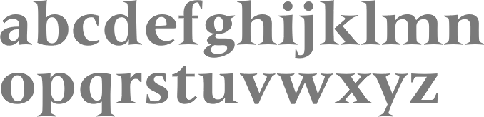
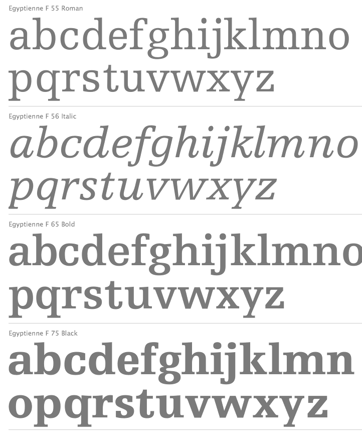
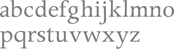
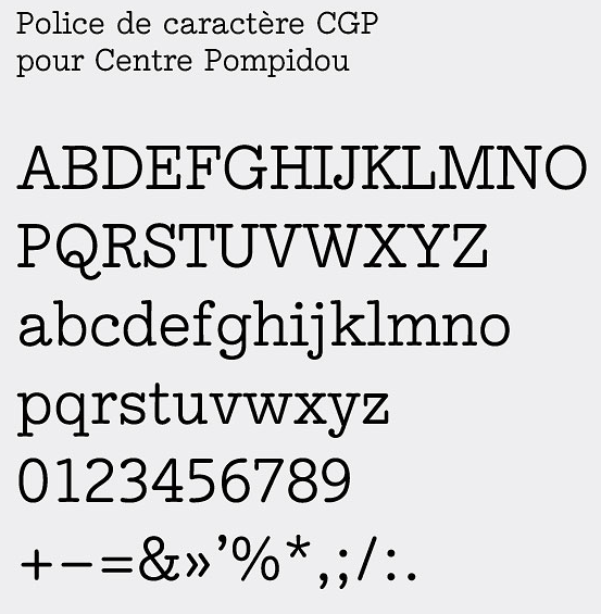
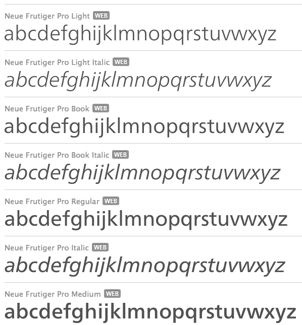
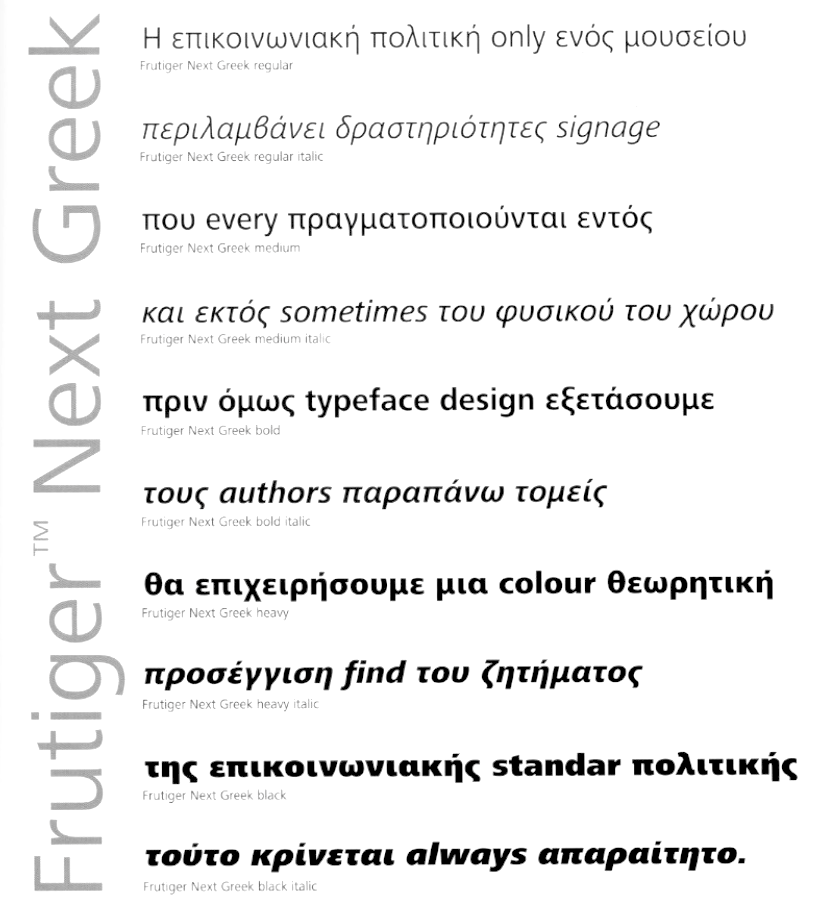
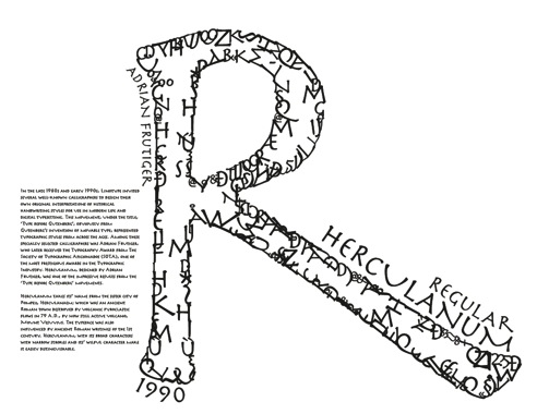
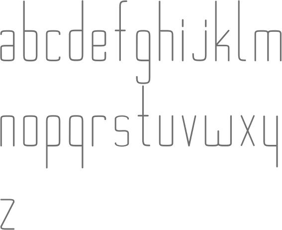
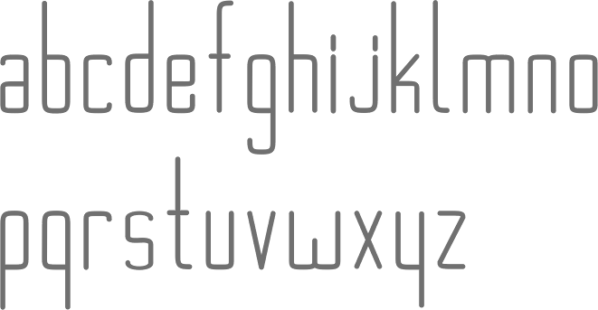
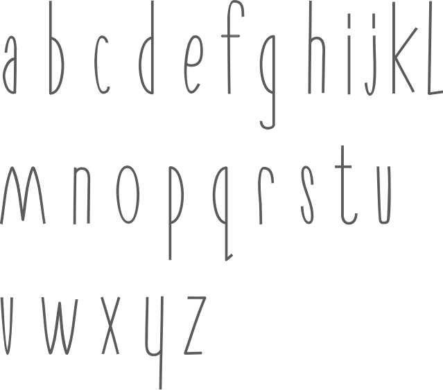
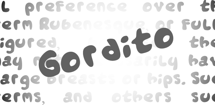
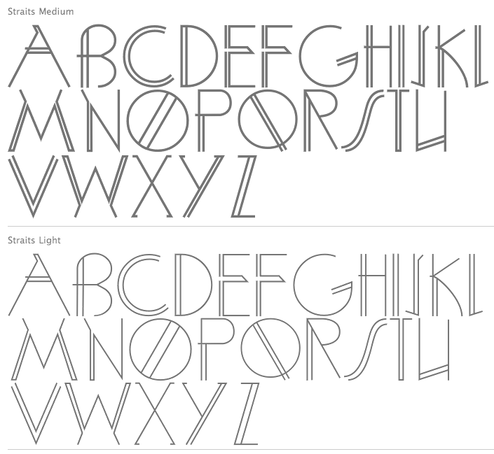
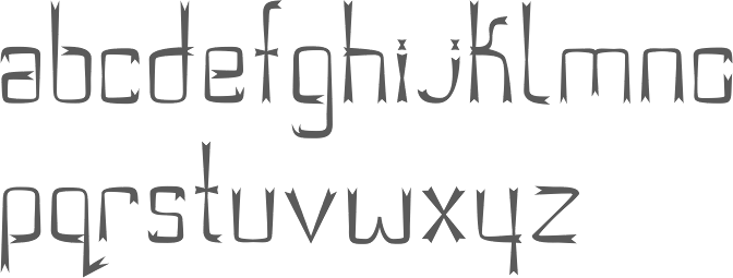
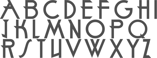
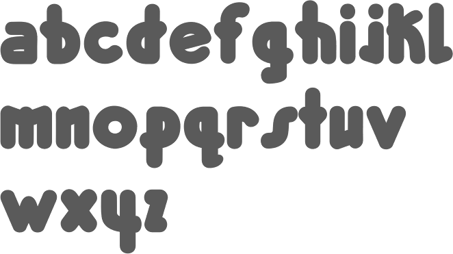
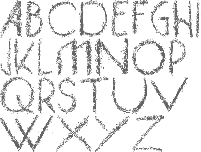
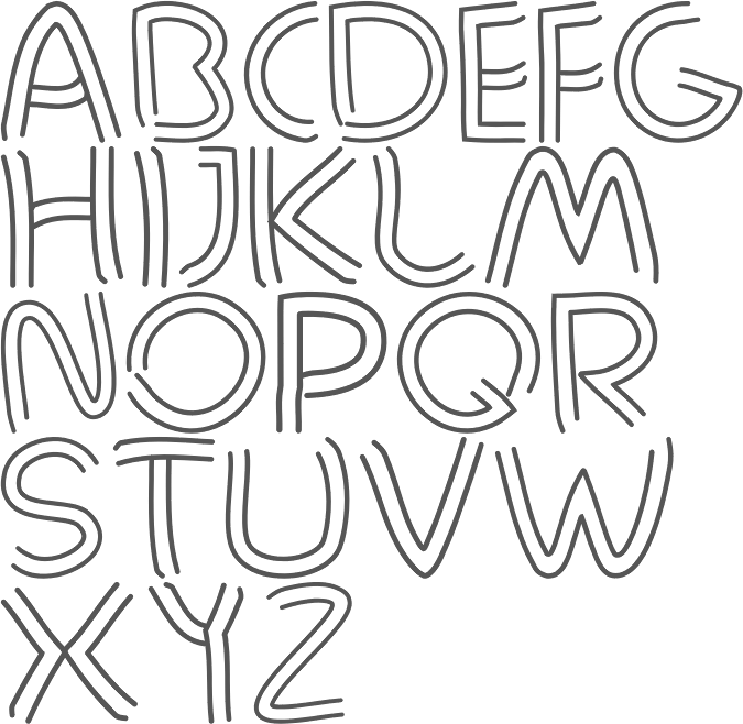
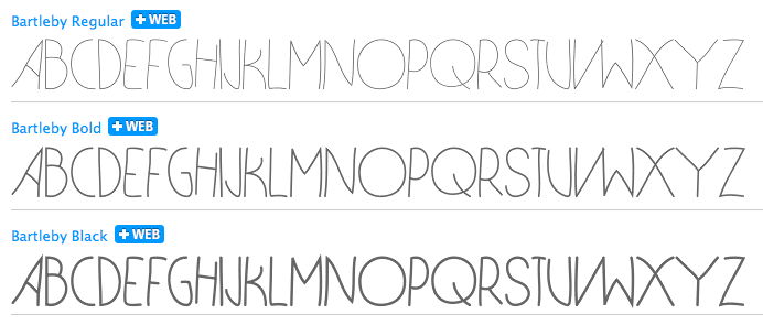
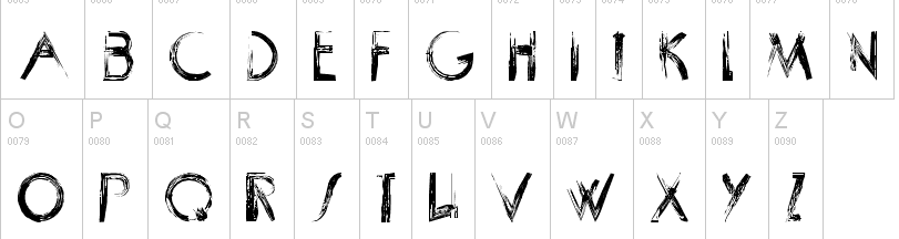
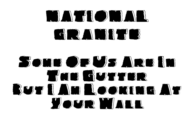
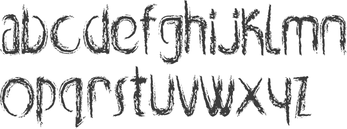
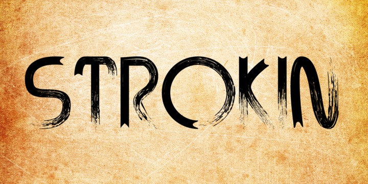
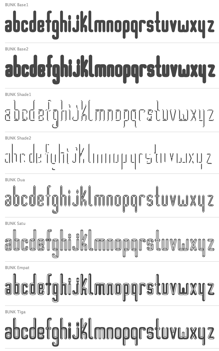
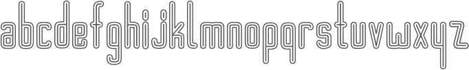
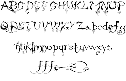
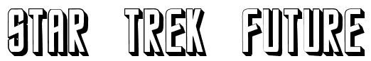
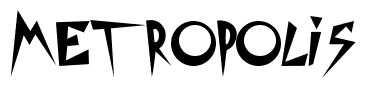
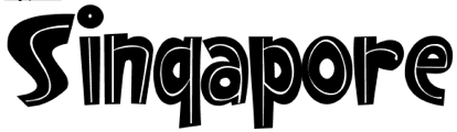
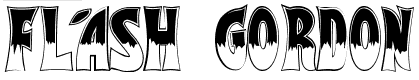
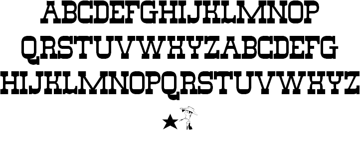
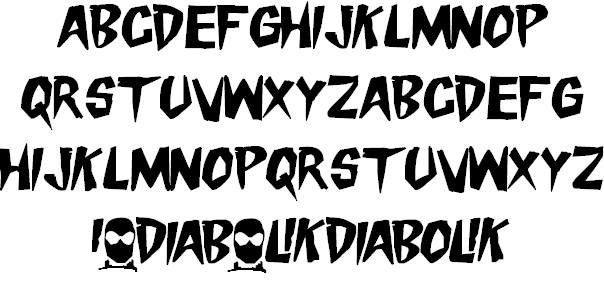
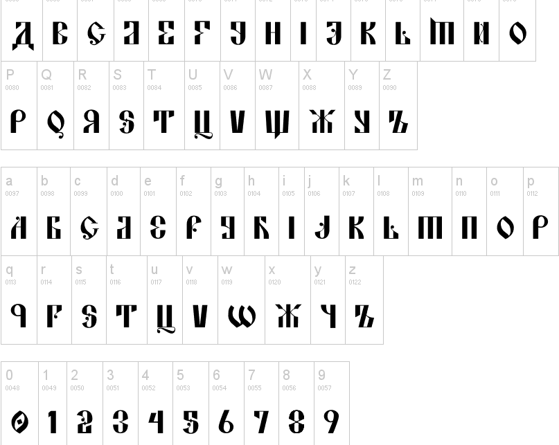
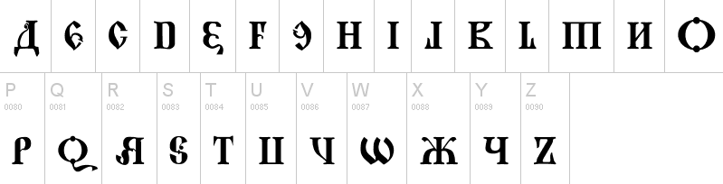
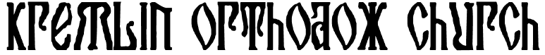
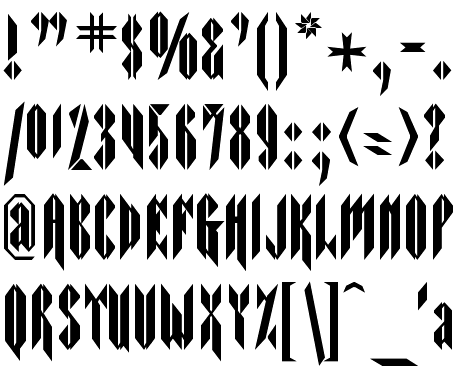
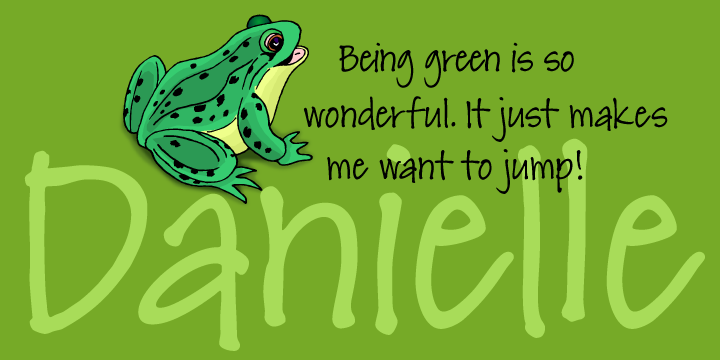
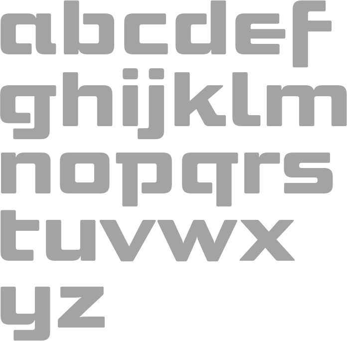
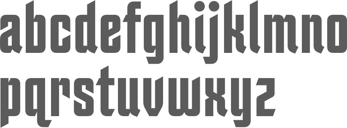
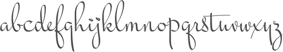
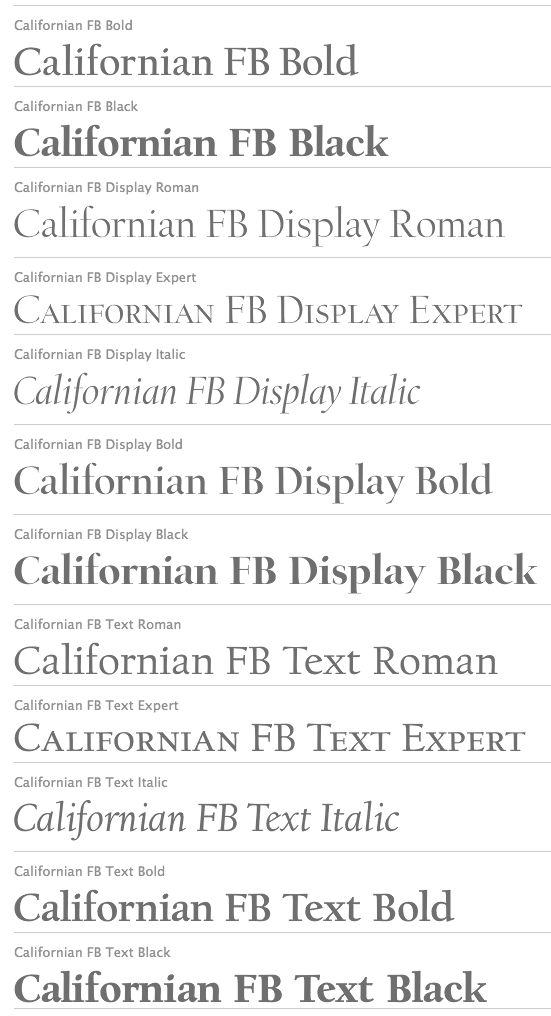
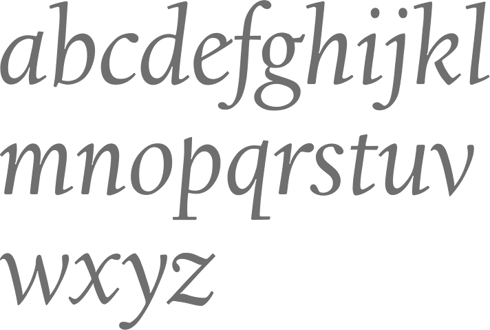
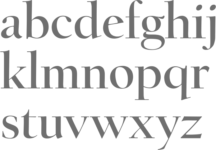
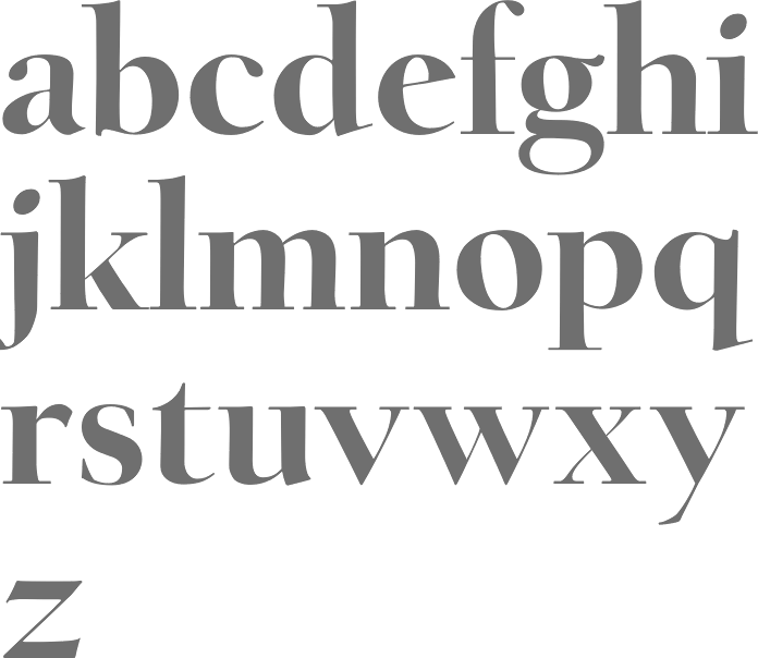
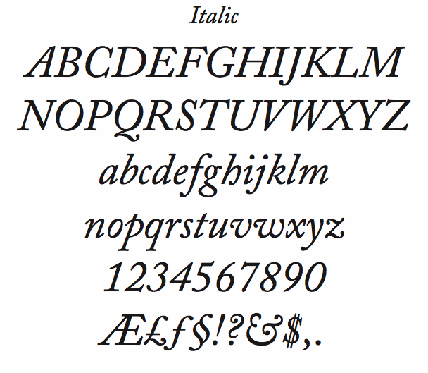
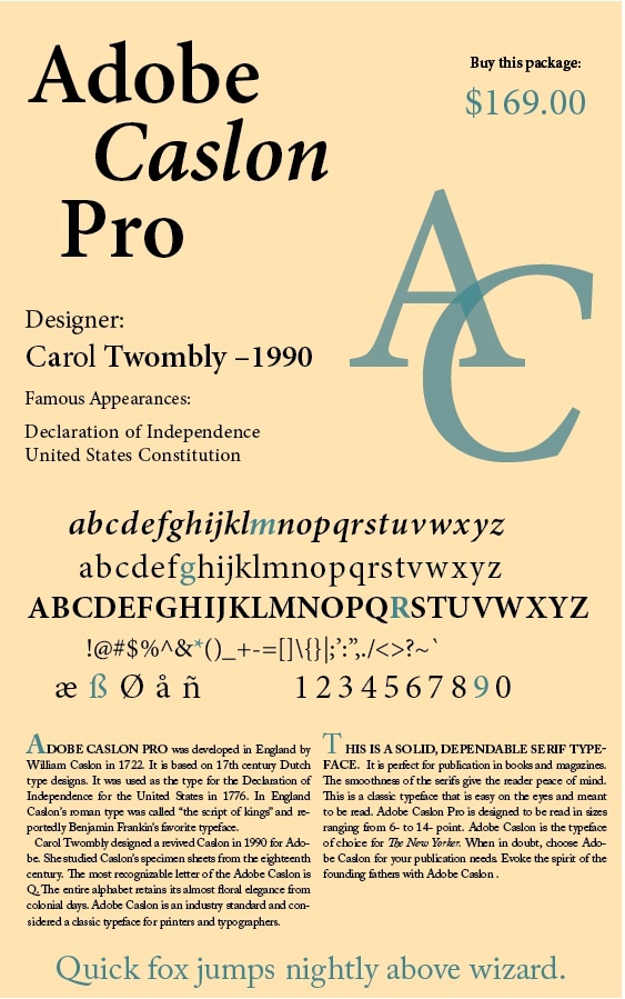
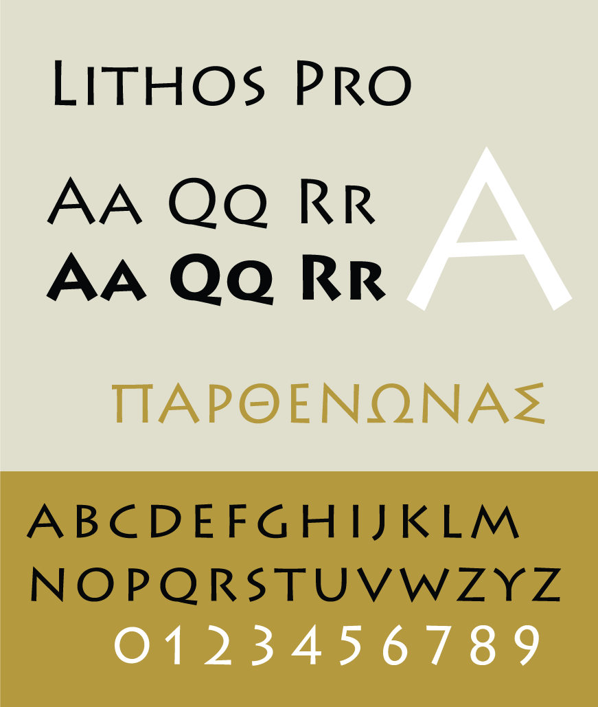
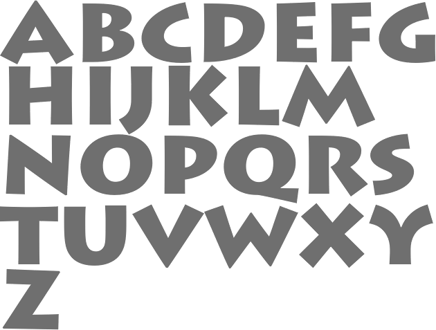
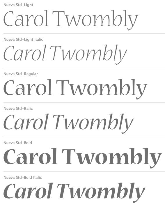
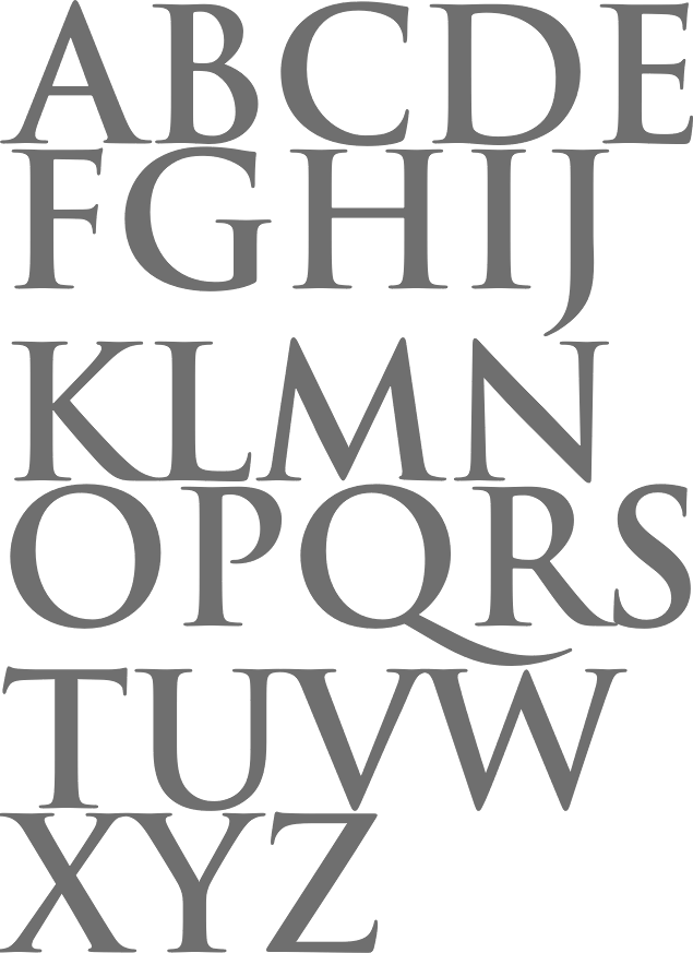
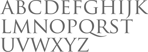
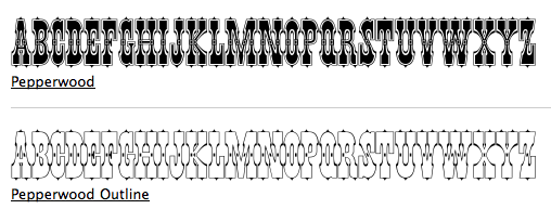
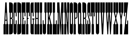
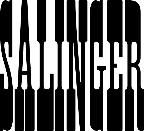
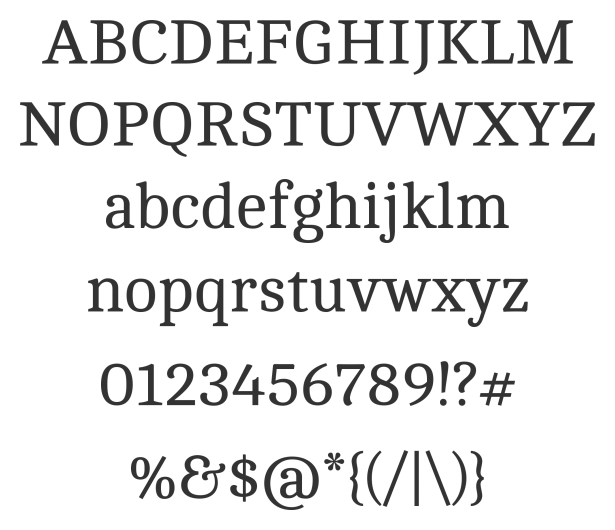
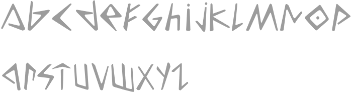
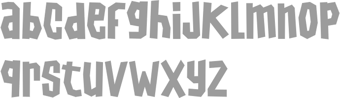
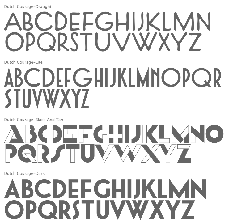
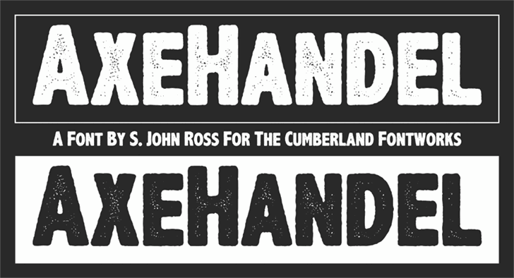
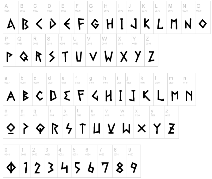
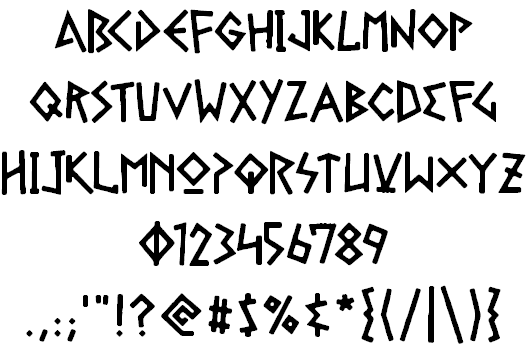
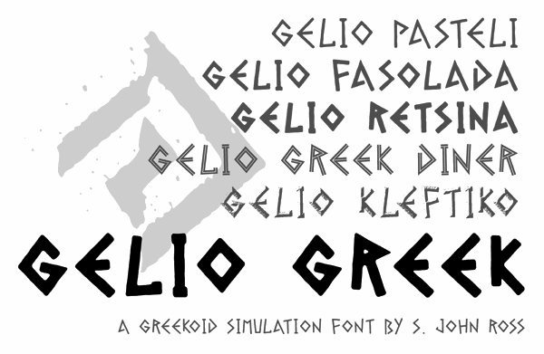
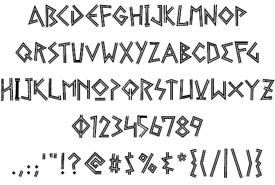
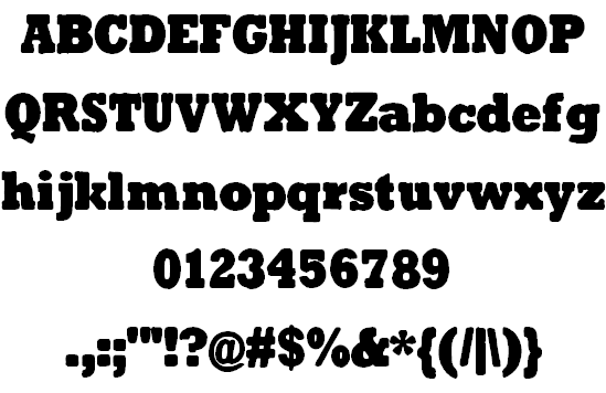
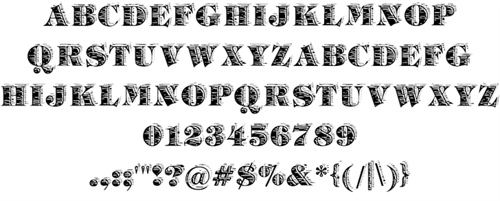
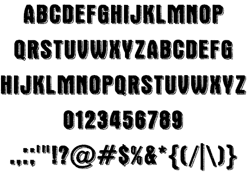
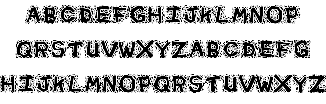
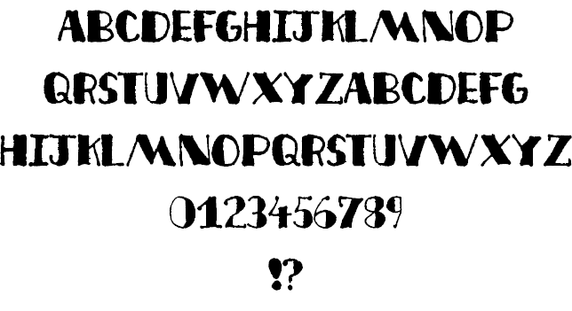
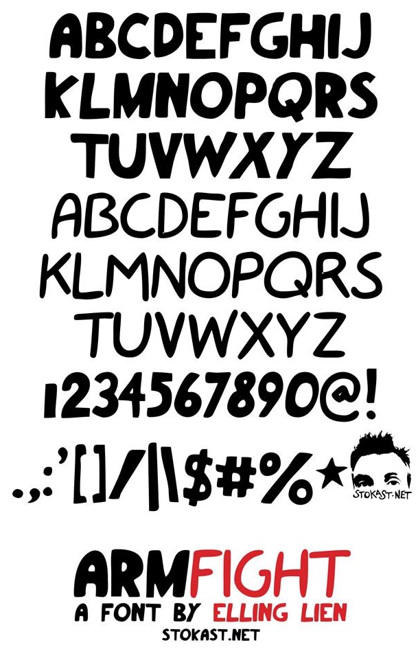
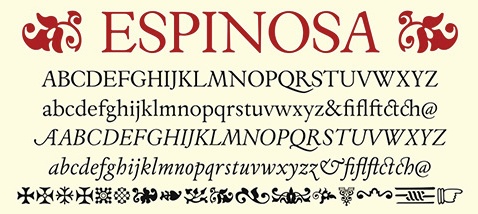
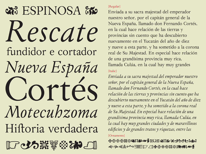
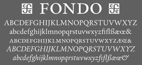
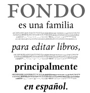
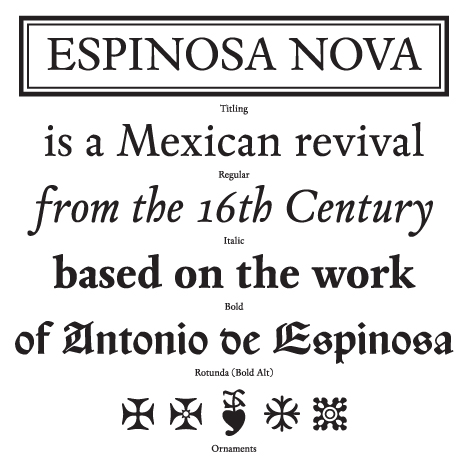
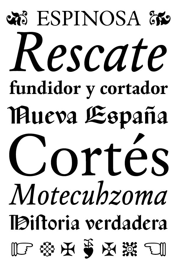
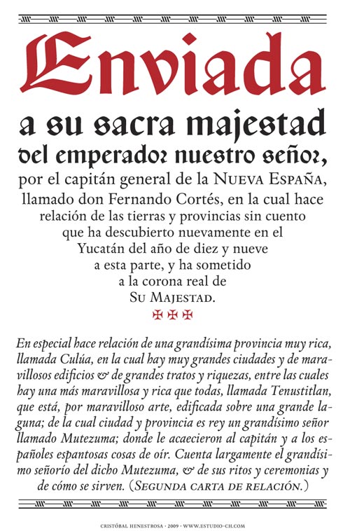
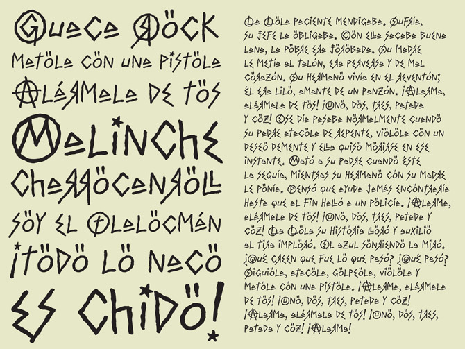
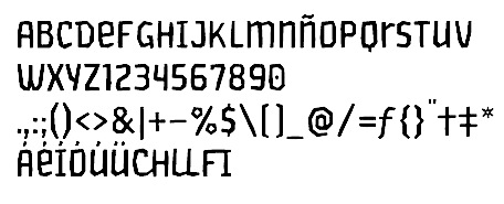
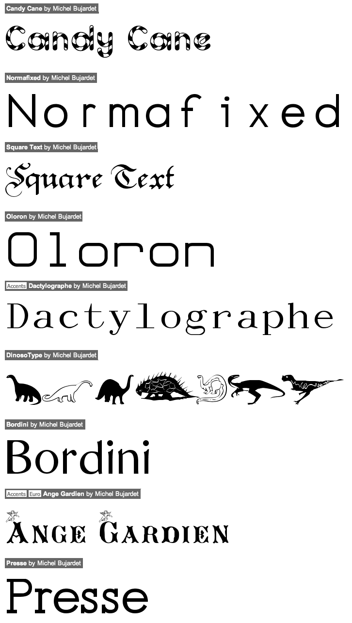
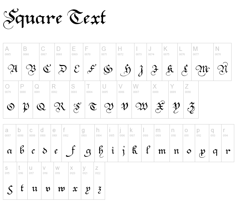
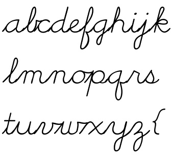
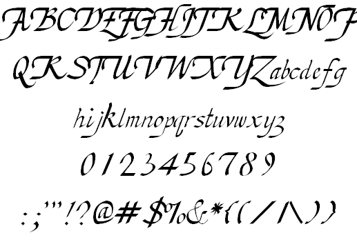
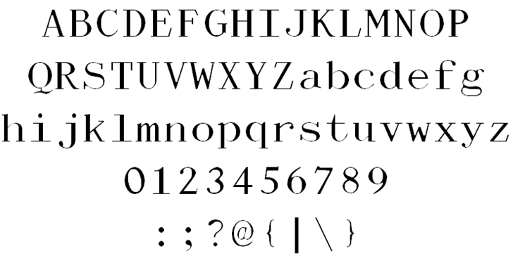
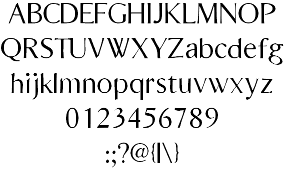
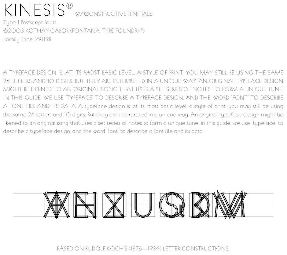
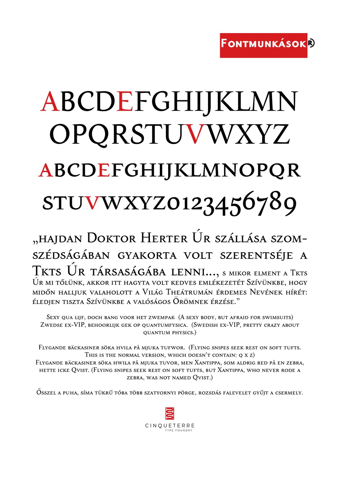
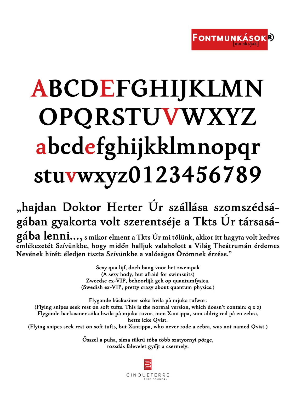
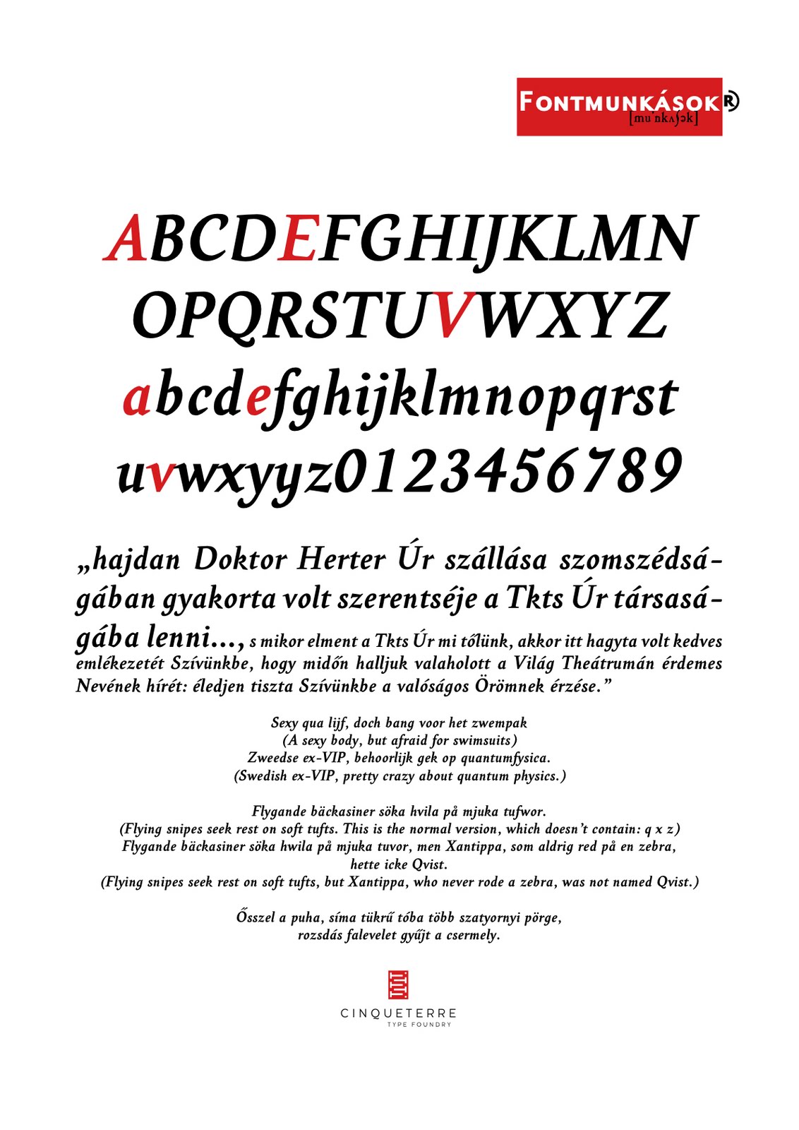
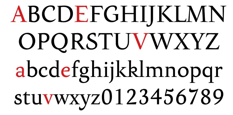
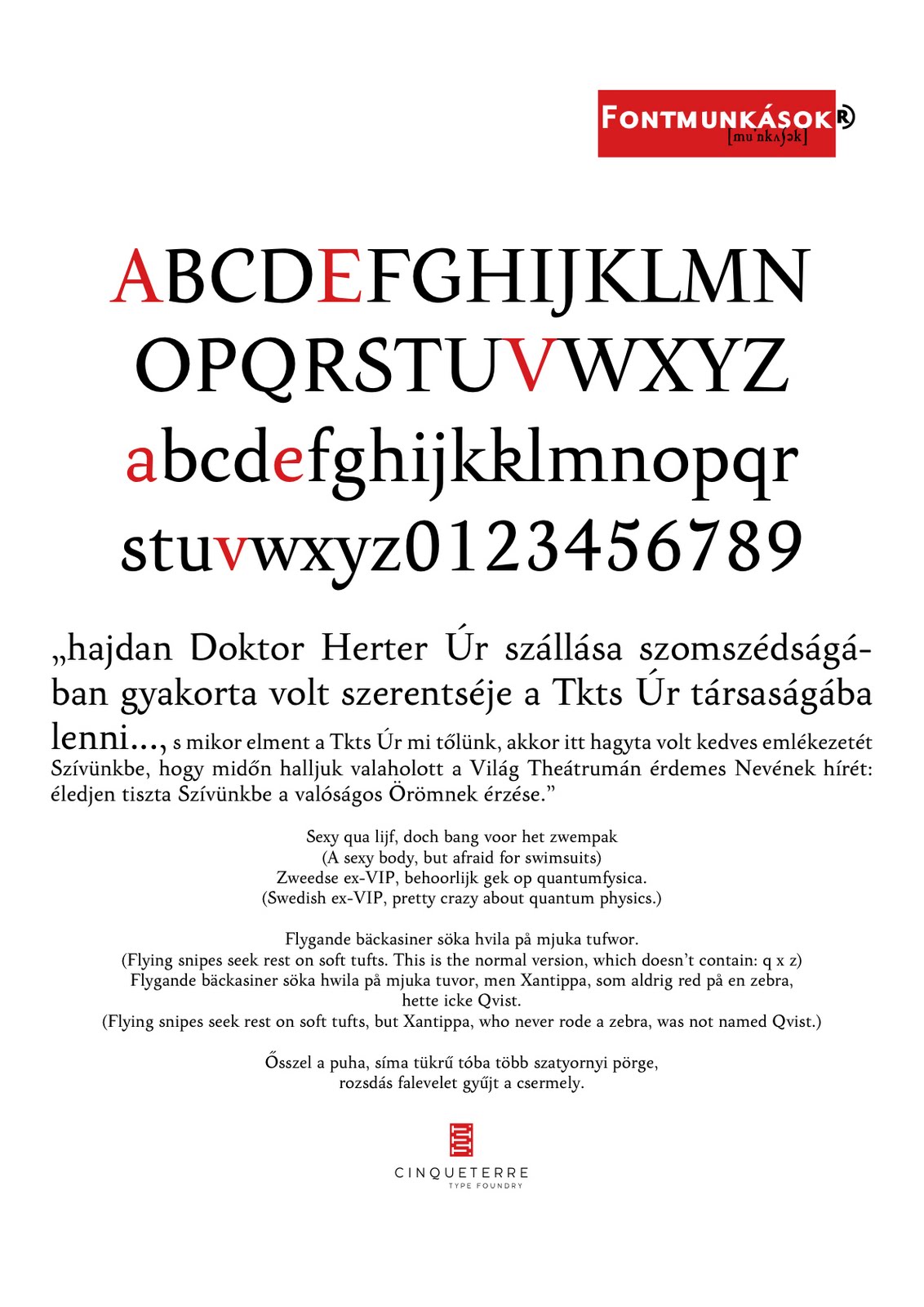
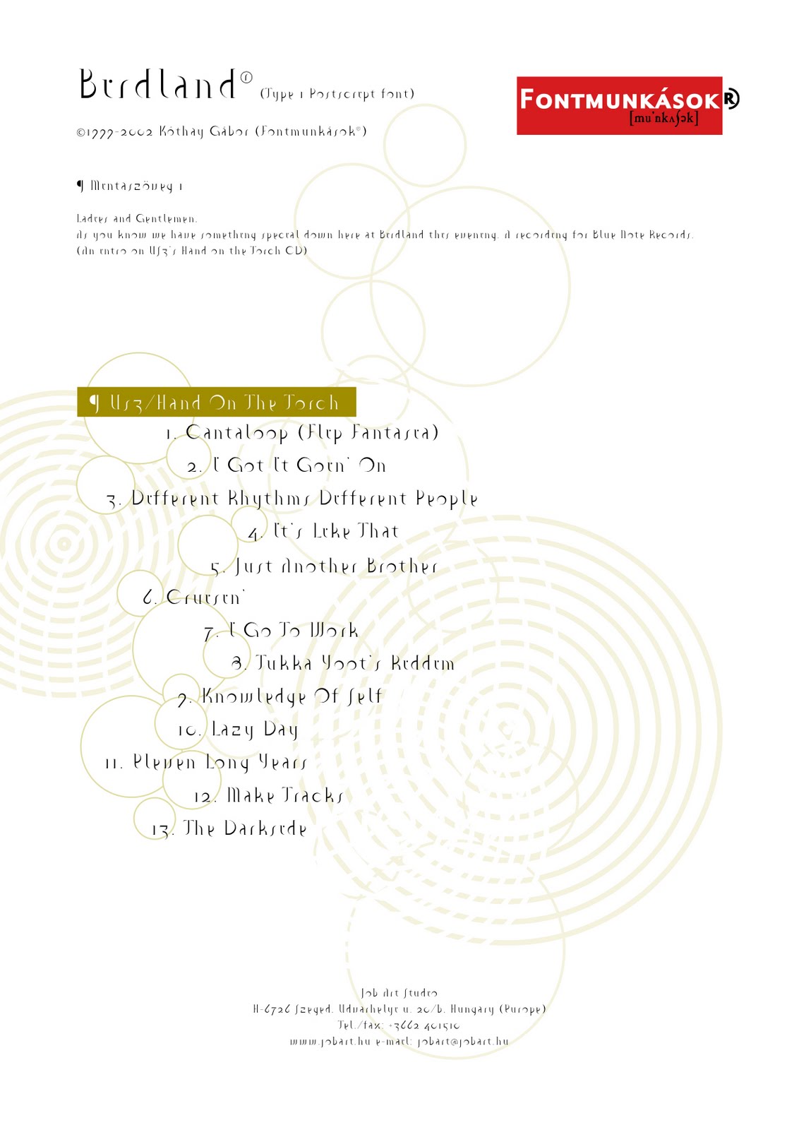
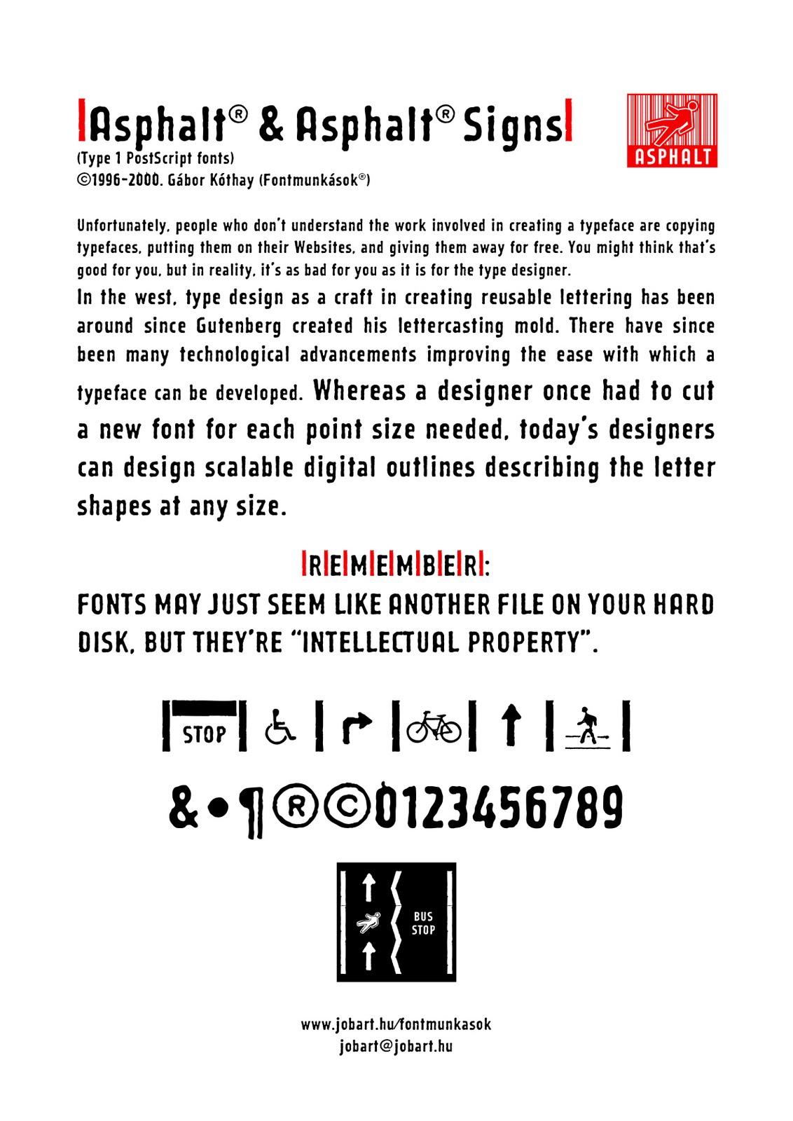
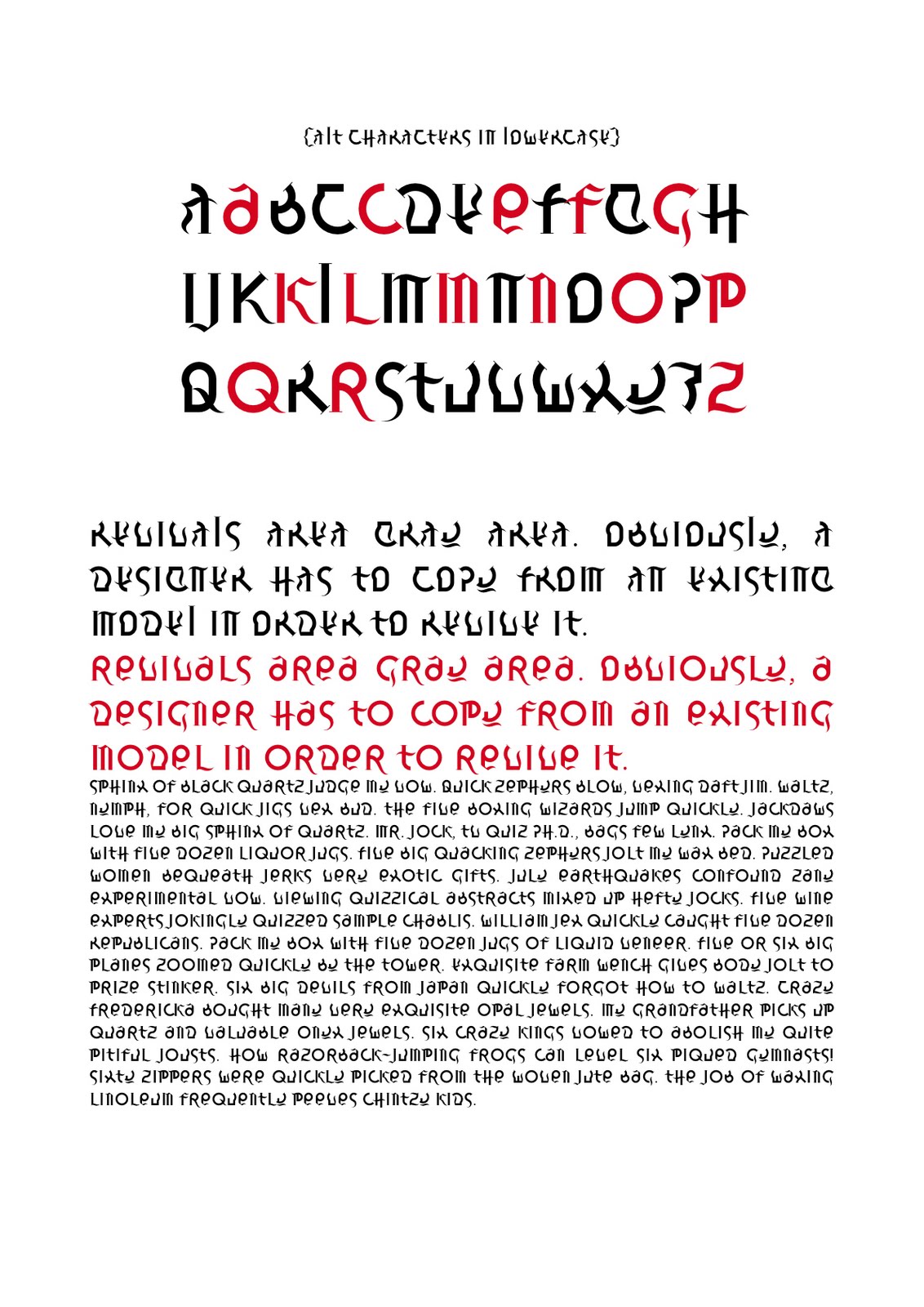
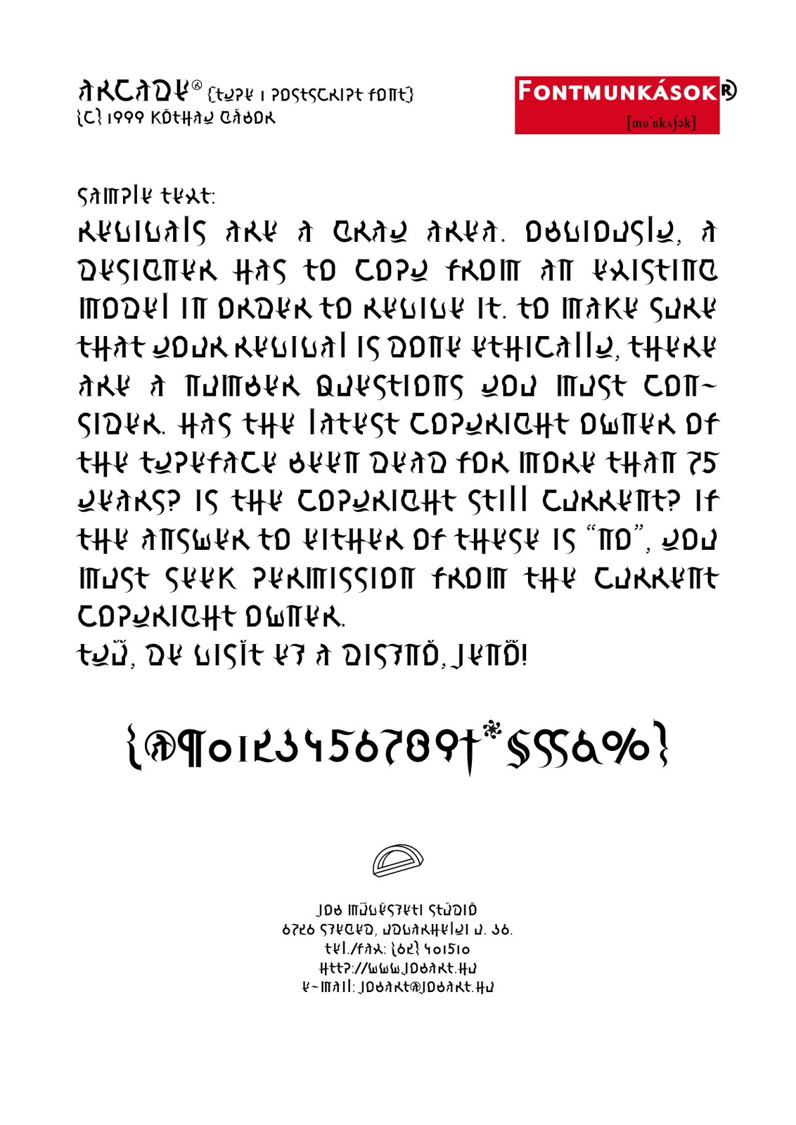
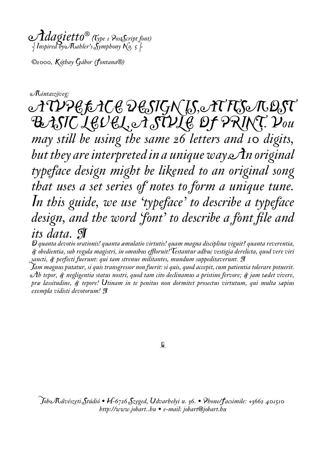
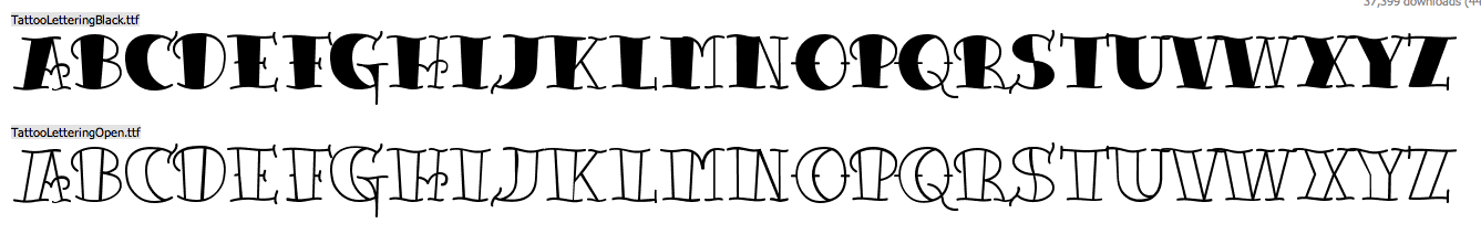
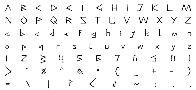
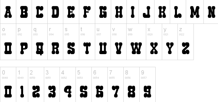
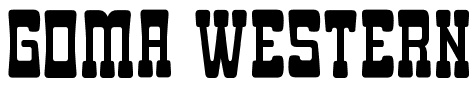
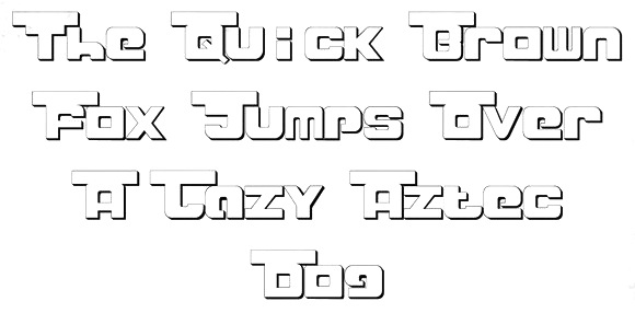
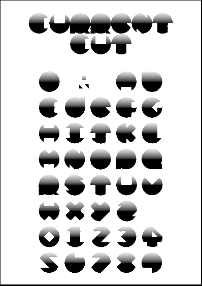
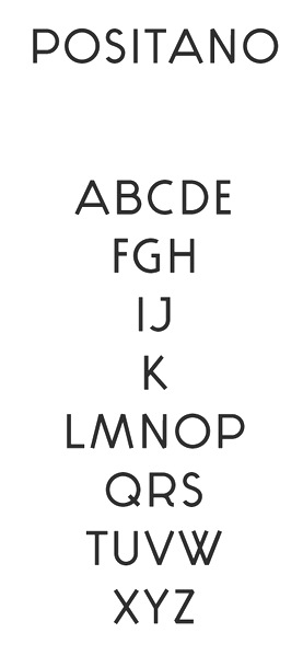
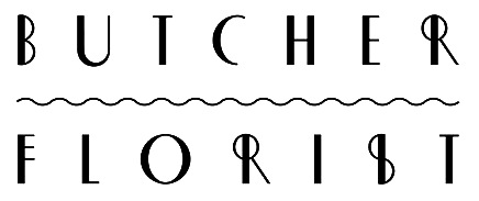
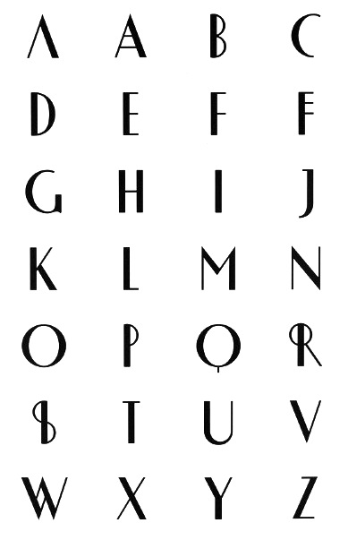
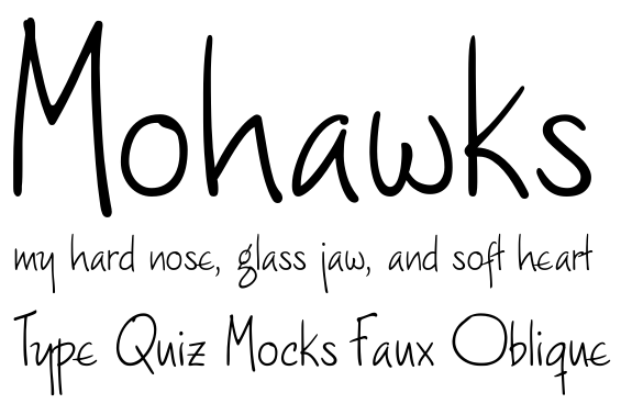
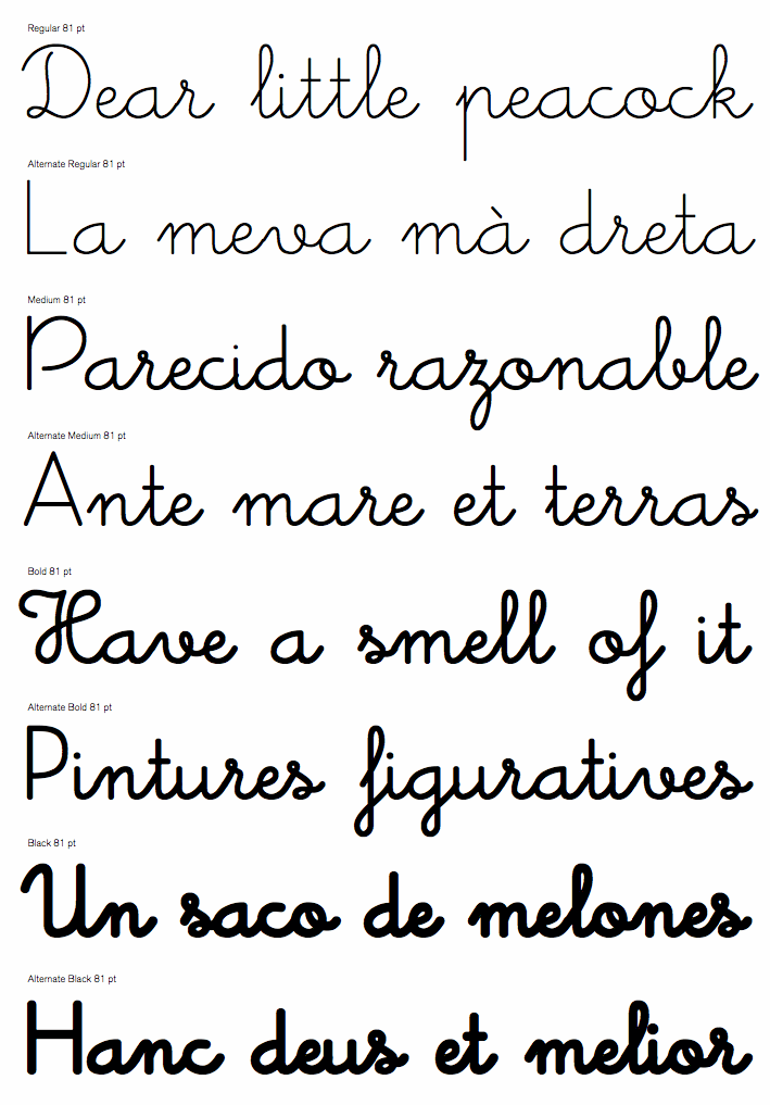
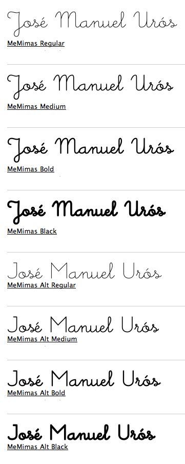
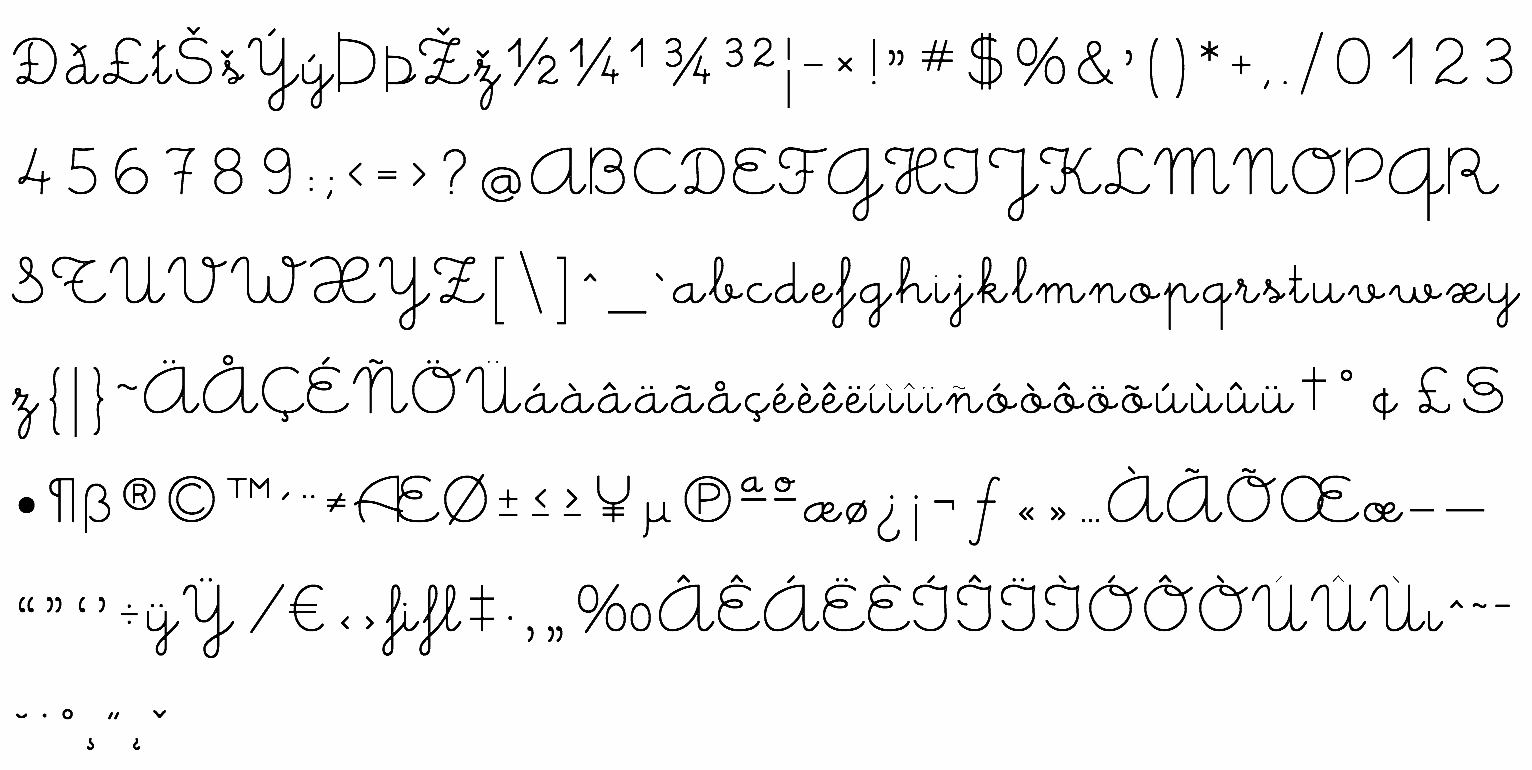
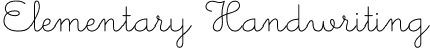
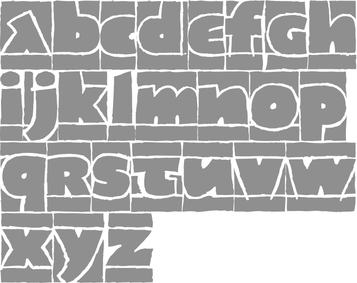
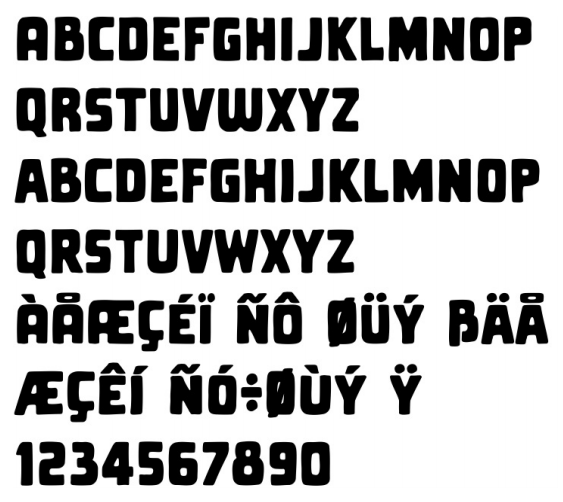
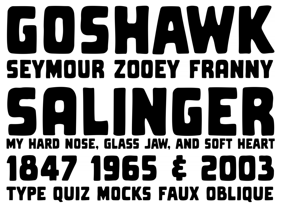
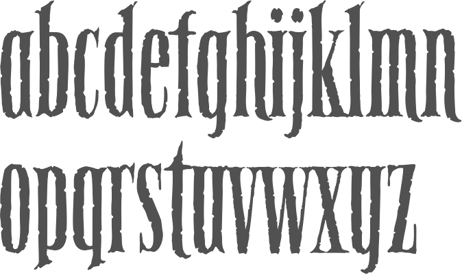
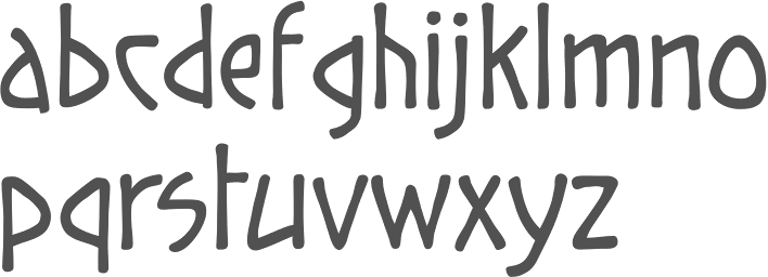
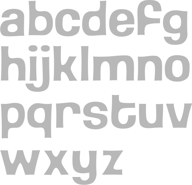
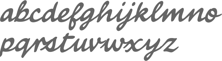
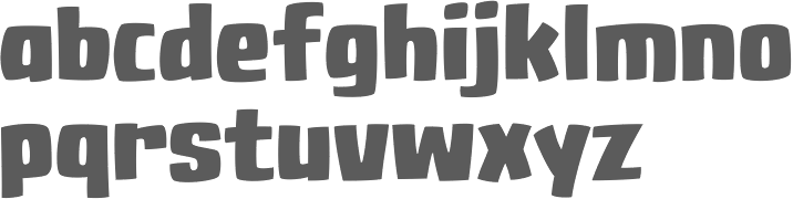
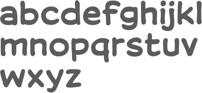
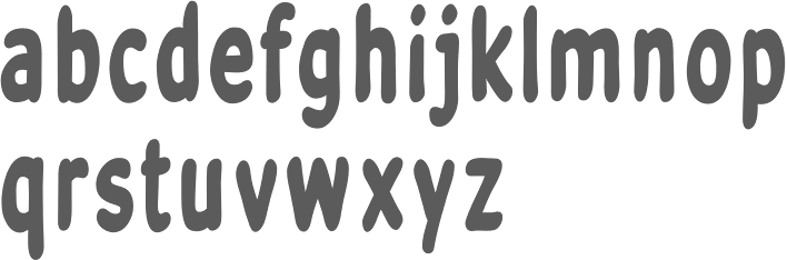
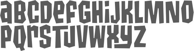
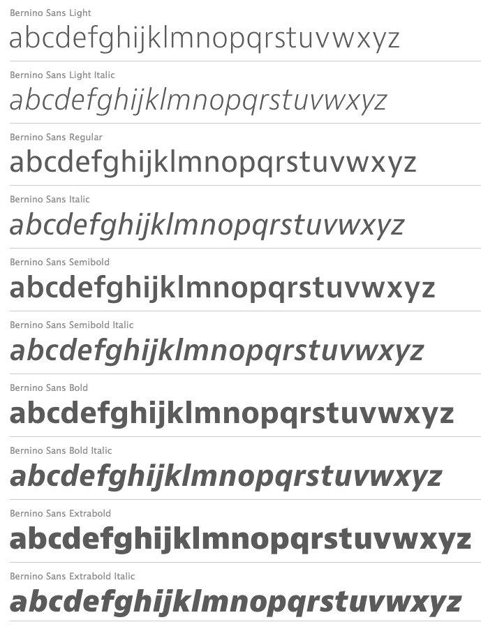
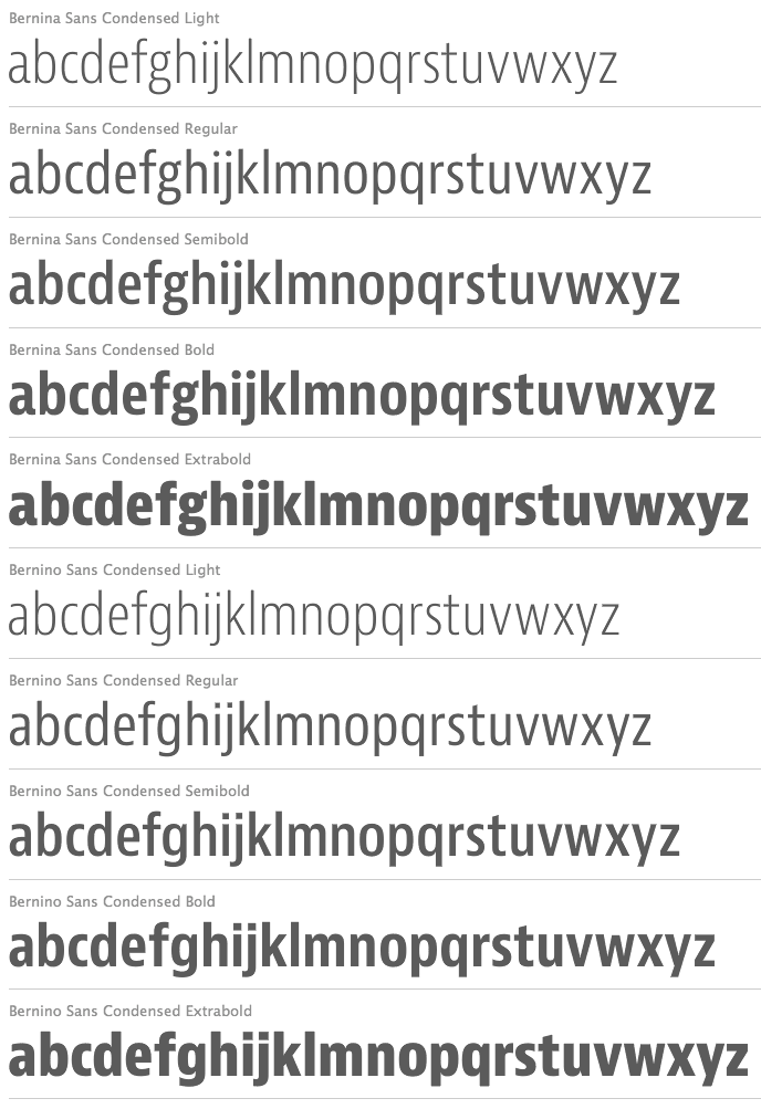
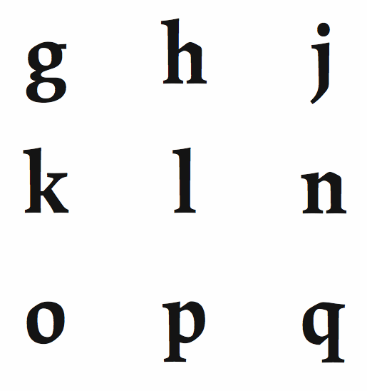
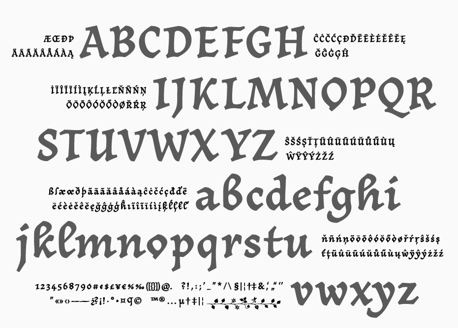
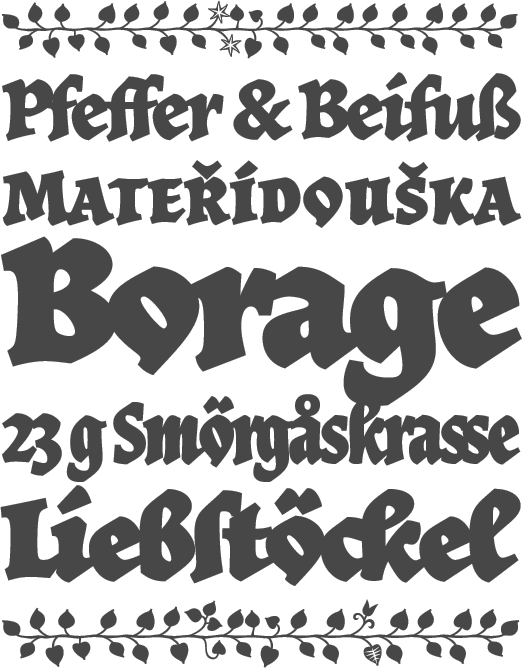
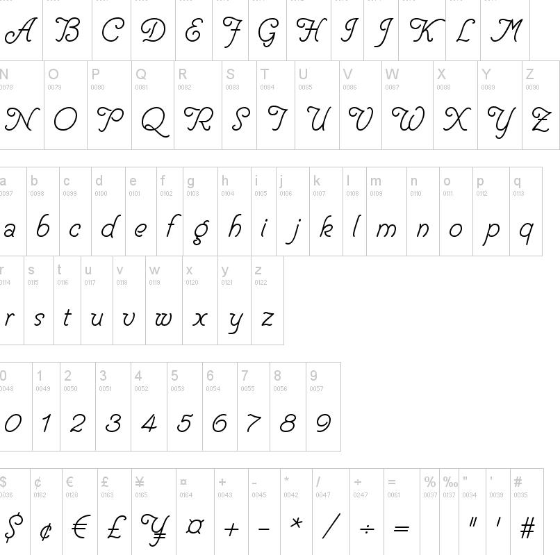
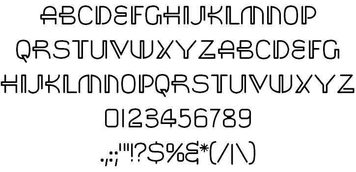
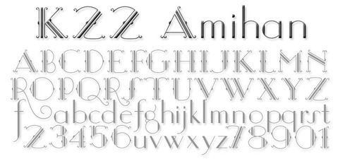
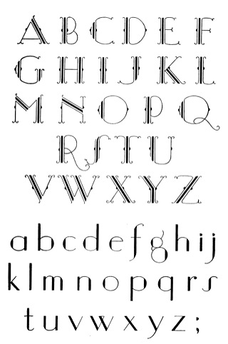
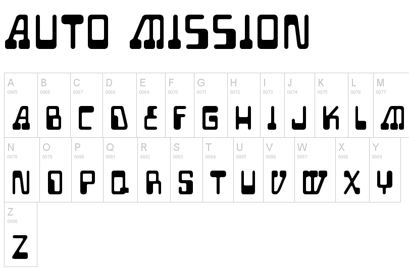
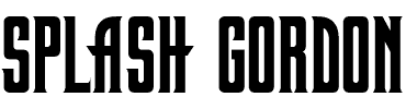
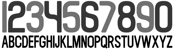
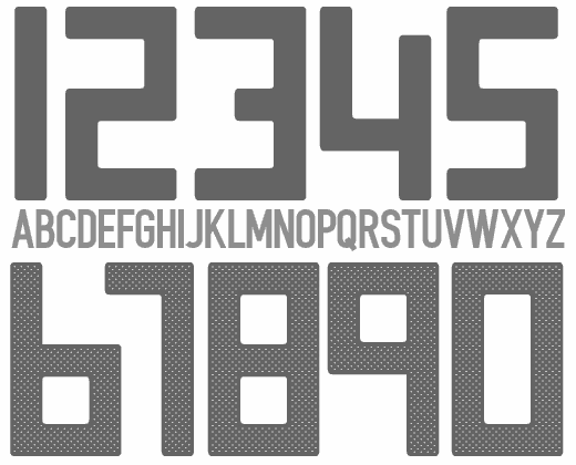
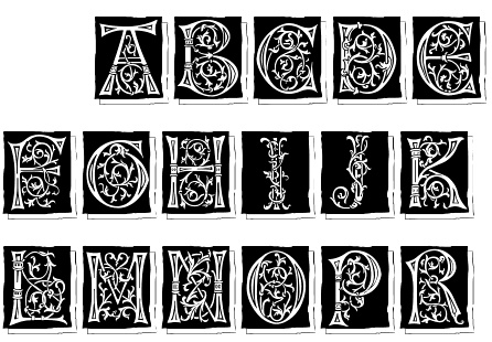
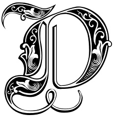
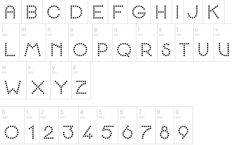
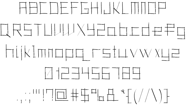
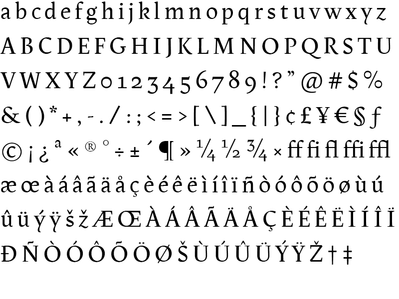
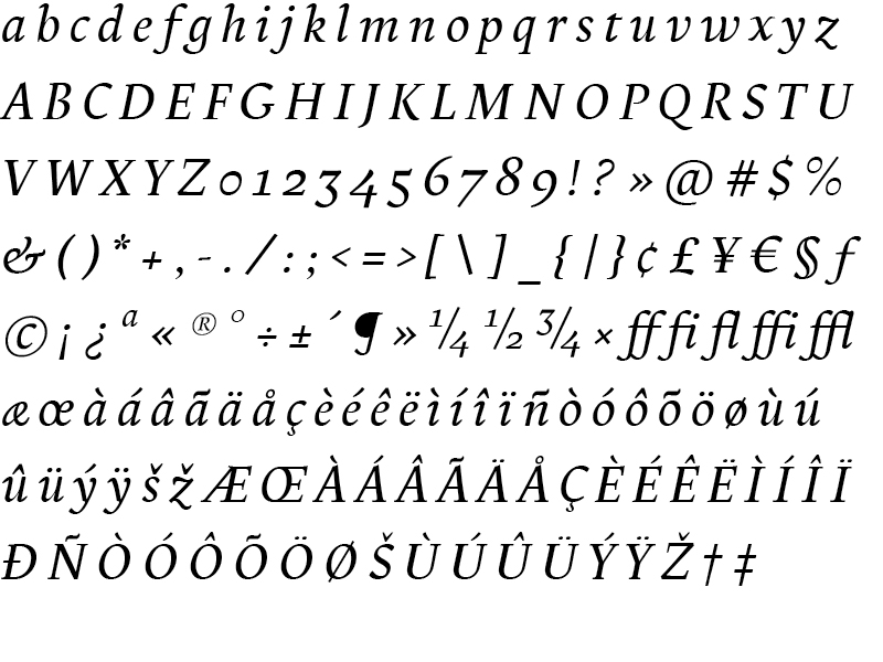
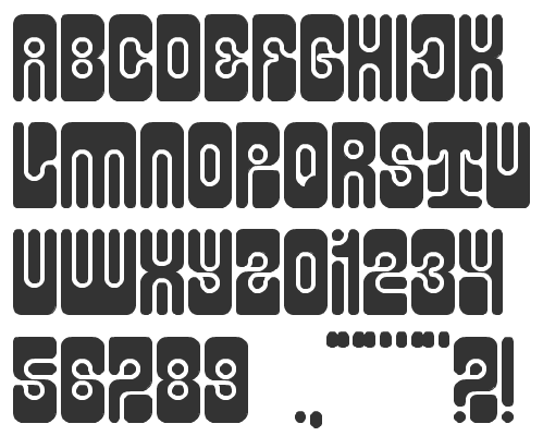
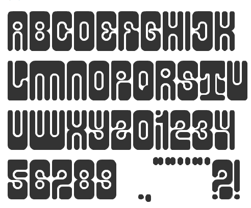
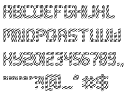
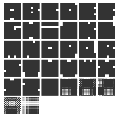
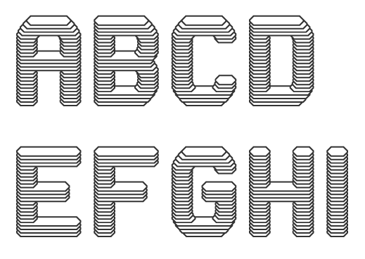
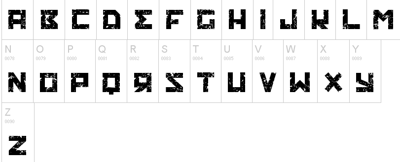
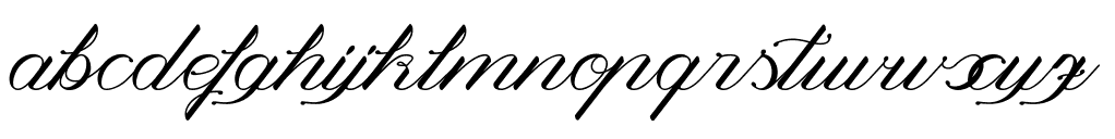
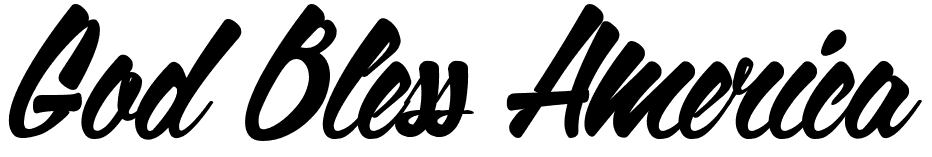
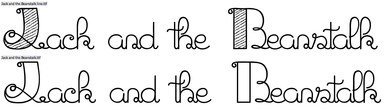
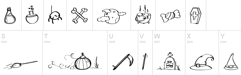
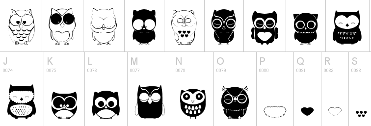
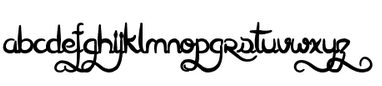
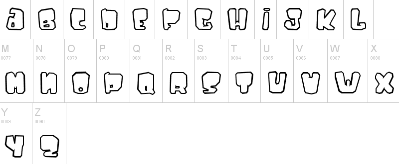
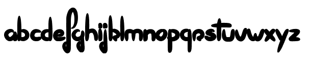
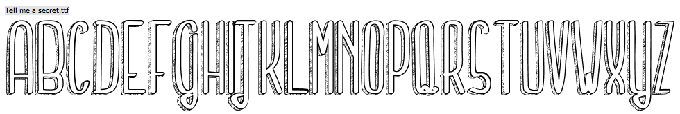
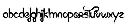
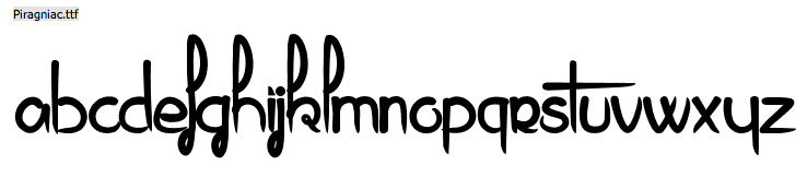
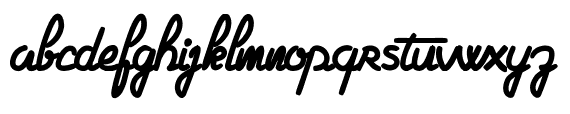
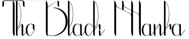
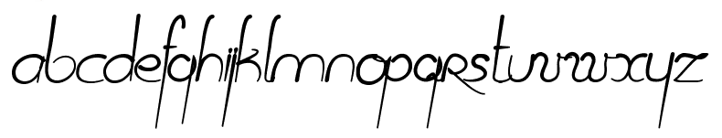
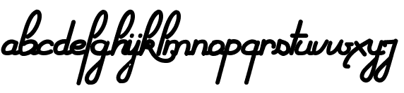
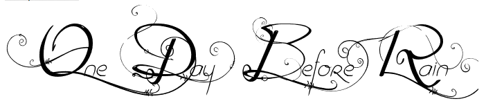
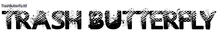
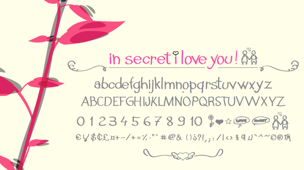
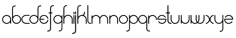
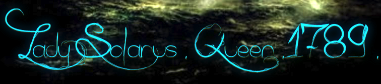
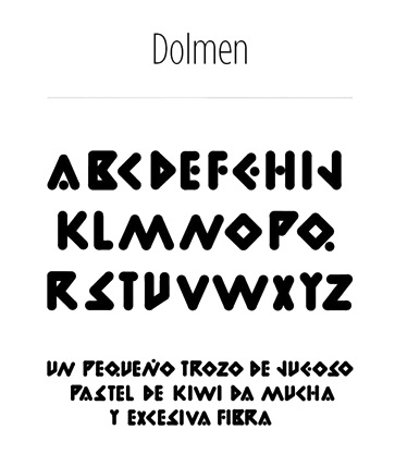
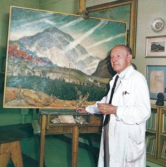
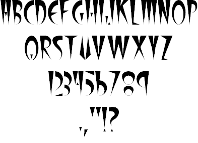
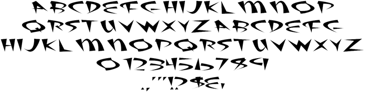
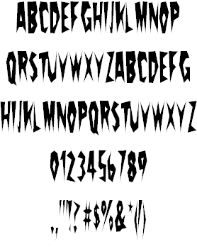
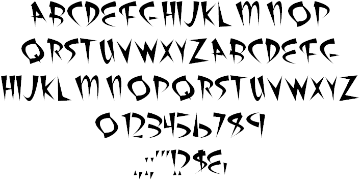
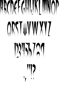
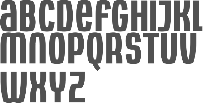
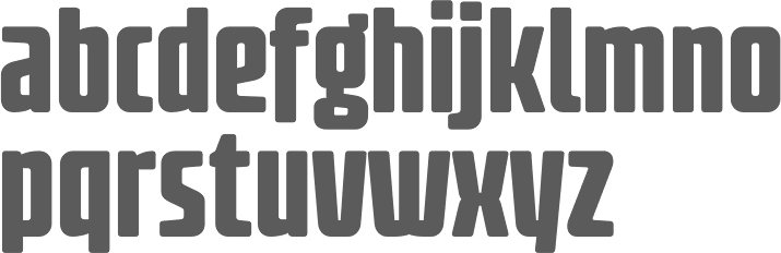
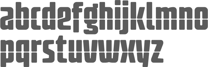
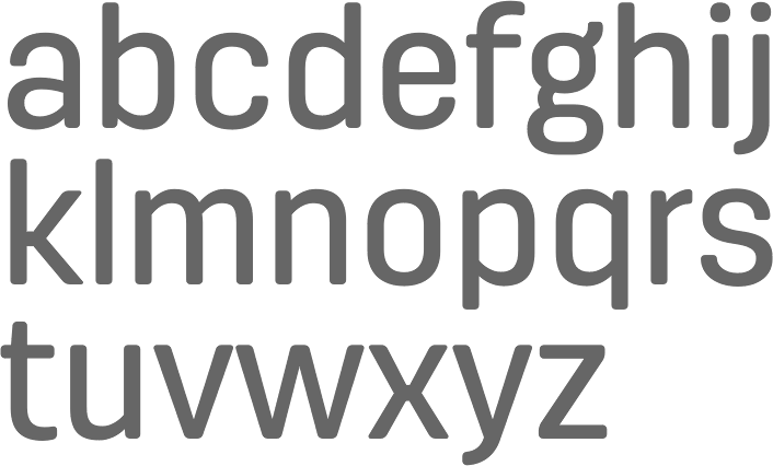
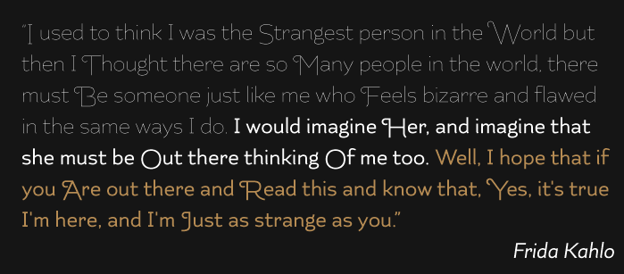
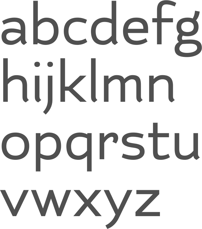
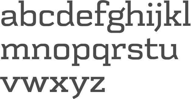
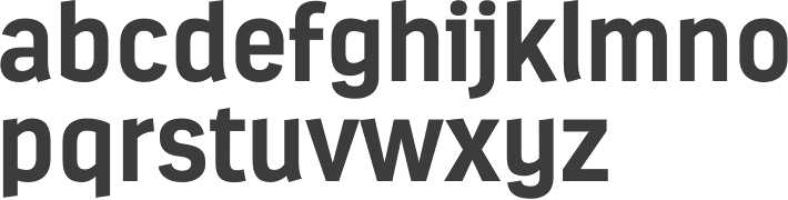
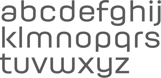
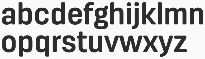
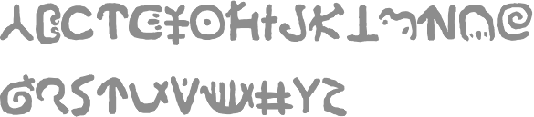
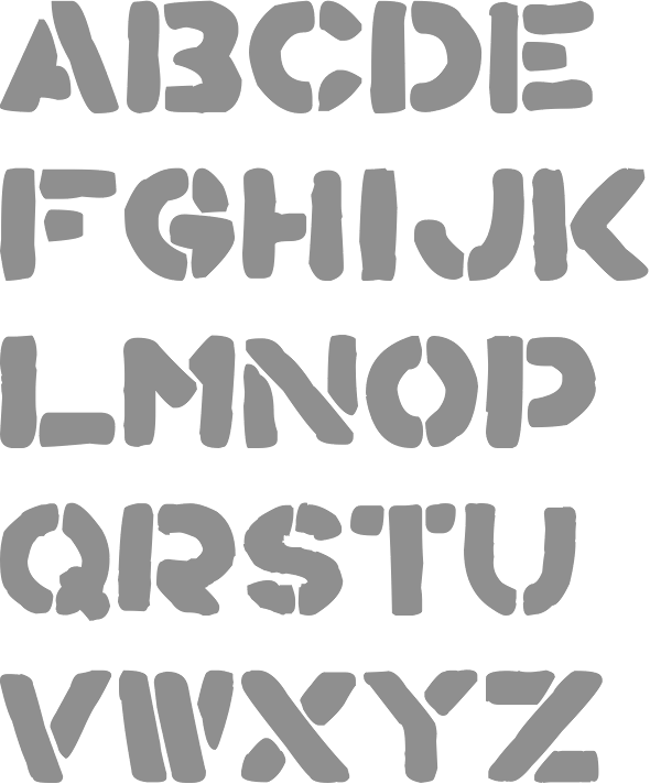
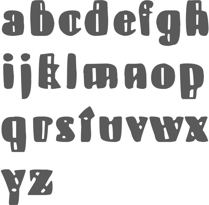
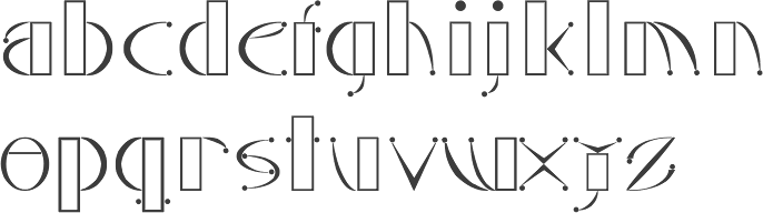
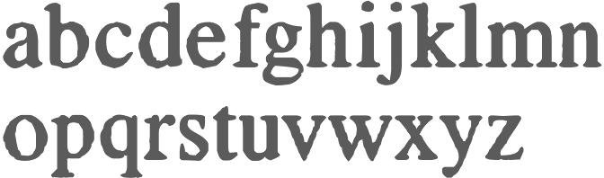
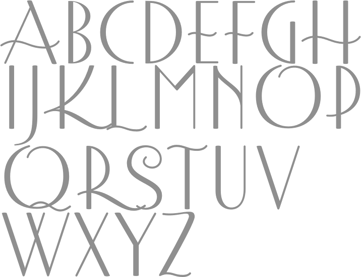
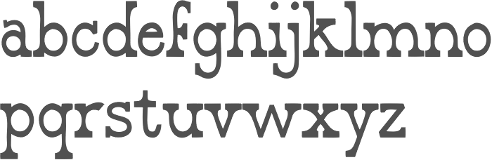
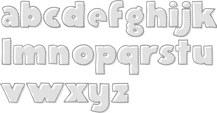
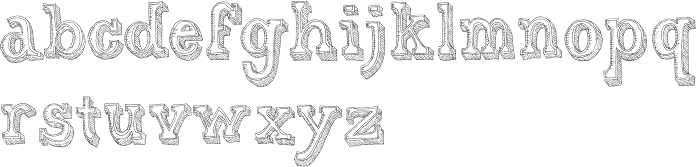
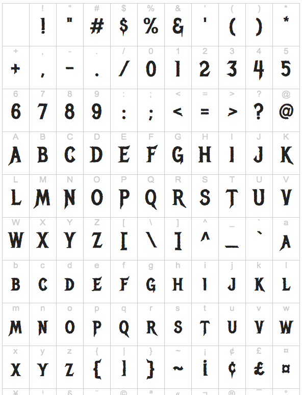
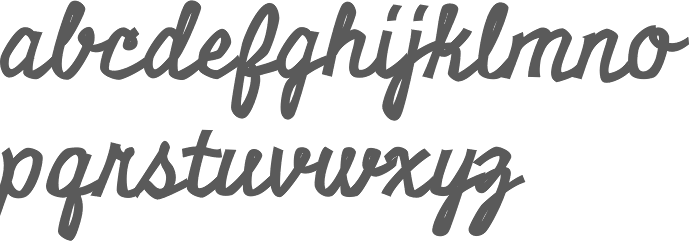
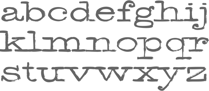
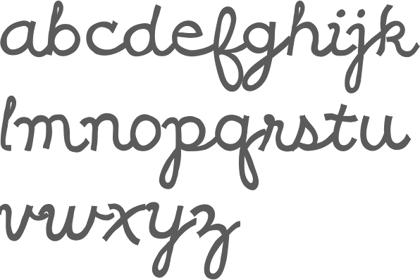
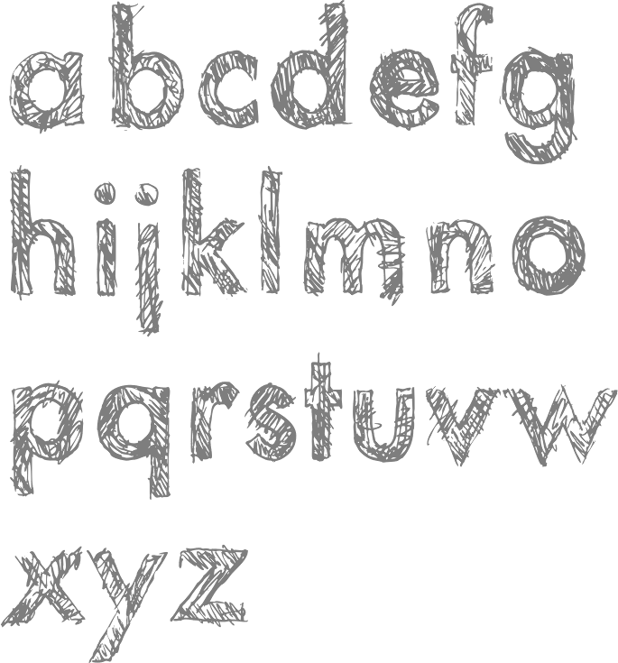
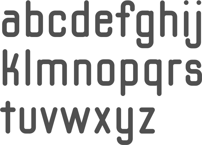
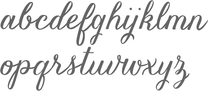
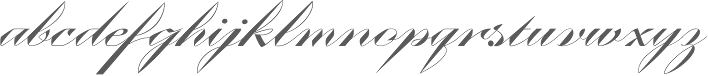
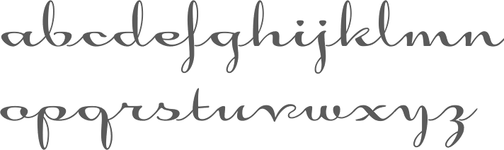
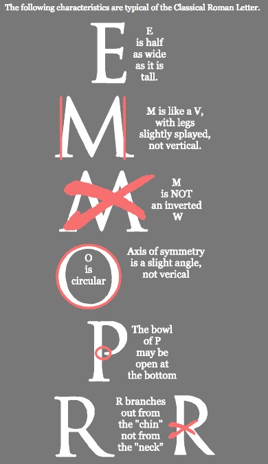
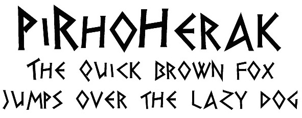
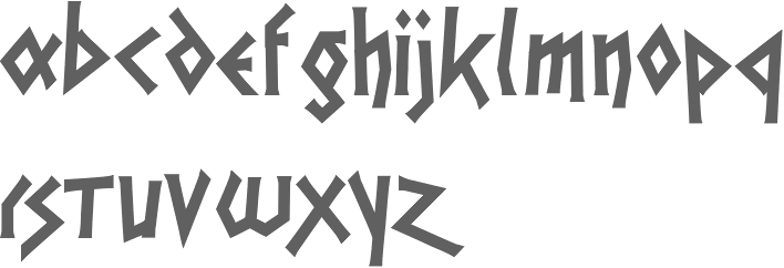
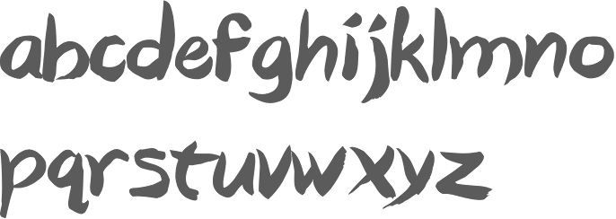
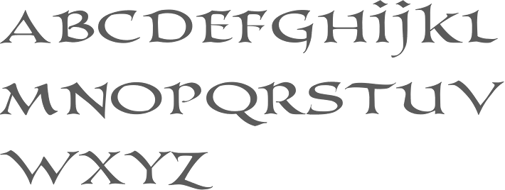
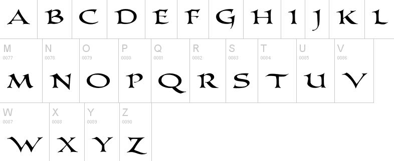
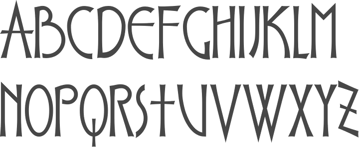
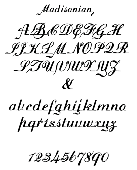
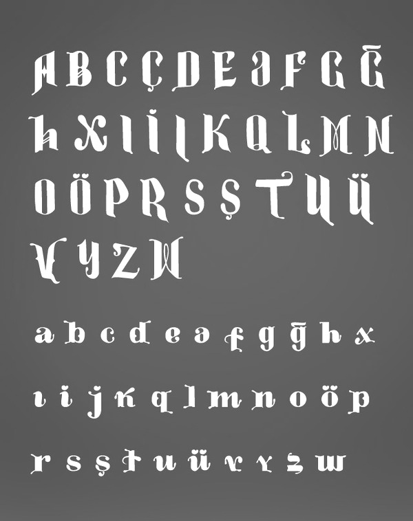
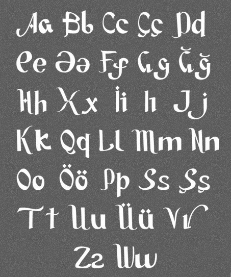
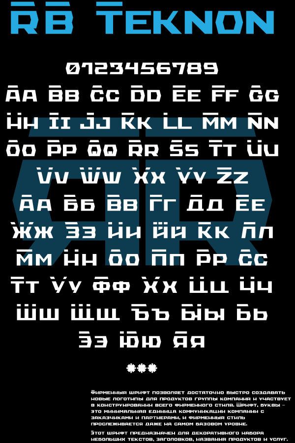
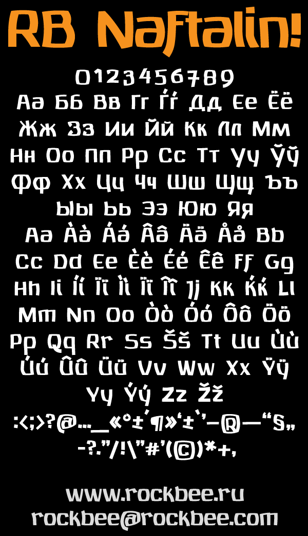
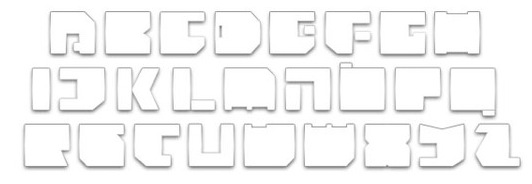
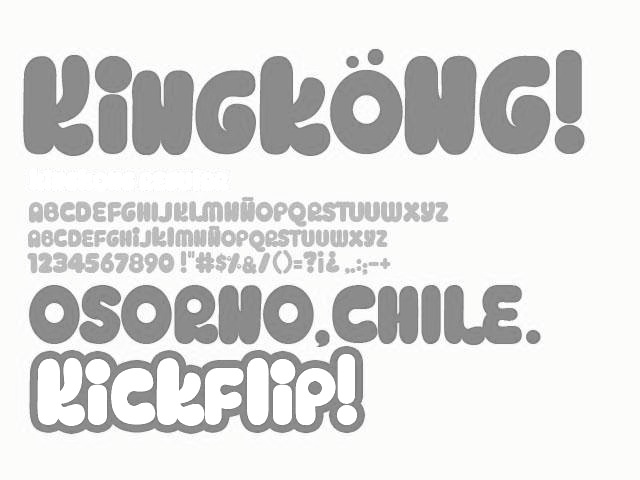
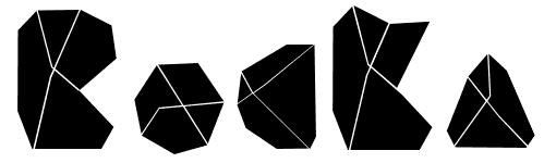
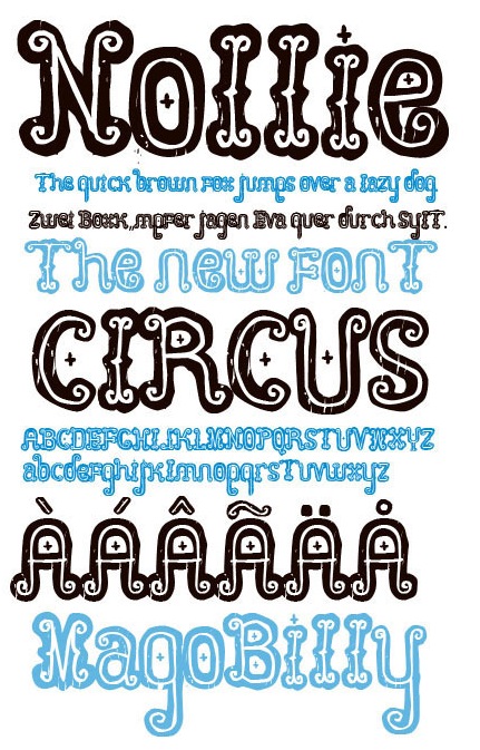
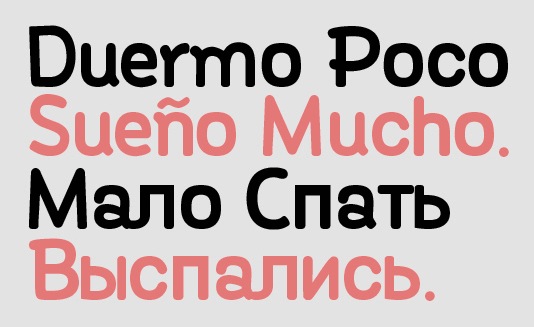
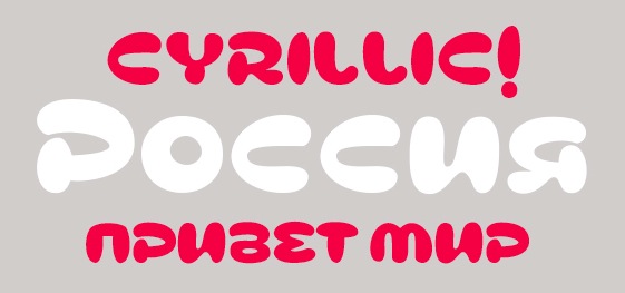
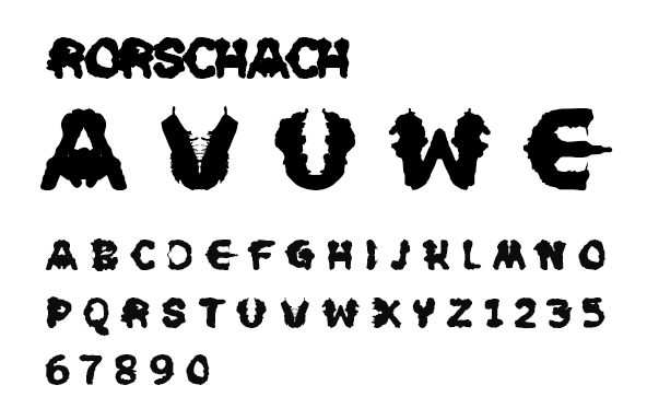
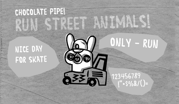
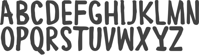
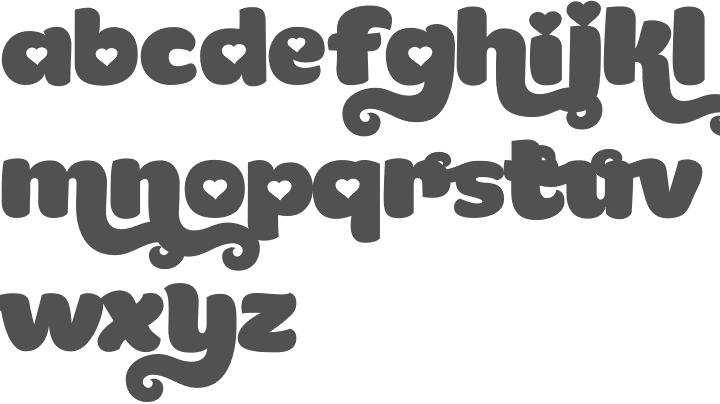
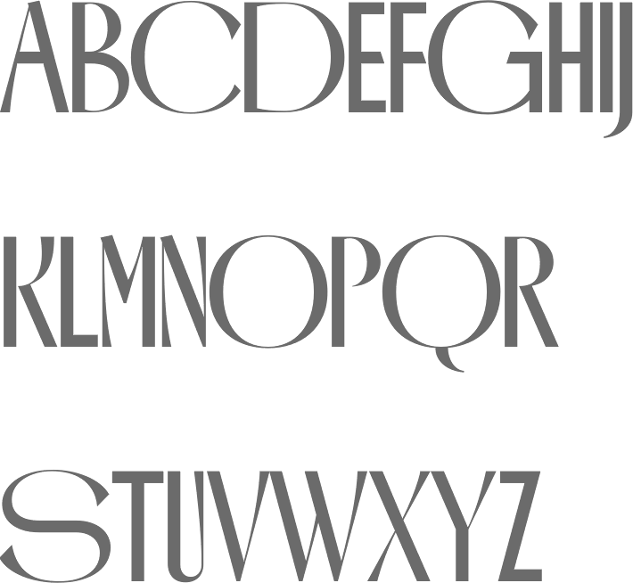
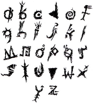
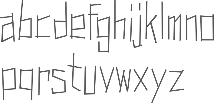
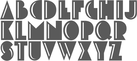
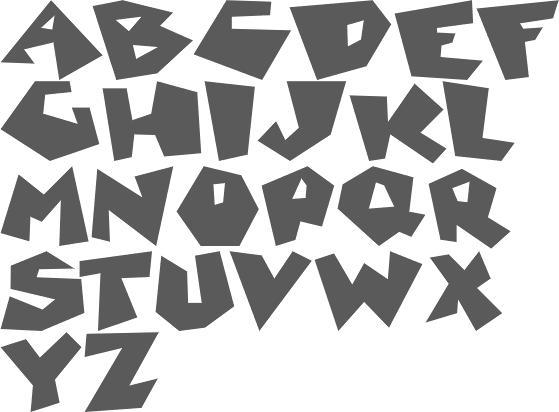
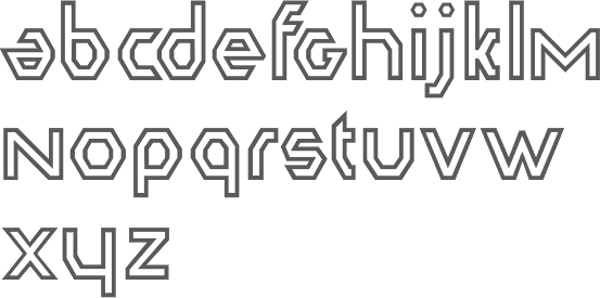
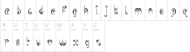
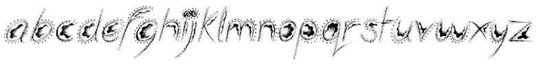
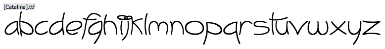
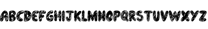
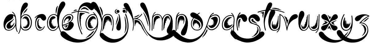
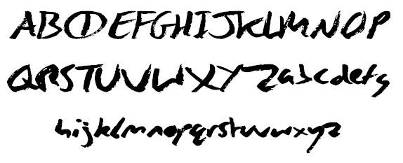
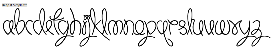
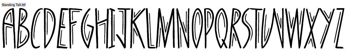
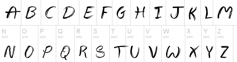
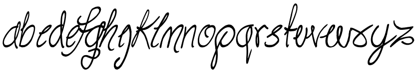
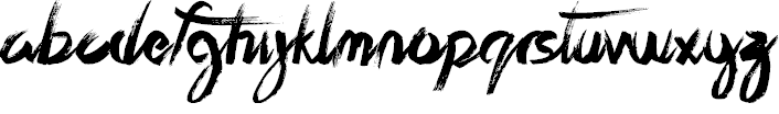
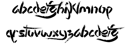
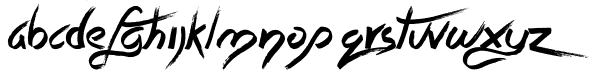
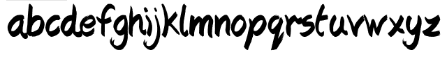
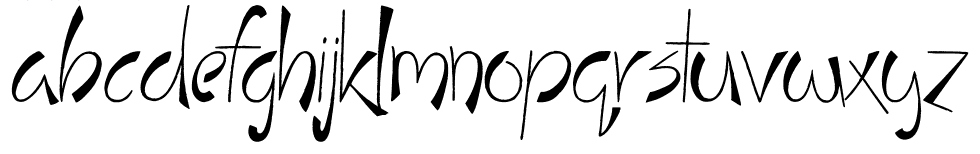
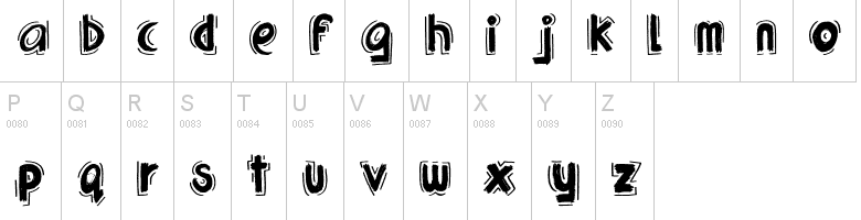
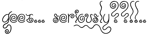
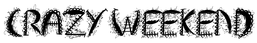
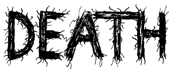
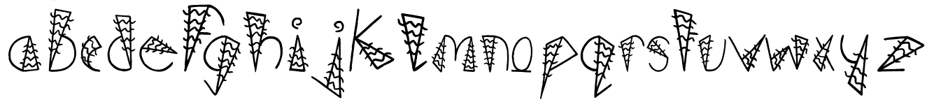
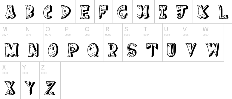
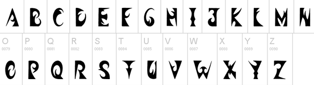
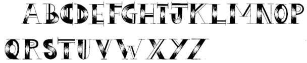
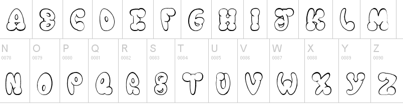
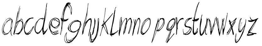
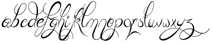
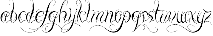
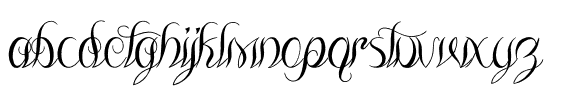
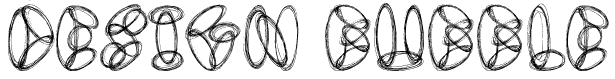
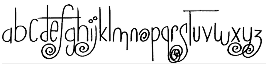
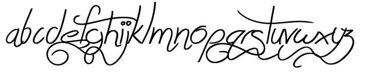
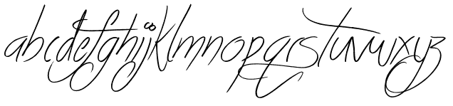
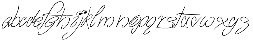
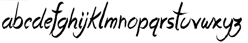
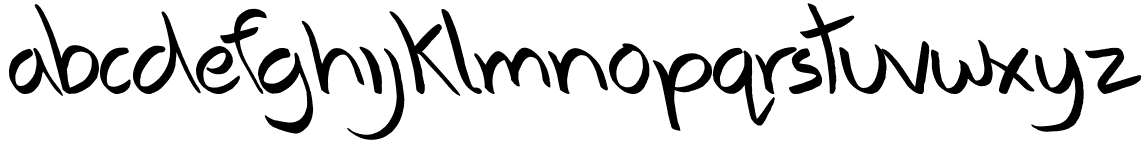
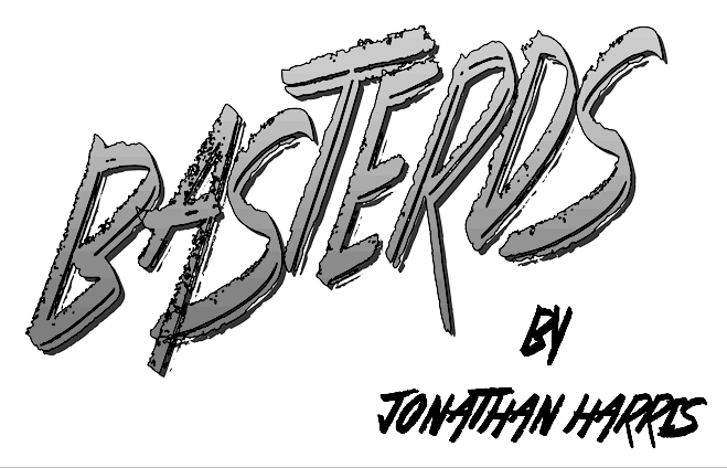
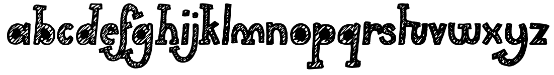
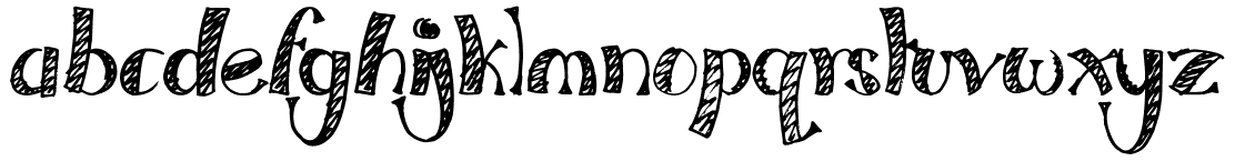
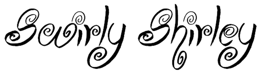
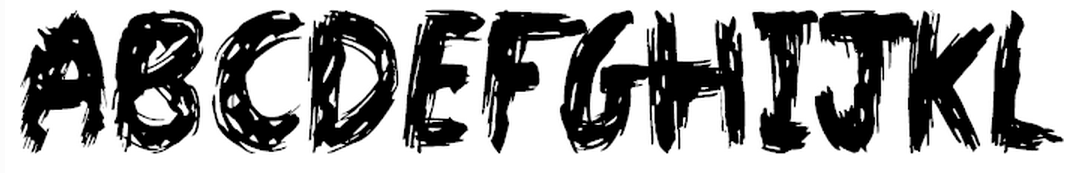
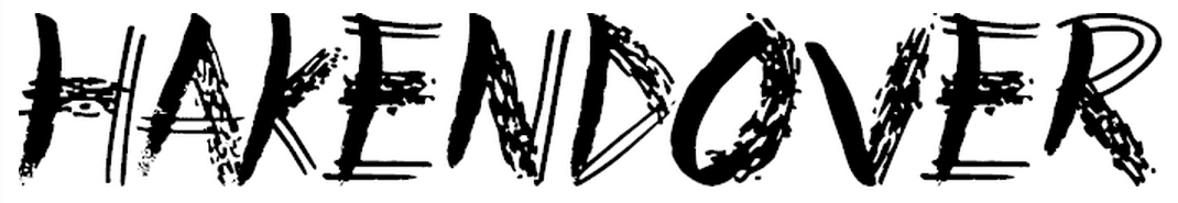
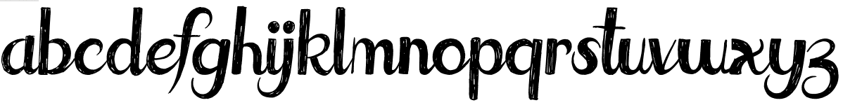
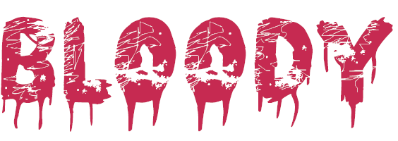
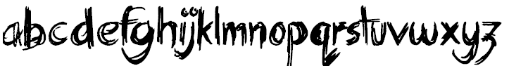
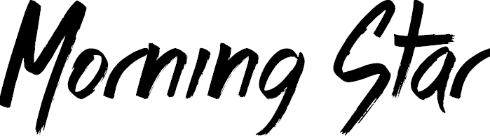
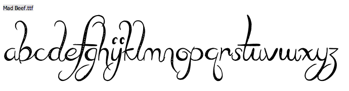
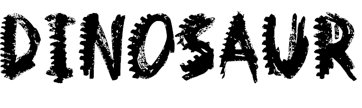
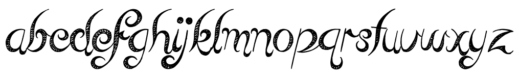
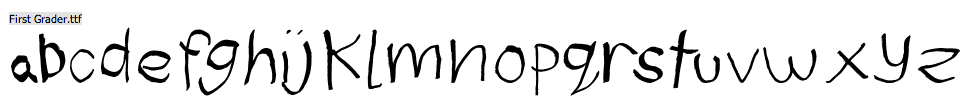
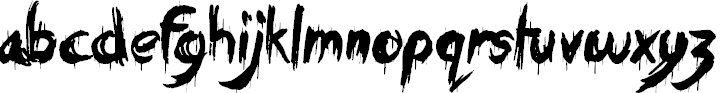
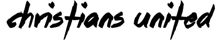
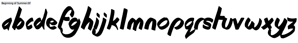
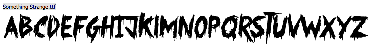
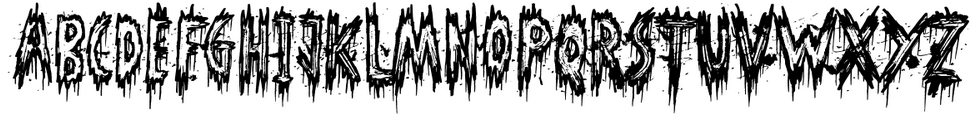
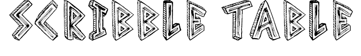
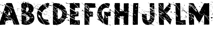
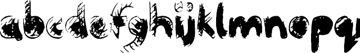
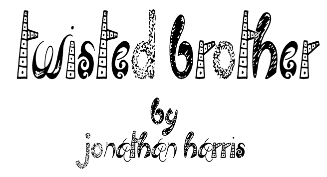
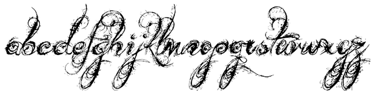
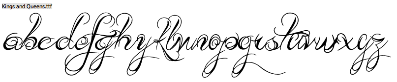
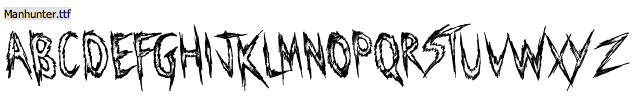
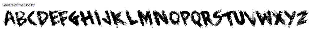
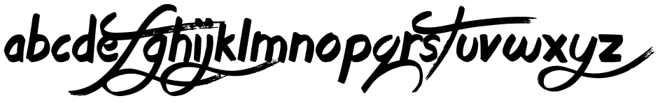
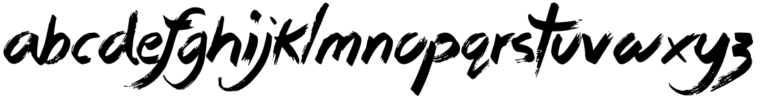
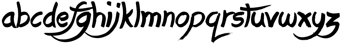
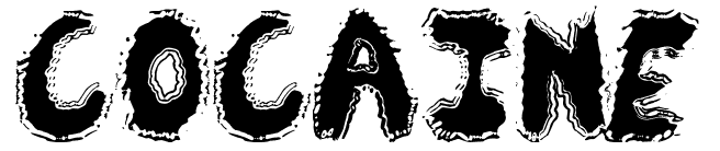
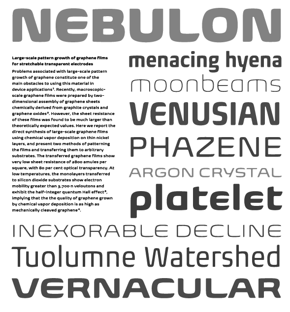
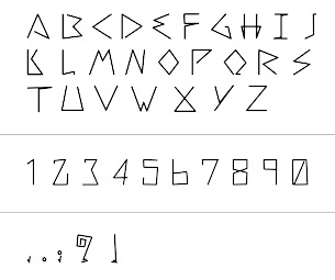
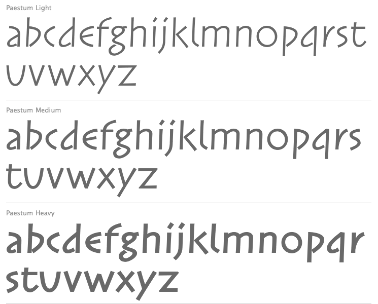
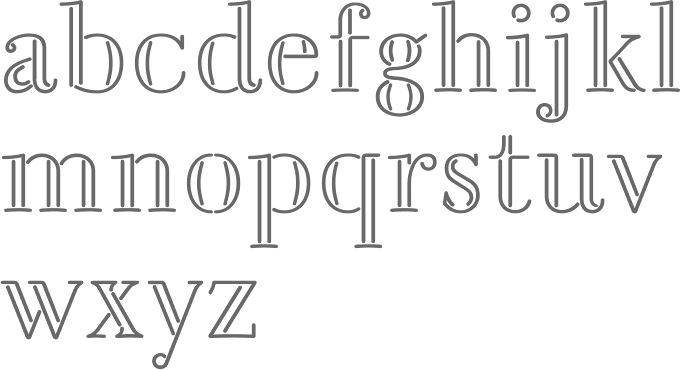
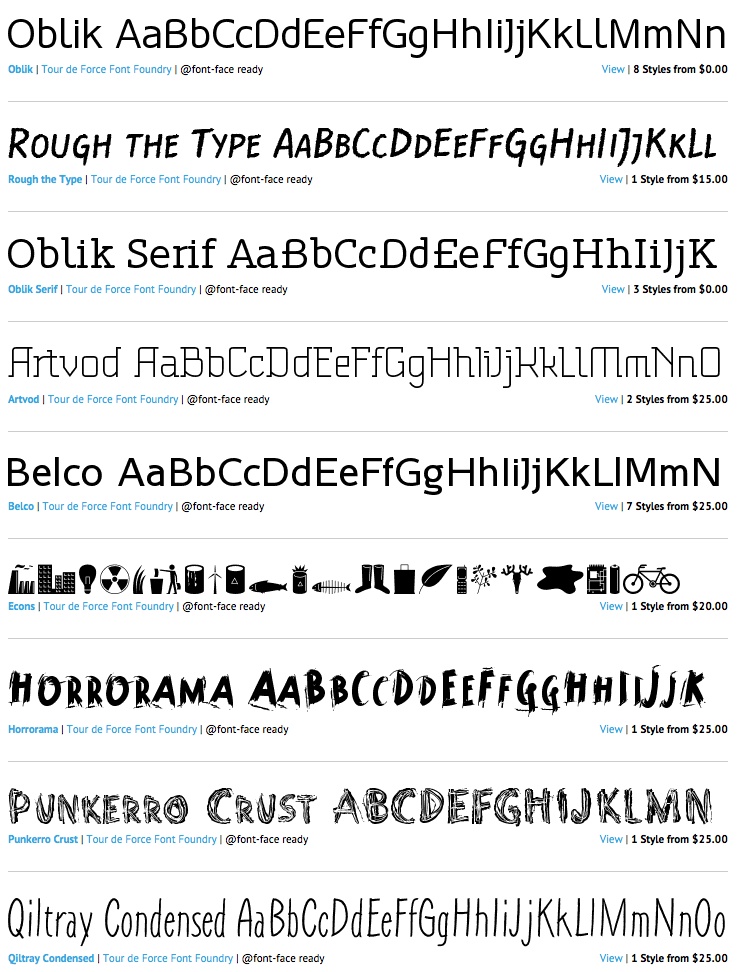
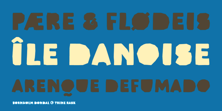
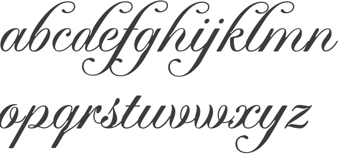
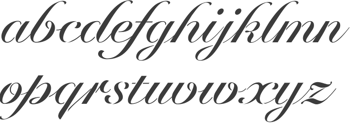
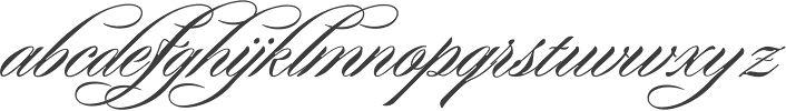
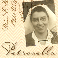
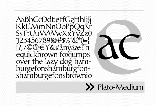
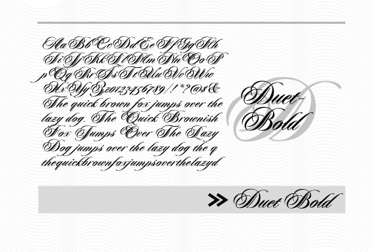
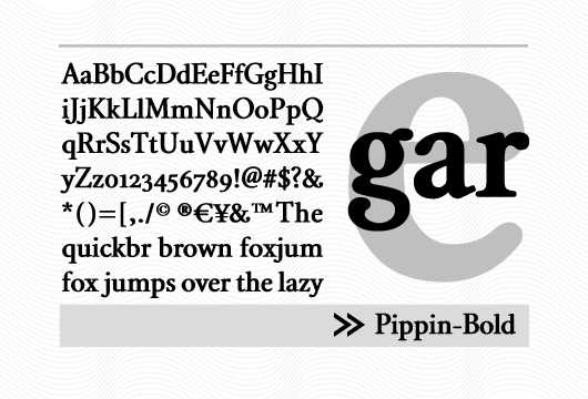
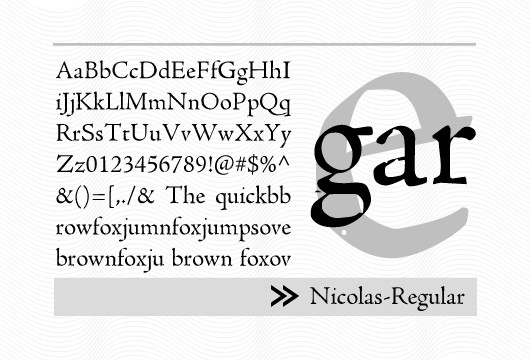
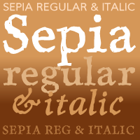
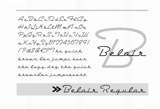
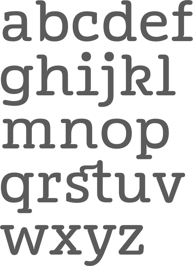
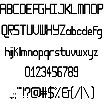
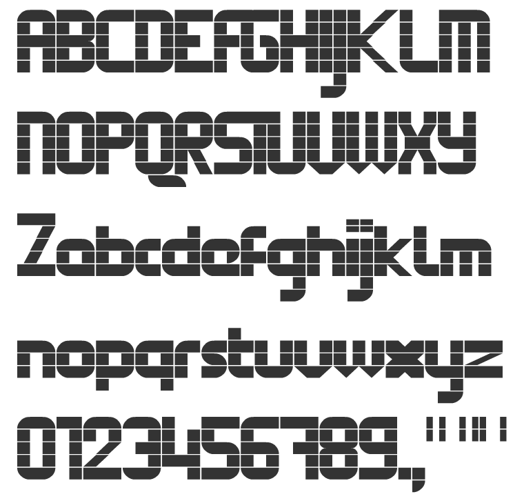
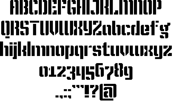
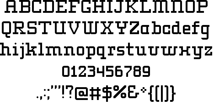
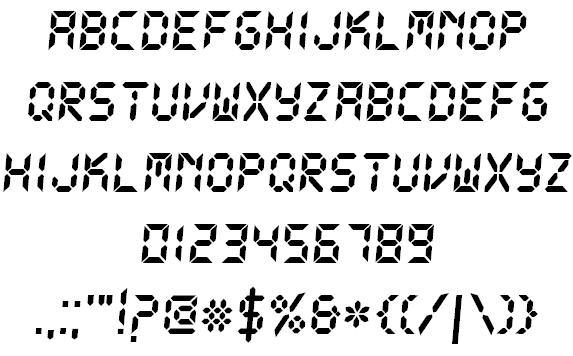
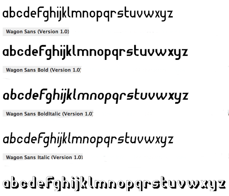
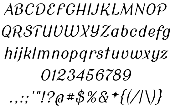
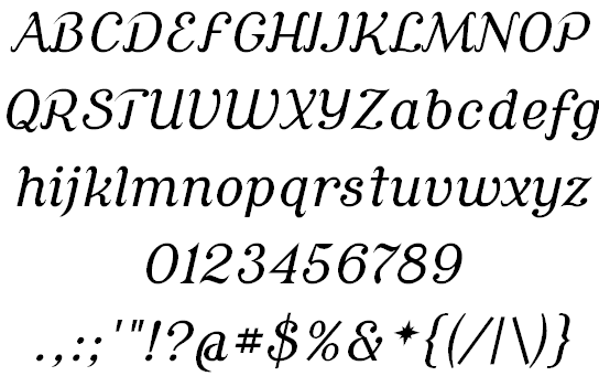
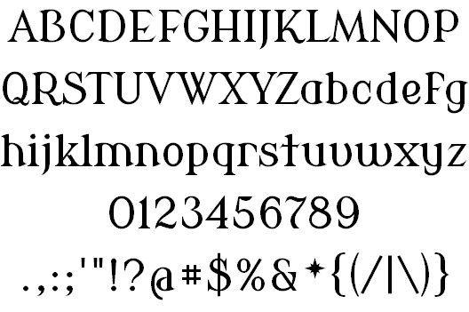
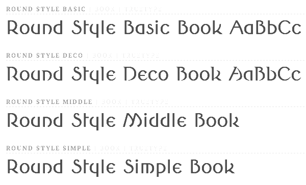
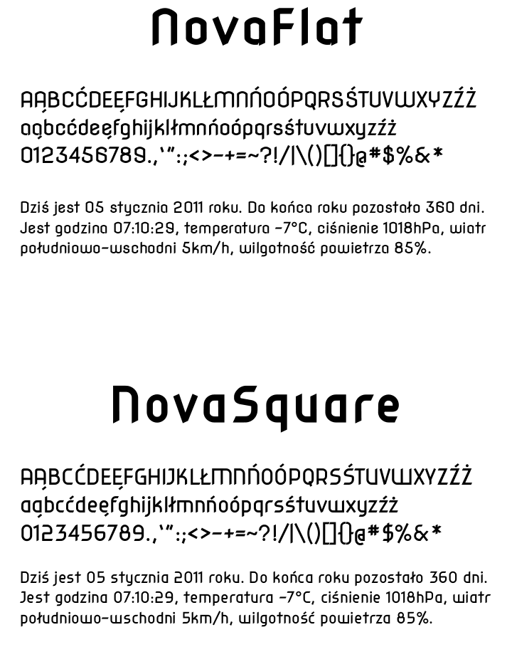
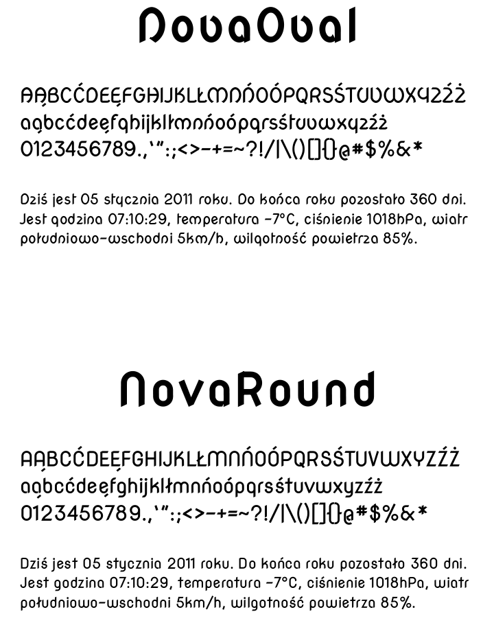
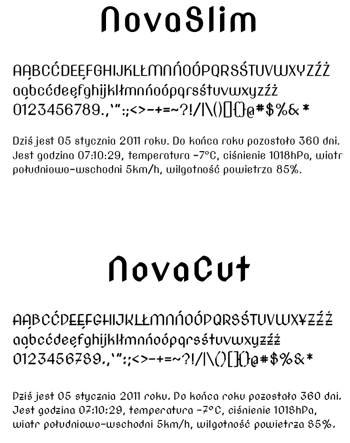
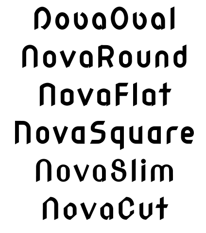
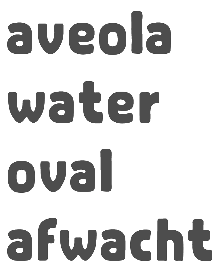
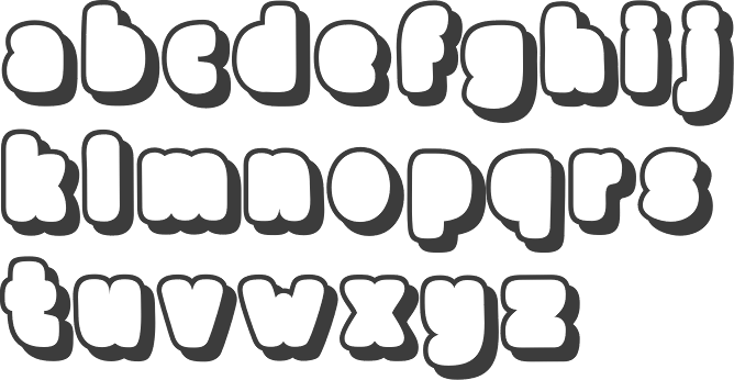