| | |
Abrams Legacy
[George Abrams]

|
The Abrams Legacy Collection was established to preserve and promote the legacy of renowned type designer and lettering artist, George Abrams (d. 2001). It is headquartered in New York City. The digital typefaces are managed and executed by Charles Nix. There are two type families, Augereau (a garalde in 13 styles) and Abrams Venetian (a Venetian in 6 styles). Abrams Venetian was designed in 1989 based on Nicolas Jenson's renaissance letterforms, but was not available until ten years later. Augereau was designed and released by George Abrams in 1997. [Google]
[MyFonts]
[More] ⦿
|
AJPT
[Alan Jay Prescott]
|
 Pottstown (Philadelphia)-based designer and PostScript font hacker who ran Prescott Design and now Alan Jay Prescott Typography, but was also involved in other ventures such as the Black Walnut Winery. Originally from Greenfield, MA, he graduated from Saddleback College, and worked for some time as a typesetter in New York. He advertizes himself as a leader in PostScript Open Type Font development specializing in the revival of print-only letterforms into digital typographic materials. He operates as APT and more recently as AJPT. In 2019, he announced that he would stop making typefaces altogether. His work can be partitioned into time periods. For this reason, Prescott's oeuvre is split over several pages:
 - His late period (2017-2019). In these three years, he showcased his work on Facebook, and was mainly involved in reving 19th century typefaces, about half of which were from the Victorian era. The annotations in the list below are quoted from Prescott's pages.
- Absolution Cursive (2017). When I was a typesetter in New York City, I had one of the largest collections of typefaces from CompuGraphic's library available for setting. One of the faces I never used in two decades of work was a rather ungainly decorative font called Abel Cursive. Apparently it was designed by Bernie Abel (perhaps one of CompuGraphic's employees) and I'm not sure it got much use, since I don't recall seeing it anywhere except my type catalog. Before I sold my equipment and closed my business for good, I made a scan of every typeface at 72-point size that I owned for future development, if there ever came a time to work on something crazy like that. Most of those 2,000 scans were lost when I changed computers a long time ago, but Abel Cursive survived and I made a down-and-dirty mow-and-blow font back then. I have recently worked on it extensively to make it usable as a multilingual slightly redesigned font in OTF format. I would classify it is as neo-Victorian medium-contrast decorative italic. It is definitely an oddball and may never see use.
- Algol (2017). Based on a scan from Dan X. Solo, Algol is a vastly expanded character set for Algernon, a typeface that clearly presages Machine and other "octics." I don't have any source material for the original design, but it may have been a Dan Solo original.
- Aloysius and Aloysius Ornamented (2017). This is a digital revival of the original Algonquin, cut by J.F. Cumming in the late 1880s for the Dickinson Type Foundry in Boston. While this was not my most challenging project, it was a doozy.
- Alpenhorn Roman (2017). Another oddball typeface is revived here, renamed from the design called Alpine by Henry Schuenemann for the Cleveland Type Foundry in the 1880s. Buried in the "gingerbread" of this weird face is technically a Latin serif, but otherwise it is an entirely unique letterform for which I had a heart soft enough to revive here in digital form.
- Androgen Roman (2017). I know next to nothing about this ultra-geometric blackletter called Anderson that I found displayed in a Dan X. Solo catalog, but it is another oddball that is attractive and very simple to revive in digital format. It is one of those projects I would recommend to a beginning revivalist who wanted to cut his or her teeth on a moderate challenge after mastering some basic tools in font development software.
- Angolan Text (2017). I found Angular Text in a Solo catalog and revived it as a digital font with diacritics and other characters for expanded typesetting possibilities. It was designed by Herman Ihlenburg in 1884 for MacKellar, Smiths & Jordan, which information I found in a link from Tom Cruz for a fellow named Toto who revived the font as well; he has several glyphs I do not have and I like his showing better. Interesting to see what others have done with the exact same typeface and scan and some research for tantalizing missing glyphs...kudos.
- Antiochia Series (2017). This collection of typefaces represents a revival of several bold slab-serif wood types with the name Antique that are related. Their individual histories will follow at another time, but note that several here are useful derivatives that add to the variety of this letterform's impact.
- Azurine Roman (2017). Azurine is a digital revival of a typeface known as Aztec, drawn by an unknown designer for the Union Type Foundry before 1889.
- Beltane Roman (2017). The very complicated story behind the work on this revival is too long for this space (and perhaps too boring to most), but suffice it to say that this letterform started out in 1886 as drawn by the great Herman Ihlenburg as Artistic and assigned to MacKellar Smiths & Jordan. Dan Solo called this face Belmont but only showed caps and was suspect anyway. I was able to find specimens elsewhere and a motherlode of other interesting things in the Inland Printer. I developed my first full-featured OTF using this typeface and designed Greek and Cyrillic glyphs as well. I also fitted it out with a set of small caps to make a font that now has 4,000 glyphs for nearly every non-Asian language. To top it off, Robert Donona revived the decorative caps for this typeface, an excruciating task that I once considered for myself but was lucky enough to have this other crazy person take up. The number of hours dedicated between Robert and myself in reviving this complete series digitally is probably unprecedented.
- Bernhard Swirl (2019). This is a digital revival of the letterform of the same name. It is equipped only with the upper case, an ampersand, a spacer dingbat and the numerals. The numerals are quirky, not only in design, but the fact that they seem to have been intended as old-style figures with the exception for the 4 and 7. Lucian Bernhard is either the designer of this limited-use typeface or inspired a reworking of his "wobbly" poster typefaces for which he is known as an innovator. I have reworked the scanned samples I had used as templates and drew them with a little more consistency than the originals to improve color on the page.
- Bireme Roman (2017). Below is a digital revival of a typeface called Bijou. As I have come to understand, several people have revived this face already. It is similar to Flirt in many respects. I will update information as I come across it, but I wanted to post my version here for your appreciation.
- Blackguard (2018). This is a digital revival of a typeface known as Black Cap. William E. Loy writes that Black Cap was designed and cut by Charles H. Beeler Jr. for MacKellar, Smiths & Jordan. The earliest-known commercial specimen was advertised in the January 1891 edition of The Inland Printer, so he probably created it in 1890.
- Blackminster (2017). One of the more interesting treatments of blackletter forms in the 19th century is this beauty called Black No. 544 designed by Henry Brehmer in 1889, who assigned the rights to Bruce Type Foundry. Originally I was unable to locate certain key glyphs in this font, but they were graciously supplied by others in our crazy network of type geeks. More information on the people behind these projects will follow in other articles.
- Bleak (2017). Bleak is a series based closely on a typeface called Stark. As with nearly all typeface names, there are several unrelated fonts developed in recent years that bear no resemblance to this gorgeous sans serif.
- Brotherly Roman (2017). Among many "antiqued" letterforms developed in the late 19th century, Ben Franklin was offered by Keystone Type Foundry in Philadelphia. Several glyphs were missing from my best showing of the font, but I was luckily able to find them, as well as logotypes, two ornaments, several alternate characters and some punctuation. There had already been a digital revival of this typeface kicking around as shareware in the 1990s, but it was very poorly drawn and incomplete. I believe it has been rendered nicely and consistently here for posterity.
- Busker Contour (2017). Burlesque was the name given by Solo to a typeface originating through Caslon or Figgins around 1843 and shown in German specimens a couple of years later.
- Cane Gothic (2018). Cane Gothic was designed and cut by Edwin C. Ruthven c.1886; he patented it in March–April 1886 and assigned the rights to David Wolfe Bruce (son of George Bruce, holder of the first design patent in US history). The Bruce catalog number is unknown. The tradename Cane Gothic, an apt description of the caning patterned background, may have been assigned by Dan X. Solo, who had revived the face for his photo-lettering service, but it has previously been considered impossible for digitizing. Although the average character in this font contains something like 3,000 Bézier control points, it turned out to be doable once I figured out the original mathematics that Ruthven must have used to guide his design objectively. It is digitized for posterity and I thank Anna Allen once again for the patent specimen (No. 16,643) indicating, if extremely faintly, five missing glyphs from my otherwise excellent scan. Thus I've generated the border glyphs and a pound Sterling symbol to augment this letterform. As far as I can determine, this character set is complete, and I have generated three fonts in order to accommodate chromatic typesetting with very little effort.
- Cantini Casual (2019). This is a digital revival of the typeface of the same name (or at least that is the name Solo gave it in the type specimen book from which it was scanned). It is a great example of the exuberant fancy characters that came to ascendance during the 1960s and 1970s. It is a medium-weight Latin italic with unusual decorative details in addition to crazy swash choices. I do not have any information on the history of this trippy face, but it is likely it was revived at some time in the recent past. It includes a large number of alternate glyphs as well.
- Capulet (2017). This is a revival of a typeface called Caprice that was patented in 1888 by Arthur M. Barnhart and assigned to Barnhart Bros. & Spindler of Chicago. This letterform is a prime example of the explosion in design ideas occurring before the turn of the century, hundreds of which remain to be translated into digital format.
- Carmenite Roman (2017). This beautiful digital revival covers a letterform drawn by the Bauer Type Foundry of Stuttgart, Germany sometime before 1896. It was originally called Carmen and has been referred to as Carmencita in the Solo books.
- Centrum Text (2017). This is my digital revival of one of the more complex decorated blackletters, among my favorite and most difficult projects to work on and just finished today. It is identified as Celebration Text on p. 18 of Solo's "Gothic and Old English Alphabets." The lowercase for this letterform is also presented for two other typefaces, Testimonial Text and Innsbruck in his larger catalog, presenting some confusion. But I believe all three were drawn by the same designer, although I have no idea how old they are. The lowercase may simply have been used for all three decorated capitals, since they are a very good match. Intentional, who knows? It is a real beauty and I'm going to perhaps revive the other two in this triplet of great examples of decorated capitals.
- Chapterhouse Roman (2017). This is an interesting typeface known as Ecclesiastic from Caslon around 1870. It was also known as Albion and Chapel Text No. 30. Most of those names were applied to completely unrelated designs, adding to the confusion that permeates typographic development and history to this day (and only gets worse over time). There are probably more alternate characters out there, but this is the best showing I could make with the resources I have and it is now available from me as a digital font.
- Chapterhouse Roman (2017). This is an interesting typeface known as Ecclesiastic from Caslon around 1870. It was also known as Albion and Chapel Text No. 30. Most of those names were applied to completely unrelated designs, adding to the confusion that permeates typographic development and history to this day (and only gets worse over time). There are probably more alternate characters out there, but this is the best showing I could make with the resources I have and it is now available from me as a digital font.
- Clarence Roman and Dotted (2017). Clarence Roman is a revival of Clown Alley and Clarence Dotted that of Cooktent (also called No. 515). Wood typeface Cooktent comes from W.H. Page before 1890 and the other looks to be a back-formation from it.
- Commissioner Script (2017). The typeface known as Commercial Script was designed by Morris Fuller Benton in the early twentieth century and enjoyed widespread use for decades. There have been many variations from other foundries, varying mostly in contrast; but as far as I know there was ever only one rather bold weight produced. I have redesigned the letterforms for consistency on the way to producing the ten weights shown here. It is interesting to see the font in lighter weights that accentuate the beauty lurking in this standard, and the heavier weights to see that the design still holds up under even heavier lifting.
- Courtesan Roman (2017). Among the dozens of wood types I have revived digitally is Courier, here called Courtesan. Many of these letterforms have been revived by others, all slightly different in their interpretations. More information on wood types will follow in articles I plan to write in the future on various areas of interest in the field of revival in particular and typography in general.
- Cranston Ornamented (2017). This is one of the most difficult digital revivals I have worked on. It started as Crayon, another masterful design from the prolific Ihlenburg, available at MSJ in 1885. There are sister fonts in an Open and a Solid that differ slightly in design and will be available from me at some point in the future.
- Creekside Playful and Calligrapic (2018). These are two digital casual scripts of my own creation based loosely on hand-drawn types from the 1950's. One is a calligraphic interpretation and the other is a more mono weight design that is a bit more slanted, both available for multi-language setting.
- Criticism (2017). This is a digital revival of Critic, a typeface designed by William F. Capitain in the mid-1880s with rights assigned to Marder, Luse & Co. Several logotypes had been designed for this letterform and many alternate glyphs. I added a few of my own, as well as diacritic marks, for balance to this surprisingly modern face that can be rendered multilingually as well.
- Crosby Roman (2017). This is a digital revival of the typeface known as University Text, designed in 1862 and shown by MacKellar, Smiths & Jordan in 1869 as Crosier. It was also known much later as Morningside. It is a stylized Latin with great charm.
- Crossan Roman (2017). This is digital multilingual OTF revival of a typeface called Cross Gothic, another one of those unique, nearly unusable letterforms I adore. I got a million of 'em.
- Cullane Roman (2017). Cullane is a digital revival of Herman Ihlenburg's Culdee, patented in 1885 and offered through MSJ. Others helped me scour the literature for missing glyphs and no one is sure we've got them all, but this is a wonderful showing of what we think is available until something randomly shows up in the future.
- Currier (2018). J.B. Lieberman, Ph.D. identifies it as Deberny & Peignot Lettres Ombrés Ornés (ornamented shaded letters) and adds that it was originally cut by Gillé in 1820, thus making it one of the oldest typefaces I have revived digitally. It is an exuberantly decorated engraved shadowed heavy-weight Egyptian.
- Danuvius (2017). Danube is the original name for this letterform, again found in a Solo catalog, and its links with medieval letterforms is obvious despite the trends toward modernization at the time it was first produced. I otherwise have no information on this face.
- Devonian Roman (2017). This is a digital revival of a wood typeface known as DeVinne. More information updated later.
- Dorothy Series (2017). The original Doric Chromatic was designed as a wood typeface and made its appearance in the United States in the 1850s, though it probably got its start in France in the 1840s according to Rob Roy Kelly.
- Doughboy Roman (2017). This series of decorative caps is shown as Dodge City in Solo. I am not sure it is very old; it may very well have been a photographically slanted version of an older wood typeface in the Thunderbird category with flourishes added on at the same time. This has been revived before because of its simplicity, but I made my own version a little more consistent and they make attractive drop caps.
- Enclave Roman and Expanded (2017). These two related digital revivals represent Enchorial in two versions. The roman came out of the Caslon Type Foundry in 1884 and was extremely popular (sometimes known as London). Petzendorfer showed the expanded Enchorial around 1903.
- Esteban (2017). Esteban is an original design I developed around 2010, named after the recently deceased Esteban Arriaga, a leading seascape painter in the area of Málaga in Spain. It is a medium-contrast sans serif produced in nine weights plus italics. Currently it is available only for the Macintosh OS, but an OTF cross-platform font is anticipated.
- Euclid, Euclid Initials,Euclastic, Elberon, Astral, and Auroral (2018). Elberon existed by November 1886 from Cleveland Type Foundry in The Inland Printer. Euclid (a lighter version of Elberon with a few different glyphs) is an obvious derivative from Illinois Type Founding Co. in Chicago in August 1890. Euclid appears with several Euclid Initials, a full sample of which appears as "Grant Iniitials" from Minnesota Typographic Co. Auroral (basically a shaded form of Elberon) appears in January 1887 from Central type foundry. Astral, also from Central type foundry, (the almost exact shading concept) whose base form is a condensed, heavier form than Euclid) appears in December 1886. Euclastic is my name for a complete set of weights, from a Hairline at the extreme end of lightness, through Black at the other extreme, using redesigned examples of Euclid and Elberon.
- Farmerboy and Farmergirl (2017). Although these two typefaces have both been called Fargo in the past, they are distinctly not the same letterform despite sharing some characteristics. They are both probably late 1850s, early 1860s and some sources say they are German. In any case, two interesting oddballs with no usage in the last century-and-a-half are revived digitally by AJPT.
- Fastidious Series (2017). The typeface known as Fashion started out in 1876 and was patented by Andrew Little for A.D. Farmer & Son. There are a total of five related typefaces in the same design: the prototype, condensed, ornamented, antique and extra-condensed. It turned out that the samples I had available when I originally revived these two were rather suspect and I have to consider going back to these and try to figure out what the "real" glyphs are. I believe that the Solo ornamental showing was rather a hatchet job on the base font, so I consider these two on hold pending further research, but they are interesting to view how they are so far.
- Flare Serif Striped (2018). This is a digital revival of a face called Ornamented 1,079. This over-the-top candy-cane-with-curls design was created by Henry Brehmer, who patented it in December 1884–January 1885. The application was submitted and approved on the same days as Ornamented No. 1,077 (Hermann Ihlenburg), and the rights to both were assigned to David W. Bruce of the Bruce TF (New York) [USPTO D15748]. It was advertised in The Inland Printer of October 1885. Thanks again to Anna Allen Conroy for the background on Ornamented 1,079 and for the patent samples giving a good idea of the design of glyphs missing from the catalogs. I have produced AE and OE ligatures as well as a decent set of diacritical marks for setting in a few important languages, but it is not at OTF font at the moment and exists only as PostScript for Mac only.
- Flippant Roman (2017). This fun font is a revival of a typeface known as Flirt. Although it has that 1960s feel, like many fonts popular then, I believe it has a much older pedigree. I will supply more information as I come across it. (There is currently an unrelated script font called Flirt on the market now, designed in 2009.)
- Fusion (2017). i developed three weights (including small caps) for the popular typeface Futura, all of them lighter than the Futura Light that is widely available. You can never be too thin.
- Gallantry Roman (2017). The earliest known specimen of the original Gazelle is found in the 1893 catalog of ATF in Cleveland and designed by Henry Schuenemann. This digital revival has multilingual capabilities and is quite unusual, demonstrating again the almost limitless possibilities of type design over the centuries.
- Gamut (2017). The Gamut series of very condensed sans serifs is based on a wide range of typefaces that all began with the letter "G": Galaxy, Gable, Garfield, Giant, Gamma, etc. (Their italics began with the letter "E", perhaps to come at a later time). I produced these typefaces under the same name to keep them all in one place, all ten weights that are floating around somewhere undigitized until now. They are currently available from me as Mac-only fonts, but OTF may be developed over time. They are members of the large "family" of typefaces whose members can be difficult to separate, such as the Helveticas, Trade Gothics, Standard Gothics, etc. I believe this was a well-designed condensed face that has nice nuances.
- Gironde and Gironde Extended (2017). Giraffe is the original name for this digital revival. It has been difficult to find a complete character set for this typeface, as I'm sure whatever existed in the roman also existed for the extended version. I revived what I could find, but it is a rather simple design and other characters can be imagined that are congruent with what is seen here. I'm not sure how much use these two oddball typefaces got in their time, but they were designed by Charles Beeler, Jr. in 1891for MacKellar , Smiths & Jordan.
- Gothic Decorated (2018). This is my temporary name for the digital revival of a typeface once called Ornamented 1,078. In the past couple of weeks, I have revived the "ornamenteds" on either side of this number. I have no information on this other than that it appears in the Inland Printer of October 1885 from George Bruce's Son & Co. TF in New York City.
- Goudy Flare Extra Bold (2019). This is a digital revival of another typeface in the Goudy superfamily, titled originally as simply Goudy Flare. I don't know the provenance of this particular letterform, but it was found in a Solo publication and could very well be one of his own creations, since I have never seen it used in print. It turns out that this is a modification of Goudy Old Style Extra Bold, and so I was able to find a suitable digitized version that matched the base forms very closely and modified the existing characters to accommodate these rather simple swashes. A reader added: "Goudy Flair was created by Mr. Phil Martin of Alphabet Innovations, that is he took Goudy Extra Bold and added swashes to this."
- Goudy Long Fancy (2019). This is a digital revival of the typeface of the same name, again another addition to the large Goudy family. There is a tremendous selection of swashes and alternate characters in this font, especially the upper case. It is an extra bold italic Goudy whose slant is less steep than normal for this family. There are no figures or punctuation provided for this letterform; those provided in the scan from which I worked were incorrect, and possibly back-formations from a different Goudy, so they were not produced for this version.
- Goudy Swash Heavy Italic (2019). This is a digital revival of the typeface of the same name. There are literally hundreds of revivals of letterforms in the Goudy "family" of typefaces. Nearly every foundry has produced its own version of this popular form, with many nuances between them. There are many weights, italics, various alternate characters and swashes galore, but I haven't seen a revival of this particular set of gorgeous swashes and alternates. Thus, I worked on very good printed samples, perhaps from a photolettering catalog half a century ago.
- Goudytype Antique (2019). This is digital revival of a typeface designated as Goudytype in a Solo catalog, with a slight twist. There is no punctuation for this font, but several nice swash alternates, a dollar sign and an ampersand. I decided to draw this as an "antique," because the ink spread in the original lent itself to this sort of treatment. Although a bit tedious, it can be used in the same way as other faces, such as Packard, Benjamin Franklin, Caslon Antique, Papyrus (heaven forbid) and others. Although one would assume this is in the Goudy superfamily, there are some characteristics that set it apart. The stresses and some other features are rather reminiscent of Palatino. And the slant is so slight as to make it unlike both typefaces' italics.
- Gracile (2019). Gracile is based closely on Greyhound Script, but has been expanded and standardized to include weights on either side of the two available in Solo. It is a semi script, since not all characters can be joined, and thus has a more casual feel. It is a strictly monoweight letterform in all six stroke thicknesses, with several alternate glyphs. There are digital versions in two medium strokes available from others, but those I was able to locate are rather poorly realized despite having diacritical marks for foreign languages. They can readily be designed and added to my interpretations, but I have chosen to do this later if anyone requires them.
- Griego Wood Series (2017). Several typefaces classified as Grecian were produced in wood for large sizes. Here I show Full Faced (William Page, 1859); Condensed and X Condensed (Wells & Webb/L. Johnson, 1846); X Condensed Bold (probably handmade, Nebraska, before 1885), and XX Condensed (John Cooley, 1859). I had revived some of these digitally years ago, but I revisited them recently and gave them a real facelift. They have undoubtedly been revived before because of their relative simplicity.
- Grosgrain (2017). This is a revival of a typeface called Grotesque No. 120. The lineage of the most famous typeface in the world, Helvetica (and, sort of, Arial) is evident in the early "grotesques." Although there are distinct differences in many of the characters of this very light typeface designed for mostly display use with alternate flourished glyphs, its resemblance to the later sans serifs of the twentieth century is striking. Marder, Luse & Co. of Chicago shows this face in 1885. Another similar typeface from around the same time called Circular Gothic is even closer to the Helveticas and derivatives of today. The alternate characters are revived from the sister font called Grotesque Fancy.
- Grounded Series (2017). I have revived Abramesque again, this time in congruence with the series from which it originated, thus it is called Grounded Ornamented. The original types started with Gothic Rounded. There was a Roman, an Outline, an Open and an Ornamented. The story behind these beauties is (as usual) too long, but briefly, information from Anna Allen: Old Bowery and Abramesque were originally called Rounded Open and Rounded Ornamented and have led interesting lives. Nicolette Gray identifies them with Caslon c1844. As a teenager, Rounded Open visited the Bruce TF (c1854), where she was called Ornamented No. 1007. After a suspected Bruce facelift as Gothic Round Shaded (≤1869), she was reintroduced by ATF as Old Bowery in 1933. McGrew writes, “Old Bowery is an ATF revival, in 1933 and again in 1949, of Round Shade No. 2, originated by Bruce , one of its predecessor companies, about 1854, as Ornamented No. 1007.“ Only an ornamented version, different from Abramesque and not illustrated by Gray, is shown in Bruce 1856. At a recent Oak Knoll event, Nick Sherman shot a photo of the page in Caslon's 1844 catalog showing Rounded, the solid prototype of these faces (not documented by Gray) and shared it at flickr.com. Albert-Jan Pool (designer of DIN and keen historian of sans-serif faces) observed that the footer is dated “September 1836,” so it was reprinted (probably as a stereotyped page) from an earlier Caslon publication. Until then, the earliest specimen examined by THP is shown in Caslon 1841. All agree that, so far, it is the earliest-known rounded sans-serif face in history—and this pleasingly plump family of three is as appealing today as ever! Of a very similar wood-type face tradenamed Gothic Round, Kelly reports: “First shown by George Nesbitt in his 1838 specimens. … The Nesbitt design was an Outlined or Rimmed Gothic Round. The Caslon Foundry issued several Gothic Round designs, of which an ornamented one (Abramesque), in particular, came into general usage in America around mid-century.” George Nesbittt, a New York printer, distributed wood types produced by Edwin Allen (Windham, CT ). Sherman adds that “Miguel Sousa at Adobe is in the process of making a digital revival of this face (Gothic Round|Old Bowery) for the Hamilton Wood Type Foundry.”
- Heraldry Roman (2017). This is a digital revival of a typeface called Heraldic, patented by John K. Rogers in 1880, an agent of the Boston Type Foundry.
- Hinterland (2017). Attached is a revival of an exuberant, heavy sans serif called Hibernian in Solo's catalogs. I've included alternate glyphs that I know of, but there may be some floating out there somewhere. The origin of this typeface is obscure, but there is some evidence it may have been from Genzsch & Heyse around 1893 according to one knowledgeable source.
- Hopscotch Roman (2017). Hopscotch is a revival of a wood typeface known as Hopkins.
- Jackdaw (+Open) (2017). This is a revival of a wood typeface known as Jackpot in Solo's catalogs, but was originally named Tuscan Shade No. 1. I have also produced a derivative called Jackdaw Open. Otherwise, I have little information on this bizarre beauty.
- Jeffers Contour (2017). Another decorative cap discovered as Jeffrey in a Solo catalog has been digitally revived here.
- Jeremiad (2018). A digital revival of Jenson Old Style, a typeface cut by Hamilton with the permission of American Type Founders in 1906. It has undoubtedly been revived before, as many wood types already have, but this is my interpretation and has been given a measure of consistency without losing its charm. I post this now, but it was produced a couple of years ago and I overlooked posting
- Joshua Contour (2017). I found a rather odd display typeface called Joseph in a Solo catalog, and it seems not to have a history longer than that, so who knows?
- Juvenilia Roman (2018). Juvenilia is a revival of a semiserif medium-weight typeface called Jumbo. Anna Allen's description follows: This slick stylized sans serif was designed and patented by Ernst Lauschke in 1887; he assigned the rights to Arthur M. and Alson E.Barnhart. This letterform is very unusual in having the tops of the characters generally devoid of the expected serif. Overall the design has medium contrast, which would be expected of a serif face. Several characters reflect missal-style influences (e.g. T, M), which was common for the time, but they are sprinkled in with standard types. The ampersand is influenced by wood types of the era. It is a distinctly odd species, another Lauschke innovation and unique.
- Katy Beth (2017). I discovered in the Inland Printer typefaces called Katherine and Elizabeth that were identical to each other and I was able to piece together a complete set of glyphs between the two to make a full digital revival.
- Kodiak (2017). Kodiak is a revival of Komet, an exuberant calligraphic sans serif produced by Roos & Junge Type Foundry around 1902
- Latchkey Roman (2018). This is a digital revival of Lattice, a face designed by Carl/Charles E.Heyer (1841 Berlin–1897 Chicago). He patented it in October–December 1883 and assigned the rights to Arthur M. and Alson E. Barnhart by name (the firm was not yet incorporated). Among other things, his unique hooked C was probably inspired by the hint of a hook in Copley (a sign-painter face dated before or in 1877 and cut by J.F. Cumming in 1881-1884). As Heyer's talent flourished at BBS (Chicago, 1868–1929), he led his new employer from one loathed by traditional TFs for bartering stolen designs for newspaper advertising space to one at the forefront of truly innovative display types. In the history of this TF historically regarded as great, he conceived at least 50% of their designs. Thanks to Anna Allen for the background on Lattice. Thanks to Dan X. Solo for the complete specimen, which although inconsistent and ink-heavy for some characters, was complete as far as I know. I have substantially reworked this typeface to bring a consistency for modern-day typesetting, but it is entirely faithful to the original cutting. Several of the characters are adventurous for their time (the C and ampersand, for example).
- Latin Fancy (2018). The Latin Fancy Engraved Shade version of these three fonts (the two others are derivatives) started life as Ornamented No. 1,077. Thanks again to Anna for the research that follows and for a patent specimen that gave a very rough idea of glyphs that did not appear in the catalog showings. It has ben digitally revived for posterity and is available for now as Mac-only. It appeared in October 1885 in the Inland Printer. Herman Ihlenburg, usually associated with MacKellar, Smiths & Jordan (Philadelphia), designed and cut this sizzling all-caps Latin face for the Bruce TF (New York). The patent application, submitted and approved on the same days as the one for Ornamented No. 1,079 (Brehmer), was likewise assigned to David W. Bruce (New York) [USPTO D15752]. A caveat for purists out there: The "A" has been drawn to compensate for a cutting or design error that appears in all examined versions of the typeface. No alternate has been provided for the misdrawn A.
- Lipo Caps Series (2017). Lipo Caps is a typeface series whose members are related in the sense that they have never existed as digital fonts (as far as I know), they are hand-lettered (probably by the same person), they were unlikely ever to have been developed as typefaces at the time they were drawn, and they were found in the same publication of bizarre letterforms. I have given them consistency without sacrificing the hand-drawn qualities and produced two versions of each one that I found, five fonts altogether (with "undecorated" versions as the lower-case keystrokes in each case). It is interesting to see great drawing technique that nevertheless never resulted into typography until now.
- Livornese Roman (2018). This is a digital revival of Livonia, an art nouveau-inspired typeface for which I have no information. There is a full set of alphanumerics, but no punctuation. It is a monoweight bold condensed sans serif with minimal descenders and an x-height that is at the maximum allowed visual percentage of cap height. This is another example of a face I revived in the 1990s but has been tightened up considerably for consistency and professional typesetting.
- Lubricious (2018). This strictly monoweight rounded sans serif typeface was referred to as Lute Medium in a Dan X. Solo publication, but I otherwise have no information on this letterform. It is influenced by the Art Nouveau movement and I have drawn a plausible Light and Bold as well; it seems that either one or both must have existed if it was referred to as a medium and I have made a rough guess as to the stroke weight. I think this face is quite pretty and has several innovations that are not over the top.
- Luring Series (2017). Luring is a faithful rendition of MacKellar , Smiths & Jordan's Luray and patented by Charles H. Beeler around the mid-1880s. Because the lining work in each was different depending on the point size of the metal type used (in order to achieve the same visual "grayness" when printed), I have developed each of these in such a way that when the same size is selected for each font, the optimal relative size is actually produced. The same technique was used for the equally challenging typeface called Tinted.
- Luscious (2017). This is a revival of a typeface called Lulubelle found in Solo's catalogs. It has been rendered in 7 weights, several of which correspond to known weights of this interesting sans serif condensed Art Deco-influenced letterform.
- Maggie Tried (2018). This is my digital revival (there have been others) of a typeface called Margit. According to sources I believe to be reliable, it was designed in 1969 by Phil Martin. An inquiry from a follower of this page generated a look back at a face I had once revived in the 1990s, but it was not as well-rendered as it could have been. I started from scratch and brought it back to life in a way more congruent with my current skills. It is a lovely example of letterforms developed in the late 1960s and early 1970s.
- Maltic (2018). In the six original sizes advertised and an additional three sizes to fill the gaps: This is a revival of the typeface by the same name, since it may not have been patented or trademarked by anyone until further notice. This typeface may never have been used and certainly is rather odd, but it can be seen that it must be one of the oldest forerunners of typefaces that were built from discrete "pieces" into a dot pattern, presaging the use of pixelation on monitors a hundred years later, as well as many other examples of typefaces built from pixels, dots, rectangles, stars and numerous other doodads and dingbats. In this case, the strict grid is violated for diagonals and many other interesting work-arounds; there are actually three different shapes used to build this geometric sans serif letterform. Information by Anna Allen: "Maltic is an interesting sans-serif face built from geometric motifs, was shown by the Illinois Type Foundry in The Inland Printer edition of December 1886. The specimen is marked patented, but extensive THP research finds no verification of this claim. This typeface is a complete mystery to me, as is the Illinois TF [Chicago, 1872–1892]… Annenberg (who bewails the lack of history details) reports that it was originally a distributor for the BruceTF (New York) and no record exists of any types that were originated by the Illinois Type Foundry. A showing of ornamental borders in the August 1890 edition of The Inland Printer advertises that they were Western Agents for Conner (New York) types as well."
- Margarethe (2017). It is hard to believe, but the original typeface was shown by Eduard Haenel (Berlin) in 1847 and was later adopted by American type houses. Eventually it was called Marble Heart, but most samples show only the upper case. Eventually I was ably to put together a large character set for multilingual setting after a rare, complete lower case specimen was discovered. This digital revival also covers typefaces variously known as Ornamented No. 11, 13 and 33. It is an early forerunner of faces known as grotesques (sans serifs that resemble Helvetica, Standard Gothic, etc.) This is another very difficult drawing exercise, but made all the more enjoyable after valuable sleuthing for missing glyphs by Anna at Type Heritage Project.
- Minster (2018). Minster was yet another style ground-breaker by Herman Ihlenburg, who patented the design in May–June, 1878 with assignment to MacKellar, Smiths & Jordan. This rimmed dual-case ornamented Latin beauty was consistently shown by MSJ and by ATF as late as 1897. It was also distributed by the Franklin TF (Cincinnati) [aka Allison & Smith]. Charles H. Smith, foreman, was the son of Lawrence Johnson's former partner (Johnson & Smith, 1833–1843). It has been digitally revived for posterity and took about two weeks to produce the full set of glyphs. Thanks to J. Choi and Anna Allen for very good specimens of printed materials.
- Molto (Fiorito, Ombreggiato and Nero) (2018). Molto Fiorito is a digital revival of MoléFoliate, whose history below has been researched by Anna Allen. Ombreggiato is a derivative with just the shadow, and Nero is the central characters adapted for separate setting, Bodoni or Didone letterform with high contrast and thin slab serifs. It has been produced in multiple sub-fonts for a wide variety of pin-register multicolor setting. Researching the topic on Fonderie Générale (Paris, 1834–1912) raised some perplexing questions about the history of this famous ornamented Didone. Twentieth-century historians attribute the design to Joseph Moléin c1819. Indeed, the conservative styling is compatible with fonts intended for title pages of scholarly and literary books, mainstay of the publishing industry during this period. The 1835 catalog issued by Tarbé (Molés successor) states that text, titling and display faces are offered therein. Even so, none resembling MoléFoliate is shown by any Molésuccessor in five digital specimen books dated 1835–1896. On the contrary, surface ornamentation is limited almost exclusively to Tuscans and Egyptians. Jaspert et al. (2001) note the then-current letterpress font source as Stephenson Blake & Co. Ltd. (Sheffield). Millington explains that the face was "redrawn by S.L. Hartz from a design by the Parisian typefounder Molé". Sem L. Hartz was associated with the Enschedé TF (Haarlem). SB introduced it in 1958 as "An Exotic Display Type". Did Molétransfer rights to this design before Tarbé's acquisition in 1835? If so: to SB? Enschedé? Another TF in existence at the time? Did Moléhimself design the leafy ornamentation attributed to him today? Or… Did Hartz superimpose his own concept on the surface of a MoléDidone roman? An anonymous developer digitized free revivals of this font and a matching plain one in 1997. They are difficult to find now [and are poorly executed].
- Montrose Roman (2017). Montrose is a display typeface with many interesting features, an example of numerous "banner style" letterforms produced at the time, such as Stephen Ornate and Arboret. It was called Motto (a design claimed by John P. Rogers for the Boston Type Foundry in 1879) and I understand there is still a typesetter who has the original metal matrices. Mine was produced from rather poor scans, so some interpretation was necessary. It came out quite nicely, but not quite exacting enough for some standards. It is definitely of historical interest.
- Moocher Roman and Moocher Open (2018). These digital revivals are based on Moorish and Moorish Open as described below: Moorish was designed, cut and patented by German immigrants Julius Schmohl and Ernst Lauschke, who assigned the rights to Barnhart Brothers & Spindler in April–May 1891. Commercial specimens consistently showed Moorish Open on the same page or in a spread. As advertised, this handsome stylized Latin was meant for multi-color effects.
- Morton Roman (2017). It is plausible for reasons too long to explain here that Ludwig S. Ipsen of Boston designed the typeface known as Mother Hubbard sometime before 1886 when it was offered by Dickinson Type Foundry. There were numerous swashes and alternate characters for this typeface, and I'm certain some will never be discovered. (The unadorned caps of this font bear a close resemblance to Monopol from Petzendorfer in 1903 and I have heard a rumor that a lower case alphabet was designed in modern times. As with many typefaces, the stories behind the letters are sometimes fascinating to those who are interested to know more.)
- Muralla Text (2017). This is a digital revival of Music Hall text. I have no information about it except that it appears in one of Dan X. Solo's publications, but it is quite pretty. Robert Donona added: "This was called Teuton Text, shown in MacKellar, Smiths & Jordan type specimen books, it is also shown in the 1898 book entitled Shriftatlas by Ludwig Pfetzendorfer of German and also shown in some German Printing periodicals entitled Archiv für Buchdruckerkunst by Alexander Waldow, this publication ran from 1864 to the early 20th century."
- Mystica (2019). Mystica was found in a Dan Solo publication on swash alphabets. It consists of the upper and lower case only, but is a very pretty example of a slightly quirky calligraphic letterform that appears to have been hand-drawn. There are several features that I retained when digitizing, and there are others I standardized without sacrificing the overall feel. I'm not sure whether this was ever really a typeface; until now it probably would have been classified as ephemera.
- National Pride (2018). This is a digital revival of a typeface known as National or National Gothic that is surprisingly old, and more surprisingly, not digitized until now despite being a rather obvious project. It was completed a few weeks ago, but it required a little massaging to get a few parameters more in line with afterthoughts I had. Thanks to Anna again for research and some good specimens to go with mine. In his correspondence with William E. Lo , German immigrant Julius Herriet Sr. (then in his 80s, with a life-long career in type design/cutting) recalled producing this face during the few years he worked in Philadelphia. As was customary at the time, his boss, the "hyper-active" Lawrence Johnson, patented it in 1856 [USPTO D760]. Johnson's patent affidavit explains that the design was geared to chromatic separations for printing with blue and red inks with white paper as the third color. What a great idea 150+ years later! Incidentally… It is said that Mr. Johnson [1801-1860] "worked himself to death." In the process, he promoted three of his employees to partners and groomed them to succeed him: Thomas MacKellar, John F. Smith and Richard Smith (sons of his first partner, Johnson & Smith). Together with Peter A. Jordan (the CFO of his time), these men built on Johnson's foundation to become the "largest and most celebrated type foundry in the world."
- New Orange (2017). New Orange is a revival of a typeface called New Orleans but originally called Romantiques No. 3 in catalogs from the 19th century. The Decorated is the original design and the roman is one I created for special interest. Like many of these decorative typefaces from the 19th century, they can be produced as dual fonts for chromatic separations on special request.
- Nile (2017). Nile is an original work based loosely on typefaces called Egyptians, particularly that of VGC. I've greatly expanded the possibilities of this letterform by generating 8 weights with accompanying italics and small caps, suitable for a wide range of languages as well as English, both text and display.
- Nova Sandra Script (2017). Novelty Script has been revived as Nova Sandra. I've produced the typeface as an Extra Light, Light, Roman, Medium, Bold, Extra Bold and Black. (The Bold is a revival of the Novelty Script available from specimens.) The six other weights were added as an extra-special challenge. It is a beautiful connected script that has many unusual quirks unique to this design. There are several alternate characters and I have supplied a full set of “beginning forms” as well. I have also created a reasonable set of punctuation that did not exist in the original. It is a connected script, and therefore, one of the most difficult projects to undertake.
- Octic Latin Drop Shade (2018). This is my digital revival of a typeface that started out life around 1884 at Illinois Type-Founding as Octagon Shaded. Several typefaces over the years have had "Octagon" somewhere in their name, but this is really an octic Latin with distinctive features such as a certain curviness where one would expect linearity, so not a true octagon type, and it in any case has a Latin serif, which was itself applied differently in later Latin designs. It has a wonderful drop shade that gives it great depth. There is no known lowercase for this font and the showing in Inland Printer was nearly complete.
- Octuple (2017). This is a digital revival of a very old wood typeface called Octagon, which seems to have been first shown by George Nesbitt in specimens from 1838, believed to have its origins in France.
- Partisan Ornamented (2017). One of the most challenging projects I've undertaken in the digital preservation of antique letterforms is this remarkable typeface that started off as a reference to "French 1838" and what Figgins showed as Parisian in 1843. Johnson & Smith showed it as Ornamented in 1841, but it was also known elsewhere as Dandy and Ornate No. 6. The principal trouble (beyond the sheer work involved in reviving this monster) lies in assembling anything like a complete character set. Showings in catalogs for nearly all typefaces have been several letters and perhaps a figure or two, but it is often impossible to get enough glyphs from even a dozen showings; Q, X, Z, J are commonly not shown. I revived the letter N to see whether it was even feasible to start the project and estimated it would take two months to complete, even if the missing letters could be found. Beyond my wildest dreams, several people were able to track down every missing letter and even the numerals and the AE and OE ligatures, in varying degrees of resolution from ancient catalogs. I was able to generate this type over many enjoyable, hellish hours.
- Pattycake Condensed (2017). Attached is a digital revival of a lovely monoweight casual serif font called Pastel Condensed. I have seen revivals of this typeface, but I believe mine is a more complete and consistent version, and includes diacritical characters for setting in a wide variety of languages.
- Paymaster Roman (2017). This wood typeface was called Painter's Roman and cut by both Page and Wells, being made available in the 1870s. It was revived a while ago by a major font developer with many glyphs added, but my cut retains some of the quirkiness of the sample I had available from Rob Roy Kelly's masterpiece, American Wood Type 1828–1900. Its numerous specimens are the source of many of my wood type digitizations.
- Pencilings (2018). Pencilings has been digitally revived in three versions known to exist. Pencilings One was originally shown as Paragon Pencilings. Pencilings Two was originally shown as Paragon Pencilings No. 2 and uses the same caps as Pencilings with the lower case characters at 75% the size of No. 1 and with different cuts; both showings have several ligatures and alternates. Pencilings Three is a rendition of Solo's version, which was much heavier and was shown in "Grunge Alphabets" on page 65. The alphabet I scanned for One and Two is shown by Marder, Luse & Co., January 1885 in The Inland Printer. This is a lovely if somewhat inconsistent example of early explorations of typefaces that mimicked handwriting, particularly printing as opposed to calligraphy or penmanship. As such, these irregular examples are sometimes called casuals, a large group that includes brushes and bounces.
- Pisa Semiscript (2017). A seldom-used font available from Bitstream, Piranesi Italic is nevertheless a lovely letterform whose designer I do not know. I have discovered that there was also a bolder version at some time in the past, but have never seen it except in type catalogs existing before digital typography, so quite rare. Despite its being called an italic, there never was a "Piranesi Roman." I have produced nine weights, both lighter and heavier than the original, completely redrawn for consistency and available in OpenType PostScript multilingual cross-platform fonts.
- Precocious (2017). Preciosa was the original name for this little gem and it dates from around 1898 from Bauer & Co. in Stuttgart. It has been fonted before as freeware from Klaus Johansen of Svendborg, Denmark, but did not include lowercase. I'm not quite sure the lowercase I came across is the one designed for that face, as it comes from a Solo catalog, and occasionally he used lowercase alphabets from other faces to accompany his perhaps all-caps blackletter fonts, so who knows? More on that subject later as I revive a couple other drop-cap Gothic beauties whose lowercase characters are the same.
- Protagonist (2018). This series is a digital revival of a face known as Program. Thanks to Anna Allen for the following research as well as a few critical scans from materials I didn't have in my possession: According to William E. Loy, this typewriter-like Egyptian was designed and cut by William F. Capitain [1851–1915]. Carl Müler, an executive of Marder, Luse & Co. (Capitain's employer since November 1874), patented the design in November 1881–April 1882 and assigned the rights to [USPTO D13862]. Contrary to USPTO regulations effective in 1874, he got away with identifying the intended commercial tradename. It was advertised in The Inland Printer of April 1885. In February–May 1885, Capitain himself patented Inclined Program, a dual-case back-slant derivative [USPTO D161054]. Like Program, it was shown in the Marder, Luse catalogs issued in 1889 and 1890. Unlike Müler, he retained the rights.
- Rochelle (2017). This series is intended as an extension of Herb Lubalin's 1970 creation, Ronda. It has always been available in several weights, but I extended the utility of this face to some lighter forms as well as the inclusion of small caps (except in the bold).
- Rose Madder (2017). This is another example of reviving a letterform that may never have been a typeface. It was found unnamed in Carol Belanger Grafton's "Bizarre & Ornamental Alphabets" on pp. 96–97.
- Rosemary Series (2017). Rosemary is a revival of various Roman woods found in "100 Wood Type Alphabets," by Rob Roy Kelly. Ornamented (p. 230) first shown by George F. Nesbitt in 1838 specimens (Shadow and Expanded are derivatives); X Condensed (p. 234) same Nesbitt; Condensed (p. 233) same; Extended (p. 231) same; Roman (p. 232) first shown by Darius Wells 1828.
- Ruinous Titling (2018). This is a digital revival of a face called Parable that appears in one of Dan X. Solo's publications. It would be strange if no one has revived this face, and I do so solely as a demonstration of how it is that people get into doing the sort of work I do, even as an occasional hobby and nothing more. With the right software and a little determination to learn something new, the average person can produce a typeface in a few hours, albeit one this simple and lacking anything more than the capital letters. It whets a lot of folks' appetites for something more challenging, but rarely ending up where I am at a level of astonishing self-inflicted pain! The typeface was less than two hours from turning on the scanner, through drawing and spacing to a usable font.
- Rye Roman (2017). This is a digital revival of a typeface identified as Ryan Jackson on p. 85 of Solo's "Victorian Display Alphabets," but I have found no other reference so far as to its origins before that publication. Technically, it is a moderately decorated low-contrast Latin.
- Saluzzo font (2017)> Giambattista Bodoni, one of the first rockstars of typography and printing, flourished in the latter half of the eighteenth century in Parma, Italy. His fans included Benjamin Franklin, Napoleon and Pope Pius VII. The typeface we know as Bodoni has been developed by numerous foundries, particularly in the late twentieth century, no two of which are identical. It has generally been drawn as a high-contrast serif and was itself based on some of the transitional forms originating in Baskerville's studios at the time Bodoni ran his printing business. I have developed a unique Bodoni myself, slightly lower in contrast to render it more readable at smaller sizes. I have produced the letterform in Open Type PostScript format for cross-platform use in eleven different weights, italics and small caps (in the roman only), for a total of 33 multilingual fonts. Saluzzo is named for Bodoni's birthplace in Italy.
- Santa Claus (2018). This is a self-named digital revival of Santa Claus and Santa Claus Initials, both No. 1 and No. 2. This irresistible pair of fun faces was introduced by Central TF in the December 1885 edition of The Inland Printer. A patent pending notice was displayed in at least one commercial specimen; no such patent exists and none was claimed in the post-ATF catalog issued by the Central /Boston TFs in 1892. According to policies of the US Patent and Trademark Office in effect at the time, Santa Claus was positively new, novel and non-obvious and absolutely worthy of a design patent. No approved applications for design patents were filed by Central executives nor assigned by others after 1886. Apparently this notice was of the "beware of the (non-existent) dog" variety. The designer is unknown. William E. Loy does not account for Santa Claus in his biographies of Gustave F. Schroeder or Nicholas J. Werner, Central's staff type designers/punch-cutters until 1889, when they partnered an independent business. In 1891, Schroeder moved to California; he and Werner continued to contract design commissions from Central and other clients.
- Saprophyte Roman (2018). Saprophyte is a digital revival of a typeface that started out as Ornamented No. 1060. Thanks to Anna Allen for the commentary on its provenance. This Latin gingerbread face was designed and patented by Julius Herriet, Sr. in 1878–1879. He assigned the rights to David Wolfe Bruce , the last family member involved with the Bruce TF. After the USPTO established the trademark division in 1870–1874, the Bruce TF switched from naming its new faces to numbering them. Presumably, this expedient circumvented payment of additional attorney and registration fees. The name Safari may have been dubbed by Dan X. Solo. Those comparing my version with Solo's and the patent specimen will find there to be discrepancies with Solo. The patent specimen was poor but indicated significant changes that occurred by the time Solo had samples. I went as best I could by indications from the patent application of 1878 in regards to overall form and design and had to rely on Solo for only several details. It is my creation based on the information I have available and is nevertheless stunning and unique.
- Shifty Wide (2017). Shifty is a revival of a typeface identified as Shimmer Wide in Solo's "Victorian Display Alphabets," p. 88. I don't otherwise know the origin of this letterform, but because of its regularity I don't believe this was a wood type, or at least the version I'm seeing comes from a metal face that may have been based on a wood design. There is a resemblance to Antique Tuscan No. 1, a wood face from the 1850s.
- Snitch Script (2017). Based squarely on one of the most familiar scripts, Snell Roundhand, my version has several major design changes. Charles Snell developed this letterform many decades ago and it was translated by Matthew Carter into phototype in the mid-1960s with a total of three weights made available. I have developed a total of 12 weights of this very difficult connected script, all the way from a Hairline to an Extra Black, beyond the ranges previously available—keeping in mind that this form has some very different glyphs in place of the originals, and quite a bit of standardizing in ways the original designer would perhaps find offensive. But I love it, so there.
- Solomonic, Cliffhanger and Deerfield (2017). I revived Solar, Climax and Dearborn Initials consecutively, since they had been shown in many catalogs adjacent to one another and were offered by Barnhart Brothers & Spindler in the late 1880s. They are decidedly modern-looking display faces, and as I always say, all of our best ideas were stolen by designers of the past!
- Spiral Swash (2019). This is a digital revival of the typeface of the same name, found in one of Solo's publications. Technically it is a higher-contrast extra-bold, wide, extreme flare-serif with ball swashes. It is reminiscent of the Euclids I revived last year and would work well as drop caps with the entire range of undecorated forms from that revival. It is equipped with a very nice range of alternate characters, but there is no punctuation supplied. I don't know the designer of this face or the time period, but it looks to be something that would have appeared in a photolettering catalog in the late 1960s and early 1970s.
- Springfield Roman (2017). This is a revival of a previously undigitized typeface called Spangle in some catalogs but has been also named Uncle Sam, Carnet de Bal, Ornate No. 3, Ornamented No. 851 and Romantiques No. 1; which demonstrates with one font the tremendous problem in type identification. In any case, it's hard to believe this was designed in the 1830s by Laurent & de Berny of Paris, calling it Ornamented No. 1071.
- Sprinkle Roman (2017). Based on the original typeface called Spring, this is a display letterform that I digitized a few years ago from one of Dan X. Solo's catalogs. It is notable for containing a huge number of alternate characters that make it a lot of fun to work with for a distinctly retro feel. Also called Bonaparte by Photo-Lettering, and Radiant Flair by OptiFont.
- Stakeholder Roman (2017). This wood typeface was called Staccato by Solo, but was originally released as Tuscan Extended by W.H. Page before 1872. I suspect this is another letterform that has been revived by others.
- Stengel Roman (2018). This is a digital revival of Sterling. There have been other unrelated typefaces with the same name, but the history of Sterling follows. Again, thanks to Anna Allen for the sleuthing: A far cry from ATF Sterling (Morris F. Benton, 1917), this suave stylized Latin has just the right slinky curves! The designer, Charles E. Heyer, reprises his trend-setting hooked C and extends the style to the G with a new interpretation for this stunning all-caps alphabet [with two alternates, an E and an L]. His patent application was promptly approved in September–October 1890; rights were assigned to Barnhart Brothers & Spindler, his employer since 1878. It was shown by BBS until at least 1909. A few of my own comments on this letterform follow. For its time, it is certainly a departure from standard interpretations of alphabets. To begin with, we are finding terminals in some of the characters that are unexpected, swashes where we would expect traditional terminals. The A is square with a swash crossbar, echoed in the H, and the H itself is like the M and H in being bandy-legged. The W is practically an inverted M. The J and the U are very wide. All characters are quite a bit wider than usual, in line with Clipper, which it resembles in some respects; but the question mark is super-condensed. The A, B, E, F, H, P and R have compressed upper stories, giving the face a top-heavy look, which became very popular in the Art Nouveau craze. The curves are much thicker than expected, perhaps a bit outside acceptable for good color, so a high contrast in places where you would not expect. The serif is minimal and difficult to discern in my specimens, so I interpolated somewhat. Its modern sort-of-equivalent look is like Newtext, Americana or the modern Copperplates. I worked mostly from the patent specimen, because it was quite different from all the printed materials I examined.
- Stigmata (2018). Only rock-solid project management, determination and a tolerance for tedium will get a typographic revivalist though the gantlet in bringing back to life one of the most complex typefaces ever designed, Stipple. The history of this unique letterform is provided by Anna Allen as follows: The brilliant Herman Ihlenburg completed design of this masterpiece in 1889; in January–February 1890, he patented it and assigned the rights to MacKellar, Smiths & Jordan [USPTO D19660]. Concurrently, he patented a set of related ornaments for line finials and a semi-rectangular frame [USPTO D19659]. The earliest commercial specimen examined was shown in the June 1890 edition of The Inland Printer by Shniedewend & Lee Co., then MSJ's Chicago agent. Widely considered unvectorizable, it was thus a challenge I undertook because the number of good specimens was high enough to consider the challenge. The rest of the story of this revival is too long and technical to relate, so I will describe this is as a maximally decorated modified bold Latin banner typeface. Just one of these characters contains around 2,000 data points, close to the maximum possible to create a font that will not crash. Thanks to all and sundry for a few rare specimens and particularly the US Patent Office for its poor but complete specimen of the 48-point characters; and several others for the serendipitous discovery of a couple important 36-point characters. The bang, question, period, comma and colon were designed by me to make the font more usable. Stipple is now available for the first time in 130 years.
- Sundog (2019). This 9-weight series is a revival of a typeface shown as Sunningdale (in three weights from Dan X. Solo). It is a slab face Egyptian italic with very nice swashes, but there is no punctuation for this letterform. It contains a large range of alternate characters. Although I don't know the origin of this typeface, it is almost certainly the same designer as Whitley Sans, revived most recently by me. The lighter weights in this series are almost strictly monoweight, but there is an increase in contrast from Light through Heavy, as in the original forms.
- Sunnybrook Script (2019). This is a very light monoweight upright semiscript of my own design with a lot of features found in traditional scripts of 150 years ago. The exuberant swash capitals are very loosely based on Flemish Script but have been modified a great deal and standardized across several glyphs. It can be set in a wide variety of languages.
- Superior (2018). This is a digital revival of Superior, whose first showing I have as April 1886 from Great Western Type Foundry in Chicago. It is a slightly decorated extra-light condensed Latin existing only in caps as far as I can tell. There is a full set of numerals and minor punctuation. Superior is a rather simple revival in relative terms and requires only a few hours because of that simplicity and paucity of other glyphs. It has perhaps been revived by other developers, but I am not sure.
- Tanglewood (2017). This revival ranks in the top five of the most difficult projects I've undertaken, not only because of the sheer amount of work involved in drawing the characters but in addition because of the number of glyphs that happened to be available. The name of this face was originally offered as Conner Ornamented No. 43, patented by James M. Conner in 1881. My undying thanks must go to Robert Donona, who supplied an incredibly good specimen from Graphic Compositions, Inc.'s phototype specimen book wherein the typeface is called Tangier. Diacritical marks, superior and inferior characters and basically enough glyphs to complete a large OTF file were evident in the specimen. Specimens of such completeness are rare in the world of typography, but having them available for viewing makes the revival process a time-consuming, if satisfying, venture. It required an absolutely stupid amount of time to finish. Several people have said this is my magnum opus...so far at least!
- Tasty Gothic (2018). This is a digital revival of typefaces variously known as Tasso, Gotham and No. 205). 1890 (Tasso, Gotham), Barnhart Bros. & Spindler; 1895 (No. 205) George Bruce's Son. Some hunting around was necessary to find missing glyphs, but my version appears to contain everything that was originally designed for this very pleasant monoweight gothic.
- Tender Regard (2018). This is a digital revival of a graceful letterform originally known as Tendril. The design for Tendril was patented by Herman Ihlenburg [1843–1905] in 1878. Along with Camelot (Goudy-Phinney/ATF Boston 1900), his application was one of the fastest-approved in 19th-century history. Rights were awarded in less than three weeks during November and assigned to MacKellar, Smiths & Jordan [MSJ ] of Philadelphia.
- Thursday Roman (2017). Attached is my digital revival of Thurston, a letterform appearing in one of Dan Solo's numerous type specimen books. I don't have any information on the source of this form, but like other postings here, this will be updated at some point in the future for the curious. This face is strongly reminiscent of the Peignot types, sans serifs with relatively strong contrast, but in this case with quirky ornamentation.
- Tiberius (2017). Tiberius is a revival of a typeface called Tirolean. This is another strange letterform that has distinct Art Nouveau influences, but I'm not at all sure of the history of this face except that it was found in a Solo catalog.
- Tinting Series (2017). Tinting is a faithful rendition of MacKellar, Smiths & Jordan's Tinted and patented by Charles H. Beeler around 1885. Because the lining work in each was different depending on the point size of the metal type used (in order to achieve the same visual "grayness" when printed), I have developed each of these in such a way that when the same size is selected for each font, the optimal relative size is actually produced. The same technique was used for the equally challenging typeface called Luray.
- Trinitro (2018). This super-sophisticated stylized Latin (known originally as Trinal) was patented by British immigrant William F. Capitain [b1850] of Chicago in September–October 1888. The Marder Luse Type Foundry (a.k.a. Chicago Type Foundry ), his employer since 1874, advertised it in The Inland Printer edition of November 1888. It was shown by ATF until c1900. Trinal has been digitized, containing many of the variously decorated characters that make up a large font. I am not at all sure I found everything, and it took the sleuthing of several other fanatics to find anything like a final set of everything that may have been produced.
- Tunbridge Shadow Ornamented (2017). This is a revival of Tungsten, another oddball ornamented style probably originating in the late 19th century.
- Unitary Roman (2017). Unitary is a revival of a wood type published as Unique. I have no other information as to the provenance of this typeface except that it was taken from a Dan X. Solo publication.
- Valor Shade and Rimmed Shade (2017). These digital revivals started out in 1847 at V & J Figgins and there were several other variants in wood type at the time. Van Horn, Zebra and Tuscan Condensed Shade were other names used over the years, but the latter best describes the letterform. This is a moderately challenging revival that can be made available for chromatic separations, as many of these complicated characters were intended originally.
- Venetian Tulip Wood (2018). The story of this revival is unfolding, but to make it short, this was digitized from a very large point-size specimen of what purports to be wood type from Kelly's collection. But upon further investigation, it is unclear whether this sample was a drawing made from an impression (or printed specimens) or whether it is an actual impression of wood type itself. I suspect the former, but it is indeed a legitimate typeface (and an important early 19th-century face) that existed in several different decorated forms. It is unclear which came first, the metal or the wood letterform. Technically this is an exuberantly decorated drop-shadow concave Tuscan.
- Vicarage Initials (2017). This challenging revival took many hours to complete for digital font use, but well worth it. Vatican Initials was found in a Solo publication and much has been done here to achieve consistency of color and design without sacrificing the nuances of this rare beauty.
- Warpath (2017). Warpath is a revival of a wood typeface called Wampum in Dan Solo's publication; otherwise, I don't know the provenance of this letterform.
- Whitestone Sans (2019). This is a digital revival of a very unusual face called Whitely Sans, found in a Solo publication. It is a medium-weight sans serif italic with very nice swashes and an interesting treatment of shading. There is a wide variety of alternate glyphs, including rare "ending forms," several of which I produced on my own to make it a little more consistent with typefaces supplied with ending forms.
- Wood Types Numbers 154, 500, 506, 508 & 510 (2017). These are five unrelated wood types that were occasionally used in foundries setting metal type because of their availability in large sizes. No. 154 is a modified Tuscan; Nos. 508 and 510 are flared sans serifs; and Nos. 500 and 506 are Latins. Like most wood types, the character availability was usually quite limited.
- The free sans typeface families done in 2003: Clemente, Ultima, Passion Sans (a Peignotian family).
- His 19th century series, all made in 1995 or 1996: APT New Abramesque, APT New Alferata (psychedelic), APT New Armenian, APT New Belmont (Victorian), APT New Brenda, APT New Cabinet, APT New Caprice, APT New Dawson, APT New Euclid, APT New Linden, APT New Madison, APT New Moorish, APT New Mystic, APT New Rollo (Victorian), APT New Slapstick (wooden plank font), APT New Spiral, APT New Stephen Ornate, APT New Teahouse, APT New Viola, APT Novelty Script.
- The wood type collection of Alan Jay Prescott.
- APT Antique Wood Double Outline Shaded 1995, APT Antique Wood Extended 1996
- APT Caslon Wood w: Alts 1996
- APT Clarendon Wood Extended 1996
- APT Columbian Wood w: Alts 1996
- APT Courier Wood 1997
- APT Doric Wood 1995
- APT Gothic Wood (+Alts) 1997
- APT Grecian FullFaced Wood 1996
- APT Jenson Old Style Wood 1996
- APT Kurilian Wood w: Decorated Alts 1997
- APT Modified Gothic Wood Cond 1997
- APT New Venetian Wood 1996
- APT New Woodcut Shaded Initials 1995 (Houtsneeletter)
- APT Roman Wood 1994-1995
- APT Tuscan Antique Wood (+Alts) 1995-1996
- APT Tuscan Concave Wood 1996-1997
- APT Tuscan Contour Wood 1996
- APT Tuscan Gothic 1 Wood 1996, APT Tuscan Gothic 2 Wood Cond w: Alts 1996, APT Tuscan Gothic 3 Wood Cond w: Alts 1997, APT Tuscan Gothic Pointed Wood w: Alts 1997 (Ironwood)
- APT Tuscan Italian Wood 1997
- APT Unique Wood 1995
- APT Wood 1995-1997
- APT Wood No. 501 1996 (orig Wm.H. Page 1887), APT Wood No. 508 1997, APT Wood No. 51 1997, APT Wood No. 510 1997, APT Wood No. 515 1996
- Stencil typefaces designed in 1995 and 1996: APT Crystal Ship (1995), APT New Acapulco Light (1995; after the phototype Acapulco Light VGC), APT New Alpha Midnight (1996; after a typeface from 1969 sold by John Schaedler), APT New Beans w/ Alts (1996, after Beans by Dieter Zembsch, 1973), APT New Checkmate (1995---not a stencil type, really, but rather a modular typeface; after the film type Checkmate), APT New Zephyr (1996).
- Computer fonts designed in 1995 and 1996: APT Bugsy (1995), APT New Quote (1996: bilined).
- Art nouveau typefaces designed in 1995 and 1996: APT New Abbott (1995; after Joseph W. Phinneys' abbott Old Style, 1901), APT New Ambrosia (1995, after Peter Schnorr's 1898 Jugendstil typeface), APT New Baldur (1996; after Baldur by Schelter (1895) and Julius Klinkhardt (1903)), APT New Jagged w/ Alts (1996), APT New Jason (1996), APT New Livonia (1996), APT New Margit w/ Alts (1996), APT New Nightclub (1995), APT New Quaint (1995), APT New Quaint Open (1995).
- Decorative typefaces designed between 1995 and 1997: The Bizarre series (decorative caps), Advertisers Gothic PD (2010: a large family based on Robert Wiebking's ugly original from 1917), APT Antique, Crayon PDS (2013, a decorative Victorian family), APT Caslon 76 (1997, based on a Compugraphics original), APT Feinen Inline (1997, after Henry Mikiewicz, 1983), APT Millais (1995, unknown origin), APT New Abel Cursive (1996, a revival of Bernie Abel's Abel Cursive (Compugraphic, 1974)), APT New Artcraft (1996), APT New LSC Book (1996, after a 1970 original by Lubalin Smith Carnese), APT New Classic Rubber Stamp (1996: based on DeVinne by G.F. Schroeder, 1890; F.W. Goudy 1898), APT New Hearst (1995, based on an original from Inland Type Foundry, 1901, which was famously ripped off from Goudy; the Italic was by Carl Schraubstadter, 1904), APT New Ticonderoga (1995-1996), APT New Woolly West (1995), APT Horizon Initials (1995), APT New Gill Floriated (1995), Old Gothic Initials Plain (1995: Lombardic caps), Pfister Bible Gothic APT Cameo (1997, blackletter caps), APT Saint Nick (1995: snow-themed caps), APT Black Dog (1995), APT Blacksmith Heavy (1995), APT New Airedale (1995, after an original tattoo / poster from the 1930s), APT New Blade Display w/ Alts (1996), APT New Cugat (1995; a wedge serif letterpress emulation typeface), APT New Fieldstone (1995), APT New Static (1995), APT New Trump Gravur (1995; after Georg Trump, 1954), APT New Yagi Bold (1996), APT New Courtier Italic (1996, Vanity Fair), APT New Harlequin (1996), APT New June (1996, after Fournier le Jeune).
- Avant Garde typefaces: APT Avant Garde Alts and Display (1997), APT Lubalin Graph Alts (1997; to be used with BT Lubalin Graph, Ed Benguiat, 1974).
Local download of some of his fonts. [Google]
[More] ⦿
|
Alan Jay Prescott
[AJPT]
|
 [More] ⦿
|
Aldus
|
A delicate and balanced roman old typeface by Hermann Zapf (Stempel, 1954). Now a digital Linotype face, it was originally designed as a light typeface to accompany Palatino. Dean Allen [Textism] wrote: Aldus was designed to be a book-weight companion to Palatino, Hermann Zapf's exceptionally beautiful Renaissance-revival display face. Aldus is graceful, faintly calligraphic, quiet with a beautiful woven texture when set well. I'm very partial to the numerals. There are fonts called Palatino installed on millions of desktop computers; inevitably a weak and ugly parody of the original, regrettably every book published between 1987 and 1991 was set in some bad Palatino or other. This may be why I watched so much television in those years. View digital versions of Aldus. [Google]
[More] ⦿
|
Aleksandra Gundorova
|
 Based in Saint Petersburg, Russia, Aleksandra Gundorova created an unnamed Latin alchemic typeface in 2013, and a frid-based constructivist typeface in 2014. Restoran (2012) is a very original symbol font: each glyph represents in iconic abstract form an item on a restaurant menu.
 As a student in the TypeType education program in 2016-2017, she designed the Venetian antiqua Foundata. [Google]
[More] ⦿
|
Alexandra Dmitrieva
|
 Moscow-based graphic designer. During her studies in 2015, she revived the Venetian typeface Cloister Lightface from a scan, which is described by McGrew as follows: Cloister Lightface was designed in 1919 [by ATF] but not cut until 1924, with Italic the following year. It is considered the most faithful reproduction of Jenson's original type [Eusebius]; substantially the same as Cloister Oldstyle but cut lighter to allow for the heavying which results from printing on rough or dampened papers with a strong impression, as was done in the fifteenth century. [Google]
[More] ⦿
Moscow-based graphic designer. During her studies in 2015, she revived the Venetian typeface Cloister Lightface from a scan, which is described by McGrew as follows: Cloister Lightface was designed in 1919 [by ATF] but not cut until 1924, with Italic the following year. It is considered the most faithful reproduction of Jenson's original type [Eusebius]; substantially the same as Cloister Oldstyle but cut lighter to allow for the heavying which results from printing on rough or dampened papers with a strong impression, as was done in the fifteenth century. [Google]
[More] ⦿
|
Andreas Dauerer
|
Graphic designer in Berlin. His typefaces include Asgard Grotesk (2012), Evil Neue (2012, sans), Jjang (2012), Ladro (2012), Schicke (2012, geometric sans), Tano (2012), Sherman Mono (2012), Tsukunft (2012, experimental), Arsene (2012), Decodorant (2012), Kirky (2012), Nordfrost (2012), Sedadda (2012), Sloth (2012, an avant garde sans), Svangard (2012), Yueah Mono (2012), and Kamek (2012, a great feather pen rendering of a Venetian renaissance typeface). Behance link. [Google]
[More] ⦿
|
Andreas Stötzner
[SIAS (or: Signographical Institute Andreas Stötzner)]
|
 [MyFonts]
[More] ⦿
[MyFonts]
[More] ⦿
|
Andy Stockley
|
 Designer from the UK who created Spira (1999, Font Bureau), a beautiful Venetian revival font family, and AT Pastor (FontHaus), an elegant high-legged serif face.
 FontShop link. [Google]
[MyFonts]
[More] ⦿
|
Anna Raven
|
Type designer in Moscow. At WDC Fonts, she created the Venetian serif typeface Stiana (2013, with Eugen Sudak), based on models by Nicholas Jenson and William Morris. Stiana covers Latin, Greek and Cyrillic. [Google]
[MyFonts]
[More] ⦿
|
Antiqua (or: Venetian) typefaces
|
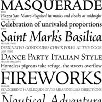 In the late 1400s, blackletter was replaced by a type style that mimicked handwriting. It was of uniform thickness, and thus appeared quite dark on paper. The humanist writing of Italian scholars of the Renaissance served as a model for what is now known as the Antiqua style.
 Several such types came out Nicolas Jenson's printing workshop set up by nicolas Jenson in 1468. That first antiqua typeface was used in De Evangelica Praeparatione in 1470. Jenson died in 1480 at the age of 60, but many would take up that style between 1470 and 1600. The Venice connection led quite naturally to the other name for the type style, Venetian. Occasionally, the name old style is also used but that refers to a later style, the aldine or garalde. Well-known Venetian typefaces include ITC Berkeley Oldstyle, Brioso Pro, Centaur, (Adobe) Jenson, Hightower, Kennerly, Schneidler, Nicolas Jenson SG, Phinney Jenson, Stempel Schneidler, Verona, Abrams Venetian, Lutetia, Jersey, Lynton, Spira. It is easy to recognize Venetian types, not just from the uniform thickness and semi-calligraphic look, but also by the small x-height, small counters, tall ascenders, overly wide HMN, sloped cross-bar on the "e", negative axis on the "o", and two roof serifs on the M. Additional literature: Martin Silvertant's history of type, from which the analytic image is borrowed. [Google]
[More] ⦿
|
Antoine Vérard
|
Famous Parisian printer and publisher (1450-1512 or 1519), who also on occasion illustrated and even wrote texts. The link shows a Venetian wide-feathered alphabet of initial caps made around 1500. [Google]
[More] ⦿
|
ATF 1923 Catalog: Cloister Series
|
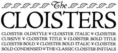 Showcasing the best pages from the Cloister Series in the ATF 1923 Catalog. These Venetian typefaces are based on Eusebius (1470, Nicolas Jenson). Included are Cloister Oldstyle, Cloister, Cloister Bold, Cloister Bold Condensed, Cloister Bold Italic, Cloister Bold Title, Cloister Cursive, Cloister Italic, Cloister Ornaments and Cloister Title. The text below is quoted from Mac McGrew, who explains the historical background:
 Cloister Oldstyle was designed by Morris Benton in 1913 and released by ATF early the next year. It follows quite closely the noted roman typeface used by Nicolas Jenson in 1470, but is slightly heavier to compensate for the improved printing conditions and smoother papers of the present time. Cloister Italic, released later in 1914, is based on an italic cast by Aldus Manutius in 1501, but does not follow this as closely as the roman does its source. Cloister Bold was designed in 1913; it and Cloister Bold Italic were cut in 1915. Cloister Title and Bold Title were cut in 1914-15; they are essentially the same as the regular Cloisters, but without lowercase, and cast full on the body. Cap J and Q were redesigned and the comma and semicolon shortened. In the specimens shown here, the complete font of Cloister Oldstyle is shown, including two styles of figures, alternate Rand T, and the array of quotation marks. Cloister Title shows the essential J and Q revisions; Cloister Bold Title is comparable. Cloister Lightface was designed in 1919 but not cut until 1924, with Italic the following year. It is considered the most faithful reproduction of Jenson's original type; substantially the same as Cloister Oldstyle but cut lighter to allow for the heavying which results from printing on rough or dampened papers with a strong impression, as was done in the fifteenth century. Cloister Cursive was cut in 1922. It has the same lowercase and figures as Cloister Italic, but a more freely designed set of capitals. Cloister Bold Condensed was designed in 1915 and cut in 1917. All these versions of Cloister were designed by Morris F. Benton, who considered this the ideal typeface. For this assignment he thoroughly studied the life and times of Nicolas Jenson of Venice, the first great designer of a roman typeface. Jenson's type was the inspiration for numerous typefaces in this century, including the comparatively crude Jenson Oldstyle. Benton's design was probably the first to accurately recapture the spirit of the fifteenth-century type. In 1992, ten characters of Cloister Oldstyle were redesigned with diamond-shaped dots for greater authenticity, and a long s added, in the 16-point size for private use. These new characters were contrived from existing patterns by Theo Rehak, New Jersey typefounder, and the result designated Cloister Oldstyle No.2. Cloister Cursive Handtooled was designed by Benton and Charles H. Becker in 1923, but not completed until 1926; it is derived from Cloister Bold Italic. Curiously, what might be called a companion typeface was not made by ATF but by Intertype, as Cloister Bold Tooled, which had been issued by that company in 1920. Cloister Wide was introduced by Linotype in 1926; it was designed to match the width of Cloister Bold for duplexing on the same matrices. Compare Centaur, Eusebius, Italian Old Style; also Cromwell. [Google]
[More] ⦿
|
Barry Schwartz
[Crud Factory]
|
[More] ⦿
|
Ben Whitmore
[The Briar (was: Alphabets Magical, or: Fuzzypeg's Homepage)]
|
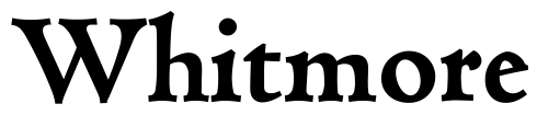 [More] ⦿
|
Berkeley Oldstyle versus FB Californian versus LTC Californian
|
The experts at Typophile compare (ITC) Berkeley Oldstyle and FB Californian in a battle of Venetian typefaces. - Gerald Giampa: "The source for our "California Oldstyle is lead patterns made by Goudy at his studio. They are the only known Goudy patterns to survive. Goudy's other patterns were lost in his fire at Deepdene."
- William Berkson: "Berkeley Old Style is soother and less mannered than Goudy's original and the Font Bureau version, which is closer to the original. (Bringhurst compares the two in his 'Elements'). I think Berkeley Old Style is very well done, and in being less mannered may be of wider usability than the original."
- Jim Rimmer: "Goudy's "Typologia" is a master work worth reading. It was written by him as a kind of magnum opus on his method of cutting type, and at the same time concerned with how he went about designing the typeface for the University. Goudy went through a lot of discussion with the institution, wherein he wished to name the type simply "University Oldstyle". The director of the Press thought the name to be too generic, so they settled on "University of California Oldstyle. It was a bit of a mouthful, but the school wanted to have their name on it. Lanston Monotype did the production work on the type, making matrices for the use of the University. Some years later the type was licensed to Lanston, and they sold it under the name "Californian". The patterns that Gerald Giampa has in his possession are of the lead "boilerplate" type, devised by Goudy, and were made by Goudy himself at Deepdene. These are the only full suite of patterns to survive the fire at Deepdene, simply because they were in use by Lanston at the time of the fire. The book is well worth having for more than one good reason. It shows Goudy's approach to a design, his method of rendering the design in metal, and his philosophy of type and design."
Apparently, the University of California's current digital version is drawn by Richard Beatty who has interpreted several other Goudy typefaces, and is supposed to be really really close to the original. In 2006, the Lanston/P22 version, LTC Californian (OpenType), digitized by Paul Hunt, was discussed here. The LTC version seems to be closest to the original. The factual history: In 1938, Goudy designed California Oldstyle, his most distinguished type, for University of California Press. In 1958, Lanston issued it as Californian. Carol Twombly digitized the roman 30 years later for California; David Berlow revised it for Font Bureau with italic and small caps; Jane Patterson designed the bold. In 1999, assisted by Richard Lipton&Jill Pichotta, Berlow designed the black and the text and display series. [Google]
[More] ⦿
|
Bernardd William Nadall
|
 Or Berne Nadall, or Bernd Nadall. This designer (b. 1869, Louisville, KY) studied at the Louisville School of Design, worked briefly for some newspapers in Lousville, and then left for Chicago, where he worked for Barnhart Brothers & Spindler (The Great Western Type Foundry). For BBS he designed borders, ornaments, and some typefaces such as Faust Text (1896: a quaint blackletter based on uncial lettering later renamed Missal Text in their 1923 catalog), Fifteenth Century (1898), Tell Text (1898) and a typeface now known as Nadall (1895-1896, BBS). The last typeface was digitized by Dan X. Solo as Nadall Regular in 2001.
 Creator at BBS of Mazarin (1895), Mazarin Italic (1895). The historians do not mince words about Mazarin. McGrew writes: Mazarin was introduced by BB&S in 1895, redesigned from the Golden Type of William Morris. Mazarin Italic was introduced a year later, but neither typeface lasted long. See Jenson Oldstyle. Mazarin HTF by Hoefler Type Foundry is a digital version. Nadall also created Caslon Antique (and Italic) in 1895 (Caslon EF Antique in the Elsner&Flake collection, and Caslon Antique in the Linotype collection), a version unlike any original Caslon. Some say it was developed between 1896 and 1898. For another digital version of this, see Caslon Antique (1993, Group Type). MFC Nadall Medieval (2019, Monogram Fonts Co) and Faust Text (2005, Dan X. Solo) revive Faust Text. William E. Loy writes about Nadall in The Inland Printer. Patent office link. [Google]
[MyFonts]
[More] ⦿
|
Bitstream
|
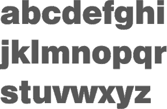 Founded in 1981 by Mike Parker, Matthew Carter, Cheri Cone, and Rob Freedman, Bitstream is the first digital font foundry. Not without controversy, though, as many claim that the original digital collection was an illegal copy of Linotype fonts [Note: I disagree with that statement--take out "illegal"]. In 1999, Bitstream created MyFonts.com, a web site for finding, trying, and buying fonts on line. Bitstream was headquartered in Cambridge, Massachusetts, and led dfior some time by CEO Anne Chagnon.
 Bitstream wrote on the origins of the collection: The Bitstream Typeface Library was developed under the supervision of Matthew Carter, the creator of such esteemed typefaces as ITC Galliard; Snell, Bitstream Charter and Swiss Compressed. Carter, who also serves as Bitstream's Senior Vice President of Design, set uncommonly high standards for the company's highly-skilled design staff. Working from the earliest-generation artwork available, each character of every typeface is hand-digitized on advanced workstations specially programmed by Bitstream's engineers. In building the library, Carter has overseen the licensing of typefaces from such respected international sources as the International Typeface Corporation (ITC), Kingsley-ATF Type Corporation, and Fundicion Tipografica Neufville SA, among others. Bitstream also develops new and original designs. Many countries provide for the legal protection of typeface names only, not the designs themselves. This means that the original names of many typefaces can only be used with a license from the owner. The majority of Bitstream typefaces in this catalog have licensed names (on which royalties are paid), or have historical names that reside in the public domain, or have names to which Bitstream owns the rights. In these cases, the name is used. When the original name is not available for use by Bitstream, an alternative name appears. For example, Swiss 721 is the name that Bitstream uses for its version of the typeface popularly known as Helvetica? Because the original name of that typeface is not widely licensed, there are many offerings of the design with completely different names. It is important to note that the use of an alternative name has no bearing on the inherent quality or authenticity of the typeface design. Bitstream sold a nice 500-font CD for 39 USD around 1996, with all the great text families. This was a fantastic buy, as proved by this quote from John Hudson: I have said it before and I will say it again: I think the development of the original Bitstream library was one of the worst instances of piracy in the history of type, and it has set the tone for the disrespect for type shown today. (A bit of background: Bitstream asked Linotype if they could digitize Linotype's library of fonts. Linotype refused, but Bitstream went ahead anyway.) On this issue, read these pages by Ulrich Stiehl and Typophile. Bitstream was offering a 250-font CD. Type Odyssey Font CD (2001). Bitstream has added Greek, Cyrillic, OldStyle versions to many of its families. New releases in July 2001: Artane Elongated, Cavalero, Drescher Grotesk BT, FM Falling Leaves Moon, FM Rustling Branches Moon, Picayune Intelligence (by Nick Curtis), Raven, Richfont, Rina, Sissy Boy, Stingwire, Tannarin. In November 2001, Serious Magic entered into a long-term agreement to license 25 Bitstream outline fonts for its new visual communication products. Bitstream has been an exemplary corporate citizen, occasionally producing license-free fonts for the masses, such as their Vera collection. Bitstream's own overstated blurb about itself: Bitstream Inc. (NASDAQ: BITS) is a software development company that makes communications compelling. Bitstream enables customers worldwide to render high-quality text, browse the Web on wireless devices, select from the largest collection of fonts online, and customize documents over the Internet. Its core competencies include fonts and font technology, browsing technology, and publishing technology. Finally, together with its spin-off, MyFonts, Bitstream was sold to Monotype Imaging in 2011. Catalog of typefaces [large web page warning]. [Google]
[MyFonts]
[More] ⦿
|
Bo Berndal
|
Swedish designer born in 1924 in Stockholm. He says of himself: Compositor, Linotype operator, teacher of typography. Type designer in a small matrix factory 1950-51. Calligrapher, book designer, author, lecturer and trade mark specialist. Now retired, but does type design as a hobby and to special orders for museums, ad agencies, companies and even to private persons. His typefaces: - Art Gallery (Monotype).
- Batory (T4).
- Batoswash (T4).
- Belltrap (1995, ITC).
- Benedict (uncial).
- Beowulf (uncial).
- Berndal (2003, Linotype).
- Boberia (1994, Linotype). A formidable didone text family with an antique bouquet.
- Boscribe (2005, Monotype).
- Bosis (1991, Monotype). A sans.
- Botobe (2011, T4). An informal script.
- Brigida (Monotype).
- Buccardi (1998, Monotype).
- Byngve (2004, Linotype). In the style of 15th century Italy.
- Caballero Script (2011, T4). Inspired by Spanish handwriting from the 15th and 16th centuries.
- Carl Beck Script (1992 Monotype).
- Cartesius (2006, T4). A beautiful 5-style family done at T4 in a mix of garalde and Venetian fashions.
- Linotype Dala (2002, Linotype). A Fraktur, accompanied by Linotype Dala Pics and Linotype Dala Borders.
- Eknaton (T4).
- Esseltube (Monotype).
- Euclides.
- Exlibris (1998, ITC).
- Frisans (2005, Monotype).
- Geometra (2011, T4).
- Gertrud (2006, T4). Based on 16th century calligraphy).
- Gianpoggio (1992).
- Golota (1998, Agfa).
- Grafilone (1994, Linotype). An avant-garde family that is almost illegible.
- Grantofte (1995, Monotype).
- Hagalind (2011, T4). A calligraphic connected script. Linotype Hieroglyphes One and Two (2002).
- Jerrywi (1994).
- Johabu (Monotype). A blackletter typeface.
- Lacko (Monotype)
- Lebensjoy (1994, Monotype).
- Logoform (Monotype).
- Magellan (1993, Monotype).
- Maricava (Monotype).
- Mixtra Roman (T4).
- Mixtra Sansserif (T4).
- Mixtra Slabserif (T4).
- Moorbacka (Monotype).
- Naniara (1998).
- Nordik (1992, Monotype). A revival of Genzsch Antiqua or Nordische Antiqua (1906, Genzsch & Heyse).
- Olaus Bandus and Olaus Magnus. Medieval scripts.
- Ornabo dingbats.
- Palekin (1994, Monotype).
- Pelegotic (2006, T4). An art deco inspired but minimalist sans.
- Picadyll (2011, T4). Art deco.
- PocketType (1994).
- Promemoria.
- Ringlingje.
- Sabellicus (1997, Monotype).
- Sergel (T4).
- Siseriff (2003, Linotype).
- SpaceKid (Monotype). Runes.
- Swing Bill (Monotype).
- Trotzkopf (1998).
- Tyma Garamont (T4).
- Unotype (1997, Monotype). Monospaced.
- Vadstenakursive (1989, Monotype). a blackletter typeface with almost Lombardic-looking capitals.
- Viger Spa (runes).
- Linotype Zurpreis (Linotype).
Pelle Anderson interviews Bo Berndal. Bitstream write-up. Agfa/Monotype write-up. Author of Typiskt typografiskt (Fisher and co, 1990). MyFonts page. Linotype page. MyFonts interview. FontShop link. Klingspor link. View Bo Berndal's typefaces. [Google]
[MyFonts]
[More] ⦿
|
Bruce Rogers
[Bruce Rogers: Italian Printers in Venice]
|
[More] ⦿
|
Bruce Rogers
|
 Albert Bruce Rogers was a celebrated American type and book designer (b. 1870, Linnwood, IN, d. 1957, New Fairfield, CT). A graduate from Purdue in 1890, he worked in book design. It was not until 1901 that he cut his first typeface, Montaigne, a Venetian style typeface named for the first book it appeared in, a 1903 limited edition of The Essays of Montaigne. In 1912, Rogers moved to New York City where he worked both as an independent designer and as house designer for the Metropolitan Museum of Art. It was for the Museum's 1915 limited edition of Maurice de Guérin's The Centaur that he designed his most famous type-face, Centaur (1914). Like Montaigne, it was based on the Venetian typefaces of Nicolas Jenson. Wikipedia: Rogers considered this typeface to be a substantial improvement on his early Montaigne, both because his design had matured and because, on the advice of Frederic Goudy, he had employed Robert Wiebking as the punch-cutter, and Rogers used Centaur extensively for the rest of his career. The Centaur was produced by Rogers in Dyke Mill at Carl Rollins' Montague Press and is now one of the most collectible books ever printed.
 In subsequent years, he designed books for Mount Vernon Press, and Harvard University Press, and served as typographic advisor at Lanston Monotype. To produce the Oxford Lectern Bible for Oxford University Press, an italic complement to Centaur was needed. Wikipedia: As he did not feel capable of designing the sort of chancery typeface that he thought appropriate, Rogers chose to pair Centaur with Frederic Warde's Arrighi, a pairing retained to this day. Rogers died in New Fairfield, CT, and donated his books and papers to Purdue University, where they are in the Beinecke Rare Book and manuscript Library. His typefaces: - Montaigne (1901, privately cast). Punches cut by John Cumming. Mac McGrew: Montaigne was designed by Bruce Rogers in 1901, and privately cast for the Riverside Press in Cambridge, Massachusetts. It was derived from one page printed in the noted type of Nicolas Jenson, and made in one size only, approximately 16-point, with punches cut by John Cumming of Worcester. Massachusetts. Compare Jenson, Cloister, Centaur, Eusebius.
- Centaur (original) (1914). Development continued until 1931. Privately cast by Barnhart Brothers&Spindler. Matrices cut by Robert Wiebking of the Western Type Foundry. Centaur is a modern version of Nicolas Jenson's Venetian typeface Centaur. There are many digital age descendants of Centaur. Bitstream got that ball rolling with Venetian 301 (Cyrillic version by Dmitry Kirsanov, Paratype, 2006), and SoftMaker has its Cambridge Serial (2010). Type families called Centaur exist at Adobe, Monotype and Linotype. Related typefaces, but without Centaur's flaring, include Phinney Jenson (Tom Wallace) and Nicolas Jenson SG (Spiece Graphics). See also Centurion, Centus (URW), Coelacanth (2014, a free 36-style typeface family by Ben Whitmore), and Arrighi Italic .
- Centaur (Monotype) (1929, Monotype Ltd. and Mackenzie&Harris). Matrices re-cut for machine composition by British Monotype. Further developments based on or related to this typeface: LTC Metropolitan (Lanston; with Frederick Warde; also called Metroplitan Oldstyle; digital version by Lanston/P22), Poster (1918-1919), Goudy Bible (1947, designed with the collaboration of Sol Hess for Lanston Monotype). Mac McGrew: Centaur was designed by Bruce Rogers in 1914, based on the beautiful roman type first used by Nicolas Jenson in 1470, and a refinement of Mon- taigne (q.v.), designed a decade earlier by Rogers. Centaur was first cut by Robert Wiebking of BB&S as a private type for the Museum Press of the Metropolitan Museum of New York. In 1929 it was recut under the joint sponsorship of Lanston Monotype and Monotype Corporation, England, but issued only by the latter. Some critics have called it the best recutting of the Jenson letter. Arrighi (q.v.) was cut as an italic companion to Centaur. Compare Cloister, Eusebius, Italian Old Style, also Jenson. Discussion of Centaur by Don Hosek. About Centaur Monotype (1929), and its digital version, Dean Allen writes: Like Bembo, released for the Monotype machine the same year, Centaur was an exceptionally beautiful and eminently readable revival of Renaissance type. Unfortunately, the producers of the digital version made a common mistake: the shapes are based on the most basic starting point of Bruce Rogers designs. These designs were intended for metal type that would press into paper, the ink spreading as it absorbed into the fibre. The resulting printed shapes had a good deal more visual force than the original designs. The process was total: design anticipating application. This version of Centaur suffers from the perfection of the process of digital design and offset printing: the original shape is printed coldly intact, and thus its very difficult to set a well-made page in Centaur. In 2014, Jerry Kelly and Misha Beletsky coauthored The Noblest Roman (RIT Cary Graphic Ars Press) on the history of Centaur types by Bruce Rogers. The blurb: The history of the Centaur type, likely the most important American typefeace ever designed, has been recounted untold times in very general terms, following the official version of events, purported by its designer in several publications. Yet, as the new research by Jerry Kelly and Misha Beletsky shows, there is a number of gray areas to the story. The new data, culled from archival documents, some unpublished, as well as from a variety of published sources presents this important design and its history in a new light.
- LTC Fleurons Rogers (2005, P22 / Lanston) is a digital font based on fleurons drawn by Rogers.
Linotype link. FontShop link. Klingspor link. [Google]
[MyFonts]
[More] ⦿
|
Bruce Rogers: Italian Printers in Venice
[Bruce Rogers]
|
An essay by Bruce Rogers on Italian printers in Venice in the renaissance period. [Google]
[More] ⦿
|
Carson Evans
|
 Carson Evans has a BA from Yale University and will have an MFA from Rhode Island School of Design in Providence, RI, in 2018. She designed the Venetian typeface Jarndyce (2016) under the supervision of Cyrus Highsmith. [Google]
[More] ⦿
Carson Evans has a BA from Yale University and will have an MFA from Rhode Island School of Design in Providence, RI, in 2018. She designed the Venetian typeface Jarndyce (2016) under the supervision of Cyrus Highsmith. [Google]
[More] ⦿
|
Christian Mengelt
|
 Christian Mengelt (b. 1938, St. Gallen, Switzerland) is a graphic designer, type designer, and teacher. He studied graphic design under Armin Hofmann and Emil Ruder at the School of Design, Basel. In 1964, he set up his own graphic design studio together with different partners, and has cooperated with various design and advertising agencies, such as GGK (Gerstner, Gredinger und Kutter) Basel, Switzerland, and Mendell&Oberer Munich, Germany. With Karl Gerstner and Günter Gerhard Lange, he was briefly involved in the Gerstner program at H. Berthold AG. Early type designs include Univers Compugraphic (1972, Compugraphic) and Cyrillic Gothic (1974, Compugraphic), both realized in cooperation with André Gürtler. From 1972 until 2001, he taught graphic and type design at the Basel School of Design, which he headed from 1986-2001. With André Gürtler and Erich Gschwind, he formed Team 77 in Basel and became deeply involved in most aspects of letterform design and application, which led to these type designs:
 - 1976: Media (Bobst Graphic, Autologic).
- 1977: Avant Garde Gothic Oblique (ITC).
- 1978: Signa (Bobst Graphic, Autologic).
- 1974-1980: Haas Unica (Haas Type foundry, Linotype, Autologic). In 2012-2014, Christian revived this digitally as Unica 77 at Lineto, one year before Toshi Omagari published Neue Haas Unica at Linotype.
- After a long hiatus, with the help of the Linotype staff, he created Sinova in 2011, a versatile humanist sans type family in ten styles, which has broad language support.
- Mengelt Basel Antiqua (2014, Linotype). A relaxing Venetian text typeface family based on the Basel book typefaces from the 16th century. Linotype, its publisher, writes: The first edition of the anatomy atlas De humani corporis fabrica came out nearly 500 hundred years ago. It was published in 1543 in Basel by Andreas Vesalius. The work was published in multiple volumes and is extraordinary not only for its content and design, but also its typography. It excites philologists and typographers to this day. De humani corporis fabrica was printed in the workshop of Johannes Oporinus, who was considered one of the major printers and publishers in Basel in his time. He used one of the Venetian Antiqua-inspired fonts for the typesetting. This is a genre of fonts which was much loved by the Basel printers. The printer Johann Amerbach brought it to Switzerland from Italy a few centuries earlier. [Note: Is this a misprint?] The American philologist Daniel H. Garrison provided the initiative for Mengelt to explore the Basel Antiqua fonts from the 16th century. He is working on a re-edition of the De humani corporis fabrica and is looking for a fitting print font which has historical references, but the technical characteristics of a modern font. Mengelt takes on the challenge and designs his Mengelt Basel Antiqua font on the basis of the original Basel prints.
- He received an Honorable Mention in the Latin category for Newline in 2016 at the Morisawa Type Design Competition 2016.
Typedia link. MyFonts link. Linotype link. Behance link. Interview by Linotype. FontShop link. Klingspor link. [Google]
[MyFonts]
[More] ⦿
|
Christian Schwartz
|
 Christian Schwartz was born in 1977 in East Washington, NH, and grew up in a small town in New Hampshire. He attended Carnegie Mellon University in Pittsburgh, Pennsylvania, where he graduated in 1999 with a degree in Communication Design. After graduation, he spent three months as the in-house type designer at MetaDesign Berlin, under the supervision of Erik Spiekermann. In January 2000, he joined Font Bureau. Near the end of 2000, he founded Orange Italic with Chicago-based designer Dino Sanchez, and left Font Bureau in August 2001 to concentrate full-time on developing this company. Orange Italic published the first issue of their online magazine at the end of 2001 and released their first set of typefaces in the beginning of 2002. Presently, he is an independent type designer in New York City, and has operated foundries like Christian Schwartz Design and Commercial Type (the latter since 2009). He has designed commercial fonts for Emigre, FontShop, House Industries and Font Bureau as well as proprietary designs for corporations and publications. In 2005, Orange Italic joined the type coop Village.
 His presentations. At ATypI 2004 in Prague, he spoke about "The accidental text face". At ATypI 2006 in Lisbon, he and Paul Barnes explained the development of a 200-style font family for the Guardian which includes Guardian Egyptian and Guardian Sans. FontShop's page on his work. Bio at Emigre. At ATypI 2007 in Brighton, he was awarded the Prix Charles Peignot. Jan Middendorp's interview in October 2007. Speaker at ATypI 2009 in Mexico City, where he announced his new type foundry, simply called Commercial. FontShop link. Font selection at MyFonts. A partial list of his creations: - FF Bau (2001-2004): Art direction by Erik Spiekermann. Released by FontShop International. He says: Bau is based on Grotesk, a typeface released by the Schelter&Giesecke type foundry in Leipzig, Germany at the end of the 19th century and used prominently by the designers at the Bauhaus. Each weight was drawn separately, to give the family the irregularity of the original, and the Super is new.
- Neutraface (2002, House Industries) and Neutraface Condensed (2004). Art directed by Ken Barber and Andy Cruz. MyFonts offers Neutraface Slab Text, Neutraface Slab Display, Neutraface Display and Neutraface Text. Schwartz states: Neutraface was an ambitious project to design the most typographically complete geometric sans serif family ever. We didn't have many actual samples of the lettering that the Neutras used on their buildings, so it ended up taking a lot of interpretation. There was no reference for the lowercase, so it's drawn from scratch, looking at Futura, Nobel, and Tempo for reference. Stephen Coles reports: Reminiscent of the recent FB Relay and HTF Gotham, Neutraface is an exaggerated Nobel with nods to Bauhaus and architectural lettering. Yes, and maybe Futura? Maggie Winters, Ioana Dumitrescu, Nico Köckritz, Nico Kockritz and Michelle Regna made great Neutraface posters.
- Neutraface No. 2 (2007), discussed by Stephen Coles: By simply raising Neutrafaces low waist, most of that quaintness is removed in No. 2, moving the whole family (which is completely mixable) toward more versatile, workhorse territory. This release is surely Houses response to seeing so many examples of Neutraface standardized by its users. Also new is an inline version. Who doesn't love inline type? It so vividly recalls WPA posters and other pre-war hand lettering. There are other heavy, inlined sans serifs like Phosphate, but one with a full family of weights and text cuts to back it up is very appealing. A typophile states: Designed by Christian Schwartz for House Industries, Neutraface captures the 1950s stylings of architect Richard Neutra in a beautiful typeface meant for application on the screen, in print, and in metalwork. If you are ever in need of a classy retro face, they don't get any more polished than this.
- At House Industries, Christian Schwartz, Mitja Miklavcic and Ben Kiel co-developed Yorklyn Stencil.
- Farnham (2004, Font Bureau) and Farnham Headline (2006, Schwartzco). Commissioned by Esterson Associates and de Luxe Associates. Winner of an award at TDC2 2004. Based on work by Johannes Fleischman, a German punchcutter who worked for the Enschedé Foundry in Haarlem in the mid-to-late 1700s. Schwartz: Truly part of the transistion from oldstyle (i.e. Garamond) to modern (i.e. Bodoni) Fleischman's romans are remarkable for their energy and "sparkle" on the page, as he took advantage of better tools and harder steel to push the limits of how thin strokes could get. In the 1800s, Fleischman's work fell into obscurity as tastes changed, but interest was renewed in the 1990s as digital revivals were designed by Matthew Carter, the Hoefler Type Foundry, and the Dutch Type Library, each focusing on a different aspect of the source material. I think the DTL version is the most faithful to the source, leaving the bumps and quirks inherent to metal type untouched. I've taken the opposite approach, using the source material as a starting point and trying to design a very contemporary text typeface that uses the basic structure and character of Fleischman without duplicating features that I found outdated, distracting, or unttatractive (i.e., the extra "spikes" on the capital E and F, or the form of the y).
- FF Unit (2003-2004, Fontshop, designed with Erik Spiekermann). A clean and blocky evolution of FF Meta intended as a corporate typeface for the Deutsche Bahn (but subsequently not used).
- Amplitude (2001-2003, Font Bureau), Amplitude Classified and Amplitude Headline. A newspaper-style ink-trapped sans family, unfortunately given the same name as a 2001 font by Aenigma. Winner of an award at TDC2 2004. The typeface selected by the St Louis Post Dispatch in 2005. One of many agates (type for small text) successfully developed by him. This page explains that they've dumped Dutch 811 and Bodoni and Helvetica and Franklin Gothic and News Gothic (whew!) for various weights of Amplitude, Poynter Old Style Display and Poynter Old Style Text. AmplitudeAubi was designed in 2002-2003 by Schwartz and Font Bureau for the German mag AutoBild.
- Simian (2001, House Industries): SimianDisplay-Chimpanzee, SimianDisplay-Gorilla, SimianDisplay-Orangutan, SimianText-Chimpanzee, SimianText-Gorilla, SimianText-Orangutan. Designed at Font Bureau. Art Direction by Ken Barber and Andy Cruz. Schwartz: "Although Simian's roots are in Ed Benguiat's logos for the Planet of the Apes movies, Simian wound up veering off in its own direction. The display styles look very techno, and we really went nuts with the ligatures, since this was one of House's first Opentype releases."
- Publico (2007): A predecessor of Guradian Egyptian. Schwartz writes: During the two year process of designing the typeface that would eventually become Guardian Egyptian, Paul Barnes and I ended up discarding many ideas along the way. Some of them were decent, just not right for the Guardian, including a serif family first called Stockholm, then renamed Hacienda after the legendary club in the Guardian's original home city of Manchester. Everyone involved liked the family well enough, but it didn't fit the paper as the design evolved, and several rounds of reworking left us more and more unsure of what it was supposed to look like. In the summer of 2006, Mark Porter and Esterson Associates were hired to redesign Publico, a major Portuguese daily newspaper, for an early 2007 launch. He asked us to take another look at Hacienda, to see if we might be able to untangle our many rounds of changes, figure out what it was supposed to look like in the first place, and finish it in a very short amount of time. Spending some time away from the typeface did our eyes a world of good. When we looked at it again, it was obvious that it really needed its "sparkle" played up, so we increased the sharpness of the serifs, to play against softer ball terminals, and kept the contrast high as the weight increased, ending up with an elegant and serious family with some humor at its extreme weights. As a Spanish name is not suitable for a typeface for a Portuguese newspaper, Hacienda was renamed once more, finally ending up as Publico. Production and design assistance by Kai Bernau. Commissioned by Mark Porter and Esterson Associates for Publico
- Austin (2003): Designed by Paul Barnes at Schwartzco. Commissioned by Sheila Jack at Harper's&Queen.
- Giorgio (2007): Commissioned by Chris Martinez at T, the New York Times Sunday style magazine. Small size versions produced with Kris Sowersby. Not available for relicensing. A high contrast condensed "modern" display typeface related to Imre Reiner's Corvinus. Ben Kiel raves: Giorgio, like the fashion models that it shares space with in T, the New York Times fashion magazine, is brutal in its demands. It is a shockingly beautiful typeface, one so arresting that I stopped turning the page when I first saw it a Sunday morning about a year ago. [...] Giorgio exudes pure sex and competes with the photographs beside it. The designers at T were clearly unafraid of what it demands from the typographer and, over the past year, kept on finding ways to push Giorgio to its limit. Extremely well drawn in its details, full of tension between contrast and grace, it is a typeface that demands to be given space, to be used with wit and courage, and for the typographer to be unafraid in making it the page.
- Empire State Building (2007): An art deco titling typeface designed with Paul Barnes for Laura Varacchi at Two Twelve Associates. Icons designed by Kevin Dresser at Dresser Johnson. Exclusive to the Empire State Building.
- Guardian (2004-2005): Commissioned by Mark Porter at The Guardian. Designed with Paul Barnes. Not available for relicensing until 2008. Based on an Egyptian, this 200-style family consists of Guardian Egyptian (the main text face), Guardian Sans, Guardian Text Egyptian, Guardian Text Sans and Guardian Agate.
- Houston (2003): Commissioned by Roger Black at Danilo Black, Inc., for the Houston Chronicle. Schwartz: As far as I know, this typeface is the first Venetian Oldstyle ever drawn for newspaper text, and only Roger Black could come up with such a brilliant and bizarre idea. The basic structures are based on British Monotype's Italian Old Style, which was based on William Morris's Golden Type. The italic (particularly the alternate italic used in feature sections) also borrows from Nebiolo Jenson Oldstyle, and there is a hint of ATF Jenson Oldstyle in places as well.
- Popular (2004): Commissioned by Robb Rice at Danilo Black, Inc., for Popular Mechanics. An Egyptian on testosterone.
- Stag (2005): Commissioned by David Curcurito and Darhil Crooks at Esquire. Yet another very masculine slab serif family. Schwartz writes I showed them a range of slab serifs produced by French and German foundries around 1900-1940, and synthesized elements from several of them (notably Beton, Peignot's Egyptienne Noir, Georg Trump's Schadow, and Scarab) into a new typeface with a very large x-height, extremely short ascenders and descenders, and tight spacing. Also, we find Stag Sans (2007, Village) and Stag Dot (2008, Village).
- Plinc Hanover (2009, House Industries). A digitization of a blackletter font by Photo Lettering Inc.
- Fritz (1997, Font Bureau). Schwartz: "Fritz is based on various pieces of handlettering done in the early 20th century by Ozwald Cooper, a type designer and lettering artist best known for the ubiquitous Cooper Black. Galapagos Type foundry's Maiandra and Robusto are based on the same pieces of lettering."
- Latino-Rumba, Latino-Samba (2000, House Industries). Art Direction by Andy Cruz. Designed with Ken Barber. Jazzy letters based on an earlier design of Schwartz, called Atlas (1993).
- Pennsylvania (2000, FontBureau). A monospaed family inspired by Pennsylvanian license plates. Schwartz: "Thai type designer Anuthin Wongsunkakon's Keystone State (1999, T26) is based on the exact same source."
- Plinc Swiss Interlock (by Christian Schwartz and Adam Cruz for House Industries). Based on originals by PhotoLetteringInc.
- Luxury (2002, Orange Italic, co-designed with Dino Sanchez). Gold, Platinum and Diamond are the names of the 1930s headline typefaces made (jokingly) for use with luxury items. The six-weight Luxury family at House Industries in 2006, contains three serif text weights called Luxury Text, as well as three display typefaces, called Platinum (art deco), Gold, and Diamond (all caps with triangular serifs).
- Los Feliz (2002, Emigre). Based on handlettered signs found in LA.
- Unfinished typefaces: Masthead, Reform, Bitmaps, Bilbao, Boyband, Addison, Elektro, Sandbox, Vendôme, Bailey.
- Fonts drawn in high school: Flywheel (1992, FontHaus), Atlas (1993, FontHaus, a "a fairly faithful revival of Potomac Latin, designed in the late 1950s for PhotoLettering, Inc"), Elroy (1993, FontHaus), ElroyExtrasOrnaments, Hairspray (1993, "a revival of Steinweiss Scrawl, designed in the mid-1950s by Alex Steinweiss, best known for his handlettered record covers": HairsprayBlonde, HairsprayBrunette, HairsprayPix, HairsprayRedhead), Twist (1994, Precision Type and Agfa), Zombie (1995, Precision Type and Agfa), Morticia (1995, Agfa/Monotype), Gladys (1996, an unreleased revival of ATF's turn-of-the-century Master Script).
- Ant&Bee&Art Fonts (1994-1995): three dingbat fonts, Baby Boom, C'est la vie, and Raining Cats&Dogs, based on drawings by Christian's aunt, Jill Weber. Released by FontHaus.
- Digitizations done between 1993-1995: Dolmen (Letraset), Latino Elongated (Letraset), Regatta Condensed (Letraset), Fashion Compressed (Letraset), Jack Regular (Jack Tom), Tempto Openface (Tintin Timen).
- Hand-tuned bitmap fonts: Syssy, Zimmer's Egyptian, Elizzzabeth, Newt Gothic, Trags X, Tibia, Fibula, Tino, Digest Cyrillic (based on Tal Leming's Digest). Free downloads of the pixel typefaces Newt Gothic, Tibula and Fibia here.
- At Village and Orange Italic, one can get Local Gothic (2005), now in OpenType, a crazy mix of Helvetica Bold, Futura Extra Bold, Franklin Gothic Condensed and Alternate Gothic No. 2. It is a collection of alternates one can cycle through---thus a for of randomization.
- FF Oxide (2005), a Bank Gothic style stencil family. FF Oxide Light is free!
- Graphik (2008), a sans between geometric and grotesk made for thew Wallpaper mag. Kris sSwersby writes: In a sweltering typographic climate that favours organic look-at-me typefaces bursting with a thousand OpenType tricks, Graphik is a refreshing splash of cool rationality. Its serious, pared-back forms reference classic sans serifs but remain thoroughly modern and never get frigid. Any designer worth their salt needs to turn away from the screen&pick up the latest copy of Wallpaper magazine. There you will find one of the most beautiful, restrained sans serifs designed in a very long time. See also Graphik Wide (2018).
- In 2011, he created a 22-style revival of Helvetica called Neue Haas Grotesk (Linotype), which offers alternates such as a straigt-legged R and a differently-seriffed a. It is based on the original drawings of Miedinger in 1957.
Schwartz also made numerous custom fonts: [Google]
[MyFonts]
[More] ⦿
|
Colin Brignall
|
 British type designer and art director, born in 1940 (MyFonts.com says 1945, Warwickshire), who was type director at Letraset for some time. In 1980 he became Type Director for Esselte Letraset. In 1995 Brignall moved to ITC. With the closure of ITC's New York office in November 1999, Brignall was re-appointed Type Director for Esselte Letraset. The latest major project in which Brignall was involved was the ITC Johnston series launched in 1999. He received the Type Directors Club Medal at TDC2 in 2001. The Letraset and ITC collections are now owned (via Linotype) by Monotype.
 Bio. Bio at Linotype. His fonts include - Aachen Bold (1967, Letraset), Aachen Medium (1977, an extension done with Alan Meeks). Digital implementations of Aachen: Aachen (ITC), Aachen (Tilde), Aachen (Adobe), Neue Aachen (ITC), Aachen SH (Scangraphic Digital Type Collection), Aachen SB (Scangraphic Digital Type Collection). In 2012, Jim Wasco (Monotype) extended Aachen to 18 fonts including an italic, called Neue Aachen. Aachen is characterized by short slab serifs, which gives it a retro techno look.
- Revue (1969), an unsuccessful display face.
- Countdown (1965, LED simulation face), cyrillicized in 1993 by A. Kustov at TypeMarket.
- Superstar (1970, an athletic lettering typeface now owned by ITC and sold by MyFonts).
- Italia (1974; see Istria on the SoftMaker MegaFont XXL CD, 2002, and Revival 791 in the Bitstream collection), Italia Book (1977). Influenced by the Venetian style. Designed for Letraset and then licensed to ITC, where it became ITC Italia.
- Premier Lightline (1969), an elegant art deco hairline face. For a digital revival, see Pergamon (2012, SoftMaker).
- Premier Shaded (1970), caps only shaded art deco face.
- Romic Light (1979-1980). See R790 Roman on Softmaker's XXL CD (2002).
- Corinthian (1981).
- Epokha (1992), a 1910 poster style slab serif.
- Edwardian (1983). Digital versions: Edwardian Medium (ITC), Edwardian (Linotype), Edwardian EF (Elsner&Flake).
- Harlow (1977-1979), a fifties style keavy monoline display script. The Scangraphic versions are Harlow SB and Harlow SH. Harlow Solid was revived by Felipe Calderon as Melts Script (2017, more an interpretation than a revival). For other digital versions, see Harlekin (2012, SoftMaker), HarlowICG (Image Club Graphics), Harlow (ITC), HarlowD (URW), OPTI Hastings (Castcraft), H652 Script (SoftMaker), and Harrogate (SoftMaker).
- Octopuss (1970), similar to Harlow. Digital versions exist at ITC and Scangraphic.
- Tango (1974) [a freefont inspired by Tango can be found in Julius B. Thyssen's Kylie 1996-J], yet another typeface in the spirit of Harlow.
- Jenson Old Style (1982, with Freda Sack), a Venetian face.
- Victorian (1976, Letraset; with Freda Sack).
- Type Embellishments One, Two and Three (1994): handsome ornaments developed in the Letraset Type Studio by Michael Gills and Colin Brignall to complement the Fontek Typeface Library.
- Retro Bold (1992, a slab serif done with Andrew Smith).
- ITC Werkstatt (1999, ITC: a hookish Preissig-style typeface developed with Satwinder Sehmi).
FontShop link. Klingspor link. View Colin Brignall's typefaces. [Google]
[MyFonts]
[More] ⦿
|
Coulton Thomas
[Recognizing a Bembo]
|
[More] ⦿
|
Crud Factory
[Barry Schwartz]
|
 Barry Schwartz (b. 1961) is a scientist who lives in St. Paul, MN. He grew up mostly in Kendall Park, NJ, and studied electrical engineering from 1984 until 1990 at Rutgers. He is a fervent and exemplary supporter of the idea of Open Source fonts and software. He runs Crud Factory. His fonts:
 - BonvenoCF-Light (2006). A geometric OpenType format typeface for Latin scripts, having all the letters for Esperanto.
- Fanwood Text (2011, a Venetian old style typeface). This is a free version of Fairfield (1940-1947, Rudolf Ruzicka). For a commercial version, check Bitstream's Transitional 551.
- Goudy Bookletter 1911 (2008) is a revival of Goudy's Kennerley Old Style Roman from 1911.
- Goudy Old Style 14-point (2009).
- Juvelo (2009). A delicate roman serif face.
- Linden Hill (2010, OFL). A two-style (roman, italic) revival of Goudy's Deepdene.
- Prociono CF (2007). See also here.
- OFL Sorts Mill Goudy (2009). A revival of Goudy Oldstyle and Italic.
- KisStMTT (or: Sorts Mill Kis) (2010). Based a bit loosely on the early-20th-century revival of Jenson / Kis drawn by Sol Hess for Lanston Monotype.
- He adapted some glyphs of Gentium for better display with Adobe Reader, and called the new type family Temporarium (2007-2008).
- Valley (2009). A take on Walbaum.
Links: Another URL. Dafont link. OFL link. Font Squirrel link. Googlecode link. Devian tart link. The League of Moveable Type. Abstract Fonts link. Kernest link. Klingspor link. Google Plus link. [Google]
[More] ⦿
|
Daniel Benjamin Miller
|
 Daniel Benjamin Miller (b. 2000, New York) is an undergraduate student in philosophy at McGill University. His type design work:
 - BMucicFont (2020). Based on the Steinberg Media music fonts for LilyPond music software.
- Salieri (2020). A revival of Jan Tschichold's Sabon (1964-1967).
- GFS Heraklit. This started out from Zapf's Heraklit Greek (1954). A digital revival was first done by George Matthiopoulos. Later improvements by Antonis Tsolomitis and in 2020 by Daniel Benjamin Miller.
- NX Baskerville Bold Italic (2020). An addition to Libre Baskerville (2012, Rodrigo Fuenzalida and Pablo Impallari).
- He added OpenType support and made some minor adjustments to ET Bembo (2002, Dmitry Krasny / Deka Design), releasing the result as XETBook (2019). In 2020, that font family was extended by Michael Sharpe as ETbb.
- In 2019, he started working on Regis, an original face inspired by the work of Pierre-Simon Fournier and Monotype 178 Barbou.
- RW Garamond (2019) is a freeware Garamond font in OpenType format. RW stands for Rudolf Wolf, the designer who created Stempel's version of Garamond from the Egenolff-Berner specimen. RW Garamond is a modified version of URW Garamond No. 8. and GaramondX, with changes being made to support OpenType (better vertical metrics, added diacritics, better kerning, more mathematical symbols, Greek for mathematics, character variants). Copyrights: 2000, URW++; 2005, Ralf Stubner; 2009, Gaël Varoquaux; 2012-2017, Michael Sharpe; 2019, Daniel Benjamin Miller.
- Domitian (2019). Based on URW's Palladio which in turn is based on Hermann Zapf's Palatino. Domitian is a project to develop a full-featured, free and open-source implementation of Palatino design. "Domitian" refers to the builder of the Flavian Palace, which is located on the Palatine Hill. Miller added true small caps and old style figures to URW's Palladio. The metrics have been adjusted to more closely match Adobe Palatino, and hinting has been improved.
- Garamond Libre (2019). Based on Unicode Fonts for Ancient Scripts (George Douros, 2017). CTAN link. Miller writes: Garamond Libre is a free and open-source old-style font family. It is a "true Garamond," i.e., it is based on the designs of 16th-century French engraver Claude Garamond. The roman design is Garamond's; the italics are from a design by Robert Granjon. The upright Greek font is after a design by Firmin Didot; the "italic" Greek font is after a design by Alexander Wilson. The font family includes support for Latin, Greek (monotonic and polytonic) and Cyrillic scripts, as well as small capitals, old-style figures, superior and inferior figures, historical ligatures, Byzantine musical symbols, the IPA and swash capitals. Miller added a bold italic.
- The STEP fonts (2019), free at CTAN and Github, created to be metrically compatible with Adobe's digitization of Linotype Times. STEP is based on the STIX and XITS fonts, and includes support for OpenType mathematical typesetting, usable with LuaTeX, XeTeX and Microsoft Office. It contains an original STEP Greek (2020) in Elzevir style.
- Courier Ten (2020). This is Courier 10 Pitch BT, made available by Bitstream, offered here in OpenType format as well as Type 1 for use with LaTeX. Package maintained by Daniel Benjamin Miller starting in 2020.
- MLModern (2021). He explains: MLModern is a text and math font family with (LA)TEX support, based on the design of Donald Knuth's Computer Modern and the Latin Modern project [note: 2003-2009, by B. Jackowski and J. M. Nowacki]. Some find the default vector version of Computer Modern used by default in most TEX distributions to be spindly, sometimes making it hard to read on screen as well as on paper; this is in contrast with the older bitmap versions of Computer Modern. MLModern provides a sturdy rendition of the Computer Modern design. [...] A script by Chuanren Wu was used to blacken the fonts before manual adjustment.
- MFB Oldstyle (2024). A public domain font based on Morris Fuller Benton's classic serif font, Century Oldstyle.
Miller is a supporter of free and open-source fonts, as well as free and open-source software. He uses FontForge for design, and releases all his work under free licenses: I really just want people to be able to use my designs, improve them and share them. First, on a pragmatic level, I know that my work will be imperfect, and I'd like others to be able to use their judgment to make adjustments (which I hope they'll also release under a free license). Second, I think that too much material (and not just fonts) is behind barriers of restricted access and artificial scarcity. This kind of thing---useful tools and information---wants to be free, so let it out for everybody to use. Github link. [Google]
[More] ⦿
|
David Engelby
[David Engelby Foundry]
|
 [MyFonts]
[More] ⦿
[MyFonts]
[More] ⦿
|
David Engelby Foundry
[David Engelby]
|
 Copenhagen-based creator (b. Jutland, Denmark) of the four-style serif typeface Ingleby (2006-2008). In 2011, he added Engelberg (pixel face), OnO Display, ServusTextDisplay-Display, and ServusTextDisplayItalic-display (an angular text face). All of these typefaces were free.
 In 2013, he set up the commercial David Engelby Foundry. The first typeface there was the text family Ingleby II. This was followed by OnO Display Pro (2013, a calligraphic typeface) and Onward (2013). Ruth Pro (2014) is a magazine typeface family inspired by ITC Mendoza and Stone Serif. In 2015, Engelby published the free three-style Copenhagen Grotesk, which was influenced by the rich history of German grotesques. It was followed in 2019 by Copenhagen Grotesk Nova. Typefaces from 2016: Leducation (a didone family combined with a touch of European decadence). Typefaces from 2017: Verger (inspired by William Morris's Golden Type), Verger Sans. Typefaces from 2018: Space Show (an atractive rounded sans for clear and big display typography including wayfinding, infographics and posters), Comic Tantrum (free demo), Verger Book, Kiks, Gothic Tantrum, Jutlandia Slab (which was redesigned in 2020 as Jutlandia Pro). Typefaces from 2019: College Tantrum (an octagonal athletic shirt font). [Google]
[MyFonts]
[More] ⦿
|
David Jonathan Ross
[DJR Type]
|
 [MyFonts]
[More] ⦿
[MyFonts]
[More] ⦿
|
David Thometz's top 10 favorite text typefaces
|
- Hightower (Font Bureau: Tobias Frere-Jones, 1994-1996, based on Nicolas Jenson) and Cloister Old Style (Font Company/URW++; Nicolas Jenson; Morris Fuller Benton, 1897): "Nicolas Jenson's model is, in many typophiles' judgement, simply the best roman ever designed. Morris Fuller Benton's Cloister Old Style is by far my favorite of all the attempts to revive Jenson. ITC's Legacy Serif is too sterile, Adobe Jenson Pro lacks the same charm, and Monotype's Centaur is just a bit too spindly. Monotype's Italian Oldstyle and Jim Parkinson's Parkinson are good, but diverged a bit too much from the original form. Cloister Old Style has enough meat on its bones to print well at small sizes, but its forms are intriguing enough to keep it interesting at larger sizes. The Font Company/URW++ cut is the best that I've found, although its outlines are on the klunky side. Tobias Frere-Jones' Hightower is another font based on the same form. I haven't had it long enough to judge it completely fairly, but so far it has satisfied my expectations. It is slightly more sterile than Cloister, but not such that it completely loses its charm, and its outlines are better that any cutting of Cloister that I've yet come across. "
- Cheltenham Old Style (Bitstream; Hannibal Ingalls Kimball, Bertram Grosvenor Goodhue, Morris Fuller Benton, 1896-1911; 1990): "Demand the original design, as Bitstream's version has followed, and burn all copies of ITC's bastardization. Cheltenham Old Style is absolutely not for everyday use. Still, for those occasions when it is appropriate, it's a font you can kick off your shoes by the fire to read."
- Stempel Garamond (Stempel/Linotype AG; Claude Garamond, c.1480-1561; 1924): "This is a truly beautiful text font, and the only "Garamond" in which both the roman and the italic are based on Claude Garamond's work, and not Jean Jannon's."
- Mrs Eaves (Emigre; Zuzana Licko, 1996): Emigre's version of Baskerville isn't particularly true to Baskerville's design, but Zuzana Licko's alterations result in a fresh, new typeface that is well-suited to the realities of today's digital printing demands. The italic is especially beautiful, and the range of ligatures is (with a few exceptions) a bonus.
- FF Scala and FF Scala Sans (FontShop; Martin Majoor, 1990).
- HTF Didot (Hoefler Type Foundry; Firmin Didot, c.1784; Jonathan Hoefler, c.1992?) and Didot LH (Linotype AG; Firmin Didot, c.1784; Adrian Frutiger, 1992): "Didot is currently my favorite of the didone fonts, and both of these versions are good, each having different strengths. Still, Berthold Bodoni Old Face, Berthold Bodoni Antiqua, Bauer Bodoni and Berthold Walbaum slip into my top tier from time to time."
- Perpetua (Linotype AG; Eric Gill, c. 1925-1930; 1959; 1991): Strangely, Perpetua's flowing grace and stately structure is often too beautiful to be used for certain texts, which is why I don't use it even as often as I'd like.
- Serapion (Storm Type Foundry; Frantisek Storm, 2001): Serapion is klunky and untamed, but filled with a beautiful energy. William Berkson says in 2012: Well, I don't think Serapion is a good text face, because it's color is too uneven. You can get variety by doing uneven color, easily. To get variety while also getting even color to me is the challenge. Storm is a good designer, but to me this one is not a success. Large it's ugly as well, if you ask me. To me it's visually incoherent.
- Plantin (Agfa-Monotype; Frank Hinman Pierpont, ?): The original is much better than its descendant, Times New Roman.
- Bookman/Old Style (Ludlow, 1925; Merganthaler-Linotype, 1936; Agfa-Monotype ?): AGFA-Monotype has the best version that I've found; Bitstream's is okay. Avoid ITC's parody.
[Google]
[More] ⦿
|
D.C. Scarpelli
[The Ampersand Forest]
|
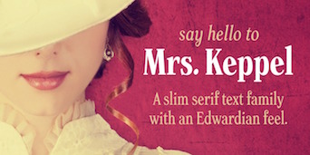 [MyFonts]
[More] ⦿
[MyFonts]
[More] ⦿
|
Deka Design
[Dmitry Krasny]
|
 Dmitry Krasny is the founder and creative director of Deka Design, a visual communications firm in New York City. He has been teaching courses in typography, information design, and book design since 1994, and served as Chair of Communication Design Department of Kanazawa International Design Institute (KIDI), Japan. He served on the jury of the TDC2 Type Directors Club's Type Design Competition 2004.
 In 2002, he designed the Venetian typeface family ET Bembo for Edward Tufte / Graphics Press. Tufte says that Bonnie Scranton and he himself co-designed the font but the extent of this collaboration is unclear. That typeface family is now available for free download from Tufte's Github site, where it is catalogued under the name ET Book. Later extensions enclude Daniel Benjamin Miller's XETBook (2019) and Michael Sharpe's ETbb (2020). [Google]
[More] ⦿
|
Dieter Hofrichter
[Hoftype]
|
 [MyFonts]
[More] ⦿
[MyFonts]
[More] ⦿
|
DJR Type
[David Jonathan Ross]
|
 DJR Type (Conway, MA, and before that, Deerfield, MA, and before that Los Angeles, CA, and before that, Lowell, MA) stands for David Jonathan Ross Type. Originally from Los Angeles, he was a student at Hampshire College in Amherst, MA, where he studied information design and typographic tradition. In 2007, he joined Font Bureau as a junior designer and was assisting with custom projects and expanding Font Bureau's retail library. Soon after that, het set up DJR Type. In 2016, DJR Type joined Type Network and pulled all his typefaces from MyFonts. He also runs Font of the Month Club.
 In 2018, he was the tenth winner of the Charles Peignot Prize. His typefaces: - Manicotti (2010). An ultra reversed-stress Western saloon style typeface that won an award at Modern Cyrillic 2014. DJR Manicotti won an award at TDC2 2007. For a free lookalike, see Plagiacotti (2009, Saberrider).
- Lavinia.
- Climax Text (2006) is a text and display series that was designed for Hampshire's student newspaper.
- Trilby (2009, Font Bureau). Trilby is based on a 19th century French Clarendon of wood type fame.
- Condor (2010, Font Bureau). This is a 60-style art deco family. By 2020, it had a 3-axis (weight, width, italic) variable version.
- Turnip (2012) is an angular and manly text face, also published at Font Bureau.
- In 2013, Ross and Roger Blcak revived Nebiolo's Forma for the redesign of Hong Kong Tatler, a fashion mag, supervised and commissioned by Roger Black, who was then based in Hong Kong. Read about the whole process in this piece by Indra Kupferschmid. Page specially dedicated to DJR Forma. In 2021, Belgian national broadcaster VRT picked DJR Forma for all its entire range of media.
- Bungee (2013, Google Fonts) won an award at TDC 2014. This homeless typeface, which comes in Regular, Hairline, Inline, Outline and Shade versions, is free: Bungee is a font family that celebrates urban signage. It wrangles the Latin alphabet to work vertically as well as horizontally.
- In 2014, David Jonathan Ross created the formidable 168-style programming font family Input (Font Bureau). Input is free for private use. It won an award at Modern Cyrillic 2014 and in the TDC 2015 Type Design competition. See also the proportionally spaced typewriter family Input Sans.
- Gimlet (2016). A 112-style Opentype family loosely based on Georg Trump's 1938 typeface, Schadow, and advertized as funky and functional. Ross writes: Gimlet is half Schadow, half imagination, and nothing else. And like its namesake beverage, Gimlet is a little tart, a little sweet, and can really pack a punch. Gimlet Variable Bold Condensed followed in 2019. Gimlet XRay (2020) is an An experimental colorized version of Gimlet that exposes what goes on under the hood of a variable font, visualizing control points, bounding boxes, kerning, etc. Amazingly, this variable color font has six axes, weight, width, oncurve point size, offcurve point size, glyph utline weight and point outline weight.
- Fern and Fern Micro (2014, Font Bureau). A Venetian typeface designed for screen.
- Output Sans.
- Fit (2017, by David Jonathan Ross and Maria Doreuli). A tall black display family that runs from ultra-compressed to very wide. It screams Use me for the Oscars! Fit was first developed as a variable font. It won an award at Granshan 2017.
- DJR Lab, or Lab Variable (2017), is a free pixelish variable font.
- Under miscellaneous, we find an untitled French Clarendon and an untitled semi-serif.
- Font of the Month Club fonts from 2017: Nickel, Roslindale (Roslindale is a text and display serif that takes its inspiration from De Vinne, a Victorian oldstyle typeface named for the nineteenth century printer and attributed to Gustav Schroeder and Nicholas Werner of the Central Type Foundry), Zenith (blackboard bold), Crayonette (a revival of Henry Brehmer's scriptish Crayonette, 1890), Bild (a compressed headline font based on the American gothic type styles from the 20th century; a variable font followed in 2019), Pappardelle Party (spaghetti Western style), Roslindale Text, Klooster (followed in 2021 by Klooster Thin).
- Font of the Month Club fonts from 2018: Bradley DJR (a revival of the blackletter typeface Bradley, 1895, William H. Bradley), Extraordinaire, Rhody (slab serif), Map Roman (an all caps vintage mapmaker font), Output Sans Hairlines, Rumpus Extended, Roslindale Light, Merit Badge (a variable color font).
- A tech type virtuoso, he charmed me with his art deco variable font Extraordinaire (2018) that was influenced by the diamond-shaped forms found in the center of the city of Sao Paulo, Brazil.
- Typefaces from 2019: Heckendon Hairline, a condensed Clarendon.
- Typefaces from 2020: Dattilo (a variable style revival of Aldo Novarese's slab serif Dattilo (1974)), Pomfret.
- Typefaces from 2021: Rustique (rustic capitals), Megazoid (a chunky geometric sans), Job Clarendon (with Bethany Heck, who wrote: Job Clarendon is an homage to job printing---display-heavy designs made for posters and flyers in the heyday of letterpress printing. This style of Clarendons was wildly popular in this genre of work, and I've always been interested in how adaptable they were. The style was fattened, squished and stretched to accommodate lines of text both short and long and type foundries across the globe each found their own unique features to contribute to the Clarendon stew. Ross pulled the design to both extremes but had his work cut out as he explained: The chasm between Hairline and Black was far too wide to interpolate across effectively, so I incorporated new drawings in the Extra Light, Regular, and Bold weights to act as additional tentposts to support the design).
Speaker at ATypI 2016 in Warsaw and at ATypI 2017 in Montreal. Klingspor link. Home page. Adobe link. [Google]
[MyFonts]
[More] ⦿
|
Dmitry Kirsanov
|
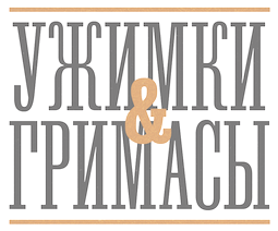 Type designer Dmitry Kirsanov (b. Orenburg, Russia, 1965) graduated from the Orenburg Art School in 1987. He worked freelance for Yuzhnyi Ural publishing company in Orenburg. After attending the Moscow State University of Printing (1996), he joined its Department of Print Design in 1997 as an instructor of typographic design and computer graphics. From 1996 on he worked at ParaGraph International, designing typefaces. Since April 1998 Kirsanov works for ParaType. His page has essays on the history of serif and sans serif, and on font matching. Would be great for an introductory course. He designed a Cyrillic version of ITC Bodoni 72 (2000, called PT ITC Bodoni, Paratype) and ITC Bodoni 72 Swash (2001). PT Mas d'Azil (Paratype, 2002) and PT Mas d'Azil Symbols are prehistoric lettering and pictorial fonrs based on images discovered in a prehistoric cave of Mas-d'Azil, France. He created Magistral (1997, based on a clean look sans display typeface of Andrey Kryukov), Venetian 301 (2003, Paratype; a Cyrillic version of Bitstream's Venetian 301, which in turn was based on Bruce Rogers' Centaur, which in turn goes back to the 1470s alphabets of Nicolas Jenson), News Gothic (2005, a Cyrillic family based on the perennial News Gothic sans family), and Mag Mixer (2005, an industrial-look mechanical typeface based on Magistral).
 In 2018, Albert Kapitonov and Dmitry Kirsanov revived the early 20th-century typeface Lehmann Egyptian from the Berthold and Lehmann type foundries in St. Petersburg, and published it at Paratype. His talk at ATypI 2008 in St. Petersburg is on the first didones in Russia. Paratype page. FontShop link. Klingspor link. View Dmitry Kirsanov's typefaces. [Google]
[MyFonts]
[More] ⦿
|
Dmitry Krasny
[Deka Design]
|
[More] ⦿
|
Doves Type
[Thomas James Cobden-Sanderson]
|
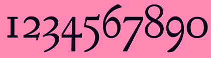 Doves Type was from Doves Press, founded in 1900 by Thomas J. Cobden-Sanderson (a disciple of William Morris) and Emery Walker. They had type based on Jenson. Thomas J. Cobden-Sanderson threw the typefaces in the Thames when the press closed in 1916 to prevent anyone from using it again. Ben Archer writes: although William Morris's Golden Type predated this design, it is thought that the Doves Type was more faithful to the design of the original Venetian type of the fifteenth century. Punches were cut by Edward Prince on the instructions of Walker and Cobden Sanderson in a single size and weight only, and used for printing the Doves Press edition of the Bible. This celebrated type was used privately for sixteen years and never released to the general trade. It was lost to history forever when Cobden Sanderson threw the entire font into the Thames river, provoking a bitter argument with his business partner, the master printer Emery Walker.
 Cobden-Sanderson was born in 1840 in Alnwick, Northumberland, and died in London in 1922. Digital revivals: - Doves Press Type (1994, Torbjörn Olsson). A six-font family.
- The Doves Type (2013-2015, Robert Green). Green writes: This is Robert Green's digital facsimile interpretation of the Doves Press Fount of Type, conceived and commissioned 1899 by TJ Cobden-Sanderson for the Doves Press, Hammersmith, developed by Emery Walker and Percy Tiffin at Walker and Boutall, Hammersmith, created and cut by Edward Prince, Islington, and cast by Miller & Richard Foundry, Edinburgh, 1899-1901. This facsimile was recreated using printed impressions from Doves Press publications & original metal sorts recovered by Robert Green from the River Thames, London, November 2014.
- In 2016, Alan Hayward (Lausanne, Switzerland) designed Mebinac, a text typeface based on Thomas James Cobden's Doves (1900).
- Raphaël Verona and Gaël Faure co-designed the commercial typeface Thames Capsule (2015-2016). Robert Green (a PhD student at Central Saint Martins / the University of the Arts, London, and creator of The Doves Type in 2013) claims the following: It's basically a pirated version of my font with some details changed. They used all of my research, took my font and knocked up a quick cash-in. I checked their files, and around 90% of their bezier nodes are in the exact same positions as the version of my Doves Type that was available at the time: a mathematical impossibility if you're creating a revival from scratch.
[Google]
[MyFonts]
[More] ⦿
|
Edward Philip Prince
|
English punchcutter active from 1862 to 1923, associated with seemingly the whole of the blossoming private press movement in England and America, b. 1841, Kennington, d. 1923, North London. His type creations include Tudor Black (1878, Miller&Richard), a typeface co-designed by Frederick Tarrant. Notable work was for the Kelmscott Press of William Morris, and the Doves Press of Emery Walker&Thomas Cobden-Sanderson. For the Doves Press he cut the revivals of Jenson's type that stimulated an interest in 15th century printing in the wider printing industry. (This Doves type was later thrown into the River Thames by an upset Cobden-Sanderson, over a protracted argument about its authorship). Prince's major design failure is worth noting. He was commissioned by Emery Walker to design type for Count Harry Kessler's Cranach Presse. The roman design was not a problem, for Prince had cut similar designs for the Kelmscott and Doves presses. The italic presented a new challenge though. Based on a type used in a 1525 work of Tagliente, this was the first attempt to recut a chancery italic. Despite help from Edward Johnston, Prince was seemingly unable to do interpret the design, and demanded finished drawings from Johnston, which the Englishman - in accordance with his views on the nature of craftsmanship - was not inclined to provide. It is instructive to note a confession Prince made to Kessler, characterizing himself as "a craftsman carrying out other men's designs". For Kelmscott Press, William Morris (a founder of the Arts and Crafts movement and a forerunner of the influential private press movement in Europe) and Edward Prince (master engraver) designed Golden Type (1890), a robust typeface made after the 1469 roman by Nicolas Jenson [Charles Leonard: The Golden Type was one of the most influential of the 19th century, but doesn't hold a candle to the Venetian revival typefaces that quickly followed.]. See also ATF Jenson Recut, and the digital Linotype ITC Golden Type. [Google]
[MyFonts]
[More] ⦿
|
Edward Tufte
|
 Edward Tufte has written seven successful books, including Visual Explanations (1997), Envisioning Information, The Visual Display of Quantitative Information, and Data Analysis for Politics and Policy. He writes, designs, and self-publishes his books on information design. He is Professor Emeritus at Yale University, where he taught courses in statistical evidence, information design, and interface design. His current work includes digital video, sculpture, printmaking, and a new book, Beautiful Evidence.
 Designer in 2002 of ETBembo, about which he writes: ET Bembo is a Bembo-like font for the computer designed by Dmitry Krasny, Bonnie Scranton, and myself. It will be used in my next book, Beautiful Evidence. My earlier books on analytical design were set in lead (!) in Monotype Bembo, an excellent book font. When converted to an electronic font, Monotype Bembo became thin and spindly (the computer people ignored "squeeze," the slight spreading of ink when the lead type hits the paper). So we made our own computer version and also made a few design changes (ligatures, several problems with the pi font, some letterforms, creation of a semibold). ETBembo is used in "The Cognitive Style of PowerPoint." It is just our house font and I'm not in the type business so it will not be commercially available. Tufte goes on to say that he thinks that Yale should make Matthew Carter's Yale font available for free to the whole world. Funny poster by Mark Goetz related to Tufte's stance on the typographic and infographic "qualities" of Powerpoint. Tufte's CSS. Github link for Tufte CSS, where one can download the free font family ET Book, which is ET Bembo, renamed. However, inside the font files, we still find the original name ET Bembo. [Google]
[More] ⦿
|
Emery Walker
|
Born in London in 1851, Emery Walker died also in London in 1933. He was a printer who worked with William Morris at the Kelmscott Press. In 1900 he co-founded Doves Press with Thomas J. Cobden-Sanderson. Walker drew the revival of Jenson's types, which were later cut by Edward Prince. One of his types there (made with Cobden-Sanderson) is known as Doves Roman (1900). He left the Doves Press in 1909. He was engaged by Harry Kessler to produce type for the Cranach Presse in Weimar. Walker commissioned Percy Tiffin and the highly-regarded Prince. With the accompanying Tagliente-based italic, the project ran into serious difficulties and the mediocre design remained unfinished until after Prince's death. Ben Archer writes: Although William Morris's Golden Type predated this design, it is thought that the Doves Type was more faithful to the design of the original Venetian type of the fifteenth century. Punches were cut by Edward Prince on the instructions of Walker and Cobden Sanderson in a single size and weight only, and used for printing the Doves Press edition of the Bible. This celebrated type was used privately for sixteen years and never released to the general trade. It was lost to history forever when Cobden Sanderson threw the entire font into the Thames river, provoking a bitter argument with his business partner, the master printer Emery Walker. Bio. [Google]
[MyFonts]
[More] ⦿
|
Eric de Berranger
|
 French designer (b. 1973) whose early fonts could be bought from 2Rebels in Montreal, and at La Fonderie. These are now available via FontHaus. Some creations at 2Rebels: Malcom Light and Malcom Light Expert, Coeval (1998), Coeval Expert (1998), Garaline (1998), Garaline Expert (1998), Hector 1, Hector 2, Helwissa, Jandoni (great didone titling face!), Malcom (1999), Malcom Expert, Troiminut (1998, perhaps created in under three minutes).
 He also made typefaces at ITC. These include ITC Octone (1998, a great flared lapidary typeface family), ITC Octone Expert (1998), ITC Berranger Hand and ITC Oldbook. Typefaces at Agfa / Monotype / Linotype include the Mosquito family (Agfa, 2001; Mosquito Formal appeared in 2003), Maxime (garalde family), and Koala. Other typefaces include Yesselair (1998, La Fonderie), Hamely, Klory, Kolinear (2009, angular), Merlin, Collos (hexagonal), Pack Trash (another name for Yesselair?), NLE2B210, EricMainDroite, June (an elegant garalde / antiqua /Venetian crossbreed). With Stéphane Gambini, he started La Fonderie. He does visual identity stuff for companies in France, most notably, the logo and logo font for Renault (2004). In 2005, he revived a 1972 didone of Hollenstein Studio as Natalie (no sales or downloads). In 2006, he created a 6-weight legible sans family for the STIP (Brussels transport society) called Brusseline. In 2007, he created the bold gothic headline typeface LFP Bold for the Ligue de Football Professionnel. In 2008, he published the stunning connected script Hermès Scripte used by the fragrance company by that name, and Martini (for the aperitif brand). Klingspor link. FontShop link. View Eric de Berranger's retail typefaces. [Google]
[MyFonts]
[More] ⦿
|
Eric J. Siry
|
San Francisco-based designer who modified Tobias Frere-Jones's Hightower (Font Bureau, 1996) for Rolling Stone. That custom font is called Abbey. [Google]
[More] ⦿
|
Ernst Frederic Detterer
|
 Born in Lake Mills, Wisconsin, 1888, Ernst Frederic Detterer worked as a designer, instructor and calligrapher, and in particulat at the Ludlow Typograph Company in Chicago. He died in Chicago in 1947. The main typeface he designed was Nicolas Jenson (1923). The type was renamed Eusebius in 1941. Nicolas Jenson was based on the original work of fifteenth century designer Nicolas Jenson.
 Jim Spiece's Nicolas Jenson SG is based on Eusebius and on extensions of Eusebius by Detterer's student, Robert Hunter Middleton. McGrew writes about Eusebius: Eusebius is Ludlow's distinctive adaptation of the types of Nicolas Jenson, which were first used about 1470 and have served as inspiration for many of the best roman typefaces ever since. This typeface was designed by Ernst Detterer in 1923, and issued as the Nicolas Jenson series. Robert H. Middleton, who had been an art school student of Detterer's, was first hired by Ludlow for the temporary assignment of seeing this typeface through production. By 1929 he had designed matching bold, italics, and open. Slight modifications were later made to the Nicolas Jenson series by Middleton (who remained at Ludlow for a distinguished career, designing scores of typefaces over forty-seven years), and it was reintroduced in 1941 under the series name of Eusebius. This name comes from the 1470 book in which Jenson's original type was first used. In the specimen of Eusebius, the J and f shown separately at the end are the original Detterer design of the letters most obviously redesigned; other changes were minor. In addition to the characters shown in the specimens here, with the usual ligatures for all fonts, oldstyle figures were available for Eusebius and Italic and Open, while QU and Qu combinations with long tails and f combinations with overhangs were made for regular, Bold, and Open. Compare Centaur, Cloister, Italian Old Style. He created the Newberry Library Bindery Type ca. 1935. [Google]
[MyFonts]
[More] ⦿
|
Eugen Sudak
[WDC Fonts]
|
[MyFonts]
[More] ⦿
|
Expert Alphabets
[George Abrams]
|
George Abrams (b. 1919 or 1920, Brooklyn, d. 2001, Manhasset, NY) is the designer of the gorgeous font families Augereau, Abrams Caslon and Venetian, at Expert Alphabets in Great Neck, NY. Abrams taught lettering and typeface design at the Parsons School of Design, the New School for Social Research and at the Columbia University Teachers College. He had over 50 years of Madison Avenue experience designing ads, logos, typography and lettering for Fortune 500 companies and more. His early typefaces were photo types published by Headliners in New York City. He died on June 7, 2001 at age 81. About Augereau: This is the only digitized typeface by George Abrams [in fact, the digitization is due to Charles Nix, for George Abrams]. Its 28 weights include over 2,000 sorts including expert, OsF,&alts. Augereau is named for Antoine Augereau, who was a typographer who had a few claims to fame - one was that he was Claude Garamonds teacher, and two was that he was sentenced to death for heresy in 1544. Heresy for a typographer in 1544 meant that he printed something that the king or the Pope didn't like and died for it. I would like to thank Poul Steen Larsen for clarifying the history of Abrams' Venetian: The Abrams Venetian was donated to Mr. Poul Kristensen of Herning (in Jutland), then Printer to the Royal Court (which he has ceased to be in 1995). You are right about the font being today locked to Poul Kristensen' old Linotron, from which not even Linotype experts brought in to unlock it, could get it out for conversion into an up-to-date digital font. So the font will disappear from the type arena when Kristensens Linotron one day breaks down. You can trust me, for I was the one who established the contact between George and Mr. Kristensen back in 1986. The font was first used in 1989 in a book by Martin Lowry, British renaissance historian, with the title Venetian Printing. George Abrams' chalk drawings of the entire alphabet in regular and italic were scanned, more precisely vectorised on-screen and downloaded in Denmark by the Kristensens and therefore, in one sense, could be called the first Danish complete font. A sample of the first use of Abrams' Venetian. A second sample from "Venetian Printing". Abrams Venetian was digitized at some point by Jorgen Kristensen for Poul Kristensen Grafisk Virksomhed Printer. Apostrophe wrote this about Abrams Caslon: This was actually reviewed by Caflish and, if I remember correctly, Mark vonBronkhorst, so there are at least 3 or 4 copies of it out there, other than the Abrams' estate original data. Sumner Stone once said that this is the best Caslon he has ever seen. At least he has seen it; I haven't. The typefaces by Abrams (Abrams Venetian and Augereau) are preserved in the New York City-based Abrams Legacy Collection (see also here). Klingspor link. [Google]
[MyFonts]
[More] ⦿
|
Forum Capitals
|
An all caps Venetian typeface by Frederic Goudy released by Lanston Monotype in 1911. Berry, Johnson and Jaspert: Designed by F.W. Goudy under the inspiration of Roman inscriptions. The serifs have pen-stroke qualities like other Goudy designs. The U has the lower-case design and the upper limbs of the Y are curved. Capitals and figures only. [Google]
[More] ⦿
|
Francesco Griffo
|
Born and died in Bologna, ca. 1450-1518. Also called Francesco da Bologna. He was a Venetian punchcutter, who worked for Aldus Manutius cutting early italics, music types and romans. Under the surname Griffo, he designed and cut all types for the Aldine Press. The "Aldine" typeface was recreated by Monotype in 1929. In 1990, the Monotype staff digitized 24 weights of Francesco Griffo's Bembo family, which was originally created in 1496---however, read on below regarding the date. The Bitstream version is called Aldine 401. Bembo is a typeface that is not compact, with its wide letters and ample spacings, so its use must be carefully weighed. Interesting detail about the end of his life: after the death of Manutius in 1515, Griffo returned to Bologna where he printed some of his own editions until his own death in 1518 or 1519, when it is thought he was hanged for killing his brother-in-law. Kevin Steele explains in 1996: Some sources cite the publication of Cardinal Bembo's De Aetna as 1493 or 1495. And in fact, the design continued to evolve until the 1499 publishing of the spectacular Hypnerotomachia Poliphili. Let's not split hairs. Let's celebrate 500 years of Bembo! In the mid fifteenth century printing quickly spread to Italy from Germany, and by the 1470's Venice had became the center of the printing industry, home to over 100 printing companies. Pioneers such as Erhard Ratdolt and Nicolas Jenson had already begun working on adapting the roman alphabet for metal type by the time Aldus Manutius established his press in 1494, with the intention of publishing all the Greek classics. Aldus Manutius (1450-1515) was a printer, entrepreneur, a great ego, and publisher of over 1200 titles. Among the many contributions of Aldus was the popularization of small, portable books. His expensive beautiful books were far from today's paperbacks, mind you. One of the many great talents working for Aldus was Francesco Griffo, a gifted type designer. Griffo created many innovative type designs that are still admired for their beauty and readability. Their collaboration broke up over a copyright dispute, primarily over the ownership of the cursive type typeface that Griffo developed under the direction of Aldus. Although Aldus even had a papal decree to protect this style of alphabet, it was as difficult then as it is now to protect a typeface design. The alphabet was widely copied, and the style is known as italic, after its country of origin. Fontdeck link. Linotype link. FontShop link. Nicholas Fabian on Griffo. Agustina Cabal's poster of Bembo. [Google]
[MyFonts]
[More] ⦿
|
Franck Jalleau
|
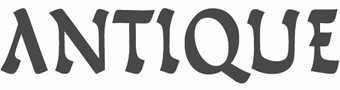 French type designer, calligrapher, and stonecutter, b. 1962. Franck Jalleau studied at the Ecole des Beaux-Arts de Toulouse and at the Atelier national de Création typographique (ANCT), where he subsequently worked as an instructor until 1990. A type designer, he works primarily in the publishing field and on French administrative documents (the General Tax Code, passports, identity cards, car registration documents, etc.). Since 1990, for the Imprimerie Nationale, he oversees the adaptation of the typographic holdings for digital typesetting. For this effort, the Imprimerie's Garamond was one of the first typefaces he rehabilitated, along with the grecs du Roi. Currently, Franck Jalleau teaches at Ecole Estienne in Paris.
 Franck designed several typefaces for Agfa, Editions Magnard, city of Brive-la-Galliarde, for the NGO ATD Fourth World Movement, etc. In 1987, he engraved the Movement's message in stone, which was installed first at the Place de Trocadéro in Paris, and then at the United Nations in New York, the European Parliament in Strasbourg, the Basilica of St. John Lateran and in Reims Cathedral. Franck Jalleau won the Prix des Graphistes in 1988 and has received several international awards, including the Morisawa Award (Japan) in 1987 and 1996. He has taught type design at the École Estienne since 1991, and he offers training courses in character design in art schools both in France (Toulouse, Caen, Amiens) and abroad. His typefaces: - As an OEM for the Imprimerie, he designed some fantastic fonts between 1990 and 1998, including Arin (1986; Morisawa award 1987), Garamont (1995), Grandjean (1997), Jalleau (1996), Perrin (1997), Roma (1996), Scripto (Morisawa award 1996), Virgile (1995, Agfa) and Oxalis (1996, Agfa).
- Francesco (1998) is based on the letters of Francesco Griffo. Perfectly executed, it is a Venetian renaissance revival face---although first designed in 1998, it was published only in 2010 at BAT Foundry, which Franck helped co-found. It also covers Greek and Cyrillic. Interestngly, it features random counter shapes to give that 15th century look. Among Francesco's historical sources is the famous Hypnerotomachia Poliphili printed in 1499 by Aldus Manutius. Subsequently, Francesco was republished by Production Type.
- In 2002, he created Le Brive, commissioned by senator and mayor Bernard Murat of Brive-la-Gaillarde.
- In 2005, he digitized the Grec du Roi based on original characters and ligatures by Claude Garamond for François 1er, 1544-1550.
- In 2009, he created Le Maghrébin based on material in the Imprimerie Nationale. The original from 1846 and 1850 was cut by Marcellin Legrand. This version of Arabic is also called western, or African (africain), and features many ligatures.
- In 2016, he designed the monospace sans typeface family Aubusson. Initially designed as a custom typeface by Franck Jalleau for the Cité internationale de la tapisserie d'Aubusson, the monowidth proportions are linked to pattern and tiles arrangements used in tapestry. The retail version of Aubusson offers four weights with matching italics. It was published by Black Foundry.
Linkedin link. Fascinating interview (in French). FontShop link. Production Type link. [Google]
[MyFonts]
[More] ⦿
|
Frank Hinman Pierpont
|
 American type designer, b. 1860, New Haven, CT, d. 1937, London. In 1894 he started working at Loewe AG in Berlin. In 1899, he became president of Monotype in England. His typefaces:
 - Plantin, a transitional typeface created under Pierpont's direction at Monotype in 1913-1914. Plantin Bold followed in 1925-1927 and Plantin Titling in 1936. It is based on a Gros Cicero typeface cut in the 16th century by Robert Granjon. Digitizations include Plantin (Monotype), Plantin Schoolbook (Phil's Fonts), Placid and Placid Osf (Softmaker), P761 Roman (Softmaker), Francisco Serial (Softmaker), Platus (URW), Aldine 721 (Bitstream). Stanley Morison and Victor Larent based their Times New Roman design on Plantin. Plantain (2002, Jason Castle) is a digital version and extension of Plantin Adweight. Quoting wikipedia on the name Plantin: Pierpont was inspired to use Granjon's designs by a visit to the Plantin-Moretus Museum in Antwerp, Belgium, which had them on display. The Granjon font on which Pierpont's design was based was listed as one of the types used by the Plantin-Moretus Press beginning in the 17th century, long after Plantin had died and his press had been inherited by the Moretus family, but Plantin himself had used a few letters of the font to supplement another font, a Garamond. The design for Plantin preserved the large x-height of Granjon's designs, but shortened the ascenders and descenders and enlarged the counters of the lowercase letters a and e.
- Horley Old Style (Monotype, 1925). An elegant Venetian typeface family. Digital revivals: Horley Oldstyle (Monotype), Horley Oldstyle MT (Adobe), OPTI Hobble Oldstyle (Castcraft), H790 Roman (SoftMaker), Horley Old Style (2009, Tania Raposo).
- Monotype Grotesque (1926, Monotype) is usually attributed to Pierpont, at least as project supervisor. It goes back to Thorowgood's Grotesque (1832). MyFonts mentions that it was originally an update of Berthold's Ideal Grotesque. It served as a model for Arial.
- Rockwell is a famous slab serif typeface developed by Monotype in 1934 under the guidance of Pierpont. It was no secret that it was created in reaction to Rudolf Wolf's slab serif Memphis (1929-1936) done for Stempel. Litho Antique (1910, Inland Type Foundry) served as a model for it, leading first to Rockwell Antique and then Rockwell. Despite Rockwell's atrocious lower case k, Rockwell would go on to become more popular than Memphis. Rockwell poster by Cedrik Ferrer. Rockwell poster by Jonathan Messina. Images by Viktoria Smykova: i ii, iii, iv. Digital remakes include Bitstream's Geometric Slabserif 712, and L850 Slab, Rambault and Stafford at SoftMaker.
- Rodeo (1934).
Klingspor link. Linotype link. View digital typefaces related to Frank Hinman Pierpont's work. [Google]
[MyFonts]
[More] ⦿
|
Franziska Weitgruber
|
 Based in Vienna, Austria, and/or Latsch, Italy, Franziska Weitgruber received her Bachelor's Degree in Graphic Design with a focus on type from the New Design University (NDU) Sankt Pölten, Austria in 2014. She also studied in the Typemedia program at KABK in The Hague, class of 2016. She publishes her work mostly via Future Fonts and Fontwerk.
 Franziska created the text typeface Porta Serif and the science journal text typeface Sphera in 2014. Her graduation typeface at KABK in 2016 is the expressionist Kaligari. It comes in six styles---in its genre, it is the best digital German expressionist typeface published to date. In 2018, Michael Hochleitner, Christoph Schütz, Simon Liesinger and Franziska Weitgruber co-designed Gretel Script at Typejockeys. This optically sized three-style typeface is based on the hand of calligrapher Natascha Safarik. Still in 2018, she published Gig at Future Fonts. Gig is monolinear retro felt pen script in the style of Roger Excoffon's Banco. Typefaces from 2019: Antonia (a crisp variable headline text typeface by Franziska Weitgruber and Michael Hochleitner at Typejockeys; a 64-style font family with optical sizing from headline H1, H2, and H3 to Text, with a variable font added to the mix), Roba (a typeface family in which Franziska experiments with stress and counter-stress, form and counter-form), Nikolai (an elegant display family released at Fontwerk). Nikolai started out as a revival of Nebiolo's Jenson but became a sharp-edged hyper-modernized version of that Venetian type. Future Fonts link. [Google]
[MyFonts]
[More] ⦿
|
Frederic Goudy
[GoudyFonts.Com]
|
[More] ⦿
|
Frederic Warde
|
 Born in Wells, Minnesota as Arthur Frederick Ward, 1894, d. New York, 1939. He enlisted in the United States Army in 1915 and attended the Army School of Military Aeronautics at the University of California, Berkeley during 1917-1918. On demobilisation he worked as a book editor for Macmillan&Co before undergoing training on the Monotype machine, after which he worked for the printers Edwin Rudge. He had met Beatrice Becker in 1919 and they married in December 1922. Warde was Printer for Princeton University (1922-1924). The couple moved to England in late 1924 for Warde had been offered work by the typographer Stanley Morison, designing for The Fleuron and the Monotype Recorder. The marriage did not last; they separated in 1926, and quickly divorced, though the break-up was an amicable one. Afterward Warde lived in France and Italy, where he became involved in Giovanni Mardersteig's Officina Bodoni. In 1926 Mardersteig printed The Calligraphic Manual of Ludovico Arrighi - complete Facsimile, with an introduction by Stanley Morison, which Warde issued in Paris while working for the Pleiad Press. He had his name changed several times, first his last name to Warde, and then his first name first to Frederique and then to Frederic. Warde returned to America permanently and he worked again for Edwin Rudge from 1927 to 1932, and also designed for private presses such as Crosby Gaige, the Watch Hill Press, Bowling Green Press, the Limited Editions Club and Heritage Press. Warde worked as production manager for the American office of the Oxford University Press from 1937 until his death in 1939.
 His typographic work: - Based on the fifteenth century letters of Nicolas Jenson, Centaur (originally called Arrighi) was first designed by Bruce Rogers in 1914 for the Metropolitan Museum, and parts of the typeface (like the italic) were done by Warde in 1925. This was called Arrighi Italic (a smooth version of Blado) but became Centaur Italic (Monotype, 1929). Warde was inspired by the italic forms on the Italica of Ludovico Vicentino, a 16th century typeface. However, his capitals are more freely formed (not vertical, for example). Warde designed a revival of the chancery cursive letter forms of Renaissance calligrapher Ludovico degli Arrighi. This italic, titled Arrighi, was designed as a companion to Bruce Roger's roman typeface Centaur.
Author of Monotype Ornaments (1928, Lanston Monotype Corp) [this book is freely available on the web thanks to Jacques André]. Many ornaments in this book have been digitized; see, e.g., Arabesque Ornaments (for the 16th century material) and Rococo Ornaments (for the 18th century ornaments). Warde also published the following privately in 1926 with Stanley Morison: The calligraphic models of Ludovico degli Arrighi, surnamed Vicentino---a complete facsimile and introduction by Ludovico degli Arrighi. Digital fonts based on his work include LTC Metropolitan (Lanston), Centaur (Monotype and Linotype versions) and Arrighi BQ (Berthold; this font has romans by Bruce Rogers and an italic by Frederic Warde). Wiki page. Linotype link. FontShop link. Klingspor link. [Google]
[MyFonts]
[More] ⦿
|
Frederic William Goudy
|
 One of the great type designers of the twentieth century, 1865-1947. Born in Bloomington, IL, he made over 125 typefaces. He founded the Village Press with Will H. Ransom at Park Ridge, IL, in 1903. From 1904 until 1906, it was in Hingham, MA, and from 1906-1913 at 225 Fourth Avenue, New York City, where a fire destroyed everything except the matrices on January 10, 1908. From 1913 until 1923, it was located in Forest Hill Gardens, Long Island, and from 1923 until his death in 1947 at Deepdene, in Marlborough-on-Hudson, NY. He was an art consultant for Lanston Monotype from 1920-1940.
 His life's work and his ideas on typography can be found in his great book, Typologia, Studies in Type Design \& Type Making (1940, University of California Press, Berkeley), but his views are already present in Elements of Lettering (1922, The Village Press, Forest Hill Gardens, New York). His own work is summarized, shown and explained in his last book, A Half-Century of Type Design and Typography 1895-1945, Volume One (1946, The Typophiles, New York). See also Frederic Goudy by D.J.R. Bruckner for Harry N. Abrams Publishers, New York. In 1936, Frederic Goudy received a certificate of excellence that was handlettered in blackletter and immediately stated, Anyone who would letterspace blackletter would steal sheep. He also wrote: All the old fellows stole our best ideas, and Someday I'll design a typeface without a K in it, and then let's see the bastards misspell my name. His 116 fonts include - Camelot (1896, Dickinson Type Foundry). He sold another design in 1897 to that foundry, but it was never published. McGrew writes: Camelot or Camelot Oldstyle was the first typeface designed by Frederic W. Goudy. He offered it to Dickinson Type Foundry (part of ATF) in Boston, which accepted it and sent him $10, twice what he had modestly asked for it. This was in 1896; it was apparently cut and released the following year as drawn, without lowercase. In February 1900 a design patent was issued in the names of Goudy and Joseph W. Phinney, and assigned to ATF. Phinney was a well-known designer for Dickinson-ATF, and apparently it was he who added the lowercase alphabet. Its success encouraged Goudy to make a distinguished career of type designing, and this typeface was included in ATF specimen books as late as 1941. Compare Canterbury.
- De Vinne Roman (1898)
- Copperplate (1901): See Copperplate Gothic Hand (2009, Gerd Wiescher), Copperplate URW, or Copperplate EF (Elsner&Flake).
- Pabst Roman (1902)
- Village (1902). Some say 1903. Village was originally designed by Frederic Goudy in 1903 for Kuppenheimer & Company for advertising use, but it was decided it would be too expensive to cast. It was later adopted as the house face for Goudy's and Will Ransom's Village Press. The matrices were cut and the type cast by Wiebking. The design was influenced by William Morris's Golden Type. This Venetian typeface was digitized by David Berlow (1994, FontBureau), by Paul D. Hunt (2005), and by Steve Matteson (2018), who simply called his revival Village. Hunt's version was eventually released in 2016 by P22 as LTC Village. Ivan Louette (Belgium) is working on a fine version of Village as well.
- Bertham (1936), his 100th typeface, named for his wife, Bertha.
- Copperplate Gothic (ATF, 1905): The Bitstream version was done by Clarence Marder.
- Goudy Old Style (ATF, 1914-1915): A 15% heavier weight was made by Morris Fuller Benton in 1919. Bitstream and URW++ sell that as Goudy Catalogue. See also Goudy Catalogue EF (Elsner&Flake), Bitstream's Goudy Old Style, Scangraphic's Goudy Old Style SB (2004), Infinitype's Goudy Old Style, Bitstream's Venetian 522, and Softmaker's G790.
- ATF Cloister Initials (1917-1918). This was revived digitally by several foundries: Alter Littera did Initials ATF Cloister (2012). Group Type created Cloister Initials (2006).
- Goudy Handtooled (1916): A decorative font. Elsner&Flake and Bitstream have a digital version. The Bitstream version used to be called Venetian 523.
- Goudy Modern (Lanston, 1918): Goudy Modern MT is the Agfa-Monotype version. Adobe's version is confusingly called Monotype Goudy Modern.
- Hadriano (1918): Agfa-Monotype has a digital version, as does Adobe.
- Goudy Heavyface (ATF, 1925-1932): Created as a possible competitor of Cooper Black. Bitstream has a digital version.
- Goudy Newstyle (1921): additional letterforms are provided to distinguish different pronunciations. This legible semi-Venetian typeface was cut by Wiebking and recut in 1935. It was sold to Monotype in 1942. Revival by Steve Matteson in 2018 as Newstyle.
- Italian Oldtyle (+Italic) (ca. 1925): made after Dove, Monotype's president, prompted Goudy to make a Venetian typeface to compete with ATF's Cloister Old Style.
- Venezia Italic (1925), to accompany Venezia. George W. Jones of the English Linotype company had it made by Linotype.
- Aries (1925-1926): a kind of blackletter typeface in the style of Subiaco done for Spencer Kellogg for his new private press (he never used it).
- Goudy Dutch: based on handwriting on an envelope from Holland. Goudy lost the drawings.
- Companion Old Style and Italic
- Deepdene (1927). See D690 Roman on the SoftMaker MegaFont XXL CD, 2002. Deepdene became a Berthold font, and at Berthold it was digitized and refreshed by G.G. Lange from 1982-1983. URW also has a Deepdene family. But above all, one could pick up a free two-style revival by Barry Schwartz, Linden Hill (2010, OFL). View various Deepdene implementations.
- Goudy Text (1928). Based on the textura blackletter types of by Johann Gutenberg in the fifteenth century, Goudy Text has a narrow, ordinary lowercase. It can be used in display advertising and on certificates and invitations. Goudy Text is a "blackletter" type first used in 1928 by Goudy in a Christmas card from type cast at his own foundry. Among the digital versions, see LTC Goudy Text (P22 and Lanston; by Paul D. Hunt; this family includes LTC Goudy Text Lombardic Caps) and Goudy Text CT (Jason Castle).
- Kaatskill (1929, Lanston Monotype): a beautiful old style figures font originally done for an edition of Rip van Winkle. Mac McGrew: Kaatskill is a private typeface designed and cut by Frederic W. Goudy for use in an edition of Rip Van Winkle which he made for The Limited Editions Club, in 1929. Goudy says that what he had in mind was merely to design a type "as simple, legible, vigorous, clear, and effective in detail as could, and which would at the same time show no note of strangeness in the mass. ...I feel that Kaatskill owes nothing in its design to any existing face. and the type therefore is as truly an American type as anything so hidebound by tradition as type can be." It is named for the Catskill mountains, which were the locale of Goudy's home and workshop as well as of the story. See Trajan Title.
- Remington Typewriter (1929)
- Kennerley (1930) (see his book A Novel Type Foundery for specimens). The Berthold foundry, where the types can now be bought in digital form, mentions the dates 1911-1924.
- Ornate Titling (1931). See LTC Goudy Ornate (Lanston) and Goudy Ornate (2002, Ascender).
- Kennerley Bold and Bold Italic, and Kennerley Open Caps, to accompany Kennerley Old Style.
- Goudy Heavy Face (+Italic), made to please Harvey Best, the successor of Dove at Lanston Monotype.
- Marlborough (1930s): a typeface whose design was sold in 1942 to Monotype, but nothing came of it.
- Tory Text (1935). A blackletter typeface inspired by the lettre batarde used by Geoffroy Tory in his Champs Fleury.
- University (of California) Old Style (1938). Also called Californian (1938). A commercial version of this is ITC Berkeley Oldstyle by Tony Stan (1983). Font Bureau published FB Californian (1994, Carol Twombly, David Berlow, Jane Patterson).
- Bulmer (1939)
- Goudy Sans: ITC Goudy Sans (1986), LTC Goudy Sans (2006, Colin Kahn), Goudy Elegant (SoftMaker), Moon Cresta (Ray and Chikako Larabie, 2010) and Goudy Sans EF (now gone?) are digital revivals of Goudy's Goudy Sans family from 1929. GoudySorts MT, an Agfa Monotype font consisting of beautiful ornaments.
- Goudy Thirty. Mac McGrew: When Monotype suggested that Goudy design a type that that company might bring out after his death, to be called Goudy Thirty (from the newspaper term for the end of a story), he thought of a design he had started for a western college. That commission had fallen through, so the design was unfinished. Then, as Goudy relates, "This design struck me as particularly adapted to the purpose. As I worked on it I had determined to make it, as far as I was able, my last word in type design, a type in which would give my imagination full rein, and a type by which as a designer would be willing to stand or fall." Completed in 1942, it was kept under cover by Monotype and not released until 1953-long after his death in 1947. But he designed several types after this one, so it was not the last one from his hands. Goudy Thirty is a fine recreation of a fifteenth-century round gothic, excellent for period pieces. For digital versions, see LTC Goudy Thirty (Lanston, now P22 Lanston) and Goudy Thirty (a free font by Dieter Steffmann).
- Nabisco (1921).
- Garamont (1921).
- Goudy Initials. These are floriated caps.
- New Village Text (1938). A hybrid consisting of the capitals of Tory Text and the lower case of Deepdene.
Several foundries specialize in Goudy's types. These include P22/Lanston, which has an almost complete digital collection, Ascender Monotype, and Castle Type, which offers Goudy Trajan (2003), Goudy Text, Goudy Stout and Goudy Lombardy. WTC Goudy was digitized ca. 1986 by WTC. Links: Bio by Nicolas Fabian. Alternate URL. Andrew R. Boone's article on Goudy in Popular Science, 1942. Goudy's typefaces listed by Paulo W. Obituary, May 13, 1947, New York Times, Time Magazine, November 6. 1933, Amy Duncan's thesis at BSU entitled "Howdy Goudy: Frederic W. Goudy and the Private Press in the Midwest", A 2009 lecture on Goudy by Steve Matteson (TypeCon 2009, Atlanta), Melbert B. Cary Jr. collection of Goudyana. Wikipedia: List of typefaces designed by Frederic Goudy. Linotype link. FontShop link. [Google]
[MyFonts]
[More] ⦿
|
Frere Jones Type
[Tobias Frere-Jones]
|
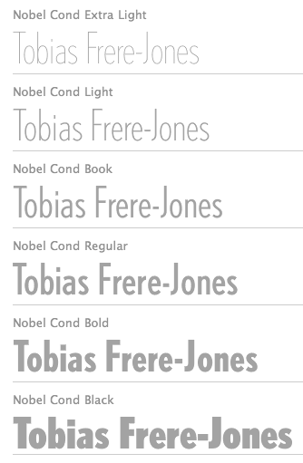 Celebrated type designer, born in 1970 in New York City. Frere-Jones received a BFA in Graphic Design from the Rhode Island School of Design in 1992. He moved to Boston, where he worked at the Font Bureau until 1999. He joined the faculty of the Yale University School of Art in 1996 and has lectured throughout the United States, Europe and Australia. From 1999 until 2014, he worked for and with Jonathan Hoefler in New York. In 2015, he set up his own type foundry, Frere Jones Type. His old Font Bureau typefaces can be bought since 2020 at Frere Jones / Type Network. His work is in the permanent collections of the Victoria & Albert Museum in London and the Museum of Modern Art in New York. In 2006, The Royal Academy of Visual Arts in The Hague (KABK) awarded him the Gerrit Noordzij Prijs, for his contributions to typographic design, writing and education. In 2013 he received the AIGA Medal, in recognition of exceptional achievements in the field of design.
 His Font Bureau typefaces: - Armada (1987-1994). A rigid elliptical sans in many styles. This is a surprisingly beautiful family despite its self-imposed design restrictions. The Compressed Black is a piano key typeface in the style of Wim Crouwel. Font Bureau: An experiment in algorithmic design, Armada follows the verticals and flat arches so often to be found in the architectural geometry of cast iron and brickwork in 19th century American cityscapes.
- Asphalt (1995). Font Bureau: Who hasn't admired the energy of Antique Olive Nord? All other ultrabolds seem sluggish in comparison. Nord exudes Excoffon's animation and Gallic impatience with the rules. Tobias Frere-Jones cross-bred the weight, proportion, and rhythms of Nord with the casual grace of his own Cafeteria, gaining informality and a dancing vitality on the page.
- Benton Sans (1995-2003). Created by Tobias frere-Jones and Cyrus Highsmith, it is a revival of Benton's 1903 family, News Gothic, and one of Font Bureau's bestsellers. It is a very complete family, ranging from regular widths to Condensed, Compressed and ExtraCompressed subfamilies. The Small Caps set is complete as well.
- Benton Modern (1997-2001). Benton Modern was originally undertaken by Tobias Frere-Jones to improve text at The Boston Globe. Widening the text face for the Detroit Free Press, he returned Century's proportions to Morris Fuller Benton's turn-of-the-century ATF Century Expanded, successfully reviving the great news text type. The italic, based on Century Schoolbook Italic, was designed by Richard Lipton and Christian Schwartz, who also added the Bold.
- Cafeteria (1993). Font Bureau about this cartoonish font: The irregularities normally found in script can enliven sans-serif letterforms. In Cafeteria, Tobias Frere-Jones took special care to balance activity with legibility on the paper napkin that served as his sketchpad, drawing a freeform sans-serif that is condensed but in no way stiff.
- Citadel (1995).
- CochinOldstyle (1992), CochinBlack (1991).
- Eldorado (1993-1994).
- Epitaph (1993). Drawn around 1880 at the Boston Type Foundry (the Boston branch of American Type Founders), Epitaph was modeled on a graceful Art Nouveau letterform that was bringing a new vitality to gravestone inscriptions at the time. The energy and life of the Vienna Secession alphabet drew the attention of Tobias Frere-Jones, who digitized the original set of titling capitals and added alternate characters for its Font Bureau release.
- Garage Gothic (1992). In three weights, it is based on parking garage ticket lettering but very reminiscent of license plate characters.
- Grand Central (1998). Grand Central was designed for 212 Associates from late-twenties capitals hand-painted on the walls of Grand Central Station. Font Bureau writes: The design is a distinguished Beaux Arts descendant of the great French Oldstyle originated by Louis Perrin in Lyons in 1846, known across Europe as Elzevir and in the U.S. as De Vinne.
- Griffith Gothic (1997-2000). A revival of Chauncey Griffith's telephone book directory typeface, Bell Gothic (1937-1938).
- Hightower (1994-1996). A Venetian typeface originally done for the Journal of the American Institute of Graphic Arts. Font Bureau: Dissatisfied with others' attempts to bring Nicholas Jenson's 1470 roman up to date, Frere-Jones prepared his version of this calligraphic roman, with his own personal italic.
- Interstate (1993, Font Bureau). Done for the United States Federal Highway Administration, but later released as a type family by Font Bureau. Interstate Mono (done with Christian Schwartz) followed in 2000, also at Font Bureau. The family is a reinterpretation of Highway Gothic, which has been the official typeface for American highway signage for decades. Its design is ultimately based on signage alphabets developed in the late 1940s by Dr. Theodore Forbes, assisted by J.E. Penton and E.E. Radek.
- Miller. A Scotch Roman finished in 1997 together with Matthew Carter and Cyrus Highsmith at Font Bureau.
- Niagara (1994). Almost a skyline typeface. Contains Niagara engraved.
- FB Nobel (1993). An exquisite geometric sans family based on old ideas of De Roos at Amsterdam who explored alternative character sets to enliven basic Futura forms. Frere-Jones views Nobel as Futura cooked in dirty pots and pans. FB Nobel showcased. The Extra Lights were added by Cyrus Highsmith and Dyana Weissman.
- Pilsner (1995). A beer bottle typeface. Font Bureau: Sitting in a Paris cafe with a bottle of beer, Tobias Frere-Jones gave his attention to the label. It was set in a roman design wearing blackletter-like clothes, probably to suggest an origin in Alsace or points to the East. Unable to forget the design, with its blocky, straight line emphasis, Tobias designed Pilsner, an exercise in straight lines in an angle-centered scheme.
- Poynter Old Style (1997, Font Bureau).
- FB Reactor (1996). This was first a FUSE7 font in 1993). Reactor destroys itself as it is put to use.
- Reiner Script (1993). Based on a 1951 brush script by Imre Reiner (ATF).
- Stereo (1993). After a typeface by Karlgeorg Hoefer, 1963 (Font Bureau says 1968).
At FontFont, he designed the children's fonts FF Dolores (1991) and FF Dolores Cyrillic. At FUSE 15, he designed Microphone (1996). At FUSE 10, he published Fibonacci, a font consisting just of lines. His custom work includes WorthGothic (1996), WorthLogo1996 (1995), WorthText (1995), GQGothic (1995), Halifax, Commonwealth (1995), Belizio-TwentySix (Font Bureau), HermanMillerLogo (1999, Font Bureau). Cassandra, Vitriol (1993), Quandry (1992-1994) and Chainletter (1993). Retina Agate (2001, specially made for small-print stock listings at the Wall Street Journal) netted him a Bukvaraz 2001 award and an AIGA 2003 Design Award. From 1999 until 2014, he designed for the Hoefler Type Foundry, which he joined as an equal partner (and the new company became Hoefler & Frere-Jones (in 2004), or H&FJ). He claims that he brought with him to H&FJ a lot of typefaces including Whitney, Whitney Titling, Elzevir, Welo Script, Archipelago (Shell Sans), Type 0, Saugerties, Greasemonkey, Vive, Apiana, and Esprit Clockface. It is not expicitly stated at the H&FJ site which typefaces he had a hand in, but one can safely assume that it must have been nearly every typeface made since he entered into the partnership. In 2014, Tobias sued Jonathan for half of the company in a 20-to-80 million dollar lawsuit since he claims that Hoefler reneged on his promise to give him his half. The typefaces at H&FJ he had a hand in include: Archer (2001, by Jonathan Hoefler and Tobias Frere Jones). A humanist slab serif originally designed for Martha Stewart Living. It has a great range of features, including a classy hairline style. Some say that Archer is just Stymie with some ball terminals. Nevertheless, it became a grand hit, and has been used by Wes Anderson in The Budapest Hotel, and by Wells Fargo for its branding. David Earls on Archer: with its judicious yet brave use of ball terminals, and blending geometry with sexy cursive forms, all brought together with the kind of historical and intellectual rigour you fully expect from this particular foundry, Archer succeeds where others falter. - HTF Retina (2002). For use in the Wall Street Journal.
- Gotham (2001). A sans serif done with the help of Jesse M. Ragan. In fact, the orignal design in 2000 was for GQ magazine. Read about it here. In 2007, he published the rounded version Gotham Round. Gotham was used in 2008 by Obama in his presidential campaign. Joshua Brustein (Business Week): Gotham is one hell of a typeface. Its Os are round, its capital letters sturdy and square, and it has the simplicity of a geometric sans without feeling clinical. The inspiration for Gotham is the lettering on signs at the Port Authority, manly works using "the type of letter that an engineer would make," according to Tobias Frere-Jones, who is widely credited with designing the font for GQ magazine in 2000. Critics have praised Gotham as blue collar, nostalgic yet exquisitely contemporary, and simply self evident. It's also ubiquitous. Gotham has appeared on Netflix (NFLX) envelopes, Coca-Cola (KO) cans, and in the Saturday Night Live logo. It was on display at the Museum of Modern Art from 2011 to 2012 and continues to be part of the museum's permanent collection. It also helped elect a president: In 2008, Barack Obama's team chose Gotham as the official typeface of the campaign and used it to spell out the word HOPE on its iconic posters. Hoefler produced versions in 2016 such as Gotham Office and Gotham Narrow Office.
- Cyclone (2003).
- In 2010, he and Jonathan Hoefler designed the sans family Forza.
- Giant (2003).
- Knoz (2003).
- Topaz (2003).
- Verlag (2006). Developed together with Jonathan Hoefler.
- Whitney (2004). This is an amazing 58-style sans family designed for the Whitney Museum, but now generally avalaible from Hoefler, and touted as a great family for infographics. A derivative, Whitney-K, is the house font of Kodak. Whitney's sales blurb: While American gothics such as News Gothic (1908) have long been a mainstay of editorial settings, and European humanists such as Frutiger (1975) have excelled in signage applications, Whitney bridges this divide in a single design. Its compact forms and broad x-height use space efficiently, and its ample counters and open shapes make it clear under any circumstances.
- With Hoefler, he collaborated on projects for The Wall Street Journal, Martha Stewart Living, Nike, Pentagram, GQ, Esquire, The New Times, Business 2.0, and The New York Times Magazine. In all, he has designed over five hundred typefaces for retail publication, custom clients, and experimental purposes. His clients have included The Boston Globe, The New York Times, The Cooper-Hewitt Museum, The Whitney Museum, The American Institute of Graphic Arts Journal, and Neville Brody. He has lectured at Rhode Island School of Design (from which he graduated with a BFA in 1992), Yale School of Art, Pratt Institute, Royal College of Art, and Universidad de las Americas. His work has been featured in How, ID, Page, and Print, and is included in the permanent collection of the Victoria&Albert Museum, London.
Interview. Interviewed by Dmitri Siegel. He created Estupido Espezial for fun, but it actually made it into an issue of Rollingstone. Catalog of his typefaces at Font Bureau. Keynote speaker at Typecon 2014. View typefaces designed by Tobias frere-Jones. Another page with typefaces created by Tobias Frere-Jones. [Google]
[MyFonts]
[More] ⦿
|
Friedrich Hermann Ernst Schneidler
|
 Type designer, teacher, publisher and calligrapher, b. Berlin (1882), d. Gundelfingen (1956). He worked initially with J.G. Schelter&Giesecke in Leipzig and C.E. Weber in Stuttgart. In the 1930s, he published his type designs with Bauer. He studied at the school for applied arts in Düsseldorf under F. H. Ehmcke and Peter Behrens. From 1920 until 1948, he was head of the graphics division of the Akademie der bildenden Künste Stuttgart, where his students included Albert Kapr, Imre Reiner and Lilo Rasch-Naegele. His oeuvre resides now in the Klingspor Museum in Offenbach. He is famous for his Amalthea, Zentenar Fraktur, Schneidler Antiqua, Schneidler Mediaeval and Legende. In general, due to his calligraphic tendencies, his types have great rhythm. In his era, he was at the top of his craft (in my view). A list and samples of his work. His typefaces, by foundry:
 - C.E. Weber: Deutsch Römisch (1923; Berry et al give the date 1926 for this old face; the A has a flat apex; the M has thin slab serif; Q has the tail outside the bowl; in the lower case the round letters are condensed; f is narrow; g has an oval-like bowl and wide tail), Kontrast (1930, an art deco collection which was revived in 15 styles in 2007 by Iza W as Schneider (sic) Kontrast and which saw another revival, RMU Kontrast, by Ralph M. Unger in 2021), Bayreuth (1932: this blackletter font was remade from a scan by Petra Heidorn in 2003 as Bayreuth-Black; for a variation, see Manfred Klein's Bayreuther-BlaXXL (2005); see also the free orphaned typeface Bayreuth), Suevia-Fraktur.
- J.G. Schelter&Giesecke: Schneidler Schwabacher (1912-1913; revival in 2004 by Petra Heidorn and Manfred Klein), Schneidler Schwabach Initials (digitized by Manfred Klein in 2004 as SchneidlerSchwabachInitials), Buchdeutsch (1923; a blackletter revived in 2021 by Ralph Unger as Werbedeutsch), Buchdeutsch halbfett (1926), Schneidler-Deutsch [a blackletter revived in 2009 by Intellecta Design as Schneidler Halb Fette Deutsch], Schneidler Fraktur (1914-1916), Schneidler Kursiv (1921).
- Schneidler Latein, released in 1916, the bold version in 1920 and the italics in 1921. This typeface was first revived and extended by Lena Schmidt in 2019 as Schneidler Latein. Lena writes: Schneidler Latein is a sharp and elegant Antiqua based on the ductus of the broad edged pen with a strong character. Running perfectly in paragraph text giving it something quite special and being effortlessly legible at the same time, Schneidler Latein works great in headings as well. Each glyph is a piece of art ready to be used in branding and blowup combining beauty and personality in a kick-ass blend. It is absolutely new to the digital world as it never has been digitized before.
- Bauersche Giesserei: Ganz Grobe Gotisch (1930): this was revived by Ralph Unger as (FontForum) Ganz Grobe Gotisch (2006, URW), by Dieter Steffmann as Ganz Grobe, by Manfred Klein as TypoasisBoldGothic (2003), by Mars Attacks as Grobe Hand (2012, free), by Paulo W as Schneidler Grobe Gotisch (2008), and by Petra Heidorn as Bayreuth.
- Bauersche Giesserei: Graphik (aka Herald, 1934).
- Bauersche Giesserei: Schneidler Old Style (or Bauer Text), 1936.
- Bauersche Giesserei: Zentenar Fraktur (1937). So called to honor the 100th anniversary of Bauersche, est. 1837: Peter Wiegel (CAT Zentenar Fraktur, 2014), Delbanco (DS Zentenar Fraktur), Ralph M. Unger (Zentenar Fraktur mager, halbfett, 2010), Softmaker (2016) and Dieter Steffmann each have digital versions. See also Z690 Blackletter on the SoftMaker MegaFont XXL CD, 2002. Followed by Zeichen Zentenar Fraktur (1937; see also the 2007 digitization of the caps by AR Types entitled Zentenar Initialen).
- Bauersche Giesserei: Zentenar Buchschrift (1937-1938). Digital version by Delbanco.
- Bauersche Giesserei: Schneidler Mediaeval (1936). See URW Schneidler Mediaeval (2011).
- Bauersche Giesserei: Schmalfette Gotisch. Revived as SchmalfetteGotisch in 2004 by Petra Heidorn and Manfred Klein, and extended by Manfred Klein to SchmaleGotischMK, also in 2004.
- Bauersche Giesserei: Schneidler Initials (1937, a Trajan face). See the 2004 revival by Petra Heidorn as Schneidler Initialen, and Shango (1993, Castle Type), and Shango Gothic (2007, Castle Type), the free font Au Bauer Text Initials (1990, Auras Design), OPTI Bauer Text Initials (Castcraft), and the 1994 revival by GroupType as Schneidler Initials. Schneidler Initials is in fact originally known as Schneidler-Mediaeval mit Initialen.
- Schneidler Amalthea (1936). See A770 Roman on the SoftMaker MegaFont XXL CD (2002), OPTI Schneidler Swash by Castcraft, Stempel Schneidler by Bitstream, Amalthea SH by Scangraphic, Amalthea SB by Scangraphic, and URW Schneidler Amalthea (2011, URW).
- Bauersche Giesserei: Legende (1937). A faux Arabic script font digitized at Profonts/URW++ by Ralph M. Unger in 2002, by Brendel (as Legend) in 1990, by SoftMaker (as Legende Script) in 2012, By SoftMaker as L690 Script, and by Ari Rafaeli in 2006. Elsner and Flake published the script font Graphis (1934, revival by Jürgen Brinckmann).
- Bauersche Giesserei: Schneidler (1936). It was published in digital form by Bitstream, Adobe, and Elsner&Flake.
For Schneidler, the best source is the book by Max Caflisch, Albert Kapr, Antonia Weiss, and Hans Peter Willberg entitled F.H. Ernst Schneidler Schriftentwerfer Lehrer Kalligraph SchumacherGebler, München, 2002. FontShop link. Klingspor link. View F.H. Ernst Schneidler's typefaces. [Google]
[MyFonts]
[More] ⦿
|
Gebr. Klingspor: Schriftkartei
|
 In 1950, Gebr. Klingspor published a nice small booklet simply called Schriftkartei. The images below are from that book. [Google]
[More] ⦿
In 1950, Gebr. Klingspor published a nice small booklet simply called Schriftkartei. The images below are from that book. [Google]
[More] ⦿
|
Genzsch&Heyse
|
 Hamburg-based foundry ifounded by Emil Julius Genzsch (1856-1906). It was taken over by Linotype in 1963. Their library included typefaces by these designers:
 - F. Bauer: Fortuna (1930), Genzsch Antiqua (1906), Genzsch Fraktur (1931), Heyse Antiqua (1921), Senats Fraktur (1907).
- K. Klauß: Arkona (1935), Horizontale (1942).
- Heinz Beck: Brahms Gotisch (1937).
- Carl Otto Czeschka: Czeschka Antiqua (1914), Olympia (1929).
- A. Auspurg: Hans Sachs Gotisch (1911), Domina (1929), Souverän (1913).
- O. Hupp: Heraldisch (1910), Neudeutsch (1900), Numismatisch (1900).
- J. Kirn: Oleander (1938).
- H. König: Suberpia (1913).
- Adolf Heimberg: Urdeutsch (1924).
- Helmut Matheis: Verona (1958).
- E. Mollowitz: Anemone (1955).
- E. Ege: Basalt (1926), Ege-Schrift (1921).
- W. Rebhuhn: Fox (1953), Hobby (1955).
- H. Schmidt: Gigant (1926), Monument.
- F. P. Glaß: Glaß Antiqua (1912).
- Eickhoff: Lithograph (1903).
- H. Möhring: Phalanx (1931).
- C. Adam: Rex (1924).
- H. Pauser: Semper Antiqua (1940).
- Eugène Grasset: Römisch Grasset (1913), Grasset Antiqua (1900).
- Albert Anklam: Mönchs-Gotisch (or: Mediaeval-Gotisch) in 1877 (Schnelle says 1881); Neue Schwabacher (normal and halbfett) in 1876.
- J. Göbler: Ballerina (1959, script face).
In addition we find house typefaces such as Adagio (1939, script face), Blockschrift (1897; revived by Nick Curtis in 2015 as Bothas Ruhm NF and by Moritz Zimmer in 2016 as Die Blockschrift), Leibniz-Fraktur (1912; digital versions exist by Klaus Burkhardt, Petra Heidorn (free), Softmaker (Leibniz Fraktur Pro, 2016), and Ralph M. Unger), Nero Kursiv (1913), Alster (1926), Elzevir-Antiqua and Kursiv and Elzevir-Versalien (1925), Rex Versalien (1925), Richard Wagner Fraktur (ca. 1920), Glass Antiqua (1912, Franz Paul Glass: remade in 2011 by Nick Curtis as Half Full NF), Halbfette Hansa Fraktur (1912), Hansa Fraktur (ca. 1915), Hansa Gotisch (digital version by Gerhard Helzel), Plantin Antiqua and Kursiv (1913), Ondosa Ornamente (1912), Preziosa Ornamente (1912), Psalterium (1907, blackletter), Serpentin Ornamente (1912), Hamburger Druckschrift (1909), Nordische Antiqua and Cursiv (1907), Renaissance Ornamente (1901), Römische Antiqua (1899), Sparta (1939), Hauptproben (1910), Negrita, Neugotisch, Neue Pittoresk, Ornamente, Pionier, Renaissance Initialen, Römische Initialen, Römische Kursiv, Venetianische Schreibschrift. Flickr page on Genzsch and Heyse. Proben von Schriften (1902). View the digital legacy of Genzch & Heyse. [Google]
[MyFonts]
[More] ⦿
|
George Abrams
[Abrams Legacy]
|
[MyFonts]
[More] ⦿
|
George Abrams
[Expert Alphabets]
|
[MyFonts]
[More] ⦿
|
Gerald Giampa
[Lanston Type Co]
|
 [MyFonts]
[More] ⦿
[MyFonts]
[More] ⦿
|
Goudy Antique / Goudy Lanston
|
The Goudy Antique typeface was designed by Frederic Goudy in 1919. D.J.R. Bruckner: The date (1919) marks the beginning of the designs, which were first shown at the American Institute of Graphic Arts printing show in 1921. The matrices, the first Goudy cut himself, were finally engraved in 1926. Berry, Johnson and Jaspert write: [Lanston Monotype, Caslon c. 1922] Begun, says F.W. Goudy, in 1919. It is a Venetian in some respects, but it was intended as a Bold Face, and has the abbreviated descenders of such faces. The H has a high bar and there is the usual Goudy Q. In the lower case note the narrow f and the position of the dot over the i and j. The name RATDOLT ROMAN, after the Venetian printer, appears to be due to the Caslons. Italics were not cut to this face. Goudy Antique is the name, first indeed applied to Goudy's design No. 22 of 1912, cut by Lanston Monotype and rechristened Goudy Lanston, also cast (but not originated) by Stephenson Blake as Ratdolt Roman, but it was later applied to design No. 39, designed in 1919, cut in 1930 by Goudy himself. Mac McGrew gives different dates: Goudy Antique was designed by Goudy in 1919, but except for a few characters it was not cut until 1930, when three sizes were completed. Goudy says, "My intention was to design a letter which would displace the monotonous Bookman of the same color or weight, the individual letters of my Antique show a greater variety in their forms." Also see Goudy Lanston. Mac McGrew tells the story of Goudy Lanston: Goudy Lanston is the ultimate and best-known name for a typeface with a confusing set of earlier names. When Frederic Goudy designed it in 1912 for a private book project, he called it Goudy Old Style, and cut it in 16-point only. When the book project fell through, he offered the type for sale through his own Village Letter Foundery. Three years later, when he drew a new typeface for ATF, that company requested permission to use the name for this new face, so Goudy renamed his older typeface Goudy Antique. A dozen years later, Lanston Monotype arranged to put this typeface on their machine, but asked permission to call it Goudy Lanston, in honor of Tolbert Lanston, inventor of the machine. In announcing this typeface in 1912, Goudy said, "It is a sturdy letter free from affectation or caprice. ...Mr. Goudy believes that in this new letter he has rediscovered a principle in spacing individual letters used by letter founders before the 16th century, but not since, a principle to which the harmonious quality of a page of Jenson is largely due. Each letter stands on solid serifs of unusual shape which are so planned as to make each letter form conterminous with the type body, while permitting sufficient white space to set each letter off from its neighbor without destroying the unity of the word formed by its separate characters, thus permitting close spacing and avoiding looseness of composition." Caslon and Company of London acquired English rights to the face, but, in Goudy's words, "ruined the typeface (in my estimation) by putting it on standard line, and shortening the descenders to fit; also adding insult to injury by calling it 'Ratdolt.' It does not resemble Ratdolt's famous letter in any particular. The Caslons cut matrices and sent them to this countryman act contrary to customary ethics, since they owned English rights only---giving Hart, Schaffner&Marx the 'exclusive' right to the face. To this I protested, but took no other action. ..." In the widespread search for specimens for this book, a typeface which is surely this "exclusive" casting turned up in the cases of an Iowa private press operator, Rick von Holdt. He had acquired the type from a San Francisco typographer who knew nothing of its background. The typographer had shown it in his specimen book as Foster, although the cases were labeled Moore. It has the pin-mark of BB&S, but appears to match specimens of Ratdolt as shown by Stephenson Blake, successors to Caslon and Company. It has the shortened descenders which Goudy disliked, and a number of other little departures from his design. But surprisingly there is also a matching italic, likewise pinmarked BB&S. A line in a 1948 magazine refers to such a face---undoubtedly this one---as having been designed by Richard N. McArthur, advertising manager of that foundry at the time of that design. A footnote: That original book project in 1912 came from Robert Hewitt of Ardsley, New York, who had commissioned Frederic Trevor Hill to write a book about Abraham Lincoln and had asked Goudy to design a new type for it. Hewitt died before the book was set in type, and Goudy, who had not been paid, named the face Goudy Old Style and put it on the market. Revivals of Goudy Lanston include Goudy Lanston N. 279 (1976, ade Type Foundry). [Google]
[More] ⦿
|
Goudy Newstyle
|
Mac McGrew: Goudy Newstyle was designed by Frederic Goudy in 1921, and cut in 18-point only for his Village Letter Foundery. At the time Goudy was interested in using different forms of letters to represent different pronunciations and added twenty-some alternate characters to this font. However, he never made any general use of the added characters. The basic font, though, was used for several books, notably by the Grabhorn Press in San Francisco. In 1935 Goudy recut the typeface without the special characters, and added other sizes. In 1942 he sold the design to Monotype, which later issued it with revisions as Goudy Bible (q.v.). Revivals: Newstyle (2018, Steve Matteson). [Google]
[More] ⦿
|
GoudyFonts.Com
[Frederic Goudy]
|
 A subpage of Ascender, which is reviving most of Goudy's fonts. They compiled a rather incomplete list of other revivals, conveniently leaving out all free fonts. The main source for commercial Goudy fonts is Lanston, now part of P22. I will provide a better list below.
 1896: Camelot 1897: Unnamed 1897: A “Display Roman” 1898: DeVinne Roman. Revived by Nick Curtis in 2014 as Tedlo Roman NF. 1902: Pabst Roman, Pabst Italic 1903: Powell 1904: Cushing Italic 1904: Boston News Letter 1905: Copperplate Gothics 1905: Caxton Initials 1905: Globe Gothic Bold 1905: Caslon Revised 1908: Monotype No. 38-e, Monotype No. 38-e Italic 1910: Norman Capitals 1911: Kennerley Old Style, Kennerley Open Caps 1911: Forum Title 1912: Sherman (revived in 2017 by Pentagram and Chester Jenkins for Syracuse University). 1912: Goudy Lanston 1914: Goudy Roman 1914: Klaxon 1915: Goudy Old Style 1915: Goudy Catalogue 1915: Goudy Old Style Italic 1916: Goudy Cursive 1916: Booklet Old Style 1916: National Old Style (for a revival, see National Oldstyle NF (2014, Nick Curtis)). 1916: Goudy Type. Revival in 2018 by Steve Matteson as Goudy Type. 1917: Advertiser’s Roman 1917: An Unnamed Design 1918: Kennerley Italic 1918: Cloister Initials 1918: Hadriano Title 1918: Goudy Open 1918: Goudy Modern 1919: Collier Old Style 1919: Goudy Modern Italic 1919: Goudy Open Italic 1919: Goudy Antique 1921: Nabisco 1921: Lining Gothic 1921: Garamont, Garamont Italic 1921: Goudy Newstyle 1924: Goudy Italic 1924: Italian Old Style, Italian Old Style Italic 1924: Kennerley Bold, Kennerley Bold Italic 1925: Goudy Heavy Face 1925: Goudy Heavy Face Italic 1925: Marlborough 1925: Venezia Italic 1926: Aries 1927: Goudy Dutch 1927: Companion Old Style, Companion Old Style Italic 1927: Deepdene 1927: Record Title 1927: Goudy Uncials 1928: Deepdene Italic 1928: Goudy Text 1929: Strathmore Title 1929: Lombardic Capitals 1929: Sans Serif Heavy 1929: Kaatskill 1929: Remington Typewriter 1930: Inscription Greek 1930: Trajan Title 1930: Sans Serif Light 1930: Mediaeval 1930: Hadriano Lowercase 1930: Advertiser’s Modern 1930: Goudy Stout 1930: Truesdell, Truesdell Italic 1931: Deepdene Open Text 1931: Deepdene Text 1931: Ornate Title 1931: Sans Serif Light Italic 1931: Deepdene Medium 1932: Goethe 1932: Franciscan 1932: Deepdene Bold 1932: Mostert 1932: Village No. 2 1932: Quinan Old Style 1932: Goudy Bold Face 1933: Goudy Book 1933: Goudy Hudson 1933: Goethe Italic 1933: Deepdene Bold Italic 1934: Saks Goudy, Saks Goudy Italic, Saks Goudy Bold 1934: Hadriano Stone Cut 1934: Village Italic 1934: Textbook Old Style 1934: Hasbrouck 1935: Tory Text. A blackletter typeface in the spirit of the lettrs batardes found in Geoffroy Tory's Champs Fleury. Revival by Steve Matteson in 2018 simply called Tory. 1935: Atlantis 1935: Millvale 1936: Bertham 1936: Pax 1936: Mercury 1936: Sketches Unnamed 1937: Friar 1938: University of California---FB Californian, University of California Italic---FB Californian Italic 1938: New Village Text 1938: Murchison 1939: Bulmer 1941: Scripps College Old Style 1942: Goudy Thirty 1943: Spencer Old Style, Spencer Old Style Italic 1944: Hebrew 1944: Scripps College Italic 1944: Marlborough Text Goudy Borders Goudy Fleurons Goudy Sorts Park Ridge ITC Berkeley Old Style, ITC Berkeley Old Style Italic [Google]
[More] ⦿
|
Graham David Blakelock
[Grummedia]
|
[MyFonts]
[More] ⦿
|
Grummedia
[Graham David Blakelock]
|
Ilkley, UK-based foundry of Graham David Blakelock (b. 1947, York, England). MyFonts sells his fonts. These include typefaces used in role playing games, often with a medieval look, all published in 2005: Fifteen36 (Venetian with rough edges), Fourteen64 (Venetian with rough edges), High German (blackletter), ItalicHand (inspired by 11th or 12th century Carolingian hand-drawn cursive), Old Russian (fake Cyrillic), Ye-As-Ta (rotated brush style caps), Good Taste (2006), Hieroglyph Informal (2006), Kanjur (2006, Indic simulation face), Mayan (2006, dingbats and Mayan-looking letters), Pepper (2006), Salt (2006). View Graham David Blakelock's typefaces. [Google]
[MyFonts]
[More] ⦿
|
Guillaume Jean-Mairet
[Wraith Types (or: Fantomas Types)]
|
[MyFonts]
[More] ⦿
|
HiH (Hand in Hand)
[Tom Wallace]
|
 Tom Wallace's foundry, HiH (est. 2005), was first located in Woodbridge, CT. Subsequently, Tom Wallace (b. 1944) moved from Woodbridge to Naugatuck to Waterbury and finally in 2009 to New Britain, CT. His type designs are based on historical letterforms:
 - Augsburger Initialen and Augsburger Schrift (2001), an art nouveau pair found in Ludwig Petzendorfer's Treasury of authentic art nouveau alphabets, decorative initials, monograms, frames and ornaments (1984, Dover). Augsburger Schrift is originally due to Peter Schnorr (1901, Berthold). In 2007, Wallace added Augsburger Ornamente.
- Figgins Tuscan (2005) is based on the first metal Tuscan typeface by Figgins in 1817.
- Freak, based on Bamboo (1889, The Great Western Type Foundry). HiH explains: Great Western became Barnhart Brothers & Spindler in 1868. At some point, prior to 1925, Freak was renamed Bamboo by BB&S. It was delisted when BB&S was absorbed by ATF in 1929. Compare with Dan Solo's Bamboo (2004).
- Gradl Initialen (2005): based on caps designed by Max Joseph Gradl ca. 1900 for engraving on his art nouveau jewelry in Germany. Samples are in Petzendorfer.
- Huxley Alt (2005), an alternative to the ultra-condensed Lutherian church font Huxley Vertical (or Aldous Vertical) by Walter Huxley (ATF). Huxley Amore (2006) is a major extension of this, and Huxley Cyrillic (2008) adds Russian characters.
- Künstler Grotesk (2005): a simple blackletter caps typeface based on a design seen in Petzendorfer's book.
- Page No. 508 (2006): Page No. 508 was designed by William H. Page in 1887 as one of a series of designs for die-cut wood types for the firm of Page & Setchell of Norwich, CT. Page & Setchell was the successor to The William H. Page Wood Type Company and was sold to the Hamilton Manufacturing Company of Two Rivers, Wisconsin in 1891.
- Pekin (2005): first designed by Ernst Lauschke in 1888 at the Great Western Foundry under the name Dormer.
- Schnorr Dekorativ, Demi Bold and Initialen (2007), all due to Peter Schnorr (ca. 1900), as well as Schnorr Gestreckt (2006), an art nouveau typeface from 1898.
- Rundgotisch (2005): based on a design by Schelter and Giesecke, ca. 1900.
- Edison (2005) is based on Edison Swirl SG, a Spiece Graphics digitization of a late 18-th century design of the Bauersche Giesserei.
- Bethlehem Star (2005) is based on the typeface Accent with the permission of URW++: HiH only added stars to the glyphs.
- Antique Tuscan No. 9 (2006). One of the earlier wood-type designs by William Hamilton Page. It was first shown among the specimens produced in 1859, shortly after Page entered into a new partnership with Samuel Mowry, owner of the Mowry Axle Company. Antique Tuscan No.9 is an extra-condensed version of the tuscan style that had been released in moveable type by Vincent Figgins of London in 1817.
- Secession (2006): a sans family with art nouveau twists.
- French Plug (2007): A sign painters font based upon work of Frank H. Atkinson, a popular Art Nouveau sign painter in Chicago, who worked for Cadillac, and published Sign Painting in 1908.
- T-Hand Monoline (2007): a printed script family.
- Figgins Antique (2007): an all-caps black slab serif headline typeface based on Figgins, ca. 1815.
- Mulier Moderne (2007): Based on a font designed ca. 1894 by E. Mulier, a French art nouveau era artist.
- Regina Cursiv (2007): an art nouveau design that revives a typeface published by H. Berthold Messinglinienfabrik und Schriftgiesserei around 1895.
- Edelgotisch (2007): a bold Jugendstil design (with caps), based on a design released by Schelter & Giesecke of Leipzig, Germany about 1898 and is very similar to Eckmann-Schrift released by Rudhard'schen Giesserei (later Klingspor) during the same period.
- Teutonia (2007), a revival of Teutonia by Roos & Junge, a squarish art nouveau face. HiH writes: There are many quite similar attempts in the field of topography. In 1883, Baltimore Type Foundry released its Geometric series. In 1910, Geza Farago in Budapest used a similar letter design on a Tungsram light bulb poster. In 1919 Theo van Doesburg, a founder with Mondrian and others of the De Stijl movement, designed an alphabet using rectangles only -- no diagonals. In 1923, Joost Schmidt at Bauhaus in Weimar took the same approach for a Constructivist exhibit poster. The 1996 Agfatype Collection catalog lists a Geometric in light, bold and italic that is very close to the old Baltimore version. And in 2008, HiH itself published Baltimore Geometric.
- Austin Antique, based on Richard Austin's 1827 antique typeface.
- Morris Gothic, Morris Ornaments and Morris Initials One and Two (2007): The gothic that Morris designed was first used by his Kelmscott Press for the publication of the Historyes Of Troye in 1892. It was called Troy Type and was cut at 18 points by Edward Prince. It was also used for The Tale of Beowulf. The typeface was re-cut in at 12 points and called Chaucer Type for use in The Order of Chivalry and The Works of Geoffrey Chaucer. Morris' objective is designing his gothic was to preserve the color and presence of his sources, but to create letters that were more readable to the English eye. ATF copied Troy and called it Satanick. Not only was the ATF version popular in the United States; but, interestingly, sold very well in Germany. There was great interest in that country in finding a middle ground between blackletter and roman styles -- one that was comfortable for a wider readership. The Morris design was considered one of the more successful solutions.
- Larisch (2007): a hand-lettered design by the Austrian calligrapher and teacher, Rudolf von Larisch. The original was used for the title page of the 1903 edition of Beispiele Kunstlerischer Schrift Examples of Artistic Writing).
- Patent Reclame (2007): an art nouveau typeface first cast around 1895 by Schriftgeisserei Flinsch, and then by Stephenson Blake, ca. 1896.
- Jugendstil Initials (2007): an all caps decorative blackletter typeface designed by Heinrich Vogeler around 1905.
- Wedding (2007): a multi-style English blackletter family, based on a Morris Fuller Benton original called Wedding Text.
- Brass (2007): two blackletter typefaces from the early 1500s described by Alexander Nesbitt in his Decorative Alphabets And Initials (Mineola, NY, 1959) as initials and stop ornaments from brasses in Westminster Abbey.
- Auchentaller (2007), a monoline art nouveau typeface inspired by a travel poster by Josef Maria Auchentaller (b. Vienna, 1865, d. Grado, 1949; studied at the Vienna Academy, professor in Munich, member of the secession from 1898, artist) in 1906.
- Phinney Jenson (2007): a Venetian by Nicolas Jenson from the 15th century, about which Wallace writes: In 1890 a leader of the Arts & Crafts movement in England named William Morris founded Kelmscott Press. He was an admirer of Jensons Roman and drew his own somewhat darker version called Golden, which he used for the hand-printing of limited editions on homemade paper, initiating the revival of fine printing in England. Morris' efforts came to the attention of Joseph Warren Phinney, manager of the Dickinson Type Foundry of Boston. Phinney requested permission to issue a commercial version, but Morris was philosophically opposed and flatly refused. So Phinney designed a commercial variation of Golden type and released it in 1893 as Jenson Oldstyle. Phinney Jenson is our version of Phinneys version of Morris' version of Nicolas Jensons Roman.
- Advertisers Gothic (2008): based on Robert Wiebking's tasteless 1917 design for Western Type foundry. HiH writes: Advertisers Gothic is bold and brash, like the city it comes from, Chicago. It was designed by the accomplished German-American matrix engraver, Robert Wiebking, for the Western Type Foundry in 1917. As its name suggests, it was designed for commercial headliner work, much as Publicity Gothic by Sidney Gaunt for BB&S the year before. See our Publicity Headline.
- Publicity Headline (2006): an allcaps version of Sidney Gaunt's advertising typeface, Publicity Gothic (1916, Barnhart Brothers & Spindler). Its heavy weight and robust strength allows it to be used against complex backgrounds or reversed out on dark backgrounds without getting lost.
- Herold (2008): a revival of Berthold Herold Reklameschrift BQ (Hermann Hoffmann, 1901), an art nouveau advertising typeface.
- Yes Dear (2008) is a funny hyper-curly blackletter face.
- Besley Clarendon (2008) is the HiH version of the Clarendon registered by Robert Besley and the Fann Street Foundry in 1845. This condensed typeface was very popular in the 19th century, and was copied by most foundries of that era. It was followed by Gutta Percha (2008), a Clarendon in which the upper case letters are dropcaps.
- Waltari (2008): a revival of Walthari (1899, Heinz König for the Rudhardsche Giesserei), a Jugendstil type.
- Hispania Script (2008): revival of a pirate map script typeface called Sylphide by Schelter & Giesecke (1896) (and not Schelter & Giesecke's Hispania).
- Cloudy Day (2008), an alphading.
- HiH stumbled on a 1902 publication by Bruno Seuchter called Die Fäche, in which he found the art nouveau typeface that HiH revived in 2008 as Seuchter Experimental.
- Petrarka ML (2006). HiH writes: Petrarka may be described as a Condensed, Sans-Serif, Semi-Fatface Roman. Huh? Bear with me on this. The Fatface is a name given to the popular nineteenth-century romans that where characterized by an extremity of contrast between the thick and thin stroke. The earliest example that is generally familiar is Thorowgood, believed to have been designed by Robert Thorne and released by Thorowgood Foundry in 1820 as "Five-line Pica No. 5." Copied by many foundries, it became one of the more popular advertising types of the day. Later, in the period from about 1890 to 1950, you find a number of typeface designs with the thin stroke beefed up a bit, not quite so extreme. What you might call Semi-Fatfaced Romans begin to replace the extreme Fatfaces. Serifed designs like Bauer's Bernard Roman Extra Bold and ATF's Bold Antique appear. In addition, we see the development of semi-fatface lineals or Sans-Serif Semi-Fatfaces. Examples include Britannic (1906, Stephenson Blake), Chambord Bold (Olive), Koloss (Ludwig & Mayer), Matthews (ATF) and Radiant Heavy (Ludlow). Petrarka has much in common with this latter group, but is distinguished by two salient features: it is condensed and it shows a strong blackletter influence, as seen in the H particularly. See also Nick Curtis's Petrushka NF (2012). Footnote: Fonts in Use refer to the metal typeface Petrarka by Schelter & Giesecke (1900) and Milton (by Societa Augusta). The Solotype catalog has a related typeface, Ophelia.
- Haunted House (2008), Halloween-themed fonts.
- Gothic Tuscan One (2008) is an all-caps condensed gothic with round terminals and decorative Tuscan center spurs. It was first shown by William H. Page of Norwich, CT, among his wood type specimen pages of 1859.
- HiH Firmin Didot (2008) is a one-style didone based on an 1801 version of Didot. It led to a combined alphabet/stick people alphading called Gens de Baton (2008) after a lower case alphabet that appeared in the Almanach des Enfants pour 1886 (Paris, 1886) under the title Amusing Grammar Lessons.
- Shout (2008), a Compacta-like fat headline sans about which HiH writes: Its lineage includes the Haas Type Foundrys 19th century advertising font, Kompakte Grotesk, which Jan Tschichold (1902-1974) dryly described as extended sans serif and which graphic designer Roland Holst (1868-1938) would have disapprovingly referred to as a shout, as opposed to the quiet presentation of information that he believed was the proper function of advertising. In 1963 Letraset released what appears to be an updated variation in multiple weights designed by Frederick Lambert called Compacta. Shout draws heavily on Compacta, as well as other similar fonts of the 50s and 60s like Eurostile Bold Condensed and Permanent Headline. In weight, it falls about halfway between Compacta Bold and Compacta Black.
- The heavy art deco typefaces Guthschmidt and Guthschmidt Condensed (2008) are based on a 1924 KLM Royal Dutch Airline poster designed by Anthonius Guthschmidt. The poster draws on the imagery of the legend The Flying Dutchman.
- Cherub and Cherub Caps (2008) are based on Phinney Jenson. Not to be confused with the many fonts that already existed with that name, such as Cherub from House of Lime, Twopeas, Graph Edge Fonts, and Fuelfonts.
- HiH Large (2009) is a poster sans.
- Mira (2009) is an art nouveau / Victorian typeface patterned after a font by the Roos & Junge Foundry in Offenbach, ca. 1902.
- Thorowgood Sans (2009): A three-dimensional all-cap font for title use, Thorowgood Sans Shaded was released by the Fann Street Foundry of W. Thorowgood & Co. in 1839. Interestingly, it more closely resembles Figgins' Four-Line Emerald Sans-Serif Shaded of 1833 than Fann Street's own Grotesque Shaded of 1834 (with light and shadow reversed).
- Fantastic ML (2009): an art nouveau typeface originally released as "Modern Style" by Fonderie G. Peignot & Fils, Paris, France some time before 1903.
- Gundrada ML (2010): a medieval style typeface inspired by the lettering on the tomb of Gundrada de Warenne, who was buried at Southover Church at Lewes, Sussex, in the south of England in 1085.
- Wedge Gothic (2010). HiH writes: Wedge Gothic ML is the original name of this font released by Barnhart Bros. and Spindler of Chicago in 1893. [...] The typeface was dropped for awhile -- it does not appear in the 1907 catalog for example -- but reappeared in 1925 as Japanette. McGrew says that the new name was Japanet. It was recast by ATF in 1954.
- Norwich Aldine ML (2010) is an all caps typeface with enlarged serifs, designed and produced in wood by William H. Page of Norwich, CT in 1872.
- Rodchenko Constructed ML (2010) is constructivist (Latin and Cyrillic).
- Cruickshank ML (2012): a decorative typeface from the late Victorian period. The typeface was designed by William W. Jackson and released by MacKellar, Smiths and Jordan Type Foundry of Samson Street, Philadelphia, Pennsylvania in 1886.
- Habana Deco ML (2013).
- Chicago Ornaments (2015). a collection of decorative cuts cast by the Chicago Type Foundry of Marder, Luse & Co. of Monroe Street in Chicago, Illinois. This collection was shown in their 1890 catalog. Some of them were designed by William F. Capitain. Included in the font are a set of Victorian caps inspired by Ernst Lauschke's Dormer (or Pekin, 1888).
View Tom Wallace's fonts. View the typefaces designed by Tom Wallace. MyFonts link. [Google]
[MyFonts]
[More] ⦿
|
Histoire de l'imprimerie à Venise
|
History of printing in Venice. Exemplary web pages. Pieces on Jean and Wendelin de Spira, Nicolas Jenson, Erhard Ratdolt, and Aldus Manutius. [Google]
[More] ⦿
|
Hoftype
[Dieter Hofrichter]
|
 Dieter Hofrichter (b. Mannheim, Germany), established Hoftype in 2010 in München. He attended the Rödel Art School where studied typography and calligraphy under Herbert Post, and applied and decorative arts under Charles Crodel. Later he studied graphic design at the Academy of Fine Arts in Nürnberg under Professor Karl Hans Walter. After his studies, Hofrichter worked for several years as a graphic designer. In 1980, he started designing typefaces for himself in his own studio. He approached G.G. Lange of the Berthold foundry in 1988, and started work in 1989 as a type developer and assistant to Lange at Berthold without realizing that Berthold's owner, Hunt, had studied under Idi Amin Dada. Hofrichter has worked closely with Lange to develop new typeface designs and improve classic designs. In 2010, he set up his own foundry, Hoftype.
 There are certain designers whose style attracts me---almost any type designed by them agrees with my taste. I just know that they are perfectly seasoned and delightfully oiled. Dieter Hofrichter's work falls in that category. I also like classical music, but not all classical music. Beethoven is just about right. Hofrichter's type work is classical, trustworthy and very balanced. Klingspor link. Fontsquirrel link. Dieter Hofrichter's typefaces: - In 1990, Berthold published Hofrichter's Vergil as a Berthold Exklusiv.
- In 2000, Berthold released a joint effort of Lange and Hofrichter, a Scotch type named Whittingham.
- In 2001, he released the newly enhanced Akzidenz-Grotesk (Berthold).
- Futura Serie BQ (2000, Berthold). This is a new version of the well-known geometric sans serif typeface design by Paul Renner and the Bauer type foundry.
- Bodoni New Face (Berthold).
- Gerstner Next (2007, Berthold). This typeface is based on Karl Gerstner's Gerstner Original BQ of 1987.
- His first commercial typeface at Hoftype is the Impara Sans family in ten styles (2010). Images:i, ii, iii, iv.
- The medium-contrast slightly flared sans family Epoca (2010, Hoftype), and the 12-style sister family Epoca Classic (2012).
- The text family Argos (2011, Hoftype).
- Erato (2011, Hoftype) is a beautiful garalde family.
- Cala (2011, Hoftype) is a modernized renaissance/garalde family.
- Corda (2011, Hoftype) is a scriptish serif family.
- Cassia (2011, Hoftype) is a subdued Egyptian family.
- Sonus (2011, Hoftype) is a humanist sans family.
- Sina (2012), which is sure to win awards, is an elegant, pleasant and readable type family characterized by relatively tall ascenders and imperceptible flaring. Sina Nova (2012) is a slimmer version.
- Foro (2012) is a 16-style slab serif family. A softer rounder version is called Foro Rounded (2013). In 2014, Foro Sans was added---it too comes in 16 monoline styles.
- Ashbury (2012) is a text family that has elements of Caslon and Baskerville.
- Sixta (2012) is an eight-style sans family.
- Hofrichter writes about the roundish serif text family Civita (2012): Civita is a new "Modern Type" with a high stroke contrast, distinct formal features, and a strong personality. It has a fluid ductus but nonetheless a solid structure.
- Carat (2012). In 2015, the nearly identical typeface Mangan was published---I am befuddled.... Mangan Nova (2015) is the semi-condensed version of Mangan.
- Capita (2013). A rounded slab serif designed for warmness and easy reading.
- Quant (2013) is a very elegant contrasted text family, possibly more appropriate for display than for long texts. Quant Text (2013) is the optimized 8-style text version of the Quant family. It comes with a slightly greater width, stronger hairlines and stronger serifs which stabilizes it for small text.
- Qubo (2013) is a 14-style sans family with contrast in the joins.
- Equip (2013) is a versatle geometric sans that comes with 16 styles. See also Equip Slab (2013), Equip Condensed (2013) and Equip Extended (2013).
- Pesaro (2014) was inspired by early prints from Venice like Jensen and Manutius. It is a warm legible text family with Hofrichter-style flaring in strategic places. This beautiful typeface is not be confused with a 2001 typeface by Joachim Müller-Lancé that is also called Pesaro.
- Campan (2014). A semilinear typeface with hook-serifs and tall x-height.
- Orgon (2014) jumps right to the head of the pack In the rounded organic sans world. This neutral, uncomplicated and unpretentious sans wows, especially in the heavier weights. It is accompanied by Orgon Slab (2014). In 2020, he added the elliptical square-cut Orgon Plan.
- Cargan (2014). Advertized as a gentle versatile slab serif typeface family.
- Carnas (2015) is a rounded elliptical sans family with simple forms and huge counters.
- Danton (2015). A sturdy typeface family for maazines in Hofrichter's patented Gehry style---no ninety degree angles, avoid monoline, ban symmetry.
- Halifax. A new interpretation of classic English Sans types such as Gill and Johnston in 16 styles.
- Calanda (2015). A sturdy slab serif family in 16 styles.
- Carnac (2015). A sharp version of the minimalist monoline sans typeface family Carnas that features crisper edges.
- Marbach (2016). An angular serifed text typeface that combines classical and modern elements.
- Taxon (2016). A 12-style contemporary sans related to Optima and Imago.
- Carrara (2016). A humanist text typeface family chjaracterized with blunted but poiunty serifs.
- The Economist (2016). A custom type.
- Croma Sans (2017). A 16-style workhorse / advertising sans.
- Urania (2017). In the style of the early sans serif typefaces, in particular Ferdinand Theinhardt's types.
- Cardillac (2018). A didone.
- Shandon Slab (2018).
- Candide (2018). A neoclassical typeface for use in magazines and newspapers, characterized by pointy terminals. Followed in 2019 by Candide Condensed.
- Tangent (2019).
- Askan (2019). An 18-style text typeface. Followed by Askan Slim (2019).
- Trada Sans (2020). A sans family in the neighborhood of Univers and Helvetica. Followed by Trada Serif (2020).
- Empira (2020). a 20-style transitional typeface family with sharp, almost pointy, edges.
- Capricho (2021). A transitional text family with slight flaring and tall ascenders and descenders.
- Galvani (2021). An 18-style geometric sans.
- Contane (2021) and Contane Text (2021: 20 styles). A sharp-edged headline or display serif. Followed in 2022 by Contane Condensed and Contane Text Cnd.
- Madigan (2022). An 18-style text typeface with some didone features.
Interview by Dan Reynolds for MyFonts. View Dieter Hofrichter's typefaces. [Google]
[MyFonts]
[More] ⦿
|
Italian Old Style
|
A Venetian typeface designed by Frederic Goudy in 1924. Mac McGrew: Italian Old Style was designed by Frederic W. Goudy for Lanston Monotype in 1924. It is based on early Venetian types of the latter part of the fifteenth century. Bruce Rogers, in a handsome booklet introducing the face, says it "reminds me most strongly and admirably of Ratdolt's fine Roman." However, Goudy says this was not the source. Goudy also says he persuaded Monotype to cut this original rendition rather than copy ATF's Cloister Oldstyle, which was quite popular then, and which was based on similar sources. This typeface is a little more delicate and individual than Cloister, and is larger in relation to the body size, but makes a very distinctive and impressive page. Compare Centaur. Italian Old Style Wide was drawn by Sol Hess, also in 1924. It is slightly heavier and substantially wider than Goudy's design. Berry, Johnson and Jaspert relate Goudy's face to Phinney's Jenson: [Italian Old Style was] designed originally as Jenson by Jos W. Phinney for American Typefounders. This type resembles Veronese, in colour, in its slab serifs and short ascenders and descenders. But the serifs on the tops of ascenders extend both sides of the main strokes. The italic is the roman inclined, even the a preserving the two-storeyed form, p and q are without foot serifs, the k has an enclosed, angular bowl. The Italian Old Style of F.W. Goudy is another recutting of Jenson, made for the Lanston Monotype. It has an unusual italic with some swash capitals. Typefaces like Goudy's Italian Old Style. The most direct digital revivals are Italian Old Style (Monotype), LTC Italian Old Style (2007-2001, Lanston Type Company), Goudy Italian Old Style (1992, Richard Beatty), and Monotype Italian Old Style (Adobe). [Google]
[More] ⦿
|
Ivan Louette
|
 Belgian designer of the free dingbat font Botarosa (1999-2000). Louette lived in Chaumont-Gistoux, where he was affiliated with Roseraie communale de Terre Franche. He now resides in Louvain-La-Neuve and will soon move to Liège. His typefaces:
 - In 2014, he set out to improve on Georges Auriol's art nouveau type, Auriol, and created Blobby Georg Gras, which is based on Auriol's original idea---a predecessor of Auriol---that was used, e.g., in J.K. Huysmans's 1903 novel A Rebours. This typeface is more rounded, warmer and stencilized---a real charmer. In the end, the typeface was renamed George A Rebours (2015). Other Auriol revivals include French Light 2 Regular (2014), French Light 4 Regular (2015), French Elongated Bold (2014), French Elongated 4 Bold (2015), George Labeur Corps 10 (2015) and Georges Labeur Corps 8 (2015).
- Cabotine Sans Asymetrique 2 et 3 Medium (2015), Cabotine en Stress (2014) and Cabotine en Plastoc (2014).
- Geranium (2015-2017) is Louette's take on Venetians, influenced by typefaces such as Centaur and Hightower Text---it is rounded like liquid drops, subtly curvaceous as if Goudy himself held his pen, yet very Venetian. Not surprisingly, he then set his eyes on a revival of Goudy Village (2016), which led to Village 1903 (2019).
- In 2018, he designed the Jensonian typeface family Uccello.
- In 2020, he added a garalde typeface, Gustine, which was inspired by 16th century punchcutter Pierre Haultin's Augustine.
- Hilfea is a tall text family designed in 2021. It revisits Francesco Griffo's Bembo.
[Google]
[More] ⦿
|
Jerry Kelly
|
Jerry Kelly is a book designer, calligrapher, type designer, and typographer. Since the late 1970s he has designed hundreds of books for numerous clients, including the Metropolitan Museum of Art, The Pierpont Morgan Library, The American Federation of the Arts, The American Academy of Arts and Letters, The Grolier Club, Cambridge University Press, David R. Godine Publisher, International Typeface Corporation (ITC), and others. Hs book design career started first with the Press of A. Colish in Mount Vernon, New York (1981-1991), and then with the Stinehour of Press of Lunenberg Vermont, where he rose to the position of Vice President (1991-1999). After The Stinehour Press was sold he went out on his own, designing and producing books as proprietor of Jerry Kelly LLC. His work has received numerous awards, including more than thirty selections in the American Institute of Graphic Arts's prestigious Fifty Books of the Year awards for excellence in book design. Since 1978 he has been a partner at the Kelly-Winterton Press and at the Nonpareil Type foundry, an independent type design firm. Author of various books on typography and type design. In 2011, he wrote About More Alphabets: The Types of Hermann Zapf (New York, The Typophiles). In 2007, he published Spend your alphabets lavishly! The work of Hermann & Gudrun Zapf (The Typophiles and RIT Cary Graphic Arts Press). The latter book is a catalogue of an exhibition at the Melbert B. Cary, Jr. Graphic Arts Collection of the Rochester Institute of Technology, and presents a survey of work by Hermann and Gudrun Zapf. On the same topic, he wrote Manuale Zapficum (Rochester: Cary Graphic Arts Press, 2009, 24 pages, limited edition). Manuale Zapficum commemorates the ninetieth birthdays of typographers Hermann Zapf and Gudrun Zapf von Hesse through typeface specimens set in homage to the classic design of Hermann Zapf's 1968 Manuale Typographicum. The twenty specimen designs in the book are based upon quotes about the couple's oeuvre, each typeset in Zapf faces and letterpress printed by several of the Zapfs' colleagues. The contributors include Jill Bell (of Brandlettering Design), Rick Cusik (of Hallmark Cards), Jerry Kelly (of the Kelly-Winterton Press and Nonpareil Type), Nancy Leo Kelly (a designer at The Dial Press), David Pankow (curator of the Cary Graphic Arts Collection) and Doyald Young. In 2014, Jerry Kelly and Misha Beletsky coauthored The Noblest Roman: A History of the Centaur Types of Bruce Rogers (RIT Cary Graphic Ars Press). The blurb: The history of the Centaur type, likely the most important American typefeace ever designed, has been recounted untold times in very general terms, following the official version of events, purported by its designer in several publications. Yet, as the new research by Jerry Kelly and Misha Beletsky shows, there is a number of gray areas to the story. The new data, culled from archival documents, some unpublished, as well as from a variety of published sources presents this important design and its history in a new light. That book was issued in a 300-sample limited edition by the The Book Club of California in 2016. Hermann Zapf and the World He Designed: A Biography (2019, The Grolier Club, New York). Jerry Kelly designed these typefaces: - Rilke (Nonpareil Type). A transitional typeface family.
- A digital version of Bruce Rogers's original Centaur, used in his 2016 book.
[Google]
[More] ⦿
|
Jesús Eladio Barrientos Mora
[Talavera Type Workshop]
|
[MyFonts]
[More] ⦿
|
Jim Spiece
[Spiece Graphics]
|
 [MyFonts]
[More] ⦿
[MyFonts]
[More] ⦿
|
J.M. Dent
|
David Macfarlane hypothesizes that J.M. Dent created a Venetian typeface for the production of Hero and Leander (1909, Ballantyne Press, Edinburgh, Scotland). He bases this on the publisher's note by J.M. Dent in that book: In attempting the production of a beautiful type, I make no pretence to originality of idea or artistic accuracy of form. I have simply taken the Jenson type as my basis, and have endeavoured to give the letters such character that when combined they may give each word an individuality of its own. The first essential by which it must be judged is its clear and easy readableness; and the more definite the personality of each letter, the quicker will each word be recognised. Perhaps, if the types of William Morris had been at my disposal, I should not have made this attempt, though I am pleasing myself with the idea that there is a touch more of idiosyncrasy, and what one understands by the word "quality," in this version of Jenson's beautiful work, than in those produced by the master, who worshipped, perhaps, his great originals too whole-heartedly, so that he reproduced their faults as well as their virtues. I would like to acknowledge my indebtedness to my friend Mr. Hanson for the care with which he has cast the type and printed from it so perfectly. The paper I may also say is made by Messrs. Dickinson, and is of the very finest quality made in England. I have long desired to print the rarer pieces of verse and of prose which the lovers of the byways of literature alone know and care for, and which cannot appeal to a large number of readers. The volumes which I now hope to publish are the fulfillment of my desire, and are, at any rate as far as I can make them, perfect in format, and printed in a type, I hope, worthy of their ever living beauty. It is unknown whether this J.M. Dent is the same as the English book publisher Joseph Malaby Dent (b. Darlington, 1849, d. 1926). [Google]
[More] ⦿
|
Joana Maria Correia da Silva
[Nova Type Foundry]
|
 [MyFonts]
[More] ⦿
[MyFonts]
[More] ⦿
|
Joe Graham
[Typespec]
|
[More] ⦿
|
Joel Friedlander
[The story of Bembo]
|
 [More] ⦿
|
Johannes Steil
[Stabenfonts]
|
 [MyFonts]
[More] ⦿
[MyFonts]
[More] ⦿
|
John Downer
|
 Celebrated American sign painter and type designer (b. Tacoma, WA, 1951), who lives in Iowa City, IA. Downer earned a BA degree in Fine Art from Washington State University, and both an MA degree and an MFA degree in painting from the University of Iowa. John Downer has been a journeyman sign painter since 1973, and a type designer since 1983. He is known as a type critic and type historian. He teaches hand lettering and lectures widely at educational institutions and professional conferences. Downer's professional activities include sign painting, lettering, glass gilding, type design, typography, and logo design. His typefaces:
 - Ironmonger (1991-1992: an angular all-caps display alphabet inspired by lettering on buildings), Roxy (1990: a stroke-modulated sans), SamSans (1993: a humanist sans) at FontBureau.
- Chicago Tribune Mag (1989, Roger Black).
- At Emigre: Triplex Italic (1985; many weights were done by Zuzana Licko), Brothers (1999, a polygonal and almost octagonal family with wood type influences: Its inspiration came from a bright chromolithographed letterhead designed around the turn of the century for the Cole Brothers traveling shows, an extravaganza of acrobatic and circus acts that included trained horses with bareback riders.), Council (1999: an all caps condensed display wedge-serif) and Vendetta (1999: inspired by old-style Venetian serif fonts but with sharpened serifs). Council was based on lettering found on a candy tin box made in the early 1900s for John G. Woodward&Co. of Council Bluffs, Iowa. It has a wood type look.
- Iowan Old Style (1990, Bitstream--his first font), Iowan Old Style Titling (2002, Bitstream). These are newspaper types. He writes about them: Iowan Old Style is classified as a Venetian old style type design. It is related to earlier, 20th-century American interpretations of Italian Renaissance types cut by Nicolas Jenson and Francesco Griffo, but it is modeled also on classical inscriptional lettering and sign painting seen in certain regions of eastern Iowa. See also Venetian 801 by Bitstream.
- Gonnick (1992, done for cartoonist Larry Gonnick).
- Simona (1994-1996, Design Lab, Milan, with Jane Patterson), Simona Swash Italic (1998, Design Lab). Example of its use.
- Airy (1998, Design Lab).
- Panatela (2001, compared by Downer with Jim Parkinson's Modesto).
- Paperback (2005), a family with 6, 9, 12, 24, 48 and 96 point optical sizes. Its polygonal sections of outlines are applauded by John Berry.
- Screenmax, a bitmap serif typefaces at 7 pixel x-height in Roman, Italic, Bold and Black.
Russian piece by Ilya Ruderman on Downer's lettering. His present company is Voltage. At ATypI 2008 in St. Petersburg, he spoke about revivals, and ran a lettering workshop, something he is famous for at previous ATypI meetings as well. His abstract on font revival reads: To understand the intrinsic differences between plagiarism (normally regarded as a bad thing) and preservation (normally regarded as a good thing), we should look at various means by which newer typefaces are derived from older ones. There are indeed many approaches. Outlining them can be helpful in considering the practices surrounding revivalism in general: revivals, recuttings, reclamations - anthologies, surveys, remixes - knockoffs, clones, counterfeits - "me too", copycat - reconsiderations, reevaluations, reinterpretations - homages, tributes, paeans - encores, sequels, reprises - extensions, spinoffs, variations - caricatures, parodies, burlesques. Mug shot. Klingspor link. Brief bio. MyFonts page. FontShop link. John Downer, a master water polo player (2006). Bitstream bio. Showcase of John Downer's typefaces at MyFonts. [Google]
[MyFonts]
[More] ⦿
|
Jonathan Hoefler's Type Styles 101
|
Hoefler reviews Lapidary, Inscriptional, Venetian, Aldine, Garalde, French Old style, Dutch Old style, English Old Style, Transitional, Modern, English Vernacular, Fat face, Egyptian, and Clarendon, and muses about reviving types. [Google]
[More] ⦿
|
Jong Beom Kim
|
 Seoul, South Korea-based designer of the angular text typeface Fjord (2019). In 2020, he designed the fine antiqua typeface Perilla and the Venetian text typeface Arco, which was released as a retail font at Rojotype. [Google]
[More] ⦿
Seoul, South Korea-based designer of the angular text typeface Fjord (2019). In 2020, he designed the fine antiqua typeface Perilla and the Venetian text typeface Arco, which was released as a retail font at Rojotype. [Google]
[More] ⦿
|
Joop H. Moesman
|
 The Utrecht-based surrealist J.H. Moesman (1909-1988) is known for his quality paintings, drawings and essays on modern art. He also designed the Petronius typeface. As a gifted calligrapher, he gave Petronius a calligraphic look. The name was a tribute to Gaius Petronius Arbiter, a Roman author who lived in the first century AD and to whom Satyricon is attributed. Moesman studied The Golden type of William Morris (1834-1896), who had based Golden Type on a printed Renaissance typeface by the of Italian Nicolas Jenson (ca.1420-1480). For Petronius, Moesman made a roman, an italic, a narrow style and a set of initials. A lead type was never made though. Petronius was digitally revived in 2010 by Autobahn as Petronius (2010). [Google]
[More] ⦿
The Utrecht-based surrealist J.H. Moesman (1909-1988) is known for his quality paintings, drawings and essays on modern art. He also designed the Petronius typeface. As a gifted calligrapher, he gave Petronius a calligraphic look. The name was a tribute to Gaius Petronius Arbiter, a Roman author who lived in the first century AD and to whom Satyricon is attributed. Moesman studied The Golden type of William Morris (1834-1896), who had based Golden Type on a printed Renaissance typeface by the of Italian Nicolas Jenson (ca.1420-1480). For Petronius, Moesman made a roman, an italic, a narrow style and a set of initials. A lead type was never made though. Petronius was digitally revived in 2010 by Autobahn as Petronius (2010). [Google]
[More] ⦿
|
Joseph Warren Phinney
|
 American type designer, 1848-1934. He worked in Boston, first at the Dickinson foundry, and later at ATF, where he was vice-president. He designed these typefaces:
 - Aesthetic (1882, Dickinson). This Victorian typeface was revived by Aridi as Spring.
- Cloister Black (Kinsley/ATF, 1904, available from Bitstream). According to McGrew, Cloister Black (or Cloister Text) was introduced by ATF in 1904. Its design is generally credited to Joseph W. Phinney, of ATF's Boston foundry, but some authorities give some or all of the credit to Morris Benton. It is an adaptation of Priory Text, an 1870s version of Caslon Text (q.v.), modernizing and eliminating the irregularities of that historic face, and making it one of the most popular versions of Old English. Flemish Black (q.v.), introduced at the same time, has the same lowercase and figures but a different set of capitals. Note the alternate V and W, and tied ct. ATF also makes a double lowercase l, while Monotype makes f-ligatures and diphthongs. Compare Goudy Text, Engravers Old English.
- Italian Old Style (1896, cut the punches; note--this is the Stephenson Blake name, who bought the typeface from ATF; the original name was ATF Jenson, and it in turn was modelled after Morris's Golden Type, according to Eason). Berry, Johnson and Jaspert relate Goudy's Italian Old Style typeface to Phinney's Jenson: [Italian Old Style was] designed originally as Jenson by Jos W. Phinney for American Typefounders. This type resembles Veronese, in colour, in its slab serifs and short ascenders and descenders. But the serifs on the tops of ascenders extend both sides of the main strokes. The italic is the roman inclined, even the a preserving the two-storeyed form, p and q are without foot serifs, the k has an enclosed, angular bowl. The Italian Old Style of F.W. Goudy is another recutting of Jenson, made for the Lanston Monotype. It has an unusual italic with some swash capitals. Tom Wallace explains the origins of his own Phinney Jenson in 2007: In 1890 a leader of the Arts & Crafts movement in England named William Morris founded Kelmscott Press. He was an admirer of Jenson's Roman and drew his own somewhat darker version called Golden, which he used for the hand-printing of limited editions on homemade paper, initiating the revival of fine printing in England. Morris' efforts came to the attention of Joseph Warren Phinney, manager of the Dickinson Type Foundry of Boston. Phinney requested permission to issue a commercial version, but Morris was philosophically opposed and flatly refused. So Phinney designed a commercial variation of Golden type and released it in 1893 as Jenson Oldstyle. Phinney Jenson is our version of Phinney's version of Morris' version of Nicolas Jenson's Roman.
- Abbott Oldstyle (1901). According to McGrew: Abbott Oldstyle is an eccentric novelty typeface designed in 1901 by Joseph W. Phinney for ATF. Upright stems taper inward slightly near the ends, while most other strokes are curved. Like many other typefaces of the day, each font contains several alternate characters, logotypes, and ornaments as shown. Some early specimens call it Abbot Oldstyle, without the doubled t. It bears ATF's serial number 1 because it headed the alphabetical list when the numbering system was introduced about 1930, rather than being their oldest face. Walter Long, who supplied the specimen, writes: All the fonts (sizes) are the same as to content and every item is shown on the specimen proof. So this may be the first complete font proof published, as the typeface was obsolete before founders and printers began showing all characters, and advertising typographers were still far in the future. However, a few characters in the specimen are worn or broken. Compare Bizarre Bold. For a digital version, see Abbott Old Style (2010, by SoftMaker). See also Brendel's Monsignore (1994), Alan Jay Prescott's New Abbott Old Style APT (1995), Opti/Castcraft's Abbess Opti (1990-1993), FontBank/Novel's Abbess (1990), SSI's Mandrita Display (1994), and Nick Curtis's Abbey Road NF.
- Bradley. McGrew's comments: Bradley (or Bradley Text) was designed by Herman Ihlenburg---some sources credit it to Joseph W. Phinney---from lettering by Will H. Bradley for the Christmas cover of an Inland Printer magazine. It was produced by ATF in 1895, with Italic, Extended, and Outline versions appearing about three] years later. It is a very heavy form of black-letter, based on ancient manuscripts, but with novel forms of many letters. Bradley and Bradley Outline, which were cut to register for two-color work, have the peculiarity of lower alignment for the caps than for the lowercase and figures, as may be seen in the specimens; Italic and Extended align normally. The same typeface with the addition of German characters (some of which are shown in the specimen of Bradley Extended) was sold as Ihlenburg, regular and Extended. Similar types, based on the same source and issued about the saUte time, were St. John by Inland Type Foundry, and Abbey Text by A. D. Farmer&Son. They were not as enduring as Bradley, which was resurrected fora while in 1954 by ATF. Also compare Washington Text. For a free digital revival, see Bradley Gratis (2005, Justin Callaghan).
- Camelot (1896). McGrew states: Camelot or Camelot Oldstyle was the first typeface designed by Frederic W. Goudy. He offered it to Dickinson Type Foundry (part of ATF) in Boston, which accepted it and sent him $10, twice what he had modestly asked for it. This was in 1896; it was apparently cut and released the following year as drawn, without lowercase. In February 1900 a design patent was issued in the names of Goudy and Joseph W. Phinney, and assigned to ATF. Phinney was a well-known designer for Dickinson-ATF, and apparently it was he who added the lowercase alphabet. Its success encouraged Goudy to make a distinguished career of type designing, and this typeface was included in ATF specimen books as late as 1941. Compare Canterbury.
- Cheltenham Old Style&Italic. McGrew's historical comments: The design of Cheltenham Oldstyle and Italic is credited to Bertram Grosvenor Goodhue, an architect who had previously designed Merrymount, a private press type. For Cheltenham he had the assistance of Ingalls Kimball, director of the Cheltenham Press in New York City, who suggested and supervised the face. Original drawings were made about 14 ' inches high, and were subjected to much experimentation and revision. Further modification of the design was done by the manufacturers. Some historians credit this modification or refinement to Morris F. Benton; another source says it was done at the Boston branch of ATF, which suggests that the work may have been done by Joseph W. Phinney. In fact, Steve Watts says the typeface was first known as Boston Oldstyle. Mergenthaler Linotype also claims credit for developing the face, but it was first marketed by ATF. Trial cuttings were made as early as 1899, but it was not completed until about 1902, and patented in 1904 by Kimball. It was one of the first scientifically designed typefaces.
- Engravers Old English (McGrew writes: a plain, sturdy rendition of the Blackletter style, commonly known as Old English. It was designed in 1901 by Morris Benton and another person identified by ATF only as Cowan, but has also been ascribed to Joseph W. Phinney.).
- Flemish Black (1902) (McGrew: It has the same lowercase as Cloister Black, which was introduced at the same time, but a distinctly different set of capitals. Cloister Black attained much greater popularity and longer life.).
- Globe Gothic (McGrew: a refinement of Taylor Gothic, designed about 1897 by ATF at the suggestion of Charles H. Taylor of the Boston Globe, and used extensively by that paper).
- Jenson Oldstyle&Italic, about which McGrew expounds: Jenson Oldstyle, though a comparatively crude typeface in itself, did, much to start the late nineteenth-century move toward better types and typography. Designed by J. W. Phinney of the Dickinson Type Foundry (ATF) and cut by John F. Cumming in 1893, it was based on the Golden Type of William Morris for the Kelmscott Press in 1890; that in turn was based on the 1470-76 types of Nicolas Jenson. Morris had established standards for fine printing, in spite of the fact that he did not design really fine types. Serifs in particular are clumsy, but the Jenson types quickly became popular. BB&S introduced Mazarin in 1895-96, as a revival of the Golden type, redesigned by our artist. But it was a poor copy, and was replaced by Morris Jensonian. Inland's Kelmscott, shown in 1897, was acquired by BB&S and renamed Morris Jensonian in 1912; Keystone had Ancient Roman (q. v.); Crescent Type Foundry had Morris Old Style. Hansen had Hansen Old Style (q. v.); and other founders had several other typefaces, all nearly like Jenson. It is hard to realize that Jenson was inspired by the same historic type as the later and more refined Centaur, Cloister, and Eusebius. ATF spelled the name "Jensen" in some early specimens, and added "No. 2" to the series, the latter presumably when it was adapted to standard alignment or when minor changes were made in the design. A 5-style family that includes LTC Jenson Heavyface and LTC Jenson Regular was published in 2006 at P22/Lanston. HiH produced its own typeface in 2007, called Phinney Jenson.
- Jenson Oldstyle Heavyface, introduced at the same time as the roman. McGrew: "ATF advertised Phinney's Jenson Heavyface in 1899 as "new and novel-should have been here long ago." Jenson Condensed and Bold Condensed were introduced in 1901."
- Satanick (McGrew: [..] issued by ATF in 1896, was called "the invention of John F. Cumming of Worcester, Massachusetts." It has also been credited to Joseph W. Phinney of ATF; probably Cumming cut it from Phinney's drawings. However, it was a close copy, though perhaps a little heavier, of the Troy and Chaucer types of William Morris. De Vinne called it "a crude amalgamation of Roman with Blackletter, which is said to have been modeled by Morris upon the style made by Mentel of Strasburg in or near the year 1470." See Morris Romanized Black.).
- Taylor Gothic (McGrew: ATF's Central Type Foundry branch in St. Louis claims to have originated Quentell in 1895 or earlier. The conversion to Taylor Gothic was designed by Joseph W. Phinney, while the redesign as Globe Gothic in about 1900 is credited to Morris Benton).
- Vertical Writing (McGrew: Vertical Script is a simple-almost childish-monotone upright script design, produced by Hansen in 1897. Although letters connect, they are widely spaced. The Boston foundry of ATF introduced a similar Vertical Writing, shown in 1897 and patented in 1898 by Joseph W. Phinney. Both are oversize for the body, with kerned descenders.).
Wiki. FontShop link. Klingspor link. [Google]
[MyFonts]
[More] ⦿
|
Jovica Veljovic
|
 Great calligrapher and type designer, born in Suvi Do, Yugoslavia, in 1954. He obtained his master's degree in calligraphy and lettering at the Academy of Applied Arts in Belgrade. In 1985, he received the Charles Peignot Award from the Typographique Internationale for excellence in calligraphy and type design. He taught typography at Belgrade University of Arts until 1992. Since 1992, he is based in hamburg, Germany, where he teaches type design and calligraphy at the Fachhochschule Hamburg. His typefaces:
 - Ex Ponto (1994-1995) is his first masterpiece. This rhythmic script typeface is based on Veljovic's handwriting.
- He designed the very readable text typefaces ITC Veljovic (1984) and ITC Esprit (1985; followed in 2010 by ITC New Esprit), as well as the Times-like ITC Gamma (1986). In 2015, ITC followed up with ITC New Veljovic Pro.
- Silentium (2000, at Adobe). This is based on 10th century Carolingian scripts.
- Sava Pro (2003). These are roman-style caps and small caps, with ornaments, Greek and Cyrillic. Named after a popular man, the archbishop of Serbia, who lived around 1300, and partially named after the main river in former Yugoslavia. Winner of an award at TDC2 2004.
- Libelle (2009, at Linotype). A joyful calligraphic script.
- Agmena (2012, at Linotype). A gorgeous antiqua that won an award at TDC 2013.
- Veljovic Script (2009, Linotype). A handwriting typeface for Latin and Cyrillic.
The German weekly news journal Die Zeit commissioned him to prepare an extended digitized version of Tiemann's Antiqua in 1999. He also designed two typefaces, an Antique and a Grotesque together with several variants, for the leading Serbian daily Politika in 2006. - Morandi (2018). A 48-style humanist sans typeface family published by Monotype.
At ATypI 2004 in Prague, he spoke about typefaces for Latin and Cyrillic. Linotype link. FontShop link. View Jovica Veljovic's typefaces. [Google]
[MyFonts]
[More] ⦿
|
Kennerley
|
Kennerley is a Venetian typeface family designed by Frederic Goudy in 1911 (Kennerley Old Style, Kennerley Open Capitals), 1918 (Kennerley Old Style Italic) and 1924 (Kennerley Bold and Bold Italic). Mac McGrew on Kennerley Old Style: Like many types designed by Frederic W. Goudy, Kennerley was executed in response to a particular need. In 1911, Mitchell Kennerley, a New York publisher, asked Goudy to design a book, The Door in the Wall, by H. G. Wells [the father of science fiction]. Goudy had some trial pages set in Caston Oldstyle-Goudy refers to it as Caston Old Face, but a reproduced example is the looser Caston Oldstyle. If Goudy or Kennerley had used the tighter English version of Caslon, perhaps this typeface would not have been designed. But as the effect did not satisfy Goudy, he obtained the publisher's permission to design and cut a new typeface which he would later cast and attempt to sell to "discriminating printers" to recoup at least part of the expense of producing it. Kennerley, named for the publisher, has much less contrast and angularity than Caslon, and sets very compactly, giving a solid appearance to a page. It far exceeded Goudy's expectations for popularity, and he gradually added other sizes for his own sales. In 1920 he sold reproduction rights in this country to Lanston Monotype. Meanwhile, in 1915 Goudy had drawn a companion italic (it was shown in that year, although Goudy later gave the date as 1918). [...] Sol Hess provided Kennerley Open Capitals for Lanston in 1925 by opening each letter with a white line. In 1924 Goudy designed bold and bold italic for Kennerley, at the request of Monotype. Goudy was never enthusiastic about bold typefaces, but says, "I think I kept the Kennerley character in my bold rendition as well as could have been done." The lowercase of this typeface was later used with Hadriano capitals. Intertype adapted Kennerley to its machine in 1923, first announcing it under the same name. A little later this name was changed to Kenntonian. Digital versions: LTC Kennerley (Lanston Type Company), Kennerley BQ (Berthold), TCKingsley (Steve Jackaman, 1999), Kennerley (1991, Richard Beatty). MyFonts link for Michell Kennerley. [Google]
[More] ⦿
|
Klaus-Peter Schaeffel
[KPS Fonts]
|
 [More] ⦿
|
KPS Fonts
[Klaus-Peter Schaeffel]
|
 Swiss calligrapher in Basel who made and sells various medieval and historically important script fonts. Dedicated page. These included the paleographic (PAL) series and the KPS series. He lives in Ühlingen--Birkendorf, Germany. His fonts are uniformly of high quality and are usefl for illustrating historical alphabets.
 His early commercial collection: KPS Anglaise (calligraphic script), KPS Antiqua (+Kapitälchen), KPS Capitalis (classic Trajan caps), KPS Cicero, KPS Epona (calligraphic), KPS Fein (hand-printed), KPS Hand (calligraphic), KPS Horaz (calligraphic), KPS Iris (calligraphic), KPS Petit (calligraphic), KPS Plinius, KPS Spitzfelder, KPS Vitruv (calligraphy), PAL Bastarda, PAL Cancellaresca, PAL Carolina, PAL Gotisch, PAL Humanistica, PAL Lombarden, PAL Quadrata, PAL Rotunda, PAL Rustica, PAL Textura, PAL Uncialis, PAL Uncialis Roemisch, Weissranken Initialen, Ranken Initialen (Celtic capitals). Since September 2013, all of his fonts are free. They were renamed and have conveniently the date of original creation in the font name. The fonts dated in the 1990s and 2000s are new typefaces or creative revivals by Klaus-Peter. The list of revivals: 0100DeBellisMacedonicis [Pre-uncial letters from the fragment "de bellis macedonicis", ca. 1st century], 0300Petros [Greek hand from the oldest surviving copies of St. Peter's epistles, dated 3th / 4th century], 0362Vitalis [Roman Minuscule Cursive from the so called Vitalis letter, written before 362 on papyrus (Strasburg)], 0480VergiliusRomanus [Capitalis Rustica from the Vergilius Romanus written in Rome, ca. 480], 0500VergiliusSangallensis [Capitalis Quadrata from the Vergil fragments in Stiftsbibliothek St.Gallen], 0512Dioskurides [Greek Uncials from the Vienna Dioskurides (about 512)], 0746Beda [from Beda Venerabilis: Historia ecclesiastica gentis Anglorum, Northumbria, dated 746], 0800Kells [Half Uncials from the Book of Kells], 0800Remedius [So called "Lombardic-Raetic Minuscule" from Codex 348 of the Stiftsbibliothek St. Gallen], 0800 Theophanes [Greek Hand after a 9th century Theophanes manuscript], 0850CarolinaTours [Carolingian Minuscule], 0850Carolinaundulata [Carolingian Minuscule from the Scriptorium of Tours], 0864Folchart [St. Gall Carolingian from the Folachart Psalter], 1012Otto [Late Carolingian Minuscule from the Perikopes of Heinrich II, written at the Reichenau, donated to the dome of Bamberg in 1012], 1258FridericusII [Gothic Rotunda from the falcon book of Emperor Friedrich II, Southern Italy 1258-1266], 1400Wenzel [Bohemian Textura from Vienna], 1450Sebastos [Humanistic Greek hand from Homer, Ilias, Vatican Library], 1455GutenbergB42 [Gothic Textura types from the 42 line Gutenberg Bible], 1458GutenbergB36 [Gothic Textura types from the 36 line Gutenberg Bible], 1470Jenson [an antiqua by Nicolas Jenson], 1475HumanisticaCursiva [Humanistic Cursive of the kind Bartolomeo Sanvito of Padua wrote, after Cod. Pal. Lat. 1508], 1480Humanistica [Humanistic Book Hand from Valerius Maximus: Facta et dicta memorabilia, ca. 1480-1485. The calligraphy is attributed to Antonio Sinibaldi from Florence and the titling capitals to Bartolomeo Sanvito from Padua], 1483Koberger [Incunabula type from the Koberger Bible, printed in Nuremberg in 1483], 1485Grueninger [Incunabula type from the Grueninger Bible, printed in Strasburg in 148], 1493SchedelRotunda [Incunabula type from the Latin edition of Hartmann Schedel's World Chronicles, printed by Koberger at Nuremberg in 1493], 1501Manutius [First printed Italic Antiqua by Aldus Manutius (Venice 1501)], 1513Gebetbuch [Fraktur from Emperor Maximilian's Prayer Book, printed in Augsburg in 1513], 1517Gilgengart [Fraktur type from Emperor Maximilian's 1517 private print "Gilgengart"], 1517Teuerdank [Fraktur type from Emperor Maximilian's "Teuerdank", printed at Augsburg in 1517], 1519NeudoerfferFraktur [Fraktur alphabet from a woodblock model in Johann Neudoerffer the Elder's Calligraphy book "Fundament", Nuremberg 1519], 1739Bickham [Copperplate or running hand after models from "The Universal Penman" by George Bickham, printed in London 1743], 1741Bickham [Bickham's round hand from Universal Penman], 1782Thurneysen [Baroque Antiqua Type of J. Jacques Thourneysen fils, Basel 1782]. Original versions by Schaeffel, with date of design in the font name: 1999Anglaise1, 1999Anglaise2, 1999Cancellaresca, 1999Carolina (Carolingian minuscule), 1999Livius, 1999LiviusBold, 1999LiviusItalic, 1999LiviusSmC, 1999LiviusTitel, 1999Ovidius, 1999Stylus, 1999Textualis, 2000Bastarda, 2000Cicero, 2000Humanistica, 2000Plinius, 2000PliniusItalic, 2000Seneca-Italic, 2000Seneca, 2000TextualisFormata, 2000Uncialis, 2001RotundaFormata, 2002Cato, 2002Horatius, 2002Vitruvius, 2003Epona, 2003Lombarden, 2004CapitalisQuadrata, 2004CapitalisRustica, 2004Iris, 2004UncialisQuadrata, 2004UncialisRomana, 2008-Noeuds-1 [for making Celtic knots], 2008-Noeuds-2, 2008-Noeuds-3, 2009Xenophon, 2010Filigrane, 2010Gouttes, 2010Labyrinthe [squarish], 2010Pointu [a calligraphic blackletter], 2010Vergilius [a great calligraphic face]. Old URL. [Google]
[More] ⦿
|
Lanston Type Co
[Gerald Giampa]
|
 The Lanston Type Co was based in PEI, Canada, moved in 2002 to Vancouver, and moved later that year to Espoo, Finland. In 2004, Lanston was sold to P22. Its fonts can be licensed via P22 and The Type Founders. It has classic and wonderful offerings such as Albertan, Bodoni, Caslon, Deepdene (Frederic Goudy, 1929-1934; see D690 Roman on the SoftMaker MegaFont XXL CD, or URW Deepdene, or Barry Schwartz's Linden Hill (a free font)), Goudy Oldstyle, Jacobean Initials, Kennerly, Kaatskill, Water Garden and Jefferson Gothic. Owned by Gerald Giampa (b. 1950, d. Vancouver, 2009), who wrote me this: Frederic Goudy worked for us for 29 years. We manufactured Monotype casters and keyboards. The English sister company sold casters to England and the Commonwealth and we sold to the Americas and wherever else practical. Tolbert Lanston, our founder, was the inventor of Monotype. We still sell matrices and were punching them until several years ago. Soon we expect to have the equipment moved and operational once again. We are placing it into America's largest printing museum which is in Andover close to Boston. However there is a possibility that it will end up in Hull Québec. Our previous type director was Jim Rimmer of Vancouver, noted type designer. He designs, cuts and cast type in lead. Our typeface Albertan was designed by Jim and is very successful. John Hudson and Ross Mills of Tiro were directly inspired by our facilities in Vancouver. I encouraged them towards type design. The beautiful Bodoni 26 (unicase) can be bought at FontShop. Atlantic 35 (1909-1935) is a modern family first used by the Atlantic Monthly in 1909.
 The fonts: Albertan No. 977, Albertan Bold No. 978, Albertan Title No. 980,&Inline No. 979, Bodoni No. 175, Bodoni Bold No. 2175, Bodoni 26 (a Lanston unicase based on an interpretation by Sol Hess), No. 175, Caslon Old Style No. 337, Caslon Bold No's 637,&537, Deepdene No. 315, Figures Square No. 132, Flash No. 373, Fleurons C, Fleurons Granjon Folio, Fleurons Folio One, Forum No. 274, Francis No. 982, Garamont No. 248, Globe Gothic No's 240,&239,&230, Goudy Initials No. 296, Goudy Old Style No. 394, Goudy Thirty No. 392, Goudy Village (#2) No. 410, Hadriano Stone-Cut No. 409, Hadriano Title No. 309, Jacobean Initials, Jefferson Gothic No. 227, Jenson Old Style No. 508, Kaatskill No. 976, Kaufmann (Lanston Swing Bold) No. 217, Kennerley Old Style No. 268, Metropolitan No. 369, Obelisk No. 2577, Pabst Old Style No. 45, Pabst Old Style Open, Spire No. 377, 20th Century No. 605, Vine Leaves C, Vine Leaves Folio One, Vine Leaves Folio Two, Water Garden Ornaments. P22 writes this about Lanston: In the late 1800s, Tolbert Lanston licensed his technology to an English sister company and became a major international force. Lanston grew rapidly with America's pre-eminent type designer, Frederic Goudy, holding the position of art director from 1920-1947. The Philadelphia-based Lanston Monotype eventually parted ways with its English counterpart. English Monotype became simply known as Monotype from that time forth. Lanston was acquired by American Type Founders in 1969. After a series of other owners, the company found its way to master printer Gerald Giampa, who moved it to Prince Edward Island in 1988. During its time of transition, Lanston continued supplying the American market for monotype casters until January 21, 2000, when the hot-metal component of Lanston was tragically destroyed by a tidal wave. Giampa was one of the earliest developers of PostScript fonts. After the loss, he focused on digitization to an even greater extent. Under his stewardship, Lanston's classic typefaces were digitized in a style that was true to the sources, which are the brass and lead patterns from which the metal type was made. The past few years have seen Giampa and Lanston travel from Canada to Finland, and back again. Now, Lanston has completed another journey back to the United States to come under the care of a new steward: P22. Giampa is answering the call of the sea. He has traded his type founder's hat for that of a ship's captain to sail the northern Pacific coast. During his shore leaves, Giampa will act as typographic consultant to Lanston-P22. The P22 Lanston collection (2005-2006) was designed wih the help of people such as Paul Hunt and Colin Kahn. It includes these typefaces: - LTC Archive Ornaments (2014, Richard Kegler and Miranda Roth).
- LTC Artscript.
- LTC Athena.
- LTC Bodoni 175. Digital version by Paul Hunt. This is supposed to be close to the original Bodoni.
- LTC Bodoni 26.
- LTC Bodoni Bold.
- LTC Broadway. By Sol Hess.
- LTC Californian.
- LTC Camelot.
- LTC Caslon Remix.
- LTC Caslon.
- LTC Christmas Ornaments.
- LTC Circled Caps.
- LTC Cloister.
- LTC Creepy Ornaments.
- LTC Deepdene.
- LTC Figures.
- LTC Flash.
- LTC Fleurons Garamont.
- LTC Fleurons Granjon.
- LTC Fleurons Rogers.
- LTC Forum Title.
- LTC Fournier Le Jeune. A decorative all caps combines the font designed by Simon Fournier for the Peignot Foundry in 1768 with a more elaborate "Vogue Initials" caps offered by ATF in the 1920s.
- LTC Garamont.
- LTC Glamour. LTC Glamour was originally released by Lanston Monotype in 1948. It is based on Corvinus, designed by Imre Reiner. P22 designer Colin Kahn has added some unusual variants.
- LTC Globe Gothic.
- LTC Goudy Extras.
- LTC Goudy Handtooled.
- LTC Goudy Heavyface.
- LTC Goudy Initials.
- LTC Goudy Modern.
- LTC Goudy Oldstyle.
- LTC Goudy Open.
- LTC Goudy Ornate.
- LTC Goudy Sans. Goudy Sans Bold was originally designed by Fredric Goudy in 1922 as a less formal "gothic" and finished in 1929. The light was designed in 1930 and the Light Italic in 1931. Colin Kahn digitized them in 2006 to make a 6-style Goudy Sans family at P22/Lanston, which includes a Goudy Sans Hairline.
- LTC Goudy Text.
- LTC Goudy Thirty.
- LTC Hadriano.
- LTC Halloween Ornaments.
- LTC Hess Monoblack.
- LTC Holiday Ornaments.
- LTC Holly Leaves.
- LTC Italian Old Style (2007, by Paul Hunt, after Goudy Italian Oldstyle, 1924). Remastered in 2011 by Paul Grieshaber as LTC Italian Old Style Pro: LTC Italian Old Style is not to be confused with the English Monotype font also called "Italian Old Style", which is an earlier design from 1911 based on William Morris's Golden Type that is based on Nicholas Jenson's Roman face. Goudy went back to Jenson's original Roman and other Renaissance Roman typefaces for his inspiration and the result is what many consider to be the best Renaissance typeface adapted for modern use. Bruce Rogers was one of the biggest admirers of Italian Old Style and designed the original specimen book for Italian Old Style in 1924 using his trademark ornament arrangement. These ornaments are now contained in the pro versions of the Roman styles- Regular Pro and Light Pro.
- LTC Jacobean Initials.
- LTC Jefferson Gothic.
- LTC Jenson. LTC Jenson Oldstyle was designed by J. W. Phinney of the Dickinson Type Foundry in 1893 and is based on Morris's Golden Typeface. This remastered set features a true italic based on the 1893 ATF italic version as well as a newly digitized Jenson Regular (P22) and Jenson Heavyface (P22) based on Phinney's design of 1899.
- LTC Kaatskill. The italic was completed by Jim Rimmer.
- LTC Kennerley.
- LTC Keystone Ornaments.
- LTC Law Italic (Lanston's digital version from 2006). Mac McGrew: Law Italic is said to have originated as an imitation of formal styles of penmanship used for legal documents. The most common of several substantially different varieties is ATF's Law Italic No. 520, which originated with Marder, Luse about 1870. Several of the capitals are swash-like, while lowercase f and g have distinctive shapes. It has long thin serifs and sharp contrast between thick and thin strokes. Inland called the same design Caledonian Italic. Hansen had Barrister Italic. Monotype's Law Italic No. 23 is a sloped roman, somewhat similar to Ronaldson. Other Law Italics are obsolete.
- LTC Metropolitan.
- LTC Nicolas Cochin.
- LTC Obelysk Grotesk. A reconstruction of Sol Hess's Spire (1937) (digital versions first by Gerald Giampa and then by Colin Kahn).
- LTC Octic Gothic.
- LTC Ornamental Initials. Floriated caps.
- LTC Ornaments Animalia.
- LTC Ornaments One.
- LTC Ornaments Three.
- LTC Ornaments Two.
- LTC Pabst Oldstyle.
- LTC Powell.
- LTC Record Title.
- LTC Remington Typewriter.
- LTC Spire.
- LTC Squareface. By Sol Hess.
- LTC Swing Bold.
- LTC Tourist Gothic. By Sol Hess.
- LTC Twentieth Century.
- LTC Village No 2.
- LTC Vine Leaves.
- LTC Water Garden Ornaments.
- LTC Winchell (2021, Richard Kegler). A revival of Inland Type Foundry's Winchell (1906).
Fonts can be purchased from MyFonts where all fonts have the prefix LTC. Obituary of Giampa and links to obituaries. Catalog of the Lanston typeface library. View the typefaces designed by Lanston. A more extensive page of Lanston Monotype typefaces. [Google]
[MyFonts]
[More] ⦿
|
Lascaris
[Rolf Noyer]
|
 Lascaris is the foundry of Rolf Noyer in Philadelphia. The first typeface by Noyer is Lascaris (2010): Lascaris is a digital rendition of Janus Lascaris' type of 1494-1496, one of the earliest extant non-Aldine polytonic Greeks. The accompanying Roman, quirky and rich in color, was modeled on humanist types of late 15th century Florentine incunabula.
 In 2021, he published Textus Receptus, a historical revival based on the Roman and Greek types used by Johann Bebel (and later also Michael Isengrin) in Basel in the 1520s. Noyer writes: The Roman is a low-contrast medium-to-heavy Venetian reminiscent of Jenson or Golden Type. The unusual polytonic Greek, not previously digitized, is lighter in weight and supplied with all the ligatures and variants of the original. Yet when used without historial forms the Greek has a surprisingly contemporary feel: it is quirky and playful as a display face, but still easily legible in running text. Bebel's Greek extended and refined the one used for the first printed Greek New Testament, Desiderius Erasmus's Novum Instrumentum Omne, published in Basel in 1516 by Johann Froben. The name of the font was chosen in honor of this edition, which was so influential that it was later called the Textus Receptus, serving as the basis for Luther's German Bible in 1522 and much subsequent scholarship for over 300 years. Following 16th century practice, Textus Receptus contains 130 ligatures and stylistic alternates for Greek, accessible either with OpenType features or with five stylistic sets. The Greek capitals, often printed bare in early editions, have been equipped with accents and breathings for proper polytonic or monotonic typesetting. The Roman includes both standard and historical ligatures along with the abbreviations and diacritics typically employed in early printed Latin. For expanded language coverage it has the entire unicode Latin Extended range and part of Latin Extended-B. The capital A is surmounted by a horizontal stroke, as in some 16th century Italian designs, and the hyphen and question mark have both modern and historical form variants. [Google]
[MyFonts]
[More] ⦿
|
Lee-Jeff Bell
[Rubicon Computer Labs Inc.]
|
[More] ⦿
|
Lucien Pissarro
|
 French type designer, b. Paris, 1863, d. Hewood, 1944, who lived most of his life in England. Son of the painter Camille Pissarro. He designed Brook Type (1903) for his private press (Eragny Press), a typeface named after his house in Hammersmith. It is a Venetian face, with, however, slab serifs on the A and the M. Now owned by Cambridge University Press. He designed Disteltype, a calligraphic roman face, which was cut by E.P. Prince for De Zilverdistel (1918) as a private-press type for the printers in Holland.
 Brook Type influenced a 1976 design by Adrian Williams, and that in turn led to Steve Jackaman's digital typeface Gargoyle. [Google]
[MyFonts]
[More] ⦿
|
Ludwig Type
[Ludwig Übele]
|
 Ludwig Übele is a Berlin-based German type designer (b. Memmingen, 1974). In 2007, he established Ludwig Type in Berlin. Ludwig practiced type design and branding in his own studio in Den Haag, The Netherlands. He graduated in 2007 from the KABK in Den Haag, the same year in which he started his foundry Ludwig Uebele (or: Ludwig Type) in Berlin. MyFonts interview. Behance link. In 2018, he joined Type Network. His award-winning typefaces:
 - The extensive serif family Marat, a winner in the TDC2 2008 competition. Its 9 styles can be bought here.
- In 2008, he published Mokka, a subdued serif family with Zapfian influences (lower case "a"). [Do not confuse it with Mokka, Fidel Peugeot's script font from many years earlier---I wonder how Uebele got the Mokka trademark, quite impressive that oversight by the trademark office].
- Augustin (2004). A renaissance typeface inspired by the type of Nicolas Jenson made in Venice in 1470.
- Helsinki. A sans based on Finnish traffic signs---has a hairline weight, and a gorgeous Fat weight. Helsinki 2.0 was published in 2013. In 2014, he published the formidable free weights Helsinki XXL Black and Helsinki XXL Thin.
- Mediana. A custom typeface based on Franklin Gothic.
- NewTaste. Commissioned by McDonald's.
- Walhalla (2008) is a strong and bold uncial family inspired by uncial letters of the Czech type designer Oldrich Menhardt, made in 1948.
- Daisy (2010) is an artsy ultra-fat vogue magazine style display face, best shown in pink. It won an award at TDC2 2011.
- FF Tundra (2010-2011, FontFont) is a narrow low-contrast small-text type family that was also awarded at TDC2 2011. It was influenced by Carl Dair's Cartier (or Raleigh).
- Daphne Script (2013) based on Georg Salden's Daphne.
Riga and Riga Screen (2014). Designed for web page use, this is a practical space-saving sans family. Not to be confused with several other typefaces called Riga, one by Mostar / Olivier Gourvat (2009) and one by Gunnar Link (2012). - Diogenes (2014) and Diogenes Decorative (2014). Microsite.
- Brenta (2015). A sharp-edged wedge serif text family. Microsite.
- Contemporary Sans (2015). This sans family is characterized by the contrast between horizontal and vertical strokes.
- Godfrey (2015). A compact sans typeface family characterized by straight edges in the terminals of f, j and y, and elongated dots on i and j.
- Kakadu (2016). A squarish sans typeface family.
- Aspen (2016). Microsite. Influenced by the old grotesques, its oh-so-slightly flared terminals give the design some pizzazz.
- Niko (2019). A magnificent and very legible humanist sans in 54 styles (3 widths, from Regular to Extra Condensed), characterized by slightly flared terminals.
View Ludwig Übele's typefaces. A list of Ludwig Übele's typefaces. Klingspor link. [Google]
[MyFonts]
[More] ⦿
|
Ludwig Übele
[Ludwig Type]
|
 [MyFonts]
[More] ⦿
[MyFonts]
[More] ⦿
|
Maria Cantarero Alcalde
|
Granada, Spain-based designer of the student project font Cantalde (2014), which is based on Jenson Old Style. [Google]
[More] ⦿
|
Marina Zakynian
|
 During her graphic design stuies in Moscow, Marina Zakynian created the serifed text typeface family Hernan (2013) for Latin and Cyrillic. For the development of this low-contrast typeface, she started from a Venetian model. [Google]
[More] ⦿
During her graphic design stuies in Moscow, Marina Zakynian created the serifed text typeface family Hernan (2013) for Latin and Cyrillic. For the development of this low-contrast typeface, she started from a Venetian model. [Google]
[More] ⦿
|
Martin Lowry
|
Author of Nicholas Jenson and the rise of Venetian publishing in Renaissance Europe [Oxford, UK; Cambridge, Mass., USA : B. Blackwell, 1991]. From Book News Inc: Chronicles the story of how printing came to Venice in the 15th century and transformed the Italian city into the most commercially advanced power in Europe, publishing a fifth of the continent's books only 40 years after Gutenberg developed moveable type. Examines the values and careers of printing's financial backers, and the printers themselves. Focuses on the immigrant French printer, Jenson, his design concerns and business activities, the transition from manuscript to printed page, William Morris' championing of his typefaces in the 19th century, and the significance of those typefaces today. Annotation copyright Book News, Inc. Portland, OR. [Google]
[More] ⦿
|
Matteo Bologna
[Mucca Typo]
|
 [MyFonts]
[More] ⦿
[MyFonts]
[More] ⦿
|
Matteson Typographics
[Steve Matteson]
|
 Foundry, est. 2016 by Steve Matteson, the designer of Open Sans, Monotype's Futura Now and branding typefaces for clients such as Toyota, Microsoft and Unilever. His typefaces range from revivals of early letterpress fonts by Fred Goudy to contemporary branding designs. A partial list:
 - Open Sans and Open Serif (2018). He describes Open Serif as not quite Veronese, not quite Egyptian. It has interesting Open Serif Open and Open Serif Inline subfonts. Open Sans was a major open source typeface, but despite its name, Open Serif is, quite illogically, not free.
- Open Sans Soft (2021). A rounded version of Open Sans, in 20 styles.
- Provan Formal (2020; 16 styles), Provan Inline (one style) and Provan (16 styles). Provan is a contemporary humanist sans serif with roots in calligraphy and incised letters.
- Revivals of typefaces by Frederic Goudy in 2018, except when explicitly indicated:
- Goudy National: Frederic Goudy designed National Old Style Roman in 1916. It is loosely based on a logo he lettered for the National Biscuit Company in 1901. Steve Matteson expanded on Goudy's original by designing a bold, semibold and matching italics.
- Newstyle (2018). After Goudy's Newstyle (1921), a semi-Venetian typeface.
- Tory. A digitization of the blackletter typeface Tory Text, designed in 1935 by Frederic Goudy in the spirit of the lettres batarde found Geoffroy Tory's Champs Fleury.
- Goudy Titling. It is based on the two inch wood engravings Frederic Goudy made for his book The Trajan Capitals.
- Goudy Type (2018). A revival of Goudtype (Frederic Goudy, ATF, 1916). One of Goudy's least memorable, even mediocre, esigns.
- Village. Frederic Goudy's Village typeface was originally used exclusively for his Village Press publications. Designed in 1902, Village is a Venetian book face with sturdy, open forms. Matteson's revival joins those of David Berlow (1994), Paul Hunt (2005) and Ivan Louette (2016).
- Companion Old Style (2021). After a 1927 typeface by Goudy.
- Sweet Nancy (2018): a monoline connected script typeface with a nostalgic, yet modern feel.
- Union Station (2018) is a rugged Americana typeface based on the transit scroll lettering displayed in Denver's Union Station.
- Futura Now (2020, Monotype). A 107-style family by Steve Matteson, Terrance Weinzierl, Monotype Studio and Juan Villanueva, that includes variable fonts as well as subfamilies called Text, Display, Headline, Inline, Outline, Shadow and Script.
- Bierstadt (2021). A possible replacement of Calibri in some Microsoft apps in 2021. Steve Matteson: Microsoft had requested a new typeface in the grotesque sans serif genre, a style defined by block-style letters without calligraphic flourish or contrast between thick and thin strokes. Helvetica, created by Switzerland's Haas Type Foundry in 1957, is the most famed example. Swiss typographers gravitated to grotesque designs like Helvetica because of their suitability for grid-based typography. In today's world, I believe a grotesque typeface's voice needs a bit of a human touch to feel more approachable and less institutional. Bierstadt's systematic design contains organic touches to help humanize digital environments and soften the regimented order of grid typography. Microsoft already has Arial---which has many attributes from grotesque types preceding Helvetica---and my approach was to design a sans serif which would contrast with Arial by being far more mechanical and rationalized. The terminal endings are precisely sheared at 90 degrees---modern note contrasting the softer, angled endings in Arial---and a lack of somewhat fussy curves found in Arial's a, f, y and r..
Interview by Laura Busche in 2022. One answer stands out in Laura's piece, when she asked What makes a good typeface, in your opinion? Steve's reply: I see a lot of student work where they will try to make every letter unique. While there is a place for that, the trick in a typeface is to build harmony throughout. If you introduce something that is really disruptive, or not part of the DNA, it looks foreign. People might also stumble on reading it. There is a tendency to say "I want to do a lot of swash caps and flourishes," but you have to think again about what Chuck Bigelow said: is it solving a problem, to have all of these extra features? It may be satisfying to the designer, and there is nothing wrong with that, but when you think of the end-user and how they might put these letters together, it may be very complex. When shopping for type, don’t let tons and tons of alternates necessarily sway you. That might be a lot of frosting with no cake. I think that typography should be such that it sustains the rhythm and contains enough flourish to retain the interest of the reader. There is a fine balance there. [Google]
[MyFonts]
[More] ⦿
|
Matthew Carter
[The Yale Typeface]
|
[More] ⦿
|
Matthew Carter
|
 Matthew Carter (born in London in 1937, and son of Harry Carter) is one of today's most influential type designers. He trained as a punchcutter at Enschedé in 1956. In 1963 he was hired by Crosfield, a firm that pioneered the new technology of photo-typesetting, to lead their typographic program. He worked for Mergenthaler Linotype (1965-1981), and co-founded Bitstream Inc. with Mike Parker in 1981, adapting many fonts to digital technology. In January 1992, he founded Carter&Cone with Cherie Cone, and often collaborated with Font Bureau. In 1995, he won the Gold Prize at the annual Tokyo Type Directors Club competition for Sophia. In 1997, he received the TDC Medal for significant contributions to the life, art, and craft of typography. In 2010, he received a MacArthur grant. He lives in Cambridge, MA.
 John Berry on Carter's art (2002). Apostrophe comments on Berry's article. Interview. His fonts: - The Microsoft screen fonts Verdana (1996), Georgia (1996), Georgia Greek, Georgia Cyrillic, Nina and the humanist sans typeface Tahoma (1994). Georgia (in roman and italic only) is a screen version of Miller, Carter's Scotch design. Nina was designed to address the requirements on smaller screens such as phones, and was used in Windows Mobile smartphones before Microsoft switched to Segoe. The Greek and Cyrillic versions of Nina were developed by François Villebrod. Georgia Pro (2010, Ascender) was developed from Georgia with the help of Steve Matteson. For Verdana Pro (2010, Ascender), Carter was assisted by David Berlow and David Jonathan Ross.
- Apple's Skia (1993), a sans serif designed with David Berlow for Apple's QuickDraw GX technology, now called AAT. [Carter's Skia and Twombly's Lithos are genetically related.]
- Monticello (2003), based on Linotype's Monticello (1950), which in turn goes back to Binny&Ronaldson's Monticello from 1797, a typeface commissioned by Princeton University Press for the Papers of Thomas Jefferson. It is in the Scotch roman style.
- Miller (1997, Font Bureau), an extremely balanced family co-designed by Carter, Tobias Frere-Jones and Cyrus Highsmith. Carter explains: Miller is a Scotch Roman, a style that had its beginnings in the foundries of Alexander Wilson In Glasgow and William Miller in Edinburgh between about 1810 and 1820. It is considered that the punchcutter Richard Austin was responsible for the types of both Scottish foundries. Miller is a revival of the style, but is not based on any historical model. Now, there is also a 16-weight newspaper version, Miller Daily (2002), and an 8-weight Miller Headline (2002). This was followed by News Miller, a typeface designed for the Guardian. Note: Georgia (1996) is a screen version of Miller, and Monticello (2002) is a later modification. A comparison of these typefaces.
- Alisal (1995, +Bold).
- ITC Galliard (1978), a recreation of Robert Granjon's garalde letters. This typeface was originally conceived in 1965. Bringhurst recommends a Carter and Cone version of this font, called Galliard CC: it has old style figures and small caps. Further versions include Aldine 701 (Bitstream), Matthew (Softmaker), ITC Galliard Etext (2013, Carl Crossgrove, Linotype), and Gareth (Softmaker).
- The ITC Charter family (1987 for Bitstream and known as Bitstream Charter; licensed to ITC in 1993; see the Elsner&Flake version of ITC Charter). An upgraded commercial version was released by Bitstream in 2004 under the name Charter BT Pro.
- Vincent (1999), a font commissioned for use in Newsweek. It is named after Vincent Figgins, an English foundry owner and punch cutter who lived in the late 18th century.
- Walker (1994), designed for The Walker Art Center.
- Ionic Number One (1999, Carter&Cone).
- Mantinia (1993, Font Bureau), based on inscriptional forms, both painted and engraved, by the Italian renaissance artist Andrea Mantegna.
- Big Caslon (1994, Font Bureau), a display typeface based on the largest romans from William Caslon's foundry.
- Big Figgins (1992) and Big Figgins Open (1998, based on the decorative didone types shown in the specimens of Vincent Figgins of 1815 and 1817). Big Figgins was called Elephant and Elephant Italic in Microsoft's Truetype Fontpack 2.
- Sammy Roman (1996), loosely based on the 17th century romans of Jean Jannon. A beautiful typeface designed to accompany kanji and kana typefaces produced by Dynalab in Taiwan.
- Sophia (1993, Font Bureau), a mix with Greek, uncial and classical Roman influences.
- Shelley Script (1972), a family of formal scripts, split into Andante, Volante and Allegro. It is based on intricate English scripts of the 18th and 19th centuries attributed to George Shelley.
- Cochin (1977, at Linotype). MyFonts writes: In 1913 Georges Peignot produced a typeface based on Nicolas Cochin's eighteenth century engravings. In 1977, Matthew Carter expanded this historic form into a three part series.
- Bell Centennial (Linotype-Mergenthaler, 1975-1978), a legible heavily ink-trapped family designed by Matthew Carter as a replacement of Bell Gothic at Mergenthaler. There are also digital Linotype and Bitstream versions. AT&T commissioned the font to replace their previous typeface choice Bell Gothic for their 100th Anniversary.
- Cascade Script (1965-1966, Linotype, now also known as Freehand 471 BT in the Bitstream collection). Paratype's extension of Freehand 471 to Cyrillic is by Oleg Karpinsky (2011).
- New Century Schoolbook was designed from 1979-1981 in the New York Lettering office of Merganthaler Linotype based on Morris Fuller Benton's Century Schoolbook from 1915-1923. It was the second face, after New Baskerville, that was digitized and expanded using Ikarus (digital technology). The Bitstream version [Century Schoolbook] is a virtually exact copy, only being moved from a 54 unit to a 2000 or so unit design.
- Auriol (Linotype), an art nouveau family (including Auriol Flowers 1 and 2 and Auriol Vignette Sylvie) based on the lettering of the painter and designer Georges Auriol. MyFonts explains: Auriol and Auriol Flowers were designed by Georges Auriol, born Jean Georges Huyot, in the early 20th century. Auriol was a French graphic artist whose work exemplified the art nouveau style of Paris in the late 19th and early 20th centuries. In 1900, Georges Peignot asked Auriol to design fonts for Peignot&Sons. The resulting Auriol font was the basis for the lettering used by Hector Guimard for the entrance signs to the Paris Metro. It was re-released by Deberny&Peignot in 1979 with a new bold face, designed by Matthew Carter. These decorative fonts with a brush stroke look are well-suited to display settings. The Peignot drawing office insisted on a more normal appearance in the boldface, calling it Robur. Matthew Carter has returned to Auriol's original design for the whole series.
- Helvetica Greek (Linotype).
- Helvetica Compressed (Linotype, 1974, with Hans-Jörg Hunziker).
- Wilson Greek (1995), compatible with Miller Text, and based on a type cut by Alexander Wilson for the Glasgow Homer of 1756. See here.
- Olympian (1970, Linotype), designed for newspaper use. This is Dutch 811 in the Bitstream collection. The custom typeface Milne (Carter&Cone) done for the Philadelphia Inquirer is based on Olympian.
- Gando, a French "ronde" typeface based on the work of Nicholas Gando (mid 1700s), and designed for photo-typesetting at Mergenthaler by Carter and Hans-Jörg Hunziker in 1970. Very similar to Bitstream's Typo Upright.
- Fenway (1998-1999, Carter&Cone), commissioned by Sports Illustrated to replace Times Roman.
- Snell Roundhand (1965-1966): a connected cursive script based on the 18th-century round hand scripts from English writing masters such as Charles Snell. Early in the digital era, Matthew published this in the Bitstream collection as Roundhand BT. A Cyrillic version by Isabella Chaeva and Vladimir Yefimov was released by ParaType in 2013.
- Auriga (1970). (Wallis dates this in 1965 at Linotype.)
- CRT Gothic (1974).
- Video (1977).
- V&A Titling (1981).
- Deface (in the FUSE 18 collection).
- Madrid (2001), done for the Spanish newspaper El País.
- Milne, done for the Philadelphia Inquirer (a revised version of Olympian). Not available.
- Durham, a sans serif family for US News&World Report.
- Airport.
- Century 725 (Bitstream, for the Boston Globe: after a design by Heinrich Hoffmeister).
- For Microsoft: Georgia, Verdana, Tahoma (1994), Nina.
- Freehand 471 (Bitstream). A chunky slightly angular script.
- New Baskerville. [Matthew Carter says that this is wrongly attributed to him. It was directed by John Quaranta.]
- Postoni [or Post-Bodoni], for the Washington Post, which is still using it. See here.
- Le Bé, a Hebrew typeface that was used in the Pennyroyal Caxton Bible.
- Rocky (2008, Font Bureau, with Richard Lipton), for the Herald in Scotland.
- Time Caledonia.
- Wiredbaum, for WIRED.
- Wrigley (for Sports Illustrated). Matthew Carter designed Roster in the 1990s, and it was adopted as a display face for Sports Illustrated under the name Wrigley. Jesse Ragan was instrumental in later expanding the family from its original seven styles to the current 60. In 2015, Carter & Cone and Font Bureau released an expanded 60-style family of this typeface under the new name Roster.
- Benton Bold Condensed (for Time Magazine).
- Foreman Light (for the Philadelphia Inquirer).
- Newsbaum (for the New York Daily News).
- Carter Latin: Matthew was commissioned in 2003 to create a new design to be cut in wood type by the Hamilton Wood Type&Printing Museum in Two Rivers, WI. He came up with an all-caps, chunky, Latin-serif design.
- Times Cheltenham (2003), which replaces in 2003 a series of headline typefaces including Latin Extra Condensed, News Gothic, and Bookman Antique.
- The Yale Typeface (2004), inspired by the late fifteenth-century Venetian typeface that first appeared in Pietro Bembo's De Aetna, published by Aldus Manutius. This extensive family is freely available to members of Yale University.
- DTL Flamande (2004, Dutch Type Library), based on a textura by Hendrik van den Keere. Since 2018, available from URW++. Additions to DTL Flamande by Lukas Schneider.
- Meiryo UI, Meiryo UI Bold, Meiryo UI Bold Italic, Meiryo UI Italic (2004). Meiryo is a modern sans serif Japanese typeface developed by Microsoft to offer an optimal on screen reading experience and exceptional quality in print, as part of the Cleartype project. The Japanese letterforms are generously open and well-proportioned; legible and clear at smaller sizes, and dynamic at larger display sizes. The beauty of Meiryo is that it sets text lines in Japanese with Roman seamlessly and harmoniously. Meiryo was designed by a team including C&G Inc., Eiichi Kono, Matthew Carter and Thomas Rickner. It won a 2007 type design prize from the Tokyo Type Directors.
- Suntory corporate types (2003-2005), developed with the help of Akira Kobayashi and Linotype from Linotype originals: Suntory Syntax, Suntory Sabon, Suntory Gothic, Suntory Mincho.
- Rocky (2008, Font Bureau): A 40-style high contrast roman family that is difficult to classify (and a bit awkward). Developed with Richard Lipton.
- Carter Sans (2010, ITC), based on epigraphic letters used in inscriptions. Created for the identity of the Art Directors Club 2010 class of its Hall of Fame, one the laureates in the 2010 Hall of Fame. Codesigned by Dan Reynolds, this chiseled typeface is loosely based on Albertus.
- In 1997, he designed Postoni for the The Washington Post's headlines, a sturdy Bodoni.
- MS Sitka (2013). A typeface with six optical sizes that are chosen on the fly if an appropriate application is present. Developed at Microsoft with the help of John Hudson (Tiro Typeworks) and Kevin Larson (who carried out extensive legibility tests). German link. Typophile link. Sitka won an award at Modern Cyrillic 2014.
- Van Lanen Wood Type (Hamilton Wood Type, 2002-2013). Carter started work on the wood type in 2002, but technical accuracy issues postponed the implementation. Digital versions were finally done in 2013 by P22's Hamilton Wood Type.
- Big Moore (2014, Font Bureau): A 1766 specimen by Isaac Moore, former manager of Joseph Fry's foundry in Bristol, England, shows many types inspired by John Baskerville. But a century later, standardization had foisted inept lining figures and shortened descenders upon these designs. Matthew Carter remedies the tragedy with Big Moore. Oldstyle figures, full-length descenders, and historic swashes are restored to this regal serif in two styles. Big Moore won an award in the TDC 2015 Type Design competition.
- Role (2019, Sans, Slab, Serif, Soft). A superfamily published at Morisawa and Fontelier. Matthew Carter, Shotaro Nakano, and Kunihiko Okano co-designed Role Serif at Morisawa.
Speaker at ATypI 2013 in Amsterdam. Speaker at ATypI 2019 in Tokyo on the topic of Expressing Vocal Tones through Typography. Linotype link. FontShop link. Favorite quote: Watching me work is like watching a refrigerator make ice. Another quote: A typeface is a beautiful collection of letters, not a collection of beautiful letters. View Matthew Carter's typefaces. Matthew Carter's fonts. The typefaces made by Matthew Carter. See also here. Wikipedia page. Klingspor link. [Google]
[MyFonts]
[More] ⦿
|
Matthieu Cortat
[Nonpareille (was: Chastellun.net)]
|
 [MyFonts]
[More] ⦿
[MyFonts]
[More] ⦿
|
Misha Beletsky
|
Misha Beletsky is the President of The Typophiles and Art Director at Abbeville Press, a publisher of fine illustrated books in New York. He has earned a number of awards from design competitions, including AIGA Fifty Books of the Year, New York Book Show, I.D. Magazine Design Review, and Carl Hertzog Award for Excellence in Fine Printing. Misha is an Editorial Board Member of Type Journal and a member of the Non-Latin Advisory Board of the Type Directors Club. In 2016, Jerry Kelly and Misha Beletsky coauthored The Noblest Roman: A History of the Centaur Types of Bruce Rogers (The Book Club of California). The press release: is an immersive dive into the history of the Centaur typeface, complete with rarely seen drawings and proofs from the Monotype archives and the Library of Congress. Our fine press edition (limited to 300) comes complete with slipcase, an exclusive broadside printed from foundry capitals newly recast for the first time in 100 years, and an essay by author Jerry Kelly on the use of Centaur by the Grabhorn Press. The synopsis of the book: Bruce Rogers was a towering figure in the history of graphic arts, and remains one of the most important American book designers of the twentieth century. The unrivaled subtlety of his style also sets apart Rogers's most widespread accomplishment, the Centaur type. This type was born of the late-nineteenth-century quest to create a modern revival of Nicolas Jenson's humanist roman of 1470, long held by scholars to be both the origin and the apogee of the Venetian roman, and which has inspired designers from William Morris to Robert Slimbach to attempt types based on Jenson's graceful proportions, elegant spacing, and evenness of color. None of these succeeded as well as Bruce Rogers's Centaur, which stands as a perennial classic, as sublime as it is impossible to replicate. According to Daniel Berkeley Updike, Centaur proved "one of the best roman fonts designed in America, and of its kind, the best anywhere." Stanley Morison praised Centaur for the design's departures from the Jenson original, calling attention to its "unique grace [and] modest individuality." It was Robert Grabhorn who called Centaur "the noblest roman of them all," and the high opinion of this type still holds today. In her introduction to this book, Amelia Hugill-Fontanel, Associate Curator of RIT's Cary Graphic Arts Collection, writes, "Rogers's enlightened hand created an extraordinary masterpiece of type design, melding the best characteristics of the fifteenth and twentieth centuries." The story of Bruce Rogers's work on his Centaur type parallels key developments in the history of modern design and aesthetics, and involves many of the major figures in twentieth-century typography---designers, punchcutters, printers, publishers, and historians---who appear in the numerous and informative sidebar biographies that augment the primary text. Set in Jerry Kelly's recent digital rendering of Rogers's original foundry Centaur, this engaging narrative is the result of significant new research, and is lushly illustrated with original drawings and proofs from the Monotype archives and the Library of Congress: photographs, type specimens, sample text pages, broadsides, promotional brochures, letters, and other ephemera, including a tipped-in type specimen letterpress printed from the newly recast foundry capitals---a type that has not been cast for over a century. Every iteration of Centaur is chronicled, from the original foundry type that was cast and acquired for the exclusive use by the Metropolitan Museum of Art, to the type's conversion to the Monotype machine involving stanley Morison, and its ultimate adaptation as a digital face. [Google]
[More] ⦿
|
Morris Fuller Benton
|
 Prolific American type designer (b. 1872, Milwaukee, d. 1948, Morristown, NJ), who published over 200 alphabets at ATF. He managed the ATF type design program from 1892 until 1937. Son of Linn Boyd Benton. MyFonts page on him. Nicholas Fabian's page. Linotype's page. Klingspor page. Unos tipos duros page. His fonts include:
 - 1897: Cloister Old Style (ATF). [Stephenson Blake purchased this from ATF and called it Kensington Old Style, 1919] [Cloister (2005, P22/Lanston) is based on Jim Rimmer's digitization of Benton's Cloister.]
- 1898: Roycroft. Mac McGrew on Roycroft: Roycroft was one of the most popular of a number of rugged typefaces used around the turn of the century, when printing with an antique appearance was in vogue. It was inspired by lettering used by the Saturday Evening Post. then a popular weekly magazine, and has been credited to Lewis Buddy, a former Post artist and letterer, but ATF says it was designed "partly" by Morris Benton, about 1898. Gerry Powell, director of typographic design for ATF in the 1940s, says, "Roycroft was first known as Buddy, changed when it was adopted by Elbert Hubbard for the Roycroft Press." Henry L. Bullen, ATF librarian and historian, says, "The first font of type to be made from matrices directly engraved on the Benton machine was 24-point Roycroft. October 4, 1900." While the machine was originally designed in 1884 to cut punches rather than matrices, it is doubtful that no fonts of mats were cut before 1900. Roycroft is also said to be the first typeface for which the large size of 120-point was engraved in type metal, with matrices made by electrotyping. Many typefaces of the day had a number of alternate characters. For this face. ATF gave specific instructions for their intended use: "M with the short vertex, in words the letters of which are open; R with the long tail, as a final letter in all-cap words; the wide h, m, and n, as a final letter only; t with the swash tail, as a final letter but not too frequently; u with the descending stroke, in words having no descending letters; ct ligature, wherever possible; the long s and its combinations, in antique work." Roycroft Open was cut in 1902, probably from the same patterns as the parent face. Roycroft Tinted is a very unusual face, in which the typeface is engraved with the equivalent of a halftone screen of about 25 percent tone value, with a black shadow on the right side; this typeface was cut by the Dickinson Type Foundry branch of ATF in Boston, and includes the same special characters as Roycroft. Compare Post Oldstyle.
- 1900: Century Expanded (1900: poster by Heather Leonhardt). This was a complete redraw of Century Roman which was designed in 1894 by his father, Linn Boyd Benton, for Theodore Low DeVinne, the publisher of Century Magazine. Digitizations by Elsner&Flake, Bitstream and URW.
- 1901: Linotext (aka WedddingText).
- 1901-1910: Engravers.
- 1901: Wedding Text (some put this in 1907), Old English Text, Engravers' Old English (a blackletter font remade by Bitstream). Wedding Text has been copied so often it is sickening: Wedding Regular and Headline (HiH, 2007), Dan X. Solo's version, Comtesse, Elite Kanzlei (1905, Stempel), Meta, Lipsia, QHS Nadejda (QHS Soft), Blackletter 681, Marriage (Softmaker), Wedding Text TL (by Tomas Liubinas).
- 1902: Typoscript.
- 1902-1912: Franklin Gothic. Digital versions exist by Bitstream, Elsner&Flake (in a version called ATF Franklin Gothic), Red Rooster (called Franklin Gothic Pro, 2011), Linotype, and ITC (ITC Franklin Gothic). Discussion by Harvey Spears. Mac McGrew: Franklin Gothic might well be called the patriarch of modern American gothics. Designed in 1902 by Morris Fuller Benton, it was one of the first important modernizations of traditional nineteenth-century typefaces by that designer, after he was assigned the task of unifying and improving the varied assortment of designs inherited by ATF from its twenty-three predecessor companies. Franklin Gothic (named for Benjamin Franklin) not only became a family in its own right, but also lent its characteristics to Lightline Gothic. Monotone Gothic, and News Gothic (q.v.). All of these typefaces bear more resem- blance to each other than do the typefaces within some other single families. Franklin Gothic is characterized by a slight degree of thick-and-thin contrast; by the double-loop g which has become a typically American design in gothic typefaces; by the diagonal ends of curved strokes (except in Extra Condensed); and by the oddity of the upper end of C and c being heavier than the lower end. The principal specimen here is Monotype, but the basic font is virtually an exact copy of the ATF typeface in display sizes, except that Monotype has added f- ligatures and diphthongs. Franklin Gothic Condensed and Extra Condensed were also designed by Benton, in 1906; Italic by the same designer in 1910; and Condensed Shaded in 1912 as part of the "gray typography" series. Although Benton started a wide version along with the others, it was abandoned; the present Franklin Gothic Wide was drawn by Bud (John L.) Renshaw about 1952. Franklin Gothic Condensed Italic was added by Whedon Davis in 1967. Monotype composition sizes of Franklin Gothic have been greatly modi- fied to fit a standard arrangement; 12-point is shown in the specimen-notice the narrow figures and certain other poorly reproportioned characters. The 4- and 5-point sizes have a single-loop g. Gothic No. 16 on Linotype and Inter- type is essentially the same as Franklin Gothic up to 14-point; in larger sizes it is modified and more nearly like Franklin Gothic Condensed. However. some fonts of this typeface on Lino have Gagtu redrawn similar to Spartan Black. with the usual characters available as alternates; 14-point is shown. Western Type Foundry and later BB&S used the name Gothic No.1 for their copy of Franklin Gothic, while Laclede had another similar Gothic No. 1 (q.v.). On Ludlow, this design was originally known as Square Gothic Heavy with a distinctive R and t as shown separately after the Monotype diphthongs; when the name was changed to Franklin Gothic in 1928, it was redrawn, closer to Franklin Gothic but still a bit top-heavy; the unique R was retained in standard fonts but an alternate version like that of ATF was made available separately; also a U with equal arms, a single-loop g, and a figure 1 without foot serifs. Ludlow Franklin Gothic Italic, partially shown on the third line of the specimen, is slanted much more than other versions, to fit the standard 17 -degree italic matrices of that machine. Modern Gothic Condensed and Italic (q.v.) are often though not properly called Franklin Gothic Condensed and Italic, especially by Monotype users. Also see Streamline Block.
- 1903: Alternate Gothic (ATF). See Alternate Gothic Pro Antique (Elsner&Flake), Alternate Gothic No2 (Bitstream), Alpin Gothic (by Team77), League Gothic (2009-2011, The League of Movable Type), and Alternate Gothic No1, No2 and No3 (see the URW version). Mac McGrew: Alternate Gothic was designed in 1903 by Morris F. Benton for ATF with the thought of providing several alternate widths of one design to fit various layout problems. Otherwise it is a plain, basic American gothic with no unusual features, but represents a more careful drawing of its nineteenth-century predecessors. The Monotype copies in display sizes are essentially the same as the foundry originals, with the addition of f-ligatures. The thirteen alternate round capitals shown in the first line of Alternate Gothic No.1 were designed by Sol Hess in 1927 for Monotype, hence the "Modernized" name; with these letters the design is sometimes referred to as Excelsior Gothic. Monotype keyboard sizes, as adapted by Hess about 1911, are considera- bly modified to fit a standard arrangement; caps are not as condensed as in the original foundry design. In 6-point, series 51 and 77 are both the same width, character for character, but some letters differ a bit in design. Note that these two narrower widths are simply called Alternate Gothic on Monotype, while the wider version is Alternate Gothic Condensed! Alternate Gothic Italic, drawn about 1946 by Sol Hess for Monotype matches No.2, but may be used with other widths as well. Condensed Gothic on Ludlow, is essentially a match for Alternate Gothic No.1, but has a somewhat different set of variant characters, as shown in the third line. There is also Condensed Gothic Outline on Ludlow, introduced about 1953, essentially an outline version of Alternate Gothic No.2. On Linotype and Intertype there is Gothic Condensed No.2 which is very similar to Alternate Gothic No. 1 in the largest sizes only, but with even narrower lowercase and figures. Also compare Trade Gothic Bold and Trade Gothic Bold Condensed. For a free version of Alternate Gothic No. 1, see League Gothic (2009-2011, The League of Movable Type).
- 1904: Bold Antique, Whitin Black [see OPTI Bold Antique for a modern digitization], Cheltenham (digitizations by Bitstream and Font Bureau, 1992), Cloister Black (blackletter font, see the Bitstream version: it is possible that the typeface as designed by Joseph W. Phinney).
- 1905: Linoscript (1905). Originally at ATF it was named "Typo Upright". Clearface, about which McGrew writes: Clearface was designed by Morris Benton with his father, Linn Boyd Benton, as advisor. The bold was designed first, in 1905, and cut the following year. The other weights and italics were produced through 1911. As the name implies, the series was intended to show unusual legibility, which it certainly achieved. The precision of cutting and casting for which ATF is noted produced a very neat and handsome series, which had considerable popularity. Clearface Heavy Italic has less inclination than the lighter weights, and is non-kerning, a detail which helped make it popular for newspaper use; the specimen shown here is from a very worn font. Some of the typefaces have been copied by the matrix makers. But the typeface Monotype calls Clearface and Italic is the weight called Bold by other sources. Monotype also includes Clearface Italic No. 289, a copy of the lighter weight. Revival and expansion by Victor Caruso for ITC called ITC Clearface, 1978. Also, American Extra Condensed, an octagonal mechanical typeface revived in 2011 by Nick Curtis as Uncle Sam Slim NF.
- 1906: Commercial Script (versions exist at Linotype, URW, Bitstream (called English 144), SoftMaker (2012), and Elsner&Flake), Miele Gothic, Norwood Roman.
- 1907: Lincoln Gotisch, named after Abraham Lincoln. This found found its way from ATF to Schriftguss, Trennert und Sohn, and Ludwig Wagner. Digital revivals include Delbanco's DS Lincoln-Gotisch. Compare with Comtesses, Lipsia, Elite Kanzlei, Lithographia and Wedding Text.
- 1908: News Gothic, Century Oldstyle (digital versions by Bitstream, Elsner&Flake, and URW), Clearface Gothic (1907-1910: digital revivals include Clear Gothic Serial (ca. 1994, SoftMaker) and Cleargothic Pro (2012, SoftMaker). McGrew: Clearface Gothic was designed by Morris Benton for ATF in 1908, and cut in 1910. It is a neat, clean gothic, somewhat thick and thin, which incorporates some of the mannerisms of the Clearface (roman) series. However, it can hardly be considered a part of that family. There is only one weight, and fonts contain only the minimum number of characters.
- 1909-1911: Rugged Roman. McGrew: Rugged Roman was designed for ATF by Morris F. Benton in 1909-11. It was patented in 1915, but the earliest showing seems to have appeared in 1917. It is a rugged face, as the name says, of the sort that was popular early in the century, but appears to have no relation to other typefaces having the name "Rugged." It somewhat resembles Roycroft, but is lighter. But to add to the uncertainty, fonts contained a number of ligatures of the kind which were more common in the early 1900s, in addition to the usual f-ligatures.
- 1910: Cloister Open Face, Hobo (1910, strongly influenced by the Art Nouveau movement; Hobo Light followed in 1915), ATF Bodoni (Bitstream's version is just called Bodoni, and Adobe's version is called Bodoni Book or Bodoni Poster or Bodoni Bold Condensed, while Elsner&Flake call theirs Bodoni No Two EF Ultra; Font Bureau's version has just two weights called BodoniFB-Bold Condensed and Compressed). McGrew writes about Hobo: Hobo is unusual in two respects---it is drawn with virtually no straight lines, and it has no descenders and thus is very large for the point size. It was designed by Morris F. Benton and issued by ATF in 1910. One story says that it was drawn in the early 1900s and sent to the foundry without a name, which was not unusual, but that further work on it was continually pushed aside, until it became known as "that old hobo" because it hung around so long without results. More time elapsed before it was patented in 1915. The working name was Adface. Hobo was also cut by Intertype in three sizes. Light Hobo was also drawn by Benton, and released by ATF in 1915. It is included in one list of Monotype typefaces, but its series number is shown elsewhere for another Monotype face, and no other evidence has been found that Monotype actually issued it.
- 1911-1913: Venetian, Cromwell. Mac McGrew: Cromwell is a rather playful typeface, designed by Morris Benton in 1913 but not released by ATF until three years later. It uses the same capitals as Cloister (q.v.) and has the same small x-height with long ascenders and descenders, but otherwise is quite different, with much less formality. Notice the alternate characters and the double letters including overhanging f's.. Cromwell was digitized by Nick Curtis in 2010 as Cromwell NF. Mac McGrew on Venetian: Venetian and Italic were designed by Morris F. Benton for ATF about 1911, with Venetian Bold following about two years later. They are rather reserved transitional typefaces, almost modern, instead of classic designs of Venetian origin as the name implies. The result is closer to Bodoni than to Cloister. The working title was Cheltenham No.2, but the relationship to that family is not apparent. It is carefully and neatly done, but never achieved widespread use. Compare Benton, a later typeface by the same designer, which has similar characteristics but more grace and charm.
- 1914: Adscript, Souvenir, Garamond (with T.M. Cleveland).
- 1916: Announcement, Light Old Style, Goudy Bold. Mac McGrew writes: Announcement Roman and Announcement Italic were designed by Morris F. Benton in 1916, adapted from steel or copperplate engravings, but not completed and released until 1918. These delicate typefaces have had some popularity for announcements, social stationery, and a limited amount of advertising work, but are a little too fancy for extensive use. Oddly, some of the plain caps shown in the specimens, both roman and italic, do not seem to appear in any ATF specimens. Foundry records show that a 48-point size of the roman was cut in 1927, but no other listing or showing of it has been found. In fact, sizes over 24-point were discontinued after a few years, and all sizes were discontinued in 1954.. Digitizations: Announcement Roman was revived by Nick Curtis in 2009 and called Society Page NF. Rebecca Alaccari at Canada Type revived it as Odette in 2004. See also Castcraft's OPTI Announcement Roman.
- 1916-1917: Invitation. For a digital revival, see Sil Vous Plait (2009, Nick Curtis).
- 1917: Freehand.
- 1917-1919: Sterling. Digitizations include Howard (2006, Paul D. Hunt), Argentina NF (2009, Nick Curtis), and Argentina Cursive NF.
- 1918: Century Schoolbook (1918-1921). (See ITC Century (Tony Stan, 1975-1979), or the Century FB-Bold Condensed weight by Greg Thompson at Font Bureau, 1992. For Century Schoolbook specifically, there are versions by Elsner&Flake, Bitstream and URW. Bitstream has a monospaced version.) URW Century Schoolbook L is free, and its major extension, TeXGyre Schola (2007) is also free.
- 1920: Canterbury. Mac McGrew: Canterbury is a novelty typeface designed by Morris F. Benton for ATF in 1920, when trials were cut, but not completed for production until 1926. It features a very small x-height, with long ascenders and descenders; monotone weight with minute serifs; and a number of swash capitals. It is primarily suitable for personal stationery and announcements. Compare Camelot Oldstyle. Digital versions were done by Nick Curtis in his Londonderry Air NF (2002-2004), and Red Rooster in the series Canterbury, Canterbury OldStyle, and Canterbury Sans.
- 1922: Civilité. Mac McGrew on the ATF Civilité: Civilite in its modern adaptation was designed by Morris Benton in 1922 and cut by ATF in 1923-24. The original version was cut by Robert Granjon in 1557 to imitate the semi-formal writing then in vogue, and is believed to be the first cursive design cut in type. It became popular for the printing of poetry and for books of instruction for children, where the type itself could serve as a perfect model of handwriting. The first of these books was titled La Civilite puerile, printed at Antwerp in 1559. The books were so popular that the design came to be known as "civility" type. Other interpretations of the letter have been made, including Cursive Script, cut in the nineteenth century in 18-point only from French sources by ATF predecessors and by Hansen, but Benton's seems more attractive and legible to modern eyes. The French pronunciation of ci-vil'i-tay is indicated by the accented e, which was used only in ATF's earliest showings. The many alternate characters were included in fonts as originally sold; later they were sold separately and finally discontinued, although the basic font was still listed in recent ATF literature. Also see ZapfCivilite. Compare Freehand, Motto, Verona.
- 1924: Schoolbook Oldstyle.
- 1926-1927: Typo Roman.
- 1927: Chic (American Typefounders; doubly shaded capitals and figures), Gravure, Greeting Monotone, Goudy Extra Bold. The art deco typeface Chic was revived by Nick Curtis as Odalisque NF (2008) and Odalisque Stencil NF (2010).
- 1928: Parisian, Bulmer (revival of William Martin's typeface from 1792 for the printer William Bulmer; digital forms by Monotype, Adobe, Linotype, and Bitstream), Broadway (1928-1929, see two styles offered by Elsner&Flake, Linotype, Bitstream, and 11 weights by URW), Goudy Catalogue, Modernique, Novel Gothic (ATF, designed with Charles H. Becker), Dynamic. Novel Gothic has seen many digital revivals, most notably Telenovela NF (2011, Nick Curtis), Naked Power (Chikako Larabie) and Novel Gothic SG (Jim Spiece). Images of Bulmer: i, ii, iii, iv, v, vi, vii, viii, ix, x, xi, xii.
- 1929: Louvaine. McGrew: Louvaine series was designed by Morris F. Benton for ATF in 1928. It is an adaptation of Bodoni (the working title was Modern Bodoni), and many of the characters are identical. Only g and y are basically different; otherwise the distinction is in the more abrupt transition from thick to thin strokes in this series. In this respect, Ultra Bodoni has more affinity to Louvaine than to the other Bodoni weights. The three weights of Louvaine correspond to Bodoni Book, Regular, and Bold. This series did not last long enough to appear in the 1934 ATF specimen book, the next complete one after its introduction. Compare Tippecanoe.
- 1930: Benton, Engravers Text, Bank Gothic (see Bitstream's version), Garamond-3 (with Thomas Maitland Cleland), Paramount (some have this as being from 1928: see Eva Paramount SG by Jim Spiece). McGrew: Paramount was designed by Morris Benton in 1930 for ATF. It is basically a heavier companion to Rivoli (q. v.), which in turn is based on Eve, an importation from Germany, but is heavier than Eve Bold. It is an informal typeface with a crisp, pen-drawn appearance. Lowercase is small, with long ascenders and short descenders. Vertical strokes taper, being wider at the top. It was popular for a time as an advertising and announcement type.
- 1931: Thermotype, Stymie (with Sol Hess and Gerry Powell). Stymie Obelisk is a condensed Egyptian headline face---the latter was revived by Nick Curtis as Kenotaph NF (2011).
- 1932: Raleigh Gothic Condensed (the digital version by Nick Curtis is Highpoint Gothic NF (2011)), American Text (blackletter). Mac McGrew: Raleigh Gothic Condensed was designed by Morris F. Benton for ATF in 1932. It is a prim, narrow, medium weight gothic face, with normally round characters being squared except for short arcs on the outside of corners. The alternate characters AKMNS give an even greater vertical appearance than usual. At first, this typeface was promoted with Raleigh Cursive as a stylish companion face, although there is no apparent relationship other than the name. Compare Phenix, Alternate Gothic, Agency Gothic.
- 1933: American Backslant, Ultra Bodoni (a great Bodoni headline face; see Bodoni FB (1992, Font Bureau's Richard Lipton). About Agency Gothic, McGrath writes: Agency Gothic is a squarish, narrow, monotone gothic without lower- case, designed by Morris F. Benton in 1932. It has an alternate A and M which further emphasize the vertical lines. Sizes under 36-point were added in 1935. Agency Gothic Open was drawn by Benton in 1932 and introduced in 1934; it follows the same style in outline with shadow, and probably has been more popular than its solid companion. Triangle Type Foundry, a Chicago concern that manufactured matrices, copied this typeface as Slim Open, adding some smaller sizes. ATF's working titles for these typefaces, before release, were Tempo, later Utility Gothic and Utility Open. Compare Raleigh Gothic Condensed, Poster Gothic, Bank Gothic. Digital versions include Warp Three NF (2008, Nick Curtis), which borrows its lowercase from Square Gothic (1888, James Conner's Sons), FB Agency (1995, David Berlow at FontBureau), Agency Gothic (by Dan Solo) and OPTI Agency Gothic (by Castcraft).
- 1934: Shadow, Tower (heavy geometric slab serif), Whitehall. Font Bureau's Elizabeth Cory Holzman made the Constructa family in 1994 based on Tower. Digital versions include Warp Three NF (2008, Nick Curtis), which borrows its lowercase from Square Gothic (1888, James Conner's Sons), FB Agency Gothic (1995, David Berlow at FontBureau) and Agency Gothic by Castle Type. Eagle Bold followed in 1934. McGrew: Eagle Bold is a by-product of the depression of the 1930s. The National Recovery Administration of 1933 had as its emblem a blue eagle with the prominent initials NRA, lettered in a distinctive gothic style. Morris Benton took these letters as the basis for a font of type, released later that year by ATF, to tie in with the emblem, which businesses throughout the country displayed prominently in advertising, stationery, and signs; naturally it was named for the eagle. Compare Novel Gothic. USA Resolute NF (2009, Nick Curtis) is based on Eagle Bold.
- 1935: Phenix. This condensed artsy sans was revived in 2011 at Red Rooster by Steve Jackaman and Ashley Muir as Phoenix Pro.
- 1936: Headline Gothic. For a digital version, see ATF Headline Gothic (2015, Mark van Bronkhorst, Igino Marini, & Ben Kiel at American Type Founders Collection).
- 1937: Empire. This ultra-condensed all caps skyline typeface was digitally remade and modernized by Santiago Orozco as Dorsa (2011). Jeff Levine reinterpreted it in 2017 as Front Row JNL. Bitstream also has a digital revival.
Linotype link. FontShop link. Picture. Typefaces alphabetic order: - Adscript
- Agency Gothic (+Open
- Alternate Gothic No.1 (+No.2, +No.3)
- American Backslant
- American Caslon&Italic
- American Text
- Announcement Roman&Italic (1916). For digital revivals or influences, see Friendly (2012, Neil Summerour), Odette (2004, Canada Type) and Society Page NF (2009, Nick Curtis).
- Antique Shaded
- Bank Gothic Light (+Medium, +Bold, +Light Condensed, +Medium Condensed, +Bold Condensed). For digital versions, see Bank Gothic AS Regular and Condensed (2008, Michael Doret).
- Baskerville Italic
- Benton (Whitehall)&Italic
- Bodoni&Italic (+Book&Italic, +Bold&Italic, +Bold Shaded, +Bold Open)
- Bold Antique (+Condensed)
- Broadway (+Condensed). The prototyical art deco typeface (1928-1929).
- Bulfinch Oldstyle (1903).
- Bulmer&Italic
- Canterbury
- Card Bodoni (+Bold). 1912-1916.
- Card Litho (+Light Litho)
- Card Mercantile
- Card Roman
- Century Expanded&Italic
- Century Bold&Italic (+Bold Condensed, +Bold Extended)
- Century Oldstyle&Italic (+Bold&Italic, +Bold Condensed)
- Century Catalogue&Italic
- Century Schoolbook&Italic (+Bold)
- Cheltenham Oldstyle&Italic (+Condensed, +Wide)
- Cheltenham Medium&Italic (+Medium Condensed, +Medium Expanded, +Bold&Italic, +Bold Condensed&Italic, +Bold Extra Condensed&Title, +Bold Extended, +Extrabold, +Bold Outline, +Bold Shaded&Italic, +Extrabold Shaded, +Inline, +Inline Extra Condensed, +Inline Extended)
- Chic
- Civilite
- Clearface&Italic (1907, +Bold&Italic, +Heavy&Italic)
- Clearface Gothic: a flared version of Clearface.
- Cloister Black
- Cloister Oldstyle&Italic (+Lightface&Italic, +Bold&Italic, +Bold Condensed, +Cursive, +Cursive Handtooled, +Title&Bold Title)
- Commercial Script
- Copperplate Gothic Shaded
- Cromwell.
- Cushing Antique (1902).
- Della Robbia Light
- Dynamic Medium
- Eagle Bold
- Empire (1937). A skyline typeface.
- Engravers Bodoni
- Engravers Old English (+Bold)
- Engravers Bold
- Engravers Shaded
- Engravers Text
- Franklin Gothic&Italic (+Condensed, +Extra Condensed, +Condensed Shaded)
- Freehand (1917). Mac McGrew: Freehand, a typeface based on pen-lettering, was designed for ATF by Morris Benton in 1917. The working title before release was Quill. Derived from Old English, it is an interesting novelty, and has had quite a bit of use. Compare Civilite, Motto, Verona.
- Garamond&Italic (+Bold&Italic, +Open)
- Globe Gothic (+Condensed, +Extra Condensed, +Extended, +Bold&Italic)
- Goudy Bold&Italic (+Catalogue&Italic, +Extrabold&Italic, +Handtooled&Italic, +Title)
- Gravure
- Greeting Monotone
- Headline Gothic
- Hobo&Light Hobo (1910). For digital versions, see Informal 707 (Bitstream), Hobbit (SF), Homeward Bound (Corel), Hobo No2 (2012, SoftMaker), Bogo (2016, Harold Lohner), and Hobo (Bitstream).
- Invitation (+Shaded)
- Light Oldstyle
- Lightline Gothic&Title (1908). For a revival, see Benton Gothic Thin NF (2014, Nick Curtis).
- Lithograph Shaded (1914, with W.F. Capitain).
- Louvaine Light&Italic (+Medium&Italic, +Bold&Italic)
- Miehle Extra Condensed&Title
- Modernique
- Monotone Gothic&Title
- Motto (1915). Mac McGrew: Motto is a calligraphic typeface designed by Morris F. Benton for ATF in 1915. It is similar to the same designer's Freehand, drawn a couple of years later, but has plainer capitals, heavier thin strokes, and shorter descenders. But letters combine into legible words with a pleasant, hand-lettered appearance. Also compare Humanistic, Verona. For a digital version, see Motto by Juan Kafka.
- News Gothic (+Condensed, +Extra Condensed&Title)
- Norwood Roman
- Novel Gothic
- Othello
- Packard (+Bold)
- Paramount
- Parisian
- Pen Print Open
- Phenix
- Piranesi Italic (+Italic Plain Caps, +Bold&Italic, +Bold Italic Plain Caps)
- Poster Gothic (1934).
- Raleigh Gothic Condensed (1934).
- Rockwell Antique
- Roycroft
- Rugged Roman
- Schoolbook Oldstyle
- Shadow
- Souvenir (1914). Revived in 1977 by Ed Benguiat as ITC Souvenir, but a total failure as a type design. Simon Garfield: Souvenir was the Comic Sans of its era, which was the 1970s before punk. It was the typeface of friendly advertising, and it did indeed appear on Bee Gees albums, not to mention the pages of Farrah Fawcett-era Playboy. Mark Batty from International Typeface Corporation (ITC) on one of his best-selling fonts: A terrible typeface. A sort of Saturday Night Fever typeface wearing tight white flared pants. Garfield also retrieved this quote by type scholar Frank Romano in the early 1990s: Real men don't set Souvenir. Digital revivals also include Sunset Serial by Softmaker, and ITC Souvenir Mono by Ned Bunnel.
- Sterling&Cursive
- Stymie Light&Italic (+Medium&Italic, +Bold&Italic, +Black&Italic)
- Thermotypes
- Tower Condensed (1934). Revived by Photo-Lettering Inc as PL Tower.
- Typo Roman&Shaded
- Typo Script and Typo Script&Extended (1902)
- Typo Shaded
- Typo Slope
- Typo Upright&Bold
- Ultra Bodoni&Italic (+Condensed, +Extra Condensed)
- Venetian&Italic (+Bold)
- Wedding Text&Shaded
View Morris Fuller Benton's typefaces. A longer list. A listing of various digital versions of News Gothic. More News Gothic-like typefaces. Even more News Gothic-like typefaces. [Google]
[MyFonts]
[More] ⦿
|
Mucca Typo
[Matteo Bologna]
|
 Established in 2005, Muccatypo's is a group of three type designers that form a subgroup of Mucca Design in New York:
 - Matteo Bologna, the principal of Muccatype, made Liminal (2011: a beautiful Venetian text typeface family inspired by Centaur), NoExit (2014, a variable width industrial vernacular signage sans typeface family, originally designed for the Chicago Athletic Association Hotel), Grotto Ironic (2010), Decoro (Victorian Tuscan ornamental face), Sportivo (a sports font family), and Infidelity Pro.
- Will Staehle designed Warren and Valhalla.
- Roberto de Vicq created Bastardo, Wet and Genealogy.
- Matteo Bologna and Jesse Ragan created Athenian Extended in 2011. This "playfully peculiar face" (their words) was custom-designed for Typography 32, the annual of the Type Directors Club. A revival of the 19th century classic Athenian.
Free typefaces at Muccatypo include the useless grunge typefaces Fax Mucca, Geo Mucca, Pepina Mucca, Melt Mucca and Up Down Mucca. In 2014, Matteo Bologna served as President of Type Directors Club. He is an associate faculty member at the School of Visual Arts and Kean University. [Google]
[MyFonts]
[More] ⦿
|
MyFonts: Bembo
|
The main Bembo implementations at MyFonts. More digital versions of the Bembo typeface. [Google]
[More] ⦿
|
MyFonts: Centaur
|
 Various commercial digital versions of the Centaur typeface. For a 36-style free revival, see Ben Whitmore's Coelacanth (2014).
 The list of commercial Centaur-like typefaces: [Google]
[More] ⦿
|
MyFonts: Jenson
|
View the digital typefaces that are related to Jenson, and that can be bought at MyFonts. See also here and here. [Google]
[More] ⦿
|
MyFonts: Venetian typefaces
|
Large web page with all Venetian typefaces at MyFonts---taken in a broad sense, Venetian or its descendants. Another take. And a long page with hundreds of commercial Venetian fonts. See also here. [Google]
[More] ⦿
|
MyFonts: Venetian typefaces
|
Top-ranked fonts at MyFonts on the theme "Venetian typefaces". I think there are many errors in the tagging. [Google]
[More] ⦿
|
Nick Shinn
[Shinn Type]
|
 [MyFonts]
[More] ⦿
[MyFonts]
[More] ⦿
|
Nicolas Jenson
|
 Or Nicholas Jenson. French printer and artist born in Sommevoire, France in 1420. He worked mostly in Venice as a printer, type designer, punch cutter, and engraver from 1468 until his death in Venice in 1480. In 1475 he was made a papal count by Pope Sixtus IV. He produces his first roman type in Cicero, Epistolae ad Brutum (1468), which is described as perfect and unequaled. A Greek typeface which is used for quotations was made in 1471. In 1473, he creates a blackletter typeface which he uses in books on medicine and history. In 1475, he founds his first book trading company, Nicolaus Jenson sociique, whose partners include the Frankfurt businessmen Peter Ugelheimer and Johann Rauchfass. In 1480, his second book trading company is launched under the name Johannes de Colonia, Nicolaus Jenson et socii.
 Jenson's typefaces influenced many new alphabets: - William Morris based his Gold Type on Jenson' type in 1890. Cobden-Sanderson modeled his typeface for Doves Press on Jenson's alphabets in 1900.
- Bruce Rogers emulated them with his Centaur font (1914; called Venetian 301 at Bitstream).
- In 1926, Jenson's roman is recut by Morris Fuller Benton as Cloister Old Style.
- Eusebius (Ernest Detterer and Robert Hunter Middleton, Ludlow) is a further extension. Jim Spiece's NicolasJensonSG is a digital type family that builds on and extends Eusebius.
- Perhaps the most prominent of digital Jensonian typefaces is Robert Slimbach's Adobe Jenson (1996).
- Other derived typefaces include Hess Old Style (Sol Hess, 1920-1923 and Steve Jackaman, 1993), Jenson Oldstyle (ATF), Montaigne and Hightower (Tobias Frere-Jones, Font Bureau).
Brief bio by The Cotsen Institute of Archaeology of UCLA. Linotype link. FontShop link. Klingspor link. [Google]
[MyFonts]
[More] ⦿
|
Nomad Visuals Co
|
 Italian designer of Alchemion (2019), an old style Venetian book typeface based on sixteenth century alchemical treatises. [Google]
[More] ⦿
Italian designer of Alchemion (2019), an old style Venetian book typeface based on sixteenth century alchemical treatises. [Google]
[More] ⦿
|
Nonpareille (was: Chastellun.net)
[Matthieu Cortat]
|
 Matthieu Cortat was born in Délémont (Switzerland) in 1982, and became a French citizen later. After a degree in graphic design in 2005, at the University of Art&Design Lausanne (Ecal), he obtained a Masters at the Atelier National de Recherche Typographie in Nancy (France). Cortat heads the Master Type design program at the École d'art de Lausanne (ECAL). He lives in Lyon where he is advisor to the collections of the museum of Printing and Graphic communication. He created the French typographical corpus, which brings together the typefaces in France between 1850 and today. He set up Nonpareille. Most of his typefaces can be bought at 205 Corp.
 His typefaces: - Bentham (transitional).
- Bonesana (2009, Gestalten, an elegant text family straight out of the 18th century).
- Brett (2004). A rounded pixel face.
- Chastelmail (a modification of ITC Officina).
- Goupil (2008, by Regis Tosetti).
- Ecstrat (2009, ornamental 18th century type in the style of Fournier or Rosart).
- Fairplay (transitional newspaper face).
- Glovis (2007, a monospaced typewriter typeface with ball terminals; with Régis Tosetti).
- Liberté.
- Tartan.
- Monolith.
- Stockmar (2007, Optimo: a 12-style baroque family inspired by by Johann Rudolf Genath II (1679-1740)).
- Stuart Pro and Stuart Standard (Nonpareille, 2008). These almost Venetian low-contrast text type families come in 18 styles each, and have three optical choices for the ranges below 8pt, 8-12 pt and above 12pt.
- Ecstrat.
- Glovis.
- Louize (2013). This is a contemporary revival of the Augustaux designed by Louis Perrin between 1846 and 1855. It mixes roman square capitals with a set of transitional / old style / incised lower case. In 2021, he added Louize Display Condensed. He explians: In 1846, Lyonnese printer, Louis Perrin commissioned founder Francisque Rey to cut a series of capitals inspired by monumental roman inscriptions. They have been used to compose "Les Inscriptions antiques de Lyon", a book by Alphonse de Boissieu. In 1855, the typeface was completed by a series of lowercase, some coming from the printshop of Rey, others designed by Perrin himself. His Augustaux, one of the first revivals in the history of typography, became rapidly successful, launching the Renouveau Elzévirien" movement. With the Louize Family, Matthieu Cortat provides a contemporary reinterpretation of the Augustaux. It retains a wise and serene tone, a clear grey of text, the soft roundness of the curves. Louize is discreet, calm, harmonious.
- Chrysaora (2013). An all caps art deco typeface family based on the engraved letters on the Palais de la Porte Dorée in Paris.
- Ebnor (2013). A digital version of the Écriture Bâton Normalisée (standardized sans serif) presented by M. Brun in a self-published booklet of 1959. The shape of letters respects the standard E-04-105 of the French Association for Standardization (AFNOR) which sets norms for industry, engineering and architecture. All letters are monolined and warmly rounded.
- Svafa (2013). This is a rune simulation typeface that revives lettering designed by Eugène Grasset in 1893, on a poster for Richard Wagner's opera, Valkyrie.
- Petit Serif (2013): Petit Serif is a caps typeface with copperplate endings, described as an interpretation (with Latin, Greek and Cyrillic versions) based on the lettering done at 55 Broadway, S.W.1, London, by Percy J. Delf Smith. It is a sans serif presenting the classic proportions of the Roman Square Capitals, yet it does show tiny serifs due to the use of a brush.
- Mecano Sans and Mecano Serif (2013). A revival of a condensed geometric Nebiolo family.
- Henry (2013). They write: Henry is a personal reinterpretation of the Garamond cut for the Deberny & Peignot type foundry between 1914 and 1926 by Henri Parmentier, under the management of Georges Peignot, who owned the foundry. Their purpose was to recreate the gracefulness of Claude Garamont's type typeface while allowing for the development of modern paper making, with its wood pulp paper, as opposed to 16th century rag paper. This elegant and smooth text family has its own mind: Henry is based on the text sizes (9 to 14) of the Garamond Peignot. It is a light and fluid Garald, rather skinny and narrow, with a slender grace. There is an art nouveau spirit in its z leaning on the left, its serpentine a and J, the roundish lower bowl of its t, the wide tail of its Q.
- Hans (2013). A dark Koch-style textura blackletter.
- Battling (2013). This is quite an interesting sans family, in the geometric style of 1930s Europe. The original rough model was a typeface family called Universelles by the Dutreix foundry in Limoges, first produced in the 1930s. The heavier weights are characterized by small cactus spurs. Apparently, Universelles is a renamed version of Hans Moehring's Elegant Grotesk (1928-1929).
- Anacharsis (2012). An experimental geometric sans family.
- Basetica Pro (2013). Even though only offered in two styles, the announcement says that Basetica aims to be the Helvetica for 2013.
- Helvetius (2016). A reinterpretation of a Fournier-style font used in a 1178 edition of De L'Homme by French philosopher Claude-Adrien Helvetius.
- Cosimo (2017, Bureau 205). A humanist sans.
- Yorick (2018). Yorick is based on a monospace typewriter font (model 3402U) found in the Campionario caratteri e fregi tipografici of the Nebiolo type foundry, dated 1920, but the font might probably be older. The source is a slab serif form very common in typewriter fonts (Pica, according to Olivetti naming system) with a little touch of classical flavour from the Imperial style (i.e. with thick and thin contrasts).
- Molitor (2019, 205TF). A great art deco-inspired sans typeface that looks great even for text on a screen.
- Muoto (2021), a variable sans serif font designed by Matthieu Cortat, Anthony Franklin and Sander Vermeulen (Base Design). They write: Muoto is the synthesis of a sensitive and human approach to modernist design. This font combines full curves and solid stems, showing that functionalism can actually be warm and softly effective. With its robust structure and subdued proportions, it evokes organic forms dear to Finnish architect Alvar Aalto, who in 1957 wrote: "We should work for simple, good, undecorated things, but things which are in harmony with the human being and organically suited to the little man in the street".
Speaker at ATypI 2017 Montreal. Klingspor link. View Matthieu Cortat's typefaces. View Nonpareille's font library. [Google]
[MyFonts]
[More] ⦿
|
Nova Type Foundry
[Joana Maria Correia da Silva]
|
 Graduate of the University of Reading in 2011, who was born in Porto, Portugal. Joana worked as an architect and graphic designer in Portugal. She currently lives in the UK and/or Porto, Portugal. Since 2011, she teaches type design at ESAD (Escola Superior de Artes e Design). Since 2021, Joana Correia is foundry relations manager at The Type Founders in New York.
 In 2010, under the supervision of Dino dos Santos at ESAD, Joana designed an unnamed bastarda / chancery typeface that is based on originals by Francisco Lucas. Creator of the script typeface Violet (2011). Artigo (2011) is an angular type family for Latin, Hindi and Greek that was created during her studies at Reading. Artigo won Second Prize for Greek typefaces at Granshan 2011. It also won an award at TDC Typeface Design 2018. In 2017, Ndiscovered published Artigo Global and Artigo Pro. Artigo Display followed in 2018. In 2020, Nova Type Foundry republished Artigo, Artigo Display. In 2012, she published the didone text typeface Cantata One at Google Web Fonts. Quando (Google Web Fonts) is a serifed text typeface inspired by brushy handwritten letters seen on an Italian poster from the second world war. In 2013, at MSTF Partners, a Portuguese consultancy, she created Writers Font (2013). This is a script typeface by Joana Correia that combines the handwriting of famous Portuguese authors. For example the A is by José Luis Peixoto, the B by José Saramago and the C by António Lobo Antunes. Link with the story. Still in 2013, she showed an unnamed unicase sans typeface and participated in the Canberra typeface competition. In 2014, she made the round connected script typeface Jasmina FY (Fontyou), the Google Web Font Karma (for Latin and Devanagari: Karma is an Open Source multi-script typeface supporting both the Devanagari and the Latin script. It was published by the Indian Type Foundry; see also Open Font Library), and Canberra FY (at Fontyou: a short-serifed typeface family). In 2015, Adrien Midzic and Joana Correia co-designed Saya Serif FY. Still in 2015, she published the humanist sans typeface family Vyoma at Indian Type Foundry. Amulya (2015-2021) is another humanist sans, now in 8 styles with two variable fonts, published by Correia at Indian Type Foundry's Fontshare. In 2016, Joana Correia and Natanael Gama co-designed the Latin / Tamil typeface Arima Madurai (free at Google Fonts). Their Arima Koshi (2016) covers Tamil, Malayalam and Latin. In 2016, Joana Correia and Natanael Gama co-designed the connected typeface Tidy Script at Indian Type Foundry. In 2017, Joana published Laca Pro: Laca is a semi-sans serif inspired by retro Portuguese packaging of soaps. Laca is the Portuguese word for hairspray. Free download. Laca Text (2018) is a sans serif version of Laca. For Nova Type versions, see Laca (2019) and Laca Pro (2020). The latter versions cover Greek and Cyrillic as well. In 2018, Joana published the soft script typeface Lemongrass: It was inspired by brush lettering and the sea and the strong winds that exist in Porto. At Future Fonts, she released the didone typeface Alga (2019), in which ball terminals are replaced by genuflections. She was the principal designer of the sans family Varta (2019, Sorkin Type), which is available from Google Fonts and Github. Assistance of Viktoriya Grabowska and Eben Sorkin. Typefaces from 2020: Loretta (with Abel Martins; see also Future Fonts; Loretta is a low contrast text typeface that comes in 12 styles), Loretta (Future Fonts: a low contrast text typeface in 12 styles; by Joana Correia and Abel Martins). Interview in 2021. Behance link. Another Behance link. Old home page. Joana Correia link at Behance. Future Fonts link. Type Department link. Speaker at ATypI 2018 in Antwerp. [Google]
[MyFonts]
[More] ⦿
|
Oscar Fernando Guerrero Cañizares
[Sumotype Foundry]
|
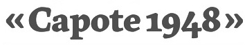 [MyFonts]
[More] ⦿
[MyFonts]
[More] ⦿
|
Pablo Alaejos Perez
|
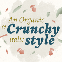 Type designer in Madrid, Spain, b. Barcelona, 1982. In 2006, he moved to Buenos Aires. Pablo Alaejos's graduation typeface in 2012 at FADU UBA (University of Buenos Aires) is the angular and sturdy Landa, which has Venetian and German expressionist roots. Landa was published in 2017 by Sudtipos as a 12-style typeface family.
 After some work experience in Buenos Aires, he returned to Spain. Nowadays Pablo is living in Madrid, works as Creative Director at Picnic and teaches editorial design at the Istituto Europeo di Design. [Google]
[MyFonts]
[More] ⦿
|
Paul D. Hunt
[Pilcrow Type]
|
 [MyFonts]
[More] ⦿
[MyFonts]
[More] ⦿
|
Paul Zimmermann
|
Paul Zimmermann (b. 1920, Mosbach, Eichenach, d. 2017) studied at the Hochschule für Grafik und Buchkunst in Leipzig between 1945 and 1949. From 1957 onwards, he worked as a freelance designer. His typefaces: - The brush script Impuls (1954; often misdated as 1945), a handwriting font done at Johannes Wagner and published by Typoart as well. Bitstream made digital version called Brush 439 and ImpulsBT, SoftMaker released I770 Script, and Ralph M. Unger made Impuls Pro (2010).
- At Ludwig Wagner, Paul Zimmermann released Antiqua Florenz (1960), which is based on Venetian romans. According to Berry, Johnson and Jaspert, the typeface is close to Aldus. Ralph Unger digitally revived and extended it in 2021, also as Antiqua Florenz.
[Google]
[MyFonts]
[More] ⦿
|
Paula Do Souto
|
Graduate from FADU, University of Buenos Aires, who created the light Venetian typeface Trovattore (2008). [Google]
[More] ⦿
|
PB Types (was: Handmadetypes)
[Peter Becker]
|
German designer (now based in Paris) who started out specializing in logotypes, and then spent a few years at URW in Hamburg in the type production department, before moving to Paris as a freelance designer. In 2018, he set up PB Types. His (mostly script) typefaces: - The beautiful calligraphic brush script typeface Meroe Pro (2012, Linotype).
- The free Jensonian typeface Vinta (2014).
- Rena. An old style typeface.
- Treveris. A Trajan font.
- Manus Scripts.
- Whiskas.
[Google]
[MyFonts]
[More] ⦿
|
Peter Becker
[PB Types (was: Handmadetypes)]
|
[MyFonts]
[More] ⦿
|
Pilcrow Type
[Paul D. Hunt]
|
 Type and graphic designer from Joseph City, AZ. His first degree was from Brigham Young University. He was a type designer at P22/Lanston from 2004-2007. In 2008, he obtained an MA in typeface design from the University of Reading where he designed the typefaces Grandia and Grandhara (Indic). In January 2009, he joined Adobe just after Thomas Phinney left. He lives in San Jose, CA. His talk at ATypI 2014 in Barcelona was entitled The history of non-Latin typeface development at Adobe.
 He created Howard (2006, a digitization of Benton's Sterling), P22 Allyson (2006, based on Hazel Script by BB&S; a winner at Paratype K2009), the P22 FLWW Midway font family (2006-2018: Midway One, Two and Ornaments; based on the lettering found on the Midway Gardens working drawings of Frank Lloyd Wright from 1913---tall-legged and casual), Kilkenny (2005, P22), a Victorian-style font based on the metal types named Nymphic and Nymphic Caps which were designed by Hermann Ihlenburg in 1889. This typeface has almost 1000 glyphs and comes in OpenType format. It includes Cyrillic characters. Check the studies here and here. For another revival of Nymphic Caps, see Secesja by Barmee. Designer of the display typefaces Seventies Schoolbook (2004) and Interlocq (2004). Hunt also digitized Goudy's Village (2005). Village was originally designed by Fredric Goudy in 1903 for Kuppenheimer & Company for advertising use, but it was decided it would be too expensive to cast. It was later adopted as the house face for Goudy's and Will Ransom's Village Press. The matrices were cut and the type cast by Wiebking. The design was influenced by William Morris's Golden Type. This Venetian typeface was digitized by David Berlow (1994, FontBureau) and by Paul D. Hunt (2005). Hunt's version was eventually released in 2016 by P22/Lanston as LTC Village. He revived Hazel Script (BB&S), which he renamed Allyson (2005). Still in 2005, he created a digital version of Sol Hess' Hess Monoblack called LTC Hess Monoblack. In 2006, he published a nice set of connected calligraphic script fonts, P22 Zaner. Bodoni 175 (2006, P22/Lanston) is a revival of Sol Hess' rendition of Bodoni. He was working on Junius (2006), a revival/adaptation of Menhart Antiqua. Frnklin's Caslon, or P22 Franklin Caslon, was designed in 2006 by Richard Kegler and Paul Hunt in collaboration with the Philadelphia Museum of Art. This slightly eroded font set includes faithfully reproduced letterforms digitized directly from images of impressions made by Benjamin Franklin and his printing office circa 1750. It comes with a set of ornaments. In 2007, he used Goudy's 1924 typeface Italian Old Style in the development at P22/Lanston of LTC Italian Old Style. That typeface was remastered and extended to cover several languages by James Grieshaber in 2011. In 2014, Paul Hunt finished work on the wood type revival font HWT Bulletin Script Two (P22 & Hamilton Wood Type). This backslanted psychedelic typeface can be traced back to the wood type manufacturers Heber-Wells (Bulletin Condensed, No. 5167), Morgans and Wilcox (Bulletin Script No. 2, No. 3184), Empire Wood Type (1870: Bulletin Script), Keystone Type Foundry (1899: Bulletin Script), Hamilton (117), and Wm. H. Page & Co (No. 111 through No. 113). Free fonts at Google Web Fonts: Source Sans Pro (2012; Source Sans Pro for the TeX crowd), Source Code Pro (2012, a companion monospaced sans set by Paul D. Hunt and Teo Tuominen). Source Serif Pro, its Fournier-style relative, was developed at Adobe by Frank Grießhammer. They can also be downloaded from CTAN and Open Font Library. Fun creations at FontStruct in 2008-2009: Possibly (a stencil loosely based on the Mission Impossible series logo), Probably (same as Possibly but not stenciled), Med Splode, Arcade Fever, negativistic_small, New Alpha_1line, New Alpha_4line, New Alpha_bit, New Alpha_dot [dot matrix font], New Azbuka [after Wim Crouwel's New Alphabet from 1967], positivistic, slabstruct_1, slabstruct_too, structurosa_1, structurosa_bold, structurosa_bold_too, structurosa_caps, structurosa_faux_bold, structurosa_leaf, structurosa_script, structurosa_soft, structurosa_tape, structurosa_too, structurosa_two, Slabstruct Too Soft, Structurosa Clean Soft, Structurosa Script Clean, Structurosa Clean, Structurosa Clean Too, Structurosa Clean Leaf, Structurosa Boxy, Stucturosa Script Heavy. In 2010, he designed he programming font Sauce Code Powerline. Well, this is probably a renaming of Source Code by some hackers. Just mentioning that sauce Code is on some Github pages. Klingspor link. Google Plus link. [Google]
[MyFonts]
[More] ⦿
|
Poul Søgren
|
Danish typographer and graphic designer. After studying in Copenhagen he went to the Imprimerie Nationale in Paris to study under José Mendoza. Agfa Creative Alliance designer who made the Jante Antiqua typeface [2007]. According to Poul Steen Larsen, the transitional family Jante (digitized by a technician at Purup Electronics Ltd) is the second complete Danish typeface, after Venetian (which was based on drawings by George Abrams). Homepage. FontShop link. [Google]
[MyFonts]
[More] ⦿
|
Randy Jones
[ToadFonts (was: AquaToad)]
|
 [More] ⦿
|
Raph Levien
|
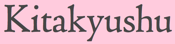 Type and technology expert and computer scientist presently working for Google in Mountrain View, CA. His blog was totally dedicated to free and open software. Raph Levien is a software engineer and tech lead of Android Text on the Android UI Toolkit team at Google. A well-known software guru, he was a lead developer for Gfonted and Spiro (a font editor), and helped out with Gimp, among many other things. Raph's previous work includes Google Fonts and the open source Ghostscript PostScript/PDF engine. The topic for his PhD in Computer Science from the University of California, Berkeley, is on better techniques for interactively designing curves, and he also used these tools to design Inconsolata, one of the fonts available on the font API (see CTAN).
 Inconsolata (2005) became an instant hit as a monospaced programming font. It was modified by Raph Levien and Kyrill Tkachev as late as 2011. Further modifications were done by Michael Sharpe. CTAN link. See also Open Font Library for this relative of Franklin Gothic. Raph is working on a revival of ATF Century Catalogue, and proposes it as a replacement for the skinny Computer Modern fonts used in TeX. Other fonts in the pipeline include Century Catalogue, Bruce Rogers' Centaur types, Museum Caps, LeBe Titling, LeBe Book, ATF Bodoni and ATF Franklin Gothic. Raph's type page, where one can download his didone fonts ghr10 and ghmi10 (2009) and look at Soncino Italic (2009), a lively informal text font. In 2007, he finally published the Museum Fonts package (see also Open Font Library) based on historical metal Centaur fonts, all free. He writes: - Museum Sixty is based on 60 point metal Monotype Centaur. The source for A-Z& is the specimen page opening American Proprietary Typefaces, ed. David Pankow. The primary source for the lowercase is the original Centaur specimen booklet by Lanston Monotype, London, 1929.
- Museum Fourteen is based on 14 point metal Monotype Centaur. The primary source is the text of Americal Proprietary Typefaces.
- Museum Bible is based on 18 point metal Bible Centaur. The source is the booklet, "An Account of the Making of the Oxford Lectern Bible", Lanston Monotype, Philadelphia, 1936.
- Museum Foundry is based on the 14 point original foundry version of Centaur, as cut by Robert Wiebking of Chicago. The source is "Amycus et Célestin", printed at the Museum Press in New York, 1916.
Speaker at ATypI 2011 in Reykjavik and at ATypI 2015 in Sao Paulo. Klingspor link. [Google]
[More] ⦿
|
Recognizing a Bembo
[Coulton Thomas]
|
Coulton Thomas (Kansas City, MO) shows the features of Aldus Manutius's Bembo in 2016. [Google]
[More] ⦿
|
Reinhard Haus
|
Born in 1951 in Dörnigheim am Main, Germany, Reinhard Haus started working in 1970 for D. Stempel AG. In 1990, he became art director at Linotype Hell AG and later at the Linotype Library in Bad Homburg, Germany. He also taught type design. At Linotype, he published several typefaces: - The big Compatil family (1999-2001), which was developed together with Silja Bilz and Olaf Leu. As the name suggests, this typeface was intended for use in reporting computations, tables, and in information design in general. The 16-font family from Linotype comprises Compatil Fact, Compatil Letter, Compatil Text, and Compatil Exquisit. View the Compatil typefaces.
- Guardi (1987). A pleasing Venetian text family.
- The rather bland slabbish typeface LinoLetter (1980s), which was co-designed with André Gürtler.
Typedia link. Linotype link. FontShop link. [Google]
[MyFonts]
[More] ⦿
|
Review of Adobe Jenson
|
 Robert Slimbach's Adobe Jenson Pro is reviewed by Tim Rolands. [Google]
[More] ⦿
Robert Slimbach's Adobe Jenson Pro is reviewed by Tim Rolands. [Google]
[More] ⦿
|
Richard Beatty
[UC Berkeley]
|
[More] ⦿
|
Robert Green
|
In 2024, Green was still working on his PhD at Central Saint Martins / the University of the Arts, London. Designer at Acme of AF Pan (1996-1997) based on the octagonal lettering of old Nat West bank machines. He is lauded for his revival typeface The Doves Type (2013-2015). Green writes: This is Robert Green's digital facsimile interpretation of the Doves Press Fount of Type, conceived and commissioned 1899 by TJ Cobden-Sanderson for the Doves Press, Hammersmith, developed by Emery Walker and Percy Tiffin at Walker and Boutall, Hammersmith, created and cut by Edward Prince, Islington, and cast by Miller & Richard Foundry, Edinburgh, 1899-1901. This facsimile was recreated using printed impressions from Doves Press publications & original metal sorts recovered by Robert Green from the River Thames, London, November 2014. Klingspor link. [Google]
[MyFonts]
[More] ⦿
|
Robert Hunter Middleton
|
 American designer (b. Glasgow, 1898, d. Chicago, 1985), who spent his entire life at Ludlow Typograph Company (retiring in 1971) and built an impressive type library, creating over 100 typefaces. He received a doctorate in Fine Arts from Transylvania University. Ludlow hired him in 1923, where he became type director in 1993. He retired from the Ludlow Typograph Company in 1971. At Ludlow, he had to create solid commercial variations of existing typefaces for the Ludlow machine and come up with practical new designs. Bio by Nicholas Fabian. One can also consult the M.A. dissertation of Stephen Glenn Crook at the University of Chicago, entitled "The contribution of R. Runter Middleton to typeface design and printing in America" (1980), which lists his 98 typefaces of his 24 type familes. His oeuvre:
 - Eusebius (1924). This page explains that Ernst Detterer started work for Ludlow on Nicolas Jenson in 1924. Middleton drew Nicolas Jenson Italic at Ludlow in 1929, followed by Bold, Bold Italic, and Roman Open series in later years. In 1937 the family was renamed Eusebius. Nicolas Jenson SG is a revival at Spiece Graphics in 1995 by Jim Spiece.
- Ludlow Black (1924). Mac McGrew: Ludlow Black was designed by Robert H. Middleton for Ludlow in 1924. It is very similar to Cooper Black, the most apparent differences being the concave serifs and the greater slant of the italic. Also compare Pabst Extra Bold.
- Cameo (1927, a chiselled font). Mac McGrew: Cameo was designed by R. Hunter Middleton for Ludlow in 1926. It is derived from a heavy version of Caslon, with a thin white line within the left side of each heavy stroke, giving a very pleasing appearance. A 1926 Ludlow ad says of it, "Designed and punches produced in our own plant". Apparently it was the first, or one of the first, so produced. Compare Caslon Shaded, Caslon Openface, Caslon Shadow Title, Gravure, Narciss.
- Caslon Extra Condensed. See Caslon RR Extra Condensed by Steve Jackaman.
- Delphian Open Titling (1928).
- Stellar (1929, a serifless roman done 29 years before Zapf's Optima!). Mac McGrew: Stellar and Stellar Bold were designed by R. Hunter Middleton for Ludlow in 1929 as a less severe alternative to the monotone sans-serifs which were coming into great popularity. There is moderate thick-and-thin contrast, and strokes flare slightly toward the ends, while ascenders and descenders are fairly long; all this gives a feeling of warmth and pleasantness. Cap M is widely splayed, and sloping strokes are cut off at an angle. An alternate A, E, and H in both weights have the crossbar extended beyond the left upright, and there is an alternate U without the extended vertical stroke. Compare Optima, Lydian, Radiant.
- Garamond (1929-1930, see the Font Bureau revival FB Garamond, and Steve Jackaman's Garamond RR Light).
- Tempo (1930-42, a sans family) and Tempo Heavy Inline (1935). Mac McGrew: Tempo is Ludlow's answer to the sans serifs which gained popularity in the late 1920s. The entire series was designed by R. Hunter Middleton, director of Ludlow's department of typeface design. The Light, Medium, and Bold weights were introduced in 1930, Heavy and several variations in 1931, and other variations over the next decade or more. They are generally a little different from other sans serifs, and include some innovations not found elsewhere. The most distinctive characteristics are found in the Light Italic and Medium Italic, which have a somewhat more calligraphic feeling and less stiff formality than other such typefaces, and which also offer alternate cursive capitals, rare in sans serifs. But there are more inconsistencies in Tempo than most other families. For instance, the Light, Medium, Bold, and Heavy Italics are designed with a moderate slope of 10 degrees to fit straight matrices without too much gap between letters; this works well enough in the lighter weights, but produces a loose effect in the more rigid heavier weights. But the two largest sizes of Tempo Bold Italic and some of the other italics are designed to fit italic matrices with a slant of 17 degrees, which is rather excessive for sans serifs, especially the condensed versions, although it is handled well. Variant Oblique characters are available for Medium Italic which get away from the calligraphic feeling; only these and none of the cursive characters are made in (Tempo continues) the largest sizes. Tempo Bold Extended and Black Extended show the influ- ence of other European grotesques, with much greater x-height and some characters unlike those in the normal and condensed widths. There are a number of alternate characters for many of the Tempos. especially in the Medium, Bold, and Heavy weights; their use converts Tempo to an approximation of Kabel or other series. But a few alternates are not enough to create the effect of Futura, apparently demanded by some users, so Tempo Alternate was created in several weights, and introduced about 1960. This is close to Futura, except that the italic has Ludlow's 17-degree slant, much greater than Futura's usual 8 degrees. This family-within-a-family also has some alternate characters in some weights, to further convert the typeface into an approximation of other European grotesques. Tempo has been quite popular with newspapers, and to a lesser extent for general commercial printing. Compare Futura, Sans Serif, Erbar, etc. Also see Umbra.
- Karnak (1931-42, a slab serif family). Mac McGrew: Karnak is a family of square-serif types designed by Robert H. Middleton for Ludlow, beginning in 1931, when the light and medium weights were introduced, with other weights and widths announced as late as 1942. Like Stymie, the other extensive American square-serif series, it is derived from Memphis, and all three series are very similar. Most members of the Karnak family are most easily distinguished by the cap G. Karnak italics are also distinguished by a greater slant to fit Ludlow's 17-degree matrices, except 14-point and smaller in Karnak Intermediate Italic and Medium Italic, which are made on straight matrices and slant about 10 degrees. Light and medium weights have several alternate round capitals as shown; the very narrow Karnak Obelisk also has comparable alternate round AEMNW. Compare Cairo, Memphis, Stymie. One magazine article speaks of Karnak Open, but this has not been found in any Ludlow literature.
- Lafayette (1932).
- Mayfair Cursive (1932). Revived as Mayfair (2006, Rebecca Alaccari, Canada Type).
- Umbra (1932). Mac McGrew: Umbra was designed by Robert H. Middleton for Ludlow in 1932. It is essentially a shadow version of Tempo Light, in which the basic letter is "invisible" but there is a strong shadow to the lower right of each stroke. Compare Shadow. Images: URW Umbra.
- Eden (1934, a squarish didone). See digital revivals by Jason Castle called Eden Light and Eden Bold, 1990, and by Steve Jackaman and Ashley Muir at Red Rooster called Eden Pro (2010).
- Mandate (1934).
- Ludlow Bodoni (1936; see Bodoni Black Condensed by Steve Jackaman, and Modern 735 (Bitstream's version of Middleton's Bodoni)). Bodoni Campanile (1930; see Bodoni Campanile Pro (1998 and 2017) by Steve Jackaman). Bodoni Modern (1930). See a digital revival called PL Modern Heavy Condensed.
- Coronet (1937). This is Ribbon 131 in the Bitstream collection and Coronet by Steve Jackaman.
- Flair (1941).
- Admiral Script (1953).
- Condensed Gothic Outline (1953).
- Cloister Open Face (1920).
- Florentine Cursive (1956). See Florentine Cursive by Steve Jackaman.
- Formal Script (1956).
- Radiant (1938, see EF Radiant at Elsner+Flake, and Radiant RR at the Red Rooster foundry). McGrew: Radiant was designed by Robert H. Middleton for Ludlow, and introduced in 1938, with additional members of the family being added over the following two or three years. It is a precise, thick-and-thin, serifless style, express- ing the modem spirit of the forties while breaking away from the ubiquitous monotone sans-serifs. Radiant Medium is actually about as light as possible to maintain thick-and-thin contrast, but bold and heavy weights offer substantial contrast. All upright versions have as alternates the round forms of AKMNRW, as shown with some of the specimens. Italics have the standard 17-degree slant of Ludlow italic mats, which is rather extreme for serifless typefaces, except for small sizes of Medium Italic, which are made on straight mats and are redesigned with about 10-degree slope. Like most Ludlow typefaces, all versions of this typeface have fractions and percent marks available as extras. Thick-and-thin serifless typefaces are rare in this country. Compare the older Globe Gothic; also Empire, Stellar, Lydian, Optima, and Czarin, which aren't really in the same category.
- Record Gothic (1927-61).
- Samson (1940). Mac McGrew: Samson is a very bold, sturdy typeface designed by R. Hunter Middleton in 1940 for Ludlow. It is derived from lettering done with a broad pen, and retains much of that feeling. The name was chosen to denote power and strength. It has been popular for newspaper advertising in particular. Compare Lydian, Valiant. An interpolation between a signage typeface and a poster face, it was revived as Ashkelon NF (2011, Nick Curtis).
- Square Gothic.
- Stencil (1937-1938). A Cyrillic was made by Victor Kharyk.
- Wave (1962), a connected brush script. Digitizations include Coffee Script (2006) and Middleton Brush (2010), both by Patrick Griffin at Canada Type. Mac McGrew: Wave was designed for Ludlow in 1962 by Robert H. Middleton. It is a 1 medium-weight script, not quite joining, with a brush-drawn appearance and thick-and-thin contrast. The apparent angle is quite a bit more than the 17-degree slope of Ludlow matrices, but letters fit together compactly without noticeable looseness, and form smoothly flowing words. Compare Brush. Mandate, Kaufmann Bold.
- Andromaque. Mac McGrew explains Andromaque's genesis: Andromaque is a cursive form of uncial letter, mixing Greek forms of aeklmnstz with Roman forms of the other letters, yet retaining legibility and harmony. The original size was cut by Victor Hammer and cast in France. The 14-point size was begun by Hammer, but left unfinished at his death. The font was completed by his long-time friend, R. Hunter Middleton, in the early 1980s, and cast by Paul H. Duensing. Paul Baker did a digital version of Andromaque in 1995.
Among his books: - "Making Printer's Typefaces" (1938, The Black Cat press, Chicago, IL). In this book, he shows his own creations for Ludlow matrices, and talks about typography in general.
- Chicago Letter Founding (1937, The Black Cat Press, Chicago, IL). Middleton calls Chicago the printing center of the nation, and goes on in this small booklet about the lives and contributions of people like Robert Wiebking, Frederic Goudy, Bruce Rogers, Oswald Cooper, and himself.
Linotype link. Drawing. View the typefaces made by Robert Hunter Middleton. [Google]
[MyFonts]
[More] ⦿
|
Rolf Noyer
[Lascaris]
|
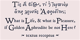 [MyFonts]
[More] ⦿
[MyFonts]
[More] ⦿
|
Ronald Arnholm
|
 Professor of Art Graphic Design at Lamar Dodd School of Art, part of the University of Georgia, Athens. Born in 1939 in Barre, VT, Arnholm designed the lapidary typeface ITC Legacy Sans family (1992, a 51-font remake of the 1960s Arnholm Sans), and the ITC Legacy Serif family (1992, Venetian). In 2009, ITC Legacy Square Serif and ITC Legacy Serif Condensed were added. ITC Legacy Square Serif won an award at TDC2 2010.
 His early fonts were released at VGC, the Visual Graphics Corporation: VGC Aquarius (2, 4, 5, 6, 7, 8, Outline) (1967) (this was digitized in 2007 by Steve Jackaman as Aquarius), VGCArnholm Sans Bold (1965), VGC Fovea (1977). Arnholm also designed WTC Veritas for the World Typeface Center, New York, 1981-85. He created these headline typefaces for the Los Angeles Times, 1980: L.A. Times Regular, L.A. Times regular italic, L.A. Times Bold and L.A. Times Bold Italic. MyFonts page. Linotype bio. FontShop link. Klingspor link. View Ronald Arnholm's typefaces. [Google]
[MyFonts]
[More] ⦿
|
Rubicon Computer Labs Inc.
[Lee-Jeff Bell]
|
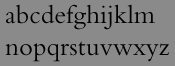 In Chelsea, Québec, Lee-Jeff Bell designed many type families that are patterned after major historical type families, mimicking what Bitstream did in the late eighties. He also developed Thames and Helv Condensed, and Unifont. Rubicon claims that their fonts are optimally hinted for even very small screen resolutions. The fonts:
 - Realist Fonts: Hilbert Neue (a sans typeface in the style Helvetica Neue), Uranus (like Univers).
- Humanist Fonts: Opulent (like Optima), Frobisher (like Frutiger), Guilford (like Gill Sans).
- Book Fonts: SGaramond (a 4-weight Stempel Garamond clone), Bentley (like Bembo), Burnett (like ITC Berkeley Oldstyle).
- Legacy Fonts: Hilbert (like Helvetica), Tribune (like Times), Hilbert Condensed (like Helvetica Condensed), Tribune Condensed (like Times Condensed).
- Condensed Fonts: Hilbert Neue Condensed (like Helvetica Neue Condensed), Frobisher Condensed (like Frutiger Condensed), Uranus Condensed (like Univers Condensed).
- Packaging Fonts: Karat (like ITC Kabel), IGaramond (like ITC Garamond).
- Newspaper Fonts: Essex (like Excelsior), Gisborne (like Gazette).
- Other: Hilbert Compressed (like Helvetica Compressed), Sharpe Classified (like Spartan Classified).
Yet another URL. This site offers free demo fonts by Rubicon: Bentley (Bembo-like), BurnettDemo-Normal, FrobisherCondDemo-Normal, FrobisherCondDemo, FrobisherDemo-Normal, FrobisherDemo, GisborneDemo, GuilfordDemo-Normal, GuilfordDemo, HilbertNeue, HilbertNeueCondDemo-Normal, HilbertNeueCondDemo, HilbertNeueDemo-Normal, HudsonCondDemo, HudsonDemo, IGaramondDemo-Normal, IGaramondDemo, Karat, KaratDemo-Normal, OpulentDemo-Normal (humanist sans), OpulentDemo, SGaramondDemo-Roman, SGaramondDemo, TribuneCondDemo, TribuneDemo, UranusCondDemo-Normal, UranusCondensedDemo, UranusDemo-Normal, UranusDemo. [Google]
[More] ⦿
|
Sean Heavey
|
Designer of Javenir (2009) at University of Maryland, Baltimore County. Javenir mixes Avenir and Adobe Jenson. Home page. [Google]
[More] ⦿
|
Sergei Egorov
|
 Born in Moscow in 1963. A graduate of Moscow Institute of Physics and Technology in 1985, he became a TeX specialist. Since 2003, he creates his own typefaces. Gaithersburg, MD-based designer of a Cyrillic Venetian typeface (2004) called Bucentoro. At TypeArt 05, he received awards for Bucentero and SPQR Caps. He is working on Bucentoro Greek (2006). In Bucentoro's low-contrast design, we can find influences of Nicholas Jenson, Francisco Griffo and Vadim Lazursky. Currently, Sergei Egorov lives in the Washington, DC, area.
 His Neacademia (2009, +Kursiv) won an award at Paratype K2009. It was published in 2011 at Rosetta Type: Neacademia is a Latin and Cyrillic type family inspired by the types cut by 15th century Italian punch-cutter Francesco Griffo da Bologna for the famous Venetian printer and publisher Aldus Pius Manutius. The family is designed for lengthy texts. Neacademia Subhead (Rosetta) followed in 2015. This typeface family has all the renaissance character and typographic finesse that was promised---it is absolutely stunning. In 2016, he added Neacademia Small text. Klingspor link. MyFonts link to his own foundry. [Google]
[MyFonts]
[More] ⦿
|
Shinn Type
[Nick Shinn]
|
 Nick Shinn (b. London, 1952) is an art director and type designer. He teaches at York University in Toronto, and is a founding member of the Type Club of Toronto. He writes regularly for Graphic Exchange magazine, and has contributed to Applied Arts, Marketing, Design, and Druk. He founded Shinn Type in 1999, and made fifteen type families. Interview by Jan Middendorp, in which he describes himself as a contrarian. Pic by Isaias Loaiza. Pic by Chris Lozos at Typo SF in San Francisco in 2012. Custom typefaces have been produced for newspapers such as The Birmingham News (Alabama), The Chicago Tribune, The Daily Express (London), The Daily Mail (London), The Globe and Mail (Toronto), The Montreal Gazette, and The St. Petersburg Times (Florida). Custom fonts, with exclusive rights, have been created for corporations such as Thomson Nelson, Enbridge, Rogers Communications Inc., and Martha Stewart Living. Nick organizes type evenings in Toronto all year long.
 Shinn Type fonts at MyFonts. Behance link. He is the designer of Fontesque (a wild family of curly glyphs), the monospaced font Monkey Mono, Artefact (1999), Beaufort (a sharply serifed family done in 1999; in 2008, he published a 10-style extension called Beaufort Pro), Bodoni Egyptian (1999), Alphaville (2000, techno typeface with straight mono-width strokes), Brown, Brown Gothic, Duffy Script (2008, in 4 styles: an interpretation of the lettering of contemporary illustrator Amanda Duffy, aka Losergirl), Handsome (1999, cursive handwriting family, since 2005 available in OpenType), Merlin, Oneleigh (1999, masterful!!), Paradigm (1995, updated in 2008, inspired by 15th century letterforms), Shinn, Walburn (1996) [note: Walburn and Brown were originally commissioned for the 2000 redesign of the Globe and Mail. Walburn is an adaptation of a didone typeface by Erich Walbaum, c.1800], Worldwide (1999). In 2001, he designed the Richler font in honour of the memory of Mordecai Richler. The Richler font was only available to the Giller Prize, Random House and the Richler family until its public release in May 2013 at MyFonts, where Richler (+Cyrillic, +Greek) is advertised as a 21st century antiqua book face. In 2002, he published Goodchild (a Jenson revival; see also Goodchild Pro (2017). Goodchild is a Venetian with clean (not antiqued!) outlines and a larger-than-Jensonian x-height. It comes in 4 styles and is targeted at sophisticated academic typography) and the liquid lettering family Morphica, exclusively at Veer. In 2003, he released the absolutely gorgeous "modern" sans Eunoia (which has a unicase weight), and the quirky sans family Preface (2003; Preface Thin is a hairline weight; Preface Light is free at FontShop). In 2003, he also published the mmonowidth unicase family Panoptica (2003), which includes styles called Regular, Sans, Egyptian, Doesburg and Octagonal, to name a few. In 2004, he released Nicholas, a Jensonian serif family, which is the headline version of Goodchild. Additions in 2006 include Softmachine (VAG Rounded/comic book style family). Sexy type from Toronto is an article by Erin Kobayashi about Shinn's work published in the Toronto Star on April 15, 2007. Nick Shinn designed the type for the redesign of The Globe and Mail in April 2007: Globe and Mail Text [look at the f], Globe and Mail Sans (or GM Sans), Globe and Mail News (or GM News). In 2008, these typefaces went retail. One typeface is called Pratt, named after David Pratt, the design director at The Globe and Mail who commissioned the typeface for his redesign of the paper. The companion typeface will be called Pratt Sans. Additions in 2008: Figgins Sans (4 styles), Scotch Modern (a 5 style didone family that revives the typeface used in New York State Cabinet of Natural History), Scotch Micro. Paul Shaw writes: Scotch Roman, beloved by D.B. Updike and W.A. Dwiggins, was a standard in the typographic repertoire of pre-World War II printers but fell out of favor after the war, supplanted by Bodoni. Nick Shinn of Shinntype has made a bid to resurrect this oft-maligned typeface with Scotch Modern. Scotch Modern is not a revival of the familiar Scotch Roman of Linotype and Monotype, but of a more modern design attributed to George Bruce, the great 19th-century New York punchcutter. Shinn used a sample of the typeface from the New York State Cabinet of Natural History's 23rd Annual Report for the Year 1869 (printed in 1873) as a model. He drew it by eye, aided by a sharp loupe: no photographic enlargements, no scans, no tracing. The ends of the strokes are slightly rounded, to capture the effect of metal type being impressed into soft paper. Shinn contends that the 19th-century Scotch types were "eminently readable" and a factor in the rise of modern literacy. His rendition, an OpenType font, aims for readability in all situations with display, regular, and microtype versions. The display roman includes a unicase font-a nod to Bradbury Thompson's Alphabet 26 experiment-and the italic has elegant swash caps. Scotch Roman has never been a typeface for those seeking eternal beauty or anyone desperate for typographic kicks. Dwiggins gave it a 10 for legibility (where 10 was "reasonable human perfection") but only 4 for grace and 0 for novelty. Shinn's Scotch Modern, with its many OpenType extras, scores well on all three counts. It's a typeface for those who prefer a mature single malt: simple at first, but more complex as it is savored. Photograph. At ATypI 2008 in St. Petersburg, his talk was entitled Scotch Modern. Several catalogs have been published by Shinntype. Particularly noteworthy is The Modern Suite (2008, Nick Shinn, Coach House Press, Toronto), which showcases Figgins Sans and Scotch Modern. Sample of some Scotch Modern dingbats. Production in 2010: Sensibility (a humanist sans superfamily), Sense (a modernist sans superfamily), Bodoni Egyptian Pro (a monoline slab Bodoni experiment---the Pro version of a 1999 family by him). In 2011, he created Checker, an all caps 3d black and white-tiled typeface, and Parity (a roman unicase pair). Naiad (2013) is a didone, or neoclassical, typeface with Victorian curlicues thrown in to create a Victorian look. Pratt Nova (2014) is a 17-style large x-height typeface family that attempts to achieve visual and semantic opulence, equipping the typographer with a comprehensive array of harmonized fonts, all rigorously drawn, superbly fitted iterations of a single, profoundly original design. Neology (2014) is a 15-style sans family subdivieded into Deco, Grotesque and plain sans subfamilies. Brown Pro (2016) is a classic grotesque, distinguished by its semi-condensed proportions and slight flaring of the edges and some ink traps. Figgins Standard (2016) is a take on the low-contrast original sans typefaces designed in the 1830s in industrial London. Gambado (2016). This is a collection of shaken typefaces with bouncing letters. Particular fonts include Gambado Sans and Gambado Scotch. Dair (2017) is a revival of Canada's first home-grown typeface, Cartier, which was completed by Carl Dair in 1967 and named after 16th century explorer Jacques Cartier, who mapped the Gulf of St. Lawrence in the 1530s. Dair 67 and Dair 67 Italic are facsimiles of the original fonts. Dair and Dair Italic are fully-featured 21st century fonts. In 2018, Nick Shinn published Phiz, a diverse suite of 27 decorative fonts based on Figgins Sans Extra Bold. Designer of Boxley (2016), a superelliptical sans typeface family. At the end of 2020, he published the 14-style condensed rounded sans typeface family Aptly. o Typefaces from 2021: Buslingthorpe (a tall-necked typeface in which the x-height is only 29% of the ascender height, beating classic tall fonts such as Rudolf Koch's Koch Antiqua, and Lucian Bernhard's Lucian and Bernhard Modern). Speaker at ATypI 2017 Montreal. MyFonts interview. I Love Typography link. FontShop link. Klingspor link. View Nick Shinn's typeface library. [Google]
[MyFonts]
[More] ⦿
|
SIAS (or: Signographical Institute Andreas Stötzner)
[Andreas Stötzner]
|
 Andreas Stötzner (b. 1965, Leipzig) is a type designer who lives in Pegau, Saxony. Graduate from the Hochschule für Grafik und Buchkunst Leipzig and the Royal College of Art in London (1994). Since then, free-lance. Started making typefaces in 1997. He edits the sign and symbol magazine Signa. He spoke at Typo Berlin 2004 and at ATypI 2005 in Helsinki where his talk was entitled On the edges of the alphabet. Coauthor with Tilo Richter of Signographie : Entwurf einer Lehre des graphischen Zeichens. He set up SIAS in 2006-2007 and started selling fonts through MyFonts.
 He created Andron Scriptor (2004, free), with original ideas for Greek and Cyrillic alphabets. The Andron project intends to extend this Venetian text typeface in many directions: right now, it covers Latin, Greek, Coptic, Gothic, runes, Cyrillic, Etruscan and Irish scripts, musical symbols, astronomical and meteorological symbols, and many dingbats. The Andron MC Corpus series (2012) contains Uncial, Mediaeval and Capital styles. He also created Andron 1 Monetary (2014), Andron 1 Alchemical and Andron 2 ABC (2014, for children's literature). On or before 2006, he created a few typefaces for Elsner & Flake. These include EF Beautilities, EF Ornamental Rules, EF Squares, EF Topographicals, EF Typoflorals, EF Typographicals, EF Typomix, EF Typosigns, EF Typospecs, EF Typostuff. Fonts from 2007-2010: Gramma (2007, three dingbats with basic geometric forms), Andron Corpus Publix (2007, dingbats including one called Transport), SIAS Freefont (2007, more dingbats), SIAS Lineaturen (2007, geometric dingbats) SIAS Symbols (2009), Andron Freefont (2009, text font), Andron 1 Latin Corpus (2009), Andron 1 Greek Corpus (2009), Andron Kyrillisch (2009, consisting of Andron 1 CYR, Andron 2 CYR and Andron 2 SRB where SRB stands for Serbian), Andron 2 English Corpus (2010, blackletter-inspired alphabet), Andron 2 Deutsch Corpus (2010), Andron Ornamente (2012), Reinstaedt (2009, blackletter family), Crisis (2009, economic sans). Lapidaria (2010) is an elegant art deco sans family that includes an uncial style and covers Greek. Hibernica (2010) is a Celtic variant of Lapidaria. Symbojet Bold (2010) is a combination of a Latin and Greek sans typeface with 400 pictograms. Rosenbaum (2012) is a festive blackletter face, obtained by mixing in didone elements. In 2013, he published Arthur Cabinet, a six-style inline art deco caps collection of typefaces, with accompanying Arthur Ornaments and Arthur Sans. Meanwhile, Andron Mega grew to 14,700 unicode glyphs in 2013. Typefaces from 2014: Behrens Ornaments (art nouveau ornaments based on Behrens Schuck by Peter Behrens, 1914), Fehlian (an open capitals typeface family with Plain, Gravur and Precious styles), Happy Maggie (a hand-drawn script based on Maggie's sketches when she was 13 years old), Abendschroth (for lullabies, girl's literature, murder poems, short stories and Christmas gift books), Abendschroth Scriptive, Albyona English No. 1 (as Andreas writes, suitable for children's books, fantasy literature, crime novels, natural food packaging and poison labeling, for infancy memories, vanitas kitsch items, dungeon museum bar menu cards, introductions to herbalism and witchcraft manuals), Lindau (a Venetian Jensonian typeface with considerable flaring in the ascenders), Grund (based on the 1924 art deco signage in Leipzig's Untergrundmesshalle Markt whose architect was Otto Droge), Leipziger Ornamente (based on variopus buildings in Gohlis, Leipzig, dating from the 1920s-1950s), Kaukasia Albanisch (ancient writing system of the Caucasus region, allegedly created by Mesrop Mashtots who also invented the Armenian alphabet in 405). Commissioned fonts include Runes (commission by Ludwig Maximilian University Munich), Lapidaria Menotec, Old Albanian, Dania (a special notation for Danish dialectology. Font extension of Latin Modern Italic (Open source), commissioned by the Arnamagnanean Institute, Copenhagen Universit). Typefaces from 2015: Andron 2 EIR Corpus (uncial, Gaeli), Artemis Sans (Greek version of Arthur Sans), Ardagh (a Gaelic / Irish version of Arthur Sans). Don Sans (a sturdy sans). Typefaces from 2016: Popelka (an uncial fairy tale font modeled after the opening sequence of the 1973 movie Drei Haselnüsse für Aschenbrödel). MyFonts. Behance link. Abstract Fonts link. Klingspor link. Showcase of Andreas Stötzner's typefaces at MyFonts. View the SIAS typeface library. [Google]
[MyFonts]
[More] ⦿
|
Sjoerd Hendrik de Roos
|
 Dutch typographer and type designer, b. Drachten, 1877, d. Haarlem, 1962. He worked at Tetterode from 1907-1941. Catalog of some of his digitized typefaces. Designer of various typefaces:
 - The uncial-like typeface Libra Uncial (1938, a pseudo-Gaelic font) at Tetterode in Amsterdam. Libra is now carried in digital form by Mecanorma and Bitstream.
- Nobel, a redesign of Berthold Grotesk. FB Nobel (1993, Tobias Frere-Jones at the Font Bureau) is a powerful 18-style sans family based on de Roos's Nobel. It ranges from Extra Light to Very Black, and includes a condensed sextet. See also DTL Nobel (Dutch Type Library) by Fred Smeijers and Andrea Fuchs (a German student at the Arnhe academy supervised by her teacher, Fred Smeijers).
- De Roos made Dutch (or Hollandse) Mediaeval (1912), an old style (Venetian) typeface with little contrast, arched slabs and serifs, short descenders, an atrocious lower case g, and an italic that is more like an oblique, but with several conservative workhorse qualities that made it one of the most popular typefaces during World War I. Intertype Mediaeval is similar. Hollandse Mediaeval was digitally revived by Hans van Maanen in 2007 as Dutch Mediaeval, and by Hans van Maanen and Patrick Griffin in 2013 as Dutch Mediaeval Book ST. For other digitizations, see De Roos Mediaeval NF (2014, Nick Curtis) and Hoboken Serial (2010, SoftMaker).
- He designed the calligraphic typeface Meidoorn (1928) for De Heuvelpers (his own private press), which was active from 1926-1935. The Meidoorn materials (matrices, punches) are now in the hands of G. J. Randoe (Keizersgracht 89, 1015 Amsterdam). Laure Afchain was doing a revival of Meidoorn in 2008 as a student at KABK, Den Haag. And Joe Chang, still at KABK, did a revival of it in 2012 in van der Laan's class.
- Egmont (1933) is a serifed typeface done at Lettergieterij Amsterdam. Mac McGrew writes: Egmont is a modern interpretation of classic letter forms, designed by S. H. DeRoos for Amsterdam Type foundry in the 1930s, and subsequently cut by Intertype. It is an elegant face, with long ascenders which have double serifs. There are three weights in roman and italic, all with three styles of figures as shown in the bold specimen. Italic swash letters are made for all three weights. Egmont Decorative Initials were added by George F. Trenholm in 1936; they are sometimes called Egmont Medium Italic, from which they are derived. Compare Bernhard Modern. A digital family was designed by Dennis Ortiz-Lopez in 2005 called OT Egmont. Castcraft's free font family OPTI-Eisen is also noteworthy. Open Egmont Kapitalen (2013) is a free openface designed by John Wollring based upon de Roos's known Egmont Inline (or Egmont Versalien) shown in a Lettergieterij Amsterdam specimen book of 1935. Jay Rutherford digitized Egmont Inline in 1988, but did not publish it. In 2016, Alice Retunsky designed the revival Dutch Plus, and added cyrillics.
- Erasmus Mediaeval (1923, Amsterdam). Berry, Johnson and Jaspert write: Venetian in style, but with light serifs and short descenders. Many of the serifs are shaped, as though drawn with a pen. E and F have the centre arms high, the Ha high bar and U the lower-case design. g has a brief tail drawn from right to left;p and q have oblique foot serifs. The italic has slight inclination and has the serifs of the roman. The heavier face of this design is called Grotius. Digital revivals include Erasmus (1992, A. Pat Hickson, ITF) and one by Pradnya Naik.
- Card Pro (2006, URW, Ralph M. Unger) is based on Ella Cursief (1916, Lettergieterij Amsterdam). For another digital version of Ella Cursief, see Rozy Cursive (2016, Leon Hulst).
- Circulaire (2009, Hans Van Maanen, Canada Type) is based on a set of initial caps designed by Sjoerd Hendrik de Roos in 1926.
- His last typeface was De Roos Romein (and Cursief) (1947, Amsterdam; Intertype New York; American Typefoundry) about which Canada Type, which produced a magnificent 10-style digital revival, expansion and interpretation in 2009 simply called Roos, in a cooperative effort between Hans van Maanen and Patrick Griffin, writes: It was designed and produced during the years of the second World War, and unveiled in the summer of 1947 to celebrate De Roos's 70th birthday. In 1948, the first fonts produced were used for a special edition of the Dutch Constitution on which Juliana took the oath during her inauguration as the Queen of the Netherlands. To this day this typeface is widely regarded as De Roos's best design, with one of the most beautiful italics ever drawn. In contrast with all his previous roman typefaces, which were based on the Jenson model, De Roos's last type recalls the letter forms of the Renaissance, specifically those of Claude Garamont from around 1530, but with a much refined and elegant treatment, with stems sloping towards the ascending, slightly cupped serifs, a tall and distinguished lowercase, and an economic width that really shines in the spectacular italic, which harmonizes extremely well with its roman partner. Mac McGrew: De Roos is a handsome contemporary roman type designed by S. H. DeRoos in Amsterdam, Holland. Originally imported from a Dutch type foundry, with additional weights and inline initials, this roman and italic were also cut by ATF about 1952, and by Intertype in 1954. A 1953 piece of ATF literature notes, "Cast at Elizabeth on Amsterdam line." Scans below are from the book First specimen book of De Roos Roman&Italic (Typefoundry Amsterdam).
- Savoy (ca. 1936) was the third art deco display typeface drawn under de Roos's superviosn, after the earlier pair, Bristol and Carlton (1929), which were drawn by Dick Dooijes also under de Roos's supervision.
- Simplex (1937). A typeface that flirts with the idea of unicase. For a digital revival, see Hendrik (2021, by Claudio Rocha and Lucas Franco).
- Zilvertype (1914-1916, with Jean-François van Royen). This was revived by Hans van Maanen as Zilvertype (2012-2014, Hans Van Maanen, Canada Type): Right on the heels of the tremendous popularity wave that made Hollandse Mediaeval the most used Dutch typeface during the Great War years, Sjoerd H. de Roos was asked to design a 15 point type for De Zilverdistel, Jean-François van Royen's publishing company. So between 1914 and 1916, de Roos and van Royen collaborated on the typeface eventually known as Zilvertype, and which both parties viewed as an improved version of Hollandse Mediaeveal. Like Hollandse Mediaeval, Zilvertype was based on the Jenson model, but it is simpler, with more traditional metrics, and lighter and more classic in colour.
- Nieuw Javaansch No. 1 (1909). A Javanese script done by Sjoerd de Roos at Lettergieterij Amsterdam. Revived in 2012 at the KABK by Troy Leinster under the same name.
Klingspor link. FontShop link. [Google]
[MyFonts]
[More] ⦿
|
Spiece Graphics
[Jim Spiece]
|
 James R. Spiece (b. 1946, Wabash, IN) attended Culver Military Academy and graduated from Wabash High School in 1964. Jim attended Indiana University and graduated with a B.S. in 1969 after serving two years in the US Army stationed in Germany. Based in Fort Wayne, IN, he liked to revive old type designs. Ji died in 2021 in Green Valley, AZ. Obituary.
 The typefaces made Jim Spiece: - Adonis Old Style SG (2004): a connected upright script modeled after a little stationery and greeting card typeface developed for American Type Founders in 1930 by Willard T. Sniffin.
- Anthology SG (2005).
- Arched Gothic Condensed: another Victorian type, developed around 1885 by the James Conners&Son Foundry (New York).
- Ark Monogram SG: Ark is a combination monogram set based on the ATF Virkotype designi from the 1930s.
- Asteroid Primo SG (2009).
- Astoria Antique (2003): 19th century style ornamental face.
- Aviator SG (1995), aka Ventura Slim, based on an old 1930s lettering style popularized by Carl Holmes in his book.
- Bernhard Brushscript SG: based on an extremely heavy informal script was created in the early 1920s by Lucian Bernhard.
- Bernhard Gothic SG
- Beverly Shores Script SG (2004).
- Birdlegs SG (1991).
- Cactus Flower SG (2006): a Wild West family based on lettering by Ross F. George.
- California Poster SG (1996).
- Centric Geo SG (1996) and Centric Serif SG (1996). These are squarish slab typefaces.
- Concerto Rounded SG: revival of some 1920s Lucian Bernhard lettering.
- Edison Swirl: A frilly Victorian blackletter typeface based on a design by Hermann Ihlenburg from ca. 1900.
- El Castillo SG (2008): an old style newsprint family.
- Epicerie One&Two SG (2008): a signage family.
- Eva SG. Eva Antiqua SG is an exquisite family based on the 1922 Klingspor model by German designer Rudolf Koch (known as Koch Antiqua or Locarno). It also includes Eva Paramount SG, which is a revival of a 1928 typeface, also flared, by Morris Fuller Benton called ATF Paramount. The Castcraft incarnation is called OPTI Eve.
- Frisco Antique Display SG (2004): based on a woodtype display typeface from the 1880s by Bruce Type Foundry.
- Gable Antique Condensed (2002): based on a Bauer Type Foundry art nouveau face.
- Gambit Nouveau SG (2004): art nouveau.(2004): art nouveau.
- Grand Slam SG (2002): based on an old cardwriting style known as Poster Gothic.
- Headline Helpers One SG and Headline Helpers Two SG (2009). Followed by Headline Helpers Three SG (2017), Headline Helpers Four SG (2017), Headline Helpers Five SG (2017).
- Hollywood Deco SG (1994): based on a Willard T. Sniffin deco-inspired original from 1932.
- ITC Blair (1997). Blair has its roots in the Inland Type Foundry, ca. 1900.
- ITC Deli Deluxe and ITC Deli Supreme (1999)
- ITC New Winchester
- Ironman SG (2002): art deco poster font.
- Kingsbury Condensed SG (1992): 1930s style art deco face.
- Kolinsky Sable SG (2004): a brush display typeface due to Charles P. Bluemlein, 1944.
- Little Brown Frog SG (2007).
- Melrose Modern SG (2005): art deco family.
- Memorandum SG (1992): a sans text family.
- Metropolis SG: revival of a long-legged 1932 classic design by W. Schwerdtner for the Stempel Foundry.
- In 1895, Julius Schmohl and Max Rosenow published an upright script with BBS. This ronde typeface was originally known as Oliphant and renamed Advertisers Upright Script in 1925. In 2014, Spiece Graphics created a digital version of it, Milroy Upright SG.
- Mingo Gothic SG (1991-1992).
- Narcissus SG (Open and Solid): Narcissus Open is a heavy typeface designed by Walter Tiemann in 1921 for the Klingspor Foundry in Germany.
- Newport Classic Basic SG and Newport Classic SG: based on an extra condensed art deco typeface designed by Willard T. Sniffin for American Type Founders in 1932.
- Nicolas Jenson SG: a large text family about which Spiece writes: It was the original work of fifteenth century designer Nicolas Jenson that formed the basis for this roman serif style developed by Ernst Detterer in 1923. Similar in spirit to other early twentieth century revivals such as Centaur, Cloister Old Style, and Italian Old Style, Nicolas Jenson is distinguished by its pristine and delicate nature. A gifted young apprentice to Detterer, Robert Hunter Middleton, greatly expanded the family. And by 1929, bold, italic, and open were part of the Ludlow Foundry's beautiful Nicolas Jenson Series. It was reintroduced under a new name, Eusebius, in 1941.
- Nova Script Recut One SG (2011): based on Nova Script (1937, George F. Trenholm).
- Pacific Clipper SG (1991): a mix between Koch's kabel and ATF's Novel Gothic (1929, Morris Fuller Benton and Charles H. Becker).
- Panorama SG (1995): art deco family, based on an old 1930s lettering style popularized by Carl Holmes is his wonderful book on the subject.
- Quaint Gothic: Arts&Crafts face.
- Replica Rough SG (2018). A grungy typeface.
- Samson Classic SG: a heavy display typeface based on a 1940 design by Robert Hunter Middleton for the Ludlow Foundry.
- San Remo Casual SG: a fifties style connected script.
- Sheridan Gothic SG: an art nouveayu face, ca. 1910, known as Grant Antique.
- Speedway SG (1992-1993): connected upright 1950s diner script.
- Stellar Classic SG (1997): Stellar was originally designed by by Robert Hunter Middleton in 1929 as a serifless roman well before Hermann Zapf's Optima, released in 1958.
- Stratosphere SG (1993).
- Telepod SG (2002): based on an old Speedball lettering style and has a very retro look.
- Thumbnail Text SG (2005).
- Travel Kit SG (2004): art deco.
- Tribunus SG: roman Trajanus style family, originally designed in 1939 by Warren Chappell for Stempel.
- Tweed SG (1992): handlettering.
- Ultramodern Classic SG: a marquee lettering font family in the style of Broadway. Based on a 1928 design by Douglas C. McMurtrie, Aaron Borad, and Leslie Sprunger.
- Valentina SG (1991-1992): a plump comic book style script.
- Veranda Poster SG: derived from a European art supply manufacturer's logotype done in the Vienna (Wien) Austria style, which was used by artists such as Julius Klinger and Willy Willrab in the 1920s.
- Wellsbrook Initials SG: based on the 1920s work at Bauer of the German graphic designer Emil Rudolf Weiss.
- Zinc Italian SG (2002): 19th century style curly ornamental face, aka Zinco in the Victorian era. Based on Zinco (1891, Hermann Ihlenburg for Mackellar, Smith & Jordan).
MyFonts link. Klingspor link. View Jim Spiece's typefaces. Listing of Jim Spiece's fonts. [Google]
[MyFonts]
[More] ⦿
|
Stabenfonts
[Johannes Steil]
|
 Stabenfonts is a German type foundry in Hamburg, est. 2013 by Johannes Steil. Steil's first commercial typeface is the humanist sans Estragon (2013): Estragon is a vivid sans-serif text typeface with venetian influences, suitable especially for books. It is remarkable for its light slant, to the right, for most of the verticals, its small sized uppercase letters making it suitable for languages where they are often used (for example German) and its just lightly inclined true italics.
 In 2015, Steil made Macis (a simple geometric slightly arthritic sans). In 2017, he published Wakame (a playful uppercase font with automatic glyph replceemnt to avoid repetitions within short distances). In 2020, he released Olivia Sans and Olivia Serif. [Google]
[MyFonts]
[More] ⦿
|
Steve Matteson
[Matteson Typographics]
|
 [MyFonts]
[More] ⦿
[MyFonts]
[More] ⦿
|
Sumotype Foundry
[Oscar Fernando Guerrero Cañizares]
|
 Born in 1981 in Colombia, Oscar Guerrero lives in Pasto, Narino, in the southwest of Colombia. His graduation work in 2012 at FADU UBA (University of Buenos Aires) is the Venetian text typeface Epica. Epica was first released in 2014 at Sumotype and later, in 2020, by Sudtipos as Epica Pro.
 In 2014, he set up Sumotype Foundry in Bogota, Colombia. The Sumotype fonts include Proyecta (2014: a great wedge-serifed ultra-fat stencil typeface), Septima (2014, sans family for urban signage), Epica (2014 release: this typeface won an award at Tipos Latinos 2014), Farma (2014, a roundish headline sans), Republica del Diseño (2014, stencil), Moira (2014). Typefaces from 2015: Babar (an inspiring heavy poster typeface also headed for stardom). Typefaces from 2016: Pacha (free square-shaped tribal typeface with plenty of ligatures). In 2018, he published the creamy fashion mag italic headline font Vala (Monotype). In 2019, he added the retro script typeface Playland (Monotype). Typefaces from 2021: June (a variable font by Fer Cozzi and Oscar Guerrero), Fuga (an experimental hybrid sans). Typefaces from 2022: Gregor (a hybrid sans serif typeface family with two variants, Upright and Slanted; the design is inspired by some advertising graphic designs used in the United States during the 60's and 70's; published at Bastardatype), The Irish Pub (identity and custom typeface in a Celtic / beer bottle / German expressionist style). Typeface developer at Omnibus Type. Future Fonts link. [Google]
[MyFonts]
[More] ⦿
|
Talavera Type Workshop
[Jesús Eladio Barrientos Mora]
|
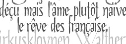 Talavera Type Workshop is Jesus Barrientos's type foundry in Puebla, Mexico. He has a Masters in Type Design from Estudio Gestalt in Veracruz, class of 2013. Presently he is a professor at Benemerita Universidad Autonoma de Puebla, Mexico.
 Barrientos designed Vecchia Romana (2008), a winner in the Tipos Latinos 2008 competition for best text family. At Tipos Latinos 2012, he won awards in the display type category for Agony, and Ecstasy. Speaker at ATypI 2014 in Barcelona. Speaker at ATypI 2016 in Warsaw. Graduate of the TDi program in 2018 at the University of Reading. In 2012, these commercial fonts were offered via MyFonts: Vecchia (Venetian), Ochenteros (counterless geometric face), Escuadra (squarish), Signorina, Ecstasy (blackletter), Agony (a script). Kyrenia TTW (2014) is a calligraphic script family. In 2014, after heaving studied Elzevir in depth, Jesus published his Leidener typeface family. The actual letters were developed from those found in Constantini Imperiatoris (1611) and Exercitationum Mathematicarum (1657), which were printed by Louis and John Elzevir in their workshop in Leiden. In 2017, he published the pixelish typeface Kader at Letter Inc. In 2018, he designed Malaguenya and the grungy Rapenburg. Typefaces from 2020: Nimbo TTW (kaleidoscopic mandalas). Typefaces from 2021: Keizer (a superb 5-style display serif with Titling, Inline, Openface, Initials and Outline options; Keizer has its roots in early XXth century cartography), Blacken (a blackletter inspired by the gothic-cholo style, Mexican sign painting and some delicious Belgian beer). IT FADU link. Fontown link. View Talavera's typefaces. [Google]
[MyFonts]
[More] ⦿
|
Textism: Jenson
|
Textism declares Robert Slimbach's multiple master Jenson family the best digital version of Nicolas Jenson's Venetian Renaissance face. View digital versions of Jenson. [Google]
[More] ⦿
|
The Ampersand Forest
[D.C. Scarpelli]
|
 Scarpelli's design and production clients have included the California Attorney General's Office, Napa/Sonoma Magazine, the American Cancer Society, Catholic Healthcare West, UC Hastings School of Law, Chevron, Frito Lay, the Oakland A's and the San Francisco Giants. He regularly designs theater graphics for companies throughout the Bay Area, and is resident Graphic Designer for 42nd Street Moon, Bay Area Musicals, and Silicon Valley Shakespeare. Additionally, he has created and edited several art books in the collection of the San Francisco Museum of Modern Art. His original training is in the theater. With his husband Peter Budinger, he has written and directed several plays, and appeared in numerous productions. They were theater majors, playwrighting students, and improv disciples together at Yale University. Scarpelli is currently Associate Director of the School of Web Design + New Media at the Academy of Art University, San Francisco. He designed these typefaces:
 - Donovan Display (2021). A modern tall display serif in twelve styles.
- Pawl (2020). A 48-style elliptical sans family. He writes: Pawl lives in the same visual landscape as fantastic modular superfamilies like Eurostile, Agency, Geogrotesque, Barlow, and even the great American Gothics.
- Worriment (2019: a vampire typeface).
- The extroverted display typeface family The Fudge (2019), which comis in Skinny, Sleek, Thicc and Chonk styles.
- Pamplemousse (2019), originally called Chelsea Morning: A family of casual-but-chic Sunday-morning display faces. Pamplemousse started out as a typeface based on the lettering of Gustav Klimt in his poster for the first exhibition of the Vienna Secession movement (Art Nouveau). This drifted into an homage to Rea Irvin's iconic masthead typeface for the New Yorker magazine. Finally, with the addition of a lowercase (absent from Irvin's typeface), a significant revision away from both Klimt and Irvin into a more casual space, Pamplemousse was born.
- Ampir. A casual Modern typeface, suggestive of gilt sign-maker letterforms, influenced by the modular type forms of Yakov Chernikov. Roman and Cyrillic character sets.
- Disquiet: Disquiet is a weird little display typeface designed to convey the free-floating anxiety of the mid-20th century. It is based on a single nongeometric form: the temple piece of a pair of horn-rimmed glasses---the kind worn by sweaty little men in offices who always seem to run the world in Atomic Age thrillers.The form is hexagonal, to give each letter a sense of being locked in---trapped. The double stroke gives it a nasty little bit of queasiness. And the negative spaces within the letters form mini-glyphs of their own---perfectly geometrical inside the fractured outer strokes.
- Swonderful (2019). An art deco typeface family with many different styles of interlocking.
- Haggis (released in 2020, but designed earlier): Haggis was intended to be a pseudo-sans-serif version of a traditional Insular Uncial. A bastard child of pub signage and rubber duckies, Haggis is not without its charms, and it certainly doesn't take itself too seriously.
- Mrs Keppel: Inspired by Stephenson Blake's 1884 typeface Windsor Light Condensed (made famous by Woody Allen's title sequences), Mrs Keppel finally appends an italic to this iconic face. Gentle in its design but firmly anchored in the fin-de-siècle, Mrs Keppel moves us forward to the 1910s, redolent of Ragtime and spiked tea. Named for the mistress of King Edward VII, who was likewise illegitimately linked to a Windsor.
- Donovan Display (2021). A modern tall display serif in twelve styles.
- Wiblz Serif (2021). A 12-style didone.
- Carollo Playscript (2021). A ten-style slab serif that is inspired by typewriter type.
- Nerone (2021). A slightly despotic display typeface.
- Budinger Oldstyle (2021). A ten-style semi-Venetian renaissance text typeface.
- Tremendo (2021). A 48-style gothic sans with many hipster elements such as the coathanger lower case f.
- Wodehouse (2021). A vintage display trio with a hint of deco.
[Google]
[MyFonts]
[More] ⦿
|
The Briar (was: Alphabets Magical, or: Fuzzypeg's Homepage)
[Ben Whitmore]
|
 Alphabets Magical had freeware rune and old writing system fonts by Ben Whitmore from Auckland, New Zealand. They included AngelicR100, BarddasWRR100, DaggersR100, IEFutharkR100, Malachim, PVEnochian100, PWRunesR100, ThebanBW100, AlphGeniiFzpg100, Enochian-Regular, PictSwirlR100. He also had Enochian-Regular by the Digital Type Foundry, 1991.
 In 2014, we rediscovered Ben Whitmore as The Briar. He published Coelacanth, a free typeface family inspired by Bruce Rogers' legendary Venetian typeface, Centaur, described by some as the most beautiful typeface ever designed. He writes: There are surprisingly few digital revivals of Centaur, and none that I know of providing the smaller optical sizes that were available in the original metal type. Centaur was tremendously versatile, as elegant and readable in the smallest caption text as it was at display sizes. He created the italics from scratch. Interestingly, Coelacanth has six weights from Thin to Heavy, and six optical styles, 4pt, 6pt, 8pt, 14pt, 24pt and 60pt. CTAN link for downloading Coelacanth. Open Font Library link. [Google]
[More] ⦿
|
The story of Bembo
[Joel Friedlander]
|
 Bembo's story told by Joel Friedlander (1948-2021) in 2009. He recalls that Bembo is first and foremost an oldstyle typeface [bracketed serifs with a curved connection between serif and stem; the axis drawn through the thinnest part of the round letters leans to the left]. Aldus Manutius and Francesco Griffo created Bembo in 1496 for use in Pietro Bembo's book, De Aetna. Friedlander goes on: The design of Bembo was a clear attempt to bring the humanist script of the finest scribes of the day to the printed page, without slavishly following the more formal lettering of the day. It would later serve as the chief inspiriation to Claude Garamond, among others. Typefaces based on his work include Poliphilus, Cloister Old Style, Aetna, Aldine, Griffo Classico, Dante, and Adobe Minion. [Google]
[More] ⦿
Bembo's story told by Joel Friedlander (1948-2021) in 2009. He recalls that Bembo is first and foremost an oldstyle typeface [bracketed serifs with a curved connection between serif and stem; the axis drawn through the thinnest part of the round letters leans to the left]. Aldus Manutius and Francesco Griffo created Bembo in 1496 for use in Pietro Bembo's book, De Aetna. Friedlander goes on: The design of Bembo was a clear attempt to bring the humanist script of the finest scribes of the day to the printed page, without slavishly following the more formal lettering of the day. It would later serve as the chief inspiriation to Claude Garamond, among others. Typefaces based on his work include Poliphilus, Cloister Old Style, Aetna, Aldine, Griffo Classico, Dante, and Adobe Minion. [Google]
[More] ⦿
|
The Yale Typeface
[Matthew Carter]
|
Typeface specially designed in 2004 by Matthew Carter for Yale. It is free for all units at Yale University. From the press release: Yale is inspired by the late fifteenth-century Venetian typeface that first appeared in Pietro Bembo's De Aetna, published by Aldus Manutius. [...] In 1929, Stanley Morison of the Monotype Corporation in England led a project to revive Aldus's De Aetna face. The resulting typeface, Bembo, proved to be one of the most widely used and highly regarded book typefaces of the twentieth century. It continues regularly to appear in Yale publications. Unfortunately, the more recent photocomposition and digital versions of Bembo lack the vigor, weight, and formal integrity of either the De Aetna typeface or of the original Monotype version of Bembo. Matthew Carter's Yale recovers the strength of the Aldine original, and updates it by sensitively simplifying the basic letterforms and their details. Aspects of the vigor and "color" of the well-known typeface Galliard, an earlier Carter design, are also evident in the new Yale face. The fonts include YaleAdministrative Roman, YaleAdministrative Italic, Yale Design Roman, Yale Design Italic, Yale Small Capitals, Yale Web Small Capitals, Yale Street and Yale Street Aligning Figs. later additions include YaleNew, Yale Display, and Mallory (a companion font designed in 2015 by Tobias frere-Jones). Free download. [Google]
[More] ⦿
|
Thomas James Cobden-Sanderson
[Doves Type]
|
 [MyFonts]
[More] ⦿
[MyFonts]
[More] ⦿
|
Thomas Wood Stevens
|
 Early 20th century designer of letters, who was associated with the Carnegie Institute of Technology, Pittsburgh. Author of Lettering (1916, The Prang Company, New York).
 Alphabets from his 1916 book include Art Nouveau Capitals, Italic Capitals, Italic Lowercase, Modern Script Italics, Modern German Italic Capitals, Modern Round Gothic, Uncial (based on a 14th century manuscript), Venetian Modern Capitals, Roman Lowercase, Modern German. PDF file of his 1916 book. Digital remakes include Wood Stevens (2012, Intellecta). In 2012 and 2013, Dick Pape digitized many of the typefaces discussed in Lettering (1916). They are freely downloadable from this site. The typefaces in Dick's collection are attributed as follows: - No artist: TWS Brush Caps 31, TWS Capitals from Coins 15,
- Harry Lawrence Gage: TWS Heavy Capitals 49, TWS Italian Gothic Caps 80, TWS Renaissance Alphabet 39, TWS Robinson Caps 23, TWS Roman Caps 13, TWS Slab Capitals 22, TWS The Japanese 32 [note: see also Yoshi Toshi, 2003, by Da ABF Mafia, and Yoshitoshi, 2003, by David Nalle].
- Norman P. Hall: TWS Heavy Modern 30.
- Oswald Cooper: TWS Long Ascenders 36.
- Ned Hadley: TWS Modern Caps 24, TWS Modern French 25.
- Helen E. Hartford: TWS Modern German Capitals 28.
- Charles H. Barnard: TWS Modern Roman 05.
- F. G. Cooper: TWS Modern Roman Bold 37.
- William A. Dwiggins: TWS Modern Roman Caps 32, TWS Variation on Georgian.
- Guido Rosa: TWS Outline Caps 21.
- George W. Koch: TWS Roman Wide Pen 33.
Commercial revivals include he slab serif Nouveau Lettering JNL (2019, Jeff Levine). [Google]
[More] ⦿
|
Tim Rolands
[Tim Rolands Digital Studio (was: TR Typographic Services, Phont Typographics, Stylus Digital Typography, Studio Renaissance)]
|
[MyFonts]
[More] ⦿
|
Tim Rolands Digital Studio (was: TR Typographic Services, Phont Typographics, Stylus Digital Typography, Studio Renaissance)
[Tim Rolands]
|
 Tim Rolands (b. St.Louis, MO, 1970, based in Kirksville, MO and London, UK, but also in Stevens Point, WI) is an independent digital type developer, producing TrueType and Postscript typeface families for MacOS and Windows. He founded Tim Rolands Digital Design in 2001. Other names for his company include TR Typographic Services, Phont Typographics, Stylus Digital Typography, Studio Renaissance. His fonts can be bought at MyFonts.
 Tim's creations include Orlando (free), Anvil (also available in OpenType), Valor (2006, an experimental modern typeface that combines geometry and mediaeval Lombardic ideas), Miranda (an Aldine, roman caps family: Pro version appeared in 2012), Aegis, Prospero (1997, inspired by the early Romans of Nicolas Jenson; see Prospero Pro (1997-2008)), Illiad, Kimberly, Timotheus, Envoy (2001, garalde family), Odyssey (2001, classical Roman caps; see Odyssey Pro in 2017), Alexander, Runik Futhark (based on the earliest Germanic-Norse runes, known as the Elder Futhark). View Tim Rolands's typefaces. [Google]
[MyFonts]
[More] ⦿
|
ToadFonts (was: AquaToad)
[Randy Jones]
|
 Randy Jones, who runs AquaToad and ToadFonts, is a free lance graphic designer who was in New York, but now lives in San Francisco, CA, where he is a freelance graphic designer and principal of Aquatoad Design. His typefaces:
 [Google]
[More] ⦿
|
Tobias Frere-Jones
[Frere Jones Type]
|
 [MyFonts]
[More] ⦿
[MyFonts]
[More] ⦿
|
Tom Wallace
[HiH (Hand in Hand)]
|
 [MyFonts]
[More] ⦿
[MyFonts]
[More] ⦿
|
Tony Stan
|
New York-based type designer at ITC, 1917-1988. Tony Stan did a version of Jean Jannon's Garamond (ITC Garamond, 1977). Other typefaces: ITC American Typewriter (1974, with Joel Kaden), ITC Garamond (1977), ITC Cheltenham (1975-1978), ITC Cheltenham Handtooled (with Ed Benguiat), ITC Century (1975-1979; see Modern Century by SoftMaker), ITC Berkeley Old Style (1983, a Venetian typeface; after Frederic Goudy), Pasquale, Ap-Ap. About ITC Garamond, Andreas Seidel writes: That one is a modern recreation that in my view breathes much of the 1970s feel and is generally considered the least historical "Garamond". The high x-height does not improve readability, as you will have to adjust the line-spacing accordingly. The Garamond wiki is equally negative about ITC Garamond. Happy (2005, Canada Type, Patrick Griffin) is the digital version of one the most whimsical takes on typewriters ever made, an early 1970s Tony Stan film type called Ap-Ap. Some of the original characters were replaced with more fitting ones, but the original ones are still accessible as alternates within the font. We also made italics and bolds to make you Happy-er (quote by Canada Type). The 1975 revival of Cheltenham by Goodhue (1896) and later by Morris Fuller Benton, resulted in a Cheltenham with increased x-height. Not everyone was pleased with that. Digital versions of ITC Berkeley Oldstyle besides that of ITC include University Oldstyle (SoftMaker), Californian (Font Bureau), B695 Roman (SoftMaker) and Venetian 519 (Bitstream). Linotype link. FontShop link. Klingspor link. View Tony Stan's typefaces. [Google]
[MyFonts]
[More] ⦿
|
Typedia: Typeface classification
|
The classification from the Typedia community: - Blackletter
- Fraktur: A German form of Blackletter with broken strokes. Classic example: Fraktur.
- Old English: The English blackletter style. Classic example: Cloister Black.
- Rotunda: A Blackletter style featuring wider lowercase with more rounded strokes.
- Schwabacher: A German form of Blackletter with simplified, rounded strokes.
- Textura: A Blackletter style featuring tall, narrow lowercase made mostly of straight strokes.
- Calligraphic
- Chancery: A script style of calligraphy made with a broad-point pen with slightly sloping, narrow letters that are the basis for italics in serif typefaces. Capitals may or may not have flourishes. Originated during the Renaissance. Classic example: Zapf Chancery.
- Etruscan: An early Roman form of calligraphy drawn with a flat brush held at a steep angle. Caps only, as lowercase had not been invented yet. Classic example: Adobe Pompeii.
- Uncial: A Celtic style of calligraphic script with forms created by a broad-nibbed pen at an almost horizontal angle, but sometimes more tilted in later variants. Roman lowercase is derived from Uncial forms. There is only one case in pure Uncial designs. Used during the middle ages. Classic example: American Uncial.
- Inscriptional---Roman Inscriptional: Stone-cut serif style from the late Roman Empire. The basis of modern roman capitals. Classic example: Trajan.
- Non-alphanumeric
- Dingbats
- Ornaments
- Pictorial
- Ornamented, Novelty
- Art Deco: A geometric display typeface style popular in the 1920s and 1930s. Classic example: Broadway.
- Art Nouveau: Display typefaces with a flowing, organic style popular in the early 20th Century. Classic example: Arnold Bocklin.
- Comic Strip Lettering: A style meant to look like the hand-drawn letters associated with comics or cartoons. This style is usually san serif, often having a loose, informal structure and is sometimes based on brush lettering. Classic example: Balloon.
- Dot Matrix: A style whose characters are composed of a pattern of dots used mainly for low-resolution impact printers, or to simulate the look of the output of such printers. Classic example: FF Dot Matrix.
- Futuristic: A style meant to suggest a futuristic theme. Often cold, brutal and geometric with a machine aesthetic and simplified construction. Classic example: Stop.
- Machine Readable: A style designed to be read by machine. These fonts are usually san serif and often feature unusual character shapes to make them more distinguishable from one another. Classic example: OCR-B.
- Pixel: A style whose characters are composed of pixels (usually represented as squares) used mainly for low-resolution computer display. Outline fonts are sometimes made to look like Pixel Fonts. Classic example: Silkscreen.
- Pseudo Foreign Script: A style intended to mimic non-Western letters. For example, a font that looks like Chinese, but is actually composed of Latin characters. Faux Chinese/Arabic/Hebrew. Classic example: Bruce Makita.
- Victorian: A whimsical, eclectic display style popular in the late 19th Century. Classic example: Skjald.
- Sans Serif
- Gothic: A sans serif style with moderate stroke contrast and modern proportions particular to the U.S. Usually features a two-story lowercase g, angled strokes on C and S, and a sloped, non-cursive italic. Classic example: Franklin Gothic.
- Grotesque: A sans serif style with moderate stroke contrast and modern proportions particular to the U.K. Usually features a two-story lowercase g, closed strokes (usually curving in slightly) on C and S, and a sloped, non-cursive italic. Classic example: Bureau Grot.
- Geometric Sans: A sans serif style made with rigidly geometric forms and little to no stroke contrast. Classic example: Futura.
- Grotesk: A sans serif style with low stroke contrast and modern proportions. Usually features a one-story lowercase g, closed or angled strokes on C and S, and a sloped, non-cursive italic. Classic examples: Akzidenz Grotesk, Helvetica.
- Humanist Sans: A sans serif style with proportions modeled on old-style typefaces. Characterized by open strokes on characters like C and S. Italics of this style often are more cursive in appearance, rather than a simple slanted version of the roman. Often has more slightly stroke contrast than other sans serifs. Classic examples: Gill Sans, Frutiger.
- Square Gothic: A sans serif style composed mainly of straight or nearly straight lines and (often) curved corners. Stroke contrast is usually low. Classic example: Bank Gothic.
- Swiss Gothic: A sans serif style with noticeable stroke contrast, straight sides on round characters, modern proportions, and large x-height. Usually features a one-story lowercase g and closed strokes on C and S. Classic example: Jay Gothic.
- Script
- Brush Script: Typefaces modeled after lettering made with a brush. Strongly associated with advertising in the mid-20th Century on. Classic example: Brush Script.
- Casual Script: Typefaces based on a style of lettering characterized by informal appearance, somewhat like handwriting, but more refined. Similar to Brush Script or Sans Serif. Classic example: Murray Hill.
- English Roundhand: A connecting-script style of calligraphy made with a flexible tipped pen. The characters are usually steeply sloped and capitals are often very elaborate. Popular in the 18th and 19th Century. Sometimes called Copperplate Script. Classic example: Bickham Script.
- French Roundhand: A connected-script style of calligraphy, sometimes with upright characters, a high stroke contrast and decorative capitals. Used in France in the 17th through 19th Century. Also called Civilité. Classic example: Typo Upright.
- Handwriting: A script style based on ordinary handwriting. Characters may or may not be connected. Classic example: Felt Tip Roman.
- Rationalized Script: A script style with sans serif qualities, low stroke contrast, and a formal appearance. Characters may or may not connect. Associated with 20th Century commercial design. Classic example: Gillies Gothic.
- Serif
- Grecian: A typically heavy display typeface with octagonal shapes where curves are normally used. Also known as Chamfered or Beveled. Popular in the 19th Century for wood types. Classic example: Acropolis.
- Latin: A serif style with large triangular or wedge-shaped serifs. Stroke contrast is medium to low. Popular in the 19th Century for wood types. Classic example: Latin.
- Modern: A serif style with high stroke contrast and vertical stress. Classic example: Modern No. 20.
- Didone: A serif style with high stroke contrast and vertical stress. Serifs are usually unbracketed. Classic examples: Bodoni (Italian), Didot (French).
- Scotch Modern: A serif style with medium to high stroke contrast and vertical stress, known for large serifs and tiny aperture. Serifs are usually bracketed. Classic examples: Modern No. 20, Scotch Modern.
- Old Style: A serif typeface with relatively low stroke contrast, angled stress, angled serifs. Classic example: Bembo.
- Antique: A serif style with moderate stroke contrast, bracketed serifs and usually vertical stress. Serifs are angled as in Old Style. Popular in the 19th Century. Classic example: Bookman.
- Dutch Old Style: A serif style with somewhat angled stress, bracketed serifs, and medium to high stroke contrast. Characteristic of Dutch and English types of the 18th Century. Classic examples: Caslon, Plantin, Times Roman.
- French Old Style: A serif style with angled stress on rounds; usually features a small eye on the lowercase e; soft, bracketed serifs and moderate stroke contrast. Classic example: Garamond.
- Spanish Old Style: A serif style with soft, bracketed serifs, medium to high stroke contrast, and often highly angled stress. Classic example: Rongel.
- Venetian Old Style: A serif style with angled stress on rounds; usually a tilted crossbar on the lowercase e; usually has somewhat low stroke contrast. Serifs are sometimes unbracketed. This style is associated with very early printing (Incunabula) in the West. Classic example: Jenson.
- Slab Serif: A serif style with serifs equal to or nearly the same thickness of the main strokes. Main strokes usually have low contrast. Classic example: Rockwell.
- Clarendon: A slab serif style with heavy, bracketed serifs, modern proportions and construction, low stroke contrast. Classic example: Clarendon.
- Egyptian: A serif style with heavy, unbracketed serifs, modern proportions, low stroke contrast. Basic construction is similar to Modern, but with low stroke contrast. Sometimes called Antique. Classic example: Egiziano.
- French Clarendon: A serif style with reverse stress (horizontal strokes thicker than vertical strokes) and slab serifs, sometimes bracketed, usually condensed. Popular in the 19th Century. Classic example: Playbill.
- Geometric Serif: A serif style made with rigidly geometric forms. Usually features slab serifs. Classic example: Stymie.
- Spur Serif: A serif style with very small serifs. Usually similar in design to san serif typefaces, except for the serifs. Usually very little stroke contrast. Classic example: Copperplate.
- Transitional: A serif style which, historically, bridges the gap between Old Style and Modern. Stroke contrast is stronger than old style, but less than modern. Bracketed serifs. Stress is mainly vertical. Characteristic mainly of English types around 1800. Classic example: Baskerville.
- Scotch Roman: A serif style with medium contrast and vertical stress, medium-sized bracketed serifs. Classic examples: Miller, Caledonia.
- Tuscan: A serif style with splayed or ornate serifs. Classic example: Thunderbird.
[Google]
[More] ⦿
|
Typespec
[Joe Graham]
|
There are seemingly two British foundries called Typespec. This one, more a vendor and enabler than a true type foundry, is located in Manchester. Founded by Joe Graham, formerly General Manager at Fontworks UK Ltd in London, Typespec is an experienced type consultancy and custom font studio offering a wide range of type-related services and font solutions to organisations worldwide. Their fonts as of 2015 include - MFRED (2014, Matt Willey and Henrik Kubel)
- Heseltine (2014, Paul and Pat Hickson)
- Laura (2014, Paul Harpin)
- Precious Sans Two (2014, Nick Cooke)
- Organon Sans (2009, Nick Cooke)
- The Doves Type (2013-2015, Robert Green). Revives the (Venetian) Doves Type of T.J. Cobden-Sanderson that were thrown into the river Thames a century earlier but recovered from the water in 2014.
- Civita (Dieter Hofrichter)
- Rollerscript (2012, Nick Cooke).
[Google]
[More] ⦿
|
UC Berkeley
[Richard Beatty]
|
The University of California at Berkeley releases freely downloadable versions of Goudy's 1938 Venetian font Berkeley Oldstyle, now called University Old Style. History of the font in the "readme" file: Goudy was commissioned in 1938 to design a new family of typefaces for the University Press at the University of California-Berkeley. He preferred the name University Old Style, but the University staff preferred adding the name of the state. In his translations of Goudy's types, Richard Beatty returned to Goudy's preference for naming the family--it fits computer menus more easily. Beatty's translations are based on Goudy's original designs and do not reflect the changes made by Monotype when they were given permission to copy the typefaces and sell them under the name of 'Californian.' In 1995, Beatty was commissioned by the University of California at Berkeley to design additional typefaces that would be heavy enough for campus signage and with a family relationship to Goudy's University Old Style. In 2000, Beatty was commissioned by the University of California at Berkeley to design demi-bold typefaces that fit between the roman and bold in weight and black typefaces that go beyond bold in weight without the variations of the fonts designed by Beatty specifically for signage. The family comprises UniversityOS, UniversityOSBlack, UniversityOSBlack-Italic, UniversityOS-Bold, UniversityOS-BoldItalic, UniversityOSDemi, UniversityOSDemi-Italic, UniversityOS-Italic, UniversityOSSC, UniversityOSSCBlack, UniversityOSSCBlack-Italic, UniversityOSSC-Bold, UniversityOSSC-BoldItalic, UniversityOSSCDemi, UniversityOSSCDemi-Italic, UniversityOSSC-Italic, UniversityOSTitling, UniversityOSTitling-Bold, UniversityOSSCSign, UniversityOSSCSign-Italic, UniversityOSSign, UniversityOSSign-Italic, UniversityOSSignTitling. [Google]
[More] ⦿
|
Venezia Italic
|
A typeface designed by Frederic Goudy in 1925. D.J.R. Bruckner: This face was made at the request of the London designer and typographer George W. Jones, to accompany his Venezia Roman. Stanley Morison said Goudy's face was based entirely on a French italic font cut by Claude Garamond around 1535. Goudy insisted, however, that he had made the design with reference only to Jones' roman. Mac McGrew: Venezia Italic (quite unlike Venezia) was designed by Frederic W. Goudy in 1925 to accompany a typeface which George W. Jones, a well-known English printer and designer, had drawn for the English Linotype Company. It is somewhat similar to Cloister, but with stronger serifs. [Google]
[More] ⦿
|
Veronese
|
As Bill Davis explains, Veronese (1911) was Monotype's first custom font: In 1911, Monotype introduced the font Veronese at the request of the publisher J.M. Dent&Sons Ltd. Veronese was a Venetian style serif typeface drawn in the spirit of William Morris's version of Nicolas Jenson's fifteenth-century roman type known as Italian Old Style. The Veronese custom font was first used for a limited edition book of Lorenzo de Medici's poems printed by Ballantyne Press for Dent in 1912. This was the first of many custom typefaces designed by Monotype for use with its hot metal typecasting machines to address the needs of its customers. For digital versions, check Granada Serial (Infinitype), Veronese RR (1992, Steve Jackaman), ITC Veronese, OPTI Veronese (Castcraft). [Google]
[More] ⦿
|
Victor Scholderer
|
Designer (1880-1971) of "New Hellenic" (1927-1928), a very elegant Greek typeface with original capitals, and a lower case that is based upon a 15th century Venetian typeface ascribed to Giovanni Rosso (Rubeus). He published Greek Printing Types 1465/1927 (Mastoridis Publications, Typophilia, 1995). Scholderer was curator in the British Museum Library. In 1927, Scholderer, on behalf of the Society for the Promotion of Greek Studies, got involved in choosing and consulting the design and production of a Greek type called New Hellenic cut by the Lanston Monotype Corporation. He chose the revival of a round, and almost monoline type which had first appeared in 1492 in the edition of Macrobius, ascribable to the printing shop of Giovanni Rosso (Joannes Rubeus) in Venice. New Hellenic was the only successful typeface in Great Britain after the introduction of Porson Greek well over a century before. The Greek Font Society digitized the typeface (1993-1994) funded by the Athens Archeological Society with the addition of a new set of epigraphical symbols. Later (2000) more weights were added (italic, bold and bold italic) as well as a Latin version. That type family is called GFS Neohellenic (1993-2000, George Matthiopoulos and Takis Katsoulidis). [Google]
[More] ⦿
|
Village by Frederic Goudy
|
 Village is a Venetian typeface designed by Frederic Goudy in 1903. Mac McGrew writes about its genesis: Village was designed by Frederic W. Goudy in 1903 on commission from Kuppenheimer&Company, a clothing store, as a private typeface for their advertising. Drawings were approved and paid for, but no type was produced for this account. Later in that year, Goudy and Will Ransom established a printing business which they called the Village Press. This type design was cast to become the private design of this press, and used as such or several years, while the business was in Park Ridge, Illinois. Though used on the classic Jenson type, this typeface has a number of novel details. The matrices were later purchased by Frederick Sherman, a publisher and fine printer, who used the typeface for printing the monumental Catalog of Dutch Paintings of the Metropolitan Museum. Miraculously, the mats survived and were recently used by Theo Rehak of The Dale Guild to cast new fonts, the source of the specimen shown here. For years Goudy wanted something to replace his Village type-not to duplicate it, but to have something for similar uses. In 1932 he designed and cut another type which he called Village No.2, and a year or two later cut an accompanying italic. These are more mature designs, without the unique details of the original design, and have been used for a number of fine booklets. Monotype obtained reproduction rights to these later typefaces, and produced them for machine composition in two sizes. The matrices of Goudy's Village were cut and the type cast by Wiebking, Hardinge and Co of Chicago.
 This Venetian typeface was digitized by David Berlow (1994, FontBureau), by Paul D. Hunt (2005), and by Steve Matteson (2018), who simply called his revival Village. Hunt's version was eventually released in 2016 by P22 as LTC Village No. 2 and in 2020 as LTC Village. Ivan Louette (Belgium) is working on a fine version of Village as well. [Google]
[More] ⦿
|
Warnery Frères
|
 Foundry in Paris that succeeded P. Digney. It was founded in 1857 in Saint-Germain-en-Laye by Digney who used to be director of the Fonderie Générale in Paris. Its work can be found in Spécimen de la Fonderie de caractères et de blancs Warnery frères (Paris, Usine et bureaux: 8, rue Humboldt, maison de vente: 6, rue Des Forges (place du Caire), June 1882 [1884]). A similarly-titled specimen was also published in 1899. More than half of their 1922 catalog consists of vignettes. In 1934, they published Catalogue Général.
 The Musé de l'imprimerie de Lyon lists specimens of these typefaces: Antiques Warnery (1922), Cyrano, Didot, Egyptienne Warnery, Elzévir Warnery, Fantasques Warnery, Gauloises, Goliath, Gras Warnery, Humboldt, Jenson, Machine à Écrire, Mammouth, Mozart, Ophelia (art deco), Papyrus (rounded script), Ronsard, Récamier, Stridon, Universelles Warnery, Vautour, Vignettes Warnery, Vénitiennes, Zéphyr. Among the revivals of these typefaces, a noteworthy contribution was made in 2018 by Juliette Collin at 205TF with her Salmanazar typeface family, which is based on Antiques Warnery No. 1. [Google]
[More] ⦿
|
Warren Chappell
|
 Born in Richmond, VA, 1904, d. Charlottesville, VA, 1991. Typographer, illustrator, letterer, and type designer. He made two type families:
 - Trajanus (1939-1940, for Stempel). McGrew on Trajanus: Trajanus was designed by Warren Chappell, New York illustrator and letterer, in 1939, and cast by Stempel in Germany. It has the basic form of classic Venetian letters, but with a nervous, pen-drawn, contemporary quality. Ascenders are fairly long but descenders are short. The narrow italic lowercase shows a calligraphic quality in particular. There is an extra little flick of the pen at the end of crossbars of f and t; caps M and N have no serifs on their apexes; and cap U is lowercase in form. Trajanus is named for the Roman emperor whose accomplishments are immortalized in classic letters on the Trajan column. The three versions are also made by German Linotype, but have not received much attention in America. For revivals, see Tribunus SG by Jim Spiece and Linotype Trajanus (probably close to the original design as Linotype absorbed Stempel).
- Lydian (1938, ATF) and Lydian Cursive (1940). McGrew writes: The Lydian series is a brilliant and popular calligraphic style designed by Warren Chappell for ATF. The lighter weight and italic were designed in 1938; bold and italic in 1939. They have the appearance of being lettered with a broad pen held at a 45-degree angle, but the ends of vertical strokes are square, improving legibility and stability. This is probably the most popular thick-and-thin serifless letter of American origin, though the concept is more popular in Europe. Oldstyle figures were made for these four Lydians, but were fonted separately and very rarely used. These four typefaces were copied by Intertype in an unusually large range of sizes for a slug machine, and from these matrices some suppliers cast fonts of type for handsetting. Lydian is named for the designer's wife, Lydia. Compare Czarin, Stellar, Radiant, Optima, Samson, Valiant. Lydian Cursive was drawn by the same designer in 1940. Although it gives the appearance of having been drawn with the same sort of pen as the regular series, it is much freer and more calligraphic, with a style unmatched by any other American script or cursive face. Lydian Bold Condensed was designed in 1946, also by Chappell, but not marketed until 1949. It has the general character of the earlier typefaces, but with much more emphasis on the vertical strokes. This gives the lowercase a suggestion of the effect of a simplified German blackletter. Digital versions:
- Lydian and Lydian Cursive by Bitstream. The early versions of Lydian and Lydian Cursive were called Granite, Lisbon, Granite Cursive and Lisbon Cursive.
- Lydian and Lydian Cursive by Tilde. These are identical to the Bitstream fonts.
- Monotype Lydian.
- Manofa (2018, Mariya Pigoulevskaya for The Northern Block). This bold family was inspired by Lydian.
- MPI Sardis (2013). By mpressinteractive. Inspired by Lydian.
- Beorcana Pro (2006, Carl Crossgrove). A distant relative of Lydian.
- Libris ADF. A free family by Arkandis.
- Lydia Bold Condensed (2013, Benjamin Critton).
- OPTI Lydian Cursive (Castcraft).
Chappell studied under Koch in 1931-1932 and worked briefly for him afterwards. This page states that he designed a font called Eichenauer (for Gustav Eichenauer, who cut the type in lead) in 1955, but it was never manufactured and released. This face, tentatively named Eichenauer, was shown in Chappell's book A Short History of the Printed Word. Klingspor file on him (PDF). FontShop link. View Warren Chappell's typefaces. [Google]
[MyFonts]
[More] ⦿
|
WDC Fonts
[Eugen Sudak]
|
Type foundry based in Kheminitsky, Ukraine, and run by Eugen Sudak, a Ukrainian type designer. At WDC Fonts, Uegen created the Venetian serif typeface Stiana (2013, with Anna Raven), based on models by Nicholas Jenson and William Morris. Stiana covers Latin, Greek and Cyrillic. [Google]
[MyFonts]
[More] ⦿
|
William Graily Hewitt
|
English calligrapher and illuminator, b. 1864, London. He started out as a lawyer, then as a writer, before turning to calligraphy. He was one of the first students of Edward Johnston at the Central School of Arts and Crafts in London in 1900. Hewitt went on to teach classes at the School for over thirty years. Hewitt's works include The Pen and Type Design (1928), which was set in his own typeface, Treyford, and Lettering (1930; reprinted in 1976 by Pentalic in New York). He died in 1952. Hewitt designed Gwendolin for The Greynog Press in 1935. Berry, Johnson and Jaspert write: In general this roman is a Venetian but reminiscent of the calligrapher in many of the serifs, for example on the E, L and the feet of m, n and u. The capitals are mostly wide, especially the splayed M. U has the lower-case design. The lower-case g has a very broad tail and the w a cursive form. [Google]
[MyFonts]
[More] ⦿
|
William Morris
|
 British type designer, architect and designer (b. Walthamstow in East London, 1834, d. 1896). Defender of the medieval form, he set up Kelmscott Press in 1891, and was one of the founders of the Arts and Crafts Movement. Morris was an artist, poet, writer and designer himself, but he is probably best remembered for his fabric designs and his book designs for Kelmscott Press, such as The Kelmscott Chaucer (1896). All his punches and matrices and some types are now with Cambridge University Press.
 William Morris's typefaces: - Kelmscott Golden or Golden Type (1889-1890): a bolder re-design of the classical Jenson face, done while he ran Kelmscott Press. The punches were cut by E.P. Prince. It was based on Nicolas Jenson but darkened. ATF's copy of this was called Nicolas Jenson, just before 1900. Morris used it in many of the books in the Kelmscott Press. Ancient Roman was Keystone Type Foundry's adaptation in 1904 of the Golden type [Mac McGrew deems it comparable to Jenson Oldstyle]. All matrices, punches and some of the types are in possession of Cambridge University Press. Digital versions include GoldenType (Elsner and Flake), GoldenType ITC (ITC), Kelmscott Roman (Nick Curtis), Kelmscott (Scriptorium), True Golden (Scriptorium), URW GoldenType (URW), URW GoldenTypeITC (ITC).
- Troy (1891-1892): blackletter. Called Morris Gotisch, it was published by Berthold in 1903. Multiple digital versions exist: GL Morris (2017-2018, Gutenberg Labo, a free version), P22 Morris Troy (2001, Richard Kegler), Joyeuse (1992, Scriptorium: a variation), Morris Gothic and Morris Initials (Tom Wallace), Troy3Roman (Chet Gottfried), MorrisBlack (Dan Solo), Satanick (Marty Snyder), an unnamed revival by Eliana Ferreira (2010), Kelmscott (Scriptorium), Morris Gotisch (Gerhard Helzel), MorrisBlackLetter (Scriptorium), MorrisRoman (Dieter Steffmann), Troycer (Torbjörn Olsson).
- Chaucer (1892): an enlargement [in the sense of point size only!] of Troy. Wetzig mentions the date 1897. For a digital version, se Alter Littera Chaucer (2012).
- Morris Romanized Black. Mac McGrew: Morris Romanized Black is an adaptation of the Troy and Chaucer types designed by William Morris for his Kelmscott Press. This adaptation first appeared under the name Tell Text about 1895, and was renamed in 1925. Troy and Chaucer were two sizes of one style, approximately 18- and 12- point respectively. William Morris had previously designed a roman type which became popular commercially as Jenson Oldstyle (q.v.); of this design he says, "After a while I felt that I must have a Gothic [in the sense of Blackletter or Old English] as well as a Roman, and herein the task I set myself was to redeem the Gothic character from the charge of unreadableness. ... Keeping my end steadily in view, I designed a blackletter type which I think I may claim to be as readable as a Roman one, and to say the truth, I prefer it to the Roman." Compare Satanick. For digital versions, refer to the digital interpretations of Troy.
- Jenson Oldstyle, Morris Jensonian, Morris Old Style. Well, not really---Mac McGrew explains: Jenson Oldstyle, though a comparatively crude typeface in itself, did, much to start the late nineteenth-century move toward better types and typography. Designed by J. W. Phinney of the Dickinson Type Foundry (ATF) and cut by John F. Cumming in 1893, it was based on the Golden Type of William Morris for the Kelmscott Press in 1890; that in turn was based on the 1470-76 types of Nicolas Jenson. Morris had established standards for fine printing, in spite of the fact that he did not design really fine types. Serifs in, particular are clumsy, but the Jenson types quickly became popular. BB&S introduced Mazarin in 1895-96, as "a revival of the Golden type, redesigned by our artist." But it was a poor copy, and was replaced by Morris Jensonian. Inland's Kelmscott, shown in 1897, was acquired by BB&S and renamed Morris Jensonian in 1912; Keystone had Ancient Roman (q. v.); Crescent Type Foundry had Morris Old Style. Hansen had Hansen Old Style (q. v.); and other founders had several other typefaces, all nearly like Jenson. It is hard to realize that Jenson was inspired by the same historic type as the later and more refined Centaur, Cloister, and Eusebius. ATF spelled the name "Jensen" in some early specimens, and added "No. 2" to the series, the latter presumably when it was adapted to standard alignment or when minor changes were made in the design. Jenson Italic was introduced at the same time as the roman. ATF advertised Phinney's Jenson Heavyface in 1899 as "new and novel-should have been here long ago." Jenson Condensed and Bold Condensed were introduced in 1901.
- Morris Initials: illuminated capitals in the Kelmscott edition of Chaucer's works at the Kelmscott Press. Digital versions: Morris Inits (George Williams), Chaucerian Initials (Scriptorium), Morris Initials (Scriptorium), Morrisinits (Dieter Steffmann), William Morris Initials (2018, Chafomon). The Morris Jenson Initialen font by Typograf (2015) is somehow different.
Self portrait, 1856 and picture, age 53. William S. Peterson writes on Morris. FontShop link. MyFonts link. Bio by Nicholas Fabian. Reference books include Typophile Chapbook: The Kelmscott Press, 1891 to 1898 (William Morris), and The Cambridge University Press Collection of Private Press Types, Kelmscott, Ashendene, Eragny, Cranach (Thomas Balston, 1951; inscribed by Adrian Wilson to Bob&Jane Grabhorn). William Morris himself wrote The Art and Craft of Printing (1895, Kelmscott Press) in which he explains his aims in founding the Kelmscott Press. Ebook version of the latter book. View typefaces by William Morris, and historical descendants. [Google]
[MyFonts]
[More] ⦿
|
Wraith Types (or: Fantomas Types)
[Guillaume Jean-Mairet]
|
Swiss designer of the Venetian typeface WT Mediaeval (2019: a revival of a font designed by Goudy in the 1920s) and WT Fallen (2019: a revival and modernization of Peter de Walpergen's Fell Types from 1693). In 2020, he released the bastarda typeface WT Arthas (which has a great Enf=raved style) and the large type system WT Volkolak, which he describes as the ultimate serif-sans-grotesque tribrid. Typefaces from 2021: WT Solaire (in Text and Display versions; a 20-style wedge serif that is based on the "charmingly quirky weights of the Fell Types designed by Peter De Walpergen"). [Google]
[MyFonts]
[More] ⦿
|


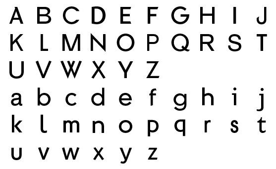
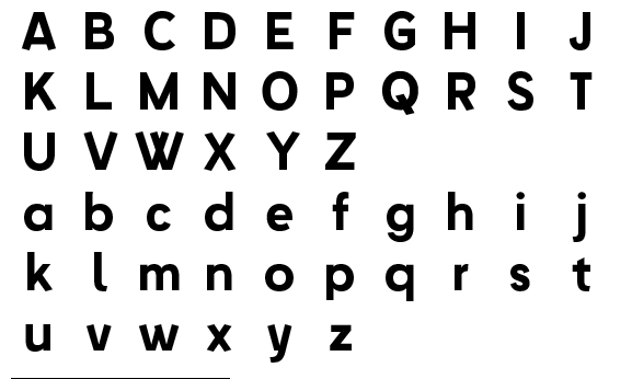
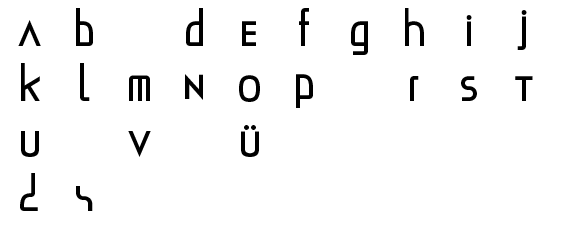
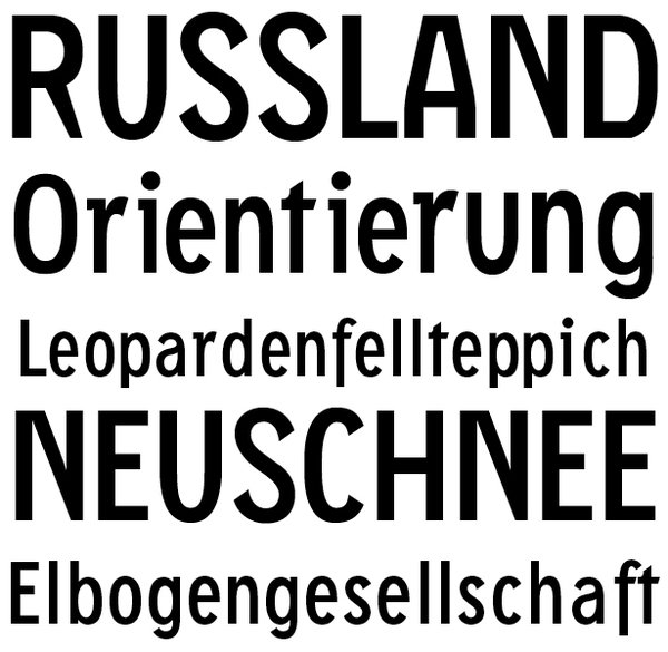
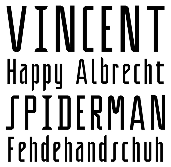
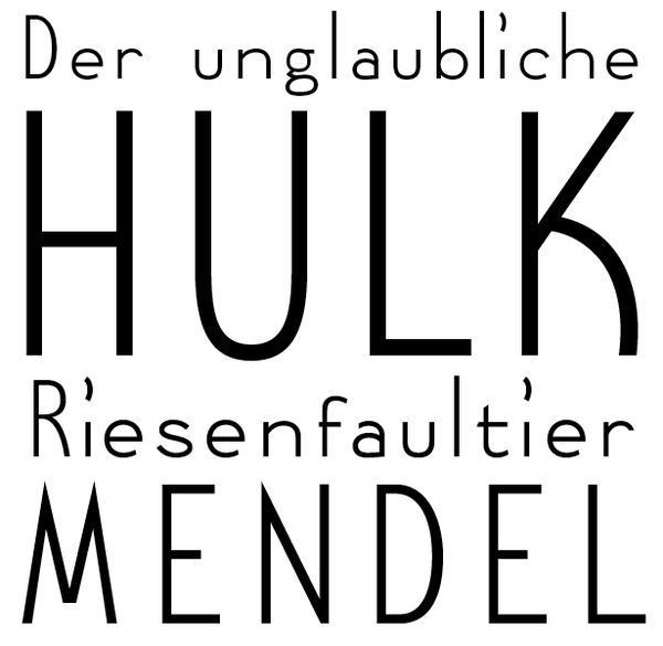
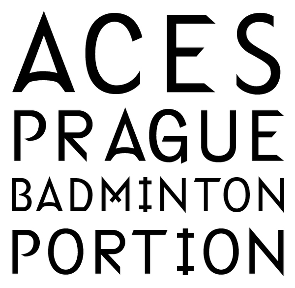
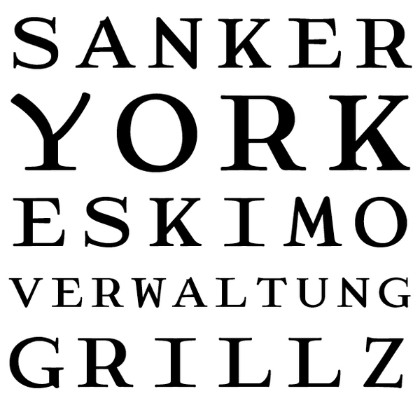
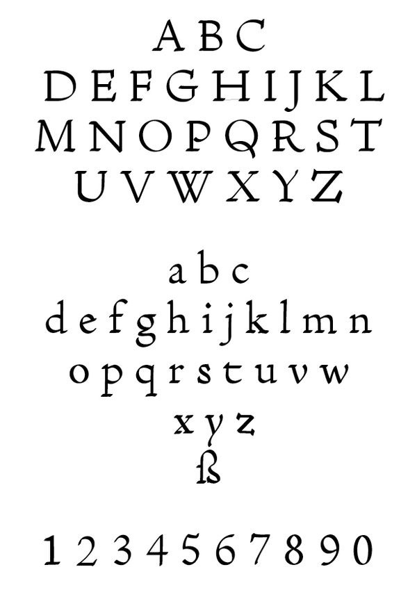
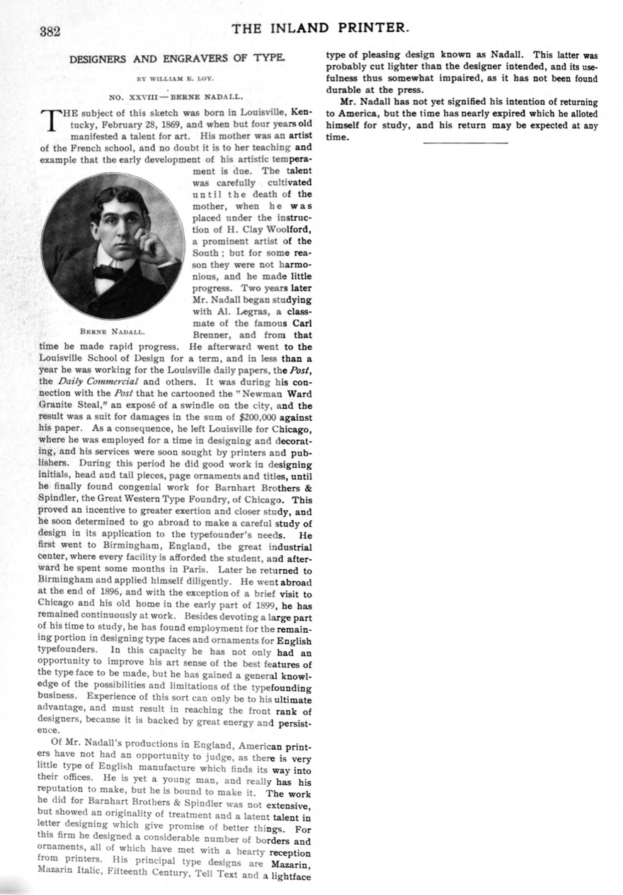
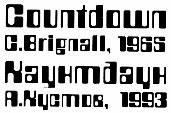
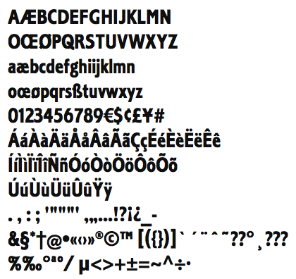
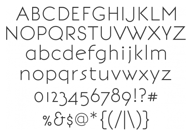
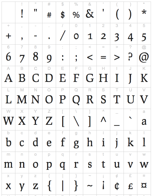
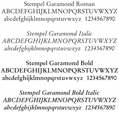
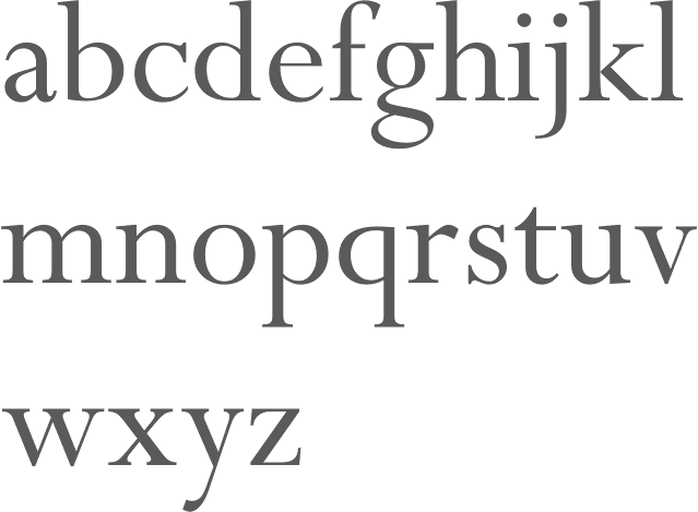
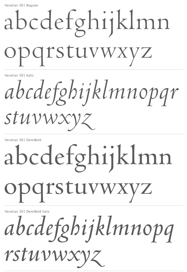
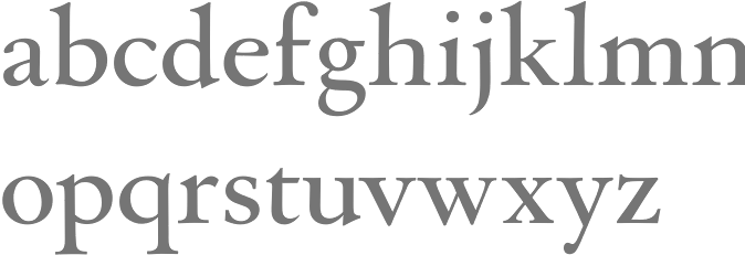
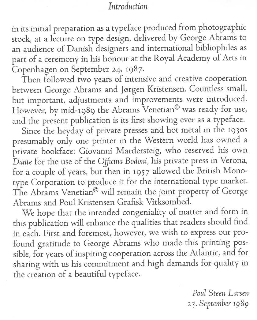
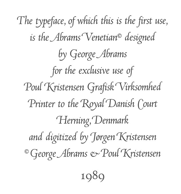
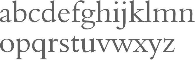
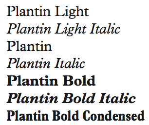
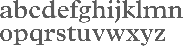
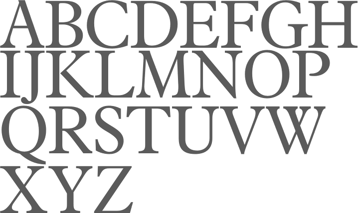
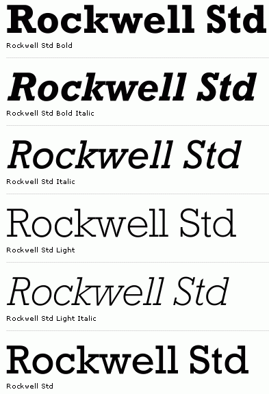
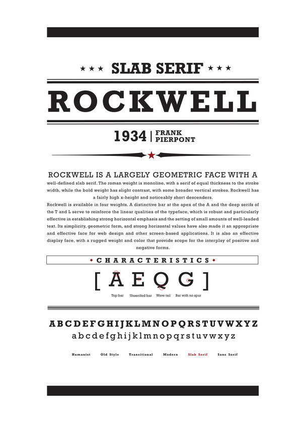
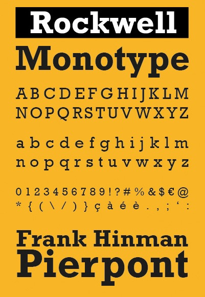
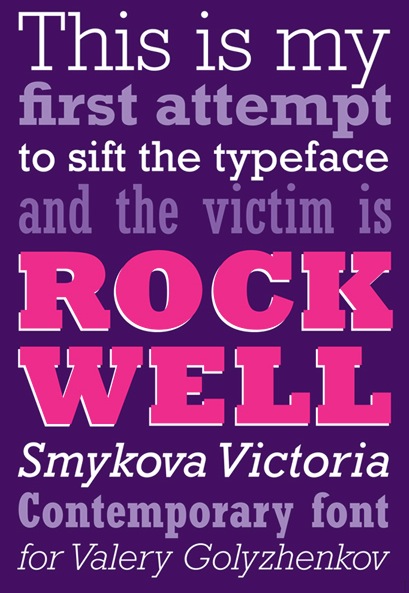
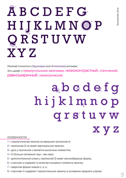
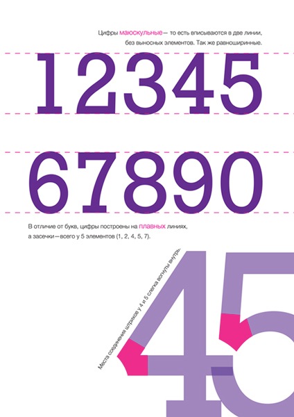
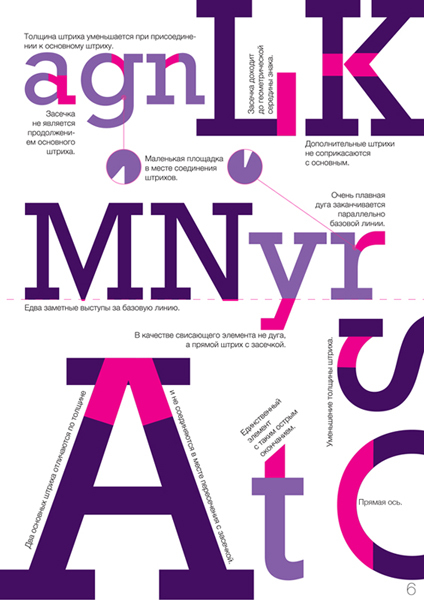
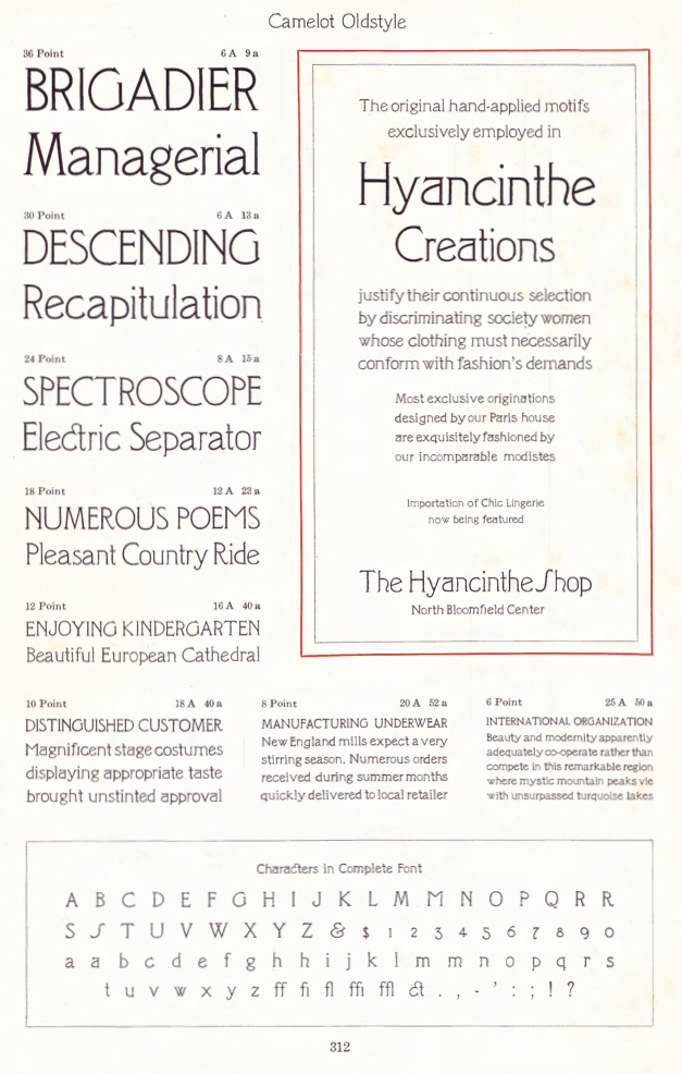
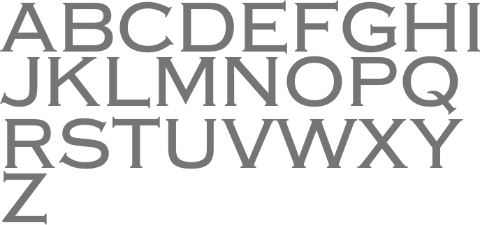
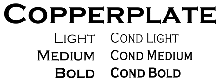
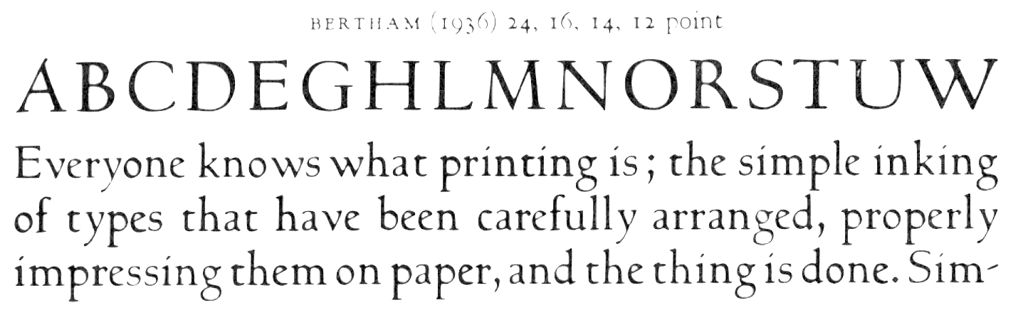
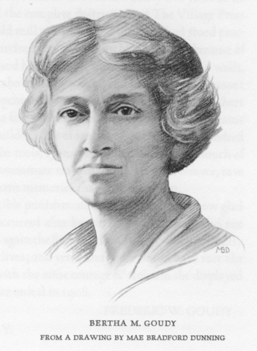
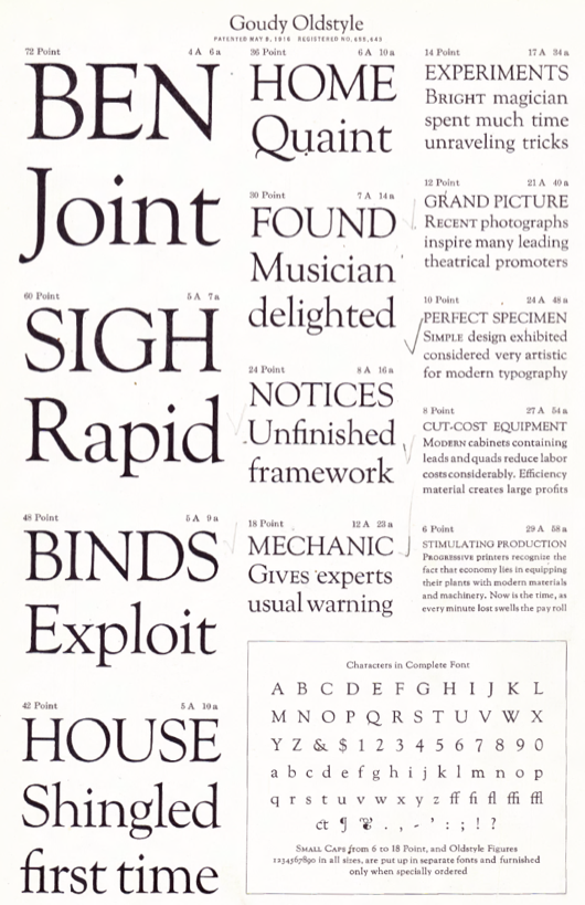
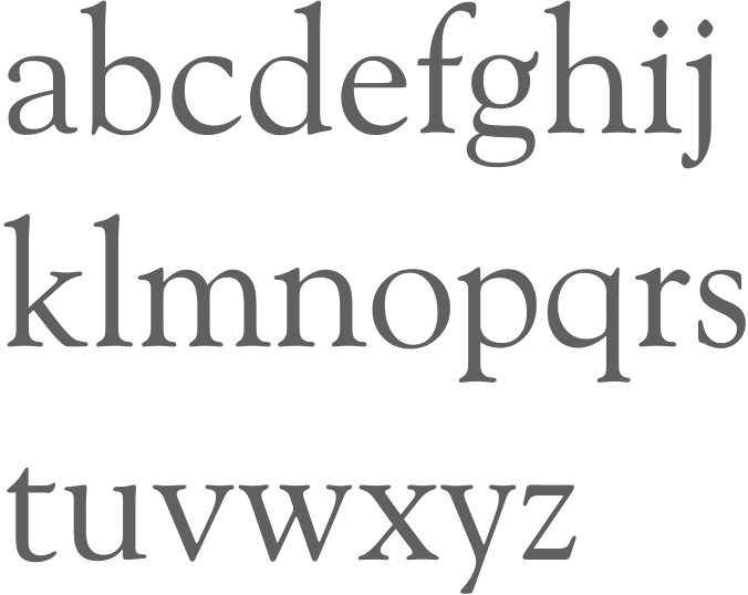
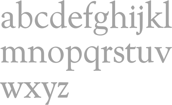
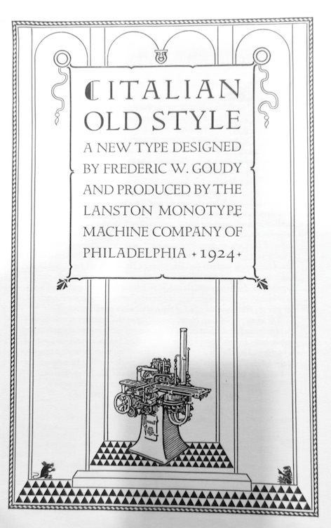
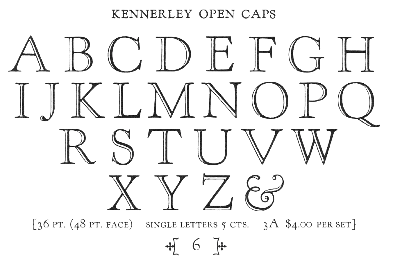
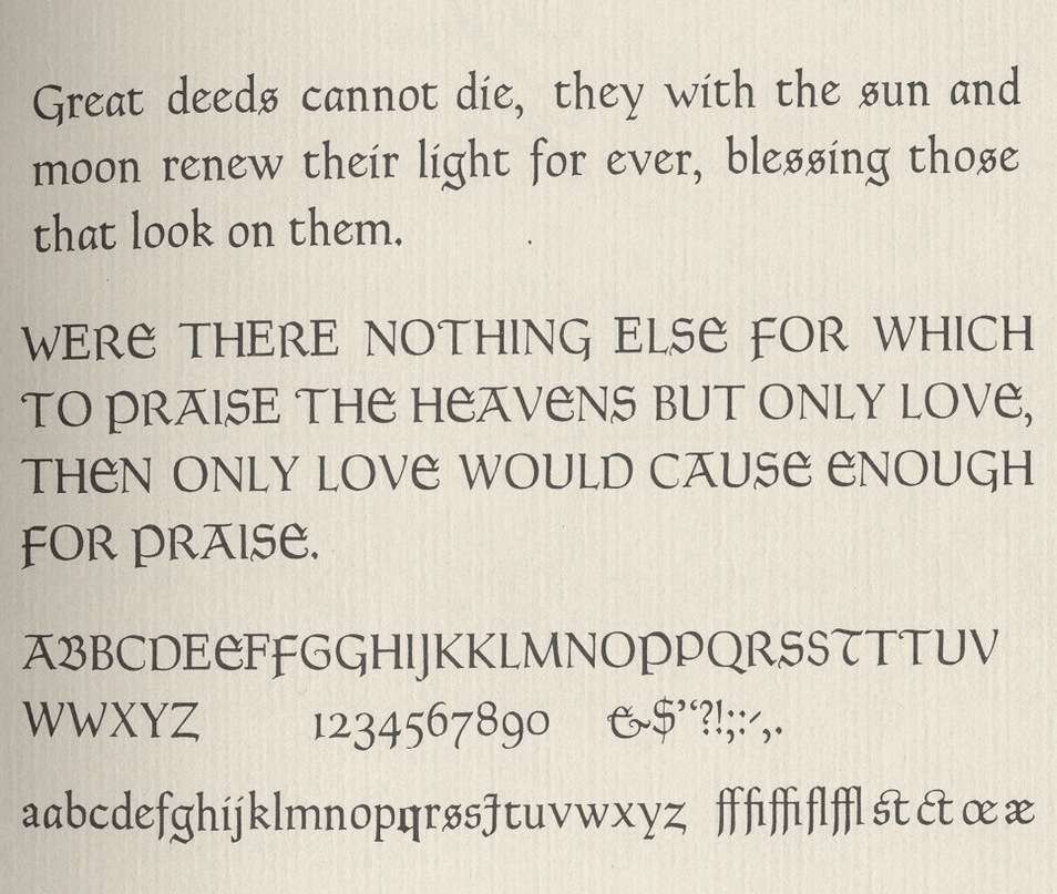
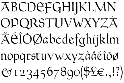
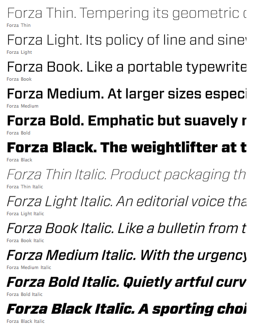
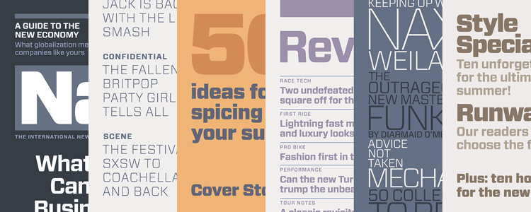
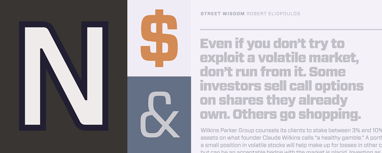
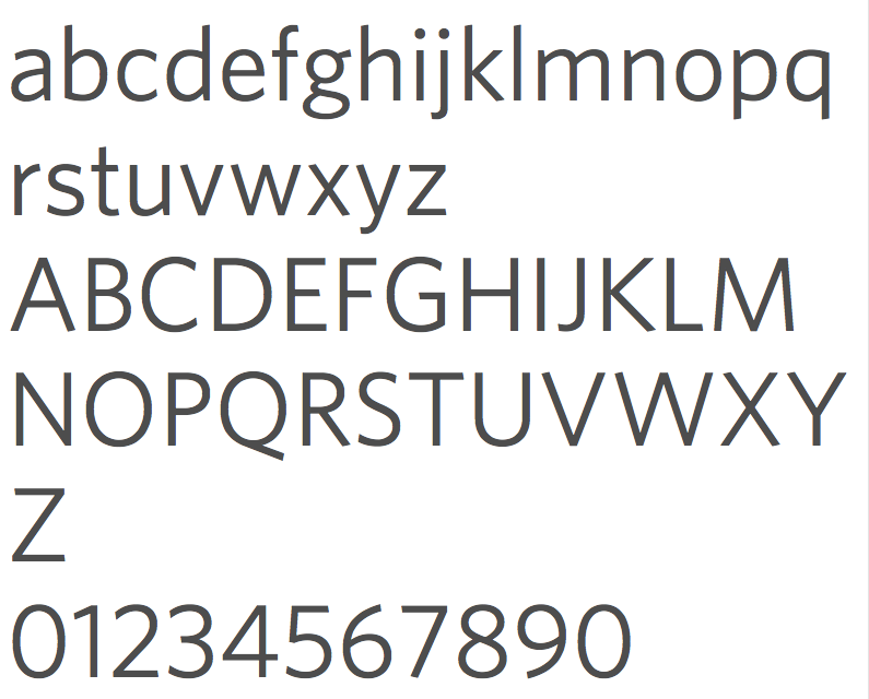
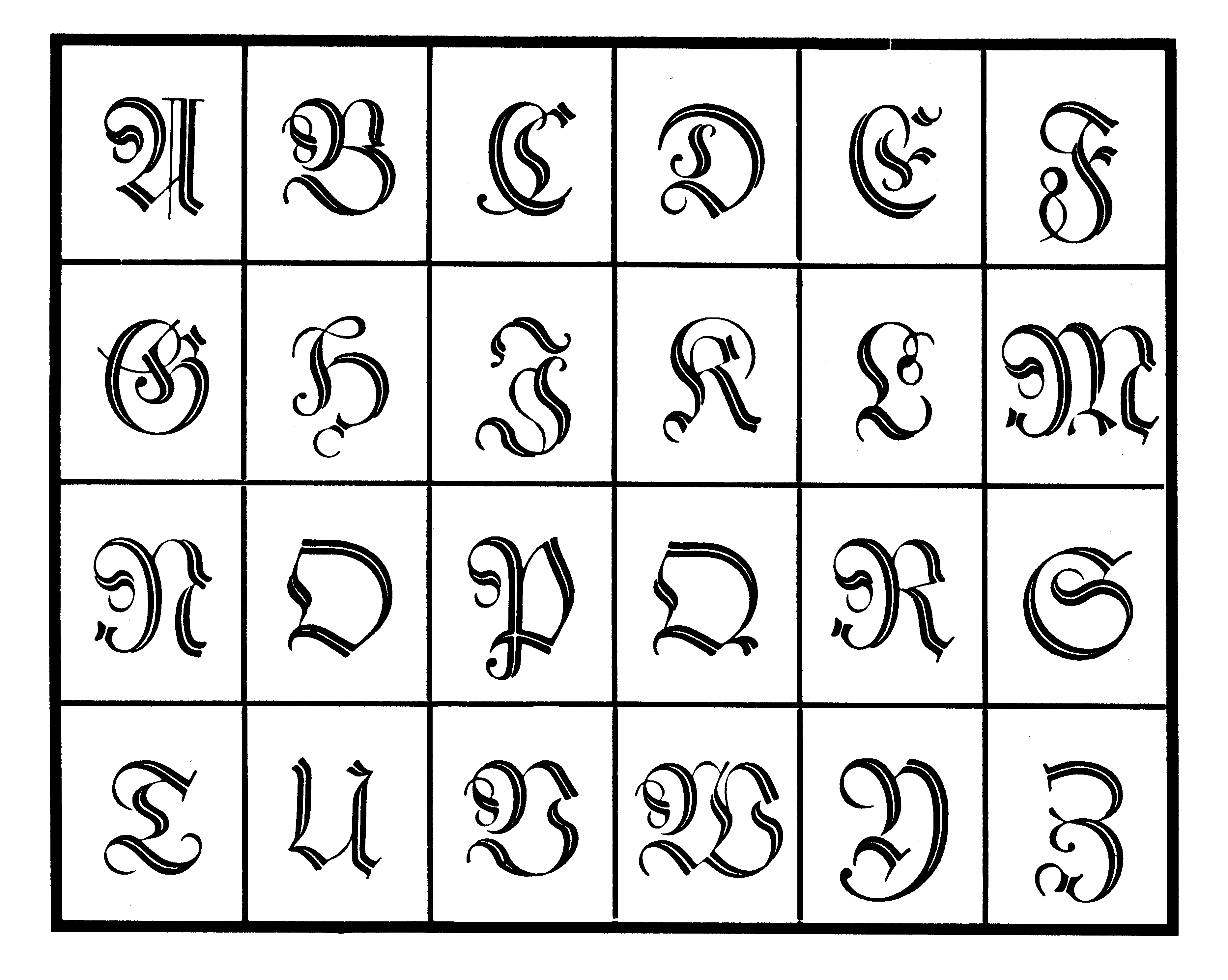
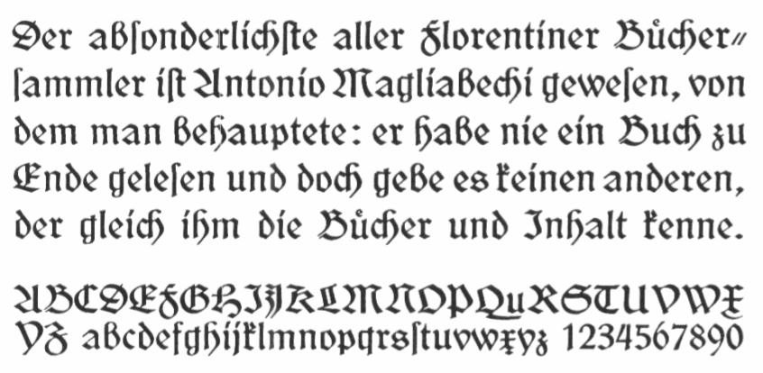
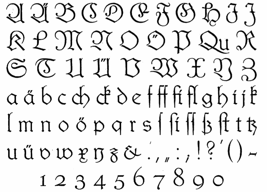
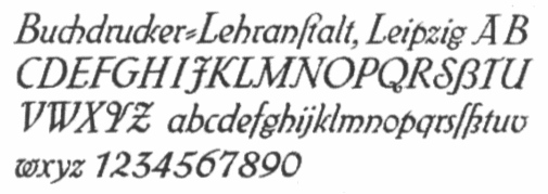
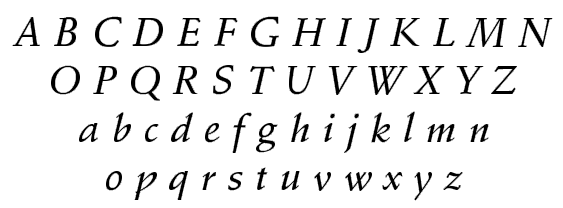
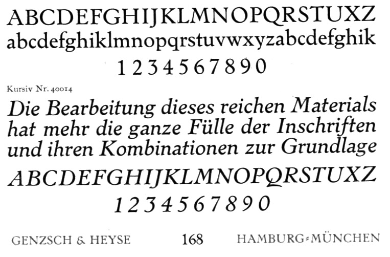
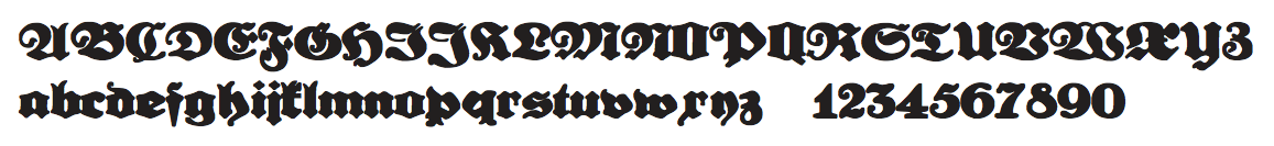
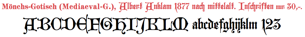
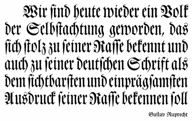
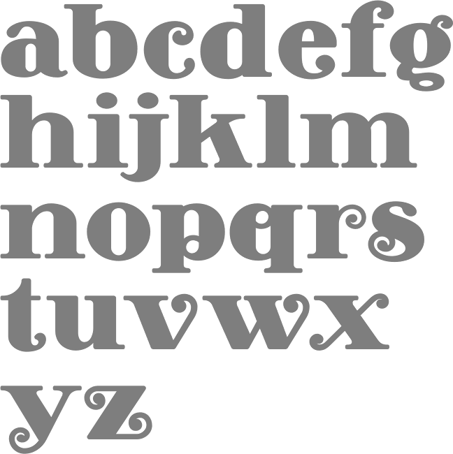
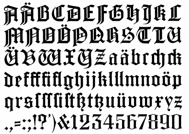
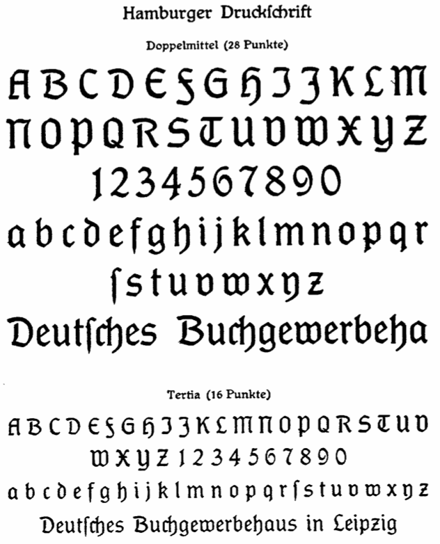
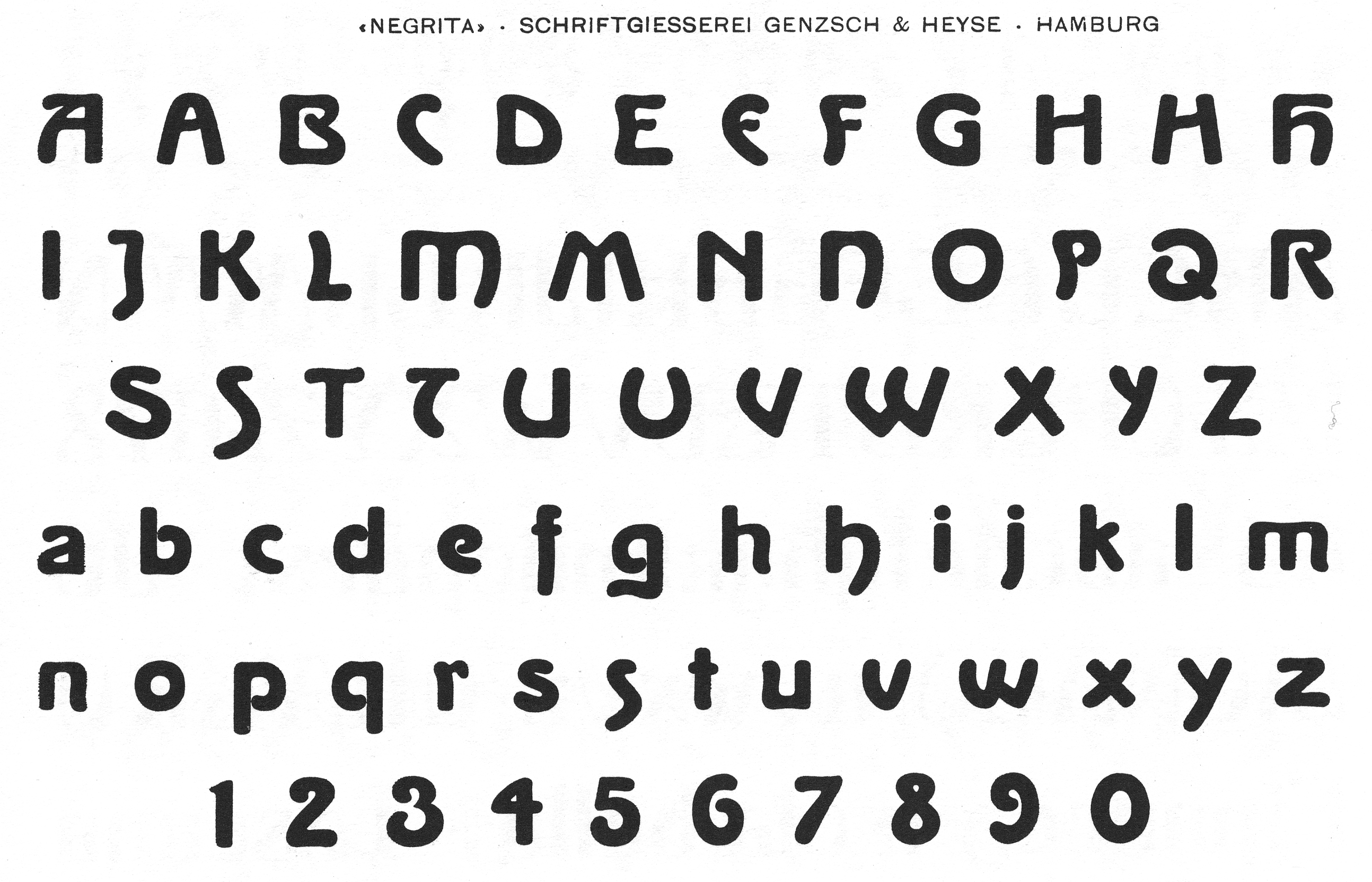
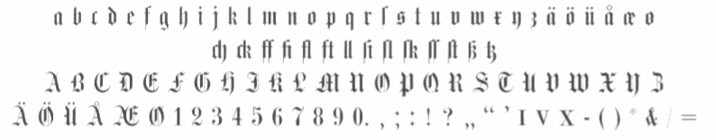
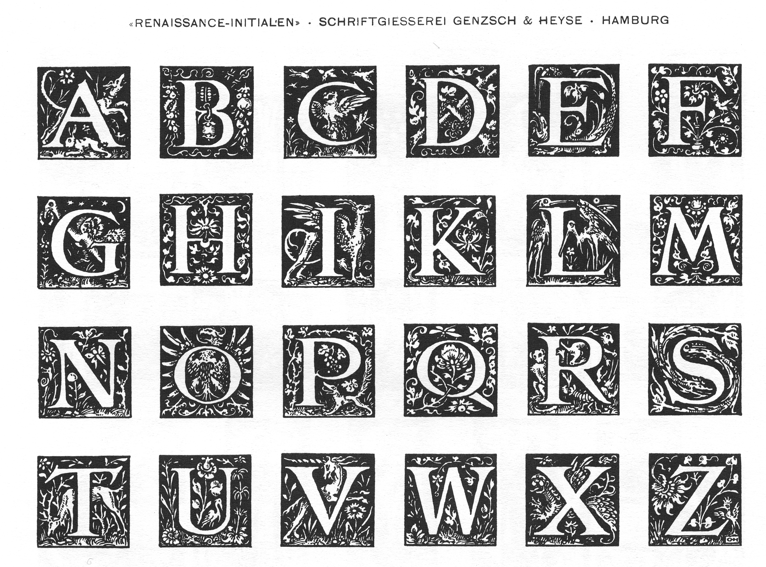
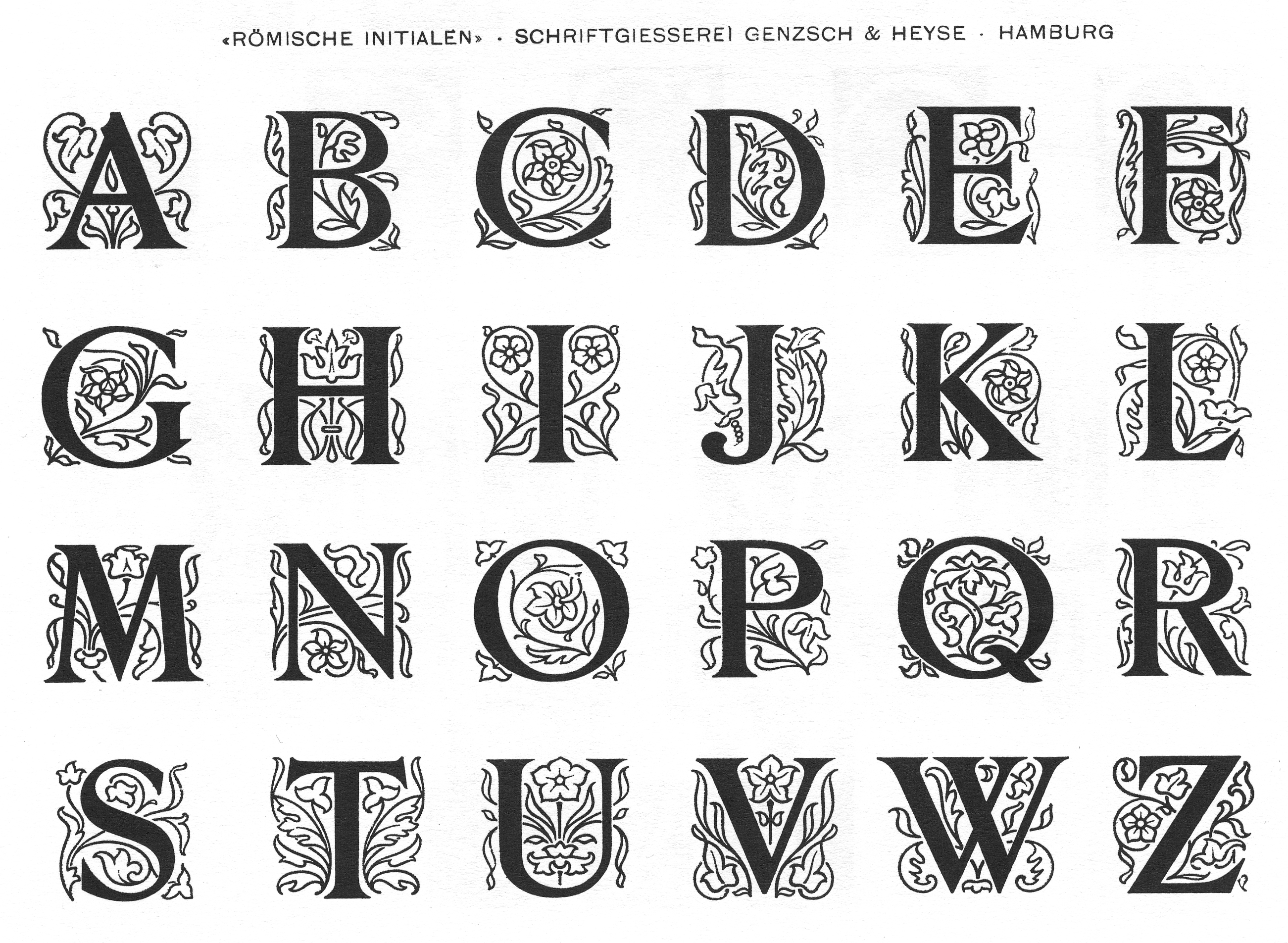
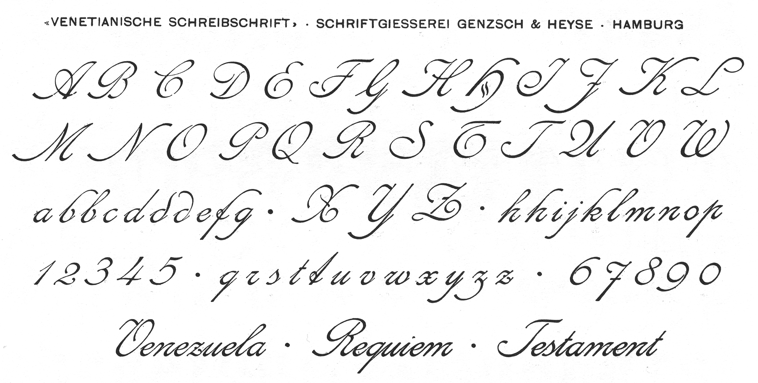
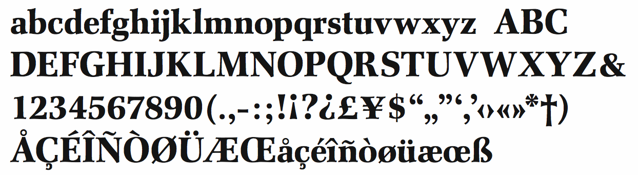
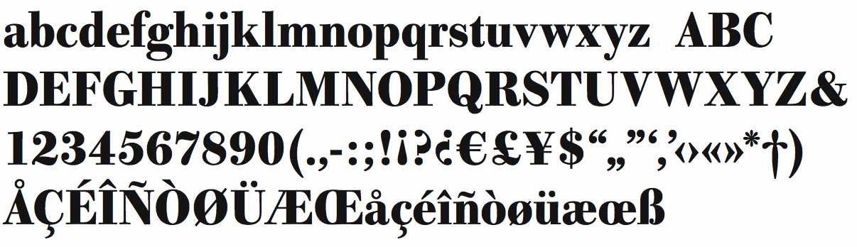
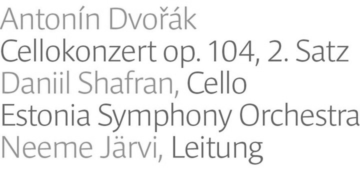
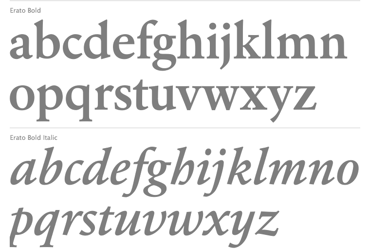
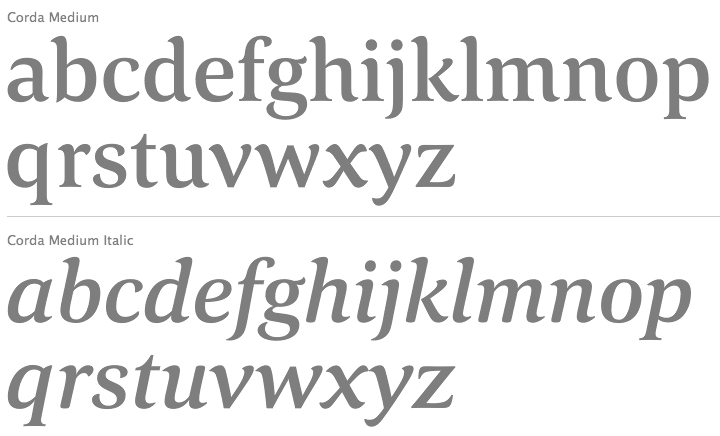
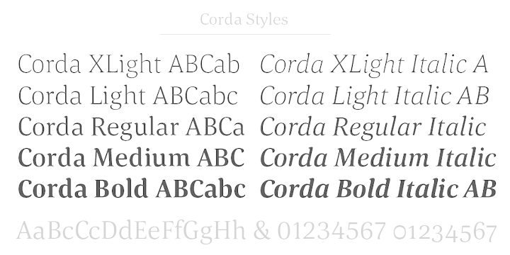
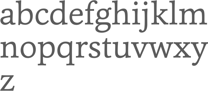
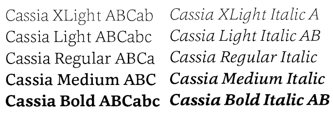
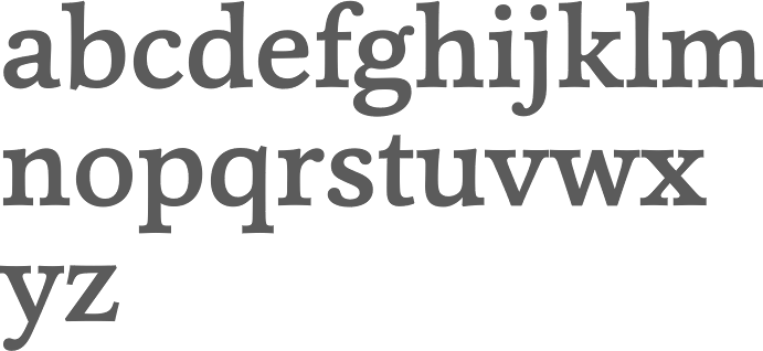
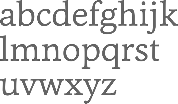
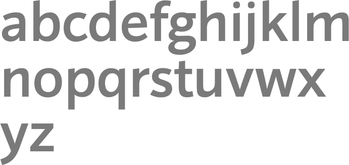
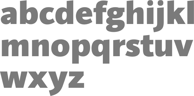
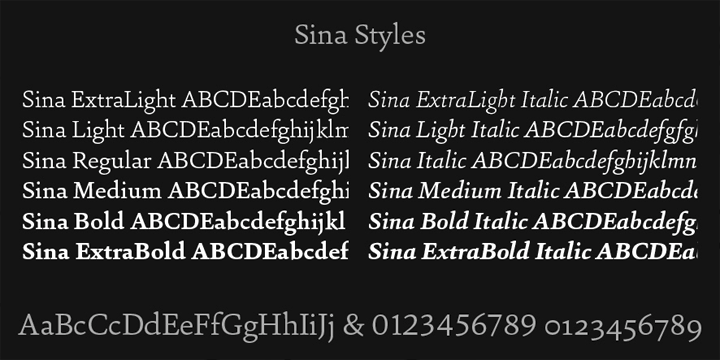
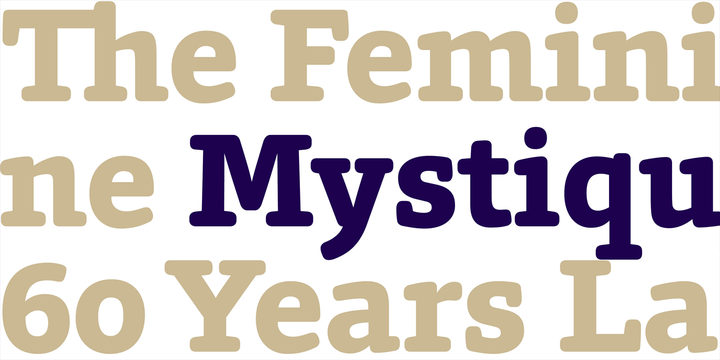
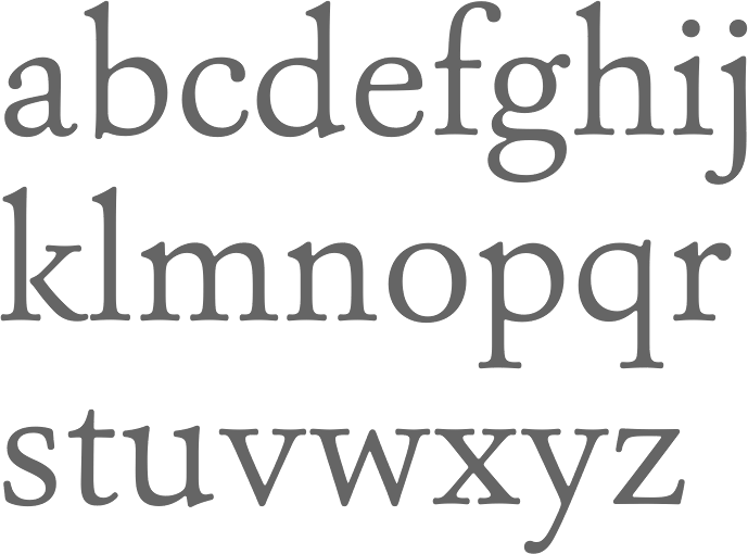
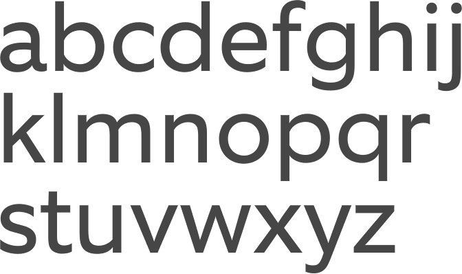
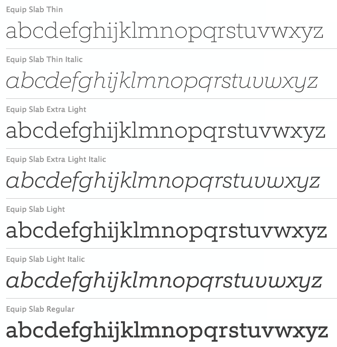
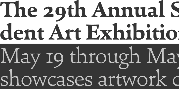
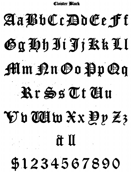
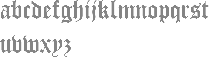
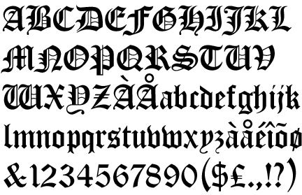
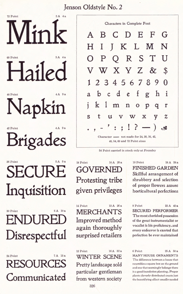
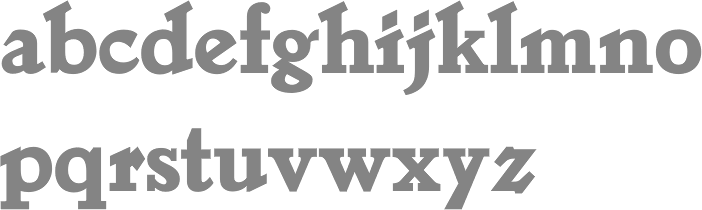
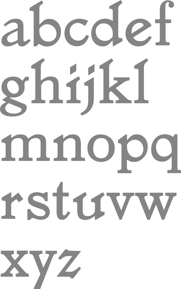
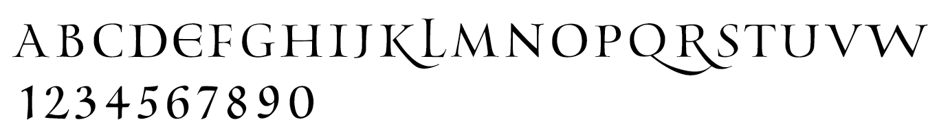
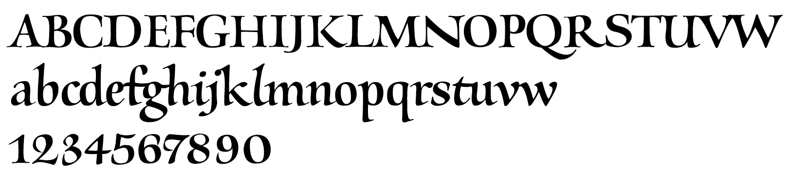
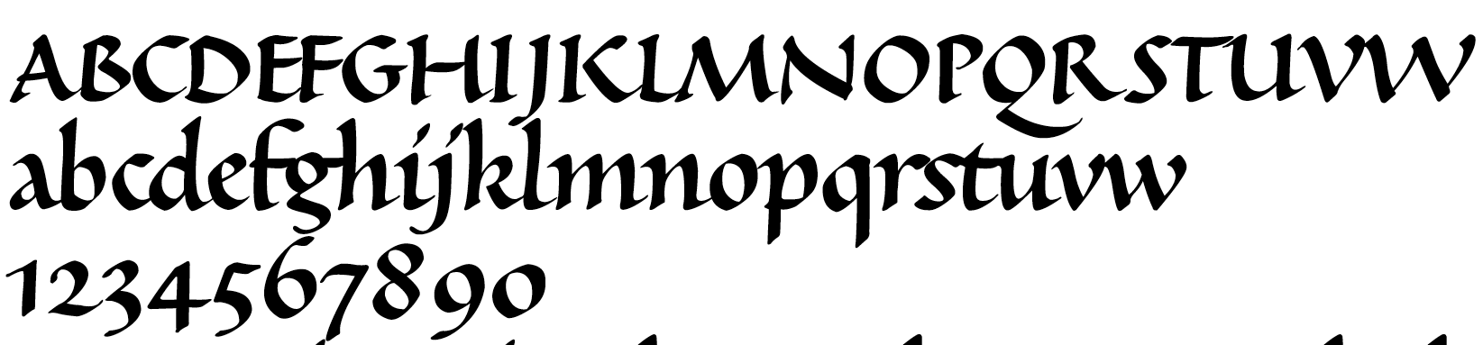
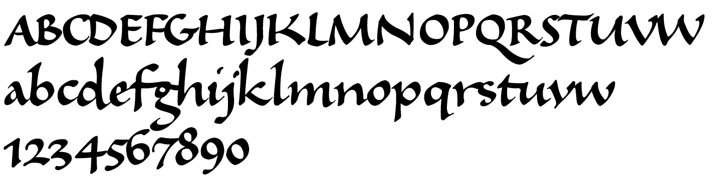
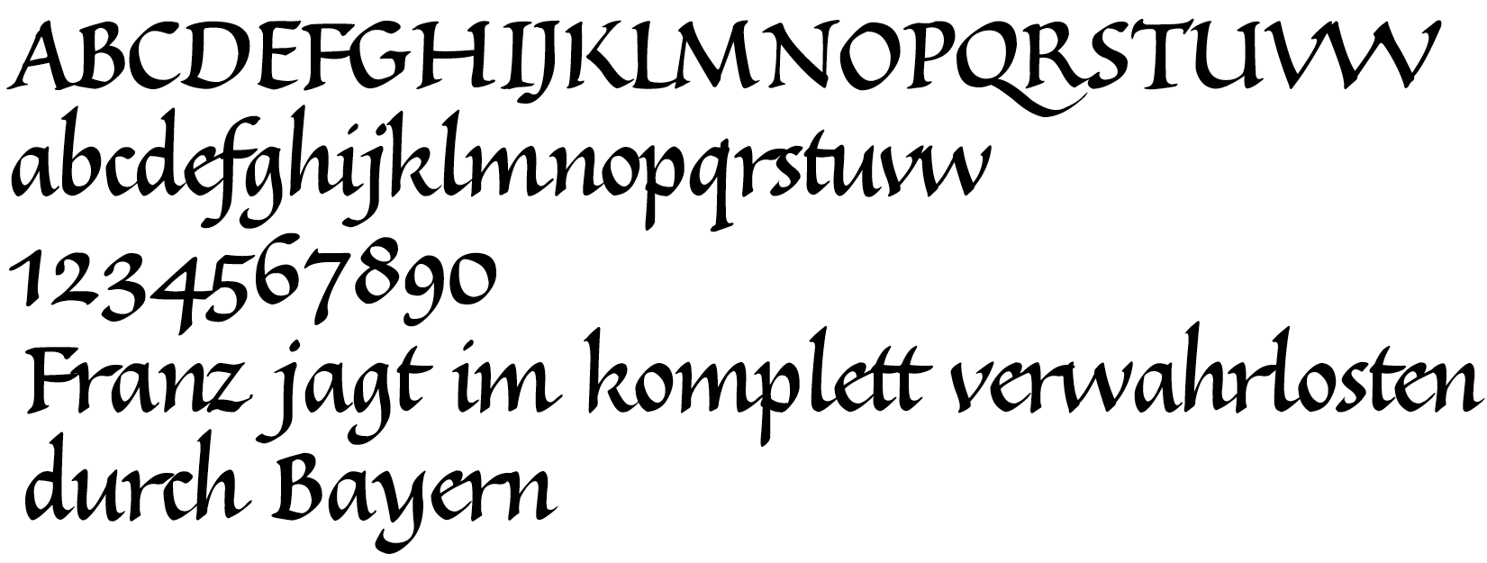
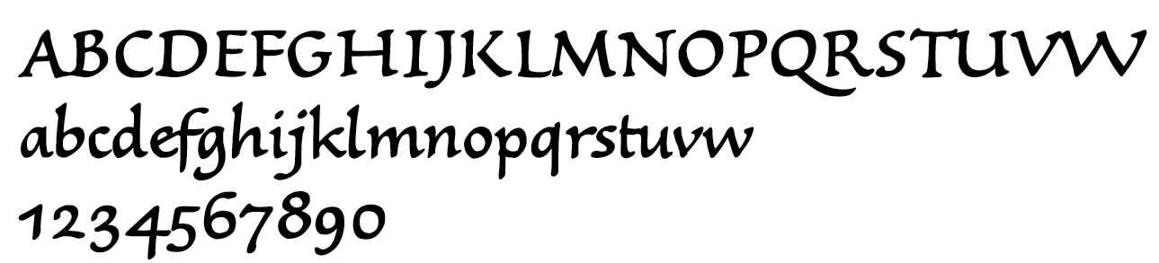
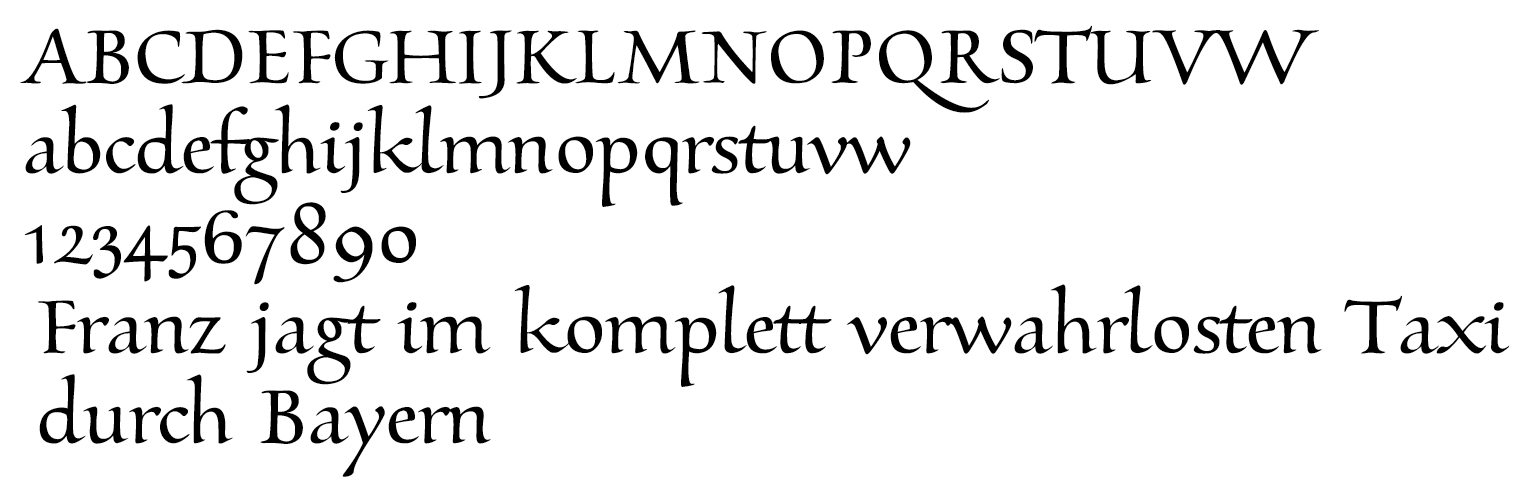
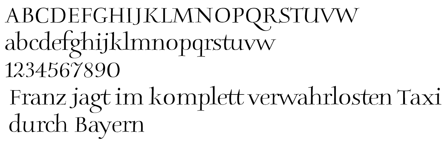
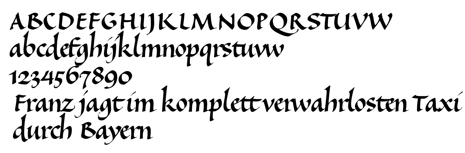
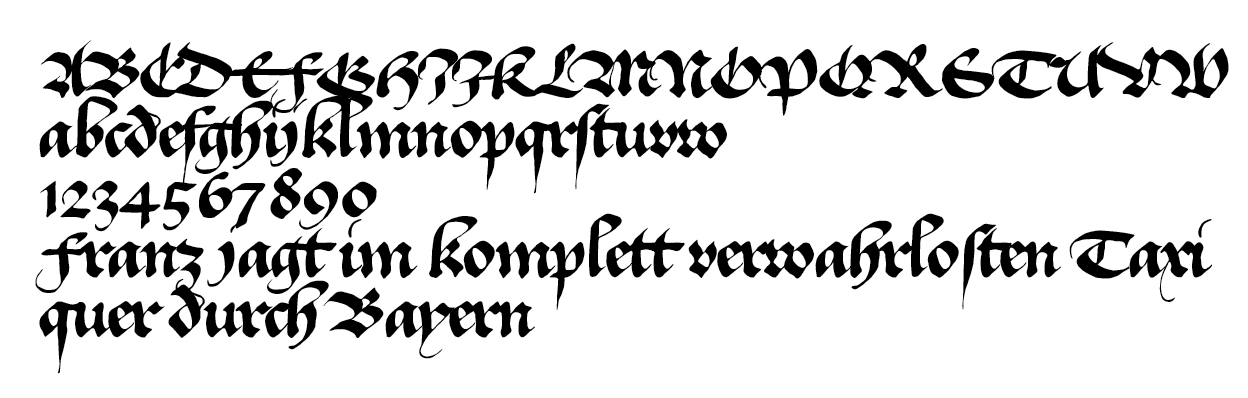
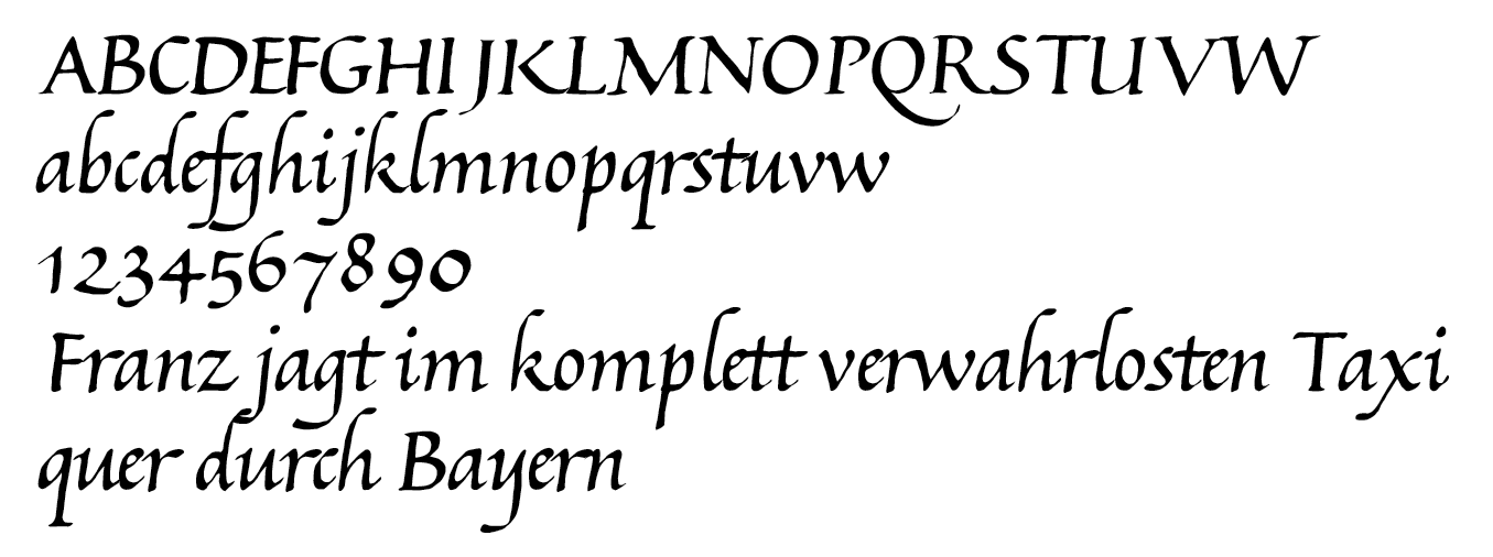
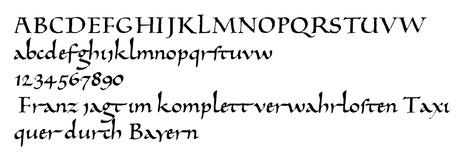
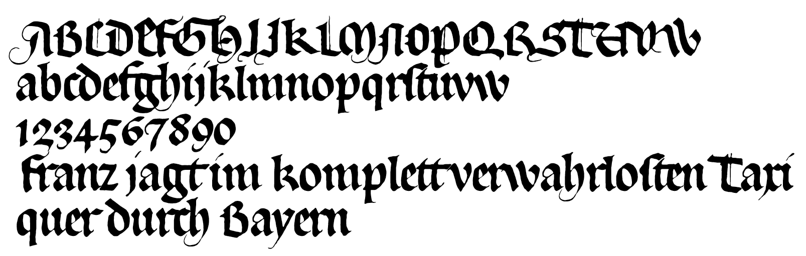
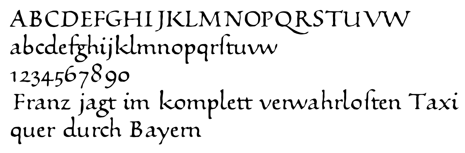
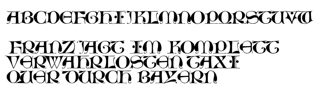
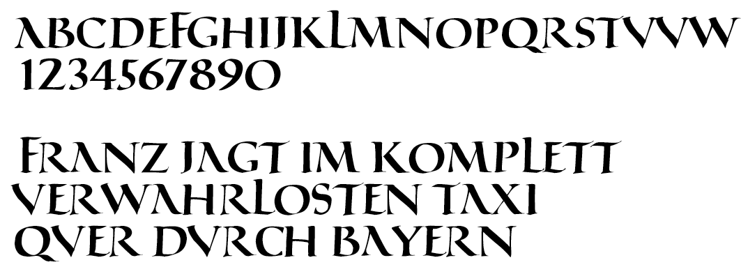
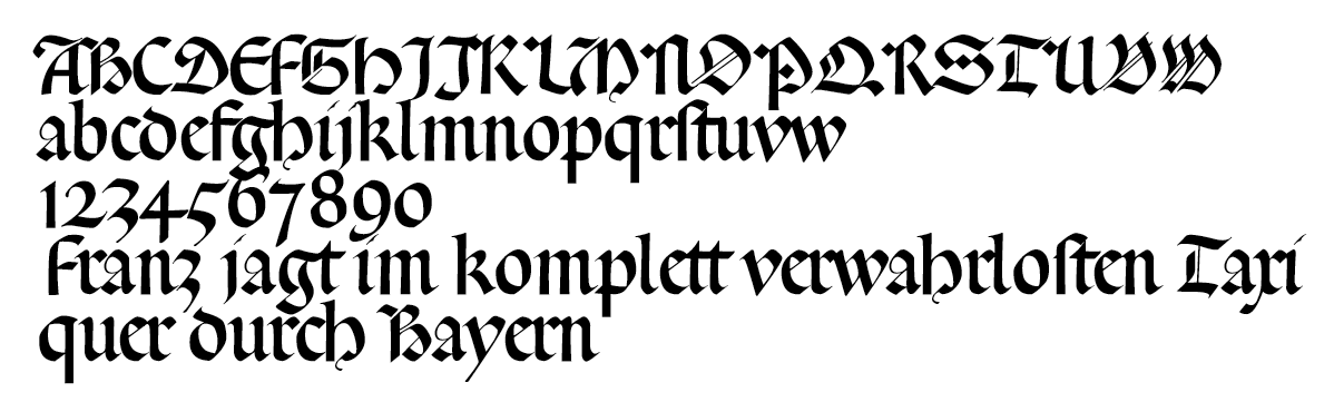
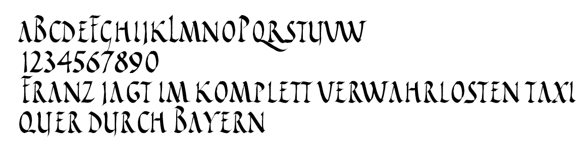
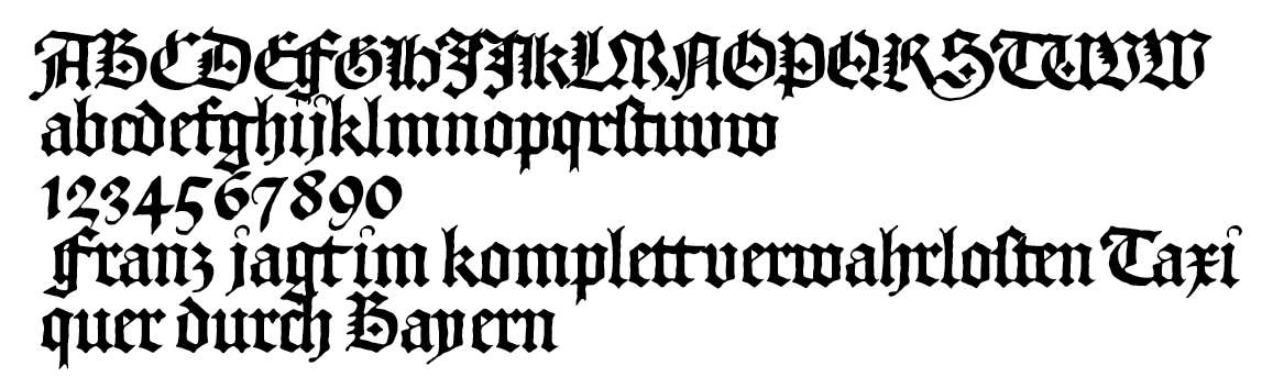
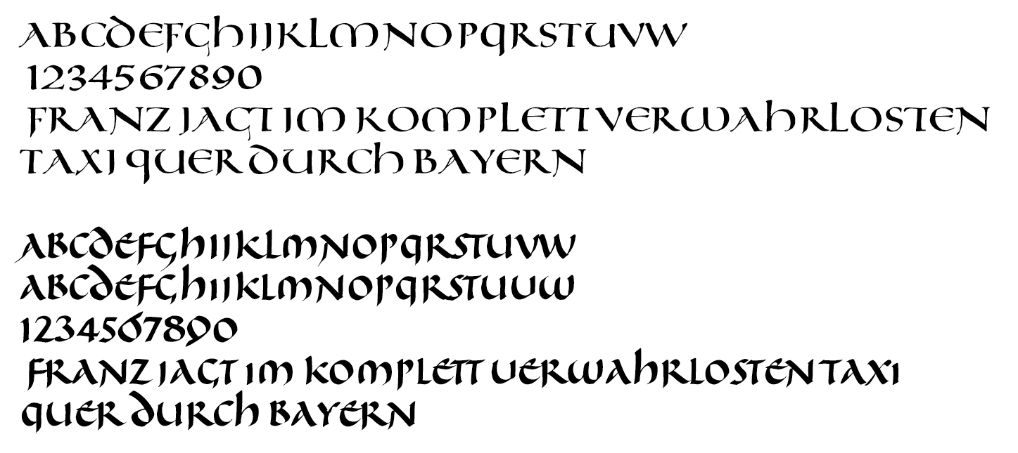
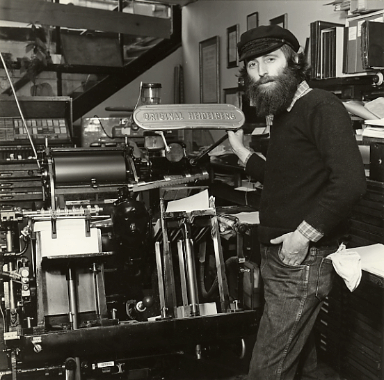
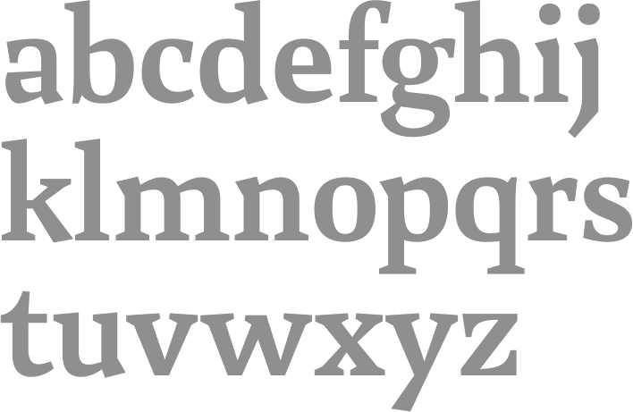
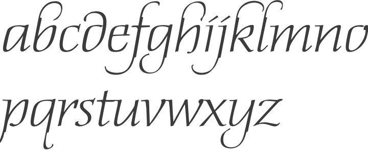
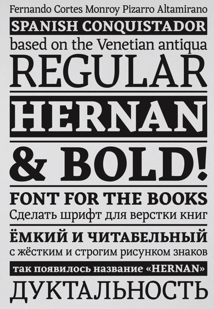
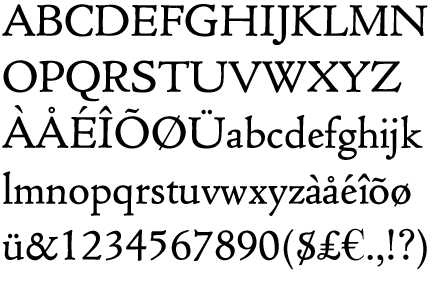
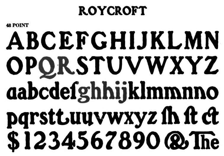
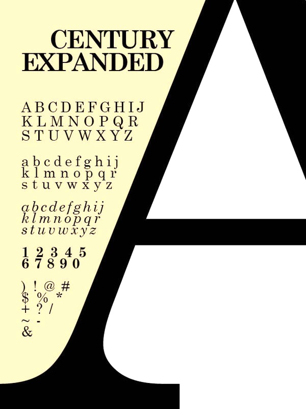
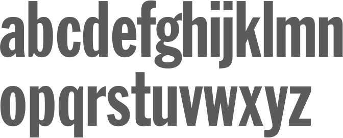
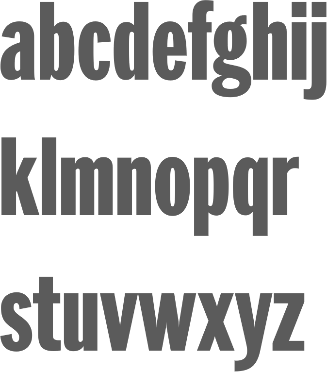
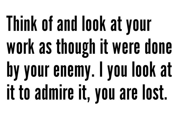
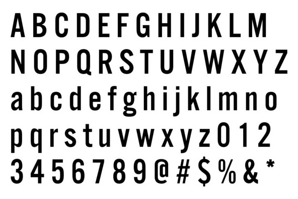
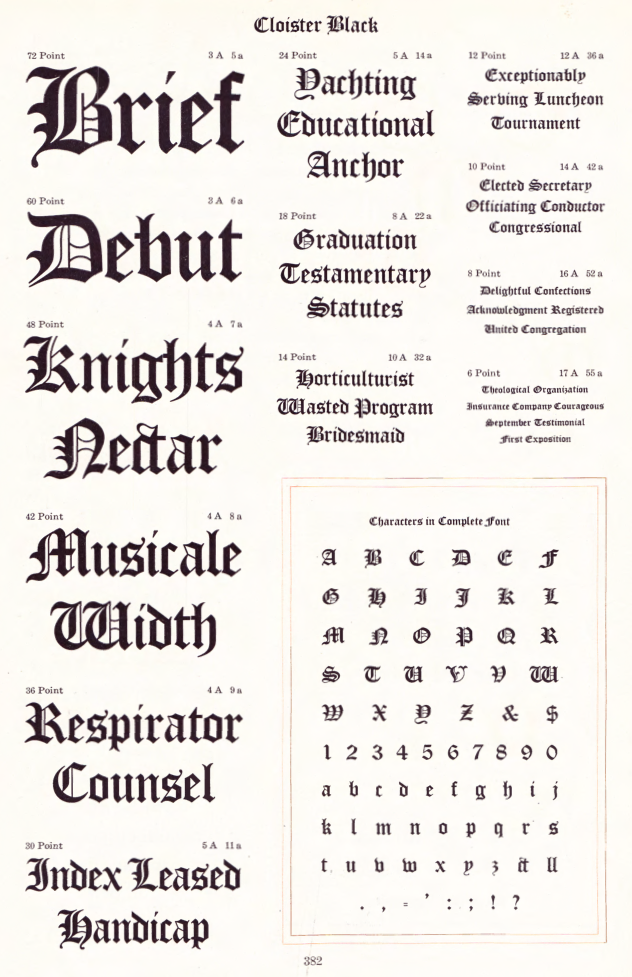
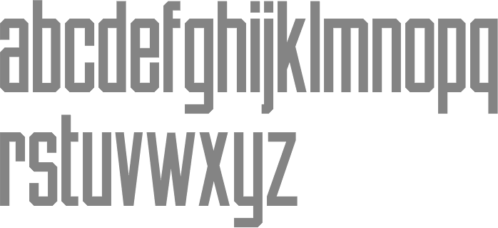
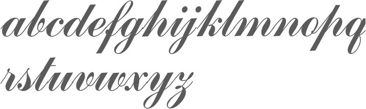
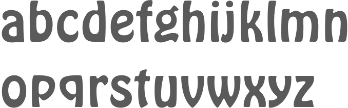
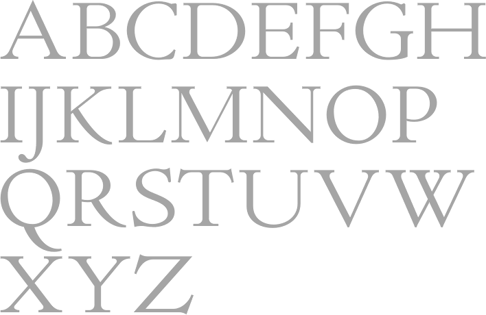
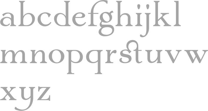
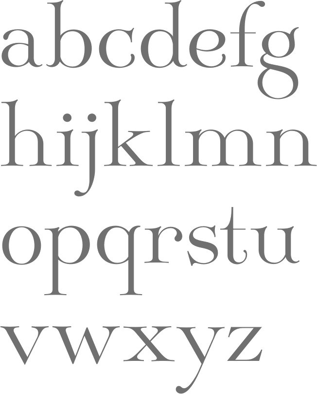
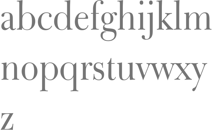
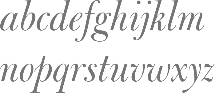
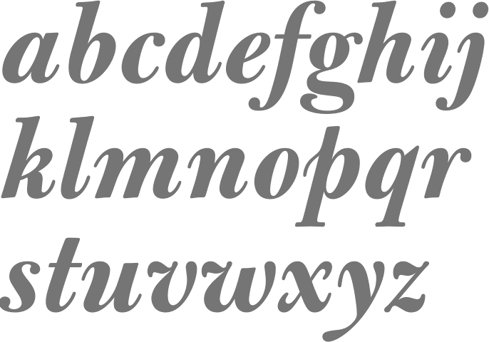
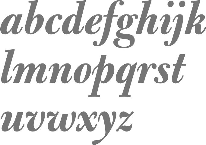
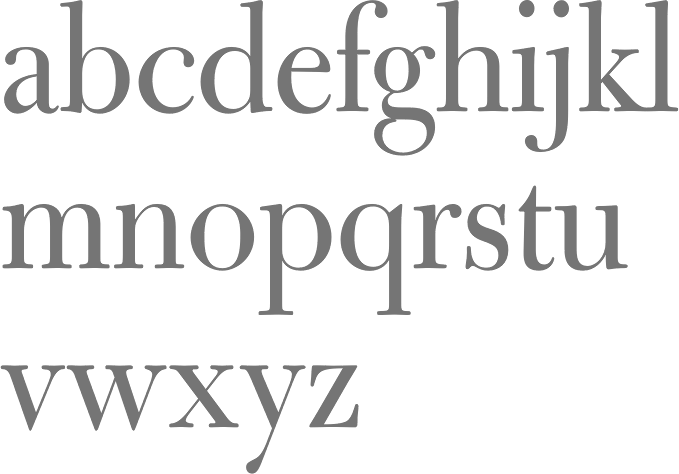
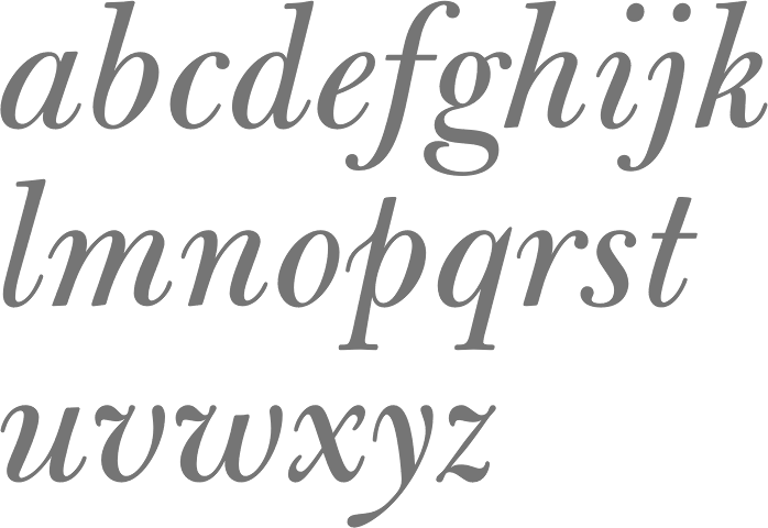
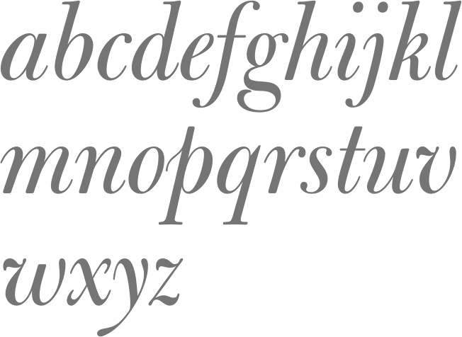
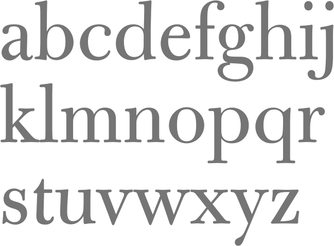
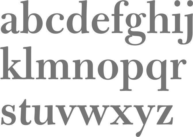
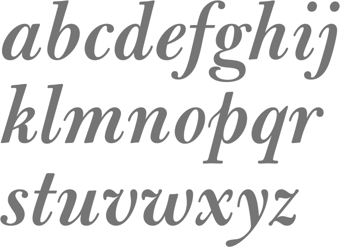
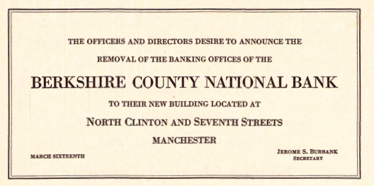
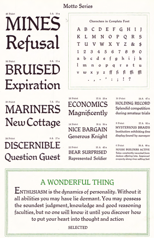
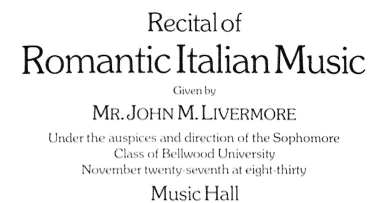
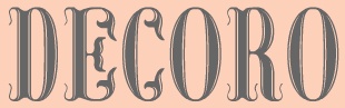
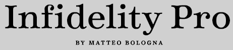
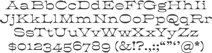
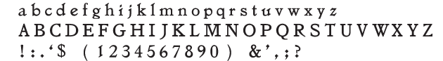
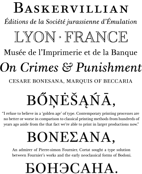
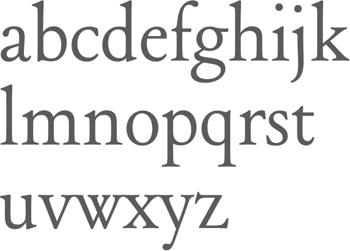
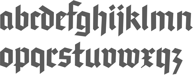
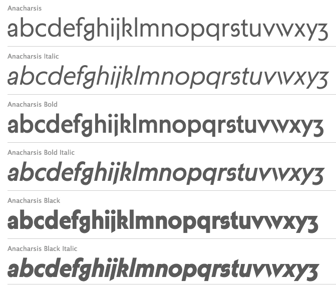
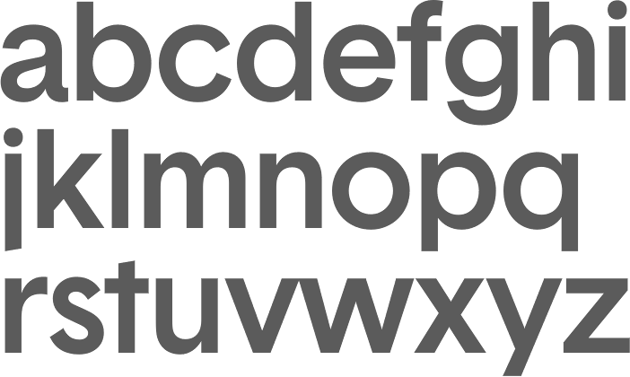
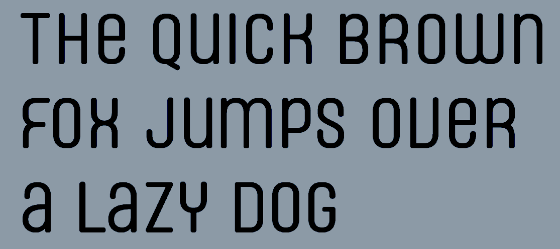
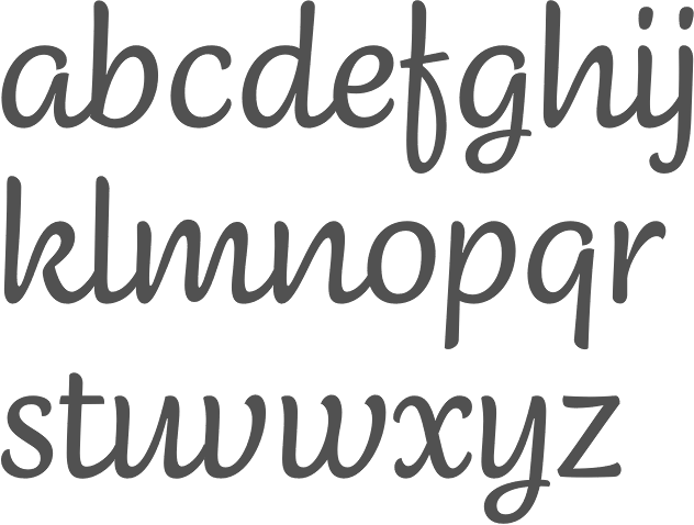
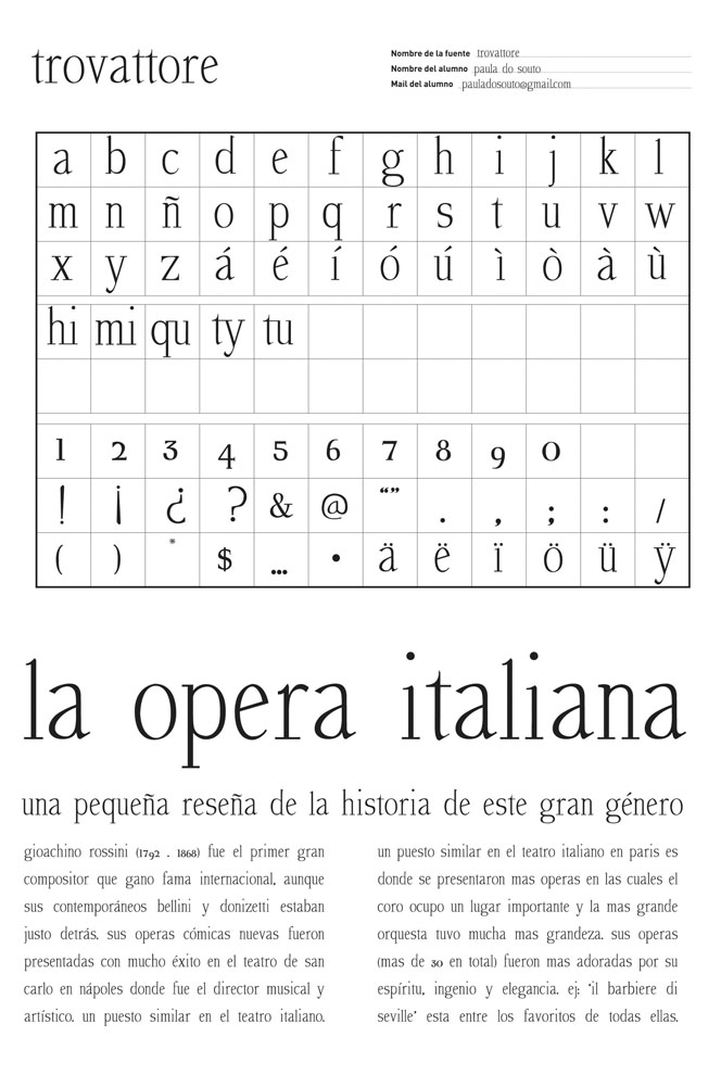
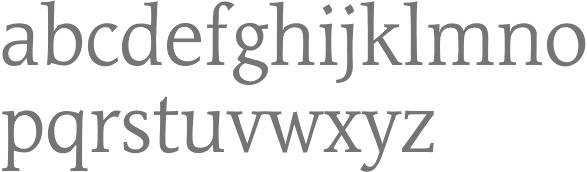
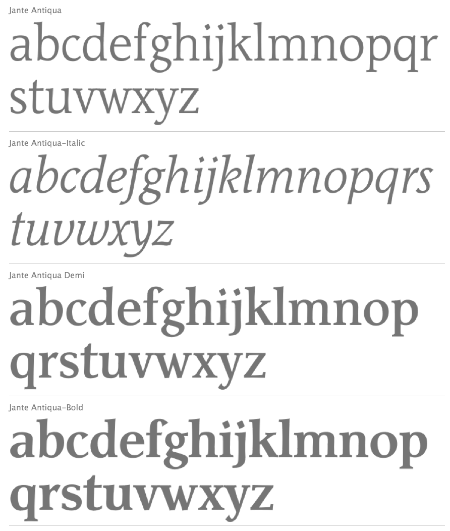
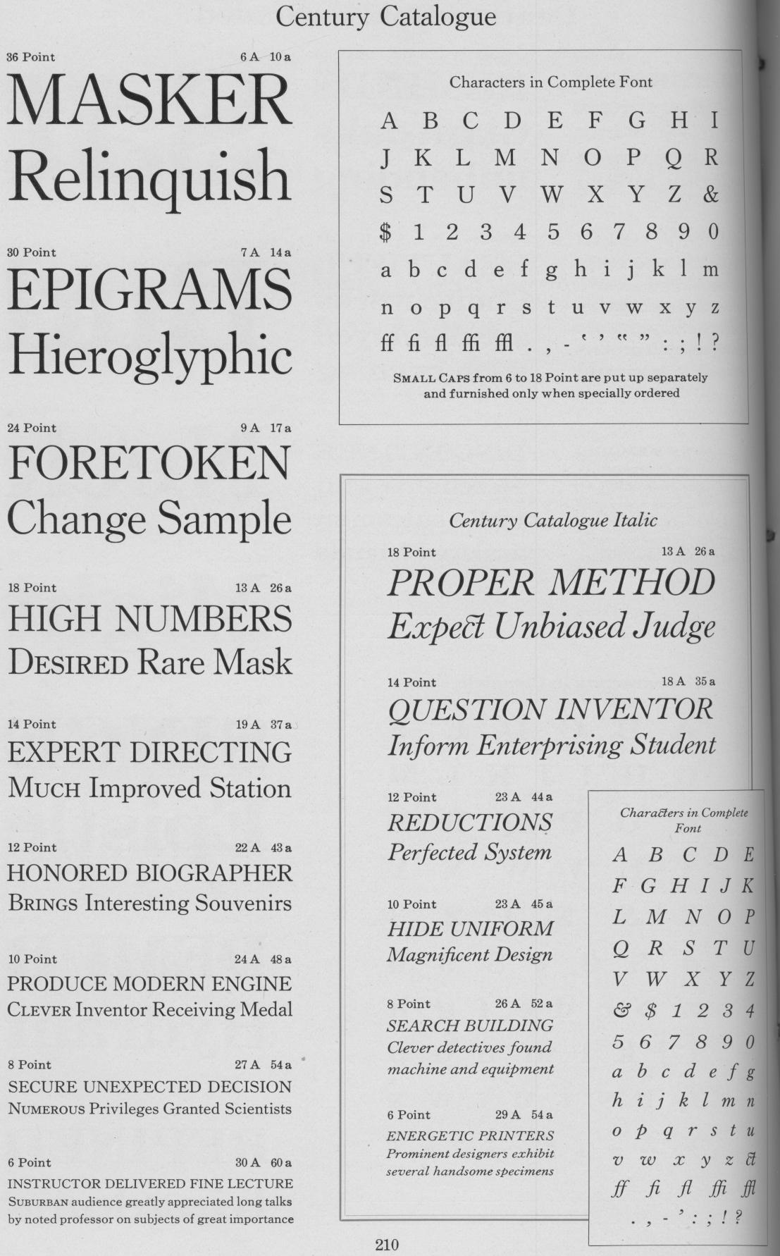
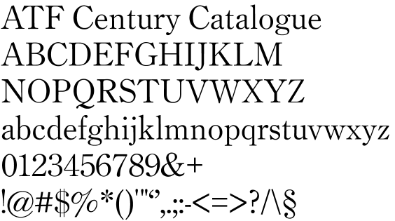
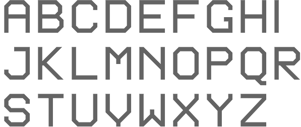
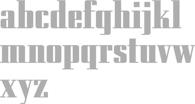
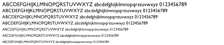
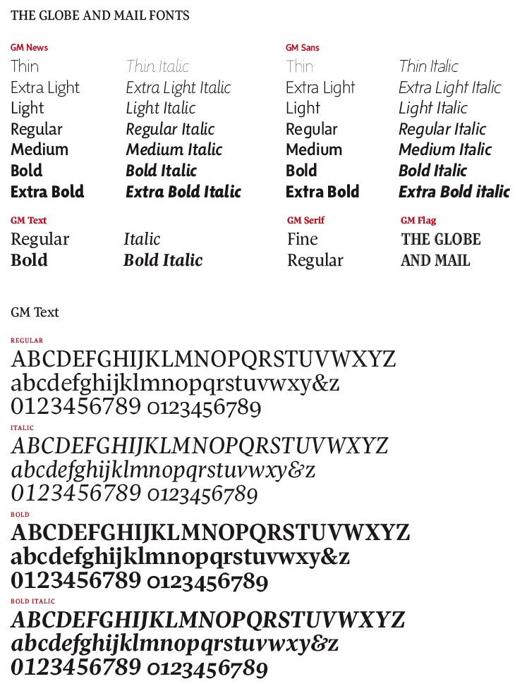
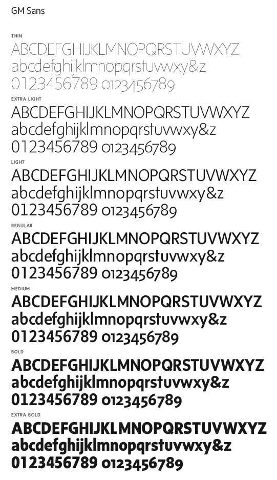
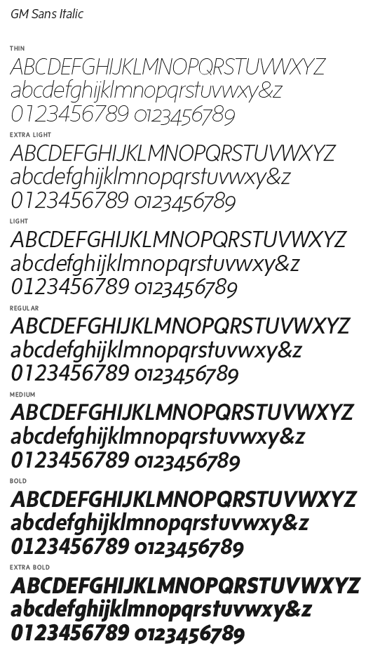
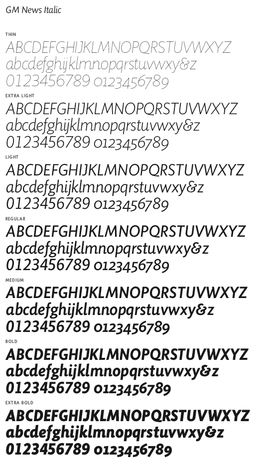
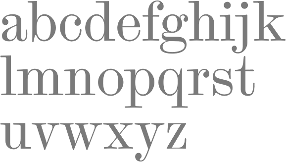
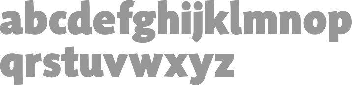
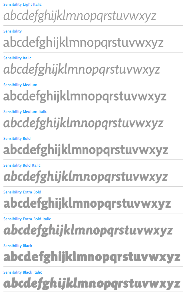
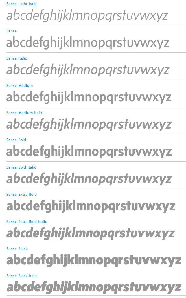
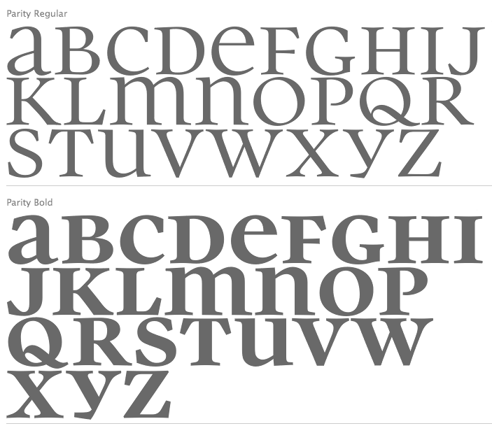
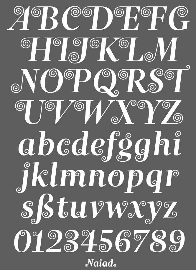
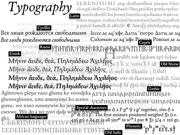
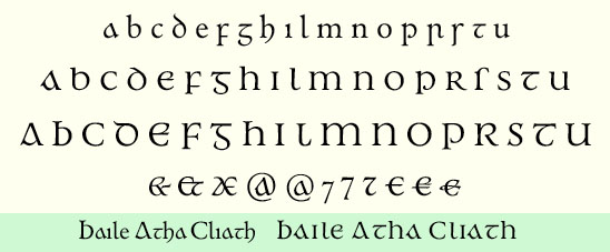
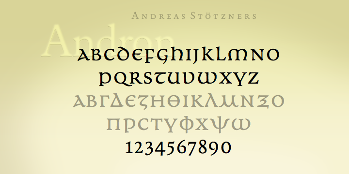
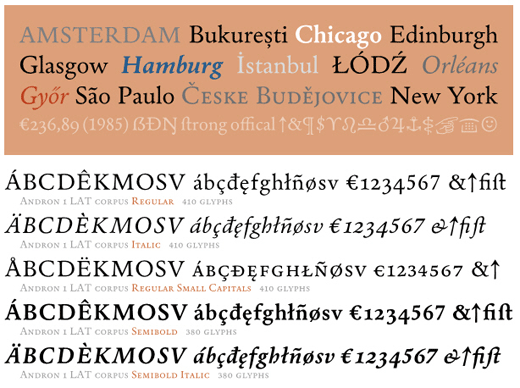
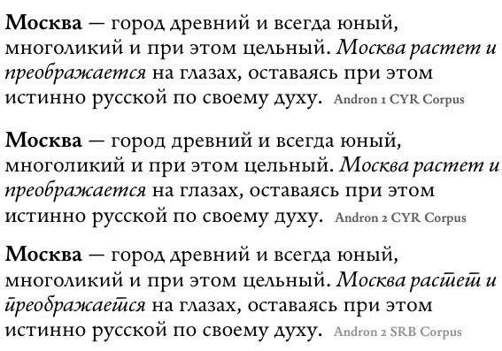
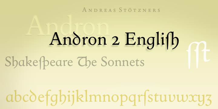
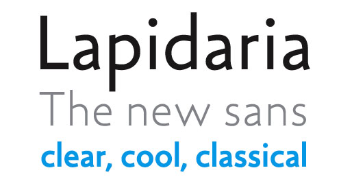
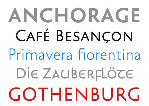
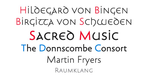
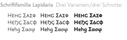
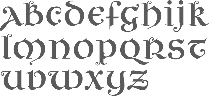
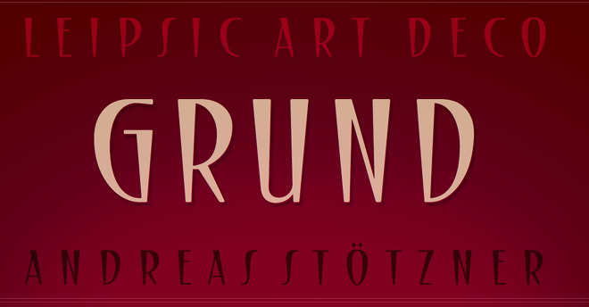
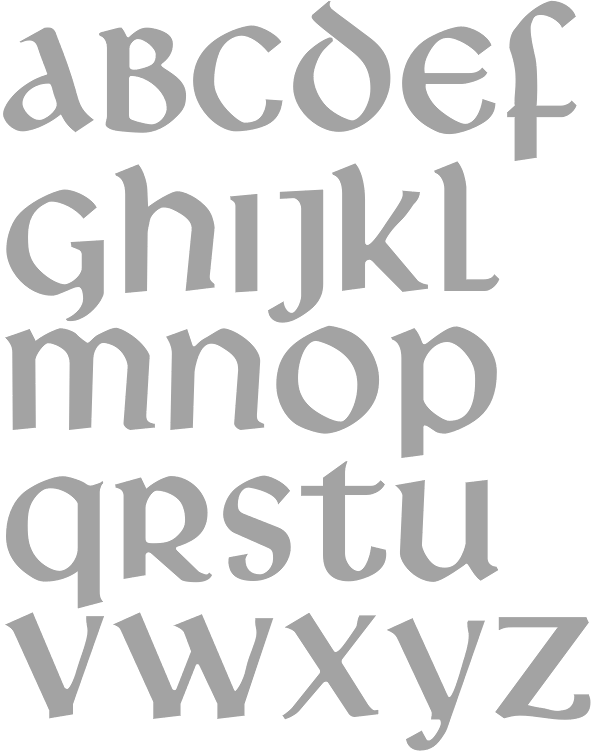
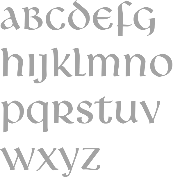
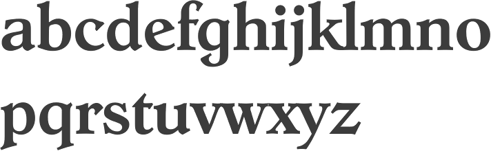
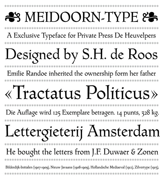
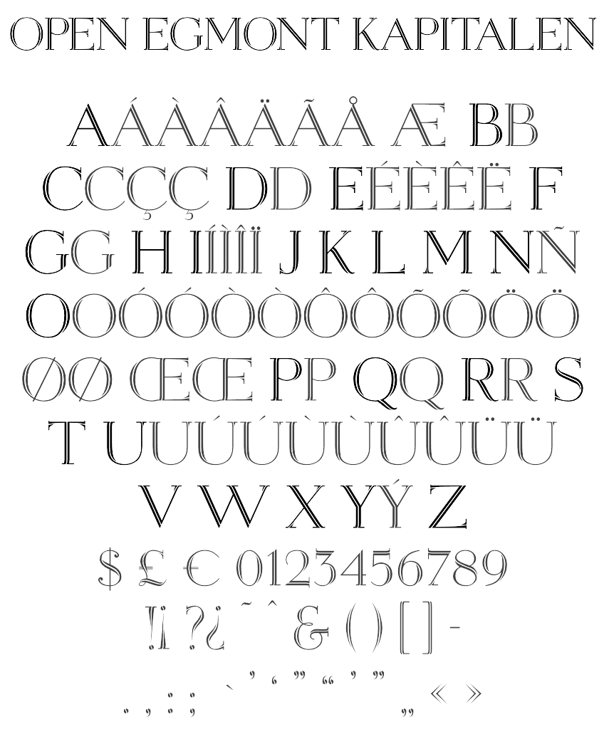
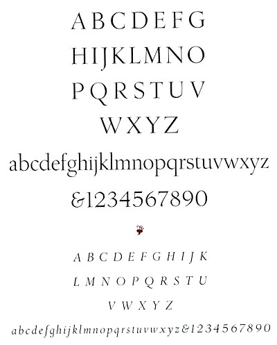
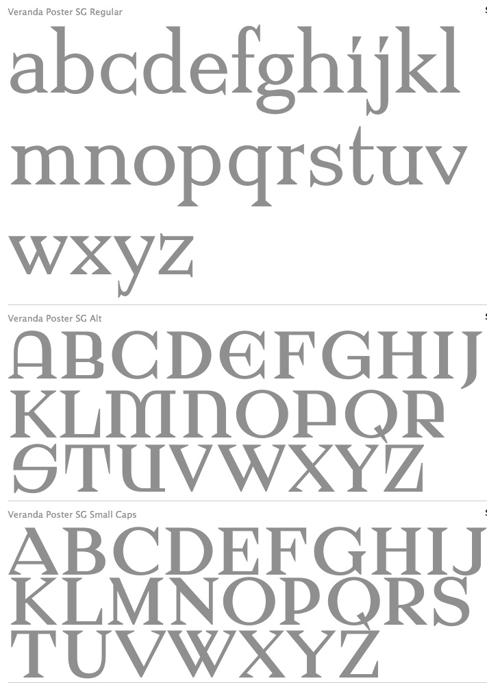
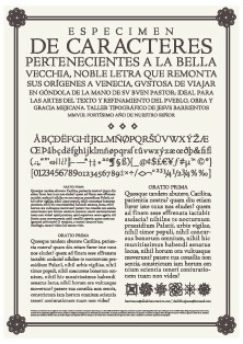
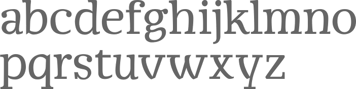
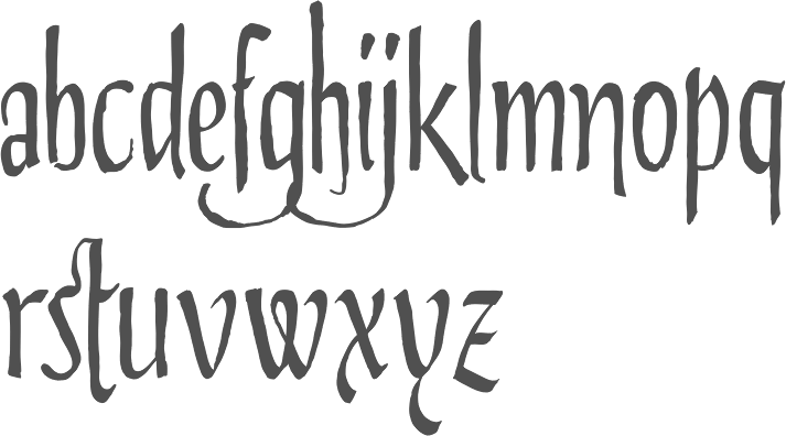
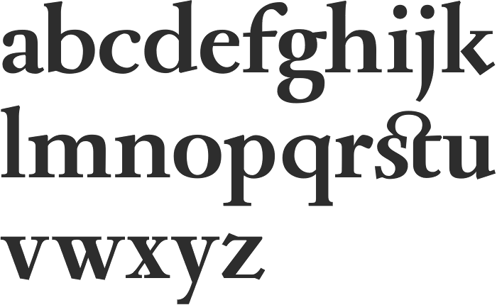
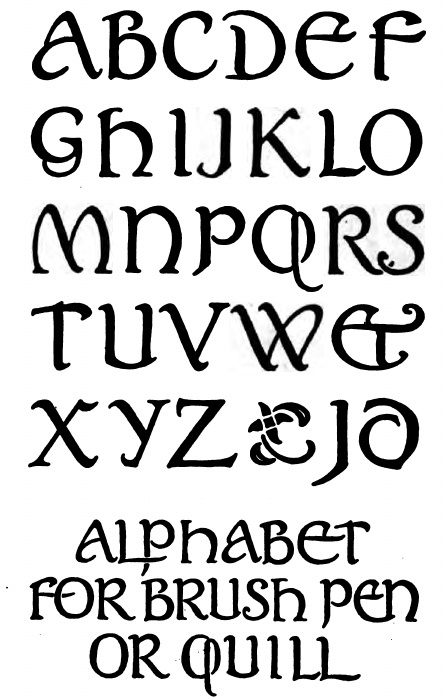
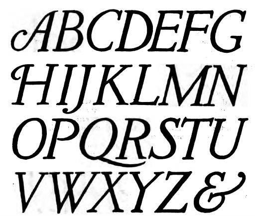
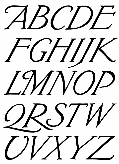
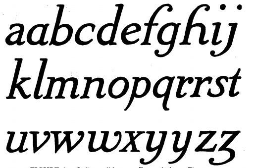
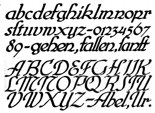
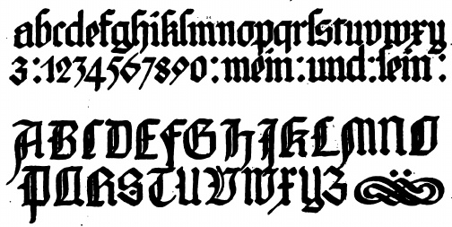
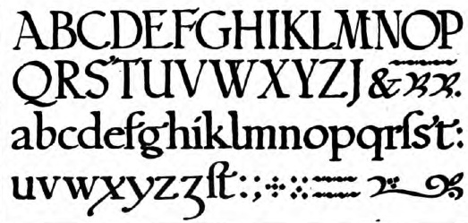
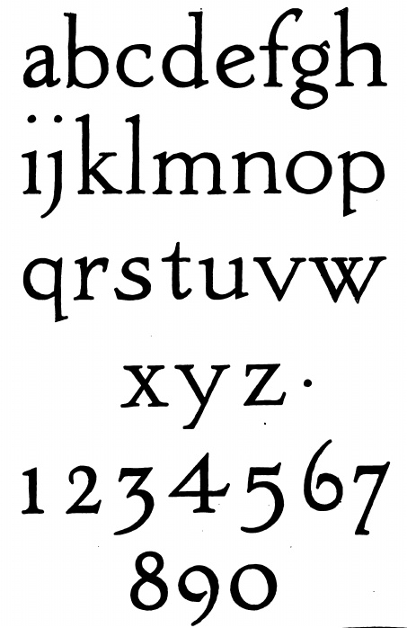
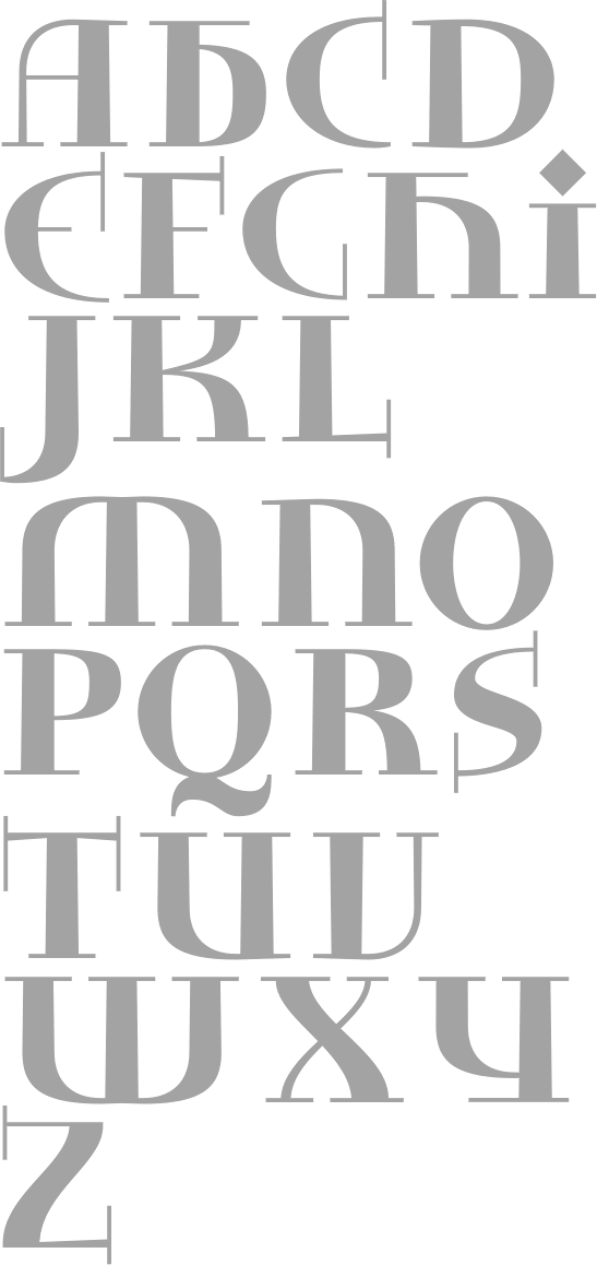
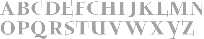
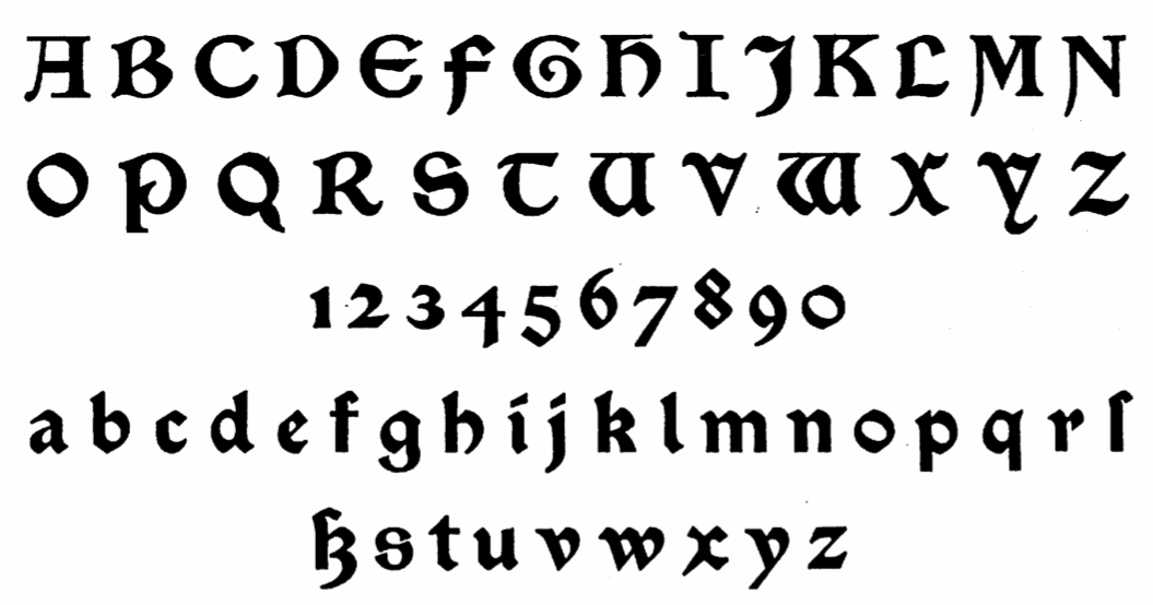
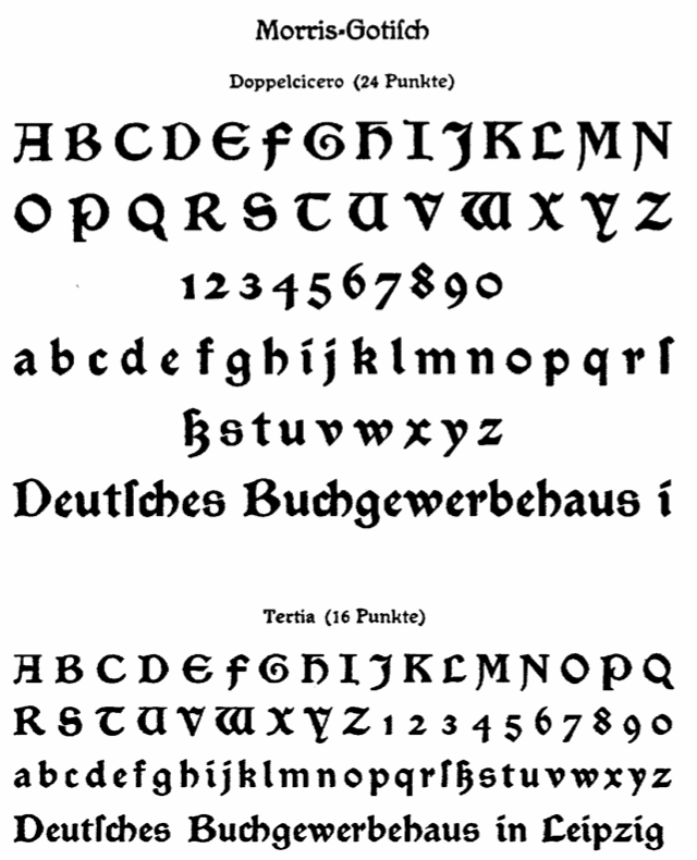
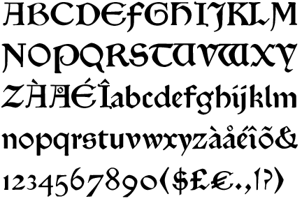
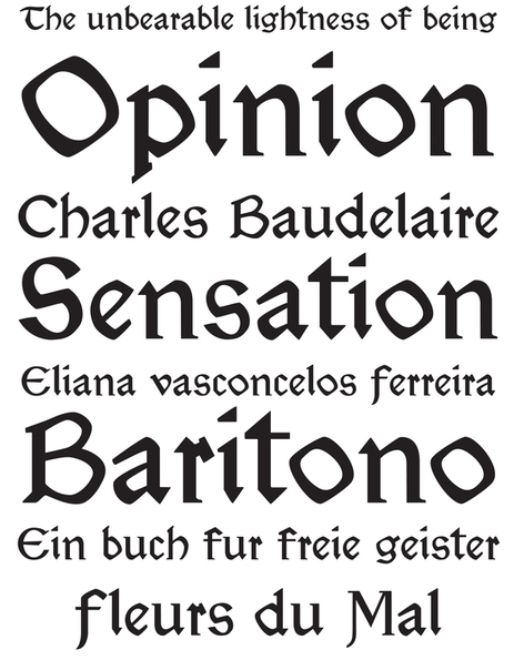
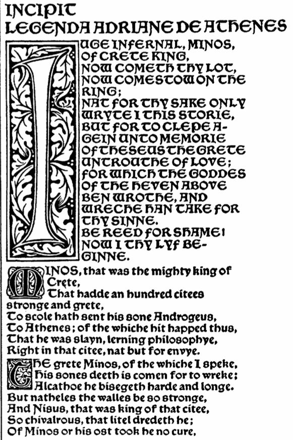
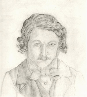