| | |
1871 Project
[Alex Joganic]

|
 Alex Joganic (1871 Project) is the Birmingham, AL-based designer of Matches (2016, an octagonal typeface), Ciclista (2016, a casual monoline typeface), Superior (2016, a handcrafted sans), The Victor (2016, handcrafted), Zara Elyse (2016: script), Fernweh (2016, a handcrafted typeface with a vintage wood type look) and Xander (2016, in Sans and Serif: 19th century all caps typeface family with a wood type look).
 Typefaces from 2017: Garment District (a free monoline script designed together with Jeremy Vessey), Crafter (a free vintage metal sign emulation font), Grandfather (brush script). Typefaces from 2018: Forward, America (a free brush script), Tradesmith (free), Grit & Caliber (vintage set), Nature Spirit, Messenger (a free vintage font). Typefaces from 2019: Kinder (a heavy fashion mag titling typeface), Moral Varnish (a vintage stencil typeface), Noble Company (a monoline script), Rowan Royal (+Brush: a free blackletter). Typefaces from 2020: Understock (vintage). Typefaces from 2021: Doric (a display typeface by Alex and Emma Joganic), Darker, Clever (a sharp-edged display typeface with negative angle and the coathanger lower case f that is de rigueur in 2021), Sonder (a decorative serif with diagonal stress). Typefaces from 2022: Roslyn Leigh (combining art nouveau with hipsterism). [Google]
[MyFonts]
[More] ⦿
|
38 Lineart Studio (or: Grayscale, or: Fontsources)
[Muhammad Ridha Agusni]

|
 Architect and designer in Banda Aceh, Indonesia, b. 1980, who set up Grayscale, then 38 Lineart, and finally Fontsources.
 In 2018, he released the hexagonally-patterned color font Space, the nervous monoline display typeface Barcelona, the monoline script Brandy, the tattoo and metal band blackletter font Amstha, Twinkle (hexagonal texture), Premium Quality, Hightide (signage script), Ashley Pages, Bold Grunge (a wood style Western font), Rabbit House, Strongbold (brush style), Onthel (a rhythmic signage script), Cafeine, Seulanga (calligraphic), Sweet Bubble, Downhill, Architecture (technical writing font), Wisethink (rough brush), Emerald, Ghotic, Oakland (signage script), Parthenon (signage script), Strawberry Night (script), the formal calligraphic font Beauty Athena, the inline font Epicentrum, and the signature font Attitude in 2018. Typefaces from 2019: Ghoust (a marker font done at Cititype), Diamant Handwriting (a signature font), Utrecht (with Siti Saribanon Nurjannah), Exhibitionist (a fine rhythmic script), Holimount, Prague Metronome (a thin signature script), Allegroost (a brush typeface), Anisha (script), Kyoto Northern, ChiQuel (a Victorian display typeface that can be layered), Hillstone (a dry brush script), Malique, Ginchiest (a retro signage script), Kid Knowledge, Haghia, Khatija Calligraphy, Bernound, Graffity, Brandy Script (monoline), Downhill, Concept (sketched, blueprint font), Konya (signature script), Blacksmith, Curve Calibration (condensed sans). Typefaces from 2020: The Pallace (a great natural inky signature script by Muhammad Ridha Agusni and Siti Saribanon Nurjannah), Chipen (inline, all caps), Jakarta (a flowing inky script by Muhammad Ridha Agusni and Siti Saribanon Nurjannah), Rhode White (a great signature script by Muhammad Ridha Agusni and Siti Saribanon Nurjannah), Bailamore (a creamy signage script), Vogie (a sporty / techno sans family of 72 fonts, plus a variable font), Rollingtime (a brush script jointly designed by Muhammad Ridha Agusni and Siti Saribanon Nurjannah), Piedmont (a heavy connected handwriting script advertized as a masculine signature font), Whiplash (an all caps dry brush font), Aceh (a 36-style geometric sans), Youthink, Sacred Letter (a vintage weathered script), Serif Sketch (by Muhammad Ridha Agusni and Siti Saribanon Nurjannah), Corinthiago, Smart Chameleon (a handcrafted typewriter font by Muhammad Ridha Agusni and Siti Saribanon Nurjannah), Hiroshima Gyoshi (a brush font inspired by Japanese calligraphy), Roughmarker (dry marker font), Brotherhood, Blugie (a fat finger font), Rome Ionic (an all caps roman typeface), Black Orchestra (a great horror or black metal font), Black Orchestra (a horror font). Typefaces from 2021: Magreb (an 8-style renaissance serif typeface), Toxide (calligraphic; Celtic; uncial), Redtone (a 14-style geometric sans), Moula (an 18-style geometric sans for Latin, Greek and Cyrillic), Zouk (blackletter), Zagreb (an inky signature script by Muhammad Ridha Agusni and Siti Saribanon Nurjannah), Alsace (Victorian), Backbone (a black metal blackletter typeface), Roundkey (a 24-style condensed, but not round, sans), Wordwalker (a marker pen font by Muhammad Ridha Agusni and Siti Saribanon Nurjannah for Cititype), Sweet Bubble (a bubblicious font), Souljah (an elegant inky calligraphic script). Creative Fabrica link. Another Fontbundles link. [Google]
[MyFonts]
[More] ⦿
|
7GUN
|
Design site in Moscow. Creators of the geometric figure (Latin) stencil typeface Caribe Modular (2013), which was created as a project for the British Higher School of Art & Design. Intrnal Hybrid (2013) was also completed at the British Higher School of Art & Design in Moscow. Deriz (2013) is a high-contrast didone titling face. Intrnal Hybrid (2013) is a grungy techno Cyrillic typeface. Vintage and Coupage Font emulates various wood type and letterpress styles. [Google]
[More] ⦿
|
Aaron Bell
[Saja TypeWorks]

|
 [MyFonts]
[More] ⦿
|
Adam Eargle
[American Eargle]
|
[More] ⦿
|
Aerotype
[Stephen Miggas]

|
 Aerotype is a foundry in Camarillo, CA (formerly in Glendale, CA). It sells the typefaces of Stephen Miggas. Many types were designed around 1998, and most were rejuvenated and updated in 2005. A list of Aerotype's typefaces typefaces:
 - Pixel fonts: Airlock, AirlockWebDings, Fronteer One, Fronteer Two, Microtooth, Microtooth Web Dings, No Biggie One (+Bold), No Biggie Two (+Bold).
- Old typewriter fonts: Obsolete (+Bold, XBold, Light, XLight).
- Handwriting or informal scripts: Fave (2019), Arbordale (2014, calligraphic), Bountiful, BountifulBold, Khaki (2007, fun script), Khaki Alternate, Mission, Sanscripta (+Heavy), Siesta, Southbee, Stay True (2011, tattoo-inspired), Turbinado (2018), Boundless, Chillin, Angeleno, Game Street, Jumpshot.
- Stencil typefaces: Expedition Stencil (+Heavy, +Thin), Hogwild (2010).
- Blackletter: Octoberfest, Kingshead (+Alternate, Alternate Gothic, Alternate Light, Gothic, Light), Ladybat (+Alternate, Alternate Light, Light), Ravenwood One (+Bold, Condensed), Ravenwood Two (+Bold, Condensed), Wilhelmschrift, Ravenwood, Octoberfest (blackletter), Gothicus (2006, after Rudolf Koch's Maximilian), Dractura, Dracena.
- Destructionist: Derailer (2016), Americanus (2016, emulating 1800s newsprint type), Dogjaw (2009), Thunderhouse (2009), Sluicebox (2008), Americanus, Conquistador Medium, Derailer (2006), Fiesta, Indigo Medium, Rebound (+Bold, Light, Super, XLight), Coldsmith, Blackstock, Boilerplate, Geoduck, Ghost train.
- Techno: Durandal (+Black, Flat, FlatBlack, FlatLight, Light, Recycle.
- Octagonal typefaces: Expedition (+Heavy, Thin, Super, StencilSuper), Protocol (+Alternate, Alternate Light, Alternate Bold, Bold, Light).
- Dymo label simulation typefaces: Recycle Alternate, Recycle Alternate Reverse, Recycle Reverse, Recycle Standard), Public Works.
- Display typefaces: Pacifico (2009), Rebound, Roughneck, Fiesta (Mexican style), Mediterano, Pitchfork, Serendipity.
- Western style: Buckboard (2009), Bootstrap (2010, a estern wood-inspired slab serif), Planchette, Protocol, Leadville (Egyptian), Saloon After, Saloon Before, Boxwood, Caboose, Copperjack (2006, Egyptian), Silverton (Egyptian).
- Pre 1999 typefaces that have been discontined or renamed: Clique Serif, Bevel-Broken, CliqueWedge, Vector, Corrode, Looneywood.
- Dingbats: Antique Macabre Ornaments (2007).
- Wood type: Coldsmith (2016), Sluicebox (2016, letterpress style), Applewood (+Alternate, 2009), Blackstock (2015).
- Brush scripts: Zooja (2016).
- Script typefaces: Fave (2019-2020).
- Calligraphic typefaces: Duende (2016), Meritage (2014, a contrast-rich brush face)), Keepsake (2012, also advertised as a tattoo script typeface family), Spindrift (2012).
Creative Market link. View Stephen Miggas's typefaces. [Google]
[MyFonts]
[More] ⦿
|
Aetna
|
Aetna is a sturdy roman wood type that can be seen in William H. Page's 1870 specimens. In the wood type era, many wood type makers had their own or similar versions: - James Conner's & Sons: Aetna (1888).
- Hamilton: Aetna (or No. 62).
- Morgans & Wilcox: Aetna, Doric.
- National Printers & Materials: Painter's Roman.
- William H. Page: Roman Aetna (1870).
- Charles Tubbs: Aetna (or No. 2101).
- Hebert Wells: Painter's Roman.
Digital revivals of this typeface include: - Dick Pape: AWT Page Roman Aetna (2013). Free download here.
- Aaron Bell: HWT Aetna (2017, P22).
- Nadia Rainieri: During her studies at Design College Australia in Brisbane, she created the layered ornamental wood typefaces Alvaro (2013) and Maria (2013) that are based on Aetna.
- Nick Curtis: Ysleta NF (2010). Based on James Conner's Aetna (1888).
- Jordan Davies: Aetna.
[Google]
[More] ⦿
|
Affolter und Gschwind AG
[Werner Affolter]
|
 Werner Affolter ran a phototype and printing company in Basel, Switzerland, called Affolter und Gschwind AG, Fotosatz&Reprotechnik. In 1981, Affolter published an extensive catalog entitled Letterama that showed over one thousand alphabets. Few of those were original, so I suspect he acted as a vendor of sorts, but at least a couple seemed original, or were claimed to be original or exclusive: Guigoz, Moby Dick. Moby Dick was revived in 2014 by Nick Curtis as Call Me Ishmael NF.
 Some examples of the types shown, in alphabetical order: Antique Wood MP363 (art nouveau), Antique Wood MP 364 (oriental simulation face) [the Antique Wood series is quite extensive, and is just numbered], B+T Classic (roman), Bernhard Fett, Beton Fine Line (typewriter), Burko (avant garde family), fonts starting with G, Gaston Fett (a squarish gothic typeface also called Gipsy), Gaston Halbfett (also called Grassy), Gemini Computer, Germanic Sans (more avant garde and Lubalin-style glyphs), Hollandse Mediaeval, Hollywood (a 3d decorative family), typefaces starting with K, Lineamarca (slabby), Linear (avant garde, geometric monoline), Melen (experimental, geometric), Meola Bookman swash (decorative), Metro (art nouveau, after the Metroploitaine font), Moraine (squarish), the Old Foundry sub-collection [another mysterious numbered collection; examples include some uncials, and some more art nouveau typefaces, some Victorian ornamental typefaces (F260 through F262), more art nouveau (MP418 through MP420) and blackletter typefaces (MP421)], Pierrot (psychedelic, groovy), Phydian (one of many Western style ornamental typefaces), Ronda, Roulette, Roulette Schattiert (=Rajah) (more Western fare), Ruby (shaded caps), Runic Small (condensed), Rustic (wood log look), typefaces starting with S, Spengler Gothik, St. Clair (ornamental), Zither (calligraphic script). [Google]
[More] ⦿
|
Agent Demonic Ladybug
|
FontStructor who made these typefaces in 2010: Tessa (an über fat face), Pomegranate, Archipelago Serif, QQQQQ. In 2011, these typefaces were created: Barnhaus (+Lite), Not My Font (clone of zalamera eYeFS by Antonio J. Morata), Mission Design Sans, Soundproof, Naturally Blonde, Sector12 (an army stencil face), Industrial Sans Better, Elegantite, Grey Hand (texture face), Ubnshufr II Hellllp, Havoc, Havoc Thin (scratchy face), Pixels Redefined (texture face), Capitas Lite (texture face), Capitals Woodcut, Adl Capitals (hand-printed), Useful Sans, Spirit (tattoo/blackletter face), Wanted 2.0, Detaile, fs Greener Grass (grotesk headline face), Bean (pixelish), Small Sans, Doundproof. In 2012, Agent Demonic Ladybug made these typefaces: Mechans (upright connected script), Tessa Revived, Minimalist No. 2 (piano key face), Laceys (dot matrix typeface), Roundsclean, Squareup, Barnhaus 2012, Mission Design Sans, Barnhaus (+Lite, +Mono; named after Bauhaus), iFontStruct, Squishypixel, Moredetailes, Who Needs Nonconformity (heavy octagonal), Stuckinneurone Error, Stuckingranite, 220a, Boldish (piano key face), Strategy Bold. [Google]
[More] ⦿
|
AJPT
[Alan Jay Prescott]
|
 Pottstown (Philadelphia)-based designer and PostScript font hacker who ran Prescott Design and now Alan Jay Prescott Typography, but was also involved in other ventures such as the Black Walnut Winery. Originally from Greenfield, MA, he graduated from Saddleback College, and worked for some time as a typesetter in New York. He advertizes himself as a leader in PostScript Open Type Font development specializing in the revival of print-only letterforms into digital typographic materials. He operates as APT and more recently as AJPT. In 2019, he announced that he would stop making typefaces altogether. His work can be partitioned into time periods. For this reason, Prescott's oeuvre is split over several pages:
 - His late period (2017-2019). In these three years, he showcased his work on Facebook, and was mainly involved in reving 19th century typefaces, about half of which were from the Victorian era. The annotations in the list below are quoted from Prescott's pages.
- Absolution Cursive (2017). When I was a typesetter in New York City, I had one of the largest collections of typefaces from CompuGraphic's library available for setting. One of the faces I never used in two decades of work was a rather ungainly decorative font called Abel Cursive. Apparently it was designed by Bernie Abel (perhaps one of CompuGraphic's employees) and I'm not sure it got much use, since I don't recall seeing it anywhere except my type catalog. Before I sold my equipment and closed my business for good, I made a scan of every typeface at 72-point size that I owned for future development, if there ever came a time to work on something crazy like that. Most of those 2,000 scans were lost when I changed computers a long time ago, but Abel Cursive survived and I made a down-and-dirty mow-and-blow font back then. I have recently worked on it extensively to make it usable as a multilingual slightly redesigned font in OTF format. I would classify it is as neo-Victorian medium-contrast decorative italic. It is definitely an oddball and may never see use.
- Algol (2017). Based on a scan from Dan X. Solo, Algol is a vastly expanded character set for Algernon, a typeface that clearly presages Machine and other "octics." I don't have any source material for the original design, but it may have been a Dan Solo original.
- Aloysius and Aloysius Ornamented (2017). This is a digital revival of the original Algonquin, cut by J.F. Cumming in the late 1880s for the Dickinson Type Foundry in Boston. While this was not my most challenging project, it was a doozy.
- Alpenhorn Roman (2017). Another oddball typeface is revived here, renamed from the design called Alpine by Henry Schuenemann for the Cleveland Type Foundry in the 1880s. Buried in the "gingerbread" of this weird face is technically a Latin serif, but otherwise it is an entirely unique letterform for which I had a heart soft enough to revive here in digital form.
- Androgen Roman (2017). I know next to nothing about this ultra-geometric blackletter called Anderson that I found displayed in a Dan X. Solo catalog, but it is another oddball that is attractive and very simple to revive in digital format. It is one of those projects I would recommend to a beginning revivalist who wanted to cut his or her teeth on a moderate challenge after mastering some basic tools in font development software.
- Angolan Text (2017). I found Angular Text in a Solo catalog and revived it as a digital font with diacritics and other characters for expanded typesetting possibilities. It was designed by Herman Ihlenburg in 1884 for MacKellar, Smiths & Jordan, which information I found in a link from Tom Cruz for a fellow named Toto who revived the font as well; he has several glyphs I do not have and I like his showing better. Interesting to see what others have done with the exact same typeface and scan and some research for tantalizing missing glyphs...kudos.
- Antiochia Series (2017). This collection of typefaces represents a revival of several bold slab-serif wood types with the name Antique that are related. Their individual histories will follow at another time, but note that several here are useful derivatives that add to the variety of this letterform's impact.
- Azurine Roman (2017). Azurine is a digital revival of a typeface known as Aztec, drawn by an unknown designer for the Union Type Foundry before 1889.
- Beltane Roman (2017). The very complicated story behind the work on this revival is too long for this space (and perhaps too boring to most), but suffice it to say that this letterform started out in 1886 as drawn by the great Herman Ihlenburg as Artistic and assigned to MacKellar Smiths & Jordan. Dan Solo called this face Belmont but only showed caps and was suspect anyway. I was able to find specimens elsewhere and a motherlode of other interesting things in the Inland Printer. I developed my first full-featured OTF using this typeface and designed Greek and Cyrillic glyphs as well. I also fitted it out with a set of small caps to make a font that now has 4,000 glyphs for nearly every non-Asian language. To top it off, Robert Donona revived the decorative caps for this typeface, an excruciating task that I once considered for myself but was lucky enough to have this other crazy person take up. The number of hours dedicated between Robert and myself in reviving this complete series digitally is probably unprecedented.
- Bernhard Swirl (2019). This is a digital revival of the letterform of the same name. It is equipped only with the upper case, an ampersand, a spacer dingbat and the numerals. The numerals are quirky, not only in design, but the fact that they seem to have been intended as old-style figures with the exception for the 4 and 7. Lucian Bernhard is either the designer of this limited-use typeface or inspired a reworking of his "wobbly" poster typefaces for which he is known as an innovator. I have reworked the scanned samples I had used as templates and drew them with a little more consistency than the originals to improve color on the page.
- Bireme Roman (2017). Below is a digital revival of a typeface called Bijou. As I have come to understand, several people have revived this face already. It is similar to Flirt in many respects. I will update information as I come across it, but I wanted to post my version here for your appreciation.
- Blackguard (2018). This is a digital revival of a typeface known as Black Cap. William E. Loy writes that Black Cap was designed and cut by Charles H. Beeler Jr. for MacKellar, Smiths & Jordan. The earliest-known commercial specimen was advertised in the January 1891 edition of The Inland Printer, so he probably created it in 1890.
- Blackminster (2017). One of the more interesting treatments of blackletter forms in the 19th century is this beauty called Black No. 544 designed by Henry Brehmer in 1889, who assigned the rights to Bruce Type Foundry. Originally I was unable to locate certain key glyphs in this font, but they were graciously supplied by others in our crazy network of type geeks. More information on the people behind these projects will follow in other articles.
- Bleak (2017). Bleak is a series based closely on a typeface called Stark. As with nearly all typeface names, there are several unrelated fonts developed in recent years that bear no resemblance to this gorgeous sans serif.
- Brotherly Roman (2017). Among many "antiqued" letterforms developed in the late 19th century, Ben Franklin was offered by Keystone Type Foundry in Philadelphia. Several glyphs were missing from my best showing of the font, but I was luckily able to find them, as well as logotypes, two ornaments, several alternate characters and some punctuation. There had already been a digital revival of this typeface kicking around as shareware in the 1990s, but it was very poorly drawn and incomplete. I believe it has been rendered nicely and consistently here for posterity.
- Busker Contour (2017). Burlesque was the name given by Solo to a typeface originating through Caslon or Figgins around 1843 and shown in German specimens a couple of years later.
- Cane Gothic (2018). Cane Gothic was designed and cut by Edwin C. Ruthven c.1886; he patented it in March–April 1886 and assigned the rights to David Wolfe Bruce (son of George Bruce, holder of the first design patent in US history). The Bruce catalog number is unknown. The tradename Cane Gothic, an apt description of the caning patterned background, may have been assigned by Dan X. Solo, who had revived the face for his photo-lettering service, but it has previously been considered impossible for digitizing. Although the average character in this font contains something like 3,000 Bézier control points, it turned out to be doable once I figured out the original mathematics that Ruthven must have used to guide his design objectively. It is digitized for posterity and I thank Anna Allen once again for the patent specimen (No. 16,643) indicating, if extremely faintly, five missing glyphs from my otherwise excellent scan. Thus I've generated the border glyphs and a pound Sterling symbol to augment this letterform. As far as I can determine, this character set is complete, and I have generated three fonts in order to accommodate chromatic typesetting with very little effort.
- Cantini Casual (2019). This is a digital revival of the typeface of the same name (or at least that is the name Solo gave it in the type specimen book from which it was scanned). It is a great example of the exuberant fancy characters that came to ascendance during the 1960s and 1970s. It is a medium-weight Latin italic with unusual decorative details in addition to crazy swash choices. I do not have any information on the history of this trippy face, but it is likely it was revived at some time in the recent past. It includes a large number of alternate glyphs as well.
- Capulet (2017). This is a revival of a typeface called Caprice that was patented in 1888 by Arthur M. Barnhart and assigned to Barnhart Bros. & Spindler of Chicago. This letterform is a prime example of the explosion in design ideas occurring before the turn of the century, hundreds of which remain to be translated into digital format.
- Carmenite Roman (2017). This beautiful digital revival covers a letterform drawn by the Bauer Type Foundry of Stuttgart, Germany sometime before 1896. It was originally called Carmen and has been referred to as Carmencita in the Solo books.
- Centrum Text (2017). This is my digital revival of one of the more complex decorated blackletters, among my favorite and most difficult projects to work on and just finished today. It is identified as Celebration Text on p. 18 of Solo's "Gothic and Old English Alphabets." The lowercase for this letterform is also presented for two other typefaces, Testimonial Text and Innsbruck in his larger catalog, presenting some confusion. But I believe all three were drawn by the same designer, although I have no idea how old they are. The lowercase may simply have been used for all three decorated capitals, since they are a very good match. Intentional, who knows? It is a real beauty and I'm going to perhaps revive the other two in this triplet of great examples of decorated capitals.
- Chapterhouse Roman (2017). This is an interesting typeface known as Ecclesiastic from Caslon around 1870. It was also known as Albion and Chapel Text No. 30. Most of those names were applied to completely unrelated designs, adding to the confusion that permeates typographic development and history to this day (and only gets worse over time). There are probably more alternate characters out there, but this is the best showing I could make with the resources I have and it is now available from me as a digital font.
- Chapterhouse Roman (2017). This is an interesting typeface known as Ecclesiastic from Caslon around 1870. It was also known as Albion and Chapel Text No. 30. Most of those names were applied to completely unrelated designs, adding to the confusion that permeates typographic development and history to this day (and only gets worse over time). There are probably more alternate characters out there, but this is the best showing I could make with the resources I have and it is now available from me as a digital font.
- Clarence Roman and Dotted (2017). Clarence Roman is a revival of Clown Alley and Clarence Dotted that of Cooktent (also called No. 515). Wood typeface Cooktent comes from W.H. Page before 1890 and the other looks to be a back-formation from it.
- Commissioner Script (2017). The typeface known as Commercial Script was designed by Morris Fuller Benton in the early twentieth century and enjoyed widespread use for decades. There have been many variations from other foundries, varying mostly in contrast; but as far as I know there was ever only one rather bold weight produced. I have redesigned the letterforms for consistency on the way to producing the ten weights shown here. It is interesting to see the font in lighter weights that accentuate the beauty lurking in this standard, and the heavier weights to see that the design still holds up under even heavier lifting.
- Courtesan Roman (2017). Among the dozens of wood types I have revived digitally is Courier, here called Courtesan. Many of these letterforms have been revived by others, all slightly different in their interpretations. More information on wood types will follow in articles I plan to write in the future on various areas of interest in the field of revival in particular and typography in general.
- Cranston Ornamented (2017). This is one of the most difficult digital revivals I have worked on. It started as Crayon, another masterful design from the prolific Ihlenburg, available at MSJ in 1885. There are sister fonts in an Open and a Solid that differ slightly in design and will be available from me at some point in the future.
- Creekside Playful and Calligrapic (2018). These are two digital casual scripts of my own creation based loosely on hand-drawn types from the 1950's. One is a calligraphic interpretation and the other is a more mono weight design that is a bit more slanted, both available for multi-language setting.
- Criticism (2017). This is a digital revival of Critic, a typeface designed by William F. Capitain in the mid-1880s with rights assigned to Marder, Luse & Co. Several logotypes had been designed for this letterform and many alternate glyphs. I added a few of my own, as well as diacritic marks, for balance to this surprisingly modern face that can be rendered multilingually as well.
- Crosby Roman (2017). This is a digital revival of the typeface known as University Text, designed in 1862 and shown by MacKellar, Smiths & Jordan in 1869 as Crosier. It was also known much later as Morningside. It is a stylized Latin with great charm.
- Crossan Roman (2017). This is digital multilingual OTF revival of a typeface called Cross Gothic, another one of those unique, nearly unusable letterforms I adore. I got a million of 'em.
- Cullane Roman (2017). Cullane is a digital revival of Herman Ihlenburg's Culdee, patented in 1885 and offered through MSJ. Others helped me scour the literature for missing glyphs and no one is sure we've got them all, but this is a wonderful showing of what we think is available until something randomly shows up in the future.
- Currier (2018). J.B. Lieberman, Ph.D. identifies it as Deberny & Peignot Lettres Ombrés Ornés (ornamented shaded letters) and adds that it was originally cut by Gillé in 1820, thus making it one of the oldest typefaces I have revived digitally. It is an exuberantly decorated engraved shadowed heavy-weight Egyptian.
- Danuvius (2017). Danube is the original name for this letterform, again found in a Solo catalog, and its links with medieval letterforms is obvious despite the trends toward modernization at the time it was first produced. I otherwise have no information on this face.
- Devonian Roman (2017). This is a digital revival of a wood typeface known as DeVinne. More information updated later.
- Dorothy Series (2017). The original Doric Chromatic was designed as a wood typeface and made its appearance in the United States in the 1850s, though it probably got its start in France in the 1840s according to Rob Roy Kelly.
- Doughboy Roman (2017). This series of decorative caps is shown as Dodge City in Solo. I am not sure it is very old; it may very well have been a photographically slanted version of an older wood typeface in the Thunderbird category with flourishes added on at the same time. This has been revived before because of its simplicity, but I made my own version a little more consistent and they make attractive drop caps.
- Enclave Roman and Expanded (2017). These two related digital revivals represent Enchorial in two versions. The roman came out of the Caslon Type Foundry in 1884 and was extremely popular (sometimes known as London). Petzendorfer showed the expanded Enchorial around 1903.
- Esteban (2017). Esteban is an original design I developed around 2010, named after the recently deceased Esteban Arriaga, a leading seascape painter in the area of Málaga in Spain. It is a medium-contrast sans serif produced in nine weights plus italics. Currently it is available only for the Macintosh OS, but an OTF cross-platform font is anticipated.
- Euclid, Euclid Initials,Euclastic, Elberon, Astral, and Auroral (2018). Elberon existed by November 1886 from Cleveland Type Foundry in The Inland Printer. Euclid (a lighter version of Elberon with a few different glyphs) is an obvious derivative from Illinois Type Founding Co. in Chicago in August 1890. Euclid appears with several Euclid Initials, a full sample of which appears as "Grant Iniitials" from Minnesota Typographic Co. Auroral (basically a shaded form of Elberon) appears in January 1887 from Central type foundry. Astral, also from Central type foundry, (the almost exact shading concept) whose base form is a condensed, heavier form than Euclid) appears in December 1886. Euclastic is my name for a complete set of weights, from a Hairline at the extreme end of lightness, through Black at the other extreme, using redesigned examples of Euclid and Elberon.
- Farmerboy and Farmergirl (2017). Although these two typefaces have both been called Fargo in the past, they are distinctly not the same letterform despite sharing some characteristics. They are both probably late 1850s, early 1860s and some sources say they are German. In any case, two interesting oddballs with no usage in the last century-and-a-half are revived digitally by AJPT.
- Fastidious Series (2017). The typeface known as Fashion started out in 1876 and was patented by Andrew Little for A.D. Farmer & Son. There are a total of five related typefaces in the same design: the prototype, condensed, ornamented, antique and extra-condensed. It turned out that the samples I had available when I originally revived these two were rather suspect and I have to consider going back to these and try to figure out what the "real" glyphs are. I believe that the Solo ornamental showing was rather a hatchet job on the base font, so I consider these two on hold pending further research, but they are interesting to view how they are so far.
- Flare Serif Striped (2018). This is a digital revival of a face called Ornamented 1,079. This over-the-top candy-cane-with-curls design was created by Henry Brehmer, who patented it in December 1884–January 1885. The application was submitted and approved on the same days as Ornamented No. 1,077 (Hermann Ihlenburg), and the rights to both were assigned to David W. Bruce of the Bruce TF (New York) [USPTO D15748]. It was advertised in The Inland Printer of October 1885. Thanks again to Anna Allen Conroy for the background on Ornamented 1,079 and for the patent samples giving a good idea of the design of glyphs missing from the catalogs. I have produced AE and OE ligatures as well as a decent set of diacritical marks for setting in a few important languages, but it is not at OTF font at the moment and exists only as PostScript for Mac only.
- Flippant Roman (2017). This fun font is a revival of a typeface known as Flirt. Although it has that 1960s feel, like many fonts popular then, I believe it has a much older pedigree. I will supply more information as I come across it. (There is currently an unrelated script font called Flirt on the market now, designed in 2009.)
- Fusion (2017). i developed three weights (including small caps) for the popular typeface Futura, all of them lighter than the Futura Light that is widely available. You can never be too thin.
- Gallantry Roman (2017). The earliest known specimen of the original Gazelle is found in the 1893 catalog of ATF in Cleveland and designed by Henry Schuenemann. This digital revival has multilingual capabilities and is quite unusual, demonstrating again the almost limitless possibilities of type design over the centuries.
- Gamut (2017). The Gamut series of very condensed sans serifs is based on a wide range of typefaces that all began with the letter "G": Galaxy, Gable, Garfield, Giant, Gamma, etc. (Their italics began with the letter "E", perhaps to come at a later time). I produced these typefaces under the same name to keep them all in one place, all ten weights that are floating around somewhere undigitized until now. They are currently available from me as Mac-only fonts, but OTF may be developed over time. They are members of the large "family" of typefaces whose members can be difficult to separate, such as the Helveticas, Trade Gothics, Standard Gothics, etc. I believe this was a well-designed condensed face that has nice nuances.
- Gironde and Gironde Extended (2017). Giraffe is the original name for this digital revival. It has been difficult to find a complete character set for this typeface, as I'm sure whatever existed in the roman also existed for the extended version. I revived what I could find, but it is a rather simple design and other characters can be imagined that are congruent with what is seen here. I'm not sure how much use these two oddball typefaces got in their time, but they were designed by Charles Beeler, Jr. in 1891for MacKellar , Smiths & Jordan.
- Gothic Decorated (2018). This is my temporary name for the digital revival of a typeface once called Ornamented 1,078. In the past couple of weeks, I have revived the "ornamenteds" on either side of this number. I have no information on this other than that it appears in the Inland Printer of October 1885 from George Bruce's Son & Co. TF in New York City.
- Goudy Flare Extra Bold (2019). This is a digital revival of another typeface in the Goudy superfamily, titled originally as simply Goudy Flare. I don't know the provenance of this particular letterform, but it was found in a Solo publication and could very well be one of his own creations, since I have never seen it used in print. It turns out that this is a modification of Goudy Old Style Extra Bold, and so I was able to find a suitable digitized version that matched the base forms very closely and modified the existing characters to accommodate these rather simple swashes. A reader added: "Goudy Flair was created by Mr. Phil Martin of Alphabet Innovations, that is he took Goudy Extra Bold and added swashes to this."
- Goudy Long Fancy (2019). This is a digital revival of the typeface of the same name, again another addition to the large Goudy family. There is a tremendous selection of swashes and alternate characters in this font, especially the upper case. It is an extra bold italic Goudy whose slant is less steep than normal for this family. There are no figures or punctuation provided for this letterform; those provided in the scan from which I worked were incorrect, and possibly back-formations from a different Goudy, so they were not produced for this version.
- Goudy Swash Heavy Italic (2019). This is a digital revival of the typeface of the same name. There are literally hundreds of revivals of letterforms in the Goudy "family" of typefaces. Nearly every foundry has produced its own version of this popular form, with many nuances between them. There are many weights, italics, various alternate characters and swashes galore, but I haven't seen a revival of this particular set of gorgeous swashes and alternates. Thus, I worked on very good printed samples, perhaps from a photolettering catalog half a century ago.
- Goudytype Antique (2019). This is digital revival of a typeface designated as Goudytype in a Solo catalog, with a slight twist. There is no punctuation for this font, but several nice swash alternates, a dollar sign and an ampersand. I decided to draw this as an "antique," because the ink spread in the original lent itself to this sort of treatment. Although a bit tedious, it can be used in the same way as other faces, such as Packard, Benjamin Franklin, Caslon Antique, Papyrus (heaven forbid) and others. Although one would assume this is in the Goudy superfamily, there are some characteristics that set it apart. The stresses and some other features are rather reminiscent of Palatino. And the slant is so slight as to make it unlike both typefaces' italics.
- Gracile (2019). Gracile is based closely on Greyhound Script, but has been expanded and standardized to include weights on either side of the two available in Solo. It is a semi script, since not all characters can be joined, and thus has a more casual feel. It is a strictly monoweight letterform in all six stroke thicknesses, with several alternate glyphs. There are digital versions in two medium strokes available from others, but those I was able to locate are rather poorly realized despite having diacritical marks for foreign languages. They can readily be designed and added to my interpretations, but I have chosen to do this later if anyone requires them.
- Griego Wood Series (2017). Several typefaces classified as Grecian were produced in wood for large sizes. Here I show Full Faced (William Page, 1859); Condensed and X Condensed (Wells & Webb/L. Johnson, 1846); X Condensed Bold (probably handmade, Nebraska, before 1885), and XX Condensed (John Cooley, 1859). I had revived some of these digitally years ago, but I revisited them recently and gave them a real facelift. They have undoubtedly been revived before because of their relative simplicity.
- Grosgrain (2017). This is a revival of a typeface called Grotesque No. 120. The lineage of the most famous typeface in the world, Helvetica (and, sort of, Arial) is evident in the early "grotesques." Although there are distinct differences in many of the characters of this very light typeface designed for mostly display use with alternate flourished glyphs, its resemblance to the later sans serifs of the twentieth century is striking. Marder, Luse & Co. of Chicago shows this face in 1885. Another similar typeface from around the same time called Circular Gothic is even closer to the Helveticas and derivatives of today. The alternate characters are revived from the sister font called Grotesque Fancy.
- Grounded Series (2017). I have revived Abramesque again, this time in congruence with the series from which it originated, thus it is called Grounded Ornamented. The original types started with Gothic Rounded. There was a Roman, an Outline, an Open and an Ornamented. The story behind these beauties is (as usual) too long, but briefly, information from Anna Allen: Old Bowery and Abramesque were originally called Rounded Open and Rounded Ornamented and have led interesting lives. Nicolette Gray identifies them with Caslon c1844. As a teenager, Rounded Open visited the Bruce TF (c1854), where she was called Ornamented No. 1007. After a suspected Bruce facelift as Gothic Round Shaded (≤1869), she was reintroduced by ATF as Old Bowery in 1933. McGrew writes, “Old Bowery is an ATF revival, in 1933 and again in 1949, of Round Shade No. 2, originated by Bruce , one of its predecessor companies, about 1854, as Ornamented No. 1007.“ Only an ornamented version, different from Abramesque and not illustrated by Gray, is shown in Bruce 1856. At a recent Oak Knoll event, Nick Sherman shot a photo of the page in Caslon's 1844 catalog showing Rounded, the solid prototype of these faces (not documented by Gray) and shared it at flickr.com. Albert-Jan Pool (designer of DIN and keen historian of sans-serif faces) observed that the footer is dated “September 1836,” so it was reprinted (probably as a stereotyped page) from an earlier Caslon publication. Until then, the earliest specimen examined by THP is shown in Caslon 1841. All agree that, so far, it is the earliest-known rounded sans-serif face in history—and this pleasingly plump family of three is as appealing today as ever! Of a very similar wood-type face tradenamed Gothic Round, Kelly reports: “First shown by George Nesbitt in his 1838 specimens. … The Nesbitt design was an Outlined or Rimmed Gothic Round. The Caslon Foundry issued several Gothic Round designs, of which an ornamented one (Abramesque), in particular, came into general usage in America around mid-century.” George Nesbittt, a New York printer, distributed wood types produced by Edwin Allen (Windham, CT ). Sherman adds that “Miguel Sousa at Adobe is in the process of making a digital revival of this face (Gothic Round|Old Bowery) for the Hamilton Wood Type Foundry.”
- Heraldry Roman (2017). This is a digital revival of a typeface called Heraldic, patented by John K. Rogers in 1880, an agent of the Boston Type Foundry.
- Hinterland (2017). Attached is a revival of an exuberant, heavy sans serif called Hibernian in Solo's catalogs. I've included alternate glyphs that I know of, but there may be some floating out there somewhere. The origin of this typeface is obscure, but there is some evidence it may have been from Genzsch & Heyse around 1893 according to one knowledgeable source.
- Hopscotch Roman (2017). Hopscotch is a revival of a wood typeface known as Hopkins.
- Jackdaw (+Open) (2017). This is a revival of a wood typeface known as Jackpot in Solo's catalogs, but was originally named Tuscan Shade No. 1. I have also produced a derivative called Jackdaw Open. Otherwise, I have little information on this bizarre beauty.
- Jeffers Contour (2017). Another decorative cap discovered as Jeffrey in a Solo catalog has been digitally revived here.
- Jeremiad (2018). A digital revival of Jenson Old Style, a typeface cut by Hamilton with the permission of American Type Founders in 1906. It has undoubtedly been revived before, as many wood types already have, but this is my interpretation and has been given a measure of consistency without losing its charm. I post this now, but it was produced a couple of years ago and I overlooked posting
- Joshua Contour (2017). I found a rather odd display typeface called Joseph in a Solo catalog, and it seems not to have a history longer than that, so who knows?
- Juvenilia Roman (2018). Juvenilia is a revival of a semiserif medium-weight typeface called Jumbo. Anna Allen's description follows: This slick stylized sans serif was designed and patented by Ernst Lauschke in 1887; he assigned the rights to Arthur M. and Alson E.Barnhart. This letterform is very unusual in having the tops of the characters generally devoid of the expected serif. Overall the design has medium contrast, which would be expected of a serif face. Several characters reflect missal-style influences (e.g. T, M), which was common for the time, but they are sprinkled in with standard types. The ampersand is influenced by wood types of the era. It is a distinctly odd species, another Lauschke innovation and unique.
- Katy Beth (2017). I discovered in the Inland Printer typefaces called Katherine and Elizabeth that were identical to each other and I was able to piece together a complete set of glyphs between the two to make a full digital revival.
- Kodiak (2017). Kodiak is a revival of Komet, an exuberant calligraphic sans serif produced by Roos & Junge Type Foundry around 1902
- Latchkey Roman (2018). This is a digital revival of Lattice, a face designed by Carl/Charles E.Heyer (1841 Berlin–1897 Chicago). He patented it in October–December 1883 and assigned the rights to Arthur M. and Alson E. Barnhart by name (the firm was not yet incorporated). Among other things, his unique hooked C was probably inspired by the hint of a hook in Copley (a sign-painter face dated before or in 1877 and cut by J.F. Cumming in 1881-1884). As Heyer's talent flourished at BBS (Chicago, 1868–1929), he led his new employer from one loathed by traditional TFs for bartering stolen designs for newspaper advertising space to one at the forefront of truly innovative display types. In the history of this TF historically regarded as great, he conceived at least 50% of their designs. Thanks to Anna Allen for the background on Lattice. Thanks to Dan X. Solo for the complete specimen, which although inconsistent and ink-heavy for some characters, was complete as far as I know. I have substantially reworked this typeface to bring a consistency for modern-day typesetting, but it is entirely faithful to the original cutting. Several of the characters are adventurous for their time (the C and ampersand, for example).
- Latin Fancy (2018). The Latin Fancy Engraved Shade version of these three fonts (the two others are derivatives) started life as Ornamented No. 1,077. Thanks again to Anna for the research that follows and for a patent specimen that gave a very rough idea of glyphs that did not appear in the catalog showings. It has ben digitally revived for posterity and is available for now as Mac-only. It appeared in October 1885 in the Inland Printer. Herman Ihlenburg, usually associated with MacKellar, Smiths & Jordan (Philadelphia), designed and cut this sizzling all-caps Latin face for the Bruce TF (New York). The patent application, submitted and approved on the same days as the one for Ornamented No. 1,079 (Brehmer), was likewise assigned to David W. Bruce (New York) [USPTO D15752]. A caveat for purists out there: The "A" has been drawn to compensate for a cutting or design error that appears in all examined versions of the typeface. No alternate has been provided for the misdrawn A.
- Lipo Caps Series (2017). Lipo Caps is a typeface series whose members are related in the sense that they have never existed as digital fonts (as far as I know), they are hand-lettered (probably by the same person), they were unlikely ever to have been developed as typefaces at the time they were drawn, and they were found in the same publication of bizarre letterforms. I have given them consistency without sacrificing the hand-drawn qualities and produced two versions of each one that I found, five fonts altogether (with "undecorated" versions as the lower-case keystrokes in each case). It is interesting to see great drawing technique that nevertheless never resulted into typography until now.
- Livornese Roman (2018). This is a digital revival of Livonia, an art nouveau-inspired typeface for which I have no information. There is a full set of alphanumerics, but no punctuation. It is a monoweight bold condensed sans serif with minimal descenders and an x-height that is at the maximum allowed visual percentage of cap height. This is another example of a face I revived in the 1990s but has been tightened up considerably for consistency and professional typesetting.
- Lubricious (2018). This strictly monoweight rounded sans serif typeface was referred to as Lute Medium in a Dan X. Solo publication, but I otherwise have no information on this letterform. It is influenced by the Art Nouveau movement and I have drawn a plausible Light and Bold as well; it seems that either one or both must have existed if it was referred to as a medium and I have made a rough guess as to the stroke weight. I think this face is quite pretty and has several innovations that are not over the top.
- Luring Series (2017). Luring is a faithful rendition of MacKellar , Smiths & Jordan's Luray and patented by Charles H. Beeler around the mid-1880s. Because the lining work in each was different depending on the point size of the metal type used (in order to achieve the same visual "grayness" when printed), I have developed each of these in such a way that when the same size is selected for each font, the optimal relative size is actually produced. The same technique was used for the equally challenging typeface called Tinted.
- Luscious (2017). This is a revival of a typeface called Lulubelle found in Solo's catalogs. It has been rendered in 7 weights, several of which correspond to known weights of this interesting sans serif condensed Art Deco-influenced letterform.
- Maggie Tried (2018). This is my digital revival (there have been others) of a typeface called Margit. According to sources I believe to be reliable, it was designed in 1969 by Phil Martin. An inquiry from a follower of this page generated a look back at a face I had once revived in the 1990s, but it was not as well-rendered as it could have been. I started from scratch and brought it back to life in a way more congruent with my current skills. It is a lovely example of letterforms developed in the late 1960s and early 1970s.
- Maltic (2018). In the six original sizes advertised and an additional three sizes to fill the gaps: This is a revival of the typeface by the same name, since it may not have been patented or trademarked by anyone until further notice. This typeface may never have been used and certainly is rather odd, but it can be seen that it must be one of the oldest forerunners of typefaces that were built from discrete "pieces" into a dot pattern, presaging the use of pixelation on monitors a hundred years later, as well as many other examples of typefaces built from pixels, dots, rectangles, stars and numerous other doodads and dingbats. In this case, the strict grid is violated for diagonals and many other interesting work-arounds; there are actually three different shapes used to build this geometric sans serif letterform. Information by Anna Allen: "Maltic is an interesting sans-serif face built from geometric motifs, was shown by the Illinois Type Foundry in The Inland Printer edition of December 1886. The specimen is marked patented, but extensive THP research finds no verification of this claim. This typeface is a complete mystery to me, as is the Illinois TF [Chicago, 1872–1892]… Annenberg (who bewails the lack of history details) reports that it was originally a distributor for the BruceTF (New York) and no record exists of any types that were originated by the Illinois Type Foundry. A showing of ornamental borders in the August 1890 edition of The Inland Printer advertises that they were Western Agents for Conner (New York) types as well."
- Margarethe (2017). It is hard to believe, but the original typeface was shown by Eduard Haenel (Berlin) in 1847 and was later adopted by American type houses. Eventually it was called Marble Heart, but most samples show only the upper case. Eventually I was ably to put together a large character set for multilingual setting after a rare, complete lower case specimen was discovered. This digital revival also covers typefaces variously known as Ornamented No. 11, 13 and 33. It is an early forerunner of faces known as grotesques (sans serifs that resemble Helvetica, Standard Gothic, etc.) This is another very difficult drawing exercise, but made all the more enjoyable after valuable sleuthing for missing glyphs by Anna at Type Heritage Project.
- Minster (2018). Minster was yet another style ground-breaker by Herman Ihlenburg, who patented the design in May–June, 1878 with assignment to MacKellar, Smiths & Jordan. This rimmed dual-case ornamented Latin beauty was consistently shown by MSJ and by ATF as late as 1897. It was also distributed by the Franklin TF (Cincinnati) [aka Allison & Smith]. Charles H. Smith, foreman, was the son of Lawrence Johnson's former partner (Johnson & Smith, 1833–1843). It has been digitally revived for posterity and took about two weeks to produce the full set of glyphs. Thanks to J. Choi and Anna Allen for very good specimens of printed materials.
- Molto (Fiorito, Ombreggiato and Nero) (2018). Molto Fiorito is a digital revival of MoléFoliate, whose history below has been researched by Anna Allen. Ombreggiato is a derivative with just the shadow, and Nero is the central characters adapted for separate setting, Bodoni or Didone letterform with high contrast and thin slab serifs. It has been produced in multiple sub-fonts for a wide variety of pin-register multicolor setting. Researching the topic on Fonderie Générale (Paris, 1834–1912) raised some perplexing questions about the history of this famous ornamented Didone. Twentieth-century historians attribute the design to Joseph Moléin c1819. Indeed, the conservative styling is compatible with fonts intended for title pages of scholarly and literary books, mainstay of the publishing industry during this period. The 1835 catalog issued by Tarbé (Molés successor) states that text, titling and display faces are offered therein. Even so, none resembling MoléFoliate is shown by any Molésuccessor in five digital specimen books dated 1835–1896. On the contrary, surface ornamentation is limited almost exclusively to Tuscans and Egyptians. Jaspert et al. (2001) note the then-current letterpress font source as Stephenson Blake & Co. Ltd. (Sheffield). Millington explains that the face was "redrawn by S.L. Hartz from a design by the Parisian typefounder Molé". Sem L. Hartz was associated with the Enschedé TF (Haarlem). SB introduced it in 1958 as "An Exotic Display Type". Did Molétransfer rights to this design before Tarbé's acquisition in 1835? If so: to SB? Enschedé? Another TF in existence at the time? Did Moléhimself design the leafy ornamentation attributed to him today? Or… Did Hartz superimpose his own concept on the surface of a MoléDidone roman? An anonymous developer digitized free revivals of this font and a matching plain one in 1997. They are difficult to find now [and are poorly executed].
- Montrose Roman (2017). Montrose is a display typeface with many interesting features, an example of numerous "banner style" letterforms produced at the time, such as Stephen Ornate and Arboret. It was called Motto (a design claimed by John P. Rogers for the Boston Type Foundry in 1879) and I understand there is still a typesetter who has the original metal matrices. Mine was produced from rather poor scans, so some interpretation was necessary. It came out quite nicely, but not quite exacting enough for some standards. It is definitely of historical interest.
- Moocher Roman and Moocher Open (2018). These digital revivals are based on Moorish and Moorish Open as described below: Moorish was designed, cut and patented by German immigrants Julius Schmohl and Ernst Lauschke, who assigned the rights to Barnhart Brothers & Spindler in April–May 1891. Commercial specimens consistently showed Moorish Open on the same page or in a spread. As advertised, this handsome stylized Latin was meant for multi-color effects.
- Morton Roman (2017). It is plausible for reasons too long to explain here that Ludwig S. Ipsen of Boston designed the typeface known as Mother Hubbard sometime before 1886 when it was offered by Dickinson Type Foundry. There were numerous swashes and alternate characters for this typeface, and I'm certain some will never be discovered. (The unadorned caps of this font bear a close resemblance to Monopol from Petzendorfer in 1903 and I have heard a rumor that a lower case alphabet was designed in modern times. As with many typefaces, the stories behind the letters are sometimes fascinating to those who are interested to know more.)
- Muralla Text (2017). This is a digital revival of Music Hall text. I have no information about it except that it appears in one of Dan X. Solo's publications, but it is quite pretty. Robert Donona added: "This was called Teuton Text, shown in MacKellar, Smiths & Jordan type specimen books, it is also shown in the 1898 book entitled Shriftatlas by Ludwig Pfetzendorfer of German and also shown in some German Printing periodicals entitled Archiv für Buchdruckerkunst by Alexander Waldow, this publication ran from 1864 to the early 20th century."
- Mystica (2019). Mystica was found in a Dan Solo publication on swash alphabets. It consists of the upper and lower case only, but is a very pretty example of a slightly quirky calligraphic letterform that appears to have been hand-drawn. There are several features that I retained when digitizing, and there are others I standardized without sacrificing the overall feel. I'm not sure whether this was ever really a typeface; until now it probably would have been classified as ephemera.
- National Pride (2018). This is a digital revival of a typeface known as National or National Gothic that is surprisingly old, and more surprisingly, not digitized until now despite being a rather obvious project. It was completed a few weeks ago, but it required a little massaging to get a few parameters more in line with afterthoughts I had. Thanks to Anna again for research and some good specimens to go with mine. In his correspondence with William E. Lo , German immigrant Julius Herriet Sr. (then in his 80s, with a life-long career in type design/cutting) recalled producing this face during the few years he worked in Philadelphia. As was customary at the time, his boss, the "hyper-active" Lawrence Johnson, patented it in 1856 [USPTO D760]. Johnson's patent affidavit explains that the design was geared to chromatic separations for printing with blue and red inks with white paper as the third color. What a great idea 150+ years later! Incidentally… It is said that Mr. Johnson [1801-1860] "worked himself to death." In the process, he promoted three of his employees to partners and groomed them to succeed him: Thomas MacKellar, John F. Smith and Richard Smith (sons of his first partner, Johnson & Smith). Together with Peter A. Jordan (the CFO of his time), these men built on Johnson's foundation to become the "largest and most celebrated type foundry in the world."
- New Orange (2017). New Orange is a revival of a typeface called New Orleans but originally called Romantiques No. 3 in catalogs from the 19th century. The Decorated is the original design and the roman is one I created for special interest. Like many of these decorative typefaces from the 19th century, they can be produced as dual fonts for chromatic separations on special request.
- Nile (2017). Nile is an original work based loosely on typefaces called Egyptians, particularly that of VGC. I've greatly expanded the possibilities of this letterform by generating 8 weights with accompanying italics and small caps, suitable for a wide range of languages as well as English, both text and display.
- Nova Sandra Script (2017). Novelty Script has been revived as Nova Sandra. I've produced the typeface as an Extra Light, Light, Roman, Medium, Bold, Extra Bold and Black. (The Bold is a revival of the Novelty Script available from specimens.) The six other weights were added as an extra-special challenge. It is a beautiful connected script that has many unusual quirks unique to this design. There are several alternate characters and I have supplied a full set of “beginning forms” as well. I have also created a reasonable set of punctuation that did not exist in the original. It is a connected script, and therefore, one of the most difficult projects to undertake.
- Octic Latin Drop Shade (2018). This is my digital revival of a typeface that started out life around 1884 at Illinois Type-Founding as Octagon Shaded. Several typefaces over the years have had "Octagon" somewhere in their name, but this is really an octic Latin with distinctive features such as a certain curviness where one would expect linearity, so not a true octagon type, and it in any case has a Latin serif, which was itself applied differently in later Latin designs. It has a wonderful drop shade that gives it great depth. There is no known lowercase for this font and the showing in Inland Printer was nearly complete.
- Octuple (2017). This is a digital revival of a very old wood typeface called Octagon, which seems to have been first shown by George Nesbitt in specimens from 1838, believed to have its origins in France.
- Partisan Ornamented (2017). One of the most challenging projects I've undertaken in the digital preservation of antique letterforms is this remarkable typeface that started off as a reference to "French 1838" and what Figgins showed as Parisian in 1843. Johnson & Smith showed it as Ornamented in 1841, but it was also known elsewhere as Dandy and Ornate No. 6. The principal trouble (beyond the sheer work involved in reviving this monster) lies in assembling anything like a complete character set. Showings in catalogs for nearly all typefaces have been several letters and perhaps a figure or two, but it is often impossible to get enough glyphs from even a dozen showings; Q, X, Z, J are commonly not shown. I revived the letter N to see whether it was even feasible to start the project and estimated it would take two months to complete, even if the missing letters could be found. Beyond my wildest dreams, several people were able to track down every missing letter and even the numerals and the AE and OE ligatures, in varying degrees of resolution from ancient catalogs. I was able to generate this type over many enjoyable, hellish hours.
- Pattycake Condensed (2017). Attached is a digital revival of a lovely monoweight casual serif font called Pastel Condensed. I have seen revivals of this typeface, but I believe mine is a more complete and consistent version, and includes diacritical characters for setting in a wide variety of languages.
- Paymaster Roman (2017). This wood typeface was called Painter's Roman and cut by both Page and Wells, being made available in the 1870s. It was revived a while ago by a major font developer with many glyphs added, but my cut retains some of the quirkiness of the sample I had available from Rob Roy Kelly's masterpiece, American Wood Type 1828–1900. Its numerous specimens are the source of many of my wood type digitizations.
- Pencilings (2018). Pencilings has been digitally revived in three versions known to exist. Pencilings One was originally shown as Paragon Pencilings. Pencilings Two was originally shown as Paragon Pencilings No. 2 and uses the same caps as Pencilings with the lower case characters at 75% the size of No. 1 and with different cuts; both showings have several ligatures and alternates. Pencilings Three is a rendition of Solo's version, which was much heavier and was shown in "Grunge Alphabets" on page 65. The alphabet I scanned for One and Two is shown by Marder, Luse & Co., January 1885 in The Inland Printer. This is a lovely if somewhat inconsistent example of early explorations of typefaces that mimicked handwriting, particularly printing as opposed to calligraphy or penmanship. As such, these irregular examples are sometimes called casuals, a large group that includes brushes and bounces.
- Pisa Semiscript (2017). A seldom-used font available from Bitstream, Piranesi Italic is nevertheless a lovely letterform whose designer I do not know. I have discovered that there was also a bolder version at some time in the past, but have never seen it except in type catalogs existing before digital typography, so quite rare. Despite its being called an italic, there never was a "Piranesi Roman." I have produced nine weights, both lighter and heavier than the original, completely redrawn for consistency and available in OpenType PostScript multilingual cross-platform fonts.
- Precocious (2017). Preciosa was the original name for this little gem and it dates from around 1898 from Bauer & Co. in Stuttgart. It has been fonted before as freeware from Klaus Johansen of Svendborg, Denmark, but did not include lowercase. I'm not quite sure the lowercase I came across is the one designed for that face, as it comes from a Solo catalog, and occasionally he used lowercase alphabets from other faces to accompany his perhaps all-caps blackletter fonts, so who knows? More on that subject later as I revive a couple other drop-cap Gothic beauties whose lowercase characters are the same.
- Protagonist (2018). This series is a digital revival of a face known as Program. Thanks to Anna Allen for the following research as well as a few critical scans from materials I didn't have in my possession: According to William E. Loy, this typewriter-like Egyptian was designed and cut by William F. Capitain [1851–1915]. Carl Müler, an executive of Marder, Luse & Co. (Capitain's employer since November 1874), patented the design in November 1881–April 1882 and assigned the rights to [USPTO D13862]. Contrary to USPTO regulations effective in 1874, he got away with identifying the intended commercial tradename. It was advertised in The Inland Printer of April 1885. In February–May 1885, Capitain himself patented Inclined Program, a dual-case back-slant derivative [USPTO D161054]. Like Program, it was shown in the Marder, Luse catalogs issued in 1889 and 1890. Unlike Müler, he retained the rights.
- Rochelle (2017). This series is intended as an extension of Herb Lubalin's 1970 creation, Ronda. It has always been available in several weights, but I extended the utility of this face to some lighter forms as well as the inclusion of small caps (except in the bold).
- Rose Madder (2017). This is another example of reviving a letterform that may never have been a typeface. It was found unnamed in Carol Belanger Grafton's "Bizarre & Ornamental Alphabets" on pp. 96–97.
- Rosemary Series (2017). Rosemary is a revival of various Roman woods found in "100 Wood Type Alphabets," by Rob Roy Kelly. Ornamented (p. 230) first shown by George F. Nesbitt in 1838 specimens (Shadow and Expanded are derivatives); X Condensed (p. 234) same Nesbitt; Condensed (p. 233) same; Extended (p. 231) same; Roman (p. 232) first shown by Darius Wells 1828.
- Ruinous Titling (2018). This is a digital revival of a face called Parable that appears in one of Dan X. Solo's publications. It would be strange if no one has revived this face, and I do so solely as a demonstration of how it is that people get into doing the sort of work I do, even as an occasional hobby and nothing more. With the right software and a little determination to learn something new, the average person can produce a typeface in a few hours, albeit one this simple and lacking anything more than the capital letters. It whets a lot of folks' appetites for something more challenging, but rarely ending up where I am at a level of astonishing self-inflicted pain! The typeface was less than two hours from turning on the scanner, through drawing and spacing to a usable font.
- Rye Roman (2017). This is a digital revival of a typeface identified as Ryan Jackson on p. 85 of Solo's "Victorian Display Alphabets," but I have found no other reference so far as to its origins before that publication. Technically, it is a moderately decorated low-contrast Latin.
- Saluzzo font (2017)> Giambattista Bodoni, one of the first rockstars of typography and printing, flourished in the latter half of the eighteenth century in Parma, Italy. His fans included Benjamin Franklin, Napoleon and Pope Pius VII. The typeface we know as Bodoni has been developed by numerous foundries, particularly in the late twentieth century, no two of which are identical. It has generally been drawn as a high-contrast serif and was itself based on some of the transitional forms originating in Baskerville's studios at the time Bodoni ran his printing business. I have developed a unique Bodoni myself, slightly lower in contrast to render it more readable at smaller sizes. I have produced the letterform in Open Type PostScript format for cross-platform use in eleven different weights, italics and small caps (in the roman only), for a total of 33 multilingual fonts. Saluzzo is named for Bodoni's birthplace in Italy.
- Santa Claus (2018). This is a self-named digital revival of Santa Claus and Santa Claus Initials, both No. 1 and No. 2. This irresistible pair of fun faces was introduced by Central TF in the December 1885 edition of The Inland Printer. A patent pending notice was displayed in at least one commercial specimen; no such patent exists and none was claimed in the post-ATF catalog issued by the Central /Boston TFs in 1892. According to policies of the US Patent and Trademark Office in effect at the time, Santa Claus was positively new, novel and non-obvious and absolutely worthy of a design patent. No approved applications for design patents were filed by Central executives nor assigned by others after 1886. Apparently this notice was of the "beware of the (non-existent) dog" variety. The designer is unknown. William E. Loy does not account for Santa Claus in his biographies of Gustave F. Schroeder or Nicholas J. Werner, Central's staff type designers/punch-cutters until 1889, when they partnered an independent business. In 1891, Schroeder moved to California; he and Werner continued to contract design commissions from Central and other clients.
- Saprophyte Roman (2018). Saprophyte is a digital revival of a typeface that started out as Ornamented No. 1060. Thanks to Anna Allen for the commentary on its provenance. This Latin gingerbread face was designed and patented by Julius Herriet, Sr. in 1878–1879. He assigned the rights to David Wolfe Bruce , the last family member involved with the Bruce TF. After the USPTO established the trademark division in 1870–1874, the Bruce TF switched from naming its new faces to numbering them. Presumably, this expedient circumvented payment of additional attorney and registration fees. The name Safari may have been dubbed by Dan X. Solo. Those comparing my version with Solo's and the patent specimen will find there to be discrepancies with Solo. The patent specimen was poor but indicated significant changes that occurred by the time Solo had samples. I went as best I could by indications from the patent application of 1878 in regards to overall form and design and had to rely on Solo for only several details. It is my creation based on the information I have available and is nevertheless stunning and unique.
- Shifty Wide (2017). Shifty is a revival of a typeface identified as Shimmer Wide in Solo's "Victorian Display Alphabets," p. 88. I don't otherwise know the origin of this letterform, but because of its regularity I don't believe this was a wood type, or at least the version I'm seeing comes from a metal face that may have been based on a wood design. There is a resemblance to Antique Tuscan No. 1, a wood face from the 1850s.
- Snitch Script (2017). Based squarely on one of the most familiar scripts, Snell Roundhand, my version has several major design changes. Charles Snell developed this letterform many decades ago and it was translated by Matthew Carter into phototype in the mid-1960s with a total of three weights made available. I have developed a total of 12 weights of this very difficult connected script, all the way from a Hairline to an Extra Black, beyond the ranges previously available—keeping in mind that this form has some very different glyphs in place of the originals, and quite a bit of standardizing in ways the original designer would perhaps find offensive. But I love it, so there.
- Solomonic, Cliffhanger and Deerfield (2017). I revived Solar, Climax and Dearborn Initials consecutively, since they had been shown in many catalogs adjacent to one another and were offered by Barnhart Brothers & Spindler in the late 1880s. They are decidedly modern-looking display faces, and as I always say, all of our best ideas were stolen by designers of the past!
- Spiral Swash (2019). This is a digital revival of the typeface of the same name, found in one of Solo's publications. Technically it is a higher-contrast extra-bold, wide, extreme flare-serif with ball swashes. It is reminiscent of the Euclids I revived last year and would work well as drop caps with the entire range of undecorated forms from that revival. It is equipped with a very nice range of alternate characters, but there is no punctuation supplied. I don't know the designer of this face or the time period, but it looks to be something that would have appeared in a photolettering catalog in the late 1960s and early 1970s.
- Springfield Roman (2017). This is a revival of a previously undigitized typeface called Spangle in some catalogs but has been also named Uncle Sam, Carnet de Bal, Ornate No. 3, Ornamented No. 851 and Romantiques No. 1; which demonstrates with one font the tremendous problem in type identification. In any case, it's hard to believe this was designed in the 1830s by Laurent & de Berny of Paris, calling it Ornamented No. 1071.
- Sprinkle Roman (2017). Based on the original typeface called Spring, this is a display letterform that I digitized a few years ago from one of Dan X. Solo's catalogs. It is notable for containing a huge number of alternate characters that make it a lot of fun to work with for a distinctly retro feel. Also called Bonaparte by Photo-Lettering, and Radiant Flair by OptiFont.
- Stakeholder Roman (2017). This wood typeface was called Staccato by Solo, but was originally released as Tuscan Extended by W.H. Page before 1872. I suspect this is another letterform that has been revived by others.
- Stengel Roman (2018). This is a digital revival of Sterling. There have been other unrelated typefaces with the same name, but the history of Sterling follows. Again, thanks to Anna Allen for the sleuthing: A far cry from ATF Sterling (Morris F. Benton, 1917), this suave stylized Latin has just the right slinky curves! The designer, Charles E. Heyer, reprises his trend-setting hooked C and extends the style to the G with a new interpretation for this stunning all-caps alphabet [with two alternates, an E and an L]. His patent application was promptly approved in September–October 1890; rights were assigned to Barnhart Brothers & Spindler, his employer since 1878. It was shown by BBS until at least 1909. A few of my own comments on this letterform follow. For its time, it is certainly a departure from standard interpretations of alphabets. To begin with, we are finding terminals in some of the characters that are unexpected, swashes where we would expect traditional terminals. The A is square with a swash crossbar, echoed in the H, and the H itself is like the M and H in being bandy-legged. The W is practically an inverted M. The J and the U are very wide. All characters are quite a bit wider than usual, in line with Clipper, which it resembles in some respects; but the question mark is super-condensed. The A, B, E, F, H, P and R have compressed upper stories, giving the face a top-heavy look, which became very popular in the Art Nouveau craze. The curves are much thicker than expected, perhaps a bit outside acceptable for good color, so a high contrast in places where you would not expect. The serif is minimal and difficult to discern in my specimens, so I interpolated somewhat. Its modern sort-of-equivalent look is like Newtext, Americana or the modern Copperplates. I worked mostly from the patent specimen, because it was quite different from all the printed materials I examined.
- Stigmata (2018). Only rock-solid project management, determination and a tolerance for tedium will get a typographic revivalist though the gantlet in bringing back to life one of the most complex typefaces ever designed, Stipple. The history of this unique letterform is provided by Anna Allen as follows: The brilliant Herman Ihlenburg completed design of this masterpiece in 1889; in January–February 1890, he patented it and assigned the rights to MacKellar, Smiths & Jordan [USPTO D19660]. Concurrently, he patented a set of related ornaments for line finials and a semi-rectangular frame [USPTO D19659]. The earliest commercial specimen examined was shown in the June 1890 edition of The Inland Printer by Shniedewend & Lee Co., then MSJ's Chicago agent. Widely considered unvectorizable, it was thus a challenge I undertook because the number of good specimens was high enough to consider the challenge. The rest of the story of this revival is too long and technical to relate, so I will describe this is as a maximally decorated modified bold Latin banner typeface. Just one of these characters contains around 2,000 data points, close to the maximum possible to create a font that will not crash. Thanks to all and sundry for a few rare specimens and particularly the US Patent Office for its poor but complete specimen of the 48-point characters; and several others for the serendipitous discovery of a couple important 36-point characters. The bang, question, period, comma and colon were designed by me to make the font more usable. Stipple is now available for the first time in 130 years.
- Sundog (2019). This 9-weight series is a revival of a typeface shown as Sunningdale (in three weights from Dan X. Solo). It is a slab face Egyptian italic with very nice swashes, but there is no punctuation for this letterform. It contains a large range of alternate characters. Although I don't know the origin of this typeface, it is almost certainly the same designer as Whitley Sans, revived most recently by me. The lighter weights in this series are almost strictly monoweight, but there is an increase in contrast from Light through Heavy, as in the original forms.
- Sunnybrook Script (2019). This is a very light monoweight upright semiscript of my own design with a lot of features found in traditional scripts of 150 years ago. The exuberant swash capitals are very loosely based on Flemish Script but have been modified a great deal and standardized across several glyphs. It can be set in a wide variety of languages.
- Superior (2018). This is a digital revival of Superior, whose first showing I have as April 1886 from Great Western Type Foundry in Chicago. It is a slightly decorated extra-light condensed Latin existing only in caps as far as I can tell. There is a full set of numerals and minor punctuation. Superior is a rather simple revival in relative terms and requires only a few hours because of that simplicity and paucity of other glyphs. It has perhaps been revived by other developers, but I am not sure.
- Tanglewood (2017). This revival ranks in the top five of the most difficult projects I've undertaken, not only because of the sheer amount of work involved in drawing the characters but in addition because of the number of glyphs that happened to be available. The name of this face was originally offered as Conner Ornamented No. 43, patented by James M. Conner in 1881. My undying thanks must go to Robert Donona, who supplied an incredibly good specimen from Graphic Compositions, Inc.'s phototype specimen book wherein the typeface is called Tangier. Diacritical marks, superior and inferior characters and basically enough glyphs to complete a large OTF file were evident in the specimen. Specimens of such completeness are rare in the world of typography, but having them available for viewing makes the revival process a time-consuming, if satisfying, venture. It required an absolutely stupid amount of time to finish. Several people have said this is my magnum opus...so far at least!
- Tasty Gothic (2018). This is a digital revival of typefaces variously known as Tasso, Gotham and No. 205). 1890 (Tasso, Gotham), Barnhart Bros. & Spindler; 1895 (No. 205) George Bruce's Son. Some hunting around was necessary to find missing glyphs, but my version appears to contain everything that was originally designed for this very pleasant monoweight gothic.
- Tender Regard (2018). This is a digital revival of a graceful letterform originally known as Tendril. The design for Tendril was patented by Herman Ihlenburg [1843–1905] in 1878. Along with Camelot (Goudy-Phinney/ATF Boston 1900), his application was one of the fastest-approved in 19th-century history. Rights were awarded in less than three weeks during November and assigned to MacKellar, Smiths & Jordan [MSJ ] of Philadelphia.
- Thursday Roman (2017). Attached is my digital revival of Thurston, a letterform appearing in one of Dan Solo's numerous type specimen books. I don't have any information on the source of this form, but like other postings here, this will be updated at some point in the future for the curious. This face is strongly reminiscent of the Peignot types, sans serifs with relatively strong contrast, but in this case with quirky ornamentation.
- Tiberius (2017). Tiberius is a revival of a typeface called Tirolean. This is another strange letterform that has distinct Art Nouveau influences, but I'm not at all sure of the history of this face except that it was found in a Solo catalog.
- Tinting Series (2017). Tinting is a faithful rendition of MacKellar, Smiths & Jordan's Tinted and patented by Charles H. Beeler around 1885. Because the lining work in each was different depending on the point size of the metal type used (in order to achieve the same visual "grayness" when printed), I have developed each of these in such a way that when the same size is selected for each font, the optimal relative size is actually produced. The same technique was used for the equally challenging typeface called Luray.
- Trinitro (2018). This super-sophisticated stylized Latin (known originally as Trinal) was patented by British immigrant William F. Capitain [b1850] of Chicago in September–October 1888. The Marder Luse Type Foundry (a.k.a. Chicago Type Foundry ), his employer since 1874, advertised it in The Inland Printer edition of November 1888. It was shown by ATF until c1900. Trinal has been digitized, containing many of the variously decorated characters that make up a large font. I am not at all sure I found everything, and it took the sleuthing of several other fanatics to find anything like a final set of everything that may have been produced.
- Tunbridge Shadow Ornamented (2017). This is a revival of Tungsten, another oddball ornamented style probably originating in the late 19th century.
- Unitary Roman (2017). Unitary is a revival of a wood type published as Unique. I have no other information as to the provenance of this typeface except that it was taken from a Dan X. Solo publication.
- Valor Shade and Rimmed Shade (2017). These digital revivals started out in 1847 at V & J Figgins and there were several other variants in wood type at the time. Van Horn, Zebra and Tuscan Condensed Shade were other names used over the years, but the latter best describes the letterform. This is a moderately challenging revival that can be made available for chromatic separations, as many of these complicated characters were intended originally.
- Venetian Tulip Wood (2018). The story of this revival is unfolding, but to make it short, this was digitized from a very large point-size specimen of what purports to be wood type from Kelly's collection. But upon further investigation, it is unclear whether this sample was a drawing made from an impression (or printed specimens) or whether it is an actual impression of wood type itself. I suspect the former, but it is indeed a legitimate typeface (and an important early 19th-century face) that existed in several different decorated forms. It is unclear which came first, the metal or the wood letterform. Technically this is an exuberantly decorated drop-shadow concave Tuscan.
- Vicarage Initials (2017). This challenging revival took many hours to complete for digital font use, but well worth it. Vatican Initials was found in a Solo publication and much has been done here to achieve consistency of color and design without sacrificing the nuances of this rare beauty.
- Warpath (2017). Warpath is a revival of a wood typeface called Wampum in Dan Solo's publication; otherwise, I don't know the provenance of this letterform.
- Whitestone Sans (2019). This is a digital revival of a very unusual face called Whitely Sans, found in a Solo publication. It is a medium-weight sans serif italic with very nice swashes and an interesting treatment of shading. There is a wide variety of alternate glyphs, including rare "ending forms," several of which I produced on my own to make it a little more consistent with typefaces supplied with ending forms.
- Wood Types Numbers 154, 500, 506, 508 & 510 (2017). These are five unrelated wood types that were occasionally used in foundries setting metal type because of their availability in large sizes. No. 154 is a modified Tuscan; Nos. 508 and 510 are flared sans serifs; and Nos. 500 and 506 are Latins. Like most wood types, the character availability was usually quite limited.
- The free sans typeface families done in 2003: Clemente, Ultima, Passion Sans (a Peignotian family).
- His 19th century series, all made in 1995 or 1996: APT New Abramesque, APT New Alferata (psychedelic), APT New Armenian, APT New Belmont (Victorian), APT New Brenda, APT New Cabinet, APT New Caprice, APT New Dawson, APT New Euclid, APT New Linden, APT New Madison, APT New Moorish, APT New Mystic, APT New Rollo (Victorian), APT New Slapstick (wooden plank font), APT New Spiral, APT New Stephen Ornate, APT New Teahouse, APT New Viola, APT Novelty Script.
- The wood type collection of Alan Jay Prescott.
- APT Antique Wood Double Outline Shaded 1995, APT Antique Wood Extended 1996
- APT Caslon Wood w: Alts 1996
- APT Clarendon Wood Extended 1996
- APT Columbian Wood w: Alts 1996
- APT Courier Wood 1997
- APT Doric Wood 1995
- APT Gothic Wood (+Alts) 1997
- APT Grecian FullFaced Wood 1996
- APT Jenson Old Style Wood 1996
- APT Kurilian Wood w: Decorated Alts 1997
- APT Modified Gothic Wood Cond 1997
- APT New Venetian Wood 1996
- APT New Woodcut Shaded Initials 1995 (Houtsneeletter)
- APT Roman Wood 1994-1995
- APT Tuscan Antique Wood (+Alts) 1995-1996
- APT Tuscan Concave Wood 1996-1997
- APT Tuscan Contour Wood 1996
- APT Tuscan Gothic 1 Wood 1996, APT Tuscan Gothic 2 Wood Cond w: Alts 1996, APT Tuscan Gothic 3 Wood Cond w: Alts 1997, APT Tuscan Gothic Pointed Wood w: Alts 1997 (Ironwood)
- APT Tuscan Italian Wood 1997
- APT Unique Wood 1995
- APT Wood 1995-1997
- APT Wood No. 501 1996 (orig Wm.H. Page 1887), APT Wood No. 508 1997, APT Wood No. 51 1997, APT Wood No. 510 1997, APT Wood No. 515 1996
- Stencil typefaces designed in 1995 and 1996: APT Crystal Ship (1995), APT New Acapulco Light (1995; after the phototype Acapulco Light VGC), APT New Alpha Midnight (1996; after a typeface from 1969 sold by John Schaedler), APT New Beans w/ Alts (1996, after Beans by Dieter Zembsch, 1973), APT New Checkmate (1995---not a stencil type, really, but rather a modular typeface; after the film type Checkmate), APT New Zephyr (1996).
- Computer fonts designed in 1995 and 1996: APT Bugsy (1995), APT New Quote (1996: bilined).
- Art nouveau typefaces designed in 1995 and 1996: APT New Abbott (1995; after Joseph W. Phinneys' abbott Old Style, 1901), APT New Ambrosia (1995, after Peter Schnorr's 1898 Jugendstil typeface), APT New Baldur (1996; after Baldur by Schelter (1895) and Julius Klinkhardt (1903)), APT New Jagged w/ Alts (1996), APT New Jason (1996), APT New Livonia (1996), APT New Margit w/ Alts (1996), APT New Nightclub (1995), APT New Quaint (1995), APT New Quaint Open (1995).
- Decorative typefaces designed between 1995 and 1997: The Bizarre series (decorative caps), Advertisers Gothic PD (2010: a large family based on Robert Wiebking's ugly original from 1917), APT Antique, Crayon PDS (2013, a decorative Victorian family), APT Caslon 76 (1997, based on a Compugraphics original), APT Feinen Inline (1997, after Henry Mikiewicz, 1983), APT Millais (1995, unknown origin), APT New Abel Cursive (1996, a revival of Bernie Abel's Abel Cursive (Compugraphic, 1974)), APT New Artcraft (1996), APT New LSC Book (1996, after a 1970 original by Lubalin Smith Carnese), APT New Classic Rubber Stamp (1996: based on DeVinne by G.F. Schroeder, 1890; F.W. Goudy 1898), APT New Hearst (1995, based on an original from Inland Type Foundry, 1901, which was famously ripped off from Goudy; the Italic was by Carl Schraubstadter, 1904), APT New Ticonderoga (1995-1996), APT New Woolly West (1995), APT Horizon Initials (1995), APT New Gill Floriated (1995), Old Gothic Initials Plain (1995: Lombardic caps), Pfister Bible Gothic APT Cameo (1997, blackletter caps), APT Saint Nick (1995: snow-themed caps), APT Black Dog (1995), APT Blacksmith Heavy (1995), APT New Airedale (1995, after an original tattoo / poster from the 1930s), APT New Blade Display w/ Alts (1996), APT New Cugat (1995; a wedge serif letterpress emulation typeface), APT New Fieldstone (1995), APT New Static (1995), APT New Trump Gravur (1995; after Georg Trump, 1954), APT New Yagi Bold (1996), APT New Courtier Italic (1996, Vanity Fair), APT New Harlequin (1996), APT New June (1996, after Fournier le Jeune).
- Avant Garde typefaces: APT Avant Garde Alts and Display (1997), APT Lubalin Graph Alts (1997; to be used with BT Lubalin Graph, Ed Benguiat, 1974).
Local download of some of his fonts. [Google]
[More] ⦿
|
Alan Jay Prescott
[AJPT]
|
 [More] ⦿
|
Albatross (or: Font Deals)
[Jay Hilgert]

|
 Albatross is Jay Hilgert's foundry in Oklahoma City, OK, est. 2008. Before Albatross, Jay Hilgert ran Bittbox (or: BB Free Fonts), a site dedicated to free clipart and vector art.
 Typefaces from 2008 include the informal outline typeface Tire Shop, the informal 3d shadow typeface Blox (2008), the 3-d wood typeface Baja California, the stunning four-style family called BB Petie Boy (which includes an ornamental caps style, a grunge style, a blackboard style and a sketch style), Fusty Saddle, 23rd Street (a graffiti font) and Whiteboard Modern. In 2009, he followed up with Oil Change (3d, hand-drawn). In 2011, he created the futuristic family Naughty Astronaut (+Cowboy), the Western typeface ABTS Gunsmoke, the connected retro script typeface ABTS Milk, ABTS Feather Pen, ABTS Oklahoma (retro deco), ABTS Aviator (2011, art deco caps face), and ABTS Day of the Dead (ornamental skulls, Mexican style), ABTS Crestwing (an inline caps face), Helios Pro. Typefaces from 2013 include Boom (a comic book typeface family, with hand-drawn Boom Symbols). Typefaces from 2014: Signyard (a retro overlay font family that evokes motel signage), Microbrew (letterpress emulation in many increasingly grungy styles, accompanied by Ornaments and Banners), Sparhawk (a 3d layered display font), Castor One (wood and letterpress style), Altus (a hand-drawn elliptical sans, +Altus Extras: ornaments). Typefaces from 2015: Corinth Ornaments, Auburn (brush script), Microbrew Unicase, Corinth (hand-drawn geometric sans with letterpress influences). Typefaces from 2016: Moraine (a weathered letterpress emulation typeface family), Microbrew Soft. Typefaces from 2019: Blakstone (a letterpress emulation family), Hanscum (vintage, handcrafted and letterpress-inspired). Creative Market link. Dafont link. Creative Market link. In 2011, he started Font Deals. [Google]
[MyFonts]
[More] ⦿
|
Alejandro Cordero
|
Graphic designer in Caracas, Venezuela, who designed the wood-inspired display typeface Marea in 2017. [Google]
[More] ⦿
|
Aleksandar Veljasevic

|
Serbian type designer. In 2018, he co-designed Hanley Pro with Megan Tamaccio of District 62. This typeface family was influenced by wood block lettering and consists of Script, Slim, Sans and Block subfamilies. Typefaces from 2021: Lincoln Road (a 9-style sans that includes some blackboard bold fonts; by Megan Tamaccio and Aleksandar Veljasevic>). [Google]
[MyFonts]
[More] ⦿
|
Alembic Press
|
The Alembic Press has built up a collection of founts of wood letter, and has produced a variety of type specimen books and postcards featuring these typefaces. [Google]
[More] ⦿
|
Alex Chavot
[Apex Type Foundry]
|
 [More] ⦿
|
Alex De la Cruz
|
FontStructor who made the Western wood style wanted poster font Quetzal (2012). [Google]
[More] ⦿
|
Alex Joganic
[1871 Project]

|
[MyFonts]
[More] ⦿
|
Alex O. Kaczun
[Type Innovations]

|
 [MyFonts]
[More] ⦿
|
Alex Sheldon
[Match&Kerosene]

|
 [MyFonts]
[More] ⦿
|
Alexis Navarro Miranda
[Sudaca Type Design Studio]

|
 [MyFonts]
[More] ⦿
|
AlfaType
[Joseph Miceli]
|
 Graduate of the Rietveld Academie in Amsterdam. Born in Syracuse, Sicily, he spent half of his life in New York City, and studied for four years in The Netherlands. He worked in Lithuania with a group called Alfa60, and is now based in Turin.
 His typefaces: - Equo (2006). A VAG Round style display family which also includes Equo Stencil Caps, Equo Extended and Equo Extra Fat.
- Shaolin Caps.
- Stout Caps (revised in 2015).
- Frank-Latin. A wide wedge-serifed face.
- Crasto. A serif family.
- MM Vinny. A multiple master family designed for use by the cosa nostra.
- Yorker. Based on The NewYorker.
- MM Charlie or Charlie Grotesque (2013). A sans typeface family in the American style of Morris Fuller Benton.
- Artissima Condensed. A dada poster font, now called Altissma Condensed.
- Romano Grotesque. Angular, chiseled: revised in 2015.
- Futura Passata. A rounded all caps version of Futura that combines two widths of a wood type version of Futura for use in posters.
- Novalis Condensed.
- Bianco. A bespoke sans created for Nero magazine). Accompanied by Bianco Serif (used in some sections of The New York Times).
- Lago Sans. A geometric superfamily.
- Arial Grotesque.
- Tratto (2018). A sans.
- Beaux. An all caps display typeface. /UL> [Google]
[More] ⦿
|
Algerian: The typeface
|
 Various implementations of Stephenson and Blake's Algerian (1911) exist. Algerian is reminiscent of 19th century woodcut types and suggests the Victorian era. Modern versions were made by Philip Kelly at Letraset in 1968, and by Alan Meeks in 1988. In the early digital era, thee is a Letraset font, Algerian, and renamed early digital fonts OPTI Achilles (Castcraft) and Alfredo (SoftMaker). There are also Algerian [1994, URW++], Algerian Condensed [Linotype], Algerian Condensed [1988, Alan Meeks for ITC], Algerian EF [Elsner+Flake; based on Philip Kelly's version from 1968], Algerian Mesa [FontMesa], and Tavern [2017, FontMesa]. Tavern (2017), by Michael hagemann at FontMesa, is by far the most extensive collection of fonts. It includes every possible alternate glyph that ever existed for Algerian. [Google]
[More] ⦿
|
Alice Buda
|
Graphic designer in Brisbane, Australia, who created Esther Dean (2013), a chromatic layered typeface based on the Gothic Rounded wood type. Behance link. [Google]
[More] ⦿
|
Allied Wood Type Co.
|
American wood type manufacturer from the 20th century. [Google]
[More] ⦿
|
Alphabet Agency Font Foundry
[Jonathan Swinn]

|
Aka Alphabet Agency and Alphabet Agent. Jon (or Jonathan) Swinn is based in Preston, UK. He designed these typefaces in 2014: Hellfire, Halberdier, Norseman, Order of Calatrava, Lancaster Castle, Santa Rosa (ornamental caps), Arcade, Captain Regular, Captain Shipwreck, Strobe Stencil, Gunslinger (spurred Western font), Street Stencil (+Overspray, +Grime), Abandoned Saloon Font (Western typeface). In 2015, he made the free speed-themed sports font Top Speed, the baseball logo font Benchmark, the tattoo font Hellfire Club and the decorative caps typeface Santa Rosa. Typefaces from 2016: Rangers (spurred), Four Potato Farm, Peacemaker (spurred family), Potato Farm, Hammer & Anvil, Mughals (Victorian), Mughals Distressed, Zero 2 Sixty (speed emulation techno font), Neodigital (free; inside the font we find the date 2012 though). Typefaces from 2017: College Champions (a varsity font), Toronto Display (chamfered), Homeplate Font Duo, Megapowerz (all caps, cartoon or comic book style typeface), Physico (techno), Gamerica (beveled techno typeface), Monster Truck, Shift (a technical speed emulation font), Urban Tribe (grungy stencil). Typefaces from 2018: Ice Champs, Baseball Champs, Pro Hockey Champs. Typefaces from 2019: Cicero, Sports Headline (an octagonal sports font), Outline 99. Typefaces from 2020: Iron Lake (a Tuscan pioneer font), Iron Lake Rough, They Live (a paint brush font), Gamebred, Glitch Esports, Doomsday, Nextgen Athletic, Nextgen Solid. Typefaces from 2021: Cicero Series (a mechanical typeface in the style of old wood types), Benchmark2 (vintage, spurred), Pro League 2000 (a 6-style sports font), Captain Tall Ship (a Victorian typeface with concave outlines), Nexgen SLD (a 6-style mechanical industrial octagonal font family), Block Brush (a sketched SVG font), Hallowevil (a Halloween font), Preds, Resiliency (18 styles), VSB, Old Jersey (a sports font). Hellofont link. [Google]
[MyFonts]
[More] ⦿
|
Alphabets and Others
|
Walter B. Clement and Ian L. Robertson wrote Alphabets and Others (1988, The Armstrong Press and The Slow Loris Press, Alabama) This 74-page book contains wood type specimens, all clearly identified. [Google]
[More] ⦿
|
Alphabets Inc (or: Fontsonline.com)
[Peter Fraterdeus]

|
Alphabets Inc was founded by type designer Peter Fraterdeus, who made AI Marlowe, AI Prospera, AI Wood (1992, interpreted from examples shown in Rob Roy Kelly's American Wood Types) and AI Quanta (1994, a multiple master face). Check here. This foundry has some of the nicest typefaces anywhere, including many gorgeous typefaces by Philip Bouwsma (example: Alexia, Juliana, BouwsmaScript, Weissenau). Other designers include Bonnie Barrett (Arbor), Brian Sooy (multiple master fonts AIVeritas and AIVeritasItalic), Ejaz Syed, Inna Gertsberg, John Pugh, Karen Ackoff (check out the Russell handwriting), Kurt Roscoe, Lester Dore, Manfred Klein, Mike Brooks, Peter Fraterdeus (Oberon, Prospera and Quanta (multiple master) families), Randall Jones (the multiple master font AIKochAntiqua), Robert McCamant, Martha Chiplis, Serge Pichii, and Steve Meek. In 2007, Peter Fraterdeus started Exquisite Letterpress for top quality printing. In 2010, he promised to release Quanta Uncial. Dafont link [where one finds the free experimental typeface AI Fragment]. [Google]
[MyFonts]
[More] ⦿
|
Alvin Lustig

|
 Modern American design pioneer (b. 1915, Denver, CO, d. 1955), known for his books, graphic design, interior and architectural design, and typefaces. Lustig studied design at Los Angeles City College, Art Center, and independently with American architect Frank Lloyd Wright at his Taliesin studio and French painter Jean Charlot. He began his career designing book jackets in 1937 in Los Angeles. In 1944 he became Director of Visual Research for Look Magazine. He also designed for Fortune, and Girl Scouts of the United States. The Rochester Institute of Technology maintains an Alvin Lustig Collection. Wikipedia link.
 Digital typefaces based on Lustig's work: - Greta Bassanese's Alvin Lustig Typeface (2014).
- Lustig Elements (2016, P22). Craig Welsh (Lancaster, PA) and AIGA Medalist Elaine Lustig Cohen (NY), Alvin's widow, extended Alvin Lustig's 1939 geometric typeface Euclid, and named it Lustig Elements. It was cut in wood by Hamilton Wood Type & Printing Museum in 2015, and produced as a digital typeface in 2016 by P22.
[Google]
[MyFonts]
[More] ⦿
|
American Eargle
[Adam Eargle]
|
 Lexington, SC-based designer of the industrial strength typefaces Predator 0316 Slab (2016), Predator 0316 Sans (2016), the slab serif typeface Griffin Display (2015), the wood-inspired vintage typeface Woodchuck (2016), the varsity typeface Grizzly0116 (2016), and the stencil typeface Grizzly (2016).
 Typefaces from 2017: AE Armada, AE Incline, Rivalry (modular, beveled, layered, in 22 styles, perhaps ideal for athletic lettering). Creative Market link. Behance link. Newer Creative Market link. [Google]
[More] ⦿
|
American Wood Type Co.
[Frank Gerhardt]
|
One of two American wood type manufacturers with the same name. This one was started by Frank Gerhardt in Brooklyn, NY, in 1918. In 1922, the name was changed to American Brass and Wood Type Co. [Google]
[More] ⦿
|
American Wood Type Co.
[Charles Tubbs]
|
One of two American wood type manufacturers with the same name. This one was started by Charles Tubbs, John Martin and George Keyes in South Windham, CT, in the factory built by Edwin Allen in 1851 and sold by John G. Cooley in 1863. The three founders had been employed previously by William Page. In 1902, the company changes name to Tubbs and Co., but Tubbs kicks the bucket in 1903, and the company moves to Luddington, MI, under the new name Tubbs Mfg Co. [Google]
[More] ⦿
|
American Wood Type Manufacturing Company
|
Wood type company that was located in Manhattan. Their catalogs include Wood Type Printers Equipment and Supplies (1938) and Printers Supplies Wood Type Metal Type (1960s). [Google]
[More] ⦿
|
American Wood Type Mfg Co.
|
 Wood type manufacturing company located in New York and Chicago in the first half of the 20th century. Images below are from their Catalog No. 36. [Google]
[More] ⦿
|
American Wood Type Mgf Co.
[Rube Mandel]
|
American wood type manufacturer in New York City, est. 1932 by Rube Mandel. In 1936, it buys Empire Wood Type holdings. Around 1962, its name changed to American Printing Equipment and Supply Co. Its last catalog was printed in 1968, but the company lasted until 2001. [Google]
[More] ⦿
|
Amy Kirchner
|
As a student in Brisbane, Australia, Amy Kirchner designed a wood block typeface (2016). [Google]
[More] ⦿
|
Anatoly Serpilin
|
Krasnoyarsk, Russia-based designer of a constructivist octagonal Latin / Cyrillic typeface in 2016. He also designed the free dot matrix typeface Cadet (2016). Typefaces from 2017: Eight Line Grecian Condensed (wood type revival). Behance link. [Google]
[More] ⦿
|
Andreas Seidel
[astype.de (or: Astype)]

|
 [MyFonts]
[More] ⦿
|
Andreas Theodorus van der Vossen
|
Dutch designer (1893-1963) and cutter of the squarish Houtsneeletter (Enschedé, 1927). [Google]
[More] ⦿
|
Andrew Footit
[Arkitype (was: Virtue Creative)]

|
 [MyFonts]
[More] ⦿
|
Andrew H. Leman
[E-phemera (was: HPLHS Prop Fonts, and earlier: Prop Fonts)]

|
 [MyFonts]
[More] ⦿
|
Andrew Hochradel
|
 Riverside, CA-based designer of the grungy letterpress typeface family Calamity (2016), the rounded sans poster typeface Tiny Tim (2016) and the heavy poster typefaces Industrious (2016: Industrious is the font friend that will punch you in the mouth when you need it), Third Rail (2016, inspired by old train signage), Reach Sans (2016, +Inline) and Templeton (2016, wood type influences). Andrew taught design at California Baptist University.
 In 2017, he designed the display sans typeface Quokka. Creative Market link. [Google]
[More] ⦿
|
Andy Hayes
[Hucklebuck Design Studio]
|
[More] ⦿
|
Angelica Press
|
The book Wood Type of the Angelica Press (Dennis J. Grastorf, Angelica Press, Brooklyn, 1976) includes a history of wood type, a specimen book, a group of "posters and miscellaneous," and an essay on how to print with wood type. [Google]
[More] ⦿
|
Anna Chaykovskaya
|
Anna Chaykovskaya was born in Severodvinsk in 1961. An art-critique, journalism, teacher. Since 2001 Anna Chaykovskaya is an assistant editor-in-chief of the "Kuitpohod" magazine in Moscow. At ATypI 2008 in St. Petersburg, she spoke about the end of the era of wood type. [Google]
[More] ⦿
|
Anonima Impressori
|
Graphic design studio in Bologna, Italy, run jointly by Veronica Bassini, Massimo Pastore, Luca lattuga and Roberto Malpensa. Their interest in wood and old lead types in relatively unknown Italian print shops led to a wonderful (wood) type catalog started in 2011, Catalogo Caratteri in Piombo e Legno. That book covers these companies: Tipografia Girasole (Inzago), Tipografia Nazionale (Piacenza), Tipografia Co.Ba (Massa Finalese), Tipografia Artigiana (Vignola), Tipografia Artestampa (Corinaldo), Tipografia Tade (Empoli), Tipografia Riva (Solara di Bomporto Tipografia Sociale (Arezzo), Tipografia Minetti (Rossiglione), Tipografia Aldo Sacco (Vercelli), Tipografia STEM Mucchi (ex Soliani) (Modena Tipografia Nuovagraf (ex Perfecta) (Roma Tipografia Il Dado (ex Pivetti) (Mirandola Tipografia Golinelli (Mirandola), Tipografia Lugli (Rolo), Tipografia Bagnoli (Pieve di Cento), Tipografia La Commerciale (Fidenza), Tipografia Galeati (Imola), Tipografia Perini (Rovigo), Tipografia La Fiorentina (Grosseto), Tipografia Tiferno (Citta di Castello), Tipografia Bottega della Stampa (Sansepolcro Tipografia Montagna (Voghera), Tipografia Artigiani Tipografi (Voghera), Tipografia Emiliana (ex Amici) (Castel San Giovanni Tipografia Valvassori (Vigevano), Tipografia FG (Vicchio), Tipografia Greco Remo (Sorbara), Tipografia Adriatica (Cervia), Tipografia Valpadana (Brescello), Centro Stampa (Poviglio), Tipografia Zanichelli (Sassuolo), Tipografia ArteGrafica 91 (Castellarano), Tipografia Caiti (Reggio Emilia), Tipolitografia Moderna (Reggio Emilia), Grafiche La Comasina (Senna Comasco), Tipografia RD (Medicina), Tipografia Conti (Bologna), Unione Tipografica Operaia (Macerata), Tipografia La Tipografica (Poggibonsi), Tipografia Pesatori (Milano), Tipografia 2000 (Pesaro), Tipografia Antonio La Grotteria (Roma), Tipolito Lugli (Novellara), Tipografia Rossi (San Pietro in Casale), Litotipografia M.P.P. (Modena), Tipografia Lecchese (ex Adda) (Lecco), Tipografia Ghibaudo (Cuneo), Tipografia Botalla (Biella), Tipografia BC (Bologna), Tipografia Olmo (Clusone), Tipografia Fanti (Formigine), Tipolito Ennio Cappetta (Foggia), Tipografia Valgiusti (Bagni di Romagna), Tipografia Guidi (San Piero in Bagno), Tipografia Croppi (Forli), Tipografia Zoli (Forli), Tipografia Pontone (Cassino), Artigrafiche Franco Antoni (Mesagne), Tipolito Valprint (Grezzana), Grafica Sestrere (Sestri Levante), Tipografia Scaletta (Ravenna), Tipografia Uggeri (Cremona), Tipografia Brigati & Molinari (Castel San Giovanni), Tipografia Aldo Sacco (Vercelli), Tipografia Grassigli (San Giovanni in Persiceto), Tipografia Banina (San Colombano al Lambro), Tipografia Reggiana (Reggio Emilia), Tipografia Segreti (Porto San Giorgio), Poligrafico Silva (Parma), Tipografia La Rapida (Mantova), Tipografia E Comelli (Garessio), Tipografia Artegrafica Sociale (Cittadella), Tipografia Boni (Sassuolo), Tipolitografia Savino (Gambolo), Tipografia Bramante (Loreto), Tipografia Martini (Ostiglia), SCIA (Bologna), Grafiche Malvezzi (ex Pennaroli) (Fiorenzuola), Tipografia SMA (Cogoleto), Tipografia Sciocchetti (San Benedetto del Tronto), Tipografia Demetri e Crepaldi (Polesella), Tipografia G. Palermo (Adrano), Tipografia BEMA (Belletti Alberto E C.) (Bellaria), Tipografia SIACA (Cento), Tipografia FD (Bologna), Tipografia F.lli Tine (Floridia), Tipografia Anigoni (Reggio Emilia), Grafiche Vianello (Treviso). [Google]
[More] ⦿
|
Anonima Impressori: Art Nouveau
|
 Some Italian wood types shown in Catalogo Caratteri in Piombo e Legno by Anonima Impressori (Bologna, Italy). The styles covered here represent the art nouveau era. They comprise Amalia, Aurora Arcaico, Barnum, Bastone Stretto Fiat, Cenisio, Desdemona, Iris, Libellula, Liberty, Titania, Uranio. [Google]
[More] ⦿
|
Anonima Impressori: Bastone
|
 Some Italian wood types shown in Catalogo Caratteri in Piombo e Legno by Anonima Impressori (Bologna, Italy). The styles covered here are bastoni (plural bastone: stick styles). They include Arenzano, Aurora, Block, Grottesca, Linea, Bastone, Cairoli, Etruria, Grottesca, Hastile, Linea, Macchinato, Simplex. [Google]
[More] ⦿
|
Anonima Impressori: Egizi Antichi (classical slab serifs)
|
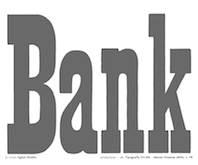 Some Italian wood types shown in Catalogo Caratteri in Piombo e Legno by Anonima Impressori (Bologna, Italy). The styles covered here represent classical slab serifs, also called Egizio (Egizi in plural). [Google]
[More] ⦿
|
Anonima Impressori: Egizi Moderni (modern slab serifs)
|
Some Italian wood types shown in Catalogo Caratteri in Piombo e Legno by Anonima Impressori (Bologna, Italy). The styles covered here represent modern slab serifs: Egizio Lubalin, Italo, Landi, Landi Echo, Nilo. [Google]
[More] ⦿
|
Anonima Impressori: Graziati Antichi
|
Some Italian wood types shown in Catalogo Caratteri in Piombo e Legno by Anonima Impressori (Bologna, Italy). The styles covered here represent graziati antichi: Bodoniano, Claredonia, Elzeviro, Garaldus Corsivo, Graziato, Intestazione elzevire, Raffaello Neretto, Romano Largo. [Google]
[More] ⦿
|
Anonima Impressori: Ornati (script fonts)
|
 Some Italian wood types shown in Catalogo Caratteri in Piombo e Legno by Anonima Impressori (Bologna, Italy). The styles covered here represent decorative syles: [Google]
[More] ⦿
|
Anonima Impressori: Razionali
|
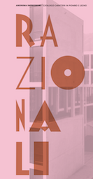 Some Italian wood types shown in Catalogo Caratteri in Piombo e Legno by Anonima Impressori (Bologna, Italy). The styles covered here are razionali (sans styles, including art deco and Futura). They comprise Alessandria, Balilla, Bastone Tondo Corsivo, Corsiva Razionale, Deco Nerissimo, Fantasia con Capolettera, Futura, Geometrico Tondo, Rapallo, Razionale, Semplicita and Triennale. [Google]
[More] ⦿
|
Anonima Impressori: Scritti (script fonts)
|
Some Italian wood types shown in Catalogo Caratteri in Piombo e Legno by Anonima Impressori (Bologna, Italy). The styles covered here represent scripts: Appennino, Calvi, Corsivo a Pennello, Corsivo Fantasia, Display, Leandro, Ritmo, Scalpellato, Signal, Slogan, Veltro, Vulcano. [Google]
[More] ⦿
|
Antique Categorie 1 (Deberny & Peignot)
|
 A grotesque wood type family by Deberny and Peignot, shown in their 1936 specimen book Spécimen Général des Fonderies Deberny et Peignot Tome II. A PDF scan of Antique categorie 1 by yours truly. [Google]
[More] ⦿
|
Anugraha Design
[Cina Catteau]
|
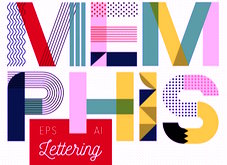 Pokhara, Nepal-based designer whose work is characterized by bold colorful geometric patterns and constructions. Typefaces from 2017 include Roam (which Cina calls a tribal type) and the color font Beach Towel.
 In 2017, she also published a wood type collection: - Barn Raising. A sturdy sans-serif in regular and rounded.
- Prairie. A perfectly square geometric serif, in inline and regular.
- Broad Sheet. A wide slab serif with 1.5:1 proportions. This one has a western flair but is simple enough to work for a variety of projects.
- Prize. An ornate slab serif with a circus / carnival vibe.
- Extra extra. A quirky slab serif most like 1900s printmaking letters.
Creative Market link. [Google]
[More] ⦿
|
Apex Type Foundry
[Alex Chavot]
|
 Lyon and/or Paris, France-based graphic designer and illustrator. He created the geometric fat counterless Tangoes and the monoline sans faceSlim in 2009.
 Aka UnderNoControlTypofoundry. Creations in 2012 include the free font Modul (OFL), Lavoir (OFL, based on an old art-deco public bath sign in Lyon), Interval (OFL, monospaced) and Modulo (OFL). In 2016, he designed the delightful fat sans display typeface Marsel Black, and writes: What could have happened if Roger Excoffon and Eric Gill gathered in Marcel Olive's backyard in Marseille to share a few Pastis back in the days? In some way, Marsel could be the result of this hypothetical experiment. A colourful fat sans with uncanny high contrasts and utter personality. While flirting with the strangeness of Gill's Kayo, Marsel primarily stands as a very distant hommage to Excoffon's mythical Antique, a reminiscence of a Latin taste for exuberance. Typefaces from 2018: Pyros (a didone with Hebrwew influences), Peckham (transitional). Home page. Typefaces from 2019: Kellar (a smashing quirky headline didone named after Thomas McKellar). Typefaces from 2020: Gortex (an agate typeface), Hazel Display Nerw (stencil), Smithee (a condensed American gothic; Alex writes: The basis for Smithee was found in an old French foundry's wood type specimen in the archives of the Musée de l'imprimerie et de la communication graphique, in Lyon), Almeria (a display typeface developed between 2015 and 2020). Typefaces from 2021: Practical Grotesk (a Swiss sans), Granit Display (based on granite headstone engravings). [Google]
[More] ⦿
|
Archive Type
[Matevz Medja]

|
 Slovenian foundry which specializes in old typefaces found in old prints, books and samples. Typefaces are reproduced as they appeared in print. In order to preserve the original feel of typefaces, no additional characters were added to originals therefore most of fonts consist just of basic character set. Upper case letters, lower case letters, numerals and basic punctuation. It was set up in 2000 by Matevz Medja. Engraving style typefaces: Kludsky (2006), Garfield (2005), Copperplate Head (2005), Western Iron (2005), Cider (2005), French Shaded (2005), Tilt (2005). The blackletter typefaces: School Text (2005), Harlem Title (2005), Copperplate Text (2005), Black Title (2005), Chased Black (2005), Tinted (2005), Steeler (2005), Blackcap (2005). Calligraphic typefaces: Petite Script (2005), Autograph Script (2005), French Script (2005), Penman Script (2005), Magnolia Script (2005), Roundface Script (2005), Roundhand Script (2005). Other typefaces: American Shadow (2005), Lightface Extended (2005), Grotesque Shaded (2005), Gothic Ornate (2005), Antique Extra Condensed (2005), Antique Extended (2005), Ironlace (2005), Atlantique (2005), Mann (2005), Old Style Condensed (2005), Ribbon (2005), Salisbury Script (2005), Black Title Text (2005, blackletter), German Text (2005, blackletter), Archive Hands (2006, pointing fingers), Archive Woodchild (2006). Distressed typefaces: Archive Tale (2006), Archive Egipt Compressed (2006). In 2011, he published the Archive Garamond family, which is closer to the unpolished originals. The 2010 catalog has three parts:
 - The Archive 40: Archive Western Iron, Archive American Shadow, Archive Antiqua Extra Cond, Archive Antique Extended, Archive Atlantique (avant garde sans), Archive Autograph Script, Archive Black Title Text, Archive Black Title, Archive Blackcap, Archive Chased Black, Archive Cider (engraved; a vintage money font), Archive Copperplate Head, Archive Copperplate Text, Archive Egipt Compressed, Archive French Script, Archive French Shaded, Archive Garfield (2005), Archive German Text, Archive Gothic Ornate, Archive Grotesque Shaded, Archive Harlem Title, Archive Ironlace, Archive Kludsky, Archive Lightface Extended, Archive Magno Script, Archive Modern II Open, Archive Modern II, Archive Old Style Condensed, Archive Penman Script, Archive Petite Script, Archive Ribbon, Archive Roundface Script, Archive Roundhand Script, Archive Salisbury Script, Archive School Text, Archive Steeler, Archive Tale, Archive Tilt, Archive Tinted.
- Archive Americana: Archive American Shadow, Archive Steeler, Archive Tilt, Archive Grotesque Shaded, Archive Black Title (blackletter), Archive Mann (an industrial 3d typeface), Archive Autograph Script, Archive Tinted, Archive Harlem Title (blackletter).
- Archive Western: Archive Egipt Compressed, Archive French Shaded, Archive Western Iron, Archive Antique Extended, Archive Copperplate Head, Archive Ribbon, Archive Gothic Ornate, Archive Oldstyle Condensed, Archive Lightface Extended, Archive Ironlace.
Creative Market link. View Archive Type / Matevz Medja's typefaces. [Google]
[MyFonts]
[More] ⦿
|
Arkitype (was: Virtue Creative)
[Andrew Footit]

|
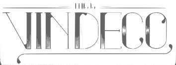 Andrew Footit (b. 1984) runs his own type foundry in Johannesburg, South Africa. He is also known as Arkitype. Until 2014, his type studio was called Virtue Creative and before that, Virtue84. In 2017, he set up Arkitype. His typefaces:
 - The very simple monoline rounded geometric typeface Modulus (2011). Updated to Modulus Pro in 2019.
- The stunning art deco typeface Vindeco (2011).
- Gigafont (2011): a free bubblegum font.
- FunFair (2012): hand-printed.
- Virtus Sans (2012): a clean 4-style sans family.
- the Western family Westro (2012, +Inline).
- The free rounded sans drafting font Struct (2013).
- The four-style vintage poster typeface The Woods (2013).
- The spurred letterpress typeface family Roper (2014). Roper evolved into the octagonal typeface family Hudson NY (2015) and Hudson NY Pro (2020). Hudson NY Regular, Serif and Slab are athletic lettering / octagonal typeface families.
- Bosk Hand.
- Roves (2016). A camping style set of fonts, including several stencil typefaces.
- Anchor Script (2016). Inspired by classic cursive connected handwriting.
- Navigator (2016). Inspired by the early explorers.
- Bowline Script (2016). A vintage monoline cursive script typeface.
- Saveur Sans (2017) and Saveur Sans Round (2017). A lovely sans typeface family that is inspired by art deco and French cafes.
- Comply Slab (2017). All caps and octagonal, with possible applications in athletic lettering.
- 3 Stripe Type (2017) and Adidas Nemeziz (2017). Prismatic typefaces.
- Technol (2018).
- Statewide (2018). An all caps squarish techno display sans family.
- ESPN Next (2018). An octagonal inline custom typeface. ESPN Heroes (2019) is a six-lined prismatic typeface.
- Poster Compressed (2019). A piano key typeface.
- Neumatic Compressed (2019), Neumatic Gothic Round (2020) and Neumatic Gothic (2019).
- Protrakt Variable (2019). Nine variable width all caps fonts, of different thicknesses.
- Coastal (2020). A twelve-style all caps sans.
- Compose. An 18-style minimalist sans with elliptical curves and quite open counters.
- Storica (2021). A 9-style all caps vintage serif.
Behance link. Creative Market link. Home page. View Andrew Footit's typefaces. Home page. [Google]
[MyFonts]
[More] ⦿
|
Art deco typefaces by Nick Curtis: II
[Nick Curtis]

|
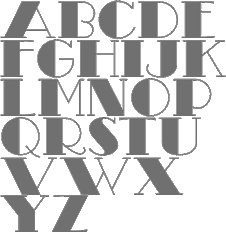 Commercial art deco typefaces by Nick Curtis.
 - Bessie Mae Moocho NF (2002). An art deco font based on handlettering found on a travel brochure for IMM Steamship Lines, circa 1927.
- Blitzkrieg NF (2011). A Lufthansa Airlines baggage label from 1936 provided the inspiration for this genuinely German typeface, with strong art deco influences.
- Blue Jay Way NF (2011). An art deco typeface inspired by Ross F. George. This typeface was used on the Beatles' original Magical Mystery Tour album.
- Boeuf au Joost (2003). Art deco based on work by comic book artist Joost Swarte.
- Boho à Gogo NF (2007): a multiline (op art?) typeface inspired by Bauhaus.
- Chalk and Cheese NF (2004). This art deco uppercase is based on 1930s lettering by French poster artist Charles Loupot (based on this art deco poster), and the non-art deco lowercase is based on 1910s lettering by German plakatmeister Ludwig Hohlwein.
- Chemin de Fer NF (2005). An art deco shadowed outline face.
- Chi Town NF (2008) is a heavy art deco creation that is based on a 1931 poster for the film The Man from Chicago.
- Coochie Nando NF (2011). An art deco shadow caps face, after a typeface called Kitchen by Milton Glaser.
- Dooijes Deco NF (2010). A 3-style art deco family in the style of Broadway, based on the Dick Dooijes tryptich, Carlton, Bristol (1929) and Savoy (1936).
- Duck Soup (2003, after a 1928 poster by Italian designer Neri Nanetti for Snob Cognac).
- Elektromoto NF (2011). This family takes its inspiration from two early Art Deco typefaces from Germany. The Normal version is based on Dynamo, designed by K. Sommer for Ludwig&Mayer in 1930, while the Narrow version is based on Stadion, designed by Erhard Grundeis for Die Schriftguß AG in 1929. Their common design motifs epitomize the Age of Streamline.
- Humpty Dumpling NF (2010). A fat art deco typeface based on an offering from the irrepressible M. Draim, seen in La Lettre dans le Décor&la Publicité Modernes, published by Monrocq Frères of Paris in 1932).
- Dusty Rose (2008) is an art deco typeface based on the logotype for the Dutch magazine Geillustreerd Schildersblad in 1940.
- Edgewise (2007), a quirky well-rounded post-art deco and pre-psychedelic face, uses ideas from Ryter Night (VGC).
- Ege Schrift NF (2011). a faithful revival of Ege-Schrift (1921, Eduard Ege), a mix between Mexican party lettering and art deco.
- Engel Stabenschrift NF (2008). In 1927, Ernst Engel created an art deco typeface which was revived by Nick Curtis as Engel Stabenschrift NF.
- Faerie Queen NF (2006). Based on an art deco typeface named Titania made in 1933 by Fundición Richard Gans.
- The Reed and Fox typefaces Viennese and Corinthian were combined in 2014 in Nick Curtis's digital typeface Genever NF.
- Gotham Rail Company NF (2002). Art deco based on an Italian travel poster from 1931.
- Great Lakes Shadow (2008) is an art deco typeface based on a 1930s travel poster for the Canadian pacific Railway.
- Hunky Dory NF (2014). A circus font after William H. Page's wood type Doric, ca. 1850.
- Jazzfest NF and Tinseltown NF (2009). Based on the 1932 art deco typefaces Newport and Hollywood, respectively, both designed by Willard T. Sniffin for ATF.
- Kharon Ultra (2009). An art deco typeface based on Ludlow Stygian.
- Kinkajou Stew (2003). Image of Kinkajou NF.
- Kirschwasser NF (2005). A bubbly art deco face.
- Korner Deli NF (2006, art deco).
- Kymmera Deco NF (2011). Revival and redesign of Rainbow Bass (1982, saul Bass).
- La Reyna Catalina NF (2006). An art deco face based on Aragón, designed by Enric Crous-Vidal.
- Legnano Cuneo NF and Legnano Sassari NF (2014). Italian art deco wood type.
- Linea Nera NF (2011). Based on Wolf Magin's Black Line (1976, Berthold).
- Lodewijk Gothic NF. After Elzevir Gothic (ATF, 1897).
- Luben Tunen (2008) is another art deco face.
- Madison Squared NF (2012).
- Mighty Ditey (2007): a mix between art deco and Peignot, this elegant typeface is based on a 1970s Photolettering typeface by Richard Nebiolo called Aphrodite, and competes with Riesling (1994, Bright Ideas) and Gillespie (2015, Darren Odden) as revivals of Aphrodite.
- Mogzilla NF (2007) is an ultra fat art deco face.
- Monte Carlo Script NF (2002). An art deco font based on a font called Médicis from a Deberny and Peignot catalog, circa 1920.
- Nip&Tuck (2006).
- Odalisque NF (2008, +Stencil, 2010) are art deco fonts based on Morris Fuller Benton's Chic (1927).
- OK Chorale (2003). An art deco typeface based on Carl Holmes' ABC of Lettering book.
- Orchard Street NF (2011, +Inline). A pair of art deco caps typefaces inspired by one of many posters produced by the WPA by anonymous artists during the 1930s.
- Pentaprism NF (2011). Part Futura, part Bauhaus, this 5-style family has multiline, inline, and other variants.
- Picture Postcard NF (2004: based on an alphabet by Alf Becker).
- Raconteur NF (2006-2008) is a wonderful art deco typeface that shouts gin fizz and high heels: it takes its inspiration from a 1923 ad for Piera Nova, designed by Hernando G. Villa.
- Quoi Chou NF (2006). An elegant and quite original beefed-up version of Bernhard Fashion by Lucian Bernhard.
- Radio Days (2008). An art deco typeface based on 1930s logotype lettering for Crosley Radios.
- Rassetta NF and Rassetta Swash Caps NF (2005). An art deco pair of typefaces originally designed by Willard T. Sniffin for American Type Founders in 1931 under the name Rosetti.
- Renard Moderne NF (2010). An art deco typeface inspired by Sol Hess's 1940s typeface Twentieth Century Poster.
- Resolute NF or USA Resolute NF (2009). An all caps fat headline typeface based on Morris Fuller Benton's Eagle, ATF, 1934.
- Retrorocket NF (2015). An art deco alphabet based on a French lettering chapbook entitled Art du Tracé Rationnel de la Lettre (1934, D. Duvillé).
- Salzmann Deco NF (2011) and Salzmann Deco Deco NF (2011), art deco and Mexican-themed typefaces, modeled after Max Salzmann's Dolmen (1921-1922) and Zierdolmen (1922), respectively.
- Secret Agent (2003). A pure art deco beauty based on this Loupot poster from 1919.
- Ski Alpin NF (2014). An art deco typeface based on a Swiss travel poster from 1927.
- Smart Frocks NF (2008). A Peignotian face, after a shop sign in London, ca. 1930. Designer unknown.
- Stony Island NF (2011). Based on an Alf R. Becker typeface from 1935 called Chicago Modern Thick and Thin.
- Suave Sam NF (2010). An art deco typeface after a 1930 alphabet by Samuel Welo.
- Tasneem (2007) is the ultimate art deco face, originally drawn by Gustav Jensen in 1931.
- Tiny Bubbles NF (2008). An art deco typeface inspired by an alphabet in Pen&Brush Lettering and Practical Alphabets (Blandford Press, Ltd., London, 1929).
- Top Kick NF (2011). Based on Concentra, a geometric marvel with several parallel and concentric lines making up the letters. Concentra was originally published in Schriftatlas: Alphabete von A bis Z .
- Turista Gorda NF (2009). Based on Baltimore Type Foundry's Airport Tourist, which in turn was influenced by Futura Display.
[Google]
[MyFonts]
[More] ⦿
|
astype.de (or: Astype)
[Andreas Seidel]

|
 Astype.de is a German foundry started in 2003 by illustrator and type designer Andreas Seidel (b. 1975, bad saarow, near Berlin, Germany). He lives in Cottbus, Germany. In 1998, he obtained a Masters degree in business administration. In 2007, he and Ingo Preuss set up The German Type Foundry. In 2017, he joined the initial crew at Fust & friends. The typefaces:
 - One of his first typefaces was Crayfish (originally a URW font, but withdrawn by Seidel from URW in 2002). Crayfish is a display type originally designed for an American Football club. The Crayfish typefaces are sold as Thunder Bold and Titan Bold.
- Check his nice weather symbols (not a font).
- He finished Ornaments Thanksgiving and the great ASTYPEOrnaments-WineGrape A (2004).
- He is working on 14th century initials (2003).
- He created Sattler (2003): Joseph Kaspar Sattler, one of the great German art nouveau artists created these nice initials in 1897 for the famous royal monumental book project Die Nibelunge for the Reichsdruckerei Berlin. Only 200 exclusive signed masterpieces were printed in four years from 1900 till 1904. Joseph Sattler was the art director, type designer and designer in one person. The Reichsdruckerei showed samples of the unfinished work in 1900 at the world exhibition in Paris to advertise the high craftsmanship of the German presses.
- He made Heraut (2003), an art nouveau lettering typeface based on a 1901 design of Hermann Hoffmann called Herold Reklameschrift.
- He created Sveva AS Versal (2003, art nouveau).
- About Missa Solemnis, he writes: Solemnis was designed by Günter Gerhard Lange and first cut in metal 1953 (this is the date he quotes himself, other sources mention 1950 or 1952). It seems to be one of his earliest typeface designs that he had done as a freelancer for H. Berthold AG in Berlin. [...] Missa Solemnis AS is a new, remastered and extended version of Mr Lange's typeface. The font is available in the OpenType format and comes in two styles: 1953 and 2003. The 1953 style contains all characters of the original metal type, as well as a few additions. [...] The 2003 cut is more delicate and makes extensive use of the OpenType format. It contains over 650 glyphs, covering Roman-based languages of Western and Central Europe. His Solemnis inspired Simeon AS (2003), a 650-glyph uncial style face.
- In 2004, he created Missale Incana, an interpretation of a typeface from Herbert Thannhaueser.
- Still in 2004, he created ASTYPE Ornaments Christmas A2 and ASTYPE Ornaments Christmas A. These were followed in 2005 by ASTYPE Ornaments Christmas B.
- He made Missale Lunea (2004). This has astroligical symbols, moon phases and medieval characters.
- In 2005, the exquisite calligraphic script typeface Gracia was added, consisting of Gracia No. 44, 45, 54 and 55 (graceful calligraphic script), and Gracia Solo.
- Paola is a redesigned, new interpretation of a brush typeface from Carl Rudolf Pohl.
- He made Adana (2005): The roots of Adana going back to the year 1930, to the Berlin-based German graphic designer Wilhelm Berg. His typeface can be interpreted as an answer to Lucian Bernhards Schönschrift. The Initials are nearly close to the original drawings but the Circular typeface was changed dramaticly. Excentric, unusual forms and loops were changed to fit todays needs. Due to the lack of a corresponding Roman letter form, the Regular version was designed including small caps, fitting the contrast and swinging shapes of Adana Circular. Both typefaces play well together in all kinds of adverts, as well with designs like Bodoni or Didot.
- Alea AS Initials (2005) is a floral faced based on the drawings of Maria Ballé.
- Taiko (2006). A revival of Otto Arpke's Arpke Antiqua (1928, copperplate).
- ASTYPE Ornaments Accolades A (2007), and ASTYPE Ornaments Accolades C (2011).
- GTF Toshna Std (2008, German Type Foundry) is a garaldic type family in three optical weights, after a 1955 family called Tschörtner-Antiqua by Hellmuth Tschörtner that was very popular in the DDR.
- Secca (2009, German Type Foundry) is a simple sans family rooted in early German grotesque type designs. See also Secca Soft (2014) and Secca Stencil (2015).
- Nepos (2010) is an experimental modular type kit consisting of ready-made typefaces and a set of special BUILD fonts to build your own letters and ornaments. These BUILD fonts can be used on layers with different colors and overprinting for special effects. The effects like Antiplex can be considered as kitchen tiles. There are also color inversions and stencil types.
- Secca Saloon (2011) is a versatile ornamental Western family.
- Popsil (2011) is a white-on-black hand-printed poster face.
- Ademo (2011) is a classic shaded layered 3d caps face, based on two typefaces designed by Carl Albert Fahrenwaldt that were published in 1931-1932 by Schriftguss AG.
- Wood Bonnet Antique No.7 (2012) is based on real vintage wood type blocks from Switzerland.
- VTG Stencil US No. 4 (2012) is based on plate US No. 4 from New York Stencil Works. This revolving stencil-plate was invented by Eugene L. Tarbox and patented in 1868. The military stencil fonts VTG Stencil US No. 2 (+Ornaments), VTG Stencil US No. 51, VTG Stencil UK No. 76, VTG Stencil Germany No. 101 (2014, modeled after historic blackletter stencil plates from Bavaria), and VTG Stencil US No. 72 followed in 2014. In 2016, he added Vtg Stencil DIN.
- VTG Stencil Germany No. 1 (2013) is a set of nicely executed didone stencil typefaces based on real models used in Germany from 1871-1918 and later. There is a Sketch style.
- Wood Poster Eight (2015) is a free wood type slab serif.
- Alea Initials (2017, floriated caps).
- Wood Bonnet Grotesque No 4 (2017).
- The Vtg Stencil France series (2017) in substyles Vtg Stencil France No1, Vtg Stencil France No3 and No. 5.
- The expressionist typeface Alarm (2017, Fust & Friends), which is based on an old design of Heinz König also called Alarm (1928, at Trennert).
- Presto (2017, Fust & Friends), a revival of a script by Helmut Matheis (1970).
- Vtg Stencil Italy No2 (2018).
- Rocaie (2018). Decorative caps base on antique rococo letters from a gilding workshop.
- Wood Heinz No.4 (2019). Wood Heinz No.4 offers up to four printed look variations of all the Latin base letters and figures. An OpenType letter rotator is programmed into the fonts to emulate the randomness of wood type printing. Also: Wood Heinz No.2 (2019).
- Missale Solis (2019). An uncial typeface that overhauls Missale Lunea (2004).
- Vtg Stencil UK No2 (2019).
- Vtg Stencil Marsh (2020). Based on one inch stencils, cut by a Marsh machine. Marsh was an American stencil machine maker in the 1920s.
- Bonnet Grotesque Narrow (2020). A condensed grotesque family.
Behance link. Creative Market link. Fust & Friends link. Klingspor link. Home page. See also here. View Andreas Seidel's typefaces. [Google]
[MyFonts]
[More] ⦿
|
Ata Syed
|
 Ata Syed (Karachi, Pakistan) has a dual identity at FontStruct, where he is one of the most prolific contributors. He is known there as thalamic and as minimum. Behance link.
 Typefaces made in in 2008 as thalamic: Hello (connected upright script), Epilogie (blocks), WimSoft (+U/C), Chunk Chip, Konstruct (Russian constructivism face), Sensei Says, FS Tributary, Twotype Font, Urge (fat octagonal), Subliminal, FS United One, The Game of Type, Anaximander Zooom!, Corrupt and Corrupt Ed (piano key stencil fonts), Blueprint, Monomum, Synergy, Insert Coin Italic, Write I Careful, Write I Casual, Write I Dump, Loop UC, Loop LC, Emergic, Prick!, Insert Coins Pixels, Retro Electro, Bubble Lab IJ, Bubble Lab Bang, A Needle Pulling Thread, Send, Scan (IBM logo look), Intermittent and Intermittent Sans (stencil typefaces), Melt x DR and Melt x tDR (dot matrix), Oval x DR and Oval x tDR (original design by theDesignersRepublic for Issey Miyake), On Grid, Indigo (almost blackletter), orange_2 (dot matrix), Scan (horizontal stripes), Bass, Grape (simple pixel face), Nachahmung and Nachahmung Block (fat and extra condensed, Wim Crouwel simulation typefaces), Nachahmung Block Serif, Conjunction, Interjection, Is It, Sangular (nice experiment), Anonon (nails in square letters), Purple and Purple Very (slab serif headline typefaces, pixelized), Arc Echo (biline and strutted), The Question (a fantastic 3d paper fold imitation face), FS Minimal (a fantastic ultra fat decorative face), FS FontStructor, Vibrant (multiline labyrinthine or op-art face), Writ (upright pixel script), Castor, Ooki (octagonal), Industrial, The I Flat, The I, Indiscrete, Analog (connected script), Dent (mechanical), Digital (connected script), Hello Hello, and Sensei Says. In 2009, he made Clone It, Entwined, C64, Helix, Fontsration, Bent, Stripe Zoo, Dull, Indent (stencil), Quartertined (kitchen tile), Firox, Orfix, A Priori, Ignore, Confused, S-Ookii, Ookii (octagonal), Very Becoming, Crisis Averted, Crisis (neat bold octagonal face), Penmanship, Up All Night, Sleep All Dayi, Chunk Chip, Grayletter (upright script), Soso, Mostly Harmless (textured face), Etched, La Cross, Twotype, Etched Bare, Aught (One, Two, Three), as: Inflate (Pop, Pfft, Puff, Poof), Istic, Very Becoming, Ignore, Ought, Balance, Broken, Dry Flat (dot matrix), La Cross, Etched (+Bare), Fontsration (+Refined: multilined beauties), FS Institutional (fat multiline face), FS Industrial, FS Pixelayers. Additions in 2010 as thalamic: fs Section, fs Reboot, fs Easy DNA Auto Stencil, fs Institutional (+Ho, +Elements), fs Quartertined, fs Stencil 2.0, fs Rivet, fs Intaglish, fs Dumb Italic, fs Loop Gap, fs GoTeam (stencil), fs ITilic, fs Kerplunk (Startrek face), fs Dumb Italic, fs Ribbon, fs Beringer, fs Ooki Woodcut, fs Croissant (stencil), fs 45 (octagonal stencil), fsXO, fs Pipe, fs Confused Less. Fonts from 2011 as thalamic: fs Xenon (a paperclip face), fs Instant, fs Twist, fs WIP (blackletter), fs Sparc, fs Reboot (texture face), fs Pod, fs Flute Tune, fs Special, fs Watch Out (stencil), fs Etched Nyle (labyrinthine face), fs No Kerning Required (2011, connected upright script). Creations in 2012 as thalamic: fs Flip, fs Mom, fs Noise, fs Noise II, fs Junk, fs You Are Here, fs Flash (outlined), FS Easy Too (paperclip face), FS Strict, FS Fix, fs in three (octagonal stencil face), fs Single, fs Wakarimasen, fs r-failed (white on black), fs Permutation X, fs Pan Am, fs Institutional, fs Institutional 2, fs Chunky (counterless), fs Grayletter (textured face), fsXply (op-art). Creations in 2013 as thalamic: fs So Not Right, fs Grid Urdu (pixel face), fs Not So Right, fs Six Sticks, fs Half (octagonal family), fs Bored, fs Make it Happen, fs Salvage, fs To Be Discarded, fs Connect (stencil), fs Whomp, fs Praxis, fs Fez (3d face), fs Input, fsTramp, fs Five Alive, fs Hote-Zyd (labyrinthine), fs Patterns (Layers, Quarters), fs Five Alive (origami font), fs Go To Sleep (retro speed font), fs Vaerktoj (inspired by the brand identity of Hoejmark Cycles), fs Permutation B, fs Jester, fs Permutation XII (op-art), fs Insatiable, fs Electronic, fs Carbon (a nice chequered face), fs When We Were Young (multiline typeface), fs Shogun Tiny (a lined kitchen tile typeface), fs Optical, fs When We Were Young (multilined), fs Slate, fs Shogun (gridded), fs Iie (+Filled), fs Blocky (dot matrix), fs Thalamic. Creations in 2014 as thalamic: fs Perhaps, fs Perhaps Perhaps, fs Stability (Turmoil, Flux), fs Industrial (an artsy fat dot matrix face), fs Rehash, fs Ah, fs Curly, fs So, fs Flint, fs ICK (blackboard bold style), fs Wiggle, fs Grid, fs Ah. Creations from 2015 as thalamic: fs B-Chain (bike chain font), fs Risque (art deco), fs Squangular (Impair, Square, Flair, Pair), fs Oval, fs MIP, fs Flower (kitchen tile face). Creations as minimum: fs Chips (2014), fs Oh (2014, piano key style), fs Stack (2014, +Overflow), fs llljjj (2014), fs Turn Off The Sun (2014, beveled), fs Zag (2013 textured), fs Zig (2013, textured), fs Mullions (2013), fs The Italic (2013), Gridlock (2009), Mingle Minx (2009), Mingle Co (2009), Mingle (2009, gridded letters), Bevel (2009, 3d beveled family), illiij (2009, multiline family), m.ove.r (2009, multiline family), Grayscale (2009, multiline family), fs Cubed (2010, 3d-face), Bas Relief (2009, 3d face), Silver (2009, 3d face), Tin (2009), Lead (2009), Bevel (2009), Bevel Just (2009), Bevel Just Shadowed (2009), Ceci n'est pas une vague (2009), A Fault in Reality (2009, optical effect font), Blit Slash (2009, experimental), Blit Hack (2009), Dot Dot Hex (2009), Super Black (2009), fs Overlap (2010), fs Fabric (2010, texture font), fs Original (2010), fs Ink Blot (2010), fs Dots and Dashes (2010), fs I Square (2010), fs Squared Up (2010), fs Super Black (2010), fs Unoriginal (2010), fs Minimum (2010, geometric stencil face), fs Pin and Thread (2010, stitching face), fs Shade (2012, 3d face). FontStructions from 2011: fs Perpetual (dotted line face), fs Slither, fs No Escape, fs Prompt (a DNA-inspired biochemical lab face), fs Plus H (horizontally striped face), fs Arc Test 2:2 (a modular blackboard bold face), fs V Simple (2010, textured face), fs Instant, fs Permutation V, fs Rehash Monoic (labyrinthine), fs Meta (texture face), fs Scroll, fs Scroll Not (stencil). FontStructions from 2012: fs Translucent (a texture face), fs Bank, fs Shade, fs Confined (white on black), fs Institutional (+Vo, +HeVe, +Ho, +He, +Ve: texture typefaces), fs Bang, fs Random (textured face), fs Random Pattern, fs Lead, fs Tin, fs Silver, fs Tungsten. Klingspor link. Abstract Fonts link. Behance link. [Google]
[More] ⦿
|
Australian Type Foundry (ATF)
[Wayne Thompson]

|
The Australian Type Foundry was launched in January 2002 by Wayne Thompson (b. 1967), who is art director at an ad agency in Newcastle, NSW, and is located in Merewether. He holds a Masters of Type Design from the University of Reading, UK. Commercial fonts at this ex-signpainter's site include Arum Sans (2009, an elegant humanst sans family), Halvorsen (2006), Fuse Box (2005), Architect (handprinting, now at T-26), Axiom, ATF Bosin (2003, casual hand script; see also Bosin Nova, 2021), Barkpipe, ATF Iperion (2003), McNeilBlok (2003), Not Sassure, Spud (handprinting), Wobbly Boot (2007, boozy script), Zoobie (2007, handprinting), Virus, Otis and Otis Condensed (since 2007 at T-26), Ogre, Fresh, ATF Euron (2003). ITC fonts by Wayne Thompson: ITC Panic (grunge), ITC Dont Panic (2000, grunge font), ITC Django (handprinting). [T-26] fonts by him include many of the above, plus also DallasPlain (1998, handwriting). Free font page: pick up a free font (was Spud Italic, currently is the grunge font Virus). Another free font by them is Mallee Wooden (Western typeface). Interview. At Phat Phonts, Wayne Thompson created Jungle Bones (2005) and Ratbag (2005). Stuart Brown designed the Neutraliser family, a versatile collection of geometric-based fonts with 24 styles. Artist Paul McNeil has designed the McNeil family of blocky display typefaces. He has previously produced designs for Mambo and currently works in Sydney. Another designer working for them, out of Indonesia, is Mendiola B. Wiryawan. Custom typefaces by ATF include Django Modified, Honda Prototype (2012), OBrien Glass (2012), Travel Bats (for Sensis) and JWT Vodafone (grunge). The retail fonts at the start of 2012: ArumSans, Halvorsen Pro, ITC Django, Grimsby Hand, Bosin, Carbon Credit, Carbon Tax, Chowdahead, Decon, Demented Avenger, ITC Don't Panic, Equaliser, Equaliser Stencil, Euron, Fresh, Fuse Box, Guttersnipe, Iperion, Barkpipe, ITC Panic, Not Sassure, Ogre, Otis Condensed, Pontoon, Ratbag, Spud, Stakeout, Tully, Virus, Wobbly Boot, Zoobie. In 2013, Thompson created the custom sans typeface Tonsley and participated in the Canberra Centennial Typeface Competition. In 2014, he designed the brush script typeface Quencher, and the custom sans typeface O'Brien Glass. In 2015, ATF created Maccas (+Inline) for McDonalds Australia, via their agency DDB Sydney, by modifying, with permission, Cindy Kinash's True North typeface family. For a South East Asian nation's law enforcement agency, he custom-designed Personaliyty (2015). He designed ABC Sans (2016-2018) for Australia's media conglomerate. Typefaces from 2020: Deka (a logical rounded sans family). Typefaces from 2021: Lurline (a reverse stress display typeface), Mandy Hand. Behance link. I Love Typography link. MyFonts site. Linotype link. View Wayne Thompson's typefaces. View the typefaces made by the Australian Type Foundry. [Google]
[MyFonts]
[More] ⦿
|
Authentic
[Julius Wiescher]

|
German foundry, est. 2009 by Julius Wiescher (b. 1991), who is the youngest son of famous type designer Gert Wiescher. His font Thin Pen (2009) is based on an ancestor of the German DIN-Schrift. The font was traced with a plastic template on transparent paper, scanned and worked over carefully to keep the handmade, authentic touch. Other fonts by him: DonJulio and Donna Julia (2008, Autographis, calligraphic script fonts made with Gert), Flatpen (2008, Autographis, with Gert), Norm Pen (2011, based on an ancestor of DIN Schrift), Bold Pen (2011, bold version of Norm Pen), Groucho (2011, a high-contrast flowing script), Authentic (2011, a connected copperplate script), Oldhand (2011, shaky handwriting), Holz Caps (2011, an irregular wood type simulation face), Poing (2011, a flowing calligraphic script), Cri Cri (2011, slab serif comic book face). Klingspor link. [Google]
[MyFonts]
[More] ⦿
|
BA Graphics
[Robert Alonso]

|
 Bob Alonso (b. Bronx, NY, 1946, d.2007), the founder of BA Graphics in 1994, was a prolific American type designer. With 33 years of experience at NewYork's Photo Lettering, he specialized in calligraphic script typefaces, but not exclusively so. BA Graphics was located in Chester, NY, and later in Toms River, NJ, and now sells its fonts through MyFonts. Many of its fonts published after Alonso's death in 2007 were completed by John Bomparte.
 John Bomparte wrote this obituary: Throughout his career at the legendary Photo-Lettering, Inc. (one that spanned four decades), Bob created original typefaces and tailored type by modifying, revising and filling out families, fashioning pieces of type for hand-lettered jobs, as well as being involved with the updating of a number of well-known logotypes. Bob was blessed with natural teaching abilities; and those in social and professional circles who had the good fortune to know him considered him not just a type designer but a mentor and a friend. As one such person close to him put it, he was a graphic technician [...] back when computers were not even in site for graphic arts, he would take on any intricate&complex graphic project that others would shy away from and come up with a solution that achieved a masterpiece. I'll always remember someone saying "this can't be done" and Bob saying let me see it and a short time later, there it was---done&perfect. I would like to think that attitude rubbed off on me. Along with this gift for teaching and explaining the complex, Bob exhibited a level of professionalism that was unsurpassed. A number of years ago when the need came to make the transition from the traditional to digital way of creating fonts, he rose to the challenge admirably. Towards the last few years of Photo-Lettering, Bob played a vital role in the conversion to digital, of many of the typefaces within the collection, notably those fonts that carry the prefix PL. More recently, Bob Alonso released several fonts through ITC, Adobe and his independent foundry, BA Graphics. Bob was on the cutting edge of his best work, and in the circumstance of his untimely passing, left a measure of unfinished designs. However, the spirit of his typographic talents and his fine sense of humor lives on through the many much-loved, and popular fonts he has left us: fonts such as Cookie Dough, Equate, Elephant Bells and Pink Mouse, to name a few. Alonso created these typefaces: FontShop link. Klingspor link. View Bob Alonso's typefaces. View the BA Graphics typeface collection. An alphabetic listing of Alonso's typefaces. [Google]
[MyFonts]
[More] ⦿
|
Bai Mellon
[Sideshow]

|
[MyFonts]
[More] ⦿
|
Baltimore Type Foundry (or: Baltotype)
[Herbert F. Czarnowsky]
|
Also known as Fielding Lucas, Jr., Lucas Bros., H.L. Pelouze&Son, and Chas. J. Cary&Co. Specimen may be found in Convenient Specimen Book of Type, Rules, Borders, and Electrotype Cuts from the Baltimore Type Foundry (Baltimore: Chas. J. Cary&Co., 1888. Banta Book of Types&Typographical Tips. Menasha: George Banta, 1961). The company existed until well into the 20th century, and published a catalog as late as 1957 called Type and Rule Catalogue 13, Baltotype. A selected list of typefaces: - Airport Gothic: Turista Gorda NF (2009, Nick Curtis) is based on Baltimore Type Foundry's Airport Tourist which in turn used ideas from Renner's 1932 typeface Futura Display. Mc McGrew on Airport Gothic: Most of this series is the first American copy of Futura, which originated in Germany in 1927, designed by Paul Renner for Bauer. One source says it was cut from original Futura drawings, smuggled out of that country, but it seems more likely that matrices were made by electrotyping the imported type. An extrabold weight, Airport Black, was cut by Baltimore about 1943; information on this cutting is scarce and contradictory- one account says it was designed by Bill Stremic or Bill Blakefield, another that it was designed by Carl Hupie (or Hooper), and cut by Herman Schnoor. There is also Airport Black Condensed Title and Airport Broad. The latter is a modification of Airport Black, cut 50 percent wider on the pantagraph by Herman Schnoor. Baltimore later cast some of its Airport series from Monotype Twentieth Century matrices, and in a few cases listed both series. Airport Relief, Baltimore 299, is English Monotype Gill Sans Cameo Ruled, while Airport Tourist, Baltimore 602, is Futura Display, cast from electrotype mats of the German foundry type.
- Baltimore Script (1955). Mac McGrew: Baltimore Script is a fancy style designed by Tommy Thompson and cut by George Battee for Baltimore Type in 1955. The lowercase follows the general style of a script letter hand-written with a broad pen, although the inclination is slight and the letters don't quite connect. Capitals are flourished. It is suitable for stationery, announcements, and greeting cards, but its range of small sizes is hardly enough for advertising use.
- Mac McGrew: Czarin and Czarin Title were produced by Baltimore Type&Composition Corporation about 1948, the name being derived from the Czarnowsky family which owned the foundry. Czarin Title, issued first, is a copy of Offenbach Medium, a set of pen-drawn capitals designed by Rudolf Koch about 1935 for the Klingspor foundry in Germany. Czarin has minor changes in a few characters, but adds a lowercase, designed by Edwin W. Shaar, that is substantially different from that of Steel, the cap-and-lowercase version of Offenbach. The new lowercase harmonizes well with the capitals, and makes a handsome appearance. Compare Lydian. Footnote: McGrew spelled the name of the owner as Czarnowski. Irene Traeger, the granddaughter of Herbert F. Czarnowsky, pointed out the incorrect spelling to me.
- Mac McGrew: Elegante is a decorative, nearly monotone typeface cut by George Battee for Baltimore Type, after the German typeface Sensation of 1913, from Foundry Heinrich Hoffmeister. It is upright, with flourished caps and loops on some of the ascenders and descenders, and is suitable particularly for announcements and personal stationery. Compare Greeting Monotone.
- Mac McGrew: Emperor is a 1957 adaptation by Baltimore Type of Wide Latin which was cut by Stephenson Blake in England and related to nineteenth-century typefaces under other names. However, this Baltimore Type version has been modified and resized, and is less successful due to excess space between letters (although not as much as in the specimen shown here, which is letterspaced). Emperor was originally shown as Imperial.
- Their geometric series from 1884 became famous, and was often imitated. HiH created two font families based on it: Teutonia (2007) and Baltimore Geometric (2008, a revival of Antique Geometric by Baltimore Type Foundry, 1883). HiH writes: Roos&Junge of Offenbach am Main in Germany produced Teutonia in a "back-to-basics" effort that has seen many quite similar attempts in the field of topography. In 1883, Baltimore Type Foundry released its Geometric series. In 1910, Geza Farago in Budapest used a similar letter design on a Tungsram light bulb poster. In 1919 Theo van Doesburg, a founder with Mondrian and others of the De Stijl movement, designed an alphabet using rectangles only -- no diagonals. In 1923 Joost Schmidt at Bauhaus in Weimar took the same approach for a Constructivist exhibit poster. The 1996 Agfatype Collection catalog lists a Geometric in light, bold and italic that is very close to the old Baltimore version. Even though none of these designs took the world by storm, they all made a contribution to our understanding of letterforms and how we use them.
- Mac McGrew: Greco Bold and Italic are Spanish typefaces of the mid-1920s. They are very heavy, with long ascenders and small x-height, and have a hand-lettered appearance. Linotype Vulcan (q.v.) is equivalent. National Matrix&Type Co. in Baltimore, one of several independent companies which made matrices for the popular casting machines, offered Greco Bold in 1929 as its series 100; this was the source of Baltimore Type's mats, but Baltimore and some other sources cast Greco Bold and Italic as series 326-3261. These numbers have not been found in Monotype literature; perhaps another independent source also made mats. Notice the figures, which are termed hanging or old style, although they do not follow the usual form. However, taller 1, 2, and 0 are also available to convert the set to lining figurees. Compare Hess Monoblack. Greco Adornado, an ornamented version, has also been imported.
- Mac McGrew: Homewood is a recutting by Baltimore Type of Metropolis Lined, a German typeface of the 1930s. It was made from a large size of Metropolis Bold, with the fine white lines cut in, and differs from the original in minor details of the curves. Other sizes were cut by pantagraph and do not necessarily match original sizes.
- IBM Executive Modern, a typewriter type.
- Mac McGrew: Mademoiselle was designed by Tommy Thompson in 1953 as a display typeface for Mademoiselle magazine. It was cut by Herman Schnoor at Baltimore Type, which also offered fonts for general sale. It is a delicate, narrow modern roman, with long ascenders and short descenders, rather loosely fitted, and works well for display with transitional text typefaces such as Bulmer and Scotch Roman. Both lining and oldstyle figures are provided, along with several pointing hands as shown.
- Tourist Extra Condensed. Turista Flaca NF (2009, Nick Curtis) is based on Tourist Extra Condensed. McGrew: Tourist Extra Condensed of Baltimore Type is a copy of Phenix (q.v.) in 24- to 48-point sizes, and is Jefferson Gothic (q.v.) in larger sizes. Phenix is a 1935 ATF typeface by Morris Fuller Benton.
- Mac McGrew: Trend is a brush-lettered typeface cut by Baltimore in 1953. It is very similar to Dom Casual (q.v.), but has a slight back slant.
- Mac McGrew: Trylon as made by Baltimore Type was a 1949 copy of Stephenson Blake's Playbill (see Imports in Appendix), but Trylon Shaded and Trylon Shaded Oblique were designed and cut by George Battee of the Baltimore foundry. The solid version has lowercase in some sizes; it is somewhat similar to P. T. Barnum, with greatly exaggerated horizontal strokes and serifs at top and bottom, but is heavier and narrower. The Shaded versions are more properly outlines of the same design, with a small shadow effect at the top (which is unusual) and right of each letter, but without lowercase.
- Mac McGrew: Vernen is essentially a copy of Huxley Vertical (q.v.), but omitting the round characters AKMNWY and using the alternate pointed characters instead. In addition, the slight extensions of cross strokes to the left of stems have been omitted, and a few other characters have been redrawn. It was offered by Baltimore in 1953.
- Mc McGrew: Vista is a very wide square-serif face, cut by Baltimore Type in 1956. It is said to be a pantagraphic modification of Hellenic Wide from Bauer in Germany; actually it does not match that typeface in details, though it has the same general effect.
- Mac McGrew: Wide Line Gothic is a creation of Herman Schnoor for Baltimore Type, modified by pantagraph from Philadelphia Lining Gothic, increasing the width by about 50 percent. The flat sides of round letters. acceptable in the moderately condensed original, make awkward shapes in this extended version. Compare Franklin Gothic Wide, Tempo Black Extended.
- Among the wood types, we have Oak Leaf (1832, ornamental caps).
Rich Hopkins, a printing historian, acquired Baltotype ca. 1993. Based on drawings from the 1950s in the Baltotype material, Miranda Roth at P22 designed LTC Athena, a narrow art deco typeface, in 2013. [Google]
[More] ⦿
|
Barbara Lind

|
 Designer of some Western-themed typefaces at Adobe in the 1990s. These include
 - Poplar (1990, after a 19th century wood type typeface by William Leavenworth). Poplar has these digital versions made by Nick Curtis: Copper Canyon WBW Demi Bold, Copper Canyon WBW, and Copper Canyon Inline WBW.
- Madrone (1991, a spaghetti western face---a fat typeface didone, Madrone was digitized from proofs of the wood type collection in the National Museum of American History in the Smithsonian Institution in Washington, D.C.).
- Adobe Wood Type Ornaments (1990-1991 with Joy Redick).
- Cottonwood (1989, with Kim Buker Chansler and Joy Redick).
Linotype link. FontShop link. Typedia link. View Barbara Lind's typefaces. Klingspor link. [Google]
[MyFonts]
[More] ⦿
|
Barnhart Bros. Spindler Type Founders: Book of Type Specimens, 1907
|
 Trying to fit this 1000-page book into one web page, with discussion of many types. It's impossible, but I tried it. Download link for Book of type specimens: Comprising a large variety of superior copper-mixed types, rules, borders, galleys, printing presses, electric-welded chases, paper and card cutters, wood goods, book binding machinery etc., together with valuable information to the craft. Specimen book no.9. Another download link. [Google]
[More] ⦿
|
Barnhart Brothers&Spindler (or: BB&S)

|
 Chicago-based foundry, which grew out of The Great Western Type Foundry in 1868 when the Barnhart brothers (newspaper publishers in Iowa who came to Chicago as advertising agents) bought out the Toepfer family in 1868. They retained Herman Spindler as the foreman, since he was the only typefounder in the group. Aggressive in business, BB&S became the largest foundry in Chicago. Book of type specimens. Comprising a large variety of superior copper-mixed types, rules, borders, galleys, printing presses, electric-welded chases, paper and card cutters, wood goods, book binding machinery etc., together with valuable information to the craft. Specimen book no.9 (1907) is a 1048-page monster catalog (see also here and here and here). Some pictures from Type Barnhart Type Foundry Co. New York City: Superior Copper-Mixed Type (1908). In 1913, they published Preferred Type Faces.
 BB&S was purchased by ATF about 1911 and it operated independently until about 1930. Typophile page on them. Text file with a list of the typefaces in their Catalog 25 (1925). Discussion of some of their typefaces and digitizations: - Engravers Upright Script, a ronde style alphabet, was revived in 2006 by Nick Curtis as Bon Mot NF.
- Hazel Script, a primary school didactic connected script, digitized in 2006 by Paul Hunt as P22 Allyson (discussed here).
- They made the (sloppy) old-look garalde typeface Fifteenth Century in 1897, which turned into Caslon Antique (American Type Founders). A digital version can be had at MyFonts, but who made it? MyFonts also offers Caslon Open Face (originally, 1915).
- One of their best known designers was Oswald B. Cooper who made Cooper Black (1921) and Cooper Old Style (1919-1924), with characteristically blurred rounded serifs. He also made Cooper Hilite (shaded), Cooper 570 (fat), Cooper 579 (outline), Cooper Tooled Italic (shaded) and Cooper Black Italic 571.
- Delysian NF (2004, Nick Curtis) revives their Greeting Card typeface from the BBS catalog of 1923.
- Lining Gothic No. 71 (1907) is a grotesque typeface with panache. It was digitized by Nick Curtis as Cerulean NF (2007).
- Mazurka NF (2004, Nick Curtis) is a combination of two typefaces from the same catalog, Swagger Capitals, designed by Carl S. Junge, for the uppercase and Gothic Novelty Title for the lowercase.
- Racine (1903) was revived by Nick Curtis as Kenosha Antique (2004).
- Archer (1905) was revived by Nick Curtis as Grand Rapids (2005).
- Umbra (1907) was revived by Nick Curtis as Shady Lady NF (2005). Monotype's Umbra is based on a later metal version by Ludlow though.
- One of their blackletter typefaces is Waldorf Text (1914).
- Steelplate, a monocase engraved US dollar bill-style face, ca. 1900 at BBS, was revived by Nick Curtis as Smackeroo NF (2005).
- Ernst Lauschke designed the oriental look typeface Dormer in 1888 at the Great Western Foundry. BB&S renamed it Pekin. HiH digitized it in 2005. Pekin also is the name of Dan Solo's revival.
- Freak (1889, The Great Western Type Foundry) was renamed Bamboo by BB&S. A digital version by Tom Wallace is also called Freak (2005).
- Parsons (1918, Will Ransom) was digitized by Jess Latham.
- Wedge Gothic ML (1893). An oriental simulation font. It was not in the 1907 catalog but reappeared in 1925 as Japanette. According to McGrew, Wedge Gothic was originally created for the Chicago Herald newspaper. Digital versions: Japanette (Infinitype), OPTI Japanette 5 (CastCraft), Wedge Gothic (2010, Tom Wallace), Japanette (2012, SoftMaker).
- Clearcut Shaded Capitals (1920s, Will Ransom). Extended to a full font by Nick Curtis in 2005 as Ransom Clearcut NF).
- Dotted Roman (1897, a Victorian typeface) was revived as Miss Dottie NF by Nick Curtis in 2014.
- The decorative wood type typeface French Antique, featured in the 1905 catalog, and originally due to William H. Page. Digital versions by Woodentype (Jordan Davies) and Nick Curtis (whose version of French Antique Extended is called Fran Tique NF (2008)).
- The wedge-serifed typeface Vulcan (1884) was revived by Nick Curtis in 2014 as Vulkan NF.
- Jeff Levine's Millinery JNL (2022) is based on the art nouveau font Sterling showcased in the 1907 Barnhart Brothers & Spindler specimen book.
Wiki page. List of all BB&S typefaces compiled by the American Amateur Press Association in 2009. This includes a PDF file and an Excel spreadsheet. Digital typefaces that descend from Barnhart / BBS. [Google]
[MyFonts]
[More] ⦿
|
Baseline Fonts
[Nathan Williams]

|
 Foundry in Wichita, KS, founded in 1999 by Nathan Williams (b. Concordia, KS, 1973), formerly from the University of Kansas Art Museum Library. Its motto: The goal of the foundry is to provide uninterpreted revivals of type samples generated through disappearing printing methods, and create new fonts for dissemination in the type community. Order through MyFonts.Com or Union Fonts or Creative Market. FontShop link. Klingspor link.
 Fonts: - The Rodeo family of wood type fonts: 66 Rodeo, 57 Rodeo, 58 Rodeo (2003), Rodeo Rope, Rodeo Rope Superchunk.
- The Tuscan family: Tuscan (2003, a wild west face). To this group we can add the Tuscan typeface Circus KS (2006).
- Egyptians: Grit Gothic (2013), Grit Sans (2013), Heirloom Artcraft (2013), Worn Gothic (2013), Stately GG (2013), Grit Egyptienne (2005, grunge Egyptian family), Rough Egyptienne (2005).
- Grunge typefaces: Antimony (2005, grunge), Dryden (distressed handwritten face).
- Old typewriter fonts: Slab American Regular (old typewriter), Slab American Titling, Slab American Titling Heavy (2002). Slab American has 55 styles.
- Art nouveau typefaces: Old Paris Nouveau (2003).
- Pixelish typefaces: Base PXL7, 80s PXL Bold.
- Display Sans: Maxime (2004, having support for most European languages; Maxime Shadow is available at FontShop), Woodgrit Thin (based on 19th century American letterpress fonts), Woodgrit Medium, Woodgrit Heavy, Pippen (squarish).
- Calligraphic: Roundhand Regular.
- Victorian: Boback.
- The Grit family: Grit History (2003-2004), Grit Primer (2003), Grit Egyptienne, Grit Typesorts (2006, free).
- The Old Times American family (+Italic, +Titling).
- Pia Regular.
- Kandt: the handwriting of legendary designer and art director James Kandt; 4 styles.
- Chitchy.
- AVI Sans.
- Country Fang (2003, with Brian Miller).
- Craft Roman
- Licious Script.
- Luxe (2003, casual).
- Momentum (2002).
- George Gibson (handwriting from mid 1800s).
- Dingbats: Megaflakes 2010 (2010) and Megaflakes 2011 (2011).
- Sketchwriter (2011).
- Dusty Circus (2011) is a five-layer stacking display face designed to be infinitely morphed. It is a prototypical member of that old western circus font genre.
- Bobbi Bee (2013). A connected script.
[Google]
[MyFonts]
[More] ⦿
|
Benny Demmer
|
German creator of the Tuscan font Beans (2009) and the italic signage typeface Garcia (2009). Dafont link. [Google]
[More] ⦿
|
Benoît Santiard
|
Graphic designer in Paris, b. 1980. Teacher at the École d'Architecture de la Ville&des territoires in Marne-la-Vallée. Cofounder, with Guillaume Grall, of Building Paris. Creator of the traffic-like sans typeface capitale (2009) for the signage of a concert hall. Werkman Letterpress (2009) is a font designed from letterpress woodblocks. It was inspired by the first issue of the magazine The Next Call (1923) by Hendrik Nicolaas Werkman. UnkleBenz (2009) is based on his own handwriting. [Google]
[More] ⦿
|
Beth Rufener
[Ornaments of Grace]
|
 [More] ⦿
|
Bethany Heck
[End Grain]
|
[More] ⦿
|
Bill Johnston
|
New York-based creator (b. 1986) of the freescratchy fonts Screw This (2009) and Ink Bleed (2009), the fat finger font Lednar (2011), and the wood cut typeface Wood Is Good (2012). [Google]
[More] ⦿
|
Bill Livingstone
|
Toronto-based designer of the Arts & Crafts scrapbooking style typeface Crafty Font (2013) and of the wood type Bauer Bodoni-inspired slab serif Bodoni Block Font (2013). In 2016, he designed the geometric wedge serif typeface Equinox. Behance link. [Google]
[More] ⦿
|
Bill Moran
[Blinc Publishing]

|
[MyFonts]
[More] ⦿
|
Bill, Stark, and Co
|
 In 1850, Horatio and HJeremiah Bill, who had previously worked for Edwin Allen in South Windham, CT, start a wood type manufacturing business in Lebanon, CT, and move to Willimantic, CT, the next year. A few years later, they were joined by Stark, and the company became Bill, Stark, and Co. In early 1854, it is renamed again to H. and J. Bill Co., but closes its doors later that year. Their equipment gets purchased by William Page in 1856 who will start his own successful wood type company, Page&Bassett.
 Its typefaces included Bill Stark Roman Extended (a "fatface"), and Concave Tuscan Condensed (1853). For digitizations, see, e.g., Dick Pape's AWT Bill Stark Concave Tuscan Cond (2013), AWT RIT Conc Tuscan Open Shade (2013) and AWT Vandenburgh Concave Tuscan (2013: this typeface was cut by Vanderburgh Wells but is based on an 1853 design by Bill, Stark & Co). [Google]
[More] ⦿
|
Billy Argel
|
 Brazilian graphic designer and prolific creator of free typefaces, which often combine calligraphy, retro signage, and grunge.
 Fonts from 2019: Talk Sing, New Garden Two (a circle-based sans), Hearts Garden, Garden Black, Adalgisa, Mellissa, Mattisse, Universal Sans, Universal Script, The Light, Campesina, Babeface, Soulstice, Movements, Love Empure, No Stress (grungy sans), Flowers (script), Magical Day, North Shore (a weathered slab serif), Theodora, Amandita, Brilhant, Alamoana, Palomita, Superworld, Black Rose, Mistical, Rocks (grungy), Marvelous, Dinasty, Magic Touch, Hot Jacket (brush script), Simplicity (beatnik face), Ibiza Crystal, Mystical Eyes, Allicia, Misterios del Amor, Sugar Kisses, Gonna Getha (weathered sans), Valentine Day, Secretss, Honey Lips, Got to be real, Afternoon in Stereo, Hotel Costes, Wall Paper, Fonts from 2018: Children's Party, Music Magic, Awesome Season, Lavelle, Wonderful Night, Chapter One, Atmospherica, Lost Sunset, Claudina, Run To The Hills, Placid Pool, New Balance, Euphoria, Claudia, Barbecue, Salsa Parrilla, Pilsen Extra, Morphine, Love is the Law, United Forces, Smell a Daisy, Allegratta, Hamburguer, Gingerale, Anette, Marshmallow, Bunch of Flowers, Cinderela, Antonine, Sepetiba, Anastasia Script, Alliance, Mustard, Superstar, Makeup, Flowers of Summer, Honeybe, Mirella, Fantastic (signage script), Inked Skin, Girls Got Rhythm, Dirty Queen, Ipanema, Antidote, Galaxie, Moving Star, Miraflor, Beredith, Allessa, Worldwide, Andorra, Single case, Carpenters, Monster Party (eerie font), Dontchastop, Love Strong, The Hills, Romantica, Attraction, Burning Heart (monoline script), Local Motion, Summer Daisy, Pumpkins, Space Jam, Sweet Movements, California Sun, Body & Soul, Choppers, Magical Waste, Over The Seas, Vegan Yummy, Glamour Girls, Flower Power, Quick Kiss, Star Light, Costa Rica, Nuclear Boots, Amore Mio, Lovely Summer, Roses Everywhere, Love Is The Antidote, Wisdom Words, Limousines, Mysteries of Passion, Moving Pictures, Blackberry Jam, Movie Poster, Beauty Mountains, Bunch Blossoms, Flora, Inked Angels (tattoo font), Loveland, Beautiful Lovers, Belle et Belle, Cherry Blossom, Let It Be, Casual Chance, Caranda, Aromabar, Capable of Loving, Miss Daisy, Mardi Gras, Last Frontier, Nouvelle Vague, Travel Light, Mind Rescue, Bella Fashion, Amarula, Sweet Easy, Indian Strength, Everlast, Megan, Hello Beauty, Vegan Style, Andaluzia, Ambar Pearl, New Era, Candice, Hometown, Sunrise Place, Lemon Jelly, Nature Beauty, Natural Beauty, Black Pearl, Tan Pumpkins, Acid Label II, Thrasher, Inked Babes, Ribbons in the wind, Calligraphy (inky), Amsterdam, Sweet Sixteen, Sunset Beach, Star King, Countryside, Crazy Love, Little Sister, Creature, House Queen, Dr Phibes (beatnik style), Moskitoes, Nirvana (script), Iceland, The Cure, Mr. Fink (beatnik style), Sea Balance, Hot Dog, Blow Up, Blow Me (crayon font), Sunrise, Joes Burguer, Splatted, Moonbeam, Tomatoes, Beautiful People, Hamsters, Vacations in Paradise, Lover Artefacts, School Days, Traffic, Campus (weathered athletics font), Universidad (weathered athletics font), Sundance, Siberian, Rich The Barber, Aurora, Dove of Peace, Clipper, The Quick Fox, Daisy Days, Dieselpower (grungy texture), Progress, Loud and Clear, Generator, Wannabees, Ripmonsters, Shity Chats, Death Before Chocolate, Karmacoma, Clever Couple, Astrovegan, Clarification, Breakfast on the beach, Graceland (signage script), Beauty Bright, Atlantida (letterpress grunge), Cassandra, Gene Loves Jezabel (brush), Great Cities, Crackerdown, Lost Ages, Bite Chocolate (script), Sunflowers (script), Mon Cherry (script), Lovely Day (heart font), Miracle Place, Ebony Eyes, Skywalker, Zabritzkyes, Black (grungy octagonal slab serif). Fonts from 2017: Waiting a Silver Moon, Master of Comics, Millenia, Fantastic Reason (signage script), Varukers (dry brush), Awakening (grunge), Majestic (signage script, Emotional Rescue, Misstral, Elements, Alouette, Cure of Pain (ink splash type), Farenheight (octagonal), Peacemaker (upright retro script), Altavista (creamy script), Ananda (script), Alexandra (script), Paper Rib (script with paper rib outlines), Honeymoon (script), Gotcha (heavy headline type), Christmas Day (signage script), Clarice, Orange (signage script), Indiana (baseball script), Magnificent (blackletter), Sketching Summer (signage), September Five, Cross Town (weathered), Saturday Nights (signage script), Blessed (baseball script), Blobbers (baseball script), Jam Sessions, Moon Walker (dry brush), Drawing Nature, Sketching Stars, Lone Wolf, Cubika Script, Bonneville Co, Walk (wide wood type), Rio Black (counterless), Secret Agent, Trouble (blackletter), Trouble II (blackletter), Living Colours, Crystal, Sepia (letterpress poster font), Rainbow Bridge, Black Diamonds (signage script), Candy Shop, Enthrall (sharp-edged retro signage script), Movie Makers (script), Sunshine Boulevard, Black Napkins (grungy), Brush Stroke, Carolina Mountains, South Gardens, Calling Angels, Cherry Kisses (candy script), Messenger Pigeons (script), Shine, Carolina Hills, Shave The Whales (tattoo script), Diamonde (baseball script), Yananeska, Black Ball, Miss Hanna (signage script). Fonts from 2016: Sweet Sensations, Breeze (brush script), Christmas Time (script), Propaganda Sight, Modern Stencil, Eyes Wide Open, Bella Donna, Safira Shine, Heaven Matters, Electricity (fifties script), Maccrap Asphalt (textured), Blockhead Dude (beatnik style), Weekend Flower Hunters, Sunset Clouds (tattoo script), Bikinis, Chedelparedon (scartchy font), Dattermatter (connected script), Granada-Blues (connected script), Mistery-Curse (connected script), Walking-Stones (calligraphic), Moderata, Spring Time (calligraphic), Desert Queen, Marriage Moment (wedding script), Angel Tears Neue, Germanika (blackletter), Great Day, Sunday Morning, Texas Tango (weathered Western font), Stenciled, Casablanca Noir, Brasileirinha, Carioca, Asphaltic Grain, Asphaltic Scratch, Nova Stamp (grungy), Bananas (brush script), Enjoy, Reminiscent Drive, Bananas (signage script), Mandela Script, Altamonte (baseball script), Landscape, Landscape Land, Old Type, Sedex, Good News, IA Type, Satisfaction (heavy creamy signage script), Sebastiana (baseball script), Urgh Type (grunge), Texas Tango (spurred Western font), Factory (textured), Rio Glamour (sans), Like (Italian style Western font), Heaven Gate (connected script), Colt (Western font). Fonts from 2014: BackStab (metal band blackletter font), Strongbox (concave Western font), Goiabada, Bonesoup, Blanc Chateau (tattoo script), Botas Sujas (grungy letterpress font), Bigbobs (cartoon face), Yukathin N Conte Smile, Sambahollyc, Cherry Jam, Cacha (grunge), Rubber Stamp, Yukafont (hand-printed), Cabriolet (brush script), Sweet Correction Roth (tattoo script). Fonts from 2011: Tabu, Caribbean Tool (roman caps face), Pijamas (hand-printed 3d outline face), Nova Solid (Nova Regular and Bold are from 2014), Chocolate Dealer, Happy Family (dingbats), Save The Mini, Tosca Zero (grunge), Epidemia (grunge), Skt and Destroy (grunge), High on fire, Manabu, Masterplan, Thrashline (multiline), Triumph Rewind, The Dreamer, Why, Uranium Mafia, Blessed Day, Caribbean Tool (floral caps face), Lost Winner, Dove Love (curly valentine's Day font), Safe Iodine (texture face), Easy Trouble, ArgelFont, BUTECO (sketch font), DIAMONDDUST, Dropping, Ink In The Meat (tattoo font), NORMAL, Popcorn (a great grunge hand-drawn Futura Black), POPCORNSKETCHSKETCH (a sketched face), ROCKETAIR, ShitHappens-Cursive. Panhead (grunge Western face). Fonts made in 2010: Thrashline, Dotled (a fuzzy texture face), Refurbished, PUNKBABE, CANDYINC, GreenPillow, DIRTYBAGBOLDTRIAL, LEDLIGHT, MAJORGUILTY, Network Vampires, NEWESTTRIAL (Western face), VATOS, Billy Argel Font (calligraphic), ACIDLABEL, BeyondSky-trial, HURTMOLD, TOSCAZERO, TABU (grunge), EASY TROUBLE, BOMBFONT (puffy letters), BILLYARGELFONT (calligraphic), Soap Store (grunge), ANGELTEARS (calligraphic), BUTOXQUEEN-trial, ELECTRICHANDS (cursive hand), FLOWERFLOW-trial, HAPPYFAMILY-TRIAL, HEARTQUAKE (grunge), MSKITOKILLA (grunge), NIGHTSTALKER-TRIAL (grunge), RAINFOREST (handwriting with rough edges), ROADMOVIE, ROSE TATTOO (an outlined hand-printed beauty), TWINPINES (brush), WANNABEME (sketched), WEDDINGNIGHTMAREStrial (calligraphic), BEERNOTE, GREENMIND (grunge), PORNFASHION, MASTERPLAN (grunge), SNIPERSHOT. Fonts from 2009: COOLECTOR, BODYHUNTER-Bold (grunge), CLUBHAUS-Bold (ultra black, mechanical/octagonal), MAKEMEALPHA (grunge), NewGardenLight, TRIUMPHREWIND (grunge), Nachos and TV, Oxidisaster, Helloween, Lemon Day Semibold (a sketch font), Tosca Zero, Outlaw (Western face), Gangland (scratchy brushy face), B Side (vertical stencil). Fonts from 2008: Plastic Pill (fat art deco face), Bedspread Assassin, A Bite (grunge), Dirty and Classic (grunge calligraphy), Gas Mask (grunge stencil), PANHEAD (grungy Western billboard font), My Turtle, Cubiculo Gallery (created for the Cubiculo Gallery in Sao Paulo), Ginga (grunge calligraphic--think award-winning grunge!!!), Wallrider, TOY_SOLDIERS-Bold (grunge), Abite (grunge), ACIDLABEL, Bulldozer, Cheap Stealer, DONOTEXIST, HANGUP (3-d bouncy letters), HYERBA (Far West font), LAZYDAY (hand-printed outline caps face), LEDLIGHT, Mon Bijoux (ornamental), MANABU (futuristic), PEIXEFRITO, Positiv-A, Killed DJ (multiline grunge), Sniper (grunge), Black Oak (smudged face), ShAnKed, Fonts from 2007: Olho de Boi (a great scratchy handwriting font inspired by the first Brazilian postage stamp which was released on August 1, 1843), Skull TS2 (skull dingbats), REBOARD, Hurtmold (rounded octagonal face), PDRPT (grunge), the Soma family (modern stencil), Caatinga (2006, artsy display face), Santos Dumont (handwriting: free at DaFont). Klingspor link. Dafont link. Abstract Fonts link. [Google]
[More] ⦿
|
BIRH Creative (or: Brian Is Right Here)
[Brian Smith]
|
American creator of these display typefaces in 2016: Birch Fill (woodsy), Birch Outline (stackable). Creative Market link. [Google]
[More] ⦿
|
BiViTy: Bibliothèque virtuelle de typographie
[Jacques André]
|
Jacques André's site that lists all digitally available type specimen books. [Google]
[More] ⦿
|
Bjørn Hansen
[Let Us]

|
[MyFonts]
[More] ⦿
|
Blackletra
[Daniel Sabino]

|
 Brazilian type designer Daniel Sabino de Souza studied under Laura Meseguer at the Eina-Escuela Superior de Disseny in Barcelona. His foundry in Sao Paulo is called Blackletra (est. 2012). He has taught type design at IED/Sao Paulo.
 He won an award at Tipos Latinos 2012 and at TDC 2013 for Karol. In 2012, he won the Silver Prize in the Latin category of the Morisawa Type Design Competition for Hashar, a beautiful angular connected script face. In 2013, he published Karol at Type O Tones. Falado (2013) is a delicate display typeface commissioned by Estudio Mucho for the graphic identity of the Spanish orchestra La Filarmónica. It won a Gold Medal at Laus'13. In 2014, he designed the superb angular script typeface Haltrix (Village). Karol Sans was published at Type-o-Tones in 2014. Haltrix, Gandur (which was inspired by other geometric texturas, specially Max Bittrof's Element (1933)) and Karol Sans all won awards at Tipos Latinos 2014. Expectedly, Haltrix won an award in the TDC 2015 Type Design competition. Gandur New (German expressionist) and Gandur Alte (closer to Textura) followed in the summer of 2014. In 2015, he released Silva (Text, Display), a typeface co-designed with Chester Jenkins. Gothiks (2015, Village), Gothiks Compressed (2016) and Gothiks Condensed (2016), a family of condensed typefaces of varying widths and thicknesses that hearken back to the gothic wood types, and Latam Sans (2015, a custom typeface for Latam Airlines) won awards at Tipos Latinos 2016. Typefaces from 2016 include Ofelia Std, a corporate sans family characterized by a lower case f that looks like a stretched s. Typefaces from 2017: Noka (a sci-fi geometric sans characterized by its curvy f and hipster g). Typefaces from 2019: STC Forward (a bespoke sans typeface for Saudi Telecom Company), Gothiks Round Compressed, Gothiks Round Condensed, Gothiks Round. Typefaces from 2020: Elizeth and Elizeth Condensed (a slab serif by Daniel Sabino, Lucas Gini and Henrique Beier), Skol Display (a forceful poster sans), Ofelia Text and Display, Ekos (an all caps typeface designed for the Natura Ekos brand). Typefaces from 2021: Silva Display (a 16-style serif). Winner at Tipos Latinos 2018 of a type design award for Elizeth. Village link (since 2014). Behance link. [Google]
[MyFonts]
[More] ⦿
|
Blazej Ostoja Lniski
[Typoforge]

|
 [MyFonts]
[More] ⦿
|
Blinc Publishing
[Bill Moran]

|
 Bill Moran is Artistic Director of Hamilton Wood Type & Printing Museum in Two Rivers, Wisconsin. He also teaches typography and printing history at the University of Minnesota. Together with his brother Jim, Museum director, they are third generation letterpress printers, presiding over the largest collection of printing equipment and wood type in the U.S.
 At Blinc Publishing (est. 1996, St. Paul, MN) he released Goshen, Gommorah, and Prospect, typefaces that were done together with Darrel Austin at Chank. He also created Gideon (2001, 999USD!!!!!), Bell Martellus (2006, a Carolingian script family commissioned by the James Ford Bell Library at the University of Minnesota; co-designed with Chank Diesel), and Sodom (1999, with Chank). Hamilton Offset (2002, Chank) was based on an alphabet from the Hamilton Wood Type Printing Museum. He also made Flour Sack (2006). He writes: As a youngster in Green Bay, Bill began his career as an apprentice in his father's print shop [Jim Moran]. He honed his graphic design skills at the University Of Wisconsin-Stout and proceeded to work for Norwest Banks, The Artist known as Prince, and 3M before starting his own business. Bill serves as the Artistic Director for the Hamilton Woodtype and Printing Museum. Chank link. Blinc specializes in turn-of-the-century wood and lead type. [Google]
[MyFonts]
[More] ⦿
|
Bob Nickas
[System B]

|
[MyFonts]
[More] ⦿
|
Books on Wood Type
|
Books on Wood Type, as listed by the Design Division of the Department of Art and Art History at The University of Texas at Austin: - 1963 / American Wood Type. Design Quarterly, No 56. Minneapolis: Walker Arts Center.
- 1964 / American Wood Types, 1828-1900, Volume One. Limited edition folio.
- 1965 / Wood Letters in the 20th Century. Matrix 7. Rochester, NY: Office of Educational Research, Rochester Institute of Technology.
- 1969 / American Wood Type, 1828-1900: Notes on the Evolution of Decorated and Large Types and Comments on Related Trades of the Period. 1st ed. New York: Van Nostrand.
- 1977 / American Wood Type, 1828-1900: Notes on the Evolution of Decorated and Large Types and Comments on Related Trades of the Period. 1st Paperback Printing New York: Da Capo Press.
- 1977 / Wood Type Alphabets: 100 Fonts. New York: Dover Publications. Edited by Rob Roy Kelly.
- 1990 / Adobe Wood Type, Vol 1. Moutain View, California: Adobe Systems. Introduction by Rob Roy Kelly.
- 1999 / Specimen Book of Wood Type. Madison: Silver Buckle Press.
A sublist of specimen books held by Columbia University (CU), the Newberry Library in Chicago (NL), the New York Public Library (NYPL) and the Hamilton Wood Type&Printing Museum (HAM) is quite impressive. Here we go: - 1828 / CU Darius Wells: Darius Wells, Letter Cutter.
- 1838 / CU George Nesbitt (Edwin Allen): First Premium Wood Types Cut by Machinery.
- 1838 / NYPL J.M. Debow (William Leavenworth): Leavenworth's Patent Wood Type.
- 1840 / CU Wells&Webb Specimens of Plain and Ornamental Wood Type.
- 1841 / CU George Nesbitt (Edwin Allen): Nesbitt's Fourth Specimen of Machinery Cut Wood Type.
- 1846 / CU L. Johnson (Wells&Webb): Specimens of Wood-Letter.
- 1849 / CU Wells&Webb: Specimens of Wood Type.
- 1853 / CU Bill, Stark&Co.: Specimens of Machinery Cut Wood Type.
- 1854 / CU W.&H. Hagar (Wells&Webb): Specimens of Printing Types.
- 1854 / CU / NL Wells&Webb: Specimens of Wood Type. (NL copy is gift from Hamilton Mfg. Co.)
- 1858 / NL D. Knox&Co.: Specimens of Wood Type.
- 1859 / CU / NL William H. Page&Co.: Specimens of Wood Type.
- 1859 / NL J.G. Cooley&Co.: Specimens of Wood Type. (NL copy also contains parts of two smaller undated specimens: J.G. Cooley&Co. Cooley's Wood Type and Vanderburgh, Wells&Co.)
- 1860 / NL William H. Page&Co.: Supplementary Specimens of Wood Type Rules&Borders, Etc..
- 1865 / CU William H. Page&Co.: Price List for Wood Type, Borders, Reglet, Etc.. (Affixed to 1859 Page specimen)
- 1870 / NYPL William H. Page&Co.: Specimens of Wood Type.
- 1870 / CU William H. Page&Co.: German Specimens of Wood Type.
- 1872 / CU / NL / NYPL William H. Page&Co.: Specimens of Wood Type.
- 1872 / NL Marder, Luce (Page): Specimens of Wood Type.
- 1872 / CU Dauchy&Co. (Page): Specimens of Wood Type.
- 1873 / CU William H. Page&Co.: Specimens of Wood Type.
- 1874 / CU / NL William H. Page&Co. Specimens of Chromatic Wood Type, Borders, Etc.. (CU copy is gift from Rob Roy Kelly)
- 1876 / CU William H. Page Wood Type Co.: Specimens of Wood Type. (CU copy is gift from Rob Roy Kelly)
- 1876 / CU / NL William H. Page Wood Type Co.: Poster Specimens. (NL copy is gift from Hamilton Mfg. Co.)
- 1877 / CU Vanderburgh Wells&Co. Specimens of Wood Type, Borders, Rules, Etc..
- 1878 / CU / NYPL William H. Page Wood Type Co.: Specimens of Wood Type. (CU copy is gift from Rob Roy Kelly, NYPL copy contains one additional page showing Aetna Extra Condensed and Egyptian)
- 1879 / NL Vanderburgh Wells&Co. Specimens of Wood Type, Borders, Rules, Etc..
- 1879 / CU William H. Page Wood Type Co.: Page's Wood Type Album, Vol 1, No 1. (CU copy is gift from Hamilton Mfg. Co.)
- 1879 / CU William H. Page Wood Type Co.: Page's Wood Type Album, Vol 1, No 2. (CU copy is gift from Hamilton Mfg. Co.)
- 1879 / NL William H. Page Wood Type Co.: Page's Wood Type Album, Vol 1, No 3.
- 1880 / NYPL William H. Page Wood Type Co.: Specimens of Wood Type.
- 1881 / CU Hamilton&Katz: Specimens of Holly Wood Type.
- 1881 / CU Morgans&Wilcox Mfg. Co.: Specimens of Wood Type, Printing Materials, Presses, Paper Cutters, Etc..
- 1882 / CU William H. Page Wood Type Co.: Specimens of Wood Type&Borders. (CU copy is gift from Hamilton Mfg. Co.)
- 1883 / NL American Wood Type Co.: Specimens of Wood Type.
- 1883 / CU Shniedewend&Lee: Specimens of Page's Wood Type&Borders. (CU copy is gift from Hamilton Mfg. Co.)
- 1884 / NL [microfilm] Hamilton&Katz: Specimens of Holly Wood Type.
- 1884 / CU / NL Morgans&Wilcox Mfg. Co.: Condensed Specimen Book of Wood Type. (NL copy is gift from Hamilton Mfg. Co.)
- 1886 / NL [microfilm] Hamilton&Baker: Specimens of Holly Wood Type .
- 1887 / NL National Printers' Materials Co.: Specimens of Enameled Wood Type.
- 1887 / NL William H. Page Wood Type Co.: Specimens of Page's Wood Type.
- 1887 / CU Hamilton&Baker: Specimens of Holly Wood Type. (CU copy is gift from Rob Roy Kelly)
- 1888 / CU William H. Page Wood Type Co.: Specimens of Machine Cut Wood Type. (A facsimile was produced by David W. Peat in 2002)
- 1888 / CU Hamilton&Baker: Specimens of Wood Type&Borders. (CU copy is gift from Hamilton Mfg. Co.)
- 1889 / CU The Hamilton Manufacturing Co.: Specimens of Wood Type&Borders. (CU copy is gift from Hamilton Mfg. Co.)
- 1889 / CU The Hamilton Manufacturing Co.: Specimens of Wood Type&Borders. (CU copy is gift from Hamilton Mfg. Co.)
- 1889 / CU The Hamilton Manufacturing Co.: Calendar Sets.
- 1889 / NL Vanderburgh Wells&Co.: Specimens of Wood Type, Borders, Rules, Etc..
- 1890 / CU Morgans&Wilcox Mfg. Co.: Condensed Specimen Book of Wood Type.
- 1890 / CU / NL William H. Page Wood Type Co.: Page's New Process Wood Type. (Reprinted by American Life Foundation in 1983)
- 1890 / CU Vanderburgh Wells&Co.: New Styles Wood Letter. (3-color Broadside)
- 1890 / CU Heber Wells: Specimens of Wood Type.
- 1891 / NL Heber Wells: Specimens of Wood Type.
- 1892 / CU Heber Wells: Specimen Book of Wood Letter.
- 1892 / CU The Hamilton Mfg. Co.: New Process Wood Type Manufactured by Page.
- 1892 / CU / NYPL The Hamilton Mfg. Co.: Wood Type&Borders (Oversized). (Front matter indicates that there was an 1891 catalog)
- 1893 / NL Nelson&Chessman&Co. (Hamilton): New Process Wood Type. (NL copy is gift from Hamilton Mfg. Co.)
- 1893 / CU The Hamilton Mfg. Co.: Specimens of Wood Pointers (Broadside).
- 1894 / CU The Hamilton Mfg. Co.: Perpetual Calendar Sets (Broadside).
- 1895 / CU Heber Wells Specimens of Wood Type. (Front matter indicates there was an 1893 catalog)
- 1895 / CU The Hamilton Mfg. Co.: DeVinne Series Specimens.
- 1899 / CU The Hamilton Mfg. Co.: Specimens of Wood Type (No 14).
- 1900 / CU The Hamilton Mfg. Co. Specimens of Wood Type (No 15).
- 1904 / NL Tubbs&Co.: Tubbs Wood Type.
- 1906 / CU The Hamilton Mfg. Co.: Specimens of Wood Type, With Ornaments, Fewer Issues, Dashes, Silhouettes, Catchwords, Corners, Fractions, Calendars&Borders (No 16).
- 1908 / CU / NL The Hamilton Mfg. Co.: Specimens of Wood Type (No 17).
- 1918 / CU / NL The Hamilton Mfg. Co.: Wood Type&Borders. (Hamilton re-used existing Tubbs Mfg. Co. specimen book)
- 1927 / CU The Hamilton Mfg. Co.: Unit Gothic&Hamilton's Series of Roman Borders (2 Broadsides).
- 1927 / CU The Hamilton Mfg. Co.: Cheltenham Faces.
- 1927 / CU The Hamilton Mfg. Co.: Specimens of Wood Type.
- 1928 / CU The Hamilton Mfg. Co.: New Gothic Faces&Wood Type.
- 1929 / CU The Hamilton Mfg. Co.: Poster Cheltenham.
- 1930 / CU The Hamilton Mfg. Co.: Large Wood Type.
- 1932 / CU The Hamilton Mfg. Co.: Display Gothics.
- 1938 / CU / NL The Hamilton Mfg. Co.: Wood Type Catalog No 38.
- 1957 / NL American Wood Type Mfg. Co.: Interim Catalog 1957.
- 1958 / NL American Wood Type Mfg. Co.: Catalog 1958-1959.
- 1961 / NL American Wood Type Mfg. Co.: Catalog 1961-1962.
[Google]
[More] ⦿
|
Borutta (or: Duce Type)
[Mateusz Machalski]

|
 Borutta (or Duce Type) is the creative studio of über-talented Warsaw-based designer Mateusz Machalski (b. 1989), a graduate of Wydziale Grafiki ASP in 2014, and of Warsaw Academy of Fine Arts. His oeuvre is simply irresistible, charming and a worthy representative of the Polish poster style---witness Alergia (2016), Magiel Pro (2017) and Madiso (2017).
 He is the creator of the blackletter-inspired typeface Raus (2012), which also could pass for a Cyrillic simulation font. It was possibly made with Pawel Wypych. He also made Kebab (2012, a fat caps face), Duce (2012, art deco: withdrawn from MyFonts after Charles Borges complained that it was a rip-off of his own Gloria), Fikus (2012), Woodie (2012, a condensed rough wood type face), Polon (2012), Aurora (2012, a German expressionist poster face), Musli (monoline connected script), HWDP (2012, poster font), Wieczorek Script (2012, hand-printed), Hamlet (2012, a sword and dagger typeface, renamed to Prince), Caryca (2012, Cyrillic simulation, done with Pawel Wypych), Bezerro (2012, poster face), Bitmach (2012, pixel face), Meat Script (2012, a caps only market signage brush script), Krac (2012, a tall poster font), Hermes (2012: Ten Dollar Fonts), Berg (2012, a roughened blackletter face), Buldog (2012), Dudu (2012, tall condensed face). In 2012, Polish designer Wojciech Freudenreich and Mateusz Machalski combined forces to design the techno typeface SYN, which is based on an earlier De Stijl-genre alphabet by Freudenreich. In 2020, they released the free typeface family SYN Nova, which includes additional styles and a variable font. Machalski likes old wood types, which inspired him in 2012 to publish a wood type collection of weathered display typefaces: Condom, Hype, Whore, Banger, Buka. Elo (2012) and Duce (2012) are fat weathered wood types. Typefaces made in 2013: Wood Type Collection 2 (which includes Brie, Kaszti, Mader, Modi, Rena, Roast, Ursus), Zigfrid (headline face), Salute (letterpress style), Benito (a letterpress or geometric wood typeface), Bojo (heavy wood style poster face), Picadilly (heavily inktrapped open counter sans family), GIT (a manly headline sans), Lito (an eroded poster typeface), Haine (vernacular caps), Aneba (an organic sans family, renewed in 2016 as Aneba Neue), Vitali (sans), Korpo Serif (slab serif), Korpo Sans (elliptical family; +Greek, +Cyrillic). Typefaces from 2014: Adagio Slab, Adagio Serif, Adagio Sans (a superfamily not to be confused with the 2006 typeface Adagio Pro by Profonts), Adagio Sans Script, Adagio Serif Script, Adagio Slab Script, Tupperware Pro. Tupper Pro (42 styles) was designed by Mateus Machalski and the RR Donnelley team. Typefaces from 2015: Tupper Serif (again with RR Donnelley: a custom superfamily for pairing Latin, Cyrillic, Hebrew an Greek; for Tupperware), Vitali Neue, Legato Serif, Corpo Serif, Corpo Sans, Zigfrid, Picadilly (a great ink-trapped sans typeface family with an erect g). Typefaces from 2016: Nocturne (just like Magiel, this free typeface was designed as part of the Warsaw Types project: this wedge serif text typeface is inspired by the lettering on stone tablets commemorating the victims of World War II, and prewar Jewish shop signage), Favela (an experimental, geometric sans, for headline and fashion magazine use), Gangrena (a weathered typeface system co-designed with Ania Wielunska), Migrena Grotesque (earlier named Enigma Grotesque but probably in view of a clash with the name Enigma used by Jeremy Tankard changed to the appropriately named Migrena Grotesque), Alergia Grotesk (a take on the classical geometric grotesque style, in 60 weights, for Latin, Greek and Cyrillic), Alergia Remix (a hipster / hacker / Futura take on Alergia Grotesque). Typefaces from 2017: Nocturne Serif, Massimo (copperplate semi-serif influenced by New York; originally called Madison, they were frced to change the name to Massimo), Magiel Pro (a geometric display family influenced by Polish banners from the Russian occupatuon era, 1945-1989; it has a charming Black and a hairline, and covers Cyrillic too). A particularly intriguing project in 2017 was Bona, which set out to revive and extend Andrzej Heidrich's old typeface Bona. Mateusz Machalski contacted him for advice on the revival project. The resulting typeface families were published by and are available from Capitalics. The centerpiece is the warm and wonderful text typeface Bona Nova. It is supplemented by the extreme contrast typeface family Bona Title and the inline typeface family Bona Sforza. Participants in the project also include Leszek Bielski, Ania Wielunska and Michal Jarocinski. Google Fonts link for Bona Nova. Github link for Bona Nova. Typefaces from 2018: Bilbao (an innovative blend of sans, slab and mono genres in 18 styles), Cukier (a logo font family inspired by the vernacular typography from Zanzibar). In 2018, Mateusz Machalski, Borys Kosmynka and Przemek Hoffer co-designed the six-style antiqua typeface family Brygada 1918, which is based on a font designed by Adam Poltawski in 1918. Free download from the Polish president's site. The digitization was made possible after Janusz Tryzno acquired the fonts from Poltawski's estate. The official presentation of the font took place in the Polish Presidential Palace, in presence of the (right wing, ultra-conservative, nationalist, law and order) President of Poland, Andrzej Duda. Calling it a national typeface, the president assured the designers that he would use Brygada 1918 in his office. It will be used for diplomas and various other official forms. In 2021, with Anna Wielunska added to the list of authors, it was added as a variable font covering Latin, Greek and Cyrillic to Google Fonts. Github link. Typefaces from 2019: Gaultier (a sans family that is based on the styles of Claude Garamond, Robert Granjon and Eric Gill---a serifless Garamond and Gill Sans hybrid; includes a fine hairline weight), Aioli (a commissioned type system), Promo (a rounded sans family), Sigmund (the main style is inspired by the Polish road signage typeface designed in 1975 by Marek Sigmund: With the increase of weight, Sigmund turns into a geometric display in the spirit of vernacular typography from the signs of Polish streets; followed in 2022 by Sigmund Pro (15 styles)), Podium Sharp (based on Dudu, this 234-style family is a hybrid between different old Polish modular and geometric woodtypes such as Rex, Blok and Bacarat; note that 234=2x9x13, so fonts are numbered in Univers style from 1,1 (ultra-compressed hairline) to 9,13 (ultra expanded heavy)), Harpagan (an experiment in reverse and unusual stresses). Typefaces from 2020: Tyskie (a custom sans for Tyskie Magazine), Habibi Display (an ultra-fat display typeface inspired by bold Arabic headline typefaces), Podium Soft, Afronaut (an experimental Africa-themed font). In 2020, the team at Capitalics in Warsaw, namely Mateusz Machalski, Borys Kosmynka and Ania Wielunska, revived Adam Poltawski's Antykwa Poltawskiego (1928-1931) as Poltawski Nowy. Typefaces from 2021: Alfabet (a 20-style Swiss-inspired sans with narrow connectors, with support for Latin (+Vietnamese), Greek and Cyrillic scripts, including Ukrainian, Bulgarian and Serbian forms), Change Serif (a 10-style Robert Granjon-genre garalde designed as a part of Mateusz Machalski's PhD project, carried out in 2015-2021; the main goal was to create a typeface allowing for the typesetting of complex humanistic texts, containing many historical letterforms; each font contains 4000 glyphs and covers Latin, Cyrillic and Greek), Engram (a soft geometric sans family in 22 styles; close to his own earlier font, Enigma, 2016). Typefaces from 2022: Yalla (inspired by Arabic headline type). Home page. Behance link. Personal Behance link. Behance link for Duce Type. Another link. Fontsquirrel link. [Google]
[MyFonts]
[More] ⦿
|
Brad Demarea

|
Or Brad De Marea. [T-26] designer of Found (1999, wood style face), VinylDoubleOutline, VinylInline, VinylOblique, VinylOutline, VinylRegular (1998). [Google]
[MyFonts]
[More] ⦿
|
Brew City Type
[Daniel Nisbet]
|
Daniel Nisbet (Brew City Type, Milwaukee, WI) designed the wood style slab serif titling typeface Porter in 2016. In 2018, he designed Harvest Stout (an all caps grotesk). [Google]
[More] ⦿
|
Brian Brubaker
[Tried & True Supply Co.]

|
[MyFonts]
[More] ⦿
|
Brian Kindle
|
 Paris-based designer of the calligraphic typeface Victor Hugo (2013), New Man (2013, textured and stylish), Candylicious (2013), the vintage condensed typeface Orient Express (2013), and the wood log typeface Wonder of Yosemite (2013). [Google]
[More] ⦿
|
Brian Smith
[BIRH Creative (or: Brian Is Right Here)]
|
[More] ⦿
|
Brittany Deighton
[The Warehouse (or: Warehouse Design)]
|
[More] ⦿
|
Brittany Menor
|
 Menomonie, WI-based student at UW Stout, class of 2013. Creator of the fun Western look typeface Jim Jam (2013). [Google]
[More] ⦿
|
Bruna Garabito
|
 Sao Paulo-based designer of the Clarendon-style typeface Guanabara (2013, Oficina Tipografica da FAU-USP) and the angular display typeface Garabito (2013). [Google]
[More] ⦿
|
Bunker Type
[Jesus Morentin]
|
Letterpress company in Barcelona run by Jesus Morentin. Morenti studied graphic design at la Escuela d'Arts i Oficis Llotja, at the University of Barcelona and finally at Escola Superior de Disseny, ESDi. Behance link. [Google]
[More] ⦿
|
Caleb B. Wills
|
Student at the University of North Texas in Denton. Designer of the woodprint-look font Emilee (2003), which he sketched, then scanned, using several woodcarving books (1950's) from his library at UNT as reference. He also designed the display typefaces Max Openace and Max Closed as well as Bunker, Engine, Ethan, and Smack. [Google]
[More] ⦿
|
Carl Gustav Naumann
|
 C.G. Naumann is Carl Gustav Naumann, who ran a family printing business in Leipzig. In 1901, he published Schriftproben der Firma C.G. Naumann. Sample pages of that book are shown in the link. Poster by Naumann. [Google]
[More] ⦿
|
Carmel Type (or: Just Lucky)
[Drew Melton]

|
 Drew Melton (Carmel Type and Just Lucky, Los Angeles, CA) is a graphic and type designer, letterer and occasional illustrator. He has worked for a wide range of clients including McCann, Saatchi & Saatchi and Penguin Books. Many of his typefaces are exquisite.
 He created the vintage shaded typeface Lastra (2014, improved in Lastra Display in 2015), Westward Numerals (2014), Steel Cut (2014, numerals), Chisel (2014, numerals), Show Stopper (2014, a signage typeface), Ballpoint Script (2014; released in 2019 at Typeverything), Awning Display (2014), Brite Script (2014, Ten Dollar Fonts), Handsome Script (2014, a calligraphic copperplate script), the signage typeface Sideshow (2014) and the Tuscan typeface Magnifique (2013, +Inline, +Shadow). Typefaces from 2015: Numerals (Book Club, Butcher Block, Chisel, Chisel Shadow, Chisel Fill, Elegante, Elegante Fancy, Yuma), Dolcetto (a stunning swashy calligraphic copperplate script for stately occasions), Lumber Co (an Italian Western wood style font family at The Designers Foundry; together with Jason Carne), Rubber Boots (a text typeface with considerable contrast), Stockpile (numerals), Luxus Gothic (blackletter), Yuma Numerals. In 2015, Jason Carne and Drew Melton co-designed the large condensed titling typeface family Skyward and wrote: Robust, towering, and geometrically refined, Skyward is a surefire classic cocktail of equal parts utility and elegance. Stuffed Crust, bold and loud, will be a hit too. Drew writes: Big and greasy never looked so good. Typefaces from 2016: Boulangerie (a Tuscan typeface by Drew Melton), Motor City (by Drew Melton and Jason Carne; an industrial strength slab serif; the name Motor City was already taken by Casey Cole in 2012, so we'll wait and see if there will be a name change in the works). Creative Market link. Behance link. Ten Dollar Fonts link. Carmel Type link. [Google]
[MyFonts]
[More] ⦿
|
Cartoon
|
A woodtype-look font made by Harold Lohner, extrapolated from the logo of the MAD magazine. [Google]
[More] ⦿
|
Castle Press
|
 Small printing press in the UK, est. 1860. Paul Davy had access to their wood types in 2015, and created the free digital typefaces Castle Press No 1 (2015) and Castle Press No 2 (2015). [Google]
[More] ⦿
|
Chafomon
|
 Ecuador-based designer of William Morris Initials (2018), which is based on the wood type initials designed for the Kelmscott Press by William Morris just before 1900.
 In 2019, he published the striped typeface Kurtis Blow, which is based on his Back by popular demand album cover. [Google]
[More] ⦿
|
Chandler Van De Water
|
Chandler Van De Water (Greenville, SC) is a designer and front-end developer at NewSpring Church in Anderson, SC. He does freelance design, should a project intrigue him. He also makes fonts. In 2012, he designed the black wood-style typeface Cubano (free at Lost Type). [Google]
[More] ⦿
|
Character
[Herbert F. Van Brink]
|
 Prolific Woodland Hills, CA-based typophile and type designer (1937-2013) whose portfolio consisted largely of revivals and who used the alias Character for his typographic work. The Los Angeles Times posted this obituary: Herb passed away after a brief fight against esophageal cancer. He was a 42 year resident of Woodland Hills CA. Son of the late Jean and Mary Van Brink, he was born in Manhattan, graduated from Stuyvesant High School (1952) and Queens College (1956) and always considered himself a New Yorker. He had a long career in Information Technology and retired from Arco. He loved traveling, bowling, genealogy, and was a bridge Life Master among his many interests. He was a trickster and a perfectionist. He leaves his wife, Paula, his son, David Van Brink and DIL Deb Culmer of Santa Cruz CA, his daughter Qarin Van Brink and SIL James Ray of Burien WA, grandchildren Amelia and Wilhelmina Ray Van Brink, brother and sister-in-law Jeffrey and Louise Van Brink of E. Northport NY and nephews Matthew and Jordan Van Brink.
 His typefaces: - Animal dingbat fonts: AbecedarianZoo (2003, created from an alphabet in Art Explosion 200,000), Turf&surf (2005).
- Alphadings: Jennifer's train (2011), ABCPlay (2005), DiddleTheMouse (2005), Silly Set (2005), Stone Carving (2005), Snow Persons (2005), Alaskan Ice (2005), Peppermin Canes (2005), USStarsNStripes (2003, first called USFlags), XmasTree (2002), XmasTree II (2004), Xmas Alpha (2005).
- Erotic alphabets: Flotner (2002, based on a scan of the human character alphabet by Peter Flötner (1534)), SilvestreBodies (2006, based on a figurative alphabet designed by Joseph Balthazar Silvestre in 1834, with engravings made by Girault), ErotiCaps Outline (2007), ErotiCaps Solid (2007), WeygelBodies (2006, adapted from Martin Weygel's 1560 interpretation of Peter Flotner's 1534 figurative alphabet).
- Stained glass themed fonts: ModernStainedGlass (2007), ModernStainedGlass2Tone (2007).
- Capital alphabets: Cameo Antique (2011, after Cameo Antique on page 17 of The Solotype Catalog of 4,147 Display Typefaces---a shaded outline version of the typeface called NightShade, on the same page of Dan Solo's book; the only known digitized fonts of NightShade are "Shadowed Serif" by James Fordyce (1994) and NigelSadeSH, from Soft Horizons (1993)), Modern French Capitals (2010, after a set of capitals drawn by Alphonse Mucha), Mucha French Capitals (2010, similar?), Marcel Caps (2007; based on "Crossroads" by August Will (1891)), WoodLook (2007, an improvement of 101's Wooden Alpha BlockZ), 3DAlphabet (2008, based on an alphabet coloring book designed by Jean Larcher, 1978), RomantiqueInitials (2007, based on work by Aridi), Blistered, BlisteredFramed, BlisteredReverse (2005, based on Marwan Aridi's Blister from the Initial Caps Vol I), ChiseledRound, Contemporary CH (2010), CourierInitials (2005, based on an alphabet by Johan)), Eclectica (2003, party-theme), FeathersInYourCaps (2002), FlowerSketches (2002), LACETRIM (2002), LeafyStencil (2003), QuiltedStippled (2004, based on an embroidery alphabet created by DesignsInStitches), RetroCapsBW (2004), RetroCapsWB (2004), Rope5 (2004, rope font), Rustic Black Shadow (2011. He explains: In the Solotype Catalog of 4,147 typefaces, RUSTIC is shown with a black shadow. RUSTIC WHITESHADOW has a white shadow. However, the Solotype digital font named RUSTIC has no shadow. Similar no-shadow fonts are also available as Pinewood (by Rick Mueller and one by Dieter Steffmann) and as Woody (by DincType). As of October, 2011, no digitized version of Rustic Whiteshadow is known. Character has produced a font named RusticBlackShadow, which matches the font named Rustic in the Solotype Catalog. Dick Pape had created an earlier version named Pepin Press Caps FA204, based on fonts contained in the Pepin Press book Fancy Alphabets. ), THINROPE (2002), VALENTINEHEARTS (2002), Printed Circuit (2005), SportsABC (2005), Feathered Flight (2005), Joe Clement (2007, Western pixel face), Ribbon Shadow (2007).
- Fonts based on scans from Awesome Alphabets (Mike Artell, 1999, Good Year): SketchBoards, SketchBones, SketchClothes, SketchLogs (2005), SketchPencils, SketchPipes, SketchTools, all done in 2005.
- Athletic lettering: Collegiate Heavy Outline (2006), Real Madrid 2011-2012 (2011, an expansion of a font by "Adriano"), The Football League (2011), Adidas Euro 2008 (2011), Puma World Cup 2010 (2010: based on Crepello, a custom-made font by Paul Barnes for Puma, that was used on the jersey of Italy, Switzerland and Uruguay during the 2010 FIFA World Cup), Adidas Unity (2010), LINKEB+Regular (2008) uses the lettering of the Geaux font used by LSU.
- Pixel or dot matrix style fonts: Dash It All (2007, based on Cooper Black), Even Hearted (2007, an improvement of CK More Hearts), Square 9x9 (2007).
- Brush typefaces: Skippingbrush (2006), GraffitiPaintBrush (2008).
- Dingbats: Being Sport Pictograms (2008).
- Scanbats: PilobusSilhouettes (2010) is based upon a human alphabet photographed by John Kane.
- Techno: BultacoDual (2010), Dr Who 42 (2007), London MMXII (2008), ArrowheadLake (2009, +Shadows, +Sunlit; based on the nearly blackletter typeface Arrowhead from the Solotype Catalog and alphabet books).
- Historic typefaces: Driftwood 67 (2011, Driftwood on page 67 of The Solotype Catalog of 4,147 Display Typefaces), ArrowheadLake and ArrowheadLakeShadows (2011, based on Solotype Catalog p.74), Cutin (2011, a simple rounded monoline sans called Cut-in Medium on page 163 of The Solotype Catalog of 4,147 Display Typefaces),Cutin (2011, a simple rounded monoline sans called Cut-in Medium on page 163 of The Solotype Catalog of 4,147 Display Typefaces), Pepin FA288 (2011, based on Matra, or Bifur, on page 54 of The Solotype Catalog of 4,147 Display Typefaces by Dan X. Solo), Varicka (2010, from "Decorative Condensed Alphabets", by Dan Solo, p. 94. It is similar to Red Rooster's Triple Gothic Condensed, but the Solo's font has different features), MaxfieldParrish140 (2007: From an incomplete (no "N") hand-drawn alphabet by Maxfield Parrish. See figure 140 of "Letters&Lettering" by Frank C. Brown, 1921. This is a different source than the P22 Parrish font family.), Ronde Antique (2009, based on page 110 of the Verlag Gerlach 1881 catalog).
- Other: Scramble Mixed (2006, scrabble face), Happy Fourth, Emperor AN (2009: this semi-art nouveau typeface is Emperor on page 42 of The Solotype Catalog of 4,147 Display Typefaces---not the same as Dan Solo's Emperor at MyFonts), Wood Gothic Caps (2011, blackletter), WoodWud (2011), Gallia Two (2010, based on a font found on page 55 of The Solotype Catalog of 4,147 Display Typefaces as Gallia No. 2), Charleston (2010, based on page 46 of The Solotype Catalog of 4,147 Display Typefaces), Azteca Regular (2010: based on Azteca Condensed by Dan X. Solo, page 74 of The Solotype Catalog of 4,147 Display Typefaces), Othello Fill and Solid (2011, derived from Othello on page 155 of The Solotype Catalog of 4,147 Display Typefaces), Sharons Shadows (2010, +Bold), Masked Menace (2012, based on Bodoni Poster).
Fontspace link. Dafont link. Fontspace link. And another one. See also at abfonts. Dafont link. [Google]
[More] ⦿
|
Charles Tubbs
[American Wood Type Co.]
|
[More] ⦿
|
Charles Tubbs
[Tubbs Mfg Co]
|
[More] ⦿
|
CheapProfonts
[Roger S. Nelsson]

|
 Started in 2008, this web place by Norwegian entrepreneur Roger S. Nelsson (based in Honningsvåg, Norway) sells fonts by Ray Larabie, Brian Kent, Nick Curtis, Derek Vogelpohl and Kevin King that were originally freeware fonts. Nelsson reworked them (more glyphs, more multilingual) and asks about 10 dollars per font now. He says his fonts now cover these Latin languages: Afrikaans, Albanian, Basque, Belarusian (Lacinka), Bosnian, Breton, Catalan, Chamorro, Chichewa, Cornish, Croatian, Czech, Danish, Dutch, English, Esperanto, Estonian, Faroese, Filipino (Tagalog), Finnish, French, Frisian, Galican, German, Greenlandic, Guarani, Hungarian, Icelandic, Indonesian, Irish (Gaelic), Italian, Kashubian, Kurdish (Kurmanji), Latvian, Lithuanian, Luxembourgian, Malagasy, Maltese, Maori, Northern Sotho, Norwegian, Occitan, Polish, Portuguese, Rhaeto-Romance, Romanian, Saami (Inari), Saami (Lule), Saami (North), Saami (South), Scots (Gaelic), Serbian (latin), Slovak(ian), Slovene, Sorbian (Lower), Sorbian (Upper), Spanish, Swedish, Tswana, Turkish, Turkmen, Ulithian, Walloon, Welsh, Yapese.
 Designer at FontStruct in 2008 of cowboy_hippie and Syndrome X (DNA-look typeface inspired by Syndrome BRK by Brian Kent). Nelsson's fonts are Classic Trash BRK Pro, Dynamic BRK Pro, Galapogos BRK Pro, Genotype BRK Pro, King Cool KC Pro (kid's hand; done with Kimberly Geswein), Lamebrain BRK Pro, Matrise Pro and Matrise Text Pro (dot matrix), Phorfeit BRK Pro, Syndrome BRK Pro, Technique BRK Pro, Vigilance BRK Pro, Grapple BRK Pro. The "BRK" refers to Brian Kent, the original free font designer. In 2009, he added a number of fonts that were done by Nick Curtis some years before that (hence the "NF"): Boogie Nights NF Pro (art deco face), Copasetic NF Pro, Coventry Garden NF Pro, Pro, Fontleroy NF Pro, Hamburger Heaven NF Pro, Monterey Popsicle NF Pro, and Wooden Nickel NF Pro. Trypewriter Pro (2009) is based on Kevin King's Trypewriter. Helldorado Pro (2009) is a Tuscan wood type style typeface based on a font by Levente Halmos. Designer of Isbit Pro (2012, a magnificent melting ice cube-shaped superlliptical typeface family), Familiar Pro (2011, designed with the same metric as Helvetica but "better than Arial"), Bloco Pro (2010, fat counterless face), Trump Town Pro (2009, athletic lettering slab serif), Geometric Soft Pro (2009), Geometry Script Pro (2010, upright connected script), DIN Fun Pro (2011), Infantometric Pro (2012), Foobar Pro (2012) and Cheap Pro Fonts Serif (2009). Typefaces from 2013: Adultometric Pro (narrow monoline sans). Dafont. Fontspace link. Fontsquirrel link. Catalog of Nelsson's bestselling typefaces. [Google]
[MyFonts]
[More] ⦿
|
Chester Jenkins
[Constellation]
|
 [More] ⦿
|
Chester Jenkins

|
 With just one name (the other one was lost in an accident!), Chester, the type designer, was born in Montreal in 1971. In 1995 Chester moved to Chicago to work with Rick Valicenti and eventually become a partner in his digital type foundry, Thirstype. In 2004, he started up the type coop Village in New York together with his wife and partner, tracy Jenkins. Chester's published designs have been used for branding programs including AT&T, Starwood Hotels, CBS Television, Nike, the San Francisco Ballet, Columbia University Business School, and the National September 11 Memorial & Museum. He has created bespoke typefaces for Blackberry, Cooper Hewitt Smithsonian Design Museum, and the National Football League.
 His fonts include Syzygy, Schmelvetica (at FontShop), Psyche (unreleased), Orbit (2003, with Rob Irrgang), Rheostat (1996, a grunge dot matrix font family), HateNote, Panderella (2000-2001, ultra geometric), Eclogues (1999, an absolutely stunning romantic high-ascender-descender family), LoveHateCollection, JohnHadANightmareLastNight (2001), Alexey (2003, a stencil family, with Rick Valicenti), Apex Serif (2003, with Rick Valicenti), Exchange (dot matrix), Pizzelle Italic, Phatso (2003), Satchel Paige (2003, a wood type typeface made with Tracy Jenkins), Pixella (2003, pixel font), Nillennium (2000, an octagonal family), Freedumb (2004), Galaxie Polaris (2004, a sans) and Virgil, the last twelve fonts at Thirstype. At Village, he published Mavis (2005), Apex Sans (2004, with Rick Valicenti), and then Apex New (2006), which has a hairline weight, Apex Thin, and Apex Rounded (2010). In 2009, he co-designed the large x-height text family Galaxie Copernicus with Kris Sowersby at Village. In 2010, he and Jeremy Mickel made the poster type family Aero, which took inspiration from Roger Excoffon's Antique Olive. It won an award at TDC2 2011. His custom-made typefaces from 2006-2007 include these: Rewards (with Kris Sowersby), Always Radio (with Markus Rakeng), 2Wice Egyptian, Apex Compact, Apex New Condensed, Baro Heavy, Baro Light, Baro Medium, Baro Super, DPA Gothic, Endzone, Galaxie Ariane, Galaxie Copernicus, LMVDR, Modernismo, Snickers. [Google]
[MyFonts]
[More] ⦿
|
Choz Cunningham
[Exclamachine Type Foundry]

|
[MyFonts]
[More] ⦿
|
Christoph Zeugswetter
[WRKSTT Graphicstudio (or: Xtoph)]

|
 [MyFonts]
[More] ⦿
|
Chromatic type
|
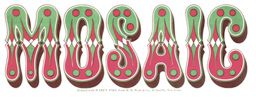 Fancy metal or wood type from the second half of the 19th century. According to Ringwalt in his American Encyclopedia of Printing and Bookbinding (1871): type made of metal or wood for color printing and so arranged that there are duplicate or triplicate copies of each letter, which, after being printed, respectively, in different colors, on a given space, blend together in a harmonious whole. Chromatic types were shown regularly in foundry type specimen books of the 1840s and 1850s.
 Rob Roy Kelly describes the early history: Chromatic types were first produced as wood type by Edwin Allen, and shown by George Nesbitt in his 1841 Fourth Specimen of Machinery Cut Wood Type. Both William H. Page in 1859, and J.G. Cooley in c.1859, showed several pages of Chromatic type in each of their wood type specimen books. Page showed these types in most of his specimen books in the 1870s. The high point of Chromatic wood type production came in 1874 when the William H. Page Wood Type Co. issued their 100-page Specimens of Chromatic Type & Borders. Though Hamilton, Morgans & Wilcox, and Heber Wells all showed samples of Chromatic types through the rest of the century, none of these ever reached the level of intricate precision attained in Page's 1874 masterpiece. Free copy of William H. Page's Specimen of Chromatic Wood Type Borders Etc (1874). Local download of this PDF file. [Google]
[More] ⦿
|
Chuck Davis
[Letterhead Fonts]

|
 [MyFonts]
[More] ⦿
|
Chuck Mountain
|
 Designer of free revival types:
 - The fat typeface Chistoso (2019). He writes: Chistoso (Spanish for amusing) is my digital revival (completely redrawn) of Majestic by Julius E. F. Gipkens (1883-1968). Its original metal type version was found in Hauptprobe in gedrängter Form der bauerschen Giesserei Frankfurt am Main. Majestic (1914) is in the tradition of Lucian Bernhard's typefaces, and Mountain's digital revival is the only one I know of to date.
- Quentell CF (2019). He writes: Quentell is my revival---completely redrawn---of Quentell, designed by William P. Quentell in 1895 for the American Type Founders Co. The original Quentell became the basis of Taylor Gothic (1897). Taylor Gothic was morphed in Globe Gothic by Morris Fuller Benton (1905) for the ATF. A cursory perusal will easily reveal their similarities.
- Cotrell CF (2019). Cotrell is a revival of Matthews, as seen in Inland Type Foundry's specimen book from 1902. He suppressed Cotrell's swashes and redeesigned the lower case f and g.
- Zuecos CF (2019). A Western / Italian typeface based on an Italian in Specimen of Leavenworth's Patent Wood Type Manufactured by J.M. Debow (Allentown, New Jersey, n.d., but probably 1840s).
- Auber CF (2019). A revival and extension of Bohemian, a metal type that can be seen in Printing Machinery and Material (Miller & Richard, 1902).
- Dukas CF (2019). A revival, completely redrawn, of Studley, a metal typeface in Specimen Book and Catalog (Inland Type Foundry, St. Louis, 1902).
- Massenet (2020). A revival of Old Style Grotesque Condensed as shown in Specimens of Printing Type (Miller & Richard, Edinburgh, c. 1920).
- Chausson CF (2020). A revival, completely redrawn, of Othello (shown in Popular Designs for Artistic Printers (Central Type Foundry, St. Louis, 1892), which in turrn seems to be based on an earlier wood type design.
- Murden CF (2020). Murden CF is a revival of Corbitt (Nicholas J. Werner in 1900 for Inland).
- Pettingill CF (2020). A revival of the art nouveau typeface Arlington Old Style, as seen in Pettingill Type Book (Pettingill & Co., 1901).
- Bruntsfield CF (2020), a revival of Bruntsfield, a metal typeface seen in Specimens of Printing Type (Miller & Richard, Edinburgh, (c. 1900)).
Fontsquirrel link. [Google]
[More] ⦿
|
Chung-Deh Tien
|
 American designer in Jackson Heights, NY (b. 1965), associated with the Cherokee Nation. He created the graffiti font Chase Zen Jackulator (2015), Chase Zen Jingletruck Karachi (2015), the tattoo font Chase Zen Holy Monkey (2015), the art nouveau typeface Chase Zen Paris (2014), Chase Zen Sprawl (2014), Chase Zen Blight (2014), Chase Zen Punjabi (2014), Chase Zen Basmati (2014), and Chase Zen Bangladesh (2014).
 Designer in 2011-2012 of the following free Latin / Cherokee fonts: Nikwasi, Tsiquilisda, Danisvdanvsgv, Alewisdodi, Gola Unole, Nvdaasdawadidohi, Atuyasdodi, Tsi yu gunsini (a copperplate design for Unicode Cherokee, named after a Cherokee chief called Dragging Canoe), Wilma Mankiller Old (2012, also for Cherokee), Gadaquali (flared face), Gageda (Cherokee font). Further typefaces: Grendel (2011), the tattoo fonts Maelstrom (2011) and Reign Sample (2010), the mechanical typeface Dans Hardware (2010), the graffiti typeface Stone Angel (2010), the Western typeface Mary's Cherry&Co (2010), the squarish typeface Dashboard Jesus (2010), the fat wood style typeface John Brown (2010), Dantone (2010), the fat roundish typeface Creamy (2010), Thermobaric (2011, Star trek face). Chung-deh Tien created a few Cherokee fonts including Nikwasi San (2012), Sequoya Bold (2012), Oconosota (2012), Kanagota (2012), and Tsalagi Ameliga (2010). Dafont link. Flickr link. Fontspace link. Another Fontspace link. [Google]
[More] ⦿
|
Cina Catteau
[Anugraha Design]
|
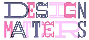 [More] ⦿
|
Cláudio Rocha

|
 Cofounder of Now Type, Cláudio Rocha is an Italian Brazilian illustrator and designer (b. 1957) who was first based in sao Paulo, then in Treviso, Italy, and currently in The Netherlands. Now Type is jointly run with his son Lucas Franco (b. 2001). He edited Tupigrafia, a magazine dedicated to typography and calligraphy in Brazil. Partner of Oficina Tipografica Sao Paulo. His typefaces include:
 - ITC Gema (1998: a felt tip pen font) and ITC Underscript (1997, a grungy fat script).
- Cashew (2000-2020). Cashew is a rounded squarish sans serif font, originally created as a logotype for Tupigrafia magazine (2000). In its 2020 iteration, done together with Lucas Franco, it is a variable font with one axis, from Regular to Extended.
- Tenia.
- Viela Regular (Claudio Rocha & Lucas Franco, 2008-2019). A great thick-and-thin typeface.
- Unidin (sans display face).
- Rock Regular (slab face). Rock Titling (1998-2019).
- Old Future (a brush version of Futura).
- Chacal Pixel.
- Persplextiva (2001-2002, a bouncy hand-drawn 3d face done in the lettering style of Brazilian cartoonist Millor Fernandes).
- Liquid Stencil (1998-2000). A brush stencil.
- Feijoada Light.
- Akrylicz Grotesk (2002, brush/paint face).
- Sampa (1999-2019). An informal brush script.
- Genova (2008-2020). A reinterpretation of Paganini typeface, lauched by Nebiolo type foundry in 1928 for hand composition and developed by Alessandro Butti under the supervision of Raffaello Bertieri.
- Stampface (2006-2018, by Claudio Rocha and Lucas Franco). Based on a Headline Gothic metal type sample found in a reference book, which was designed by Morris Fuller Benton in 1936 for American Type Founders.
- Pieces Stencil (2016). Think piano key or Futura Stencil.
- Antonio Maria (2017): Antonio Maria, a font by Claudio Rocha and Lucas Franco, takes its shapes from the lettering found in the cover of Afixação Proibida (Display Prohibited), a book by the Portuguese poet Antonio Maria de Lisboa (1928-1953). In fact, Antonio Maria was the leader-writer of Afixação Proibida, a collective manifesto from 1949, that initiated the surrealist movement in Portugal. It is an inverted-contrast typeface with 150 ligatures and a large character set.
- Rudolf Antiqua and Rudolf Initials (2018). A faithful revival of Rudolf Koch's Koch Antiqua (1922). Followed by Rudolf Text (2017-2020, Lucas Franco and Claudio Rocha).
- Mefistofele. A revival in 2018 by Claudio Rocha and Lucas Franco of the modular stencil typeface Mefistofele (1930, Reggiani foundry).
- Rudolf Titling (Lucas Franco and Claudio Rocha), a typeface that won an award at Tipos Latinos 2018.
- Agora Titling Extra Light (2018).
- Pieces Stencil (2016-2019). Pieces is a piano key typeface built on a modular system with emphasis on diagonal endings.
- Moreira Serif (2019). A slab serif version of Morris Fuller Benton's art deco typeface Broadway (1927). In the 1930s, the Portuguese graphic artist Antonio Moreira Junior added serifs to Broadway's letterforms and marketed it under a new name. Moreira Serif revives that typeface.
- Scarpa Titling (2019, Claudio Rocha and Lucas Franco). An all caps typeface based on a nameplate found on the front door of a shoemaker in Treviso, Northern Italy.
- Anton (2020, by Claudio Rocha and Lucas Franco). An art deco typeface modeled after a Dutch deco type seen on the Anton Antonius Kurvers's cover of Wendingen in 1927.
- Esperanca Sans (2019). A Peignotian sans by Claudio Rocha & Lucas Franco.
- Jaguaribe (2020). In Unicase and Serif versions, by Claudio Rocha. A squarish sans and serif pair based on the of letterforms drawn by Brazilian artist Gil Duarte.
- Spinface (2020). An experimental turned letter font by Claudio Rocha and Lucas Franco.
- Werner (2020-2021). A revival of A.D. Werner's famous deco inline typeface Dubbeldik (1972).
- Densa (2020). Emulating 19th century wood types. Densa typeface was based on the Fantastic Voyage movie title in the 1966 poster
- Tegel (2020-2021). Tegel is a layer font that emulates the ceramic tile letters found on a school façade in Delft.
- Etna Futurist (2020, Claudio Rocha & Lucas Franco). Digital interpretation of Etna, a wood type produced by the Italian type foundry Xilografia Meneghello & Belluzzo, in the 1920s.
- Cassiano (2020). A super-fat octagonal typeface based on letters found on a book cover by the Brazilian artist Belmonte (1896-1947).
- Fortunato (2020). A digital interpretation of the lettering work done by the Italian Futurist genius Fortunato Depero (1892-1960) for advertising and editorial design. A pure Italian art deco typeface. The lowercases were developed from scratch.
- Jurriaan (2021). A square block typeface.
- Hendrik (2021, by Claudio Rocha & Lucas Franco). A revival of Simplex (Sjoerd Hendrik de Roos, 1937).
- Martin (Swing, Straight) (2020). A beatnik typeface based on the letters found in the jazz record albuns designed by David Stone Martin (1913-1992).
- Tesoura (2020). A paper-cut typeface.
He published the books "Projet Tipográfico" (Ed. Rosari), "Trajan e Franklin Gothic" (Ed. Rosari), and "Tipografia Comparada" (Ed. Rosari). Claudio now lives in Treviso, Italy, from where he launched the type magazine Tipoitalia in 2009. FontShop link. Klingspor link. [Google]
[MyFonts]
[More] ⦿
|
Claire Menager
|
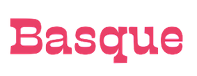 In 2019, Alejandro Freitez and Claire Menager, under the art directoship of Alejandro Paul, designed the multistyle wood type look / Western / Victorian / reverse stress / hyper-decorative Presley Slab (Sudtipos). [Google]
[More] ⦿
|
Clarence Pearson Hornung
[Dick Pape]
|
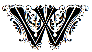 Prolific author, b. 1899. His books include the typographically magnificent Handbook of Early Advertising Art, Mainly from American Sources (Dover, 2 volumes). The typeface Lexington is attributed to him, as Mac McGrew writes: Lexington is a font of shaded and decorated letters and figures, drawn for ATF by Wadsworth A. Parker in 1926, from a design by Clarence P. Hornung. It is an ornamental form of roman letter, with curly serifs, and tendrils at the ends of light strokes. It was recast in 1954, and copied in one size by Los Angeles Type.
 The book Early Advertising Alphabets, Initials and Typographic Ornaments (1956), edited by Clarence P. Hornung, led Dick Pape to creates these digital fonts in 2008: AltDeutsch, Amorette1889, ArabesqueDesign, BreiteEgyptienne (2008), BreiteverzierteClarendon, ChiswickPressGothicInitials, EarlyScrollAlphabet, EarlySignboards, EnglandInitials1880, ErhardDatdolt, FlorentineInitials, FlorentineInitialsReverse (2008), GothicChancery1880s, GothicClosedLetter (2009-2010, Lombardic), Hollandisch-Gothic (2010), JudendstilAlphabet (2009), LilyoftheValley, Papillon 1760 [First shown in Paris in 1760, and reprinted by Clarence P Hornung in Dover Pictorial Archive Series: Early Advertising Alphabets, Initials and Typographic Ornaments (1956, Dover Publications). Hornung's images inspired Pape's typeface], Phantasie (2009-2010), Romaine Midolline (2010), RomanPrintShaded (2010, ornamental roman caps), RusticAlphabet, SilhouetteInitials1880, TheTerrorsofNightLife, VerzierteAltGothic, VerzierteGothic, VictoriaGingerbread1890 (2007). Klingspor link. Download here. More direct link to Pape's digitizations. [Google]
[More] ⦿
|
Classification of initials by Jim Moran
|
Jim Moran (Hamilton Wood Type and Printing Museum, Wisconsin) classifies initial caps using these designations: - Calligraphic: Those letters that reflect the stroke of the flat-nibbed pen.
- Criblé: A stippled dot pattern in the background.
- Floriated: Letterforms that incorporate plant and/or flower motifs.
- Historiated: Letterforms that employ people or places from a given story.
- Inhabited: Those characters that have people, mythical beings, or faces in them.
- Ornamental: A term that describes decoration that is nonrepresentational.
- Speaking: Designs that represent the first letter of the subject matter, eg., P for Piper.
- Zoomorphic: Letterforms that include animals.
[Google]
[More] ⦿
|
Clément Lefevre
[The Mad Castle]
|
[More] ⦿
|
Coert De Decker
[Kustomtype]

|
 [MyFonts]
[More] ⦿
|
Colin Kahn

|
 Type designer from Buffalo, NY. His typefaces were mostly developed at P22. Klingspor link. A partial list of his fonts:
 - In 2008, he revived and extended Cigno, a 1950s script typeface by Aldo Novarese, and called it P22 Cigno.
- LTC Circled Caps.
- P22 Civilité is a joint effort of Colin Kahn, Richard Kegler and Milo Kowalski.
- P22 Curwen. P22 Curwen Poster is a digitized version of a rare wood type used by the Curwen Press in England in the early 20th Century for poster work. P22 Curwen Maxima is a new hyper-stylized re-interpretation of Curwen Poster.
- The great display/comic book font Ebin (and Ebin Outline).
- In 2006, he created the P22 Gauguin font family (Regular, Alternate, Brush and Extras), a script font set based on the writings and sketches of post-impressionist artist Paul Gauguin.
- Glamour (2006, P22/Lanston; also called LTC Glamour Grotesque) is based on the 1948 design by the same name done at Lanston Monotype, which in turn is based on Imre Reiner's Corvinus.
- P22 Goudy Aries (2004, P22, by Richard Kegler and Colin Kahn). This typeface revives Goudy's aries from 1926.
- Goudy Sans (2006, P22/Lanston, 6 styles): Goudy Sans Bold was originally designed by Frederic Goudy in 1922 as a less formal gothic and finished in 1929. The Light was designed in 1930 and the Light Italic in 1931. Colin Kahn digitized them in 2006 to make a 6-style Goudy Sans family, which includes a Goudy Sans Hairline.
- In 2008, he revisited Richard Kegler's P22 Platten, which was based on lettering found in German fountain pen practice books from the 1920s, and created the extended typeface P22 Platten Neu.
- Internship (2003), or St G Schrift. P22 swrites: St. G Schrift (2005, P22) is a font based on the type designs of German poet Stefan George. This sans-serif typeface features a few variations found in books published by George in Berlin. Includes P22 St. G Schrift One, P22 St. G Schrift Two and P22 St. G Italic (an art nouveau version of the roman, newly designed). The original font was cast in 1907 by a small foundry in Germany and was used primarily for the works of George as well as other books including a monumental edition of Dante's Divine Comedy. This may or may not contradict the fact that Marcus Behmer designed Stefan George-Schrift in 1904.
- P22 Tuscan Expanded is a digitization of the mid-19th century wood type font Antique Tuscan Expanded - Wells&Webb 1854.
- P22 Vale (2007, in Roman and Kings Fount styles) are based on types by Charles Ricketts that were used by the Vale Press (which in turn were based on Jenson). The Kings Fount is originally dated 1903.
- In 2007 still, he revived Zebra (P22), a font originally designed in 1963-1965 by Karlgeorg Hoefer.
View Colin Kahn's typefaces. [Google]
[MyFonts]
[More] ⦿
|
Colophon Foundry
[Edd Harrington]
|
 Colophon Foundry was a London and Los Angeles-based digital type foundry established in 2009. Its members comprised Benjamin Critton (US), Edd Harrington (UK), and Anthony Sheret (UK). The foundry's commissioned work in type design was complemented by independent and interdependent initiatives in editorial design, publishing, curation, and pedagogy. It grew out of the Brighton-based design studio, The Entente (Anthony Sheret&Edd Harrington) in April 2009. Benjamin Critton (Brooklyn, NY) joined them later. In December 2023, it was acquired by Monotype.
 Fonts: - Aperçu (2010, +Mono), a sans family by Anthony Sheret / The Entente.
- Archive (2013). A text family by Anthony Sheret and Edd Harrington.
- Basis Grotesque (2015). Influenced by Akzidenz Grotesk.
- Burgess (2014). A Times-Roman-like typeface family by The Entente and Benjamin Critton.
- Castledown (2014). A sans family for educational purposes. They write: From 2012-2014 we collaborated closely with Castledown Primary School, Hastings, UK. The project began as a custom typeface commission for the school but soon developed into an initiative to develop and unify typography within primary education. Extended in 2020.
- Central Avenue (2011). By Studio Makgill.
- Coign (2018-2021). An extensive study of ultra condensed forms based on the DeLittle type foundry's Elongated Sans.
- DM Mono (2020). A free 3 weight, 3 style family designed for DeepMind. DM Mono was loosely based off of Jonny Pinhorn's DM Sans, with a reduction in contrast and less geometric proportions. The type design and font development was commissioned from Colophon Foundry, with Creative Direction from the DeepMind team. Design by Edd Harrington and Anthony Sheret. They also developed DM Sans, DM Serif Text and DM Serif Display (2019). The Serif families are derived from Source Serif Pro. The Sans family is derived from Jonny Pinhorn's Poppins (2014-2017). Github link. Google Fonts link.
- Fann Grotesque (2019). A 9-weight sans family inspired by the 19th century British Grotesque types from British type foundries such as Stephenson Blake, Day & Collins and Miller & Richard.
- Fortescue (2009): a text family with triangular serifs commissioned for the identity of artist and printmaker, Jake Spicer.
- La Fabrique Pro (2012-2017). A sans by The Entente.
- Goodall. A 10-style take on the geometric slab serif genre; bringing together a melting pot of 19th century wood type influences and more contemporary reference points such as Memphis (Rudolf Wolf, 1929) and Rockwell (Monotype, 1934).
- Grenette (2020). Colophon writes: Combining influences from Windsor (from Stephenson Blake & Co's Wood Letter Specimen, 1915) and Richmond Old Style (from DeLittle's Wood Type Specimens, 1966), Grenette's imposing serifs contrast with the serif-less interiors of certain forms such as n, h and v.
- Leroy (2012). By Stockholm-based Oscar & Ewan.
- Lisbon (2013, Anthony Burrill). Lisbon is a geometric stencil typeface based on an original metal stencil that Burrill found in a sign makers shop in Lisbon, Portugal. The font was first used in a series of posters commissioned by the British Council for Experimenta cultural biennale in Lisbon (2010).
- Lydia Bold Condensed (2013, Benjamin Critton) revives an angular typeface by Warren Chappell from 1946.
- Mabry (2018, Benjamin Critton): Originally commissioned in 2014 for Los Angeles-based apparel company Nasty Gal---named as such after the 1975 album and song of the same name by influential funk singer Betty Davis (b. Betty Mabry, 1945)---Mabry is the commercial iteration of the former NG Grotesque.
- MAD Sans and MAD Serif (2011-2017) by Dries Wiewauters.
- Marché (2014). By The Entente, inspired by Eurostile.
- Midnight sans (2021). Colophon writes: Midnight Sans was initially drawn for Gary Green's "When Midnight Comes Around", published by our friends at Stanley/Barker in 2020. The condensed-only style embodied a warm but idiosyncratic flavour: a reflection of the publication's photographs, which document the burgeoning downtown alternative music scene of 1970s New York City.
- Monosten (2011). A rounded monospace sans by Anthony Sheret that includes a couple of stencil styles.
- Montefiore (2009): a grotesque with wood type influences.
- One Night Sans (2020). A bespoke typeface for condom manufacturer Durex.
- Pantograph: Pantograph is an authentic redraw of the typeface employed by the British pantograph etching process. Designed by Hamish Makgill in 2009.
- Peggs (2009): typewriter style for the identity of Peggs&Son, designed by Edd Harrington.
- PDU (2010). By Dries Wiewauters. PDU stands for Plaque Découpée Universelle, a stencil system patented in 1876 by Joseph A. David.
- Perçu (2010): a full sans family that is---in their own words---an amalgamation of classic humanist typefaces such as Johnston and Gill Sans with Neuzeit and Franklin Gothic.
- Perfin (2009, by Alison Haigh).
- PIN (2015). By Hoon Kim / Why Not Smile LLC.
- Raisonné (2010). By Benjamin Critton. Raisonné is a 7-weight geometric sans-serif type initially designed in 2010 and subsequently expanded upon, first in 2012 and again in 2018-2019. Colophon writes: The typeface is parodic-serious, intended to be blunt, candid, and affable all at the same time. It outwardly pays homage to noteworthy precedents, among them Rudolf Koch's Kabel (1927) and Victor Caruso's later redrawing for ITC (1976), Joseph Churchward's Crossbred (1970s), Paul Renner's Futura (also 1927), and Herb Lubalin's Avant Garde (1968).
- Reader (2009): Reader is a neo-grotesque typeface initially created in a medium weight, and now re-cut into a base family of six weights with an additional seventh in the form of Reader Black. The typeface itself has been referenced from an RSPB letter dating 1972. The original typeface, which is unknown, was a monospaced, rounded face. It had geometric proportions which felt like they wanted to break free of the restrictions of a monospaced grid.
- Relative (2011). By The Entente: Initially drawn in August 2010 for Outside In by Stephen Gill; a book designed for the Brighton Photo Biennale 2010. Includes monospaced styles.
- System85 (+Mono). A sans family.
- Transcript Pro (2017).
- Value Sans and Value Serif (2012): Value Sans borrows in style and behaviour from precedents like Elegant Grotesk and Granby. Value Serif pays homage to forebears like Plantin Infant and Italian Old Style. The Sans was drawn first by The Entente (Edd Harrington & Anthony Sheret, UK). The Serif was drawn shortly after, by Benjamin Critton (US). Each borrows their geometries from the other, and nuances were finalised by all parties as Colophon Foundry.
- Visuelt (2013-2016, The Entente). Originally created as a bespoke face for the 2013 and 2014 identity for Visuelt, Oslo, Norway, Visuelt spawned from a more considered and constrained version of Aperçu. Visult Pro (2019) covers Cyrillic and Greek as well.
Bespoke projects: - Battlebridge for the area of King's Cross, London (2016).
- Burberry Apercu Bespoke (2010-2017).
- Chelsea Basis (2015) and Chelsea Basis Chiselled (2018). For FC Chelsea.
- Corona Headline for Corona (2016).
- Europa Nuova & Europa Mono (2016). For UEFA's Europa League.
- Fanta Playful for Fanta (2017).
- Fulham First XI & Substitute XI for Fulham Football Club (2013). Stencil types.
- FQ Value for New Covent Garden Market (2016).
- GF Smith for paper manufacturer and merchant G.F. Smith (2014).
- Grey Goose for the French Vodka Producer (2014).
- Helen for Race Against Dementia (2016).
- Mondial for Rapha's Magazine (2015).
- NG Grotesque for LA-based fashion label, Nasty Gal, with Benjamin Critton (2014).
- Poynings, for printer Generation Press (2014).
- Tesco Modern, Tesco Modern Condensed, Tesco Slab and Tesco Serif for supermarket chain Tesco (2016-2017).
- Ubisoft Sans for French games publisher, Ubisoft (2016).
- Unify for the English Rugby Football Union (2013).
- Wales and Cymru Sans for Visit Wales / Welsh Government (2015).
[Google]
[More] ⦿
|
Constant Audebaud
|
Wood engraver in Bressuire, Deux-Sèvres, France, active in the 1880s. Revivals of his work include Audebaud (2010, Mad Type), which is a French Clarendon. Audebaud's work appeared in the 1880s in the Deux-Sèvres département of France. [Google]
[More] ⦿
|
Constellation
[Chester Jenkins]
|
 Constellation is a creator and publisher of contemporary typefaces and is run by its two partners, Chester Jenkins (based in New York, born in Montreal) and Tracy Jenkins. They also feature typefaces by Magnus Rakeng, Patrick Giasson, Kris Sowersby, Rick Valicenti, and Jeremy Mickel. Constellation contains the main elements of the previous Village and Thirstype foundries. Typefaces including bespoke typefaces by Chester Jenkins:
 - Aero (2011, Chester Jenkins and Jeremy Mickel). Based on Roger Excoffon's Antique Olive.
- Apex Sans (2003), Apex Serif (2003), Apex New (2005) and Apex Rounded (2010). All by Chester Jenkins. Apex Serif and Apex Sans were co-designed with Rick Valicenti.
- Apollo. A bespoke multiline typeface for the Apollo Theater.
- Arbor (2010). Arbor was originally commissioned by the New York Times magazine for use in their 2008 Hollywood special issue. The source was Rob Roy Kelly's book of woodtype samples, and the D and H from Caslon's Italian of the 1820s. An original representative of this Western genre.
- Barclays Center (2012). A bespoke athletic lettering and stencil family.
- Brooklyn (2013, a brutalist typeface) and Brooklyn Stencil (2013, an octagonal stencil). The original was commissioned in 2007 by Michael Bierut for a sports complex.
- The Cooper Hewitt Smithsonian Design Museum in New York City is giving away for free its bespoke house typeface, a sans designed in 2014 by Chester Jenkins. Even the original UFO files are made available.
- Cosmica (2018).
- Endzone Slab (+Condensed) and Endzone Sans (2017) are bespoke typeface done for the NFL.
- Galaxie Cassiopeia (2006). A round connected upright script. By Chester Jenkins.
- Galaxie Copernicus (2009). An interpretation of Christophe Plantin's Plantin (cut by Robert Granjon) and Frank Hinman Pierpont's Monotype revival of Plantin. By Chester Jenkins and Kris Sowersby.
- Indestructible Language (2006, with Mary Ellen Carroll): The Precipice Alliance, a non-profit corporation collaborating with artists to direct public attention to global warming, launched with this inaugural artwork by the contemporary artist Mary Ellen Carroll. This lettering was a collaboration with Ms. Carroll to design letterforms that could be rendered 8-feet tall in neon tubing. Each neon letter was to be placed, in a 900-foot-long installation, in the window bays of all five former American Can factory buildings in Jersey City, New Jersey to be exhibited from November 2006 to April 2007. The 8-foot high, carbon neutral neon letters were clearly visible (and legible) to drivers on both the Pulaski Skyway and the New Jersey Turnpike, and by planes heading to and from Newark International Airport.
- Maharam (ca. 2017). A bespoke Futura revival typeface for Maharam.
- A bespoke sans titling typeface for the NYC Opera.
- Galaxie Polaris, Galaxie Polaris Condensed (2004-2013). Two sans families by Chester Jenkins.
- Oz (1999). A round typeface family by Patrick Giasson. Designed as an homage to Oswald Cooper (whose nickname was Oz), whose Oswald Cooper inspired the fat shapes.
- Pink Sans, Pink Slab and Pink Outline are bespoke typefaces for Victoria's Secret Pink campaign.
- Radio (1998). A retro script family by Magnus Rakeng.
- Robledo Stencil. For Slanted Magazine.
- Sharpie Script. a bespoke script typeface for the identiy of Michael Kors.
- A revival of Frederic Goudy's lost Sherman type for Syracuse University with Michael Bierut and his team at Pentagram.
- For Snickers, Chester designer Chiat Day.
[Google]
[More] ⦿
|
Cosimo Lorenzo Pancini

|
 Born in Firenze in 1969. Cofounder with Francesco Canovaro and Debora Manetti of the Italian design firm in Firenze called Studio Kmzero. He co-designed some typefaces there such as Arsenale White (2009). In 2002, Pancini developed Targa, TargaMS and TargaMSHand (for comic books?), basing his design on the peculiar sans serif monospace typeface with slightly rounded corners and a geometric, condensed skeleton that Italy had been using for its license plates. In 2022, Francesco Canovaro redesigned this font into a versatile multi-weight typeface, Targa Pro, which includes Targa Pro Mono (which keeps the original monospace widths), Targa Pro Roman (with proportional widths), both in five weights plus italics, the handmade version Targa Hand, and Targa Pro Stencil.
 The handwriting of Lord Byron led Pancini to develop the brush script typeface Byron (2013, Zetafonts). MyFonts credits him with the rounded avant garde sans family Antipasto (2007), but elswhere we read that this typeface is made by Matteo di Iorio, so there is some confusion. It was extended in 2017 by Pancini as Antipasto Pro. In 2014, Cosimo Lorenzo Pancini and Francesco Canovaro co-designed Amazing Grotesk (+Ultra). He also designed the calm bold geometric rounded sans typeface Cocogoose (2014; replaced by Cocogoose Pro in 2017) and the stylish deco font Offensive Behaviour. Cocogoose Letterpress is free. Cocogoose is part of the Coco Gothic family, a collection of twelve typefaces each inspired by the fashion mood of every decade of last century, named after fashion icon Coco Chanel. Cocogoose is Coco Gothic for the 1940s. See also Coco Gothic Pro (2021). In 2015, Pancini published the grand family Coco Gothic. This Latin / Greek / Cyrillic typeface family features a small x-height and sligghtly rounded corners to make the avant garde and geometric sans typefaces in vogue in the 1970s come alive again, ready for 21st century fashion magazines. It comes with substyles that recreate many moods, including art nouveau and arts and crafts (Cocotte), Italian propaganda style and Italian deco (Cocosignum), hipster style (CocoBikeR), or Bauhaus (Cocomat). Coco Gothic was initially developed as a corporate font for Lucca Comics & Games Festival 2013. The rounded geometric sans family Cocomat (by Cosimo Lorenzo Pancini, Deborah Manetti and Francesco Canovaro) was inspired by the style of the twenties and the visions of Italian futurists like Fortunato Depero, Giacomo Balla and Antonio Sant'Elia. Updated in 2019 as Cocomat Pro. Still in 2015, Cosimo and Zetafonts published the connected creamy baseball script Bulletto, the grungy handvetica Neue, and the calligraphic wedding typeface Hello Script. In 2015, at Zetafonts, Cosimo Lorenzo Pancini designed CocoBikeR (2015) to celebrate the hipster and bike cultures. CocoBikeR (for Latin, Greek and Cyrillic) is part of the successful Coco Gothic typeface family. In 2017, Pancini designed the 1930s Italian art deco typeface families Cocosignum Maiuscoletto and Cocosignum Corsivo Italico. In 2021, he published the 48-style (+variable) font family Coco Gothic Pro. This is a redrawn and expanded set of fonts: Inspired by a biography of Coco Chanel and trying to capture the quintessential mood of classical fashion elegance, Cosimo Lorenzo Pancini designed Coco Gothic looking for the effect that the first geometric sans typefaces (like Futura, Kabel or the italian eponyms like Semplicita) had when printed on paper. The crisp modernist shapes acquired in printing charme and warmth through a slight rounding of the corners that is translated digitally in the design of Coco Gothic. [...] A distinguishing feature of Coco Gothic Pro is the inclusion of ten alternate historical sets that allow you to use the typeface as a true typographic time machine, selecting period letterforms that range from art deco and nouveau, to modernism and to eighties' minimalism. Equipped with such an array of historical variants, Coco Gothic Pro becomes an encyclopedia of styles from the last century. There is also attention to Darkmode and there is coverage of Cyrillic and Greek. Typefaces from 2016: Adlery (a curly brush script), Kitten (Fat, Swash, Swash Monoline, Slant, Bold: signage script family), Adlibitum (a blackletter typeface by Cosimo Lorenzo Pancini and Francesco Canovaro), Morbodoni (a display didone by Cosimo Lorenzo Pancini and Francesco Canovaro). In 2016, Cosimo Lorenzo Pancini, Andrea Tartarelli, Giulia Ursenna Dorati and Andrea Gaspari co-designed the 1940s vintage brush script typeface Banana Yeti, which is based on an example by Ross George shown in George's Speedball 1947 Textbook Manual. The Zetafonts team extended the original design to six styles and multilingual coverage. The ExtraBold is free. Still in 2016, Pancini designed Calligraphunk, an experimental typeface that mimicks polyrythmic calligraphy, by alternating two sets of lowercase letters to emulate handwriting. In 2016, Cosimo Lorenzo Pancini, Matteo Chiti, Luca Chiti and Andrea Tartarelli co-designed the retro connected brush script font family Advertising Script, which is based on an example from Ross George's Speedball 1947 Textbook Manual. Beatrix Antiqua (2016, by Francesco Canovaro, Cosimo Lorenzo Pancini and Andrea Tartarelli). This humanist sans-serif typeface is part of the Beatrix family (Beatrix Nova, etc.) that takes its inspiration from the classic Roman monumental capital model. Its capitals are directly derived from the stone carvings in Florence's Santa Croce Cathedral. Beatrix keeps a subtle lapidary swelling at the terminals suggesting a glyphic serif, similar to Hermann Zapf's treatment in Optima. Amazing Grotesk (2016) is based on a logo designed by Francesco Canovaro. Studio Gothic (2017, by Francesco Canovaro, Cosimo Lorenzo Pancini and Andrea Tartarelli) is an 8-style geometric sans family based on Alessandro Butti's geometric sans classic, Semplicita. Hello Script and Hello Sans can be used for layering and coloring. The Christmas-themed version is Hello Christmas. Pancini designed the 64-strong typeface family Body Grotesque and Body Text in 2017-2018, together with Andrea Tartarelli. It was conceived as a contemporary alternative to modernist super-families like Univers or Helvetica. In 2017, Cosimo Lorenzo Pancini and Andrea Tartarelli co-designed the sans typeface family Kabrio, which gives users four different corner treatment options. Anaphora (2018). Anaphora is a contemporary serif typeface designed by Francesco Canovaro (roman), Cosimo Lorenzo Pancini (italic) and Andrea Tartarelli. It features a wedge serif design with nine weights from thin to heavy. Its wide counters and low x-height make it pleasant and readable at text sizes while the uncommon shapes make it strong and recognizable when used in display size. Anaphora covers Latin, Greek and Cyrillic. Canovaro's Arista served as a basis for the 29-style monolinear rounded sans typeface family Aristotelica (2018) by Cosimo Lorenzo Pancini and Andrea Tartarelli. See also Aristotelica Pro (2020). In 2018, he designed the italics for Cosimo Lorenzo Pancini's Domotika typeface family. Between 2018 and 2021, Cosimo Lorenzo Pancini and Andrea Tartarelli developed the 8-weight humanist sans typeface Domotika for Latin, Cyrillic and Greek, further into the 18-style Domotika Pro (2021). In 2018, he published Radcliffe, with Andrea Tartarelli, a Clarendon revival with Text and Casual subfamilies. Radcliffe (a Clarendon revival by Cosimo Lorenzo Pancini and Andrea Tartarelli), and added the layerable condensed Cocogoose Narrows to the Cocogoose family. Codec (2018) by Cosimo Lorenzo Pancini, Francesco Canovaro and Andrea Tartarelli is a geometric sans typeface family in which all terminal cuts are horiontal or vertical. See also Codec Pro (2019). His Double Bass (2018) is a jazzy 4-style typeface family that pays tribute to Saul Bass's iconic hand lettering for Otto Preminger's The Man with the Golden Arm film title sequence and other movies, Bass's vibrating, almost brutal cut-out aestethics, and the cartoonish lettering and jazzy graphics of the fifties. In 2018, he published the sharp wedge serif typeface Blacker to pay homage to the 1970s. In 2019, that was followed by Blacker Pro (Cosimo Lorenzo Pancini and Andrea Tartarelli, who write: Blacker Pro is the revised and extended version of the original wedge serif type family designed by Cosimo Lorenzo Pancini and Andrea Tartarelli in 2017. Blacker was developed as a take on the style that Jeremiah Shoaf has defined as the "evil serif" genre: typefaces with high contrast, oldstyle or modern serif proportions and sharp, blade-like triangular serifs). Still in 2018, he designed the swooping polyrhythmic calligraphic typeface Calligraphunk. In 2018, Cosimo Lorenzo Pancini and Andrea Tartarelli designed Holden, a very Latin cursive sans typeface with pointed brush aesthetics and fluid rhythmic lines. In 2019, Cosimo Lorenzo Pancini, Francesco Canovaro and Andrea Tartarelli published the monolinear geometric rounded corner amputated "e" sans typeface family Cocogoose Classic, the sans family Aquawax Pro, and the condensed rounded monoline techno sans typeface family Iconic. In 2019, Cosimo Lorenzo Pancini, Andrea Tartarelli and Maria Chiara Fantini at Zetafonts published a slightly calligraphic Elzevir typeface, Lovelace. In 2019, the lapidary typeface family Beatrix Antiqua (Francesco Canovaro) was reworked by Cosimo Lorenzo Pancini together with Andrea Tartarelli and Maria Chiara Fantini into a 50-style type system called Monterchi that includes Text, Serif and Sans subfamilies. Monterchi is a custom font for an identity project for a famous fresco in Monterchi, developed under the art directorship of Riccardo Falcinelli. Tarif (2019) is a typeface family inspired by the multicultural utopia of convivencia---the peaceful coexistence of Muslims, Christians and Jews in tenth century Andalusia that played an important role in bringing to Europe the classics of Greek philosophy, together with Muslim culture and aesthetics. It is a slab serif typeface with a humanist skeleton and inverted contrast, subtly mixing Latin zest, calligraphic details, extreme inktraps, and postmodern unorthodox reinvention of traditional grotesque letter shapes. The exuberant design, perfect for titling, logo and display use, is complemented by a wide range of seven weights allowing for solid editorial use and great readability in body text. Matching italics have been designed with the help of Maria Chiara Fantini and Cosimo Lorenzo Pancini, while Rania Azmi has collaborated on the design of the arabic version of Tarif, where the humanist shapes and inverted contrast of the Latin letters find a natural connection with modern arabic letterforms. Late in 2019, Cosimo Lorenzo Pancini released the fun typeface family Hagrid at Zetafonts, which writes: Crypto-typography---the passion for unknown, weird and unusual character shapes---is a disease commonly affecting type designers. Cosimo Lorenzo Pancini has celebrated it in this typeface family, aptly named Hagrid after the half-blood giant with a passion for cryptozoology described by R. K. Rowling in her Harry Potter books. Extreme optical corrections, calligraphic counter-spaces, inverted contrast, over-the-top overshoots: all the inventions that abound in vernacular and experimental typography have been lovingly collected in this mongrel sans serif family, carefully balancing quirky solutions and solid grotesque design. In 2020, Pancini released Stinger (2020, a 42-style reverse contrast family by Francesco Canovaro, Cosimo Pancini, Andrea Tartarelli and Maria Chiara Fantini) and Boring Sans (a typeface family designed along two variable axis: weight and weirdness). As part of the free font set Quarantype (2020), Cosimo Lorenzo Pancini designed Quarantype Embrace, Quarantype Hangout, Quarantype Hopscotch, Quarantype Joyride, Quarantype Sackrace, and Quarantype Uplift (with Maria Chiara Fantini). In 2020, Cosimo Lorenzo Pancini and Mario De Libero revived Nebiolo's Carioli (1928) as Cairoli Classic and Cairoli Now at Italian Type / Zetafonts. They extended the original weight and width range and developing both a faithful Classic version and a Now variant. The Cairoli Classic family keeps the original low x-height range, very display-oriented, and normalizes the design while emphasizing the original peculiarities like the hook cuts in curved letters, the high-waisted uppercase R and the squared ovals of the letterforms. Cairoli Now is developed with an higher x-height, more suited for text and digital use, and adds to the original design deeper inktraps and round punctuation, while slightly correcting the curves for a more contemporary look. Cairoli Variable has a weight and width axis. In 2020, Cosimo Lorenzo Pancini and Mariachiara Fantini---with the help of Solenn Bordeau---released Erotique at Zetafonts. Erotique evolved from Lovelace, an earlier Zetafonts typeface. Zetafonts describe this evil serif as follows: it challenges its romantic curves with the glitchy and fluid aestethic of transmodern neo-brutalist typography. Late in 2020, they added Erotique Sans, the sans version of Erotique, also designed by Cosimo Pancini and Maria Chiara Fantini. Late in 2020, he co-designed the 46-style font family Eastman Grotesque together with Francesco Canovaro and Andrea Tartarelli. This monolinear sans with a tall x-height comprises an interesting Eastman Grotesque Alternate subfamily with daring and in-your-face glyphs. The typeface evolved from Zetafonts' earlier Bauhaus-inspired typeface Eastman (2020). Later fonts in this family include Eastman Condensed (2021, by Francesco Canovaro, Cosimo Pancini and Andrea Tartarelli). In 2020, Cosimo Pancini, Andrea Tartarelli and Mario De Libero drew the 60-style Cocogoose Pro Narrows family, which features many compressed typefaces as well as grungy letterpress versions. Sunshine Pro (2020, Zetafonts) was designed by Cosimo Lorenzo Pancini and Solenn Bordeau expanding the original Sunshine design by Francesco Canovaro, part of the Quarantype collection (2020), which in turn was designed as a typeface for good vibes against Covid-19. Sunshine Pro is an experimental Clarendon-style font with variable contrast along the weight axis---contrast is reversed in light weight, minimized in the regular weight and peaks in the bold and heavy weights. Coco Sharp (2021) is a 62-style sans feast, with two variable fonts with variable x-height, by Francesco Canovaro, Cosimo Pancini and Andrea Tartarelli. Co-designer of Heading Now (2021), a 160-strong titling font (+2 variable fonts) by Francesco Canovaro, Cosimo Pancini, Andrea Tartarelli and Mario De Libero that provides an enormous range of widths. Keratine (2021, Cosimo Pancini, Andrea Tartarelli and Mario De Libero). A German expressionist typeface that exists in a space between these two traditions, mixing the proportions of humanistic typefaces with the strong slabs and fractured handwriting of blackletter calligraphy. Pancini, its main designer, writes that it explores the impossible territory between antiqua and blackletter. Geppetto (2021) is a frivolous Tuscan font that started out as a revival of a condensed Tuscan wood type family appearing in the 1903 Tubbs Wood Type catalog and which was probably derived from an 1859 typeface by William Hamilton Page. Pancini built a variable font on top of it and calls it a font for fake news. In 2021, Pancini added Coco Tardis as a variable font with a time travel slider to the Coco Gothic family. Millard Grotesque (2021) is a true "grot" in the Akzidenz Grotesque sense of the word. This typeface family was designed by Cosimo Lorenzo Pancini and Andrea Tartarelli. Pancini's Descript (2021) is a variable script font with two axes, slant and speed of writing. Milligram (2021) is a very tightly set grot by Cosimo Pancini and Andrea Tartarelli. [Google]
[MyFonts]
[More] ⦿
|
Cove 703 (was: ComicVector 703)
[Cundrawan Tan]
|
Denpasar, Bali-based designer of the curly handcrafted typeface Kerithing (2015), Baline Script (2016) and the watercolor brush typeface Amarill (2016). Typefaces from 2017: The Naturel (woodblock printing style), Balistroke, Rosedita Script (calligraphic), Maheera, Ringotube (2017). Typefaces from 2019: Tony Bhages (dry brush), James Stroker, Ricky Lhambert, Cleopharta (dry brush), Hardy Blow (dry brush script), Morgan Chalk, Cherry Angela, Christopher Done, Chrusty Rock, Willy Brothers, Zuka Doodle (3d, sketched), Yasmine Rothem, Qinyana Signature, Firyana Beauty, Olivia Dhorgent, Wyntex Brasco, Charlie Zonk, Agnesa Kyoto, Mickey Steward, Becky Tahlia, Boldywolf, Paul Signature, Happy Sunday, Just Mandrawn (sketched), Ghiya Strokes (a dry brush typeface), Jocky Starline, Billy Scriptian, Rose Katrinah, Nugie Romantic (Victorian), Nadia Sofia (bold italic), Golden Ranger, Dharko Gilbert, Kestoy Selfie, Falling Button (a fat finger font), Richie Brusher (dry brush), Rhyanie Lane, Sheila Crayon, Anthem Nasney, Melodya Chatrina, Sandra Belhock, Duck in Shipah, Monster Game, Robert Barack, Hot Restaurant (monoline script), Funshop, Katrine Holland, Shark Ready, Heidy Indigo, Takashi Minta, Ballet Harmony, Knight Jacker (blackletter script), Michael Jackpot (brush font), John Bulgarry (script), Roshida Valentines, (script) The Naturel Txt (a dry brush or wood texture emulation font), Jungle Boy, Shitoberry (script), Baline Script. Creative Market link. Dafont link. Graphicriver link. [Google]
[More] ⦿
|
Craig Welsh

|
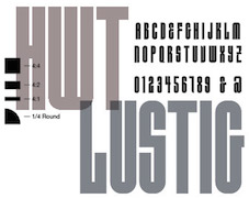 Born in 1971, Craig Welsh is professor at Marywood University since 2000, where he teaches the history of graphic design. Designer who runs Go Welsh Design in Lancaster, PA. Walsh contacted Alvin Lustig's widow, AIGA Medalist Elaine Lustig Cohen (NY) to suggest collaborating on a complete typeface based on the few existing characters of Alvin Lustig's geometric typeface Euclid (1939). Together Lustig Cohen and Welsh, utilizing Alvin's existing grid, created all the necessary characters, punctuation and glyphs, and renamed the font HWT Lustig Elements. The face has been cut as wood type by Hamilton Wood Type & Printing Museum in 2015, and there is a digital version from P22 in 2016. [Google]
[MyFonts]
[More] ⦿
|
Cundrawan Tan
[Cove 703 (was: ComicVector 703)]
|
[More] ⦿
|
Cuttlefish Fonts
[Jason Pagura]
|
Cuttlefish Fonts offers free original fonts by Cupertino, CA-based graphic designer Jason Pagura, such as Rutaban (2001), Bernur (1996, sans), Gemelli (handwriting), Gohan (fat finger comic book lettering, updated into ShinGohanSix in 2007), Bolonewt (2003), Antherton Cloister (2003, based on insect antennae. Discussed here) and Rutager (2001). He was working on Palormak (2006, futuristic). Between 2006 and 2010, he published Agamemnon, a large and warm transitional slab serif typeface with wood type influences that covers Latin, Cherokee, Cyrillic and Greek. Later typefaces include Cartmeign and Posterony (2007, anthroposophic). Dafont link. 1001fonts link. [Google]
[More] ⦿
|
Dafne Martinez
|
 Letterer and designer in Mexico City. In 2017, she designed the text typeface Tessitura especially for small print sizes. Co-founder of the Tipas Type type foundry in Mexico City together with Monica Munguia (who by 2020 has left the studio), and Sandra Garcia. Dafne Martinez studied graphic design at Facultad de Artes y Diseño, UNAM, and has a Masters in typography from Centro de Estudios Gestalt. She specializes in calligraphy and lettering. In 2019, Dafne Martinez, Monica Munguia, and Sandra Garcia co-designed the roundish informal children's book typeface Xantolo and the wood type / slab serif typeface Xihtli. In 2019, Dafne Martinez and Sandra Garcia designed the copperplate calligraphic typeface Especial for a common Mexican beer brand
 Member of the Sic Typus Creatus Est team (Dafne Martinez, Jorge George, Leonardo Delgado, Iordan Evair and Federico Biagioli) that designed Calmadita in 2020 for the Torneo tipografico competition. Calmadita is an angular slab serif meant for Ipads and Kindles. In 2021, Dafne Martinez and Sandra Garcia published Achtli (Book, Didactic), a rounded sans typeface for early readers. [Google]
[More] ⦿
|
Dan Forbes
|
Based in Boston, Dan Forbes is a graphic designer with a keen interest in tyography. In 2009, he created the log-themed Woody Display. [Google]
[More] ⦿
|
Dan X. Solo
[Solotype]

|
 [MyFonts]
[More] ⦿
|
Dani Rubio Arauna
|
Graphic designer in Barcelona since 2004. Creator of the wood type-inspired typeface Madera (2014) and of the ornamental caps typeface Metamorfosis (2014). Behance link. [Google]
[More] ⦿
|
Daniel Hernandez
[Hernández Type (was: Estudio de diseño Calderón)]

|
 [MyFonts]
[More] ⦿
|
Daniel Mizielińscy

|
 Aleksandra and Daniel Mizielińscy are from Warsaw, where they set up Hipopotam. Together, they created the hand-drawn 3d outline typeface Bubol (2011), the hand-printed Cartographer (2011), the grungy caps typeface Mr. Black (2011), the upright connected monoline script typeface Mrs White (2011), and the constructivist typeface Olifant (2011).
 In 2012, they added Mr. Brown, Mr. Dog Dog (hilarious animal silhouette typeface), Mr. Robot (an octagonal overlay family that can have shadows), Mr. Tiger (eroded woodsy caps), and Mr. Orange (hand-printed). Typefaces from 2013: Mr. Dodo, Mrs. Lollipop (a hand-drawn layered type system), Mr Lucky (sketched layered family), Mr. Alex, Mr. Happy (hand-drawn), Mr. Cyrk (checkered letters as seen on clowns and in a circus), Mr. Anteater, Mrs. Ant (comic book text typefaces). Typefaces from 2016: Mr Dum Dum. Behance link. Klingspor link. [Google]
[MyFonts]
[More] ⦿
|
Daniel Nisbet
[Brew City Type]
|
[More] ⦿
|
Daniel Sabino
[Blackletra]

|
 [MyFonts]
[More] ⦿
|
Daria Kalenchuk
|
Student in Moscow, who created Neowood (2012) and Aliens' Alphabet (2012). [Google]
[More] ⦿
|
Darius Wells

|
 This New York printer, was the first to produce wood type commercially, in 1827, after having invented the lateral router with David Bruce. Saxe says that the preferred woods were maple, pear, and cherry, and to a lesser extent boxwood, mahogany, and holly. Maple won out by 1850. His first specimen book (1828) now resides at Columbia University. Wells, the inventor, was born in Johnstown, NY, in 1800, and died in Paterson, NJ, in 1875. His company was first called D. Wells&Co., but becomes Wells&Webb in 1839 when Wells forms a partnership with E.R. Webb, who had earlier that year bought the company of Leavenworth and Debow from George Bruce. In 1854, Wells sells his partnership to Webb, and so we have E.R. Webb&Co. Webb dies in 1864, and the company reverts to Heber Wells, the youngest son of Darius Wells, Alexander Vanderburgh and Henry Low---it is now Vanderburgh, Wells&Co. Hever Wells buys out the others, and the company becomes just Heber Wells. This last company was absorbed by Hamilton in 1898.
 Revivals of the wood types of Darius Wells include AWT Page Antique Black (2013, Dick Pape; after an 1828 typeface by Darius Wells) and AWT Wells Roman Extrabold (2013, Dick Pape; after an 1828 fat typeface typeface by Darius Wells). [Google]
[MyFonts]
[More] ⦿
|
Darren McArdel
|
 Graphic designer who started in Los Angeles, where he ran Beautiful Bastards. Subsequently, he is associated with Questus Inc and Big Country Labs, and was located in Costa Mesa, CA and Tustin, CA. He currently works in Seattle, WA.
 His early typefaces: Mushman (2012) is a techno-sans typeface inspired by the adventurous spirit of actor Steve McQueen, who raced motorcycles under the false name "Harvey Mushman." His second typeface, Bronson (2012, free if you ask), is a display type inspired by Danny "Tunnel King" Lewinski, Charles Bronson's character in The Great Escape. In 2013, he created the elegant (free) futuristic typeface Astroman. In 2014, Darren designed the free hipster typeface Skandi, which was inspired by Nordic runes. Behance link. [Google]
[More] ⦿
|
Darren McPherson
|
Designer from Chicago, IL, who is now in New York City. Home page. Creator of the Western typeface in the Italian style, called Umidità 1832 (2009), about which Darren writes: This re-interpretation of an 1832 wood cut by Caslon was created for the Spring 2009 edition of the literary-arts journal Ninth Letter. With Will Miller, he created the structural experimental typeface Skky (2011). Behance link. [Google]
[More] ⦿
|
Dave Rowland
[Dave Rowland Type (was: Eclectotype, Schizotype)]

|
 [MyFonts]
[More] ⦿
|
Dave Rowland Type (was: Eclectotype, Schizotype)
[Dave Rowland]

|
 Type foundry in Sheffield, UK, first called Schizotype, and in 2021 renamed Eclectotype because this is not a foundry that likes to stick to trends or expectations. Its designer, Dave Rowland (b. 1982, Chesterfield) grew up in Sheffield, UK, but was based in Japan, the Philippines, Liverpool, Surat Thani, Thailand, and Koh Samui, Thailand. MyFonts Interview. In 2021, he joined The Type Founders.
 He created these fonts in 2009: Quesadilla (signage type, Mexican simulation face), Quesadilla Shadow, Schizotype Scrolls, Quiff, Toothpaste, Astroboy (connected script), Decolletage (art deco), Kazumi Sans, Acid Haus, Dr. Black, Dr. Eric, Soyo Gogo, BMX radical (brush), Team, Miami Hopper, and Tubularis (multiline face), Sickle, Klique (futuristic display face), Uncle Eric (a cartoon face), Praline Smooth (connected script in the style of Mistral), Kwaktur, (blackletter typeface based on the logo of Belgium's Kwak beer), Blackball (another blackletter) and Modulogue (a modular display family). Additions in 2010: Christmas Tuscan (a modular Tuscan), Masonic Lodge, Mook (a retro, unicase, bubble font), Toothpaste 2, Gaden Sans (organic monoline typeface that includes a hairline weight), Sizemore (all caps slab headline face), Quickscript (signage face), New Wave. Fonts designed in 2011: Brag Pro (like Brag, a Cooper Black alternative), Brag Stencil Pro, Chestnut (curly, hand-printed), Brag (a fat round face in Cooper Black style), Gelato Script (a connected signage face), Brag Stencil (2011), Streetscript (2011, brushy signage face). In 2011, he created a quaint text family, Vulpa, with quirky foxtail terminals. Typefaces from 2012: Margot (a rounded slab serif described as a lovechild of American Typewriter and Cooper Black), Range Serif (an angular typeface), Pastiche Brush (a brushy connected script inspired by the titles of the 1959 movie Imitation of Life (Wayne Fitzgerald)), Quayside (a bulbous baseball or signage script). Typefaces from 2013: Alight Slab (hairline slab), Anultra Slab (a heavy bold slab serif), Ollie (a connected baseball or signage script), Urge Text (an extensive modern text family with ample language support and plenty of mathematical symbols, and large ball terminals). Typefaces from 2014: Range Sans (a grotesque sans family with the quirky angular cutouts inherited from Range Serif), Samui Script (upright connected script), Streetscript Redux (signage script), Price Didone (created for setting elegant price tags). Typefaces from 2015: Oldskool Script (a connected signage script; one of many quite different commercial fonts with the same name), Hazel Script (a great flowing calligraphic script designed around the time of the birth of his first child, Hazel; the name may create confusion as there is a famous BB&S metal font with the same name), Mastadoni (a fat didone for headlines and fashion mags), Kake (a great creamy sign-painting font), Bali Script (creamy signage script), Flat Sans. Typefaces from 2016: Cinema Script (retro movie script), Chill Script (a retro non-brush signage script), Blanket (a soft cursive font, ideal for children's books), Schizotype Grotesk (a very original angry geometric grotesk, with bucketloads of pizzazz), Astrid Grotesk, Asterisk Sans Pro (a versatile humanist sans family for Latin, Greek, and Cyrillic), Strelka Ultra (a retro space age typeface), Revla Serif (beatnik style, emulating randomly positioned handlettering). Typefaces from 2017: Duckie (a bubblegum or creamy signage script), Tusque (a layered decorative Tuscan typeface), Ekamai (a tight non-connected creamy signage script), Quinella (seventies script), Delfino Script (retro signage script), Tchig Mono (a special, almost hipster monospace typeface family), Revla Sans (beatnik style), Revla Sans Text, Eroika Slab (a robust wedge serif family). Typefaces from 2018: Aziga (descrived by Dave as a high (occasionally reversed) contrast, postmodern, deconstructed-reconstructed, serifless (mostly), fashion didone), Revla Slab (bouncy, beatnik), Galix (subdue futuristic sans family), Gelato Luxe (an update of his earlier Gelato Script), Engria (an angular brush-inspired text typeface). Typefaces from 2019: Gelato Fresco (a warm flowing script), Amica Pro (a stocky part humanist part geometric workhorse sans), Galix Mono, Backstroke, Gigantic (an exercise in ultra-fatness). Typefaces from 2020: Gelica (a 14-style retro soft serif family influenced by Cooper Black, Goudy Heavyface and Ludlow Black), Capsule (a reverse-stress high-contrast rounded sans-serif), Sausage (a friendly fat rounded typeface that is is unapologetically bold and bulbous. Influenced by magnetic fridge letters, hot dogs and 70s phototype fonts, it is retro, but not cloyingly so). Typefaces from 2021: Revla Round (a child-friendly version of Revla Sans), Megumi (a formal hairline fashion mag script), Yink (a bulbous psychedelic experiment). Klingspor link. Behance link. Showcase of Schizotype's typefaces at MyFonts. Fontspring link. MyFonts interview. [Google]
[MyFonts]
[More] ⦿
|
David Cohen

|
 Squid (aka Dave Cohen) is a font designer, sculptor, illustrator and musician. He has executed hundreds of prototypes for the toy, ceramics and gift industries, such as tiki mugs. Squid's fonts are published exclusively by Sideshow Foundry. You can see his other musings at SquidArt. Google Font Directory link. With Stuart Sandler, he created the wooden plank look font Bamboozle (2008, Sideshow), the whacky comic book typefaces Goofball (2008), Weird Bill (2008, with Stuart Sandler), Weirdbats (2008, with Stuart Sandler), Doinky, Doinky Inline (multiline version of Doinky) and Doinkbats (2008), Zombie Rot (2010, with Stuart Sandler), Squidtoonz (2010, a comic book typeface done with Stuart Sandler), Motobats (2010, with Stuart Sandler), Skritchy (2010, a sketch font done with Stuart Sandler), Kitchenbats (2010, with Stuart Sandler), Beachcomber (2009, a wooden plank style face; with Stuart Sandler), Beachbats (2010, with Stuart Sandler), Office Blogger (2010, with Stuart Sandler, hand-printed), Western Dressing (2010, with Stuart Sandler), Canned Corn (2010, with Stuart Sandler).
 In 2010, as Wisconsin-based Sideshow, he placed a number of free fonts at the Google Directory, all mostly hand-drawn typefaces: Walter Turncoat, Unkempt, Sunshiney, Slackey, Kranky (blackboard bold), Irish Growler (comic book style), Irish Grover, Chewy (bubblegum face), Rock Salt. Faces from 2011 at Sideshow: Rancho Deluxe (with Stuart Sandler), Creepster Pro (with Stuart Sandler), Permanent Marker Pro, Rochester (a Victorian upright connected script). In 2012, David Cohen and Stuart Sandler published these typefaces at Neapolitan: Irish Grover Pro (2010, a bouncy face), Satisfy Pro (2011, a connected retro script face), and Slackey Pro (2010, a paper cut out style face). Typefaces made in 2012: Mystery Quest (a curly Victorian and/or psychedelic typeface that is free at Google Web Fonts), Seaweed Script (Google Web Fonts), Griffy (spooky face, Google Web Fonts), Skranji (Google Web Fonts). Typefaces made in 2013: Impala Script (retro script; with Stuart Sandler), Fuzzbox (a funky typeface; with Stuart Sandler), Ramparts (funky font, with Stuart Sandler), Seaweed Script Pro, Griffy Pro, Blinky (chalky, hand-drawn). Typefaces from 2014: Tradewinds Pro (with Stuart Sandler), Flavors Pro (with Stuart Sandler), Flavors Pro Spicy (with Stuart Sandler), Oyster Shore, Rumpus Room Filled (with Stuart Sandler), Rumpus Room (with Stuart Sandler). Typefaces from 2015: Mystery Quest Pro (wacky, wobbly, funky, offbeat and groovy), Frijoles (with Stuart Sandler, at Neapolitan), Snackbar (an 18-style fifties diner script family by David Cohen and Stuart Sandler). Typefaces from 2019: Grannys Greenhouse (a beatnik font by David Cohen and Dathan Boardman). Klingspor link. Fontspace link for some free fonts. [Google]
[MyFonts]
[More] ⦿
|
David Harley
|
During his studies at Design College Australia in Brisbane, David Harley created the layered font Chromatic No 503 (2013). It is a revival of the wood type No. 500 by William H. Page (1887). Behance link. [Google]
[More] ⦿
|
David Jonathan Ross
[DJR Type]

|
 [MyFonts]
[More] ⦿
|
David Knox
|
In 1855, David Knox started producing wood type in Fredericksburg, OH, together with Edwin and Thomas Ferry, John McNulty, and M.S. Richards. The latter four were on strike at the W.T. and S.D. Day Co., a competing wood type manufacturer in the same city, and left that company to start with Knox. A flood destroys the plant in 1858, and that was it. Revivals include Grecian Light Face (2016, Wood Type Revival: this revices the 1858 typeface Light Face Grecian). [Google]
[More] ⦿
|
David Phillips
[Komet & Flicker (was: StockBucket)]

|
[MyFonts]
[More] ⦿
|
David Shields
|
David Shields is an Associate Professor of Design in the Department of Art & Art History at The University of Texas at Austin. Before joining the UT Faculty in 2004, David lived in Brooklyn where he co-founded the design studio Viewers Like You. He is currently focusing on historical and visual research of 19th century typographic form, through investigations of the Rob Roy Kelly American Wood Type Collection, and the significance that 19th century technical processes can have on contemporary digital type production practices. Shields holds a BFA from Memphis State University and a MFA from Cranbrook Academy of Art. Speaker at TypeCon 2008 and 2012. Speaker at ATypI 2016 in Warsaw where his talk was entitled Muster Hundreds! Towards a people's history of American wood type.. In that talk, he points out that there is currently a great discrepancy between the copiousness of known type designs and the paucity of identified type designers responsible for the creation of this work. His research aims to demystify the history of wood type by providing stories of real lived experience of the type designers of the nineteenth century and bringing their stories into parity with the type designers of this century. [Google]
[More] ⦿
|
David Thometz
[David Thometz Design]

|
[MyFonts]
[More] ⦿
|
David Thometz Design
[David Thometz]

|
 David Thometz (b. Everett, WA, 1966) is a designer in South Jordan, UT (near Salt Lake City) who has produced some fonts for his own projects. In 2004, he moved to Hampton, TN. Typefaces by him include DTD Silvertone Woodtype, DTD Architrave Sans, DTD Tinhorn, DTD Venceremos Latin, DTD Hefeweizen (blackletter, beer bottle font), DTD Architrave (2001), DTD Digita (a great screen font), DTD Seriatim [+ Seriatim Gestalt, + Seriatim Uncial, 2003, + Seriatim Sans, 2003), DTW Erwin (2004, a Venetian newspaper typeface for the Erwin Record, a small, weekly newspaper in the town of Erwin in northeastern Tennessee, based on a cross of Plantin and Cloister), and Erwin Gothic (2007), its companion. About Erwin Gothic, he says: The design of Erwin Gothic is based on a series of German grotesque families from the early 1900s, designed originally by Johannes Wagner and distributed originally by Wagner&Schmidt as Wotan (ca. 1914?), Lessing, Reichsgrotesk and Edel Grotesque; and subsequently reworked and re-released by several foundries under these names as well as names such as Annonce Grotesque (ca. 1912?), Aurora Grotesk (ca. 1928), Neue Aurora Grotesk (1964) and Aura. Anzeigen Grotesk (ca. 1943) appears to be another offspring of these designs.
 In 2004, David Thometz Design made its debut at MyFonts with Seriatim (dingbats), Silvertone Woodtype and Hefeweizen. Klingspor link. View David Thometz's typefaces. [Google]
[MyFonts]
[More] ⦿
|
David Vereschagin
[Quadrat Communications]

|
[MyFonts]
[More] ⦿
|
David W. Shields
|
Shields holds a BFA from Memphis State University and a MFA from Cranbrook Academy of Art. He lived in Brooklyn where he co-founded the design studio Viewers Like You, and was a design consultant in New York. He designed Goofypop and Frank Rounded. Now an assistant professor at the University of Texas at Austin, Shields researches and catalogues wood type, and organizes the extensive Rob Roy Kelly wood type collection there. Speaker at ATypI 2009 in Mexico City, and at TypeCon 2012 in Milwaukee. [Google]
[More] ⦿
|
David Westwood

|
 Born in the UK in 1949. He trained in the UK, worked for EMI Records and Saatchi&Saatchi and later moved to Southern California, where he started his own illustration studio, the David Westwood Studio for lettering (brush style, wood style). Designer of the lino-cut effect font Westwood (Letraset, 1991).
 FontShop link. Klingspor link. [Google]
[MyFonts]
[More] ⦿
|
David Wolske
[Letterpress Daily]
|
[More] ⦿
|
Day & Collins
|
 Wood type foundry in Fann Street, London. Publishers of Wood Type, Printing and Bookbinding Materials (1904, London).
 Revivals of their work include MPI Atlas (2013, MPress Interactive). A 1910 catalog inspired Jeremia Adatte to create Day and Collis Logotypes (2014). [Google]
[More] ⦿
|
Debbie Hanley

|
 Creator of the DF Organics series of wood-cut style images at Letraset in 1993. Klingspor link. FontShop link. [Google]
[MyFonts]
[More] ⦿
|
DeLittle
[Robert James DeLittle]
|
In 2014, David Shields researched this British wood type foundry, which was founded in 1888 by Robert Duncan DeLittle as the R D DeLittle Eboracum Letter Factory. The wood type manufacturer was known for their unique production of White-Letter they named Eboracum after the Roman name for DeLittle's native city of York, England. Books by Claire Bolton: DeLittle, 1888-1988: the first years in a century of wood letter manufacture, 1888-1895 (Oxford: Alembic Press, 1988) and DeLittle: an English wood-letter manufacturer; including a brief history of the development of wood-type (Winchester: Alembic Press, 1981). Starting in 1940, DeLittle also cut wood type for Stephenson Blake, the leading type foundry in the United Kingdom. DeLittle ceased operation in 1998. Robert James "Jim" DeLittle (b. 1936), the third and last owner, died in 2014 in Fulford. The Type Museum in London now houses the archives and machinery of the firm. See also DeLittle's Wood Type Specimens, 1966, The Cary Graphic Arts Collection at the Wallace Center, Rochester Institute of Technology. Digital typeface revivals: Presswood JNL (2020, Jeff Levine: based on the title font used on the cover of a specimen book issued by the Delittle), Delittle Chromatic (Matt Braun, 2016; a revival of typeface 56/54), Sandbox (2017, Steve Jackaman, based on typeface 260 in DeLittle's catalog). [Google]
[More] ⦿
|
Delittle
|
Wood type foundry in York, England, est. 1888. Face Photosetting published Specimens of Delittle's wood type, Face book of typefaces, Type catalogue (1976). Robert Lee shows part of Delittle's Wood Type Specimens (1967). Revivals of their work include MPI Delittle (2013, MPressInteractive). Matt Griifin is also planning a revival. [Google]
[More] ⦿
|
Denis Masharov

|
 Born in Moscow in 1973, he emigrated to Israel in 1990 and has a Bachelor of Arts degree from the Bezalel Jerusalem Academy of Arts, 1996. A professional designer since 1996, he designs type and is involved in typographic projects.
 At Google Font Directory, we can download his Latin/Cyrillic poster font Ruslan (or Rusland) Display (2011), the freehand lettering typeface Marck Script (2011, based on the hand of Marck Fogel), and the angular Kelly Slab (2011). Bolster (2011) is a unicase fat Western face. Forum (2011) is a free classical roman face. TeX support. Ruslan Display (2011) was co-designed with Vladimir Rabdu, this decorative typeface is in the poluustav style dating from the 16th century. In 2011, he set up the Denis Masharov foundry at MyFonts. Free fonts published at Google Web Fonts in 2012: Ledger (Ledger was likened to Zapf's Melior by Nick Shinn, but Masharov says that it is closer to Swift), Glass Antiqua. This is a revival of the 1913 typeface Glass Antiqua by Genzsch & Heyse (original by Franz Paul Glass, 1912). Poiret (2012, free at Google Web fonts) is a Latin / Cyrillic geometric grotesque that combines art deco with avant garde. TeX support for Poiret One. Bolster (2012) is a great Italian wood type face. Tenor Sans (2012) is a Peignotian typeface (free at Google Web Fonts). In 2017, Denis Masharov and Roman Shchyukin co-designed the custom squarish sans typeface Match TV for the Russian TV sports channel MachTV. Still in 2017, he designed TNT Sans for the Russian entertainment TV channel TNT (on commission for Elena Shanovich, Shandesign). Denis did the logo and typeface for the bakery brand Volkonsky in 2017. In 2019, he created the Elzevir style titling typeface Matilda Titling for Coronation, а historical TV seriеs by Alexei Uchil. It was inspired by typefaces from Georges Revillon's type foundry, ca. 1860. Klingspor link. Behance link. Fontsquirrel link. Google Plus link. Fontspace link. [Google]
[MyFonts]
[More] ⦿
|
Dennis Ortiz-Lopez

|
 Prolific NY-based designer (born in East Los Angeles) who specializes in faithful revivals of old masters and logotype, in Latin and Hebrew. He made over 500 fonts including. He is also a translator and illuminator of Biblical period Hebrew and Aramaic. His clients include The Vatican (Pope John Paul II's Holocaust commemerative CD) and Hadassah, the Women's Zionist Organization of America. His specialties are translations worded in the language and style of the period in which the Biblical text was composed. His translation and enumeration of kabbalistic writings, otherwise known as Hebrew Mysticism and numerology, demonstrate the mathematical base of Biblical miracles.
 MyFonts wrote this analysis of his work: Dennis Ortiz-Lopez is a hugely talented New York type designer. lettering artist&typographer, with around 600 typefaces to his credit. Typographic quality in the magazine market doesn't get much better than Rolling Stone magazine---well, guess who was their typographer (as well as InStyle, Sports Illustrated, People, etc.). Dennis made a successful transition to the digital era around 1989, keeping up his prodigious output. Dennis is also known by his Hebrew name, Siynn bar-Diyonn. Dennis follows the footsteps of great American type designers such as Morris Fuller Benton and Herb Lubalin. And he likes contrasts, too: his typefaces are very narrow or very wide, very thin or very fat. If you love Franklin Gothic but always felt like it's not fat and wide enough. try [Google]
[MyFonts]
[More] ⦿
|
Dennis Y. Ichiyama
|
Professor Dennis Y. Ichiyama teaches in the School of Visual&Performing Arts at Purdue University in West Lafayette, Indiana. From 2000 until 2010, he researched wood type. His current research is on American wood type manufacturer Wm Page and Chromatic Wood Type. Speaker at ATypI 2010 in Dublin. He was involved in the making of the documentary about wood type simply called Typeface---for example, he designed a poster for it. [Google]
[More] ⦿
|
Derek Vogelpohl
[ShyFoundry (was: ShyFonts)]

|
[MyFonts]
[More] ⦿
|
Device Fonts
[Rian Hughes]

|
 Rian Hughes studied at the LCP in London before working for an advertising agency, i-D magazine, and a series of record sleeve design companies. Under the name Device he now provides design and illustration for the advertising, entertainment, publishing, and media industries. He works from Richmond, UK, as a comic book artist, letterer and typefounder---his foundry is called Device. He creates mostly display type. List of fonts. Interview. Review by Yves Peters. Monotype Imaging page. Interview by Die Gestalten. Various (overlapping) font listings, still unorganized.
 - Dingbats: Pic_Format, Mastertext Symbols, MacDings, RiansDingbats, Autofont.
- FontFont fonts: Identification (1993), Revolver, Rian's Dingbats, LustaOneSixtySans, Knobcheese, CrashBangWallop, and Outlander.
- [T-26] fonts: English Grotesque (1998), Data90 (2003; a free FontStruct typeface that is virtually identical to Data90 is Bitrate by Kummaeno (2010)), Flak Heavy (2003, stencil), Flak (2003, stencil), Freeman (2003), Klaxon (2003, kitchen tile font), Cordite, Substation (2003), September (2003), West Way (2003), Egret (2003), Paralucent Complete (2003), Paralucent Condensed, Paralucent Stencil (2003), Mercano Empire (2003), Iconics (2003), Cantaloupe (2003), Gravel (2003), Acton (blocky screen font, 2002), Ainsdale, Amorpheus, Anytime Now (alarm dingbats), Bingo, Blackcurrant (Blackcurrant Cameo (1997) is free), Bordello, Elektron, Haulage (U-Haul lettering, 2002), WexfordOakley, Telecast, Terrazzo, Transit, Untitled, Scrotnig, Skylab (2002), Silesia (1993), SlackCasual, Ritafurey, Reasonist-Medium, Regulator, GameOver, Novak, Quagmire, PicFormat, Jakita Wide (2000, techno font), Metropol-Noir, Motorcity, Mastertext, Mystique (2002), MacDings, Lusta, Laydeez, Sinclair, Paralucent (sans serif), Judgement, Bullroller, Zinger (a fifties font), Citrus (2002), Popgod (2003), Range (2000, a futuristic font), Hounslow, Jemima, Griffin, GranTurismo, Gargoyle, Foonky, DoomPlatoon, Darkside ("remixed" by FontStructor Kummaeno in his Ubangi (2011)), Kallisto (2010), Kallisto Lined (2010), Cyberdelic, Contour, and the very original Stadia Outline family (Stadia is a kitchen tile font).
- List of all fonts by Rian Hughes, as of 2004: Acton, Ainsdale, Amorpheus, Anytime Now, Bingo, Blackcurrant, Bordello, Bull Roller, Chascarillo, Contour, Cottingley (1992), FF CrashBangWallop, Cyberdelic, Darkside, Data90, Doom Platoon (1996), Elektron, English Grotesque, Flak, Foonky, Freeman, Game Over, Gargoyle, Gran Turismo, Griffin, Haulage, Hounslow, Iconics, FF Identification, Jakita, Jemima, Judgement, FF Knobcheese, Laydeez Nite, Lusta (big family), Mac Dings, Mastertext, Men Swear, Metropol Noir, Motorcity, Mystique, Novak, FF Outlander, Paralucent, Pic Format, Platinum, Quagmire, Range, Reasonist, Register (A and B), Regulator, FF Revolver, FF Rian's Dingbats, Ritafurey, Scrotnig, September, Silesia, Sinclair, Skylab, Slack Casual, Space Cadet, Stadia, Substation, Telecast, Terrazzo, Transmat, Untitled One, Vertex, Westway, Wexford Oakley, Why Two Kay, Zinger.
- At Veer, in 2005, these Device fonts were published: Gentry, Gridlocker, Valise Montreal, Custard, Box Office (moviemaking letters), Sparrowhawk, Monitor, Moonstone, Miserichordia, Yolanda (a great playful medieval text typeface in three styles: Duchess, Princess, Countess), Gusto, Dauphine, Rogue, Ritafurey, Dynasty, Radiogram, Xenotype, Roadkill (grunge), Payload (stencil family comprising Regular, Outline, Spraycan, Narrow, Narrow Outline, Wide, Wide Outline), Catseye, Electrasonic, Absinthe (psychedelic style), Straker, and Chantal (brush).
- In 2006, Veer added these: Profumo, Ironbridge, Cheapside, Battery Park (grunge), Forge, Shenzhen Industrial, Hawksmoor (grunge), Coldharbour Gothic, Wormwood Gothic (grunge), Chase (grunge), Diecast, Roadkill Heavy, Tinderbox (fuzzy blackletter), Dazzle (multiline face), Nightclubber (art deco), Klickclack (2005, comic book or cartoon caper typeface), Vanilla (art deco), Wear it's at (grunge), Diecast, Drexler, Box Office (movie icon font).
- Fonts from 2007: DF Conselheiro (2007, grunge), DF Glitterati (2007), Indy Italic (script), DF Apocrypha (2006, rough outline), DF Quartertone (2007), DF Lagos (2007, rough stencil), DF Pulp Action, DF Reliquary #17 (2006, grunge didone), DF Dukane (2007, octagonal grunge), DF Strand (2007, striped stencil), DF Rocketship from Infinity (2006, futuristic), DF Appointment with Danger (2006), DF Las Perdidas (2006, grunge stencil), DF Kelly Twenty (2007, grunge stencil), DF Heretic, DF Roadkill, DF Ironbridge, DF Forge, DF Shenzhen Industrial, DF Hawksmoor, DF Cheapside, DF Battery Park, DF Saintbride, DF Profumo, DF Coldharbour Gothic, DF Wormwood Gothic, DF Tinderbox, DF Flickclack, DF Vanilla (multiline art deco face), DF Chase, DF Nighclubber (art deco jazz club face), DF Diecast, DF Dazzla, DF Zond Diktat (grunge), DF Yellow Perforated, DF Mulgrave (grunge), DF Ministry B, DF Ministry A (with a hairline weight), DF Gridlocker, DF Gentry, DF Valise Montréal (grunge), DF Custard, DF Box Office, DF Roadkill, DF Payload Wide, DF Payload Narrow, DF Catseye Narrow, DF Catseye, DF Yolanda, DF Xenotype, DF Telstar, DF Straker, DF Sparrowhawk, DF Rogue Serif, DF Rogue Sans Extended, DF Rogue Sans Condensed, DF Rogue Sans, DF Ritafurey B, DF Ritafurey A, DF Radiogram, DF Pitshanger, DF Payload (stencil), DF Outlander Nova, DF Moonstone, DF Monitor, DF Miserichordia, DF Interceptor, DF Gusto, DF Glitterati, DF Galicia (2004), DF Galaxie, DF Electrasonic, DF Dynasty B, DF Dynasty A, DF Drexler, DF Dauphine, DF Chantal, DF Absinthe, DF Register Wide B, DF Register Wide A, DF Register B, DF Register A, DF Quagmire B, DF Cordoba (2007, grunge), Mellotron (2004, stencil), Seabright Monument (2007), Charger (2007, grunge).
- T-26 releases in 2007: Klickclack, Hawksmoor (grunge), Heretic, Ironbridge (old letter simulation), Battery Park (grunge), Chase (grunge), Cheapside (grunge), Dazzle (multiline art deco), Diecast (grunge), and Forge (grunge).
- T-26 releases in 2008: Automoto (fat multiline deco face), Straker (organic). Also from 2008: Mission Sinister (grunge), Gonzalez (grunge).
- FontBros release in 2009: Filmotype Modern. Other Filmotype series fonts include Filmotype Miner (2012), Filmotype Manchester (2012), Filmotype Meredith (2012), Filmotype Marlette (2012), Filmotype Mansfield (2012), Filmotype Power (2012) and Filmotype Major (2012: this is based on a typeface used as the titling font for the popular children's book by Dr. Seuss entitled One Fish Two Fish Red Fish Blue Fish, 1960). Other 2009 fonts: Degradation (grunge).
- Creations in 2010: Pod (2010, fat round stencil), Korolev (2010, a 20-style monoline sans family based on communist propaganda from 1937), DF Agent of the Uncanny (2010, brush face), DF Destination Unknown (2010, Kafkaesque brush), DF Maraschino Black (a sleek, sophisticated high-contrast swash capital font).
- Creations in 2011: DF Capitol Skyline, DF Capitol Skyline Underline and DF Capitol Skyline Capitals (a multi-weight all-caps pair that epitomizes Streamline Moderne), DF Korolev (a 20-weight sans serif family based on lettering by an anonymous Soviet graphic designer who did the propaganda displays at the Communist Red Square parade in 1937. Named in honor of Sergey Pavlovich Korolyov, or Korolev, considered to be the father of practical astronomics). In 2018, Korolev was expanded to Korolev Rounded and Korolev Rough.
- Typefaces from 2012: Ember (informal script), Kane (based on the Batman logo), Glimmer Glossy, Glimmer Mate, Galleria (avant-garde caps), Clique (flared sans).
- Typefaces from 2013: Wulf Utility (grungy), Charterhouse (an aggressive black sans), Filmotype Melon (after a 1959 original, this is an offbeat Googie era doo-wop typeface), Filmotype Melody (similar to Melon), Filmotype Mellow (also similar to Melon), Raw (worn wood type), Cadogan (a rhythmic connected script), Whiphand (brush face), Steed (heavy codensed masculine sans inspired by the titles of the Avengers TV show), State Stencil (Clean and Rough: in the style of Futura Black), Korolev Military Stencil (named after Sergei Korolev, father of Soviet astronautics, and based on signs from the Red Army parade of 1932), Armstrong (a 1950s automobile font).
- Typefaces from 2015: 112 Hours (numerals font).
- Typefaces from 2016: Typex (an angular yet rounded monospaced typewriter or OCR-style typeface based on the lettering used on Alan Turing's and Tutte's famous code-breaking machine at Bletchley Park, the Bombe, and the subsequent British answer to the German Enigma machine, the Typex), Serenity (a legible sans family).
- Typefaces from 2017: Pitch (a heavy block sans in chrome and solid variants), Shard (originally commissioned for Nickelodeon's 3D reboot of the Teenage Mutant Ninja Turtles franchise), Championship Inline, Mood (a great liquid deco font), Grange, Grange Rough, Dazzle Unicase, Urbane (sans), Urbane Rounded, Albiona (a modern take on Clarendon; includes Albiona Heavy Stencil), Albiona Soft (a rounded version of Albiona), Pact (a modular geometric font).
- Typefaces from 2018: Rutherford, Salvation (a potato cut font), Kano (inspired by the work of Dutch furniture designer and architect Gerrit Rietveld, one of the principal members of the Dutch artistic movement De Stijl), Rogue Sans Nova, Fairtrade (rough-edged font), Goddess (Victoriana), Neuropa (a five-weight semi-extended sans that projects a muscular corporate authority), Worthington Arcade (a caps-only lapidary typeface), Zeno (a piano key stencil typeface), Vektra (an experimental crosshatch-textured typeface), Recon (a quartz display font), Kinesis (Kinesis is inspired by the work of Dutch furniture designer and architect Gerrit Rietveld, one of the principal members of the Dutch artistic movement De Stijl. It is a modular headline font, constructed from white, black and grey overlapping rectangles), Freehouse (Freehouse is a reinterpretation of the well-remembered Watney's logo, a brewery and pub chain infamous for its poor quality beer and brutalist decor.), Zipline (a great multiline typeface), Argent Sans, Craska (a multiline font), Panther Black, Carilliantine (art nouveau with many interlocking letter pairs), Regulator Nova, Broadside, Bubblegum Pop, Heft (a heavy slab serif), Faction (stencil style), Metaluna (techno, engineering), Magnetron (futuristic), Urbane Rough, Urbane Adscript (a monoline semi-linking sans), Revolver (original from 1992), Albiona Inked (a Clarendon).
- Typefaces from 2019: Gerson Rand, Gravesend Sans (an all caps sans family based on the unique typeface used for the iconic grass-green signage for the now-defunct Southern Railway in England).
- Other: Customised Foonky Starred, Altoona, DfAncestorITC, DfAttitudesPlain, HotRod (2002).
- Typefaces from 2020: Breach (a display typeface with partitioned capital letters), Epiphany (stencil), Aurore Grotesque (an elegant geometric art deco sans family with small x-height), Faculty (a geometric sans with large x-height), Fathom (a flared serif typeface), Atomette (a stylized comic book typeface family), Conquera (a stylish extended caps-only font in five weights plus an inline), Dare (a tape font, that borrows a pinch of the hand-drawn swagger of Bauer's Cartoon (designed in 1936 by H. A. Trafton), used as Dan Dare's signature logo in the British boy's comic Eagle, and also the upward-pointing serifs of machine-moderne typefaces such as Dynamo (designed by K. Sommer for Ludwig & Mayer in 1930), Urbane Condensed.
- Typefaces from 2021: Maximum (a blocky techno or sports font), Paralucent Slab (a monolinear slab serif), Guildhall (a 10-style strong-willed mechanical font family), Broadside Text (14 styles), Cynosure (a 14-style elliptical sans), Valvolina (a geometric display typeface inspired by Italian Futurismo), Chassis (a sci-fi or computer game font), Fomalhaut (a space exploration font), Disclosure (a grungy font), Sheffield Fiesta (a squarish font based on the brutalist concrete landmark nightclub in Sheffield, now the Odeon Cinema), Grange Text (a 14-style sans), Wilko (a fat rounded poster typeface), Farthing (a 5-style wedge serif).
- Typefaces from 2022: Bradbury Five (a vernacular / bubblegum / supermarket / cartoon typeface in 18 styles), Tracker (an inline space-age disco font from the 1960s or 1970s, reminiscent of the Mexico City olympics font), Salient (a 12-style didone).
FontShop link. Klingspor link. [Google]
[MyFonts]
[More] ⦿
|
DIA (Dreamers Ink Aesthetics)
[Mitch Paone]
|
 Creative production studio in New York City led by Mitch Paone. In 2012, they created the sans typefaces MP Margot (inspired by art deco typefaces seen in the streets of Paris), MP Monte (inspired by wood type) and MP Roger.
 In 2016, Monkey Type and Mitch Paone designed the typeface family Banana Grotesk and the wide monolinear all caps sans typeface Albert. In 2020, they released the sans typeface family Marcel. [Google]
[More] ⦿
|
Dick Pape
[Dick Pape: American Wood Type]
|
 [More] ⦿
|
Dick Pape
[Clarence Pearson Hornung]
|
 [More] ⦿
|
Dick Pape
[Dick Pape: ornamental typefaces]
|
 [More] ⦿
|
Dick Pape: American Wood Type
[Dick Pape]
|
 In 2013 and 2014, Dick Pape digitized 108 typefaces from the Rob Roy Kelly Collection of American Wood Type. This collection is curated by the Design Division of the Department of Art and Art History at The University of Texas at Austin. The PDF catalog of this collection served as a source for the design and the font names. The typefaces:
 - AWTBill-StarkConcaveTuscanCond.
- AWTConnorTuscanItalian.
- AWTCooleyAntTuscanXXCond, AWTCooleyGrecianXXCondensed.
- AWTDoricRomantic.
- AWTGothicTuscanCondReversed, AWTHWGothicTuscanCondNo3.
- AWTHagarConcaveTuscanShade.
- AWTHamiltonAntTuscanExt, AWTHamiltonAntiqueExt, AWTHamiltonBenFranklin, AWTHamiltonCaslon, AWTHamiltonClarendonExtended, AWTHamiltonClarendonNo2, AWTHamiltonDeVinne, AWTHamiltonGothicExtended, AWTHamiltonGothicLight, AWTHamiltonGothicSpecial, AWTHamiltonJensonOldStyle, AWTHamiltonLatinExtended, AWTHamiltonTrenton, AWTHamiltonTuscanEgyptian, AWTHamiltonUnique.
- AWTHeberWellsTeniersUnique.
- AWTKurilianEureka.
- AWTMorgans-WilcoxDoricCond, AWTMorgansCourier4.
- AWTNebraskaGrecianXCond.
- AWTNesbittGothic, AWTNesbittGothicBold, AWTNesbittGothicRound, AWTNesbittOctagon, AWTNesbittRomanCondensed, AWTNesbittRomanExtended, AWTNesbittRomanExtended, AWTNesbittRomanOrnamented, AWTNesbittRomanXCondensed, AWTNesbittVenetian.
- AWTPage&SetchellNo154, AWTPage-SetchellNo515, AWTPageAldine, AWTPageAldineExpanded, AWTPageAldineOrnamented, AWTPageAntTuscanCond, AWTPageAntTuscanOutlined, AWTPageAntiqueBlack, AWTPageAntiqueCond, AWTPageAntiqueNo7, AWTPageAntiqueTuscan, AWTPageAntiqueTuscanNo1, AWTPageAntiqueTuscanNo8, AWTPageAntiqueXXCond, AWTPageAntiqueXXXCond, AWTPageBelgianCond, AWTPageBeveledNo142, AWTPageCelticOrnamented, AWTPageClarendonExtended, AWTPageClarendonNo1, AWTPageClarendonXXCondensed, AWTPageColumbian, AWTPageConcaveTuscanXCond, AWTPageConcaveTuscanXCondOutline, AWTPageCorinthianNo2, AWTPageEgyptian, AWTPageEgyptianOrnamented, AWTPageFrenchAntique, AWTPageFrenchClarendonCond, AWTPageFrenchClarendonXXX, AWTPageFullFacedGrecian, AWTPageGothicLightFace, AWTPageGothicTuscanNo1, AWTPageGothicTuscanPointed, AWTPageIonic, AWTPageIonicCondensed, AWTPageNo500, AWTPageNo501, AWTPageNo506, AWTPageNo508, AWTPageNo51, AWTPageNo510, AWTPageNo515, AWTPageNorwichAldine, AWTPageOrnamentedAldine, AWTPagePeerlessAntNo129, AWTPagePeerlessCondOldStyl, AWTPagePhanitalianNo132, AWTPageRomanAetna, AWTPageRunic, AWTPageSkeletonAntique, AWTPageTeutonic, AWTPageTuscanCondNo2.
- AWTRITConcTuscanOpenShade.
- AWTTubbsModifiedGothicXXCond.
- AWTVandenburghConcaveTuscan.
- AWTW&WAntiqueTuscan, AWTW&WAntiqueTuscanExpanded, AWTW&WGothicCondOutlined, AWTW&WGothicExtended, AWTW&WGrecianXCondensed, AWTWells&WebbGrecianCondense, AWTWells&WebbTuscanOutlined, AWTWellsAntiqueLight, AWTWellsAntiqueLtExtended, AWTWellsAntiqueXCondensed, AWTWellsGothicTuscanCond, AWTWellsGothicTuscanItalian, AWTWellsPainter'sRoman, AWTWellsRomanExtraBold.
Download here. [Google]
[More] ⦿
|
Dick Pape: ornamental typefaces
[Dick Pape]
|
 Ornamental typefaces made in 2008-2010 by Dick Pape: 2 Cute 4 U (+Block), Abstract Alphabet (2009), Aged Ornaments (2009), Ancient Mortises (2008), Angel Alpha (2009), Angelica Alpha (2009), Ani-Red Jello Alpha (2009), Antique Alphabet (2009), Arabesque Design (2009), Art Deco Dingbat Images (2010), Art Deco Frames (2010), AlphabetArt, AndrewHolmesArtA, AndrewHolmesArtB, AndrewHolmesArtC, AndrewHolmesArtD, AndrewHolmesArtE, AndrewHolmesArtF, Angel Alpha, Angelica Alpha, Ani Red Jello Alpha (2009), AvonInitials, BritishAirwaysNumbers, CaFaitDur, CelticDesignDark, CelticDesigns-Light, Continnental, EckenFlowerBorders, GermanGothicManuscript, KafkaFlourishes, LaxtonCommonRevival, NiceOldAlphabet, Portent, RomanoAlphabet, Weissranken-Initialen, Babylon Initials (2009), Bird Drawings Alphabet (2008), Black Buttons (2010, +Bold), Bold Cameo (2009), Bubble Gum (2010, +Condensed, +Extended), Bultaco (2010, after the motorcycle brand), Cardio Black and White (2010, ECG-inspired), Charcoal family (2010, crayon typefaces), Checkerboard (2010), Chinese Flowers (2008), Chiswick Press (2007), Chocolate Type (2011), ChrisGreen (2010), Calligraphia Latina (2010), Dough (2011), Electronic Alphabet (2011), Elo (2010), EstupidoEspezial1, EstupidoEspezial2 (2010, based on the Hoefler Swash variant of OCR_A), TokoFont, Clip People (2010), Clothes Pin Font, Compass Rose (2008), Coptic Letters (2010), Cubes, Cups, Cute Lolo Animals, Dark Herald (2011, Celtic caps), Dave's Glyphs, Design Images, Digital Auto Sampler, Drinking Scenes, Drinking Utensils, DunHuang Art, Eating Signs, EcoLeaf, Eduardo Recife, Eggs And Milk, Eroding Alphabet Italic (2010), Extra Initials, Extra Ornaments, Fantasy Butterflies, Fantasy Dragon FX, Fantasy Monster Skulls, Far Away Places Images, Festival Books Borders, Festival Books Initials, Festival Books Ornaments, Fire Letters, Fire Letters Cameo, Fire Letters Monospaced, Fire Letters Monospaced, Floral Initials, Florentine Initials, Florentine Initials Reverse, Flower Panels, Flower Panels Outline, Flower Vines, Fresh Fish, Funky (2010), Funny Numbers, Furore Mexican (2011), Futorisugi Face, Garden Nouveau Initials, Gill Canterbury Capitals (2011), Give me a break, Gothic Metal Initials, Goudy Initials, Graph Glyphs (2010), Halbfette Egyptienne (2008), Hat Dance Alpha, Haunted Initials (2010), Hellenic Sketch (2010), Hollandisch-Gothic (2008), Holly Alpha, Hula Ribbon, Hula Ribbon 2, Hula Ribbon1, Humanistic Alphabet 106 Italic (2011), Humanistic Alphabet 108 (2011, uncial), India Designs, Irina Batkova HRG (2010, based on Giger's paintings), Japanese Design Parts, Japanese Design Templates A, Japanese Design Templates B, Jugendstil A, Jugendstil B, Kelt Ornaments 1, Kelt Ornaments 2, Kleft Bold (2011, dot matrix face), Lichte Jonisch, Madeleine Shaded (2010), Mayan Affixes A, Mayan Affixes B, Mayan Main Signs A, Mayan Main Signs B, Mayan Profiles, Mc Call's Magazine, Metal Branches (2010), Mimbres Pottery, Moderne-Zelda (2010, after a Dan X. Solo alphabet), Moderne-Zelda Black, More Drinkings Scenes, Mostly Fish, Moto Bykes, Mythological&Fantastic I, Mythological&Fantastic II, Mythological&Fantastic III, Mythological&Fantastic IV, Mythological&Fantastic V, Mythological&Fantastic VI, Mythological&Fantastic VII, Native Designs-Mexico&Peru 1, Native Designs-Mexico&Peru 2, Native Designs-Mexico&Peru 3, New Music, Objects of Nature, Old English Images, Ondawall Versal (2011, Celtic), Panels&Frames, Parapam (2010), Pinto Inline (2010, +Speckled), Random Doodles, RangeMurata, Rankin-Initialen, Really Black Alphabet (2010), Robu Bold (2010), Rons Old Patterns, Rons Old Patterns Bare, Rosart Initials, Rustic Alphabet, Sacon Inititals, Saks (2010, bilined), Schmale Jonisch, Sea Shells of Nature, Shuttershock Vector Demo, Simple Alphabet, Simple China Images, Simple Doodles, Snails&Slugs, Softsquare, Some Guitars, Soviet Founders, Soviet Life Posters I, Soviet Life Posters II, Soviet Life Posters III, Soviet Life Posters IV, Soviet Propaganda Posters, Splish-Splash (2009), Strange Black Blobs, Tauba Auerbach, The Goetia, Tribal Dividers, Tribal Flames, ViaFaceDon Black, ViaFaceDon Black Hats, ViaFaceDon Outline, ViaFaceDon Speckled, Victorine (2010, Tuscan typeface), Viking Design A, Viking Design B, White Buttons Bold (2010), Wood Type Cheltenham Bold (2010), ZEart Designs, Zelek, Zelek Black, Zelek Boldline, Zelek Shadline.
 From 2012: French Onion. Download here. [Google]
[More] ⦿
|
Dieter Schumacher
[FM: FontMaker]
|
[More] ⦿
|
Dieter Steffmann
|
 FontShop was the name of Dieter Steffmann's foundry in Kreuztal, Germany (not to be confused with the FontShop foundry and font vendor). He made about 600 self-proclaimed "old-fashioned" fonts, and among these many Fraktur fonts. His site became too expensive to run, and was for about two decades hosted by Typoasis. His fonts can now de downloaded afrom 1001 Fonts. Alternate URL. Current list of fonts. See also here. New stuff. Fontspace link. A nice essay about Fraktur fonts accompanies the fonts. News. As Dieter puts it: I am not a designer but I add missing letters to public domain fonts in order to get a complete character set and I hint the fonts and create new weights (shadow, inline etc.) His Christbaumkugeln font, and how it was made. The font families:
 - Acorn Initialen (2000), Adine Kirnberg (2000, after David Rakowski's Adine Kirnberg Script, 1991), AI Parsons (1999: a simple conversion to truetype of AI Parsons (1994, Inna Gertsberg ans Susan Everett), which in turn revived Will Ransom's Parsons from the 1920s), Albert Text (2000), Alpine (2000), Altdeutsche Schrift (1998: a rotunda), Alte Caps (2000: white on black), Alte Schwabacher (2000, +Shadow), Ambrosia (2000), American Text (2000: a blackletter), Aneirin (2000: Lombardic), Angel (2000: an ironwork font), Anglican Text (2000: a frilly blackletter), Angular (1999: +Inline, +Shadow), Ann-Stone (2000: boxed art nouveau caps), Antique No. 14 (2000: fuzzy hand-crafted letters), Arabella (2000: script), ArabesqueInitialen (2002), Argos George (1999, an art nouveau font after Georges Lemmen's George-Lemmen-Schrift (1908); Steffmann added Argos Geirge Contour), Aristokrat Zierbuchstaben (2002, after a house font at Ludwig&Mayer, 1911), Ariston Script (2000: a formal calligraphic script), Art Nouveau Initialen (1999), Attic Antique, Augusta (2000: a rotunda; +Shadow).
- Baldur (2000: art nouveau; +Shadow, +RoughSliced; after a schelter typeface from 1895), Ballade Bold (2002, a Schwabacher font based on Ballade Halbfette designed by Paul Renner in 1937; +Contour, +Shadow), Barock Initialen (2002: an incomplete decorative initials typeface), Becker (1999; +Shadow, +Inline), Beckett-Kanzlei (2001), Behrens-Schrift (2002: an art nouveau-inspired blackletter typeface based on an original by Peter Behrens), Belshaw (2000: a Victorian decorative serif), Belwe (2002, after an original by Georg Belwe, 1913; Gotisch, Vignetten), Benjamin Franklin Antique (2000, after a warm wood type designed in 1991 by Walter Kafton-Minkel simply called Benjamin), Berlin Squiggle Condensed, Bernhard Schmalfett, Bier und Wein Vignetten (2002, based on drawings from the Bauersche Giesserei), Billboard, Bizzaro, Black Forest (2000, blackletter; +Text, +ExtraBold), Black Knight (1999: blackletter), Blackletter (2001; +ExtraBold, +Shadow), Blackwood Castle (2000: an almost Lombardic blackletter; +Shadow), Breitkopf Fraktur (2000), Bretagne Gaelic (1999), Brian James Bold (2000, +Contour), Bridgnorth, Broadcast Titling (2000, 3d caps), Broadway Poster, Brock Script (2000: formal calligraphic script).
- Cabaret (2000: all caps, +Contour, +Shadow), Campanile (2000: Victirian), Camp Fire (2000: wooden plank font), Canterbury Old English (2001: blackletter), Cardiff (2000: textured caps), Cardinal (2000: almost Lombardic; +Alternate, +Anglican), Carmen (1998: art nouveau style; +Shadow), Carrick Caps (2000), Caslon Antique, Caslon Fette Gotisch, Cavalier (2000), Celtic Frames (2000), Celtic Hand (2000), Challenge (2000; +Contour, +Shadow), Chelsea (2000: a serif), Chopin Script (2000, a formal penmanship script identical to Polonaise), Christbaumkugeln (1999: art nouveau alphadings consisting of Christmas ornaments), Chursächsische Fraktur, Cimbrian (2001: blackletter), Circus Ornate Caps (2001, a Western or circus font), Cloister Black Light (2001: blackletter), Coaster Black (2001, +Shadow), Coelnische Current Fraktur (2000), Colchester Black (2001: an ornamental blackletter), College, Courtrai (2000: a decorative blackletter), Coventry Garden, Cruickshank (2000: art nouveau caps).
- Damn Noisy Kids (2002: a heavy brush font), Davy's Dingbats, Debussy, Decorated Roman Initials (2003), Deutsch Gotisch (2002: an expressive blackletter font; +Dutesch Gotisch Heavy, +Outline, +Shadow), Deutsche Uncialis (+Shadow) (2000), Deutsche Zierschrift (2002, after Rudolf Koch, 1919-1921), Devinne Swash (2000), Digits (2000), Direction (2000: letters with embedded arrows), Dobkin Script (2000: after David Rakowski, 1992, Domino, Domo Arigato (1999: oriental emulation), Dover, Driftwood Caps (2000: a wooden plank font), Due Date (2000: a grungy stencil typeface), Duerer Gotisch (2001), Duo Dunkel (+Licht), Durwent (2001: a rotunda).
- Easter Bunny (after a 1994 font by Apropos Creations), Easter Egg (2001; after a 1994 font by Apropos Creations), Eckmann Initialen (2002, after the famous art nouveau typeface from 1900 by Otto Eckmann), Eckmann Plakatschrift (2002), Eckmann-Schrift (2002), Eckmann Titelschrift (2002), Eckmann Schmuck (2002), Egyptienne Zierinitialen (2002), Egyptienne Zierversalien (2002), Ehmcke-FrakturInitialen (2002), Ehmcke-Schwabacher Initialen (2002), Eichenlaub Initialen (2000), Eileen Caps (2000; after David Rakowski, 1992), Eisenbahn (2002, based on train vignettes at Bauersche Giesserei), Elzevier Caps (2000; after David Rakowski), Enge Holzschrift (2000; +Shadow), English Towne Medium (2000: a Fraktur), Epoque (1999; an art nouveau typeface; +Shadow, +Inline), Erbar Initialen, Estelle, Evil of Frankenstein, Express (1999).
- Faktos (1998; a rip-off of Cory Maylett's Faktos, 1992; +Striped, +Contour, +Shadow), Fabliaux (2000: Lombardic caps), Fancy Card Text (2000: a textura), Fat Freddie (2000: a fat all caps font; +Shadow, +Outline), Faustus (2000: a Schwabacher), Fenwick Woodtype (blackletter: 2001), Fette Caslon Gotisch (2001), Fette Deutsche Schrift (2002, a revival of a Rudolf Koch font from 1908), Fette Egyptienne, Fette Haenel Fraktur (2000), Fette Kanzlei (2002), Fette Mainzer Fraktur (2001), Fette Steinschrift (2002), Fette Thannhäuser (2002; after Herbert Thannhäuser, 1937-1938; +Schattiert), Fette Trump Deutsch (20002, after Georg Trump, 1936), Firecat, Flaemische Kanzleischrift (2000: calligraphic), Flowers Initials (2000: floriated caps), Forelle (2002: a retro script; +Shadow), Fraenkisch Spitze Buchkursive (2002; after Lorenz Reinhard Spitzenpfeil, 1906), Fraktur Coelnische Current (2000), Fraktur Schmuck (2001: ornaments), Fraktur Shadowed (2001), Fraktur Theuerdank (2000: a Schwabacher), Frederick Text (2001: a blackletter), Futura Script.
- Gabrielle (1999: a retro script), Ganz Grobe Gotisch (2000), Gebetbuch Fraktur (2000: a Schwabacher), Gebetsbuch Initialen (2001), Germania (2001, a revival of the 1903 blackletter typeface by Heinz König called Germania as well), Germania-Versalien, Gille Fils Zierinitialen (2002, after Gillé Fils, ca. 1820), Gingerbread Initials (Victorian initials, after an original from ca. 1890), Globus, Gloucester Initialen (2001), Gorilla Black (2000: rounded elephant feet font), Gotenburg A+B (2002, after Friedrich Heinrichsen), Gothenburg Fraktur (2000), Gotische Initialen (two different sets with the same name, one from 2000 and one from 2002), Gotisch Schmuck (2002, Fraktur), Goudy Initialen (2000), Goudy Medieval (2000), Goudy Thirty (2000), Grange (1999), GrenzschInitials (2001), Grusskarten Gotisch (2001), Gutenberg Textura (2000).
- Haenel Fraktur Fett, Hansa (1999: art nouveau), Hansa Gotisch (2001: a textura), Hansen (1998; +Contour, +Shadow), Happy Easter (1994, by Apropos Creations: art deco caps), Harrowgate (2001: a textura), Hazard Signs (2000), Headline Text (2001: a textura), Hercules (1999: art nouveau), Herkules (2004: art nouveau), Hermann-Gotisch (2002; after an original by Herbert Thannhaeuser, 1934), Herold (2002), Hippy Stamp (2000: after rubber stamps from the 1960s), Hoedown (2000; +Shadow), Holla (2001; after Rudolf Koch), Holidayfont, Holtzschue(2000: a circus font, after David Rakowski, 1992), Honey Script (2000: a retro script), Horror Dingbats (2000; after Letters from the Claw, 1998), Houtsneeletter, Humboldt Fraktur (2002-2005; after a Schwabacher font by Hiero Rhode, 1938; +Zier, +Initialen).
- Iglesia Light (2002), Iron Letters (2000), Isadora Original.
- Jan Brad, Journal Dingbats, Jahreskreis (seasonal dingbats, 2002), JSL Blackletter Antique (2000, by Jeffrey S. Lee), Jugendstil Fraktur (originally designed by Heinz Koenig, 1907-1910), Jugendstil Ornamente (2002, art nouveau ornaments, after Schelter & Giesecke).
- Kabinett Fraktur, Kaiserzeit Gotisch (2001), Kanzle (2001)i, Kanzlei Initialen (2002), Kalenderblatt Grotesk (2000), Kashmir (2001: an arts and crafts typeface), Kinder Vignetten (2002), KingsCross (2001: blackletter), Kinigstein Caps (2000: art nouveau initials after David Rakowski, 1990), Klarissa (2000), Kleist Fraktur + Zierbuchstaben (2002, after Walter Tiemann, 1928), Koch Antiqua (2002), Koch Antiqua Zierbuchstaben (2002), Koch Initialen (2000, after Rudolf Koch, 1922), Koenigsberger Gotisch (2001), Koenig-Type (2002; a Jugendstil Fraktur originally designed by Heinz Koenig, 1907-1910), Kohelet (2001), Koloss, Konanur Kaps (2000, after David Rakowski, 1991), Kramer, Krone Bold.
- La Negrita (2000, +Shadow), Latina (2001: script), Lautenbach (2001, +Zierversalien), Legrand (1999: art nouveau), Lemiesz (2000), Lettres ombrées ornées (2002, based on a typeface by Schriftgiesserei J. Gillé, 1820), Linolschrift (2000, +Heavy, a linocut font as in the Munch paintings), Lintsec (2000, a stencil typeface, after David Rakowski, 1992), Liturgisch + Zierbuchstaben (2002, after Otto Hupp, 1906), Logger (2000, after David Rakowski, 1991), Lohengrin Fraktur (2000), Long Island Antiqua, Louisianne (1998-2000: +Contour, +Shadow; a bold upright connected script), Ludlow Dingbats (2000, after Ludlow, 1930), Luthersche Fraktur (2000).
- Mainzer Fette Fraktur, Marker Felt (2001), Marketing Script (1999, +Shadow, +Inline), Marlboro (2000), Maximilian (2002, a Fraktur font and decorated caps based on Rudolf Koch, 1914; +Zier), Mayflower Antique (2000), Mediaeval Caps (2000), Medici Text (2002: an ornamental blackletter), Menuetto (1994, after K.R. Field), Messing Lettern (2000), Metropolitain (2000, an art nouveau font like the ine used for the Paris metro; +Contour, +Condensed), Middle Saxony Text (2001), Moderne Fraktur (1999), Monats-Vignetten (2002, based on drawings by Franz Franke for Bauersche Giesserei, 1920), Montague (2000), Monument (2002, after Oldrich Menhart, 1952), Mordred (2000), Morgan Twenty-Nine (1999: Victorian caps), Morris Roman Black (2002, after William Morris, 1893), Morris Initialen (2000, after William Morris).
- Napoli Initialen (2000), Neptun Gotisch (1999), Neugotische Initialen (2002, after an original from 1890), North Face (2000), Nougat (2000), Nougat Nouveau Drop Caps (2000), Nubian (after Walter T. Sniffin's font from 1928).
- Olde English, Old English Five (2000: blackletter), Old Town (2000: Western), Old London (2000: blackletter).
- Packard Antique (2000), Paganini Text (2000: blackletter), Pamela (2000: an ornamental blackletter), Paris Metro (1998; +Outline), Parsons Heavy (2000, after Bill Ransom, 1918), Paulus Franck Initialen (2002), Penelope (2000, Victorian), Peter Schlehmil (2002, after Walter Tiemann, 1918-1921), Peter Schlemihl Fraktur, Picture Alphabet (2000; after an original from 1834), Pilsen Plakatschrift (2000), Pinewood (2000, like wooden branches), Pinocchio (based on a psychedelic typeface by Gustav Jaeger, TypeShop, 1994), Plakat-Fraktur (2001), Plakat Antiqua, Plastisch (2002: ornamental caps), Plastische Plakat Antiqua (2002), Plum Script (2000: an upright script)), Pointage (2000; after David Rakowski, 1992), Polonaise (1999: a formal calligraphic script), Polo Semi (2000), Powell Antique (2000), Prince Valiant (1999: blackletter), Printer's Ornaments One (after Blake Haber, 1994), Prisma (2003, a four-line typeface inspired by Rudolf Koch's Prisma), Progressive Text (2001), Puritan (2000, +Swash).
- Quentin Caps (2001: Tuscan).
- Rediviva (2002), Rediviva Zierbuchstaben (2002: a Schwabacher font after a 1905 typeface at Benjamin Krebs designed by Franz Riedinger), Reeperbahn (1999; aka Rope), Regatta Relief, Reiner Script, Relief Grotesk (2003), Revue Decor, Reynold Art Deco (2000: arts and crafts; +Contour), Rheinische Fraktur (1999: after a 1905 Stempel font called Arminius Fraktur and Rheinische Fraktur), Rio Grande, Rockmaker (2000, after David Rakowski, 1992), Roland 92000. +Shadow, +Contour), Rolling No. 1 ExtraBold (2000), Roman Antique (+Italic) (2000), Romantik Initialen (2000), Romantiques (2002: ornamental caps, perhaps a circus font), Rondo, Rosemary Roman (2001: a great calligraphic script based on Rosemary Hall's Rosemary Roman), Roskell (1998: a poster font, +Bold, +Shadow), Roslyn Contour (2000), Rossano (2000, +Shadow), Rothenburg Decorative (2000: a frilly blackletter), Rothenburg Fraktur, Royal Initialen (1999), Roycroft Initials (2000), Rudelsberg (Schrift, Initialen, Schmuck: a typeface family in Munch Jugendstil style, based on Otto Eckmann's Eckmann from 1901).
- Saddlebag Black (2000: Western), Saloon ExtraBold, Saltino, Salto, Sans Plate Caps (2000), San Remo (2000: a Parisian art nouveau typeface), Sans Serif Shaded (2000, after a font by Stephenson Blake), Savings Bond, Schampel Black (2001: a blackletter), Schmalfette Fraktur (2000; +Schattiert), Schluss-Vignetten (2002, also from Bauersche Giesserei), Schmale Anzeigenschrift + Zierbuchstaben (2002, after Rudolf Koch's Deutsche Anzeigenschrift, 1916-1923), Schmuck Initialen (2001), Schwabacher (2002), Sebaldus-Gotisch (2002, a blackletter after H. Berthold's Sebaldus Gotisch from 1926), Sentinel (decorative caps from 2001), Sesame (2000, +Shadow), Shaded (2002, a take on Sans Serif Shaded by Stephenson, Blake & Co. Ltd., Sheffield), Sholom (1999: Hebrew emulation), Showboat Caps (2000), Shrapnel (2000: in the font, we find a reference to David Rakowski, 1992), Siegfried (2001, art nouveau, based on a typeface by Wilhelm Woellmer), Simplex, Sixties, Snowtop Caps (2001), Starburst (2000; after a 1990 font by David Rakowski), Steelplate Textura (2002), Stencil Display, Subway (2001: Black, Shadow), Supermarkt.
- Tanach (2003: Hebrew emulation), Tannenberg (Fette Gotisch, Fett, Umrandet, Schattiert: after Emil Meyer, 1933-1935), Thannhaeuser Fette Fraktur, Thannhäuser Zier (2002; original by Herbert Thannhauser, 1937/38), Theuerdank Fraktur (2000; after Schoensperger's Theuerdank, 1517), Thorne Shaded (2002, a shaded didone based on a Robert Thorne design of 1810), Tierkreiszeichen (2002, zodiac signs, based on drawings by Franz Franke for Bauersche Giesserei), Tintoretto (2000, after a Schelter & Giesecke original), Titania (2001; after Titania by Haas, 1906), Titling Roman Antique, Tobago Poster (2001; +Shadow), Tone And Debs (2002; after a 1991 snow capped font by D. Rakowski; identical to Snowtop Caps in 2001), Tonight (2002: a marquee font), Topic, Toskanische Egyptienne Initialen (2003: after a 1889 font by Schelter & Giesecke), Transport Pictorials, Tribeca (2001, after a David Rakowski original), Trocadero Caps, Trucker Style ExtraBlack, Turtles (2000; an extension of Turtles by Neale Davidson), Typographer Caps (2000), Typographer Fraktur (2002), Typographer Gotisch (2002), Typographer Holidayfont (2002: Christmas dingbats), Typographer Rotunda (2002), Typographer Subway (2011), Typographer Textur (2002, Fraktur), Typographer Uncial Gotisch (2002), Typographer Woodcut Initials (2002), Typographer's Schmuck-Initialen.
- Uechi Gotisch, Uncialis Deutsche, Unger Fraktur Zierbuchstaben (2002; after an ornamental caps typeface by Julius Nitsche done in 1908), Unicorn (2000).
- Vadstena Rundgotisch, Varah Caps, Ventura Bold (2000), Verve (+Shadow, 2000), Victorian Initials (2001), Victorian Text (2001), Viking (2000), Vivian (2000, +Shadow), Vogeler Initialen (2002, aka Vogeler Caps), Volute (1999: art nouveau caps).
- Walbaum Fraktur (after Justus Erich Walbaum, 1800), Wallau Deutsch, Wallau Rundgotisch, Wallau Unzial and Wallau Zierbuchstaben (2002; originals by Rudolf Koch 1925-1930), Walthari Text, Washington Text, Waterloo Relief, Wave, Weiß Initialen (2000), Weiss Lapidar (2002, revival of a typeface by Emil Rudolf Weiss), Weiss Rundgotisch (1998; Bold and Shadow), Werbedeutsch (2002, original by Herbert Thannhaeuser, 1934), Westminster Gotisch (2001: Lombardic), Wharmby (2000, a shadow font), White Bold (2003, a shadow font), Wieynk Fraktur (2002, +Initialen, + Caps Round; after a Schwabacher by Heinrich Wieynck, 1912), Wieynk Fraktur Vignetten (2001), Will-Harris Caps (2002, after David Rakowski, 1992), Woodcut.
- Yellow Submarine (1995; after Stanley Davis's Amelia, 1966), Yentus (2001: Hebrew emulation), Yonkers (2001: a Rundgotisch font), Yorktown (2000: a Western wood type emulation font).
- Zallman Caps (2000, after David Rakowski, 1991), Zentenar Fraktur (2003: after Friedrich Hermann Ernst Schneidler, 1937), Zentenar Zier (2002; after F.H.E. Schneidler, 1937), Zierinitialen 1 (2002, after an original from ca. 1800), Zierinitialen Two (2002; based on Deutsche Zierschrift by Rudolf Koch), Ziffern und Pfeile, Zither Script, Zodiac Pictorials.
A set of TeX service files for many of the decorative caps fonts was published by Maurizio Loreti from the University of Padova. The collection is now also available in OpenType. 1001Fonts link. Fontsquirrel link. Dafont link. Fontspace link. Abstract Fonts link. Home page. [Google]
[More] ⦿
|
District 62 Studio
[Megan Tamaccio]

|
 Megan Tamaccio (District 62, Miami, FL) designed the Jack & Zoe Font Collection and the LilRebel and Hanley Pro font collections, as well as the free handdrawn typeface Charlie in 2016. In 2017, she published Hanley Rough (letterpress emulation).
 In 2018, she published the connected script typeface Musette and Hanley Block Pro. According to MyFonts, Hanley Pro was co-designed with Aleksandar Veljasevic. Typefaces from 2019: Sonneta (a flowing script). Typefaces from 2021: Lincoln Road (a 9-style sans that includes some blackboard bold fonts; by Megan Tamaccio and Aleksandar Veljasevic>). Fontsquirrel link. [Google]
[MyFonts]
[More] ⦿
|
DJR Type
[David Jonathan Ross]

|
 DJR Type (Conway, MA, and before that, Deerfield, MA, and before that Los Angeles, CA, and before that, Lowell, MA) stands for David Jonathan Ross Type. Originally from Los Angeles, he was a student at Hampshire College in Amherst, MA, where he studied information design and typographic tradition. In 2007, he joined Font Bureau as a junior designer and was assisting with custom projects and expanding Font Bureau's retail library. Soon after that, het set up DJR Type. In 2016, DJR Type joined Type Network and pulled all his typefaces from MyFonts. He also runs Font of the Month Club.
 In 2018, he was the tenth winner of the Charles Peignot Prize. His typefaces: - Manicotti (2010). An ultra reversed-stress Western saloon style typeface that won an award at Modern Cyrillic 2014. DJR Manicotti won an award at TDC2 2007. For a free lookalike, see Plagiacotti (2009, Saberrider).
- Lavinia.
- Climax Text (2006) is a text and display series that was designed for Hampshire's student newspaper.
- Trilby (2009, Font Bureau). Trilby is based on a 19th century French Clarendon of wood type fame.
- Condor (2010, Font Bureau). This is a 60-style art deco family. By 2020, it had a 3-axis (weight, width, italic) variable version.
- Turnip (2012) is an angular and manly text face, also published at Font Bureau.
- In 2013, Ross and Roger Blcak revived Nebiolo's Forma for the redesign of Hong Kong Tatler, a fashion mag, supervised and commissioned by Roger Black, who was then based in Hong Kong. Read about the whole process in this piece by Indra Kupferschmid. Page specially dedicated to DJR Forma. In 2021, Belgian national broadcaster VRT picked DJR Forma for all its entire range of media.
- Bungee (2013, Google Fonts) won an award at TDC 2014. This homeless typeface, which comes in Regular, Hairline, Inline, Outline and Shade versions, is free: Bungee is a font family that celebrates urban signage. It wrangles the Latin alphabet to work vertically as well as horizontally.
- In 2014, David Jonathan Ross created the formidable 168-style programming font family Input (Font Bureau). Input is free for private use. It won an award at Modern Cyrillic 2014 and in the TDC 2015 Type Design competition. See also the proportionally spaced typewriter family Input Sans.
- Gimlet (2016). A 112-style Opentype family loosely based on Georg Trump's 1938 typeface, Schadow, and advertized as funky and functional. Ross writes: Gimlet is half Schadow, half imagination, and nothing else. And like its namesake beverage, Gimlet is a little tart, a little sweet, and can really pack a punch. Gimlet Variable Bold Condensed followed in 2019. Gimlet XRay (2020) is an An experimental colorized version of Gimlet that exposes what goes on under the hood of a variable font, visualizing control points, bounding boxes, kerning, etc. Amazingly, this variable color font has six axes, weight, width, oncurve point size, offcurve point size, glyph utline weight and point outline weight.
- Fern and Fern Micro (2014, Font Bureau). A Venetian typeface designed for screen.
- Output Sans.
- Fit (2017, by David Jonathan Ross and Maria Doreuli). A tall black display family that runs from ultra-compressed to very wide. It screams Use me for the Oscars! Fit was first developed as a variable font. It won an award at Granshan 2017.
- DJR Lab, or Lab Variable (2017), is a free pixelish variable font.
- Under miscellaneous, we find an untitled French Clarendon and an untitled semi-serif.
- Font of the Month Club fonts from 2017: Nickel, Roslindale (Roslindale is a text and display serif that takes its inspiration from De Vinne, a Victorian oldstyle typeface named for the nineteenth century printer and attributed to Gustav Schroeder and Nicholas Werner of the Central Type Foundry), Zenith (blackboard bold), Crayonette (a revival of Henry Brehmer's scriptish Crayonette, 1890), Bild (a compressed headline font based on the American gothic type styles from the 20th century; a variable font followed in 2019), Pappardelle Party (spaghetti Western style), Roslindale Text, Klooster (followed in 2021 by Klooster Thin).
- Font of the Month Club fonts from 2018: Bradley DJR (a revival of the blackletter typeface Bradley, 1895, William H. Bradley), Extraordinaire, Rhody (slab serif), Map Roman (an all caps vintage mapmaker font), Output Sans Hairlines, Rumpus Extended, Roslindale Light, Merit Badge (a variable color font).
- A tech type virtuoso, he charmed me with his art deco variable font Extraordinaire (2018) that was influenced by the diamond-shaped forms found in the center of the city of Sao Paulo, Brazil.
- Typefaces from 2019: Heckendon Hairline, a condensed Clarendon.
- Typefaces from 2020: Dattilo (a variable style revival of Aldo Novarese's slab serif Dattilo (1974)), Pomfret.
- Typefaces from 2021: Rustique (rustic capitals), Megazoid (a chunky geometric sans), Job Clarendon (with Bethany Heck, who wrote: Job Clarendon is an homage to job printing---display-heavy designs made for posters and flyers in the heyday of letterpress printing. This style of Clarendons was wildly popular in this genre of work, and I've always been interested in how adaptable they were. The style was fattened, squished and stretched to accommodate lines of text both short and long and type foundries across the globe each found their own unique features to contribute to the Clarendon stew. Ross pulled the design to both extremes but had his work cut out as he explained: The chasm between Hairline and Black was far too wide to interpolate across effectively, so I incorporated new drawings in the Extra Light, Regular, and Bold weights to act as additional tentposts to support the design).
Speaker at ATypI 2016 in Warsaw and at ATypI 2017 in Montreal. Klingspor link. Home page. Adobe link. [Google]
[MyFonts]
[More] ⦿
|
Donald Beekman
[Vette Letters]

|
[MyFonts]
[More] ⦿
|
Donald Roos
[Otherways.nl]

|
[MyFonts]
[More] ⦿
|
Doug Best
|
Cincinnati, OH-based designer of these typefaces in 2011: Frakked (blackletter), Spartan, Octagon, Modern Wood, Wasabi (a free Asian calligraphic simulation face; +Shogun, +Samurai, +Ninja). Behance link. [Google]
[More] ⦿
|
Douglas and Lloyd Morgan
|
Wood type collectors weho started building a collection in 1940 in Dobbs Ferry, New York. [Google]
[More] ⦿
|
Douglas Day
|
 Creator of Bracelet Victorian (Tuscan Ornate, Victorian) New&Old in 2001. He writes: Scanned from Tschichold's "Treasury of Alphabets and Lettering" (Norton) and painstakingly digitized. For another typeface based on the same alphabet, see Romantiques (2002, Dieter Steffmann).
 In 2013, he reappeared at Fontspace and posted these free Victorian / Western / circus style ornamental caps typefaces: Gardenia Victorian, Radiant Antique, Caliope Victorian. All three were scanned from Dan Solo's Victorian Display Alphabets in 2001. Fontspace link. [Google]
[More] ⦿
|
Drew Melton
[Carmel Type (or: Just Lucky)]

|
 [MyFonts]
[More] ⦿
|
E. Ploquin
|
 French woodtype manufacturer located in Bressuire. Publisher of Album-specimens des caractères en bois de E. Ploquin, gendre et successeur de Chabauty-Ploquin, graveur &agrav; Bressuire (Deux-Sèvres) (1883).
 In her dissertaion at ESAD Amiens in 2021, Emma Marichal designed the typeface Ploquine based on the Ploquin specimen from 1883. [Google]
[More] ⦿
|
Eastern Brass&Wood Type
[Frederick Gerken]
|
American wood type manufacturer, est. 1910 in New York City by Frederick Gerken. At some point it was in Queens, but it is unknown when it ceased operations. [Google]
[More] ⦿
|
Ebenezer Webb
[Wells & Webb]
|
[More] ⦿
|
Ed Jones
|
During his studies at Staffordshire University, this Stoke-on-Trent, UK-based graphic designer created the condensed wood type titling typeface Maritime Museum (2013). [Google]
[More] ⦿
|
Edd Harrington
[Colophon Foundry]
|
 [More] ⦿
|
Edward A. Capen
[Empire Wood Type Co.]
|
[More] ⦿
|
Edward Benguiat

|
 Born in New York in 1927, Ed grew up in Brooklyn. He died in 2020. Ed was once a very prominent jazz percussionist playing in several big bands with Stan Kenton and Woody Herman, among others. He has created a large number of typefaces between 1970 and 1995. About his career, he once said: I'm really a musician, a jazz percussionist. One day I went to the musician's union to pay dues and I saw all these old people who were playing bar mitzvahs and Greek weddings. It occurred to me that one day that's going to be me, so I decided to become an illustrator. He designed more than 400 typefaces for PhotoLettering. He played a critical role in establishing The International Typeface Corporation (or ITC) in the late '60s and early '70s. Founded in 1971 by designers Herb Lubalin, Aaron Burns, and Ed Ronthaler, ITC was formed to market type to the industry. Lubalin and Burns contacted Benguiat, whose first ITC project was working on Souvenir. Ed became a partner with Lubalin in the development of U&lc, ITC's famous magazine, and the creation of new typefaces such as Tiffany, Benguiat, Benguiat Gothic, Korinna, Panache, Modern No. 216, Bookman, Caslon No. 225, Barcelona, Avant Garde Condensed, and many more. With Herb Lubalin, Ed eventually became vice-president of ITC until its sale to Esselte Ltd.
 Ed Benguiat taught at SVA in New York for more than fifty years. Ed is a popular keynote speaker at major type meetings, including, e.g., at TypeCon 2011, where he entertained the crowd with quotes such as I do not think of type as something that should be readable. It should be beautiful. Screw readable. His typefaces---those from PhotoLettering excepted: - ITC Avant Garde Gothic (1971-1977, with Andre Gurtler, Tom Carnase, Christian Mengelt, and Erich Gschwind).
- ITC Modern No. 216 (1982: a didone text family). The Softmaker versions are called M791 Modern and Montpellier. Ed writes: It's a revival of the classic British Modern design. I tried to capture the dignity and grace of the original designs, but not make it look stuffy. Moderns were often numbered to distinguish different versions. 216 East 45th street was where I worked when I drew the ITC Modern No. 216 font.
- Modern No. 20, after the Stephenson Blake original from 1905. [Image by Kristen Cleghorn]
- ITC Barcelona (1981). Ed writes: I was one of the design consultants for the 1992 Olympics in Barcelona, Spain. What could be more appropriate then to design a typeface for the event? The design of the ITC Barcelona font family, with its soft triangular serifs set the mood for the soft-spoken Catalan people.
- ITC Bauhaus (1974-1975). ITC Bauhaus was co-designed with Victor Caruso. The Softmaker versions are called R790 Sans and Dessau. The Infinitype version is Dessau. The Bitstream version is Geometric 752.
- ITC Benguiat (1977) and ITC Benguiat Gothic (1977-1979). This eponymous comic book (or art nouveau style) typeface family appeared in the 1980s on the covers of Stephen King novels and Choose Your Own Adventure books, in the copyright notice at the beginning of all Paramount Pictures' VHS tapes and in title sequences for Quentin Tarantino's films, the Next Generation series of Star Trek films in the mid-to-late '90s, and the recent Netflix series Stranger Things. It was revived as Benjamin and Benjamin Gothic on the SoftMaker MegaFont XXL CD (2002). Softmaker also has fonts called B693 Roman and B691 Sans that are identical. Benguiat Pro ITC was published in 2008.
- Benguiat Roman (1960s).
- PL Bernhardt (Photo-Lettering, 1970), modeled after a 1930-1931 design by Lucian Bernhard.
- ITC Bookman (1975). See B791 Roman on the SoftMaker MegaFont XXL CD (2002).
- Calendar (1960s).
- ITC Caslon 224 (1983). In 1960, he added Benguiat Caslon Swash, and in 1970, Caslon 223 followed. See C790 Roman on the SoftMaker MegaFont XXL CD (2002), and Caslon CP (2012, Claude Pelletier). Christian Schwartz and Bas Smidt at House Industries digitized Benguiat Caslon.
- ITC Century Handtooled (1993).
- ITC Cheltenham Handtooled (1993).
- ITC Edwardian Script (1994).
- ITC Garamond Handtooled.
- ITC Korinna (1974): after a 1904 typeface called Korinna by Berthold. Michael Brady thinks it is very close to the Berthold original.
- Laurent (1960s).
- Lubalin Graph (1974, ITC). By Herb Lubalin, Ed Benguiat, Joe Sundwall, and Tony DiSpigna.
- ITC Panache (1987-1988). Ed writes: I put my heart, soul, sweat and tears into the design of the ITC Panache font family. I was striving to create an easy to read, legible typeface. I know in my heart that I accomplished what I set out to do. Not only is it easy to read, it's also sophisticated.
- Scorpio (1960s).
- ITC Souvenir. Kent Lew: Benguiat revived Benton's Souvenir for ITC in the '70s and that was well-received for a while. On the other hand, look what happened after that. Souvenir in the ATF 1923 catalog looks really nice, IMO. Souvenir in the '70s seems cliché now. Souvenir these days would be downright dorky. Souvenir was done by Benguiat in 1967 at PhotoLettering. Morris Fuller Benton's original model was from 1914. It was described by Simon Loxley as follows: Souvenir is a typeface that is intractably rooted in style to a particular era, although one a half-century after its creation. It is a quintessential late 1960s and 1970s typeface, informal, with full rounded character shapes and rounded serifs, a laid-back Cheltenham. The Bitstream version of ITC Souvenir was called Sovran.
- ITC Tiffany (1974), a fashion mag typeface family. Adobe says that it is a blend of Ronaldson, released in 1884 by the MacKellar Smiths&Jordan foundry, and Caxton, released in 1904 by American Type Founders.
- PL Torino (1960, Photo-Lettering), a blackboard bold didone-inspired typeface.
- In 2004, House Industries released five typefaces based on the lettering of Ed Benguiat: Ed Interlock (1400 ligatures---based on Ed's Interlock, Photolettering, 1960s), Ed Roman (animated bounce), Ed Script, Ed Gothic and Bengbats.
- He did logotypes for many companies, including Esquire, New York Times, Playboy, Reader's Digesn, Sports Illustrated, Look, Estée Lauder, AT&T, A&E, Planet of the Apes, Super Fly.
- Lesser known Photolettering typefaces include Benguiat Bounce, Benguiat Boutique, Benguiat Bravado, Benguiat Brush, Benguiat Buffalo (+Ornaments: a western wood type font), Benguiat Century, Benguiat Cinema, Benguiat Congressional, Benguiat Cooper Black, Benguiat Cracle, Benguiat Crisp, Benguiat Debbie, (Benguiat) Montage (a fat face didone revived in 2018 at House Industries by Jess Collins and Mitja Miklavic), Benguiat Roman. Scorpio, Laurent and Charisma, all done in the 1960s, are psychedelic types. In 2021, Donald Roos digitized Plinc Buffalo for House Industries.
Links: Linotype, CV by Elisa Halperin. Daylight Fonts link (in Japanese). Catalog by Daylight, part I, part II. Pics harvested from the web: Portrait With Ilene Strivzer at ATypI 1999. One more with Strivzer. With Jill Bell at ATypI 1999. In action. At TypeCon 2011 with Matthew Carter and Alejandro Paul. At the same meeting with Carole Wahler and with Roger Black. FontShop link. Klingspor link. View Ed Benguiat's typefaces. Ed Benguiat's fonts. [Google]
[MyFonts]
[More] ⦿
|
Edward Everett Winchell
|
Art director of the Matthews-Northrup Printing Works in Buffalo, New York and designer of Winchell. McGrew writes: [Winchell was] introduced by Inland Type Foundry in 1903 as especially adapted for use in fine catalog and booklet printing, as well as for commercial stationery, where something out of the ordinary is demanded. It is a bold, thick-and-thin display face, but more like a nineteenth-century design, with some characters seeming to be poorly proportioned or having awkward shapes. These faults are less noticeable in Condensed Winchell, introduced by Inland the following year, but patented by William Schraubstadter in 1905. Neither is a distinguished typeface by later standards. Compare John Hancock, Bold Antique. The Winchell typeface is a Clarendon styled slab serif that clearly has distinctive pre-modernist sensibilities. It was also made in wood by the Hamilton Manufacturing company in the mid 20th Century. In 2009, Richard Kegler made a digital typeface Winchell that is free for those who become members of the WNY Book Arts Center in Buffalo. In 2015, P22 Winchell became available for purchase. In 2021, Kegler released LTC Winchell. In 2014, Robert Donona also did a revival. [Google]
[More] ⦿
|
Edwin Allen
|
Edwin Allen manufactured wood type for newspapers in South Windham, CT, from 1837-1840, after having invented in 1836 his own version of the router/pantograph for wood type manufacture. His wood types were sold exclusively through George Nesbitt in New York City. In 1845, two of his employees, William and Samuel Day, left to set up their own company in Ohio. Two other employees, Horatio and Jeremiah Bill, from Lebanon, CT, left in 1850 to start their own business as well. In 1852, Allen's company was purchased by John G. Cooley and production moved to New York City. Typefaces by Edwin Allen include Antique Open Shaded (1828), Antique Rose Ornamental (1838) and Antique English Ornamental (1838). [Google]
[More] ⦿
|
Edyta Majewska
|
Polish designer of the wood block print font Waved (2018). [Google]
[More] ⦿
|
Ekaluck Peanpanawate

|
 Graduate of Bangkok University (with a BA) and Chulalongkorn University (with an MFA). Ekaluck Peanpanawate worked for various advertizing agencies and as an independent graphic designer in Thailand. He worked for Cadson Demak on some side projects before joining the type design team at Cadson Demak in 2006. Currently, he also teaches typography full time at Bangkok University.
 Designer of the minimalist 8-style sans family Krart (2007, T-26) and the basic octagonal family Kridpages (2007, T-26). Knight Sans (2009, 3 styles) was done for Cadson Demak. Kondolar (2010-2016, 4 styles) is a Latin / Thai slab serif also published with Cadson Demak. It was extended and made slightly more geometric in 2019 in Kondolarge. In 2012, he added the Kurry family, still at Cadson Demak. In 2018, he published the Latin / Thai typefaces Charmonman (based on Zapfino) and Krub at Google Fonts / Cadson Demmak. Charmonman was commissioned by Prof. Srisakdi Charmonman as an add-on to the SIPA Thailand National fonts project. In 2015, Ekaluck Peanpanawate and Tippawan Sumnavong set up TypeK (Type-K) in Bangkok, Thailand. Together, Ekaluck Peanpanawate and Tippawan Sumnavong designed Kommon Grotesk (2018), which comes in 96 styles ranging from extended to compressed. In 2020, he released Khao Sans at TypeK. This 48-style rounded sans was inspired by Thai wood type used for headlines in Thai newspapers. [Google]
[MyFonts]
[More] ⦿
|
Elaine Lustig Cohen

|
 Modern American design pioneer in New York City, b. 1927, Jersey City, d. 2016. Wife of Alvin Lustig (1915-1955). In his book, Elaine Lustig Cohen: Biography, Steven Heller writes: Pioneering graphic designer, artist and archivist, Elaine Lustig Cohen is recognized for her body of design work integrating European avant-garde and modernist influences into a distinctly American, mid-century manner of communication. She is a living link between design's modernist past and its continually changing present. Wikipedia link. Codesigner of Lustig Elements (2016) with Craig Welsh (Lancaster, PA). Welsh and Lustig Cohen extended Alvin Lustig's 1939 geometric typeface Euclid, and named it Lustig Elements. It was cut in wood by Hamilton Wood Type & Printing Museum in 2015, and produced as a digital typeface in 2016 by P22. [Google]
[MyFonts]
[More] ⦿
|
Eldes Oliveira
|
 Brazilian illustrator in Sao Carlos, b. 1974. Creator of the Kafkaesque wood cut style typeface Eldes Cordel (2011). [Google]
[More] ⦿
|
Elizabeth Cory Holzman

|
 Born in Cambridge, MA, in 1970, and educated at the Rhode Island School of Design (1988-1993), Eliabeth now lives near New York City where she is Principal of Elizabeth Cory Studios. From 1993 until 1995 she was senior font designer at Font Bureau, and from 1996-1998, she was font manager and designer at Meta design in Berlin.
 Agfa Creative Alliance designer who made the art deco all caps typeface Brok (1995), which first appeared in 1919 as poster letters cut in wood by Chris Lebeau for the Willem Brok Gallery in Hilversum, Holland. At Font Bureau, she designed the heavy geometric slab serif family Constructa, which is based on Morris Fuller Benton's 1934 ATF design called Tower. Font Bureau link. Klingspor link. FontShop link. [Google]
[MyFonts]
[More] ⦿
|
Ellen Luff
[Ellen Luff Type Foundry (was: Miss)]

|
 [MyFonts]
[More] ⦿
|
Ellen Luff Type Foundry (was: Miss)
[Ellen Luff]

|
 London, UK-based Ellen Luff (b. 1992) is a type designer with a background in advertizing and a passion for beautiful design. Her fonts are used worldwide, with clients from Apple and NBC, to Russian nuts and remote bars in the Atacama Desert. In 2021, Ellen Luff Type Foundry joined The Type Founders. Her typefaces:
 - The partially free condensed sans typeface family August (2017).
- The free bilined titling typeface Leyron (2017).
- Lucy Rose (2017). Co-designed by Tom Anders Watkins and Ellen Luff.
- Kiona (2017). A stylish 4-family all caps fashion sans typeface. Free regular weight.
- Bison (2018). A sans family by Tom Anders Watkins and Ellen Luff. Bison Bold is free.
- The Peignotian fashion mag typeface Athena (2018), which was published in 2019 as Athens. Athena Regular is free.
- Kiona (2019). A modern all caps family by Ellen Luff and Tom Anders Watkins.
- The paint emulation font Hackney SVG (2019).
- The geometric sans family Aventa (2020), which comes with a variable style.
- The condensed sans typeface August (2020).
- Ardela Edge (2020). A 66-font all caps family with a tech feel. It includes two variable fonts.
- Larken (2020). A flared sharp-edged display serif family.
- Jeko (2020). A 20-style (+variable) geometric sans with a large x-height.
- Brixton SVG (2020). A letterpress emulation font.
- Denton (2021). A 14-style expressive sans, with two variable fonts.
- Peckham Press (2021). A letterpress emulation font.
- Sherman Display (2021). A soft-edged wood type all caps font by Ellen Luff and Tom Watkins.
Type Department link. Link to Peregrin Studio, which Ellen Luff and Tom Watkins co-founded in 2021. [Google]
[MyFonts]
[More] ⦿
|
Ellmer Stefan
[The Pyte Foundry]
|
 [More] ⦿
|
Elo Marc
|
San Diego-based designer of the Western typefaces Wood Print (2015), Sky High (2014) and Faroest (or Forest) (2014). Dafont link. Home page. Behance link. [Google]
[More] ⦿
|
Emily Kurek
|
Emily Kurek is an art director and lettering artist based in Atlanta, Georgia. Her lettering work has been featured in publications such as Adweek and The One Club. At Type Cooper 2020, she designed Balsa, which is inspired by old-fashioned wood type. [Google]
[More] ⦿
|
Emma Brown Trithart
|
Graduate of the Minneapolis College of Art and Design. Saint Paul, MN-based designer at YouWorkForThem. She created several interesting hand-drawn typefaces in 2008 such as Girlyque (curly), Faux Bois (wood type simulation), Mr. Hyde (2012), Dodoots, and Trithart (YWFT). In 2010, she added the YWFT font Trihart (hand-printed). In 2013, he designed the custom hand-drawn typeface Caribou Coffee. Behance link. Home page. Klingspor link. [Google]
[More] ⦿
|
Emma Marichal
[Minitype]
|
[More] ⦿
|
Empire Wood Type Co.
[Edward A. Capen]
|
American wood type manufacturer in New York City, est. 1901 by Edward A. Capen. In 1936, the holdings were sold to American Wood Type Co., which was also in New York City. Examples of typefaces: Bulletin Script (1870, back slanted, a simulated psychedelic brush face). [Google]
[More] ⦿
|
End Grain
[Bethany Heck]
|
Bethany Heck's blog on wood type and letterpress. I especially like her efforts to reassemble the mystery wood typeface Grecian in 2010. [Google]
[More] ⦿
|
Enric Crous-Vidal

|
 Type and graphic designer born in Lerida, Spain (1908), who lived and worked mostly in Paris, where he had emigrated to during the Spanish Civil War (1936-1939). He died in 1987 in Noyon. All his fonts are available from Neufville. He was the founder of the movement that is known as Grafía Latina (or La Graphie Latine), which promoted the need to create a new system of typically Latin (as opposed to cold geometric nordic) typographic structures, graphics, alphabets and decorative ornaments.
 As art director of the Fonderie Typographique Française, he designed these fonts: Bibliography: Enric Crous-Vidal. Un carácter en tipografía (Andreu Balius, 2008). View Enric Crous-Vidal's typefaces. Klingspor link. French wikipedia link. FontShop link. [Google]
[MyFonts]
[More] ⦿
|
E-phemera (was: HPLHS Prop Fonts, and earlier: Prop Fonts)
[Andrew H. Leman]

|
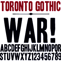 Andrew Leman is a prop designer in Hollywood, CA. The type foundry HPLHS Prop Fonts (was: Ephemera, Prop Fonts) was started by Hollywood's Andrew Leman, and is now located in Pasadena, CA. Some fonts are free, most are commercial.
 Dafont link. Klingspor link. Andrew Leman's fonts: - Cablegram (2001, old typewriter face, T-26).
- Leviathan.
- Garamold (2007, 2 styles).
- Journalistic (2007, a blackletter inspired by the nameplate of a New England newspaper from the 1920s).
- Blackburn (2006, distressed).
- RTemporal (2006, blackletter).
- Fonts in the HPLHS series, dated 2002: HeadlineTwoHPLHS, OldStyle1HPLHS, OldstyleItalicHPLHS, OldstyleSmallCapsHPLHS, Rogo, SlabSerifHPLHS, TelegramHPLHS, WW2BlackletterHPLHS, WW2BlackltrAltHPLHS, HPLHS-Lovecraft Cursive and Block (replica of H. P. Lovecraft's own handwriting), HPLHS-Autograph Lanier (replica of the 1875 handwriting of Sidney Lanier, a 19th century American poet), HPLHS-TextSerif (really Linotype Antique No. 1), HPLHS-TypoScript, HPLHS-TextSerif Oblique, HPLHS-Bulfinch, HPLHS-Colwell, HPLHS-Colwell Italic, HPLHS-Cromwell, HPLHS-National Oldstyle (after Goudy's font by that name), HPLHS-Post Monotone, HPLHS-Atlas Italic, HPLHS-Italic, HPLHS-Victoria (from the 1923 ATF book), HPLHS-Manuscript Caps, HPLHS-Tome Pi, HPLHS-TypoGothic, HPLHS-Copperplate Roman, HPLHS-Gothic520, HPLHS-Times Gothic, HPLHS-Persnickety, HPLHS-Roman Engraved, HPLHS-Mercantile, HPLHS-Mercantile Oblique, HPLHS-Mercantile Card, HPLHS-Headline Modified, HPLHS-ExtraExtra, HPLHS-Extra (wood type), HPLHS-Forsythe, HPLHS-MetroThin, HPLHS-MetroLight, HPLHS-MetroMedium, HPLHS-MetroMedium Italic, HPLHS-MetroBlack, HPLHS-Policy Gothic, HPLHS-Black Gothic, HPLHS-Gothic Compressed, HPLHS-Black Condensed, HPLHS-Black Oblique, HPLHS-Electro Gothic, HPLHS-Blackletter (an irregular hand-drawn textura font based on the lettering of French heraldic engraver Charles Demengeot).
- The E-phemera Font Collection, available from MyFonts, which includes these fonts, with a majority being retro or script typefaces: Policy Gothic (2012, an eroded caps face), Mooseheart (2012), Operapolitan (2012), Fishwrapper (2012), Fred (2007, inspired by a 1930s typeface by Fred G. Cooper), Schreibweise (2007, a pirate-flavored font inspired by a hand-lettered manuscript dating from 1492), Cablegram-Regular, Golden Ticket (2003: Base, Fill, Highlight; a digitization of hand-drawn poster lettering by Otto Heim from 1925), Cablegram-Urgent, Cablegram-Madras, Cablegram-Ottoman, Julius Klinger (2003, based on 1925 fabric lettering by Julius Klinger), Cablegram-Zagreb, DMV Printer, Landry Gothic, Telegrafo, Toronto Gothic (2003: worn wood type or letterpress emulation, close to Condensed Titling Gothic #11), Vogue (pencil-lettered caps), Penitentiary Gothic (+Fill, +Lolite, +Hilite, +Shadow), Chicago House, Compliments (+Upright), Satisfaction (script based on 1930s cigarette ads), Vandal Broke Extra Juicy, Lanier (2004), Impersonal. The Cablegram and DMV series are typewriter fonts. Heck Italic (2010) is based on captions, labels and legends appearing on 19th-century maps and natural history engravings by Johann Georg Heck. Dai Vernon (2010) is based on the handwriting of card magician Dai Vernon.
View Andrew Leman's typefaces. View the E-phemera typeface collection. [Google]
[MyFonts]
[More] ⦿
|
Erich Heckel
|
 Erich Heckel (b. 1883, Döbeln, d. 1970, Radolfzell) was a German painter and printmaker, and a founding member of the Die Brücke group which as active from 1905 until 1913. Heckel and the three other founding members of Die Brücke (i.e., Ernst Ludwig Kirchner, Karl Schmidt-Rotluff and Fritz Bley) admired the work of Edvard Munch, and aimed to make a "bridge" (Brücke) between traditional neo-romantic German painting and modern expressionist painting. Primitive, esp. African, art was also an inspiration to the members of the Die Brücke.
 In 1937 the Nazi Party declared Heckel's work degenerate. It forbade him to show his work in public, and more than 700 items of his art were confiscated from German museums. By 1944 all of his woodcut blocks and print plates had been destroyed. After World War II, Heckel lived at Gaienhofen near Lake Constanz, and taught at the Karlsruhe Academy until 1955. He continued painting until his death at Radolfzell in 1970. Heckel's woodcuts and lettering inspired a few typefaces, most notably: [Google]
[More] ⦿
|
Erik Spiekermann

|
 German type designer and graphic designer par excellence, born in 1947 in Stadthagen. He set up MetaDesign in Berlin in 1979. In 1988 he set up FontShop, home of the FontFont collection. He holds an honorary professorship at the Academy of Arts in Bremen, is board member of ATypI and the German Design Council, and president of the ISTD (International Society of Typographic Designers). In July 2000, Erik left MetaDesign Berlin. He now lives and works in Berlin, London and San Francisco, designing publications, complex design systems and more typefaces. He collaborated on the publication of the comprehensive FontBook. Author of Stop Stealing Sheep & Find Out How Type Works (2nd Edition) (Adobe Press, Second Edition, 2002, First Edition, 1993). He taught typography at the Art Academy in Bremen, and is guest-lecturer at several schools around the world.
 In October 2003, he received the third Gerrit Noordzij Prize, which is given every other year to a designer who has played an important role in the field of type design and typography. It is an initiative of the postgraduate course in Type&Media at the Hague Royal Academy of Art with the Meermanno Museum (The Hague). His essay on information design. Biography. Bio at Linotype. Laudatio by John Walters of Eye Magazine. Blog. Presentation at ATypI 2006 in Lisbon. Presentation at ATypI 2008 in St. Petersburg. Interviewed in 2006 by Rob Forbes. Speaker at ATypI 2010 in Dublin. He made the following typefaces and type families: - Lo-Type (1913, Louis Oppenheim) was digitally adapted by Spiekermann for Berthold in 1979-1980. BERTLib sells it as Adlon Serif ST.
- PT 55 (1986), the precursor of FF Meta.
- Berthold Block
- Berliner Grotesk (1979-1980, Berthold): based on an old Berthold AG typeface from 1923.
- FF Govan (2001, by Ole Schaefer and Erik Spiekermann).
- The huge families FF Meta1, FF Meta2, FF Meta3 (2003), FF Meta Condensed (1998) and FFMetaCorrespondence. The FF Meta families (1985) were originally designed for Bundespost, which did not use it--it stayed with Helvetica for a while and now uses Frutiger. Meta comes with CE, Cyrillic, Greek and Turkish sets as well. Weights like Meta Light (Thin, Hairline) Greek are available too. Spiekermann is a bit upset that Linotype's Textra (2002, a typeface by Jochen Schuss and Jörg Herz) looks like a cloned of Meta. FF Meta Condensed won an award at Modern Cyrillic 2014.
- Meta Serif (2007) by Christian Schwartz, Kris Sowersby and Erik Spiekermann. Later extensions by Ralph du Carrois and Botio Nikoltchev.
- ITC Officina in versions Sans Book (1989-1990) and Serif Book (1989-1990).
- Boehringer Sans and Antiqua (1996): custom types.
- Grid, which appeared in FUSE 3.
- Codesigner with Ole Schaefer (FontShop, 2000) of FF InfoDisplay and FF InfoText in 1997 and of FF InfoOffice in 2000.
- NokiaSans and NokiaSerif (2002, company identity family). This was in cooperation with Jelle Bosma. Before Nokia Sans and Serif, Nokia used Rotis. Nokia Sans and Serif were replaced by Nokia Pure (Bruno Maag) in 2011.
- Glasgow Type (1999), for the city of Glasgow, taking inspiration from the Rennie Macintosh types.
- Heidelberg Gothic (1999).
- Symantec Sans and Serif (2003): custom types.
- FF Unit (2003-2004; see also here), another sans family, which won an award at TDC2 2004. This was followed by FF Unit Rounded. And FF Unit Rounded started according to Erik as Gravis, the largest Apple dealer in Germany. FF Unit Slab (2009) is the product of a cooperation between Kris Sowersby, Christian Schwartz, and Erik Spiekermann.
- ITC Officina Display (2001).
- FF Meta Thin Light and Hairline (2003) and FF Meta Headline (2005). Developed jointly with Christian Schwartz and Josh Darden.
- Bosch Sans and Bosch Serif (2004).
- The SeatMeta family (2003) for Seat.
- DB Type in six styles (Serif, Sans, Head, Condensed, Compressed, News): designed in 2005 in collaboration with Christian Schwartz for the Deutsche Bahn (train system in Germany). Some typohiles say that it reminds them of Bell Gothic and Vesta.
- A Volkswagen company family based on a correction of Futura.
- The DWR House Numbers Series (2006): four fonts with numerals for house numbers: Contemporary House Numbers, Tech House Numbers, Classic House Numbers (based on Bodoni), Industrial House Numbers (stencil). DWR stands for Design Within Reach.
- Tech (2008, FontStruct), a rounded squarish headline face.
- Axel (2009): developed jointly with Erik van Blokland and Ralph du Carrois, it is a system font with these features:
- Similar letters and numbers are clearly distinguishable (l, i, I, 1, 7; 0, O; e, c #).
- Increased contrast between regular and bold.
- High legibility on the monitor via Clear Type support.
- Seems to outperform Courier New, Verdana, Lucida Sans, Georgia, Arial and Calibri, according to their tests (although I would rank Calibri at or above Axel for many criteria).
- In 2012-2013, Ralph du Carrois and Erik Spiekermann co-designed Fira Sans and Fira Mono for Firefox / Mozilla. This typeface is free for everyone. Google Web Font link. Open Font Library link. It is specially designed for small screens, and seems to do a good job at that. I am not a particular fan of a g with an aerodynamic wing and the bipolar l of Fira Mono, though. Mozilla download page. CTAN link. Google Web Fonts download page. Google web Fonts published Fira Sans Condensed (2012-2016) and Fira Sans Extra Condensed in 2017.
- In 2013-204, Erik created HWT Artz, a wood type published in digital form by P22, which is based on early 20th century European poster lettering. Named after Dave Artz, a Hamilton Manufacturing retiree and master type trimmer, the proceeds of the sales will go to the Hamilton Wood Type and Printing Museum.
- In 2015, Fontfont published FF Real, in 13 weights each for FF Real Text and FF Real Head. This typeface family by Erik Spiekermann and Ralph Olivier du Carrois is influenced by the German grotesques from ca. 1900 by foundries such as Theinhardt and H. Berthold AG.
- In 2022, Erik Spiekermann, Anja Meiners, and Ralph du Carrois published the neo-grotesque superfamily Case at Fontwerk. It includes Micro and Text subfamilies.
Picture of Eric Spiekermann shot by Chris Lozos at Typo SF in 2012. FontShop link. View Erik Spiekermann's typefaces. [Google]
[MyFonts]
[More] ⦿
|
Eriq Jaffe
|
Designer of several sets of athletic lettering fonts, including NFL, NHL, NBA and MLB. Dafont link. His web site has the athletic lettering in truetype format for these teams: MLBAngels, MLBAstros, MLBBlock, MLBBlueJaysModern, MLBBlueJaysVintage, MLBBrewers, MLBCubs, MLBDiamondbacks, MLBGiants, MLBMariners, MLBNationals, MLBNationalsBevel, MLBNationalsReverseBevel, MLBPadres, MLBPhillies, MLBPirates, MLBRedSox, MLBReds2007, MLBTuscan, MLB_Tuscan_New, MLB_Tuscan_New, Mlbdia07, NBA76ers, NBABobcats, NBABucks, NBABulls, NBACavaliers, NBACeltics, NBAClippers, NBAGrizzlies, NBAHawks, NBAHeat, NBAHornets, NBAJazz, NBAKings, NBAKingsAlternate, NBAKnicks, NBALakers, NBAMagic, NBAMavericks, NBAMavericksAlternate, NBANets, NBANuggets, NBAPacers, NBAPistons, NBARaptors, NBARockets, NBASpurs, NBASuns, NBASuperSonics, NBATimberwolves, NBATrailblazers, NBAWarriors, NBAWizards, NFLBears, NFLBearsThrowback, NFLBengals, NFLBroncos, NFLCardinals, NFLChargers2007, NFLDolphins, NFLEagles, NFLFalcons, NFLJaguars, NFLOilersVintage, NFLPatriots, NFLPatriotsThrowback, NFLRams, NFLRavens, NFLRavensVintage, NFLSteelers, NFLTexans, NFLTitans, NFLVarsityBlockA, NFLVarsityBlockB, NFLVarsityBlockC, NFLVarsityBlockD, NFLVarsityBlockE, NFLVarsityBlockF, NFLVarsityBlockG, NFLVarsityBlockH, NFLVikings, NHLANA06, NHLAnaheim, NHLAtlanta, NHLBUF06, NHLBoston, NHLBuffalo, NHLCalgary, NHLCalgaryAlternate, NHLCarolina, NHLChicago, NHLColorado, NHLColumbus, NHLDallas, NHLDetroit, NHLEAna_, NHLEAtl_, NHLEBos_, NHLEBuf_, NHLECal_, NHLECar_, NHLEChi_, NHLEClb_, NHLECol_, NHLEDal_, NHLEDet_, NHLEEdm_, NHLEFlo_, NHLELak_, NHLEMinA, NHLEMinH, NHLEMon_, NHLENJD_, NHLENYI_, NHLENYRO, NHLENYR_, NHLENasO, NHLENas_, NHLEOtt_, NHLEPhi_, NHLEPho_, NHLEPit_, NHLESJ__, NHLEStL_, NHLETBL_, NHLETor_, NHLEVan_, NHLEWas_, NHLEdmonton, NHLEdmontonAlternate, NHLFlorida, NHLLosAngeles, NHLMinnesota, NHLMinnesotaAlternate, NHLMontreal, NHLNYIslandersAlternate, NHLNYRangers, NHLNYRangersOutline, NHLNashville, NHLNewJersey, NHLOttawa, NHLOttawaAlternate, NHLPhiladelphia, NHLPhoenix, NHLPittsburgh, NHLSanJose, NHLStLouis, NHLTampaBay, NHLToronto, NHLTorontoAlternate, NHLVancouver, NHLWashington, Nflcoltt, Nflcowbt, Nhlnyi__, VarsityBlockA, VarsityBlockB, VarsityBlockC, VarsityBlockD, VarsityClassicA, VarsityClassicB, VarsityClassicC, VarsityClassicD, VarsityClassicSerifA, VarsityClassicSerifB. [Google]
[More] ⦿
|
Ernesto Saroglia
|
Italian type foundry which had a wood type collection in the 1940s. [Google]
[More] ⦿
|
Esquivel Type foundry (was: Aeasea Type Foundry)
[Raul Esquivel]
|
 Raul Esquivel is a designer, illustrator and photographer in Los Angeles, CA. He founded Aeasea Type Foundry in 2014 and Esquivel Type foundry in 2015 and sells his typefaces via Creative Market.
 Typefaces from 2014: Isomoth Pro, Knell (a hand-drawn art deco-styled poster face), Goodway Slab, Fissure, Metros (a geometric sans family with two free weights). In 2015, he made the didone-style typeface Wolf Shadow, the slab serif Bark Slab, and Bowie Sans. Typefaces from 2017: Leonidas (vintage, almost wood type, all caps typeface family), Legion. Creative Market link. Newer Creative Market link. [Google]
[More] ⦿
|
ETC Type
[Mateo Broillet]
|
 Geneva, Switzerland-based graphic and type designer, b. 1990, who studied at ECAL in Lausanne. Designer of the Trajan column-inspired display serif typeface Nero Alto (2019, published by Typeverything).
 Mateo also designed the free fonts Seymaz (2020; a variable condensed octagonal sans family inspired by the Grecian wood type style from the 19th century) and Sabir Mono (2018; a monospaced programming font with support for Latin, Greek, Cyrillic and Hebrew developed as a student project). Fontesk link to his free typefaces. Github link for ETC Type, where one can also download some of his typefaces. [Google]
[More] ⦿
|
Etcetera Type Company (or: ETC; was: Finck Font Co)
[Tyler Finck]

|
 Graphic designer and musician (b. 1982) at the New York studio AWP who grew up in Maine and is currently based in Ithaca, NY. In 2018, he founded Etcetera Type Company, which is based in Spencer, NY.
 His typefaces: - The fat counterless caps typefaces Blackout and Blackout Midnight (2008). Blackout Sunrise (2013) is an outlined face and Blackout 2am is a reversed font. Blackout Noon followed in 2014. Free download of Blackout at the League of Movable Type.
- Ostrich Sans (2011). This typeface comes in many weights, including a beautiful Ostrich Sans Inline and a hairline. In 2016, this was followed by the layered monoline sans typeface family Ostrich Proper (+Inline).
- Knewave (2011, Google Web Fonts). A brush signage face. League of Movable Type link.
- Porter Sans (2013). A large wide headline type family. It has a free inline outline weight. Later additions include Porter Sans Ink (2014) and Porter Rough (2016). Porter FT, which includes new rounded styles, was added in 2017.
- Elm (2013). Hand-printed.
- Lickety Split (2013). A crayon or brush face.
- Almost (2013). A poster typeface.
- Guilder (2011-2013). A free typeface family with an inline thrown in.
- Ithaca Sans (2013).
- Fartlek Sans (2014). A handcrafted poster typeface.
- Katahdin (2014). A free font.
- Upstater (2014). A a classical American gothic with shaded and layered styles.
- Grandstander (2014). A comic book face. Grandstander Classic (2017). In 2020, Grandstander became a free Google font---and a two-axis variable font was added for the occasion.
- Boo City (2014). A pixel face.
- Didactic Display (2014). A grungy typeface.
- Upstater Ink (2014). A grungy typeface.
- Finck32A (2014).
- Saturnight (2014). A heavy brush typeface.
- Typocopia (2014). A letterpress emulation typeface.
- Taurus Mono (2014). An outline font.
- Southpaw (2014). A nice informal hand.
- Chawp (2014). A crayon face.
- Mr. Brunch (2014). A brush face.
- Gluten FT (2014).
- Flabbergast (2015). A didone.
- Korsque (2015). A layered typeface.
- Bico (2015). A rounded condensed organic typeface.
- Ichabod (2016). An antiqued serif typeface.
- Altitude Condensed (2016).
- Imbue (2016). A condensed didone poster typeface (also called a skyline typeface) at Google Fonts. See also Imbue FT (2017). ETC Imbue (2019) is a variable font version of Imbue with a variation in optical size from Text to Display.
- Retrograde (2016). A monoline and monospaced organic sans.
- Plainview (2016). A squarish and fat typeface.
- Nonesuch (2016). A condensed sans.
- Juju (2016). An octagonal layered typeface family.
- Atiga (2017).
- Mr Brunch FT (2017). A children's book font.
- League Mono (2017). A free font.
- ETC Gluten (2018). An organic font family.
- ETC Epilogue (2018). A variable sans font. Github link. Google Fonts link. Prologue (2020) is a reworking of ETC Epilogue.
- ETC Anybody (2018-2020). A 72-style variable font with weight, width and slant axes. Free at Google Fonts. He writes: Anybody is a big family that combines an affinity for Eurostile plus a heavy dose of 90s inspiration. It's flexible enough to adapt to a variety of situations. From UltraCondensed to ExtraExpanded, type set in Anybody can take up a tiny amount of horizontal space or so much space that you'll need several lines. Its high x-height and low cap height help exaggerate extreme widths and weights. Github link.
- Furrow (2018). A grungy sans.
- Cease (2018). A squarish techno typeface.
- ETC Trispace (2019). A variable font with weight and width axes, based on League Mono.
- ETC Tourney (2019). A variable octagonal font, playing on the theme of outline versus inline. Free Google Fonts download (2020-2021). Github link.
- Struthio (2019). A rounded sans.
- Birdo (2020). An inline typeface.
- Gluten (2021). A free script font family at Google Fonts.
Alternate URL, called The League of Movable Type. Typedia link. Kernest link. League of Movable Type link. Creative Market link, Klingspor link. Dafont link. Home page. Creative Market link. Abstract Fonts link. Google Plus link. YWFT link. Old home page. Behance link. Github link. [Google]
[MyFonts]
[More] ⦿
|
Evan Lefebvre
|
Ottawa, Ontario-based designer of El Punto (2016), a display typeface inspired by Western woodblock hand-painted lettering found throughout Mexico. Behance link. [Google]
[More] ⦿
|
Exclamachine Type Foundry
[Choz Cunningham]

|
Choz Cunningham (b. 1975, Santa Cruz, CA) is a Las Vegas and more recently, Nashville, TN-based designer and artist, who set up Exclamachine in 2005. Until 2012, exclamachine published free fonts. In 2012, it went commercial via MyFonts. Designer of Whiskey Songs (2007), Crass Roots, Crass Roots Alt (2016), and Crass Roots OFL (2007, stencil), Misqot (2006), The Troubles (2006), Limberjack (2006, an ornate wood titling font), this blackletter-inspired serif face (2006), Futurelic (2006, futuristic), Zugzwang (2006), Sketchy Times Bold (2005, grunge), Sketchy Times (2005, grunge), Basket of Hammers (2005, a nice wallpainting/graffiti font). His company, also called Exclamachine Foundry, where these fonts can be downloaded: The Black Bloc (2006, blackletter-inspired), MISQOT (2006), Kutura Frontalis (2006), PaulMaul (2006), Zugzwang (2006), Sketchy Times (2006), Carlos Caffeinated (2006), Basket of Hammers (2006), Disc Inferno (2006, LED simulation), Rosda Laevigata)2007, handprinting), and this heavy metal band font (2006). In 2012, Choz published the commercial typefaces MISQOT (scratchy) and Paul Maul XT (irregular hand-printed face). Typefaces from 2013: FinFang (comic book style caps), Lestatic Slashed (+Condensed), Lestatic Obsidian Outline (grungy), Lestatic Lashed (Arabic simulation face), Lestatic Celerite, Lestatic Carved, Lestatic CSS, Lestatic Withered Condensed, Lestatic Withered, Lestatic Sliced. Dafont link. Open Font Library link. Home page. Fontspace link. [Google]
[MyFonts]
[More] ⦿
|
Extraset
|
 Extraset is a Swiss digital type foundry based in Les Acacias and managed by David Mamie (TM), Alex Dujet (Futur Neue), Sébastien Fasel, Fabienne Kilchör (Emphase), Roger Gaillard (Cécile + Roger) and Xavier Erni (Neo Neo). Their typefaces:
 - Peak and Peak Rounded (2019). By Xavier Erni.
- Rebond Grotesque (2019). By Roger Gaillard.
- Floppi's Grotesk.
- Klarheit Grotesk and Klarheit Kurrent (2020). By Alex Dujet.
- The ultra-condensed typeface Nein (2020) by Alex Dujet: Nein is a project that reinterprets certain characteristics drawn from the heritage of wood types. The first components of this extra-bold, highly condensed beta version were developed a few years ago by Alex Dujet.
- Quarz Upright (2020, Alex Dujet). A mischievous didone-based typeface in which Alex tries to evoke swans and Lamborghinis on the shores of Geneva's Lac Leman.
- ES Build (2021). A Bauhaus sans by Xavier Erni (Neo Neo) with the assistance of Arthur Schwarz. ES Build draws its inspiration from the universal typeface by Herbert Bayer.
- ES Allianz (2021). A Swiss sans by David Mamie.
- ES Face (2021). A modernized transitional typeface family by Alex Dujet.
[Google]
[More] ⦿
|
F37 (or: Face37)
[Rick Banks]

|
 Rick Banks (b. 1985, Manchester, UK) established F37 (Face37) in 2010 in London, UK. His typefaces:
 - F37 Xan (2010). A counterless geometric typeface based on a geometric solid typeface from 1925 by André Vlaanderen.
- F37 Form (2010). A mimimalist circular experimental (Bauhaus?) font. He writes about Form: After looking at Armin Hoffman's Die Gute Form poster and Herbert Bayer's universal typeface I constructed an alphabet based on their letterforms. Inspired by Wim Crouwel's Soft Alphabet, I constructed a grid to create the modular alphabet and programmed very tight letterspacing into the font lending itself to the style of Die Gute Form.
- F37 Bella (2011). An extremely contrasted didone display typeface. He says that he was influenced not only by Didot, but also by Pistilli and by Tschichold's Saskia. F37 Bella won an award at TDC Tokyo 2012. See also F37 Bella Pro (2020), in Text, Hairline, Stencil and Display substyles.
- F37 Ginger (2013). A Swiss geometric sans inspired by the work of Herb Lubalin, Jan Tschichold and Paul Renner. The customized version of F37 Ginger, Boots Sharp (2019), was commissioned by Coley Porter Bell and True Story as part of an extensive rebrand. F37 Ginger Pro was released in 2019.
- F37 Neue Grotesque (2013).
- F37 Stencil Bella (2013).
- F37 Glaser Stencil (2015).
- F37 Bolton (2016). A sans family influenced by the style of Berthold's G.G. Lange.
- F37 Jan (2016). Inspired by Jan Tschichold's geometric sans-serif and Matthew Carter's Bell Centennial font, F37 Jan features pronounced ink traps.
- F37 Jagger (2017). A sans inspired by Edward Johnston's London Underground font.
- F37 Bergman (2017). A Peignotian typeface family that revives a revival Hans Möhring's Florida typeface. The Swedish director Ingmar Bergman consistently used Florida in his films.
- BHF Beats (2018): Working alongside Wolff Olins we were comissioned to create the new font for the British Heart Foundation. The letterforms are based on their iconic logo featuring waves of a heart beat.
- F37 Bobby (2018). A warm text typeface.
- F37 Ping Pong (2018). A 1970s style dot matrix font that was inspired by the 1970s Letraset font Pinball created by Alan Dempsey.
- F37 Factory (2019). Named after Andy Warhol's The Factory in New York City, F37 Factory was inspired by stencil letters etched into marble in what was once a Hovis flour mill in Ramsgate. That building was designed by E. W. Pugin. F37 Factory was originally conceived for a commercial development project for Want Marketing and commissioned by London design studio Bold & Bold.
- F37 Judge (2019). Banks's take on DIN and old wood types.
- F37 Moon (2019). Influenced by Avant Garde and Futura, in 14 styles.
- F37 Flux (2019). Experimental and intestinal.
- F37 Neuro (2019). A Swiss sans family.
- F37 Beckett (2020). A sans based on British road signs from the 1930s. F37 Beckett pays homage to the British Ministry of Transport's 1933 alphabet.
- F37 Stout (2020). An octagonal family base on a letterpress font called Stoutheart.
- F37 Gruffy (2020). A grotesque.
- F37 Hooj (2020). A geometric sans family.
- F37 Wicklow (2020). A 24-style wedge serif inspired by the Gaelic letter carvings by Irish sculptor Michael Biggs in Dublin. It includes a set of stencil fonts as well.
- F37 Snake (2020). an octagonal industrial stencil typeface inspired by John Carpenter's film Escape From New York.
- F37 Caslon (2020). He explains why the world needs another Caslon: F37 Caslon is our personal take on a stone-cold classic. Originally designed by William Caslon in 1726, this old-style serif has fascinated typographers ever since. Over the years, the font has been tweaked, reworked, modernised, pulled, stretched, squashed and embellished, as successive generations have created their own versions of Caslon, particular to their times and tastes. We have taken the best of these seminal Caslon revisions to create our own super family in a huge range of weights and styles. Our cut features a tall x-height, old-style numerals, capital italic swashes, ligatures and discretionary ligatures.
- F37 Grotesc (2021). Inspired by Pica Sans.
- F37 Attila (2021). A sans serif is inspired by Albert Auspurg's Krimhilde (1933).
- F37 Drago (2021). A serif typeface based on Columbus (1892).
- F37 Wyman (2021). F37 Wyman is based on lettering work created by graphic designer Lance Wyman in 1976, which was commissioned as part of the graphic identity marking 200 years of American Independence.
- Corporate typefaces include Dunlop Sans, F37 Selfridges (=F37 Bella), F37 Avid (=F37 Ginger), Pamela (for Foilco), F37 Zip (for the hotel chain), Pizza Pilgrims, Dar Headline (octagonal), Lloyds Bank (icons).
- F37 Lineca (2021). A fifteen-weight geometric sans with a strong emphasis on the horizontal.
- Ocado (2021). A custom sans done for a grocery company.
- Stonewall (2021). A sans font for Stonewall, a cmpany that has championed a world where LGBTQ+ people everywhere are free to be themselves and enjoy life fully.
- F37 Incise (2021). A heavy, experimental display font, inspired by stone cutting.
He also published Type Trumps, a set of playing cards that feature the main typefaces. Behance link. [Google]
[MyFonts]
[More] ⦿
|
Face Photosetting
|
Photo era foundry set up in the 1960s by John McConnell and Chris Dubber in London. I could only find Pluto Outline, the art nouveau typeface Desdemona (a digital version was created in 1992 by David Berlow at Font Bureau and in 1994 by Richard Beatty; Letraset showed Desdemona in its 1981 and 1986 catalogs; the original is from the late 19th century by Karl Brendler&Soehne, Vienna), Stack, and Oxford (a multiline face) on-line. Steve Jackaman worked in the studio in Newman Street and Hanway Place, and recalled El Paso (a Western/Mexican simulation face) when he created El Paso Pro (2011, Red Rooster). In 2017, Steve Jacakaman (Red Rooster) designed Lodestone Pro, which is based on Marvin (1969, by Michael Chave). According to Wes Wilson's web site, Face Photosetting led the way by launching a number of Art Nouveau revivals which were taken from Ludwig Petzendorfer's "A Treasury of Authentic Art Nouveau Alphabets". A selection of these, which included Arnold Böcklin, Edel Gotisch and Eckmann Schrift, were made more widely available when Letraset produced them for their dry transfer product. They published a number of books and catalogs, ca. 1976-1977: Face headline catalogue [1981/82] (1977), Specimens of Delittle's wood type, Face book of typefaces, Type catalogue (1976). Some of the typefaces were Cyrillicized, such as Bullion Shadow (1970; Cyrillic version by Victor Kharyk, 1978). Bully Pulpit Plain NF (2014, Nick Curtis) is a revival of Bullion Shadow. [Google]
[More] ⦿
|
Fann Street Foundry / Reed&Fox

|
 Fann Street Foundry is a defunct London-based foundry, started by Robert Thorne in 1794. It specialized in display types, often Victorian in nature towards the end of the 19th century. The foundry was bought by William Thorowgood in 1820, by Robert Besley in 1849, became Reed&Fox in 1866 and closed in 1906. Its designs passed to Stephenson Blake.
 Fann Street Foundry Reed&Fox (1873, London) is one of their specimen books. The Reed and Fox typefaces Viennese and Corinthian were combined in 2014 in Nick Curtis's digital typeface Genever NF. Johannes Lang and Stefan Ellmer revived Viennese in 2013 as Brevier Viennese, and Jason Wolfe reinterpreted it in 2021 in his https://www.wolfehall.com/projects/samuelbradleydam">Bradley Dam (2021). [Google]
[MyFonts]
[More] ⦿
|
Fat wood type: Stephen Coles's List
|
 Stephen Coles points out the warmest, biggest and boldest wood types in the FontShop store.
 [Google]
[More] ⦿
|
Fateh Lab
[Wisnu Cipto Wibowo]

|
 Bandung, Indonesia-based designer of these typefaces in 2019: Bahama (a rounded sans font for bistrots), Babylonia (a vintage font), Valerian (an all caps sans), Madison 01 (a college sports font), Madison 01 Script, Hailen Font Duo (monoline script), Wolf Gang (weathered font).
 Typefaces from 2020: Bianca (font duo), Stribe (a supermarket signage family), Astenia, Stribe (a rounded supermarket sans), Le Brond (a heavy octagonal sports slab serif font), El Grosa (two wood type emulation typefaces and a Tuscan font, El Grosa West, Boldine (an all caps heavy sans), Qirate Mono (techno, typewriter style), Quinland (extra condensed), Quinton (extra-condensed). Typefaces from 2021: Hub 191 (a 4-style casual family), Thyga (a 7-style condensed sans), Hugh (a super-fat and wide poster typeface). Typefaces from 2022: Heliuk (an ultra-condensed sans), Heliuk Icon, Bhelt (a bold sans and dingbats), Southern Margherita (calligraphic). [Google]
[MyFonts]
[More] ⦿
|
Fernando Haro

|
 Las Palmas de Gran Canaria, Ampuero and Laredo, Spain-based designer (b. 1971) who set up deFharo. Creator of the monoline sans typeface Depez (2011), Fabada (2011), and the free monoline geometric sans typeface La Chata (2011). La chatte, in French? Maybe not.
 In 2011, he made the monoline organic sans typeface Lerótica (free at OFL). In 2012, he created Nabatea (stone chisel typeface), V de Vacia (a grungy outline face), Sabática (organic), the straight-edged data style typeface Gabardina, the grotesk typeface A Bebedera, the shadow typeface B de Bonita, D Puntillas, and the deconstructed Qebrada. In 2013, he designed Yacarena Ultra, H.H. Agallas, Nacimiento (a dymo label font), J Airplane Swash (a psychedelic typeface named after Jefferson Airplane), CA Garrutas (grunge), CA Gatintas (grunge), I Am Telefono (the largest phone dingbat and scanbat typeface on earth), Wach Op-Art (kaleidoscopic icons), K.O. Activista, I Am Hueca, X Template (stencil), H.H.Samuel (rounded sans), U2 Metalona (a beautiful white-on-black display face), M F Plexus Italic, J.M. Nexus Grotesque (an "thin inline" fat grotesque), Wachinanga, Tabaquera, Pabellona (grunge), El Pececito (video game font), the poster typeface Hobby of Night (OFL), H2O Shadow (outline version of Fabada), Zabatana Poster (a didone-inspired poster font), Oaxaquena Tall, Yacimiento (wood style wedge serif), and Rabanera. Typefaces from 2014: Babalusa Cut, A Cuchillada, Sabandija (a plump round display typeface), F2 Tecnocratica, F1 Secuencia Quad (pixel face), La Pejina FFP (bilined), Tabaiba Wild, Gabachita (ultra-condensed rounded sans). Typefaces from 2015: Tabarra Pro (Swiss style sans family for Latin, Cyrillic and Greek), A Sogra Ruth (ultra-condensed art deco), Gaban (an outline version of Tabardo), Tabardo (a heavy blocky font), Wacamoler Caps (a Tuscan typeface inspired opening credits of the Western movie Winchester '73 directed by Anthony Mann in 1950), Ubicada (condensed geometric sans), Rabiosa (neurotic font), Zacatecas (condensed shaded sans), F3 Secuencia Round, La Babaca (a powerful black condensed sans in the style of Impact), Obcecada Sans + Serif (condensed with almost disappearing descenders), Eacologica Round Slab (a nice commercial font with an incomplete set of numerals), Palim Script (curly), Vacaciones (signage face), de La Cruz. Typefaces from 2016: Yugoslavia (calligraphic), Love Box (stencil), Cienfuegos (connected retro script named after the Cuban her Camilo Cienfuegos), Gaitera Ball (round fat script), The Black Box (a retro banner font), Durum Kebab (shadow sans), Jolgoria In Town (script), Yerbaluisa (signage script), Escobeta One (brush script), Posteratus Rex, Bastardilla (a cursive font), Rotulona Hand, The Juke Box (retro juke box lettering), Angelique Rose (connected monoline script), Promenades, Bucanera (a swashbuckle font), Lucemita, Panama Road (a casual calligraphic font), Deslucida, Disoluta, Sucesion Slab, Tabarra Pro Round, Qebab Pro Shadow, Monserga (white on black), Indulta SemiSerif. Typefaces from 2017: Partizano Serif (a retro poster font; free demo), Jack Stanislav (a great condensed movie poster font), Fontanero (rounded fat sans), Yonky (fat slab serif), Zigzageo, Libertatus (manual serif fonts based on a Czech poster from 1935), Libertatus Duas (slab serif), Flamante Sans, Flamante Serif, Flamante (Round, SemiSlab, Stencil, Seca, Cairo, Roma), Seisdedos Dead (rough stencil fonts), Neo Latina (stencil), Carta Magna (blackletter), La Sonnambula (signature script), Bola Ocho (an eightball font), Clandestina (textured, layered), Acratica (signage script), Penitencia Inline, Autarquica (outlined vernacular style), Caminata One (shaded signage typeface), Sin Razon (wedge serif), Glotona Black and White (a layered tattoo style font duo), Glotona Dots (the textured versions of Glotona), 6th Aniversario, Tribal Box (squarish sans, with tattoo ornaments and a great environment for borders), Candy Pop (bubblegum font), Sargento Gorila (army stencil font), Libertinas + co (a curly calligraphic script; the free version has no numerals). Typefaces from 2018: Gudariak (a free color SVG font: Vicente Ballester Marco (Valencia 1887-1980) was a graphic designer and Valencian poster artist affiliated with the CNT (Confederacion Nacional del Trabajo) who created political propaganda posters of clear modernist and post-cubist influence during the Spanish Civil War. The Gudariak typeface is inspired mainly by one of the posters he made for the Government of Euskadi and also in others where the author continues to explore this particular typographic style. ), Farisea Fraktur, Octuple Max (techno), Ordeal Eroded, Panfleta Stencil, Secuela (free), Fragua Pro (condensed sans family), Getho (a geometric semi-sans), Cowboya Tuscan (a curly Tuscan circus font), Txuleta Deco (a striped art deco typeface), Coltan Gea (slab serif), Getho Semi Sans, Cowboys (a Tuscan typeface), Drystick Geo Grotesk, Diezma, Grifa Slab, Coltan Gea (slab serif family), Paloseco (geometric and grotesk), Stoica (a color SVG font), Letrera Caps (a rounded square style layered and color font that pays homage to the sans serif inline genre), Enagol Math (a condensed rounded slab serif based on carefully applied mathematical ratios), Heptal, Velocista, Octagen Condensed, Octagen Black, Sextan Serif, Sextan Cyrillic, Quickat (signage script), Octagen (condensed sand with short descenders), Wolframia Script (flowing handwriting), Pentay Slab, Pentay Sans, Pentay Book, Cuatra, Judera (Flat and Ring: monospaced, unicase and totally sqaurish), Quotus (slab serif), Tripleta Grotesk (a 16-style geometric sans family). Typefaces from 2019: Pervitina Dex (sci-fi), Megalito Slab, Obesum Caps, Jane Roe (sans), Icons Opentype, Felona (stencil: a variable font), Neo Fobia, Bocartes Fritos (food icons), Red Thinker (a squarish monoline sans), Pena Caldaria (blackletter). Typefaces from 2020: Anoxic (a squarish monoline sans). Typefaces from 2021: Humato (a sturdy font for weightlifters), Probeta (a squarish techno sans family in 42 styles), Speeday (a speed emulation sans). Creative Market link. OFL link. Behance link. Dafont link. Devian tart link. Abstract Fonts link. Fontspace link. [Google]
[MyFonts]
[More] ⦿
|
Filip Tofil
|
 Polish designer of the free font Makkabi (2020), as part of the Afiszuj Sie project. Makkabi is an interwar typeface that was used in two Warsaw printing houses (W. Spiegelstein and the Rekord printing house). The original wood type character set consisted of only upper case letters and was so limited that some letters in the composition had to be replaced with letters from other typefaces. Originally, the typeface was used in sports posters encouraging participation in football matches of the Makabi club---the Jewish Gymnastic and Sports Association. This typeface is known from the covers of books by Szczepan Twardoch ("Krol", "Kingdom"), designed by Rafal Kucharczuk. [Google]
[More] ⦿
|
Fio Gonç�alves
[Matheus Fio Gonçalves]

|
Or just Fio Gonçalves. Bauru, Brazil-based designer who studied at Universidade Estadual Paulista (FAAC-UNESP). In 2019, he released the condensed and wide all caps typeface Tambau, which was inspired by Brazilian concert posters and wood types at the Oficina Tipografica Sao Paulo. At Type Cooper 2021, he developed Itapema Display. In 2021, he designed Guaruja Grotesk. Free demo. In 2022, he released the 6-style reverse stress typeface Acarau Display. [Google]
[MyFonts]
[More] ⦿
|
Flat-It
[Ryoichi Tsunekawa]

|
 Japanese foundry in Nagoya that offers free and commercial Latin fonts made by Ryoichi Tsunekawa, who also runs Bagel & Co, Dharma Type, HolidayType and Prop-A-Ganda. Most of his work was done at Flat-It. His typefaces:
 - 2021: Best Choice (a monospaced sans), Short Films (an art deco sans in twelve styles), Golden Decades (a 16-style sans that borrows from several sans genres).
- 2019: Mid Century Sans, Tamba Sans, Rama Gothic Rounded, Bio Sans Soft.
- 2018: Fairweather (clean sans), Kaneda Gothic (a basic severe condensed gothic), Vincente (a tall condensed display didone family).
- 2017: Calling Code (monospaced programming font), Commuters Sans (elegant wide sans), Mighty Slab, Rigid Square (octagonal), Taro.
- 2016: Bio Sans, Gomme Sans, Quiet Sans, Siro (sans).
- 2014: Pero (condensed rounded organic sans), Kiro (minimalist organic sans), Graphie (modern geometric sans), Compasse (semi-condensed sans), Como (rounded sans).
- 2013: Spoon (organic, rounded, monoline sans family), Antoinette Monogrammes (based on early 1900s embroideries by Janon Co; with frames), Clonoid (a sci-fi family that pays tribute to arcade game logos in 80s and 90s), All Round Gothic Demi (a sans based on perfect circles), Griffon (copperplate titling face), Antique Spenserian (based on Spencerian Script by Mackellar, Smiths and Jordan).
- 2012: Geom Graphic (a retro sci-fi family that can be considered as a squarish version of Eurostile), Sheepman (modular), House of Cards, Space Colony (a lovely monoline futuristic techno family), Rama Slab (an antiqued wood-style slab serif), Rama Gothic. An antiqued sans serif family that recalls the wood type era), Diamond Ring (an art deco typeface inspired by Japanese cosmetics-packaging designs and posters from the late 19th and early 20th centuries), Controller (techno meets organic in this rounded squaris sans family), Revolution Gothic (an extended version of PAG Revolucion), 2008, which was inspired by retro propaganda posters and wallpainting in Cuba from the 60s to 80s; Revolution Gothic P followed in 2014), Diamond Ring (art deco).
- 2011: Yummo (monoline organic sans), Sheepman (based on the wood type No. 506 of William Page), Onick (2011, an art deco neojaponist fat display face done for Wordshape), Shiva (2011, hairline sans), Mocha Mattari (2011, grunge), Dharma Slab (2011, inspired by 1800s-style wood type), Dharma Gothic (2011, +P), Rama Gothic (2011, also inspired by 1800s-style wood type), Dimensions (2011, squarish), Design System (2011, a large family based on 70s style techno typefaces), Speedometer (2011, condensed piano key face).
- 2010: Stereo Gothic (2010: an extended all caps slightly techno sans family), Behrensmeyer Vigesimals (2010, a pixel format connected script), Civilite Vigesimals (2010, pixelized Civilite), Flat10 Arts and Crafts (2010), Flat20 Hippies, Flat10 Segments (2010), Flat10 Antique (2010), Flat20 Gothic (2010), Flat20 Streamer (2009, pixelized ribbon font), Flat10 Fraktur, Flat10 holy, Flat10 Holly, Flat10 Stencil, Flat20 Headline, Flat10 Artdeco, Word From Radio (2008-2010). Cigarette (2007, Bauhaus/Peignot-style).
- 2009: African Elephant Trunk (2009), Concrete Script, Concrete Stencil (2009, a stencil calligraphic script), Perfect Magic (2009), HT Maison (2009, signage face), HT Farmacia (2009, connected school script), HT Espresso (2008, upright script), HT Cartoleria (2008, connected script), HT Cafe (2009), Sneaker Script (2009).
- 2007-2008: Bistro Mono (2007, an awkward monoline face), Thousands (2007), Balaghat (2008), Garash Script (2008, a Halloween face), Woodstamp (2008), Banana (2008, brush script), Rebel Train Goes (2007, a piano key font), Rouge (2007, an elegant lipstick-on-the-bathroom-mirror pair of typefaces), Yasashii (2007, a great geometric art deco Broadway-style family, famous for being used in Damien Chazelle's La La Land, the 2017 blockbuster movie), Lily Wang (calligraphic script), Nothing (2007), Garash (2007, Arabic simulation), Moon Star Soul (2007, Western saloon font), Grandes Vacances (+ Une, Deux) (2007), Pansy Bo (calligraphic), Dremie (2007, an art deco headline typeface with Open and Fill weights), Grandes Vacances (2007, based on 19th century billboard letters), Xesy (2007, a fantastic "ronde" high-contrast upright connected script), Deluta Black (2007, a soft blackletter), Cotoris (2007, a 4-style family that takes inspiration from Koch Antiqua and the art nouveau movement).
- 2006: Daisy Lau (calligraphic), Agedage Luxeuil (based on a monasteric script from the 8th century), Agedage Cancellaresca, Agedage Beneventan, Agedage Simple Versal (2006, Lombardic caps simplified), Amsterdam Modern (art nouveau influences), Flat10 [Holly, Holy, Stencil, Fraktur] (a set of pixel typefaces), Machiarge (a heavy connected brushed signage script), Chic Hand (connected script), Double Dagger (geometric stencil family), Fault (an art deco striped lettering face), Killernuts (headline serif typeface with brush stroke endings), Underconstructionism! (a rectangular look family with associated dingbats), Machia (decorative script), Kiwi (geometric hairline), Bagel (roundish comic book face), Jaguarundi (distressed), Boycott (distressed), Tokyotrail (futuristic techno family), Coconut (noisy outline face), Coconut Split, Fresh Tomato (LED simulation), El Piedra (letterpress emulation), Dried Tomato (LED simulation), Dutch Style, Mocha Harrar (great stencil face), 103 (experimental, Bank Gothic style), Airhead, ArealBlack, Awkward, BagelNew, BagelOld, Banbino, Bebas (2005, industrial sans), Bebas Kai (2014: free!), Bebas Neue (2010: free!), Bebas Neue Bold, Berlin89, Blackout (redesigned in 2011 as the ulta-narrow Dimensions), Boycott (grunge), Built-1970, Bunyan, Busted, Camera (2007), Canstop, Chiangmai (Thai simulation face), DBLline, Dijkstra, Dutchstyle, Fling, Graphite, Harcomaso, Hiexplosive, Hitech, Honeycomb, Junkmix, Kanatypo, KemikalHi, Machia (a calligraphic family), Meegoreng, Mikrob, Natsupopy, Overwork, Palsu, Plamo, Plasitico, REC001, REC002, REC003, Resistance, SQRT, STdigi (LED font), Shandy, Superstar, Tembaga, Tenaga, Tomodachi, Tragedia, Trucker, VRdigital, VRembroidery, Welcome2M, Workaholic, Zeebraa, plot-A, plot-K, Appendix 3, Gesso (grunge), Pusab (ultra round; one free weight), Sushitaro, Typewrong, Celtics Modern (a Celtic family of fonts). At T-26, he published CRZ (2006), Guppy, Ohana (octagonal), Picnica (2006), and Wearetrippin.
MyFonts link. Fontsquirrel link for their free fonts such as Bebas (2005, industrial sans), Boycott, Gesso, and Pusab. Typefaces from 2022: Senpai Coder, Madromit (a layerable futuristic font inspired by the early computer fonts), Tokyo Olive (art deco), Poipoi (a layerable 3d or bubblegum font). YWFT link. Bagel & Co. link. Klingspor link. Dafont link. Dafont link. Interview. View Ryoichi Tsunekawa's typefaces. Kernest link. Adobe link. [Google]
[MyFonts]
[More] ⦿
|
Flickr: Wood type pool
|
 Wood type picture group. [Google]
[More] ⦿
|
Florian Zietz
[Librito.de]

|
[MyFonts]
[More] ⦿
|
FM: FontMaker
[Dieter Schumacher]
|
"Free fonts for free people" by Dieter Schumacher. Interesting designs: Darkskin (textured letters), Movieboard, Zacken (in sacks), Storm, Stripesstars, and Triangle. All fonts are in TrueType and PostScript formats for Windows. List of 84 fonts thus far: 309Italic, 309, AnasthesiaItalic, Anasthesia, AtoZ, BALLbold, Baumarkt, BaumarktBoldItalic, BaumarktBold, BaumarktItalic, BIGARIALUltraBold, BIGARIALLEFT, BizarreBlack, Bizarre, Brialpointed, Bulgari, Certified, CertifiedItalic, CIRCLINEcrazyjumpedBold, CIRCLINEHeavy, CIRCLINEItalic, CIRCLINE2Light, CIRCLINE, Coffeebeans, Competent, Danceclub, DarSkin, Datacut, DatacutItalic, DomoAregatoItalic (oriental simulation), DomoAregatoNormal, Energy Dimension (3d face), Eniltuo, FatmarkerItalic, Fatmarker, FontmakersChoiceItalic, FontmakersChoiceThinItalic, FontmakersChoice (octagonal), FontmakerSlash, Fracksausen, Gawain, HOLE, HOLE2cursive, HOLE3cursiveoutline, HOUSEPIPESItalic, HOUSEPIPESNormal, KingArthurSpecialNormal, LateNite, LoveParade, LoveParadeoutlineBold, LoveParadeitalian, LoveParadewidebold, Mage1999 (pixel), Magehunter, Mage, Mayday, MaydayItalic, MovieTimes, Movieboard, OneworldonefutureExtraBold, OneworldonefutureLight, OpenMindItalic, OpenMind, Palms, Parts, Perlenkette, Rave, Serifonwide, SerifonwideItalic, SerifonNormal, Shreddedforyou, SquareUniqueExtraBold, SquareUniqueNormal, SquareUniqueThin, Starbats, StormExtraBold, STRIPESSTARSNormal, TriangleNormal, University (athletic lettering), Whereistherest, WhereistherestItalic, WoodCut, WoodCutItalic, ZackenNormal, ZoltanKiss, Dornen, FM College (athletic lettering), Beach House Stars, Fontovision, 37 Kilobyte, Grave Digger, Nails and remake Of Fabulous, Milkdrops, Platsch (comic book) and Slimania. This site disappeared and was revived by CybaPee at Moorstation. Links: Jami, FontNThings, Fontspace. Dafont link. Abstract Fonts link. Catalog. [Google]
[More] ⦿
|
Font Mesa
[Michael Hagemann]

|
 Michael Hagemann's creations have a 1850-1920 style or at evoke the Wild West. Font Mesa was located in Naperville, IL, but is now based in Las Vegas, NV.
 Free fonts include Cactus Sandwich (Mexican simulation face), Timepiece (originally called Tax Cut), Timepiece 3D, Magic School One and Two (2004, two Harry Potter typefaces), Wild Ride, Corleone (2001: see also here), Corleone Due (2001), MightyRapids (2001: discontinued) and the Ferrari logo font FerroRosso (2002). Michael Hagemann's commercial fonts by year of production: - 2001: La Mesa (2001), Maverick's Luck (2001), Desperado (2001), Rio Mesa, Maverick's Luck (based on a bank document from 1876), La Macchina (2001, Lamborghini car lettering)
- 2002: Brewmaster Modern (lettering of Budweiser Racing), Saddlery and Saddlery Post (Western-style caps: a revival of Minaret by Ihlenberg in 1868; Solo calls it Trocadero), FerroRosso (lettering as in the Ferrari logo), Stampede (a family based on lettering used in document from the Chicago, Indiana&Eastern Railway Co. in 1902), Main Event (a Tuscan font, based on Tuscan Ornate, or Bracelet, fonts that date from before 1860; originally called Main Strike in 2003), Red Dog Saloon, Rough Riders (great Western-style caps), Draft Beer.
- 2003: OK Corral (revival of Caslon and Catherwood's Italian from 1821), OK Corral Lined (same as OK Corral with layers; called Italianate Barnum by Dan Solo), Gold Standard (a Tuscan font based on a few letters found on an old Gold Certificate from 1882), Rodeo Clown (based on Carnival), Taqueria, Cove.
- 2004: Bronc Stomper, Open Range, Saloon Girl (a spurred version, Tex Mex, appeared in 2021), Gillé Classic an exquisitily detailed family based on work by Joseph Gillé, 1820's, and implemented elsewhere under the names Circus, Roma and Madame; this was originally called Home Style; some say that the original goes back to Silvestre and not to Gillé; because of this, finally renamed Maison Luxe in 2017; the condensed versions, released in 2021, are Mi Casa and Mariachi), Miss Scarlett (Gone with the Wind poster lettering), Open Range, High Noon, Draft Beer Classic (2002-2005, connected 50s script), High Country, American West, West Wind, AmericanPop (Coca-Cola font).
- 2005: Buckhorn (a Tuscan style Western or circus font; renamed Circus Wagon in 2020), Rodeo Roundup (rope font; Solo called it Rope Initials), Algerian Mesa (32 fonts; extended to the gigantic font family Tavern in 2017, with further development in 2020 in Bay Tavern and Bayside Tavern; the original Algerian goes back to Stephenson and Blake), Conestoga (circus font), Rough Riders (a nice Western font based on the logo of the Beach Creek Railroad Company in the 1860s), Rough Riders Redux, Mesa Pointe (pointing hands, from 19th century sources), Black Pearl (an ornamental blackletter typeface based on an original from ca. 1860; it has two beautiful manicules; some say it is based on an 1860 font called Rimmed Black by West, published by Farmer&Little), Saloonkeeper (inspired by the Leinenkugels brewing label), Wanderer (inspired by the title logo of the TV show The Wild West), Lynchburg (inspired by the Jack Daniels Green Label Whiskey logo).
- 2006: Flatrock (a revival of Inverted Shaded by Julius Herriet, done at Conner in 1886; Solo calls it Big Cat; in 2020, Flat Rock was renamed Big Cat by Hagemann), Livery Stable (revival of GlypticShaded by Ihlenburg at MS&J, 1878. See also Glyptic and Glyptic No.2, 1878), Happy Holly Day, Main Street (a Tuscan typeface that revives Soutache by Julius Herriet and Bruce, 1873).
- 2007: Birdcage (2007, after a lettering sample in Rob Roy Kelly's American Wood Type book), Lonestar, Lonestar Western, Railhead (2007: 4 styles, a revival of an 1870s type style that was originally available from both Bruce's New York and James Conner's&Sons type foundries called English Two-Line Ornamented No.4; an earlier version was English, done in 1853 by Caslon, Austin, Woods and Sharwoods; and before that, the typeface was created by a German designer in 1849), Flying Dutchman (2007, a revival of a MacKellar, Smiths&Jordan Co Kanzlei-style font from 1876), and Western Sky (2007, a revival of a late 1800s Italian font known as Italian Slab Fancy or Dodge City: it is Italic Ornate from Smith, 1874, MS&J). Country Western (2007, 11 styles; plus versions called Country Western Script and Country Western Swing) is a revival of the classic William Page font known as Clarendon Ornamented originally designed in 1859 and again in 1877 by Vanderburgh&Wells. Abbiente (2007) is his first foray into the world of Bodoni and Didot. Buffalo Bill (2007) is a beautiful Western style font that revives a classic from James Conner's foundry from 1888 [Solo also calls it Buffalo Bill].
- 2008: Gold Rush and Gold Spur (2008) are further Wild West style families, based on typos from the Bruce Foundry, 1865. Silverland (2008, 8 styles; a revival of Ornamented No. 1490 by Ihlenberg, 1874, Bruce) and Belgian (2008, 5 styles; a revival of Ornamented No. 1515 by Julius Herriet, 1861, Bruce) are further revivals of typefaces from the Bruce Foundry.
- 2009: Spanish Main (revival of an old MacKellar Smiths&Jordan blackletter font named Sloping Black, 1896; others mention Witham and MS&J and give the date 1869), Spanish Rose, Black Rose (spiky blackletter based on BlackOrnamented No. 532, Ihlenberg, 1873, Bruce), Bella Rose (2009, blackletter), Broadgauge Ornate (revival of an 1869 Western poster typeface by Ihlenberg at MacKellar Smiths&Jordan). Apple Pie (2009) is some sort of Bodoni Ornate---it revives and extends a William Hagar Type Foundry face, ca. 1850 [MS&J added a lowercase in 1869]. This was followed immediately by Bodoni Ornamental. Hickory (2009) is an ornamental Western face, a revival of an old unnamed font dating back to 1852 and was sold through a few different type foundries including Bruce, MacKellar Smiths&Jordan and James Conner's Sons.
- 2010: Gunsmoke is a Far West font, a revival of a James Conner's Sons font that has been around the block under different names such as Extended Clarendon Shaded, Original Ornamented and Galena [Solo called it Galena]. Night Train is another Far West font.
- 2011: Gold is a multi-style slab serif font family based on the classic Gold Rush (1865, Bruce), with the shadows removed. Images: Gold Black, Gold Thin.
- Undated: Cowboy Serenade (based on Phidian by Ihlenberg, 1870, MS&J; Solo's names: Eureka, Shaded Phidian), Gold Fever (based on Caxtonian, 1878, MS&J), Old Thunder (based on a Tuscan typeface from the 1800s).
- 2013: Great Western, Cowboy Western, Cowboy Rodeo.
- 2014: Magnum Sans.
- 2015: Grillmaster (a basic sans family consisting of 128 fonts).
- 2016: Pitmaster.
- 2017: Ribfest (a Tuscan circus font), Texicali, Alta Mesa (Wild West wood type).
- 2019: Marlin Geo, a large sans typeface family---a modern geometric take on Helvetica. Michael writes on Creative Market: You may have noticed a new FontMesa font released on June 17th called Geovetica, Monotype has asked me to rename the font because it's too close to their best selling product. Marlin is the new name choice for our new font with the geometric version [Marlin Geo] being released first. Marlin Geo has many opentype features and comes with italics (at a 12 degree angle) and a slanted version (at a 6 degree angle). See also Marlin Soft (2019).
- Fried Chicken (2020). A 32-style slab serif family intended for supermarket or food product advertizing.
- Philadelphian (2020). A Western or billboard font family based on a MacKellar, Smiths & Jordan font from 1867 by the same name.
- Taco (2020). A multistyle Mexican party font.
- Tortilla (2021). A 24-style Tuscan typeface, a flat-sided version of Fontmesa's Saloon Girl and Tex Mex font families.
- Marzano (2021-2022). A 30-style blend of Futura, Helvetica and his own Marlin.
Klingspor link. Fontspace link. Dafont link. Creative Market link. MyFonts page. View Michael Hagemann's typefaces. Abstract Fonts link, [Google]
[MyFonts]
[More] ⦿
|
Font Studio Four
[Paul Bokslag]
|
 Paul Bokslag is a Kilkenny, Ireland-based type designer.
 FontStructor (aka Four, or Font Studio Four) who made the dot matrix typeface Numbat (2012), the athletic lettering typefaces Atletica (2011) and Atletica Serif (2011), and the texture typeface Milky Way (2011). In 2011, he created Things That Go (car silhouette dingbat face). Faces from 2012: Crazy Fredericka (poster stencil face), Twisty, Remix Chinese Whispers, Toastbread (wavy, 3d) and Plywood (3d), Field Day (blackboard bold), Transfer Window (bilined), Walk in the woods (dot matrix face), Rock Paper Scissors (bilined), One Way Ticket (bilined), White Knight (outlined blackletter), Black Knight (blackletter), Shelf Life (stylish), Oystercatcher, Broken Promises (multiline typeface), Tarmac, Hibernation (German expressionist face), Glendalough (nibbed face), Tartan Permutations (multiline face), Return Flight, Orbital Flight, Quatermaster, Featherstone, Gorilla Republic, Granny's Bear Hunt (stencil), Detour Ahead (multiline face), Shanghai Express (angular), Cassiopeia, Camelopardalis. Creations in 2013: Solo, C Is For Cookie, Early Riser, Firelighter, Timberline (an angular script), Lupo, Polkastruct, Bridger, Six Quinces, Dompteuse, Scandalous, Lane Seven, Singel (cross stitching font), Shadowbox, Hide And Seek, Playroom, Realta 1, Glimpse, Sinistra, Crash Test Dummy, Flightpath, Close Shave, Popover, Switchboard (electrical circuit font), Black and Amber, Wavelength (prismatic), Sightline (multilined), Structurosa Outline, Sparky, Trasna (stencil), Hold Your Horses (Western), Lupo (a winner in the FontStruct Connected Script competition), Skate Park (multiline face), Circumscript, Blinker, Bobs Your Uncle, Snowcat (inline face), Cottage Industry (house silhouettes), Causeway, Springville, Longitude, Pebble Dash, Tulipano, Hitchhiker, Stretcher, Whalewatcher, Solituda, Carbonium, Railway Sleeper (shaded face), Bricklayer Sans, Candyfloss, Milvi, Bluebell Carpet, Pinball Dingo, Spinfish (blackboard bold), Pelicano (piano key typeface), Metropolaris, Glimpse. Typefaces from 2014: Thornbrush, Retro Pixel, Spacepixel, Level Rebel, Plutona, Blue Saloon, Seriosa, Bullwhacker, Spiegeltent, Stencilitis, Circumscript, Touchline Script, Brushland, Dordogna, Southbound, Things That Go (ar dingbats), Pacemaker Backslant, Hibernation (wood type emulation), Touchline Script, In Stitches, Stagefright, Process, Cabin Fever, Hamelin, Olingo, Black and Amber, Surftide, Move Over (stencil like Futura Black), Blackrock (rounded stencil), Windway (stencilish), Olingo (bubblegum face), a set of African-themed fonts (Bakelite, Amuletta, Spooner, Chevronel, Yellowhammer, Pinto), Rush Hour, Canario, Nova Zembla (sci-fi), Sleepless, Things That Go (vehicle dings), Cottage Industry (silhouettes of houses), Glimpse, Ticket to Ride (in the style of Tkachenko's Perfopunt), Oluna, Eyeliner, Linearo, Goldfinger, Permanent Black (fat rounded stencil), Solas (artsy dot matrix face). Typefaces from 2015: Structurosa Italic, Ketting, Panenka, Nook, Companero, Circularity (textured), Recap Stencil, Beach Street, Life Cycle, Waterway, Rock Paper Scissors, Microwave, The Pattern Exchange, Alphabetical Order, Bloem, Synopsis, Microwave, Marbello, Dustcloud, Timberline, Boxthorn. Typefaces from 2016: Proost, Blueback (a retro wood cut look). Typefaces from 2017: Appalachia, Chocomotion, CloseShave, CounterCulture (3d), Crocosmia (prismatic), FarewellOphelia, FromAToB, Hinterland, Madagascar (an art deco alphabet), Micrologue, PhoenixPark, PillowTalk, Roetsj, Shadowbox, Sinistra, Skatepark, Soulmates, Spacepixel, Stagefright, ThePatternExchange, Tulipano, UpsAndDowns, Velodrome. Typefaces from 2018: Hoek, Breach (paperclip style). Typefaces from 2019: Krabbel, Nollaig Shona (trilined), Night Swimming, Kwadrant, Soulpatch, Sylvestra. Typefaces from 2020: Bramble Pie (Western), Dialogue (prismatic), Greylock, Juggle, Tomorrow Never Comes (a great bubble font). Typefaces from 2021: Offstruct RGB (a color pixel font). Dafont link. Behance link. FontStruct link. Hellofont link. [Google]
[More] ⦿
|
Fontry West
[James L. Stirling]

|
 Fontry West is located in Tulsa, OK. At MyFonts, these Fontry West fonts can be bought: Iron, Toxcons (2008, skulls), WILD1 Firstvision, WILD1 Larra, WILD1 Nobody, WILD1 Ruts, WILD1 Toxia, WILD2 Ghixm, WILD2 Keetoowah (2008). Its type designer is James L. Stirling, who cofounded the Watts, Oklahoma-based design and lettering studio The Fontry in 1992 with Michael Gene Adkins. Born in 1964 in Oklahoma, Stirling co-designed WILD1 Firstvision (1997, techno) and Ironrider and Ironhorse (2008, blackletter typefaces based on wood types) with Adkins. In 2000, he co-designed the fonts Modern Poster and Modern Roman, based on the lettering of Alf R. Becker, a sign painter from 1932 to 1957. These fonts were published by Agfa-Monotype. Later fonts there include Steel Narrow, Steel Moderne, Chicago Modern. At The Fontry in the early 1990s, he made Klash (comic books style), Peppermint and Peppermint Openface (Southwest influences), Marbles&Strings, and Keetowah. He also made some Greek fonts at The Fontry.
 In 2009, James Stirling started a serious digitization program of the art deco fonts of Alf R. Becker (based mostly on his Signs of the Times series), and made ARB 70 Modern Poster, ARB 93 Steel Moderne, ARB 44 Chicago Modern, ARB08ExtremeRomanAUG-32CASNormal (2009; the original is from 1932), and ARB 67 Modern Roman. The grunge typeface JLS OverKill Grunge (2009) is free. JLS Smiles (2010) is a family of typefaces consisting of smilies / emoticons. FHA Modernized Ideal Classic (2011, with Michael Gene Adkins) is based on a demonstraton alphabet from Frank H. Atkinson's Atkinson Sign Painting (1908). Typefaces from 2012 include FHA Condensed French (with Michael Gene Adkins), JLS Space X1C (LED style), JLS Space X2C, JLS Space Gothic, JLS Data Gothic. In 2013, James cooperated with Michael Gene Adkins on FHA Broken Gothic, a layered chiseled type system based on Frank Atkinson's Broken Poster. Typefaces from 2014: FHA Tuscan Roman (2014, Michael Gene Adkins, James L Stirling). In 2015, Stirling designed JLS Main Square Frames (corners, rules and frames for vintage ads and monograms). Typefaces from 2018: FTY Overkill Condensed. Dafont link. FontShop link. Fontspring link. View James Stirling's typefaces. [Google]
[MyFonts]
[More] ⦿
|
Foundfont
|
A site that sells typefaces reconstructed from found letterforms. The site is dedicated to typographic archeology. Started up in September 2011. Their typefaces include: Creative Market link. [Google]
[More] ⦿
|
Frank Gerhardt
[American Wood Type Co.]
|
[More] ⦿
|
Frank Grießhammer
[Kiosk Fonts]

|
[MyFonts]
[More] ⦿
|
Frederick Gerken
[Eastern Brass&Wood Type]
|
[More] ⦿
|
Fresh Pressed Fonts
[Ryan Welch]
|
 Fresh Pressed Fonts is the foundry of Ryan Welch, who graduated from RIT in 2013. Based in New York City, he created the blackboard bold multi-textured font family Octomorf (2013), the free athletic lettering typeface Matchup (2013), Hickory (2013, a copperplate typeface in which all lowrcase characters are of the same size), Corduroy Slab (2013, free), Matchup Light (2013, free), Parliament (2013, spurred typeface), Grip2X (2013) and Brassie (2013, free regular weight).
 In 2014, he published the rounded techno sans typeface Calvaux, Seaside Script, the vintage display typeface Privateer, Sourdough (a creamy script), the wood simulation typeface Fair Trade, the poster typeface Landscaper, and the octagonal typeface Cracker Jack. In 2015, he published the display sans typeface family Animus and the octagonal typeface Mylodon. Typefaces from 2016: Machinist (weathered industrial style), Halberd (semi-blackletter), Rematch (slab serif), Life Is Gouda (cheese-themed vector format font). Typefaces from 2017: Promises, Clout (octagonal and industrial). Behance link. Creative Market link (for buying his fonts). A newer creative Market link. [Google]
[More] ⦿
|
Galdino Otten
|
 Cartoonist from Recife, Brazil, b. 1966, whose sense of humor and artsistic prowess shine in his dingbat fonts. Dafont link. Fontsy link.
 Creator of the experimental Almost Sanskrit (2009), Zodiac Nice (2009, astrological symbols), Xilo in Zodiac (2009), Xilo-Cordel-Literature (2009, dingbats), Cordel Circo Mambembe (2010), Inside Issue (2009), Stretched Signature Flex (2009), Action of the time (2009, grunge), the dingbat typeface Ugly Cars (2010), the grunge typeface Capitão Galdino (2008), the grunge typeface Saltpeter-N-Fungus (2010), Texture Road (2010, more grunge), BSB DF 50 (2010, grunge), Fine Serif (2009), and the nice dingbat typeface Ochent Silibrina (2009). Fonts made in 2010: Sport 4 Ever (dingbats for Olympic Games), 60sPop (multiline face), DotSpot (dot matrix), IRON H METAL (tattoo, gothic), IngaStoneSigns (stone age glyphs), Ode2PasteUp (hand-printed), WideSquare (pixelish), ActionoftheTimeNewUL, BSBDF50, Haus-Sweet-Haus, INSIGHT-ISSUE-NEW, Movie Filmstrip, SquareChalk, Action Of The Time New (grunge), CordelValentine (dingbats), IngaStoneSigns (petroglyphs), SustainableAmazon, VeryDamaged (grunge), ParkTechCG (letters as in wired circuits), kidSWritten, Iron H MetallLight, LaceNice (knitted look), Ode2PasteUp, TextureRoad (grunge). Fonts from 2011: Booklet Cordel (sketched), Cordel Encarnado, Nuclear Accident (texture face), Noncircular (techno), Old Press (grunge), Old Typography (grunge). Fonts made in 2012: New Press (condensed sans family, +Eroded), Sketch Wall, Comic Gibi, Own Written, Comica BD (comic book shadow font), Cartoon Relief (a 3d cartoon typeface), Riscada Doodle (scratchy hand), Sketch Nice, Needlework Good (a stitching font), Biscuit Made, Just Skinny, Crazy Style, After Cheret (hand-drawn 3d shaded outline face), Spots in the mirror, TNT Xplosion, Escrita Toska (curly script), Cordel Movies (moviemaking dingbats), Fine N Tall, Cordel Groteska, From Street Art (free graffiti font), Sketch College (sketched athletic shirt font), Thin Press (grungy vernacular type), Sketch Serif, Relief BD, Maxxi Serif (very heavily slabbed serif face), Semi Cursive Gut, Sketch Coursive (sketch face), Salt Pet Non Eroded, Advanced Architecture, Very Fine Serif (a monoline Egyptian), Sketch Nothing, Freehand Nothing, Shark Attack (curly), Do Doodle, Maybe Pollock (dust texture face), Xilo Prosa (grunge), Thin Design, Amazon Palafita (hand-drawn 3d outline face), Snow Times, Snow Traces, USSR Army (rough army stencil with a Russian feel), Needlework US (stitch font), Old Scribe (Greek lapidary face), Nickel Bumpy, Soviet Style (stencil face), Top Modern (heavy slab serif), Lettering Set New, Carton East, Not Tuned TV (sketch font), Scar Bleed (scary font), Maxxi Dots (texture face, +Shadows), Dots Land Gotika (grungy blackletter), Stefanie Dots (textured letters), Karamuruh (textured caps), Broken Type (grunge: a glaz krak font), Touppeka (a Kafkaesque, tribal or painter's font), Old Dreams (grungy), Bad King (sketched typeface), False 3D (hand-printed 3d outline typeface), True2D, I Wrote All, Resistance Until The End. Typefaces from 2013: Serifa Comica (comic book slab), Press Style Serif (letterpress style), Press Style Large, Triatlhon In (sic: a Greek simulation face), Go 2 Old Western (grungy wood type), Old Serif Gut, Press Style (letterpress style typeface), Dust Serif, Thing Press, Thin Grotesk Serif, Before Collapse (glaz krak face), Stencil Style New (a military stencil), Damaged Serif, Press Serif Cool, Press Feeling, Sketch Toska, Link Parties, Almost Cartoon, Cartoon Toy, Toy Toy Toon, Fine Style (didone caps), Fine Sans (Peignotian), Beyond Blackboard, Forgotten Junk (grunge). Typefaces from 2014: Simply Rounded, Cartoon 2 Packages, Pain N Bleed, Yummy Lollipop, Hippie Movement, Rotunda Geo, Old Figaro Cursive, Cute Cartoon, Sketch Gothic School (sketched blackletter), Fine College (hatched athletic lettering face), Press Felling Eroded (letterpress emulation), School Book New (sketched), Stencil Cargo Army (military stencil), Fine Eroded, Grunge Poster, Education Is A Way, Cartoon Blocks, Cartoon Bones, Cursive Option, Odd Press (letterpress emulation), Cartoon Tunes, From Cartoon Blocks (3d), Hippie Movement, Yummy Lollipop, Needlework Perfect, Press Gutenberg (blackletter), Unic Calligraphy, Roundfed Eroded, Children's Book (outlined), Neon 2 News, Good Choice (shaded letterpress emulation), Cartoon 2 Us, O 10 Type, Dust West (grungy Western style), Comic Balloon, Caligraf 1435 (pirate era script), No Name Sans, Top Secret Stamp (grungy stencil), Fine Blackboard (blackboard bold, inline), Press Style Extra L (letterpress), Sounds Good (geometric sans), Sounds Eroded (shaded letterpress font), Cartoon Blocks Christmas, Street 2 Art (graffiti font). Typefaces from 2015: Snaps Taste (a grocery store or comic book font), Snaps Taste Christmas, Calligraphy Hand Made, Silly Aliens (dingbats), Sketch Match (3d, sketched), Cartoon 4 Sports (dingbats), Kids Book, Almost Japanese (oriental simulation font, +Comic, +Cartoon), Inga Stone Redesigned, Money Money Plus (engraved money font emulation), Thin Cool, Old N New Media (dingbats), Thinkers World (scanbats of famous intellectuals), Magical Cord, Quick Writing, Eroded 2 Much, Stencil Army WW I (military stencil), Stencil WW II (military stencil), D-Day Stencil (military stencil), Western Bang Bang (weathered Western font), Modern Serif, Modern Serif Eroded, Money Money (handcrafted engraved currency font), Almost Japanese Smooth (oriental simulation typeface), Write Righ, Ease Christmas (dingbats), Sketch Script Cool, Ficticcia College. Typefaces from 2016: Doodle Cafe Scents (dingbats), Christmas Cookies, Coffee Written, Soft Marshmallow, Niagra Faults, Sketch Toronto, Sketch Fine Serif, Sketch Handwriting, Typewriter Press, Typewriter Style, Sketch 3D, Maple 3 Cartoon (snow-covered letters). Typefaces from 2017: Crazy Krabs, Old Barbwire, Gregory Packaging, Ghost Army Stencil, Old Wise Sketch (sketched blackletter), Packaging Funny, Blackboard Restaurant, Kavernosa (bony typeface), Little Kid. Typefaces from 2018: 1927 Epoque, Cartoon Toy Turbo, Old Wise Lord (blackletter), Handmade Memories, Silly Cartoon, Old Press Original, Pet Shop, Cute Script, Dust West College (hatched), New Comic BD. Typefaces from 2019: Eco Bamboo (Cartoon, Fun), Karamuruh Turbo (all caps with a quilted texture), Cordel Junina, Cordel de Mangai (240 dingbats), Cordel Rustika. Typefaces from 2020: Beach Party Cartoon. [Google]
[More] ⦿
|
Gaston Dubosc
|
 French engraver located in Paris. Author of Caractères en bois pour l'impression typographique fabriqés à Paris, 58, rue de Verneuil, 58 (1865, Paris, Imprimerie de l'illustration, Aug. Marc). This 173-page book showcases wood types. Local download. [Google]
[More] ⦿
|
Gaston Yagmourian
|
Gaston Yagmourian (b. Argentina) is an independent design director as well as an MFA instructor at the Academy of Art University in San Francisco, CA. Wonderful artsy fonts designed by Yagmourian include Daliesque, KikinCaps, KikinLow, Notgarmon, Surreal, U27fog, U26fog, and Slantalic. Some used to be shareware, some payware. In any case, Gaston has withdrawn from the font business, and that's it. Sad for such a talented person! Ooops---he came back via Behance in 2011, and showed us the custom typeface San Diego Zoo (2011), which was done with Chiharu Tanaka. In 2012, he published Rantifusa Bold (wood type style). Link to Etsy shop. [Google]
[More] ⦿
|
George Everet Thompson
[No Bodoni Typography]

|
[MyFonts]
[More] ⦿
|
George J. Becker

|
 Philadelphia, PA-based author of The American system of penmanship ... In ... ten numbers (1842, Uriah Hunt and Son, Philadelphia), Becker's System of Penmanship, Comprising Manual and Elementary Excercises, Business and Epistolary Writing, and Ornamental Penmanship. In Twelve Numbers. No. 10 (1856, Uriah Hunt and Son, Philadelphia), Becker's Ornamental Penmanship (1854), and Ornamental Penmanship Analytical and Finished Alphabets (1854, Uriah Hunt and Son), a lettering manual.
 In 2013, James Puckett (Dunwich Type Founders) revived five typefaces from this manual as digital typefaces in his Becker Gothics collection. They include Egyptian, Egyptian Rounded, Stencil, Tuscan and Concave. All have Western and wood type influences. In 2009, Becker's 1854 book was used by Monogram Fonts Co in the creation of Noir Monogram (2009), which was based on Becker's Pearl type. Downloads of his 1854 book: University of Michigan scan. For a Facsimile, see Becker's ornamental penmanship. A series of analytical and finished alphabets [FACSIMILE]. Free PDF file of the latter book. In 1993, Dover reprinted 23 complete alphabets in Ornamental Calligraphy [With 50 Plates] (Dover Books on Lettering, Graphic Arts & Printing). Local download of his 1854 book. [Google]
[MyFonts]
[More] ⦿
|
George Nesbitt

|
 American wood type designer of the 19th century. His 1838 specimen book of wood typefaces is famous in typophile circles.
 Several of his creations have been digitized: - Fat Face No. 20 (by Dan X. Solo, 2005; based on a didone headline from 1838).
- Penny (by Jordan Davies, 2007; based on a didone headline from 1838).
- Octagon French (a 3d beveled typeface due to George Nesbitt, 1838, revival by Paulo W, Intellecta Design, 2010). In 2020, Jeff Levine revived it as Octagonist.
- His Antique Extended (1838) was revived as a wood type in 1900 by Tubbs & Co.
- A more extensive, and free, collection is provided by Dick Pape (2013) is his AWT or American Wood Type collection. These include AWT Nesbitt Gothic (+Bold, +Round), AWT Nesbitt Octagon, AWT Nesbitt Roman (+Condensed, +XCondensed, +Extended, +Ornamented), and AWT Nesbitt Venetian.
[Google]
[MyFonts]
[More] ⦿
|
Geri McCormick
[Virgin Wood Type]
|
[More] ⦿
|
Germán Ventriglia
|
 Argentinian graphic designer (b. 1982). He created Can Can de Bois (2005, wood type look) and Ayosmonika-Bold (2005).
 Dafont link. Devian tart link. Ventriglia used to use the name Graveman Foundry. [Google]
[More] ⦿
|
Gestu
[Thiago Bellotti]

|
 Brazilian type foundry, est. 2016 by Thiago Bellotti. The first typeface by Bellotti at Gestu is the calligraphic pointed brush script Acerola (2016).
 In 2020, he released Closeby (ultra-condensed, rounded, italic) and Tocco (which is based on chunks of wood type; it includes a variable style) at Papanapa. Thiago also created the custom typeface Bib Sans (2021) at Papanapa. [Google]
[MyFonts]
[More] ⦿
|
Giorgio Giaiotto
|
Born in 1938 in Udine, Italy, Giorgio Giaiotto studied architectural design with Carlo Magnani, and then worked in newspaper typography and finally moved to cartoon design. Creator of typefaces at VGC, such as Giorgio (1966, wood type style). [Google]
[More] ⦿
|
Giovanni Roccabianca
|
Giovanni Roccabianca, co-founder of DarkMotoStudio in Verona, Italy, designed Pazzerello (2016), a digital revival of a wood font found in an old printing shop in Verona. Behance link. Behance link for DrkMotoStudio. [Google]
[More] ⦿
|
Giuseppe Salerno
[Resistenza]

|
 [MyFonts]
[More] ⦿
|
Graham McFie
|
 Toronto, Ontario-based designer of the polygonal sports franchise typeface Arc Sculler (2018), which was published on Black Thursday, the day Ontario elected its first Trumpian premier, Doug Ford. Arc Sculler was made for the Toronto Argonauts and references 19-th century wood types. [Google]
[More] ⦿
|
Graviton
[Pablo Balcells]

|
 Graviton is a small type foundry based in Buenos Aires, Argentina. It was founded by Argentinian type designer Pablo Balcells in 2013.
 Balcells created these typefaces in 2012, most of which cover both Latin and Cyrillic: Engranajes (bike gears), Eslava Inline, Eslava Double Line, Eslava Stencil, Eslava Solid, Eslava Outline, Solida (10-style sci-fi blocky sci-fi typeface), Pixelar, Armadura (a monoline octagonal typeface with a stencil style), Oboe (an ultra-fat blocky typeface), Cuantica (sci-fi) and Led. In 2013, he published Gubia (a condensed elliptical techno sans), Mensura (a gaspipe sans), Mensura Slab, Mensura Titling (all caps titling typeface family that includes outlined and stencil styles), Mensura Slab Titling, Herradura (an 8-style wide wood type slab serif), and LED. Typefaces from 2014: Necia (modular), Necia Stencil, Tecnica Stencil, Tecnica Slab Stencil, Aguda (modular geometric sans), Aguda Stencil, Cintra (gaspipe sans, +Stencil, +Inline, +Outline), Cintra Slab, Tecnica, Tecnica Slab. Typefaces from 2015: Violenta Slab (+Stencil, +Unicase, +Inline), Violenta (+Inline, +Unicase, +Stencil). Typefaces from 2016: Citadina (techno sans family). Still in 2016, Jeroen Krielaars and Pablo Balcells co-designed the animated pixel typeface Pixelar. Typefaces from 2017: Estricta (a slightly elliptical techno typeface), Ruda (+Ruda Unicase, +Ruda Stencil), Ruda Slab. Typefaces from 2018: Binaria (an octagonal family), Ordax (an industrial sans typeface by Pablo Balcells, Mariya Vasiljevna Pigoulevskaya and Donna Wearmouth). Typefaces from 2019: Electronica, Intensa, Masiva (a geometric sans). Typefaces from 2020: Holgada, Densa (an 8-style condensed sans), Nebulosa (a sci-fi typeface), Naftera (a squarish typeface). Typefaces from 2021: Tuerca (an 8-style octagonal typeface), Oxima (an 8-style technical sans). Fontsquirrel link. [Google]
[MyFonts]
[More] ⦿
|
Gravual
[Sander Legrand]

|
 Antwerp-based creator (b. 1990) of some free fonts, who went commercial in 2011 as Gravual.
 Creator of the hand-printed Tuscan typeface Lullaby (2010), the oldtimer signage family Frizton (2011), the retro signage brush script Gasoline (2011), the crazy wood-style typeface Board Contest (2011). Typefaces from 2012: The Nest (octagonal slab face), The Wolf (display sans), Bones (a stylish art deco capital set published by Gravual). Web site. Dafont link. [Google]
[MyFonts]
[More] ⦿
|
Greater Albion Typefounders (or: GATF)
[Paul James Lloyd]

|
 Paul J. Lloyd's type foundry in Western Australia, est. 2008. Lloyd (b. UK) made over 100 free truetype fonts before that. He writes: What we will offer is new designs, replete with Edwardian Fun, Victorian distinction, or any other piece of elegance we can manage.
 Edwardian creations from 2008-2010: Ark Wright (traditional shop signage), Adantine, Goldbarre, Brosse, Crewekerne, Crewekerne Magna and Crewekerne Magister (arts and crafts face), Larchmont, Brissard, Brossard (slab serif), Bonavia, Bonavia Blanc, Clementhorpe, Veneribe, Chiara Script, Howlett, Svengali Roman, Bonning and Bonnington (1920's style families with ideas from University Roman), Absinette (2009, art nouveau), Bamberforth, Tumbletype, Vertrina, Bromwich, Great Bromwich, Fleete, Helenium. Chipping emulates the Edwardian 1920s. In 2012, he added the Bolton Commercial family (late Edwardian, early art nouveau). Art deco typefaces: Oakland (2011, multiline typeface gleaned from a 1930s French car ad), Zenia (2010, trilined), Plebe (Plebia, 2008: a grotesk emulating the 1930s), Whitehaven (2008, an extensive art deco family with several shadow weights), Merry Fleurons (2008, Christmas ornament dingbats), Braxia (2008), Keynsia (fifties style art deco family with Peignot influences). Other typefaces: Haymer is a large sans family made in 2010. Clunic (2008) is a blackletter face. Tectura (2008) is a handwriting font. Eldridge is a slab serif family. Aliqua (2009), Chipperly (2009) and Syondola (2008, Tuscan) are Wild West families. Terazza Tilings (2009) and Valentine's Fleurons (2009) are dingbat typefaces. Additions in 2009 include Lowndes (soft blackletter), Christmas Fleurons, Merry Snowmen, Cherritt (described as a Victorian era Courier), DoodleBirds, Halloween Fleurons, ButtonFaces, Sabio (neither slab nor sans), Daub (brush graffiti font), Sabinard (a modern swash face), Cullions (futuristic blackletter), Coronard (blackletter / roman hybrid), Easter Fleurons, Chapter Initials, Paveline (19th century calligraphic script), Mellin Sans and Open, Gildersleeve (evoking the 1920s Arts and Crafts movement), Stannard (a 1920's advertising inspired small caps face), Slattery (a horizontally shaded fun face), Slatterine (2009, more retro futurism), Spillsbury (2010, Victorian family), Cirflex (2010, geometric display typeface based on arcs of circles), Oxonia (2010, a classic roman family) and Vectis (classic Roman elegance, another small caps face). Creations in 2010: Windevere, Albion's White Christmas, Paragon (a great didone display family with a wood type feel), Compton (slab serif family), Mexborough, Morover (Schwabacher family), Anavio (a classical roman family), Corvone (3d-effect font), Granville (Victorian), Corton (Victorian), Wellingborough (Victorian), Worthing (Victorian), Ark Wright (traditional shop signage), Bonaventure (art nouveau), Federal Streamliner (1950s feel techno face), Deva (classical roman), Crucis Ornaments (crosses), Bronzino (a roman with Arts and Crafts roots), Bertoni (2010, a didone family), Pardon Me Boy (train dingbats), Woodruff (Open Face fonts with a wood type look), Jonquin (based on a WWI poster; +Incised), Luscombe (1920s display family; +Parva), Movella (futuristic from the 1950s), Magdalena Sans (2010: a clear monoline sans), Endymion (2010: Tuscan), Paget (a Tuscan experimental all caps face), Portello (Victorian). Typefaces made in 2011: Admiral (art nouveau), Tuscaloosa (Tuscan face), Eccles (bombastic Victorian), Wolverhampton (pre-Victorian), Doncaster (Victorian family), Metropole (art nouveau family), Corsham (stone engraved lettering family), Leibix (casual), Albia Nova (an elegant futuristic organic face), Flapper (art nouveau face), Bertolessi (curly Victorian), Tulk's Victorian Banner (all caps banner face), Fitzgerald (Victorian all caps face), Cleveden (Victorian headline family), Spargo (an extensive set of early 20th century-look engraved typefaces for official documents and securities), Bettendorf (2011, based on a 1900s masthead typeface), Wolvercote (2011, similar to Bettendorf), Pittsburgh (2011, a Western-style engraved face), Chubbly (2011), Portmeirion No. 6 (2011, a Victorian / circus design), Bronzetti (2011; images: i, ii, iii, iv, v, vi), Sophie J (hanprinted), Dem Bones (2011, glyphs made from bones), Stout (2011), Birmingham New Street (a Victorian family inspired by the hand lettered title on a 19th century railway map), Beckinslade (ornamental blackletter). Production in 2012: Alfere Sans Stripes, Albion's Americana (Western stars and stripes face), Tudor Perpendicular (blackletter), Amici (rounded headline face), Amie (rounded sans), Wolverton Text (Edwardian family), Vinea (10-style display family), Par Avion (retro futuristic), AstroBats (retro sci-fi dingbats), Beeching (+Shadowed), Gondolieri (didone meets Tuscan), Penrose Slabserif (an Escher-like trompe l'oeuil 3d face), Haldane (art nouveau, Arabic look), Solidarius (chubby, fat felt-tip pen font), Bluebottle (angular display face), Merrivale (Victorian), Future Runes (runic simulation), Coliseo, Alfrere Sans (inspired by a 1950s television caption style), Tectura II (Lloyd's answer to Comic Sans), Secombe (Edwardian caps family), Milligan, London Court (Tudor-era caps family). Typefaces from 2013: Speedblur, Belhampton (Edwardian), Merry Baubles (Christmas tree dings), Merry Bauble Letters (Christmas alphadings), Wroxeter (blackletter), Thurbrooke (+Banner, +Initials, +Black, +Reverso, all based on 19th century banner headings and engraved lettering), Bourne (a rounded type system), Henrician (a set of eight Tudor style display typefaces), Belle Jardin (art deco marquee face), Lavery (Edwardian), Baldione (a stylized didone), Chequers (a vintage poster face), Turvy Topsy (fat finger face), Merrivaux (faux medieval), Blout (German expressionist typeface), Easter Egg Letters, Isometrica (a banner typeface family), Valentine's Letters, Imperial Granum (roman titling face), Brollo (chunky display face). Typefaces from 2014: Albions Very Old Masthead, Albions Engraved Black, Albions Old Masthead, Albions Incised Masthead, Albions Black Holly, Zanderley (pure Victoriana, +Initials), Landsdowne Commercial, Friendly Shaded Sans, Trivette, Wellmere Sans, Uncia Black, Henry VII, Greene and Rollins (layered Victorian typeface), Barollo, Alfrine, Alfrere Banner (+Incised), Lugano, Lanvier (1930s-style caps typeface family), Bonlivet (a hyper-decorative capitals alphabet from the late Victoian or early art nouveau era), Ames Text (a didone family with rounded brackets), Ames Roman (related to didones but with wedge serifs), Ames Weathered, Ames Shadow, Ames Shaded, Amersham (vintage signage family, 2013-2014). Typefaces from 2015: Netherland Perpendicular (Victorian blackletter), Ledbury (Victorian), Ambergate (Edwardian poster face), Empyrean (futuristic, yet curvy), Flinscher (1920s script), Signwriter Standard, Display Hatched, Albions Marker No.1 (a charming outlined marker pen typeface inspired by Bembo and Caslon), Joyvrie, Kinver (Victorian), Nationale (Victorian), Doges Banner, Doges Darker (Victorian), Doges Delight (Victorian), Doges Venezia (Victorian). Typefaces from 2016: Buntisland, Elmcourt, Allorette, Albion Sharp Italic, Deco Metro (art deco), SpeedSwash (blackletterish), Stridere (blackletterish), SpeedSketch. Typefaces from 2017: Shervington, Cantebriggia 1207 (a weathered blackletter), Algreve, Alambart, Duquesne Dark Woodcut, Courtold Shadow, Athabasca (Wild West Tuscan), Fargo Tuscan, Millerstown (Western), Millerstown Races, Old Millerstown, Sasparillo (Tuscan), Sasparillo Fizz, Wylgate, Herald Banner. Typefaces from 2018: Garstang Engraved, Halliwell Casual, Portculliard, Rotham Industria, Sombrieul (Edwardian), Shervington Engraved (a shaded typeface that appears hand-engraved on copper-plate). Typefaces from 2019: Dewhirst Display, Rakia (retro futuristic), Eurobia (art nouveau style). Typefaces from 2020: Draughtsman Engraved, Draughtsman Label Hand (Victorian), Civic Triline. Typefaces from 2021: Albion Seventies, Portculliard Engraved (an engraved ultra-decorative blackletter). Type announcements. Behance link. Klingspor link. Abstract Fonts link. Font Squirrel link. Kernest link. Abstract Fonts link. Hellofont link. View all typefaces by Paul Lloyd. Images of Paul Lloyd's best-selling typefaces. Greater Albion Typefounders: typeface collection. View Paul Lloyd's Victorian typefaces. [Google]
[MyFonts]
[More] ⦿
|
Greg Nicholls
[Rook Supply (was: Designer Toolbox, or: Rook Design Supply)]

|
 [MyFonts]
[More] ⦿
|
Greg Ruffa
|
 New Jersey-based author of The Art of Wood Type (2008), which is easily the most valuable---and beautiful---text on wood type ever written. Born in Raritan, NJ, in 1925, he served in the US Air Corps in 1943 and strudied at Michigan State College and the Aret Career School (New York City), class of 1949. He settled in Scotch Plains, NJ in 1964 and set up Gergory Ruffa Advertising. [Google]
[More] ⦿
|
Gregory Shutters
[Typetanic Fonts]

|
 [MyFonts]
[More] ⦿
|
Guilhem Greco
[Herofonts (was: Hypefonts)]
|
 [More] ⦿
|
Gumpita Rahayu
[Toko Type (was: Formika Labs, or: Studio Formika, or: Absolut Foundry)]

|
 [MyFonts]
[More] ⦿
|
Haiko Günther
|
Born in 1980 in Saarbrücken, and a recent graduate at HBK Saar. Working as a designer for the town of Saarbrücken. Somehow associated with Kiosk Type in Berlin, where she created these typefaces: Drückerei (2008, grunge), Rex Mundi (2008), Ghana Signpainters Divine Healer (2008), Wüste Fraktale (2008, a pixel blackletter), Ghana Signpainters Safari (2008), Ghana Signpainters Cocktail (2008, comic book and ad style), Black Frituur (2008, blackletter), Steelcut (2008, slab serif based on Woodcut). [Google]
[More] ⦿
|
Hamilton and Cooper Black
|
On page 170 of Greg Ruffa's The Art of Wood Type, we find a photograph of Cooper Black attributed by Ruffa to the Hamilton Co., ca. 1900. But Cooper Black was designed by Oswald Bruce Cooper in 1921 only and released by the Barnhart Brother & Spindler foundry in Chicago in 1922. Ruffa writes: The attempt to patent the design [of Cooper Black, by Cooper] failed for its resemblance to a previous appearance of a logo. Does Ruffa imply that Cooper Black took his ideas from a much earlier wood type? [Google]
[More] ⦿
|
Hamilton Holly Wood Type Co. (or: Hamilton Manufacturing Company)
[James Hamilton]
|
 Founded by Edward J. Hamilton as the J. E. Hamilton Hollywood Type Company after the introduction in 1880 of Hollywood type. Located in Two Rivers, Wisconsin, this company was the successor firm to the William H. Page Wood Type Company, Morgans and Wilcox, and Vanderburgh, Wells&Company, and thus possessed most wood type in the USA in 1906. In 1906, they published a specimen book of all the wood-type designs in their possession, and, incredibly, destroyed all the original paper designs and patterns for the individual letters. This brought a heavy blow to the wood type industry. The lithograph dealt it another blow, and wood type became obsolete soon afterwards. Samples of their specimen books are starting to appear on the web. See here and here for samples of pointing hands from the 1901 catalog, and here for fists from their 1900 catalog. About their start: Just after 1880, Max Katz finances the business, and it becomes Hamilton&Katz for a few years. Katz sells out to William Baker, and the name of the firm becomes The Hamilton Co., or Hamilton&Baker. A bit later, Hamilton buys out Baker, to form the Hamilton Manufacturing Company. And then the takeovers start in earnest: in 1891, they buy the William H. Page Wood Type Company, then in 1898 Heber Wells, in 1899 Morgans and Wilcox Mfg Co., and in 1918 Tubbs Mfg Co. Amazingly, the company lasted until 1985, and enjoyed the lion share of the wood type business in the 20th century.
 Hamilton Wood Type Catalog #14 (1899) can now be viewed on-line. Ross Connard's PDF file of that same catalog. Scans from the 1899 catalog: Fist, Page 27, Page 30, Page 35, Page 36, Page 39, Page 65, Page 66, Page 68, DeVinne Condensed, Devinne Double Extra Condensed, Jenson Old Style, Bradley, The Inland, Page 106. Additional typefaces: Ben Franklin (1895, distressed edge font---other fonts in that style include Plymouth, Pabst and Blanchard), Bradley (1900, based on an ATF typeface by Will Bradley), Old Style (1900, after William Caslon IV's Caslon, ca. 1816), Cheltenham (1891, 1900), Cheltenham Black Expanded (1900), Clarendon Condensed (1899, after the original by Bill Stark & Co., 1853), Cooper Black (ca. 1900). DeVinne Condensed (1895), French Clarendon (1890), Antique No7 (1889), Antique Tuscan (1881, after Wells&Webb, 1854), Etruscan No4 (1895). A note on digitizations of the collection. There are two main sources, one commercial, and one free. The commercial revival project of Richard Kegler / P22 is called HWT, or Hamilton Wood Type. The free font project is by Dick Pape, who digitized many of Hamilton's typefaces in his American Wood Type collection. Download page for Dick Pape's fonts. Jeff Levine addded a few revivals of his own. These include Wood Clarendon JNL (2020: after Hamilton Clarendon Condensed, 1899), Wood Sans Narrow JNL (2017), West Fork JNL (2020: after Hamilton's Latin Extended from 1999) and County Clerk JNL (2020: after Gothic Special). References: Wood Type (Hamilton Manufacturing Co., Two Rivers, WI, 1938). [Google]
[More] ⦿
|
Hamilton Wood Type and Printing Museum
|
Wood type museum in Two Rivers, Wisconsin. [Google]
[More] ⦿
|
Hamilton Wood Type (HWT)
[Richard Kegler]

|
 Hamilton Wood Type (HWT), established in 2012, is a joint venture between P22 type foundry and the Hamilton Wood Type & Printing Museum. The designs in this collection are based on printed specimens and actual wood type from the historic Hamilton Museum in Two Rivers, WI. HWT is based at P22 headquarters in Buffalo, NY. Typefaces are contributed by its founder, Richard Kegler, but also by Miranda Roth and Terry Wüdenbachs. In 2021, Hamilton Wood Type Collection joined The Type Founders.
 In 2012, they published HWT American Chromatic (Richard Kegler, Terry Wüdenbachs), a multilayered Western or circus font based on 19th Century Chromatic. HWT Antique Tuscan No. 9 (2012) is a very condensed 19th century Tuscan style wood type design with a full character set and ligatures. This font was first shown by Wm H Page Co in 1859. It is the first digital version of this font to include a lowercase and extended European character set. HWT Borders One (2012) contains 80 modular decorative elements that are based on the designs offered by the Hamilton Manufacturing company at the end of the 19th Century. In 2013, Richard Kegler released the refreshing retro typeface HWT Bon Air, which is one of a series of script typefaces cut into wood by the Hamilton Manufacturing Company for the Morgan Sign Machine Co. (makers of the Line-o-Scribe showcard press) ca. 1950). He also digitized HWT Star Ornaments and HWT Republic Gothic (with Miranda Roth). In 2013, James Todd designed the wood type revival family HWT Unit Gothic for Hamilton Wood Type Foundry. The Unit Gothic series was released by Hamilton Manufacturing Co. in 1907, and comprises a flexible range of widths from compressed to very wide. Still in 2013, William Page's Antique No. 4 is revived as HWT Slab (Antique, Columbian), one with unbracketed square serifs, and one with bracketed serifs as in Clarendons. In 2020, they added HWT Showcard Script (Terry Wüdenbachs) [Google]
[MyFonts]
[More] ⦿
|
Hannes von Döhren
[HVD Fonts]

|
 [MyFonts]
[More] ⦿
|
Harold Lohner
[Harold's Fonts]
|
 [More] ⦿
|
Harold's Fonts
[Harold Lohner]
|
 Harold Lohner was born in upstate New York in 1958. He received an MFA in printmaking from the University at Albany and is Professor of Visual Arts at Sage College of Albany. He began making fonts in 1997 and starting distributing them the next year through Harold's Fonts. He lives in Albany, NY, with his partner, Al Martino. Originally, most of his typefaces were freeware or shareware, but gradually, he started selling most on his site or via FontBros. His typefaces:
 Link at Dafont. . Abstract Fonts link. [Google]
[More] ⦿
|
Harrild & Sons
|
 British printing company founded by Robert Harrild (1780-1853) in London. They published a book with chromatic wood types in 1906. [Google]
[More] ⦿
|
Hattori Supply Co (was: Corgi Astronaut)
[Sergio Haruo]
|
 Jundiai, Sao Paulo-based designer of Joliet Serif (2017), Millenia (2017), Filena (2017, a sans family), Boxing (2017, a mini-spurred slab serif), Gotcha (2017), Sprout (2017, thin condensed sans), Clutch (2017), Longway (2017, copperplate style), Destrukt (2017), Bridal (2017, a condensed family with some free weights), Alyssum (sans), Space Cowboy (2017), Cookit (2017, a free wood emulation font), Glubby (2017, a plump typeface), Rearden Steel (2017), the fat rounded typeface Hit And Run (2017), and the free all caps sans typeface Thruster (2017).
 Typefaces from 2018: Palash. Typefaces from 2019: Okana (a 16-style condensed sans), Lucita (rounded sans), Camilie (thin sans). Typefaces from 2020: Perugia (a decorative didone). [Google]
[More] ⦿
|
Head First Design
[Morice Kastoun]

|
 Kastoun (b. 1977) lives in Melbourne and runs Head First Design. His typefaces:
 - Codesigner with Stephen Banham (The Letterbox) of Morice (2005, a paperclip face done with Niels Oeltjen).
- In 2009, he published the free grotesque family Oceania.
- Not quite Bank Gothic, Kastoun created Bernard Gothic No. 3 based on signage in port Melbourne from the 1920s.
- Barefoot Gotham is a handlettering font custom made for the Barefoot brewery.
- Kushtie (2010).
- The Middlecase family (2015): the upper part of each glyph comes from the uppercase, and the lower half from the lowercase. Followed by Middlecase Next in 2017.
- Sentic (2017). A geometric sans in Text and Display versions. Followed by Sentic Display (2020).
- Mezza Display (2019).
- Briery (2020). A sharp-edged display sans family in which many glyphs are held together by articulation points.
- Squiggle (2021). A plump rounded inline sans.
- Larrikin (2021). A 12-style distressed typeface that includes two scripts. The ten other styles imitate hand-carved woodcut lettering.
- Ryker (2022). A 24-style monoline sans with a single stroke theme.
Dafont link. Abstract Fonts link. [Google]
[MyFonts]
[More] ⦿
|
Headliners International
|
Defunct film type era foundry started in 1954 in New York City. Its 1959 catalog has 458 typefaces, and its 1984 catalog had blossomed to 1319 photo types. George Abrams started out at Headliners. Headliners is also famous for its release of The Morgan Press collection of wood typefaces. Headliners moved to the suburbs of New York City and set the trend for some years with its Neo series in 1979. ITC and Headliners were then known for their typefaces with large x-height. [Google]
[More] ⦿
|
Heber Wells

|
Youngest son of Darius Wells, and, just like his father, a wood type manufacturer in New York. His father's company had fallen into the hands of E.R. Webb, who died in 1864. It was then that Heber Wells, together with Alexander Vanderburgh and Henry Low took over, to form Vanderburgh, Wells&Co. Heber Wells buys out the others some time later, and the company becomes just Heber Wells. It was absorbed by Hamilton in 1898. Digital typefaces based on Heber Wells's work include Mansard ExtraBold (2005, Jordan Davies) and the following typefaces by Dick Pape: AWT Heber Well Teniers Unique (2013), AWT Page No. 851 (2013, after a font by William H. Page from 1878, but essentially the same as Mansard by Heber Wells), AWT Page Roman Aetna (2013, after an 1870 typeface by William Page, which is essentially Painter's Roman by Heber Wells; see also Doric by Morgans & Wilcox). Paul Hunt's HWT Bulletin Script Two (2014) is based upon William Page No. 111-113 and Heber Wells' Bulletin Condensed No. 1. [Google]
[MyFonts]
[More] ⦿
|
Hendrik Nicolaas Werkman
|
 Hendrik Nicolaas Werkman, who is usually referred to as H.N. Werkman, was born in 1882 in Leens, The Netherlands. He died in 1945 in Bakkeveen, The Netherlands. He was a well-known Dutch artist, typographer and printer. In 1908, he founded a printing and publishing house in Groningen. It closed in 1923, but Werkman started anew with a small workshop in the attic of a warehouse. Werkman was a member of the artists' group De Ploeg, for which he printed posters, invitations and catalogues. From 1923 to 1926, he produced his own English-named avant-garde magazine The Next Call, which, like other works of the period, included collage-like experimentation with typefaces, printing blocks and other printers' materials. He also used stenciling and stamping to achieve unique effects.
 Regarding his death, I cite Wikipedia: In May 1940, soon after the German invasion of the Netherlands, Werkman, together with his friend August Henkels and others, began publishing a series of Hassidic stories from the legend of the Baal Shem Tov through their clandestine publishing house De Blauwe Schuit ("The Blue Barge"). Running to forty publications, all designed and illustrated by Werkman, the series was a subtly rebellious commentary on the Nazi occupation and a call for spiritual resistance. On 13 March 1945, the Gestapo arrested Werkman, executing him by firing squad along with nine other prisoners near the village of Bakkeveen on 10 April, three days before Groningen was liberated. Many of his paintings and prints, which the Gestapo had confiscated, were lost in the fire that broke out during the battle between German and Canadian forces over the city. Several typefaces were made that were inspired by Werkman. There are also entire web site and exhibitions dedicated to Werkman---see, e.g., the site of Bunker Type (Jesus Morentin) in Barcelona. A partial list of revival typefaces: Groninger Museum link. [Google]
[More] ⦿
|
Herbert F. Czarnowsky
[Baltimore Type Foundry (or: Baltotype)]
|
[More] ⦿
|
Herbert F. Van Brink
[Character]
|
[More] ⦿
|
Hernández Type (was: Estudio de diseño Calderón)
[Daniel Hernandez]

|
 Estudio de diseño Calderón in Chile had the work of two Chilean designers:
 - Daniel Hernández has some free fonts at Dafont and Font Squirrel. Klingspor link. His award-winning fonts include Stgotic textura (2006), Stgotic Fracktur (pixel blackletter), and the (free) unicase piano key font Pincoya Black (2008), which was based on Spanish Civil War poster, and won an award at Tipos Latinos 2010. He calls his ultra fat Roxy (2009) tipografia desde el culo del mundo.
Behance link. His Flickr page. His lettering. Hernandez Bold (2010, Sudtipos) has slabs, serifs, and plenty of round curves. It won an award at Tipos Latinos 2012. Rita (2010, Sudtipos) is an ultra-slab all caps typeface inspired by the fat wood types. In 2018, Daniel Hernandez and Rodrigo Fuenzalida enlarged Rita. Designer of the free text font Belgrano (2011). Merced (2011) is a thin monoline sans. Sanchez (2011, Latinotype and YWFT) is a slab serif family with a free weight. In 2013, he published the beautiful sequel, Sanchez Slab, which is patterned after Rockwell. Sanchez Niu (2017) is another slab serif in this family. - Javier Quintana created the smooth and delectable text family Berenjena in 2007. He also made the roundish display typeface Botota (2007), which is reminiscent of market signage in Santiago.
- Monroe (2010, Sudtipos, and revised in 2018, Latinotype) is a swashy slab family. See it in action in this I Love New York poster.
- Patagon (2011, Latinotype) is a rounded wood-inspired poster typeface done with Daniel Hernandez and Luciano Vergara.
- Guadalupe (+Gota, 2011, Latinotype). A hairline didone family with sufficient contrast and frilliness to satisfy the fashion mags.
- Andes (2011, Latinotype). This is a playful slightly swashy sans family. Followed by Andes Italic (2012) and Andes Condensed (2012). See also Andes Rounded (2014) and Andes Neue (2019), which has 56 styles.
- Bosque (2012) is a wood style family co-designed with Paula Nazal at Latinotype.
- Magallanes (2012, Daniel Hernandez) is a contemporary neohumanist sans serif typeface family covering Ultra Light to Black. This typeface was followed by the 8-style Magallanes Essential (2012) and by Magallanes Condensed (2013).
- Trend (2013). A layered type system done together with Paula Nazal Selaive. Followed by Trend Hand Made also in 2013 and Trend Rough in 2014.
- With Eli Hernandez, Daniel Hernandez published the unicase typeface family Grota in 2013.
- Roble (2013): A slab serif font family which Daniel places halfway between Andes and Sanchez. It is characterized by its clampy backbitten lower case c. The slab serif Roble Alt (2013) has eight weights of two fonts each.
- Together with Miguel Hernandez at Latinotype in 2014, Daniel Hernandez designed the 1930s tall-ascendered sans family Arquitecta, which is promoted as an alternative for Futura, Kabel and Avant Garde. It was followed later that year by Arquitecta Office and Arquitecta Standar. They also co-designed Texta, a geometric sans for all. His Newslab (2014) family is a combination of Andes, Sanchez and Roble; the Regular and Italic styles are free.
- In 2016, Cesar Araya and Daniel Hernandez co-designed the very Latin / curvy / warm slab serif typeface family Hernandez Niu.
- The foundry became Hernández Type at some point. The fonts there, repeated from the former foundry, include Patagon, Merced, Hernandez Bold, Monroe, Pincoya Black Pro, Rita Bold and Fat, and Pincoya Black Free.
- In 2016, Daniel Hernandez, now studying at the KABK in Den Haag, The Netherlands (2014-2018), created Lxy, an interesting dynamic (animated) display typeface made entirely with the Python programming language in Drawbot. At Latinotype, he published Basic Sans, Basic Sans Cnd and Basic Sans Narrow.
- In 2016, Bruno Jara Ahumada, Alfonso Garcia, Luciano Vergara, Daniel Hernandez and the Latinotype Team designed the roman square capital headline typeface family Assemblage.
- In 2017, Paula Nazal and Daniel Hernandez co-designed Trenda, a geometric sans family based on the uppercase of Trend. The rounded edge version of Trenda is Boston [16 styles; corrections and review by Alfonso Garcia and Rodrigo Fuenzalida].
- Peckham (2018). An 8-style slab serif named after the birthplace of Vincent Figgins. Digital editing and corrections by Alfonso Garcia.
- The Reinvention of Rita (2018). A slab serif.
- In 2019, Latinotype published the great super-slab typeface Breton which was designed by Daniel Hernandez and Rodrigo Fuenzalida. Daniel Hernandez added the geometric sans family Biennale in late 2019.
- In 2020, he released Magazine Grotesque at Latinotype. It is characterized by an overhanging umbrella lower case a, and an overbiting lower case e.
- Facundo (2020, Paula Nazal Selaive and Daniel Hernandez, at Latinotype) is a 14-style geometric sans family.
- In 2020, Luciano Vergara, Daniel Hernandez and Alfonso Garcia co-designed the 54-style sans family Aestetico. They introduce Formal and Informal subsets of fonts so that the family covers several sans genres.
- Apparel (2020, Latinotype) is a 20-font display serif family inspired by the MacFarland series in the 1912 ATF catalog, which in turn was based on Heinz Koenig's Roemische Antiqua (1888, Genzsch&Heyse). It was designed by Daniel Hernandez and Alfonso Garcia.
- Hernandez Bros (2021). By siblings Daniel and Eli Hernandez. This is a 7-style sharp-edged serif family loosely based on Bulfinch by William Martin Johnson (1903, ATF).
Behance link. Home page. [Google]
[MyFonts]
[More] ⦿
|
Herofonts (was: Hypefonts)
[Guilhem Greco]
|
 Herofonts (was: Hypefonts) offers commercial fonts with free demos. This company in San Francisco was set up in 2013 by Guilhem Greco (France). The typefaces from 2013 include Strong Glasgow (arts and crafts typeface), Deadmobil (a grungy version of the Mobil logo font), Midnight Moon, Google Spies, Tarantino (grungy wood type), Bronx Bystreets (grunge), Hidden Archives, Stallions, Hidden Archives (grunge), Broken Detroit (grunge), Motor (2013, a lovely scratchy grunge face), New Motor (2013), Twisted Stallions (scratchy typeface), Stallions, Dust Overhaul and Grunge Overlords.
 Typefaces from 2014: Primetime, Polar Vortex (grungy, 3d, beveled), Crushed, Flexsteel (techno), Diamond Dust (an eroded script), Delicacy, Primetime (sans). Typefaces from 2015: Above (thin sans), Quartzo, Stargazer, Neoteric (geometric sans). Typefaces from 2017: Meteora (a slab serif originally coded in Metafont), Blackthorns (squarish sans), Crystal Symphony (calligraphic). Typefaces from 2018: Mirfak, Maybe One Day, Youth Touch (script), Nightmare Pills (grunge). Typefaces from 2019: Moonglade (a sharp monoline sans), Dreamwood, Deadmobil (grungy), Miralight (script). Dafont link. Fontspace link. Creative Market link. Behance link. Creative Market link for Herofonts. [Google]
[More] ⦿
|
Hex
[Nick Sherman]
|
Hex was founded by Nick Sherman (b. 1983). Nick is a typographer and typographic consultant based in New York City and Los Angeles. He is a co-founder of Fonts In Use and a graduate of the Type@Cooper typeface design program at Cooper Union. He serves on the board of directors for the Type Directors Club, the Adobe Typography Customer Advisory Board, as well as the artistic board for the Hamilton Wood Type & Printing Museum. He has taught typography, typeface design, letterpress printing, and responsive design at MassArt and Cooper Union. He previously worked at Font Bureau, Webtype, and MyFonts, directing web design and promotional material for typefaces. Originally from Hyannis Port and Boston, MA, he studied graphic design at MassArt in 2005. His degree project there, entitled A Modern Day Specimen Book, is beautifully presented, and leads us through thoughts on type classification to the idea of type molecules, with the nodes in the molecules representing styles or descriptions or dates, and the edges representing typefaces. He is interested in wood type, and occasionally helps out the organizers of the TypeCon conferences. As a designer at MyFonts (from 2007 until 2010), he was in charge of the interviews, presentations, and web designs of their successful and useful pages. In 2010, he joined Font Bureau. Flickr page. He is the founder of Woodtyper, an online journal focused on large and ornamented type and related matters. He also set up the type documentation project Type Record together with Indra Kupferschmid. His type designs: - Ambient (2005): a simple geometric monoline logotype for Ambient Devices.
- Sargent (2004): inspired by the lettering on the gravestones at Boston's Old Granary Burial Ground.
- Meatland (2004): a grotesk inspired by the lettering on a shop in Jamaica Plain.
- Plan 9 (2005): a squarish masculine sans typeface originally designed for a TV program called 3-B which would feature B-movies, including many horror flicks.
- HWT Brylski (2017, P22 Hamilton Wood Type Collection), named for retired wood type cutter Norb Brylski and designed to be cut as wood type at the Hamilton Wood Type & Printing Museum. It incorporates several themes that were common in 19th-century type design, including split Tuscan serifs with angled mansard-style sides, heavy weight placement at the top and bottom of letters (traditionally referred to as French or Italian/Italienne), and an extended overall width. The design was started in 2011 and released in 2017. David Jonathan Ross assisted with the final digital font production.
- Cleaner. Inspired by casual lettering seen in everyday settings: laundromats, work trucks, comics, parking signs and diners.
- Flight Center Gothic, designed for Michael Bierut's team at Pentagram as part of a restoration of the TWA Flight Center, Eero Saarinen's 1962 icon of modernist architecture at JFK airport in New York City. The typeface is a reinterpretation of the building's original signage lettering, with origins in Johannes John's Fette Kursiv-Grotesk, originally released as a standalone italic in 1892 by the J. John Söhne type foundry. David Jonathan Ross assisted with the final font production.
- Forester (2019), a typeface inspired by rounded lettering on signage at many parks in North America.
- French Tuscan. A Tuscan typeface modeled after a wood type-like typeface in the collection of Lanes Press.
- Horn Please. Inspired by a quirky, chamfered lettering style often used for Horn OK Please truck signs in India. The widths are drawn for variable interpolation.
- Kobodaishi. Kobodaishi is a digital interpretation of Electra, originally designed by W.A. Dwiggins.
- Kultur. An ultra-condensed grotesquea: It follows the ultra-narrow flat-sided headline typeface genre sometimes referred to as Inserat.
- Curvature.
- Laureate. A digital revival of Laureate, a typeface originally released by the Keystone Type Foundry at the turn of the 20th century. Sherman's version is based on an adaptation by the Ludlow Typograph Company.
- Lauweriks. Lauweriks was inspired by the Quadratuuralfabet, designed by Dutch architect and designer J.L. Mathieu Lauweriks in 1900. The new typeface adds a lowercase and refines or replaces the forms from the original caps-only design.
- Lupino Sans and Serif. Influenced by newspaper type.
- Manifold Sans and Serif. An expansion of the original manifold monospaced typeface for IBM Selectric typewriters.
- Margo. Margo is inspired by classic hand-lettered movie titles and book jackets from the 1940s and 1950s. Many of its distinctive features follow lettering from films art directed by Lyle R. Wheeler, including All About Eve, The Gunfighter, The Secret of Convict Lake, and dozens more.
- NYC Sans. NYC Sans is a typeface originally commissioned by New York City's official tourism agency, NYC & Company, as their brand typeface. The design began with my digitization of the type system from the 1970 NYCTA Graphics Standards Manual. In collaboration with Jeremy Mickel and with design direction from Emily Lessard, additional weights and refinements were developed.
- Papanek. Inspired by the energetic handwriting of industrial designer and social critic, Victor Papanek, this typeface began as a commission for use in a book on Papanek by Al Gowan. Many characteristics of the design come directly from samples of Papanek's writing.
- Phive. Based on Stephenson Blake's Condensed Sans Serifs No. 5, including a range of optical size variations.
- Plastic Script.
- Service Gothic (2020). A vernacular sans with a variable font thrown in.
- Skelter. Based on a piece of blackletter calligraphy by Jaki Svaren.
- Strike. A hairline sans based on an alphabet found in 50 Alphabete fuer Techniker und Fachschulen by Eric-Jean Müller.
He wrote Type from the Crypt about horror fonts. He started the Flickr group called Manicule about pointing hands (fists; see, e.g., here and here). He wrote the long essay on printing fists called Toward a History of the Manicule (2005). Check out this pic he took of Lucha Libre posters in Mexico City in 2009. He also designed the poster for the 2008 documentary on wood type called Typeface. Speaker at ATypI 2011 in Reykjavik. Speaker at ATypI 2013 in Amsterdam. Future Fonts link. [Google]
[More] ⦿
|
HiH (Hand in Hand)
[Tom Wallace]

|
 Tom Wallace's foundry, HiH (est. 2005), was first located in Woodbridge, CT. Subsequently, Tom Wallace (b. 1944) moved from Woodbridge to Naugatuck to Waterbury and finally in 2009 to New Britain, CT. His type designs are based on historical letterforms:
 - Augsburger Initialen and Augsburger Schrift (2001), an art nouveau pair found in Ludwig Petzendorfer's Treasury of authentic art nouveau alphabets, decorative initials, monograms, frames and ornaments (1984, Dover). Augsburger Schrift is originally due to Peter Schnorr (1901, Berthold). In 2007, Wallace added Augsburger Ornamente.
- Figgins Tuscan (2005) is based on the first metal Tuscan typeface by Figgins in 1817.
- Freak, based on Bamboo (1889, The Great Western Type Foundry). HiH explains: Great Western became Barnhart Brothers & Spindler in 1868. At some point, prior to 1925, Freak was renamed Bamboo by BB&S. It was delisted when BB&S was absorbed by ATF in 1929. Compare with Dan Solo's Bamboo (2004).
- Gradl Initialen (2005): based on caps designed by Max Joseph Gradl ca. 1900 for engraving on his art nouveau jewelry in Germany. Samples are in Petzendorfer.
- Huxley Alt (2005), an alternative to the ultra-condensed Lutherian church font Huxley Vertical (or Aldous Vertical) by Walter Huxley (ATF). Huxley Amore (2006) is a major extension of this, and Huxley Cyrillic (2008) adds Russian characters.
- Künstler Grotesk (2005): a simple blackletter caps typeface based on a design seen in Petzendorfer's book.
- Page No. 508 (2006): Page No. 508 was designed by William H. Page in 1887 as one of a series of designs for die-cut wood types for the firm of Page & Setchell of Norwich, CT. Page & Setchell was the successor to The William H. Page Wood Type Company and was sold to the Hamilton Manufacturing Company of Two Rivers, Wisconsin in 1891.
- Pekin (2005): first designed by Ernst Lauschke in 1888 at the Great Western Foundry under the name Dormer.
- Schnorr Dekorativ, Demi Bold and Initialen (2007), all due to Peter Schnorr (ca. 1900), as well as Schnorr Gestreckt (2006), an art nouveau typeface from 1898.
- Rundgotisch (2005): based on a design by Schelter and Giesecke, ca. 1900.
- Edison (2005) is based on Edison Swirl SG, a Spiece Graphics digitization of a late 18-th century design of the Bauersche Giesserei.
- Bethlehem Star (2005) is based on the typeface Accent with the permission of URW++: HiH only added stars to the glyphs.
- Antique Tuscan No. 9 (2006). One of the earlier wood-type designs by William Hamilton Page. It was first shown among the specimens produced in 1859, shortly after Page entered into a new partnership with Samuel Mowry, owner of the Mowry Axle Company. Antique Tuscan No.9 is an extra-condensed version of the tuscan style that had been released in moveable type by Vincent Figgins of London in 1817.
- Secession (2006): a sans family with art nouveau twists.
- French Plug (2007): A sign painters font based upon work of Frank H. Atkinson, a popular Art Nouveau sign painter in Chicago, who worked for Cadillac, and published Sign Painting in 1908.
- T-Hand Monoline (2007): a printed script family.
- Figgins Antique (2007): an all-caps black slab serif headline typeface based on Figgins, ca. 1815.
- Mulier Moderne (2007): Based on a font designed ca. 1894 by E. Mulier, a French art nouveau era artist.
- Regina Cursiv (2007): an art nouveau design that revives a typeface published by H. Berthold Messinglinienfabrik und Schriftgiesserei around 1895.
- Edelgotisch (2007): a bold Jugendstil design (with caps), based on a design released by Schelter & Giesecke of Leipzig, Germany about 1898 and is very similar to Eckmann-Schrift released by Rudhard'schen Giesserei (later Klingspor) during the same period.
- Teutonia (2007), a revival of Teutonia by Roos & Junge, a squarish art nouveau face. HiH writes: There are many quite similar attempts in the field of topography. In 1883, Baltimore Type Foundry released its Geometric series. In 1910, Geza Farago in Budapest used a similar letter design on a Tungsram light bulb poster. In 1919 Theo van Doesburg, a founder with Mondrian and others of the De Stijl movement, designed an alphabet using rectangles only -- no diagonals. In 1923, Joost Schmidt at Bauhaus in Weimar took the same approach for a Constructivist exhibit poster. The 1996 Agfatype Collection catalog lists a Geometric in light, bold and italic that is very close to the old Baltimore version. And in 2008, HiH itself published Baltimore Geometric.
- Austin Antique, based on Richard Austin's 1827 antique typeface.
- Morris Gothic, Morris Ornaments and Morris Initials One and Two (2007): The gothic that Morris designed was first used by his Kelmscott Press for the publication of the Historyes Of Troye in 1892. It was called Troy Type and was cut at 18 points by Edward Prince. It was also used for The Tale of Beowulf. The typeface was re-cut in at 12 points and called Chaucer Type for use in The Order of Chivalry and The Works of Geoffrey Chaucer. Morris' objective is designing his gothic was to preserve the color and presence of his sources, but to create letters that were more readable to the English eye. ATF copied Troy and called it Satanick. Not only was the ATF version popular in the United States; but, interestingly, sold very well in Germany. There was great interest in that country in finding a middle ground between blackletter and roman styles -- one that was comfortable for a wider readership. The Morris design was considered one of the more successful solutions.
- Larisch (2007): a hand-lettered design by the Austrian calligrapher and teacher, Rudolf von Larisch. The original was used for the title page of the 1903 edition of Beispiele Kunstlerischer Schrift Examples of Artistic Writing).
- Patent Reclame (2007): an art nouveau typeface first cast around 1895 by Schriftgeisserei Flinsch, and then by Stephenson Blake, ca. 1896.
- Jugendstil Initials (2007): an all caps decorative blackletter typeface designed by Heinrich Vogeler around 1905.
- Wedding (2007): a multi-style English blackletter family, based on a Morris Fuller Benton original called Wedding Text.
- Brass (2007): two blackletter typefaces from the early 1500s described by Alexander Nesbitt in his Decorative Alphabets And Initials (Mineola, NY, 1959) as initials and stop ornaments from brasses in Westminster Abbey.
- Auchentaller (2007), a monoline art nouveau typeface inspired by a travel poster by Josef Maria Auchentaller (b. Vienna, 1865, d. Grado, 1949; studied at the Vienna Academy, professor in Munich, member of the secession from 1898, artist) in 1906.
- Phinney Jenson (2007): a Venetian by Nicolas Jenson from the 15th century, about which Wallace writes: In 1890 a leader of the Arts & Crafts movement in England named William Morris founded Kelmscott Press. He was an admirer of Jensons Roman and drew his own somewhat darker version called Golden, which he used for the hand-printing of limited editions on homemade paper, initiating the revival of fine printing in England. Morris' efforts came to the attention of Joseph Warren Phinney, manager of the Dickinson Type Foundry of Boston. Phinney requested permission to issue a commercial version, but Morris was philosophically opposed and flatly refused. So Phinney designed a commercial variation of Golden type and released it in 1893 as Jenson Oldstyle. Phinney Jenson is our version of Phinneys version of Morris' version of Nicolas Jensons Roman.
- Advertisers Gothic (2008): based on Robert Wiebking's tasteless 1917 design for Western Type foundry. HiH writes: Advertisers Gothic is bold and brash, like the city it comes from, Chicago. It was designed by the accomplished German-American matrix engraver, Robert Wiebking, for the Western Type Foundry in 1917. As its name suggests, it was designed for commercial headliner work, much as Publicity Gothic by Sidney Gaunt for BB&S the year before. See our Publicity Headline.
- Publicity Headline (2006): an allcaps version of Sidney Gaunt's advertising typeface, Publicity Gothic (1916, Barnhart Brothers & Spindler). Its heavy weight and robust strength allows it to be used against complex backgrounds or reversed out on dark backgrounds without getting lost.
- Herold (2008): a revival of Berthold Herold Reklameschrift BQ (Hermann Hoffmann, 1901), an art nouveau advertising typeface.
- Yes Dear (2008) is a funny hyper-curly blackletter face.
- Besley Clarendon (2008) is the HiH version of the Clarendon registered by Robert Besley and the Fann Street Foundry in 1845. This condensed typeface was very popular in the 19th century, and was copied by most foundries of that era. It was followed by Gutta Percha (2008), a Clarendon in which the upper case letters are dropcaps.
- Waltari (2008): a revival of Walthari (1899, Heinz König for the Rudhardsche Giesserei), a Jugendstil type.
- Hispania Script (2008): revival of a pirate map script typeface called Sylphide by Schelter & Giesecke (1896) (and not Schelter & Giesecke's Hispania).
- Cloudy Day (2008), an alphading.
- HiH stumbled on a 1902 publication by Bruno Seuchter called Die Fäche, in which he found the art nouveau typeface that HiH revived in 2008 as Seuchter Experimental.
- Petrarka ML (2006). HiH writes: Petrarka may be described as a Condensed, Sans-Serif, Semi-Fatface Roman. Huh? Bear with me on this. The Fatface is a name given to the popular nineteenth-century romans that where characterized by an extremity of contrast between the thick and thin stroke. The earliest example that is generally familiar is Thorowgood, believed to have been designed by Robert Thorne and released by Thorowgood Foundry in 1820 as "Five-line Pica No. 5." Copied by many foundries, it became one of the more popular advertising types of the day. Later, in the period from about 1890 to 1950, you find a number of typeface designs with the thin stroke beefed up a bit, not quite so extreme. What you might call Semi-Fatfaced Romans begin to replace the extreme Fatfaces. Serifed designs like Bauer's Bernard Roman Extra Bold and ATF's Bold Antique appear. In addition, we see the development of semi-fatface lineals or Sans-Serif Semi-Fatfaces. Examples include Britannic (1906, Stephenson Blake), Chambord Bold (Olive), Koloss (Ludwig & Mayer), Matthews (ATF) and Radiant Heavy (Ludlow). Petrarka has much in common with this latter group, but is distinguished by two salient features: it is condensed and it shows a strong blackletter influence, as seen in the H particularly. See also Nick Curtis's Petrushka NF (2012). Footnote: Fonts in Use refer to the metal typeface Petrarka by Schelter & Giesecke (1900) and Milton (by Societa Augusta). The Solotype catalog has a related typeface, Ophelia.
- Haunted House (2008), Halloween-themed fonts.
- Gothic Tuscan One (2008) is an all-caps condensed gothic with round terminals and decorative Tuscan center spurs. It was first shown by William H. Page of Norwich, CT, among his wood type specimen pages of 1859.
- HiH Firmin Didot (2008) is a one-style didone based on an 1801 version of Didot. It led to a combined alphabet/stick people alphading called Gens de Baton (2008) after a lower case alphabet that appeared in the Almanach des Enfants pour 1886 (Paris, 1886) under the title Amusing Grammar Lessons.
- Shout (2008), a Compacta-like fat headline sans about which HiH writes: Its lineage includes the Haas Type Foundrys 19th century advertising font, Kompakte Grotesk, which Jan Tschichold (1902-1974) dryly described as extended sans serif and which graphic designer Roland Holst (1868-1938) would have disapprovingly referred to as a shout, as opposed to the quiet presentation of information that he believed was the proper function of advertising. In 1963 Letraset released what appears to be an updated variation in multiple weights designed by Frederick Lambert called Compacta. Shout draws heavily on Compacta, as well as other similar fonts of the 50s and 60s like Eurostile Bold Condensed and Permanent Headline. In weight, it falls about halfway between Compacta Bold and Compacta Black.
- The heavy art deco typefaces Guthschmidt and Guthschmidt Condensed (2008) are based on a 1924 KLM Royal Dutch Airline poster designed by Anthonius Guthschmidt. The poster draws on the imagery of the legend The Flying Dutchman.
- Cherub and Cherub Caps (2008) are based on Phinney Jenson. Not to be confused with the many fonts that already existed with that name, such as Cherub from House of Lime, Twopeas, Graph Edge Fonts, and Fuelfonts.
- HiH Large (2009) is a poster sans.
- Mira (2009) is an art nouveau / Victorian typeface patterned after a font by the Roos & Junge Foundry in Offenbach, ca. 1902.
- Thorowgood Sans (2009): A three-dimensional all-cap font for title use, Thorowgood Sans Shaded was released by the Fann Street Foundry of W. Thorowgood & Co. in 1839. Interestingly, it more closely resembles Figgins' Four-Line Emerald Sans-Serif Shaded of 1833 than Fann Street's own Grotesque Shaded of 1834 (with light and shadow reversed).
- Fantastic ML (2009): an art nouveau typeface originally released as "Modern Style" by Fonderie G. Peignot & Fils, Paris, France some time before 1903.
- Gundrada ML (2010): a medieval style typeface inspired by the lettering on the tomb of Gundrada de Warenne, who was buried at Southover Church at Lewes, Sussex, in the south of England in 1085.
- Wedge Gothic (2010). HiH writes: Wedge Gothic ML is the original name of this font released by Barnhart Bros. and Spindler of Chicago in 1893. [...] The typeface was dropped for awhile -- it does not appear in the 1907 catalog for example -- but reappeared in 1925 as Japanette. McGrew says that the new name was Japanet. It was recast by ATF in 1954.
- Norwich Aldine ML (2010) is an all caps typeface with enlarged serifs, designed and produced in wood by William H. Page of Norwich, CT in 1872.
- Rodchenko Constructed ML (2010) is constructivist (Latin and Cyrillic).
- Cruickshank ML (2012): a decorative typeface from the late Victorian period. The typeface was designed by William W. Jackson and released by MacKellar, Smiths and Jordan Type Foundry of Samson Street, Philadelphia, Pennsylvania in 1886.
- Habana Deco ML (2013).
- Chicago Ornaments (2015). a collection of decorative cuts cast by the Chicago Type Foundry of Marder, Luse & Co. of Monroe Street in Chicago, Illinois. This collection was shown in their 1890 catalog. Some of them were designed by William F. Capitain. Included in the font are a set of Victorian caps inspired by Ernst Lauschke's Dormer (or Pekin, 1888).
View Tom Wallace's fonts. View the typefaces designed by Tom Wallace. MyFonts link. [Google]
[MyFonts]
[More] ⦿
|
Hold Fast Foundry
[Mattox Shuler]

|
 Hold Fast Foundry (State of Washington) was founded in 2013 by Mattox Shuler. Its typefaces:
 - The all caps vintage poster fonts Gin (2013, chamfered), Abolition (2013, a propaganda typeface with soft octagonal corners) and Bourbon (2013, which used to be called Moonshiner when it was free).
- The sketched typeface Prohibition Lines and its octagonal solid partner, Prohibition (a WPA typeface), both published in 2013.
- Industry (2013). A six-style squarish industrial sans typeface family. Followed by the layered all caps typeface family Industry Inc in 2014, which includes beveled, inline, outline, stencil and many other options.
- Clt (2015) and Colt Soft (2015). A pair of wide Clarendon / woodish typefaces.
Creative Market link. [Google]
[MyFonts]
[More] ⦿
|
Holztypenfabrik Sachs
|
 German wood type foundry from the 19th century. Its typefaces Dumbria (1885) and Christina (1885) were digitally revived by Raymund Schroeder as Haiti and Huber, respectively. [Google]
[More] ⦿
|
Horatio&Jeremiah Bill
|
In 1850, these brothers, who had previously worked for Edwin Allen in South Windham, CT, start a wood type manufacturing business in Lebanon, CT, and move to Willimantic, CT, the next year. A few years later, they were joined by Stark, and the company was renamed Bill, Stark, and Co. In early 1854, it is renamed again to H. and J. Bill Co., but closes its doors later that year. Their equipment gets purchased by William Page in 1856 who will start his own successful wood type company, Page&Bassett. [Google]
[More] ⦿
|
Hucklebuck Design Studio
[Andy Hayes]
|
Andy Hayes (Hucklebuck Design Studio, springfield, OH) created Reverend Italic (2011), an architectural drawing italic as seen on Foundfont. Priest Condensed (2011) is a condensed wood type headline face. It is unclear if they also made the grotesk typeface Modelfont (2011). Vanity Numbers (2009) is a number font based on old Californian license plates. Model Plane Slab (2009) is a slab serif headline typeface with wood type influences. In 2010, they made M.C. Gothic Condensed. Grain-O (2011) is another grotesk headline face. In 2012, Andy Hayes designed Bad Postcard and Postal Gothic. [Google]
[More] ⦿
|
Huy Fonts
[Juan José Lopez]

|
 Huy Fonts is a foundry in Madrid run by Juan José Lopez. In 2016, he designed the great poster typeface Black Pack, which is inspired by the odd bold plastic shops signs from the 60s and 70s.
 With Inés Atienza, Juanjo designed the multilayered and/or chromatic circus font family Show (2014). Influenced by chromatic letterpress types, it is based on a type family called Concave, a Victorian type launched in 1884 by the foundry Marder, Luse & Co. Inés Atienza and Juanjo López are members of the Familia Plomez association, a small printshop based in Madrid that devote their efforts to promote everything about letterpress printing, calligraphy, and lettering. Lopez made Choriza and Choriza Sans (2013: sausage-inspired type), Adoquin (2013), the informal sketchified family Bodoniez (2011), Chiripa (2011, hand-printed), Hands Up (2011, various hands, including "thumbs up", "a OK", "the finger", and fists), Paquita Pro (2011, informal lettering; this children's book font was remodeled in 2016 as Paquita Next), Ultramarina (2011, a quaint face based on wood type headline examples), and Pichi (2011). Designer of the Scotch modern typeface Schotis Text (2017), the cartoon font family Xunga (2017) and the angular text typeface family Pliego. Earlier, Lopez was a T-shirt designer, who also used the name Juanjo Lopez. Old page of Juanjez Nikis. At Dafont, one could download the headline handwriting font Paquita (2006), a predecessor of Paquita Pro. See alo Fontstore / Fontshare's Paquito (2017). In 2021, he released the 70-strong thick-and-thin poster sans typeface Rotulo, which was inspired by Jano's Spanish movie posters. Later in 2021, he designed Graveur (he writes: Graveur is a Renaissance style text face based in the work of the French punchcutter Robert Granjon (1513-1589). Working on original artifacts kept in Museum Plantin-Moretus in Antwerp, observation of his punches, matrices and printed materials resulted in a extense type family that tries to capture the overall style of Granjon rather than simply being a slavish copy of a particular source. Started as my project at Expert Class in Type Design in Antwerp, Graveur has grown to become a typeface with four optical sizes and seven weights, plus italics and an ornaments font. It also has variable font). Klingspor link. Home page. I Love Typography link. Behance link. View Juanjo Lopez's typefaces. [Google]
[MyFonts]
[More] ⦿
|
HVD Fonts
[Hannes von Döhren]

|
 Hannes von Döhren (b. 1979, Berlin) is a Berlin-based designer (b. 1979). His foundry is HVD Fonts. He started out with free handwriting and grunge fonts such as HVD Comic Serif Pro (2009, an alternative to Comic Sans, according to HVD), The Subway Types (2009, a graffiti family: Shik (New York), Deon (Paris) and Etan (Berlin) came together to show the typical tag styles of their respective metropolitan areas. The fonts were digitized, spaced, kerned and programmed by Hannes von Döhren).
 Later he went commercial, first at T-26, and then under his own label, HVD Fonts. His typefaces: Shelton (2008, T-26), HVD Peace (2008, an army stencil font), HVD Comic Serif (2007, a serifed spoof on Comic Sans), HVD Rowdy (2007), HVDSpencils-Block (2007, stencil), HVDSpencils (2007, stencil), HVD Steinzeit (2005), HVD Edding 780, HVD Rawcut (2005), HVD Age 11 (2006), HVD Shelton (2008, T-26: wood type grunge), HVD Bodedo (2009, potato-Bodoni lettering), Quench Pro (2008, Linotype), HVD Peace (2008), and HVD Poster (2006, grunge). Typefaces made in 2009: Grandma (great hand-printed style---move over, Comic Sans), Christmas Dingbats, ITC Chino (a soft-edged signage and sans family, done with Livius Dietzel), Klint (sans family, +Rounded), Brevia (a soft sans in seven styles), Cowboyslang (a Western slab serif family), Embryo (superblack), Embryo Open, and Opal, a classy old style text family with tall ascenders. Bumper (2009) is an ultra-black sans family in a style related to Impact. Typefaces from 2010: FF Basic Gothic (a grotesk family done with Livius Dietzel), Reklame Script, Shelton (grunge), Blow Up is a fat balloon font. His masterpiece of 2010 and perhaps of his career thus far is the Brandon Grotesque family that relives the 20s and 30s. [A year after I wrote the previous sentence, Brandon Grotesque won an award at TDC2 2011, and all during 2011, it was the most sold typeface at MyFonts. It was followed in 2018 by Brandon Grotesque Condensed.] Livory (2010, with Livius Dietzel) is a rounded serif type family of four fonts influenced by the French Renaissance Antiquas from the 16th century. Production in 2011: Brix Slab (2011, with Livius Dietzel), Brix Slab Condensed (2011, with Livius Dietzel:(24 styles in all), Pluto (16-style semi-scriptish sans family, +Italics), Cheap Pine (a wood type caps family), Supria Sans (free web font family; +Black). Together with Supria Sans Condensed, this 36-style family is a basic sans workhorse. It won an award at TDC2 2011. Typefaces from 2012: Shelton Slab (eroded wood type or dirty letterpress look), Diamonds (geometric caps only family), Pluto Sans, Love Potion No. 10. Typefaces from 2013: Embryo Tiny, Niveau Serif (an engravers / copperplate style typeface), Niveau Grotesk, Mikado (signage family for games, food and advertising with a lot of genetic material from Brandon Grotesque: Mikado Bold Demo is free), Brandon Text (similar to, but with a higher x-height and more rounded corners than Brandon Grotesque, it is more appropriate for long texts and small print), FF Mark (together with Christoph Koeberlin and the FontFont team: this font is marketed as Ze new Germanetric sans; one weight is free). Typefaces from 2014: Brix Sans (2014, created using precisely engineered glyphs for corporate or information design; with Livius Dietzel), Brandon Printed (a caps-only letterpress version of Brandon Grotesque). Typefaces from 2015: Brandon Grotesque Office (screen-optimized; specially designed for Microsoft Office applications, it has 4 styles), Brandon Text Office (also made for Microsoft Office applications), Goodlife (a hand-lettered collection, consisting of Brush, Sans, Script, and Serif styles), Americane Condensed and Americane (based on American wood types). In 2016, Christian Koeberlin designed Fabrikat, which had creative input of Hannes von Döhren. This simple geometric sans serif family is based on the DIN style used in the 20th century by German engineers. It has a plain and precise appearance, and is a textbook example of a compass-and-ruler typeface. The monospaced almost-typewriter version Fabrikat Mono followed in 2017. Typefaces from 2018: Giulia (a creamy cutesy baby shampoo font family). Typefaces from 2020: Brandon Text Condensed (in 12 styles), Bouba Round (a round sans family for small devices and wayfinding), Fabrikat Normal. Typefaces from 2021: Palast (Text, Display, Poster; with Bernd Volmer). Abstract Fonts link. Another URL. Font Squirrel link. I Love Typography link. Fontsy link. View Hannes von Döhren's typefaces. [Google]
[MyFonts]
[More] ⦿
|
Ian Barnard
[Vintage Type Co (or: Vintage Design Co)]

|
 [MyFonts]
[More] ⦿
|
Igor Labudovic
[IL Fonts]

|
 [MyFonts]
[More] ⦿
|
IL Fonts
[Igor Labudovic]

|
 Vienna-based type designer who joined Schriftlabor in 2015, and started his own type foundry, IL Fonts, in 2019. He made the stencil type family Brilliant in 2010 at Facetype.
 Still at Facetype, he cooperated with Michael Hager on Stanley Slab (2012), which is an interpretation of wood type combined with the idea of modern stencils. Stanzer (2010, a unicase typeface done with Michael Hager) is an interpretation of wood type combined with the idea of modern stencils. Vendetta (2011) is a multilingual sans & serif text type family that supports Latin and Cyrillic. Wiener is an upright italic created with a bamboo-pen. Typo Passage is a high-contrast piano key display typeface. This is a modification of an original typeface by Mischa Zog at Erwin Bauer's office. In 2013, he graduated from the MATD program at the University of Reading. His graduation typeface was Salom [peace]: Salom is a type family for complex, yet lively typography, supporting Arabic, Hebrew and Latin. The purpose of this typeface is to balance all three scripts in equal harmony, keeping in mind their individual cultural heritage. Salom is designed to bridge challenging typography with the outspoken voice of the streets. The family comes in Light, Regular, Semi Bold, Bold and Black, every weight in three styles, Roman, Italic and Stencil. Salom was published at Schriftlabor as a retail typeface in 2018. In 2014, Hans Renzler, Dmitrij Ritter and Igor Labudovic co-designed the sans serif and slab serif pair of typefaces Donau Neue and Donau Alte. In 2016, Manuel Radde and Igor Labudovic joined forces for the development of the multiline OCL family of fonts and icons, where OCL stands for Open Commons Linz. These were developed for the city of Linz, and are distributed freely: The use, reproduction, alteration, or adaptation of the digital resources is expressly allowed. Still in 2016, he published the custom creamy signage typeface Almdudler and the 1930s style display typeface Schatzhauser. Typefaces done at IL Fonts: [Google]
[MyFonts]
[More] ⦿
|
Intellecta Design (or: Monocracy Types)
[Paulo W]

|
 Intellecta Design is a design company in Brazil run by Paulo W (b. 1970) from Recife. In 2020, he also set up Monocracy Types. Paulo W is a gaúcho (Brazilian southerner), with interests in multiple areas, including poetry (he has published the digital opus Magical Book), graphic design and, most recently, type design.
 Dafont link. MyFonts. MyFonts link. Abstract Fonts link. YWFT link. Behance link. Blog. Home page. Fonthaus. Monotype. Eshops. Facebook. Flickr. Klingspor link. Wordpress. Devian tart. T26. Linkedin. Identifont. Linotype. ITC. Faces.co. His typefaces: - Free fonts: Inductive Resonance (2014: connected script), Retrodings (+Two, 2014), Living In The Past (outlined Tuscan face), Rough Ornaments Free (2014), CornPop Three (borders), Too Good To Be True (2013, retro script), Blanchard Inland (2013), Living Together (2013), Arresto (2013, brush script), Hertziano (2013, non-connected fat script), Japanese Tourist (2013), Nouveau Never Dies Free (2013), The Beat Goes On (2012, fifties script), Stencix (2012), Figgins Brute Trash (grunge), Fontaniolo Beveled (2011, ornamental caps), Czech Gotika (2011), Random Dingbats (2011), Victorian Free Ornaments (2011), Rustic (2011), Armorial (2011), Woman Silhouettes (2011), The Nile Song (2010, hieroglyphics), Smith Typewriter (2009), Sign Flags (2010, semaphore dingbats), Senectus Morbus (2010), MesoAmerica (2010, Indian symbols), ClassicSketches (2010, dingbats), Columns (2010, dingbats of Greek and Roman columns), EasyCuneiform (2010), EasyLombardicTwo (2010), EasyOpenFace (2010, blackboard bold style), Egidia (2010), Significante (2010, dingbats with, e.g., gender symbols), WhiteDominoes (2010, domino pieces), Easy Heraldics (2010), Intellecta Heraldics (2010), Heraldic Devices (2011), KidingsFree (2010, dingbats), RoughTuscan (2010), The French (2009, Fleur de Lys dings), AprendizCaligrafico (2010), Volitiva (2006, Trajan caps and chancery lower case, all based on work by Ludovico Vicentino Arrighi), Gaivota (2006), KurrentKupferstichThin (2006), PaulKlein (2010), PaulKleinTwo (2010), PortuguesArcaicoLectura (2005), ReproxScript (2009, based on Jerry Mullen's Repro Script from 1953-1954), RickGearyHomage (2007, scanbats), WestBalaio (2006, ornamental caps), Corto Maltese (2006, scanbats), Renaissance Coiffure (2006), Renaissance Ornaments (2007), Renaissance Shoes (2012, free), TTF Tattoef (2006, tattoo-inspired dingbats), ExperiTypo5 (2006), Lower Metal (2006), Geometric Serif PW (2006), Geometric (2006), Geometric Petras PW (2006), War II Warplanes (2005), Carbono (2005), Times New Vespasian (2005), BoldBold (2005), Vengeance (2005), Doppleganger (2005), Chancelaresca (2005), Cursivo Saxonio (2005), Gotische Minuskel 1269 (2005: a Kanzlei Schrift after Dekan Hermann zu Soest, 1269) and Guto Lacaz (2005, dingbats).
- Richard Gans revival project: Gans Tipo Adorno, Gans Lath Modern, Gans Titular Adornada (2006), Gans Ibarra (2006, after Carlos Winkow's Elzeviriano Ibarra), Gans Antigua (2006), Gans Antigua Manuscrito (2006), Gans Radio Lumina (2006), Gans Fulgor (2006), Gans Carmem Adornada (2006), Gans Italiana (2006, extensive Italian-style slab serif family), Gans Titania (2007), Gans Titania Adornada (2007), Gans Titular (2007), Gans Gotico Globo (2007: 9 styles by Iza W), Gans Royality (2007: 3 styles by Iza W), Gans Headpieces (2008), Gans Rasgos Escritura (2010: filets---followed in 2011 by Rasgos Escritura Nuevos), Gan Esquinazos (2010, frames), Gans Blasones (2010, shields), Gans Neoclassic Fleurons (2008), Gans Classical Fleurons, Gans Ding.
- Wood-inspired typefaces: Dead Wood Rustic (2007), Taranatiritza (5 wood type styles, after William Hamilton Page), Majestade (2007, by Iza W---two Tuscan style typefaces), Decorative Tuscanian (2007), Concave Tuscan (2010, wood type), Palermo (2007, by Iza W---Tuscan style family), Teatro (2009, Tuscan), Bruce Double Pica (2009, Tuscan; the Beveled weight is free), Antique Extended (2010, slab serif wood type), Dark Wood (2009, gothic), Dark Wood Beveled (2011).
- Charles Bluemlein's script revivals: Bluelmin Kisaburo (2013), Bluelmin Ralph (2012), Bluelmin Ronald (2012), Bluelmin Sandsfort (2012) and Bluelmin Benedict (2012). (2012).
- Blackletter: Salterio (2012, +Trash, +Three, +Gradient, +Shadow, +Shadow Two), Leothric (2011, bastarda), Bruce 532 Blackletter (2011, after George Bruce), Schneider Buch Deutsch (2007, +Trash, +Shadow, +Shadow Two), Schneidler halb fette Deutsch (2009, +Beveled), Schneidler Zierbuchstaben, Hostetler Fette Ultfraktur Ornamental (2007, blackletter caps), Gothic 16 CG (2007), Gothic 16 CG Decorative (2007, blackletter caps), Schneidler Grobe Gotisch (2008, Iza W, T-26), Allerlei Zierat (2008, ornament fonts based on a 1902 catalog of Schelter & Giesecke), Allerlei Zierat Capitals (2007), Psalter Gotisch (2009, a blackletter after the Benjamin Krebs blackletter face by the same name, ca. 1890), Münster-Gotische (2009, a blackletter family after a 1896 typeface by the same created by Schelter&Giesecke), Koberger N24 Schwabacher (2007), Student's Alphabet (2007, blackletter), Like Gutemberg Caps (2007), Nürnberg Schwabacher, Gotische Frame (2007: four framed blackletter styles by Iza W), Gotische (2007: ten ornate blackletter styles by Iza W), Gothic Garbage, Gothic Shadow, Gothic Trashed, Gothic Flourish (2009), Gotica Moderna (octagonal, blackletter), AltDeutsch (2007, four severe blackletter fonts by Iza W), Fin Fraktur, Gotische Bouffard, Heimat RGS, Gothic Handtooled Bastarda (2006), HostetlerFetteUltfrakturOrnamental (2007, blackletter caps), Gothic Handtooled Bastarda (2006).
- Historical revivals: Pantographia (2010: a digitization, as is, of several alphabets from Edmund Fry's Pantographia, 1799), Caslon2000, Caslon B, Delamotte Large Relief (2010), Figgins Brute (2007: 8 heavy Egyptian styles by Iza W based on Figgins' 1817 specimen book), Erased Figgins Brute (2007), Gras Vibert (2007, a didone family; followed by Gras Vibert Two in 2009).
- Erotic or human alphabets: American Way of Life (2011), Roman Silhouettes (2011), Silvestre Weygel (2007, named after Martin Weygel'a erotic alphabet from 1560, which in turn was based on Peter Flötner's 1534 alphabet), Gravure (caps typeface made of human silhouettes), Innocence (2007, dingbats of girls).
- Medieval chancery hand: Portugues Arcaico (2005, three medieval handwriting styles), Kurrent Kupfertisch (2006, a medieval hand done with Fernanda Salmona), Dovtrina Christam 1622 (authentic old manuscript face), Catania (2007, exquisite medieval caps in 3 styles by Iza W).
- Typewriter typefaces: Remix Typewriter (2012), Smith Trash (2012), Neo Bulletin (2010, +Trash), Remington PW (old typewriter face), Olivetti Linea (old typewriter face), Erased Typewriter 2 (2007: 4 styles by Paulo W), RIP Typewriter (2009), Shadow Typewriter (2007), Underwood Typewriter (by Iza W).
- Calligraphic: Broken Kiss (2015), Derniere Script (2015), Bradstone Parker Script (after Zaner's penmanship), Jan van den Velde Script (2011, based on the penmanship of Jan van den Velde as illustrated in vna den Velde's 1605 book Spieghel der schrijfkonste; developed jointly by Paulo and Iza W), Penabico (2010, with Iza W); Penabico is a free interpretation of the copperplate script styles to be found in the Universal Penman, London, 1741, by George Bickham---it contains over 1500 calligraphic glyphs and 250 ornaments. Samples of Penabico: i, ii, iii, iv, v, vi, vii, viii, ix), Easy Calig, Intellecta Mixed Script (2008), Spencerian Constancia (2008), Calligraphia Latina Soft4 (2010, quilled ornaments), Intellecta Script commercial (2009), Spencerian By Product (2009), Spencerian Palmer Penmanship Pro (2010), Indenture English Penman (2010), Calligraphia Latina (2008-2010, in weights called Soft2, Dense, 3, Soft4, Mixed, Square Edition).
- Victorian, Edwardian: Engel (2007, by Iza W in 15 styles that have a 1870s look), Compendium (Victorian), Costado (2009, a Victorian / Western face).
- Ornamental caps: Campi (2009), Doppel Mittel Lapidar Azure (2012), Musirte Antiqua (2012), The House of Usher (2012), Peterlon (2012), Dolphus Mieg Alphabet (2011, +Two), Dolphus Mieg Monograms (2011), Human Nature (2011), English Arabesque Revival 1900 (2011), Imprenta Royal Nonpareil (2011), XVI Century Shaw Woodcuts (2011), Ichweis Caps (2011), Cherubim Caps (2011), Rara Beleza (2011), Gothic 1880 Revival (2011), Angelicaps (2010), Unnamed Caps Two (2010), VertiCaps (2010) Rebimboca Caps (2010), Rebimboca Beveled (2012, free), Rebimboca Gradient (2012, free), Rebimboca Trash (2012, free), Rebimboca Outlined (2012, free), Republica Presente (2010), Speedball Metropolitan Caps (2010, after a design by Ross F. George), Nice Initials (2010), Morphelic (2010), DurerGotischCapitals (2010), Egmontian (2007, ornamental caps family), Saducismus Triumphatus (ornamental caps), Vogus (Victorian caps), Victorian Ornamental Capitals (2009) and Frompac 1889 Arabesque (2007) [both are classical arabesques published in Ludwig Petzendorfer's Schriften-Atlas. Eine Sammlung der wichtigsten Schreib- und Druckschriften aus alter und neuer Zeit nebst Initialen, Monogrammen, Mappen, Landeskarten und heraldischen Motiven fur die praktischen Zwecke des Kunstgewerbes, 1889], Lettrines Petin (+Ornée), Numa Initials (2006), Gradl Initialen, Vampirevich (2009, ornamental caps), Paulus Franck 1602 (2006, ornate caps), Geodec (2006, baroque caps), HostetlerFetteUltfrakturOrnamental (2007, blackletter caps), Cadels (2007, ornate caps by Iza W), Manuscript XIV Century (2007, by Iza W--four Lombardic caps), Merona (2007, by Iza W--ten Lombardic caps fonts), Selena (2007, by Iza W---ornate Victorian caps), Leyenda (great Victorian era ornamental caps), Mixed Capital Style (2007, caps), Lenda (2008, capitals), Kidnaped at Old Times (2008, ornamental caps, ransom note style), Mortised Capitals, Is Not ABrazilian Font (hand-printed blackboard bold caps), Robur The Conqueror (2009, ornamental caps), Georgia Capitals (2009), Decadence avec Elegance (exaggerated ornamental caps).
- The American Advertise series: American Advertise No. 9 (2008), American Advertise No. 17 (2007, 19th century caps), American Advertise 018 and 019 (2008), American Advertise Square Series (2007), American Advertise 003 (2012), American Advertise 004 (2010), American Advertise 005 (2010), American Advertise 006 (2010, alphadings), American Advertise 007 (2010, ornamental caps).
- Ornaments, fleurons: Transportation Dings *2015), Cornucopia of Dingbats Eight (2015), Animals Old Cuts Two (2015), Unpublished Ornaments Two (2013), Classix (2012), Cornucopia of Dingbats (2012-2014, +Two, +Three, +Four, +Five, +Six, +Seven), Cornucopia of Ornaments (2013; +Two, +Three, +Four, +Five, +Six, 2014), Cornucopia Caligrafica (2012), Vintage Hands (2012), Human Silhouettes (2012; +Free, 2013; +Two, 2013; +Human Silhouettes Three, 2013; +Four, 2013; +Five, 2014; +Six, 2014; +Seven, 2014; +Eight, 2014; +Nine, 2015), Easy Fleurons (2012), Floreale Two (2012), Neoclassic Fleurons Free (2011), Calligraphic Frames Soft (2011, +Two), Jugendstil Flowers Free (2011), Easy Ornaments (2011), Blasons (2011), Blasons Free (2012), Armorial (2011), Monograms Soft (2010, with Iza W), Easy Tiles (2010), Free Tiles (2010), Rough Fleurons Two (2010), Vegetable Breathe (2010), Corn Pop Plus (2010), Mortised Fleurons (2010), Mortised Ornaments (2011), Mortised Ornaments Free Two (2013), Golden Times (2010), Stahlhelme und Kronen (2010), Rough Fleurons (2006), Nouveau Never Dies (2009, ornaments), GeodecBruceOrnamented6 (2006, after a sample from the Bruce Type Foundry), Grave Ornamental (2006), BlackOrnaments (2008), Hera Hedelix (2009, ornamental tiles), Mortised Ornaments (2009), Soft Fleurons (2007), Half Flower (2007), Frames 1 (2007, by Iza W), Flower Essences, Micro Fleurons (2009), Naturella (2009, leaf and grape dingbats by Iza W), Black Fleurons (2010), Easy Fleurons Two (2011), Intellecta Borders (2008, by Iza W), Intellecta Style (2007, borders).
- Fonts made before 2007: Brute Aldine (2007, Western family), Bad Situation (2007, after a design by Freeman Delamotte from 1864), Benjamin Franklin (2007), Geodec Petras Enhanced (2006), Deutsche Poster (2006), FatFontGrotesk (2006), Orchis (2006, an art deco family by Iza W), Fantis (2006), Frompac (2006, with Iza W), Geodec Fog (2006), Intellecta Modern (2006), Intellecta Modern 2 (2006), Intellecta Romana Humanistica (2006), Advantage (2006, together with Iza W), Biza (2006, together with Iza W), Elegancy (2006, together with Iza W), Estiliza (2006, a sans family together with Iza W), Experitypo 4, Stairway to Heaven, Copperplate PW, Dings PW, Roger Dean, Gliphs PW, Luxeuil, Watchtower Bible 1965, Gabinete Portugues (11 fonts), Elara (2009), Xilografuras (dingbats), Beta, Alta, Paleolitica Nacional, Shakespeare Studs, Copperplate collection (5 fonts), Wine, Ampersamp, James Poem, Leal Conselheiro, Haeckel Enygma, Iza B, Of, Lementa (2006, ornate family), Pirates (dingbats), Wire Clip (2009), Divina Proportione (2009, dingbats), Tharagaverung (2007), Correo (2009, a nice manly bold face), Titivilus (2007, Roman lettering), Pirates De Luxe (2007, dingbats), Geodec Minuskel (2006), Geodec Spyral (2006), Copperplate Decorative (2006), Feosa (2006), Francesco Decorative (2006, Iza W), Geodec Petras Enhanced (2006), Ibarra Flourished (2006), Intellecta Decorative 017 (2006), Intellecta Decorative 018 (2006), Intellecta Slab Bold (2006), Kansas Decorative (2006), Pingente (2006), Sixties Living (2006), Caractere Doublet (2007), DeutschePosterSteinschrift (2007; by Iza W), Bailarina (2007), GP Casual Script (2007), Colonia Portuguesa (2007), Contouration (2007), Deco Experiment 3 (2007), Floresco (2007), Flower Jars (2007, by Iza W---a very nice idea), Frutisis (2007), Intellecta Monograms (2007: 19 monogram fonts by Paulo W), Intellecta Monograms Random Sample (2012-2013: several typefaces), Peloponeso (2007, by Iza W), Porcupine (2007, by Iza W), Southern Flight (2007, by Iza W---condensed), TTF TTTOEF 4 (2007, by Iza W---dingbats), GeodecBruceFlourished, HostetlerNormande, Victorian Ultra Parphernalia (2007), Angels (2007), Angels Free (2013), Mondrongo (2007), Oorlog (2007).
- Fonts in 2008: Das Riese (3d engraved caps, +Shadow), Economica (sans, T26), Antiqua Double 12, Bad Baltimore (+Beveled, +Typewriter), Calligraphia Latina (2008-2009, in weights called Soft2, Dense, 3, Mixed, Square Edition, Free), Fry's Alphabet, Grissom (bug dingbats, by Iza W), Latinish (by Iza W), Lettering Deco (by Iza W), Litho Romana Inland, Quadratta Serif (a slab serif by Fernando Diaz), TTF TATTOEF 7 (by Iza W).
- Fonts made in 2009: Eingraviert (engraved; scans: i, ii, iii), Eingraviert Beveled (2011), Greko Roman Oldstyle, Ortodoxa do oriente, Sans Square, Speedball (by Iza W, Victorian style), Speedball Western Letters (after Ross F. George's lettering), Elara (2009), Intellecta Roman Tall, Force Brute & Ignorance, Sunamy Caps, Starret, The Pilgrim (alphadings), Renaisperian (alphadings), Real Caps Two, Mateus Bold (4 bold styles), Intellecta Crafts (arts and crafts family), Bruce 1490, Bradley Dingies (five dingbat typefaces, after William H. Bradley), Allerlei Zierat Renaissance, Grave Plus, the grungy Monkey series (Victorian Monkey, Monkey Poesy, Monkey Messed Gutenberg Caps, Monkey Was Here, Monkey Insinuation, Monkey In The Middle Ages), Montezuma (dingbats), Grotesque and Arabesque, Calhambeque (old car dingbats), Eiger (2009, a 3d sketched headline face).
- Faces made in 2010: Polen, Pencraft (capitals were inspired in Swagger Capitals, an original design from Carl Stephen Junge, at Barnhart Brothers & Spindler; lowercase based Pencraft Specials, an ornamental variation of the Pencraft Oldstyle series, as displayed in the BBS catalog from 1922), Salamemingoe (children's hand), BarberPoles, Beware the neighbors (scary), BlackInitialText, CaligrafiaDivina, CornPop, CowboyHippie Pro, Grotesca3-D, Nardis, Senzacuore, Speedball Metropolitan Poster (2010, after a design by Ross F. George), TagWood, Tosca, TypographyTribute, Zooland, Bubbleboddy-Fat, bubbleboddylight-Light, Pretoria Gross (a Victorian family done with Iza W), Wood Font Five (wood plank font), Wood Font Four, Herr Foch (art nouveau), Rebimboca, Octagon French (a 3d beveled typeface due to George Nesbitt, 1838), Picuxuxo (retro futuristic, comic book style), Large Old English Riband, Ornamental Riband, Kidings (Dutch dingbats), Hostil (originally done in 2007: a headline family; followed by Hostil Shadow Two (free, 2012) and Hostil Gradient (free, 2012)), Grotesca, Heptagon French, Antiquariaat (condensed), Cortinado, Sanoxio (3d headline face), Violentia (grunge), Swirlies (spiral dings).
- Faces from 2011: Dia de los Muertos (fantastic skeletal masks), Inland Becker, Rasgos Escritura Nuevos, Jaggard (2007, a renaissance penmanship caps typeface modeled after Joachim Romann's Queen (1954-1956, Stempel)), Jaggard Two, Naive Ornaments Black, Augustus (+Beveled: roman letters), Sayonara (oriental simulation face; the Beveled style is free), Trash Barusa (inline ornamental face), Free Ribbons, Black Ornaments Three, Calligraphia Latina Soft 5, Heraldic Devices Premium, Ornate Blackboards, Benjamin Franklin Beveled, Baltimore Typewriter Beveled, Bernardo Beveled, Van den Velde Script (a free interpretation of the work of the famous master penman Jan van den Velde, found in the Spieghel der schrijfkonste, in den welcken ghesien worden veelderhande gheschrifften met hare fondementen ende onderrichtinghe (Haarlen, 1605)), Indenture English Penmanship, Penmanship Birds and Ornaments (2012), Beware The Neighboors Shadow (texture face), White Free (shadow face), Delamotte Large Relief Beveled.
- Typefaces made in 2012: Porosa, Presto, Derradeira (signage script), About Sweet Memories (brush script), Intellecta Ribbons, Irrelevante (beveled caps), Laus Sus Chris (Christian dingbats), Unpublished Ornaments, Heavy Squared Writing (brush face), Mezcla Titan, Sweet About (retro script), Publicité, Hard to read monograms, Free Medieval, Doctor Polidori (initial caps), Mixed Silhouettes (One through Five), Glosilla Castellana Cursiva (inline type family), Sayonax (a textured version of the oriental simulation typeface Sayonara), Wood Stevens (free), Rockabilly (fifties script), Interdite Script (heavy calligraphic face), Prismatica (free), Cristalid (free prismatic face), Zed Leppelin (free), Neo Bulletin Outline (free), Neo Bulletin College (2012), Victorian Free Ornaments (+Two), Spanish Army Shields (+Two), Varius Multiplex, Stephens Heavy Titling.
- Typefaces from 2013: Face of Yesterday (calligraphic script), Ribbon in the sky, Dreamer (a flowing upright semi-connected script), Vorname (blackletter), Barocque Capitals, Close To You (a rabbit-eared script), Wappen (heraldic shields), Eletroz (hand-printed), Morcrepito (blackletter), Metropolitan Poster Black, Animal Silhouettes, Intellecta Pointers and Hands, The Loyalist (script), Vonnegut (a left-leaning script), Perhaps Love (left-leaning script), So Lonely (script), Exposition (upright script), Plaster of Paris (connected script), Volstead (connected script), Versitia (connected script), Porongo (heavy brush script), Fat Fantasy, Das Krieg (soldier dingbats), Corn Pop Two (ornamental corners), Corn Pop Four, Corn Pop Five, Astrodings, Vulnavia Sans (comic book face), Capitular Heraldica, Mirella Initials Ornamntals (a swashy calligraphic script; with Iza W), Carpete (retro script), Free Writer, Round Hand, Exclusivite (fifties script), Hertz Oscillations (fat retro script), Heavy Rock (fifties script), Raindrops (retro script), Ralph Walker (ronde), Exiles (retro signage script), Mr. Richmond Caps (art nouveau alphadings), Berengard Caps Two.
- Typefaces from 2014: Prester John, Animals Old Cuts, Take a Pebble, Corn Pop Five (borders), Kidnapped at German Lands (ransom note font), Kidnapped at German Lands 2, Kidnapped at German Lands 3, Kidnapped at German Lands 4 (finished in 2016).
- Typefaces from 2015: Rogeer (script), Chart Moss, Eliensee, Speedball Ragged, State Bridge, Derniere Script, Grissom Four (dingbats of critters), Das Modern, Zona Pro (a sans family).
- Typefaces from 2016: Ares Modernos, Soldier William Holmes (vintage handwriting), Doctor Russel (script), Hollandisch Closed (blackletter), Rough Flowers (floral ornaments), Equis (crosses), Mattaaus (a counterless poster font), Holland Morleau (a Kanzlei style blackletter font), Rough Vignettes, Rechnung (a bejeweled didone), Alphabet Fantasie (decorative caps), Phantasinian (blackletter), Loosing Memory (blackletter), Laandbrau (blackletter), Lord Radcliff.
- Typefaces from 2019: Penmanship Feather.
- Typefaces from 2020: Victorian Alphabets (a weathered engraved money font; despite its name, this is just one alphabet), Mortised Vignettes, Mortised Caps, Monocracy Cuts And Clips, Sincelo Ornaments, Augusta Torino Ornaments (based on art nouveau ornaments from Societa Augusta Torino), Renouveau (art nouveau).
Typefaces from 2021: Gotteslob (blackletter), Cotton Mather (a medieval blackletter), Josef Wein Moderne Blackletter (after an alphabet by Josef Heim from the 1900 book Moderne Schriften / herausgegeben und verlegt von Josef Heim, Supernouveau (art nouveau ornaments). Showcase of Intellecta Design's fonts, numbering 554 as of early 2017. [Google]
[MyFonts]
[More] ⦿
|
Intelligent Design (was: Intelligent Foundry)
[Kostas Bartsokas]

|
 Kostas Barstokas is a designer and illustrator in Thessaloniki, Greece, and in Leeds, UK. He set up Intelligent Foundry and later Intelligent Design in Leeds. He graduated from the MATD program in Type Design at the University of Reading in 2016. He worked as a senior typeface designer at URW in Hamburg and offered consultation in Greek script design for other foundries too. In 2021, Kostas Bartsokas, Mohamad Dakak and Pria Ravichandran set up Foundry 5 Limited.
 In 2011, he used FontStruct to make the counterless typeface UglyKost. In 2012, he created Kafalan Serif, a square-serifed typeface, and the accompanying Kafalan Sans, which are both available from Ten Dollar Fonts. Typefaces from 2013: Zona Black (a Latin-Greek geometric sans-serif black display typeface that was inspired by posters from the late 1920s), Zona Black Slab. In 2014, still in the same style, we find Zona Pro in weights from Hairline to Black. Ridewell (2014) is a wood type inspired 1800-glyph typeface with many opentype features including foremost interlocking pairs of characters. It comes with Ridewell Print, which emulates the degradation of letterpress. In 2015, he designed the geometric sans typeface family Averta and Averta Standard. Averta CY won an award at Granshan 2017 in the Cyrillic category. He writes about his University of Reading graduation typeface, Eqil (2016): Eqil is a multiscript type family for extensive texts. It is conceived as a typographic system wise enough to respond to complex publishing challenges. It consists of a range of styles and its quiet personality transforms and gets louder as the intended sizes increase. Eqil identifies as an elegant contemporary take on transitional types. It does not intend to be a showstopper, instead it aspires to be the lever that silently elevates the content. The combination of straights and curves creates a dynamic yet fluid character and the relatively low contrast gives it a slightly dark and warm texture on the page. The four scripts, Latin, Arabic, Cyrillic, and Greek, were designed to work harmoniously together without compromising each scripts historical and individual characteristics. Eqil won an award at Granshan 2016 in the Latin / Cyrillic category. His super-fat free typeface Oi (2017) is described as a Clarendonesque on steroids. Commercial version of Oi!. Oi won an award at TDC Typeface Design 2018. In 2021, it became a free Google font. Github link. His big project in 2019 is the free 4-axis (weight, slant, flair, volume) variable font Commissioner. Google Fonts link. He writes: Commissioner is a low-contrast humanist sans-serif with almost classical proportions, conceived as a variable family. The family consists of three voices. The default style is a grotesque with straight stems. As the flair axis grows the straight grotesque terminals develop a swelling and become almost glyphic serifs and the joints become more idiosyncratic. The volume axis transforms the glyphic serifs to wedge-like ones. It supports Latin, Greek and Cyrillic. For an extension, see Heraclito (2020). Co-designer of Peridot Latin (2022: a 121-strong sans superfamily by Kostas Bartsokas and Pria Ravichandran) and Peridot PE (2022: a 121-style sans superfamily by Kostas Bartsokas and Pria Ravichandran designed for branding, display, corporate use, editorial and advertising; it covers Latin, Greek and Cyrillic). Buy at Ten Dollar Fonts, Hellofont, Creative Market, or MyFonts. Behance link. The Designers Foundry link. Github link. [Google]
[MyFonts]
[More] ⦿
|
Isaac
|
Illinois-based designer of a revival of Grecian Condensed (2005) from page 272 of Rob Roy Kelly's book American Wood Type: 1828-1900. [Google]
[More] ⦿
|
Isaac Ballesté Martorell
|
 Catalan graphic designer who lives in Olot and/or Montblanch. He created the sans family Alfa (2012), in which he attempts to offer total neutrality by taking common legible features from all famous sans typefaces.
 Black Flag (2013) is a poster typeface motivated by revolutions. Dans (2013) is a letterpress typeface. [Google]
[More] ⦿
|
Ivan Gladkikh
[TypeType]

|
 [MyFonts]
[More] ⦿
|
Ivi Topp
[Wood Studio]
|
[More] ⦿
|
J. Randall Harris
[Just My Type]

|
 [MyFonts]
[More] ⦿
|
Jack W. Stauffacher
|
Jack Stauffacher (b. 1920 or 1921, d. 2017, Tiburon) was a master printer who worked with metal and wood type and printed everything from business cards and tickets to fine art books and museum monographs. Jack was at Carnegie Tech (now Carnegie Mellon) during the early 1960's. He started the Laboratory Press and taught the creative possibilities of letterpress. He left there about 1964. Later he ran the Greenwood Press in San Francisco, and lived in Tiburon. Robert Harlan describes Jack Stauffacher's involvement in Sumner Stone's "Cycles" font. John Berry on Jack Stauffacher and his use of large wooden letters in illustrations. Jack wrote a lot about typography, e.g., Janson, a Definitive Collection (The Greenwood Press, 1954), Hunt Roman: the birth of a type, (1965), and Inscriptions at the Old Public Library of San Francisco (2003, edited by Jack). Hunt Roman is a type designed by Hermann Zapf in the early sixties in collaboration with Jack Stauffacher. [Google]
[More] ⦿
|
Jacques André
[BiViTy: Bibliothèque virtuelle de typographie]
|
[More] ⦿
|
James Clough
|
 James Clough (b. 1947, London) studied typographic design at the London College of Printing. In 1971 he moved to Milan to work as a designer, typographer and calligrapher. Since 1990, he has been teaching the theory and history of typography and visual communication at various institutions including the Milan Polytechnic University (since 2002) and the ISIA of Urbino. He lectures on many aspects of calligraphy, type design and the history of typography in Italy, Britain and Switzerland. Recent essays of his research for English and Italian publications include a study of the various editions of the Hypnerotomachia Poliphili (first printed by Aldus Manutius in 1499), types used by the earliest printers in Milan and Venice, the 20th century revivals of Bodoni's types and a study of historical and contemporary script types. In 2005 he curated the Mondovì Museum of Printing. He is on the scientific board of Bibliologia, and wrote the introduction to volume 2 in 2007.
 James Clough co-founded the ACI (Associazione Calligrafica Italiana). He is a member of the Nebiolo History Project, and has been CAST's editor and adviser since its inception in 2013. In 2015, James Clough and Chiara Scattolin coauthored Alphabets of Wood: Luigi Melchiori & the history of Italian wood type (Tipoteca Italiana, Cornuda, Italy). David Wolske writes: Alphabets of Wood is the most recent and arguably the most beautiful addition to the new wave of wood type scholarship. It is also important because it is the first publication to seriously examine the historical and cultural significance of Italian wood type manufacturers. In the first part of the book, James Clough calligrapher, writer provides a broad historical overview of wood block printing, from fourteenth- and fifteenth-century hand carved imagery and text through the nineteenth-century American origins of moveable wooden type. In Chapter 6 Clough introduces us to Luigi Melchiori, a skilled designer and manufacturer of wood type, active during the late nineteenth and early twentieth centuries in the Veneto Region of Italy. Through beautifully paced layouts, sumptuous photography, and a richly textured typographic palette, Melchiori's life, work, and legacy are situated in the context of other Italian wood type manufacturers. In the second part of Alphabets of Wood, Chiara Scattolin digs deep into the archive of wood type fonts, specimen books, tools, and documents held by Tipoteca Italiana. Detailed testimonies from peers help to humanize "the Bodoni of wood type," making it easy for contemporary typographers, graphic designers, letterpress printers, and artists to recognize themselves in the pride and craftsmanship Melchiori brought to his work. Every chapter of the book is illustrated with stunningly handsome antique wood type specimens. Two eight-page letterpress inserts on a toothy, soft-white paper stock provide an arrestingly modern counterpoint. The Stamperia of Tipoteca Italiana printed all sixteen frame-worthy pages using original wood type from Tipoteca's Wood Type Archive. Typographically the book echoes the best of Italian design, finding a harmonious balance between industrial sharpness and sensuous fluidity. He also wrote Signs of Italy (2015, Lazy Dog Press). [Google]
[More] ⦿
|
James Conner's&Sons United States Type Foundry
|
19th century New York-based foundry, also called the United States Type Foundry, Conner&Cooke, James Conner&Son, James Conner&Sons, and James Conner's&Sons. Only a few of its typefaces have been digitized thus far. Among those, we have AWT Connor Tuscan Italian (2013, Dick Pape), Helena Handbasket NF (2005, Nick Curtis) which was modeled after Antique Light (1888). Buffalo Bill (2007, FontMesa) revives a decorative Western style poster font from 1888. Railhead (2007, FontMesa: 4 styles) is a revival of an 1870s type style that was originally available from both Bruce's New York and James Conner's&Sons type foundries. Warp Three NF (2008, Nick Curtis) is a Bank Gothic-style font that borrows its lowercase from Square Gothic (1888, James Conner). Gunsmoke (2010) is a revival of a James Conner's Sons font that has been around the block under different names such as Extended Clarendon Shaded, Original Ornamented and Galena. Ysleta NF (2010, Nick Curtis) revives Conner's Aetna (1888), also known as Painter's Gothic. Conners Corners NF (2010, Nick Curtis) was gleaned from the 1888 specimen books of James Conner's Sons United States Type Foundry. Fists dating from 1888. [Google]
[More] ⦿
|
James Edward Hamilton

|
Aka Edward James Hamilton, born and died in Two Rivers, WI, 1852-1940. Wood type designer and producer active with the Hamilton Manufacturing Co. His innovations led to the production of high quality wood type. Hamilton Manufacturing Co dominated wood type in that era. He designed many wood typefaces, such as Trenton Condensed (1889), digitized in 2005 by Jordan Davies. [Google]
[MyFonts]
[More] ⦿
|
James Grieshaber
[Typeco]

|
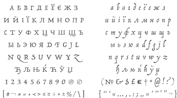 [MyFonts]
[More] ⦿
|
James Hamilton
[Hamilton Holly Wood Type Co. (or: Hamilton Manufacturing Company)]
|
 [More] ⦿
|
James Hultquist-Todd
[James Todd (or: JTD Type)]

|
 [MyFonts]
[More] ⦿
|
James L. Stirling
[Fontry West]

|
[MyFonts]
[More] ⦿
|
James Montalbano
[Terminal Design]

|
 [MyFonts]
[More] ⦿
|
James T. Edmondson
[Oh No Type]
|
 [More] ⦿
|
James Todd (or: JTD Type)
[James Hultquist-Todd]

|
 Chicago, IL, and/or Fredonia, NY, and/or Philadelphia, PA-based designer, who runs James Todd Design.
 Creator of the text family Garvis (2012), which was inspired by didones and the Dutch Fleischmann types. In 2013, he designed the wood type revival family HWT Unit Gothic for Hamilton Wood Type Foundry. The Unit Gothic series was released by Hamilton Manufacturing Co. in 1907, and comprises a flexible range of widths from compressed to very wide. In 2015, he published the contemporary didone optically corrected typeface family Essonnes [MyFonts link]. In 2016, James Todd designed the 6-style sans typeface family Cresta and his garalde take on the (normally didone) fat faces, Gastromond. In 2017, he co-designed Biwa and Biwa Display, a grotesk typeface family, with Ian Lynam. Typefaces from 2018: Chapman (a large Scotch roman typeface family with lots of pizzazz), Stack. Typefaces from 2019: Elfreth (an informal blackletter), Glot (a 10-style flared terminal sans family by James Todd and Ian Lynam; see also Glot Round from 2020). In 2021, he was part of a big effort by P22 to revive and extend Johnston's Underground to P22 Underground Pro [13 styles: Richard Kegler (1997), Paul D. Hunt (2007), Dave Farey (2021), James Todd (2021) and Patrick Griffin (2021) contributed at various stages]. In 2021, he released Cambium---a text family based on roman inscriptional lettering in which special attention was paid to trhe lowercase---at Future Fonts. YTypefaces from 2022: Oculi. Behance link. Dribble link. Old Fontspring link. Old URL. Future Fonts link. [Google]
[MyFonts]
[More] ⦿
|
Jamie Clarke
[Jamie Clarke Type]

|
 [MyFonts]
[More] ⦿
|
Jamie Clarke Type
[Jamie Clarke]

|
 Jamie Clarke (Bristol and London, UK, and at some point, Sydney, Australia) creates illustrative type and lettering. He ran his own digital agency for ten years, and retrained after that period by studying type design at the University of Reading and letterpress at the St. Bride Foundation in London. His commercial typefaces include Brim Narrow (2015). He writes about this engraved layered typeface: Brim is inspired by antique woodtype and chromatic type from the 1800s. Its various styles stack together creating a variety of decorative combinations. Each layer can be assigned its own colour. The horizontal etching in some styles and subtle shadow effects can give the typeface the appearance of a vintage money font. In 2016, he added Brim Combined.
 His commissioned led him to the Kelmscott Bakehouse K (2016), a decorative letter commissioned by Kelmscott Bakehouse and based based on William Morris's ats and crafts style. Typefaces from 2017: Rig Shaded (a large 3d shaded typeface family---the best such collection available to date). Typefaces from 2018: Shovel Knight Drop Caps (partial woodblock print alphabet), Rig Solid (a superb family of layered 3d fonts). Typefaces from 2020: Span (a 3-style a modern glyphic type family that flaunts its engraved heritage with sweeping serifs and sculptural forms). Typefaces from 2021: Rig Sans (a 16-style geometric sans). Author of the very informative article The Evolution of Chromatic Type (2017). Creative Market link. Behance link. [Google]
[MyFonts]
[More] ⦿
|
Jason Carne

|
 Owner and Creative Director at Lettering Library, Wentworth Institute of Technology, Saylorsburg, PA. Head honcho, with Drew Melton, at Carmel Type. In 2015, Jason Carne and Drew Melton co-designed the large condensed titling typeface family Skyward and wrote: Robust, towering, and geometrically refined, Skyward is a surefire classic cocktail of equal parts utility and elegance. They also cooperated on the wood style Western typeface Lumber Co (2015) and the nostalgic Railroad Co (2015; inspired by the iconic ultra-extended letter styles that lined the exteriors of many early 20th century passenger train cars).
 Typefaces from 2016: Mosler (a Fort Knox slab serif in four styles: Safe, Strongbox, Vault, Fortress), Alchemist (with Drew Melton). Typefaces from 2017: Motor City, Sundown (Jason wries: Designed with the gig poster in mind, Sundown is a throwback to the Fillmore West golden age of psychedelic rock and summertime fun.). Typefaces from 2019: Capstone, Botanist (Victorian: at Typeverything). Typefaces from 2020: Reverb (Jason writes that with the gig poster in mind, Reverb is a throwback to the Fillmore West golden age of psychedelic rock and summertime fun). Behance link. Creative Market link. Jason Carne's home page. [Google]
[MyFonts]
[More] ⦿
|
Jason Pagura
[Cuttlefish Fonts]
|
[More] ⦿
|
Jason Wickersty
[New Blazing Star Press]
|
[More] ⦿
|
Javier Vidal
|
Aka Jimena Vidal. In Longinotti's course at FADU UBA, Javier Vidal designed the Tuscan typeface Caminito (Caminito Adios) (2011). [Google]
[More] ⦿
|
Javier Viramontes

|
Javier Viramontes (Brooklyn, NY) was born and raised in El Paso, Texas. He holds a B.F.A. in Design from the University of Texas at Austin. He has worked for various multi-cultural advertising agencies including LatinWorks (Austin, TX), XL Alliance, and BBDO Contrapunto in Madrid. He also studied at The Cooper Union for the Advancement of Science and Art, and is presently Lecturer at the University of New Haven. His typefaces include Aldine (2011, Lost Type), a wood-look headline typeface based on original proofs of a 19th Century American Wood Type alphabet, Aldine Expanded, and embellished by Javier Viramontes at the University of Texas, Austin. In 2016, he published the display sans typeface Kawak that is characterized by an asymmetric mouth of its C, at Latinotype, which wrote: Kawak is a sans inspired by Mayan glyphs from the Tzolk'in ritual cycle. Kawak marries modernist typographic tradition with Pre-Hispanic formalism, creating a perfect blend between cleanliness, readability, objectivity, and the Mayan super-ellipse. Kawak was designed by Javier Viramontes during the Type@Cooper, Extended Program under the careful guidance of Jesse Reagan and an amazing repertoire of visiting critics. The project was finalized by Alfonso Garcia and the Latinotype team. [Google]
[MyFonts]
[More] ⦿
|
Jay Hilgert
[Albatross (or: Font Deals)]

|
 [MyFonts]
[More] ⦿
|
J.C.C. Dai Davies

|
Creator of Slab Four Rounded Ext (2010) at Wooden Type Fonts. [Google]
[MyFonts]
[More] ⦿
|
Jean Mosambi
|
Designer in Tarbes, France, who made Gothic Light (2012) based on a wood type specimen from Hamilton, ca. 1857, called Gothic Light No. 21. Dribble link. He specializes in custom retro type and graphic design. Dribble link. [Google]
[More] ⦿
|
Jean-Renaud Cuaz
[Typorium]

|
[MyFonts]
[More] ⦿
|
Jeff Levine

|
 Prolific type designer in Florida, b. New York, 1952. His fonts were originally free and consisted largely of dingbats. Around 2005 he went commercial, and now sells his work (over 350 fonts as of 2009) via MyFonts. He has branched out into several font styles, with a soft spot for stencil fonts, fonts for signage, art deco, and fonts for advertising. Born in New York, his family moved to Florida in 1963, where he has been ever since.
 An interview. Alternate URL. Yet another URL with his early free fonts. My pages on him. Dafont link. Abstract Fonts link. MyFonts link. Klingspor link. [Google]
[MyFonts]
[More] ⦿
|
Jeff Levine
[Jeff Levine: Western style typefaces]

|
 [MyFonts]
[More] ⦿
|
Jeff Levine
[Jeff Levine: Art nouveau types]

|
[MyFonts]
[More] ⦿
|
Jeff Levine
[Jeff Levine: Wood type]

|
 [MyFonts]
[More] ⦿
|
Jeff Levine: Art nouveau types
[Jeff Levine]

|
 Art nouveau typefaces by Jeff Levine:
 [Google]
[MyFonts]
[More] ⦿
|
Jeff Levine: Western style typefaces
[Jeff Levine]

|
 Western style typefaces made by Jeff Levine:
 - Badlands JNL (2017).
- Boonville JNL (2009, Western, wood type).
- Bootblack JNL (2007).
- Bootspur JNL (2006).
- Canarsie Slab JNL (2001) could pass for a heavily slabbed Western face.
- Cattle Call JNL (2019). A Tuscan typeface.
- Cattle Drive JNL (2011).
- Cattleman JNL (2013, a condensed French Clarendon).
- Cloverdale JNL (2009, Western, wood type).
- Faux Pas JNL (2020).
- Farmland JNL (2009).
- Frontiersman JNL (2011): A Tuscan face. See also Frontiersman JNL Black.
- Gemstone JNL (2016: Victorian, Tuscan).
- Gower Gulch JNL (2010).
- Grande Parade JNL (2009, Western style: a decorative version of Winnetka JNL).
- Grist Mill JNL (2009).
- Homesteader (2008).
- Hoosegow JNL (2009).
- Kalvesta JNL (2012).
- Lost Hills JNL (2008, a Wild West font based on Levine's own Brogado JNL).
- Mud Creek JNL (2020). Tuscan. Town Meeting JNL (2020) is an de-Tuscanized version of Mud Creek JNL.
- Mule Train JNL (2019).
- Oak Ridge JNL (2009).
- Pickfair JNL (2010) is based on the vintage wood type Vandenburgh Tuscan (circa 1867).
- Old Chisholm JNL (2012).
- Ornery Polecat JNL (2014).
- Overland Stage JNL (2011). A Tuscan stencil face.
- Overland Trail JNL (2020). An Italian typeface.
- Pen Nib Western JNL (2018).
- Primitive Tuscan JNL.
- Prospector JNL (2014).
- Rancher JNL (2013).
- Ranch Land JNL (2013). Based on a classical French Clarendon wood type.
- Rustic Setting JNL (2013).
- Saddle Tramp JNL (2013).
- Sagebrush (2014). modeled after French Clarendon wood types.
- Stablehand JNL (2010).
- Tamarac JNL (2006).
- Tent Show JNL (2014). Based on a French Clarendon wood style.
- Texarkana JNL (2011): based on a classic condensed wood type from the 1800s, and embellished with stars.
- Township JNL (2020). Based on the Western font French Antique Condensed.
- Turlock JNL (2007).
- Western Bevel JNL (2010).
- Western Block JNL (2010): Western, and almost octagonal.
- Western Railway JNL (2007).
- Western Sans JNL (2021). Based on classic Western wood types.
- JNL Western Territory (2019).
- Western Trail JNL (2020).
- Western Wood Type JNL (2015). Based on a letterpress font seen in Harry Potter and the Order of the Phoenix.
- Westward JNL (2014).
- Wood Tuscan JNL (2014).
[Google]
[MyFonts]
[More] ⦿
|
Jeff Levine: Wood type
[Jeff Levine]

|
 Digital renderings and simulations of wood type by Jeff Levine include Advertiser JNL (2009), Alderman JNL (2020: a wide slab serif typeface based on the classic wood type Antique Light Face Extended), Antique Unique JNL (2017, a revival of a wood type called Ten Line Antique Compressed No. 7), Blacksmith JNL (2011, based on a brass stencil image), Brenham JNL (2011), Buckdance JNL (2005, Tuscan), Bushwick JNL (2011, caps-only sans), Cattleman JNL (2013, a condensed French Clarendon), Cattle Trail JNL (2019: after Latin Condensed), Chamfer Engraved JNL (2020: a chamfered sans serif wood type design with a right side engraving line from the 1800s was found within the pages of the Thorowgood Foundry), Cherrywood JNL (2020: based on the classic Columbian from the William H. Page Wood Type Company (circa 1870), Cherrywood JNL is a bold slab serif type design), Clarenwood JNL (2014), Clarenwood Stencil (2015), Clarified JNL (2020; based on William H. Page's Clarendon Extended wood typeface), Compressed Wood JNL (2020: extrapolated from J.G. Cooley's Roman Triple Extra Condensed Fifty Line), County Clerk JNL (2020: after the vintage Hamilton wood typeface Gothic Special), Daily Tablet JNL (2014: based on wood type used for newspaper headlines), DuBois Block JNL (2008), Early Edition JNL (2020), Eccentric Wood Type JNL (2020), Elida JNL (2011, a didone all caps wood type family), Elk Grove JNL (2009, based on a wood type called Facade), Emporia JNL (2011), Engine Company JNL (2013), Final Edition JNL (2015), Fort Courage JNL (2014, a French Clarendon), Framingham JNL (2010, a widened version of Nostrand JNL), General Merchandise JNL (2020: after the condensed slab serif Antique X Condensed, ca. 1840, by Wells and Webb), General Merchant JNL (2013), Gristwood JNL (2015), Hayfork JNL (2011), Ingomar (2006), Lenorah JNL (2009), Local Printer JNL (2020: based on William Page's wood typeface Skeleton Antique, ca. 1865), Lockup JNL (2009), Longwood JNL (2014), News Event JNL (2020), Normandy Isle JNL (2011), Northfork JNL (2010, based on a William H. Page wood type alphabet called Parisian, circa 1857-58), Nostrand JNL (2009, condensed wood type), Notification JNL (2011), Nouveau Sans JNL (2014, art nouveau-inspired wood type), Octagonist (2020: a 3d beveled typeface that revives George Nesbitt's Octagon from 1838), Old Wood JNL (2013), Ornery Polecat JNL (2014: Western style), Page Printer JNL (2020: after William H. Page's Skeleton (1948)), Payson (2009), Pleasantwood JNL (2014), Presswood JNL (2020: based on the title font used on the cover of a specimen book issued by the Delittle Wood Type Company of York, England), Primitive Tuscan JNL (2014), Rachelle JNL (2009, Italian), Ranch Hand JNL (2013), Reverse Gothic JNL (2014), Roman Wood Type JNL (2012, in the Clarendon Condensed style), Rounded Sans Wood JNL (2015), Roundwood JNL (2020: spurred), Rustic Setting JNL (2013), Saddle Tramp JNL (2013), Sagebrush JNL (2014: modeled after French Clarendon), Sales Book JNL (2013), Sales Event JNL (2014), Sandalwood JNL (2020: based on a sans wood type seen in Rob Roy Kelly's American Wood Type), Shadowland JNL (2014), Shadowlawn JNL (2014), Sidewinder JNL (2013, an ultra-compressed wood type), Splinters JNL (2009, wood pieces), Slabserif Grotesk JNL (2020: based on a wood type design called Antique Light Face), Slabserif Wood JNL (2020), Stockville JNL (2012), Streamwood JNL (2014), Strongbox JNL (2009), Table Wood JNL (2020: based on the wood type Concave Tuscan Extra Condensed), Tamarac (2006, slab-serif wood type), Tent Show JNL (2014, based on a French Clarendon circus style), Teterboro JNL (2010; although built from scratch, this slab serif has a wood type feel), Texarkana JNL (2011, based on a classic condensed wood type from the 1800s, and embellished with stars), Topanga JNL (2010, ultra-condensed sans serif wood type), Trail Boss JNL (2011), Troubadour JNL (2011, ornamental wood type), Unadorned JNL (2017, an ornate spurred wood type font), Weekend Tabloid JNL (2009, a sans serif wood type), Western Wood Type JNL (2015, a Clarendon), West Fork JNL (2020: after Latin Extended by Hamilton, 1888), Westward JNL (2014: circus lettering typeface), Winnetka JNL (2009, octagonal wood type inspired by Cooley Antique Tuscan Condensed---a printer's wood type manufactured in 1859 by J.G. Cooley), Woodbranch JNL (2016), Wood Clarendon JNL (2020: after Hamilton Clarendon Condensed, 1899), Wood Condensed Grotesk (2014), Woodcraft JNL (2013), Wood Fancy Reverse JNL (2020), Wood Gothic JNL (2020: based on Hamilton Gothic Bold (Hamilton Wood Type Foundry, circa 1889), Woodhaven Initilas JNL (2014), Woodlawn JNL (2013, outlined), Wood Line JNL (2018, based on wood type), Woodline (2019: very different from Wood Line JNL), Woodmark JNL (2014: based on William H. Page's New Process No. 507), Wood Nouveau (2014), Wood Poster Display JNL (2014), Wood Rounded JNL (2020: an interpretation of Caslon Rounded), Wood Sans Narrow JNL (2017, based on examples of an extra condensed Hamilton Wood Type), Wood Serif Poster JNL (2020), Wood Stencil (2019), Wood Tuscan JNL (2014), Wood Type Bodoni JNL (2013), Wood Type Calendar JNL (2016), Wood Type Grotesk JNL (2014), Woodwork JNL (2014). [Google]
[MyFonts]
[More] ⦿
|
Jelmar Geertsma
|
Graphic designer from Groningen, The Netherlands. He is planning digitizations of various wood types he owns. The first one is Origo Narrow (2007), a wood type sans. He also made Sixtypound (2007, an interesting rounded fatface), Rough-Cut Sans (2007) and Jelmar Sans. No downloads. [Google]
[More] ⦿
|
Jenny Forrest
|
New York City-based graphic designer of the squarish typeface Corner Type (2012). [Google]
[More] ⦿
|
Jeremia Adatte

|
 Lausanne, Switzerland-based type designer. He created Swissa Piccola (2012, an old typewriter font).
 In 2014, he designed the multicolor layered typeface Bron and Bron Shadline. Bron is based on Zelek, designed in the early 1970s by Polish type designer Bronislaw Zelek at Mecanorma. This typeface was originally made for dry transfer lettering sheets. It is has been redrawn and refreshed by Adatte. Also in 2014, he created Day and Collins Logotype (2014, based on catchwords and fists fond in a 1910 wood type catalog by Day & Collins, London). In 2015, he designed Marcel, an angular upright script typeface that was inspired by Jacno (1948) by French type designer Marcel Jacno. In 2016, Jeremia designed Script Typewriter Rough, which is the very first complete cursive digital typewriter font ever made after the original 1960 Smith-Corona Electra 210 typewriter. Behance link. [Google]
[MyFonts]
[More] ⦿
|
Jeremy Vessey
[Pixel Surplus]
|
 [More] ⦿
|
Jeroen Overweel
|
 Designer in Utrecht, The Netherlands. In 2014, he published the excellent Bos Theater Type, a typeface that is reminiscent of rough wood prints and even potato printing. [Google]
[More] ⦿
|
Jerry L. Austin
|
Small wood font archive (wood in the sense of letters that look like they were made from wood). [Google]
[More] ⦿
|
Jesse Snyder
[Warehouse Design]
|
[More] ⦿
|
Jesus Morentin
[Bunker Type]
|
[More] ⦿
|
Jim Lyles
[Stiggy & Sands]

|
 [MyFonts]
[More] ⦿
|
Jim Lyles

|
 Type designer (b. 1955, Indiana) who lives in Michigan City, IN. While living in NYC, he began working for Mergenthaler Linotype, learning the craft of letter drawing and typeface design. For the next 32 years, Jim worked in the Type group at both Linotype and Bitstream. When Monotype acquired Bitstream early 2011, Jim chose to go solo by founding Stiggy & Sands together with Brian Bonislawsky. He is also a partner at BluHead Studio, where he digitizes old photo fonts by Joseph Churchward. Jim is also active in Stuart Sandler's Filmotype project, where he has resurrected several typefaces, including Filmotype Reef and Filmotype Jade.
 At Bitstream, he did in-house work, and had his signature on Candy Bits (1996, an M&M simulation font), Prima Sans (1998), Prima Serif (1998), Prima Sans Monospace (Bitstream, with Sue Zafarana, 1998) and Bitstream Vera (2003). According to Lyles, Bitstream Vera is actually a detuned Bitstream Prima. Gnome asked that we modify some of the characters in the monospace, particularly for coding legibility. We added a center dot to the zero and modified the lcase l to distinquish it from the figure one. Although I designed Vera (Prima), it was actually Sue Zafarana who adapted it to a mono version, at times a very challenging task. The Vera fonts are also here. Vera Sans is at the basis of Menlo (2009), a Snow Leopard system font, about which Apple writes: Apple's Menlo is based upon the Open Source font Bitstream Vera and the public domain font Deja Vu. He revived some Filmotype fonts from the 1950s: Filmotype Jade (2012, based on an original connected script typeface from 1955), Filmotype Reef (2011), Filmotype MacBeth (2007), and Filmotype Austin (2009, brush face). In 2012, he created a gracious upright script face, Stalemate, which can be downloaded from Google Web Fonts. The upright connected script Grand Hotel (2012, Google Web Fonts, with Brian Bonislawsky for Astigmatic) finds its inspiration from the title screen of the 1937 film "Cafe Metropole" starring Tyrone Power. The free Rum Raisin was published at Astigmatic One Eye. Stiggy & Sands is the American type foundry of Brian Bonislawsky and Jim Lyles, est. 2013. Their first commercial typefaces, all jointly designed, are Luckiest Guy Pro (a fat comic book font based on vintage 1950s ads) and Marcellus Pro (a flared roman inscriptional typeface with both upper and lower case, originally published in 2012 by Astigmatic; CTAN link). At Hamilton Wood Type, he designed HWT Roman Extended Fatface (2014), which is based on 19th century didone wood styles. In 2016, Brian J. Bonislawasky and Jim Lyles published the rugged octagonal mega typeface family Tradesman and the techno typeface Offroad at Grype. In 2018, he published the connected script typeface Michiana Pro at BluHead Studio. Another MyFonts link. Klingspor link. P22 link. [Google]
[MyFonts]
[More] ⦿
|
Jim Moran
|
Jim Moran received his apprenticeship from Moran's Quality Print Shop in Green Bay, Wisconsin, while serving as printer's devil, pressman, partner, and owner for 29 years. He became the Director of Hamilton Wood Type & Printing Museum in 2009, where he maintains the collection of wood type, runs and repairs the museum's presses, teaches workshops, archives and restores the museum's collection of 20th-century decorative and advertising plates, and oversees museum operations. Speaker at ATypI 2017 in Montreal and at ATypI 2018 in Antwerp. In Antwerp, his talk, Old Beer New Type, presented together with Fred Smeijers, is concerned with the typographic revival of one of the Plantin Moretus' oldest (17th century) posters, promoting beer. [Google]
[More] ⦿
|
Jim Parkinson
[Parkinson Type Design]

|
 [MyFonts]
[More] ⦿
|
Jim Parkinson on his grotesques
|
Jim Parkinson (Parkinson Type Design) explains the gradual development of his grotesque typefaces, from the custom headline font Newsweek No. 9 to Banner, Antique Condensed (Font Bureau), ITC Roswell and finally, Balboa and Balboa Plus. In his own words: Balboa took its sweet time evolving. In 1985, Roger Black was at Newsweek magazine in New York. He was going to do a total redesign of the magazine, Roger had me redesign the logo, and help him fashion a headline font for the magazine. Roger wanted the font to be based on Stephenson Blake's Grotesque No. 9. But he wanted it heavier, way heavier. There was one crazy afternoon during the development of that font when Roger and I were at drawing tables in my tiny Art Room. My office has always been called The Art Room, and it was always the extra bedroom in whatever house I was living in. I was at one drawing table furiously drawing bolder letters, and, as fast as I could draw them, Roger, at the other drawing table, was rubber cementing the comp letters into dummy headlines. Each time he finished a headline, he would look over at me and bark, Bolder. BOLDER. I can still hear him today, Bolder. BOLDER. Eventually we found the right weight and made Newsweek No. 9. I drew it in pen and ink. It was digitized by some company in New Jersey. That was my introduction to the Grotesque letterforms. About a dozen years later, I found myself working at the San Francisco Chronicle, trying to make digital fonts for the paper. The Executive Editor was a crusty old dude. He had fond memories of the 1950s when San Francisco had a half dozen dailies, all competing to attract readers. Back then, the old editor had had dozens of rack cards printed to scream for attention from atop newspaper racks in the city. The cards were butt-ugly, badly typeset, free of any trace of design, and unintentionally comical. Still, the old fellow had deep affection for his rack cards and saved them as souvenirs. When he became aware there was a guy in the building designing digital type, he decided the strange wood type from the rack cards would be the Chronicle's first digital font. The type on the rack cards was old woodtype. The letter weights were so uneven that I am sure characters from other fonts had been mixed in. I turned to an old ATF typeface called Condensed Title Gothic No. 11 to use as my model. I called the result Banner. It was a bomb proof headline gothic. No frills. By the early 1990s I was working my favorite parts of the Grotesque into other typefaces. I like the endings of the round strokes and I worked them into Antique Condensed No. 2. The thing that I found distracting about the Grotesques was the flat-tire shape of the round characters. Droopy. Finally I combined the character shapes of Banner with the Grotesque details I used in Antique Condensed to make ITC Roswell. And ITC Roswell begat Balboa. [Google]
[More] ⦿
|
Jim Spiece
[Spiece Graphics]

|
 [MyFonts]
[More] ⦿
|
Jimiyo
|
FontStructor who made the Western wood type look typeface Modern West (2010). [Google]
[More] ⦿
|
J.M. Debow
|
Wood type manufacturer in Allentown, NJ. Specimen of Leavenworth's Patent Wood Type Manufactured by J.M. Debow (1840s) is on-line at the NYPL. From that book: Italian type, Twelve Lines Gothic. For a digital revival of that Italian, see Chuck Mountain's Zuecos CF (2019). [Google]
[More] ⦿
|
Joanna Rzezak

|
 Kapitan Studio was Joanna Rzezak and Piotr Karski. Based in Warsaw, they design books, typefaces and magazines. Their typefaces included Captian Blackbeard (2012, a heavy angular condensed caps typeface based on a 19th century wooden type Grecian made by William Page). In 2014, Joanna Rzezak went alone. In 2019, she released the tall octagonal Western wood type font Captain Blackbeard at her own type foundry.
 Behance link. Old URL for Kapitan Studio. [Google]
[MyFonts]
[More] ⦿
|
Johan Kallas
|
Graphic design student from the Estonian Academy of Arts, whose particular interests lie in web design and typography. His free font Vibur (2010) is a script typeface based on handwriting. In 2012, Johan Kallas and Mihkel Virkus designed Ewert, a slab serif wood type inspired by and loosely based on the collection of cultural infographic maps by Estonian graphic artist Olev Soans. Free at Google Web Fonts. They added Revalia later in 2012---see here. Meie Script (2012, John Kallas and Mihkel Virkus, free at Google Web Fonts) is described as follows: Meie Script is a typeface, which is based on the original 1910 Estonian handwriting standard. It is less flamboyant then its Western European contemporaries. Estonian handwriting has been influenced greatly by German and Russian handwriting styles and Meie Script embodies a mixture of those two styles. Klingspor link. Google Plus link. [Google]
[More] ⦿
|
John Bonadies
[Mpress Interactive]

|
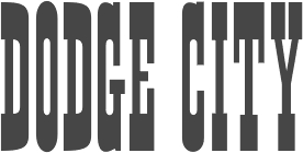 [MyFonts]
[More] ⦿
|
John Downer

|
 Celebrated American sign painter and type designer (b. Tacoma, WA, 1951), who lives in Iowa City, IA. Downer earned a BA degree in Fine Art from Washington State University, and both an MA degree and an MFA degree in painting from the University of Iowa. John Downer has been a journeyman sign painter since 1973, and a type designer since 1983. He is known as a type critic and type historian. He teaches hand lettering and lectures widely at educational institutions and professional conferences. Downer's professional activities include sign painting, lettering, glass gilding, type design, typography, and logo design. His typefaces:
 - Ironmonger (1991-1992: an angular all-caps display alphabet inspired by lettering on buildings), Roxy (1990: a stroke-modulated sans), SamSans (1993: a humanist sans) at FontBureau.
- Chicago Tribune Mag (1989, Roger Black).
- At Emigre: Triplex Italic (1985; many weights were done by Zuzana Licko), Brothers (1999, a polygonal and almost octagonal family with wood type influences: Its inspiration came from a bright chromolithographed letterhead designed around the turn of the century for the Cole Brothers traveling shows, an extravaganza of acrobatic and circus acts that included trained horses with bareback riders.), Council (1999: an all caps condensed display wedge-serif) and Vendetta (1999: inspired by old-style Venetian serif fonts but with sharpened serifs). Council was based on lettering found on a candy tin box made in the early 1900s for John G. Woodward&Co. of Council Bluffs, Iowa. It has a wood type look.
- Iowan Old Style (1990, Bitstream--his first font), Iowan Old Style Titling (2002, Bitstream). These are newspaper types. He writes about them: Iowan Old Style is classified as a Venetian old style type design. It is related to earlier, 20th-century American interpretations of Italian Renaissance types cut by Nicolas Jenson and Francesco Griffo, but it is modeled also on classical inscriptional lettering and sign painting seen in certain regions of eastern Iowa. See also Venetian 801 by Bitstream.
- Gonnick (1992, done for cartoonist Larry Gonnick).
- Simona (1994-1996, Design Lab, Milan, with Jane Patterson), Simona Swash Italic (1998, Design Lab). Example of its use.
- Airy (1998, Design Lab).
- Panatela (2001, compared by Downer with Jim Parkinson's Modesto).
- Paperback (2005), a family with 6, 9, 12, 24, 48 and 96 point optical sizes. Its polygonal sections of outlines are applauded by John Berry.
- Screenmax, a bitmap serif typefaces at 7 pixel x-height in Roman, Italic, Bold and Black.
Russian piece by Ilya Ruderman on Downer's lettering. His present company is Voltage. At ATypI 2008 in St. Petersburg, he spoke about revivals, and ran a lettering workshop, something he is famous for at previous ATypI meetings as well. His abstract on font revival reads: To understand the intrinsic differences between plagiarism (normally regarded as a bad thing) and preservation (normally regarded as a good thing), we should look at various means by which newer typefaces are derived from older ones. There are indeed many approaches. Outlining them can be helpful in considering the practices surrounding revivalism in general: revivals, recuttings, reclamations - anthologies, surveys, remixes - knockoffs, clones, counterfeits - "me too", copycat - reconsiderations, reevaluations, reinterpretations - homages, tributes, paeans - encores, sequels, reprises - extensions, spinoffs, variations - caricatures, parodies, burlesques. Mug shot. Klingspor link. Brief bio. MyFonts page. FontShop link. John Downer, a master water polo player (2006). Bitstream bio. Showcase of John Downer's typefaces at MyFonts. [Google]
[MyFonts]
[More] ⦿
|
John G. Cooley
|
American wood type designer/manufacturer from the 19th century, whose company started out in 1852 by taking over Edwin Allen in South Windham, CT. In 1864, he partners with Robert Lindsay, sells the South Windham factory, and moves to New York City as John B. Cooley and Co. In 1866, he enters into a partnership with Samuel T. Dauchy to become Cooley&Dauchy. In 1869, however, that company was bought by William Page, who ironically, had been Cooley's employee in 1855-1856. He published Specimens of Wood Type. Examples of their wood types: Antique Tuscan No. 1 (1859). Digital revivals: Jeff Levine's Winnetka JNL (2009) was inspired by Cooley Antique Tuscan Condensed from 1859. Compressed Wood JNL (2020, Jeff Levine) is extrapolated from J.G. Cooley's Roman Triple Extra Condensed Fifty Line. Finally, AWT Cooley Ant Tuscan XX Cond (2013) and AWT Cooley Grecian XX Condensed were released by Dick Pape. [Google]
[More] ⦿
|
John Haddon & Co (or: Haddon-Caxton Type Foundry)
[Phil May]
|
 London-based foundry with a sense of humour, because all their type names start with the letter H. Examples of art nouveau typefaces: Harlech, Harquil, Harrington, Hawarden Italic, Huntsman (late Victorian, pre-art-nouveau style).
 Most of their typefaces were designed by Phil May [information unverified]. For digital revivals, see Huntsman (2005, Dan X. Solo). John Haddon published Haddon-Caxton List of Poster Wood-Letters Ornaments and Rules at the Fleet Street location of the Haddon-Caxton Type Foundry in London in 1923. Free local PDF. That book shows these exclusive wood types: Haddon, Hawarden, Highland, Herald, and Hamlin. [Google]
[More] ⦿
|
John Hansen Budalsplads
|
John Hansen Budalsplads (1798-1874), a craftsman from Budalen, a remote mountain valley in central Norway, is well known for his production of ornamented, wooden boxes. He also had a great interest and ability in cutting letters in wood. He produced whole alphabets in blackletter and Latin (copperplate) style. On some plates the letters are cut into the wood, but he also cut letters which stand out of the wood (as punches). The latter ones were then printed on paper, to be hung up on walls on the farms. They were both educational and decorative, as the letters are well executed. The article discusses how Budalsplads can have got them printed. Torjorn Eng regards him as the first representative of Norwegian typeface design. A sample from 1820 until 1831. A sample from 1826. Another link. [Google]
[More] ⦿
|
John Nahmias
[Jonah Fonts]

|
 [MyFonts]
[More] ⦿
|
John Studden

|
 Sign artist in Burbank, CA who runs L.A. Signs and Graphics on E. Verdugo Avenue there. MyFonts link. All his fonts are commercial, and can be bought from Letterhead Fonts (LHF). He specializes in signage and retro typefaces. Perhaps his best-selling typeface is Classic Caps (2002). Other typefaces: Casablanca (2003), LHF Ephemera (2002, calligraphic), LHF Ballpark Script (2001, connected signage script), Goldsmith (2003), New Trajan (2002, based on Roman lettering found on buildings), Aristocrat (2002, inspired by a 1930s ad for swallow motorcycles), Big Top (2002, a circus headline font), Bulldog, Burbank (modeled after fire truck lettering), Classic Roman, Light Face Roman (2003), Fairground, Havana, Hertford, Corrie (2004, a roman titling face), The Bat (2004, inspired by lettering of Al Imelli), Pullman Train (2003), Labelle (2003, inspired by a Peace Time cigar label), Stetson (2004, an elegant all-caps display face), Brough Superior (2004), Classic Caps (2006, for Western style signs), Diploma (2006), Watrin (2006), Hamilton Ornate (2006, late 19th century ornamental style), Mackinlay (2006), Hamilton Nailhead (2006), Palms Bold (2006, wood type), Square Block (2006), Bank Note (2006, all-caps pair of typefaces that includes an outline), Gilmore (2006, wood type), Booth (2006, an artsy modern-serifed headline face), LHF Citizen (2007), LHF Prince (2007), LHF Vienna (2007), LHF Victoria (2007, art deco), LHF Roebuck, LHF Quaker (2007, elegant and artsy), LHF Prince (2007, inspired by the old "Farmer's Deposit National Bank" stock certificates), LHF Gilmore (2007), LHF Jumbo (2007, heavy Egyptian), LHF Conservatory (2008, a tall serif face), LHF Iron Horse (2008) and Shopfront (2002).
 In 2014, John Studden and Dave Parr co-designed the Victorian display typeface family LHF Blackstone and the retro script LHF Heller's Script. Studden also finished LHF Iron Knight in 2014. In 2011, J.M. Bergling's work (early 1900s) inspired the development of LHF Monogram Circle, LHF Monogram Diamond, and LHF Monogram Oval. In 2015, John Studden designed the Western Tuscan typeface LHF Nugget. [Google]
[MyFonts]
[More] ⦿
|
Johnson & Smith
|
American type foundry that acquired Binny & Ronaldson in 1834. [Google]
[More] ⦿
|
Jonah Fonts
[John Nahmias]

|
 Type and logotype company in Polanco (and now Mexico City), Mexico, run by John Nahmias (b. 1935, New York City). John is a graphic designer who started his career in 1952 in a New York studio with Lucian Bernhard. He left that company in 1958. He now lives in Mexico where he paints and runs his own studio. John's typefaces, mostly but not exclusively scripts, are sold by MyFonts.
 - A: Advent (2015: slab serif), Agave (2017: sans), Altura (2007, a serif family for covers), Amplia (2008, connected script in the style of Mistral; see also New Amplia (2010) and Amplia Pro (2017)), Angelviews (2020), Annabel Lee (2011, upright connected monoline script), Applaud (2017), Aquarel (2014), Aristide (2007, grunge), Aros (2009) Arroba (2010, a directionally challenged heavy slab serif), Artichoke (2011, fat signage script), Artistica (2019), Atlantica (2021: a ten-font sans with surgical cuts).
- B: Bernhard Signature (2019: after the letters in a small logo that Lucian Bernhard used on his art), Bonafide (2009, sans family), Bonnie Bay (2017), Bonnie Bay Roman (2017), Botegga (2018), Brougham (2012, techno), Brush Swipe (2016), Buggy Ride, Bulwark (2011, oddly-serifed), Burgerbun (2014).
- C: Caravan Script (2007), Caseta Slab (2014), Caseta Sans (2014), Caseta Regular (2014), Casual Brush (2007), Catapult (2020), Chatter Pro (2010-2019, influenced by signage), Cherry Lane (2011, fat round signage face), Chit Chat (2009, comic book style), Circuitry (2007, rounded octagonal face), Claxon (2009), Clic (2012: rounded comic book style family), Coliseum (2007), Cornerstone, Cornerstone Flair, Cornerstone Pro (2014), Credititle (2009), Crotona (2014), Crotona Sans (2014), Cuppa Tea (2015, cursive script).
- D: Designers Gothic (2009, a poster sans family), Dogwood (2019).
- E: Epoch (2009, organic), Espada (2015), eSpectrum (2019), Etiquette (2009, casual script).
- F: Fabius (2008, a fat-nibbed pen face), Feather Pen (2007), Fidelity Caps (2009), Flavian (2013, a text typeface), Fountain Pen (2007), Front Page (2011; followed in 2015 by Front Page Pro), Frugality Pro (2014, an antiqua).
- G: Gallivant (6 styles), Garabato (2008, informal hand), Gavel (2016), Georgie (2011, upright connected script), Gianna (2016: a connected calligraphic script), Goya (2012, a heavy signage script), Granada (2014).
- H: Hacienda (2008, hand-printed), Honcho (2007). Lucian Bernhard's Magnetype font series is being revived in 2010 by John Namias, starting with Bernhard's Community Low and Community Condensed, which is called Harpsichord. Hebron Hebrew (2019). Hi Five is an art deco typeface.
- I: Interum (2007).
- J: Janagrace (2007, flowing script), Jonah Brush (2010, basic signage font), Jonahpad (2008, hand-printed), Joyscript (2007; Joyscript Two was done in 2013), Juggler (2010, signage / comic book face), Juke Box (2009, calligraphic).
- L: La Quinta (a creamy cursive typeface) (2021), La Rotonda (2009), Lyanna (2008, brush script).
- M: Manor Script (2013, connected), Mark (2010, a grungy marker script), Mavin (2015, a vintage serifed typeface), Medalist (2008, flat-nibbed pen script), Meridia Script (2009), Metrolite (2011), Metrolite Pro (2014), Micron (2016), Monoreal (a monospaced programming font) (2022), Montego (2014, monoline sans), Mulberry Road (2011, fat retro diner script).
- N: Nebbiolo (2012, a monoline fashion mag sans family), New Epoch (2020: a solid sans), Newmark (2014: techno sans), Newmark Hebrew (2018), Novela (uncial) (2021).
- O: Open Air (2014, a stencil font---caps only), Organo, Oregano Sans.
- P: Pageantry (2020: based on Souvenir), Pageantry Hebrew (2021), Palazzo (2007), Paloma (connected script), Palomar (2012, condensed organic sans), Papagayo (2020: a 4-style sans with almost amputated descenders and ascenders), Pantext (2015), Pedigree (2020), Pennyscript (2014, a connected brush script), PenPal (penmanship script), Pine Nuts, Pine Nuts United (2017), Pinot Noir (2009, calligraphic), Poncho (2013, signage script), Pony Tale (2009, signage face; the Pro and Pony TailLight Pro versions appeared in 2014), Potus Uncial (2021), Puzzle Face (2019).
- Q: Qualico (2009, semi-serif 1970s family), Quickline Slab,(2020), Quickline (2020: a sans), Quintana (2017). The Hebrew verson of Quintana Light is Komunidad Hebrew Script (2019).
- R: Ratatouille (2020: inspired by wood type), Rave (2011), Regalo (2010, an organic family; see also Regalo Pro, 2014), Reto (2012).
- S: Saguenay (2017), Scriptonah Pro (2014), See Saw (a dancing baseline font) (2022), Sevoya (2012, fat signage script), Scriptelle (2007), Scriptonah (2007; John Downer writes: Scriptonah, in any of its four weights, is not particularly pretty or delicate, but it is far from homely. It is firm and fibrous. It is raw.), Scriptonite (2010, a packaging script), Showtime (2011), Sideline (2018, a music nib font), Sign Brush (2010, a lively signage face), Single Tyne (a display serif) (2021), Singular (2009), Snowpuffs (2013), Stage (2015), Starlette (2009), Starry Eyed (2018), Steletto (2007, condensed), Steletto Oldstyle, Steletto OS Flair, Steletto Serif, Steletto Neue (2015), Stumpy (2011, display sans), Suite Slab (2011), Summit (2015, hexagonal circuit font).
- T: Taglocaps (2017), Talento (2007, script), Tiggly Wiggly (2009, hand-printed), Tingle (2009, comic book face), TransRim Display (2018), Trebla Square (2020), Trumpet (2013), Tubo, Twiggs (2009, hand-printed), Twopenny (2013, bilined), TypeOgraf Pro (2018), Typogravure (a flared family, in 12 styles) (2020).
- U: Unico (2013: a condensed geometric sans), Unigram (2011, monoline unicase family).
- V: Vantage (2013, a humanist sans).
- W: Whisk (2017), Wordscript (2007, almost a brush script).
- Y: Yacqui (2009, Mayan look face), Yom Tov (Latin and Hebrew) (2021), Yonkers (2014).
- Z: Ziggy (2007).
View John Nahmias's typefaces. [Google]
[MyFonts]
[More] ⦿
|
Jonathan Swinn
[Alphabet Agency Font Foundry]

|
[MyFonts]
[More] ⦿
|
Jonny Pinhorn

|
 Jonathan (Jonny) Pinhorn is a British type designer and India enthusiast who obtained an MA in typeface design from The University of Reading (2009), based on his typeface Venkat. From 2011-2015, he worked for Indian Type Foundry in Ahmedabad, India. Jonathan is currently located in Birmingham, UK. He is working on Venkat Tamil. His typefaces:
 - The free grotesque typeface Karla (2012, Google Fonts). Github link for Karla.
- Saguna (2013, Indian Type Foundry). For Gujarati.
- Teko (2014, jointly with Manushi Parikh). Published at Google Fonts and Indian Type Foundry. Teko is an Open Source typeface that currently supports the Devanagari and Latin scripts. This font family has been created for use in headlines and other display-sized text on screen. Five font styles make up the initial release.
- Kalam (2014, with With Lipi Raval). Published by Google Fonts and Indian Type Foundry). Kalam is a handwriting-style typeface supporting the Devanagari and Latin scripts. The fonts have each been optimised for text on screen. Each font contains 1,025 glyphs, which includes many unique Devanagari conjuncts.
- The sans typeface Karmilla (2015). A ree at Open Font Library and Github.
- The Peignotian typeface Quilon (2015). A free version is available at Fontshare.
- The grotesk typeface family Caravel (2015, Indian Type Foundry).
- The geometric-but-not-quite-monolinear Touche (2015, Indian Type Foundry).
- Tillana =(2015). Done with Lipi Raval, Tillana is a casual angular script typeface for Latin and Devanagari.
- The free Latin / Devanagari geometric sans typeface Poppins (2015). The Devanagari is by Ninad Kale. The Indian Type Foundry first published Poppins in 2014. Github link. This geometric family is nearly monolinear. Anderson University recommends it as a replacement for Zuzanna Licko's Mr Eaves XL Modern. The free font Ulagadi Sans (2014-2017) is derived by Cristiano Sobral and stripped of the devanagari component.
- The creamy typeface Shrikhand (2015, Google Fonts). This typeface covers Latin and Gujarati.
- Atithi. A Gurmukhi companion to Cadson Demak's Athiti Latin and Thai typeface.
- DM Sans (2019). DM Sans is a low-contrast geometric sans serif design, intended for use at text sizes. DM Sans supports a Latin Extended glyph set, enabling typesetting for English and other Western European languages. It was released by Colophon Foundry (UK), starting from the Latin portion of ITF Poppins. Free at Google Fonts.
- Betinya Sans (2019).
Github link. [Google]
[MyFonts]
[More] ⦿
|
Jordan Davies
[Wooden Type Fonts (was: American Wood Type and, Wooden Type)]

|
 [MyFonts]
[More] ⦿
|
Jordan Jelev
[The Fontmaker]

|
 [MyFonts]
[More] ⦿
|
José Galeano
|
Based in Los Teques, Venezuela, graphic design student José Galeano created a wood type emulation typeface called Barberia Alegre Sans (2012). [Google]
[More] ⦿
|
Joseph Miceli
[AlfaType]
|
[More] ⦿
|
Joshua Redmond
|
Centerville / Dayton, OH-based designer of the handcrafted typeface pair Parks Sans and Parks Script (2016), the handcrafted slab serif typeface Trail Ranger (2016, +Shadow), the curvy handcrafted stencil typeface Drink Up (2016), and the wood emulation sans typeface Ohio (2016). Typefaces from 2017: 7th Inning Stretch, Offhand (textured 3d layered font), Whimsy (connect-the-dots), Rosie Script, Rosie Sans, Brace Slab (vintage lettering with and without spurs). Behance link. Creative Market link. [Google]
[More] ⦿
|
Joy Redick

|
Designer of Adobe Wood Type Ornaments (1990-1991, with Barbara Lind), Blackoak (1990, Egyptian wood face), Cottonwood, Ironwood, Juniper, Mesquite, Willow. Typedia link. Linotype link. View Joy Redick's typefaces. FontShop link. [Google]
[MyFonts]
[More] ⦿
|
Juan José Lopez
[Huy Fonts]

|
 [MyFonts]
[More] ⦿
|
Juan LLorens
|
Graduate from FADU, University of Buenos Aires, who created the typeface Poster Bondi (2010), a fat poster type that evokes old wood type. [Google]
[More] ⦿
|
Judith Poirier
|
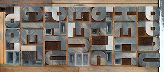 Judith Poirier is professor at UQAM in Montreal. She developed an interesting wood-based modular typeface, Latitude, in 2014 for the inuktitut syllabary.
 In 2013, she produced a typographic short movie, Two Weeks Two Minutes, that won the Canadian Film Institute Award for Best Canadian Animation at the Ottawa International Animation Festival. The idea is very clever---just transfer letterpress directly to 35mm film stock. The hallucinating images remind me of noisy movie fragments used in Hitchcockian thrillers. [Google]
[More] ⦿
|
Julia Stepanova
|
 Graphic designer in Moscow. Creator of the Latin/Cyrillic typefaces Cilesta (2013, curvy fat didone), Arnie Slab (2013, a wood style fat slab named after Arnold Schwarzenegger), Mr. Fox (2013, script) and Atletic (sic) (2013, octagonal). [Google]
[More] ⦿
|
Julieta Enriquez
|
Buenos Aires-based designer of Garufa (2012), a wood style poster typeface. [Google]
[More] ⦿
|
Julius Wiescher
[Authentic]

|
[MyFonts]
[More] ⦿
|
Just My Type
[J. Randall Harris]

|
 Just My Type is a type foundry set up in 2012 by J. Randall (or Randy) Harris (b. 1947, Marion, IN) in Tucson, AZ. Harris is a graphic and type designer who has been making typefaces since 1997. He teaches at the Art Institute of Tucson. His typefaces from 2013: Megatropolis (a stackable deco font system), Historic Warehouse (Victorian).
 Typefaces from 2012: Happenstance (a lovely retro-futuristic script), Illuminations Woodcut, Yule Love It (Christmas time dingbats), Gawain (based on the hand of Gawain Douglas), Oaxaca (a Mexican look face), Boxy Code, Channel B (a rounded monoline sans), Curves, Puzzle, Dempsey (based on the writing of Tucson film teacher, media artist and programmer, Vikki Dempsey), Chilespice, Strata, Deco Donut, Jiminy (a comic book face), Invites (a roundish upright script that intends to recreate the 1920s spirit), Hunky Chunky (an obese poster face), the hand-printed typeface Carissa, Got Milk, Cutting Corners, Astro (retro-futurustic), Dix (2012: a slabby wood style typeface inspired by the poster for the 1929 film Redskin, and a desire to create a black Edwardian font with an offbeat serif), and the monoline rounded stripped-down sans typeface family Laszlo (2012: the name is an homage to Laszlo Moholy-Nagy of Bauhaus fame). Kolega (2012) is a constructivist typeface family that consists of Kolega, Kolega Tall, and Kolega Podrobska (fake comrade). Steampipe (2012) is an ironwork, Jules Verne, wrought iron and time machine font. Los Muertos (2012) is a Halloween font. Typefaces from 2013: Megatropolis (a stackable deco font system). In 2014, he created the art deco typeface HG Welles, which was originally designed for a privately-published luxury edition of The Time Machine. Behance link. J Randall Harris Design link. Home page. [Google]
[MyFonts]
[More] ⦿
|
Justin Knopp
[Typoretum]
|
[More] ⦿
|
Justin Ward
|
 Chicago-based designer of an ornamental typeface in 2010.
 In 2012, he created a sans face, Pelago, and added a couple of alchemic versions. Typefaces from 2013: Here & There (poster typeface), Reynard (bejeweled typeface), Northerly (angular), Rime (ornamental display face). Behance link. [Google]
[More] ⦿
|
Justine Nagan
[Typeface]
|
[More] ⦿
|
Justyna Sokolowska

|
 Polish graphic and type designer who started her own type foundry in 2014. Typefaces:
 - The squarish typeface Erazm (2014), which is inspired by Polish books from the 1930s.
- Arbuz (2014) is a grungy typeface that emulates letterpress.
- Avocado (2015) is a brush script.
- Banana and Sun. A handwriting font.
- Woodout (2016). A wooden block font.
Creative Market link. [Google]
[MyFonts]
[More] ⦿
|
Jürgen Huber
[Supertype]
|
 [More] ⦿
|
K22 Foundry
[Niall Kitching]
|
 Teesside, UK-based graphic designer. Creator of Poster Slab (2011), Stussy Script (2013, hand-printed), Alycidon (2013, condensed wood face), Tulyar, Tulyar Eroded, Meld Bold Extended, Crepello.
 Typefaces from 2014, all inspired by wood type: Ballymoss, Green Howard, Blackwatch, Saint Paddy, Nimbus Condensed, Pinza Bold Condensed, Deltic Catchwords, Koyli Compressed (letterpress emulation). Tulyar (2015) is a Tuscan eroded woodbloack typeface. Typefaces from 2017: CAB Letterpress, Duga Stencil (a Latin / Cyrillic military stencl based on lettering seen in the Chernobyl Exclusion Zone). Dafont link. Old URL Creative Market link. Aka Kitch 22. [Google]
[More] ⦿
|
Kapitan Studio
[Piotr Karski]

|
Kapitan Studio is Joanna Rzezak and Piotr Karski. Based in Warsaw, they design books, typefaces and magazines. Their typefaces include Captian Blackbeard (2012, a heavy angular condensed caps typeface based on a 19th century wooden type Grecian made by William Page). Behance link. [Google]
[MyFonts]
[More] ⦿
|
Karl Schäffer
|
Karl Schäffer's rustic German expressionist lettering from ca. 1939 was captured by Ingo Zimmermann in 2008 in his Palmona (and Palmona Plus) typeface. Ingo writes: The letters present the effect of woodcarving or silhouette cuttings as they are defined exclusively with straight lines and sharp corners. Even in modern times, there is again the demand for hand carved fonts and there is hardly anyone who still wants or can write such a type him or herself. [Google]
[More] ⦿
|
Karolina Lach
|
 Polish / American designer who writes: Karolina Lach is a graphic designer, web designer and typographer residing in New York. She currently works as the Senior Designer for Kiwibox Media, a social network and online magazine for teens. A graduate of The Cooper Union for the Advancement of Science and Art, she has studied under Mike Essl, Emily Oberman, James Craig, Maxim Zhukov and Hannes Famira. Graduate from the type design program at the University of Reading in 2010.
 Her typefaces: Behance link. Home page in New York City. Behance link. Klingspor link. Google Plus link. [Google]
[More] ⦿
|
Keith Bates
[K-Type]

|
 [MyFonts]
[More] ⦿
|
Kel Troughton
|
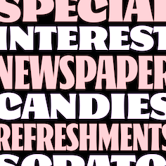 California native who attended Cooper West in 2018. During that study year, he started the design of Oaks, which was published in 2020 at Future Fonts. Oaks is a display typeface with a friendly attitude and a great deal of character. [...] It is based on the sign painting letter structure of the late 1800s with influences from Showcard greats like Ross F. George and E. C. Mathews. Originally designed as a toolkit for the small country grocery stores I grew up visiting in Sonoma County, California. [Google]
[More] ⦿
|
Kevin Allan King

|
 Kevin Allan King is from Toronto. He designed fonts for Canada Type from 2010 until 2017. In 2018, he graduated from the University of Reading's MATD program.
 In 2010, he co-designed Robur and Wagner Grotesk, Slinger (an art nouveau face) and Sol Pro (a 20-style monoline sans family based on the classic Sol design by Marty Goldstein and C.B. Smith, published by VGC in 1973) with Patrick Griffin at Canada Type. Still with Griffin at Canada Type, he revived a psychedelic / art nouveau typeface called Fortunata (1971, Karlo Wagner) and called it Spadina (2010). He also has a Facebook group on type crimes called TCI: Typographic Crime Investigators. Wagner Grotesk is the elaborate digital version of Edel Grotesque Bold Condensed (also known as Lessing, Reichgrotesk, and Wotan Bold Condensed), a 1914 typeface by Johannes Wagner, which was later adopted by pretty much every European type foundry, exported into the Americas, and used on war propaganda posters on either side of the Atlantic. In 2011, he and Patrick Griffin published the refined Orpheus Pro family, which was based on the elegant Orpheus by Walter Tiemann (1926-1928, Klingspor), and its Italic which was called Euphorion (Walter Tiemann, 1936). Their enthusiastic description: The Orpheus Pro fonts started out as a straightforward revival of Tiemann's Orpheus and Euphorion. It was as simple as a work brief can be. But did we ever get carried away, and what should have been finished in a few weeks ended up consuming the best part of a year, countless jugs of coffee, and the merciless scrutiny of too many pairs of eyeballs. The great roman caps just screamed for plenty of extensions, alternates, swashes, ligatures, fusions from different times, and of course small caps. The roman lowercase wanted additional alternates and even a few ligatures. The italic needed to get the same treatment for its lowercase that Tiemann envisioned for the uppercase. So the lowercase went overboard plenty alternates and swashes and ligatures. Even the italic uppercase was augmented by maybe too many extra letters. Orpheus Pro has been a real ride. Images of Orpheus: i, ii, iii, iv, v. In 2011, Griffin and King co-designed Walter Script, a calligraphic script that revives Troubadour (1926, Wagner&Schmidt). Still in 2011, King and Griffin completed work on an exceptionally beautiful revival, Ratio Modern (the original by F.W. Kleukens is from 1923). This is a didone family with a refined humanist trait. Still in 2011, he and Patrick Griffin created the 18-style sans family Recta, a considerable extension of Novarese's Recta. And they also completed Kumlien Pro, a revival and expansion of a beautiful transitional typeface designed in 1943 by Akke Kumlien. King Tut (2011) is a restoration and expansion of the original Egyptian Expanded, a single bold typeface cut in 1850 by Miller&Richard. Libertine (done with Patrick Griffin) is an angular calligraphic script inspired by the work of Dutchman Martin Meijer (1930s): This is the rebel yell, the adrenaline of scripts. Paganini (with Patrick Griffin) is another jewel in Canada Type's drawers: Designed in 1928 by Alessandro Butti under the direction of Raffaello Bertieri for the Nebiolo foundry, Paganini defies standard categorization. While it definitely is a classic foundry text typeface with obvious roots in the oldstyle of the Italian renaissance, its contrast reveals a clear underlying modern influence. Patrick Griffin and Kevin Allan King did a revival called Paganini in 2011. The year 2012 starts out with a bang. King and Patrick Griffin published Wonder Brush (partly based on a signage brush script called Poppl Stretto (1969) by Friedrich Poppl), Wagner Script (a revival of Troubadour (1926, Wagner&Schmidt)), Spade (a super-heavy slab face, done with Patrick Griffin; based on Farmer and Little's Antique No2 from 1867), and Louis (a faithful digital rendition and expansion of a design called Fanfare, originally drawn by Louis Oppenheim in 1927, and redrawn in 1993 by Rod McDonald as Stylus). King Wood (2012) is an octagonal flared wood type family with a set of dingbats, King Wood Extras. Monte Cristo (2012) is a grand type family with five styles and 1630 characters with many swashes and ways of connecting the calligraphic glyphs---it is the ultimate wedding font. The last joint project of King and Griffin in 2012 was Pipa, a pseudo-psychedelic groovy bellydancing font: Originally made for a health food store chain we cannot name, Pipa is the embodiment of organic display typography. In 2013, Kevin Allan King and Patrick Griffin revived Georg Trump's transitional typeface Mauritius (1967, Weber). In 2014, they designed the psychedelic typeface Jingo: This is the digital makeover and major expansion of a one-of-a-kind melting pot experiment done by VGC and released under the name Mardi Gras in the early 1960s. It is an unexpected jambalaya of Art Nouveau, Tuscan, wedge serifs, curlycues, ball endings, wood type spurs and swashes, geometry and ornamental elements that on the surface seem to be completely unrelated. His graduatiuon type at MATD in 2018 was Mazina, a multi-script typeface system developed for complex literary texts. It supports Arabic, Latin, and several Canadian aboriginal scripts. In 2022, he released eight fonts for Canadian Syllabics at Typotheque. At the same time, he published the extensive article Syllabics typographic guidelines. [Google]
[MyFonts]
[More] ⦿
|
Kika Novosadova
|
Trencin, Slovakia-based graphic designer. She created Essen Sans (2012) and Wood Font (2012, based on the patterns in tree bark). [Google]
[More] ⦿
|
Kim Buker Chansler

|
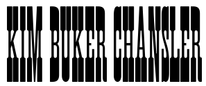 A designer fascinated by Western styles and styles with a wood type look. She made Zebrawood (1994, Adobe) with Carl Crossgrove and Carol Twombly, Rosewood (1994, Adobe, also with Carl Crossgrove and Carol Twombly), Ponderosa (1990, Adobe, with Carl Crossgrove and Carol Twombly--the ultimate wanted poster face), Pepperwood (1994, Adobe, with Carl Crossgrove and Carol Twombly), Cottonwood (Adobe, with Barbara Lind and Joy Redick), and Birch (1990, Adobe, a triangularly serifed wood type style face based on a wood type of William Page in 1879). Identifont link. Linotype link. FontShop link. Catalog of her typefaces. [Google]
[MyFonts]
[More] ⦿
|
Kimmy Design
[Kimmy Kirkwood]

|
 Kimmy Kirkwood (b. 1988, Seattle, WA) (Kimmy Design) studied at Chapman University, and lives in Santa Monica, Orange County. He graduated in 2018 from the University of Reading's MATD program.
 Kimmy created a gracious curly calligraphic script face, Madeleine (2010), which is based on a logo she designed for Hotel Le Sirenuse. At Dafont, one can download Kuppel (a hairline display sans) and Hammer Head, both done in 2010 as well. Phase two of Kimmy's career started late in 2010 as Kimmy Design, where one now has to pay for Madeleine (2010) and Katelyn (2011). Addison (2011) is a wood type Western circus poster font in two styles, West and Circus. In 2012, Kimmy created the counterless art deco typeface Chelsnuts, the worn wood type typeface Cpl Kirkwood, Elizabeth Script, and Paper Cutout Pro. In 2013, Kimmy published Lunchbox Slab, the grungy Appareo, the condensed minimalist sans family Maxwell Sans, its companion Maxwell Slab, the scriptish typeface Lunch Box, and the bold headline family Station (inspired by old train station typography). Typefaces from 2014: Catalina (hand-drawn typeface family with sub-styles called Anacapa, Avalon, Clemente Script, Typewriter and Extras, ideal for hand-drawn menus, table cards, chalkboards, and wall quotes), Amorie (a skinny hand-drawn family, with styles called Modella, Nova, SC and Extras). Typefaces from 2015: Avaline Script, Baker Street (vintage hand-drawn typeface family), Burford (a 16-style vintage layered family), Burford Rustic (layered font family). Typefaces from 2016: Bourton (a layered font for vintage yacht club or whiskey bar logos; it is the sans version of Burford; sufamilies include Drop, Lines and Outlines), Rainier (handcrafted). Typefaces from 2017: Evanston Alehouse (octagonal, beer bottle style, slightly copperplate), Bourton Hand. Typefaces from 2018: Clifton (his MATD graduation typeface): Clifton is a modern type family with many weights and contrast styles. It supports Latin scripts as well as Greek, Cyrillic and Arabic. Originally intended as a book typeface, it was designed so that all the weights and styles would work together as a cohesive family. Typefaces from 2019: Refinery (an 85-style octagonal family based in early 20th century signage), Evanston Tavern (Evanston Tavern is a square typeface and the sans-serif version to Evanston Alehouse. Inspired by the years that prefaced the ratification of the American Prohibition, this typeface mimics the signage commonly seen outside of saloons, taverns and alehouses during that time.), Winslow Book (a playful modern Scotch). Typefaces from 2020: Roadhouse (a layering typeface family that is part of the greater Evanston type collection, which is inspired by American typefaces commonly used at the turn of the century leading up to prohibition), Winslow Title (a decorative didone family), Winslow Title Script (monoline), Hawkes (Sans, Script, Variable Width Sans). Typefaces from 2021: Madley (a 12-style soft slab serif). Typefaces from 2022: Bourton Text (an elliptical sans in 42 styles). [Google]
[MyFonts]
[More] ⦿
|
Kimmy Kirkwood
[Kimmy Design]

|
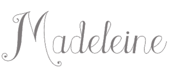 [MyFonts]
[More] ⦿
|
Kiosk Fonts
[Frank Grießhammer]

|
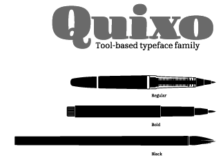 Kiosk Fonts (Berlin) was founded in 2008 by Frank Griesshammer (b. 1983, Nuremberg, Germany), a graduate of HBKsaar in Saarbrücken (2008) and of the Masters program in type design at KABK (2010). His graduation project in Den Haag involved the multi-pen typeface Quixo (2010), which seems to be have just the right flexibility for packaging and ads. Frank lived in Den Haag, but joined Adobe's type department in 2011.
 His alphabets from 2008: Fleischwurst Fett (blackletter), Drückerei (grunge by Haiko Günther), Sommerfest, Rex Mundi (by Haiko Günther), PX Barok (a stitching and needle typeface), Ghana Signpainters Divine Healer (by Haiko Günther), Pappe (randomized cut-out face), Wüste Fraktale (a pixel blackletter by Haiko Günther), A4, Ghana Signpainters Safari (by Haiko Günther), Ghana Signpainters Cocktail (comic book and ad style by Haiko Günther), Format, Black Frituur (blackletter by Haiko Günther), Monaural (geometric), Steelcut (based on Woodcut; by Haiko Günther), Coswig, Roundenau (very rounded). In 2009, he did revivals of Memphis (original by Rudolf Wolf, 1929) and Stempel Elan (original by Hans Möhring, 1936). The latter typeface was published by Linotype. In 2013, he made HWT Tuscan Extended (Hamilton Wood Type). Hamilton Wood Type explains: It is based on the 1872 William Page & Co. version, while also bearing a very close resemblance to the Morgans & Wilcox Tuscan Extended and No. 2106 from Tubbs Manufacturing Co. It is similar to the Heber Wells Tuscan Extended. All four manufacturers were eventually acquired by Hamilton. The Hamilton designation for this design was simply No. 303. The National Printers' Material Co. of New York also offered a similar Tuscan Extended. FontShop published his school project font Quixo as FF Quixo in 2013. Quixo won an award at TDC 2014. In 2014, Frank designed the free Source Serif typeface family at Adobe, to accompany Paul Hunt's Source Sans Pro (2012). It is a transitional family influenced by Perre Simon Fournier's styles from 1742. Google Web Fonts download link. CTAN download. He designed the Latin, Greek, and Cyrillic glyphs that are included with Source Han Serif (2017). In 2021, Frank Griesshammer updated Source Serif. This new version of Source Serif supports six weights and five optical sizes, both in static and variable formats. Design changes were made from the original Source Serif Pro. At Adobe, he participated in Adobe Handwriting (based on the handwriting of Frank Grießhammer, Ernest March and Tiffany de Sousa Wardle). Speaker at ATypI 2011 in Reykjavik. Speaker at ATypI 2013 in Amsterdam where he spoke on a renewed effort at Adobe with respect to kerning. In 2019, Colophon and Frank Griesshammer released DM Serif Display and DM Serif Text at Google Fonts. Based on Adobe Serif Pro (by Frank Griesshammer), it is a high-contrast transitional typeface with only one weight. Github link. Klingspor link. Old URL. Old home page. [Google]
[MyFonts]
[More] ⦿
|
Kirill Tkachov

|
 Also Kyrylo Tkachov, Cyrill Tkachev and Cyrylo Tkachov, depending upon the source. Illustrator and calligrapher. A Ukrainian, Cyrill Tkachev graduated from the Lugansk Taras Shevchenko National University in 2005. He works at the Design Department at Luhansk Taras Shevchenko National Pedagogical University since 2005.
 He made the experimental minimalist typeface Absurdity (2009), the decorative typeface 9months (2010) and the pixel script typeface Liony (2010). Tkachevica (2011) is a modular and pixel family. Legionary (2011) is an organic sans family in six styles. Bazilic is an informal decorative typeface. Murray Slab (2012) is a 4-style slabby techno family. In 2013, he published Good Bad Ugly (Western wood type emulation), Kolyada, a roomy scriptish semi-serif. In 2014, in the middle of the Ukrainian upheaval, he took the pro-Ukrainian side, and created the poster font Lugatype. In 2020, Konstantin Golovchenko and Kyrylo Tkachov released the sans typeface family Rock Star, and Kyrylo Tkachov and Marchela Mozhyna co-designed the 18-style nearly monolinear sans family Aleksa, both at AlfaBravo. Inspired by 20th century Ukrainian modernism, AlfaBravo released the 9-style geometric titling / book cover sans family Almaz (2020: by Kyrylo Tkachov, Serhii Makarenko). Still in 2020, Tkachov co-designed Monofontis (a monospaced hipster sans in 18 styles) with Maria Weinstein. Type design notes. [Google]
[MyFonts]
[More] ⦿
|
Kleinholz Typo
[Peter Eckartz]
|
Peter Eckartz (Kleinholz Typo) is based in Goch, Germany. He makes and sells blocky wooden types, and teaches in Nijmegen, the Netherlands His blocky wood typeface was digitized by Manuel Viergutz in 2021 as Kloetzchen. [Google]
[More] ⦿
|
Komet & Flicker (was: StockBucket)
[David Phillips]

|
StockBucket was founded in May of 2004 by graphic designers David Phillips and Traci Daberko in Bellevue / Seattle, WA. It was renamed Komet & Flicker in 2021. David Phillips had earlier run Radar Design (est. 1995), also in Seattle. One can purchase these creations at MyFonts: - B-52 (2001,). An octagonal typeface inspired by the lettering used on the vehicles of the U.S. military. It could also be used for athletic lettering.
- Bamboo (2000).
- Konstruct (2002).
- KutOut (2002). A paper cut typeface, dadaist style.
- Massi (2003).
- Princess (2003). A girly script by Traci Daberko.
- RV Park (2004). Western. By Traci Daberko and Dave Phillips.
- Stock Stuff (2004). Dingbats.
- Sunset (2003). By Traci Daberko.
- Tony's Trees (2003). After a dadaist poster style pioneered by Saul Bass.
- Catwalk (2019: brush script).
- Hammer + Tongs (2019). Octagonal.
- Germaine (2021). A vintage wedge-serifed all caps label typeface.
- Summer Love (2021). A brush script, accompanied by Summer Love Icons.
- Summer Love (2021). A bold brush font.
- Coiffeur (squarish), Marlin (2022). A vintage wedge serif.
Klingspor link. View StockBucket's typefaces. [Google]
[MyFonts]
[More] ⦿
|
Kosal Sen
[Philatype]

|
 [MyFonts]
[More] ⦿
|
Kostas Bartsokas
[Intelligent Design (was: Intelligent Foundry)]

|
 [MyFonts]
[More] ⦿
|
Kristine Bishop Massey
|
Savannah, GA-based designer (b. 1992) of the 4-style wood-inspired typeface family JF Shill (2013), which was finished during her graphic design studies. In 2014, she designed Dollop. Elsewhere, like on Dafont, she is known as K. Bishop Martinez. [Google]
[More] ⦿
|
K-Type
[Keith Bates]

|
 K-Type is Keith Bates' (b. 1951, Liverpool) foundry in Manchester, UK, est. 2003. Keith works as an Art&Design teacher at a Salford High School. They custom design type, and sell some of their own creations.
 Commercial typefaces: - Adequate (2012). A basic geometric monoline sans family.
- Adventuring (2010, comic book style)
- Alan Hand (2005, based on some blobby lettering, handwritten by printer and mail artist, Alan Brignall)
- Alex (2002-2004)
- Alright (2004, cursive script)
- Anna (2002-2007).
- Argot (2019). Characterized by square counters, this typeface family exhales brutalism and industrialism. See also Argot Machine (2019).
- Artist Hand (2019).
- Axis
- Bank of England (2012, blackletter): Bank of England is loosely based on blackletter lettering from the Series F English twenty pound banknote introduced in 2007. The font also takes inspiration from German Kanzlei (Chancery) typefaces and the 17th century London calligrapher, John Ayres.
- Banks & Miles (2018). Inspired by the geometric monoline lettering created for the British Post Office in 1970 by London design company Banks & Miles, a project initiated and supervised by partner John Miles, which included Double Line and Single Line alphabets. The new digital typeface is a reworking and extension of both alphabets.
- Barbica (2015). A glyphic typeface.
- Bricola (2020).
- Brush Hand New (2013): Brush Hand New is a full font based on a copy of Flash Bold called Brush Hand marketed by WSI in the 1990s and more recently distributed through free font sites. Brush Hand was an anonymous redrawing of Flash which simplified, slightly lightened, smoothed out ragged edges, and improved the legibility of the original classic created by Edwin W. Shaar in 1939.
- Building&Loan (2007, engaved face)
- Bigfoot (2005, a Western font based on the slab capitals used by Victor Moscoso in his 1960s psychedelic rock posters)
- Bolshy (2009)
- Bolton750 (2003, a mechanical typeface done with John Washington).
- Chancery Lane (2021). An italic text typeface that is based on chancery scripts.
- Charles Wright (2016). A set of fonts based on the UK license plate fonts.
- Chock (2009)
- Circa (geometric sans)
- Cloudbuster (2019). Inspired by Imre Reiner's Corvinus Skyline of 1934.
- Club.
- Coinage Caps (2017). Coinage Caps is a trilogy of small caps fonts based on the roman lettering used for the designs of British coinage. Coinage Caps Eric Gill is a regular weight, spur serif style drawn by Eric Gill for silver coin designs in the 1920s which were rejected by the Royal Mint. Coinage Caps Humphrey Paget is a medium weight serif based on the lettering of Thomas Humphrey Paget, designer of the Golden Hind Halfpenny first struck in 1937. This font simulates the soft, slightly rounded corners of the minted letterforms. Coinage Caps Kruger Gray is a glyphic, flare serif font typical of the bold style engraved by George Kruger Gray for numerous British and Commonwealth coins during the 1920s and 30s. This font also simulates the slightly rounded corners of the minted letterforms.
- Collegiate (2009)
- Component (2012). A font for lost civilizations and dungeon rituals.
- Context (experimental)
- Credit Card (2010, font for simulating bank cards)
- Curwen Sans (2018). A monoline sans from the early 1900s originally created for in-house use at the Curwen Press in London.
- Cyberscript (2006, connected squarish face)
- Deansgate (2015). Deansgate and Deansgate Condensed are based on the clearest and most distinctive of the sans-serif letterforms used on Manchester street nameplates, and easily identified by a pointy Z and pointed middle vertices on M and W.
- Designer
- Digitalis
- English
- Enamela (2013). Keith writes: Enamela (rhymes with Pamela) is based on condensed sans serif lettering found on vitreous enamel signage dating from the Victorian era and widely used in Britain for road signs, Post Office signs, the plates on James Ludlow wall postboxes, railway signs, direction signs and circular Automobile Association wayfinding plaques throughout the first half of the twentieth century. The original model goes back to Victorian times, ca. 1880.
- Engravia (2018). Engravia is a didone display typeface supplied in three varieties of engraving---Inline, Shaded and Sawtooth---plus a plain basic font.
- Example (2017). A workhorse neo-grtesque typeface family.
- Excite
- Flip (2011), a western grotesk billboard face.
- Flyer (2009, techno)
- Frank Bellamy (2009, an all-capitals family based on the hand lettering of English artist Frank Bellamy, who is most famous for his comic art for Eagle and TV21, and his Dr Who illustrations for Radio Times)
- Future Imperfect
- Gill New Antique (2003)
- Greetings
- Helvetiquette
- Hapshash (2010): an all capitals font inspired by the 1960s psychedelic posters of British designers Hapshash and the Coloured Coat (Michael English and Nigel Waymouth), in particular their 1968 poster for the First International Pop Festival in Rome. A dripping paint font.
- Irish Penny (2016). An uncial typeface based on the lettering from Percy Metcalfe's influential pre-decimal coinage of Ireland, the Barnyard Collection.
- Ivan Zemtsov (2009)
- Kato (2007, oriental simulation face)
- Keep Calm (2015). A geometric sans inspired by a British war poster from 1939.
- Keith's Hand
- Klee Print (2010, Klee Print is based on the handwriting of American artist Emma Klee)
- Latinate (2013). A vintage wedge serif wood style typeface, and a rough version.
- Lexie (an improved or "adult" version of Comic Sans) and Lexie Readable (2006, modified in 2015). Keith writes: Lexie Readable (formerly Lexia Readable) was designed with accessibility and legibility in mind, an attempt to capture the strength and clarity of Comic Sans without the comic book associations. Features like the non-symmetrical b and d, and the handwritten forms of a and g may help dyslexic readers.
- Licencia (2016). A blocky typeface inspired by the tall, soft-cornered lettering on vehicle licence and registration plates world-wide.
- Londinia (2016).
- Matchbox
- Max
- Ming
- Modernist Stencil (2009).
- Monterey Pop (2020). A psychedelic / popart typeface based on Tom Wilkes's poster lettering for the Monterey International Pop Festival in June 1967.
- Mythica (2012). A slightly condensed lapidary roman with copperplate serifs.
- Modulario (2010): a contemporary sans.
- New Old English (2010, blackletter)
- Norton (2006)
- Nowa (2004, a play on Futura)
- NYC (octagonal)
- Openline (2008, an art deco pair)
- Oriel Chambers Liverpool: A Lombardic small caps font based on the masonry lettering on Peter Ellis's 1864 building, Oriel Chambers, on Water Street in Liverpool.
- Pentangle (2008, based on album lettering from 1967)
- Pixel
- PixL (2002-2004)
- Plasterboard (2004-2005)
- Pop Cubism (2010) is a set of four texture fonts, combining elements of cubism and pop art.
- Poster Sans (2006). A wood type family based on Ludlow 6 EC. See also Poster Sans Outline.
- Rick Griffin (2006, more psychedelic fonts inspired by a 1960s Californian artist)
- Rima (2020). A stencil typeface with heavy slabs.
- Roundel (2009, white on black)
- Runestone (2010, runic).
- Sans Culottes (2008, grunge)
- Serifina
- Solid State (2008, art deco blocks)
- Solus (2004, a revival of Eric Gill's 1929 typeface Solus which has never been digitized; read about it here)
- Stockscript (2008, down-to-earth script based on the pen lettering of the writer, Christopher Stocks)
- Susanna (2004)
- Ticketing (2011): pixelish.
- Total and Total Eclipse (2004, squarish display typefaces based on the four characters of Jaroslav Supek's title lettering for his 1980s mailart magazine, Total)
- Transport New (2009: a redrawing of the typeface designed for British road signs. In addition to the familiar Heavy and Medium weights, Transport New extrapolates and adds a previously unreleased Light weight font originally planned for back-lit signage but never actually applied. Originally designed by Jock Kinneir and Margaret Calvert beginning in 1957, the original Transport font has subtle eccentricities which add to its distinctiveness, and drawing the New version has involved walking a tightrope between impertinently eliminating awkwardness and maintaining idiosyncrasy.)
- Union Jack (octagonal)
- Victor Moscoso (2008, psychedelic)
- Wanda (2007, art nouveau)
- Waverly
- Wes Wilson (2007, psychedelic, inspired by 1960s psychedelic poster artist Wes Wilson).
- 3x5
- Zabars (2001): a Western face.
His free fonts: - Blue Plaque (2006: a distressed font based on English heritage plaques)
- Blundell Sans (2009)
- Celtica (2007) has Celtic influences
- Dalek (2005, stone/chisel face: Dalek is a full font based on the lettering used in the Dalek Book of 1964 and in the Dalek's strip in the TV21 comic, spin-offs from the UK science fiction TV show, Doctor Who. The font has overtones of Phoenician, Greek and Runic alphabets). See also Dalek Pinpoint (2018).
- Designer Block (2006)
- Flat Pack (2006)
- Future Imperfect (2006, grunge)
- Gommogravure (2005)
- Greetings (2006), Greetings Bold (2006)
- Insecurity (2005, experimental) won an award at the 2005 FUSE type competition.
- International Times (2006, inspired by the masthead of the International Times underground newspaper of the 1960s and 1970s)
- Keep Calm (2011). Related to London Underground.
- Kindersley Sans (2017). A modernized version of David Kindersley's 1950s type used for many street name plates in Britain, about which Bates writes: Kindersley Sans is a humanist sans-serif that conserves the Gill-inspired character and some of the calligraphic qualities of Kindersley's lettering, it retains the Roman proportions and its Britishness, but traditional prettiness and intricacy are discarded in favour of a clean modernity.
- Klee Capscript (2005: based on the handwriting and capitals drawn by artist Emma Klee (USA) for her Color Museum Mail Art invitation. The upper case is based on Emma's capitals and the lower case is freely adapted from her script)
- Lexia and Lexia Bold (2004)
- MAGraphics (2004)
- Magical Mystery Tour (2005, outlined shadow face), Magical Mystery Tour Outline Shadow (2005), Magica (2015, a serifed titling typeface family).
- Mailart (2004), Mailart Rubberstamp (2004), Mailart Rubberstamp Sans (2018).
- Mandatory (2004, a UK number plate font based on the Charles Wright typeface used in UK vehicle registration plates).
- McKnight Kauffer (2021). A retro poster font in the style of poster artist Edward McKnight Kauffer.
- Motorway (2015), a companion typeface to Transport, the British road sign lettering. This is an extension of an original design by Jock Kinneir and Margaret Calvert: The Motorway alphabet was created for the route numbers on motorway signage, and is taller and narrower than the accompanying place names and distances which are printed in Transport. However, for Motorway Jock Kinneir and Margaret Calvert created only the numbers 0 to 9, the capitals A, B, E, M, N, S and W, ampersand, slash, parentheses and a comma. So, although the lettering made its first appearance on the Preston bypass in 1958, K-Type Motorway is the first complete typeface and contains all upper and lower case letters, plus a full complement of punctuation, symbols and Latin Extended-A accented characters. As with the Transport alphabet the starting point was Akzidenz Grotesk, Motorway taking inspiration from condensed versions. Changes were mainly driven by a quest for legibility, resulting in some reduced contrast between horizontal and vertical strokes, and Gill-esque straight diagonal limbs on the 6 and 9, and high vertex for the M.
- Penny Lane (2014). A a sans serif derived from twentieth-century cast-iron signs displaying Liverpool street names.
- Possible (2020). A 10-style mini-serif typeface.
- Provincial (2014). A Victorian set of outline fonts.
- Ray Johnson (2006-2008)
- Roadway (2005, based on New York roadside lettering).
- Romanica (2017). A humanist sans.
- Sam Suliman (2020). A condensed squarish typeface which was inspired by lowercase lettering on a Sarah Vaughan album cover designed by Sam Suliman in 1962. Suliman was born in Manchester, England in 1927. After working for McCann Erikson in London, he moved to New York where he took on freelance work designing album covers, particularly celebrated are his striking minimalist designs for jazz records. He moved back to England in the early 1960s, designing many book jackets, film titles and fabrics, also working in Spain and India before settling in Oxford in the 1980s.
- Savor (2011). An art nouveau family.
- Sgt Peppers Lonely Hearts Club (2014).
- Sinkin Sans (2014, free) and Sinkin Sans Narrow (2015, commercial). Open Font Library link.
- Soft Sans (2010)
- Subway Ticker (2005)
- Taxicab (2016). A squarish style.
- This Corrosion (2005).
- Toppler (2018). A modern and full range top-heavy cartoon font family that includes a Popdots style. Bates was striving to improe on 1990s clasics such as Baby Kruffy (Ben Balvanz), Comix Heavy (WSI) and Startling (Dave Bastian).
- Wildcat (2016). An athletics typeface family.
- Zinc (2018). A monoline sans with diagonal nubs.
- Colnage Caps Kruger Gray (2018). Coinage Caps is a trilogy of lapidary small caps fonts based on the Roman lettering used for the designs of British coinage.
- Dalek Pinpoint (2018). Based on Dalek comic book lettering from the 1960s.
- Icky Ticket Mono (2018). IckyTicket Mono is a monospaced font based on the coarsely printed numbering from 1960s bus tickets.
- Sexbomb (2018). A psychedelic typeface family.
- Mancunium (2019). A monoline sans family.
- Straight Line (2020). An outlined font with chamfered corners and straight edges, possibly useful as a blackboard bold type.
- We The People (a blackletter font based on the peamble of the American constitution).
- Bowdon (2021). A six-style warm, Bodoni-inspired English Modern, influenced by the 1930s lettering of designer Barnett Freedman.
- Oxford Street (2021). A condensed grotesque with horizontal and vertical stem terminals; it is a street a signage font that began as a redrawing of the capital letters used for street nameplates in the borough of Westminster, which in turn were designed in 1967 by the Design Research Unit using custom lettering based on Adrian Frutiger's Univers 69 Bold Ultra Condensed.
Custom / corporate typefaces: With Liverpool-based art director Liz Harry, Bates created a personalized font, loosely based on Coco Sumner's handwritten capitals, for the band I Blame Coco. Medium and Semibold weights of Gill New Antique were commissioned by LPK Design Agency. Stepping Hill Hospital and Bates created Dials, a pictorial font to help hospital managers input data about improvements. A custom font was designed for Bolton Strategic Economic Partnership. Abstract Fonts link. View Keith Bates's typefaces. Dafont link. Yet another URL. Fontspace link. Fontsy link. Behance link. [Google]
[MyFonts]
[More] ⦿
|
Kustomtype
[Coert De Decker]

|
 Kustomtype is Coert De Decker's type foundry in Otegem, Belgium. Coert (b. 1966) created KTF Roadbrush (2014) and KTF Roadstar (2012, a retro connected script).
 Coert started his career as an assistant type cutter and stone carver in 1983, and founded the Kustomtype foundry in 2011. In 2013, he published the frame family Label Pro XL, the stencil typeface family Bomber TV and the stencil typeface Crate Pro. The Far West poster style and circus font styles are recalled in the 19th century wood type revivals Wood Factory, Buffalo Western and Buffalo Circus. Typefaces from 2014: Atlantic Cruise (avant garde), Copperhead (a titling all-caps typeface influenced by Goudy's Copperplate), Biscuit Pro (monoline sans), Medoc (a didone titling face). Typefaces from 2015: Starbounder (stencil), Integra Chic, Chic Chalk, Romantico, Annexxus, Beatboy. Typefaces from 2018: Fontwax (inspired by 1960s sign painting), Luckystrikes (a heavy comic book style typeface that was inspired by 1950-style advertising of these well-known American cigarettes), America Line (based on posters from the 1930s for the Holland-America Line made by Dutch graphic designer Wim ten Broe), New York Line (based on the Holland America Line inscription at Hotel New York in Rotterdam), Comicblast (based on the style of several Belgian comic book artists), Steampunk (a slab serif inspired on sixties hand-lettered French movie poster of Charles Bronson). Typefaces from 2019: Newbeats (based on a poster of the film A Hard Day's Night starring the Beatles), Burlesk (Regular and Inline; based on the paper cutout letters in a 1950s Bollywood movie poster), Soundboy (a beatnik typeface that pays homage to Elvis Presley: it was drawn by hand from a number of images from Elvis's Blue Hawaii film), Poppin (a beatnik family), Sunbeam (a branding sans), Stonetype (an all caps for stonemasons, by an ex-stonemason), Initials BB (a hand-printed typefaces; BB stands for Brigitte Bardot). Typefaces from 2020: Doggybag, Strak (a squarish typeface family that celebrates the tight, precise lines in the work of Belgian comic strip artist Eddy Vermeulen), Deaffont (an experimental font specially designed for a music video and album concept by the metal band Deafcon), Mars Model (futuristic, sci-fi). [Google]
[MyFonts]
[More] ⦿
|
Kyle Fletcher
|
Graphic design student at UW Stout (b. 1985) who worked with Luis Fitch. At Chank's place, he designed the Tuscan wood type Dickens McQueen (2006). Now based in Hudson, WI, he created the experimental typeface Algo Right (2007). [Google]
[More] ⦿
|
Kyle Wayne Benson
[Very Cool Studio]

|
 [MyFonts]
[More] ⦿
|
Léon Hulst
[TypeFaith Fonts]

|
 [MyFonts]
[More] ⦿
|
Leon Sloth
|
 Graphic designer and typographer from Copenhagen who founded the design studio More To Come. His typefaces include Lagen (2007, fat and counterless), Darkcut (2008, like wood cut), Paten (2008, constructivist), and Antiwar (2009, military stencil).
 In 2011, they designed Paten (a severe almost-constructivist typeface) and Antiwar (an army stencil face). In 2012, they created Deadman. In 2014, they designed the rounded black typeface M52 Black. Behance link. [Google]
[More] ⦿
|
Let Us
[Bjørn Hansen]

|
Let Us is the Copenhagen-based studio and type foundry of lettering artists Bjørn Hansen and Sean Donohoe. As of 2016, their typefaces include Groenthandler (grotesque), New Standard (octagonal and grungy, developed in association with Anthony DeMarco: first cut out of wood, then inked, and then printed multiple times to get the right tactile feel), and Thelab (a neutral sans for Latin and Cyrillic). [Google]
[MyFonts]
[More] ⦿
|
Letterhead Fonts
[Chuck Davis]

|
 Chuck Davis (Palmdale, CA) is the founder of Letterhead Fonts, which is now loacted in Reno, NV. LHF was established in 1999. They specialize in sign and logo fonts, taking inspiration from wood type and late 19th century style typefaces.
 Free fonts "Letterhead Tuscan" (handlettering), Quadrex (2006, 3d effect font), and Wal-Mart People (dingbats). Early display fonts include Esoteric (1999), Wall Dog, Double Gild, Convecta, Smalts, Splash, Lisa. His Atkinson collection has a few nice lettering alphabets: Heavy Sign Script, Eccentric French, Fancy Roman and Modern 1908 Classic (now called Cafe Nouveau). Mike Stowe designed Old Blackletter in 2001. Ken McTague made the hand-lettered style typeface Boston Truckstyle. Designed by Brian Kniceley in 2000: LHF Henderson Church, LHF Ohnimus Florid, LHF Ohnimus Spiked, LHF Strong Tea House, Strong Caliope, Strong Nouveau. Fonts made around 2000 by Chuck Davis: LHFActionMovie LHF Bulletin Plug, LHF Classic Block, LHF Condensed French, LHF Convecta (2005, beveled face), LHF Cool Blue, LHF Crouching Tiger, LHF Def Artist, LHF Def Writer, LHF Double Gild, LHF Eccentric French Lt, LHF Esoteric, LHF Heavy French Roman, LHF Heavy Sign Script, LHF Jami (2000), LHF Letterhead Tuscan, LHF Lisa, LHF Modern 1908 Classic, LHF Quantum (2001, techno family), LHF Smalts, LHF Splash, LHF Tuscan Full Block (Western style), LHF Wall Dog, LHF Letterhead Tuscan. Fonts made in 2001 by Chuck Davis: LHF Advertisers Plug ATK, LHF Argentine Solid, LHF Boston Truckstyle, LHF Esoteric New, LHF Grants Antique, LHF Mister Kooky, LHF Mister Spooky, LHF Scriptana (2003, angular calligraphic script). The following are all by Chuck Davis: Kung Faux (2021: oriental simulation), LHF Antique Shop, LHF Fat Cat (2011, a round informal typeface influenced by Alf Becker's rounded block letterstyle), LHF Bank Note (2007), Quadrex (2005), Menace (2004, comic book style), Michelle (2004, calligraphic script), LHF Ambrosia (2004, free), Sofia Script (2003), Stanford Script (2003), Sarah Script (2003), Fancy Full Round (2003, a Western typeface inspired by Al Imelli, ca. 1900), Matthews Thin (2003, tall caps face), New Modern Classic (2003), LHF Birgitta (2003, roman style typeface, inspired by an E.C. Matthews book), LHF Happy Fun Ball (2003, comic book style), CD Esoteric, OldSignFont, Robin, LHFDefWriter, LHFDefArtist, LHF Amarillo (2001, a spurred serif), LHFBeckerMonogramEnglish, LHFBeckerPosterScript, LHFBeckerRoundedBlock, LHFConclaveFLATreg, Cool Blue (2003), LHFConclaveFLATwide, LHFConclaveROUNDreg, LHFConclaveROUNDwide, LHFConclaveSHARPreg, LHFConclaveSHARPwide, LHFCrouchingTiger, LHFCrouchingTigerCONVEX, LHFEquinox, LHF Esoteric3 (2004), LHFMirageBOLD, LHFMirageITALIC, LHFMirageREG, LHFMonogram, LHFQuantumCONVEX, LHFQuantumREG, LHFRomanaClassico, LHFScriptana (great lettering font), LHFTimberlodge, Village, Kelly Ann, Outlaw, Hensler (2002, a cigar box face), Antique Half Block (2002, wood type), Spurred Egyptian, Wolverine, Ortlieb, Super Thick&Thin, Denise, Hensler, Charlotte, Antique Half Block (2002), Supabad (2003), Brianna (2003, techno), Happy Fun Ball (2003, comic book family), Naylorville (2004), LHF Grant's Antique (2004, caps only Victorian face), Michelle (2004), Cafe Corina (2006, a decorative 19th century style free font by Chuck Davis), LHF Ambrosia (2004, a purely Victorian free font by Chuck Davis), Lincoln (2006), No Fishin (2006), LHF Bell Boy (2004, a free art deco font, Chuck Davis), LHF Full Block (2003; free slab serif athletic number typeface by Davis), Mike's Block (free slab serif by Davis), Old Block (free athletic numbering typeface by Davis), LHF Old Stock (2007), (2007, lettering from old stock market certificates), Hick Sticks (2007, letters made from sticks), LHF Fast Slant (2007, comic book style), LHF Cartoon Cowboy (2009), LHF Big Daddy (2012, fat signage family), LHF Comic Caps 2 (2014), LHF Advertisers Square (2014, after a signage alphabet by Al Imelli, 1922), LHF Asylum (2015, scratchy brush), LHF Black Rose Script (2016), LHF Mastercraft (2017). Typeface categories: 3D, 30's and 40's, 50's and 60's, Art Deco, Art Nouveau, Bold, Calligraphic, Cartoon, Casual, Circus, Condensed, Convex, Corners, Decorative, Distressed, Early 1900's, Extended, Fire Truck, Formal, Gothic, Graffiti, Inline, Late 1800's, Layered, Light, Modern, Old English, Ornaments, Panels, Prismatic, Racing, Railroad, Ribbons, Roman, Sanborn Map Co., Sans Serif, Scripts, Scrollwork, Shadow, Stock Certificate, Swashes, Victorian, Western, Word Art. Designers: Arthur Vanson, Brad King, Bruce Bowers, Charles Borges, Chuck Davis, Dan Sawatzky, Dave Correll, Dave Smith, David Parr, Denise Bayers, Duncan Wilkie, Francis Lestingi, Jeff Marshall, John Davis, John Studden, Kaitlin Sims, Ken McTague, Mark Searfoss, Mike Erickson, Mike Jackson, Patrick Kalange, Rob Cooper, Steve Contreras, Tom Kennedy. At one point, Chuck Davis was running Blu Creative Media, where he published BLU Esoteric (1999). Interview at MyFonts. Letterhead link. Behance link. [Google]
[MyFonts]
[More] ⦿
|
LetterMaker
[Teo Tuominen]

|
 Teo Tuominen is a fearless Finnish type designer and letterer based in Helsinki. Teo has a background in graphic design and has a masters degree in type design from the TypeMedia program in Den Haag, The Netherlands, class of 2013. Designer of Kaiser (2011, a sans designed for print and screen), developed at the tipoRenesansa 3rd international type design workshop in Ljubljana, Slovenia.
 From 2010 until 2012, Paul D. Hunt (Adobe) and Teo Tuominen developed the monospaced programmimg font family Hasklig. Creator of the round signage / cartoon typeface Winnie the Hoop (2012, inspired by Winnie the Pooh). In 2013, he graduated from the Type & Media program in Den Haag, with a typeface family called Binky that was inspired by wood type. Before that, he graduated from the Pekka Halonen Academy in 2009 and the Lahti Institute of Design in 2012. He also designed Tartufe (2013), and drew the italics of Source Code Pro for Adobe in 2014. In 2015, Emil Karl Bertell and Teo Tuominen joined forces at Fenotype when they designed the retro connected signage script typeface Tea Biscuit. Typefaces from 2016: HK 1917 (originally drawn as custom lettering for the label of a gin called Helsingin. HK 1917 is based on the headline font used in the set of statutes from 1917 that started the prohibition in Finland), Paradise Sans (a custom typeface family designed for Paradise City Beverage Company; it includes a stunning stencil style), Warrior Sans (a custom typeface for specialty coffee company Warrior Coffee). Typefaces from 2017: Wolby (brush-lettered), Trevor (a kind slab serif), Floki (condensed sans), Wolt Display (for the food delivery service Wolt), Walter (Type Together; Teo writes that Walter originally began as a revival of an unidentified typeface used in a Dutch version of the play Tartuffe by Molière), Kaarna, Winnie The Hoop (signage script), Airo (a monospaced slab serif with reversed contrast). Typefaces from 2018: Geria (a hand-drawn sans), Papillon Script (a monoline script; with Emil Karl Bertell, at Fenotype), Calton and Calton Stencil (a utilitarian workhorse sans serif family), Quida (a flared display duo with sans and script, +Quida Rough), Vieno, Banto (wedge serif), Dallas Print Shop (a display family by Teo Tuominen and Emil Karl Bertell), Capital (a sans and serif family by Teo Tuominen, Erik Jarl Bertell and Emil Karl Bertell), Maestri (a classical connected scrupt by Teo Tuominen and Emil Karl Bertell). At Future Fonts, he published the wedge serif typeface Banto (2018) and the experimental typeface Chippo (2018). Typefaces from 2019: Portland (a reverse contrast typeface by Emil Bertell, Erik Bertell and Teo Tuominen), Taurus (an all caps logotype family by Emil Bertell, Erik Bertell and Teo Tuominen), Zeit (a transitional text typeface by Emil Bertell, Erik Bertell and Teo Tuominen), Avion (a sans family by Emil Bertell, Erik Bertell and Teo Tuominen), Fabrica (a decorative frilly didone by Emil Bertell, Erik Bertell and Teo Tuominen), Tapas (2019, by Emil Bertell, Erik Bertell and Teo Tuominen: a Serif, Sans, Deco and Script collection), Morison (a great 32-style wedge serif typeface by Erik and Emil Bertell and Teo Tuominen), Saiga (Future Fonts). In 2019, he released Luna at Future Fonts. Luna features high contrast and dashing details. Typefaces from 2020: Laurel (by Teo Tuominen, Emil Bertell and Erik Bertell: a 4 style sans with amnay wedge elements), Resolve Sans (by Teo Tuominen, Emil Bertell and Erik Bertell: an extensive grotesk super family of 124 fonts: from compressed to extended, thin to black), Rockford Sans (2020: an 8-style geometric sans with large x-height and slightly rounded corners; Emil Bertell, Erik Bertell and Teo Tuominen), Ompu (Future Fonts: a heavy condensed sans serif), Walden (a heavy rustic serif typeface by Emil Bertell, Erik Bertell and Teo Tuominen), Klik (a geometric sans family with Bauhaus influences, by the dynamic trio of Emil Bertell, Erik Bertell and Teo Tuominen). Typefaces from 2021: Imagist (a 12-style sharp-edged serif by Emil Bertell, Erik Bertell and Teo Tuominen), Alonzo (a 24-style Peignotian sans by Emil Bertell, Erik Bertell and Teo Tuominen), Maine (a 12-style modernized book antiqua by Emil Bertell, Erik Bertell and Teo Tuominen), Lagom (a 16-style slab serif with some Clarendon charm; by Emil Bertell, Erik Bertell and Teo Tuominen), Wonder (a 12-style rounded serif in the style of Windsor; by Emil Bertell, Erik Bertell and Teo Tuominen), Grand Cru (a refined serif family with 36 styles; by Emil Bertell, Erik Bertell and Teo Tuominen). Future Fonts link. [Google]
[MyFonts]
[More] ⦿
|
Letterpress Daily
[David Wolske]
|
Beautiful letterpress type showcase site by David Wolske, who has taught design, typography, and letterpress printing at Indiana University, Herron School of Art and Design, Columbia College Chicago's Center for Book and Paper Arts, Hamilton Wood Type and Printing Museum, and The University of Utah. [Google]
[More] ⦿
|
Librito.de
[Florian Zietz]

|
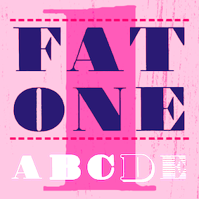 Florian Zietz (b. Salzgitter-Bad, Germany, 1967) studied graphic design at Fachhochschule Hildesheim and participated in the German art and design school's exchange program with the University of Wisconsin-Stout. Since completing his studies in 1994, he has been working as a freelance graphic designer and illustrator for a variety of clients. Creator of the dingbats typeface FF Headz (2005), which won an award at TDC2 2006. Librito is the web outfit of Agnes von Beöczy and Florian Zietz, who are located in Hamburg, Germany. They are involved in graphic and type design, calligraphy and illustration. Besides FF Headz (dingbats), they created Just Seven (2010, a child's hand), Cutz (informal script that is way better than Comic Sans), Segmenta (2008, modular, octagonal, slightly stencilish; based on grids similar to those used in train station and airport signage), Stars (2009, dingbats), and Zansibar (a great type project concerned wit the reconstruction of an old map alphabet). Viktor (2011) is based on wood type.
 In 2012, he published the Sketchimpact family (a sketched version of Impact) and the roughened antiqua typeface Argento. Typefaces from 2014: Ahoy (based on cruise line posters), Neometrix (3d, layered, outlined and hand-drawn). Typefaces from 2015: Fatone (a high contrast semi-didone caps family, with wood type ancestry). FontShop link. Klingspor link. Librito link. [Google]
[MyFonts]
[More] ⦿
|
Liebhaber's wood type
|
Robert Kroetsch published "Liebhaber's wood type" (Toronto: imprimerie dromadaire, 1987). [Google]
[More] ⦿
|
Lindsey Bock
|
Graphic designer who graduated in 2010 from Menomonie, WI. Behance link. She made a nice wood type poster in 2010, based on material from the Hamilton Wood Type Museum. [Google]
[More] ⦿
|
Louise Fili

|
 Founded in 1989, Louise Fili Ltd is a graphic design studio specializing in brand development for food packaging and restaurants. Formerly senior designer for Herb Lubalin, Louise Fili was art director of Pantheon Books from 1978 to 1989, where she designed close to 2,000 book jackets. She has received Gold and Silver Medals from the Society of Illustrators and the New York Art Director's Club, the Premio Grafico from the Bologna Book Fair, and three James Beard award nominations. Fili has taught and lectured extensively, and her work is in the permanent collections of the Library of Congress, the Cooper Hewitt Museum, and the Bibliothèque Nationale.
 She is co-author, with Steven Heller, of Italian Art Deco, British Modern, Dutch Moderne, Streamline, French Modern, Deco Type, Deco España, German Modern, Design Connoisseur, "Typology Type Design from the Victorian Era to the Digital Age" (Chronicle Books, San Francisco, 1999), Typology, Stylepedia, Euro Deco, Scripts, Shadow Type, Belles Lettres, Cover Story, and Stencil Type. Fili has also written Elegantissima, Grafica della Strada, Graphique de la Rue, The Cognoscenti's Guide to Florence, and Italianissimo. A member of the Art Directors Hall of Fame, she has received the medal for Lifetime Achievement from the AIGA and the Type Directors Club. Her book cover (done with Jessica Hische) won a design award at TDC 55. Fili was also honored with the 2018 SOTA Typography Award. In 2015, she made a futuristic counterless typeface, Mardell, which is named after retired Hamilton type cutter Mardell Doubek. It was published in 2016 as HWT Mardell in the HWT (Hamilton Wood Type) collection over at P22. In 2017, Louise Fili, Nicholas Misani and Rachel Michaud co-designed the art nouveau typeface Montecatini, which is inspired by Italian travel posters from that era. In 2019, Louise Fili, Nicholas Misani and Andy Anzollitto expanded this typeface to the 24-style Montecatini Pro. Marseille (2017) is co-designed with Nicholas Masani and Andy Anzollitto. It is an art deco-inspired letterform that is based on Louise Fili's cover design for the Marguerite Duras novel The Lover. Keynote speaker at TypeCon 2018 in Portland, OR. [Google]
[MyFonts]
[More] ⦿
|
Lucas Franco
[Now Type]
|
 [More] ⦿
|
Lucreativo
|
Graphic design studio in Madrid. Creators of an elegant wood and rubber stamp set called Barquito (2012). Behance link. [Google]
[More] ⦿
|
Luisa Massi
|
Luisa Massi de Almendra Freitas (Rio de Janeiro, Brazil) designed the outlined typeface Woody Sans (2016), which she uses for obtaining a wood textured look. [Google]
[More] ⦿
|
Lukas Schneider
[Revolver Type Foundry]

|
 [MyFonts]
[More] ⦿
|
Luzi Gantenbein
[Luzi Type]

|
 [MyFonts]
[More] ⦿
|
Luzi Type
[Luzi Gantenbein]

|
 Luzi Gantenbein (Luzi Type, Bern, Switzerland) is a type designer, b. 1988, Fläsch, Switzerland. He created the vernacular all caps wall paint typeface Valparíso (2010, Volcano). At the Hochschule der Künste Bern, he designed the angular family Rijeka (2011, Volcano), the Avenir/Futura-genre typefamily Buenos Aires (2011), and the multilayer family Lisboa (2011).
 Luzi made the sans typeface Cadiz in 2013. Cadiz Italic was finished in 2014. Livorno (2013) is a sturdy round-serifed text typeface. In 2014, she created the masculine wedge serif typeface Beirut. In 2015 she finished the titling sans typeface Faro which has two sub-versions, Lucky and Sad. She also published Faro (a typeface that by virtue of stroke curvature emulates sadness or hapiness), Messina Modern, Messina Sans (+Mono), and Messina Serif. Typefaces from 2016: Assembly (a symbol archive for the globalized world), Lynstone (sans), Nantes (transitional text typeface), Koper (a rough woodcut typeface with polygonal outlines that were inspired by Vojtech Preissig). Typefaces from 2018: Recife (an editorial typeface inspired by Times and Plantin). Typefaces from 2019: Spezia (sans). Typefaces from 2021: Portonovo (a Garamond / Caslon style font based on the typeface used in the Martyrologium Romanum; a book printed by the Plantin Press in 1690), Termoli (a Scotch roman inspired by Linn Boyd Benton's Century Roman). Klingspor link. Behance link. Home page. Behance link for Luzi Type. Fontdeck link. Volcano Type link. [Google]
[MyFonts]
[More] ⦿
|
Lynne Yun

|
 Lynne Yun is a type designer based in Brooklyn who specializes in lettering and calligraphy. She holds a BFA from School of Visual Arts and a postgraduate certificate in typeface design from Type@Cooper. Lynne has worked with a broad range of clients (including Anheuser-Busch, Samsung, Sherwin-Williams and London Book Review to name a few) and held positions at Apple, Publicis, Deutsch, and was a full-time type designer at Monotype, starting in 2017. Lynne Yun is the founder of the Brooklyn-based studio Space Type Continuum (with Kevin Yeh), which operates at the intersection of type, design, and technology. The studio specializes in creating experiential letterforms of all kinds, from typeface design to generative typography. Speaker at TypeCon 2018. Lynne Yun also made an on-line course called Foundations oof Type Design (2021).
 Her typefaces: - Trade Gothic Display (2017, Monotype). Two multi-layer display styles. Based on Jackson Burke's classic Trade Gothic (1948), and in particular, Trade Gothic Condensed Heavy, Trade Gothic Display adds five embossed, beveled, layerable and colorable styles.
- Constant (2018). A playful didone inspired by a specimen from Constantin in 1834.
- Ampersandist (2018). In the angular calligraphic style that characterizes the work of Oldrich Menhart and Villu Toots.
- Walbaum (2018, Monotype). Walbaum is a reimagined superfamily with 69 total fonts, in five optical sizes. Monotype writes: Walbaum was meticulously crafted by Monotype's Carl Crossgrove, Charles Nix, and Juan Villanueva to bring Justus Erich Walbaum's high contrast didone style masterpiece to the 21st century. Walbaum has over 600 glyphs with OpenType typographic features like small capitals, old style and lining figures, proportional and tabular figures, fractions and ligatures. Also included in the family are three decorative and ornament fonts. In the font's credits, Lynne Yun is also mentioned.
- Trade Gothic Inline (2018, Linotype).
- HWT Etta (2020, Lynne Yun and Maxime Gau). The HWT Etta font (in East and West versions) is part of the Hamilton Wood Type and Printing Museum's Type Legacy Project.
[Google]
[MyFonts]
[More] ⦿
|
Manfred Klein
[Manfred Klein: Wood or wood cut type]

|
[MyFonts]
[More] ⦿
|
Manfred Klein: Font Hosting
|
 In July 2017, Typoasis / Moorstation shut down. Run by Petra Heidorn out of Hamburg, Germany, it hosted her own fonts, as well as those of the popular and talented type designer and artist Manfred Klein (Frankfurt, Germany). Manfred, who was an active type designer from the late 1990s until about 2007, created over 3600 fonts in that period. Those fonts are now hosted at my site, thanks to Petra Heidorn. Manfred's oeuvre is too large to consume and analyze in one sitting or even one month.
 This zip file contains all his fonts. For those interested in particular styles, please visit this web page for downloads of individual fonts, or fonts grouped by these themes: 3d, Africa, aliens, animals, architecture, arrows, astrology, birds, calligraphy, cave style, codex, Christmas, dada, decorative caps, didone style, dingbats, display style, Egypt, eyes, fists, Fraktur, handcrafted typefaces, Karla, kids, Laurens, masks, medieval styles, Mexico, monsters, native themes, ornaments, painters, peace, people, pixel fonts, runes, Sans, serif, slab, stencil, stone age, typewriter, uncial, wood and woodcuts. [Google]
[More] ⦿
|
Manfred Klein: Wood or wood cut type
[Manfred Klein]

|
The wood type look is caught in these typefaces: AbstractClassicCuts, BlacKlinoleumBats, CutAwayOne, HolzSchnitte, LinolCuts, RomanWoodcut, VirtualWoodcuts, WasWoodcuts, WebWoodCuts, WoodCutted, WoodTypesMK, WoodcutAnimals, WoodcutBats, WoodcutFurnitures, WoodcutMeetings, WoodcutSix, Woodcuts2007, WoodcutsAgain, WoodcutsFive, WoodcutsFontissimo, WoodcutsFound, WoodcutsOne, WoodcutsOne, WoodcutsTwo, WoodcuttedCaps, WoodcuttedCapsBlack, WoodcuttedCapsBlackFS, WoodcuttedCapsFS, WoodcuttedCapsInvers, WoodcuttedCapsInversFS, Woodcutter. Download page. Download all these fonts in onze zip file. [Google]
[MyFonts]
[More] ⦿
|
Manuel Viergutz
[Typographic Design]

|
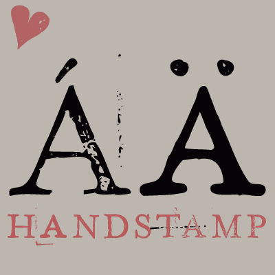 [MyFonts]
[More] ⦿
|
Maria Herrera Vicalvaro
|
Art director in Barcelona. Creator of a 3d wood alphabet (2012). [Google]
[More] ⦿
|
Marian Bantjes
|
Bowen Island, BC-based very talented graphic artist, who specializes in custom type and ornaments. Her typographic work: - With W. Ross Mills at Tiro, she designed Restraint (2007), an ornamental typeface, announced here and here (a bit of simulated Indic). Restraint won an award at TDC2 2008.
- She designed titling caps for Thirstype's Playground. Quoting designers from a TDC jury page, Stefan Sagmeister says she is one of the most innovative typographers working today, Noreen Morioka calls her the Doyald Young of her generation, and Sigrid Albert says [she creates] spiritual typography which goes beyond religion.
- Love Letters are calligraphic pieces drawn by Bantjes in 2008.
- HWT Bernice (2016, P22 and Hamilton Wood Type). P22 writes: HWT Bernice is an ornament font system designed by Marian Bantjes. The basic shapes were designed by Bantjes for the Hamilton Wood Type Museum's border stamping machine as a contemporary application for this 150 year old machine, which punches shapes into end grain wood to form continuous border patterns.
She teaches typography through Emily Carr Institute in Vancouver, BC. Speaker at ATypI 2010 in Dublin. Klingspor link. [Google]
[More] ⦿
|
Mariana Alen

|
 Art director and lettering artist in Buenos Aires, Argentina. She graduated from University of Buenos Aires, where she also completed the postgraduate Career in Type Design and is currently completing a Master'�s Degree in Typography Designer of the didone display typeface Goût (2014) and the warm wood type-inspired semi-Tuscan typeface Dobro (2014), which was finished during her studies at FADU / UBA. She calls Dobro a bluegrass typeface. It was designed, according to her web site, for a special edition of Rolling Stone magazine. Dobro was produced and finished by Sudtipos in 2019. [Google]
[MyFonts]
[More] ⦿
|
Mark Kusek
[Wood Type Impressions]
|
[More] ⦿
|
Mark Kusek
|
Mark Kusek sells 300dpi resolution images of faded and used wood types. [Google]
[More] ⦿
|
Mark Niemeijer
[Soft Machine (or: Open Studio)]
|
[More] ⦿
|
Mark Simonson
[Mark Simonson Studio]

|
 [MyFonts]
[More] ⦿
|
Mark Simonson Studio
[Mark Simonson]

|
 Mark Simonson Studio is located in StPaul, MN. Mark founded Mark Simonson Studio around 2000, and describes himself as a freelance graphic designer and type designer. From his CV: Early in my career I worked mainly as an art director on a number of magazines and other publications including Metropolis (a Minneapolis weekly, 1977), TWA Ambassador (an inflight magazine, 1979-81), Machete (a Minneapolis broadsheet, 1978-80), Minnesota Monthly (Minnesota Public Radio's regional magazine, 1979-85), and the Utne Reader (1984-88). I was head designer and art director for Minnesota Public Radio (1981-85) and an art director for its sister company, Rivertown Trading Company (1992-2000). During that time, I designed over 200 audio packages, including most of Garrison Keillor's, along with several hundred products (t-shirts, mugs, rugs, watches, etc.) for the Wireless, Signals, and other mail order catalogs. I have frequently done lettering as part of design projects I'm working on. This has always been my favorite part, so in 2000 I opened my own shop specializing in lettering, typography and identity design. I've also been interested in type design since my college days. I started licensing fonts to FontHaus in 1992, and since starting my new business, stepped up my efforts in developing original typefaces. I now have more than 70 fonts on the market with many more to come. This is increasingly becoming the focus of my activities. In 2021, he joined The Type Founders.
 His fonts: - Coquette (2001). He says: Coquette could be the result of a happy marriage of Kabel and French Script.
- Anonymice Powerline (2009-2010). This is probably a hack by some people based on Anonymous. It is available in some Github directories.
- Kandal: a 1994 wedge serif, now also at MyFonts).
- Proxima Sans (1994, a geometric sans, rereleased in 2004), followed in 2005 by his massively successful Proxima Nova in 42 styles/weights. Followed by Proxima Nova Soft (2011). The rounded version of Proxima Nova is Proxima Soft (2017). For a variable font that captures all styles, see Proxima Vara (2021). In 2022, he added Proxima Sera (an 18-style workhorse serif that combines old style forms with contemporary and modern typefaces).
- Mostra (2001): based on a style of lettering often seen on Italian Art Deco posters and advertising of the 1930s. Look at the Light and Black versions, and drool...... The 2009 update is called Mostra Nuova. Selected styles: Mostra Nuovo Bold, Mostra One Light, Mostra Three Bold, Mostra Two Heavy.
- In 2001, he made the Mac font Anonymous. Its updated version is Anonymous Pro (2009-2010), a TrueType version of Anonymous 9, which was a freeware bitmap font developed in the mid-90s by Susan Lesch and David Lamkins. It was designed as a more legible alternative to Monaco, the mono-spaced Macintosh system font.
- In 1998 and 2001, he produced the (free) 3-style Atari Classic family.
- In 2003, he released Blakely Bold and Heavy (an art deco font first done for the Signals mail order catalog). The original Blakely is from 2000.
- Goldenbook Light, Regular, and Heavy, based on the logotype of the 1920s literary mag called "The Golden Book Magazine".
- Metallophile Sp 8 Light and Light Italic (2008): a "faithful facsimile of an 8-point sans as set on a 1940s-vintage hot metal typesetting machine".
- Refrigerator Light and Heavy, Refrigerator and its extension Refrigerator Deluxe (2009) (geometric sans).
- Changeling Light, Regular, Bold, Stencil, and Inline (2003): a redesign and expansion of China, a VGC photo-typositor typeface from 1975 by M. Mitchell, which includes unicase typefaces; see also Changeling Neo, 2009.
- Sanctuary Regular and Bold: a computerish typeface based on lettering in the 1976 movie Logan's run--later withdrawn from the market.
- Sharktooth (+Bold, +Heavy).
- Felt Tip Roman, Woman and Senior (based on his own handwriting). Felt Tip Senior (2000) is based on the hand of Mark's father. Felt Tip Woman Regular and Bold are based on the handwriting of designer Patricia Thompson.
- Filmotype Gay (2011).
- Filmotype Honey (2010): fifties brush lettering face. For a free alternative, see Honey Script (2000) by Dieter Steffmann.
- Raster Gothic Condensed Regular and Bold (12 fonts total), and Raster Bank (a pixelized version of Bank Gothic).
- Other free bitmap fonts for the Mac [the PC version was made by CybaPee]. MyFonts page.
- He digitized Phil Martin's family, Grad (2004, inspired by Century Schoolbook, and originally done by Martin in 1990).
- His 2006 production includes three script typefaces: Kinescope is a connected script based on title lettering in Fleischer Studios' animated Superman films from the 1940s. Snicker is a cartoony block letter type. Both were published at Font Bros. And Launderette is a connected very slanted script based closely on lettering used in the titles of the 1944 Otto Preminger film, Laura.
- In 2007, he revived and extended Filmotype Glenlake (2007, sold at Font Bros).
- Lakeside (2008) is a flowing 1940s-style brush script. It was inspired by hand-lettered titles in the classic 1944 film noir movie Laura.
- In 2008, he revived Filmotype Zanzibar, about which he writes: That Zanzibar is nearly an anagram of bizarre seems fitting. The surviving people from Filmotype (later Alphatype) have not been able to tell us who designed this gem, so we have no record of the designers intentions. Released in the early 1950s, it seems somewhat inspired by the work of Lucian Bernhard (Bernhard Tango, 1934) and Imre Reiner (Stradivarius, 1945). At first, it appears to be a formal script, but there are no connecting strokes. It would be better described as a stylized italic, similar to Bodoni Condensed Italic or Onyx Italic, with swash capitals.
- Filmotype Vanity (2008) is an outline typeface based on a 1955 design by Filmotype. It was derived from Filmotype Ginger.
- Filmotype Alice (2008) is casual handwriting. However, MyFonts now credits Patrick Griffin with the digitization.
- Filmotype MacBeth (2008) is a freestyle face.
- Filmotype Ginger (2008) is a heavy display typeface with an aftertaste of Futura.
- Boxy2 (2008) and Boxy1 (2008) are severely octagonal typefaces made to test out FontStruct. See also bubblewrap.
- In 2008, Mark Solsburg and Mark Simonson cooperated on the digital revival of the calligraphic Diane Script, originally designed in 1956 by Roger Excoffon.
- In 2009, Mark worked on SketchFlow Print, a font for Microsoft. It will be bundled with the next version of Christian Schormann's Expression Blend, part of Microsoft's Expression Studio suite. The fonts, based upon the handwriting of architect Michaela Mahady of SALA Architects, Inc., give that well-known architectural printing look (like Tekton).
- Filmotype Gem (2011). A sans headline typeface that was first drawn by Filmotype in the 1950s.
- Bookmania (2011) is a revival of Bookman Oldstyle (1901) and the Bookmans of the 1960s, but with all the features you would expect in a modern digital font family. Especially, Simonson's Bookmania story is worth reading.
- In 2018, he published the 25-style Acme Gothic at Fontspring. He explains: Acme Gothic (2018) is based on the thick and thin gothic lettering style popular in the U.S. in the first half of the twentieth century. There have been typefaces in this genre before, but they were either too quirky (Globe Gothic), too English (Britannic), too Art Deco (Koloss), too modern (Radiant), or too Art Nouveau (Panache). None captures the plain, workman-like style of Acme Gothic.
- Parkside (2018) is a script typeface inspired by typefaces and lettering of the 1930s and 1940s. Parkside uses OpenType magic to automatically select letter variations that seamlessly connect to the letters coming before and after.
- In 2018, he emulated wood type in his HWT Konop at P22. Named for Don Konop, a retired Hamilton Manufacturing employee, who worked from 1959 to 2003, this typeface is monospaced in both x and y directions so that letters can be stacked vertically and horizontally. All proceeds go to the Hamilton Wood Type and Printing Museum.
- Etna (2020). A 30-style text and display family that started out from William H. Page's Victorian wood type Aetna (1874), and was remolded by Simonson into a useful typeface family though still distinctly linked to its ancestor. Etna includes three different condensed widths in all six weights (intended for display use), four different figure styles, alternate characters, true small caps, and a selection of dingbats, including arrows, stars, asterisks, and manicules.
Links to his typefaces, in decreasing order of popularity: Proxima Nova, Bookmania, Mostra Nuova, Proxima Nova Soft, Coquette, Refrigerator Deluxe, Felt Tip Roman, Grad, Changeling Neo, Goldenbook, Lakeside, Kinescope, Metallophile Sp8, Blakely, Felt Tip Woman, Snicker, Felt Tip Senior, Kandal, Sharktooth, Anonymous, Raster Bank, Raster Gothic. FontShop link. Fontspace link. MyFonts interview. View all typefaces designed by Mark Simonson. Fontspring link. Google Plus link. Klingspor link. Abstract Fonts link. Kernest link. I Love Typography link. Font Squirrel link. Old link to hos site. [Google]
[MyFonts]
[More] ⦿
|
Mark van Wageningen
[Novo Typo (was: Atelier van Wageningen)]

|
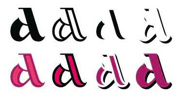 [MyFonts]
[More] ⦿
|
Martijn Oostra

|
Dutch type designer whose fonts may be bought from 2Rebels in Montreal. They are now generally available from T-26. Some creations: BlackMail (1996, ransom note font), Educational, EricsSome (dot matrix face), Mould Archi (1997, grunge), Tsjecho (1997, a wood type simulation face), Wire And Planks (1997, a semi-stencil). Future URL. Klingspor link. View Martijn Oostra's typefaces. [Google]
[MyFonts]
[More] ⦿
|
Match&Kerosene
[Alex Sheldon]

|
 Match&Kerosene is Alex Sheldon's Detroit-based graphic design and typographic illustration company, est. 2008.
 Klingspor link. Behance link. Typefaces designed by Sheldon (b. Michigan, 1984) include Slab Sheriff (2009), Western, Kerosene Boxley (2009, a multiline art deco revival of a Solotype font; some say that it is based on a pair of 1972 alphabets by Marcia Loeb called Zig Zag and Rainbow), Kerosene Woodtype (2009), Kerosene Retroface, Kerosene Stereo (2009, revival of an Italian typeface from 1869), Kerosene Killowatt, White Wolf (2009, condensed horror movie face). Typefaces designed in 2011: Quimby (Copperplate Gothic style titling face), Black Bear (2011, straight-edged display family), Swifty (2011), Grizzly Bear (a set of 12 constructivist titling typefaces), Detroit (a modular family for superpositions), Prismatic (another superimposable multi-purpose family), Duotone (2011, Duotone is a layered font system that allows one to title two-tone headlines), Volcano Gothic (+Inline), Volcano Island (jungle look family), Lightyears. [Google]
[MyFonts]
[More] ⦿
|
Mateo Broillet
[ETC Type]
|
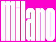 [More] ⦿
|
Mateusz Machalski
[Borutta (or: Duce Type)]

|
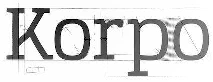 [MyFonts]
[More] ⦿
|
Matevz Medja
[Archive Type]

|
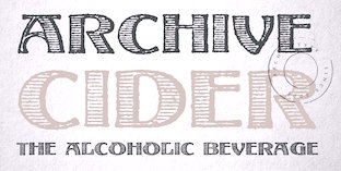 [MyFonts]
[More] ⦿
|
Matheus Fio Gonçalves
[Fio Gonç�alves]

|
[MyFonts]
[More] ⦿
|
Mathias Sassone
|
During his studies at FADU / UBA in Buenos Aires, Mathias Sassone designed a wood cut typeface (2016). [Google]
[More] ⦿
|
Matias Romero
|
 Matias Romero was born Eduardo Alves da Silva in the city of Santos. He is a Brazilian nature photographer and multimedia artist, b. 1965. Currently, he is based in Sao Thomé das Letras, MG.
 Typefaces from 2018: Marielle Franco. This typeface was politically motivated as it pays homage to Marielle Franco (b. 1979 as Marielle Francisco da Silva, d. 2018), a Brazilian politician, feminist, and human rights activist. After earning a master's degree in public administration from the Fluminense Federal University, she served as a city councillor of the Municipal Chamber of Rio de Janeiro for the Socialism and Liberty Party (PSOL) from January 2017 until her death. On 14 March 2018, while in a car after delivering a speech, Franco and her driver were shot multiple times and killed by two murderers in another vehicle, in Northern Rio de Janeiro. Franco had been an outspoken critic of police brutality and extrajudicial killings, as well as the February 2018 federal intervention by Brazilian president Michel Temer in the state of Rio de Janeiro which resulted in the deployment of the army in police operations. Typefaces from 2016: Aleijadinho, Aiuruoca. Typefaces from 2015: Elis (inspired by a dream about singer Elis Regina). Typefaces made in 2014: Cassiopea, Ignoto, Minguarana (a display sans). Typefaces from 2013: Neroli, Jailed Celts, Demodée (art deco). Typefaces made in 2012: Endora (gothic), Nix, Sampa Midnight (a spurred typeface), Olho de Peixe, Peixes e subpeixes, Rita Mouse. Creations from 2011: Gotham Lullaby (2011, a blackletter tattoo face), Lizard (2011), Glix (2011), Linea (2011, a squarish face), ClassIndicativa (2011), Atomium (2011), Maquina Pneumatica (2011), Futurafrica (2011), Amorphica (2011). Typefaces made before 2011: Vieira (2010), Hobo Signs (2010), Knights Who Say Ni (2010), Antibios (2010, slab serif), Oleo (2010, wedge serif face), Jet Black Night (2009), King Pineapple (2009), Glove (2009, avant garde sans), Quanta (2009), Arcoverde (2009, display face), Wax (2009), Crazy Circles (2005, hand-printed) and Xylogravura (2009, inspired by crude woodcut typography printing practiced in northeastern Brazil). Home page. Fontspace link. Creative allies link. Flickr pages. Devian tart link. Morguefile link. Multimedia stock page. Twitter page. [Google]
[More] ⦿
|
Matt Braun
[Wood Type Revival]
|
 [More] ⦿
|
Matt Frost

|
 Matt Frost Type is located in Madison, WI. Matt designed some fonts at Chank's place, including Cowboy Rhumbahaut (2000), a take on a mid 19-th century ornamental face. His home page. In 2011, he set up Matt Frost Foundry.
 His commercial typefaces include - Aegean (2012). A swashy take on roman capitals. The spurred version is Cirque (2012).
- Antler (2014-2016). A spurred woody letterpress vintage family of typefaces Antler has your back for beer bottles, fantasy novels, taco shops, beekeepers, cattle rustlers, tattoo artists, druids, hair bands, and bounty hunters, is how Matt descrives the typeface family. The Western typefaces Antler East, Antler North, Antler West (spurred; in Regular, Wood and 3d) and Antler South (Tuscan) were published in 2016. In 2017, he added Antler.
- Baron of Arizona (2011). A Victorian ornamental face.
- Baboon (2015). A handcrafted poster typeface.
- Cirque (2012).
- Cow Boss (2015). A Tuscan Western typeface.
- Dubliners (2011). A signage script face.
- Escape From Budapest (2011). Art deco, based on a type specimen in the Communist Sculpture graveyard outside of Budapest.
- King Of Prussia (2011). An angular Halloween face.
- Praha Nouveau (2011). Art nouveau. Praha Nouveau is based on a type specimen on the statue of Jan Hus in Prague's Old Town Square. The statue was designed in 1903 by Ladislav Saloun.
- Quijibo (2011). A quaint handmade slab serif.
- Street of Crocodiles (2011). Inspired by the main title of the Quay Brothers film Street of Crocodiles (based on the 1934 Bruno Schultz book).
View Matt Frost's typefaces. [Google]
[MyFonts]
[More] ⦿
|
Matt Griffin
[Rare Letterpress Wood Type]
|
[More] ⦿
|
Matthew Aaron Desmond
[Matthew Desmond]

|
 MADtype (est. 1996) is Matt Desmond's place in the type world. He has had a prolific career that started out with shareware fonts while Matt was at the Minneapolis Technical and Community College. His page back then said A haven for quality shareware type for the Mac. Later, Matt started mattdesmond.com, and co-founded the Test Pilot Collective (est. 1998 with Joseph Kral and Mike Cina). Many of his early typefaces were experimental and/or futuristic. In late 2003, mattdesmond.com disappeared, and MADtype, commercial now, resurfaced at the MyFonts site. Currently, Matt is based in Minnetnka, MN. He has also lived in Atlanta, GA, Fayetteville, GA, Rochester, NY, Redwood City, CA, and San Francisco, CA. His fonts can also be purchased via You Work For Them. He also does commissioned type design. Some fonts are freely available at the Google Font Directory.
 Retail types as of 2011: - Abel (2011, Google Font Directory). Abel Pro was published in 2013.
- Aldrich (2011). A Bank Gothic style face, free at OFL.
- Amber (2000): kitchen tile face.
- American Gothic (1998): squarish.
- Audebaud (2010): a 19-th century style French Clarendon (wood type look). The design was inspired by the work of Constant Audebaud, an engraver of wooden type that was used for posters. Audebaud's work appeared in the 1880s in the Deux-Sèvres département of France.
- Beat (1998): rounded OCR face.
- Brauhaus (2004): Textura face.
- Cagliostro (2011). A free font at Google Web Fonts that is based on the handlettering of Ozwald Cooper.
- Curbdog (1998).
- Desmond Text (1998): a roman that has features of University Roman.
- Distill (2009): a De Stijl font that shouts 1920s.
- Dunelm (1996): emulation of 17th century printing styles.
- Dwiggins Deco (2009): This typeface was originally designed in 1930 by W.A. Dwiggins as the cover for the book "American Alphabets" by Paul Hollister. Only the 26 letters of the alphabet were included on the cover, so the rest of the numbers, punctuation, symbols, and accented characters have been crafted in a matching [art deco] style.
- Findon (2007): stencil.
- Futuristic category: ER9 (1999), KAH (2005, LCD style), Lunarmod (1997), Retron (1997; can be considered as a retro upright connected script as well), Shifty (1998).
- Grunge category: Bulletin (1997), Gothico Antiqua (1999), Rubba (1997), Stomper (1997--a rubber stamp font), Zapatista (1998-2007).
- Handwriting, handprinting category: Casino Hand (2005), Ghouliez (1996), Handegypt (2002---hand-drawn slab serif), Handy Sans (1997, hand-drawn sans), Joppa (1997), Pufficlaude BT (1998).
- Hessian (2009): Tuscan style wood type.
- Hydrochlorica (2004): organic.
- Invoice (1997).
- Ironside Crosses (2004): dingbat face.
- Marble Roman (2004-2009): angular roman all caps type.
- Matterhorn (2013). A 9-style sans family created with Michael Cina for Disney. Not to be confused with the many retail typefaces that are also called Matterhorn, such as Paratype's PT Matterhorn (1993) and Treacyfaces' TF Matterhorn (1990s).
- Pacioli or Luca Pacioli Caps (2007: emulating a mathematically constructed caps font by Pacioli (1509) published in his treatise De divina proportione.
- Pixel category: Basis (1999), Mang (1997).
- Plenti (2004): ultra plump.
- Quantico (2007): octagonal.
- Stencil category: Bandoleer (2009, +Tracer: a couple of stencil fonts with art deco and army influences), Madison (2007, slab serif stencil), Mercado (2005; has a non-stencil Mercado Sans).
- Urbandale (2018). A basic sans family.
- Variable (2004-2010): a sans-serif monoline typeface that includes ultra thin weights.
- Vexed (2005): sketched face.
- Wolfsburg (2007): blackletter stencil.
- Wooddale (1999): wood type emulation.
Free types as of 2010: Marble Roman, Environ regular, Dorkbutt, Europa, Exsect, Inthacity, Liquidy Bulbous, Lustria (2012, Google Web Fonts), Stomper. Commissioned types: 77kids (2007, for the children's brand; the sketched typefaces were done with Justin Thomas Kay), AE Aerie (2005-206, American Eagle Outfitters), AE Newburgh (2005-206, American Eagle Outfitters), AE Summer Fonts (2007, all for American Eagle Outfitters), EEL Futura (2006, for Enjoying Everyday Life), Nike World Cup (2006), Virgin America (2006). Typefaces from 2019: Starfire (2019, a retro geometric sans). Orphaned types that disappeared or were planned but never executed: BrotherMan, Caprice, Convolve, HipstersDelight, Lugubrious, ModestaSmallCaps, Serifity, Skitzoid, Sliver, ThrowupSolid, Auresh (1998, futuristic; Test Pilot Collective), Kcap6 (1998, with Cina; Test Pilot Collective), Epiphany (1997; Test Pilot Collective), Testacon (with Kral and Cina; Test Pilot Collective), Civicstylecom (1999; Test Pilot Collective), Lutix (1998; Test Pilot Collective), Xerian (1997; Test Pilot Collective), Swoon, Furtive (2004, a sans), the display typeface Flathead (2004), the blackletter typeface Bahn (2004), Mesotone BT (2006, Bitstream, a monoline sans), Practical (a monoline connec script, planned in 2007 but not published), Poliphili (planned in 2007, as a revival of an Aldus/Griffo font), Wutupdo (1996, Garage Fonts), GFDesmond (Garage Fonts), Drone, Golden Times (2014, a corporate small caps typeface for the University of Minnesota), Vapiano (2014: hand-printed typeface for Vapiano International). Behance link. View Matt Desmond's typefaces. Fontspring link. Fontsquirrel link. [Google]
[MyFonts]
[More] ⦿
|
Matthew Carter

|
 Matthew Carter (born in London in 1937, and son of Harry Carter) is one of today's most influential type designers. He trained as a punchcutter at Enschedé in 1956. In 1963 he was hired by Crosfield, a firm that pioneered the new technology of photo-typesetting, to lead their typographic program. He worked for Mergenthaler Linotype (1965-1981), and co-founded Bitstream Inc. with Mike Parker in 1981, adapting many fonts to digital technology. In January 1992, he founded Carter&Cone with Cherie Cone, and often collaborated with Font Bureau. In 1995, he won the Gold Prize at the annual Tokyo Type Directors Club competition for Sophia. In 1997, he received the TDC Medal for significant contributions to the life, art, and craft of typography. In 2010, he received a MacArthur grant. He lives in Cambridge, MA.
 John Berry on Carter's art (2002). Apostrophe comments on Berry's article. Interview. His fonts: - The Microsoft screen fonts Verdana (1996), Georgia (1996), Georgia Greek, Georgia Cyrillic, Nina and the humanist sans typeface Tahoma (1994). Georgia (in roman and italic only) is a screen version of Miller, Carter's Scotch design. Nina was designed to address the requirements on smaller screens such as phones, and was used in Windows Mobile smartphones before Microsoft switched to Segoe. The Greek and Cyrillic versions of Nina were developed by François Villebrod. Georgia Pro (2010, Ascender) was developed from Georgia with the help of Steve Matteson. For Verdana Pro (2010, Ascender), Carter was assisted by David Berlow and David Jonathan Ross.
- Apple's Skia (1993), a sans serif designed with David Berlow for Apple's QuickDraw GX technology, now called AAT. [Carter's Skia and Twombly's Lithos are genetically related.]
- Monticello (2003), based on Linotype's Monticello (1950), which in turn goes back to Binny&Ronaldson's Monticello from 1797, a typeface commissioned by Princeton University Press for the Papers of Thomas Jefferson. It is in the Scotch roman style.
- Miller (1997, Font Bureau), an extremely balanced family co-designed by Carter, Tobias Frere-Jones and Cyrus Highsmith. Carter explains: Miller is a Scotch Roman, a style that had its beginnings in the foundries of Alexander Wilson In Glasgow and William Miller in Edinburgh between about 1810 and 1820. It is considered that the punchcutter Richard Austin was responsible for the types of both Scottish foundries. Miller is a revival of the style, but is not based on any historical model. Now, there is also a 16-weight newspaper version, Miller Daily (2002), and an 8-weight Miller Headline (2002). This was followed by News Miller, a typeface designed for the Guardian. Note: Georgia (1996) is a screen version of Miller, and Monticello (2002) is a later modification. A comparison of these typefaces.
- Alisal (1995, +Bold).
- ITC Galliard (1978), a recreation of Robert Granjon's garalde letters. This typeface was originally conceived in 1965. Bringhurst recommends a Carter and Cone version of this font, called Galliard CC: it has old style figures and small caps. Further versions include Aldine 701 (Bitstream), Matthew (Softmaker), ITC Galliard Etext (2013, Carl Crossgrove, Linotype), and Gareth (Softmaker).
- The ITC Charter family (1987 for Bitstream and known as Bitstream Charter; licensed to ITC in 1993; see the Elsner&Flake version of ITC Charter). An upgraded commercial version was released by Bitstream in 2004 under the name Charter BT Pro.
- Vincent (1999), a font commissioned for use in Newsweek. It is named after Vincent Figgins, an English foundry owner and punch cutter who lived in the late 18th century.
- Walker (1994), designed for The Walker Art Center.
- Ionic Number One (1999, Carter&Cone).
- Mantinia (1993, Font Bureau), based on inscriptional forms, both painted and engraved, by the Italian renaissance artist Andrea Mantegna.
- Big Caslon (1994, Font Bureau), a display typeface based on the largest romans from William Caslon's foundry.
- Big Figgins (1992) and Big Figgins Open (1998, based on the decorative didone types shown in the specimens of Vincent Figgins of 1815 and 1817). Big Figgins was called Elephant and Elephant Italic in Microsoft's Truetype Fontpack 2.
- Sammy Roman (1996), loosely based on the 17th century romans of Jean Jannon. A beautiful typeface designed to accompany kanji and kana typefaces produced by Dynalab in Taiwan.
- Sophia (1993, Font Bureau), a mix with Greek, uncial and classical Roman influences.
- Shelley Script (1972), a family of formal scripts, split into Andante, Volante and Allegro. It is based on intricate English scripts of the 18th and 19th centuries attributed to George Shelley.
- Cochin (1977, at Linotype). MyFonts writes: In 1913 Georges Peignot produced a typeface based on Nicolas Cochin's eighteenth century engravings. In 1977, Matthew Carter expanded this historic form into a three part series.
- Bell Centennial (Linotype-Mergenthaler, 1975-1978), a legible heavily ink-trapped family designed by Matthew Carter as a replacement of Bell Gothic at Mergenthaler. There are also digital Linotype and Bitstream versions. AT&T commissioned the font to replace their previous typeface choice Bell Gothic for their 100th Anniversary.
- Cascade Script (1965-1966, Linotype, now also known as Freehand 471 BT in the Bitstream collection). Paratype's extension of Freehand 471 to Cyrillic is by Oleg Karpinsky (2011).
- New Century Schoolbook was designed from 1979-1981 in the New York Lettering office of Merganthaler Linotype based on Morris Fuller Benton's Century Schoolbook from 1915-1923. It was the second face, after New Baskerville, that was digitized and expanded using Ikarus (digital technology). The Bitstream version [Century Schoolbook] is a virtually exact copy, only being moved from a 54 unit to a 2000 or so unit design.
- Auriol (Linotype), an art nouveau family (including Auriol Flowers 1 and 2 and Auriol Vignette Sylvie) based on the lettering of the painter and designer Georges Auriol. MyFonts explains: Auriol and Auriol Flowers were designed by Georges Auriol, born Jean Georges Huyot, in the early 20th century. Auriol was a French graphic artist whose work exemplified the art nouveau style of Paris in the late 19th and early 20th centuries. In 1900, Georges Peignot asked Auriol to design fonts for Peignot&Sons. The resulting Auriol font was the basis for the lettering used by Hector Guimard for the entrance signs to the Paris Metro. It was re-released by Deberny&Peignot in 1979 with a new bold face, designed by Matthew Carter. These decorative fonts with a brush stroke look are well-suited to display settings. The Peignot drawing office insisted on a more normal appearance in the boldface, calling it Robur. Matthew Carter has returned to Auriol's original design for the whole series.
- Helvetica Greek (Linotype).
- Helvetica Compressed (Linotype, 1974, with Hans-Jörg Hunziker).
- Wilson Greek (1995), compatible with Miller Text, and based on a type cut by Alexander Wilson for the Glasgow Homer of 1756. See here.
- Olympian (1970, Linotype), designed for newspaper use. This is Dutch 811 in the Bitstream collection. The custom typeface Milne (Carter&Cone) done for the Philadelphia Inquirer is based on Olympian.
- Gando, a French "ronde" typeface based on the work of Nicholas Gando (mid 1700s), and designed for photo-typesetting at Mergenthaler by Carter and Hans-Jörg Hunziker in 1970. Very similar to Bitstream's Typo Upright.
- Fenway (1998-1999, Carter&Cone), commissioned by Sports Illustrated to replace Times Roman.
- Snell Roundhand (1965-1966): a connected cursive script based on the 18th-century round hand scripts from English writing masters such as Charles Snell. Early in the digital era, Matthew published this in the Bitstream collection as Roundhand BT. A Cyrillic version by Isabella Chaeva and Vladimir Yefimov was released by ParaType in 2013.
- Auriga (1970). (Wallis dates this in 1965 at Linotype.)
- CRT Gothic (1974).
- Video (1977).
- V&A Titling (1981).
- Deface (in the FUSE 18 collection).
- Madrid (2001), done for the Spanish newspaper El País.
- Milne, done for the Philadelphia Inquirer (a revised version of Olympian). Not available.
- Durham, a sans serif family for US News&World Report.
- Airport.
- Century 725 (Bitstream, for the Boston Globe: after a design by Heinrich Hoffmeister).
- For Microsoft: Georgia, Verdana, Tahoma (1994), Nina.
- Freehand 471 (Bitstream). A chunky slightly angular script.
- New Baskerville. [Matthew Carter says that this is wrongly attributed to him. It was directed by John Quaranta.]
- Postoni [or Post-Bodoni], for the Washington Post, which is still using it. See here.
- Le Bé, a Hebrew typeface that was used in the Pennyroyal Caxton Bible.
- Rocky (2008, Font Bureau, with Richard Lipton), for the Herald in Scotland.
- Time Caledonia.
- Wiredbaum, for WIRED.
- Wrigley (for Sports Illustrated). Matthew Carter designed Roster in the 1990s, and it was adopted as a display face for Sports Illustrated under the name Wrigley. Jesse Ragan was instrumental in later expanding the family from its original seven styles to the current 60. In 2015, Carter & Cone and Font Bureau released an expanded 60-style family of this typeface under the new name Roster.
- Benton Bold Condensed (for Time Magazine).
- Foreman Light (for the Philadelphia Inquirer).
- Newsbaum (for the New York Daily News).
- Carter Latin: Matthew was commissioned in 2003 to create a new design to be cut in wood type by the Hamilton Wood Type&Printing Museum in Two Rivers, WI. He came up with an all-caps, chunky, Latin-serif design.
- Times Cheltenham (2003), which replaces in 2003 a series of headline typefaces including Latin Extra Condensed, News Gothic, and Bookman Antique.
- The Yale Typeface (2004), inspired by the late fifteenth-century Venetian typeface that first appeared in Pietro Bembo's De Aetna, published by Aldus Manutius. This extensive family is freely available to members of Yale University.
- DTL Flamande (2004, Dutch Type Library), based on a textura by Hendrik van den Keere. Since 2018, available from URW++. Additions to DTL Flamande by Lukas Schneider.
- Meiryo UI, Meiryo UI Bold, Meiryo UI Bold Italic, Meiryo UI Italic (2004). Meiryo is a modern sans serif Japanese typeface developed by Microsoft to offer an optimal on screen reading experience and exceptional quality in print, as part of the Cleartype project. The Japanese letterforms are generously open and well-proportioned; legible and clear at smaller sizes, and dynamic at larger display sizes. The beauty of Meiryo is that it sets text lines in Japanese with Roman seamlessly and harmoniously. Meiryo was designed by a team including C&G Inc., Eiichi Kono, Matthew Carter and Thomas Rickner. It won a 2007 type design prize from the Tokyo Type Directors.
- Suntory corporate types (2003-2005), developed with the help of Akira Kobayashi and Linotype from Linotype originals: Suntory Syntax, Suntory Sabon, Suntory Gothic, Suntory Mincho.
- Rocky (2008, Font Bureau): A 40-style high contrast roman family that is difficult to classify (and a bit awkward). Developed with Richard Lipton.
- Carter Sans (2010, ITC), based on epigraphic letters used in inscriptions. Created for the identity of the Art Directors Club 2010 class of its Hall of Fame, one the laureates in the 2010 Hall of Fame. Codesigned by Dan Reynolds, this chiseled typeface is loosely based on Albertus.
- In 1997, he designed Postoni for the The Washington Post's headlines, a sturdy Bodoni.
- MS Sitka (2013). A typeface with six optical sizes that are chosen on the fly if an appropriate application is present. Developed at Microsoft with the help of John Hudson (Tiro Typeworks) and Kevin Larson (who carried out extensive legibility tests). German link. Typophile link. Sitka won an award at Modern Cyrillic 2014.
- Van Lanen Wood Type (Hamilton Wood Type, 2002-2013). Carter started work on the wood type in 2002, but technical accuracy issues postponed the implementation. Digital versions were finally done in 2013 by P22's Hamilton Wood Type.
- Big Moore (2014, Font Bureau): A 1766 specimen by Isaac Moore, former manager of Joseph Fry's foundry in Bristol, England, shows many types inspired by John Baskerville. But a century later, standardization had foisted inept lining figures and shortened descenders upon these designs. Matthew Carter remedies the tragedy with Big Moore. Oldstyle figures, full-length descenders, and historic swashes are restored to this regal serif in two styles. Big Moore won an award in the TDC 2015 Type Design competition.
- Role (2019, Sans, Slab, Serif, Soft). A superfamily published at Morisawa and Fontelier. Matthew Carter, Shotaro Nakano, and Kunihiko Okano co-designed Role Serif at Morisawa.
Speaker at ATypI 2013 in Amsterdam. Speaker at ATypI 2019 in Tokyo on the topic of Expressing Vocal Tones through Typography. Linotype link. FontShop link. Favorite quote: Watching me work is like watching a refrigerator make ice. Another quote: A typeface is a beautiful collection of letters, not a collection of beautiful letters. View Matthew Carter's typefaces. Matthew Carter's fonts. The typefaces made by Matthew Carter. See also here. Wikipedia page. Klingspor link. [Google]
[MyFonts]
[More] ⦿
|
Matthew Desmond
[Matthew Aaron Desmond]

|
 [MyFonts]
[More] ⦿
|
Matthew Urlwin Sears
|
British wood engraver of the first part of the 19th century. Author of "Specimen of stereotype ornaments, 1825". [Google]
[More] ⦿
|
Matthew Wyne
|
 Matthew Wyne (Wyne Enterpises, San Francisco) designed the distressed wood type typeface custom typeface Be Block Web for The Gap in 2017. He explains how he managed to reduce an existing 600k font to about 100k in size without compromising the effect. In 2018, he published the text typeface Clef, a Venetian-inspired font (loosely based on Centaur) that is optimized for text. It features classical proportions, asymmetrical serifs, moderate contrast and a humanist axis. Cleft is the house font of Wyne Enterprises. [Google]
[More] ⦿
|
Mattox Shuler
[Hold Fast Foundry]

|
 [MyFonts]
[More] ⦿
|
Maxime Gau

|
Maxime Gau is a French graphic and type designer, living and working in New York City. He co-founded Faire Type, a foundry based in Brooklyn that offers custom type design and retail typefaces, with his partner, Sabrina Nacmias. Together they also run Faire Projects, a graphic design studio focusing on typographic solutions to graphic design projects; primarily branding and visual identity work, websites, and packaging design. Maxime studied graphic design at the Ecole Supérieure d'Arts et Design in Valence, France and pursued a postgraduate in typeface design from the Type@Cooper Extended Program. His typefaces: - The monoline sans typeface Gitane (2015).
- HWT Etta (2020, Lynne Yun and Maxime Gau). The HWT Etta font (in East and West versions) is part of the Hamilton Wood Type and Printing Museum's Type Legacy Project.
[Google]
[MyFonts]
[More] ⦿
|
Megan Tamaccio
[District 62 Studio]

|
 [MyFonts]
[More] ⦿
|
Meredith Mandel
|
 In 2009, Californian Meredith Mandel graduated with a BFA in Communication Arts from the Otis College of Art and Design. At The League of Moveable Type she designed Chunk (2009), an ultra-bold slab serif typeface that is reminiscent of old American Western woodcuts, broadsides, and newspaper headlines. Her Chunk Five font was extended as Chunk Five Ex in 2013 by Peter Wiegel.
 Kernest link. Typedia link. Fontown link. [Google]
[More] ⦿
|
Merge Visual
|
Creator of the wood-style slab typeface Deering (2012). [Google]
[More] ⦿
|
Meyer M. (Dave) Davison

|
 American letter designer in the phototype era. He contributed to the Photo-Lettering library with many Spencerian designs. His typefaces include
 - Western typefaces: DavisonBaroque (this Western / Tuscan typeface was revived by House Industries in 2012), Davison Variety A through J (pre 1954), Davison Carousel A though H (pre 1954).
- The spurred Egyptian wood type simulation font ATDavison Americana (1965, Monotype). The digital Photolettering revived it as PL Davison Americana.
- The fat brush typeface Davison Zip (1965) or Davison Swash Zip, which was digitally revived as PL Davison Zip.
- Dimensional, a 3d beveled typeface done in the 1970s. We had to wait until 2010 for a proper digital version, when Nick Curtis published Double D NF in Fill and Outline versions. Caps only.
- A Spencerian scripts done in or before 1946: Davison Condensed Spencerian, No. 1 Davison Spencerian, No. 2 Davison Spencerian No. 3 Davison Spencerian. The alphabet made its first appearance in Photo-Lettering's 1946 catalog and remains a benchmark of the ornamental script genre. Digitally revived as Davison Spencerian by House Industries type designers Mitja Miklavcic, Ben Barber and Ken Kiel.
- Other formal scripts done in or before 1954: Davison Victorian Script, Davison Victorian Backhand, Davison Vanity, Davison Vanity Fair.
Other Photo-Lettering typefaces, all done before 1954: Davison Airfield Medium, Davison Ebony, Davison Steno Antique, Davison Antique Gothic, Davison Harlequin (+Black), Davison Julien Condensed. Author of the article Notes on Designing for Photo-Lettering (Print Magazine, Volume IX, Number 1, June-July 1954). A second MyFonts link. [Google]
[MyFonts]
[More] ⦿
|
Michael Gene Adkins
[The Fontry]

|
 [MyFonts]
[More] ⦿
|
Michael Hagemann
[Font Mesa]

|
 [MyFonts]
[More] ⦿
|
Michael Hager

|
Austrian type designer. At Facetype, Igor Labudovic cooperated with Michael Hager on Stanley Slab (2012), which is an interpretation of wood type combined with the idea of modern stencils. He also co-designed Stanzer (2010), a semi-stencil typeface. [Google]
[MyFonts]
[More] ⦿
|
Michel Troy
[Urban Pixel (or: UP Font Studio)]

|
[MyFonts]
[More] ⦿
|
Michelle Alise McCallister
|
Graduate of Flagler College in Saint Augustine, FL, in 2012. She created Pratt Slab in 2012, a slab serif with a wood style. [Google]
[More] ⦿
|
Michelle Wang
|
During her graphic design studie at the Pratt Institute, Michelle Wang (Brookyn, NY) created Synthetic (2013, a display typeface) and Cambridge (2014, a wedge serifed typeface that emulates wood type). Behance link. [Google]
[More] ⦿
|
Miguel Angel Hernández Montoya

|
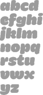 Miguel Hernandez is a graphic designer, type designer, illustrator and teacher in Santiago de Chile. Born in 1977 in Concepcion Chile, he studied Graphic Design at Universidad del BioBio State University in Chillan, Chile. He currently teaches Typography at Universidad Diego Portalesand and Universidad de las Americas in Santiago de Chile. Miguel contributed greatly to the early success of the Chilean type foundry Latinotype which he cofounded in 2007 with Felipe Soto in Concepción, Chile. In 2011, he cofounded Los Andes Type. Some time in or just before 2015, he broke his relationship with Latinotype. In 2015, he set up ABC Alphabets by Chileans together with Tania Chacana. In 2020, Joaquin Contreras and Miguel Hernandez Montoya set up Archetypo.xyz from their new base in Germany. His typefaces:
 - AA Actual Mono (2020) A monospaced typeface family in 10 styles by Joaquin Contreras and Miguel Hernandez Montoya. .
- Arquitecta (2014, Latinotype), Arquitecta Standard (Latinotype), Arquitecta Office (Latinotype).
- The Google Web Font Ceviche One (2011). This is an angular yet curvy extra black expressionist sans serif type.
- Chela One (2012). A bold condensed brush script, free at Google Web Fonts.
- Fatta (2011, Los Andes). Round and fat.
- Fiancé (2011, Sudtipos). A fat signage typeface.
- Paro (2021). A condensed sans with some oomph; by Miguel Hernandez and Miguel Hernandez Montoya at Frutitype.
- Lolita (2012, Latinotype). A playful rounded sans family.
- Mija (2011, Latinotype). Inspired by vernacular signs.
- Patagon (2011, Latinotype): a rounded wood-inspired poster typeface done with Daniel Hernandez and Luciano Vergara.
- Sail (2012). A didone script.
- Sofia (2012). An upright script, free at Fontsquirrel.
- Texta (2014, Latinotype), Texta Narrow (Latinotype). a geometric sans for everyone.
- Tikal Sans (2012, Latinotype).
- Uomo (2014, with Tania Chacana) is a contemporary typographic system that explores the geometric sans style and Italian art deco in combinations of four widths and three weights.
Before Latinotype, Miguel Hernandez created many pixel typefaces. The typefaces made in that period before 2007 include: |
Miguel Sousa

|
 Miguel Sousa is a Portuguese graphic designer with a big interest in Typography and Typeface Design. After completing his five-year degree in Technology and Graphic Arts from the Instituto Politécnico de Tomar in 2002, he worked for the children's books publisher O Bichinho de Conto for one year, as a graphic designer, typographic designer, book designer, web designer and web developer. Before going to Reading he also worked in MBV Design as a graphic designer, web designer and web programmer.
 He graduated from the Master of Arts in Typeface Design programme at the University of Reading, where he developed text typeface named Calouste with extensive support for the Latin and Armenian scripts. Calouste (2005) won an award at TDC2 2006. In April 2006, he joined Adobe's type development department. He had a hand in these Gerard Unger fonts in 2006, custom produced for the University of Reading: RdgSwift-Bold, RdgSwift-BoldItalic, RdgSwift-Italic, RdgSwift-Regular, RdgVesta-Bold, RdgVesta-BoldItalic, RdgVesta-Italic, RdgVesta. In 2013, he created the beautiful typeface Gothic Round (Hamilton Wood Type): After Hamilton bought out Page, Wells and Morgans & Wilcox, they briefly offered the various cuts from their former competitors before standardizing. In settling on which version would best inform this new digitization, designer Miguel Sousa of Adobe looked at specimens from the Newberry Library in Chicago as well as visiting and printing at the WNY Book Arts Center and of course the Hamilton Wood Type Museum to get a full immersion into this font project. Ultimately it was settled upon to use exemplars from multiple cuts to create a more pleasing hybrid. The Upper case was primarily based on the Heber Wells version, while the lower case referenced the Wm. Page version. Overall some of the most jarring quirks found in various versions were left out in favor of a solid type. [Google]
[MyFonts]
[More] ⦿
|
Mihkel Virkus
|
In 2012, Estonian type designers Johan Kallas and Mihkel Virkus designed Ewert, a slab serif wood type inspired by and loosely based on the collection of cultural infographic maps by Estonian graphic artist Olev Soans. Free at Google Web Fonts. They added Revalia later in 2012---see here. Meie Script (2012, John Kallas and Mihkel Virkus, free at Google Web Fonts) is described as follows: Meie Script is a typeface, which is based on the original 1910 Estonian handwriting standard. It is less flamboyant then its Western European contemporaries. Estonian handwriting has been influenced greatly by German and Russian handwriting styles and Meie Script embodies a mixture of those two styles. [Google]
[More] ⦿
|
Mikado
|
An oriental simulation type. On this page, we read: The wood-type Mikado was apparently inspired by Gilbert and Sullivan's comic opera of the same name. The show opened in London in March of 1885 and in New York later that same year. According to Nicolete Gray in her classic book on ornamented typefaces, the English foundry of Sir Charles Reed and Son introduced a metal type called "Japanese" also in 1885. She characterized this typeface and other oriental based typefaces as superficial in their foreign influence. Nonetheless it appears that it was later copied by several of the American Wood-type companies. The 1906 Hamilton wood-type specimen catalog shows four versions of this design; one by Hamilton and three by acquired companies. The versions by Wells, and Morgans&Wilcox are called Mikado. The Hamilton and Page versions use model numbers 204 and 156 respectively. It is difficult to determine the specific dates when this particular wood-type was introduced, but the earliest wood-type catalog I could find showing Mikado is the 1888 Page catalog. This sample is a 15 line unstamped type most similar to the Hamilton version. Another English foundry, Miller and Richard introduced a metal typeface in 1887, also named Mikado. That typeface is totally different than the one presented here. [Google]
[More] ⦿
|
Miloš Ćirić
|
Serbian book illustrator, graphic arts teacher and phototype, woodtype and linocut letter type designer, b. Despotovo, 1931, d. Belgrade, 1999. His sons Rastko and Vukan write about both aspects of his life. His CV: he graduated in 1954 from the Academy of Applied Arts, Belgrade and took his Masters Degree in 1959, under Professor Mihailo S. Petrov. He was professor at the Faculty of Applied Arts, University of Arts, Belgrade from 1964 until 1997. He was Head of the Graphic Department from 1974 to 1975. His publications include Graphic identification 1961-1981 (SKZ, Belgrade, 1982), Graphic communications 1954-1984 (Vajat, Belgrade, 1986), Heraldry 1 (University of Arts, Belgrade, 1983) and Coat-of-Arms of Belgrade, Heraldry 2 (Cicero, Belgrade, 1991). Most of Ćirić's types were for Cyrillic, while some have Latin alphabets as well. Many would be classified today as poster types, type to accompany illustrations. The list of his typefaces: - Rastko, Latin, 1955: It is a versal typeface made in only one weight. Rastko himself thinks it was devised as light, almost linear and it was a part of his character.
- Vukan, Latin, 1960: Named after his second son, Vukan, this is a sharply cut orthogonal typeface.
- Galerija Grafiki kolektiv, Cyrillic, 1962 (Graphic Collective Gallery): A beautiful Cyrillic display face. This was the first of his typefaces transformed in a computer font.
- Triptihon, Cyrillic, 1962 (Triptych): Another cut face, but this time really taken from the sample made in linocut. The prototypical Cyrillic poster face.
- Akademija, Cyrillic, 1966 (Academy): This typeface was made for the University and Academy where he worked. It was designed so that it can be used equally well on the paper, metal plates, seals, plaques and everything else Academy needed. He used similar typefaces on book covers and charters, in solemn situations. Rastko: Although one may think it is an ordinary serif face, it contains Cira's specific typographic handwriting. The shapes are almost geometrically reduced thus providing a decorative effect, legibility and possibility to be transferred in all materials..
- Bolsko, Latin, 1966/67/68: Bol is a small place on the island Brač. This simple condensed headline typeface was designed for pedagogical purposes made to be used for lectures at the Faculty of Applied Arts abd in its graphic identity.
- Devojačko, Cyrillic, Latin, 1969 (Maiden): A curly affectionate face.
- Ćirićica, Cyrillic, 1970/72: This typeface was designed as a result of the first research on transforming Serbian handwritten Cyrillic into constructive letterforms. The raw model was the manuscript of the Fourth Gospel (John's Gospel) written at time of Despot Djurdje Barnković (1428) created then by by a Inok from Dalša. The result was a letterform of optimal proportions. The study was made on the occasion of the opening of the new building of the National Library, Republic of Serbia.
- Vojničko, Cyrillic, 1975 (Soldiers): When designing this typeface Ćirić consulted the book Blue Line of Life (Plava linija života) by Branko V. Radičević, a book about monuments and tombstones posted along roads. It is a sentimental ornamental headline face.
- Face VMA, Latin, 1976/77: A big project for the Military Medical Academy (abbreviated VMA) in which the letters had to be constructed on grids using rulers and compass only. The result is a Bank Gothic look.
- Bogradsko, Cyrillic, Latin, 1982: This typeface was used for designing the covers and title of his second book of graphic communications.
- Duklja, Cyrillic, Latin, 1984: In this case the typeface makes basis of graphic identification. As a model for designing the typeface of Montenegrin Lexicographic Institute was a text from leader seal of Petar, Prince of Duklja. Ira wrote that he enlarged and systematize the letters from the drawing which was made in time when the seal was in good condition and that he wanted to preserve the freshness of irregularities and that there were several weights in each letter while their height is only optically the same. It seems that save for that irregularity which inspired and provocative vagueness this model could not offer many clear stylistic characteristics. But what ira could read from those forms is the language of their linocuts and cut symbols. Thus his personal style naturally added to all that was missing to finish the face. In compromise between typeface with serifs and sanserifs in combination of legibility and universal applicability he saw practical solution for many tasks.
- Iva's typeface, Cyrillic and Latin, 1986: Rastko: My brother's daughter, Iva, was the first child that joined our family of applied artists. Ćirić immediately awarded himself with the title of granddad, opened the door of his studio and showed her all those games and toys from the world of the applied and other arts. Apart from the crazy games, obligatory signum and many other things Iva got many picture books which her grandpa made from time to time. The picture books contained poems, drawings, pictures and of, course letters. On one of those picture books entitled Grandpa' Stories I have found, so far, the only place where the typeface was used. It is a type of typeface imitating relief forms.
- Vukov bukvar, Cyrillic, 1987 (Vuk's Abecedary): One of the rare typefaces with lower case letters, this typeface is dignified and named after Vuk Kardžić.
- Sava's face, Cyrillic, 1987: A gorgeous old slavonic style typeface with upper and lower case.
- Epitaf, Cyrillic (Epitaph, my name, unknown year): An unpublished typeface found by his sons in the files. Ćirić used it to write names of births and deaths of friends and family members in a notebook. It could be seen as a prototype for tombstones.
[Google]
[More] ⦿
|
Minitype
[Emma Marichal]
|
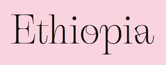 Emma Marichal (Lyon, France) is one of four designers at the French foundry Minitype (est. 2020). Her fonts can be bought at Type Department. These include the thorny serif typeface Gallique Light (2020), which was designed while she was still a student at ESAD Amiens. Gallique Cyrillic was added in 2022. https://type-department.com/collections/serif-fonts/products/__trashed-4/
 Graduate of the postgraduate type design program at ESAD Amiens, France, class of 2021. Her graduation typeface there was Ploquine, whixh was designed under the supervision of Sebastien Morlighem. Ploquine is a typographic family inspired by wooden typefaces and is intended for editorial use. The family consists of a variable display and 5 styles for text. The drawings for the text are directly inspired by the French specimens of E. Ploquin or the French Typographic Foundry. She writes: With generous serifs and mechanical shapes, this contrasting but solid typeface is perfectly adapted for long texts in exhibition catalogs. Instagram link. Type Department link. [Google]
[More] ⦿
|
Miranda Roth
|
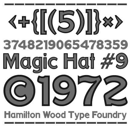 Miranda Roth graduated from Daemen College (Buffalo, NY) and joined P22 as an in-house type and graphic designer. Creator of these typefaces:
 - HWT Antique Tuscan No.9 (2012, Hamilton Wood Type). The HWT explanation: A very condensed 19th century Tuscan style wood type design with a full character set with ligatures. This design was first shown by Wm H Page Co in 1859.
- Roman Extended Light (2012). A revival of No. 251 in the 1872 wood type catalog of Page Manufacturing Company.
- HWT Catchwords (2013).
- HWT Republic Gothic (2013, with Richard Kegler).
- LTC Athena (2013). A condensed art deco typeface. Based on drawings from the 1950s in the Baltotype material (and in particular, a 1955 font by George Battee called Athena). Baltotype was acquired ca. 1993 by Rich Hopkins, a printing historian.
- LTC Archive Ornaments (2014, with Richard Kegler).
- P22 Saarinen (2014). A set of eight architectural styles based on the lettering of Finnish American architect Eero Saarinen.
- LTC Goudy Initials (2005). Based on the original proofs of large sizes of Cloister Initials by Frederic Goudy.
- P22 Dearest Pro (by Christina Torre and Miranda Roth). Dearest is a distinct flowing script based on handwritten characters found in a 19th Century German book chronicling a history of the Middle Ages. Originally released in 2001 as a set containing two styles, Script and Swash, Dearest was expanded in 2014 as a pro font with several hundred new characters including support for Central European, Cyrillic and Greek languages.
P22 link. [Google]
[More] ⦿
|
Mirela Belova

|
 Type designer in Sofia, Bulgaria, who first studied mathematics and then graphic design (at New Bulgarian University). During her studies, Mirela Belova created the Latin / Cyrillic blackboard bold typeface Cheque (2017), which is free at Fontfabric. She was part of the Fontfabric team that designed the 521-font family Zing Rust, Zing Sans Rust and Zing Script Rust in 2017.
 In 2018, Mirela Belova and Svetoslav Simov co-designed the 20-style geometric sans typeface family Mont. Codesigner of Mozer (2019, by Svetoslav Simov, Ani Petrova, Mirela Belova and Nikolay Petrousenko: a condensed headline sans family that covers Latin, Greek and Cyrillic; Mozer SemiBold is free). In 2020, Stan Partalev and Mirela Belova set up Spacetype. In 2020, Mirela Belova and Stan Partalev co-designed the 22-style (+variable) geometric sans family Gogh at Spacetype. Typefaces from 2021: Steam (a 13-style layerable Western family that emulates wood type; with Stan Partalev), Code Next (a 20-style geometric sans by Svetoslav Simov, Mirela Belova and Stan Partalev; it includes two variable fonts). Garet (2021) is a 22-style (+variable) geometric sans family by Mirela Belova and Stan Partalev. Dedicated page. [Google]
[MyFonts]
[More] ⦿
|
Mitch Paone
[DIA (Dreamers Ink Aesthetics)]
|
[More] ⦿
|
Mitchell Hockey
|
For a project at the University of Tecnology, Sydney, Mitchell Hockey designed Professor Whiskers (2013), a spurred all caps typeface that is modeled after vintage American wood types. [Google]
[More] ⦿
|
Modern Antique
|
Mac McGrew describes the slab serif Modern Antique: Modern Antique and Modern Antique Condensed were adapted to Monotype in 1909 from traditional typefaces dating from about 1820, commonly known simply as Antiques or Egyptians. They were forerunners of the square serifs, but closer to romans in general appearance, and were usually used for boldface emphasis with roman types, particularly modem romans. In most sizes these two Monotype typefaces are the same set width as each other, and have the same figures and points. Otherwise they differ only in the proportions of the C2 and C 1 arrangements, being good examples of adaptations to the basic Monotype unit system. (See "Practical Design Limitations" in Introduction.) Also see Bold Antique; and Latin Modern under Latin Bold Condensed. In 2015, Jeff Levine did a revival of Modern Antique No. 26 (1909, Monotype) called Antique Slabserif JNL. [Google]
[More] ⦿
|
Monica Munguia

|
 Monica Munguia (Mexico City) studied graphic design at Universidad del Pedregal and has a Masters in typeography from Centro de Estudios Gestalt in Veracruz, Mexico. She was associated with FontYou in France. In 2014, she co-designed the blackletter typeface Blackmoon FY with Alisa Nowak and Jérémie Hornus. Blackmoon FY won an award at Tipos Latinos 2014.
 In 2016, Monica Munguia and Jorge Martinez co-designed the elliptical display typeface Maciza. In 2017, she co-founded Tipas Type together with Dafne Martinez and Sandra Garcia, but left Tipas Type by 2020. In 2018, she designed the plump brush pen font Bunny and the neutral sans typeface Porcelanite. In 2019, Dafne Martinez, Monica Munguia, and Sandra Garcia finally released the roundish informal children's book typeface Xantolo and the wood type / slab serif typeface Xihtli. [Google]
[MyFonts]
[More] ⦿
|
Morgan Press
|
 Morgan Press is located in High Point Road, Scarsdale, New York. They published wood type specimen books such as Morgan Press Wood Type Catalog, Morgan Press Presents A First Showing of Wood Type Specimens (1955) and Wood Type Specimens for Reproduction from the Morgan Press (1964). [Google]
[More] ⦿
|
Morgans&Wilcox Mfg Co.
[William T. Morgans]

|
 American wood type manufacturer from the 19th century, set up in 1880 by William T. Morgans and H.K. Wilcox. The latter had taken over Young's shares at Young and Morgans Mfg Co., prompting a company name change. It was located in Middletown, NY. Morgans and Wilcox was absorbed by Hamilton Manufacturing.
 On-line 1890 catalog by Robert Lee. On page 22, that 1890 catalog even shows a typeface called Belgian. Digitizations: - HWT Geometric (2013, James Grieshaber, Hamilton Wood Type Foundry). This is a squarish wood type family based on a design by Gustave F. Schroeder from 1881, as explained by HWT: Geometric began its life as a metal typeface from the Central Type Foundry, circa 1884. Soon after, this design was officially licensed to Morgans & Wilcox and was shown in their 1890 catalog in Regular, Light and Condensed Light variations. After acquiring Morgans & Wilcox, Hamilton Manufacturing offered Geometric Light Face Condensed as their own No 3020 and the Geometric Light Face as No 3021. HWT Geometric has been expanded digitally to include a Regular Condensed version.
- Dick Pape designed AWT Morgans Wilcox Doric Cond in 2013.
- Matt Braun (Wood Type Revival) designed French Octagon (2016) based on a Morgans&Wilcox model.
- Cosmopolitan (1890s) was revived by Matt Braun in 2016.
- HWT Tangent (2021, Patrick Griffin at P22) revives a Morgans & Wilcox wood typeface known as Tangent in the Hamilton Manufacturing collection (after Hamilton took over Morgans & Wilcox).
[Google]
[MyFonts]
[More] ⦿
|
Morice Kastoun
[Head First Design]

|
 [MyFonts]
[More] ⦿
|
Mpress Interactive
[John Bonadies]

|
 Type foundry set up in 2013 in Champaign, IL, by John Bonadies who has an MFA in graphic design from the University of Illinois. In 2011, he set up an iPad application in which one can move wooden letters around as in a letterpress. He says: LetterMpress will be a virtual letterpress environment---released first on the iPad---, that will allow anyone to create authentic-looking letterpress designs and prints.
 The typefaces are based on letterpress and/or vintage wood type, and have names that are prefixed by MPI. In 2013, Mpress Interactive published MPI Roman Condensed (based on a typeface from Showcard Machine Company), MPI Old Style, MPI Bodoni Ultra, MPI Sardis (after Warren Chappell's Lydian from 1938, ATF), MPI Republic Gothic, MPI No. 510 (based on a design by William H. Page, 1887), MPI No. 508 (based on William H. Page, 1890), MPI No. 507 (based on William H. Page, 1890), MPI Headline Modified (also called Modified Gothic by some type manufacturers, it is based on a typeface by Hamilton Manufacturing Company from 1897), MPI Gothic, MPI Aldine Extended (based on a 1872 wood type by William H. Page), MPI Antique (slab serif), MPI French Clarendon (based on wood type from 1865 by William H. Page), MPI French Antique (a typical far West saloon font based on wood type by William H. Page, 1869), MPI Egyptian Ornamented (a western typeface based on a 1870 wood type by William H. Page), MPI Arcadian (based on a 1870 design by William H. Page), MPI Tuscan Extra Condensed (based on William H. Page wood type from 1872), MPI Norwich Aldine Reversed (from a 1872 original), MPI Nouveau, MPI Delittle (based on a wood type by DeLittle), MPI Deco (art deco caps), MPI Atlas (slightly art nouveau typeface based on a font by Day & Collins), MPI Circle Sans (white on black letters). [Google]
[MyFonts]
[More] ⦿
|
Muhammad Ridha Agusni
[38 Lineart Studio (or: Grayscale, or: Fontsources)]

|
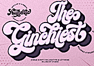 [MyFonts]
[More] ⦿
|
MyFonts: Clarendon
|
MyFonts hit list for Clarendon style typefaces, popular in the wood type era. A longer list of implementations of Clarendon. [Google]
[More] ⦿
|
MyFonts: French Clarendon
|
A list of French Clarendon (almost exclusively wood) typefaces that are available via MyFonts. [Google]
[More] ⦿
|
MyFonts: Wood type
|
The main (digital versions of) wood type at MyFonts. A longer list of wood type typefaces. [Google]
[More] ⦿
|
MyFonts: Woodcut typefaces
|
A list of commercial woodcut typefaces. [Google]
[More] ⦿
|
Nadia Raineri
|
During her studies at Design College Australia in Brisbane, Nadia Raineri created the layered ornamental wood typefaces Alvaro (2013) and Maria (2013) that are based on Aetna, a wood type from 1870 by William H. Page. [Google]
[More] ⦿
|
Nadine Fialho
|
 During her studies in Caldas da Reinha, Portugal, Nadina Fialho created the wide woiod-inspired titling typeface Elisus (2014). [Google]
[More] ⦿
|
Nancy Neale Typecraft
|
According to the ad, We have the largest collection of wood type and printing memorabilia in private hands in America. Wood type sold via the web. [Google]
[More] ⦿
|
Nathan Williams
[Baseline Fonts]

|
 [MyFonts]
[More] ⦿
|
National Printers Materials Co.
|
 American wood type manufacturer that existed from 1876 until 1895, and was set up by John Stevens and William Wood in New York City. They In 1874, they had patented a process for laminating celluloid to wood to produce celluloid wood type. Example of that: No. 20 Eureka (1888), Clarendon X Condensed (1890). [Google]
[More] ⦿
|
Neale Davidson
[Pixel Sagas (was: Protoform Project, and Fontshack)]
|
 [More] ⦿
|
Netta Novich
|
Toronto, Ontario-based designer of Wooden Font (2017). Behance link. [Google]
[More] ⦿
|
New Blazing Star Press
[Jason Wickersty]
|
The New Blazing Star Press (Jason Wickersty, Bayonne, NJ) revives historical fonts, borders, ornaments, rules, and woodcut artwork from the 18th and 19th centuries, copying every letter from original type specimen, business directories, broadsides, and advertisements printed over 150 years ago. The foundry sells 100 fonts under the title Fonts of the Civil War Era (60 fonts in 2012, 40 fonts in 2014). The 40 fonts from 2014: TPTC CW2 AdamsSentinel, TPTC CW2 ArmedAlphabet, TPTC CW2 BoldBeniciaBoy, TPTC CW2 Broderie, TPTC CW2 ComparativeBorder, TPTC CW2 FaceBorder, TPTC CW2 FishermansSongBorder, TPTC CW2 GuttaPercha, TPTC CW2 Jambieres, TPTC CW2 Klegg, TPTC CW2 LincolnsToothpickHollow, TPTC CW2 Lorenz, TPTC CW2 LoungerHashed, TPTC CW2 Lovejoy, TPTC CW2 Massaponax, TPTC CW2 MassaponaxHashed, TPTC CW2 NewRatesofTollBorder, TPTC CW2 NiblosGarden, TPTC CW2 NicodemusHeights, TPTC CW2 NorthStar, TPTC CW2 NutritiveCoffeeBorder, TPTC CW2 OysterHouse, TPTC CW2 SaltJunk, TPTC CW2 Schnepf, TPTC CW2 ShieldofFreedom, TPTC CW2 ShockoeBottomDisplay, TPTC CW2 ShockoeBottomSmall, TPTC CW2 SolilioquoyBorder, TPTC CW2 SpikedLineBorder, TPTC CW2 SquareLineBorder, TPTC CW2 SquarzasPunch, TPTC CW2 SquarzasPunchOutlined, TPTC CW2 St.LouisArsenal, TPTC CW2 TariffBorder, TPTC CW2 TheNorthStar, TPTC CW2 TitlePageLowercase, TPTC CW2 WestWoods, TPTC CW2 Whitworth, TPTC CW2 Zollicoffer, TPTC CW2 Zylobalsamum. Creative Market link. [Google]
[More] ⦿
|
New Typography
[Vernon Adams]
|
 Vernon Adams (born England, 1967) was a furniture restorer, woodcarver and typeface designer. On August 24, 2016 Vernon Adams passed away from injuries sustained in a scooter accident in May of 2014. New Typography was his type design site. Vernon graduated in 2007 with an MA in type design from the University of Reading and lived in San Clemente, California. His wife Allison now holds the trademark and/or copyright to most of his fonts.
 He developed Mako (2007), a type family for text and image in magazines. Earlier, he created AutoPacHousehold. Nobile (2010) is part of the Google font directory. Through the Open Font Library, one can get the source Fontforge code for this open source sans family. About Mako, he writes that he submitted the font to Fontsmith, which sat on it for a while and rejected it, only to publish a few weeks later Lurpak, which according to Vernon is too similar to his rejected design. Free fonts at Google Code by Vernon, as of the end of 2010 include Coda (a heavy elliptical face), Nobile (mentioned above), Corben (a curvy bold typeface in the style of Cooper Black), and Gruppo (a thin sans). In 2011, he added Coustard (a slab serif family), Damion (connected signage script), Smythe (Victorian), Radley (display face), Oswald (a reworking of the Alternate Gothic style: see this dedicated page; Oswald was updated continually by Vernon Adams until 2014. Vernon added Light and Bold weights, support for more Latin languages, tightened the spacing and kerning and made many glyph refinements throughout the family based on hundreds of users' feedback. In 2016 the family was updated by Kalapi Gajjar and Alexei Vanyashin to complete the work started by Vernon, and support languages that use the Cyrillic script), Candal (sans), Pacifico (connected signage face), Bangers (comic book face), Anton (heavy sans), Bevan (a reworking of Beton, a traditional slab serif display typeface created by Heinrich Jost in the 1930s), Six Caps (a condensed headline face), Meddon (a display font created from the handwritten script of an Eighteenth century legal document), Rokkitt (an Egyptian), Paytone One (headline face), Holtwood One SC (wood block simulation face), Monofett (white on black), Carter One (casual face), Francois One (gothic sans), Sigmar One (think mid twentieth century pulp magazine advertising), Bigshot One, Metrophobic, Mako, Francois One, Nunito (rounded; CTAN link), Shanti, Sigmar, Muli (minimalist sans), Kameron (an Egyptian), Stardos Stencil, Bowlby One, Bowlby One SC (fat poster face), Tienne (serif), Monoton (a multiline face in the style of Koch's Prisma, 1931), Sancreek (emulating an ornamental wood font), Amatic SC (hand-printed poster family), Sancreek (a Tuscan face), Oswald (in the old Alternate Gothic tradition of sans typefaces---a free Google font; CTAN link), Rammetto (based on the Stephenson Blake uppercase display font Basuto, released in 1926), and Michroma (modeled after Microgramma). Typefaces made in 2012 include Bench Nine (Google Web Fonts: based on old Stephenson Blake typefaces), Oxygen (a sans typeface available from Google Web Fonts; forked in 2016 at Open Font Library as Comme and in 2017 as Oxygen Sans, with two new oblique styles), Oxygen Mono (Google Web Fonts), Norican (free script font at Google Web Fonts based in part on Stephenson Blake's Glenmoy from the 1920s), Cutive (free at Google Web Fonts, based on the IBM typewriter typefaces Executive and Smith-Premier), Pontano Sans (Google Web Fonts: a light basic sans), Trocchi (Google Web Fonts: derived from Nebiolo's Egiziano, and Caslon & Co's Antique No.4 and Ionic No.2), Seymour One (Google Web Fonts: derived from Sigma One), Anaheim (sans, Google Web Fonts), Cutive and Cutive Mono (Google Web Fonts: based on the typewriter typefaces of IBM's Executive and the older Smith-Premier). Typefaces from 2013: Mondo (sans), Anton (grotesque). In 2016, Jacques Le Bailly extended Nunito to a full set of weights, and an accompanying regular non-rounded terminal version, Nunito Sans. Another extension of Nunito is Iunito (2019, unknown designer). In 2020, Jacques Le Bailly, Cereal and Vernon Adams (posthumously) released the sans typeface family Mulish at Google Fonts. Mulish is a minimalist sans, designed for both display and text typography. It was initially drawn in 2011 by Vernon Adams under the name Muli and then refined until 2014. In 2017 the family was updated by Jacques Le Bailly to complete the work started by Vernon after he passed away, in collaboration with his wife Allison, an artist who holds the trademark on the typeface family name. In August 2019, it was updated with a variable font weight axis. Donations to Vernon's family. Memorial. Fontspace link. Dafont link. Google Plus link. Fontsquirrel link. Klingspor link. Github link. Fontsquirrel link. [Google]
[More] ⦿
|
Niall Kitching
[K22 Foundry]
|
[More] ⦿
|
Niche
[Simon Dunford]

|
 Barely five days after the catastrophe of November 6, 2016, Simon Dunford (London, Ontario) published the scanbat typeface Trump (2016). In December 2016, he published Dawson Grotesque. In 2017, he designed the art deco typeface Mouron (free, caps only; named after A.M. Cassandre, whose real name was Adolphe Jean-Marie Mouron), the similar free art deco typeface Julian Grotesk (undoubtedly forced to rename Mouron this way by the annoying Mouron descendants), Dylan Gothic and the Tuscan wood type emulation typeface Poblano. [Google]
[MyFonts]
[More] ⦿
|
Nick Curtis

|
Nick Curtis (b. Chicago, 1948) lived in Texas from 1952-1997, and lives since 1997 in Gaithersburg, MD and Alexandria, MD. From ca. 1990 onwards, he has been designing fonts, first for free, and then commercially. He had a great reputation as a "revivalist" type designer, with a particular interest in retro fonts and art deco types. In 2003, his site had become too popular and too expensive to maintain, and thus he went commercial as Nick's Fonts. In 2013, he stopped making fonts, and donated his collection of rare books and type material to the University of Virginia. Interview. Complete list of names and other info, maintained by Sander de Voogt. Interview in which we learn about his fondness for Corel Draw as a type design tool. Near the end of 2012, he posted this comment on his web site: Fifteen years ago, I embarked on a wonderful voyage of discovery, when I created my very first font with Fontographer 3.15. My maiden voyages were, frankly, rather clunky and amateurish, but I have been told that they showed promise. Well, sure enough, thanks to the diligent (and patient) efforts of Ilene Strizver, I polished up my craft enough to sell my humble efforts---first as a sideline business and, since 2006, as my full-time job. In total, I have produced over eleven hundred fonts---almost five hundred of them freeware fonts, which I conservatively estimate have been downloaded and enjoyed by over three million people worldwide. Unfortunately, this past year has brought a series of unanticipated setbacks, culminating in the loss of my wife's beautiful mind and soul to the scourge of alcoholism. In an effort to generate extra income to cover the expenses for her long-term care, I have proposed a number of, I believe, innovative ways to revamp the online font business; unfortunately, those efforts have fallen flat, primarily due to the professional font community's abject fear of crossing the $165 million Elephant in the Room. I even offered a special discount rate of 75% off retail price for full-time students of Typohile Forum. To date, there have been zero takers. Hell: even the webfont kit of one of my own fonts which I purchased from myfonts.com turned out to be an empty folder. Talk about a run of bad luck. Which leaves my with you, dear readers. If you or someone you know has had fun or made a buck from my humble efforts throughout the years, please donate whatever you can---even a lousy dollar would help---to help me out. I would greatly appreciate it. Home page. Dafont link. FontShop link. Klingspor link. Abstract Fonts link. View the typefaces designed by Nick Curtis. [Google]
[MyFonts]
[More] ⦿
|
Nick Curtis
[Nick Curtis: Wood types]

|
 [MyFonts]
[More] ⦿
|
Nick Curtis
[Art deco typefaces by Nick Curtis: II]

|
 [MyFonts]
[More] ⦿
|
Nick Curtis
[Nick Curtis: Commercial typefaces]

|
[MyFonts]
[More] ⦿
|
Nick Curtis
[Nick Curtis: Typefaces from 2015]

|
[MyFonts]
[More] ⦿
|
Nick Curtis
[Nick Curtis: Typefaces from 2014]

|
 [MyFonts]
[More] ⦿
|
Nick Curtis: Commercial typefaces
[Nick Curtis]

|
Nick Curtis (b. Chicago, 1948) lived in Texas from 1952-1997. Since 1997, he is in Gaithersburg, MD and Alexandria, MD. Since the 1990s, he has been designing fonts, first for free, and then commercially. He had a great reputation as a "revivalist" type designer, with a particular interest in retro fonts and art deco types. In 2003, his site had become too popular and too expensive to maintain, and thus he went commercial as Nick's Fonts. Interview. Free downloads at TypOasis. Complete list of names and other info, maintained by Sander de Voogt. Interview in which we learn about his fondness for Corel Draw as a type design tool. Home page. His free fonts are listed elsewhere. On MyFonts, he says this about himself: Nick's Fonts is a modest little foundry dedicated to the preservation of our rich typographic heritage. Most of the foundry's designs are based on authentic historical sources, gleaned from the massive collections of the Library of Congress. If you are looking for a font that captures the essence of the Wild West, the Gay Nineties or the Jazz Age, look here first: if it is not in the catalog, it will be soon. [Google]
[MyFonts]
[More] ⦿
|
Nick Curtis: Typefaces from 2014
[Nick Curtis]

|
 Typefaces made by Nick Curtis in 2014:
 - Alto Rey NF. A revival of a Victorian typeface issued by the Palmer and Rey Type Foundry of San Francisco in 1884.
- Angler NF. A revival of Anglo, a Victorian typeface by Barnhart Brothers and Spindler, 1895.
- Argentina Cursive NF. Based on a typeface by Morris Fuller Benton, 1919.
- Bandiera Del Legno NF. A Tuscan wood type that revives Gothic Tuscan Condensed Reversed by William H. Page.
- Belgique NF. A revival of the (Western) wood type French Clarendon XXX Condensed No. 117 by William H. Page.
- Benton Gothic Thin NF. A revival of Lightline Gothic (1908, Morris Fuller Benton, ATF).
- Big D NF. Based on a Speedball pen font by Ross F. George.
- Bricoleur NF. A connected script from a French magazine in 1927.
- Bully Pulpit Plain NF. After Bullion Shadow (1970, Face Photosetting).
- Call Me Ishmael NF. After Moby Dick (Affolter and Gschwind).
- Chapeaux Noirs NF. After a MacKellars, Smiths & Jordan typeface.
- Chieftain NF. Revival of Pontiac (1893, ATF).
- Coronation Street NF. Based on a typeface created in 1936 by Stephenson Blake.
- De Roos Mediaeval NF. After Sjoerd de Roos.
- Dimanche NF. An art nouveau typeface revival. The original is known as Domingo or Brillante.
- Fluid Drive NF. A take on an art deco typeface by Samuel Welo.
- Gloriosus NF. Revival of the Victorian typeface Apollo (1888, Gustave F. Schroeder, Central Type Foundry).
- Grieshaber Monos NF. After a Schelter & Giesecke typeface designed in 1911 by Moritz Grieshaber.
- Harley Quinn NF.
- Hi Ho Steverino NF. In the Beat style of the 1960s and 1970s.
- Koralle Rounded NF. A rounded revival of Koralle (1913, Schelter & Giesecke).
- Leabhar Ceilteach NF. Inspired by lettering in the Book of Kells.
- Legnano (2014, Italian art deco wood type).
- LevellerNF (2014, Nick Curtis). A revival of Roundhead (Charles Beeler, Mackellar Smiths & Jordan, 1883).
- Lodewijk Gothic NF (2014). Adter Elzevir Gothic (1897, ATF).
- Loopy Loo NF. Upright script based on an original by the Hunt Brothers.
- Marmorherz NF. After an 1866 font, Marble Heart, by Farmer, Little, and Co.
- Maxed Out NF (+Inline, +Starstruck). This series of fonts is based on a 1970s art deco series at PhotoLettering Inc called Riverside Drive by Peter Max.
- Meriwether Circular NF. After a 1905 Victorian typeface by William Martin Johnson for ATF called Meriontype.
- Millrich Olivian NF. A revival of Olivian by Richard & Miller.
- Miss Dottie NF. After Dotted Roman (1897, Barnhart Brothers and Spindler).
- Morticia NF. Based on an ATF original.
- National Oldstyle NF. After a 1916 font by Frederic W. Goudy.
- Nickel Box NF.
- Olden Daze NF. From Alphabets A to Z.
- Page Ephesian NF. A wood type after William H. Page, 1890.
- Page Etruscan No 5 NF. A wood type after William H. Page.
- Painters Roman NF. A wood type based on Painters Roman by Vanderburg and Wells (1878).
- Pique-Nique NF. Based on the art nouveau typeface Outing (1888, John F. Cumming, and 1895, ATF).
- Receding Hairline NF. After L&C Hairline (1966, VGC, Herb Lubalin and Tom Carnase).
- Renaissant NF. After the Victorian typeface Renaissant (1880, by John F. Cumming, Dickinson Type foundry).
- Rythme NF. After a Mexican simulation typeface from 1935 by Maximilien Vox called Éclair.
- Scalar Biform NF.
- Schweimann Moderne NF. An art nouveau typeface.
- Skelett Antiken NF. After William H.Page's wood typeface Clarendon XX (1859).
- Ski Alpin NF. An art deco typeface based on a Swiss travel poster from 1927.
- Sodbuster NF. After William H. Page's wood type Gothic Dotted.
- Southie Signboard NF.
- Strassenmeister NF. After an art deco typeface called Buick Schmalfett by Herbert Thannhaeuser.
- Sweet Afton NF. After a silent movie font by Samuel Welo.
- Talsmann NF. A faithful reproduction of the Advocate font used by the IBM Selectric typewriter.
- Trading Hoss NF. After Ross F. George's Speedball alphabet D-nib Display.
- Tuscalooza NF. After William H. Page's font Tuscan Extended.
- Twinkletoes NF. After a comic book typeface by Ross F. George.
- Unjustified NF. Inspired by the opening credits for the television series Justified.
- Vauxhall NF. Based on Angelica, a 1970s typeface by Robert Trogman (FotoStar).
- Venusian Ultra NF. A heavy sans based on the extra bold extended version of Bauersche's classic sans typeface family Venus (1907-1927).
- Vulkan NF. A wedge-serifed typeface based on a Barnhart Brothers and Spindler original called Vulcan (1884).
- Well Said Black NF. Modeled after Welling Black, a 1970s typeface by Robert Trogman (FotoStar).
[Google]
[MyFonts]
[More] ⦿
|
Nick Curtis: Typefaces from 2015
[Nick Curtis]

|
 Typefaces made by Nick Curtis in 2015:
 - Bothas Ruhm NF. After Blockschrift (1897, Genzsch and Heyse).
- Chiselle NF. A revival of Rustikalis, a typeface designed for the VGC Phototypositor in the 1960s. See Rustikalis DT (1=2007, Malcolm Wooden) for the revival of the bolder version.
- Coins Coupes NF. Modeled after Chamfer, a 19th-century octagonal typeface by Barnhart Bros & Spindler.
- Doright Black NF. Based on Dudley Upright (Dan X. Solo, 1960s).
- Feedbag NF. Based on Horse Tank (Fotostar).
- Inland Edwards NF. Based on Nicholas J. Werner's Edwards (1895, Inland Type Foundry).
- Millrich Grange NF. A revival of the 19th century font Grange by Miller & Richards.
- Mitchell NF. A digital revival of the grotesque all-caps typeface Mitchell (1906, Inland Type Foundry), the bold version of Blair (1900, Inland Type Foundry).
- Newfangle NF. A Victorian typeface based on Newfangle (1892, Hermann Ihlenburg).
- Page Five Fifteen NF. After William H. Page.
- Retrorocket NF. An art deco typeface after D. Duvillé, 1934.
- Rockwall NF. After Aldine by William H. Page.
- Telecomm NF.
- Versacrum NF. A psychedelic / art deco typeface inspired by the lettering of Alfred Roller for the Ver Sacrum magazine in 1903.
- Old Number Ten NF. A revival of a typeface Gothic Number Ten by the Cincinnati Type Foundry.
- Terranova NF. A prismatic typeface based on Earth (Dan X. Solo).
[Google]
[MyFonts]
[More] ⦿
|
Nick Curtis: Wood types
[Nick Curtis]

|
 Nick Curtis's typefaces that took inspiration from wood types. Many of these have WBW in the name, which stands for Whiz-Bang Woodtype.
 - Bandiera Del Legno NF (2014). A Tuscan wood type that revives Gothic Tuscan Condensed Reversed by William H. Page.
- Belgique NF (2014). A revival of the (Western) wood type French Clarendon XXX Condensed No. 117 by William H. Page. Skelett Antiken NF (2014) revives Wiliam Page's Clarendon XX (1859).
- Blandford Woodland NF (2005). A light version with lower case of Neuland as seen in Pen&Brush Lettering and Practical Alphabets (Blandford Press, Ltd., London, 1929).
- CopperCanyonInlineWBW, CopperCanyonWBW, CopperCanyonWBWDemiBold.
- Falfurrias WBW (2004). Based on authentic xylographic designs from the late nineteenth century.
- Fran Tique NF (2008). The decorative wood type typeface French Antique Extended, featured in the 1905 BB&S catalog, and originally due to William H. Page, was revived as Fran Tique NF.
- Fredericksburg WBW (2006). Based on a wood type by Rob Roy Kelly, which is the same source Jordan Davies used for his Teutonic.
- Grand Prairie WBW (2004). Based on an ornamental wood type called Medallic.
- Hunky Dory NF (2014, a circus font after William H. Page's wood type Doric, ca. 1850).
- Indubitably NF (2011): based on Stephenson Blake's 1880s wedge serif typeface Latin Antique.
- Matamoros NF (2010): wood type simulation.
- Page Ephesian NF (2014). A wood type after Ephesian (1890, William H. Page).
- Page Etruscan No 5 NF (2014). A wood type after William H. Page.
- Pgae Five Fifteen NF (2015). After William H. Page.
- Page Wood Borders NF (2011).
- Painters Roman NF (2014). A revival of Painters Roman (1878, Vanderburg & Wells).
- Rockwall and Rockwall Expanded NF (2015). After William H. Page's Aldine (1870) and Aldine Expanded (1872).
- Round Rock WBW (2006). A Western style font called No. 154 by Rob Roy Kelly.
- San Angelo NF. Based on a 1890 William H. Page Foundry woodtype grotesque specimen.
- Sodbuster NF (2014). After William Page's Gothic Dotted.
- Terlingua WBW (2005). A wood type called Phanitalian in Rob Roy Kelly's collection.
- TradingPostNF (2003). Based on this poster.
- Tuscalooza NF (2014). After William H. Page's Tuscan Extended (1872).
- Woodtype Borders NF (2010), Woodtype Borders 2 NF (2011).
- Woody Goodies 1 and 2 WBW (2004): ornaments, including fists.
- Ye Olde Block NF (2004). Lewis F. Day, in his book Alphabets Old and New, offered this typeface as an example from sixteenth-century England of lettering incised in wood.
- NF (2010). Based on James Conner's wood style typeface Aetna (1888), aka Painter's Gothic.
[Google]
[MyFonts]
[More] ⦿
|
Nick Sherman
[Woodtyper]
|
[More] ⦿
|
Nick Sherman
[Hex]
|
[More] ⦿
|
Nika Nekrasova

|
 Type designer born in 1986 in Lviv, Ukraine. She created the Kafkaesque woodcut face Messy Linocut 2D (2011, 2D Typo).
 Klingspor link. [Google]
[MyFonts]
[More] ⦿
|
No Bodoni Typography
[George Everet Thompson]

|
 Glenview / Chicago, IL-based foundry run by George E. Thompson (b. 1945, Chicago). George Thompson teaches at the Art&Design Department of Columbia College Chicago since 1986: He has a deep involvement in letterpress printing and co-founded Columbia's private press, the Calhoun Press, named for John Calhoun, the first printer in Chicago. He also founded his own Spurius Press, devoted to publishing matters of typography and named for Spurius Carvillus, the ancient Roman credited with designing the letter G.
 Expensive but high quality typeface families designed by Thompson include Estiennium (quirky humanist sans), Isbellium (a sans serif version of Dick Isbell's Americana type, the last type cut in metal by American Type Founders), Nirvanium (wedge serif), ITC Oldrichium (2011, angular lettering in the style of Oldrich Menhart), Parmatype, Parisette, Marseillette, Lyonette, and Berlinette (2001). MyFonts is selling these fonts now: Claudium NB (2002), Crowbird Pro Bold (2012), Dog Butter (2004, a curly monolinear upright script with small x-height; followed by Dog Butter Pro in 2021), the eerie didone font Floridium NB (2002, based on wood type from the 1800s), Ms Kitty NB (2002, a fun face), Parma Typewriter NB (based on Bodoni), and Tinman Pro (2011). In 2013, George published the dingbat typeface Ovoid Two Zero, ITC Oldrichium. FontShop link. Klingspor link. Behance link. View the No Bodoni typeface library. [Google]
[MyFonts]
[More] ⦿
|
Norse Owl
|
New York City-based designer of these national park display typefaces in 2018: Sequoia (sans), Redwood (spurred), Eagle Sight. [Google]
[More] ⦿
|
Novo Typo (was: Atelier van Wageningen)
[Mark van Wageningen]

|
 Mark van Wageningen is a Dutch type designer. Born in 1969, Mark studied graphic design at the Amsterdam Graphic School and at the Gerrit Rietveld Academy in Amsterdam before he founded Novo Typo in 2012. Mark lives in Amsterdam. Novo Typo is the type foundry of Atelier van Wageningen.
 In January 2015 Mark started the Typewood project. Typewood is a research project about designing, deconstructing, and transforming multicolored digital typefaces into wooden type for letterpress. Ziza, a corresponding project with lead type, followed in 2016. Both projects show the future of multicolored typeface design through the revitalization and deconstruction of typographic traditions. Mark wrote several books about chromatic type design such as the Novo Typo Color Book (2017) and Color and Type (Princeton Architectural Press, 2019). The display type Stavba (inspired by Rodchenko's constructivist lettering) appeared in 1994 as a part of his presentation for his final examination at the Gerrit Rietveld Academie in Amsterdam, and was later renamed Ärst. He continues making display types on his own account. He created the fonts Linotype Cerny (1995, caps only), Linotype Laika and Linotype Sjablony (a roughened stencil font) in 1997. Fontshop and 2Rebels sell his Gagarin family (2000), which include Anna (constructivist and unicase), Boris, Christa, Dmitri (MICR), Eleno, Fjodor, Gregor, Hektor (stencil), Igor, Youri, Leonora (with Nele Reyniers), Magda (with Nele Reyniers), Ossip and Petrov (LED simulation). As he tells it, four Russians, Gustav Klucis, Vladimir Majakovski, Alexander Rodchenko en Gregory Rasputin each had an affair with Anna Gagarin, and out of all that came forth Boris, Christa, Dimitri, Elena, Fjodor, Gregor, Hektor, Igor, Jouri, Kurt, Leonora, Magda, Nina, Ossip, Petrov, Quirina, Rudolf and Sonia. Atelier Van Wageningen made the curly typeface HC type (2010) for packaging. Typefaces from 2012 include NT Lucien, NT Plakaty (poster font), NT Theo, the NT Gagarin family, NT Zkumavka (rough stencil based on stencils from the 1920s in Russia; first published in 1995-2002 at Two Rebels), NT Cornelia (wood type caps), NT Novo (with Novo Alla, Bila, Cela, Dada, Enno, Fika, Gigo, Halu (art deco)), Louis Douze and Therese Quatorze, Caren (a soft-edged corporate typeface for a Dutch women's organization, Vrouwen van Nu). Typefaces from 2013: NT Guru (a layered ornamental type system), Sjiq (with a crazy roofed lower case s), and flower photographic typefaces such as Fall, Lily and Pure. Novo Typo also made several corporate typefaces. Typefaces from 2014: NT Wolf (layered typeface), NT Yaki (hipster layered font family), NT Fest (a curly inline caps face). Typefaces from 2015: NT Fata (a layered decorative font family), NT Rashmir (Indic simulation inspired by Sanskrit; styles Amal, Baya and Cyra), Bixa (Bixa Color minisite: a multicolored wood type; winner at TDC 2016 and ProtoType in 2016). Creative Market link. Behance link. Linotype link. FontShop link. Another Behance link. Klingspor link. [Google]
[MyFonts]
[More] ⦿
|
Now Type
[Lucas Franco]
|
 Brazilian type foundry run by Lucas Franco (Italian Brazilian, b. 2001), his father Claudio Rocha (Italian Brazilian, b. 1957) and his mother, Milena Mainieri (Italian Brazilian, b. 1969), which is currently based in The Netherlands. Their typefaces:
 - Comic Voss (2017): Alain Voss was a comics artist born in France, he spent his early life in Brazil, and moved to France in 1972. From 1975 he worked for the experimental Metal Hurlant, Tobiaze, parodies of famous comics characters such as Popeye, Asterix and Superman, the series Anarcity (influenced by Phillip K. Dick's work), and the strip Zensetos. He returned to Brazil in 1981, and during the rest of his life collaborated with Brazilian publishers. In 1982 he won the European Album of the Year Award for Adrénaline. Comic Voss is the work of digitalisation of the hand letters present is Alain Voss' comic books and graphic works. The font has an informal look and a slight inclination, that gives a sense of speed and unconventionality. The typeface has 4 weights (regular, medium, bold and black), 26 ligatures, arrows and a complete set with 256 glyphs.
- Antonio Maria (2017): Antonio Maria, a font by Claudio Rocha and Lucas Franco, takes its shapes from the lettering found in the cover of Afixação Proibida (Display Prohibited), a book by the Portuguese poet Antonio Maria de Lisboa (1928-1953). In fact, Antonio Maria was the leader-writer of Afixação Proibida, a collective manifesto from 1949, that initiated the surrealist movement in Portugal. It is an inverted-contrast typeface with 150 ligatures and a large character set.
- Ciclope (2017): Ciclope was launched during the 1930s by the Fonderia Tipografica Reggiani, a type foundry based in Milan. The font was created under the guidance of Guido Modiano, a modernist typographer. The typeface has a strong and bold look, characteristic of the Italian art deco style.
- Maggiore (2017): Maggiore, designed by Lucas Franco, takes inspiration from the 1930s Italian Art Deco style, with strong geometrical shapes, synthetic forms with no counters at all. The upper case keyboard keys offer straight and economical letterforms, while the lower case keyboard keys contain letterforms with subtle and angled nicks.
- Mefistofele. A revival in 2018 by Claudio Rocha and Lucas Franco of the modular stencil typeface Mefistofele (1930, Reggiani foundry).
- Rudolf Titling (Lucas Franco and Claudio Rocha), a typeface that won an award at Tipos Latinos 2018.
- Franco Titling (Lucas Franco). Winner at Tipos Latinos 2018 of a type design award.
- Agora Titling Extra Light (2018). By Claudio Rocha.
- Peterson Titling (2020). A condensed titling typeface with slab vertical serifs that pays homage to the Canadian jazz pianist Oscar Peterson.
- Franco Stone (2018-2020, Lucas Franco). A tapered display typeface. Buy it at CAST.
- Rudolf Antiqua and Rudolf Initials (2018). A faithful revival of Rudolf Koch's Koch Antiqua (1922). Followed by Rudolf Text (2017-2020, Lucas Franco and Claudio Rocha).
- Doctrine (2019-2020< Lucas Franco). Chiseled and almost uncial.
- Aurelio Titling and Aurelio Unicase (2018, Lucas Franco and Claudio Rocha). Originally, it was created as a logotype for the Ultima Forma design studio in the 1990s. Based on 19th century wood types. The unicase font is a Bradbury Thompson's Alphabet 26 reboot.
- Woodeco. An art deco wood type. No date. No designer.
- Georges Deco (2017, Lucas Franco and Claudio Rocha). Georges Deco is based on the ornate lettering found in the Art Deco lettering book, Modèles de Lettres Modernes, published in 1939 by the French interior designer Georges Léculier.
- Solferini (2019). A rounded squarish typeface by Natalia Solferini, Lucas Franco and Claudio Rocha, based on the lettering of Brazilian artist Gil Duarte (aka Binario Armada).
- Pierre Deco. A wide octagonal typeface inspired by letters in the title page of the 1929 edition of Vies imaginaires, a collection of twenty-two semi-biographical short stories by Marcel Schwob, published by French book club association Le Livre Contemporain, which showcases wood engravings by Pierre Bouchet of George Barbier's illustrations. No date. No designer identified.
- Entulho (2011-2018). A stencil typeface by Ricardo Mayer, Lucas Franco and Claudio Rocha.
- Scarpa Titling (2019, Claudio Rocha and Lucas Franco). An all caps typeface based on a nameplate found on the front door of a shoemaker in Treviso, Northern Italy.
- Anton (2020, by Claudio Rocha and Lucas Franco). An art deco typeface modeled after a Dutch deco type seen on the Anton Antonius Kurvers's cover of Wendingen in 1927.
- Spinface (2020). An experimental turned letter font by Claudio Rocha and Lucas Franco.
- Etna Futurist (2020, Claudio Rocha & Lucas Franco). Digital interpretation of Etna, a wood type produced by the Italian type foundry Xilografia Meneghello & Belluzzo, in the 1920s.
- Hendrik (2021, by Claudio Rocha & Lucas Franco). A revival of Simplex (Sjoerd Hendrik de Roos, 1937).
[Google]
[More] ⦿
|
Octavio Pardo

|
 Or Octavio Pardo Virto. Born in Pamplona, Spain, Octavio got his first degree in Fine Arts at the University of Barcelona. After several years working for various design studios and advertising agencies, he moved to UK where he graduated from the MA in Type Design at the University of Reading in 2010. After collaborating with the Typofonderie in Paris for several months, Octavio went back to Pamplona. His typefaces:
 - Ibarra Real (2007), done with the help of José María Ribagorda. Ribagorda writes: IbarraReal is a public-domain font of Ibero-American character, created in 2005 as a revival of the types cast by Jeronimo Gil for the Royal Spanish Academy's edition of Don Quixote, printed in Madrid by Joaquin Ibarra in 1780.. The vignettes were designed by Manuel lvarez Junco, Andreu Balius, Didac Ballester, Paco Bascuñan, José María Cerezo, Alberto Corazón, Oyer Corazón, Pablo Cosgaya, Rubén Fontana, Javier García del Olmo, José Gil Nogués, Pepe Gimeno, Fernando Gutiérrez, Juan Martínez, Laura Messeguer, Juan Antonio Moreno, Juan Nava, Miguel Ochando, Josep Patau, Alejandro Paul, Marc Salinas, Emilio Torné, Alex Trochut or Roberto Turégano. Free download here. Github link.
- Blackwood (2011). An ornamental all-caps typeface that takes its inspiration from a mixture of the woodcuts of the early 18th century and fat typefaces of today's magazines.
- Cabriole (2011). A text typeface done for his thesis at Reading. It is a very Latin typeface, with round contours and a lot of pizzazz---as if it came straight out of old Iberian textbooks..
- Terabyte (2011). A monoline corporate typeface in current development for Aspa Company.
- Sutturah. A fat signage face, published by Rosetta Type, and awarded by TDC 2012. The Cyrillic was developed with the help of Sergei Egorov.
- In 2013, he contributed to the Cyrillic of Adelle (2009, Type Together), a typeface first developed by Veronika Burian, Jose Scaglione and Alexandra Korolkova.
- In 2016, he created an experimental, almost hipster, typeface, and finished a custom typeface, NRK Ethica Slab, for Norway's main media group.
- For the logo and credits of Fashion Film directed by Human Produce, he designed Myth (2016).
- With Elena Ramirez, he created Cubit (2016), a custom monospaced typeface for a Chicago-based interior design Studio.
- Gupter is a condensed serif font for Latin and Devanagari. Its design is inspired by conventional fonts like Times New Roman. The ufo files included in the Github repository are synchronized so they will allow the user to create intermediate instances if required. The Devanagari designed by Modular Infotech, Pune, India, in 2000. Free at Google Fonts.
- EB Garamond (2017). EB Garamond was started in 2011 by Georg Duffner (Austria) as a Google Web font for Latin and Cyrillic. It is named after Egelnoff and Berner. Duffner explains: The source for the letterforms is a scan of a specimen known as the Berner specimen, which, composed in 1592 by Conrad Berner, son-in-law of Christian Egenolff and his successor at the Egenolff print office, shows Garamont's roman and Granjon's italic fonts at different sizes. Hence the name of this project: Egenolff-Berner Garamond. In 2017, Octavio Pardo entered the EB Garamond project. Rhe fonts can now be downloaded from Github. A variable version of EB Garamond is planned.
Github link. [Google]
[MyFonts]
[More] ⦿
|
Oh No Type
[James T. Edmondson]
|
 Oakland, CA-based designer, whose company is called Oh No Type. In 2011, he was a student at California College of the Arts in San Francisco. Graduate of the Type & Media program at KABK in Den Haag in 2014. Before that, he was based in Leeds, UK. James teaches Type at Cooper West. In 2018, James co-founded Future Fonts, a platform for distributing fonts in-progress. Typefaces:
 - 2008: at FontStruct of the blackletter typeface Eclyptico and of Mopper.
- 2010: Edmondson, Dode (script).
- 2011: Edmond Serif (in progress) is being designed in Rod Cavasos Type Design class at CCA. Edmond Sans (2011) is a headline all caps sans face. Duke (Lost Type) is a beveled typeface based on the signage for the Cup and Saucer Luncheonette in New York. Wisdom Script (Lost Type) was originally designed for Woods of Wisdom, a 50 part poster series on bad advice. Working on a roman caps version in Ed Interlock style. Lavanderia (2011, free at Lost Type) is a signage script family inspired by fancy laundromat lettering in San Francisco's Mission District.
- 2012: Edmond Sans (Lost Type).
- Mission Script (2012) is a connected signage script, also inspired by lettering in San Francisco's Mission District.
- 2013: Mission Gothic. Influenced by wood types, this sans was co-designed with Trevor Baum.
- 2014: Covik, his graduation typeface at KABK. He writes: Covik was designed with the goal of creating a small text family with complimentary display typefaces which work together to create a rich typographic palette. How divergent could a style be while remaining kindred? In what ways could weight, width, proportion, and construction be played with in order to create a varied family? See also Covik Sans Mono.
- 2015: Hobeaux (a take on Morris Fuller Benton's art nouveau typeface Hobo), Viktor Script (a retro script done with Erik Marinovich). Accompanied by Hobeaux Rococeaux (2016).
- 2016: Vulf Mono (Vulf Mono is the official typeface of Vulfpeck, a funky four-piece rhythm section from Ann Arbor, Michigan. The typeface draws main inspiration from 12 point Light Italic, a font for the IBM Selectric typewriter.)
- Year unknown: Bordeaux Script.
- 2018: Obviously, Eckmann Psych (a psychedelic take on Otto Eckmann's art nouveau type), Ohno Blazeface, Cheee (a variable font).
- 2019: Nonplus (counterless script), Primarily Script (a children's book font), Coniferous (based on signage at American National Forests).
- 2020: Degular (sans, variable with three axes), Compadre (an all caps sans typeface), Ohno Fatface (in the true didone fat face tradition, with delicious conniving outlines; and a 2-axis variable font along width and optical size), Swear (an experimental serif with rotated pen angle; +a variable style).
- 2021: Irregardless (experimental; with plenty of effects and container shapes).
Author of Some Tips on Drawing Type (2021). Klingspor link. Behance link. Dribble link. Old home page. Future Fonts link. Adobe link. [Google]
[More] ⦿
|
Old Towne No536
|
 A decorative Western style typeface originally relaeased by Stephenson Blake (see Linotype) and ATF. Digital versions include Old Towne No536 (URW; images: i, ii), Old Town (FontSite), Osborne (Softmaker), Old Towne No536 SB (2004, Scangraphic), Old Towne Pro (2010, Ralph M. Unger---it is feasible that he also engineered the URW version). [Google]
[More] ⦿
|
Oleg Macujev
[Omtype]

|
 [MyFonts]
[More] ⦿
|
|
Birmingham, UK-based design and typography student. Creator of Italic Antique Clarendon (2007), a typeface based on old wood types. [Google]
[More] ⦿
|
Oliver Weiss
[Walden Font]

|
 [MyFonts]
[More] ⦿
|
Omtype
[Oleg Macujev]

|
 Omtype is Oleg Macujev's Russian foundry and studio (est. 2008) located in Novokuznetsk in the Kemerovskaja region of Siberia, or more lately in Telbes, Russia. Graphic and type designer, calligrapher and typographer Oleg Macujev was born in Novokuznetsk in 1984. He graduated from Lomonosov Moscow State University (design of mass media specialization). In 2004-2007 he studied at the Alexander Tarbeev Type Design Workshop of Moscow State University of Printing. From 2004 to 2009 Oleg worked as a graphic designer in different Moscow design studios and publishing houses. In 2007-2008 he also lectured on type and calligraphy at the National Institute of Modern Design. He received the second prize for excellence in type and graphic design in a student competition organized by ParaType for his Epiphany typeface (2008). He has obtained the Certificate of Excellence in Type Design at the Modern Cyrillic 2009 competition for the Epiphany and Fry typefaces. Since 2009 he has been living in Novokuznetsk and working as a freelance graphic designer. Samples of his calligraphy. Alternate URL. Behance link. His name is also written Oleg Matsuev. Klingspor link. His great collection of typefaces:
 - Default (2010). A condensed monospaced sans for Latin and Cyrillic.
- Epiphany (2008). A monoline script based on Old Russian skoropis (cursive writing) of the 15th, 16th and 17th centuries. Award winner at Paratype K2009).
- Fry (2008). A comic book style typeface that won an award at Paratype K2009 under the name Fray, and a Certificate of Excellence in Type Design at the Fry ProModern Cyrillic 2009 competition. Fry also received Second Prize in the display typeface category at Granshan 2011. Fry Pro (Latin, Greek, Cyrillic) was released in 2013. Oleg writes about this round sans: Fry was developed in 2008 specially for the Sky-Fish company (fish and seafood dealer). This type is designed for small texts and has a friendly and a fairytale historic flavor. Fry takes the openness and dynamism of humanist sans serif, the simple and softness of lubok's letters (primitive style) and the fluidity of shallow marine fry.
- Lansere. An art-deco typeface inspired by lettering of Russian graphic artist, painter and sculptor Evgeniy Lansere (1875-1946), whose name is also spelled Eugene Lanseray.
- Mamontov (2007-2008). A wood type with large incisions for ink traps. It has 25 weights and is based on Clarendon, except that the serifs are asymmetric (missing on one side). Mamontov won an award at Modern Cyrillic 2014.
- Pich (2014). Hand-drawn, almost a comic book typeface.
- Ryba Kit (Fish-whale). Designed for large headlines and display typography, and based on halfustav handwriting.
- Siberian (2013). A geometric unicase sans serif inspired by Russian avant-garde typography and old Siberian runic scripts (Orkhon-Yenisey script): The idea was to create a typeface so simple, cold and beautiful as the snow in Siberia. This typeface with its numerous stylistic sets could be used for Cyrillic simulation. Siberian won an award at Modern Cyrillic 2014.
- Slovolitnaya (2008). A pixel typeface based on the old forms of Cyrillic and works of the Russian style artists like Mihail Vrubel and Ivan Bilibin, who revived these forms in their design in the beginning of the 20th century.
Typeface catalog. Behance link. [Google]
[MyFonts]
[More] ⦿
|
Once Blind Studios
[Randy Wilcox]
|
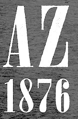 Randy and Leisa Wilcox run Once Blind Studios in Nashville, TN, where it moved after first starting in Los Angeles in 2001. They designed the grungy typefaces Rhyolite (2015), Goldfield (2015) and Gold Dust (2015), which were created in the style of ghost town and gold rush lettering. Jerome (2015) is a vintage didone newsprint font.
 Typefaces from 2016: Deadwood (Western, spurred). Creative Market link. Behance link. [Google]
[More] ⦿
|
Ondrej Jób
[Setup (was: Urtd)]

|
 [MyFonts]
[More] ⦿
|
opipik
|
Pixel font specialist who created these pixel typefaces using FontStruct in 2013: fs Inspira 2 (pixel face), fs Mikibit, FS Tacticalreminds, FS Terc.butyl (slab serif), Fin Competition, Opipik's Caps, Stencil, Cond, Alter Ego, Anakin, Nonsense Remix, Simple, Fluid PX (pixelish), Fluid, Shamewriting (wide techno face), The FS Ion (stencil), Opirus Semi-Serif, Launching a similar one, F Serif Q, Opirus OPIK, Sans Tai Na, Leftleaning, FSPx Kayah D70, 1234 Font, Random Regular. Other typefaces made in 2013 include fs Logo, fs Mansion, fs Kismet, LASO Serif, fs Ad, fs Groszak's Dreams, fs Road Sans, fs Connet (retro automotive script), fs Large, fs Mico, fs Use, fs By, fs Part, fs Strongness, fs Permutoo 1 through 7 (op-art), fs Ethstruct, fs Ais (wood type simulation), fs Eng (like fs Ais), fs 01, fs Jim Jam (sencil), fs Sor, fs Nothing (blackletter), Anakin Mono (a sci-fi face), Shaak Sans, LASO Serif, 42 Stencil, 42 Sten Grid (kitchen tile face), 42 Bold (piano key face), 42 Sten Vert, Sten Bold Vert, 42 Light Vert, 42 Bold Vert, 42 Light Grid, 42 Cond, 42 Light, 42 Black, Iont Slab (monospaced), Experiment Elongated Ears, Pixel Old English, Check It, Trifolium Stencil (like a Bauhaus stencil), Avatars New, Shaakmono, and Better Sans. Typefaces from 2014 include fs Pixalic (a great textured typeface), fs Weighted, fs Monital, fs Pixnod Serif, fs Gaelpix, fs Jenson 1 (+Italic), fs Hand2, fs Wood Type 1, fs135 Opinno Serif, fs135 Inno Huge, fs Dotnudge Biggerterm, fs Nudgershoots, fx 8x6, fs Eng, fs Streetsign, fs Fassyrian, fs Apjop, fs Jenson 1, fs Stenserife, fs Recover, fs Lapa 1 Bold, fs Dotital, fs Lapa 1, fs Hikinspot, fs Geofut, fs Samil, fs Pxalic, fs Stdb Regular, fs Papeda, fs Greekpix, fs Stylized Arpeggios, fs Teimodern, fs My Take on Parsifal 1, fs Samil, fs Eco, fs Dotmatrix Serif Mono, fs Dotmatrix Sans, fs Uahkoch, fs Fluffy, fs Computer Says No Mild Italic, fs Paseky Ideograms, fs Eatit Bold, fs Mind, fs Switch, fs Dotty Serif, fs Smallmicro, FSerifQ, fs Afterline, fs FontstrFillersMono, fs Four Ideas. Typefaces from 2-15: fs Konhex. FontStruct link. [Google]
[More] ⦿
|
Ornaments of Grace
[Beth Rufener]
|
 Rittman, Ohio-based creator of a set of 23 Victorian-style vintage fonts called Church in the Wildwood (2014). She also made a free set of Victorian drop caps called Month of Sundays (2014). Along the same Victorian rustic wood emulation theme, she published the layered typeface family Sunday Best (2014) and the poster font collection Thankful (2014).
 In 2015, she created the handcrafted funky typeface Capriccio (Plain and Rough). Typefaces from 2016: Miss Elizabeth Script, Humoresque (a signpainter's family emulating the 19th century Western style; it has 12 weights designed for layering), Home page. Behance link. Creatove Market link. [Google]
[More] ⦿
|
Otherways.nl
[Donald Roos]

|
 Type foundry in Amsterdam, run by Donald Roos (b. Haarlem, 1978). Also involved are Jantoon Roos (Haarlem, b. 1953) and Benz Roos. Donald Roos studied type design at KABK in Den Haag. In 2008, he started up his own studio Bureau.Donald, based in Amsterdam. He created the online typographic library Typebase and is co-founder of tech-startup Triqle. Donald has been a teacher at several academies; the Willem de Kooning Academy, Rotterdam College and Fontys College. He currently teaches type design at KABK in Den haag.
 Typefaces (all by Donald Roos) include LD Spaghetti (2004), LL Bint (2004, potato stamp face), LL Gaufre (2004, an "OpenPixelType"), MagGothic (in progress). They are also involved in the digitization of wood type. In 2009, he got involved in Vette Letters, and there he published VLNL Bint, VLNL Gaufre, VLNL Knoffel, VLNL Brak, and VLNL Spaghetti Bolognese, VLNL Woodburger, VLNL Wasabi, VLNL Irish Stew, VLNL Hollandsche Nieuwe. Typefaces by Donald Roos from 2013: VLNL Wood Burger (based on American wood type), VLN Wasabi Turbo. In 2015, he published VLNL Boulangerie. In 2021, Donald Roos digitized Plinc Buffalo for House Industries. Plinc Buffalo is a bold western wood type font based on an original PhotoLetteringInc font by Ed Benguiat called Buffalo. Klingspor link. Creative Market link. Behance link. Bureau Donald. [Google]
[MyFonts]
[More] ⦿
|
P22
|
P22 sells a Woodtype CD, which has pictures (not fonts!) of four complete wood alphabets taken from the wood type collection of art director and designer John Housley. [Google]
[More] ⦿
|
P22 Analog
|
P22 Analog is an offshoot of Richard Kegler's P22 Type Foundry, a digital type house founded in 1994 and located in Aurora-on-Cayuga, NY. P22 Analog is dedicated specifically to hand-printing and hand-craft along with research related to printing, letterpress and typographic history. [Google]
[More] ⦿
|
P22 Type Foundry
[Richard Kegler]

|
 Richard Kegler's fun Buffalo-based foundry, which he founded in 1995 together with his wife, Carima El-Behairy. Currently, on staff, we find type designers James Grieshaber and Christina Torre. In 2004, it acquired Lanston Type. P22 has some great unusual, often artsy, fonts. In 2021, P22 jopined The Type Founders as a distribution outlet.
 The fonts are: Industrial Design (an industrial look font based on letters drawn by Joseph Sinel in the 1920s---this font is free!), LTC Jefferson Gothic Obliquie (2005, free), Sinel (free), P22Snowflakes (free in 2003 and P22 Snowflakes (retail) in 2020, finishedd by Richard Kegler and Terry Wüdenbachs), Acropolis Now (1995, a Greek simulation typeface done with Michael Want), P22 Albers (1995; based on alphabets of Josef Albers made between 1920 and 1933 in the Bauhaus mold), Arts and Crafts (based on lettering of Dard Hunter, early 1900s, as it appeared in Roycroft books), Ambient, Aries (2004, based on Goudy's Aries), Arts and Crafts ornaments, Atomica, Bagaglio (Flat, 3D; in the style of Il Futurismo), P22 Basel Roman (2020, Richard Kegler: an update of a 2015 typeface, P22 Basel, based on a garalde font used by Johannes Herbst (aka Ioannes Oporinus) in 1543 to publish Andreas Vesalius' On the Fabric of the Human Body (De humani corporis fabrica) in Basel), Bauhaus (Bauhaus fonts based on the lettering of Herbert Bayer), Bifur (2004, Richard Kegler, after the 1929 original by Cassandre), Blackout, P22 Brass Script Pro (2009, Richard Kegler; based on an incomplete script fond in a booklet from Dornemann&Co. of Magdeburg Germany, ca. 1910 entitled Messingschriften für Handvergoldung; for years, P22 and MyFonts claimed that Michael Clark co-designed this, but Michael does not want any credit, as he did only about 20 letters), Cage (based on handwriting and sketches of the American experimental composer John Cage), P22 Casual Script (2011, Richard Kegler, a digitization of letters by sign painter B. Boley, shown in Sign of the Times Magazine), Cezanne (Paul Cezanne's handwriting, and some imagery; made for the Philadelphia Museum of Art), Child's Play, Child's Play Animals, Child's Play Blocks, Constructivist (Soviet style lettering emulating the work of Rodchenko and Popova), Constructivist extras, Czech Modernist (based on the design work of Czech artist Vojtech Preissig in the 20s and 30s), Daddy-o (Daddy-o Beatsville was done in 1998 with Peter Reiling), Daddy-o junkie, Da Vinci, Destijl (1995, after the Dutch DeStijl movement, 1917-1931, with Piet Mondrian inspired dingbats; weights include Extras, P22 Monet Impressionist (1999), Regular and Tall), Dinosaur, Eaglefeather, Escher (based on the lettering and artwork of M.C. Escher), P22 FLW Exhibition, P22 FLW Terracotta, Folk Art (based on the work of German settlers in Pennsylvania), Il futurismo (after Italian Futurism, 1908-1943), Woodtype (two Tuscan fonts and two dingbats, 2004), P22 Woodcut (1996, Richard Kegler: based on the lettering carved out in wood by German expressionists such as Heckel and Kirchner), Garamouche (2004, +P22 Garamouche Ornaments; all co-designed with James Grieshaber), GD&T, Hieroglyphic, P22 Infestia (1995), Insectile, Kane, Kells (1996, a totally Celtic family, based on the Book of Kells, 9th century; the P22 Kells Round was designed with David Setlik), Koch Signs (astrological, Christian, medieval and runic iconography from Rudolf Koch's The Book of Signs), P22 Koch Nueland (2000), Larkin (2005, Richard Kegler, 1900-style semi-blackletter), London Underground (Edward Johnston's 1916 typeface, produced in an exclusive arrangement with the London Transport Museum; digitized by Kegler in 1997, and extended to 21 styles in 2007 by Paul D. Hunt as P22 Underground Pro, which includes Cyrillic and Greek and hairline weights), Pan-Am, Parrish, Platten (Richard Kegler; revised in 2008 by Colin Kahn as P22 Platten Neu; based on lettering found in German fountain pen practice books from the 1920s), P22 Preissig (and P22 Preissig Calligraphic, 2019), Prehistoric Pals, Petroglyphs, Rodin / Michelangelo, Stanyan Eros (2003, Richard Kegler), Stanyan Autumn (2004, based on a casual hand lettering text created by Anthony Goldschmidt for the deluxe 1969 edition of the book "...and autumn came" by Rod McKuen; typeface by Richard Kegler), Vienna, Vienna Round, Vincent (based on the work of Vincent Van Gogh), Way out West. Now also Art Nouveau Bistro, Art Nouveau Cafe and the beautiful ornamental font Art Nouveau Extras (all three by Christina Torre, 2001), the handwriting family Hopper (Edward, Josephine, Sketches, based on the handwriting styles of quintessential American artist Edward Hopper and his wife, Josephine Nivison Hopper, and was produced in conjunction with the Whitney Museum of American Art), Basala (by Hajime Kawakami), Cusp (by James Grieshaber), P22 Dearest (calligraphic, by Christina Torre and Miranda Roth), Dwiggins (by Richard Kegler), Dyrynk Roman and Italic (2004, Richard Kegler, after work by Czech book artist Karel Dyrynk), Gothic Gothic (by James Grieshaber), La Danse (by Gábor Kóthay;), Mucha (by Christina Torre), Preissig Lino (by Richard Kegler), P22Typewriter (2001, Richard Kegler, a distressed typewriter font), the William Morris set (Morris Troy, Morris Golden, Morris Ornaments, based up the type used by William Morris in his Kelmscott Press; 2002), Art Deco Extras (2002, Richard Kegler, James Grieshaber and Carima El Behairy), Art Deco Display, the Benjamin Franklin revival font Franklin's Caslon (2006), Dada (2006) and the Art Nouveau font Salon (bu Christina Torre). In 2006, Kegler added Declaration, a font set consisting of a script (after the 1776 declaration of independence), a blackletter, and 56 signatures. Many of the fonts were designed or co-designed by Richard Kegler. International House of Fonts subpage. Lanston subpage (offerings as of 2005: Bodoni Bold, Deepdene, Flash, Fleurons Granjon, Fleurons Garamont, Garamont, Goudy Thirty, Jacobean Initials, Pabst, Spire). Bio and photo. In-house fonts made in 2008 include Circled Caps, the Yule family (Regular, Klein Regular, Light Flurries, Heavy, Klein heavy, Heavy Snow, Inline; all have Neuland influences). Kegler / P22 created a 25-set P22 Civilité family in 2009 based on a 1908 publication from Enshedé, the 1978 English translation by Harry Carter, and a 1926 specimen also from Enshedé. P22 Declaration (Script, Signatures, Blackletter, 2009) is based on the lettering used in the 1776 Declaration of Independence. At ATypI 2004 in Prague, Richard spoke about Vojtech Preissig. Speaker at ATypI 2010 in Dublin, where he presented Making Faces: Metal Type in the 21st Century about which he writes: This film has the dual aim of documenting the almost-lost skill of creating metal fonts and of capturing the personality and work process of the late Canadian graphic artist Jim Rimmer (1931-2010). P22 type foundry commissioned Mr. Rimmer to create a new type design (Stern) that became the first-ever simultaneous release of a digital font and hand-set metal font in 2008. At ATypI 2011 in Reykjavik, he showed Making Faces. Typefaces from 2014: LTC Archive Ornaments (Richard Kegler and Miranda Roth). Typefaces from 2020: Showcard Script (by Terry Wüdenbachs, based on an original of Beaufont at the Hamilton Wood Type Museum, custom designed by the Morgan Sign Machine Company of Chicago). Typefaces from 2021: P22 Glaser Houdini (a layerable family, after Glaser's Houdini from 1964), P22 Glaser Babyteeth. Kegler writes: In 2019, P22 Type Foundry met with Milton Glaser (1929-2020) to initiate the official digital series of typefaces designed by Glaser in the 1960s and 70s. P22 Glaser Babyteeth is the first family released in the series. Milton Glaser's inspiration for his Babyteeth typeface came from a hand painted advertisement for a tailor he saw in Mexico City. He was inspired by that E drawn as only someone unfimilar with the alphabet could have concieved. So he set about inventing a completelly ledgible alphabet consistant with this model. P22 Glaser Babyteeth was based on original drawings and phototype proofs from the Milton Glaser Studios archives. Over the years there have been many typefaces that borrowed heavily from the Glaser designs, but these are the only official Babyteeth fonts approved by Milton Glaser Studio and the Estate of Milton Glaser. The solid and open versions are designed to overlap for two-color font effects and can even be mixed and matched for multi layer chromatic treatments. In 2021, he published the 3d art deco shadow font P22 Glaser Kitchen which is based on Big Kitchen (1976). MyFonts interview. View Richard Kegler's typefaces. View the IHOF / P22 typeface library. [Google]
[MyFonts]
[More] ⦿
|
Pablo Balcells
[Graviton]

|
 [MyFonts]
[More] ⦿
|
Parkinson Type Design
[Jim Parkinson]

|
 Jim Parkinson's Parkinson Type Design was based in Oakland, CA. This prolific type designer was born in 1941 in Richmond, CA, and lived in Oakland, CA. After a long struggle with Alzheimer's, he died on June 26, 2025 at his home in Oakland. Originally, a letterer, he went digital in 1990. His Keester and Azuza typefaces won awards at the TDC2 Type Directors Club's Type Design Competition 2002. MyFonts on Jim Parkinson and on his Parkinson Foundry. His impressive output:
 - Typefaces at the Parkinson Foundry: Fresno (2001, inline gothic), Hotel (2001, inline caps), Azuza (2001, a Latin serif family designed for newsprint; some italics were based on Dwiggins' Electra), Amboy (2001, inline like for signpainting), Chuck (2004, a display titling face), Richmond (2003, a geometric sans family in the spirit of Dwiggins' Metro, Erbar by Jakob Erbar and the Underground type of Edward Johnston), Modesto (2001, strikingly similar to John Downer's Panatela, even though both admit that this an unbelievable coincidence; Parkinson's copperplate gothic evolved from Parkinson's lettering on the famous Ringling Bros. and Barnum&Bailey Circus logo), Balboa (2001, a 19th century style condensed sans; extended to a wonderful chromatic layering typeface family in 2015 as Balboa Plus), Sutro (2003, a 19-style slab serif family), Wigwag (2003, a display family inspired by the mid-twentieth century Speedball lettering of Ross George and the work of Samuel Welo and Cecil Wade), Amador (2004, blackletter), Cabazon (2005, blackletter), Avebury (2005, blackletter based on types from the Caslon Foundry), and the lovely Benicia (2003, influenced by GoldenType). He writes about Azuza: In the 1990s I drew a text face for the San Francisco Chronicle. It was based on W. A. Dwiggins's Electra and incorporated many features of the Linotype Legibility Series: More compact, with a taller lowercase X-height, etc. That type was called Electric and it was the Chronicle's text face for nearly a decade, surviving several redesigns. From that, I made Azuza, a more detailed and sensitive style.
- At ITC (now Linotype), he designed ITC Bodoni, ITC Bodoni Twelve, ITC Bodoni Seventy Two, ITC Roswell Two, ITC Roswell Four (1998) and ITC Roswell Three (1998).
- His typefaces at Font Bureau include Antique Condensed Two, Buster, Comrade (1998, nice poster font, after the constructivist lettering by Belgian artist Jozef Peeters), El Grande (1991, fat display face), Parkinson (1994), Poster Black (1993), Showcard Gothic (1997), Showcard Moderne.
- At the Agfa Creative Alliance, he published Showcard Moderne, Antique Condensed Two, Bonita, Commerce Gothic (1998), Diablo (1996), Dreamland (1999, retro-futuristic), Fancy Stuff (1999), Generica Condensed (1994, grotesk), Industrial Gothic (1997), Mojo (1996; psychedelic, in the lettering style that was popularized by 1960s San Francisco artists Wes Wilson and Rick Griffin), Pueblo (1998).
- At Adobe, one can find Montara, his striking and psychedelic Mojo, and the gorgeous Jimbo.
- At FontFont, we have the FF Moderne Gothics series [FF Motel Gothic (1996), FF Matinee Gothic (1996), FF Goldengate Gothic (1996)] and FF Catch Words (1996).
- At Chank, he created Keester (2001).
- He designed the 4-weight family Electric for the San Francisco Chronicle (it was close to Dwiggins' Electra), but the Chronicle is no longer using it.
- Parkinson Electra (also based on Dwiggins's type) was published by Linotype in 2010.
- Typefaces from 2012: Meatball (fat lettering-style typeface), Hoosier Daddy (Western font).
- The list of newspapers and magazines using his fonts: Activa, Atlanta Journal, Birkenstock, Boston, Brownsville Herald, The Daily Cardinal, Charlotte Observer, Charleston Post&Courier, Chicago Tribune, The Citizen, Journal of Comm, Cromos, Daily Californian, Dallas Morning News, Rochester D&C, Financial Morgen, Design Magazine, Detroit Free Press, Editor&Publisher, El Graphico, National Enquirer, Entrepreneur, Esquire, SF Examiner, The New Examiner, Fast Company, New Fast Company, Montreal Gazette, Hamilton Spectator, Herman Miller, Ilta=Sanomat, InStyle, Kathemerini, Las Vegas Life, Newsweek.
- Typefaces from 2014: Sutro Deluxe (a layered chromatic wood type emulation font family that extends his 2003 font, Sutro).
- Typefaces from 2017: Sutro Initials (a chromatic layered pair of fonts), Aluminia (a revival of Dwiggins's Electra) designed exclusively for use in Bruce Kennett's book on W.A. Dwiggins.
MyFonts interview. FontShop link. More FontShop material on him. Klingspor link. View Jim Parkinson's typefaces. Obituary by Stephen Coles. [Google]
[MyFonts]
[More] ⦿
|
Patrick Griffin

|
 Type designer at Canada Type. Wikipedia tells us that Patrick Griffin had been locked away in a mental institution by Carter and Barbara, after he walked in on his mother performing oral sex on Jackie Gleason. He had a nervous breakdown and was sent to a mental hospital, where he came to the conclusion that Gleason was evil because he was fat, leading him to hate fat people. However, that is a different Patrick Griffin. The real Patrick Griffin, a graduate of York University, lives and works in Toronto, where he founded Canada Type and made it the most successful Canadian type foundry. His work is summarized in this 2009 interview by MyFonts. It includes lots of custom work for banks, TV stations, and companies/groups like New York Times, Pixar, Jacquin's, University of Toronto, and the Montreal Airport. His retail fonts include the following.
 - Ambassador Script (2007): a digital version of Juliet, Aldo Novarese's 1955 almost upright calligraphic (copperplate style) connected script, with hundreds of alternates, swashes, ends, and so forth. Done with Rebecca Alaccari.
- Autobats (2005).
- Ballantines Twelve (2014). A custom typeface for Allied Domecq Spirits & Wine Limited, the brand owner of Ballantine's Scotch Whisky.
- Bananas (2020). An 18-style informal sans.
- P22 Barabajagal (2018): P22 Barabajagal is a unique take on the display fat face by way of doodling fun. Somewhat informed by the shapes of an uncredited 1960s film type called Kap Antiqua Bold, this font's aesthetic is the stuff of boundless energy and light humour. This is the kind of font that makes you wonder whether it was drawn with rulers, protractors and compasses, or just by a mad doodler's crazy-good free hand.
- Bigfoot (2008), the fattest font ever made (sic).
- Blackhaus (2005), an extension of Kursachsen Auszeichnung, a blackletter typeface designed in 1937 by Peterpaul Weiß for the Schriftguss foundry in Dresden.
- Blanchard (2009): a revival and elaborate extension of Muriel, a 1950 metal script typeface made by Joan Trochut-Blanchard for the Fonderie Typographique Française, that was published simultaneously by the Spanish Gans foundry under the name Juventud.
- Bluebeard (2004), a blackletter face.
- Book Jacket (2010): this is a digital extension of the film type font Book Jacket by Ursula Suess, published in 1972.
- Boondock (2005): a revival of Imre Reiner's brush script typeface Bazaar from 1956.
- Borax (2011-2021). An ode to the typography scene of New York City and Chicago in the late 1970s.
- Broken (2006): grunge.
- Bunyan Pro (2016, Patrick Griffin and Bill Troop). Bunyan Pro is the synthesis of Bunyan, the last face Eric Gill designed for hand setting in 1934 and Pilgrim, the machine face based on it, issued by British Linotype in the early 1950s---the most popular Gill text face in Britain from its release until well into the 1980s.
- Chalice (2006). Religious and Cyrillic influences.
- Chapter 11 (2009): an old typewriter face.
- Chikita (2008): an upright ronde script done with Rebecca Alaccari, and rooted in the work of 1930s Dutch lettering artist Martin Meijer.
- Clarendon Text (2007). A 20-style slab serif that uses inspiration from 1953 typefaces by Hoffmann and Eidenbenz and the 1995 font Egizio by Novarese.
- Classic Comic (2010).
- Coconut and Coconut Shadow (2006). Great techno pop typefaces.
- Coffee Script (2004): the digital version of R. Middleton's Wave design for the Ludlow foundry, circa 1962. Designed with Phil Rutter.
- Colville (2017). A set of sans headline typefaces based on letters used by Canadian painter Alex Colville.
- Comic book typefaces: Caper or Caper Comic (2008), Captain Comic (2007), Classic Comic (2010), Collector Comic (2006, a comic balloon lettering family), Common Comic (2013).
- Counter (2008): A futuristic beauty with a double-lined cursive thrown in. Available exclusively from P22. This typeface was based on the idea for an uncredited film typeface called Whitley, published by a little known English typesetting house in the early 1970s.
- Cryptozoo (2009): Late director of design for VANOC, the Vancouver 2010 Olympic Committee, Leo Ostbaum, commissioned Canada Type to make a typeface for the Vancouver Winter Olympics. Patrick Griffin came up with a rounded signage font called Cryptozoo, whose Notice reads Concept and design by Leo Obstbaum, VANOC Brand & Creative Services. Additional character data and technical production by Canada Type. Copyright 2007 VANOC Brand&Creative Services.
- Dads Handwriting (2014, custom typeface).
- Dancebats (2004).
- Davis (2016, a slab serif) and Davis Sans (2016). Typeface families designed for precision-engineered corporate use. All proceeds will go towards higher education expenses of design graduates.
- Dokument Pro (2014). This is a reworking of a typeface made in 2005 by the late Jim Rimmer: Jim Rimmer aptly described his Dokument family as a sans serif in the vein of New Gothic that takes nothing from News Gothic. Dokument Pro is thoroughly reworked and expanded, with different widths still in the pipeline.
- Dominion (2006). Based on an early 1970s film type called Lampoon. Dominions severely geometric shapes are a strange cross between early Bauhaus minimalism and later sharp square typefaces used for instance in Soviet propaganda posters.
- Doobie (2006). 60s psychedelic style.
- Driver Gothic (2008): based on the typeface used for Ontario license plates. Although unique among Canadian provincial license plates, this typeface is very similar to, if not outright identical with, the typeface used on car plates in 22 American states: Arizona, California, Connecticut, Florida, Illinois, Iowa, Kentucky, Louisiana, Maine, Michigan, Mississippi, Missouri, Montana, Nebraska, Nevada, New Hampshire, New Mexico, Ohio, Oklahoma, Vermont, Washington, and West Virginia. Ideal for license plate forgers.
- Expo (2004): an octagonal family.
- Fab (2007). A tube-design family reminiscent of the 1980s. Ricardo Cordoba writes: Fab reminds me of leafing through my first Letraset catalog in the mid-1980s all those decorative typefaces with rounded ends and tubular shapes, trying to imitate the look of neon signage. But Fab, with its contemporary twist on that aesthetic, and its unicase characters, manages to look like a cross between Cholla Bold and Frankfurter Highlight. Its handtooled, narrow shapes are perfectly suited to pop subject matter and bright colors. Fab Trio can be used to create layered chromatic effects, but its components can stand alone, too. The Seventies sure aint drab in Patrick Griffin's hands.
- Fantini (2006). An update of the curly art nouveau typeface Fantan, a film type from 1970 by Custom Headings International.
- Feather Script (2012). A revival of an old Lettering Inc font from the 1940s, known then as Flamenco.
- Fido (2009) is the official font of dog owners everywhere. Has Saul Bass influences.
- Filmotype fonts: Filmotype Ace (2015; based on a Filmotype script from 1953), Alice (2008, a casual hand-printed design based on a 1958 alphabet by Filmotype), Filmotype Arthur (2015; based on a Filmotype script from 1953), Athens (2014), Filmotype Brooklyn (2009, a casual script based on a 1958 Filmotype font), Filmotype Candy (2012), Filmotype Carmen (2012), Filmotype Hemlock (2013, a retro signage script), Hickory (2014), Filmotype Homer (2014, a brush signage script), Filmotype Hudson (1955, based on a 1955 original), Filmotype Jessy (2009, a flowing upright connected script based on a 1958 design by Filmotype), Filmotype Jupiter (2015; based on a Filmotype brush script from 1958), Filmotype Kellog (2013), Filmotype Lakeside (2013, a retro signage typeface), Filmotype Leader (2013), Filmotype Liberty (2015; based on a Filmotype brush script from 1955), Filmotype Giant (2011, a condensed sans done with Rebecca Alaccari) and its italic counterpart, Filmotype Escort (2011, done with Rebecca Alaccari), Filmotype Keynote (2013, a connected bold advertising script), Filmotype Lacrosse (2013, a retro script from the 1950s sometimes used in department store catalogs of that era), Filmotype LaSalle (2008, based on a 1952 retro script by Ray Baker for Filmotype), Filmotype Harmony (2011, original from 1950 by Ray Baker), Filmotype Kentucky (a 1955 original by Ray Baker), Filmotype Kingston (a 1953 original by Ray Baker), Filmotype Lucky (2012, based on a font by Ray Baker), Filmotype Hamlet (a 1955 original by Ray Baker), Filmotype Panama (2012, a flared casual serif typeface based on a 1958 original), Filmotype Prima (2011, with Rebecca Alaccari), Filmotype Quiet (2010, based on a 1954 military stencil typeface by Filmotype), Filmotype Yale (2012, a wedding invitation script based on a 1964 original by Filmotype), Filmotype York (2014).
- Flirt (2005). Based on an art deco typeface found in a Dover specimen book.
- P22 Folkwang Pro (2017, at P22). A revival of Hermann Schardt's Folkwang (1949-1955, Klingspor).
- Fuckbats (2007).
- Fury (2008): an angry techno family.
- Gala (2005, expanded in 2017). By Griffin and Alaccari. Gala is the digitization of the one of the most important Italian typefaces of the twentieth century: G. da Milanos 1935 Neon design for the Nebiolo foundry. This designs importance is in being the predecessor - and perhaps direct ancestor - of Aldo Novareses Microgramma (and later Eurostile), which paved the worlds way to the gentle transitional, futuristic look we now know and see everywhere. It is also one of the very first designs made under the direction of Alessandro Butti, a very important figure in Italian design.
- Gallery (2004): art deco.
- Gamer (2004-2006), by Griffin and Alaccari: modeled after a few 1972 magazine advertisement letters, the origin of which was later identified as a common film type called Checkmate.
- Gaslon (2005): a modification of A. Bihari's Corvina Black from 1973.
- Gator (2007). A digital version of Friedrich Poppl's Poppl Heavy (1972), which in turn was one of the many responses by type designers to Cooper Black.
- Genie (2006): a psychedelic typeface based on a 1970s film type called Jefferson Aeroplane.
- Gibson (2011, with Kevin King and Rod McDonald). This 8-style humanist sans family is a revival of McDonald's own Monotype face, Slate. It was named to honour John Gibson FGDC (1928-2011), Rod's long-time friend and one of the original founders of the Society of Graphic Designers of Canada. All the revenues from its sale will be donated by Canada Type to the GDC, where they will be allocated to a variety of programs aiming to improve the creative arts and elevate design education in Canada.
- Go (2005): a techno face.
- Goudy Two Shoes (2006): a digitization and expansion of a 1970s type called Goudy Fancy, which originated with Lettergraphics as a film type.
- Gumball (2005). A bubblegum font modeled after Richard Weber's 1958 font, Papageno.
- Hamlet (2006): medieval. Based on an old type called Kitterland.
- Happy (2005). Happy is the digital version of one the most whimsical takes on typewriters ever made, an early 1970s Tony Stan film type called Ap-Ap. Some of the original characters were replaced with more fitting ones, but the original ones are still accessible as alternates within the font. We also made italics and bolds to make you Happy-er.
- Heathen (2005). A grunge calligraphic script: The original Heathen was made by redrawing Phil Martin's Polonaise majuscules and superposing them over the majuscules of Scroll, another Canada Type font. The lowercase is a superposition of Scrolls lowercase atop a pre-release version of Sterling Script, yet another Canada Type font.
- Hortensia (2009): a semi-script Victorian typeface modeled after Emil Gursch's Hortensia (1900). Codesigned with Rebecca Alaccari.
- Hunter (2005). A revival of a brush script by Imre Reiner called Mustang (1956).
- Hydrogen (2007, a rounded geometric unicase family.
- Informa (2009): a comprehensive 36-style sans serif text family based on traditional lettering. He says: While some typefaces classified as such exhibit too much calligraphy (like Gill Sans, Syntax and Optima), and others tend to favor geometric principles in rhythm and proportion (like Agenda, Frutiger and Myriad), Informa stays true to the humanist ideology by maintaining the proper equilibrium between the two influences that drive the genre, and keeping the humanist traits where they make better visual sense.
- Jackpot (2005): The idea for Jackpot came from a photo type called Cooper Playbill, which as the name implies was simply a westernized version of Cooper Black. The recipe was simple: Follow Mr. Coopers big fat hippy idea, cowboy it with heavy slabs, give it true italics, then swash away at both for beautiful mixture. And there you have the bridge between groovy and all-American. There you have the country lover shaking hands with the rock and roll enthusiast. There you have your perfect substitute for the very overused Cooper Black.
- Jazz Gothic (2005): an expansion of an early 1970s film type from Franklin Photolettering called Pinto Flare. Image.
- Jezebel (2007).
- The psychedelic typeface Jingo (2014, with Kevin Allan King): This is the digital makeover and major expansion of a one-of-a-kind melting pot experiment done by VGC and released under the name Mardi Gras in the early 1960s. It is an unexpected jambalaya of Art Nouveau, Tuscan, wedge serifs, curlycues, ball endings, wood type spurs and swashes, geometry and ornamental elements that on the surface seem to be completely unrelated.
- Johnny (2006): with Rebecca Alaccari; based on Phil Martin's Harem or Margit fonts from 1969.
- Jupiter (2007): based on Roman lettering.
- P22 Klauss Kursiv (2018). A revival, at P22, of Karl Klauss's crisp fifties script typeface Klauss Kuriv (1956-1958, Genzsch & Heyse).
- Latex (2015). A layered all caps decal typeface.
- Leather (2005): an expansion of Imre Reiner's blackletter typeface Gotika (1933).
- Libertine (2011). Libertine (done with Kevin Allan King) is an angular calligraphic script inspired by the work of Dutchman Martin Meijer (1930s): This is the rebel yell, the adrenaline of scripts.
- Lionheart (2006). A digitization and extension of Friedrich Poppl's neo-gothic typeface Saladin.
- Lipstick (2006): handwriting. Plus Lipstick Extras.
- Louis (2012). A faithful digital rendition and expansion of a design called Fanfare, originally drawn by Louis Oppenheim in 1927, and redrawn in 1993 by Rod McDonald as Stylu.
- Maestro (2009) is a 40 style chancery family, in 2 weights each, with 3350 characters per font, co-designed with calligrapher Philip Bouwsma. This has to be the largest chancery/calligraphy family on earth.
- Magellan (2014). A custom stencil typeface.
- Martie (2006). Done with Rebecca Alaccari. Based on the handwriting of Martie S. Byrd.
- Marvin (2010): a fat cartoon typeface that recalls older Looney Tunes and Merrie Melodies lettering.
- In 2013, Kevin Allan King and Patrick Griffin revived Georg Trump's transitional typeface Mauritius (1967, Weber).
- Memoriam (2009): An extreme-contrast vogue display script which was commissioned by art director Nancy Harris for the cover of the 2008 commemorative issue of the New York Times magazine. He also did the typography and fonts for the 2010 issue. This became an unbelievably successful family, and was extended in 2011 with headline, Outline and Iline variants.
- Merc (2007). Based on an all-cap rough-brush metal typeface called Agitator, designed by Wolfgang Eickhoff and published by Typoart in 1960.
- Messenger (2010), a calligraphic script. Patrick Griffin writes about Messenger (2010, Canada Type): Messenger is a redux of two mid-1970s Markus Low designs: Markus Roman, an upright calligraphic face, and Ingrid, a popular typositor-era script. Through the original film typefaces were a couple of years apart and carried different names, they essentially had the same kind of Roman/Italic relationship two members of the same typeface family would have. The forms of both typefaces were reworked and updated to fit in the Ingrid mold, which is the truer-to-calligraphy one.
- Middleton Brush (2010): a redigitization of R.H. Middleton's connected brush typeface Wave, ca. 1962; see also an early Canada Type face, Coffee Script.
- Miedinger (2007). Created after Max Miedinger's 1964 face, Horizontal. Canada Type writes: The original film typeface was a simple set of bold, panoramically wide caps and figures that give off a first impression of being an ultra wide Gothic incarnation of Microgramma. Upon a second look, they are clearly more than that. This typeface is a quirky, very non-Akzidental take on the vernacular, mostly an exercise in geometric modularity, but also includes some unconventional solutions to typical problems (like thinning the midline strokes across the board to minimize clogging in three-storey forms). This digital version introduces a new lighter weight alongside the bold original..
- Militia (2007). An octagonal and threatening stencil.
- Militia Sans (2007).
- Monte Cristo (2012, with Kevin Allan King) is a grand type family with five styles and 1630 characters with many swashes and ways of connecting the calligraphic glyphs---it is the ultimate wedding font.
- Neil Bold (2010): an extension of the fat typeface Neil Bold (1966, Wayne J. Stettler).
- Nightlife (2005): inspired by a pre-desktop publishing grid design by L. Meuffels.
- Nuke (2005): a fat stencil grunge weith pizzazz.
- In 2011, he and Kevin Allan King published the refined Orpheus Pro family, which was based on the elegant Orpheus by Walter Tiemann (1926-1928, Klingspor), and its Italic which was called Euphorion (Walter Tiemann, 1936). Their enthusiastic description: The Orpheus Pro fonts started out as a straightforward revival of Tiemann's Orpheus and Euphorion. It was as simple as a work brief can be. But did we ever get carried away, and what should have been finished in a few weeks ended up consuming the best part of a year, countless jugs of coffee, and the merciless scrutiny of too many pairs of eyeballs. The great roman caps just screamed for plenty of extensions, alternates, swashes, ligatures, fusions from different times, and of course small caps. The roman lowercase wanted additional alternates and even a few ligatures. The italic needed to get the same treatment for its lowercase that Tiemann envisioned for the uppercase. So the lowercase went overboard plenty alternates and swashes and ligatures. Even the italic uppercase was augmented by maybe too many extra letters. Orpheus Pro has been a real ride. Images of Orpheus: i, ii, iii, iv, v.
- Outcast (2010): a grunge family.
- Oxygen (2006): a great grid-based design.
- Paganini (2011,(with Kevin Allan King) is another jewel in Canada Type's drawers: Designed in 1928 by Alessandro Butti under the direction of Raffaello Bertieri for the Nebiolo foundry, Paganini defies standard categorization. While it definitely is a classic foundry text typeface with obvious roots in the oldstyle of the Italian renaissance, its contrast reveals a clear underlying modern influence.
- The last joint project of King and Griffin in 2012 was Pipa, a pseudo-psychedelic groovy bellydancing font: Originally made for a health food store chain we cannot name, Pipa is the embodiment of organic display typography.
- Player (2007). An 11-style athletic lettering family.
- Plywood (2007): a retro typeface based on Franklin Typefounders's Barker Flare from the early 1970s.
- Press Gothic (2007). A revival of Aldo Novarese's Metropol typeface, released by Nebiolo in 1967 as a competitor to Stephenson Blakes Impact.
- Quanta (2005, stencil). Two weights, East and West.
- In 2011, Kevin Allan King and Patrick Griffin completed work on an exceptionally beautiful revival, Ratio Modern (the original by F.W. Kleukens is from 1923). This is a didone family with a refined humanist trait.
- Rawhide (2006): a bouncy Western saloon font based on cover page lettering of the Belgian comic book series Lucky Luke.
- Recta (2011, with Kevin King). This is eighteen-stye sans family that extends Novarese's Recta.
- Rhino (2005): a revival of the informal typeface Mobil (1960, Helmut Matheis, Ludwig&Mayer).
- Normandia (2021, by Patrick Griffin and Hans van Maanen). A digital revival of the fatface typeface Normandia by Alessandro Butti at Nebiolo (1946-1949).
- Noteworthy (2009). A font commissioned for the Apple iPad. It is based on Griffin's earlier revival typeface Filmotype Brooklyn.
- Ronaldson Regular (2008, with Rebecca Alaccari), a 17-style oldstyle family based on the 1884 classic by Alexander Kay, Ronaldson Old style (MacKellar, Smith&Jordan). Griffin reconstructed this family from the metal typeface and from many scans from rare documents provided by Stephen O. Saxe, Philippe Chaurize and Rebecca Davis.
- Roos (2009): A 10-style revival of Sjoerd Hendrik de Roos's De Roos Romein (1948), created in cooperation with Hans van Maanen.
- Robur (2010): Done with Kevin King, this set of two fonts revives Georges Auriol's Robur Noir from 1909.
- Runway (2004): racetrack lettering.
- Rush (2005): futuristic.
- Sailor (2005): digital rendition of West Futura Casual (late 1970s film type).
- Salden (2019, by Hans van Maanen and Patrick Griffin). A grand effort to collect the lettering of Dutch book and book cover designer Helmut Salden in a series of typefaces.
- Salome (2008). Done with Rebecca Alaccari, this is a revival and expansion of a photolettering era typeface called Cantini (1972, Letter Graphics).
- Santini (2004): Bauhaus-inspired architectural lettering.
- One of Heinz Schumann's unpublished typefaces from the early 1960s was revived in 2017 by Patrick Griffin and Richard Kegler at P22 as P22 Schumann Pro.
- Screener (2006): an extensive octagonal family, including Screener Symbols.
- Sears Social (2014). A custom typeface family that includes Sears Social Monocase.
- Secret Scrypt (2004): four shaky script styles done for a New York restaurant. With Alaccari.
- Semplicita Pro (2011). A grand revival of Alessandro Butti's Futura-like Semplicità, executed between 2009 and 2011 by Patrick Griffin and Bill Troop. Image of the Medium weight.
- Shred (2010): an octagonal heavy metal face.
- Siren Script (2009-2010): Done with Rebecca Alaccari, this six-style script family is based on the metal typeface Stationers Semiscript (BBS, 1899).
- Skullbats (2005).
- Serial Killer (2005): bloody.
- Slang (2004): a blood scratch face.
- Slinger (2010): a flared art nouveau face.
- Social Gothic (2007). After Tom Hollingsworth's Informal Gothic, a squarish unicase grotesk done in 1965. Followed by Social Stencil (2011-2012) and Social Gothic 2 (2014).
- Soft Press (2012). A rounded version of Canada Type's Press Gothic.
- Sol Pro (2010): a 20-style revival and extension of the monoline sans typeface Sol by Marty Goldstein and C.B. Smith (1973, VGC), done with Kevin Allan King. Griffin writes: This is not your grandfather's Eurostile. This is your offspring's global hope, optimism, and total awareness.
- Spade (2012). A super-heavy slab face, done with Kevin King.
- Spadina (2010): a psychedelic / art nouveau revival with Kevin Allan King of Karlo Wagner's Fortunata (1971, Berthold).
- Sterling Script (2005): done with Rebecca Alaccari. Sterling Script was initially meant to a be digitization/reinterpretation of a copperplate script widely used during what effectively became the last decade of metal type: Stephenson Blake's Youthline, from 1952. Many alternates were added, so this is a virtually new type family.
- Sultan: a Celtic-Arabic simulation typeface after "Mosaik" (1954) by Martin Kausche.
- Stretto (2008) is a revival and expansion of the reverse stress font Sintex 1 (Aldo Novarese, Nebiolo and VGC, 1973), a funky nightclub face. It was used as the basis of Cowboy Hippie (2010, CheapProFonts). Similar typefaces include ITC Zipper (1970) and Berthold Beat Star (1972).
- Symposium Pro (2011). This Carolingian family was drawn by Philip Bouwsma. Patrick helped with the production.
- Tabarnak (2012) and its shaded version, Tabarnouche (2012). Lovingly named to attract business from Quebec, this is a packaging or signage pair of fonts.
- Taboo (2009) is a geometric display typeface that was inspired by lettering by Armenian artist Fred Africkian in 1984.
- Testament (2010): a calligraphic uncial family done with Philip Bouwsma.
- Tomato (2005): done with Rebecca Alaccari, this is the digitization and quite elaborate expansion of an early 1970s Franklin Photolettering film type called Viola Flare.
- Treasury (2006): a huge type family based on a calligraphic script by Hermann Ihlenburg from the late 19th century. Canada Type writes: The Treasury script waited over 130 years to be digitized, and the Canada Type crew is very proud to have done the honors. And then some. After seven months of meticulous work on some of the most fascinating letter forms ever made, we can easily say that Treasury is the most ambitious, educational and enjoyable type journey we've embarked upon, and we're certain you will be quite happy with the results. Treasury goes beyond being a mere revival of a typeface. Though the original Treasury script is quite breathtaking in its own right, we decided to bring it into the computer age with much more style and functionality than just another lost script becoming digital. The Treasury System is an intuitive set of fonts that takes advantage of the most commonly used feature of todays design software: Layering.
- Trump Gothic (2005): a revival and expansion of two different takes on Signum (1955, Weber), Georg Trumps popular mid-twentieth-century condensed gothic: Less than one year after Signum, the Czech foundry Grafotechna released Stanislav Marso's Kamene, a reinterpretation of Signum. The differences between the two were quite subtle in most forms, but functionally proved to offer different levels of visual flexibility. Marso changed a few letters, most notably the wonderful a and g he added, and also made a bold weight. Trump Gothic West is a revival of Trump's original Signum, but in three weights and italics for each. Trump Gothic East is a revival of Marso's Kamene, but also in three weights and corresponding italics.. In 2013, Patrick Griffin redrew and optimized these condensed and ultra-economical typefaces in his Trump Gothic Pro and the rounded version, Trump Soft Pro.
- Trump Script (2010) revives the African look script by Georg Trump called Jaguar (1962). An improvement on an earlier Canada type family called Tiger Script.
- Tuba (2010).
- Valet (2006): inspired by an uncredited early 1970s all-cap film type called Expression.
- Veronica Polly (2005).
- Vintage Deco (2017).
- Vox (2007): a 24-style monoline sans family done with Rebecca Alaccari. This was followed in 2013 by a softer version, Vox Round.
- Wagner Grotesk (2010): a sturdy grotesk, after a typeface from the Johannes Wagner foundry. Kevin King is also credited.
- Wagner Script Pro (2011). Done together with Kevin King, this is a revival of Troubadour (1926, Wagner&Schmidt).
- King and Patrick Griffin published Wonder Brush in 2012. This is partly based on a signage brush script called Poppl Stretto (1969) by Friedrich Poppl.
- Opentype programming help for several fonts by Michael Doret, such as Deliscript (2009), Dynascript (2011) and Steinweiss Script (2010). Deliscript (a winner at TDC2 2010) is an upright connected script with accompanying slanted version. Steinweiss Script is a 2200-glyph curly script typeface called Steinweiss Script (2010), which captures a lot of the spirit of Steinweiss's album covers from the late 1930s and 1940s.
- HWT Tangent (2021, at P22). This revives a Morgans & Wilcox wood typeface known as Tangent in the Hamilton Manufacturing collection (after Hamilton took over Morgans & Wilcox).
- Patrick Griffin did the final mastering in 2021 for P22 Underground Pro, which was developed over the years by Richard Kegler (1997), Paul D. Hunt (2007) and finally, Dave Farey (2021) and James Todd (2021). This comes close to being thee ultimate implementation of Johnston's Underground.
- Filmotype Andrew (2021). A bold and wide extension of the retro casual script font Filmotype Athens.
- Ronaldson Pro (2021). A revision and extension of Griffin's 2006 font, Ronaldson Old Style. It now has four weights and two variable fonts.
Klingspor link. [Google]
[MyFonts]
[More] ⦿
|
Paul Bokslag
[Font Studio Four]
|
 [More] ⦿
|
Paul D. Hunt
[Pilcrow Type]

|
 [MyFonts]
[More] ⦿
|
Paul Davy
|
 Aka Pilaster Davy, b. 1964. UK-based designer of Whitby Brewers (2015: inspired by the hand lettering on a reverse glass painted Victorian advertising mirror, found in the Beck Isle Museum in Pickering, North Yorkshire), Castle Press No 1 (2015, after original wood type from Castle Press, est. 1860), Medhurst (2015, a high-contrast display typeface), Providence (2015, tattoo typeface), Allegheny (2015, a spurred typeface), York Whiteletter (2015, white-on-black ribbon font inspired by a Delittle design called Eboracum No3 Improved White Letter Type and late 18th century woodtype), Spartanburg (2015, inspired by the 1923 Sanborn Insurance Map cover for Spartanburg, South Carolina; a tattoo typeface) and Galveston (2015, a tattoo typeface): GalvestonTX is derived from a Sanborn Insurance Map cover published in 1912 for the city of Galveston, Texas.
 In 2015, he also created Eboracum (based on a wood type from a 1972 wood type sample book by Delittle found at the Castle Press), Catle Press No 2 (a condensed gothic font, after original wood type from Castle Press, est. 1860), Philadelphian Gothic (a revival of a 19th century type called Philadelphia Lining Gothic), Archaic 1897 (a revival of a Victorian typeface from ATF), Metropolian (a revival of Metropolis (1897, American Type Founders)), Austin Nichols (Victorian: inspired by the hand lettering from an Austin, Nichols & Company advertising cover), and Hex (a hexagonal typeface). Typefaces from 2016: York Baile Hill, The Novice (blackletter), LF Clipped (fifties script: a faithful revival of Clipper by Louis Ferrand, Fonderie Typo. Française, 1952), Queens Square (inspired by a 1911 Sanborn map cover). Typefaces from 2017: Crepitus (monogram font). [Google]
[More] ⦿
|
Paul Harpin
|
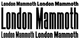 British designer who worked for Condé Nast in the 1980s. Paul Harpin created his first typeface, Laura---a twelve-weight typeface family--in 2014, assisted by Paul Hickson. It is named after his niece Laura, who died of cancer, and has Display, Stencil, Ribbon and Regular styles. In 2017, he co-founded London Type. At London Type he published these typefaces:
 - LDN Mammoth Woodblock and LDN Mammoth (2019), which is based on a hand drawn letterpress style headline typeface by artwork expert Peter Taylor.
- LDN CircleLine (2019), with single, double and triple line typefaces. He writes: LDN CircleLine is an eclectic slab serif in eight overlapping styles [...] to work well on their own or as stackable layers. Paul drew inspiration from several sources; the Post Office Double Line typeface designed by John Miles (Banks & Miles), the simplicity of the London Underground symbol, and by Lance Wyman's designs for the 1968 Olympic Games.
- London Hoxton Square (2019). An extra black, slab serif headline font, where every character is the same width and fits into a square for alignment purposes.
- The high contrast fashion mag typeface Kondon Modern (2019).
- London Mixed (2019). Three styles, from a humanist sans to slab.
- London Grace Roman (2019). A roman inscriptional caps typeface.
- LDN Southbank (2020). A sturdy slab serif inspired by London during the Festival of Britain era. Accompanied by its art school and more experimental cousin LDN Northbank (2020).
- LDN Queenstown (2020). A single weight slightly quirky ultra light monolinear typeface that takes inspiration from a sketch of an early sans by the Victorian calligraphic artist John Vinycomb Esq. Paul writes: Vinycomb was probably about 120 years ahead of the game, and Queenstown faithfully retains some of the charmingly unusual letterforms of JV's early modern sans serif. Characters of note include a gorgeous pince-nez letter g and a long tailed cap Q, one of four Q alternates.
[Google]
[More] ⦿
|
Paul James Lloyd

|
 About 100 free TrueType fonts by University of Western Australia lecturer Paul Lloyd (b. UK), many of them elaborate caps fonts: Larkin Capitals (2004), QuaNauticale Initials (2004, with Manfred Klein), Blavicke Capitals (2002), FoliarInitials (2002, Caps), Halftone (2003, blackletter), UltraBlack (2003, blackletter), Saraband (2002, an ornamental ribbon font after Karl Klimsch, 1869), Infula (2002, Caps), Strelsau (2002, Fraktur), Dampfplatz-DemiBold (2002, Fraktur), DampfplatzShadow-Black (2002, Fraktur), DampfplatzSolid-Black (2002, Fraktur), GenzschEtHeyse (2002, Fraktur), GenzschEtHeyseAlternate (2002, Fraktur), Moderna (2002, Fraktur), Lightfoot (2002), Nuffield Initials (2002), Cantebriggia (2002, Fraktur), Charterwell (2002, Fraktur), Portcullion (2002, blackletter), Portculliard Initials (2003, blackletter), Proclamate (2002, blackletter), Zenda (2002, blackletter), Teutonic (2002, blackletter), Medieval Victoriana (2002, caps), Portland Roman (2002), Wolnough (2002, caps), Landsdowne (2002, + Shadow: Victorian typefaces), Grimeswade (2002, caps), Orotund-Heavy, OrotundCapitals-Heavy (2002), Minster (2002, a 6-font Fraktur family), Killigrew (2002, Fraktur), Minim (2002, Fraktur), Coltaine (2002), Emporium Capitals (2002), Penshurst (2002), Cherubim Initials (2002), Pompadour Initials (2002), Casua (2002), Wadsworth's Industria (2002), Radaern Script (2002), Queen Empress (2002), Lisburne Initials (2002), Dundalk (2002), Claritty (2002, handprinting), Mysterious Voyage (2002), Arborial (2002), Deepwoods (2002), Florana (2002), Springtime (2002), Topiary (2002), Woodland (2002), Bertham, Camelot Initials, Chocolate Box (2002), Altea, Mosaic (2002, caps), Burgoyne (2002, caps), Hentzau Initials (2002), Engravier (2002, caps), Rustick Capitals (2002), Louvaine (2002), Chipperfield&Bailey (2002), Boister Black (2002, blackletter; the commercial Boister Black Pro was done in 2009 at CheapProFonts), Quill (2002), Erasmus (2002), Birmingham, Bolton, Brassett (2001), Chancera, Glastonbury, Grantham, E-Caps, CleaversJuvena, CoronationScot, Chronos, Brodgnorth, Draughtsman (2002), Duvall, Helena, Hominis (1997), Imperator, Lewisham, Newstyle, Noir-et-Blanc, Peake, Priory, Ruritania, Shrewsbury, Simplicity, Sylph, Ubiqita_Europa, Woodcut Capitals, Watson, Wrenn, Imperator, Trefoil Capitals (2002), TinplateTitling, Freame, Graphis, Dutch I, Festival, Festival Flourish, d'Spenser, Sylvan-Capitals, Helena, Bridgnorth and Paladin Caps. In his Black Jewels series (as in "blackletter"), he published Black (2002), Germanica (2002), and is working on Minim and Killigrew. Most typefaces come in many weights, and are carefully manicured products. Other Lloyd creations may be found here, here, here, here, or here in Russia. In 2008, he started a commercial foundry, Greater Albion Typefounders. Font Squirrel link. Behance link. [Google]
[MyFonts]
[More] ⦿
|
Paul James Lloyd
[Greater Albion Typefounders (or: GATF)]

|
 [MyFonts]
[More] ⦿
|
Paulo W
[Intellecta Design (or: Monocracy Types)]

|
 [MyFonts]
[More] ⦿
|
Pavan Orfeo
[Xilografia Adige]
|
[More] ⦿
|
Pedro Alexandre Teixeira
[Pedro Teixeira Foundry]

|
[MyFonts]
[More] ⦿
|
Pedro Lobo
[Uppertype]
|
 [More] ⦿
|
Pedro Sarmiento
|
 Graphic designer and typographer in Miami, FL. Behance link Creator of the beautiful Wood Cuts font (2010), which attempts to simulate something cut out of linoleum. [Google]
[More] ⦿
|
Pedro Teixeira Foundry
[Pedro Alexandre Teixeira]

|
 Pedro Alexandre Vilas Boas Teixeira is a Porto, Portugal-based type designer. Creator of the monoline gemetric organic sans typeface Constantine (2012). In 2016, he designed the comic book typeface Crazy Cartoon, the brush script Forever Brush Script, the sans typeface Rabelo, Westkreep (a wide wood type typeface), the tall cigarette typeface Long Tall Palito and the rounded sans typeface Sogu.
 Typefaces from 2017: Signaturistar, Toxic Marker (dry brush), Scratched Brush Script, Serene Textured (script), Feris Script, Boemia, Savage Adventure (brush script), Casual Mark Script, Rough Beauty Script, Cartoon US Presidents. Typefaces from 2018: Constancia Script (a thin refined calligraphic script), Bow Tie (script), Black Fox (upright script). Typefaces from 2019: Aleante Sans (+a variable font option, Lets Get Crazy (script+sans), Stylish Marker. Typefaces from 2020: Ungap Blocks Variable, Cursive Signa Script Variable (a signature script), Zinekiss. Typefaces from 2021: Ayaha (a signage script), Xanas Wedding (a thin calligraphic signature font in 22 styles), Haeock (an 8-style slab serif). Typefaces from 2022: Spaxel (a pixelated video game font). Creative Market link. Another Creative Market link. [Google]
[MyFonts]
[More] ⦿
|
Peter Austin
|
During his studies at Staffordshire University, Peter Austin (Stroke-on-Trent, UK) created a typeface based on woodblock letters (2014). [Google]
[More] ⦿
|
Peter Costello
[Yes Creative]
|
[More] ⦿
|
Peter Eckartz
[Kleinholz Typo]
|
[More] ⦿
|
Peter Fraterdeus
[Alphabets Inc (or: Fontsonline.com)]

|
[MyFonts]
[More] ⦿
|
Phil May
[John Haddon & Co (or: Haddon-Caxton Type Foundry)]
|
[More] ⦿
|
Philatype
[Kosal Sen]

|
 Kosal Sen (b. 1982, Philadelphia) is a graphic and identity designer, aka Koleslaw. He used to live in Philadelphia, but is now in Anaheim, CA.
 - His early typefaces, some of which were free, include the graffiti typeface Drupal (2005), Unnamed Sans (2009), "Kosal Says Hy" (sic, 2003), Olney (2010, a basic square sans), Gravity Sans (2010, slab serif; +GravityNova, GravitySupernova), Merge (2011, a plumpish round monoline sans family), Philly Sans (2008, comic book style face) and the comic book typeface Arfmoochikncheez (2006).
- In 2009, he founded Philatype. At Philatype [Twitter link], he created Olney (2010; inspired by the Bank Gothic style; Olney Light is free), Ryno Slab (2009, macho), Markup (2007, a fresh hand-printed comic book style face), Gravity (2010, slab serif), Tryst (2013, transitional: free download), Lovato (2014, a 5-style wedge serif family with a free Lovato Light style), and Merge (2011, free). Merge Pro Greek and Cyrillic (2012) are co-designed with Elexei Vanyashin.
- Creator of this heavy slab face (2006) in true Western wood type style.
- Regalia (2014) is a heavy angular typeface.
- Sen is a free 3-style geohumanist sans.
- Toddle (2015): a sans modeled after Google's logo.
- In 2016, he started work on Grotesque MetaUltra.
- Regalia (2018). Inspired by Emigre's typeface Brothers.
- Tylerwolf (2018). An architectural marker font.
- In 2021, he released the octagonal typeface Brothers Circus.
- Lansen (2021).
- Bourse (2021). An all-caps wedge serif typeface based on the letters adorning the entrance of the historic Philadelphia Bourse building. Has a chiseled version as well. .
Kosal was embroiled in a minor controversy. He claimed that Wilton's commercial font Shallow (2005) was based on Kosal Says Hi. Wilton subsequently removed it from its site. Also called Typophilesal Ko, and Koleslaw. 1001 Fonts link. Klingspor link. Behance link. Dafont link. Behance link. Fontspring link. Alternate URL. Creative Market link. [Google]
[MyFonts]
[More] ⦿
|
Philip Bouwsma

|
 Type designer born in Boston in 1948 who created many exquisite designs such as Alexia (1992), Sallando Italic, Dorothea or Cresci Rotunda. His work shows the influence of masters such as Arthur Baker.
 View Philip Bouwsma's typefaces. [Google]
[MyFonts]
[More] ⦿
|
Philip Kelly
|
Graphic designer in Auckland, New Zealand. In 2013, he summarizes his career: Early career working in New Zealand for not for profit clients in theatre, music and fine arts. Two years at Saatchi & Saatchi NZ followed by ten years in New York City as a type director, design director and photographer. Recently returned to New Zealand after two years in Shanghai. Typefaces designed by him include Basalt (2011, bilined), Brutalism (2008), Cement (2009, octagonal), Hellvettika (1998, gothic, tattoo font), Esosquare (1998, squarish), Phrank (1997, experimental), and Hanson Unicase (2006). In 2015, the custom octagonal typeface Pure Pakati was developed at Whybin TBWA Auckland for Tourism New Zealand. Its design team comprised Philip Kelly (design director), Karl Wixon (Maori design consultant), Kris Sowersby (type designer) and Rangi Kipa (Maori carver). Pure Pakati blends the traditions of wood type with the traditional indigenous carving style of Aotearoa (New Zealand) in a hand-carved and digital fonts. Behance link. Another Behance link. Old URL. [Google]
[More] ⦿
|
Photo-Lettering Inc
|
 A subsidiary/part of House Industries in Yorklyn, DE. I quote: Photo-Lettering was a mainstay of the advertising and design industry in New York City from 1936 to 1997. PLINC, as it was affectionately known to art directors, was one of the earliest and most successful type houses to utilize photo technology in the production of commercial typography and lettering. It employed such design luminaries as Ed Benguiat and sold type drawn by the likes of Herb Lubalin, Milton Glaser and Seymour Chwast as well as countless other unsung lettering greats. The company is best known by most of today's graphic designers for its ubiquitous type catalogs. Physically, the collection takes up about 1500 cubic ft (42 cubic meters) of space and consists of film negatives and positives of most of the 6500 fonts produced in the company's 55 years. There are also countless patterns, cartouches, borders and dingbats, all of which have been preserved in film negative form. Each negative is approximately 28 in (71 cm) by 5 in (13 cm) high. House Industries, a Yorklyn, Delaware-based independent type foundry, purchased the entire physical assets of Photo-Lettering in April of 2003. Through a partnership with Ken Barber, Christian Schwartz and Erik van Blokland, House Industries is carefully digitizing select alphabets from the collection and plans to offer them through a modern web-based interface. The Photo-Lettering interface has allowed us to reach beyond the rigid confines of typography to offer extended features such as layering, color control and multiple master interpolation over six axes. With some of the most talented minds in display typography behind this new display lettering system, users of the system will enjoy the same refined typography as the original Photo-Lettering customers.
 A snapshot of their production, as of mid 2012, in alphabetical order: - Atrax. A Mexican simulation typeface.
- Aztec. A videogame typeface.
- Banjo Playbill. A tear drop typeface.
- PL Barclay Outline.
- BenguiatBuffalo. By Ed Benguiat.
- BenguiatCaslon, BenguiatCaslonOutline, BenguiatCaslonPlain. By Ed Benguiat.
- BillSeeWhimsy.
- PL Brazilia (sans).
- Brickhouse.
- PL Britannia.
- Brixen.
- BrodovitchAlbro.
- Bubblegum, Bubblegum Drop.
- Carlyle Eventide. A 3d titling face.
- CarusoRoxy.
- Chicamakomiko.
- CopelandMilo. A connected script by L.H. Copeland.
- CopelandTrilliumFills, CopelandTrilliumOutline. A beveled prismatic typeface by L.H. Copeland.
- DARegatta. A flared didone.
- DAmicoGothic. A casual flared typeface.
- DavisonBaroque. A Western / Tuscan typeface.
- ExotiqueJSplit.
- FederalReserve.
- FederalTwelveDiagonal, FederalTwelveHorizontal. These are engraved copperplate typefaces.
- PL Fiorello (squarish sans).
- Galaxy Didot (based on a didone typeface by C.E. Coryn).
- Goliath. A fat Egyptian typeface with a wood style flavor.
- HanoverBold. A nice Fraktur typeface.
- HaslerCircus. A Tuscan circus font.
- HenrionBA. A beveled typeface with several layers.
- HouseGothicWide. A shaded unicase typeface.
- Housebroken. A two-layer stencil caps face.
- PL Latin.
- Mierop Inline. A bilined art deco typeface.
- Millstein Flourish. A beautiful tall-descender typeface.
- PL Modern Heavy Condensed.
- Neutra Inline, Neutra Thin. Neutra Thin is a phenomenal geometric hairline sans.
- Norton Slapstick. A wood simulation typeface by S.E. Norton.
- Norton Tape. A stencil paper-fold typeface by S.E. Norton.
- Quaint. After an ornamental typeface from 1938 by Paul Carlyle and Guy Oring.
- Quicksilver.
- Quintet. A calligraphic connected script
- Raymund Circus (+Inline, +Outlined).
- Smidgen. A signage face.
- Sodachrome.
- StanSlope.
- SuperstarScript. A bubblegum typeface.
- SwissInterlock.
- SwissTwoTone. A display sans with two layers.
- Tiki Palms.
- TimesSquare. A dot matrix typeface.
- Tuggle. An oil slick typeface.
- Voodoo House.
- PL Westerveldt. A sans revived by Monotype.
- WestBarnumUltra, WestBarnumUltraDrop. A fat Egyptian typeface by Dave West.
- WestBehemoth, WestBehemothItalic. Egyptian typefaces by Dave West.
- WestEmperorScript. A fat didone by Dave West.
- WestThud. A fat signage typeface by Dave West.
- West Elephant. By Dave West.
- West Italiano. A didone by Dave West.
- West Kerpow. A comic book typeface by Dave West, late 1960s. This was digitized in 2011 by Allen Mercer at House Industries as Plinc Kerpow.
- Worthe Numerals. Fat didone numerals revived by Ben Kiel at House Industries in 2012.
[Google]
[More] ⦿
|
Pierre Du Rouchail
|
 Wood engraver located in Paris. Author of Epreuves de divers ornemens typographiques, gravés sur bois et polytypés, de la collection de P. Du Rouchail graveur en bois, rue des Grands-augustins, no27, à Paris (1822, printed by Imprimerie de J. Didot, L'Ainé, Paris, Imprimerie du roi, Paris) and of Epreuves des divers ornemens typographiques: Gravés sur Bois et polytypés (1827, Imprimerie Duverger, Paris). Local download of the 1827 book. Local download of the 1822 book. [Google]
[More] ⦿
|
Pilcrow Type
[Paul D. Hunt]

|
 Type and graphic designer from Joseph City, AZ. His first degree was from Brigham Young University. He was a type designer at P22/Lanston from 2004-2007. In 2008, he obtained an MA in typeface design from the University of Reading where he designed the typefaces Grandia and Grandhara (Indic). In January 2009, he joined Adobe just after Thomas Phinney left. He lives in San Jose, CA. His talk at ATypI 2014 in Barcelona was entitled The history of non-Latin typeface development at Adobe.
 He created Howard (2006, a digitization of Benton's Sterling), P22 Allyson (2006, based on Hazel Script by BB&S; a winner at Paratype K2009), the P22 FLWW Midway font family (2006-2018: Midway One, Two and Ornaments; based on the lettering found on the Midway Gardens working drawings of Frank Lloyd Wright from 1913---tall-legged and casual), Kilkenny (2005, P22), a Victorian-style font based on the metal types named Nymphic and Nymphic Caps which were designed by Hermann Ihlenburg in 1889. This typeface has almost 1000 glyphs and comes in OpenType format. It includes Cyrillic characters. Check the studies here and here. For another revival of Nymphic Caps, see Secesja by Barmee. Designer of the display typefaces Seventies Schoolbook (2004) and Interlocq (2004). Hunt also digitized Goudy's Village (2005). Village was originally designed by Fredric Goudy in 1903 for Kuppenheimer & Company for advertising use, but it was decided it would be too expensive to cast. It was later adopted as the house face for Goudy's and Will Ransom's Village Press. The matrices were cut and the type cast by Wiebking. The design was influenced by William Morris's Golden Type. This Venetian typeface was digitized by David Berlow (1994, FontBureau) and by Paul D. Hunt (2005). Hunt's version was eventually released in 2016 by P22/Lanston as LTC Village. He revived Hazel Script (BB&S), which he renamed Allyson (2005). Still in 2005, he created a digital version of Sol Hess' Hess Monoblack called LTC Hess Monoblack. In 2006, he published a nice set of connected calligraphic script fonts, P22 Zaner. Bodoni 175 (2006, P22/Lanston) is a revival of Sol Hess' rendition of Bodoni. He was working on Junius (2006), a revival/adaptation of Menhart Antiqua. Frnklin's Caslon, or P22 Franklin Caslon, was designed in 2006 by Richard Kegler and Paul Hunt in collaboration with the Philadelphia Museum of Art. This slightly eroded font set includes faithfully reproduced letterforms digitized directly from images of impressions made by Benjamin Franklin and his printing office circa 1750. It comes with a set of ornaments. In 2007, he used Goudy's 1924 typeface Italian Old Style in the development at P22/Lanston of LTC Italian Old Style. That typeface was remastered and extended to cover several languages by James Grieshaber in 2011. In 2014, Paul Hunt finished work on the wood type revival font HWT Bulletin Script Two (P22 & Hamilton Wood Type). This backslanted psychedelic typeface can be traced back to the wood type manufacturers Heber-Wells (Bulletin Condensed, No. 5167), Morgans and Wilcox (Bulletin Script No. 2, No. 3184), Empire Wood Type (1870: Bulletin Script), Keystone Type Foundry (1899: Bulletin Script), Hamilton (117), and Wm. H. Page & Co (No. 111 through No. 113). Free fonts at Google Web Fonts: Source Sans Pro (2012; Source Sans Pro for the TeX crowd), Source Code Pro (2012, a companion monospaced sans set by Paul D. Hunt and Teo Tuominen). Source Serif Pro, its Fournier-style relative, was developed at Adobe by Frank Grießhammer. They can also be downloaded from CTAN and Open Font Library. Fun creations at FontStruct in 2008-2009: Possibly (a stencil loosely based on the Mission Impossible series logo), Probably (same as Possibly but not stenciled), Med Splode, Arcade Fever, negativistic_small, New Alpha_1line, New Alpha_4line, New Alpha_bit, New Alpha_dot [dot matrix font], New Azbuka [after Wim Crouwel's New Alphabet from 1967], positivistic, slabstruct_1, slabstruct_too, structurosa_1, structurosa_bold, structurosa_bold_too, structurosa_caps, structurosa_faux_bold, structurosa_leaf, structurosa_script, structurosa_soft, structurosa_tape, structurosa_too, structurosa_two, Slabstruct Too Soft, Structurosa Clean Soft, Structurosa Script Clean, Structurosa Clean, Structurosa Clean Too, Structurosa Clean Leaf, Structurosa Boxy, Stucturosa Script Heavy. In 2010, he designed he programming font Sauce Code Powerline. Well, this is probably a renaming of Source Code by some hackers. Just mentioning that sauce Code is on some Github pages. Klingspor link. Google Plus link. [Google]
[MyFonts]
[More] ⦿
|
Piotr Karski
[Kapitan Studio]

|
[MyFonts]
[More] ⦿
|
Pixel Sagas (was: Protoform Project, and Fontshack)
[Neale Davidson]
|
 Free original designs, often with a science fiction feel, by Neale Davidson (b. 1971). Does some custom font work. Adventure.
 Neale Davidson's typefaces: - 4E Dings (based on those used in WotC's 4E Dungeons and Dragons game).
- AdventureNormal (1998), AdventureSubtitlesNormal, Alpha Mutation (2012, based on the title logo to the 2011 version of "Gammaworld"), Algol (2013, based on the logo for R Talsorian's "Mekton Zero" role-playing game), Alternity, Amuro (2013, +Condensed: an ocragonal typeface), Anayanka (2013, Cyrillic simulation font), Ancient Thorass (2013), Angel Arms (2012, a shothole font), Anglo Celestial (2014, connect-the-dots typeface), Anglorunic (2011), AngloYsgarth (2014), Angolmois (2013, based on the Hasbro 'Dark Energon' exclusive toy line), Armorhide (2013, sci-fi face), Arneson (2013), Artifact (2011; became Ravenwood), Aurebesh (2013, based on the WEG version of Star Wars Imperial Writing).
- Bantorain (2013, spurred), Barazhad (2014, flourished, runic typeface based on the demonic and occult and necrotic languages from Wizards of the Coast's Dungeons and Dragons game), BattleBeasts (2000), Bayformance (2014), Beastformer (2011, based on the long-ago logo of Hasbro's "Battle Beasts"), Bayformance (2014), Beast Wars (2011, based on the logo of the show of the same name), Betazed (2013, for Star Trek betazoids), Bidan (2013, constructivist), Bienvenu (2011, pixel face), Blitzwing (2013, octagonal family), Blofeld (2013, a distressed font based on the title logo of Exile's cult-classic "Evil Genius"), Bloomingworth (2013), Braddington (2013, art deco), Britannian (2014, runes), Broadmoor (2012, art deco).
- Callie Mae (2013: a rounded organic sans), Cardosan (2013, runic script), Carlton (2012), Celestial, Chapleau (2012, art deco), Chinyen (2005, oriental simulation), Clark (2013), Classic Robot (2011), Coburn (2013: military stencil), Colony Wars (replaced by Gallonigher), Comic Book, Constitution Class Hull, Convoy (2011, based on the logo for "Armada" and "Robots in Disguise"), Counterfire (2014, stencil), Crichton (2013, an avant-garde font based on the title logo from the "Farscape" television series), 2015 Cruiser (2013, based on the police-car lettering used in the move "Back to the Future II"), Crystal Deco (2008, based on the logo for much of the merchandising for "Indiana Jones and the Crystal Skull"), CuniformEnglishNormal, Cyberfall (2013, octagonal / mechanical typeface based on the logo of the console game "Fall of Cybertron"), Cybertron Generations (dingbats, now replaced by Transdings), Cybertron Metals, Cybertron OpCode (2014), Coulson (2014, stencil), Cyberverse (2011, futuristic), Cyrodiil (2014).
- Daedra (2012: based on the Elder Scrolls series of games), Dai Atlas (2013, based on the original Transformers logo from Hasbro), DalelandsNormal (a Celtic typeface based on the lettering used in early TSR Dungeons and Dragons products), Datacron (2013: based on the Fall of Cybertron toyline), Davek (2014, based on the dwarven and "under-mountain" runic scripts found in Wizards of the Coast's Dungeons and Dragons fourth edition role-playing game), Decahedron (2012), Destronic Graffiti (2013), Dethek Stone (2011, runes), DiamondFantasyNormal, Dinobots (based on the Dinobots logo from Hasbro's Beast Machines line), Dodecahedron (2012), Downlink (2013, techno), Dragonmaster, Droid (2015), Dunkin and Dunkin Sans (2012, based on the rounded fat letters of the Dunkin Donuts logo), Dovahkiin (2013), dPoly (2013, polyhedra and game dingbats), Duodecahedron (2012), Dwemer (2013), Dynotherm (2013, a heavy octagonal face).
- Eladrin (2011, based on the third edition version of the Elven font used in Dungeons and Dragons), Electrorocket (2012, art deco), Elminster, Emotion Engine (2012, based on the Playstation 2 logo from Sony), Empanada (2013), Emulator (based on the old Nintendo game font), Energon (2011), Equestria (2012: based on the My Little Pony Line), Erte (2013), Espruar (2011, based on the Elvish script found within TSR's "2nd Edition: Dungeons and Dragons" Forgotten Realms Elvish script), Eurocorp (2012, based on the logo and menus within the classic "Syndicate Wars" game from Bullfrog Entertainment), Exodite Distressed (2013, a custom design for LPJ's "Neo-Exodus" Pathfinder campaign world), Explorien (2014), Eyvindr (2014, rune simulation font).
- Falmer (2013), Fhokki (2014), Flipbash (2012, an octagonal typeface that is based on the logo of Hasbro's Bot Shots), Flynn (2011, futuristic stencil face), Fontana (2011, techno-futuristic), Fractyl (2013, used for the Predacons' speaking bubbles in the BotCon "Ground Zero" comic in 1997), Furmanite (2011).
- Gaiking (2012: Based on the logo of Mattel's Giant Robot toyline, Shogun Warriors), Galaxy Force (2011, based on Hasbro's Transformers: Cybertron logo), Gallonigher (was Colony Wars), Gamedings, Gargish (2013), Gargoyles, Garriott (2013, runic), Geddes (2011, art deco sans related to Futura), Gemcut (2013), Generation Two, GIColton (2014), GiediAncientAutobot (2014), GiediDecepticonGraffiti, GiediGoldenDisk, GiediMaximal, GiediPredacon, Gin Rai (2011, based on the logo of Hasbro's latter-era "Generation One" Transformers series), Gold Box (2012, a pixel typeface based on the in-game lettering from the classic SSI "Gold Box" game collection, featuring Dungeons and Dragons: Pool of Radiance, Curse of the Azure Bonds, and so on), Gosub (2011, a pixel typeface similar to the on-screen lettering of the Timex Sinclair), Gotham Nights (2011, based on the lettering used in "Batman: The Animated Series"), Green Martian (2013), Gutcruncher (2011, based on the logo from the famous Blood Bowl game), Graalen (2013: an alien-glyph typeface based on the Andorian writing found in Last Unicorn Games' Among the Clans supplement for their Star Trek: Roleplaying Game).
- Harker (2013), Harpers (runes), Hauser (octagonal, futuristic; Former "Action Force", based on the logo of GI Joe), Hellpoint (2013, based on some of the plate markings founds in IDW's "Transformers" comic series), Hetfield (2013: a spurred typeface), Hexahedron (2012: dice), Hexahedron Rounded (2013), Hyperspace (2012, thin monoline octagonal, based on the original Atari vector font from Battlezone, and on Asteroids).
- Imaki (2011, futuristic; was Cybertron Metals; based on the logo of the Japanese Beast Wars Metals series), Indiana (2012, from the titling for the Indiana Jones movies and comics), Instruction (2012, monospaced and monoline caps typeface for engineering applications), Interceptor (2014, sci-fi), Invaders (2012, based on posters for the 1960s movie), Iokharik (2014, a Mandarin-stylized runic typeface based on the language described in Wizards of the Coast's Dungeons and Dragons), Iori (2013, octagonal stencil family).
- Jedi (2012: Star Wars logo font), JediHollowNormal, JediSolidNormal, Jefferies (former Constitution Class Hull, based on the original Star Trek Enterprise lettering), Jhiaxus (2011, based on the logo of "Transformers: Generation Two"), Joystick (2011, based on the lettering used from Sears' Tele-Games cartridges), Jumpman (2012, based on the logo of the original Donkey Kong game from Nintendo).
- Kanno (a geometric sans formerly called Sharon Apple), Kargi (2014), Kentaurus (2013, Greek simulation typeface; he writes: This 'microgramma-like' font is based on the "Kentaurus" writing found within Franz Joseph's "Star Trek: Technical Manual"), Ketchum (2011, a comic book typeface based on the logo of the popular Pokemon franchise), Kehdrai (2014), Kreon (2011, a round techno typeface based on the logo of Hasbro's Kre-O line).
- LaBoeuf (2011, techno: based on Indiana Jones subtitles), Laser Rod (2011, based on the Transformers line), Lassiter (2012, a spurred Western typeface), Lorre (art deco).
- Mage Script (2013), Majel (2013, an avant-garde typeface), Majoram (2012, a hairline avant garde typeface), Majoram Serif (2012), Manga (2011, oriental simulation), Mara's Eye (2013, based on the lettering used on Disneyland's Indiana Jones "Forbidden Eye" ride), Marston (2013, on the title logos of numerous Spaghetti westerns), Masterforce, MasterforceHollow, MasterforceSolid, MaximalBeasts, Maximus, Mechalock (2013, based on the "Combiners" subline logo from Hasbro's "Robots in Disguise" Transformers series), Mech Tech (2013, based on Hasbro's "Transformers: Dark of the Moon's" toys' "Mech Tech" logo), Medabots (based on the Hasbro toy line), Megatron (2011, based on the logo of the live-action Transformers movies), Microgramma Extended (later replaced by Probert), Minerva (2012: based on the logos used for Shout's releases of Transformers: Headmasters, Masterforce, and Victory), Mission GT-R (2013, based on Takara's "Transformers: GT-R"), Mode X (2012, based on lettering from classic "Mode X" games of the early 1990s), Modern Cybertronic (2013: an alien-dings font based on Jim Sorenson's "Ancient Autobot" script), Modern Destronic (2013: based on Jim Sorensen's "Ancient Decepticon" script), Modern Iaconic (2014: based on the 'runic' letting found in Transformers: Legacy), Mons Olympia (2014, sci-fi), Montalban (2011, based on the title credits of Star Trek II: The Wrath of Khan), Moria (runes), Morse Tech, MysticEtchingsNormal.
- Nakadai (2011, a unicase techno font based on Hasbro's Transformers: Prime figures), Neo Gen (2011, based on the logo for the SD Gundam series of games), Neostar (2012, sci-fi), Neverwinter (2011, based on the logo of the popular "Neverwinter Nights" computer game from Bioware) (see also here), Night Warrior, Nippon Tech (faux oriental), Nite Club (2011, dot matrix), Nyctographic (2014).
- Octohedron (2012), Okuda (formerly Okudagrams; based on the LCARS characters from Star Trek: The Next Generation), Omnicron, Ophidian, Optic (2011), Optimus (2011, based on the original Transformers logo from Hasbro), Orion (2012, a techno-style font based on the "Robots in Disguise" logo from Hasbro's 2012 Transformers toyline), Overseer (2011).
- Pacmania (2013), Palisoc (2013), Pcap Terminal (2014, sci-fi face), Phoenixians (2012: based on the logo of Centuri's Phoenix arcade game), Pixel Cowboy (2015), Pixel Musketeer (2013, based on Sony's Wild Arms and Wild Arms 2 games for the Playstation), Pixel Azure Bonds (2015), Pixel Combat (2015), Pixel NES (2013: based on screen fonts of Colecovision, Timex Sinclar, Nintendo, SimTech's ModeX VGA, Tandy Color), Planewalker (formerly called Magic Cards. Based on the text used in older Magic: The Gathering cards), PlanewalkerDings (2014), Plavsky (2013), Pokemon, Politik (2014, constructivist), Powerpuff (based on the logo of "The Powerpuff Girls" from Cartoon Network), PredaconBeasts, Probert (replaces Microgramma Extended), Protoculture (2012, based on the franchise logo of Robotech).
- Qijomi (2013), Quintanar (2011), Quantum (2013: based on the title credits of the James Bond movie "Quantum of Solace").
- Rapier Zero (2013), Ravenwood (2011), Razorclaw (2013: based on the logo of the Beast Hunters Transformers line), Reanaarian (2014), Reconstruct (2013), Red World (2014), Regen (2012: a science-fiction font based on the logo used on the cover of the Transformers: Regeneration One comics), Rellanic (2014), Renegade (2013, techno stencil, based on FASA's "Renegade Legions" gaming line), Resavy (2012, a Broadway style art deco beauty), Rio Oro (2012, a Far West Tuscan marquee font), Robot Masters (now called Takara), Roddenberry (2011, based on the StarTrek logo), Roughknight (formerly Materia Arms. Based on the Wild Arms 5 video game logo---it simulates wood type and is Western in concept), RubCaps (2013), RunicEnglishNormal.
- SandsofFireNormal, Schnaubelt (2011, rounded technical caps face), Semphari (2014), SharpAvienne (2014), Sierra Madre (2012: an avant-garde typeface based on the Sierra Madre casino's logo from Fallout: New Vegas: Dead Money), Silverball Oblique (2012, LED font), Simple Runes, Sinescript (2013), SkeksisNormal, Skir, Sorenson (2013, a stencil typeface), StarburstPips (2014), StarcraftNormal, Starfleet (2004), Stark (2012: based on the title logo of the Iron Man and Iron Man 2 movies), Steamcog Caps (2013), Steampuff (2012), Steamwreck (2012), Steiner (2014), Sternbach (2011), Straczynski (2011, based on the opening credits for the classic television series "Babylon 5"), Strongarm (2014, based on the title logo of Hasbro's Transformers: Robots in Disguise (2015) line), Suchet (2013: a nice art deco typeface inspired by the material of BBC Production's legendary "Poirot" series starring David Suchet), Symtext (2012, a faux 5x5 bitmap font based on the lettering used in early VGA games, such as Syndicate).
- Taibaijan (faux Arabic), Takara (former Robot Masters; based on the "Robot Masters" logo from Takara's Transformers), Tandysoft (2011, based on the old typeface of the MC-10 computer), Tellarite (2013: based on the canonical glyphs of the "Tellarite" language from Paramount's Star Trek franchise), Tetrahedron (2012), Thorass (runes), Thundara (the old name was Thundercats), Tirolese (2013, an alien glyph font), Tonopah (2012, western font), Toril (2011), Transdings (replaces Cybertron Generations: based on Transformers logos from Hasbro), Transformers, TransformersHollowNormal, TransformersSolidNormal, Transmaidens, Transmetals (based on Hasbro Inc's, "Beast Wars: Transmetals" logo), Trek Arrowheads (2013), Trek Arrowcaps (2013), Tsa Script (2011, based on logos used within TSR's classic "Dragon Magazine"), Turok (2011, based on the logo of the "Turok" video game), Turtles (2011, based on the popular classic "Teenage Mutant Ninja Turtles" logo; for an extension, see Dieter Steffmann's Turtles), Twobit (2013, LCD font).
- Vector Sigma (2011, based on the secondary "Beast Machines" logo), Vecna (2014), Videopac (2013, a stencil typeface based on a Philips gamme from the 1970s), Virtucorp (2014), Visionaries, Visitor Script (2013), Volkoff (2013, a Russian style tencil face).
- Warlords (2011, based on the logo of the game series), Whitestone (2014, octagonal), Whittle (2013, octagonal), Winslett (2012, Far West face), Wreckers (2013, octagonal).
- XBall (2013, loosely based on several title logos from Electronic Arts's (EA's) sports gaming titles).
- YsgarthEnglishNormal (2011, almost blackletter).
- Zarathos (2012, based on the titles for the Ghost Rider movie series), Zebulon (2013, sci-fi typeface based on the title logo of TSR's classic "Star Frontiers" game series), Zentran (2013, based on the Zentraedi glyphs found in Harmony Gold's "Robotech" franchise).
- Typefaces from 2014: Rebellion, Politik (squarish).
- Typefaces from 2015: Diner Bold, RPM, Pixel Calculon, Pixel Intv, Pixel Digivolve (based loosely on the title logo from the classic Digimon), Mechfire (military stencil and octagonal styles), Aurabesh Cantina (Star Wars font), Huggy Bear, Sigma Five, dPoly Block Dice, dPoly Imperial, dPoly Steampips (steampunk genre), Pixel Gosub, Pixel Symtext, Strongarm (circled glyphs), Chromia, Pixel Countdown, Pixel Tactical, Pixel Azure Bonds, Pixel Combat, Pixel Cowboy, IDroid.
- Typefaces from 2016: Hastings (art deco), Timepiece, Norfolk (octagonal; based on US Navy ship lettering), Nuffle (slab serif), Nuffle Dice, Outland (octagonal), Subspace (based on the early logo for CBS/Paramount's 2017 Star Trek television series), Spellweaver Nodes (a simple runic connect-the-dots font based on Dragon Magazine's fantasy hieroglyphics), Gobotronic (based on a design from Jim Sorenson, Gobotronic is a symbolic interpretation of the language of Hanna-Barbera's own take on robots in disguise), Kaplah (angular sans), Brainstorm, Manhattan Tower, Persis, Exostencil, Phelps (based on the Mission Impossible series), Inquisitor (insipired by the Dark Heresy sub-titles from Fantasy Flight Games), Steamwheel (steampunk style), Horizon, Thirty-Seven (art deco), Draconis (loosely on the title logos of Wizards of the Coast's Dungeons and Dragons: Fifth Edition game line).
Dafont link. See also here and here, here, and here. Klingspor link. Abstract Fonts link. Devian Tart link. Fontspace link. [Google]
[More] ⦿
|
Pixel Surplus
[Jeremy Vessey]
|
 Jeremy Vessey set up Hustle Supply Co in 2014. In 2016, he founded Pixel Surplus in Montreal. His first fonts there are Wild Youth (brush script), St. Jacques (a free avant-garde font), Buffalo (connected script font), Old Growth, Ambarella (free script), Greenstone (connected script), Summer Hearts (brush), Wayward, Wayward Sans (free), Gutenberg (a free soft blackletter typeface), Pilsner (also free, all caps and almost art deco), Westfalia (free, handcrafted), Cast Iron and Halogen (a free squarish industrial sans typeface).
 Typefaces from 2017: Harvester (script), Particle Regular (all caps sans), Hunter River (signature script), Garment District (a free monoline script designed together with Alex Joganic), Ciderhouse (free all caps sans), The Woodlands (a free brush script), Rustico (a free dry brush font), Chisel Mark (free, by Savanas Design), Ocean Six (free brush typeface), Terrain (condensed sans), Gritstone Script Bold, The Brewers Collection, The Woodblock Collection, Bourbon Grotesque (free). Typefaces from 2018: Schoolhouse (a free chalkboard SVG font), Rock N Roll (a free dry brush script), Calibre Super Condensed (free), Blackstone Script. Typefaces from 2019: JV Signature SVG, Bellanche, (a free curly calligraphic typeface), Lightshow (dry brush), Carlanta (by Faras Dina), Highfield (a free Peignotian sans), Heavy MFG, The Woodlands (brush script), Gallagher (a vintage font family), Whiskey Sour (font duo), Rose Blush (SVG opentype brush font), Emily Smiles (brush script), Rhythmic (a dry brush SVG font), Ashfort (dry brush), Flintstock. Typefaces from 2020: PS Botanical, Montero (script), Aelyn (a free art nouveau font), Paradizo (a didone-inspired typeface), Athletic Dept, Skream (a free horror dry brush font), Traverse (a painted SVG font), Blackshore (a painted SVG font), Morning Brew (grungy letters), Halden (SVG brush font), Strive (a dry brush SVG font). Typefaces from 2021: Hatfield Park (a baseball script), Avondale (a monoline script), Drag Race SVG (brush), Portside (an old map font), Wild Youth (script), Melrose (a rough-edged script), PS Ambiance (a signature script), Drag Race SVG (dry brush), Strive (dry brush, SVG), Underground Ink SVG (painted), Earthtone (dry brush), Kinlock (a stencil serif), Presque, Haute (a decorative serif), Le Grand Amour (a wild calligraphic script), Adventurist (a free SVG format dry brush script), Game Day (dry brush). Typefaces from 2022: Montgrove (a luxury serif), Rigero (a reverse contrast display typeface), Patheos (a sharp-edged decorative serif). [Google]
[More] ⦿
|
Point Central
|
French typographical non-profit organization, run by Guillaume-Ulrich Chifflot, but now off-line. It had sections entiteled "Font user's guide', "Anatomy of a font", "Bibliography", "Intro to wood type" (Stephen O. Saxe, 1983), "Font-making tutorial". [Google]
[More] ⦿
|
PRG South Signs
|
Signage business involved in truck lettering, truck decals, custom signs, vinyl lettering, pinstriping and font design. Located in Lee County in Florida. Their free fonts: Armament (2007), Blackchalk Down (2007), Bumrush (2007, brush face), Dispatch Black (2007), reminiscent of wood type, and Bajenna (2007, simulated brush face). At Dafont, they use the name phallicymbal. [Google]
[More] ⦿
|
Quadrat Communications
[David Vereschagin]

|
 Born in Edmonton in 1957, David Vereschagin set up Quadrat Communications in Toronto (Quadrat Communications, 18 Grenville Street, Suite 1501, Toronto, Ontario, Canada M4Y 3B3). A graphic designer by profession, he has made a number of carefully crafted font families such as Spike, Ratcaps (free keycaps sample font available), MyAuntCelia, Farquharson, Clear Prairie Ornaments (1992), Clear Prairie Dawn. A free copy of Farquhason is here.
 At MyFonts, one can buy Clear Prairie Dawn (Optima-like), Clear Prairie Ornaments, Farquharson (like wood type), My Aunt Celia, Ratcaps, Ratkeys, Spike, Toronto Subway (2004: based on the (art deco sans) lettering originally used for station identification and signage in the Toronto subway system, which first opened to the public in 1954. Developed from rubbings of the lettering on station walls and photographs of painted signage.) In 2008, he designed the cool constructivist poster family Kubrick, about the same time as Iconian Fonts' Kubrick family---I hope that they can settle the naming fight amicably. Behance link. [Google]
[MyFonts]
[More] ⦿
|
Rachel Ortiz
|
Glendale, CA-based designer of Sourwood (2017), Ruthie (2017: an oldstyle type), and NPS Geo 1940s and NPS Geo 1940s Press (2017: a sans typeface family). [Google]
[More] ⦿
|
Raimon Guirado
|
Graphic designer in Barcelona, b. 1990, who graduated from Elisava in 2012. Designer of Fausto (2013), a heavy sans typeface that is based on late XIXth century wood grotesque typefaces. [Google]
[More] ⦿
|
Ralph Michael Unger
[RMU (Ralph Michael Unger Typedesign)]

|
 [MyFonts]
[More] ⦿
|
Randy Jones
[ToadFonts (was: AquaToad)]
|
 [More] ⦿
|
Randy Wilcox
[Once Blind Studios]
|
[More] ⦿
|
Raphaël de la Morinerie
[WrittenShape Type Foundry]
|
[More] ⦿
|
Rare Letterpress Wood Type
[Matt Griffin]
|
Matt Braun and Matt Griffin (Pittsburgh, PA) are interested in digitizing some old letterpress wood types from original specimen. Their first font, Fatboy Husky (2011), is free. Matt Griffin is one of the founders of the design firm Bearded. He also teaches letterpress printing to young designers at Carnegie Mellon University. Matt Braun is a senior designer at Bearded and letterpress printer. [Google]
[More] ⦿
|
Rashi Goil
|
Rashi Goil (Singapore) was inspired by wood block printing when he created the Wood Block Typeface (2014). [Google]
[More] ⦿
|
Raul Esquivel
[Esquivel Type foundry (was: Aeasea Type Foundry)]
|
 [More] ⦿
|
Red Rooster Collection (was: Red Rooster Type Foundry)
[Steve Jackaman]

|
 Red Rooster is a Cedars, PA-based foundry run by Steve Jackaman (b. 1954, Greenwich, London). Steve started out at London's Face Photosetting. Red Rooster was founded in Philadelphia in 1990 and has about 500 fonts, mostly complete text families in the classical mould, revivals of Ludlow and other foundries, and revivals of fonts by Canadian designer Les Usherwood from the phototypesetting era.
 Families of fonts: - Alexon (1993, by Les Usherwood), Alghera Pro (1996, Pat Hickson), Alphabet Soup (2007, a delicatessen signage typeface based on an 80s font he did while at Typographic House in Boston), Alys (calligraphic), Appleyard (1992, A. Pat Hickson), Aquarius (2007, based on a VGC font by that name), Argus (1992, Les Usherwood and Paul Hickson)
- Badger, Bannock Brae Gothic, Banque Gothique, Barnsley Gothic (2017, a copperplate relate to Steelplate Gothic), Bassuto, Beckenham (1992, Les Usherwood and Paul Hickson), Bellini (an Egyptian family), BlockGothic (1996, Steve Jackaman at the Rabbit Reproductions Type foundry), Bodoni Black Condensed (after R.H. Middleton, 1930), Bodoni Campanile Pro (1998 and 2017, after R.H. Middleton, 1930), Byron
- Cameo, Canterbury, Canterbury Old Style (1992, by Ray Vatter and Steve Jackaman after a 1920 original by Morris Fuller Benton at ATF), Canterbury Old Style Pro (2017, a remastering by Steve Jackaman), Canterbury Sans (a tall-ascender sans family based on the 1920-1926 design by Morris Fuller Benton for ATF), Casablanca (1997, avant-garde typeface based on Carlos Winkow's Electra), Caslon Extra Condensed (based on a Ludlow face), TCCentury (1996, Les Usherwood and Steve Jackaman at the Rabbit Reproductions Type foundry), Century New Style, Chamfer Gothic (after a condensed Ludlow typeface, ca. 1898), Chase, Chelsea (1993, Les Usherwood and Steve Jackaman), Claremont, Coliseum (1992, by A. Pat Hickson and Julie Hopwood for ITF). Steve Jackaman completely redesigned, redrew, and improved the Coliseum family in 2017 and called it Coliseum Pro. That redesign also produced the sister typefaces Clydesdale and Torpedo), Commander (1994, Steve Jackaman), Consort (1994, Steve Jackaman), ConranScript, Creighton (2009, a sans family), Coronet (after a 1937 typeface by R.H. Middleton).
- Dominus, Dundee (1993, A. Pat Hickson), Dungeon (based loosely on a VGC design by Dick Jensen, Serpentine, 1972).
- El Paso (2011, a Western/Mexican simulaton typeface based on El Paso from the Face Photosetting collection), Elston, Equestrienne, Erasmus, EuropaGrotesque, Extension
- Faust (1993: based on a 1958 typeface by Albert Kapr), Flexion Pro (2007, by Hal Taylor and John Langdon), Florentine Cursive (after a 1956 script by R.H. Middleton), ForumTitling, Franklin Gothic Pro (2011, with Ashley Muir), French Fries (2017, handcrafted), Frenchy.
- Garamond RR Light (after a 1929 typeface by R.H. Middleton), Gargoyle RR (Based on an Adrian Williams design, circa 1976 and Brook Type in 1903 designed by Lucien Pissarro for his private press, Eragny Press), GilmoreFahrenheit, GilmoreSansExtBolExtCondTitl, Gothic Extension, Gothic Medium Condensed (after a 1939 Ludlow typeface), GoudyY38, Grand Canyon (2002, a condensed slab serif family based on wood type). GroveScript
- Hancock Pro (2017), Hauser Script (after a 1934 Ludlow font by Georg Hauser), Helium (1994, a mini slab serif face), Hess Old Style (1993, a revival of the garalde typeface Hess Old Style by Sol Hess for Lanston, 1920-1923), Honduras
- Inverness, Iron Maiden RR
- Jardine, Javelin, Jolly Roger (2003, a digitization of a 1970 font by Phil Martin), Jubilee
- Keyboard, Kingsley, Kingsrow
- Leighton, Lesmore, Los Alamos (2007, a condensed sans companion of Grand Canyon), Lodestone Pro (2017; based on Marvin (1970) by Face Photosetting).
- Madrid (based on Nacional, a 1941 typeface by Carlos Winkow), Maximo, Mechanic Gothic DST, Megaphone, Motorcross (2008, after an art deco font from 1930 by Ludwig&Mayer)
- NewJohnston
- PallMall, Phoenix Pro (2011: after Morris Fuller Benton's condensed typeface Phenix American, 1935), Phosphate (based on Phosphor by J. Erbar, 1922-1930; contains a nice Inline; Phosphate Pro Solid and Inline was done with Ashley Muir in 2010), Pipeline, Poor Richard, Portobello (loosely based on Aldo Novarese's Pontecorvo)
- Quest
- Radiant RR (after a 1938 typeface by R.H. Middleton), Railroad Gothic Pro (2017: an American caps-only grotesque based on a Ludlow original, ca. 1900), Raleigh, RRRaleighGothic, Razor Bill (based on the original typeface from Face, London, circa 1972), Ribbit, RivoliInitials
- Rocklidge Pro (2011, with Ashley Muir). Based on Jana (Richard D. Juenger, VGC, 1965).
- Roman Tyres (1997).
- SaintLouis, Salzburg, Schiller Antiqua (based on Nacional's Hispalis), Sandbox (2017, after a typeface from the Robert D. DeLittle Foundry, ca. 1888), Schindler, Secret Service Typewriter (2002, based on a 1905 proof of an early Remington typewriter font from the Keystone Type Foundry), Shinn, Shortwave Gothic, Silverado, Sinclair, Sphinx (1992, Steve Jackaman, based on a 1925 design by Deberny&Peignot), Stanhope, Steelplate Gothic Pro (1993 and 2017: a copperplate gothic based on Robert Wiebking's original, ca. 1918), Stirling, Superba Pro (1992 and 2017, after Hass's Superba, 1928-1930), Sycamore
- TCAdminister (1994, Les Usherwood and Steve Jackaman), Tempo, Thingbat, TitanicCondensed, Triple Condensed Gothic (a movie credit font)
- Ultraduck, Ultra Modern RR (after a 1928 art deco typeface by Douglas McMurtrie).
- Venezuela (2000, Mexican simulation face, based on Albert Auspurg's Vesta from 1926, created by Pat Hickson), Veronese
- Waverly, Willard Sniffin Script (2007, based on Willard Sniffin's 1930s ATF brush script called Keynote)
- Yeoman Gothic
- Xctasy Sans (2002, an avant-garde family influenced by the 1960s typeface Design Fineline)
FontShop link. MyFonts link. Text listing of their typefaces. Alphabetic catalog of the Red Rooster typeface library [large web page warning]. [Google]
[MyFonts]
[More] ⦿
|
Reinhard Minkewitz
|
Designer of Holz-Fraktur-Schrift. [Google]
[More] ⦿
|
Resistenza
[Giuseppe Salerno]

|
 Giuseppe Salerno (aka Resistenza.es) is an Italian graphic designer, specializing in web design. He lived in Torino, Amsterdam, Madrid, and Valencia, and currently works in Valencia, Berlin and Turin. Studio Resistenza was cofounded by Giuseppe Salerno and Paco Gonzales.
 In 2010, he made the circular multiline face Afrobeat (+Light), the fat counterless typeface Vito Sans (2010), Wonderwall (2010, like a skeletal construction), the high-contrast art deco typeface Zaza (2010), and the pure Italian vintage art deco face Luxx (futurism). Other work: an art deco poster. Direct links to his fonts: Zaza, Afrobeat, Vito Sans, Luxx, Wonder Wall, Afrobeat Light. Creations from 2011: Ratatan, Bodoni At Home (a handpainted Bodoni), Arcanotype (2011, delicate caps, individually drawn using Chinese ink on Japanese calligraphy paper), Babushka (2011), Dolce Caffe (2011), Adelaida (hand-printed poster face), Monella (octagonal). Production in 2012: Ampersanders (a font with many ampersands), BLAQ (an ornamental blackletter caps typeface inspired by Henry W. Troy), The Bay (hand-printed all caps poster face), Bratislove (an artsy hand-drawn typeface), Modernissimo (decorative modern art-inspired caps), Clementina (hand-printed caps), Afrobeat Gothic (angular multiline face). Typefaces from 2013: Glob (bubblegum face), Archivio (slab serif family with very open counters), Mina (connected script), Monster Hand (brush script), Berliner Fraktur (a flat brush fraktur inspired by Rudolf Koch), The Luxx (a redesign of the 2010 art deco sans typeface Luxx---a comparable typeface is Mostra Nuova by Mark Simonson), Starburst (calligraphic gestural light script), Caramello Script, Copperlove (copperplate script), Yma Italic (retro script), Sonica Brush. Typefaces from 2014: Stencil Creek, Elastica (handcrafted typeface family), Elastica (hand-drawn poster family), Nautica (copperplate script, extended in 2018 to Nautica Sottile and the monoline version Nautica Line), Ingles (copperplate script), Peperoncino Sans (a decorative sans serif font system designed with a marker), Attica RSZ (inspired by Caslon Italian and Novarese's Estro), Montana (poster family, +Icona), Superb (a yummy creamy script, co-designed with Paco Gonzalez), Dolce Caffe 3D, Coming Home (a hairline curly script based on a childish handwriting), Rachele (a monoline connected script with a large x-height), The Crashed Fonts (a glaz krak family), Newland (inspired by Rudolf Koch's Neuland), Two Fingers (a funky hand-drawn family that includes, e.g., Two Fingers Bodoni, Two Fingers Courier, Two Fingers Poster [blackboard bold] and Two Fingers Script). Typefaces from 2015: Modern Love (brush script), Mela (a gorgeous pointed brush / walnut ink typeface), Turquoise (a calligraphic serif type influenced by capitalis romana; not to be confused with Ahmet Altun's Turquoise typeface from 2011; co-designed with Paco Gonzalez, it was extended in 2019 in Turquoise Inline, and a new version was added in 2021, Turquoise Tuscan), Mina Chic (a wide connected calligraphic fashion mag script), Natura (connected fountain pen script, with accompanying Notebook, Icons and Stamps (initial caps) styles), Stencil Creek (inspired by Akzidenz Grotesk and influenced by street signs of the North West Pacific), Quaderno (monoline upright signage script). Typefaces from 2016: Xmas Wishes, Gianduja (2016, a chocolate box script typeface family co-designed with Andrea Tardivo and Paco Gonzalez). Apero (a handcrafted emulation of sans and slab styles; the sans serif was inspired by vintage local liquor labels), Respect (a brush script sign painting typeface), Mentha (a calligraphic connected script typeface). Typefaces from 2017: Peperoncino Vintage, Shabby Chic (wide signature script), Merendina (rounded sans family), Adore You (dry brush script), Quaderno Slanted (monolinear connected script), Love Wins (a collection of signage type phrases), Beach Please (watercolor brush), Timberline (dry brush script), Orbita (stencil shadow), Modern Love Slanted (brush style), Gessetto (a chalk lettering family). Typefaces from 2018: Pesto Fresco (a wonderful 28-font layerable font family for use in hand-lettered posters), Instamood (a casual script), Auster (an unconventional flared and reverse contrast sans; followed in 2019 by Auster Rounded by Paco Gonzalez and Giuseppe Salerno, and in 2020 by Auster Variable), Smoothy (brush script), Voguing (a multiline typeface inspired by the movement and glamour of the 80�s and New York ballrooms scene), Beach Please Vintage, La Bodeguita (calligraphic), Contigo (with Paco Gonzalez; see also Contigo Vintage ), Story Tales (folklore style, with many choices of textures and possibility of layering), DreamTeam (multilined). Typefaces from 2019 co-designed by Paco Gonzalez and Giuseppe Salerno: the brush typefaces Pando Script and Parkour, the Tuscan family Royale, the chalk font Dolce Caffe Chalk, the brush script Batticuore, the bry brush script typeface Blue Jeans, the layered handcrafted sans typeface Dolcissimo, and the font duo Sunday Morning. Typefaces from 2019 by Giuseppe Salerno: SmoothyPro (with Paco Gonzalez), Auster Slab (a reverse stress slab). Typefaces from 2020: Vermouth (a layerable font based on Italian signs from the 1960s), Big Mamma (a hand-printed slab serif by Giuseppe Salerno and Paco Gonzalez), Suerte (a reverse contrast display type, inspired by Aldo Novarese's Estro; with Paco Gonzalez), Norman (a fashion mag typeface by Paco Gonzalez and Giuseppe Salerno), Royale Italic (Tuscan; with Paco Gonzalez), Groupie (a psychedelic delight), Hello Fresh (with Paco Gonzalez), Nostalgia and Nostalgia Flowers (with Paco Gonzalez), Tresor (a romantic flared sans; with Paco Gonzalez), Pesto Fresco Italic (with Paco Gonzalez). Typefaces from 2021: Industria Serif (54 styles; by Giuseppe Salerno and Paco Gonzalez), Guess What (hand-printed), Little Boxes (a fat finger font), Notes (a notebook script family), Annuario (an 48-style sans initially created for a calendar), Norman Stencil, Norman Variable, Videomusic (script), Norman Fat (a decorative high-contrast razor-sharp serif). Typefaces from 2022: Oddity (a stylish calligraphic script). His type blog is called It's Not My Type. Behance link. Creative Market link. Klingspor link. Creattica link. [Google]
[MyFonts]
[More] ⦿
|
Revolver Type Foundry
[Lukas Schneider]

|
 German type designer born in Frankfurt in 1973. He studied in Offenbach at the Hochschule für Gestaltung. He assisted Akira Kobayashi with some projects, and still lives in Frankfurt. In 2017, Lukas Schneider set up Revolver Type Foundry.
 At Typeoff.de, he created the Western billboard typeface Jeans (2004), AT Stencil (2004) and the kitchen tile typeface Disco3000 (2004). At the Hochschule, he created Gazoline, a grotesk face. Lukas Schneider has free-lanced for companies in Frankfurt as well as for the magazine form and for Linotype. He runs his own studio in Frankfurt, called Protago Graphic, and most recently started Snider Inc, also in Frankfurt. In 2007-2008, his masterpiece appeared in the FontFont collection: FF Utility, 15 styles of Bank Gothicalized alphabets specially made for information design. See also YB Utility Slab. He custom designed in 2006-2007, under the supervision of Prof. Johannes Bergerhausen and Prof. Ulysses Voelker at Fachhochschule Mainz the Plus family (for the Plus supermarket). In particular, one font is called Plus Exklusiv Medium. Another custom design is DRAFTFB for Eikes Grafischer Hort, a hand-printed typeface that covers Latin and Cyrillic. In 2013, he graduated from the Type and Media program at KABK in Den Haag. His graduation typeface was the delicate and quite readable text family Damien, which was created for editorial design. In 2016, Lukas published Expose at Indian Type Foundry. This 4-style sans typeface is "constructed" or "engineered" for use in headlines. Free version at Fontshare. Typefaces at Revolver Type Foundry: Damien (2017, in Display and Text subfamilies), Dinamit (2016: a terrific DIN Breitschrift, abandoned by the German DIN norming institute around 1936), Mondial Text (2016: a striking didone based on Hans Bohn's Mondial from 1930), Mondial Display (2016), Newson (a low contrast wayfinding sans with plenty of dingbats---hey, Frankfurt Airport managers, is anyone paying attention?). Designer of DTL Gros Canon at Dutch Type Library, which writes: The first part of the DTL [Gros] Canon Project included the digitization of three types by the Flemish Renaissance punchcutter Hendrik van den Keere (ca.1540-1580): Gros Canon Flamande (textura type, 1571), Gros Canon Romain (roman type, 1573), and Canon d'Espaigne (rotunda type, 1574). The latter is almost ready for release. Typecache link. Klingspor link. FontShop link. Type Network link. Old Snider Inc link. [Google]
[MyFonts]
[More] ⦿
|
Reymund Schroeder
[Zeugler]
|
 [More] ⦿
|
Rian Hughes
[Device Fonts]

|
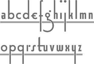 [MyFonts]
[More] ⦿
|
Ricardo Bento
|
Santarem, Portugal-based designer of Clarendon Stencil (2014). [Google]
[More] ⦿
|
Ricco Typo
[Richard Svercic]
|
Type designer in Prague. His typefaces include Protihibice (or Prohibition), a drunk font inspired by the old woodcut types. [Google]
[More] ⦿
|
Richard Årlin
[Stamp & Prtess]

|
[MyFonts]
[More] ⦿
|
Richard Kegler
[Hamilton Wood Type (HWT)]

|
 [MyFonts]
[More] ⦿
|
Richard Kegler
[P22 Type Foundry]

|
 [MyFonts]
[More] ⦿
|
Richard Svercic
[Ricco Typo]
|
[More] ⦿
|
Rick Banks
[F37 (or: Face37)]

|
 [MyFonts]
[More] ⦿
|
RMU (Ralph Michael Unger Typedesign)
[Ralph Michael Unger]

|
 Ralph M. Unger (b. 1953, Thuringia, East Germany) says this about himself at MyFonts: Typesetter from the composing stick via Linotype setting machines to the Mac. Jobs in various Thuringian printeries. Barred further education by Communist authorities due to political reasons. Imprisoned in East Germany. Since 1988 in the state of Baden-Wuerttemberg, former West Germany. Jobs in several newspaper printing houses as advertisement compositor. Own office since 1995, in Aalen, Baden-Wuerttemberg. He lives in Schwaebisch Gmuend, and was a freelance type designer for Profonts and URW++, where he contributed frequently to their libraries between 2002 and 2009. In 2009, he founded RMU. MyFonts link. I split his contributions into two groups, the URW / Profonts group, and the RMU group. The prefix FontForum refers to a subseries of URW++ fonts. Unless specifically mentioned, all the following fonts are at URW++ and/or Profonts:
 - FontForum Admiral Script (2005): revival of Middleton's Admiral script from 1953.
- Amitié (2009): a garalde family.
- Arabella Pro (2006): after the script by Arnold Drescher from 1936, published at Joh. Wagner.
- Fontforum Atrament (2006): architectural lettering. Do not confuse with a Suitcase Type Foundry font from 2003 by the same name.
- Atze (2010): a comic book family.
- Behrensschrift D (2007): after the jugendstil typeface Behrens Schrift, 1902, by Peter Behrens.
- FontForum Bernhard Script (2005): after Bernhard Script from the 1920s.
- Bradley (2005): blackletter, after the original by William H. Bradley.
- Breite Kanzlei (2007).
- Breitkopf Fraktur (2003): after the original by Johann Gottlob Immanuel Breitkopf, done in 1793.
- Brocken (2011) is a signage typeface inspired by a design of Volker Küster (1960s).
- Profonts Bureau (2010, Profonts): a minimalist rounded sans family.
- FontForum Calypso (2005): a revival of Roger Excoffon's Calypso (1958).
- Card Pro (2006): a decorative display based on Ella Cursief (1916, Sjoerd Hendrik de Roos, Lettergieterij Amsterdam).
- Chaweng (2006, Profonts): an oriental all caps simulation face.
- Civilite URW (2005).
- Compliment (2004, casual script). Based on a 1965 script by Helmu Matheis for Ludwig & Mayer.
- Cranach (2007): a blackletter typeface modeled after Kuenstler Gotisch from the Krebs Foundry.
- Dominante (2007): a serif family based on Johannes Schweitzer's font by that name, 1959.
- Dominique (2010, profonts): an informal typeface.
- FontForum URW Ecsetiras (2005): revival of Ecsetirás (Zoltan Nagy, 1967, a brush face).
- Edda Pro (2008). An art nouveau typeface that revives a Heinrich Heinz Keune typeface from 1900.
- Energia Pro (2008, Profonts): connected monowidth script, based on Arno Drescher's Energos from 1932.
- Estro (2003, Western lettering). Seems close to Nebiolo's Estro from the 60s.
- Eurobrush Pro (2007, Profonts): handwriting.
- EuroSans (2008).
- Euroscript Pro (2006, Profonts): school script typeface based on his own handwriting.
- Flashes (2007): a revival of Crous-Vidal's Flash, 1953.
- Fox (2007): a brush script based on W. Rebhuhn's original from the 1950s.
- Gamundia (2010): a calligraphic copperplate script inspired by Excoffon's Diane.
- Ganz Grobe Gotisch (2006): a fat blackletter modeled after the original by F.H.E. Schneidler.
- Gmuender Elan Pro (2011) is a 1950s style script face.
- Gradl Nr 1 (2008): based on hand-drawn art nouveau upper case characters by M. J. Gradl, ca. 1900.
- Graphique Pro (2008): shaded caps face, based on Graphique, which was originally created by Swiss designer Hermann Eidenbenz in 1945, and issued as hot metal font by Haas'sche Schriftgießerei. See also New Graphique Pro (2011).
- Handel Slab (2009): a 6-style extension of Trogram's 1980 typeface Handel Gothic.
- Hanseat (2010): a grotesque family done at Profonts. It was heavily inspired by Germany's official DIN 1451 Engschrift.
- Iova Nova (2007): based on Jowa Script, designed by J. Wagner in 1967.
- Profonts>Impression (2008): art deco.
- Jessen Schrift (2004): after the Rudolf Koch blackletter typeface by that name.
- FontForum URW Konzept Pro (2005): revival of Konzept (1968, Martin Wilke's handprinting face).
- Legende (2002): a script typeface based on the original typeface of Friedrich Hermann Ernst Schneidler (1937).
- Leipziger Antiqua. The original Leipziger Antiqua by Alfred Kapr at Typoart dates from 1971 until 1973. The digital version of Leipziger Antiqua was developed by Ralph M. Unger in 2005.
- Manuskript Antiqua (2005): after Oldrich Meinhart's Manuskript Antiqua.
- The Maszynysta family of heavy industrial sans typefaces (2010) have a textured style (Struktura), a Shadow, and a plain Roman.
- Maxim (2003, Profonts): The heavy brush typeface Maxim was originally designed by Peter Schneidler in 1956 for the Bauer foundry.
- New Bayreuth (2008): after Friedrich Hermann Ernst Schneidler's Bayreuth from 1932.
- Old Borders and Lines (2010). A free font.
- Ornella (2008): Jugendstil.
- Peter Schlemihl (2008, Profonts): a revival of a blackletter by Walter Tiemann.
- Pedell (2009): a casual script.
- Polo (2002): a brush face modeled after Carl Rudolph Pohl's Polo (1960).
- In 2012, Ivana Koudelkova co-designed the grungy headline typeface Retroactive Pro with Ralph M. Unger at Profonts.
- Fontforum Rhapsody (2006): a revival of Ilse Schüle's rotunda face.
- Roberta (2003): art nouveau typeface after obert Trogman's typeface for FotoStar.
- FontForum Signs and Symbols (2006).
- Splendor (2009): a revival of a brush script typeface by Wilhelm Berg, Schriftguss, 1930. See also Splendor Pro (2014).
- Sportowy (2009): an outline face.
- Stanford (2011). A sports lettering face.
- Stiletto (2006): a medieval script.
- Fontforum Stripes (2007): a multistripe op art display typeface based on a Letraset font from 1973 by the same name.
- Fontforum Thalia (2006): retro font.
- Tintoretto (2006): shadow display face based on an origonal by Schelter & Giesecke.
- Tip Top Pro (2008): a Julius Klinkhardt art nouveau typeface revival.
- FontForum Unciala (2005): a revival of Oldrich Menhart's typeface Unciala (1953, Grafotechna).
- Unger Chancery (2005).
- Unger Script (2003): based on H. Matheis' Slogan typeface designed for Ludwig&Mayer in 1957.
- Veltro (2007): after a 1931 original by G. da Milano at Nebiolo.
- Profonts Woodpecker (2008).
The list of RMU fonts: - Affiche (2017). A revival of Helios Reklameschrift of the Klinkhardt foundry.
- Aldo Manuzio (2017). After a house typeface from 1897 by Schelter&Giesecke.
- Amati Pro (2010): after Georg Trump's condensed didone face, Amati, 1951.
- Antiqua Florenz (2021). A revival and extension of Paul Zimmermann's Antiqua Florenz (1960, Ludwig & Mayer), which is based on Venetian romans.
- Avus Pro (2012). A sans family that extends Gert Wunderlich's Maxima (1970).
- Baroque Pearl (2016). A pearly typeface that revives Peter A. Demeter's Fournier Geperlt (1922, Schriftguss).
- Behrens Kursiv (2013). After a 1906 original by Peter Behrens.
- RMU Belvedere (2020). A revival of Heinrich Wieynck's art nouveau / fin-de-siècle typeface Belvedere (1906, Bauer).
- RMU Bison (2020). A revival of Julius Kirn's brush script Bison (1935-1938, C.E. Weber).
- Bernhard Blackletter (2016). After Lucian Bernhard's extrafette Bernhard Fraktur (1921).
- Bernhard Cursive Extra Bold (2010).
- Borghese (2015). An art nouveau font after a Schelter & Giesecke original from 1904.
- Borgis Pro (2012). A Clarendon-style text family.
- Boulette (2015, a fat creamy script).
- RMU Bowery (2019) A revival of Old Bowery (1933, ATF)).
- Bravura Pro (2013). After G.G. Lange's Publica.
- Bricklayers (2012). An original fat slab display face.
- Brillant (2009): art nouveau and ultra heavy.
- Butti (2011). A script family paterned after Fluidum (1951, Alessandro Butti, Nebiolo).
- Cable Condensed (2014). Based on Koch's Kabel.
- Caesar Pro (2011). A flared sans typeface after Caesar Schrift (1913, Georg Schiller, C.F. Rühl).
- Capitol Pro (2012). An art deco typeface based on Capitol (Karl Hermann Schaefer for Schriftguss, 1931).
- Carina Pro (2017). A calligraphic script typeface based on Rautendelein (1929, Schriftguss).
- Carla Pro (2013). A broad-nibbed script modeled after Ballantines Script (Elsner & Flake, 1974; see also Ballantines Serial by SoftMaker).
- Carlsbad (2018). A couple of art nouveau typefaces based on originals from 1895 by H. Berhold called Regina Cursiv and Hansa Cursiv.
- Caslon Gotisch (2009): after the original by William Caslon from 1763.
- Celebration (2009): blackletter.
- Circensis (2016). A Western circus font based on a concept of Fritz Richter.
- Claudius (2010): after a 1937 blackletter font at Klingspor.
- Constanze Pro (2012). A light cursive typeface based on Constanze (1954, Joachim Romann, Klingspor).
- Contact Pro (2010): after Contact, a 1963 font by Helmut Matheis.
- Dante Alighieri (2018). Based on a Schelter & Giesecke original.
- Daphnis (2016). A revival of Daphnis (1929, Walter Tiemann).
- Deutschmeister (2017). A textura blackletter typeface after Deutschmeister by Berthold Wolpe for Ludwig Wagner in 1934. (Some dispute that Wolpe made this font.)
- Diamant Pro (2012). A transitional serif face.
- Emilia (2016). Based on Weiss Antiqua (1928) by Emil Rudolf Weiss.
- Neue Echo (2016). Based on Echo for Schriftguss.
- Elbflorenz (2020). A revival of Albert Auspurg's display typeface Miami (1934, Schriftguss).
- Emilia Gotisch (2016). After Weiss Gotisch (1936) by Emil Rudolf Weiss.
- Emilia Fraktur (2021). A revival of Emil Rudolf Weiss's Weiss Fraktur (1913).
- Erler Titling (2015). After Erler Versalien (1953, Herbert Thannhaeuser for Typoart).
- Eurotech Pro (2011): a slabby techno family.
- Faulkner Pro (2011): a connected heavy signage script based on Alan Meeks's Kestrel.
- Fette Kanzlei (2019).
- Fette Unger Fraktur (2010).
- Fichte Fraktur (2020). After Walter Tiemann's Fichte Fraktur (1934).
- Fontanesi RMU. An ornamental caps typeface that revives Aldo Novarese's Fontanesi (2018).
- Forelle Pro (2010): after the original Forelle script typeface by Erich Mollowitz, 1936.
- Frankenberg Pro (2012). An antique script face.
- Gabor Pro (2014). A connected copperplate script.
- Gaby Pro (2017). A revival of Hans Möhring's script typeface Gabriele (1938 or 1947, C.E. Weber).
- Garamond Antiqua Pro (2015).
- RMU Gilgengart (2020). A revival of Hermann Zapf's Fraktur font Gilgengart (1938).
- Gillray Pro (2015). A copperplate script after Hogarth Script (by Harald Bröder for Typoart).
- RMU Gloria (2019). After Gloria (1898, Emil Gursch).
- RMU Gong (2020). Based on Arno Drescher's Super Grotesk Schmalfett first released in 1933 at Schriftguss.
- Gmuender Gravur (2011). A 3d shadow face. Gmuender Antiqua Pro (2015) is influenced by the metal font Imprimatur (1952-1955, Konrad F. Bauer and Walter Baum). Gmuender Kanzlei (2018) is a blackletter typeface.
- Goethe Fraktur (2022). A revival of a blackletter typeface by Wilhelm Woellmer (1905).
- Gravira (2021). A revival of Herbert Thannhaeuser's Gravira, released by Schelter & Giesecke in 1935 .
- Haenel Antiqua (2020, based on a 19th century antiqua by Eduard Haenel) and Haenel Fraktur (2011, after Haenel Fraktur, ca. 1840).
- Hanse Textura (2020). A revival of a textura by Hermann Zapf.
- RMU Helion (2020). A revival of the 3d titling typeface Helion (1935, Arno Drescher for Schriftguss Dresden).
- RMU Herkules (2019). After a late 19th century font by Bauer and Berthold called Reklameschrift Herkules.
- Hoelderlin (2018). After Eugen Weiss's Hoelderlin blackletter font (1937).
- Hoyer Script (2017). After Hanns Thaddeus Hoyer's Hoyer Schoenschrift (1939, Stempel).
- Hupp Fraktur (2016). After Otto Hupp, 1911.
- Impuls (2010): a brushy typeface based on Paul Zimmermann's Impuls (1945).
- Initials RMU One (2012) consists of revivals of Rudhardsche Initialen (Otto Eckmann, ca. 1900) and Walthari Initials (ca. 1900, Rudhardsche Giesserei). Initials RMU Two (2012) consists of revivals of Jubilaeumsinitialen (by Bauersche) and Augsburger Initialen (by Peter Schnorr, 1901).
- Jean Paul Fraktur (2021). A revival of Breitkopf's Fraktur font Jean-Paul-Schrift (1798).
- Jobs Gravure (2011). It had to happen---a few days after Steve Jobs' death, Unger released the beveled engraved typeface Jobs Gravure, which is an extension of Trump Gravur (1954, Weber).
- Jolly Polly (2012): a curly non-connected script face.
- Kis Antiqua Pro (2018). A revival of Hildegard Korger's Kis Antiqua at Typoart.
- Kleist Fraktur (2010): after Walter Tiemann's original.
- Kompress Pro (2013). Two compressed sans typefaces.
- RMU Kontrast (2021). An art deco typeface that revives Kontrast (1930, F.H.E. Schneidler at Weber).
- Koralle RMU (2018). A revival of Schelter and Giesecke's Koralle (1915).
- Korpus Pro (2014). A text typeface family. Followed later in 2014 by Korpus Sans Pro.
- Korpus Serif Pro (2021). A revival and extension of Timeless (Typoart) that covers Greek, Latin and Cyrillic.
- Leibniz Fraktur (2012) is modeled after the famous Genzsch & Heyse blackletter font.
- Lenbach (2021). Inspired by a German font from the Victorian era.
- Liliom Pro (2012). A beautiful fat didone typeface based on an original from the Fonderie Française.
- Lipsia Pro (2011). An angular serif family.
- Literatura Pro Book (2012).
- Litfass (2021). A revival of an art nouveau font by Flisch.
- Lutetia Nova (2014). A fresh two-style take on Jan van Krimpen's Lutetia (1924).
- RMU Luchs (2021). A redesign of Jakob Erbar's inline all caps art deco font Lux (Ludwig & Mayer, 1929).
- Luxor Pro (2010): a Victorian/Western display face.
- Lyrica (2014). A revival of the informal blackletter typeface Lyrisch (1907, Georg Schiller).
- RMU Magnet (2021). A redesign and revival of Magnet (1951, Arthur Murawski at Ludwig & Mayer).
- RMU Manolo (2019). Based on the art nouveau typeface Manolo (Ludwig & Mayer).
- Manutius Pro (2012).
- Meister Antiqua (2011, +Bold, +Book). A Typoart original from 1951 in the tall flared ascender serif genre, revived and extended.
- Mitropaschrift (2016). An octagonal original.
- Mobil Pro (2011). A semi-script typeface in the fifties style of Matheis.
- Monument (2010): a 3d shadow roman caps face created after Oldrich Menhart's Monument.
- Narziss (2018). A revival of Walter Tiemann's Narziss from 1921.
- RMU Neptun (2021). A revival and extension of the art nouveau typeface Neptun by Aktiengesellschaft fuer Schriftgiesserei und Maschinenbau, Offenbach.
- Neue Kurier (2011). Typoart's popular signage script font in a new, completely remastered version.
- Neue Muenchner Fraktur (2010).
- Neue Schwabacher (2021). After Albert Anklam's Neue Schwabacher (Genzsch & Heyse, 1876).
- Neue Thannhaeuser (2011).
- Old Towne Pro (2010): a Western font.
- RMU Omega (2020). After Omega, an art deco typeface by Friedrich Kleukens at Stempel in 1926.
- Orbis Pro (2016). A revival of Walter Brudi's shadow typeface Orbis (1953, Stempel).
- Orplid Pro (2019). a layerable typeface that revives and extends Hans Bohn's all caps Bauhaus era typeface Orplid (1929).
- Parcival Antiqua (2016). A revival of Parcival Antiqua (1926, Herbert Thannhaeuser).
- Parfum (2013). A low x-height script that was inspired by Howard Allen Trafton's Quick (1933, bauer).
- Parler Fraktur (2018). A revival of Friedrich Poppl's Poppl Fraktur.
- Parler Gotisch (2011). A blackletter face.
- RMU Pittoreske (2019). A decorative Victorian typeface.
- Plastica Pro (2015, a chiseled typeface inspired by a J. Lehmann design).
- RMU Pergola (2021). A vintage shadow typeface inspired by a late-19th century font of Georg Giesecke.
- Post Fraktur (2014) and Postillon (2014). After Herbert Post, 1933-1937.
- Primana Pro (2012). A seductive geometric grotesk family.
- Prinzess Gravur (2010): a blackletter typeface modeled after Prinzeß Kupferstichschrift (1905, Berthold).
- Prisma Pro (2011). Revival and extension of Rudolf Koch's multiline typeface Prisma (1931).
- Reklame Fraktur (2016). After Reklame Fraktur by Albert Christoph Auspurg, 1914.
- Reflex Pro (2018). All caps, with an inline style.
- Reznicek Pro (2011) is a post-Victorian pre-art nouveau typeface named after Ferdinand von Reznicek (1868-1909), one of the leading artists and illustrators of those times.
- Rekord Antiqua (2020). A revival of the art nouveau era text typeface Rekord Antiqua (1911, Wagner & Schmidt).
- Rhythmus Pro (2016). After a Schriftguss AG and Schelter&Giesecke original grotesk, and extended to cover Cyrillic.
- Ridinger Std (2012). Based on Riedingerschrift (Franz Riedinger, 1906, for Benjamin Krebs Succ.).
- Ronde Pro (2011): roundhand script.
- Royal Grotesque (2021). A revival of Wotan by Wagner & Schmidt, 1914. Did this typeface become RMU Royal Sans (2022)?
- Salzmann Fraktur (2019). A revival of Max Salzmann's blackletter font released by Schelter & Giesecke in 1912.
- Saskia Pro (2016). Revival of Jan Tschichold's Saskia (1931, Schelter & Giesecke).
- Schmale Anzeigenfraktur (2009): based on Koch's Schmale Deutsche Anzeigenschrift, 1923, Klingspor.
- Schmale Mediaeval (2020). Based on Schelter & Giesecke's Schmale Mediäval (1840).
- Schmuckinitialen (2009): an ornamental caps typeface in the art nouveau style based on Walthari Initials [Walthari (1899, Heinz König for the Rudhard'sche Giesserei) in the upper case and Eckmann Initials (ca. 1900, by Otto Eckmann, Germany's chief art nouveau type designer) in the lower case].
- Schreibmeister (2021). Ralph's interpretation of Arno Drescher's formal cursive typeface for Ludwig Wagner (1958, Leipzig).
- Schwabacher Book (2013).
- Sebaldus (2019). A heavy blackletter typeface, after Sebaldus Gotisch (1926, H. Berthold).
- Senatsfraktur (2020). After Friedrich Bauer's Senats Fraktur done in 1907 for Genzsch & Heyse.
- Concordia (2020). A revival of Sensation Schmalfett (1914, Heinrich Hoffmeister).
- Siegfried Pro (2017). A revival of the art nouveau typeface Siegfried (1900, Wilhelm Woellmer).
- RMU Skizze (2021). This revives Walter Höhnisch's script typeface Skizze (1935, Ludwig&Mayer).
- Staxx Pro (2013). A prismatic typeface.
- Staufer Gotisch (2015). An engraved blackletter typeface modeled after Herbert Thannhaeuser's Hermann Gotisch (Schriftguss, 1934).
- Steinschrift Pro (2015). A single style condensed sans serif.
- Sylphe Pro (2019). A vintage script font that revives Schelter & Giesecke's Isabel (not Sylphide, as claimed by him).
- Tablica (2017). After Karl-Heinz Lange's DDR telephone directory font Minima (1984).
- Thannhaeuser Fraktur (2013) is a redesign of Typoart's Thannhaeuser Fraktur.
- Thomasschrift (2014). A rustic typeface that revives and extends Thomas-Schrift by Friedel Thomas (1957-1958, Typoart).
- Titanschrift (2011). A yummy soft and fat display face.
- Tombola (2018). After an alphabet from the 1920s by Otto Heim.
- RMU Trianon, renamed RMU Trifels (2020). After Heinrich Wieynck's Trianon (1905, Bauersche Giesserei).
- Trocadero Pro (2010): an extension and revival of Trocadero Kursiv, 1927, Albert Auspurg, Trennert.
- Troubadour Pro (2010): In Medium and Engraved styles.
- Trump Deutsch (2011): a blackletter face, after the 1935 original by Georg Trump.
- Trybuna (2013). Based on Herbert Thannhaeuser's Liberta Antiqua (1958), but completely redrawn.
- Turnier (2019). A revival of G.G. Lange's derby (1952-1953).
- Tyton Pro (2013). A brush script after Heinz Schumann's famous 1964 Stentor.
- Typoskript Pro (2010): a revival of Hildegard Korger's Typoskript, first done at TypoArt in 1968.
- Unger Fraktur (2010): after a 1793 design by Johann Friedrich Unger; includes fett and mager.
- Walbaum Antiqua Pro (2013). A revival of Justs Erich Walbaum's didone classic.
- RMU Wallau (2019). After Rudolf Koch's rotunda typeface Wallau (1926-1934).
- Werbedeutsch (2021). A revival of the blackletter typeface Buchdeutsch (Ernst Schneidler, 1926).
- Wieynck Fraktur (2019). after Heinrich Wieynck's Wieynck Fraktur (1912).
- Wieynck Gotisch (2018). After Wieynck Gotisch (1926, Heinrich Wieynck).
- Zentenar Fraktur (2010): mager and halbfett; after the 1937 workhorse by Ernst Schneidler at Bauer.
- Zierfraktur (2010): after Deutsche Zierschrift, an engraved blackletter font that was cut by Rudolf Koch between 1919 and 1921 for Klingspor.
Ralph made some typefaces outside URW/Profonts and RMU, such as Stripes (2014, a prismatic typeface puvlished by Thinkdust). Klingspor link. View Ralph M. Unger's typefaces. [Google]
[MyFonts]
[More] ⦿
|
Rob Roy Kelly
|
Rob Roy Kelly (b. Nebraska, 1925, d. Tempe, AZ, 2004) collected wood type from local printers for use by his students at the Minneapolis College of Art&Design. He began gathering the types in the late 1950s and continued adding to the collection over the next decade. He started researching the history, manufacture, and use of the growing collection partly in response to questions that arose from working with his students. His research was first published in the 1963 issue of Design Quarterly (No. 56), and was followed in 1964 by a limited-edition folio of specimen sheets from the collection, entitled American Wood Types 1828-1900, Volume One. Kelly's research would culminate with the publishing in 1969 of American Wood Type, 1828-1900: Notes on the Evolution of Decorated and Large Types and Comments on Related Trades of the Period. Since 1993, his substantive wood type collection resides at the University of Texas. At Dover, he published 100 Wood Type Alphabets. Kelly's final work with the Collection came in the early 1990s when he was asked by Adobe Systems to participate in a project to develop digital revivals of historic wood types as part of the Adobe Originals program. As consultant to the project, Kelly helped select, from his own collected materials, the type styles that would be made into digital fonts. Kelly died in January 2004. Obituary, which states: He studied design at the University of Nebraska and the Minneapolis School of Art and served in the Army during the Korean War. Later he did graduate work at the School of Art and Architecture at Yale, where he studied with Josef Albers, Alvin Eisenman, Alvin Lustig, Herbert Matter, Leo Lionni, Lester Beall and Alexey Brodovitch. He both taught and administered graphic design programs at the Minneapolis College of Art, Kansas City Art Institute, Carnegie Mellon University, Western Michigan University and, most recently, at Arizona State University. [Google]
[More] ⦿
|
Rob Roy Kelly American Wood Type Collection
|
A study collection, with extensive specimens, held by the Design Division of the Department of Art and Art History at The University of Texas at Austin. This is one of the most, if not the most, extensive web presence for wood type. The collection, as of mid 2009: - VW&Co., 18 Dutch Street, N.Y. 1864-1867
- Vanderburgh, Wells&Co., New York 1867-1890
- J. G. Cooley, New York 1859-1868
- Page&Co., Greenville, Ct. 1857-1859
- Wm. H. Page&Co., Greenville, Ct. 1859-1870
- Page&Co., Greenville, Ct. "Patented" 1870
- Wm. H. Page&Co. 1870-1876 Page W. T. Co. 1876-1891
- Patented Dec, 20, 1887 "Page" 1887 American W. T. Co. (Tubbs) 1878-1883
- American W. T. Co. So Windham CT (Tubbs) 1883-1902
- No imprint (Hamilton confirmed manufacturer) 1881
- The Hamilton Mfg. Co., Two Rivers, Wis. 1889
- The Hamilton Mfg. Co, Chicago&Two Rivers 1889-1891
- Hamilton, Two Rivers, Wis. 1891-1950s
- American Wood Typ Co. Unconfirmed dates
[Google]
[More] ⦿
|
Robert Alonso
[BA Graphics]

|
 [MyFonts]
[More] ⦿
|
Robert Banham
|
Senior Lecturer in the Department of Typography & Graphic Communication at the University of Reading where he teaches history of graphic communication and design practice. He obtained his PhD from that same institute. His main research interests are the design of printed ephemera, the influence of technology on design, and the history of colour printing. He edits and designs The Ephemerist, the journal of the Ephemera Society (UK) and from 2002 to 2009 was Chairman of the Friends St Bride Library. At ATypI 2003 he spoke about Experiments in wood: early 19th Century wood-engraved lettering and wood types: A brief introduction to the work of jobbing printers Frederick Gye and Giles Balne, innovative London based jobbing printers in the first half of the nineteenth century. Gye and Balne were printers for the State Lottery and Vauxhall Gardens, the former in particular being a driving force behind developments in advertising including new display types. The focus of the talk will be on the contribution made by Gye and Balne (and some of their rivals) to developments in type design in the form of wood-engraved letterforms and wood types which influenced the metal types produced by the type founders. Coauthor with Fiona Ross of Non-Latin Typefaces at St Bride Library, London and Department of Typography&Graphic Communication, University of Reading (2008, London: St Bride Library). Speaker at ATypI 2013 in Amsterdam on wood type and lettering in the UK between 1800 and 1850. [Google]
[More] ⦿
|
Robert James DeLittle
[DeLittle]
|
[More] ⦿
|
Robert Lee
[Web Museum of Wood Types]
|
[More] ⦿
|
Robert P. Long
|
Author of "Wood Type&Printing Collectibles" (1980). [Google]
[More] ⦿
|
Robyn Phillips
[Skeldale House Treasures]
|
[More] ⦿
|
Rocio Robledo
|
Santiago, Chile-based designer of the modular rounded Tuscan typeface Colosal (2018). [Google]
[More] ⦿
|
Rodrigo Araya Salas
[Rodrigo Typo (was: RAS Design)]

|
 [MyFonts]
[More] ⦿
|
Rodrigo Typo (was: RAS Design)
[Rodrigo Araya Salas]

|
 RAS Design is Rodrigo German or Rodrigo Araya Salas, a designer from Santiago, Chile, b. 1987.
 Rodrigo Typo link. RAS Design link. Dafont link. Dafont linkNewer Dafont link. Behance link. Fontspace link. Fontsy link. Abstract Fonts link. Old URL. Creator of many hand-drawn free fonts. His typefaces from 2008 and 2009: Super (2009, for signage), Snow (2009), Mari (2009), El Cubano (2009, dingbats of typefaces), Mental Freak (2009, outline), Freak Animals (2009), Brigada Ramona Parra (2009, dingbats), Happie (2009, dingbats), Santiago Icono (2009), Icono Skate Dingbat (2009), 78 Skate (2009), The Sorden (2009), Estilo Urbano (2009, stencil), Tetris (2009), Techno (2009), Kona (2009, childish hand), Parody Logoskate (2009, dingbats), Fat Love (2009), La Rata Bizarra (2008), Tabla (2008), A Mano Alza (2009), Maribel (2009, handwriting), Stencil (2009), Rayando (2008, chalky writing), Klam, Loco TV, Monos Frekis (2008, funny dingbats), Tabla (2008), Happie (2009, more funny dingbats), Funny Icons (2009), Kiltro (2008, dog dingbats), Pokemona (dingbats), Maniatico (scratchy outlined hand), Bizarro 1 (outline hand), Chile (dingbats), Freaky (2008, dingbats), Esquiso (outlined handwriting), Crazy Ras (outlined and hand-printed), Skatelove (2008, dingbats), Los de Abajo (2008, dingbats), Logoskate (2008), David (2008, flowing ultra fat face), Destruccion (2008, grungy), Skateboarding (2008, ransom note face), Mike Valley (2008, skateboard dingbats), Rodney Mullen King (2009, skateboard dingbats), El Chavo del 8 (2008, scanbats), Grande Maradona (2008, scanbats), Saintfont (2009, hand-printed), New Tetris (2009), September 11 Icon (2009, a powerful set of dingbats), Icono BMX (2009, bike dingbats). Typefaces from 2010: Commando X (2010, a pixel dingbat typeface for computer games), Raya Irregular, Mari+David, Depressive Icon, Esquiso, Ego (2010), El Cubano (dingbats with typefaces), Barras Bravas (almost graffiti face), Globe Face (award winner at Tipos Latinos 2010). Fonts done in 2011: Logo Font, Buen Dia (ransom note face), Drugstore (blackletter), Condorita (dingbats), KingKöng (a nice fat letter comic book face), Rolo (fat letter face), Logo, Comando X (a pixelized dingbat typeface based on video games), Catbox (2011, fat and rounded), Joia (a thin octagonal face), Plop (a "hip hop font"). Typefaces from 2012: Designio (rounded sans family), Nollie, Rocka (triangulated), Mosku (paint or blood drip face), Gigio Italia Bizarre (dingbats), Conny Rocket, Retro Hand Type (stitched), Wood (wood type simulation), Tritona, Nollie, Zdravo Maria (children's hand), Bordados (stitched typeface). Typefaces from 2013: Mexe, Polly, Pintanina (+Pro) (comic book caps face; the Pro version appeared in 2015), Giger Free (inspired by the paintings of H.R. Giger), Rango (fat hand-printed face), Smile (fat signage face), Pequena (a fat finger typeface for children's books; in Latin, Greek and Cyrillic), Children One, Lollapalooza, BRP (dingbats), Koni Black, Cusco, Rorschach, Children One (poster font), Varial Hellflip, Marty (hand-drawn poster font for Latin and Cyrillic), Barricada [not to be confused with the Barricada font by Sudtipos]. Typefaces from 2014: Marty Spring, Munky Negra (a creamy signage typeface by Rodrigo Araya Salas and Raphael Rodriguez), Tobogan (ultra-black poster face), Lilirun, Peral, Zurita (brush face), Ruba, Street Animals (dingbats), NegritaPro (funky), Ruda (brush face), Muro (thick brush type), Cucho (signage typeface), BRC (hand-printed), Konga (a chocolaty creamy signage script originally from 2012), Pony, Guakala, Alboroto, Loyola (a cartoon script started in 2013, which won an award at Tipos Latinos 2018), Froh (an informal fat stencil), Paihuen Pro (Mapuche-inspired letters), Helenita (perhaps useful for children's books; see also Helenita Dos in 2017), Macabro (a great hand-lettered and weathered typeface family), Box10, Ria, Bototo. Typefaces from 2015: Mari+David, Good Friend (a primitive script), Galpon (a great vernacular signage and/or comic book typeface for Latin, Greek and Cyrillic; extended in 2020, with Bruno Jara Ahumada, to Galpon Pro), Smile Pro (a fat multi-style handcrafted poster family of exceptional beauty; together with Andrey Kudryavtsev), Ardilla Small (a rounded organic sans by Rodrigo Araya and Andrey Kudryavtsev), Konga Pro (based on his own creamy script, Konga, from 2012), Mari & David (poster typeface), Forest Puyehue, Skatista (handcrafted script and skateboard dingbats), Ruba Style, Janmeid, Forma (experimental, robotic), Australia Skate (vernacular type), Tobi Black (for comic books and children's books, +Greek, +Cyrillic), Tobi Dirt, Basural (experimental). Typefaces from 2016: Bowl, Aliengo (a fun Martian font family done with Andrey Kudryavtsev), Marty Two (a lovely handcrafted typeface, ideal for children's books), Minnie Play (a children's book typeface by Rodrigo Araya and Andrey Kudryavtsev), Camo (a layered typeface family by Rodrigo Araya and Andrey Kudryavtsev), Camo Dirt, Clarence World (with Andrey Kudryavtsev: a rounded cartoon font inspired by the logo of the Cartoon Network series Clarence; followed in 2017 by Clarence Two), Pequena Pro (+Cyrillic) (with Andrey Kudryavtsev), La Mona Kids, Konga Rock, Movskate (a skateboarding culture font by Rodrigo Araya, Juan Sepulveda and Patricio Gonzalez), La Mona Pro (72 styles: A feast of textures!). Typefaces from 2017: Hatter Display (a Halloween font), Hatter Display Pro (+extensive dingbats), Hatter Cyrillic Display, Macabro Danger (wall paint style), Checkin Script (with four sets of travel dingbats), Caleuche (a bold weathered typeface, with Andrey Kudryavtsev; but that coauthorship was altered in 2021 to Franco Jonas Hernandez), Pequena Neo, Bike Park, Bike Park Two, Kawaii RT, Clarence Two, Portena, Mi Cocina (restaurant icons and dingbats), Big Foot Forest, Clarence Cyrillic (by Rodrigo Araya and Andrey Kudryavtsev), Galpon Spring, Spike Bot (by Rodrigo Araya and Andrey Kudryavtsev), Forest Two. In 2018, Rodrigo Typo published these typefaces: Ding (a great fattish cartoon font, co-designed with Andrey Kudryavtsev and Franco Jonas; see also its extensions, Ding Pro (2019) and Ding Extra (2019)), Squick (a comic book / children's font family by Franco Jonas, Andrey Kudryavtsev and Rodrigo Araya), La Pica Pro (by Rodrigo Araya and Andrey Kudryavtsev), Catshape (dingbats by Rodrigo Araya), Tobi Pro (by Franco Jonas, Rodrigo Araya Salas, and Andrey Kudryavtsev), Spiro (a retro almost psychedelic lettering font based on the series The Boatniks; by Rodrigo Araya Salas and Andrey Kudryavtsev), La KonyBlack (by Rodrigo Araya and Andrey Kudryavtsev), Ruda Two, Nuby (Franco Jonas, Rodrigo Araya Salas and Andrey Kudryavtsev), Garita, Alquitran (based on pixacao), Alquitran Stencil and Alquitran Rust (by Francisco Paez, Rodrigo Araya Salas and Andrey Kudryavtsev), Rague Pro (a stone-cut font by Rodrigo Araya Salas and Andrey Kudryavtsev, which won an award at Tipos Latinos 2018). Typefaces from 2019: Hatter Halloween, Clarence Alt (a an almost bubblegum children's book sans by Franco Jonas, Rodrigo Araya Salas and Andrey Kudryavtsev), Nacho Rough, Naguel, Lolapeluza Two, Nacho (a Mexican party font by Rodrigo Araya and Franco Jonas). Typefaces from 2020: Minado Rough, Toretto, Diablito One (a two-font and four dingbat-font package by Rodrigo Araya Salas and Bruno Jara Ahumada), Clarence Inline (a plump informal typeface family by Rodrigo Araya Salas and Franco Jonas Hernandez), La Pica Bonus (a vernacular or supermarket style font and dingbat family by Andrey Kudryavtsev and Rodrigo Araya Salas), Ancoa Slanted (an angular display family in 15 styles; by Andrey Kudryavtsev, Rodrigo Araya Salas and Franco Jonas Hernandez), Ruina One (rough, distressed), fj Trance (a reverse contrast Egyptian by Rodrigo Araya Salas, Franco Jonas, Valentina Faundes and Jorge Morales Salas), Tunning (an all caps speed font), Skippie (a comic book family by Andrey Kudryavtsev, Rodrigo Araya Salas, Bruno Jara Ahumada and Franco Jonas, and four sets of dingbats including Skippie Monster Lucha Libre and Skippie Monster Halloween), Ancoa (an angular 19-style layerable typeface by Andrey Kudryavtsev, Rodrigo Araya Salas and Franco Jonas Hernandez). Typefaces from 2021: Rinno (a rounded geometric display family by Rodrigo Araya Salas and Franco Jonas Hernandez), Ripster, Elah (a children's book or supermarket font; with Andrey Kudryavtsev), Loyola Next (a 14-style sans by Rodrigo Araya Salas and Bruno Jara Ahumada), Clarence Pro (a vernacular supermarket font by Rodrigo Araya Salas and Franco Jonas Hernandez), Meche Pro (a 12-style ligature-rich poster typeface), Rambi, Willner (a 5-style display sans by Rodrigo Araya and Franco Jonas), Picaflor (a titling or children's book typeface by Rodrigo Araya Salas and Bruno Jara Ahumada), Picaflor Hand (by Rodrigo Araya), Picaflor Soft (a fine national park or children's book family of organic sans fonts by Rodrigo Araya Salas and Bruno Jara Ahumada). Vectorlove won an award at Tipos Latinos 2012. Mona won an award at Tipos Latinos 2014. View Rodrigo Typo's typefaces. [Google]
[MyFonts]
[More] ⦿
|
Roger S. Nelsson
[CheapProfonts]

|
[MyFonts]
[More] ⦿
|
Roman Extended Fatface
|
 Fatface refers to a ultra-black didone style, credited to Robert Thorne in England in the early 1800s. It was introduced in wood type by Darius Wells in his 1828 wood speciman catalog, Letter Cutter. Most other early wood type manufacturers mimicked this style. An extended Fatface can be found in the 1838 book by George Nesbitt, First Premium Wood Types Cut by Machinery, where the design is credited to Edwin Allen. Hamilton Wood Type gives a partial list of extended Faftface wood types:
 - Heber & Wells: Roman Expanded (No. 5150) (Later Hamilton 5150), (and an even wider) Roman Extended (No. 5151) (later Hamilton 5151).
- Wm. H. Page: Roman Extended (No 239).
- Cooley: Roman Extended No.1.
- Allen: Roman Extended.
- Bill Stark & Co.: Roman Extended.
- Knox: Extended Roman.
- Morgans & Wilcox: Roman Extended.
- Tubbs: Roman Extended (No 2028).
Digital versons: - HWT Roman Extended Fatface (2014). By Jim Lyles at Hamilton Wood Type / P22.
- AWT Wells Roman Extrabold (2013, Dick Pape; after an 1828 fat typeface didone by Darius Wells).
[Google]
[More] ⦿
|
Roman Scherer
|
 Designer in Luzern, Switzerland, who ran Holztypenfabrik Roman Scherer, possibly the only wood type manufacturer in Switzerland. He created Bananatype (ca. 1910). One of their catalogs, ca. 1920, is entitled Schriften in Holz & Hartmetall Einfassungen Vignetten. Scherer died in 1922. [Google]
[More] ⦿
|
Rook Supply (was: Designer Toolbox, or: Rook Design Supply)
[Greg Nicholls]

|
 Vancouver and/or Montreal, Canada-based designer of the brush script fonts Twin Oaks (2016), Wellaway (2016), Bold Vision (2016) and Mount Baker (2016, dry brush), the rough brush typefaces Outshine (2016), Postmark (2016) and Sunrise Waves (2016), Sunfast (2016), and the weathered stamp typeface Tofino (2016).
 Typefaces from 2017: Pure Heart (dry brush, SVG), Freshly Squeezed (brush), Something Fresh (brush), Explorers (Palestone, Mystic, Blatchford), Westmount (geometric sans), Lakeshore (brush), Woodcrafter Sans, Bushfire (slab serif), Kicking Horse (weather wood emulation font), Treadstone (weathered octagonal typeface), Forever Young (heavy brush), Revelstoke (a vintage all caps sans family). Typefaces from 2018: Parkson, Silva (an SVG dry brush script), Tremblay (an all caps weathered SVG font), Outback (an inky brush font), Always Thankful (SVG brush), Beforth (SVG brush), Timber Wolf (SVG brush), Stranger Times (SVG brush), Take Charge (watercolor SVG font), Hunters (SVG Opentype brush font), Lion and Hare (condensed grotesque), Sanhurst (block sans serif), Belmont, Almonte (Opentype SVG brush font). Typefaces from 2019: Riverstone, Rexton (all caps sans), Total Rage (an SVG brush font), Born Strong (octagonal), South Island (dry brush), Outbacker (brush font), Port Blair (script). Typefaces from 2020: Obscura (a weathered condensed titling sans). [Google]
[MyFonts]
[More] ⦿
|
Ross Frazier
|
Bloomington, IN-based designer of Deco Alphabet (2012). Behance link. He also found and letterpress-printed a Bodoni-style typeface found in the Hamilton Wood Type Museum. [Google]
[More] ⦿
|
Rube Mandel
[American Wood Type Mgf Co.]
|
[More] ⦿
|
Ruth Lin
|
Graphic designer in Houston, TX, who created the wide wood emulation typeface Alpha (2017) and the angular, perhaps German expressionist, typeface Ulna (2017). Alpha and Ulna were created under the guidance of Font Bureau's Richard Lipton.Behance link. [Google]
[More] ⦿
|
Ryan Bernis
|
 Designer in New York City. He created several typefaces such as Wilber (2012-2013, an inline typeface that won an award in 2014 at the Communication Arts 4th Typography Competition: 2014; digitized as part of Type@Cooper), French Ionic Revival Typeface (a revival typeface based on a metal type from the late 1800s; digitized as part of Type@Cooper in 2012-2013). Behance link. [Google]
[More] ⦿
|
Ryan Molloy
|
 Ryan Molloy is an educator and inter-disciplinary designer having practiced in fields of architecture and graphic design. He is currently a professor of graphic design at Eastern Michigan University in Ypsilanti, Michigan. Graduate of TypeWest, class of 2021. His type designs are experimental and push boundaries. His graduation typeface, Banch (2021), is an extension of [his] interest in exploring how digital fabrication methods, such as cnc-milling, can create novel forms of letterpress wood type. [Google]
[More] ⦿
|
Ryan Welch
[Fresh Pressed Fonts]
|
 [More] ⦿
|
Ryoichi Tsunekawa
[Flat-It]

|
 [MyFonts]
[More] ⦿
|
S. Cooke&Co
|
Type foundry active ca. 1890 in Melbourne. A wood type by them was published as a Brandywine Keepsake in 1985. [Google]
[More] ⦿
|
Saja TypeWorks
[Aaron Bell]

|
 Aaron earned a Bachelor's degree in Asian Studies, with a minor in Japanese, at Whitman College in Walla Walla, WA. Aaron is a graduate of the University of Reading in 2011, where he earned an MA in typeface design. His graduation typeface was Saja (2011), which covered Latin and Korean. In the Fall of 2011, he joined the Microsoft Typography team.
 In 2015, at Microsoft, he designed the free sans typeface Selawik, which is metrically compatible with the infamous Segoe UI. Selawik now also exists as a variable font. In 2016, het up his own type foundry in Seattle, Saja TypeWorks. At Saja TypeWorks, he published the sans-serif typeface Salish, which is inspired by the art of the Salishan tribes in the Northwest Americas: It draws heavily on the concept of the ovoid, a wide ovular shape that is flat on the bottom and top heavy, that is central to the art style known as Formline. Language support includes some 200 Latin-based languages as well as the necessary orthographies for all Salishan languages, including: Comox, Sliammon, Klahoose, Pentlach, Sechelt, Squamish, Halkomelem, Nooksack, Straights Salish (Saanich), Lushootseed, S'Klallam, Quinault, Upper Chehalis, Lower Chehalis, Cowlitz, Bella Coola, Ditidaht, Tseshaht, Nuu-chah-nulth, Ehattesaht-Nuchatlaht, Kwak'wala, Shuswap, Lillooet, Thompson River Salish, Coeur d'Alene, Columbia-Moses, Colville, Okanagan, and Montana Salish. Haida (a non-Salishan language) is also supported. At FontStruct, he designed Syzygy. In 2017, he published HWT Aetna at P22. Aetna is a sturdy roman wood type first see in William H. Page's 1870 specimens. Aaron Bell digitized the free logo font Air America in 2018. He writes: This font was produced for William G. Sherman who recreated this alphabet from samples of the logo and other sources from the airline company Air America. In 2018, he published the free DIN-based sans typeface Bahnschrift for Microsoft at Open Type Library. The font posted at Open Font Library is flawed (look at the capital A), so I wonder if that post was done by an impostor. Bahnschrift was the basis of his 2021 typeface, Grandview, which could be tipped by Microsoft to replace Calibri---in use since 2007--in its Microsoft 365 apps and Office products. Typefaces from 2019: Industrial Spill (with Dave Savage), Tipsy Waitress (beatnik, cartoonish; with Dave Savage), Super Chill MC (with Dave Savage). For Microsoft's Windows 10, he designed the open source monospaced font Cascadia Code. The plan is to add support for Greek, Cyrillic, Vietnamese, Arabic and Hebrew during 2020. TeX support for Cascadia Code. Speaker at ATypI 2012 in Hong Kong: Seeking the Korean true italic. Speaker at ATypI 2013 in Amsterdam: Directionality in Korean type design. Fontsquirrel link. [Google]
[MyFonts]
[More] ⦿
|
Sander Legrand
[Gravual]

|
[MyFonts]
[More] ⦿
|
Sandra Garcia

|
 Sandra Garcia (b. Bogota, Colombia) first studied at the Universidad del Area Andina, Bogota and then obtained a Masters in typography from Centro de Estudios Gestalt in Veracruz, Mexico. Freelance designer and teacher at Universidad de la Comunicacion, in Mexico City.
 Sandra created the wayfinding sans typeface Colectiva in 2017 together with Tipas Type, a type foundry she co-founded. Colectiva was originally designed for Mexico City's subway system. In 2019, she published Emperatriz at Latinotype. She collaborated on the design of the typographic family Woun Iek for the native Wounaan Colombian language. In 2017, she received the Clap international award for the project Xantolo, a font for children's publications. Xantolo was part of Tipas Type, a space created by women to promote female work in the typographic field. For a Mexican beer brand, Sandra Garcia and Tipas Type designed the splendid blackletter typeface Corona (2018) and the copperplate calligraphic typeface Especial (2019). In 2019, Dafne Martinez, Monica Munguia, and Sandra Garcia finally released the roundish informal children's book typeface Xantolo and the wood type / slab serif typeface Xihtli. In 2019, Dafne Martinez and Sandra Garcia designed the copperplate calligraphic typeface Especial for a common Mexican beer brand In 2021, Dafne Martinez and Sandra Garcia published Achtli (Book, Didactic), a rounded sans typeface for early readers. In 2022, Sandra Garcia released the ultra-condensed reverse stress Western typefaces Extra C and Extra C Variable at Tipastype. Speaker at ATypI 2019 in Tokyo. Co-author of the book Elementype, a practical guide to typographic use. [Google]
[MyFonts]
[More] ⦿
|
Sara Goodnight
|
 Kalamazoo, MI-based designer, who, during her studies at Western Michigan University, created the modular wood block typeface Switch (2016). Her system breaks down letterpress forms into their components, and reattaches pieces using various color codes. Behance link. [Google]
[More] ⦿
|
Sasha Iudashkin
|
 Based in Kiev, Ukraine, Sasha Iudashkin graduated in 2013 from the Brithish Higher School of Art and Design in Moscow. His graduation project there was Quentin (2013), a great wood style display typeface for Latin and Cyrillic designed for movie posters. Inspiration for Quentin came from Italian wood type poster letters, dressed with B-movies flavours. [Google]
[More] ⦿
|
Schwarzschild
[Stefan Frey]
|
Free screen font families Schild7 and Schild9: Schild7FS, Schild7LovelyFS, Schild7Lovely, Schild7BoldFS, Schild7Bold, Schild7HighscoreFS, Schild7Highscore, Schild7, Schild9FS, Schild9. There is also a free Schild Jubilee typeface, based on woodtype numerals. Schwarzschild is run by Stefan Frey, Karsten Müller (Karste Mueller) (and originally also by Huschang Pourian) in Wiesbaden, Germany. [Google]
[More] ⦿
|
Sean Coady
[Vintage Type Co]

|
 [MyFonts]
[More] ⦿
|
Seni Olivier Monovisua
|
Graphic designer in Soustons, France. Creator of Lettrine 2 (2011) and the rounded Tuscan (Western) typeface Brooklyn Type (2011). [Google]
[More] ⦿
|
Sergio Haruo
[Hattori Supply Co (was: Corgi Astronaut)]
|
 [More] ⦿
|
Setup (was: Urtd)
[Ondrej Jób]

|
 Bratislava-based type and graphic designer (b. 1984, Czechoslovakia). He graduated from AFAD Bratislava, and in 2009 from the Type and Media program at KABK, where he designed Doko, a serifed text family derived from handlettering. Earlier, he created the Preissig-look family Kompilat (2007), and the monospace font Monoxil (2007).
 In 2008, Peter Bilak, Eike Dingler, Ondrej Jób, and Ashfaq Niazi created the 21-style family History at Typotheque: Based on a skeleton of Roman inscriptional capitals, History includes 21 layers inspired by the evolution of typography. These 21 independent typefaces share widths and other metric information so that they can be recombined. Thus History has the potential to generate thousands of different unique styles. History 1, e.g., is a hairline sans; History 2 is Peignotian; History 14 is a multiline face; History 15 is a stapler face, and so forth. He founded Urtd in 2009 in Liptovsky Hradok, Slovakia, and renamed it Setup in 2016. He sells these fonts: the ION family (2010, LED simulation typefaces), Outliner (2008, architectural lettering), and the icon sets Ico Weather (2010), Ico Time (2010) and Ico Phone (2010). Klimax Bold (2008) is in the ultra-ultra-fat art deco category, and won an award at TDC2 2009 for display face. See also Klimax Plus (2009). Creations in 2011: Clip (2011) is a 4-style Opentype-feature-loaded paperclip family. Typefaces made in 2012: Remi (useful monospaced geometric sans family), Bismuth (angular techno family), Bismuth Stencil. In 2013, Ondrej Job published the script typeface Odesta. Odesta won an award at TDC 2014. Typefaces from 2014: Woodkit (a series of grungy wood emulation typefaces for Latin, Greek and Cyrillic published at Typotheque; Woodkit won second prize in the TDC 2015 Type Design competition), Pexico and Pexico Micro (pixel typefaces). Woodkit won an award at Modern Cyrillic 2014. In 2020, he designed the warm sligtly flared typeface family Clarinet. See also Clarinet Wide (2020). Corporate typefaces by Ondrj Job include Milkface, About Face and Fox Sports Netherlands. MyFonts link. Typedia link. Behance link. Klingspor link. Village link. Future Fonts link. [Google]
[MyFonts]
[More] ⦿
|
ShyFoundry (was: ShyFonts)
[Derek Vogelpohl]

|
ShyFoundry (formerly ShyFonts Type Foundry), located in Elkhorn, NE, was founded in 1995 by Derek Vogelpohl (b. Phoenix, AZ, 1971), whose (often techno) fonts used to be free. His original free font site closed down in February 2001. The fonts were thereafter available at CybaPee's site. Fontspace link. Derek briefly joined ApostrophicLabs in March 2001. His first font there is Phosphorus. In 2001, he created the beautiful Plasmatica family, PhosphorusII, Avondale (a great display family), and the large Covington text family, which is also available now for the Tex community. Dafont link. In 2008, he took his operation to MyFonts. Each type family comes in 8 to 12 styles. - His old free font list: AlienEncounters, ArcheryBlack, AftershockDebris, AlienEncounters, AmericanaDreams, SF DigitalReadout [1999; in 2009, a commercial version, SF Digital Readout Pro appeared], DistantGalaxy, GrooveMachine, HollywoodHills (octagonal, like wood type), MoviePoster, OuterLimits, PlanetaryOrbiter, SFAtarianSystem, SFBigWhiskey, SFCosmicAge, SFFortuneWheel, SFGothican, SF Junk Culture, SFJuggernaut, SFNewRepublic, SFOldRepublic, SFSportsNight, SFSquareHead, SFTattleTales, SFTechnodelight, SF Viper Squadron (1999), SFZeroGravity, SFCollegiate, SFMoviePoster, SolarSailer, StarDust, Telegraphic, ViperSquadron, SF IronSides, SF GrooveMachine, SF TransRobotics, SF Balloons, SF Intellivised, SF Obliquities, SF Willamette, ActionMan, Arborcrest, Automaton, Buttercup, ChromeFenders, SF Espionage, SF Square Head Pro (2009, with Roger S. Nelsson at CheapProFonts), SF Square Root, EccentricOpus, GrungeSans, Intermosaic (pixel family), Intoxicated, IronGothic, Laundromatic, Quartzite, SlapstickComic (comic book font family), SynthonicPop, SF Wasabi (oriental simulation), TheraminGothic, Ferretopia, Toontime, Retroesque, Chaerilidae, Gushing Meadow (dripping blood family), Shai Fontai, Retro Splice.
- Free fonts made in 2008: SF Fourche, SF Florencesans (a huge family), SF Plasmatica, SF Slapstick Comic, SF Speedywaystar.
- Commercial fonts: SF Groove Machine Pro, SF Quartzite Pro, SF Animatron (2008, a redesign of the techno family SF TransRobotics), SF Tekamah (2008, futuristic), SF Portabello (2008, bold and edgy headline family), SF Hallucination, SF Hypocrisy (2009, simple sans), SF Pale Bottom (2009), SF Outer Limits (2009), SF Orson Casua (2009), SF Old Republic (2009), SF Obliquities (2009), SF New Republic (2009), SF Movie Poster (2009), SF Minced Meat (2009), SF Chrome Fenders (2009), SF Eccentric Opus (2009), SF Buttacup (2009), SF Chaerilidae (2009), SF Covington (2009), SF Espionage (2009), SF Deco Techno (2009), SF Baroquesque (2009), SF Ferretopia (2009), SF Chromium 24 (2009), SF Avondale (2009), SF Electrotome (2009), SF Cosmic Age (2009), SF Hallucination (2009), SF Florencesans (2009), SF Zimmerman (2009, hand-printed).
[Google]
[MyFonts]
[More] ⦿
|
Sideshow
[Bai Mellon]

|
Eau Claire, WI-based outfit who sell their fonts at MyFonts and Font Diner: Sideshow was developed as an offshoot boutique type foundry of the Font Diner retro display font foundry. Their first work is a collection of calligraphic borders called the Certified Series (2008, by Stuart Sandler of Font Diner and Bai Mellon from France). Other work includes Goofball (2008, retro lettering by David Cohen and Stuart Sandler), Cocktail Shaker (2008, a retro font typical for Stuart Sandler), Bamboozle (2008, wooden plank look by David Cohen and Stuart Sandler), Blackcat (brush typeface by Sam Gambino and Stu Sandler), Creaky Frank (2008), Creaky Solid (2008), Creaky Tiki (2008) [all wood-style typefaces made by Sandler and Derek Yaniger], Blackcat Fever (2008), Weird Bill (2008), Weirdbats (2008, by Cohen and Sandler) and Toylab (2008, by Molly Zakrajsek and Stuart Sandler). Sandler added Derekbats (in cooperation with Derek Yaniger), Savage Hipsters (a bebop curly display face), Weird Bill (with David Cohen), Coffee Drinker (connected script) and Coffee Service (a signage face) in 2008. At Google Web Fonts in 2011: Creepster (Halloween font), Trade Winds (pirate font), Frijole [image], Flavors [link]. Free fonts done in 2012: Rock Salt (hand-drawn). Fontsquirrel link. View the Sideshow typeface library. [Google]
[MyFonts]
[More] ⦿
|
Silver Buckle Press
|
Madison, WI-based publishers of Specimen Book of Wood Type (1998), designed and printed by Rachel Davis, and of Specimen Book of Wood Type from the collection of the Silver Buckle Press. Introduction by Rob Roy Kelly. Foreword by Stephen O. Saxe (1999). In 1988, they published the calendar of ornamental material from the Silver Buckle Press (University of Wisconsin at Madison). [Google]
[More] ⦿
|
Simon Dunford
[Niche]

|
[MyFonts]
[More] ⦿
|
Simon Stratford
|
 London-based creator of the free shaded caps font Airbag (2013), which imitates the successful genre of Trend (Latinotype). Before Breakfast (2013) is a free hand-printed typeface. Packt (2013) started out from watercolor lettering. Distractor (2013) is a tweetware grungy slab serif reminiscent of letterpress---it is partially based on Bevan. In Limbo is a free vernacular typeface. Typefaces from 2014: Type Old Writer, Before Breakfast, Hitchcut (paper cutout inspired by Saul Bass's poster for Hitchcock's movie Vertigo), Separator (octagonal), Dirty Slab (letterpress emulation), Enfold (hand-drawn).
 Typefaces from 2015: Neon, Buckley, Buckley Serif, Bold Riley (a handcrafted serif), Balham to Brooklyn (fifties script), Petit Jardin, Gently Script, Troupe (an inline Tuscan typeface), Mr. Blue Sky (an inline typeface), Moorgate (fat brush font), Sunshine, Dogtown (grunge), Gods Own Junkyard (neon sign font, named after Chris Bracey's neon sign store in London), Teardrop (watercolor brush with dripping ink), Western Grit (spurred), In The Wood, Gallow Tree (free brush font), Thirsty Dog (scratchy brush), Dear Prudence. Typefaces from 2016: Get Lucky, Take Me To The River, Lawless (vintage display typeface), Not My Type (old typewriter font), Roadhouse Blues, Just Like Heaven, Resize, Atomic Dustbin, Mind The Gap (stencil family), Munky (a fun children's book typeface), Hunky Dory (a handcrafted children's book typeface), Little Wonder (brush script), Mister Rooster, Whippin Piccadilly (handcrafted), Bangers & Mash, Mr. Chumley. Typefaces from 2017: Hunky Dory, Circus Freak, Fake Empire, Gilly Script, Banoffee (a kooky handcrafted typeface), Tuck Shop (a chalk font), Fake Empire (grunge), Mu-Th-Ur (a free octagonal typeface inspired by the film Prometheus). Typefaces from 2018: Be More Human (for Reebok), Higgs Boson Blues (SVG font), Fierce (dry brush SVG font), Yeah Foil Balloon (color font), Wild Irish Rose (brush script). Typefaces from 2021: Beautiful Freak, Neon. Behance link. Another Behance link. Envato link. [Google]
[More] ⦿
|
Skeldale House Treasures
[Robyn Phillips]
|
This site used to have shareware dingbats by Missi (Robyn Phillips from Cascade, Montana). For a short while, it was a commercial site featuring 246 fonts on one CD for 49USD. And some time after that, it shut down altogether. However, the fonts will forever be floating around in cyberspace. Fontspace link. The font names start with Ryp or ryp, and with that prefix omitted, we have: Abctrain, Animal, Aquatic, Bars 1, Birds 1, Buildings, Butterfly 1+2, Button 1-4, Caps Fonts (60 typefaces !), Cartoon Bugs, Cats 1 + 2, Children 1-3, China Art (11 typefaces), Christmas 1-4, Christmas Bells, Christmas Caps, Deco 1-20, Element 1+2, Evil 1, Facets 1, Fat 1, Fiesta 1+2, Floral 1-11, Frames 1+2, Geometrics, Greek Vases 1+2, Halloween 1, Hats 1+2, Hearts 1, Jewels 1-4, Keys 1+2, Kokopelli Flute, Ladies Hats 1+2, Leaves 1, Lighthouse 1, Nature 1, Nymphic, Old Wood Cuts 1-6, 10-14, Old World Art 1-4, Ornate 1-7, Pipes 1+2, Quilt 1-10, Real Bugs, Ropes 1+2, Santa 1+2, Scarey, Snowflake 1-8 (image of Snowflake 1 and of Snowflake 3), Silhouette 1-20, Thanksgiving, Transportation 1-3, Trees, Victorian 1-3. Dafont link. [Google]
[More] ⦿
|
Sloth Astronaut (or: Cosmic Store)
[Tanya Butskaya]
|
Tanya Butskaya (Sloth Astronaut, Almaty, Kazakhstan) designed the Latin / Cyrillic wood print emulation typeface Wood Burn (2016), the poster typeface Snow On The Roof (2016), the grungy Disappear (2016), Waterfall (2016), and the handcrafted Ugly Alligator (2016). Typefaces from 2017: Love at First Bite (Latin and Cyrillic poster typeface). Typefaces from 2018: Lost in Space (a futuristic color SVG font), Bomond (a textured ink font), Into the Wild. Typefaces from 2019: Tomatino. [Google]
[More] ⦿
|
Soft Machine (or: Open Studio)
[Mark Niemeijer]
|
 Soft Machine (part of Open Studio) is a digital type foundry based in Deventer, The Netherlands, set up in 2017 by Mark Niemeijer. He writes: Architectural and industrial design movements are a big influence on the work of Soft Machine---De Stijl, Union des Artistes Modernes, Congrès Internationaux d'Architecture Moderne, Neues Bauen, structuralism, metabolism, and post-modernism. These are also reoccuring themes in the visual output.
 Typefaces by Soft Machine: - Jos (2012).
- Fade (2016). Commissioned.
- Ijssel (2016). Commissioned.
- Hauser (2017). A stick stencil typeface.
- SM Maxeville (2017). A (ten style) compact typeface family inspired by Gerrit Rietveld, Jean Prouvé, De Stijl and Union des Artistes Modernes. Contains stencil styles. Followed by Maxeville Mono (2021).
- Marres (2019). Commissioned.
- Solaris (2020). A 6-style neo-grotesk with modulated contrast.
- Stellage (2020). A 5-style wedge serif family that includes a few stencil styles.
- Affairs (2021, +Monospace).
Instagram link for Soft Machine. Instagram link for Open Studio. Fonts in Use link. Github link. [Google]
[More] ⦿
|
Solotype
[Dan X. Solo]

|
 Dover Press sold Oakland's Dan X. Solo's digitizations. Dan Solo (b. 1928, d. 2012) has collected over 13,000 sets of metal fonts, starting when he was 9 years old and growing up in Oakland, CA. Finally, in 2002, he stopped doing that and began converting all of his fonts to computer type. Solotype, his company, was established in Alameda, CA. He printed 30 books on fonts (with Dover), including The Solotype catalog of 4,147 display typefaces, and created hundreds of fonts. In 2007, Dan Solo retired from the font business. He died in 2012.
 Robert Trogman writes: I know Dan X. Solo personally. He ran a typographic studio in Berkeley for over 30 years. He had a large collection of film fonts, including some of my own. He created thousands of fonts and is now retired and is an avocational prestigitator. Copyrights have run out on most of his fonts. He also protected himself by creating pseudonyms on the questionable font names. Stuart Sandler confirms that many of the fonts in Solo's Dover books are in fact from the Filmotype collection, which Stuart is digitizing right now. Gene Gable writes: Dan Solo of Solotype in Berkeley was experimenting with photo type as early as 1945 and started doing optical special effects in the early '60s. And a number of the larger display-type shops developed their own techniques. But in terms of opening up new markets for display type (and giving designers more control over type setting), Visual Graphics and Letraset lead the way. These companies were proud of, and promoted, the fact that that their products could be used by non-typesetters with little training. Bio. He wrote about himself: Dan X. Solo The Solotype Archive was begun in 1942 when I was 14. I was a kid printer for several years before that. At 16, after a quick three months of training, I dropped out of school and went to work full time as a radio actor and announcer in San Francisco. (Easy to get jobs in those days, due to the war-induced manpower shortage.) In 1949 and 1950, I created a magic show which played West Coast theatres with some success. After that, back to broadcasting. By 1962, I was completely burned out on radio, so I decided to see if I could make a living with my collection of antique types, which numbered about a thousand fonts at that time. In 1962, I sent out 4,000 catalogs showing the type to ad agencies all over the U.S. The timing was perfect (no thanks to me) because there was developing at that time a renewed interest in the old types. Business took off immediately. The Solotype collection was one of four commercial collections at the time, but I seemed to have been more aggressive in marketing than the other chaps. (Well, Morgan Press certainly knew how to market.) Two years into the business, I began to collect alphabets on paper for conversion to photo lettering, which was just becoming mainstream in the type business. We closed the shop for a month every year and went on a type hunt, mostly in Europe where there didn't seem to be much competition among collectors. Other typographers couldn't understand how we could do this, but I believe it made people appreciate the resource we offered even more. Over the years, the collection became quite large. When I closed Solotype a couple of years ago, I got rid of about half the archive (because the fonts were dull, or already digitized, or for a variety of other reasons) leaving me with about 6,000 fonts on paper or film. In 1974, I began to supply Dover Publications with mechanicals for books of 100 alphabets on a particular theme. I did 30 of these books over the years, and 30 more of printers' ornaments, borders, and so forth. Sometime in the 1990s, Dover asked me to digitize books of 24 fonts each, to be sold with a disk in the back. I did 12 of these. The Dover relationship came to an end when Hayward Cirker, the owner and my special friend, died and the company was sold to another publisher. Dover felt that they had covered the type field thoroughly. Now in my old age, my wife and I have a mindreading act that is great fun and good for the ego. Even so, when not traveling, I digitize type for relaxation and enjoyment, but have made no effort to sell it. Until now. Solo's wood type/Western/ headline/ Victorian collection includes Acantha, Bindweed, Dime Museum (2004, a French Clarendon revived by ATF in 1933 under the name P.T. Barnum), Egyptian Oldstyle, Excelsis, Extravaganza, Rigney, Assay, Baraboo Banner, Beijing, Brevet (after a Victorian typeface from 1887 by Ernst Lauschke), Brussels, Cathedral, Cleopatra, Cognac, Crossroads, Dainty Lady, Dangerfield, Diablo, Dutch Treat, Grecian, Lord Mayor, Malibu, Minnesota, Moulin Rouge, Penny Arcade (1992, a Victorian face after an 1890 original called Mural by Boston Type Foundry), Trixie, Valerie, Valjean, and Zorro. Alaska is based on an 1890 design of Marder, Luse and co. Arcade imitates an 1888 design of Barnhart Brothers&Spindler. Bamboo (oriental simulation face) is based on a 1889 creation of Barnhart Brothers&Spindler. Behrens Antiqua and Behrens schrift are revival of early 20th century typefaces by Peter Behrens. Eccentric is a digitization of a 1898 arts and crafts typeface by Kingsley/ATF. Hansard is a revival of a display type published in 1887 by MacKellar, Smiths,&Jordan. Pekin is a digitization of a face, first designed by Ernst Lauschke in 1888 and issued by Barnhart Bros.&Spindler foundry in Chicago under the name Dormer, and revived by them in 1923 under the name Pekin. Charles Henry Beeler made a condensed sans serif issued by Mackellar, Smiths&Jordan foundry in 1887: it was digitally revived as Roundhead. Monument is a revival of a 1893 typeface by the Boston Type Foundry, but was also cast at the Central Type Foundry. Vienna Light is a delicate early 1900s type originally created by the German foundry of Schelter&Gieseke. Other designs: Bareback, Campaign (ca. 1970), Cigar Label (1997), Estienne, Farringdon (a western face), Goodfellow (digitization of wood type from 1895 found at Hamilton and probably due to W.H. Page), Harlem Text (blackletter), Houdini (ca. 1992), Memorial, Quadrille 2 (a simplified Tuscan face), Sparticus, Vanities (a Victorian type), Whirligig. In 2005, MyFonts added Seminary (after a Victorian font from 1885 by Bruce Type Foundry), Margie (formal script based on Marggraff Bold Script by the Dresden foundry vormalig Brüder Butter, 1920s), Fancy Dan, Bamberg (2005, after a condensed wood type from ca. 1850), Fat Face No. 20, French Ionic (quite ugly--based on an 1870 Clarendon derivative by the Cincinnati Type Foundry), Hearst Italic (based on a 1904 typeface by Carl Schraubstadter of the Inland Type Foundry), Hearst Roman (based on a typeface from the Inland Type Foundry allegedly stolen from a hand lettering job done by Goudy, acccording to Goudy himself), Tally Text (early photolettering type of the comic book style), Welcome 1 (based on Van Loey-Nouri's art nouveau typeface from 1900). A list of some digitized fonts: - Art Deco: Advertisers Gothic Light, Alex, Beverly Hills, Boul Mich, Capone Light, Chic (after Morris Fuller Benton's Chic, 1927), Clyde, Eagle Bold, Eagle Narrow, Eden Bold, Eden Light, French Flash, Gallia, Graybar Book, Grock, Matra, Modernique (art deco), Parasol, Parisian, Phoenix American, Plaza Suite, Publicity Gothic, Salut, Stymie Obelisk, Zeppelin.
- Victorian: Anglo, Arboret, Campanile, Chorus Girl, Fancy Celtic, Ferdinand, Floral Latin, Glorietta, Grant Antique, Gutenberg, Hogarth, Jagged, Katherine Bold, Lafayette, Meisteringer, Olympian, Phidian, Ringlet (1998, a Victorian typeface after an 1882 original by Hermann Ihlenburg), Romanesque, Rubens, Stereopticon, Templar, Wedlock, Zinco.
- Script/Cursive: Amapola, Artists Script, Carpenters Script, Certificate Script, Commercial Script, Conway (an architectural script), Elegance, Engrossing Script, Figaro, Flare, Gloria Script, Hanover, Helvetica Cursive, Holly, Kunsteler Bold, Liberty, Manuscript, Orion Script, Pantagraph Script (+No2, +No3), Park Avenue, Romany Script, Trafton Script, Typo Upright, University Script, Virginia Antique.
- Art Nouveau: Ambrosia, Argus, Artistik, Auriol, Baldur, Bocklin, Cabaret (2003, as in Murder She Wrote), Carmen, Childs, Edda Black, Excelsior, Francomia, Giraldon, Harrington, Isadora, Metropolitan, Murillo, Oceana, Odessa, Orbit Antique, Palmetto (2005; an art nouveau typeface based on a 1887 typeface called Palm from the A.D. Farmer Foundry), Siegfried, Skjald, Spartana, Titania.
- Gothic/Medieval: Academy Text, American Uncial, Antique Black, Becker Bold, Bradley, Castlemar, Celebration Text Fancy, Church Text, Engravers Old English, Frederick Text, Freehand, Hingham Text, Initials-Bradley and Caxton, Kanzlei Light, Lautenbach, Lautenbach Fancy Caps, Libra, Morris Black, Nicholini Broadpen, Rhapsodie Swash Caps, Scottford Uncial, Solemnis, Washington Text, Wedding Text.
- Celtic: Anglo Text, Camden Text, Chappel Text, Cimbrian, Colchester Black, Durer Gothic, Durwent, Fenwick, Genzsch Initials, Gloucester Initials, Gutenberg Gothic, Hansa Gothic, Harrowgate, Kaiser Gothic, Kings Cross, Konisburg, Malvern, Medici Text, Middlesex, Progressive Text, Tudor Text, Warwick, Westminster Gothic, Yonkers.
- Special-Effects Display Fonts: Azteca Condensed, Buddha (oriental simulation face, after a Schelter&Giesecke type), Burst, Campaign (1970), Chinatown (oriental simulation), Cigar Label (1997-2002), Colonial Dame, Contract Banner (2004, a take on Mezzotint from 1880), Direction, Fillet, Filmstar (1999), Firebug, Headhunter, Hollywood Lights, Igloo Solid, Import, Lariat, Needlepoint, Old Glory, Protest, Rustic, Scimitar (Arabic simulation face), Scoreboard, Skyline, Starburst, Sundown Shadow, Tableau, Tonight, Xerxes.
- Other: Acantha, Assay, Baraboo Banner, Beijing, Bindweed, Brevet (after a Victorian original by Ernst Laushke, 1887), Brussels (positioned inbetween Stephenson Blake's Flemish Expanded and Flemish Condensed), Cathedral, Cleopatra, Cognac, Crossroads, Dainty Lady, Dangerfield, Diablo, Dime Museum, Dutch Treat, Egyptian Oldstyle, Excelsis, Extravaganza, Grecian, Lord Mayor, Malibu, Minnesota, Moulin Rouge, Penny Arcade, Rigney, Trixie, Valerie, Zorro.
Images of selected typefaces: Agency Gothic, Alpha Midnight, Alpha Twilight, Anita Lightface (1977), Art Deco Display Alphabets, Ashley Crawford, Ashley Inline, Astur, Bamberg, Banco, Beans, Blackline, Bobo Bold, Braggadocio, Broadway Engraved, Busorama Bold, Busorama Light, Bust, Charger, Checkmate, Colonel Hoople, Corral, Dudley P Narrow, Dynamo, Earth (a futuristic / prismatic typeface revived by nick Curtis in 2015 as Terranova NF), Eclipse, Empire, Ewie, Fat Cat, Fatso, Festival, Futura Black, Futura Inline, Gillies Gothic Bold, Greeting Monotone, Grooviest Gothic, Hess Neobold, Hotline, Huxley Vertical, Inkwell Black, Joanna Solotype, Joyce Black, Koloss, Lampoon, Mania, Mania Contour A, Mania Contour B, Margit, Mindy Highlight, Modernistic, Monograms Stencil, Mossman, Neon, Neuland (+Inline), Phosphor, Piccadilly, Pickfair, Polly, Prismania P, Quote, Rhythm Bold, Shady Deal, Sheet Steel, Sinaloa. The Solotype Catalog is a file with information on Dan Solo's typefaces, annotated with remarks about name equivalences and digitizations. The original file was due to Thibaudeau, but typophiles on alt.binaries.fonts have added to it in 2010. PDF version. Excel version. Text version. See also here. View Dan Solo's typefaces. Another page on Solotype. Dan Solo's typefaces listed in decreasing order of popularity. View Dan Solo's typefaces. View Dan Solo's typefaces. [Google]
[MyFonts]
[More] ⦿
|
Sonja Steiner-Welz
|
 Author of Von der Schrift und den Schriftarten (Reinhard Welz Vermittler Verlag, Mannheim). These have a history of type and lettering, instructions on lettering (e.g., stroke guide for Antiqua Majuskeln, Lombardische Versalien, and Gotische Majuskeln), some type specimen (mainly German, from the early part of the 20th century), some alphabets, drawn by her, information on the German school scripts, and a German type and lettering glossary: i, ii, iii, iv. It was probably published between 1956 and 1959.
 In 2010-2012, Dick Pape created a number of (mostly caps-only) typefaces based on that book. These include SSWAntiquaPionsel, SSWAntiquaVersalien (a caps set based on Ludovico Vicentino, 1523), SSWCelticAntiquaOutline, SSWFederAntiqua, SSWHollowScript, SSWHolz (Lombardic caps), SSWJensonsAntiqua, SSWLeopoldAntiqua, SSWLombardischeVersalien, SSWMannheimOrnament, SSWPlakatschrift (a useful outline alphabet), SSWRoundPrinting, SSWRusticAlphabet, SSWRusticScript, SSWSchablonenschrift (Bauhaus-style stencil face), SSWUrbanAntiqua-Versal, SSWWoodcuts. Download Pape's fonts here. [Google]
[More] ⦿
|
Sound of Design Foundry
[Ty Lettau]
|
Sound of Design Foundry was established in 2004 by Ty Lettau, who teaches design at the University of Wisconsin at Milwaukee since 2003. He sells classy typefaces, such as the (digital) wood types Gothic Extended, Concave Tuscan X Condensed, Latin No. 500, Aetna, Roman Extended, Grecian X Condensed, Kurilian Eureka, Teniers Unique No. 165, and the ornamental types Ornaments No. 1 and No.2. [Google]
[More] ⦿
|
Spacetype

|
 Bulgarian type foundry, set up in 2020 by Stan Partalev and Mirela Belova. Their typefaces:
 - Gogh (2020). A 22-style (+variable) geometric sans family by Mirela Belova and Stan Partalev.
- Garet (2021). Dedicated page. A 22-style (+variable) geometric sans family by Mirela Belova and Stan Partalev.
- Steam (2021). A 13-style layerable Western family that emulates wood type; by Mirela Belova and Stan Partalev.
[Google]
[MyFonts]
[More] ⦿
|
Spanjer Brothers Inc
[William Spanjer]
|
Company located in Chicago, IL and Newark, NJ involved in big physical signs and raised letters, made in metal, wood, marble and other materials. They were very successful through WWII. Their books include Spanjer Brothers Catalog E: Wood Signs of All Descriptions (1909, Chicago, IL), Spanjer Brothers Catalogue S: Wood Carvers Wood Sign Material (1927, Newark, NJ), Spanjer Brothers Catalog 41: Guide to Better Signs (1941, Chicago, IL). [Google]
[More] ⦿
|
Spiece Graphics
[Jim Spiece]

|
 James R. Spiece (b. 1946, Wabash, IN) attended Culver Military Academy and graduated from Wabash High School in 1964. Jim attended Indiana University and graduated with a B.S. in 1969 after serving two years in the US Army stationed in Germany. Based in Fort Wayne, IN, he liked to revive old type designs. Ji died in 2021 in Green Valley, AZ. Obituary.
 The typefaces made Jim Spiece: - Adonis Old Style SG (2004): a connected upright script modeled after a little stationery and greeting card typeface developed for American Type Founders in 1930 by Willard T. Sniffin.
- Anthology SG (2005).
- Arched Gothic Condensed: another Victorian type, developed around 1885 by the James Conners&Son Foundry (New York).
- Ark Monogram SG: Ark is a combination monogram set based on the ATF Virkotype designi from the 1930s.
- Asteroid Primo SG (2009).
- Astoria Antique (2003): 19th century style ornamental face.
- Aviator SG (1995), aka Ventura Slim, based on an old 1930s lettering style popularized by Carl Holmes in his book.
- Bernhard Brushscript SG: based on an extremely heavy informal script was created in the early 1920s by Lucian Bernhard.
- Bernhard Gothic SG
- Beverly Shores Script SG (2004).
- Birdlegs SG (1991).
- Cactus Flower SG (2006): a Wild West family based on lettering by Ross F. George.
- California Poster SG (1996).
- Centric Geo SG (1996) and Centric Serif SG (1996). These are squarish slab typefaces.
- Concerto Rounded SG: revival of some 1920s Lucian Bernhard lettering.
- Edison Swirl: A frilly Victorian blackletter typeface based on a design by Hermann Ihlenburg from ca. 1900.
- El Castillo SG (2008): an old style newsprint family.
- Epicerie One&Two SG (2008): a signage family.
- Eva SG. Eva Antiqua SG is an exquisite family based on the 1922 Klingspor model by German designer Rudolf Koch (known as Koch Antiqua or Locarno). It also includes Eva Paramount SG, which is a revival of a 1928 typeface, also flared, by Morris Fuller Benton called ATF Paramount. The Castcraft incarnation is called OPTI Eve.
- Frisco Antique Display SG (2004): based on a woodtype display typeface from the 1880s by Bruce Type Foundry.
- Gable Antique Condensed (2002): based on a Bauer Type Foundry art nouveau face.
- Gambit Nouveau SG (2004): art nouveau.(2004): art nouveau.
- Grand Slam SG (2002): based on an old cardwriting style known as Poster Gothic.
- Headline Helpers One SG and Headline Helpers Two SG (2009). Followed by Headline Helpers Three SG (2017), Headline Helpers Four SG (2017), Headline Helpers Five SG (2017).
- Hollywood Deco SG (1994): based on a Willard T. Sniffin deco-inspired original from 1932.
- ITC Blair (1997). Blair has its roots in the Inland Type Foundry, ca. 1900.
- ITC Deli Deluxe and ITC Deli Supreme (1999)
- ITC New Winchester
- Ironman SG (2002): art deco poster font.
- Kingsbury Condensed SG (1992): 1930s style art deco face.
- Kolinsky Sable SG (2004): a brush display typeface due to Charles P. Bluemlein, 1944.
- Little Brown Frog SG (2007).
- Melrose Modern SG (2005): art deco family.
- Memorandum SG (1992): a sans text family.
- Metropolis SG: revival of a long-legged 1932 classic design by W. Schwerdtner for the Stempel Foundry.
- In 1895, Julius Schmohl and Max Rosenow published an upright script with BBS. This ronde typeface was originally known as Oliphant and renamed Advertisers Upright Script in 1925. In 2014, Spiece Graphics created a digital version of it, Milroy Upright SG.
- Mingo Gothic SG (1991-1992).
- Narcissus SG (Open and Solid): Narcissus Open is a heavy typeface designed by Walter Tiemann in 1921 for the Klingspor Foundry in Germany.
- Newport Classic Basic SG and Newport Classic SG: based on an extra condensed art deco typeface designed by Willard T. Sniffin for American Type Founders in 1932.
- Nicolas Jenson SG: a large text family about which Spiece writes: It was the original work of fifteenth century designer Nicolas Jenson that formed the basis for this roman serif style developed by Ernst Detterer in 1923. Similar in spirit to other early twentieth century revivals such as Centaur, Cloister Old Style, and Italian Old Style, Nicolas Jenson is distinguished by its pristine and delicate nature. A gifted young apprentice to Detterer, Robert Hunter Middleton, greatly expanded the family. And by 1929, bold, italic, and open were part of the Ludlow Foundry's beautiful Nicolas Jenson Series. It was reintroduced under a new name, Eusebius, in 1941.
- Nova Script Recut One SG (2011): based on Nova Script (1937, George F. Trenholm).
- Pacific Clipper SG (1991): a mix between Koch's kabel and ATF's Novel Gothic (1929, Morris Fuller Benton and Charles H. Becker).
- Panorama SG (1995): art deco family, based on an old 1930s lettering style popularized by Carl Holmes is his wonderful book on the subject.
- Quaint Gothic: Arts&Crafts face.
- Replica Rough SG (2018). A grungy typeface.
- Samson Classic SG: a heavy display typeface based on a 1940 design by Robert Hunter Middleton for the Ludlow Foundry.
- San Remo Casual SG: a fifties style connected script.
- Sheridan Gothic SG: an art nouveayu face, ca. 1910, known as Grant Antique.
- Speedway SG (1992-1993): connected upright 1950s diner script.
- Stellar Classic SG (1997): Stellar was originally designed by by Robert Hunter Middleton in 1929 as a serifless roman well before Hermann Zapf's Optima, released in 1958.
- Stratosphere SG (1993).
- Telepod SG (2002): based on an old Speedball lettering style and has a very retro look.
- Thumbnail Text SG (2005).
- Travel Kit SG (2004): art deco.
- Tribunus SG: roman Trajanus style family, originally designed in 1939 by Warren Chappell for Stempel.
- Tweed SG (1992): handlettering.
- Ultramodern Classic SG: a marquee lettering font family in the style of Broadway. Based on a 1928 design by Douglas C. McMurtrie, Aaron Borad, and Leslie Sprunger.
- Valentina SG (1991-1992): a plump comic book style script.
- Veranda Poster SG: derived from a European art supply manufacturer's logotype done in the Vienna (Wien) Austria style, which was used by artists such as Julius Klinger and Willy Willrab in the 1920s.
- Wellsbrook Initials SG: based on the 1920s work at Bauer of the German graphic designer Emil Rudolf Weiss.
- Zinc Italian SG (2002): 19th century style curly ornamental face, aka Zinco in the Victorian era. Based on Zinco (1891, Hermann Ihlenburg for Mackellar, Smith & Jordan).
MyFonts link. Klingspor link. View Jim Spiece's typefaces. Listing of Jim Spiece's fonts. [Google]
[MyFonts]
[More] ⦿
|
Stamp & Prtess
[Richard Årlin]

|
 Stamp & Press (Stamp och Press in Swedish) is a fifteenth-century type papermill, hand press printing office, hand stampcutting and hand-casting office, bookbinding and digital fonts foundry created and operated entierly by Swedish punchcutter and printmaker, Richard Årlin, b. 1945. He runs Stigbergets Stamp och Press using his own metal types, own paper and own engravings. MyFonts.com states: He cut the punches for his own typefaces, Ungut and Stanislaus. He has also made the a digital version of those designs called Moravus, which has been used for all advertising and posters for Ingmar Bergman's Maria Stuart at Stockholm's Royal Dramatic Theatre.
 Also called Stigbergets Stamp och Press. Fonts: Funkiswoodcut (1999), Moravus (1999). [Google]
[MyFonts]
[More] ⦿
|
Stan Partalev

|
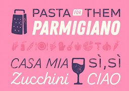 Type designer at Fontfabric in Sofia, Bulgaria, who writes about himself: Starting as a graffiti artist, I have been interested in visual arts and design since I can remember. That led me to the National Academy of Art, Sofia, where I graduated in Poster and Visual Communication BA, and Poster MA. I then joined a renowned type foundry, where I was able to develop and improve my understanding of typography and type design skills. In 2020 I became a part of the newly created foundry Spacetype..
 He was part of the Fontfabric team that designed the 521-font family Zing Rust, Zing Sans Rust and Zing Script Rust in 2017. In 2018, he published the free all caps lapidary typeface Colus at Fontfabric. In 2019, Svet Simov, Radomir Tinkov and Stan Partalev designed the 72-strong Noah family of geometric sans typefaces, which is partitioned into four groups by x-height from small (Noah Grotesque) to medium (Noah and Noah Text) to large (Noah Head). With Plamen Motev and Ventsislav Djokov, he co-designed Panton Rust and Panton Rust Script in 2019. In 2020, Mirela Belova and Stan Partalev co-designed the 22-style (+variable) geometric sans family Gogh at Spacetype. Typefaces from 2021: Code Next (a 20-style geometric sans by Svetoslav Simov, Mirela Belova and Stan Partalev; it includes two variable fonts). Garet (2021) is a 22-style (+variable) geometric sans family by Mirela Belova and Stan Partalev. Dedicated page. Co-designer with Mirela Belova of Steam (2021), a 13-style layerable Western family that emulates wood type. [Google]
[MyFonts]
[More] ⦿
|
Stefan Frey
[Schwarzschild]
|
[More] ⦿
|
Stephen Miggas
[Aerotype]

|
 [MyFonts]
[More] ⦿
|
Stephen O. Saxe
|
Letterpress specialist. Author of a fine article in 1983 on wood type. Alastair M. Johnston and Stephen O. Saxe edited the book Nineteenth Century Designers and Engravers of Type (Oak Knoll), which republishes William E. Loy's entire series of articles about America's type designers that had appeared ca. 1896-1900 in The Inland Printer. [Review by James Puckett] [Google]
[More] ⦿
|
Steve Day
|
Graphic design student at UW-Stout in Menomonie, WI. Designer of Humanality (2004), a typeface in which all minuscules receive dots (heads). There is no upper case. He also made a typeface based on woodcuts (2004), and Interface (2004). [Google]
[More] ⦿
|
Steve Jackaman
[Red Rooster Collection (was: Red Rooster Type Foundry)]

|
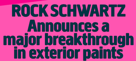 [MyFonts]
[More] ⦿
|
Steve Mehallo

|
 Steve Mehallo was born in San Francisco in 1967. He is a freelance graphic designer, educator, illustrator and font designer specializing in brand strategies, custom font development and logos. His clients have included Monotype, Microsoft, Ascender Corp, The Unicode Consortium, Netscape, TiVo, Nike, The David and Lucile Packard Foundation, The Learning Company and several more. He is also a past president of the Art Directors and Artists Club of Sacramento, board member of Another Poster for Peace, was the lead curator of the contemporary graphic design exhibition Spoken With Eyes at the UC Davis Design Museum and has taught design courses at UC Davis, Santa Clara University, The Art Institute of California and Sacramento-based American River College. First Redwood City, CA, and now Sacramento, CA-based. Creator of these fonts:
 - The street lettering font Alta California in 1994 (Agfa): Alta California is a ransom note-style sample of wood type and other types.
- The beautiful old typewriter family Chandler 42 at Psy/Ops.
- MartiniAtJoes family (1996-1997) is available through Agfa-Monotype and PsyOps: futuristic meets the 50s.
- Niedermann Grotesk (2011). He writes: It is a peculiar style of lettering---which was originally inspired by the Sachplakat (object poster) work of Lucien Bernhard---and adapted for hot metal in 1908 by Hermann Hoffmann. 100 years ago, the style became a workhorse of the German printing industry.
- Escoffier Capitaux (2008) is named for culinary legend Auguste Escoffier (1846-1835) and inspired by lettering used in vintage French advertising---including the work of commercial illustrator/fashion designer Ernst Dryden (1887-1938), with a hearty serving of 1960s ligatures influenced by the work of Herb Lubalin (1918-81) as well as a twist of Claude Garamond (1480ish-1561).
- TwentyFourNinetyOne (2008, Ascender Corp) is a reinterpretation of the alphabet of 1919 by Theo van Doesburg.
- Jeanne Moderno (2009) is an art deco take on Bodoni, in 9 styles.
Klingspor link. FontShop link. Blog. MyFonts link. View Steve Mehallo's typefaces. [Google]
[MyFonts]
[More] ⦿
|
Stiggy & Sands
[Jim Lyles]

|
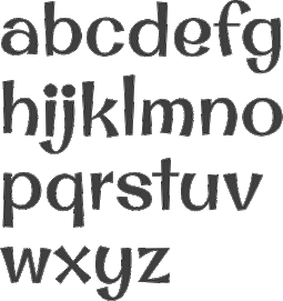 Stiggy & Sands is the Arvada, CO-based type foundry of Brian "Stiggy" Bonislawsky and Jim "Sands" Lyles, est. 2013. Their first commercial typefaces, all jointly designed, are Sante Pro (2013, a tall upright connected script), Rum Raisin (2013, inspired by the lettering from a vintage Kellogg's Raisin Bran cereal box), Maiden Orange (2013), Luckiest Softie Pro (2013, a rounded comic book typeface that was inspired by hand-lettered vintage 1950s advertisement), Smokum Pro (2013, a Western typeface), Carioca Script Pro (2013, inspired by the lettering on the RCA Records Stereo Action Series in the 1960s), Uncial Antiqua Pro (2013), Spicy Rice Pro (2013: psychedelic or disco), Ultra Pro (2013: a Clarendon or wood style slab serif), Quintessential Pro (2013: calligraphic), Bruno Ace Pro (a techno/automoive font, followed in 2018 by Bruno Ace Pro Rounded), Aclonica Pro (2013), Special Elite Pro (grungy typewriter), Audiowide Pro (2013: organic techno face), Peralta Pro (2013: a bouncy cartoon font), Englebert (2013: inspired by the title screen of the 1930s film Der Blaue Engel starring Marlene Dietrich), McLaren Pro (2013: comic book style), Galindo (2013: a comic book typeface with square counters), Margarine Pro (2013), Righteous Pro (2013), Mouse Memoirs Pro (2013, cartoonish), Risque Pro (2013, funky style), Luckiest Guy Pro (a fat comic book font based on vintage 1950s ads), Original Surfer Pro (2013, an an offbeat sans serif font bursting at the seams with lively personality. Inspired by a vintage advertisement for the California Cliffs Caravan Park, this font exudes all of the fun of a summer vacation anytime of the year), and Marcellus Pro (a flared roman inscriptional typeface with both upper and lower case, originally published in 2012 by Astigmatic; CTAN page).
 Typefaces from 2014: Purple Purse Pro (an offbeat didone based on a vintage Ivory Soap ad from the fifties). Typefaces from 2015: Shojumaru (an oriental simulation font inspired by a movie poster for the 1957 film titled Sayonara, starring Marlon Brando), Sacramento (connected script), Bazaruto (a decorative set of typefaces inspired by wrought iron, Letters and Lettering by Carlyle and Oring, and didones), Maiden Orange Inline Pro. Typefaces from 2016: Syncopate Pro (unicase), Kapture (a great romantic script), Stint Pro (slab serif spanning condensed to expanded widths), Grand Hotel Pro (upright connected script), Ribeye Pro, Shojumaru Pro (oriental style), Freckle Face Pro. Typefaces from 2017: Dear Sans (rounded sans family), Glorious Song (a display serif typestyle that was inspired by the poster lettering for the 1948 movie Words and Music), Montez Pro. Typefaces from 2018: Croft (a revival of Lewis Buddy III's ATF classic, Roycroft, 1912), Navarone (a Greek simulation font inspired by the titling sequence of the 1962 movie "The Guns of Navarone"), Distressed Telegraph (based on the typewriter font Large Elite Type No. 44), Gimbel Script (a tall monolinear upright vintage script), Bigelow Rules Pro (a beatnik font), Eagle Lake Pro, Husk (a digitization and extension of a film typeface called Maile by LetterGraphics), Boilermaker (a digitization and extension of a film typeface from LetterGraphics dubbed Flair G100), Eagle Lake (calligraphic), Bruno Ace. Typefaces from 2019: Fascinate Pro (a soft-shelled art deco typeface), Artisinal (an art deco typeface that revives John W. Zimmerman's Cubist Bold from 1928). Modulate (a blocky modular typeface), Lorette (based on the film font Laurel from LetterGraphics), Quandor (based on the Lettergraphics film font Impacta), Magnate (a digitization of the film typeface Wilshire from LetterGraphics), Toastie (based on the film font Flair 312 by Lettergraphics), Latitude Sans (a heavy sans based on Lettergraphics' Free). Typefaces from 2020: Bugleboy (this font family revives and expands the film font Wood Grotesk by LetterGraphics), Berkshire Pro (a plump display typeface), Mervale Script Pro (a brush script originally done in 2012 at astigmatic One Eye). Typefaces from 2021: Huerto (a geometric angular sans), Pennyroyal Pro (an elephant feet font with irregular outlines), Pennyroyal (an elephant foot almost cutout font). Typefaces from 2022: Pardner (a hand-painted spaghetti Western font). MyFonts link. [Google]
[MyFonts]
[More] ⦿
|
Sudaca Type Design Studio
[Alexis Navarro Miranda]

|
 Designer and letter artist in Puente Alto and Santiago, Chile. Some of his typefaces are published by Compania Tipografica de Chile, which he co-founded in 2018 together with Raul Israel and Franco Jonas. Future Fonts link. In 2021, he set up Sudaca Type Design Studio. His typefaces:
 - The reverse stress typeface Hatchet (2018).
- The free angular text typeface Parranda (2018). Winner at Tipos Latinos 2018 of a type design award.
- Joane (2018). Joane has calligraphic influences and is accompanied by the wonderful Joane Stencil, Joane Deco and Joane Engraved. Winner at Tipos Latinos 2018 of a type design award.
- Maipo Sans (2018) 40 styles, 826 glyphs per font: Maipo Sans is a modern typeface inspired by the mountain landscape of Cajon del Maipo, Chile. Its forms are inspired by the first sans serif European humanist fonts of the twentieth century along with a touch of reverse contrast. This typeface is specially designed for projects using extensive text blocks and striking ads..
- Hatchet Display (2018, Future Fonts). A typeface with reverse contrast and glyphic serifs based on the shape of a handmade axe.
- Mena Grotesk (2019). An extensive neo-grotesk made the Chilean way, named after the village of Bajos de Mena in Chile.
- LC Criolla (2020), about which Alexis writes: This typeface is inspired in the influence of the Bauhaus in Chile, particularly in Chillan; a city where a catastrophic earthquake took place in 1939. There was the need of rebuilding Chillan and it was fulfilled in a very good way. One of the responsible architects of what today we know as Chillan is the Hungarian Tibor Weiner---a Bauhaus man. He arrived to Chile as a refugee, the same year of the earthquake.LC Trinidad (2020). An 18-style geometric sans influenced by Renner's Futura and Koch's Kabel. Republished in 2021 at Sudaca Type Design Studio as Trinidad Neue.
[Google]
[MyFonts]
[More] ⦿
|
Sumanthri Samarawickrama
|
Sumanthri Samarawickrama is a senior lecturer in the Department of Integrated Design, Faculty of Architecture, University of Moratuwa, Sri Lanka. Her area of research concerns the anatomy of Sinhala letterforms. This has led her to document the evolution of Sinhala type. She completed a master's degree in visual communication design at Lasalle College of the Arts, Singapore, and a PhD in typography at the University of Moratuwa. Speaker at ATypI 2019 in Tokyo on the topic of Sinhala Wood-Block Type. [Google]
[More] ⦿
|
Supertype
[Jürgen Huber]
|
 A Berlin-based foundry started by Jürgen Huber and Martin Wenzel. In 2010, Jürgen Huber (Berlin, b. 1967) and Malte Herok had started The Type Department. They are also part of Type Network. In 2020, their typeface library contained
 - Realist, Realist Narrow and Realist Wide (2011-2019) by Martin Wenzel.
- Cy (2018). A geometric hipster sans by Juergen Huber.
- Duper. Evolved from FF Duper (2009). By Martin Wenzel.
- Hothouse. TD Hothouse---that font was started in 2001 as a corporate typeface for the Glasgow School of Art, and took inspiration in the arts and crafts lettering of Charles R. Mackintosh. Bukvaraz 2001 award.
- Lemon Serif, Lemon Sans, Lemon Sans Condensed, Lemon Sans Rounded, and Lemon Sans Rounded Condensed (2014-2015). See also Lemon Sans Next (2021, 24 styles).
- Ode (2010). A German expressionist typeface by Martin Wenzel.
- Profile Pro. A humanist sans family by Martin Wenzel that won an Excellence award at The Type Directors Club, which evolved from FF Profile (1999), a flared sans known for its little contrast. This evolved in a semi-hand-printed casual teenager, FF Duper (2009), mentioned above.
- Scarlet, Scarlet Script and Scarlet Wood (2016). By Juergen Huber.
- Blinker (2019). A free Google font family by Juergen Huber who writes: Blinker is a low contrast sans serif typeface with a squircle as its basic shape, think squarish curves, or Eurostile's flamboyant cousin. Github link.
- Adapt (2021). A no-nonsense legible sans family that consists of 80 standard fonts and two variable fonts.
[Google]
[More] ⦿
|
Suzanne Fleischauer
|
Aka Fleisch. Graduate of Johns Hopkins University. Codesigner, with Apostrophe at Apostrophic Laboratory, of Colwell and Hadley (2000), based on 1916 hand lettering by Ned Hadley. She also made Heraldic Crests, Heraldic Shields, Landes Fraktur, Blocky Sideways, High Hat (a pixel font), Wood Relief (2000), Sample (2007: a pixel font) and Woodcut Resawn (2009, at FontStruct). [Google]
[More] ⦿
|
System B
[Bob Nickas]

|
Bob Nickas or Bob Duckas set up System B in the western part of France in 2020. In 2021, he released the all caps typeface Brondi, which is based on an old French wood type. [Google]
[MyFonts]
[More] ⦿
|
Tanya Butskaya
[Sloth Astronaut (or: Cosmic Store)]
|
[More] ⦿
|
Tanya Chursina
|
Moscow, Russia-based designer of the textured Latin typeface Wood Type (2015). [Google]
[More] ⦿
|
Taylor Goad
|
Born in southeastern Oklahoma, Talor Goad now works as a designer for Gardner Design in Wichita, KS. His typeface Alexis (2011, free at Lost Type) is a take on the Italian woodstyle. It was fontified by Nathan Williams. Cargo Collective link. [Google]
[More] ⦿
|
Tellenbach et cie
|
Wood type manufacturer in Buttes, Neufchatel, Switzerland, est. by Jean Christian Hermann Tellenbach and Jean Charles Tellenbach in 1911. In 1911, Tellenbach published a specimen book, Manufacture de caractères en bois (publ. Imprimerie Delachaux & Nestlé). Flickr site. [Google]
[More] ⦿
|
Teo Tuominen
[LetterMaker]

|
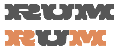 [MyFonts]
[More] ⦿
|
Terminal Design
[James Montalbano]

|
 Terminal Design is the company of James Montalbano in Brooklyn, New York, est. 1990. He was the President of the Type Directors Club, 2002-2003. He teaches type design at the School of Visual Arts in New York City. Feature on him by John Berry. In 2019, he declared at Typedrawers: I'm so tired of type design, so we must assume that threw in the towel. James designed these fonts:
 - In an earlier life as part of Fonthaus, ca. 1994-1995, I believe that Montalbano designed fonts like DidotDisplayAntiqueTdi, DidotDisplayRegularTdi, ProgressivePsychoOneTdi (through Six) and SenzaTDI (many weights).
- 718 (2010). A clean 24-style sans family influenced by as many typefaces as there are immigrants in Brooklyn. Named after the non-Manhattan area code.
- Alfon (2003). Montalbano calls it a muscular text typeface. It has chamfered corners and cupped serifs.
- Badinage. A connected retro script.
- Cappella (2013). It is a direct result of the work done on the Fordham Chapel custom font commission. A one weight, all caps design based on wood carved lettering from a Fordham University chapel honoring fallen alumni.
- Choice Sans, Choice Sans Compressed, Choice Sans Condensed (2014).
- ClearviewADA, ClearviewADA Condensed, ClearviewHwy, ClearviewText, ClearviewText Compressed, ClearviewText Condensed. The legible sans serif family ClearviewOne, designed for highway signs, and used for US highway signs starting in 2002. The highway sign font family is called ClearviewHwy), and is further explored here. ClearviewHwy is used for highways in the USA starting in 2004 (see the discussion here). The OpenType version of ClearviewOne is called ClearviewText (2007). ClearviewADA (2007) is a family of Clearview fonts that conform to the letterform specifications for signage outlined in the Americans with Disabilities Act legislation. Free download. Clearview was discontinued in 2016 by the US Federal Highway Administration, in favor of the older Highway Gothic from the 1940s: Report by Citylab.
- Consul Caption, Consul Deck, Consul Display, Consul Text (2009). A 48-style text family. Optically sized, it emerged from a Gustave Mayeur design done by Montalbano for Mens Vogue. Consul has a hint of didone, but the brackets are rounded and the stems gently flared. In Montalbano's palette, this is one of the beauties.
- Enclave (2007): A sixteen font slab serif family.
- Fervent (2013). A sans version of Badinage.
- Giacomo 2.0. a well-balanced and interesting sans-serif family. Includes Cyrillics.
- Insouciant (2011). An upright connected script family..
- At ITC: ITC Orbon 2020, ITC Orbon (1995-1996: a strange experimental typeface), ITC Nora (1997), ITC Freddo (1996, a fat poster typeface).
- Kaboodle (2018). A wood type with extended Latin, Greek and Cyrillic.
- Kinney (2011). A type family for tables and information design. James's self-proclaimed attempt at creating a neutral serif.
- Latin 512, Latin 512 Compressed, Latin 512 Condensed, Latin 512 Expanded. An 80-style didone family with triangular or wedge serifs typical of the Latin style.
- Moraine (2009). A serif family with a wide generous feel. Stems are flexed and tapered and serifs are cupped.
- Notary (2017).
- Now Playing (2007): A digital revival of the naïve plastic lettering that was used on the marquee of the Apollo Theater in Harlem.
- Quotient (2015). An elegant sans typeface family without italics. Montalbano describes it as trajan Sans because of its classical roman proportions. many details such as the rhombic dots on the i's are inscriptional in nature.
- Rawlinson 2.0, Rawlinson 2.0 Condensed, Rawlinson Roadway (2003). A serif family, which includes a Condensed sub-family). NPS Rawlinson Roadway is an old style serif typeface currently used for the United States National Park Service's road signs. It was created to replace Clarendon and uses James Montalbano's wife's last name.
- Shenandoah. A display type based on the wood letters at Shenandoah National park.
- Social (2012). A rounded sans family for on-line use.
- Tangent (2007): A geometric sans in sixteen styles.
- Trilon, Trilon Compressed, Trilon Condensed, Trilon Expanded (2009): A sans typeface family. Montalbano calls it a 21st century gothic.
- VF Sans, VF Sans Condensed (2011). An avant-garde family with 32 styles. James explains its release: Back in the late 90s I designed a family of sans serif fonts for Vanity Fair magazine. I based them on various sans serif designs from the 1930s with nothing particular in mind. They have been compared to Intertype's Vogue, and I do see the connection, but it wasn't my intention of doing a Vogue revival. They have been kept out of circulation these last many years at Vanity Fair's request, but it appears that during the last few years Vanity Fair has lost interest in them. They no longer grace the front cover of the magazine, and they appear with less and less frequency inside the publication. I've also noticed several pirated uses of them as they have popped up on some book jacket designs. So with Vanity Fair's permission I felt it time to set them free.
- Yo Andy, Yo Frankie, Yo Lucy, Yo Sophie, Yo Zelda. The Yo series (2010) consists of 200 didone styles. It is subdivided into Yo Andy, Yo Frankie, Yo Lucy, Yo Sophie and Yo Zelda. This didone family has two axes (weight, extension) with 100 regular members finished in 2010 and 100 italics added in 2014. They reach in alphabetical order from condensed (Andy) to extended (Zelda).
Montalbano designed custom corporate fonts for Condé Nast Publications, Warner Music, The American Medical Association, the U.S. National Park Service, Vanity Fair, Brides, Gourmet, Mademoiselle, Sassy, Details, Glamour, Jane, Self and Book. The list of font names, with links: - Collins Geometric.
- DM Marquee. A dot matrix all caps design created for Mother NY for their client, Daily Motion.
- Early Learning Sans. A family of 12 fonts designed for MeadWestvaco's Early Learning Products division for use in educational products teaching young students the basics of letter construction.
- Fordham Chapel. Based on wood carved lettering from a Fordham University chapel honoring fallen alumni.
- Fortune Titling. Based on the Fortune logo.
- Glamour Display, Glamour Script. The latter is a roundhand script. Both were done for Glamour magazine.
- JCP News Gothics. Created for DDB Chicago, for use in the It's all in there campaign for JC Penney. Should work with existing Monotype News Gothic fonts.
- Johan Gothic. A condensed sans serif designed for Conde Nast Sports for Women, which changed its name to Women's Sports, which then changed its name to Women's Sports and Fitness. The type was named for the art director who commissioned it.
- Lucky Gothic.
- Mens Vogue-Mayeur. Mayeur Display, an original design created in 2005 for Men's Vogue. Based on 19th Century French text types from the Parisian foundry of Gustave Mayeur.
- Now Playing. As part of the renovation of The Apollo Theatre, Now Playing was designed to reflect the plastic marquee lettering of the 1940s.
- NPS Roadway. Montalbano writes: Designed to replace the Clarendon road guide sign typeface that the U.S National Park Service used as part of their identity. NPS Roadway was tested by Pennsylvania Transportation Institute and was found to decrease legend length by 10-15% while increasing readability by 11%. Part of a total redesign of the Park Service identity (that included the Rawlinson series of fonts) the font has been approved by FHWA (Federal Highway Administration) for use on all Federal roads.
- Skinny Eric. A painfully thin version of Gill Sans, designed for Self Magazine.
- Social. Two weights of a rounded sans serif design to compliment the Living Social logo design.
- VF Didot, VF Sans, VF Sans Condensed, VF Script. All done for Vanity Fair. VF Didot is a slightly condensed design based on the many New York didot alphabets drawn during the 1940s and 50s. VF Sans is Vanity Fair's workhorse. VF Script is an original script created for Vanity Fair Magazine in 1999, loosely based on lettering found on a French Automobile Poster from the mid-1920s.
- Vogue AG, Vogue Didot Extended. Vogue AG is a nine-weight sans serif design mixing elements of Futura and Avant Garde Gothic. The Extra Light weight was designed for Vogue magazine in 2004 while the remaining weights were added in 2007 and updated in 2011.
Klingspor link. FontShop link. Linotype link. Behance link. View James Montalbano's typefaces done at ITC. [Google]
[MyFonts]
[More] ⦿
|
Terrance Weinzierl

|
 Grand Rapids, MI-based graphic designer trained in Chicago. Terrance worked as a graphic designer for the university book store while earning a bachelor of fine arts degree with an emphasis in graphic design from Grand Valley State University in 2008. After graduation, he joined Ascender Corporation where he worked closely with Steve Matteson. After Ascender folded, he became an in-house type designer at Monotype where most of his time is dedicated to custom fonts.
 His early typefaces include TW Geo Slab (2007), Dux (2007, ornamental Victorian type), Wingman (2006, handwriting) and Weinzierl Slab (2006, see also here). He joined Ascender and created there the stencil blackletter typeface Stenblak (2010), informal script typeface Rebus Script (2009, with Steve Matteson) and Romany (2009), a non-connecting script which was originally designed by A.R. Bosco and released by American Type Founders in 1934. In 2012, he created Feldman Engraver and JMC Engraver. Fonts from 2015: Kairos (Monotype: an octagonal typeface based on 19th century Grecian wood type). In 2015, Monotype set out to remaster, expand and revitalize Eric Gill's body of work, with more weights, more characters and more languages to meet a wide range of design requirements. As part of that project, Terrance Weinzierl designed Joanna Sans Nova (2015: sixteen fonts, loosely based on Gill's slab serif, Joanna, so technically, this is not a Gill revival, but a Gill extension. A well-balanced family with a medium-to-large x-height. But the italic g is disturbing). Fonts from 2016: Terry Junior Basic (free), Kairos Sans (which accompanies his 2015 typeface Kairos; both cover Latin and Greek). The octagonal typeface Kairos Sans became Monotype's first variable font---it is free at GitHub. Also in 2016, he added some Greek, Cyrillic, weights and widths to Kobayashi's Eurostile Next, for a grand total of 50 styles in this popular Linotype font family. Pizza Press (2013) won an award at TDC 2014. In 2017, Jeong-Sook Lee, John Pompa, Terrance Weinzierl and the Monotype team won a Red Dot award for the 72-style typeface family 72 designed for SAP Fiori. Fonts from 2018: Terry Junior (Monotype; a brush script perhaps with uses for children's books). Typefaces from 2019: Monarda (Monotype), Terrance Weinzierl's take on the loud and splashy brush scripts of the 1950s. Typefaces from 2020: Futura Now (a 107-style family by Steve Matteson, Terrance Weinzierl, Monotype Studio and Juan Villanueva, that includes variable fonts as well as subfamilies called Text, Display, Headline, Inline, Outline, Shadow and Script). Typefaces from 2021: Tellumo (a 12-style humanist geometric sans with a tidy look and large x-height) and Tellumo Variable. Klingspor link. Linotype link. [Google]
[MyFonts]
[More] ⦿
|
Terry Koppel
[Terry Koppel Design]
|
 [More] ⦿
|
Terry Koppel Design
[Terry Koppel]
|
 Creative director in Brooklyn, NY. His wood-inspired typefaces can be bought at TK Shop. He explains the start of his type foundry: It was a period in the eighties before computers had really made inroads to publishing. During a typical call to a premiere New York typesetter---ordering some headlines in wood type---he told me "It's a good thing you called today, I was just about to throw all my wood typefaces away, nobody's asking for them anymore!" Before he threw them out, I asked him to make up a master photo strip of complete glyph sets of all of the typefaces that were more or less complete, and for a few years, we used them this way at Koppel & Scher. Later, when I moved to Esquire, I had them digitized with the flaws and irregularities intact. At the time, digitized wood fonts that actually printed like the old wooden typefaces were hard to find, and for decades I reserved them for personal use. Now, for the first time commercially, I am offering these unique digitized drawings of authentic wood type.
 Typefaces made by him include Anderson Gothic Squeezed, ESeventeen (a condensed wood type revival), SeriWood, WoodBlock Condensed, ETen, ETwentyFive, LuxorRev, Morgan, Morgan Gothic Caps, Woodtype Gothic Extended, and Haber Squiggle. Behance link. [Google]
[More] ⦿
|
Terry Wüdenbachs

|
 Snowboarder from Liechtenstein, who designs typefaces at P22 and its descendant foundries such as HWT. The list:
 - His first font was the whacky P22 Catalan (2003), which was inspired by Antonio Gaudi, Joán Miro and Salvador Dali.
- In 2004, he created BlancoNeg, Mexican Relics (100 dingbats from pre-Columbian Mexico), Sniplash (a 60s cartoon face) and Durer Caps (after Dü'rer's 1525 original).
- In 2005, he added P22 Mystic (art nouveau).
- The curly P22 Festiva and P22 Huffer Pro (comic book face) followed in 2009.
- In 2010, he designed two revivals of Nebiolo work, P22 Nebiornaments, and P22 Slogan (after the 1957 brush font by the same name by Aldo Novarese).
- In 2012, he created P22 CoDependent, a set of two art deco typefaces that revive of the Independant typeface from 1930 created by Dutch designer Johannes Nicolaas Coenraad Collette along with Jos Dufour from Belgium.
- In 2012, Terry joined forces with Richard Kegler and published the multilayered Western circus font HWT American Chromatic at Hamilton Wood Type. American Chromatic was originally created by Wm. H. Page & Co. circa 1857-59.
- In 2013, he designed HWT Arabesque for Hamilton Wood Type. This art nouveau / psychedelic typeface was originally produced by the Morgans & Wilcox Co. and the Wm. Page Co. as almost identical designs. Both manufacturers were acquired by Hamilton and offered briefly by Hamilton as design #618. William Page Arabesque was first shown in 1872 and after the Page purchase by Hamilton in 1891, it was renamed to No. 618. Similarly, the Morgans & Wilcox Arabesque was first shown in 1884, but after Morgan's purchase by Hamilton, it was renamed to No. 3189.
- HWT Showcard Script (2020). Described as an extended script type that lends itself well to fine fashion, ready-to-wear and all quality merchandise in a marketing blurb that pitched Beaufont by the Morgan Sign Machine Company of Chicago for their Line-O-Scribe sign printing system. This advertising script font was originally manufactured exclusively for Morgan Sign under license by the Hamilton Wood Type Manufacturing Company.
- In 2020, the Bixlers and P22 jointly published the ornamental typeface LTC Bixler Ornaments. The digital version is due to Terry Wudenbachs.
- P22 Snowflakes (2020). By Richard Kegler and Terry Wüdenbachs.
Klingspor link. View Terry Wüdenbachs's typefaces. [Google]
[MyFonts]
[More] ⦿
|
The Beauty of Letterpress
|
Web site by paper manufacturer Neenah Paper (Atlanta, GA), dedicated to letterpress. [Google]
[More] ⦿
|
The Fontmaker
[Jordan Jelev]

|
 Jordan Jelev (The Fontmaker) is the Varna, Bulgaria-based graphic and logo designer (b. 1975, Varna) who specializes in wine label design. He set up The Fontmaker in 2011. Their typefaces:
 - The calligraphic Cyrillic alphabet Kaloyan (2008).
- The double-lined Grant (2009, with Svetoslav Simov, Fontfabric).
- FM Clog (2011, with Vassil Kateliev, done at The Fontmaker). This font has Openface, Shadowed and Engraved styles.
- FM Bolyar (2012) is a copperplate typeface jointly designed by Jordan Jelev and Vassil Kateliev at The Fontmaker. See also the spurred version FM Bolyar Ornate Pro ansd the weathered family FM Bolyar Typecarft. In 2019, after a full year of development, they published the 63-style all caps sans family FM Bolyar Sans Pro.
- FM Valentines Pro (2012). For Valentine's Day messages.
- FM Christmas 2.0 (26 hand-lettered Christmas greetings), done in 2012.
- FM Ephire (2013). A lively script family, done with Vassil Kateliev. It comes with a useful caps companion, FM Ephire Frames.
- FM Easter Pro (2013). For Easter wishes.
- FM Thank You (2014). Thank you hand lettering.
- FM Birthday 1.0 (2015) consists of 26 birthday-related words and phrases.
- The enormous typeface family FMBolyar TypeCraft (2016) Jordan Jelev and Vassil Kateliev. This family has Engraved, Shadow, Rust, Rough and Woodcut subfamilies. Many styles are spurred. Caps only, though.
Behance link. MyFonts link. Klingspor link. Recent Behance link. [Google]
[MyFonts]
[More] ⦿
|
The Fontry
[Michael Gene Adkins]

|
 The Fontry is a Watts, OK, based outfit, est. 1992 by Michael Gene Adkins (b. 1965, OK) and James L. Stirling (b. 1964, OK): Digital type for computer-aided signmaking, with fonts designed for signmakers by signmakers.
 Since 2009, they have been producing various digitizations of alphabets designed by Alf R. Becker in the 1930s and 1940s. Gene Adkins designed ARB-187 Moderne Caps AUG-47 (2013, didone), ARB 85 Modern Poster JAN-39 (2011, after Modern Poster Script, 1939), ARB-70 (1995), ARB-67 (1998), ARB-66 Neon (2010, +Block, +Line), ARB-44 (1995), ARB-96 Jitter Display DEC-39 (1999), SCRIPT1 ARB-85 Poster Script Normal (2000), ARB-66 Neonline Block, ARB114 Hillbilly Roman JUN-41 Normal (1999), ARB-187 Moderne Caps AUG-47 CAS family (2009, a beautiful didone display face), the ARB 08 Extreme Roman AUG-32 CAS family (2009), ARB-218 Big Blunt (2010), ARB-218 Neon Blunt. Another product is the Wild Bunch Pak #3: Danthr Skal, Kastaka, Gas Bumps, Skrawl 613, Sharrpe Gothik, Levo Fraz, Kommerce, Stellar Spice, Infected Hurt. Wild Bunch Pak #2 (50 USD) has Marbles&Strings, Keetoowah, Peppermint, Ghixm (2008: a retrospective of the horror comics and movie posters of the 1960s and the 1970s), Klash, all outline fonts. In Wild Bunch Pak #1, look for Toxia. Race Pak #1 contains 5 chiseled fonts, including ARB67, Brannt Chiseled, Excursions, JLS Ultra, and Race Checkers. 50 USD. There are also Greek Pak #1 (12 Greek fonts for 25 USD, including GRK Orbit, GRK Universe City, GRK Albert, and GREK Bodnaut) and Signfaces Narrow Pak #1. At Garagefonts, Wild Larra, Wild Ruts, Wild Toxia, Wild Nobody families (1999), Jackport (2014, athletic lettering and Western typeface family). Adkins also designed the commercial font First Vision at GarageFonts in 1998. Review at &Type. List of the fonts on his CD. MyFonts sells FTY Garishing Worse (2011---there is a free version at Dafont), SCRIPT1 Team (2010), SCRIPT1 Toon (2010), SCRIPT1 Voodoo Script (1999-2009, signage script), What Sound Pounds (2009), WILD3InfectedHurtNormal (2010), WILD1 Firstvision (1997), WILD1 Larra (1997, grunge), WILD1 Nobod (1997, grunge), WILD1 Ruts (1997), WILD1 Toxia (1997) and the blackletter typefaces Ironhorse and Ironrider (2007), revivals of classic wood type typefaces. FontShop link. Some fonts are inspired by sign painter Frank H. Atkinson. These include the Broken Poster series done in 2010, FHA Modernized Ideal Classic (2011), and FHA Nicholson French (1999-2014: art nouveau). In 2008, The Fontry published the Greek Font Set, Copper Penny DTP (after Copperplate Gothic, but with lower case included), Droeming (an eerie family) and Earth A.D. (more eerie stuff, metallic, and with sharp serifs). It then generated a break-away subfoundry that carries fonts solely designed by James Stirling, Fontry West. Fontry West is located in Tulsa, OK. At MyFonts, these Fontry West fonts can be bought: Iron, WILD1 Firstvision, WILD1 Larra, WILD1 Nobody, WILD1 Ruts, WILD1 Toxia, WILD2 Ghixm, Greek Font Sets 1 and 2 (not Greek, only Geek-ish, made for fraternity use), and a large Comic Fanboy set which includes glyphs painted with stars and stripes (CFB1 American Patriot, CFB1 Captain Narrow, CFB1 Shielded Avenger, all made by Adkins). The CFB1AmericanPatriot family (2009), and the SCRIPT1 Rager Hevvy family (2009) are free here. JLS Overkill (2009, Bloque, Stencil, Grunge, Champion [athletic lettering], Hammer) is a sturdy family covering everything from SUV-strength stencils to grunge stencils and macho slab serif headline typefaces. After Disaster (2008), FHA Eccentric French Normal (2008, wood type after an alphabet created by Frank H. Atkinson in 1908), WHATSOUNDPOUNDS?Normal (2009) are free at Dafont. Sinder (2010) is a grunge face. FTY Konkrete (2010) is constructivist, and has a beveled weight. FTY Strategycide (2010-2018) is a similar severe headline sans family. Sinder (2010) and Demon Sker (2011) are free grunge typefaces. American Purpose (2011) is a grotesk family. American Purpose Casual and American Purpose Stripe (2011) are follow-ups. Garishing Worse (2011) is a casual bold face. Sharpe Gothik (2011) is hand-drawn. American Captain (2011, a manly retro squarish propaganda headline face; see also American Captain Patrius 02 FRE). Deathe Maach (2012) is a sturdy 6-style display family. Avengeance (2012) is a techno typeface. FHA Condensed French (2012, by Michael Gene Adkins and James L. Stirling) and FHA Nicholson French (1999-2014, art nouveau) are based on Frank H. Atkinson's examples. Typefaces from 2013: FHA Broken Gothic (a layered chiseled family done with James Stirling, based on Broken Poster by Frank H. Atkinson), FTY SKRADJHUWN (a flared family), Iron Man of War (with layering effects, +001Rivet), Iron Man of War 2 NCV, RACE1 Brannt (prismatic, beveled, art deco), FTY Skorzhen (mini-spurred), FTY Speedy Casual, FTY Skradjhuwn NCV (comic book family). Typefaces from 2014: FHA Tuscan Roman (2014, Michael Gene Adkins, James L Stirling), FTY Varoge Saro Noest. Typefaces from 2015: FHA Sign DeVinne (after a popular sign painting design by Frank H. Atkinson named after DeVinne). Typefaces from 2016: FTY Delirium (+Neon), Delirium NCV. Typefaces from 2017: FTY Galactic VanGuardian. Typefaces from 2021: Fty Old Sport (a slab serif athletic lettering font family, one of the best in this genre). Typefaces made by Fontry West. Typefaces by Mike Adkins. Fontspace link. Klingspor link. Dafont link. Abstract Fonts link. Creative Market link. [Google]
[MyFonts]
[More] ⦿
|
The Mad Castle
[Clément Lefevre]
|
Parisian creator of the free handwriting font Maï-Linh (2013), the free PSD-format Woody Type (81MB), and the free grungy brush typeface Ink Type (2015). Behance link. Dafont link. Aka Here Is Jonas. [Google]
[More] ⦿
|
The Pyte Foundry
[Ellmer Stefan]
|
 The Pyte Foundry was established in 2015 by Ellmer Stefan in Oslo, Norway. During the course of the year 2016 Ellmer Stefan released a new free display font every consecutive Monday. They explain: Paying tribute to the typographic diversity of the 19th century, this project's aim is not historical accuracy---none of the typefaces are strict revivals of specific typefaces produced in the Victorian era. It is rather a revival in spirit---indulging into stylistic manifoldness and idiosyncratic hyperbolism. The digital fonts are generated using a component-based system that globally applies changes made to independently adjustable letter parts, such as stems or serifs. This approach mirrors the production methods envisioned for the making of wood types around 1880: in American Wood Type 1818-1900 (Van Nostrand Reinhold Company, New York; 1969) historian Rob Roy Kelly refers to a series of inventions by William H. Page using interchangeable modules in the creation of wood type letters enabling the rapid manufacturing of new styles.
 The list of typefaces from 2016: Prhyme, Alcove, Mortar, Plakat, Cabaret, Antique, Galore (piano key style), Lyrics, Protocol, RoutineA, RoutineB, Routine C, KinkA, Kink B, Moloch, Symptom, Residue (ultra-condensed), Perdu (Western, Italian), Turmoil, Polymer, Houdini (wide slab serif), Umbra (shaded style), Montage (mechano style), Flounce (Tuscan Western font), Throng (piano key style), Italian (reversed stress style), Epitome (ultra-condensed didone), Overdose (Italian), Overdone, Gyrator, Henry I, Plumb A, Blockage, Seryph (stitching font), Octango (a chiseled typeface), Potpourri (decorative caps), Persiflage, Radiator Italic, Ortho (octagonal), Nihilist, Errata, Dosage, Radiator, Vulture, Filocalus, Latency, Postulate, Syzygy, Cuneiform, Cuneimorf, Absolu (a great decorative titling typeface family), QFWFQ. In 2016, he designed Levvel Script (brushy), and Sentralen Oslo. Skald (2017) is a set of three typefaces designed for a series of classics issued by Norwegian publishing house Skald Forlag. In 2018, he designed the custom type system Diller Scofidio + Renfro (for the New York-based architecture firm). In 2019, they released Triptych (Roamn, Italick, Grotesque). He writes: Triptych consists of three distinct styles amplifying the notion of structural differentiation within a typeface family. The triplet of Roman, Italick [sic] and Grotesque is designed to take on clearly defined hierarchical functions in a typographic system. Roman and /Italick are irreverently free interpretations of the sturdiest of all sturdy book faces ever produced, namely O.S. (Old Style Antique No.7 by Miller & Richard of Edinburgh first issued in 1858). Most probably not designed by Miller & Richard's prime punchcutter Alexander Phemister. Despite its name, Triptych is of secular, utilitarian nature: its unsentimental, at times mechanical drawing makes for a stubbornly robust and economic design. Bare any bourgeois flamboyance it is suited for confident and hardworking typography. Where other typefaces are promoted as workhorses, this one is a mule. Also, for the celebration of Norwegian sculptor Gustav Vigeland's 150th birthday in 2019, he released the wedge serif roman inscriptional capital typeface Gustav Display. Still in 2019, he added the bespoke flared lapidary typeface Hamran and the custom typeface Aurlands Display. In 2020, he designed the economical sans family Oslo Sans for the City Council of Oslo. He also released Compagnie, a set of three typefaces that are a digest of various French and Swiss wood type Grotesques from the second half of the 19th century. [Google]
[More] ⦿
|
The Silver Buckle Press Collection
|
Located at the University of Wisconsin, this site offers some copies of old type specimen books for viewing. There are neither PDF downloads nor high resolution scans, but one can get a feel of the contents. The list (as of early 2012) is below: - Add "punch" to your printing with Hamilton wood type. 1951
- American line type book: borders and ornaments price list, printing machinery and material. 1906
- ATF Spartan: medium and italic.
- Automatic white space.
- Bauer types in use.
- The Blue Streak Linotypes: master models 31 & 32.
- The Blue Streak Linotypes: model fourteen.
- Hamilton printing plant equipment / manufactured by Hamilton Manufacturing Company. Hamilton Manufacturing Co. (Two Rivers, Wis.) ([1922-1932])
- Instruction on installation, care and operation of the chandler & price 10x15 and 12x18 craftsman press with rice automatic feeder 1934. Chandler & Price company (1934)
- [Letter from Ray C. Cook, sales director of Hamilton Manufacturing Company regarding Hamilton wood type catalog no. 25]. Cook, Ray C. (1951)
- La lettre d'imprimerie: origine, développement, classification & 12 notices illustrées sur les arts du livre. Thibaudeau, F (1921)
- La lettre d'imprimerie: origine, développement, classification & 12 notices illustrées sur les arts du livre. Thibaudeau, F (1921)
- Linotype news. 1963
- Nickel-alloy type: Keystone Type Foundry. 1906
- The Nubian: A New Fashion in Types (1928). Local download.
- Price list of printing type and typographic material. Mackellar, Smiths & Jordan Co (1891)
- The printing arts: selected from a detailed description of all guilds. Sachs, Hans, Ammann, Jost (1968)
- Two-series modernage typography introduced by the American Type Founders Company.
- Type specimen book. Democrat Printing Co. (Madison, Wis.) ([1940])
- Types: fancy metal rules and metal furniture too.
- Wood 2. Morgan Press ([1964])
- Wood type. Hamilton Manufacturing Co (1938)
- Wood type. 1897
- Woodcock's printers' and lithographers' weekly gazette. 1881
- Woodtype: selective emphasis for fine typography. 1960
[Google]
[More] ⦿
|
The Warehouse (or: Warehouse Design)
[Brittany Deighton]
|
Based in Kent, Ohio, Brittany Deighton founded Warehouse Design with Jesse Snyder. At Warehouse, one can buy some icon font sets from them, such as Miniglyph, Parks and Rec, and Snack Time. Together, they designed the slabby wood type typeface Ohio, and Medical Icons in 2013, while Brittany was studying in the Visual Communication Design program at Kent State University. Creative Market link. [Google]
[More] ⦿
|
Thiago Bellotti
[Gestu]

|
 [MyFonts]
[More] ⦿
|
Thomas A. Rickner

|
 American type designer, born in Rochester in 1966, who has worked for various foundries including Monotype. He graduated from the Rochester Institute of Technology. He lives in Madison, WI, and is currently employed by Monotype, after a short period at Ascender. He co-designed a revival of W.A. Dwiggins' beautiful Eldorado family, Amanda (1996), Hamilton, the Western font Buffalo Gal (1992-1994, TTGX variations font done while he was at Apple). He worked at Monotype from 1994 onwards, where he hinted Carter's Georgia, Tahoma, Nina and Verdana fonts, for example, commissioned by Microsoft. While employed by Apple Computer, Tom oversaw the development of the first TrueType fonts to ship with Apples System 7. He worked on a freelance basis for Font Bureau for the last 12 years. He has worked on custom font solutions for companies such as Adobe Systems, Apple Computer, Hewlett-Packard, IBM, Lexmark, Lotus, Microsoft and Nokia. His custom fonts include a revival of Bodoni to serve Lexmark as their new corporate typeface. His experience with non-Latin scripts is broad, having designed fonts for the Greek, Cyrillic, Hebrew, Thai, Thaana and Cherokee scripts. Tom also played a key role in the development of fonts for Agfa Monotype's proprietary stroke font format. In his own words, However I did the bulk of the drawing for Siegel's Graphite, and I did about 1/2 of the Tekton MultipleMaster (with Jill Pichotta and Tobias Frere-Jones on the other half of the masters) while in Palo Alto. In 2004, he co-founded Ascender Corporation, where he published
 - Arial Mono (Ascender).
- Buffalo Gals (1992 and 2016): Buffalo Gals is one of the very first variable fonts, originally made in 1992 for an Apple TrueType GX developer CD. It was intended to push the boundaries on the number of stylistic axes in a font, with 6 axes in total, none of them being weight or width. Based upon wood type of the late 1800s, Buffalo Gals enables control over features with names like Cookies, Fringe, Hooves, Concavity and Bracketing. It offers 144 distinct combinations of these attributes, and seemingly infinite intermediate interpolations as well. Free download here.
- Circus Poster Shadow (2005): based an 1890s Tuscan style wood type.
- Goudy Borders (2009) and Goudy Forum Pro (2009), a revival and expansion Frederic W. Goudy's "Forum Title" (1911, inspired by Roman inscriptions on the Trajan's column monument).
- Hamilton (Ascender). A wood type face.
- Rebekah Pro (2006): a revival of ATF's Piranesi family, the regular being designed by Willard Sniffin, and the remaining weights designed by Morris Fuller Benton. Tom Rickner first revived Benton's Italic for use in his wedding invitations for his marriage to Rebekah Zapf in 2006. He completed the character set in 2009.
Will-Harris interview. Agfa bio. Ascender Corporation bio. FontShop link. MyFonts link. Klingspor's PDF. [Google]
[MyFonts]
[More] ⦿
|
Thomas Bewick

|
Famous British wood-engraver (b. Eltringham, Northumberland, 1753, d. London, 1828), whose work was printed by his friend from childhood, William Bulmer. The punchcutter Richard Austin trained with Bewick as a wood-engraver. [Google]
[MyFonts]
[More] ⦿
|
Thorowgood Foundry
[William Thorowgood]

|
 English punchcutter and typefounder who died in 1877. He worked at the Fann Street foundry in London and was active ca. 1820-1849. He is best known for one of the early sans serifs, Grotesque (1832) [note: that name is still in use today to refer to sans serif typefaces based on 19th century models], with a square M and equal width caps. Stephenson Blake and Monotype published a number of grotesques and numbered them as in Grotesque No. 33. It is generally accepted that Thorowgood released the first sanserif lowercase in 1834. He did several other types, including a Clarendon (1848).
 Quoting from the wiki: In 1794 Robert Thorne had purchased the foundry of Thomas Cottrell, a former employee of William Caslon, which had been founded in 1757 when Cottrell and Joseph Jackson were fired in a wage dispute. Upon Thorne's death in 1820 the foundry was purchased at auction by William Thorowgood using money he had won in a lottery. Though he was never involved in the type founding business before this Thorowgood made the foundry initially successful by publicizing Thorne's typefaces. Many of the types identified as Thorowgood's are actually the designs of Robert Thorne. Thorowgood went on to issue new specimens and added more typefaces including Frakturs, Greeks, and Russian types which he obtained from the Breitkopf and Härtel foundry of Leipzig, Germany. In 1828 he also purchased the Edmund Fry foundry which had a large collection of foreign language types as well. Robert Besley became a partner in the firm in 1828, and on Thorowgood's retirement in 1849, Besley took over the foundry. FontShop link. Linotype link. Modern digital revivals: - A super-black, super-contrasted didone typeface simply called Thorowgood (Elsner&Flake, Scangraphic, and Linotype).
- In 2019, Commercial Type released the Thorowgood Grotesque collection by Paul Barnes and Greg Gazdowicz. It is accompanied by the subfamilies Thorowgood Grotesque Dimensional (beveled) and Thorowgood Grotesque Open, and the related Thorowgood Egyptian.
- Chamfer Engraved JNL (2020, Jeff Levine). A chamfered sans serif wood type design with a right side engraving line.
[Google]
[MyFonts]
[More] ⦿
|
Tim Martin
|
Tim is a former intern and occasional freelancer at P22 and a recent BFA graduate of Daemen College in Buffalo, NY. Tim Martin digitized a wood typeface for Hamilton Wood Type in 2013, HWT Slab Antique and HWT Slab Columbian. These are based on William Page's Antique No. 4. [Google]
[More] ⦿
|
Tipas Type
|
 Type foundry in Mexico City run by Dafne Martinez, Monica Munguia (until 2020), and Sandra Garcia. Together, they designed the wayfinding sans typeface Colectiva in 2017. This typeface was originally designed for Mexico City's subway system. For a Mexican beer brand, Sandra Garcia and Tipas Type designed the splendid blackletter typeface Corona (2018) and the copperplate calligraphic typeface Especial (2019).
 In 2019, the three founders finally released the roundish informal children's book typeface Xantolo and the wood type / slab serif typeface Xihtli. [Google]
[More] ⦿
|
ToadFonts (was: AquaToad)
[Randy Jones]
|
 Randy Jones, who runs AquaToad and ToadFonts, is a free lance graphic designer who was in New York, but now lives in San Francisco, CA, where he is a freelance graphic designer and principal of Aquatoad Design. His typefaces:
 [Google]
[More] ⦿
|
Toko Type (was: Formika Labs, or: Studio Formika, or: Absolut Foundry)
[Gumpita Rahayu]

|
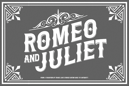 Gugum Gumpita Rahayu (b. Bandung) is a graphic designer based in Bandung and Jakarta, Indonesia, b. 1991. In 2013, he set up Absolut Foundry. In 2015, he started Gumpita Rahayu (Foundry) and Toko Type. In 2016, he founded Studio Formika, which became Formika Labs in 2017.
 Creator of the rounded sans typeface Tracks Type (2013, free at Fontfabric). Yuma is a free tweetware alchemic typeface. It is based on navajo patterns. Kurve (2013) is a sans headline typeface. Biere (2013) is a modular display typeface. Mojave (2013) is an all caps sans typeface. In 2013, he created Rocca, which is modeled after spurred wood type display styles from the Victorian era. Warenhuis de Vries is inspired by the signage on a 19th century colonial Dutch heritage building---the De Vries building, which today houses the OCBC NISP Bank---in Bandung, Indonesia. This font was renamed Oud Warenhuis (2013). Dutch colonial tropical architecture in Bandung led to the West Indian art deco typeface Bandoengsche (2013). Companion League (2013) is an octagonal Latin / Cyrillic signage typeface. Driekleur (2013) is pure Dutch colonial deco based on signage in a 1930s building (called De Driekleur) in Bandung built by Dutch architect A.F. Aalbers. March (2013) is a display family that includes beveled and inline styles. Free typefaces from 2013 include Swarha (in Neue and Rounded styles; an art deco sans named after the Swarha Islamic Building in Bandung made by Dutch architect Wolff Schoemaker between 1930 and 1935), Mohave (all caps sans, expanded in 2018 to a free typeface) and Flagship Slab Rounded. Typefaces made in 2014: Metrisch (a wide tall x-height geometric sans family; the Behance page attributes it jointly to Gugum Gumpita Rahayu and Deni Anggara), Luzern (a neutral industrial Swiss sans family---two free weights), Dealers. Typefaces from 2015: Catesque (grotesque). Typefaces from 2017: Celaras (flared, lapidary; renamed Celaraz), Monier (wayfinding sans), Eksikal (sans), Makro XM, Nomina (a 16-style + variable font grotesk family trying to emulate Venus and Akzidenz Grotesk; done in 2021, it is very different from his 2017 typeface called Nomina, which was an angular wedge serif---I can't explain the discrepancy), Gramatika (sans), Median Layer (layered colorable typeface family). Typefaces from 2020: Frasa (a 10-style transitional typeface influenced by Caslon), Stroma (a sharp-edged transitional typeface family). Typefaces from 2022: Plus Jakarta Sans (a free (variable) geometric sans family n the Neuzeit Grotesk and Futura mould; the fonts were originally commissioned by 6616 Studio for Jakarta Provincial Government program's +Jakarta City of Collaboration identity in 2020) Dafont link. Behance link. Creative Market link. Old URL. Studio Formika link. Fontsquirrel link. Google Fonts link. Github link. [Google]
[MyFonts]
[More] ⦿
|
Tom Anders Watkins
|
 Lincoln, UK-based creator of the free blackboard bold display typeface Anders (2014). In 2015, he designed the stylish unkerned triline typeface Argon (free demo).
 In 2017, Tom Anders Watkins and Ellen Luff co-designed Lucy Rose. In 2018, they added the sans typeface family Bison and the sans display typeface Anders. Bison Bold is free. In 2019, they continued with the hand-printer dry brush style SVG font Hackney,. and in 2021 they added Sherman Display, a soft-edged wood type all caps font. [Google]
[More] ⦿
|
Tom Hingston
|
Tom Hingston runs Tom Hingston Studio in London. Designer in the FUSE 16 collection (1997) of Condition Birth, Conception, Mutated, Pulse, and in FUSE 14 (1995) of Chaos. In 2000, he made Whappen based on an American woodcut typeface called Poster Gothic. Simon Gofton has designed the octagonal font Working (2000) at the studio for a Japanese music client. [Google]
[More] ⦿
|
Tom Huteson
|
During his studies at Portland State University in Portland OR, Tom Huteson designed woodblock-inspired typeface Cobalt (2013). [Google]
[More] ⦿
|
Tom Kolter
|
 Designer (b. 1972) who lives in Le Sueur, Minnesota. Creator of Minnesota Winter (2013, blackletter), Screen Door (2013, textured typeface), White Vinegar (2013, a Tuscan wood type revival), Return To Sender (2011, sketched face), 1873 Winchester (2011), Psychotic Robots (2010, exaggerated constructivist face), Tuscan Flies (2010), Whiskey Town (2008, +Buzzed, +Sober, +Drunk, a Western family), free at Dafont. Honest Merchant (2010) is a condensed wood type typeface based on an early 20th century sample.
 In 2019, he released the brushed blackletter typeface Fuzzy Franklin. [Google]
[More] ⦿
|
Tom Wallace
[HiH (Hand in Hand)]

|
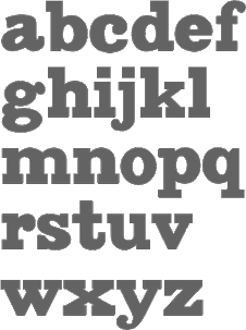 [MyFonts]
[More] ⦿
|
Toronto Type Foundry
|
Toronto-based foundry, located on Bay Street. It was active in the late 19th century, and published a specimen book on wood type: "Wood Type" (1897). It went out of business in 1967 and was taken over by Howard Graphic Equipment. [Google]
[More] ⦿
|
Tracy Jenkins

|
Wife and partner of Chester Jenkins at Village. Designer at Thirstype of the playful outline font Dee (2003). With Chester, she made a wood type face, Satchel Paige (2003), after a wood type original spotted in the Hamilton Woodtype Museum and the architectural hairline outline typeface Daily (2003, Village). [Google]
[MyFonts]
[More] ⦿
|
Trevor Baum
|
Brooklyn, NY-based type and graphic designer. He created the spurred typeface Haymaker (2012, free at Lost Type Co-op) and the bold display typeface Laika (2012). With James T. Edmondson, he co-designed the wood type-inspired sans typeface Mission Gothic (2013). Home page. Dribble link. [Google]
[More] ⦿
|
Tricia Treacy
|
Tricia Treacy has been running her own letterpress design studio, Pointed Press, creating custom book and print work for commercial clients, international artists, designers and writers since 2000. Using a combination of digital and analog methods, she collaborates on conceptual projects with a range of artists and designers. She has taught graphic design, letterpress and book arts at the University of Pennsylvania, the University of Delaware and the Mason Gross School of the Arts. Tricia is currently an Assistant Professor of Design at Appalachian State University in North Carolina. Speaker at ATypI 2012 Hong Kong: Vista Sans wood type project. [Google]
[More] ⦿
|
Tried & True Supply Co.
[Brian Brubaker]

|
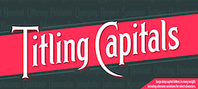 Tried & True Supply Co. is the husband and wife creative team of Brian and Marcy Brubaker. Together, they run their design and screen printing studio out of their home in Charlottesville, Virginia. In 2016, they designed Herschel, a vintage Victorian typeface.
 At Fort Foundry, Brian Brubaker designed these typefaces: - Figure (2021, with Mattox Shuler). Figure is a sturdy quirkhorse sans inspired by gothic wood type of the 19th century, available as a family of 40 fonts of 5 weights across 4 widths including roman and italics.
- Alkaline (2021), by Jonathan Ball, Mattox Shuler and Brian Brubaker. This typeface family at an 18 degree slope was inspired by 1950s lettering and logos on kitchen appliances.
- Pentz (2021). A Victorian font by Mattox Shuler and Brian Brubaker. First developed for the Motown Museum in celebration of the 50th anniversary of Marvin Gaye's What's Going On. The album title was originally set in Tedesca (a late 19th century font), but the cover designer, Curtis McNair, took some nice liberties in adjusting the letterforms when setting the type. Pentz continues in this theme, reviving and modernizing Tedesca.
[Google]
[MyFonts]
[More] ⦿
|
Triona Pers
|
Run by Dick Ronner from Houwerzijl, The Netherlands, this publisher has many books printed with wood type. [Google]
[More] ⦿
|
Tubbs Mfg Co
[Charles Tubbs]
|
American wood type manufacturer. The company, located in Luddington, MI, started in 1903 when Charles Tubbs (of Tubbs and Co. in South Windham, CT) died. It was sold to Hamilton in 1918. Antique Extended (1900, Tubbs) is a version of the 1838 font by George Nesbitt. Dick Pape's AWT Tubbs Modified Gothic XX Cond (2013) is a revival of a design by Tubbs. Valjean (Dan X. Solo) is based on wood type by Solo. [Google]
[More] ⦿
|
Ty Lettau
[Sound of Design Foundry]
|
[More] ⦿
|
Tyler Finck
[Etcetera Type Company (or: ETC; was: Finck Font Co)]

|
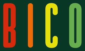 [MyFonts]
[More] ⦿
|
Type Innovations
[Alex O. Kaczun]

|
 Alex Kaczun is a type designer and type expert based in Northport, NY. At MyFonts he wrote: Much of Alex's career was spent at the premier type foundry, Linotype-Hell, where he was the principal type designer and worked on many font projects aimed at modernizing the Linotype Library. Alex managed the development of The Adobe PostScript Font Library and created multiple master fonts for Apple Computer's QuickDraw technology. In 1980, he joined a small group of entrepreneurs and pioneered the development of the world's first digital font library at Bitstream, then located in Cambridge, Massachusetts. Afterwards, Alex took a position at Bozell-Worldwide, a large international advertising company, where he was type director and managed the front desk at the CPS Group. The company is well known for their successful "Got Milk" ad campaign. At Bozell, Alex honed his skills in graphic design, desktop publishing, prepress print production and the web.
 His early typefaces include Axion (2012, a futuristic, techno-looking type family; +RND, +SSF, +SER, +RX14, +STN (a stencil version)), BottleKaps (1992) at Linotype. Also at Linotype, he worked on the Fairfield family, designed in 1939 by Rudolf Ruzicka, completing the job in 1991. He also made outlines for Bell Centennial based on Matthew Carter's bitmaps. He runs Type Innovations. He designed the following fonts at Galapagos: Beatnik (1997), Android (2010, beveled techno family), Big Boy (2010, a heavy wood type), CaltexNovaSans (Galapagos), Contax (1997, Galapagos: Alex says about this family: Contax is the new Univers for the 21st century), Contax Sans (2011---this typeface is Peignotian in its light weights, and has subtle and not-so-subtle stem variations), Eclipse (1997, shadow beveled face), Extreme SDans (1997), Innovage (1997, a new Helvetica for the 21st century, in his own words), New Renaissance (1997, a true roman face), Shockwave (1997), Golum (1997), Swordtail (Galapagos, 1997, a hip hand-printed font), New Age (Galapagos, 2002), Extreme Sans (Galapagos, 2002). Other typefcaes: Kaczun Oldstyle Bold (2010), Doc Holliday (2010, a Western face), Hippyfreak (2010), Mister Twiggs and Misses Twiggs (2010), Geomatrix (2010, geometric stencil face), Oronteus Finaeus (2010, like lettering from a map dated 1531), Piccadilly Circus (2010, a Western face), Switched On and Off (Galapagos, 1997), Racetrack (2010: an octagonal multiline display face), Mandelia (2010: a wedge-serif display face). Typefaces from 2011: New Age Gothic (a kind of 21st century copperplate), Scion (wide techno logo family), Dexter (2011, an artsy grotesque), Metalica (2011, a pointy cult type family). Typefaces from 2012: Edgar No. 9 (heavy baroque slab serif in the style of 19th century wood type), Langston (outlined and octagonal), Ekeras V2 (inline face), Mecanica, Mariamne (a spurred typeface based on Contax), Axion SER (a triangle-serifed typeface), Beatnik Barbie (a beatnik font influenced by Jack Kerouac), Nadia (a modern stencil interpretation of Granjon Oldstyle). Typefaces from 2013: Directors Cut Pro (this geometric antique font was a second prize winner at the Canberra Typeface Competition), Ambriel (a curly didone that mixes in Victorian frillies), Sansational (or Sensational sans: an ultra-condensed sans family), My Darling (a bastardized didone fashion mag face), Envisage (grotesk). Typefaces from 2014: Renovatio Deco (a spurred stencil), Crypton (sci-fi face). Typefaces from 2015: Nadia (a stencil version of Granjon Oldstyle). Typefaces from 2017: Gothica (stencil), Decrypt H1, Decrypt He2 (hipster style), Decrypt 02, Decrypt 01 (this geometric sans with hipster capitals evolved from Contax Pro in 1997 and was finally published in 2017). Typefaces from 2018: Grande Sans (stylized caps with sharp triangular corners). Showcase of Alex Kaczun's typefaces. [Google]
[MyFonts]
[More] ⦿
|
Typeco
[James Grieshaber]

|
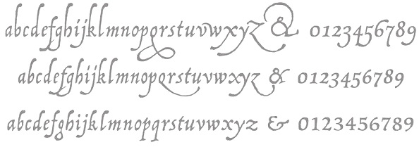 James Grieshaber earned a BFA in Graphic Design from Rochester Institute of Technology. Based first in Rochester, NY, and then in Chicago, IL, and then again in Rochester, Grieshaber ran Typeco, a typographic services and solutions company established in 2002. James Grieshaber (b. Detroit, 1967) most recently was on staff of P22 Type Foundry, where he designed many type families and helped establish International House of Fonts. He has been honoured with an award of Excellence in Type Design from Association Typographique International (ATypI) for his Gothic Gothic (2004, blend of blackletter and English style), and by TypeArt'05 (for Operina Cyrillic). Designer and Co-editor of the Indie Fonts book series, Grieshaber now teaches typography at RIT and runs Typeco. MyFonts sells his fonts now. YouWorkForThem sells the Super Duty family (stencil), Glyphic Neue, the Trapper families, Chunk Feeder, Gothic Gothic and Cusp. Identifont page. FontShop link. Behance link. Details on some of his typefaces:
 - Gothic Gothic (2001), an extended blackletter co-designed with Christina Torre. In 2004, he received an award of Excellence in Type Design from Association Typographique International (ATypI) for his Gothic Gothic type design.
- The Glyphic Neue display family was inspired by the Op Art style of lettering in the United States that ran rampant in many photo type houses in the 1960's and 1970's---I like to call it the "piano key style".
- Chunkfeeder (2002) is a beautiful monospaced octagonal OCR-like family.
- Cypher (2003, an LED/LCD family) has 24 weights. Of these, Cypher7 is free.
- Duty (2002) is a sans typeface co-designed at T26 with Lee Fasciani.
- The stencil family Super Duty (2004) has 8 variations. There are also techno variant called Superduty Condensed, Superduty Regular, Superduty Narrow and Superduty Text.
- Cusp (2001-2005): a techno display family with 18 weights, including an LED style, art deco styles and Cusp De Stijl.
- Trapper (2004) is an 8-weight exaggerated ink trap font family which comes in Trapper Round and Trapper Sharp versions.
- Zaftig (2008, Typeco) is a super-fat face.
- P22 Operina (2003, in Romano, Corsivo and Fiore versions) is based on Vicentino Ludovico degli Arrighi's calligraphy used in his 1522 instructional lettering book La Operina da Imparare di scrivere littera Cancellarescha. This book contains what is considered to be the earliest printed examples of Chancery Cursive. P22 Operina won an award at TypeArt 05. Operina Pro contains over 1200 glyphs. In 2010, Paulo Heitlinger compared P22 Operina favorably to another digital chancery font, Poetica (by Robert Slimbach, Adobe), which, according to him [and I agree], lacks vigor and dynamism.
- P22 Posada (2003, with Richard Kegler): based on lettering of Mexican printmaker José Guadalupe Posada (1851-1913) that was used for some of his posters and broadsides.
- P22 Arts and Crafts Tall (1995, art nouveau), P22 Arts and Crafts Hunter (1995). Both based on alphabets by Dard Hunter, 1908-1910.
- P22 Art Deco Chic (2002), based on the Art Deco hand lettering of Samuel Welo, ca. 1930. P22 Art Deco Display (2002) is a Broadway style face.
- Churchy (2002).
- He offered (offers?) a handwriting font service for 100 USD. Free trial typeface Reenie Beanie (2002). Signature font service for 50 USD. Reenie Beanie (2002) is now offered (as a joke, I assume) as part of the Google open font directory (for free web fonts).
- P22 Garamouche (2004, with Richard Kegler). Comes with Garamouche Ornaments (2004).
- Segoe Print (2006, Monotype Imaging). [Isn't this Googlee's competition?] This is an informally hand-printed typeface co-designed with Brian Allen, Carl Crossgrove, James Grieshaber and Karl Leuthold at Ascender.
- P22 Cezanne Pro (2006). Has over 1,200 glyphs.
- P22 Yule (2005; Heavy, Inline): a stone chisel family with a hint of Neuland.
- P22 Numismatic (2005): originally offered by the Devinne Press, and based on ornaments and letters used by 15th and 16th century engravers of seals and coins; however it looks very much like Otto Hupp's Numismatisch (1900, Genzsch&Heyse).
- Black Ops One (2011) is a military stencil face, available at the Google Font Directory.
- Short Stack (2011) is Grieshaber's free contribution to the Comic Sans genre. It was published by Sorkin Type and can be downloaded from Dafont.
- Atomic Age (2011) is a free font at Google Font Directory. It was inspired by 1950s era connected scripts seen on nameplates of American cars.
- Sarina (2011). A connected script published by Sorkin Type.
- Supermercado One (2011, Google Font Directory) is a low contrast semi geometric typeface inspired by naive industrial letters. More a signage typeface than a web font.
- Typeco Grecian (2012, FontStruct) is loosely based on a Wells & Webb Grecian style woodtype circa 1846.
- Typeco De Stijl (2012, FontStruct) is based on Van Doesburg's De Stijl magazine's name plate in 1923. Typeco Topaz Serif Tall (2012, FontStruct) is a pixel typeface. Typeco New Wave (2012, FontStruct) is an op art party font.
- Metamorphous (2012, Sorkin Type) borrows its arches from Gothic cathedrals---it was inspired by Jonathan Barnbrook and by the free font Morpheus. Google font download.
- HWT Geometric (2013, Hamilton Wood Type Foundry) is a squarish wood type family: Geometric began its life as a metal typeface from the Central Type Foundry, circa 1884. Soon after, this design was officially licensed to Morgans & Wilcox and was shown in their 1890 catalog in Regular, Light and Condensed Light variations. After acquiring Morgans & Wilcox, Hamilton Manufacturing offered Geometric Light Face Condensed as their own No 3020 and the Geometric Light Face as No 3021. HWT Geometric has been expanded digitally to include a Regular Condensed version.
- Trattatello (2014). An Apple system font.
- HWT Archimedes (2017, P22). A revival of the Page No. 122 wood type called Mansard Ornamented, done together with Richard Kegler (P22) and Virgin Wood Type. They write: This new digital version is a simultaneous release with Virgin Wood Type and features a variety of styles including the standard screw head option plus a Phillips head, hex/Allen wrench head, and even the vexing Apple pentalobe tamper resistant star screw. As a bonus, the screwheads themselves are accessible via a glyph palette, so you can put the screws to Comic Sans, or any other font, if you so desire.
Klingspor link. Google Plus link. Behance link. Fontsquirrel link. [Google]
[MyFonts]
[More] ⦿
|
Typeface
[Justine Nagan]
|
Documentary made in 2008 by Justine Nagan about the Hamilton Wood Type Museum in Two Rivers in rural Wisconsin. Justine Nagan has produced or helped produce various films at Kartemquin Films. She has a Masters Degree from the University of Chicago, 2004. Another URL. [Google]
[More] ⦿
|
TypeFaith Fonts
[Léon Hulst]

|
 Leon Hulst (TypeFaith) was born in 1966. Typographer at WAT Ontwerpers in Utrecht, The Netherlands, and affiliated with Linotype.
 Commercial fonts: ReadMyHand (1994, brush), Bombin, Fix, Cubi, Berkhout (handwriting), Miguel (sans family), Salamanca Caps, Ponsi Rounded (2011). Free fonts at TypeFaith, his place on the web, all made ca. 2008: AlbaJulia-ExpandedBold (techno), AlbaJulia-ExpandedBoldItalic, AlbaJulia-ExpandedRegular, AlbaJulia-ExpandedRegularItalic, Dilys-Bold (organic), Dilys-BoldItalic, Edding-Italic, Edding (brush), FixFlat-Italic, FixFlat, Flowmotion-Heavy (2010), LowFile-Bold (grunge), LowFile-BoldItalic, LowFile-WidthOblique, Mellow-Italic, Mellow (comic book family), PaloAlto-Italic, PaloAlto (sans), Per4m (dot matrix face), StitchCross. Creations from 2012: Ponsi Rounded Slab (the regular weight is free), Danze Script, Salamanca TF, Moonface Script (an elegant display serif typeface family). Typefaces from 2013: Lev Serif, Lev Black Distressed (2015, free). Typefaces from 2014: Picastro (retro signage script), Desierto, Frye Caps, Birchwood (hand-printed), Fix Fat Black, Seren Script, Planjer (art deco), Planjer Distressed. Typefaces from 2015: Jason Capitals (a revival of a woodblack capitals alphabet), Bakersville (Full, Line: hand-drawn, sketched), Lev Serif Grunge, Blackflower (brush face), Inkredible, Goldpicker (a layered Western typeface), Goldpicker Line (bilined; blackboard bold). Typefaces from 2016: Amilly Script (a heavy nibbed pen script), Rozy Cursive (based on Ella Cursief/Handels-Cursief by Sjoerd de Roos for Lettergieterij Amsterdam in 1915), Jason Distressed, Toxa Ink, Donker Caps (wood type emulation). Typefaces from 2017: Organa (a futuristic typeface family). Typefaces from 2018: Solente (art nouveau-inspired with Victorian decorations). Typefaces from 2019: Chaumin (hand-printed). Typefaces from 2020: Pinkhoff Caps (in Dutch deco style). Typefaces from 2022: Thirty Nine Stencil. Klingspor link. FontShop link. Behance link. Known as Misha at iFontMaker, he drew the outlined hand-printed Miff (2011). [Google]
[MyFonts]
[More] ⦿
|
Typetanic Fonts
[Gregory Shutters]

|
 Typetanic is the personal foundry of graphic and type designer Greg Shutters (New York City). Founded in 2013, Typetanic aims to create original designs as well as adapt historic lettering and type styles for the needs of an ever-changing design market. In addition to being the principal of Typetanic Fonts, Shutters also currently works as Communications Associate for the SS United States Conservancy, a non-profit organization interested in the preservation and redevelopment of the historic ocean liner SS United States. In 2022, Typetanic joined Type Network, and after that, The Type Founders. His typefaces:
 - In 2013, he designed Columbia Titling, a titling-caps display family based on wide Clarendon-style wood type and industrial signage design from the late-19th and early-20th Century. It won an award at TDC 2014.
- Transat (2013) is an art deco sans family based on signage found in the Gare Maritime ocean liner terminals in Le Havre and Cherbourg, France, in the early 1930s. Transat Text (2013) is a more subdued, but still geometric, sibling of Transat.
- Gibbs (2014) is a tough, sophisticated sans, named for prolific maritime architect William Francis Gibbs and inspired by his greatest design, the record-breaking mid-century luxury liner SS United States. Gibbs won an award in the TDC 2015 Type Design competition.
- Conglomerate (2016): a blend of many styles in one to immunize the beast.
- LaFarge (2021). He writes: LaFarge is a typeface primarily inspired by the historic mosaic titling capitals found in the New York City Subway, designed by architect Squire J. Vickers and his staff between 1915-1927. These elegant but industrial signs are characteristic of early-20th century American architectural lettering, and show an evolution of the classical Roman capitals to lower contrast, bolder serifs, and more regular character widths. The majority of this lettering still remains in subway stations today, and though elements of the style vary from sign to sign, many carry the unique features that are reflected in LaFarge: high-waisted crossbars with angled serifs, elegantly curved leg on the R, and distinctive trapezoidal serifs. LaFarge expands this style into a lower case, taking cues from contemporary typefaces like Bookman, Cheltenham, and Della Robbia.
Type Network link. [Google]
[MyFonts]
[More] ⦿
|
TypeType
[Ivan Gladkikh]

|
 Prolific Russian designer (b. 1986) whose real name is Ivan Gladkikh and working alias is Jovanny Lemonad . Jovanny lives in St. Petersburg. From 2003 until 2008, he studied audovisual engineering at The Bonch-Bruevich Saint-Petersburg State University of Telecommunications. In the early part of his career, most of his typefaces were free. In 2013, he set up the commercial type foundry TypeType. Most of his typefaces cover both Latin and Cyrillic.
 His typefaces include Scada Sans Two (2009), Furore (2009, octagonal), Fontin Sans Cyr (2009, the Cyrillic version of Jos Buivenga's Fontin Sans), Metro (2009, constructivist), Dited (2009, dot matrix: free), Days and Days One (2009, sans), and the attractive display typefaces Otscookie (2009, geometric and experimental), 20db (2008, high-contrast titling with didone features), Cuprum (2006-2012: a free sans family) and Molot (2008, with Roman Yershov). In 2008, he added to this list the grunge or handwriting typefaces FFUPuzzle, London (designed with Olga Kozlova) and Neucha (hand-printed), as well as the modern black display typeface 20db. Together with Eric Lebedco, he created the organic typeface Philosopher (2008). In 2006, he cooperated on the rounded Cyrillic typeface ZopaCyr. With Oleg Zhuravlev, he created the octagonal family Bender (2009, award winner at Paratype K2009). Creator of the corporate type family Ice and Flame (2009), an organic typeface based on Philosopher. CDMA (2010) is a rounded sans for corporate use. Nixie One (2011) is a free thin typewriter style face. Yeseva One (2011, as in "yes, Eva, bring me another beer") is a free ornamental serif face. Numans (2011) is a free wide sans face. https://fonts.google.com/specimen/Numans">Google download. Creations from 2012 include the frees typeface Oranienbaum (an antiqua created with Oleg Pospelov). He produced the free font Prosto (2012), which was designed by Pavel Emelyanov [see also Google Web Fonts]. Russo One (2012, Google Web Fonts) is a macho sans. Stalin One (2012) is a constructivist typeface co-designed with Alexey Maslov---it is free at Google Web Fonts. Typefaces from 2013: Imperial One (a free constructivist font based on the corporate font for the game role playing game The Mandate), Underdog (angular), Supermolot (an extension of his 2008 typeface Molot, a modern techie square grotesk with elements of Soviet style; extended in 2015 to TT Supermolot (by Olexa Volochay), in 2016 to TT Supermolot Condensed, and in 2018 to TT Supermolot Neue, by Roman Ershov, Marina Khodak, Nadezhda Polomoshnova, Ivan Gladkikh and the TypeType Team). In 2014, TypeType published TT Slabs (followed in 2015 by Olexa Volochay's TT Slabs Condensed), TT Drugs (by Nadyr Rakhimov, Phill Nurullin and Olexa Volochay: followed in 2015 by TT Drugs Condensed), TT Souses (hand-drawn sans family geared towards children's books and village design applications), TT Prosto Sans (followed in 2016 by Olexa Volochay's TT Prosto Sans Condensed), TT Rounds (a basic rounded sans typeface family by Olexa Volochay and Nadyr Rakhimov), TT Days Sans (TypeType: a pro version of his free font Days), TT Squares (an octagonal typeface family; see also TT Squares Condensed, 2016, by Olexa Volochay), TT Russo Sans), and TT Rounds Black. Typefaces from 2015: Free Ride, TT Compotes (a series of handcrafted typefaces), Hitch Hike (handcrafted typeface co-designed with Annastasia Samsonova), Accuratist (a hisper font by Jovanny Lemonad and Elena Shkerdina), Dita Sweet (a free art deco typeface co-designed by Ksenia Semirova and Jovanny Lemonad), TT Marks (a sign painting typeface family), TT Firs (a Scandinavian cold sans family, expanded in 2018 as TT Firs Neue by Philipp Nurullin and Ivan Gladkikh), Eleventh Square (art deco by Evgeny Tarasenko), TT Rounds Condensed, TT Books Script (a fifties style script), TT Crimsons (for short and emotional inscriptions), TT Masters (signage type), TT Inters (a great rhythmic script font), Frenchpress, TT Chocolates (a geometric grotesque with art deco hints), TT Bluescreens (30-style condensed sans family for movie trailers), TT Directors (designed for movie titling and trailers). Typefaces from 2016: TT Lovelies Script, TT Chocolates Condensed (by Olexa Volochay), TT Bells (an old style typeface family based om broad nib pens; by Nadyr Rakhimov and Olexa Volochay), TT Walls (a wall menu script family), TT Lakes (54 fonts in all; by Olia Leykina and Olexa Volochay), TT Corals (with Olexa Volochay: humanist sans typeface family), Bristol (children's hand), TT Octas (octagonal style, by Olexa Volochay), TT Teds (a narrow geometric sans family), TT Blushes (brush script), Romochka (handcrafted), TT Coats (a handcrafted antiqua), Bully (with Aigul Gilmutdinova), TT Rabbits (ten handcrafted typefaces for children's books, with substyles April, Bro, Chilli, Dummy, Elf, Fatso, Goody, Hyper, Idol, Junior), Suwikisu (free African-themed typeface based on a design by Egor Myznik), TT Moons (a condensed serif family), TT Cottons, Matias (by Vitaliy Tsygankov and Jovanny Lemonad), TT Pines (a sans based on paper cutouts). Typefaces from 2017: TT Backwards (an experimental script and grotesque font family inspired by the typographic scenery in the USSR in the late 70s and early 80s; by Tanya Cherkiz, Sergey Kotelnikov, Philipp Nurullin and the TypeType Team), TT Knickerbockers, TT Polls (modern modular slab serif inspired by American sports graphics; by Olexa Volochay, Tanya Cherkiz and Nadyr Rakhimov, TT Norms (by Nadyr Rakhimov and Olexa Volochay), TT Berlinerins (Script, Sans: based on vernacular type in Berlin, the sans emulates wood type), TT Milks, TT Pubs (didone; +Stencil), TT Limes (23 handcrafted typefaces, from Sans, to Slab and Dingbats), TT Hazelnuts (display sans). He also has a lively type blog (in Russian). Typefaces from 2018: Ivan Gladkikh and Pavel Emelyanov, with the technical assistance of Marina Khodak, Vika Usmanova and Nadyr Rakhimov, designed TT Commons. TT Commons is a universal sans family originally created for the branding and in-house use of TypeType, but it was finally released due to many requests. In 2018, Sofia Yasenkova, Philipp Nurullin, and Vika Usmanova designed the modern serif TT Tricks at TypeType. TT Tricks has many stencil styles. Still in 2018, Ivan Gladkikh, Alexander Kirillov, Philipp Nurullin, Vika Usmanova, Marina Khodak, and Nadyr Rakhimov published TT Severs. The TT Rounds family was reworked in 2018 into TT Rounds Neue by Ivan Gladkikh, Philipp Nurullin and the TypeType Team. At the end of 2018, TypeType published TT Supermolot Neue (Roman Ershov, Marina Khodak, Nadezhda Polomoshnova, Ivan Gladkikh and the TypeType Team). In 2019, Pavel Emelyanov and Ivan Gladkikh released the 20-style geometric sans typeface TT Hoves, which is intended for use in architecture, design, industry, science, astronomy, drawing, high tech, research, space and statistics. Typefaces from 2021: TT Commons Classic (a 24-style geometric sans by Ivan Gladkikh, the TypeType Team, Pavel Emelyanov and Marina Khodak; it includes two variable fonts). Alternate URL. Behance link---on Behance, he uses the name Ivan Gladkikh. Fontsquirrel link. Google font directory link. Klingspor link. Dafont link. Abstract Fonts link. Old home page. [Google]
[MyFonts]
[More] ⦿
|
Typoforge
[Blazej Ostoja Lniski]

|
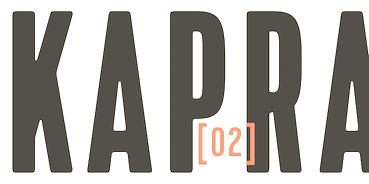 Blazej Ostoja Lniski (b. 1974, Czersk, Poland) specializes in painting and lithography. From 1994 until 1999, he studied at the Warsaw Academy of Fine Arts. Currently, he is the Dean of the Faculty of Graphic Arts at he Warsaw Academy of Fine Arts. He founded the type foundry Typoforge.
 Creator of Merlo (2014, inspired by a You And Me Monthly published by National Magazines Publisher RSW Prasa; followed in 2015 by Merlo Round and in 2016 by Merlo Grotesque and Merlo Neue), Cervo (2014, a simple almost heartless sans that was inspired by a You And Me Monthly published by National Magazines Publisher RSW Prasa that appeared from 1960 until 1973 in Poland), Cervo Neue (2016), Toppo (2014, a letterpress emulation family inspired by a You And Me Monthly published by National Magazines Publisher RSW Prasa), Pekora and Pekora Slab (2014: inspired by a You And Me Monthly published by National Magazines Publisher RSW Prasa (Poland) between May 1960 and December 1973), Rospi Clean (2014: inspired by the weekly Tygodnik Ilustrowany from 1933), Rospo Wood (2014: a worn letterpress typeface inspired by the weekly Tygodnik Ilustrowany (1933)), Lupo (2014), Kapra (2014) and Bobbin and Bobbin Cyrillic (2014, letterpress style), which were inspired by You And Me Monthly published by the (Polish) National Magazines Publisher RSW Prasa which was active from 1960 until 1973. Kapra is beautiful---it has some of the masculinity of Impact and the naïveté of wood type. Other typefaces by him in 2014 include Skuul (a desperate cold war font inspired by a Letraset font from 1981), Blezja (inspired by a metal tin dated 1907, Potsdam), Greta (a roman typeface based on a prayer book from 1888), and Kleks (grunge typeface inspired by vernacular typography in Potsdam). Typefaces from 2016: Cozza (a grungy typeface family based on the dry transfer architect set Unitras Letraset from the 1980s). Typefaces from 2017: Merlo Neue Round, Kapra Neue (24 styles). Typefaces from 2018: Gambero (a slab cousin of Kapra with a reversed lower case g), Kapra Neue Pro. Typefaces from 2020: Tylbor (a 14-style monolinear almost DIN-like sans), Cervino (a 54-style sans). Typefaces from 2021: Cervo Neue Condensed (18 styles). You Work For Them link. Creative Market link. Behance link. View Typforge's typeface. [Google]
[MyFonts]
[More] ⦿
|
Typographic Design
[Manuel Viergutz]

|
 Berlin-based FontStruct artist from Stuttgart (b. 1986, Esslingen) who studied at Johannes-Gutenberg-Schule Stuttgart (class of 2007) and studied in 2008 in Esslingen at the European School of Film and Design. He set up Typographic Design. The theme of most of his typefaces is erosion, deconstruction and grunge.
 He made the striped techno fonts heavyLOUDedge, heavyLOUDedge_lineH, heavyLOUDedge_lineV, heavyLOUDedge_quad, heavyLOUDedge_raw in 2009. He also made Fat Cowboy (2009, FontStruct), QRcodeX (2009, like those airline ticket codes), Low Down Cut (2009), WebPixel (2009), ScrFibble (2009), ScriptSERIF (ransom note face), and Back To Heavy Coat Fat Ground (white on black family) in 2009. Typefaces done between 2010 and 2013: SKATEBOaRDbraNds (2010, ransom note face), Gothic Hand Dirty (2010), SansLigraphy, Slice n Dice (2009), Riptape, Riptrash (2010, grunge), BackToHeavyCoatFatGround, Curly Lava Bubble (2010, dotted family), Hand Times (2010, a sketched Times Roman), BlockHead (2010), kiddySans (2010), webpixelbitmap (2010), dirtyDeoHandInk (2011), Modern Hand Fraktur (2011), Elegant Hand Script (2011), Wear Fat T Shirt (2011, squarish), Giraffenhals (2011, hand-printed), Phone Scan (2011), Slanted Italic Shift (2011), Neon Club Music (2011), Raw Delta Hand Street (graffiti), India Snake Pixel Labyrinth Game (2012, labyrinthine). Typefaces from 2013: Hand Retro Sketch Times (layered poster headline family), Dirty Bubble Gum Grunge, Hand Skribble Sketch Rock, Hells Kitchen Devil God, Hand Scribble Sketch Times, Shaky Hand Some Comic, RawStreetWall (Volcano Type: grunge), Tag Hand Graffiti Trash, Viktors Littl Creepy Horror. Still in 2013, these commercial typefaces were published: Rip TRASH, Dirty Deo Hand Ink, Elegant Hand Script, Gothic Hand Dirty, Rip TAPE, MODERN Hand Fraktur, Giraffenhals, Raw Delta Hand Street, WEAR FAT SHIRT, HeavyLOUDedge, Soul Lotion, Webpixel Bitmap, India Snake Pixel Labyrinth Game, Kiddy Sans, MEGA SLANT LINE, NEON CLUB MUSIC, Slanted ITALIC Shift, Block Head, Happy Brain Creepy Thalamus. Typefaces from 2014: Konstructa Humana Stencil, Hand Stamp Play Rough Serif. Typefaces from 2015: Hand Sketch Rough Poster, Hand Stamp Swiss Rough Sans. Typefaces from 2016: Hand Stamp Gothic Rough, Raw Street Wall (Volcano type). Typefaces from 2017: Brush Poster Grotesk (2017, a fun semi grungy typeface designed for the children's exhibition 1,2,3 Kultummel from Labyrinth Kindermuseum Berlin by xplicit, Berlin (Annette Wüsthoff, Alexander Branczyk and Mascha Wansart) and Manuel Viergutz; loaded with glyphs and decorative extras like arrows, dingbats, emojis, symbols, geometric shapes, catchwords and decorative ligatures), Netherlands Dirty Numbers (a hacker style font), Mallorca Dirty Numbers (another hacker font), Hand Stamp Slab Serif Rough. Typefaces from 2018: Hand Print Stamp Rough, Typewriter 1950 Tech Mono (a great old typewriter font family). Typefaces from 2019: Icons Dingbats Symbols Set, Czykago Rough (with Alexander Branczyk). Typefaces from 2020: One United Font (+icons), Hand Stamp Wood, Klein Rough Gemein (with Inga Luft: a font family that includes an icon set and several styles that emulate old German rubber stamps), LED pixel (65 styles), Boom Pang Pow (a cartoon font), TWIGS 4 kids (2020: designed for a garden exhibition for children by Daniela Costa, Julia Stanossek, Alexander Branczyk and Manuel Viergutz), DIY Fantasy Stamp, Euro Icon Kit, Brush Hand Marker, Chalk Hand Marker. Typefaces from 2021: Wood Sans (a 12-style vintage wood type and letterpress emulation family), Pixel Pattern (a 9-style pixel font family), Hand Writing of Janina, Face Type, Hand of Hannah (a fat finger script), Plakat Wood (wood type emulation), Drunken Pixel, GDR Traffic Symbols, Hearts Love Smile (amorous dingbats), Open Tech Neue (Sans Serif, Invert, Outline, Slab Serif, Stretch, Box Puzzle and Icons). Cat Finger (a rough brush font), Kloetzchen (a set of blocky display types based on a 3d (physical) wood type by Peter Eckartz). Dafont link. Alternate URL. MyFonts link for his commercial fonts. Klingspor link. Behance link. Blogspot link. Old MyFonts foundry link. Abstract Fonts link. Volcano Type link. View Manuel Viergutz's typefaces. [Google]
[MyFonts]
[More] ⦿
|
Typoretum
[Justin Knopp]
|
Justin Knopp graduated with a BA in Graphic Design from Central Saint Martins College of Art&Design in 1994. Now, he runs a letterpress shop in Colchester, UK, and makes beautiful cards (among other things). He also has a blog. [Google]
[More] ⦿
|
Typorium
[Jean-Renaud Cuaz]

|
 Frenchman Jean-Renaud Cuaz (b. 1959) is the principal and type designer at Typorium in Highland Park near Chicago, but has moved back to Paris, where he is a freelance graphic and typeface designer. His fonts are available in many places, such as ITC, where he did ITC Cerigo (1993) and another great text face, ITC Ellipse (1996). At Typorium, he published Agenor (1997), Agenor Sans (1997), Belfegor (1998), Fleur-de-Lis (1995), and Lapidia (1997). Since 1998, he has published Augustal (Elzevirian typeface), Augustal Cursiva, Galena (1996, Bayer; this renaissance / old Italian humanist text family extended in 2020 to Galena Pro, Galena Pro Condensed and Galena Pro SC), Peplum, Stancia, and Stancia Lyrica, first at Creative Alliance / Agfa Monotype. All of these fonts are available through Monotype.
 In 2017, he published Deberny (which was influenced by Italian or Veronese styles of the 18th century). Typefaces from 2019: Pagnol (Cuaz's take on Peignot), French Typewriter. Typefaces from 2020: ITC Ellipse Neo and ITC Ellipse Script (both extensions of his 1996 organic and fluid typeface ITC Ellipse), Brassens (a monoline script based on the handwriting of French poet and musician Georges Brassens (1921-1981); + Brassens Vignettes). L'espace culturel showcases his fonts. Bio chez Porchez. Bio at Agfa. Linotype link. FontShop link. [Google]
[MyFonts]
[More] ⦿
|
Uppertype
[Pedro Lobo]
|
 Portuguese foundry in Guimaraes and Porto, est. 2011 by Pedro Lobo, that sells Yorker (2012, a layered athletic lettering font), Borba (2012, a beautiful inline typeface), Sahara (2012, an antique shadow caps face), Akila (2012, a fashion mag didone), Public (2012, art deco marquee face), Scape (2012), Smart (2012, inline caps face), Desk (2012, shadow caps face), Kleiner (2012), Fabrica, Wannabe (octagonal), Kodhigo (slab serif), Molesk (2011, a free slab display face), Tabbaco (connected retro script) and Jono (2011, art deco).
 Typefaces from 2013: Player (a layered beveled typeface system), Porto (tweetware), Woodstik (a tall gothic wood type layered sans family that plays with texture and letterpress), Darko (alchemic, designed under the motto Uppertype goes hipster), Player (a layered type system), Bonie (organic sans). In 2015, he made the cursive school script font London Script and the vintage handcrafted Vintagefolk. Typefaces from 2016 include Roska (a free stencil type) and Twoface (an Escher-style impossible font). In 2018, he published the layered multiline stencil font family Issue, the multiline typeface The Social, and Borba Neu. [Google]
[More] ⦿
|
Urban Pixel (or: UP Font Studio)
[Michel Troy]

|
 Foundry in Montreal, est. 2008 by Michel Troy (b. 1969).
 Behance link. Dafont link. Klingspor link. Their fonts: - Their pixel or dot matrix fonts, which can be had from MyFonts, include Urbix (2008, a large family), Urbix Nu (2009), Urbox (2008, a great dot matrix family), Urbox Nu (2009), Javelist Head (2008), Javelist Arm (2008), Thyme Nu (2009), Stock Board (2008), Scratch Up (2008), Melko (2010, a dot matrix family), and Kolly (2011).
- The free pixel typeface UP Tiny LCD Four 8 (2008).
- At FontStruct, Michael Troy (a.k.a Upixel) made the gridded monospace family Kyra (2010), Kabog (2010), the constructivist Upixel, the pointy ghouly Barko (2010), the ultra-fat Fatex (2010), the narrow display typeface Lingo (2010), the constructivist Akroy (2010, pixelish), Nuebrick (2010, white on black), Karbo 1986 (2010, honeycomb techno), Mobivus (2010, bold sans), Melko (2010), Kolly (texture face), En Sans New (2010), and the slanted Blax (2010).
- In 2011, he created Quino (slabby, FontStruct), Gothic XS Hand, Blax Slab (textured alphabet, a slab version of Blax), MIKA (very fat), Melko Rip (2012, dot matrix), Kilix (2012), Grecian 1896 (2012, wood-style slab face).
- Typefaces from 2012 include the ultra condensed typeface Manygo Serif (+Semi Serif). This American magazine style belongs to the category of skyline fonts.
- Typefaces from 2013: Stiff Script (a winner in the FontStruct Connected Script Competition in the Suetterlin style of school scripts).
Typefaces from 2014: Fraline (this inline blackletter typeface was a winner in the FontStruct Inline Font Competition in February 2014). Typefaces from 2015: Gothic Ax Hand (shadow typeface). Gothic AX Hand (a hand-drawn gothic shadow font). [Google]
[MyFonts]
[More] ⦿
|
URW Wood Type
|
Two fonts at URW in the URW Wood Type family. [Google]
[More] ⦿
|
Valeria Perez Martinez
|
Graphic designer in Mexico City who created the sans typeface Cartelera in 2016. She also designed the wedge serif wood style typeface Hateful Type (2016), whch was inspired by Quentin Tarantino's The Hateful Eight movie. [Google]
[More] ⦿
|
Vanderburgh, Wells & Co.

|
New York-based foundry. Examples of wood types made by them: Concave Tuscan (aka Gothic Tuscan) (1867, based on an original by Bill, Stark & Co from 1853). Revivals include Painters Roman NF (2014, by Nick Curtis, of the 1878 wood type Painters Roman). [Google]
[MyFonts]
[More] ⦿
|
Vernon Adams
[New Typography]
|
 [More] ⦿
|
Very Cool Studio
[Kyle Wayne Benson]

|
 Kyle Wayne Benson (b. 1988, Texas) describes himself as an affable graphic and type designer. He has his own commercial foundry, also called Kyle Wayne Benson, which specializes in signage type. Very Cool Studio was located in Orem, UT, and more recently in Oakland, CA. Future Fonts link.
 Creator in 2013 of Benson Script (with three contrast levels, from didone to monoline), the octagonal angular typefaces Millie and Truth, and of Clayton, Red Benny, Tide's In, Tide Sans (the surf-inspired humanist with a humorous selection of weight names ranging from Lil Bunny, to Dudette, Bunny, Mondo, Kahuna and Dude), Tide Sans Condensed, and Farmer's Co-Op (a vernacular sans with wood type influences). Typefaces from 2014: Jeames (a high-contrast decorative typeface with vintage serifs), Maritime Champion, Maritime Champion Stencil, Good News Sans (a set of 18 display sans typefaces, mostly for titling or short pieces), Kansas Casual (a sign painting font), Maritime Champion (inline typeface), National Champion (octagonal athletic lettering family). Typefaces from 2015: Qualtrics. Typefaces from 2018: Gooper (a take on Cooper Black; at Future Fonts). Typefaces from 2019: Bruphy (a variable font modeled after hand-painted brush lettering and released at Future Fonts). Typefaces from 2020: Gooper Text, Bruphy Text. Typefaces from 2021: Nudge (a condensed gothic sans based on a dog defecation sign composed of letters hand cut out of vinyl at Silver Lake Reservoir in LA), Gooper Deck. Typefaces from 2022: Henrietta (a revival of a 1980s font that ripped off Souvenir; I would like to have a good definition of the difference between revival and ripoff). [Google]
[MyFonts]
[More] ⦿
|
Vette Letters
[Donald Beekman]

|
 Dutch foundry, est. 1997 by Donald Beekman. We find commercial fonts by several designers:
 - VLNL Jelly Donuts (2021).
- Donald Beekman and Erik van Blokland: Bint (inspired by potatoes).
- Donald Beekman: VLNL Bonen (2020), VLNL Mais (2020: an exaggerated wedge serif), VLNL Kouseband (2019), DBXLNightfever (2019; original design in 2001 for the disco-techno-house record label Nightfever), VLNL Cleaver (2017), VLNL Vondelpark (2014), VLNL Bleek (2014), Brak (octagonal), Breakz (octagonal), Brokken (rounded octagonal), DBXLZX (2012, inspired by the ZX Spectrum home computer), Decks, VLNL Duct (2014, emulating duct tape, this typeface was originally designed by DBXL as a logo for temporary Amsterdam restaurant BAUT), Gaufre, Hollandsche Nieuwe, Irish Stew (2012), Kadetje (based on wood type), Knoffel, VLNL Melk (based on wall adverts for the milk factory De Sierkan in Den Haag), Spaghetti (upright connected script), Wasabi, Woodburger.
- TwoPoints: Tp Rawkost (2019), Tp Marte (2019), Tp Luna (2019), VLNL TpLlum (2012, really fat slabby letters).
- Jacques Le Bailly: Sardines (2008), VLNL Neue Sardines (2010).
- Donald Roos: VLNL Bint (2009), VLNL Brak, VLNL Spaghetti Bolognese.
[Google]
[MyFonts]
[More] ⦿
|
Vincent Desclaux
|
Graphic designer in Paris, who created Bucky (2012, hexagonal typeface) and Le Punktem (2012, a typeface that was inspired by wood type). [Google]
[More] ⦿
|
Vintage Type Co
[Sean Coady]

|
 Graphic designer from Summerside and/or Charlottetown, Prince Edward Island, Canada, who was located first in Edmonton, Alberta, and then in Moncton, NB, then in Toronto, and finally in halifax, Nova Scotia. He runs SRC Designs and founded Vintage Type Co in 2015 (not to be confused with Susan Townsend's Vintage Type, a company set up in the 1990s). Creator of the free sans titling typeface family Municipal (2013) and of the hand-printed typeface Fruit Sale (2013).
 In 2014, he created Shifty Sailor (spurred), Hofmann (psychedelic typeface), Kalopsia Slab (a condensed slab serif family with an arts-and-crafts flair). One weight is free---the others can be bought here. He also created free User Interface Icons in 2014. Typefaces from 2015: Jackal Display, Anaheim Gothic, Alehouse (vintage connected script), Dorchester Display (vintage Victorian typeface), Huxley (brush script), Drone Ranger (octagonal dystopian type), Authentico (vintage poster typeface in eight styles), Firefly (free poster font), Highbinder (an eroded vintage typeface), Adventurous Script (watercolor brush), Nomad Icon Font, Arctic Express (handcrafted capitals). Typefaces from 2016: VTC Numeric (free), Grindstone (vintage), Grindstone Script, Grindstone Sans, Midnight Owl, Southbank (free), Planet Rouge, Life Is Jazz Script, Mystery Tour (+Sans) (a layered Americana or circus font), Sugar Boats, Navy Queen (a nice free font influenced by vintage nautical posters). Typefaces from 2017: Virgo Antique, Virgo Display, PressBox (letterpress and Americana emulation), Merchant Street Sans (eight stackable fonts), Old Spirits (spurred Victorian style), Prizefighter (art deco sans), Andre's Diner, Artisans Script (signature script), Milton Grotesque (a free all caps American grotesque), Queen Street (a layerable family). Typefaces from 2018: Grindhaus Sans (geometric), Drone Ranger Pro (octagonal). Typefaces frm 2019: VTC Bloke (a revival of Miller&Richard's Egyptian Expanded, a wide typeface reminiscent of the Egyptian wood types), VTC Horoscope. Typefaces from 2020: VTC Elmwood (a modernized blackletter font family), Fellbaum Grotesk, VTC Fellbaum Grotesk. Typefaces from 2021: Chocolate Chipped (a condensed woodblock emulation typeface family). Vintage Type Co. Dafont link. Behance link. Another Behance link. Creative Market link. Home page. Creative Market link for Vintage Type Co. [Google]
[MyFonts]
[More] ⦿
|
Vintage Type Co (or: Vintage Design Co)
[Ian Barnard]

|
 Crowborough, East Sussex, UK-based designer Ian Barnard (Vintage Design Co) created the curly hand-drawn typeface Warrior in 2014. With Sam Jones, he designed the school script font Path Type (2014).
 In 2015, Ian created the vernacular script Northern Soul, the brush script Enjoy The Ride, the free handcrafted typeface Foxhole, the brush font Sun Kissed, the connected monoline script typeface Smoothy and the letterpress emulation font Saltash. In 2016, he designed the poster typeface Sticky Lollipop, the American Oak series (Script, Serif, Slab, +scratchplate drawings by Emma Lindley), the vintage artisanal display typeface family Sugar Boats, the handcrafted Outbound and Money Penny Script, VTC Symbols, the sans titling typeface Fruitbox, Money Penny Sans, the handcrafted travel poster typeface Cool Britannia (2016), and the connected script font Bloomsbury, which is accompanied by Bloomsbury Sans and Bloomsbury Serif. In his Wood Type series (2016), he emulates old worn wood type and letterpress type---try out the free Condensed Slab Rough. Typefaces from 2017: Simple Things (old typewriter font), Dorchester Display (Victorian), Besties, Montebello (monoline script), Radiant Beauty (brush script), Adrenaline Brush, Foxtrail Script, Bookend (a super-condensed sans). Typefaces from 2018: Lemon Bird (free), Beautiful Grace (Serif, Script). Typefaces from 2019: Bloke (a revival Miller & Richard's classic metal typeface Egyptian Expanded). Typefaces from 2020: Andre's Diner (Peignotian). Creative Market link. Behance link. Home page. [Google]
[MyFonts]
[More] ⦿
|
Virgin Wood Type
[Geri McCormick]
|
In 2010, the late Bill Jones and Geri McCormick, a graduate of Rochester Institute of Technology, bought the machine, originally created by the American Wood Type Manufacturing Company to cut trees into letters and sell them to printers. For the next two years Bill and Geri followed suit, eventually offering a total of 23 fonts represented a survey of Victorian and Contemporary type design. They offer pantograph-cut wood type in a variety of font schemes and sizes and work out of Rochester, NY. In 2017, prominent wood type collector John Horn commissioned Geri McCormick of Virgin Wood Type to recreate a usable wood type version of "the font with the screws on it", Mansard Ornamented, officially known as Page No. 122 (1879). James Grieshaber and Virgin Wood Type redrew it as vector art. Richard Kegler (P22) completed the digital version with all the requisites glyphs for a modern digital font. That font was published by P22 as HWT Archimedes (2017) in versions called Screw, Phillips, Hex, Star, and Without. Dedicated Behance page. In 2019, they published a colour print called Chromatic Ornate, which is based on William H. Page's Specimens of Chromatic Wood Types (1874). [Google]
[More] ⦿
|
Vitaly Glyph
|
 Moscow-based designer of Latin and Cyrillic, or purely Cyrillic, fonts. There is a list of Cyrillizations of existing fonts: Atreyu, LHF Bounce Script, Modeka, Turnpike, PL Barnum, Good Times Regular, Playful JNL (Jeff Levine), Armageda, Showcard Gothic, SF Comic Script, Jolly Good Sans Basic, Enemy (Shaivanalla Perumal), House Slant (House Industries), House Brush (House Industries), Komika Axis (Apostrophic Labs), Snickers (Mark Simonson), Grand Hotel (AOETI), Wisdom Script (Lost Type), Mission Script (Lost Type), Cylburn (Lost Type), House Script (House Industries), House Holiday Gothic (House Industries), LHF Branding Iron (Letterheadfonts), LHF Fancy Full (Letterheadfonts), LHF Firehouse (Letterheadfonts), American West (FontMesa), Champ Ultra (BA Graphics), PL Davison Americana (Monotype), Blenny (Dalton Maag), Bigfish (Floodfonts), Same Same, But Different (Hanoded), Enemy (Lost Type), Special Forces (Typodermic), Serpentine (URW++), Ritts Cursive (Eurotypo), Voga Medium (CD Type), Hermes 1943 (Lukas Krakora), Brand (Lian Types), Tasty (Hubert Jocham), Bullet Regular (House Industries), Filmotype Athens (Filmotype), Signika (Anna Giedrys), Art Department (Jeff Levine), Borg (David Sum, aka titusprod).
 Original fonts made ca. 2015: GF Deathmatch (a super-macho typeface), GF Ram (pixel font), GF Mario (video game font), GF Mario Two, GF Oversize, GF Magnifica, Deadpool, GF Enroll (letterpress emulation), GF Happy Elephant (comic book style), GF Standout (compressed titling sans), Snickers Super (after the logo for Snickers), GF Bitrika (condensed display sans), Skazka (cartoon font), Minnesota (digitized Hamilton wood type), Alumnus (soft blackletter), Terminator Genisys, Comanchero (+Bevel (beveling using four layers)), Viko, Police (octagonal, athletic lettering), Terminator (after the movie), Old Poster font family, Lic Plate RUS, Lic Plate CT, Taurus Gothic, Slant GP (like Zelek), Brick Game (like Tetris), System Message, System Pixel, Digital 16s (LED). Behance link. [Google]
[More] ⦿
|
Voked
|
German designer (b. 1987) in 2007 of Avant Garde Black (kitchen tile style, no downloads) and Cow.Cow (2007, ultra-black wood style Egyptian). The guts of the font have the font name Cowboys and the designer name of Dennis Ludlow, so this may be derived in some way, I guess. [Google]
[More] ⦿
|
W. Drugulin
|
German foundry established in 1800 and based in Leipzig. It became Haag-Drugulin, as ATypI explains: The Offizin Haag-Drugulin has played a significant role in publishing, printing and literary history. Its origins can be traced back to the 18th Century. 1829, when Friedrich Nies from Offenbach acquired the printing workshop, is regarded as the year of its foundation. As early as 1831, Nies had attached a type foundry to the business, which he equipped with typefaces for setting Oriental languages. Since then, the printing workshop has always been a synonym for typographic diversity and quality. At the end of the 19th Century, it was even trying to take the place of the lavishly equipped state printing works in Vienna and Paris in the field of Oriental languages. In spite of these conditions, business did not always develop smoothly. After the First World War the interest for Oriental books waned. And people no longer had any money for lavishly designed books, once a speciality of the company. In 1928 the company merged with the Haag printing house, which had moved into the area, and it has traded as Offizin Haag-Drugulin since that time. Typefaces first developed at Offizin W. Drugulin include Ehmcke Fraktur (1910, F.H. Ehmcke) and this blackletter wood type. The type division was acquired by D. Stempel in 1919. Haag-Drugulin published Anwendungsproben der schönsten Drugulin Schriften erstes heft (1932) [see here]. Hebrew typefaces in their collection include Hebraeisch II, Hebraeisch I, Maruba, Hebraeisch IV, Schreibschrift, and Rabbinische. The story of Drugulin was told by Peter Gericke and Wolfgang Hendlmeier in 1993: I, II, III, IV. [Google]
[More] ⦿
|
Walden Font
[Oliver Weiss]

|
 Walden Font (est. 1997) sells historical typefaces&clip-art by Oliver Weiss from Winchester, MA. Walden's site includes a brief history of blackletter, as summarized in the PDF document The Gutenberg Press: Five Centuries of German Fraktur (1997). Typefaces by categories:
 - The nice 14-font package called Civil War Press.
- The free art nouveau font Jugend WF (2006).
- Kraftwerk Press (2016-2017), a collection of 25 German industrial fonts emulating the era from 1920-1930:
- WFBorderBergland, WFBorderLineal, WFBorderLorbeer, WFBorderRauhreif, WFBorderRiesel, WFBorderSaftig, WFBorderSandmann, WFBorderSchnuppe, WFBorderWolkig, WFBorderZahnung, WFKraftwerkOrnamente, WFKraftwerkVignettenFett, WFKraftwerkVignettenLicht. Great borders and ornaments that were mainly revived from Neues Schmuckmaterial (Schriftguss AG, formerly Brüder Butte).
- WFFettdruck, WFHochdruck, WFNormdruck: Examples of Reklameschrift originally designed in 1908, 1926 and 1920, respectively.
- WFFetteKrause. Inspired by an advertisement for printing machinery in a 1924 issue of the Hungarian trade magazine Magyar Grafika.
- WFKaracho: Inspired by a bit of hand-lettering from a 1926 issue of the German advertising art periodical Gebrauchsgrafik.
- WFLuftpost. Based on lettering samples for sign painters.
- WFNeueOhioSchrift. Weiss writes: The Brüder Butter foundry in Dresden had a good working relationship with ATF, and thus several American typefaces found their way into the Butter catalog. Among them was Pabst Oldstyle, designed in 1902. Brüder Butter changed the erect peak of Pabst's A to a flaccid one, and distributed the result as Ohio Schrift, starting about 1913. Throughout the 1920s, Brüder Butter marketed the Ohio family through a series of leaflets that put the typeface through its paces in innovative ways. WFNeueOhioKursiv is the Italian companion. In 1922, Brüder Butter added a bold typeface to the Ohio family. This was not an ATF transplant, but a new design by Eduard Lautenbach. It was available with a set of swash capitals, and several curly-cued, lowercase alternates, ideally suited for children's books. Weiss's revival is WFNeueOhioKraft.
- WFNeueWerbeKraft. Based on Arthur Schulze's Werbkraft (1926).
- WF Paletti. Loosely based on the popular monoline silent movie script typeface Tango-Kursiv (1913, Ernst Deutsch).
- WF Vulkan. A loud all caps typeface based on an advertisement in the April 1926 issue of Gebrauchsgraphik.
- Their Renaissance&Handwriting font pack has nine different handwriting fonts from 1450 to 1700.
- The Minuteman Printshop set contains 18 colonial fonts: Ancient Black, Caslon Book, Caslon Book Italic, Caslon Swash Italic, Webster Italic, Webster Roman, English Hand, Rev.War Heroes, Signers of the DoI, Colonial Bullets, Daisy Border, Lily Border, Marigold Border, Needlepoint Border, Pine Cone Border, Quilt Border, Rose Border, Tulip Border.
- Eighteen blackletter fonts, called the Gutenberg Press series: Alte Schwabacher, Breitkopf Fraktur, Coelnisch Current, Fette Haenel Fraktur, Ganz Grobe Gotisch, Grossvater Kurrent, Gutenberg Bibelschrift, Kurrent Kupferstich, Luthersche Fraktur, Maximilian Gotisch, Neue Schwabacher, Peter Schlemihl, Suetterlin, Theuerdank Fraktur, Unger Fraktur, W'bg. Schwabacher, Zentenar Fraktur.
- Wood type, the Wild West Press series (2010, 47 fonts), and related fonts: Sawtooth WF (2002), Acanthus Border, Ashwood Condensed, Ashwood Extra Bold, Asphaltum, Aubrey Landing, Baubles Border, Bear Gulch, Brass Rules, Bullion Extra Condensed, Bullion Italic, Bullion, Cattle Brands, Chalk Bluff, Clifford Eight, Cut and Shoot, Dead Man's Hand, Faywood Extra Condensed, Faywood Italic, Faywood, Fringe Border, Garland Border, Gatlin Bold, Grid Border, Heroes and Villains, Jawbones Condensed, Lace Border, Langtry, Matchwood Bold Italic, Matchwood Bold, Matchwood Italic, Matchwood, Muleshoe, Ophir, Rawhide, Round Mountain, Royal Nonesuch, Sageland, Sawtooth, Seal Border, Shelldrake, Stockton, Thousandsticks, Thunder Mountain, Vine Border, Western Bullets, Whitecross, Wildwash.
- Art nouveau revivals. His Art Nouveau Printshop Vol. 1 (2020) includes these fonts:
- WF Border Edellinien: Based on borders by Schelter & Giesecke, 1901.
- WF Border Eos.
- WF Border Flach: After a specimen seen in a 1915 specimen book at Bauersche Giesserei.
- WF Border Nimbus.
- WF Border Patriz Huber: After a Schelter & Giesecke design from 1906 called Patriz Huber Ornamente, which was named after designer, goldsmith and furniture maker Patriz Huber, 1878-1902.
- WF Border Peacock: Based on borders by Schelter & Giesecke, 1904 (or earlier).
- WF Border Seerosen.
- WF Border Ver Sacrum: Based on borders by Heinz Keune for Schelter & Giesecke, 1901 (or earlier).
- WF Dahlia: Closely based on a draft for F. Schweimann's Wodan, first issued by Stempel & Co in 1902.
- WF Fafner: After a poster typeface by Schelter & Giesecke first seen in 1905. Unknown designer.
- WF Habsburg: After an original by Heinz Keune from 1903 for Schelter & Giesecke.
- WF Jugendstil Ornaments.
- WF Liane Semibold: A condensed Plakatschrift that revives Liane Semibold (1908, Schelter & Giesecke).
- WF Maria Theresia: After Maria-Theresia-Versalien (1903, Heinz Keune for Schelter & Giesecke).
- WF Meierschrift: Based on Meierschrift (1903, C.F. Meier), which was produced by Schelter & Giesecke in 1904.
- WF Ovid: After an original by Heinz Keune from 1903 for Schelter & Giesecke.
- WF Radium: After an original white on black typeface by Schelter & Giesecke (1905).
- WF Rienzi Versalien: After Versalienschrift Rienzi (1901).
- WF Schelter Antiqua: A revival of Schelter Antiqua (1905, Schelter & Giesecke).
- WF Wallenstein: Based on an original by Heinz Keune (1904), who intended it as a heavy weight companion of Habsburg and Wittelsbach,
- WF Wittelsbach: After an original by Heinz Keune from 1903 for Schelter & Giesecke.
- Gnomos is a grungified merovingian typeface [Walden Font claims that it was found in a 16th century house].
- Magick: A series of 11 alchemic and medieval typefaces, including custom creations by Australian calligrapher Mark Calderwood: Astaroth, Bastarda, Batwynge, Gnomos, Luxeuil, Orgeuil, Runor, Salem 1692, Alchemy Symbols, Astrological Symbols.
- Diverse Handes: Nine historically accurate script fonts from the Renaissance era: 10th Century Bookhand WF, Bastarda WF, Copperplate 1672 WF, English Hand WF, German Latin WF, James the Second WF, Spanish Court Hand WF, Uncial WF, William Shakespeare WF.
- A collection of 62 American poster fonts of World War II, heavily influenced by art deco, was created in 2013: Acie WF, Almanzo WF, Balfrey WF, Bellofatto WF, Bleecker WF, Bleecker WFShaded, Bobbin WF, Bullshorn WF, Calt WF, Cassino WF, Cephus WF, Chippett WF, Cutright Bold ItalicWF, Cutright Bold WF, Cutright WF, Dickie WF, Dragoo WF, Elbie WF, Eldon WF, Elmira WF, Enlow WF, Epsom WF, Falaise WF, Fansler WF, Fustian WF, Glancy WF, Golden WF, Graveney WF, Greenlaw WF, Hackett WF, Hardwick WF, Harlie WF, Huntley WF, Irby WF, Iva WF, Jowdy WF, Kilroy WF, Kododa WF, Lacar WF, Maximino WF, Nelda WF, Nuisance WF, Odon WF, Olindo WF, Payson WF, Payson WFBold, Payson WFBold Italic, Payson WFItalic, Perlina WF, Poster Bullets WF, Remely WF, Reny WF, Sharkey WF, Sheffie WF, Telmoss WF, Tilmon WF, Toxie WF, Ula WF, Wallington WF, Wilber WF, Wylie WF, Zipnut WF.
- Other fonts in the collection: 10thCenturyBookhand, AcanthusBorder, Alchemy-Symbols, Alte Schwabacher, AncientBlack, AshwoodCondensed, AshwoodExtraBold, Asphaltum, Astaroth, Astrological-Symbols, AubreyLanding, Bastarda, Batwynge, BaublesBorder, BearGulch, BrassRulesBorder, BreitkopfFraktur, Bullion, BullionExtraCondensed, BullionItalic, BullionRoman, CWP_TypeNo08, CWP_TypeNo09, CaslonBook-Italic, CaslonBook, CaslonSwashItalic, Cattle Brands, ChalkBluff, CliffordEight, CoelnischCurrentFraktur, ColonialBullets, ConfederateSignatures, Copperplate1672, Cut&Shoot, DaisyBorder, Dead Man's Hand, EnglishHand, Faywood, FaywoodExtraCond, FaywoodItalic, FetteHaenelFraktur, FinalFrontierShipside, FringeBorder, GanzGrobeGotisch, GarlandBorder, GatlinBold, GebetbuchFraktur, GermanLatin, Gnomos, GridBorder, GrossvaterKurrent, GutenbergBibelschrift, Heroes & Villains, JamesII, JawbonesCond, Jugend, KurrentKupferstich, LaceBorder, Langtry, LilyBorder, LutherscheFraktur, Luxeuil, MarigoldBorder, Matchwood, MatchwoodBold, MatchwoodBoldItalic, MatchwoodItalic, MaximilianGotisch, Muleshoe, NeedlepointBorder, NeueSchwabacher, OldStateHouse, Ophir, Orgeuil, Pangho, Panghobl, Pangolin, Pangbl, PeterSchlemihl, PineConeBorder, QuiltBorder, Rawhide, RevolutionaryWarHeroes, RoseBorder, RoundMountain, RoyalNonesuch-Bold, Runor, Sageland, Salem1692, Sawtooth, SealBorder, Shelldrake, SignersoftheDOI, SpanishCourtHand, Stockton, Sütterlin, TheuerdankFraktur, Thousandsticks, ThunderMountain, TulipBorder, TypeNo1, TypeNo2, TypeNo3, TypeNo4, TypeNo5, TypeNo6, TypeNo7, TypeNo8, TypeNo9, TypeNo10, TypeNo11, TypeNo12, TypeNo13, TypeNo14, Uncial, UngerFraktur, UnionSignatures, VineBorder, WebsterRoman, Western Bullets, Whitecross, WilliamShakespeare, WittenbergSchwabacher, ZentenarFraktur.
- The New Victorian Printshop collection (56 fonts): Absalom, Adelar, Amaltea, Amilcar, Augur, Banter, Baretto Italic, Baretto Shaded, Baretto, Barettoshaded Italic, Beamish, Blaisdell, Blinov, Braham, Brinton, Brunel Script, Chatelaine, Cupboard, Devough, Dewitt, Ephinol, Gano Extended, Giglio, Gresley, Grubb Script, Hester, Hipolon, Hiram, Inigo, Isherwood, Jasper, Jophet, Klabasto, Lightburn, Medola, Monboddo, Nestor, Oldkirk Italic, Oldkirk, Ormsby, Pennyfarthing, Phectic, Pomeroy, Rebstock, Rudyard, Rungholt, Sedgwick, Steam Border Medium Aztec, Steam Border Medium Bar and Balls, Steam Border Medium Bar and Curls, Steam Border Medium Bar and Leaves, Steam Border Medium Baroque, Steam Border Medium Belgian Lace, Steam Border Medium Dish and Wire, Steam Border Medium Drainfly, Steam Border Medium Flourish, Steam Border Medium Frill, Steam Border Medium Geometric, Steam Border Medium Leaf, Steam Border Medium Loops, Steam Border Medium Picture Frame, Steam Border Medium Quatrefoil, Steam Border Medium Ribbon, Steam Border Medium Shells, Steam Border Medium Spruce, Steam Border Medium Tiles, Steam Border Medium Triangles, Steam Border Medium Woody, Steam Border Thin Brick Bar, Steam Border Thin Cordula, Steam Border Thin Double Wavy, Steam Border Thin Double, Steam Border Thin Fine Dots, Steam Border Thin Forward Wave, Steam Border Thin Oscillations, Steam Border Thin Scallop, Steam Border Thin Straight Rule, Steam Border Thin Tight Oscillations, Steam Border Thin Triple, Steam Border Thin Undulations, Steam Border Wide Arch and Vine, Steam Border Wide Argent Leaf, Steam Border Wide Bar and Acanthus, Steam Border Wide Bower, Steam Border Wide Knots and Weeds, Steam Border Wide Lattice, Steam Border Wide Mephisto, Steam Border Wide Peacock, Steam Border Wide Rebstock, Steam Border Wide Roccoco, Steam Border Wide Shield and Acanthus, Steam Border Wide Shield and Vine, Steam Border Wide Stipple, Steam Border Wide Stone Leaf, Steam Border Wide Vault, Steam Charms, Steam Flourishes, Steam Gems, Steam Logotypes, Steam News Cuts 1, Steam News Cuts 2, Steam News Cuts 3, Swartwood, Tempris, Tilson Initials, Tivadar, Trowbridge, Twiselton, Whitcomb, Whittle, Winan.
Dafont link. [Google]
[MyFonts]
[More] ⦿
|
Walter Kafton-Minkel
|
 Walter Kafton-Minkel was an active member of the Portland Macintosh Users Group. Designer of the old shareware font Lumparsky (a comic book font available in most archives), Benjamin (1991, based on the wood type Ben Franklin; revived in 2000 by Dieter Steffmann as Benjamin Franklin), Grooovvelic (essentially identical to PsychedelicSmoke), PostCrypt (1993; a dripping blood font based on Crypt from MacroMind Inc), Psychadelic (1992) and PsychedelicSmoke (1990, in various weights).
 Author of Subterranean Worlds: 100,000 Years of Dragons, Dwarfs, the Dead, Lost Races and Ufos from Inside the Earth (Loompanics Unlimited, 1989). [Google]
[More] ⦿
|
Walter Stähle

|
German professor who created Staehle Graffia LT in the 1960s. This vigorous handwritten typeface appeared in digital form in 2003, and comes in Regular and Script styles. At the Ernst Engel Privatpresse, later called the Ernst Engel Presse Walter Stähle, located in Meersburg, he designed Holzbuchstabenschrift in 1964. FontShop link. Klingspor link. [Google]
[MyFonts]
[More] ⦿
|
Ward Kuypers
[Ward Zwart]
|
 Ward Kuypers (aka Ward Zwart) is the Belgian designer of the free fonts Rob and Steal (2014), Pb (2012, Pb=Lead), Snacks (2011, grunge), Canard (2010, grunge, wood style), Qxi (2010, black poster lettering), Ves (2009, a 3d grunge outline face), Golden Pony (2009), Hocus Focus (2008, grunge), Cacavia01 (2009, grungy all-caps face) and RR Ruitjes (2008, textured face).
 Dafont link. Fontsy link. Blogspot page. Abstract Fonts link. [Google]
[More] ⦿
|
Ward Zwart
[Ward Kuypers]
|
 [More] ⦿
|
Warehouse Design
[Jesse Snyder]
|
The Warehouse is a collaborative effort between Brittany Deighton (Kent, Ohio) and Jesse Snyder, who is located in Ohio. We also find a mention of Wilmington, NC, more recently. Typefaces by them include some icon font sets, Stilts (2013, a thin headline typeface), Narwhal (2013, a clean all-caps sans typeface), Miniglyph, Parks and Rec (icons), and Snack Time (icons). Together, they designed the slabby wood type (and letterpress emulation) typeface Ohio, Medical Icons, Survival Icons, Bike Icons and Transit Icons in 2013. In 2015, they published the squarish sans typeface Carolina. Creative Market link. [Google]
[More] ⦿
|
Wayne Thompson
[Australian Type Foundry (ATF)]

|
[MyFonts]
[More] ⦿
|
Wayzgoose Type Conference
|
 The Hamilton Wood Type and Printing Museum hosts the 7th annual Wayzgoose Type Conference, Nov. 6-8, 2015. Featured speakers include Steven Heller, Louise Fili, Marian Bantjes, Daniel Rhatigan, Judith Berliner, Laurie Corral, Doug Clouse, Amanda Degener, Eva De La Rocha, Dan Elliott, Paul Gehl, Tracy Honn, Bridget O'Malley, Judith Poirier, Dan Schneider, Mark Simonson, Melanie Stockwell, Eric Woods. [Google]
[More] ⦿
|
Web Museum of Wood Types
[Robert Lee]
|
This web museum is run by Robert Lee of Unicorn Graphics in Garden City, NY. It has pictures of several wood type catalogs, such as those of Hamilton (#14, from 1899, #25, and #38), Morgans and Wilcox (1890), Day and Collins (1904), Delittle's (1967), am Wm. H. Page (1870, 1872, 1878, 1890). [Google]
[More] ⦿
|
Wells & Webb
[Ebenezer Webb]
|
 Ebenezer Webb was an American wood type designer/manufacturer from the 19th century. Successor of Darius Wells in 1859. Webb died in 1864 and his entire inventory of wood type was bought by Heber Wells, youngest son of Darius. The company was called Wells & Webb. Examples from their 1854 catalog: Antique Tuscan Extended.
 Dick Pape revived many of the Wells & Weber typefaces, including AWT W+W AntiqueTuscan (2013: after a design from 1849-1854), AWT W+W AntiqueTuscanExpanded (2013: after a design from 1854), AWT W+W GothicCondOutline (2013: after a design from 1849), AWT W+W GothicExtended (2013: after a design from 1840), AWT W+W GrecianCondensed (2013: after a design from 1846), AWT W+W GrecianXCondensed (2013: after a design from 1846), AWT Wells+Webb TuscanOutlined (2013: after a design from 1849), AWT Wells AntiqueLight (2013: after a design from 1854), AWT Wells AntiqueLtExtended (2013: after a design from 1854), AWT Wells AntiqueXCondensed (2013: after a design from 1840), AWT Wells GothicTuscanICond (2013: after a design from 1849), AWT Wells GothicTuscanItalian (2013: after a design from 1854), AWT Wells PaintersRoman (2013: after a design from 1870). Jeff Levine's General Merchandise JNL (2020) revives the condensed slab serif Antique X Condensed (ca. 1840, by Wells and Webb). [Google]
[More] ⦿
|
Werner Affolter
[Affolter und Gschwind AG]
|
 [More] ⦿
|
Will Mower
|
Fontstructor who made the eroded ornamental caps typefaces Deadwood (2011) and Final Font (2011). Student at UWE in Bristol, UK. [Google]
[More] ⦿
|
William H. Page Wood Type Company
[William Hamilton Page]

|
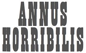 Norwich, CT-based company involved in wood type production. In 1856, William Page (b. Tilton, NH, 1829, d. Mystic, CT, 1906) bought out Horatio and Jeremiah Bill and founded Page and Bassett in South Windham, CT, with his partner James Bassett. In 1857, they moved to Greenville, CT. Some time later Samuel Mowry replaced Bassett as partner, and the company is Page and Co of Greenville, CT. Another name change occurs, to William H. Page&Co. In 1869, Page buys the operation of Colley&Dauchy. Mowry retires a bit later, the company moves to Norwich, CT, and becomes the William H. Page Wood Type Company. A year later, a defection of sorts---Charles Tubbs (an employee since 1860), John Martin and George Keyes leave to set up the American Wood Type Co. In 1881, George Setchell joins the business, and Page and setchell patent the die-cut production method. In 1889, Setchell sells all interests to S.T. Dauchy, who becomes president, only to sell the entire company to Hamilton in 1891. During the Civil War, Page perfected his equipment and became the leading manufacturer of wood type. In 1874, the company published a specimen book of so-called chromatic (wood) type. Henry Lewis Bullen described it this way: This is the most notable of wood type specimens. Page outshone all competitors in imparting a degree of artistry in designing wood type and borders, most of which could be printed in several colors . . . . [It is] a work of unusual excellence, well worth preserving. In 1891, Page's firm was absorbed by the Hamilton Manufacturing Company of Two Rivers, WI.
 Many of his wood types were digitized by Jordan Davies of Wooden Type. Page's fonts include Aetna, Antique No. 4 (revived as HWT Slab in 2013 by Hamilton Wood Type Foundry), Antique Tuscan No 9 (revived by Tom Wallace in 2006), Bindweed (revived by Solotype), Clarendon Condensed, Clarendon Condensed Bold, Clarendon Extended, Clarendon Heavy, Columbian (ca. 1870; revived in 23020 by Jeff N. Levine as Cherrywood JNL, by Dick Pape in 2013 as AWTPageColumbian), Concave Tuscan X, EgyptianTwo (2005), French Antique, French Clarendon (XXX Condensed No. 117), French Semi, Gilbey, Gothic Tuscan Round, Hamilton, Minnesota, Norwich Aldine ML (1872, digitized by Tom Wallace in 2010 under the same name), Number 154, Page No. 508, Peerless 131 Bold, Rigney, Skeleton Antique, Teutonic, Tuscan Italian Round, Unique Wood, William Page 500, William Page 506. In 2013, John Bonadies (MPress Interactive) started making digital typefaces based on Page's models. They published MPI Aldine Extended (based on a 1872 wood type by William H. Page), MPI Antique (slab serif), MPI French Clarendon (based on wood type from 1865 by William H. Page), MPI French Antique (a typical far West saloon font based on wood type by William H. Page, 1869), MPI Egyptian Ornamented (a western typeface based on a 1870 wood type by William H. Page), MPI Arcadian (based on a 1870 design by William H. Page), MPI Tuscan Extra Condensed (based on William H. Page wood type from 1872), MPI Norwich Aldine Reversed (from a 1872 original). Also in 2013, Dick Pape embarked on a large process of digitization of wood types at the Rob Roy Collection of the University of Texas. His digital fonts are free and are bundled under the label American Wood Type, or AWT. Revivals by Dick Pape of fonts due to William Page include AWTPage&SetchellNo154, AWTPage-SetchellNo515, AWTPageAldine, AWTPageAldineExpanded, AWTPageAldineOrnamented, AWTPageAntTuscanCond, AWTPageAntTuscanOutlined, AWTPageAntiqueBlack, AWTPageAntiqueCond, AWTPageAntiqueNo7, AWTPageAntiqueTuscan, AWTPageAntiqueTuscanNo1, AWTPageAntiqueTuscanNo8, AWTPageAntiqueXXCond, AWTPageAntiqueXXXCond, AWTPageBelgianCond, AWTPageBeveledNo142, AWTPageCelticOrnamented, AWTPageClarendonExtended, AWTPageClarendonNo1, AWTPageClarendonXXCondensed, AWTPageColumbian, AWTPageConcaveTuscanXCond, AWTPageConcaveTuscanXCondOutline, AWTPageCorinthianNo2, AWTPageEgyptian, AWTPageEgyptianOrnamented, AWTPageFrenchAntique, AWTPageFrenchClarendonCond, AWTPageFrenchClarendonXXX, AWTPageFullFacedGrecian, AWTPageGothicLightFace, AWTPageGothicTuscanNo1, AWTPageGothicTuscanPointed, AWTPageIonic, AWTPageIonicCondensed, AWTPageNo500, AWTPageNo501, AWTPageNo506, AWTPageNo508, AWTPageNo51, AWTPageNo510, AWTPageNo515, AWTPageNorwichAldine, AWTPageOrnamentedAldine, AWTPagePeerlessAntNo129, AWTPagePeerlessCondOldStyl, AWTPagePhanitalianNo132, AWTPageRomanAetna, AWTPageRunic, AWTPageSkeletonAntique, AWTPageTeutonic, AWTPageTuscanCondNo2. Revivals by Nick Curtis: Page Five Fifteen NF (2015), Rockwall NF (2015, after Aldine and Aldine Extended), Hunky Dory NF (2014, a circus font after William H. Page's wood type Doric, ca. 1850), Sodbuster NF (2014, after Gothic Dotted), Tuscalooza NF (2014, after the 1872 typeface Tuscan Extended), Bandiera Del Legno NF (2014: this Tuscan wood type revives Gothic Tuscan Condensed Reversed), Belgique NF (2014: a revival of the (Western) wood type French Clarendon XXX Condensed No. 117), Skelett Antiken NF (2014, after Clarendon XX, 1959). In 2020, Mark Simonson reworked, extended and modernized Aetna in his 30-style text and display typeface family Etna. FontShop link. Digital typefaces based on W.H. Page's work. View revivals of William Hamilton Page's typefaces. [Google]
[MyFonts]
[More] ⦿
|
William Hamilton Page
[William H. Page Wood Type Company]

|
 [MyFonts]
[More] ⦿
|
William Leavenworth
|
New York-based inventor (with A.R. Gillmore) of the pantograph, which allowed fast and accurate copying of wood type, in 1834. He enters into a partnership with his father in law, J.M. Debow, to manufacture wood type commercially in Allentown, NJ. Production starts in 1836 under the supervision of E.R. Webb. George Bruce buys out Leavenworth and Debow and sells it to E.R. Webb, who promptly goes into a partnership with Darius Wells in 1839, at which time Wells&Webb was formed. Specimen of Leavenworth's Patent Wood Type Manufactured by J.M. Debow (1840s) is on-line at the NYPL. Digital revivals include Poplar (1990) by Barbara Lind at Adobe, and Gothic Leavenworth (Wooden Type Fonts). [Google]
[More] ⦿
|
William Morris

|
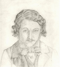 British type designer, architect and designer (b. Walthamstow in East London, 1834, d. 1896). Defender of the medieval form, he set up Kelmscott Press in 1891, and was one of the founders of the Arts and Crafts Movement. Morris was an artist, poet, writer and designer himself, but he is probably best remembered for his fabric designs and his book designs for Kelmscott Press, such as The Kelmscott Chaucer (1896). All his punches and matrices and some types are now with Cambridge University Press.
 William Morris's typefaces: - Kelmscott Golden or Golden Type (1889-1890): a bolder re-design of the classical Jenson face, done while he ran Kelmscott Press. The punches were cut by E.P. Prince. It was based on Nicolas Jenson but darkened. ATF's copy of this was called Nicolas Jenson, just before 1900. Morris used it in many of the books in the Kelmscott Press. Ancient Roman was Keystone Type Foundry's adaptation in 1904 of the Golden type [Mac McGrew deems it comparable to Jenson Oldstyle]. All matrices, punches and some of the types are in possession of Cambridge University Press. Digital versions include GoldenType (Elsner and Flake), GoldenType ITC (ITC), Kelmscott Roman (Nick Curtis), Kelmscott (Scriptorium), True Golden (Scriptorium), URW GoldenType (URW), URW GoldenTypeITC (ITC).
- Troy (1891-1892): blackletter. Called Morris Gotisch, it was published by Berthold in 1903. Multiple digital versions exist: GL Morris (2017-2018, Gutenberg Labo, a free version), P22 Morris Troy (2001, Richard Kegler), Joyeuse (1992, Scriptorium: a variation), Morris Gothic and Morris Initials (Tom Wallace), Troy3Roman (Chet Gottfried), MorrisBlack (Dan Solo), Satanick (Marty Snyder), an unnamed revival by Eliana Ferreira (2010), Kelmscott (Scriptorium), Morris Gotisch (Gerhard Helzel), MorrisBlackLetter (Scriptorium), MorrisRoman (Dieter Steffmann), Troycer (Torbjörn Olsson).
- Chaucer (1892): an enlargement [in the sense of point size only!] of Troy. Wetzig mentions the date 1897. For a digital version, se Alter Littera Chaucer (2012).
- Morris Romanized Black. Mac McGrew: Morris Romanized Black is an adaptation of the Troy and Chaucer types designed by William Morris for his Kelmscott Press. This adaptation first appeared under the name Tell Text about 1895, and was renamed in 1925. Troy and Chaucer were two sizes of one style, approximately 18- and 12- point respectively. William Morris had previously designed a roman type which became popular commercially as Jenson Oldstyle (q.v.); of this design he says, "After a while I felt that I must have a Gothic [in the sense of Blackletter or Old English] as well as a Roman, and herein the task I set myself was to redeem the Gothic character from the charge of unreadableness. ... Keeping my end steadily in view, I designed a blackletter type which I think I may claim to be as readable as a Roman one, and to say the truth, I prefer it to the Roman." Compare Satanick. For digital versions, refer to the digital interpretations of Troy.
- Jenson Oldstyle, Morris Jensonian, Morris Old Style. Well, not really---Mac McGrew explains: Jenson Oldstyle, though a comparatively crude typeface in itself, did, much to start the late nineteenth-century move toward better types and typography. Designed by J. W. Phinney of the Dickinson Type Foundry (ATF) and cut by John F. Cumming in 1893, it was based on the Golden Type of William Morris for the Kelmscott Press in 1890; that in turn was based on the 1470-76 types of Nicolas Jenson. Morris had established standards for fine printing, in spite of the fact that he did not design really fine types. Serifs in, particular are clumsy, but the Jenson types quickly became popular. BB&S introduced Mazarin in 1895-96, as "a revival of the Golden type, redesigned by our artist." But it was a poor copy, and was replaced by Morris Jensonian. Inland's Kelmscott, shown in 1897, was acquired by BB&S and renamed Morris Jensonian in 1912; Keystone had Ancient Roman (q. v.); Crescent Type Foundry had Morris Old Style. Hansen had Hansen Old Style (q. v.); and other founders had several other typefaces, all nearly like Jenson. It is hard to realize that Jenson was inspired by the same historic type as the later and more refined Centaur, Cloister, and Eusebius. ATF spelled the name "Jensen" in some early specimens, and added "No. 2" to the series, the latter presumably when it was adapted to standard alignment or when minor changes were made in the design. Jenson Italic was introduced at the same time as the roman. ATF advertised Phinney's Jenson Heavyface in 1899 as "new and novel-should have been here long ago." Jenson Condensed and Bold Condensed were introduced in 1901.
- Morris Initials: illuminated capitals in the Kelmscott edition of Chaucer's works at the Kelmscott Press. Digital versions: Morris Inits (George Williams), Chaucerian Initials (Scriptorium), Morris Initials (Scriptorium), Morrisinits (Dieter Steffmann), William Morris Initials (2018, Chafomon). The Morris Jenson Initialen font by Typograf (2015) is somehow different.
Self portrait, 1856 and picture, age 53. William S. Peterson writes on Morris. FontShop link. MyFonts link. Bio by Nicholas Fabian. Reference books include Typophile Chapbook: The Kelmscott Press, 1891 to 1898 (William Morris), and The Cambridge University Press Collection of Private Press Types, Kelmscott, Ashendene, Eragny, Cranach (Thomas Balston, 1951; inscribed by Adrian Wilson to Bob&Jane Grabhorn). William Morris himself wrote The Art and Craft of Printing (1895, Kelmscott Press) in which he explains his aims in founding the Kelmscott Press. Ebook version of the latter book. View typefaces by William Morris, and historical descendants. [Google]
[MyFonts]
[More] ⦿
|
William Page: Aldine
|
The slabby wood type Aldine originated with William H. Page in 1870. It comes in modified, ornamented and Condensed styles. A particular light weight modification is called Norwich Aldine (1872). Norwich Aldine was also made under the same name by Heber Wells. [Google]
[More] ⦿
|
William Paterson
|
British graphic designer located in Richmond. Specializing in rustic designs, he created the Woodland font in 2015. In 2016, he designed the connected script typeface Revelation Script. Creative Market link. [Google]
[More] ⦿
|
William Spanjer
[Spanjer Brothers Inc]
|
[More] ⦿
|
William T. Morgans
[Young and Morgans Mfg Co.]
|
[More] ⦿
|
William T. Morgans
[Morgans&Wilcox Mfg Co.]

|
 [MyFonts]
[More] ⦿
|
William Thorowgood
[Thorowgood Foundry]

|
 [MyFonts]
[More] ⦿
|
Wilson Thomas

|
 Designer (aka Funk King, b. Fort Knox, KY) who lives in Orlando, FL, and/or Apopka, FL. He used FontStruct in 2008-2009 to make over 550 decorative fonts, and became one of the world's top experts on FontStruct, FontShop's on-line font editor. Most of his fonts were withdrawn in 2012. He did a few commercial typefaces at his commercial foundry, Funk King. His creations include
 - A Bit Eccentric.
- Alphabots
- Alphadings: Picnic Basket (2014), Rat Race (2014), Pod Invasion (2014), On Hangers (2012, a commercial series that includes Pants on Hangers, etc), Dog Tag, Black Bird, Easter Egg Dots, Ser Egghead T. handlebar, Ovoidotta (now called Sniff), Play Book, BuddhaBuddha, Swizzle Sticks, Computer Backplate, Milky Way, Sprout, Football, Clapboard (for movie makers), Teed Off, Book Stack, Speaker Box, Ant Farm, Sound and Vision, Speaker Grill, Tom Tom, Caged Type, Conga Lounge, Spinal, Add Van, Frostruct, Picket Fence, Regatta, Cranestruct, Impossible Alphabet, Igloo Village, Mortar Board, Jack, Marionette, Golden Gate (+Short, +Solid), Crossed, Eff U ("the finger"!), Tall Big Top, Jackpot, Skulls&Cross Bones Redux, Crosshairs, Drama Club, Good Day Sunshine, Butterfly, Steps and Windows, Heartbroken, O Christmas Tree, Christmas Lights, Candle, Supper Time (alphadings of plates), Sands of Time (alphadings of hour glasses), Fishbones (commercial since 2012), Handy (alphading with hands), Hang Ten (feet alphadings) and High Five (hand alphadings), Armade and Ghost Ship Armada (ship alphadings), Cut Here (stitching alphadings), Schematic (electric circuit alphading), Masquerade, Mortar Board, Gear Bits, Gearswork, Hi-Lo Gears, Gears, Resistor, Gear Shift, Castle, Castle with Flags, Antique Keys, Rounded Keys, Pods, Piano Keys (+Alt, +Correct), Framework, Dixieland Jazz, Spats, and City of New Orleans (the last three are alphdings based on the same Victorian alphabet), Saturn, Piggy Bank, Voodoo Doll, Dice, Fist Bump.
- Antennas, Antennas Outline
- Antiquity
- Arcostellati, Arcostellato, Arcangolo, Arcontorno (2011): a blackletter family.
- Architect, Ruled, Gridworks, Blueprint (Solid, Dashed), Quadular (+Serif), Isometric Modified (+Light, +Bold Outline), Isometric (a 3d gridded family: +Basic Latin, +Basic Latin Lite, +More Latin, +Bold, +Black).
- Art deco: Arc Neuvo (rounded letters), Arc Nuevo (2012, commercial), Toneelschuur (based on the letterhead created for the Theatre Toneelschuur Haarlem), Shift (bold), Eye Spy (this says Peter Sellers), Mod Squad.
- Atomic.
- Avenue, Avenue Alphabet (white on black).
- Badge
- Ball And Chain (neat), Ball Bearings.
- Balls and Bats
- Banjo (2012).
- Barber Shop
- Barcoded
- Basket
- Beachwear (horizontally striped)
- Beat Block, Beat Box.
- Beatnik.
- Beltway.
- Birdseye
- Birdsteps
- Bitten
- Blackletter: Abbey
- Blanket Serif Caps, Blanket Sans Serif
- Block Inline Block
- Block Mosaic (great gridded letters)
- Blockheads
- Blood Sweat&Tears
- Bolla Fratturato (2011): outlined blackletter face.
- Bolt, Bolted
- Bon Mots.
- Break, Balance Beam, After Party (2010).
- Bubble Zwrap (2010).
- Build A Bridge
- Buzz Kill
- Cafe Fumante.
- Carp Black, Carp Blanc
- Caterpillar, Tall Caterpillar.
- Cattails
- Chain Gang, Krazy King
- Channel
- Check Mate (checkered flag font).
- Cherry Bomb.
- Chubby
- Cinder Block (2010): a 3d typeface with texture thrown in.
- Circuit Board Solid, Circuit Board Outline, Circuit Board Outline Numbers, Circuit Board Simple, Micro Clean, Microcircuitz, Circuit Board Simple, Schematode (2013).
- Circus Maximus Outline
- Cirquela (2012). a non-FontStruct font, this is his first hand-printed typeface.
- Clean
- Cobblestones
- Code Hijack (2014).
- Compass (+Plain)
- Connected scripts: Cruise, Jet Cruise (2009), Notched Script (upright, connected), Rough Script (italic, connected), square Script (pixelish, connected).
- Computer Backplate, Milky Way.
- Contempole
- Crimped Pincushion (2010).
- Crispy Inline (classy)
- Crooked Marker, Marker
- Crop Circles
- Crownbar.
- Curls And Twirls
- Cut Here
- Daisies (nice rounded square letters with painted daisies)
- Decoscriptic, Decoish.
- Diamonds Are Forever, Liberty (dot amtrix fonts)
- Didactic fonts: Back to School.
- Digital, Digital Whimsy (gorgeous fonts in which the meat of the glyphs is made up of 0's and 1's), Digital Italics, Digital Non-italics.
- Dingbats: Digital Biz Bitz (2012), Capitalist Pictograms (2012), Kapitalist Kit (2011), Weather System (2011), Twelve Days of Christmas (2010), Learning For Business (2010), Calder Symbols (2010), Mad Aliens (2010), FSEmoticons, Maven Pictograms, Temp (weather dings), Sports Wave, Bullet Arrows
- Dinner at 8
- Diode
- Directional
- Ditier Cycles (2010): a grunge version of J. Hughes's Dirt Cycles.
- Disco Ball, Disco Salvation.
- Doggie Tracks (2010).
- Dollars and Cents.
- Domestic Bliss (+Solid), Blissful Hearts (Valentine's Day alphadings).
- Domino, Dominodot
- Dot matrix fonts: Belly Button (2013), Fandangle (2013), Trace Remains (2013), Billiards (2013), Pome (2013), Cow Poke (2013), Rouletto (2014), Crawler (2014), Zephyrelli (2012), Yoyo (2012), Carousel (2011), Corsivo Punti (2011), Wisp (2011), Amusement (2011), Menagerie (2011), Junk (2011), Iphont (white on black dot matrix face), Lyrical (dot matrix script), Petits Pois, Elli, Industrial Magic, Wind Chime, Domestic Bliss (2010, +Serif, +Sans Serif), Ying Yang (2009)
- Double Decker
- Eau de Kerning.
- Efficiency (2010).
- Eiffel family: mechanical.
- Electrifunkified (2013).
- Emergency
- eq Regular, eq Radio Waves, eq Tight.
- Erector Set (2010).
- Extension Cord
- Fairy Tale (curly)
- Fantastic
- Fast Cars, Fast Lane, Fast Forward
- Fifty Famous Fairy Tales (bi-lined and bejeweled)
- Flair Ornate, Flaired Script, Flair, Flaired
- Floor Plan
- Flash (gridded face)
- Folk Art (wooden plank simulation)
- Font Troll
- Fractal, Wireframe, Hemisphere, Origami (now Mummification): experiments in glyph partitioning.
- Funk, Funky palms
- Gancio (2014). Hand-drawn.
- Gemstone (letters in a mosaic)
- Glyphs made from broken objects: Broken Combs, Broken Glasses
- GI Joe
- Grain
- Graphont
- Grid1, Grid2, Pas De Grille Pli Isométrique (+Plombé), Grille Noir Pli Isométrique (+Plombé), Grille Intrépide Pli Isométrique (+Plombé), Grille Facile Pli Isométrique (+Plombé).
- Grunge typefaces: Feather (2010).
- Gummy (2010).
- Happily Ever After (2010).
- Heath Robinson (gorgeous mechanical font).
- Hexcavated (2010).
- High Anxiety.
- High Wire (dotted).
- Honeycomb Black (hexagonal).
- Horizontally Phased (like IBM logo from afar), Vertically Phased, Field Goal.
- Hot Diggity Dog (2010): a monoline rounded sans.
- Void.
- Inline: Hi-Fi Deco, Track (+Filled), Crispy Inline
- Imperfect Optical Experiment.
- Ironside, Ironworks.
- Isomixed (+Inline, +Inverted, +Light, +Inline Light), Isomixerd Moire (nine textured styles).
- Jacks (2010): a stitching font.
- Jeannie
- Jelly Bean series: I's, Wide, O's, Split
- Jetsons (futuristic).
- Jolly Swash 9+Tall, +Tall Wide Tail).
- Kaleidoscope, Kaleidoscope Solid
- Kitchen tile typefaces: MadisonAveAvenue (2010), Edgar Fernhout (2012).
- Lace
- Ladder
- Last Days Of Summer, Endless Summer, Beach.
- Lattice, Lattice Black
- Lean
- Leaves
- l-e-display
- Little Miss Muffet.
- Loom.
- Love, Love Letters
- Martini
- Metroliner and Metroliner Deluxe.
- MICR fonts: Wedge Solid.
- Mike
- Mitered, Zietgeist: striped 3d typefaces.
- Modal.
- Modern Ancient (chiseled font imitation)
- Molecular (+Complex, +Complex 1), Dense Molecular Complex (1 through 5), Molecular Architecture, Tessellation 1 (+Continuous), Tessellation 2.
- Monkey Bars.
- Montreal (+Italics)
- Monumental, Less Monumental,
- Mortar Booted (+Thick, Separated, Mission, Booted Mission).
- Mouthy
- Music fonts: Fret Full (2010), Fret Station (2010).
- MyBlock
- Mystere (2012, grunge).
- Necklace
- Ninja.
- Oblique
- Octovision Remix
- Open&Shuttered Day, Open&Shuttered Night
- Oriental simulation/look: Shoji Pixel, Shoji Stage&Screen Soapbox, Chinese Democracy, Asian Influence.
- Origami City (2010): formerly Simply Elevated Black. Simple Elevation (2012) is in the same family.
- Outline Habitat
- Ozmosis (2014), Ozian (2014), Cardinal (2014), Emblem (2014), Oblio (2014), Hollow Branch (2014)
- Pallina (2010, + Stampino, +Diluente).
- Palm, Tall Palm
- Paperclip typefaces: Neue Werner Paperclip (2012).
- Patterns
- Pavers
- Piccadilly (2010).
- Pipes
- Pisa.
- Pixel Dust, Pixels Dusted, Zogg Domination (video game font)
- Plaid
- Pop Arc (2010). In the same style: Conveyor Belt, Milk Bottle, Cookie Cutter, Erector Set (2010).
- Popsicle Sticks (nice vertically striped glyphs).
- Playbook (2010).
- Power Grid, Power Gridlocked
- Process This (2010) and Flowcahrt (2010): based on graphs of computer programs.
- Pump Boys (2010).
- Puzzle
- Quagmire (2010)
- Radio Waves
- Razorback Block
- Receipt (2012): a dot matrix face.
- Regular Habitat
- Relativity
- Remixintag (2011, a clone of Wallachia by Intaglio).
- Repeat
- Ribbodini (2010, ribbon font).
- Riveted
- Road Trip
- Sausalito Nautica (2011).
- Say What? (Exaggerated ink trap face)
- Scaffoldini (2010): a 3d gridded face. Followed by Scaffo (2012), Scaffoldini Senza Griglia (2010), Scaffoldini Ascendente Contrario SG, Scaffoldini Ascendente Senza Griglia, Scaffoldini Contrario Senza Griglia, Scaffoldini Ascendente, Scaffoldini Contrario, and Scaffoldini Ascendente Contrario, Scaffoldini Prospettico (+Contrario, +SG).
- Scichosis.
- Scripts: Diode (+Dioded, Diodoubled, Diodocked, Diodedocked, Diodiced), Scherzando, Fontstitution, Rough Script, Scriptilicious, Whipped Cream, 45 Degrees, Script Town (2013), Aloha (2013), Sinal Strength (2013), Ink Well (2013).
- Skulls, Skully
- Slice N dice
- Skyscraper.
- Small Wonder, Small World
- Snowflake (2010).
- Soap.
- Sole
- Soma (2009): 3d letters mades from cubes.
- Spooky Eyeballs (2009).
- Squiggles
- Stained Glass, Stained with Cross
- Starburst
- Stencil fonts: GI Joe (2012, military), Kid's Stencil (white on black), Black Tie, Matchstick, Stensei, Stencillated, Tri-Fold, Tri-Fold Cut, Tri-Fold Rounded, Stencil, Stencil Plate, Stencil Face, Semi Stencil, Psuedo Stencil, Psychedelic Stencil.
- Stitching fonts: Cross Worded (2013), Cut Here (2014), Sampler
- T-Shirts on a Clothesline
- Swamp Frog and Tadpole: artsy fat letters
- Swamp Funk, Mojo (curly letters)
- Swatches.
- Tabular
- Tall Habitat
- Techno look: Technified, Slick, Tangential (2010).
- Tanqueray (2010): octagonal face.
- Teepee (wood look)
- Tennis themed: Racket, Net Ball, World Cup.
- Tetrominoes Black (2010): a 3d typeface cloned from TP2 Marriott's Tetrominoes.
- Textile
- Texture fonts: Global (2011, globes), SS Half Tone (One, Two, Three), SS Watermark, SS Silk Screen (2010). These brush texture typefaces were cloned from Swifted Strokes by Mike Lee. Tramarada (2011) has a stunning woven look.
- Thalistic.
- The Adventure of the Dancing Men (2011, dingbats).
- The Big Top
- The Real McCoy
- Tiki.
- Time
- Timpani, Timpaniless, Timpaniblok, Alien Crop Circles (outer space face).
- Toothpaste (2011): imitating oozing toothpaste.
- Trapezoidot, Zoidot, Dotz (dotted typefaces).
- Upright connected scripts: Madie (2009)
- Valentine's fonts: Hearts and Flowers, Hearts and Arrows, Keys to your Heart, Bed of Hearts
- Vapors and Mirage: evaporating glyphs.
- Vibration (2010). This multiline typeface was followed by Echo (2010).
- Victorian fonts: Alouette, Swamp Funk
- Void.
- Waveform
- WPA Household Arts Stripes, WPA Household Arts Chex, WPA Household Arts (poster stencil face)
- Wee The People, Small World.
- Werner Paperclip (2009), Paperclip (2010): paperclip typefaces after a 1974 original by Ad Werner.
- Western fonts: Bolo (2010), Bow Tie (2010), Bowl (2010), Western Doodle, Sparky, Buckaroo, Diamond Buckaroo, Saloon and Desert Rose. Western style alphadings: Cart Before The Horse, Wagon Train
- Weird
- White on black typefaces: Tabs, Dot Keys, Rounded Keys, Block Keys, Keys.
- Wiggles
- Wim Crouwel-related fonts: Unknown Crouwel #1, Edgar Fernhout (2012: a Wim Crouwel tribute font in kitchen tile style taken from a 1963 poster), Kalender 1976 Letters (octagonal based on a Wim Crouwel calendar from 1976), Kalender 1976, Brusselmans (based on a Wim Crouwel poster), Rabobank (based on a Wim Crouwel poster), Brabant (based on a Wim Crouwel poster)
- Woodcut, Woodcut Recut, Woodcut Banjo.
- Woven.
- Wrenched
- Yay Team
- Zebeast (Zebra-striped letters)
- Zodiac Block
In 2012, he added these fonts at MyFonts: Architect, Black Tie, Carousel, Check Mate, Cobblestones, Cruise, Dog Tag, Edgar Fernhout (2012), Fifty Famous Fairy Tales, Fratturato Digitale (pixelish blackletter face), Ghost Town, Jackpot, Jelly Bean, Keyboard, Kingdom (a castle font), Lagniappe (Victorian), Lyrical, Madie, Matchstick, Menagerie, Q Typ, Scaffo, Sprinkle, Stained Glass, Stencillated, Stensei (stencil), Sweet Valley, Toothpaste, Vibration MF, Yoyo, Zephyrelli. Typefaces from 2013 (no longer freely downloadable!): Pome (dot matrix), Cow Poke (dot matrix), Sausalito Nautica, Cut Here (stitching typeface), Belly Button (dot matrix face), Rouletto (bejeweled typeface), Picnic Basket (alphadings), Fandangle (dot matrix), Trace Remains (dot matrix), Billiards (dot matrix), Cross Worded, Script Town, Schematode (connect-the-dots), Electrifunkified, Aloha, Signal Strength, Ink Well, Satellite, Supper Time (alphadings), Mike (alphadings), Licorice, Conga Lounge OF, Monkey Bars, Daisies, Fractal OF (textured face), Saloon OF, Ball and Chain, Say What. Typefaces from 2014: the multilined or inline typefaces Ozmosis, Ozian, Cardinal, Hollow Branch, Emblem, and Oblio. The alphading typefaces Rat Race and Picnic Basket. The pearly dot matrix typeface Rouletto and Crawler. The video game typefaces Pod Invasion and Zogg Domination. The stitching typeface Cut Here. The pixelized typeface Code Hijack. Klingspor link. Dafont link. Fontspace link. Additional URL. Myfonts link. MyFonts foundry link. View Wilson Thomas's commercial typefaces. [Google]
[MyFonts]
[More] ⦿
|
Wisnu Cipto Wibowo
[Fateh Lab]

|
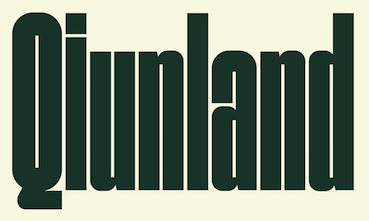 [MyFonts]
[More] ⦿
|
Wood Studio
[Ivi Topp]
|
Designer in Toulouse, France. In 2016, he/she designed the free squarish blackboard bold typeface family WD La Tour and the free avant garde sans font Solaris Eclipse which is inspired by Andrei Trakovsky. Behance link. [Google]
[More] ⦿
|
Wood Type Impressions
[Mark Kusek]
|
Without Walls is Mark Kusek's company in Powell, OH. It sells a CD called Wood Type Impressions, which contains eight complete wood type fonts. [Google]
[More] ⦿
|
Wood type in America
|
 At the University of Texas, we find a wonderful site that explains the roots, the rise and the decline of American wood type, and provides a timeline. There are four periods:
 - The start, the 19th century. At its peak, around 1880, there were only six manufacturers. The big names of that glorious wood type century were Darius Wells, William Leavenworth, Edwin Allen, John Cooley, Horatio&Jeremiah Bill, William Page, David Knox, William&Samuel Day, Charles Tubbs, Heber Wells, William Morgans and James Hamilton.
- The spread. While most production used to be in New York and Connecticut, James Hamilton from Two Rivers, WI, got on stage by acquiring major competitors. The center of wood manufacturing moved west. Minor players remained in NYC until the 1920s, such as the Empire Wood Type Co., American Wood Type Co. and Eastern Brass&Wood Type. Others, such as Tubbs Mfg Co from Connecticut moved west (to Ludington, MI), after the death of Charles Tubbs.
- The consolidation. Between 1880 and 1920, Hamilton, which produced wood type at half the cost with its router pantograph, gained in importance. It bought William H. Page Wood Type Co. in 1891, Morgans&Wilcox Mfg Co. in 1898, Heber Wells in 1899, and Tubbs Mfg Co., the last major competitor from the nineteenth century, in 1918.
- The decline, after 1920. The last stragglers: Empire Type Foundry (Delevan, NY) ceased production in 1970; Hamilton Mfg Co. quit in 1985; Rube Mandel's American Wood Type Mfg. Co. (NYC and later Long Island), which was founded in 1932, lasted until 2001.
[Google]
[More] ⦿
|
Wood Type Listings
|
Wood types enumerated. [Google]
[More] ⦿
|
Wood Type Revival
[Matt Braun]
|
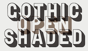 Foundry specializing in digital versions of old wood type. Set up in 2011 by Matt Griffin, all font licenses refer to Bearded, which has offices in Pittsburgh, Pennsylvania and Montpelier, Vermont. Matt Griffin is a designer and co-founder of Bearded, and teaches in the School of Design at Carnegie Mellon University. He also has a great love for letterpress printing, which he acquired while attending Indiana University in Bloomington, Indiana, where he received a BFA in Graphic Design. Bearded writes: Matt Braun and Matt Griffin wanted to collect lost and forgotten old wood type from the 1800s and revive those typefaces as digital fonts for modern designers. Matt Braun is a senior designer at Bearded and letterpress printer. They first operated Rare Letterpress Wood Type as a kickstarter. After some time, they started the foundry Wood Type Revival.
 Their typefaces include - Concave Tuscan (2015). Concave Tuscan was first shown as wood type under the name Gothic Tuscan by William H. Page in James Conner's Sons Typographic Messenger (1866). Almost all the major manufacturers of the 19th century offered a version of Gothic Tuscan.
- Cosmopolitan (2016).
- Delittle Chromatic (2016). DeLittle Chromatic was issued by DeLittle of York around the turn of the century under the name No. 56/54.
- WTR Fat Boy (2011). Fatboy is derived from a widespread (no pun intended) typeface of the 19th century, commonly known as Antique Extended. It was first seen in print as wood type in 1838 in George Nesbitt's First Premium Wood Types Cut by Machinery.
- WTR French Clarendon Ornamented (2011). The original design for French Clarendon Ornamented first appeared in print in the catalogs of the type manufacturer Young&Morgans (who was later purchased by Morgans&Wilcox Mfg Co) between 1876-1880. M&W was later purchased by Hamilton Mfg Co in 1897. Hamilton then offered this typeface under the name No 3026.
- French Octagon (2011). French Octagon was first shown by Morgans & Wilcox Manufacturing Co. in their 1884 Condensed Specimen Book of Wood Type.
- Grecian Light Face (2016). This revives Light Face Grecian by David Knox & Co. in 1858.
- WTR Gothic Open Shaded (2011). Gothic Open Shaded was first seen in George Nesbitt's First Premium Wood Types, Cut by Machinery (1838). This cut of Gothic Open Shaded most closely matches a design first cut by Young&Morgans between 1876-1880. Once Morgans&Wilcox was acquired by Hamilton Manufacturing Co. (1897), they listed the typeface as No. 3238.
- WTR Gothic Outline (2016).
- WTR Roycroft (2011). The arts and crafts typeface Roycroft was originally created by Miller & Richard under the name Teutonic and is shown in their 1909 catalog. It is a hand-carved typeface.
- Planned is Grecian Light Face.
Creative Market link. [Google]
[More] ⦿
|
Wood Type Timeline
|
American wood type explained in a timeline chart. [Google]
[More] ⦿
|
Wooden Type Fonts (was: American Wood Type and, Wooden Type)
[Jordan Davies]

|
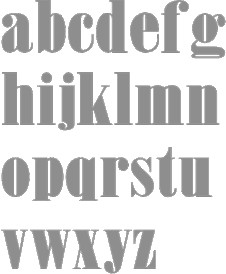 Wooden Type Fonts (was: American Wood Type) is founded and run by Jordan Davies from South Hero, VT: Historically accurate reproductions of wood type produced in the 19th century in a variety of styles. This is a work of passion and dedication by Jordan Davies. Jordan's other passion is painting. His (digital) wood typefaces include these original designs: Bevan Condensed, Bevan Medium (based on Melior), Inline Regular, London Light, London Heavy, Neo Geo Block, Quirk, Slab Four Rounded (+Ext), Slab Four Rounded Italic, Slab Four Rounded Revised, Slab Four Rounded Super. MyFonts link. Digital revivals:
 - 20th Century ExtraBold Extended (2017). A very wide version of Futura.
- Aetna Bold.
- Alpine Mtn (2021). a display sans with some stencil glyphs.
- Antique 6 (based on Stevens, Shanks), Antique Condensed Bold, Antique Light, AntiqueRegular (saloon font), Antique Five, Antique Sans, Antique Shadow, Antique Six, Antique Three, Antique Tuscan 1, Antique 7 (2011), Antique Tuscan 8 (2008), Antique Tuscan Condensed, Antique Tuscan Heavy, Antique Wells Medium (2005), Antique Wells Expanded (2011, based on Wells&Webb), Antique Two (2008), Antique XX (2008).
- Bernhard Gothic Medium (2017, after Lucian Bernhard).
- Blobbing (2013, a fat finger typeface), Bodoni Ultra (2015, based on a Bauer Types original).
- Cassjor (2011): an angular face.
- Cheltenham (2019), (2019).
- Churchward Ultra Bold (2018).
- Clarendon Condensed, Clarendon Condensed Bold (2007, based on a 1859 design by William Hamilton Page), Clarendon Extended (2005, after W.H. Page), Clarendon Heavy, Clarendon Extra Condensed (2007), Clarendon 618 (2010), Clarendon 617 (2010), Clarendon Semi (2011), Clarendon Jordan (2015).
- Columbian (2015) and Columbian Slab (2015). Heavy classical Egyptians.
- Concave Tuscan X Condensed.
- Craw Clarendon (2013), Craw Clarendon Extended (2015), and Craw Clarendon Bold (2014).
- Davies Serif (2014): a great wide wood-inspired wedge-serifed display didone.
- Devendra (2021). A counterless stencil typeface.
- DeVinne Wood, DeVinne Wood Italic.
- Doric Condensed, Doric Expanded.
- Egyptian Bold, Egyptian Ornamented (+Bold), Egyptian Regular, Egyptian Slab (2007), Egyptian Two, Egyptian Wide (2006, based on a Miller&Richard original, ca. 1850), Egyptian Bold Expanded (2011), Egyptian Extra Bold Condensed (2011), Egyptienne75 Black (2020).
- French Antique Condensed.
- French Calrendon (2015) and French Clarendon Expanded (2015).
- Gallatin Light (2021), Gallatin Bold (2019) and Gallatin Medium (2020). A slab serif.
- Girder Heavy (2008, based on a design of W.H. Page, ca. 1900), Girder Super (2014, a slab serif based on William Hamilton Page).
- Gothic Bold, Gothic Bold Extended, Gothic Extra Extended, Gothic Extended (2009), Gothic Medium, Gothic Nesbitt (2011), Gothic Leavenworth (2015), Gothic Number Sixteen (2019), Gothic Special Condensed Bold (2005), Gothic Special Condensed Medium (+Italic, 2013), Gothic Special Normal (+Italic, 2013), Gothic Special Thin, Gothic Tuscan, Gothic Tuscan 9 (+Narrow), Gothic Tuscan 8 (+Pointed), Gothic Tuscan Condensed, Gothic Tuscan Round, Gothic Tuscan Concave, Gothic Tuscan Pointed Narrow, Gothic Unique (2007).
- Grecian Bold Condensed, Grecian XX Condensed, Grecian Bold Expanded (2014).
- Grotesque (2010), Grotesque Bold Italic (2013).
- Jensen Old Style.
- Jordan Calligraphy (2015).
- Kurilian (2015). After a 1879 spurred wod type design by Heber Wells.
- Lettres Angulaires (2010): based on Textura.
- London Heavy and London Medium (2017). A revival of Johnson Underground.
- Mansard. This revives a wood type from 1878 by Heber Wells.
- Martin Bold (2018), Martin Medium Regular (2018).
- Masterman (2017). After a typeface by Boston's Hansen foundry.
- Mementor Bold (2018) and Mementor Medium Regular (2018).
- News Gothic Bold (2017) and News Gothic Light (2017). After Morris Fuller Benton's original at ATF.
- Number5 Reg (2010). A variation of the William Page 500 font.
- Number 154 (2006, based on a 1887 design by William Hamilton Page), Number 515 Black, Number 514 (2011).
- Octagon.
- Peerless (2008). Peerless 131 Bold (2012) is a wedge serif design based on William Hamilton Page.
- Penny (2007, a gorgeous didone headline font based on a 1838 wood type font by George Nesbitt).
- Roman X Condensed (a great didone font), Roman X Expanded, Roman Wells Bold.
- Rubens Regular (2005) and Rubens Expanded Regular (2018).
- Sainted Medium, Sainted Extra Bold (2018). Two slab serif typefaces.
- Skeleton Antique (2005-2012). Based on a William Page original from 1865.
- Slab Four Rounded (2010, +Bold, +Super).
- Stymie Extra Bold (2018).
- Teniers Regular.
- Teutonic.
- Thorowgood (2010): a relatively low-contrast Clarendon based on a wood specimen sheet. Thorowgood Wide was done in 2013.
- Times Gothic (2009).
- Trenton, Trenton Condensed (2005, based on an 1889 typeface by James Edward Hamilton), Trenton Ornamented.
- Trooper Roman Black (2020).
- Tuscan Egyptian, Tuscan Italian.
- Video Black (2020).
- Venusian Bold Extended (2018). The name refers perhaps to the classic Bauersche sans typeface Venus.
- William Page 500, William Page 506.
- Wood Regular (2005).
Showcase of his most popular fonts at MyFonts. Klingspor link. [Google]
[MyFonts]
[More] ⦿
|
Woodtyper
[Nick Sherman]
|
Notes on large and ornamented type, edited by Nick Sherman. [Google]
[More] ⦿
|
WrittenShape Type Foundry
[Raphaël de la Morinerie]
|
WrittenShape is a Paris-based typefoundry set up by Raphaël de la Morinerie. It specializes in neutral modern sans serif typefaces, 1970s-style display typefaces and renaissance-era serif typefaces. As of 2025, its type catalog included - Reptil (2025, Raphaël de la Morinerie and Ethan Nakache): a contemporary interpretation and extension of the psychedelic typeface Turtle (1971, Bob Newman ay Letraset). Interview in 2025 by Giacomo Checcucci.
- Naive (2023, Benoit Brun and Raphaël de la Morinerie): a free interpretation of the circle-based psychedelic font Bau, (Flemming Bau, 1970s).
- Gaya (2021, Raphaël de la Morinerie and Philipp Herrmann, consultant): a blurry typeface with warm organic shapes that offer comfort to the eye. This soft serif typeface was first designed at Out of the Dark.
- Adapt (2023, Raphaël de la Morinerie): in their words, a neo-grotesque typeface defined by its calm and meticulously crafted shapes, inspired by Swiss modernist typography, designed with everyday use and precise text compositions in mind.
- Craft (2023, Benoit Brun and Raphaël de la Morinerie): a narrow wood type.
- Kateka (Raphaël de la Morinerie): an original creation that borrows some baroque details from the characters of 18th-century Dutch typographer Johan Michaël Fleischmann, this full typeface family is ideal for classical texts with some embedded rigor.
Raphaël de la Morinerie is a French type and graphic designer who has a Bachelor's degree in graphic and type design from ENSAV La Cambre, Brussels (2019), and who is based in Paris. [Google]
[More] ⦿
|
WRKSTT Graphicstudio (or: Xtoph)
[Christoph Zeugswetter]

|
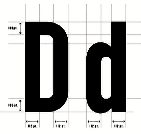 Graphic designer in Vienna, Austria, aka xtoph and Chris Toph. His typefaces:
 - Altwien (2014). A blackletter typeface derived from street signs in Salzburg and Vienna.
- The 30-style headline grotesque typeface family Chairdrobe (2017).
- The dry brush font Rough Marker (2020).
- Vienna Woodtype (2021). A font in clean and rough styles that is based on real linocut prints.
- Tokio Marker (2022). A painted dry brush font in SVG format.
Old URL. Old link for WRKSTT Graphicstudio. [Google]
[MyFonts]
[More] ⦿
|
W.T. and S.D. Day Co.
|
In 1845, brother William and Samuel Day start producing wood type in Fredericksburg, OH. They struggled with a long strike in 1855, and moved production after the strike to the Ohio State Penitentiary in Columbus. The name changed to W.T., J.R., and S.D. Day Co. In 1857, a fire at the prison destroyed the equipment, halting production. It resumes a year later under the old name after the brothers bought a press manufacturing plant in Cincinnati, J.D. Foster and Co. It's all in vain, because they close shop in 1862. [Google]
[More] ⦿
|
Xilografia Adige
[Pavan Orfeo]
|
Italian wood (and plastic!) type foundry (xilografia means woodcut) located in Verona. Some extracts from their catalogs: Flickr. [Google]
[More] ⦿
|
Yes Creative
[Peter Costello]
|
Peter Costello (Yes Creative, Australia) designed the handcrafted wood emulation typeface Naive Gothic Condensed (2017) and Bleeding Sharpie (2017). Creative Market link. [Google]
[More] ⦿
|
Young and Morgans Mfg Co.
[William T. Morgans]
|
American wood type manufacturer from the 19th century. William T. Morgans invented his own version of the router/pantograph for wood type manufacture and with George Young, he set up Young and Morgans Mfg Co. in Napanech, NY, to start producing wood type. A few years later, fire destroys the plant. Young sells his shares to H.K. Wilcox, at which point the company moves to Middletown, NY. In 1880, it becomes Morgans&Wilcox Mfg Co. [Google]
[More] ⦿
|
Zac Neulieb
|
 Student at Purdue University, West Lafayette, IN. Honey Badger (2011) is a slab serif, woodblock-inspired typeface. Metis (2011) is a high-contrast geometric typeface around the theme of semi-circles. [Google]
[More] ⦿
|
Zebrawood
|
An Adobe type family designed by Carl Crossgrove, Carol Twombly, and Kim Buker Chansler in 1994. It evolved from letters first seen in a specimen catalogue from the 1854 Wells and Webb Type Company. It is a variation of the 19th century Antique Tuscan style, and has serifs that are pointed and turned upwards. [Google]
[More] ⦿
|
Zeugler
[Reymund Schroeder]
|
 Award-winning German type designer, who co-founded Forgotten Shapes in 2017. NaN descibes him as a type Janus with a two-sided practice, one oriented towards the past as a meticulous archivist-historian, the other towards alternate history called Typographic Uchronias. His typefaces:
 - Tempel Grotesk (2021, Production Type). Tempel Grotesk takes inspiration from old wood types. It is a blocky black sans in four widths. He writes: All that ink creates a fantastically heavy page with rich texture popping through the counterforms.
- Lector FSL (2017, Forgotten Shapes). A text typeface family about which he writes: Lector FSL (originally named Lector Gewoehnlich and Lector Kursiv) is the digital rework of an original type design by Gert Wunderlich, drawn between 1963-1990. Lector was designed for, but never released by former Typoart (GDR). Published in cooperation with and permission of Gert Wunderlich.
- Friedlaender. After Elisabeth Friedlaender's Elizabeth (1934).
- Consul (with Stephan Müller). A revival of Wilhelm Woellmer's Consul (1903-1907).
- Polja (2013-2014). Polja won an award in the Latin category at the Morisawa Type Design Competition 2014.
- Edna (2016). He received an Honorable Mention in the Latin category for Edna in 2016 at the Morisawa Type Design Competition 2016. A revival of Schmale Fette Renaissance (Wilhelm Woellmer's Schriftgiesserei Berlin, ca. 1895).
- Edna Text (2017). A Victorian typeface that revives Halbfette Etienne (Schriftgiesserei Flinsch, 1908).
- Haiti. A revival of the wood type Dumbria (1885, Holztypenfabrik Sachs).
- Huber. A revival of the wood type Christina (1885, Holztypenfabrik Sachs).
- Zeit Tiemann Italic (2013). A custom font for Die Zeite.
- NaN Hyena (2022). He writes: NaN Hyena is a crisp look at the humanist sans sub-genre, conceived as a sculptural exercise. [...] Hyena started as an extrapolation of the work of 20th century calligrapher and type designer Hildegard Korger. [...] NaN Hyena challenges the idea of type hierarchies. It's thought as a mood spectrum, a subtle play between sharp and soft, as if the shifting light of the sun would cast different shadows on the same object throughout the day bringing familiarity and the unexpected within the same room. Call it Type Impressionism if you like.
[Google]
[More] ⦿
|
Zvi Bregman
|
Hebrew wood type manufacturer in Palestine. In 1938, he published the Hebrew text Wood Type (Haddapas, Tel Aviv). [Google]
[More] ⦿
|


 Alex Joganic (1871 Project) is the Birmingham, AL-based designer of Matches (2016, an octagonal typeface), Ciclista (2016, a casual monoline typeface), Superior (2016, a handcrafted sans), The Victor (2016, handcrafted), Zara Elyse (2016: script), Fernweh (2016, a handcrafted typeface with a vintage wood type look) and Xander (2016, in Sans and Serif: 19th century all caps typeface family with a wood type look).
  Architect and designer in Banda Aceh, Indonesia, b. 1980, who set up Grayscale, then 38 Lineart, and finally
  [
[
 Werner Affolter ran a phototype and printing company in Basel, Switzerland, called Affolter und Gschwind AG, Fotosatz&Reprotechnik. In 1981, Affolter published an extensive catalog entitled Letterama that showed over one thousand alphabets. Few of those were original, so I suspect he acted as a vendor of sorts, but at least a couple seemed original, or were claimed to be original or exclusive:
  Pottstown (Philadelphia)-based designer and PostScript font hacker who ran Prescott Design and now Alan Jay Prescott Typography, but was also involved in other ventures such as the Black Walnut Winery. Originally from Greenfield, MA, he graduated from Saddleback College, and worked for some time as a typesetter in New York. He advertizes himself as a leader in PostScript Open Type Font development specializing in the revival of print-only letterforms into digital typographic materials. He operates as APT and more recently as AJPT. In 2019, he announced that he would stop making typefaces altogether. His work can be partitioned into time periods. For this reason, Prescott's oeuvre is split over several pages:
  [
[ Albatross is Jay Hilgert's foundry in Oklahoma City, OK, est. 2008. Before Albatross, Jay Hilgert ran
  [
[ [
[ [
[ [
[ Graduate of the Rietveld Academie in Amsterdam. Born in Syracuse, Sicily, he spent half of his life in New York City, and studied for four years in The Netherlands. He worked in Lithuania with a group called Alfa60, and is now based in Turin.
  Various implementations of Stephenson and Blake's Algerian (1911) exist. Algerian is reminiscent of 19th century woodcut types and suggests the Victorian era. Modern versions were made by Philip Kelly at Letraset in 1968, and by Alan Meeks in 1988. In the early digital era, thee is a Letraset font, Algerian, and renamed early digital fonts OPTI Achilles (Castcraft) and Alfredo (SoftMaker). There are also
  Modern American design pioneer (b. 1915, Denver, CO, d. 1955), known for his books, graphic design, interior and architectural design, and typefaces. Lustig studied design at Los Angeles City College, Art Center, and independently with American architect Frank Lloyd Wright at his Taliesin studio and French painter Jean Charlot. He began his career designing book jackets in 1937 in Los Angeles. In 1944 he became Director of Visual Research for Look Magazine. He also designed for Fortune, and Girl Scouts of the United States. The Rochester Institute of Technology maintains an Alvin Lustig Collection.
  Lexington, SC-based designer of the industrial strength typefaces Predator 0316 Slab (2016), Predator 0316 Sans (2016), the slab serif typeface Griffin Display (2015), the wood-inspired vintage typeface Woodchuck (2016), the varsity typeface Grizzly0116 (2016), and the stencil typeface Grizzly (2016).
  Wood type manufacturing company located in New York and Chicago in the first half of the 20th century. Images below are from their Catalog No. 36. [
 [
[ [
[ [
[ Riverside, CA-based designer of the grungy letterpress typeface family Calamity (2016), the rounded sans poster typeface Tiny Tim (2016) and the heavy poster typefaces Industrious (2016: Industrious is the font friend that will punch you in the mouth when you need it), Third Rail (2016, inspired by old train signage), Reach Sans (2016, +Inline) and Templeton (2016, wood type influences). Andrew taught design at California Baptist University.
  Some Italian wood types shown in Catalogo Caratteri in Piombo e Legno by Anonima Impressori (Bologna, Italy). The styles covered here represent the art nouveau era. They comprise Amalia, Aurora Arcaico, Barnum, Bastone Stretto Fiat, Cenisio, Desdemona, Iris, Libellula, Liberty, Titania, Uranio. [
 Some Italian wood types shown in Catalogo Caratteri in Piombo e Legno by Anonima Impressori (Bologna, Italy). The styles covered here are bastoni (plural bastone: stick styles). They include Arenzano, Aurora, Block, Grottesca, Linea, Bastone, Cairoli, Etruria, Grottesca, Hastile, Linea, Macchinato, Simplex. [
 Some Italian wood types shown in Catalogo Caratteri in Piombo e Legno by Anonima Impressori (Bologna, Italy). The styles covered here represent classical slab serifs, also called Egizio (Egizi in plural). [
 Some Italian wood types shown in Catalogo Caratteri in Piombo e Legno by Anonima Impressori (Bologna, Italy). The styles covered here represent decorative syles: [
 Some Italian wood types shown in Catalogo Caratteri in Piombo e Legno by Anonima Impressori (Bologna, Italy). The styles covered here are razionali (sans styles, including art deco and Futura). They comprise Alessandria, Balilla, Bastone Tondo Corsivo, Corsiva Razionale, Deco Nerissimo, Fantasia con Capolettera, Futura, Geometrico Tondo, Rapallo, Razionale, Semplicita and Triennale. [
 A grotesque wood type family by Deberny and Peignot, shown in their 1936 specimen book Spécimen Général des Fonderies Deberny et Peignot Tome II.
  Pokhara, Nepal-based designer whose work is characterized by bold colorful geometric patterns and constructions. Typefaces from 2017 include Roam (which Cina calls a tribal type) and the color font Beach Towel.
  Lyon and/or Paris, France-based graphic designer and illustrator. He created the geometric fat counterless
  Slovenian foundry which specializes in old typefaces found in old prints, books and samples. Typefaces are reproduced as they appeared in print. In order to preserve the original feel of typefaces, no additional characters were added to originals therefore most of fonts consist just of basic character set. Upper case letters, lower case letters, numerals and basic punctuation. It was set up in 2000 by Matevz Medja. Engraving style typefaces: Kludsky (2006), Garfield (2005), Copperplate Head (2005), Western Iron (2005), Cider (2005), French Shaded (2005), Tilt (2005). The blackletter typefaces: School Text (2005), Harlem Title (2005), Copperplate Text (2005), Black Title (2005), Chased Black (2005), Tinted (2005), Steeler (2005), Blackcap (2005). Calligraphic typefaces: Petite Script (2005), Autograph Script (2005), French Script (2005), Penman Script (2005), Magnolia Script (2005), Roundface Script (2005), Roundhand Script (2005). Other typefaces: American Shadow (2005), Lightface Extended (2005), Grotesque Shaded (2005), Gothic Ornate (2005), Antique Extra Condensed (2005), Antique Extended (2005), Ironlace (2005),
  Andrew Footit (b. 1984) runs his own type foundry in Johannesburg, South Africa. He is also known as Arkitype. Until 2014, his type studio was called Virtue Creative and before that, Virtue84. In 2017, he set up
  Commercial art deco typefaces by Nick Curtis.
  Astype.de is a German foundry started in 2003 by illustrator and type designer Andreas Seidel (b. 1975, bad saarow, near Berlin, Germany). He lives in Cottbus, Germany. In 1998, he obtained a Masters degree in business administration. In 2007, he and Ingo Preuss set up
  Ata Syed (Karachi, Pakistan) has a dual identity at FontStruct, where he is one of the most prolific contributors. He is known there as
 Designer of some Western-themed typefaces at Adobe in the 1990s. These include
  Trying to fit this 1000-page book into one web page, with discussion of many types. It's impossible, but I tried it.
  Chicago-based foundry, which grew out of The Great Western Type Foundry in 1868 when the Barnhart brothers (newspaper publishers in Iowa who came to Chicago as advertising agents) bought out the Toepfer family in 1868. They retained Herman Spindler as the foreman, since he was the only typefounder in the group. Aggressive in business, BB&S became the largest foundry in Chicago.
  Foundry in Wichita, KS, founded in 1999 by Nathan Williams (b. Concordia, KS, 1973), formerly from the University of Kansas Art Museum Library. Its motto: The goal of the foundry is to provide uninterpreted revivals of type samples generated through disappearing printing methods, and create new fonts for dissemination in the type community. Order through
  [
[ In 1850, Horatio and HJeremiah Bill, who had previously worked for Edwin Allen in South Windham, CT, start a wood type manufacturing business in Lebanon, CT, and move to Willimantic, CT, the next year. A few years later, they were joined by Stark, and the company became Bill, Stark, and Co. In early 1854, it is renamed again to H. and J. Bill Co., but closes its doors later that year. Their equipment gets purchased by William Page in 1856 who will start his own successful wood type company, Page&Bassett.
 Brazilian type designer Daniel Sabino de Souza studied under Laura Meseguer at the Eina-Escuela Superior de Disseny in Barcelona. His foundry in Sao Paulo is called Blackletra (est. 2012). He has taught type design at IED/Sao Paulo.
  [
[ Bill Moran is Artistic Director of Hamilton Wood Type & Printing Museum in Two Rivers, Wisconsin. He also teaches typography and printing history at the University of Minnesota. Together with his brother Jim, Museum director, they are third generation letterpress printers, presiding over the largest collection of printing equipment and wood type in the U.S.
  Borutta (or Duce Type) is the creative studio of über-talented Warsaw-based designer Mateusz Machalski (b. 1989), a graduate of Wydziale Grafiki ASP in 2014, and of Warsaw Academy of Fine Arts. His oeuvre is simply irresistible, charming and a worthy representative of the Polish poster style---witness Alergia (2016), Magiel Pro (2017) and Madiso (2017).
  Paris-based designer of the calligraphic typeface
  Menomonie, WI-based student at UW Stout, class of 2013. Creator of the fun Western look typeface
  Sao Paulo-based designer of the Clarendon-style typeface
  C.G. Naumann is Carl Gustav Naumann, who ran a family printing business in Leipzig. In 1901, he published Schriftproben der Firma C.G. Naumann. Sample pages of that book are shown in the link.
  Drew Melton (Carmel Type and
  Small printing press in the UK, est. 1860. Paul Davy had access to their wood types in 2015, and created the
  Ecuador-based designer of William Morris Initials (2018), which is based on the wood type initials designed for the Kelmscott Press by William Morris just before 1900.
  Prolific Woodland Hills, CA-based typophile and type designer (1937-2013) whose portfolio consisted largely of revivals and who used the alias Character for his typographic work. The Los Angeles Times posted
  Started in 2008, this web place by Norwegian entrepreneur Roger S. Nelsson (based in Honningsvåg, Norway) sells fonts by Ray Larabie, Brian Kent, Nick Curtis, Derek Vogelpohl and Kevin King that were originally freeware fonts. Nelsson reworked them (more glyphs, more multilingual) and asks about 10 dollars per font now. He says his fonts now cover these Latin languages: Afrikaans, Albanian, Basque, Belarusian (Lacinka), Bosnian, Breton, Catalan, Chamorro, Chichewa, Cornish, Croatian, Czech, Danish, Dutch, English, Esperanto, Estonian, Faroese, Filipino (Tagalog), Finnish, French, Frisian, Galican, German, Greenlandic, Guarani, Hungarian, Icelandic, Indonesian, Irish (Gaelic), Italian, Kashubian, Kurdish (Kurmanji), Latvian, Lithuanian, Luxembourgian, Malagasy, Maltese, Maori, Northern Sotho, Norwegian, Occitan, Polish, Portuguese, Rhaeto-Romance, Romanian, Saami (Inari), Saami (Lule), Saami (North), Saami (South), Scots (Gaelic), Serbian (latin), Slovak(ian), Slovene, Sorbian (Lower), Sorbian (Upper), Spanish, Swedish, Tswana, Turkish, Turkmen, Ulithian, Walloon, Welsh, Yapese.
  [
[ With just one name (the other one was lost in an accident!), Chester, the type designer, was born in Montreal in 1971. In 1995 Chester moved to Chicago to work with Rick Valicenti and eventually become a partner in his digital type foundry, Thirstype. In 2004, he started up the type coop
  [
[ Fancy metal or wood type from the second half of the 19th century. According to Ringwalt in his American Encyclopedia of Printing and Bookbinding (1871): type made of metal or wood for color printing and so arranged that there are duplicate or triplicate copies of each letter, which, after being printed, respectively, in different colors, on a given space, blend together in a harmonious whole. Chromatic types were shown regularly in foundry type specimen books of the 1840s and 1850s.
  [
[ Designer of free revival types:
  American designer in Jackson Heights, NY (b. 1965), associated with the Cherokee Nation. He created the graffiti font Chase Zen Jackulator (2015), Chase Zen Jingletruck Karachi (2015), the tattoo font Chase Zen Holy Monkey (2015), the art nouveau typeface Chase Zen Paris (2014), Chase Zen Sprawl (2014), Chase Zen Blight (2014), Chase Zen Punjabi (2014), Chase Zen Basmati (2014), and Chase Zen Bangladesh (2014).
  [
[ Cofounder of Now Type,
  In 2019, Alejandro Freitez and Claire Menager, under the art directoship of Alejandro Paul, designed the multistyle wood type look / Western / Victorian / reverse stress / hyper-decorative
  Prolific author, b. 1899. His books include the typographically magnificent Handbook of Early Advertising Art, Mainly from American Sources (Dover, 2 volumes). The typeface Lexington is attributed to him, as Mac McGrew writes: Lexington is a font of shaded and decorated letters and figures, drawn for ATF by Wadsworth A. Parker in 1926, from a design by Clarence P. Hornung. It is an ornamental form of roman letter, with curly serifs, and tendrils at the ends of light strokes. It was recast in 1954, and copied in one size by Los Angeles Type.
  [
[ Type designer from Buffalo, NY. His typefaces were mostly developed at P22.
  Colophon Foundry was a London and Los Angeles-based digital type foundry established in 2009. Its members comprised Benjamin Critton (US), Edd Harrington (UK), and Anthony Sheret (UK). The foundry's commissioned work in type design was complemented by independent and interdependent initiatives in editorial design, publishing, curation, and pedagogy. It grew out of the Brighton-based design studio, The Entente (Anthony Sheret&Edd Harrington) in April 2009. Benjamin Critton (Brooklyn, NY) joined them later. In December 2023, it was
  Constellation is a creator and publisher of contemporary typefaces and is run by its two partners, Chester Jenkins (based in New York, born in Montreal) and Tracy Jenkins. They also feature typefaces by Magnus Rakeng, Patrick Giasson, Kris Sowersby, Rick Valicenti, and Jeremy Mickel. Constellation contains the main elements of the previous Village and Thirstype foundries. Typefaces including
  Born in Firenze in 1969. Cofounder with Francesco Canovaro and Debora Manetti of the Italian design firm in Firenze called Studio Kmzero. He co-designed some typefaces there such as
  Born in 1971, Craig Welsh is professor at Marywood University since 2000, where he teaches the history of graphic design. Designer who runs Go Welsh Design in Lancaster, PA. Walsh contacted Alvin Lustig's widow, AIGA Medalist Elaine Lustig Cohen (NY) to suggest collaborating on a complete typeface based on the few existing characters of Alvin Lustig's geometric typeface Euclid (1939). Together Lustig Cohen and Welsh, utilizing Alvin's existing grid, created all the necessary characters, punctuation and glyphs, and renamed the font
  Letterer and designer in Mexico City. In 2017, she designed the text typeface Tessitura especially for small print sizes. Co-founder of the
  [
[ [
[
 [
[ This New York printer, was the first to produce wood type commercially, in 1827, after having invented the lateral router with David Bruce. Saxe says that the preferred woods were maple, pear, and cherry, and to a lesser extent boxwood, mahogany, and holly. Maple won out by 1850. His first specimen book (1828) now resides at Columbia University. Wells, the inventor, was born in Johnstown, NY, in 1800, and died in Paterson, NJ, in 1875. His company was first called D. Wells&Co., but becomes Wells&Webb in 1839 when Wells forms a partnership with E.R. Webb, who had earlier that year bought the company of Leavenworth and Debow from George Bruce. In 1854, Wells sells his partnership to Webb, and so we have E.R. Webb&Co. Webb dies in 1864, and the company reverts to Heber Wells, the youngest son of Darius Wells, Alexander Vanderburgh and Henry Low---it is now Vanderburgh, Wells&Co. Hever Wells buys out the others, and the company becomes just Heber Wells. This last company was absorbed by Hamilton in 1898.
  Graphic designer who started in Los Angeles, where he ran
  [
[ Type foundry in Sheffield, UK, first called Schizotype, and in 2021 renamed Eclectotype because this is not a foundry that likes to stick to trends or expectations. Its designer,
  Squid (aka Dave Cohen) is a font designer, sculptor, illustrator and musician. He has executed hundreds of prototypes for the toy, ceramics and gift industries, such as tiki mugs. Squid's fonts are published exclusively by Sideshow Foundry. You can see his other musings at
  [
[
 Born in the UK in 1949. He trained in the UK, worked for EMI Records and Saatchi&Saatchi and later moved to Southern California, where he started his own illustration studio, the
  Wood type foundry in Fann Street, London. Publishers of
  Creator of the
 Prolific NY-based designer (born in East Los Angeles) who specializes in faithful revivals of old masters and logotype, in Latin and Hebrew. He made over 500 fonts including. He is also a translator and illuminator of Biblical period Hebrew and Aramaic. His clients include The Vatican (Pope John Paul II's Holocaust commemerative CD) and Hadassah, the Women's Zionist Organization of America. His specialties are translations worded in the language and style of the period in which the Biblical text was composed. His translation and enumeration of kabbalistic writings, otherwise known as Hebrew Mysticism and numerology, demonstrate the mathematical base of Biblical miracles.
  Rian Hughes studied at the LCP in London before working for an advertising agency, i-D magazine, and a series of record sleeve design companies. Under the name Device he now provides design and illustration for the advertising, entertainment, publishing, and media industries. He works from Richmond, UK, as a comic book artist, letterer and typefounder---his foundry is called
  Creative production studio in New York City led by Mitch Paone. In 2012, they created the sans typefaces
  [
[ [
[ Ornamental typefaces made in 2008-2010 by
  FontShop was the name of
  Megan Tamaccio (District 62, Miami, FL) designed the Jack & Zoe Font Collection and the LilRebel and
 Creator of
  [
[ French woodtype manufacturer located in Bressuire. Publisher of
  [
[ Born in New York in 1927, Ed grew up in Brooklyn. He died in 2020. Ed was once a very prominent jazz percussionist playing in several big bands with Stan Kenton and Woody Herman, among others. He has created a large number of typefaces between 1970 and 1995. About his career, he once said: I'm really a musician, a jazz percussionist. One day I went to the musician's union to pay dues and I saw all these old people who were playing bar mitzvahs and Greek weddings. It occurred to me that one day that's going to be me, so I decided to become an illustrator. He designed more than 400 typefaces for PhotoLettering. He played a critical role in establishing The International Typeface Corporation (or ITC) in the late '60s and early '70s. Founded in 1971 by designers Herb Lubalin, Aaron Burns, and Ed Ronthaler, ITC was formed to market type to the industry. Lubalin and Burns contacted Benguiat, whose first ITC project was working on Souvenir. Ed became a partner with Lubalin in the development of U&lc, ITC's famous magazine, and the creation of new typefaces such as Tiffany, Benguiat, Benguiat Gothic, Korinna, Panache, Modern No. 216, Bookman, Caslon No. 225, Barcelona, Avant Garde Condensed, and many more. With Herb Lubalin, Ed eventually became vice-president of ITC until its sale to Esselte Ltd.
  Graduate of Bangkok University (with a BA) and Chulalongkorn University (with an MFA). Ekaluck Peanpanawate worked for various advertizing agencies and as an independent graphic designer in Thailand. He worked for Cadson Demak on some side projects before joining the type design team at Cadson Demak in 2006. Currently, he also teaches typography full time at Bangkok University.
  Modern American design pioneer in New York City, b. 1927, Jersey City, d. 2016. Wife of Alvin Lustig (1915-1955). In his book,
  Brazilian illustrator in Sao Carlos, b. 1974. Creator of the Kafkaesque wood cut style typeface
  Born in Cambridge, MA, in 1970, and educated at the Rhode Island School of Design (1988-1993), Eliabeth now lives near New York City where she is Principal of Elizabeth Cory Studios. From 1993 until 1995 she was senior font designer at Font Bureau, and from 1996-1998, she was font manager and designer at Meta design in Berlin.
  [
[ London, UK-based Ellen Luff (b. 1992) is a type designer with a background in advertizing and a passion for beautiful design. Her fonts are used worldwide, with clients from Apple and NBC, to Russian nuts and remote bars in the Atacama Desert. In 2021, Ellen Luff Type Foundry joined
  [
[ Type and graphic designer born in Lerida, Spain (1908), who lived and worked mostly in Paris, where he had emigrated to during the Spanish Civil War (1936-1939). He died in 1987 in Noyon. All his fonts are available from Neufville. He was the founder of the movement that is known as Grafía Latina (or La Graphie Latine), which promoted the need to create a new system of typically Latin (as opposed to cold geometric nordic) typographic structures, graphics, alphabets and decorative ornaments.
  Andrew Leman is a prop designer in Hollywood, CA. The type foundry
  Erich Heckel (b. 1883, Döbeln, d. 1970, Radolfzell) was a German painter and printmaker, and a founding member of the Die Brücke group which as active from 1905 until 1913. Heckel and the three other founding members of Die Brücke (i.e., Ernst Ludwig Kirchner, Karl Schmidt-Rotluff and Fritz Bley) admired the work of Edvard Munch, and aimed to make a "bridge" (Brücke) between traditional neo-romantic German painting and modern expressionist painting. Primitive, esp. African, art was also an inspiration to the members of the Die Brücke.
  German type designer and graphic designer par excellence, born in 1947 in Stadthagen. He set up MetaDesign in Berlin in 1979. In 1988 he set up FontShop, home of the FontFont collection. He holds an honorary professorship at the Academy of Arts in Bremen, is board member of ATypI and the German Design Council, and president of the ISTD (International Society of Typographic Designers). In July 2000, Erik left MetaDesign Berlin. He now lives and works in Berlin, London and San Francisco, designing publications, complex design systems and more typefaces. He collaborated on the publication of the comprehensive
 Geneva, Switzerland-based graphic and type designer, b. 1990, who studied at ECAL in Lausanne. Designer of the Trajan column-inspired display serif typeface
  Graphic designer and musician (b. 1982) at the New York studio AWP who grew up in Maine and is currently based in Ithaca, NY. In 2018, he founded Etcetera Type Company, which is based in Spencer, NY.
  Extraset is a Swiss digital type foundry based in Les Acacias and managed by David Mamie (TM), Alex Dujet (Futur Neue), Sébastien Fasel, Fabienne Kilchör (Emphase), Roger Gaillard (Cécile + Roger) and Xavier Erni (Neo Neo). Their typefaces:
 Fann Street Foundry is a defunct London-based foundry, started by Robert Thorne in 1794. It specialized in display types, often Victorian in nature towards the end of the 19th century. The foundry was bought by William Thorowgood in 1820, by Robert Besley in 1849, became Reed&Fox in 1866 and closed in 1906. Its designs passed to Stephenson Blake.
  Stephen Coles points out the warmest, biggest and boldest wood types in the FontShop store.
  Bandung, Indonesia-based designer of these typefaces in 2019: Bahama (a rounded sans font for bistrots), Babylonia (a vintage font), Valerian (an all caps sans),
  Las Palmas de Gran Canaria, Ampuero and Laredo, Spain-based designer (b. 1971) who set up deFharo. Creator of the monoline sans typeface
  Polish designer of the free font Makkabi (2020), as part of the
  Japanese foundry in Nagoya that offers free and commercial Latin fonts made by
  Wood type picture group. [
 Paul Bokslag is a Kilkenny, Ireland-based type designer.
  Fontry West is located in Tulsa, OK. At MyFonts, these Fontry West fonts can be bought: Iron, Toxcons (2008, skulls), WILD1 Firstvision, WILD1 Larra, WILD1 Nobody, WILD1 Ruts, WILD1 Toxia, WILD2 Ghixm, WILD2 Keetoowah (2008). Its type designer is James L. Stirling, who cofounded the Watts, Oklahoma-based design and lettering studio
  Fresh Pressed Fonts is the foundry of Ryan Welch, who graduated from RIT in 2013. Based in New York City, he created the blackboard bold multi-textured font family
  Cartoonist from Recife, Brazil, b. 1966, whose sense of humor and artsistic prowess shine in his dingbat fonts.
  French engraver located in Paris. Author of
  Philadelphia, PA-based author of
  American wood type designer of the 19th century. His 1838 specimen book of wood typefaces is famous in typophile circles.
  Argentinian graphic designer (b. 1982). He created
  Brazilian type foundry, est. 2016 by Thiago Bellotti. The first typeface by Bellotti at Gestu is the calligraphic pointed brush script
  [
[ Toronto, Ontario-based designer of the polygonal sports franchise typeface Arc Sculler (2018), which was published on Black Thursday, the day Ontario elected its first Trumpian premier, Doug Ford. Arc Sculler was made for the Toronto Argonauts and references 19-th century wood types. [
 Graviton is a small type foundry based in Buenos Aires, Argentina. It was founded by Argentinian type designer Pablo Balcells in 2013.
  Antwerp-based creator (b. 1990) of some free fonts, who went commercial in 2011 as
 [
[ New Jersey-based author of
  [
[ [
[ [
[ Founded by Edward J. Hamilton as the J. E. Hamilton Hollywood Type Company after the introduction in 1880 of Hollywood type. Located in Two Rivers, Wisconsin, this company was the successor firm to the William H. Page Wood Type Company, Morgans and Wilcox, and Vanderburgh, Wells&Company, and thus possessed most wood type in the USA in 1906. In 1906, they published a specimen book of all the wood-type designs in their possession, and, incredibly, destroyed all the original paper designs and patterns for the individual letters. This brought a heavy blow to the wood type industry. The lithograph dealt it another blow, and wood type became obsolete soon afterwards. Samples of their specimen books are starting to appear on the web. See
  Hamilton Wood Type (HWT), established in 2012, is a joint venture between P22 type foundry and the Hamilton Wood Type & Printing Museum. The designs in this collection are based on printed specimens and actual wood type from the historic Hamilton Museum in Two Rivers, WI. HWT is based at P22 headquarters in Buffalo, NY. Typefaces are contributed by its founder, Richard Kegler, but also by Miranda Roth and Terry Wüdenbachs. In 2021, Hamilton Wood Type Collection joined
  [
[ [
[ Harold Lohner was born in upstate New York in 1958. He received an MFA in printmaking from the University at Albany and is Professor of Visual Arts at Sage College of Albany. He began making fonts in 1997 and starting distributing them the next year through Harold's Fonts. He lives in Albany, NY, with his partner, Al Martino. Originally, most of his typefaces were freeware or shareware, but gradually, he started selling most on his site or via
  British printing company founded by
  Jundiai, Sao Paulo-based designer of Joliet Serif (2017), Millenia (2017), Filena (2017, a sans family), Boxing (2017, a mini-spurred slab serif), Gotcha (2017), Sprout (2017, thin condensed sans), Clutch (2017), Longway (2017, copperplate style), Destrukt (2017), Bridal (2017, a condensed family with some free weights), Alyssum (sans), Space Cowboy (2017), Cookit (2017, a
  Kastoun (b. 1977) lives in Melbourne and runs
  Hendrik Nicolaas Werkman, who is usually referred to as H.N. Werkman, was born in 1882 in Leens, The Netherlands. He died in 1945 in Bakkeveen, The Netherlands. He was a well-known Dutch artist, typographer and printer. In 1908, he founded a printing and publishing house in Groningen. It closed in 1923, but Werkman started anew with a small workshop in the attic of a warehouse. Werkman was a member of the artists' group De Ploeg, for which he printed posters, invitations and catalogues. From 1923 to 1926, he produced his own English-named avant-garde magazine The Next Call, which, like other works of the period, included collage-like experimentation with typefaces, printing blocks and other printers' materials. He also used stenciling and stamping to achieve unique effects.
 Herofonts (was:
  Tom Wallace's foundry, HiH (est. 2005), was first located in Woodbridge, CT. Subsequently, Tom Wallace (b. 1944) moved from Woodbridge to Naugatuck to Waterbury and finally in 2009 to New Britain, CT. His type designs are based on historical letterforms:
  Hold Fast Foundry (State of Washington) was founded in 2013 by Mattox Shuler. Its typefaces:
  German wood type foundry from the 19th century. Its typefaces Dumbria (1885) and Christina (1885) were digitally revived by
  Huy Fonts is a foundry in Madrid run by
 [
[ [
[ Vienna-based type designer who joined
  Intellecta Design is a design company in Brazil run by
  Kostas Barstokas is a designer and illustrator in Thessaloniki, Greece, and in Leeds, UK. He set up Intelligent Foundry and later Intelligent Design in Leeds. He graduated from the
  Catalan graphic designer who lives in Olot and/or Montblanch. He created the sans family
  [
[ [
[ James Clough (b. 1947, London) studied typographic design at the London College of Printing. In 1971 he moved to Milan to work as a designer, typographer and calligrapher. Since 1990, he has been teaching the theory and history of typography and visual communication at various institutions including the Milan Polytechnic University (since 2002) and the ISIA of Urbino. He lectures on many aspects of calligraphy, type design and the history of typography in Italy, Britain and Switzerland. Recent essays of his research for English and Italian publications include a study of the various editions of the Hypnerotomachia Poliphili (first printed by Aldus Manutius in 1499), types used by the earliest printers in Milan and Venice, the 20th century revivals of Bodoni's types and a study of historical and contemporary script types. In 2005 he curated the Mondovì Museum of Printing. He is on the scientific board of
  [
[ [
[ [
[ [
[ [
[ Chicago, IL, and/or Fredonia, NY, and/or Philadelphia, PA-based designer, who runs
  [
[ Jamie Clarke (Bristol and London, UK, and at some point, Sydney, Australia) creates illustrative type and lettering. He ran his own digital agency for ten years, and retrained after that period by studying type design at the University of Reading and letterpress at the St. Bride Foundation in London. His commercial typefaces include
  Owner and Creative Director at Lettering Library, Wentworth Institute of Technology, Saylorsburg, PA. Head honcho, with Drew Melton, at
  [
[ Prolific type designer in Florida, b. New York, 1952. His fonts were originally free and consisted largely of dingbats. Around 2005 he went commercial, and now sells his work (over 350 fonts as of 2009) via
  [
[ [
[ Art nouveau typefaces by Jeff Levine:
  Western style typefaces made by Jeff Levine:
  Digital renderings and simulations of wood type by Jeff Levine include Advertiser JNL (2009),
  Lausanne, Switzerland-based type designer. He created
  [
[ Designer in Utrecht, The Netherlands. In 2014, he published the excellent
  [
[ Type designer (b. 1955, Indiana) who lives in Michigan City, IN. While living in NYC, he began working for Mergenthaler Linotype, learning the craft of letter drawing and typeface design. For the next 32 years, Jim worked in the Type group at both Linotype and Bitstream. When Monotype acquired Bitstream early 2011, Jim chose to go solo by founding Stiggy & Sands together with Brian Bonislawsky. He is also a partner at BluHead Studio, where he digitizes old photo fonts by Joseph Churchward. Jim is also active in Stuart Sandler's Filmotype project, where he has resurrected several typefaces, including Filmotype Reef and Filmotype Jade.
  [
[ [
[ Kapitan Studio was Joanna Rzezak and Piotr Karski. Based in Warsaw, they design books, typefaces and magazines. Their typefaces included
  [
[ Celebrated American sign painter and type designer (b. Tacoma, WA, 1951), who lives in Iowa City, IA. Downer earned a BA degree in Fine Art from Washington State University, and both an MA degree and an MFA degree in painting from the University of Iowa. John Downer has been a journeyman sign painter since 1973, and a type designer since 1983. He is known as a type critic and type historian. He teaches hand lettering and lectures widely at educational institutions and professional conferences. Downer's professional activities include sign painting, lettering, glass gilding, type design, typography, and logo design. His typefaces:
  London-based foundry with a sense of humour, because all their type names start with the letter H. Examples of art nouveau typefaces: Harlech, Harquil, Harrington, Hawarden Italic, Huntsman (late Victorian, pre-art-nouveau style).
  [
[ Sign artist in Burbank, CA who runs L.A. Signs and Graphics on E. Verdugo Avenue there.
  Type and logotype company in Polanco (and now Mexico City), Mexico, run by
  Jonathan (Jonny) Pinhorn is a British type designer and India enthusiast who obtained an MA in typeface design from
  [
[ [
[ [
[ Judith Poirier is professor at UQAM in Montreal. She developed an interesting wood-based modular typeface,
  Graphic designer in Moscow. Creator of the Latin/Cyrillic typefaces
  Just My Type is a type foundry set up in 2012 by J. Randall (or Randy) Harris (b. 1947, Marion, IN) in Tucson, AZ. Harris is a graphic and type designer who has been making typefaces since 1997. He teaches at the Art Institute of Tucson. His typefaces from 2013:
  Chicago-based designer of an
  Polish graphic and type designer who started her own type foundry in 2014. Typefaces:
  [
[ Teesside, UK-based graphic designer. Creator of
  Polish / American designer who writes: Karolina Lach is a graphic designer, web designer and typographer residing in New York. She currently works as the Senior Designer for Kiwibox Media, a social network and online magazine for teens. A graduate of The Cooper Union for the Advancement of Science and Art, she has studied under Mike Essl, Emily Oberman, James Craig, Maxim Zhukov and Hannes Famira. Graduate from the type design program at the
  [
[ California native who attended Cooper West in 2018. During that study year, he started the design of Oaks, which was published in 2020 at Future Fonts. Oaks is a display typeface with a friendly attitude and a great deal of character. [...] It is based on the sign painting letter structure of the late 1800s with influences from Showcard greats like Ross F. George and E. C. Mathews. Originally designed as a toolkit for the small country grocery stores I grew up visiting in Sonoma County, California. [
 Kevin Allan King is from Toronto. He designed fonts for Canada Type from 2010 until 2017. In 2018, he graduated from the
  A designer fascinated by Western styles and styles with a wood type look. She made
  Kimmy Kirkwood (b. 1988, Seattle, WA) (Kimmy Design) studied at Chapman University, and lives in Santa Monica, Orange County. He graduated in 2018 from
  [
[
 Also Kyrylo Tkachov,
  [
[ [
[
 Kustomtype is Coert De Decker's type foundry in Otegem, Belgium. Coert (b. 1966) created
  [
[ [
[ Graphic designer and typographer from Copenhagen who founded the design studio More To Come. His typefaces include
 Teo Tuominen is a fearless Finnish type designer and letterer based in Helsinki. Teo has a background in graphic design and has a masters degree in type design from the TypeMedia program in Den Haag, The Netherlands, class of 2013. Designer of
 Founded in 1989, Louise Fili Ltd is a graphic design studio specializing in brand development for food packaging and restaurants. Formerly senior designer for Herb Lubalin, Louise Fili was art director of Pantheon Books from 1978 to 1989, where she designed close to 2,000 book jackets. She has received Gold and Silver Medals from the Society of Illustrators and the New York Art Director's Club, the Premio Grafico from the Bologna Book Fair, and three James Beard award nominations. Fili has taught and lectured extensively, and her work is in the permanent collections of the Library of Congress, the Cooper Hewitt Museum, and the Bibliothèque Nationale.
 [
[ [
[ Luzi Gantenbein (Luzi Type, Bern, Switzerland) is a type designer, b. 1988, Fläsch, Switzerland. He created the vernacular all caps wall paint typeface Valparíso (2010, Volcano). At the Hochschule der Künste Bern, he designed the angular family
  Lynne Yun is a type designer based in Brooklyn who specializes in lettering and calligraphy. She holds a BFA from School of Visual Arts and a postgraduate certificate in typeface design from Type@Cooper. Lynne has worked with a broad range of clients (including Anheuser-Busch, Samsung, Sherwin-Williams and London Book Review to name a few) and held positions at Apple, Publicis, Deutsch, and was a full-time type designer at Monotype, starting in 2017. Lynne Yun is the founder of the Brooklyn-based studio
  In July 2017, Typoasis / Moorstation shut down. Run by Petra Heidorn out of Hamburg, Germany, it hosted her own fonts, as well as those of the popular and talented type designer and artist
  [
[ Art director and lettering artist in Buenos Aires, Argentina. She graduated from University of Buenos Aires, where she also completed the postgraduate Career in Type Design and is currently completing a Master'�s Degree in Typography Designer of the didone display typeface
  [
[ Mark Simonson Studio is located in StPaul, MN. Mark founded Mark Simonson Studio around 2000, and describes himself as a freelance graphic designer and type designer. From
  [
[
 [
[ [
[ [
[ Matias Romero was born Eduardo Alves da Silva in the city of Santos. He is a Brazilian nature photographer and multimedia artist, b. 1965. Currently, he is based in Sao Thomé das Letras, MG.
  [
[


 [
[ Matthew Wyne (Wyne Enterpises, San Francisco) designed the distressed wood type typeface custom typeface Be Block Web for The Gap in 2017. He explains how he managed to reduce an existing 600k font to about 100k in size without compromising the effect. In 2018, he published the text typeface Clef, a Venetian-inspired font (loosely based on Centaur) that is optimized for text. It features classical proportions, asymmetrical serifs, moderate contrast and a humanist axis. Cleft is the house font of Wyne Enterprises. [
 [
[ [
[ In 2009, Californian Meredith Mandel graduated with a BFA in Communication Arts from the Otis College of Art and Design. At
  American letter designer in the phototype era. He contributed to the Photo-Lettering library with many Spencerian designs. His typefaces include
  [
[ [
[ Miguel Hernandez is a graphic designer, type designer, illustrator and teacher in Santiago de Chile. Born in 1977 in Concepcion Chile, he studied Graphic Design at Universidad del BioBio State University in Chillan, Chile. He currently teaches Typography at Universidad Diego Portalesand and Universidad de las Americas in Santiago de Chile. Miguel contributed greatly to the early success of the Chilean type foundry
  Miguel Sousa is a Portuguese graphic designer with a big interest in Typography and Typeface Design. After completing his five-year degree in Technology and Graphic Arts from the Instituto Politécnico de Tomar in 2002, he worked for the children's books publisher O Bichinho de Conto for one year, as a graphic designer, typographic designer, book designer, web designer and web developer. Before going to Reading he also worked in MBV Design as a graphic designer, web designer and web programmer.
  Emma Marichal (Lyon, France) is one of four designers at the French foundry
  Miranda Roth graduated from Daemen College (Buffalo, NY) and joined P22 as an in-house type and graphic designer. Creator of these typefaces:
  Type designer in Sofia, Bulgaria, who first studied mathematics and then graphic design (at New Bulgarian University). During her studies, Mirela Belova created the Latin / Cyrillic blackboard bold typeface Cheque (2017), which is
  Monica Munguia (Mexico City) studied graphic design at Universidad del Pedregal and has a Masters in typeography from Centro de Estudios Gestalt in Veracruz, Mexico. She was associated with
  Morgan Press is located in High Point Road, Scarsdale, New York. They published wood type specimen books such as
  American wood type manufacturer from the 19th century, set up in 1880 by William T. Morgans and H.K. Wilcox. The latter had taken over Young's shares at Young and Morgans Mfg Co., prompting a company name change. It was located in Middletown, NY. Morgans and Wilcox was absorbed by Hamilton Manufacturing.
  [
[ Type foundry set up in 2013 in Champaign, IL, by
  [
[ During her studies in Caldas da Reinha, Portugal, Nadina Fialho created the wide woiod-inspired titling typeface Elisus (2014). [
 [
[ American wood type manufacturer that existed from 1876 until 1895, and was set up by John Stevens and William Wood in New York City. They In 1874, they had patented a process for laminating celluloid to wood to produce celluloid wood type. Example of that:
  [
[ Vernon Adams (born England, 1967) was a furniture restorer, woodcarver and typeface designer. On August 24, 2016 Vernon Adams passed away from injuries sustained in a scooter accident in May of 2014.
  Barely five days after the catastrophe of November 6, 2016, Simon Dunford (London, Ontario) published the scanbat typeface Trump (2016). In December 2016, he published Dawson Grotesque. In 2017, he designed the art deco typeface Mouron (
 [
[ [
[ [
[ Typefaces made by Nick Curtis in 2014:
  Typefaces made by Nick Curtis in 2015:
  Nick Curtis's typefaces that took inspiration from wood types. Many of these have WBW in the name, which stands for Whiz-Bang Woodtype.
  Type designer born in 1986 in Lviv, Ukraine. She created the Kafkaesque
  Glenview / Chicago, IL-based foundry run by
 Brazilian type foundry run by Lucas Franco (Italian Brazilian, b. 2001), his father Claudio Rocha (Italian Brazilian, b. 1957) and his mother, Milena Mainieri (Italian Brazilian, b. 1969), which is currently based in The Netherlands. Their typefaces:
  Or Octavio Pardo Virto. Born in Pamplona, Spain, Octavio got his first degree in Fine Arts at the University of Barcelona. After several years working for various design studios and advertising agencies, he moved to UK where he graduated from the MA in Type Design at the
  Oakland, CA-based designer, whose company is called
  A decorative Western style typeface originally relaeased by
  [
[ [
[
 Randy and Leisa Wilcox run Once Blind Studios in Nashville, TN, where it moved after first starting in Los Angeles in 2001. They designed the grungy typefaces Rhyolite (2015), Goldfield (2015) and Gold Dust (2015), which were created in the style of ghost town and gold rush lettering. Jerome (2015) is a vintage didone newsprint font.
  [
[ Rittman, Ohio-based creator of a set of 23 Victorian-style vintage fonts called Church in the Wildwood (2014). She also made a free set of Victorian drop caps called
  Type foundry in Amsterdam, run by
 [
[ Jim Parkinson's Parkinson Type Design was based in Oakland, CA. This prolific type designer was born in 1941 in Richmond, CA, and lived in Oakland, CA. After a long struggle with Alzheimer's, he died on June 26, 2025 at his home in Oakland. Originally, a letterer, he went digital in 1990. His Keester and
  Type designer at Canada Type.
  [
[ [
[ Aka Pilaster Davy, b. 1964. UK-based designer of Whitby Brewers (2015: inspired by the hand lettering on a reverse glass painted Victorian advertising mirror, found in the Beck Isle Museum in Pickering, North Yorkshire), Castle Press No 1 (2015, after original wood type from Castle Press, est. 1860), Medhurst (2015, a high-contrast display typeface), Providence (2015, tattoo typeface), Allegheny (2015, a spurred typeface), York Whiteletter (2015, white-on-black ribbon font inspired by a Delittle design called Eboracum No3 Improved White Letter Type and late 18th century woodtype), Spartanburg (2015, inspired by the 1923 Sanborn Insurance Map cover for Spartanburg, South Carolina; a tattoo typeface) and Galveston (2015, a tattoo typeface): GalvestonTX is derived from a Sanborn Insurance Map cover published in 1912 for the city of Galveston, Texas.
  British designer who worked for Condé Nast in the 1980s. Paul Harpin created his first typeface, Laura---a twelve-weight typeface family--in 2014, assisted by Paul Hickson. It is named after his niece Laura, who died of cancer, and has Display, Stencil, Ribbon and Regular styles. In 2017, he co-founded
  About 100 free TrueType fonts by University of Western Australia lecturer Paul Lloyd (b. UK), many of them elaborate caps fonts: Larkin Capitals (2004), QuaNauticale Initials (2004, with
  [
[ [
[ [
[ Graphic designer and typographer in Miami, FL.
  Pedro Alexandre Vilas Boas Teixeira is a Porto, Portugal-based type designer. Creator of the monoline gemetric organic sans typeface
 Type designer born in Boston in 1948 who created many exquisite designs such as
  A subsidiary/part of House Industries in Yorklyn, DE. I quote: Photo-Lettering was a mainstay of the advertising and design industry in New York City from 1936 to 1997. PLINC, as it was affectionately known to art directors, was one of the earliest and most successful type houses to utilize photo technology in the production of commercial typography and lettering. It employed such design luminaries as Ed Benguiat and sold type drawn by the likes of Herb Lubalin, Milton Glaser and Seymour Chwast as well as countless other unsung lettering greats. The company is best known by most of today's graphic designers for its ubiquitous type catalogs. Physically, the collection takes up about 1500 cubic ft (42 cubic meters) of space and consists of film negatives and positives of most of the 6500 fonts produced in the company's 55 years. There are also countless patterns, cartouches, borders and dingbats, all of which have been preserved in film negative form. Each negative is approximately 28 in (71 cm) by 5 in (13 cm) high. House Industries, a Yorklyn, Delaware-based independent type foundry, purchased the entire physical assets of Photo-Lettering in April of 2003. Through a partnership with Ken Barber, Christian Schwartz and Erik van Blokland, House Industries is carefully digitizing select alphabets from the collection and plans to offer them through a modern web-based interface. The Photo-Lettering interface has allowed us to reach beyond the rigid confines of typography to offer extended features such as layering, color control and multiple master interpolation over six axes. With some of the most talented minds in display typography behind this new display lettering system, users of the system will enjoy the same refined typography as the original Photo-Lettering customers.
  Wood engraver located in Paris. Author of
  Type and graphic designer from Joseph City, AZ. His first degree was from Brigham Young University. He was a type designer at
  Free original designs, often with a science fiction feel, by Neale Davidson (b. 1971). Does some custom font work.
  Jeremy Vessey set up Hustle Supply Co in 2014. In 2016, he founded Pixel Surplus in Montreal. His first fonts there are Wild Youth (brush script), St. Jacques (a free avant-garde font), Buffalo (connected script font), Old Growth, Ambarella (free script), Greenstone (connected script), Summer Hearts (brush), Wayward, Wayward Sans (
 Born in Edmonton in 1957,
  [
[ [
[ [
[ Red Rooster is a Cedars, PA-based foundry run by
  Giuseppe Salerno (aka
  German type designer born in Frankfurt in 1973. He studied in Offenbach at the Hochschule für Gestaltung. He assisted Akira Kobayashi with some projects, and still lives in Frankfurt. In 2017, Lukas Schneider set up Revolver Type Foundry.
  [
[ [
[ [
[ [
[ [
[ Ralph M. Unger (b. 1953, Thuringia, East Germany) says this about himself at
  [
[ [
[
 Designer in Luzern, Switzerland, who ran Holztypenfabrik Roman Scherer, possibly the only wood type manufacturer in Switzerland. He created
  Vancouver and/or Montreal, Canada-based designer of the brush script fonts Twin Oaks (2016), Wellaway (2016), Bold Vision (2016) and Mount Baker (2016, dry brush), the rough brush typefaces Outshine (2016), Postmark (2016) and Sunrise Waves (2016), Sunfast (2016), and the weathered stamp typeface Tofino (2016).
  Designer in New York City. He created several typefaces such as Wilber (2012-2013, an inline typeface that won an award in 2014 at the
  Ryan Molloy is an educator and inter-disciplinary designer having practiced in fields of architecture and graphic design. He is currently a professor of graphic design at Eastern Michigan University in Ypsilanti, Michigan.
  [
[ [
[ Aaron earned a Bachelor's degree in Asian Studies, with a minor in Japanese, at Whitman College in Walla Walla, WA. Aaron is a
  Sandra Garcia (b. Bogota, Colombia) first studied at the Universidad del Area Andina, Bogota and then obtained a Masters in typography from Centro de Estudios Gestalt in Veracruz, Mexico. Freelance designer and teacher at Universidad de la Comunicacion, in Mexico City.
  Kalamazoo, MI-based designer, who, during her studies at Western Michigan University, created the modular wood block typeface Switch (2016). Her system breaks down letterpress forms into their components, and reattaches pieces using various color codes.
  Based in Kiev, Ukraine, Sasha Iudashkin graduated in 2013 from the Brithish Higher School of Art and Design in Moscow. His graduation project there was
  [
[ [
[ Bratislava-based type and graphic designer (b. 1984, Czechoslovakia). He graduated from AFAD Bratislava, and in 2009 from the
  London-based creator of the
  Soft Machine (part of
  Dover Press sold Oakland's
  Author of Von der Schrift und den Schriftarten (Reinhard Welz Vermittler Verlag, Mannheim). These have a history of type and lettering, instructions on lettering (e.g.,
  Bulgarian type foundry, set up in 2020 by Stan Partalev and Mirela Belova. Their typefaces:
 Stamp & Press (Stamp och Press in Swedish) is a fifteenth-century type papermill, hand press printing office, hand stampcutting and hand-casting office, bookbinding and digital fonts foundry created and operated entierly by Swedish punchcutter and printmaker, Richard Årlin, b. 1945. He runs Stigbergets Stamp och Press using his own metal types, own paper and own engravings. MyFonts.com states: He cut the punches for his own typefaces, Ungut and Stanislaus. He has also made the a digital version of those designs called Moravus, which has been used for all advertising and posters for Ingmar Bergman's Maria Stuart at Stockholm's Royal Dramatic Theatre.
 Type designer at Fontfabric in Sofia, Bulgaria, who writes about himself: Starting as a graffiti artist, I have been interested in visual arts and design since I can remember. That led me to the National Academy of Art, Sofia, where I graduated in Poster and Visual Communication BA, and Poster MA. I then joined a renowned type foundry, where I was able to develop and improve my understanding of typography and type design skills. In 2020 I became a part of the newly created foundry Spacetype..
  [
[ [
[
 Stiggy & Sands is the Arvada, CO-based type foundry of Brian "Stiggy" Bonislawsky and Jim "Sands" Lyles, est. 2013. Their first commercial typefaces, all jointly designed, are
  Designer and letter artist in Puente Alto and Santiago, Chile. Some of his typefaces are published by Compania Tipografica de Chile, which he co-founded in 2018 together with Raul Israel and Franco Jonas.
  A Berlin-based foundry started by Jürgen Huber and Martin Wenzel. In 2010, Jürgen Huber (Berlin, b. 1967) and Malte Herok had started The Type Department. They are also part of
  [
[ Terminal Design is the company of
  Grand Rapids, MI-based graphic designer trained in Chicago. Terrance worked as a graphic designer for the university book store while earning a bachelor of fine arts degree with an emphasis in graphic design from Grand Valley State University in 2008. After graduation, he joined Ascender Corporation where he worked closely with Steve Matteson. After Ascender folded, he became an in-house type designer at Monotype where most of his time is dedicated to custom fonts.
  [
[ Creative director in Brooklyn, NY. His wood-inspired typefaces can be bought at
  Snowboarder from Liechtenstein, who designs typefaces at P22 and its descendant foundries such as HWT. The list:
  Jordan Jelev (The Fontmaker) is the Varna, Bulgaria-based graphic and logo designer (b. 1975, Varna) who specializes in wine label design. He set up The Fontmaker in 2011. Their typefaces:
  The Fontry is a Watts, OK, based outfit, est. 1992 by
  The Pyte Foundry was established in 2015 by Ellmer Stefan in Oslo, Norway. During the course of the year 2016 Ellmer Stefan released a new free display font every consecutive Monday. They explain: Paying tribute to the typographic diversity of the 19th century, this project's aim is not historical accuracy---none of the typefaces are strict revivals of specific typefaces produced in the Victorian era. It is rather a revival in spirit---indulging into stylistic manifoldness and idiosyncratic hyperbolism. The digital fonts are generated using a component-based system that globally applies changes made to independently adjustable letter parts, such as stems or serifs. This approach mirrors the production methods envisioned for the making of wood types around 1880: in American Wood Type 1818-1900 (Van Nostrand Reinhold Company, New York; 1969) historian Rob Roy Kelly refers to a series of inventions by William H. Page using interchangeable modules in the creation of wood type letters enabling the rapid manufacturing of new styles.
  [
[ American type designer, born in Rochester in 1966, who has worked for various foundries including Monotype. He graduated from the Rochester Institute of Technology. He lives in Madison, WI, and is currently employed by Monotype, after a short period at Ascender. He co-designed a revival of W.A. Dwiggins' beautiful
  English punchcutter and typefounder who died in 1877. He worked at the Fann Street foundry in London and was active ca. 1820-1849. He is best known for one of the early sans serifs, Grotesque (1832) [note: that name is still in use today to refer to sans serif typefaces based on 19th century models], with a square M and equal width caps. Stephenson Blake and Monotype published a number of grotesques and numbered them as in Grotesque No. 33.
  Randy Jones, who runs AquaToad and ToadFonts, is a free lance graphic designer who was in New York, but now lives in San Francisco, CA, where he is a freelance graphic designer and principal of Aquatoad Design. His typefaces:
  Gugum Gumpita Rahayu (b. Bandung) is a graphic designer based in Bandung and Jakarta, Indonesia, b. 1991. In 2013, he set up Absolut Foundry. In 2015, he started
  Lincoln, UK-based creator of the
  Designer (b. 1972) who lives in Le Sueur, Minnesota. Creator of
  [
[ Tried & True Supply Co. is the husband and wife creative team of Brian and Marcy Brubaker. Together, they run their design and screen printing studio out of their home in Charlottesville, Virginia. In 2016, they designed
  [
[

 Leon Hulst (TypeFaith) was born in 1966. Typographer at
  Typetanic is the personal foundry of graphic and type designer Greg Shutters (New York City). Founded in 2013, Typetanic aims to create original designs as well as adapt historic lettering and type styles for the needs of an ever-changing design market. In addition to being the principal of Typetanic Fonts, Shutters also currently works as Communications Associate for the SS United States Conservancy, a non-profit organization interested in the preservation and redevelopment of the historic ocean liner SS United States. In 2022, Typetanic joined
  Prolific
  Blazej Ostoja Lniski (b. 1974, Czersk, Poland) specializes in painting and lithography. From 1994 until 1999, he studied at the Warsaw Academy of Fine Arts. Currently, he is the Dean of the Faculty of Graphic Arts at he Warsaw Academy of Fine Arts. He founded the type foundry Typoforge.
  Berlin-based
  Frenchman Jean-Renaud Cuaz (b. 1959) is the principal and type designer at Typorium in Highland Park near Chicago, but has moved back to Paris, where he is a freelance graphic and typeface designer.
  Portuguese foundry in Guimaraes and Porto, est. 2011 by Pedro Lobo, that sells
  Foundry in Montreal, est. 2008 by
  [
[ Kyle Wayne Benson (b. 1988, Texas) describes himself as an affable graphic and type designer. He has his own commercial foundry, also called Kyle Wayne Benson, which specializes in signage type. Very Cool Studio was located in Orem, UT, and more recently in Oakland, CA.
  Dutch foundry, est. 1997 by Donald Beekman. We find commercial fonts by several designers:
  Graphic designer from Summerside and/or Charlottetown, Prince Edward Island, Canada, who was located first in Edmonton, Alberta, and then in Moncton, NB, then in Toronto, and finally in halifax, Nova Scotia. He runs SRC Designs and founded Vintage Type Co in 2015 (not to be confused with Susan Townsend's Vintage Type, a company set up in the 1990s). Creator of the free sans titling typeface family
  Crowborough, East Sussex, UK-based designer Ian Barnard (Vintage Design Co) created the curly hand-drawn typeface Warrior in 2014. With Sam Jones, he designed the school script font Path Type (2014).
  Moscow-based designer of Latin and Cyrillic, or purely Cyrillic, fonts. There is a list of Cyrillizations of existing fonts: Atreyu, LHF Bounce Script, Modeka, Turnpike, PL Barnum, Good Times Regular, Playful JNL (Jeff Levine), Armageda, Showcard Gothic, SF Comic Script, Jolly Good Sans Basic, Enemy (Shaivanalla Perumal), House Slant (House Industries), House Brush (House Industries), Komika Axis (Apostrophic Labs), Snickers (Mark Simonson), Grand Hotel (AOETI), Wisdom Script (Lost Type), Mission Script (Lost Type), Cylburn (Lost Type), House Script (House Industries), House Holiday Gothic (House Industries), LHF Branding Iron (Letterheadfonts), LHF Fancy Full (Letterheadfonts), LHF Firehouse (Letterheadfonts), American West (FontMesa), Champ Ultra (BA Graphics), PL Davison Americana (Monotype), Blenny (Dalton Maag), Bigfish (Floodfonts), Same Same, But Different (Hanoded), Enemy (Lost Type), Special Forces (Typodermic), Serpentine (URW++), Ritts Cursive (Eurotypo), Voga Medium (CD Type), Hermes 1943 (Lukas Krakora), Brand (Lian Types), Tasty (Hubert Jocham), Bullet Regular (House Industries), Filmotype Athens (Filmotype), Signika (Anna Giedrys), Art Department (Jeff Levine), Borg (David Sum, aka titusprod).
  Walden Font (est. 1997) sells historical typefaces&clip-art by Oliver Weiss from Winchester, MA. Walden's site includes a
  Walter Kafton-Minkel was an active member of the Portland Macintosh Users Group. Designer of the old shareware font Lumparsky (a comic book font available in most archives), Benjamin (1991, based on the wood type Ben Franklin; revived in 2000 by Dieter Steffmann as
  Ward Kuypers (aka Ward Zwart) is the Belgian designer of the free fonts Rob and Steal (2014),
  [
[ The Hamilton Wood Type and Printing Museum hosts the 7th annual Wayzgoose Type Conference, Nov. 6-8, 2015. Featured speakers include Steven Heller, Louise Fili, Marian Bantjes, Daniel Rhatigan, Judith Berliner, Laurie Corral, Doug Clouse, Amanda Degener, Eva De La Rocha, Dan Elliott, Paul Gehl, Tracy Honn, Bridget O'Malley, Judith Poirier, Dan Schneider, Mark Simonson, Melanie Stockwell, Eric Woods. [
 Ebenezer Webb was an American wood type designer/manufacturer from the 19th century. Successor of Darius Wells in 1859. Webb died in 1864 and his entire inventory of wood type was bought by Heber Wells, youngest son of Darius. The company was called Wells & Webb. Examples from their 1854 catalog:
  [
[ Norwich, CT-based company involved in wood type production. In 1856,
  British type designer, architect and designer (b. Walthamstow in East London, 1834, d. 1896). Defender of the medieval form, he set up Kelmscott Press in 1891, and was one of the founders of the Arts and Crafts Movement. Morris was an artist, poet, writer and designer himself, but he is probably best remembered for his fabric designs and his book designs for Kelmscott Press, such as The Kelmscott Chaucer (1896). All his punches and matrices and some types are now with Cambridge University Press.
  [
[ [
[ Designer (aka Funk King, b. Fort Knox, KY) who lives in Orlando, FL, and/or Apopka, FL. He used FontStruct in 2008-2009 to make over 550 decorative fonts, and became one of the world's top experts on FontStruct, FontShop's on-line font editor. Most of his fonts were withdrawn in 2012. He did a few commercial typefaces at his commercial foundry, Funk King. His creations include
  [
[ Foundry specializing in digital versions of old wood type. Set up in 2011 by Matt Griffin, all font licenses refer to
  Wooden Type Fonts (was: American Wood Type) is founded and run by
  Graphic designer in Vienna, Austria, aka xtoph and Chris Toph. His typefaces:
  Student at Purdue University, West Lafayette, IN. Honey Badger (2011) is a slab serif, woodblock-inspired typeface.