| | |
A New Machine
[Kent Swecker]

|
 Foundry, est. 2011, in Raleigh, NC, by Kent Swecker. A New Machine created the beautiful hairline hand-printed typeface Hair Line (2011), Sweck Sans (2011, a sans with some contrast and a large x-height), Unstable (2011, a paper cut face), the sketch typeface Crosshatch (2011), and the modular FontStruct-like typeface Model UR (2011).
 In 2012, he made Quarry (an outlined hand-drawn shadow font), Holt Sans (a Peignotian family), Unstable Slab, Mitosis (using bubbly dots), Radial (prismatic), and Airwave (techno). Typefaces from 2013: Benthic (decorative geometric caps), Tubbs (a beefy poster face), Dot To Dot (a dotted and lined pair of school fonts), Emjay (sketched blackboard bold typeface). Typefaces from 2014: Art Party (a festive hand-drawn typeface co-designed with with Erin Solomon), Carawan (a rounded sans family), Back and Forth, Fat Nib (splatter brush face), Smoot (whimsical typeface). Typefaces from 2015: El Guapo (a handcrafted typeface co-designed with Erin Solomon), Nervy, Current (thin connected script). Typefaces from 2016: Etymon (Skyline style), Big Trees (Victorian, Western), Igor (a beatnik style font). Typefaces from 2017: Down With The King (a great techno headline typeface). Typefaces from 2018: Thickness (hand-drawn), Chisel Brush, Dot to Dot, Dot To Dot Cursive (dotted line font, perhaps for teaching children in school). Typefaces from 2019: Artie Deco, Marie Jeanne. Klingspor link. [Google]
[MyFonts]
[More] ⦿
|
Adrian Frutiger
|
 Famous type designer born in 1928 in Unterseen, Switzerland, who died in September 2015. He closely cooperated with Linotype-Hell AG, after having been artistic director at Deberny-Peignot in Paris since 1952. He established his own studio in 1962 with André Gürtler and Bruno Pfaftli. Art director for Editions Hermann, Paris 1957 to 1967. Frutiger lived near Bern, Switzerland, and was very interested in woodcuts. In 2009, Heidrun Osterer and Philipp Stamm coedited Adrian Frutiger Typefaces The Complete Works (Birkhäuser Verlag), a 460-page opus based on conversations with Frutiger himself and on extensive research in France, England, Germany, and Switzerland. Quote: Helvetica is the jeans, and Univers the dinner jacket. Helvetica is here to stay. He designed over 100 fonts. Here is a partial list:
 - Président (Deberny&Peignot, 1954). Digitized by Linotype in 2003.
- Delta.
- Phoebus (Deberny&Peignot, 1953).
- Element-Grotesk.
- Federduktus.
- Ondine (Deberny&Peignot, 1953-1954). The Bitstream version of this font is Formal Script 421. Adobe, Linotype and URW++ each have digital versions called Ondine. Bitstream's Calligraphic 421 is slightly different.
- Méridien (Deberny&Peignot, 1955-1957). Digitized by Adobe/Linotype in 1989.
- Caractères Lumitype.
- Univers (Deberny&Peignot, 1957). About the name, Frutiger wrote I liked the name Monde because of the simplicity of the sequence of letters. The name Europe was also discussed; but Charles Peignot had international sales plans for the typeface and had to consider the effect of the name in other languages. Monde was unsuitable for German, in which der Mond means "the moon". I suggested "Universal", whereupon Peignot decided, in all modesty, that "Univers" was the most all-embracing name!. Univers IBM Composer followed. In 2010, Linotype published Univers Next, which includes 59 Linotype Univers weights and 4 monospaced Linotype Univers Typewriter weights, and can be rented for a mere 2675 Euros. In 2018, Linotype added Univers Next Typewriter. In 2020, Linotype's Akira Kobayashi dusted off Univers Next Cyrillic and Univers Next Paneuropean.
- Egyptienne F (1955, Fonderie Deberny&Peignot; 1960, for the Photon/Lumitype machine).
- Opéra (1959-1961, Sofratype).
- Alphabet Orly (1959, Aéroport d'Orly).
- Apollo (1962-1964, Monotype): the first type designed for the new Monotype photosetting equipment.
- Alphabet Entreprise Francis Bouygues.
- Concorde (1959, Sofratype, with André Gürtler).
- Serifen-Grotesk/Gespannte Grotesk.
- Alphabet Algol.
- Astra Frutiger. A typeface variant of Frutiger licensed under Linotype. It is the font used on the highways in Switzerland.
- Serifa (1967-1968, Bauersche Giesserei). URW++ lists the serif family in its 2008 on-line catalog. Other names include OPTI Silver (Castcraft), Ares Serif 94, and Sierra. Bitstream published the digital typeface Serifa BT. But it is also sold by Adobe, Tilde, Linotype, URW++, Scangraphic, and Elsner & Flake. The slab serif is robust and is based on the letterforms of Univers.
- OCR-B (1966-1968, European Computer Manufacturers Association).
- Alphabet EDF-GDF (1959, Électricité de France, Gaz de France).
- Katalog.
- Devanagari (1967) and Tamil (1970), both done for Monotype Corporation.
- Alpha BP (1965, British Petroleum&Co.).
- Dokumenta (1969, Journal National Zeitung Suisse).
- Alphabet Facom (1971).
- Alphabet Roissy (1970, Aéroport de Roissy Charles de Gaulle).
- Alphabet Brancher (1972, Brancher).
- Iridium (1972, Stempel). A didone with slight flaring.
- Alphabet Métro (1973, RATP): for the subway in Paris.
- Alphabet Centre Georges Pompidou. The CGP typeface (first called Beaubourg) used in the Centre Georges Pompidou from 1976-1994 is by Hans-Jörg Hunziker and Adrian Frutiger, and was developed as part of the visual identity program of Jean Widmer. It is said that André Baldinger digitized it in 1997.
- Frutiger (1975-1976, Stempel, with Hans-Jörg Hunziker). In 1999, Frutiger Next was published by Linotype. In 2009, that was followed by Neue Frutiger (a cooperation between Frutiger and Linotype's Akira Kobayashi). In fact, Frutiger, the typeface was made for the Charles De Gaulle Airport in 1968 for signage---it was originally called Roissy, and had to be similar to Univers. It was released publically as Frutiger in 1976. The modern Bitstream version is called Humanist 777. Frutiger Next Greek (with Eva Masoura) won an award at TDC 2006. Other digital implementations of Frutiger: M690 (SoftMaker), Quebec Serial (SoftMaker), Frutus (URW), Provencale (Autologic), Frontiere (Compugraphic), Freeborn (Scangraphic), Siegfried (Varityper). In 2018, under the aegis of Akira Kobayashi, the Monotype Design studio published the 150-language superfamily Neue Frutiger World (including coverage for Latin, Greek, Cyrillic, Georgian, Armenian, Hebrew, Arabic, Thai and Vietnamese).
- Glypha (1979, Stempel). See Gentleman in the Scangraphic collection).
- Icône (1980-1982, Stempel, Linotype). Digitized by Linotype in 2003.
- Breughel (1982, Stempel; 1988, Linotype).
- Dolmen.
- Tiemann.
- Versailles (1983, Stempel).
- Linotype Centennial (1986). Based on Morris Fuller Benton's Clarendon typeface Century, Linotype Centennial was designed for Linotype's 100th birthday.
- Avenir (1988, Linotype). In 2004, Linotype Avenir Next was published, under the supervision of Akira Kobayashi, and with the help of a few others. In 2021, the Monotype team released Avenir Next Paneuropean (56 styles, by Akira Kobayashi). Avenir Next World, released by Linotype in 2021, is an expansive family of fonts that offers support for more than 150 languages and scripts. The subfamilies include Avenir Next Hebrew, Avenir Next Thai, Avenir Next Cyrillic, Avenir Next Arabic and Avenir Next Georgian. Avenir Next World contains 10 weights, from UltraLight to Heavy.
Contributors besides Adrian Frutiger and Akira Kobayashi: Anuthin Wongsunkakon (Thai), Yanek Iontef (Hebrew), Akaki Razmadze (Georgian), Nadine Chahine (Arabic), Toshi Omagari (Arabic) and Elena Papassissa (Greek, Armenian). Lovely poster by Ines Vital (2011). - Westside.
- Vectora (1991, Linotype).
- Linotype Didot (1991). See also Linotype Didot eText Pro (2013), which was optimized by Linotype for use on screens and small devices.
- Herculanum (1989, Linotype): a stone age font.
- Shiseido (1992).
- Frutiger Capitalis (2006, Linotype): a further exploration in the style of Herculanum, Pompeijana and Rusticana. Linotype trademarked that name even though at least five fonts by the name Capitalis already exist.
- Pompeijana (1993, Linotype).
- Rusticana (1993, Linotype).
- Frutiger Stones (1998, Linotype) and Frutiger Symbols.
- Frutiger Neonscript.
- Courier New, based on Howard Kettler's Courier, was one of Frutiger's projects he was involved in ca. 2000.
- AstraFrutiger (2002): a new signage typeface for the Swiss roads. Erich Alb comments: With a Frutiger condensed Type and illuminated signs during night it is mutch better readable.
- Nami (2008) is a chiseled-stone sans family, made with the help of Linotype's Akira Kobayashi.
- Neue Frutiger (2009, with Akira Kobayashi) has twice as many weights as the original Frutiger family.
- In 2019, the Linotype team released variable fonts for Frutiger's main typeface families, Avenir Next Variable, Neue Frutiger Variable, and Univers Next Variable.
Bio by Nicholas Fabian. Erich Alb wrote a book about his work: Adrian Frutiger Formen und Gegenformen/Forms and Counterforms (Cham, 1998). Winner of the Gutenberg Prize in 1986 and the 006 Typography Award from The Society for Typographic Aficionados (SOTA). Famous quote (from a conversation in 1990 between Frutiger and Maxim Zhukov about Hermann Zapf's URW Grotesk): Hermann ist nicht ein Groteskermann. A quote from his keynote speech at ATypI1990: If you remember the shape of your spoon at lunch, it has to be the wrong shape. The spoon and the letter are tools; one to take food from the bowl, the other to take information off the page... When it is a good design, the reader has to feel comfortable because the letter is both banal and beautiful. Frutiger's books include Type Sign Symbol and Signs and Symbols. Their Design and Meaning (1989, with Andrew Bluhm, published by Studio Editions, London; Amazon link). Linotype link. FontShop link. Adrian Frutiger, sa carrière française (2008) is Adèle Houssin's graduation thesis at Estienne. Klingspor link. Wikipedia link. View Adrian Frutiger's typefaces. View some digital versions of Avenir. Vimeo movie on Frutiger by Christine Kopp and Christoph Frutiger entitled "Der Mann von Schwarz und weiss: Adrian Frutiger". More Vimeo movies. [Google]
[MyFonts]
[More] ⦿
|
Adult Human Male
[Alex Hy]
|
 Adult Human Male is the type foundry of Malaysian designer Alex Hy, who is located in Berlin or Ireland. His Twitter account says that he is New York, Paris and Coolock. His Dafont account calls him Irish. Whatever. Alex has two aspects, a commercial one, expressed in his commercial foundry Adult Human Male, and a free one via his Squack site on Dafont.
 The commercial Alex created the grunge stencil typeface Butterworth (2011), the hand-drawn Teksi (2011), the monoline squarish family Ebdus (2011), Valis (2011, futuristic), and the thin avant garde monoline typeface New Slang (2011). Gordito (2011) is a graffiti style bubble font that says Smurf. In 2012, Alex published the poster caps typeface Areaman, Stink Lines (multilined typeface) and Penang (art deco signage typeface seen on Penang by the creator). Straights Light is a beautiful pair of bilined all caps typefaces. Dale Kids is a children's book typeface. Hokkien (2012) is an art deco typeface with Chinese influences. Mister Mustard is a chubby rounded art deco typeface. Barkley (2012) is a textured caps typeface with a chalk board feel. Liner Notes (2012) is a bilined hand-drawn typeface. Bartleby (2012) is a hand-drawn all caps display font. The free font foundry Squack has the hand-printed typefaces Barker Allcaps (2012), Scrapist (2012, sketched), Billy Boy (2011, 3d), Quito Chicken (2011, 3d), Fred Wild West (2011, a grungy western face), Coolock Black (2011), Zapftig (2011), Ringworm (2011), Suicide Draft (2011), National Granite (2011, a 3d stone chisel face), Whiskey Fingers (2010), Wank Hands (2010) and Middle Man (2010), and the irregular typefaces Zapftig (2011), Shock Corridor, Pollo Asado, Middle Woman, Ghost Words, Late Puberty, Parrannoyed (2010, ransom note face), the hairline typeface Rexic (2011), Black Grapes (2012), Chump (2012, hand-printed capitals), Areman OT (2012), and the grungy Skidmarks (2012). Typefaces from 2013: Salas (a chunky cartoon face), Rabid (a crayon font), Strokin (a great brush face---part charcoal part paint strokes), Bevel Hands, Bunk (a layered beveled type system absed on a monoline fat rounded sans, Bunk Base 2), Spengler (inline face), Vastra (Bauhaus style, organic), Swingers (curly and cartoonish), Chump Change, Treves Sans (crayon face), Quincey (2017). We read that the fonts are designed by EircomTest. Aka Squack, MiddleMan and Alex H. Dafont link. Creative Market link. Twitter link. Behance link. [Google]
[MyFonts]
[More] ⦿
|
Ahmet Prosic
[Pro Studio]
|
[More] ⦿
|
Aidfonts (was: Antropos)
[Lutz Baar]
|
 Lutz Baar (b. Berlin, 1946) ran Antropos. He is a calligrapher/type designer who runs a design studio called Miraculus Artwork in Gothenburg, Sweden. At the now defunct Antropos site, he used to offer Antropos (2002), a free prehistoric-lettering font. He is a contributor to the anthroposophic style of thinking and creating.
 Baar published these typefaces with Linotype: Atlantis, Linotype Kaliber, Linotype Balder (1994), Linotype Ordinar (2000), Linotype Pisa (1997), Feltpen, Nordica (chiseled typeface). Nice fonts at old Antropos site included: Aristoteles, Platonia, Andromeda, Zeitgeist, Artemis, Andromeda Engschrift, BaarAntropos, BaarAntroposAidfont, BaarAntroposBold, BaarAntroposBoldItalic, BaarAntroposCaps, BaarAntroposDisplay, BaarAntroposEngschrift, BaarAntroposItalic, BaarGoetheanis (2002), BaarLemuria (2002), BaarMetanoia (2002), BaarMetanoiaBold, BaarMetanoiaBoldItalic, BaarMetanoiaItalic, BaarPhilos, BaarPhilosBold, BaarPhilosBoldItalic, BaarPhilosItalic, BaarSophia (2002), BaarSophiaBold, BaarSophiaBoldItalic, BaarSophiaItalic, BaarZeitgeist. He founded Menschengeist and Aidfonts (2005), where one can download his Sophia, Metanoia and Philos families. Dafont link. Linotype link. FontShop link/ Klingspor link. Fontspace link. Catalog of Lutz Baar's commercial typefaces. See also here. [Google]
[MyFonts]
[More] ⦿
|
Alex Hy
[Adult Human Male]
|
[MyFonts]
[More] ⦿
|
AlfaType
[Joseph Miceli]
|
 Graduate of the Rietveld Academie in Amsterdam. Born in Syracuse, Sicily, he spent half of his life in New York City, and studied for four years in The Netherlands. He worked in Lithuania with a group called Alfa60, and is now based in Turin.
 His typefaces: - Equo (2006). A VAG Round style display family which also includes Equo Stencil Caps, Equo Extended and Equo Extra Fat.
- Shaolin Caps.
- Stout Caps (revised in 2015).
- Frank-Latin. A wide wedge-serifed face.
- Crasto. A serif family.
- MM Vinny. A multiple master family designed for use by the cosa nostra.
- Yorker. Based on The NewYorker.
- MM Charlie or Charlie Grotesque (2013). A sans typeface family in the American style of Morris Fuller Benton.
- Artissima Condensed. A dada poster font, now called Altissma Condensed.
- Romano Grotesque. Angular, chiseled: revised in 2015.
- Futura Passata. A rounded all caps version of Futura that combines two widths of a wood type version of Futura for use in posters.
- Novalis Condensed.
- Bianco. A bespoke sans created for Nero magazine). Accompanied by Bianco Serif (used in some sections of The New York Times).
- Lago Sans. A geometric superfamily.
- Arial Grotesque.
- Tratto (2018). A sans.
- Beaux. An all caps display typeface. /UL> [Google]
[More] ⦿
|
Alistair McCready
|
 Auckland, New Zealand-based designer of the blackletter typeface Huia (2015) and the chiseled typeface Obelisk (2015) which references early colonial hand-cut granite plaques and slabs. In 2016, he designed the typeface Monolith. In 2017, he published the roman inscription typeface Kahu, which takes inspirationn from the typography of the ANZAC war memorials across New Zealand.
 Behance link. [Google]
[More] ⦿
|
Alphabet&Type
[Paolo Vannucci]
|
 Paolo Vannucci (Alphabet&Type, b. 1969, Punta Marina Terme) created the curly handwritten Halloween typefaces Afterlife, Evernight (2009) and Evernight Stargazer (2009).
 He also has an interest in Startrekkery because he designed the typefaces Transformers Movie (2009) and Star Trek Future (2009). All these typefaces are free at Dafont and/or Fontspace. Alternate URL. In 2010, he did the free brush typeface Fronte del Porto, which is based on the Elia Kazan movie with Marlon Brando entitled On The Waterfront. There is also a commercial side of Alphabet&Type: In 2010, they published the angular family Antares, the bold organic typeface Minardi (+Collage), and the curly family Vannucci Antico. Metropolis (2010) is an angular typeface based on the titling of Fritz Lang's movie Capolavoro. Sabrina (2010) is taken directly from the Best movie by Billy Wilder, with Audrey Hepburn and Humphrey Bogart. An American in Paris (2010, or: UnAmericanoAParigi) is based on the font used in the movie by Vincente Minnelly, with Gene Kelly and Leslie Caron. Cleopatra (2011) is a chisel font with a Greek look, based on Cleopatra, the movie by Joseph L. Mankiewkz, starring Liz Taylor and Richard Burton. Il Grinta (2011) is the wedge serif titling font of True Grit, Henry Hathaway's movie starring John Wayne. The beautiful inline typeface Singapore (2011) after the titling in John Brahm's movie featuring Ava Gardner. Strade di Fuoco (2011) is based on the movie Streets of Fire by Walter Hill, with Diane Lane. Flash Gordon (2011) is based on the famous movie by Mike Hodges, starring Max Von Sydow. Amazing Spider Man (2011) is based on the Spiderman movie by Marc Web which featured Andrew Garfield. Captain America (2011) is based on the movie by Joe Johnston, with Chris Evans. Twilight New Moon (2009) is based on the Twilight movie. Electric Dreams (2011) is based on steve Barron's movie. Tintin (2011) is a comic book typeface based on Steven Spielberg's 2011 movie. Fantastic Four (2011) is a StarTrek style family that is based on the Tim Story movie. Faelorehn (2011) is a vampire script. Creations from 2012: Sherlock Holmes, Watson (based on Guy Ritchie's movie), Lucky Luke (after the successful Western comic book series by Morris and Goscinny), Danger Diabolik, Ghost Rider (based on the movie by Mark Steven Johnson, starring Nicolas Cage), Notorious (a brush font based on Notorious, a movie by Hitchcock starring Cary Grant and Ingrid Bergman), Cullen, Flower Header, Dorian Gray (from the movie by Oliver Parker starring Ben Barnes), Snow White (from Rupert Sanders's movie Snow White and The Huntsman). Typefaces made in 2013: Beastly (based on the David Barnz movie featuring Vanessa Hudgens), Top Gun (an octagonal typeface based on the movie with Tom Cruise), Manhattan (from Woody Allen's movie), Assassin (based on a Ubisoft video game). Typefaces from 2014: Dylan Dog (based on Kevin Munroe's movie starring Brandon Routh). [Google]
[MyFonts]
[More] ⦿
|
Andreas Peitersen
|
In 2013, Andreas Peitersen & Jess Andersen co-designed Faux at the danish type foundry Playtype. Faux is a three-dimensional, all caps display typeface inspired by old stone carving and engraving techniques. [Google]
[More] ⦿
|
Andres Aarik
|
Andres Aarik is a graphic designer and a student in Media and Advertisement design in Tartu, Estonia. Designer of the fat and wide typeface Hustler (2010) and the chiseled typeface Tode Ja Oigus (2009). Behance link. [Google]
[More] ⦿
|
Aulia Akbar
[Raretracks (was: Monodark)]
|
[More] ⦿
|
Bernard Philpot
|
Welsh creator of the irregular chiseled typeface ITC Bolthole (2008. ITC>). He writes: My father brought me to a small graveyard in the Welsh hills to show me two headstones carved by the great Eric Gill. I instantly fell in love with the beauty of the carving and the perfection of the letterforms. I still go back to marvel at these works of art. Philpot studied graphic design and typography at the London School of Printing, and soon after graduation started work in a large advertising agency in London. Klingspor link. [Google]
[MyFonts]
[More] ⦿
|
Berthold Wolpe
|
 German type designer (b. Offenbach, 1905, d. London 1989), who studied under Rudolf Koch from 1924-27 at the Kunstgewerbeschule in Offenbach. With the help of Stanley Morison, he emigrated to England in 1935 because of his Jewish background. Wolpe taught at the Camberwell College of Art (1948-53), at the Royal College of Art in London (1956-75) and at the City&Guilds of London School of Art (from 1975 onwards). From 1941 until 1978, he worked as a book designer for Faber&Faber in London, designing over 1500 book jackets. He published Schriftvorlagen (Kassel 1934), Marken und Schmuckstücke (Frankfurt am Main, 1937), A Book of Fanfare Ornaments (London, 1939), Renaissance Handwriting (with A. Fairbanks, London 1959), and Architectural Alphabet. J. D. Steingruber (London, 1972). Designer of
 - Albertus (Monotype, 1932-1940) is a famous lapidary roman with thickened terminals. The Bitstream version is called Flareserif 821. The Ghostscript/URW free version is called A028 (2000). The Softmaker and Infinitype versions are both called Adelon. The original Monotype version is Albertus MT. The letters are flared and chiseled, and the upper case U looks like a lower case u. The northeast part of the e is too anorexic to make this typeface suitable for most work. Some say that it is great for headlines. It is reminiscent of World War II. See also Albertus Nova (2017) by Toshi Omagari for Monotype.
- Cyclone (Fanfare Press). A travel poster typeface family.
- Fanfare. Revived by Toshi Omagari at Monotype in 2017 as Wolpe Fanfare.
- Hyperion (1931, Bauersche Giesserei). Berry, Johnson and Jaspert write: An angular pen-lettered design, with several unusual letters. The right hand serifs of upper- and lower-case V and W run inwards, the Y descends below the line and has a pronounced serif running to the right. Also done by Berthold in 1952.
- Pegasus (1938, Monotype). Monotype's digital revival, Wolpe Pegasus, was done in 2017 by Toshi Omagari for Monotype.
- Tempest (1936). Digital revival in 2017 by Toshi Omagari at Monotype as Wolpe Tempest.
- The blackletter typeface Sachsenwald-Gotisch (1936-1937, Monotype). In 2017, Monotype published the digital revival Sachsenwald by Toshi Omagari. Sachsenwald was originally called Bismarck Schrift, when it was first designed by Wolpe in the early 1930s.
- The blackletter typeface Deutschmeister (1934, Wagner&Schmidt, Ludwig Wagner). Revival by Gerhard Helzel in 2009. Warning: The German type community believes that this typeface was not designed by Wolpe, so further research is needed. See also the revival called Deutschmeister by Ralph M. Unger in 20017.
- Decorata (1950).
- Johnston's Sans Serif Italic (1973).
- LTB Italic (1973). Done for the London Transport, and unpublished.
In 2017, Toshi Omagari designed the Wolpe Collection for Monotype, all based on Berthold Wolpe's distinctive typefaces: Wolpe Pegasus, Wolpe Tempest, Wolpe Fanfare, Sachsenwald, Albertus Nova. Bio at Klingspor. FontShop link. Wiki page. Linotype page. View Berthold Wolpe's typefaces. Klingspor link. [Google]
[MyFonts]
[More] ⦿
|
Berton Hasebe
|
 Berton Hasebe (b. 1982, Honolulu, HI) moved from Hawaii to study and work in Los Angeles, where he obtained a BA from Otis College of Art and Design in 2005.
 In 2007 he moved to the Netherlands to study type design through the Type and Media Masters course at The Royal Academy of Art in the Hague (KABK). Berton has resided in New York since 2008, and was a staff designer with Commercial Type from 2008 to 2013, when he left to start his own studio. Berton's typefaces have been awarded by the New York and Tokyo Type Directors Club, the ATypI, and the Brno Biennial. In 2012 he was awarded Print magazine's 20 Under 30 Award. Berton currently teaches typography at Parsons and has taught type design at The University of the Arts in Philadelphia and the Type@Cooper Extended Program at The Cooper Union in New York. His typeface Alda was designed to function at very small sizes while remaining expressive. The bold is macho and delicate at the same time. Alda won an award at TDC2 2009. In the same year Alda was also selected by the Tokyo Type Directors Club to be included in its annual publication. It was published by Emigre. At Commercial Type he co-designed the extensive family Stag with Christian Schwartz and Ross Milne. Stag started as a small family of slab serifs commissioned for headlines by the US edition of Esquire magazine and eventually grew into a sprawling multi-part family including a flexible sans companion and two additional special effects display variants. Stag Stencil followed in 2009. In 2010, he published the geometric sans serif family Platform at Commercial Type. It has a gorgeous circle-based hairline. In 2013, he published a 4-family 20-style French Renaissance typeface family called Portrait (+Text, +Inline, +Text), still at Commercial Type: Portrait started out as an experiment in drawing a display typeface that managed to be both beautiful and brutal, and both classical and minimalist. While its lighter weights are quietly elegant, the heavier weights show the influence of chiseled woodcut forms. Portrait draws its primary inspiration from the Two-line Double Pica Roman (equivalent to 32pt in contemporary sizes) cut by French punchcutter Maître Constantin around 1530 for the printer Robert Estienne. Portrait replaces the delicately modeled serif treatments of Constantin's original with simple, triangular Latin serifs, reimagining the Renaissance forms in a contemporary light. Portrait Text resembles the text types attributed by the printing historian Hendrik Vervliet to Constantin and used by the printer Estienne in the 1530s, which had a lighter and more open texture than the text types that preceded them, and marking the move to more elegant type that culminated in the work of Claude Garamont. The stripped-back simplicity of the Latin serifs gives Portrait a cleaner and sharper tone than a typical Renaissance oldstyle-influenced text face, bringing an active personality to text. In 2015, he created the sans headline typeface families Druk, Druk Text, Druk Wide, Druk Condensed and Druk Text Wide: Druk is a study in extremes, featuring the narrowest, widest, and heaviest typefaces in the Commercial Type library to date. Starting from Medium and going up to Super, Druk is uncompromisingly bold. It was meant as a companion of Neue Haas Grotesk. Of the families in the Druk collection, Druk Condensed is the most explicit homage to Willy Fleckhaus. Originally designed for the 2011 Year in Review issue of Bloomberg Businessweek, its flat sides make letters and words snap together in a clean and satisfying way. For MittMedia, he made the corporate sans typeface Duplex (2016). Still in 2016, Berton Hasebe published Styrene at Commercial Type. Their blurb: Styrene, a new sans serif by Berton Hasebe, is his latest exploration of proportion and simplicity in type design. The initial inspiration for the family was a charmingly awkward sans serif shown in an early 20th century Dutch type specimen. However, Styrene has an entirely ahistorical attitude. Its name was inspired by the purposefully synthetic feeling to its curves and geometry. The family is characterized by its proportions: typically narrow characters like f j r and t are hyperextended and flattened, adding openness in unexpected places. Styrene's two widths offer different textures in text: version A is dogmatically geometric, with a stronger overall personality, while version B is narrower for more reasonable copyfit, though not truly condensed. Schnyder (Commercial Type) was designed by Berton Hasebe and Christian Schwartz for the 2013 redesign of T, the New York Times Style Magazine by creative director Patrick Li and his team. Schnyder has the high contrast typical of a fashion typeface and has a large number of alternates. The stem thicknesses in each weight are identical across the widths, an unusual feature that allows the widths to be mixed freely in headlines, even within single words. It features three weights, four widths, and four optical sizes. Production assistance by Hrvoje Zivcic and Miguel Reyes. Schnyder Wide, Condensed and X Condensed were published in 2018. In 2020, he released Review (Condensed, Poster, Regular) at Commercial Type, which writes: Berton Hasebe originally drew Review (née Kippenberger) for T: The New York Times Style Magazine. In 2018, a new editor in chief pushed for a complete reimagining of the magazine. What had primarily been an image-focused publication evolved into a text-driven one, with the squarish, commanding Review doing much of the heavy lifting. To facilitate tight setting both horizontally and vertically, Hasebe sheared off Review's overshoots and blunted its exterior curves, producing a dynamic tension with its round counters. Produkt (2014, Christian Schwartz and Berton Hasebe) is Graphik with slabs added on. Christian Schwartz and Berton Hasebe originally designed Feature for T: The New York Times Style Magazine in 2018, and wrote: Diagonal stress, mismatched contrast between main strokes and serifs, and sharply angled head serifs conspire to give the face tension, dynamism, and immediacy. The collection has been expanded in 2021 for release by Hrvoje Zivcic, who expanded the weight range and drew italics for the entire collection. Feature Collection now includes Feature Text, Feature Display and Feature Deck. Feature [Google]
[MyFonts]
[More] ⦿
|
Bo Berndal
[T4 Typography AB]
|
[MyFonts]
[More] ⦿
|
Bolt Cutter Design (or: Mahoney Fine Arts)
|
 Creators in 2008 of a series of detailed free fonts: Eutemia (connected calligraphic script), Deborah Extra Ornaments, Prozac Buzz (grungy and neurotic), Phat Grunge Bold, Metal Macabre (scary), Kremlin-Advisor-Display-Kaps-Bold, Kremlin-Samovar-Extra-Bold, Kremlin-Samovar, KremlinAlexander-Bold, KremlinBolshevik-Bold, KremlinDuma-Bold, KremlinEmpire, KremlinGeorgianI3D, KremlinGrandDuke, KremlinKiev, KremlinOrthodoxChurch, KremlinStarets (all Cyrillic simulation typefaces), Deborah Fancy Dress (saloon font), Deborah (1880s style).
 Full list, at the end of 2008: AngstRidden (angst-ridden handwriting, dated 2002 under the label Mahoney Fine Arts), Bolt-Cutter-Light, Bolt-Cutter-Nasty, Bolt-Cutter, CSAR-Italic, CSARVESTMENT (illuminated caps), Bloody Irish Bastard or Congeal (2001), Deborah (Western), DeborahCondensed, DeborahExtrasOrnaments, DeborahFancyDress, Dominatrix, EutemiaI-Italic, EutemiaII-BoldItalic, EutemiaIII-BoldItalic, EutemiaOrnaments, GeneticEngine, GideonPlexus, KREMLINMINISTRY-DemiBoldItalic, Kremlin-Advisor-Display-Kaps-Bold, Kremlin-Samovar-Extra-Bold, Kremlin-Samovar, Kremlin-Soviet-Italic, Kremlin-Tsaritsa-Italic, Kremlin, KremlinAdviser, KremlinAlexander-Bold, KremlinBolshevik-Bold, KremlinComrade, KremlinCzar, KremlinDuma-Bold, KremlinEmperor-Bold, KremlinEmpire, KremlinGeorgianI3D, KremlinGrandDuke, KremlinImperial, KremlinKiev, KremlinKommisar, KremlinKourier-II, KremlinKourierII-Bold, KremlinMenshevik-Bold, KremlinMenshevik-BoldItalic, KremlinMinister-Black, KremlinMinister-Bold, KremlinMinister, KremlinMinisterBlack3D-Bold, KremlinOrthodoxChurch, KremlinPravda-Italic, KremlinPravda, KremlinPremier, KremlinStarets, KremlinSynod, MarquisDeSade, MarquisDeSadeAlternates, MarquisDeSadeOrnaments, Kremlin Chairman, Metal-Macabre, NewSymbolFont, ODINS-SPEAR-HOLLOW (2002, runes), ODINS-SPEAR (runic), OurSacredRights-Bold, PhatGrunge-Bold, Precious (calligraphic), StarmanCrusader, TEK-HED-AGGRESIVE (the TEK (techno) series is from 2003), tEK-HED-ANGRY, TEK-HED-BOLIMIC, TEK-HED-LAZY, TekHedRegular, ThorsHammerCarved (2008, chiseled look), csar, csarparadedress. Fonts from 2009: Vlad tepes II (creepy). Fonts from 2010: Sarcophagus. Fonts from 2012: Baris Cerin (a bastardized Garamond caps face). Fonts from 2013: Precious (connected formal script). Fontspace link. Open Font Library link for Tyler Schnitzlein. [Google]
[More] ⦿
|
Carlos Matteoli
[Q-BO]
|
 [MyFonts]
[More] ⦿
[MyFonts]
[More] ⦿
|
Celtibérica
|
 Foundry in Madrid. Their first commercial typefaces are Dura (2011), Manuscrita (2011, a script typeface inspired by 16th century Spanish scripts), Celtiberica (2011, chisel font) and Parque (2006, stone age face).
 In 2012, they made Manuscrita XVI. [Google]
[MyFonts]
[More] ⦿
|
Charles Allen
|
Type designer of the photolettering era (1960s) who created the chiseled 3d typeface Sculpture. Nick Curtis's Haut Relief (2007) is based on this typeface. The African-themed Djibouti of Nick Curtis (2007) is based on West's African Queen, also a 1960s font. [Google]
[More] ⦿
|
Cristóbal Henestrosa
[Estudio CH]
|
 [MyFonts]
[More] ⦿
[MyFonts]
[More] ⦿
|
Dathan Boardman
[Open Window]
|
 [MyFonts]
[More] ⦿
[MyFonts]
[More] ⦿
|
Deri Kurnia
[Trim Studio]
|
[MyFonts]
[More] ⦿
|
Edward A. Leach
[Zachary Font Page]
|
[More] ⦿
|
Ellmer Stefan
[The Pyte Foundry]
|
 [More] ⦿
|
Emilioyo CV
|
Creator of the chiseled font Patapon (2014). Fontspace link. [Google]
[More] ⦿
|
Eric Olson
[Process Type Foundry]
|
 [MyFonts]
[More] ⦿
[MyFonts]
[More] ⦿
|
Estudio CH
[Cristóbal Henestrosa]
|
 Cristóbal Henestrosa (Estudio CH, Tlalpan, Mexico) is the Mexican designer (b. 1979, Mexico City) who co-founded Círculo de Tipógrafos in Mexico. He is professor at four universities in Mexico and an award-winning type designer [read on for details]. Henestrosa has a bachelor's degree in graphic communications from the National School of Plastic Arts (ENAP) of the National Autonomous University of Mexico (UNAM), where his student project in 2003 was Espinosa, and a Master's degree in typographic design from the Center for Gestalt Studies, Veracruz, August 2009, where his thesis was entitled Fondo. La familia del Fondo de Cultura Económica. He is professor of typography and type design at UNAM. He has also taught at the National Fine Arts Institute's School of Design. In 2012, Cristobal Henestrosa, Laura Meseguer and José Scaglione coauthored Como Crear Tipografias (Brizzolis S.A., Madrid, Spain). He lives in Heroes de Padierna, Mexico.
 Designer of Espinosa, mentioned here. Author of Espinosa. Rescate de una tipografía novohispana (México, Designio, 2005), a book about Antonio de Espinosa, a 16th century Mexican typographer, who in all likelihood cut the Espinosa type. The commissioned text family Fondo (2007) won an award in the TDC2 2008 competition and at Tipos Latinos 2008 (for extensive type family). Creator of the angry hand-printed typeface Prejidenjia (2008, with Luis Novoa). Speaker at ATypI 2009 in Mexico City, where he introduced the work of 16th century printer Antonio de Espinosa to the world. Espinosa Nova (2009) won an award at TDC2 2010 and a grand prize at Tipos Latinos 2010. Guaca Rock (2009) is a stone chisel typeface based on the logotype of the rock band Botellita de Jerez. Gandhi (jointly designed with Raul Plancarte) won an award at Tipos Latinos 2012. Soberana Sans (Raúl Plancarte and Cristóbal Henestrosa), made for the Mexican Government in 2012-2013, won an award at Tipos Latinos 2014. Ayotzinapa (2015, by Raul Plancarte and Cristobal Henestrosa) won an award at Tipos Latinos 2016. His titling typeface Royal Charter won an award at Tipos Latinos 2018. This is a digital revival by Cristobal Henestrosa based on an experimental typeface named Charter, designed yet never fully finished by William Addison Dwiggins. It is an upright italic, unconnected script typeface, whose main features are a pronounced contrast, condensed forms and exaggerated ascenders. While Dwiggins worked on this project from 1937 to 1955, he only completed the lowercase and a few other characters. However, it was used to set a specimen in 1942 and a short novel in 1946. The sources that Cristobal used for Royal Charter (and later, Mon Nicolette) were the original sketches by WAD as well as printing trails kept at the Boston Public Library, and a copy of the 1946 edition of The Song-Story of Aucassin and Nicolette. This gorgeous typeface can be used successfully in headlines, subheads and short passages of text from 12 points onwards. It was published in 2020 as Mon Nicolette at Sudtipos, where the help of Oscar Yanez was acknowledged. Fontsy link. Mon Nicolette also comes in a variable format with weight and optical size axes. Dafont link. Klingspor link. [Google]
[MyFonts]
[More] ⦿
|
F37 (or: Face37)
[Rick Banks]
|
 Rick Banks (b. 1985, Manchester, UK) established F37 (Face37) in 2010 in London, UK. His typefaces:
 - F37 Xan (2010). A counterless geometric typeface based on a geometric solid typeface from 1925 by André Vlaanderen.
- F37 Form (2010). A mimimalist circular experimental (Bauhaus?) font. He writes about Form: After looking at Armin Hoffman's Die Gute Form poster and Herbert Bayer's universal typeface I constructed an alphabet based on their letterforms. Inspired by Wim Crouwel's Soft Alphabet, I constructed a grid to create the modular alphabet and programmed very tight letterspacing into the font lending itself to the style of Die Gute Form.
- F37 Bella (2011). An extremely contrasted didone display typeface. He says that he was influenced not only by Didot, but also by Pistilli and by Tschichold's Saskia. F37 Bella won an award at TDC Tokyo 2012. See also F37 Bella Pro (2020), in Text, Hairline, Stencil and Display substyles.
- F37 Ginger (2013). A Swiss geometric sans inspired by the work of Herb Lubalin, Jan Tschichold and Paul Renner. The customized version of F37 Ginger, Boots Sharp (2019), was commissioned by Coley Porter Bell and True Story as part of an extensive rebrand. F37 Ginger Pro was released in 2019.
- F37 Neue Grotesque (2013).
- F37 Stencil Bella (2013).
- F37 Glaser Stencil (2015).
- F37 Bolton (2016). A sans family influenced by the style of Berthold's G.G. Lange.
- F37 Jan (2016). Inspired by Jan Tschichold's geometric sans-serif and Matthew Carter's Bell Centennial font, F37 Jan features pronounced ink traps.
- F37 Jagger (2017). A sans inspired by Edward Johnston's London Underground font.
- F37 Bergman (2017). A Peignotian typeface family that revives a revival Hans Möhring's Florida typeface. The Swedish director Ingmar Bergman consistently used Florida in his films.
- BHF Beats (2018): Working alongside Wolff Olins we were comissioned to create the new font for the British Heart Foundation. The letterforms are based on their iconic logo featuring waves of a heart beat.
- F37 Bobby (2018). A warm text typeface.
- F37 Ping Pong (2018). A 1970s style dot matrix font that was inspired by the 1970s Letraset font Pinball created by Alan Dempsey.
- F37 Factory (2019). Named after Andy Warhol's The Factory in New York City, F37 Factory was inspired by stencil letters etched into marble in what was once a Hovis flour mill in Ramsgate. That building was designed by E. W. Pugin. F37 Factory was originally conceived for a commercial development project for Want Marketing and commissioned by London design studio Bold & Bold.
- F37 Judge (2019). Banks's take on DIN and old wood types.
- F37 Moon (2019). Influenced by Avant Garde and Futura, in 14 styles.
- F37 Flux (2019). Experimental and intestinal.
- F37 Neuro (2019). A Swiss sans family.
- F37 Beckett (2020). A sans based on British road signs from the 1930s. F37 Beckett pays homage to the British Ministry of Transport's 1933 alphabet.
- F37 Stout (2020). An octagonal family base on a letterpress font called Stoutheart.
- F37 Gruffy (2020). A grotesque.
- F37 Hooj (2020). A geometric sans family.
- F37 Wicklow (2020). A 24-style wedge serif inspired by the Gaelic letter carvings by Irish sculptor Michael Biggs in Dublin. It includes a set of stencil fonts as well.
- F37 Snake (2020). an octagonal industrial stencil typeface inspired by John Carpenter's film Escape From New York.
- F37 Caslon (2020). He explains why the world needs another Caslon: F37 Caslon is our personal take on a stone-cold classic. Originally designed by William Caslon in 1726, this old-style serif has fascinated typographers ever since. Over the years, the font has been tweaked, reworked, modernised, pulled, stretched, squashed and embellished, as successive generations have created their own versions of Caslon, particular to their times and tastes. We have taken the best of these seminal Caslon revisions to create our own super family in a huge range of weights and styles. Our cut features a tall x-height, old-style numerals, capital italic swashes, ligatures and discretionary ligatures.
- F37 Grotesc (2021). Inspired by Pica Sans.
- F37 Attila (2021). A sans serif is inspired by Albert Auspurg's Krimhilde (1933).
- F37 Drago (2021). A serif typeface based on Columbus (1892).
- F37 Wyman (2021). F37 Wyman is based on lettering work created by graphic designer Lance Wyman in 1976, which was commissioned as part of the graphic identity marking 200 years of American Independence.
- Corporate typefaces include Dunlop Sans, F37 Selfridges (=F37 Bella), F37 Avid (=F37 Ginger), Pamela (for Foilco), F37 Zip (for the hotel chain), Pizza Pilgrims, Dar Headline (octagonal), Lloyds Bank (icons).
- F37 Lineca (2021). A fifteen-weight geometric sans with a strong emphasis on the horizontal.
- Ocado (2021). A custom sans done for a grocery company.
- Stonewall (2021). A sans font for Stonewall, a cmpany that has championed a world where LGBTQ+ people everywhere are free to be themselves and enjoy life fully.
- F37 Incise (2021). A heavy, experimental display font, inspired by stone cutting.
He also published Type Trumps, a set of playing cards that feature the main typefaces. Behance link. [Google]
[MyFonts]
[More] ⦿
|
Felipe Rodriguez
|
Montevideo-based designer who created 53 PNAV in 2012, the fattest font ever, together with Nicolas Branca. This typeface was chosen for the Type and identity of 53 Premio Nacional de Artes Visuales de Uruguay (Uruguayan national arts awards). In 2010, he made the dot matrix typeface Minima. Carlos (2012) is a chiseled face. In 2016, he designed the sans typeface Elemental. Behance link. Newer Behance link. [Google]
[More] ⦿
|
Fer Crow
|
Barcelona-based designer of the stone-chiseled Flintstone Font (2014) and of Trashfont (2014, a grungy stencil face). [Google]
[More] ⦿
|
Fernando Haro
|
 Las Palmas de Gran Canaria, Ampuero and Laredo, Spain-based designer (b. 1971) who set up deFharo. Creator of the monoline sans typeface Depez (2011), Fabada (2011), and the free monoline geometric sans typeface La Chata (2011). La chatte, in French? Maybe not.
 In 2011, he made the monoline organic sans typeface Lerótica (free at OFL). In 2012, he created Nabatea (stone chisel typeface), V de Vacia (a grungy outline face), Sabática (organic), the straight-edged data style typeface Gabardina, the grotesk typeface A Bebedera, the shadow typeface B de Bonita, D Puntillas, and the deconstructed Qebrada. In 2013, he designed Yacarena Ultra, H.H. Agallas, Nacimiento (a dymo label font), J Airplane Swash (a psychedelic typeface named after Jefferson Airplane), CA Garrutas (grunge), CA Gatintas (grunge), I Am Telefono (the largest phone dingbat and scanbat typeface on earth), Wach Op-Art (kaleidoscopic icons), K.O. Activista, I Am Hueca, X Template (stencil), H.H.Samuel (rounded sans), U2 Metalona (a beautiful white-on-black display face), M F Plexus Italic, J.M. Nexus Grotesque (an "thin inline" fat grotesque), Wachinanga, Tabaquera, Pabellona (grunge), El Pececito (video game font), the poster typeface Hobby of Night (OFL), H2O Shadow (outline version of Fabada), Zabatana Poster (a didone-inspired poster font), Oaxaquena Tall, Yacimiento (wood style wedge serif), and Rabanera. Typefaces from 2014: Babalusa Cut, A Cuchillada, Sabandija (a plump round display typeface), F2 Tecnocratica, F1 Secuencia Quad (pixel face), La Pejina FFP (bilined), Tabaiba Wild, Gabachita (ultra-condensed rounded sans). Typefaces from 2015: Tabarra Pro (Swiss style sans family for Latin, Cyrillic and Greek), A Sogra Ruth (ultra-condensed art deco), Gaban (an outline version of Tabardo), Tabardo (a heavy blocky font), Wacamoler Caps (a Tuscan typeface inspired opening credits of the Western movie Winchester '73 directed by Anthony Mann in 1950), Ubicada (condensed geometric sans), Rabiosa (neurotic font), Zacatecas (condensed shaded sans), F3 Secuencia Round, La Babaca (a powerful black condensed sans in the style of Impact), Obcecada Sans + Serif (condensed with almost disappearing descenders), Eacologica Round Slab (a nice commercial font with an incomplete set of numerals), Palim Script (curly), Vacaciones (signage face), de La Cruz. Typefaces from 2016: Yugoslavia (calligraphic), Love Box (stencil), Cienfuegos (connected retro script named after the Cuban her Camilo Cienfuegos), Gaitera Ball (round fat script), The Black Box (a retro banner font), Durum Kebab (shadow sans), Jolgoria In Town (script), Yerbaluisa (signage script), Escobeta One (brush script), Posteratus Rex, Bastardilla (a cursive font), Rotulona Hand, The Juke Box (retro juke box lettering), Angelique Rose (connected monoline script), Promenades, Bucanera (a swashbuckle font), Lucemita, Panama Road (a casual calligraphic font), Deslucida, Disoluta, Sucesion Slab, Tabarra Pro Round, Qebab Pro Shadow, Monserga (white on black), Indulta SemiSerif. Typefaces from 2017: Partizano Serif (a retro poster font; free demo), Jack Stanislav (a great condensed movie poster font), Fontanero (rounded fat sans), Yonky (fat slab serif), Zigzageo, Libertatus (manual serif fonts based on a Czech poster from 1935), Libertatus Duas (slab serif), Flamante Sans, Flamante Serif, Flamante (Round, SemiSlab, Stencil, Seca, Cairo, Roma), Seisdedos Dead (rough stencil fonts), Neo Latina (stencil), Carta Magna (blackletter), La Sonnambula (signature script), Bola Ocho (an eightball font), Clandestina (textured, layered), Acratica (signage script), Penitencia Inline, Autarquica (outlined vernacular style), Caminata One (shaded signage typeface), Sin Razon (wedge serif), Glotona Black and White (a layered tattoo style font duo), Glotona Dots (the textured versions of Glotona), 6th Aniversario, Tribal Box (squarish sans, with tattoo ornaments and a great environment for borders), Candy Pop (bubblegum font), Sargento Gorila (army stencil font), Libertinas + co (a curly calligraphic script; the free version has no numerals). Typefaces from 2018: Gudariak (a free color SVG font: Vicente Ballester Marco (Valencia 1887-1980) was a graphic designer and Valencian poster artist affiliated with the CNT (Confederacion Nacional del Trabajo) who created political propaganda posters of clear modernist and post-cubist influence during the Spanish Civil War. The Gudariak typeface is inspired mainly by one of the posters he made for the Government of Euskadi and also in others where the author continues to explore this particular typographic style. ), Farisea Fraktur, Octuple Max (techno), Ordeal Eroded, Panfleta Stencil, Secuela (free), Fragua Pro (condensed sans family), Getho (a geometric semi-sans), Cowboya Tuscan (a curly Tuscan circus font), Txuleta Deco (a striped art deco typeface), Coltan Gea (slab serif), Getho Semi Sans, Cowboys (a Tuscan typeface), Drystick Geo Grotesk, Diezma, Grifa Slab, Coltan Gea (slab serif family), Paloseco (geometric and grotesk), Stoica (a color SVG font), Letrera Caps (a rounded square style layered and color font that pays homage to the sans serif inline genre), Enagol Math (a condensed rounded slab serif based on carefully applied mathematical ratios), Heptal, Velocista, Octagen Condensed, Octagen Black, Sextan Serif, Sextan Cyrillic, Quickat (signage script), Octagen (condensed sand with short descenders), Wolframia Script (flowing handwriting), Pentay Slab, Pentay Sans, Pentay Book, Cuatra, Judera (Flat and Ring: monospaced, unicase and totally sqaurish), Quotus (slab serif), Tripleta Grotesk (a 16-style geometric sans family). Typefaces from 2019: Pervitina Dex (sci-fi), Megalito Slab, Obesum Caps, Jane Roe (sans), Icons Opentype, Felona (stencil: a variable font), Neo Fobia, Bocartes Fritos (food icons), Red Thinker (a squarish monoline sans), Pena Caldaria (blackletter). Typefaces from 2020: Anoxic (a squarish monoline sans). Typefaces from 2021: Humato (a sturdy font for weightlifters), Probeta (a squarish techno sans family in 42 styles), Speeday (a speed emulation sans). Creative Market link. OFL link. Behance link. Dafont link. Devian tart link. Abstract Fonts link. Fontspace link. [Google]
[MyFonts]
[More] ⦿
|
Font Diner (or: Stu's Font Diner)
[Stuart Sandler]
|
 Stuart Sandler (Minneapolis) runs six foundries: Font Diner (est. 1996), Sideshow, Breaking The Norm, the Tart Workshop, Font Bros (est. 2006), and Filmotype (est. 2006). He runs a handful of other companies and web shops as well, including Mister Retro (est. 2004). He is passionate about retro type. DaFont link for their free fonts. Fontspace link. Interview.
 Catalog of the best selling Font Diner fonts. Images of Stuart Sandler's best-selling fonts. Free fonts: Rickles (2007, script), AirConditioner (2002, fifties style upright script), BahamaSlim (2004), BlackNight (2002, blackletter), BlackWidow, BubbleMan, ChannelTuning, Corrupter, CreakyFrank, DecayingKuntry, FeaturedItem, FontOnAGrain, FontOnAStick, Fontdinerdotcom (one of the earlist beatnik style digital typefaces), FontdinerdotcomHuggable, FontdinerdotcomLoungy, FontdinerdotcomSparkly, Fontdinerdotcom Jazz Dark, Fontdinerdotcom Jazz Light, Hothead, KeeponTruckinFW, Leftovers (2002), MaverickBE (stencil face), Musicals, PickAx, Rickles (2009; upright script), RocketScript (2002, retro script), Schnookums, SinsofRhonda, Spacearella (2002), StencilGothicBE, ThatsSuper, Turnpike (2009), Witless, XerkerFW. Commercial fonts: Continental Railway (1998, retro connected script), Anastasia, Chatty Cocktails (1998, art deco), El Nino, Guest Check, Hamburger Sandwitch (1998), Jumping Bean (1998, comic book style), Lionel Classic (1998, an art deco all caps face), Milwaukee, Motor Oil, and the greatest of them all, Coffee Shop (1998, exaggerated ascenders), a must! Other typefaces: Permanent Waves (1998, + Expanded: retro connected script), Yarn Sale (curlies), Fat Sam (not bad!), Etiquette, Taylors (1998, another great display font; co-designed with Dan Taylor), Kentucky Fried (1998, comic book / signage style), Beer Wip, Seuss, Jack Bisio and FinerDiner, Shivering, Dry Cleaners (2002), Singlesville Script (2002), Dripping Blood, Bowlorama, Action Is, Automatic, Chicken King (2002), CocktailShaker (2002, at Chank), Concurso Italian and Concurso Moderne (2003), DoggieBagScript, Johnny Lunchpail (2000, comic book style), Kitchenette (connected retro script), Lil Tipsy (2003), Milwaukee Neon (1998), Milwaukee Neon Shadow (1998), Motorcar Atlas (2000), Regulator, Stovetop (2002), Swinger (2002), WARNING (2002, rough stencil), BEBlob, BECROSS, DecayingAlternate, Decaying, EvilBrew, TheBlob, Insane Asylum, Creepy Crawly, Crossover, Fire Baaaad!, Rotten Teeth, Candy Good, EvilOfFrankenstein, HMan, HManPt2, PlasmaRain, Chicken Basket (2004), Chowderhead (2004), Cocktail Script (2004, upright), Country Store (2004, Western style), Dairyland (2004), Emblem Chief (2004, fifties diner script), Motel King (2004), Queen Rosie (2004), Sweet Rosie (2004, blackboard bold), Secret Recipe (2004), Square Meal (+Hearty) (2004), Bahama Slim (2004), Space Immortalizer, Matchbook and BE Streetwalker. Many font have a cool retro/fifties look. The InFlight Meal font set (2001) includes Al's Motor Inn, American Highway, Kiddie Cocktails, Lionel Text, Mosquito Fiesta, New York to Las Vegas, Pink Flamingo, Refreshment Stand, Starlight Hotel, Volcano King. The LasVegas font set: El Ranchero (2002), Hamburger Menu, Hamburger Menu Marquee, Holiday Ranch, International Palms, Lamplighter Marquee, Lamplighter Script, Las Vegas to Rome (stone chisel face), Leisure Script, Leisure Script Marquee, Mirage Bazaar (2002), Mirage Zanzibar (Arabic theme face), Mister Television, StarburstLanes, Starburst Lanes Twinkle, Vegas Caravan. At ITC, he published ITC Kiddie Cocktail (2003), ITC Mosquito Fiesta (2003), ITC Volcano King (2003). In 2006, Font Diner acquired the Filmotype collection and its trademark, Filmotype. Sandler writes: Filmotype initially manufactured a simple manual phototype machine utilizing display typeface designs on 2-inch filmstrips. Additional films were sold to start-up typesetting companies in order to increase their product selection. Font Diner will create new digital versions of the Filmotype collection, recreating it to meet todays graphic design standards. [...] We intend to release the Filmotype library in OpenType format so the original designs can be fully realized with a dynamic feature set including alternate glyph forms and automatic substitutive ligatures. In 2007, Font Diner started publishing digitizations of the collection: Glenlake (condensed Bank Gothic, by Mark Simonson), MacBeth (script), Alice (casual script), Zanzibar (calligraphic), La Salle (brush writing originally by Ray Baker in the 1950s, named after Chicago's LaSalle Street), Ginger (Mark Simonson; masculine headline typeface genetically linked to Futura), Austin (paintbrush), Brooklyn (hand-printed), Honey (handlettered script), Jessy (handwriting), Modern, Vanity, Filmotype Ford. In 2010, Stuart Sandler published a book entitled Filmotype by the Letter, in which he details the company's history. Free fonts on the Google Directory, dated 2010: Fontdiner, Swanky, Cherry Cream Soda, Permanent Marker, Homemade Apple, Schoolbell. In 2012, David Cohen and Stuart Sandler published these typefaces at Neapolitan: Irish Grover Pro (2010, a bouncy face), Satisfy Pro (2011, a connected retro script face), and Slackey Pro (2010, a paper cut out style face). At the same place, he also published Crafty Girls Pro (2010, co-designed with Crystal Kluge). With Crystal Kluge, he also co-designed the flowing connected script typeface Aya Script (2012). At Sideshow, he published the pen-drawn connected script Mister Brown (2013) and the retro signage script typeface Cocktail Sauce (2014). View Stuart Sandler's typefaces. Jolly Lodger (2012, Google Web Fonts) is an informal retro script. Typefaces from 2018: Cherry Soda, Deviliette, Fat Sam, Doggie Bag Script, Cherry Soda, Deviliette, Fat Sam, Doggie Bag Script, Black Night (an eerie blackletter), American Cheese (retro display style). Typefaces from 2019: Madelinette Grande (by Stuart Sandler and Crystal Kluge: created by hand with traditional pointed pen, it includes calligraphic penmanship and rustic styles). Typefaces from 2021: Bon Marche (a curly vernaculat script by Stuart Sandler and Crystal Kluge), Los Angelino (a script by Stuart Sandler and Crystal Kluge), La Bohemienne deLuxe (a calligraphic script by Stuart Sandler and Crystal Kluge), Epicursive Pro (a script by Stuart Sandler and Crystal Kluge). [Google]
[MyFonts]
[More] ⦿
|
Fontry West
[James L. Stirling]
|
 Fontry West is located in Tulsa, OK. At MyFonts, these Fontry West fonts can be bought: Iron, Toxcons (2008, skulls), WILD1 Firstvision, WILD1 Larra, WILD1 Nobody, WILD1 Ruts, WILD1 Toxia, WILD2 Ghixm, WILD2 Keetoowah (2008). Its type designer is James L. Stirling, who cofounded the Watts, Oklahoma-based design and lettering studio The Fontry in 1992 with Michael Gene Adkins. Born in 1964 in Oklahoma, Stirling co-designed WILD1 Firstvision (1997, techno) and Ironrider and Ironhorse (2008, blackletter typefaces based on wood types) with Adkins. In 2000, he co-designed the fonts Modern Poster and Modern Roman, based on the lettering of Alf R. Becker, a sign painter from 1932 to 1957. These fonts were published by Agfa-Monotype. Later fonts there include Steel Narrow, Steel Moderne, Chicago Modern. At The Fontry in the early 1990s, he made Klash (comic books style), Peppermint and Peppermint Openface (Southwest influences), Marbles&Strings, and Keetowah. He also made some Greek fonts at The Fontry.
 In 2009, James Stirling started a serious digitization program of the art deco fonts of Alf R. Becker (based mostly on his Signs of the Times series), and made ARB 70 Modern Poster, ARB 93 Steel Moderne, ARB 44 Chicago Modern, ARB08ExtremeRomanAUG-32CASNormal (2009; the original is from 1932), and ARB 67 Modern Roman. The grunge typeface JLS OverKill Grunge (2009) is free. JLS Smiles (2010) is a family of typefaces consisting of smilies / emoticons. FHA Modernized Ideal Classic (2011, with Michael Gene Adkins) is based on a demonstraton alphabet from Frank H. Atkinson's Atkinson Sign Painting (1908). Typefaces from 2012 include FHA Condensed French (with Michael Gene Adkins), JLS Space X1C (LED style), JLS Space X2C, JLS Space Gothic, JLS Data Gothic. In 2013, James cooperated with Michael Gene Adkins on FHA Broken Gothic, a layered chiseled type system based on Frank Atkinson's Broken Poster. Typefaces from 2014: FHA Tuscan Roman (2014, Michael Gene Adkins, James L Stirling). In 2015, Stirling designed JLS Main Square Frames (corners, rules and frames for vintage ads and monograms). Typefaces from 2018: FTY Overkill Condensed. Dafont link. FontShop link. Fontspring link. View James Stirling's typefaces. [Google]
[MyFonts]
[More] ⦿
|
Frantisek Storm
[Storm Type Foundry]
|
 [MyFonts]
[More] ⦿
[MyFonts]
[More] ⦿
|
Frida Corona
|
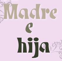 Mexico City-based designer of the rounded sans typeface Hocking (2018) and the chiseled typeface Madre e Hija (2018). She also designed a set of stick figure emoticons called Bastonio (2018). [Google]
[More] ⦿
Mexico City-based designer of the rounded sans typeface Hocking (2018) and the chiseled typeface Madre e Hija (2018). She also designed a set of stick figure emoticons called Bastonio (2018). [Google]
[More] ⦿
|
Gareth Hague
|
 British type designer. With David James, [T-26] co-designer of AES, August. At Alias (a company he founded with David James in London), he made Barb (2016, a wide stencil typeface), Asperity (2012), Asphalt (2012), Aspic (2012), Caustic and Caustic Web (2012, chiseled), Lily (2012), Oban (2011, a gorgeous high-contrast didone family influenced by Thorowgood; with blackboard bold styles included), Ano (2012, a simple circle-based monoline sans family; followed in 2018 by the straight-edged Ano Angular), Cactus (2004, a condensed typeface family), Aspic (2011, a signage script), Asphalt (2011, signage script), Perla and Perla Outline (2004, an elegant artdeco unicase didone with teardrop terminals), Klute (Black, Capitals, White: an ugly and useless octagonal family that could be used for gnawing German expressionist pieces), Anomoly (2004), Key, Elephant, Harbour (2008: a medieval, broken look, with wedge serifs), Civility (2002, connected handwriting), Factory, Aminta, Granite (1995), Intimo, Jackdaw, Progress, Progress Two (2012), Sylvia, Jude (1999, a big text family), Mantis, Metropolitan, Metsys (1997), Pop (triline font), Sister (1995), Text.
 In 2009, he designed 2012 Headline for the London Olympics---typophiles are generally disappointed with this daring design in the general angular category, and refer to better representatives of this genre such as Cyrus Highsmith's Occupant Gothic, Emigre's Elektrix, Hubert Jocham's Keks, and Chris Lozos's Dez Sans Script. With David James, he designed Noah Text (2013). In 2018, he designed Quair: Quair mixes typographic and graphic reference points, most notably from market-stall trader lettering and from Thorowgood and Scotch nineteenth-century typefaces. He also published the stencil typeface High in 2018. Typefaces from 2019: Schism One, Schism Two, Schism Three [these are serifless versions of Alias Didot with various amounts of contrast. They are more modulated and twistier than Peignot], Vertical (a humanist sans with vertical terminals: a squarish, high-shouldered shape, suggesting Roger Excoffon's Antique Olive). Fontworks interview. Catalog of Gareth Hague's typefaces. FontShop link. Klingspor link. MyFonts interview. [Google]
[MyFonts]
[More] ⦿
|
Georg Trump
|
 A giant of German type design, b. Brettheim, 1896, d. München, 1985. Active with Berthold in Berlin from 1930-1935, and with C.E. Weber in Stuttgart from 1937 onwards. From 1934 until 1953, he succeeded Paul Renner as the Director of the Meisterschule für Deutschlands Buchdrucker in München. In 1982 he was awarded the TDC Medal. Ph. Luidl and G.G. Lange published "Hommage für Georg Trump" in 1981. Linotype link. FontShop link. His production:
 Klingspor link. View the typefaces made by Georg Trump. [Google]
[MyFonts]
[More] ⦿
|
Gerard Gerry Keane
|
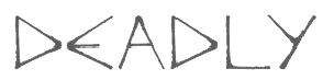 Typographer and type designer from Waterford, Ireland, b. 1980. Creator of Riley (serif face), Round Riley (rounded serifless version of Riley), Deadly (stone chisel face), and Snap 2 Grid (2009, a gridded typeface done at FontStruct). Behance link.
 Dafont link. Home page. [Google]
[More] ⦿
|
Gerobuck (was: Koko Studio)
[Haris Anggar Setioko]
|
Or Anggar Setioko, or Haris Anggar. Tegal, Indonesia-based designer of these typefaces in 2019: Kalko Script, Kolum, Canabi (a brush font), Foxima (sans), Cosmix, Pasmin, Ikocya, Baron (dry brush), Takatuka, Bafaco (a signature font), Librush, Murako, Warko. Typefaces from 2020: Vuku (a chiseled or stone age font), Kasfa, Nestro, Beef (an unconnected dry brush script), Cosmix, Tabio, Rough Storms (grungy caps), Ninja (squreish), Storms (grungy caps), Haina (a connected script), Bagato, Abnada, Santoryu, Catatan (a marker pen font), Spydol, Bintale, Sanitasi, Hajad, Polarika, Beko (dry brush), Brushes (a brush script), Kamako, Mama, Balada, Charcoal, Pinksture (script). In 2022, he set up Gerobuck. His typefaces at Gerobuck include Brightag (a decorative serif) (2021) and Mothem (a headline sans) (2021). [Google]
[MyFonts]
[More] ⦿
|
Giemons
[Oghie Novianto]
|
 Or Oghi Novianto. Bandung, Indonesia-based designer of the brush typefaces Mons (2015), Eyepic (2015) and Wild Nature (2015).
 In 2016, he designed Spacethink, the grungy letterpress typeface Black Mask, the sketched typeface Baddest, the eroded marker typeface Lonsdale, the excellent poster typeface Brother, and the brush scripts Artur Script, Mars Attack, Flawless, Sekut, Bright Sight, Spacethink, Mighty, Blowing, Faithful and Damn Right, as well as the vintage handcrafted Antebellum. Typefaces from 2017: Burnout, The Elders, Alora, Sisterfields Script, Badger, Brashed, Organic, Martabak, Brownies, Mighty, Beauty Script (watercolor brush), Society Script (monoline script), Feminim Script, Attack Attack (comic book lettering), Nobbler (vintage lettered typeface). Typefaces from 2018: Estoria Script (SVG font), Butter Sweet (a horror brush font), Postcard Script, Silence Good (font duo), Hellprint, Brought, Shining Bright, Boxer (an effective handcrafted fat slab), Southeast, MilkAndShake, Hangover Script (calligraphic), Awakening Script, Macbeth (a free opentype SVG dry brush font). Typefaces from 2019: Be Bold, Paragon SVG, Dextone, Stars & Rabit Script, Fabrique SVG, Toast Bread Coffee. Typefaces from 2020: Rice Bowl (oriental enmulation font), Buster (a chiseled or papercut typeface), Jack Reacher (eerie), Path Black, Hooked. [Google]
[More] ⦿
|
Hadriano
|
A typeface designed by Frederic Goudy. Berry, Johnson and Jaspert write: A set of capitals of heavier weights than Forum, designed by F.W. Goudy for the Continental Typefounders Association after a Roman inscription seen in the Louvre. The A has an extended apex, the M is unusually wide and the Q has the swash form. The serifs, here large, have the usual Goudy pen qualities. In 1930 Goudy cut a lower case for these capitals. It is No. 71A in his A Half Century of Type Design. There is also an outline called Hadriano Stone Cut. Mac McGrew: While visiting the Louvre in Paris, Frederic W. Goudy was impressed by an inscription in marble from the first or second century A.D., and made a rubbing of the letters P, E, and R. Several years later, in 1918, he drew a set of capitals to harmonize with those three letters. The name "Hadriano" was part of the original inscription, and this became the name of Goudy's type, for which matrices were cut by Robert Wiebking. In 1930 Monotype asked him to add a lowercase. Goudy says, "I did not want to attempt a lowercase for a purely inscriptional letter, but the foundries say printers ask for lowercase regardless of the esthetics, and I allowed myself to be persuaded. I made what I thought was a good companion for the capitals, but the type looked entirely too much like Kennerley Bold. I cut one size only and turned the type over to the Monotype. I do not think anything was ever done with it---praise be!" Apparently nothing was done with that lowercase, but in 1932 Monotype issued Hadriano with the actual Kennerley Bold lowercase, which is not quite the same. The capitals alone are quite distinctive; with lowercase the typeface is much less impressive. About 1932 Sol Hess at Monotype tried the experiment of cutting a white line through each of the caps of the design, making Hadriano Stone Cut. Goudy says, "A proof of the changed letters pleased me so much that immediately gave permission to issue matrices of the characters." Digital versions: Hadriano (Monotype; between 1977 and 1981, Compugraphic added new weights and regularized the 1930 Monotype version of Hadriano somewhat), Hadriano (Adobe), Hadriano (Linotype), LTC Hadriano (Lanston Type Company). [Google]
[More] ⦿
|
Haris Anggar Setioko
[Gerobuck (was: Koko Studio)]
|
[MyFonts]
[More] ⦿
|
Heavyweight
[Jan Horcik]
|
 Jan Horcik (Heavyweight, Prague, Czechia, est. 2014) created the street art semi-graffiti typeface Joe182 (2014), which is based on a thick chisel-tip marker. Joe182 was named after lettering seen in the streets of New York City in the 1970s and 80s. He also made the thin display typeface Atlantic, the dry brush typeface Haas Effect (2016) and the nibbed pen typeface Oasis (2016). [Google]
[MyFonts]
[More] ⦿
Jan Horcik (Heavyweight, Prague, Czechia, est. 2014) created the street art semi-graffiti typeface Joe182 (2014), which is based on a thick chisel-tip marker. Joe182 was named after lettering seen in the streets of New York City in the 1970s and 80s. He also made the thin display typeface Atlantic, the dry brush typeface Haas Effect (2016) and the nibbed pen typeface Oasis (2016). [Google]
[MyFonts]
[More] ⦿
|
Ian Party
[Swiss Typefaces]
|
 [More] ⦿
|
Ivan Vasilev
[RockBee]
|
[MyFonts]
[More] ⦿
|
James Grieshaber
[Typeco]
|
 [MyFonts]
[More] ⦿
[MyFonts]
[More] ⦿
|
James L. Stirling
[Fontry West]
|
[MyFonts]
[More] ⦿
|
Jan Horcik
[Heavyweight]
|
[MyFonts]
[More] ⦿
|
Jana Orsolic
|
 Serbian type designer (b. 1979, Belgrade) who graduated in 2003 from the Faculty of Applied Arts (FAA) in Belgrade, the Department of Applied Graphics, majoring in Type and Book Design. She is a professor of type design and calligraphy there since 2012, after having worked there since 2005. In 2010, she obtained the Magister degree from FAA. Alongside Olivera Stojadinovic and Olivera Batajic Sretenovic one of the editors at tipometar.org.
 Her first typeface was Tabula (2003). In 2010, she designed these flowing free Cyrillic / Latin calligraphic typefaces: Lovely Audrey BG, Lovely Grace BG, Lovely Sofia BG. At ITC as Jana Nikolic, she released the elegant informal typefaces ITC Intro (2008) and ITC Aram (2007). In 2016, she designed Gorenje Script. The chiseled street signs in Istria inspired her to design the slab serif typeface Mermer (2019). Linotype link. MyFonts link for Jana Orsolic. Interview in 2018. Sometag link. [Google]
[MyFonts]
[More] ⦿
|
Jan-Christian Bruun
[JC Design Studio]
|
 [MyFonts]
[More] ⦿
[MyFonts]
[More] ⦿
|
Jan-Henrik Arnold
[JHA]
|
[MyFonts]
[More] ⦿
|
Jay Cobs
|
Jay Cobs (Aix-en-Provence and Marseille, France, b. 1994) created the free typeface Abstract Labyrinth Rounded in 2013. Rockbuchet (2014) is a weird split personality typefaces created as a mixture of Rockwell Bold and Trebuchet MS. His chiseled rock font Rockfire (2015) is free. In 2018, he designed the free blackletter font DreiFraktur that is based on a hexagonal grid. Dafont link. Behance link. Tumblr link. FontStruct link. [Google]
[More] ⦿
|
JC Design Studio
[Jan-Christian Bruun]
|
 Danish graphic designer in Lyngby. He made the following typefaces:
 Behance link. Creative Market link. Hellofont link. [Google]
[MyFonts]
[More] ⦿
|
Jeff Levine
[Jeff Levine: Additional typefaces]
|
 [MyFonts]
[More] ⦿
[MyFonts]
[More] ⦿
|
Jeff Levine: Additional typefaces
[Jeff Levine]
|
 This is a list of fonts by Jeff Levine not categorized anywhere else on my pages.
 - A: Adelanto JNL (2009), Adhesive Letters JNL (2011), Adhesive Serif Letters JNL (2015), Adventure Film JNL (2021: a casual sans based on the titles and credits for Texas Across the River, 1966), Afternoon Edition JNL (2015), Air Circus JNL, Aisle Seats JNL (2006, based on letters cut by the Redikut Letter Company of Hawthorne, CA), Album Cover JNL (2008), Alleway JNL (2012, a condensed sans), Allograph JNL (2007), Alphacal JNL (2008, outlined, and like Juneway JNL, based on water-applied decals once made by the Duro Decal Company (now Duro Art Industries) of Chicago), Alton JNL (2010: a bold display sans), Amateur Printer JNL (2007, grunge), Ampersorts JNL (2011: ampersands), And So Forth JNL (2011), Anecdote JNL (2009), Announcement Board JNL (2018: white-on-black), Antique Packaging JNL (2019: Victorian), Antique Price Tags JNL (2019), Arcaro JNL (2013, a calligraphic typeface based on the movie credits of the ABC TV series Naked City, 1958-1963, starring detective Frank Arcaro), Antique Show Card JNL (2018: based on an alphabet from the first Speedball Lettering Book in 1915), Arch Creek JNL (2010, an all caps revival of Beton), Ardball (2006), Arrevederci JNL (2018), Arrow Callouts JNL (2021: an arrow-themed alphading font), Art Deco Monograms JNL (2015), Arte Critique JNL (2009), Artist Colony JNL (2009), Arts District JNL (2014), Art Student JNL (2010), Art Techno JNL (2017), Astrospy JNL (2008: techno), Awkward Gothic JNL (2008), Axelby JNL (2013).
- B: Backpage Article JNL (2010), Bal Harbour JNL (2008), Balcony Seats JNL (2007, narrow retro sans), Ball Game JNL (2018), Bandmaster JNL (2021: based on the opening movie titles from the 1940 musical comedy Strike up the Band starring Judy Garland and Mickey Rooney), Barricade (2011, a great shadowed caps face), Bayview JNL (2008, based on Inland Type Foundry's Studley), Best Bet JNL (2014, a slab serif redesign of Beton), Bike Decals JNL (2008), Billing and Shipping JNL (2010), Bingo Player JNL (2010), Birch Beer JNL (2008), Bitmap Typewriter JNL (2017), Bit Part JNL (2017: extra condensed), Bit Player JNL (extra-condensed tall poster font) (2015), Bloktor Mosaik JNL (2007), Blue Parrot (2006), Bluesman JNL (2014: based on the lettering of the blues album "I'm Jimmy Reed" released on the legendary Vee-Jay label out of Chicago), Bold Display Sans JNL (2016: based on an imge in a Speedball book), Bonehead JNL (2013, bones), Bookkeeper JNL (2019: based on R. Hunter Middleton's slab serif, Karnak), Bookkeeping JNL (2019, like an extra bold version of R. Hunter Middleton's slab serif Karnak (1936)), Boss Jock JNL (2021: an informal font based on the title and credits from the 1965 film Strange Bedfellows), Box Lunch JNL, Brass Rail JNL (2015), Brazil Nut JNL (2015), British Cinema JNL (2021, based on the hand lettered titles and credits from the 1945 British film The Way to the Stars), British Vehicle JNL (2020; based on the UK license plate font created by Charles Wright in 1935; with Ahmed Eraqi), Broadcast JNL (2015), Broadletter JNL (2009), Brochure Sans JNL (2022: based on Sans Serif No.7 from the 1921 Miller & Richard type specimen book), Brogado (2006), Brookside JNL (2016), Brushmark JNL (2011), Brush Off JNL (2017), Bulk Weight JNL (2017), Bum Steer JNL (2015), Burger Joint (2006), Burger Royale JNL (2007), Burlesk Queen JNL (2020: blocked letters), Business Helpers JNL (2014), Business Letter JNL (2021: based on the squarish typeface Geometric in the 1894 catalog of the John Ryan Foundry in Baltimore, MD).
- C: Calendar Blocks JNL (2009), Calling Card JNL (2010), Callouts JNL (2011, in Circle and Square styles; white letters on black background), Canby (2006, a squarish caps face), Candle Wax JNL (2014, based on the movie poster for Bell, Book and Candle starring James Stewart), Cast And Crew JNL (2015, condensed monoline), Cast Shadow JNL (2010), Casual Lunch JNL (2009), Casual Friday JNL (2008, roman lettering), Casual Tune JNL (2015), Catalog Serif JNL (2015), Catalog Sheet JNL (2022: based on an extra condensed serif typeface from the 1892 MacKellar, Smiths & Jordan type foundry specimen book), Catch Words JNL (2009), Channel Tuning JNL (1999), Channel Surfing JNL (2010), Charlies Bar BQ JNL (2008, heavy slab serif), Charmer JNL (2014), Chive Turkey JNL (2007), Chunky Nouveau JNL (2020), Circuletter JNL (2016), Ciribiribin JNL (2014), Classification JNL (2015), Classroom JNL (2009), Cling Vinyl JNL (2009), Coal Train (2004), Cocktail Hour JNL (2016, a beatnik typeface based on the opening title for the 1962 Blake Edwards film Days of Wine and Roses starring Jack Lemmon and Lee Remick), Coffee Bar JNL (2021: a squarish typeface), Coldfield JNL (2008), College Nouveau JNL (2018), Colmar JNL (2018), Columnist JNL (2020, after Morris Fuller Benton's News Gothic, 1908, ATF), Commentary JNL (2010, almost typewriter type---easy on the eye), Composer JNL (2017), Concierge JNL (2014), Conscription JNL (2017), Corkboard JNL (2010: a rounded all caps family), Cornfield JNL (2008), Crepe Paper JNL (2018), Criminal Intent JNL (2018: based on the trailer of the 1942 movie Mr. and Mrs. North), Crown Heights JNL (2007, slab serif caps), Cruise Director JNL (2021: an inline typeface based on a hand-lettered title on the poster for the 1933 musical comedy film Melody Cruise), Courtship JNL (2018), Cover Letter JNL (2019), Curtain Up JNL (2018), Cyberglass (2010, techno), Cybrox JNL (2012, grunge).
- D: Dance Hall JNL (2011), Dance Lesson JNL (2015, a wedge serif in the style of Latin Wide), Rotisserie Menu JNL (2021: based on a 1928 menu for the restaurant Rotisserie Du Cardinal), Dangits JNL (2009), Danish Script Initials JNL (2019, based on letters designed by Copenhagen-born industrial artist and letterer Gustav Boerge Jensen (1898-1954), Date Book JNL (2021; based on the credits of the movie The Awful Truth, 1937), Decal (2006), Decalcomania JNL (2017), Deco Of Tomorrow JNL (2014), Deconstructed JNL (2012), Decorative Panels JNL (2009), Deco Template JNL (2018: squarish), Deerfield JNL (2006, Bank Gothic style), Department Store JNL (2019), Desk Jockey JNL (2008), Deskplate JNL (2011: an all caps copperplate font), Desk Job JNL (2018), Detective Client JNL (2021: based on the cast credits of the 1941 film, The Maltese Falcon), Detention JNL (2007, hand-printed), Diamond Callouts JNL (2019, letters in triangles), Diamond Jim (2010), Diamondwood JNL (2015, rhombic), Dip Pen JNL (2017, rounded, handcrafted), Disclaimer JNL (2010, condensed thin headline face), Display Board JNL (2020: based on Paul Renner's Futura Display from 1932), Display Inline JNL (2009), Displayced (2006, LED font), Display Roman JNL (2014), Doggone It JNL (2019: based on the movie posters for the 1962 film, Mono Cane), Do It Yourself JNL (2008), Doo Wop Initials JNL (2007), Doowop (2006), Dormitory Decals JNL (2009), Double Take JNL (2008), Drafting Class JNL (2021: based on an all caps alphabet in The Essentials of Lettering by Thomas E. French and Robert Meiklejohn (circa 1912)), Dreamy JNL (2017), Dual Line Roman JNL (2021: an inline titling typeface), Duonor JNL (2010), Durable JNL (2016, based on a 1940s cover of a catalog for the Duro Decal Company of Chicago).
- E: Eastport JNL (2019: an interpretation of Morris Fuller Benton's 1931 classic, Stymie Extra Bold), Eat More Fruit JNL (2016), Eccentric Sans JNL (2018), Edessa JNL (2009: chiseled stone look, faux Greek), Editorial Comment JNL (2009, grotesk caps-only headline face), Edits and Credits JNL (2008), Egg Farm JNL (2021: based on the opening titles and credits of the 1947 film comedy The Egg and I), Electric Newspaper JNL (2021: a dot matrix font based on the moving message board electric newspaper from 1931 installed by the Los Angeles Times---in partnership with the Richfield Oil Company---on its building), Electrostatic JNL (2017, textured), Elite Resort JNL (2017, slab serif), Elsinor (2006), Endless Journey JNL (2009), Ensemble Inline JNL (2014), Entitled JNL (2007, squarish as in Bank Gothic), Evening Edition JNL (2009), Evening Event JNL (2021; based on hand lettering from the title credits for the 1950 film All about Eve), Evening Paper JNL (2015), Evening Walk JNL (2018), Expressions (smilies).
- F: Factual JNL (2010,headline face), Fairgrounds (2006), Fancy Free JNL (2016: decorative caps), Fancy Show Card JNL (2021), Farragut JNL (2008, hairline geometric), Fastenating JNL (2012, paper clip font), Federal Agent JNL (2021: a condensed typeface based on the opening title of the 1959 premiere season of The Untouchables), Feltboard JNL (2008), Fence Post JNL (2012), Festival Nights (fancy letters), File Clerk JNL (2020, Jeff Levine: based on Cushing (1897)), File Folder JNL (2010, Bank Gothic style family), Film Crew JNL (2009), Fincastle JNL (2011, all caps sans titling face), First Responder JNL (2017: a left-slanted version of Catalog JNL), Flagstaff JNL (2010), Flatbush Beanery (2006), Flipboard JNL (2011), Flivver (2006, a slab-serif display font), Floor Tiles JNL (2009), Florida (2006, retro), Food Vendor JNL (2011), Fordham JNL (2011, all caps slab serif), Formal Invite JNL (2021: thin, condensed serif lettering found in a 1937 magazine ad for Chris Craft boats), Formal Notice JNL (2020: a revival of an alphabet by Samuel Welo in Studio Handbook for Artists and Advertisers), Frankly Plain JNL and Franky Ornate JNL (2010, all caps typefaces after Franklin Gothic), Frantic Pace JNL (2016, a bouncy retro party font), Free Form Retro JNL (2021: an all caps sans based on the titles and credits from the 1960 French film Le Passage Du Rhin), French Calligraphic JNL (2019), French Cinema JNL, French Serif Moderne JNL (2009), French Slab Serif JNL (2018: based on the 1934 French lettering instruction book L'Art du Tracé Rationnel de la Lettre), French Song JNL (2021: a whimsical typeface based on the titles and credits of the 1952 British comedy Song of Paris), Freunlaven JNL (2006, psychedelic), Front Row JNL (2017: a tall condensed typeface that reinterprets Morris Fuller Benton's Empire from 1937), Fruit Juice JNL (2020), Fun and Games (2011, a casual retro typeface redrawn from the lettering found on the cover of a 1935 Speedball Lettering Pen book).
- G: Gene Condensed JNL (2014), Generic Sans JNL (2022: modeled after Condensed Blair from the 1907 specimen book of the Inland Type Foundry), Generic Gothic JNL (2013: an interpretation of Franklin Gothic Condensed), Genesee JNL (2010), Gift List JNL (2016), Gift Wrap JNL (2014), Gilbert JNL (2011, after Eric Gill's sans), Go Home JNL (2017), Good Sport JNL (2019), Goose Creek JNL (2021: based on hand lettered credits from the 1942 British film comedy The Goose Steps Out), Go To Town JNL (casual inline type style) (2015), Gothic Grotesk JNL (2020; a revival of Royal Gothic (1930s, Stevens, Shanks & Sons), which in turn was based on Charter Oak (1899, Keystone Foundry)), Greenwich Village JNL (2014), Groovy 3D Caps JNL, Groovy Happening JNL (2005, psychedelic, in the style of Action Is), Groovy Summer (2006, a casual sans), Guadalajara JNL (2014, a Mexican party font), GummedAlphabet JNL (2011), Gummed Letters JNL (2010).
- H: Halavah Twist JNL (2007; see also its extension Zydeco JNL in 2009), Hallandale (2006), Halliday JNL (2013: an outlined typeface based on Beton Open Condensed), Handbills And Posters JNL (2015), Handmade Caslon JNL (2015), Handmade Dropshadow JNL (2010), Handmade Gothic JNL (2011, inspired by lettering samples in a 1941 Speedball Lettering Pen instructional booklet), Handmade Headline JNL (2018: a 1940s style typeface), Handmade Roman JNL (2011), Hand Stamped JNL (2006, rubber stamp look), Hanford (2010, a sans headline family), Hash and Beans JNL (2007), Headstone Roman JNL (2015), Hectonoid JL (2008), Heller Sans JNL (2019: after an experimental alphabet by Steven Heller), Highbrow Cafetorium JNL (2009), Hippie Comics JNL (2021: based on poster lettering in the 1920 edition of How to Paint Signs and Sho Cards by E. C. Matthews), Home Address JNL (2019), Home Economics JNL (2018), Home Room JNL (2009), Horse Puckey JNL (2008), Hotel Suite JNL (2017), Hoxie JNL (2008).
- I-J: Impecunious JNL (2017), Impressionable JNL (2012, based on a rubber stamp set), Incarceration JNL (2020), Industriality JNL (2015), Informational Gothic (2013: The Wood-Regan Instruments Company (Wrico) of New Jersey manufactured for decades a line of lettering kits called the Wrico Sign Maker. With only special ink pens, plastic templates and a template guide anyone could letter clean, clear signs, posters and notices. This typeface is based on one of those kits), Informational Sans JNL (2021: squarish, caps only), Initial Seals JNL (2012), Inkpad Letters JNL (2011), Inline Lettering JNL (2011, inspired by the opening title of a classic 1940s horror film, The Invisible Man's Revenge), Inlet JNL (2017), Inline Square JNL (2017), Innerspring JNL (2015), Intermediate JNL (2019: based on a home movie titling kit from circa the 1950s or 1960s called the Magna Tech Titler Number 312, modeled after Futura Bold), Interoffice Memo (2011), Intrigue JNL (2014, based on the hand-lettered movie titles from one of the William Powell / Myrna Loy Thin Man series of films), Island Time JNL (2015), Jalopy (2014), Jive Jump (2006), Jobseeker JNL (2011: hand-printed), Juneway (2006, modeled after a set of water-applied decals made by the Duro Decal Company of Chicago), Jungle Drums JNL (2017, African theme), Junior Printer JNL (2015), Just Great JNL (2016: angular display typeface).
- K-L: Katydid JNL (2015, a connect-the-dots typeface), Katz Pajamas JNL (2017), Keyden Drop Caps JNL (2021: a set of slab serif framed capitals based on John Alden Initials, shown in the 1906 edition of the Keystone Type Foundry specimen book), Key Largo JNL (2011, all caps slab serif), Lakeland JNL (2013), Kiddie Blokz JNL (2010), Kids Activities JNL (2017, handcrafted), Lamp Post JNL (2012, an interpretation of Post Old Style, ca. 1901), Last Date JNL (2018), Lasting Impression JNL (2008), Late Breaking News JNL (2016, headline sans), Late Hours JNL (2021: inspired by the hand lettered titles for the 1961 film The Children's Hour), Lecture Hall JNL (2012), Lefferts (2006, squarish display face), Legal Brief JNL (2021), Legal Eagle JNL (2017, with engraved lines), Les Folies JNL (2009, Victorian), Lettering Lesson JNL (2021: a bold serif typeface based on the 1922 instructional booklet from the St. Louis Show Card School), Lettering Pen JNL (2015, handcrafted), Library Book Initials JNL (2018: Library Book Initials JNL was modeled from examples of Sidney Gaunt's Publicity Initials; originally sold in metal type by Barnhart Brothers and Spindler as a companion to the Publicity Gothic typeface), Liebestraum JNL (2014, a decorative caps font), Limited Appeal JNL (2016), Linem Up (2010), Lobby Card JNL (2010), Local News JNL (2021: a condensed sans based on the hand lettered title for the 1954 film Power of the Press), Location JNL (2017), Longbranch Initials (2006, for decorative monograms), Longacre JNL (2013, fat rounded sans), Long And Thin Initials JNL (2015), Loose Leaf JNL (2010), Love Notes JNL (2011: alphadings), Luminum JNL (2007).
- M: Made in Japan (2014), Mailbox Letters JNL (2008), Main Feature JNL (2017, a marquee sans), Mainline JNL (2014), Manual Typewriter JNL (2017: allegedly after a 1933 example by Morris Fuller Benton), Manufactory JNL (2019, a wedge serif not unlike the ones used in advertizing in the late 19th century), Manufacturer JNL (2020: a reinterpretation of the Extra Bold Extended weight of Bauersche's Venus Grotesk (ca. 1907)), Marble Cutter JNL (2015, based on dies used for stamping text into marble headstones or other monuments manufactured by The Vermont Marble Company (Vermarco), which operated from the 1880s until 1976), Marching Band JNL (2019), Margate JNL (2013, based on water-applied decals manufactured in 1962 by the American Decalcomania Company for Goodyear), Marketing Strategy JNL (2017), Marking Device JNL (2014), Maryland JNL (2014), Matchbook JNL (2014: based on lettering on a matchbook from the Carrousel Restaurant in Miami Beach), Mayville JNL (2009), McCadden JNL (2013, inspired by the hand-lettered credits for the George Burns and Gracie Allen Show [1950-1958]), Meal Ticket JNL (2008, squarish), Merchandiser JNL (2010), Merchandising JNL (2014, brush signage script), Merchant Trade JNL (2020, after the Matthews Series by Inland Type Foundry, 1901), Merrymakers JNL (2020), Midnite Movie JNL (2017, inspired by the hand lettered title credits from the 1961 Hammer Pictures film Curse of the Werewolf), Millport (2006, squarish display face), Mimeograph Template JNL (2019: based on a plastic lettering guide manufactured by the Albert Blake Dick Company of Chicago), Misdirection JNL (2009), Mixed Messages JNL (2007, ransom note), Mocombo JNL (2010, an African look typeface that is a slightly modified version of one of the numerous alphabets created by the late Alf R. Becker for Signs of the Times Magazine during the period of the 1930s through the 1950s), Model Railroad JNL (2015), Moderator JNL (2013), Modern Appliances JNL (2014), Monoline Rounded JNL (2014), Monster Movies JNL (2018: a Halloween font), Monthly Meeting JNL (2013), Monthly Newsletter JNL (2011), Monthly Statement JNL (2018: based on the 1934 French lettering instruction book L'Art du Tracé Rationnel de la Lettre), Morning Edition JNL (2021), Morning Paper JNL (2015), Morningside Heights JNL (2015), Morningstar JNL (2012, named after Jeff's friend, Estella Dawn Roberts of Stella Roberts Fonts), Movieland JNL (2008), Movie Night JNL (2011), Movie Set JNL (2021: an all caps wedge serif based on a 1911 movie poster for the film How Bella Was Won), Movie Show JNL (2021: an all caps wedge serif based on a 1911 movie poster for the film How Bella Was Won), Moving Message JNL (2015, dot matrix typeface), Musical Arrangements JNL (2014), Musical Comedy JNL (2021: hand-printed), Musical Score JNL (2015), Music Course (2019), Mystery Show JNL (2018: modeled after the hand lettered titles found on various early episodes of the 1950s TV suspense program Alfred Hitchcock Presents).
- N: Naroid Initials JNL (2010, one of the most ultra-compressed sets of initials available in digital type), Narrow Minded JNL (2014), National Spirit JNL (2009), Newark JNL (2014: a strong slab serif), New Car Tag JNL (2020: based on the new license plates in Florida, which were introduced in 2018), Newsbreak JNL (2008), Newsbreaker JNL (2016; a vintage newspaper titling typeface), News Crew JNL (2017), Newshawk JNL (2007, a condensed sans), Newspaper Publisher JNL (2021: based on a headline in the 1917 edition of Logansport, Indiana Pharos-Observer), Newsprint JNL (2011), Newsreel Caps JNL (2014), Newsreel Text JNL (2021), News Ticker JNL (2021: based on the New York Times Square ticker operational in the 1930s), Newsworthy JNL (2011: a condensed headline sans), New Thin Roman JNL (2019, based on an alphabet called Compressed Roman in Essentials of Lettering, 1912), Nightcap JNL (2011), Nighthawk JNL (2009, a retro headline sans), No Entry JNL (2021: a bold blocky slab serif based on the hand lettered titles and credits from the 1958 war film The Young Lions), Nondescript JNL (2012), Nouveau Date JNL (2021: arts and crafts style), Nouveau Fashion JNL (2018), Nouveau Spur JNL (2019: neither art nouveau nor spurred), Nouveau Standard JNL (2018), Nouveau Handlettered JNL (2017), Nouveau Lettering JNL (2019, based on a 1916 slab serif alphabet by Thomas Wood Stevens), Nouveau Romance JNL (2017), Nouveau Roundcorner JNL (2015), Nouveau Square JNL (2017, squarish), Nouveau Standard JNL (2018), Nouveau Work JNL (2018), Nouveau Years JNL (2019), Nouveau Yorke JNL (2015), Novelty Nouveau JNL (2021), Now Playing JNL (2010).
- O: Oblogram JNL (2008, techno), Occidental Tourist JNL (2009), Odditype JNL (2006, computer simulation), Off Duty JNL (2021: based on the hand lettering from the titles and credits of the 1964 French film comedy Le Gendarme de Saint-Tropez), Office Staff JNL (2021: a version [with serifs added] of Popularity JNL---a condensed art deco design based on a popular typeface known as Radiant), Office Space JNL (2021: based on Condensed Edina from the 1921 Miller & Richard type specimen book), Office Work JNL (2021: a squarish typeface based on the title and credits of the 1965 film Mirage), Off The Wall JNL (2008). Old Bodoni Wide JNL (2016), Old Songs JNL (2018), Old Tijuana JNL (2018: in the serape style of pseudo-Mexican lettering found on ad designs of the 1930s and 1940s), Order Form JNL (2021: after MacKellar, Smiths & Jordan's Lining Gothic Extended from their 1892 catalog), Ordinary Gothic JNL (2017: gaspipe style), Outline Sans JNL (2018), Overnight JNL (2017), Oversimplified JNL (2019), Overton JNL (2017, based on early letter designs of Rudolf Wolf).
- P-Q: Pacific Atoll JNL (2021: a stylized slab serif type design based on the movie title lettering for the 1942 wartime film Pacific Rendezvous), Pacific Island JNL (2017: a tiki font based on the sheet music cover for the title song from the 1957 Marlon Brando movie Sayonara), Packaged Cookies JNL (2021; based on the first Oreo Sandwich package from 1923), Packaged Goods JNL (2016), Park Slope JNL (2014), Parfum de Paris JNL (2014), Paint Store JNL (2006), Parking Lot Sale JNL (2021: a flag font), Parkitechture (2006), Part and Parcel JNL (2009), Partial Eclipse JNL (2012), Patriotica JNL (2011, American flag face), Pavement JNL (2010, based on the extra-condensed lettering used on roadway information signs as revised by the U.S. Government in 2000), Pendraw Roman (2006), Pen Elegant JNL (2018, after an alphabet from a 1918 lettering instruction book by William Hugh Gordon), Pen Gothic JNL (2017: a rounded sans), Penmanshift JNL (2006, ronde style), Pen Nib Square JNL (2019), Penny Wise JNL (2017), Pen Sans Rounded (2019: based on a Speedball book from 1940), People Talk JNL (2021; a squarish all caps typeface based on a title card with cast credits for the 1935 movie The Whole Town Talking starring Edward G. Robinson and Jean Arthur), Performer JNL (2014, re-drawn from condensed hand lettering found on a piece of vintage sheet music), Personal Invitation JNL, Personalization (2019: a squarish typeface), Personal Note JNL (2011), Photo Developer JNL (2021), Picz JNL (2009), Pillow Puff JNL (2008, fluffy and cloud-like lettering), Pistol Twelve JNL (2008), Pitkin JNL (2006, a hand-lettered sans), Plastic Display JNL (2010, sketched from photo examples in an old sales promotion sheet for the Movitex Do-It-Yourself Plastic Sign Kit by Pryor Marking Products of Chicago), Plastic Template JNL (2011), Pleasantville JNL (2012, a condensed slab serif), Pocket Initials JNL (2008), Podunk JNL (2007), Political Poster JNL (2021: a condensed casual sans inspired by the hand lettering on a 1940 campaign poster for Franklin Delano Roosevelt), Pool Deck JNL (2015), Popstix JNL (2013), Pop Tune JNL (2014), Popularity JNL (2014, after Radiant), Port Of Call JNL (2015), Postal JNL (2009, white on black, as on stamps), Poster Contoured JNL (2018), Poster Pen JNL (2017), Poster Inline JNL (2014), Poster Plain JNL (2012), Poster Project JNL (2020), Post Production JNL (2021: a slab serif modeled after title card of the 1950 Humphrey Bogart and Gloria Grahame drama In a Lonely Place), Prehysteric JNL (2010), Presentation JNL (2011, a slabby family), Press Run JNL (2015, a reinterpretation of the classic typeface Cheltenham Condensed), Pricing Labels JNL (2010), Printed Letters (2006, made from stamped impressions made by a 1940s childrens sign making set), Printing Set JNL (2006, based on a rubber stamp alphabet), Printing Sorts JNL (2009), Prismatiq JNL (2009, shadow face), Privilege Sign JNL (2021: based on above-the-store signage for many newspaper stands, soda shops, candy stores, luncheonettes and pharmacies of the 1950s and early 1960s), Privilege Sign Two JNL (2021: based on decorative signage for many drive-ins, motels, food stores and other businesses of the 1940s), Promotional Copy JNL (2012), Proofreader JNL (2011, a rounded slab serif face), Prospect Heights JNL (2015), Public Notice JNL (2009), Public Transportation JNL (2008), Public Utility JNL (2012), Public Works JNL (2007: emulates the hand-cut lettering silk screened onto metal), Publication JNL (2010, a revival of DeVinne, 1890), Punch Tape JNL (2016, dot matrix font), Quick Meal (2019: a hand lettered interpretation of Morris Fuller Benton's 1905 design Miehle Extra Condensed Title), Quick Poster JNL (2019), Quick Response JNL (2015, based on QR codes), Quick Titling JNL (2019), Quorfid JNL (2010).
- R: Raccoon Coat JNL (2014), Radio Interference (2019: grungy), Radio Show JNL (2019: based on a logo from the TV show Car 54 Where Are You?), Rail Bum JNL (2016, basically Morris Fuller Benton's Hobo with slab serifs added), Railway Station (2019: a spurred wedge serif), Recording Artist JNL (2019), Record Jacket JNL, Recreation JNL (2013, outlined shadow face), Red Border Labels JNL (2015), Rendering (2011, architectural draftman's lettering), Reprint JNL (2013), Restaurant And Lounge JNL (2015, handcrafted), Retail Merchant (2006), Retail Monoline JNL (2021: a stylish thin headline typeface), Retail Packaging JNL (2019), Recruitment JNL, Retail Price JNL (2021, +Inline; for catchy price cards), Retail Shop JNL (2018: based on vintage New York City neon signage), Retirement JNL (2021: a flared headline typeface based on the hand lettered film credits for the 1937 movie Make Way for Tomorrow), Retro Packaging JNL (2018), Retro Resort JNL (2011), Reveler JNL (2019), Reverberation JNL (2011, horizontally striped face), Reverse Calendar Blocks JNL (2011), Rhineland Roman JNL (2017), Ritz Slab Serif JNL (2018), Road Picture JNL (2021: modeled after the hand lettered title and credits for the 1940 Bob Hope-Bing Crosby semi-musical comedy Road to Singapore), Roadside Diner JNL (2021: a signpainting font in the style of pre-war Miami), Rockaway JNL (2006, titling sans), Rock Concert JNL (2021; an all caps curly Victorian typeface inspired by the opening title and credits for the 1964 motion picture comedy Send Me No Flowers starring Rock Hudson, Doris Day, and Tony Randall), Roma Initial Caps JNL (2009), Rotisserie Menu JNL (2021: based on a 1928 menu for the restaurant Rotisserie Du Cardinal), Rough Print JNL (2012, rubber stamp lettering), Roundpoint Pen JNL (2011, based on instructional lettering found in an old Speedball Pen textbook), Roughshod (2006), Running Board JNL (2017, monoline, pen-lettered), Rural Route JNL (2010), Rustic Inn JNL (2014).
- S: Salad Bar JNL (2013), Sales Convention JNL (2021: a squarish typeface based on a menu printed in 1937 for the Starlight Room of the Waldorf-Astoria in New York City), Sales Pitch JNL (2014), Sales Slip JNL (2013), Sandcastle JNL (2011), Sans Poster Bold + 3D, Savings And Loan JNL (2014), Scandals JNL (2017), School Project JNL (2015, based on self-adhesive poster board letters once made by the E-Z Letter Stencil Company and sold under the name Quik Stik), Schoolroom JNL (2020: a school font based on the type style used for the Superior Sign and Chart Printer No. 929), School Age (2019: based on Trixy Toy Educator, a 1930s-era set of letters and numbers for teaching children, manufactured by the Durrel Company of Gardner, MA), Schoolyard Blues JNL (2018), Sea Cruise JNL (2015), Scoreboard JNL (2014: dot matrix typeface), Screentext JNL (2010, pixel), Screenwriter JNL (2021; based on the all caps hand lettered credits from the 1950 Humphrey Bogart film In a Lonely Place), Second Guess JNL (2017), Second Impression JNL (2008), Sennetarium JNL (2008, after lettering in a Charlie Chaplin movie), Semi Calligraphic JNL (2018), Sentzoff Coupon (2006, stitched), Series A Signage JNL (2018: this is based on Highway Gothic, also known as FHWA, by the United States Federal Highway Administration; the widths varied from A (condensed) to F (wide), but A was discontinued, hence the motivation to create Series A Signage), Serif Callouts JNL (2017), Sew What JNL (2010, stitching face), Shareholder JNL (2015), Shelf Numbers JNL (2008), Shelf Tags JNL (2017), Shicken Zoop JNL (2008, Hebrew), Shipping Carton JNL (2012), Sign and Poster JNL (2009, die-cut letters), Sign and Display JNL (2019: a companion of Sign and Poster), Shopkeeper JNL (2010, after a a vintage rubber stamp sign and chart printing set), Shopping Guide (2019), Short Subject JNL (2016, based on some hand-lettered title cards from various vintage Columbia Pictures two-reel comedies), Show Card Freehand JNL 2021; based on the title and credits for the 1951 Dick Powell and Rhonda Fleming film Cry Danger), Show Card Pen JNL (2021: based on an alphabet in the 1920 edition of How to Paint Signs and Sho Cards by E. C. Matthews), Show Card Sans JNL (2021: based on an alphabet in the 1922 book Modern Show Card Writing), Showmanship JNL (2017), Show Poster JNL (2021: A vernacular typeface based on a design from the 1960 edition of Samuel Welo's Studio Handbook for Artists and Advertisers), Shutterbug JNL (2021: a blocky typeface based on the signage of Jerry Lewis's Camera Exchange on Vine Street in Hollywood in 1950), Sightseeing Boat JNL (2021: based on the titles and credits for the 1966 romantic comedy The Glass Bottom Boat), Sign Expert JNL (2021: based on an alphabet in The Expert Sign Painter, 1922), Sign Studio JNL (2019: a multiline typeface modeled after an alphabet found in Martin Meijer's Album de Lettres Arti (1949)), Sign Template JNL (2015, based on one of the many plastic lettering guides manufactured by the now-defunct Wright-Regan Instrument Company also known as Wrico), Silent Film JNL (2021: a display slab serif used by the Uptown Theater in Wichita, Kansas, in 1928), Silent Movies JNL (2021; a rounded monolinear sans of the interbellum period), Silly Behavior (2019: a shaded bouncy letter font that revives a 1930 alphabet from 100 Alphabets Publicitaires dessinés par M. Moullet), Simplicity JNL (2014), Simply Grotesk JNL (2012, Peignotian), Simply Nouveau JNL (2017), Slab Compact JNL (2019), Sleuth JNL (2013, after the trailer for the 1936 movie After The Thin Man), Slim Chance JNL (2015, an ultra-narrow font based on an image of vintage packaging for Aquapruf Ear Drum Protectors), Slim Nouveau JNL (2017), Snack Shop JNL (2007, the retro diner look in a bold outline face), Snorkel JNL (2014), Snow Job JNL (2017, inspired by the hand-lettered titles for the 1964 Rankin-Bass animated holiday classic Rudolph the Red Nosed Reindeer), Socialite JNL (2009), Soda Fountain JNL (2015, bilined), Solid Serif JNL (2014), Songbook JNL (2014), Song Composer JNL (2017), Song Merchant JNL (2017), Song Plugger JNL (2014), Song Publisher JNL (2015), Song Stylist JNL (2016), Song Vendor JNL (2017), So Unusual JNL (2021: based on the hand lettered credits for the 1942 film comedy I Married a Witch), Southwest Serenade JNL (2015), Special Edition JNL (2021: based on a newspaper headline font used in 1924), Specimen Book JNL (2020: based on Lining Antique (1889. Illinois Type Foundry) and Central Lining Antique (1892, Central Type Foundry)), SplintersJL (2004), Sporting Event JNL (2021: a slab serif based on the title and credits of a British boxing film from 1953 called The Square Ring), Sportsboard JNL (2020: a flipboard font), Sport Shaded JNL (2009), Spring Fashion JNL (2010), Spring Season JNL (2020: textured caps), Spur Handlettered JNL (2008), Squarity JNL (2008), Stage Production JNL (2020), Stage Show JNL (2021: based on the movie credits for 9 Garcons...Un Coeur starring Edith Piaf), Stamp of Approval JNL (2007), Stamped Metal JNL (2012, beveled), Starlight Sans, Stationer JNL (2018), Stellator JNL (2006, a high-tech modular font), Stenographer JNL (2021: close to Bank Gothic Condensed), Stickball JNL (2017), Stonecut JNL (2014), Store Clerk JNL (2020: outlined), Store Tags JNL (2011), Streetcar JNL (2019: a vintage railroad wagon lettering font), Streeter JNL (2013, based on Beton Bold Condensed), Stylish Title JNL (2021: based on the cover title of the July 1935 issue of Harper's Bazaar), Subscription JNL (2018), Summer Holiday JNL (2021; based on the hand lettered production credits for the 1930 film Holiday), Summertime Breeze JNL (2021: based on the opening title sequence for the 1958 film The Long, Hot Summer), Sunlight JNL, Sunny South JNL (2015), Sunshine Susie JNL (2018), Supporting Cast JNL (2011), Surf Bum (2019), Swing Band JNL (2013: inspired by the title lettering from "Hi-De-Ho", a 1930s all-black cast film starring legendary bandleader Cab Calloway), Swing Vote JNL (2020: a beatnik font).
- T: Tabloid Edition JNL (2021: based on a headline newspaper font from UK's Daily Mail in 1918), Tabloid News (2019: an all caps condensed slab serif), Tabloid Press JNL (2015), Take Charge JNL (2016, based on the opening title card for the 1936 film The Charge of the Light Brigade starring Errol Flynn, Olivia de Havilland, Donald Crisp and David Niven), Tallahassee Chassis JNL (2007, modeled from a toy rubber stamp set imported from Japan), Tall And Narrow JNL (2015), Tamiami JNL (2009, Victorian, known as "Cuba"), Tea Bag JNL (2013), Tea Time JNL (2014), Technerd JNL (2011, a thin technical/mechanical face), Technopen JNL (2013: a rounded techno sans from a 1929 instructional booklet for the Esterbrook Drawlet Pens), Teenagers JNL (2021: a beatnik font that was inspired by the hand lettered opening credits for The Many Loves of Dobie Gillis, a teen-oriented television comedy that ran from 1959 to 1963 on CBS), Teen Years JNL (2021: a blocky sans inspired by the hand lettered name for the Joyce Records label (circa 1956)), Template Basic JNL (2021: a simple sans), Template Sans (2019: based on a lettering template by the Wright-Regan Instrument Company (Wrico)), Template Shadow (2019), Tenement JNL (2020: based on a Cooper Black style alphabet by Harry Lawrence Gage that was shown in Thomas Woods Stevens's book Lettering (1916)), Terrace JNL (2015), Terror JNL, That Stuff JNL (2009), Theater Lights JNL (2014), Theater Tickets JNL (2021: Based on the marquee signage for Detroit's Majestic Theater built in 1934), Theatrics JNL (2009, 3d face), Thin Mint JNL (2011), Thinly Disguised JNL (2016), Three Day Pass JNL (2009), Tiler JNL (2012, a gridded face), Title Block Sans JNL (2011, an avant-garde titling face), Too Much Information JNL (2007), Top Billing JNL (2008, dot matrix), Top Forty (2019: handcrafted), Topographic Sans JNL (2018: a mapmaking sans featured in a U.S. Army Corps of Engineers topographic drafting manual), Toucan Tango JNL (2007, multiline face), Tough Guy (2006, shaded titling face), Tough Stuff JNL (2008), Toy Decals JNL (2018), Toy Letters JNL (2018: based on die-cut letters and number by Village Toys (circa 1930s or 1940s)), Toyprint JNL (2009, grunge), Trade Journal JNL (2010), Trade Printer JNL (2007, Victorian-era sans emulation), Train Car JNL (2021: based on the hand-lettered opening credits of Alfred Hitchcock's Strangers on a Train (1951)), Transactive JNL (2007, dot matrix), Transcendental JNL (2017), Tribal Council JNL (2011, jungle lettering with a linocut look), Trilium JNL (2010, triline face), Tropicano JNL (2013, a wavy typeface), Tunesmith JNL (2014, Victorian), Twelve Oaks (2006), Two Cents Plain JNL (2012), Two Reeler JNL (2006; see also its follow-up typeface Positive Vibe JNL, 2007, both modeled after title cards of an early Charlie Chaplin movie), Two Step Nouveau JNL (2018), Type Catalog (2011, bilined all caps face), Typemonger JNL (2022: based on Two Line Sans Serif from the British type specimen book of Vincent Figgins (circa 1860)), Typesetter JNL (2011), Type Vendor JNL (2012), Typewriter Sans JNL (2015), Type Wronger JNL (2013, old typewriter typeface).
- U-V: Unpretentious JNL (2014), Urmeba JNL (2012, named after amoebas and co-designed with Ray Larabie; a barf font), Used Cars (2012), Utica JNL (2010, squarish all caps face), Vacation Resort JNL (2021: based on the hand lettered cast and production credits for the 1942 musicl comedy Holiday Inn starring Bing Crosby and Fred Astaire), Vaudevillian JNL (2017), Utility Signage JNL (2017), Vehicle JNL (2010, a condensed block font as for car plates), Vendor JNL (2010, Victorian era ribbon face), Vertical Roundpoint JNL (2011, found in a 1941 edition of the Speedball Lettering Pen instruction book and re-drawn digitally by Jeff Levine), Victorian Typewriter JNL (2020), Vintage Designs JNL (2009, dingbat which has some fists), Vintage Price Tags JNL (2015), Vododeo JNL (2014).
- W: Washington Heights JNL (2016), Wavely (2010), Weekend Date JNL (2020), Weeneez JNL (2011, wiener-shaped glyhs), Welcome Home JNL (2009), Werble JNL (2010), What A Night JNL (2018), Whoosh JNL (2007), Wild About Myself JNL (2015), Willoughby JNL (2006, based on 1950s toothpaste lettering), Window Sign JNL (2013), Wine Cellar JNL (2014), Winery JNL (2012: a soft-serifed caps face), Winkle Picker JNL (2021: a cut paper font based on the 1963 movie poster for an Italian documentary called Sexy Nudo), Winter Garden JNL (2017), Wireline JNL (2021: a paperclip font), Wire Mesh JNL (2009), Work Force JNL (2011), Wynwood JNL (2009).
- X-Y: Yankee Doodle Boy JNL (2017), Yard Sale JNL (2013), Yargo JNL (2009, hand-printed), Yayazout JNL (2008, fun titling face), Yorso Square JNL (2007).
- Z: Zera JNL (2007, intersecting rings), Zodor JNL (2010), Zoning Department JNL (2012), Zydeco JNL (2009).
[Google]
[MyFonts]
[More] ⦿
|
Jess Andersen
|
In 2013, Andreas Peitersen & Jess Andersen co-designed Faux at the danish type foundry Playtype. Faux is a three-dimensional, all caps display typeface inspired by old stone carving and engraving techniques. [Google]
[More] ⦿
|
JHA
[Jan-Henrik Arnold]
|
Jan-Henrik Arnold (JHA, Berlin, Germany), b. 1980, studied first in Konstanz and then in Berlin at the University of Applied Sciences in Potsdam where he was taught by Luc(as) de Groot. He works mainly as a type designer. His typefaces from 2013: JHA Zucker (a fat didone stencil), JHA Libre (elliptical sans, +Pro), JHA Yeni Zaman (geometric sans with roots in the 1930s). In 2014, he published Bodoni Ritalic, a backslanted Bodoni Italic. In 2015, Arnold created the transitional typeface family JHA Times Now and the chiseled typeface Tetraktys (inspired by Friz Quadrata). In 2016, he released the text typeface Praeneste. Typefaces from 2017: JHA My Happy 70s. [Google]
[MyFonts]
[More] ⦿
|
John Mawby
|
 John Mawby is a lettercutter with a passion for the craft of carving letters in stone. Graduate of the MATD program at the University of Reading, class of 2020. His graduation typeface there was the angular, almost chiseled, text typeface family Bibliophile (for Latin, Greek and Cyrillic). [Google]
[More] ⦿
John Mawby is a lettercutter with a passion for the craft of carving letters in stone. Graduate of the MATD program at the University of Reading, class of 2020. His graduation typeface there was the angular, almost chiseled, text typeface family Bibliophile (for Latin, Greek and Cyrillic). [Google]
[More] ⦿
|
Joseph Miceli
[AlfaType]
|
[More] ⦿
|
Juan Diosdado
|
Designer of the chiseled look typefaces Novus Scriptum (2001) and Bucky (2004). He lives in San Pedro Garza García in the state of Nueva Leon in Mexico. [Google]
[More] ⦿
|
Kate Ross Willink
|
Creator of Skoodle (2012, a fun rounded chiseled stone simulation face). [Google]
[More] ⦿
|
Keith Bates
[K-Type]
|
 [MyFonts]
[More] ⦿
[MyFonts]
[More] ⦿
|
Kelly Johnson
[Mad Hatter]
|
[More] ⦿
|
Kenny Krenzin
|
Designer of Castro (2000, has a hammer and sickle dingbat), Eclipse (2000, letters in black balls), Negatori (2000, chiseled look). Alternate URL. [Google]
[More] ⦿
|
Kenny Myers
|
Ventura, CA-based creator of the chiseled look typeface ABC (2012). [Google]
[More] ⦿
|
Kent Swecker
[A New Machine]
|
 [MyFonts]
[More] ⦿
[MyFonts]
[More] ⦿
|
Klementina Mozina
|
A PhD from the Faculty of Arts at the University of Ljubljana, 2001, where she is presently assistant professor. Her research is related to the history and usability of type. At ATypI 2007 in Brighton, she spoke on Typeface Praetoria: from v-cut to digital media (with Tanja Medved). This font is based on an old inscription on the Praetorian palace in Koper. Old chiselled letters from the 17th century formed the basis for the creation of the new font. The Praetoria font is now used as a corporate identity at the Koper Museum. [Google]
[More] ⦿
|
KLIM (or: Klim Type Foundry)
[Kris Sowersby]
|
 KLIM is a type and graphic design studio run by Wellington, New Zealand-based designer Kris Sowersby, now affiliated with Village. Interview. Behance link. Klingspor link. Views on engineered geometry. His creations:
Retail - Feijoa (2007, a serif family for text, Village).
- National (2007, a sans serif family, Village). This type family won an award at TDC2 2008. Duncan Forbes: National is slightly mannered, which becomes more apparent in the heavier weights yet it still remains simple, subtle and serious. [...] It has a human charm that gives such warmth and learned beauty to text.
- FF Meta Serif (2007, Serif counterpart of FF Meta, with Erik Spiekermann and Christian Schwartz).
- Galaxie Copernicus (2009) is a large x-height serif family done at Village in cooperation with Chester Jenkins. It was inspired (from very far) by Plantin's types. Another outgrowth of Plantin is Tiempos (2018), in Fine, Headline and Text subfamilies, which has both Times New Roman and Copernicus Galaxie as its parents.
- Domaine Text and Display, in 48 styles (2013). Wedge serif on a didone skeleton. The Domaine Sans Display and Domaine Sans Fine subfamilies are exquisite fashion mag typefaces.
- Founders Grotesk (2010). Roughly based on Miller&Richard Grotesque (No. 4, No. 7, No. 3), from a 1912 Miller&Richard specimen book. The proportions are just right---I will place my bets on this one for several best of 2010 award lists. The Condensed and X-Condensed are from 2011, and Founders Grotesk Text was published in 2013. Founders Grotesk Mono followed in 2014.
- Metric (2011). A sans family with hints of art deco in the heavier weights. It is paired with Calibre (2011). Sowersby writes: Metric&Calibre are a pair of typefaces that share a fundamental geometry yet differ in the finish of key letterforms. Metric is a geometric humanist, sired by West Berlin street signs. Calibre is a geometric neo-grotesque, inspired by the rationality of Aldo Novarese's seldom seen Recta. They were conceived as a pair but function independently of each other. In a clever twist, Metric offers vertical stroke endings and Calibre horizontal ones in a selected number of glyphs.
- Tiempos Text and Tiempos Headline (2010). Named for Times New Roman, this type has influences from the Egyptian Galaxie Copernicus, which is based on Plantin, as well as from Times New Roman.
- FF Unit Slab (2007, with Erik Spiekermann and Christian Schwartz).
- Newzald (2007), an economical text serif based on rough lettering found in New Zealand. Review of Newzald at Typographica.
Custom - Pitch (2011). A typewriter face.
- Hardys (2008), an elegant serif typeface custom designed for Australia's Constellation Wines. Hardys won an award at TDC2 2009. Hardys reviewed at Typographica.
- Serrano (2008): a sans family designed for the Bank of New Zealand. It will be available for licensing starting in October 2013. In addition, it won an award at TDC2 2009.
- Eliza (2003).
- NZ Rugby Chisel (2006, The All Blacks Typeface).
- Hokotohu (2007, a typeface for the Moriori).
- Victoria Sans and Serif (2007, custom typefaces for Victoria University).
- Methven Flow.
- Rewards (2006). A serif family designed with Chester Jenkins for American Express.
- Financier (2014). A corporate typeface done for Financial Times.
- The blackletter pixel font Pixel Fraktur (2002).
- The pixel script font Nobody came to class (2003).
- Pixel uncial (2003).
- Luca Titling (2003, an ancient roman titling typeface based on inscriptions from 1590).
- Mono, Mono Pre (2003).
- Kilbernie Sans (2003), Kilbirnie Serif (2004).
- Klim Sans (2004).
- A Slabb (2004, a slab serif), Slabb (nice slab version of Klim Sans).
- Karv (2005, alternative for Trajan), Karv Sans.
- National Condensed and National Compressed (2007).
- Aperture (2007), a sans for small sizes.
- Valencia (2007), a warm didone.
- Salamanca (2005).
- Sevilo (2005).
- Zinc (2005).
- Elegantia (2005, based on Polyphilus).
- Karbon, Karbon Serif (2006: raves from the typophiles!). Karbon is an open, geometric sans serif with a contemporary spartan finish. It is an exploration of Paul Renner's reductionist Futura concept channelled through the proportions of Eric Gill's eponymous sans, with a slight nod towards Jan Tschichold's Uhertype sans-serif. Includes seven weights in roman and italic.
- The Italian (negative stress) typeface Maelstrom (2018). Review by Bethany Heck.
- In 2015, the custom octagonal typeface Pure Pakati was developed at Whybin TBWA Auckland for Tourism New Zealand. Its design team comprised Philip Kelly (design director), Karl Wixon (Maori design consultant), Kris Sowersby (type designer) and Rangi Kipa (Maori carver). Pure Pakati blends the traditions of wood type with the traditional indigenous carving style of Aotearoa (New Zealand) in a hand-carved and digital fonts. It won an Nga Aho Award from the Designers Institute of New Zealand and Nga Aho Inc in 2015.
- Domaine Sans (2014, with Dave Foster) won an award in the TDC 2015 Type Design competition.
- Stern Metric (2011).
- The monospaced / typewriter typeface family Pitch Sans (2018).
- Geograph (2017-2018) was designed by Kris Sowersby and engineered by Noe Blanco. Panos Haratzopoulos designed Greek versions. The Geograph fonts are currently licensed for the exclusive use of National Geographic. It is a comprehensive replacement of several typefaces that National Geographic had been using such as Verlag and Neue Haas Grotesk. Free download.
- Heldane (Text, Display) (2018), designed by Kris Sowersby and engineered by Noe Blanco: Heldane is a contemporary serif family inspired by the renaissance works of Hendrik van den Keere, Claude Garamont, Robert Granjon and Simon de Colines. Rather than emulating a specific font, Heldane amalgamates the best details from these sources into a cohesive whole. The classical typographic foundations of Heldane are refined with rigorous digital drawing. I consider Heldane a third generation garalde typeface drawn from secondary sources. The first generation are 16th century works from the likes of Van den Keere, Garamont, Granjon and De Colines. The second generation are 20th century conscious metal revivals. By conscious, I mean the concerted effort to revive a specific style, whether the source was accurate---like Stempel Garamond; or not---like American Type Foundry Garamond No.3. The third generation are those made since 1955, after the re-discovery of the Plantin-Moretus archives and subsequent scholarship. These are types like Sabon, Galliard, Adobe Garamond and Renard. The designers of these faces skilfully exploit modern scholarship, disambiguation of punchcutters, and trace accurate lines to their primary sources. Heldane won an award at the Type Directors Club's Type Design Competition 2019.
- The Future Mono (2018). A superb take on Futura, which Kris describes as follows: Imagine if Paul Renner moved to Japan and Kyota Sugimoto asked him to adapt Futura to a typewriter. A mono version of Futura thanks to a great plastic surgeon. the Future Mono v0.2 was released at Future Fonts in 2020.
- Soehne or Söhne (2019). Superlatives fail me. This complete sans family in Normal, Mono, Schmal, and Breit subfamilies is described by Sowersby as follows: Söhne is the memory of Akzidenz-Grotesk framed through the reality of Helvetica. It captures the analogue materiality of Standard Medium used in Unimark's legendary wayfinding system for the NYC Subway.. Engineered by Noe Blanco, and with help from Dave Foster and Tim Kelleher.
- Signifier (2019). A digital remake of the Fell types. Sowersby calls his own attempt brutalist. The outcome is sharp-edged and very much 21st century stuff.
- Manuka (2019-2021, by Dave Foster and Noe Blanco). Award winner at 25 TDC in 2022. Compressed typefaces for large sizes. Described by Klim Type: With deviant details pilfered from Teutonic timber type, Manuka grafts a contemporary antipodean aesthetic onto 19th century German root-stock. Tight spacing, closed apertures and sharp joins make a compelling texture, like sunlight sparkling through a forest canopy.
- Untitled Sans and Untitled Serif (2020). Klim writes that they are quotidian typefaces: Untitled Sans is a plain, neogrotesk sans validated by the ideas of Jasper Morrison and Naoto Fukasawa's Super Normal project. Untitled Serif is drawn from the old-style genre of typefaces: the post-Caslon, pre-Times workhorses offered by almost every metal type foundry of the time. Untitled Sans and Untitled Serif are related neither by skeleton nor a traditional aesthetic connection, but by concept only.
- Epicene Text & Display (2021, by Dave Foster and Noe Blanco). Award winner at 25 TDC in 2022. These are baroque typeface families inspired by the work of 18th century masters J-F. Rosart and J.M. Fleischmann. AIGA describes the result as a baroque typeface celebrating ornamental idiosyncracy.
In 2020, he started writing the text The Art of Letters. [Google]
[MyFonts]
[More] ⦿
|
Koch Neuland
[Rudolf Koch]
|
 A listing and comparison of various digital implementations of Koch's German expresionist Neuland typeface from 1923. Rudolf Koch chiseled an all caps typeface directly from metal and called it Neuland (Gebr. Klingspor). This experimental typeface has been copied and revived over and over again. It was even used as the typeface for Jurassic Park. A non-exhaustive list includes
 - Neuland and Neuland Star (Linotype). Linotype owns the trademark to Neuland. This typeface is possibly identical to Adobe's Neuland Std.
- Othello MT (Pierpont at Monotype, 1928-1929). The digital version is by Carl Crossgrove and Steve Matteson.
- URW Neuland.
- Albertus MT (Berthold Wolpe at Monotype, 1932).
- Informal 011 Roman and Black (Bitstream).
- Newfish (PrimaFonts).
- ITC Outback (based on Bob Alonso's interpretation at Photo-Lettering).
- FFD Neuland (Doug Olena, Keystrokes, 1995).
- PLS Neutun (2026) by Noah Johnson at Practical Lettering Studio.
- Culpepper (George Ryan, Galapagos): a family with lower cases added and glyphs freely interpreted.
- Newfoundland (Corel).
- N691 Deco (Softmaker).
- AINeuland (Lester Dore at Alphabets Inc).
- Tribeca (David Rakowski), an outline version, as in the Jurassic Park movie font. Others in this category include BD Jurassic Black (Streetwise Software), Jurassic (Computer Support Corporation, 1996), Jurassic (COSMI, 1993), Jurassic (WSI, 1993), JurassicNormal (Elfring, 1993), JurassicPark (Sierra On-Line, Inc), Jurassic (Allen R. Walden), Tambor-Inline (Casteletype), FFD Neuland Inline (Keystrokes).
- Tambor (Light, Black, Inline and Adornado) (Jason Castle, Castletype).
- Rudolf (Jason Castle, Castletype).
- BrideOfTheMonster (Harold Lohner, 1998).
- Newland Black (Andrey Mel'man).
- P22 Koch Nueland (sic) (Richard Kegler, P22, 2000).
- Jungle Fever NF (Nick Curtis) and Blandford Woodland NF (2005, Nick Curtis).
- On Kochs Roots (Manfred Klein, 2002): a lower case and hair-serifed extension.
- KochNeu-ExtraBlack (Manfred Klein, 2003). Now called New Country.
- Neuerland (2010, Ian Lynam).
- OPTI Neuland (by Castcraft).
- (Metal typefaces by Baltimore Type). Mac McGrew: Neuland and Neuland lnline were originally handcut by Rudolf Koch for Klingspor foundry in Germany, about 1923. Being handcut, each size differed somewhat from others, and the lnline differed from the regular. The copies cast by Baltimore Type were recut by pantagraph from one size of the regular. and thus are uniform from one size to another. The white inline was added to this same recutting, and is slightly wider than in the German version.
Shown are some of the versions of Koch's Neuland. Indeed, there is no true "original", because each of Koch's type sizes comes with its own peculiarities (recall that each was cut directly in metal). The Linotype version, which is supposed to be the digital counterpart of the "original", is a bit too "clean". The Softmaker face, N691 Deco, is probably closer to Koch's original cuts, as most of Softmaker's historical typefaces aspire to be true revivals. However, only AI Neuland and FFD Neuland have the pointy M's that we find in the "Encyclopedia of Typefaces" of Jasper, Berry and Johnson, so go figure. The P22 typeface and Klein's typeface have K's with horizontal right upper arms and U's that hang together similarly, so they are in a category by themselves and one may well have inspired the other. View and compare some digital versions and extensions of Koch Neuland. [Google]
[More] ⦿
|
Konrad Moszynski
|
 Konrad Moszynski (MuchaDSGN, Ostrow Wielkopolski, Poland) created the Greek simulation typeface family Antique Greek in 2013. In 2014, he designed the tattoo font Yarson Tattoo. Behance link. [Google]
[More] ⦿
Konrad Moszynski (MuchaDSGN, Ostrow Wielkopolski, Poland) created the Greek simulation typeface family Antique Greek in 2013. In 2014, he designed the tattoo font Yarson Tattoo. Behance link. [Google]
[More] ⦿
|
Kris Sowersby
[KLIM (or: Klim Type Foundry)]
|
 [MyFonts]
[More] ⦿
[MyFonts]
[More] ⦿
|
K-Type
[Keith Bates]
|
 K-Type is Keith Bates' (b. 1951, Liverpool) foundry in Manchester, UK, est. 2003. Keith works as an Art&Design teacher at a Salford High School. They custom design type, and sell some of their own creations.
 Commercial typefaces: - Adequate (2012). A basic geometric monoline sans family.
- Adventuring (2010, comic book style)
- Alan Hand (2005, based on some blobby lettering, handwritten by printer and mail artist, Alan Brignall)
- Alex (2002-2004)
- Alright (2004, cursive script)
- Anna (2002-2007).
- Argot (2019). Characterized by square counters, this typeface family exhales brutalism and industrialism. See also Argot Machine (2019).
- Artist Hand (2019).
- Axis
- Bank of England (2012, blackletter): Bank of England is loosely based on blackletter lettering from the Series F English twenty pound banknote introduced in 2007. The font also takes inspiration from German Kanzlei (Chancery) typefaces and the 17th century London calligrapher, John Ayres.
- Banks & Miles (2018). Inspired by the geometric monoline lettering created for the British Post Office in 1970 by London design company Banks & Miles, a project initiated and supervised by partner John Miles, which included Double Line and Single Line alphabets. The new digital typeface is a reworking and extension of both alphabets.
- Barbica (2015). A glyphic typeface.
- Bricola (2020).
- Brush Hand New (2013): Brush Hand New is a full font based on a copy of Flash Bold called Brush Hand marketed by WSI in the 1990s and more recently distributed through free font sites. Brush Hand was an anonymous redrawing of Flash which simplified, slightly lightened, smoothed out ragged edges, and improved the legibility of the original classic created by Edwin W. Shaar in 1939.
- Building&Loan (2007, engaved face)
- Bigfoot (2005, a Western font based on the slab capitals used by Victor Moscoso in his 1960s psychedelic rock posters)
- Bolshy (2009)
- Bolton750 (2003, a mechanical typeface done with John Washington).
- Chancery Lane (2021). An italic text typeface that is based on chancery scripts.
- Charles Wright (2016). A set of fonts based on the UK license plate fonts.
- Chock (2009)
- Circa (geometric sans)
- Cloudbuster (2019). Inspired by Imre Reiner's Corvinus Skyline of 1934.
- Club.
- Coinage Caps (2017). Coinage Caps is a trilogy of small caps fonts based on the roman lettering used for the designs of British coinage. Coinage Caps Eric Gill is a regular weight, spur serif style drawn by Eric Gill for silver coin designs in the 1920s which were rejected by the Royal Mint. Coinage Caps Humphrey Paget is a medium weight serif based on the lettering of Thomas Humphrey Paget, designer of the Golden Hind Halfpenny first struck in 1937. This font simulates the soft, slightly rounded corners of the minted letterforms. Coinage Caps Kruger Gray is a glyphic, flare serif font typical of the bold style engraved by George Kruger Gray for numerous British and Commonwealth coins during the 1920s and 30s. This font also simulates the slightly rounded corners of the minted letterforms.
- Collegiate (2009)
- Component (2012). A font for lost civilizations and dungeon rituals.
- Context (experimental)
- Credit Card (2010, font for simulating bank cards)
- Curwen Sans (2018). A monoline sans from the early 1900s originally created for in-house use at the Curwen Press in London.
- Cyberscript (2006, connected squarish face)
- Deansgate (2015). Deansgate and Deansgate Condensed are based on the clearest and most distinctive of the sans-serif letterforms used on Manchester street nameplates, and easily identified by a pointy Z and pointed middle vertices on M and W.
- Designer
- Digitalis
- English
- Enamela (2013). Keith writes: Enamela (rhymes with Pamela) is based on condensed sans serif lettering found on vitreous enamel signage dating from the Victorian era and widely used in Britain for road signs, Post Office signs, the plates on James Ludlow wall postboxes, railway signs, direction signs and circular Automobile Association wayfinding plaques throughout the first half of the twentieth century. The original model goes back to Victorian times, ca. 1880.
- Engravia (2018). Engravia is a didone display typeface supplied in three varieties of engraving---Inline, Shaded and Sawtooth---plus a plain basic font.
- Example (2017). A workhorse neo-grtesque typeface family.
- Excite
- Flip (2011), a western grotesk billboard face.
- Flyer (2009, techno)
- Frank Bellamy (2009, an all-capitals family based on the hand lettering of English artist Frank Bellamy, who is most famous for his comic art for Eagle and TV21, and his Dr Who illustrations for Radio Times)
- Future Imperfect
- Gill New Antique (2003)
- Greetings
- Helvetiquette
- Hapshash (2010): an all capitals font inspired by the 1960s psychedelic posters of British designers Hapshash and the Coloured Coat (Michael English and Nigel Waymouth), in particular their 1968 poster for the First International Pop Festival in Rome. A dripping paint font.
- Irish Penny (2016). An uncial typeface based on the lettering from Percy Metcalfe's influential pre-decimal coinage of Ireland, the Barnyard Collection.
- Ivan Zemtsov (2009)
- Kato (2007, oriental simulation face)
- Keep Calm (2015). A geometric sans inspired by a British war poster from 1939.
- Keith's Hand
- Klee Print (2010, Klee Print is based on the handwriting of American artist Emma Klee)
- Latinate (2013). A vintage wedge serif wood style typeface, and a rough version.
- Lexie (an improved or "adult" version of Comic Sans) and Lexie Readable (2006, modified in 2015). Keith writes: Lexie Readable (formerly Lexia Readable) was designed with accessibility and legibility in mind, an attempt to capture the strength and clarity of Comic Sans without the comic book associations. Features like the non-symmetrical b and d, and the handwritten forms of a and g may help dyslexic readers.
- Licencia (2016). A blocky typeface inspired by the tall, soft-cornered lettering on vehicle licence and registration plates world-wide.
- Londinia (2016).
- Matchbox
- Max
- Ming
- Modernist Stencil (2009).
- Monterey Pop (2020). A psychedelic / popart typeface based on Tom Wilkes's poster lettering for the Monterey International Pop Festival in June 1967.
- Mythica (2012). A slightly condensed lapidary roman with copperplate serifs.
- Modulario (2010): a contemporary sans.
- New Old English (2010, blackletter)
- Norton (2006)
- Nowa (2004, a play on Futura)
- NYC (octagonal)
- Openline (2008, an art deco pair)
- Oriel Chambers Liverpool: A Lombardic small caps font based on the masonry lettering on Peter Ellis's 1864 building, Oriel Chambers, on Water Street in Liverpool.
- Pentangle (2008, based on album lettering from 1967)
- Pixel
- PixL (2002-2004)
- Plasterboard (2004-2005)
- Pop Cubism (2010) is a set of four texture fonts, combining elements of cubism and pop art.
- Poster Sans (2006). A wood type family based on Ludlow 6 EC. See also Poster Sans Outline.
- Rick Griffin (2006, more psychedelic fonts inspired by a 1960s Californian artist)
- Rima (2020). A stencil typeface with heavy slabs.
- Roundel (2009, white on black)
- Runestone (2010, runic).
- Sans Culottes (2008, grunge)
- Serifina
- Solid State (2008, art deco blocks)
- Solus (2004, a revival of Eric Gill's 1929 typeface Solus which has never been digitized; read about it here)
- Stockscript (2008, down-to-earth script based on the pen lettering of the writer, Christopher Stocks)
- Susanna (2004)
- Ticketing (2011): pixelish.
- Total and Total Eclipse (2004, squarish display typefaces based on the four characters of Jaroslav Supek's title lettering for his 1980s mailart magazine, Total)
- Transport New (2009: a redrawing of the typeface designed for British road signs. In addition to the familiar Heavy and Medium weights, Transport New extrapolates and adds a previously unreleased Light weight font originally planned for back-lit signage but never actually applied. Originally designed by Jock Kinneir and Margaret Calvert beginning in 1957, the original Transport font has subtle eccentricities which add to its distinctiveness, and drawing the New version has involved walking a tightrope between impertinently eliminating awkwardness and maintaining idiosyncrasy.)
- Union Jack (octagonal)
- Victor Moscoso (2008, psychedelic)
- Wanda (2007, art nouveau)
- Waverly
- Wes Wilson (2007, psychedelic, inspired by 1960s psychedelic poster artist Wes Wilson).
- 3x5
- Zabars (2001): a Western face.
His free fonts: - Blue Plaque (2006: a distressed font based on English heritage plaques)
- Blundell Sans (2009)
- Celtica (2007) has Celtic influences
- Dalek (2005, stone/chisel face: Dalek is a full font based on the lettering used in the Dalek Book of 1964 and in the Dalek's strip in the TV21 comic, spin-offs from the UK science fiction TV show, Doctor Who. The font has overtones of Phoenician, Greek and Runic alphabets). See also Dalek Pinpoint (2018).
- Designer Block (2006)
- Flat Pack (2006)
- Future Imperfect (2006, grunge)
- Gommogravure (2005)
- Greetings (2006), Greetings Bold (2006)
- Insecurity (2005, experimental) won an award at the 2005 FUSE type competition.
- International Times (2006, inspired by the masthead of the International Times underground newspaper of the 1960s and 1970s)
- Keep Calm (2011). Related to London Underground.
- Kindersley Sans (2017). A modernized version of David Kindersley's 1950s type used for many street name plates in Britain, about which Bates writes: Kindersley Sans is a humanist sans-serif that conserves the Gill-inspired character and some of the calligraphic qualities of Kindersley's lettering, it retains the Roman proportions and its Britishness, but traditional prettiness and intricacy are discarded in favour of a clean modernity.
- Klee Capscript (2005: based on the handwriting and capitals drawn by artist Emma Klee (USA) for her Color Museum Mail Art invitation. The upper case is based on Emma's capitals and the lower case is freely adapted from her script)
- Lexia and Lexia Bold (2004)
- MAGraphics (2004)
- Magical Mystery Tour (2005, outlined shadow face), Magical Mystery Tour Outline Shadow (2005), Magica (2015, a serifed titling typeface family).
- Mailart (2004), Mailart Rubberstamp (2004), Mailart Rubberstamp Sans (2018).
- Mandatory (2004, a UK number plate font based on the Charles Wright typeface used in UK vehicle registration plates).
- McKnight Kauffer (2021). A retro poster font in the style of poster artist Edward McKnight Kauffer.
- Motorway (2015), a companion typeface to Transport, the British road sign lettering. This is an extension of an original design by Jock Kinneir and Margaret Calvert: The Motorway alphabet was created for the route numbers on motorway signage, and is taller and narrower than the accompanying place names and distances which are printed in Transport. However, for Motorway Jock Kinneir and Margaret Calvert created only the numbers 0 to 9, the capitals A, B, E, M, N, S and W, ampersand, slash, parentheses and a comma. So, although the lettering made its first appearance on the Preston bypass in 1958, K-Type Motorway is the first complete typeface and contains all upper and lower case letters, plus a full complement of punctuation, symbols and Latin Extended-A accented characters. As with the Transport alphabet the starting point was Akzidenz Grotesk, Motorway taking inspiration from condensed versions. Changes were mainly driven by a quest for legibility, resulting in some reduced contrast between horizontal and vertical strokes, and Gill-esque straight diagonal limbs on the 6 and 9, and high vertex for the M.
- Penny Lane (2014). A a sans serif derived from twentieth-century cast-iron signs displaying Liverpool street names.
- Possible (2020). A 10-style mini-serif typeface.
- Provincial (2014). A Victorian set of outline fonts.
- Ray Johnson (2006-2008)
- Roadway (2005, based on New York roadside lettering).
- Romanica (2017). A humanist sans.
- Sam Suliman (2020). A condensed squarish typeface which was inspired by lowercase lettering on a Sarah Vaughan album cover designed by Sam Suliman in 1962. Suliman was born in Manchester, England in 1927. After working for McCann Erikson in London, he moved to New York where he took on freelance work designing album covers, particularly celebrated are his striking minimalist designs for jazz records. He moved back to England in the early 1960s, designing many book jackets, film titles and fabrics, also working in Spain and India before settling in Oxford in the 1980s.
- Savor (2011). An art nouveau family.
- Sgt Peppers Lonely Hearts Club (2014).
- Sinkin Sans (2014, free) and Sinkin Sans Narrow (2015, commercial). Open Font Library link.
- Soft Sans (2010)
- Subway Ticker (2005)
- Taxicab (2016). A squarish style.
- This Corrosion (2005).
- Toppler (2018). A modern and full range top-heavy cartoon font family that includes a Popdots style. Bates was striving to improe on 1990s clasics such as Baby Kruffy (Ben Balvanz), Comix Heavy (WSI) and Startling (Dave Bastian).
- Wildcat (2016). An athletics typeface family.
- Zinc (2018). A monoline sans with diagonal nubs.
- Colnage Caps Kruger Gray (2018). Coinage Caps is a trilogy of lapidary small caps fonts based on the Roman lettering used for the designs of British coinage.
- Dalek Pinpoint (2018). Based on Dalek comic book lettering from the 1960s.
- Icky Ticket Mono (2018). IckyTicket Mono is a monospaced font based on the coarsely printed numbering from 1960s bus tickets.
- Sexbomb (2018). A psychedelic typeface family.
- Mancunium (2019). A monoline sans family.
- Straight Line (2020). An outlined font with chamfered corners and straight edges, possibly useful as a blackboard bold type.
- We The People (a blackletter font based on the peamble of the American constitution).
- Bowdon (2021). A six-style warm, Bodoni-inspired English Modern, influenced by the 1930s lettering of designer Barnett Freedman.
- Oxford Street (2021). A condensed grotesque with horizontal and vertical stem terminals; it is a street a signage font that began as a redrawing of the capital letters used for street nameplates in the borough of Westminster, which in turn were designed in 1967 by the Design Research Unit using custom lettering based on Adrian Frutiger's Univers 69 Bold Ultra Condensed.
Custom / corporate typefaces: With Liverpool-based art director Liz Harry, Bates created a personalized font, loosely based on Coco Sumner's handwritten capitals, for the band I Blame Coco. Medium and Semibold weights of Gill New Antique were commissioned by LPK Design Agency. Stepping Hill Hospital and Bates created Dials, a pictorial font to help hospital managers input data about improvements. A custom font was designed for Bolton Strategic Economic Partnership. Abstract Fonts link. View Keith Bates's typefaces. Dafont link. Yet another URL. Fontspace link. Fontsy link. Behance link. [Google]
[MyFonts]
[More] ⦿
|
Laure Afchain
|
 Graduate from KABK, The Hague, 2009, Type and Media MA program. Her typefaces:
 - Malaussène (2009), a fun muscular display face, done as her graduation typeface at KABK. She says that her (large) family is designed for corporate identitities. It contains Malaussène Translation, Malaussène Expansion and Malaussène Sans as subfamilies, and is published by Die Gestalten in 2011. Examples: A | B | C | D | E | F | G | H.
- At KABK, she worked on a revival of the calligraphic typeface Meidoorn, originally designed in 1928 by Sjoerd Hendrik de Roos for The Heuvelpers.
- She was also at the Fine Arts School in Toulouse. Together with Alejandro Lo Celso, François Chastanet and Géraud Soulhiol, she designed the official typeface for the city of Toulouse, Garonne (2009, 4 styles).
- A handwriting font.
- The display family Pixat.
- Peno (2009), done in a class of Peter Verheul.
- A stone chisel/biline/paper cut experimental family Vampyr.
[Google]
[More] ⦿
|
Linefab
|
 Designer of mostly display or techno or futuristic sans typefaces for Latin and Cyrillic. The list:
 - 2019: Stoptic (a full rounded sans), Adelina, Medium, Childling, Kerberos, Academy, Barbara, Doodler, Cave Age, Pixellance (pixelish), Ivanka, Dottle (dot matrix), Adriana, SpaceAge, Javier, Thumper, Bionic, Martian Luxury.
- 2018: Sweet Monkey , HelloDolly!, StoneAge, Spectre, StoryBook, Drenareon Display (octagonal), Colette, Jacqueline, Roller, SuperDario Pixel, Punto (dot matrix), Gennaro, Cosette, Ninova, Budapest Regular + Italic, Quad Display, Verona Display, Juvenile.
[Google]
[More] ⦿
|
Lorenz Fidel Huchthausen
|
 Lorenz Fidel Huchthausen (aka Tylo at FontStruct) is a young graphic designer and artist from Berlin. At FontStruct, he created the 2d and 3d outline typefaces Solidblock, Solidblock 3D, Smoveblock and ZigNZag in 2010. Further typefaces made in 2010 include FS Stein (counterless), FS Jaze (angular face), Nareaves (modular kitchen tile face), FS Above Ferrofluid (texture face), Riss (white on black stone chisel face), Blockage, Blockswosh, AB CD, Handot (dotted), Zirc (circular), FS Zig n Zag, FS Blaze (counterless, geometric), Rabina Stripe (rounded slab), Swulsh (psychedelic), FS Zeta B (futuristic industrial face), FS Lehev, FS One Brick Pixel Font, FS Cushi, FS Karo (texture face), FS Raunpe, Elmant, FS Jasemone, FS Mortalers (texture face), FS Papier 3D, and Pseudobraille (dot matrix face).
 FontStructions from 2011: FS Fluze, FS Hommage a Frodo (3d face), FS Pixel Portrait (ultra-fat), FS Rinali (wavy), FS Gritta (a great stacked 3d face). [Google]
[More] ⦿
|
Lucas Franco
[Now Type]
|
 [More] ⦿
|
Lutz Baar
[Aidfonts (was: Antropos)]
|
[MyFonts]
[More] ⦿
|
Mad Hatter
[Kelly Johnson]
|
Kelly Johnson ("Mad Hatter") is the American creator of the handwriting fonts Etched in a Desk (2008) and Leaky Closet (2008) and of Cydonia Sand Scribbles, aka Son't Read My Journal (2008). He also made Banana Spider (2008, stone chiseled look), Juneau (2008, 3d tin can box look), Cymptum (2005, ink run font). Kelly runs Mad Hatter Designs. Another URL. Dafont link. I do not know if this is the same designer, but this Kelly Johnson is a student at Anderson University who hails from from Greenville, SC. She created Goslon, which is a combination of Hoefler & Frere Jones's Gotham and William Caslon's Caslon. Her blog. [Google]
[More] ⦿
|
Manfred Klein
[Manfred Klein: Stone-age look and chiseled typefaces]
|
[MyFonts]
[More] ⦿
|
Manfred Klein: Stone-age look and chiseled typefaces
[Manfred Klein]
|
 Adonis-Bold, Athena, AthenaHandwritten, Cuneate, CuneyChars, Diogenes, GreeKish, HellasDust, JuliusCTwo, MCapitals, MouseStrokes3D, MouseStrokesCont, MouseStrokesInverseShadow, OldGreekButtons, Papercuts, PetitexBut-Bold, PetitexBut-Light, PetitixBut-Normal, Pompeji-Black, PompejiMK, PompejiPetit, Prehistoric, Prehistorish, QuickGreekBold, QuickJuliusC, RandomUnciale-Bold, Rehacles-Light, Rehacles-Medium, RomaCesare-Normal, RomaMonumentalBC, SteinAntik-Bold, SteinAntik-Light, SteinAntik, StoneAgeBatsBold, StonesAgeButtons, StrokeBorn-Bold, StrokeBorn, StrokesFonds, StrokesNBullets, Strokey-Bold, Strokey-VeryBold, Strokey-VeryVeryBold, StrokeyHand, Tremolo-DemiBold, Tremolo, Twiggy-Bold, Twiggy-Light, Zyprian.
 Download page. Download all these fonts in onze zip file. [Google]
[MyFonts]
[More] ⦿
|
Manfred Sayer
|
Designer of Sayer Script (Berthold, 1984), which is identical to Mecanorma Sayer Script, a retro signage script family. He also designed Mecanorma Sayer, a degenerated typewriter face, Sayer Interview, and Mecanorma Sayer Spiritual, a chiseled display face. Klingspor link. View Manfred Sayer's typefaces. [Google]
[MyFonts]
[More] ⦿
|
Marianne Stoico
|
Roman designer of the free angular chiseled typeface Incise (2014). [Google]
[More] ⦿
|
Martha Blanch Pavia
|
During her graphic design studies in Barcelona, Martha Blanch Pavia created the rounded chiseled typeface Dolmen (2013). [Google]
[More] ⦿
|
Martin Benka
|
Slovak painter and illustrator, b. 1888, Kostoliste, d. 1971, Malacky. He is regarded as the founder of Modernist 20th century Slovak painting. His typefaces include a hexagonal typeface from 1956, and a stone-chiseled typeface from the 1940s. Lubomir Longauer wrote Martin Benka, the first designer of the Slovak National Myth. [Google]
[More] ⦿
|
Martin Wenzel
[MartinPlusFonts]
|
 [MyFonts]
[More] ⦿
[MyFonts]
[More] ⦿
|
MartinPlusFonts
[Martin Wenzel]
|
 MartinPlusFonts is the Berlin-based foundry of Martin Wenzel, a German type designer (b. Berlin, 1969). Graduate of KABK Den Haag in 1998. From 1998 until 2005, he worked at Buro Petr van Blokland + Claudia Mens. Martin now runs MartinPlus, first in The Hague, The Netherlands, and relocated to Berlin in 2005. He is also affiliated with Kombinat Typefounders. His oeuvre:
 - FF Marten (1991).
- FF Rekord (grunge).
- The award-winning sans serif font FF Profile (1999), a flared sans known for its little contrast. This evolved in a semi-hand-printed casual teenager, FF Duper (2009).
- At FUSE 6, he created FUSE Schirft, now sometimes called Wenzel Schrift.
- At FUSE 3, he created InTegel (1991), a font like Boris Mahovac's Kalendar.
- FF Primary (1995, chiseled stone look).
- Daela (free, this font evolved into FF Primary).
- MediaPigeons (experimental, free).
- Trinité Sans (based on Bram de Does' Trinité).
- Ode (2010): a restaurant menu family, angular yet rounded. This type family evolved from Textura into a slightly broken readable set, in the German expressionist genre.
- Realist (2011), Realist Narrow and Realist Wide. A sans family that can be bought at Kombinat Typefounders.
Old web site. Fontshop link. Klingspor link. View Martin Wenzel's typefaces. [Google]
[MyFonts]
[More] ⦿
|
Marty Bee
|
Marty Bee is a designer and medical illustrator in Sulphur, LA. He has designed both free and commercial typefaces. His commercial fonts are available from Plazm and T-26: Slumgullion (1993, a party headline font), Flowerchild, CropCircles, Gargantua, SonofStarmanA, StarmanPict. At Plazm, he did Cibola (1995, nice dingbats), Wet and Wilde (1994) and Three Rivers (1994), for example. Some more fonts: Wildside (1994, angular and gothic), Cheap Motel, Halloweenies, Flowerchild, Sangreal (1994, gothic), Scaredycat, SidTheSpider, Slasher (2000), Slumgullion (1993, ornamental caps), Space Cowboy, Stiletto (2000), Saguaro (2000, angular), Cactus Pete, MyShoes, Tropicana (1994, chiseled look), Trapping, Galleon, Goblin Moon (scary), Ghost Bayou (blood drip face), Big Bubba, Lafitte (2000, a didone display face), Daytripper, Contraband (grungy), Fat (1994, oriental simulation face), Fat Sushi, Beatnik, Kerouac (1994, a Kafkaesque face), PostModern Oblique (2000), PricklyPear (2000, angular and angry), AtomicSushi. The font WheresMarty by an unknown designer is named after the world-wide search for Marty. Where are you, Marty? Free fonts at Fontspace: Freakout, Frankenstein, Atomic Sushi (1999, oriental simulation face), Manzanita (1990), Hill William (2011, brush face), Kris Kris (2000, gothic; an even sharper and more condensed version of Stiletto), Porpoise (1994, pixelish). FontShop link. Moorstation link, where one can also find Calypso (1997, after Excoffon's Calypso, 1958), which Marty claims as not done by him. The Calypso typeface at that site was made by Martin Pfeiffer, in fact. Klingspor link. [Google]
[MyFonts]
[More] ⦿
|
Matt Craven
|
Creator in the UK (b. 1978) of the chiseled look typeface Jaggersaurus (2011). [Google]
[More] ⦿
|
Matt Yow
|
 Graphic designer in Raleigh, NC, and Savannah, GA. Creator of these typefaces:
 - Fabulist (2015).
- Belasko (2015), a typeface optimized for continuous text printed on paper. The name is derived from the Spanish Baroque painter, Diego Velazquez.
- Kernal (2014), designed to mimic handwritten almanac notes, commissioned by a farm in rural Georgia.
- Kamfer (2014). A chiseled headline typeface.
- Durango, a humanist sans.
- Fitz Sans (2012). This font was contributed to Stella roberts Fonts.
- Tidal (2011). A fat roundish slab serif face.
- The experimental geometric family called Satellite Pro (2010; +Fill, +Lined).
- Adobe Icons (2015). A set of over 1000 icons.
Another URL. Behance link. [Google]
[More] ⦿
|
Matthew Carter
|
 Matthew Carter (born in London in 1937, and son of Harry Carter) is one of today's most influential type designers. He trained as a punchcutter at Enschedé in 1956. In 1963 he was hired by Crosfield, a firm that pioneered the new technology of photo-typesetting, to lead their typographic program. He worked for Mergenthaler Linotype (1965-1981), and co-founded Bitstream Inc. with Mike Parker in 1981, adapting many fonts to digital technology. In January 1992, he founded Carter&Cone with Cherie Cone, and often collaborated with Font Bureau. In 1995, he won the Gold Prize at the annual Tokyo Type Directors Club competition for Sophia. In 1997, he received the TDC Medal for significant contributions to the life, art, and craft of typography. In 2010, he received a MacArthur grant. He lives in Cambridge, MA.
 John Berry on Carter's art (2002). Apostrophe comments on Berry's article. Interview. His fonts: - The Microsoft screen fonts Verdana (1996), Georgia (1996), Georgia Greek, Georgia Cyrillic, Nina and the humanist sans typeface Tahoma (1994). Georgia (in roman and italic only) is a screen version of Miller, Carter's Scotch design. Nina was designed to address the requirements on smaller screens such as phones, and was used in Windows Mobile smartphones before Microsoft switched to Segoe. The Greek and Cyrillic versions of Nina were developed by François Villebrod. Georgia Pro (2010, Ascender) was developed from Georgia with the help of Steve Matteson. For Verdana Pro (2010, Ascender), Carter was assisted by David Berlow and David Jonathan Ross.
- Apple's Skia (1993), a sans serif designed with David Berlow for Apple's QuickDraw GX technology, now called AAT. [Carter's Skia and Twombly's Lithos are genetically related.]
- Monticello (2003), based on Linotype's Monticello (1950), which in turn goes back to Binny&Ronaldson's Monticello from 1797, a typeface commissioned by Princeton University Press for the Papers of Thomas Jefferson. It is in the Scotch roman style.
- Miller (1997, Font Bureau), an extremely balanced family co-designed by Carter, Tobias Frere-Jones and Cyrus Highsmith. Carter explains: Miller is a Scotch Roman, a style that had its beginnings in the foundries of Alexander Wilson In Glasgow and William Miller in Edinburgh between about 1810 and 1820. It is considered that the punchcutter Richard Austin was responsible for the types of both Scottish foundries. Miller is a revival of the style, but is not based on any historical model. Now, there is also a 16-weight newspaper version, Miller Daily (2002), and an 8-weight Miller Headline (2002). This was followed by News Miller, a typeface designed for the Guardian. Note: Georgia (1996) is a screen version of Miller, and Monticello (2002) is a later modification. A comparison of these typefaces.
- Alisal (1995, +Bold).
- ITC Galliard (1978), a recreation of Robert Granjon's garalde letters. This typeface was originally conceived in 1965. Bringhurst recommends a Carter and Cone version of this font, called Galliard CC: it has old style figures and small caps. Further versions include Aldine 701 (Bitstream), Matthew (Softmaker), ITC Galliard Etext (2013, Carl Crossgrove, Linotype), and Gareth (Softmaker).
- The ITC Charter family (1987 for Bitstream and known as Bitstream Charter; licensed to ITC in 1993; see the Elsner&Flake version of ITC Charter). An upgraded commercial version was released by Bitstream in 2004 under the name Charter BT Pro.
- Vincent (1999), a font commissioned for use in Newsweek. It is named after Vincent Figgins, an English foundry owner and punch cutter who lived in the late 18th century.
- Walker (1994), designed for The Walker Art Center.
- Ionic Number One (1999, Carter&Cone).
- Mantinia (1993, Font Bureau), based on inscriptional forms, both painted and engraved, by the Italian renaissance artist Andrea Mantegna.
- Big Caslon (1994, Font Bureau), a display typeface based on the largest romans from William Caslon's foundry.
- Big Figgins (1992) and Big Figgins Open (1998, based on the decorative didone types shown in the specimens of Vincent Figgins of 1815 and 1817). Big Figgins was called Elephant and Elephant Italic in Microsoft's Truetype Fontpack 2.
- Sammy Roman (1996), loosely based on the 17th century romans of Jean Jannon. A beautiful typeface designed to accompany kanji and kana typefaces produced by Dynalab in Taiwan.
- Sophia (1993, Font Bureau), a mix with Greek, uncial and classical Roman influences.
- Shelley Script (1972), a family of formal scripts, split into Andante, Volante and Allegro. It is based on intricate English scripts of the 18th and 19th centuries attributed to George Shelley.
- Cochin (1977, at Linotype). MyFonts writes: In 1913 Georges Peignot produced a typeface based on Nicolas Cochin's eighteenth century engravings. In 1977, Matthew Carter expanded this historic form into a three part series.
- Bell Centennial (Linotype-Mergenthaler, 1975-1978), a legible heavily ink-trapped family designed by Matthew Carter as a replacement of Bell Gothic at Mergenthaler. There are also digital Linotype and Bitstream versions. AT&T commissioned the font to replace their previous typeface choice Bell Gothic for their 100th Anniversary.
- Cascade Script (1965-1966, Linotype, now also known as Freehand 471 BT in the Bitstream collection). Paratype's extension of Freehand 471 to Cyrillic is by Oleg Karpinsky (2011).
- New Century Schoolbook was designed from 1979-1981 in the New York Lettering office of Merganthaler Linotype based on Morris Fuller Benton's Century Schoolbook from 1915-1923. It was the second face, after New Baskerville, that was digitized and expanded using Ikarus (digital technology). The Bitstream version [Century Schoolbook] is a virtually exact copy, only being moved from a 54 unit to a 2000 or so unit design.
- Auriol (Linotype), an art nouveau family (including Auriol Flowers 1 and 2 and Auriol Vignette Sylvie) based on the lettering of the painter and designer Georges Auriol. MyFonts explains: Auriol and Auriol Flowers were designed by Georges Auriol, born Jean Georges Huyot, in the early 20th century. Auriol was a French graphic artist whose work exemplified the art nouveau style of Paris in the late 19th and early 20th centuries. In 1900, Georges Peignot asked Auriol to design fonts for Peignot&Sons. The resulting Auriol font was the basis for the lettering used by Hector Guimard for the entrance signs to the Paris Metro. It was re-released by Deberny&Peignot in 1979 with a new bold face, designed by Matthew Carter. These decorative fonts with a brush stroke look are well-suited to display settings. The Peignot drawing office insisted on a more normal appearance in the boldface, calling it Robur. Matthew Carter has returned to Auriol's original design for the whole series.
- Helvetica Greek (Linotype).
- Helvetica Compressed (Linotype, 1974, with Hans-Jörg Hunziker).
- Wilson Greek (1995), compatible with Miller Text, and based on a type cut by Alexander Wilson for the Glasgow Homer of 1756. See here.
- Olympian (1970, Linotype), designed for newspaper use. This is Dutch 811 in the Bitstream collection. The custom typeface Milne (Carter&Cone) done for the Philadelphia Inquirer is based on Olympian.
- Gando, a French "ronde" typeface based on the work of Nicholas Gando (mid 1700s), and designed for photo-typesetting at Mergenthaler by Carter and Hans-Jörg Hunziker in 1970. Very similar to Bitstream's Typo Upright.
- Fenway (1998-1999, Carter&Cone), commissioned by Sports Illustrated to replace Times Roman.
- Snell Roundhand (1965-1966): a connected cursive script based on the 18th-century round hand scripts from English writing masters such as Charles Snell. Early in the digital era, Matthew published this in the Bitstream collection as Roundhand BT. A Cyrillic version by Isabella Chaeva and Vladimir Yefimov was released by ParaType in 2013.
- Auriga (1970). (Wallis dates this in 1965 at Linotype.)
- CRT Gothic (1974).
- Video (1977).
- V&A Titling (1981).
- Deface (in the FUSE 18 collection).
- Madrid (2001), done for the Spanish newspaper El País.
- Milne, done for the Philadelphia Inquirer (a revised version of Olympian). Not available.
- Durham, a sans serif family for US News&World Report.
- Airport.
- Century 725 (Bitstream, for the Boston Globe: after a design by Heinrich Hoffmeister).
- For Microsoft: Georgia, Verdana, Tahoma (1994), Nina.
- Freehand 471 (Bitstream). A chunky slightly angular script.
- New Baskerville. [Matthew Carter says that this is wrongly attributed to him. It was directed by John Quaranta.]
- Postoni [or Post-Bodoni], for the Washington Post, which is still using it. See here.
- Le Bé, a Hebrew typeface that was used in the Pennyroyal Caxton Bible.
- Rocky (2008, Font Bureau, with Richard Lipton), for the Herald in Scotland.
- Time Caledonia.
- Wiredbaum, for WIRED.
- Wrigley (for Sports Illustrated). Matthew Carter designed Roster in the 1990s, and it was adopted as a display face for Sports Illustrated under the name Wrigley. Jesse Ragan was instrumental in later expanding the family from its original seven styles to the current 60. In 2015, Carter & Cone and Font Bureau released an expanded 60-style family of this typeface under the new name Roster.
- Benton Bold Condensed (for Time Magazine).
- Foreman Light (for the Philadelphia Inquirer).
- Newsbaum (for the New York Daily News).
- Carter Latin: Matthew was commissioned in 2003 to create a new design to be cut in wood type by the Hamilton Wood Type&Printing Museum in Two Rivers, WI. He came up with an all-caps, chunky, Latin-serif design.
- Times Cheltenham (2003), which replaces in 2003 a series of headline typefaces including Latin Extra Condensed, News Gothic, and Bookman Antique.
- The Yale Typeface (2004), inspired by the late fifteenth-century Venetian typeface that first appeared in Pietro Bembo's De Aetna, published by Aldus Manutius. This extensive family is freely available to members of Yale University.
- DTL Flamande (2004, Dutch Type Library), based on a textura by Hendrik van den Keere. Since 2018, available from URW++. Additions to DTL Flamande by Lukas Schneider.
- Meiryo UI, Meiryo UI Bold, Meiryo UI Bold Italic, Meiryo UI Italic (2004). Meiryo is a modern sans serif Japanese typeface developed by Microsoft to offer an optimal on screen reading experience and exceptional quality in print, as part of the Cleartype project. The Japanese letterforms are generously open and well-proportioned; legible and clear at smaller sizes, and dynamic at larger display sizes. The beauty of Meiryo is that it sets text lines in Japanese with Roman seamlessly and harmoniously. Meiryo was designed by a team including C&G Inc., Eiichi Kono, Matthew Carter and Thomas Rickner. It won a 2007 type design prize from the Tokyo Type Directors.
- Suntory corporate types (2003-2005), developed with the help of Akira Kobayashi and Linotype from Linotype originals: Suntory Syntax, Suntory Sabon, Suntory Gothic, Suntory Mincho.
- Rocky (2008, Font Bureau): A 40-style high contrast roman family that is difficult to classify (and a bit awkward). Developed with Richard Lipton.
- Carter Sans (2010, ITC), based on epigraphic letters used in inscriptions. Created for the identity of the Art Directors Club 2010 class of its Hall of Fame, one the laureates in the 2010 Hall of Fame. Codesigned by Dan Reynolds, this chiseled typeface is loosely based on Albertus.
- In 1997, he designed Postoni for the The Washington Post's headlines, a sturdy Bodoni.
- MS Sitka (2013). A typeface with six optical sizes that are chosen on the fly if an appropriate application is present. Developed at Microsoft with the help of John Hudson (Tiro Typeworks) and Kevin Larson (who carried out extensive legibility tests). German link. Typophile link. Sitka won an award at Modern Cyrillic 2014.
- Van Lanen Wood Type (Hamilton Wood Type, 2002-2013). Carter started work on the wood type in 2002, but technical accuracy issues postponed the implementation. Digital versions were finally done in 2013 by P22's Hamilton Wood Type.
- Big Moore (2014, Font Bureau): A 1766 specimen by Isaac Moore, former manager of Joseph Fry's foundry in Bristol, England, shows many types inspired by John Baskerville. But a century later, standardization had foisted inept lining figures and shortened descenders upon these designs. Matthew Carter remedies the tragedy with Big Moore. Oldstyle figures, full-length descenders, and historic swashes are restored to this regal serif in two styles. Big Moore won an award in the TDC 2015 Type Design competition.
- Role (2019, Sans, Slab, Serif, Soft). A superfamily published at Morisawa and Fontelier. Matthew Carter, Shotaro Nakano, and Kunihiko Okano co-designed Role Serif at Morisawa.
Speaker at ATypI 2013 in Amsterdam. Speaker at ATypI 2019 in Tokyo on the topic of Expressing Vocal Tones through Typography. Linotype link. FontShop link. Favorite quote: Watching me work is like watching a refrigerator make ice. Another quote: A typeface is a beautiful collection of letters, not a collection of beautiful letters. View Matthew Carter's typefaces. Matthew Carter's fonts. The typefaces made by Matthew Carter. See also here. Wikipedia page. Klingspor link. [Google]
[MyFonts]
[More] ⦿
|
Max Infeld
[Xerographer Fonts]
|
 [More] ⦿
|
Michael Gene Adkins
[The Fontry]
|
 [MyFonts]
[More] ⦿
[MyFonts]
[More] ⦿
|
MyFonts: Chiseled typefaces
|
Chiseled typefaces in the MyFonts library. [Google]
[More] ⦿
|
Nick Curtis
[Nick Curtis: Typefaces from 2015]
|
[MyFonts]
[More] ⦿
|
Nick Curtis: Typefaces from 2015
[Nick Curtis]
|
 Typefaces made by Nick Curtis in 2015:
 - Bothas Ruhm NF. After Blockschrift (1897, Genzsch and Heyse).
- Chiselle NF. A revival of Rustikalis, a typeface designed for the VGC Phototypositor in the 1960s. See Rustikalis DT (1=2007, Malcolm Wooden) for the revival of the bolder version.
- Coins Coupes NF. Modeled after Chamfer, a 19th-century octagonal typeface by Barnhart Bros & Spindler.
- Doright Black NF. Based on Dudley Upright (Dan X. Solo, 1960s).
- Feedbag NF. Based on Horse Tank (Fotostar).
- Inland Edwards NF. Based on Nicholas J. Werner's Edwards (1895, Inland Type Foundry).
- Millrich Grange NF. A revival of the 19th century font Grange by Miller & Richards.
- Mitchell NF. A digital revival of the grotesque all-caps typeface Mitchell (1906, Inland Type Foundry), the bold version of Blair (1900, Inland Type Foundry).
- Newfangle NF. A Victorian typeface based on Newfangle (1892, Hermann Ihlenburg).
- Page Five Fifteen NF. After William H. Page.
- Retrorocket NF. An art deco typeface after D. Duvillé, 1934.
- Rockwall NF. After Aldine by William H. Page.
- Telecomm NF.
- Versacrum NF. A psychedelic / art deco typeface inspired by the lettering of Alfred Roller for the Ver Sacrum magazine in 1903.
- Old Number Ten NF. A revival of a typeface Gothic Number Ten by the Cincinnati Type Foundry.
- Terranova NF. A prismatic typeface based on Earth (Dan X. Solo).
[Google]
[MyFonts]
[More] ⦿
|
Noe Araujo
|
 Graphic designer in Monterrey, Mexico, b. 1990, whose company is called Handcrafted Types.
 Creator of the free thin chisel font New Theory (2012), of the stick font SixSixSix (2013), and of the hand-drawn Dollar Lemonade (2013, yours for two dollars), Anke Sans (2014: a free geometric sans), Beeeer (2014, tweetware poster font), Giant (2014), California (2014), My Hand (2014), Raw Font (2014), and Composition (2014). In 2015, he made the watercolor brush script typefaces Arrows, Hawaii, Cafune Script, Karla Script, Michelle (free), Love Letter, Matilda, Natalie, Palapa, Heather and Wendy. Other typefaces from 2015 include Beeeer (poster type), Compass, Rustic (consisting of Things, Paper, Margot, Monsters, and Welcome Home), Akuma (heavy brush), Composition (hand-printed), Saints (a stick, or rune emulation font), Lorem Serif, Helena (watercolor brush script), Dakota (script), Convoy (handcrafted), Tomahawk (hand-drawn), Holga Script, and Emily (hand-drawn). Typefaces from 2016: Rapture (rough brush), Mono (futuristic), Big Sur (thin sans), Piedra & Stone, Tigers, Tiburon, Colorado, Super Normal, Brown Fox Script, Reading This, Frank, Nudos (script), Penny Handmade, Lula (brush style), Jamaica Script (brush font). Typefaces from 2017: Wild (dadaist), OK Regular, Ugo. Typefaces from 2018: Weekend, Destroyer (brush). Creative Market link. Behance link. Dafont link. Open Font Library link. [Google]
[More] ⦿
|
Now Type
[Lucas Franco]
|
 Brazilian type foundry run by Lucas Franco (Italian Brazilian, b. 2001), his father Claudio Rocha (Italian Brazilian, b. 1957) and his mother, Milena Mainieri (Italian Brazilian, b. 1969), which is currently based in The Netherlands. Their typefaces:
 - Comic Voss (2017): Alain Voss was a comics artist born in France, he spent his early life in Brazil, and moved to France in 1972. From 1975 he worked for the experimental Metal Hurlant, Tobiaze, parodies of famous comics characters such as Popeye, Asterix and Superman, the series Anarcity (influenced by Phillip K. Dick's work), and the strip Zensetos. He returned to Brazil in 1981, and during the rest of his life collaborated with Brazilian publishers. In 1982 he won the European Album of the Year Award for Adrénaline. Comic Voss is the work of digitalisation of the hand letters present is Alain Voss' comic books and graphic works. The font has an informal look and a slight inclination, that gives a sense of speed and unconventionality. The typeface has 4 weights (regular, medium, bold and black), 26 ligatures, arrows and a complete set with 256 glyphs.
- Antonio Maria (2017): Antonio Maria, a font by Claudio Rocha and Lucas Franco, takes its shapes from the lettering found in the cover of Afixação Proibida (Display Prohibited), a book by the Portuguese poet Antonio Maria de Lisboa (1928-1953). In fact, Antonio Maria was the leader-writer of Afixação Proibida, a collective manifesto from 1949, that initiated the surrealist movement in Portugal. It is an inverted-contrast typeface with 150 ligatures and a large character set.
- Ciclope (2017): Ciclope was launched during the 1930s by the Fonderia Tipografica Reggiani, a type foundry based in Milan. The font was created under the guidance of Guido Modiano, a modernist typographer. The typeface has a strong and bold look, characteristic of the Italian art deco style.
- Maggiore (2017): Maggiore, designed by Lucas Franco, takes inspiration from the 1930s Italian Art Deco style, with strong geometrical shapes, synthetic forms with no counters at all. The upper case keyboard keys offer straight and economical letterforms, while the lower case keyboard keys contain letterforms with subtle and angled nicks.
- Mefistofele. A revival in 2018 by Claudio Rocha and Lucas Franco of the modular stencil typeface Mefistofele (1930, Reggiani foundry).
- Rudolf Titling (Lucas Franco and Claudio Rocha), a typeface that won an award at Tipos Latinos 2018.
- Franco Titling (Lucas Franco). Winner at Tipos Latinos 2018 of a type design award.
- Agora Titling Extra Light (2018). By Claudio Rocha.
- Peterson Titling (2020). A condensed titling typeface with slab vertical serifs that pays homage to the Canadian jazz pianist Oscar Peterson.
- Franco Stone (2018-2020, Lucas Franco). A tapered display typeface. Buy it at CAST.
- Rudolf Antiqua and Rudolf Initials (2018). A faithful revival of Rudolf Koch's Koch Antiqua (1922). Followed by Rudolf Text (2017-2020, Lucas Franco and Claudio Rocha).
- Doctrine (2019-2020< Lucas Franco). Chiseled and almost uncial.
- Aurelio Titling and Aurelio Unicase (2018, Lucas Franco and Claudio Rocha). Originally, it was created as a logotype for the Ultima Forma design studio in the 1990s. Based on 19th century wood types. The unicase font is a Bradbury Thompson's Alphabet 26 reboot.
- Woodeco. An art deco wood type. No date. No designer.
- Georges Deco (2017, Lucas Franco and Claudio Rocha). Georges Deco is based on the ornate lettering found in the Art Deco lettering book, Modèles de Lettres Modernes, published in 1939 by the French interior designer Georges Léculier.
- Solferini (2019). A rounded squarish typeface by Natalia Solferini, Lucas Franco and Claudio Rocha, based on the lettering of Brazilian artist Gil Duarte (aka Binario Armada).
- Pierre Deco. A wide octagonal typeface inspired by letters in the title page of the 1929 edition of Vies imaginaires, a collection of twenty-two semi-biographical short stories by Marcel Schwob, published by French book club association Le Livre Contemporain, which showcases wood engravings by Pierre Bouchet of George Barbier's illustrations. No date. No designer identified.
- Entulho (2011-2018). A stencil typeface by Ricardo Mayer, Lucas Franco and Claudio Rocha.
- Scarpa Titling (2019, Claudio Rocha and Lucas Franco). An all caps typeface based on a nameplate found on the front door of a shoemaker in Treviso, Northern Italy.
- Anton (2020, by Claudio Rocha and Lucas Franco). An art deco typeface modeled after a Dutch deco type seen on the Anton Antonius Kurvers's cover of Wendingen in 1927.
- Spinface (2020). An experimental turned letter font by Claudio Rocha and Lucas Franco.
- Etna Futurist (2020, Claudio Rocha & Lucas Franco). Digital interpretation of Etna, a wood type produced by the Italian type foundry Xilografia Meneghello & Belluzzo, in the 1920s.
- Hendrik (2021, by Claudio Rocha & Lucas Franco). A revival of Simplex (Sjoerd Hendrik de Roos, 1937).
[Google]
[More] ⦿
|
Oghie Novianto
[Giemons]
|
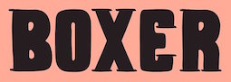 [More] ⦿
|
Ondrej Chory
|
 Czech designer who created the stencil typeface Buum (2019) and the superchiseled typeface Mongoloid (1993). He writes about Buum: Buum is recommended by nine out of ten old school futurists, favored by steampunk CNC operators and respected by the majority of infantile anarchists. [Google]
[MyFonts]
[More] ⦿
Czech designer who created the stencil typeface Buum (2019) and the superchiseled typeface Mongoloid (1993). He writes about Buum: Buum is recommended by nine out of ten old school futurists, favored by steampunk CNC operators and respected by the majority of infantile anarchists. [Google]
[MyFonts]
[More] ⦿
|
Open Window
[Dathan Boardman]
|
 Dathan Boardman (Open Window) is an American type designer who lives in Eau Claire, WI, and was born in 1979. He went to UW Stout to get his BFA in Graphic Design.
 Fontspace link. Klingspor link. Fontsquirrel link. Google Plus link. His typefaces: - Afternoon Tea (2010), an art deco typeface that is inspired by a lettering specimen featured in Letters and Lettering by Paul Carlyle and Guy Oring published in 1938.
- Art Club (2013) and Art Club Roman (2014).
- Backlash (2015, Molly Jacques Erickson and Dathan Boardman). The next step in gonzo splatter lettering scripts.
- Baseline Script (2013). A thin-lined upright script.
- Caesar Dressing Pro (2011). A Greek simulation / stone chisel face.
- Calla Script (2017). By Molly Jacques and Dathan Boardman.
- Calligraffitti (2010). Free at Google Fonts.
- Clarendon Paint (2010).
- College Dropout (2010): a sketch typeface based on athletic lettering glyphs.
- Coming Soon and Calligraffiti (2010): free fonts at the Google Font Directory. The Pro versions are commercial.
- Cowboy Stories (2013).
- Deco and Deco Hatched (2010): art deco headline typefaces.
- Distinction (2020). A script released by Great Lakes Lettering.
- Doriss Girls (2013). A marquee typeface family.
- Farm Girl (2011). A hand-printed face.
- Gold Diggin (2011) hearkens back to posters from the Gold Rush Era.
- Grannys Greenhouse (2019). A beatnik font by David Cohen and Dathan Boardman).
- Hand of Joy (2011) is a thin connected script face.
- Headbanger (2012). A heavy metal album cover font.
- Jacky Hand. Based on the handwriting of a 6-year old child.
- Liquor Store (2019).
- Metal Mania (2012). A spurred heavy metal band font, free at Google Web Fonts.
- Miniver Pro (2011) and Miniver Air Raid Pro (2012) are based on the titling for the 1942 movie Mrs. Miniver.
- Pen Swan (2016).
- Raindrop (2017). A flirty handcrafted typeface family for editorial illustration.
- Rifleman (2012) is a painted wide-slabbed typeface.
- Shag Script (2011). Was this renamed Shrag Script?
- Sketchura (2011) is a sketch face.
- Skyline Hotel (2014).
- Some Assembly (2012). A rounded organic sans family.
- Spur Rust (2011) is a disheveled take on the spicy classic Hellenic Wide.
- Undercoat (2011). A painted version of Helvetica.
- Velvet Hammer (2014). A calligraphic script co-designed with Jen Maton.
- Wide Noise (2010) is grungy.
Great Lakes Lettering in Eau Claire, WI, showcases the type designs of Dathan Boardman and Molly Jacques Erickson. They jointly designed the illustrative handwriting font Frosted in 2012. In 2013, they co-designed the hand-drawn typefaces Saint Agnes and Icing, and the script typeface Kailey (2013). View Dathan Boardman's typefaces. Dafont link. Creative Market link. [Google]
[MyFonts]
[More] ⦿
|
Osmo Niemi
|
 Aha, what a wonderful chiseled angular semi-handwriting font, SchnitzLL (1994), by this Finnish designer.
 Linotype link. FontShop link. [Google]
[MyFonts]
[More] ⦿
|
Paolo Vannucci
[Alphabet&Type]
|
 [MyFonts]
[More] ⦿
[MyFonts]
[More] ⦿
|
Paul Shaw
[Roots of the Classical Roman Capitals]
|
[More] ⦿
|
Philip Lammert
[Vibrant Types (was: Calligrafiction)]
|
 [MyFonts]
[More] ⦿
[MyFonts]
[More] ⦿
|
Philip Schlenoff
|
Aka Phipman, Philip Schlenoff (b. 1992, resident of Tallhassee, FL) created the chiseled-look handwriting typeface PhillyFont (2007). [Google]
[More] ⦿
|
Pro Studio
[Ahmet Prosic]
|
 Bihac / Serajevo, Bosnia and Herzegovina-based designer of the free rough chiseled runic emulation typeface Land (2016), which was inspired by the Stecak monument and the old Bosnian script Bosancica. [Google]
[More] ⦿
Bihac / Serajevo, Bosnia and Herzegovina-based designer of the free rough chiseled runic emulation typeface Land (2016), which was inspired by the Stecak monument and the old Bosnian script Bosancica. [Google]
[More] ⦿
|
Process Type Foundry
[Eric Olson]
|
 Located in Minneapolis and/or Golden Valley, MN, Process Type Foundry is Eric Olson's foundry created in 2002. Its team grew withe additions of Alice Savoie, Nicole Dotin and Doug WilsonIts fonts:
 - Anchor.
- Bryant (2002, sans serif with simple forms). Bryant 2.0 (2005, Standard&Pro), Bryant Compressed, Bryant Condensed (all three form a neat geometric sans family), Bryant Pro.
- Chrono (2012). Olson writes: Chrono: The nearly geometric sans serif. Chrono is a refined oval sans serif of 20th century origins and 21st century sensibilities. Influences ranging from the gruff Aurora Grotesk series to the elegant Neuzeit are paired with a subtle geometry and typographic utility to inform this family of sans serifs. Chrono was renamed Colfax later in 2012.
- Colfax (2012). The blurb: Colfax is a refined oval sans serif of 20th century origins and 21st century sensibilities. Influences ranging from the gruff Aurora Grotesk series to the elegant Neuzeit are paired with a subtle geometry and typographic utility to inform this family of sans serifs. It was formerly called Chrono. A complaint from another foundry with a similarly named font led to the name change. The only one I can think of is Cronos (Robert Slimbach, Adobe).
- Coordinates (2018). A monospaced almost typewriter typeface.
- Elderkin (2005). Eric Olson; A few of my typefaces were made for very specific projects (Process Grotesque + Elderkin) and really have no contribution to make beyond that. Sure they look fine, but who cares? I'm not thrilled with them and plan on removing them this spring.
- Entovo (2006, rectangular).
- FIG-Sans, FIG-Script, FIG-Serif (2002, as in needlepoint lettering, in imitation of the figlet ascii-to-letter program).
- FindReplace (2004).
- A free monospaced font, Indivisible (2002). This became a variable font in 2019.
- Kettler (2002). A Courier-like font named after Courier's designer, Howard Kettler.
- Klavika (2004, an extensive sans family). Followed in 2005 by Klavika Condensed, in 2008 by Klavika Basic and in 2012 by Klavika Display. Klavika poster by Mary Stratton and Michele Wong Kung Fong.
- Lingua (2003, an octagonal typeface with about 200 ligatures).
- Locator (2003), Locator Display: an information design sans family.
- Maple (2005, a grotesque family that includes a beautiful Black).
- Moniker (2017, Process Type Foundry). A large rounded sans typeface family.
- Process Grotesque (or: Process Grot).
- Recent Grotesk (2020, in six weights). He writes: Recent Grotesk is a contemporary family of typefaces with influences that start in the 19th century and travel through into present day. It's a nod to the improvised weight and width strategies of wood type, the high x-heights of 20th century phototype and the puffed out Antique Olive Nord of Roger Excoffon.
- Recipient (2022). A monospaced typewriter font family that descends from the IBM Selectric and Olivetti typewriter faces.
- Scandia Line (2015). Drawn without curves, this four style+stencil variant is purely polygonal, for a special Neanderthal computer effect. Scandia (2015) on the other hand is a classic geometric sans.
- Sculpin (2021). A sharp-edged sans typeface inspired by the finishing details of square-edged tools like the chisel and brush.
- Seravek (2007, a linear and simple sans created for information design).
- Stratum 1 and 2 (2004, contemporary geometric typefaces genetically linked to Bank Gothic).
Before Process Type Foundry, Eric used to run Information Repair, where he did "typeface design and print design for clients within the cultural sector including the Walker Art Center, Minneapolis College of Art and Design (MCAD), Intermedia Arts and the Design Institute at the University of Minnesota" and made the fonts Novo Grotesk, Necrophones, Fibo001. Fonts sold by MyFonts. Behance link. View the Process Type Foundry typeface library. View Eric Olson's typefaces. [Google]
[MyFonts]
[More] ⦿
|
Q-BO
[Carlos Matteoli]
|
 Q-BO is the foundry of Carlos Daniel Matteoli, a type designer from Santiago del Estero, Argentina, b. 1980.
 Old URL. His typefaces, both free and commercial, often have a sci-fi or industrial component: - Djs Symbols (2011). A scanbat font of famous disc jockeys.
- Q-Bo (2011) is a fat typeface in which each glyph occupies a perfect square.
- 2Lines (2011) is a squarish bilined caps face.
- Equ (2011).
- Ovnis (2011, a flying saucer dingbat face).
- Voker (2011, +Rounded: a techno family) and Basica (2011; +Basica 2.0, 2012; +Basica Cartoon, 2014), Teio (2011), Sistema (2011), Ameba (2011) and Abix (2011) are techno typefaces.
- Bim (2011) is an outlined techno face. It was followed in 2012 by Bim Eroded.
- Hexa (2011) is an experimental hexagonal face.
- Cable (2011) is an experimental face.
- Crakos (2011) is slightly grungy.
- Kram (2011, +Espaciada) is a rounded techno / sci-fi / stencil face.
- Spac3 (2011, a sci-fi all caps face), Spac3 Selenium (2014), Spac3 Halftone (2012), Spac3 Destroyed (2011), Spac3 Neon (2011), and Spac3 Tech (2011, a tech stencil face), Spac3 Slim (2017).
- Digital (2011), Digital Cognitive (2011) and Digital Tech (2011): semi-pixelized.
- Bim (2011).
- Djs Symbols (2012). A scanbat of disc jockeys.
- Plig (2012) and Plig Nova (2012). An avant garde family.
- Capital (2012). A squarish all caps typeface.
- Zuber (2012), Zuber Stone (2012, a heavy chiseled textured typeface), Zuber Tech (2015), and Zuber Future (2012, a fat counterless octagonal typeface).
- Orena (2012-2016). A squarish caps-only futuristic typeface.
- Complex (2012). A block-serifed all caps typeface.
- Plig Nova (2012).
- Amirox (2012). A fat counterless typeface.
- Basica Industrial (2012). An industrial grunge face.
- Zian (2012). A fat rounded sans.
- Complex Bruja (2012).
- Voker Baxer (2012).
- Oxin (2012), Oxin Army (2013, stencil), Oxin War (2013), Oxin Brush (2013).
- Moiser (2013), Moiser Techno (2013, counterless), and Heavy Moiser (2013). A purely geometric sans.
- Argentina (2013). A copperplate style caps face, possibly created after a national soccer team lettering style. Followed in 2014 by the grungy Argentina Austral.
- Rixon (2013). A mechanical octagonal typeface.
- Gtek (2013). A sci-fi face. Followed by Gtek Broken (2014), Gtek Technology (2014), Gtek Nova (2014), Gtek Cavern (2015), and Gtek Minimal.
- Xenik (2014).
- Fiker (2014, squarish sci-fi face) and Fiker Futura (2014).
- Oki (2014). A blocky outlined typeface.
- Cerena (2015).
- Zian V15 (2015). A rounded techno sans.
- Begok (2015) and Begok v15 (2016). A techno sans.
- Kiwik (2017). A heavy display sans.
- Basica Cicionica (2017). A squarish techno typeface.
- Ertek (2017). A trekkie font.
- Abser 391 (2017). Straight-edged.
- Spac3 Slim and Spac3 Tech v17 (2019).
- Esba (2019).
- Basica (2020).
- Tauler (2020). A floriated typeface.
Creative Market link. Graphicriver link. [Google]
[MyFonts]
[More] ⦿
|
Ralph Michael Unger
[RMU (Ralph Michael Unger Typedesign)]
|
 [MyFonts]
[More] ⦿
[MyFonts]
[More] ⦿
|
Raretracks (was: Monodark)
[Aulia Akbar]
|
Indonesian designer of these typefaces in 2017: Carita (round brush script with a glaz krak substyle), Borneo, Darker Time (stone chisel type), Mosqita, Segaris (curly). In 2018, he/she designed Merchants (a spurred vintage typeface), Ugly Jelly (textured), the poster typeface Barakuda, Bartholomew (Dutch deco), Raphaelum (a playful script), Tremore, Magnetum, Stabillum, Parisian (art nouveau), Chopio (a notebook font), Pristine (slab serif), Wilhelmina, Matheo Aans, and Grundschule (handcrafted). Creative Fabrica link. [Google]
[More] ⦿
|
Ray Larabie
[Typodermic]
|
 [MyFonts]
[More] ⦿
[MyFonts]
[More] ⦿
|
Rick Banks
[F37 (or: Face37)]
|
 [MyFonts]
[More] ⦿
[MyFonts]
[More] ⦿
|
RMU (Ralph Michael Unger Typedesign)
[Ralph Michael Unger]
|
 Ralph M. Unger (b. 1953, Thuringia, East Germany) says this about himself at MyFonts: Typesetter from the composing stick via Linotype setting machines to the Mac. Jobs in various Thuringian printeries. Barred further education by Communist authorities due to political reasons. Imprisoned in East Germany. Since 1988 in the state of Baden-Wuerttemberg, former West Germany. Jobs in several newspaper printing houses as advertisement compositor. Own office since 1995, in Aalen, Baden-Wuerttemberg. He lives in Schwaebisch Gmuend, and was a freelance type designer for Profonts and URW++, where he contributed frequently to their libraries between 2002 and 2009. In 2009, he founded RMU. MyFonts link. I split his contributions into two groups, the URW / Profonts group, and the RMU group. The prefix FontForum refers to a subseries of URW++ fonts. Unless specifically mentioned, all the following fonts are at URW++ and/or Profonts:
 - FontForum Admiral Script (2005): revival of Middleton's Admiral script from 1953.
- Amitié (2009): a garalde family.
- Arabella Pro (2006): after the script by Arnold Drescher from 1936, published at Joh. Wagner.
- Fontforum Atrament (2006): architectural lettering. Do not confuse with a Suitcase Type Foundry font from 2003 by the same name.
- Atze (2010): a comic book family.
- Behrensschrift D (2007): after the jugendstil typeface Behrens Schrift, 1902, by Peter Behrens.
- FontForum Bernhard Script (2005): after Bernhard Script from the 1920s.
- Bradley (2005): blackletter, after the original by William H. Bradley.
- Breite Kanzlei (2007).
- Breitkopf Fraktur (2003): after the original by Johann Gottlob Immanuel Breitkopf, done in 1793.
- Brocken (2011) is a signage typeface inspired by a design of Volker Küster (1960s).
- Profonts Bureau (2010, Profonts): a minimalist rounded sans family.
- FontForum Calypso (2005): a revival of Roger Excoffon's Calypso (1958).
- Card Pro (2006): a decorative display based on Ella Cursief (1916, Sjoerd Hendrik de Roos, Lettergieterij Amsterdam).
- Chaweng (2006, Profonts): an oriental all caps simulation face.
- Civilite URW (2005).
- Compliment (2004, casual script). Based on a 1965 script by Helmu Matheis for Ludwig & Mayer.
- Cranach (2007): a blackletter typeface modeled after Kuenstler Gotisch from the Krebs Foundry.
- Dominante (2007): a serif family based on Johannes Schweitzer's font by that name, 1959.
- Dominique (2010, profonts): an informal typeface.
- FontForum URW Ecsetiras (2005): revival of Ecsetirás (Zoltan Nagy, 1967, a brush face).
- Edda Pro (2008). An art nouveau typeface that revives a Heinrich Heinz Keune typeface from 1900.
- Energia Pro (2008, Profonts): connected monowidth script, based on Arno Drescher's Energos from 1932.
- Estro (2003, Western lettering). Seems close to Nebiolo's Estro from the 60s.
- Eurobrush Pro (2007, Profonts): handwriting.
- EuroSans (2008).
- Euroscript Pro (2006, Profonts): school script typeface based on his own handwriting.
- Flashes (2007): a revival of Crous-Vidal's Flash, 1953.
- Fox (2007): a brush script based on W. Rebhuhn's original from the 1950s.
- Gamundia (2010): a calligraphic copperplate script inspired by Excoffon's Diane.
- Ganz Grobe Gotisch (2006): a fat blackletter modeled after the original by F.H.E. Schneidler.
- Gmuender Elan Pro (2011) is a 1950s style script face.
- Gradl Nr 1 (2008): based on hand-drawn art nouveau upper case characters by M. J. Gradl, ca. 1900.
- Graphique Pro (2008): shaded caps face, based on Graphique, which was originally created by Swiss designer Hermann Eidenbenz in 1945, and issued as hot metal font by Haas'sche Schriftgießerei. See also New Graphique Pro (2011).
- Handel Slab (2009): a 6-style extension of Trogram's 1980 typeface Handel Gothic.
- Hanseat (2010): a grotesque family done at Profonts. It was heavily inspired by Germany's official DIN 1451 Engschrift.
- Iova Nova (2007): based on Jowa Script, designed by J. Wagner in 1967.
- Profonts>Impression (2008): art deco.
- Jessen Schrift (2004): after the Rudolf Koch blackletter typeface by that name.
- FontForum URW Konzept Pro (2005): revival of Konzept (1968, Martin Wilke's handprinting face).
- Legende (2002): a script typeface based on the original typeface of Friedrich Hermann Ernst Schneidler (1937).
- Leipziger Antiqua. The original Leipziger Antiqua by Alfred Kapr at Typoart dates from 1971 until 1973. The digital version of Leipziger Antiqua was developed by Ralph M. Unger in 2005.
- Manuskript Antiqua (2005): after Oldrich Meinhart's Manuskript Antiqua.
- The Maszynysta family of heavy industrial sans typefaces (2010) have a textured style (Struktura), a Shadow, and a plain Roman.
- Maxim (2003, Profonts): The heavy brush typeface Maxim was originally designed by Peter Schneidler in 1956 for the Bauer foundry.
- New Bayreuth (2008): after Friedrich Hermann Ernst Schneidler's Bayreuth from 1932.
- Old Borders and Lines (2010). A free font.
- Ornella (2008): Jugendstil.
- Peter Schlemihl (2008, Profonts): a revival of a blackletter by Walter Tiemann.
- Pedell (2009): a casual script.
- Polo (2002): a brush face modeled after Carl Rudolph Pohl's Polo (1960).
- In 2012, Ivana Koudelkova co-designed the grungy headline typeface Retroactive Pro with Ralph M. Unger at Profonts.
- Fontforum Rhapsody (2006): a revival of Ilse Schüle's rotunda face.
- Roberta (2003): art nouveau typeface after obert Trogman's typeface for FotoStar.
- FontForum Signs and Symbols (2006).
- Splendor (2009): a revival of a brush script typeface by Wilhelm Berg, Schriftguss, 1930. See also Splendor Pro (2014).
- Sportowy (2009): an outline face.
- Stanford (2011). A sports lettering face.
- Stiletto (2006): a medieval script.
- Fontforum Stripes (2007): a multistripe op art display typeface based on a Letraset font from 1973 by the same name.
- Fontforum Thalia (2006): retro font.
- Tintoretto (2006): shadow display face based on an origonal by Schelter & Giesecke.
- Tip Top Pro (2008): a Julius Klinkhardt art nouveau typeface revival.
- FontForum Unciala (2005): a revival of Oldrich Menhart's typeface Unciala (1953, Grafotechna).
- Unger Chancery (2005).
- Unger Script (2003): based on H. Matheis' Slogan typeface designed for Ludwig&Mayer in 1957.
- Veltro (2007): after a 1931 original by G. da Milano at Nebiolo.
- Profonts Woodpecker (2008).
The list of RMU fonts: - Affiche (2017). A revival of Helios Reklameschrift of the Klinkhardt foundry.
- Aldo Manuzio (2017). After a house typeface from 1897 by Schelter&Giesecke.
- Amati Pro (2010): after Georg Trump's condensed didone face, Amati, 1951.
- Antiqua Florenz (2021). A revival and extension of Paul Zimmermann's Antiqua Florenz (1960, Ludwig & Mayer), which is based on Venetian romans.
- Avus Pro (2012). A sans family that extends Gert Wunderlich's Maxima (1970).
- Baroque Pearl (2016). A pearly typeface that revives Peter A. Demeter's Fournier Geperlt (1922, Schriftguss).
- Behrens Kursiv (2013). After a 1906 original by Peter Behrens.
- RMU Belvedere (2020). A revival of Heinrich Wieynck's art nouveau / fin-de-siècle typeface Belvedere (1906, Bauer).
- RMU Bison (2020). A revival of Julius Kirn's brush script Bison (1935-1938, C.E. Weber).
- Bernhard Blackletter (2016). After Lucian Bernhard's extrafette Bernhard Fraktur (1921).
- Bernhard Cursive Extra Bold (2010).
- Borghese (2015). An art nouveau font after a Schelter & Giesecke original from 1904.
- Borgis Pro (2012). A Clarendon-style text family.
- Boulette (2015, a fat creamy script).
- RMU Bowery (2019) A revival of Old Bowery (1933, ATF)).
- Bravura Pro (2013). After G.G. Lange's Publica.
- Bricklayers (2012). An original fat slab display face.
- Brillant (2009): art nouveau and ultra heavy.
- Butti (2011). A script family paterned after Fluidum (1951, Alessandro Butti, Nebiolo).
- Cable Condensed (2014). Based on Koch's Kabel.
- Caesar Pro (2011). A flared sans typeface after Caesar Schrift (1913, Georg Schiller, C.F. Rühl).
- Capitol Pro (2012). An art deco typeface based on Capitol (Karl Hermann Schaefer for Schriftguss, 1931).
- Carina Pro (2017). A calligraphic script typeface based on Rautendelein (1929, Schriftguss).
- Carla Pro (2013). A broad-nibbed script modeled after Ballantines Script (Elsner & Flake, 1974; see also Ballantines Serial by SoftMaker).
- Carlsbad (2018). A couple of art nouveau typefaces based on originals from 1895 by H. Berhold called Regina Cursiv and Hansa Cursiv.
- Caslon Gotisch (2009): after the original by William Caslon from 1763.
- Celebration (2009): blackletter.
- Circensis (2016). A Western circus font based on a concept of Fritz Richter.
- Claudius (2010): after a 1937 blackletter font at Klingspor.
- Constanze Pro (2012). A light cursive typeface based on Constanze (1954, Joachim Romann, Klingspor).
- Contact Pro (2010): after Contact, a 1963 font by Helmut Matheis.
- Dante Alighieri (2018). Based on a Schelter & Giesecke original.
- Daphnis (2016). A revival of Daphnis (1929, Walter Tiemann).
- Deutschmeister (2017). A textura blackletter typeface after Deutschmeister by Berthold Wolpe for Ludwig Wagner in 1934. (Some dispute that Wolpe made this font.)
- Diamant Pro (2012). A transitional serif face.
- Emilia (2016). Based on Weiss Antiqua (1928) by Emil Rudolf Weiss.
- Neue Echo (2016). Based on Echo for Schriftguss.
- Elbflorenz (2020). A revival of Albert Auspurg's display typeface Miami (1934, Schriftguss).
- Emilia Gotisch (2016). After Weiss Gotisch (1936) by Emil Rudolf Weiss.
- Emilia Fraktur (2021). A revival of Emil Rudolf Weiss's Weiss Fraktur (1913).
- Erler Titling (2015). After Erler Versalien (1953, Herbert Thannhaeuser for Typoart).
- Eurotech Pro (2011): a slabby techno family.
- Faulkner Pro (2011): a connected heavy signage script based on Alan Meeks's Kestrel.
- Fette Kanzlei (2019).
- Fette Unger Fraktur (2010).
- Fichte Fraktur (2020). After Walter Tiemann's Fichte Fraktur (1934).
- Fontanesi RMU. An ornamental caps typeface that revives Aldo Novarese's Fontanesi (2018).
- Forelle Pro (2010): after the original Forelle script typeface by Erich Mollowitz, 1936.
- Frankenberg Pro (2012). An antique script face.
- Gabor Pro (2014). A connected copperplate script.
- Gaby Pro (2017). A revival of Hans Möhring's script typeface Gabriele (1938 or 1947, C.E. Weber).
- Garamond Antiqua Pro (2015).
- RMU Gilgengart (2020). A revival of Hermann Zapf's Fraktur font Gilgengart (1938).
- Gillray Pro (2015). A copperplate script after Hogarth Script (by Harald Bröder for Typoart).
- RMU Gloria (2019). After Gloria (1898, Emil Gursch).
- RMU Gong (2020). Based on Arno Drescher's Super Grotesk Schmalfett first released in 1933 at Schriftguss.
- Gmuender Gravur (2011). A 3d shadow face. Gmuender Antiqua Pro (2015) is influenced by the metal font Imprimatur (1952-1955, Konrad F. Bauer and Walter Baum). Gmuender Kanzlei (2018) is a blackletter typeface.
- Goethe Fraktur (2022). A revival of a blackletter typeface by Wilhelm Woellmer (1905).
- Gravira (2021). A revival of Herbert Thannhaeuser's Gravira, released by Schelter & Giesecke in 1935 .
- Haenel Antiqua (2020, based on a 19th century antiqua by Eduard Haenel) and Haenel Fraktur (2011, after Haenel Fraktur, ca. 1840).
- Hanse Textura (2020). A revival of a textura by Hermann Zapf.
- RMU Helion (2020). A revival of the 3d titling typeface Helion (1935, Arno Drescher for Schriftguss Dresden).
- RMU Herkules (2019). After a late 19th century font by Bauer and Berthold called Reklameschrift Herkules.
- Hoelderlin (2018). After Eugen Weiss's Hoelderlin blackletter font (1937).
- Hoyer Script (2017). After Hanns Thaddeus Hoyer's Hoyer Schoenschrift (1939, Stempel).
- Hupp Fraktur (2016). After Otto Hupp, 1911.
- Impuls (2010): a brushy typeface based on Paul Zimmermann's Impuls (1945).
- Initials RMU One (2012) consists of revivals of Rudhardsche Initialen (Otto Eckmann, ca. 1900) and Walthari Initials (ca. 1900, Rudhardsche Giesserei). Initials RMU Two (2012) consists of revivals of Jubilaeumsinitialen (by Bauersche) and Augsburger Initialen (by Peter Schnorr, 1901).
- Jean Paul Fraktur (2021). A revival of Breitkopf's Fraktur font Jean-Paul-Schrift (1798).
- Jobs Gravure (2011). It had to happen---a few days after Steve Jobs' death, Unger released the beveled engraved typeface Jobs Gravure, which is an extension of Trump Gravur (1954, Weber).
- Jolly Polly (2012): a curly non-connected script face.
- Kis Antiqua Pro (2018). A revival of Hildegard Korger's Kis Antiqua at Typoart.
- Kleist Fraktur (2010): after Walter Tiemann's original.
- Kompress Pro (2013). Two compressed sans typefaces.
- RMU Kontrast (2021). An art deco typeface that revives Kontrast (1930, F.H.E. Schneidler at Weber).
- Koralle RMU (2018). A revival of Schelter and Giesecke's Koralle (1915).
- Korpus Pro (2014). A text typeface family. Followed later in 2014 by Korpus Sans Pro.
- Korpus Serif Pro (2021). A revival and extension of Timeless (Typoart) that covers Greek, Latin and Cyrillic.
- Leibniz Fraktur (2012) is modeled after the famous Genzsch & Heyse blackletter font.
- Lenbach (2021). Inspired by a German font from the Victorian era.
- Liliom Pro (2012). A beautiful fat didone typeface based on an original from the Fonderie Française.
- Lipsia Pro (2011). An angular serif family.
- Literatura Pro Book (2012).
- Litfass (2021). A revival of an art nouveau font by Flisch.
- Lutetia Nova (2014). A fresh two-style take on Jan van Krimpen's Lutetia (1924).
- RMU Luchs (2021). A redesign of Jakob Erbar's inline all caps art deco font Lux (Ludwig & Mayer, 1929).
- Luxor Pro (2010): a Victorian/Western display face.
- Lyrica (2014). A revival of the informal blackletter typeface Lyrisch (1907, Georg Schiller).
- RMU Magnet (2021). A redesign and revival of Magnet (1951, Arthur Murawski at Ludwig & Mayer).
- RMU Manolo (2019). Based on the art nouveau typeface Manolo (Ludwig & Mayer).
- Manutius Pro (2012).
- Meister Antiqua (2011, +Bold, +Book). A Typoart original from 1951 in the tall flared ascender serif genre, revived and extended.
- Mitropaschrift (2016). An octagonal original.
- Mobil Pro (2011). A semi-script typeface in the fifties style of Matheis.
- Monument (2010): a 3d shadow roman caps face created after Oldrich Menhart's Monument.
- Narziss (2018). A revival of Walter Tiemann's Narziss from 1921.
- RMU Neptun (2021). A revival and extension of the art nouveau typeface Neptun by Aktiengesellschaft fuer Schriftgiesserei und Maschinenbau, Offenbach.
- Neue Kurier (2011). Typoart's popular signage script font in a new, completely remastered version.
- Neue Muenchner Fraktur (2010).
- Neue Schwabacher (2021). After Albert Anklam's Neue Schwabacher (Genzsch & Heyse, 1876).
- Neue Thannhaeuser (2011).
- Old Towne Pro (2010): a Western font.
- RMU Omega (2020). After Omega, an art deco typeface by Friedrich Kleukens at Stempel in 1926.
- Orbis Pro (2016). A revival of Walter Brudi's shadow typeface Orbis (1953, Stempel).
- Orplid Pro (2019). a layerable typeface that revives and extends Hans Bohn's all caps Bauhaus era typeface Orplid (1929).
- Parcival Antiqua (2016). A revival of Parcival Antiqua (1926, Herbert Thannhaeuser).
- Parfum (2013). A low x-height script that was inspired by Howard Allen Trafton's Quick (1933, bauer).
- Parler Fraktur (2018). A revival of Friedrich Poppl's Poppl Fraktur.
- Parler Gotisch (2011). A blackletter face.
- RMU Pittoreske (2019). A decorative Victorian typeface.
- Plastica Pro (2015, a chiseled typeface inspired by a J. Lehmann design).
- RMU Pergola (2021). A vintage shadow typeface inspired by a late-19th century font of Georg Giesecke.
- Post Fraktur (2014) and Postillon (2014). After Herbert Post, 1933-1937.
- Primana Pro (2012). A seductive geometric grotesk family.
- Prinzess Gravur (2010): a blackletter typeface modeled after Prinzeß Kupferstichschrift (1905, Berthold).
- Prisma Pro (2011). Revival and extension of Rudolf Koch's multiline typeface Prisma (1931).
- Reklame Fraktur (2016). After Reklame Fraktur by Albert Christoph Auspurg, 1914.
- Reflex Pro (2018). All caps, with an inline style.
- Reznicek Pro (2011) is a post-Victorian pre-art nouveau typeface named after Ferdinand von Reznicek (1868-1909), one of the leading artists and illustrators of those times.
- Rekord Antiqua (2020). A revival of the art nouveau era text typeface Rekord Antiqua (1911, Wagner & Schmidt).
- Rhythmus Pro (2016). After a Schriftguss AG and Schelter&Giesecke original grotesk, and extended to cover Cyrillic.
- Ridinger Std (2012). Based on Riedingerschrift (Franz Riedinger, 1906, for Benjamin Krebs Succ.).
- Ronde Pro (2011): roundhand script.
- Royal Grotesque (2021). A revival of Wotan by Wagner & Schmidt, 1914. Did this typeface become RMU Royal Sans (2022)?
- Salzmann Fraktur (2019). A revival of Max Salzmann's blackletter font released by Schelter & Giesecke in 1912.
- Saskia Pro (2016). Revival of Jan Tschichold's Saskia (1931, Schelter & Giesecke).
- Schmale Anzeigenfraktur (2009): based on Koch's Schmale Deutsche Anzeigenschrift, 1923, Klingspor.
- Schmale Mediaeval (2020). Based on Schelter & Giesecke's Schmale Mediäval (1840).
- Schmuckinitialen (2009): an ornamental caps typeface in the art nouveau style based on Walthari Initials [Walthari (1899, Heinz König for the Rudhard'sche Giesserei) in the upper case and Eckmann Initials (ca. 1900, by Otto Eckmann, Germany's chief art nouveau type designer) in the lower case].
- Schreibmeister (2021). Ralph's interpretation of Arno Drescher's formal cursive typeface for Ludwig Wagner (1958, Leipzig).
- Schwabacher Book (2013).
- Sebaldus (2019). A heavy blackletter typeface, after Sebaldus Gotisch (1926, H. Berthold).
- Senatsfraktur (2020). After Friedrich Bauer's Senats Fraktur done in 1907 for Genzsch & Heyse.
- Concordia (2020). A revival of Sensation Schmalfett (1914, Heinrich Hoffmeister).
- Siegfried Pro (2017). A revival of the art nouveau typeface Siegfried (1900, Wilhelm Woellmer).
- RMU Skizze (2021). This revives Walter Höhnisch's script typeface Skizze (1935, Ludwig&Mayer).
- Staxx Pro (2013). A prismatic typeface.
- Staufer Gotisch (2015). An engraved blackletter typeface modeled after Herbert Thannhaeuser's Hermann Gotisch (Schriftguss, 1934).
- Steinschrift Pro (2015). A single style condensed sans serif.
- Sylphe Pro (2019). A vintage script font that revives Schelter & Giesecke's Isabel (not Sylphide, as claimed by him).
- Tablica (2017). After Karl-Heinz Lange's DDR telephone directory font Minima (1984).
- Thannhaeuser Fraktur (2013) is a redesign of Typoart's Thannhaeuser Fraktur.
- Thomasschrift (2014). A rustic typeface that revives and extends Thomas-Schrift by Friedel Thomas (1957-1958, Typoart).
- Titanschrift (2011). A yummy soft and fat display face.
- Tombola (2018). After an alphabet from the 1920s by Otto Heim.
- RMU Trianon, renamed RMU Trifels (2020). After Heinrich Wieynck's Trianon (1905, Bauersche Giesserei).
- Trocadero Pro (2010): an extension and revival of Trocadero Kursiv, 1927, Albert Auspurg, Trennert.
- Troubadour Pro (2010): In Medium and Engraved styles.
- Trump Deutsch (2011): a blackletter face, after the 1935 original by Georg Trump.
- Trybuna (2013). Based on Herbert Thannhaeuser's Liberta Antiqua (1958), but completely redrawn.
- Turnier (2019). A revival of G.G. Lange's derby (1952-1953).
- Tyton Pro (2013). A brush script after Heinz Schumann's famous 1964 Stentor.
- Typoskript Pro (2010): a revival of Hildegard Korger's Typoskript, first done at TypoArt in 1968.
- Unger Fraktur (2010): after a 1793 design by Johann Friedrich Unger; includes fett and mager.
- Walbaum Antiqua Pro (2013). A revival of Justs Erich Walbaum's didone classic.
- RMU Wallau (2019). After Rudolf Koch's rotunda typeface Wallau (1926-1934).
- Werbedeutsch (2021). A revival of the blackletter typeface Buchdeutsch (Ernst Schneidler, 1926).
- Wieynck Fraktur (2019). after Heinrich Wieynck's Wieynck Fraktur (1912).
- Wieynck Gotisch (2018). After Wieynck Gotisch (1926, Heinrich Wieynck).
- Zentenar Fraktur (2010): mager and halbfett; after the 1937 workhorse by Ernst Schneidler at Bauer.
- Zierfraktur (2010): after Deutsche Zierschrift, an engraved blackletter font that was cut by Rudolf Koch between 1919 and 1921 for Klingspor.
Ralph made some typefaces outside URW/Profonts and RMU, such as Stripes (2014, a prismatic typeface puvlished by Thinkdust). Klingspor link. View Ralph M. Unger's typefaces. [Google]
[MyFonts]
[More] ⦿
|
Robbie de Villiers
[Wilton Foundry]
|
 [MyFonts]
[More] ⦿
[MyFonts]
[More] ⦿
|
Robbie Smith
[Smith Hands]
|
[MyFonts]
[More] ⦿
|
Robby Woodard
[WoodardWorks Type Design (was: Robby Woodard Design and Illustration)]
|
 [MyFonts]
[More] ⦿
[MyFonts]
[More] ⦿
|
Robert Hunter Middleton
|
 American designer (b. Glasgow, 1898, d. Chicago, 1985), who spent his entire life at Ludlow Typograph Company (retiring in 1971) and built an impressive type library, creating over 100 typefaces. He received a doctorate in Fine Arts from Transylvania University. Ludlow hired him in 1923, where he became type director in 1993. He retired from the Ludlow Typograph Company in 1971. At Ludlow, he had to create solid commercial variations of existing typefaces for the Ludlow machine and come up with practical new designs. Bio by Nicholas Fabian. One can also consult the M.A. dissertation of Stephen Glenn Crook at the University of Chicago, entitled "The contribution of R. Runter Middleton to typeface design and printing in America" (1980), which lists his 98 typefaces of his 24 type familes. His oeuvre:
 - Eusebius (1924). This page explains that Ernst Detterer started work for Ludlow on Nicolas Jenson in 1924. Middleton drew Nicolas Jenson Italic at Ludlow in 1929, followed by Bold, Bold Italic, and Roman Open series in later years. In 1937 the family was renamed Eusebius. Nicolas Jenson SG is a revival at Spiece Graphics in 1995 by Jim Spiece.
- Ludlow Black (1924). Mac McGrew: Ludlow Black was designed by Robert H. Middleton for Ludlow in 1924. It is very similar to Cooper Black, the most apparent differences being the concave serifs and the greater slant of the italic. Also compare Pabst Extra Bold.
- Cameo (1927, a chiselled font). Mac McGrew: Cameo was designed by R. Hunter Middleton for Ludlow in 1926. It is derived from a heavy version of Caslon, with a thin white line within the left side of each heavy stroke, giving a very pleasing appearance. A 1926 Ludlow ad says of it, "Designed and punches produced in our own plant". Apparently it was the first, or one of the first, so produced. Compare Caslon Shaded, Caslon Openface, Caslon Shadow Title, Gravure, Narciss.
- Caslon Extra Condensed. See Caslon RR Extra Condensed by Steve Jackaman.
- Delphian Open Titling (1928).
- Stellar (1929, a serifless roman done 29 years before Zapf's Optima!). Mac McGrew: Stellar and Stellar Bold were designed by R. Hunter Middleton for Ludlow in 1929 as a less severe alternative to the monotone sans-serifs which were coming into great popularity. There is moderate thick-and-thin contrast, and strokes flare slightly toward the ends, while ascenders and descenders are fairly long; all this gives a feeling of warmth and pleasantness. Cap M is widely splayed, and sloping strokes are cut off at an angle. An alternate A, E, and H in both weights have the crossbar extended beyond the left upright, and there is an alternate U without the extended vertical stroke. Compare Optima, Lydian, Radiant.
- Garamond (1929-1930, see the Font Bureau revival FB Garamond, and Steve Jackaman's Garamond RR Light).
- Tempo (1930-42, a sans family) and Tempo Heavy Inline (1935). Mac McGrew: Tempo is Ludlow's answer to the sans serifs which gained popularity in the late 1920s. The entire series was designed by R. Hunter Middleton, director of Ludlow's department of typeface design. The Light, Medium, and Bold weights were introduced in 1930, Heavy and several variations in 1931, and other variations over the next decade or more. They are generally a little different from other sans serifs, and include some innovations not found elsewhere. The most distinctive characteristics are found in the Light Italic and Medium Italic, which have a somewhat more calligraphic feeling and less stiff formality than other such typefaces, and which also offer alternate cursive capitals, rare in sans serifs. But there are more inconsistencies in Tempo than most other families. For instance, the Light, Medium, Bold, and Heavy Italics are designed with a moderate slope of 10 degrees to fit straight matrices without too much gap between letters; this works well enough in the lighter weights, but produces a loose effect in the more rigid heavier weights. But the two largest sizes of Tempo Bold Italic and some of the other italics are designed to fit italic matrices with a slant of 17 degrees, which is rather excessive for sans serifs, especially the condensed versions, although it is handled well. Variant Oblique characters are available for Medium Italic which get away from the calligraphic feeling; only these and none of the cursive characters are made in (Tempo continues) the largest sizes. Tempo Bold Extended and Black Extended show the influ- ence of other European grotesques, with much greater x-height and some characters unlike those in the normal and condensed widths. There are a number of alternate characters for many of the Tempos. especially in the Medium, Bold, and Heavy weights; their use converts Tempo to an approximation of Kabel or other series. But a few alternates are not enough to create the effect of Futura, apparently demanded by some users, so Tempo Alternate was created in several weights, and introduced about 1960. This is close to Futura, except that the italic has Ludlow's 17-degree slant, much greater than Futura's usual 8 degrees. This family-within-a-family also has some alternate characters in some weights, to further convert the typeface into an approximation of other European grotesques. Tempo has been quite popular with newspapers, and to a lesser extent for general commercial printing. Compare Futura, Sans Serif, Erbar, etc. Also see Umbra.
- Karnak (1931-42, a slab serif family). Mac McGrew: Karnak is a family of square-serif types designed by Robert H. Middleton for Ludlow, beginning in 1931, when the light and medium weights were introduced, with other weights and widths announced as late as 1942. Like Stymie, the other extensive American square-serif series, it is derived from Memphis, and all three series are very similar. Most members of the Karnak family are most easily distinguished by the cap G. Karnak italics are also distinguished by a greater slant to fit Ludlow's 17-degree matrices, except 14-point and smaller in Karnak Intermediate Italic and Medium Italic, which are made on straight matrices and slant about 10 degrees. Light and medium weights have several alternate round capitals as shown; the very narrow Karnak Obelisk also has comparable alternate round AEMNW. Compare Cairo, Memphis, Stymie. One magazine article speaks of Karnak Open, but this has not been found in any Ludlow literature.
- Lafayette (1932).
- Mayfair Cursive (1932). Revived as Mayfair (2006, Rebecca Alaccari, Canada Type).
- Umbra (1932). Mac McGrew: Umbra was designed by Robert H. Middleton for Ludlow in 1932. It is essentially a shadow version of Tempo Light, in which the basic letter is "invisible" but there is a strong shadow to the lower right of each stroke. Compare Shadow. Images: URW Umbra.
- Eden (1934, a squarish didone). See digital revivals by Jason Castle called Eden Light and Eden Bold, 1990, and by Steve Jackaman and Ashley Muir at Red Rooster called Eden Pro (2010).
- Mandate (1934).
- Ludlow Bodoni (1936; see Bodoni Black Condensed by Steve Jackaman, and Modern 735 (Bitstream's version of Middleton's Bodoni)). Bodoni Campanile (1930; see Bodoni Campanile Pro (1998 and 2017) by Steve Jackaman). Bodoni Modern (1930). See a digital revival called PL Modern Heavy Condensed.
- Coronet (1937). This is Ribbon 131 in the Bitstream collection and Coronet by Steve Jackaman.
- Flair (1941).
- Admiral Script (1953).
- Condensed Gothic Outline (1953).
- Cloister Open Face (1920).
- Florentine Cursive (1956). See Florentine Cursive by Steve Jackaman.
- Formal Script (1956).
- Radiant (1938, see EF Radiant at Elsner+Flake, and Radiant RR at the Red Rooster foundry). McGrew: Radiant was designed by Robert H. Middleton for Ludlow, and introduced in 1938, with additional members of the family being added over the following two or three years. It is a precise, thick-and-thin, serifless style, express- ing the modem spirit of the forties while breaking away from the ubiquitous monotone sans-serifs. Radiant Medium is actually about as light as possible to maintain thick-and-thin contrast, but bold and heavy weights offer substantial contrast. All upright versions have as alternates the round forms of AKMNRW, as shown with some of the specimens. Italics have the standard 17-degree slant of Ludlow italic mats, which is rather extreme for serifless typefaces, except for small sizes of Medium Italic, which are made on straight mats and are redesigned with about 10-degree slope. Like most Ludlow typefaces, all versions of this typeface have fractions and percent marks available as extras. Thick-and-thin serifless typefaces are rare in this country. Compare the older Globe Gothic; also Empire, Stellar, Lydian, Optima, and Czarin, which aren't really in the same category.
- Record Gothic (1927-61).
- Samson (1940). Mac McGrew: Samson is a very bold, sturdy typeface designed by R. Hunter Middleton in 1940 for Ludlow. It is derived from lettering done with a broad pen, and retains much of that feeling. The name was chosen to denote power and strength. It has been popular for newspaper advertising in particular. Compare Lydian, Valiant. An interpolation between a signage typeface and a poster face, it was revived as Ashkelon NF (2011, Nick Curtis).
- Square Gothic.
- Stencil (1937-1938). A Cyrillic was made by Victor Kharyk.
- Wave (1962), a connected brush script. Digitizations include Coffee Script (2006) and Middleton Brush (2010), both by Patrick Griffin at Canada Type. Mac McGrew: Wave was designed for Ludlow in 1962 by Robert H. Middleton. It is a 1 medium-weight script, not quite joining, with a brush-drawn appearance and thick-and-thin contrast. The apparent angle is quite a bit more than the 17-degree slope of Ludlow matrices, but letters fit together compactly without noticeable looseness, and form smoothly flowing words. Compare Brush. Mandate, Kaufmann Bold.
- Andromaque. Mac McGrew explains Andromaque's genesis: Andromaque is a cursive form of uncial letter, mixing Greek forms of aeklmnstz with Roman forms of the other letters, yet retaining legibility and harmony. The original size was cut by Victor Hammer and cast in France. The 14-point size was begun by Hammer, but left unfinished at his death. The font was completed by his long-time friend, R. Hunter Middleton, in the early 1980s, and cast by Paul H. Duensing. Paul Baker did a digital version of Andromaque in 1995.
Among his books: - "Making Printer's Typefaces" (1938, The Black Cat press, Chicago, IL). In this book, he shows his own creations for Ludlow matrices, and talks about typography in general.
- Chicago Letter Founding (1937, The Black Cat Press, Chicago, IL). Middleton calls Chicago the printing center of the nation, and goes on in this small booklet about the lives and contributions of people like Robert Wiebking, Frederic Goudy, Bruce Rogers, Oswald Cooper, and himself.
Linotype link. Drawing. View the typefaces made by Robert Hunter Middleton. [Google]
[MyFonts]
[More] ⦿
|
Robert Kolben
|
German artist. Designer of the font Linotype Venezia Initiale (1997), a caps font based on the classic forms of Roman writing in the 1st and 2nd centuries found chiseled on many Roman buildings. [Google]
[MyFonts]
[More] ⦿
|
RockBee
[Ivan Vasilev]
|
Graphic, web and typeface designer Ivan Vasilyev runs RockBee in Saint Petersburg, Russia. Creator of RockBee Monsters (2009), a bouncy ornamental hand-printed face. Other typefaces include RB Steel (2009, a modular metallic typeface), RB Teknokrat (2009), RB Teknon (2009, techno), RB Naftalin (2009, a free chiseled look face), RB Blockerter (2011), RB Bubble Flight (2012, bubblegum typeface). Behance link. MyFonts link. Klingspor link. Alternate URL. [Google]
[MyFonts]
[More] ⦿
|
Roots of the Classical Roman Capitals
[Paul Shaw]
|
In his book, The Eternal Letter (MIT Press, 2015), Paul Shaw gives a useful timeline for the roots of the classical roman capitals: - THE ROOTS OF THE CLASSICAL ROMAN CAPITALS
- 770 BC First evidence of Greek writing in Italy.
- 750 BC First Etruscan inscriptions.
- 740 BC The Dipylon inscription (Athens) and the Nestor Cup (Pithekoussai); earliest known Greek inscriptions in Greece.
- 753 BC Legendary founding of Rome by Romulus; though ancient sources give dates ranging from
- 814 BC to 729 BC.
- 625-600 BC Tita inscription (Gabii) and Vendia inscription (Rome?); pottery with the first examples of epigraphic Latin letters.
- 580-570 Be Duenos vase inscription (Rome); yet to be deciphered.
- 575-550 BC Forum Cippus, Roman Forum; oldest extant Latin inscription in stone; written in boustrephedon (bidirectional) style.
- 550-525 BC Castor and Pollux dedicatory inscription (Lavinium) in Latinized Greek.
- 550-500 BC Lapis Niger inscription (Rome); written in boustrephedon style.
- 525-500 BC Tufa inscription (Tivoli); written in serpentine style of the Sabines.
- 510 BC Beginning of Roman Republic and of Roman expansion in Italy.
- 500 BC Lapis Satricanus inscription (Satricum) in Archaic Latin; important for comparative Indo-European grammar.
- Before c. 500 BC Latin inscriptions show considerable diversity of letterforms and direction of writing. Most writing is left to right in the late 7th c. BC but right to left in the 6th c. BC.
- 5th C. BC Modular Greek inscriptions (stoichedon) using chisel width as stroke length.
- 312 BC Construction of the Appian Way.
- 334 Be Dedication of the Temple of Athena Polias (Priene) by Alexander the Great; first Greek inscription with serifs.
- Late 4th c. BC Late 4th c. BC Ardea Krater (now in Museo Nazionale Romano, Terme di Diocleziano) with overpainted inscription of uncertain interpretation.
- 264 BC First Punic War between Rome and Carthage begins.
- After 259 BC Epitaph (in Musei Vaticani) of Lucius Cornelius Scipio (consul of Rome and grandfather of Scipio Africanus) in sans serif capitals.
- 250 BC According to Plutarch, letter G created by Spurius Carvilius Ruga, founder of the first private elementary school in Rome; Roman alphabet fixed at 21 letters.
- 221 BC Hannibal begins conquest of Hispania (Spain).
- 218-203 BC Second Punic War. Scipio Africanus defeats Hannibal at Zama (now Sers, Tunisia).
- 167 BC Early Latin inscription with serifs (Delphi; now in Musei Vaticani).
- 1st C. BC Temple of Vesta (Tivoli) inscription.
- 73-71 BC Slave revolt led by Spartacus.
- 50 BC Tomb of Publius Gessius family inscription (Viterbo; now in Museum of Fine Arts, Boston). Arco
- 50 BC dei Gavi (Verona) built by architect Vitruvius.
- 50-20 BC Tomb of Marcus Vergilius Eurysaces (the Baker's Tomb) (Rome).
- 44 BC Julius Caesar assassinated.
- 44-30 BC Roman civil wars.
- 43 BC First extant Roman inscription in "Imperial" style
- 32-30 BC Final War of the Roman Republic; Octavian defeats Antony and Cleopatra.
- 28 BC Tomb of Caecelia Metella (via Appia, Rome).
- 27 BC Octavian becomes Caesar Augustus, first Roman Emperor.
- 17 BC Theatre of Marcellus (Rome).
- 27 BC -14 AD Reign of Augustus.
- 14 AD Augustus dies.
- 25 Pantheon built by Agrippa.
- 41-54 Reign of Claudius. Rome invades Britain. Claudius introduces three new letters to the alphabet, but they do not survive his reign.
- 51 Arch of Claudius dedicated.
- 69-79 Reign of Vespasiano.
- 79-81 Reign of Titus. Pompeii and Herculanum destroyed by eruption of Mt. Vesuvius.
- 79 Arch of Titus dedicated; Colosseum completed.
- 98-117 Reign of Trajan.
- 106 Trajan defeats Dacians.
- 112 Trajan Forum dedicated.
- 113 Trajan column dedicated along with inscription.
- 117-138 Reign of Hadrian.
- 122 Hadrian's Wall built across northern Britain.
- 130 Wroxeter inscription (Forum Viroconium, Britannia---England).
- 161-180 Reign of Marcus Aurelius.
- 2nd c. Tomb of family of Sextus Pomponius (via Appia, Rome).
- 193-211 Reign of Septimius Severus; Roman Empire a military dictatorship.
- 203 Arch of Septimius Severus dedicated.
- 311-337 Reign of Constantine I.
- 313 Edict of Milan ends persecution of Christians.
- 315 Arch of Constantine dedicated.
- 359 Constantinople becomes the capital of the Roman Empire.
- 366-384 Papacy of Damasus; commissioned inscriptions, carved by Furius Dionysius Philocalus, honoring Christian martyrs.
- 395 Roman Empire divided by Theodosius into Eastern and Western Empires.
- 4th c. Vatican Virgil (Vat. lat. 3225); written in capitalis rustica (rustics).
- 4th c. Codex Augusteus (Georgics of Virgil) (Vat. lat. 3256); written in capitalis quadrata (square capitals).
- 476 Fall of Roman Empire in the West; Romulus Augustulus deposed by Odoacer.
- 5th c. Codex Sangallensis (works of Virgil) (St. Gall, Stiftsbibliothek 1394); written in capitalis quadrata (square capitals).
- THE REJUVENATION OF THE CLASSICAL ROMAN CAPITAL
- 795 Epitaph of Pope Hadrian I commissioned by Charlemagne.
- 800 Charlemagne crowned Holy Roman Emperor by Pope Leo III.
- 830-834 Latin Vulgate Bible (Abbey of St. Martin, Tours; now Munich, Bayerische Staatsbibliothek CLM 12741); Carolingian versals.
- 834-843 Moutier-Grandval Bible (Tours, now British Library, Add. MS. 10456); written in Carolingian minuscules.
- 871-877 Second Bible of Charles the Bald (Paris, Bibliotheque Nationale, Ms. Lat. 2); Carolingian versals with classical Roman proportions.
- 963-984 Benedictional of Aethelwold; its versals are the basis for Adobe Charlemagne typeface.
- Early 11th c. The Trinity Gospels (Trinity College, Cambridge, Ms. B.10.4 (215).
- THE REDISCOVERY OF THE CLASSICAL ROMAN CAPITAL
- 1403 Poggio sent classical inscriptions from Rome to Coluccio Salutati in Florence.
- 1409 Sylloge Signorilliana; first collection of classical Roman inscriptions.
- 1412-1416 Statue of John the Baptist (Orsanmichele, Florence) by Ghiberti; inscription with humanist majuscules.
- 1417-1431 Revival of Rome under papacy of Martin V.
- 1424 First visit of Ciriaco di Ancona to Rome to study inscriptions.
- 1425 Tomb of anti-Pope John XXIII (Battistero, Florence) by Donatello and Michelozzo.
- 1431-1437 Cantoria (Florence) by Luca della Robbia; inscription is basis for Donatello typeface.
- 1432-1433 Second visit of Ciriaco di Ancona to Rome to study inscriptions.
- 1439-1440 Shrine of St. Zenobius (S. Lorenzo, Florence) by Ghiberti; inscription in lettere antiche.
- 1440 Giovanni Marcanova begins collecting epigraphs.
- 1447-1452 Tempio Malatestiano (Rimini) by Alberti with monumental inscription on facade (1453).
- 1447-1455 Continued revival of Rome under papacy of Nicholas V.
- 1449-1452 Funerary monument to Leonardo Bruni (S. Croce, Florence) by Bernardo Rossellino.
- 1450 Chronicle of Eusebius (Biblioteca Marciana, Lat. IX.1 = 3496) by Biagio di Saraceno; first manuscript with epigraphic capitals.
- 1453 Fresco of St. James (Ovetari Chapel, Padua) with inscriptions in epigraphic capitals.
- 1453 Constantinople sacked by Ottoman Turks; end of Byzantine Empire (eastern portion of Roman Empire).
- 1455 Tomb of Pope Nicholas V (Grotte Vaticane).
- 1455 42-line Bible completed by Johannes Gutenberg.
- 1453 First manuscript by Paduan scribe Bartolomeo Sanvito.
- 1459 Strabo Geographia (Bibliotheque Municipale, Albi, MS 77) with epigraphic initials.
- 1460 Alphabetum Romanum (Vat. lat. 6852) by Felice Feliciano; first constructed alphabet.
- 1460 Livy (Biblioteca Nazionale e Universitaria di Torino, J.II.5) by Sanvito; one of first manuscripts with a monumental frontispiece.
- 1464 Felice Feliciano, Mantegna, Samuele da Tradate and Giovanni Antenori search for Roman inscriptions near Lake Garda.
- 1465 Second Marcanova recension of collection of epigraphs completed.
- 1465 Tomb of Cardinal Ludovico d'Albret (S. Maria in Aracoeli, Rome) by Andrea Bregno.
- 1467 Cappella Rucellai (Florence) by Alberti.
- 1468 Pescheria (Verona) inscription attributed to Feliciano.
- 1468-1476 House of Lorenzo Manilio (Rome) with facade incorporating mix of antique and imitation antique inscriptions.
- 1470 Facade inscription on S. Maria Novella (Florence) by Alberti.
- 1470 Roman typeface by Nicholas Jenson.
- 1471-1484 Papacy of Sixtus IV led urban revival of Rome; associated with revival of Roman capitals.
- 1471 Capitoline Museum established by Pope Sixtus IV.
- 1473 Tomb of Cardinal Niccole Forteguerri (S. Cecilia in Trastevere, Rome) by Andrea Bregno and Mino da Fiesole.
- 1475 Ponte Sisto inscriptions attributed to Sanvito.
- 1470s Pomponio Leto began collecting epigraphs.
- 1475-1477 Latin and Greek libraries created at Vatican.
- 1478 1478 First redaction of Fra Gioconda silloge.
- 1479-1483 Libellus Inscriptionum printed by Jacopo Zaccaria.
- 1480 Constructed alphabet by Chicago Anonymous.
- 1480 Codice Barberiniano (Barb. Lat. 4424) by Giuliano Sangallo; contains drawings of Roman inscriptions and monuments.
- 1482 Inscription in courtyard of Palazzo Ducale, Urbino.
- 1483 Constructed alphabet by Damiano Da Moylle.
- 1484-1499 Construction of the Cancelleria (Rome).
- 1490-1516 Taccuino Senese di Giuliano Sangallo (Biblioteca Comunale degli Intronati, S.IV.8); includes complete alphabet of Roman capitals.
- 1491-1509 Codex Escurialensis (Codex 28.11.12) by Domenico Ghirlandaio; includes drawings of Tomb of Cecelia Metella, Trajan's Column and alphabet of Roman capitals.
- THE REJUVENATION OF THE CLASSICAL ROMAN CAPITAL
- 1509 DiVina Proportione by Luca Pacioli published in Venice; contains alphabet of constructed Roman capitals.
- 1517 Opera del mondo defare le littere maiuscole antique by Francesco Torniello.
- 1523 Il Modo Temperare de le Penne by Ludovico degli Arrighi da Vicenza.
- 1524 Lo presente libro Insegna La Vera arte by Giovannantonio Tagliente.
- 1525 Vnderweysung der Messung [Of the lust Shaping of Letters] by Albrecht Düer.
- ~1527 Luminario by Giovambaptista Verini; alphabet of constructed Roman capitals.
- 1529 Champ Fleury by Geoffroy Tory; contains alphabet of constructed Roman capitals.
- ~1530 First roman typeface by Claude Garamont.
- 1540 Libro nuovo d'imparare a scrivere by Giovambattista Palatino.
- 1540 On Antiquities by Sebastiano Serlio, second of his "Seven Books."
- 1548 Un novo modo d'insegnare a scrivere by Vespasiano Amphiareo.
- 1554 Sette Alphabeti di uarie lettere by Ferdinando Ruano.
- 1560 Essemplare di piu sorti lettere by Giovanni Francesco Cresci.
- 1570 II Perfetto Scrittore by Giovanni Francesco Cresci.
- 1535-1589 Papacy of Sixtus V; responsible for the systematization of Rome with the creation of new arteries and plazas marked by the erection of obelisks on Roman bases; and the restoration of the Acqua Alessandrina (renamed Acqua Felice, 1 586).
- 1587 Alphabeto Delle Maiuscole Antiche Rornane by Luca Horfei da Fano.
- 1589 Varie iscrittioni del santiss.... by Luca Horfei da Fano; designs for program of graphic exposition to accompany urban restoration under Sixtus V.
- 1638 De Caratteri by Leopardo Antonozzi.
- THE DECLINE OF THE CLASSICAL ROMAN CAPITAL
- 1692-1745 Romain du Roi; first designed typeface; first printed appearance 1702.
- 1725 First typeface by William Caslon.
- 1738 Excavations of Herculanum begun.
- 1748 Excavations of Pompeii begun.
- 1754 John Baskerville type specimen.
- ~1760-1840 Industrial Revolution.
- 1766 Fry's Baskerville cut by Isaac Moore.
- 1784 First type by Firmin Didot.
- 1788 Serie di maiuscole by Giambattista Bodoni.
- 1789 French Revolution.
- 1804-1815 Napoleon Emperor of the French.
- 1818 Manuale Tipografico by Giambattista Bodoni; printed posthumously.
- THE RESURRECTION OF THE CLASSICAL ROMAN CAPITAL
- 1846 Lyons Titling (Caractères Augustaux) by Louis Perrin; revived antique Roman capitals.
- 1872 Cast of base of Trajan's Column made for Victoria & Albert Museum.
- 1894 The American School of Architecture in Rome (the American Academy in Rome, after 1897) opened; championed by architect Charles Follen McKim.
- 1895 Boston Public Library (McKirn, Mead and White) completed.
- 1906 Writing & Illuminating, & Lettering by Edward Johnston published.
- 1906 Eric Gill visits Rome for first time.
- 1911 Forum Title by Frederic W. Goudy.
- 1914 Centaur by Bruce Rogers. (Released by Monotype, 1929.)
- 1914-1918 World War I.
- 1916 Goudy Old Style (American Type Founders) by Frederic W. Goudy.
- 1918 Hadriano Title by Frederic W. Goudy.
- 1919 Bauhaus (Weimar) opened.
- 1922 Fascist March on Rome; Mussolini become prime minister of Italy.
- 1927 Futura (Bauer) by Paul Renner.
- 1927 Kabel (Klingspor) by Rudolf Koch; promotional material included constructed capital diagrams.
- 1927 John Stevens Shop (est. 1705) purchased by John Howard Benson.
- 1927 Open Capitals (Enschedé) by Jan van Krimpen.
- 1928 Die neue Typographie [The New Typography] by Ian Tschichold published.
- 1925-1930 Perpetua (Monotype) by Eric Gill.
- 1930 Trajan Title by Frederic W. Goudy.
- 1931 Four Gospels printed by Golden Cockerel Press; with type, illustrations, lettering, and ornaments by Eric Gill.
- 1933 Bauhaus (Weimar) closed by the Nazis.
- 1934 Felix Titling (Monotype) based on constructed capitals of Felice Feliciano.
- 1935-1939 First trip to Rome by Father Edward M. Catich.
- 1936 David Kindersley sets up as independent lettercarver.
- 1937 Schneidler Initials [Bauer Text] (Bauer) by F. H. E. Schneidler.
- 1938 Roman Lettering by L.C. Evetts published.
- 1938-1940 Res Gestae Divi Augusti inscribed on wall of the building housing the Ara Pacis (Rome) as part of Fascist celebration of Augustan Bimillenary; letters based on Trajan capitals.
- 1939 Palazzo degli Uffici dellnte'E Autonomo (Rome) completed; facade bears inscription announcing Terza Roma; bas relief depicts Mussolini as direct descendent of Roman consuls and emperors
- 1939-1945 World War II.
- 1943 Palazzo della Civilita Italiana (the Square Colosseum) (Rome) completed.
- 1946 Jan van Krimpen designed numeral stamps for the Dutch post office.
- 1950 Michelangelo (Stempel) by Hermann Zapf. Sistina (Stempel) by Hermann Zapf.
- 1951 Augustea (Nebiolo) by Alessandro Butti and Aldo Novarese.
- 1951 Columna (Bauer) by Max Caflisch.
- 1955 Rhythm and Proportion in Lettering by Walter Kaech published.
- 1956 National Monument on the Dam square (Amsterdam) with inscription designed by Jan van Krimpen.
- 1957 Castellar (Monotype) by John Peters.
- 1957 Univers (Deberny & Peignot) by Adrian Frutiger.
- 1957 Neue Haas Grotesk (Haas) [later Helvetica (Stempel)] by Max Miedinger and Eduard Hoffmann.
- 1958 Optima (Stempel) by Hermann Zapf.
- 1960s David Kindersley designs alphabet for Cambridge, England street signs; modeled on classical Roman capitals.
- 1961 John E. Benson takes over the John Stevens Shop.
- 1961 Letters Redrawn from the Trajan Column in Rome by Father Edward M. Catich published.
- 1964 John F. Kennedy Memorial, Arlington Cemetery carved by John E. Benson and John Hegnauer.
- 1964 Father Edward M. Catich makes polyester cast of Trajan inscription.
- 1957 Printing and the Mind of Man catalogue (based on London exhibition, 1963) with title page engraved by Reynolds Stone.
- 1968 The Origins of the Serif by Father Edward M. Catich published.
- 1976 Lida Lopes Cardozo begins collaboration with David Kindersley; eventually becomes partner in Cardozo Kindersley Workshop.
- 1982 A Constructed Roman Alphabet by David Lance Goines published.
- 1989 Lithos, Trajan, and Charlemagne (Adobe) by Carol Twombly.
- 1991 Arrus (Bitstream) by Richard Lipton.
- 1993 Mantinia (Carter & Cone) by Matthew Carter; based on the engraved lettering of Mantegna.
- 1993 Nicholas Benson takes over ownership of the John Stevens Shop.
- 1994 Penunbra (Adobe) by Lance Hidy
- 1996 Cresci, Pontif, and Pietra (LetterPerfect) by Garrett Boge.
- 1997 Franklin Delano Roosevelt Memorial, National Mall, carved by John E. Benson.
- 1998 Waters Titling (Adobe) by Julian Waters.
- 1999 Capitolium by Gerard Unger; inspired by capitals by Cresci. Requiem (Hoefler & Frere-Jones) by Jonathan Hoefler, based on capitals by Arrighi.
- 2003 Senatus (Berthold) by Werner Schneider.
- 2004 National World War II Memorial, National Mall, carved by Nicholas Benson.
- 2011 Stevens Titling (Linotype) by John Stevens and Ryuichi Tateno.
- 2012 Trajan Pro 3 and Trajan Sans (Adobe) by Robert Slimbach. The original Trajan Sans is from 1989.
[Google]
[More] ⦿
|
Rudolf Koch
[Koch Neuland]
|
[More] ⦿
|
Rudolf Koch
|
 Great German type designer (b. Nürnberg, 1876; d. Frankfurt, 1934) who worked mainly at the Klingspor foundry. He founded the Offenbach Werkstatt in 1921.
 Many of his typefaces can be classified as German expressionist. These include Kabel (a sans), and Neuland (an angular poster face). An early Nazi sympathizer and supporter, Koch's fonts were heavily used by the Nazi regime. This page lists 158 royalty-free Christian symbols drawn by Rudolf Koch, a religious Lutheran, with the collaboration of Fritz Kredel (1900-1973) (see also here). His typefaces, with notes on digitizations: - Claudius (1931-1934, 1937, D. Stempel AG). His son Paul Koch followed Rudolf's instructions to make one weight in 1931-1934. Klingspor completed it in 1937. Delbanco (as DS-Claudius) and Klaus Burkhardt (1991) digitized it. Based on the latter, Manfred Klein made ClaudiusImperator (2001). Dieter Steffmann made Claudius, ClaudiusAlternate, and ClaudiusHeadline in 2003. Ralph M. Unger published Claudius in 2010.
- Deutsche Anzeigenschrift (1913-1914), Deutsche Anzeigenschrift schmal (1916-1923, D. Stempel AG). revivals include SchmaleAnzeigenschrift (2002) and SchmaleAnzeigenschriftZier (2002) by Dieter Steffmann, and Schmale Anzeigenfraktur (2009) by Ralph Unger. Later weights by Koch: Deutsche Anzeigenschrift eng (1923) , Deutsche Anzeigenschrift breit (1923, D. Stempel AG) , Deutsche Anzeigen. schmalhf. (1934, D. Stempel AG).
- Deutsche Schrift (1908-1921), consisting of Deutsche Schrift schmal (1913, Gebr. Klingspor), Deutsche Schrift fett (1910, Gebr. Klingspor), Deutsche Schrift mager (1918, Gebr. Klingspor) and Deutsche Schrift halbfett (1912, Gebr. Klingspor). Also known as Koch Fraktur. Revived by Gerhard Helzel as KochFrakturSchmaleHalbfette (2000), by Christian Richter as Rudolf Koch (2003), and by Delbanco as DS Koch Fraktur. It was a popular family, known in England as Oxford. For comparison, here is a phototype version. Deutsche Schrift fett, aka Fette Deutsche Schrift, was revived by Dieter Steffmann in 2002 (as Fette Deutsche Schrift) and by Alter Littera in 2012 as Deutsche Schrift.
- Deutsche Schrägschrift (1912, Gebr. Klingspor).
- Deutsche Werkschrift (1934, D. Stempel AG) and Deutsche Werkschrift hablfett (1934, D. Stempel AG): This is really the "mager" version of Deutsche Anzeigenschrift. Delbanco revived it digitally as DS Deutsche Werkschrift.
- Deutsche Zierschrift (1919-1921, Gebr. Klingspor). Revived as Dutesche Zierschrift (2002) and Zierinitialen> (2002) by Dieter Steffmann. See also Delbanco's DS Deutsche Zierschrift.
- Frühling (1913-1917, Gebr. Klingspor). A blackletter that seems to have been executed with a shaky hand---it is definitely one of Koch's weakest and ugliest designs. Incredibly, the revival gang was still eager to spring into action: it was revived and interpreted by Frantisek Storm in Monarchia. See also Delbanco's DS Frühling. For another revival, see Next Stringtime by Manfred Klein (2003). Frühling is sometimes called Kartenschrift.
- Geschriebene Initialen zur Grotesk (1930, Gebr. Klingspor).
- Grotesk Initialen (1933, Gebr. Klingspor). Paul Hayden Duensing made Koch Initials (metal).
- Holla (1932, Gebr. Klingspor). Digitized by Dieter Steffmann in 2001.
- Jessen Schrift (1924-1930) is a hybrid of gothic (blackletter) minuscules and roman capitals (including the characteristic Basque capital A) designed and cut without preliminary drawings in Offenbach am Main by Rudolf Koch for The Four Gospels, which was printed at the Klingspor press in 1926 and published by Koch himself. Formerly named Bibel-Gotisch, the type was developed between 1924 and 1929 as Peter Jessen Schrift and released as Jessen in several sizes by the Klingspor foundry in 1930. See DS-Jessen-Schrift (1998, Christian Spremberg), Peter Jessen Schrift (Delbanco), Jessica Plus (2002) and JessicaSerif (2003) by Manfred Klein, Peter Jessen Schrift Pro (Softmaker, 2016), and Jessen Schrift (2004, Ralph M. Unger). Jessen Mittel 14 and Jessen Cicero 12 were developed by Alexis Faudot and Rafael Ribas in 2016 during an ANRT workshop in Valence, France.
- Kabel (1927, Gebr. Klingspor), Klingspor's competing design for Paul Renner's Futura. The most famous digitization of this Koch Sans family is by Victor Caruso in ITC Kabel (1976), and with its exaggerated x-height, much larger than the original, it is a poor bastard. The modern Bitstream version is called Geometric 231. Softmaker calls it Koblenz. Poster by Jorge Martinez. At Linotype, Marc Schütz designed the large family Neue Kabel (2016) that revives Kabel by making it more consistent. This version overshadows all previous digital versions or extensions of Kabel. Dates of the various weights: Kabel Kursiv (1929, Gebr. Klingspor), Kabel groß (1928, Gebr. Klingspor), Kabel Kursiv groß (1930, Gebr. Klingspor), Norm Kabel (1930, Gebr. Klingspor): LinotypeLibrary, Kabel fett (1929, Gebr. Klingspor): LinotypeLibrary, Kabel schmal (1930, Gebr. Klingspor), Kabel schmalhalbfett (1929, Gebr. Klingspor).
- Koch Antiqua (or: Locarno) (1920-1922, Gebr. Klingspor). It was sold by Continental Type in the United States as Eve. This gorgeous tall-legged and flared typeface was designed in 1917, but cut in 1922. Koch Kursiv (1923, Gebr. Klingspor) is the Kursiv version of Koch Antiqua. See also Koch Kursiv groß (1929, Gebr. Klingspor) and Koch Antiqua fett (1926, Gebr. Klingspor: some give the date 1923-1924). Rivoli is a similar metal typeface. Digital versions include Rudolf Antiqua (2018, Now Type), Eva Antiqua, Eva SG (Spiece Graphics), Eva (Monotype), AIKochAntiqua (a multiple master font by Randall Jones for Alphabets Inc), Astaire Pro (2004, Bergslund Design, or Hackberry), Koch Altschrift (2004, Moorstation crew), Locarno (1985, Alan Meeks for Letraset), Kuenstler 165 (Bitstream), Koch Antiqua (Adobe, Linotype), Evadare (David Nalle), Hellen (2019, Genilson Lima Santos).
- Koch Kurrent (1933, Gebr. Klingspor). This is Koch's version of school scripts, a variant of his earlier proposal, Offenbacher Schrift (1927). It was only cut in 1935. See Rudolf Koch Kurrent at Delbanco .
- Koch Schrift (1909) is a Schwabacher first known as Neudeutsch and later as Koch Schrift. It was used by the Deutsche Reichsbahn, ca. 1930. For a digital revival, see, e.g., Koch Schrift (1998-2021) by Ingo Zimmermann.
- Marathon (1930-1938, Gebr. Klingspor). Digitized by Linotype in 2003 as Marathon LT (by Ute Harder, aka Frau Jenson), and by Softmaker a bit earlier. The best digital version is by the Koch Memorial team of Petra Heidorn under the name Romantha (a permutation of the letters) in 2003 (it preserves the original x-height better, for example).
- Maximilian Antiqua (1913-1917, Gebr. Klingspor). Digitization by Manfred Klein, who made Maximilian Antiqua (2003) and MaximilianAntiquaSmallCaps (2003). For an initial caps extension, see Typograf's Maximilian Antiqua Initialen (2015).
- Maximilian (Gotisch) (1914-1917, Gebr. Klingspor). Walden Font has a revival. See also Maximilian at Delbanco. Castletype made MaximilianCS. In 1995, Doug Olena revived it as Maximilian. Dieter Steffmann made Maximilian (2002) and Maximilian Zier (2002). Maximilian (2012) is due to Alter Littera. Drawings for Maximilian-Gotisch. Gerhard Helzel's revival from 1995. Stephen Miggas's revival is called Gothicus (2006).
- Neu Fraktur (1933-1934, Gebr. Klingspor): Koch's last Fraktur.
- Neuland (1923, Gebr. Klingspor) and Neuland licht (1928, Gebr. Klingspor), an outline version of Neuland. Neuland is all caps German expressionist typeface chiseled directly by Koch from metal. Copied by Monotype in 1929 as OthelloMT. Digitized by Linotype Library. Also digitized as Newland Black by Andrey Mel'man. In 1995, Doug Olena (Keystrokes) revived it as FFD Neuland (1995). A lower case and hair-serifed extension was created by Manfred Klein as On Kochs Roots (2002) and KochNeu-ExtraBlack (2003). Nick Curtis made Jungle Fever and Jungle Fever Shaded (2008) after Neuland. In 2010, Ian Lynam published yet another update, Neuerland. In 2013, Lazar Dimitrijevic created Cal Neuland Bold.
- Offenbach (1928-1934, Gebr. Klingspor). Made for display in church windows, Koch designed the "mager" weight (1931) and an uncial version. His student Hans Kühne finished the "halbfett" and the gothic after his death.
- Prisma (1928-1931, Gebr. Klingspor): A four-lined art deco face. Revived by Dieter Steffmann (2003-2004) as Prisma, and by Ralph Unger as Prisma Pro (2011). See also the 10-style typeface family LL Prismaset at Lineto (2003-2017, Mauro Paolozzi, James Goggin, Alex Rich, Arve Båtevik, and Raphael Koch).
- Stahl (1933-1939): Done with H. Kühne. Revived by J.F.Y.Daniel Gauthier (GautFonts) as StahlSteel (2003) and StahlSteelRiveted (2003).
- Wallau (1924-1932, Gebr. Klingspor), Wallau halbfett (1930, Gebr. Klingspor), Wallau fett (1935, Gebr. Klingspor), Wallau schmal (1934, Gebr. Klingspor). See Wallaby on the SoftMaker MegaFont XXL CD, 2002, or Wallau by Fraktur.de or DS Wallau by Delbanco, or Wallau (2012) by Alter Littera. Pictures by Dan Reynolds about Klingspor's Wallau speciman book (1939). Wallau, which comes in rotunda (Rundgotisch) and uncial, was named after Heinrich Wallau (1852-1925), a printer from Mainz. Originally, the typeface was going to be called Missale. Also revived by Dieter Steffmann (as WallauDeutsch-Bold (2002), Wallau Rundgotisch Heavy (2002), Wallau Rundgotisch OsF Heavy (2002), WallauUnzial-Bold (2002) and WallauZierBold (2002)) iand by PrimaFont.
- Wilhelm-Klingspor-Schrift. (1920-1926, Gebr. Klingspor): This was originally called Missal. To commemorate Wilhelm Klingspor, who died in 1925 from a war injury, it was renamed Wilhelm-Klingspor-Gotisch. Paul Hayden Duensing made a metal version under the latter name. Digitizations by Fraktur.de and Delbanco. See also Wilhelm-Klingspor-Schrift at LinotypeLibary, Wilhelm Klingspor Schrift (2012) by Alter Littera, Wilhelmschrift (2006) by Stephen Miggas, and Missal by Dieter Steffmann (2003). Matching decorative caps were made in 2004 by Paul Lloyd under the name Holzschnitt-Initialen.
- Zeppelin (1929, Gebr. Klingspor). This is a decorative (inline) version of Kabel. Revived as Zeppelin (2003, Dieter Steffmann) and Evadare (1993, David Nalle).
In 1984, Wolfgang Hendlmeier discussed the blackletter typefaces in Koch's oeuvre: A, B, C, D, E, F, G. Brief bio by Wolfgang Hindlmeier (1984). Koch's involvement in handwriting education in Germany led to these Schreibschrift examples from 1930 (also called Deutsche Verkehrsschrift), and to the development by Martin Hermersdorf of the Deutsche Schreibschrift for fourth graders in Bavaria in 1950. Wood engraving of Koch by Bernard Brussel-Smith. Publications by Rudolf Koch: - Die Schriftgießerei im Schattenbild, Offenbach 1918.
- Das Schreiben als Kunstfertigkeit, Leipzig 1921.
- Das ABC-Büchlein, Leipzig 1934.
- Das Schreibbüchlein, Kassel 1939.
- Klassiche Schriften.
- Das Zeichenbuch. This book contains 493 old-world symbols, monograms and runes and was reprinted in 1955 in the Dover Pictorial Archive Series as The Book of Signs.
- Das Blumenbuch.
References: - Gerald Cinamon: Rudolf Koch: Letterer, Type Designer, Teacher (2000, Oak Knoll Press and The British Library).
- Georg Haupt: Rudolf Koch der Schreiber, Leipzig 1936.
- Wilhelm H. Lange: Rudolf Koch, ein deutscher Schreibmeister, Berlin, Leipzig 1938.
- Oskar Beyer: Rudolf Koch. Mensch, Schriftgestalter und Erneuerer des Handwerks, Berlin 1949.
- Friedrich Friedl, Nicolaus Ott (Editor), Bernard Stein: Typography An Encyclopedic Survey of Type Design and Techniques Throughout History, Könemann Verlagsgesellschaft mbH.
Rudolf Koch's carved lettering inspired spin-offs like PGF Americas (2021, Pedro Gonzalez). FontShop link. Klingspor link. Biography by Nicholas Fabian. Bio at Linotype. Bio in German. The Koch Memorial page [now defunct] offered historical notes and many free revivals of his typefaces. View digital typefaces based on Rudolf Koch's work. [Google]
[MyFonts]
[More] ⦿
|
Sebgarry Design
[Tapiwanashe Sebastian Garikayi]
|
 Victoria Falls, Zimbabwe-based designer of the free pixelish typeface New Time Nerd (2017), and the free slab serif typefaces Mused (2017) and SebSlab (2017).
 In 2018, he designed Magz Slab, Debut Sans, the octagonal typeface family TSG Actie, the slab serif typeface Legacy17 (and Legacy Pro, which has two free weights), the display typeface Afrofusion, the free text typeface Beau, and the free chiseled roman typeface Romulus. Typefaces from 2019: Afronik (a great interlocking squarish typeface), Gamine (a free Peignotian sans), Seb Neue (sans), Paste (a sans in 8 styles), Famba, BigBro, Tuckshop Titling (a free font inspired by Tuckshop sign writing in Chinotimba, Victoria Falls). Typefaces from 2020: Mwangwego Script (a script invented in Malawi in 1979 by Nolence Mwangwego to replace the Latin alphabet), Mutapa (a tribal font), Orinique (a custom modulat sans family for Orinique Design Studio), Chico (a free wide sans). Fontspace link. Graphicriver link. Fontspace link. [Google]
[More] ⦿
|
Shutian Chan
|
 Designer from Singapore. At TypeParis 2017, Shutian Chan designed the sharp-edged wedge serif text typeface Emery, which was inspired by the sharp chiseled type adorning tombstones, especially those seen in Paris. [Google]
[More] ⦿
Designer from Singapore. At TypeParis 2017, Shutian Chan designed the sharp-edged wedge serif text typeface Emery, which was inspired by the sharp chiseled type adorning tombstones, especially those seen in Paris. [Google]
[More] ⦿
|
Signfonts.com
[Steve Contreras]
|
Commercial font studio, also called Art&Sign, located in Fort Worth, TX, started in 2001 by Steve Contreras. He writes: Created by Sign Artists, with the look of hand lettering. Casual and script fonts designed specifically for Sign painters and Artist, for use in vinyl cutting and large format printing. Some fonts could also be used for comic book purposes or general display. Their typefaces include: A&S-Christmas-Script, A&S-Graphina-Chisel, A&S-Happy-Jack, A&S-Harliquin, A&S-Motherlode, A&S-Pen-&-Ink-Roman, A&S-Popcorn, A&S-Porkchop-Primitive, A&S-Porkchop, A&S-Puff-Daddy, A&S-Rhino, A&S-Rister, A&S-Shocard-Block, A&S-Sign-Gothic, A&S-Signwriter, A&S-Snapper-Script, A&S-Speedway, A&S-Wizard, Jiggy Roman, Marquee, Marquee Chisel, Graceland, Brushwacker, Omni, Omni Chisel, Omni Chisel Regular, Xtreme Script, Roadhouse, Brushwacker Script, Cricket, Edoras, Black Swan, Blaze, Bone Casual, Cartoon, Wizard Bold. Ace High (2010) and Tuscano Script (2011) are Western Victorian typefaces. [Google]
[More] ⦿
|
Simon Garfield
[The 8 Worst Fonts In The World]
|
[More] ⦿
|
Slobodan Jelesijevic
[Tour de Force Font Foundry]
|
 [MyFonts]
[More] ⦿
[MyFonts]
[More] ⦿
|
Smith Hands
[Robbie Smith]
|
Smith Hands (was: Smiths Hands Collection) is the foundry of type designer Robbie Smith in London. I cite that source: Robbie Smith is a graduate of Reigate School of Art&Design (under calligrapher Gaynor Goffe and sign-writer John Gibbs) and went on to work in Richard Kindersley's letter carving studio in London. Now a freelance type designer in London trading under the moniker of Smith Hands, Robbie is focusing on incorporating the pattern and drive of calligraphy into modern styles of lettering that will fit beautifully into the modern corporate world. Robbie Smith designed these typefaces: - Brushed Sans (2018). Inspired by sign-writing.
- English Engravers Roman (2010). A lapidary / chiseled text typeface---inspired by the beauty and eccentric detailing of British stone carved lettering.
- Hoplight (2010).
- Snag (2013). A copperplate sans--he calls it a typeface with embryo serifs.
[Google]
[MyFonts]
[More] ⦿
|
Steve Contreras
[Signfonts.com]
|
[More] ⦿
|
stillerhimmel
|
German designer of the stone chisel font Capitalis Goreanis (2009). [Google]
[More] ⦿
|
Stone Type Foundry
[Sumner Stone]
|
 The Stone Type Foundry in Guinda (ex-Rumsey and ex-Palo Alto), CA, is Sumner Stone's outfit, which he founded in 1990. Born in Venice, Florida in 1945, Sumner Stone is a major designer, and creator of the Stone family. He studied calligraphy with Lloyd Reynolds at Reed College in Portland, Oregon, and then went to work for Hallmark cards as a lettering artist. In 1979, he became type director at Autologic, and in 1984, he became the Director of Typography at Adobe Systems (until 1989). His typefaces:
 - ITC Stone Sans (1992, Linotype), ITC Stone Sans II (2010, ITC), ITC Stone Sans (Adobe), ITC Stone Sans (ITC), ITC Stone Sans (Linotype). The ITC Stone family was co-designed by John Renner.
- Stone Phonetic (with John Renner, 1992).
- ITC Stone Informal (ITC), ITC Stone Informal (Adobe), ITC Stone Informal (Linotype).
- ITC Stone Serif (ITC), ITC Stone Serif (Linotype), ITC Stone Serif (Adobe).
- ITC Stone Humanist (2005, ITC).
- Stone Print (Stone Type Foundry, 1991). Designed for Print: America's Graphic Design Magazine.
- Magma II (Stone Type Foundry, 2014), Magma (2004), Magma Halo (2004) and Magma Thin (2009). These are extensive informal humanist sans text families that could be used as Greek simulation typefaces.
- Tuff (Stone Type Foundry, +Halo, +School, 2008-2009) started from his Magma. This flared informal typeface is slightly Greek in its vision, and has hints of Morris Fuller Benton's Souvenir, Stone's own ITC Stone Informal, and Dennis Pasternak's Maiandra.
- Munc (Stone Type Foundry, 2005). The uncial version of Magma. It has some Basque influences.
- Silica (Stone Type Foundry, 1993). A humanist slab serif.
- Arepo (Stone Type Foundry (1995). A modern text family related to his SFPL family developed for the San Francisco Public Library in 1999 and 2003.
- SFPL (Stone Type Foundry: minipage). Part of a new identity of the San Francisco Public Library.
- Sator (1995, Stone Type Foundry), Popvlvs (2010, Stone Type Foundry), Davanti (2010, Stone Type Foundry). Roman inscriptional typefaces.
- Cycles (Stone Type Foundry, 2004). Cycles comes in 7 optical scales: 5, 7, 9, 11, 18, 24 and 36pt, each in numerous weights and figure styles.
- Basalt (Stone Type Foundry). Basalt won an award at Bukvaraz 2001 and was first used for signage at the Cecil H. Green Library of Stanford University.
- Leaves + Straw (Stone Type Foundry). A dingbat font.
- Nvma Titling (Stone Type Foundry). Numa Titling is an Etruscan letterform used in centuries -7 through -3. While roman, it is runic and chiseled in appearance. See also Numaiota.
- Scripps College Old Style (Monotype, 1997). Scripps College commissioned his revival of Scripps College Old Style (1997, Agfa-Monotype), originally designed by Frederic Goudy. Compare with Richard Beatty's Goudy Claremont, another good revival of that family.
- From 1994-1995: ITC Bodoni Six (ITC), ITC Bodoni Twelve (ITC), ITC Bodoni Seventy-Two (ITC), ITC Bodoni Seventy-Two Std (Linotype), ITC Bodoni Seventy-Two (Linotype), ITC Bodoni Seventy-Two Pro (Linotype), ITC Bodoni Twelve (Linotype), ITC Bodoni Ornaments (ITC), Bodoni Display Figures. Based on Bodoni's original designs, there are 6, 12 and 72-point optical sizes. The family was developed under Stone's guidance who was partially aided by Holly Goldsmith (Six Roman), Janice Prescorescott-Fishman (Seventy-two Roman) and Jim Parkinson (Six Italic).
- Dignitas (2011). Commissioned by Hallmark.
At ATypI 2007 in Brighton, he spoke about The foundation of the humanist sans serif. As of 2008, his entire collection can be licensed for 20 computers in an educational lab for just 300 dollars. Scripps College pages. CV at Agfa. Bio at Linotype. Page at Emodigi. His lecture in 2007 on W.A. Dwiggins. PDF file of his work. Signature. 2012 Newyear's card. Interview by MyFonts in 2014. FontShop link. Klingspor link. View Sumner Stone's typefaces. Summary overview of Sumner Stone's typefaces. [Google]
[MyFonts]
[More] ⦿
|
Storm Type Foundry
[Frantisek Storm]
|
 Storm Type is a major Czech foundry that offers the inspiring work of Frantisek Storm (b. 1966, Prague). Most typefaces are made by Storm himself. The typefaces:
 - Aaahoj: a ransom note font.
- Abald (2005): Abald adds to the number of "bad-taste" alphabets as seen on faded commercial inscriptions painted on neglected old houses.
- Academica: Josef Týfa first published Academia in 1967-68. It was the winning design in a competition for scientific typefaces, announced by Grafotechna. It was cut and cast in metal in 1968 in 8 and 10 point sizes in plain, italic and semi-bold designs. In 2003 Josef Týfa and Frantisek Storm began to work on its digital version. The new name Academica distinguishes the digital execution (and modifications) from the original Academia. In 2021, Frantisek Storm added Academica Sans.
- Aichel: originally designed for use in architecture (in this particular case for a UNESCO memorial plaque for a church built by Jan Santini-Aichel on Zelenà Hora). It has a stone-chiseled look.
- Alcoholica
- Alebrije (2015). A 42-cut exaggerated cocaine-driven typeface family with instantly recognizable v and w that have slabs on their baselines.
- Amor Sans and Amor Serif (2005).
- Amphibia (2016). A lapidary typeface family.
- Andulka (2004): 24 weights for use in books, mags and newspapers. Extended in 2011 to Andulka Sans.
- Antique Ancienne, Moderne&Regent (2000): Baroque typefaces.
- Anselm Sans and Serif (2007): 20 styles about which Storm writes The ancestry of Anselm goes back to Jannon, a slightly modified Old Style Roman. I drew Serapion back in 1997, so its spirit is youthful, a bit frisky, and it is charmed by romantic, playful details. Anselm succeeds it after ten years of evolution, it is a sober, reliable laborer, immune to all eccentricities. It won an award for superfamily at TDC2 2008. It covers Greek as well.
- Areplos (2005): Based on Jan Solpera's 1982 typeface with serifs on top and serifless at the bottom.
- Bahnhof: poster typeface from the 1930s.
- Baskerville Original Pro (2010) comprising Baskerville 10 Pro, Baskerville 10 Cyr, JBaskerville, and JBaskerville Text. This is an important and thoroughly studied execution starting from photographs of prints from Baskerville's printing office, ca. 1760.
- Beletrio and Beletria (2018). Beletria (26 styles) is intended as a modern book type. Beletrio is a peaceful accompanying sans.
- Bhang (2011) is a flat brush signage family of exceptional balance.
- Biblon (2000; note: ITC Biblon is a watered down version of Biblon, so please go for the original, not the ITC version). Biblon Pro (2006) is even better; 6 weights.
- Briefmarken (2008): letters that look dented like postage stamps.
- The 64-style Carot type system (2020), which consists of Carot Sans, Carot Display, Carot Slab and Carot Text.
- Clara Sans and Clara Serif (2014). Based on sketches by Rotislav Vanek, and published at Signature Type Foundry.
- Clichee
- Cobra (2001)
- Comenia Script (Radana Lencov&acaute;), an upright script with a handwritten look for teaching writing.
- Comenia Text (2006): a serif family for school books. Also called Comenia Pro Serif.
- Compur (2000).
- Coroner (2018). A blackletter first sketched in 1988.
- Defender (2008): a heavy slab family.
- Digita (2004)
- Dracula (2017). A great blackletter family.
- Dynamo Grotesk (1995): Storm's 60-weight sans family going back to the early sans traditions. In 2009, this was updated to Dyna Grotesk Pro.
- Enamelplate (2011).
- Etelka (2005, 42 styles): a corporate identity sans family, which became commercial in 2006. Four Etelka Monospace styles were added in 2008. Etelka Sans and Etelka Slab were released in 2019.
- Evil
- Excelsior Script (1995-1996), perhaps renamed Excelsor Script around 2000.
- Farao (a great Egyptienne font in 3 weights)
- Friedhof (2011). A family based on tombstone lettering from ca. 1900. It contains handtooled and shaded (Geist + Deko) variations.
- Gallus Konzept (2007, in many weights):
- Carolingian-Roman-Gaelic-Uncial script, or an exploration into how the Latin alphabet could look were the evolution of the Carolingian Minuscule to stop in the 8th century AD in Sankt Gallen.
- Genre: a modern face.
- Fenix 21 through 23 (2010): An elliptical sans family that includes a hairline (21).
- Header (2009): a magazine headline family.
- Hercules (2001). A didone family originally influenced by Monotype's fat face Falstaff (1935).
- Hexenrunen (2006, + Reverb): a runic simulation face.
- Ideal Gothic
- Inicia (2018). A sans originally drawn in the 1980s.
- Jannon (this is a formidable Garalde family). Jannon Pro appeared on MyFonts in 2010.
- Jannon Sans (2011).
- Jannon Text Moderne (2001): thicker hairlines and smaller x-height than Jannon Text, thus more generally useful
- Jasan (2017). A 36-strong sans family with lots of wide styles.
- JohnBaskerville (2000)
- JohnSans (2001, a 72-weight sans version of Baskerville)
- Josef Sans (2013, with Jan Solpera). A humanist sans family related to Josef Tyfa's Tyfa Roman (Tyfa Antikva).
- Juvenis (2003)
- Kompressor: techno typeface
- Lexicon Gothic: newspaper and magazine type family, created in 2000. Renamed Lexon Gothic.
- Libcziowes: based on the oldest lettering found in Bohemia, on a gravestone in Libceves dating from 1591
- LidoSTF (2001, free): a redrawn Times with lots of individuality, yet still a newspaper typeface
- Lokal Script (2009): a large hand-printed letter family.
- ITC Malstock (1996-1997), a condensed film poster face.
- Mediaeval
- Metron (2004, a digital version by F. Storm and Marek Pistora after a huge sans design from 1973 by Jiri Rathousky, which was commissioned by the Transport Company of the Capital City of Prague in 1970 to be used in the information system of the Prague Metro. In 1986, the metro started using Helvetica): this typeface is eminently readable!
- Modell: techno
- Monarchia [The Monarchia family, consisting of three designs, is a transcription of "Frühling" of the German type designer Rudolf Koch, enriched by a bold and text design]
- Moyenage (2008): a 25-style blackletter family for Latin and Cyrillic, almost an experiment in blackletter design and flexibility. Winning entry at Paratype K2009.
- Mramor (1988-2013). A roman caps typeface with lower case added. Storm: The text designs are discontinued since they were replaced by the related Amor Serif family (along with its -sans version). Even so, ten display styles are left.
- Negro
- Ohrada: condensed upper case
- Ornaments 1+2
- Ozdoby 1+2 (great dingbats): The set includes heraldic figures, leaves, decorative endings, various skull forms, weather signs, borders and many more.
- Patzcuaro
- Pentagramme
- Pentagraf: a slab serif
- Pepone and Pepone Stencil. Designed for setting belles-lettres, this serifed family defies classification.
- Pivo (2006), a connected diner script inspired by Bohemian beer labels.
- Plagwitz (2000, blackletter). Plagwitz poster by Lissa Simon (2012).
- Politic (2004): a clunky fat octagonal family made for billboards, flyers, posters, teabags, and matches for the green Party in the 2004 Czech elections. Caps only.
- Preissig Antikva + Ornaments: a 1998 digitization and interpretation of Preisig's polygonal type from 1925. The Pro version is from 2012.
- Preissig 1918: a typeface by Vojtech Preissig cut in linoleum
- Preissig Ozdoby
- Regent Pro (2015): a rustic Baroque typeface that oozes energy out of its semi-transitional semi-didone orifices.
- Quercus Whiteline, Quercus 10, Quercus Serif, and Quercus Sans (2015). Four large families, created for informational and magazine design, corporate identity and branding. The sans has a Gill flavor.
- Regula Text and Regula Old Face. Regula is named after the secular monastic order Regula Pragensis. Initially, the digitized font (regular old Face, which is now free) had jagged edges and a rather narrow range of applications until the summer of 2009, when Storm added text cuts. Regula was a baroque alphabet faithfully taken over from a historical model including its inaccuracies and uneven letter edges.
- Rondka (2001)
- Sebastian (2003, a sans with a funky italic), about which he writes: Sans-serif typefaces compensate for their basic handicap---an absence of serifs---with a softening modulation typical of roman typefaces. Grotesques often inherit a hypertrophy of the x-height, which is very efficient, but not very beautiful. They are like dogs with fat bodies and short legs. More# Why do we love old Garamonds? Beside beautifully modeled details, they possess aspect-ratios of parts within characters that timelessly and beauteously parallel the anatomy of the human body. Proportions of thighs, arms or legs have their universal rules, but cannot be measured by pixels and millimeters. These sometimes produce almost unnoticeable inner tensions, perceptible only very slowly, after a period of living with the type. Serifed typefaces are open to many possibilities in this regard; when a character is mounted on its edges with serifs, what is happening in between is more freely up to the designer. In the case of grotesques, everything is visible; the shape of the letter must exist in absolute nakedness and total simplicity, and must somehow also be spirited and original.
- Serapion (a Renaissance-Baroque Roman typeface with more contrast than Jannon)
- SerapionII (2002-2003): early Baroque
- Solpera (digitization of a type of Jan Solpera, 2000)
- SplendidOrnamenty (1998, a formal script font)
- Splendid Quartett: an Antiqua, a sans, a bold and a script. Stor writes: The script was freely transcribed from the pattern-book of the New York Type Foundry from 1882, paying regard to numerous other sources of that period.
- St Croce (2014). Based on worn-out lettering on tombstones in the St. Croce Basilica in Florence, this is a flared lightly stenciled typeface family.
- Technomat (2006): this typeface takes inspiration from matrix or thermal dot printers.
- Tenebra: a combination of the Baroque inscriptional majuscule with decorative calligraphic elements and alchemistic symbols
- Teuton (2001): a severe sans family inspired by an inscription on one German tomb in the Sudetenland
- Traktoretka
- Trivia Sans (2012), Trivia Serif (2012, a didone), Trivia Serif 10 (2012), Trivia Grotesk (2012, 48 cuts), Trivia Gothic (2013), Trivia Slab (2012), and Trivia Humanist (2013, a strong wedge serif family: I wanted a clear and majestic typeface for book jackets, LP cover designs, posters, exhibition catalogues and shorter texts).
- Tusar (2004): a digitization of a type family by Slavoboj Tusar from 1926
- Tyfa ITC + Tyfa Text: Designed by Josef Týfa in 1959, digitized by F. Storm in 1996.
- Vida Pro (2005), a big sans family designed for TV screens. Vida Stencil Demo is free.
- Walbaum Text (2002). Walbaum 10 Pro (2010) and Walbaum 120 Pro (2010) are extensive (and gorgeous!) didone families, the latter obtained from the former by optical thinning. Storm quips: I only hope that mister Justus Erich won't pull me by the ear when we'll meet on the other side. Advertised as a poster sans family, he offers Walbaum Grotesk Pro (2011).
- Wittingau (2016). A wonderful decorative blackletter typeface family, with a great set of Wittingau Symbols.
- Zeppelin (2000): a display grotesk
This foundry cooperates in its revivals with experienced Czech designers Ottokar Karlas, Jan Solpera and Josef Týfa. Alternate URL. Myfonts write-up. At ATypI 2004 in Prague, he spoke about his own Czech typefaces, on his Czech Typeface Project, and on the life of Josef Týfa. Linotype link. FontShop link. Klingspor link. [Google]
[MyFonts]
[More] ⦿
|
Stuart Sandler
[Font Diner (or: Stu's Font Diner)]
|
 [MyFonts]
[More] ⦿
[MyFonts]
[More] ⦿
|
Sumner Stone
[Stone Type Foundry]
|
 [MyFonts]
[More] ⦿
[MyFonts]
[More] ⦿
|
Swiss Typefaces
[Ian Party]
|
 Swiss Typefaces is a foundry run by Ian Party (Territet, Switzerland, b. 19777, Lausanne) and Emmanuel Rey. It evolved from B+P Swiss Typefaces and BP Type Foundry, where BP stands for Buechi et Party. Maxime Buechi is still loosely affiliated with Swiss Typefaces but is now spending more time in London. Ian Party studied first at ECAL in Lausanne and then at the KABK in The Hague. In 2004, he cofounded B&P Type Foundry with Maxime Buechi. Since 2005, he teaches type design at ECAL in Lausanne. Home page of Ian Party. The new site B+P Swiss Typefaces was born in 2011, and it was renamed just Swiss Typefaces at the end of 2013. Swiss Typefaces is headquartered in Vevey, Switzerland. Their fonts:
 - Romain BP and Romain BP Headline (2007). Party writes: Based on the Commission Jeaugeon's models and on Philippe Grandjean's classic character, the Romain BP celebrates the marriage of geometric rationality and elegance, of science and craftsmanship. The Romain BP Text is actually closer to the Commission's model than Grandjean's Romain du Roi. It is more synthetic in its structure, more radical, and thus, more modern. It is a contemporary text typeface based on a structure that was created in 1690, not a revival mimicking Greandjean's shapes..
- Sang Bleu (2008), designed for the magazine SangBleu. This is a fantastic set of fonts based on the structure of Romain du roi. The collection also extends to extremes unusual like the Hairline Compressed or the Hairline Sans, providing graphic designers very strong stylistic tools. It includes light serif typefaces and very structured and geometric sans typefaces. I expect this project to be showered with awards. In 2014, Romain and SangBleu will be combined in a new SangBleu.
- Celsiane (2007), a sans typeface with a chiseled-in-stone feel. Still being developed, it is based on Party's work at ECAL in 2004.
- Esquire (2009): A custom headline typeface originally designed in 2007 for the gentleman's magazine Esquire under the art directorship of David McKendrick. It will be commercially released in 2009.
- Aurora (2008, an experimental geometric face): not available.
- Hebdo (2008): a private typeface for the swiss news mag L'Hebdo. It has two slab weights and nine sans weights.
- Rosette BP: a serif typeface under development.
- Didot BP: Codesigned with Maxime Buechi in 2003, this will be released in the spring of 2009.
- La Police BP is a serif typeface by François Rappo.
- Folkwang (2008): an exploration in the area of artsy transitional typefaces.
- Codesigner in 2006 with Maxime Buechi of a corporate typeface for the Centre for Curatorial Studies Bard&Hessel Museum, New York.
- BP Diet (2009) is an extremely fat and rounded jello-fed typeface. Chris Lozos calls it morbidly obese.
- Suisse BP International (2011) by Ian Party is a very "Swiss" sans family by Ian Party. At the start of 2014, the Suisse collection consists of Suisse Works (a serifed family), Suisse Neue (with small slabs and/or serifs) and Suisse International (a sans; +Condensed, +Mono).
- New Fournier BP (2011) is a 24-style Fournier family by François Rappo.
- Simplon BP (2011) and its monospaced brother Simplon BP Mono (2011) were made by Emmanuel Rey. This geometric sans was made for information design purposes. Now just called Simplon.
- Euclid Flex (2012-2013). This sans family does something unique in the type world---it uses opentype to provide a smorgasbord of alternate styles for each weight---a mammoth undertaking! These substyles are called pixel, mixed, unicase, dotted, one-line, cut, hidden, drops, contrasted, zigzag, circular, triangle, square, and street. It grew out of a 2010 typeface by Emmanuel Rey called Euclid BP.
- New Paris (2014). A didone family with text and headline versions and a non-contrast sans version called Skyline. New Paris is characterized by soft-cornered vertices in the M, N, V and W.
- Azer (codesigned with Wael Morcos and Pascal Zoghbi) won an award at TDC 2014.
- Ikanseeyouall (2018): A fantastic exaggerated bulbous fat Caslon popularized in the 1970s and 1980s by designers like Tom Carnase and Ed Benguiat. Other typefaces in their experimental lab include Black Mamba, Kopyme, Vogy Smog, Euclid Mono, Krsna, Brrr, Euclid Stencil and Riviera.
- Riviera Nights (2020). A sharp-edged sans family with narrow joins. Apparently, this typeface is usaed by Rolls Royce.
Klingspor link. [Google]
[More] ⦿
|
Syamsinar Kusumawardani
|
During her studies at Limkokwing University in Kuala Lumpur, Malaysia, Syamsinar Kusumawardani created the chiseled typeface Nahuati (2014). [Google]
[More] ⦿
|
T4 Typography AB
[Bo Berndal]
|
Swedish commercial foundry in Stockholm. Bo Berndal and Torbjörn Olsson are two of T4's main type designers. The sister company A4 designs newspapers. Typefaces at Myfonts include: - T4-Batory (2006). A futuristic elliptical monoline geometric family by Berndal.
- T4-Batoswash (2006).
- T4-Botobe.
- T4-CaballeroScript.
- T4-Cartesius (2006). A roman typeface by Berndal.
- T4-Eknaton.
- T4-Geometra.
- T4-Gertrud.
- T4-Hagalind.
- T4-Havel.
- T4-InterruptDisplayPro (2007, Olsson). A sturdy monoline packaging and/or gaspipe typeface.
- T4-Kantor.
- T4-Mixtra (2006: Roman, Sansserif, Slabserif). A masculine family by Berndal.
- T4-MotorMouth.
- T4-Museum (Borders, Fournier, Ornaments, Tertia Cursive).
- T4-OneNightStand.
- T4-Pelegotic.
- T4-Picadyll (2006). An art deco typeface by Berndal.
- T4-Sergel (2007). A multiline chiseled sculptural typeface.
- T4-TYMAGaramont (2007). Its designer, Bo Berndal, writes: The TYMA Garamont Roman was inspired by the Berner-Egenolff type sample from the 1560s. The Italic was inspired by a sample from Robert Granjon, also from the 1560s. The name TYMA is short for AB Typmatriser, a Swedish company founded 1948, because the Second World War stopped all import of matrices for Linotype and Intertype typesetting machines. It took until 1951-52 before the import was up to speed again. Until then, Sweden had to fend for itself. TYMA produced all technical equipment needed for type production, including the pantograph to cut the matrices, a complete set for each size and version. The templates for Garamont Roman were initiated by Henry Alm 1948. Bo Berndal was hired the following year, and continued the work by drawing and cutting templates for the rest of Garamont Roman, as well as for the remaining Garamont family. Bo Berndal stayed at TYMA until it went bankrupt in 1952. At that time Bo Berndal had already kick-started his career as type designer by drawing the typeface Reporter for one of the big daily newspapers, Aftonbladet, a version of Cheltenham for another daily, Dagens Nyheter, and copied several old typefaces for other customers. Librarian Sten G. Lindberg at The Royal Library of Stockholm, Kungliga Biblioteket, procured copies of original type samples. Henry Alm started the work in 1948, and Bo Berndal completed it - finally in this OpenType version.
Catalog at MyFonts. View Bo Berndal's typefaces. FontShop link. Klingspor link. [Google]
[MyFonts]
[More] ⦿
|
Tanja Medved
|
MA student in typography at the University of Ljubljana, Slovenia. At ATypI 2007 in Brighton, she spoke on Typeface Praetoria: from v-cut to digital media (with Klementina Mozina). This font is based on an old inscription on the Praetorian palace in Koper. Old chiselled letters from the 17th century formed the basis for the creation of the new font. The Praetoria font is now used as a corporate identity at the Koper Museum. Designer of the serif text typeface Valentin during the design workshop TipoBrda in 2008. Earlier, she created Nonsense (2006). At TipoBrda 2007, she created the text typeface Metelchica. [Google]
[More] ⦿
|
Tapiwanashe Sebastian Garikayi
[Sebgarry Design]
|
 [More] ⦿
|
Terry Biddle
|
 Graphic designer and illustrator, type designer, writer and humorist, who studied TV and film at Howard University in Washington, DC, and communications design at the Pratt Institute in New York. He creates comic book style typefaces for his work. These include the layered chiseled 3d typeface family Bizzle Chizzle (2006-2015). [Google]
[MyFonts]
[More] ⦿
Graphic designer and illustrator, type designer, writer and humorist, who studied TV and film at Howard University in Washington, DC, and communications design at the Pratt Institute in New York. He creates comic book style typefaces for his work. These include the layered chiseled 3d typeface family Bizzle Chizzle (2006-2015). [Google]
[MyFonts]
[More] ⦿
|
Textism
|
Textism on OpenType versus type 1 in 2003 [site now defunct]: After years of stupid adherence to the stupid Postscript Type 1 stupid font format – in which a type designer's work is made marginally more useful than it would be if it where chiselled onto the arms of a manual typewriter, so long as the person using the typewriter worked only in North American english (elsewise, you understand, other typewriters would need to be purchased) and is subject to the letterspacing whims and lively mangling gewgaws central to programs like Quark Xpress – a new standard emerged some time ago, called Opentype; it features almost unlimited character sets and adheres to a universal character-encoding standard, it allows for sophisticated spacing and metrics, and type families are available as single binary files that work the same on Windows and Macintosh computers. [Google]
[More] ⦿
|
The 8 Worst Fonts In The World
[Simon Garfield]
|
 Simon Garfield is a British journalist and non-fiction author. In Just My Type: A Book About Fonts (2011), he wrote a section on the eight worst fonts in the world. Written to amuse typophiles, it has some amusing passages.
 - #1. About The London 2012 Olympic Typeface, which is called 2012 Headline, he cites this description by Alice Rawsthorn in the International Herald Tribune: it looks increasingly like the graphic equivalent of what we Brits scathingly call dad dancing, namely a middle-aged man who tries so hard to be cool on the dance floor that he fails. Garfield adds: It also has a vaguely Greek appearance, or at least the UK interpretation of Greek, the sort of lettering you will find at London kebab shops and restaurants called Dionysus.
- #2. Ransom Note.
- #3. Neuland Inline. He says about Rudolf Koch's typeface often associated with Jurassic Park: It is a dense and angular type, suggestive of something Fred Flintstone might chisel into prehistoric rock. The inline version is bristling with energy and a quirkiness of spirit, a bad type predominantly through its overuse rather than its construction.
- #4. Papyrus. Overused. Garfield especially objects to its use in Avatar (the movie): Avatar cost more to make than any other film in history but it did its best to recoup whatever it spent on 3-D special effects and computer-generated blue people by using the cheapest and least original font it could find: Papyrus, a font available free on every Mac and PC.
- #5. Brush Script. Garfield: If, during the 1990s, you ever perused the menu of a local restaurant (the sort of restaurant opened by people who on a starlit evening thought, "I'm a pretty good cook--I think I'll open a restaurant!"), then that menu had a good chance of featuring Pear, Blue Cheese and Walnut Salad on a Bed of Brush Script.
- #6. Gill Sans Light Shadowed. This Eric Gill design, one of the first in the shadow style of the 1930s, like Plastika and Umbra, triggers this reaction: Gill Sans Light Shadowed is the sequel that should never have been made--a font that pleases the taxman and no one else. It's hard to believe that this is what Eric Gill had in mind when he first picked up chisel and quill--a type design that would combine the look of both but ultimately end up redolent only of crackly Letraset on a school magazine.
- #7. Souvenir. Garfield gets help here from type scholar Frank Romano: "Real men don't set Souvenir," wrote Frank Romano in the early 1990s, by which time he had already been performing character assassination on the type for over a decade. At every opportunity in print and online, Romano would have a go. "Souvenir is a font fatale . . . We could send Souvenir to Mars, but there are international treaties on pollution in outer space . . . remember, friends don't let friends set Souvenir." He also gets help from Peter Guy, who has designed books for the Folio Society: A souvenir of every ghastly mistake ever made in type design gathered together--with a few never thought of before--into one execrable mish-mash.
- #8. Ecofont. The string vest and Swiss Cheese of fonts. [Google]
[More] ⦿
|
The Fontry
[Michael Gene Adkins]
|
 The Fontry is a Watts, OK, based outfit, est. 1992 by Michael Gene Adkins (b. 1965, OK) and James L. Stirling (b. 1964, OK): Digital type for computer-aided signmaking, with fonts designed for signmakers by signmakers.
 Since 2009, they have been producing various digitizations of alphabets designed by Alf R. Becker in the 1930s and 1940s. Gene Adkins designed ARB-187 Moderne Caps AUG-47 (2013, didone), ARB 85 Modern Poster JAN-39 (2011, after Modern Poster Script, 1939), ARB-70 (1995), ARB-67 (1998), ARB-66 Neon (2010, +Block, +Line), ARB-44 (1995), ARB-96 Jitter Display DEC-39 (1999), SCRIPT1 ARB-85 Poster Script Normal (2000), ARB-66 Neonline Block, ARB114 Hillbilly Roman JUN-41 Normal (1999), ARB-187 Moderne Caps AUG-47 CAS family (2009, a beautiful didone display face), the ARB 08 Extreme Roman AUG-32 CAS family (2009), ARB-218 Big Blunt (2010), ARB-218 Neon Blunt. Another product is the Wild Bunch Pak #3: Danthr Skal, Kastaka, Gas Bumps, Skrawl 613, Sharrpe Gothik, Levo Fraz, Kommerce, Stellar Spice, Infected Hurt. Wild Bunch Pak #2 (50 USD) has Marbles&Strings, Keetoowah, Peppermint, Ghixm (2008: a retrospective of the horror comics and movie posters of the 1960s and the 1970s), Klash, all outline fonts. In Wild Bunch Pak #1, look for Toxia. Race Pak #1 contains 5 chiseled fonts, including ARB67, Brannt Chiseled, Excursions, JLS Ultra, and Race Checkers. 50 USD. There are also Greek Pak #1 (12 Greek fonts for 25 USD, including GRK Orbit, GRK Universe City, GRK Albert, and GREK Bodnaut) and Signfaces Narrow Pak #1. At Garagefonts, Wild Larra, Wild Ruts, Wild Toxia, Wild Nobody families (1999), Jackport (2014, athletic lettering and Western typeface family). Adkins also designed the commercial font First Vision at GarageFonts in 1998. Review at &Type. List of the fonts on his CD. MyFonts sells FTY Garishing Worse (2011---there is a free version at Dafont), SCRIPT1 Team (2010), SCRIPT1 Toon (2010), SCRIPT1 Voodoo Script (1999-2009, signage script), What Sound Pounds (2009), WILD3InfectedHurtNormal (2010), WILD1 Firstvision (1997), WILD1 Larra (1997, grunge), WILD1 Nobod (1997, grunge), WILD1 Ruts (1997), WILD1 Toxia (1997) and the blackletter typefaces Ironhorse and Ironrider (2007), revivals of classic wood type typefaces. FontShop link. Some fonts are inspired by sign painter Frank H. Atkinson. These include the Broken Poster series done in 2010, FHA Modernized Ideal Classic (2011), and FHA Nicholson French (1999-2014: art nouveau). In 2008, The Fontry published the Greek Font Set, Copper Penny DTP (after Copperplate Gothic, but with lower case included), Droeming (an eerie family) and Earth A.D. (more eerie stuff, metallic, and with sharp serifs). It then generated a break-away subfoundry that carries fonts solely designed by James Stirling, Fontry West. Fontry West is located in Tulsa, OK. At MyFonts, these Fontry West fonts can be bought: Iron, WILD1 Firstvision, WILD1 Larra, WILD1 Nobody, WILD1 Ruts, WILD1 Toxia, WILD2 Ghixm, Greek Font Sets 1 and 2 (not Greek, only Geek-ish, made for fraternity use), and a large Comic Fanboy set which includes glyphs painted with stars and stripes (CFB1 American Patriot, CFB1 Captain Narrow, CFB1 Shielded Avenger, all made by Adkins). The CFB1AmericanPatriot family (2009), and the SCRIPT1 Rager Hevvy family (2009) are free here. JLS Overkill (2009, Bloque, Stencil, Grunge, Champion [athletic lettering], Hammer) is a sturdy family covering everything from SUV-strength stencils to grunge stencils and macho slab serif headline typefaces. After Disaster (2008), FHA Eccentric French Normal (2008, wood type after an alphabet created by Frank H. Atkinson in 1908), WHATSOUNDPOUNDS?Normal (2009) are free at Dafont. Sinder (2010) is a grunge face. FTY Konkrete (2010) is constructivist, and has a beveled weight. FTY Strategycide (2010-2018) is a similar severe headline sans family. Sinder (2010) and Demon Sker (2011) are free grunge typefaces. American Purpose (2011) is a grotesk family. American Purpose Casual and American Purpose Stripe (2011) are follow-ups. Garishing Worse (2011) is a casual bold face. Sharpe Gothik (2011) is hand-drawn. American Captain (2011, a manly retro squarish propaganda headline face; see also American Captain Patrius 02 FRE). Deathe Maach (2012) is a sturdy 6-style display family. Avengeance (2012) is a techno typeface. FHA Condensed French (2012, by Michael Gene Adkins and James L. Stirling) and FHA Nicholson French (1999-2014, art nouveau) are based on Frank H. Atkinson's examples. Typefaces from 2013: FHA Broken Gothic (a layered chiseled family done with James Stirling, based on Broken Poster by Frank H. Atkinson), FTY SKRADJHUWN (a flared family), Iron Man of War (with layering effects, +001Rivet), Iron Man of War 2 NCV, RACE1 Brannt (prismatic, beveled, art deco), FTY Skorzhen (mini-spurred), FTY Speedy Casual, FTY Skradjhuwn NCV (comic book family). Typefaces from 2014: FHA Tuscan Roman (2014, Michael Gene Adkins, James L Stirling), FTY Varoge Saro Noest. Typefaces from 2015: FHA Sign DeVinne (after a popular sign painting design by Frank H. Atkinson named after DeVinne). Typefaces from 2016: FTY Delirium (+Neon), Delirium NCV. Typefaces from 2017: FTY Galactic VanGuardian. Typefaces from 2021: Fty Old Sport (a slab serif athletic lettering font family, one of the best in this genre). Typefaces made by Fontry West. Typefaces by Mike Adkins. Fontspace link. Klingspor link. Dafont link. Abstract Fonts link. Creative Market link. [Google]
[MyFonts]
[More] ⦿
|
The Pyte Foundry
[Ellmer Stefan]
|
 The Pyte Foundry was established in 2015 by Ellmer Stefan in Oslo, Norway. During the course of the year 2016 Ellmer Stefan released a new free display font every consecutive Monday. They explain: Paying tribute to the typographic diversity of the 19th century, this project's aim is not historical accuracy---none of the typefaces are strict revivals of specific typefaces produced in the Victorian era. It is rather a revival in spirit---indulging into stylistic manifoldness and idiosyncratic hyperbolism. The digital fonts are generated using a component-based system that globally applies changes made to independently adjustable letter parts, such as stems or serifs. This approach mirrors the production methods envisioned for the making of wood types around 1880: in American Wood Type 1818-1900 (Van Nostrand Reinhold Company, New York; 1969) historian Rob Roy Kelly refers to a series of inventions by William H. Page using interchangeable modules in the creation of wood type letters enabling the rapid manufacturing of new styles.
 The list of typefaces from 2016: Prhyme, Alcove, Mortar, Plakat, Cabaret, Antique, Galore (piano key style), Lyrics, Protocol, RoutineA, RoutineB, Routine C, KinkA, Kink B, Moloch, Symptom, Residue (ultra-condensed), Perdu (Western, Italian), Turmoil, Polymer, Houdini (wide slab serif), Umbra (shaded style), Montage (mechano style), Flounce (Tuscan Western font), Throng (piano key style), Italian (reversed stress style), Epitome (ultra-condensed didone), Overdose (Italian), Overdone, Gyrator, Henry I, Plumb A, Blockage, Seryph (stitching font), Octango (a chiseled typeface), Potpourri (decorative caps), Persiflage, Radiator Italic, Ortho (octagonal), Nihilist, Errata, Dosage, Radiator, Vulture, Filocalus, Latency, Postulate, Syzygy, Cuneiform, Cuneimorf, Absolu (a great decorative titling typeface family), QFWFQ. In 2016, he designed Levvel Script (brushy), and Sentralen Oslo. Skald (2017) is a set of three typefaces designed for a series of classics issued by Norwegian publishing house Skald Forlag. In 2018, he designed the custom type system Diller Scofidio + Renfro (for the New York-based architecture firm). In 2019, they released Triptych (Roamn, Italick, Grotesque). He writes: Triptych consists of three distinct styles amplifying the notion of structural differentiation within a typeface family. The triplet of Roman, Italick [sic] and Grotesque is designed to take on clearly defined hierarchical functions in a typographic system. Roman and /Italick are irreverently free interpretations of the sturdiest of all sturdy book faces ever produced, namely O.S. (Old Style Antique No.7 by Miller & Richard of Edinburgh first issued in 1858). Most probably not designed by Miller & Richard's prime punchcutter Alexander Phemister. Despite its name, Triptych is of secular, utilitarian nature: its unsentimental, at times mechanical drawing makes for a stubbornly robust and economic design. Bare any bourgeois flamboyance it is suited for confident and hardworking typography. Where other typefaces are promoted as workhorses, this one is a mule. Also, for the celebration of Norwegian sculptor Gustav Vigeland's 150th birthday in 2019, he released the wedge serif roman inscriptional capital typeface Gustav Display. Still in 2019, he added the bespoke flared lapidary typeface Hamran and the custom typeface Aurlands Display. In 2020, he designed the economical sans family Oslo Sans for the City Council of Oslo. He also released Compagnie, a set of three typefaces that are a digest of various French and Swiss wood type Grotesques from the second half of the 19th century. [Google]
[More] ⦿
|
Thomas Hadfield
|
During his studies, Whitby, Ontario-based Thomas Hadfield created the wide handcrafted typeface Wavybone (2015, free), the free Red Wood (2015), the chiseled typeface Altamira (2014), the spurred Western typeface Rollin (2014) and the biological font Roots (2014). Behance link. [Google]
[More] ⦿
|
Thomas Maitland Cleland
|
 New York-born book designer, painter, type designer and illustrator, b, Brooklyn, NY, 1880, d. Danbury, CT, 1964. He was mainly involved with ATF. Fonts:
 - Della Robbia (1902-1903, Lanston Monotype). Mac McGrew: Della Robbia was designed by Thomas M. Cleland from his rubbings of a few stonecut caps, made during a visit to Rome. It was cut by ATF and first shown about 1902. The capitals have a good inscriptional quality, with almost no variation in thickness of line. The lowercase, with long ascenders and short descenders, has slight thick-and-thin contrast. The series is named for Luca Della Robbia, fifteenth-century Italian sculptor. The Monotype copy, issued in 1917, is virtually exact in display sizes and not seriously modified in composition sizes, but lacks the alternate characters of the foundry version, which also includes a long-tailed Q in QU and Qu combinations, a tied ct, and a distinctive paragraph mark. Della Robbia Light was designed by Morris Benton and cast by ATF about 1913---some sources say 1918. Damon&Peat's Armstrong is equivalent. Della Robbia Initials, which have no apparent relationship to the family except in name, were issued by Intertype. Similar designs to Della Robbia are M.F. Benton's Della Robbia Light (1913) and Monotype's Canterbury (1915). Bitstream made a digital typeface family. A free digital version is Della Respira (Nathan Willis, 2012, Google Web Fonts). Castcraft made OPTI Della Robbia. Other digital fonts like it include Cantoria; Canterbury, Dahila, Firenze, and Westminster Old Style.
- Caslon Swash.
- Westminster Oldstyle (1902, almost chiselled, ATF).
- Amsterdam Garamont (or Amsterdamer Garamont; with Morris Fuller Benton, 1917, Berthold). This Garamond was first released in roman and italic styles around 1918, drawn by Morris Fuller Benton. In 1922, Thomas M. Cleland designed a set of companion swash italics and ornaments. Bold and bold italic variants were released in 1920 and 1923, respectively. For digital versions, check ATF Garamond (2015, Mark van Bronkhorst, Igino Marini, & Ben Kiel at American Type Founders Collection: an 18-style family). Garamont Amsterdam was also implemented by URW, Softmaker, Scangraphic and Elsner&Flake. Garamond No. 3 is the Linotype version of Garamond from 1936, which in turn is based on the American Type Founders design by Morris Fuller Benton and Thomas Maitland Cleland, who based their work, in turn, on seventeenth-century copies of Claude Garamond's types by Jean Jannon.
[Google]
[MyFonts]
[More] ⦿
|
Tiago Pereira
|
Graphic designer and typographer in Curitiba, Brazil. Creator of the beautiful unicase avant garde typeface Repo Type (2010), the Barnbrookish typeface Vicctoria (2010), and the Peignotian typeface RBSC (2010). Behance link. Another Behance link. He is credited with the free chisel font Nosewritten (2009, a Greekish typeface created without using any hands; see Unique Types). Behance link. [Google]
[More] ⦿
|
Tour de Force Font Foundry
[Slobodan Jelesijevic]
|
 Slobodan Jelesijevic (b. 1951) is a Serbian type designer, born and based in Gornji Milanovac, Serbia. He graduated with a degree in graphic communication and lettering from the Faculty of Applied Arts, University of Arts, Belgrade. He is a typeface and graphic designer and illustrator, and teaches graphic communication at the Faculty of Art in Nis, Serbia. In 2009, he and Dusan Jelesijevic founded Tour de Force.
 In 2009, he designed ITC Nova Lineta (chiseled look font), ITC Pino (a bouncy light-hearted typeface designed for a children's magazine), Belco (a sans and slab serif by Slobodan Jelesijevic), Punkerro Crust (a delicious scratchy type by Dusan Jelesijevic), Qiltray (handwriting for long texts), Horrorama (rough brush signpainting face), Oblik and Oblik Serif (by Slobodan), Rough the Type (2009, hand-printed), and Znak Symbols. Typefaces from 2010: Demis (a decorative typeface by Slobodan), Oblik Classic (by Slobodan--an organic sans family), Oblik Bold, Trubadur (a triangularly serifed typeface by Slobodan). In 2012, he made Kvadra (a slabbed family), Vezus (a flared sans family characterized by a capricious w) and Prored (an elegant sans family). In 2013, he published Vezus Serif, which was followed in 2014 by Vezus Serif Texture. In 2014, Slobodan finished the sans typeface family Galeb and Galeb Texture. Typefaces from 2015: Jeles (a rounded didone typeface family with large x-height). Typefaces from 2016: Galeb Stencil, Galeb Stencil Texture. Typefaces from 2018 by Slobodan: Dopis (a neo-grotesque). Typefaces from 2019 by Slobodan: Artartika (Sans, Slab: high-waisted). Typefaces from 2020: Jumbox (a 5-style ragtag poster typeface family). MyFonts link. Klingspor link. Agfa/Monotype link. Fontspring link. Catalog in 2010. [Google]
[MyFonts]
[More] ⦿
|
Trim Studio
[Deri Kurnia]
|
Madiun, Indonesia-based designer of Jiggle (2018), Square (2018) and Kisha Serif (2018). Typefaces from 2019: Breath (a heavy monoline script), Madeline (a semi-formal script), Hungaria (script), Frequen, Hinge (a minimal sans serif), Cats Delight, Backpacker, Marsha (script), Mount Rock (a Flintstone font), Fruitel, Crescendo, Bunbun, Homestay, Flamingo (a free monoline script), Specialist, Tomcat (monoline marker pen font), Kekasih, December (monoline script), Andaman. Typefaces from 2020: Winter Star, Christmas Tree, Child (a chilren's book font), Quezal (script), Agane (a simple monolinear sans), Bearish, Grizly, Tomcat (a fat finger font), Husky, Baskety, Swirly, Brother, Molly. Personal Behance page. Typefaces from 2021: Scary Night (a Halloween font), Skillbone (a horror font), Plastic Toys (an informal typeface). Typefaces from 2022: Quote Notes (a notebook font), Hampers (a hand-crafted blackboard bold font). [Google]
[MyFonts]
[More] ⦿
|
Trine Rask
|
 Danish designer Trine Rask lived in Den Haag from 2003-2004, as a graduate student at the KABK. In her final project there, she designed North (published in 2008 by LazyDogs), a book typeface suiting the textimage of the four Scandinavian languages, Danish, New Norwegian, Bokmal and Swedish.
 Trine Rask teaches type design at The Danish School of Media and The Danish Design School in Copenhagen. Author of Skriftdesign - øvelser på papiret (2009). In 2009, Trine went commercial at MyFonts. Her early fonts include Tommy Slim (2003, an all caps font to be used at 48 points and above), Case (a casual printed face), Pixel, Covergirl (2006, a stylish upright connected script for the fashion industry), Jewel (extra heavy with large contrast), and Brandts (sans serif). Her rounded typeface family Rum (2009) won an award at TDC2 2010). Rum is not named after the drink, but is just Danish for "room, space". In 2010, she published Rum Sans, a humanist modular sans serif to accompany Rum. In 2021, she added a poster version, Rum Plakat. In 2012, Trine designed Bornholm Tejn, named after the Tejn village on the rocky Danish island of Bornholm. It is a rough stone-cut polgonal typeface. It was followed some time later in 2012 by Bornholm Sandvig, in 2013 by Bornholm Dondal (stone-cut emulation) and in 2016 by the lowercase variant, Bornholm Tejn Low. She also published Rum Serif that year. In 2013, she finished Bornholm Allinge (chiseled stone face). Rum Sans (a humanist sans in 11 styles) and Rum Soft Sans (11 styles) were part of the commercial typeface library at Incubator / Village, but showed up in 2021 at MyFonts. Typefaces from 2019: Matita Geometric (a 5-style humanist geometric typeface designed with mathematics in mind), Matita Connected, Matita Written (hand-printed to teach handwriting), Slik. Typefaces from 2020: Matita Informal. Typefaces from 2022: Rum Silhouette. [Google]
[MyFonts]
[More] ⦿
|
Typeco
[James Grieshaber]
|
 James Grieshaber earned a BFA in Graphic Design from Rochester Institute of Technology. Based first in Rochester, NY, and then in Chicago, IL, and then again in Rochester, Grieshaber ran Typeco, a typographic services and solutions company established in 2002. James Grieshaber (b. Detroit, 1967) most recently was on staff of P22 Type Foundry, where he designed many type families and helped establish International House of Fonts. He has been honoured with an award of Excellence in Type Design from Association Typographique International (ATypI) for his Gothic Gothic (2004, blend of blackletter and English style), and by TypeArt'05 (for Operina Cyrillic). Designer and Co-editor of the Indie Fonts book series, Grieshaber now teaches typography at RIT and runs Typeco. MyFonts sells his fonts now. YouWorkForThem sells the Super Duty family (stencil), Glyphic Neue, the Trapper families, Chunk Feeder, Gothic Gothic and Cusp. Identifont page. FontShop link. Behance link. Details on some of his typefaces:
 - Gothic Gothic (2001), an extended blackletter co-designed with Christina Torre. In 2004, he received an award of Excellence in Type Design from Association Typographique International (ATypI) for his Gothic Gothic type design.
- The Glyphic Neue display family was inspired by the Op Art style of lettering in the United States that ran rampant in many photo type houses in the 1960's and 1970's---I like to call it the "piano key style".
- Chunkfeeder (2002) is a beautiful monospaced octagonal OCR-like family.
- Cypher (2003, an LED/LCD family) has 24 weights. Of these, Cypher7 is free.
- Duty (2002) is a sans typeface co-designed at T26 with Lee Fasciani.
- The stencil family Super Duty (2004) has 8 variations. There are also techno variant called Superduty Condensed, Superduty Regular, Superduty Narrow and Superduty Text.
- Cusp (2001-2005): a techno display family with 18 weights, including an LED style, art deco styles and Cusp De Stijl.
- Trapper (2004) is an 8-weight exaggerated ink trap font family which comes in Trapper Round and Trapper Sharp versions.
- Zaftig (2008, Typeco) is a super-fat face.
- P22 Operina (2003, in Romano, Corsivo and Fiore versions) is based on Vicentino Ludovico degli Arrighi's calligraphy used in his 1522 instructional lettering book La Operina da Imparare di scrivere littera Cancellarescha. This book contains what is considered to be the earliest printed examples of Chancery Cursive. P22 Operina won an award at TypeArt 05. Operina Pro contains over 1200 glyphs. In 2010, Paulo Heitlinger compared P22 Operina favorably to another digital chancery font, Poetica (by Robert Slimbach, Adobe), which, according to him [and I agree], lacks vigor and dynamism.
- P22 Posada (2003, with Richard Kegler): based on lettering of Mexican printmaker José Guadalupe Posada (1851-1913) that was used for some of his posters and broadsides.
- P22 Arts and Crafts Tall (1995, art nouveau), P22 Arts and Crafts Hunter (1995). Both based on alphabets by Dard Hunter, 1908-1910.
- P22 Art Deco Chic (2002), based on the Art Deco hand lettering of Samuel Welo, ca. 1930. P22 Art Deco Display (2002) is a Broadway style face.
- Churchy (2002).
- He offered (offers?) a handwriting font service for 100 USD. Free trial typeface Reenie Beanie (2002). Signature font service for 50 USD. Reenie Beanie (2002) is now offered (as a joke, I assume) as part of the Google open font directory (for free web fonts).
- P22 Garamouche (2004, with Richard Kegler). Comes with Garamouche Ornaments (2004).
- Segoe Print (2006, Monotype Imaging). [Isn't this Googlee's competition?] This is an informally hand-printed typeface co-designed with Brian Allen, Carl Crossgrove, James Grieshaber and Karl Leuthold at Ascender.
- P22 Cezanne Pro (2006). Has over 1,200 glyphs.
- P22 Yule (2005; Heavy, Inline): a stone chisel family with a hint of Neuland.
- P22 Numismatic (2005): originally offered by the Devinne Press, and based on ornaments and letters used by 15th and 16th century engravers of seals and coins; however it looks very much like Otto Hupp's Numismatisch (1900, Genzsch&Heyse).
- Black Ops One (2011) is a military stencil face, available at the Google Font Directory.
- Short Stack (2011) is Grieshaber's free contribution to the Comic Sans genre. It was published by Sorkin Type and can be downloaded from Dafont.
- Atomic Age (2011) is a free font at Google Font Directory. It was inspired by 1950s era connected scripts seen on nameplates of American cars.
- Sarina (2011). A connected script published by Sorkin Type.
- Supermercado One (2011, Google Font Directory) is a low contrast semi geometric typeface inspired by naive industrial letters. More a signage typeface than a web font.
- Typeco Grecian (2012, FontStruct) is loosely based on a Wells & Webb Grecian style woodtype circa 1846.
- Typeco De Stijl (2012, FontStruct) is based on Van Doesburg's De Stijl magazine's name plate in 1923. Typeco Topaz Serif Tall (2012, FontStruct) is a pixel typeface. Typeco New Wave (2012, FontStruct) is an op art party font.
- Metamorphous (2012, Sorkin Type) borrows its arches from Gothic cathedrals---it was inspired by Jonathan Barnbrook and by the free font Morpheus. Google font download.
- HWT Geometric (2013, Hamilton Wood Type Foundry) is a squarish wood type family: Geometric began its life as a metal typeface from the Central Type Foundry, circa 1884. Soon after, this design was officially licensed to Morgans & Wilcox and was shown in their 1890 catalog in Regular, Light and Condensed Light variations. After acquiring Morgans & Wilcox, Hamilton Manufacturing offered Geometric Light Face Condensed as their own No 3020 and the Geometric Light Face as No 3021. HWT Geometric has been expanded digitally to include a Regular Condensed version.
- Trattatello (2014). An Apple system font.
- HWT Archimedes (2017, P22). A revival of the Page No. 122 wood type called Mansard Ornamented, done together with Richard Kegler (P22) and Virgin Wood Type. They write: This new digital version is a simultaneous release with Virgin Wood Type and features a variety of styles including the standard screw head option plus a Phillips head, hex/Allen wrench head, and even the vexing Apple pentalobe tamper resistant star screw. As a bonus, the screwheads themselves are accessible via a glyph palette, so you can put the screws to Comic Sans, or any other font, if you so desire.
Klingspor link. Google Plus link. Behance link. Fontsquirrel link. [Google]
[MyFonts]
[More] ⦿
|
Typodermic
[Ray Larabie]
|
 Ray Larabie (b. 1970, Ottawa, Canada) ran Typodermic in Mississauga, ON, which opened in the Fall of 2001. In 2006, it moved to Vancouver, BC, and in 2009 it moved on to Nagoya, Japan. Dafont page. Ray Larabie has been making fonts since 1996, but those early fonts were freeware. His pre 2001 fonts are grouped under the label Larabie Fonts. In 2001, he set up Typodermic. Latest additions.
 The Typodermic fonts: - 2022: Biphoton (a monospaced sans with the same proporions as Letter Gothic 12), Valve (an industrial muffler shop font), Deception (a sub-pixel typeface with ten captivating effects---Deception Array (wide blocks), Deception Bars (text viewed through lenticular glass), Deception Blocks (as in heavy JPEG degradation), Deception Diamonds, Deception Lines (for a grayscale effect), Deception Particles, Deception Plusses, Deception Process (simulates grayscale LCD text or a thermal printer on the fritz), Deception Scanline (television picture tube text rendering), Deception System (1-bit dithering gone haywire)), Monofonto (a monospaced sans), Encercle Draft (permitting users to create numbers in borders), Encercle Sans, Heavy Heap (a groovy psychedelic typeface with a scorching look, reminiscent of 1960s hot-rod culture and die-cast toy vehicles), Ggx89 (a 48-style tightly spaced Swiss style sans family).
- 2021: Quadrillion (a 12-style rounded monoline sci-fi family), Mochon (a wall writing or chalk font based on the lettering of Donald Mochon, dean of the RPI School of Architecture until 1966; the Mochon samples were provided by an ex-student of Mochon, Karl A. Petersen), Steelfish Hammer (a subtly rustic version of Larabie's most popular typeface, Steelfish), Wavetable (sci-fi), Xyzai (an LED emulation font, described by Ray Larabie as a hardcore, Y2K-style techno typeface), Geoparody (a 12-style squarish typeface inspired by a late 1960s font called Anonymous), Typewriter Spool (122 fonts, modeled after the Underwood No. 5 typewriter font).
- 2020: Gravtrac (a 56-style condensed to crushed slab serif family inspired by mid-twentieth century classics like Univers 59 Ultra-Condensed, Helvetica Inserat and Compacta; +Greek, +Cyrillic), Vinque Antique (a rustic handcrafted blackletter in eight styles).
- 2019: Dealerplate (17 license plate styles for various states and provinces in the USA and Canada, current as of 2019; included are California, New York, New Jersey, Ohio, Illinois, Pennsylvania, Florida, Maryland, Michigan, Wisconsin, Massachusetts, Missouri, Washington, North Carolina, Virginia, Quebec, and Ontario), Kenyan Coffee Stencil, Good Timing, Steelfish Rounded, Bitcrusher (a consumer electronics / techno font), Galderglynn 1884 (a nineteenth-century style sans-serif typeface that exp[ands his Galderglynn Esquire).
- 2018: Cybermontage, Crack Man (a pac man font), Propaniac (a 1980s-style postmodern typeface inspired by a Pointer Sisters record sleeve which was designed by Shoot That Tiger Creative Services), Zelega Zenega, Spectrashell.
- 2017: Minicomputer (MICR style), Squirty, PCTL9600, PCTL4800 (retro techno), Ultraproxi (semi-monospaced and influenced by the high speed computer printers from the 1950s to 1970s), Toxigenesis (techno sans), Venus Rising, Vanchrome (a compact sans-serif headliner with chromatic layers), Krait (a layered geometric typeface designed for architectural display), Xylito (a layered font for chromatic or 3d effects).
- 2016: Refuel (octagonal, based on military aircraft markings), Expressway Soft (a sans-serif font family inspired by the U.S. Department of Transportation's FHWA Series of Standard Alphabets, also known as Highway Gothic), Conthrax (squarish, techno), Cornpile (cartoonish), Electric, Evensong (art deco), Fledgling (a very tall typeface), Gymkhana (sans), Remissis (sans), Sunday Evening (a reverse contrast typeface), Meloche (Meloche is a unique grotesque sans-serif typeface influenced by hand-painted French signs of the late nineteenth century. It's available in 7 weights and obliques).
- 2015: Canada 150 (a custom font for the Canadian government; see here, here, this coverage regarding the Inuktitut part of the font, and this reaction by the curmudgeons in Toronto who complain that Ray did this work for free), Autoradiographic (sans family), Built Titling (for compact headlines), Chickweed Titling (cartoon titling font), Cardigan Titling (flared headline face), Bench Grinder Titling, Kleptocracy Titling, Palamecia Titling (rounded black comic book typeface), Quasix Titling, Galderglynn Titling (all caps sans family from hairline to black), Mixolydian Titling, Stormfaze (a sci-fi font started in 1996 and finished in 2015), NK57 Monospace (a 60-style programmer typeface), Gargle, Athabasca (a sans family designed for the rugged Canadian oil patch).
- 2014: Mesmerize (a large free sans family), Kingsbridge (a large slab serif family with sharp points on the A, M, N, V and W), Manbow (a layered geometric art deco display font which includes solid, clear, stripe, polka-dot and screen patterns), Breamcatcher (an all caps art deco font inspired by the piano sheet music for With Every Breath I Take which was featured in the Bing Crosby/Kitty Carlisle musical comedy film, Here is my Heart), Kilsonburg (Dutch deco based on an old Vogue magazine cover), Uchiyama (poster typeface), Goldsaber (art deco design), Vexler Slip (unicase), Rakesly, Dacquoise, Pretender, Rimouski (a rounded geometric font family), Nulshock (techno), Recharge (techno/industrial font), Interrogator Stencil, Strange Alphabets (arts and cratfs font), Angerpoise Lampshade (free).
- 2013: Numbers With Rings, Shookup (funky cartoon font), Pastrami on Rye (cutout comic book style), Chickweed, Built (a condensed headline sans), Fluctuation (a softly rounded elliptical sans family), Astrochemistry (sci-fi, techno with rounded edges), Snasm (sci-fi).
- 2012: Engebrechtre (2000-2012), Die Nasty (1999-2012: free), Strasua (1999-2012), Planet Benson (1997-2012), Husky Stash (1998-2012), Barbatrick (1999-2012: a speed emulation font), Zero Hour (1997-2012), Urkelian (1998-2012: very condensed), Zolasixx (inspired by the video game Zaxxon), Ampacity (neon font), Chromakey (a space deco headline font inspired by box art classic video games including Matrix Marauders and Magical Chase), Disassembler (1980s style bitmap font), Zerbydoo (a dot matrix family), Superego (a geometric-techno font inspired by the cabinet graphics for the 1981 Stargate arcade game), Rukyltronic (a set of dot matrix typefaces), Nerdropol (pixel family), Gulkave (rounded pixel font), Cyclopentane, Palamecia (a fat finger poster face), Gameness (a 1990 retro industrial deco font), Camulogen (headline face), Color Basic (a pixel typeface inspired the by TRS-80 Color Computer), Triac Seventy One (a funky face), Acroyear (retro all-caps headline font), Troll Bait, Strenuous (unicase), Permanence (a retro=futuristic font based on Alvin Toffler's cover of Future Shok, 1970), Clockpunk (octagonal and quaint), Battlemaze (trekkie face), Mixolydian (industrial sans).
- 2011: Ugocranis (a brutalist typeface), Clipwave, Wheaton (MICR-inspired), Mango Scribble, TRS Million (dot matrix face), Ugogranis (constructivist), Gomoku (paper cut face), From The Internet.
- 2010: Cranberry Gin (2010, octagonal), Restore (all caps, geometric sans), From The Stars (an elliptical techno family done with Chikako Larabie), Thrusters (space age face), Dream Orphanage, Dream Orphans (2000-2012), Kengwin (rounded slab serif), Gleaming The Cube (Greek simulation face), Vectipede (a slab serif family), Great Escape (an elliptical sans family), Subrocs (connected script), Hackensack (with Chikako Larabie), Polarband (bilined stackable headline face), Naked Power, Special Forces (a great macho slab serif headline face---watch for awards to roll in), Warugaki (handpainted), Warmer, Honfleur (art deco; with Chikako Larabi), Voivode (a headline typeface done with Chikako Larabie), Hachimitsu (Asian look face, done with Chikako Larabie), Kadeworth (rounded retro look sans, done with Chikako Larabie), Gnuolane Jump (2010, with Chikako Larabie), Markerfield (brush), Board of Directors (Bank Gothic style family, done with Chikako Larabie), GGX88 (a Swiss sans family), Body Goat, Reversal, Gord (techno), Computechnodigitronic (LED, LCD geek-look font), Bench Grinder, Inklea (a bubbly face), Skygirls (retro brush script), Gloss (a paint brush typeface based on Champion, 1957, G.G. Lange), Galderglynn Esquire.
- 2009: Maqui (an industrial headline sans family), Zingende (art deco family: caps only), Misadventures, Gaz (large retro sans family), Acrylic Brush, Enamel Brush (a digitization of Catalina, 1955, Emil J. Klumpp), DDT (neutral sans), Thump (fat, casual), Desperate Glamour, Pricedown (an update of his free 1990s font, patterned after the lettering on The Price Is Right show), Mitigate (monoline and slabbed; has some typewriter styles), Catwing, Walken (slab serif stencil), Silicone (soft rounded sans family), Movatif (sans), Gunplay (a stencil family inspired by the poster for the 1972 Steve McQueen/Ali MacGraw film The Getaway), Fragile Bombers (octagonal), Forgotten Futurist (techno sans, 19 styles), Bullpen (slab serif), Coolvetica (35 styles), Duality, Good Times, Strenuous, Shlop (paint-drip style), Dirty Baker's Dozen (stencil), Junequil (VAG Rounded style), Owned (graffiti), Domyouji, Threefourtysixbvarrel (stencil), Enacti, Uniwars (futuristic, 16 styles).
- 2008: Madawaska (a rugged slab serif), Ebenezer (grunge), Gnuolane Stencil, Raincoat, Report School (avant garde sans), Jesaya, Carouselambra (art nouveau), Debusen (rounded), Barge (military font), Renju (2008, potato or rubber stamp print face), Otoboke (handlettered), Hit (informal hand), R6 D8 (futuristic sans family), Rexlia (an octagonal machinistic family), Hybrea (a display sans with TV screen rounding), Sweater School, Tussilago (2008, a neutral sans family), Presicav (extended sans), Hover Unit, Addlethorpe (grunge), Scheme (rounded sans), Usurp (bouncy poster lettering), Negotiate (technical sans family), Divulge, Sewn, Gnoulane (condensed sans), Moja, Teeshirt (old typewriter face), Pound (art deco marries grunge), Graveblade (heavy metal font), Synthemesc (psychedelic anti-Starbucks font), Chysotile (white on black grunge), Cardigan (sans), Gurkner (balloon style), Reagan (grunge).
- 2007: Tight (a copy of Dean Morris's 1976 Letraset chrome font Quicksilver), Headlight, Meloche (a 3-style grotesk), Octin Spraypaint (grunge stencil), Octin Vintage (grunge), Bouffant (script), Octin Prison (stencil), Octin Sports (octagonal), Octin College (octagonal, for sports jerseys), Octin Stencil (free octagonal font family), Burnaby Stencil (stencil), Superclarendon, Conceal, Ohitashi, Stud (grunge), Bristles (grunge), Skirt, Cotton (grunge), Kelvingrove (a bit of copperplate gothic, rounded and shaved), Augustine, Containment, Snowa, Veriox, Scrubby, Transmute, Sheaff, Injekuta (techno), Rinse (grunge), Polyflec, Domyouji (square sans), Winthorpe (old style), Cutiful (script), Flyswim (grunge), Dirtstorm (spray-painted stencil), Shnixgun (grunge), Neuzon (grunge), Oxeran (old typewriter), PRINTF (grunge all caps monospaced), Akazan (sans), Nyxali (a metal tag face), Nesobrite (25 styles of Bank Gothic lookalikes), Meloriac (a heavy headline sans inspired by Futura), Walnut (graffiti face), Gnuolane (a narrow superelliptical sans), Edifact (a damaged computer font), Darkheart, Stampoo (squarish), Raymond (rough script), Hayate (oriental look), Telephoto. The entire Octin series is free at DaFont.
- 2006: Octynaz (grunge), Paltime (ornamented), Jolie Ecriture Desard (children's hand), Mango (comic book face), Desard (child's hand), Bulltoad, Lerku (eroded serif), Charbroiled (also eroded), Ceroxa (eroded stencil), Nagomi (a chiseled-look Asian font based on calligraphy of Chikako Suzuki from Nagoya), Whiterock, Yellande, Chilopod (a futuristic typeface inspired by the logo from the 1980s videogame, Atari Centipede), Order, Goldburg (based on a typeface by George Bowditch, 1957), Laserjerks (2006, brutalist), Milibus (futuristic), Bonobo (serifed), Ohitashi, Sarasori (TV-tube shaped typeface in the style of Oban), Structia (an octagonal family), Betaphid (octagonal), Gendouki (futuristic stencil), Slugger (athletic lettering), Marianas (a gorgeous art deco face), Lineavec (octagonal), Corzinair (serif family), Buxotic (a great caps face), Cinecav X (for closed caption TV and DVD), Salsbury (comic book face), Lonsdale (loosely based on a font called Parkway Script, which was designed by Emil Hirt in 1964), Alepholon (futuristic), Kwokwi, Mikadan (a tribute to Stephenson Blake's Verona from 1948, which was in turn based on William Dana Orcutt's Humanistic from 1904), Marion (2012: a beautiful transitional family adopted as a standard Mac OS X font), Quasix (hookish), Skraype (grunge stencil), Bleeker (casual lettering), Linefeed (monospaced line printer font), Draculon (a casual typeface inspired by the letterforms of William Orcutt's humanist font from 1904 which was in turn based on an Italian manuscript from 1485), Mahavishnu (a mix between 1970s psychedelics and art nouveau), Doradani (a corporate identity sans family), Korotaki (futuristic).
- 2005: Beat My Guest, Kadonk (a Halloween face), Report (a VAG-Rounded style face), Croteau (a poster face), Heroid (ook face), Barrista (informal script), Wyvern (sans serif), Wubble (like puddles of water), Caryn (casual script), Folder (a rigid sans family), Venacti (a futuristic family), Xenara (a keyboard lettering family), Emory (a destructionist sans family), Ligurino (neat sans&serif family), Biondi (update of Copperplate Gothic; followed in 2010 by Biondi Sans; these copperplate style typefaces are in the style of AT Sackers), Byington (Trajan column lettering), Sayso Chic, Expressway (28 weights, a highway signage family), Algol (pixel type), Meposa (fat display face), Tandelle (condensed), Vigo, Maychurch, Mecheria, Vactic (dot matrix), Zosma, Topstitch, Windpower, Llandru, Soap (a creative extension of Cooper Black, with dingbats), Kleptocracy (1999-2005), Owned, Rimouski (sans), Burnstown Dam (2005, a wooden plank font), Sinzano (sans with opentype ligatures galore; compare, e.g., House Ed Interlock), Zamora.
- 2004: Affluent, Threefortysixbarrel (stencil face), Tank, Telidon (dot matrix face), Funboy, Neuropol X, Neuropol Nova, Mufferaw (comic book face), Larabiefont, Zekton (techno), Strenuous 3D, Silentina (advertised as "a silent movie font"), Amienne (brush script), Fenwick Outline (free), Betsy Flanagan (1998, a keyboard face), Boopee (children's handwriting), Pirulen (in the general Bank Gothic style), Zalderdash.
- 2003: Zupiter, Blue Highway.
- Before 2002: the dot matrix family Telidon, Telidon Ink, Butter Belly, Almonte (1999), the architectural font Jillican (octagonal), Snowgoose, Bomr, Pakenham, Neuropol, Nasalization, Fenwick, Kleptocracy DLX, Sui Generis, Dirty Bakers Dozen (faded stencil), Minya Nouvelle, Asterisp, Chinese Rocks, Jillsville (great artsy Courier), Ulian, Wevli (including Wevli Dingbats), Sappy Mugs (funny mugshots), Sofachrome (1999, inspired by Pontiac car emblems), Eden Mills (1999).
MyFonts interview. Fontspace link. Fontspring link. Catalog of the typefaces in the Larabie Fonts collection. Klingspor link. Catalog of the Typodermic library in decreasing order of popularity. Extensive (large page warning) Typodermic catalog. Font Squirrel link. Creative Fabrica link. Fontsquirrel link. Fontdaily link. [Google]
[MyFonts]
[More] ⦿
|
Vibrant Types (was: Calligrafiction)
[Philip Lammert]
|
 Calligrafiction was a German type foundry that was founded in 2014 by Philip Lammert, who is based in Hamburg. Lammert studied communication design in Düsseldorf, Germany, and Guatemala City. In 2017, he embarked on a Masters program at the HAW Hamburg under the supervision of Jovica Veljovic. Philip's typeface Peter (2014) is a neo-grotesque sans. Very basic, it shows humanist touches in the heavier weights.
 In 2018, he published DIN Neue Roman, a serif experiment based on DIN 1451. DIN Neue Roman is part of his 2015 Masters Thesis at HAW Hamburg. In 2020, he changed the name of his foundry to Vibrant Types. In that same year, Lammert released the dynamic chiseled typeface family Slandic. Slandic includes a variable font. Typefaces from 2021: Adelbrook (a ten-style humanist text typeface with tapered asymmetric serifs, and an unclosed counter in the lower case b; the italics appear almost brushed; Adelbrook includes two variable fonts). [Google]
[MyFonts]
[More] ⦿
|
Walter Käch
|
Teacher of Adrian Frutiger, b. 1901, Ottenbach, Switzerland. Pic. Here, you can find wonderful advice for making well-adjusted alphabets. In this wikipedia, we read: At the age of 16, Frutiger was apprenticed as compositor to a printer in the nearby town of Interlaken for four years and attended classes at the Zürich School of Arts and Crafts. (Rauri) Under the tutelage of Walter Käch from 1949 to 1951, students learned type design by rubbing forms from Roman inscriptions. The students then applied the knowledge learned from these ancient letterforms to their own type creations. The students came to realize that the way the inscriptions were made was an outline applied with a pen, and then chiseled into the rock. When students were first learning to design typefaces, they used pens to create flowing letterforms. Then students moved on to work with pencil. No instruments, such as rulers were used- everything was done by eye, and corrections had to be made by scraping the markings off with a knife. Frutiger respected Käch, and felt he was a fine teacher who allowed many different views to be prevalent. However, the young student disagreed with his teacher on how technical and defined forms should be. Käch was a calligrapher, and thought because punch cutters used a grid their forms were too harsh and technical. His typefaces are all dated 1949 and were published by ZHdK Zurich: Author of the lettering manual Schriften/Lettering/Ecritures (1949), which, according to Peter Bain, establishes a conversation between typeface designers, typefounders, and those who were drawing letters in a typographic age. [Google]
[More] ⦿
|
Wilson Thomas
|
 Designer (aka Funk King, b. Fort Knox, KY) who lives in Orlando, FL, and/or Apopka, FL. He used FontStruct in 2008-2009 to make over 550 decorative fonts, and became one of the world's top experts on FontStruct, FontShop's on-line font editor. Most of his fonts were withdrawn in 2012. He did a few commercial typefaces at his commercial foundry, Funk King. His creations include
 - A Bit Eccentric.
- Alphabots
- Alphadings: Picnic Basket (2014), Rat Race (2014), Pod Invasion (2014), On Hangers (2012, a commercial series that includes Pants on Hangers, etc), Dog Tag, Black Bird, Easter Egg Dots, Ser Egghead T. handlebar, Ovoidotta (now called Sniff), Play Book, BuddhaBuddha, Swizzle Sticks, Computer Backplate, Milky Way, Sprout, Football, Clapboard (for movie makers), Teed Off, Book Stack, Speaker Box, Ant Farm, Sound and Vision, Speaker Grill, Tom Tom, Caged Type, Conga Lounge, Spinal, Add Van, Frostruct, Picket Fence, Regatta, Cranestruct, Impossible Alphabet, Igloo Village, Mortar Board, Jack, Marionette, Golden Gate (+Short, +Solid), Crossed, Eff U ("the finger"!), Tall Big Top, Jackpot, Skulls&Cross Bones Redux, Crosshairs, Drama Club, Good Day Sunshine, Butterfly, Steps and Windows, Heartbroken, O Christmas Tree, Christmas Lights, Candle, Supper Time (alphadings of plates), Sands of Time (alphadings of hour glasses), Fishbones (commercial since 2012), Handy (alphading with hands), Hang Ten (feet alphadings) and High Five (hand alphadings), Armade and Ghost Ship Armada (ship alphadings), Cut Here (stitching alphadings), Schematic (electric circuit alphading), Masquerade, Mortar Board, Gear Bits, Gearswork, Hi-Lo Gears, Gears, Resistor, Gear Shift, Castle, Castle with Flags, Antique Keys, Rounded Keys, Pods, Piano Keys (+Alt, +Correct), Framework, Dixieland Jazz, Spats, and City of New Orleans (the last three are alphdings based on the same Victorian alphabet), Saturn, Piggy Bank, Voodoo Doll, Dice, Fist Bump.
- Antennas, Antennas Outline
- Antiquity
- Arcostellati, Arcostellato, Arcangolo, Arcontorno (2011): a blackletter family.
- Architect, Ruled, Gridworks, Blueprint (Solid, Dashed), Quadular (+Serif), Isometric Modified (+Light, +Bold Outline), Isometric (a 3d gridded family: +Basic Latin, +Basic Latin Lite, +More Latin, +Bold, +Black).
- Art deco: Arc Neuvo (rounded letters), Arc Nuevo (2012, commercial), Toneelschuur (based on the letterhead created for the Theatre Toneelschuur Haarlem), Shift (bold), Eye Spy (this says Peter Sellers), Mod Squad.
- Atomic.
- Avenue, Avenue Alphabet (white on black).
- Badge
- Ball And Chain (neat), Ball Bearings.
- Balls and Bats
- Banjo (2012).
- Barber Shop
- Barcoded
- Basket
- Beachwear (horizontally striped)
- Beat Block, Beat Box.
- Beatnik.
- Beltway.
- Birdseye
- Birdsteps
- Bitten
- Blackletter: Abbey
- Blanket Serif Caps, Blanket Sans Serif
- Block Inline Block
- Block Mosaic (great gridded letters)
- Blockheads
- Blood Sweat&Tears
- Bolla Fratturato (2011): outlined blackletter face.
- Bolt, Bolted
- Bon Mots.
- Break, Balance Beam, After Party (2010).
- Bubble Zwrap (2010).
- Build A Bridge
- Buzz Kill
- Cafe Fumante.
- Carp Black, Carp Blanc
- Caterpillar, Tall Caterpillar.
- Cattails
- Chain Gang, Krazy King
- Channel
- Check Mate (checkered flag font).
- Cherry Bomb.
- Chubby
- Cinder Block (2010): a 3d typeface with texture thrown in.
- Circuit Board Solid, Circuit Board Outline, Circuit Board Outline Numbers, Circuit Board Simple, Micro Clean, Microcircuitz, Circuit Board Simple, Schematode (2013).
- Circus Maximus Outline
- Cirquela (2012). a non-FontStruct font, this is his first hand-printed typeface.
- Clean
- Cobblestones
- Code Hijack (2014).
- Compass (+Plain)
- Connected scripts: Cruise, Jet Cruise (2009), Notched Script (upright, connected), Rough Script (italic, connected), square Script (pixelish, connected).
- Computer Backplate, Milky Way.
- Contempole
- Crimped Pincushion (2010).
- Crispy Inline (classy)
- Crooked Marker, Marker
- Crop Circles
- Crownbar.
- Curls And Twirls
- Cut Here
- Daisies (nice rounded square letters with painted daisies)
- Decoscriptic, Decoish.
- Diamonds Are Forever, Liberty (dot amtrix fonts)
- Didactic fonts: Back to School.
- Digital, Digital Whimsy (gorgeous fonts in which the meat of the glyphs is made up of 0's and 1's), Digital Italics, Digital Non-italics.
- Dingbats: Digital Biz Bitz (2012), Capitalist Pictograms (2012), Kapitalist Kit (2011), Weather System (2011), Twelve Days of Christmas (2010), Learning For Business (2010), Calder Symbols (2010), Mad Aliens (2010), FSEmoticons, Maven Pictograms, Temp (weather dings), Sports Wave, Bullet Arrows
- Dinner at 8
- Diode
- Directional
- Ditier Cycles (2010): a grunge version of J. Hughes's Dirt Cycles.
- Disco Ball, Disco Salvation.
- Doggie Tracks (2010).
- Dollars and Cents.
- Domestic Bliss (+Solid), Blissful Hearts (Valentine's Day alphadings).
- Domino, Dominodot
- Dot matrix fonts: Belly Button (2013), Fandangle (2013), Trace Remains (2013), Billiards (2013), Pome (2013), Cow Poke (2013), Rouletto (2014), Crawler (2014), Zephyrelli (2012), Yoyo (2012), Carousel (2011), Corsivo Punti (2011), Wisp (2011), Amusement (2011), Menagerie (2011), Junk (2011), Iphont (white on black dot matrix face), Lyrical (dot matrix script), Petits Pois, Elli, Industrial Magic, Wind Chime, Domestic Bliss (2010, +Serif, +Sans Serif), Ying Yang (2009)
- Double Decker
- Eau de Kerning.
- Efficiency (2010).
- Eiffel family: mechanical.
- Electrifunkified (2013).
- Emergency
- eq Regular, eq Radio Waves, eq Tight.
- Erector Set (2010).
- Extension Cord
- Fairy Tale (curly)
- Fantastic
- Fast Cars, Fast Lane, Fast Forward
- Fifty Famous Fairy Tales (bi-lined and bejeweled)
- Flair Ornate, Flaired Script, Flair, Flaired
- Floor Plan
- Flash (gridded face)
- Folk Art (wooden plank simulation)
- Font Troll
- Fractal, Wireframe, Hemisphere, Origami (now Mummification): experiments in glyph partitioning.
- Funk, Funky palms
- Gancio (2014). Hand-drawn.
- Gemstone (letters in a mosaic)
- Glyphs made from broken objects: Broken Combs, Broken Glasses
- GI Joe
- Grain
- Graphont
- Grid1, Grid2, Pas De Grille Pli Isométrique (+Plombé), Grille Noir Pli Isométrique (+Plombé), Grille Intrépide Pli Isométrique (+Plombé), Grille Facile Pli Isométrique (+Plombé).
- Grunge typefaces: Feather (2010).
- Gummy (2010).
- Happily Ever After (2010).
- Heath Robinson (gorgeous mechanical font).
- Hexcavated (2010).
- High Anxiety.
- High Wire (dotted).
- Honeycomb Black (hexagonal).
- Horizontally Phased (like IBM logo from afar), Vertically Phased, Field Goal.
- Hot Diggity Dog (2010): a monoline rounded sans.
- Void.
- Inline: Hi-Fi Deco, Track (+Filled), Crispy Inline
- Imperfect Optical Experiment.
- Ironside, Ironworks.
- Isomixed (+Inline, +Inverted, +Light, +Inline Light), Isomixerd Moire (nine textured styles).
- Jacks (2010): a stitching font.
- Jeannie
- Jelly Bean series: I's, Wide, O's, Split
- Jetsons (futuristic).
- Jolly Swash 9+Tall, +Tall Wide Tail).
- Kaleidoscope, Kaleidoscope Solid
- Kitchen tile typefaces: MadisonAveAvenue (2010), Edgar Fernhout (2012).
- Lace
- Ladder
- Last Days Of Summer, Endless Summer, Beach.
- Lattice, Lattice Black
- Lean
- Leaves
- l-e-display
- Little Miss Muffet.
- Loom.
- Love, Love Letters
- Martini
- Metroliner and Metroliner Deluxe.
- MICR fonts: Wedge Solid.
- Mike
- Mitered, Zietgeist: striped 3d typefaces.
- Modal.
- Modern Ancient (chiseled font imitation)
- Molecular (+Complex, +Complex 1), Dense Molecular Complex (1 through 5), Molecular Architecture, Tessellation 1 (+Continuous), Tessellation 2.
- Monkey Bars.
- Montreal (+Italics)
- Monumental, Less Monumental,
- Mortar Booted (+Thick, Separated, Mission, Booted Mission).
- Mouthy
- Music fonts: Fret Full (2010), Fret Station (2010).
- MyBlock
- Mystere (2012, grunge).
- Necklace
- Ninja.
- Oblique
- Octovision Remix
- Open&Shuttered Day, Open&Shuttered Night
- Oriental simulation/look: Shoji Pixel, Shoji Stage&Screen Soapbox, Chinese Democracy, Asian Influence.
- Origami City (2010): formerly Simply Elevated Black. Simple Elevation (2012) is in the same family.
- Outline Habitat
- Ozmosis (2014), Ozian (2014), Cardinal (2014), Emblem (2014), Oblio (2014), Hollow Branch (2014)
- Pallina (2010, + Stampino, +Diluente).
- Palm, Tall Palm
- Paperclip typefaces: Neue Werner Paperclip (2012).
- Patterns
- Pavers
- Piccadilly (2010).
- Pipes
- Pisa.
- Pixel Dust, Pixels Dusted, Zogg Domination (video game font)
- Plaid
- Pop Arc (2010). In the same style: Conveyor Belt, Milk Bottle, Cookie Cutter, Erector Set (2010).
- Popsicle Sticks (nice vertically striped glyphs).
- Playbook (2010).
- Power Grid, Power Gridlocked
- Process This (2010) and Flowcahrt (2010): based on graphs of computer programs.
- Pump Boys (2010).
- Puzzle
- Quagmire (2010)
- Radio Waves
- Razorback Block
- Receipt (2012): a dot matrix face.
- Regular Habitat
- Relativity
- Remixintag (2011, a clone of Wallachia by Intaglio).
- Repeat
- Ribbodini (2010, ribbon font).
- Riveted
- Road Trip
- Sausalito Nautica (2011).
- Say What? (Exaggerated ink trap face)
- Scaffoldini (2010): a 3d gridded face. Followed by Scaffo (2012), Scaffoldini Senza Griglia (2010), Scaffoldini Ascendente Contrario SG, Scaffoldini Ascendente Senza Griglia, Scaffoldini Contrario Senza Griglia, Scaffoldini Ascendente, Scaffoldini Contrario, and Scaffoldini Ascendente Contrario, Scaffoldini Prospettico (+Contrario, +SG).
- Scichosis.
- Scripts: Diode (+Dioded, Diodoubled, Diodocked, Diodedocked, Diodiced), Scherzando, Fontstitution, Rough Script, Scriptilicious, Whipped Cream, 45 Degrees, Script Town (2013), Aloha (2013), Sinal Strength (2013), Ink Well (2013).
- Skulls, Skully
- Slice N dice
- Skyscraper.
- Small Wonder, Small World
- Snowflake (2010).
- Soap.
- Sole
- Soma (2009): 3d letters mades from cubes.
- Spooky Eyeballs (2009).
- Squiggles
- Stained Glass, Stained with Cross
- Starburst
- Stencil fonts: GI Joe (2012, military), Kid's Stencil (white on black), Black Tie, Matchstick, Stensei, Stencillated, Tri-Fold, Tri-Fold Cut, Tri-Fold Rounded, Stencil, Stencil Plate, Stencil Face, Semi Stencil, Psuedo Stencil, Psychedelic Stencil.
- Stitching fonts: Cross Worded (2013), Cut Here (2014), Sampler
- T-Shirts on a Clothesline
- Swamp Frog and Tadpole: artsy fat letters
- Swamp Funk, Mojo (curly letters)
- Swatches.
- Tabular
- Tall Habitat
- Techno look: Technified, Slick, Tangential (2010).
- Tanqueray (2010): octagonal face.
- Teepee (wood look)
- Tennis themed: Racket, Net Ball, World Cup.
- Tetrominoes Black (2010): a 3d typeface cloned from TP2 Marriott's Tetrominoes.
- Textile
- Texture fonts: Global (2011, globes), SS Half Tone (One, Two, Three), SS Watermark, SS Silk Screen (2010). These brush texture typefaces were cloned from Swifted Strokes by Mike Lee. Tramarada (2011) has a stunning woven look.
- Thalistic.
- The Adventure of the Dancing Men (2011, dingbats).
- The Big Top
- The Real McCoy
- Tiki.
- Time
- Timpani, Timpaniless, Timpaniblok, Alien Crop Circles (outer space face).
- Toothpaste (2011): imitating oozing toothpaste.
- Trapezoidot, Zoidot, Dotz (dotted typefaces).
- Upright connected scripts: Madie (2009)
- Valentine's fonts: Hearts and Flowers, Hearts and Arrows, Keys to your Heart, Bed of Hearts
- Vapors and Mirage: evaporating glyphs.
- Vibration (2010). This multiline typeface was followed by Echo (2010).
- Victorian fonts: Alouette, Swamp Funk
- Void.
- Waveform
- WPA Household Arts Stripes, WPA Household Arts Chex, WPA Household Arts (poster stencil face)
- Wee The People, Small World.
- Werner Paperclip (2009), Paperclip (2010): paperclip typefaces after a 1974 original by Ad Werner.
- Western fonts: Bolo (2010), Bow Tie (2010), Bowl (2010), Western Doodle, Sparky, Buckaroo, Diamond Buckaroo, Saloon and Desert Rose. Western style alphadings: Cart Before The Horse, Wagon Train
- Weird
- White on black typefaces: Tabs, Dot Keys, Rounded Keys, Block Keys, Keys.
- Wiggles
- Wim Crouwel-related fonts: Unknown Crouwel #1, Edgar Fernhout (2012: a Wim Crouwel tribute font in kitchen tile style taken from a 1963 poster), Kalender 1976 Letters (octagonal based on a Wim Crouwel calendar from 1976), Kalender 1976, Brusselmans (based on a Wim Crouwel poster), Rabobank (based on a Wim Crouwel poster), Brabant (based on a Wim Crouwel poster)
- Woodcut, Woodcut Recut, Woodcut Banjo.
- Woven.
- Wrenched
- Yay Team
- Zebeast (Zebra-striped letters)
- Zodiac Block
In 2012, he added these fonts at MyFonts: Architect, Black Tie, Carousel, Check Mate, Cobblestones, Cruise, Dog Tag, Edgar Fernhout (2012), Fifty Famous Fairy Tales, Fratturato Digitale (pixelish blackletter face), Ghost Town, Jackpot, Jelly Bean, Keyboard, Kingdom (a castle font), Lagniappe (Victorian), Lyrical, Madie, Matchstick, Menagerie, Q Typ, Scaffo, Sprinkle, Stained Glass, Stencillated, Stensei (stencil), Sweet Valley, Toothpaste, Vibration MF, Yoyo, Zephyrelli. Typefaces from 2013 (no longer freely downloadable!): Pome (dot matrix), Cow Poke (dot matrix), Sausalito Nautica, Cut Here (stitching typeface), Belly Button (dot matrix face), Rouletto (bejeweled typeface), Picnic Basket (alphadings), Fandangle (dot matrix), Trace Remains (dot matrix), Billiards (dot matrix), Cross Worded, Script Town, Schematode (connect-the-dots), Electrifunkified, Aloha, Signal Strength, Ink Well, Satellite, Supper Time (alphadings), Mike (alphadings), Licorice, Conga Lounge OF, Monkey Bars, Daisies, Fractal OF (textured face), Saloon OF, Ball and Chain, Say What. Typefaces from 2014: the multilined or inline typefaces Ozmosis, Ozian, Cardinal, Hollow Branch, Emblem, and Oblio. The alphading typefaces Rat Race and Picnic Basket. The pearly dot matrix typeface Rouletto and Crawler. The video game typefaces Pod Invasion and Zogg Domination. The stitching typeface Cut Here. The pixelized typeface Code Hijack. Klingspor link. Dafont link. Fontspace link. Additional URL. Myfonts link. MyFonts foundry link. View Wilson Thomas's commercial typefaces. [Google]
[MyFonts]
[More] ⦿
|
Wilton Foundry
[Robbie de Villiers]
|
 The Wilton Foundry, which started out in Wilton, CT, but is now in Chattanooga, TN), was founded in 2003 by Robbie de Villiers. It published the semi-stencil typeface EM (2018), Brew (2018), Context Regular (2017: a condensed inline typeface), Målestok (an octagonal logo font family), Yotta (2017, a thin monoline sans specially designed for the fashion retail industry), Werk Serif (2017), Clareza (2016, a clean geometric sans), Leuk (2016, a playful sans), Maker (2015, a fresh rectangle-studded techno-display typeface), Saluzzo (2015, a contemporary calligraphic stencil interpretation of Bodoni), Twine (2014, a warm rounded stencil type inspired by the Plantin typeface which in turn is based on Robert Granjon's Gros Cicero of the 16th century), Cielo (2012, a sans family with some contrast), Marcus (2012, a roman type family in the Trajan style), Typetonic (2011, techno), Skript (2011, a stencilish script), Vallassina (2011, like a child's hand), Bellezza (2010), Pagina (2010, humanist sans), Rijk (2010, calligraphic), Saycheez (2009), Chamber (2009, serif face), Ciseaux (2009), Terzo (2009, calligraphic), Werk (2009, 12-style sans family), Velouté (2008, script), Diario (2009, blackboard script), Carnegie Classic (2009, calligraphic), Ziro (2008, almost a comic book font), Suzie Q (2007, hand-printed), Brasserie (2007, connected script), Chateau (2007, calligraphic script), Pointe (2007, a blackboard script), Atto Sans (2007), Santa Cruz (2007, a serifed headline face), Marzipan (2007, a whimsical script), Spark (2007), Fete (2006, formal script), Flax (2006), Portfolio (2005), Cyan (2006, a compact serif typeface reminiscent of Trajan; updated in 2016 as Cyan Neue), Ceres (2009, related to Cyan), Cyan Sans (2006), Petronella (2006, medieval script), Pezzo (2006, calligraphic script), Canette (2006, calligraphic script), Vecta Serif (2005), Vecta (2005, sans family; also published in 2006 as Vecta DT (DTP Types)), Cinnamon (2005, children's handwriting), Cilantro (2005, fun handwriting, and its niece Hanna (2008)), Misspink (2005, stone-age simplicity), Brown Fox (2005, script), Celsius (2005, felt tip face), Plumage (2007, formal high contrast calligraphy), Plato (2005, faded roman caps), Diplomat (2006, calligraphic), Duet (2004, calligraphic; also published in 2006 as Duet DT (DTP Types)), Spark (2005), Anno Rex (2005), Hampton, SCelsius, Gluestick, Duet Bold (2005, calligraphic), Duet-Flourishes (2004), Duet2Deux, Duet-Regular (2005), Nobodi Bodoni (2005), About Face (2004, script), Benjamin (2003, a geometric sans), Paella (2005), Boondoggle (2005, curly face), Monotonose (2004), Password (2004), LoosieGoosie (2004), Pippin (2005, transitional serif), Carnegie (2004, calligraphic), LatextBold (2003), ModusBoldItalic (2003), Nantucket (2004), Nicolas (2005), Oslo (2005, a legible sans family), Sepia (faded look), Belair.
 Chatype is a geometric slab serif typeface family designed in 2012 for the city of Chattanooga, TN, by Robbie de Villiers and Jeremy Dooley. Unio (2012) is a rounded slab family designed to be sturdy and legible. In 2017, Wilton Foundry published Yotta, Marcus, Chateau, Pagina, Plato, Beurre, Vecta Serif, Cyan Neue, Buckle, Suzie, Unio, Attic Sans, Blau (hand-chiseled, angular text typeface) and Taglio, a contemporary calligraphic interpretation of incised or inline engraving or carving. Typefaces from 2018: Chartre, EM, Mijne, Brew, De La Croix (a stencil sans inspired by the works of Eugène Delacroix, leader of the Romantic School) , Halla (a light monoline sans). Typefaces from 2019: Kular (monospaced), Zentral (an awesome 2-style sculptural font with the angularity of old Czech masters such as Preissig and Menhart). Typefaces from 2020: Obo Regular (a diamond-studded display typeface), Rito (monospaced). Home page. View Robbie de Villiers' typefaces. Home page. [Google]
[MyFonts]
[More] ⦿
|
WLM Fonts
[Wolf Lambert]
|
 Wolf Lambert (WLM Fonts) is the designer in Tielt, Belgium, of these free fonts in 2012: Jason's Bowling, Number 19000, Begin From A, Banana, Exodus Gothic, Fixton Gothic, WLM Boring Old Teletext, WLM Connecto, WLM Poster Type, WLM Sketch Cool, WLM Small Caps, WLM Robbe Sans (octagonal), WLM Future Round, WLM Hello Sans, Display Gothic (a large textured or neon sign family), Fondel, WLM Road Sans, Hook Gothic, Festival (marquee typeface family), Headline Gothic (octagonal), Fontstruct Gothic, WLM 1F (octagonal), King Sans (+Stencil: mechanical), WLM Slab Serif, Wood Block One, 4th Street Sans, Ice Sans, WLM Nova Sans (pixelized), WLM Grid Font, WLM The Quick Brown Fox (a chiseled face), WLM Pixel Party (a set of 22 pixel fonts), WLM The Font Troll, Yent Notes, Kilimanjaro One, WLM Happy Icons, Number 18000, Soft Micro (techno font), Let's Go Digital (an LED typeface), Autocars & Rolling Bikes (sans), Cool Book Sans, Midas Script, WLM Smileyface, Silent Film Frame, WLM Black, WLM Idea, Thomas Sans, and Wolf Sans (rounded sans family), Dolores Cortez (brush font), WLM Exvwreff, WLM Web Iconized.
 Some of his fonts are made with FontStruct. Typefaces made in 2013: Perfect Pixel, Script Test, WLM Groovy, WLM Modern Sans, Simonschrift (fat finger typeface), Moonphase (pixel face), WLM Braille, WLM Stencils, Alien Alphabet, Hyperdigital (octagonal family), Wagon Sans (912 styles), WLM Print Failed, Hyperdigital (heavy octagonal face), WLM Poster Rounded, WLM Building, WLM Carton (mechanical/octagonal), WLM Cloudly (pixel face). Fontspace link. Another Fontspace link. Old URL. FontStruct link. [Google]
[More] ⦿
|
Wolf Lambert
[WLM Fonts]
|
[More] ⦿
|
WoodardWorks Type Design (was: Robby Woodard Design and Illustration)
[Robby Woodard]
|
 Robby Woodard is the Fresno, CA-based designer of fonts at Garagefonts such as Clarice (2004, a lapidary semi-sans with 16 weights), Arbuckle (2001-2003, fat comic book style; see Black, Bright: bubblegum typefaces), Clairmont (2002, a huge sans serif family), Dixon (2001, a monoline sans family with a hairline weight, garagefonts), Elkhorn, Fargon (2002, avant-garde family), P22 Hedonic (2003, a delicate slab serif family; +a chiseled version), Montclaire (2003, an interesting way of adding serifs to a sans serif font) and Bancroft (2000). At the L'ab [dead link], he designed the avant garde family Ashby (2001). He is working on Wiggins (2004) and Laconic (2007, a severe-looking futuristic sans). Alternate URL. Other fonts: Inyo (a high contrast slab serif), Joachim (Basque style), Kritter (mythological dings), Veggieburger (cartoon caption font with hints of Tekton), Nudgewink (2010-2018, P22, a bouncy comic book face), Clarice (2001-2009, a lapidary (flared serif) family, Garagefonts). FontShop link. Myfonts link. Laconic and Veggieburger are free at Fontsquirrel.
 In 2019, he added extreme weights (from hairline weights to extra black weights) to Joshua Darden's popular Freight series: Freight Big Compressed Pro (2019, a sturdy rational newspaper masthead and book cover typeface by Robby Woodard and Phil's Fonts), Freight Display Compressed Pro (2019), Freight Text Compressed Pro (2019), Freight Sans HPro Hairlines, Freight Sans HCnd Pro Hairlines, Freight Sans HCmp Pro, Freight Sans UPro Ultra Black. Typefaces from 2020: P22 Posies (a six-font system for creating multi-colored floriated initial caps in the spirit of illuminated manuscripts), P22 Bangersfield (P22: a casual monoline comic book font designed to replace or compete with Comic Sans). Typefaces from 2021: Quirkwood (Canada Type: a reverse stress Western font; Canada Type describes it as a spaghetti western with Shazam and Wile E. Coyote cast in prominent starring roles, a bluegrass album of Edith Piaf covers). Typefaces from 2022: ,a href="https://canadatype.com/product/robbins/">Robbins (a soft flared slightly undulating sans). Fontspace link. Klingspor link. Kernest link. View Robby Woodard's commercial typefaces. [Google]
[MyFonts]
[More] ⦿
|
Xavier Dupré
|
 French type designer (b. 1977), who studied graphic design in Paris as well as calligraphy and typography at the Scriptorium de Toulouse. From 1999 to 2001, he worked as a type designer in a packaging design agency. He collaborated with Ladislas Mandel on Renaissance writings. Since 2001, he lives at least part of the time in Asia. During this period, he designed Latin and Khmer typefaces for NGOs in Cambodia, for example. On his web site, he says that he enjoys full freedom in his work. When he is not designing typefaces, he spends time in nature or prepares vegetarian food and pastries. His work was discussed by Yves Peters. Dribble link. FontShop link. He designed the following fonts:
 - The aesthetic text font Humanix, 1998.
- FF Parango (2001). A garalde typeface.
- The beautifully balanced family FF Reminga (2001) and FF Reminga Titling.
- The swinging FF Jambono (2002).
- The fifties font FF Tartine Script (2002).
- The elegant garalde text family FF Angkoon (2003, FontFont, winner of an award at TDC2 2004).
- The slab serif family FF Absara (2004). This typeface won an award at the TDC2 2005 type competition. It was followed in 2005 by FF Absrara Sans (FontShop) and in 2007 by FF Absara Headline and FF Absara Sans Headline.
- Region Bretagne (2003-2016), an exclusive typeface for the Brittany province in France, based on his 12-weight typeface family Spotka (T-26, 2003), which was created in cooperation with Silas Dilworth.
- Meteor (2003, T-26).
- FF Megano (2005, FontShop), a humanist sans in six weights and a very eye-catching "g".
- Zingha (Font Bureau), an all-round serif family.
- Vista Sans (2005, Emigre): this won an award at TDC2 2006.
- Two Khmer fonts commissioned in 2003 and 2004 for Cambodia: ApsaraLight, ApsaraRegular, ApsaraMedium, ApsaraBold, ChriengCKS-Regular, ChriengCKS-RegularAlternate (done with the help of Michel Antelme).
- FF Sanuk (2006, FontFont), a 27-style family rooted in architectural drawing letters. FF Sanuk has subfamilies with standard suffixes such as Office, Pro, and so forth. In 2018, he added FF Sanuk Round. FF Sanuk Big Pro (2016) is a headline family with exaggerated x-height and tiny ascenders and descenders: all lungs and no legs.
- Malaga (2007, Emigre), a 32-weight serif family with a distinctive flat-topped lower case a.
- Vista Slab (2008, Emigre: 108 styles).
- FF Masala (2009, round scriptish sans) and FF Masala Script (2009).
- FF Yoga Sans and Serif (2009), a type system conceived for newspapers and magazines. The FontShop ad: FF Yoga, with its sturdy serifs is a good choice for body text, but it also serves as an original headline typeface with its subtly chiseled counters. The typeface mixes the dynamic tension of angular cuts with the balanced rhythm and elegant curves of Garalde typefaces. FF Yoga Sans is a contemporary alternative to Gill Sans and a sober companion to the serif FF Yoga.
- Mislab (2013, Typofonderie). A slightly cursive and fully humanist slab family in 32 styles and three widths. Mislab won an award at TDC 2014.
- Garalda (2016). A totally new Garamond with a lot of personality that was inspired by the Garamond Ollière (1914) cut by Maurice Ollière. The roman introduces angular elements, while the gorgeous italic is quite smooth and clean. The serifs on f, h, i, k, l, m, n, p, q and r are square.
- The daring attention-grabbing sturdy slab serif typeface Molto (2018, Type Together). Earler, this was called Miniad (2015).
- Ciabatta (2019). A great food packaging / "creamy" script in five weights, published by Sudtipos. It is based on Xavier's earlier typeface Nougato (2017, Fontstore: no longer available).
- Khmer School (2017). A Khmer typeface in 7 fonts (including a dotted one) to teach Khmer writing. This family is free.
- FF Pastoral (2019). This sans family features a large x-height and unusually tilted terminal strokes.
View Xavier Dupré's typefaces. A long interview with Julien Gineste became a book, Xavier Dupré, itinéraire typographique / typographical itinerary (2019, Zeug). [Google]
[MyFonts]
[More] ⦿
|
Xerographer Fonts
[Max Infeld]
|
 Max Infeld (b. 1981, aka Xerographer Fonts) from Chico, CA, makes free fonts and offers a free font-making service. He surged onto the font scene in 2012, and is currently located in Ojai, CA.
 Creations in 2012: Perspect (3d face), Nuevo Stencil, Dingus, Dirty Serif, Skinny Serif, Batt Marber, Hollavetica (2012, grunge), Stick Tickle, Carve Your Table (2012), Stripe Fest (2012, 3d, hand-printed), Craycray For You, Feed The Bears, Yummy Nubs, Yum Nub Extended, Sleeping in Lecture (2012, informal 3d face), Zombie Checklist (2012, hand-printed), Lisas First Class (2012, hand-printed), Stick Four, Two Stick, Spacetime, Drunk Tattoo, Bantum Caps (2012, hand-printed stencil face), Funny Zebra, Sick Future (2012, grungy), Fuzzy Handcuffs, Black Spiral, Happy Caps, Come Party, Hellawood, Chronic Gothic, Ice Cream Party, Grassevent (2012, texture face), Electrical (2012, letters cracked by lightning), Rockster, Strungout, Bubbletea (2012, bubblegum font), Yumernub, Nighthour, Pointy, Simplehand, Linerstencil, Stickchop, Tapetype, Rolling Deep (2012, based on arcs of circles), Pony Rides, Bambu, Stolen Script, Secret Sauce, Eighties, Negative, Turds, Identify (2012, a fingerprint font), Another Party, Mighty Roping, Copy Stand, Cloudstorm, Teardrops, Friends Forever, Delicious Applepie (texture face), Crackvetica, Stormtime (grungified face), Therp (2012: 3d face), Spookies, Freeline (3d engraved face), Super Serious, Robot Shadow (2012: 3d face), Great Arrows, Great Shadow (2012: textured face), Alien Fur, Graffical, Bent Out, Splatish, Seamonster, Thirds Hand (2012: 3d outline face), Particle Physics, Poster Script (2012: rough script), Badazzle (2012, texture face), Serifvetica, Make Impact (2012, a 3d headline typeface), Stenciltration, Naughty Pipe, Qrurl, FunHaus, Flame Time, Steller Script, Summer Festival (2012, grungy caps), Major Earthquake (2012, grungy outline text face), Hot Sweat (2012, texture face), Metal Crime (2012, a cracked marble typeface), Summer Blacktop, Great Farmer, an angular typeface, Lucky Scratcher, Future Moon (textured face), Shatter Web (2012, a glaz krak face), Power Play (2012, another glaz krak face), Magic Crystal (2012, yet another glaz krak typeface), Rough Cut, Rock Harder (2012, texture face), Shred Hard, Clock Work, Major Veins, Paint Scratch, Break Away, Quick Comic, Summer Scriptastic, Absolute Money, Brush Sand, Playhouse, Pleasure Wash, Meat Market (dripping blood font), Paper Folder, Scratchingly, Fresh Sticks, FunTrucks, Quick Rodeo, Poster Bold, Open Bars (horizontal stripes), Outline Twelve, Spot Event (grungy outline face), Final Slash (textured typeface), Munchies, Meltasstic, Some Bubbles, French Sugar (very curly script), Cream Cone, Zap Deal, Crack Snacks, High Method, Crack Bars, Wall Fresh, Star Wonder, CurlyQue, Summer Script, Happy Lines, Just Marker, Solid Marker, Straight Hand, Wurm Fun, Rave Time (sketched face), Graff Caps, Erect Angle (outlined and hand-printed), Circle Caps, Story Time, Upper Side, Lower Side, Tech Haus (sketched), Boneyard, Status Update, Eigth Grade (sic), Table Shank, Serial Lover, Freaky Night (blood drip font), Future Girlfriend, Summer Scare, Faster Stronger, Smoking Cracks (texture face), After School, Cutting Edge, Animal Cracker, Sticky Mad, Comic Chub, Right Way, RockLess, CleanFade, Exploded Capital, Size Matters, EightBite, Extra Dimension, Cap Scratched, FanCom, Optic Nerd, Spooky Stencil, Five Dozen, Great Mix, LowCase, Swirl Insertion, Lube Splash, Organic Vines, Fall Greetings, Plant Type, Fast Brush, Hair Bows, Limo Caps, Bold Shake, Path Check, PopCap, Angle Stroke, Scratch Point, China Town (oriental simulation), Gunky Ick, Super Fade (textured), Practical Script, Delicious Outline, Fourth Dimension, College Scribble (sketch font), Dirty Western, Freeky Typewriter, Creature Builder, Bang Time (a rough brush), Fall Harvest (sketch face), EuroParty, Fire Proof, Eye Scare, Empire Caps, Pleasure Castle (a great barbed face), Scribble Time (sketched font), Star Rising (poster font), Dottline, Euro Horror, Metal Show (metal band font), Fantastic Sunset, Toxic Waste, Alien Waffle (textured face), Rewind Forward, Stitchy Times, Snug Bum, Star Fishy, Ghost Clouds, Epic Slash, Childs Persprective, Thin Fine, Metal Event (chiseled face), Tight Box, Saber Husk, Major Scare, Terminal Event, Pirates Bay, Wicked Cockney, Great Splunk, Diamond Cut, Treehause Horror, Indie hand, Sweet Revenge, Chronical Script, Peaceful Violence, Basic Header, Hand Work, Ninja Turtle, AquaColor, Furry Sack, Mad Style, Alien Dot, Dirty Feature, Wine Basement (connected script), Pen War (scratchy script), Angelina, Skate Around, Wide Thin (brush face), Frisky Vampire, SuperBling, Chronic Harvest, Fur Handcuffs, Darth Fader (textured face), House Rave, Snow Frosting, Post News, Straight Baller (white on black poster face), Heavy Weight, Angry Nerds (brush face), Future Style (hand-printed 3d face), Liner34, Tweak Diner, Frosty Holiday, Zap Control, Kids Outline, Shock Treatment, Flesh Digster, Shredding Harder (grungy scratchy typeface), Metal Chakra (barbed wire face), Childs Funtime, Super Cut, Holy Scriptacular, Tangent Print, Chung Flew, Lucky Money, Oven Bread, Soda crack, Quick Dirty, Victory Cut, College Dropout (athletic lettering), Comic Shadow, Mystery Forest (sketched), Code Danger, Slash King, Phat Rave (sketched), Tiger Tails, Major Rules, Cloud Home, Flower Header (floriated caps), Tiny Friends, Tasty Sundae, Leaking Type, Saturday Evening, Agenda Clash, Tripple Dots, Plain Handline, Cutefold, Gift Exchange, Reaganald Script, Broadway Event (marquee face), Gotfaded (textured face), Disco Rush, Some Lines, Inside Flower, Scratch This, Alien Sweater (stitch font), Fantom Bantum, Stripe Fun, Thrift Store, Legit Outline, Country Gold, Chrome Fancy, Barnyard Massacre (Treefrog style), Holiday Event, Art Times, Flesh Shop, Heart Baller, Free Kittenz, CreamPuff, Outline Around, Quivering Noodle, Rocking Lines, Tugboat, Comic Bubble, Hand Shadow, Sans College, Winter Ice, Cutout Poster, Woodblock Cutter, Handy Stencil, Dirty Cursive. The following typefaces were designed by Matt Barber: Gateway Drug (2013), Crankdeal (2012, a hand-printed poster face), Mad Caps, Third Leg (multiline typeface), Late Nights, Sewn Tight (2012, stitch font), Black Widow (2012). The following typefaces were co-designed with Dylan Tellesen in 2012: Dingleberry (+Solid), Threed, Brushingtons, Excellent Stencil, Handrelief, Partyline, Basic Chrome, Spot Lights, Big Spit, Code Bars, Color Blind, Skullvetica, Diamond Plate, Blambu, Hounds, Knity (texture face), Eightballer, Another Line (a basic straight-edged monoline sans), Rocking Poster, Robotic Revolution, Organic Nature, Underground Event, Surf Shack, Greater Shadow, Razor Slice, Big Print (textured face), Scripty Caps. Typefaces made in 2013: Fresh Maker, Lucky Dogs, Quickly Write, Gourmet King (glaz krak font), Austin Lights, Pony Maker, Crystal House (grunge), Secret Event (textured face), Indian Tiger, Great Camp, Cowboy Would, Western Racing, Stripe Attack (textured font), Art Bang (grunge), Quick Scratch, Cold Brew, Fresh Twist, Nine Eight, Going Fast, Mega Riches, Taste Bomb (textured face), Brighten Days, Supergraf (a brushy graffiti face), Last Hand, Spring Ninja (brush face), Circuit City, Global Village, Yard Gnome, Lite Hand, Metal Block (Zero, Two, Three: scanbats), Indie Rock, Ancient Story, Super Drag, Slight Rocking, Over Scribble, Quickly Caps, Crack Deco, Victory Time (faded formal script), Futuristic Outline, Another Student, More Party, Brush Grunge, Zipper Fries, Diamond Lux, Splatter Funtime, Durh Shapes, Frosty Winter, Whole Space, BlockWood, Soda Water, Magic Scribble, Seaming Stitchy, Thrash Party, Line Fever, Great Bush, Right Price, Tight Carve, American Freedom, Jimbos Print, Quick Cut (faded face), Super Cracks (glaz krak face), More Party, Half Faded (textured face), Charcoal Script, Future Lines, Dot Outline, Half Tones, Shady Walk, Quick Slash, School Notes (sketched face), Block Party, Wonderful Party, Heart Stripe, Heart Beat, Heart Hole, Paint Balls, Golden Lights, Spring Party (texture face), Shockvetica (glaz krak face), Safe Paper, Sword Fighting, Camo Wear (textured face), Disco Night (art deco), Reverse Frick, Scratchy Fun (sketched), Fun Origami, Special Exit, Kid Print, an old typewriter collection (Dirty Olympia, Sterling Keys, SuperKeys, Quiet Type, Hermes Rocket, Double Studio, Light Fingers), Designer Pixels, Beauty Salon (Treefrog script), Headshot, Mega Bone, Fantastic Habits, Fridge Letters (textured), Kids Blocks (scanbats), Theater Event (grunge), Circle Pixels, Taste Bomb, Kite High, Run Away (3d) Dirty Coal (brushy), Dot Sticks, Twerk Fifty, Dance Lights (textured), Steam Rose (textured), Donkey Punch, Fold Line (origami), Tiger Nuts (textured), Fun Bear, Standard Header (letterpress, 3d), Marble Wasteland, Bender Lines, Magical Springtime, Open Hatch (hand-printed), Retro Tastic, Space Zombie (hand-printed), Mad Triangle (textured typeface), Sweaty Party (a fun sketched typeface), Freaky Manor (gothic typeface), Special Brand (texture face), Western Clown, Company Problem, Derp Icons, Pixel Hour (textured face), Basic Scratch, Indie Sellout, Next Level (textured face), Third Rail (grunge), Real Trap (athletic lettering), Bang Party, Title Solution (textured face), Special Third (textured face), Deal Maker (textured typeface), Liquor Bank (3d), Electrical Neue, Eighties Locker (grunge), Visual magnets (textured typeface), Final Relief (textured), Comic Tans, Bright Headline (hand-printed), Tiger Bawl, Cut Away (cutout letters), Kings Castle (textured face), Southern Riots (grunge), Slick Wave (textured face), Smash Break (texture face), Thin Simple, Super Rocket, Kids Game, Eighties Shades, Melt Factory, Pirate Zombie (grunge), Doktor Scratch, Mix Tape (textured face), City Tags, Gotcha (3d face), Wild Scratch (textured), Inter Fade (textured), Urban Labels (textured), Hot Tropics, Quantum Pixel (grungy), Minus Plus, Lower Scratch, Flying High, Broken Mustangs (script), Byte Shades (textured), Bolt Light (textured), Just Quick, Hotrocks, Total Event, Racing Flow, Energy Drink (textured), Inside Box (a wonderful metal-look textured typeface), Heat Wave (a wide poster face), Great Miami (arched typeface), Disco Midnight, Clean Scratch, Vegas Nights (textured and smudgy), Pirate Disco, Swift Chops, Zero Hype, Dot Tricks (grungy), Shaken (glaz krak font), Great Points (textured), High Level (textured), Break Time (textured), Circus Party, Crash Site (glaz krak face), Lower Resolution, Fifty Hours (script), For Sale (script), Broken Fixed (script), Hieroglyph Licks, Think Plan, Fancy Shadow, Forwards Backwards, High Sales, Slash Thirty (blood drip face), Universal Freaky, Event Shark, Bone King, Sharking, Magnetic, Paper Shreads, Summer Watermelon, Bubble Yums, Crazy Eyes, Danger Waffles (textured face), Early Scare, Farm Barns, Freckle Jackson, Greater Sales, Indian Summer, Mixed Thirty, Positive Warp, Reasonable Speculation, School Party, Scratching Matters, Lemonade Summer, High Style (textured face), Biology, Aweseome Style, Box Lines, Cloud Ahead, Going Around, Hot Flash, Major Stripe (sketched face), Pixel Draw, Summer Fire, SuperTack, Sure Real (Treefrog style), Totally Straight, Mega Gothic, Basic Hand, Chief Scare, Plain Slice, Sail Away, Gone Away, Chubby Muffin, Crack King, Dirty Jobs, Paris Label, Phone Home, Kids Party, Zombie Stitch, Moden Post, Rock Bait (Treefrog style script), Tent Sale (brush face), Event Maker, Quantum Ants, Cheap Horror, Extra String, Scratch Times, Snorkel Whisp, Dirty Looks, Bould, Window Crash (glaz krak face), California Harvest, Twerking Nasty, College Movie, Easy Horror, Brush Some, Autumn Two, Season Fourteen, Always Never, Fresh Bone, Scare Camp, Twinkle Fingers, Dirty Bandit, Metal Clash, Simple Folks, Sunrise Disco, Danger Zone, Swift Break, Dusty Salmon (textured face), Urban Poster, Tasty Drips (dripping paint font), HardLine (3d font), Technophilia, Zombie State, Come Inside, Popular Invite, Tough Horror, Wonderful Phonograph, Zombie Scratch, Thunder Crack, Fresh Riot, Metal Atlas, Grunge Shack, Gif Wrap, Punk Inside, Disco Break, Quantum Future, Major Black (textured), Stone Bird, Fantastic Party, Quick Money, Fast Time, Hecka Grunge, Electric Night, Tasty Swirl, Helping Stranger, Radical Llamas, Real Gold, Double Shadow, Space Cats, Space Fight, Furious Racing (textured typeface), Snow Flakes, Solid Event, First Place, Total Shock, Hairy Fun, Cats String, Dragons Breath, Stripe Disco, College Bytes, Late Club, Road Skin (textured), City Heights (textured), Easy Bricks, Insert Fun, Grunge Kids (textured), Solid Brand, Winter Decor (snow crystal font), Doctor Meow, Real Fast, Major Sketchy, Easy Romance, Globtastic, Noses, Strike King, Salty Would, First Contact, Extra Zero, Space Bang, First Avenue, Dirty Shocker, Delicious Candy, Drop Inside. Typefaces from 2014: Divide Conquer, Mad Pic Nic (textured), American Lights (dry brush), Chromest, Absolute Invite, Fancy Sauce (simulates an oriental typeface), Fair House, Gansta Walk (graffiti typeface), Spring Away (script), Heavy Load (fat brush), Amazing Sunshine, Club House, Magic Status, Big Party, Ocean Twelve, Lost Type, Spring Harder (textured), Escape Great, Fine Things, Cut Five, House Boat (textured), Splat Matrix, We Spring (gunge), Great Band (textured), Sky Limit, Four Six, Quick Sales (textured), Vegas Neon, Xero Typique, Ink Special, Bad Luck (glaz krak face), Handing Over, Megaphilia, Late Drank, Atlas Grunge, Right Track (textured), Square Deal, Great Party, Next Wave, Doges Walk, Dirty Locals, Boulder Scare, Clean Easy, Come Around, Fresh Holiday, Half Light (a condensed brush face), Light Curls, Lower Case, Magic Beauty, Much Funky, Plain Lines, Ten Fresh, Simply Fresh, Windy Metro, Play Along, East City (textured), Bernal Heights (grunge), Metalblock Delta (textured), French Disco (textured), City Magic (textured), Thunder Head, Lucky Diamonds, Great Storm, Neon Taste (textured), Night Hawk, Trap Music (a sketched typeface), Close Race, Major Label, Fresh Track (an all-caps brush typeface), Jack Trades, Cut Blox, Metal Block Theta (textured), Fired Bread, Angry Beavers (script face), Get Real, Lost Ray, Slot Machine, Animal Planet, Very Rich, Hawt Would, Above Ground, Grave Pain, Heaven Gate, Countrry Diamonds, Master Strike, Great Ending, Dreaming Pandas, Olden Times, String Tyme, Wrecking Ball, Great Nineties (sketch face), Lightning Blaze, Club Night, Certain Times, Clean Bubbles, Disco Party, Stoned Heights (glaz krak font), Can Opener, Metal Block Tango, Disco Fresca, Static Heights, Chronic Deal, Fire Block, Capital State, Burger Hut, Chicken Waffles, Bro Hugs, Indie Hype, Smoking Pistols, Mega Play, Light Break, Fadevetica, Metal Block Serif, Dream Stencil, String Piano (grunge), Binaty Waters (textured), Soth West, Magic Pens (fat finger font), Mega Bits (dot matrix), Zebra Disco, Luxury Import, Rapid Sloths (Treefrog-style handwriting), Spring Rage, Delicious Mocha (textured), Tropic Disco, Sprung Breakers, Urban Trails, Many Times (textured), Spring Headliner (textured), Party Lights (rounded stencil), Slick Ride (grungy), Burn Side (textured), City Stencil (grungy), Love Joy (textured), Neon Disco, Witches Brew (halftone texture), North Beach (textured), Metal Black Naked, Metal Block Ultra, Wet Razors, Cat Meow (sketchy face), Dance Away, Salty Beach (textured typeface), Great Horizons, American Western, Start Menu (halftone texture typeface), Zip Down, World Peace, Super Round, Spring Fruit, Open Lounge, Magic Kids, Fresh Candy, Four Stars, Gold Ring, Fun Time, Dark Box, Major Clue, Alert Notice, Love Riot, High Boat, Real Hard, Canada Mist (textured), Flavor Maker (textured), Spring Daisy, Great Springtime, Danish Crack (glaz krak), High Rating, Awesome Play, Flash Dance, Super Awesome, Paint Night, Pixel Drip, Ready Start, High Flight, House Music, Alternative Nineties, Technologic, Beaver Scratches, Spring Bump, Fancy Animal, Graph Master, Many Lines, Quality Control, Hot Discovery, Disco Trap, Ripe Dusk, Spring Dance, Electrical Storm, Electro House, North Cowboy, BiteTyme, BubLight, ChronicSales, ColdSpring, DeliciousFrosting, FloweringBuds, FrenchDance (white on black), Frequency, GetAround, GiftCards, LargeCrayon, MadSkilz, MetalShred, PeaceFight, ProximaFour, RightPlace, RockingTimes, ShwedyBawls, ThinkLight, WildThang, Make Out (crayon font), Clean Dirty (another crayon font), Digital River, Jaged Edge (sic), Loathing Fear (a great Treefrog style typeface), Metal Spectacular, Quit Work (crayon font), Special Delivery, Big Crump, High Fence (glaz krak face), Delicious would, Neon Tech, Right Brew, After Work, Pit Stop (textured), Strong Void, Love Scratch, Maiden Voyage, News Worthy, Mint Coin, Hipster Bike, Ready Made, Ten Dimensional, New Highs, Banlieue Disco (textured face), Punk Event, Soup Kitchen, Such Money, The Pulse, Thirdly (3d face), Train Station (a great ultra-fat rounded sans), Goldfinger (script), Neurotick, Hawt Comix, Talking Louder, Mind Storm, Astral Projections, AncientSprawl, BeautifulThangs, BoulderRough, ChronicMethodMB, CleanSimpleDT, DropKickMB, EasyDoughDT, FairBanks, FaultLineDT, FiftyShadowsDT, FrenchPirates, FuelControl, FunMeatsDT, GrandCircleDT, GreatFriendsDT, GreatSails, HawtFriend, JuicyCultureDT, JustWriteDT, LearningMachine, LearningMachineItalic, Marijuana, MegaLife, RedPanda, SecretTickleMB, SlickRoadsDT, SmokingParadise, StarDancing, StringTheory, StrongEventDT, ThinkingAcademicDT, ThugLoveDT, California Delights (connected script), Super Freak (textured), Extra Highs, Slime Bawls, Metal Witch, Grape Soda, Little Spooky, Such Frosting, Monster Slash, Burn Time (textured), Quick Fade (textured), Urban Animal, Prison Escape, Super Fear (dripping blood font), Final Days, Racing Numbers, Pirate Spider, Walking Dead, Hatch (textured), Strawberry Longcake (curly), Mad Zombies, More Dimension (3d), Popular Culture, Princess Cake, Wine Tasting (vampire script), Toxic Powers, Zombie Treats (rough brush), Total Eclipse (brush), Whisky Lickers, Brain Washers, CityVetica, Turn Up, Basic Sharpie, Electronic Voyage, Swingers, Heavy Loading, Solid Waste (textured typeface), Swingers, HighLines (sketched typeface), IceCold (textured), ManyGifts, OpenStore, PlaidEvent (textured), RustyNail, SickDream, WantedPirates, BreakingNews, FantasticSeasons, FantasyMachine, FluShots (rough brush), GreatWinter, HeavenlyWings (sketched), KentuckyBourbon, LoveBombs (rough brush), MicroBrew, Slashtacular, XmasLite, Golden Dabs (grunge), Urban Paints, Making Ideas, Just Brains. Typefaces from 2015: Extra Reaper (horror font), DigitalStream, EightyOne (sketched), GrandStencil, GrandZeroes, LightFuze, LiquidMagic, MetalReason, MiamiShades (shadow font), TakenBlack, TakenBlackItalic, TeaParty, WinterCrops, WonderInk (tattoo font), YoungRanger (connected script), Late Noise, Dark Papers (textured), College Thrash (sic), CrispyBones, DrawingMachine, JusticeWanted, KrampsHandso, PolarBears, SolutionFive, Shock Colours, Washer (textured), Dynamatics (textured font), Flowery Death, Pushing Sticks (dry brush font), Righty Marks (marker pen font), Baked Trains (graffiti font), Chronic Delivery (signage script), Intaglio Plains, Modern Reality (dry brush script), Nuevo Trenta, Rastaerize, World Shocker, Grape Blaster, Slate, Stencil Disco, Technocracy, Yarden Tawns, Flaunts (textured), Ringlead (textured), Freshly Thinking (script font), Plutonium (textured), Space (textured), Boulevard, Nuevo Disco, Stamp Ink, Educated, Krusty Signs, Quagent, Dusty Hotels, Cracked (glaz krak face), Amplitudes (techno sans), Frozen Rita, Beast Mode Suite (an avant garde family; +Disco), Epicenter (athletic lettering), Kitchen Cowboy (modular and spurred), Forest Lakes, Northern Montgomery, Biometric (techno family), Modernism, Higher Pixels, Grandious Vengeance (scratchy script), Second Avenue, Just Perforate, Grave Danger, California Designs, Natural Products, Boxing Chocolates, Beyond Space (textured), Asterisk, Katchy Markers (rough dry brush), Black Ties (sketched), Twenty Singles, Great Shake, Monster Energy (textured), Precious Moments (vampire script), Nuevo York (a vampire script), Faux Antique (another vampire script), Zero College, Fun Sized (drop shadow face), Blueberry Waffle, Stale Marker, 12 ounces, Raw Diet, Megadeal, Blklite (textured), Prison Break, More Candy, Fuel Tanks, Hot Bone, Break Point, Fresh Waters, Lower Haight, Carnal Devices, Juicy Boxes (sketched font), Special Case, Urban Life (dingbats), World Beings (dingbats), Twenty Something (textured), Many Fun, Expensive Solutions (brush), Dopeframes, Fun Lines, This Way (handcrafted arrows), Rinse Wash, Trap House (crayon font), Love Marks (dingbats), Viral Fun (scanbats), Grape Dragon (brush script), Juicy Rags, Pleasure Riot. Typefaces from 2016: Reinebow (a color SVG font), DecoRated (art deco), Recreational (3d, outlined), Tiny Shack (3d, outlined), Sugar Cakes, Regime Change, Treasure Hunt, Taco Fiesta (Mexican simulation font), Crystal Breath, Purple Drank, Denominator, Perceptual (art deco), Realismo (futuristic), Banquetier (a monoline deco typeface), Continents, Asperian, Fonderian, DeadTasty, Distinguished, DraftHouse, FreakyTwenties (white on black poster typeface), LuckyTricks, (outlined) MajorChronic, (outlined) Moulden (outlined), OldeBarnsby, (outlined) Marquez (crayon script), Hand Typist, Fauquier, Blockchain (3d style), Zombie Story, Private Fort, Spiral, Spherism, Swaingarm Yori, Solarium (outlined techno typeface), Tracksion, Hail Stormz (grunge), Paper Scraps, BombingStencil (textured), ExtraSprinkles (textured), MagneticFriends, PerfectChisle, PrizedStudy (sketched), RealPrizesItalic (tattoo script), RealPrizesVeryItalic, SketchyBuilder, Tragic Prequel, Twisty Pixel, Movie Nite, Gaslighter, BeautyScript, BlackSmith, Education (grungy athletic lettering), Kickstop (white on black), LemonadeHustler, PrinceCharming, SurfPoint, Wickers, BigTangle (triangulated), FlavoredCrayons, FreshCandies, RedlightDistrict, SingleOrigin, SnakeBite, SpringRaces (children's script), Valencia (dry brush script), BoldDrink (textured), BrandStruck (sketched), CarteBlanche, DarkStars (sketched), FreightCarts, HipsterFactory (sketched), HugeCrunch (textured), LateVaping, Masquerade, Neturality (white on black), Playgrounds, Prescriptivism, RockSolid, SewModern, SimpleLucky, TotalFreak, Transylvania, WasteFactory, WickedSeventies, WindowMarkers, Boards (sketched), BigSmoke, BrightSigns, ClubSport, DatBox (3d, white-on-black), EasyPeople (signage script), GouldenTreatise, Invertage (white-on-black), SpaceTransit, Above Stars, Band Stand, Market Crash (glaz krak typeface), Opiated Values, Stamped Envelopes, Higher Bounties, Gothic Friends (blackletter tattoo font). Typefaces from 2017: Abraxeous, Schwifty (outlined shadow font), Freaks (scary font), Musky Dawn, Tigerian (tiger-striped letters), Banqued (sketched), Basket of Candy, Bouquet (handcrafted blackboard bold), Percolation, Scrapbuckets, Guangzhou (oriental simulation), Budtender (outlined), Cryptographic, Moleculan (connect-the-dots style), Robustly Brewing, Wonder Age, Graphemic, Simulacre (bilined), Squanch (squarish), Wysterium (a hatched display typeface), Value Stamp, Discover Earth, Dreaming Castle, Metal Shard, Warm Showers, Ripe Apricots, Plenty of Metal, Spackler (dry brush), Falconers, Ephemerian, Brackish Pond, Lemon Shower, Delinquence, Couper Blaque, Pelanquier, Karpow, Graphisme, Martienso, Bacon Request, Corpsey, Cloudier (cloud-themed font), Draft Quick (draftsman font), Forgivable Sin, Manufactured Consent, Comedy Show (shaded), AvailableReservation, CandyDelish, ForgeMelt (textured), FreshSteaks, FunSpace (textured), Gouldage, StuckBrayers, Substrate, SunsetBreak (textured). Typefaces from 2018: Infinity Lights, Prescribe, Huge Party, Fun Play (a 3d shadow font), Clown Shoes, Astronmica (hipster style), Bronium, Mastum, Brisquet (bilined), Mega Dose, Space Melons, Retaillistic (stencil), Algorithma (bilined), Basket Fries (crayon font), Elusive, Splasher, Midcentury, Miswak, Parabolic, Xelita. Typefaces from 2019: Brewski, Trash Fort, Rough Path, Uncertainty, Scrizbels, Psychographia, Caustic, Zipties, Light Roast, Liquor Market, Boublies, Monolithic, Brick Roads, Blokqued, Chonkies, Brushings, Fugly Stick, Fresh Bagel, Scratchers, Fentanyl, Crypto Prices, Chonky, Mucho Fiesta, Leather Jackets (grungy), Peroxide (shattered letters), Postructure (sketched), Lubricants (brushed), Train Yard, Shipment (rough stencil), Action (halftone font), Bathing in Acid. Aka Xerographer. Dafont link. Github link. [Google]
[More] ⦿
|
Yannick Fischer
|
Parisian creator of the pointy chiseled typeface Fixen FY (2014, FontYou). Behance link. [Google]
[MyFonts]
[More] ⦿
|
Yves Michel
|
 Koksijde, Belgium-based designer of the roman titling typefaces Via Appia (2019: beveled) and Pompei (2019, accompanied by decorative caps), the tuxedoed art deco typeface Valentino (2019), the cursive script typeface Coxyde (2019) and the connected script typefaces Cursyves (2019) and Abecedary (2019, +Stencil). Typornament Prague (2019) is a pure Victorian typeface based on an alphabet seen in Milan Kopriva's book Typoornamenty (1991, Pluto Publishers, Prague).
 Typefaces from 2020: Carl Larsson (a script based on the handwriting of famous Swedish painter Carl Larsson, 1853-1919), Clipangle, Claroscuro (striped caps), Virgule, Juneasvik (handcrafted). [Google]
[More] ⦿
|
Zachary Font Page
[Edward A. Leach]
|
 Kid's writing fonts designed by Edward Leach from Greensboro, MD. These include Adonais (1994, chisel font), McParland and Franks (1994). Here, we find his Cygnet (1994). Leach also made Zachary (1997), Odin (1995, with K. Brubaker) and Marcie (1994, with Marcie Sophir). Fontica carries his font Athletic (1994). [Google]
[More] ⦿
Kid's writing fonts designed by Edward Leach from Greensboro, MD. These include Adonais (1994, chisel font), McParland and Franks (1994). Here, we find his Cygnet (1994). Leach also made Zachary (1997), Odin (1995, with K. Brubaker) and Marcie (1994, with Marcie Sophir). Fontica carries his font Athletic (1994). [Google]
[More] ⦿
|
Zein Alabidine Hajj Chehadeh
|
Beirut, Lebanon-based designer of the Latin chisel script typeface Gaia (2017). Behance link. [Google]
[More] ⦿
|


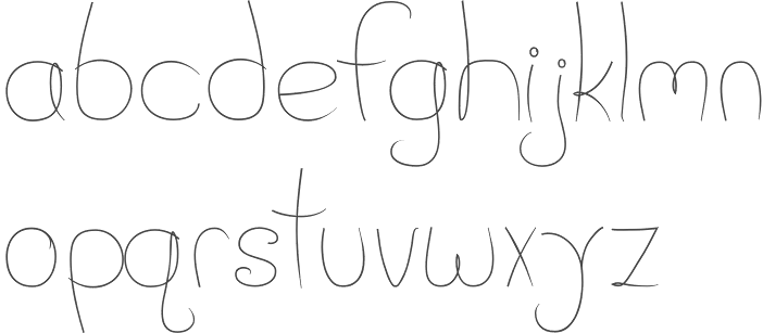
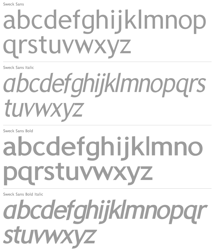
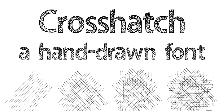
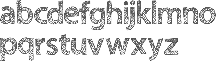
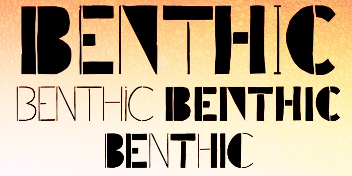
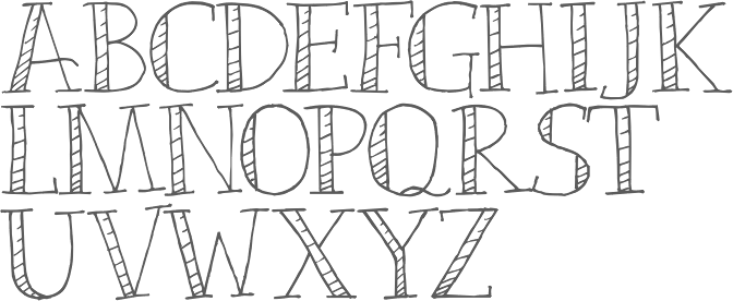
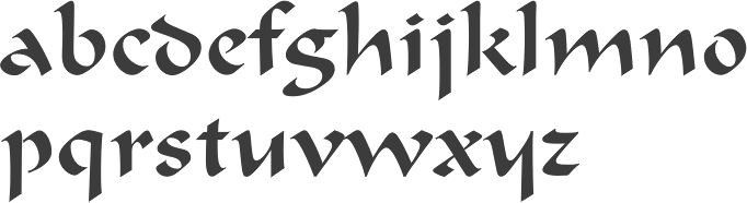
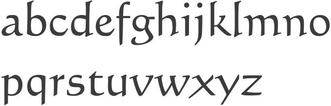
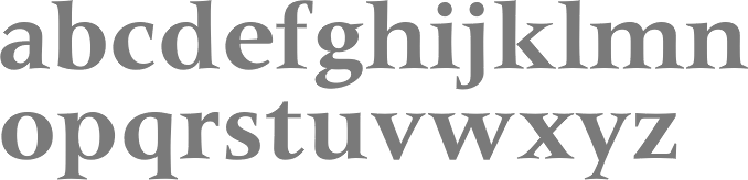
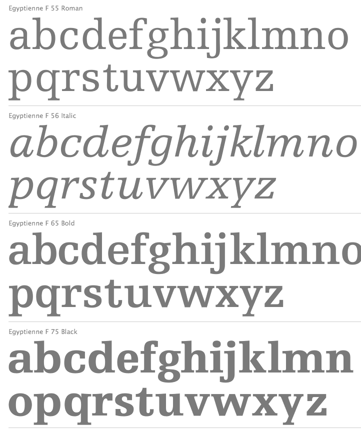
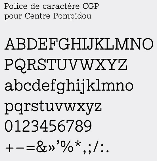
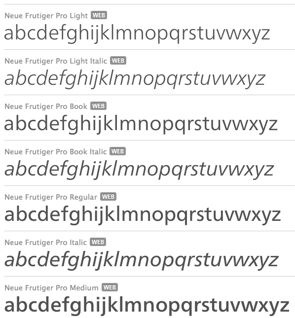
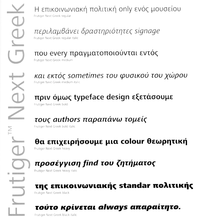
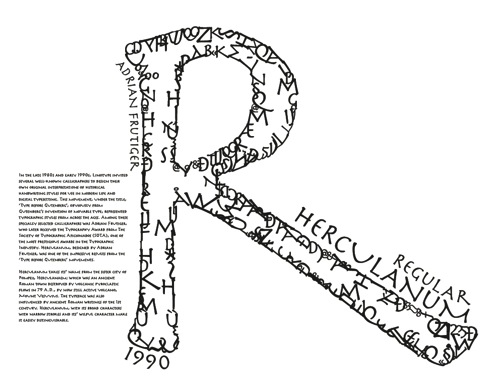
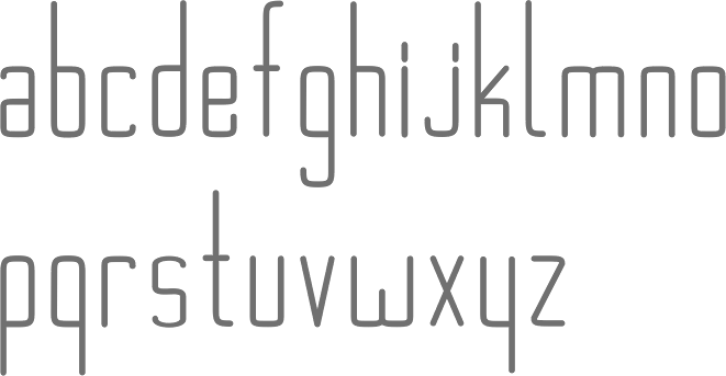
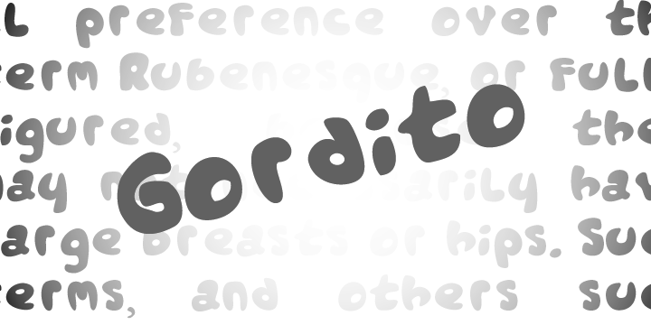
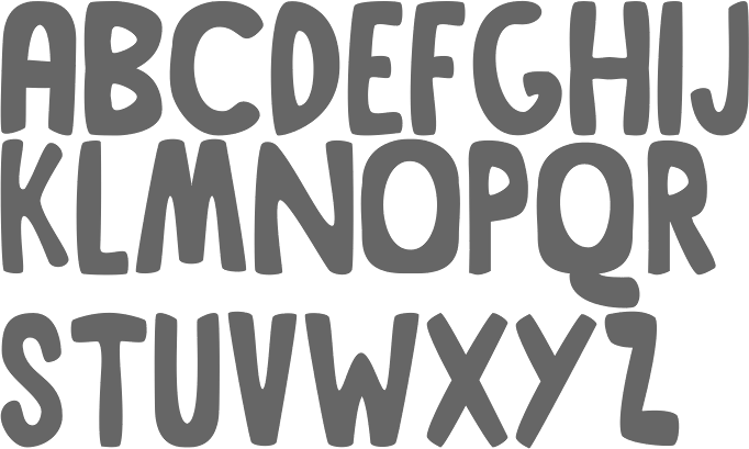
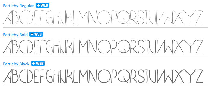
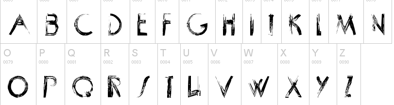
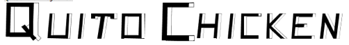
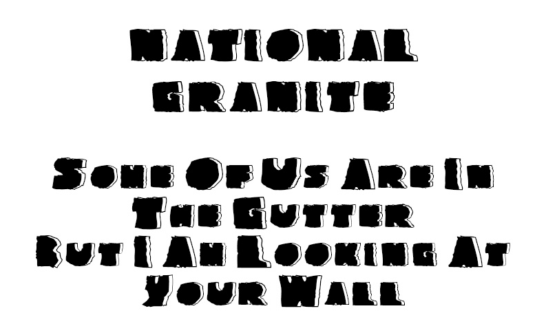
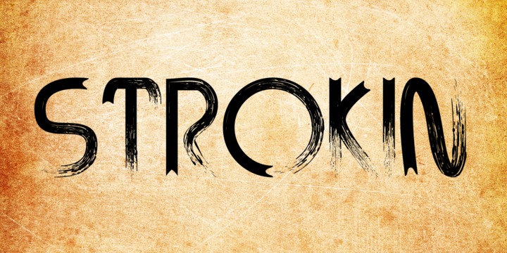
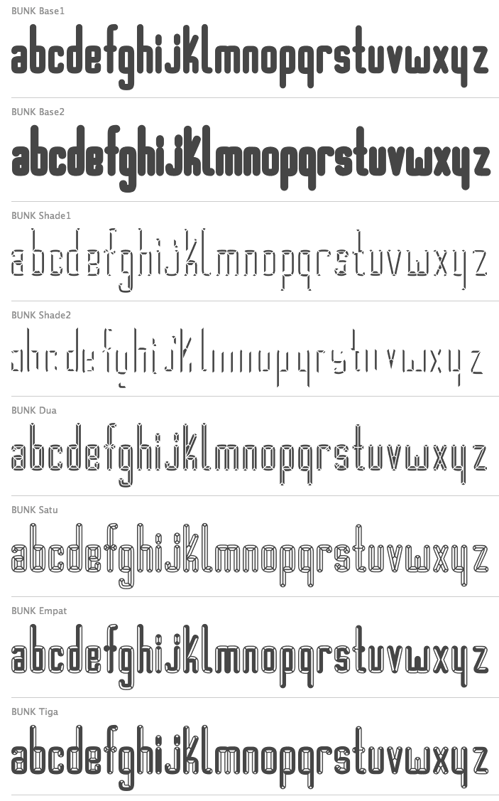
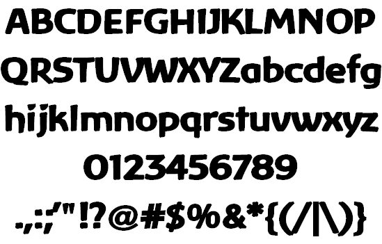
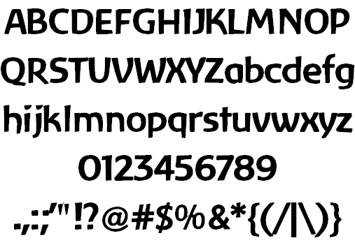
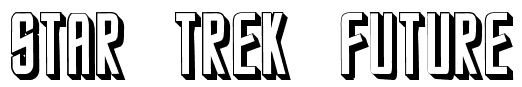
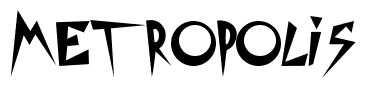
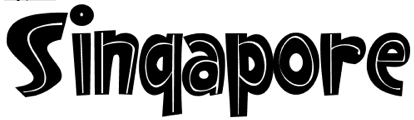
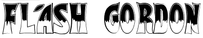
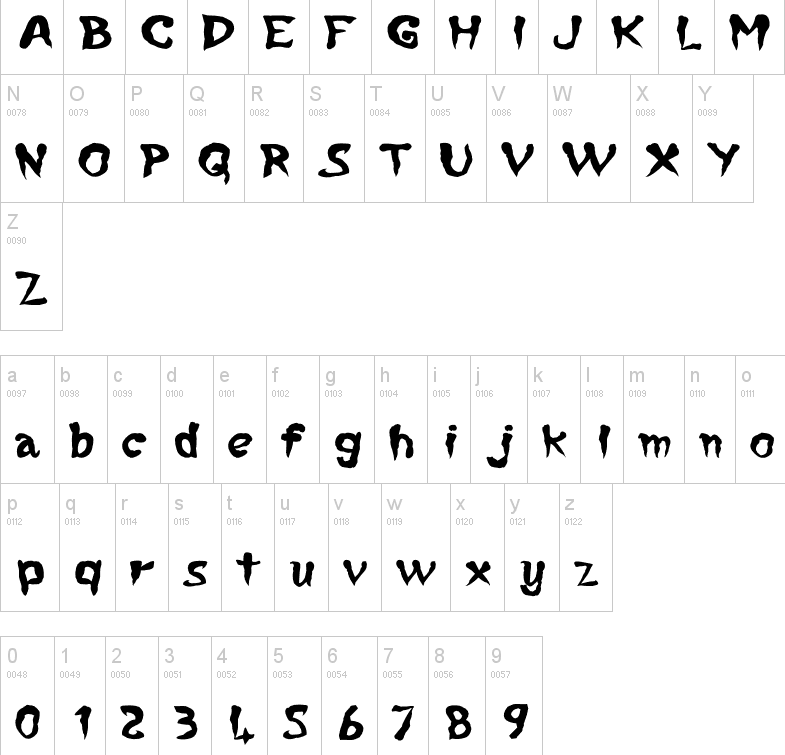
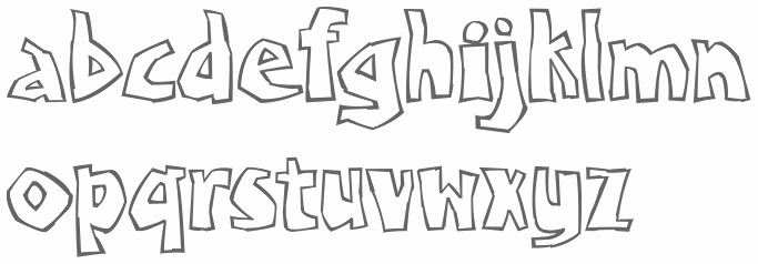
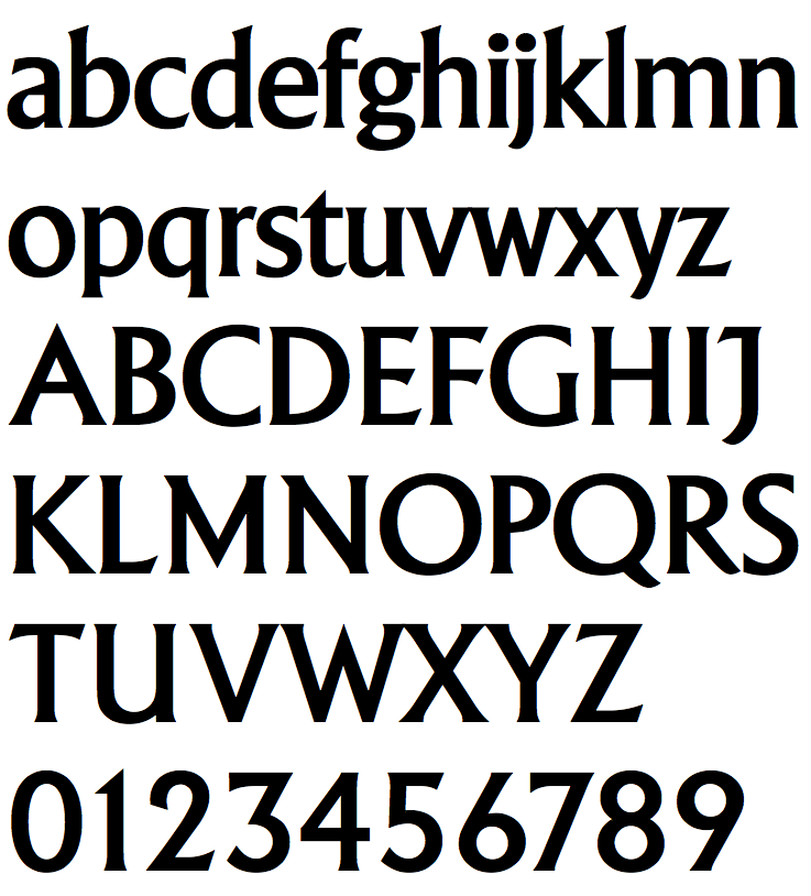
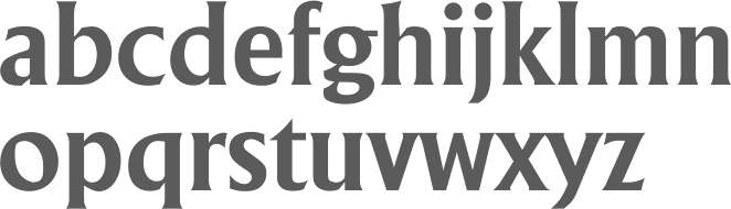
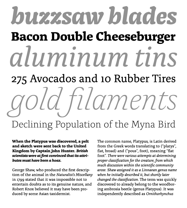
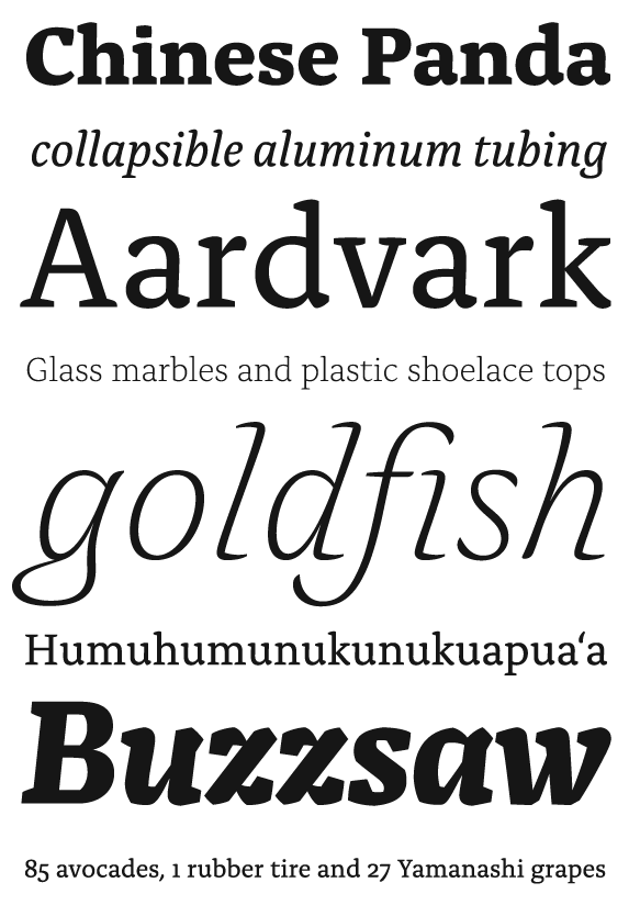
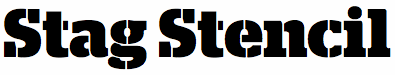
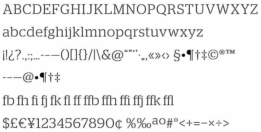
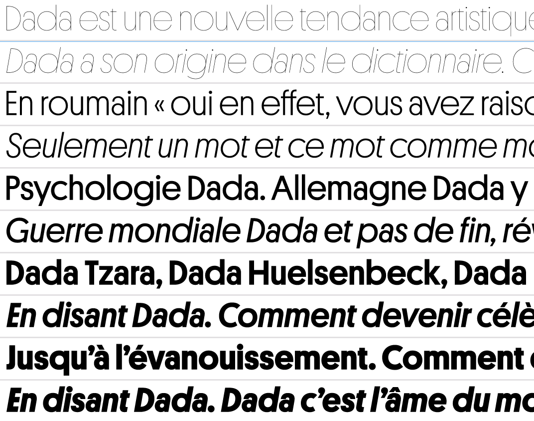
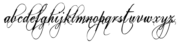
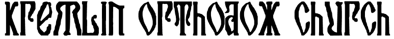
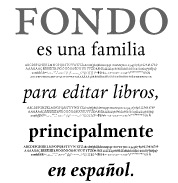
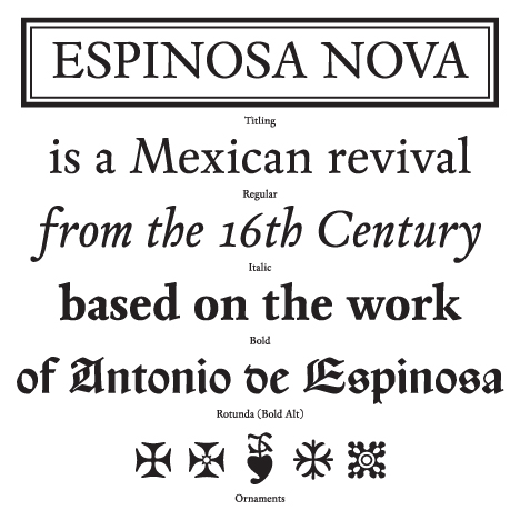
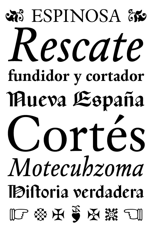
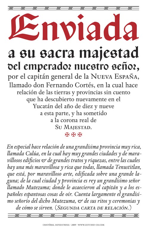
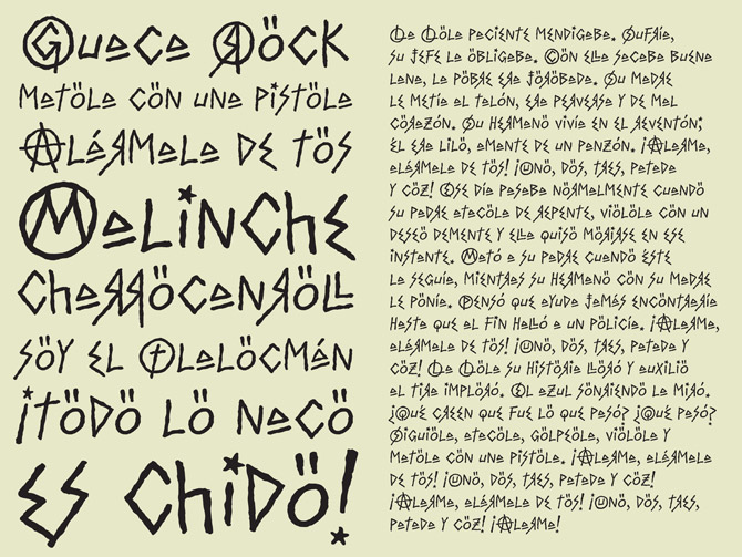
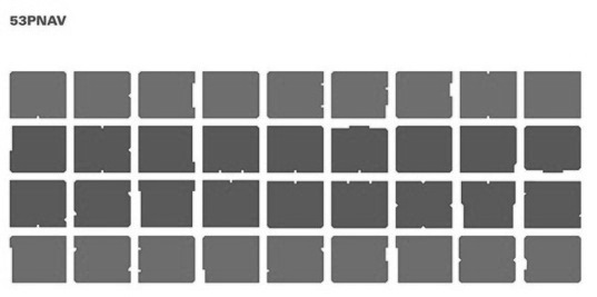
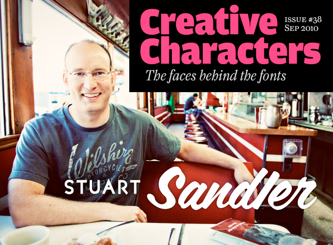
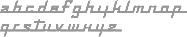
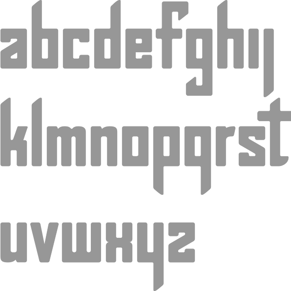
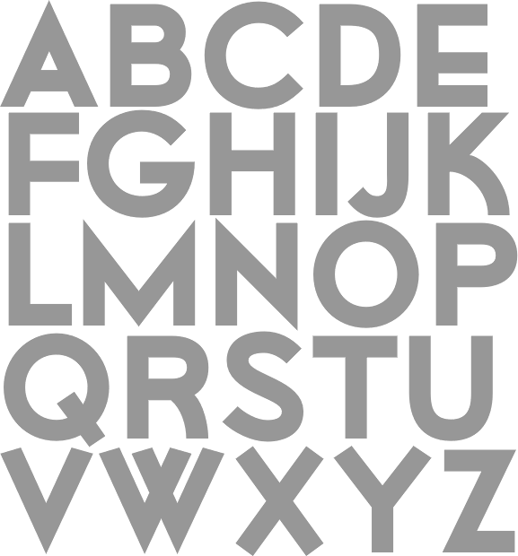
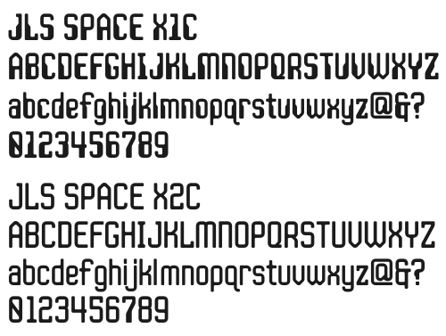
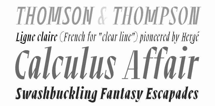
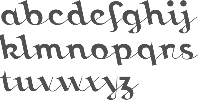
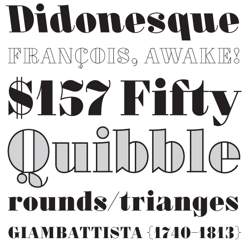
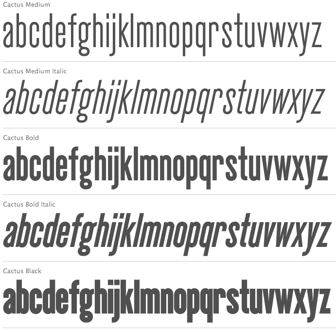
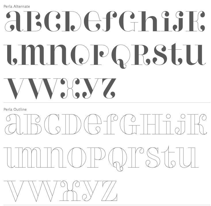
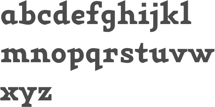
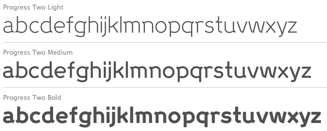
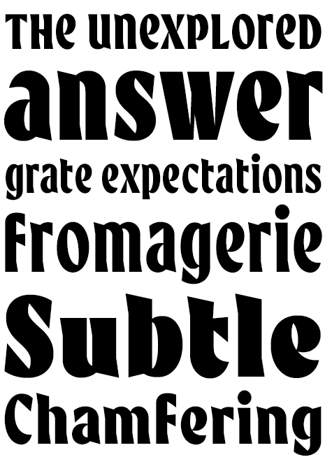
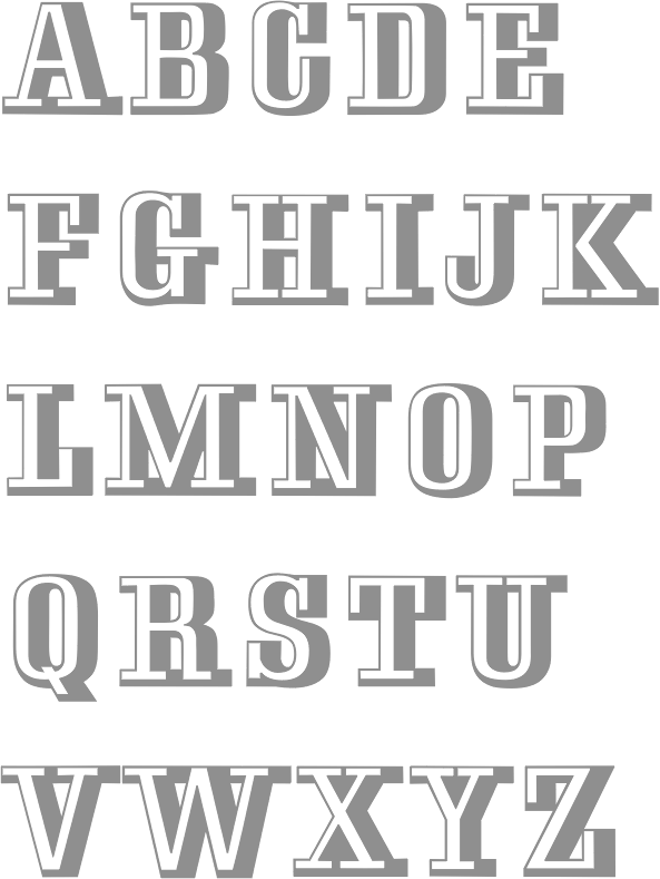
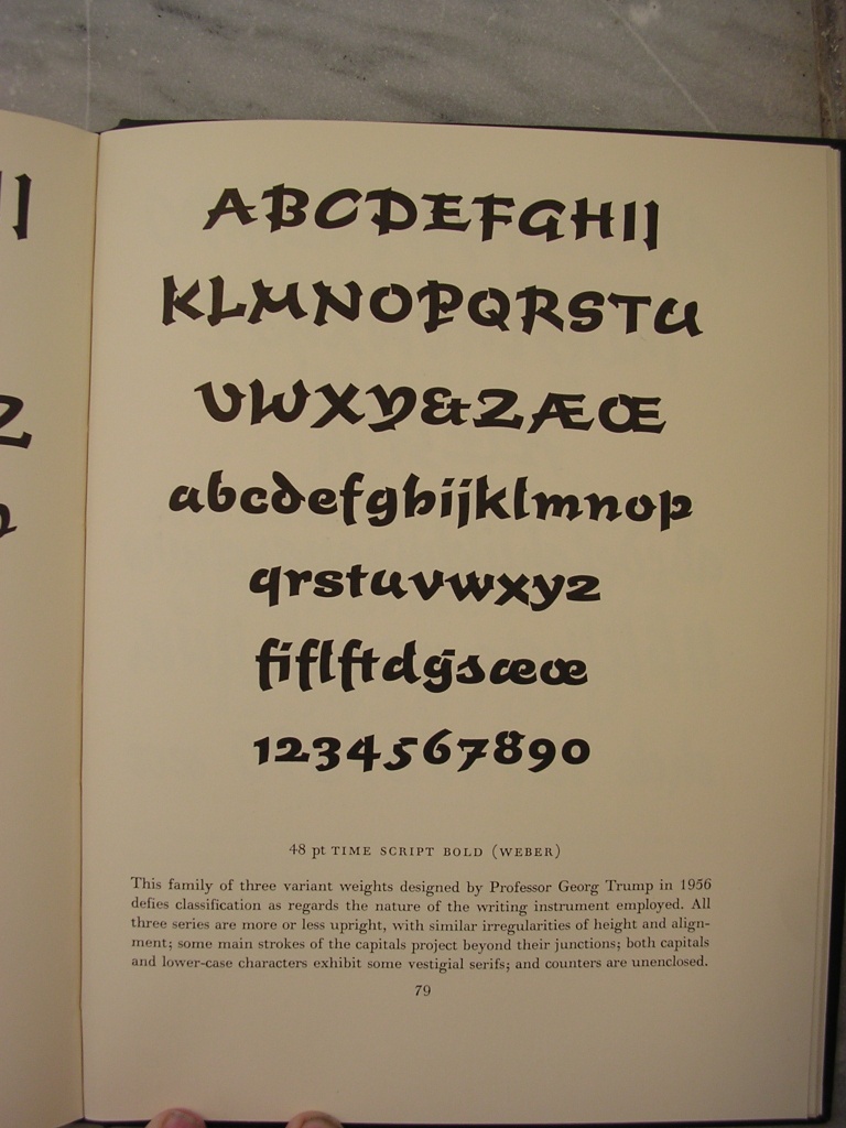
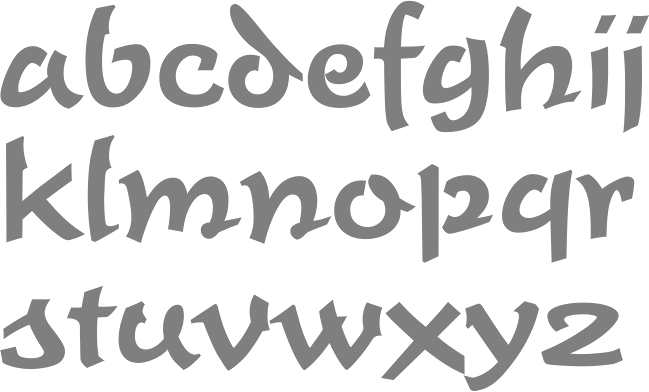
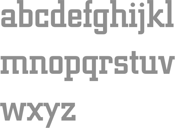
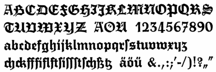
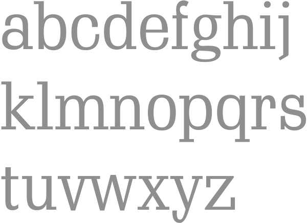
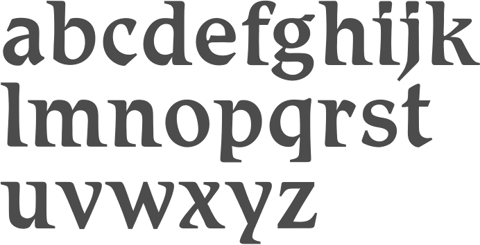
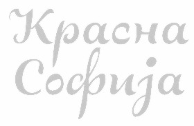
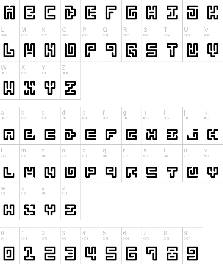
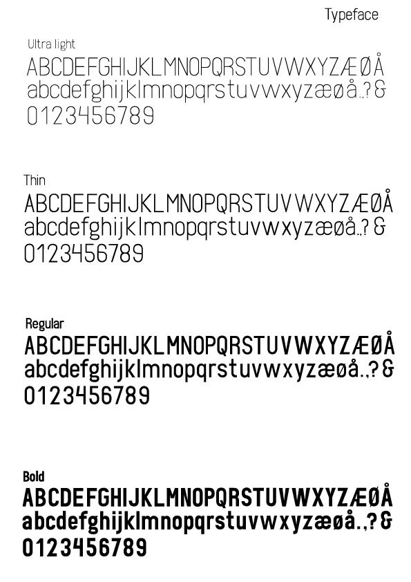
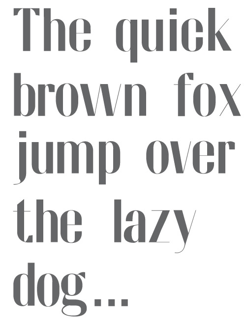
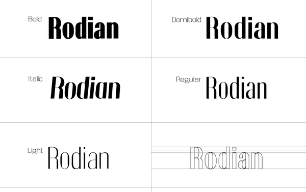
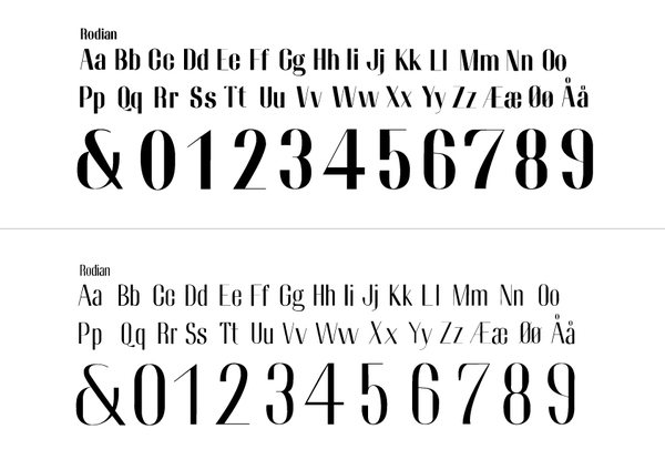
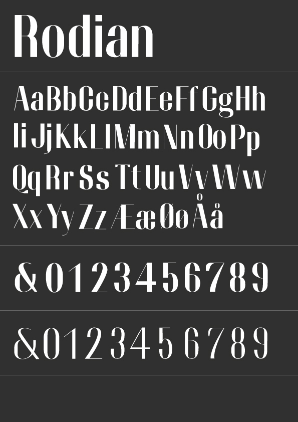
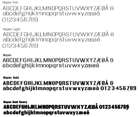
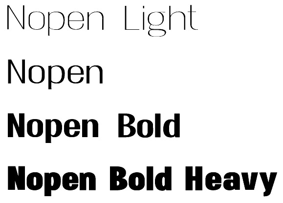
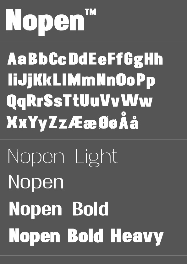
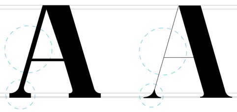
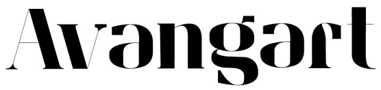
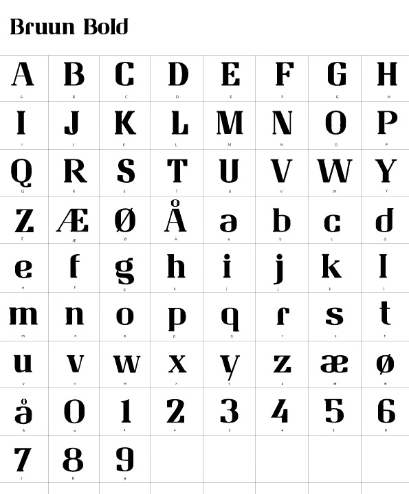
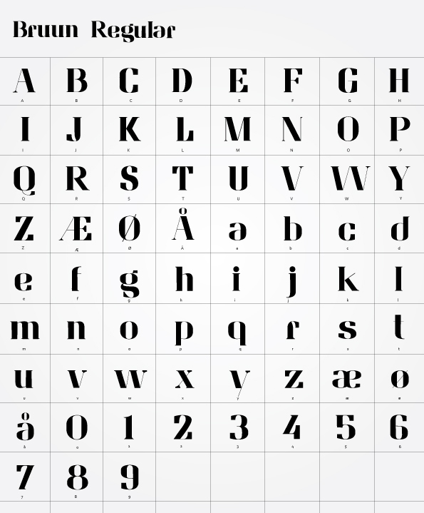
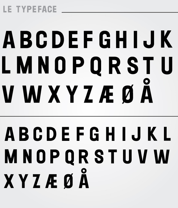
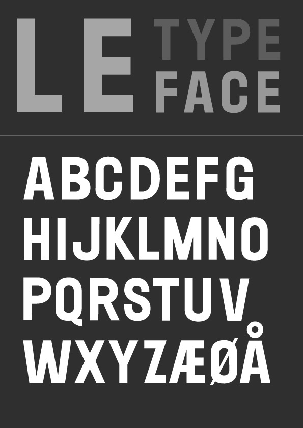
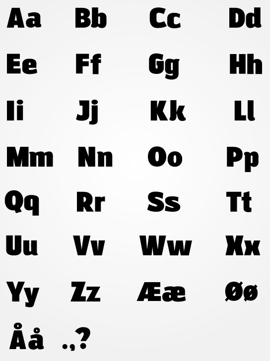
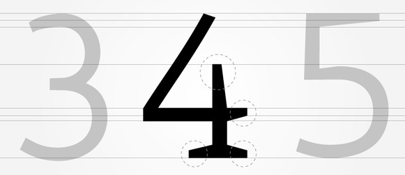
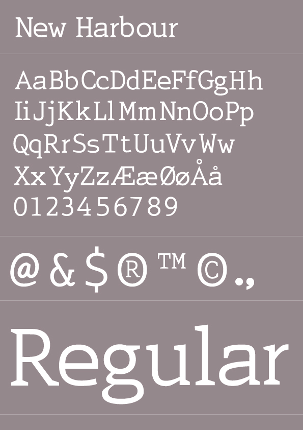
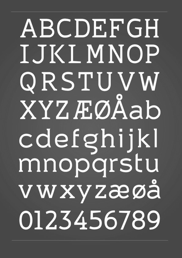
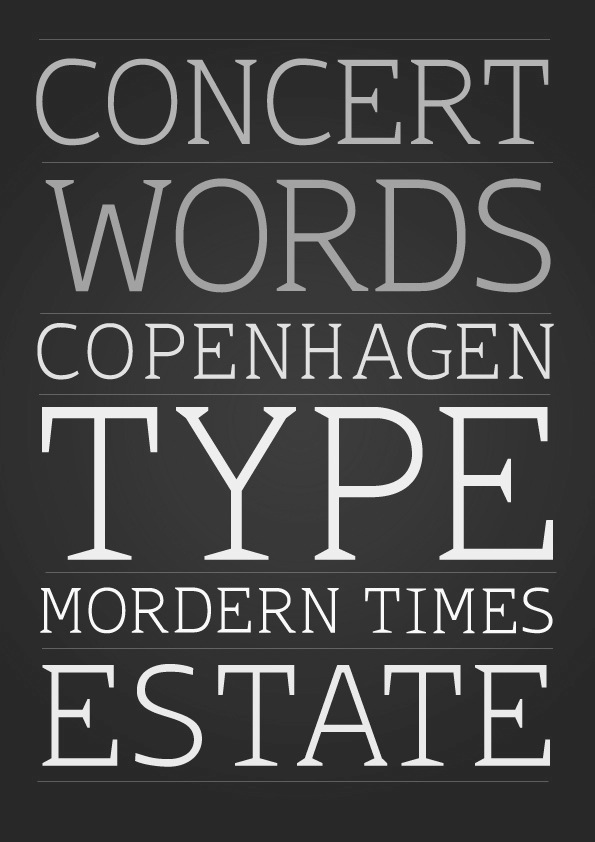
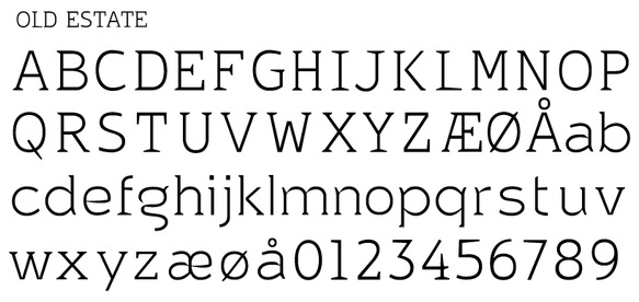
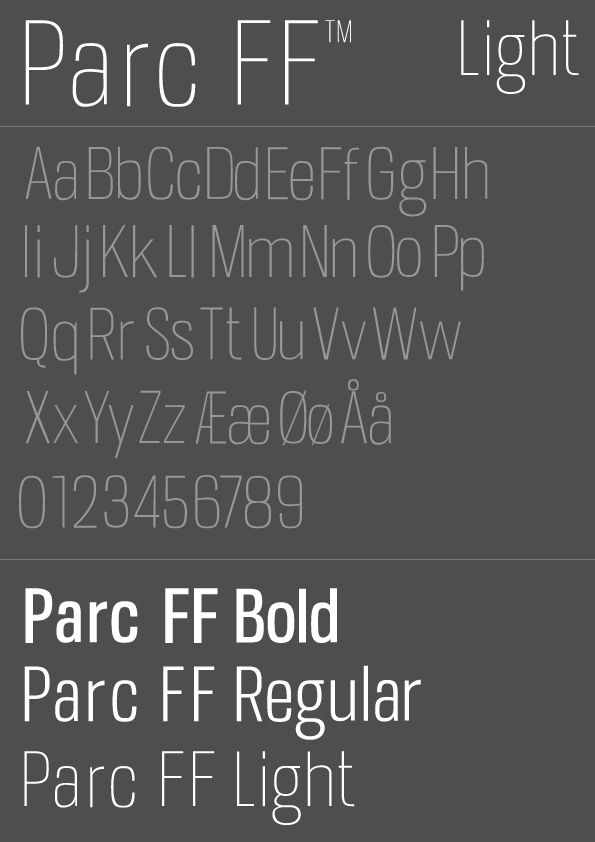
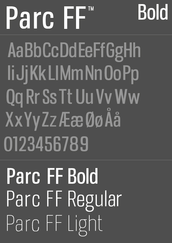
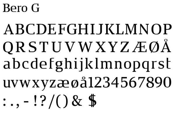
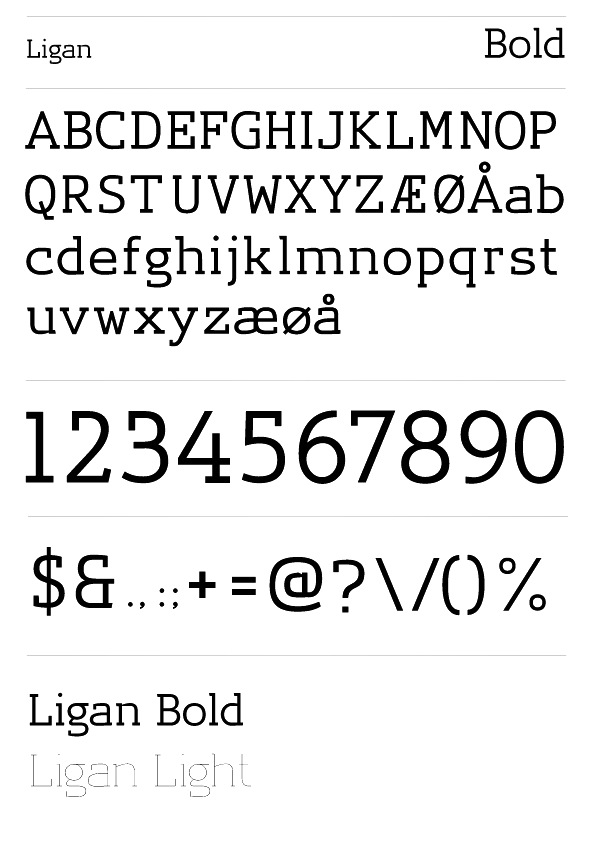
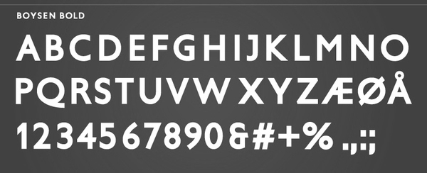
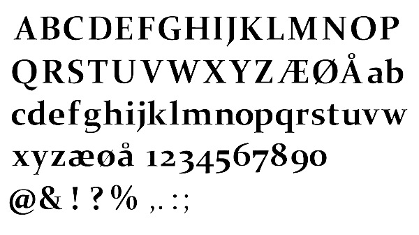
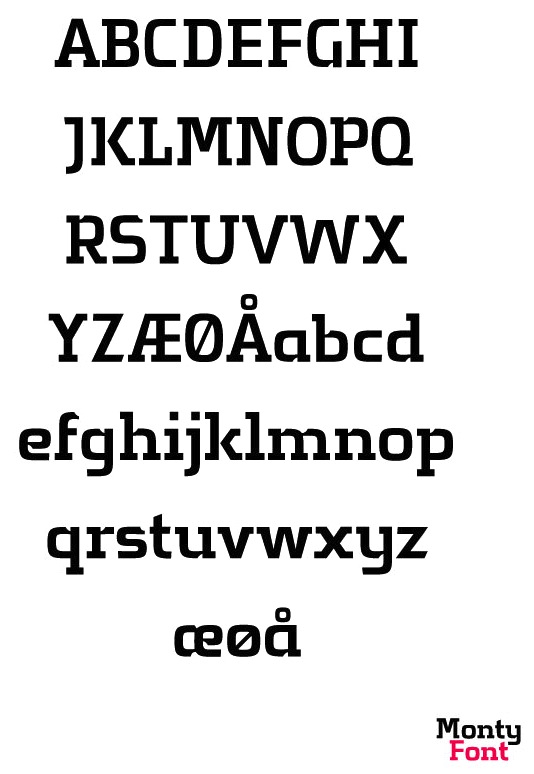
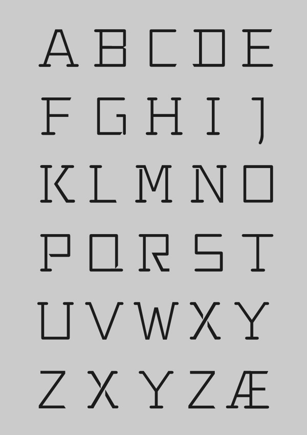
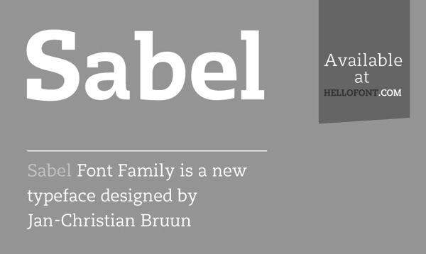
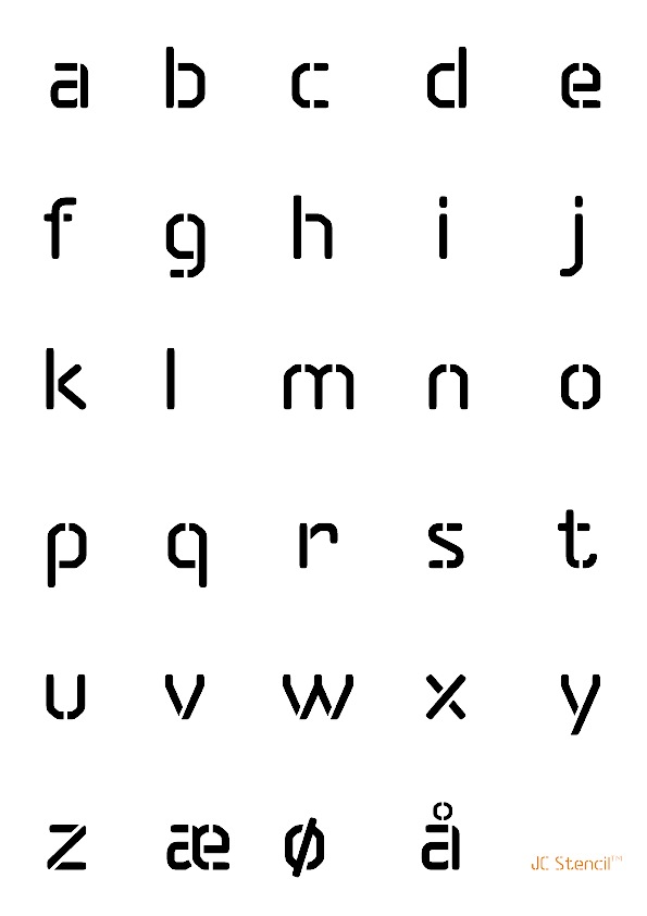
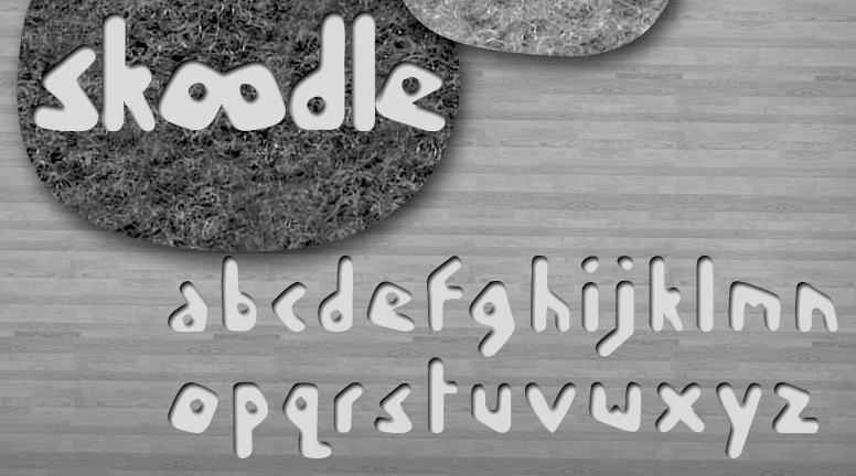
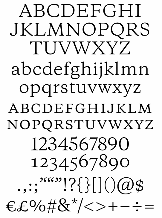
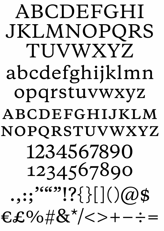
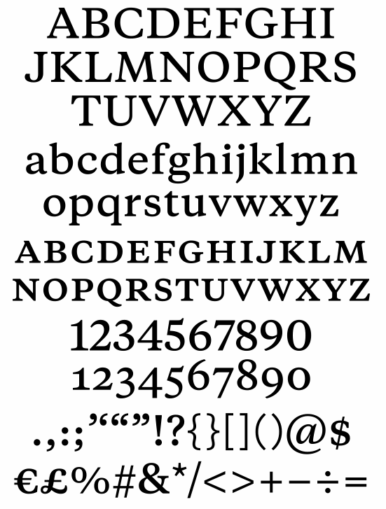
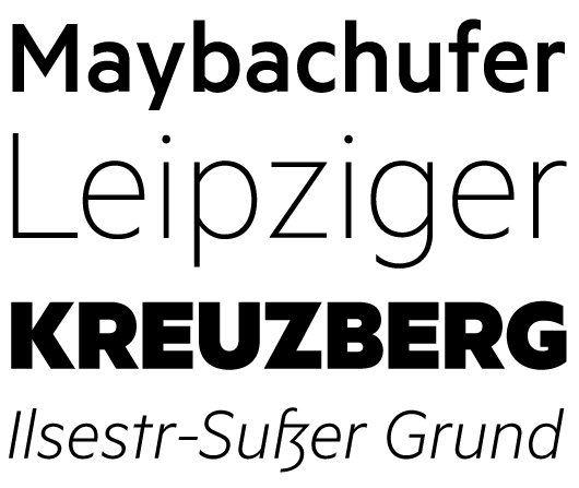
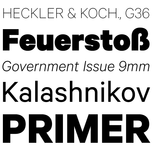
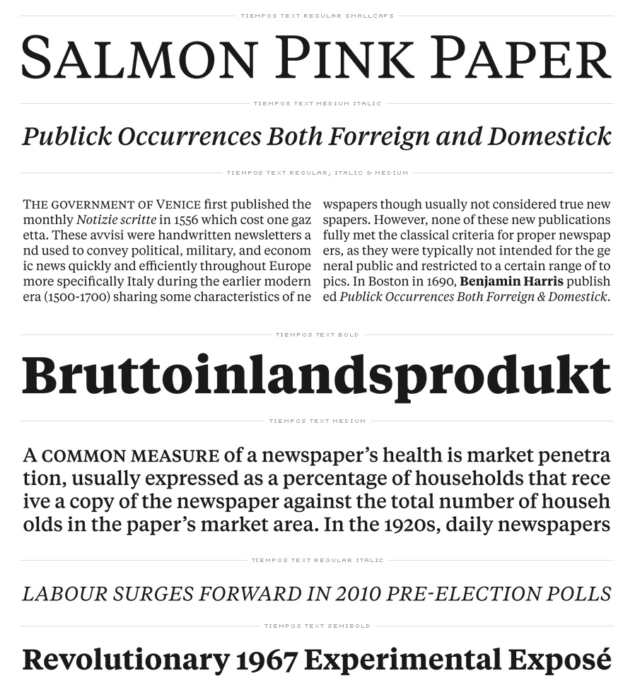
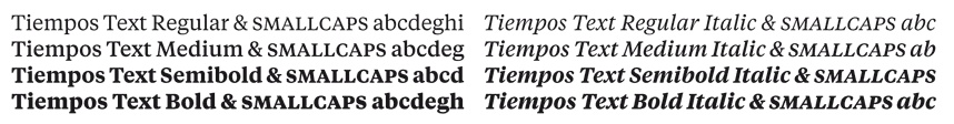
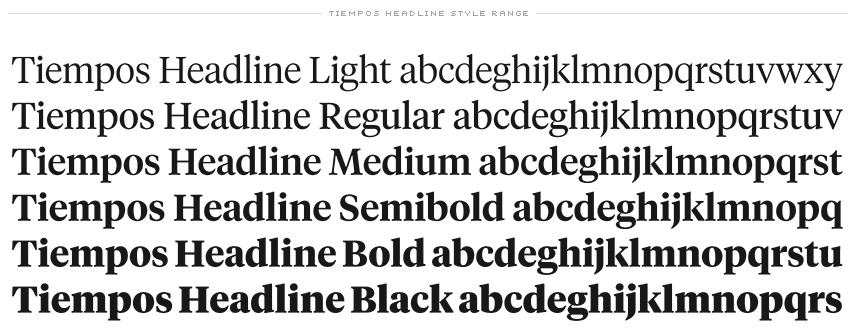
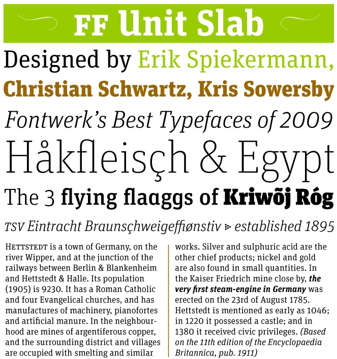
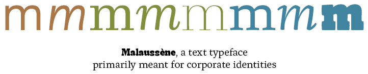
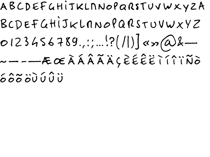
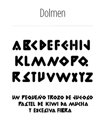
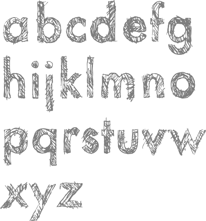
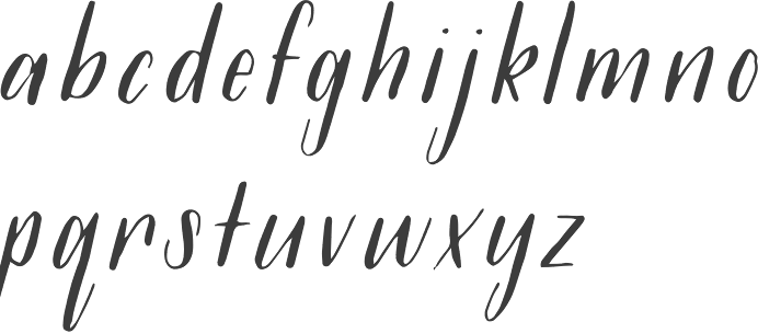
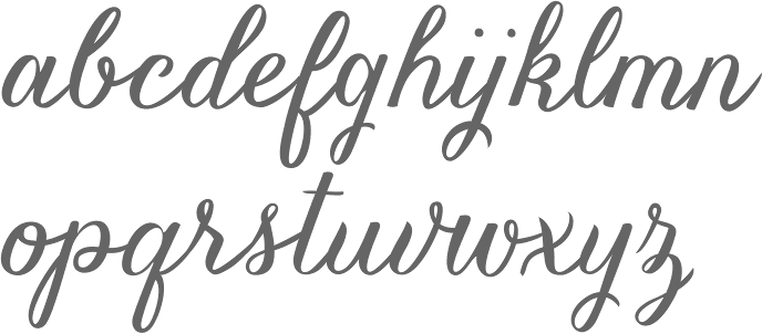
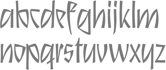
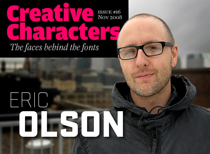
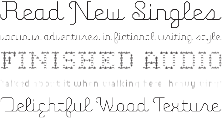
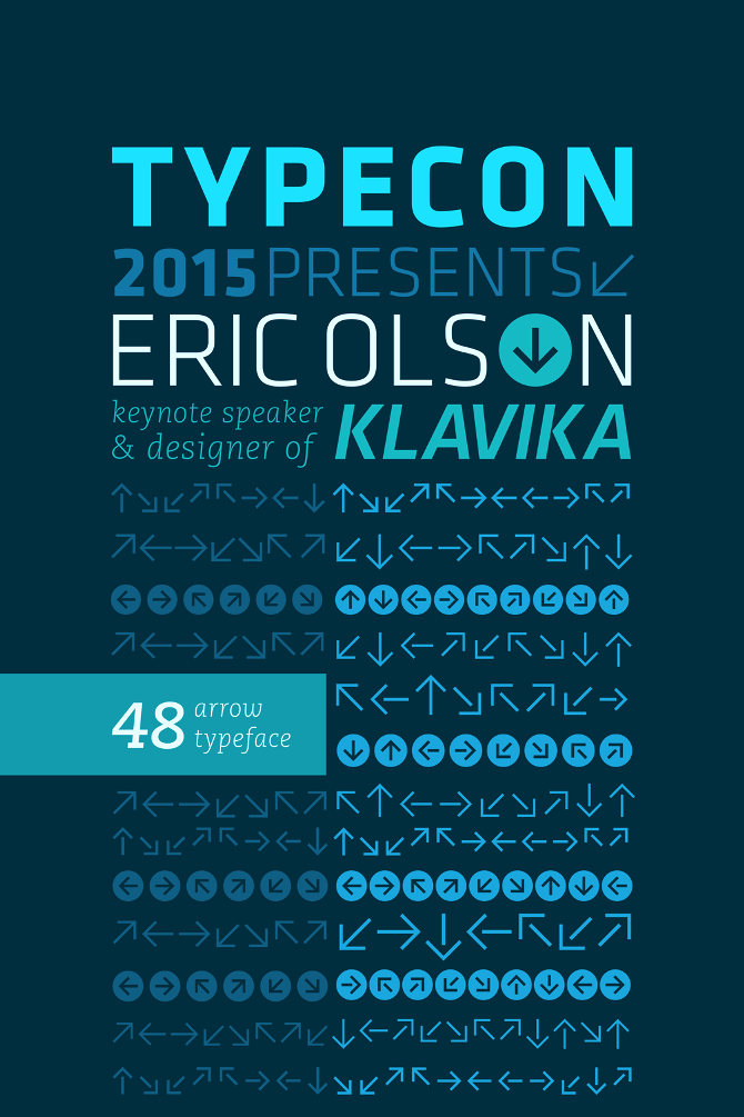
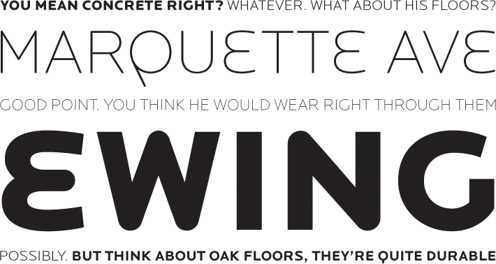
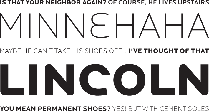
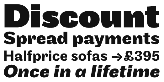
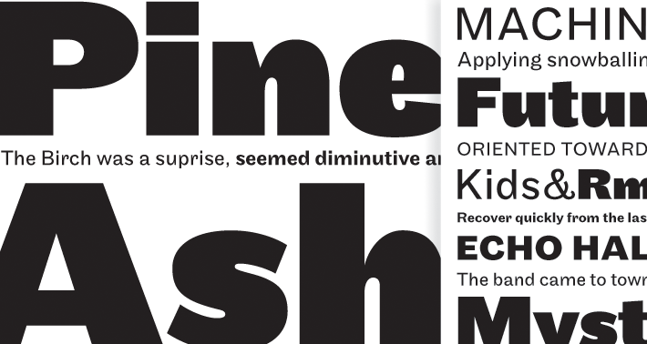
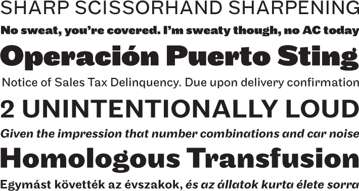
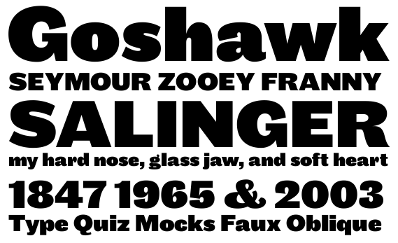
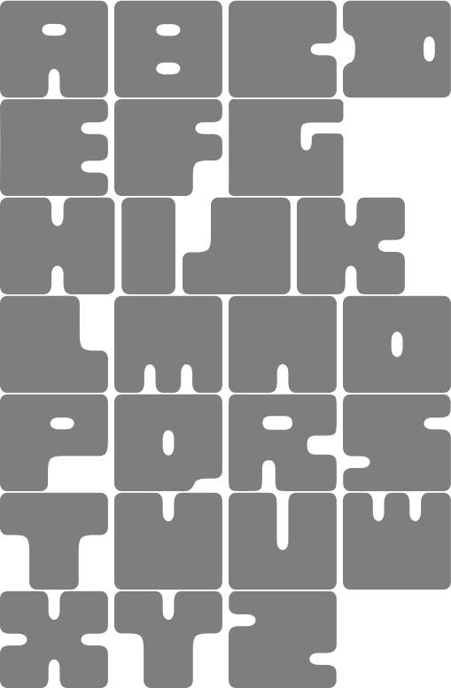
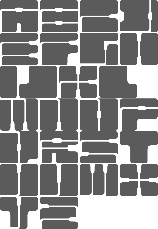
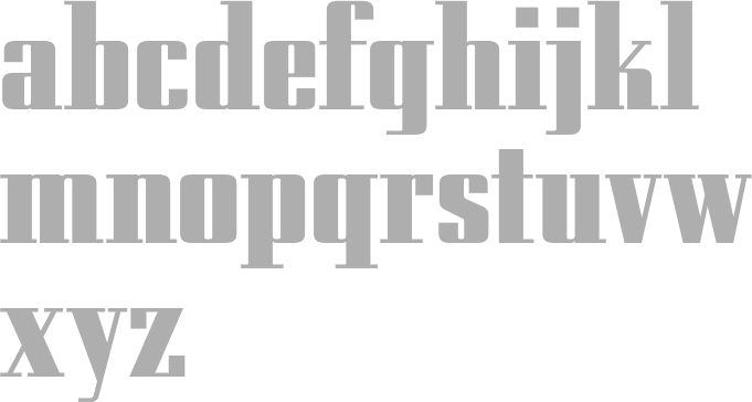
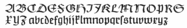
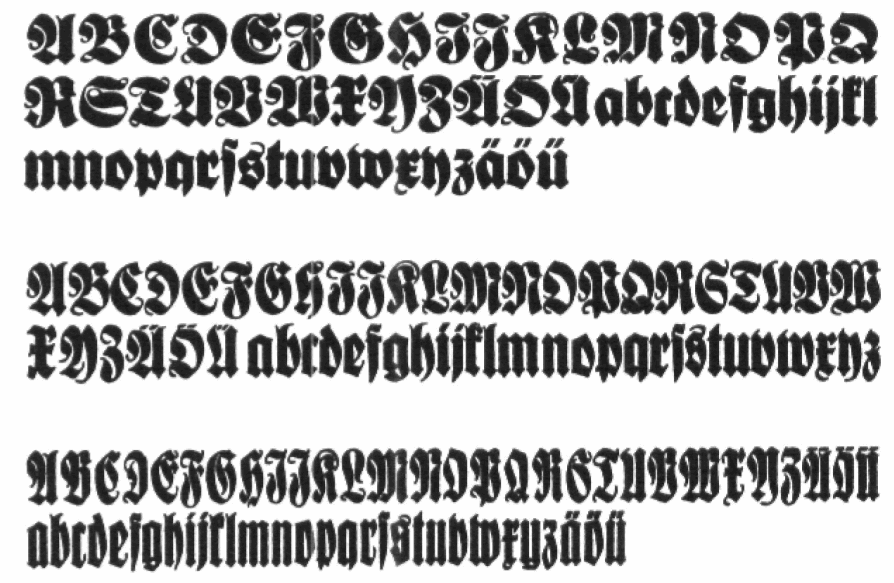
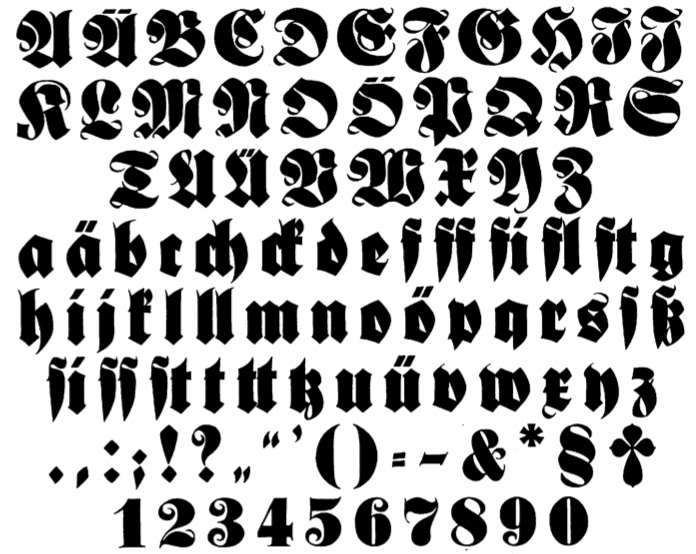
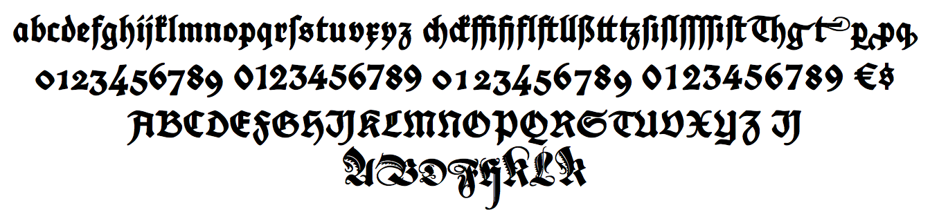
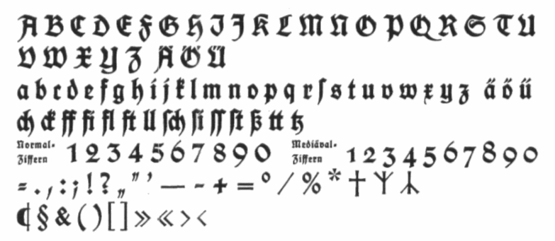
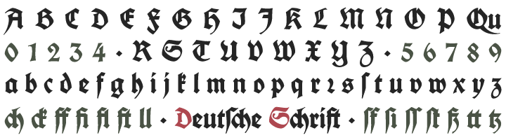
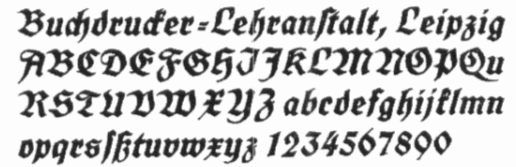
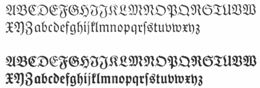
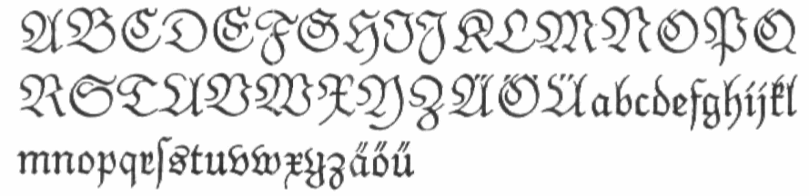
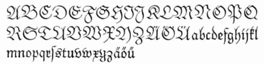
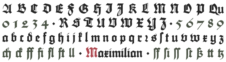
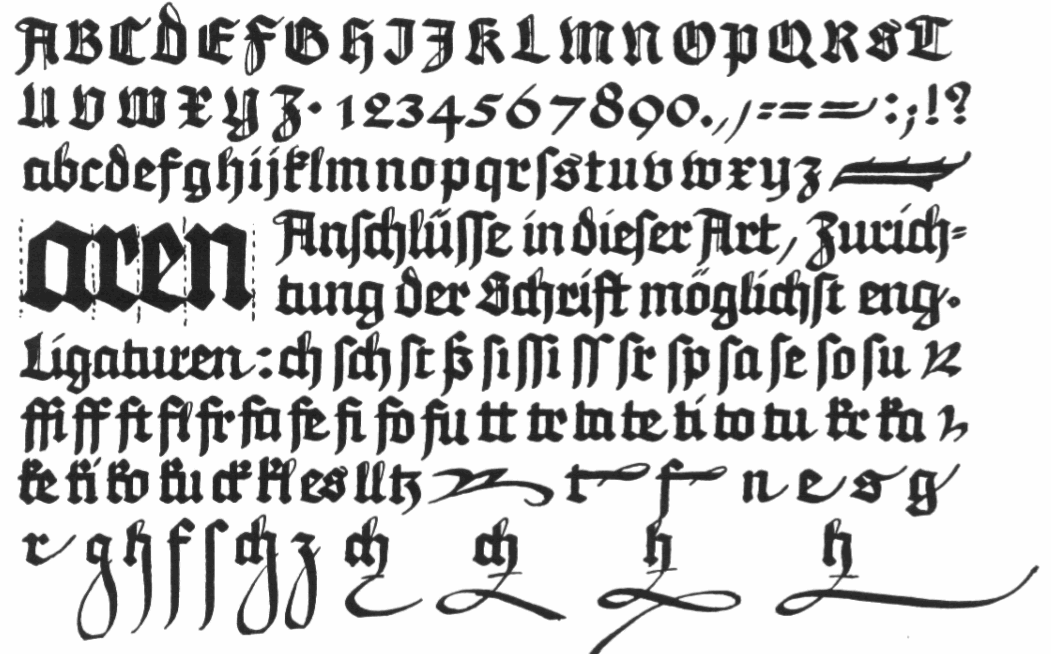
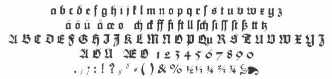
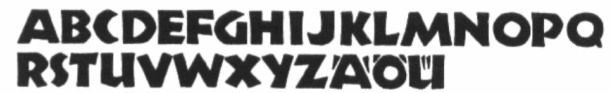
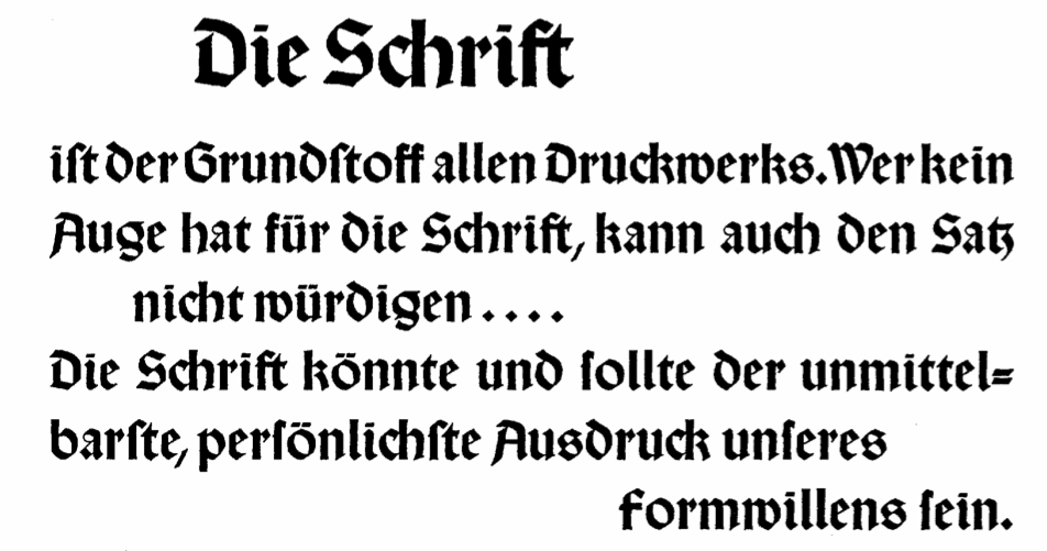
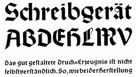
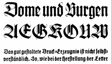
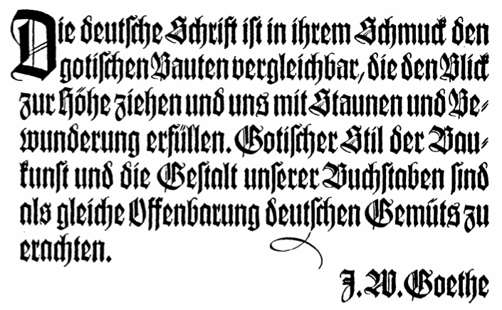
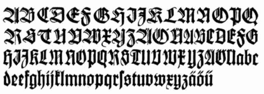
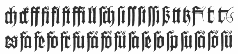
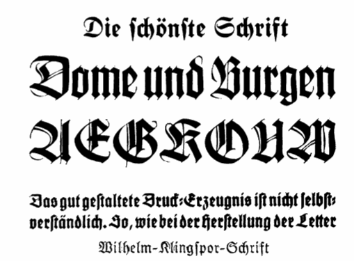
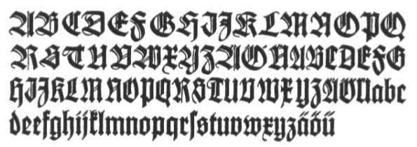
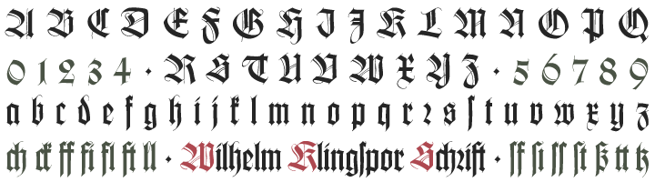
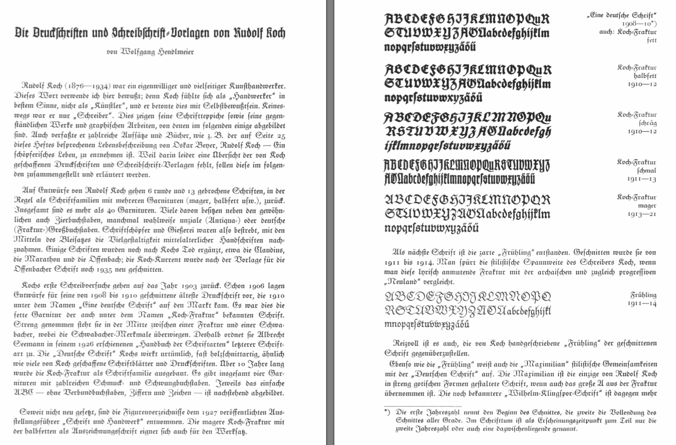
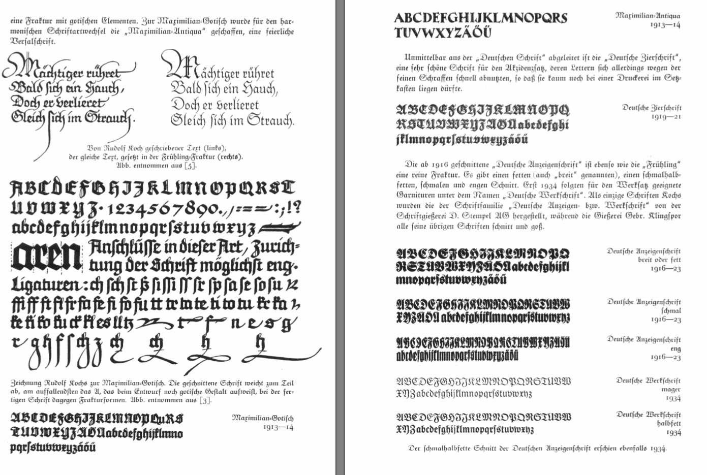
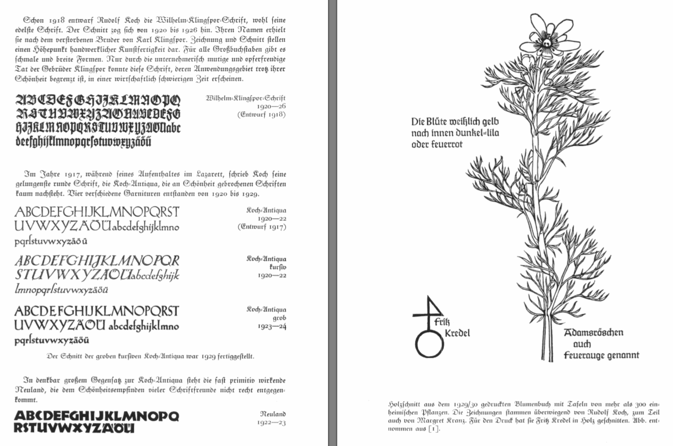
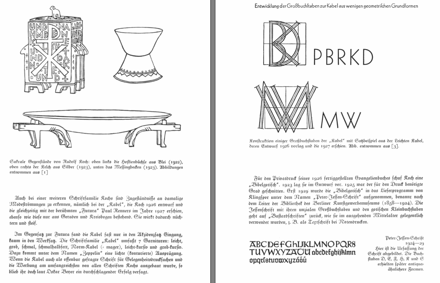
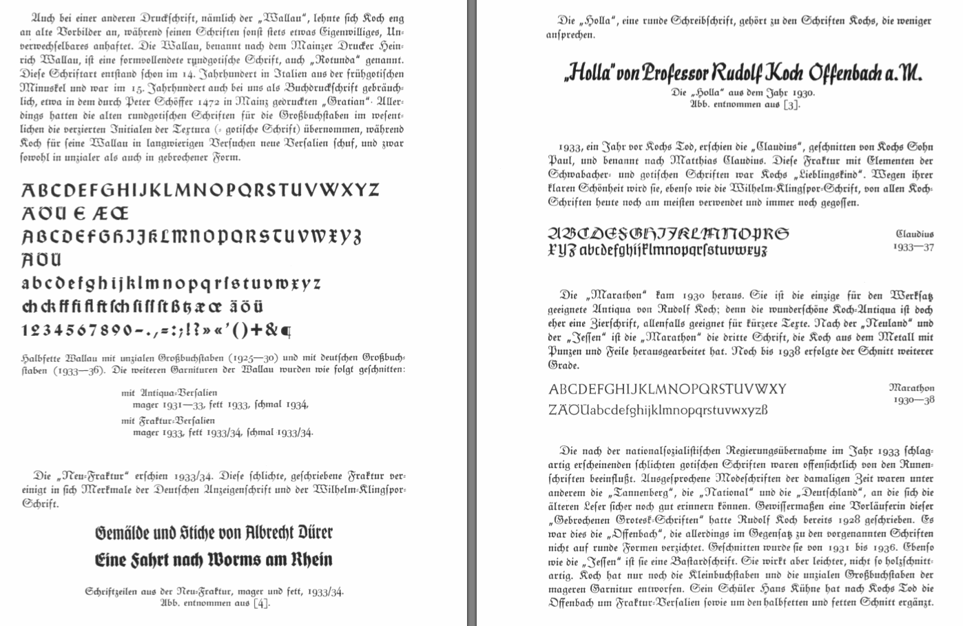
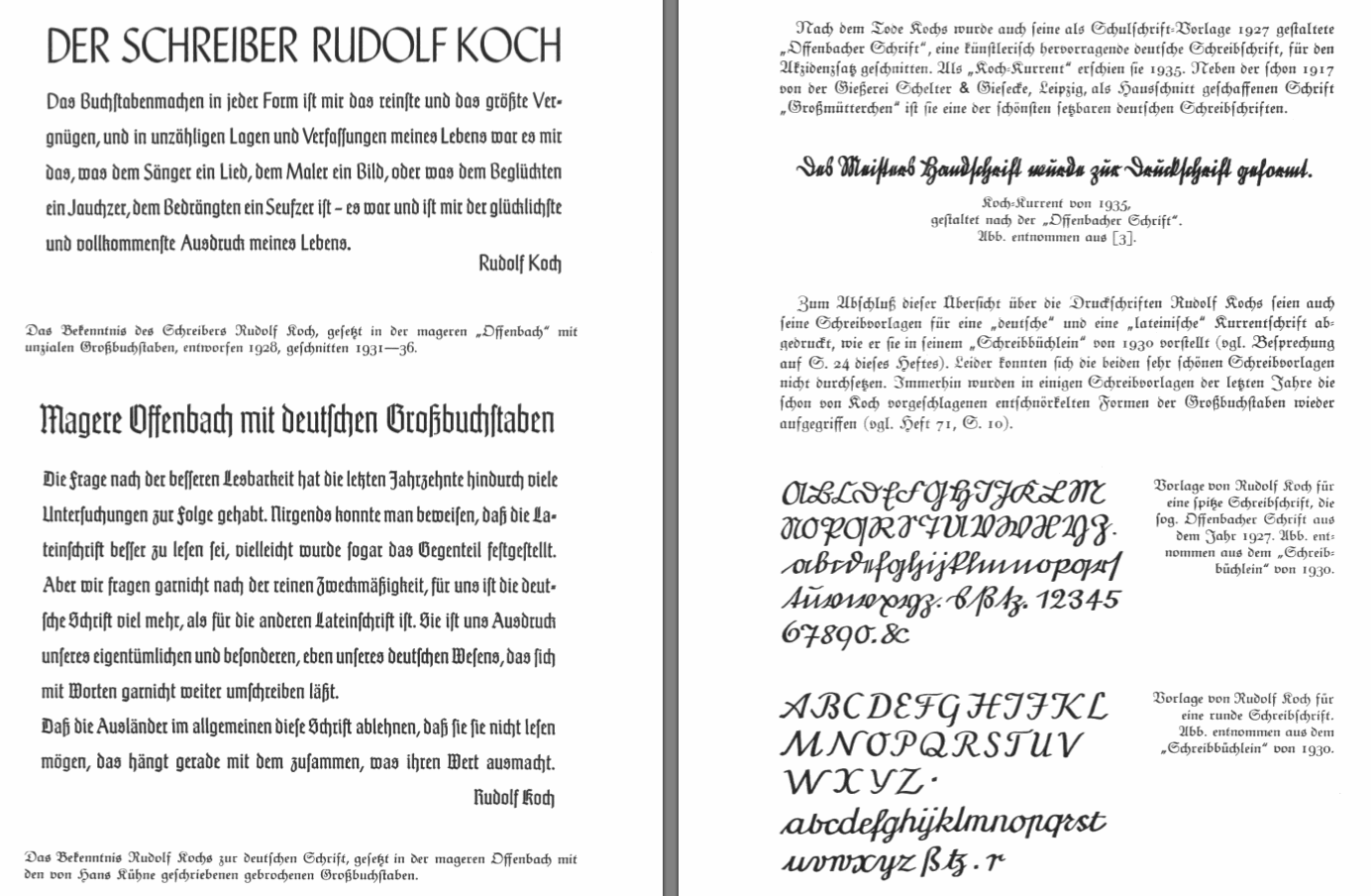
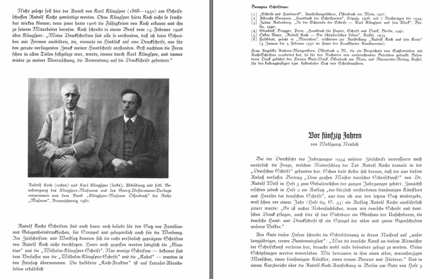
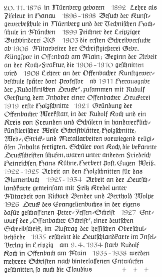
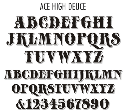
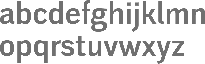
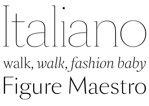
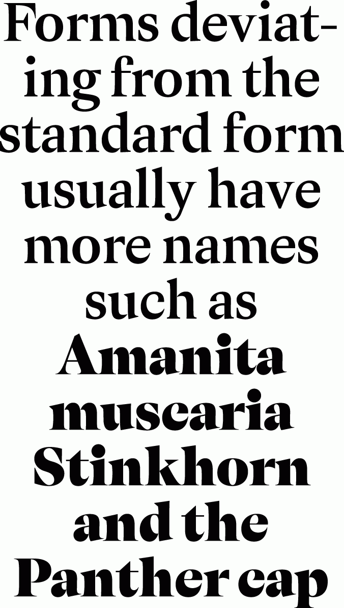
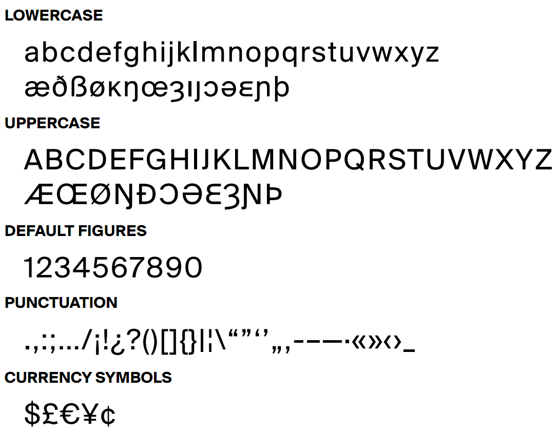
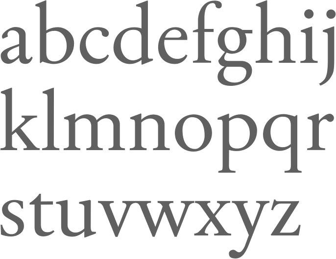
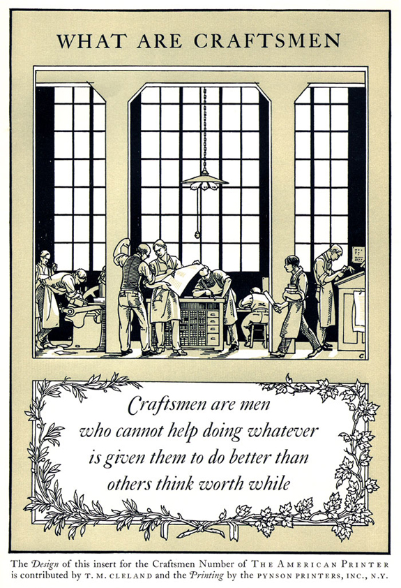
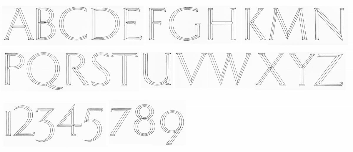
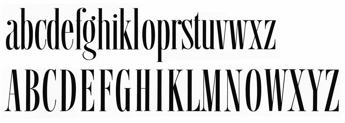
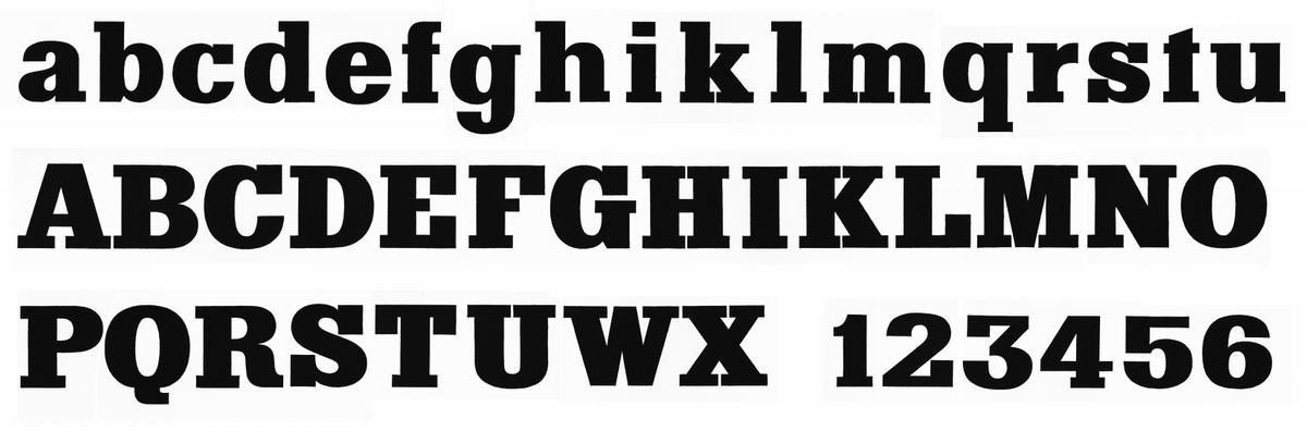
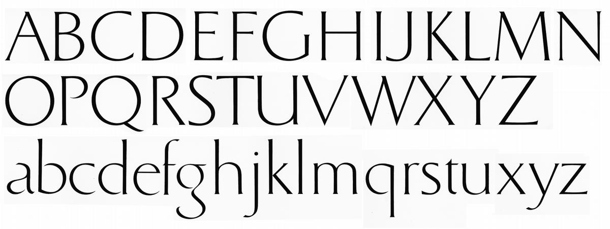
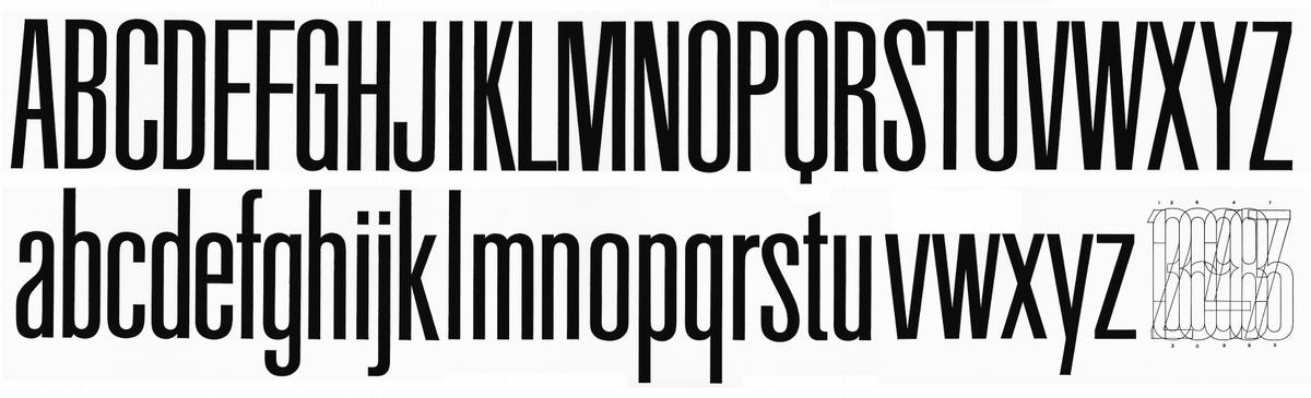
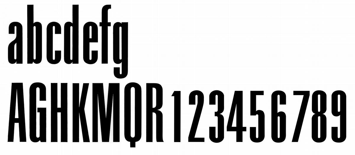
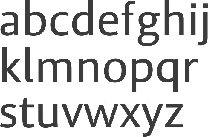
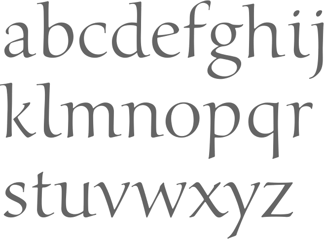
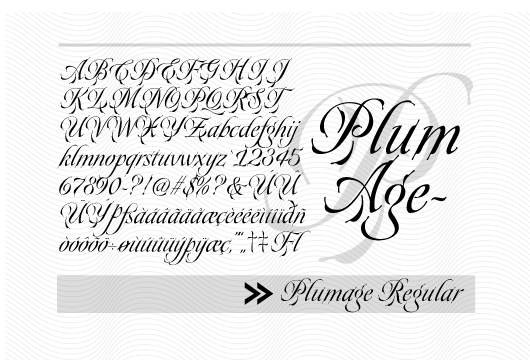
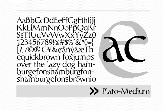
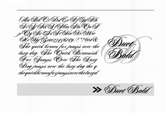
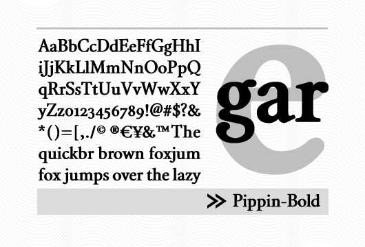
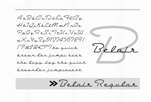
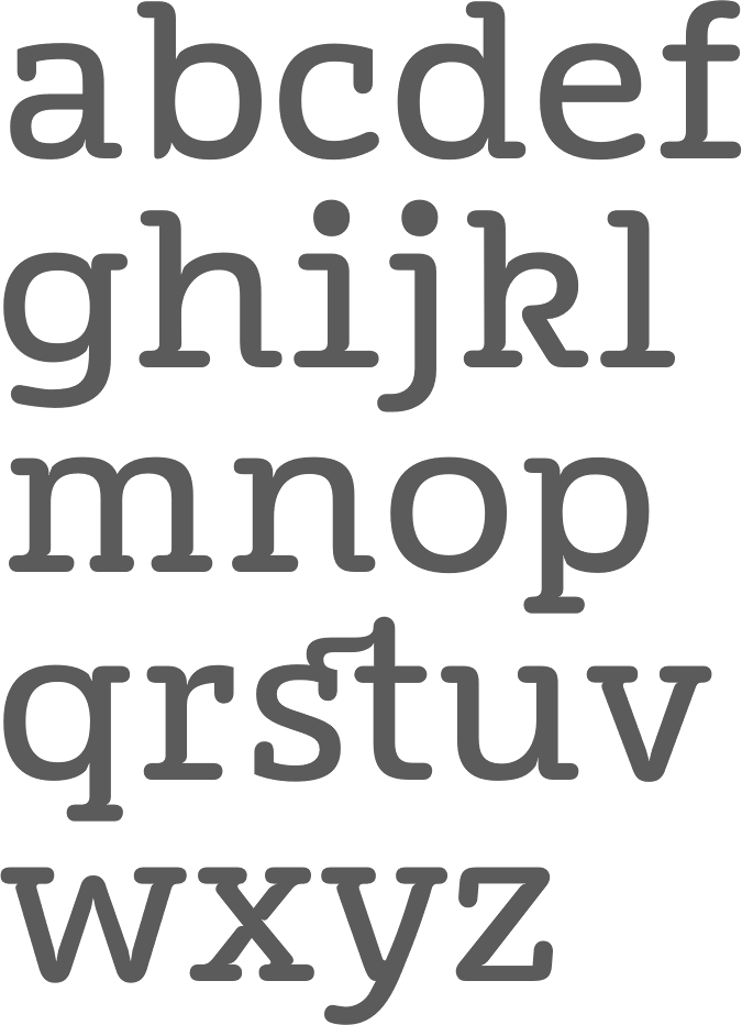
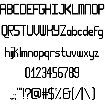
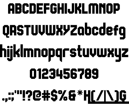
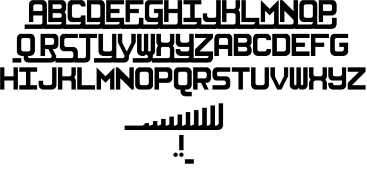
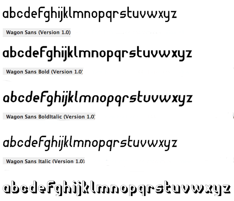
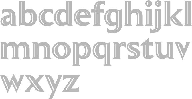
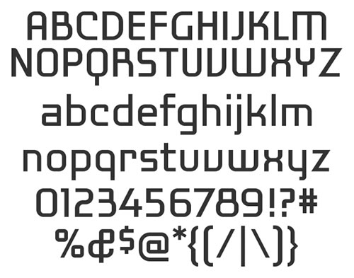
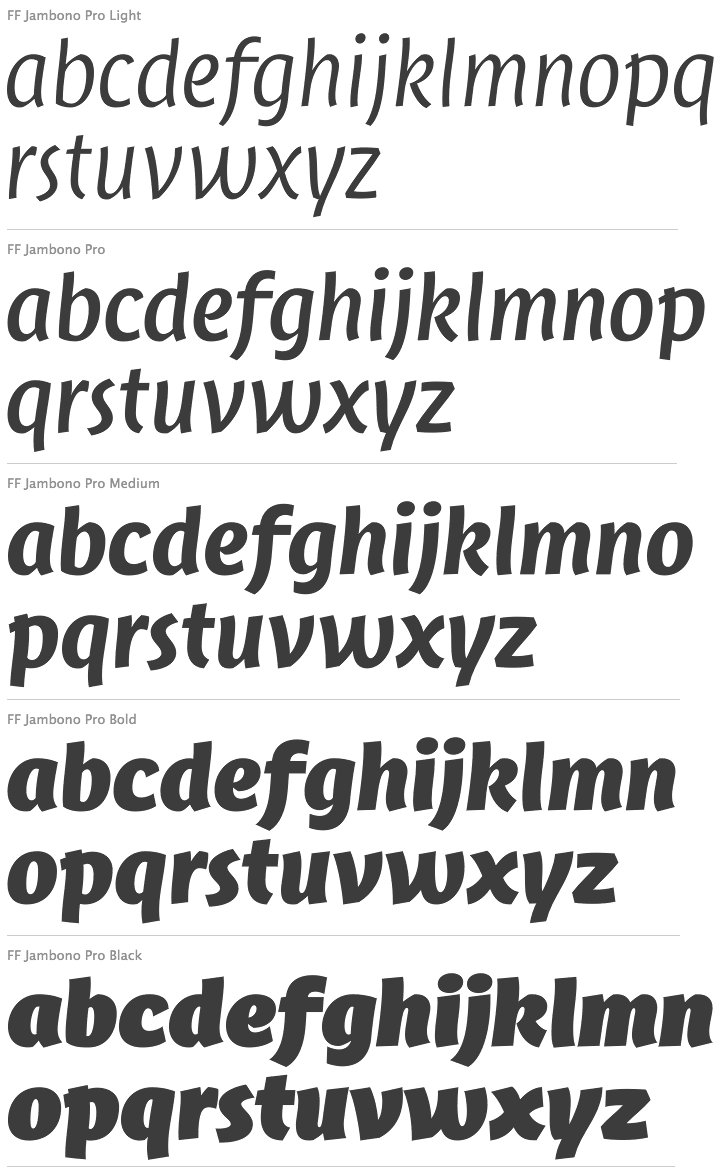
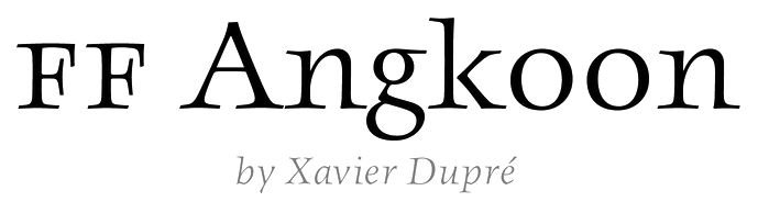
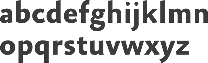
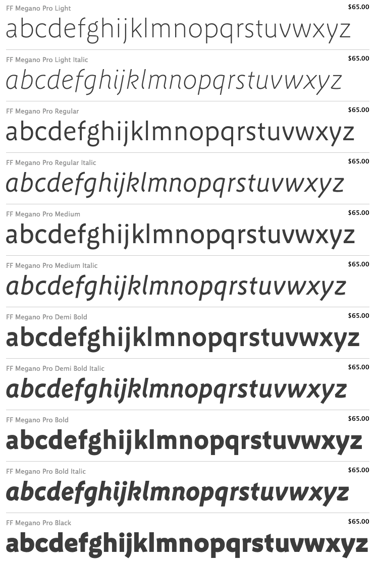
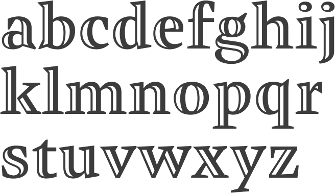
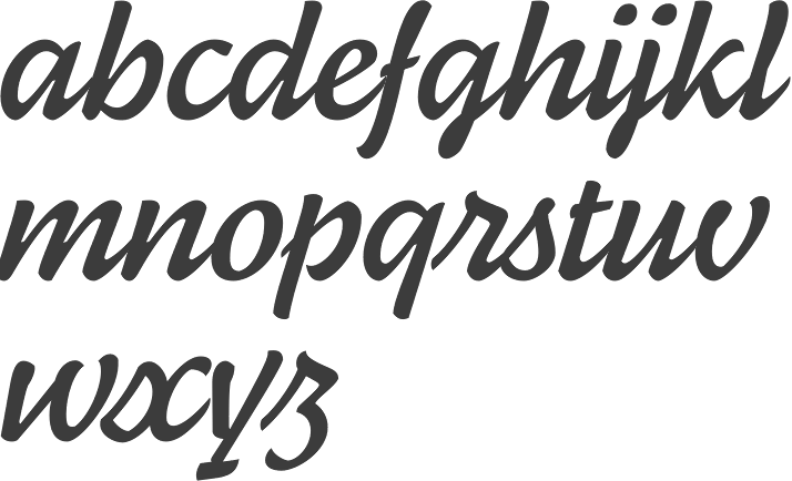
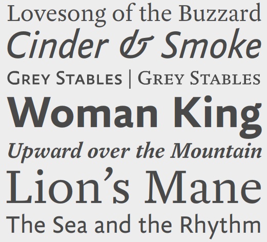
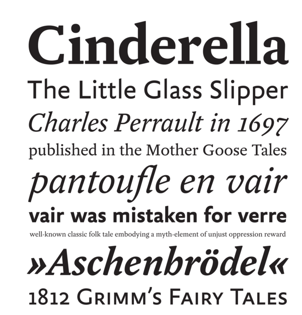
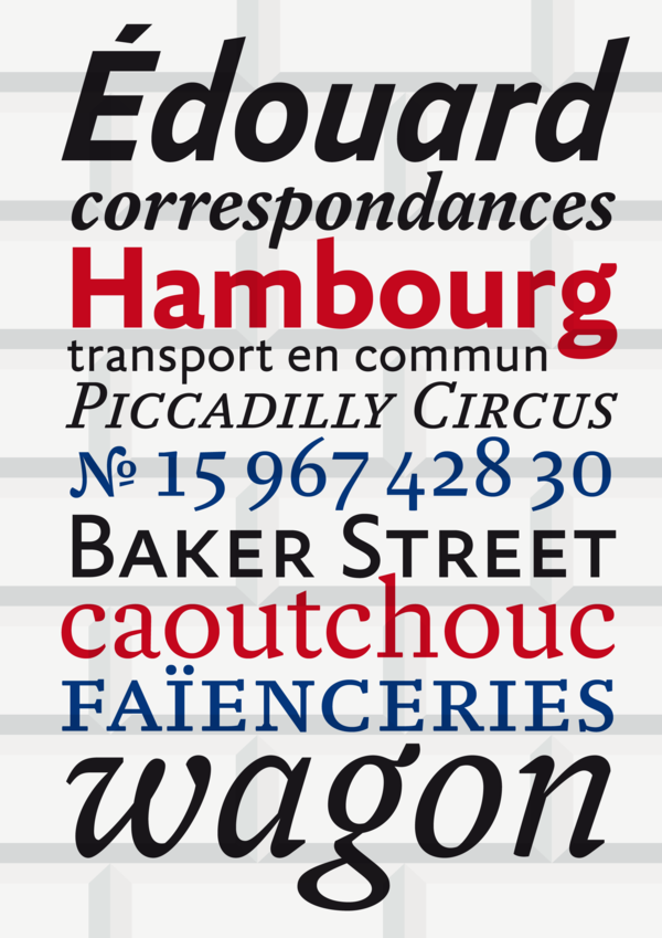