TYPE DESIGN INFORMATION PAGE last updated on Mon Jul 20 20:28:00 EDT 2026
FONT RECOGNITION VIA FONT MOOSE

|
|
|
|
|
Circle-themed typefaces | ||
|
|
|
|

SWITCH TO INDEX FILE
160 Studio
| Omar Ichigo, aka Supar Wanto, operates as 160 Studio out of Cirebon, Indonesia, since 2011. In 2017, he designed the ball terminal typeface Andalas and in 2018 the decorative Victorian typeface Kodia, the brush font Modaro, and the script typefaces Santigold, Rochefort (a signature script and accompanying sans), Anastasiya (a signature script), Browzko, The Smithey, Sartono and OgyiGo. Typefaces from 2019: Baltore (a heavy display sans), Chardy (Script, Sans), Fun Story (a fat finger font), Berson (a vintage font), Fischel (a decorative organic sans), Dead Slime (a Halloween font), Madjoe (a brush script), Darkflow (a horror font), Zolda (a rounded sans), Zolda Script, Anger Bae (a horror brush font), Deadclub (a monster font), Cemanley, Swaylea. Typefaces from 2020: Medona, Baxoe, Bakrie, Bilage. Typefaces from 2021: Agola Sans (a soft rounded sans), Anger Bae (an angry brush font), Bageo (a geometric sans), Blont (a wide monolinear circle-based sans), Leandro (Sans and Script), Mallesi (a wide monolinear sans), Promus (an all caps headline sans), Rakote (a cartoon font), Rastey (a wide monolinear sans). [Google] [MyFonts] [More] ⦿ |
42 Studio
|
Aka Lilco and Co. Behance link. Creative Market link. More recent Creative Market link. Home page. [Google] [More] ⦿ |
4th February
|
Abstract Fonts link. Dafont link. Creative Market link. Behance link. Hellofont link. Open Font Library link. |
7N Types
|
Typefaces from 2013: Hurufo+Numero (sans family), Yaahowu (a rounded sans family), Gobold, Bryana Aningsih Shara (upright script), Gpkn (circle-based monoline sans). Typefaces from 2014: Smoolthan (monoline organic sans), Remponk (multilined), Playsir (comic book typeface), Defonarts, Tulisan Tangan 74, Fortheenas_01, Evogria (bold and mechanical), Anysome, Blackplotan, Dotcirful (dot matrix typeface), Handgley, Brokeren (techno sans), Headsome&Modif. Typefaces from 2015: Manophiser (sans), Theodista Decally (upright connected script), Upbolters (a macho sans caps typeface). Typefaces from 2016: Cutrims (a polygonal typeface), Xacose. Typefaces from 2017: Blessing in Disguise, Chirota (handcrafted), Hastoler, Merysha-Italic, Merysha (serif), SHAOutline, ShareHappinessAround (rounded sans), SomethingLooksNatural, Tentram-Italic, Tentram, Reitam (sans), Myfrida, Ribeat (smooth brush), Etchas, Goeslim, JulySeventh, Justtellmewhat, Offerings, Prohandy, Reprineato, Steagisler, Stea, Miss Nealy, Hastro, Dialoegue, Kisah Ceritra, Chesan, Boxise, Creword, Breetty, Anydore (calligraphic), Brushaff, Budiyaya (brush), Brotherina (connected script), Chosence (sans family), Handycheera, Aulyars (calligraphic script), Molleat. Typefaces from 2018: Freshness, Christed, Xyling, Youthing October Fourteen, Kayskew October Eleven, Hoty, Friday October Twelve, Codian October Nine (art deco), Caboge, Stripe October Seven, Nesdate October Ten, Codian October Eight, Odian October Nine, Stripe Shadow October Seven, Clambake October Six, Lovina October Five, Grande October Four, Grande October Three, The October Two, The October One, Favoner One, Homade McRacken, Besta Baru, Srows, Sanson, Bestar, Kathen, Byby, Charilla, CuteBeSpecial, FriendlySchoolmates-Italic, FriendlySchoolmates, GirlsMarks, HeartWarming, HeartWarmingExtra, Kaylonick, LearnShareColaborate-Bold, Mergic, MOGrhythm, OpenMinded, OpenMindedInside, PassiontoAction, PassiontoActionSlant, TeamWork-Italic, TeamWork, Yessy, Feltarigo, Motira, Adelio Darmanto, Troche, Nicolera, Mantul, Yukikato, Gebrina, Veni, Onadio, Aliena, Gabelisa, Still Loving, Shink, Sottee, Milyone, Kelidya, Yuliya, Hestina, Masbro, Goday, Milgun, Togetha, Thisay, Dhitha, Charline, Briany, Candire, Arinda, Anglena, Abilya, Story of Super Boys, Richela Kids, Seelyn, Pulen, Podo Moro, Sri Muliyo, Neigfriste, Hardino (monoline script), Purple River, Yoshephin, Theola Kids, All Season, All Season Ornaments, Hello Teman, Attracted Monday, Cirquesa, Hopeitissed (signage script), Hettas, Certhas, Fattana, Qeiza, Having Fun, Flotta, Soe, Misses, Siry, Mommy's Kitchen, Thany, Mother's Touches, Create Something Today, Well Bred, Cheria, Beatific Margella, Hidea, Gobold Blocky, Riztteen, Stika, Bintar, Ginta, Menscho, Hilona, Dehasta Momentos, Mungkin, Shartoll Light, Robaga Rounded, Ingat, Ascota, Klapjo. Typefaces from 2019: Homazing, Pre (script), Millythea, Rough Rough, The Friday Stroke (brush script), Anu, Dearly Loved One, Khalifa, Vesetia, Blending Attraction, Lova Valove, Quotable, The Simple One, Matchinger, Touch Over Next, Waiting For, Being Love, Lova Valove Serif, Clawster, Hopia, Sanson, Being Love Sans, Back To Ancient Time, Protector, Mystag, Oreta, Dearly Loved Slab One, Yep, Nuaz (a stitching font), Bronice, Nesdate October Ten. Typefaces from 2020: Sheroo (beatnik style), Thank You So Much, Styla, Racy Mango, Josy Wine (spurred), Lonely Melody, Alegra, Alenor, Conformable, Sweet Hansan, River Script, Kevin Aprilio, Jorby, Maines, Say Yes, Fish Grill, Flash on Saturday Night, Literally Natural, Lady Nature, Joyful Story, Brush Hours, Daily Walker, Free Monday, Mila Bright, Marchone, Githo Love, Fondacy, Jumat, Brastagi, Christiany, Feltarigo, Gabelisa, Gibran, Baligle, Do It With Love (a Valentine's Day font), Vecoly, Delightious, Ataro, Anticed, Cherrythea, Merrycle, Twolank, Atozimple (a monoline sans), Bikito (a curly script), Tyfanie, Hilya, Lonnie. Dafont link. Web site. Creative Market link. Creative Fabrica link. Another Creative Fabrica link. And another Creative Fabrica link. [Google] [More] ⦿ |
Typefaces from 2017: Marcoley (circle-themed), Smarch (graffiti style). | |
Multimedia designer Aaron Yun (Kuala Lumpur, Malaysia) created the circle-based display typeface KEY in 2013. Behance link. [Google] [More] ⦿ | |
| |
| |
Graphic designer in Belfast, Northern Ireland. He created the grid-based typeface called Typo Belfast (2013) and the bilined display typeface 5ive Skincare (2013). [Google] [More] ⦿ | |
Creator of One (2012, dot matrix face), Dekale (2012, grunge face), Beton (2012) and Cerclip (2012, an arc-of-circle-based typeface). Other typefaces by her include Interbox. Home page. [Google] [More] ⦿ | |
| |
Adrien Kerros (Sokrea, Paris) created the free circle-based typeface Ablax in 2015. Behance link. Dafont link. [Google] [More] ⦿ | |
Bekasi, Indonesia-based Agik Purnomo Aji designed the free grid-based typeface Daul (2017). [Google] [More] ⦿ | |
| |
Damanhur, Egypt-based designer of the free circle-based Latin typeface Marimoo (2016) and the sturdy sans typeface Stern (2015). [Google] [More] ⦿ | |
| |
Parisian graphic and web designer who created a cursive typeface and Thing Icons in 2014. In 2015, he/she created a multicolored circle-based alphabet. Home page. [Google] [More] ⦿ | |
Akaki Razmadze is from Tbilisi, Georgia, b. 1991, Tbilisi. He graduated from Tbilisi State Academy of Arts (Tbilisi, Georgia) in 2014. Since 2014, Akaki is a Masters level student of Communication Design at Trier University of Applied Sciences (Trier, Germany). During his studies, he completed an internship at Monotype (Bad Homburg, Germany), where he worked on Georgian versions of various Monotype typefaces such as Helvetica and Meta. Several Georgian typefaces were designed by him. They are distributed for free, and are quite popular in Georgia. He created Lushgunin (2011), a monoline hairline sans using grids and circles in the design. In 2012, he started his own foundry and published the free Georgian font Font Archy. Archy can be found on book covers, posters, TV programs and various advertisements. In 2013, he designed Melany, a Latin / Georgian sans titling font. In 2017, he finally published FF Meta Georgian. Each of the two weights in the family contain all the characters needed to set modern Georgian, as well as additional symbols for the Old Georgian, Megrelian, Svan, Abkhazian and Ossetian languages. In 2016, he designed Sabon Georgian. Neue Frutiger Georgian (2018) was created by Akaki Razmadze and a team of designers and font engineers from the Monotype Studio, under the direction of Monotype type director Akira Kobayashi. Akaki Razmadze collaborated with Akira Kobayashi and Monotype Studio on Avenir Next Georgian (2021). Speaker at ATypI 2016 in Warsaw on Capital additions to Georgian typography. [Google] [MyFonts] [More] ⦿ | |
Behance link. [Google] [More] ⦿ | |
Creative director in Minneapolis, MN, working at Cue Inc. He designed the superb experimental typeface Popular Front (2012) using circle arcs only. Home page of Cue. [Google] [More] ⦿ | |
Based in Porto Alegre, Brazil, Alana Camboim designed Gold (2013), a geometric typeface that consists of circle arcs and straight line segments. [Google] [More] ⦿ | |
Designer in Barcelona of the molecular rounded sans typeface Morune (2017), and the display typefaces Bevelle (2017), Jack Sparrow (2017) and Davy Jones (2017). [Google] [More] ⦿ | |
Bogota, Colombia-based designer of the experimental typeface Circonica (2017). [Google] [More] ⦿ | |
Bogota, Colombia-based creator of Montaga (2012), a free font published at Google Web Fonts. Montaga is a roman font in the Trajan style, with a lower case added. In 2014, she designed the grid-and-circle-based typeface Risk. Old Behance link. [Google] [More] ⦿ | |
San Francisco-based designer of the circle-based typeface Roundabout (2016). [Google] [More] ⦿ | |
Graduate of Universidad Nacional de Cuyo. Mendoza, Argentina-based designer of the circle and grid-based typeface AM (2015). [Google] [More] ⦿ | |
Florence, Italy-based designer of Albe Font (2014, imitating calligraphy), and a few experimental typefaces. [Google] [More] ⦿ | |
Alex Camacho Studio
|
Cargo collecive link. Linotype link. [Google] [MyFonts] [More] ⦿ |
Alex Camacho Pizarro
| |
Caterham, UK-based designer. Creator of the experimental circle-based typeface Circle One (2012). During his studies at University of the Creative Arts Farnham in the UK, Alex Davies designed the experimental typeface Triangle One (2013) and the hipster deco typeface New Type (2018). [Google] [More] ⦿ | |
| |
Neenah, WI-based designer of the thin circular typeface Arches (2016). [Google] [More] ⦿ | |
During his studies in Oakham, UK, Alex Preston designed the connect-the-dots typeface Enkelhet (2013), Gentleman (2013, a bilined display typeface), Borders (2013), Droop (2013), the circle-based typeface Circles (2013), and the experimental typefaces Wirbel (2013) and Kurvor (2013). [Google] [More] ⦿ | |
Alex Reyes created Modular Font (2014, circle-based) and Dyslexia (2014). Dyslexia is not---as the name might suggest--a font to aid dyslexic readers. Instead, it is a typeface that emulates how dyslexics perceive letters. [Google] [More] ⦿ | |
Graphic designer and illustrator in El Cerrito, Colombia. Creator of Broken Circle Font (2014) and 7 Days Font (2014). The latter font was a class project created for the movie poster 7 Days in Havana. [Google] [More] ⦿ | |
He created some experimental typefaces, alongside some display fonts. Examples: Kokface (a constructivist beauty), a circle-themed stencil face, Revolt, and an octagonal face. In 2012, he made another set of experimental typefaces called Engineering. [Google] [More] ⦿ | |
| |
| |
Alexander McCracken
| |
Graphic designer in Utica, NY. His typeface Neuro (2012) consists entirely of circular arcs. [Google] [More] ⦿ | |
Portuguese photographer and designer in Viana do Castelo, Portugal. Alexandre obtained a degree in Graphic Design at IPCA (Polytechnic Institute of Cavado and Ave) in Barcelos in 2010. He created the elegant squarish typeface Finez (2010) and the geometric circle arc-themed sans typeface Ronde (2010, his graduation work). [Google] [More] ⦿ | |
Artist in Baltimore, MD, who created Vilnius (2014, bilined), Kobenhaven (2014, stitching font) and Trakai (2014, circle-based font). [Google] [More] ⦿ | |
Alfredo Callistini
| |
During her studies at ESAG Penninghen in Paris, Alizée Thily designed the hipster typeface Yung Lean (2016) for the Swedish music group Yung Lean. [Google] [More] ⦿ | |
Allison James
| |
Graphic designer in Pensacola, FL, who created the circle-based typeface Adorn in 2016. [Google] [More] ⦿ | |
Almanac Design
| New York City-based designer of Radio Corp (2015, an art deco family designed as a tributed to the 1920s New York City architect Ralph Thomas Walker), Circle Deco (2015), Insomnia Deco (2015) and the sketched art deco typeface Jingle Display (2015). Typefaces from 2016: Logic (a puzzle display font), Marine Terminal (based on maritime signage). Creative Market link. Almanac Design link. Behance link. [Google] [More] ⦿ |
Almeera Studio
|
Typefaces from 2019: Halycoon (for signage), Magenta, Qiara (font duo), . Typefaces from 2020: The Boldstyle (a creamy upright signage script), Morrissley (wild, calligraphic), Sefilya, Milkshake Scriptsweet, Dorithy, Applezack, Floristya Script (swashy, calligraphic), Crusty Breads, Fairytales, (a Valentine's day script), Wonderlove Monograms, Floral Split Monogram, La Foonte, Vanquish, Sanbrush, Cool Baby, Helen Paris, Froogstones, Droop Sheep, Betterlove, Pinapples (sic), Rectoversa, Magic Winter, Romantic Rhapsody, Royale Amoure Font Duo, The Rollingstar, Srinthile Script, Northland, Wonderia, Artisoul Signature (a monoline signature script), Bilderberg (a bold display serif typeface), Beauty Gadish (calligraphic). Typefaces from 2021: Astralie (an angular calligraphic serif), Astralie (a display serif), Galeoge (a circle-based monolinear art deco sans), Marvella Typeface (a display serif), Billiers (a display serif), Metaphora (a fat swashy script), Mongbeach Script (a wild calligraphic script), Monasha Script, Babylone Script, Sefilya Script (a scrapbook script), The Northland + Southland Combinations (a vintage sans and script duo), Gloomy Saturday (a font duo), Abraghen (an experimental serif), Sallenas Grandes (a display serif). [Google] [MyFonts] [More] ⦿ |
Alumia
|
Behance link. [Google] [More] ⦿ |
| |
Alvaro Thomáz Oliveira
| |
Bandung, Indonesia-based designer of an experimental typeface based on rectangles, triangles and circles (2015). [Google] [More] ⦿ | |
Alvo Type (or: ATF, or: Alvaro Thomaz Fonts)
|
Typefaces made in 2012: Flex Display (a free thin sans), Meva (geometric sans), Duase Light (a thin rounded avant-garde geometric sans), Tenue Sans (a distinguished sans---tuxedo required), Cridigo Sans, Cogga (a display sans face), Homizio (a free 6-style geometric sans family), Aliquam, Regencie, Blouding (from blood samples?), Quinfo (avant garde family), Frugal Sans, Agnele Modern (a didone titling face), Salutino, Bondoluo (geometric avant-garde sans, +Light, +Display), Duase (rounded monoline sans). Typefaces from 2013: Panjo (humanist titling sans inspired by Eric Gill), Grieff (a DIN-like sans), Burne (a geometric all caps sans with elements of Futura and Avant Garde), Suicca (hairline sans), Datidi (custom slab face). Typefaces from 2014: Homizio Nova (sans), Amper. Typefaces from 2015: Savass Sans. Typefaces from 2016: Cerko (a gemoetric circle-based futuristic typeface). Typefaces from 2017: Beaga (a slab serif named after Belo Horizonte). Typefaces from 2019: Antropil (a rounded sans), Finis Grotesk (inspired by the Bauhaus movement), Finis Text, Finis Text Soft. Typefaces from 2020: Dumont (a 27-style structural geometric sans named after Brazilian aviation pioneer Alberto Santos dumont), Hauslan (a sans family). Home page. Fontspace link, where he is known as authimie. Another Fontspace link. About me page. Behance link. Another Behance link. About Me link. Dafont link. Aka Alvaro Ovelha. Creative Market link. Future URL. Home page of Alvaro Thomaz. [Google] [MyFonts] [More] ⦿ |
While studying at Washington University in St. Louis in the Sam Fox School of Design & Visual Arts, this New Yorker designed the experimental typeface Dry Martini (2012)---this typeface consists of thick circles and arcs, and thin sticks. [Google] [More] ⦿ | |
During her graphic design studies at the University of Kansas in Lawrence, KS, Amanda Caracci created the circle-based typeface Candy Cane (2012). Behance link. [Google] [More] ⦿ | |
During her studies at IADE, Amelia Lageiro (Sintra, Portugal) designed the circle-based sans typeface All (2014), a typeface based on Christopher J.Lee's Canter. [Google] [More] ⦿ | |
Sharjah, UAE-based designer of a circle-based Latin display typeface in 2015. [Google] [More] ⦿ | |
Mumbai, India-based designer of the circle-themed poster typeface Symbolic Letters (2017), which was influenced by the logo of the SBI (State Bank of India). [Google] [More] ⦿ | |
During her studies at IPVC-ESTG in Viana do Castelo, Portugal, Ana Gonçalves designed a circle-based display typeface (2015). [Google] [More] ⦿ | |
Graphic designer in Barcelona. In 2016, she created the sturdy text typeface Cantera, perhaps most useful for engineering and building applications. Quantum (2016) is an experimental typeface based on circles, while Avier (2016) is even more experimental, while staying in the techno realm. [Google] [More] ⦿ | |
During her studies, Paris-based Anais Barthélémy designed the futuristic circle-based typeface Astronaut (2015). [Google] [More] ⦿ | |
Parisian designer of the circle-based modular typeface Scolastifont (2012). [Google] [More] ⦿ | |
Huddersfield, UK-based designer of the circle-based tiled typeface Ernest (2016). Behance link. [Google] [More] ⦿ | |
Andhika Pradana
| |
Andrea Braccaloni
| |
Valladolid, Spain-based designer of the circle-based typeface Delicia (2018). [Google] [More] ⦿ | |
| |
Creator of a circle-based font called Roseta (2013), which is based on the glass and iron work (rosetón) of the Basílica del Voto Nacional de Quito, Ecuador. Andrea is based in Quito as well. [Google] [More] ⦿ | |
Andrea Zucca (Livorno, Italy) created the kitchen tile typeface Looz (2012) and the modular circle-based typeface Spikkio (2012). [Google] [More] ⦿ | |
Portuguese designer of a circle-based typeface in 2015. [Google] [More] ⦿ | |
During her studies in Lisbon, Andreia Costa designed the circle-based alchemic typeface Oculta (2014). [Google] [More] ⦿ | |
Dafont link. Home page. [Google] [More] ⦿ | |
Andrew McCluyskey designed the free LED-inspired Kinglify (2011), Digital Display (2012), and Princelify (2011). Manly Man (2011), Metal Arhyrthmetic (2011) and Ace Futurism (2011) are semi-octagonal. Consider Me Vexed (2011) and Pixel Flag (2011) are pixel typefaces. In 2012, he made She Curls in the Mist, Xero's Karma, Pastcorps (army stencil), Gnome Splinters, Fought Knight, Vermin Vibes (futuristic), Vermin Vibes 1989 (pixel face), Vermin Vibes 2, Vermin Vibes 3 (2014), Vermin Vibes Diet, Vermin Vibes Redux, Dubbing Star (futuristic), Sorrier Statements, Particulator (an octagonal paper fold typeface), Coder's Crux (a pixel typeface created for programmers, FontStruct), Triggering Fanfares (octagonal), Alt West, Notalot25 (pixel face), Notalot35 (pixel face), Lord Juusai (inspired by the logo for Lord Tensai from WWE), Zephyr Jubilee (an alien language simulation typeface), Bevel Fifteen, Xero's Theorem (sci-fi), Sawchain (2012, FontStruct), Dubbing Step and Here Be Dubstep (FontStruct), Italic Bricks, Gang Wolfik (angular, +Blade), Ruaturecu, Quous Inno, Electramaniacal, Xodohtro-Nu (a black octagonal typeface), Distortion of the Brain, Berate the elementary (techno face), Not sure if weird or just regular, Opulent Fiend, Rawhide Raw 2012 (techno, inspired by the WWE Raw logo of 2012), Particulator II (octagonal), The Missing Link (trekkie), Thunderstrukk, Understrukk, Ganf Wolfik Blade (a pointy Blade style font). Typefaces made in 2013: Call of Ops Duty, Spinebiting, Laceration, Casual Hardcore, Zany Races, Vermin Vibes 2 Nightclub, Exoskeleton, Perspire, Piston Pressure (sans), Particulator III, Liberty City Ransom (grunge), Zdyk Leo, Variety Killer (grunge), Savantism, Vermin Vision, Zdyk Sagittarius (a circle-based experimental font), Milestone One (a gaspipe sans), Comfortably Fucked, Noasarck (+Sporadico, +Quattro), Future Time Splitters, Heart Breaking Bad, Jan Hand, Erhank, Exoskeleton, The Rave Is In Your Pants, Minecraft Evenings (inspired by the Minecraft logo), FoughtKnight Victory (a video game font), Piescese, Comic Spans, Cauterise, Dead Font Walking (rough-edged poster font), Cutthroat Clawmarks, Eride (grunge), Effervescent Superbeings, Front Page News, Kill The Noise (brush script), Distort You A Lesson (grungy), Vermin Vibes 2 Black, Vermin Vibes 2 White, Vermin Vibes 2 Soft, Dubstep Cadence, Relapse Into Madness, Kings of Kings Lynn (dadaist), Smorgasbord, Scream When You'Re Ready, I Phone You Phone, Respire, Perspire, Vermin Vibes Slant, Sharp, Cursivertex, Rick Lobster (stencil face), Cursivertex, Vermin Vibes Dystopia (cyberpunk), Wabbit Sans, Calligraphy Aquiver, Agra Axera (knife-edged sci-fi face), The Keepsake Days, See You At The Movies, Xero's Proof, Vermin Vibes Out Of Ink (textured), Melancholic Roadeo, Wickermanor (a stiletto typeface), Lord Juusai Rises, Vermin Vibes Ex, Vermin Vibes Roundhouse, Just in the Firestorm, Stuntcroft (modular), Ghetto Magnetic (grunge), QA Reports (fat finger typeface), Y-Andermo (stiletto style), Dragon Slapper. Typefaces from 2014: Man Flu (FontStruct), Zany Races, Big Quicksand, Modern Caveman, Alpha Sapphire (a Pokemon typeface), Omega Ruby (a Pokemon typeface), Schweiz, Beta (FontStruct), Jawbreaker (FontStruct), Tomorrow Wind, Embezzler, Royal, Final Gambit (grungy athletic lettering), NAL Hand, Fingbanger, Dont Waste That Napkin (squarish font), Bold Testament, Cisgender, NonchalantLove, Grelsey Kammar (sic), Valiant (stencil), Anger Management, Italipixel, Ultramarine, Nero (sci-fi font), Bamboozler, Seriffic, High Jinks, Iregula (sic), LNR Phonetic Alphabet, Primary School, Playtime (3d face), Electromagnetic Lungs, Node to Nowhere, Alienated (trekkie font), Questrian, Scars, Da Se Nei (art deco), Dance Floor (dot matrix face), Edge Cutting, Lord Juusai reigns, Superpower Synonym (fat brush), Fought Knight Die (techno), The Thrill of the Kill, Lay of the Land, Deavantgar (art deco), Confidel, Fight Night, Comeback of the Damned, Vermin Vibes Corrupto, Chandstate, Scars, Bustin Jieber (pixel typeface), A Dash of Salt, Come Rain or Fall, Xsotik, Sanseriffic (avant-garde sans), Cassius Garrod, Effortless Tattoo, Coder's Crux 2, Radaro, Overdrive Sunset (brush face), Dead CRT, Fatality's Edge, Tolerant, Coder's Crux 2 (dot matrix), Consider Me Vexed (pixel face), Diamante, Pixel Flag, Aardvark CWM Type, Enter The Grid, Vermin Vibes 2 EDM XTC, Byron, See You at the Movies 2, And Then It Ends, God Hates Westboro, Writing Without Ink, Zdyk Aquarius, Curvert, Superdie, Rocky Road, Animal Silence (constructivist), Gnaw Hard, 19th Century Renegade, Trip Trap, Freudian Slit, Digital Dismay (LED face), Zdyk Pisces (circle-based typeface), Zdyk Scorpio, Guilty Treasure (techno), Wolfganger (inspired by Wolfgang Gartner), Xero's Retreat, Sitdown (octagonal), Stencylette, No More Justice (blackletter), Masterblast (sci-fi), Kesha (sci-fi), Primal Dream, Grandma's Television, Keyboard Warrior, Foughtknight, Blissful Thinking, Positive Reinforcement, The End of Days. Typefaces from 2015: This Sucks (pixel font), Front Page Neue, Vermin Vibes Mert, Rock Elegance, Stripes. Typefaces from 2016: Enter The Grid, Fill In The Gaps, FoughtKnight, Grunge Tank, Alt West. Dafont link. Most of his typefaces were made using FontStruct, where he is known as NAL or Notalot. Fontspace link. [Google] [More] ⦿ | |
Leskovac, Serbia-based graphic designer. In 2021, she published Circle Fantasy, an experimental typeface that combines just two elements, thin circle arcs and bold rectangular segments. [Google] [More] ⦿ | |
Graduate of ESDI in Barcelona. Now located in Vitoria-Gasteiz, Basque Country, Ane Irizar designed the pixelish typeface Siberian Gothic (2013) and the circle-based sans typeface Tita Round (2014). Behance link. [Google] [More] ⦿ | |
Ángel Sánchez is a Spanish designer. In 2011, he created Museum (a roman caps face), Curriculum (a monoline typewriter face) and Stadium (a geometric circle-based display typeface for architectural signs). Stadium and Museum are free. [Google] [More] ⦿ | |
Designer of a circle-based typeface for Carnaval de Barcelona 2017. [Google] [More] ⦿ | |
Paris, France-based designer of the experimental typeface Cercle in 2018. [Google] [More] ⦿ | |
Graphic designer in Moscow, who created a circle-based typeface for Latin and Cyrillic in 2015. [Google] [More] ⦿ | |
Antoine Colombeau
| |
| |
Mexico City-based designer of the circle-based typeface family Geesa (2015). [Google] [More] ⦿ | |
| |
Ardian Usman Laana is the Jakarta, Indonesia-based designer of the free circle-themed typeface Batavia (2016) and the free straight-edged typeface Liberica (2016). In 2018, he designed the tecno typeface Amper Slash and the free condensed sans typeface Amper Sleek. [Google] [More] ⦿ | |
Ari Weinkle (Brookline, MA) created the circle-and-straight segment typeface Sisyphus (2012). Behance link. [Google] [More] ⦿ | |
Aring Typeface
|
View Mans Grebäck's typefaces. Abstract Fonts link. Fontspace link. MyFonts link. Another URL. Dafont link. Klingspor link. Buy fonts directly from Måns Grebäck. Old URL. [Google] [MyFonts] [More] ⦿ |
De Haan, Belgium-based student-designer of Roundings (2018). [Google] [More] ⦿ | |
FontStructor who made Weee (2010), Qada (2010, blackboard bold open face), Qada Treuga (2010, Mexican-themed), Queue BB (2010), Queue (2010, art deco), Tribe Lock (2010, gridded), Calcula (2010, + rounded: an LED family), Verba (2010, dot matrix face), Oldecod (2010, dot matrix face), Polynomial semiserif (2010), Phosphora (2010, texture face), Znot (2011), Robotic Handwriting (2011), Thinkapth (2011), Endomorphism (2011), Caseda (2011), Zare Ornamental Border (2011), Spheretta 5x7 (2011, dot matrix typeface with circles), Kryptos (2014), Subpixel A (2014), aHexasegment (2015). [Google] [More] ⦿ | |
Creator of a circle-based vector font in 2015. [Google] [More] ⦿ | |
Zaporizhzhia, Ukraine-based designer of the circle-themed Latin (and free) typeface Auro (2016). Behance link. [Google] [More] ⦿ | |
| |
Arty Type
|
His typefaces are often modular, and include Somaskript Tall (2012), Origami Incised (2012), Groovy (2012, +Inline: sixties face), Dropout (2012), Rough Diamond (2012), Thorny (2012), Tangent (2011, a geometric monoline sans), Scroll (2010), Marsh Scroll (2011), Tulip (2011, modular, heavy, and counerless), Somatype (2011, über-organic; +Skwosh), SomeSkript and SomaSkript Incised (2012, organic), and Nutcase (2010). In 2013, he published Soma Slab, Soma Slab Tall, Angleface, Anglepoise (a paper clip typeface family) and Mortice (octagonally cut). In 2014, he designed Sanzibar (a decorative sans), Sliced, Sliced Open, Omni (a minimalist organic monoline sans) and its companion, Omni Serif, and Tangential Semiserif, Tangential Rounded, and Tangential. Typefaces from 2015: Storybook (informal script), Sliced, Sliced Open, Sanzibar Schreef (swashy typeface), Galerie, Galerie2. Typefaces from 2016: Polke, Avocado Sans, Cyclic Uncial, Cyclic Serif. The Cyclic series was extended in 2018 to include Cyclic Sans. Typefaces from 2017: Troika (monoline display typeface), Caché. Typefaces from 2018: Sanzibar Script, Cyclic Sans. Typefaces from 2019: Sanzibar Script. Typefaces from 2021: Cyclic Eclipse (art deco), Bodonieqsque (a decorative didone), Cyclic Elite (a stylish sans). |
During her studies, Ashley Jhaveri (Cheney, WA) created the circle-based Abstract Alphabet (2014). [Google] [More] ⦿ | |
Pittsburgh, PA-based designer of the colored typeface Elodie (2015), which uses only one design principle---overlaying quarter circles. [Google] [More] ⦿ | |
Mumbai, India-based designer of a monoline circle-based Devanagari font in 2016. [Google] [More] ⦿ | |
Kyoto, Japan-based designer of the free Latin circle-based typeface Hoop (2017). [Google] [More] ⦿ | |
Attak Fonts
| Attak is a two-headed graphic design firm formed in 2004 by Peter Korsman (b. 1982) and Casper Herselman. It is based in 's-Hertogenbosch, The Netherlands. In May 2016, Peter Korsman left Attak to start Autograph. Attak has some free and some commercial typefaces. Behance link. Their fonts, ca. 2009: AT AK-47, AT Babyfat, AT Blaser, AT Concours, AT Dienstuhr, AT Discipline, AT FFW, AT Helix, AT Hide and Seek, AT Hieronymus, AT Janus Kiep, AT Kerremus, AT Klaxon, AT Korsakopf, AT Litewriter, AT Mepper, AT Mohawk, AT Moker, AT Monoload, AT Muntel, AT Peetroleum, AT Praktikum, AT Promille, AT Ramseier, AT Riot, AT Sirca, AT Sirca alternate, AT Slyper, AT Snotnose, AT Streeep, AT Tabak, AT T'Atteljeej, AT TCB, AT Timeline, AT Trash Bold, AT Willi, AT With Machines, AT Zippora. Notable products: AK-47 simulates Cyrillic; Helix is a stencil face; Muntel and Concours are fat art deco typefaces; Practicum and Tabak are octagonal; Riot leaks blood; Sirca is based on arcs of circles; Streep is a multiline font. I presume that Peter is the main font designer in the team, as he already made fonts as early as 2003 for Burodestruct (see, e.g., BD Burner, BD El Max, BD Sirca, and BD Bardust, downloadable here). By 2017, their catalog includes AT AK-47, AT Baballero, AT Babyfat, AT Blaser, AT Concise, AT Concours, AT De Palm, AT Dienstuhr, AT Discipline, AT El Muerte, AT Falten, AT FFW, AT Ginn, AT Helix, AT Hide and Seek, AT Hieronymus, AT Hindenburg, AT Imperiale, AT Janus Kiep, AT Kerremus, AT Klaxon, AT Korsakopf, AT Kuhn, AT Litewriter, AT Mepper, AT Mohawk, AT Moker, AT Monoload, AT Muntel, AT Peetroleum, AT Praktikum, AT Promille, AT Ramseier, AT Riot, AT Sang Noir, AT Sirca, AT Sirca alternate, AT Slyper, AT Snotnose Heavy, AT Streeep, AT Syndicate, AT Tabak, AT tAtteljeej, AT TCB, AT Timeline, AT Trash Bold, AT Willem II, AT Willi, AT With Machines, AT Zippora, BD Bardust, BD Burner, BD El Max, BD Sirca. A more detailed breakdown per designer:
|
Graphic designer in Rangoon, Burma (or Yangon, Myanmar, for the politically correct), who created the free circle-based typeface Queen (2015). [Google] [More] ⦿ | |
Professional animator and graphic designer in Venezuela. He created the paper fold typeface Papelito (2011) and the arc-and-circle-based typeface Chompiras (2011). [Google] [More] ⦿ | |
During her studies in Izmir, Turkey, Ayda Ekin Mete designed the circular experimential typeface Nubia Smartphone (2018). [Google] [More] ⦿ | |
Azim Aufaq
| |
During his studies at Temasek Polytechnic in Singapore, Azizul Hakim created the minimalist typeface Encircle (2014). [Google] [More] ⦿ | |
During his studies, Singapore-based Azman Mansor designed the expermental circle-based typeface Kronia (2015). [Google] [More] ⦿ | |
Backwords Design
| Graphic designer in Chicago, IL (was: Oak Ridge, TN). Creator of the free retro compass-and-ruler typeface Soda Fountain (2015). Creative Market link. Behance link. [Google] [More] ⦿ |
Bagerich Type Foundry (was: Zealab Fonts Division, Zea Fonts, Zea Lab, Zeaspace)
|
Typefaces from 2021: Neima (a decorative serif), Nagoda, Chuten (a display typeface), Ephidona (a decorative serif), Claycozoa (an intestinal typeface), Elgista (incised and hipsterish, with mostly trapezoidal stems), Amovand (a decorative serif), Willton, Olieva, Waffold, Bogam (a great free black display font), Voca (brutalist, in their view), Gover (a gaspipe sans, +stencil), Agne (a decorative serif). Typefaces from 2022: Vifellia (an experimental condensed display serif, in which the left side serif is curved and the right side serif is straight). Type Department link for Zealab. Type Department link for Bagerich Type Foundry. Typefaces from 2022: Guffonia (a hyper-decorative hipster typeface), Baunk (futuristic). [Google] [MyFonts] [More] ⦿ |
Designer of the thin circle-based font Voodoo (2020). [Google] [More] ⦿ | |
Hungarian creator (b. 1995) of the octagonal typeface Altera (2013), the hand-printed typeface Earth (2013), the pixel typeface Dots (2013), and the circle-based typeface Bublet (2013). In 2014, he designed the squarish typeface Mars and the display typeface NG. In 2016, he published the octagonal typeface Minimal. [Google] [More] ⦿ | |
Bannigan Artworks
|
Home page on Celtic Art. Agfa/Monotype sells Hallock, Celtic-BA and Celtic Knots. At MyFonts, we find the Keltic caps typeface Medieval Caps BA (2006), Left Hand BA (2007) and Art Nouveau 2 BA (2007). Archibald BA (2009) is inspired by the art nouveau lettering of Archibald Knox (1864-1933), a designer for Liberty&Co. from the Isle of Man. In 2014, he created Arts and Crafts Sans BA. In 2015, Todd published Circle BA. |
Graphic designer in Rennes, France, who created the über-modular typeface One Curve (2015), in which each glyph is either a rectangle or a quarter circle. He also made the free monoline sans typeface Crossed Type (2015) [careful: the zippyshare download site has viruses]. Behance link. [Google] [More] ⦿ | |
Bartosz Panek
| |
Bastien Aubry
| |
Rio de Janeiro, Brazil-based designer of the minimalist zen-evoking organic circle-themed sans typeface Bowl (2019). [Google] [More] ⦿ | |
Or Beatriz Hemmelmann Prada. Graduate of Centro Universitario Belas Artes. Sao Paulo, Brazil-based designer of the modular circle-based typeface Prada Type (2019). [Google] [More] ⦿ | |
Turkish designer of a circle-themed typeface in 2017. [Google] [More] ⦿ | |
Ben Mecke-Burford
| |
During his studies in Leeds, Benjamin Robinson created the circular and triangular pair of typefaces Cirque du Angle (sic) (2015). [Google] [More] ⦿ | |
Vancouver-based designer of a few experimental typefaces in 2014. Home page. [Google] [More] ⦿ | |
Bernard Anne (Bordeaux, France) created the experimental circle-based geometric typeface Circa (2012). [Google] [More] ⦿ | |
Los Angeles-based multimedia designer. In 2018, he published these display typefaces: Cubart (3d), Esquare, Slinky, Dumber, Dumberer, Blockage (3d), Chizzeld, Lotty Dotty, Dimetia, Nockt, Domals, Hangerz, Sirkly, Geomiez, Diamonz (rhombic), Cirquetta (labyrinthine), Whetted, Solark, Eggo. [Google] [More] ⦿ | |
Biagio Di Stefano (Salerno, Italy) designed the organic circle-based sans typeface family Negg in 2016 and the handcrafted typeface Diabolik in 2017. Behance link. [Google] [More] ⦿ | |
Bianca Di Pietro (Designed by Bianca, Hamilton,Ontario) created the circle-based experimental typeface Infinity (2012). [Google] [More] ⦿ | |
Bicycle
| An orphaned circle-based sans typeface made in 2017. It is possibly made by Kelly Smith. [Google] [More] ⦿ |
Austin, TX-based designer (b. 1985) of the circle-and-arc-based font Big Poppa E (2012). [Google] [More] ⦿ | |
Fonts from 2019: Talk Sing, New Garden Two (a circle-based sans), Hearts Garden, Garden Black, Adalgisa, Mellissa, Mattisse, Universal Sans, Universal Script, The Light, Campesina, Babeface, Soulstice, Movements, Love Empure, No Stress (grungy sans), Flowers (script), Magical Day, North Shore (a weathered slab serif), Theodora, Amandita, Brilhant, Alamoana, Palomita, Superworld, Black Rose, Mistical, Rocks (grungy), Marvelous, Dinasty, Magic Touch, Hot Jacket (brush script), Simplicity (beatnik face), Ibiza Crystal, Mystical Eyes, Allicia, Misterios del Amor, Sugar Kisses, Gonna Getha (weathered sans), Valentine Day, Secretss, Honey Lips, Got to be real, Afternoon in Stereo, Hotel Costes, Wall Paper, Fonts from 2018: Children's Party, Music Magic, Awesome Season, Lavelle, Wonderful Night, Chapter One, Atmospherica, Lost Sunset, Claudina, Run To The Hills, Placid Pool, New Balance, Euphoria, Claudia, Barbecue, Salsa Parrilla, Pilsen Extra, Morphine, Love is the Law, United Forces, Smell a Daisy, Allegratta, Hamburguer, Gingerale, Anette, Marshmallow, Bunch of Flowers, Cinderela, Antonine, Sepetiba, Anastasia Script, Alliance, Mustard, Superstar, Makeup, Flowers of Summer, Honeybe, Mirella, Fantastic (signage script), Inked Skin, Girls Got Rhythm, Dirty Queen, Ipanema, Antidote, Galaxie, Moving Star, Miraflor, Beredith, Allessa, Worldwide, Andorra, Single case, Carpenters, Monster Party (eerie font), Dontchastop, Love Strong, The Hills, Romantica, Attraction, Burning Heart (monoline script), Local Motion, Summer Daisy, Pumpkins, Space Jam, Sweet Movements, California Sun, Body & Soul, Choppers, Magical Waste, Over The Seas, Vegan Yummy, Glamour Girls, Flower Power, Quick Kiss, Star Light, Costa Rica, Nuclear Boots, Amore Mio, Lovely Summer, Roses Everywhere, Love Is The Antidote, Wisdom Words, Limousines, Mysteries of Passion, Moving Pictures, Blackberry Jam, Movie Poster, Beauty Mountains, Bunch Blossoms, Flora, Inked Angels (tattoo font), Loveland, Beautiful Lovers, Belle et Belle, Cherry Blossom, Let It Be, Casual Chance, Caranda, Aromabar, Capable of Loving, Miss Daisy, Mardi Gras, Last Frontier, Nouvelle Vague, Travel Light, Mind Rescue, Bella Fashion, Amarula, Sweet Easy, Indian Strength, Everlast, Megan, Hello Beauty, Vegan Style, Andaluzia, Ambar Pearl, New Era, Candice, Hometown, Sunrise Place, Lemon Jelly, Nature Beauty, Natural Beauty, Black Pearl, Tan Pumpkins, Acid Label II, Thrasher, Inked Babes, Ribbons in the wind, Calligraphy (inky), Amsterdam, Sweet Sixteen, Sunset Beach, Star King, Countryside, Crazy Love, Little Sister, Creature, House Queen, Dr Phibes (beatnik style), Moskitoes, Nirvana (script), Iceland, The Cure, Mr. Fink (beatnik style), Sea Balance, Hot Dog, Blow Up, Blow Me (crayon font), Sunrise, Joes Burguer, Splatted, Moonbeam, Tomatoes, Beautiful People, Hamsters, Vacations in Paradise, Lover Artefacts, School Days, Traffic, Campus (weathered athletics font), Universidad (weathered athletics font), Sundance, Siberian, Rich The Barber, Aurora, Dove of Peace, Clipper, The Quick Fox, Daisy Days, Dieselpower (grungy texture), Progress, Loud and Clear, Generator, Wannabees, Ripmonsters, Shity Chats, Death Before Chocolate, Karmacoma, Clever Couple, Astrovegan, Clarification, Breakfast on the beach, Graceland (signage script), Beauty Bright, Atlantida (letterpress grunge), Cassandra, Gene Loves Jezabel (brush), Great Cities, Crackerdown, Lost Ages, Bite Chocolate (script), Sunflowers (script), Mon Cherry (script), Lovely Day (heart font), Miracle Place, Ebony Eyes, Skywalker, Zabritzkyes, Black (grungy octagonal slab serif). Fonts from 2017: Waiting a Silver Moon, Master of Comics, Millenia, Fantastic Reason (signage script), Varukers (dry brush), Awakening (grunge), Majestic (signage script, Emotional Rescue, Misstral, Elements, Alouette, Cure of Pain (ink splash type), Farenheight (octagonal), Peacemaker (upright retro script), Altavista (creamy script), Ananda (script), Alexandra (script), Paper Rib (script with paper rib outlines), Honeymoon (script), Gotcha (heavy headline type), Christmas Day (signage script), Clarice, Orange (signage script), Indiana (baseball script), Magnificent (blackletter), Sketching Summer (signage), September Five, Cross Town (weathered), Saturday Nights (signage script), Blessed (baseball script), Blobbers (baseball script), Jam Sessions, Moon Walker (dry brush), Drawing Nature, Sketching Stars, Lone Wolf, Cubika Script, Bonneville Co, Walk (wide wood type), Rio Black (counterless), Secret Agent, Trouble (blackletter), Trouble II (blackletter), Living Colours, Crystal, Sepia (letterpress poster font), Rainbow Bridge, Black Diamonds (signage script), Candy Shop, Enthrall (sharp-edged retro signage script), Movie Makers (script), Sunshine Boulevard, Black Napkins (grungy), Brush Stroke, Carolina Mountains, South Gardens, Calling Angels, Cherry Kisses (candy script), Messenger Pigeons (script), Shine, Carolina Hills, Shave The Whales (tattoo script), Diamonde (baseball script), Yananeska, Black Ball, Miss Hanna (signage script). Fonts from 2016: Sweet Sensations, Breeze (brush script), Christmas Time (script), Propaganda Sight, Modern Stencil, Eyes Wide Open, Bella Donna, Safira Shine, Heaven Matters, Electricity (fifties script), Maccrap Asphalt (textured), Blockhead Dude (beatnik style), Weekend Flower Hunters, Sunset Clouds (tattoo script), Bikinis, Chedelparedon (scartchy font), Dattermatter (connected script), Granada-Blues (connected script), Mistery-Curse (connected script), Walking-Stones (calligraphic), Moderata, Spring Time (calligraphic), Desert Queen, Marriage Moment (wedding script), Angel Tears Neue, Germanika (blackletter), Great Day, Sunday Morning, Texas Tango (weathered Western font), Stenciled, Casablanca Noir, Brasileirinha, Carioca, Asphaltic Grain, Asphaltic Scratch, Nova Stamp (grungy), Bananas (brush script), Enjoy, Reminiscent Drive, Bananas (signage script), Mandela Script, Altamonte (baseball script), Landscape, Landscape Land, Old Type, Sedex, Good News, IA Type, Satisfaction (heavy creamy signage script), Sebastiana (baseball script), Urgh Type (grunge), Texas Tango (spurred Western font), Factory (textured), Rio Glamour (sans), Like (Italian style Western font), Heaven Gate (connected script), Colt (Western font). Fonts from 2014: BackStab (metal band blackletter font), Strongbox (concave Western font), Goiabada, Bonesoup, Blanc Chateau (tattoo script), Botas Sujas (grungy letterpress font), Bigbobs (cartoon face), Yukathin N Conte Smile, Sambahollyc, Cherry Jam, Cacha (grunge), Rubber Stamp, Yukafont (hand-printed), Cabriolet (brush script), Sweet Correction Roth (tattoo script). Fonts from 2011: Tabu, Caribbean Tool (roman caps face), Pijamas (hand-printed 3d outline face), Nova Solid (Nova Regular and Bold are from 2014), Chocolate Dealer, Happy Family (dingbats), Save The Mini, Tosca Zero (grunge), Epidemia (grunge), Skt and Destroy (grunge), High on fire, Manabu, Masterplan, Thrashline (multiline), Triumph Rewind, The Dreamer, Why, Uranium Mafia, Blessed Day, Caribbean Tool (floral caps face), Lost Winner, Dove Love (curly valentine's Day font), Safe Iodine (texture face), Easy Trouble, ArgelFont, BUTECO (sketch font), DIAMONDDUST, Dropping, Ink In The Meat (tattoo font), NORMAL, Popcorn (a great grunge hand-drawn Futura Black), POPCORNSKETCHSKETCH (a sketched face), ROCKETAIR, ShitHappens-Cursive. Panhead (grunge Western face). Fonts made in 2010: Thrashline, Dotled (a fuzzy texture face), Refurbished, PUNKBABE, CANDYINC, GreenPillow, DIRTYBAGBOLDTRIAL, LEDLIGHT, MAJORGUILTY, Network Vampires, NEWESTTRIAL (Western face), VATOS, Billy Argel Font (calligraphic), ACIDLABEL, BeyondSky-trial, HURTMOLD, TOSCAZERO, TABU (grunge), EASY TROUBLE, BOMBFONT (puffy letters), BILLYARGELFONT (calligraphic), Soap Store (grunge), ANGELTEARS (calligraphic), BUTOXQUEEN-trial, ELECTRICHANDS (cursive hand), FLOWERFLOW-trial, HAPPYFAMILY-TRIAL, HEARTQUAKE (grunge), MSKITOKILLA (grunge), NIGHTSTALKER-TRIAL (grunge), RAINFOREST (handwriting with rough edges), ROADMOVIE, ROSE TATTOO (an outlined hand-printed beauty), TWINPINES (brush), WANNABEME (sketched), WEDDINGNIGHTMAREStrial (calligraphic), BEERNOTE, GREENMIND (grunge), PORNFASHION, MASTERPLAN (grunge), SNIPERSHOT. Fonts from 2009: COOLECTOR, BODYHUNTER-Bold (grunge), CLUBHAUS-Bold (ultra black, mechanical/octagonal), MAKEMEALPHA (grunge), NewGardenLight, TRIUMPHREWIND (grunge), Nachos and TV, Oxidisaster, Helloween, Lemon Day Semibold (a sketch font), Tosca Zero, Outlaw (Western face), Gangland (scratchy brushy face), B Side (vertical stencil). Fonts from 2008: Plastic Pill (fat art deco face), Bedspread Assassin, A Bite (grunge), Dirty and Classic (grunge calligraphy), Gas Mask (grunge stencil), PANHEAD (grungy Western billboard font), My Turtle, Cubiculo Gallery (created for the Cubiculo Gallery in Sao Paulo), Ginga (grunge calligraphic--think award-winning grunge!!!), Wallrider, TOY_SOLDIERS-Bold (grunge), Abite (grunge), ACIDLABEL, Bulldozer, Cheap Stealer, DONOTEXIST, HANGUP (3-d bouncy letters), HYERBA (Far West font), LAZYDAY (hand-printed outline caps face), LEDLIGHT, Mon Bijoux (ornamental), MANABU (futuristic), PEIXEFRITO, Positiv-A, Killed DJ (multiline grunge), Sniper (grunge), Black Oak (smudged face), ShAnKed, Fonts from 2007: Olho de Boi (a great scratchy handwriting font inspired by the first Brazilian postage stamp which was released on August 1, 1843), Skull TS2 (skull dingbats), REBOARD, Hurtmold (rounded octagonal face), PDRPT (grunge), the Soma family (modern stencil), Caatinga (2006, artsy display face), Santos Dumont (handwriting: free at DaFont). Klingspor link. Dafont link. Abstract Fonts link. [Google] [More] ⦿ | |
Bissantz SparkFonts 5
| TrueType Fonts for the character-oriented generation of sparklines with SparkMaker. The fonts were made in 2005-2006 by a German guy at Bissantz GmbH, Ralf Steinsträsser: TrueType Fonts for the character-oriented generation of sparklines with SparkMaker. They are dingbat fonts with lines, histograms, pieces of circles, all designed to make graphs, pie charts, and stock market charts. It is a data visualization tool. [Google] [More] ⦿ |
Bold Decisions
| Mads Wildgaard (Bold Decisions, Arnhem and now Amsterdam, The Netherlands) designs type. His typefaces include
|
During his studies in Los Angeles, Bradley Krebs created circle-based the bullet hole typeface Grooph (2015). [Google] [More] ⦿ | |
Bramaji Dipa Manggala
| |
During his studies in Newcastle, Australia, Brayden Duignan-Teys designed an organic circle-based sans typeface (2016). [Google] [More] ⦿ | |
Canon City, CO-based designer of the circle-based typeface Ooblec (2016). [Google] [More] ⦿ | |
Brenners Template
|
Creative Market link for Ryul Davidson (2021). [Google] [MyFonts] [More] ⦿ |
Brent Anderson
| |
Creator (b. 1984, Braganca Paulista, Sao Paulo, Brazil) of the free circle-based sans typeface Comunica Type (2013). This font was part of a project at ESAD.CR in Caldas da Reinha, Portugal. Behance link. [Google] [More] ⦿ | |
Bruno Vasconcelos
| |
Buenos Dias
| Buenos Dias is located in Sevilla, Spain. One of its two founders, Javier R. Calvo, used concentric circles as jewel beads to make up ornamental letters in his Monica Lettering. Behance link. [Google] [More] ⦿ |
Cabbages&Kings
| American designer who made the free experimental fonts Discus (2011, circle-based), Atlantean (2011) and Aced It (2011). [Google] [More] ⦿ |
Leigh, UK-based creator of the bilined compass-and-ruler display typeface Endless (2015). [Google] [More] ⦿ | |
Petersfield, UK-based designer of the triangulated typeface Pryzm (2018) and the circle-and-squre typeface Valiant (2018). [Google] [More] ⦿ | |
Sao Paulo, Brazil-based designer of the multiline typeface Tridimensional (2015) and a few other display typefaces. [Google] [More] ⦿ | |
Sao Paulo, Brazil-based designer of Handmade (2017, a circle-themed font) and Tridimensional (2017, a trilined typeface). [Google] [More] ⦿ | |
Carl Cooper
| |
Valencia, Spain-based designer of the paper-fold typeface Concordia (2013), named to support the fight against AIDS. His studio is called Yonoh Estudio Creativo. In 2014, he designed the circle-based typeface Sophie. Behance link. [Google] [More] ⦿ | |
Caracas-based designer of Klak (2013), a typeface that was designed on a grid with compass and ruler. Behance link. Vimeo link. [Google] [More] ⦿ | |
Brisbane, Australia-based designer of the circle and grid-based typeface Noodle Shop (2014). Behance link. [Google] [More] ⦿ | |
CAT Design Wolgast
|
Dafont link. One more URL. Fontspace link. Yet another URL. Font Squirrel link. Fontsy link. The list of his truetype and opentype typefaces as of 2011: 18thCenturyInitials, 18thCenturyKurrentStart, 18thCenturyKurrentText, Alfabilder, AlteDIN1451Mittelschrift, AlteDIN1451Mittelschriftgepraegt, AmptmannScript, ApolloASM, Avocado, Barnroof, BerlinEmail, BerlinEmail2, BerlinEmailBold, BerlinEmailBold, BerlinEmailHeavy, BerlinEmailHeavy, BerlinEmailOutline, BerlinEmailOutline, BerlinEmailSchaddow, BerlinEmailSchaddow, BerlinEmailSemibold-Bold, BerlinEmailSemibold-Bold, BerlinEmailSerif, BerlinEmailSerif, BerlinEmailSerifSemibold, BerlinEmailSerifSemibold, BerlinEmailSerifShadow, BerlinEmailWideSemibold, BerlinEmailWideSemibold, Beroga, Beroga, BerogaFettig-Bold, BerogaFettig-Bold, BertholdMainzerFrakturUNZ1A-Italic, BertholdMainzerFrakturUNZ1A, BertholdrMainzerFraktur, Blankenburg-Regular, BlankenburgUNZ1A-Italic, BlankenburgUNZ1A, CasaSans-Regular, CasaSans, CasaSansFettig-Bold, CatShop, CentreClaws, CentreClawsBeam1, CentreClawsSlant, ChunkFiveEx, CntgenKanzley-Regular, CntgenKanzleyAufrecht, DIN1451fetteBreitschrift1936-Regular, DiscipuliBritannica, DiscipuliBritannicaBold, Doergon-Regular, DoergonBackshift, DoergonShift, DoergonWave-Regular, Elb-Tunnel, Elb-TunnelSchatten, Elbaris, ElbarisOutline, ElficCaslin, EricaType-Bold, EricaType-BoldItalic, EricaType-Italic, EricaType-Regular, ErikaOrmig, Eureka, FibelNord-Bold, FibelNord-BoldItalic, FibelNord-Italic, FibelNord, FibelNordKontur, FibelSued-Bold, FibelSued-BoldItalic, FibelSued-Italic, FibelSued, FibelSuedKontur, GoeschenFraktur, GoeschenFrakturUNZ1A-Italic, GoeschenFrakturUNZ1A, Gondrin, GreifswalderTengwar-Regular, GreifswalerDeutscheSchrift, GruenewaldVA-Regular, GruenewaldVA1.Klasse, GruenewaldVA3.Klasse, H1N1, HelvetiaVerbundene, KochFetteDeutscheSchrift, KochFetteDeutscheSchriftUNZ1A-Italic, KochFetteDeutscheSchriftUNZ1A, LeipzigFrakturBold, LeipzigFrakturHeavy-ExtraBold, LeipzigFrakturLF-Bold, LeipzigFrakturLF-Normal, LeipzigFrakturNormal, LeipzigFrakturUNZ1A-Bold, LeipzigFrakturUNZ1A-BoldItalic, LeipzigFrakturUNZ1A-Italic, LeipzigFrakturUNZ1A, Luxembourg1910, Luxembourg1910Contur, Luxembourg1910Ombre, MMX2010-Regular, Maassslicer3D, Maassslicer3D, MaassslicerItalic, MaassslicerItalic, Makushka, MakushkaKontura, MakushkaQuadriga, MakushkaSecunda, MeyneTextur, MeyneTexturUNZ1A-Italic, MeyneTexturUNZ1A, Midroba-Regular, MidrobaSchatten, Moderne3DSchwabacher, ModerneFetteSchwabacher, ModerneFetteSchwabacherUNZ1A-Italic, ModerneFetteSchwabacherUNZ1A, ModerneGekippteSchwabacher, MoradoFelt-Regular, MoradoMarker, MoradoNib, MoradoSharp-Regular, Murrx, Nathan-CondensedRegular, Nathan-ExpandedRegular, Nathan-Semi-expandedRegular, Nathan, NathanAlternates-CondensedRegular, NathanAlternates-ExpandedRegular, NathanAlternates-Semi-expandedRegular, NathanAlternates, Nomitais, Nomitais, Numikki, Numukki-Italic, Numukki-Italic, Numukki, Powerweld, PreussischeIV44Ausgabe3, PreussischeIV44Ausgabe3, PreussischeVI9, PreussischeVI9Linie, PreussischeVI9Schatten-Linie, PreussischeVI9Schatten, Proletarsk, Prsent60, Quimbie, Quimbie3D, QuimbieShaddow, QuimbieUH, Quirkus-Bold, Quirkus-BoldItalic, Quirkus-Italic, Quirkus, QuirkusOut, QuirkusUpsideDown, RostockKaligraph, RotundaPommerania, RotundaPommeraniaUNZ1A-Italic, RotundaPommeraniaUNZ1A, Rudelskopfdeutsch-Aufrecht, SchatternvonPreussischeVI9, Schulfibel-Nord-Linie-2, SchwabenAlt-Bold, SchwabenAltUNZ1A-Italic, SchwabenAltUNZ1A, Stage, StrassburgFraktur-Regular, TGL0-16, TGL0-17, TGL0-17Alt, TGL31034-1, TGL31034-1, TGL31034-2, TGL31034-2, Tank, TengwarOptime, TengwarOptimeDiagon, TitilliumMaps29L-1wt, TitilliumMaps29L-400wt, TitilliumMaps29L-800wt, TitilliumMaps29L-999wt, TitilliumText22L-1wt, TitilliumText22L-250wt, TitilliumText22L-400wt, TitilliumText22L-600wt, TitilliumText22L-800wt, TitilliumText22L-999wt, TitilliumTitle20, UtusiStar-Bold, UtusiStar, VarietScala, Varietee, VarieteeArtist, VarieteeCabaret, VarieteeCascadeur, VarieteeCasino, VarieteeCirque, VarieteeColege, VarieteeConferencier, VarieteeFolies, VarieteeIkarier, VarieteeJongleur, VarieteeMirage, VarieteeRevue, VarieteeTheatre, Via-A-Vis, Vrng, Waschkueche, Waschkueche, WaschkuecheGrob-Ultra, WaschkuecheGrob-Ultra, WiegelKurrent, WiegelKurrent, WiegelKurrentMedium, WiegelKurrentMedium, WiegelLatein, WiegelLateinMedium, WolgastScript, WolgastScript, WolgastTwo, WolgastTwo, WolgastTwoBold, WolgastTwoBold, XAyax, XAyax, XAyaxOutline, XAyaxOutline, YiggivooUnicode-Italic, YiggivooUnicode-Italic, YiggivooUnicode, YiggivooUnicode, YiggivooUnicode3D-Italic, YiggivooUnicode3D-Italic, YiggivooUnicode3D, YiggivooUnicode3D, ZeichenDreihundert-Regular, ZeichenDreihundertAlt, ZeichenHundert-Regular, ZeichenHundertAlt, ZeichenVierhundert-Regular, ZeichenZweihundert-Regular, ZeichenZweihundertAlt, cbe-Bold, cbe-BoldItalic, cbe-Italic, cbe, kaufhalle, kaufhalle, kaufhalleblech, kaufhalleblech, moebius. His type 1 fonts as of 2011: Avocado, BerlinEmail, BerlinEmail2, BerlinEmailBold, BerlinEmailHeavy, BerlinEmailOutline, BerlinEmailSchaddow, BerlinEmailSemibold-Bold, BerlinEmailSerif, BerlinEmailSerifSemibold, BerlinEmailSerifShadow, BerlinEmailWideSemibold, Beroga, BerogaFettig-Bold, CasaSans, Elb-Tunnel, Elb-TunnelSchatten, Maassslicer3D, MaassslicerItalic, Numukki-Italic, Numukki, Powerweld, PreussischeIV44Ausgabe3, Quimbie, QuimbieUH, RostockKaligraph, TGL31034-1, TGL31034-2, UtusiStar-Bold, UtusiStar, Waschkueche, WaschkuecheGrob-Ultra, WolgastScript, WolgastTwo, WolgastTwoBold, YiggivooUnicode-Italic, YiggivooUnicode, YiggivooUnicode3D-Italic, YiggivooUnicode3D, cbe-Bold, cbe-BoldItalic, cbe-Italic, cbe, kaufhalle, kaufhalleblech. A list of typefaces in alphabetical order, with descriptive comments provided by Reynir Heidberg Stefansson from Iceland: 18th Century Kurrent (Kurrent-style handwriting, Wiegel-coded), Alfabilder (Alphabetic picture font for the German alphabet), Amptmann Script (Partly-connected, upright writing, used on Prussian Railways pattern drawings), ApolloASM (Jugendstil, vaguely resembling an ornate Bocklin), Avocado (Handwriting, broad-nib pen-style), Berlin Email (Narrow sans-serif, based on emailled signage; Wiegel-coded), Berlin Email Serif (Narrow serif, based on emailled signage; Wiegel-coded), Beroga (All-minuscule, rounded marker-style sans-serif with ca. 8° slope), Berthold Mainzer Fraktur (Fraktur in Wiegel (Regular only) and UNZ1(A) coding), Blankenburg (Semicondensed Tannenberg in Wiegel (Regular only) and UNZ1(A) coding), Casa Sans (Squarish, broad-nib pen-style block writing), CatShop (Serif, soft of an acid-washed didone), cbe Normal (Sans-serif, narrow, somewhat cuneiform), Centre Claws (Sans-serif, Art Deco display, a bit like Broadway), Cöntgen Kanzlei (Cöntgen Kanzley) (Fraktur-based calligraphy by Heinrich Hugo Cöntgen, Wiegel coding), DiffiKult (Sans-serif, display, no horizontal lines), DIN 1451 fette Breitschrift 1936 (The now-withdrawn Wide version of DIN 1451 traffic font), Discipuli Britannica (UK school handwriting), Doergon (Slab-serif, narrow-ish, all majuscule), CAT Eckmann, Elabris (Elbaris) (Sans-serif, caps/smallcaps, shades of DIN1451 Engschrift), Elb-Tunnel (Sans-serif, based on signage in the old Elbe tunnel in Hamburg), Elbic Caslon (Elfic Caslon, Elfic Caslin) (a Caslon for the Queen Galadriel), Erika Type (Erica Type) (Slab-serif, typewriter, comes from Wiegel's old Erika typewriter), Eureka (Serif, caps/smallcaps, Art Deco/Jugendstil), Fibel Nord (2009, sans-serif, based on German school primer), Fibel Sued (2009, sans-serif, based on German school primer), Fibel Vienna (Sans-serif, based on Austrian school primer), Fundamental Brigade (Sans-serif, geometric, some UNZ1 ligatures), Göschen Fraktur (Goeschen Fraktur) (Fraktur with a biblical feel, Wiegel (Rg only) and UNZ1 coding), Gondrini (Gondrin) (Sans-serif, geometric, display, shaded outlines, cookie-cutter), Greifswalder Deutsche Schrift (Handwriting, based on Rudolf Koch's Offenbacher Kurrent, Wiegel coding), Greifswalder Tengwar (Tengwar handwriting in Offenbach style), Gruenewald VA (Latin-style schoolhand, Wiegel coding), H1N1 (Heavy display typeface made of parallel wavetrains), Hardman (Heavy, wide, squarish logotype with connecting letters), Helvetia Verbundene (Swiss handwriting), Immermann (Display, resembles a seriffed Radio/Rundfunk, UNZ1 coding), Kaufhalle (Display, recreation of HO Kaufhalle logotype), Koch Fette Deutsche Schrift (Very plain fraktur, Wiegel (Rg only) and UNZ1 coding), Leipzig Fraktur (Fraktur for bread text, Wiegel coding), Leipzig Fraktur UNZ1A (Fraktur for bread text), Luxembourg 1910 (Sans-serif, Jugendstil display typeface from old spice drawers), Maass Slicer (Maassslicer) (Sans-serif, oblique display face, orig. logotype), Makushka (Sort-of an Elabris with minuscules, looks overlayable), Men Nefer (Slab-serif, geometric, UNZ1 coding), Midroba (Spur-serif, display, all-majuscule, heavy, octal), MMX2010 (Sans-serif, display, caps/smallcaps, TV game machine feel), Moderne Schwabacher (Heavily reworked, Wiegel coding), Moderne Fette Schwabacher UNZ1A (Heavily reworked, Wiegel coding), Möbius (moebius) (Sans-serif, display, bicolour (u/c = non-spacing fills, l/c = spacing outlines)), Morado (Connected handwriting with nib or marker pen), Murrx (Heavy display typeface made from ellipsoids on NE-SW axis), Mutter Krause (Serif, slanting, Jugendstil-feel), CAT Neuzeit and CAT Neuzeit Schatten (2012-2014), Nathan (Slab-serif, hand-drawn.), Nomatais (Nomitais) (Elabris with multiple levels of outlines), Numukki (Conlang, knotted-line, good for separators and scenebreaks), Powerweld (Sans-serif, Bauhaus style, all-minuscule), Präsent 60 (PI font with various East German logos), Preussische IV 44 (PreussischeIV44Ausgabe3) (Repro of Prussian Railways pattern type IV 44 version 3), Preussische VI 9 (Repro of Prussian Railways pattern type VI 9 version 2), Proletarsk (Sans-serif, monoline, doubled-up questionmark), Quast (Brush type, all-majuscule, very rough outline), Quimbie (Sans-serif, all-majuscule, resembles Amelia), Quirkus (Sans-serif), Ring Matrix (LED matrix with ring LEDs, solid LEDs and ring LEDs with shadow), Rostock Kaligraph (Very round calligraphy, resembles rotunda), Rotunda Pommerania (Rotunda style, Wiegel-code (Regular only) or UNZ1-coded), Rudelskopf deutsch (Sans-serif, based on Kurrent-style letterforms), Schwaben Alt (Schwabacher in Wiegel- (Rg only) or UNZ1-coding.), Stage (Sans-serif, narrow, Art Deco, fleeting taste of Broadway), Strassburg Fraktur (Handwritten fraktur, ornate majuscules, Wiegel-coding), Tank (PI font with (gas/petrol) tank station logos), TengwarOptime (Optima for Tengwar), TGL 0-16/0-17 (East German versions of DIN 16 and DIN 17 blueprint types), TGL 31034-1, TGL 31034-2 (East German versions of DIN 6776 / DIN EN ISO 3098 blueprint types), Utusi Star (Sans-serif, slight resemblance with Rundfunk), Varieté (Sans-serif, all-majuscule or caps/smallcaps), Vis-A-Vis (Serif, all-majuscule, split in middle), Volk Redis (Kurrent handwriting, anno 1930-1941), Vrångö (LED matrix type like Ring Matrix), Waschküche (Serif, resembles Antykwa Torunska), Wiegel Kurrent (Kurrent-style handwriting), Wiegel Latein (Latin-style handwriting), Wolgast Script (Sloppy-looking handwriting with a broad-nib pen), Wolgast Two (Latin/Cyrillic handwriting), XAyax (Serif, Jugendstil, narrow, all-majuscule), Yiggivoo Unicode (Sans-serif, wide, tall x, board game packaging feel), Youbilee (PI font with various jubilee laurels), Verkehrszeichen (Zeichen) (PI fonts with traffic signs (in layers)), Verkehrszeichen alt (Zeichen Alt) (PI fonts with old traffic signs (in layers)). Abstract Fonts link. Dafont link. Kernest link. Klingspor link. CAT Fonts link. Fontesk link. [Google] [More] ⦿ |
Porto, Portugal-based designer of Oma (2017), a circle-based deco typeface. [Google] [More] ⦿ | |
Parisian designer of the rounded circular stencil typeface Neon (2014). Behance link. [Google] [More] ⦿ | |
Lyon, France-based designer of the dingbat typeface OK (2019), the custom typeface Piña (2017), the circle-based experimental typeface Equinoxe (2015) and the Belgian blackletter beer label fonts Baston (2016) and Bxl (2016). [Google] [More] ⦿ | |
During his studies, Bassano del Grappa, Italy-based Cesar Bourgeois created the ruler-and-compass typeface Process (2015). [Google] [More] ⦿ | |
Rome-based designer of the free circle-themed sans typeface Equos (2020). [Google] [More] ⦿ | |
As a student at Boston University, Chanida Kittimethee designed the experimental typeface (2018) based only on lines and circles. [Google] [More] ⦿ | |
During his studies in in Suffolk, Ipswich, UK-based Charlie Boyden created an untitled avant garde typeface (2014). Also in 2014, he created the Bauhaus-inspired typeface Circles. [Google] [More] ⦿ | |
Lyon, France-based codesigner with Patrick Lallemand, project leader, of a grid-based typeface in 2015 that uses the Plaque Typographique Universelle. Behance link. [Google] [More] ⦿ | |
As a student at Grand Valley State University, Grand Rapids, MI-based Chase Hasper created the experimental modular typeface Dord (2015). [Google] [More] ⦿ | |
Chequered Ink
|
Typefaces from 2015, mostly made with FontStruct: Heartbeat Synchronicity, Sawchain, Man Flu, Ace Adventure, Disco Nectar, Hex Girlfriend, Future Now, Lycra, Rygarde (pixel font), Empire Straight (avant garde caps), Kitty Katastrophe, Gang Wolfik Craze, O.K.Retro, Xxrdcore, the blocky sans serif Horticulture, the modular angular Heartbreaker, Ninja Thing, Fort Brewith, Urgently, Baxter's Slab (heavy octagonal style), Lady Radical (pixel font), Provisionary, Quickfyr, Vermin Vore, Even Stevens. Typefaces from 2016: Sportscream, Assvssin, Brandsom (ransom note font), BromineCocktail, DestinationMercury, Eviscera, Halloween*Heresy, IReallyReallyReallyReallyReallyReallyLikeFonts, Viadukt, Yetimology, Indocorno, Overdose Sunrise (dry brush), Happy Talk, Camaraderie, Death Hector (sci-fi), Scones And Crossbows, Casual Softcore, Notepads & Roleplay, Order in Chaos, Stencil of Destiny, ViceVersus, Magenta Flow, Prick Habit, Go Faster, BlackboardRovers, Caperput, Chavelite, Lovecraftimus, RawhideRaw2016, SmackLaidethDown2016, SmackLaidethDown2016Oblique, Pelode, The Nineties Called They Want Their Font Back, You Can't Kill Old School, Thoroughbred, Card Shark, Sheeping Dogs, Zen Monolith, The Joy Facade, Cerulean Nights, Pounds of Violence, Altered Quest (octagonal), Thrash Decision (dripping paint font), Afroed Dizzy Yak (handcrafted style), Circulus (octagonal style), 53 Dollars and 92 Cents, Endless Boss Battle (pixel font), Guest Circus Paradiso, Niagaraphobia (sans), Noseblood (squarish italic), Shake Your Plums, The Light Brigade (trekkie font), Beautiful Heartbeat (handcrafted), Poisoned Paradigm (dripping paint font), Development Hell (modular), Energetic Star (stencil), Men Down (display or poster type), Apple Korea (Hangul emulation typeface), Zdyk Capricorn, CQ Mono (a rounded monoline monospaced sans programming font), Pyrsing, Executionist, Mono a Mano (pixel typeface), Toxico, Swiggity (hexagonal), Mono a Mano (pixel font), Dissolved Exchange, Thundercover, Hors d'oeuvres The Garter, Distortion Dos Digital, Acetate, Arcapulse, ChelseaSmile, Headshots, Here&NotFound, IregulaTo, Japers, MidnightsontheShore, RallyBlade, Sothin (a great ultra-condensed squarish typeface), VerminVibes4Helium, 6Cells, DistortionDosAnalogue, SpotMonkey, Summoners, UnderwearProtest (Piano key style), VerminVibes4, Shapeshifters, Puerto Magnifico (Mexican party style font), Zdyk Gemini (intergalactic font), Bones To Your Generic Script Font, Breathe Fire (medieval style), Escalatio (hipster style), Pocket Monka (beatnik style), Jack Frost, Hiruleon, Cfour, CrystalCathedral, DigitalDust (LED font), DotLirium, Griefmachine, KillerCollege, OfMaidsandMen (oriental emulation typeface), Red Dragons, Grimeplex, Iron Amore, Twizzled, ZedSaid, Vermin Vibes, Major League Duty (military stencil), Moist (dripping paint font), Wondertribute, Of the Blue Colour of her Eyes, Anastasia (script). Typefaces from 2017: Technoma (rounded sans), Gothiqua, Tune Up De Ting, Diary of an 8-bit mage, Night Machine, The Wastes of Space, Nuernberg Messe, Torque Sense, Crevice Stencil, Glitch Slop, Balloonatic, Typist's Pseudonym, Flob Out A Bork, Tumbling Down (grungy), Onomber, Have a Banana (angular style), Not The Far East (oriental simulation font), Electric Shocker, Lady Radical 2 (pixel), AmidVerrion, Basilisk, Beillingsday, Butcher the Baker (a gory brush), CQ-Full-Stretch, Chillit, Diagon, Durmstrong, Embryonoid, Gravedigger, Gridget (gridded), Gridlocked, Hannover-Messe-Sans, Hannover-Messe-Serif (pixel), Ineptic, I Shot the Serif, JesusFrank, Messe Muenchen (slab serif), Ode-to-Idle-Gaming, Punishment (grungy stencil), Rumutocu (squarish), Slitter, Slim Stradiva, Supercarver, Technoma, VitruvianMan, VoiceInMyHead, Riemann Theatre (art deco), The Messenger, Revengeance, Pimlico, North to South, Qui Finn, Oganesson, Xmas Sweater Stitch, Tinsel Christmas, Inky Thin Pixels, Saint Knick Knack, Cookie Cutter Culture, Talking Baseball, Balls of Bastille, Vegan Abattoir, Oxen Crossbow, Thumbs Down, Enter the Harbinger, Im Not Like Most Fonts, We Used To Be Friends, Trendgetter, Strings Theory, Carnival trash, The Life of Flight, Sci Auralieph (rounded sci-fi style), Foreplayer, Pixel or GTFO, Block Stock, Unability, Swore Games (military stencil), Clintwood (Western, spurred), Floral Compass, Skull and Void, Weymouth Ribbon (7 pixel font), Four Mad Dogs, Blaize, Chisholm Heliport, ConfettiWestern, EdgyMarker, Ganymedian, Klein Bottle, LeipzigerMesse, LifeInTheFastLane, Messe-Duesseldorf, MilestoneOutline, Oilrig, QueenofClubs, Peking Assignment, Racetrack-Stencil (trilined typeface), RodentRage, Spoopy Ghost Pixels, SquareRaising, Whisperer, ZdykLibra, Equalize (sci-fi), Helicopta (sci-fi), Saveloy, Hangar Nine, Robo Arriba (a font with Mexican-patterned texture), Clutching Toth, Freestyling Centipede, Idiot Stax, Lorra Lorra Dates (an image font simulated on FontStruct), Rampant, Typingrad (constructivist), Lovesauce (squarish), Scaremonger, Happy Accidents, Aztechno (Mexican Aztec culture emulation typeface), BeastofRage, ComicKhazi, DaisyRoots, DogRough (ink splatter font), Drowsy, FrankfurtMesse-Serif, FrankfurtMesse-Wide, FrontPageSupplement, HipsterHandGrenade, MerrimentHelicopter, OffspringRemorse, PlacktheHanet, RevolutionWillBeHypnotised, SomersetBarnyard, Almond Rocks, Gridking, Rollcage (circle-themed sans), Satire, Some Kinda Madness, Blackletter Buffoonery, Toe the Lineless, Merriment Helicopter, Revolution Will Be Hypnotised, Long Haired Freaky People, Sui Coward, Pirates of Cydonia, Old School Adventures (pixel style), Mersey Cowboy, Disco Everyday Value, Koln Messe-Deutz, Stress Genesis, Vermin Vibesy, Madness Hyperactive, Nebulous Content, Toe The Line, Chunky Felt, Madness Hyperactive, Member Kinglify, Bristol and Bath, Dirty Princess, Modern Bohemian, Chocolate Cavalcade, Capital Clickbait, Frogotype, Ipscrik, Front Page Supplement, Sex Drugs and Fidget Spinners, Pickle Pushing, Thickedy Grunge (crayon font), Knockout Grunge, League of Extraordinary Justice, Thickedy Quick, Avenged for Yourself, Zoon Hoot, Ambidextrose, Thinly Handled, Sketchit Means Sketchit, Return of the Grid, Fierce Brosnan, Chubby Thumbs, Pseudonumb, West End Knights, Cybercrime 2004, Reflecques, Death Knell, Fake News, Zealousy, Aquamarina (rounded sans), Amateur Camcorder, Mighty Squidge, Track & Shield (multilined), Wander Z, Gardenfreude, The Wild Breath of Zelda, Effective Power, Techno Agony, LED Specimen (textured), Projectionist, Splinter Wonderland, Shiny Eyes, Uncopyrightable, Hallowed Grad, Peace and Equality, Steriliser (heavy sans), Electro Shackle, Castforce (titling sans), Butterfly Reflect. Typefaces from 2018: January Fair, Scared of the Unknown, Teddy Bears, Wicked Jumps, Enter The Grid 2, Chump Change, Take Me Out, Breathe Fire II, Toon Around, Tabloid Scuzzball, The Jjester, Play Pretend, A Friend In Deed, Girlesque, Bumblebear, Joyful Theatre, Snow Deep, Car Lock, Digital Display (an LED font), Game Played, Seldom Scene, The Shape Of Things, Candy Beans, Internal Rainbows, Pride Thusly, Armwarmer, Futuristic Armour, Refresher (dry brush), Brick Shapers, Frostbite Boss, Armed and Traitorous (a rough-edged stencil typeface), Ambystoma Mexixana, The Slug and Lion, Gourmet Hearth, Virtu, Star Doors, Winter Spice Cake, Canvas Bags, Shocking Headline, Tiny Islanders (pixel font), Yumi, Nobody Talks, Finished Sympathy (white on black), One Slice, Somerton Dense, Sunday Afternoon, Close & Open, Another Flight, Kuiper Belt, Platonica, Smoother, Ladders, Cold Warm, Name Smile, Shepherdy, Friend Head, Kevlar Underwear, Scrambled Tofu, Dillydallier, Joy Kim, Office Square, You've Gotta Point, District Four, Scare Arms (grunge), 22 September, Alimony, Xmas Fairy Lights, Segreteria, Leg Hug, Coded Message, Madeleina Sans, Trample Over Beauty, Emerald Grey, Fine Allie, Bottled It, Glee Finder, Pill Anthropic, Achtung! Polizei, Say the Words, Outcome, First In Line, Brain Wants, Green Strand, Die Grinsekatze, Eight Bit Dragon (a pixel typeface), KreepTown, Loudhailer, Progesterone, Insomniax, Quick Fuse, Rowdy Space Pirates, Oestrogen, Whisper Quiet, Zosilla, Construction Lines, Construction Lines, Juxtaposer, Tommi, Under The Weather, Xero's Punishment, Betryal of Mind, Rustic Love Tattoo, Younger Love (heavy octagonal typeface), Gossamer Girls (a pixel font), Dispence, Time Won, Blessings of Babylon, Requires Moonshine, Stroud, Hot Bleb, Nightmare Codehack, Manilla Cellos, Teeny Tiny Pixls, Ava Meridian, Wonders of the Orient, Float The Boat, Cute Zealand, Super Renewables, Lean Foreword, Mister Fisher, Love Nature, Exposure Salary, A Goblin Appears (pixel type), Project H, There Must Be, Charlestoning, Sportsquake, Violet Wasteland (dry brush), Clubbed to Life (sans), Moonwalk Miss, Best Tease, Reach The End (art deco), Slalom, A Grazing Mace, Boomer Tantrum, Disarmer (military stencil), Hell Underwater, Carnival Centenary (Tuscan), Mahalo Brother, Glue Gun, Tyrannothesaurus, Casanova Scotia, Fatherland Faker, Daughter Of A Glitch, Sparkles, Europhonic, Betelgeuze, Goregeous, Supermarketed, All The Way To The Sun, Russia Five, Soccer Scoreboard, Cinqcent, Megan June, Big Old Boldy, 501, Earthshattering, Sheeping Cats, Thousandyard, Closet Dwellers, Clicky Bricks, Painter Decorator, The 27 Club, Adventure ReQuest, Miamagon, Nineteen Ninety Seven, Vermin Verile, Great Attraction, Great Attraction, Zirconia, Oh Beehive (hexagonal), Gofuyo (experimental geometric sans), Wideboy, Im Spiegelland, Battenberg and Custard, Bugfast, Robotic Harlequin, Scouser Ste, Blend Her, Ancient Venusian, Sivereign State (constructivist), Daily Mix 3, Brushstroke Horror, Hellgrazer, Corporation Games (sci-fi), Pride Cometh (dry brush), Squirk (stone cut), Mecklabecka (octagonal), Nineteen Ninety Three (pixel), Dominian (octagonal), Perfectly Together, Super Comic, Nrvsbrkdwn, Bottom Brazil, Don't Delay Act Now, Nu Home, Just My Type, techno at Dusk, Starbirl, Hate Agent, Fool's errand, Bullet Rain, Orchestra of Strings, One Pill Makes You Larger, Interlewd, Fandomonium, Ball Bearing, Jamboree, Hot Thin Roof, No Added Sugar, X Termination, Real Fun Time, Der Neue Spargel, Nineteen Eight Seven (pixel), Bittypix Countdown, Nineteen Ninety Six, Fasterisq, Peekavous, Modest Felt, Im Wunderland, Megarok, Sunk Foal Brother, Skydiver, Chasing Rabbits, Background Noise, Viridian College, Sacred Hertz, Sawyers Whitewash, Brittle, Cupcake Smiles, Machine Gunk, Dubspikes, Onslaughter, Eyes Wide Suicide, Boatycabiners, All Square Now (pixel), Hawking Bowen (octagonal), Style Thief, Tagon (octagonal), Withheld Data (LED font), Dubstep Blackletter, Pixabubble, Hopelelessly in Lurve, Springtime Daydream, Techno Til Dawn, Fluid Lighter, Rush Rush (stencil), Incompetent Landlord, Danger on the Motorway (dot matrix), Hippopotamus Apocalypse (hexagonal), Homunculus, Bittypix Monospace (pixel font), Unicorn Scribbles, Rockout, Truly Madly Dpad, Tincture, Virtual Pet Sans (dot matrix font), How Are You Today (ultra-condensed), Juicebox, Chemical Superior, Organic Teabags, Broadsheet Bubble, Document Two, Slope Opera, Blockbrokers, Off The Haze, Gang Wolfik, Gnorts Mr A, Radiator Falls, Take Me On, Cyberspace Raceway, Rocket Rinder, May We, The Citadels, Life Is Okay, Astrolab, Simple Stitch, Feeding A Moment, Gooseberry Juice, Namso, Rabbit Fire, Texas Drop, Short Xurkit, Maiden Crimes, Hysterix, Introducing Pretentiousness, Lullaby Weight, Slumbers Weight, Vampires, Veal Nerve (a neurotic typeface), Be Kind To Earth, Aardvark Sk8, Ancient Modern Tales (blackletter), Spider Talent (Halloween font), Pooch Doo, Plan G, Rhapsodies (art deco), Lab Pulsar (sci-fi), Hamburg Messe (blackletter), Xide, Scrawling Pad, Bun Ting, Speedeasy, Itty Bity Notebook. Typefaces from 2019: Hindsight 2020, Provicali, Go Everywhere, Smack Laideth Down 2019, China Fad, Monster Twenty, Into Deep (sci-fi), Mandatory Plaything, Galaxy Girl, San Marino Beach (a shadowed font), Acorn Caravan (a rounded sans stencil), Hairy Beard, Phonograph, Sterelict (futuristic), Egosurf, Bankruptcy, Wayfarer's Toy Box (a pixel font), Fox Cavalier, Heartisan, Modular Amplitude (heavy octagonal, Dolphin with a Massive Shotgun (a glitch font), Jasmine Laslo, Earth Spirit, Nemesis Grant, Daily Mix 4 (an all caps blackboard bold typeface), Uplifting, Ministry of Moron (a heavy sans), Extinction Event, Cut Deep, Q For The Memories, Wozcott, Super Legend Boy (pixelish), Chopsic, Lesotho Beach (octagonal), Illiead, Ten Pin, Isite, Motorstrike, Hwyl Fawr Hello, Undersided, Shut Up and Love Me (shaky letters), Terminal Day, I Am A Designer, Born to Grille (a semi-stencil), Amuse-Bouche, Die Frau, Err Hostess (octagonal), Cthulhu's Calling, Fresh Eaters, Gamma Orionis, Greatsby Gat, Hands Oversaturation (sans), Joy Multiplication, Kotoba, Midnight Champion (an extra tall sans), She Smiles, Read Wharf, Ohno (poster sans), Prodigy Forever (a blood and paint splatter font), Questrian 2 (sans), Nau Sea (squarish), The Macabre, Long Fox, Roll Accurate (stencil), Princess Saves You (pixel font), Clone Machine, Cyberpunk Sealion, Misery Garment, Klimaschutz, Space Obsessed, Serpentire, Squidgy Sweets (fat rounded sans), Yokelvision (fat letters), Coral Colour, None Away From The Moon (counterless), Squidgy Sweets, Yokelvision, Coral Colour, None Away from the Moon, Robot Roc, Figure Things, Gaeilge Kids, FoughtKnight Haymaker, Medical Shape, Revenant (octagonal), Pinch My Ride, Dire Gramme, Assembled from Scratch, Premier 2019 (squarish). Typefaces from 2020: Hardigan (a titling sans), Petrichor Sublimey, Bardolatry, Star Trebek, Fast Hand (sci-fi), Bonk Robbers, Neuterous, Demoness, Lucid Streams (sci-fi), Fosterama (an elliptical sans), Woman, Shock Mint Fund (octagonal), Milletun (an all caps slab serif), Mille, Vudotronic, Elder Head, Dead Revolution, Charge Off, Asleepytiming, Questrian3, SplendidConfusion, XXIX, Septacharge, Dark Seed, Hawkeye, Dustfine, We Are Survivors, Be A St, Computo Monospace, Dealer Strikes, Zdyk Virgo, Bathrind, Honk, Revamped, Clease Plap, Zdyk Cancer, Cyberway Riders, Memorial Lane, Doubleplus, Ominus (italic), Army Buster (stencil), Tudor Victors (a grungy stencil), Romantic Chemicals, Migraine Machine, Warhead (constructivist), X-Heighting. Dafont link. Creative Market link. Fontspace link. [Google] [More] ⦿ |
Pune, India-based designer of the circle-based typeface Kevallink (2016). [Google] [More] ⦿ | |
In 2011, she made some typefaces, including a paperclip face. In 2012, she added Disorder, Water (a wavy typeface), and New Typeface. In 2013, Chinthye designed the outline typeface Onyx and the hip display typeface City. In 2015, she designed a modular typeface and the circle-themed typeface Space. In 2019, she released the geometric solid typeface Cargo and the bubblegum typeface Home. [Google] [More] ⦿ | |
Christian Lang
| |
Melbourbe, Australia-based designer of the circle-based sxns typeface Fruit Bowl (2014). Behance link. [Google] [More] ⦿ | |
London, UK-based designer of Conceptual (2014), an experimental font based on circles. [Google] [More] ⦿ | |
During her studies at SCAD, Atlanta, GA-based Clarke Davis created the circle-based display typeface Roly Poly (2015). Behance link. [Google] [More] ⦿ | |
Colorbean
| Antoine Colombeau (aka Colorbean) is the French designer of the free circle-based typeface Nonchalance (2015). [Google] [More] ⦿ |
This 20s-30s movement, with lettering and alphabets done by people such as Wladyslaw Strzeminski, Josef Albers, Kurt Schwitters, Jan Tschichold or Herbert Bayer has no decorations, and uses horizontal and vertical edges and arcs of circles make up the shapes. Fonts in this style include ITC Avant Garde, Avenir, Futura, Industria, Insignia, ITC Kabel and some stencil designs. [Google] [More] ⦿ | |
| |
| |
Roman designer of the circle-based monoline logotype font Diadema (2012), the squarish techno typeface Vanadio (2013), and of the bilined typeface Arianna (2013). His fonts can be bought at Chrisworks. [Google] [More] ⦿ | |
Cubo
|
In 2008, Florent started selling fonts at Myfonts: Cyclo (which used to be free), Cortex (2010, monoline sans), Maline (2008, an upright script), Phylactere (2008, a technical, almost architectural, script), Mercurio, Delicate (2009, connected script typeface renamed Delikaat some time later). In 2009, Florent added Chaman (Tibetan influences) and Pixo (named after the graffiti style in Sao Paulo, pixação). The 3d interlocking character font family Volume was designed in 2011. In 2012, Florent Courtaigne and Grégoire Pierre co-designed the Leonardian typeface family. Courtaigne created Liliming (2012), a slab serif family that was orginally designed for Liliming, a famous Shanghainese feminine fashion brand. Typefaces from 2013: Crealab (an organic techno font family originally designed for CREALAB, a company in Shanghai). In 2014, Courtaigne made the circuit font poster Hack Yizu. Typefaces from 2022: Fluid (a fluid, liquid typeface). Klingspor link. Dafont link. Behance link. Old URL for Cubo. View all typefaces by Cubo Type / Florent Courtaigne. [Google] [MyFonts] [More] ⦿ |
During his studies at Inti International College Subang (IICS), Petaling Jaya, Malaysia-based Danial Zarif designed the experimental circle-themed typeface The Trinity (2017). [Google] [More] ⦿ | |
Is-Swieqi, Malta-based designer of the circle-based typeface Sferika (2015). [Google] [More] ⦿ | |
Bydgoszcz, Poland-based designer of a counterless octagonal and a circle-based typeface in 2016. [Google] [More] ⦿ | |
Itajai, Brazil-based designer (b. 1990, Itajai) who studied at UNIVALI---Universidade do Vale do Itajai. Creator of the circular arc typeface In Rainbows (2018). [Google] [More] ⦿ | |
Visual designer in Medellin, Colombia, who created the compass-and-ruler typeface Daoa (2015). [Google] [More] ⦿ | |
During his design studies in Rio de Janeiro, Daniel Schramm created the circle and arc-based typeface Lapadax (2015). [Google] [More] ⦿ | |
Behance link. [Google] [More] ⦿ | |
Tijuana, Mexico-based designer of the circle-based sans typeface Curvie (2015). [Google] [More] ⦿ | |
During her graphic design studies in Basingstoke, UK, Daniela do Prado Fre created Modular Typeface (2013), an experimental typeface that consists entirely of circles, triangles and squares. [Google] [More] ⦿ | |
In 2014, he made Creepy Scrawly, Balloon Floats (alphadings), King Dubstepikz. Magic Marbles, Smooth Circular (a circle-based sans), Vampire Raves (fat art deco sans), GoGo Poster Punch (heavy sans caps), Sophisticated Slims, Happy Potatoes, Freaky Paper Cutouts, Absolute Zero (FontStruct), Big Bad Blocks (FontStruct), CheerioOldChap, CrazyInkSplats, Dadiomouse, Da Mad Rave (FontStruct), ExtinctionEvent (FontStruct), FriendlyFeltTips, NeonNanoborg (a neon emulation font made with FontStruct), NightmareInk, NinjaRush (FontStruct), Oilslick, Sandscrape, StretchedElectrons (FontStruct), SyntheticSharps (2014, FontStruct), TowerBlock, Ghostly Prints, Kurly Kyoots. Typefaces from 2016: Paint Blobs, Chalk Dash, Go Faster Brush, Splay Brush, Cartoon Marker, 3D Hand Drawns, Serial Killers, Thick Marker Talls, Alphabet-Souplings, Barbed-Wires, Cartoon-Inkstrokes, Dot-Stick-Doodles, Jelly-Wobblers, Kiddy-Paints, Taped-Up-Tight, Angular-Anarchy, Balloon-Friends, Bead-Necklace, ChunkyFunks, Circular-Abstracts, Fat-Brush, Inky-Scrawls, Long-Loving-Letters, Prehistoric-Caveman, Volcanic-Dungeon (glaz krak style), Roundy Rainbows, Digital Dreamers, Scifi Adventure, Space Superstars, Slim Thin Pixelettes, Scrapbook Scribblers, Dark Scroll Scripts. Typefaces from 2017: Marshmallows, Swirltastic, Sweetpaint, Shockers, Cyborg City, Baubles, Funny & Cute, Splatink, Snowblobs, Dear Santa, Paint Brush, Noise Machine (sci-fi), Curvy Thins, Skinny Things, Chublings (fat cartoon font), Snowy Skies, Zombiebites, Skinny Sunbeams, Japanese 3017 (oriental simulation), Robot Crush (squarish), Virtual Rave, Outliners, Christmas Curls, Vector Waves, Signboard, Signup, Signoff, Horrorshow, Mad Meka, Gameshow, Cute Notes, Perfect Princess, Bankjob, Paintling, Spooky Light, Playtime, Stringz, Comictastic, Loveables, Technotot (octagonal), Boss Fight (rough brush), Adorable, Tokyo 2097 (sci-fi), Awesome (beatnik), Knick Knack, Ninja Strike, Fairies (uncial), Wowsers, Funhouse, Sourdough, Love and Romance, Kissy, Ultrathins, Skin and Bones, Skinnymalink, Board Marker, Rockbiter (Flintstone font), Hackattack, Rosegarden, Grungelings, Splatlings, Rush, Sketchalot, Trashtalk, Blobtastics, Madjumbles, Daydreamer, Moonlight, Inkbleeds, MooMoo, Maximum Impact, Boxy Brush, Wibble, Exquisite, Dragonlands, Cut It Out, Inkling (inky font), Shiny Darks, Quirky Thins, Off Kilter, Coarse Fuzz, Scraggly, Flowing Flowers, Zebra Blobs, Shiver, Bare-Bones, Fats Are Good, Fighting Force, Inked-Out, Kid-Marker, Love-Me, Neon Adventure, Quiet Streets, Slice, Scribble Lines, Square Chunks, Da Serif Kid, Squidgy, Crazy Guy, Madhouse, Alien Beasts, Cogs and Bolts (octagonal), Spatial Anomaly, Fun Smiles, Balloonish, Chunky Cheese, Pirate Plunder, Squiggler, Scribble Wire, Quicky Brush, Scratchies, Nerdy Norms, Cartoonlings, Neat Chalk, Spidery (crayon style), Speeding Brush, Super Sketch, Patchwork Stitchings, Skinny Marker, Blob-Toon-Shadows, Brisk-Bristle-Brush, BurntFirewood, Childlike-Blobs, Comical-Cartoon, Drunk-Handwriting, Mad-Stick-Brush, Pipecleaners, Roundish-Toons, Scribbletastic-Brush, Sick-Sketchlings, Sloppy-Paint, Almost-Outlines, Archaic-Asian-Inks (oriental brush font), Brisk-Bristle-Brush, Chunky-Boulder-Outlines, Expressive-Inks, Fast-Flat-Brush, Fat-Wobble-Outlines, Rapid-Inks, Rough-Comic-Outlines, Single-Stroke-Inks, Square-Brush, Swirly-Curly-Inks, Thin Toon Outlines. Typefaces from 2018: Superfats, Toon Balloon, Comic Queens, Big Black Bear, Mad Hacker (a glitch font), Space Quest, Aliens Among Us, Neon Overdrive, Tech Headlines, Megalopolis X, Neon Vortex (octagonal), Son of a Glitch, Space cadets, House on Mars, Robotronics, Alien Cyborg, Dreamlands, This is the Future, Alien Robot, Zen Os, Speed Freaks, Martian Sunrise, GoGo Hack, Squaresharps, Quirky Robot, Android Assassin, Positrons, Virtual Realm, Robot Reavers, Dark Dimension, Alien Wars, Whimsical Lovelies, Superchunky, Bunny Ears, Sunshiny, Lovehearts, Only Organic, Mars Mission, Alien Android, Angry Android, Baby Blues, Cryogenix, Robot Renegades, Invasion, Reavers, Haunting, Ghastly, Ghost House, Extra Fruity, Blueberry, Gingerbread, Iced Cookies, Turnaround, Chunky Chalk, Chalk About, Raptors, Calamitech, Robot Radicals, Juice Monster, Silky Smooth, Slender Scratch, Super Scratchy, Wide Scratch, Megabomb, Pink Rocket, Nebulari, Solaria, Sunspire, Slimbots, Jumping, Sleeping, Walking, Lovelings, Xenosphere, Lovebuzz, Shadowkingz, Western Wonderment, Sudden Desires, Cookies, Starborn, Slimlines, Solid Grooves, Delicious, Martian Wars (constructivist), Ironworks, Newsflash, Space Madness, Neon Machine, Kings Feast (great fat caps), Casual Caps, Crazy Dots, Splatter Kings, Squidgy Slimes, Ghostz, Android, Casual Friday, Quickly, Quioet Meows, Lovely Serifs, Penelope, Chubby, Fireworks Kid, Fat Cat, Dreamwalks, Cartoons 23, Rise & Shine, Bright & Early, Alien Mushrooms, Monsterz, Digital Dare, Kinda 3D, Flower Powers, Simply Be, Balloon Pops, Heart to Heart, Boardgamers, Cloudheads, Game Over Dude, Roundish, Snake Chan, Cactus Cuties, Veggie Seedlings (monoline handcrafted typeface), Martian Signpost, Forever After, Curved Square, Happy Bomb, Machinations, Super Turnips, Summer Love, Kawaii Stitch, Cutesy Kisses, Toon Cats, Comic Kings, Mushy Love (beatnik style), Patchy Robots, Robot Blocks, Robotica, Kids Stuff, Aine, Begorra, Malarky, Shenanigans, Spring in My Step, Never Surrender, Juicy Fruity, Gorgeous Girls, Knife Princess, Massive Bassline, Jelly Kids, Magic Moons, Fairies Are Real, Super Sweet, Unconditionally, Love The Fonts, Forever, Jelly Donuts, Cute Stitch, Ninja Note, Comic Panels, Love You Angel, Shine With Me, Express Yourself, Superstar, Rave King, I Am Awake, Android 101, Robot Children, Machine Madness, Kissy Hugs, Natural Sugars, Fresh Cream, Planetoid, Asteroid 7337, Zombie Apocalypse, Russian Dollmaker (constructivist), Sunshine Smiles, Sushi Roll, Snowy Sparkles (textured), Lovely Madness (beatnik style), Hello Angel, Dubstep Heroes, Space Crusader, Pixelopolis 9000, Dungeons, Stroketastic, Brushalot, Delicious Doom, Skinny Dipping, Sparkly Hearts, Swirlstory, Circuitboard, Yours Truly, Scawlamajig. Fonts from 2019: Chinatown Champs (oriental simulation), Modern Machine, Hyper Helix, Alien Mine, Robot World, Future Worlds, Pumpkin King, Vampire Wars, Halloween Treats, Zombie Night, Deadly Cute, School Play, Love The Trees, Moonbase Omega, Japanese Robot, To Japan, Moonlighting, Cyberjunkies (sci-fi), Spotsticks, Chalktastic, Megabot Five, Xen Galaxy (trekkie font), Gorgeous Grafix, Comic Marker Deluxe, Speedy Marker, Maxi Marker, Love Marker, Natural Marker, Juice It Up, Oldschool Tag, Marker, Cutout City, Renegade Moons, Marker Notes, Angelic Child, Natural Toons, Miss Chalkboard, Quirky Cat, Delicious Scrawl, Super Tasty, Patchwork Stitchlings, Neptune Lander, Saturn 3, Supernova, Moonbase Delta (a heavy octagonal typeface), Daydreamers (marker pen font), Marker Notes (marker pen font), Martian Robotiocs (mechanical), Super Sunrise (marker pen font), Space squadron (squarish), Robotronica, Retronoid, Mechacubes, Beyond The Stars, Neon Vampire, Magical Markers, Lovely Notes, Super Toons. Typefaces from 2020: Cartoon Fun, Robot Z, Scary Horrors, Pumpkin Soup, Halloween Hex, Ultraquick, Killer Bassline, Blackmoon Quest, Toy Box, Alien-Realities, Cyberpunks, GoGo-Poster-2020, Japanese-2020 (oriental emulation), Monster-Mech, Stitchy-Missy, ToyBox. Typefaces from 2021: Ninja Attack, Squaremaze, Gen Z, Big 500, Drum N Bass, Deadly Advance, Deadman, From Beyond, Alien Skyline, Never Better, Flourish, Dubai Dubstep, Zef Rave. Creative Fabrica link. [Google] [More] ⦿ | |
Designer in Portsmouth, UK. He created the experimental circle-based typeface Rotoid (2012) and the squarish typeface I-Foid (2012). [Google] [More] ⦿ | |
Creator of the circle-based typeface Spherometric (2012). [Google] [More] ⦿ | |
| |
| |
| |
In 2015, he made the crazy arts-and-craftsy typeface Whaye, the geometric script typeface Fibule (which has starter, middle and end glyphs), and the hacker typeface Gaio. Typefaces from 2016: Aldgate (inspired by London transport signs), Dragonfly, Rallonge (a circle-based typeface designed to be stretched). [Google] [More] ⦿ | |
Davin Perry
| |
Dayflash
| Christian Lang (Austria) went commercial in 2010 at MyFonts as dayflash. His first typefaces there were Signque (2010, a monoline geometric sans that uses only lines and pieces of circles), Rotundus, Rotundus Rounded (2010) and Pandtos (2010, elliptical). [Google] [MyFonts] [More] ⦿ |
Graphic designer in Omaha, NE, who designed the multilined display typeface Cenmaze (2016) and the experimental geometric typeface Demisphere (2014). [Google] [More] ⦿ | |
Dene Studios
| Known as James Dene or James Partington. Malaga, Spain-based designer of the handcrafted typefaces Rune (2018), Calx (2018), Calligraphy Rough (2018), Back to School (2018). In 2019, he published Barleycorn, Atomic, Lost in Space, Centuria (a clean modern sans), Nadir, Geneva, Control, Cosmic, Myrkheim (a Norse or hipster font), Perehilion (a paperclip font), Aphilion (stencil), Equinox (a connect-the-dots typeface), Revolve (hipster style), Ascension, Orion (circle-based), Nova (sci-fi), Voyager (stencil), Black Velvet, Quamir (a hipster sans), Norse Elder Futhark, Interlace (a multiline typeface), Exoplanet, Orson (a serif typeface), Dr Jekyll & Mr Hyde, Sterling, Queen, Horace, Amos (a fashion mag sans), Allegra (serif), Archibald (slab serif), Cuneiform, the medieval typeface Reznor, the blackletter typefaces Griffin, Edgar and Deimos, Matrix, Egyptian Hieroglyph, Elder Futhark and Detective (a fingerprint texture font). Typefaces from 2020: Horizon, Barleycorn, Ancient Language Package, Perihelion (a paperclip typeface), Maze, Lost in Space, Quick, Assassin, Constantine, Drastica, Grace, Orson, Alistair, Antoinette, Bernard, Edgar, Lila, Anastasia, Angelica, Annabelle, Black Velvet, Centuria, Jinx (handcrafted). [Google] [MyFonts] [More] ⦿ |
Dennis Ludlow
| |
During his studies in Long Beach, CA, Derek Dubler created the experimental typeface Bomboy (2014), which has circle-encased letters. [Google] [More] ⦿ | |
During her graphic design studies, Diana Leon (Baja California, Mexico) created the deco typeface Herdian (2014). [Google] [More] ⦿ | |
Quarteira, Portugal-based student at ESAD.CR in 2017. During her studies, she designed the circle-themed typeface Moon (2017). [Google] [More] ⦿ | |
Indonesian designer, b. 1990, who posted Novus (a sans family), Winchester (a condensed serif), La Provence (a curly script), Playbook, Eva (a circle-based font), Tall Tiny Extra (dingbats), Tall Tiny, Grocery, Melancolie, Faun (textured caps), Halftone, Agave Brush, Wanda Script, Pavel Korzhenko's Circle Monogram, Les Paul, Afterglow (2017) and La Fa Salt (2017). [Google] [More] ⦿ | |
Dimitre Lima
| |
Dimitry (or Dmitry) Ochakov is the Makhachkala / Rostov-on-Don, Russia-based designer of the circle-based Latin font Done (2014). In 2022, he released the circle-themed organic sans typeface Ring (16 styles) and its companions Ring Soft (a rounded circle-based sans with baby soft curves, just right for fluffy toilet paper commercials; 8 styles) and Ring Slab (16 styles). The ring family was inspired by the Bauhaus movement and cover Latin and Cyrillic. [Google] [MyFonts] [More] ⦿ | |
Diogo Vareta
| |
Ditya Ananto
| |
Grenoble, France-based designer of the circle-based typeface Omahas (2016). Behance link. [Google] [More] ⦿ | |
Duestype is an independent type foundry run by Sergej Krieger and Tim Schmeer in Duesseldorf, Germany, est. 2020. The pair studied communication design at the University of Applied Sciences in Duesseldorf. In 2022, they released Extragraph Display, a modular monolinear display typeface that only uses circular arcs and straight lines. [Google] [MyFonts] [More] ⦿ | |
Istanbul, Turkey-based designer of several display typefaces in 2016. [Google] [More] ⦿ | |
Johannesburg, South Africa-based designer of the custom circle-based typeface Circle Metric (2017). For the cover of La Cobra's album, Shotgun Slinger, he created the custom spurred rock band typeface La Cobra (2017). [Google] [More] ⦿ | |
As a student in Saint Louis, MO, Eden Lewis created the circle-and-arc-based typeface Neon Romancer (2013). [Google] [More] ⦿ | |
Parisian designer of the circle-based monoline sans Typo Exp (2013). [Google] [More] ⦿ | |
Typefaces from 2016: Cineris (an all caps lapidary typeface). | |
Art director in Merida, Venezuela. Creator of 186 (2013), a font totally based on circles. [Google] [More] ⦿ | |
Belarussian typographer and type designer. His typefaces include Slim (2010) and Kvadrocircle (2010, an angular Latin/Cyrillic typeface done while studying with Ilya Ruderman). [Google] [More] ⦿ | |
A circle-themed font made in 2016 by a Dutch designer. [Google] [More] ⦿ | |
Samara, Russia-based designer of the minimalist circle-based (Latin) sans typeface Defoe (2017). [Google] [More] ⦿ | |
Graduate of ESAD Matosinhos, who works as a graphic designer in Oporto, Portugal. She created the geometric typeface Methane (2013) from circles, rectangles and straight line segments. In 2010, under the direction of Dino dos Santos, she created a digital revival of William Morris's Troy. Behance link. [Google] [More] ⦿ | |
Turkish designer in London who created the circle-based minimalist sans typeface Muse in 2016. Behance link. [Google] [More] ⦿ | |
Italian designer who created a great circle and compass-based monogram in 1998-1999 at ISIA Urbino. See here. [Google] [More] ⦿ | |
Fort Wayne, IN-based designer of a circle-based typeface in 2015. Behance link. [Google] [More] ⦿ | |
Graphic and web designer in Bergamo, Italy, who created the slinky typeface Circle (2013). [Google] [More] ⦿ | |
Elwin Berlips
| |
Illustrator in Karlskrona, Sweden. During her studies, she designed a stylish experimental circle-based alphabet (2014) and a minimalist typeface called 11/3 (2014). [Google] [More] ⦿ | |
| |
Manchester, UK-based designer and student there in 2012 at the University of Salford. Creator of the ornamental caps typeface Early Bird (2012). This typeface was published at Salford Type Foundry in 2012. In 2013, she published the paperclip and circle-based typeface Continuous. | |
Felgyo, Hungary-based designer of these typefaces in 2018, as a student in the Media and Design Department, Eger, Hungary: I am not a serial killer (handcrafted), Circle. [Google] [More] ⦿ | |
Epok Design was founded in 2009 in Paris by Manu and Marine. They created the compass-and-ruler typeface Ready in 2017, together with Lionel Bouvet. Behance link. [Google] [More] ⦿ | |
Eric Ellis
| |
Erik Brandt teaches typography and visual communication at Virginia Commonwealth University in Doha, Qatar, and has been active in university teaching since 1998. Educated internationally, his research interests focus on issues of globalization that affect and drive the complexities of inter-cultural visual communication systems. His career began as a cartoonist in Japan, and has since found focus largely in print media. He maintains a small graphic design studio, Typografika, and has also received recognition for his short films. He is currently Chair of the Design Department and Professor of Graphic Design at MCAD (Minneapolis College of Art and Design) in Minneapolis, Minnesota. Author of Ficciones Typografika (2019). Speaker at ATypI 2006 in Lisbon. Designer of these experimental typefaces at FontStruct in 2008: Pixel System 26 (an update of Zirkel System (1999), a circle font also by Brandt). [Google] [More] ⦿ | |
Born in 1992 in Siracusa, Sicily, Erika Bordonali first studied in Rimini (class of 2015) and then settled as a graphic designer in Osimo. Creator of Oxygen (2015), a monoline typeface whose glyps are absed on two circles. [Google] [More] ⦿ | |
Aka Aron Delir. Albanian designer (b. 1987; Klingspor mentions 1982 though) of the circle-based typeface Dome Circle (2013), the sans typefaces Conero (2013), Kelvetica (2013), and Neovix Basic (2013), Bocemina (2013), and the videogame typeface Neovix (2013). Fontspace link. [Google] [More] ⦿ | |
Zwolle, The Netherlands-based designer of the circle-theed typeface Round (2017). Behance link. [Google] [More] ⦿ | |
Eskisehir, Turkey-based designer of the circle-based sans typeface Connection (2019) and the splendid multiline textured typeface Katman (2019). [Google] [More] ⦿ | |
Estelle Jonaseck (Lille, France) designed a circle-based geometric display typeface in 2016. [Google] [More] ⦿ | |
Sao Paulo, Brazil-based designer of the tweetware circle-based typeface Neuza (2016) and the free Indic simulation typeface Ladjane (2018). [Google] [More] ⦿ | |
In 2013, he added fs Slyte, fs Kingsletter (blackletter), fs Gardenia, fs Accordion, fs Badminton (+Mono), fs Lollipop Script, fs Monopixel (Serif, Regular), fs Sphinx, fs Quotable, fs Recalibur, fs Informe 04, FS Typewriter (a huge font that covers Latin and Cyrillic), FS Uno (monospaced), Menora, Excalibur, Cirplex (a circular font), 5x5 Monopixel, Medievia, fs Tahoma 8px, Standard Serif, Zapphire Round (kitchen tile face), fs Smilies, fs Gridded (+lc), fs Midnight Gambler, fs Semiserif Mono, fs Almostencil, fs Glass (textured face), fs Will I Am Not, fs Magnifique (a connected script), fs Karmina, fs Kursiv, fs Handwritten, fs Markitaraz, fs Neon, fs Himali (a connect-the-dots typeface), fs Fontstruct, fs Phille (kitchen tile font), fs Phoneta, fs Curves, fs Wizdom, fs Handwritten, fs Sly Small, fs Quark, Williomnot, fs Sanstruct, fs Direction (arrowed letters). Typefaces from 2014: FS Score 3D, FS Vincent, FS Vandyx, FS Wizdom, FS Dot Serif, FS Handwritten, FS Lost (a labyrinthine font for Latin and Cyrillic that won an award in the 2014 FontStruct InLine Font Competition). Other typefaces from 2014 include FS Cookie, FS Cookie Clean, FS Pentagale, FS Gardenia, FS Monopixel Regular, FS Shattern (glaz krak face), FS Zeblin, FS Intrepid (labyrinthine). Typefaces from 2015: FS Pentagale (a marker pen font). [Google] [More] ⦿ | |
Indonesian designer (b. 1997) of the circle-themed typeface Deras (2020). [Google] [More] ⦿ | |
Explogos
|
Typefaces from 2014: Larke Neue (sans family), Explogos (a free organic sans typeface, and a 778-glyph commercial extension that covers, e.g., Greek and Cyrillic besides all Latin-based European languages), Squarea (squarish), Cirqua (circle-based sans), Chapaza (transitional text typeface, +Italic), Plateia (a sans typeface for Latin, Greek and Cyrillic), Coughy Machine, Kalypsa (free sans with 2300 glyphs and coverage of Basic Latin, Latin-1 Supplement, Latin Extended-A, Latin Extended-B, IPA Extensions, Spacing Modifying Letters, Combining Diacritical Marks, Greek & Coptic, Cyrillic, Cyrillic Supplement, Latin Extended Additional, Greek Extended, General Punctuation, Superscripts & Subscripts, Currency Symbols, Letterlike Symbols, Number Forms, Mathematical Operators, Coptic), As Cute as Comic, UFont Sans Medium, Bedric's Worth, Pragma Sans, Bold As Cute As, As Cute As Comic. Typefaces from 2015: Tretton, Baqacents (sic), Reformation Sans. Typefaces from 2016: Tretton Serif, Qaranta Bold. Typefaces from 2018: Calamity Wayne (a reverse-contrast slab serif for Latin, Greek and Cyrillic, inspired by the wild west French Clarendons and Italians of the late-1800s). Typefaces from 2022: Caliventa (a flared angular text typeface). [Google] [MyFonts] [More] ⦿ |
F37 (or: Face37)
|
He also published Type Trumps, a set of playing cards that feature the main typefaces. Behance link. [Google] [MyFonts] [More] ⦿ |
Fabian Korn
| |
Fabio 2k
| Polish graphic and poster artist. His fonts (no downloads) include Fabio (cropped circle font). Alternate URL. [Google] [More] ⦿ |
In 2016, he designed the warm woolly rounded Latin /Arabic typeface Hekaya, the monoline Latin / Arabic script typeface Sacramento Arabic (which extends Brian Bonislawsky's Sacramento to Arabic), the Latin / Arabic script typeface La Belle Aurore, the kufi Arabic typeface FF Khallab (free), and the Latin / Arabic handwriting font Hamish. In 2017, he designed the free Latin / Arabic grunge typeface FF Taweel. In 2018, he designed the comic book typeface Musally for Arabic, the free font FF Dusha Arabic (to accompany Ducha by DS Type Foundry designed for the FIFA World Cup 2018), Mshabbak, and the Latin and the Arabic super-family Shamel. Typefaces from 2019: Wahm (a scribbly Latin / Arabic script), Mufreh (a marker pen font). [Google] [More] ⦿ | |
Fatih Hardal
| |
Curitiba, Brazil-based designer of the arc-based typeface Tunifork (2015). [Google] [More] ⦿ | |
Graphic designer in Natal, Brazil, who created the circle-based deco typeface Decode in 2016. [Google] [More] ⦿ | |
Borgomanero, Italy-based designer of the circle-themed typeface Quando (2016). [Google] [More] ⦿ | |
Olinda, Brazil-based designer of the free crop circle typeface ET Crop (2017). [Google] [More] ⦿ | |
Strasbourg, France-based designer of the modular circle-based typeface Neon Type (2019). [Google] [More] ⦿ | |
flag.cc
| Zürich-based design firm of Bastien Aubry (a graduate of Schule für Gestaltung, Biel, Switzerland) and Dimitri Broquard, who designed interesting fonts (no sales or downloads though): Bundesrat (2006, octagonal), Macaroni (2006: letters from circles), Courier Fleurie (2006), Flop (2006), Fleurie (2009, by Aurele Sack, Bastien Aubry and Dimitri Broquard). Both graduated from HGK Zürich in 2002. Klingspor link. [Google] [More] ⦿ |
Flat-It
|
MyFonts link. Fontsquirrel link for their free fonts such as Bebas (2005, industrial sans), Boycott, Gesso, and Pusab. Typefaces from 2022: Senpai Coder, Madromit (a layerable futuristic font inspired by the early computer fonts), Tokyo Olive (art deco), Poipoi (a layerable 3d or bubblegum font). YWFT link. Bagel & Co. link. Klingspor link. Dafont link. Dafont link. View Ryoichi Tsunekawa's typefaces. Kernest link. Adobe link. [Google] [MyFonts] [More] ⦿ |
Austrian designer of the experimantal circle-based typeface Polaroid (2020). [Google] [More] ⦿ | |
Florent Courtaigne
| |
Zurich-based designer of the modular geometric architectural display typeface family Agolia (2014). [Google] [More] ⦿ | |
FontMeister
|
In his first life, he ran a free font site called 11th Floor, where he made these free typefaces in 1999: Civilization (octagonal), Plastik-Film (grungy semi-stencil), Raw (grunge), Rocket-Fuel, Timeline, Greenlight (dot matrix), Interstatic (futuristic), Handsolo, Optimum, Roswell (handwritten), Jean-Pierre (handwriting), 11th Floor (gridded). At FontMeister, he published
In a third life, now as Elmigo at Dafont, he published the circle-based font Modern Ringflash (2012). View Font Meister Elwin Berlips's typefaces. [Google] [MyFonts] [More] ⦿ |
Fontschmiede
|
Some of Baranowski' fonts are released under the label Transkrypt. Open Font Library link. [Google] [MyFonts] [More] ⦿ |
Fontsphere (or: Prestologo)
|
Typefaces from 2017: Cylinder (rounded, yet squarish), Sushi, Sushi Stroke. Typefaces from 2018: Film Poster, Cufel (futuristic all caps). Typefaces from 2019: LOGX-30, LOGX-20 (a squarish typeface), Streeters (brush-drawn), LOGX-10 (a squarish all caps typeface). Typefaces from 2020: Pixeloza 01, Film P2 (a tall film credit font), Prosty (squarish), Juby (a squarish techno font), Juby Rounded. Typefaces from 2021: Pixeloza 03, Pixeloza 02, Digot (pixelish). Typefaces from 2022: Film P3 (a 9-style condensed movie credit font family). Home page. Old link. Fontsquirre4l link. [Google] [MyFonts] [More] ⦿ |
Format Studio
|
Typefaces from 2016: Boba (free), Bonkers (free), Ultra (paperclip or neon style), Four (free circle-themed font). Typefaces from 2017: Santa Cruz (condensed sans). Typefaces from 2018: Selim (hipster style), Noise (geometric sans). [Google] [More] ⦿ |
Forme Type
|
In 2017, he designed the 3d pixel font Furniture Type. In 2018, he created TextFace Type. Graduate of the MATD program at the University of Reading, class of 2020. His graduation typeface was called Forme Grotesque. It comes with a three-axis variable font (weight, slant, optical size). It explores the richness of the 19th century British Grotesque genre, performs remarkably well both on screen and in print, and shines at very small sizes. It also covers Arabic, Cyrillic and Greek. Forme Grotesque was published by Colophon in 2022. [Google] [MyFonts] [More] ⦿ |
Art director in Sondrio, Italy, who created the fun circle-based typeface Dropfont (2014). [Google] [More] ⦿ | |
Florence, Italy-based illustrator. Designer of Ovo (2014), a font designed to be used for the cultural institutions of the town of Montevarchi, Italy. Its shapes are influenced by the architecture of the medieval town, and is based on arcs and a grid. Behance link. [Google] [More] ⦿ | |
Francis Fonye
| |
Santo Domingo, Dominican Republic-based designer of the curcle-based typeface Circum (2016). Behance link. [Google] [More] ⦿ | |
Francisco Arellano
| |
Frank Baranowski
| |
Frank Baranowski
| |
During her studis in Bolzano, Italy, Franziska Purucker designed the arc-based typeface Perugia (2014). [Google] [More] ⦿ | |
| |
Norrköping (was: Stockholm)-based graphic and type designer who cofounded Theygraphics with Stockholm-based Jiri Adamik-Novak and Prague-based Zdenek Patak. He obtained an MA in Graphic Design at the Konstfack College of Arts and Design, Stockholm, Sweden. In 2018, he published the circle-themed typeface Circle. [Google] [More] ⦿ | |
Friedrich Soennecken (b. 1848, Iserlohn-Dröschede, Sauerland; d. 1919, Bonn) was an entrepreneur and inventor. He was the founder of Soennecken, a German office supplier. In 1875 he founded F. Soennecken Verlag, a commercial enterprise in Remscheid, Westphalia. His main invention is the round writing style of calligraphy and the pen nib associated with it. In 1878, Soennecken developed a method for creating glyphs, based on metal elements that are arcs or straight lines. The center lines of the glyphs are aligned with a grid. This was introduced in the German educational system in 1913. He wrote didactic texts on his construction method and on penmanship for the classroom. For example, he authored Methodical Text Book to Round Writing, A. Eltzbacher & Co., 1879. [Google] [More] ⦿ | |
During his studies at London College of Communication, Gabriel Coelho Bayne-Jardin designed the circle-based typeface Round (2017). [Google] [More] ⦿ | |
Sofia, Bulgaria-based designer of two experimental Cyrillic typefaces in 2018. [Google] [More] ⦿ | |
Designer in Queretaro, Mexico, who created the monoline organic arc-based typeface Gabriela (2014). [Google] [More] ⦿ | |
Belo Horizonte, Brazil-based designer of the architecturally inspired typeface Quintana (2016) for a project at UEMG. For another university project, she created the rounded circle-based sans typeface Circum (2016). [Google] [More] ⦿ | |
Behance link. [Google] [More] ⦿ | |
Galeria Communication
| Galeria Communication is a studio in Wroclaw, Poland. For his diploma thesis, Szymon Dabrowski developed a typeface called Szydab (2012), a circle-based typeface that comes in two styles, Szydab Optimal and Szydab Design. |
Singapore-based designer of a circle-themed typeface in 2016. [Google] [More] ⦿ | |
In 2011, she created the absolutely fantastic ornamental caps typeface Saudade, which consists of overlapping circles. She writes: Poster for a talk of Marina Willer. Saudade is the most beautiful word in Brazilian Portuguese. It means something a bit like nostalgia. Typeface: In collaboration with Henrik Kubel. Maya (2011) and Sea Shells (2011) are typefaces that were inspired by Indian architecture. Behance link. [Google] [More] ⦿ | |
Graphic designer and typographer in Sydney, Australia. Creator of these typefaces: 10 (circle-based), Alien Coins, Candy Bean, Earthquake (grunge), Floppy Disk, Fuel Condensed, LED, Mathvetica, Press, Spring, Stitch, Superlight (hairline sans), Thorn. Behance link. Old URL. [Google] [More] ⦿ | |
| |
New York-based art director and type brander. He created the identoty for New York-based industrial designer Lucy Tupu in which he makes frequent use of squares and quarter circles in his kitchen tile types (2008). [Google] [More] ⦿ | |
| |
During her studies in Rome, Giulia Belcastro created the modular typeface Negative Circle (2014). [Google] [More] ⦿ | |
Giulia De Grazi (Verona, Italy) used only circular arcs and straight lines in the construction of her circular font called Alphabet (2011). [Google] [More] ⦿ | |
During her studies at Universidade Anhembi Morumbi in Sao Paulo, Giulia Wenzel designed the rounded monoline sans typeface Donut (2019). [Google] [More] ⦿ | |
At FH Potsdam, Germany, Giusi Vaccanio (Berlin) created the circle-based sans typeface Curly (2015). [Google] [More] ⦿ | |
FontStructor who made the circle and arc-based typefaces Boc Geo Round and Boc Geo Ligatures in 2012. [Google] [More] ⦿ | |
Indian graphic designer. Creator of Tape Font (2013, folded paper typeface) and Sahgam (2013, a circle-based display typeface). Behance link. [Google] [More] ⦿ | |
Goh Yam Whee
| |
| |
Malang, Indonesia-based designer of the display typefaces Raud (2018) and the circle-based Alpha (2018). [Google] [More] ⦿ | |
During her studies at Manchester School of Art, Grace Astin (Manchester, UK) designed Semicircular (2017). [Google] [More] ⦿ | |
Cardiff, Wales-based designer who created a monoline circular arc typeface in 2014. [Google] [More] ⦿ | |
During her studies in London, GraceHillary Kim designed these poster typefaces: Korean origami (2015), Pennis (2015, based on semicircles), Constellation (2015, a connect-the-dots typeface), Unstoppable Words (2015). [Google] [More] ⦿ | |
Granada Design
|
|
Graphitèque
| Diogo Vareta (Graphitèque) is a photographer and graphic designer from Porto, Portugal. Alternate URL. He used only circles and lines in the creation of Honor Type (2011). Barricud (2012) is an alchemic typeface. |
Greater Albion Typefounders (or: GATF)
|
Edwardian creations from 2008-2010: Ark Wright (traditional shop signage), Adantine, Goldbarre, Brosse, Crewekerne, Crewekerne Magna and Crewekerne Magister (arts and crafts face), Larchmont, Brissard, Brossard (slab serif), Bonavia, Bonavia Blanc, Clementhorpe, Veneribe, Chiara Script, Howlett, Svengali Roman, Bonning and Bonnington (1920's style families with ideas from University Roman), Absinette (2009, art nouveau), Bamberforth, Tumbletype, Vertrina, Bromwich, Great Bromwich, Fleete, Helenium. Chipping emulates the Edwardian 1920s. In 2012, he added the Bolton Commercial family (late Edwardian, early art nouveau). Art deco typefaces: Oakland (2011, multiline typeface gleaned from a 1930s French car ad), Zenia (2010, trilined), Plebe (Plebia, 2008: a grotesk emulating the 1930s), Whitehaven (2008, an extensive art deco family with several shadow weights), Merry Fleurons (2008, Christmas ornament dingbats), Braxia (2008), Keynsia (fifties style art deco family with Peignot influences). Other typefaces: Haymer is a large sans family made in 2010. Clunic (2008) is a blackletter face. Tectura (2008) is a handwriting font. Eldridge is a slab serif family. Aliqua (2009), Chipperly (2009) and Syondola (2008, Tuscan) are Wild West families. Terazza Tilings (2009) and Valentine's Fleurons (2009) are dingbat typefaces. Additions in 2009 include Lowndes (soft blackletter), Christmas Fleurons, Merry Snowmen, Cherritt (described as a Victorian era Courier), DoodleBirds, Halloween Fleurons, ButtonFaces, Sabio (neither slab nor sans), Daub (brush graffiti font), Sabinard (a modern swash face), Cullions (futuristic blackletter), Coronard (blackletter / roman hybrid), Easter Fleurons, Chapter Initials, Paveline (19th century calligraphic script), Mellin Sans and Open, Gildersleeve (evoking the 1920s Arts and Crafts movement), Stannard (a 1920's advertising inspired small caps face), Slattery (a horizontally shaded fun face), Slatterine (2009, more retro futurism), Spillsbury (2010, Victorian family), Cirflex (2010, geometric display typeface based on arcs of circles), Oxonia (2010, a classic roman family) and Vectis (classic Roman elegance, another small caps face). Creations in 2010: Windevere, Albion's White Christmas, Paragon (a great didone display family with a wood type feel), Compton (slab serif family), Mexborough, Morover (Schwabacher family), Anavio (a classical roman family), Corvone (3d-effect font), Granville (Victorian), Corton (Victorian), Wellingborough (Victorian), Worthing (Victorian), Ark Wright (traditional shop signage), Bonaventure (art nouveau), Federal Streamliner (1950s feel techno face), Deva (classical roman), Crucis Ornaments (crosses), Bronzino (a roman with Arts and Crafts roots), Bertoni (2010, a didone family), Pardon Me Boy (train dingbats), Woodruff (Open Face fonts with a wood type look), Jonquin (based on a WWI poster; +Incised), Luscombe (1920s display family; +Parva), Movella (futuristic from the 1950s), Magdalena Sans (2010: a clear monoline sans), Endymion (2010: Tuscan), Paget (a Tuscan experimental all caps face), Portello (Victorian). Typefaces made in 2011: Admiral (art nouveau), Tuscaloosa (Tuscan face), Eccles (bombastic Victorian), Wolverhampton (pre-Victorian), Doncaster (Victorian family), Metropole (art nouveau family), Corsham (stone engraved lettering family), Leibix (casual), Albia Nova (an elegant futuristic organic face), Flapper (art nouveau face), Bertolessi (curly Victorian), Tulk's Victorian Banner (all caps banner face), Fitzgerald (Victorian all caps face), Cleveden (Victorian headline family), Spargo (an extensive set of early 20th century-look engraved typefaces for official documents and securities), Bettendorf (2011, based on a 1900s masthead typeface), Wolvercote (2011, similar to Bettendorf), Pittsburgh (2011, a Western-style engraved face), Chubbly (2011), Portmeirion No. 6 (2011, a Victorian / circus design), Bronzetti (2011; images: i, ii, iii, iv, v, vi), Sophie J (hanprinted), Dem Bones (2011, glyphs made from bones), Stout (2011), Birmingham New Street (a Victorian family inspired by the hand lettered title on a 19th century railway map), Beckinslade (ornamental blackletter). Production in 2012: Alfere Sans Stripes, Albion's Americana (Western stars and stripes face), Tudor Perpendicular (blackletter), Amici (rounded headline face), Amie (rounded sans), Wolverton Text (Edwardian family), Vinea (10-style display family), Par Avion (retro futuristic), AstroBats (retro sci-fi dingbats), Beeching (+Shadowed), Gondolieri (didone meets Tuscan), Penrose Slabserif (an Escher-like trompe l'oeuil 3d face), Haldane (art nouveau, Arabic look), Solidarius (chubby, fat felt-tip pen font), Bluebottle (angular display face), Merrivale (Victorian), Future Runes (runic simulation), Coliseo, Alfrere Sans (inspired by a 1950s television caption style), Tectura II (Lloyd's answer to Comic Sans), Secombe (Edwardian caps family), Milligan, London Court (Tudor-era caps family). Typefaces from 2013: Speedblur, Belhampton (Edwardian), Merry Baubles (Christmas tree dings), Merry Bauble Letters (Christmas alphadings), Wroxeter (blackletter), Thurbrooke (+Banner, +Initials, +Black, +Reverso, all based on 19th century banner headings and engraved lettering), Bourne (a rounded type system), Henrician (a set of eight Tudor style display typefaces), Belle Jardin (art deco marquee face), Lavery (Edwardian), Baldione (a stylized didone), Chequers (a vintage poster face), Turvy Topsy (fat finger face), Merrivaux (faux medieval), Blout (German expressionist typeface), Easter Egg Letters, Isometrica (a banner typeface family), Valentine's Letters, Imperial Granum (roman titling face), Brollo (chunky display face). Typefaces from 2014: Albions Very Old Masthead, Albions Engraved Black, Albions Old Masthead, Albions Incised Masthead, Albions Black Holly, Zanderley (pure Victoriana, +Initials), Landsdowne Commercial, Friendly Shaded Sans, Trivette, Wellmere Sans, Uncia Black, Henry VII, Greene and Rollins (layered Victorian typeface), Barollo, Alfrine, Alfrere Banner (+Incised), Lugano, Lanvier (1930s-style caps typeface family), Bonlivet (a hyper-decorative capitals alphabet from the late Victoian or early art nouveau era), Ames Text (a didone family with rounded brackets), Ames Roman (related to didones but with wedge serifs), Ames Weathered, Ames Shadow, Ames Shaded, Amersham (vintage signage family, 2013-2014). Typefaces from 2015: Netherland Perpendicular (Victorian blackletter), Ledbury (Victorian), Ambergate (Edwardian poster face), Empyrean (futuristic, yet curvy), Flinscher (1920s script), Signwriter Standard, Display Hatched, Albions Marker No.1 (a charming outlined marker pen typeface inspired by Bembo and Caslon), Joyvrie, Kinver (Victorian), Nationale (Victorian), Doges Banner, Doges Darker (Victorian), Doges Delight (Victorian), Doges Venezia (Victorian). Typefaces from 2016: Buntisland, Elmcourt, Allorette, Albion Sharp Italic, Deco Metro (art deco), SpeedSwash (blackletterish), Stridere (blackletterish), SpeedSketch. Typefaces from 2017: Shervington, Cantebriggia 1207 (a weathered blackletter), Algreve, Alambart, Duquesne Dark Woodcut, Courtold Shadow, Athabasca (Wild West Tuscan), Fargo Tuscan, Millerstown (Western), Millerstown Races, Old Millerstown, Sasparillo (Tuscan), Sasparillo Fizz, Wylgate, Herald Banner. Typefaces from 2018: Garstang Engraved, Halliwell Casual, Portculliard, Rotham Industria, Sombrieul (Edwardian), Shervington Engraved (a shaded typeface that appears hand-engraved on copper-plate). Typefaces from 2019: Dewhirst Display, Rakia (retro futuristic), Eurobia (art nouveau style). Typefaces from 2020: Draughtsman Engraved, Draughtsman Label Hand (Victorian), Civic Triline. Typefaces from 2021: Albion Seventies, Portculliard Engraved (an engraved ultra-decorative blackletter). Type announcements. Behance link. Klingspor link. Abstract Fonts link. Font Squirrel link. Kernest link. Abstract Fonts link. Hellofont link. View all typefaces by Paul Lloyd. Images of Paul Lloyd's best-selling typefaces. Greater Albion Typefounders: typeface collection. View Paul Lloyd's Victorian typefaces. [Google] [MyFonts] [More] ⦿ |
Graphic design studio in Glasgow. They made the arc-of-circle typeface Green Flame Type (2010). [Google] [More] ⦿ | |
Designer of display typefaces. Typefaces from 2021: Abadon (a monolinear circle-based sans), Abper (with hipster cuts), Afregky, Agker (a sports stencil font), Agory (stencil), Alisson, Amotrio, Bergato, Blogkio (stencil), Bonardio, Botrio, Emility (with hipster cuts), Ergosy, Ferrareo, Happenz, Havena, Kagony (stencil), Katerio, Lombard (a plumpish display serif), Maclisy (stencil), Magner (stencil), Mivarno, Morgow (stencil), Mosvolk, Mova (stencil), Quater, Quilan, Ramadona (script), Rockorn (a monolinear circle-based sans), Setters (stencil), Varisky (stencil), Vertrio. [Google] [More] ⦿ | |
Graphic design student at Columbia College in Chicago. He created a circle-based experimental typeface in 2011. [Google] [More] ⦿ | |
| |
Swiss designer of the free circle-themed font GB (2022). [Google] [More] ⦿ | |
During his studies, Guilherme Costa (Lisbon, Portugal) created the modular circle-based sans typeface Bow Sans (2015). [Google] [More] ⦿ | |
| |
Turkish designer of the circle-based typeface Simple Sans (2018). [Google] [More] ⦿ | |
Born in 1891 in the city of "Diyar-e-Bakr" south Anatolia, Turkey. His real name is "Moses Azmi", the renamed as "Hamid Aytash Alamidi" after his village. He studied in the great Mosque named "Ulu" in his village. His calligraphy work embodied all kinds of Arab calligraphic types, but he was greatly famous in "Jali Thulth". Hamid Al Amidi has many writings on the domes and walls of mosques which can be seen in Turkey as a legacy of some of his calligraphy for verses of the Holy Quran, such as: "Ayoub Mosque", "Paschbahchi Mosque", "Haji Koushk Mosque" in Istanbul, the dome of "Cokhateb Mosque" in Ankara and many other mosques in Istanbul and Densley and "Shana Kalaa". The master piece of his production was when he copied the Holy Quran twice in a beautiful Nsekh type. It has been reprinted recently in Istanbul and Berlin. [Google] [More] ⦿ | |
| |
Designer in Ski, Norway, who created the circle-based outline typeface Hanne in 2013. [Google] [More] ⦿ | |
Happyloverstown
|
A follower of Calugi writes: Jonathan is a young illustrator hailing from Pistoia, Italy. It's nearly impossible to not recognize his signature style: what at first appears to be a child-like doodling, a closer look will reveal a world of intricate, carefully crafted patterns and eccentric geometric forms. Hellofont link. Behance link. Dafont link. [Google] [More] ⦿ |
| |
Harried Type
| Portland, OR-based designer of the hand-printed typeface Granite Letter (2013), the experimental typeface Moonblock (2015), the pixel typeface Protovision (2015), the techno typeface Anchorage (2015), the crayon typeface Autumn Pixels (2015), Barcode Decol (2015), and the hairline squarish typeface Granite Mode (2015). Typefaces from 2016 include Granite Postmodern and the squarish Turntable Aux (2016). Typefaces from 2017: Fuzzface, Graytype, Ventures. Typefaces from 2018: Microchip (an LED or MICR font), Aroundabout (circle-themed), Blakeman Hand, June 5. Dafont link. Old personal URL. [Google] [More] ⦿ |
Manchester, United Kingdom-based designer of the free circle-themed typeface Nano (2020), the rough brush typeface Grit (2020) and the techno or display typefaces Amax (2020: free), Sunny Tom (2020: free), Pedro (2020: free) and Quarent (2020: free). Typefaces from 2021: Flamingo (horizontally striped), Cornwall (a blocky sans with rounded corners). [Google] [More] ⦿ | |
Harry G. Blakeman
| |
Graphic designer in London. During his stiudies at UCA Farnham in Surrey, England, he created Aztec (2012, an outline typeface with a stone cut look), Minty Modular (2012), King Modular (2012) and Current Cut (2012, arc and circle-themed typeface). [Google] [More] ⦿ | |
Graphic designer in Pune, India, who created several modular typefaces in 2017, including Csome and Capsule (which is entirely constructed using circles and lines as with compass and ruler). [Google] [More] ⦿ | |
Istanbul-based designer of the typefaces HK Full and HK Half Moon (2016). These can be used to make monograms, each covering half a circle with one initial. [Google] [More] ⦿ | |
Croydon, UK-based designer (b. 1982) of the beautiful stencil font Quarters (2007). Download here. All glyphs are made up from quarter circles and straight edges. [Google] [More] ⦿ | |
| |
Graphic designer in Amman, Jordan, who created the circle-based Latin typeface Winter (2016). [Google] [More] ⦿ | |
High Bold, an information design company in Paris, created several interesting modular typefaces. They married Neo Sans Ultra and Baskerville Italic in Caractère Hybride (2012). Circle (2012) is a modular typeface based solely on circles. Eight Font (2012) is another magnificent modularly designed typeface family. Behance link. [Google] [More] ⦿ | |
Hiroki Inoue
| |
Hiroki Mighty (or: Mighty's Notebook)
| Free handwritten kanji fonts by Hiroki Inoue: Maitei-Kaisho-Pro-T (2005), Maitei-Kaigyo-Beginners-S (2004), Maitei-Kaigyo-Beginners-T, Maitei-Sosho-. There is also a demo version Mighty's-Kaisho-Pro-Eval (2003). And by Jirou: yuta_maru, Yuta-Semicircle (letters made out of semicircles), yuta-Underline, yutapon_Coding_Plus_BMP, yutapon_Coding-PlusBMP-spc. Some of these are full handwritten-style kanji fonts. [Google] [More] ⦿ |
HiType (was: DMTR.ORG)
| Dimitre Lima is a Sao Paulo-based Brazilian designer (b. 1979) who created a few typefaces in his Fluid Typeface Project in 2005. In 2005, Dimitre Lima set up DMTR.ORG and started selling his fonts at MyFonts. These include O AFerrugem (unicase, techno), Opus (2005, a computer-look modular sans), Gatu (2005, futuristic semicircle face), Clave de Fá (2006, experimental), O Geena (2007, straight-lined outlines), Arame (2006, an octagonal family including a stencil version), Velocipede (2009) and O Decomputer (techno sans). In 2010, he started HiType [initial catalog]. Typefaces from 2012 include Geena Mono (a techno or programming monospaced font). In 2015, he created the metalband typeface Metal. |
Brisbane, Australia-based designer of the Circle typeface (2014). [Google] [More] ⦿ | |
Creator of the circle-based typeface Kinsey (2008), which was inspired by the work of Alfred Kinsey. [Google] [More] ⦿ | |
Barcelona-based designer of the thin bilined circle-themed typeface Brotes (2016). Behance link. [Google] [More] ⦿ | |
| |
Rio-based graphic designer in Brazil who made FirstRound (2010), a typeface entirely based on arcs of circles. [Google] [More] ⦿ | |
As a student at Harvard, Cambridge, MA-based Humphrey Obuobi designed the circle-based typeface Centroid (2016). [Google] [More] ⦿ | |
Kowloon, Hong Kong-based designer of the experimental circle-based typeface Zuupler (2015) and the spiky free typeface Luctan (2015, inspired by Texas Longhorn Bulls). [Google] [More] ⦿ | |
Typefaces from 2014: Bronzino, Hagia, Decodrops, Kobe Slab, Enoe (blackletter), Adagio, Nemesis (thin avant garde sans), Shalott (geometric sans), Origami, Kobe Regular, Kobe Stencil, Giovanni (textura blackletter), Decan, Thoreau (blackboard bold), Blue Requiem, Funky Business, Red Requiem, Dreamcatcher, Drastic, Retropix, Vanity Strong, Dotchild, Reya (blackletter). Typefaces from 2015: Stanwyck (stencil), Tiberian (roman caps), Dresde Sans, Fraktur in the Forest, Dingbat Tribe, Action (in the style of Impact), Hibiscus (sans), Oranienbaum (a stylish serif), Amphora (sans), Lazzaro (squarish), Pineapple Juice, Sheldon. Typefaces from 2016: Watercolor (an art deco sans inspired by Carlos Winkow's Grotesca Radio), Hipster, Lakme Mondrianesque, Humanist Sans. Typefaces from 2017: Dublin, Dresde Serif. [Google] [More] ⦿ | |
Freelance designer in Lima, Peru, who created the bilined typeface Panibo (2012) and the circle-based monoline typeface Bahuaja (2013). Panibo is a free native symbol-inspired typeface. It was influenced by the culture of the Ucayali river communities. Free download. Codesigner (with Michael Prado) of the circle-based typeface Ena (Ena Kuei), which won an award at Tipos Latinos 2014. He writes: This project was born at the request of the Wildlife Conservation Society (WCS). The brief was to diffuse and protect the Bahuaja Sonene national park located in the rainforest of southern Peru. Behance link. [Google] [More] ⦿ | |
Ikiikowrk
|
Typefaces from 2022: Athens (a meaty condensed script), Camera Obscura (bold display type), Cleopatras (a mini-serifed vintage display font), El Mariachi (a stocky gunslinger slab serif), Kaivalya (described by the author as a cultural type), Le Cirque (a Tuscan circus font), Little Ribbon (a stocky script), Newkids Crew (a marker font), Afrocultures (a script with personality), Maxmillion (a retro script), Southern Clan (script), Tropicalismo (a handwriting font with some contrast), Brooklyn Pirates (a baseball script), Brownie Fox (a fat finger script), Fielke, Nevermine (wavy). [Google] [MyFonts] [More] ⦿ |
illllli.com (was: YaFontWeb)
| Yoshihide Arai's Japanese foundry which produced these free fonts from 2003 until 2007: Acidpunk, Aqutone Circle (only black circles), Blockbox3D, BlockboxHeavy, BlockboxLigh, BlockboxMaruheay, BoxboxboxHeavy, Bubble, CharacerAfro, ChildrenLigh (children's scribbles), Circle, Genjiko, Genshi, Gucle Bold, Handoo, Heainz, Hexagon (hexagonal letters), Hieroglico A, Korrekt (techno), Korrekt Oblique (techno), Majipane (kana face), Marudo (pixel face), Mimot Bold (curly), Mixertype (dings), MonolinRegular (upright script), Morphon, Newdo99 (pixel face), Nwnwn, Omocha No. 1 and No. 2 (dingbats), Rippen Regular and Bold (octagonal), Teks Bitmap, Ufons, Webicon1 (dingbats), Acidpunk. Old URL of its predecessor, YaFontWeb. Dafont link. [Google] [More] ⦿ |
Ilya Zakharov
| |
Bandung, Indonesia-based designer, b. 1972, of the fat finger font I Love Indonesia (2019), Raflesia Arnoldi (2019), Alushpishan (2019), the monoline sans fonts Super Bold (2019) and Wall Stones (2019), and the circle, arc and straight line typeface Shaka Ingets (2019). Typefaces from 2020: Goreng, Sunday (sans), Sweet, Best Part, Next Generation, Tanda Tangan, Brick Wall (textured), Scrabble World (a scribbly font). [Google] [More] ⦿ | |
During her studies at Universidade de Lisboa, Ines Pereira designed the circle-themed typeface Sphera (2017), Nova Fonte (2018) and Code 18 (2018). [Google] [More] ⦿ | |
At Limkokwing University, Cyberjaya, Malaysia-based Ingga Alifa designed the circular arc typeface Arc of Istanbul (2019). [Google] [More] ⦿ | |
Tartu, Estonia-based designer of the circle-based Latin typeface Chandra (2016). [Google] [More] ⦿ | |
| |
Tokyo, Japan-based designer of the compass and ruler font Ginza (2019) and Triangle Font (2018). [Google] [More] ⦿ | |
Madrid-based designer of the modular typeface Pipeline (2016). [Google] [More] ⦿ | |
Typefaces from 2013: fs Glom Sans, fs 10th (+Scripture, +Vert), FS Round Rebirth (a macaroni font), More Curves, FS Recent, FS Oblique, FS Recent Cursive, FS Mod, FS Rapidly, Circles Filtered, FS Bezier Pixel, FS Fatline (piano key face), FS Reprint (a piano key typeface in the style of Wim Crouwel), FS Try Again, FSZen, FS Thicken, FS Lean Clean, FS Idea (avant-garde), FS Semi Circle, FS Big Moment, FS Oblique, FS Curvature, FS Fragile, FS Hurry, FS Smooth Joke. Typefaces from 2014: FS Geometrik, FS Broadcast, Experimental WIP, MS MicroIsh, FS Punchline. FontStruct link. [Google] [More] ⦿ | |
Designer based in Turkey who released the Latin / Arabic typeface Quarter Arabic in 2021 at the Syria Arabic type foundry. Quarter Arabic has glyphs that are entirely composed of quarter circles and line segments. [Google] [MyFonts] [More] ⦿ | |
Manhattan-based visual and graphic designer. He also works as an illustrator. His Yellow Typeface (2010) is made with lines and arcs of circles. [Google] [More] ⦿ | |
Saitama, Japan-based designer of two decorative sans typefaces in 2017, one based on arcs, and one based on circles. Behance link. [Google] [More] ⦿ | |
Ixipcalli
|
In 2012, they published the commercial typefaces Bolta (monoline organic sans), Caronta (a monoline humanist sans with a large x-height), Tecpana, Naolica (a monoline, elliptical sans family), Auloe (a rounded contrast-laden sans family), Olpan (monoline sans family), Kaodai (monoline sans), Ocelca (a tribal organic type family), Qatana (a Peignotian sans family), Metrica (an organic elliptical sans family in 12 styles), Minimalista (monoline sans family with a hairline weight), and the elegant wide sans family Ekon. Typefaces from 2013: Ancora (high-contrast fashionable titling face), Binaria. Typefaces from 2014: Ipnea (a logotype sans), Gillca. Typefaces made in 2015: Minum Sans. Typefaces from 2020: Cairus (a futurist circle-themed font). Typefaces from 2021: Nahualli (a script inspired by the Mexican codex called Codice Mendoza / Mendocino). Dafont link. Aka Jef Triforce. Fontspring link. FontVila link. [Google] [MyFonts] [More] ⦿ |
Baja de California, Mexico-based creator of the circle-based typeface Everdeen 78 (2013). [Google] [More] ⦿ | |
Baltimore, MD-based designer of the circle-inspired typeface Curveum (2014), which was created during his studies at Stevenson University. [Google] [More] ⦿ | |
Jack Oatley
| Aka Brixdee, Bitty and peps1992. Dundee, UK-based designer (b. 1990) of the pixel / video game typefaces Rubber Down (2018), South Circle (2018), Phantomonia (2018), Razor Ephinea (2018), Scanline (2018), Square Mile (2018), Octavius (2018), Pix Riddim (2018), Little Conquest (2018: inspired by the type in Sid Meier's Colonization from 1994), Ikkle (2016), Ikkle4 (2018) and Little Monster (2015), Teachers Student (2018), North Square (2018, FontStruct), Rampart (2018), and the paperclip font Clippersnip (2018, a FontStruct typeface by Francis Fonye). Most fonts were made using FontStruct. Typefaces from 2019: Penguin, Computer Love, Queen Age, Etchstone, Velarah (octagonal), Medieval Scroll, Baby-Soft-Stitches, Rubber Wear, Space Horizon, Sky of Eden (a monoline sans), Acta Amour, Little Sweet Thing (an oily font), Clippersnip Office, The Ribbon Line, Ostelia (brush), Crayonara (a crayon font). Typefaces from 2020: Scary Monster, Crash (a shadow font), Fourth Gear, Delta Heavy, CRT Overscan, Speed Bolt, Bubblegum, Pixel Bit, Doomed (a pixel font), Moon Cheese, Bare Riddim, The Students Teacher, Skinny Headline, Aquatic Shellfish, Orbital (circle-based), Paper Mache, Pixel Inversions, Big Monster (a pixel font). [Google] [More] ⦿ |
Graphic designer and photographer in San Antonio, TX. He created the circle arc-themed minimal sans typeface Don't Feed The Designers (2011). [Google] [More] ⦿ | |
Jacques André
| |
In 2015, he created the sans typeface FOTR, the wide display typeface Fat Pleasure, and the urban art stick font Primitive. Typefaces from 2017: Circularis (organic sans based on the geometry of the circle), Circularis Alt. In 2019, with Koi and Ahmed Eraqi, he co-designed Hurringtown Script. Typefaces from 2020: Yeezus (conjuring up rave, rap, acid and futurism). [Google] [MyFonts] [More] ⦿ | |
Graphic designer in Padova, Italy, who created the typeface Orb (2013). Behance link. [Google] [More] ⦿ | |
| |
James Molgaard is a print designer in Hayward, CA. Behance link. He had the idea in 2011 to create glyphs out of bi-colored circles for testing color-blindness. His font is called Color Blind Font (2011). [Google] [More] ⦿ | |
James Marsh
| |
James Partington
| |
James Stone
| |
Aka Jango Tango, Jan Grastorf is located in Hamburg, Germany. Designer of the free oriental simulation typeface Yakuzo (2014), free alchemic or hipster style typeface Clubber Light (2014). In 2016, he published the free typeface Circlone (designed in 2013). [Google] [More] ⦿ | |
Jan Schmoeger
| |
Jane Greckova
| |
Jane's Den
| Ukrainian designer of Latin / Cyrillic typefaces: Loris serif (2018), Macaw (2018), Orbita (2018: circle-themed unicase sans), I Love Puppies (2018), Saola Sans (2018: with identical lower case a and o), Impala (2018: sans), Bonobo (2018: sans), Pronghorn (2018: a squarish sans), Pronghorn Hollow (2018), Agouti (2018: all caps sans), Narwhal (2018: a sans typeface), Argalis (2018: a Latin / Greek fashion mag font), and Grison (2018: a decorative sans). [Google] [More] ⦿ |
| |
Javier R. Calvo
| |
Marketing director in Mexico City who created a decorative circle-based typeface in 2015. [Google] [More] ⦿ | |
Designer in Mexico City who created an untitled circle-based typeface in 2014. [Google] [More] ⦿ | |
Rochester, NY-based designer of the circle-based typeface Chanel (2015). [Google] [More] ⦿ | |
Istanbul-based designer of the monoline circle-based sans typeface Core (2013). [Google] [More] ⦿ | |
Dafont link. Old URL. [Google] [More] ⦿ | |
Teacher at the University of Strasbourg, France, who co-founded Studio 923a and Vaya. His typefaces include Apiaceae (2009, for fennel), and the circle-based Arillo (2008). [Google] [More] ⦿ | |
Jefferson Cortinove
| |
Norwegian creator of the circle-based typeface Avrundet (2012). [Google] [More] ⦿ | |
Jeremy Johnson
| |
Barcelona, Spain-based designer of the circle-inspired typeface Cirkulus (2015). [Google] [More] ⦿ | |
Icelandic designer. Creator of Shake (2011), an octagonal face with a few quarter circles thrown in. [Google] [More] ⦿ | |
Joan A. Alegret
| |
American designer of the circle-and-rectangle-based typeface Potamus (2017). [Google] [More] ⦿ | |
At the Manchester School of Art, Jodie Campbell (Manchester, UK) designed the circle-themed typeface Greenback Corp (2016). [Google] [More] ⦿ | |
Wichita, KS-based designer of display typefaces such as Constructura (2013, triangulated glyphs), and Egg Man (2013, an ovate typeface). [Google] [More] ⦿ | |
American designer of the compass-and-ruler typeface Half Half (2016). [Google] [More] ⦿ | |
Brownsburg, IN-based designer of Oliver (2011), for which a grid and circles formed the basis. [Google] [More] ⦿ | |
Manchester, UK-based designer of the geometric font Concentrik (2010), the circle-based font Hijack (2014) and the kitchen tile font Broadcast (2014). Behance link. [Google] [More] ⦿ | |
Johannesburg, South Africa-based designer of the school project font Rounda (2018) [Google] [More] ⦿ | |
Author of Font Design (2018, Huis van het Beeld, Brussels). Johnny Bekaert designed these fonts: Oneline (1971), Urbas (1976), Scrittostyle (1985), Fridabrush (1986), Plowboys (1988), Hibblesibble (1990, deco style), Xorkaz (1991), Thingydingy (1992), Bruxell (1996, a redesign of a font by Jacques Richez, 1957), Zuzulma (1997, angular and expressionist), Razor Dina (1998, dada style), Cakewalk (1999), Theo & Phil (2000), Gasbangers (2002), Blind Liddy (2003), Archie Teck (2003), Fridadida (2005), Bettsie-X (2008), Tweedledum (2010), Roswellian (2013, a UFO font), Struktura (2013-2014), Blacknoir (2014), Blackblanc (2014), Enozeno (2015, a compass-and-ruler typeface), Kublar (2015), Zapristie (2014-2015), Delphis (1993), Quodic (2015), Oscura (2016). [Google] [More] ⦿ | |
During her studies in Singapore, Jo-lyn Tan designed the thin circle-based typeface Disc (2016). [Google] [More] ⦿ | |
San Diego, CA-based designer of the circle-based typeface Expancel (2015), the experimental 3d typeface Optical, Hustle, the organic typeface Ed's Lawn and Gardening (2015) and a brush script typeface. [Google] [More] ⦿ | |
Jonathan Calugi
| |
Graphic design student at Leeds Metropolitan University, UK, in 2012. He currently lives in Chesterfield, UK. Creator of Metria (2012, an experimental prismatic typeface), Rainbow (2012, another prismatic typeface), and Erinnerung (2012, a solemn blackletter typeface). I especially appreciate the anti-coke poster in his portfolio, which reads: For nine years the 450 workers at the Coca-Cola bottling plant in Guatemala City fought a battle for their jobs, their trade union and their lives. Three times they occupied the plant---on the last occasion for 13 months. Three General Secretaries of their union were murdered and five other workers killed. To celebrate the Olympics in London in 2012, he created a typeface based on the Olympic rings, using a circular grid system. The typeface is called Olympia (2012). In 2013, he created Core (an inline simple sans), Rounded Mod (geometric rounded circle-based sans), and Pixel. [Google] [More] ⦿ | |
| |
Designer of the squarish typeface Invisible City (2015) and the crcle-based avant garde typeface Night (2015). [Google] [More] ⦿ | |
Designer from Monterrey, Mexico. He created the squarish condensed typefaces Nipan (2011), Galatea (2011), the circle-based typeface Vicios (2011), and Extensible (2011). In 2012, he made Monterrey. [Google] [More] ⦿ | |
Spanish designer in Alicante of the fat circle-based font S-Code (2012). Dafont link. Behance link. [Google] [More] ⦿ | |
Barcelona-based designer of the blackletter font Gothic Proto (2019) and the circle-themed Round Proto (2019). [Google] [More] ⦿ | |
In-Nadur, Malta-based designer of the circle-based typeface Orbicular (2016). [Google] [More] ⦿ | |
In 2011, he made or updated Fairytale, Goshawk (athletic lettering), Groovy, Goshawk Military Stencil, Goshawk Inverse, Dirty Deeds (blackletter based on the AC/DC logo), Razz, Razzle Dazzle, Orbis (circle and arc face). [Google] [More] ⦿ | |
During his studies in Johannesburg, South Africa, Joshua Lew designed the monoline circle-based sans typeface Burbs (2017). Behance link. [Google] [More] ⦿ | |
During his studies at Brighton University in the UK, Joshua Rodrigues designed the decorative caps typeface Natural Garden (2015). In 2016, he added a modular typeface, as well as a circle-based Bauhaus style typeface aptly named Roundhaus. Behance link. [Google] [More] ⦿ | |
Quito, Ecuador-based designer of Circles Light (2016). [Google] [More] ⦿ | |
Designer in Bogota, Colombia, of a few circle-based typefaces in 2015. [Google] [More] ⦿ | |
At Ecole Estienne ESAIG in Paris, Julien Loutrein designed the circle-themeed fony Alphabet Birman (2019). [Google] [More] ⦿ | |
Pic. Myfonts link. Creative Market link. Klingspor link. Fontspring link. Behance link. Showcase of Juraj Chrastina's typefaces at MyFonts. Behance link. View Juraj Chrastina's typefaces. Showcase of Juraj Chrastina's typefaces at MyFonts. [Google] [MyFonts] [More] ⦿ | |
Designer of icons and typefaces.
| |
During his studies in Brooklyn, NY, Juyeon Lee (b. Korea) created the circle-based typeface Metamorphous (2013-2015). Behance link. [Google] [More] ⦿ | |
In 2012, he made Stickerman Bad Times, Rock X Start TFB, Aespiro TFB, Perspectivo TFB (3d face), Desgarvuda (textured face), Estancofida TFB (textured face), LEDisplay TFB, Restroom Signs TFB, Chinese Cally TFB, Discontinuo, Suast Ornad TFB (a textured face), Scoolar TFB (3d face), Katakana TFB, Hiragana TFB, Dragons TFB, Arrows TFB, Old Retro Keys TFB, Pycuaf, Pycuafodi, Dragon Ball TFB, Escaned (texture face), Chess TFB, Seagram TFB, Army Weapons TFB, Stamp Seal TFB, Logos TFB, Scripto TFB, Another Ornaments TFB, Vintage Auto Cars TFB, Simple (a monoline sans), Travesia TFB (information design dings), Music TFB (dingbats), Xmas Cartoon, Wings of Wind TFB, Mickey M TFB, Pincel Handwrite, Jigsaw Pieces TFB, Valentines Day TFB (heart dingbats), Proportional TFB (squarish sans), Stars TFB, Working Signs TFB, Signs Language TFB, Ornaments Labels and Frames, Snowflakes TFB, Christmas Nativity TFB, Chinese Zodiac TFB, Zodiac TFB, Only Skulls, Calendar Note TFB, Sports TFB (sports silhouettes), Old Retro Labels TFB, 11 Vator TFB, Xmas TFB (Christmas dings), Trees TFB, Clothing Logos TFB, Dirty Sweb, Can Dog TFB, Ornaments, Finger Print, Kitty Kats TFB, Batman Logo Evolution TFB, Light TFB (avant garde sans), Digital Display TFB (LED face), Skullx (dingbats), Tribal Tattoo (dingbats), Klingon, The Meme Font (dingbats), Rongorongo (a system of glyphs discovered in the 19th century on Easter Island), Strangferfixcs, Hotel Transilvania and Frankenwine. Typefaces made in 2013: Pudahuel Sans, Variada TFB (simple circle-and-arc-based sans), Estorea TFB, New LED Board TFB, Rayada TFB (textured face), New Barcode Font TFB, Estrellas TFB (stars), Estrellass (sic) TFB, Spirits Dots Drinks, Mero Ornad TFB (fishnet textured), Toolz TFB, New Stencil TFB, Logocarsbats TFB, Caritons TFB (smilies), Illustrations TFB (scanbats), Edgebat TFB (knives), Crossbats TFB (crosses), Abstrec TFB (organic sans), Frames TFB, BitxMap Font TFB, Austera Simple TFB, Traffic Signs TFB, Extranger Sol TFB, Rifle Bats TFB, New X Digital TFB (LED typeface family), Dasgastada TFB, El Alambre TFB, Punk Not Dead TFB, Triangled TFB, Noxtrey Auf TFB, Cross LED TFB (+Bold), Cursi Extra TFB, Hearts Shapes TFB, Ornamentsss TFB, Eggfaces TFB, Orniste TFB, Shadded TFB (sic) (shadow face), Spoghetti Western (sic) (Italian Far West face), Groovy Font (shaded), Fireguns TFB (dingbats), Only Revolver TFB (dingbats), Aeg Flyon Now (condensed sans), Espinuda TFB, T1 Logoso TFB, Social Logos TFB, Hearts and Flowers for valentines, Astrology Astrological TFB, Ornametss TFB, Astrology TFB, Old Ornaments, Old Foundry Prints TFB, Old seals TFB, English Two Line TFB (pearly alphabet from 1796), Amame TFB (dot matrix face), Fontesda TFB (sketched face), Flowers Dots Bats TFB, Queen Destroy TFB, Bicycle TFB (dingbats), Stone Army, Ancient Weapons TFB, Numismatic Bats TFB, Elizabethan Initials TFB, Anome Ibul, Big Daddy LED, Mavole Sinpo TFB (spurred), Dowted Remix TFB (dot matrix face), QR Font TFB, Another Barcode, Display Free TFB (LED face), Cadabra Debilex, Initials TFB, Music Logos TFB, Toxic Waste TFB, Ornad Dentro TFB, Logos and Logos TFB, Amore Mio, Hearts Shapes TFB, Another X Display TFB (dot matrix), Pro Display TFB (dot matrix), Juino Net, Quiwo Luse TFB, Aliencons Two, Cargante TFB, News Board TFB, Aliencons TFB, Barcode TFB, Birthday Balon TFB, Birds TFB (silhouettes), Le Fish (fish silhouettes), Motos TFB, Love You Too TFB (Valentine's day font), LED LCD 123, Noteame (fat sans), Badopus TFB (monoline script), Estrellado TFB, Love You TFB (Valentine's Day font), Cubs LED TFB (LED / dot matrix typeface), Text Inside TFB (textured face), Kuwa Ronmcie Q (circle-based face), Zebra TFB, Distrogrunge TFB, Carillas TFB (smilies). Another URL. [Google] [More] ⦿ | |
Kuala Lumpur, Malaysia-based designer of Annulus (2016), a bike-themed typeface. This experimental typeface was done for a school project. [Google] [More] ⦿ | |
Kalle Graphics
|
His modular sensual rounded stencil typeface Curb Desire (2008) deserves an award! Carved Blox (2010) is a counterless ultra-fat face. Chiseled (2010) is a beveled face. EcoLeaf (2009) is part stencil, part organic. Free fonts: Kilogram (2010, art deco sans display face), Alpharuler (2010, grunge), Disco Sans and Disco Deco (2009, art deco, counterless), Circle Script (2008; all outlnes are parts of arcs), Ribbon (2008, multiline), Softsquare (2008), Cable Script (2008, paperclip face; and its variation, Cable Climb). Behance link. [Google] [More] ⦿ |
Kalypso Designs
| Kottayam, India-based designer of the free circle-based typeface Magnet Bold (2015) and of the free organic typeface Natura (2015). [Google] [More] ⦿ |
Kerala, India-based designer (b. 1994) of the sci-fi typefaces Natura (2015) and Magnet (2015, a font based on circles). [Google] [More] ⦿ | |
Kalypso Kichu
| |
Gdansk, Poland-based designer of the semi-stencil compass-and-ruler typeface White Graphic (2016). Behance link. [Google] [More] ⦿ | |
Karl Martin Sætren
| |
| |
French graphic designer based in London when Brexit happned. A few days later, she designed the circle-themed deco sans typeface Black Mamba (2016). Behance link. [Google] [More] ⦿ | |
Graduate of Kutztown University of Pennsylvania. Philadelphia, PA-based designer of the coffee cup stain-themed circular typeface Bialetti (2018), which is named after the inventor of the espresso machine, Alfonso Bialetti. [Google] [More] ⦿ | |
During her studies at Texas A&M University in College Town, TX, Kelly Maset (Houston, TX) designed the modular typeface Threads (2015), which is based on circles and a grid. [Google] [More] ⦿ | |
Kelly Smith
| |
Kenn Munk (b. 1974) is the Aarhus-based Danish designer of free and commercial fonts since 2000: Karmaflage (2004, first free, but now a pay dingbat font at MyFonts), Influenza (2004, gothic), Wappenbee (2003, free bitmap dingbat font system for making crests), Arkudius (2003, entirely constructed from circles), Contamination, Acetone (formal script), Linemap (2002, free almost connected bitmap face), DummyTapes (2001, originally free), Replywood, Urbanregent, Aether (free dingbats), Rorschach, Yarpies, Nylon Violence, Psychophante (2004, dingbats). Kenn sells his typefaces through MyFonts. Klingspor link. [Google] [MyFonts] [More] ⦿ | |
As a student at Hanyang University, Ansan, Korea-based Kenzo Hamazaki created the free monoline rounded and cursive typeface family Woom (2015). [Google] [More] ⦿ | |
During his studies in Offenbach am Main, Germany, Kevin Moll designed the free circle-themed typeface Rollender Siegfried (2016) and the squarish and stylish typeface family Kastenpeter (2018). In 2019, Kevin Moll and Lena Manger co-designed the spindly Victorian typeface Mystica Extended. [Google] [More] ⦿ | |
| |
During his studies in Amman, Jordan, Khalid Khalaf created the circle-based typeface Globus Esfera (2014). [Google] [More] ⦿ | |
Kin Lu (Canton, China) created an unnamed counterless modular Latin typeface and a circle-based typeface called Starbox in 2013. In 2016, he created the experimental typeface Ink In Water. [Google] [More] ⦿ | |
Illustrator in Saint Petersburg, Russia. Creator of an unnamed circle-based typeface and the straight-edged monoline font Orimi in 2013. Behance link. [Google] [More] ⦿ | |
Fuquay-Varina, NC-based graphic designer. Creator of the circular typeface Satellite (2014). [Google] [More] ⦿ | |
Stanislav is a Unkrainian from Odessa, b. 1988. He created A_Klifordinator_font_AA (2008), a circle-themed round geometric sans. [Google] [More] ⦿ | |
Designer in 2021 of Lineara (a free outlined 3d font), Dezo (a bold sans), Six9 Graffiti Urban Tag, Ten10 (a brush font), and Zimu (a grungy text typeface), In 2020, Kohl Design released IGMA Bold, Lemon Pepper, and Xogo (a circle-themed logo font). In 2019, they published Driftwood (a textured typeface). [Google] [More] ⦿ | |
In 2019, he published Thin Stroke, Alien, the kitchen tile typeface Blocks, the organic typeface Swan, the blocky typeface Bagur, the prismatic typeface Baton, the rounded stencil typeface Stencil, the experimental typeface Geometric, the piano key typeface Darling, and the techno typeface Aquarius. Creator of these display typefaces between 2015 and 2021: Aquarius, Black (piano key style), Blocky (kitchen tiles), Computer, Futuristic, Geometric (prismatic), Martian, Organic, Sliced, Stencil, Striped, StrokeLine, Thinline. [Google] [More] ⦿ | |
Sofia, Bulgaria-based designer of the circle-based Bulgarian-cyrillic typeface Wave (2014). [Google] [More] ⦿ | |
Krzysztof Fabiniak
| |
Rennes, France-based designer of experimental hexagonal and circle-based typefaces in 2017. [Google] [More] ⦿ | |
Istanbul, Turkey-based designer of the monoline sans typeface Cycle (2018). [Google] [More] ⦿ | |
During her graphic design studies in Istanbul, Kubra Terzi created a modular circle-based typeface (2016). [Google] [More] ⦿ | |
Daejeon, South Korea-based designer of the (Latin) ellipsoidal monoline typeface Round (2016). [Google] [More] ⦿ | |
Designer (b. 1984) of the squarish typeface Gabato (2017) and the neon typeface Heon (2017). In 2020, he released the circle font Dugun. [Google] [More] ⦿ | |
| |
Hong Kong-based student-designer of a circular and an experimental typeface in 2017. [Google] [More] ⦿ | |
Manchester, UK-based designer of the arc-based monoline typeface London Underground (2014). [Google] [More] ⦿ | |
Brussels, Belgium-based designer of Eko Regular (2011, a circle-based monoline font). Abstract Fonts link. Devian Tart link. Behance link. [Google] [More] ⦿ | |
Faces from 2011: Monotaure, Shady Lane (3d, hand-printed), The Quick Monkey (ransom note face), Cool Hand PK, Figure Writing (Treefrog-style hand), Black Cobra (fat brush face), PK Cobra (chalk font). Creations from 2012: PK Shaman (bilined font), Trout (a circle-based typeface), Cruel Sun, Dragonfly, Manta Ray (grunge). Typefaces from 2013: PK Captain (a wonderful rough army stencil), Burnout (grunge), Fake Smiths, Yo Lobi (hand-printed), Viperine (circle-based sans), Cyclope, Elephant, No Color (counterless), Out of Tune (sketched face), For Winter (speckled grunge font). Typefaces from 2014: Konstructa Humana Stencil, Crystal Lake, Caligula, Bad Caligula (grunge version). Typefaces from 2017: Silure. Typefaces from 2018: 3 Snopes, Major Snopes, PK Like Guston, Deluge (a script on drugs), Albertine. Typefaces from 2019: Print Ogresse. Dafont link. Fontsy link. Fontspace link. Paint Black Editions. Blogspot link. [Google] [More] ⦿ | |
Laurenz Brunner
| |
During her studies at Appalachian State University in Boone, NC, lauryn Jackson created the circle-based typeface Circular (2015). [Google] [More] ⦿ | |
FontStructor who made Geo 11x11 Block (2013), Geo 11x11 Unblock, Geo 9x9 (2013, +Round, +Round Slice), Geo 5x5 Round (2013, +Slice), Geo 5x5 (2013, prismatic), Geo 5x11 (+Round: 2013), Futurebit 2 Pro (2013), Geocircle 5x5 (2013), Geoslice 9x9 (2013), Geoslice 5x5 (2013), Unoriginalpixel (2011) and Geospace (2011, dot matrix face). [Google] [More] ⦿ | |
Leftloft
|
In 2014, Leftloft published the semi-techno wayfinding typeface family LFT Iro Sans at Type Together. It has a unicase set of styles. In 2020, he released the flared humanist sans typeface LFT Arnoldo at TypeTogether. Klingspor link. [Google] [MyFonts] [More] ⦿ |
Vitoria, Brazil-based designer of the bespoke circle-based sans logo typeface Unique (2017). [Google] [More] ⦿ | |
During her studies at UFPE, Recife, Brazil-based Leticia Viegas designed the experimental circle-themed typeface Elementar (2017). [Google] [More] ⦿ | |
2009 creations: Haemophobe (pixel), Star Wreck, Mouthcaster (a bilined typeface based on the lettering on the front of the 1978 edition of the Scoutmaster's Handbook), Pasta (white on black), Medical Station Alpha (techno), Disco Stud (Chrome, Solid, Chrome Oblique, Solid Oblique), Affix, Infix (experimental and minimalist), Pinball Blizzard, Tears in Rain (a simplistic textura), Five Minute Hair Colour (slab serif), Seg Sixteen (LED face), Trajedy (pixel), Nobody 8 Italic (pixel), Home Sweet Home (a cross-stitch font), Wotan, Tiki Deaky, Writetyper, Chromatose (shadow family), Chocobot (an octagonal family containing Dark, Stacked (multilined), Milk, White), Big Fat (Shaded, Vibrate, Solid). 2010 creations: Fungal Sharp, Fungal Rounded (described by himself as a unicase stovepipe sans), Elliptical Lasso (Western ornamental caps), Astral Projection (a dot matrix typeface that updates Astra, a Letraset font designed by François Robert and Natacha Falda in 1973), Brick-block tops (3d effect), Knots, Spacerock (an extensive arc-based geometric family), Telephone (counterless), Pixular, StarWreck the Next Generation, Hockey Club, Brick-Block Tops, Bubblemania, Ziabelle Remix (outline, 3d, shaded), Hextone, Falcone (robotic face), but I didn't Trap the Deputy (Egyptian), Dinosaur Gothic. Fonts from 2011: Apé'ritif (bilined), Csillagok (a futuristic face based on a Hungarian Star Wars poster), Valhalla (faux runic), Birodalom, Haboruja, Piezo, Felix (black art deco face). Typefaces from 2013: Portafina, Portofino. Typefaces from 2014: Hanz and Franz, McRasky (a MICR font), Apricpt, Classic Spacerock, Five Minute Hair Colour. Typefaces from 2015: Big Fat Shaded Neue, Rampy, Managrom (monogram font), Spagett (connected cursive script). [Google] [More] ⦿ | |
Kingston upon Hull, UK-based designer of the monoline circle-based typeface Sirkit (2014). Sirkit was created during Liam's studies at Hull School of Art & Design, UK. Behance link. [Google] [More] ⦿ | |
| |
Latvian designer of Mammalampa and the free circle-themed typeface Pump (2003). [Google] [More] ⦿ | |
Lili Lieber
| |
Lilla My
| |
Lina Grin (or: Lina Grigorenko, or Alina Grigorenko) is from Moscow, Russia, where she studied at the British Higher School of Art and Design. At that school, she designed the dada paper cutout typeface People Were Here (2011). She continued her studies at the University of the Arts London / London College of Communication, where she created the experimental circle-based typeface Sigma (2012), the "cloudy" Sky (2013), he playful Jamze (2013), Lily (2013), and the scratchy typeface Saiko (2013). She also created the experimental geometric Latin typeface Zepta (2011), the free modular typeface family Utopia (2015), Loony (2015, a squarish font), Sex Revolution (2015, an icon font), the free circle-based Greko family, and the free compass-and-rular typeface Draw (2015). Currently, Lina is based in London. Behance link. [Google] [More] ⦿ | |
Fort Lauderdale, FL-based designer of the prismatic Far Out Alphabet (2014) and the circle-based experimental typeface Circle Back (2015). Behance link. [Google] [More] ⦿ | |
New York City-based designer of the circle-based typeface Cut It Out (2014). [Google] [More] ⦿ | |
French designer, with Epok Design, of the compass-and-ruler typeface Ready in 2017. [Google] [More] ⦿ | |
Little Fonts
|
Inspired by the work of Wim Crouwel, he designed the massive mechanical octagonal super-heavy stencil typeface Mass (2012). Loop and Loopo Stencil (2012) are circle-based stencil typefaces. Decode (2012) is a gorgeous art deco triplet of typefaces. Olio Bold (2012) is a geometric retro sans, while the multiline version, Olio Inline (2012) was inspired by the op-art of Lance Wyman's Mexico 1968 Olympic identity. In 2013, Little designed Spika (a straight-edges geometric monospace typeface). The angular metal rock band typeface We Are Rockstar (2013) is free. Typefaces from 2014: Note (brush family), Divert (outlined, constructed using the bended paperclip principle). Typefaces from 2015: Note (rough brush), Hazmat (stencil). Typefaces from 2017: Upside (all caps, art deco). Behance link. Home page. Creative Market link. [Google] [MyFonts] [More] ⦿ |
| |
Edinburgh, Scotland-based designer of Circle Font (2015). [Google] [More] ⦿ | |
Graphic designer in Madrid, who created the monoline circle-based unornamented sans typeface Tipo Metrico (2013). Behance link. [Google] [More] ⦿ | |
Madrid, Spain-based designer of a circular typeface (2018) and a set of icons (2018). [Google] [More] ⦿ | |
Marseille, France-based student-designer of the circle-based typeface Mamac (2015). [Google] [More] ⦿ | |
| |
Lovindha Kintani
| |
During his graphic design studies at Yarmok University in Irbid, Jordan, Syrian graphic designer Luay Byazeed created the free quarter circle Latin / Arabic typeface Quarter (2015). 1001 Free Fonts link. [Google] [More] ⦿ | |
| |
Graphic designer in Guaratingueta, Brazil, who created the circle-and-grid-based display typeface Lord Byron in 2017. [Google] [More] ⦿ | |
During her studies at FADU / UBA in Buenos Aires in 2014, Lucia Hutak designed Breakcircle, a typeface that takes inspiration from arcs of circles and graffiti. [Google] [More] ⦿ | |
Graphic designer in Brussels who created the experimental circle-based sans typeface Lettres Imaginaires (2014). [Google] [More] ⦿ | |
Madrid and/or Dubai-based designer of the geometric solid typeface Cloudy (2014), which was created during a workshop led by Pablo Abad. She also created the beveled 3d typeface Arch (2014). [Google] [More] ⦿ | |
Nantes, France-based designer of the circular typeface Round (2015). Behance link. [Google] [More] ⦿ | |
Ludi Sun (New York City) created several experimental typefaces in 2013, including one based on a grid of circles, and a connect-the-dots typeface. Lolo (2013) is a delightful fat titling face. [Google] [More] ⦿ | |
During her studies in Lille, France, Ludivine Bouillot designed the circle-themed typeface DG2 (2018). [Google] [More] ⦿ | |
Graphic designer in Guatemala City who created the sausage-style layered circle typeface Supertipo (2014). Behance link. [Google] [More] ⦿ | |
Puebla, Mexico-based designer, aka GüichoGokú. For a school project in 2017, he designed Uriarte, a typeface that is based on a talavera (tiling) plaque from 1814 seen in Puebla and signed by I. Uriarte. He also experimented with circles in a compass-and-ruler typeface. Behance link. [Google] [More] ⦿ | |
For a school project at Oporto University in 2015, Luis Martins designed a circle and pie chart-inspired typeface. [Google] [More] ⦿ | |
During her studies at FHWS in Würzburg, Germany, Luise Thoma designed the circle-based modular typeface Neonorm (2017) and the industrial sans Laundry Mono (2018). In 2019, from her home in Ravensburg, Germany, she designed 20 typeface as aprt of a project called Archetypes, in which she explores the connection between architecture, and in particular brutalism, and type design. The names of these typefaces: Ad Atlantic, Alagar, Alt Parallax, Arson, Baari, Big Bear Mono, Blanco Tolcka, Compound, Diatribe, Digitalize, Halcyon, Meteor, Odin Modi, Qobalt, Rambutan, Ravage Mono, Shrike, Unakit Mono, Unblock, Xerxes. [Google] [More] ⦿ | |
Indonesian designer of the counterless typeface The Rock (2018), the circle-based typeface Technosia (2018), Black Hawk (2018) and Hallyda (2018). Creative Fabrica link. [Google] [More] ⦿ | |
Wichita, KS-based designer of the display typefaces Inka (2013) and Rotunda (2013: circle-based). [Google] [More] ⦿ | |
Architect and graphic designer in Madrid, Spain, who created several modular typefaces in 2016, including a piano key style, a circle-themed style, and a geometric solid style. Behance link. [Google] [More] ⦿ | |
Maarten van 't Wout
| |
During her studies at the University of Falmouth in the UK, Madelaine Abrams designed the fun display typeface ChatterBox (2016) and the circle-based Cirque (2016). [Google] [More] ⦿ | |
During her studies in Sarasota, FL, Madhuri Subbarao designed the circular geometric typeface Orbit (2017). Behance link. [Google] [More] ⦿ | |
Mads Wildgaard
| |
During her studies in Ahmedabad, India, Maitreyi Ghosh designed the circle-based monoline sans typeface Unom (2017). [Google] [More] ⦿ | |
Designer of the curious circle-themed typeface Bionicle (2019). [Google] [More] ⦿ | |
UK-based designer of the circle-based sans typeface Amable (2015). Dafont link. [Google] [More] ⦿ | |
Malang and/or Bandung, Indonesia-based designer of the modular poster typeface Ghozai v2 (2013), the modular circle-based typeface Uzumaki (2013, based on the logo of the Uzumaki clan in the anime manga Naruto by Masashi Kishimoto), the spurred typeface Kalimantan (2013), and the grid-based compass-and-ruler typeface Hebat (2013). In 2014, Manzur made the sans typeface Saluja and the grunge typeface Parang. | |
Graphic designer in Barcelona who used only rectangles and circles to design the New York City-inspired typeface Ninety-Nine (2018). [Google] [More] ⦿ | |
Designer of the cheese hole font Squares Circles (2015, FontStruct). [Google] [More] ⦿ | |
Marco Santinelli (Rome, Italy) created the circle-based modular typeface Bounce in 2014. Behance link. [Google] [More] ⦿ | |
Graphic designer in Paris who created O (2016), a circle-based monoline rounded sans typeface. Behance link. [Google] [More] ⦿ | |
Marginal Type
| Graduate of Atelier National de Recherche Typographique in Nancy, France, class of 2020. His graduation thesis was entitled Les caract®rave;res gothiques russes [Cyrillic blackletter typefaces]. During earlier graphic design studies at ECV Bordeaux (2012-2017), he created the display typeface Astek (2015) and the circle-based experimental typeface Ecotype (2016). Now located in the Bordeaux area, he is doing some corporate graphic and type design for the local wine industry. In the context of his ANRT thesis, he designed a Latin / Cyrillic blackletter, Tamara Gothic (2018-2020) and a Latin / Cyrillic copperplate script, Sokolov 1821 (2018-2020). In 2020, he also designed the Scotch Roman typeface Album, and revived a Cyrillic didone by Moscow's S. Selivanovsky foundry (done between 1826 and 1834) as a font simply called Selivanovski (2020). [Google] [More] ⦿ |
During her studies in Rome, Maria Bruno created the semaphore style typeface square Font (2015) and the thin circle-based font Infinito (2016). [Google] [More] ⦿ | |
Designer in Barcelona who created the circle-based display typeface Baco (2012). [Google] [More] ⦿ | |
Las Palmas de Gran Canaria-based designer of a circle-based modular typeface in 2014. [Google] [More] ⦿ | |
During her studies at Escola de Design UEMG in Belo Horizonte, Brazil, Maria Fernanda de Sa created a circle-based typeface (2015). [Google] [More] ⦿ | |
Graphic designer in Crotone, Italy. Designer of the compass-and-ruler typeface Trado (2014). [Google] [More] ⦿ | |
Designer in Sevilla, Spain, who created the circle-based typeface Lady Bug (2013). Dragon Puppet (2013) seems like an unfonted ornamental caps alphabet. Behance link. [Google] [More] ⦿ | |
Kiev, Ukraine-based designer of some Cyrillic typefaces in 2013. [Google] [More] ⦿ | |
Måns Grebäck
| |
Graphic designer in Hamburg, Germany. Creator of Fold Type (2013) and of an untitled circle-based typeface in 2014. [Google] [More] ⦿ | |
Copenhagen, Denmark-based student-designer of the circle and teardrop-themed display typeface Circle (2017). [Google] [More] ⦿ | |
Graphic designer in Kiev, Ukraine. Creator of the calligraphic Cyrillic typeface Poetry (2014), the circle-based Cyrillic typeface Daj Sk (2014), and the octagonal typeface Depo (2014). She also created Zoo Pictograms (2014). [Google] [More] ⦿ | |
Marta Rusconi (Lecco, Italy) created PiGreco (2013), a circle and arc-based display typeface. [Google] [More] ⦿ | |
Martin Lorenz
| |
Martin Sørensen
| |
Martin Svampen
| Martin Sørensen (Martin Svampen) is the Copenhagen-based designer (b. 1989) of Svampen's Handwriting (2013) and Vanlose Handwritten (2013), Arcade Future (2014: circle-based sans), Vanlose Simple Type (2014), and Vanlose Book Type (2014, a sans for books). Dafont link. [Google] [More] ⦿ |
Martina Grdic (Ljubljana, Slovenia) created Circola (2013). [Google] [More] ⦿ | |
Marila, Brazil-based designer of the circle-and-arc themed typeface Orb (2012, with Vanessa Koga). [Google] [More] ⦿ | |
Milano, Italy-based creator of an arc-based experimental typeface in 2014, during her communication design studies. [Google] [More] ⦿ | |
Graphic designer from Ipswich, UK. Behance link. Creator of Lunar (2009), a typeface that uses exclusively arcs of circles. [Google] [More] ⦿ | |
Warsaw, Poland-based graphic and type designer. Designer of the circle-based experimental typeface Gluszcenko (2008). [Google] [More] ⦿ | |
Brisbane, Australia-based designer of the free rounded monoline sans typeface Forma (2018). [Google] [More] ⦿ | |
Matthew Moffatt
| |
Mexican designer of the circle-inspired typeface Alien Lines (2008), and the angry Street Voice (2009). [Google] [More] ⦿ | |
Max Infeld
| |
Max Little
| |
Bordeaux, France-based designer of an untitled circle-based typeface in 2013. [Google] [More] ⦿ | |
M-B Creative
|
Typefaces made in 2013 include MB Noir (an art deco sans), the experimental minimalist MB Negative Space, the piano key typeface MB Sixtythree, the gorgeous art deco/avant garde titling typeface MB Deco, and the circle-based monoline typeface MB Geometrixa. In 2014, he published MB Vintage (sic: an art deco sans family), MB Empire (a sans that goes back to Gill Sans), MB Narrow (a compressed sans family), MB Edwardsson (handwriting font) and MB Picture House (an all caps art deco typeface family). Typefaces from 2020: Faustian (medieval, blackletterish), Nuovo Deco (an improvement of MB Deco), Loopkin (a playful fashion mag didone). [Google] [MyFonts] [More] ⦿ |
During her studies, Meagan Garrett (Lawrence, KS) designed the monoline circle-based typeface Leisure (2018). [Google] [More] ⦿ | |
During her studies at Manchester Met University in manchester, UK, Megan biggin created three experimental typefaces---Nature's Numbers (a honeycomb typeface), Chaos (2015) and The Pleasure Of Finding Things Out (a circle-based font). [Google] [More] ⦿ | |
During his studies in Toulouse, France, Mehdi Thiriot designed Wyld Sans (2018), the circle-based typeface Macaron (2018), the flared terminal typeface Nova Serif (2018) and the condensed Harajuku Sans (2018). [Google] [More] ⦿ | |
Mehmet Abaci
| |
| |
During her studies in Paris, Melanie Pereira Pires designed the lunar phase-themed circle font Alphabet Lunaire (2018). [Google] [More] ⦿ | |
Istanbul, Turkey-based creator of the circle-inspired typeface Retrospective (2014). Behance link. Dafont link. [Google] [More] ⦿ | |
Michael Golovachev
| |
During his graphic design studies, Michael scarso (Staten Island, NY) created an unnamed circle-based typeface (2013). [Google] [More] ⦿ | |
Michal Nowak
| |
Based in Epe, The Netherlands, Michasia Lotkowska designed the wide avant garde sans typeface Roundabout for Marit Otto. In 2015, she designed the 3d typeface Hoekjes. [Google] [More] ⦿ | |
Designer of the thin circle-based typeface Circle Light (2015). [Google] [More] ⦿ | |
Mika Yokota (Los Angeles, CA) designed several unnamed geometric (triangular, hexagonal, circular) typefaces in 2013. [Google] [More] ⦿ | |
Haderslev, Denmark-based designer of Runic (2012), a runic simulation typeface This was created while she was studying at the School of Visual Communication in Haderslev. In 2013, she designed Octopus with Trine Hansen It is a circle-based minimalist sans. [Google] [More] ⦿ | |
| |
Designer of a circle-based monoline sans typeface in 2016. [Google] [More] ⦿ | |
| |
Spanish designer who lives in Donostia-San Sebastian. Her typefaces include Sydney Meller (2017), Alexis Jernigan (2017, circle-themed), 36 Days of Type (2016, a decorative caps alphabet), Manyar (2013), Lost in Time (2012, display face) and Edden (2013, oriental simulation). Behance link. [Google] [More] ⦿ | |
Gdansk, Poland-based student in industrial design engineering. Creator of Moka (2018), a typeface whose outlines are following a circular lattice. [Google] [More] ⦿ | |
Moonbandit
|
Typefaces from 2021: MBF Reanimatic (stencil), MBF Archita (techno, stencil), MBF Modifi (a chamfered typeface), MBF Moonlander (sci-fi), MBF Astronomus (a very wide sci-fi font), MBF Cafe Lumen (a fashion mag typeface), MBF Nanomaton (an organic circle-based monolinear sans), MBF Quadria (octagonal), MBF Alligra (an experimental psychotic font), MBF Kasa (a monospaced techno font), MBF Urban Poet (a flared display typeface), MBF Louna (a delicate and refined display typeface with calligraphic influences), MBF Alphamoon (an experimental sans without tittles on i and j), MBF Canno (a monolinear sans that is based on circular arcs), MBF Ergosia (all caps, display), Atom, Beyond, Beam, Carbon, Capacitor, Droid, Edge, Ergo, Greco, Kiddo, Lazer, MBF Astronomos, MBF Little Tooth, MBF Raveny, MBF Silver Night, MBF Thale, Minimal, Nautica, Necoma, Origin, Pulse, Prime, Raw, Royal, SpaceMiner, Ultima, Ultra, Virtu, Warp. Typefaces from 2022: MBF Modern Rebel (a glitch font), MBF Pexo (a pixel font), MBF Manata (sci-fi), MBF Ligione (an 18-style minimal futuristic sans). [Google] [MyFonts] [More] ⦿ |
Creator of the free circle-based font Luna Nueva (2013). [Google] [More] ⦿ | |
Murid Rahhal
| |
Madison, WI-based designer of the circle-themed typeface Circuit (2017). Behance link. [Google] [More] ⦿ | |
Circle-based typefaces, as selected from the MyFonts library. [Google] [More] ⦿ | |
The Netherlands-based designer of a circle-based typeface (2016). [Google] [More] ⦿ | |
Cairo-based designer of the school project typeface Majoram Arabic (2013, avant-garde and circle-based), Extremity (2013, squarish), Speech Bubble (2013, modular), Neo Kufic (2013, squarish Arabic). [Google] [More] ⦿ | |
Brazilian graduate from the Universidade do Estado de Minas Gerais, who lives in Belo Horizonte. She created the circle-themed typeface monoline sans Copacabana (2011). [Google] [More] ⦿ | |
Egyptian designer (b. 1989) of the circle-themed Latin typeface Armelle (2021). [Google] [More] ⦿ | |
Open Font Library contributor who designed the con-lang font Thimfora (2014) for a language called Vayrshemon. Dafont link. Devian tart link. [Google] [More] ⦿ | |
Parisian graphic designer, who created the modular typefaces Structur (2013) and Sucré Salé (2013, a monoline circular arc-based typeface). Behance link. [Google] [More] ⦿ | |
She posted several Kufi style Arabic typefaces designed by her students in 2015 at the University of Dammam, College of Design for Girls. These include fonts by Arwa Alshammari (Moderfla), Najebah Alhashim (Handasah), Raghda Almakami (Zawiya), Ghadeer Haddad (Bubble: a circle-based font), Lina (Tammuz), Sukaina Albasha (Lightning), Fatima AlMoaili (MOQ'LA), Nora Alshammari (ZBRQAN), and Layla Alkhalifah (Thakerah). Her students jointly designed the Kufic Arabic typefaces Asia (2014), Ragda (2015, based on Avenir), Sumaya (2015), Layla (2015, based on Helvetica), and Lojain (2015). [Google] [More] ⦿ | |
Nathan William Hurt (Chicago, IL) designed the circle-based typeface Waffles Modular in 2013. Behance link. [Google] [More] ⦿ | |
He made a typeface out of pieces of circles called Circular Alphabet (2010). Decani (2011, +Stencil) is an ornamental semi-Victorian type family. Creations from 2011 include Dalle and the fun monoline sans family Elega (+Rounded). Bino (2011) is a simple and free sans family with a monospace option. He complains: is everywhere, in airports, on signage, on TV and in corporate literature. Meta has become synonymous with the German middle ground. Almost too convenient and easy to digest it has spread like a disease. So he made the cancerous grungification of Meta, Metastasis (2011). In 2012, he created the free typeface Bouwen, the angular typeface Utile, and the custom typeface Metroplitan Wharf (for a building in Wapping). Klingspor link. Behance link. [Google] [More] ⦿ | |
French graphic designer based in Shanghai. In 2016, she created a circle and line-based typeface. [Google] [More] ⦿ | |
Neoqueto
|
In 2010, he created the computer game fonts ET Pixel Mark 1, 2 and 3, as well as the techno fonts Sinclair Logo, 4KSTNCL (techno stencil), LDR Dream (futuristic), LDR HAET (counterless), LDR#2, LDR#3, LDR#6, LDR Manufacture (circle-based geometric face), DOT/LED Scope and DOT/LED Illumination. Monolithic is modular to the extreme. Safe Plastelina (2010) is a soft experimental face. In 2011, he added LDR Hexatron, LDR #8, Sector 034, Microfuture (octagonal sci-fi face) and Hexample LDR (hexagonal). Typefaces from 2013: Walker Bot LDR, Synthek LDR, Kleen Blades LDR, Scary Glyphs & Nice Characters, LDR#1, nakki LDR, Tegma, Segment Rush LDR, LDR Hextaron, LDR Kaet, Spray Me (stencil), Terminal LDR, Proto LDR, Sampa LDR, Kasual Bloks LDR, Drum and Bass LDR, Pink Has Gone Extinct, Darktech LDR (stencil face), Affection LDR, Hextremum LDR, Hexotic LDR. Typefaces from 2014: Mapper Kit, Charmest (horizontally striped), Corruptor Clean LDR, Corruptor LDR, Critical Mass LDR, 2589 LDR, LDR2, Eurosteal (+big Caps: modeled after Eurostile), Mapper Kit (dingbats), She Stole The Night (multilined art deco font), Track Mania (based on an online racing game by Nadeo). Most of his typefaces are modular and can be categorized as techno or sci-fi. |
Neue Deutsche (was: Der Graph)
|
|
Neutura
| Neutura was formed in 2003 by Alexander McCracken, who is located in San Francisco. His typefaces have a large geometric component: Aerion, Aperture (slab serif family), Autobahn, Belfast (octagonal black-bowled headline face), Cerie Outline, Children (paperclip face), Circle (avant garde style), Deuce (ultrafat), Deuce Round (fat and counterless), Estrella (2011, a high-contrast fat vogue didone titling face), Frank (fat and counterless), Frank Stencil, Frank3, Gulden Draak (blackletter), Interpol (texture face), Magnum (2006, for Neo2 magazine: free), Maisalle, Neutrino (ultra-fat futuristic beauty, 2006), Neutura (clean geometric sans family), Orange (geometric hairline sans), Orange Round, Rabbit, Register (architectural sans), Royale (fat decorative didone), Sabre (octagonal), Sarcophagus (very original blackletter), Slayer Heavy, Spade (fat and counterless), SPQRExlight, Syrup (paperclip font), Vendella (2011), Wafer (ultrafat). At T-26, he published Children (2006, a paperclip font), Deuce and Sarcophagus. Behance link. Klingspor link. Abstract Fonts link. [Google] [MyFonts] [More] ⦿ |
During her studies at University of Santo Tomas in Manila, The Philippines, Nica Cortez designed the circle-based typeface Rawnd (2015). [Google] [More] ⦿ | |
Graphic designer in Eindhoven, The Netherlands. In 2014, he used only arcs of circles to construct the ornamental caps typeface Circularis (2014). Behance link. [Google] [More] ⦿ | |
During her studies at the University of Washington (where she is in the class of 2017), Seattle, WA-based Nicola Scutt designed the quarter circle typeface Petris (2016). Behance link. [Google] [More] ⦿ | |
Graphic designer in Paris, who created a modular compass-and-ruler monospaced typeface, Strate, in 2018. [Google] [More] ⦿ | |
Nicole Sigaud (Humanoid Exotik Designs) is the designer of ANACOM (1997-2002), a font consisting of quarter circles, quarter negative circles and halved squares. This is used in the ANACOM project in which tilings and patterns are described in a simple mathematical manner. The idea is fill position (x, y) of a 2d grid with character/glyph f(x, y) where f is any function. Another proposal is to define a certain order of a path on the grid, and fill the path based on the repetition of a given finite sequence of glyphs. [Google] [More] ⦿ | |
Designer in Pilani, India. In 2016, he designed the circle-based modular typeface Geon (2016). [Google] [More] ⦿ | |
Nikos Giuris (Thessaloniki, Greece) designed the arc-and-circle-themed typeface Vanvitelli in 2017 for the visual identity of the Universita Vanvitelli. The concept is based on architectural elements chosen by Luigi Vanvitelli's work, mainly in the arches of the palaces he built in Campania, Italy. In 2018, with the help of George Triantafyllakos, he created the free modular typeface Papamarkou, which is inspired by the architecture of Papamarkou Street, located in the heart of Thessaloniki. [Google] [More] ⦿ | |
Lyon, France-based designer of the straight line and circular arc typeface Round (2017). [Google] [More] ⦿ | |
Originally from Brazil, Nina Zulian investigated type patterns for her masters in graphic design in Barcelona in 2008---she used squares and circles only to make an alphabet. Currently, she works in Amsterdam. Home page. [Google] [More] ⦿ | |
Niram Factory
| Niram Factory is run by Tharique Azeez, the London, UK and Sri Lanka-based designer of the commercial (originally, free) hand-drawn outline font Verumai (2014), the hand-drawn Solvanam (2014), the handcrafted Melampus (2014), the hand-drawn slab serif Amutham (2014), Aaram (2014, a monoline circle-based sans family), Rain & Neer (2014), the hand-drawn Ecstatic (2014), Nimiran (2014), Neythal (2014, free), Neythal Tamil (2014, free), Padagu (2014, a poster font), Besty (2014, a display typeface family), and the shaky hand font Rise Star Hand (2014). In 2011-2013, Kosala Senevirathne, Siva Puranthara, Lasantha Premarathna and Tharique Azeez co-designed the free stencil typeface family Post No Bills (Fontsquirrel link). Typefaces from 2015: Chaseera (a display sans with pizzazz), Neythal (free Comic Sans style Latin / Tamil typeface), Marziona (a gorgeous heavy brush font), Silgoumy (connected monoline script), Goldes, Tamil Didot. Typefaces from 2016: Icings (a free handcrafted typeface), Pavanam (a free Google Font for Latin (based on Vernon Adams's Pontano Sans) and Tamil; Github link), Kavinavar (a free Google Font for Latin and Tamil, whose slanted letterforms for Tamil are inspired by a manuscript by Kavivanar M. A. Azeez (1948-2002), a Tamil poet and educator who lived in Sri Lanka). Typefaces from 2017: Sofeeda (a free handcrafted typeface). Typefaces from 2021: Stick No Bills (a Latin / Sinhala font by Kosala Senevirathne, Siva Puranthara, Lasantha Premarathna and Tharique Azeez, Google Fonts, Mooniak). Dafont link. Fontspace link. Creative Market link [for buying his typefaces]. Behance link. Open Font Library link. Home page. Fontsquirrel link. [Google] [More] ⦿ |
NJ Studio
| Purwakarta, Indonesia-based designer (b. 1995) of the script typefaces Fluffy (2019), Effendi (a rabbit ear script) (2019), Bertrade (a fat finger script) (2019), Ikan Tongkol (2019) and Vippa Willette (script) (2019), and the molecular circle-based typeface Ojol (2019). Typefaces from 2020: Citcat, Albertho, Leafs, Hey Butterfly, Love Larry, Love Story, Sunday Best, Teeny Tiny, Feather, Sweety Strawberry, Mama, Rollcake, Fake Boss (a brush font), Lotus (script), Sunbunny (script), Habibie. Typefaces from 2021: Rocky (a bold display sans), Rocky (a tuxedoed sans), Sweet Song (a scrapbook script), Jacky Brushes, Toddler Toys (a fat finger font), Brush Effect (brush script), Jaroslaw (a fat finger script), Milkhistory (a fat finger font), Make Cake (a scrapbook script), Monkey (a scrapbook script), Black Ruby (a dry brush script), Dragon Fruit (a scrapbook script), Hello France (a wild script), Hey Butterfly (a scrapbook script), Mg Dalenaf (a fat finger font), Unicorn Cake (a fat finger font), Masterbaker (a scrapbook script), Sasa (script), Daddy Dear, Mama Papa (a fat finger font), Besans (a fat finger font), Holla Bella (a scrapbook script), Rollcake (a scrapbook script), Sweety Strawberry (a fat finger font), Addison Brother (a fat finger script), South Australia (handcrafted), Maradona Signature (a fat finger font), Carolina Signature. Typefaces from 2022: Miracle Boy (a fat finger font). [Google] [MyFonts] [More] ⦿ |
Savannah, GA-based student-designer of the modular negative circle font Thelema (2017). [Google] [More] ⦿ | |
Jambi, Indonesia-based graphic designer. Creator of these typefaces in 2015, all handcrafted: Moizture (water brush), Chewing Gum Script Font, Sangkuriang (curly script), Gabbarra. In addition, Nopi designed the circle-based typeface Onde Onde (2015, inspired by a traditional Indonesian rice cake). [Google] [More] ⦿ | |
| |
In 2013, he published the (very) humanist sans serif typeface Prell at Die Gestalten. Earlier, in 2012, he created the free circle-based experimental typeface Circle4. Behance link. [Google] [More] ⦿ | |
Valencia, Venezuela-based designer of the striped speed typeface Velocidad (2017) and the bilined circle-themed and perhaps neon sign typeface Cartel (2017). [Google] [More] ⦿ | |
Type and graphic designer in New York City. In 2017, he created Grail Grotesque. Behance link. [Google] [More] ⦿ | |
During her studies in Barcelona, Oihane Bastida Guinea created the circular modular typeface Moontype (2015). [Google] [More] ⦿ | |
During her studies in Poznan, Poland, Olga Rafalska created the free icon set Elementarz (2014, AI format) and the circle-based typeface Etnofont (2014). [Google] [More] ⦿ | |
Graphic designer in Barcelona who created the circle-based typeface Bauma in 2015. [Google] [More] ⦿ | |
| |
Based in Toronto, Onat Ozer created the bullethole typeface Rectcircle (2013), which was completely constructed by using circles and rectangles. [Google] [More] ⦿ | |
Graphic design ad signage company in the UK. Behance link. They created a display typeface that only uses arcs, and called it Circulaspence (2011). [Google] [More] ⦿ | |
Porto, Portugal-based creator of Circle Typeface (2013), Couteau Suisse (2012, an alphabet based on the Swiss army knife), and Swiss Army Knife (2013). [Google] [MyFonts] [More] ⦿ | |
Concepcion, Chile-based designer of Circle (2013), a monoline sans based on arcs of perfect circles. [Google] [More] ⦿ | |
In 2015, surrealist illustrator Otto Lerma (Machaca Corp, Monterrey, Mexico) designed the modular circle-based typeface Mex76, which pays tribute to the Olympic Games of 1976. He also created the free communist propaganda font Propaganda Black (2014, Latin and Cyrillic). Other typefaces include Lithium (2016, a neon font), Puro Chile (2015, spurred), Cucha (2015), Clove (2015, Asian style emulation), Bitter (2015), the free font Guapinsky (2015), the free handcrafted typeface Kiddo Soup (2015), La Dominguera (2015, upright rounded script), and Ombligo (2015, rounded decorative sans). Dafont link. Behance link. [Google] [More] ⦿ | |
Oziel89 Studio
| Designer of the handcrafted typefaces Chocolatos (2018: scratchy), Greenday (2019), Minerale (2018), Takoyaki (2018: oriental simulation), Salmon (2018), Advance (2018), Maestro (2018) and Montiss (2018). Typefaces from 2019: Miner, Montana, Westeros, Sunrices, Candyman, Uneven, Reborn, Random (dry brush), Shadows, Vanilla Latte, Countdown, Velove, Happy Ending, Under World, Abstrak (a great scratchy font), Animal Insting, Madagascar. Typefaces from 2020: Varizez, Vaganza, Kotak Kotak, Blackers, Vertical, Rocketz, Montecarlo, Marklow, Bubble in Text, Roseberry, Bolasalju (circled letters), Hoaaemmm (circled letters), Xlarge (a dental font), Silent (gory style), Otter, Ndlewer, Xender, Little Bone, Gregori, Kekeringen, Bombastis, Vertical. [Google] [More] ⦿ |
Paco Fernandez
| |
Italian designer (b. Fermignano, 1973) of the experimental font Elise (2000). He lives in Fermignano. At the School of Graphic Design in Urbino, he wrote a thesis on Wim Crouwel. As a result, his fonts are expertimental and geometric: Zen (2002, looks like lego blocks), Eroi (2001, artistic stencil font), Rainbow Type (2001, dot matrix font), CuboType (2001), Paradise (2001, fonts nailed to the wall), Ale (2000, only circles and lines, a cross between a kitchen tile and a Codex font). [Google] [More] ⦿ | |
Paragraph
|
Klingspor link. Dafont page (where three styles of Paperclip, Diagond, and the sans typeface Mentone are free). Home page. Pic. Showcase of Jan Schmoeger's typefaces at MyFonts. [Google] [MyFonts] [More] ⦿ |
Gwacheon, Korea-based designer of an experimental (Latin) circle font in 2015 that seems specially useful for logos. [Google] [More] ⦿ | |
Graphic designer and photographer (b. 1978) in Lisbon. Behance link Patricia used circles, triangles and squares only in the construction of My Geometric Font (2012). [Google] [More] ⦿ | |
Madrid, Spain-based designer of the circle-based typeface Balloon (2015). Behance link. [Google] [More] ⦿ | |
Coimbra, Portugal-based designer who created the modular display typeface Tulipa in 2013. Still in 2013, she created the prismatic concentric typeface US Channel. [Google] [More] ⦿ | |
Patrick Lallemand
| |
Paul James Lloyd
| |
| |
In 2012, she and Daniel Hernandez created the Bosque family at Latinotype, which comes with six variants, Normal, Wood, Shadow, Wood Shadow, Dingbats and Shadow One. Julieta is a curly swashy thin monoline typeface family. Romeo (Latinotype) is a swashy curly condensed unicase typeface. In 2013, with Daniel Hernandez, she designed the layered type system Trend, also at Latinotype. See also Trend Rough (2014). In 2014, together with Daniel Hernandez, she created the upright good-spirited coffee shop script Showcase. It is morally supported by a set of Ornaments and a few Sans and Slab styles. Revista (2015, Paula Nazal Selaive, Marcelo Quiroz and Daniel Hernandez, at Latinotype) is a typographic system that brings together all the features to undertake any fashion magazine-oriented project. It has Revista Script (connected style), Revista Stencil, Revista Dingbats, Revista Inline and the didone Revista all caps set of typefaces. Revista won an award at Tipos Latinos 2016. In 2016, she designed the delicate display didone typeface family Camila (Latinotype), for which she was influenced by Coco Chanel. In 2017, Paula Nazal and Daniel Hernandez co-designed Trenda, a geometric sans family based on the uppercase of Trend. The rounded edge version of Trenda is Boston [corrections and review by Alfonso Garcia and Rodrigo Fuenzalida]. In 2018, Paula Nazal and Daniel Hernandez co-designed the monoline connected script font Save The Date. Facundo (2020, Paula Nazal Selaive and Daniel Hernandez, at Latinotype) is a 14-style geometric sans family. [Google] [MyFonts] [More] ⦿ | |
Wroclaw, Poland-based designer of the free monoline circle-based sans typeface Jumpie (2017). [Google] [More] ⦿ | |
Art director at Ogilvy & Mother and later at Neogama, Sao Paulo, Brazil. Creator of Black Street Type (2014, graffiti typefaces) and Snooker Font (2014, an experimental circle-based typeface). Behance link. [Google] [More] ⦿ | |
Art director in Moscow who created the circular typeface Garnitura Round in 2006 for Latin and Cyrillic scripts. [Google] [More] ⦿ | |
Gimhae, Korea-based designer of the circular Latin typeface Pjean (2018). [Google] [More] ⦿ | |
Maracanaú, Brazil-based creator of the free circle- and bicycle-inspired typeface Cycledown (2014), a typeface he finished during his studies. [Google] [More] ⦿ | |
Designer in Spain who runs Pyo Studio. He created Mantequerí (2011), and Circon (2011, hairline sans based on circles). Behance link. [Google] [More] ⦿ | |
Peter Korsman
| |
Peter Rahder (Emmen, The Netherlands) specializes in geometric experimental design. He created a number of circle-based gridded alphabets in 2013. [Google] [More] ⦿ | |
Peter Wiegel
| |
In 2014, he designed the beveled typefaces Vernacolare, Prism Rounded, Prism, and Old Prism, and the circle-based display typeface Neo Quadrata. Terzo (2014-2017) is a delightfully excentric compass-and-ruler typeface. Modula (2014) is a minimalist modular typeface. Behance link. Flickr page, where one can find more experimental types, like AbstractMin (2010), AbstractStruct (2010). Home page. [Google] [More] ⦿ | |
In 2012, he created the free monoline octagonal typeface Segmentum, and the poster typeface Sportiva. Grottangeles (2014) is possibly named after the cholo graffiti style practiced in Los Angeles. He also designed a set of wayfinding icons in 2014. Other typefaces: Ballphabet (2015, an experimental circle-based typeface family), El Santo (2014, a hipster typeface). Pierfrancesco's logo and typography work includes beauties such as a fish called Aperitivo (2011), and a foot illustration called Walking (2011). Behance link. [Google] [More] ⦿ | |
In 2017, Plamen Motev and Svetoslav Simov co-designed Uni Neue, a total remake of Fontfabric's earler typeface Uni Sans (2009). He was part of the Fontfabric team that designed the 521-font family Zing Rust, Zing Sans Rust and Zing Script Rust in 2017. Typefaces from 2018: Gilam (by Ivan Petrov, Plamen Motev and Svetoslav Simov: based on DIN, but more geometric and with obliquely cut terminals). Typefaces from 2019: Panton Rust and Panton Rust Script (by Plamen Motev, Stan Partalev and Ventsislav Djokov). Typefaces from 2020: Alkes (by Plamen Motev, Nikolay Petroussenko, Kaja Slojewska at Fontfabric: a 14-style text typeface for long passages, designed to harmonize between Latin, Greek and Cyrillic, and featuring a generous x-height, wide letter spacing, large open counters and angled stress contrast so that the typeface is quite readable and friendly). Typefaces from 2021: Silverstone (Display, Text) (2021). A custom type system for the Silverstone raceway and British Motorsports by Plamen Motev and Ventislav Dzhokov at Fontfabric. In 2022, Vika Usmanova and Plamen Motev co-designed the wayfinding sans family Ways at Fontfabric. Still in 2022, Plamen Motev and Pavel Pavlov released the vampire-serifed variable typeface family Gwen at Fontfabric. [Google] [MyFonts] [More] ⦿ | |
Pororoca
| Shojiro Okuno is a Japanese art director and a graphic designer. He develops and offers custom typefaces, making mainly display fonts. He set up Pororoca in Tokyo in 2014. In 2017, he created the hairline circle-themed typeface Puji. [Google] [MyFonts] [More] ⦿ |
Mumbai-based designer of the circle and arc-based Devanagari typeface Vartul (2012). In 2013, she made Square Font. [Google] [More] ⦿ | |
A free circle-based font made in 2015 by a German type designer who prefers to remain anonymous. [Google] [More] ⦿ | |
Studio in Guimaraes, Portugal. Creator(s) of the free circle-based sans typeface Bonie (2015). Behance link. [Google] [More] ⦿ | |
Brisbane-based creator of The Mouldy Lovers (2012, a geometric stencil font created from arcs and straight line segments). Behance link. [Google] [More] ⦿ | |
San Francisco-based graphic designer who created an untitled circle-based experimental alphabet in 2013. [Google] [More] ⦿ | |
Other fonts by him from 2012 include Geoda (a geometrically designed font), Modula Mono (a monospaced bold organic caps set, available from Ten Dollar Fonts), Mana (alchemic), and Marina (this three-style text family is his final project for the Masters in Advanced Typography at EINA). In 2013, he designed the 900-glyph geometric display sans typeface Sifonn Pro (Ultra Types), which is loaded with interlocking pairs. There is a basic tweetware version. In 2015, he published Yorokobu Isometric for the Yorokobu cover---it is a 3d Escher-style typographic piece. In that year, he also made a set of travel / wayfinding icons called Trippeo, the circle-based Rotula Display. Typefaces from 2016: 36Dot (colorful 3d caps set), Bosanova (prismatic titling typeface). Behance link. Home page. Utratypes link. [Google] [More] ⦿ | |
The dingbat font Mayan Glyphs (2012) is based upon Mayan glyphs from the Catalog of Maya Hieroglyphs (1962, J. Eric S. Thompson, University of Oklahoma Press), pages 719 to 781. Dotgrid (2012) is a textured and pixelized typeface. Circles and Sticks (2012) uses only arcs and straight line segments. In 2014, he created Ribbons. Devian Tart link. [Google] [More] ⦿ | |
| |
Graphic designer in Hyderabad, India, who designed the circle-based typeface Donut Sans (2015). [Google] [More] ⦿ | |
Ralf Steinsträsser
| |
Hamilton City, New Zealand-based creator of the organic modular circle-based typeface Kainga (2014). [Google] [More] ⦿ | |
Rayane Maranhao (Aracaju, Brazil) created several unnamed typefaces in 2013, including one that is solely based on arcs of circles. She designed the children's script font Benjamin (2016), Arie Sans (2016) and Omni Sans (2016). [Google] [More] ⦿ | |
During his graphic design studies, Rémi Auvray (Cergy, France) created the minimalist organic sans typeface Cosmos (2014) and the circle-based typeface Birman (2017). [Google] [More] ⦿ | |
Rémi Lagast lives in Le Soler, Perpignan, France, but is also reported to be in Lille. As a student, he created the modular purely octagonal typeface Aurora (2014) and the free avant garde typeface Gasalt (2014). Asgalt (2014) is a free sci-fi typeface. Creator of the free handcrafted typeface Vulcane (2015), and the free rounded monoline sans typefaces Rhanoll (2015) and Nemesia (2015). Dafont link. [Google] [More] ⦿ | |
Vienna, Austria-based designer of the circle-based display typeface Bubbles (2019). Her Bildalphabet (2018) evokes op-art. [Google] [More] ⦿ | |
| |
Rex Face
| Type foundry, est. 2018 by designers from the UK agency T.Rex Design. In 2019, Tim Rex published Blockocular (a pixelish display type), Ballestro (a dot matrix font), Big Citee (a squarish typeface family) and Incompleeta (a typeface in which structural elements of the glyphs are missing). Typefaces from 2020: Noopla (a monolinear circle-based display sans). [Google] [MyFonts] [More] ⦿ |
Reza Rasenda
| |
Indian designer of the compass-and-ruler typeface Bahaus (2018). [Google] [More] ⦿ | |
During his graphic design studies in Italy, Riccardo Fissore created the experimental circle-based typeface Kuplat (2013) for an imaginary bubbly underwater world. Behance link. [Google] [More] ⦿ | |
Richard Bradbury (UK) is a graphic design student. In 2011, he designed a modular typeface by intersecting circles---it is called Kaleidoscopic. [Google] [More] ⦿ | |
Richard Krt (Brisbane, Australia) created the this circle-themed sans typeface Circa (2013). [Google] [More] ⦿ | |
Richard Ryan Thomas (Lincoln, UK) designed a display typeface and the geometric Circle Character in 2016. [Google] [More] ⦿ | |
Rick Banks
| |
Ermelo, The Netherlands-based designer of a circle-themed typeeface in 2017. Behance link. [Google] [More] ⦿ | |
Romanian creator in Cluj of the circle-based experimental typeface Riluri Mqsd (2012). Dafont link. Fontspace link. [Google] [More] ⦿ | |
Ringlet T
|
Typefaces from 2016: Cooking Icons, Font Bracket. [Google] [More] ⦿ |
Rinto Dwi Nugroho
| |
Bindu is a circle-based experimental display font designed during Rishabh Arora's UKIERI student exchange at Adam Smith College in Scotland. He lives in New Delhi. [Google] [More] ⦿ | |
Graduate of Dublin Institute of Technology. Still based in Dublin, Rita Brereton designed the circle-based art deco typeface Circle in 2017. [Google] [More] ⦿ | |
Graphic design student in Savannah, GA, who created Circles (2013) and Paperclip Font (2013). [Google] [More] ⦿ | |
Graduate of ESAD.CR. Fiaes, Portugal-based designer of the circle-themed typeface Clockwork Orange (2018). [Google] [More] ⦿ | |
| |
Leeds, UK-based designer of the experimental typefaces Side View and Ellipsis (circle-based typeface) in 2012. [Google] [More] ⦿ | |
Designer of the minimalist geometric lower case only typeface Sticks & Stones (2013). [Google] [More] ⦿ | |
In 2013, he added the modular typeface Katoe and the 3d futuristic outline typeface Space. In 2018, he published the free linocut typeface Peter Peich in honor of Paul Peter Piech (b. 1920, Brooklyn, NY, d. 1996, Portcawl), printer and linocut artist. [Google] [More] ⦿ | |
During his studies at IED in Firenze, Italy, Roberto Ruoli designed the circle-based typeface Zeround (2016). [Google] [More] ⦿ | |
| |
Rock Art (Guspini, Italy) created the modular circle-based typeface Rock One (2014). [Google] [More] ⦿ | |
Parisian designer of Nagulie (2014), Cheap (2014, based on Brazilian graffiti, called pixacao), Shattered (2014, experimental typeface), Rectangle (2014), Alinea (2014, modular and circle-based), Enigual (2014), Eklipse (2014) and Batonique (2014). [Google] [More] ⦿ | |
Creator at Unique Types of the free circle-themed typeface Eric Oliveira (2011). [Google] [More] ⦿ | |
Multidisciplinary design professional born and raised in Mexico. Bern, Switzerland-based designer of Bicircular (2013), a circle-based font for numerals. Behance link. [Google] [More] ⦿ | |
Roman Shchyukin
| |
Rometheme
|
Typefaces from 2019: Robeck, Almahira, Cardust (a cartoon font), Chendolle (children's hand), Velguife Script, Brotherhood (brush). Creative Fabrica link. Typefaces from 2020: Halloweins, Monsterious, Craiyound (a crayon font), Diland, Veronica, Prizertiez, Darkspear (a brush font), Ghostbumps, Kinders (monolinear, circular arc-based, Wood Craft (a playful cartoon font), Zone Brown (a cartoon font massage with a bit of Saul Bass's oil), Andreash (condensed, all caps), Axeon (sci-fi), Brotherhod (an all caps brush font), Lovestrong (a calligraphic script), Night Forest (a vintage typeface), Thequilla (a monoline script), Roley Poley (a cartoon font), Big Dreams (a wild script), Dungeons (a grungy upright connected monolinear typeface), Brendria Signature, Danielle Signature, Blackpine (a dry brush script), Caendr (a dry brush font), Bhamious (a monoline script), Creslina (a dry brush script), Caress (a bold rounded monolinear sans for cartoons and children's books), Violet Watson (a fine wild script), Heart Quarter. [Google] [MyFonts] [More] ⦿ |
In 2016, Firebelly Design, Will Miller and Ross Burwell, all located in Chicago, co-designed the corporate identity font Flor Mono. Home page. Behance link. [Google] [More] ⦿ | |
During her studies at the AAA School of Advertising in Cape Town, South Africa, Roxanne Simpson created the circle-based typeface Long Street (20140 which was inspired by the rooftops and (mostly Victorian) architecture of Long Street, Cape Town. [Google] [More] ⦿ | |
Designer of the circle-themed outline font Boolat (2020). [Google] [More] ⦿ | |
Lynchburg, VA-based designer of Circle Sans (2012), a thin typeface based on arcs of circles. [Google] [More] ⦿ | |
During his studies, Newcastle, United Kingdom-based Ryan Sanderson created the circle-based typeface Psychedelic (2015). [Google] [More] ⦿ | |
Ryoichi Tsunekawa
| |
Ryul Davidson
| |
Designer of the free circle-based typeface S3ij4s (2016). [Google] [More] ⦿ | |
Adiliya, Kuwait-based designer of the free font Circle Curve (2018), and the free font Clicky (2018). [Google] [More] ⦿ | |
Graphic designer in Singapore, who created the circle-based font The Full Moon (2015). [Google] [More] ⦿ | |
| |
Art director in Salt Lake City, UT, who created the circle-based typeface Seaside in 2015. Behance link. [Google] [More] ⦿ | |
Jaen, Spain-based designer of the quarter circle typeface Tulipan (2017). [Google] [More] ⦿ | |
During her studies at PUCP in Lima, Peru, Samantha Carlos designed the circle-themed typeface Wus (2017). [Google] [More] ⦿ | |
Palmerston North, New Zealand-based designer of the circle-based typeface Pure Round (2014). [Google] [More] ⦿ | |
During her studies at the German University in Cairo, Egypt, Sarah Ihab El Tahtawi designed the Arabic typeface Demaa (2014) and the Latin paperclip / neon tube typeface Tineous (2014). At FontStruct, she experimented with modular typeface design. These typefaces include the circle-based Shielo (2014), Shiet (2014, an octagonal / origami typeface). [Google] [More] ⦿ | |
Parisian designer of the modular typeface Feed Your Head (2013), which is constructed on the basis of circles and semicircles. [Google] [More] ⦿ | |
Sarah Stevens (b. 1996, UK) created the compass-and-ruler typeface Stargazer in 2015. [Google] [More] ⦿ | |
Graphic designer and photographer who graduated from ESDA in Zaragoza, Spain. Creator of the circle-based Round Around Font (2014). [Google] [More] ⦿ | |
Sart Studio
| Aceh, Indonesia-based designer (b. 1992) of the cartoon fonts Jungle Zone (2020) and Hello Summer (2020), the circle-based sans Washington (2020), the decorative initial caps typeface Malphyno (2020), the fat finger fonts Fantasy Land (2020), Fresh Onion (2020), Big of Love (2020), Delicious Strawberry (2020), Arjenta (2020) and Bordeaux (2020), the organic sans typeface Blanquotey (a monolinear circle-themed sans) (2020: a circle-based and monolinear sans), Future Techno Italic (2020), and the monolinear circle-based sans Hitamilo (2020). [Google] [MyFonts] [More] ⦿ |
As a student in the United Arab Emirates, Sawsan Al Qasimi made a Latin / Arabic typeface, Rukn (2014), starting out from a simple circle. [Google] [More] ⦿ | |
Scorpy Design Studio
|
Noteworthy projects include Limiting Concentration (2010), an experiment with concentric circles. Behance link. Dribble link. [Google] [More] ⦿ |
Hawick, Scotland-based designer who studied at the University Of Abertay, Dundee. Creator of the free circle-themed typeface Snircles (2016). [Google] [More] ⦿ | |
Sea Types
|
Typefaces from 2014: Nautikka, Metric Navy (a thin monoline architectural lettering font, followed in 2015 by Metric Navcy Pro), Cambirela (a 12-style superelliptical typeface family for Latin and Cyrillic). Typefaces from 2015: Buozzi (a text typeface inspired by sketches and notes by Sao Paulo-based printer Walter Buozzi), Add (circle-based decorative typeface). Typefaces from 2016: Kareemah (humanist sans typeface family), Hercilio (inspired by the architectural forms of the Hercilio Luz Bridge in Florianopolis). Typefaces from 2017: DiGrado (after the book cover lettering in the 1960s by Brazilian designer Vicente Di Grado). Typefaces from 2018: Ballarih (humanist sans), Agake (a comic book or cartoon font), Selma. Behance link. Dafont link. Another Dafont link. Another Behance link. [Google] [MyFonts] [More] ⦿ |
Kallangur, Australia-based designer of the display typeface Ineffable (2016) and the circle-based typeface Khanicus (2016). [Google] [More] ⦿ | |
During his graphic design studies at AUT, Se-Young Lee created the circle-based typeface Cercle (2013). [Google] [More] ⦿ | |
Tim Schmeer (b. 1984, Duesseldorf, Germany) studied communication design in Duesseldorf, Germany. In 2020, Sergej Krieger and Tim Schmeer founded Duestype in Duesseldorf. In 2022, Duestype released Extragraph Display, a modular monolinear display typeface that only uses circular arcs and straight lines. [Google] [MyFonts] [More] ⦿ | |
As a student in Granada, Spain, Sergio Lopez designed the circle-based poster typeface Urano (2015). [Google] [More] ⦿ | |
Portuguese designer of the display typeface Cabra (2014), which is named after its source of inspiration, the Coimbra University Tower. In 2015, he made the circle-based avant-garde typeface Undique. In 2016, he designed Clarendon Stencil and Sudoeste. Behance link. Another Behance link. [Google] [More] ⦿ | |
| |
Sergiy Tkachenko
| |
Serifa Co
| Rio de Janeiro, Brazil-based designer of the free molecular typeface family Serifa Sans (2018). [Google] [More] ⦿ |
Sfaranda
| Murid Rahhal (aka Sfaranda) works in UAE and in Messina, Sicily. He used a grid and circles in the design of Geometry Font (2010, originally free but since 2012 commercial). Behance link. [Google] [MyFonts] [More] ⦿ |
Student in Kuweit. Pure geometry (circles and lines) and a rigorous design process led to Shahad AlAsfour's Turns of a Tensile Typeface (2012) for Latin and Arabic. [Google] [More] ⦿ | |
| |
Sharkshock
|
His early typefaces include Hot Pizza (2001), Hawaiian Punk, Royal Acidbath, Little Caesar, Subway, Holiday India, Mobsters, Dallas Cowboys (Western look, 2004), Dark Crystal, Queen of Camelot (2015), Green Eggs and Spam (2015), Ludlow Strong Ale (2015, German beer label font), Space Angel (2014), Electrox, Cowboys, Dolphins, Viking Stencil, Lexust (2002), Padaloma (2002), Fujita Ray (2002), Willy Wonka, Hursheys, Grinched (a Halloween or beatnik font), Honda, Busch Gardenz, Holiday India (2000), Simpsons, Blockbusted, IHOP, Chicken Fool A, Playtoy (2000: like the masthead of Playboy), Cowboys (2001), Dreamscar (2001, has a Cyrillic version), Mr. Goodbaur, Dr. Peppers, Oreos, Air Millhouse, Fruitopia, Raiders, TGI Friday, Jolly-Raunchy, Mouser, Pirate-Keg, Fujita Ray (2015), Modeccio (2015, art deco), Wendyville (2015, Western), Vonique 64 (2015, avant-garde style), Your Royal Majesty (2015, a unique blackletter-inspired vampire script), Hackney Block (2015), Thunder Lord (2015, an outlined variant of Raiderfont), Republica Minor (2015), News of the World (2015: a news headline font), TH3 Machine (2015), Funkrocker (2015, inky, grungy), Tiki Tropic (2015: a tiki font), TypoGraphica (2015, a strong geometric sans), Vonique 92 (2015, circle-based fashion sans), Reisenberg (2015, a black titling sans; v2.0 dates from 2018). There is also a medium-sized categorized archive, with subsections such as cartoon fonts and movie fonts. Typefaces from 2016: Twiddlestix, Konigsberg (rounded sans), Wicked Mouse (looney tunes typeface), Heathergreen (a tall condensed sans), Wonderbar (psychedelic), College Block (athletic lettering), Death Star, Ring of Kerry (uncial style), Blockletter (octagonal), Café Françoise, Cronus (round monoline sans), Suissnord (a wide sans display typeface), Grinched 2.0 (an update of Grinched), Red Seven (futuristic), Enchanted Land (derived from the blackletter genre), Freakshow (ornamental ransom note font), Deutschlander (a condensed sans for movie credits and similar applications). Typefaces from 2017: Lemonade Stand, Dark & Black, Hennigar (a heavy compact sans in the spirit of Impact), Durango Western, Banbury (a heavy display didone), United Kingdom (techno), Goldoni, Kingsmen. Typefaces from 2018: Bloomsburg (a 6-style organic sans; +Cyrillic), Stupid Meeting (an all caps display typeface), Medusa Gothic, Carson (tall grotesque), Collegeblock 2 (an octagonal varsity font), Medusa Gothic, Royal Crescent (sans), Praetoria, Papaya Sunrise, Helmswald Post (blackletter). Typefaces from 2019: Deutschlander 2.0 (an organic monoline sans, with coverage of Cyrillic and Greek), Zanzabar (a genie lamp or Arabic emulation typeface), Vonique 43 (an organic fashion mag sans), Delacorso Outlines (tall decorative caps), Kwixter Sketch (for Latin and Cyrillic). Typefaces from 2020: Stupid Meeting (an all caps sans with a comic book feel, appropriately named to describe most COVID era Zoom work sessions), Toyster (a plumpish typeface), Wonderbar 2 (psychedelic, all caps), Boldstrom (a tightly spaced heavy industrial sans), Reisenberg, Snicker Snack, Crosshatcher (a sketched font), Czesko (a skyline font), Storybook Ending (a mix of uncial and Tuscan), Toyster (a bubblegum font). Typefaces from 2021: Kamryn (a display serif), Mouser (an organic geometric sans in six styles), Dottingham (a Victorian typeface), Tempestua (a sharp bold display sans), Lemonade Stand, Brontoburger (a vernacular typeface). Typefaces from 2022: Jumbalo (a bubblegum font). Abstract Fonts link. Creative Fabrica link. [Google] [MyFonts] [More] ⦿ |
Shina Design
| Japanese designer of the organic circle-themed sans typefaces Qualy Logo (2021) and Qualy (2018), and of the sans typeface families Cyber (2020: a logo font) and Prelia (2019-2020). In 2026, Shina Design withdrew from MyFonts and Fontbundles. [Google] [More] ⦿ |
Shojiro Okuno
| |
Singapore-based designer of various modular Latin typefaces (2015). Behance link. [Google] [More] ⦿ | |
Mumbai-based creator of Kellog's Special K font (2013), which is based on a full circle. [Google] [More] ⦿ | |
El Mansouriyet, Lebanon-based graphic designer who created the geometric circle-based typeface Orbis (2014). [Google] [More] ⦿ | |
Graphic designer residing in Tallinn, Estonia. In 2012, he graduated from the Estonian Academy of Arts in the field of graphic design. His typeface Völv (2012) was inspired by arcs found in classical Estonian arhitecture. Vahtra (2010) was inspired by the works of estonian artist Jaan Vahtra, and was created under the supervision of Anton Koovit. [Google] [More] ⦿ | |
During his studies in Monza, Italy, Silvia Boracchi created a compass-and-ruler typeface (2015). [Google] [More] ⦿ | |
| |
Simon Thordal (College of Visual Communication, Haderslev, Denmark) designed the free experimental geometric typeface Cryptex (2015), the experimental geometric typeface Encoded Mosaic (2016), and the wedge serif Latin / Cyrillic typeface Rust Modern (2016). Behance link. [Google] [More] ⦿ | |
During his communication design studies in Milan, Simone Costagliola created the circle-based typeface Eksit (2015). [Google] [More] ⦿ | |
Istanbul, Turkey-based designer of a circle-themed avant garde typeface in 2017. [Google] [More] ⦿ | |
Siti Nurjanah
| |
Situjuh Nazara
| |
Design student at Universidad de Don Bosco, El Salvador. Creator of the circle-based typeface London Eyes (2012). [Google] [More] ⦿ | |
For a school project at Skolen for Visuel Kommunikation, Haderslev, Denmark, Sofie Graff Horup (Aarhus, Denmark) created the circle-and-arc-based avant garde monoline neo deco typeface Metric Sans (2015). [Google] [More] ⦿ | |
Graphic designer in Athens, Greece, who created Tutfont, Circlefont and the experimental sans typeface Geometric in 2016. [Google] [More] ⦿ | |
Illustrator and designer in Hyderabad, India, who created a few Latin display typefaces in 2017, including a circled alphabet font. [Google] [More] ⦿ | |
Guwahati, India-based designer of the circle-and-grid-based typeface Grido (2016). [Google] [More] ⦿ | |
| |
Parisian art director and designer. Creator of the monoline circle-themed typeface Circula (2017) and the bilined stencil typeface Opening (2017). [Google] [More] ⦿ | |
Art director in Trier, Germany. Designer of the free font family Fraita (2009, all letters use only linear and circular segments). Behance link. Klingspor link. [Google] [More] ⦿ | |
Creative director in Wiesbaden, Germany. Creator of a circular connect-the-dots typeface in 2014. [Google] [More] ⦿ | |
Graphic designer Stella Musi (Milan) graduated from Politecnico di Milano. She created a circle-based typeface that was inspired by the Olympic rings in 2013. [Google] [More] ⦿ | |
Stephen Mellor (Neep Studio, London) designed the purely geometric Gee Oh typeface in 2013. [Google] [More] ⦿ | |
Stephy So (Irvine, CA) designed the modular stencil typeface MYOT (2014) which is based on straight edges, semicircles and quarter circles. MYOT stands for make your own type. [Google] [More] ⦿ | |
Steve Gardner
| |
Bozeman, MT-based designer of the monoline circular sans typeface Otter (2014). Behance link. [Google] [More] ⦿ | |
Graphic designer in Oslo. He used FontStruct in 2008 to create these typefaces: Donna 80, Donna 82, Donna 85, Lofoten Wave Starter, Donna Circels Black. The Donna series consists of glyphs entirely composed of hollow circles. [Google] [More] ⦿ | |
Strange Design
| Strange Design is Goh Yam Whee in Singapore. Intersections of circles, and only that, was used to create the outlines of the experimental but mathematically precise typeface Fleurmetry (2011) that was created by Goh Yam Whee (Singapore) in 2011. Stac (2013) is a 3d typeface. [Google] [More] ⦿ |
Belfast, UK_based designer of the experimental geometric typeface Circular Shift (2014). Behance link. [Google] [More] ⦿ | |
Graphic design student based in Birmingham, UK. Designer of typefaces such as SJC Roll (2013, a hairline circle-based connected script), SJC Waveform (2013), SJC 8Bit Sans (2013, pixelish), SJC Hex (2013, hexagonal), SJC Code 94 (2013). [Google] [More] ⦿ | |
Studio Brunner
|
|
Studio Typo
|
Creator of the elegantly plump rounded sans typeface Vinyl Cuts (2013), Samatya (2013, a unicase piano key typeface), Boldie (2013), Laundry Day (2013, alphadings), and the wood log typeface Timbers (2013). Typefaces from 2014: Smush, Slim Fir (athletic lettering), Typonome, Typo Slab, Neons, E-Square (sci-fi typeface), Screamer, Typoline (piano key typeface), Omniblack (flared display face), Papillons (flared caps), Typoster (a great fat geometric slab serif typeface family accompanied by an equally great shaded outline style), Typo Comica (a family drawn to compete with Comic Sans), Tipo Press, Manyeto (calligraphic), Quatroline (prismatic typeface), Wardoom, Cabold Comic, Digiform, Akaju (oily fat typeface with lighting effects), Almira, Bonebastic, Comic White Rabbit, Sinema (a bit of retro movie art deco), Sober, Cali Brush, Tiny Plate, College Player, Smart Kid, Barbed, Wideroy, Angella (+outline: a poster family), Megi Sans. Typefaces from 2015: Bro 4D (outlined 3d capitals), Typo GeoSlab, H&B Sketch (a gorgeous sketched didone), Mixiva (a six-style athletic lettering slab serif family), Typo Sketch (sketched font), Malter Sans, Parole Script, Degaws (a great sketch font), Typo Comics, Gribal, Gribal Shadow, Early Times (a sans family), Quizma (an elegant sans family), Super Seven (shaded), Typo Slab Inline, Type Slab Irregular, Geoma (hairline geometric sans), Double Bubble (bubblegum typeface), Mona Bella, Typo Grotesk, Typo Grotesk Rounded, The Matic, Typografix (avant garde sans), Move X (techno family), Savaro Stencil (in the geometric style that is characteristic of Futura Black), MindBlue (sans), A Space. Typefaces from 2016: Wox Striped (multiline typeface), Wox Modelist (organic sans), Aprikas (sans), Meltix (techno sans family), Widolte (sans family), Mayeka, The Wireframe, Typo College (athletic lettering), Halftone Poster, Chocolate Bar (oily and gleaming), Type Round (circle-based sans typeface family). Typefaces from 2017: Zelta Six (octagnal), Wida Round (round sans), Prestij (geometric sans), Typo Style, Naughty Squirrel (fat poster typeface family that includes hatched and shadow styles), Typo Quik, Ageta (bubblegum style), Rock On (glaz krak typeface), Typo Square, Typo Angular Rounded, Planetium-X (monoline, techno), Big Pixel (octagonal), White Festive, Watchword Hairline. Typefaces from 2018: At the Midday, Typo Hoop (rounded circle-based sans family), Typo Longest (tall condensed sans), Maccos (a multilined font family), Asectica, Magettas (rounded monoline sans), Bluefish, Bluefish Eroded, Bluefish Scratched, Quesat (rounded sans), Quesat Striped. Typefaces from 2019: Manti Slab College, Pesta Stencil, Type Draft (a drafting font), Pages Grotesque (a caps only geometric sans), Typo Cut-Out, Swera, Minalis (futuristic). Typefaces from 2020: Typo Cut-Out Shaky, Typo Oval, Typo Formal (a tall monolinear sans), Typo Ring (circle-based, monolinear), Manti Slab, Manti Sans (+Fixed), Geco Strong (a fat sans), Tually, Slabten (an inline typeface), Minalis Double (an inline typeface). Home page. Fontspace link. [Google] [More] ⦿ |
Styler Design
| Styler Design is Carl Cooper, who studied graphic design at the University of Sussex, UK. Creator of CC Stripes (2012), CC Dotz (2012, texture face), CC Ultra Sans (2012: an overlay of Arial, Futura, Gill Sans, Helvetica Neue and Myriad Pro), and CC Curve (2012, a monoline circle-based typeface). [Google] [More] ⦿ |
Subversive Type (was: Meztone Design)
| Graduate of the Arts University at Bournemouth. James Stone (b. 1987, UK; was Meztone Design, but later Subversive Type, Taunton, Ilminster and Birmingham, UK) created the scary blackletter typeface Guttural (2007, metal band face) and the grungy typefaces Glitch (2013) and Disordered Bold (2009). Murder Face (2012) is a commercial font. Phantom Lord (2012) is a thrash metal band font. Duel (2012) is a blend of Celtic and blackletter. In 2013, he designed the display typeface Lightbringer. In 2014, he created the stencil typeface Panopticon. In 2016, he designed the rounded circular sans typeface Pano. Fontspace link. Dafont link. Devian tart link for Meztone Design. Creative market link, Behance link. Dafont link. Another Behance link. Home page. [Google] [MyFonts] [More] ⦿ |
Sujit Jare (Mumbai) created the display typeface Roundgrid (2013) on a grid---a compass-and-ruler font. [Google] [More] ⦿ | |
During her studies at Flagler College in St. Augustine, FL, Summer Hartenstine designed the pizza slice typeface Sliced (2018). [Google] [More] ⦿ | |
Supar Wanto
| |
Bangkok, Thailand-based designer of the Thai typeface Pribpree (2018) and the circular monoline typeface Good Things Take Time (2017). [Google] [More] ⦿ | |
Superscript
|
|
Surya Iswandi
| |
At the School of Visual Arts, Suyoung Yang (originally from Seoul, Korea) designed the geometric solid (Latin) typeface GeoType (2015) and an experimental circle-based typeface (also in 2015). Suyoung graduated from the School of Visual Arts in 2019, and started work at Everything Type Company in 2019. Suyoung is based in Brooklyn, NY. In 2018, her bold and eccentric display typeface Chiifer won a Gold Award at the Graphis competition in the category type design. In 2019, under the mentorship of Courtney Gooch and Paula Scher at SVA, she designed an experimental typeface for the Korean record label DRDR. Home page. [Google] [More] ⦿ | |
Creator of Point à Point (2012, a connect-the-dots typeface) and Police Triangulaire (2012, a caps typeface made up of a collection of non-overlapping triangles). Police Bulle (2012) has circle-based glyphs. [Google] [More] ⦿ | |
Sven Pels
| |
Sven Pels (was: Pindarots)
| Amsterdam-based half-Indonesian designer of the circle-based typeface Pinda Fancy Sans (2015) and of The Bold Font (2015). In 2016, he created The Next Font (sans) and The Black Font (an all caps poster style sans typeface). In 2017, he published The Rounded Font and The Light Font, and in 2019 The First Font, The Second Font, The Third Font, The Yellow Font, The Peanut Font, and The Gothic Font. Behance link. [Google] [MyFonts] [More] ⦿ |
Gurgaon, India-based designer of the circular arc-based sans typeface Adlanta (2017), the blackboard bold font Kaira (2017), and the squarish sci-fi typeface Geo Space (2017). Typefaces from 2018: Pom Pom. Creative Fabrica link. Graphicriver link. [Google] [More] ⦿ | |
Szymon Dabrowski
| |
Takuya Shinagawa
| |
During her studies in Farnham, UK, Talia Bingham designed the circle-based geometric sans typeface called Curvum (2013) and the 3d typeface Perspective (2014). [Google] [More] ⦿ | |
Graphic designer in Northampton, UK, who created a circle-based typeface called Aga (2013). [Google] [More] ⦿ | |
Tanner Puzio
| |
Graphic designer in Lugo, Spain. He created the multiline piano key typeface Typofunk (2011) and the experimental circular arc-themed typeface Chained (2011). Creator of the experimental typeface OVNY (2011), which has not a single curved section, and looks extraterrestrial to me. Behance link. [Google] [More] ⦿ | |
| |
Tbilisi, Georgia-based designer of the circle-based Georgian font Sphere (2020). [Google] [More] ⦿ | |
Athens-based designer of the circle-themed Latin/Greek typeface Cyberia (2012) and the (free) alchemic typeface The Quantum (2013). In 2016, he designed the Latin / Greek titling typeface Rode Sans, which was influenced by Gotham, Hurme and Neutraface. A second Behance link. [Google] [More] ⦿ | |
Tharique Azeez
| |
The Fabriek (or: Meet Brent)
| Branding and advertising specialist Brent Anderson is based in Amsterdam, where he runs The Fabriek and Meet Brent. In 2019, he designed the perfect-circle-geometric sans typeface Pulp Display and the text typeface Maniac Display. In 2020, he released the wedge serif typeface Node Display. [Google] [MyFonts] [More] ⦿ |
Theo Kontaxis
| |
Theokon Design
|
|
Laval, France-based designer of the grid and compass-based typeface Ox (2014) and the modular typeface Triominos (2014) that uses only triangles as building blocks. [Google] [More] ⦿ | |
During his studies at Canterbury College, UK, Thomas Bagnall (London, and before that, Ashford, UK) designed Paper Cut Typeface (2013), X-Code (2013, a circular typeface), and the modular typeface Quadratix (2013). In 2016, he designed the octagonal typeface family System. In 2017, he published Adept Sans. [Google] [More] ⦿ | |
Creator of the hairline arc-and-circle-based typeface Umbra (2013). [Google] [More] ⦿ | |
During his graphic design studies in Wellington, New Zealand, Thomas Richardson created the alchemic typeface Rometric (2013). Rometric draws inspiration from the Wellington City Gallery and has many clean geometric and circular forms. [Google] [More] ⦿ | |
Tiago Galo (Lisbon, b. 1980) graduated from the Faculdade de Arquitectura da Universidade Técnica de Lisboa in 2004. He designed the circle-based typeface Asteria and the techno typeface Nereus in 2014. Behance link. [Google] [More] ⦿ | |
Tim Rex
| |
Tim Schmeer (b. 1984, Duesseldorf, Germany) obtained his Bachelor of Arts in communication design from FHD in 2013 and his Masters of Arts degree from HSD in 2017. Since 2011, he is a freelance graphic designer and art director in Duesseldorf. In 2020, Sergej Krieger and Tim Schmeer founded Duestype in Duesseldorf. In 2022, Duestype released Extragraph Display, a modular monolinear display typeface that only uses circular arcs and straight lines. [Google] [MyFonts] [More] ⦿ | |
In 2013, we find Hearty (Valenttine's Day font), Anubis (retro futurism), Tockice (connect-the-dots), Swirl, Teeny Dots (dot matrix face), Specs (arrowed letters), Atlas Regul (art deco marquee face), Smash (dot matrix face), Steam (steam punk, mechanical), Apricot (dot matrix), Peach, Koverkav (tall connected script), Zastava (art deco), Syncopation (avant garde), Centrivid, Time Script, Grey Sans (a textured sans), Seriphagy, Mona, Lightheart (a Broadway style art deco face), Lower (tall ascenders), 2Time, DotoMagy (dot matrix face), Finolin, Remaster (horizontal stripes), Whimsy, Procol (vertical striping), Ceremonio (vertical striping), Island, and Quindle. In March 2013, he published Circles and wrote I finally nailed a perfect circle, which many consider the holy grail over at FontStruct. That is to say, the imperfections in the circle are only visible at large point sizes---quite an achievement. Typefaces from 2014: Cybertron, Puzzler, Just Peachy (blackboard bold), Bubble Pop, Pointy (arrowed face), Gypsy Train (bilined, frilly), Mad Hatter (card font), Origami, Pointers (hexagonal), Angled (deco), Owlarium, Blossum (floral), Jarvis (wooden plank font), Cocktail Bar, Circuit Breaker, Every Good Boy, Circus Comes to Towne (sic) (circus font), Fruit Stripes (art deco, striped). Typefaces from 2015: Cogsworth (connect-the-dots), Neomorph (techno). [Google] [More] ⦿ | |
Tipomnatica (was: La Tipomatika)
| Joan A. Alegret (Tipomatica; formerly "La Tipomàtika") is a Barcelona-based Catalan designer (b. 1987) who studied graphic communication at Escola Massana in Barcelona. Creator of the free geometric sans families Candela (2009), Cicle (2007) and Newcicle (2007), and the absolutely rectangular sans family Simply Mono (2007). Joan's first commercial typeface is the didone fat typeface Bendita (2011), done for Bonart magazine. Muro (2013) is a heavy sans face. Chispa (2013) aand Verano (2013) are free hand-printed typefaces. Dafont link. Font Squirrel link. Fontsy link. Kernest link. Klingspor link. Creative Market link. Behance link. Old URL. Dafont link. [Google] [MyFonts] [More] ⦿ |
Additions in 2010: Punchline Filled (athletic lettering), High Voltage, Punchline (ultra heavy octagonal slab; +Filled), Nicotiana (slab serif), Exempla Slab Medium, Punched Out, Exempla Sans Medium (fat octagonal), Pixel Pandemonium, Tradita, Frostletter (blackletter), Scrambled Script (blackletter), Circle Cult (circle-themed sans). Typefaces made in 2012: Apodosa (octagonal). Dafont link. Fontspace link. Blogspot link. Klingspor link. Abstract Fonts link. [Google] [More] ⦿ | |
Graphic design student at Norwich University College of the Arts in the UK, 2012-2013. Behance link. Creator of the modular typeface On The Rocks (2012), which is based on circles and arcs. Serifless Sans (2013) is a geometric modular typeface family with a hairline and a rounded style. [Google] [More] ⦿ | |
Todd M. Hallock
| |
| |
Chicago Overcoat (2013) is a bilined art deco caps typeface. Behance link. [Google] [More] ⦿ | |
| |
Zwolle, The Netherlands-based designer of a circle-based typeface (2015). [Google] [More] ⦿ | |
During her visual communication studies in Highland Heights, KY, Toni Coleman designed the techno typeface Slanty (2013) and the circle-based monoline sans typeface Circa (2013). [Google] [More] ⦿ | |
Vendor of "font bundles", without identifying designers or giving credit. For example, their 2017 techno font bundle includes Digitalium, Stingo, Freeline, Impossible (Escher style), Sentagram and Fashion Font (letters in circles). [Google] [More] ⦿ | |
Transkrypt
|
Latest creations: Karoline (2005), New Telegraph (2007, slab serif), Funtype (2009, hand-printed), Monumental (2009, a fat typeface made for stacking), Dodgy Ultra (2009, fat face). He has a page on "Typen mit Schwung". He also designed many elaborate initial caps typefaces, such as Tookatooth Initialen, Schnabel, Alien Initials, Siamesisches Alphabet (Thai simulation face), Banderol Initialen. In 2010, he started Fontschmiede with Michel M, where further fonts, commercial and free, can be found: Mrs Beasley, Sputnik, Superia, Tambourine, Destroya, Alphabutts and Elemenz are free. In 2011, he published New Telegraph Arrows at Fontschmiede. In 2012, he created Journal 74 (Fontschmiede), a retro font family. MyFonts site. Linotype page. View the transkrypt typeface library. [Google] [MyFonts] [More] ⦿ |
Haderslev, Denmark-based designer of Octopus (2013). This circle-based minimalist sans was created while she was studying at the School of Visual Communication in Haderslev. It was co-designed by Mille Kruse Thomey Damgaard. [Google] [More] ⦿ | |
During his studies, Troy Vasilakis (Franklin Square, NY) designed the circle-based experimenal typeface Vulfpeck (2017). [Google] [More] ⦿ | |
Truchet and Types
| A great article by Jacques André and Denis Girou on the lettering of father Sébastien Truchet, 1657-1729. Their thesis: the Romain du Roi font (ca. 1702) is the first digital font, as it has the notion of outlines by arcs of circles, grids as in bitmaps and dpi measurements, and even notions of italic transformations and hinting. PDF file of "Father Truchet, the typographic point, the Romain du roi, and tilings", TUGBoat, vol. 20, pp. 8-14, 1999. [Google] [More] ⦿ |
Taichung City, Taiwan-based designer of Moon Font (2015, circle-based and experimental Latin font) and an untitled Chinese font (2015). [Google] [More] ⦿ | |
Istanbul-based designer of the artsy geometric typeface ARC Sans (2014). [Google] [More] ⦿ | |
TwoPoints.net
|
In 2019, TwoPoints published On The Road To Variable (Victionary). [Google] [MyFonts] [More] ⦿ |
Typografische (was: Hardal Studio)
|
In 2018, Fatih Hardal and Mustafa Akülker co-designed the hipster sans typeface Unshaped. At Marmara University, he designed the commercial typeface Hardal Serif (2018). In 2018, Fatih Hardal and Muhittin Gunes set up Bold Type Istanbul. Their joint typefaces at Bold Type include the sans typeface families Bold Type Modern (2018) and Bold Type Grotesk (2018). One of his most remarkable typefaces is the Bauhaus-style fat font Quad (2018). Typefaces from 2019: FH Giselle, FH Fraktur. Typefaces from 2020: FH Cordelia Display (with Japanese brush stroke terminals), FH Oscar (a grotesque family inspired by Breite Grotesk, Akzidenz Grotesk and Monotype Grotesque; some alternate letters follow the hipster trend), FH Phemister (inspired by Phemister Old Style by Alexander Phemister), FH 1089 Display (a severe contrast fashion mag typefaces with a stunning negative 40 degree axis), FH Ronaldson (a sharp-edged typeface family; like FH Phemister, it is inspired by Ronaldson Old Style). Typefaces from 2022: FH Alpha (two styles, loosely based on Hermann Zapf's Optima), FH Ampersand (42 styles, inspired by Elzevir Gothic, 1897, ATF). [Google] [More] ⦿ |
Graphic designer in Stockholm, who made Tox F and Tox L in 2009, two rounded counterless fat typefaces (see also here), and a 3d simulation typeface based on three circles in 2009. [Google] [More] ⦿ | |
Bethesda, MD-based designer of these modular typefaces in 2019: Dotted, Blocks 93d), Binary, Childhood (circle-based). [Google] [More] ⦿ | |
Illustrator in New Delhi, India. Creator of the circle-based font Cafe Circle (2013). [Google] [More] ⦿ | |
Volkovysk, Belarus-based designer of the Cyrillic circle, cycle and bicycle-based typeface Grand Bi (2014). [Google] [More] ⦿ | |
At the Royal Academy of Fine Arts Antwerp, Valerie Van den Eynden designed a circle-based experimental font (2019). [Google] [More] ⦿ | |
During her studies in Lawrence, KS, Valery Herman designed the circle-based typeface Queen Anne Arches (2013). [Google] [More] ⦿ | |
| |
Vermilione (was: Lovoos)
| Aka Onep99, Lovoos and Sayins. Malang and/or Surabaya, Indonesia-based designer, b. 1997, of the monoline script typeface Exiona (2019)the rounded monoline sans typeface Bunderan (2019), the signature script fonts Alexandria (2019), Morellin (2019), Charllesh (2019), Mansions (2019) and Jellaine (2018), the upright calligraphic font Rose Marline (2019), the brush typefaces Butter&Milk (2019), Senorita (2019), Whisper (2019) and Brush Kencur (2019), the neon font Lumos (2019), and the handcrafted typefaces Juttely (2019), The Sayinistic (2019), Hillary (2019), Alchemisch (2019), Josephine (2019), Santhana (2019), Margareth (2019), Karimun Jawa (2019), Spicy Wings (2019), Swallow Script (2019), Lucky Likey (2018) and Kalila (2018). [Google] [More] ⦿ |
Taipei, Taiwan-based designer of the artsy typeface Lines & Circles (2014, a school project). [Google] [More] ⦿ | |
Dafont link. Aka Viktor Hamburger. Behance link. [Google] [More] ⦿ | |
Vincent Lacombe
| |
Milan, Italy-based designer of the free circle-based sans typeface Biscia sans (2015). [Google] [More] ⦿ | |
During his studies in Pune, Vishwajeet Sawant designed the circle-based typeface Orby (2013). [Google] [More] ⦿ | |
Sao Paulo-based designer of a circular typeface (2015). [Google] [More] ⦿ | |
VladB
| Ukrainian designer of the creamy brush script Bushy (2019), the geometric poster sans typeface family Beginner (2019), the Peignotian sans family Novia (2019) and the techno sans typeface Litto (2019). Typefaces from 2020: Yaro (a minimalist geometric sans with 16 styles for Latin and Cyrillic). Typefaces from 2021: Incus (a 6-style squarish ink-trapped techno typeface), Urbancat (an 8-style monolinear geometric sans in which all curves are arcs of circles), Parus (a compressed geometric sans), Lokko (an 8-style techno typeface for Latin and Cyrillic). [Google] [MyFonts] [More] ⦿ |
Creative Fabrica link. [Google] [More] ⦿ | |
Volodymyr Berla
| |
Wahyu Aji Prasetyo
| |
WAP Type
| Banjarnegara, Indonesia-based type foundry, est. 2013. Their catalog in 2021: Adventure, B Racing, Be Bold, Blade, Brick 3D, Brusaha, Cyber Rock (brush script), Escape, Futuristic, Halloween, Ink Signature, Katana, Kid Ul , Light Paint, Line Art, Logo oblong (a circle-based logo font), MX, Mango (brush script), Merden, Milk, Modern Future, Ninja (oriental emulation), Ninja Display, Noodle Monoline (script), Oblong (a rounded circular sans), Out Line, Pixel, Pro Tech, Slim Pro (a thin minimalist sans), Sport, Stencil Army, Sticky Bold, Tecno, Wild Life, Yumna (inline). Typefaces from 2022: Hookline (an Escher style font), Barbar Shop (Victorian), Franklin Fracture (blackletter), MX Pro (a race car font), Doodle, Futuristic (a minimalist stencil typeface), Rustic (a syrupy script), Sport News (a chamfered sports font). [Google] [MyFonts] [More] ⦿ |
During his studies in Birmingham, UK, Wasawat Banchongthanakit designed a circle-based display typeface (2016). [Google] [More] ⦿ | |
Wayang Venture
| Indonesian designer (b. 1994) of Space (2020: molecular), Epic (2020), Corret (2020: a sketched font) and Circle (2020). [Google] [More] ⦿ |
Free fonts at this Japanese site are mostly of the VAG Rounded and techno nature. They include Brush-x-LOVE-bold- (kana only), G-x-LOVE (circle-based letters), Keyboard-x-LOVE (2002), Round-x-LOVE-Bold (2003, round letters), Round-x-LOVE, Sandal-x-LOVE (2002, dings). Fontspace link. [Google] [More] ⦿ | |
Weknow
|
Creator of the unicase sans typeface Weknow (2009) and the roundish MisstyPoland (2009). From 2010: Helenfont (2010), Dennis Vallera (2010), Kasumichan, Karitza, Mozzie, Wings, Sharon, Noakatz, dearladysandra, arachnidlove, Alexandra, Monica (2010), Natalie, Wayner 8088, Anime Queen (2010, pixelized), Nano (2010, pixel face), Glover (2010, circular face), Frozen Pandaman (geometric), Joenine (circular), Fun Record (geometric), Gembira (circular), Gabrielle, Solgas (circular), lifeforfun (2010), znowwhite (2010), Snowmask (2010), Nine (2010), Znowwhite (2010), Cecile (2010, experiment with triangles), Coreldraw (2010, geometric, monoline), DennisVallera (2010, inspired by the vector art of Canadian Dennis Vallera), Helenfont (2010). Designs from 2011: Michelle (circle-based), Emmilia (circle-based), Raynaliz, Polysoup, Seba, Selfregion (concentric glyphs), Wings of the dragons (octagonal), Spider, The Training Artist, Chewed Kandi, Sandra, Saintfighteraqua (geometric), Alexey (circle-based), Kristina (circle-based), Graphic Dream, Crystalcore (techno), Dominique (fat rounded), Formalart, Henderson (circle-based), Intanputripratiwi (circle-based), Kioshima (geometric), Gitchgitch (geometric), Justta, Dismecha, Self Region (labyrinthine), Alberto (monoline geometric), Abstrasctik (rounded and experimental), Nicole, Robotoc, Laggastic, Masterpanda, Mohr, Maruciel, Gabrielle, Carlos (a circle-based face), Life For Fun (geometric monoline sans), Lois Cesarano (hexagonal), Heather Thomas (circles and lines), Picaee (modular and leafy), Owaikeo (a circle and arc face), Celeste, The World, Future, Lanitta, Earthearth, Basic, Beautiful, Internationalist (monoline rounded sans caps face), Midnight Show, Plastic, Victory, Perfect, Superpower, Katarzyna, Invasion, Block, Wonderfull, Sweetest, Direction, Funrecord, Eternal Flame, Coreldarw, James Glover (circle-based), Superstar, Inside, Parallel, Million, Ocean, Never Ending Maze, Silverbend, Dragon Fly, Whatever You Want, Swinging Swan, Funatic, Soulmate, Superhero, Zetland, Letting The Cable Sleep, Weknow World, Universalisme, Ocean, Smiley Turtle, Family&Friend, Flower in the window, You&Me&Everyone Else, Astonishing, Grass Hopper, Merpati Putih, Extra Hot, Trees of Happiness, Blowing Bubble, Brain Storm, Good Morning, Flower Lover, Honestly, Jaguar, Modern Aristocrat, Pure and Simple Everytime, Ride the lightning, Proffesional (sic), Flight Stewardess, Antique Retro, Natural Technologies, Ethereal Sky, Conversation, Earth Heart. Free typefaces from 2012: Serta Kayu (multiline script), Emerald, Sweater (texture face), Fish Bone, Delicious Ketchup. The Dark Knight, String and Wire, Little Ant, Xtrapower, Standard International, Nice dream come true, Bavaria, Queen of the modern age, Science Fiction, Greatest View, Queen of the Modern Age, Made in earth, Arabian Knight, Emperor of Japan, Bill Gates Windows, Maximum Kilometer, Mineral Oil Resources, Motorcycle (curly caps), Eskimo and Polar Bear, Gladiator Sport, Aero Dynamic, Optical Fiber, High Logic, Generation (a nice all-caps shadow face), My Heart, Play Ground (multiline face), Cartoon Character, Windows in Japan, Quantum Leap (dymo label face), Computer Love, Electric City, and Copper, Valentine In Love, Weknow Windows, Punk, Graphic Design, Billy Jean Style, LMAO (rounded bold sans face), Take and Give, Indonesia Tanah Air, Swimmer Browser, Diamonds are forever (hexagonal and rounded), Tortoise, My Dear, Get Ready, Export Import, Miracle, Digital Ninja, Funtastic Million Moment, Funny and Cute, Samurai in UK, Bookmark, Once Upon A Time, Bird Feather, Respect, Aruna Aira Jasmine, Extra Cheese, Beauty and the beast, Kung Fu Master (oriental simulation typeface), Game Player (art deco), Modern Building, Trade and Mark, Grovy (sic) Kind of Life, King of Font and Typography, ABC (comic book face), Metro City (extended monoline typeface), The Art, Sprout and the bean, Scooter experiment, Sundown Sunrise (a rounded monoline sans), Art Heart, WindowsObject, Authentic Love, Dolphin Ocean Wave, British Pop Music, Master (sci-fi), Sneak Peeks, Like This, Crumble, Zebra Cross, Star Constellation, Water and Gasoline, Autumn, Aviator, So Cute, Crow Chief (bow and arrow font), Beard Rider, Skateboard, Panel, Swallow Sky Night, Hotel Motel (fat finger face), Techno Various, Zooming Track, Robo Cop, Dance Fever, West Java, Ivory Culture, Push The Button (art deco), Highway Patrol (blocked black typeface), Sausage, Little Atom, Mick Jagged, Life Is Final (copperplate), Total Hammer, Cybertooth, Modern Craft, Riding The World, Boarder (counterless), Essential Arrangement, Sensation, Helmet, Smile, Little Think Big Impact, Airplane, Young and Free, The Futurist, Creative Mind, House Builder, Falling in love, My Font (a rounded monoline oblique sans), Proffesional (sic) Edition, Young Forever, Brown Fox, We Know, Prehistoric, Frankenstein Monster, Great Adventure, You Makes Me Happy, The One and Only Me, Wireframe (3d face), Ceramic (3d face), Winner, The Amazing Me, Cycle, Asia Pacific, Written on the hand, Love is blind, Luxurious Sexy, Robotic, Nano (dot matrix face), King Of The World, Roller Blade, Antelope Run, Elemental, Champion Coffee Cup, Bandit, Arcade, Zetland, The Training Artist, Technique, Neon Glow, Fruit Vegetable, Archieve, Experiment Butterfly, French Fries, Remember Memory, Rocksteady, Electro Static Rain, Science Channel (stencil face), Surfing and Play, Umbrella, The Wizard, Great Leader, Bare Knuckle Fight, The Wizard of One Click, Extra Large, Stabilo Spidol, Onion Rings, Strawberry, Lets Do It Again, Modern Script, Amazing Symphony, Psychedelic, Jump Street, The Earth (modular), Brigade Army, Extraordinary, Cobra on Coconut Tree, Natural Beauty, Anything Mean Everything, Smoke on the water, Write A Letter, Everybody, Together, Planting And Seeding, Savior Light Our Way, All Around The World, Think More For Solution, Yesterday, Techno Tech, Prudent, Metamorphosys, Keep quite and simple (sic), India Hair Style, Catalyst, Bamboo Shoot, Global Capitalism, Water Drop, Thunder Jagger, The Science Archaeologist, The Happy Face Smile, Pyramid Inverted, Jailbreak, Game of Life, Fun Raiser, Athletic, Android Robot (sci-fi), Croissant Sandwich, Ocean Free, Thursday, Crochet Pattern, Firework, Futuristic, Pocket (rounded bold sans), Entertainment, Technology (bubblegum face), So This Is It (inline caps face), Everything (circle-based font), Auto Mobile, Futurism, Rhinoceros Break, Enormous (angulat headline face), The Quick (octagonal), Over The Mountain (wavy face), Frame Work, Interplanetary, Antariksa (rounded sans), Airwaves, Strong in the Heart, Pure And Simple Everytime (rounded organic sans), Gitchgitch (rounded organic sans), Monica, The Lazy Dog (grunge), True Self Reliant, Think Techno, Street, Symbol (constructivist), Post Rock, Moon Light (plump and round), Jumping Running, Green Avocado, Bunga Melati Putih, Bizzare, World Word, Little Rainy Day (dot matrix), Animaline (animal dingbats), Smart Watch, At Most Sphere, Sweet Lollipop (curly), Painting The Light, Flattered, Earth Aircraft Universe, Daydreamer, Earth Aircraft Universe, Flattered, Welcome to Planet Earth, People Quark, Friendly Robot, Biological, Splashing, Freezer, Ragatnia Clara (a nice script), The Happy Face Return. Typefaces from 2013: Cat Eyes, Stay True, Where Wolf, The Sound, Royal Jelly, Grumpy Cat, Aku Cinta Kamu, Yellow, Innovation, Invisible Man, Archieve, Electro Magnet, Bamboo Chopsticks, Valentine's Day, True Love, Club Golf, Your Smile, Guitar On Stage, Karate (oriental simulation), Recognition, Sleeping Beauty (plump lettering), Gelombang Radio, Frozen Ice, Sport Center, Reflection, Enjoy The Time, Fillet O Fish (brushed caps), Artistic, Flower Generation (psychedelia), Heart Shaped, Adore You, Jelang (textured typeface), Stargazer, Army Of Me, Xtreme Bike, Atomic, Fancy Curly, Mastermind, Scientist, Brother, Bahasa Indonesia (sans), Cyber, Photography, Super Creative, Black Stallion (script), Cartoon, Exposure (shadow face), The Ticket, Mercury (retro-futuristic), Agriculture (lava lamp typeface), Electronic, Transformation, The Night (gothic typeface), King Cobra, Bionic Heart, Goddess of Fortune, Guitar Acoustic, Magenta Flower, Java Island (lava lamp typeface), Ready Steady Go, Cute Monster, High Speed, Machine Gun, Random Face 1 (dingbats), Dear Diary, Shinobi Ninja, Stranger (octagonal), Discovery, Translation, Japan (oriental simulation), Digital Gothic, Techno, Butterfly (lava lamp typeface), Candlelight (eax drip face), Maverick, Movie Script Ending, Monochrome, Japan, Chunky Bar, The Greatest High (blackboard bold), Featured, Random Thing 1 (cartoon dingbats), Straw Hat, Where Are You, Plant On Lawn, The Innocent Face, Beat of Drum, ASDFA, Creamy Butter, Monster Rock, Plumbing, Mexicano Chili Sauce, Air Show (bubblegum face), This Is True, Fresh Mint, Laser Gun, My Game, Black Mamba, Drako Heart, Children Stories, Play The Game (with a McDonald's M), Let it be, Everlasting Song, Logotype, Blessing Son, Wino Sutarmin Kadir, Bad Boy, Bold and Blue, Quantum (sci-fi face), Oceanography, Elementary, Sailorman, Heart And Love, High Thin Light, Vintage Postcard (spurred), The Bartender (spurred), Inside The Boxes (rhombic type), Herbalism, Happy Home (lava lamp typeface), Wave Zone, Market Leader, The Monkey, Engine Power, Gamer, Story Telling (lava lamp typeface), High Flagship, Back to Nature, The Quick Motorcross (bilined, caps only, with a McDonalds M), Fisherman (lava lamp typeface), Step Forward, King of Pirate (art nouveau caps), Heritage, High in Love, Thin Decorative (spurred typeface), Little Cowboy, What The Fun, Aha Experience, Glitch (pixel face), Portable. Typefaces from 2014: Enjoy The Show (bubblegum font), Right Power, Xerxes, Selamat Hari Raya, Sincere Heart, Thermometer, My Angle (fat script), Restaurant, Life is font, Material Science, Wave Zone, Everything is a test, The kind of feeling, The President, Blue Ocean, Heavy Metal Gaze, Air-Planet, FOREST-THING (a black poster font), Here-Comes-The-Sun, VICE-VERSA, Wajah-mu-Malaikat, The Miracle, Over The Sky, Eternal Love, Under Stand, Lets Get It On, Salute, Please Forgive Me, Forest Jump. Dayak Shield, Golden Bar (piano key stencil face), Life To Find, Make Peace, Rocket Brothers, Space Truckin, Silver Knight, Zeppelin, Banana Split, Funny Sport, Material Science, Cinta Adalah Perhatian, Love is Attention, Philosophy, Swampthing, Something, Great Job, I Love You, Baby Metal, Millenium 3, White Sock, Liberate, Life Is Font, Chasing Tail, Listening, Sghining Pearl, Hall of Fame, The Good Life, Funky Claw, Pretty Clever, Breath, Continue, Eyes Believer, Samurai Sword, About, God is Watching us, Smile at face, Guitar Rumble, Si Cantik, She is Beautiful, Joker Shoes, Welcome to the jungle (brush face), Maximum High Tension, First Love, Great Heart, Computer Robot, Question of Science, Book Shelves, Billy The Kid (Western font), Times New Romance, Techno Capture, Chemistry, City Shine, Samurai and Blade, Hexagonal. Typefaces from 2015: Brigade of Love, Creative Culture, Axe For Warrior (dingbats), Bogor, Teleport Machine, Construction, Architecture, Underground (octagonal), King will be king, Knight of Light (medieval), Barbarian, Every Day, Thumbs Up, Defragmented (pixel face), Garden of Rose, House Music, Giant Universe, Element (a connect-the-dots typeface), Kingdom of Heart, Smart Talk, Take On Me, Symbolism, The Happiness, Dark Empire, Space of Time, Game Robot, Made in Indonesia, Morning Sunshine (art deco), Gravity Relationships, All About Love, City of Rock, Dear Baby, My Pleasure, Dear Lovely, Drea Reality, Charming Prince, Warehouse Project (geometric solids), Stone Rock, Script Machine, Pray Boy, Copy Paste, Baby Cuttie, Treasure Island, Impulse of Heart (fat rounded stencil), Extraordinary Craft, Brand New Colony (connected script), Digital Handmade, Learning, Aero Glass, Rainbow In Love, Catatan Harian, Sky Liner, A Lot of Love, Take Me Home, Shake It Off, Everything More, Qualified Good, We are the Word, Tshirt, Valuable, Weknow, Metal Kingdom, Phytoplankton, Kissing The Rain, Sunset Beach, Jazz Music, Dear Lovely, Dream Reality, My Pleasure, Boarder, Entertaintment-Show, Guardian, Indonesia, This-is-internet, Picture-of-you. Typefaces from 2016: Big Burger, Blues Melody, Kangaroo Punch, Dark, Amazing Day Everyday, Delicious Choice (lava lamp script), Panda Robot, Wijaya Fresh, Megapolitan Jakarta, Chalk Board, Mother Father, Knowledge Power, Singing Bird, Extra Machine (stencil), Airwave (rounded sans), Human Alter Ego (octagonal), Grand Prix, Serat Kayu, Daniel, Greatest Map, Jazz Sound, Amazing Sound, Algorithm (techno), Brother Army (upright connected script), Cannon Ball, Senorita Spain, Billionaire, Most Famous, The Innocent Army, Guitar Electric, Bracelet, Batman, Phenomenon, Arabian Prince, Taring Serigala, Happy Everydays Day, Coffee Time, Revolver (Western style), Space Object, Black Arrow, Candle-Light, Evergreen, Green Tea (foliate typeface), Harley Queen, Masquerade. Typefaces from 2017: Red Light Special, The Brain, Entrance, Auto Bots, Alive in Science Fiction, Harmonic Vibration, Hydraulics System, Mountain Dew, Flying Bird, Next Century (outlined), Read Book (trilined), Just Do Good, Purpose, Kasih Dan Sayang, Tobacco (scratchy typeface), Baby Superhero, Life in Digital Age, Black Star, Start Revolution, Artistic, Army of Me, Anything Mean Everything, Antariksa, Animaline Dingbats, Android Robot, Amazing Symphony, A Lot of Love, All Around The World, All About Love, The Ugly Font, Switch System, Across The Night, I Am A Robot, Polygon Star, The Creation, Amazing Day Everyday, A Lot of Love, Western Eastern (Far West font), Gangsters, Armored, All Around The World, Great Britain, Chintya Awuy, King and Queen, City of Rain, Sub Urban City, Spicy Paprika, King of Everything, Pondok Ratu Intan, Celestial Love, After Party, Underground 2. Typefaces from 2018: Age of Science and Technology, Autopilot, Age of Awakening. Typefaces from 2019: Primitive Heart. Typefaces from 2020: Thefotosintesis. Alternate URL. Behance link. Dafont link. Fontspace link. Klingspor link. Fontm link. Creative Market link. [Google] [MyFonts] [More] ⦿ |
Salt Lake City, UT-based designer of the circle-based typeface Deseret Music (2016). [Google] [More] ⦿ | |
widmest.org
| Eric Ellis (widmest.org) is a graphic designer. He has some nice type posters (especially one called Reinvent The Alphabet that shows an experimental alphabet made up of arcs, rectangles and triangles), as well as a few fonts, including Arms (the endings of the strokes are hands). [Google] [More] ⦿ |
Sao Paulo, Brazil-based designer (b. 1995) of the free monoline circle-based typeface Blue Rabbit (2018). In 2020, he made the squarish typeface Longatta. [Google] [More] ⦿ | |
Wino Sutarmin Kadir
| |
Wolf Böse
| |
German graphic designer and photographer, b. 1930, Frankfurt, d. 2013, Kronberg im Taunus. Creator of the compass-and-ruler typeface Braun (1952) for the logo of Braun, the company for which he worked from 1952 until 1981. He is considered as the pater familias of corporate design. Author of these books at ABC Verlag, Zurich:
| |
Rio de Janeiro, Brazil, and/or Amsterdam, The Netherlands-based designer of the hiragana-inspired typeface Hiragama (2017). In 2019, he designed Ekko (a monoline display sans made with compass and ruler), Oky (an outlined typeface) and Geom (a 3d typeface). [Google] [More] ⦿ | |
Xerographer Fonts
|
Creations in 2012: Perspect (3d face), Nuevo Stencil, Dingus, Dirty Serif, Skinny Serif, Batt Marber, Hollavetica (2012, grunge), Stick Tickle, Carve Your Table (2012), Stripe Fest (2012, 3d, hand-printed), Craycray For You, Feed The Bears, Yummy Nubs, Yum Nub Extended, Sleeping in Lecture (2012, informal 3d face), Zombie Checklist (2012, hand-printed), Lisas First Class (2012, hand-printed), Stick Four, Two Stick, Spacetime, Drunk Tattoo, Bantum Caps (2012, hand-printed stencil face), Funny Zebra, Sick Future (2012, grungy), Fuzzy Handcuffs, Black Spiral, Happy Caps, Come Party, Hellawood, Chronic Gothic, Ice Cream Party, Grassevent (2012, texture face), Electrical (2012, letters cracked by lightning), Rockster, Strungout, Bubbletea (2012, bubblegum font), Yumernub, Nighthour, Pointy, Simplehand, Linerstencil, Stickchop, Tapetype, Rolling Deep (2012, based on arcs of circles), Pony Rides, Bambu, Stolen Script, Secret Sauce, Eighties, Negative, Turds, Identify (2012, a fingerprint font), Another Party, Mighty Roping, Copy Stand, Cloudstorm, Teardrops, Friends Forever, Delicious Applepie (texture face), Crackvetica, Stormtime (grungified face), Therp (2012: 3d face), Spookies, Freeline (3d engraved face), Super Serious, Robot Shadow (2012: 3d face), Great Arrows, Great Shadow (2012: textured face), Alien Fur, Graffical, Bent Out, Splatish, Seamonster, Thirds Hand (2012: 3d outline face), Particle Physics, Poster Script (2012: rough script), Badazzle (2012, texture face), Serifvetica, Make Impact (2012, a 3d headline typeface), Stenciltration, Naughty Pipe, Qrurl, FunHaus, Flame Time, Steller Script, Summer Festival (2012, grungy caps), Major Earthquake (2012, grungy outline text face), Hot Sweat (2012, texture face), Metal Crime (2012, a cracked marble typeface), Summer Blacktop, Great Farmer, an angular typeface, Lucky Scratcher, Future Moon (textured face), Shatter Web (2012, a glaz krak face), Power Play (2012, another glaz krak face), Magic Crystal (2012, yet another glaz krak typeface), Rough Cut, Rock Harder (2012, texture face), Shred Hard, Clock Work, Major Veins, Paint Scratch, Break Away, Quick Comic, Summer Scriptastic, Absolute Money, Brush Sand, Playhouse, Pleasure Wash, Meat Market (dripping blood font), Paper Folder, Scratchingly, Fresh Sticks, FunTrucks, Quick Rodeo, Poster Bold, Open Bars (horizontal stripes), Outline Twelve, Spot Event (grungy outline face), Final Slash (textured typeface), Munchies, Meltasstic, Some Bubbles, French Sugar (very curly script), Cream Cone, Zap Deal, Crack Snacks, High Method, Crack Bars, Wall Fresh, Star Wonder, CurlyQue, Summer Script, Happy Lines, Just Marker, Solid Marker, Straight Hand, Wurm Fun, Rave Time (sketched face), Graff Caps, Erect Angle (outlined and hand-printed), Circle Caps, Story Time, Upper Side, Lower Side, Tech Haus (sketched), Boneyard, Status Update, Eigth Grade (sic), Table Shank, Serial Lover, Freaky Night (blood drip font), Future Girlfriend, Summer Scare, Faster Stronger, Smoking Cracks (texture face), After School, Cutting Edge, Animal Cracker, Sticky Mad, Comic Chub, Right Way, RockLess, CleanFade, Exploded Capital, Size Matters, EightBite, Extra Dimension, Cap Scratched, FanCom, Optic Nerd, Spooky Stencil, Five Dozen, Great Mix, LowCase, Swirl Insertion, Lube Splash, Organic Vines, Fall Greetings, Plant Type, Fast Brush, Hair Bows, Limo Caps, Bold Shake, Path Check, PopCap, Angle Stroke, Scratch Point, China Town (oriental simulation), Gunky Ick, Super Fade (textured), Practical Script, Delicious Outline, Fourth Dimension, College Scribble (sketch font), Dirty Western, Freeky Typewriter, Creature Builder, Bang Time (a rough brush), Fall Harvest (sketch face), EuroParty, Fire Proof, Eye Scare, Empire Caps, Pleasure Castle (a great barbed face), Scribble Time (sketched font), Star Rising (poster font), Dottline, Euro Horror, Metal Show (metal band font), Fantastic Sunset, Toxic Waste, Alien Waffle (textured face), Rewind Forward, Stitchy Times, Snug Bum, Star Fishy, Ghost Clouds, Epic Slash, Childs Persprective, Thin Fine, Metal Event (chiseled face), Tight Box, Saber Husk, Major Scare, Terminal Event, Pirates Bay, Wicked Cockney, Great Splunk, Diamond Cut, Treehause Horror, Indie hand, Sweet Revenge, Chronical Script, Peaceful Violence, Basic Header, Hand Work, Ninja Turtle, AquaColor, Furry Sack, Mad Style, Alien Dot, Dirty Feature, Wine Basement (connected script), Pen War (scratchy script), Angelina, Skate Around, Wide Thin (brush face), Frisky Vampire, SuperBling, Chronic Harvest, Fur Handcuffs, Darth Fader (textured face), House Rave, Snow Frosting, Post News, Straight Baller (white on black poster face), Heavy Weight, Angry Nerds (brush face), Future Style (hand-printed 3d face), Liner34, Tweak Diner, Frosty Holiday, Zap Control, Kids Outline, Shock Treatment, Flesh Digster, Shredding Harder (grungy scratchy typeface), Metal Chakra (barbed wire face), Childs Funtime, Super Cut, Holy Scriptacular, Tangent Print, Chung Flew, Lucky Money, Oven Bread, Soda crack, Quick Dirty, Victory Cut, College Dropout (athletic lettering), Comic Shadow, Mystery Forest (sketched), Code Danger, Slash King, Phat Rave (sketched), Tiger Tails, Major Rules, Cloud Home, Flower Header (floriated caps), Tiny Friends, Tasty Sundae, Leaking Type, Saturday Evening, Agenda Clash, Tripple Dots, Plain Handline, Cutefold, Gift Exchange, Reaganald Script, Broadway Event (marquee face), Gotfaded (textured face), Disco Rush, Some Lines, Inside Flower, Scratch This, Alien Sweater (stitch font), Fantom Bantum, Stripe Fun, Thrift Store, Legit Outline, Country Gold, Chrome Fancy, Barnyard Massacre (Treefrog style), Holiday Event, Art Times, Flesh Shop, Heart Baller, Free Kittenz, CreamPuff, Outline Around, Quivering Noodle, Rocking Lines, Tugboat, Comic Bubble, Hand Shadow, Sans College, Winter Ice, Cutout Poster, Woodblock Cutter, Handy Stencil, Dirty Cursive. The following typefaces were designed by Matt Barber: Gateway Drug (2013), Crankdeal (2012, a hand-printed poster face), Mad Caps, Third Leg (multiline typeface), Late Nights, Sewn Tight (2012, stitch font), Black Widow (2012). The following typefaces were co-designed with Dylan Tellesen in 2012: Dingleberry (+Solid), Threed, Brushingtons, Excellent Stencil, Handrelief, Partyline, Basic Chrome, Spot Lights, Big Spit, Code Bars, Color Blind, Skullvetica, Diamond Plate, Blambu, Hounds, Knity (texture face), Eightballer, Another Line (a basic straight-edged monoline sans), Rocking Poster, Robotic Revolution, Organic Nature, Underground Event, Surf Shack, Greater Shadow, Razor Slice, Big Print (textured face), Scripty Caps. Typefaces made in 2013: Fresh Maker, Lucky Dogs, Quickly Write, Gourmet King (glaz krak font), Austin Lights, Pony Maker, Crystal House (grunge), Secret Event (textured face), Indian Tiger, Great Camp, Cowboy Would, Western Racing, Stripe Attack (textured font), Art Bang (grunge), Quick Scratch, Cold Brew, Fresh Twist, Nine Eight, Going Fast, Mega Riches, Taste Bomb (textured face), Brighten Days, Supergraf (a brushy graffiti face), Last Hand, Spring Ninja (brush face), Circuit City, Global Village, Yard Gnome, Lite Hand, Metal Block (Zero, Two, Three: scanbats), Indie Rock, Ancient Story, Super Drag, Slight Rocking, Over Scribble, Quickly Caps, Crack Deco, Victory Time (faded formal script), Futuristic Outline, Another Student, More Party, Brush Grunge, Zipper Fries, Diamond Lux, Splatter Funtime, Durh Shapes, Frosty Winter, Whole Space, BlockWood, Soda Water, Magic Scribble, Seaming Stitchy, Thrash Party, Line Fever, Great Bush, Right Price, Tight Carve, American Freedom, Jimbos Print, Quick Cut (faded face), Super Cracks (glaz krak face), More Party, Half Faded (textured face), Charcoal Script, Future Lines, Dot Outline, Half Tones, Shady Walk, Quick Slash, School Notes (sketched face), Block Party, Wonderful Party, Heart Stripe, Heart Beat, Heart Hole, Paint Balls, Golden Lights, Spring Party (texture face), Shockvetica (glaz krak face), Safe Paper, Sword Fighting, Camo Wear (textured face), Disco Night (art deco), Reverse Frick, Scratchy Fun (sketched), Fun Origami, Special Exit, Kid Print, an old typewriter collection (Dirty Olympia, Sterling Keys, SuperKeys, Quiet Type, Hermes Rocket, Double Studio, Light Fingers), Designer Pixels, Beauty Salon (Treefrog script), Headshot, Mega Bone, Fantastic Habits, Fridge Letters (textured), Kids Blocks (scanbats), Theater Event (grunge), Circle Pixels, Taste Bomb, Kite High, Run Away (3d) Dirty Coal (brushy), Dot Sticks, Twerk Fifty, Dance Lights (textured), Steam Rose (textured), Donkey Punch, Fold Line (origami), Tiger Nuts (textured), Fun Bear, Standard Header (letterpress, 3d), Marble Wasteland, Bender Lines, Magical Springtime, Open Hatch (hand-printed), Retro Tastic, Space Zombie (hand-printed), Mad Triangle (textured typeface), Sweaty Party (a fun sketched typeface), Freaky Manor (gothic typeface), Special Brand (texture face), Western Clown, Company Problem, Derp Icons, Pixel Hour (textured face), Basic Scratch, Indie Sellout, Next Level (textured face), Third Rail (grunge), Real Trap (athletic lettering), Bang Party, Title Solution (textured face), Special Third (textured face), Deal Maker (textured typeface), Liquor Bank (3d), Electrical Neue, Eighties Locker (grunge), Visual magnets (textured typeface), Final Relief (textured), Comic Tans, Bright Headline (hand-printed), Tiger Bawl, Cut Away (cutout letters), Kings Castle (textured face), Southern Riots (grunge), Slick Wave (textured face), Smash Break (texture face), Thin Simple, Super Rocket, Kids Game, Eighties Shades, Melt Factory, Pirate Zombie (grunge), Doktor Scratch, Mix Tape (textured face), City Tags, Gotcha (3d face), Wild Scratch (textured), Inter Fade (textured), Urban Labels (textured), Hot Tropics, Quantum Pixel (grungy), Minus Plus, Lower Scratch, Flying High, Broken Mustangs (script), Byte Shades (textured), Bolt Light (textured), Just Quick, Hotrocks, Total Event, Racing Flow, Energy Drink (textured), Inside Box (a wonderful metal-look textured typeface), Heat Wave (a wide poster face), Great Miami (arched typeface), Disco Midnight, Clean Scratch, Vegas Nights (textured and smudgy), Pirate Disco, Swift Chops, Zero Hype, Dot Tricks (grungy), Shaken (glaz krak font), Great Points (textured), High Level (textured), Break Time (textured), Circus Party, Crash Site (glaz krak face), Lower Resolution, Fifty Hours (script), For Sale (script), Broken Fixed (script), Hieroglyph Licks, Think Plan, Fancy Shadow, Forwards Backwards, High Sales, Slash Thirty (blood drip face), Universal Freaky, Event Shark, Bone King, Sharking, Magnetic, Paper Shreads, Summer Watermelon, Bubble Yums, Crazy Eyes, Danger Waffles (textured face), Early Scare, Farm Barns, Freckle Jackson, Greater Sales, Indian Summer, Mixed Thirty, Positive Warp, Reasonable Speculation, School Party, Scratching Matters, Lemonade Summer, High Style (textured face), Biology, Aweseome Style, Box Lines, Cloud Ahead, Going Around, Hot Flash, Major Stripe (sketched face), Pixel Draw, Summer Fire, SuperTack, Sure Real (Treefrog style), Totally Straight, Mega Gothic, Basic Hand, Chief Scare, Plain Slice, Sail Away, Gone Away, Chubby Muffin, Crack King, Dirty Jobs, Paris Label, Phone Home, Kids Party, Zombie Stitch, Moden Post, Rock Bait (Treefrog style script), Tent Sale (brush face), Event Maker, Quantum Ants, Cheap Horror, Extra String, Scratch Times, Snorkel Whisp, Dirty Looks, Bould, Window Crash (glaz krak face), California Harvest, Twerking Nasty, College Movie, Easy Horror, Brush Some, Autumn Two, Season Fourteen, Always Never, Fresh Bone, Scare Camp, Twinkle Fingers, Dirty Bandit, Metal Clash, Simple Folks, Sunrise Disco, Danger Zone, Swift Break, Dusty Salmon (textured face), Urban Poster, Tasty Drips (dripping paint font), HardLine (3d font), Technophilia, Zombie State, Come Inside, Popular Invite, Tough Horror, Wonderful Phonograph, Zombie Scratch, Thunder Crack, Fresh Riot, Metal Atlas, Grunge Shack, Gif Wrap, Punk Inside, Disco Break, Quantum Future, Major Black (textured), Stone Bird, Fantastic Party, Quick Money, Fast Time, Hecka Grunge, Electric Night, Tasty Swirl, Helping Stranger, Radical Llamas, Real Gold, Double Shadow, Space Cats, Space Fight, Furious Racing (textured typeface), Snow Flakes, Solid Event, First Place, Total Shock, Hairy Fun, Cats String, Dragons Breath, Stripe Disco, College Bytes, Late Club, Road Skin (textured), City Heights (textured), Easy Bricks, Insert Fun, Grunge Kids (textured), Solid Brand, Winter Decor (snow crystal font), Doctor Meow, Real Fast, Major Sketchy, Easy Romance, Globtastic, Noses, Strike King, Salty Would, First Contact, Extra Zero, Space Bang, First Avenue, Dirty Shocker, Delicious Candy, Drop Inside. Typefaces from 2014: Divide Conquer, Mad Pic Nic (textured), American Lights (dry brush), Chromest, Absolute Invite, Fancy Sauce (simulates an oriental typeface), Fair House, Gansta Walk (graffiti typeface), Spring Away (script), Heavy Load (fat brush), Amazing Sunshine, Club House, Magic Status, Big Party, Ocean Twelve, Lost Type, Spring Harder (textured), Escape Great, Fine Things, Cut Five, House Boat (textured), Splat Matrix, We Spring (gunge), Great Band (textured), Sky Limit, Four Six, Quick Sales (textured), Vegas Neon, Xero Typique, Ink Special, Bad Luck (glaz krak face), Handing Over, Megaphilia, Late Drank, Atlas Grunge, Right Track (textured), Square Deal, Great Party, Next Wave, Doges Walk, Dirty Locals, Boulder Scare, Clean Easy, Come Around, Fresh Holiday, Half Light (a condensed brush face), Light Curls, Lower Case, Magic Beauty, Much Funky, Plain Lines, Ten Fresh, Simply Fresh, Windy Metro, Play Along, East City (textured), Bernal Heights (grunge), Metalblock Delta (textured), French Disco (textured), City Magic (textured), Thunder Head, Lucky Diamonds, Great Storm, Neon Taste (textured), Night Hawk, Trap Music (a sketched typeface), Close Race, Major Label, Fresh Track (an all-caps brush typeface), Jack Trades, Cut Blox, Metal Block Theta (textured), Fired Bread, Angry Beavers (script face), Get Real, Lost Ray, Slot Machine, Animal Planet, Very Rich, Hawt Would, Above Ground, Grave Pain, Heaven Gate, Countrry Diamonds, Master Strike, Great Ending, Dreaming Pandas, Olden Times, String Tyme, Wrecking Ball, Great Nineties (sketch face), Lightning Blaze, Club Night, Certain Times, Clean Bubbles, Disco Party, Stoned Heights (glaz krak font), Can Opener, Metal Block Tango, Disco Fresca, Static Heights, Chronic Deal, Fire Block, Capital State, Burger Hut, Chicken Waffles, Bro Hugs, Indie Hype, Smoking Pistols, Mega Play, Light Break, Fadevetica, Metal Block Serif, Dream Stencil, String Piano (grunge), Binaty Waters (textured), Soth West, Magic Pens (fat finger font), Mega Bits (dot matrix), Zebra Disco, Luxury Import, Rapid Sloths (Treefrog-style handwriting), Spring Rage, Delicious Mocha (textured), Tropic Disco, Sprung Breakers, Urban Trails, Many Times (textured), Spring Headliner (textured), Party Lights (rounded stencil), Slick Ride (grungy), Burn Side (textured), City Stencil (grungy), Love Joy (textured), Neon Disco, Witches Brew (halftone texture), North Beach (textured), Metal Black Naked, Metal Block Ultra, Wet Razors, Cat Meow (sketchy face), Dance Away, Salty Beach (textured typeface), Great Horizons, American Western, Start Menu (halftone texture typeface), Zip Down, World Peace, Super Round, Spring Fruit, Open Lounge, Magic Kids, Fresh Candy, Four Stars, Gold Ring, Fun Time, Dark Box, Major Clue, Alert Notice, Love Riot, High Boat, Real Hard, Canada Mist (textured), Flavor Maker (textured), Spring Daisy, Great Springtime, Danish Crack (glaz krak), High Rating, Awesome Play, Flash Dance, Super Awesome, Paint Night, Pixel Drip, Ready Start, High Flight, House Music, Alternative Nineties, Technologic, Beaver Scratches, Spring Bump, Fancy Animal, Graph Master, Many Lines, Quality Control, Hot Discovery, Disco Trap, Ripe Dusk, Spring Dance, Electrical Storm, Electro House, North Cowboy, BiteTyme, BubLight, ChronicSales, ColdSpring, DeliciousFrosting, FloweringBuds, FrenchDance (white on black), Frequency, GetAround, GiftCards, LargeCrayon, MadSkilz, MetalShred, PeaceFight, ProximaFour, RightPlace, RockingTimes, ShwedyBawls, ThinkLight, WildThang, Make Out (crayon font), Clean Dirty (another crayon font), Digital River, Jaged Edge (sic), Loathing Fear (a great Treefrog style typeface), Metal Spectacular, Quit Work (crayon font), Special Delivery, Big Crump, High Fence (glaz krak face), Delicious would, Neon Tech, Right Brew, After Work, Pit Stop (textured), Strong Void, Love Scratch, Maiden Voyage, News Worthy, Mint Coin, Hipster Bike, Ready Made, Ten Dimensional, New Highs, Banlieue Disco (textured face), Punk Event, Soup Kitchen, Such Money, The Pulse, Thirdly (3d face), Train Station (a great ultra-fat rounded sans), Goldfinger (script), Neurotick, Hawt Comix, Talking Louder, Mind Storm, Astral Projections, AncientSprawl, BeautifulThangs, BoulderRough, ChronicMethodMB, CleanSimpleDT, DropKickMB, EasyDoughDT, FairBanks, FaultLineDT, FiftyShadowsDT, FrenchPirates, FuelControl, FunMeatsDT, GrandCircleDT, GreatFriendsDT, GreatSails, HawtFriend, JuicyCultureDT, JustWriteDT, LearningMachine, LearningMachineItalic, Marijuana, MegaLife, RedPanda, SecretTickleMB, SlickRoadsDT, SmokingParadise, StarDancing, StringTheory, StrongEventDT, ThinkingAcademicDT, ThugLoveDT, California Delights (connected script), Super Freak (textured), Extra Highs, Slime Bawls, Metal Witch, Grape Soda, Little Spooky, Such Frosting, Monster Slash, Burn Time (textured), Quick Fade (textured), Urban Animal, Prison Escape, Super Fear (dripping blood font), Final Days, Racing Numbers, Pirate Spider, Walking Dead, Hatch (textured), Strawberry Longcake (curly), Mad Zombies, More Dimension (3d), Popular Culture, Princess Cake, Wine Tasting (vampire script), Toxic Powers, Zombie Treats (rough brush), Total Eclipse (brush), Whisky Lickers, Brain Washers, CityVetica, Turn Up, Basic Sharpie, Electronic Voyage, Swingers, Heavy Loading, Solid Waste (textured typeface), Swingers, HighLines (sketched typeface), IceCold (textured), ManyGifts, OpenStore, PlaidEvent (textured), RustyNail, SickDream, WantedPirates, BreakingNews, FantasticSeasons, FantasyMachine, FluShots (rough brush), GreatWinter, HeavenlyWings (sketched), KentuckyBourbon, LoveBombs (rough brush), MicroBrew, Slashtacular, XmasLite, Golden Dabs (grunge), Urban Paints, Making Ideas, Just Brains. Typefaces from 2015: Extra Reaper (horror font), DigitalStream, EightyOne (sketched), GrandStencil, GrandZeroes, LightFuze, LiquidMagic, MetalReason, MiamiShades (shadow font), TakenBlack, TakenBlackItalic, TeaParty, WinterCrops, WonderInk (tattoo font), YoungRanger (connected script), Late Noise, Dark Papers (textured), College Thrash (sic), CrispyBones, DrawingMachine, JusticeWanted, KrampsHandso, PolarBears, SolutionFive, Shock Colours, Washer (textured), Dynamatics (textured font), Flowery Death, Pushing Sticks (dry brush font), Righty Marks (marker pen font), Baked Trains (graffiti font), Chronic Delivery (signage script), Intaglio Plains, Modern Reality (dry brush script), Nuevo Trenta, Rastaerize, World Shocker, Grape Blaster, Slate, Stencil Disco, Technocracy, Yarden Tawns, Flaunts (textured), Ringlead (textured), Freshly Thinking (script font), Plutonium (textured), Space (textured), Boulevard, Nuevo Disco, Stamp Ink, Educated, Krusty Signs, Quagent, Dusty Hotels, Cracked (glaz krak face), Amplitudes (techno sans), Frozen Rita, Beast Mode Suite (an avant garde family; +Disco), Epicenter (athletic lettering), Kitchen Cowboy (modular and spurred), Forest Lakes, Northern Montgomery, Biometric (techno family), Modernism, Higher Pixels, Grandious Vengeance (scratchy script), Second Avenue, Just Perforate, Grave Danger, California Designs, Natural Products, Boxing Chocolates, Beyond Space (textured), Asterisk, Katchy Markers (rough dry brush), Black Ties (sketched), Twenty Singles, Great Shake, Monster Energy (textured), Precious Moments (vampire script), Nuevo York (a vampire script), Faux Antique (another vampire script), Zero College, Fun Sized (drop shadow face), Blueberry Waffle, Stale Marker, 12 ounces, Raw Diet, Megadeal, Blklite (textured), Prison Break, More Candy, Fuel Tanks, Hot Bone, Break Point, Fresh Waters, Lower Haight, Carnal Devices, Juicy Boxes (sketched font), Special Case, Urban Life (dingbats), World Beings (dingbats), Twenty Something (textured), Many Fun, Expensive Solutions (brush), Dopeframes, Fun Lines, This Way (handcrafted arrows), Rinse Wash, Trap House (crayon font), Love Marks (dingbats), Viral Fun (scanbats), Grape Dragon (brush script), Juicy Rags, Pleasure Riot. Typefaces from 2016: Reinebow (a color SVG font), DecoRated (art deco), Recreational (3d, outlined), Tiny Shack (3d, outlined), Sugar Cakes, Regime Change, Treasure Hunt, Taco Fiesta (Mexican simulation font), Crystal Breath, Purple Drank, Denominator, Perceptual (art deco), Realismo (futuristic), Banquetier (a monoline deco typeface), Continents, Asperian, Fonderian, DeadTasty, Distinguished, DraftHouse, FreakyTwenties (white on black poster typeface), LuckyTricks, (outlined) MajorChronic, (outlined) Moulden (outlined), OldeBarnsby, (outlined) Marquez (crayon script), Hand Typist, Fauquier, Blockchain (3d style), Zombie Story, Private Fort, Spiral, Spherism, Swaingarm Yori, Solarium (outlined techno typeface), Tracksion, Hail Stormz (grunge), Paper Scraps, BombingStencil (textured), ExtraSprinkles (textured), MagneticFriends, PerfectChisle, PrizedStudy (sketched), RealPrizesItalic (tattoo script), RealPrizesVeryItalic, SketchyBuilder, Tragic Prequel, Twisty Pixel, Movie Nite, Gaslighter, BeautyScript, BlackSmith, Education (grungy athletic lettering), Kickstop (white on black), LemonadeHustler, PrinceCharming, SurfPoint, Wickers, BigTangle (triangulated), FlavoredCrayons, FreshCandies, RedlightDistrict, SingleOrigin, SnakeBite, SpringRaces (children's script), Valencia (dry brush script), BoldDrink (textured), BrandStruck (sketched), CarteBlanche, DarkStars (sketched), FreightCarts, HipsterFactory (sketched), HugeCrunch (textured), LateVaping, Masquerade, Neturality (white on black), Playgrounds, Prescriptivism, RockSolid, SewModern, SimpleLucky, TotalFreak, Transylvania, WasteFactory, WickedSeventies, WindowMarkers, Boards (sketched), BigSmoke, BrightSigns, ClubSport, DatBox (3d, white-on-black), EasyPeople (signage script), GouldenTreatise, Invertage (white-on-black), SpaceTransit, Above Stars, Band Stand, Market Crash (glaz krak typeface), Opiated Values, Stamped Envelopes, Higher Bounties, Gothic Friends (blackletter tattoo font). Typefaces from 2017: Abraxeous, Schwifty (outlined shadow font), Freaks (scary font), Musky Dawn, Tigerian (tiger-striped letters), Banqued (sketched), Basket of Candy, Bouquet (handcrafted blackboard bold), Percolation, Scrapbuckets, Guangzhou (oriental simulation), Budtender (outlined), Cryptographic, Moleculan (connect-the-dots style), Robustly Brewing, Wonder Age, Graphemic, Simulacre (bilined), Squanch (squarish), Wysterium (a hatched display typeface), Value Stamp, Discover Earth, Dreaming Castle, Metal Shard, Warm Showers, Ripe Apricots, Plenty of Metal, Spackler (dry brush), Falconers, Ephemerian, Brackish Pond, Lemon Shower, Delinquence, Couper Blaque, Pelanquier, Karpow, Graphisme, Martienso, Bacon Request, Corpsey, Cloudier (cloud-themed font), Draft Quick (draftsman font), Forgivable Sin, Manufactured Consent, Comedy Show (shaded), AvailableReservation, CandyDelish, ForgeMelt (textured), FreshSteaks, FunSpace (textured), Gouldage, StuckBrayers, Substrate, SunsetBreak (textured). Typefaces from 2018: Infinity Lights, Prescribe, Huge Party, Fun Play (a 3d shadow font), Clown Shoes, Astronmica (hipster style), Bronium, Mastum, Brisquet (bilined), Mega Dose, Space Melons, Retaillistic (stencil), Algorithma (bilined), Basket Fries (crayon font), Elusive, Splasher, Midcentury, Miswak, Parabolic, Xelita. Typefaces from 2019: Brewski, Trash Fort, Rough Path, Uncertainty, Scrizbels, Psychographia, Caustic, Zipties, Light Roast, Liquor Market, Boublies, Monolithic, Brick Roads, Blokqued, Chonkies, Brushings, Fugly Stick, Fresh Bagel, Scratchers, Fentanyl, Crypto Prices, Chonky, Mucho Fiesta, Leather Jackets (grungy), Peroxide (shattered letters), Postructure (sketched), Lubricants (brushed), Train Yard, Shipment (rough stencil), Action (halftone font), Bathing in Acid. Dafont link. Github link. [Google] [More] ⦿ |
XXI Creative
|
|
Yahdi Kumala
| |
Graphic designer in Amman, Jordan, who created the circle-themed typeface Yazan in 2017. [Google] [More] ⦿ | |
| |
| |
Yoshihide Arai
| |
| |
| |
| |
In 2016, he designed the free display typeface Averoster. In 2017, he published the fashion mag didone typefaces Quartz (free) and Ahpuch Apollyon (free). [Google] [More] ⦿ | |
Istanbul-based designer of the square-edged display typefaces Three (2015) and One (2015), and the hipster typeface Two (2015). In 2016, she designed the techno typefaces Four and Five. In 2017, Zaide Eda Yildiz combined American Typewriter and Gotham in her Together. In 2018, she published the circular arc-themed condensed typeface Elliptical, the angular typeface Angular, and FectRo. [Google] [More] ⦿ | |
Zerotoohero
|
Typefaces from 2011: Bad Script (Google Web Fonts: an informal hand-printed typeface). Typefaces from 2012: Quadratish Serif, Quadratish Solid, Rock Logo (a metal band font co-designed with Valery Zaveryaev), Delgado (an elegant tall and thin fashion mag typeface for Latin and Cyrillic), Teco, Teco Sans (an octagonal military typeface family), Teco Symbol, Teco Sans Stencil, Teco Serif, Wide Display and Wide Display Ribbon (unicase headline typefaces), Actio (a spurred inline typeface), Roz, Wary (a pop art typeface that won an award at Modern Cyrillic 2014), Typefaces from 2013: Delgado Sans, MNSTR Shadow and MNSTR Line (free inline typefaces), Gen (techno), Tesla (+Round). Typefaces from 2014: Sofya (a monoline script font, released by Gaslight). Typefaces from 2015: Aorta (a piano key stencil typeface), MxMy (Peignotian caps). Typefaces from 2016: Fada (all caps sans for titling), Barbecue (a circle-themed deco typeface first called BarBQ), Fada (by Roman Shchyukin), Pleinair, Rawer (sans, +stencil, +outline), Misty (by Valery Zaveryaev), Agio (by Valery Zaveryaev). Typefaces from 2019, done at his own new foundry Zerotoohero Design: Premium (for the Russian channel Premium), Shock Sans (a weathered typeface done for the Russian channel Shoking), Harvest (for the Russian restaurant Urojai), Grotesque (One, Two: for Plates Studio), Comedy (a custom cartoon font for Shandesign Studio). Typefaces at Zerotoohero, not identified with Roman Shchyukin: Lovely (by Shandesign, for the Russian channel Lubimoe), Wolf Sans (created for a Russian IT company). Behance link for Zerotoohero. [Google] [MyFonts] [More] ⦿ |
Tangerangscheweg, Indonesia-based multimedia artist, who created the circle-based experimental geometric typeface MDRS-FD01 (2009). Home page. [Google] [More] ⦿ | |
Ziel Graphic
|
In 2018, he published the free experimental sans typeface Akrotiri and the free display typeface Digiskel. Typefaces from 2019: Books of War (free), Quittance (free), Gorod (a free wide all caps slab serif). Typefaces from 2020: Raider (a free fire-themed all caps typeface), Templegarten, Obrazec (a free chamfered typeface), Obrazec 2.0. Typefaces from 2021: Wata (a free high-contrast display typeface). [Google] [More] ⦿ |
Designer and art director in Barcelona. Behance link. Creator of the ornamental slab typeface Suede (2011), the multiline ornamental titling typeface Nando (2011) and the circle-themed geometric typeface Cercles (2011). In 2012, Zozu designed the free alchemic typeface Nina. Behance link. Ultratypes link. [Google] [More] ⦿ |

 Aka Lilco and Co, and as Lili Lieber-Lövei. Born and raised in Hungary, Lili Lieber lives in Copenhagen and/or Budapest. Designer of (mostly) handcrafted type. Her typefaces include Apolline (2019: a deco sans), Floyd (2019: a display sans), Shifter (2018: reversed letters), Fulio (2018), Oliwe Sans (2018), Lotto Sans Serif (2017: circle-based and monoline), Jenice (2017), Bilbao (2017), Honey Beast (2017), Azille (2017), Easy Tiger (2017, counterless), Maxetti (2017), Argenta (2017), Yeahsayer (2017, a Bohemian sans), Twin Pines (2017), the avant garde sans typeface Avellino (2017), the neat hand-printed typeface Quimper (2017), Copertino (2017), Pompidour (2017), Bolden (2017), the display typeface Gin & Tonic (2017), Shiraz (2017, primitive script), West Coast (2017, sans), and the monoline sans typefaces Quest (2016, +Stencil) and Knots (2016, +Knotted).
 2013:
2013:  Indonesian creator in Jakarta (b. 1985). 7NTypes includes several designers, including Keithzo, but Situjuh Nazara is the founder and main contributor. Creator of
  Creator of these typefaces in 2015: Aarleta, Tombeo (watercolor brush set of ten fonts---Antonie, Auroline, Gianluca, Guinda, Larvarose, Lullaby Blues, Paintline, San Marino, Stuarte, Writero), Marshe (brush script), Aveline (brush script), Graun (grungy hand-painted look), Falco (vintage sans), Bassline, Granfold (marker typeface), Avres (fat brush script), Kaiven.
  Varanasi, India-based designer of the modular Latin typeface Elegance (2016). During her studies at IIT Jabalpur, Abhilasha Jaiswal designed the compass-and-ruler monoline rounded sans typeface Gol (2016) for Devanagari. She drew a textured set of zodiac symbols, a blackletter alphabet, and a Latin poster alphabet in 2016. [
 During his studies in Manchester, UK, Adam Robinson created the free crop circle font UFO Nest (2015) and the thin squarish sans typeface Elppa (2015).
  Parisian designer of the modular typeface
  Vilnius, Lithuania-based designer of the modular typeface Boy From Mars (2016) and Lithuanian Folk Tale Icons (2014). [
 During his studies at University of Lower Silesia in Wroclaw, Poland, Ahmed Tarek designed the monoline and rigorously geometric sans typeface Abo (2018). [
 During his graphic design studies at the New England School of Art and Design at Suffolk University near Boston, Alan Auger designed the circle-based typeface
  Graphic designer and illustrator from Barcelona who has an MA from Central Saint Martins, and works in London since 2009. His typefaces:
  [
[ Creator of a few fun experimental fonts. One, Volvo 240SW (2015) is inspired by the boxy shape of the Volvo 240 Station Wagon. Another, Paco (2015), is modular and circular. In 2016, he designed Niblets, Bevelry,Paco, Quobe.
  Graphic designer in Johannesburg, South Africa.
  Graphic designer in Yerevan, Armenia. Creator of the circle and arc-based Latin typeface KPS (2014). Aka Allergic Designer. [
 Talented Russian graphic and type designer who works for ParaType in Moscow. His typefaces:
  [
[ Or Rinto Dewangga. Kedu, Temanggung, Indonesia-based designer, b. 1985, of these script typefaces in 2018: Twinkle, Zetetic, Oklahoma Script, Stela, Santa Fe, Wall Street (a luxurious signature font), Lambretta, Kongo, Blackbeard, Sinister Brush, Zimphony.
  Maarten van 't Wout (Alumia) is the Lisse, The Netherlands-based creator of several following commercial typefaces between 2011 and 2014. He decided in 2014 to withdraw nearly all of them. The list (mostly of fonts that have been removed from the internet):
  During his studies, Logroñ, Spain-based Alvaro Rubio designed the codex-inspired compass-and-ruler typeface Maths (2017). [
 [
[ Ipatinga, Minas Gerais-based (or Santa Barbara-based, or Belo Horizonte-based) designer of these typefaces in 2011:
  [
[ During his studies, Torino-based Andrea Prina designed the
  Andres Sanchez lives in Greenville, SC, where he does graphic and web design.
  Independent game developer Andrew McCluskey (NAL Games, Dundee, Scotland, b. 1991) published hundreds of free typefaces before 2015 under the NAL label. In 2015, Andrew McCluskey, after becoming Allison James, joined forces with Daniel Johnston and set up
  Minsk, Belarus-based designer of the
  Anya Pro (Moscow) created the circle-based monoline Latin sans typeface
  Måns Grebäck (Aring Typeface, Örebro, Sweden) is a prolific Swedish designer (b. Lindesberg, Sweden, 1990), who lives in Borlänge, Sweden. Måns Grebäck has a bachelor's degree in graphic design from the University of Dalarna (2012). In 2010, he went commercial, and started selling fonts through
  During his studies in Lyon, France, Arthur Ravenel designed the great concentric circle typeface Typo Cinema (2018). [
 Founded in Bandung, Indonesia in the middle of 2019 by graphic designers Reza Rasenda (b. 1993) and Riska Chandra Dewi, Zealab Fonts Division specializes in and is inspired by urban culture, luxurious brands and street posters. Reza Rasenda designed these typefaces in 2020: Crenzo (a
  Based in Perry, OK, Bannigan Artworks was founded in 1998 by
  [
[
 [
[ Korean designer of these typefaces:
  Wolgast-based type designer Peter Wiegel (b. 1955) runs CAT Design Wolgast. Designer of these free fonts:
  Chequered Ink (est. 2015) is a two-man design studio consisting of Daniel Johnston (b. 1993) and Allison James (b. 1991; Allison is a reincarnation of Andrew McCluskey). Their business is based in Bath, England but they currently reside in Newport, Wales. Before 2015, Andrew McCluskey operated as NAL Games. That font collection was merged with Chequered Ink. As of early 2019, they designed 912 fonts, virtually all downloadable at
 UK-based designer in 2008-2009 of the free fonts ABC (using arcs of circles),
  Creative Maker is Xenia, who is based in Bratislava, Slovakia. Her vector format fonts from 2016 include Constructor, Oldrus, Twins, Parallel, and Snake (circle-based style). In 2017, she published Stripes. [
 Florent Courtaigne graduated in graphic design - ENSAD / Art Décoratifs de Paris. He founded created Cubo Fonts in 2008, and works as a graphic designer and drawing teacher in the LISAA Design School in Paris. Now a graphic designer, illustrator and art director based in Paris, Florent Courtaigne is the creator of the free circle arc and straight-line fonts Cyclo and Cyclo Bold (2006).
  During his graphic design studies at the Rocky Mountain College of Art and Design, Daniel Tijerina (Denver, CO) created the outlined
  At California Institute of the Arts, Santa Clarita, CA-based Dasol Jung designed Cropcircle (2015) and the experimental 3d typeface Symbiosis (2015). In 2016, she designed the Asian look eyelash-inspired typeface Wishlash.
  Berlin, Germany-based designer of Loqi (2016, an organic circle-based monoline sans custom-designed for a brand of bags), Moe (2015, decorative hipster caps), Satellites (2014, outlined geometric font inspired by the logo of DLR---the Deutsche Gesellschaft für Luft und Raumfahrt), Turna Round (2014, a roundish display alphabet), and Living Rooms (2014, an interlocking square-shaped blocky alphabet inspired by floor tiling).
  Barcelona-based designer of the circle-based modular typeface family Pegaso (2015). [
 During his graphic design studies in Lyon, France, David Lafourcade created the constructivist typeface Rus 35 (2014), the Trajan typeface Oedipe Antique (2014) and the Fraktur typeface Dornach (2014).
  [
[ Graduate of L'École de communication visuelle in Lille, France, ca. 2014, who became art director at
  Salerno, Italy-based designer of the circle and grid-based sans typeface Kreion (2015).
  Fontstructor who made
  Suffolk, UK-based creator of many free typefaces. Designer of the free sans typefaces
 Computer engineer in Riyadh, Saudi Arabia. Creator of the modern Kufi Arabic typeface
  [
[ Japanese foundry in Nagoya that offers free and commercial Latin fonts made by
  [
[ FontMeister is the commercial foundry of
  Obsolete German foundry, est. 2010 by Michel M and
  Zimna Wodka / Lublin, Poland-based designer of the
  During his studies, Schaffhausen, Switzerland-based Fabian Korn (b. Zurich) designed the
  London-based graphic and type designer (b. 1975) who studied at The Royal College of Art, The University of Brighton, and was taught at the Royal College of Art by Margaret Calvert, Malcolm Kennard and Alan Kitching. Creator of the sans typeface family Forme One (2014) and the related typefaces Forme Signage (2015, for wayfinding), Forme Furniture (2015, pixelized), Forme Type Block (2015), Forme Type Ornaments and Geometric Patterns (2015), Forme Pixel Type (2015) and Forme Stencil (2015), a layered typeface family that was carefully crafted based on compass and ruler. Jeremy writes: This typeface derived from a three dimensional stencil with two characters, made from wood manually rotated to create letter shapes.
  [
[ Born in 1984, Tracer graduated from the National College of Arts and Design Olivier de Serres in Paris. He is now based in London, where he is a freelance graphic and type designer. His typefaces include
  Saratoga, FL-based designer of Armature (2014, experimental typeface) and Arqueado (2012, a combination of Baskerville and Arcus, a display typeface inspired by arches). The Armature typeface was finished during her studies at Ringling College of Art and Design in Florida. Gabriella was born in Panama and raised in Kansas City.
 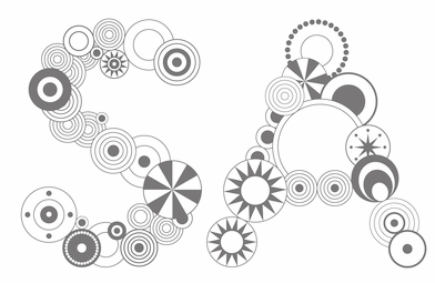 Geetika Alok is a graphic designer and works on projects in London and India. She graduated from the Royal College of Art with an MA in Communication, Art&Design and had previously completed her Bachelor's degree from the National Institute of Design with specialisation in Graphic Design. With Henrik Kubel, she designed the typeface India (2011). In 2014, she completed the TDi program at the University of Reading.
  Gene Buban (aka geneus1) is the creative and prolific designer at FontStruct in 2008-2009 of these typefaces:
  Between 1928 and 1965,
  Sintra, Portugal-based designer of the circle-based modular organic sans typeface Bugalho (2014). [
 Paco Fernandez (Granada Design, Almeria, Spain) designed these Arabic display typefaces in 2015: Varela (based on the first Arabic book that was printed in Spain---it was produced in 1505 by Juan de Varela de Salamanca in his shop in Granada), Kitab (based on a leafed book), and Dairah (circle-based).
 Graphic designer in Hanover, Germany. Creator of some typefaces such as
  Moscow-based designer of Cone (2015, a decorative Cyrillic typeface), Aesthete (2015, a hairline all-caps circle-based typeface, done at BHSAD) and Bad George (2015, a hybrid created at BHSAD using Bad Script and Georgia as models, in honor of George Clooney).
  Minsk, Belarus-based designer of the monoline circle-based typeface Lime Font (2014, Cyrillic). [
 Very talented Pistoia, Italy-based designer (b. 1982). His typefaces:
  Anand, India-based designer of the circle-themed typeface Circular (2018). [
 Designer in Charleston, SC. Atom Bomb is a circular display font designed in 2017 in honor of the 129,000 to 226,000 Japanese civilians who were killed in the WWII bombing of Hiroshima and Nagasaki. Some characters take inspiration from hiragana and katakana. [
 Graphic designer in Lille, France. Codesigner with Adrien Coquet of the rounded monoline display sans semicircle-patterned typeface Slot (2015:
  Spanish art student (in 2013). FontStructor who created these typefaces in 2013: Beauvoir, Lancaster, Figaro, Abel, Cawdor (octagonal), Dilior (a didone), Harmond (blackletter), Antelopes, Godiva (blackletter), Autumn, Sasanida, Help I Need Somebody (circle-based geometric sans), Goodbye Fontstruct, Fairy Tale Vanishing, Slanton, Kyrie, Eat Me, De Stijl, Chiara, Hecate, Stancyl (piano key), Ionica, Winty's Gothica, Vintage America, El Greco, Fairy Tale, Ozawa, Donibo Display, Decade (blackletter), Donibo, Weirdy Moves (+Party), Bliss (crayon font),
  Surabaya, Indonesia-based type designer who set up Ikiikowrk in 2020. Typefaces from 2021: Afrocultures (script), Akira (a zenbrush script), Arka Heritage, Bachroque,
  [
[ FontStructor who made these fonts in 2012: fs Small Stroke, fsToo Close (graffiti style), fs Losing Shape, fs Cursive Rounded,
  JAF34 is an independent graphic designer in Prague. Creator of the thin experimental typeface
  Harrisburg, PA-based designer of the circle-based typeface
 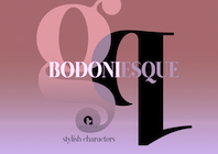 [
[ [
[ During his studies, Greenland, NH-based Jason Meagher designed an encircled experimental typeface (2016). [
 Buffalo, NY-based creator of the logotype typeface
  [
[ Freelance graphic artist in Gent, Belgium, who won many awards for his design of posters and poster typefaces. He specializes in book cover, poster and cartoon types, and excels in all. Many of
  [
[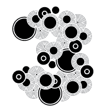 During his studies at UCA Farnham, UK, Jordan Haig designed the experimental circle-based typeface Pleonasm (2016). [
 Michigan-based
 Kaiser Zhar Khan (b. 1980, Chile), aka Zanatilja, used to run a new defunct archive called True Type Fonts. He also designed many typefaces himself. The most famous among these is his free African-themed typeface South Afirkas 2100 (2009), which is downloadable from
 Designer at the University of Latvia of the free technical handwriting font family Drukaatie Burti (2015, Open Font Library) and the circle dingbat font Circles 8 9 12 (2019). [
 Lecturer and graphic designer in Berlin, Germany. In 2015, he designed the rounded all caps poster typeface Der Wedding Font, which was designed using compass and grid. He writes that it is a fun and sexy statement of a new post-hipster aesthetic: it is fashionable without the boring throwback to haute couture. [
 Graphic designer in Budapest, Hungary. Graduate of Loughborough University, class of 2018 (with a bachelor's degree), and Moholy-Nagy University of Art and Design in Budapest in 2021 (with a master's degree). At Loughborough University (UK), Kornel Faludi designed a set of generative typefaces (2016), i.e., typefaces that are very modular and computer-generated to a large extent. His typographic oeuvre is quite experimental. Many of his fonts use just basic geometric structures such as circles, arcs and rectangles.
  Barcelona-based designer who created a hip
 Leftloft is a visual communications studio in Milan, founded in 1997 by graphic designer Andrea Braccaloni (b. Bologna, 1973), Francesco Cavalli, Bruno Genovese and David Pasquali. The studio is mainly engaged in corporate identity, and now also has an office in New York. Andrea Braccaloni teaches visual communication at the III Faculty of Architecture/Design at the Politecnico di Milano. At
  Calgary-based designer of
  Wroclaw, Poland-based designer of the circle-themed typeface Scalpel (2019). [
 [
[ [
[ Little Fonts is a type foundry in Norwich, UK, run by Max Little (b. London, 1986). Max Little studied graphic communication at Norwich University.
  London-based designer of the compass-and-ruler typeface Locho Sans (2014; this includes a rounded stencil and a 3d version) and Locho Stencil Slab (2016). These typefaces were made during her studies at Central Saint Martins.
  Berlin-based
 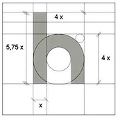 As a student at IUSVE, Verona, Italy-based Luca Taddeo created Universal Regular (2016), which is an extension of Herbert Bayer's Universal, and is---obviously--a compass-and-ruler typeface.
  [
[ [
[ [
[ M-B Creative is a British type foundry in Presteigne, Pows, est. 2013 by Ben Mecke-Burford, or just Ben Berford, who has created many stunning art deco and other typeface families.
  [
[ Mehmet Reha Tugcu (Tugcu Design Company, Istanbul, Turkey) designed these typefaces:
  [
[ [
[ Designer in Brooklyn, NY, who created the circular compass-and-ruler virtual identity typeface Brooklyn Bridge Park in 2016. Its glyphs are sectioned for easy coloring and stretching.
  Tijuana, Mexico-based student-designer of the compass-and-ruler font Double Circle (2014). [
 Indonesian type designer specializing in techno, cyberpunk and futuristic typefaces. Typefaces from 2020: of Gardane, Modernis, Techbot,
 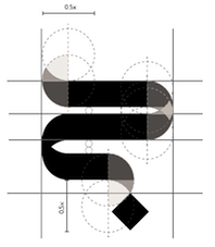 Natalie Amy Margaret Houston was born in Durban, South Africa. She attended the then-named Natal Technikon. She graduated with a Diploma in Marketing and Sales Management in 1989, after which she was awarded an 18-month scholarship by the German Government to work and gain practical experience in that country. While in Germany she worked for Volkswagen and Audi, in their Marketing and Strategic Planning departments respectively. She returned to Germany from South Africa to study Graphic Design at the University of Applied Sciences in Dusseldorf. She completed a Bachelors and Masters degree in graphic design. Natalie lectured at the Durban University of Technology in the Faculty of Arts, in the Department of Graphic Design for nine years. In 2013 she joined the University of Dammam in Saudi Arabia, as a lecturer in Graphic Design. In 2015, she started pursuing a PhD in the Department of Social Sciences, at the University of KwaZulu-Natal.
 Michal Nowak (b. 1994, aka Neoqueto) is the Koszalin, Poland-based designer who used FontStruct in 2009 to make the horizontal stripe typeface Mastercore (+Laddered),
  Wolf Böse (Der Graph, NeueDeutsche, est. 2010, Berlin) is the alias of prolific German experimental font designer Thomas Helbig. His typefaces date from ca. 2009. In 2021, he opened a shop on MyFonts as NeueDeutsche. His typefaces there, published in 2021, include
  Firenze, Italy-based designer of the compass-and-ruler typeface Fat Font (2014). [
 Die Gestalten writes about Hungarian artist Norbert Prell who is based in Budapest: Growing up in an artistic family, Norbert Prell was confronted by art and creativity at an early age. This laid the foundation for his aesthetic appreciation and paves the way for his design career. Initially trained as a graphic designer at the art school in Pécs and the Hungarian University of Fine Arts in Budapest, he then developed great interests in typography and font design. In 2010, he became an Erasmus student in the Department of Media Technology/Design Department at the HAW Hamburg (Hamburg University of Applied Science) to learn typography and calligraphy.
  Newhaven, UK-based designer of the bicolored
  Born in Prague in 1949, Jan Schmoeger emigrated to Australia in 1980/1981, and is a book designer in Mentone, Victoria. For most of his career here he worked as a graphic designer, mainly in book publishing. He was also a sessional lecturer at the School of Art and Design, Monash University, Caulfield, Melbourne (formerly Chisholm Institute of Technology) in 1986-1994 and 2004-2008. His typefaces:
  [
[ The
The  Santiago de Chile-based creator of
  [
[ French graphic designer who lived in Perugia, Italy, and is now in Nantes, France. I would call him an experimental typographer. He likes experimenting, for example, with modular typeforms, as is apparent from his typefaces called
  Freelance graphic designer in Grottaglie, Italy. Stones inspired Pierfrancesco Annicchiarico to design the experimental typeface Secco (2009). The Cà brùtta building by Giovanni Muzio in Milan got him to design the
  Type designer based in Sofia, Bulgaria. As a student working with Fontfabric in Sofia, Bulgaria, Plamen Motev designed the
  Barcelona-based designer of the alchemic typeface
  Mexican creator of the teddy bear alphading family
  Web and graphic designer from Poznan, Poland. Creator of the typeface
  For a school project at UEMG, Belo Horizonte-based Ranato Enoch designed the circle-based typeface
  [
[ [
[ Omsk, Russia-based designer of an experimental Latin typeface created by superimposing circles (2015), and Point (2015). She also created a set of icons and several color fonts in 2015, including the
  Rob Davies (Wednesbury, UK) created the circle-based display typeface
  Designer in Montreal who studied at UQAM (class of 1997) and created the circle-and-arc typeface
  Parisian graphic designer who created a bicolored circle-based typeface called Graphic Stroke (2014), Something In The Way (2015, a rounded monoline stencil font), Impossible Font (2015, inspired by Escher), and Pattern Font (2015).
  [
[ Known as Yahdi Kumala and Yahdi Romelo. Pekanbaru, Indonesia-based founder of Rometheme in 2018 and
  Chiacgo, IL- (was: Fort Wayne, IN)-based brand and graphic designer. Ross created some geometric typefaces, using mostly lines and pieces of circles:
  [
[ [
[ Sam Bunny (Wellington, New Zealand) created
 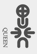 Samara, Russia-based designer of several experimental typefaces, mostly, but not exclusively from 2009 until 2013. These include
  Sea Types is the partly free partly commercial type foundry of Jefferson Cortinove (artist, designer, teacher, sailor and wine maker) and publicist Márcio Duarte in Florianopolis and Marilia, Brazil, est. 2007. Their initial typefaces include
  Mexican designer of these technical or techno typefaces in 2020: Srg BlockShot (stencil), 23F (an LED font), Srg Linear (a monolinear circular sans). [
 [
[ New Delhi, India-based designer of the circle-based rounded sans typeface Spry (2016) which was constructed with compass and ruler.
  Dennis Ludlow (Sharkshock Productions, Raleigh, NC) started making mostly free fonts in 1999. On August 28, 2001, Dennis announced that he would stop producing fonts, forever. To prove himself wrong, he became more prolific trhan ever, and ultimately started designing retail fonts as well.
  Simon Hanna (Beirut, and/or Doha, Qatar) created
  [
[ Brighton, UK-based but French designer of the gridded compass-and-ruler fonts Fontastic (2014), Prototype (2014) and Angulstar (2014).
  Swiss-born London-based designer at
  Mehmet Abaci (b. 1978) is based in Istanbul. In 2014, he established Studio Typo, where one can buy his typefaces. Limited forms of the fonts can be downloaded fpr free from the Dafont site.
  French graphic design and typographic company, est. 2006 in Lyon by Patrick Lallemand and Pierre Delmas Bouly. Typefaces created by them include various logotypes, as well as
  Communication designer in Lausanne, Switzerland. Designer of the rounded sans typeface Circles Regular (2014) and the blackletter typeface Hendricks (2014). [
 Theo Kontaxis (Theokon Design) is an artist and architect in Athens, Greece, who created the experimental circle-based logotype Phont (2013, also called
  FontStructor who made the horizontally-striped typeface
  Tobias Sommer ("Shasta") is the Geneva, Switzerland-based designer (b. 1986) at FontStruct in 2008 of Great Depression (influenced by headline fonts from 1929), Brutto (headline slab serif), Lame Dude (dripping paint), Toytype (an interesting Indic simulation typeface based on an earlier block font by him called Block On),
  Sheffield, UK-based designer of the free textured octagonal/mechanical typeface family
  Tom Declat (Brisbane, Australia) created the monoline geometric typeface
  As a graphic design student in Dublin, Ireland, Tom Gillan created the colored ball font Motyf 2018 (2017). [
 Design bureau in Barcelona, Hamburg and Berlin, est. 2007, with fonts that are mainly due to German type designer Martin Lorenz. The list of typefaces:
  Istanbul, Turkey-based founder of Hardal Studiuo, and later Typografische. His typefaces include Hardal Serif (2018), the
  Karlskrona, Sweden-based designer of the rune simulation typeface Fort Wendy (2014), The Medic (2014), Coco Puff (2014), Maniac (2014: avant garde), Agony (2014: hairline circle-based experimental typeface), Acne (2014), and the hairline sans typeface Galacticastle (2014).
  Belgrade, Serbia-based designer (b. 1981) of these typefaces:
  Weknow is the foundry of Indonesian type designer Wino Sutarmin Kadir (b. 1979), who is based in Bogor, Jakarta. Weknow produced a large collection of free fonts from 2009 until 2012. He started making commercial fonts in 2012.
  [
[ [
[ Max Infeld (b. 1981, aka Xerographer Fonts) from Chico, CA, makes free fonts and offers a free font-making service. He surged onto the font scene in 2012, and is currently located in Ojai, CA.
  American creator of these handcrafted typefaces in 2017: Sara Script (calligraphic), Ruby's Notes (a thick brush script), Arizona, Socrates Gothic (blackletter), Spring Fling, Casual Friday (stencil), Apollo (formal art deco), Ivy League, Snap Dragon, Figura (octagonal), New Planet (circular futuristic typeface), Gargoyle (blackletter), Italian Goth (blackletter), Borders (brush script), Pencil, Casual Friday, Tetrahedron, Caffeine, Scratch, Quick Architect, Lines, Codec.
  [
[ Graphic designer and illustrator Yesmany Marrero (La Habana, Cuba) created the circle-based geometric typeface
  Bordeaux, France-based designer of Architectural Ground Plan (2015, a typeface based on architectural drawings), Alphabet Modulaire (2015, based on intersections of circles) and the beautiful geometric experimental Alphabet Cyrillique (2014).
  Based in Dublin, Ireland, Sarhan is a student at The National College of Art&Design, Ireland. He created just one typeface, a sans typeface made up of line segments and arcs of circles, called
  Located in Kiev, Ukraine, Yurko designed some
  Student at Purdue University, West Lafayette, IN. Honey Badger (2011) is a slab serif, woodblock-inspired typeface.
  Zaher Al Majed is an art director in Manama, Bahrain. In 2014, he designed the
  Bryansk, Russia-based cofounder in 2011 with Valery Zaveryaev of the Russian type foundry
  During his studies at the HSE Art and Design School in Korolyov, Moscow, Russia-based Ilya Zakharov designed the
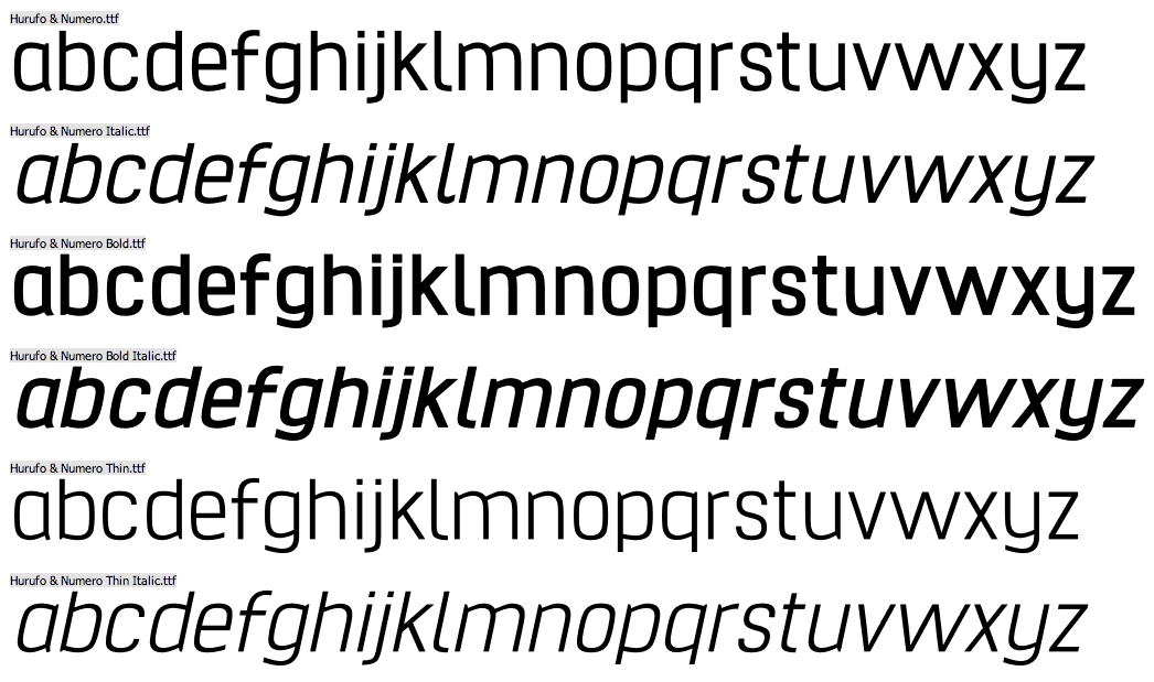
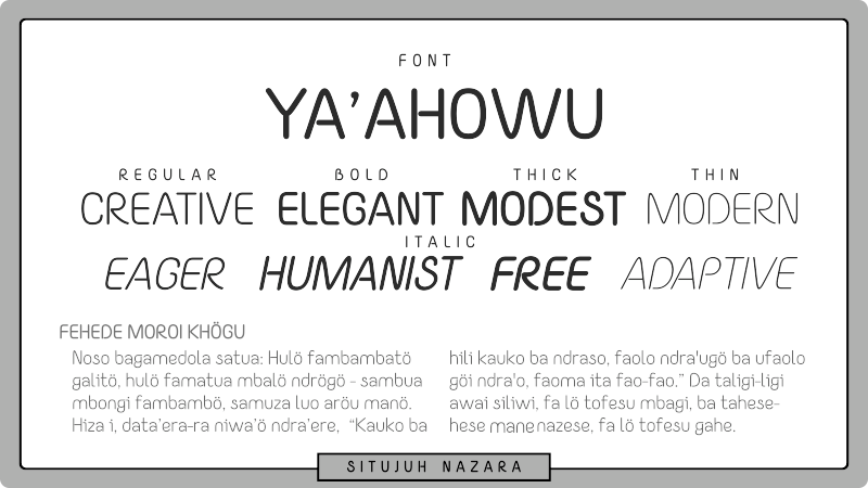
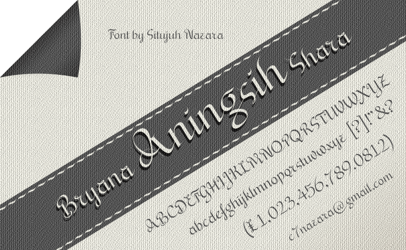
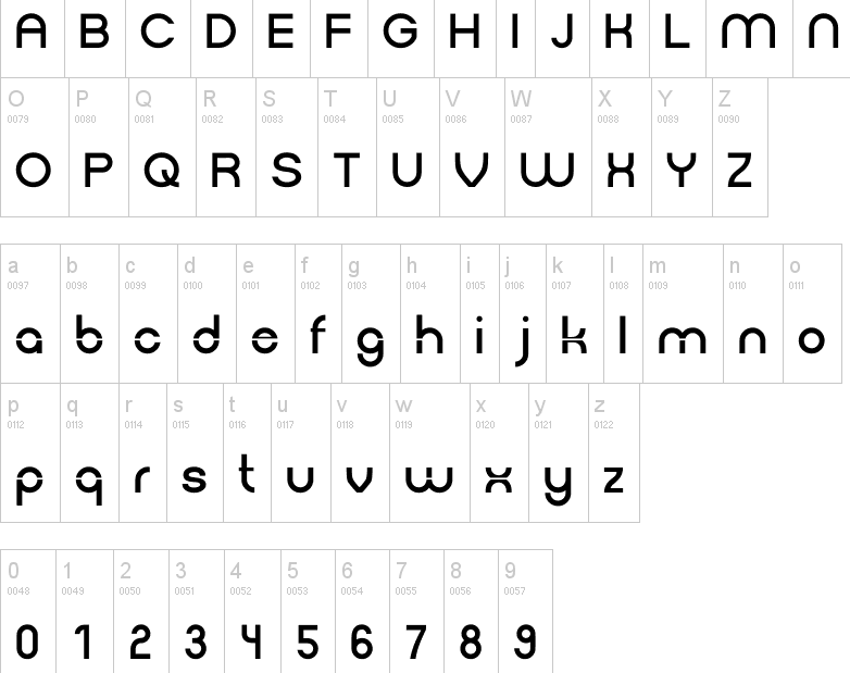
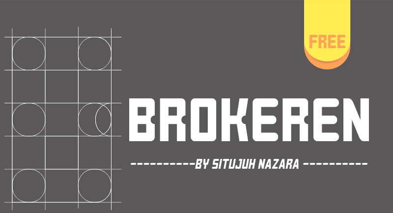
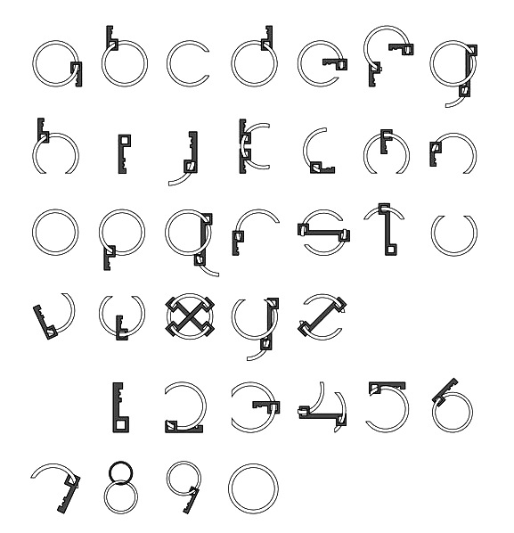
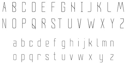
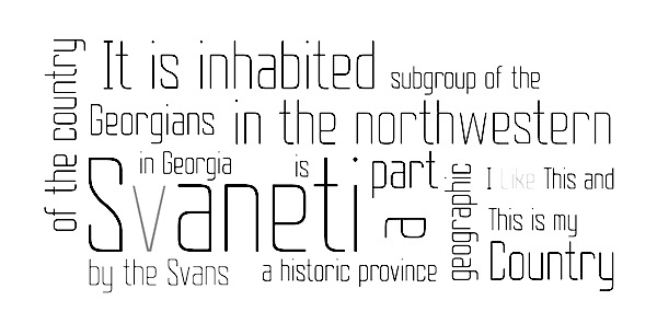
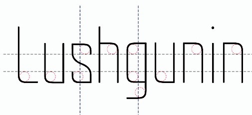
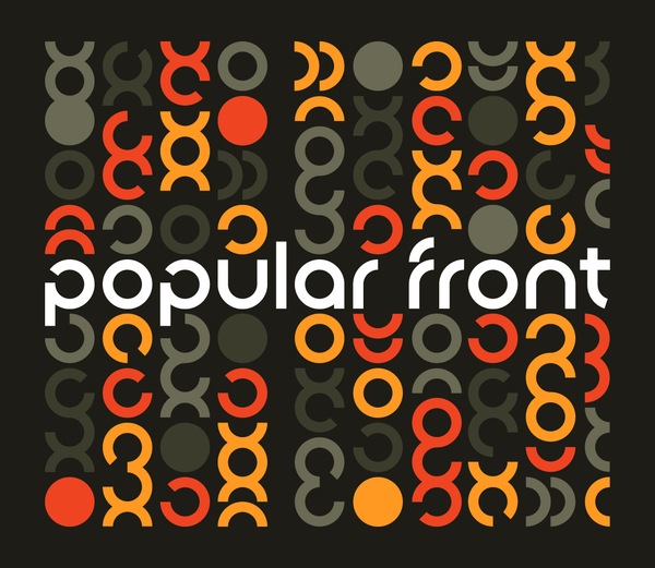
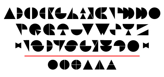
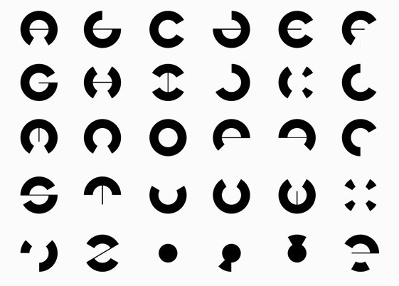
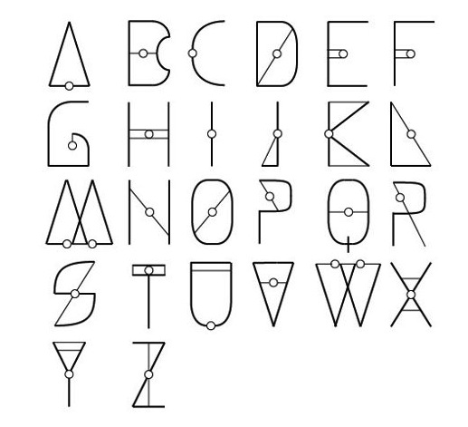
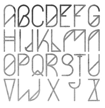
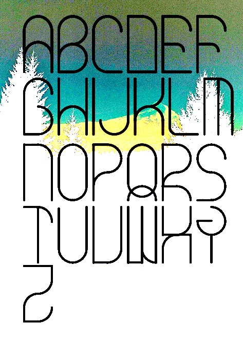
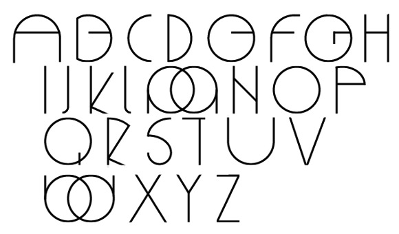
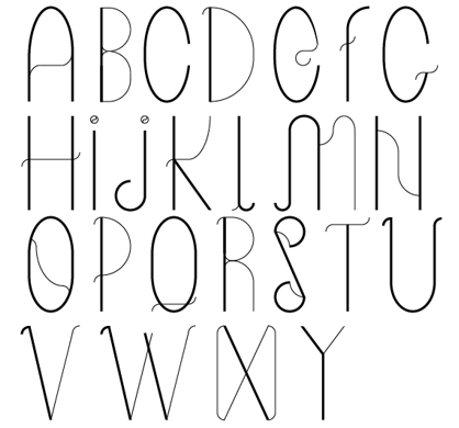
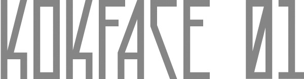
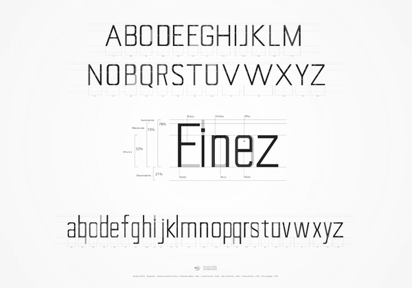
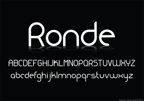
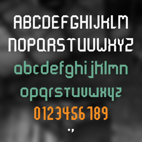
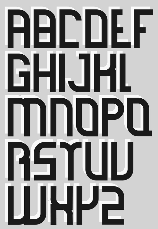
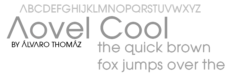
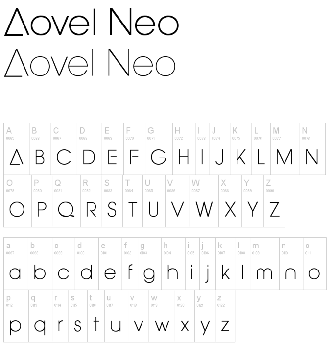
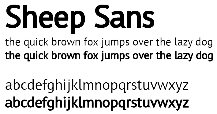
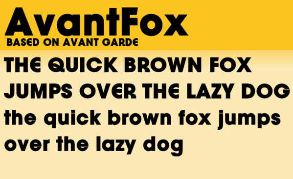
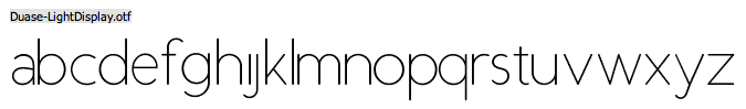
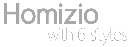
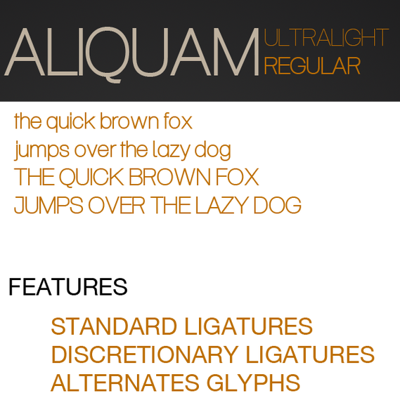
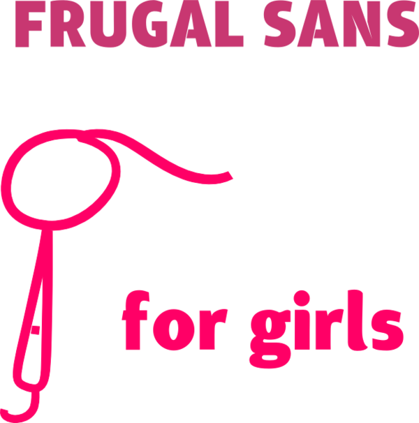
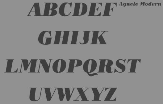
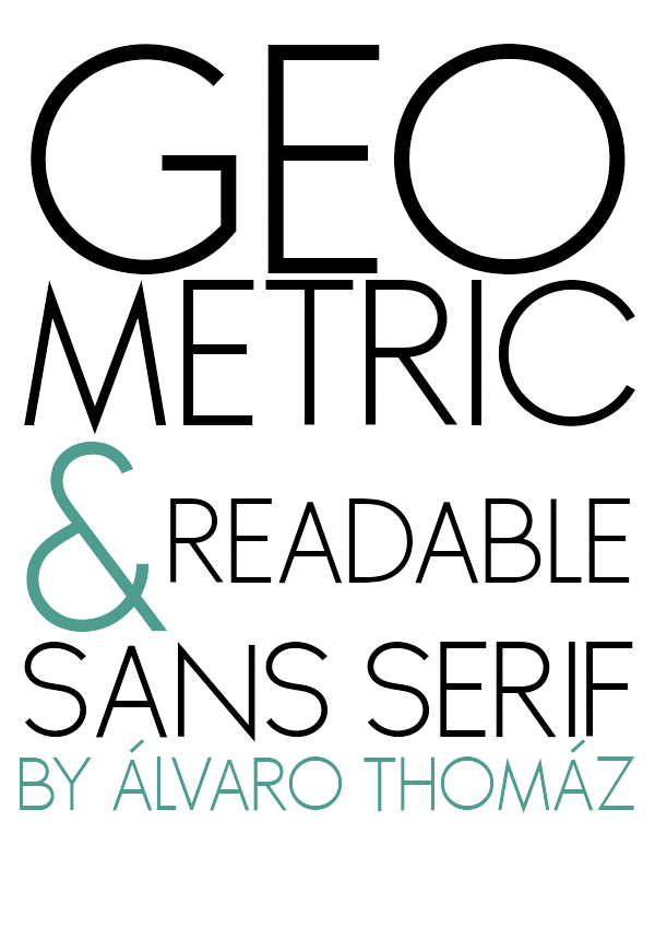
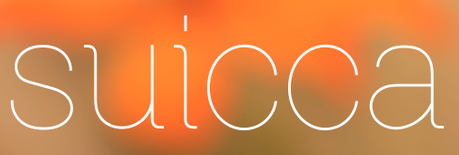
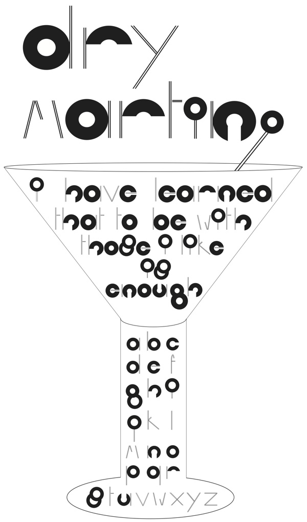
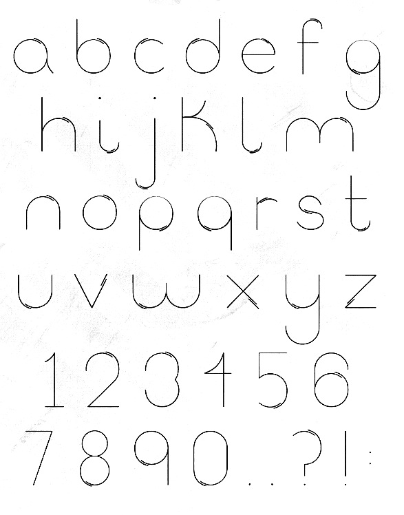
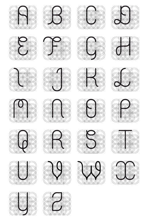
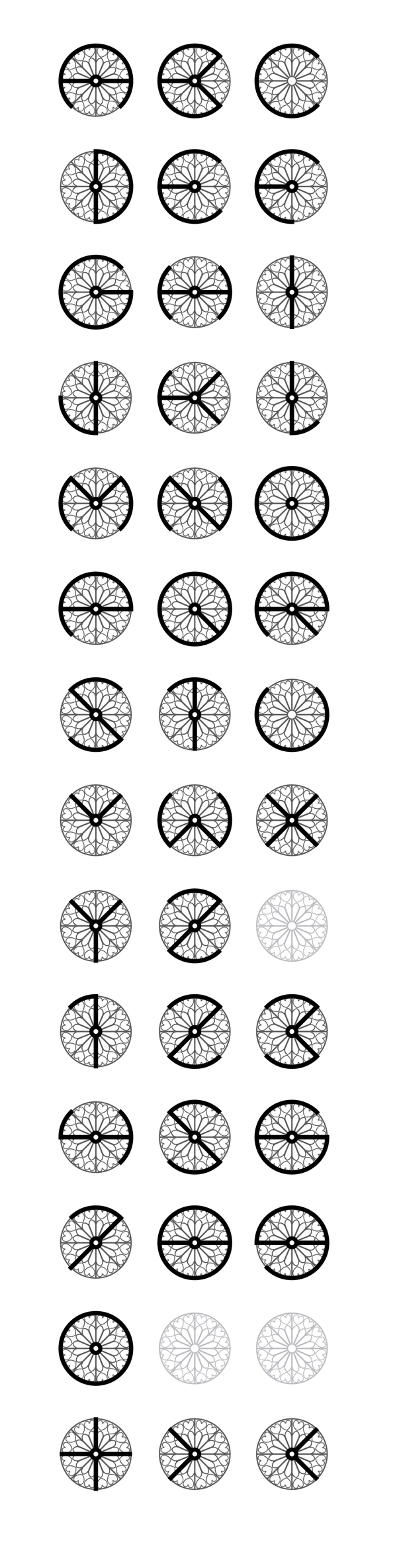
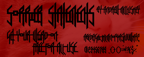
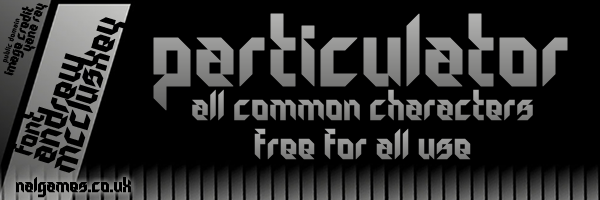
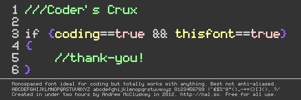
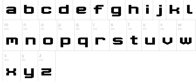
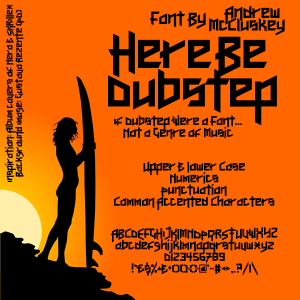
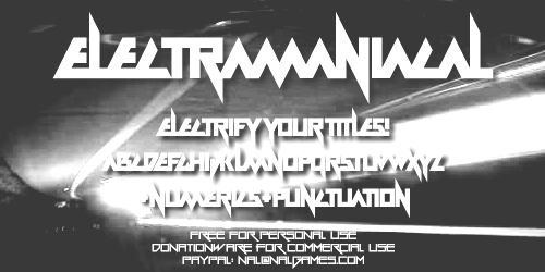
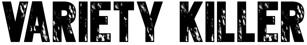
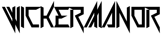
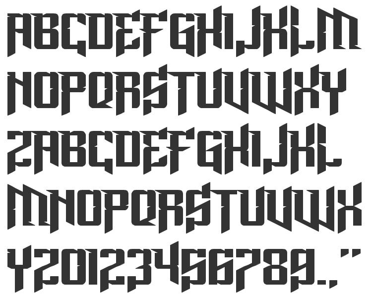
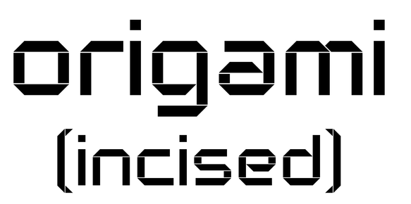
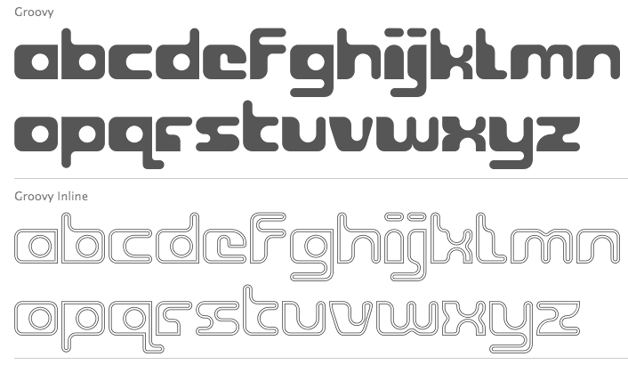
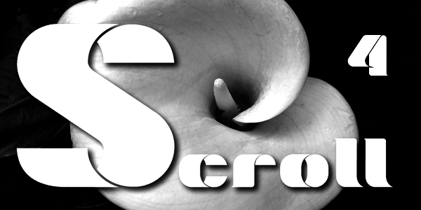
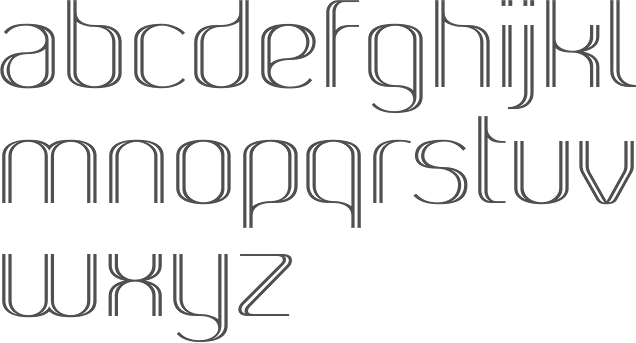
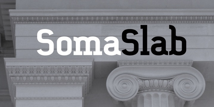
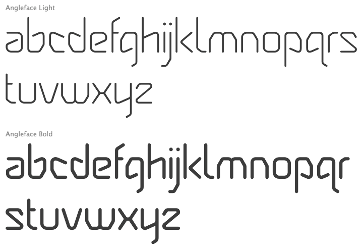
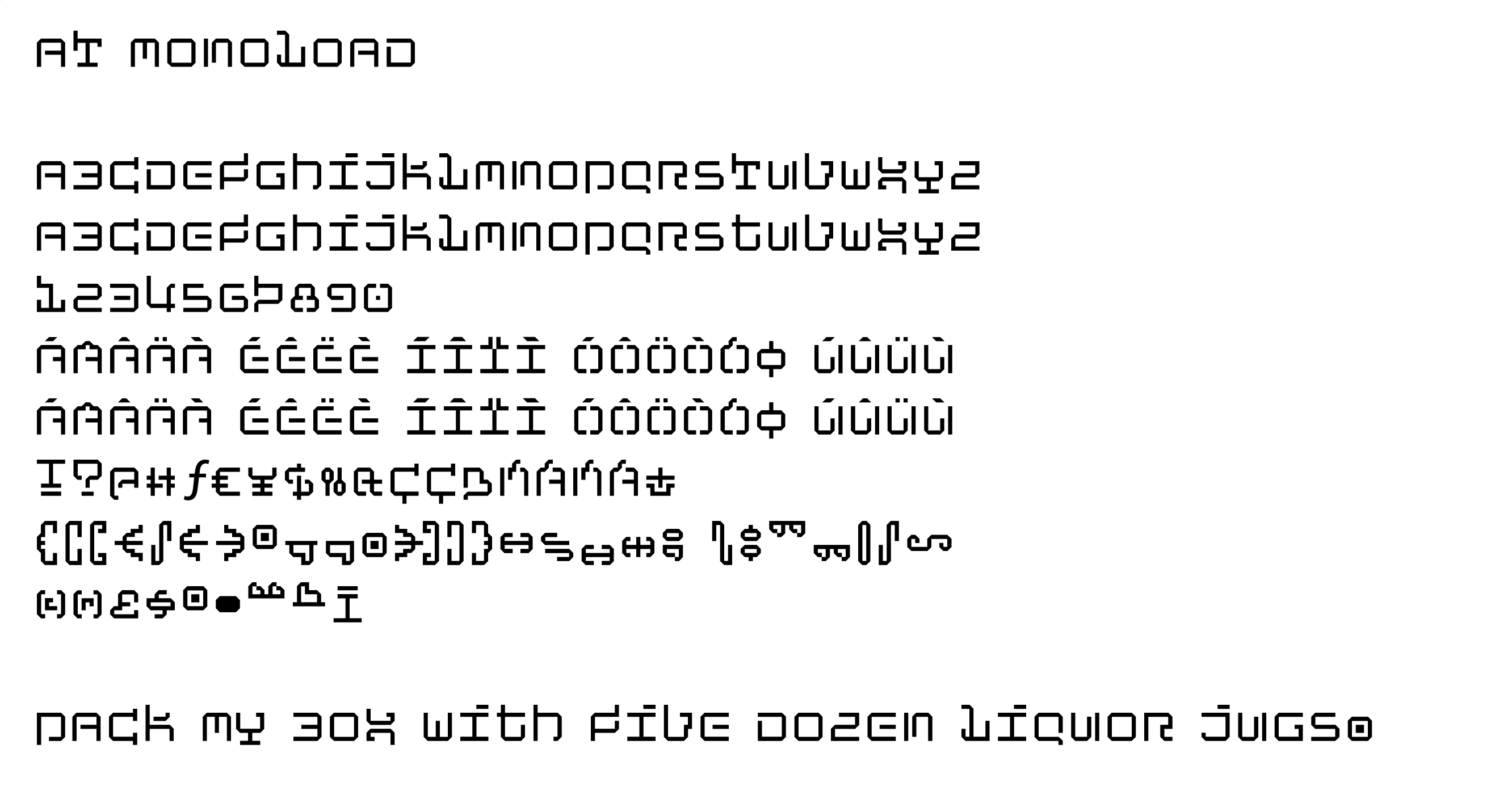
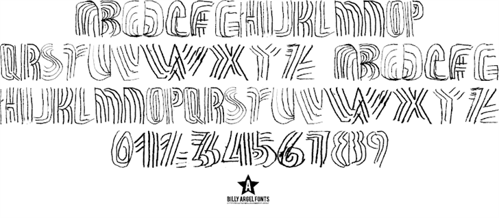
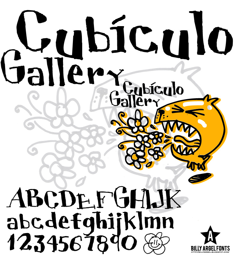
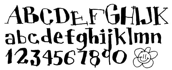
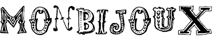
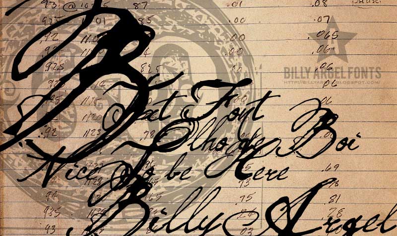
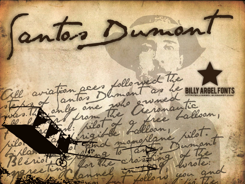
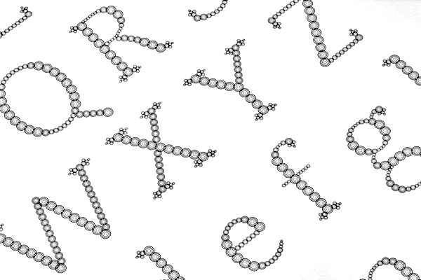
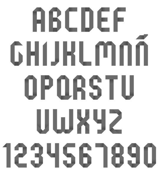
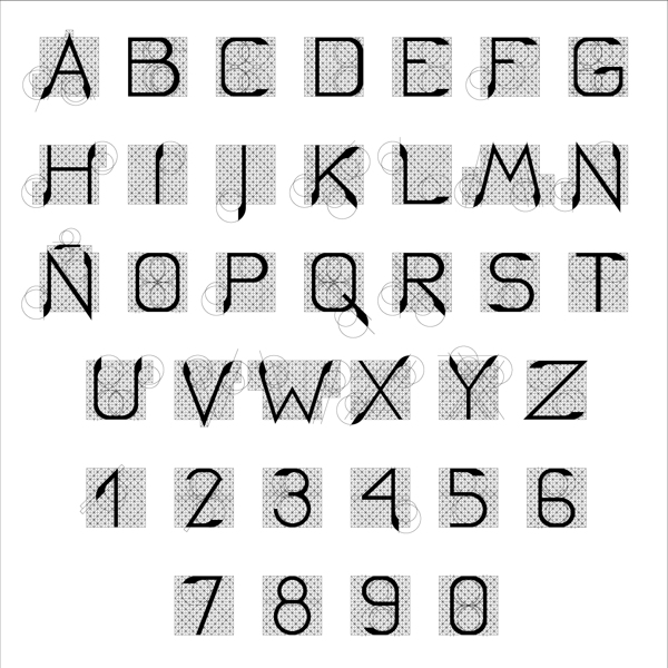
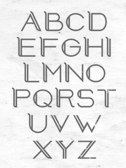
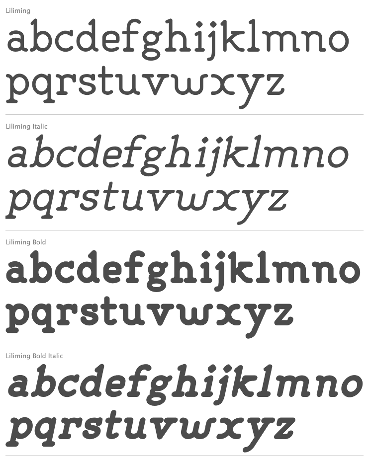
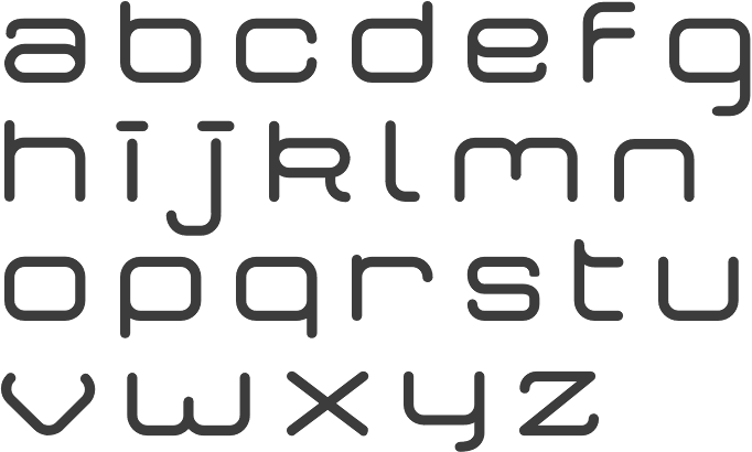
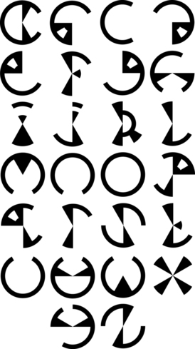
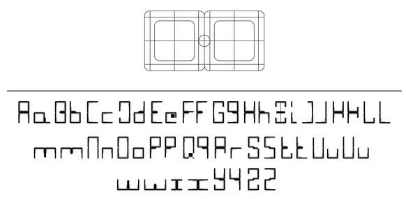
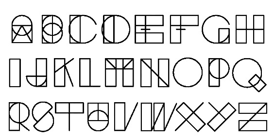
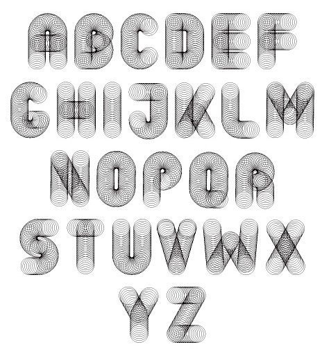
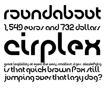
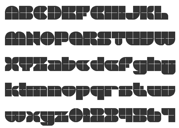
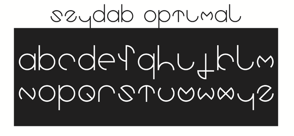
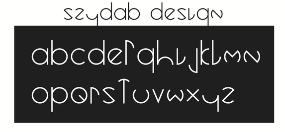
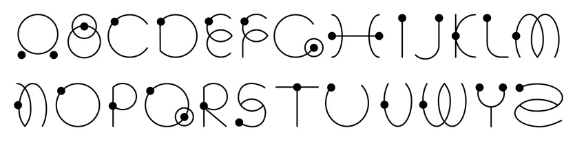
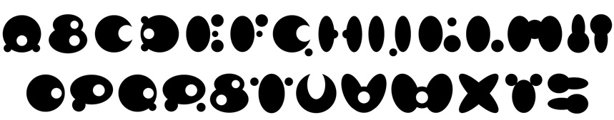
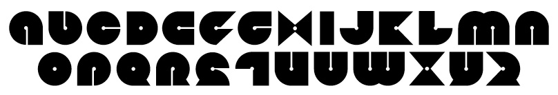
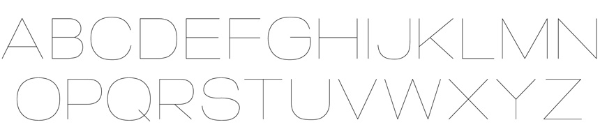
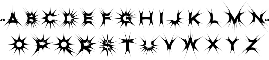
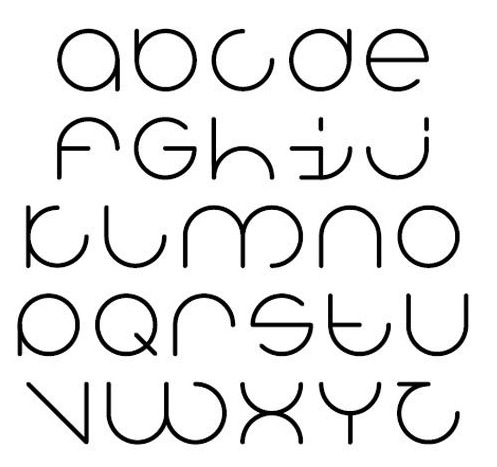
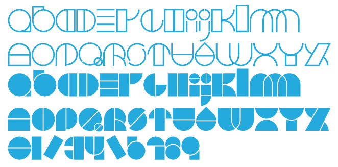
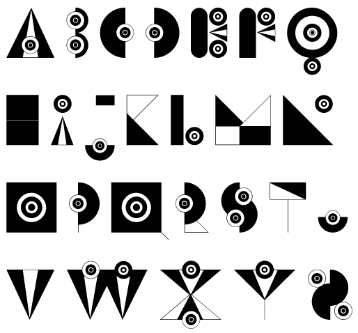
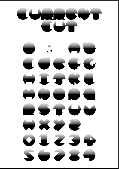
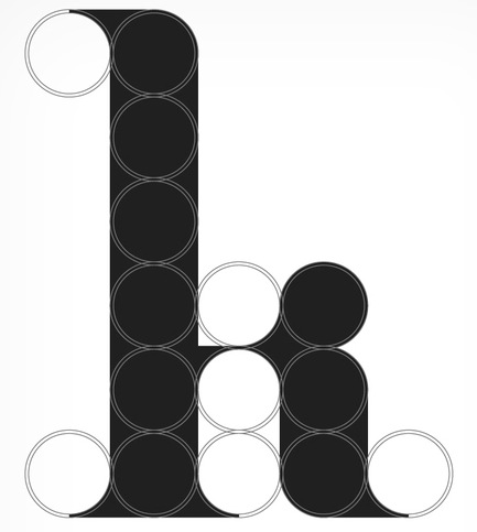
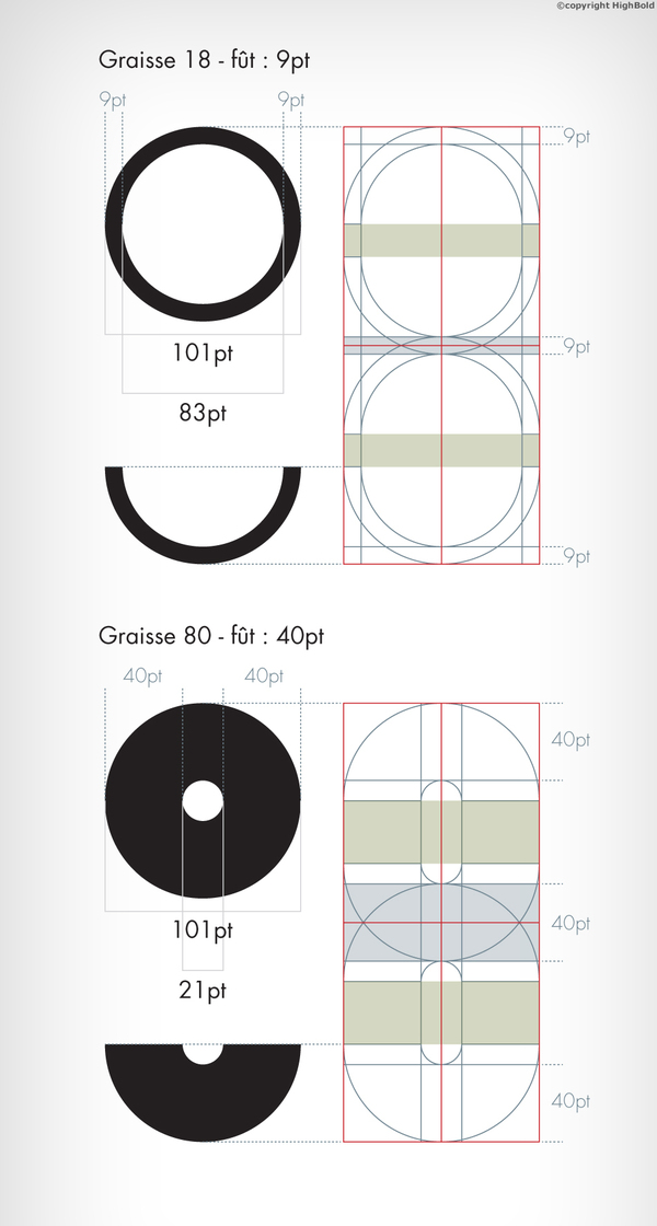
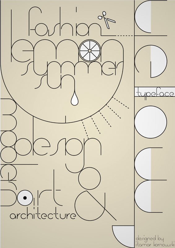
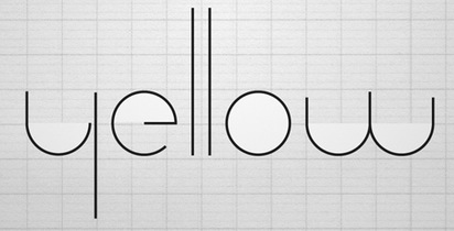
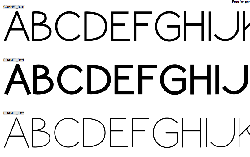
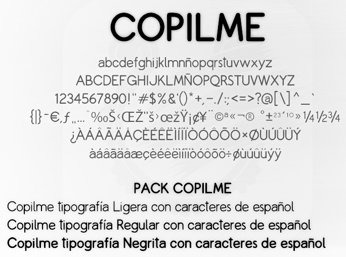
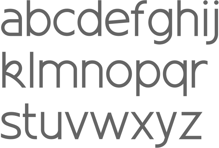
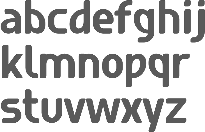
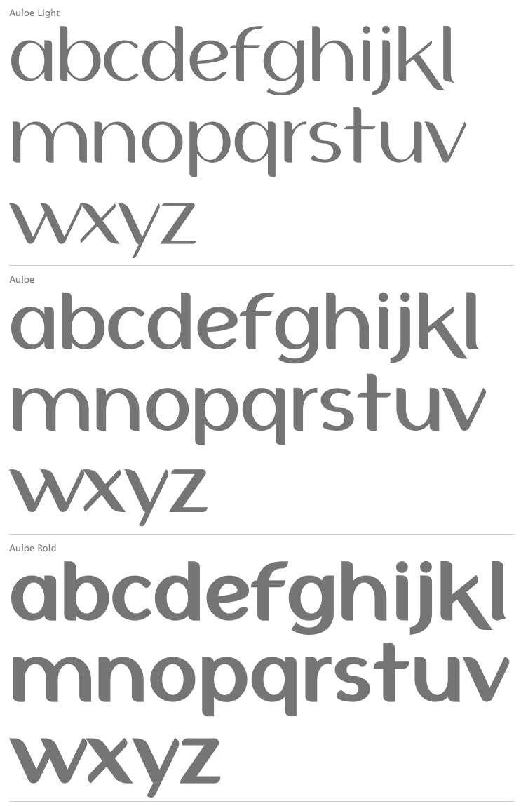
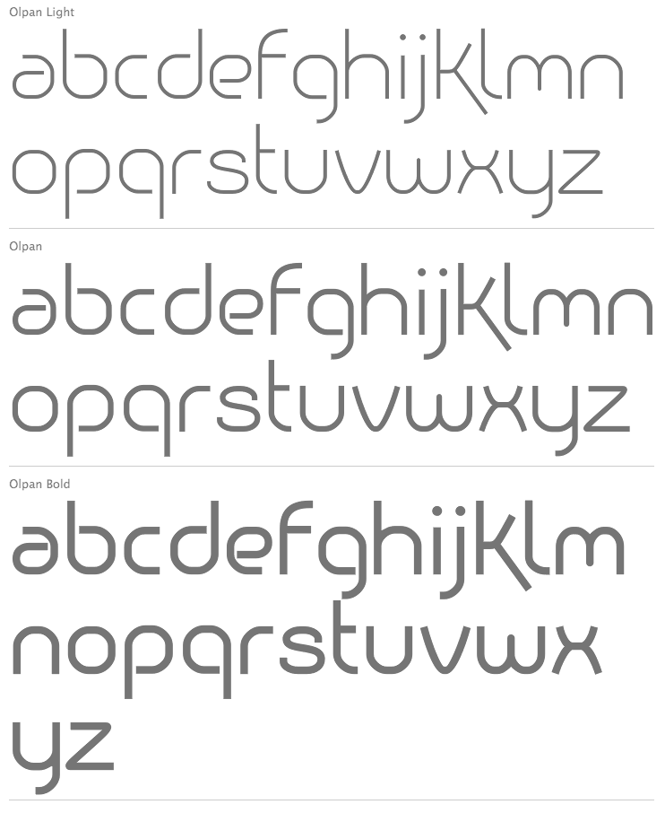
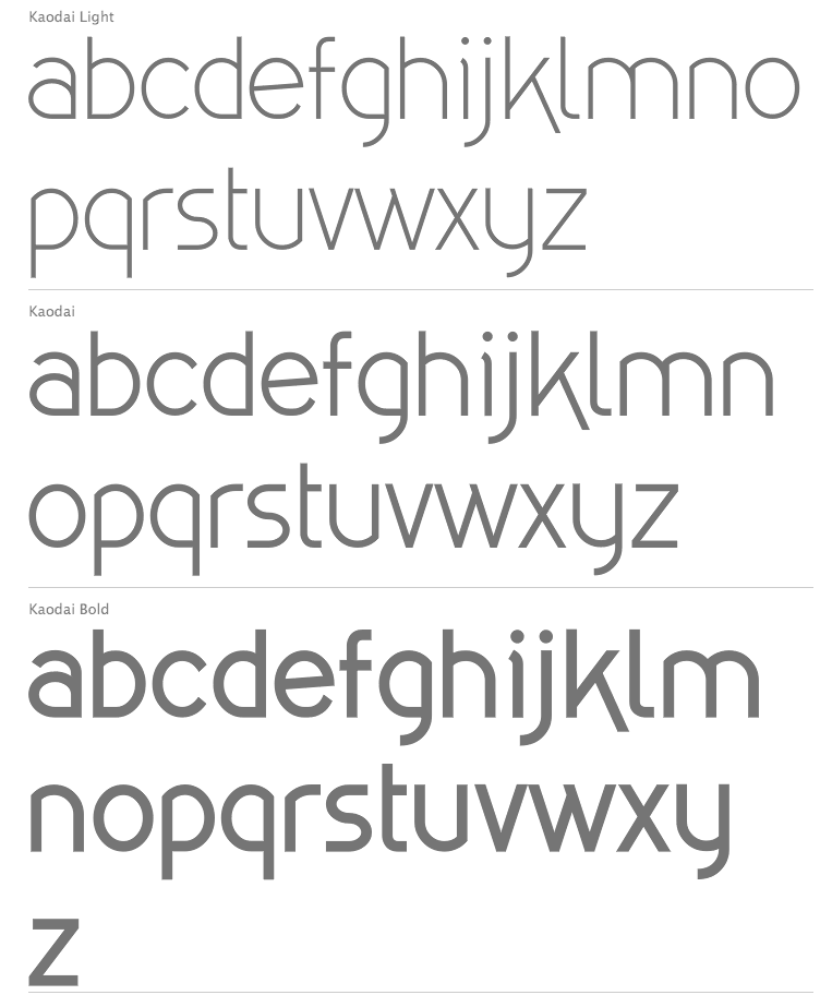
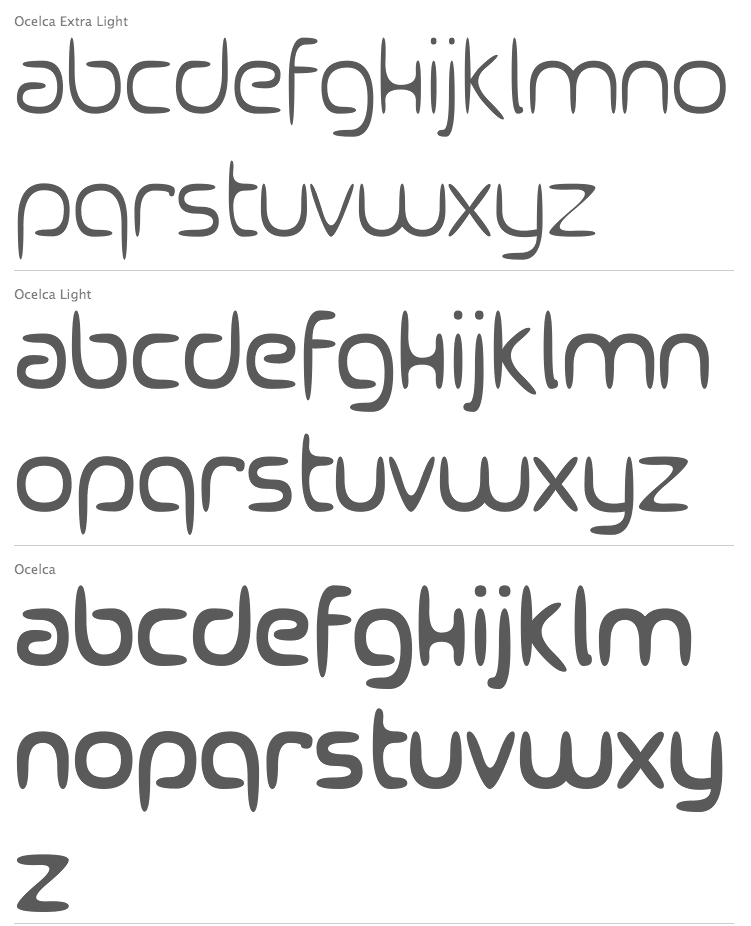
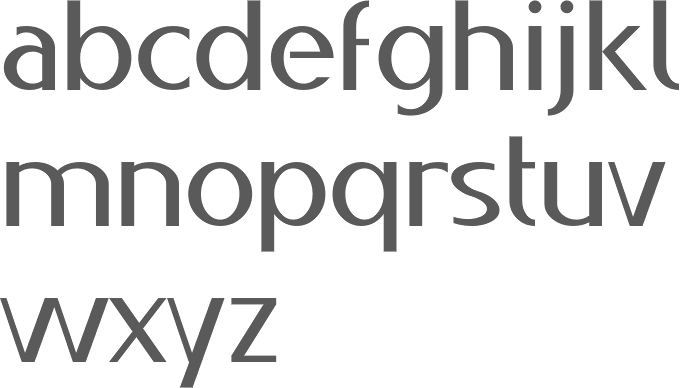
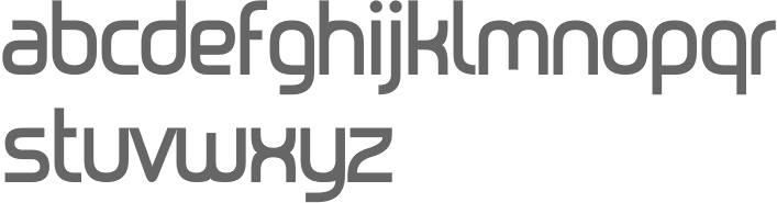
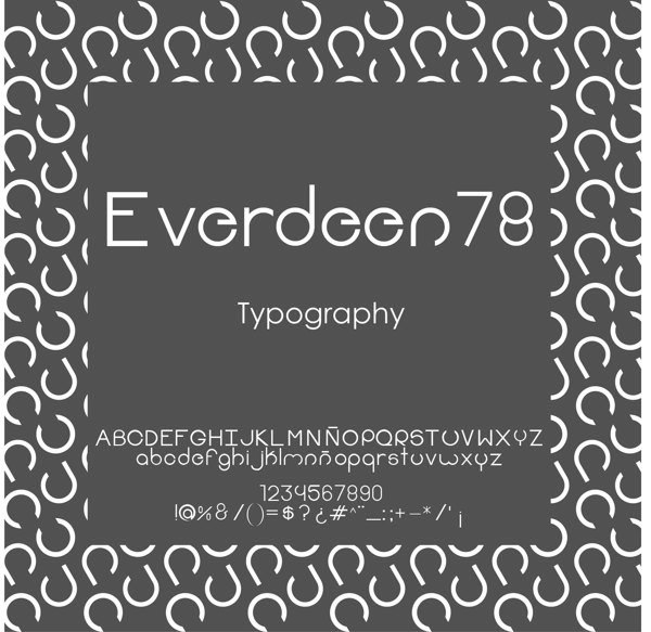
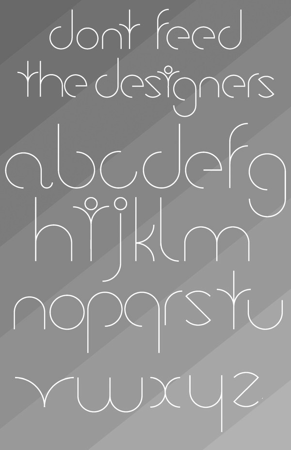
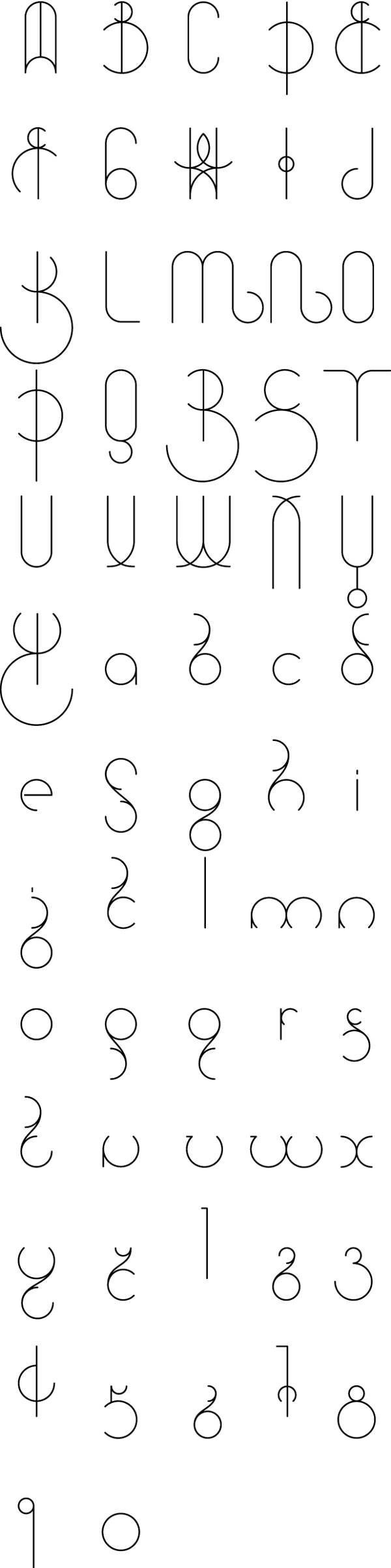
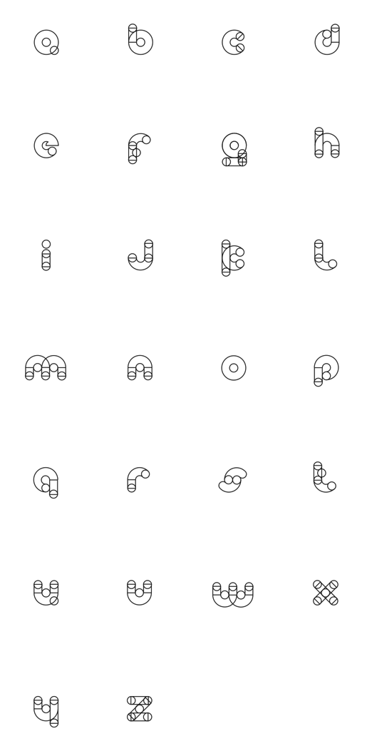
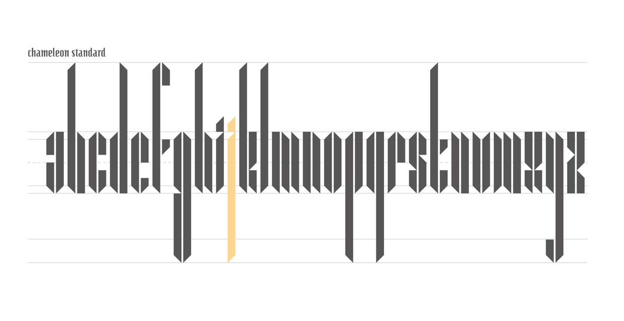
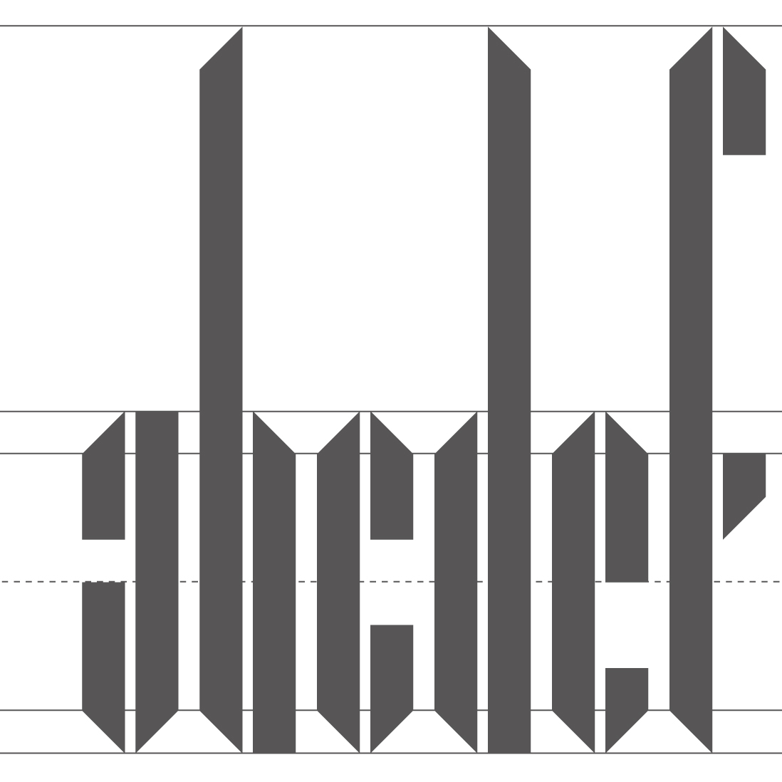
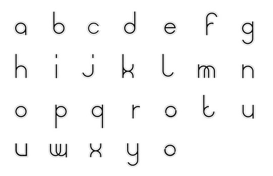
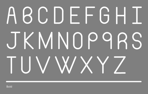
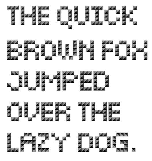
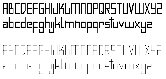
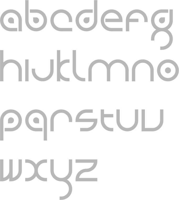
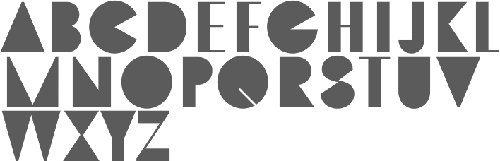
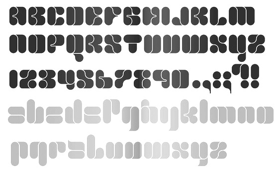
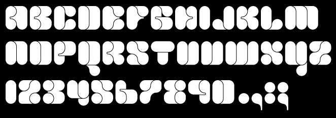
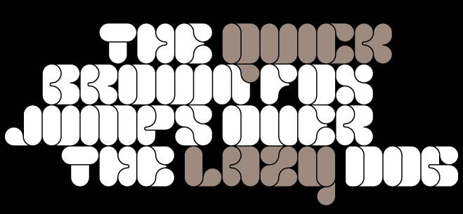
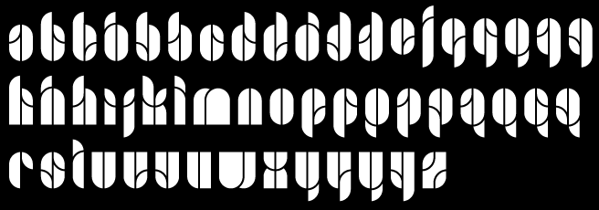
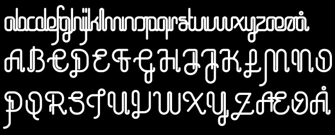
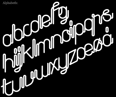
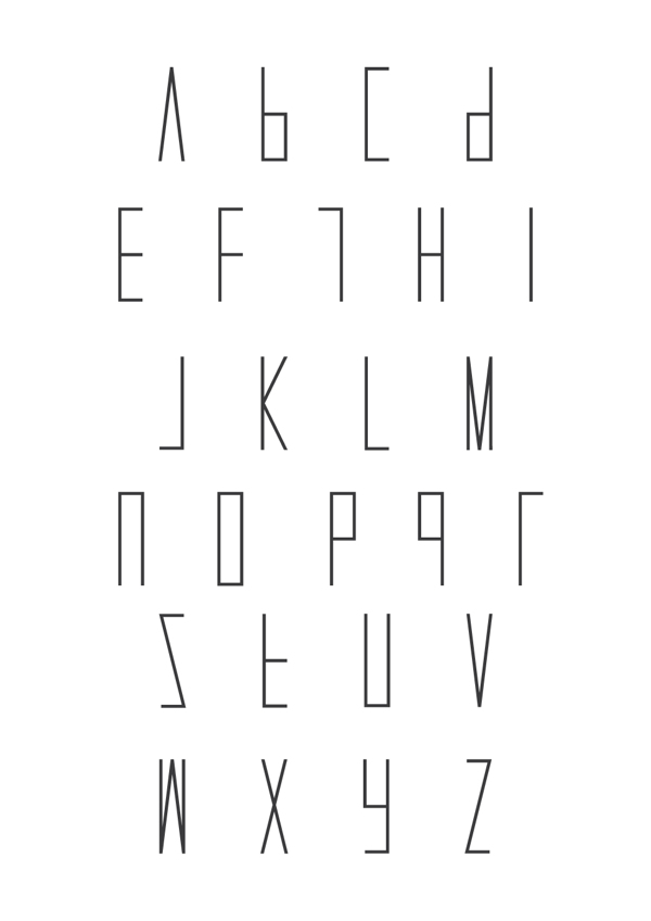
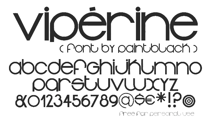
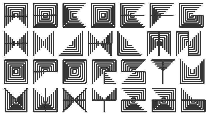
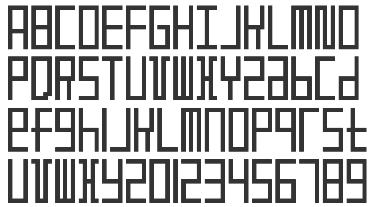
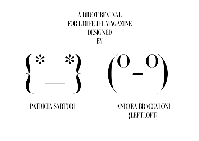
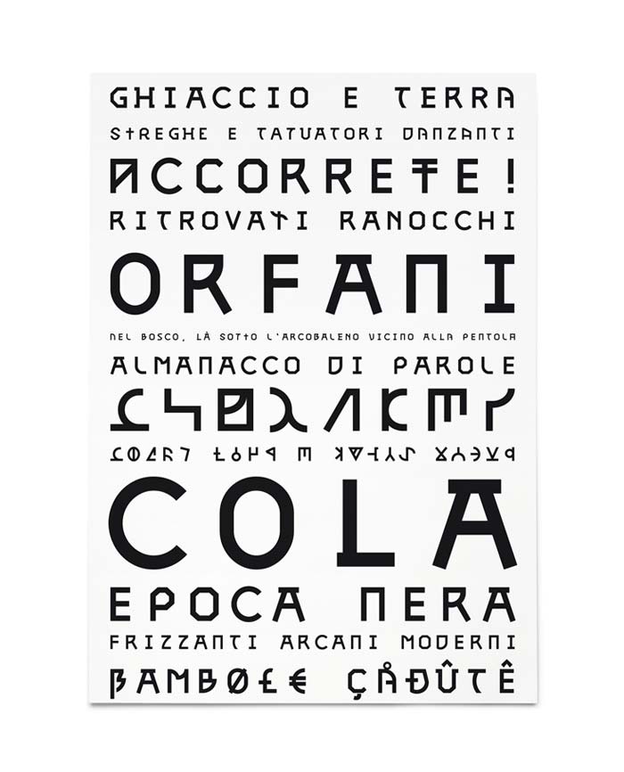
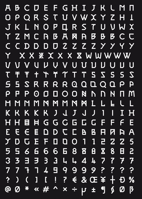
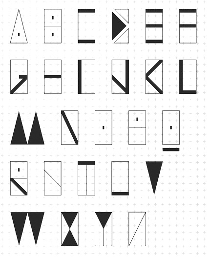
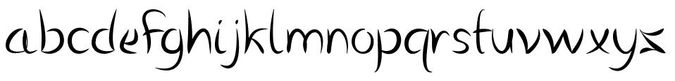
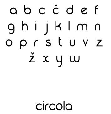
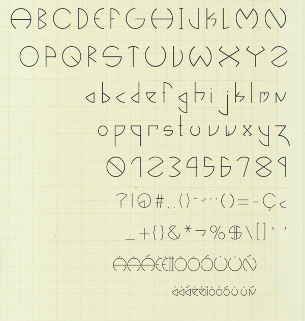
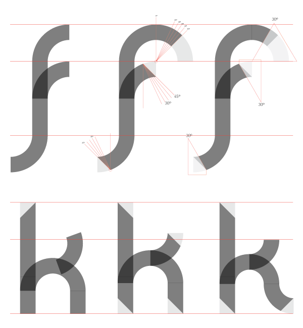
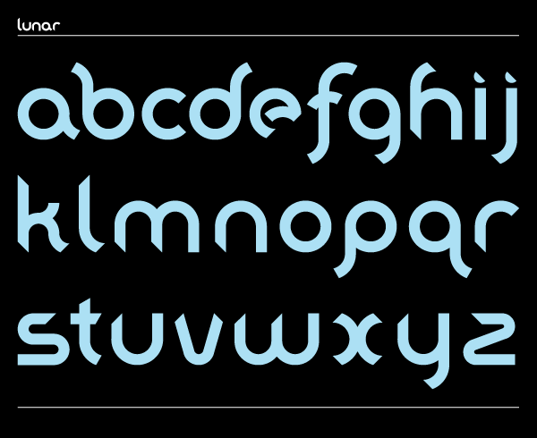
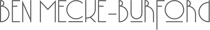
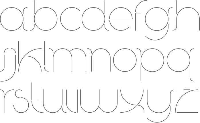
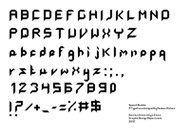
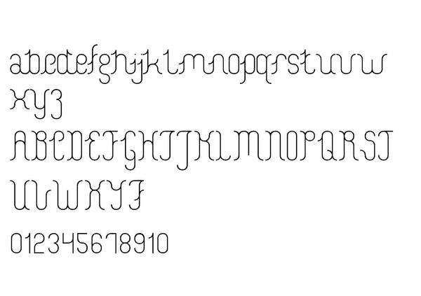
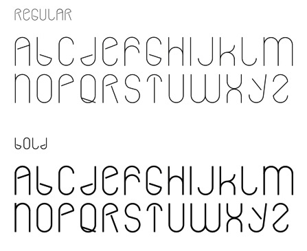
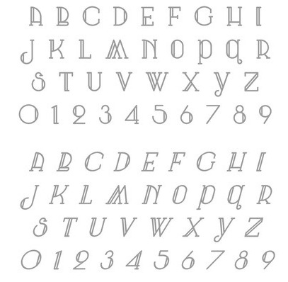
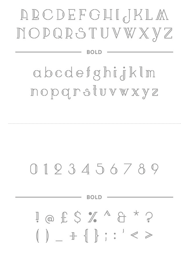
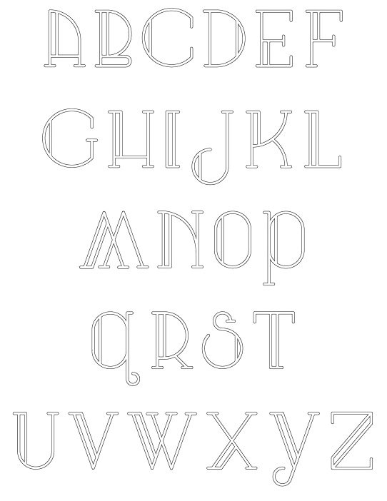
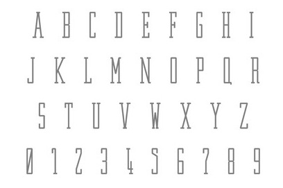
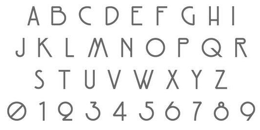
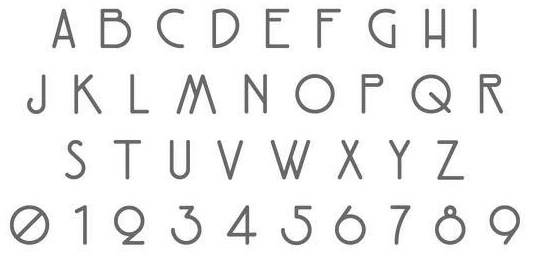
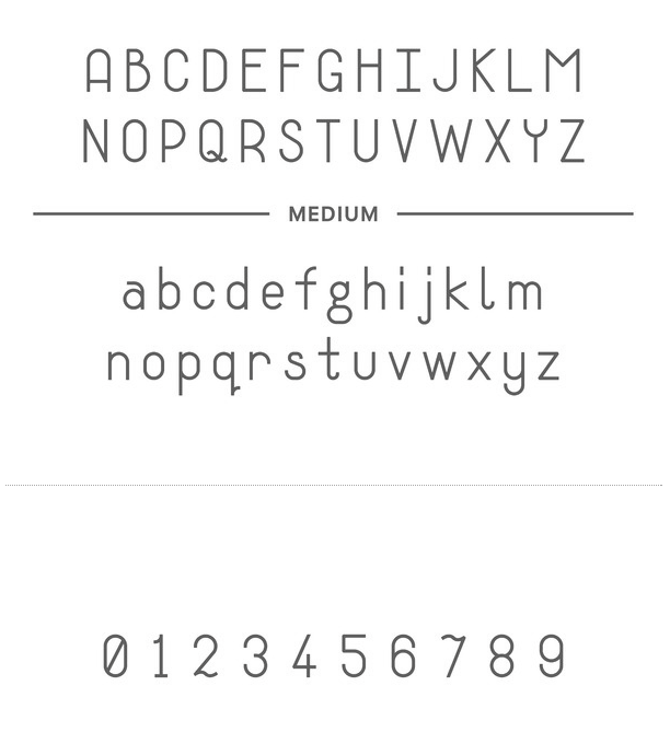
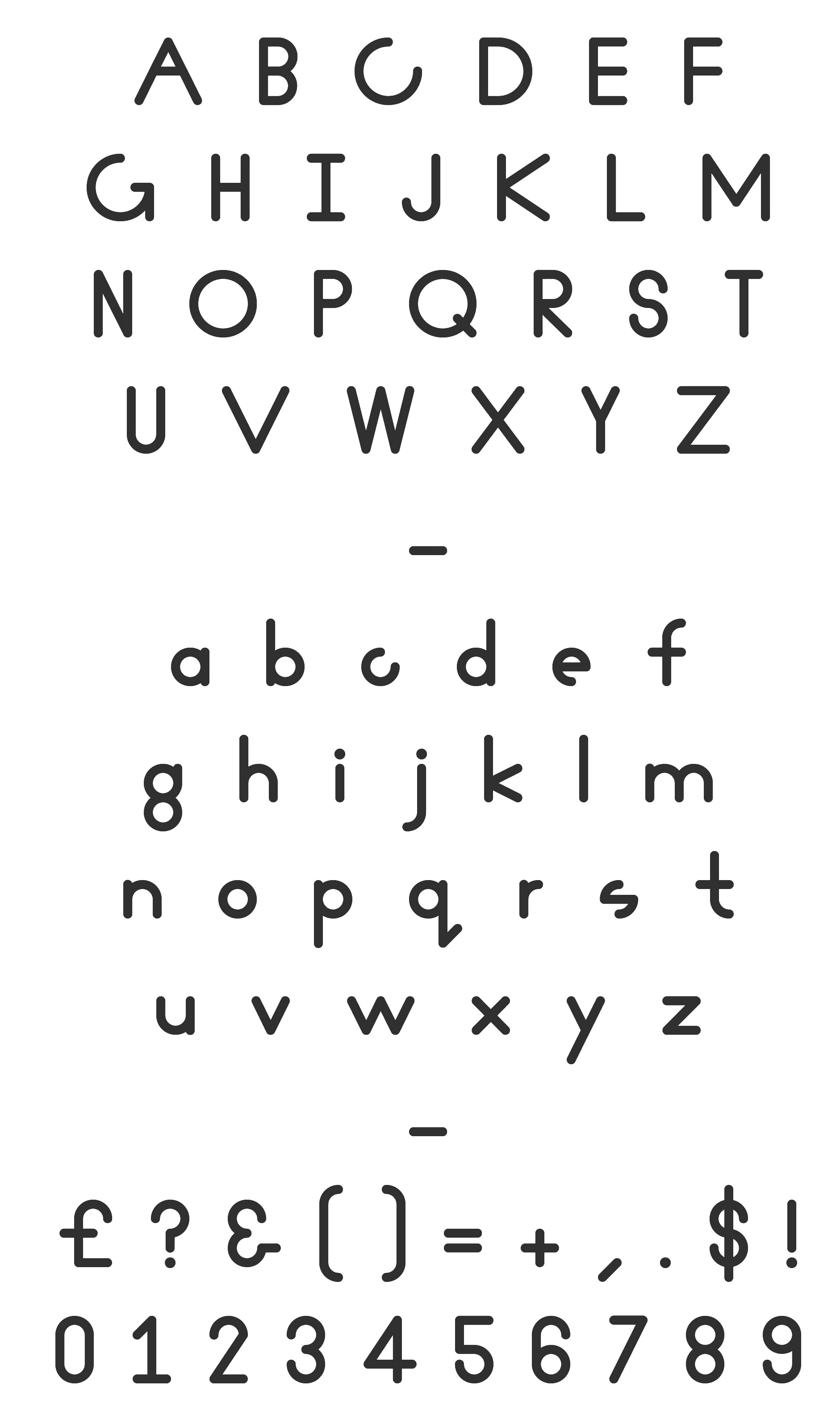
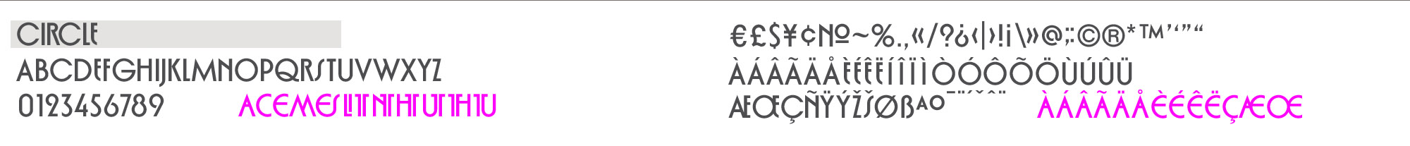
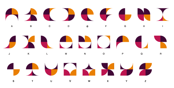
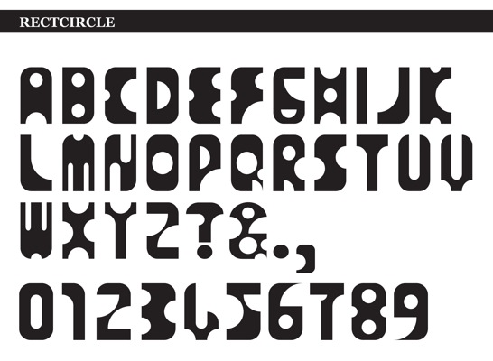
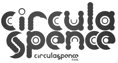
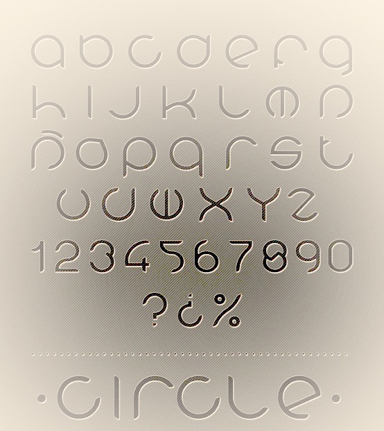
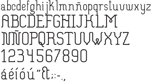
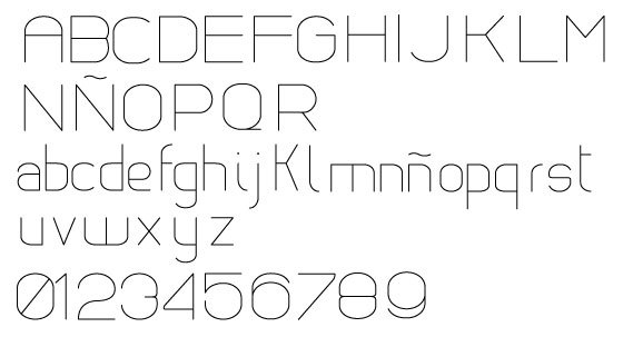
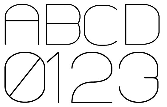
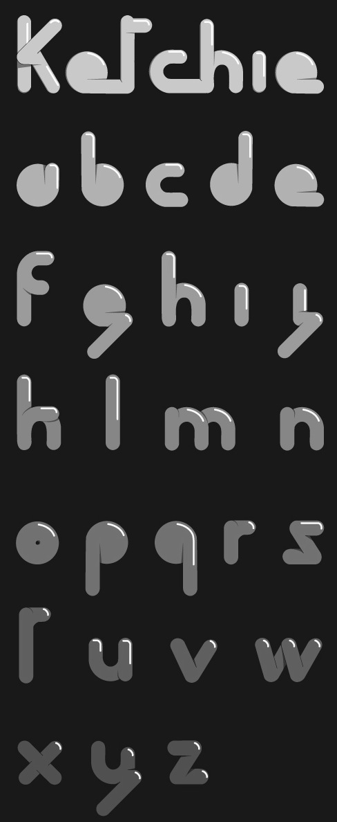
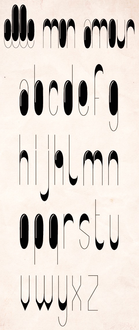
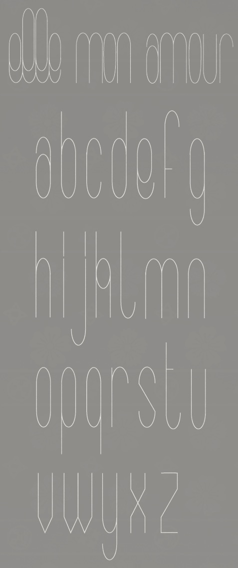
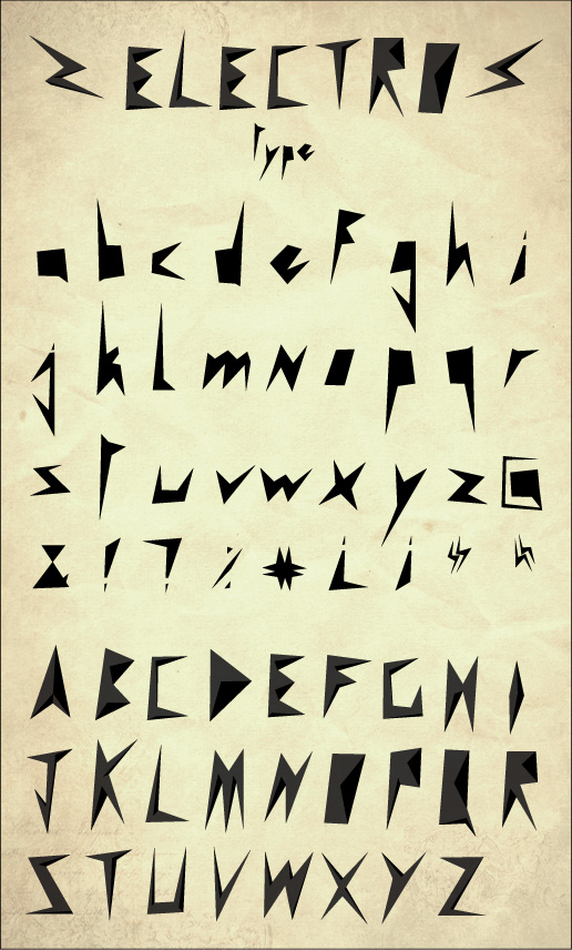
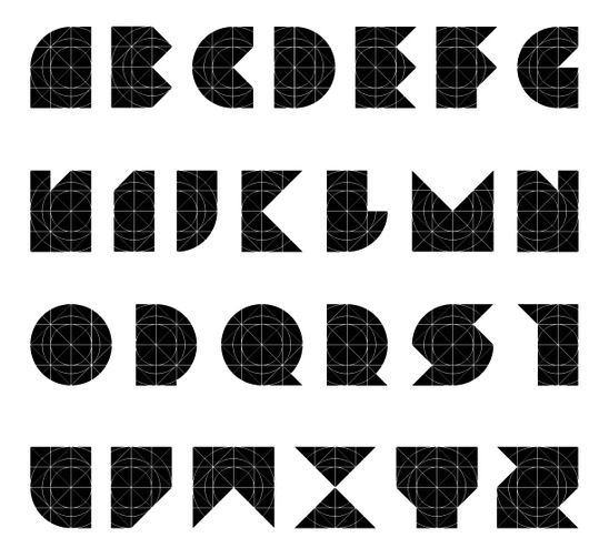
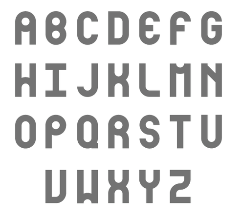
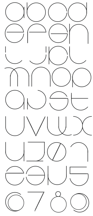
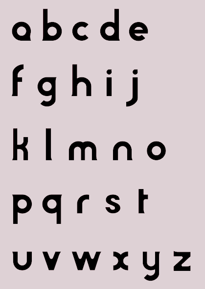
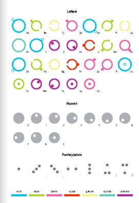
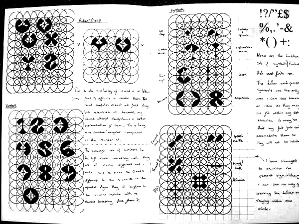
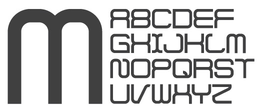
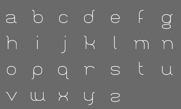
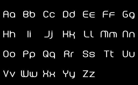
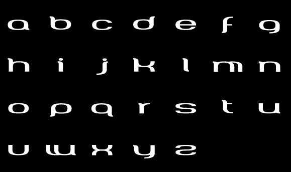
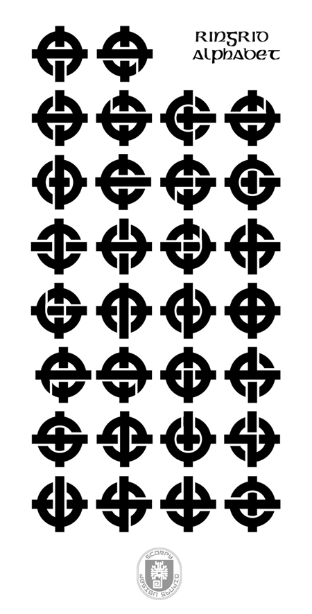
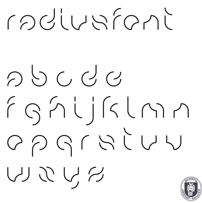
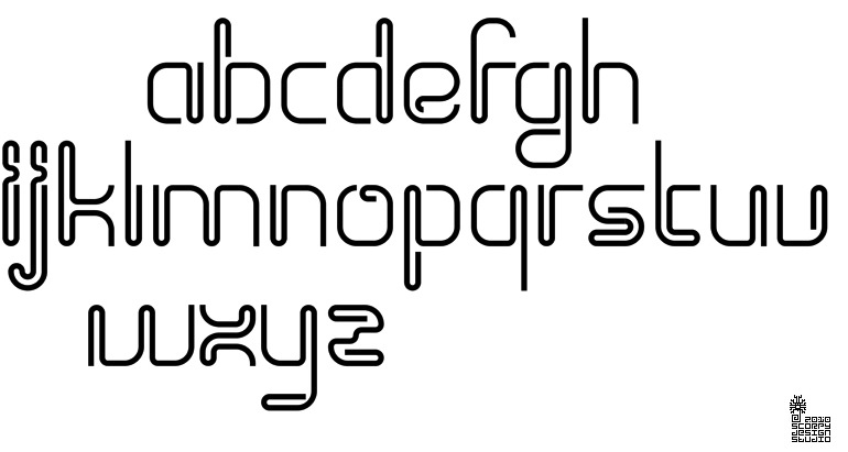
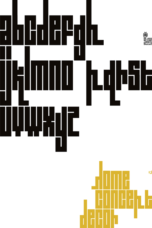
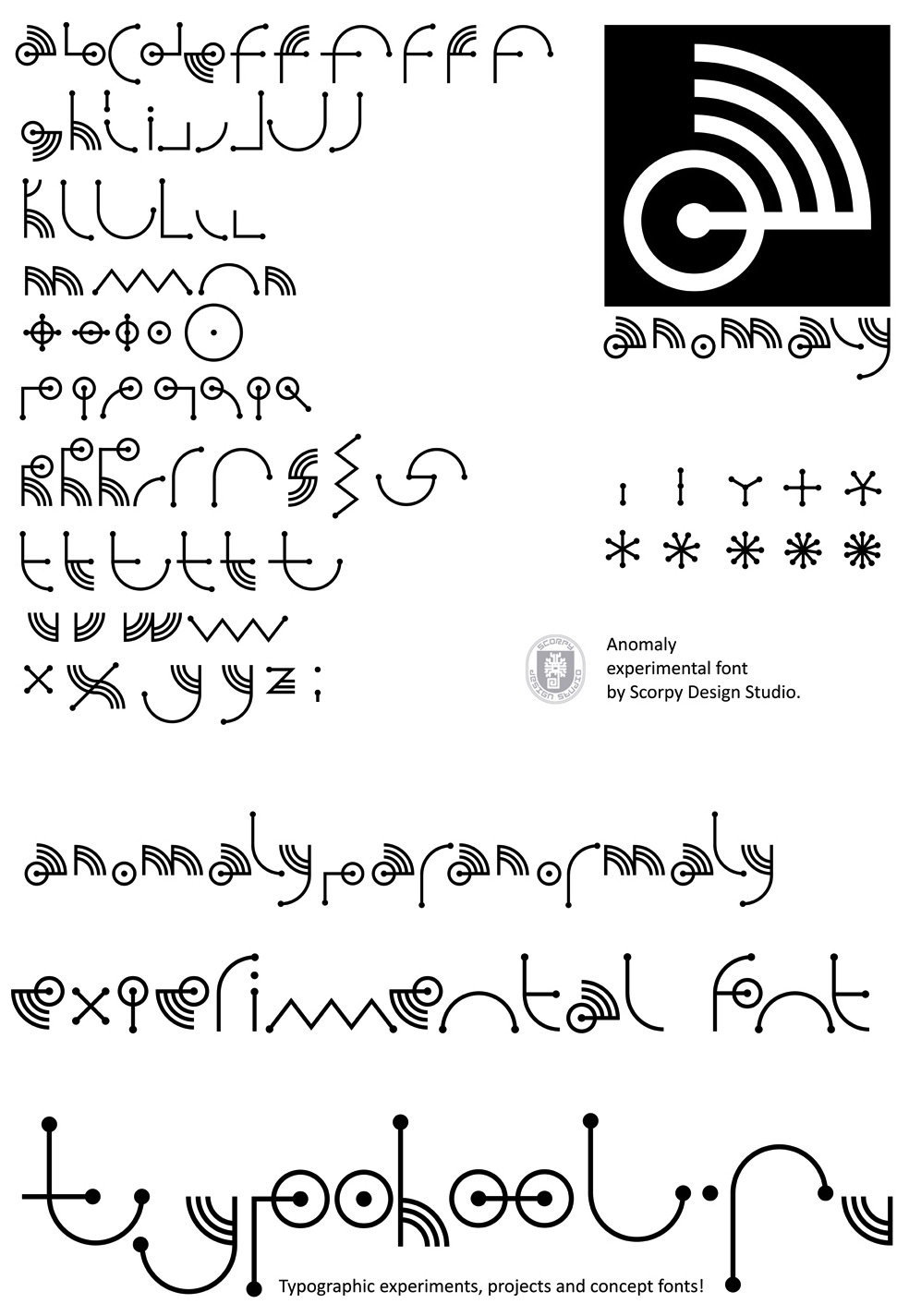
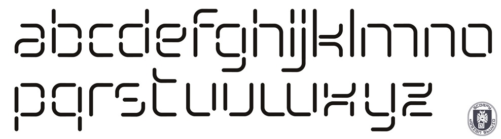
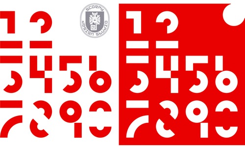
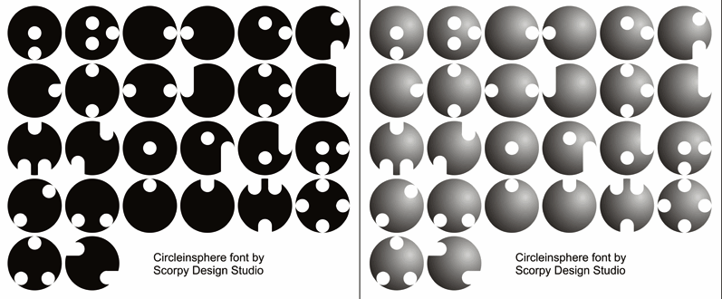
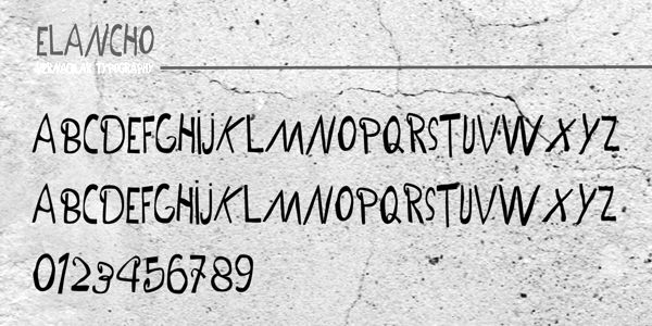
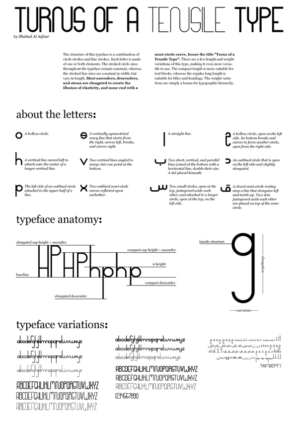
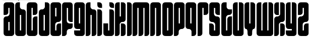
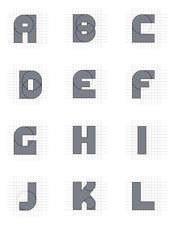
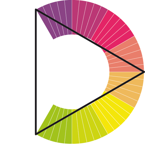
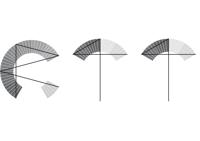
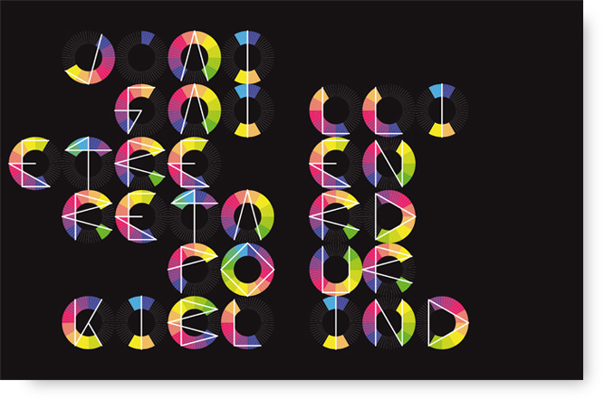
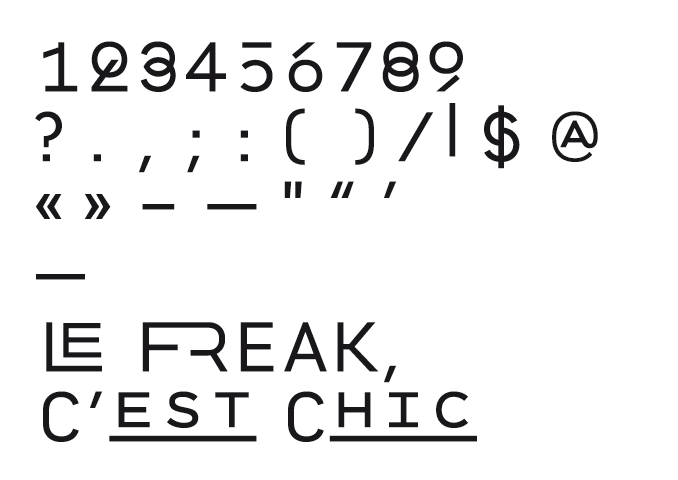
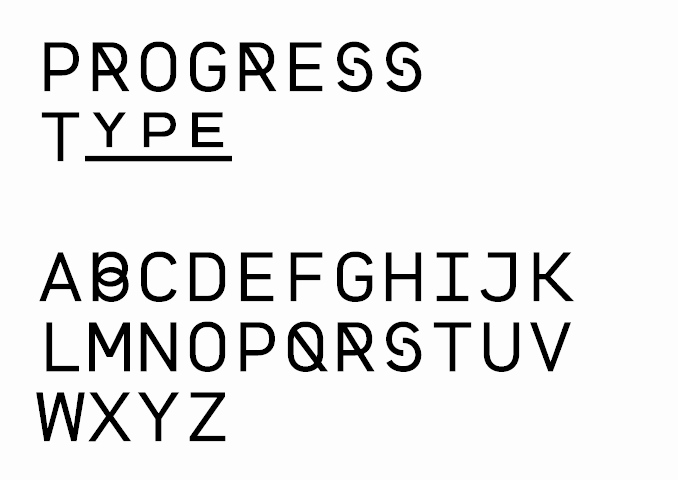
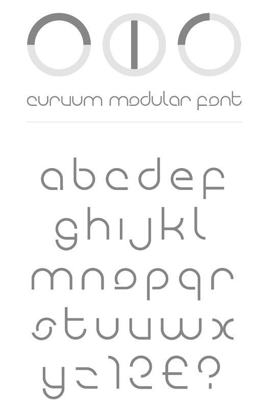
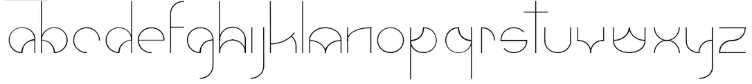
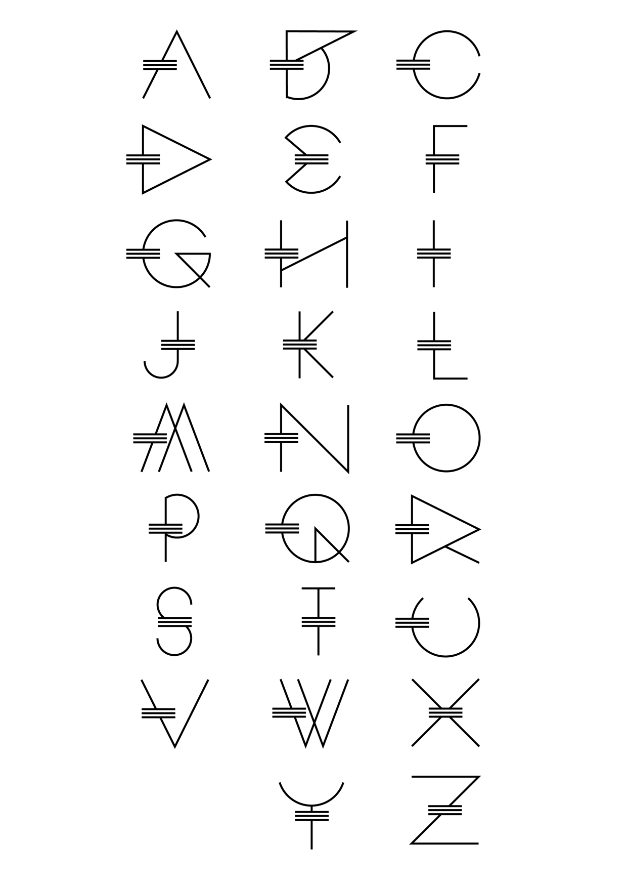
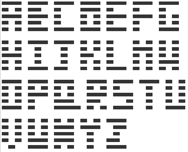
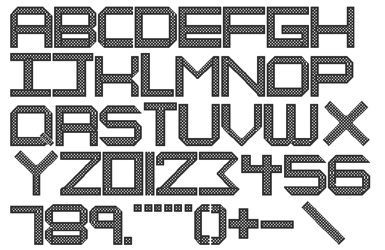
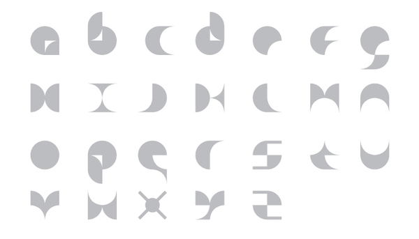
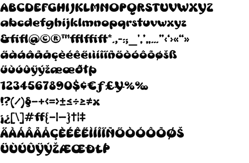
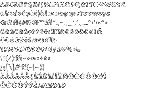
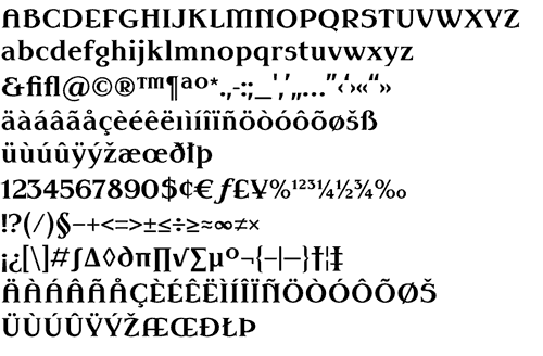
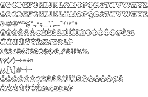
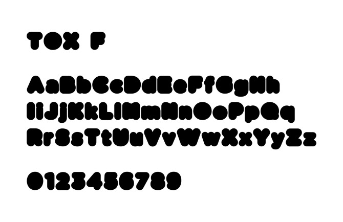
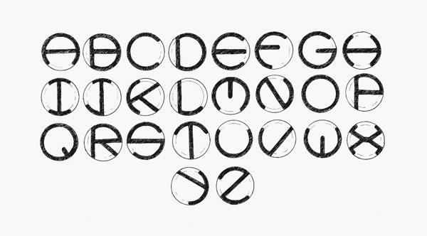
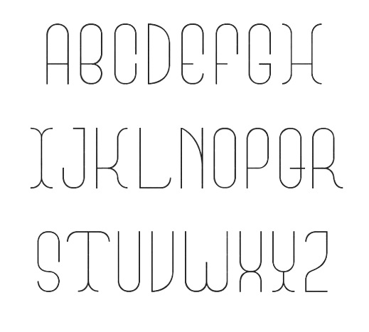
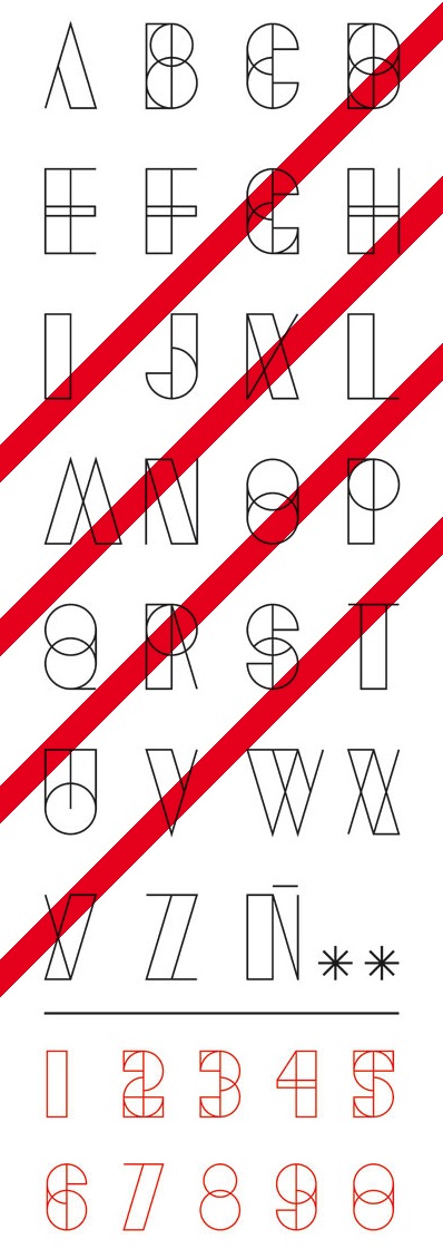
|
|
|
|