| | |
A manual for mathematical PostScript
|
Fantastic collection of code and tutorials by a mathematician (Bill Casselman) for mathematicians. A must visit! [Google]
[More] ⦿
|
A Survey of Free Math Fonts for TeX and LaTeX
[Stephen G. Hartke]
|
Article by Stephen Hartke from Urbana, IL, written in 2006. He surveys free math fonts for TeX and LaTeX, with examples, instructions for using LaTeX packages for changing fonts, and links to sources for the fonts and packages. PDF version of the paper. Hartke is a Professor of Mathematics at the University of Illinois at Urbana-Champaign. He finished a font family called Aurulent Sans and Aurulent Sans Mono (2007), and released the free monospaced font Verily Serif Mono (2006, based on Vera Serif, with same dimensions as Vera Sans Mono). Fontsy link. Alternate URL. Yet another URL. Twentyfour examples of text face/math typeface are showcased. Some are quite disappointing. Here are the better ones (with some text quoted from Hartke's article): - Computer Modern (by Don Knuth), still my favorite. Type 1 versions of Computer Modern from Blue Sky Research and Y&Y, Inc. have been made freely available by the American Mathematical Society (AMS). Basil K. Malyshev has also released a free Type 1 version of Computer Modern, the BaKoMa fonts. Computer Modern has been extended to include more characters, particularly for non-English European languages. These fonts include European Computer Modern by Jörg Knappen and Norbert Schwarz (METAFONT only), Tt2001 by Peter Szabó (converted into Type 1 format from METAFONT sources using textrace), CM-Super by Vladimir Volovich (also converted using textrace); and Latin Modern by Bogusaw Jackowski and Janusz M. Nowacki (extended from the Blue Sky AMS fonts using MetaType1).
- Concrete text with Euler math, or Concrete text with Concrete math. The Concrete font was created by Knuth for his book Concrete Mathematics. Hermann Zapf was commissioned by the AMS to create the math font Euler for use in Concrete Mathematics. Type 1 versions of Concrete in T1 encoding are available in the CM-Super collection, and Type 1 versions of Euler are available in the Blue Sky collection from the AMS and in the BaKoMa collection. The eulervm package by Walter Schmidt implements virtual fonts for Euler that are more efficient to use with LaTeX. Ulrik Vieth created the Concrete Math fonts to match the Concrete text fonts; the only early free versions are implemented in METAFONT. The ccfonts package by Walter Schmidt changes the text font to Concrete and changes the math font to the Concrete Math fonts if eulervm is not loaded. Note that Concrete Text has no bold, but the Computer Modern Bold does just fine for that. However, in 2022, Daniel Flipo developed a free OpenType font based on Vieth's Metafont, also called Concrete Math.
- Antykwa Poltawskiego text and Computer Modern Math. J. M. Nowacki created the font Antykwa Poltawskiego using the MetaType1 system based on a typeface by Polish typographer Adam Poltawski.
- Antykwa Toruńska text and math. Antykwa Toruńska was created by J. M. Nowacki using the MetaType1 system based on a typeface by the Polish typographer Zygfryd Gardzielewski. The package anttor has complete math support in both TeX and LaTeX.
- Kerkis text and math. Kerkis was created by Antonis Tsolomitis by extending URW Bookman L to include Greek and additional Latin characters. The resulting fonts are stand-alone and can be used by applications outside of TeX. A font of math symbols is included, but not used by the LaTeX package. The package kmath uses txfonts for math symbols and uppercase Greek letters.
- New Century Schoolbook with Millennial math. New Century Schoolbook with Fourier math. The Millennial math font by Stephen Hartke contains Greek letters and other letter-like mathematical symbols. A set of virtual fonts is provided that uses New Century Schoolbook for Latin letters in math, Millennial for Greek and other letter-like symbols, and txfonts and Computer Modern for all other symbols, including binary operators, relations, and large symbols. This font is still in development, but will hopefully be released in 2006. The fouriernc package of Michael Zedler uses New Century Schoolbook for text and Latin letters in mathematics, and the Greek and symbol fonts from the Fourier-GUTenberg package for the remaining mathematical symbols.
- Palatino and pxfonts, Pazo, or mathpple for math symbols. Young Ryu created the pxfonts collection, which contains Greek and other letter-like symbols, as well as a complete set of geometric symbols, including the AMS symbols. Diego Puga created the Pazo math fonts, which include the Greek letters and other letter-like symbols in a style that matches Palatino. The LaTeX package mathpazo (now part of PSNFSS) uses Palatino for Latin letters, Pazo for Greek and other letter-like symbols, and Computer Modern for geometric symbols. The LaTeX package mathpple (also part of PSNFSS) uses Palatino for Latin letters and slanted Euler for Greek and other symbols. Since Hermann Zapf designed both Palatino and Euler, the designs mesh well. An alternate use of Euler is using the eulervm package. Ralf Stubner added small caps and old-style figures to URW Palladio L in the FPL package, and Walter Schmidt extended these fonts in the FPL Neu package.
- Utopia and Fourier or Math Design. Utopia was donated by Adobe for use with X Windows. Michel Bovani created Fourier-GUTenberg as an accompaniment to Utopia and is very complete, containing both Greek letters and standard and AMS symbols. The Math Design fonts for Utopia of Paul Pichaureau are also very complete, including Greek letters and AMS symbols.
- Charter and Math Design. Or URW Garamond and Math Design. Charter was donated by Bitstream for use with X Windows. The Math Design fonts for Charter created by Paul Pichaureau are very complete, including Greek letters, symbols from Computer Modern, and the AMS symbols. Charis SIL might be an alternate source for Greek letters that match Charter more closely. Another possibility for a math font is to use the Euler fonts with the charter and eulervm packages. URW Garamond No. 8 is available under the Aladdin Free Public License as part of the GhostPCL project. The Math Design fonts for URW Garamond created by Paul Pichaureau are very complete, including Greek letters, symbols from Computer Modern, and the AMS symbols.
- Times or Omega Serif, and txfonts, Belleek, mathptmx, or mbtimes. Young Ryu created the txfonts collection, which contains Greek and other letter-like symbols, as well as a complete set of geometric symbols, including the AMS symbols. The txfonts package also includes a very nice typewriter font, txtt. Belleek was created by Richard Kinch and is a drop-in replacement for the commercial fonts required by the mathtime package (now part of PSNFSS). The LaTeX package mathptmx (also part of PSNFSS) uses Times for Latin letters and Symbol for Greek and other symbols. Michel Bovani created the mbtimes package by using Omega Serif for text and Latin and Greek letters in mathematics. mbtimes also includes symbol fonts and a set of calligraphic letters. Omega Serif is the primary font for Omega, a 16-bit extension of TeX by John Plaice and Yannis Haralambous. The STIX fonts project is a collaboration of several academic publishers to create a set of Times-compatible fonts containing every possible glyph needed for mathematical and technical publishing. These fonts are still in development, with a scheduled release in the middle of 2006. Note: When Adobe introduced Postscript in 1984, they defined 35 core fonts (in 10 typefaces) that must be present in all Postscript interpreters. In 1996, URW++ released a replacement set for the core fonts under the GNU General Public License. The URW++ fonts were primarily released for use with Ghostscript, a free Postscript interpreter. For example, Times is Nimbus Roman No. 9 L, Palatino is URW Palladio L, New Century Schoolbook is Century Schoolbook L and Symbol is Standard Symbols L.
Klingspor link. Dafont link. Abstract Fonts link. [Google]
[More] ⦿
|
Aah Yes

|
 Southampton, UK-based foundry, est. 2006. Font families include Regalese (2008, 8 weights with stylish rounded serifs), Arrow Heaven (2007, 6 styles of fonts with 62 arrows in 40 orientations each), Lydiard (2007, sans cum comic book), Demigrunge (2007), Nidex (2007, caps-only grunge), Rocksolid (2007), Perio (2007, a grungy didone), Havenbrook (2007, a 22-style family), Sudoku Blank (2007), Pikelet (2007, grunge headline face), Sanzettica (2007, a 40-style geometric sans family, but the x-weight is unacceptably large), Hunniwell (2007, felt tip style), Meriden (2007, display sans family), Saint Val (2007), Funkywarp (2006), Cheedo (2006, bi-lined), Old Forge (2006, roman style), Blank Manuscript (2006, music font), Disgrunged ABCD (2006), Disgrunged 1234 (2006), Beeble (2006), Choob Stripes (2006), Diffie (2006), Pixettish (2006), Caldicote (2006, a 13-style serif family), Starbell (2006), Tuzonie (2006, grunge), Cabragio (2006, free-flowing informal), Deltarbo (2006, sans), Write (2006, an almost architectural script), Dascari (2006, an informal headline sans), Smeethe (2006, comic strip face), Crockstomp (2006, grunge), Dorkihand (2006), Meltifex (2006, melting letters), Rappica (grunge), Blue Sugar (2007, grunge), Front Desk (2007), Powdermonkey (2007), Sideshadow (2007), Spiky (2007), Zebra Spots (2007), Amescote (2007, a 6-weight sans), Mivron (2007, outline sans), Puggu (2007, comic strip font), Luzaine (2007), Overlapper (2007), Satron (2007), Stubble (2008, grunge), Newsanse (2008, a 15-style large x-height disaster), Rysse (2008, an 11-style grunge family), Chelp (2008, grunge), Snather (2008: thin, rounded squarish), Keybies (2008, piano key font), Quickle (2008), Pevensey (2008: 21 styles, each with 1200 glyphs, transitional style), Spiraltwists (2008), Music Sheets (2009), Snazzy (2009), Shelflife (2012, a macho sans), Langton (2012, a workhorse sans family), Indipia (2012, a corroded family), Bradwell (2012, condensed sans), Dunsley (2013, a hand-drawn sans), Darnalls (2013, antiqued book face), Stamppad (like a rough rubber stamp pad), Heavenly Bodies, Stripated (2016), Slonk (2016: an ornamental font with a pearl in each outline), Guitar Chords (2016).
 Typefaces from 2017: Time Exactly (just type in the four numbers of any time from 0000 to 2359 and it will give you that clock face, in one of 60 styles of your choice), Rebista, Magg (a corroded condensed sans typeface family), Sanstone. Typefaces from 2018: Hypersans (12 weights), Martian Tiles, Dominoes (a domino tile font). Typefaces from 2020: Yafferbuddle (a cartoon font). View the Aah Yes typeface library. [Google]
[MyFonts]
[More] ⦿
|
Achim Blumensath
|
Designer of MnSymbols, a free math symbol font (in metafont format) designed to be used in conjunction with Adobe Minion. Since 2005 also available in type 1 format: MnSymbol-Bold10, MnSymbol-Bold12, MnSymbol-Bold5, MnSymbol-Bold6, MnSymbol-Bold7, MnSymbol-Bold8, MnSymbol-Bold9, MnSymbol10, MnSymbol12, MnSymbol5, MnSymbol6, MnSymbol7, MnSymbol8, MnSymbol9. [Google]
[More] ⦿
|
Alan Jeffrey
[bbold]
|
[More] ⦿
|
Aldine Italic: Fourier Analysis
|
Planar Fourier analysis of a text set in Aldine italic, based on Alex Chirokov's FFT plugins. [Google]
[More] ⦿
|
Alec Julien
[Haiku Monkey]
|
 [MyFonts]
[More] ⦿
[MyFonts]
[More] ⦿
|
Alessio D'Ellena
|
 Originally from Lazio, Italy, Alessio d'Ellena (b. 1985, Frattocchie, Rome) graduated from ISIA Urbano (Italy) with a thesis entitled Tipografia Parametrica e Matematica (2012). Graduate of the Typemedia program at KABK, class of 2016.
 He created some typefaces such as Corso (2013, text family) and New Banco (2013, after Roger Excoffon's Banco from 1951). In 2007, he co-designed Saffran with Erasmo Ciufo and published it at CAST in 2015. Saffran is a stencil sans with squarish letterforms. His graduation typeface at KABK in 2016 is the 9-12 point text typeface Laica, which is characterized by tall-hat terminals on glyphs like the 4, the a and the t. Like Trump's politics, Laica surprises---no glyph is what one would expect. It won an award in the TDC Typeface Design competition in 2017. Laica A sports chiseled transitions that guarantee good rhythm and balance from small-sized text use to eye-catching billboard applications. Laica B has straight transitions at its joints and therefore an overall more simplified, elegant tone. Laica was released by Dinamo in 2020, where Alessio was supported by Franziska Weitgruber, Igino Marini (kerning) and Chi-Long Trieu (font engineering). In 2017, he designed the sans typeface Juventus Fans. [Google]
[More] ⦿
|
Alexander Lange
|
 Karlsruhe-based software developer. Creator of the large (and free) Unicode font Quivira (2005). It covers mathematics, chess, astrological symbols, arrows, fists, Latin, Greek, Cyrillic, Hebrew, Armenian, Georgian, Tifinagh, Coptic, emoticons, Vai, and Braille, to name just a few ranges. Alexander graduated in computer science at the Hochschule Mannheim University of Applied Sciences (degree: Diplom-Informatiker (UAS)). [Google]
[More] ⦿
Karlsruhe-based software developer. Creator of the large (and free) Unicode font Quivira (2005). It covers mathematics, chess, astrological symbols, arrows, fists, Latin, Greek, Cyrillic, Hebrew, Armenian, Georgian, Tifinagh, Coptic, emoticons, Vai, and Braille, to name just a few ranges. Alexander graduated in computer science at the Hochschule Mannheim University of Applied Sciences (degree: Diplom-Informatiker (UAS)). [Google]
[More] ⦿
|
Alexander Tarbeev
[TFaces]
|
 [MyFonts]
[More] ⦿
[MyFonts]
[More] ⦿
|
Alexandre Saumier Demers
[Coppers & Brasses]
|
 [More] ⦿
|
Alexey Kryukov
|
 Russian developer of these free font families, quite exquisite and complete:
 - Old Standard TT (2006-2010): a high quality didone 2-style family, suitable for classical, biblical and medieval studies as well as for general-purpose typesetting in languages which use Greek or Cyrillic script, as well as Latin. Many math symbols are included. Old Standard is part of the Google open font directory of free web fonts, and was adapted for TeX use. He writes: Old Standard is supposed to reproduce the actual printing style of the early 20th century, reviving a specific type of Modern (classicist) style of serif typefaces, very commonly used in various editions of the late 19th and early 20th century, but almost completely abandoned later. It supports typesetting of Old and Middle English, Old Icelandic, Cyrillic (with historical characters, extensions for Old Slavonic and localised forms), Gothic transliterations, critical editions of Classical Greek and Latin, and many more. People have also started using it for mathematical typesetting.
- Tempora LGC Unicode: Kryukov writes Tempora LGC Unicode was my first attempt to create a multilingual font supporting Latin, Greek (including polytonic characters) and Cyrillic scripts. This family is based on two well-known free typefaces similar to Adobe Times: Nimbus Roman No 9 L by URW (russified by Valek Filippov), and the Omega Serif family, developed by Yannis Charalambous. However, all basic components of the font, and especially its Greek and Cyrillic parts, have suffered serious modifications, so that currently Tempora LGC Unicode represents an independent typeface, quite different from its predecessors. Free download site. Many updates were made to the font package, with copyright notices to Michael Sharpe (2015), Alexey Kryukov (2005), URW++ Design & Development (1999), Valek Filippov (2001), Dmitry 40in (2001), The Omega Project (1996), and the Free Software Foundation (2002, 2003).
- Theano Classical fonts: Theano Didot (2008) is a classicist face, with both its Roman and Greek parts implemented in Didot style. Theano Modern has Greek letters designed in the Porsonic style. It is based on Figgins Pica No. 3 / Small Pica No. 2, one of the most successful Porsonic Greek typefaces. Theano Old Style is a modernized "Old Style" Greek font with a large number of historic ligatures and alternate forms, modelled after some early 19th century types designed by Figgins' type foundry. It is accompanied by a Latin typeface based on some "Old Style" Roman fonts of the late 19th and early 20th century. Pick up Theano Modern C (2012) at Open Font Library, and Theano Didot at CTAN.
- CM-LGC (2003): The CM-LGC package contains Type 1 fonts converted from METAFONT sources of the Computer Modern font families. The following encodings are supported: T1, T2A (Cyrillic), LGR (Greek) and TS1. This package includes also Unicode virtual fonts for use with Omega/Lambda. CM-LGC is the first Type 1 font package for LaTeX which supports all European scripts (LGC means Latin, Greek and Cyrillic). Alexej Kryukov used Textrace to create CM-LGC.
He contributed to the GNU Freefont project via FreeSerif Cyrillic, and some of the Greek symbols. He also provided valuable direction about Cyrillic and Greek typesetting. Kernest link. Fontspace link. Another URL. Google Plus link. Abstract Fonts link. [Google]
[MyFonts]
[More] ⦿
|
Amadeus Information Systems
[Phil Chastney]
|
Amadeus Information Systems Limited / Phil Chastney are the designers of SImPL (1999-2001) and Sixpack Medium (2009), great Courier-like monospace fonts with many diacritics and symbols, filling many of the Unicode pages. The designer is Phil Chastney, who writes One of the design aims of the font was to provide a complete set of all known APL symbols, plus sufficient characters to allow prompts, comments, etc., to be expressed in every European language known to be in current use. Basically, that means the Latin, Greek and Cyrillic alphabets, plus accented and variant letter forms as required for other European languages using these alphabets.. Incidentally, Armenian and Cyrillic are also covered, and the number of mathematical symbols is staggering. [Google]
[More] ⦿
|
American Mathematical Society
[Tom Kacvinsky]
|
The AMS in Providence, RI, offered the Computer Modern and AMS fonts in type 1 and metafont formats. Free, and for mathematical symbols, the best anywhere. The contact until 2004 was Tom Kacvinsky. Tom hasn't worked at the AMS since 2004. The AMS and CM fonts are copyrighted by the AMS now and are part of the TeX Live distribution. AMS Fonts. [Google]
[More] ⦿
|
AMS fonts
|
AMS Euler (a calligraphic font, designed by Herman Zapf), AMS Cyrillic, AMS Computer Modern, AMS extra math symbols (msam, msbm). In metafont and type 1 formats. [Google]
[More] ⦿
|
AMS Fonts (Truetype)
|
TTF versions of the American Mathematical Society Computer Modern fonts, aka the BaKoMa fonts by Boris Malyshev. The truetype versions of the AMS fonts are included in PCTeX. [Google]
[More] ⦿
|
André Kuzniarek
[Mathematica Fonts]
|
[More] ⦿
|
Andreas Larsen
|
 Copenhagen-based designer (b. 1986) of Tal (2014), a full set of numerals in many weights for use on small devices. Tal is advertized as free, but there are no download buttons anywhere.
 In 2014, he also created the Open Source fonts Gidole Play (later renamed Gidolinya) and Gidole Sans [micropage], which is patterned after DIN 1451 and uses Euler spirals. Dedicated page for Gidole Sans. Github link for Gidole. In 2015, he published Gidole Regular and the monoline sans programming font families Monoid and Mono 16, which cover Latin, Greek and Cyrillic. Gidole was forked and extended in 2016 at Open Font Library by Cristiano Sobral as Normung. He modified the free M+ font to design MonoMusic for chords and tabs. Behance link. Dafont link. Open Font Library link. Use Modify link. [Google]
[More] ⦿
|
Andrew Hunt
|
Codesigner at Wolfram Research of some Mathematica fonts, such as Math5Mono, Math5MonoBold (1999), Math5, Math5Bold (1998). Not to be confused with the other Andrew Hunt, who set up Quantum Enterprises in Somerset, UK, a company involved in handwriting fonts, custom fonts, logo fonts, and related type services. [Google]
[More] ⦿
|
Andrew West
[BabelStone]
|
[More] ⦿
|
Andrey V. Panov
[CM Unicode]
|
[More] ⦿
|
Andy Mangold
|
 Born and raised in West Chester, PA, near Philadelphia, he is a student at the Maryland Institute College of Art. Aka Cocoi Anouk.
 In 2010, he created the gorgeous ultra-fat didone watch number set called Pompadour (free). It has already been used tens of times, including in this poster by Jay Schaul (2011). Pompadour can be downloaded/bought at Lost Type Coop. Fontspace link. [Google]
[More] ⦿
|
Andy Somogyi
[gNumerator]
|
[More] ⦿
|
Anthony Phan
|
From the University of Poitiers, France, Anthony Phan's math symbol package (in metafont) is called mathabx (2002). It extends the Computer Modern mathematical symbol set. Other series by him, all in metafont: Mbb (2000, blackboard outline), Mcalligra (2001), Mxy (2002), Mgrey (2000). In 2011, type 1 outlines were made by Kohsaku Hotta. [Google]
[More] ⦿
|
Anton Zinoviev
[TopTeam Co]
|
[More] ⦿
|
Antonis Tsolomitis
[Kerkis]
|
[More] ⦿
|
Antonis Tsolomitis
[Laboratory of Digital Typography and Mathematical Software]
|
 [More] ⦿
|
Anyetipo
|
Spanish place in Madrid with commercial fonts for teaching children: Escolar (+Flecha, +Pro, +Cuadricula), Preescolar, Preescolar pro, Infantil, Preainfantil, Junior (+Venezuela), Trazos (tracing fonts), Precalimex, Calimex (used in Mexico), Calimex Pluma, Andina (used in Chile), Caliprico (used in Puerto Rico), Basica, Caliper (used in Peru), Calipro, Calirredo (used in the Domican Republic). Also: Ibarra Antiqua, Pautas, Elzevir, Mates (math symbol fonts), Gregoriano (blackletter). Anyetipo also has a type making service. [Google]
[More] ⦿
|
Apostolos Syropoulos
[Asana Math]
|
[More] ⦿
|
Applied Symbols
[Selwyn Hollis]
|
Applied Symbols, founded by Selwyn Hollis, specializes in custom fonts and graphics for Mathematica. It created OpenType versions of Knuth's Computer Modern fonts. [Considering that the PostScript versions of these fonts by BlueSky are free, I have a problem with Applied Symbols actually selling them.] Another font sold here is UniMath: "This OpenType font contains over a thousand glyphs, including math-italic Roman and Greek alphabets, upper-case blackboard bold, calligraphic, and Euler script, and hundreds of technical and mathematical symbols." In an earlier web life (as Faux Tex Fonts), Selwyn was selling a Mac package with these truetype fonts: Symbolic, MathMode, and KahoeTech. [Google]
[MyFonts]
[More] ⦿
|
Arev Fonts
[Stephen Schrenk]
|
Motivated by mathematical applications, the "Arev" set of fonts adds Greek, Cyrillic, Latin-A, and some Latin-B, and Symbol characters (music and math, mainly) to Bitstream's Vera fonts. Stephen Schrenk (whose nom de plume is Tavmjong Bah) created the Arev Sans font. The text accompanying the Arev Sans package is: The package arev provides virtual fonts and LaTeX packages for using Arev Sans. Arev Sans is a derivative of Bitstream Vera Sans created by Tavmjong Bah by adding support for Greek and Cyrillic characters. Bah also added a few variant letters that are more appropriate for mathematics. The primary purpose for using Arev Sans in LaTeX is presentations, particularly when using a computer projector. Arev Sans is quite readable for presentations, with large x-height, "open letters," wide spacing, and thick stems. The style is very similar to the SliTeX font lcmss, but heavier. Stephen Hartke converted Arev Sans to Type 1 format, and created the virtual fonts and packages for using Arev Sans in LaTeX. [Google]
[More] ⦿
|
ARGE Mathematik AHS Kärnten
|
Two fonts, ArialSpecialG1 and Axel, both by Monotype. Axel has some caps ready for use as math symbols. [Google]
[More] ⦿
|
Ari Rafaeli
[ARTypes]
|
 [MyFonts]
[More] ⦿
[MyFonts]
[More] ⦿
|
Ariel Barton
|
 Author of various TeX / metafnt / TeX font packages. These include knitting: a package written to make it possible to write cable and lace charts for knitting patterns using plain TeX or LaTeX. It provides type 1 and metafont fonts of appropriate symbols and macros for their use. The font family KnittingSymbols (2010) contains ten fonts by Ariel Barton.
 In 2013, she published sansmathfonts, motivated by Ariel as follows: The Computer Modern font family has a sans serif typeface. However, compared to the serif typeface, it is incomplete: there are no sans serif small caps or math fonts. Furthermore, the bold slanted font is not available as an outline font. This leads to highly unsatisfactory typography of documents that use sans serif for the body text. The sansmathfonts package provides these missing" fonts. Most of the usefulness of the package is in the fonts; sansmathfonts.sty is a small package providing LATEX support. [Google]
[More] ⦿
|
Arimugan Egambaram
[Roline-Asia.com]
|
[More] ⦿
|
Arkandis Digital Foundry
[Hirwen Harendal]
|
 French foundry, est. 2007, which published many extensive free sans and sans serif families by Hirwen Harendal, who supports Open Source projects. The purpose of ADF is to provide a large number of high quality fonts (174 fonts as of the end of August 2007). Harendal has help from Clea F. Rees, most notably on the TeX part and the extensive Venturis family.
 His typefaces: - Accanthis (2009: an alternative for Galliard or Horley Oldstyle).
- AlbertisADF (from URW-A028), Albertis Titling.
- Ameris ADF (from URW n33012t).
- ArrosADF (from URW n021003L).
- AurelisADF (2009, almost art nouveau).
- Baskervald ADF (7 years of work according to Harendal: an alternative for New Baskerville).
- BerenisADF (2008, a didone family), BerenisNo2 (2008).
- BirkenADF (from URW-n033014t).
- ColonnadeADF (from URW-n033014t).
- EditorialisADF (from URW-n033014t).
- Electrum (like Eurostile and URW City).
- FenelrisADF (sans).
- FrontonADF Titling (from URW-n033014t).
- GaramondeADF (from URW-g043004t), GaramondNo8ADF (from URW g043024t).
- Gillius ADF and Gillius ADFN (from Vera Sans, an alternative for Gill Sans MT).
- HelvetisADF (from URW U001).
- Ikarius (2008, semi-serif; inspired by Hypatia Sans), IkariusNo2 (2008), Ikarius-Serie (2009).
- Irianis (2008; IrianisADFMath (2009) was made for the TeX math community).
- Keypad (2010). a dingbat face.
- LibrisADF (sans, patterned after Lydian).
- MekanusADF (2009, typewriter style).
- Mint Spirit (2012) and Mint Spirit No. 2 (2012). An original minimalist sans design. The truetype version is Mintysis (2012).
- NeoGothisADF (2009).
- OldaniaADF (2009, art nouveau).
- OrnementsADF (2009).
- PalladioADFStyle (a Palatino derived from URW g043023t).
- RomandeADF (with hints of Caslon, Times and Tiffany; CTAN download).
- Solothurn (2011). A family developed for Scribus, a free text preparation package that competes with Adobe's InDesign.
- SwitzeraADF (derived from Vera).
- SymbolADF (2008, bullets and arrows).
- Teknis: under development.
- TribunADF (2009, like Times New Roman).
- Universalis ADF (2008-2009, a take on Futura). Open Font Library link.
- VenturisADF, VenturisOldADF, VenturisTitlingADF and VenturisSansADF (2007: alternatives for Utopia).
- Verana Sans and Serif (from Bitstream Vera Sans and Serif).
Kernest link. [Google]
[More] ⦿
|
ARTypes
[Ari Rafaeli]
|
 ARTypes is based in Chicago, and is run by Ari Rafaeli, earlier possibly known as Richard Everds. List of their typefaces categorized by revival type:
 - Hermann Eidenbenz: Graphique (1946) now called Graphique AR, a shadow face.
- Jan van Krimpen (Enschedé) revivals: Romulus Kapitalen (1931), Romulus Open (1936), Curwen Initials (Van Krimpen did these in 1925 for The Curwen Press at Plaistow, London), and Open Kapitalen (1928).
- Jacques-François Rosart: Rosart811, a decorative initial typeface that is a digital version of the 2-line great primer letters cut by J. F. Rosart for Izaak&Johannes Enschedé in 1759 (Enschedé no. 811).
- Stephenson Blake revivals: Borders, Parisian Ronde.
- Rudolf Koch (Klingspor) revivals: Holla, Koch-Antiqua-Kursiv Zierbuchstaben, Maximilian-Antiqua, Neuland 24pt.
- Bernard Naudin (Deberny&Peignot) revival: Le Champlevé.
- W. F. Kemper (Ludwig&Mayer) revival: Colonia. P.H. Raedisch: Lutetia Open (2007) is based on the 48-pt Lutetia capitals engraved by P. H. Raedisch under the direction of Jan van Krimpen for Enschedé in 1928.
- Richard Austin: Fry's Ornamented (2007) is a revival of Ornamented No. 2 which was cut by Richard Austin for Dr. Edmund Fry in 1796. Stephenson, Blake&Co. acquired the type in 1905, and in 1948 they issued fonts in 30-pt (the size of the original design), 36-, 48- and 60-pt.
- Max Caflisch (Bauer) revival: Columna.
- Elisabeth Friedlaender (Bauer) revivals: Elisabeth-Antiqua, Elisabeth-Kursiv (and swash letters). Linotype Friedlaender borders.
- Herbert Thannhaeuser (Typoart) revival: Erler-Versalien.
- O. Menhart (Grafotechna) revivals: Manuscript Grazhdanka (cyrillic), Figural, Figural Italic (and swash letters). Also, Grafotechna ornaments (maybe not by Menhart).
- Hiero Rhode (Johannes Wagner) revival: Hiero-Rhode-Antiqua (2007).
- F. H. E. Schneidler (Bauer) revival: Legende.
- Herbert Post revival: Post-Antiqua swash letters.
- Georg Trump (Weber) revivals: Trump swash letters, Trump-Gravur (called Gravur AR now). The outline caps typeface Forum I-AR is derived from the Forum I type designed by Georg Trump (1948, C. E. Weber). Signum AR-A and Signum AR-B (2011) are based on Trump's Signum (1955, C.E. Weber). Palomba AR (2011) is based on Trump's angular calligraphic typeface Palomba (1954-1955, C.E. Weber). Amati AR (2011) is based on a Georg Trump design from 1953.
- Hermann Zapf revival: Stempel astrological signs.
- F.H. Ernst Schneidler: Zentenar Initialen is based on the initials designed by Prof. F. H. E. Schneidler, ca. 1937, for his Zentenar-Fraktur types.
- Isaac Moore: Old Face Open (Fry's Shaded) is a decorative Baskerville which was probably cut by Isaac Moore for Fry ca. 1788. A revival was issued in eight sizes by Stephenson Blake in 1928.
- Border units and ornaments: Amsterdam Apollo borders, Gracia dashes, Primula ornaments, Bauer Bernhard Curves, Weiß-Schmuck, Curwen Press Flowers, Klingspor Cocktail-Schmuck, Nebiolo fregi di contorno, Attika borders, English (swelled) rules, Künstler-Linien, an-Schmuck, Primavera-Schmuck.
- Freie Initialen are derived from initials made for the Stempel Garamond series. The type was issued in 1928 in three sizes (36, 48, and 60 pt); the AR version follows the 60-pt design.
- Initiales Grecques, based on Firmin Didot's design, ca. 1800.
- Emil A. Neukomm revivals: Bravo AR (2007; originally 1945).
- Ernst Bentele revivals: Bentele-Unziale (2007).
- Joseph Gillé: Initiales ombrées (2007) is based on Gillé's original all caps typeface from 1828.
- Maria-Ballé-Initials (2007), after an original font from Bauersche Giesserei.
- Raffia Initials (1952, Henk Krijger): revived by ARTypes in 2008 as Raffia.
- Ornaments 1 AR (2010): from designs from 18th and 19th century typefounders that were ancestors of the Stephenson Blake foundry.
- Ornaments 2 AR (2010): Ornaments 2 contains designs for the Fanfare Press by Berthold Wolpe (1939) and for the Kynoch Press by Tirzah Garwood (ca. 1927).
- Ornaments 3 AR (2010): based on designs by Bernard Naudin for Deberny et Peignot, c. 1924; and ornaments based on designs by Oldrich Menhart, Karel Svolinsky and Jaroslav Slab for the state printing office of Czechoslovakia and Grafotechna.
- Ornaments 4 AR (2010): based on the Amsterdam Apollo and Gracia ornaments and the Amsterdam Crous-Vidal dashes (designed by Crous-Vidal).
- Ornaments 5 AR (2010): based on the Amsterdam Primula ornaments designed by Imre Reiner, 1949.
- Ornaments 6 AR (2010): based on designs for the Curwen Press by Edward Bawden and Percy Smith.
- Yü Bing-nan revival: Freundschafts-Antiqua AR (2010). Freundschafts-Antiqua (which was also called Chinesische Antiqua) was designed in 1962 by the Chinese calligrapher Yü Bing-nan when he was a student at the Hochschule für Grafik und Buchkunst at Leipzig in 1960.
- Sans Serif Inline (2011). Based on the 36-point design of the Amsterdam Nobel Inline capitals (1931).
- Hildegard Korger revivals: Typoskript AR (2010) is based on a metal type which was produced in 1968 by VEB Typoart, Dresden, from a design of the German calligrapher and lettering artist Hildegard Korger.
- Hans Kühne revival: Kuehne-Antiqua AR (2010) revives a Basque typeface by Hans Kühne.
- The Troyer AR ornaments (2010) are based on the first series of ornaments designed for American Type Founders by Johannes Troyer in 1953.
- The Happy Christmas font (2011) is a snowflake font that is based on designs by Amsterdam and Haas, c. 1950. December Ornaments (2011) contains the 36 Amsterdam designs which were originally issued in 24 and 36 point.
- Walter Diethelm: Diethelm AR (2011) revives Walter Diethelm's Diethelm Antiqua (1948-1951, Haas).
- Walter Brudi revivals: Pan AR (2010, based on a 1957 font by Brudi).
- Hermecito (2013) is a 46-style type system based on an angular serif. It covers Cyrillic, Latin, Greek and several other scripts. Besides being eminently readable, it also has extensive coverage of mathematical and phonetic symbols. Renzo (2013) is along the same lines but with sharpened serifs.
- Spiral (2014) is a revival of a typeface called Spiral designed by Joseph Blumenthal and cut bu Louis Hoell in 1930. In 1936, Monotype reissued that type as Emerson 320.
- Custom typefaces include Fabrizio (2016), a classical serif typeface family for Hebrew, Latin, Cyrillic and Greek, with hints of Garamond and Caslon. Ari writes that Fabrizio made its first appearance in Saggi di Letteratura Italiana: Da Dante per Pirandello a Orazio Costa, by Lucilla Bonavita, printed at Pisa in March 2016 by Fabrizio Serra Editore for whom the type was specially designed.
MyFonts link. View the typefaces made by Ari Rafaeli / ARTypes. [Google]
[MyFonts]
[More] ⦿
|
Asana Math
[Apostolos Syropoulos]
|
The free math symbol Opentype font Asana Math (2007-2019) contains all of the Unicode mathematical symbols. It was made by Apostolos Syropoulos from Xanthi, Greece. It includes all Unicode math symbols. It also has an Opentype math table. Some glyphs were borrowed from Young Ryu's pxfonts (2000) See also here and here. [Google]
[More] ⦿
|
Atelier Beinert München
|
Atelier for design and typography run by Wolfgang Beinert. Classification of type. Roman numerals. Interesting sub-page on typographical rules for numbers. Make sure to visit his award-winning designs of calendars. [Google]
[More] ⦿
|
ATS Products
|
A zip file with these math and related fonts from a variety of sources: DottedManuscript, Manuscript, NumberChristmas, NumberCircle, NumberCresent, NumberDiamond, NumberEgg, NumberHeart, NumberPilgrim, NumberPumpkin, NumberStars, ShapesDotted, ShapesNormal, TouchMath (1981). [Google]
[More] ⦿
|
Autograph
|
Two free math fonts, EFF Autograph and EFF AutographS, both by The Electronic Font Foundry, 1998-2000. [Google]
[More] ⦿
|
Ayres
[Colin Ayres]
|
Taunton, UK-based designer of Ayres Mono (2020), which includes some music and mathematical symbols. A guitarist and guitar teacher, he also created The Ayres Music Standard font for use in Sibelius and Finale. [Google]
[MyFonts]
[More] ⦿
|
BabelStone
[Andrew West]
|
 UK-based Andrew West's great intro page to the 'Phags-pa script, a Brahmic script based on Tibetan that was used for writing Mongolian, Chinese and other languages during the Mongolian Yuan dynasty (1271-1368). Although it is no longer used for Mongolian and Chinese, it is still used to a limited extent as a decorative script for writing Tibetan. Unlike other Brahmic scripts, 'Phags-pa was written vertically from left to right after the manner of the Uighur-derived Mongolian script. The script is named after its creator, the Tibetan lama known by the title 'Phags-pa Lama "Reverend Lama" (1239-1280). Font subpage with samples of BabelStone Phags-pa Book, BabelStone Phags-pa Tibetan A, BabelStone Phags-pa Tibetan B, BabelStone Phags-pa Seal. These fonts were made in 2006 by Andrew West. In 2007, he added the free Zhang Zhung Opentype fonts for Zhang Zhung scripts: sPungs-chen, sPung-chung and Bru-sha, sMar-chen and sMar-chung. The Zhang Zhung culture was an ancient culture that flourished in the western and northern parts of Tibet before the introduction of Buddhism into the country during the 7th century. The extinct Zhang Zhung language is a distinct language related to but separate from Old Tibetan.
 Andrew West's free font BabelStone Modern was designed between 2008 and 2013. This font has almost 2000 glyphs and covers, e.g., Latin, Cyrillic, Ogham, and Braille, and has hundreds of symbols, including a large set of arrows, mathematical symbls, domino tiles, and dingbats. BabelStone Han (2017) is a Unicode Han font in Song/Ming style with G-source glyphs used in Mainland China. The font is derived from Arphic's AR PL Mingti2L Big5 and AR PL SungtiL GB fonts, converted to Unicode mappings, and expanded to cover a wide range of traditional and simplified characters in the CJK, CJK-A, CJK-B, CJK-C, CJK-D, CJK-E, and CJK-F blocks, as well as a large number of currently unencoded characters in the Private Use Area. A few glyphs for non-CJK symbol characters are derived from images uploaded to Wikimedia Commons by Christopher J. Fynn. The number of glyphs is closeto 40,000. [Google]
[More] ⦿
|
Bakoma TEX
|
This extensive package designed by Basil K. Malyshev for Microsoft Windows XP/2000/NT/98/95 contains a wealth of fonts and software. We quote the author: "BaKoMa TeX is Postscript enabled TeX system intended for Electronic Publishing. Postscript enabled means that the system includes built-in Postscript interpreter that provides careful drawing Postscript graphics (including one embedded into DVI via TeX special's) on display and on (even non-postscript) printers. Also, it provides perfect conversion of any Postscript graphics for such output formats as: PDF, SVG, and HTML. SVG output lets you to create high quality animated presentations. The system supports using a scalable fonts in modern font formats: OpenType, TrueType (Unicode supported), Postscript Type1 (including Multiple Masters), and Type3." The 1500 fonts included are broken down as follows (nearly all are conversions of metafonts): - CM (including LaTeX and Logo fonts + vf for T1 with CX)
- AMS Fonts (Euler, Math Symbols).
- EC/TC.
- LH (T2A).
- Concrete (Math, ECC).
- Malvern.
- CMCyr + vf for T2A/LCY.
- Scripting fonts, CMPica, Punk.
- Stmaryrd, Wasy, Rsfs, YHMath, BlackBoard (bbm, doublestroke).
- Lams, Astro Symbols (cmastro, astrosym, moonphase).
- Barcodes (barcodes, wlean, wlc*), Logical (loggates, milstd).
- timing, MusiXTeX, Chess/CChess, Go, Backgammon, Dingbats/NiceFrame.
[Google]
[More] ⦿
|
BaKoMa TeX
|
Free software by Basyl K. Malyshev: BaKoMa TeX is a complete TeX system for Microsoft Windows 95/98/NT/2000. It supports type 1, type 3, truetype, OpenType, and TeX PK formats, and enables PostScript in TeX. The system includes about *1500* typefaces in PostScript Type 1 and Type 3 font format including the following fonts: CM (including LaTeX and Logo fonts + vf for T1 with CX, AMS Fonts (Euler, Math Symbols), EC/TC, LH (T2A), Concrete (Math, ECC), Malvern, CMCyr + vf for T2A/LCY, Scripting fonts, CMPica, Punk, Stmaryrd, Wasy, Rsfs, YHMath, BlackBoard (bbm, doublestroke), Lams, Astro Symbols (cmastro, astrosym, moonphase), Barcodes (barcodes, wlean, wlc*), Logical (loggates, milstd), timing, MusiXTeX, Chess/CChess, Go, Backgammon, Dingbats/NiceFrame. PDF output supported. Direct access to the fonts. [Google]
[More] ⦿
|
bbm
[Gilles F. Robert]
|
bbm is a serifed blackboard bold math symbol (meta)font by Gilles F. Robert from Ecole Normale Supérieure in Lyon. See also here. [Google]
[More] ⦿
|
bbold
[Alan Jeffrey]
|
 bbold is a blackboard bold math symbol font written in metafont by Alan Jeffrey in 1994, and later converted into a type 1 font. This CTAN page can be used for downloads. Type 1 versions are here, courtesy of Berthold K. P. Horn and Khaled Hosny (2007-2010).
 Done for Y&Y, the weight of the original bbold font was a good match to Computer Modern, with upper and lower case Latin and Greek letters as well as punctuation and a number of symbols. The font was the property of Y&Y, and, after their dissolution, the copyright was gifted to TUG in 2007. Michael Sharpe's package bboldx (2021) extends the original by adding a couple of glyphs and adding two new weights. Where the original stem widths were 40 units, the additions have stem widths of 56 units and 90 units respectively. [Google]
[More] ⦿
|
BC Fonts
|
A 1999 series of mathematical and Cyrillic fonts that used to be on the web, but is no longer easy to discover: BCCYR, BCSYMA, BCSYMB, BCSYMX, BCCYRBold, BCSYMABold, BCSYMBBold, BCSYMXBold. The fonts are needed for old math typesetting software such as EXP. I have no idea who made them, and there are no claims to these fonts, so you can download them here. [Google]
[More] ⦿
|
Belleek fonts
[Richard Kinch]
|
Richard Kinch's public domain fonts in type 1 and Truetype that may replace the proprietary fonts needed for Latex Mathtime. Names: blex, blsy, rblmi. Created in 1998. CTAN download site. [Google]
[More] ⦿
|
Ben Harris
|
 Designer of the multistyle free monospaced octagonal and pixel font family Bedstead (2017), covering, Latin, Greek, Cyrillic, Hebrew, mathematics, and a slew of other things. He explains: Bedstead is an outline font based on the characters produced by the Mullard SAA5050 series of Teletext Character Generators. The SAA5050 is familiar to those of a certain age as the chip that produced the MODE 7 display on the BBC Microcomputer. It generates characters from a 5x9 pixel matrix, smoothing diagonal lines to produce an interlaced 10x18 matrix for each character. Bedstead extends that algorithm to continuity, converting a 5x9 pixel grid into an outline with smooth diagonals. [Google]
[More] ⦿
Designer of the multistyle free monospaced octagonal and pixel font family Bedstead (2017), covering, Latin, Greek, Cyrillic, Hebrew, mathematics, and a slew of other things. He explains: Bedstead is an outline font based on the characters produced by the Mullard SAA5050 series of Teletext Character Generators. The SAA5050 is familiar to those of a certain age as the chip that produced the MODE 7 display on the BBC Microcomputer. It generates characters from a 5x9 pixel matrix, smoothing diagonal lines to produce an interlaced 10x18 matrix for each character. Bedstead extends that algorithm to continuity, converting a 5x9 pixel grid into an outline with smooth diagonals. [Google]
[More] ⦿
|
Bender&Associates
|
Free truetype font SoftTestSymbols for logical circuits. [Google]
[More] ⦿
|
Bibliographies on typesetting
|
Computer science bibliographies on the topic of (mathematical and other) typesetting [Google]
[More] ⦿
|
Blackboard Bold
|
Blackboard bold symbols, often used by mathematicans, are double struck symbols. Wikipedia states this about its history: In some texts these symbols are simply shown in bold type: blackboard bold in fact originated from the attempt to write bold letters on blackboards in a way that clearly differentiated them from non-bold letters, and then made its way back in print form as a separate style from ordinary bold, possibly starting with the original 1965 edition of Gunning and Rossi's textbook on complex analysis. Some mathematicians, therefore, do not recognize blackboard bold as a separate style from bold: Jean-Pierre Serre, for example, has publicly inveighed against the use of "blackboard bold" anywhere other than on a blackboard, and uses double-struck letters when writing bold on the blackboard, whereas his published works consistently use ordinary bold for the same symbols. Donald Knuth also advises against the use of blackboard bold in print. I disagree with Knuth on this point. Blackboard Bold provides mathematicians with a nice set of extra symbols, basically doubling the capitals in the Latin alphabet. Furthermore, the blackboard bold R, C, N, Q, and Z are now deeply rooted in the mathematical community, denoting the real numbers, the complex numbers, the natural numbers, the rational numbers and the integers, respectively. [Google]
[More] ⦿
|
Blackboard Bold
|
 Math symbol metafont. [Google]
[More] ⦿
Math symbol metafont. [Google]
[More] ⦿
|
Blackboard Bold
|
For blackboard bold (or "doublestroke") mathematical symbols in TEX, you have six options: - Use a type 1 font, and select from the thousands of great fonts. I personally use GoudyHandtooledBT (Bitstream).
- Use the metafont doublestroke by Olaf Kummer.
- Use the metafont bbm by Gilles F. Robert.
- Use the metafont bbold by Alan Jeffrey.
- Use the metafont amsyb by the AMS.
- Make your own metafont or type 1 font.
[Google]
[More] ⦿
|
Boguslaw Jackowski
[Latin Modern fonts]
|
[More] ⦿
|
Boondox
[Michael Sharpe]
|
Free package in 2011 maintained at the CTAN TeX archive by Michael Sharpe from UCSD, who writes: The PostScript fonts in this package were derived from the STIX OpenType collection, with regular and bold weights of calligraphic, fraktur and double-struck (aka blackboard bold). The font names: BoondoxCalligraphic-Bold, BoondoxCalligraphic-Regular, BoondoxDoubleStruck-Bold, BoondoxDoubleStruck-Regular (blackboard bold style), BoondoxFraktur-Bold, BoondoxFraktur-Regular. Still in 2011, he published Dutch Calligraphic, a reworking of Elzevier's free math calligraphic font ESSTX13. Another CTAN download site. [Google]
[More] ⦿
|
Boover Software (was: Tom's Software)
[Tom Schmidt]
|
Tom Schmidt of New Hope, MN, created the (originally shareware but now commercial) fonts SansFractions and SeriFractions. These fonts are used in the production of the Knoxville (Tennessee) News-Sentinel and Colorado Springs (Colorado) Gazette newspapers, and the AARP magazine. [Google]
[MyFonts]
[More] ⦿
|
Boris Veytsman
|
Creator of the GillCM family in 2010: Unslanted italic Computer Modern fonts based on Eric Gill's ideas. He also created JAMTimes, expanded Times Roman as used in Journal d'Analyse Mathematique. He also made mdputu (2010), a package of virtual fonts with italics, upright digits, and punctuation for use with Adobe Utopia in mathematical texts. In 2011, he published pcarl, a TeX support package for Adobe Cason Open Face. In 2016, Sergei V. Znamenskii and Boris Veytsman, now with the Mathematics Department, Princeton University, published the cmtiup package. The cmtiup package can replace the cmti package in the Computer Modern fonts since it simplifies typesetting of mathematical texts. In 2016, the Computer Modern text italic (cmti) fonts were modified by unslanting all punctuation and digits and embedding the corresponding italic corrections into the kerning. [Google]
[More] ⦿
|
Boris Veytsman
[cmtiup]
|
[More] ⦿
|
Calculus Font
|
Free PostScript font needed for Mathematica. [Google]
[More] ⦿
|
Cambria Math
|
The Cambria Math project was managed by Geraldine Wade and Michael Duggan at Microsoft. Cambria Math is part of a TrueType collection that also includes Cambria, Cambria Italic, Cambria Bold, and Cambria Bold Italic. The Cambria typeface was designed by Jelle Bosma and extended for math by Ross Mills and Andrei Burago in collaboration with the ClearType and math-layout groups. It contains extensive math tables, glyph variants and much of the Unicode math set. It is designed in function of ClearType and excellent screen readability. Additional weights include a blackletter based on chelter&Giesecke's School Fraktur, and two script sub-fonts. The typophiles discuss Cambria. [Google]
[More] ⦿
|
Carl Rohrs
|
Commercial lettering artist, scribe, teacher and sign painter in Santa Cruz, CA, since 1977. Rohrs has been teaching lettering and typography since 1984 at Cabrillo College and UC Santa Cruz extension. His mentors included Father Edward Catich, Hermann Zapf and Karlgeorg Hoefer. Codesigner at Wolfram Research of some Mathematica fonts, such as Math5, Math5Bold (1998). Since 2015, editor of Alphabet, the quarterly journal of San Francisco's Friends of Calligraphy. [Google]
[More] ⦿
|
Cercurius (was: Lars Törnqvist Typografi)
[Lars Törnqvist]
|
 Born in Karlstad, Sweden, in 1952, Lars Törnqvist now lives in Stockholm. Lars Törnqvist's designed many typefaces, first at Lars Törnqvist Typografi, and then at Cercurius:
 - Dialekt Svi: a series of three phonetic fonts for Swedish dialects.
- Dialekt Uni (2001): a huge Unicode phonetic font that includes the West European characters, the characters and diacritics of the Swedish dialect alphabet and most of the IPA characters.
- Fitzronald (2013). Based on Ronaldson Old Style (Alexander Kay, 1884).
- Hnias (2004): a unicode runic font.
- Remington Reseskrivmaskin (2000): a typewriter font.
- DecCode (2000) and HexCode (2000): numerical fonts.
- Pitmanita, a font containing the characters of Sir James Pitman's Initial Teaching Alphabet. This alphabet was used in many English schools in the 1960s.
- Morsealfabetet, a Morse-Code font.
- Korsstygn 1, a cross-stitch font.
- Tant Brita (2006), Tant Ingrid (2006), Tant Ulla (2006), Tant Gertrud (2006), Tant Lilian (2006): stitching typefaces.
- Knappast (2006), Knappolog (2013), Endast (2006), Emedan (2006): letters in circles or rounded rectangles.
- Karolinus Fraktur (2006): A slightly regularized digital version of a late Baroque Fraktur type, probably from the beginning of the 18th century, issued by the Norstedts type foundry in Stockholm in 56 point size as Sju petit fraktur nr 2.
- Simpliciter Sans (2006), a rounded sans family in three styles, based on the standard round-pen ink lettering used on technical drawings in the middle of the 20th century.
- Huruvida (2006). Varvid and Varvid Caps (2006, a bilined tubular caps stencil face).
- Vibertus (2007): a didone headline typeface based on Gras Vibert (1840, Vibert, for the Didot type foundry).
- Yxlofon (2015). a dot matrix display typeface.
And a jump list for Fraktur fonts. MyFonts link to his foundry, Lars Törnqvist Typografi. View Lars Törnqvist's typefaces. [Google]
[MyFonts]
[More] ⦿
|
Choosing a math font
|
The typophiles (mostly Wendell Pepperdine from Eugene, OR) discuss some issues related to math fonts after an initial complaint about Cambria+Math. Some passages: - Unlike natural language, one often cannot identify a glyph just from context. So every glyph must be immediately and uniquely recognizable. Common problems are with the roman-lc vs. italic-lc z and with the Greek-ltalic-lc nu vs. the italic-lc v.
- The typical reading rate for professional-level math is about one or two hours per page. Reading twenty pages at a sitting would be unusual. Most likely would be less than six. Surely this case requires some special attention to typeface choice. When reading, the mathematician goes back and forth between printed page and scratchpad. The type should aid quickly finding ones place again but not become tedious with prolonged staring and rereading.
- My impression has been that a large x-height is bad for math text, as it is meant to cause the eye to slide quickly down a line of text and gives too little distinction to individual words. The opposite, like Perpetua, is not comfortable in prolonged staring. Striking forms, as when the type designer decides to personalize the W or Q become very irritating.
- Another major consideration is the use of italics. It is the standard practice in math to set the most important paragraphs, the theorems, in all italics. So you need an italic typeface that is not only good for setting whole paragraphs, but will support even more intensive scrutiny than the roman. I think very few typefaces have such a suitable italic.
Good fonts for math typesetting mentioned here include Caledonia, Palatino, Utopia and the Century family. [Google]
[More] ⦿
|
Chris Thompson
|
Sydney-based designer of the custom typeface Euclid (2012), which is inspired by Oliver Byrne's The First Six Books of the Elements of Euclid. Aka Lumiko. Behance link. [Google]
[More] ⦿
|
Christ Trek Fonts
[Tim Larson]
|
 Tim Larson (Christ Trek Fonts) is the Minnesota-based creator of the Open Font License fonts Marapfhont (2009, inspired by the logo font of the classic 1990s game Marathon) and Squarish Sans CT (2011, in Bank Gothic style). Both fonts are free and have tons of glyphs that cover many unicode pages, including mathematical symbols, Greek, Coptic and Hebrew. It is quite possible---but I am not sure of that--that this Bank Gothic family member is the only one that has such a coverage.
 Tim is working on Brampton. He writes about Squarish Sans: Squarish Sans is not a direct clone of any Bank Gothic. I have made conscious choices to deviate from existing designs. Yet it is strongly inspired by them, of course, particularly Michael Doret's DeLuxe Gothic, in that Squarish Sans has a true lower case as well as small caps. It should fit the bill should you have need of a Bank Gothic face. Motivation for Marapfhont came from the Marathon Trilogy game: Remember the Marathon Trilogy by Bungie Games back in the mid-1990s? If you do, you remember it's iconic logo font, Modula Tall. There are no free alternatives to Modula Tall, and the few similar fonts miss important aspects of its character. I wanted to create a typeface inspired by the appearance of Modula Tall in Marathon. The lowercase of Modula Tall didn't fit the Marathon "feel" at all, for me, so I have redesigned the miniscules, to carry the signature look throughout. Thus, Marapfhont is not a clone of Modula Tall, but may nonetheless be used to generate the "MARATHON" title. In 2013, he finished the pixelish typeface Looks Like Spht. In 2014, Tim Larson published the free Hebrew simulation font Hananiah (2014, OFL), which is based on Ezra SIL. It also includes regular Hebrew. In 2015, he published the German expressionist typeface Abibas [Abibas is a fork/extension of Gamaliel, a blackletter by Rafael Ferran i Peralta]. Typefaces from 2016: Politics As Usual (political dingbats for the United States), Horta (an angular sci-fi typeface). Open Font Library link. Home page. Aka Christ Trekker. [Google]
[More] ⦿
|
Christophe Caignaert
[KP Fonts]
|
[More] ⦿
|
Chuanren Wu
|
Electrical engineer who tried to improve on the Computer Modern-style family Latin Modern by B. Jackowski and J. M. Nowacki (2003-2009). Simply called LM, his typeface family is thicker than the rather spindly Computer Modern family. For this, he developed a script to blacken the Computer Modern fonts. Free download at Github. [Google]
[More] ⦿
|
Cistercian numerals
|
From wikipedia: The medieval Cistercian numerals, or "ciphers" in nineteenth-century parlance, were developed by the Cistercian monastic order in the early thirteenth century at about the time that Arabic numerals were introduced to northwestern Europe. They are more compact than Arabic or Roman numerals, with a single character able to indicate any integer from 1 to 9,999. Digits are based on a horizontal or vertical stave, with the position of the digit on the stave indicating its place value (units, tens, hundreds or thousands). These digits are compounded on a single stave to indicate more complex numbers. The Cistercians eventually abandoned the system in favor of the Arabic numerals, but marginal use outside the order continued until the early twentieth century. The digits and idea of forming them into ligatures were apparently based on a two-place (1 to 99) numeral system introduced into the Cistercian Order by John of Basingstoke, archdeacon of Leicester. There is a digital typeface that can be used for this, Clairvo. Developed by John Hudson (Tyro Typeworks, Vancouver, Canada) in 2021, it uses clever opentype layout manipulation to construct all 9999 number glyphs using only three handfuls of basic strokes. [Google]
[More] ⦿
|
Claudio Beccari
[LXfonts]
|
[More] ⦿
|
Clea F. Rees
|
Type designer and type technician at Cardiff University (Wales), who has helped Hirwen Harendal at Arkandis Type Foundry, and who maintains several free font packages on the CTAN site. These include cfr-lm (2014). This package offers enhanced support for the Latin Modern fonts in TeX. She also maintains EB Garamond Maths (a package for using the free EB Garamondc in a TeX environment), ADF Orn (TeX support package for Hirwen Harendel's Ornements ADF), and ADF Symbols (TeX support package for Hirwen Harendel's ArrowsADF and BulletsADF). [Google]
[More] ⦿
|
CM Unicode
[Andrey V. Panov]
|
Free font package from 2009 by Andrey Panov, specially adapted for TeX. CM Unicode (or: Computer Modern Unicode) is an OpenType and Type 1 unicode version of Knuth's Computer Modern font family. The OIpenType fonts include CMUBright-Bold, CMUSerif-BoldItalic, CMUSerif-BoldSlanted, CMUBright-Oblique, CMUBright-Roman, CMUBright-SemiBoldOblique, CMUBright-SemiBold, CMUTypewriter-Light, CMUTypewriter-LightOblique, CMUSerif-Bold, CMUBright-BoldOblique, CMUClassicalSerif-Italic, CMUTypewriter-Italic, CMUConcrete-BoldItalic, CMUConcrete-Bold, CMUConcrete-Roman, CMUConcrete-Italic, CMUSerif-BoldNonextended, CMUSerif-Roman, CMUSansSerif-Oblique, CMUSerif-RomanSlanted, CMUSansSerif-BoldOblique, CMUSansSerif, CMUSansSerif-DemiCondensed, CMUTypewriter-Oblique, CMUSansSerif-Bold, CMUTypewriter-Bold, CMUSerif-Italic, CMUTypewriter-Regular, CMUTypewriter-BoldItalic, CMUSerif-UprightItalic, CMUTypewriterVariable-Italic, CMUTypewriterVariable. Alternate download site. Google Plus link. [Google]
[More] ⦿
|
cmolddig
|
A package for TEX users developed in 1999 by Rowland McDonnell to automatically replace lining figures in Computer Modern by old style figures. [Google]
[More] ⦿
|
cmtiup
[Boris Veytsman]
|
The cmtiup package can replace the cmti package in the Computer Modern fonts since it simplifies typesetting of mathematical texts. In 2016, the Computer Modern text italic (cmti) fonts were modified by unslanting all punctuation and digits and embedding the corresponding italic corrections into the kerning. The authors are Sergei V. Znamenskii and Boris Veytsman (Mathematics Department, Princeton University). [Google]
[More] ⦿
|
Colin Ayres
[Ayres]
|
[MyFonts]
[More] ⦿
|
Commercial math fonts
|
Listing produced by the math Font Group (part of TUG): [Google]
[More] ⦿
|
Computer Modern font consortium
|
The Computer Modern fonts and the AMS fonts have been made available in "PS" Type 1 format by a Consortium including: AMS, BSR, Y&Y, Elsevier, IBM, SIAM, and Springer. The CM font part of this distribution can be found on the AMS site and also on CTAN. [Google]
[More] ⦿
|
Computer Modern fonts
[Donald E. Knuth]
|
 Donald Knuth's Computer Modern family was developed by Stanford's most famous computer science professor, Don Knuth, in the 1970s and 1980s, with the help of Hermann Zapf and a group of people at Stanford University. It was a monstrous achievement, that started first with the development of the Metafont graphic description language for glyphs. The 72 original fonts are free. They are described by a set of 36 parameters. Each glyph is a carefully crafted computer program written in Metafont. It stands today as the prime example of parametric font design. Many individual fonts were designed using Metafont, but not one came has come close in scope and achievement to the Computer Modern collection.
 The Computer Modern fonts, and their derivatives, are the main fonts used by the scientific community thanks to the TeX typesetting system. Derivatives include Lucida (by Knuth's colleague at Stanford, Charles Bigelow). Lucida is used by Scientific American. The commercial MathTime font family originally developed for the American Mathematical Society (AMS) by Michael Spivak, and then extended by Y&Y, and the AMS, includes a large set of mathematical characters. Included in the CTAN subdirectories, where one can download the fonts and the sources, are now three sets of type 1 PostScript fonts, Basil K. Malyshev's BaKoMa fonts, the American Mathematical Society (or Bluesky) versions, and the Paradissa font collection for Computer Modern, Euler and Computer Modern Cyrillic, also by Basil K. Malyshev. There are also PostScript type 3 versions of the Computer Modern fonts. Doug Henderson made some outline fonts (in metafont). Concrete is a metafont family designed for Knuth's Concrete Mathematics book by Knuth himself between 1987 and 1999. In the three decades that followed the development in the late seventies, only rarely have glyphs been corrected or altered---one such instance was an error in cmmib5. Truetype version of the fonts are here. Download Computer Moder Unicode (or CM Unicode) either in PostScript or OTF formats. This family is called CMU (2007) and font names are standardized as CMU Serif, CMU Typewriter Text Regular, CMU Bright Bold Extended, and so forth. This set was created by Alexey V. Panov. [Google]
[MyFonts]
[More] ⦿
|
Computer Modern PostScript Fonts
|
A choice of three collections: Bakoma, Paradissa and Blue Sky Research (the latest entry). The Bakoma fonts were made by Basil K. Malyshev (1993; read this message by Sebastian Rahtz). Another download site (afm, tfm missing though). See also here. [Google]
[More] ⦿
|
Computer Modern PostScript Fonts from Blue Sky Research
|
CTAN mirror of PostScript versions of Knuth's Computer Modern PostScript Fonts, previously distributed by Blue Sky Research and Y&Y Inc are now freely available for general use. This has been accomplished through the cooperation of a consortium of scientific publishers with Blue Sky Research and Y&Y. Members of this consortium include: Elsevier Science, IBM Corporation, Society for Industrial and Applied Mathematics (SIAM), Springer-Verlag, and the American Mathematical Society (AMS). [Google]
[More] ⦿
|
Computer&Utilities
[Matthias Rochholz]
|
Two Windows TrueType fonts, Umschrift-Times (changed version of TimesNewRomanPS-ItalicMT, by Professor Friedrich Junge, Göttingen, 1999) and Brutus (a font with lots of fractions and useful symbols, by Matthias Rochholz, Mainz, 1996). Plus Coptic (Dirk Van Damme, Gregor Wurst, 1994). Managed by Jürgen Kraus at the Seminar für Ägyptologie & Koptologie, Georg-August-Universität Göttingen. [Google]
[More] ⦿
|
Concrete
|
In November 1999, MicroPress Inc started selling at 100USD the full set of Knuth's Concrete Text and Math fonts in Type 1 format. These fonts can be used by any standard TeX drivers that can work with Type 1 fonts (dvips, for example) on Wintel, OS/2 and Linux/Unix platforms. Concrete Fonts are essentially a full replacement for the Computer Modern Fonts; they are slightly darker and more legible for online (pdf) publications. The Concrete Set includes forty Type 1 fonts (.pfb): Concrete Text (12 fonts): cccsc10 ccmi10 ccr10 ccr5 ccr6 ccr7 ccr8 ccr9 ccsl10 ccsl9 ccslc9 ccti10 + Concrete Math (28 fonts): xccam10 xccam5 xccam6 xccam7 xccam8 xccam9 xccbm10 xccex9 xccex7 xccex8 xccex10 xccbm9 xccbm6 xccbm8 xccbm7 xccbm5 xccmi9 xccmi5 xccmi6 xccmi7 xccmi10 xccmi8 xccsy10 xccsy5 xccsy6 xccsy7 xccsy8 xccsy9 as well as the matching .pfm, .tfm, .afm, and .inf files. [Google]
[More] ⦿
|
Concrete Math fonts
[Ulrik Vieth]
|
Ulrik Vieth (University of Duesseldorf, Germany) designed an alternative for Computer Modern. Concrete by itself may be used as a complete replacement for Computer Modern. Since Concrete is considerably darker than Computer Modern, this may be of particular interest for use in low-resolution printing or in applications such as posters or transparencies. Personally, I find this collection wonderful. Alternate early URL. Ulrik Vieth created the Concrete Math fonts to match the Concrete text fonts; the only early free versions are implemented in METAFONT. The ccfonts package by Walter Schmidt changes the text font to Concrete and changes the math font to the Concrete Math fonts if eulervm is not loaded. Note that Concrete Text has no bold, but the Computer Modern Bold does just fine for that. However, in 2022, Daniel Flipo developed a free OpenType font based on Vieth's Metafont, also called Concrete Math. [Google]
[More] ⦿
|
Concrete (metafont)
[Donald E. Knuth]
|
Metafont family designed for Donald Knuth's Concrete Mathematics book by Donald Knuth himself between 1987 and 1999. It looks a little like a cross between American Typewriter and Computer Modern Roman. There are Roman and Italic typefaces. [Google]
[MyFonts]
[More] ⦿
|
Coppers & Brasses
[Alexandre Saumier Demers]
|
 Quebec-based type type foundry Coppers & Brasses was set up in 2011 by Alexandre Saumier Demers and Étienne Aubert Bonn in the plateau area of Montreal. Both graduated from the graphic and type design program at UQAM in Montreal and went on do the Type and Media program at KABK in The Hague, The Netherlands.
 Creators of these typefaces in 2012: Martha (monospaced slabby grotesque done by both founders), Sardine (fat signage typeface by Bonn), Freitt (blackletter typeface by Bonn). Nicole (2012) is an elegant basic sans typeface by Olivier Mercier-Chan Kane. In 2013, Etienne graduated from the Type & Media program at KABK in Den Haag. In 2014, Alexandre in turn graduated from the Type & Media program at KABK. For his graduation, Alexandre developed the didone typeface family Lewis. He writes: Lewis is a typeface designed for mathematical typesetting, specifically for the TeX typesetting system. It consists of 3 text styles (Roman, Bold, Italic) and 3 math styles (Math Italic, Greek, Blackboard) for use as variables. The text Italic relates to the Roman while the Math Italic stand out with its cursive construction. Likewise, the Greek differentiate easily from Latin characters. The Blackboard inlines are adapted for text sizes with their wide and open cut. Lewis features many size variants and extending shapes, ideal in displayed equations. The list of their retail and custom fonts: - Guillon (2016). Manufactured for Studio Feed.
- GSM Grotesque (2016). A custom typeface by Coppers and Brasses and Studio Feed, for GSM Project.
- Caserne (2015). A custom stencil typeface designed with Samuel Larocque for the Montreal-based studio Caserne.
- CCM Grotesk (2015, Latin and Cyrillic). A custom typeface for Canadian sporting goods brand CCM, with a textured version. The Cyrillic was overseen by Russian type designer Maria Doreuli.
- VLNL Wurst (2015, VetteLetters). This wurst-themed typefaces comes in three styles, Brat, Blut and Bier Wurst. The interesting aspect of this font is that Demers developed a special Wurst Schreiber software for drawing segments as sausages in RoboFont.
- Double (2015, Alexandre Saumier Demers and Étienne Aubert Bonn). A retail typeface family from condensed to wide with wedge serifs, a copperplate feel, and slight flaring. Ideal for display work.
- Canal (2015, Étienne Aubert Bonn). A fantastic retail sans typeface family: Canal is a typeface family inspired by the blue collar, hard working people that were the late 19th and early 20th centuries labor force of the new continent. It is a sturdy workhorse with a wink of humanism.
- Martha (2014, Alexandre Saumier Demers and Étienne Aubert Bonn). A retail typeface family with curvy typewriter influences, some monospaced styles and a grotesque to boot.
- Klaus (2014, Étienne Aubert Bonn). Developed for personal web and paper work.
- Théorie (2014, Alexandre Saumier Demers and Étienne Aubert Bonn). A techno stencil typeface commissioned by UQAM's Bureau de Design for the Bâtisseurs of the science faculty award.
- Lewis (2014, Alexandre Saumier Demers). A font system for typesetting mathematics in TeX, developed at KABK.
- Alphonse (2014, Alexandre Saumier Demers). An elegant garalde custom text typeface.
- Nurraq (2013, Étienne Aubert Bonn). Developed as a school project at KABK, Nurraq is a multi-script typeface system that matches a Latin serif text typeface with a Canadian aboriginal syllabics character set for the Inuktitut language.
- Compass (2013, Étienne Aubert Bonn). A revival based on the early drawings of Monotype Plantin series 110 by Frank Hinman Pierpont and Fritz Stelzer.
- MLS Soccer (2012). A handcrafted custom typeface by Alexandre Saumier Demers and Étienne Aubert Bonn, commissioned by Sid Lee.
- Radio Canada (2017). A custom corporate humanist sans typeface for the French TV network in Quebec, co-designed by Charls Daoud and Alexandre Saumier-Demers of Coppers and Brasses. Google Fonts link. Github link.
- Mortier (2021): A typeface inspired by old hand-painted advertisements on brick walls---many of which still exist as ghost signs in cities across the world. This unique style of lettering was influenced by precomputer techniques wherein sign painters would use the brick wall on which they were painting as a reference for laying out their text.
Alexandre spends most of his time since 2016 working on variable font projects for The Type Network (ex-Font Font Bureau). Home page of Alexandre Saumier Demers. Behance link for Coppers and Brasses. [Google]
[More] ⦿
|
Count On
[John Sharp]
|
John Sharp presents three truetype fonts, Cairo-Morphing, Truchet-Tilings, Morphing-Y-Tile (2001), for transforming text into tilings of the plane. [Google]
[More] ⦿
|
CTAN
|
 The Comprehensive TeX Archive Network is the authoritative collection of materials related to the TeX typesetting system and Metafont. It has announcements, an archive, and a convenient download site. There are many subpages on fonts for TEX, including most metafonts ever created, as well as some type 1 and truetype font collections. See also here.
 Until 2013, it was mainly hosted by Jim Hefferon at St. Michael's College. In 2013, the new official North American redistribution site is at the University of Utah, thanks to Nelson Beebe and Pieter Bowman. Recommended file transfers, in decreasing order of efficiency: rsync, ftp and http. Generic redirector to balance traffic. Practical download site. [Google]
[More] ⦿
|
CTAN math packages
|
The following CTAN packages offer free fonts or font packages with mathematical support: [Google]
[More] ⦿
|
Curtis Bright
|
Canadian mathematician and computer scientist from the University of Waterloo who is currently a visiting postdoctoral fellow of Carleton University. Author in 2011 of Computer Modern Metafont to PostScript Type 3 Converter. He converted Knuth's 75 Computer Modern fonts with this short program, and explains: This is a collection of Knuth's Computer Modern fonts in PostScript Type 3 format. They are non-outline, non-bitmap versions which have been generated by a script which runs MetaPost on the original Metafont sources. Using the script, any CM family can be converted at any optical size, which might be useful if no Type 1 version is available and you require vector fonts, not bitmap fonts. Since they were not generated by approximating a Bézier curve to the font's contours, these can be considered the "most accurate" representations of Knuth's original design. On the other hand, they have no hinting and will not look good on-screen, except when viewed at high resolution. Also, using them with TeX requires compilation to DVI first, since pdfTeX does not seem to natively support PostScript Type 3 fonts. [Google]
[More] ⦿
|
cvut.cz
|
The East-European fonts NewsSerifEEBold, NewsSerifEERomanItalic, NewsSerifEERoman, NewsSerifEEBoldItalic, all by TypeScript Ltd (1992), and GreekMathSymbolsNormal. [Google]
[More] ⦿
|
D. M. Maos
|
 Designer at FontStruct of Britain (2009, stenciled to emulate the union jack), Fractions 1-12, Wave. [Google]
[More] ⦿
Designer at FontStruct of Britain (2009, stenciled to emulate the union jack), Fractions 1-12, Wave. [Google]
[More] ⦿
|
Daflowne
|
Designer at FontStruct in 2008 of Code, a roman numerals font. [Google]
[More] ⦿
|
Damian Chomatowski
|
 Graphic designer and fine artist in Cieszyn, Poland. His only connection thus far to type design is the creation of ten circular-grid based numerals, called Numbers (2009). Behance link. [Google]
[More] ⦿
Graphic designer and fine artist in Cieszyn, Poland. His only connection thus far to type design is the creation of ten circular-grid based numerals, called Numbers (2009). Behance link. [Google]
[More] ⦿
|
Dan Rhatigan
|
 Daniel Rhatigan (Ultrasparky) was born on Staten Island in 1970. He finished the MA Typeface Design program at the University of Reading, UK, in 2007. Before that, he briefly taught type design at the City College of New York. He briefly was type director at Monotype Imaging, based in the UK, and is scheduled to replace David Lemon as the new Senior manager of the Adobe Type team at the beginning of 2017. In 2021, Dan Rhatigan joined Type Network where he curates Type Network's typeface library and oversees its foundry relationships.
 Dan is an expert on Indic scripts, and spoke about that at ATypI 2011 in Reykjavik. His graduation typeface at Reading was Gina (2007), a serif about which the reactions are generally good (a Minion with character according to Stephen Coles, and an awful lot of Unger in one gulp according to Joe Clark). Gina covers not only Greek, but most European languages. I especially appreciate its attention to mathematical symbols and typesetting. In 2009, Ian Moore and Dan Rhatigan created Sodachrome, a typeface designed at The Colour Grey for Sodabudi, a forthcoming online store for art work inspired by folk art from India. Dan Rhatigan blogged about it here. When the two parts of the typeface are screenprinted in different colours on top of each other, they produce an optical effect. In 2010, his (free) rounded bold serif typeface Copse font was published at Kernest (free downloads). Kernest link. Google Web Font Directory carries his free typeface Astloch, a monoline blackletter face. Another download link. Clear Sans (2013) was designed by Daniel Ratighan at Monotype under the direction of the User Experience team at Intel's Open Source Technology Center. Clear Sans is available in three weights (regular, medium, and bold) with corresponding italics, plus light and thin upright (without italics). Clear Sans has minimized, unambiguous characters and slightly narrow proportions. Ryman Eco is a free multilined typeface created in 2014 by Dan Rhatigan and Gunnar Vilhjálmsson at Monotype that satisfies its two design goals---beauty and economy (it uses 33% less ink than a normal text font). Speaker at ATypI 2017 Montreal. Fontsquirrel link. CTAN download link. Klingspor link. Monotype link. Google Plus link. [Google]
[More] ⦿
|
Daniel
|
LucidaBrightMathSymbol, LucidaBrightMathExtension, LucidaBrightMathItalic, Wingdings-Regular, Wingdings2, Wingdings3. [Google]
[More] ⦿
|
Daniel Benjamin Miller
[mpfonts]
|
[More] ⦿
|
Daniel Flipo
|
 French mathematician who is/was at the University of Science and Technology of Lille, France, who is opposed to CETA (the EU-Canada trade deal). Designer in 2019 of the free Math font package Erewhon Math.
 Erewhon-Math is a Utopia-based opentype mathematical font. The mathematical symbols and Greek letters are borrowed or derived from Michel Bovani's Fourier-Gutenberg. The Latin letters and digits are borrowed from Michael Sharpe's Erewhon font. It requires LuaTeX or XeTeX as engine and the unicode-math package. Erewhon-Math provides all glyphs supplied by Fourier-Gutenberg plus all glyphs available in the amssymb and latexsym packages and many more. The coverage of Unicode math glyphs is a bit less than in STIX Math Two. In 2019 and 2020, Daniel Flipo provided free opentype versions of Christophe Caignaert's math font family, KpFonts. His package consists of sixteen Text OpenType fonts, a Roman family KpRoman (in eight shapes and weights), a Sans-Serif family KpSans, a TypeWriter family KpMono (in four shapes and weights), and five Math OpenType fonts, KpMath. See also KpFonts OTF. In 2022, Daniel Flipo developed a free OpenType font based on Ulrik Vieth's Metafont Concrete Math, also called Concrete Math. [Google]
[More] ⦿
|
David Kendall
|
At David Kendall's site, truetype versions of msam10, msbm10 and cmsy (three math fonts by Donald Knuth, modified by Basil K. Malyshev) and stmary10 (Taco Hoekwater, 1998). [Google]
[More] ⦿
|
Davide P. Cervone
[jsMath]
|
[More] ⦿
|
Denis Roegel
[LaTeX Navigator]
|
[More] ⦿
|
Dennis Palumbo
|
 Original fonts as well as font links (about 1800). All fonts made by Dennis Palumbo, a writer from New York, who used to make fonts for Atari. Some fonts were free, but most are now pay fonts, it seems.
 Commercial fonts: Vector 3d (1996), Flash Cards Addition (1998), Clock-Digital, Film Strip, BabyBlock, DecorativeBorders (4 fonts), OldWest, Ceramic Tile (2005), I Beam (2005), Porthole (2000), SanSerifUltra Condensed, SanSerifOutline, OldWest 3D, Brick, ZebraLumber, SerifOutline, Dalmation, Vector (4 fonts), Brick3D, OldEnglishEmbellished (1999, Fraktur), ChainLink, Fractions, SanSerif 3DShadow, Serif3D Shadow, Marquee, First Grade (lined school font), Pennant, USA States, USA Map, Piano Keyboard, Gallya Ornamented (1995), Diamond Plate (2000), Clock Digital (1997), Picket Fence (2000). Shareware: Bobcat (2 fonts), Panther (4 fonts), Caracal Backslant (2 fonts), Lynx (4 fonts), Ocelot (4 monowidth fonts), Cheetah (2 fonts), Serval (2002), Puma (2000, 4 weights), Ceramic Tile (2005), Film Font (2006), One Stroke (2007, octagonal, hairline), Gallya (2008). The list of his fonts: Baby Block Brick, Brick 3D, Ceramic Tile, Chain Link, Clock - Digital, Dalmation, Decorative Borders, Decorative Borders 2, Decorative Borders 3, Decorative Borders 4, Diamond Plate, Filmfont, FilmStrip, First Grade, Flash Cards - Addition, Fractions, Gallya, Gallya Ornamented, Highway Broken Line, I Beam, Marquee, Old English Embellished, Old English Embellished Bold, Old English Embellished Bold Italic, Old English Embellished Italic, Old West, Old West 3D, One Stroke, Pennant, Piano Keyboard, Picket Fence, Porthole, PVC Pipe, San Serif 3D Shadow, San Serif Outline, San Serif Ultra Condensed, San Serif Ultra Condensed Bold, Serif 3D Shadow, Serif Outline, Vector, Vector 3D, Vector Bold, Vector Bold Italic, Vector Italic, PVC Pipe, USA Map, USA States, Zebra Lumber. Klingspor link. [Google]
[More] ⦿
|
Design Science
|
Outfit in Long Beach, CA, associated with MathType. They are best known for their "MathType" fonts called Euclid (1999) [Euclid, EuclidSymbol, EuclidExtra, Euclid Fraktur and Euclid Math One and Two], as well as MT Symbol (1995) and MT Extra (1995). Old URL. [Google]
[MyFonts]
[More] ⦿
|
Design Studio Blue
|
Japanese commercial foundry. They offer Latin fonts as well. Among dingbats and special fonts, we cite Benzion, Fraktura, MathFont, Nota, Numerals, Ornament, PiGraphA, PiGraphB. Designers of Takoyaki, sold at Font Pavilion. [Google]
[More] ⦿
|
Detexify - LaTeX Symbol Classifier
[Scott Pakin]
|
Scott Pakin's Comprehensive Latex Symbol List (2009; see also this PDF file) is just too long to memorize. So Detexify, the page of Philipp Kühl had the initial idea and Daniel Kirsch, allows one to draw a symbol on the screen in order to search the LaTeX database. It uses learning to improve over time. This page is awesome. [Google]
[More] ⦿
|
Diego Puga
[Pazo math fonts]
|
[More] ⦿
|
Donald E. Knuth
[Concrete (metafont)]
|
[MyFonts]
[More] ⦿
|
Donald E. Knuth
[Computer Modern fonts]
|
[MyFonts]
[More] ⦿
|
Donald P. Goodman III
|
Donald P. Goodman III is a practicing attorney in the Commonwealth of Virginia, a graduate of the William and Mary School of Law and of Christendom College with a degree in history and a minor in classical languages. He has contributed several TeX packages for setting religious texts such as catechis (for catechisms) and liturg (for Catholic liturgical texts). In that context, he has designed the DRM font package in 2014. The DRM (Don's Revised Modern) family of fonts are in Metafont format (for use with TeX). It has many optical sizes and comes in roman, italic and small caps styles. In addition, it has many ornaments, and symbols. Although written in Metafont, the author also provides a set of 103 (!!!) Opentype fonts. The opticals include 5pt (pearl), 7pt (minion), 8pt (brevier), 9pt (bourgeois), 10pt (long primer), 12pt (pica), 14pt (english), 16pt (great primer), 20pt (paragon) and 24pt (double pica). The table below gives a fuller optical size naming picture and its relationship with traditional American and British ways of listing type sizes. There are also Greek fonts. At the publication date, September 2014, the author was still working on the kerning---expect an improved package soon. The DRM fonts are wedge-serifed, and incorporate an odd mix of style elements---some terminals are didone, but other elements are more transitional or Caslonesque. Free download of the 6MB package. Designer of Dozenal (2008), a metafont package for typesetting documents in base twelve. It includes a macro by David Kastrup for converting positive whole numbers to dozenal from decimal (base ten). It also includes a few other macros, redefines all the standard counters to produce dozenal output, and provides Metafont characters, in Roman, italic, slanted, and boldface versions of each, for ten and eleven (the Pitman characters preferred by the Dozenal Society of Great Britain). These characters were designed to blend well with the Computer Modern fonts. [Google]
[More] ⦿
|
doublestroke
[Olaf Kummer]
|
"doublestroke" is Olaf Kummer's blackboard bold math symbol font in metafont format. Olaf Kummer is at the University of Hamburg. [Google]
[More] ⦿
|
Dror Bar-Natan
|
Designer of a mathematical symbol metafont called dbnsymb. Bar-Natan is Professor at the Department of Mathematics at the University of Toronto, and has included a Canadian flag symbol as well. He also has a free script that one can use to make xfig drawings into a metafont. [Google]
[More] ⦿
|
Duncan Keith
|
 Free original fonts by Duncan Keith: CalcQE (calculator buttons), Gretton, Speculum (an octagonal monospaced font, 1999), Speculum Outline. Dafont link. [Google]
[More] ⦿
Free original fonts by Duncan Keith: CalcQE (calculator buttons), Gretton, Speculum (an octagonal monospaced font, 1999), Speculum Outline. Dafont link. [Google]
[More] ⦿
|
Eddie Saudrais
|
Creator of esint10, a font with integrals of various sizes and kinds. This font was converted into type 1 by Martti Nikunen in 2005: see here. Nikunen used mftrace on the metafont output. [Google]
[More] ⦿
|
Editions Alternatives
|
French publisher which has a nice series of books on writing. These include "Le Verbe géomètre Numérographies et écritures mathématiques" (Valère-Marie Marchand, 2004), "Lettres Latines Rencontre avec des formes remarquables" (Laurent Pflughaupt), "Les alphabets de l'oubli Signes et savoirs perdus" (Valère-Marie Marchand), "Le Bruissement du calame Histoire de l'écriture arabe" (Sophia Tazi-Sadeq), and "Entre Ciel et Terre Sur les traces de l'écriture chinoise" (Shi Bo). [Google]
[More] ⦿
|
Electronic Book Technologies
|
Electronic Book Technologies has truetype versions of Knuth's Computer Modern fonts: CMBX10, CMBX5, CMBX7, CMEX10, CMMI10, CMMI5, CMMI7, CMR10, CMR5, CMR7, CMSL10, CMSY10, CMSY5, CMSY7, CMTI10, CMTT10. [Google]
[More] ⦿
|
Elsevier Science
|
Free math and scientific symbol fonts at Elsevier, the Dutch publishing house. The font series is called ESSTIX (2000). See also here. The list: ESSTIXTen, ESSTIXEleven, ESSTIXTwelve, ESSTIXThirteen, ESSTIXFourteen, ESSTIXFifteen, ESSTIXSixteen, ESSTIXSeventeen, ESSTIXOne, ESSTIXTwo, ESSTIXThree, ESSTIXFour, ESSTIXFive, ESSTIXSix, ESSTIXSeven, ESSTIXEight, ESSTIXNine. [Google]
[More] ⦿
|
Elvira Slysh
|
Designer at ParaGraph of PT Ornament (1992), Numerals (1992, letters in circles), PiGraph A (1992, arrows), PiGraph B (1992, dingbats), PT ITC Studio Script (1994, a Cyrillic extension of Pat Hickson's ITC Studio Script, 1990), Corrida (1989, based on Helmut Matheis' Slogan, 1959), Astron (1991), after a design Gonzales Jeanette by Francisco Gonzales (Photo Lettering Inc). She also made a Cyrillic version of Renner's Futura Black, called Futura Eugenia (1987, Polygraphmash), as well as Parsek (ParaGraph, 1990), based on Brush Script (ATF, 1942, Robert E. Smith). FontShop link. Paratype link. [Google]
[MyFonts]
[More] ⦿
|
Emmanuel Beffara
|
 Located at the University of Paris, Emmanuel Beffara designed the French Cursive font (2004), a cursive hand-writing font family in the style of the French academic running-hand. It comes in Metafont format. Experimental type 1 versions are available too: TeX-fcbx10, TeX-fcc10, TeX-fcf10, TeX-fcr10. See also here (last updated in 2004). He also created CMLL (2006, type 1), a set of symbols used in Linear Logic, designed for use with standard Computer Modern fonts.
 University link. [Google]
[More] ⦿
|
Erich Toven
|
American designer of the calendar number font Page Counter Flipper (2009). [Google]
[More] ⦿
|
Euler-VM
[Walter Schmidt]
|
Math font package managed by Walter Schmidt. The well-known Euler math fonts (designed by H. Zapf) are suitable for math typesetting in conjunction with a variety of text fonts which do not provide math character sets of their own. Euler-VM is a set of _virtual_ math fonts based on Euler and CM. [Google]
[More] ⦿
|
EXP: The Scientific Word Processor
|
At Simon Smith's site, download the 8 truetype fonts that come with EXP. Free. [Google]
[More] ⦿
|
Explogos
[Steve Gardner]
|
 Suffolk, UK-based creator of many free typefaces. Designer of the free sans typefaces Smiley (2013, a hairline circle-based sans), Larke Sans (2013), Statement (2013), Formation Sans (2013) and Creativ Zoo (2013, +Serif), and the free serif typefaces Formation Serif (2013) and Edmundsbury Serif (2013), and its sans companion Edmundsbury (2013). As Cute As (2013) is a hand-drawn typeface.
 Typefaces from 2014: Larke Neue (sans family), Explogos (a free organic sans typeface, and a 778-glyph commercial extension that covers, e.g., Greek and Cyrillic besides all Latin-based European languages), Squarea (squarish), Cirqua (circle-based sans), Chapaza (transitional text typeface, +Italic), Plateia (a sans typeface for Latin, Greek and Cyrillic), Coughy Machine, Kalypsa (free sans with 2300 glyphs and coverage of Basic Latin, Latin-1 Supplement, Latin Extended-A, Latin Extended-B, IPA Extensions, Spacing Modifying Letters, Combining Diacritical Marks, Greek & Coptic, Cyrillic, Cyrillic Supplement, Latin Extended Additional, Greek Extended, General Punctuation, Superscripts & Subscripts, Currency Symbols, Letterlike Symbols, Number Forms, Mathematical Operators, Coptic), As Cute as Comic, UFont Sans Medium, Bedric's Worth, Pragma Sans, Bold As Cute As, As Cute As Comic. Typefaces from 2015: Tretton, Baqacents (sic), Reformation Sans. Typefaces from 2016: Tretton Serif, Qaranta Bold. Typefaces from 2018: Calamity Wayne (a reverse-contrast slab serif for Latin, Greek and Cyrillic, inspired by the wild west French Clarendons and Italians of the late-1800s). Typefaces from 2022: Caliventa (a flared angular text typeface). [Google]
[MyFonts]
[More] ⦿
|
F. Rimbert
|
Designer of the free math font VECTEUR, meant to be used in mechanics and similar applications. Alternate URL. [Google]
[More] ⦿
|
Fatfonts
[Uta Hinrichs]
|
 FatFonts is a graphical technique conceived and developed in 2012 by Miguel Nacenta (a lecturer in human-computer interaction at the School of Computer Science, University of St Andrews, Scotland), Uta Hinrichs (originally from Lübeck in Germany, she is currently a PhD candidate at the University of Calgary in Canada), and Sheelagh Carpendale (a computer science professor at the University of Calgary).
 Numerals in vector fonts developed by the team have a thickness that is proportional to their value. Numerals can also be nested. The (free) fonts were converted to opentype by Richard Wheeler (a PhD student at The Sir William Dunn School of Pathology of Oxford). Uta Hinrichs designed Gracilia, Cubica, and Rotunda. She co-designed Miguta with Miguel Nacenta. Finally, Richard Wheeler himself created the LED typeface 7Segments. [Google]
[More] ⦿
|
fbb
[Michael Sharpe]
|
 A free Bembo-like font family based on Cardo, created for the TeX community, with mathematical typesetting one of the primary goals. The package is maintained by Michael Sharpe. It was updated in 2014 by Sharpe, but he credits the early font development to David J. Perry, 2002-2010. CTAN link. [Google]
[More] ⦿
A free Bembo-like font family based on Cardo, created for the TeX community, with mathematical typesetting one of the primary goals. The package is maintained by Michael Sharpe. It was updated in 2014 by Sharpe, but he credits the early font development to David J. Perry, 2002-2010. CTAN link. [Google]
[More] ⦿
|
FEB Software
|
In 1999, FEB Software made the following text/math fonts: TGEQA, TGEQABold, TGEQAItalic, TGEQAS, TGEQASItalic, TGEQM, TGEQS. The typefaces look like Times. Alternate URL. Another download link. See also here. [Google]
[More] ⦿
|
Figures
|
Microsoft page on figures, with information on proportional versus tabular numerals (tabular numerals are of the same width); old style numerals (three groups: 0, 1 and 2 align from baseline to x-height; 3, 4, 5, 7 and 9 descend to the nearly the lowercase descender; 6 and 8 ascend to the figure overshoot height); vulgar fractions, shilling fractions, nut fractions; fractions reserved in unicode tables. [Google]
[More] ⦿
|
Firamath
[Xiangdong Zeng]
|
Fira Math (2018-2020) is a free sans-serif font with Unicode math support, forked off Fira Sans and FiraGO. The package is maintained by Xiangdong Zeng. [Google]
[More] ⦿
|
Font ZOO
|
Commercial type 1 and type 3 fonts, converted from metafont by Basil K. Malyshev. The package includes Blackboard (BBM, doublestroke), Calligraphic Fonts (Calligra, Script, Vacal, La, twcal, suetterlin), Math Fonts (StMaryrd, Wasy, YHMath, RSFS), Astro Symbols (cmastro, astrosym, moonphase), Barcodes (barcodes, wlean, wlc*), Logical diagrams fonts (loggates, milstd), CMPica, Punk, CBGreek, Concrete fonts in ATM Compatible Type 1 font format (The Concrete Roman fonts were designed by D. Knuth), Concrete Math fonts designed by Ulrik Vieth, European Concrete fonts designed by Walter Schmidt, Malvern fonts in ATM Compatible Type 1 font format. [Google]
[More] ⦿
|
FontGroup
[Michael Hernan]
|
 Creator of the Neotechnic series of (free) fonts: Accudigit Regular, Accudigit Body, Parma, Intermatrix (1998), Matricies, Hako, Basic. The designer, Michael Hernan made these fonts between 1995-1998, and writes: About Neotechnic Series: This series of Fonts reflect the information industry at the end of the 20th century and its obsession with classification. Each typeface captures a different aspect of our recent info-culture. He obtained an MA in typeface design from the University of Reading in 2008. At Reading, he designed Pseudo (2008). He started FontGroup in 2008, but that no longer exists (and the link died). His old site, sitehernan, has not been updated in many years. The last typefaces shown at FontGroup before its demise included: Isoglyph (2009), Pseudo (2008-2009), Helvetica Kiss Fit (2006), Helvetica PointSign, Helvetica MultiDigit, UnicaDeux (2006, after an André Gürtler design), KataKana, Galactic Slab, Hako (dot matrix), Bodoni Arabic Numerals, Accudigit Body (1997, pixel face), AfterModule (1997, pixelish), Basic RCT (1995, pixel face), Block Normal (1993), EuroPop, 469 (numerals), g1055, InterMatrix (1998, dot matrix), Matricies Positive (1996, gridded), Matricies Negative (1996), Newer Alphabet, Octane (2005, octagonal and geometric), Fuiji Numbers (pixel face), Parma Sixtyeight (1996, inspired by a No. 6 on the side of Nelson Piquet's 1984 Brabham Racing car), Photo Numbers (pixel face), Pre Recollect, Quartz, Readable Dog, Shasyoku Moji II, Steiner Numbers (2005, numerals), Week Day, Alumi (1996, a squarish typeface based on a design by Saul Bass), Astra (1996, after a 1973 Letraset typeface called Star Marquee), Epps Evans (1995-1997, after Herbert Spencer), New Alphabet (1996, experimental, minimal, based on Wim Crouwel's alphabet), Volume Control (1999, dings), Fine Line (1994), Humana, Clock Face (1995, numbers for clocks). See also here. [Google]
[More] ⦿
Creator of the Neotechnic series of (free) fonts: Accudigit Regular, Accudigit Body, Parma, Intermatrix (1998), Matricies, Hako, Basic. The designer, Michael Hernan made these fonts between 1995-1998, and writes: About Neotechnic Series: This series of Fonts reflect the information industry at the end of the 20th century and its obsession with classification. Each typeface captures a different aspect of our recent info-culture. He obtained an MA in typeface design from the University of Reading in 2008. At Reading, he designed Pseudo (2008). He started FontGroup in 2008, but that no longer exists (and the link died). His old site, sitehernan, has not been updated in many years. The last typefaces shown at FontGroup before its demise included: Isoglyph (2009), Pseudo (2008-2009), Helvetica Kiss Fit (2006), Helvetica PointSign, Helvetica MultiDigit, UnicaDeux (2006, after an André Gürtler design), KataKana, Galactic Slab, Hako (dot matrix), Bodoni Arabic Numerals, Accudigit Body (1997, pixel face), AfterModule (1997, pixelish), Basic RCT (1995, pixel face), Block Normal (1993), EuroPop, 469 (numerals), g1055, InterMatrix (1998, dot matrix), Matricies Positive (1996, gridded), Matricies Negative (1996), Newer Alphabet, Octane (2005, octagonal and geometric), Fuiji Numbers (pixel face), Parma Sixtyeight (1996, inspired by a No. 6 on the side of Nelson Piquet's 1984 Brabham Racing car), Photo Numbers (pixel face), Pre Recollect, Quartz, Readable Dog, Shasyoku Moji II, Steiner Numbers (2005, numerals), Week Day, Alumi (1996, a squarish typeface based on a design by Saul Bass), Astra (1996, after a 1973 Letraset typeface called Star Marquee), Epps Evans (1995-1997, after Herbert Spencer), New Alphabet (1996, experimental, minimal, based on Wim Crouwel's alphabet), Volume Control (1999, dings), Fine Line (1994), Humana, Clock Face (1995, numbers for clocks). See also here. [Google]
[More] ⦿
|
Fonts Jos Kunst
[Jos Kunst]
|
Two free fonts by Dutchman Jos Kunst: classical Greek (Mac only), and MathLogic (Mac, PC). Jos Kunst lived from 1936-1996. Bio. [Google]
[More] ⦿
|
Fonts4Teachers
|
 DownHill Publishing sells Classroom fonts for teachers, parents, students&librarians including manuscript, cursive,&D'Nealian-style fonts for learning handwriting, math, reading,&phonics in English&Spanish, plus clip art, math&ASL symbols. This is a commercial outfit. They give away just one font, ABC Kids. Math fonts: ABC Math, ABC Domino.
 The catalog of fonts, all made in 1999: AbcAlegria, AbcAmSignLang, AbcAmSignLangLetter, AbcBulletin (connect-the-dots typeface), AbcClocks, AbcCursive, AbcCursiveArrow, AbcCursiveArrowDotted, AbcCursiveDotted, AbcCursiveDottedLined, AbcCursiveLined, AbcDNManusArrow, AbcDNManusArrowDotted, AbcDNManusDotted, AbcDNManusDottedLined, AbcDNManusLined, AbcDNManuscript, AbcDomino, AbcFaces, AbcHeadlines, AbcKids, AbcMath, AbcPhonicsOne, AbcPhonicsTwo, AbcPrint, AbcPrintArrow, AbcPrintArrowDotted, AbcPrintDotted, AbcPrintDottedLined, AbcPrintLined, AbcTeacher, Fun Art (dingbats). [Google]
[More] ⦿
|
Fraction Fonts
|
Northwest Laser Graphics sells families of mathematical fraction fonts. Two Helvetica demo fonts are free. Mac and PC. [Google]
[More] ⦿
|
Fraction Fonts (or: Northwest Web Works)
|
Northwest Web Works sells HeFractions and TiFractions, which are Helvetica and Times with fractions added in. MyFonts site. Located in Vancouver, WA. [Google]
[MyFonts]
[More] ⦿
|
Free math fonts
|
Listing produced by the math Font Group (part of TUG): - AMS.org: Computer Modern and AMS fonts in Type1 format
- CTAN:fonts/eulervm (Euler VM package, Walter Schmidt)
- CTAN:fonts/mathpazo (Pazo fonts, Diego Pugo, September 2000)
- CTAN:fonts/txfonts (TX fonts, Young Ryu, December 2000)
- CTAN:fonts/pxfonts (PX fonts, Young Ryu, December 2000)
- CTAN:fonts/fourier-GUT (Fourier-GUTenberg, Michel Bovani, v1.3, March 2004)
[Google]
[More] ⦿
|
Freeware Macintosh Logic Fonts
[Jack Campin]
|
Freeware Mac fonts for logic: Lics (Luca Cardelli, DEC), Zedfont (1995, Richard Jones, University of Kent at Canterbury), and Ophir (a 1987 bitmap font by Bangs Tapscott of the University of Utah). Maintained by Jack Campin. [Google]
[More] ⦿
|
G. Ossimitz
|
Pick up the free math symbol typefaces from WordPerfect: WP-IconicSymbolsA, WP-IconicSymbolsB, WP-MathA, WP-MathB (1994). [Google]
[More] ⦿
|
Garamond Math
[Yuansheng Zhao]
|
In 2019, Yuansheng Zhao and Xiangdong Zeng posted Garamond Math at CTAN. This unfinished projects extends EB Garamond (Octavio Pardo) and EB Garamond (Georg Mayr-Duffner). The mathematical symbols are imported from other fonts or made from scratch. The early versions have serious kerning problems though. [Google]
[More] ⦿
|
George D. Matthiopoulos
|
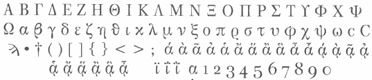 Professor of Type design and Typography at the School of Graphic Arts of the Technical Institute of Athens. He also teaches at the Department of Graphic Design and Visual Communication, University of West Attica. He is head of the design team and a type designer at the Greek Font Society. He is the Art Director of Indigo Associates specializing in book design, corporate identity and typographic communication for museum exhibitions. He has written the textbook of the course Type History and Design for the Greek Open University (2002) and he has translated in Greek Viktor Scholderer's Greek Printing Types: 1465-1927 (Typophilia, 1995) and Robert Bringhurst's "The Elements of Typographic Style (University of Crete Press, 2001).
 Speaker at ATypI 2007 in Brighton and at ATypI 2008 in St. Petersburg (where he spoke about Greek book design, 15th-20th centuries). At the GFS, he was involved in these free high quality font families: - GFS Artemisia was designed by Takis Katsoulidis and digitized by George Matthiopoulos in 2001.
- GFS Didot (1994, a didone designed by Takis Katsoulidis and digitized by George Matthiopoulos; a matching Latin alphabet is based on Hermann Zapfs Palatino). Open Font Library link.
- GFS Bodoni (1992-1993) is a didone designed by Takis Katsoulidis and digitized in 2005 by George Matthiopoulos.
- GFS Olga (1995, a serif designed and digitized by George Matthiopoulos, based on the historical Porson Greek type (1803)).
- GFS Solomos (2006). He writes: From the middle of the 19th century an italic font with many calligraphic overtones was introduced into Greek printing. Its source is unknown, but it almost certainly was the product of a German or Italian foundry. In the first type specimen printed in Greece by the typecutter K. Miliadis (1850), the font was listed anonymously along others of 11pts and in the Gr. Doumas undated specimen appeared as 11pt Greek inclined. For most of the second half of the century the type was used extensively as an italic for emphasis in words, sentences or exerpts. In 1889, the folio size Type Specimen of Anestis Konstantinidis publishing, printing and type founding establishment also included the type as Greek inclined [9 & 12 pt]. Nevertheless, the excessively calligraphic style of the characters, combined with the steep and uncomfortable obliqueness of the capitals, was out of favour in the 20th century and the type did not survive the conformity of the mechanical type cutting and casting. The font has been digitally revived, as part of our typographic tradition, by George D. Matthiopoulos and is part of GFS type library under the name GFS Solomos, in commemoration of the great Greek poet of the 19th century, Dionisios Solomos.
- GFS Gazis (2007). These majuscule typefaces were made by George Matthiopoulos in 2006 and 2007: GFSAmbrosia, GFSEustace-Regular, GFSFleischman-Regular, GFSGaraldus, GFSJackson-Regular, GFSNicefore.
He writes: GFS Ambrosia has the main characteristics of the majuscule forms of the early Christian tradition while GFS Nicefore is a typical byzantine sample of the 5th-7th century period. GFS Jackson is an edition of the font cut, in 1788, by Joseph Jackson on commission by the Cambridge University in preparation of the edition of the Beza codex containing the New Testament from the 5th-6th century. Theodore Beza was the erudite scholar from Geneva who had given the codex as a gift to the University in 1581. GFS Eustace is a typical example of byzantine woodcut initials used in many similar forms in Italy for Greek editions of the Bible, Prayers and other theological literature from the 15th to 19th centuries. GFS Fleischman, on the contrary, is based on a typeface cut by Johann Michael Fleishman, typecutter of the Dutch Enschedé foundry in the baroque style that prevailed in the mid-18th century. - GFS Neohellenic (1993-2000, Takis Katsoulidis and George D. Matthiopoulos). They explain: In 1927, Victor Scholderer (British Museum Library curator), on behalf of the Society for the Promotion of Greek Studies, got involved in choosing and consulting the design and production of a Greek type called New Hellenic cut by the Lanston Monotype Corporation. He chose the revival of a round, and almost monoline type which had first appeared in 1492 in the edition of Macrobius, ascribable to the printing shop of Giovanni Rosso (Joannes Rubeus) in Venice. New Hellenic was the only successful typeface in Great Britain after the introduction of Porson Greek well over a century before. The type, since to 1930s, was also well received in Greece, albeit with a different design for Ksi and Omega. GFS digitized the typeface (1993-1994) funded by the Athens Archeological Society with the addition of a new set of epigraphical symbols. Later (2000) more weights were added (italic, bold and bold italic) as well as a Latin version. GFSNeohellenicMath was published in 2018: The font GFSNeohellenicMath was commissioned to the Greek Font Society (GFS) by the Graduate Studies program "Studies in Mathematics" of the Department of Mathematics of the University of the Aegean, located on the Samos island, Greece. The design copyright belongs to the main designer of GFS, George Matthiopoulos. The OpenType Math Table embedded in the font was developed by the Mathematics Professor Antonis Tsolomitis. The font is released under the latest OFL license, and it is available from the GFS site at http://www.greekfontsociety-gfs.gr. The font is an almost Sans Serif font and one of its main uses is for presentations, an area where (we believe) a commercial grade sans math font was not available up to now.
- GFS Philostratos (2008). A rounded Latin / Greek sans after Maurice Eduard Pinder's Griechische Antiqua.
- GFS Pyrsos (1995). He writes: This typeface first appeared in the late 20s and was used as an alternative italic type to the most commonly used Greek italics at the time, coming from Germany (Leipzig). The name commemorates the edition of the Greek encyclopaedia Pyrsos (1927-1933) from which the types were taken.
- GFS Goschen (2009): a Greek typeface named for the German publisher Georg Joachim Göschen, who, at the turn of the 19th century, saw to the creation of a new cursive type for use in an edition of the New Testament in Greek. The typeface was cut by Johann Prillwitz, and was influenced by the Greek types of Bodoni.
- GFS Decker (2007). This is a revival of an uncial Greek that was used by both Oxford and Cambridge University Press in the late 1800s, designed by Deckersche Giesserei in Germany. /UL> [Google]
[More] ⦿
|
George Douros
[Unicode Fonts for Ancient Scripts]
|
 [More] ⦿
|
Gilles F. Robert
[bbm]
|
[More] ⦿
|
Glenda de Guzman
|
 Graduate in 1992 from the Rochester Institute of Technology with a BS in Printing. While a co-op student for Monotype Typography in California, she hinted fonts. She has also carried out research at Microsoft with Robert Norton. She joined Font Bureau in 1994, but moved a few years later to Southern California.
 - Designer at Font Bureau of Bradley Initials (1994, after spectacular art deco capitals originally designed by William H. Bradley---see the 1934 ATF catalog, where it is called Bradley Ultra Modern Initials).
- She also designed Math1-Bold, Math1, Math1Mono-Bold, Math1Mono, Math2-Bold, Math2, Math2Mono-Bold, Math2Mono, Math3, Math3Bold, Math3Mono-Bold, Math3Mono, Math4-Bold, Math4, Math4Mono-Bold, Math4Mono, Math5, Math5Bold, Math5Mono, Math5MonoBold for Wolfram's Mathematica package in 1996 (truetype versions here or here or here).
FontShop link. Klingspor link. [Google]
[MyFonts]
[More] ⦿
|
GNU Freefont (or: Free UCS Outline Fonts)
[Steve White]
|
 The GNU Freefont is continuously being updated to become a large useful Unicode monster. GNU FreeFont is a free family of scalable outline fonts, suitable for general use on computers and for desktop publishing. It is Unicode-encoded for compatability with all modern operating systems. There are serif, Sans and Mono subfamilies. Also called the "Free UCS Outline Fonts", this project is part of the larger Free Software Foundation. The original head honcho was Primoz Peterlin, the coordinator at the Institute of Biophysics of the University of Ljubljana, Slovenia. In 2008, Steve White (aka Stevan White) took over. URW++ Design&Development GmbH. URW++ donated a set of 35 core PostScript Type 1 fonts to the Ghostscript project.
 - Basic Latin (U+0041-U+007A)
- Latin-1 Supplement (U+00C0-U+00FF)
- Latin Extended-A (U+0100-U+017F)
- Spacing Modifier Letters (U+02B0-U+02FF)
- Mathematical Operators (U+2200-U+22FF)
- Block Elements (U+2580-U+259F)
- Dingbats (U+2700-U+27BF)
Yannis Haralambous and John Plaice. Yannis Haralambous and John Plaice are the authors of Omega typesetting system, which is an extension of TeX. Its first release, aims primarily at improving TeX's multilingual abilities. In Omega all characters and pointers into data-structures are 16-bit wide, instead of 8-bit, thereby eliminating many of the trivial limitations of TeX. Omega also allows multiple input and output character sets, and uses programmable filters to translate from one encoding to another, to perform contextual analysis, etc. Internally, Omega uses the universal 16-bit Unicode standard character set, based on ISO-10646. These improvements not only make it a lot easier for TeX users to cope with multiple or complex languages, like Arabic, Indic, Khmer, Chinese, Japanese or Korean, in one document, but will also form the basis for future developments in other areas, such as native color support and hypertext features. ... Fonts for UT1 (omlgc family) and UT2 (omah family) are under development: these fonts are in PostScript format and visually close to Times and Helvetica font families. - Latin Extended-B (U+0180-U+024F)
- IPA Extensions (U+0250-U+02AF)
- Greek (U+0370-U+03FF)
- Armenian (U+0530-U+058F)
- Hebrew (U+0590-U+05FF)
- Arabic (U+0600-U+06FF)
- Currency Symbols (U+20A0-U+20CF)
- Arabic Presentation Forms-A (U+FB50-U+FDFF)
- Arabic Presentation Forms-B (U+FE70-U+FEFF)
Yannis Haralambous and Wellcome Institute. In 1994, The Wellcome Library The Wellcome Institute for the History of Medicine 183 Euston Road, London NW1 2BE, England, commissioned Mr. Haralambous to produce a Sinhalese font for them. We have received 03/09 official notice from Robert Kiley, Head of e-Strategy for the Wellcome Library, that Yannis' font could be included in GNU FreeFont under its GNU license: Sinhala (U+0D80-U+0DFF). Young U. Ryu at the University of Texas at Dallas is the author of Txfonts, a set of mathematical symbols designed to accompany text typeset in Times or its variants. In the documentation, Young adresses the design of mathematical symbols: "The Adobe Times fonts are thicker than the CM fonts. Designing math fonts for Times based on the rule thickness of Times =,, +, /, <, etc. would result in too thick math symbols, in my opinion. In the TX fonts, these glyphs are thinner than those of original Times fonts. That is, the rule thickness of these glyphs is around 85% of that of the Times fonts, but still thicker than that of the CM fonts." Ranges: Arrows (U+2190-U+21FF), Mathematical Symbols (U+2200-U+22FF). Valek Filippov added Cyrillic glyphs and composite Latin Extended A to the whole set of the abovementioned URW set of 35 PostScript core fonts, Ranges: Latin Extended-A (U+0100-U+017F), Cyrillic (U+0400-U+04FF). Wadalab Kanji Comittee. Between April 1990 and March 1992, Wadalab Kanji Comittee put together a series of scalable font files with Japanese scripts, in four forms: Sai Micho, Chu Mincho, Cho Kaku and Saimaru. The font files were written in custom file format, while tools for conversion into Metafont and PostScript Type 1 were also supplied. The Wadalab Kanji Comittee has later been dismissed, and the resulting files can be now found on the FTP server of the Depertment of Mathematical Engineering and Information Physics, Faculty of Engineering, University of Tokyo: Hiragana (U+3040-U+309F), Katakana (U+30A0-U+30FF). Note that some time around 2009, the hiragana and katakana ranges were deleted. Angelo Haritsis has compiled a set of Greek type 1 fonts. The glyphs from this source has been used to compose Greek glyphs in FreeSans and FreeMono. Greek (U+0370-U+03FF). Yannis Haralambous and Virach Sornlertlamvanich. In 1999, Yannis Haralambous and Virach Sornlertlamvanich made a set of glyphs covering the Thai national standard Nf3, in both upright and slanted shape. Range: Thai (U+0E00-U+0E7F). Shaheed Haque has developed a basic set of basic Bengali glyphs (without ligatures), using ISO10646 encoding. Range: Bengali (U+0980-U+09FF). Sam Stepanyan created a set of Armenian sans serif glyphs visually compatible with Helvetica or Arial. Range: Armenian (U+0530-U+058F). Mohamed Ishan has started a Thaana Unicode Project. Range: Thaana (U+0780-U+07BF). Sushant Kumar Dash has created a font in his mother tongue, Oriya: Oriya (U+0B00-U+0B7F). But Freefont has dropped Oriya because of the absence of font features neccessary for display of text in Oriya. Harsh Kumar has started BharatBhasha for these ranges: - Devanagari (U+0900-U+097F)
- Bengali (U+0980-U+09FF)
- Gurmukhi (U+0A00-U+0A7F)
- Gujarati (U+0A80-U+0AFF)
Prasad A. Chodavarapu created Tikkana, a Telugu font family: Telugu (U+0C00-U+0C7F). It was originally included in GNU Freefont, but supoort for Telugu was later dropped altogether from the GNU Freefont project. Frans Velthuis and Anshuman Pandey. In 1991, Frans Velthuis from the Groningen University, The Netherlands, released a Devanagari font as Metafont source, available under the terms of GNU GPL. Later, Anshuman Pandey from Washington University in Seattle, took over the maintenance of font. Fonts can be found on CTAN. This font was converted the font to Type 1 format using Peter Szabo's TeXtrace and removed some redundant control points with PfaEdit. Range: Devanagari (U+0900-U+097F). Hardip Singh Pannu. In 1991, Hardip Singh Pannu has created a free Gurmukhi TrueType font, available as regular, bold, oblique and bold oblique form. Range: Gurmukhi (U+0A00-U+0A7F). Jeroen Hellingman (The Netherlands) created a set of Malayalam metafonts in 1994, and a set of Oriya metafonts in 1996. Malayalam fonts were created as uniform stroke only, while Oriya metafonts exist in both uniform and modulated stroke. From private communication: "It is my intention to release the fonts under GPL, but not all copies around have this notice on them." Metafonts can be found here and here. Ranges: Oriya (U+0B00-U+0B7F), Malayalam (U+0D00-U+0D7F). Oriya was subsequently dropped from the Freefont project. Thomas Ridgeway, then at the Humanities And Arts Computing Center, Washington University, Seattle, USA, (now defunct), created a Tamil metafont in 1990. Anshuman Pandey from the same university took over the maintenance of font. Fonts can be found at CTAN and cover Tamil (U+0B80-U+0BFF). Berhanu Beyene, Prof. Dr. Manfred Kudlek, Olaf Kummer, and Jochen Metzinger from the Theoretical Foundations of Computer Science, University of Hamburg, prepared a set of Ethiopic metafonts. They also maintain the home page on the Ethiopic font project. Someone converted the fonts to Type 1 format using TeXtrace, and removed some redundant control points with PfaEdit. Range: Ethiopic (U+1200-U+137F). Maxim Iorsh. In 2002, Maxim Iorsh started the Culmus project, aiming at providing Hebrew-speaking Linux and Unix community with a basic collection of Hebrew fonts for X Windows. The fonts are visually compatible with URW++ Century Schoolbook L, URW++ Nimbus Sans L and URW++ Nimbus Mono L families, respectively. Range: Hebrew (U+0590-U+05FF). Vyacheslav Dikonov made a Braille unicode font that could be merged with the UCS fonts to fill the 2800-28FF range completely (uniform scaling is possible to adapt it to any cell size). He also contributed a free Syriac font, whose glyphs (about half of them) are borrowed from the free Carlo Ator font. Vyacheslav also filled in a few missing spots in the U+2000-U+27FF area, e.g., the box drawing section, sets of subscript and superscript digits and capital Roman numbers. Ranges: Syriac (U+0700-U+074A), Box Drawing (U+2500-U+257F), Braille (U+2800-U+28FF). Panayotis Katsaloulis helped fixing Greek accents in the Greek Extended area: (U+1F00-U+1FFF). M.S. Sridhar. M/S Cyberscape Multimedia Limited, Mumbai, developers of Akruti Software for Indian Languages (http://www.akruti.com/), have released a set of TTF fonts for nine Indian scripts (Devanagari, Gujarati, Telugu, Tamil, Malayalam, Kannada, Bengali, Oriya, and Gurumukhi) under the GNU General Public License (GPL). You can download the fonts from the Free Software Foundation of India WWW site. Their original contributions to Freefont were - Devanagari (U+0900-U+097F)
- Bengali (U+0980-U+09FF)
- Gurmukhi (U+0A00-U+0A7F)
- Gujarati (U+0A80-U+0AFF)
- Oriya (U+0B00-U+0B7F)
- Tamil (U+0B80-U+0BFF)
- Telugu (U+0C00-U+0C7F)
- Kannada (U+0C80-U+0CFF)
- Malayalam (U+0D00-U+0D7F)
Oriya, Kannada and Telugu were dropped from the GNU Freefont project. DMS Electronics, The Sri Lanka Tipitaka Project, and Noah Levitt. Noah Levitt found out that the Sinhalese fonts available on the site metta.lk are released under GNU GPL. These glyphs were later replaced by those from the LKLUG font. Finally the range was completely replaced by glyphs from the sinh TeX font, with much help and advice from Harshula Jayasuriya. Range: Sinhala (U+0D80-U+0DFF). Daniel Shurovich Chirkov. Dan Chirkov updated the FreeSerif font with the missing Cyrillic glyphs needed for conformance to Unicode 3.2. The effort is part of the Slavjanskij package for Mac OS X. range: Cyrillic (U+0400-U+04FF). Abbas Izad. Responsible for Arabic (U+0600-U+06FF), Arabic Presentation Forms-A, (U+FB50-U+FDFF), Arabic Presentation Forms-B (U+FE70-U+FEFF). Denis Jacquerye added new glyphs and corrected existing ones in the Latin Extended-B (U+0180-U+024F) and IPA Extensions (U+0250-U+02AF) ranges. K.H. Hussain and R. Chitrajan. Rachana in Malayalam means to write, to create. Rachana Akshara Vedi, a team of socially committed information technology professionals and philologists, has applied developments in computer technology and desktop publishing to resurrect the Malayalam language from the disorder, fragmentation and degeneration it had suffered since the attempt to adapt the Malayalam script for using with a regular mechanical typewriter, which took place in 1967-69. K.H. Hussein at the Kerala Forest Research Institute has released "Rachana Normal" fonts with approximately 900 glyphs required to typeset traditional Malayalam. R. Chitrajan apparently encoded the glyphs in the OpenType table. In 2008, the Malayalam ranges in FreeSerif were updated under the advise and supervision of Hiran Venugopalan of Swathanthra Malayalam Computing, to reflect the revised edition Rachana_04. Range: Malayalam (U+0D00-U+0D7F). Solaiman Karim filled in Bengali (U+0980-U+09FF). Solaiman Karim has developed several OpenType Bangla fonts and released them under GNU GPL. Sonali Sonania and Monika Shah covered Devanagari (U+0900-U+097F) and Gujarati (U+0A80-U+0AFF). Glyphs were drawn by Cyberscape Multimedia Ltd., #101, Mahalakshmi Mansion 21st Main 22nd "A" Cross Banashankari 2nd stage Banglore 560070, India. Converted to OTF by IndicTrans Team, Powai, Mumbai, lead by Prof. Jitendra Shah. Maintained by Monika Shah and Sonali Sonania of janabhaaratii Team, C-DAC, Mumbai. This font is released under GPL by Dr. Alka Irani and Prof Jitendra Shah, janabhaaratii Team, C-DAC, Mumabi. janabhaaratii is localisation project at C-DAC Mumbai (formerly National Centre for Software Technology); funded by TDIL, Govt. of India. Pravin Satpute, Bageshri Salvi, Rahul Bhalerao and Sandeep Shedmake added these Indic language cranges: - Devanagari (U+0900-U+097F)
- Gujarati (U+0A80-U+0AFF)
- Oriya (U+0B00-U+0B7F)
- Malayalam (U+0D00-U+0D7F)
- Tamil (U+0B80-U+0BFF)
In December 2005 the team at www.gnowledge.org released a set of two Unicode pan-Indic fonts: "Samyak" and "Samyak Sans". "Samyak" font belongs to serif style and is an original work of the team; "Samyak Sans" font belongs to sans serif style and is actually a compilation of already released Indic fonts (Gargi, Padma, Mukti, Utkal, Akruti and ThendralUni). Both fonts are based on Unicode standard. You can download the font files separately. Note that Oriya was dropped from the Freefont project. Kulbir Singh Thind added Gurmukhi (U+0A00-U+0A7F). Dr. Kulbir Singh Thind designed a set of Gurmukhi Unicode fonts, AnmolUni and AnmolUni-Bold, which are available under the terms of GNU license from the Punjabu Computing Resource Center. Gia Shervashidze added Georgian (U+10A0-U+10FF). Starting in mid-1990s, Gia Shervashidze designed many Unicode-compliant Georgian fonts: Times New Roman Georgian, Arial Georgian, Courier New Georgian. Daniel Johnson. Created by hand a Cherokee range specially for FreeFont to be "in line with the classic Cherokee typefaces used in 19th century printing", but also to fit well with ranges previously in FreeFont. Then he made Unified Canadian Syllabics in Sans, and a Cherokee and Kayah Li in Mono! And never to be outdone by himself, then did UCAS Extended and Osmanya.... What next? - Armenian (serif) (U+0530-U+058F)
- Cherokee (U+13A0-U+13FF)
- Unified Canadian Aboriginal Syllabics (U+1400-U+167F)
- UCAS Extended (U+18B0-U+18F5)
- Kayah Li (U+A900-U+A92F)
- Tifinagh (U+2D30-U+2D7F)
- Vai (U+A500-U+A62B)
- Latin Extended-D (Mayanist letters) (U+A720-U+A7FF)
- Osmanya (U+10480-U+104a7)
George Douros, the creator of several fonts focusing on ancient scripts and symbols. Many of the glyphs are created by making outlines from scanned images of ancient sources. - Aegean: Phoenecian (U+10900-U+1091F).
- Analecta: Gothic (U+10330-U+1034F)
- Musical: Byzantine (U+1D000-U+1D0FF)&Western (U+1D100-U+1D1DF)
- Unicode: many miscellaneous symbols, miscellaneous technical, supplemental symbols, and mathematical alphanumeric symbols (U+1D400-U+1D7FF), Mah Jong (U+1F000-U+1F02B), and the outline of the domino (U+1F030-U+1F093).
Steve White filled in a lot of missing characters, got some font features working, left fingerprints almost everywhere, and is responsible for these blocks: Glagolitic (U+2C00-U+2C5F), Coptic (U+2C80-U+2CFF). Pavel Skrylev is responsible for Cyrillic Extended-A (U+2DEO-U+2DFF) as well as many of the additions to Cyrillic Extended-B (U+A640-U+A65F). Mark Williamson made the MPH 2 Damase font, from which these ranges were taken: - Hanunóo (U+1720-U+173F)
- Buginese (U+1A00-U+1A1F)
- Tai Le (U+1950-U+197F)
- Ugaritic (U+10380-U+1039F)
- Old Persian (U+103A0-U+103DF)
Primoz Peterlin filled in missing glyphs here and there (e.g., Latin Extended-B and IPA Extensions ranges in the FreeMono family), and created the following UCS blocks: - Latin Extended-B (U+0180-U+024F)
- IPA Extensions (U+0250-U+02AF)
- Arrows (U+2190-U+21FF)
- Box Drawing (U+2500-U+257F)
- Block Elements (U+2580-U+259F)
- Geometrical Shapes (U+25A0-U+25FF)
Jacob Poon submitted a very thorough survey of glyph problems and other suggestions. Alexey Kryukov made the TemporaLCGUni fonts, based on the URW++ fonts, from which at one point FreeSerif Cyrillic, and some of the Greek, was drawn. He also provided valuable direction about Cyrillic and Greek typesetting. The Sinhala font project has taken the glyphs from Yannis Haralambous' Sinhala font, to produce a Unicode TrueType font, LKLUG. These glyphs were for a while included in FreeFont: Sinhala (U+0D80-U+0DFF). Fontspace link. Crosswire link for Free Monospaced, Free Serif and Free Sans. Download link. [Google]
[More] ⦿
|
gNumerator
[Andy Somogyi]
|
In the free software gNumerator, we find two math symbol fonts by Andy Somogyi, cm-stretchy (2003), MathRoman (2004). [Google]
[More] ⦿
|
Goedu
|
Archive with LucidaBrightMathSymbol, LucidaBrightMathExtension, LucidaBrightMathItalic. [Google]
[More] ⦿
|
Goodsriver
|
Designer of the circle number font Circle Number G (numbers 0 through 99). Alternate URL. Old URL. [Google]
[More] ⦿
|
Greek Font Society
|
 The Greek Font Society was founded in 1992 by the late Michael S. Macrakis (1924-2001) as a Non-Profit Organization with the expressed aim of contributing to the research of Greek typography. The Society was founded initially by the Kostopoulos Foundation, with further support provided by the Greek Ministry of Culture, the Leventis Foundation, Regis College-USA, the Maliotis Foundation and the Girondelis Foundation. From 2004 until 2006, the Board of Directors consists of M.V. Sakellariou (President). L. Macrakis (Vice-President), D.G. Portolos (Secretary), L.G. Savidis (Treasurer), G.E. Agouridis, A.G. Drimiotis, and A. Giakoumakis. GFSs type design programme began through the collaboration of painter-engraver Takis Katsoulidis with type designer George D. Matthiopoulos. Since then, GFS has designed a growing list of Greek polytonic (fully-accented) fonts which include various historical revivals and new designs with respect to typographic tradition. In addition, GFS was commissioned to design fonts for the Athens Academy, The Athens Archeological Society, the Institute of Speech amongst others. Furthermore, GFS organised an International Conference, Greek Letters: from Tablets to Pixels at the Institute Français dAthènes in 1995, and has been active in the publication of works on Typography. For this aim GFS edited and designed the proceedings of the Conference: Michael S. Macrakis (edit), Greek Letters: from Tablets to Pixels, Oak Knoll Press, Newcastle-Delaware, 1996. The artistic collaborators include George D. Matthiopoulos, Michail Semoglou and Natasha Raissaki. Finally, they are making some high quality free fonts, such as:
 - GFS Didot (1994, a didone designed by Takis Katsoulidis and digitized by George Matthiopoulos; a matching Latin alphabet is based on Hermann Zapf's Palatino). Open Font Library link.
- GFS Bodoni (1992-1993): a didone designed by Takis Katsoulidis and digitized by George Matthiopoulos. See also GFS Bodoni Classic (Greek only).
- GFS Olga (1995, a serif designed and digitized by George Matthiopoulos, based on the historical Porson Greek type (1803)).
- GFS Callierges Greek, based on the types of Zacharias Callierges (15th century), digitized by George Matthiopoulos.
- GFS Porson Greek, digitized by George Matthiopoulos in 1995. This is based on the types of Richard Porson of the 18th century.
- GFS Artemisia (2001), by painter-engraver Takis Katsoulidis and digitized by George D. Matthiopoulos. Open Font Library link.
- GFS Complutensian Greek, digitized by George Matthiopoulos and Antonis Tsolomitis. This was based on the types of Arnaldo Guillen de Brocar (16th century). Now called GFS Complutum (2007).
- GFS Neohellenic (1993-2000, Takis Katsoulidis and George D. Matthiopoulos). They explain: In 1927, Victor Scholderer (British Museum Library curator), on behalf of the Society for the Promotion of Greek Studies, got involved in choosing and consulting the design and production of a Greek type called New Hellenic cut by the Lanston Monotype Corporation. He chose the revival of a round, and almost monoline type which had first appeared in 1492 in the edition of Macrobius, ascribable to the printing shop of Giovanni Rosso (Joannes Rubeus) in Venice. New Hellenic was the only successful typeface in Great Britain after the introduction of Porson Greek well over a century before. The type, since to 1930s, was also well received in Greece, albeit with a different design for Ksi and Omega. GFS digitized the typeface (1993-1994) funded by the Athens Archeological Society with the addition of a new set of epigraphical symbols. Later (2000) more weights were added (italic, bold and bold italic) as well as a Latin version. A further extension, GFSNeohellenicMath, was published in 2018: The font GFSNeohellenicMath was commissioned to the Greek Font Society (GFS) by the Graduate Studies program "Studies in Mathematics" of the Department of Mathematics of the University of the Aegean, located on the Samos island, Greece. The design copyright belongs to the main designer of GFS, George Matthiopoulos. The OpenType Math Table embedded in the font was developed by the Mathematics Professor Antonis Tsolomitis. The font is released under the latest OFL license, and it is available from the GFS site at http://www.greekfontsociety-gfs.gr. The font is an almost Sans Serif font and one of its main uses is for presentations, an area where (we believe) a commercial grade sans math font was not available up to now.
- GFS Elpis (2006, Natasha Raissaki), an original design which tries very hard to match the Greek and Latin parts of its alphabet.
- GFSSolomos (2006) by George D. Matthiopoulos.
- GFS Theokritos, a redesign by George D. Matthiopoulos of a font created by Yannis Kefallinos (1894-1958) in the 1950s. Free at Open Font Library.
- GFS Baskerville (2007) by Antonis Tsolomitis.
- GFS Gazis (2007, George Matthiopoulos), about which they write: During the whole of the 18th century the old tradition of using Greek types designed to conform to the Byzantine cursive hand with many ligatures and abbreviations - as it was originated by Aldus Manutius in Venice and consolidated by Claude Garamont (Grecs du Roy) - was still much in practice, although clearly on the wane. GFS Gazis is a typical German example of this practice as it appeared at the end of that era in the 1790s. Its name pays tribute to Anthimos Gazis (1758-1828), one of the most prolific Greek thinkers of the period, who was responsible for writing, translating and editing numerous books, including the editorship of the important Greek periodical (Litterary Hermes) in Wien.
- These majuscule typefaces were made by George Matthiopoulos in 2006 and 2007: GFS Ambrosia, GFS Eustace, GFS Fleischman-Regular, GFS Garaldus, GFS Jackson-Regular, GFS Nicefore. He writes: GFS Ambrosia has the main characteristics of the majuscule forms of the early Christian tradition while GFS Nicefore is a typical byzantine sample of the 5th-7th century period. GFS Jackson is an edition of the font cut, in 1788, by Joseph Jackson on commission by the Cambridge University in preparation of the edition of the Beza codex containing the New Testament from the 5th-6th century. Theodore Beza was the erudite scholar from Geneva who had given the codex as a gift to the University in 1581. GFS Eustace is a typical example of byzantine woodcut initials used in many similar forms in Italy for Greek editions of the Bible, Prayers and other theological literature from the 15th to 19th centuries. GFS Fleischman, on the contrary, is based on a typeface cut by Johann Michael Fleishman, typecutter of the Dutch Enschedé foundry in the baroque style that prevailed in the mid-18th century.
[Google]
[More] ⦿
|
Gregg Snyder
|
Codesigner at Wolfram Research of some Mathematica fonts, such as Math1, Math1-Bold (1997). [Google]
[More] ⦿
|
Haiku Monkey
[Alec Julien]
|
 Commercial foundry, est. 2007 in Burlington, VT, by Alec Julien (b. 1965). Fonts sold through MyFonts include Doctor Cyclops (2009), Grundlagen (2009, retro display sans), I Am A Bird (2009), Yacht (2009, a 1930s movie poster style family), Predicate (+Rounded) (2008, sans), Steel Sedan (2008, a condensed slab serif family), Monumint (2008, comic book style), Aerohop (2008, a sans family), Chittenden (2008, an artsy blackboard math style face), Rany (2008, hand-printed), Ashbery (2008, Asian jungle look stick font), Banyan (2007, brush typeface with a jungle look), Loge (2007, a high-contrast sans), Joules (2007, hand-printed family, whose development is described here), Tara (2007, a jungle-look face), Sinn (2007), Set Theory (2007), Bad Marker (2007), Counterfact (2007), Sharp Nine (2007), Good Robot (2007), Groovin Up Slowly (2007), Fractal Caps (2007), Classy Diner (2007), Anthem (2007), Zooey (2007), Imagination Theory (2007), 89 (2007), Skrawl (2007), Zerega (2007), AJ Hand (2007), Scandal (2008), Zone 52 (2008, techno), Gno (2008, techno), Gno Serif (2008), Abbott (2008, a cool hand-printed script). Most of these fonts resulted from drawing or doodling experiments.
 Free fonts: Lavoisier (2009, sans), Skritch (2008, handwriting), Geekium (2008, a math symbols font based on Gentium), 36 Dots (dot matrix face), Teacher Sez (2007, blackboard script). Devian Tart carries these free fonts/demos: Skritch, Rany, Teacher Sez, Steel Jalopy (2008, based on Steel Sedan), Insolent (2009), I Am A Bird (2009, slab serif family), Myrna (2009). Lavoisier (2009) is a free monoline font, later cyrillicized by Sergey Tkachenko. Working on Modus (2009). Additions in 2010: Lockwood (a strong all-caps sans display face), m7 (a slab serif typewriter face), Blues Vity (condensed display face), m13 (fat slab serif), Mineola, Hunk (fat all-caps display face). Creations from 2011: Zurdo (hand-printed). Typefaces from 2012: Shockproof (a tall display face). Typefaces from 2013: Arcation (techno). In 2014, Alec Julien published the skyline typeface family Lexave. Typefaces from 2015: Gilmour (a sturdy slab serif, +Cyrillic). Typefaces from 2016: Gama (octagonally cut Star Trek font). Typefaces from 2018: Syd, Sid. Interview by Seven Days. Fontsquirrel link. Klingspor link. Kernest link. View Alec Julien's typefaces. [Google]
[MyFonts]
[More] ⦿
|
Hans Eduard Meier
|
 Swiss type designer in Obstalden, Switzerland, born in 1922 in Horgen am Zürichsee, who was associated with ETH Zurich for a long time. He died in 2014. In his obituary, Meier's long-time friend and former publisher Erich Alb wrote: He was a tireless, quiet craftsman, alone in his room, away from everything, who worked with endless stamina. The high quality of his calligraphic work, his sure eye in drawing letterforms, his teaching skills, his drawing, painting and graphic work distinguish him as a unique international figure. Meier created these typefaces:
 - Barbedor (1984) and Barbetwo.
- The school fonts BasisSchrift Eins EF (2002), ABCSchrift Drei EF (2001-2002), ABCSchrift Eins EF and ABCSchrift Zwei EF. See this school script web page. In 2016, this ws formally published by Elsner and Flake as ABC Basisschrift.
- The calligraphic family Elysa EF (2002).
- Lapidar. Linotype Syntax Lapidar (1995). Syntax Lapidar Serif (2001).
- Oberon (1992). Done as an OEM for Institut fuer Computersysteme in Zürich. Available from Elsner&Flake as OberonEF.
- SNB Alphabet (1994). Designed for the Swiss National bank) as an adapted version of Helvetica Condensed. The notes themselves were designed by Joerg Zintmeyer.
- Syntax, Meier's humanist sans chef d'oeuvre, started in 1954, and is inspired, according to Meier himself, by Tschichold's Sabon. An intermediate version was called Ur-Syntax (1964). Syntax was first released in 1968-1972 by Stempel. The last metal typeface produced by Stempel AG, it was available in just two weights of roman and a single italic design. When the design was digitized in the late 1980s, additional roman weights were added. Meier completely reworked and enlarged Syntax in 2000 and renamed it Syntax Next. The modern Bitstream version of Syntax is called Humanist 531. See also Saxony and S841 Sans on the SoftMaker MegaFont XXL CD, 2002. Compugraphic's identical clone is CG Symphony. Other copies of Syntax include Synthesis, Cintal, and Synchron. URW has its own version. Linotype Syntax (2000), a reworking of his original Syntax, earned Meier a Bukvaraz 2001 award. Derived or related typefaces: Syntax Serif (1999), Syntax-Letter (1992), and Neue Syntax, all by Meier. Links to some of the digital versions of Syntax: Humanist 531 (ParaType), Humanist 531 (Tilde), Humanist 531 (Bitstream), Syntax Series (URW++), Linotype Syntax (Linotype), Saxony Serial (SoftMaker), Syntax Next (Linotype), Linotype Syntax Serif (Linotype), Linotype Syntax Lapidar (Linotype), Linotype Syntax Letter (Linotype), Syntax (Adobe), Linotype Syntax Lapidar Serif (Linotype), Syntax (Linotype).
- ITC Syndor (1988).
- Elysa (2002).
- Gestickte Antiqua (2004).
His books include Die Schriftentwicklung (published in 1995 by Syntax Press in Cham, Switzerland). This teaching book contains over sixty of Meier's calligraphic specimens, as well as a historical survey of scripts from ancient Greece to today. One of Meier's specimens, entitled Roman Lapidary 1st Century, was worked into a digital typeface family by Elsner and Flake as Meier Kapitalis (2013). References: Superb analysis of his life and contributions by Roxane Jubert (in French). See also Swiss Typographic Magazine Nr 3: Hans Eduard Meier 1922-2014, by Erich Alb, Cham, Switzerland, 2014 [Erich Alb, who knew Meier quite well, spoke about Meier's life at ATypI 2015 in Sao Paulo]. Linotype link. FontShop link. MyFonts link. Klingspor link. View Hans Eduard Meier's typefaces. View various digital versions of Syntax and Humanist 531. [Google]
[MyFonts]
[More] ⦿
|
Hans van Maanen
[SciType]
|
[More] ⦿
|
Harald Harders
[hfbright]
|
[More] ⦿
|
Hermann Zapf
|
 Prolific master calligrapher and type designer, born in Nuremberg in 1918. Most of his life, he lived in Darmstadt, where he died in 2015. He is best known for Palatino, Optima, Melior, Zapf Dingbats, Zapfino, and ITC Zapf Chancery. He created alphabets for metal types, photocomposition and digital systems.
 He studied typography from 1938 until 1941 in Paul Koch's workshop in Frankfurt. From 1946 until 1956, he was type director at D. Stempel AG type foundry, Frankfurt. In 1951 he married Gudrun von Hesse. From 1956 until 1973, he was consultant for Mergenthaler Linotype Company, Brooklyn and Frankfurt. From 1977 until 1987, he was vice president of Design Processing, Inc., New York (which he founded with his friends Aaron Burns and Herb Lubalin), and professor of Typographic Computer Programs, Rochester Institute of Technology, Rochester, New York. Students at RIT included Kris Holmes and Charles Bigelow, who together created the Lucida type family. Other prominent students include calligrapher/font designer Julian Waters and book designer Jerry Kelly. From 1987 until 1991, he was chairman of Zapf, Burns&Company, New York. He retired in Darmstadt, Germany, but consulted on many font projects until a few years before his death. In the 1990s, Zapf developed the hz program for kerning and typesetting. It was acquired by Adobe who used ideas from it in InDesign. Awards: - 1969 Frederic W. Goudy Award, Rochester Institute of Technology, Rochester, New York.
- 1973 Gutenberg Prize, City of Mainz.
- 1975 Gold Medal, Museo Bodoniano, Parma.
- 1985 Honorary Royal Designer for Industry, Royal Society of Arts, London.
- 1987 Robert Hunter Middleton Award, Chicago.
- 1994 Euro Design Award, Oostende.
- 1996 Wadim Lazursky Award, Academy of Graphic Arts, Moscow.
- 1999 Type Directors Club award for Zapfino (1998), New York.
- 2010 Bundesverdienstkreuz 1. Klasse.
Some publications by Hermann Zapf: Feder und Stichel (1949, Trajanus Presse, Frankfurt) About Alphabets (1960) Manuale Typographicum (1954 and 1968). Only 1000 copies were printed of the original. Typographic Variations (1964), or Typografische Variationen (1963, Stempel), of which only 500 copies were printed. Orbis Typographicus (1980) Hermann Zapf and His Design Philosophy (Chicago, 1987) ABC-XYZapf (London, 1989) Poetry through Typography (New York, 1993) August Rosenberger (Rochester, NY, 1996). Alphabet Stories (RIT Cary Graphic Arts Press, Rochester, 2008). Review by Hans Hagen and Taco Hoekwater. My collaboration with Don Knuth and my font design work [just an article], TUGboat 22:1/2 (2001), 26-30. Local download. List of his typefaces: - Alahram Arabisch.
- Arno (Hallmark).
- Aldus Buchschrift (Linotype, 1954): Italic, Roman. Digital version by Adobe.
- Alkor Notebook.
- Attika Greek.
- Artemis Greek.
- Aurelia (1985, Hell).
- AT&T Garamond.
- Book (ITC New York). Samples: Book Demi, Book Demi Italic, Book Heavy, Book Heavy Italic, Book Medium Italic. The Zapf Book, Chancery and International fonts are under the name Zabriskie on the SoftMaker MegaFont XXL CD, 2002.
- Brush Borders.
- Comenius Antiqua (1976, Berthold; see C792 Roman on the SoftMaker MegaFont XXL CD, 2002).
- Crown Roman and Crown Italic (Hallmark).
- Chancery (officially called ITC Zapf Chancery): Bold, Demi, Italic, Light, Liht Italic, Mediu Italic, Roman.
- Civilité (Duensing). Mac McGrew on the Zapf Civilité: Zapf Civilite is perhaps the latest typeface to be cut as metal type, having been announced in January 1985, although the designer, Hermann Zapf, had made sketches for such a typeface as early as 1940, with further sketches in 1971. But matrices were not cut until 1983 and 1984. The cutting was done by Paul Hayden Duensing in Kalamazoo, Michigan. The first Civilité typeface was cut by Robert Granjon in 1557, based on a popular French handwriting style of the time. Other interpretations have been made from time to time, notably the Civilité (q.v.) designed by Morris Benton in 1922 for ATF. The new Zapf design has the same general character but with a more informal and contemporary feeling. A smooth flow between weights of strokes replaces the stark contrast of thick-and-thin in older interpretations. There are several ligatures, and alternate versions of a number of characters, including several terminals. Only the 24-point Didot size is cut or planned.
- Charlemagne (Hallmark).
- Digiset Vario (1982, Hell): a signage face.
- Edison (Hell), Edison Cyrillic. Scans: Bold Condensed, Book, Semibold Italic, Semibold, Book Italic.
- Euler (American Mathematical Society). Zapf was also consultant for Don Knuth on his Computer Modern fonts. In 1983, Zapf, Knuth and graduate students in Knuth's and Charles Bigelow's Digital Typography program at Stanford University including students Dan Mills, Carol Twombly, David Siegel, and Knuth's computer science Ph.D. students Scott Kim and John Hobby, completed the calligraphic typeface family AMS Euler for the American Mathematical Society (+Fraktur, Math Symbols, +script). Taco Hoekwater, Hans Hagen, and Khaled Hosny set out to create an OpenType MATH-enabled font Neo-Euler (2009-2010), by combining the existing Euler math fonts with new glyphs from Hermann Zapf (designed in the period 2005-2008). The result is here. The Euler digital font production was eventually finished by Siegel as his M.S. thesis project in 1985.
- Firenze (Hallmark).
- Festliche Ziffern (transl: party numbers).
- Frederika Greek.
- Gilgengart Fraktur (1938, D. Stempel). Some put the dates as 1940-1949. It was released by Stempel in 1952. Revivals include RMU Gilgengart (2020, Ralph M. Unger), and Gilgengart by Gerhard Henzel.
- Heraklit Greek (1954). A digital revival was first done by George Matthiopoulos, GFS Heraklit. Later improvements followed by Antonis Tsolomitis and finally in 2020 by Daniel Benjamin Miller.
- Hunt Roman (1961-1962, Pittsburgh). A display typeface exclusively designed for the Hunt Botanical Library (Hunt Institute for Botanical Documentation since 1971), situated on campus of Carnegie Mellon University in Pittsburgh, to accompany their text typeface Spectrum. Review by Ferdinand Ulrich.
- International (ITC, 1977). Samples: Demi, Demi Italic, Heavy, Heavy Italic, Light, Light Italic, Medium, Medium Italic.
- Janson (Linotype).
- Jeannette Script (Hallmark).
- Kompakt (1954, D. Stempel).
- Kalenderzeichen (transl: calendar symbols).
- Kuenstler Linien (transl: artistic lines).
- Linotype Mergenthaler.
- Melior (1952, D. Stempel; see Melmac on the SoftMaker MegaFont XXL CD, 2002). Samples: Bold, Bold Italic, Italic, Roman.
- Michelangelo (1950, D. Stempel, a roman caps face; a digital version exists at Berthold and at The Font Company).
- Marconi (1975-1976, Hell; now also available at Elsner&Flake and Linotype; according to Gerard Unger, this was the first digital type ever designed---the original 1973 design was intended for Hell's Digiset system; Marconi is a highly readable text face).
- Medici Script (1971).
- Musica (Musiknoten, transl: music symbols; C.E. Roder, Leipzig).
- Magnus Sans-serif (Linotype, 1960).
- Missouri (Hallmark).
- Novalis.
- Noris Script (1976; a digital version exists at Linotype).
- Optima (1955-1958, D. Stempel--Optima was originally called Neu Antiqua), Optima Greek, Optima Nova (2002, with Akira Kobayashi at Linotype, a new version of Optima that includes 40 weights, half of them italic). Samples: Poster by Latice Washington, Optima, Demibold Italic, Black, Bold, Bold Italic, Demibold, Extra Black, Italic, Medium, Medium Italic, Regular, Italic. Digital clones: Zapf Humanist 601 by Bitstream, O801 Flare on the SoftMaker MegaFont XXL CD (2002), Opus by Softmaker, Columbia Serial by Softmaker, Mg Open Cosmetica, Ottawa by Corel, October by Scangraphic, CG Omega by Agfa compugraphic, Chelmsford by URW, Classico by URW and Optus by URW.
- Orion (1974).
- Palatino (1948, D. Stempel; the original font can still be found as Palazzo on Softmaker's XXL CD, 2002), Palatino Nova (2005, Linotype), Palatino Sans (2006, Linotype, with Akira Kobayashi), Palatino Greek, Palatino Cyrillic. Palatino was designed in conjunction with August Rosenberger, In 2013, Linotype released Palatino eText which has a larger x-height and wider spacing. Palatino samples: black, black italic, bold, bold italic, italic, medium, roman, light, light italic. Poster by M. Tuna Kahya (2012). Poster by Elena Shkarupa. Poster by Wayne YMH (2012). Zapf was particularly upset about the Palatino clone, Monotype Book Antiqua. Consequently, in 1993, Zapf resigned from ATypI over what he viewed as its hypocritical attitude toward unauthorized copying by prominent ATypI members.
- Phidias Greek.
- Primavera Schmuck.
- Pan Nigerian.
- Quartz (Zerox Corporation Rochester, NY).
- Renaissance Antiqua (1985, Scangraphic). Samples: Regular, Bold, Book, Light Italic, Swashed Book Italic, Swash Italic.
- Saphir (1953, D. Stempel, see now at Linotype).
- Sistina (1951, D. Stempel).
- Scriptura, Stratford (Hallmark).
- Sequoya (for the Cherokee Indians), ca. 1970. This was cut by Walter Hamady and is a Walbaum derivative.
- Linotype Trajanus Cyrillic (1957).
- Textura (Hallmark).
- URW Grotesk (1985, 59 styles), URW Antiqua, URW Palladio (1990).
- Hallmark Uncial (Hallmark).
- Virtuosa Script (1952, D. Stempel). Zapf's first script face. Revived in 2009 as Virtuosa Classic in cooperation with Akira Kobayashi.
- Venture Script (Linotype, 1966; FontShop says 1969).
- Winchester (Hallmark).
- World Book Modern.
- ITC Zapf Dingbats [see this poster by Jessica Rauch], Zapf Essentials (2002, 372 characters in six fonts: Communication, Arrows (One and Two), Markers, Ornaments, Office, based on drawings of Zapf in 1977 for Zapf Dingbats).
- Zapfino (Linotype, 1998, winner of the 1999 Type Directors Club award), released on the occasion of his 80th birthday. This is a set of digital calligraphic fonts. Zapfino Four, Zapfino Three, Zapfino Two, Zapfino One, ligatures, Zapfino Ornaments (with plenty of fists). Poster by Nayla Masood (2013).
Books and references about him include: - Hermann Zapf: A Life in Letters (2016, Julian Waters).
- What Our Lettering Needs: The Contribution of Hermann Zapf to Calligraphy & Type Design at Hallmark Cards (2011, Rick Cusick, RIT Cary Graphic Arts Press, Rochester).
- Hermann Zapf and the World He Designed: A Biography (2019, Jerry Kelly, The Grolier Club, New York).
- Laudatio for Professor Hermann Zapf (Frank Mittelbach). TUGboat 22:1/2 (2001), 24-26. Local download.
- Book review: Hermann Zapf and the World He Designed: A Biography, by Jerry Kelly (Barbara Beeton). TUGboat, Volume 40 (2019), No. 3.
Pictures of Hermann Zapf: with Lefty, with Rick Cusick, in 2003, with Frank Jonen, with Jill Bell, with Linnea Lundquist and Marsha Brady, with Rick Cusick, with Rick Cusick, with Stauffacher, a toast, with Werner Schneider and Henk Gianotten, with Chris Steinhour, at his 60th birthday party. Pictures of his 80th birthday party at Linotype [dead link]. Linotype link. Klingspor link. [Google]
[MyFonts]
[More] ⦿
|
hfbright
[Harald Harders]
|
In 2002, Harald Harders used mftrace to turn Walter Schmidt's cmbright from Metafont into PostScript. The font names and the file names begin with 'hf' for 'harders font'. This has been done for not getting mixed up with the commercial cmbright fonts by MicroPress. "hfbright" are the type 1 versions of the OT1-encoded and maths parts of the Computer Modern Bright fonts. The list: HFBR10, HFBR17, HFBR8, HFBR9, HFBRAS10, HFBRAS8, HFBRAS9, HFBRBS10, HFBRBS8, HFBRBS9, HFBRBX10, HFBRMB10, HFBRMI10, HFBRMI8, HFBRMI9, HFBRSL10, HFBRSL17, HFBRSL8, HFBRSL9, HFBRSY10, HFBRSY8, HFBRSY9, HFSLTL10, HFTL10. [Google]
[More] ⦿
|
Hindu Arabic Numeric Medieval Ideograms
|
From Sao Paulo, Roberto Lyra's explanation on the origins of Arabic numerals: "Each Arabic number we use today is itself an ideogram created by Abu Ja'far Muhammad ibn Musa al-Khwarizmi (c.778 - c.850). Al-Khwarizmi was born in central Asia in what is known as Uzbekistan, and moved to Baghdad were he worked as a mathematician during the first golden age of Islamic science, at the "House of Wisdom". Using the abacus notations he developed the manuscript decimal system. By the end of the 12th century (Middle Ages) the academic word was divided between the algorists, followers of al-Khwarizmi, and the abacists, who used the abacus as a means of dealing with the unwieldy Roman notation. The oldest dated European manuscript containing Arabic numbers is the Codex Vigilanus written in Spain in 976. In 1202 Leonardo of Pisa (also know as Leonard Fibonacci) published his Liber Abaci, a book of arithmetic and algebraic information. The earliest French manuscript using the new number system was written in 1275. During the 14th century Arabic numerals became widely used by merchants in Italy." [Google]
[More] ⦿
|
Hirwen Harendal
[Arkandis Digital Foundry]
|
 [More] ⦿
|
History of mathematical symbols
[Jeff Miller]
|
Jeff Miller has researched the origins of all mathematical symbols. Jeff Miller is a teacher at Gulf High School in New Port Richey, Florida. [Google]
[More] ⦿
|
Hlavni
|
From WordPerfect: WP-MathA, WP-MathB, WP-MathExtendedA, WP-MathExtendedB, all made in 1994. [Google]
[More] ⦿
|
Hoefler (was: Hoefler&Frere-Jones, and Hoefler Type Foundry)
[Jonathan Hoefler]
|
 Born in 1970 in New York, Jonathan Hoefler ran the Hoefler Type Foundry (or: HTF) in New York. It employed Tobias Frere-Jones, Josh Darden, and Jesse Ragan. In 2004, it was renamed Hoefler&Frere-Jones, or HFJ for the cognoscenti. However, a legal problem between Jonathan and Tobias led to a corporate divorce in 2014---the company is renamed again The Hoefler Type Foundry. In September 2021, Monotype acquired Hoefler, and that is the end of that chapter. Their typefaces:
 - Acropolis.
- Archer (2001, by Jonathan Hoefler and Tobias Frere Jones). A humanist slab serif originally designed for Martha Stewart Living. It has a great range of features, including a classy hairline style. However, I see trouble down the road with the name Archer which has been used previously by several other foundries such as SignDNA, Arts&Letters and Silver Graphics. Some say that Archer is just Stymie with some ball terminals. Nevertheless, it became a grand hit, and has been used by Wes Anderson in The Budapest Hotel, and in Wells Fargo's branding. David Earls on Archer: with its judicious yet brave use of ball terminals, and blending geometry with sexy cursive forms, all brought together with the kind of historical and intellectual rigour you fully expect from this particular foundry, Archer succeeds where others falter.
- Champion Gothic.
- Chronicle Text. In 2007, HFJ published the "blended Scotch" newspaper serif text family Chronicle, which led to Chronicle ScreenSmart in 2015. See also Chronicle Display. In 2016, Hoefler published Chronicle Hairline. In Wired Magazine, Margaret Rhodes writes that it is for men who wear dress shoes without socks. Chronicle Hairline is a didone that breaks the didone rules. It is rounder, asymmetric (as in the mouth of the C), and as Hoefler puts it, more musical. As of 2016, the Chronicle typeface family consists of the display styles Chronicle Hairline, Chronicle Display (+Condensed, +Compressed), and Chronicle Deck (+Condensed), and the 60-style Chronicle Text family, which comes in G1, G2, G3 and G4 subfamilies.
- Many custom and branding typefaces, including, e.g., General GG (2005-2007) and typefaces for The New York Times Magazine, Times Mirror, Esquire and McGraw-Hill (1995, free download). Time.com provides previews of fonts made for Esquire, Lever House, eCompany Now, The Guggenheim Museum, The New York Times, and the Whitney Museum.
- Cyclone.
- Decimal (2019). A sans based on early wristwatch typefaces, i.e., the microscopic letters used by Swiss watchmakers in La Chaux-de-Fonds.
- Didot. HTF carefully designed and complete families include HTF-Didot (1991) in 42 weights/variations, originally designed for Harper's Bazaar; based on the grosse sans pareille no. 206 of Molé le jeune.
- Eyes Only (2019). A stencil typeface.
- Forza (2010). A sans typeface. Not to be confused with the 2007 font Forza by Michel Luther at Die Gestalten.
- Geometer Screen Fonts. Free Mac fonts.
- Giant.
- Gotham (2003). The stylish sans typeface made famous by Obama. See also Gotham Rounded.
- Historical Allsorts. This includes Historical-EnglishTextura, Historical-FellType, Historical-GreatPrimerUncials and Historical-StAugustin.
- Hoefler Text (+Ornaments). This antiqua text typeface consists of 27 fonts made in 1991-1992, and is distributed with many Apple products.
- Hoefler Titling.
- Ideal Sans. A slightly flared humanist sans. In the 1996 Morisawa Awards competition, Hoefler received a bronze prize for Ideal Sans. In 2011, HFJ writes it up beautifully: Typefaces are born from the struggle between rules and results. Squeezing a square about 1% helps it look more like a square; to appear the same height as a square, a circle must be measurably taller. The two strokes in an X aren't the same thickness, nor are their parallel edges actually parallel; the vertical stems of a lowercase alphabet are thinner than those of its capitals; the ascender on a d isn't the same length as the descender on a p, and so on. For the rational mind, type design can be a maddening game of drawing things differently in order to make them appear the same. Twenty-one years ago, we began tinkering with a sans serif alphabet to see just how far these optical illusions could be pushed. How asymmetrical could a letter O become, before the imbalance was noticeable? Could a serious sans serif, designed with high-minded intentions, be drawn without including a single straight line? This alphabet slowly marinated for a decade and a half, benefitting from periodic additions and improvements, until in 2006, Pentagram's Abbott Miller proposed a project for the Art Institute of Chicago that resonated with these very ideas. As a part of Miller's new identity for the museum, we revisited the design, and renovated it to help it better serve as the cornerstone of a larger family of fonts. Since then we've developed the project continuously, finding new opportunities to further refine its ideas, and extend its usefulness through new weights, new styles, and new features. Today, H&FJ is delighted to introduce Ideal Sans, this new font family in 48 styles. Ideal Sans is a meditation on the handmade, combining different characteristics of many different writing tools and techniques, in order to achieve a warm, organic, and handcrafted feeling.
- Idlewild (2012). A wide sans typeface family.
- Isotope (2018). A squarish typeface family. Not to be confused with Isotope by Fábio Duarte Martins, designed six years earlier.
- Inkwell (2017). Hoefler writes: Inkwell is provided in a range of styles with which readers already have clear associations: a bookish Serif and a cleanly printed Sans, a conversational Script, a ceremonial Blackletter, a fancy Tuscan for decoration, and a stately Open for titles. Each style is offered in six weights, from a technical pen Thin to a graffiti marker Black. Inkwell is a name used as far back as 1992 by Sam Wang, and additional older fonts called Inkwell exist by Dan Solo, Philip Cronerud and MXB Foundry.
- Knockout. The Knockout collection was designed to celebrate the beauty and diversity of nineteenth century sans serif wood types.
- Knox.
- Landmark (2013). In Regular, Inline, Shadow and Dimensional styles. A collection of architectural caps which started out as a custom typeface for Lever House in New York.
- Leviathan.
- Mercury Text and Mercury Display.
- Nitro & Turbo (2016). Hoefler writes: We designed Nitro for Pentagram's Michael Bierut, as part of a new identity for the New York Jets football team. Originally named Jets Bold, Nitro is rooted in the styles of lettering used by the team throughout its fifty-year history: even as its logotype evolved, it consistently used heavy, slanting forms to imply force and movement. and ends with corporate babble: Nitro embodies this indomitable spirit in the context of a fresh, contemporary design. About the naming: AF Nitro was made by Sylvia Janssen at the very popular Die Gestalten Studio in Germany, in 2001. It will be fun to watch that battle between giants. Not to mention that lesser known players also made commercial fonts called Nitro more than a decade earlier---these include Jack Wills at Sign DNA and Markus Schroeppel (in 2004).
- Numbers. In 2006, HFJ published the Numbers family, 15 fonts with nothing but numbers from various sources: Bayside (based on a set of house numbers produced around 1928 by H. W. Knight & Son of Seneca Falls, New York), Claimcheck (inspired by ticket stubs), Delancey (from tenement doorways), Depot (modeled on vintage railcars), Deuce (based on playing cards), Dividend (from an antique check writer), Greenback (based on U. S. currency), Indicia (inspired by rubber stamps), Premium (after vintage gas pumps), Prospekt (based on Soviet house numbers), Redbird (inspired by New York subways), Revenue (from cash register receipts), Strasse (after European enamel signs), Trafalgar (inspired by British monuments), Valuta (after Hungarian banknotes).
- Obsidian. In 2015, Jonathan Hoefler and Andy Clymer cooperated on the decorative copperplate engraved emulation typeface Obsidian. Various kinds of 3d illumination in Obsidian were obtained by an algorithmic process. Not to be confused with about ten other fonts called Obsidian--for example, we have Obsidian (pre 2003, Silver Graphics), Obsidian (2014, Steffi Strick), Obsidian (2012, Krzysztof Stryjewski), Obsidian Deco (2013, Yautja), Obsidian (2005, Sparklefonts), and Obsidian Chunks (pre 2002, Jeni Pleskow).
- Operator, Operator Mono, Operator Screensmart and Operator Screensmart Mono. The non-typewriter typewriter type..
- Peristyle (2017). A stylish condensed typeface family with piano key elements, and described by Hoefler as dramatic.
- Quarto.
- Requiem (1991-1994).
- In 2003, they published Retina (which was originally designed for the stock listings in the Wall Street Journal), but that font disappeared from their listing.
- Ringside.
- St. Augustin Civilité: St. Augustin Civilité is a digitization of Robert Granjon's extraordinary type of 1562, now in the collection of the Enschedé type foundry, Haarlem. This typeface is reproduced in Civilité Types by Harry Carter and H. D. L. Vervliet (Oxford Bibliographical Society, by the Oxford University Press, 1966.) As figures and punctuation were lacking in the original, these have been borrowed from two other Granjon types, the Courante and Bastarde of 1567. (The remainder of the character set has been invented.)
- Sagittarius (2021). A soft-edged compact semi-futuristic headline sans. In keeping with tradition, Hoefler dismisses or ignores the fact that the name Sagittarius was taken by a handful of other fonts since about 22 years ago.
- Saracen.
- Sentinel. Sentinel (1999) is HFJ's take on a Clarendon. I can't understand why they picked a name already taken by many foundries such as Graphx Edge Fonts, Comicraft, Dieter Steffmann and Sentinel Type. Anyway, in 2020, Sentinel got un upgrade (with smallcaps and ornaments) in 2020 in Sentinel Pro.
- Shades (2003). In Cyclone, Topaz, Giant and Knox weights.
- Surveyor (2014). An exquisite mapmaker and newsprint didone font family with Fine, Display and Text subfamilies.
- The Proteus Project.
- Topaz.
- Tungsten (2009) and Tungsten Rounded. Their sales pitch: That rarest of species, Tungsten is a compact and sporty sans serif that's disarming instead of pushy - not just loud, but persuasive. Douglas Wilson compares Tungsten with Alternate Gothic No. 3 (Morris Fuller Benton). Not to be confused with Tungsten (2005, Sparklefonts).
- Uncategorized early typefaces: Gestalt-HTF, Fetish-HTF (blackletter modernized, 1995), Ehmcke-HTF.
- Verlag (2006). A 30-style art deco-inspired semi-Bauhaus geometric sans family based on six typefaces originally designed for the Guggenheim. HFJ writes: From the rationalist geometric designs of the Bauhaus school, such as Futura (1927) and Erbar (1929), Verlag gets its crispness and its meticulous planning. Verlag's fairminded quality is rooted in the newsier sans serifs designed for linecasting machines, such as Ludlow Tempo and Intertype Vogue (both 1930), both staples of the Midwestern newsroom for much of the century. But unlike any of its forbears, Verlag includes a comprehensive and complete range of styles: five weights, each in three different widths, each including the often-neglected companion italic.
- Vitesse (2010). The typophiles react to the slab family with praise: I think they're chasing Cyrus Highsmith, Dispatch and Christian Schwartz, Popular on this one. Doing a pretty good job of it too! [...] Looks to me like the love-child of Eurostile and City. In 2020, Jonathan Hoefler added the inline Cesium, which forced him to modify the glyphs somewhat.
- Whitney. In 2004, they produced an amazing 58-weight sans serif family, Whitney (by Tobias Frere-Jones), designed for use in infographics. Whitney's sales blurb: While American gothics such as News Gothic (1908) have long been a mainstay of editorial settings, and European humanists such as Frutiger (1975) have excelled in signage applications, Whitney bridges this divide in a single design. Its compact forms and broad x-height use space efficiently, and its ample counters and open shapes make it clear under any circumstances. See also Whitney Condensed and Whitney Narrow.
- Ziggurat.
Hoefler received Bukvaraz 2001 awards for HTF Guggenheim, HTF Knockout, HTF Mercury (1997, no relationship with Goudy's Mercury of 1936) and HTF Requiem. At ATypI in 2002, he received the Charles Peignot award. FontShop link. [Google]
[MyFonts]
[More] ⦿
|
hroosky
|
Monotype's Math A, Math B and Math C (1994), in truetype. Link no good. [Google]
[More] ⦿
|
Hugo Chargois
|
French designer of Gohufont (2010): Gohufont is a monospace bitmap font well suited for programming and terminal use. It is intended to be very legible and offers very discernable glyphs for all characters, including signs and symbols. Free, in BDF and PCF formats. Github link by Guilherme Maeda, who created truetype versions of Chargois's fonts in 2015. The pixel fonts cover Latin, Greek, Hebrew, Cyrillic, Braille and mathematical symbols. [Google]
[More] ⦿
|
Icofont
|
 A free 2100-strong icon font in truetype and SVG versions with icons in 30 categories: Web application (399), Brand (203), Directional (113), Social (113), Animal (109), Currency (100), Food (98), Mobile UI (91), Sport (82), Weather (81), Construction (64), Medical (56), Transport (53), Device (50), Payment (47), Mathematical (47), Text editor (45), Abstract (41), File type (41), Education (40), Law (39), Person (38), Multimedia (35), Business (23), Emoticon (20), Kids (19), Travel (14), Chart (13), Search (11), Fitness (10).
 Production by Fontello. [Google]
[More] ⦿
|
i-Logic Software
|
Makers of the mathemetical-technical symbol font IMS (2001). [Google]
[More] ⦿
|
Iris CRM
|
Russian FontStructor who made the LED style numbers typeface Iris CRM Zip Codes (2011). [Google]
[More] ⦿
|
J
|
Designer of the numerals typeface Warhammer Numbers (0-9) (2004). [Google]
[More] ⦿
|
J C. Loredo-Osti
[prodint]
|
[More] ⦿
|
Jack Campin
[Freeware Macintosh Logic Fonts]
|
[More] ⦿
|
James Redekop
|
James Redekop is a University of Waterloo-based designer of some free math fonts: MVDecorations, MVMathA, MVMathB, MVMathC, MVRoman (this is Times New Roman), MVSansSerif (Verdana, really), MVTypewriter (Courier New in fact). Made in 2003, some of these fonts have references to HK Software. [Google]
[More] ⦿
|
Jan Holfert
[trsym]
|
[More] ⦿
|
Jan Thor
[jGaramond]
|
[More] ⦿
|
Janusz Marian Nowacki
|
Polish type designer in Grudziadz (Stycznia) involved in the restauration of historical Polish type designs. At GUST.org, he created fonts for Polish such as QuasiHelvetica, QuasiCourier, QuasiChancery, QuasiBookman, Antykwa Półtawskiego (based on work by Adam Półtawskiego (1923-1928), constructed by Bogusław Jackowski, Janusz M. Nowacki and Piotr Strzelczyk), Antykwa Toruńska (1995, based on work by Zygfryd Gardzielewski, electronic version by Janusz M. Nowacki). Alternate URL for the latter face. He runs FOTO ALFA. At the latter page, you can find these fonts in which Nowacki participated: Antykwa Torunska, Antykwa Pótawskiego, Rodzina krojów PL, Rodzina fontów LM (Latin Modern), Quasi Palatino, Quasi Times, Quasi Bookman, Quasi Courier, Quasi Swiss, Quasi Chancery. The Quasi series are Polish versions of standard URW and Ghostscript fonts. The Rodzina series are Polish versions of the Computer Modern families. In 2005, he placed these fonts on CTAN: Kurier and Iwona. Kurier is a two-element sans-serif typeface. It was designed for a diploma in typeface design by Malgorzata Budyta (1975) at the Warsaw Academy of Fine Arts under the supervision of Roman Tomaszewski. The result was presented with other Polish typefaces at the ATypI conference in Warsaw in 1975. Kurier was intended for Linotype typesetting of newspapers and similar periodicals. The design goals included resistance to technological processes destructive to the letter shapes. As a result, amongst others, the typeface distinguishes itself through intra- and extra-letter white spaces as well as ink traps at cross-sections of some elements constituting the characters. The PostScript and OpenType family covers Latin, East-European languages, Cyrillic and Vietnamese. Iwona covers all of these too and is Nowacki's alternative to Kurier. Both sans font families have many useful mathematical symbols as well. In 2006, Nowacki and Jackowski published free extensions of the Ghostscript fonts in their TeX Gyre Project: Adventor, Bonum, Cursor, Heros, Pagella, Termes, Schola, Chorus. In 2008, two styles of Cyklop were published. This was a generalization and extension of a historical type. He writes: The Cyclop typeface was designed in the 1920s at the workshop of Warsaw type foundry "Odlewnia Czcionek J. Idzkowski i S-ka". This sans serif typeface has a highly modulated stroke so it has high typographic contrast. The vertical stems are much heavier then horizontal ones. Most characters have thin rectangles as additional counters giving the unique shape of the characters. The lead types of Cyclop typeface were produced in slanted variant at sizes 8-48 pt. It was heavily used for heads in newspapers and accidents prints. Typesetters used Cyclop in the inter-war period, during the occupation in the w underground press. The typeface was used until the beginnings of the offset print and computer typesetting era. Nowadays it is hard to find the metal types of this typeface. Boguslaw Jackowski and Janusz Marian Nowacki created Latin Modern using Metatype1 based on Computer Modern, but extended with many diacritics. The list: lmb10, lmbo10, lmbx10, lmbx12, lmbx5, lmbx6, lmbx7, lmbx8, lmbx9, lmbxi10, lmbxo10, lmcsc10, lmcsco10, lmr10, lmr12, lmr17, lmr5, lmr6, lmr7, lmr8, lmr9, lmri10, lmri12, lmri7, lmri8, lmri9, lmro10, lmro12, lmro8, lmro9, lmss10, lmss12, lmss17, lmss8, lmss9, lmssbo10, lmssbx10, lmssdc10, lmssdo10, lmsso10, lmsso12, lmsso17, lmsso8, lmsso9, lmssq8, lmssqbo8, lmssqbx8, lmssqo8, lmtcsc10, lmtt10, lmtt12, lmtt8, lmtt9, lmtti10, lmtto10, lmvtt10, lmvtto10. [Google]
[More] ⦿
|
Jeff Miller
[History of mathematical symbols]
|
[More] ⦿
|
Jeremy English
[Lacanian Matheme Fonts]
|
[More] ⦿
|
Jessie McLean
|
Creator in 2009 of the 3d hand-printed outline typeface Mathematics Boredom (2009) and Just Jessie (2009). [Google]
[More] ⦿
|
jGaramond
[Jan Thor]
|
Jan Thor developed Unicode versions of Garamond in 2001. His family, called jGaramond, covers Basic Latins, Latin-1 Supplement, Latin Extended - A, Latin Extended - B, Latin Extended Additional, Mathematical Operators, Letterlike Symbols, Currency Symbols, Arrows, Number Forms, IPA Extensions, Spacing Modifier Letters, Combining Diacritical Marks, Greek, Greek Extended. Bold, Italic and Regular weights only. See also here. [Google]
[More] ⦿
|
J.J. Green
|
Creator of the metafont fge (2007), which has special symbols so that one can properly typeset Frege's Grundgesetze der Arithmetik. Green states: This package contains several characters derived largely from the Computer Modern fonts, (c) D.E. Knuth. The spritus lenis accent is a simplified version of that in the Ibycus font by Pierre A. MacKay. CTAN link. Download here. [Google]
[More] ⦿
|
Jochen Hasinger
[Typeimage]
|
[MyFonts]
[More] ⦿
|
Joe Hoffman
[ScenoGrafica]
|
[More] ⦿
|
Johann Mottez
|
Pick up StarMath (Sun, 1999) and SymbolMT (Monotype, 1992). [Google]
[More] ⦿
|
Johannes Küster
[Typoma]
|
[More] ⦿
|
John Greatorex
[School Fonts (was: Shepherdson Community Education Centre)]
|
[More] ⦿
|
John Lopez
|
Creator of these pay fonts in 2011: Asterisks, Upright Figures, Upright Retro, AuntPatsy (embroidery font). Typefaces from 2012: Randall (hand-drawn slab serif). Behance link [maybe not the same John Lopez]. [Google]
[More] ⦿
|
John M. Fiscella
[Production First Software]
|
[MyFonts]
[More] ⦿
|
John Sharp
[Count On]
|
[More] ⦿
|
Jonathan Hoefler
[Hoefler (was: Hoefler&Frere-Jones, and Hoefler Type Foundry)]
|
 [MyFonts]
[More] ⦿
[MyFonts]
[More] ⦿
|
Jonathan Hughes
|
Jonathan Hughes (b. Framingham, MA) is a graphic designer, musician and, now, type designer in Amherst/Buffalo, NY. Creator of Zandvoort (2008), an OpenType Font containing the numbers 1 through 99 in circles. Both open (black numbers in a black outlined circle) and closed (white numbers in a black circle) versions are included. Free. Fyra (2009) is another family of circled letters and numbers. MyFonts link. Home page. [Google]
[MyFonts]
[More] ⦿
|
Jos Kunst
[Fonts Jos Kunst]
|
[More] ⦿
|
Jose Arroyo
|
Jose Arroyo (Arroyo Designs, Los Angeles) created a nice typographic poster entitled Math Is The Answer (2013). During the Syrian crisis of 2013, he made a typographic peace poster. Behance link. [Google]
[More] ⦿
|
José Scaglione
|
 José Scaglione (b. Rosario, Argentina, 1974) is a graduate of the MA program of the University of Reading, 2005. He was co-founder and art director of Vision Media Design Studio in Argentina and Multiplicity Advertising in USA; and he was a part-time lecturer for four years at the Visual Comunications Institute of Rosario, teaching design for the internet. He lectured on typography at post-graduate level at the National University of Rosario and presently teaches at the at the University of Buenos Aires. He runs his own design studio, specializing in editorial design and branding. In 2006, he started Type Together with Veronika Burian. In 2013, he became President of ATypI.
 His books include Cómo crear tipografías. Del boceto a la pantalla, and Introducción al estudio de la tipografía (in collaboration with Jorge de Buen Unna). His fonts: - Abril (2010) is a didone font family engineered mainly for newspapers and magazines that features friendly and elegant styles for headlines and robust and economic styles for text. It won an award at Tipos Latinos 2012. Abril Fatface is free at Google Font Directory. Abril Titling was published in 2013.
- Fabula (2005), about which he writes: Based on a series of drawings by Sue Walker and originally digitized by Vinnie Connaire, Fabula is the new display typeface for the cover of Collins Children Dictionaries. Its basic monolinear structure and stroke economy are the foundation for this typeface.
- OUP Math&Pi: This Math and Pi font was designed to match the typefaces used by Paul Luna and Nadja Guggi in the new design of the Oxford University Press Dictionaries: Argo and Swift, designed by Gerard Unger.
- With Veronika Burian, he designed the text typeface TT Carmina (2006). This morphed into Karmina Serif (2007), a complete text family, and later Karmina Sans (released in 2009, 12 styles). Karmina was selected in the text typography category at the Letras Latinas exhibition 2006 and won a merit in the European-wide ED-Awards competition 2007, and at Tipos Latinos 2010. Karmina, Bree and Ronnia were selected as part of the travelling exhibition Tipos Latinos 2008.
- Athelas (2006), an outgrowth of his studies at Reading. It now ships with Apple's Mavericks OS.
- Ronnia (2007), designed with Veronika Burian at Type Together: a humanist sans family.
- Bree (2008, with Veronika Burian): a 5-style display sans with a cursive a and e.
- Adelle (2009, with Veronika Burian): a 12-style slab serif engineered for intensive editorial use. Adelle Mono was added in 2020.
- The Google web font Jockey One (2011, with Veronika Burian).
- Tablet Gothic (2012). A joint design of Veronika Burian and José Scaglione, it is a grotesque meant for titling.
- In 2015, Veronika Burian and José Scaglione finally published the 18-style editorial sans typeface family Ebony.
- In 2016, Veronika Burian and José Scaglione co-designed Portada, a sturdy serif typeface family for use on screen and small devices. It comes with an extensive free set of icons. Winner at Tipos Latinos 2018 of a type design award for Portdada.
- Protipo (2018) is a large information design sans family designed by Veronika Burian and José Scaglione.
- In 2019, Type Together released Catalpa (Veronkia Burian, Jose Scaglione, Azza Alameddine) and wrote: Primed for headlines, Catalpa is designed to give words bulk and width and gravity itself. The Catalpa font family is José Scaglione and Veronika Burian's wood type inspired design for an overwhelming headline presence.
- In 2021, Veronika Burian and José Scaglione designed Belarius, a three-axis variable family that shifts from sans to slab serif, from condensed to expanded widths, and includes every possibility in between. Published by Type Together in 2021, it was developed under the guidance of Veronika Burian and José Scaglione, with type design by Azza Alameddine and Pooja Saxena, and additional kerning and engineering help from Radek Sidun, Joancarles Casasin and Irene Vlachou.
Karmina, Bree and Ronnia, all co-designed with Veronika Burian, won awards for extensive text families at Tipos Latinos 2008. Karmina won an ED Award in 2007 and Athelas won a first prize in the Gransham competition 2008. Bree won a bronze award in the 2009 edition of the ED Awards competition. Bree Serif (2009) won an award at Tipos Latinos 2014. Abril wan gold at the ED Awards. Coauthor of these books: Speaker at ATypi 2006 in Lisbon, the Third International Conference on Typography and Graphic Communication in Thessaloniki 2007, 3CIT in Valencia, and ATypI 2008 in St. Petersburg, where his talk was entitled From laser printer to offset press. Speaker at ATypI 2009 in Mexico City, where his talk (with Andreu Balius) is entitled A sign to convey sound. Speaker at ATypI 2017 Montreal. Klingspor link. [Google]
[MyFonts]
[More] ⦿
|
Jörg Jahnel
|
Jörg Jahnel's links to mathematical font sites. [Google]
[More] ⦿
|
jsMath
[Davide P. Cervone]
|
 Download site for free TeX fonts for jsMath (an impressive free package by Davide P. Cervone for including math on web pages). These fonts can also be used elsewhere of course. Truetype and type fonts are available, and instructions are provided. The list of fonts: from the American Mathematical Society, CMBX10, CMEX10, CMMI10, CMR10, CMSY10, CMTI10; home-made in 2005: jsMath-bbold10, jsMath-cmbx10, jsMath-cmex10, jsMath-cmmi10, jsMath-cmr10, jsMath-cmsy10, jsMath-cmti10, jsMath-cmmib10, jsMath-eufb10, jsMath-eufm10, jsMath-eurb10, jsMath-eurm10, jsMath-eusb10, jsMath-eusm10, jsMath-lasy10, jsMath-lasyb10, jsMath-msam10, jsMath-msbm10, jsMath-rsfs10, jsMath-stmary10, jsMath-wasy10, jsMath-wasyb10; by Basil K. Malyshev: Cmbx10, Cmex10, Cmmi10, Cmr10, Cmsy10, Cmti10. [Google]
[More] ⦿
Download site for free TeX fonts for jsMath (an impressive free package by Davide P. Cervone for including math on web pages). These fonts can also be used elsewhere of course. Truetype and type fonts are available, and instructions are provided. The list of fonts: from the American Mathematical Society, CMBX10, CMEX10, CMMI10, CMR10, CMSY10, CMTI10; home-made in 2005: jsMath-bbold10, jsMath-cmbx10, jsMath-cmex10, jsMath-cmmi10, jsMath-cmr10, jsMath-cmsy10, jsMath-cmti10, jsMath-cmmib10, jsMath-eufb10, jsMath-eufm10, jsMath-eurb10, jsMath-eurm10, jsMath-eusb10, jsMath-eusm10, jsMath-lasy10, jsMath-lasyb10, jsMath-msam10, jsMath-msbm10, jsMath-rsfs10, jsMath-stmary10, jsMath-wasy10, jsMath-wasyb10; by Basil K. Malyshev: Cmbx10, Cmex10, Cmmi10, Cmr10, Cmsy10, Cmti10. [Google]
[More] ⦿
|
Juan Sebastian Cuestas
|
 Graphic designer in Bogota, Colombia, who created the angular and rhythmic typeface Geodesica (2015), which is designed by taking inspiration from trigonometric waveforms. It is intended for use in mathematical and scientific publications. Unrelated to this type design contribution are his wonderful illustrations for the children's book Pie de Palo (2015). Bufalino (2015), which was designed with Cesar Puertas, won an award at Tipos Latinos 2016.
 In 2017, Juan Sebastian Cuestas and Cesar Puertas co-designed the antiqua typeface Amereida. [Google]
[More] ⦿
|
Julian Gilbey
[Shuffle symbol]
|
[More] ⦿
|
Kerkis
[Antonis Tsolomitis]
|
Mathematics and Greek font family developed between 2002 and 2019 by Antonis Tsolomitis from the Department of Mathematics at the University of the Aegean. It includes metafont, type 1 and opentype. Each of the fonts in the Kerkis family---an extension of the Bookman Oldstyle family---covers Latin and Greek. See also here. CTAN download link. The Kerkis font family (Antonis Tsolimitis, TUGbaot, vol. 23, pp. 296-301, 2002) describes the genesis of Kerkis. [Google]
[More] ⦿
|
Khaled Hosny
[XITS]
|
[More] ⦿
|
Khaled Hosny
[Khaled Hosny]
|
 Khaled Hosny is a physician in Egypt. He loves Arabic and its type, and is interested in every aspect of letter forms and typography. A hobbyist translator, programmer and font developer, he supports software freedom and is actively participating in the free software community. Sourceforge link.
 Designer of Punk Nova (2010), a free OpenType implementation of Don Knuth's Punk font, based on modified Metapost sources by Taco Hoekwater and Hans Hagan, dating from 2008. Hosny writes: Punk is a dynamic font, every time a glyph is requested Matafont draws a unique instance of it. On the other hand, OpenType is static, glyph outlines are drawn once and stored in the font and the renderer can not alter those outlines. To emulate the dynamic nature of Punk, we generate several alternate shapes of each glyph and store them in the font. Alternate shapes are mapped to the base character using OpenType [Randomize] feature (rand), which tells the renderer to select glyphs randomly from the list of alternate shapes. Pick up the free Punk Nova from CTAN or Open Font Library. XITS (2011) is a Times-like typeface for mathematical and scientific publishing, based on STIX fonts. The main mission of XITS is to provide a version of STIX fonts enriched with the OpenType MATH extension, making it suitable for high quality mathematic typesetting with OpenType MATH capable layout systems, like MS Office 2007 and the new TeX engines XeTeX and LuaTeX. This free OFL package was developed by Khaled Hosny. Inside the fonts, we read Copyright (c) 2001-2010 by the STI Pub Companies, consisting of the American Chemical Society, the American Institute of Physics, the American Mathematical Society, the American Physical Society, Elsevier, Inc., and The Institute of Electrical and Electronic Engineers, Inc. Portions copyright (c) 1998-2003 by MicroPress, Inc. Portions copyright (c) 1990 by Elsevier, Inc. Euler OTF (2010) are OpenType Math fonts based on Hermann Zapf's Euler and implemented by Taco Hoekwater, Hans Hagen, and Khaled Hosny. Named Neo-Euler (2009-2010), it covers Latin, Greek and has a full blackletter set of glyphs. Copyright Hosny and the American Mathematical Society. Open Font Library link. In 2010-2011, Hosny developed the free Amiri font (OFL; dedicated web page): Amiri font is an open font revival of the Arabic Naskh typeface designed and first used by Bulaq Press in Cairo (also known as Amiria Press) in the early part of the twentieth century. Amiri's uniqueness comes from its superb balance between the beauty of Naskh calligraphy and the requirements of elegant typography. Amiri is most suitable for running text and book printing. See also CTAN, Google Web Fonts, and at OFL. Dedicated web page. In 2015, he created the free calligraphic Arabic typeface (in Ruqaa style) Aref Ruqaa. The Latin part is based on AMS Euler. Google Fonts link. Home page of Khaled Hosny. In 2015, Khaled Hosny and Santiago Orozco cooperated on the Latin / Arabic typeface Reem Kufi. Github link. Khaled, who designed the Arabic part, explains: Reem Kufi is a Fatimid-style decorative Kufic typeface, as seen in the historical mosques of Cairo. It is largely based on the Kufic designs of the late master of Arabic calligraphy, Mohammed Abdul Qadir, who revived this art in the 20th century and formalized its rules. In 2016, Khaled Hosny designed Mada (Google Fonts), a modernist, unmodulated Arabic typeface inspired by road signage seen around Cairo, Egypt. The Latin component is a slightly modified version of Source Sans Pro, led by Paul Hunt at Adobe Type. Khaled Hosny contributed to and maintained the free Libertinus font package between 2012 and 2020. In 2021, Hosny released Qahiri at Google Fonts and Github. Qahiri is a Kufic ypeface based on the modernized and regularized old manuscript Kufic calligraphy style of the late master of Arabic calligraphy, Mohammad Abdul Qadir. Github link. [Google]
[More] ⦿
|
Khaled Hosny
[Khaled Hosny]
|
[More] ⦿
|
Khaled Hosny
[Libertinus]
|
[More] ⦿
|
Kip Panesar
|
The font Kip_ReMT (or Kip_Resp) by Kip Panesar (from Calgary, Alberta) was made in 1998. It has some symbols for mathematics, but looks like a strange smorgasbord of glyphs taken from Times, Symbol, and a few other fonts. It has smilies, but no delta and no epsilon, strange. [Google]
[More] ⦿
|
Klaudio Bojaxhiu
|
Web designer in Corato, Italy, who created Helvetica Numbers Bored Me (2013), an experimental set of numbers. [Google]
[More] ⦿
|
Koby Harati
|
Israeli type designer who made Hemdat, Shablul (curly numerals), Koby. [Google]
[More] ⦿
|
Kohsaku Hotta
|
Designer of PostScript outline fonts in 2011 for Anthony Phan's Computer Modern-based math fonts called mathabx (2002). [Google]
[More] ⦿
|
KP Fonts
[Christophe Caignaert]
|
A free type 1 font package developed by Christophe Caignaert (Villeneuve d'Ascq, France) between 2007 and 2018 for typesetting text and mathematics as part of his Johannes Kepler project. Christophe Caignaert is a math teacher at the Lycée Colbert in Tourcoin, France. The text typefaces are based on URW Palladio, with approval from URW. Many new mathematical symbols are also included. Since 2020, Daniel Flipo is managing the package. The font collection, originally published in 2007 contains these fonts: Kp--M-Ex-Medium, Kp--M-Ex-Regular, Kp--M-Exa-Medium, Kp--M-Exa-Regular, Kp--M-Italic, Kp--M-Medium, Kp--M-MediumItalic, Kp--M-Regular, Kp--M-Sy-Medium, Kp--M-Sy-Regular, Kp--M-Sya-Medium, Kp--M-Sya-Regular, Kp--M-Syb-Medium, Kp--M-Syb-Regular, Kp--M-Syc-Medium, Kp--M-Syc-Regular, Kp--M-Syd-Medium, Kp--M-Syd-Regular, Kp-Companion-Italic, Kp-Companion-Medium, Kp-Companion-MediumItalic, Kp-Companion-Regular, Kp-Expert-Italic, Kp-Expert-Medium, Kp-Expert-MediumItalic, Kp-Expert-Regular, Kp-Italic, Kp-Medium, Kp-MediumItalic, Kp-Regular, Kp-SC-Expert-Medium, Kp-SC-Expert-Regular, Kp-SmallCaps-Regular, Kp-Smallcaps-Medium, Sf-Kp-Comp-Regular, Sf-Kp-Companion-Medium, Sf-Kp-Exp-Medium, Sf-Kp-Exp-Regular, Sf-Kp-Medium, Sf-Kp-Regular, Sf-Kp-Sc-Exp-Medium, Sf-Kp-Sc-Exp-Regular, Sf-Kp-Sc-Medium, Sf-Kp-Sc-Regular, Tt-Kp-Comp-Medium, Tt-Kp-Comp-Regular, Tt-Kp-Exp-Medium, Tt-Kp-Exp-Regular, Tt-Kp-Medium, Tt-Kp-Regular. There is now a full opentype package on CTAN, maintained by Daniel Flipo in 2019 and 2020. It consists of sixteen Text OpenType fonts, a Roman family KpRoman (in eight shapes and weights), a Sans-Serif family KpSans, a TypeWriter family KpMono (in four shapes and weights), and five Math OpenType fonts, KpMath. [Google]
[More] ⦿
|
Kris Alans
|
Designer of the remarkable free display typeface Alanesiana (2017)C: Alanesiana is a font created in accordance with the idea to read the text in a slightly insecure form, and supports exactly 5650 characters. Each character has its own character, looks different from the rest, but all are made in a similar style and have a similar thickness, so the text still looks consistent, making it perfect for longer texts as opposed to many other decorative fonts that tire the reader. What is important Alanesiana supports not only Latin alphabet but also Cyrillic, Greek, Hebrew, Armenian, Georgian and phonetic and mathematical symbols as well as some emoticons and other symbols, alphabets such as Coptic. [Google]
[More] ⦿
|
K's Bookshelf
[Yoshio Kobayashi]
|
Yoshio Kobayashi is a Japanese font maker. Free fonts by him include Elements Kanji, K's-BarCodeFont-Code39, K's-Floral-Dings, K's-Numeral-Arabic-1, K's-Numeral-Arabic-GC, K's-Numeral-Arabic-GCN, K's-Numeral-Arabic-RC, K's-Numeral-Arabic-RCN, K's-Numeral-Roman-1, K's-Road-Sign-Symbols-J (2001), K's-Japanese-Shogi-Pieces (2001), K's-Snow-Crystals, WeatherJ (2001). Old URL. [Google]
[More] ⦿
|
KWR
|
Free math symbol fonts StarMath (1994, Star Division GmbH), StarBats, Mintext. And a free logo font for the company, KWRneu (1999). For StarMath, see also here. [Google]
[More] ⦿
|
Laboratory of Digital Typography and Mathematical Software
[Antonis Tsolomitis]
|
 The Department of Mathematics of the University of the Aegean (Samos, Greece) has established a laboratory on Digital Typography and Mathematical Software in 2006. It supports the Greek language with respect to the TeX typesetting system and its derivatives. Antonis Tsolomitis (who lives in Karlovassi, Samos, and is a professor of Mathematics at that university) writes: After the support for Greek was added by A. Syropoulos and the first complete Greek Metafont font was presented by Claudio Beccari there was an obvious need, to be able to use a scalable Greek font with LaTeX. With this in mind, we developed the first Greek fontfamily in Type1 format with complete LaTeX support, called "Kerkis". Their Greek font Epigrafica (2006) is a modification of MgOpen-Cosmetica, which in turn was based on Optima. Tsolomitis is the author of the math font family Kerkis, and of GFS Complutum (2007, with George D. Matthiopoulos), which is based on a minuscule-only font cut in the 16th century (see also here).
 About GFS Complutum, they write: The ancient Greek alphabet evolved during the millenium of the Byzantine era from majuscule to minuscule form and gradually incorporated a wide array of ligatures, flourishes and other decorative nuances which defined its extravagant cursive character. Until the late 15th century, typographers who had to deal with Greek text avoided emulating this complicated hand; instead they would use only the twenty four letters of the alphabet separately, often without accents and other diacritics. A celebrated example is the type cut and cast for the typesetting of the New Testament in the so-called Complutensian Polyglot Bible (1512), edited by the Greek scholar, Demetrios Doukas. The type was cut by Arnaldo Guillén de Brocar and the whole edition was a commision by cardinal Francisco Ximénez, in the University of Alcalá (Complutum), Spain. It is one of the best and most representative models of this early tradition in Greek typography which was revived in the early 20th century by the eminent bibliographer of the British Library, Richard Proctor. A font named Otter Greek was cut in 1903 and a book was printed using the new type. The original type had no capitals so Proctor added his own, which were rather large and ill-fitted. The early death of Proctor, the big size of the font and the different aesthetic notions of the time were the reasons that Otter Greek was destined to oblivion, as a curiosity. Greek Font Society incorporated Brocar's famous and distinctive type in the commemorative edition of Pindar's Odes for the Athens Olympics (2004) and the type with a new set of capitals, revived digitaly by George D. Matthiopoulos, is now available for general use. He also made GFS Solomos (2007) and GFS Baskerville (2007; note that several sites state that GFS Baskerville Classic is due to Sophia Kalaitzidou and George D. Matthiopoulos). In 2010, Tsolomitis published txfontsb, in which he added true small caps and Greek to the txfonts package. These fonts form a family called FreeSerifB, in type 1, that covers Latin, Greek, many Indic languages, Armenian, chess symbols, astrology, music, domino, and tens of other ranges of symbols. GFSNeohellenicMath was published in 2018: The font GFSNeohellenicMath was commissioned to the Greek Font Society (GFS) by the Graduate Studies program "Studies in Mathematics" of the Department of Mathematics of the University of the Aegean, located on the Samos island, Greece. The design copyright belongs to the main designer of GFS, George Matthiopoulos. The OpenType Math Table embedded in the font was developed by the Mathematics Professor Antonis Tsolomitis. The font is released under the latest OFL license, and it is available from the GFS site at http://www.greekfontsociety-gfs.gr. The font is an almost Sans Serif font and one of its main uses is for presentations, an area where (we believe) a commercial grade sans math font was not available up to now. In 2019, Tsolomitis released the free New Computer Modern package. An outgrowth of Knuth's Computer Modern, the fonts cover Latin and accented Latin letters and combinations, Greek (monotonic and polytonic), Hebrew, Cherokee and Cyrillic, and basically any possible math glyph. He writes in 2020: As far as the NewCMMath font is concerned, this is a derivative of lm-math with a huge amount of improvements and new glyphs. Currently the font should at least match STIX fonts in glyph coverage. [...] Finally, a long awaited feature, a Book weight for ComputerModern is added (math included). It produces slightly heavier output suitable for book production with high resolution printing. Further changes were added in 2021. [Google]
[More] ⦿
|
Lacanian Matheme Fonts
[Jeremy English]
|
Ecrits Symbol Font is a public domain font for mathematical symbols (truetype, type 1), created by Jeremy English (Australia) in 1997 as part of the The Lacanian Matheme Fonts. Free, Mac and PC. Jeremy English writes: These scalable fonts contain most of the symbols used in Jacques Lacan's algebra, the standard letters of the alphabet, the numbers from 0 to 9, some standard set and algebraic notation, French diacritics and some Greek letters. Download. [Google]
[More] ⦿
|
Lars Törnqvist
[Cercurius (was: Lars Törnqvist Typografi)]
|
 [MyFonts]
[More] ⦿
[MyFonts]
[More] ⦿
|
LaTeX Navigator
[Denis Roegel]
|
General links on typography and fonts, compiled by Denis Roegel (with earlier contributions by Karl Tombre who is no longer involved). Very, very useful. This page contains, among other things: - METAFONT for Beginners (Geoffrey Tobin)
- The METAFONT book (TeX source) (Donald E. Knuth)
- How to Create Your Own Symbols in METAFONT and for use in LaTeX Documents (Richard Lin)
- Milieu -- METAFONT and Linux: A Personal Computing Milieu (Thomas Dunbar)
- Simple drawings with METAFONT (Zdenek Wagner)
- Some METAFONT Techniques (article from TUGboat, 10 pages) (Yannis Haralambous)
- List of all available Metafont fonts
- Liam Quin's Metafont Guide (last version)
- MetaFog: Converting METAFONT Shapes to Contours (Richard J. Kinch)
- METAFONT source
- Design of a new font family (slides) (Gerd Neugebauer) (1996)
- PERL Module for reading .tfm files (Jan Pazdziora) (1997)
- fig2mf (UNIX manual) (Anthony Starks)
- bm2font (Friedhelm Sowa)
- Essay on math symbols by Paul Taylor
- drgen genealogical symbol font by Denis Roegel, 1996
- Chess fonts
- The Marvosym Font Package (Martin Vogels)
- Eurosymbol, another font for the euro symbol
- Lots of stuff on virtual fonts
- P. Damian Cugley's Malvern (Greek) font
- Yannis Haralambous's Omega project
- DC and EC fonts by Joerg Knappen
- Technical notes on Postscript fonts, and Postscript fonts in TEX
- Computer Modern type 1 fonts
- Articles on computer typography by Sebastian Rahtz, Aarno Hohti&Okko Kanerva, Richard J. Kinch, Basil K. Malyshev, Hirotsugu Kakugawa, Karl Berry, Victor Eijkhout, Vincent Zoonekynd, Tom Scavo, David Wright, Erik-Jan Vens, and Nelson H. F. Beebe.
- Articles on mathematical symbol fonts
- Links to essential pages for Cyrillic, Japanese, Berber, Khmer, Chinese, Korean, Greek, Indic, Syriac, Hebrew, Hieroglyphic, Tibetan, Mongolian, African fc
At FontStruct, he created Sixer (a pixel face) and Smallish (bold unicase). [Google]
[More] ⦿
|
Latin Modern fonts
[Boguslaw Jackowski]
|
Boguslaw Jackowski, aka Jacko, writes about this large typeface family, developed from 2003-2009 by himself and J.M. Nowacki: The Latin Modern fonts are based on the Computer Modern fonts released into public domain by AMS (copyright (C) 1997 AMS). They contain a lot of additional characters, mainly accented ones, but not only. This family is free and in type 1 format. Developed by B. Jackowski&J. M. Nowacki thanks to Metatype. See also here. Font names: LMCaps10-Italic, LMCaps10-Regular, LMRoman10-Bold, LMRoman10-BoldItalic, LMRoman10-Italic, LMRoman10-Regular, LMRoman12-Bold, LMRoman12-Italic, LMRoman12-Regular, LMRoman17-Regular, LMRoman5-Bold, LMRoman5-Regular, LMRoman6-Bold, LMRoman6-Regular, LMRoman7-Bold, LMRoman7-Italic, LMRoman7-Regular, LMRoman8-Bold, LMRoman8-Italic, LMRoman8-Regular, LMRoman9-Bold, LMRoman9-Italic, LMRoman9-Regular, LMRomanDemi10-Italic, LMRomanDemi10-Regular, LMSans10-Bold, LMSans10-BoldItalic, LMSans10-Italic, LMSans10-Regular, LMSans12-Italic, LMSans12-Regular, LMSans17-Italic, LMSans17-Regular, LMSans8-Italic, LMSans8-Regular, LMSans9-Italic, LMSans9-Regular, LMSansDemiCond10-Italic, LMSansDemiCond10-Regular, LMSansQuotation8-Bold, LMSansQuotation8-BoldItalic, LMSansQuotation8-Italic, LMSansQuotation8-Regular, LMSlanted10-BoldItalic, LMSlanted10-Italic, LMSlanted12-Italic, LMSlanted8-Italic, LMSlanted9-Italic, LMTypewriter10-Italic, LMTypewriter10-Regular, LMTypewriter12-Regular, LMTypewriter8-Regular, LMTypewriter9-Regular, LMTypewriterCaps10-Regular, LMTypewriterSlanted10-Italic, LMTypewriterVarWd10-Italic, LMTypewriterVarWd10-Regular. These 72 fonts were renamed lmb10, lmbo10, lmbx5, lmbx6, lmbx7, lmbx8, lmbx9, lmbx10, lmbx12, lmbxi10, lmbxo10, lmcsc10, lmcsco10, lmdunh10, lmduno10, lmr5, lmr6, lmr7, lmr8, lmr9, lmr10, lmr12, lmr17, lmri7, lmri8, lmri9, lmri10, lmri12, lmro8, lmro9, lmro10, lmro12, lmro17, lmss8, lmss9, lmss10, lmss12, lmss17, lmssbo10, lmssbx10, lmssdc10, lmssdo10, lmsso8, lmsso9, lmsso10, lmsso12, lmsso17, lmssq8, lmssqbo8, lmssqbx8, lmssqo8, lmtcsc10, lmtcso10, lmtk10, lmtko10, lmtl10, lmtlc10, lmtlco10, lmtlo10, lmtt8, lmtt9, lmtt10, lmtt12, lmtti10, lmtto10, lmu10, lmvtk10, lmvtko10, lmvtl10, lmvtlo10, lmvtt10, lmvtto10. In addition, there now 20 math fonts: lmbsy5, lmbsy7, lmbsy10, lmex10, lmmi5, lmmi6, lmmi7, lmmi8, lmmi9, lmmi10, lmmi12, lmmib5, lmmib7, lmmib10, lmsy5, lmsy6, lmsy7, lmsy8, lmsy9, lmsy10. In 2013, they published one large opentype font, Latin Modern Math, which has as authors B. Jackowski, P. Strzelczyk and P. Pianowski. Articles about the Latin Modern Fonts: - Boguslaw Jackowski and Janusz M. Nowacki. Latin Modern: Enhancing Computer Modern with accents, accents, accents. TUGboat, 24(1):64-74, 2003. See here.
- Boguslaw Jackowski, Janusz M. Nowacki, and Piotr Strzelczyk. MetaType1: a METAP OST-based engine for generating Type 1 fonts. MAPS, 26:111-119, 2001. See here.
- Boguslaw Jackowski, Janusz M. Nowacki, and Piotr Strzelczyk. Programming PS Type 1 fonts using MetaType1: Auditing, enhancing, creating. TUGboat, 24(3):575-581, 2003. See here.
[Google]
[More] ⦿
|
Laura Haas
|
American illustrator and artist, who created the fancy Numerals Nouveau typeface (2011). [Google]
[More] ⦿
|
Leo Gaullier
|
Graduate of the postgraduate program in type design at ESAD Amiens (France), 2019-2021. His typefaces: - Thalès (2021), his graduation typeface at ESAD Amiens, meant to be used for mathematical texts.
- Erade. A set of blackletter-inspired angular typefaces.
- Experimental or trial fonts: Primus, Relou Sans, Petis Fils, Modulo 4000, Manolo.
[Google]
[More] ⦿
|
Libertinus
[Khaled Hosny]
|
 The extensive open source font family Libertinus is a fork of the Linux Libertine and Linux Biolinum fonts that started as an OpenType math companion of the Libertine font family, but has grown as a full fork to address some of the bugs in the fonts. The family consists of:
 - Libertinus Serif: forked from Linux Libertine.
- Libertinus Sans (lapidary): forked from Linux Biolinum.
- Libertinus Mono: forked from Linux Libertine Mono.
- Libertinus Math: an OpenType math font for use in OpenType math-capable applications like LuaTeX, XeTeX or MS Word 2007+. See also the slightly modified Libertinus T1 Math (2017) by Michael Sharpe.
- Libertinus Keyboard.
Portions of the fonts are copyright of Khaled Hosny (2012-2016), while the Linux Libertine material is originally due to Philipp H. Poll (2003-2012). All fonts have over 2000 characters, and cover all European languages, including Greek, Hebrew and Cyrillic. In addition, there is an excellent coverage of symbols in addition, of course, to the plentiful mathematical symbols. Khaled Hosny was the primary contributor and maintainer from 2012 until 2020, and passed the poupon in 2020 to Caleb Maclennan. Github link. [Google]
[More] ⦿
|
Lilypond
[Mats Bengtsson]
|
Lilypond is a Swedish site with Mats Bengtsson's fonts which are useful for music composition and mathematics (different sets of braces and numbers). Mats created the type 1 versions from Metafont bitmaps using pktrace. The fonts in the Feta font series: TeX-feta-braces0, TeX-feta-braces1, TeX-feta-braces2, TeX-feta-braces3, TeX-feta-braces4, TeX-feta-braces5, TeX-feta-braces6, TeX-feta-braces7, TeX-feta-braces8, TeX-feta-din10, TeX-feta-din11, TeX-feta-din12, TeX-feta-din13, TeX-feta-din14, TeX-feta-din17, TeX-feta-din19, TeX-feta-din4, TeX-feta-din5, TeX-feta-din6, TeX-feta-din7, TeX-feta-din8, TeX-feta-din9, TeX-feta-nummer10, TeX-feta-nummer11, TeX-feta-nummer12, TeX-feta-nummer13, TeX-feta-nummer4, TeX-feta-nummer5, TeX-feta-nummer6, TeX-feta-nummer7, TeX-feta-nummer8, TeX-feta11, TeX-feta13, TeX-feta16, TeX-feta19, TeX-feta20, TeX-feta23, TeX-feta26, TeX-parmesan11, TeX-parmesan13, TeX-parmesan16, TeX-parmesan19, TeX-parmesan20, TeX-parmesan23, TeX-parmesan26. See also here. [Google]
[More] ⦿
|
Linear Logic Fonts
|
Patrick Lincoln's page has metafont code for the par symbol. Web page gone. [Google]
[More] ⦿
|
lmmath
|
 The free package lmmath, or Latin Modern Math, is a math companion for the Latin Modern family of fonts (see gust.org) in the OpenType format. The authors are the Polish TeXperts Boguslaw Jackowski, Piotr Strzelczyk and Piotr Pianowski. [Google]
[More] ⦿
The free package lmmath, or Latin Modern Math, is a math companion for the Latin Modern family of fonts (see gust.org) in the OpenType format. The authors are the Polish TeXperts Boguslaw Jackowski, Piotr Strzelczyk and Piotr Pianowski. [Google]
[More] ⦿
|
Logic
|
The font Logic by Microsoft (1996). [Google]
[More] ⦿
|
Logische Symbole mit HTML
|
symbol.ttf: a font with logical symbols. Explanations by Stefan R. Mueller on the use of such fonts in HTML documents. [Google]
[More] ⦿
|
Lubos Mikusiak
|
Slovak designer from Zilina who made the Z Font (1994), an italic font with some mathematical symbols needed for the Z language. Truetype, type 1, type 3. [Google]
[More] ⦿
|
Luca Cardelli
|
Creator of the free logic symbol fonts Lics, Lics2 and LicsX. He also made Dijkstra, based on the handwriting of famous computer scientist E.W. Dijkstra. Luca Cardelli works at Microsoft Research Cambridge. [Google]
[More] ⦿
|
Lucida
|
A set of metrics for the Lucida math fonts. Done by Sebastian Rahtz (CERN) and Karl Berry (University of Massassuchetts at Boston). [Google]
[More] ⦿
|
Lukas Krakora
[Typewriterfonts.net]
|
 [More] ⦿
|
LXfonts
[Claudio Beccari]
|
A collection of free metafont and type 1 fonts made in 2008 by Turn-based Claudio Beccari designer for mathematical slide presentations. These are genealogically related to Knuth's Computer Modern fonts. The fonts: lcmbsy8, lcmex8, lcmmi8, lcmmib8, lcmsy8, leclb8, lecli8, leclo8, leclq8, llasy8, llasyb8, llcmss8, llcmssb8, llcmssi8, llcmsso8, lmsam8, lmsbm8, ltclb8, ltcli8, ltclo8, ltclq8. [Google]
[More] ⦿
|
Malgorzata Budyta
|
Polish type designer who, for her diploma thesis in typeface design at the Warsaw Academy of Fine Arts under the supervision of Roman Tomaszewski, created Kurier (1975). In 2005, Janusz Marian Nowacki digitized the Kurier family, and added an alternative family, Iwona. Kurier was intended for Linotype typesetting of newspapers and similar periodicals. The design goals included resistance to technological processes destructive to the letter shapes. As a result, amongst others, the typeface distinguishes itself through intra- and extra-letter white spaces as well as ink traps at cross-sections of some elements constituting the characters. The PostScript and OpenType family covers Latin, East-European languages, Cyrillic and Vietnamese. Also, both sans families cover the most frequently used mathematical symbols. All type families are freely available from the CTAN archive. Alternate URL. Klingspor link. [Google]
[More] ⦿
|
Marcos Andres Ojeda
|
Creator of Chartjunk (2012), a typeface, which in conjunction with some javascript can be used to show inline data in histogram format. [Google]
[More] ⦿
|
Masahiko Yamada
|
Japanese type designer, b. 1952, Nagoya. Since 1970, he has been acrtive as art director and designer, winning the Ishi award three times. He won at the Morisawa international typeface design competition in 1996. He is a member of FONT1000, and is best known for his Japanese typefaces Yamabiko and Kotodama. [Google]
[MyFonts]
[More] ⦿
|
Masakazu Suzuki Laboratory
|
At the Masakazu Suzuki Laboratory of the Faculty of Mathematics at Kyushu University, three free math truetype fonts: Infty-Font-1, Infty-Font-2, Infty-Font-3. [Google]
[More] ⦿
|
Masayuki Harada
|
Designer of the free kana/kanji/Latin fonts SR1Jproto, SR1math-proto, SR1proto. [Google]
[More] ⦿
|
Math Design fonts
[Paul Pichaureau]
|
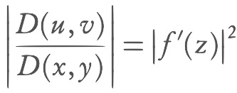 Free type 1 math fonts to match various other typefaces. Included are mdbch (for Charter), mdput (for Adobe's Utopia) and mdugm (for URW's Garamond). Designed in 2005 by Paul Pichaureau.
 Another download site. [Google]
[More] ⦿
|
Math Font Group
|
Study and discussion group started members such as Barbara Beeton, Thierry Bouche, David Carlisle, Matthias Clasen, Michael Downes, AMS, Robin Fairbairns, Berthold Horn, Alan Jeffrey, Jörg Knappen, Frank Mittelbach, Chris Rowley, Ulrik Vieth, and Justin Ziegler. [Google]
[More] ⦿
|
Math Font Group (MFG)
|
The Math Font Group (MFG) is a joint venture of the LaTeX3 Project and the TeX Users Group Technical Working Group on Extended Math Font Encoding. The MFG intends to set a number of new standards for TeX math fonts and to deliver a number of tools to support the new standards. Its members are Barbara Beeton (AMS, WG Chair), Thierry Bouche, Matthias Clasen, Michael Downes (AMS), Robin Fairbairns, Berthold Horn (Y&Y), Joerg Knappen, Johannes Kuester, Ulrik Vieth, and Justin Ziegler. From the LaTeX3 Project, they are joined by David Carlisle, Alan Jeffrey, Frank Mittelbach, and Chris Rowley. [Google]
[More] ⦿
|
Math font recommendations by Yan Zhou
|
Yan Zhou summarizes his recommendations for math fonts in Math text books (the text below is his): - (1) Minion Pro + Minion Math (PS, OT). Yes, too many people use Minion to the point that it feels boring. However, this is the only serious high quality humanist math font out there. The rest of the list are either technically inferior (like those old PS fonts) or unpleasant design-wise (like those paired with Times (New) Roman). It lacks calligraphy capitals and blackletters. I usually take the ones from Neo Euler (OT math version of Euler) for these.
- (2) Palatino + PA math (PS). There are numerous math fonts that claim compatibility with the venerable Palatino. But PA math from Micro-Press is the only one I would consider to be even close to harmony when paired with Palatino. Unfortunately there's no face out there that pairs with Aldus very well, which I prefer a lot to Palatino for text.
- (3) Times New Roman + MathTime Pro II (PS). Again, numerous math fonts claim to be times-compatible. MTPro two has the best spacing/optical sizing so far. More recent additions are STIX and its derivative XITS. Both are OT. Version two of STIX has opentype math support, but there are some wired accent placing issues when used with LuaTeX. Probably an engine bug that's going to be fixed in the next release later this year. Times is the kind of face that has no personality at all. You can't get too wrong with it when setting a math document, neither can you go very far.
- (4) Cambria Math (OT) + whatever text face that matches its weight and width. It has by far the most complete set of symbols. 7000+ glyphs vs. 2000-4000 in most OT math fonts. It's spacing and optical sizing are decent. Unfortunately, it's ugly, especially when printed. However, when pairing with a slightly darker face than Minion, or one that's more sturdy, I usually resort to Cambria if there's not too much math in it.
[Google]
[More] ⦿
|
Math fonts
|
William F. Adams lists possible math/text font combinations (all except the last one free): - Computer Modern
- Euler
- Fourier (designed to harmonize with Utopia)
- mathpazo (like mathptmx, hybrid setup to get maths for Palatino)
- tx/px fonts (Times and Palatino-like --- these set tight and have spacing problems IMO)
- Belleek (this is a stand-in for MathTime)
- Esstix / Stix . Stix is free at CTAN.
- pa/ta/hvmath &c. from Micropress
[Google]
[More] ⦿
|
Math Fonts for Windows
|
Small math truetype font archive: BookshelfSymbolFour, BookshelfSymbolFive, Eusm7, Math1, Math3Mono, Math3, Math4, Math5Mono, Math5, MT-Extra, SymbolMT, WP-MathA. [Google]
[More] ⦿
|
Math fonts: papers, presentations
|
Listing produced by the math Font Group (part of TUG): - Summary of MFG Aston Workshop (Alan Jeffrey, August 1993) DVI, PS (gzipped) PDF
- Math Font Group: Statement of Purpose (Alan Jeffrey, August 1993) DVI, PS (gzipped) PDF
- Notes on Math Font Group Organization (Alan Jeffrey, August 1993) DVI, PS (gzipped) PDF
- Summary of math font activities at EuroTeX'98 (Ulrik Vieth, April 1998) DVI, PS (gzipped) PDF
- Summary of math font activities at EuroTeX '98 (Ulrik Vieth, published in MAPS 20, 1998) PDF
- The Oldenburg e-TeX/LaTeX3/ConTeXt meeting (David Carlisle, published in MAPS 20, 1998) PDF
- Summary of MFG Aston Workshop (Alan Jeffrey, August 1993) DVI, PS (gzipped) PDF
- Math Font Group: Statement of Purpose (Alan Jeffrey, August 1993) DVI, PS (gzipped) PDF
- Notes on Math Font Group Organization (Alan Jeffrey, August 1993) DVI, PS (gzipped) PDF
- Summary of math font activities at EuroTeX'98 (Ulrik Vieth, April 1998) DVI, PS (gzipped) PDF
- Summary of math font activities at EuroTeX '98 (Ulrik Vieth, published in MAPS 20, 1998) PDF
- The Oldenburg e-TeX/LaTeX3/ConTeXt meeting (David Carlisle, published in MAPS 20, 1998) PDF
[Google]
[More] ⦿
|
Mathematica fonts
|
Font set carefully prepared by André Kuzniarek for Wolfram's Mathematica package. Truetype and type 1 fonts: - By André Kuzniarek, with Gregg Snyder and Stephen Wolfram, 1997: Math1, Math1-Bold.
- By André Kuzniarek, with Galapagos Design Group and Stephen Wolfram, 1997: Math1Mono, Math1Mono-Bold, Math2Mono, Math2Mono-Bold, Math4Mono, Math4Mono-Bold.
- By André Kuzniarek and Andrew Hunt, 1999: Math5Mono, Math5MonoBold.
- By Carl Rohrs, André Kuzniarek, and Andrew Hunt, 1998: Math5, Math5Bold.
- By André Kuzniarek, with Stephen Wolfram, 1997: Math4, Math4-Bold, Math3Bold, Math2, Math2-Bold.
- By Glenda de Guzman, 1996: Math3Mono, Math3Mono-Bold, Math3.
Beebe's list of font names. Here, you can find Mathematica1-Bold, Mathematica1, Mathematica1Mono-Bold, Mathematica1Mono, Mathematica2-Bold, Mathematica2, Mathematica2Mono-Bold, Mathematica2Mono, Mathematica3-Bold, Mathematica3, Mathematica3Mono-Bold, Mathematica3Mono, Mathematica4-Bold, Mathematica4, Mathematica4Mono-Bold, Mathematica4Mono, Mathematica5, Mathematica5Bold, Mathematica5Mono, Mathematica5MonoBold, Mathematica6, Mathematica6Bold, Mathematica6Mono, Mathematica6MonoBold, Mathematica7, Mathematica7Bold, Mathematica7Mono, Mathematica7MonoBold. The latter fonts are all made in 2002 by Carl Rohrs, Andre Kuzniarek, and Andrew Hunt, with the help of Gregg Snyder and Stephen Wolfram. Alternate URL. [Google]
[More] ⦿
|
Mathematica Fonts
[André Kuzniarek]
|
André Kuzniarek is Electronic Documents Manager, Wolfram Research, 100 Trade Center Drive, Champaign IL 61820A, in charge of fonts for Mathematica. He developed PostScript math fonts between 1996 and 1998 for Mathematica: Math1-Bold, Math1, Math1Mono-Bold, Math1Mono, Math2-Bold, Math2, Math2Mono-Bold, Math2Mono, Math3, Math3Bold, Math3Mono-Bold, Math3Mono, Math4-Bold, Math4, Math4Mono-Bold, Math4Mono, Math5, Math5Bold, Math5Mono, Math5MonoBold. Another set of Wolfram fonts is called Mathematica. It ships with the software. Mathematica is a large typeface family designed by Andre Kuzniarek, with Gregg Snyder and Stephen Wolfram (head of Wolfram) between 1996 and 2001. That family has invaded many font archives, such as this one. In his early life, Kuzniarek designed the comic book font Whiz Bang (1995), and his studio at that time was called Studio Daedalus. [Google]
[More] ⦿
|
Mathematical typesetting with the Palatino fonts
[Walter Schmidt]
|
mathpple v0.97 defines the PostScript font family Palatino (ppl) as the default roman font and will use the mathpple fonts for typesetting math with LaTeX. Developed by Walter Schmidt. [Google]
[More] ⦿
|
Mathematische Mengensymbole für Windows
[R. Grossmann]
|
The freeware mathematical symbol font Mathem. Mengensymb. by R. Grossmann has some blackboard bold glyphs. It is hopelessly incomplete though. [Google]
[More] ⦿
|
MathJax
|
MathJax is a large family of free fonts by Design Science Inc, 2008-2010. Included are the following fonts: MathJax_AMS-Regular, MathJax_Caligraphic-Bold, MathJax_Caligraphic-Regular, MathJax_Fraktur-Bold, MathJax_Fraktur-Regular, MathJax_Main-Bold, MathJax_Main-Italic, MathJax_Main-Regular, MathJax_Math-BoldItalic, MathJax_Math-Italic, MathJax_Math-Regular, MathJax_SansSerif-Bold, MathJax_SansSerif-Italic, MathJax_SansSerif-Regular, MathJax_Script-Regular, MathJax_Size1-Regular, MathJax_Size2-Regular, MathJax_Size3-Regular, MathJax_Size4-Regular, MathJax_Typewriter-Regular, MathJax_WinChrome-Regular, MathJax_WinIE6-Regular. The Neo Euler family of MathJax fonts are here. The Euler fonts go back to Hermann Zapf and the American Mathematical Society (1997). The Neo prefix refers to the OpenType versions, added by Khaled Hosny. The font names all start with NeoEulerMathJax, and have the dates 1997-2013. The STIX MathJax fonts are here. [Google]
[More] ⦿
|
MathMaker Fonts
|
Commercial site that offers TrueType and PostScript fonts for use in Mac text processing software. By Mountain Lake Software in San Francisco. They advertise "The affordable way to type math", but omit to mention that TEX and the Computer Modern fonts are free and better than any other competing product as of 1999. [Google]
[More] ⦿
|
MathTechnical
|
A 17-font math symbol collection by Agfa/Monotype, in type 1. [Google]
[More] ⦿
|
MathType
|
Windows-based editor for mathematics that can generate TEX and LATEX output. There used to be a free math font family called Euclid (1999), which was designed by Design Science. See also here or here. The MathType package, mainly geared tpwards inclusion of mathematical notation in Micrososft products, is now commercial and run by Wiris. [Google]
[More] ⦿
|
Mats Bengtsson
[Lilypond]
|
[More] ⦿
|
Matthias Rochholz
[Computer&Utilities]
|
[More] ⦿
|
MdSymbol
[Sebastian Schubert]
|
 MdSymbol (2011-2012) is a mathematical symbol font designed by Sebastian Schubert as a companion for Adobe Myriad Pro, but it might also fit well with other contemporary typefaces. It is used by the MyriadPro package. The package contains ample TeX support. [Google]
[More] ⦿
MdSymbol (2011-2012) is a mathematical symbol font designed by Sebastian Schubert as a companion for Adobe Myriad Pro, but it might also fit well with other contemporary typefaces. It is used by the MyriadPro package. The package contains ample TeX support. [Google]
[More] ⦿
|
Medienwerkstatt Mühlacker
[Ralf Lohuis]
|
German commercial school font outfit based in Mühlacker. Free demo fonts. The categories: Lateinische Ausgangsschrift, Vereinfachte Ausgangsschrift, Schulausgangsschrift, Druckschriften, Druckschriften Bayern, Pädagogische Zeichensätze, Zeichensätze für die Mathematik, Weihnachtsfonts, Sekundarfonts. There are subpages for Swiss and Austrian school fonts. Of the many fonts, here are some made by Manfred Klein: KreuzWort, Norddruck, Sdfett, Vahalb, Veraus, Verfett. Ralf Lohuis (from Hünxe) made these fonts: Adam, Atlas, Bausteine, Blackwhite, Boxquestion, Domino, Eisenbahn, FlaggenABC, Geheim, Guitar, KreuzWort, Lapunkt, Lineatur, MatheRechner, MatheTangram, Meteo, Musik, Norddruck, Nordspur, Saspunkt, Sdfett, Sport, Telegraf, Trainee, Vahalb, VeenPikto, Veraus, Verfett, ZahlenABC. Subpage on school fonts. Christmas fonts made between 1999 and 2002, also by Lohuis: Fichten, Lichterglanz, Osterei, Schnee, Tannen, Verschneit, Weihnacht. Sub-page on Swiss school fonts where one finds CH Schrift 1 through 4, and Stein and Stein 1-Linie, Stein 2-Linie and Stein 4-Linie. At the Austrian school font sub-page, we find Druckschrift and Schulschrift 95. There is also a set of Suetterlin fonts. An alphabetic list: ABCKIDS, Abgedeckt, Animalabc, Anlaut, Anlautbilder 1, Anlautbilder 2, Astro, Atlas, Ausdruck, Babylon Keilschrift, Baerchen, Bausteine, BayernOutline, BayernSpur, Bayernband, Bayerndruck, Bayernf, Bayernfine, Bayernline, Bayernmiba, Bayernpunkt, Bayernpunktliniert, Bayernunter, Blackfoot, Blackwhite, Boxquestion, Braille, Briefmarken, CH-1_B, CH-1_L1, CH-1_L2, CH-1_L4, CH-1_R, CH-1_SPF, CH-1_Um, CH-1_ouL, CH-1_out, CH-1_pt, CH-1_ptL, CH-2_B, CH-2_L1, CH-2_L2, CH-2_L4, CH-2_R, CH-2_SPF, CH-2_Um, CH-2_ouL, CH-2_out, CH-2_pt, CH-2_ptL, CH-3_B, CH-3_L1, CH-3_L2, CH-3_L4, CH-3_R, CH-3_SPF, CH-3_Um, CH-3_ouL, CH-3_out, CH-3_pt, CH-3_ptL, CH-4_B, CH-4_L1, CH-4_L2, CH-4_L4, CH-4_R, CH-4_SPF, CH-4_Um, CH-4_ouL, CH-4_out, CH-4_pt, CH-4_ptL, Clocktime, DIN-Schrift Kapitalien, DIN-Schrift bold, DIN-Schrift capitals, DIN-Schrift italic, DIN-Schrift outline, DIN-Schrift shadow, DIN-Schrift, Dinosabc, Dontworry, Dontworry, Druck Au, Eisenbahn, Faces, Faraline, Fichten, First, FlaggenABC, Geheim, Gotisch unicial, Guitar, Gutenberg Druckschrift, Halloween Bilder, Halloween Schrift, Handschrift, Hieroglyphen Monumental, Hieroglyphen Papyrus, Hieroglyphen hieratisch, Isis, Kanzlei kursiv, Keys, Kontur, KreuzWort, Lahalb, Lapunkt, Lapunktliniert, Lateinaus, Latf, Latline, Latmiba, Latout, Lauflos, Launter, Lautgebueden, Lichterglanz, Lineatur, Linequestion, Lokos, Luftballon, Maps, Maramo, Math.Soma, Mathe.Adam, Mathe.Domino, Mathe.Euklid, Mathe.Euler, Mathe.EuroAdam, Mathe.Gaus, Mathe.Geobr, Mathe.Rechner, Mathe.Riese, Mathe.Tangram, Mathematik Bilder 1, Mathematik Bilder 2, Meteo, Mixed, Musik Notensatz, Musik, Noline, Nomiba, NordFaraFu, Norddruck, Nordf, Nordfine, Nordout, Nordpunkt, Nordpunktliniert, Nordspur, Nounter, Novokal, Osterei, Phoenizisch, Phonetic, Phonetic, Puzzle, Rounded bold Bold, Roemer, Saspunkt, Saspunktliniert, Schnee, Schuf, Schul 95, Schulaus, Schuline, Schulout, Schulunter, Schumiba, Schwunguebungen 1 Bilder, Schwunguebungen 2 Bilder, Schwunguebungen 3 Bilder, Schwunguebungen 4 Zeichen, Spiegel, Sport, Ste-1_1L, Ste-1_2L, Ste-1_4L, Ste-1_PL, Ste-1_Pt, Ste-1_SP, Ste-1_Um, Ste-1_bo, Ste-1_no, Ste-1_oL, Ste-1_ou, Ste-2_1L, Ste-2_2L, Ste-2_4L, Ste-2_PL, Ste-2_Pt, Ste-2_SP, Ste-2_Um, Ste-2_bo, Ste-2_no, Ste-2_oL, Ste-2_ou, Ste-3_1L, Ste-3_2L, Ste-3_4L, Ste-3_PL, Ste-3_Pt, Ste-3_SP, Ste-3_Um, Ste-3_bo, Ste-3_no, Ste-3_oL, Ste-3_ou, Suetterlin L2 outline, Suetterlin L4 outline, Suetterlin Lineatur 2, Suetterlin Lineatur 4, Suetterlin bold, Suetterlin normal, Suetterlin outline, Suetterlin, Suedout, Sueline, Suemiba, Sueddruck, Sueddrne, Sueddrnkt, Sueddrnktliniert, Sueddrur, Sueddrter, Tannen, Telegraf, Tiere, Tierspuren, Traffic, Trainee, Uhrzeit, Unterlinie, Vahalb, Valine, Vamiba, Vapuli, Vaunter, VeenPikto, Veraus, Veraus, Verbig, Verf, Verout, Verpunkt, Verpunktliniert, Verschneit, Weihnacht, WinkerABC, Xschrift, Zahlen.ABC, Zahlen.XYZ, Zetadrei, Zetaeins, Zetazwei. [Google]
[More] ⦿
|
Meshko
|
This site has the math fonts from Wolfram Research/Glenda de Guzman (1996): Math1-Bold, Math1, Math1Mono-Bold, Math1Mono, Math2-Bold, Math2, Math2Mono-Bold, Math2Mono, Math3, Math3Bold, Math3Mono-Bold, Math3Mono, Math4-Bold, Math4, Math4Mono-Bold, Math4Mono, Math5, Math5Bold, Math5Mono, Math5MonoBold. In addition, there are some Microsoft fonts. And SPSS Marker Set (dingbats by SPSS Inc, 1996). [Google]
[More] ⦿
|
MetaType
|
From its developer, Serge Vakulenko: "Metatype is a set of utilities and scripts for creating TrueType fonts using Metafont language. It also includes two font families, named TeX and TeX Math, based on the D. Knuth's Computer Modern fonts, but extended with Greek, Cyrillic and other characters. Metatype and TeX fonts can be used under the GPL license." The TeX family consists of TeXBold, TeXBoldItalic, TeXItalic, TeXMono, TeXMonoItalic, TeXMath, TeXMathBold, TeXMathBoldItalic, TeXMathItalic, TeXNarrow, TeX, TeXSans, TeXSansBold, TeXSansBoldItalic, TeXSansItalic, TeXWide. It comes in TTF and BDF formats. Free software in pre-alpha development, for Windows and X11/UNIX/Linux. The code is in C and Python. [Google]
[More] ⦿
|
Michael F. Hughes
|
Designer of the sans serif font Boolean (2000) and of the Thai simulation font Farang (2002). Graduate in design from Coventry University. Dafont link. [Google]
[More] ⦿
|
Michael Hernan
[FontGroup]
|
[More] ⦿
|
Michael Lee Finney
|
 Maintainer of the Logix font (2001-2021). It is a free mathematical symbol font based on STIX2. Finney writes: This is an OpenType font where all of the symbols (more than 4,000) other than the ASCII codepage are in the private use area. Other than many miscellaneous symbols, there are a large number of arrows, geometrical symbols, Knot drawing symbols, 64 stretchy delimiters plus a stretchy binding bar, of which 56 are fully stretchable. The remaining 8 are stretchy up to 5 times the original size. Some of the delimiters are present in Unicode, but their design in STIX2 does not work as well for logic. In particular, STIX2 delimiters tend to not extend as far below the baseline and above the baseline as would be desirable. Also, some STIX2 delimiters take more horizontal space than is necessary. There are twenty scripts, each of which (except for the two Greek scripts) have matching numeric, lower case and upper case glyphs. All symbols in this font are designed to be compatible with the STIX2 mathematical font by AMS. Some of these scripts overlap the Unicode math scripts, but are not intended to be replacements for those. [Google]
[More] ⦿
Maintainer of the Logix font (2001-2021). It is a free mathematical symbol font based on STIX2. Finney writes: This is an OpenType font where all of the symbols (more than 4,000) other than the ASCII codepage are in the private use area. Other than many miscellaneous symbols, there are a large number of arrows, geometrical symbols, Knot drawing symbols, 64 stretchy delimiters plus a stretchy binding bar, of which 56 are fully stretchable. The remaining 8 are stretchy up to 5 times the original size. Some of the delimiters are present in Unicode, but their design in STIX2 does not work as well for logic. In particular, STIX2 delimiters tend to not extend as far below the baseline and above the baseline as would be desirable. Also, some STIX2 delimiters take more horizontal space than is necessary. There are twenty scripts, each of which (except for the two Greek scripts) have matching numeric, lower case and upper case glyphs. All symbols in this font are designed to be compatible with the STIX2 mathematical font by AMS. Some of these scripts overlap the Unicode math scripts, but are not intended to be replacements for those. [Google]
[More] ⦿
|
Michael Sharpe
[Notomath]
|
[More] ⦿
|
Michael Sharpe
[fbb]
|
[More] ⦿
|
Michael Sharpe
[ScholaX]
|
[More] ⦿
|
Michael Sharpe
[Boondox]
|
[More] ⦿
|
Michael Sharpe
[newpx]
|
[More] ⦿
|
Michael Sharpe
[newtx]
|
[More] ⦿
|
Michael Sharpe
[SticksToo]
|
[More] ⦿
|
Michael Spivak
|
Designer of the MathTime fonts, which used to be available from Y&Y. Read about them in his article The MathTimeProfessional Fonts Or, How I Wasted the Last Twenty Years of my Life (PracTeX Journal, 2006, vol. 1). For a discussion of the Greek symbols in MathTimes, we refer to Greek type expert Yannis Haralambous in 1999: Unfortunately it does not fit very well with text typeset in Monotype Greek Times: the ratio between thin (horizontal) and thick strokes for letters "pi" and "Sigma" is 0.62 and 0.52 for MathTimes, and only 0.4 for Monotype Greek Times. [Google]
[More] ⦿
|
Michael Ummels
|
Michael Ummels at RWTH in Aachen, Germany, created the TeX font package ccicons, which offers authors who want to publish their documents under a Creative Commons license an easy way to include the relevant icons in their documents. It includes a free type 1 font, CC Icons (2009-2017), where CC stands for Creative Commons. CTAN link to CCIcons. In 2011, he created the mathematical font FD Symbol in Metafont and Type 1, to accompany Fedra in mathematical texts. [Google]
[More] ⦿
|
Michel Bovani
|
 French designer of the (free) Fourier-GUTenberg package (dated 2003) for Latex, which includes a number of mathematical type 1 fonts that are new: Fourier-Alternate-Black, Fourier-Alternate-Bold, Fourier-Alternate-BoldItalic, Fourier-Alternate-Italic, Fourier-Alternate-Roman, Fourier-Alternate-SemItalic, Fourier-Alternate-SemiBold, Fourier-Math-BlackBoard, Fourier-Math-Cal, Fourier-Math-Extension, Fourier-Math-Letters-Italic, Fourier-Math-Letters, Fourier-Math-Symbols. By 2020, the package features Fourier-Orns (ornaments, including fists and fleurons) and opentype files.
 Fourier Gutenberg is derived from Adobe's Utopia font. [Google]
[More] ⦿
|
MicroPress Inc
|
Commercial type 1 math fonts, typically an extension of a famous typeface for use in mathematics. Software, type 1 files, PK files and metrics files for use with TEX may be found here for HVMath, the Helvetica extension. There is also TMmath, math symbols to go with Times. And IF-Math (Informal Math) goes with Tekton: it includes IF-Math Math Italics, IF-Math Math Symbols, IF-Math Math Extension, IF-Math Text Regular, IF-Math Text Bold, IF-Math Text Oblique, IF-Math Text Bold Oblique. "IF-Math includes all usual TeX symbols, including Greek letters, Calligraphic and OldStyle symbols. IF-Math is supported by VTeX PDF backend (Windows&Linux), VTeX PostScript driver, and all other VTeX drivers (via the ATM). IF-Math can also be used with DVIPS. " They also published EC/TC fonts for European TeX users. [Google]
[More] ⦿
|
Microsoft: New Fonts in Windows 7
|
 The list of new fonts in Windows 7 in 2009:
 - Aparajita, Aparajita Bold, Aparajita Bold Italic, Aparajita Italic: Devanagari family originally designed in 2001 by Modular Infotech, Pune, India.
- Ebrima, Ebrima Bold: Microsoft fonts from 2008 with many symbols and special characters.
- Gabriola: Script typeface by John Hudson (2008).
- IskoolaPota Bold.
- Khmer UI, Khmer UI Bold: By Microsoft (2008).
- Kokila, Kokila Bold, Kokila Bold Italic, Kokila Italic: Devanagari family originally designed in 2001 by Modular Infotech, Pune, India.
- Meiryo UI, Meiryo UI Bold, Meiryo UI Bold Italic, Meiryo UI Italic. Meiryo is a modern sans serif Japanese typeface developed by Microsoft to offer an optimal on screen reading experience and exceptional quality in print. The Japanese letterforms are generously open and well-proportioned; legible and clear at smaller sizes, and dynamic at larger display sizes. The beauty of Meiryo is that it sets text lines in Japanese with Roman seamlessly and harmoniously. Meiryo was designed by a team including C&G Inc., Eiichi Kono, Matthew Carter and Thomas Rickner. It won a 2007 type design prize from the Tokyo Type Directors.
- Microsoft New Tai Lue, Microsoft New Tai Lue Bold: A 2008 family by Microsoft, DynaComware and Ascender.
- Microsoft PhagsPa, Microsoft PhagsPa Bold: A 2008 family for Mongolian by Microsoft, DynaComware and Ascender.
- Microsoft Tai Le, Microsoft Tai Le Bold: A 2008 family by Microsoft, DynaComware and Ascender.
- Raavi Bold: Gurmukhi typeface by Raghunath Joshi (Type Director) and Apurva Joshi (2008).
- Sakkal Majalla, Sakkal Majalla Bold: Arabic family by Mamoun Sakkal (2008).
- Segoe UI Light, Segoe UI Semibold, Segoe UI Symbol: Controversial family by Microsoft (2008), said to be corporate theft on the part of Microsoft, with as victim Frutiger---Segoe is basically identical to the typeface Frutiger.
- Shonar Bangla, Shonar Bangla Bold: Bengali typeface by Microsoft (2008).
- Shruti Bold: Gujarati typeface by Raghunath Joshi (Type Director) and Vinay Saynekar (2008).
- Tunga Bold: Kannada typeface by Raghunath Joshi (Type Director) and Vinay Saynekar (2008).
- Utsaah, Utsaah Bold, Utsaah Bold Italic, Utsaah Italic: Devanagari family originally designed in 2001 by Modular Infotech, Pune, India.
- Vani, Vani Bold: Telugu family by Muthu Nedumaran (2008).
- Vijaya, Vijaya Bold: Tamil family originally designed in 2001 by Modular Infotech, Pune, India.
- Vrinda Bold: Bengali typeface by Raghunath Joshi (Type Director) and Vinay Saynekar (2008).
[Google]
[More] ⦿
|
milstd
[Rick Simpson]
|
Metafont by Rick Simpson containing special characters for use in logic diagrams. [Google]
[More] ⦿
|
Mitek
|
Czech site with several free fonts developed in a mathematically precise manner: - A Unicode-compliant serifed typeface Mides (2004), which has well over a thousand glyphs and fills most of the early part of the Unicode table.
- Tapir (2004; a sans family with simple geometric shapes and lines of constant thickness comes in metafont and type 1).
- Faldix.
- Fixka (handprinting style glyphs), FixkaBold, FixkaBoldItalic, FixkaItalic.
- TriGande (a sans family), TriGandeB lunet, TriGandeBlunetBold, TriGandeBlunetBoldItalic, TriGandeBlunetItalic, TriGandeBold, TriGandeBoldItalic, TriGandeItalic.
- Zabyris, ZabyrisBold.
- Bobdel.
- Boisik (2008) is a 20-font Baskerville-inspired metafont family with math symbols and full Czech accents. It has an Opentype version as well.
Most typefaces come in type 1 and metafont versions. Metafont-only typefaces include Bobdel, Midings and Mishapes. Alternate URL for Tapir. I can't figure out who designed these typefaces. [Google]
[More] ⦿
|
Mitja Miklavčič
|
 Slovenian designer who lives in Postojna. His typefaces:
 - He created Gf H2O Sans in 2005 font at Gigofonts. This is a humanist sans done with Matevz Medja.
- Tisa is a slab-serif inspired text family that won an award at TDC2 2007. It has useful features such as ink traps and uiformized math symbol and number widths across all styles in the family. In fact, the Latin/Cyrillic type family Tisa was his project at the University of Reading, where he graduated in 2006. He wrote a nice essay on the history of Clarendon (2006). In 2008, he published Tisa as FF Tisa at FontFont. Tisa won a TDC award. In 2012, he added the superfamily FF Tisa Sans (FontFont).
- Mitja worked full-time at Fontsmith and now continues to collaborate with the team on some type design projects. His Fontsmith cooperation led to these typefaces:
- FS Rufus (2009). A slab serif by Mitja Miklavcic, Jason Smith and Emanuela Conidi. Described by them as benevolent, quirky, peculiar, offbeat, jelly beans and ice cream, a retro eco warrior.
- FS Me (2009). A sans family designed for readers with a learning disability. It was co-designed by Mitja Miklavcic, Jason Smith, Emanuela Conidi, Fernando Mello and Phil Garnham. FS Me was researched and developed in conjunction with---and endorsed by---Mencap, the UK's leading charity and voice for those with learning disability. Mencap receives a donation for each font licence purchased.
- FS Albert (2002). A soft-edged sans family by Jason Smith, Mitja Miklavcic and Phil Garnham. FS Albert supports 60 languages, including Greek, Cyrillic and Latin.
- FS Rome (Mitja Miklavcic and Emanuela Conidi). An all caps Trajan typeface.
- At House Industries, Jess Collins and Mitja Miklavic revived Ed Benguiat's great fat face didone typeface (Benguiat) Montage in 2018. In 2014, House Industries, Christian Schwartz, Mitja Miklavcic and Ben Kiel co-designed Velo Serif Text and Velo Serif Display. In 2017, he revived Dave west's 1960s classic at PhotoLettering Inc, Banjo, as Plinc Banjo. Still at House Industries, Christian Schwartz, Mitja Miklavcic and Ben Kiel co-developed Yorklyn Stencil.
- In 2020, he published the experimental modular typeface Trico Script at Fleha Type.
- Davison Spencerian (at House Industries, by Mitja Miklavcic, Ben Barber and Ken Kiel). A digital revival of Dave Davison's 1946 Spenerian script Davison Spencerian.
[Google]
[MyFonts]
[More] ⦿
|
Monario
|
Four free truetype fonts: Hebrew (by Andrew M. Fountain&Peter J. Gentry, 1993), NewGreek (by Va in Monario, 1996), GreekMathSymbols, Czar-Normal (Cyrillic). [Google]
[More] ⦿
|
Mottez Johann
|
This site has the math symbol fonts StarMath, SymbolMT. [Google]
[More] ⦿
|
Mountain Bunker
|
Math truetype font archive: Cmex10, Cmsy10, Euclid, Euclid-Bold, Euclid-BoldItalic, Euclid-Italic, EuclidSymbol, EuclidSymbol-Bold, EuclidSymbol-BoldItalic, EuclidSymbol-Italic, EuclidExtra, EuclidExtra-Bold, EuclidFraktur, EuclidFraktur-Bold, EuclidMathOne, EuclidMathOne-Bold, EuclidMathTwo, EuclidMathTwo-Bold, Math1, Math1-Bold, Math1Mono, Math1Mono-Bold, Math2, Math2-Bold, Math2Mono, Math2Mono-Bold, Math3, Math3Bold, Math3Mono, Math3Mono-Bold, Math4, Math4-Bold, Math4Mono, Math4Mono-Bold, Math5, Math5Bold, Math5Mono, Math5MonoBold, MT-Extra, MT-Symbol. [Google]
[More] ⦿
|
Mozilla: MathFonts
|
Roger B. Sidje explains math coding issues for math font families in Mozilla such as AMS/Computer Modern, Basil K. Malyshev's version of Computer Modern, Design Science's MT Extra, and Wolfram's math set. [Google]
[More] ⦿
|
mpfonts
[Daniel Benjamin Miller]
|
The Computer Modern fonts are available in Type 1 format, but these renditions are somewhat thin and spindly, and produce much lighter results than the originals. It is alternatively possible to use METAFONT bitmaps, but this has its disadvantages in comparison with vector fonts. These fonts are conversions to Type 3 fonts, done entirely in METAPOST; they are vector fonts which are a direct conversion from the original METAFONT files, so they are the design most authentic to the originals. [Google]
[More] ⦿
|
MSYM10
|
Math symbol font in type 1 format, generated from old metafont code. By Berthold K.P. Horn. [Google]
[More] ⦿
|
mt11p
|
"mt11p is a package to use the MathTime and MathTimePLUS ("MathTime complete") fonts in LaTeX2e. Everything is included, incl. (patched) font metrics, except, of course, the Type1 fonts themselves." By Drahoslav Lím [Google]
[More] ⦿
|
Murray Sargent
[Murray Sargent: Math in Office]
|
[More] ⦿
|
Murray Sargent: Math in Office
[Murray Sargent]
|
Murray Sargent is a software development engineer. He often speaks on "Math in Office". I quote: In the talks, I describe and demonstrate how Unicode's rich mathematical character set combined with OpenType font technology, TeX 's mathematical typography principles, and enhanced autocorrection can be used to produce high-quality, streamlined technical text processing in Office 2007. The approach is currently implemented in Word 2007 and in Office 2007's RichEdit editor, which is also used in the Microsoft Math Calculator. He goes on: Infrastructures outside and inside of Microsoft have emerged to enable major advances in the editing and display of mathematical formulae. While TeX has been widely available since 1986, most of the other infrastructures have become available only recently. - [La]TeX: current tech-doc standards
- Unicode 4.0: includes ~2000 math symbols
- MathML 2.0: math K 12 and beyond
- OpenType font technology: special math tables
- New math font (Cambria Math)
- Math layout handler
- Shared math input components
- MS Office environment, autocorrect
[Google]
[More] ⦿
|
Natalia Vasilyeva
|
 Natalya Vasilyeva (from Barnaul, Siberia) is a type designer, book designer and calligrapher, also engaged in editing, publishing, photography and computer design. She published these typefaces, which, unless explicitly mentioned, are all done at Paratype:
 - Adonis (2002). A 4-style text typeface. She added a major update, Adonis New, in 2021.
- Adventure (2000). A calligraphic script.
- Aelita (2014). A transitional typeface family.
- Astrosym (2010, Paratype).
- Barnaul Grotesk (2007): a humanist sans in 8 styles.
- Barry Gothic (1996, TypeMarket), a Cyrillic extension of Adobe's Charlemagne (1989).
- Bella.
- Blick (2008, ParaType): a decorative sans.
- Calendula (2017, Paratype). A very humanistic sans typeface family.
- Cometa.
- Crassula (2018). An organic sans.
- Deca Sans (2010) and Deca Serif (2010). It was designed to be readable at small sizes, thanks to its low contrast. In 2017, she added Deca Serif New.
- Elina and Elina Decor (2011). A graceful, decorative and calligraphic set of typefaces.
- Emploi (2009: Emploi Travesti and Emploi Ingenue) is pure calligraphic pleasure.
- Express (2001): a Cyrillic version of a brush typeface by the same name designed for Ludwig&Mayer in 1957 by Walter Hoehnisch.
- Hortensia (2000). A calligraphic typeface.
- Illusion (2019). A calligraphic typeface.
- Iowan Old Style (2017, Paratype). This is the Cyrillic extension of John Downer's Iowan Old Style (1990, Bitstream).
- Journal and Journal Sans Old School (2019), which is a modernized digital version of the widely popular (geometric) Journal Sans, which became famous via its use in Science and Life magazine of the 1960s.
- Kudryashev.
- Liana (1998, TypeMarket): a flowing script based on Lainie of Soft Horizons.
- Lockon (2008, ParaType): a slightly curly hanprinted script.
- Margon (2012, Paratype). This was a major contribution---a serif font family with a temperate design, i.e., small serifs, moderate contrast, and tiny roundings on the corners. The Margon font family consists of 18 members divided into 4 groups of different proportions with indices 360, 380, 400, 430.
- Master Flo (2007): simulation of a broad-nibbed pen.
- Melody.
- Mirandolina (2008, ParaType): a freestyle serif typeface family in seven styles.
- Mister Earl.
- Motiv (2003, Paratype). A cursive calligraphic script for Latin and Cyrillic.
- Muffin (2017, Paratype). A five-style soft and rounded humanistic low-contrast sans serif based on broad nib writing.
- Nat Flight (2009, ParaType). A text family.
- Nat Grotesk (2007, Paratype). A geometric sans family.
- Nat Vignette (2000-2002): a great set of ornamental and border typefaces).
- NataliScript (2000). A calligraphic script.
- Orbi Sans (2011) and Orbi (2010).
- Pallada (2008, ParaType) has the same genetic roots as Mirandolina but comes in only 4 styles.
- Prospect (1997-2001).
- Sans Rounded (TypeMarket, 1998): an extension of VAG Rounded.
- Scientia (2016, Paratype): a neutral sans for scientific publications. In that same genre, she designed the 22-style text family Hyperon (2020, Paratype) for publications on mathematics and physics. Each font is loaded with about 1100 glyphs, including many symbols. All fonts cover Latin, Greek and Cyrillic.
- Selina (2007). A 9-style low-contrast modern type family.
- Vesna. Zapf Elliptical 711.
Klingspor link. MyFonts interview. View Natalia Vasilyeva's typefaces. Another listing of Natalia Vasilyeva's typefaces. [Google]
[MyFonts]
[More] ⦿
|
New math symbols for Unicode
|
Recent additions to Unicode include a number of math symbols. These were the result of efforts by STIX, a consortium of scientific and technical publishers. The STIX rep is Barbara Beeton (from the American Mathematical Society) who writes: " The STIX work will ultimately result in creation of type 1 math symbol fonts, to be freely available. This is also being coordinated with the work on mathml. Actually, this reference comprises pretty much all of unicode, excluding the bulk of the cjk characters. Unicode version 3.2, which is in its final cleanup at this very moment, will contain even more than what's in the referenced document, but the charts are still only available for "private" review." [Google]
[More] ⦿
|
newpx
[Michael Sharpe]
|
Michael Sharpe (UCSD) created newpx, a free font package at CTAN: This package, based on pxfonts, provides many fixes and enhancements to that package, splitting it in two parts---newpxtext and newpxmath---which may be run independently of one another. It provides scaling, improved metrics, and other options. For proper operation, the packages require that the packages newtxmath and pxfonts be installed and their map files enabled. The text package relies on an extension of the TeXGyrePagella Type1 fonts that is provided with this package. Note that TeXGyrePagella is a math and scientific text font based on Palatino. This package is meant to be a replacement for Young Ryu's pxfonts---a complete text and math package with roman text font provided by a Palatino clone, sans serif based on a Helvetica clone, typewriter typefaces, plus math symbol fonts whose math italic letters are from a Palatino Italic clone. [Google]
[More] ⦿
|
Newrenaissance
|
Ten fonts, including various uncial and math symbol fonts: AmericanUncial (URW), FinalRomanfat (RWE), GreekSymbols, IconicSymbolsExt (Monotype), Marshall, MathExt (Monotype), Phalesiodecor (initial caps), Swordsman (SWFTE), TypographicExt (Monotype). The Monotype fonts were dropped some time before 2004. [Google]
[More] ⦿
|
newtx
[Michael Sharpe]
|
Michael Sharpe (UCSD) created newtx, a free font package at CTAN: This package, based on txfonts, provides many fixes and enhancements to the txfonts package, splitting it into two separate packages---newtxtext and newtxmath, which may be run independently of one another. It provides scaling, improved metrics, and other options. In particular, newtxmath offers a libertine option which substitutes Linux Libertine (provided with TeXLive and MikTeX) italic and Greek letters for the default Times letters, providing a good match for the Libertine text font, which is heavier than Computer Modern but lighter than Times, and in my experience, looks very sharp and clear on the screen. Newtxtt (2014) is a typewriter font subfamily. [Google]
[More] ⦿
|
Nicole Sigaud
|
Nicole Sigaud (Humanoid Exotik Designs) is the designer of ANACOM (1997-2002), a font consisting of quarter circles, quarter negative circles and halved squares. This is used in the ANACOM project in which tilings and patterns are described in a simple mathematical manner. The idea is fill position (x, y) of a 2d grid with character/glyph f(x, y) where f is any function. Another proposal is to define a certain order of a path on the grid, and fill the path based on the repetition of a given finite sequence of glyphs. [Google]
[More] ⦿
|
Nikolay Nikolayevich Kudryashev
|
Also, Nikolai Nikolajewitsch Kudryashev. Russian type designer, b. Moscow, 1908, d. Moscow, 1981. His name is also written Kudrashov sometimes. Intermicro published KudrashovC (1992-1995) based on his work. Some weights were co-designed by Zinaida A. Maslennikova. At Polygraphmash, he and Maslennikova designed the family Kudryashevskaya Encyclopedicheskaya (1960-1974). The latter family was digitized and finished by Vladimir Yefimov at Paratype and called Petersburg (1992). The math font of that family was digitized by Vladimir Yefimov at Polyraphmash in 1987 and became PT MathFont 1. The music font of that set became PT Nota 1 (Vladimir Yefimov at Polyraphmash, 1987). From 1986 until 2002, he developed the Paratype Parangon family, available in Latin and Cyrillic versions from URW. FontShop link. Paratype link. Klingspor link. [Google]
[More] ⦿
|
Norman Gray
|
Astronomer and physicist at the University of Glasgow. Designer in 1991-2017 of the font Feyn (metafont), which can be used to produce relatively simple Feynman diagrams within equations in a LaTeX document. He writes: The other Feynman diagram package which exists is Thorsten Ohl's feynmf/feynmp package. That works by creating Metafont or MetaPost figures using a preprocessor. It's more general than this package, but is at its best when creating relatively large diagrams, for figures. In contrast, the present system consists of a carefully-designed font with which you can write simple diagrams, within equations or within text, in a size matching the surrounding text size. [Google]
[More] ⦿
|
Notomath
[Michael Sharpe]
|
Math support via newtxmath for Google's NotoSerif and NotoSans. Published in 2020, and maintained by Michael Sharpe. [Google]
[More] ⦿
|
Olaf Kummer
[doublestroke]
|
[More] ⦿
|
Old Arrows
|
A free type 1 font owned by the American Mathematical Society, dated 1997. [Google]
[More] ⦿
|
OpenOffice.org
|
About twenty free truetype fonts by Sun Microsystems: Timmons (1999, clearly Times), Arioso (1999), Conga (1999), Chevara (1999), Helmet (1999, clearly Helvetica), OpenSymbol (1999, really Zapf Dingbats), Starbats (1999), Starmath (1999). [Google]
[More] ⦿
|
Optical Tomography Group
|
Small math font archive: Symath (Autodesk), Euclid, Euclid-Math-One, Euclid-Math-Two, Euclid-Symbol, MT-Symbol. [Google]
[More] ⦿
|
P22 Type Foundry
[Richard Kegler]
|
 Richard Kegler's fun Buffalo-based foundry, which he founded in 1995 together with his wife, Carima El-Behairy. Currently, on staff, we find type designers James Grieshaber and Christina Torre. In 2004, it acquired Lanston Type. P22 has some great unusual, often artsy, fonts. In 2021, P22 jopined The Type Founders as a distribution outlet.
 The fonts are: Industrial Design (an industrial look font based on letters drawn by Joseph Sinel in the 1920s---this font is free!), LTC Jefferson Gothic Obliquie (2005, free), Sinel (free), P22Snowflakes (free in 2003 and P22 Snowflakes (retail) in 2020, finishedd by Richard Kegler and Terry Wüdenbachs), Acropolis Now (1995, a Greek simulation typeface done with Michael Want), P22 Albers (1995; based on alphabets of Josef Albers made between 1920 and 1933 in the Bauhaus mold), Arts and Crafts (based on lettering of Dard Hunter, early 1900s, as it appeared in Roycroft books), Ambient, Aries (2004, based on Goudy's Aries), Arts and Crafts ornaments, Atomica, Bagaglio (Flat, 3D; in the style of Il Futurismo), P22 Basel Roman (2020, Richard Kegler: an update of a 2015 typeface, P22 Basel, based on a garalde font used by Johannes Herbst (aka Ioannes Oporinus) in 1543 to publish Andreas Vesalius' On the Fabric of the Human Body (De humani corporis fabrica) in Basel), Bauhaus (Bauhaus fonts based on the lettering of Herbert Bayer), Bifur (2004, Richard Kegler, after the 1929 original by Cassandre), Blackout, P22 Brass Script Pro (2009, Richard Kegler; based on an incomplete script fond in a booklet from Dornemann&Co. of Magdeburg Germany, ca. 1910 entitled Messingschriften für Handvergoldung; for years, P22 and MyFonts claimed that Michael Clark co-designed this, but Michael does not want any credit, as he did only about 20 letters), Cage (based on handwriting and sketches of the American experimental composer John Cage), P22 Casual Script (2011, Richard Kegler, a digitization of letters by sign painter B. Boley, shown in Sign of the Times Magazine), Cezanne (Paul Cezanne's handwriting, and some imagery; made for the Philadelphia Museum of Art), Child's Play, Child's Play Animals, Child's Play Blocks, Constructivist (Soviet style lettering emulating the work of Rodchenko and Popova), Constructivist extras, Czech Modernist (based on the design work of Czech artist Vojtech Preissig in the 20s and 30s), Daddy-o (Daddy-o Beatsville was done in 1998 with Peter Reiling), Daddy-o junkie, Da Vinci, Destijl (1995, after the Dutch DeStijl movement, 1917-1931, with Piet Mondrian inspired dingbats; weights include Extras, P22 Monet Impressionist (1999), Regular and Tall), Dinosaur, Eaglefeather, Escher (based on the lettering and artwork of M.C. Escher), P22 FLW Exhibition, P22 FLW Terracotta, Folk Art (based on the work of German settlers in Pennsylvania), Il futurismo (after Italian Futurism, 1908-1943), Woodtype (two Tuscan fonts and two dingbats, 2004), P22 Woodcut (1996, Richard Kegler: based on the lettering carved out in wood by German expressionists such as Heckel and Kirchner), Garamouche (2004, +P22 Garamouche Ornaments; all co-designed with James Grieshaber), GD&T, Hieroglyphic, P22 Infestia (1995), Insectile, Kane, Kells (1996, a totally Celtic family, based on the Book of Kells, 9th century; the P22 Kells Round was designed with David Setlik), Koch Signs (astrological, Christian, medieval and runic iconography from Rudolf Koch's The Book of Signs), P22 Koch Nueland (2000), Larkin (2005, Richard Kegler, 1900-style semi-blackletter), London Underground (Edward Johnston's 1916 typeface, produced in an exclusive arrangement with the London Transport Museum; digitized by Kegler in 1997, and extended to 21 styles in 2007 by Paul D. Hunt as P22 Underground Pro, which includes Cyrillic and Greek and hairline weights), Pan-Am, Parrish, Platten (Richard Kegler; revised in 2008 by Colin Kahn as P22 Platten Neu; based on lettering found in German fountain pen practice books from the 1920s), P22 Preissig (and P22 Preissig Calligraphic, 2019), Prehistoric Pals, Petroglyphs, Rodin / Michelangelo, Stanyan Eros (2003, Richard Kegler), Stanyan Autumn (2004, based on a casual hand lettering text created by Anthony Goldschmidt for the deluxe 1969 edition of the book "...and autumn came" by Rod McKuen; typeface by Richard Kegler), Vienna, Vienna Round, Vincent (based on the work of Vincent Van Gogh), Way out West. Now also Art Nouveau Bistro, Art Nouveau Cafe and the beautiful ornamental font Art Nouveau Extras (all three by Christina Torre, 2001), the handwriting family Hopper (Edward, Josephine, Sketches, based on the handwriting styles of quintessential American artist Edward Hopper and his wife, Josephine Nivison Hopper, and was produced in conjunction with the Whitney Museum of American Art), Basala (by Hajime Kawakami), Cusp (by James Grieshaber), P22 Dearest (calligraphic, by Christina Torre and Miranda Roth), Dwiggins (by Richard Kegler), Dyrynk Roman and Italic (2004, Richard Kegler, after work by Czech book artist Karel Dyrynk), Gothic Gothic (by James Grieshaber), La Danse (by Gábor Kóthay;), Mucha (by Christina Torre), Preissig Lino (by Richard Kegler), P22Typewriter (2001, Richard Kegler, a distressed typewriter font), the William Morris set (Morris Troy, Morris Golden, Morris Ornaments, based up the type used by William Morris in his Kelmscott Press; 2002), Art Deco Extras (2002, Richard Kegler, James Grieshaber and Carima El Behairy), Art Deco Display, the Benjamin Franklin revival font Franklin's Caslon (2006), Dada (2006) and the Art Nouveau font Salon (bu Christina Torre). In 2006, Kegler added Declaration, a font set consisting of a script (after the 1776 declaration of independence), a blackletter, and 56 signatures. Many of the fonts were designed or co-designed by Richard Kegler. International House of Fonts subpage. Lanston subpage (offerings as of 2005: Bodoni Bold, Deepdene, Flash, Fleurons Granjon, Fleurons Garamont, Garamont, Goudy Thirty, Jacobean Initials, Pabst, Spire). Bio and photo. In-house fonts made in 2008 include Circled Caps, the Yule family (Regular, Klein Regular, Light Flurries, Heavy, Klein heavy, Heavy Snow, Inline; all have Neuland influences). Kegler / P22 created a 25-set P22 Civilité family in 2009 based on a 1908 publication from Enshedé, the 1978 English translation by Harry Carter, and a 1926 specimen also from Enshedé. P22 Declaration (Script, Signatures, Blackletter, 2009) is based on the lettering used in the 1776 Declaration of Independence. At ATypI 2004 in Prague, Richard spoke about Vojtech Preissig. Speaker at ATypI 2010 in Dublin, where he presented Making Faces: Metal Type in the 21st Century about which he writes: This film has the dual aim of documenting the almost-lost skill of creating metal fonts and of capturing the personality and work process of the late Canadian graphic artist Jim Rimmer (1931-2010). P22 type foundry commissioned Mr. Rimmer to create a new type design (Stern) that became the first-ever simultaneous release of a digital font and hand-set metal font in 2008. At ATypI 2011 in Reykjavik, he showed Making Faces. Typefaces from 2014: LTC Archive Ornaments (Richard Kegler and Miranda Roth). Typefaces from 2020: Showcard Script (by Terry Wüdenbachs, based on an original of Beaufont at the Hamilton Wood Type Museum, custom designed by the Morgan Sign Machine Company of Chicago). Typefaces from 2021: P22 Glaser Houdini (a layerable family, after Glaser's Houdini from 1964), P22 Glaser Babyteeth. Kegler writes: In 2019, P22 Type Foundry met with Milton Glaser (1929-2020) to initiate the official digital series of typefaces designed by Glaser in the 1960s and 70s. P22 Glaser Babyteeth is the first family released in the series. Milton Glaser's inspiration for his Babyteeth typeface came from a hand painted advertisement for a tailor he saw in Mexico City. He was inspired by that E drawn as only someone unfimilar with the alphabet could have concieved. So he set about inventing a completelly ledgible alphabet consistant with this model. P22 Glaser Babyteeth was based on original drawings and phototype proofs from the Milton Glaser Studios archives. Over the years there have been many typefaces that borrowed heavily from the Glaser designs, but these are the only official Babyteeth fonts approved by Milton Glaser Studio and the Estate of Milton Glaser. The solid and open versions are designed to overlap for two-color font effects and can even be mixed and matched for multi layer chromatic treatments. In 2021, he published the 3d art deco shadow font P22 Glaser Kitchen which is based on Big Kitchen (1976). MyFonts interview. View Richard Kegler's typefaces. View the IHOF / P22 typeface library. [Google]
[MyFonts]
[More] ⦿
|
Page Studio Graphics (or: Pixymbols)
[Roger Vershen]
|
 Page Studio Graphics is Roger Vershen's Oro Valley, AZ-based company specializing in symbols and symbol fonts, founded by him in 1986. Roger Vershen died in Tucson, AZ, in 2003.
 The fonts (grouped under the name PIXymbols) include ADA symbols v.2.0, Africa, Alphabox, Alphacircle, Ameslan (ASL), Antorff (blackletter), Antorff Fractions, Apothecary, Arrows, Astrology, Backstitch, Boxkey, BoxNLines, Braille grade 2, Casual, Chalk Casual, PIXymbols Chess, Command Key, Courex (typewriter family), Crossword, PIXymbols Deco Glass (2001), Digit&Clocks (+LED symbols), Dingbats&Online, DOSScreen, Fabric Care, FARmarks (Federal Aviation Regulations lettering), Flagman (semaphore), Fractions, Gridmaker, Highway Gothic (U.S. Department of Transportation's Standard Alphabets for Highway Signs), PIXymbols Highway Gothic 2002, Highway Signs (U.S. Department of Transportation), Hospital&Safety, LCD, Linea (2002, prismatic), Luna, Malkoff (calligraphic font), Marina, Meeting, Mejicana (2001, a Mexican party font), Menufonts, Morse, Musica (instruments), Newsdots, Orchestra, Passkey, Patchwork, PCx, Phone, PIXymbolsMusica, Prescott (2001, Western), Penman (2001, connected script), PrimerD (letters with lines), Recycle, Roadsigns, Shadowkey, Signet (family), Signet Shadow, Squared, Strings, Stylekey, Tolerances&Datum, Travel&Hotel, TV List, Unikey, US Map, Vershen (2001), Xcharting, Xstitch. They also sell EPS files of all Arms of Swiss cantons, and many nice initial caps. Look also for Faux Hebrew (simulated Hebrew), as part of the Faux package that also includes Faux Sanskrit, Faux Runic, Faux Hebrew, Faux Japanese, Faux Arabic, Faux Chinese and Faux Chinese Sans. Alternate URL. Previews at MyFonts. Klingspor link. View the Page Studio Graphics typeface library. [Google]
[MyFonts]
[More] ⦿
|
Parametric type generation systems
|
Nicholas Fabian takes us from the Sumerians, via Metafont to Chameleon and extended "Parametric Type Generation" systems, in which parameters describe very general font properties. [Google]
[More] ⦿
|
Pathloss4.0
|
Truetype fonts WP-GreekCentury, WP-MathA, WP-MathB. [Google]
[More] ⦿
|
Paul James Miller
[PJM Homebrew Fonts]
|
[More] ⦿
|
Paul Pichaureau
[Math Design fonts]
|
[More] ⦿
|
Pazo math fonts
[Diego Puga]
|
Diego Puga from the University of Toronto offers a set of five math fonts (type 1) suitable for typesetting math in combination with the Palatino family of text fonts. Developed in 2000. The LaTeX macro package mathpazo.sty defines the Palatino family as the default roman font and uses the virtual mathpazo fonts, built around the Pazo Math family, for typesetting math in a style that suits Palatino. Puga explains: The mathpazo package builds on Walter Schmidt's mathpple package and has many similarities with it. The main difference is that mathpazo uses the purposefully designed Pazo Math font family instead of slanted versions of some of the Euler fonts. [Google]
[More] ⦿
|
Peta Hedemann
|
Graphic designer in Brisbane. The Pitcher, created by her in 2011, is a display typeface influenced by mathematical and geometric equations. [Google]
[More] ⦿
|
Peter Specht
|
Designer who created the pixel grid typeface z001-rom (2008), Katerina (2010, almost LED face), Kinryu (2010), Kinryu No. 14 (2009), z001-rom_v10.4, Normal (2009, pixel face), Elektrogothic (2008, futuristic), Laurier Test (2009, serifed), Laurier No. 7 (2009, an extensive Unicode typeface that covers Latin, Greek, Cyrillic, most Indic languages, Thai, Hebrew, Lao, Tibetan, runic, Khmer, and mathematical, chess and other symbols), Kinryu No. 8 Regular (2009, an extension of Laurier towards Japanese), Clucky Duck (2008, rounded), and the double-scratch handwriting typeface Wild Freak (2008). [Google]
[More] ⦿
|
Phil Chastney
[Amadeus Information Systems]
|
[More] ⦿
|
PJM Homebrew Fonts
[Paul James Miller]
|
 Sheffield, UK-based electronics engineer who works on CAD systems both mechanical and electrobic. An ardent supporter of the open source paradigm, he works for the NHS. Designer of these free fonts:
 - Balgruf (2020). A decorative typeface, inspired by the Skyrim game.
- Daniel Jaques (2019). He writes: This is a free decorative display font for signage and advertising.
- Cadman (2017-2018). An informal sans typeface designed for people with dyslexia that started out from SIL's Andika but was altered to include all the tips for legibility from the book Reading Letters by Sofie Beier. An outgrowth of Cadman is Bainsley.
- Kelvinch (2013-2016). Miller's first font. A free modified version of Gentium Book Basic. The Greek alphabet was ripped from Gentium Plus and then heavily modified. See also Kelvinch Italic.
- Munson (2017). A semi-Clarendon in four styles. He writes: There was a typeface by a company called Stephenson Blake Co. in Sheffield. This typeface was made around 1815 and was called Consort. It was a bracketed slab serif face with ball terminals where appropriate. I have obtained scanned documents and typeface samples from that era which depict the Consort typeface and I have attempted to re-create the look and style of that typeface in a modern font. I have photographs of an incomplete set of the Consort typeface, I have filled in the gaps and some of the characters in the Consort typeface were not to my liking so I have designed Munson according to my own aesthetic preferences and with a great deal of artistic license. There is also much of Clarendon in Munson. The Clarendon typeface was first made by Robert Besley in London in 1845 and is particularly well known. Munson is an amalgamation of all these influences, a sort of hybrid between the Consort and Clarendon with some of my own influence thrown in for good measure.
- Typey McTypeface (2015). An adaptation of Dieter Steffmann's Chelsea (1995). He writes: A good font for Arctic sailors.
- Bainsley (2020-2021). A sans leaning towards a serif, with supoort for Greek, Cyrillic and Armenian. It is free but the download button at Localfonts does not work.
- Wigner's Friend (2021). A single style slab serif.
Fontsquirrel link. Devian Tart link. Localfonts link. Wordpress link. Fontsquirrel link. [Google]
[More] ⦿
|
Pro Bahn
|
Pro Bahn is a free truetype font with white numbers (0 through 63) on a black background. I have no clue what this is good for. [Google]
[More] ⦿
|
prodint
[J C. Loredo-Osti]
|
Richard Gill drew and J C. Loredo-Osti made a font with several product-integration symbols. See also here. [Google]
[More] ⦿
|
Production First Software
[John M. Fiscella]
|
Production First Software offers edriginal, revival and historic designs and specializing in non-latin scripts including Armenian, Cyrillic, Greek, Hebrew, Thai, mathematical symbols and pi characters. It is run by John M. Fiscella in San Francisco since 1990, with most typefaces created immediately after that. John M. Fiscella designed the fonts for symbols and many of the alphabetic scripts for the unicode charts and all typefaces complky with unicode standards. List of typefaces: BernalPF, Blck2LineGothicPF Logo, Blck3LineGothicPF Logo, Blck4LineGothicPF Logo, CourPF, CourPF Bold, CourPF BoldOblique, CourPF Oblique, EdwardianMansePFTitling, EriePF, EuroPF-Bold, EuroPF-BoldOblique, FiftiesPopPF, GrandVictorianPFTitling, HlvPF Bold, HlvPF BoldOblique, HlvPF Medium, HlvPF Oblique, ItalianatePF, ItalianateMulticolor1PF, ItalianateMulticolor2PF, ItalianateMulticolor3PF, ItalianateSansPF, LafayettePF, LosPFBold, MisionPFAntique, MisionPFBold, MisionPFBook, MisionPFBookMetal, MisionPFLight, MisionPFTitling, PalouPFTitling, PiazzaPFScript, RadioPF, RadioCityPF, SymbolPF Bold, SymbolPF BoldItalic, SymbolPF Italic, TexMexPF, TmsPF Bold, TmsPF BoldItalic, TmsPF Cursive, TmsPF Italic, TmsPF Rom +, TmsMathPF Cursive, TmsHebWidePF Rom, UnvPF Bold, UnvPF BoldOblique, UnvPF Oblique, UnvPF Medium, UviewPF Bold, UviewPF BoldOblique, UviewPF Oblique, UviewPF Medium, ZenonPFTitling. [Google]
[MyFonts]
[More] ⦿
|
Psion Symbol
|
Free, the Psion Symbol truetype font for use in mathematics. With Greek symbols. Adapted from a Monotype font. [Google]
[More] ⦿
|
QuickBooks
|
With the tax software QuickBooks from Intuit Inc comes a free font file with 8 weights of the family Quick Type (truetype), and an OCR-A font. Has a Pi font. All fonts are copoyright by Monotype. See also here. [Google]
[More] ⦿
|
R. Grossmann
[Mathematische Mengensymbole für Windows]
|
[More] ⦿
|
Ralf Lohuis
[Medienwerkstatt Mühlacker]
|
[More] ⦿
|
Ralph C. Coxhead
[Varityper: 1946 Catalog]
|
[More] ⦿
|
Ralph Smith
[RSFS - Ralph Smith's Formal Script Symbol Fonts]
|
[More] ⦿
|
Reid-IT Limited
|
TimesSubscript and TimesSuperscript, in truetype format. [Google]
[More] ⦿
|
Richard Jones
|
Designer of the math symbol font Zedfont (1995). Alternate URL. See also here. [Google]
[More] ⦿
|
Richard Kegler
[P22 Type Foundry]
|
 [MyFonts]
[More] ⦿
[MyFonts]
[More] ⦿
|
Richard Kinch
[Belleek fonts]
|
[More] ⦿
|
Richard Lawrence
|
Richard Lawrence's talk at the St. Bride Library in October 2003 on mathematics and typography. [Google]
[More] ⦿
|
Rick Simpson
[milstd]
|
[More] ⦿
|
Robert Fuster
[ZE fonts]
|
[More] ⦿
|
Robert S. Rawding
|
Designer of the math fonts CombNum (2003) and CombNumSolid (2003) which can be used to make all circled numbers between 0 and 99. [Google]
[More] ⦿
|
Roger Vershen
[Page Studio Graphics (or: Pixymbols)]
|
 [MyFonts]
[More] ⦿
[MyFonts]
[More] ⦿
|
Roland Waldi
[Waldis Symbol fonts (wasy)]
|
[More] ⦿
|
Roline-Asia.com
[Arimugan Egambaram]
|
Arumai is a Tamil font (1995), and Binnam is a fractions font by Arimugan Egambaram (1996). [Google]
[More] ⦿
|
Ross Mills
[STIX Fonts]
|
[More] ⦿
|
RSFS - Ralph Smith's Formal Script Symbol Fonts
[Ralph Smith]
|
In 1999, UCSD's Ralph Smith developed METAFONT sources for fonts of uppercase script letters for use as symbols in scientific and mathematical typesetting. His glyphs are based on the so-called Spencerian or Copperplate hand lettering which prevailed in the eighteenth century. Type 1 sources now available as well. A follow-up package with integration into TeX was developed by Michael Sharpe in 2021, simply caleed rsfso. [Google]
[More] ⦿
|
Ruslan Ielizev
|
Kiev-based Ukrainian graphic and web designer. He made the experimental halfline arrangement font Rusley (2009). [Google]
[More] ⦿
|
ScenoGrafica
[Joe Hoffman]
|
Original display and special occasion fonts by Joe Hoffman and Joel Miller at ScenoGrafica, all designed from 1995-1997, such as Angelou, Autumn, BabysBlocks, BastilleDay, Bugs, Buonarroti, CakeandCandles, CandyCanes, CaptainSmith, Chaucer, ChineseNewYear, ChristmasDay, Cityscape, Clemens, ColumbusDay, Coward, Dante, DayoftheDead, Dinosaurs, Easter, Einstein, FathersDay, Faulkner, Fermi, Fiesta, Fitzgerald, Foster, Halloween, Hanukkah, HappyNewYear, Headliner, HeartsandFlowers, Heller, HollyTime, Jefferson, Keller (sign language face), Kwanzaa, MPrimaryLined, MPrimaryTrainerLined, MPrimaryLined, MPrimaryTrainerLined, Melville, Michener, ModernCursiveTrainerLined, ModernCursiveTrainer, ModernCursive, ModernCursiveLined, ModernCursive, ModernCursiveLined, ModernCursiveTrainerLined, MothersDay, OCasey, OldGlory, Orwell, Paine, Party, Picnic, Pinter, PowWow, PunkinPatch, Quilt, Rainforest, Rand, RoshHashanah, SaintPaddy, Sampler, Scott, Shaw, Simon, Snowcap, Sousa, Spenser, SpringTime, StNicholas (letters in the shape of cozy snowy houses, 1995), StarSpangled, Stockings, SummerBeach, Tarkington, Thanksgiving, ThanksgivingII, Valentine, Valentine1, Waugh, Whitman, Willson, WinterWonderland, Winthrop, Wright, Zola. ScenoGrafica has hundreds of commercial fonts in categories appealing to teachers--many cute fonts and dings, some primary school fonts, some math&science fonts. [Google]
[More] ⦿
|
ScholaX
[Michael Sharpe]
|
ScholaX is made up of text fonts based on TeXGyreSchola (originally created by B. Jackowski and J.M. Nowacki in 2006-2008), extended to include a full set of superior letters and figures and a set of inferior figures. Math support is available via newtxmath using one of two options: option "nc" (for New Century [Schoolbook]) uses the newtx Greek alphabets, while option "ncf" uses Greek math alphabets derived from those in the Fourier package. The additions to TeXGyreSchola, named TeXGyreScholaX, and the revisions/additions to the Fourier Greek alphabets are copyright 2019 by Michael Sharpe. [Google]
[More] ⦿
|
School Fonts (was: Shepherdson Community Education Centre)
[John Greatorex]
|
Jean Greatorex is the Aussie designer (Casuarina, NT) of the freeware font YMVictorianDots (1995). Commercial font set (20 A$$) includes 3D Geometric Shapes, Australian coins, 2D geometric shapes, die typefaces, digital numerals, math symbols, fraction pies and tallies. His "Shepherdson Community Education Centre" is now called School Fonts. Among handwriting fonts for kids, he has NSW Foundation (7 weights), Qld Modern, Qld Beginners (7 weights), Tasmanian School Fonts (8 weights), SA Beginners (7 weights), Victorian, WA, NT and SA Linked Cursive. The math set includes Geometric Shapes, Any Fraction, Mathematical Symbols, and Time and Money. The handwriting sets come with seven fonts, Bold, Dots, Cursive, Outline, Regular, Numbered Dots and Numbered Outline. He also has New Zealand school handwriting fonts (7 styles), Stick&Ball (4 fonts), Letter Box (4 fonts) and Casual (2 fonts). [Google]
[More] ⦿
|
Schriften für TeX
[Walter Schmidt]
|
Walter Schmidt helps us with the installation of several families of type 1 fonts for use with LaTeX. Here he deals with math fonts in LaTeX. [Google]
[More] ⦿
|
Schulschriften.de
|
 Free German school fonts, all made by Ralf Lohuis from Hünxe in 2002: Bayernmiba, Latmiba, Nomiba, Schumiba, Suemiba, Vamiba. There are even more commercial fonts for uses in schools, including official pedagogical handwriting fonts, Christmas fonts, and many symbol fonts for mathematics and other subjects. Most fonts were designed between 1996 and 2000. Free demos: Adam, Atlas, Bausteine, Bayerndruck, Blackwhite, Boxquestion, Domino, Eisenbahn, FlaggenABC, Geheim, Guitar, KreuzWort, Lahalb, Lapunkt, Lateinaus, Lineatur, MatheRechner, MatheTangram, Meteo, Musik, Norddruck, Nordspur, Saspunkt, Schulaus, Sdfett, Sport, Sueline, Telegraf, Trainee, Vahalb, VeenPikto, Veraus, Verfett, ZahlenABC. [Google]
[More] ⦿
Free German school fonts, all made by Ralf Lohuis from Hünxe in 2002: Bayernmiba, Latmiba, Nomiba, Schumiba, Suemiba, Vamiba. There are even more commercial fonts for uses in schools, including official pedagogical handwriting fonts, Christmas fonts, and many symbol fonts for mathematics and other subjects. Most fonts were designed between 1996 and 2000. Free demos: Adam, Atlas, Bausteine, Bayerndruck, Blackwhite, Boxquestion, Domino, Eisenbahn, FlaggenABC, Geheim, Guitar, KreuzWort, Lahalb, Lapunkt, Lateinaus, Lineatur, MatheRechner, MatheTangram, Meteo, Musik, Norddruck, Nordspur, Saspunkt, Schulaus, Sdfett, Sport, Sueline, Telegraf, Trainee, Vahalb, VeenPikto, Veraus, Verfett, ZahlenABC. [Google]
[More] ⦿
|
Scientific Notebook fonts
|
A math professor at Lycee Baggio accidentally put the Scientific Notebook math symbol fonts on his class page. About 20 truetype fonts in all, made in 1997, and starting with the letters Tci: Tci1, Tci1Bold, Tci1BoldItalic, Tci1Italic, Tci2, Tci2Bold, Tci2BoldItalic, Tci2Italic, Tci3, Tci3Bold, Tci3BoldItalic, Tci3Italic, Tci4, Tci4Bold, Tci4BoldItalic, Tci4Italic. [Google]
[More] ⦿
|
Scientific Word
|
Scientific Word/WorkPlace are commercial products by MacKichan Software that feature Richard Kinch's math fonts as part of TrueTeX. [Google]
[More] ⦿
|
SciType
[Hans van Maanen]
|
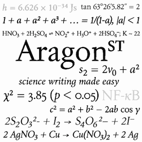 SciType is a flexible combination of oft-ignored letterforms and innovative OpenType programming that can be incoporated into existing text fonts in order for them to function seamlessly when including common science formulas and equations in regular text. The idea for SciType is the logical brainchild of Hans van Maanen, whose background as both science writer and type designer provided the perfect nucleus for such a synthesis. Hans had been publishing his fonts with Canada Type since 2007, so he approached Patrick Griffin with his idea and the bulk of the initial work. Together, Hans and Patrick expanded the idea and turned it into a functional reality. While not a substitute for full-fledged systems like TeX, it is a useful tool for lightweight use, for simple scientific writing.
 Hans van Maanen's Aragon ST is the first published SciType font. It was released in June of 2013. Canada Type plans to release many more ST fonts in the future. At ATypI 2013 in Amsterdam, Hans van Maanen explained SciType. View Hans van Maanen's typefaces. [Google]
[More] ⦿
|
Scott Calo
|
 FontStructor, aka truth14ful, who made these pixelish typefaces in 2010: Ball Point, Symbol Sans, Balance sans, Tetris, Math, Marquee, Spacewave, Math, Evening (a stencil based on the EVE logo). In 2011, he made the flared serif typefaces Sophistry Serif Compact and Sophistry Serif Modular, the pixel typefaces fs Gaux 7px Bold (2011), fs Gaux 9px, fs Gaux 7px, and fs Gaux 5px Bold, as well as the avant-garde style Plato Sans, fs Salted Library (2011, a headline font based on the old Union Pacific logo) and Lindenmayer Dingbats (based on IFS fractals---looks like a Sierpinski triangle). FS Greener Grass V2 (2011) is a grotesque headline typeface that imitates FS Greener Grass by Agent Demonic Ladybug. fs Pincoya (2011) and its renamed version, fs Pink Oil (2011) imitate Pincoya Black (Daniel Hernandez). fs Schultasche (2011) is a grotesque face. fs Hudson (2011) is a fat display typeface named after Walter Hudson, one of the heaviest people who ever lived. fsCentury Humanist (2011) is a condensed sans. fs Kaputt (2011) is a pixel face.
 Typefaces from 2012: fs Off The Chain, fs Halo, fs Liberty, Sukai Tsuri (tall condensed face), fs Lesen (perfectly square white on black typeface), fs Washington One, fs Schultasche, fs Savant garde (pixel face), fs Mechanuscript (Trajan caps; +Celtic), fs Gaux (+Ambigram, +9px: pixel typefaces), fs Hard Times (high contrast didone face), Avica, fs Torvalds, fs Titanium, fs Neuron, fs Inception, fs OffTheChain. Typefaces from 2013: Dragon Slayer FS. Typefaces from 2014: Turnin Two, Down with Jezebel FS, FET Title 2014, fs Messenger, Klein Bottle, Amohat New, ECDb. One of my favorites in this collection is fs Hällvetyka 2011), a tall display typeface for posters and murals. [Google]
[More] ⦿
|
Scott Pakin
[Detexify - LaTeX Symbol Classifier]
|
[More] ⦿
|
Scott Pakin
[The Comprehensive LaTeX Symbols List]
|
[More] ⦿
|
Scripts Uni-Basel
|
One font file with about 10 truetype fonts, including USRoche (Roche Pharmaceutical Company?), SymbolMT, Scientific-SpecialbyX-ntric and Scientific-GreekbyX-ntric (by X-ntric Technologies), and FetteEngschrift (Digital Typeface Corp). [Google]
[More] ⦿
|
Sebastian Kosch
|
 Sebastian Kosch (b. 1989, Germany) studied Engineering Science at the University of Toronto. He designed the open license garalde font family Crimson Text (2010), which is part of the Google open font directory. This was followed by Crimson (2011) and Crimson Bold (2011). Free downloads at OFL, CTAN and Aldus Leaf. See also Crimson Pro, originally designed by Sebastian Kosch and in 2018 expanded by Jacques le Bailly. The Crimson fonts were corrected in 2016 by Michael Sharpe and are available as Cochineal. Michael writes: These remarkable fonts are inspired by the famous oldstyle fonts in the garalde family (Garamond, Bembo) but, in the end, look more similar to Minion, though with smaller x-height and less plain in detail..
 Sebastian's motto: free as in both "free beer" and "freedom." Klingspor link. Open Font Library link. Google Plus link. Github link. [Google]
[More] ⦿
|
Sebastian Schubert
[MdSymbol]
|
[More] ⦿
|
Selwyn Hollis
[Applied Symbols]
|
[MyFonts]
[More] ⦿
|
Sergei V. Znamenskii
|
Znamenskii who suggests replacing cmti by cmtiup in which italic corrections are placed in the kerning. Similar replacement of cmsl by cmslup was suggested. [Google]
[More] ⦿
|
Shuffle symbol
[Julian Gilbey]
|
Julian Gilbey created the shuffle product symbol in metafont in 2008, in the same format as the CM symbols. It is based on the cmsy font. [Google]
[More] ⦿
|
Siggi Odds
|
Sigurður Oddsson or Siggi Odds or Siggi Oddsson, was born in Reykjavík, Iceland, in 1985, but spent a large part of his childhood in Vancouver, Canada. He graduated from college (in science) in 2005 and graduated with a B.A. degree in graphic design from the Iceland Academy of the Arts in Reykjavík, Iceland in the spring of 2008. He is an illustrator and graphic designer. Typefaces created by him include Sniðagrind (2007, an experimental typeface inspired by Gateway, by designer Stephan Müller), Kögra (2006, a typeface based on fractals made at The Iceland Academy of the Arts), and Aryan Monkey (2007, a curly font done with Sveinn Daviðsson). [Google]
[More] ⦿
|
Simone Mariano
|
Graphic designer in Rome, who used Roger Penrose's Penrose tiling in the construction of a set of ornamental numbers in 2013. For the Order Of Architects, P.P.C. of Rome and Province and the Order Of Engineers of Rome, he created a prismatic caps typeface called Seventeen Lines (2012). [Google]
[More] ⦿
|
skm.com
|
Mini-archive of math and symbol fonts such as Fences-Plain, MT-Symbol, MT-Extra, PIXymbolsExtended, PIXymbolsExtendedBold. [Google]
[More] ⦿
|
SMF Baskerville
[Yannis Haralambous]
|
Yannis Haralambous designed SMF Baskerville (1999), a math font for the Société mathématique de France. His article on the subject is Une police mathématique pour la Société Mathématique de France: le SMF Baskerville, Cahiers GUTenberg, vol. 32, 1999, pp. 5-19. Yannis writes: SMF Baskerville is an attempt to make Greek letters matching Latin italic Baskerville ones. Many letters have been inspired by the design of the Porson Greek typeface. The variant pi is drawn as the author learned it in primary school: with a big curly stroke, instead of the horizontal bar found in other typefaces. The capital letters have been inspired by Adobe Mathematical Pi. [Google]
[More] ⦿
|
SOFT3054
|
Three math truetype fonts by Monotype. [Google]
[More] ⦿
|
StaffMaths
|
Designer of Moon maths, a special math symbol font. [Google]
[More] ⦿
|
StarMath and StarBats
|
Download StarMath, StarBats, two fonts that are part of StarOffice. At Werner Roth's page. [Google]
[More] ⦿
|
Stegemann
|
So Zei Medium (an Adobe math font), and DOSCour2 (a version of Courier). [Google]
[More] ⦿
|
Stephen G. Hartke
[A Survey of Free Math Fonts for TeX and LaTeX]
|
[More] ⦿
|
Stephen Schrenk
[Arev Fonts]
|
[More] ⦿
|
Stephen Wolfram
|
Head of Wolfram Research, the publisher of Mathematica. His name is mentioned in most of the Mathematica fonts, but it is unclear if he had a hand in the actual font design. At the link given here, one can download all the Mathematica fonts. [Google]
[More] ⦿
|
Steve Gardner
[Explogos]
|
[MyFonts]
[More] ⦿
|
Steve White
[GNU Freefont (or: Free UCS Outline Fonts)]
|
[More] ⦿
|
SticksToo
[Michael Sharpe]
|
A free Open Font Library font package started in 2018 by and maintained by Michael Sharpe: SticksToo is a reworking of some of the fonts in the newly released STIX2 font package and the STIX2 beta font package from 2016 to allow LaTeX users to make better use of some of the text features of STIX2. A companion release of newtx, version 1.55, contains an option stix2 that uses Roman and Greek letters together with newtxmath symbols, as a work-around for some current problems with STIX2 math rendering in LaTeX. The fonts are provided in PostScript formats.. See also here. [Google]
[More] ⦿
|
STIX Fonts
[Ross Mills]
|
 Non-profit free font project, which started in 2001. The (free) fonts were released in May 2010. The designer is Ross Mills, Tiro Typeworks Ltd, with portions copyright of MicroPress Inc., and with final additions and corrections provided by Coen Hoffman, Elsevier (retired). From the web page: The mission of the Scientific and Technical Information Exchange (STIX) font creation project is the preparation of a comprehensive set of fonts that serve the scientific and engineering community in the process from manuscript creation through final publication, both in electronic and print formats. Toward this purpose, the STIX fonts will be made available, under royalty-free license, to anyone, including publishers, software developers, scientists, students, and the general public.
 The project is supported by six publishers, the American Chemical Society (ACS), the American Institute of Physics (AIP), the American Mathematical Society (AMS), the American Physical Society (APS), Elsevier Science, and the Institute of Electrical and Electronic Engineers (IEEE). The fonts are unicode-compatible. They are designed to be useful for mathematical documents in XML pages on all browsers. They say that they have awarded the font development contract to a respected font development company. Press release. Chairman: T.C. Ingoldsby, American Institute of Physics, Melville, NY. AMS page on STIX. CTAN page on Stix. In 2016, STIX Two, a major update, became available at CTAN. The letterspacing and kerning of the text fonts have been significantly improved. True small capital variants (Latin, Cyrillic, and Greek), accessible via the OpenType font feature smcp, have been added for all text fonts. Text (lowercase or oldstyle) numerals, available via the font features pnum and onum, have been added, in addition to natural-spacing figures. Alphabetic superscripts and numeric sub- and superscripts, accessible via the subs and sups font features, have been added. Fractions are available via the frac feature, as well as numerators (numr) and denominators (dnom). The STIX Two fonts consist of one Math font, two variable text fonts (STIXTwoTextVF-Roman and STIXTwoTextVF-Italic), and eight static text fonts (Regular, Italic, Medium, Medium Italic, SemiBold, SemiBold Italic, Bold, and Bold Italic) derived from the variable fonts. Truetype versions of the family (2007) by Oleguer Huguet Ibars: STIXGeneral-Bold, STIXGeneral-BoldItalic, STIXGeneral-Italic, STIXGeneral, STIXIntegralsDisplay-Bold, STIXIntegralsDisplay, STIXIntegralsSmall-Bold, STIXIntegralsSmall, STIXIntegralsUp-Bold, STIXIntegralsUp, STIXIntegralsUpDisplay-Bold, STIXIntegralsUpDisplay, STIXIntegralsUpSmall-Bold, STIXIntegralsUpSmall, STIXNonUnicode-Bold, STIXNonUnicode-BoldItalic, STIXNonUnicode-Italic, STIXNonUnicode, STIXSize1Symbols-Bold, STIXSize1Symbols, STIXSize2Symbols-Bold, STIXSize2Symbols, STIXSize3Symbols-Bold, STIXSize3Symbols, STIXSize4Symbols-Bold, STIXSize4Symbols, STIXSize5Symbols, STIXVariants-Bold, STIXVariants. OpenType versions at the official site: STIXGeneral-Regular, STIXGeneral-Bold, STIXGeneral-BoldItalic, STIXGeneral-Italic, STIXIntegralsD-Bold, STIXIntegralsD-Regular, STIXIntegralsSm-Bold, STIXIntegralsSm-Regular, STIXIntegralsUp-Bold, STIXIntegralsUpD-Bold, STIXIntegralsUpD-Regular, STIXIntegralsUp-Regular, STIXIntegralsUpSm-Bold, STIXIntegralsUpSm-Regular, STIXNonUnicode-Regular, STIXNonUnicode-Bold, STIXNonUnicode-BoldItalic, STIXNonUnicode-Italic, STIXSizeFiveSym-Regular, STIXSizeFourSym-Bold, STIXSizeFourSym-Regular, STIXSizeOneSym-Bold, STIXSizeOneSym-Regular, STIXSizeThreeSym-Bold, STIXSizeThreeSym-Regular, STIXSizeTwoSym-Bold, STIXSizeTwoSym-Regular, STIXVariants-Regular, STIXVariants-Bold. Not all unicode ranges are covered, but math symbols, Greek and Cyrillic are. There are also monospace, blackletter, calligraphic scipt, informal script, and sans styles. But small caps are still missing. The general look is that of a Times font. The fact that any publisher can use these fonts free of charge (after signing a license though) is positive. The main negative is that the style chosen is slightly boring, but that is not unexpected for scientific publications. In 2018, Paul Hanslow, Ross Mills and John Hudson co-designed the free STIX Two family, which is based on Times Roman. At this CTAN site, one can download the entire STIX collection. Designer URL: MicroPress Inc. STIX Two (type 1) at the CTAN site. STIX Two (OpenType) at the CTAN site. Also worth pointing out is the free 163-font collection Schticks (2017) by Adam Twardoch, which is based on STIX Two. Google Fonts link for STIX Two Math. Github link for the STIX fonts. [Google]
[More] ⦿
|
Sun Microsystems
|
Sun offers two free font families by Luc(as) de Groot (1997): Sun Sans, Sun Serif. It also has clones for many of the famous types. For example, Helmet is a clone of Helvetica. It has some math fonts that can be found on many archives, including StarMath (1999). [Google]
[More] ⦿
|
Sylvain Dumont
|
French researcher at the University of Amiens, who created these free dingbat fonts: Cartapoints, Cartapoints2, Cartapoints3, Cartacopains from 2004 until 2006. The fonts have 5 by 2 grids with balls drawn in them. Unclear what they are used for. [Google]
[More] ⦿
|
Symbols.net
|
The home of thousands of symbols and logos. Many unusual mathematical and other symbols in these truetype fonts: semant38, semant39, semant40, semant41, semant42, semant43, semant44, semant45. Direct access. Page and fonts by George Sutton. [Google]
[More] ⦿
|
Taco Hoekwater
|
Free type 1 fonts, created from metafont source code by Taco Hoekwater, using Hobby's metapost to get .eps files, and then Kinch's metafog to get .pfb files. Hinted and touched up manually with FontLab v3.0c. Included are: rsfs{5,7,10}, wasy{5,7,10,b10}, stmary{5,6,7,8,9,10}, xipa{10}, logo{8,9,10,bf10,sl10}. Go to ps-type1/hoekwater of the respective metafont font directories. Check also here or here. Taco also created arrow10, a font that contains about all the arrows and harpoons that Unicode, MathML, the STIX group and Taco Hoekwater could come up with. (Quote from Taco himself.) [Google]
[More] ⦿
|
TAE System&Typefaces Co
|
Makers of EQN_B00, a truetype font that has hundreds of math glyphs, all in one. [Google]
[More] ⦿
|
Takashi Umeda
|
Designer of the dental code font Dentcode DX (2002), consisting of the numerals 1 through 8 in parts of squares. Alternate URL. [Google]
[More] ⦿
|
Technion
|
At the Technion in Israel, we find these Monotype math fonts: MathA, MathB, MathC. [Google]
[More] ⦿
|
Tero Kivinen
|
Finnish designer of the bitmap font Sshlinedraw (Tero Kivinen and SSH Communications Security Oy, linedrawing characters for VT100 terminal, 1997). He also discussed the Microsoft truetype collection, EstrangeloEdessa (by Paul Nelson and George Kiraz, 2000, Syriac Computing Institute), ITC Franklin Gothic, Gautami (Microsoft, 2001), Latha (Microsoft, 2001), LucidaSansUnicode, MV Boli (Agfa-Monotype, 2001), Mangal (Microsoft, 2001), PalatinoLinotype (1998, a Unicode font), Raavi (Microsoft, 2001), Shruti (Microsoft, 2001), Sylfaen (Microsoft, 1999). All of these fonts are basically Unicode for all European languages, Cyrillic, Armenian, Hebrew, Arabic, basic mathematics, and Greek. But the site disappeared. [Google]
[More] ⦿
|
Terrage
|
 Designer of the fractal-themed typeface Phract (2015). Behance link. [Google]
[More] ⦿
Designer of the fractal-themed typeface Phract (2015). Behance link. [Google]
[More] ⦿
|
TeX Gyre Project
|
The TeX Gyre Project was started in 2006 as the brainchild of Hans Hagen (NTG). It is described in The New Font Project (Hans Hagen (NTG), Jerzy Ludwichowski (GUST) and Volker RW Schaa (DANTE e.V.), presented at BachoTeX2, 2006). From the project, which is being implemented by GUST's e-foundry guys, Boguslaw Jacko Jackowski and Janusz M. Nowacki aka Ulan: All of the Ghostscript font families will eventually become gyrefied as the result of the project. Gyrefication, also called LM-ization, was first applied to the Computer Modern Fonts and their various generalizations with the result known as the Latin Modern (LM) Fonts. The Gyre fonts each have 1200 glyphs that cover basically all European scripts (including Latin, Cyrillic and Greek), and have Vietnamese characters added by Han The Thanh, and Cyrillic glyphs by Valek Filippov. Available in Type 1 and OpenType, they come under a very liberal license (free, modifiable, unlimited use, and a request to rename altered fonts). The TeX Gyre fonts are - Adventor: family of four sansserif fonts, based on the URW Gothic L family, which in turn is based on ITC Avant Garde Gothic, designed by Herb Lubalin and Tom Carnase in 1970. Open Font Library link.
- Bonum (2006), based on the URW Bookman L family: TeXGyreBonum-Bold, TeXGyreBonum-BoldItalic, TeXGyreBonum-Italic, TeXGyreBonum-Regular.
- Cursor: based on URW Nimbus Mono L, which itself mimics Bud Kettler's Courier.
- Heros (2007): based on the URW Nimbus Sans L family, but heavily extended---eight typefaces of 1200 glyphs each. With the release of Heros, their QuasiSwiss fonts becomes obsolete. This is, in fact, the Gyre version of Miedinger's Helvetica. .
- Pagella (2006), based on the URW Palladio L family (and thus, indirectly, Zapf's Palatino): TeXGyrePagella-Bold, TeXGyrePagella-BoldItalic, TeXGyrePagella-Italic, TeXGyrePagella-Regular. In 2013, we find Tex Gyre Pagella Math in opentype format, by Boguslaw Jackowski, Piotr Strzelczyk and Piotr Pianowski. Greek symbols were taken from the Math Pazo font by Diego Puga. The calligraphic alphabet was taken from the Odstemplik font. The Fraktur is based on Euler. The sans part is DejaVu Sans, and the monospaced alphabet is taken from Latin Modern Mono Light Condensed.
- Termes (2006), based on the Nimbus Roman No9 L family (and thus, by transitivity, Stanley Morison's Times-Roman): TeXGyreTermes-Bold, TeXGyreTermes-BoldItalic, TeXGyreTermes-Italic, TeXGyreTermes-Regular. In 2013, we find Tex Gyre Termes Math in opentype format, by Boguslaw Jackowski, Piotr Strzelczyk and Piotr Pianowski. The Fraktur part is based on Peter Wiegel's Leipziger Fraktur. The sans serif part uses TeX Gyre Heros. The monospaced part is based on TeX Gyre Cursor. In 2017, the Open Font Library published a slightly updated and darker TG Roman.
- Schola (2006, based on the URW Century Schoolbook L family, designed by Morris Fuller Benton in 1919: TeXGyreSchola-Bold, TeXGyreSchola-BoldItalic, TeXGyreSchola-Italic, TeXGyreSchola-Regular.
- Chorus (2007): derived from handwritten letterforms of the Italian Renaissance as used by Hermann Zapf in ITC Zapf Chancery (1979). TeX Gyre Chorus is based on the URW Chancery L Medium Italic font, but heavily extended. The Vietnamese and Cyrillic characters were added by Han The Thanh and Valek Filippov, respectively.
Articles: The New Font Project (BachoTeX 2006 article by Hans Hagen (NTG), Jerzy Ludwichowski (GUST) and Volker RW Schaa (DANTE e.V.), TeX Gyre Project (2006) by Bogusaw Jackowski, Janusz M. Nowacki and Jerzy Ludwichowski, and TeX Gyre Project II (2007) by the same three authors. Fontspace link. [Google]
[More] ⦿
|
TeX Math Fonts
|
Paul Taylor lists all the TeX math fonts available in plain TeX, msssymb.tex, amssymb.sty and stmaryrd.sty. [Google]
[More] ⦿
|
TFaces
[Alexander Tarbeev]
|
 Alexander Tarbeev is Russian type designer, graphic artist and tutor. He graduated from Moscow Electrotechnical Institute of Communication in 1979 and Moscow Polygraphic Institute in 1988, and worke in the type department of NII Polygrafmash (Institute for Scientific Research of Printing Machinery, Moscow). Between 1989 and 1997, Tarbeev worked as type designer at ParaGraph. He set up the type studio TFaces in Moscow.
 Designer of Cyrillic versions of ITC typefaces like ITC Garamond, ITC Benguiat Gothic, Friz Quadrata and other Cyrillic typefaces. Other typefaces by Alexander Tarbeev include BetinaScript, BigCity, Dagger, DenHaag, Diderot, Gauge, Jakob, Lissitzky, Montblanc, Matterhorn, Pankov, Pollock, Smarty and Tauern. He also designed typefaces for Russian magazines such as Afisha, Bolshoi Gorod, Kak, Smart Money, Ezhenedelny Zhurnal, and (the Russian version of) L'Officiel, and for newspapers such as Vedomosti and Noviye Izvestiya. Alexander Tarbeev is professor and head of type design department at Moscow State University for Printing Arts (currently a branch of Moscow Polytechnic University). He also taught at British Higher School of Art and Design (Moscow), and Moscow State University, Faculty of Journalism.. Showcase of Alexander Tarbeev's typefaces at MyFonts. List of the new designs and the old typefaces designed since 1988 for NPO Poligraphmash, ParaGraph/ParaType and TFaces: Academy, AdverGothic, ITC Anna, ITC Baltica, ITC Benguiat Gothic (1994-1997, ParaGraph; he made the Hebrew typeface Benzion in 1991 based on Benguiat Gothic as well), ITC PT Benzion, FF Beowolf, PT Bernhard, PT BetinaScript (1992, based on the handwriting of the German graphic artist Betina Kuntzsch), PT Bodoni (1989-1997), MathFont 1 (1987, Polygraphmash, based on the math font of Kudryashevskaya Encyclopedicheskaya, 1960-74, a typeface by Nikolai Kudryashev and Zinaida Maslennikova), PT Compact, PT Courier (1997; the original Cyrillic weights were done by Tagir Safayev), PT Crash (1995), PT Dagger (1996), Den Haag, Dots, DoubleClick, PT Drunk (1997), Exposure, PT FixSys (1995, pixel font), ITC Friz Quadrata (1997, ParaGraph, based on the typeface by Ernst Friz for Visual Graphic Corp. in 1965), PT Futuris, ITC Garamond (1993-1995, based on Tony Stan's 1975 version), PT Graffiti (1996, ParaGraph), PT Hermes (1993, ParaGraph), Inform, Izhitsa (1994: he added a shadow syle to Svetlana Yermolaeva's 1988 original), PT Jakob (1994), [kAk), Lazurski, PT Matterhorn (1993), PT MonoCondensed (1990), PT Montblanc (1993), PT Newton (1994, ParaGraph, a phonetic font), PT Pollock (1995), PT Pragmatica (1989), Sketch, PT Star (1995), PT Tauern (1993, extra compressed), Titanic, PT Wind (1995, based on TextBook, 1987, by Emma Zakharova). Honorable Mention at the 3rd International Digital Type Design Contest by Linotype Library for Linotype Den Haag. Free fonts made for fun at FontStruct in 2008: giammba, schlange, squaresans, squaresans_heavy, TFa BCode (extremely condensed), TFa KnightRider. In 2019-2020, he designed the large text, headline and letterpress family Gauge (Type Today). [Google]
[MyFonts]
[More] ⦿
|
The Comprehensive LaTeX Symbols List
[Scott Pakin]
|
 The Comprehensive LaTeX Symbols List is an organized list of thousands of symbols commonly available to LaTeX users compiled by Scott Pakin. PDF file. Text file with TeX names of the symbols. Direct PDF link. [Google]
[More] ⦿
The Comprehensive LaTeX Symbols List is an organized list of thousands of symbols commonly available to LaTeX users compiled by Scott Pakin. PDF file. Text file with TeX names of the symbols. Direct PDF link. [Google]
[More] ⦿
|
The Latex Font Catalogue
|
A great annotated and categorized list of fonts that TeX enthusiasts will appreciate. [Google]
[More] ⦿
|
The Math Forum@Drexel
|
Mathematical typesetting forum and links at Drexel University. Subpage on math typesetting for the internet. [Google]
[More] ⦿
|
Tibor Lantos
|
 Budapest-based creator (aka Frodo 7) in 2009 at FontStruct of FontMoot 01 (pixel face), Brego, Magor (minimalist, De Stijl typeface), Andromeda Strain, Elrond (Tengwar font), Oil Stencil, Optill 2A and 2B and 3A and 3B (optical illusion fonts), Rivendell (Celtic weaving), Cubeology (patterned cubes), The Two Towers, Mike Wazowski (emoticon face), Edoras Stencil, Elessar, Earendil, LE Meta (dot matrix), Coccinella (dot matrix), +Two, +TwoB, Picosec, Picosec Rounded (ultra fat retro), Palindrome, Valimar, Fundin Eco, Fundin Regular, Lost Entropy (series of rectangular fonts), Bombs and Men (2009, modular and blocky), Eärendil, Chromosomes, Denethor-Sans (octagonal), Edoras-, Elspeth-, Elspeth-Grey, FontMoot-01 (pixel face), French-Defence-v2 (chess font), French-Defence (chess font), Gilgalad-v2, Gilgalad (octagonal), Hommage-a-Escher-LC1, Hommage-a-Escher-LC2, Legolas-Codex-Stencil, Legolas-Codex (blackletter family), Legolas-Stencil (+v2; art nouveau style), Mirkwood-Regular and Mirkwood Outline (pixel typefaces), Nimrodel-FS, Faramir (gridded), Faramir Black (octagonal, mechanical), Elessar, Vertebrae, Etudes Pour Noir et Blanc (01, 02, 02 Vertebrae), Eomer FS, Karyotype (horizontal stripes), Snooker Ball, Aragorn, Mirkwood Nano (pixel face), Mirkwood Second Iteration, Mirkwood First Iteration, Haldir (pixel face).
 Creations in 2010: Hasta Siempre (military stencil), Hasta Siempre Supplement (Fontstruct rendering of the iconic photograph of Che Guevara by Alberto Korda), Belfalas, Fractal Font, Sierpinski White, Sierpinski Black, Sierpinski Dalmatian, Remolino Stencil, Boikot Stencil, Legolas Pixel, Brego, Vortices (dings), Gamling, Coccinella Two (+B), Cyrillic 02, Waves, Hommage à Escher v2 extLat. Creations in 2011: Midori Dot (2011, a dotted kana face), Sierpinski Black Initials (a stunning decorative caps typeface based on Sierpinski triangles), Fontstructivism (constructivist Latin/Cyrillic face), Sierpinski White Initials, Vasarely Squares (experimental---letters based on Victor Vasarely's work), Hurin (counterless, created after Nagasaki by Tom Muller), Strider (an optical illusion 3d multilined face), Dot Dot White (texture face), Dot Dot Black (texture face), Garamond Italic SP (a pixelized version of Garamond Italic), Rohan (+NE01, +NE03: a textured lined 3d logotype family, +NE04, +NE10), Gray Scale (a very interesting texture experiment in which gray scales are "simulated" by simple font mechanisms). Fonts made in 2012: Font Neuf, Khazad (stencil font), Oktogon Stencil, Oktogon Outline, Thorin Stencil (army stencil), Deagol Stencil. Typefaces from 2013: the Voxelstorm family (3d, Escher-style), Elendil (3d face), Denethor Sans (strong mechanical sans), Mirkwood Nano (pixel face), Waves (op art). Typefaces from 2014: Wrath of Mordor (video game font), Gray Scale, Luthien Pixel (blackletter pixel), Gimli (Bevel Black, Inline Shadow, Inline, Bevel Shadow, Shadow), Zebroid, Hunor, Denethor Sans v2, Vasarely Squares (op-art), Waves (op-art), Ecthelion, Hast Siempre (octagonal stencil). FontStruct link. [Google]
[More] ⦿
|
Tim Larson
[Christ Trek Fonts]
|
 [More] ⦿
|
Timothée Midy
|
Parisian codesigner, with S. Michel, of La Statistique (2013), an an ornamental (vector format) caps typeface that is based on mathematical charts. Hellofont link. [Google]
[More] ⦿
|
Tom Kacvinsky
[American Mathematical Society]
|
[More] ⦿
|
Tom Schmidt
[Boover Software (was: Tom's Software)]
|
[MyFonts]
[More] ⦿
|
Tomas Kindahl
|
 Aka Rursus, this Swedish viking calls himself a nerd and a cyber vagabond---exactly my kind of guy! Designer of the slab typewriter font for Latin and Cyrillic called Rursus Compact Mono (2007-2010), an Open Font Library font that covers everything under the sun: Basic Latin, Latin-1 Supplement, Latin Extended-A, Latin Extended-B, IPA Extensions, Spacing Modifier Letters, Combining Diacritical Marks, Greek and Coptic, Cyrillic, Cyrillic Supplement, Armenian, Arabic, Runic, Phonetic Extensions, Phonetic Extensions Supplement, Latin Extended Additional, Greek Extended, General Punctuation, Superscripts and Subscripts, Currency Symbols, Number Forms, Arrows, Mathematical Operators, Miscellaneous Technical, Optical Character Recognition, Enclosed Alphanumerics, Geometric Shapes, Miscellaneous Symbols, Miscellaneous Mathematical Symbols-A, Latin Extended-C, Lycian, Carian, Old Italic, Gothic, Phoenician. [Google]
[More] ⦿
Aka Rursus, this Swedish viking calls himself a nerd and a cyber vagabond---exactly my kind of guy! Designer of the slab typewriter font for Latin and Cyrillic called Rursus Compact Mono (2007-2010), an Open Font Library font that covers everything under the sun: Basic Latin, Latin-1 Supplement, Latin Extended-A, Latin Extended-B, IPA Extensions, Spacing Modifier Letters, Combining Diacritical Marks, Greek and Coptic, Cyrillic, Cyrillic Supplement, Armenian, Arabic, Runic, Phonetic Extensions, Phonetic Extensions Supplement, Latin Extended Additional, Greek Extended, General Punctuation, Superscripts and Subscripts, Currency Symbols, Number Forms, Arrows, Mathematical Operators, Miscellaneous Technical, Optical Character Recognition, Enclosed Alphanumerics, Geometric Shapes, Miscellaneous Symbols, Miscellaneous Mathematical Symbols-A, Latin Extended-C, Lycian, Carian, Old Italic, Gothic, Phoenician. [Google]
[More] ⦿
|
Tommi Jäkkö
|
Graphic designer in Helsinki, Finland, who created the free deco number set Numbers (2015). Behance link. [Google]
[More] ⦿
|
TopTeam Co
[Anton Zinoviev]
|
Bulgarian developer of the free type 1 font package t1-teams for Latin and Cyrillic, which is used in Bulgarian newspapers and magazines of the TopTeam Publishing House. The maintainer is Anton Zinoviev. [Google]
[More] ⦿
|
Total Immersion (or: Felina Cat)
|
Free fonts by Sarah from Baden-Württemberg, b. 1985 (in the fonts, it says Catty): Pixelshit (2005), First (2005, handwriting), Mediaeval (2006), Dirty little secret (2005, grunge), Devil's Snare (2005, gothic), Twist of Fate (2005), Screwed (2005), Reality Sucks (2005), Drive Shaft (2005), Just Chalking (2005), Ginny (2005), Love is like Dirt (2005), Black Catty (2005, a blackboard math face), Just Brittled (2005, grunge), Highschool memories (2005, superfat outline font---not bad!!!), Save Me (2005, scratchy handwriting), Iron Brew (2005), Scared (2006, gothic), Treebeard (2006, gothic), Esprit (2006, stencil based on the fashion brand), Bored Now (2006), Whatever (2006), Crazy (2006), Oscar (2005, Oscar show-themed), Mommy (2005, handwriting), Supernatural (2007), Human Alphabet (2008), Alien (2005), paulchen (2008, handwriting), Cartoon Me (2009), curly Whurly (2010). Alternate URL. [Google]
[More] ⦿
|
trsym
[Jan Holfert]
|
trsym is a metafont font developed by Jan Holfert in 2000. This font contains symbols used for transformations (e.g. Laplace transformation). There are horizontal and vertical symbols both for transformation and inverse transformation. [Google]
[More] ⦿
|
TU Cottbus
|
Three Math symbol fonts: Zed, ZFont, VDM-and-Z-1.0. [Google]
[More] ⦿
|
TX fonts and PX fonts
[Young Ryu]
|
Young U. Ryu from the Department of Mathematics, University of Texas at Dallas developed Type 1 fonts for use in mathematical texts set in TEX, in 2000. It was based on Adobe Times and Helvetica, the TX fonts. His PX fonts are type 1 fonts based on Adobe Palatino, URW Palladium and Adobe Helvetica for doing mathematics. After some modications by Thomas Esser in 2002, more recent versions of the TX fonts and pxfonts were placed on the CTAN archive. In the documentation, Young adresses the design of mathematical symbols: The Adobe Times fonts are thicker than the CM fonts. Designing math fonts for Times based on the rule thickness of Times =, , + , / , < , etc. would result in too thick math symbols, in my opinion. In the TX fonts, these glyphs are thinner than those of original Times fonts. That is, the rule thickness of these glyphs is around 85% of that of the Times fonts, but still thicker than that of the CM fonts. He contributed these ranges to the GNU Freefont project: Arrows (U+2190-U+21FF), Mathematical Symbols (U+2200-U+22FF). [Google]
[More] ⦿
|
Typeimage
[Jochen Hasinger]
|
Jochen Hasinger (b. 1964, München) lives in Frankfurt am Main, Germany. From 1992 until 1994, he studied typography with Wolfgang Weingart and André Guertler at the Schule für Gestaltung in Basel, and studied in Stuttgart before that, rom 1985-1988. He became art director at various ad agencies in Frankfurt and Hamburg. He founded Typeimage in 2003. Klingspor link. Typefaces designed by Jochen Hasinger: - Covent BT (2003, a display sans family, Bitstream). Covent Nano (2006, a narrow version of Covent).
- TIPS (2004, Linotype). This family consists of six logo and image fonts: BComTIPS, ThisWayTIPS, TravelTIPS, ActiveTIPS, AstroTIPS, CountTIPS. Linotype page where TIPS is discussed: Tips (which stands for Type-Image-Piktogramm-Schrift in German, or type-image-pictogram-font in English) contains six different fonts of pictograms and stylized icons. Tips Active is a font filled with characters reminiscent of Otl Aicher's sports pictograms from the 1972 Olympic Games. Tips Astro contains astrological signs. Tips Bcom depicts icons for use in business communication or web page design. Tips Count is a font featuring numbers inside of various circles. Tips This Way and Tips Travel are both collections of pictograms for use in navigation and other signage systems.
- Sabin (2006).
- Architextura (2001).
- Botta (1989, modern).
- DryGin (1979, headline face).
[Google]
[MyFonts]
[More] ⦿
|
Typewriterfonts.net
[Lukas Krakora]
|
 Czech designer of the grunge monospace font Urania Czech (2006) and of the didone numbers-only font Stöhr Numbers (2006). In 2009, he made the old typewriter typeface Bohemian Typewriter (based on the Czech Remagg typewriter). In 2010, that was followed by another typewriter font, USIS 1949, which was based on United States Information Service reports from 1949.
 In 2012, he made the old typewriter typeface Albertsthal Typewriter. His typewriter typefaces of 2013 include Lucky Typewriter, Hollywood Starfire and Vera Type. In 2014, he made Hermes 1943 (old typewriter font), Susanne Nouveau, Modern Typewriter and Elegant Typewriter. Typefaces from 2017: Earth 2073 (rounded retro-futuristic), Dearborn Type, Oceanside Typewriter, Dresden Elektronik, 1938 Stempel, 1952 Rheinmetall (another old typewriter font). Typefaces from 2018: Prager Headlines. Typefaces from 2019: Speedwriter (an old typewriter font). Typefaces from 2020: Dogtown Typewriter, Victoria Typewriter, Orange Typewriter, Volkszeitung 21 (letterpress emulation). Typefaces from 2021: Mechonat Ktiva font (primarily a Hebrew typewriter font but it also contains basic Latin character set). Home page. Another link. Fontspace link. Abstract Fonts link. Dafont link. 1001 Fonts link. [Google]
[More] ⦿
|
Typoma
[Johannes Küster]
|
Typoma is Johannes Küster's place in the web. He is a mathematician, type designer and designer, who graduated in mathematics from Munich Technical University. During his studies, he got involved in the typesetting and production of mathematical books. In 2000, he founded his own office, typoma, and is now working mainly on typesetting scientific books, designing mathematical fonts, and writing and talking about mathematical typesetting and scientific typography. Johannes lives in Holzkirchen, Germany. At ATypI 2004 in Prague and at ATypI 2005 in Helsinki, he spoke about fonts for mathematics. Speaker at ATypI 2011 in Reykjavik. His contributions: - He is currently involved in 20-style (5 optical sizes times 4 weights) mega-project for adding over 2000 mathematical glyphs to Adobe's Minion family, which was released in February 2009 under the name Typoma MbMath, and in April 2009 as Minion Math.
- To the German book Detailtypografie (2nd ed., 2004), he contributed the chapter about mathematical typesetting, and an extensive annotated list of mathematical symbols.
- He is working on LatinModernMath to accompany Boguslaw Jackowski's Latin Modern, a free font set that provides an alternative for Computer Modern in TeX.
- He is also working on mathematical extensions of Euler (with Hermann Zapf) and Computer Modern (called newmath).
[Google]
[More] ⦿
|
UCR
|
The Mathematica font collection in truetype: Math1, Math1-Bold, Math1Mono, Math1Mono-Bold, Math2, Math2-Bold, Math2Mono, Math2Mono-Bold, Math3, Math3Bold, Math3Mono, Math3Mono-Bold, Math4, Math4-Bold, Math4Mono, Math4Mono-Bold, Math5, Math5Bold, Math5Mono, Math5MonoBold. [Google]
[More] ⦿
|
Ulrich Goldschmitt
[ulsy]
|
[More] ⦿
|
Ulrich Lettenbuckl
|
Creator of CircledNumbers (1993) by modification of a typeface of unknown origin. [Google]
[More] ⦿
|
Ulrik Vieth
[Concrete Math fonts]
|
[More] ⦿
|
ulsy
[Ulrich Goldschmitt]
|
Extra mathematical symbols to complement cmsy. In metafont. By Ulrich Goldschmitt. [Google]
[More] ⦿
|
UME
|
Designer of DentCodeDX (2003), a circled numeral font. See also here. [Google]
[More] ⦿
|
Unicode Fonts for Ancient Scripts
[George Douros]
|
 This is a fantastic source of free high-quality fonts for scripts of the greater Aegean vicinity, Egyptian Hieroglyphs, Meroitic, Sumero-Akkadian Cuneiform, Musical Symbols and all Symbol Blocks in the Unicode Standard. George Douros is their Greek font designer. His free fonts come with this exemplary footnote: In lieu of a licence: Fonts in this site are offered free for any use; they may be opened, edited, modified, regenerated, posted, packaged and redistributed. Many of his fonts contributed to important section in the GNU Freefont project. Here is the list:
 - Abidos (2018). An attempt to catalogue about 8000 Egyptian hieroglyps. His Nilus font (2018) catalogues the Gardiner hieroglyphs.
- Aegean (2007-2012). Covers Basic Latin, Greek and Coptic, Greek Extended, some Punctuation and other Symbols, Linear B Syllabary, Linear B Ideograms, Aegean Numbers, Ancient Greek Numbers, Ancient Symbols, Phaistos Disc, Lycian, Carian, Old Italic, Ugaritic, Old Persian, Cypriot Syllabary, Phoenician, Lydian, Archaic Greek Musical Notation. Other things in it: Linear A, Cretan Hieroglyphs, Cypro-Minoan, Ancient Greek Alphabets, Phrygian, Old Italic Alphabets (Cumaean, Archaic Etruscan, Neo Etruscan, Ancient Latin, Lugano, Faliscan, Marsiliana, Messapic, Middle Adriatic South Picene, North Picene, Oscan, Umbrian), the Arkalochori Axe and Anatolian Hieroglyphs.
- Aegyptus (2007-2020) and Gardiner. Over 7000 hieroglyphs. In addition, we have Basic Latin, Greek and Coptic, Egyptian Transliteration characters, some punctuation and other symbols.
- Akkadian (2007). Basic Latin, Greek and Coptic, some Punctuation and other Symbols, Ugaritic, Cuneiform, Cuneiform Numbers and Punctuation.
- Alexander (2007, text typeface built around the Greek letters originally designed by Alexander Wilson in 1744; compare with Wilson Greek (1996, Matthew Carter) and Junicode (2006, Peter S. Baker)). The Latin and Cyrillic parts are based on Garamond.
- Alfios. Lowercase upright Greek were designed in 1805 by Firmin Didot (1764-1836) and cut by Walfard and Vibert. The typeface, together with a complete printing house, was donated in 1821 to the new Greek state by Didot's son, Ambroise Firmin Didot (1790-1876). Lowercase italic Greek were designed in 1802 by Richard Porson (1757-1808) and cut by Richard Austin. They were first used by Cambridge University Press in 1810. Capitals, Latin and Cyrillic, as well as the complete bold weights, have been designed in an attempt to create a well-balanced font. The font covers the Windows Glyph List, Greek Extended, various typographic extras and some Open Type features (Numerators, Denominators, Fractions, Old Style Figures, Historical Forms, Stylistic Alternates, Ligatures); it is available in regular, italic, bold and bold italic.
- Anaktoria. Douros: Grecs du roi was designed by Claude Garamond (1480-1561) between 1541 and 1544, commissioned by king Francis I of France, for the exclusive use by the Imprimerie Nationale in Paris. Greek in Akaktoria is based on a modern version of Grecs du roi prepared by Mindaugas Strockis in 2001. Lowercase Latin stems from the titles in the 1623 First Folio Edition of Shakespeare. Scott Mann & Peter Guither prepared a modern version for The Illinois Shakespeare Festival in 1995. Cyrillic has been designed to match the above Greek and Latin.
- Analecta (2007, Byzantine style). An ecclesiastic scripts font, in Byzantine uncial style, covering Basic Latin, Greek and Coptic, some Punctuation and other Symbols, Coptic, typographica varia, Specials, Gothic and Deseret.
- Anatolian
- Aroania: In 1927, Victor Julius Scholderer (1880-1971), on behalf of the Society for the Promotion of Greek Studies, got involved in choosing and consulting the design and production of a Greek type called New Hellenic cut by the Lanston Monotype Corporation. He chose the revival of a round, and almost monoline type which had first appeared in 1492 in the edition of Macrobius, ascribable to the printing shop of Giovanni Rosso (Joannes Rubeus) in Venice. Aroania is a modern recast of Victor Scholderer's New Hellenic font, on the basis of Verdana.
- Asea (2020, Latin-Greek-Cyrillic). A modern font based on Firmin Didot's Greek type.
- Assyrian.
- Atavyros. Douros writes: Robert Granjon (1513-1589) produced his Parangonne Greque typeface (garmond size) at the instigation of Christophe Plantin as a counterpart to Garamond's Grec du roi, in Antwerp Holland, between 1560--1565. It was used in Plantin's multilingual Bible of 1572. Versions of Granjon's type were used for the 1692 edition of Diogenes Laertius and for the Greek-Dutch edition of the New Testament in 1698, both published by Henric Wetstenium in Amsterdam. A digital revival was prepared by Ralph P. Hancock for his Vusillus font in 1999. Latin and Cyrillic are based on a Goudy typeface.
- Avdira. Douros: Upright is based on the lowercase Greek letters in the typeface used by Demetrios Damilas for the edition of Isocrates, published in Milan in 1493. A digital revival was prepared by Ralph P. Hancock for his Milan (Mediolanum) font in 2000. Italic Greek were designed in 1802 by Richard Porson (1757-1808) and cut by Richard Austin. They were first used by Cambridge University Press in 1810.
- Maya. Maya covers the glyphs in J. Eric S. Thompson's A Catalog of Maya Hieroglyphs (1962, University of Oklahoma Press).
- MusicalSymbols (2007) or Musica (2013). Basic Latin, Greek and Coptic, some Punctuation and other Symbols, Byzantine Musical Symbols, (Western) Musical Symbols, Archaic Greek Musical Notation. There is also the Greek musical notation font EE Music (2018) for Hellenic ecclesiastic music.
- UnicodeSymbols (2007, in the Computer Modern style) and UniDings (2013). It has every imaginable symbol: Basic Latin, Latin-1 Supplement, Latin Extended-A, IPA Extensions, Greek, Cyrillic, Cyrillic Supplementary, General Punctuation, Superscripts and Subscripts, Combining Diacritical Marks for Symbols, Letterlike Symbols, Number Forms, Arrows, Mathematical Operators, Miscellaneous Technical, Control Pictures, Optical Character Recognition, Box Drawing, Block Elements, Geometric Shapes, Miscellaneous Symbols, Dingbats, Miscellaneous Mathematical Symbols-A, Supplemental Arrows-A, Supplemental Arrows-B, Miscellaneous Mathematical Symbols-B, Supplemental Mathematical Operators, Miscellaneous Symbols and Arrows, CJK Symbols and Punctuation, Yijing Hexagram Symbols, Vertical Forms, Combining Half Marks, CJK Compatibility Forms, Specials, Tai Xuan Jing Symbols, Counting Rod Numerals, Mathematical Alphanumeric Symbols, Mahjong Tile Symbols, Domino Tile Symbols.
- Symbola (2013) is an unbelievably rich font. It contains Basic Latin, IPA Extensions, Spacing Modifier Letters, Combining Diacritical Marks, Greek and Coptic, Cyrillic, Cyrillic Supplement, General Punctuation, Superscripts and Subscripts, Currency Symbols, Combining Diacritical Marks for Symbols, Letterlike Symbols, Number Forms, Arrows, Mathematical Operators, Miscellaneous Technical, Control Pictures, Optical Character Recognition, Box Drawing, Block Elements, Geometric Shapes, Miscellaneous Symbols, Dingbats, Miscellaneous Mathematical Symbols-A, Supplemental Arrows-A, Braille Patterns, Supplemental Arrows-B, Miscellaneous Mathematical Symbols-B, Supplemental Mathematical Operators, Miscellaneous Symbols and Arrows, Supplemental Punctuation, Yijing Hexagram Symbols, Combining Half Marks, Specials, Byzantine Musical Symbols, Musical Symbols, Ancient Greek Musical Notation, Tai Xuan Jing Symbols, Counting Rod Numerals, Mathematical Alphanumeric Symbols, Mahjong Tiles, Domino Tiles, Playing Cards, Miscellaneous Symbols And Pictographs, Emoticons, Ornamental Dingbats, Transport And Map Symbols, Alchemical Symbols, Geometric Shapes Extended, Supplemental Arrows, and Symbols of occasional mathematical interest. It is one of a hanful fonts that dares to have a glyph that shows the middle finger. Github link for free download. see also Symbola Goomoji (2013).
- Unidings. Various glyphs and icons.
Since George permits redistribution, I am offering his work for download here. [Google]
[More] ⦿
|
Unicode Support for Mathematics
|
Barbara Beeton, Asmus Freytag and Murray Sargent III introduce the Unicode math symbols. [Google]
[More] ⦿
|
Uta Hinrichs
[Fatfonts]
|
[More] ⦿
|
Varityper: 1946 Catalog
[Ralph C. Coxhead]
|
 The Vari-Typer manual of 1946 was published by Ralph C. Coxhead Corporation, New York City. It contains a number of font specimen for the Varityper machine, predominantly typewriter-style typefaces and type for astrology, chemistry, mathematics and other specialized subjects. A small sample is reproduced here. The original PDF file was created at the University of Wisconsin. [Google]
[More] ⦿
The Vari-Typer manual of 1946 was published by Ralph C. Coxhead Corporation, New York City. It contains a number of font specimen for the Varityper machine, predominantly typewriter-style typefaces and type for astrology, chemistry, mathematics and other specialized subjects. A small sample is reproduced here. The original PDF file was created at the University of Wisconsin. [Google]
[More] ⦿
|
Verbindungen zur Aussenwelt
|
Very useful links for math, typography, TEX and metafont. [Google]
[More] ⦿
|
Vic Brennan
|
Three math TrueType fonts (MathA, MathB, MathC, all from Monotype) at Vic Brennan's site. [Google]
[More] ⦿
|
Viktor Figirnov
|
Russian designer of the beautifil numerals font family PostIndex (1999). [Google]
[More] ⦿
|
Vladimir Smirnov
|
Russian designer of the postal code font Zipcode (2000). [Google]
[More] ⦿
|
Waldis Symbol fonts (wasy)
[Roland Waldi]
|
Extra mathematical symbols to complement the math symbol fonts. Has astronomy and physics symbols, for example. In metafont. PostScript versions also available. The wasy font series was developed by Roland Waldi in 1990-1992. The wasy package on CTAN is maintained by Michael Sharpe (2019--2020). [Google]
[More] ⦿
|
Walter Schmidt
[Euler-VM]
|
[More] ⦿
|
Walter Schmidt
|
Erlangen, Germany-based metafont and TeX specialist who has designed numerous font packages and developed many others. His work is always free and he has provided the TeX community invaluable typeface support. A list of his work: - Based on Euler and CM, he also developed the Euler math fonts (2001). Also called Euler-VM.
- mathpple defines the type 1 font family "Palatino" (ppl) as the default roman font and use the "mathpple" fonts for typesetting math with LaTeX.
- ECC, or European Concrete Computer Modern: a metafont implementation of Donald Knuth's Concrete fonts, providing T1 text fonts and TS1 text companion fonts.
- Codeveloper with Malte Rosenau of the Bera fonts, based on Bitstream's vera family.
- Extensions of some of the free URW fonts. For example, Walter Schmidt extended URW Palladio L in his FPL Neu package. He has also worked on URW Letter Gothic and URW Garamond No. 3.
- Creator of cmbright, a family of sans serif metafonts based on Donald Knuth's CM font. It is lighter and less obtrusive than CMSS. Together with CM Bright there comes a family of typewriter fonts, CM Typwewriter Light, which look better in combination with CM Bright than the CMTT fonts would do.
- Designer of the free font Augie, a type1 font simulating informal American style handwriting (2000), based on an earlier font called Augie by Steven J. Lundeen (1997).
[Google]
[More] ⦿
|
Walter Schmidt
[Schriften für TeX]
|
[More] ⦿
|
Walter Schmidt
[Mathematical typesetting with the Palatino fonts]
|
[More] ⦿
|
Wm. Ross Mills
|
 Designer (b. Vancouver, 1970) of high-quality typefaces at Tiro Typeworks in Vancouver, which he co-founded with John Hudson. He created Plantagenet (1995, a great transitional type family: the OpenType extension of 2004 is called Plantagenet Novus), 1530 Garamond (1994), and Academia (1995), three full font families. Academia2 (Mills, 2006-2007) is a complete redesign of the 1996 sans family.
 In 2000, Tiro was commissioned by the government of the new Canadian Arctic territory of Nunavut to design a set of Inuktitut and Latin script fonts. That font family is called Pigiarniq (Mills; see also here). He is working on Maxwell (also since 2005), a text typeface designed for the typesetting of mathematical and scientific texts. With Marian Bantjes, he created the ornamental font Restraint (2007), which won an award at TDC2 2008. The book family Huronia was designed from 2005-2010. The Pro version, which is currently in development, expands upon the standard character/glyph set, with targeted language and script support for languages of the Americas, including Canadian Syllabics, Cherokee, Latin and Latin derivatives for Americanist orthographies, IPA and support for arbitrary accent positioning. Polytonic Greek will also be included in the Pro version. It was published by Rosetta Type in 2013. There are small differences in language coverage between the original font from 2010 and the Rosetta version of 2013, but they promise that these will be evened out. PDF file of the 2010 original. In 2018, Paul Hanslow, Ross Mills and John Hudson co-designed the free STIX Two family, which is based on Times Roman. In 2021, Ross Mills, Anna Giedrys and Paul Hanslow co-designed the 14-style sans family Laconia at Tiro Typeworks. Klingspor link. [Google]
[MyFonts]
[More] ⦿
|
Wojciech Kalinowski
|
Wojciech Kalinowski was born in Wroclaw, Poland in 1969. Since 1990, he has designed and carved inscriptions and reliefs in stone, commemorative plaques, and gravestones. He also deals with computer graphics, digital typeface and logo design, and wallpapers. His typefaces are free and are available from the Open Font Library (or OFL). He created New Shape (2012, organic sans), Medieval Sharp (2011, blackletter), which originated 15 years earlier from a stone inscription alphabet. Consola Mono (2011, OFL) is a monoline monospaced sans for Latin, Greek and Cyrillic. Classica (2011) is a classical roman family. SquareAntiqua (2011, OFL) is a wavy informal face. Cursive Sans and Cursive Serif (ca. 1997, OFL) and Modern Antiqua (1997, OFL) are also based on stone inscriptions. Klaudia and Berenika (2011) is a Celtic style family. Roundstyle (2011) is a sans display family. Modern Antiqua (2011) has a strange name for a font that is neither modern (i.e., didone) nor Antiqua---it is an organic, or liquid, typeface with the gothic flavor of Jonathan Barnbrook's types. Kalinowski started the NovaCut typeface ca. 1986. Around that time, he developed Gothica, which served as a model for Nova Cut. Gothica was released in 2020. The uncial typeface family Celtica was released in 2020 and can be downloaded at Open Font Library. He created the free monospaced "programming" fonts NovaCut, NovaFlat, NovaOval, NovaRound, NovaSlim, NovaSquare, and NovaMono (2011, OFL): NovaMono is the monospace font especially created for programming, text editors and for terminal-use. NovaMono contains a large number of symbols, operators and other miscellaneous signs. NovaMono is a missing part of NovaFont Family. Nova Font is the family of six fonts. There are: NovaCut, NovaFlat, NovaOval, NovaRound, NovaSlim and NovaSquare. Now, the seventh part of the family - NovaMono. The following Unicode ranges are supported: - Controls and Basic Latin - 0000-007F (all)
- Latin 1 - 0080-00FF (all)
- Latin A - 0100-017F (all)
- Latin B - 0192, 01C4-01CC, 01E4, 01E5, 01F1-01F3, 01FA-021B, 0237
- Spacing Modifier Letters - 02C6, 02C7, 02C8, 02D8-02DD, 0308
- Greek and Coptic - 0370-03FF (all)
- Latin Extended Additional - 1E0C-1E0F, 1E24, 1E25, 1E36, 1E37, 1E80-1E89, 1E9E, 1EF2-1EF5, 1EF8, 1EF9
- General Punctuation - 2000-206F (all)
- Superscripts and Subscripts - 2070-209F (all)
- Currency Symbols - 20A0-20CF (all)
- Letterlike Symbols - 2100-214F (all)
- Number Forms - 2150-218F (all)
- Arrows - 2190-21FF (all)
- Mathematical Operators - 2200-22FF (all)
- Miscellaneous Technical - 2302, 2308-230B, 2310, 2319, 231C-2323, 2329, 232A, 2335, 239B-23AE, 23B0-23B7
- Geometric Shapes - 25A0, 25A1, 25A3, 25AA-25CC, 25CF-25D7, 25E0-25FF
- Miscellaneous Symbols and Arrows - 2B12-2B1C, 2B1F-2B28, 2B2C-2B2F, 2B53, 2B54
In 2020, he published Simply Sans. Klingspor link. Open Font Library link. Fontspace link. [Google]
[More] ⦿
|
Wolfram Research
|
Mathematica is a large typeface family designed by Andre Kuzniarek, with Gregg Snyder and Stephen Wolfram (head of Wolfram) between 1996 and 2001. That family has invaded many font archives, such as this one. [Google]
[More] ⦿
|
WordStar
|
Designers of the truetype fonts in the series AHDSymbol. [Google]
[More] ⦿
|
Xiangdong Zeng
|
Designer of the free font Fira Math Regular (2018), which is based on Fira Sans and Fira Go Sans. CTAN link. Another CTAN link. [Google]
[More] ⦿
|
Xiangdong Zeng
[Firamath]
|
[More] ⦿
|
XITS
[Khaled Hosny]
|
 XITS (2011) is a free Times-like typeface for mathematical and scientific publishing, based on STIX fonts. The main mission of XITS is to provide a version of STIX fonts enriched with the OpenType MATH extension, making it suitable for high quality mathematic typesetting with OpenType MATH capable layout systems, like MS Office 2007 and the new TeX engines XeTeX and LuaTeX. This free OFL package was developed by Khaled Hosny. Inside the fonts, we read Copyright (c) 2001-2010 by the STI Pub Companies, consisting of the American Chemical Society, the American Institute of Physics, the American Mathematical Society, the American Physical Society, Elsevier, Inc., and The Institute of Electrical and Electronic Engineers, Inc. Portions copyright (c) 1998-2003 by MicroPress, Inc. Portions copyright (c) 1990 by Elsevier, Inc. It covers Latin, Greek and Cyrillic. Inside the fonts, we read Copyright (c) 2001-2010 by the STI Pub Companies, consisting of the American Chemical Society, the American Institute of Physics, the American Mathematical Society, the American Physical Society, Elsevier, Inc., and The Institute of Electrical and Electronic Engineers, Inc. Portions copyright (c) 1998-2003 by MicroPress, Inc. Portions copyright (c) 1990 by Elsevier, Inc.
 Coen Hoffman and Khaled Hosny have also worked on XITS. In 2019, Daniel Benjamin Miller added DBM XITS which is XITS with its OS/2 properties modified to match Adobe Times. CTAN link. Free download. Open Font Library link. Github link. [Google]
[More] ⦿
|
Yannis Haralambous
[SMF Baskerville]
|
[More] ⦿
|
Yannis Haralambous
|
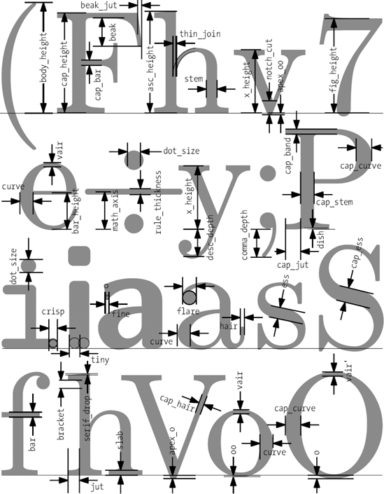 Metafont/TEX font and font software developer, specializing in non-Latin fonts and their integration in TEX. Ran Atelier Fluxus Virus in Lille, France. Codeveloper of the Omega typesetting system which includes the Omega Font Family (type 1). Since 2001, professor of Computer Science at the École Nationale Supérieure des Telecommunications de Bretagne in Brest. He is the author of the 1000+-page text Fontes et codages (O'Reilly, 2004), which was translated by P. Scott Horne with the English title Fonts & encodings. From Unicode to Advanced Typography and Everything in Between (2007, O'Reilly). See also here. Also author of Keeping Greek Typography Alive, an article presented at the 1st International Conference on Typography and Visual Communication held in Thessaloniki in June 2002.
 Yannis Haralambous and John Plaice are the authors of Omega typesetting system, which is an extension of TeX. Its first release, aims primarily at improving TeX's multilingual abilities. In Omega all characters and pointers into data-structures are 16-bit wide, instead of 8-bit, thereby eliminating many of the trivial limitations of TeX. Omega also allows multiple input and output character sets, and uses programmable filters to translate from one encoding to another, to perform contextual analysis, etc. Internally, Omega uses the universal 16-bit Unicode standard character set, based on ISO-10646. These improvements not only make it a lot easier for TeX users to cope with multiple or complex languages, like Arabic, Indic, Khmer, Chinese, Japanese or Korean, in one document, but will also form the basis for future developments in other areas, such as native color support and hypertext features. ... Fonts for UT1 (omlgc family) and UT2 (omah family) are under development: these fonts are in PostScript format and visually close to Times and Helvetica font families. Author of From Unicode to Typography, a Case Study the Greek Script, an informatice article written in 1999. Active participant in the GNU Freefont project. With John Plaice, he contributed to these Unicode ranges: - Latin Extended-B (U+0180-U+024F)
- IPA Extensions (U+0250-U+02AF)
- Greek (U+0370-U+03FF)
- Armenian (U+0530-U+058F)
- Hebrew (U+0590-U+05FF)
- Arabic (U+0600-U+06FF)
- Currency Symbols (U+20A0-U+20CF)
- Arabic Presentation Forms-A (U+FB50-U+FDFF)
- Arabic Presentation Forms-B (U+FE70-U+FEFF)
He also added glyphs for Sinhala (U+0D80-U+0DFF). In 1999, Yannis Haralambous and Virach Sornlertlamvanich made a set of glyphs covering the Thai national standard Nf3, in both upright and slanted shape. Range: Thai (U+0E00-U+0E7F). These too are in the GNU Freefont family. [Google]
[More] ⦿
|
Yaw-Jen Lin
|
Yaw-Jen Lin (Department of Computer Science and Information Engineering, National Taiwan University, Taipei, Taiwan) and Tzao-Lin Lee made these truetype versions of the Computer Modern family in the 1990s: CM_Dunhill-Regular, CM_Fibonacci-Regular, CM_Funny-Italic, CM_Funny-Regular, CM_Math-Extension, CM_Math-Italic, CM_Math-ItalicBold, CM_MathSymbol-Bold, CM_MathSymbol-Regular, CM_Roman-Bold, CM_Roman-BoldSlantedExt, CM_Roman-Regular, CM_Roman-Slanted, CM_RomanCaps-Regular, CM_RomanExt-Bold, CM_SansSerif-BoldExt, CM_SansSerif-Regular, CM_SansSerif-Slanted, CM_SansSerifCondensed-DemiBold, CM_SansSerifQuotation-Italic, CM_SansSerifQuotation-Regular, CM_SlantedTypewriter-Regular, CM_TeX_Extanded-Regular, CM_Text-BoldItalicExt, CM_Text-Italic, CM_Typewriter-Italic, CM_Typewriter-Regular, CM_TypewriterCaps-Regular, CM_Unslanted-Italic, CM_VariableWidthTypewriter-Regular. Lin reports that he has written a free utility for converting metafont fonts into truetype fonts, but I could not locate that software anywhere. Earlier, ca. 1993, he made eight Chinese fonts in the so-called NTU series. These fonts can be downloaded here. [Google]
[More] ⦿
|
yhmath
|
The TeX-yhcmex10 font in type 1 format. The yhmath package was developed by Yannis Haralambous. [Google]
[More] ⦿
|
Yoichi Ozaki
[Y.Oz Font]
|
[More] ⦿
|
Yoshio Kobayashi
[K's Bookshelf]
|
[More] ⦿
|
Young Ryu
[TX fonts and PX fonts]
|
[More] ⦿
|
Y.Oz Font
[Yoichi Ozaki]
|
Yoichi Ozaki ran Y.Oz Vox. He designed H.OzFont, H.OzFontP, Y.OzFontKA, Y.OzFontKG, Y.OzFontNJ, Y.OzFontNL, Y.OzFontK, Y.OzFontM, YOzFont14s, YOzFont5x7d, YOzFontOTW, YOzFontOTWD, YOzFontOTWL, H.OzFontB, Y.OzFontUIB, Y.OzFontPB, Y.OzFontUI, Y.OzFont, Y.OzFontB, Y.OzFontP. These were highly interesting fonts, mostly consisting of handwritten or printed letters covering Latin, Greek, Cyrillic, most mathematical symbols, most standard dingbats, the chess pieces, kana, and kanji. They were all free. More recently, the fonts were grouped in packs: Pen-Ji (ballpoint pen font), Mouhitsu (brush in Gyosho, Gyosho Old Style and Kaisho styles), Eibun (Latin), Moga Gothic and Moga Mincho (based on the IPA fonts). Download site. [Google]
[More] ⦿
|
Yuansheng Zhao
[Garamond Math]
|
[More] ⦿
|
Y&Y
|
Past foundry of Charles Bigelow, Kris Holmes, and Berthold Horn, which ceased operations near the start of the 21st century. They had the following font sets: Galilei, XY_Pic fonts (Nine ATM compatible fonts in Adobe Type 1 format for use with Ross Moore and Kristoffer Rose's XY Pic drawing package for TeX), Y&Y American Mathematical Society (AMS) fonts (Computer Modern, Euler), Y&Y European Modern (EM) fonts, Y&Y Lucida fonts (1996), LucidaBrightAstro, Lucida Bright Expert, LucidaConsole, Lucida Fixed Narrow, Lucida Greek, Lucida Latin, Lucida Sans Cyrillic and Latin 2, Lucida Sans Hebrew, Lucida Sans Linedraw, Lucida Sans School, Lucida Sans Unicode, Y&Y MathTime 1.1 fonts, Y&Y MathTime Plus fonts, Y&Y TeX Pi fonts, Alan Jeffrey Geometric Sans Serif Blackboard Bold, Ralph A. Smith Formal Script typeface (based on R. Hunter Middeleton), Jeremy Gibbons and Alan Jeffrey St. Mary's Road Symbolic Logic, Roland Waldi extension of LASY symbol --- version 2.0, APL (free), Crufty (free old typewriter font), Finger (free finger dingbats), MarVoSym (free). The Lucida collection (Lucida Blackletter, Lucida Bright, Lucida Bright Math, Lucida Calligraphy, Lucida Casual, Lucida Console, Lucida Fax (1985), Lucida Handwriting, Lucida Sans, Lucida Sans Typewriter, Lucida Typewriter, and Lucida Unicode) is being distributed by Ascender Corporation from 2005 onwards. There is also a dedicated commercial site, Lucida Fonts. [Google]
[More] ⦿
|
ZE fonts
[Robert Fuster]
|
Virtual type 1 fonts presented by Robert Fuster (1997-2000, Departament de Matemàtica Aplicada, Universitat Politècnica de València, 46071 València, Spain). "The zd fonts by Constantin Kahn (kahn@math.uni-hannover.de) are virtual T1 encoded Computer Modern fonts based on (OT1) Computer Modern, Times, and Helvetica fonts, intended for simulate dc fonts. (Waine Sullivan's dm fonts are another approach to the substitution of dc fonts by virtual ones.) Because dc fonts are now obsolete, I've adapted the Kahn's package to ec fonts. The resulting virtual fonts are named according to the ec fonts names, changing ec by ze (zerm1000.vf simulates ecrm1000, and so on)." [Google]
[More] ⦿
|
Zed
|
The math font Zed (Richard Jones, 1995), and the square ornament font ZLangSet. I am not sure that the fonts are still there. [Google]
[More] ⦿
|
ZEST Specific Formaliser
|
In this package from Logica, you'll find a TrueType font, ZEST Specific Formaliser, a Courier-lookalike with extra logical and mathematical symbols thrown in. [Google]
[More] ⦿
|

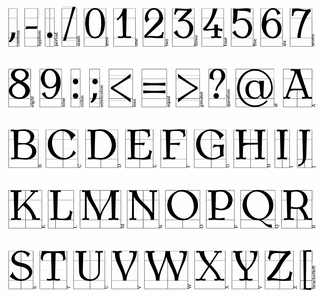
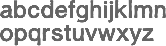
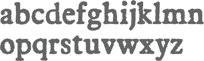
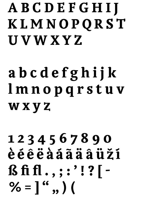
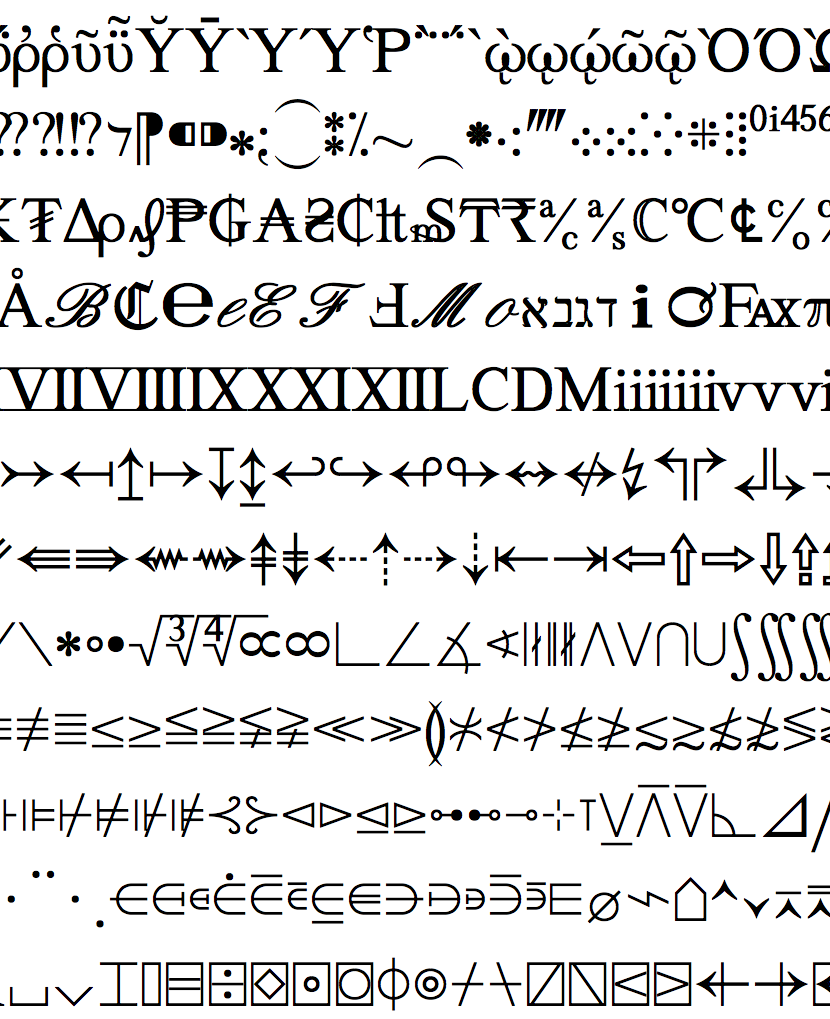
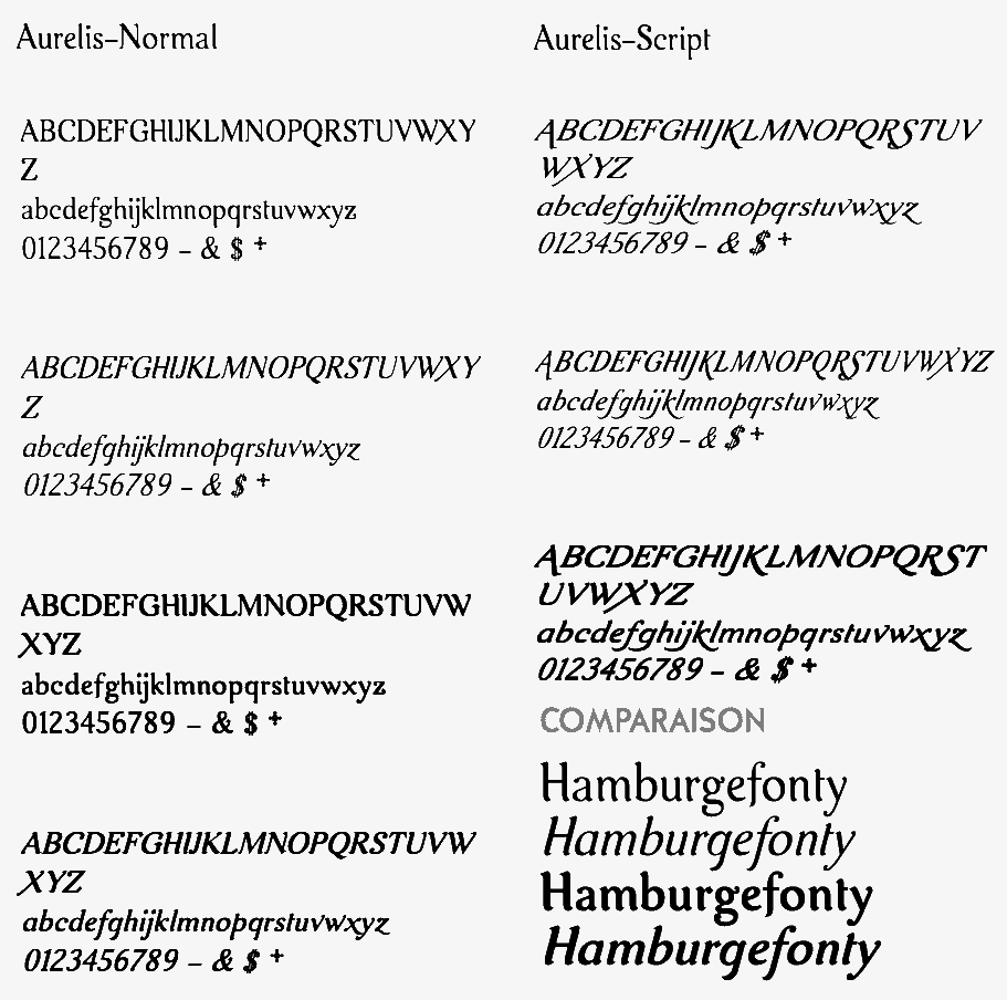
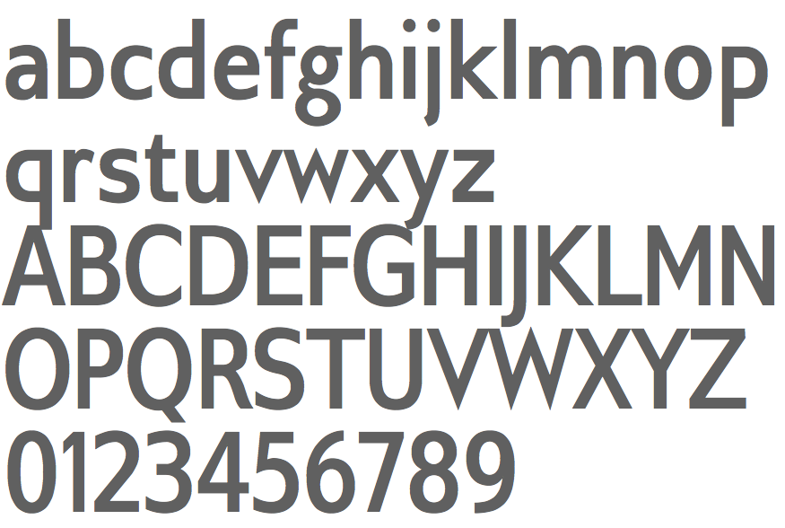
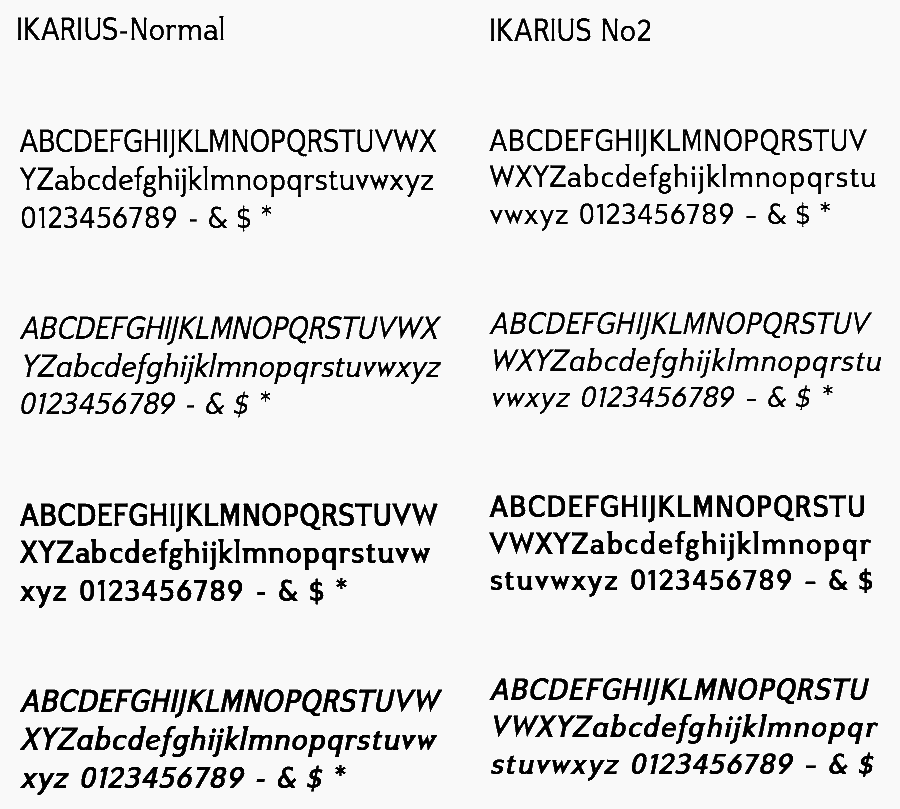
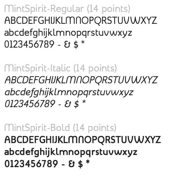
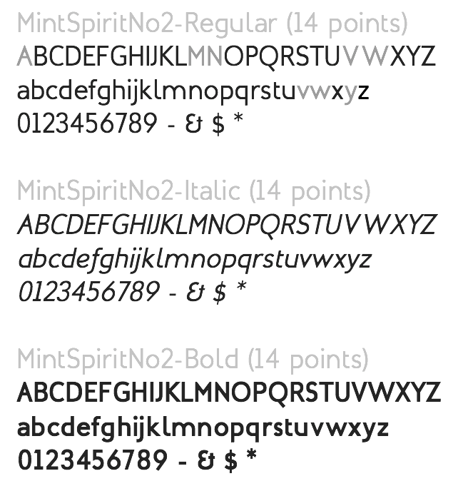
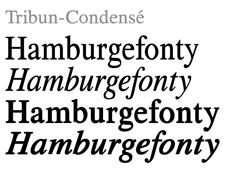
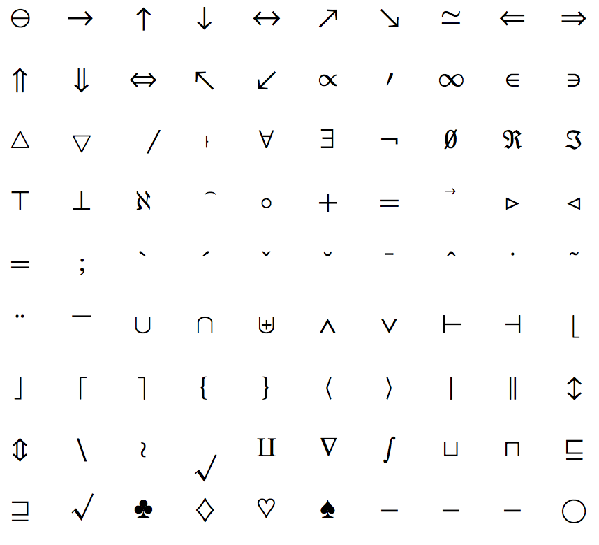
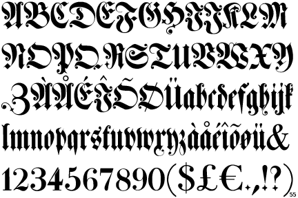
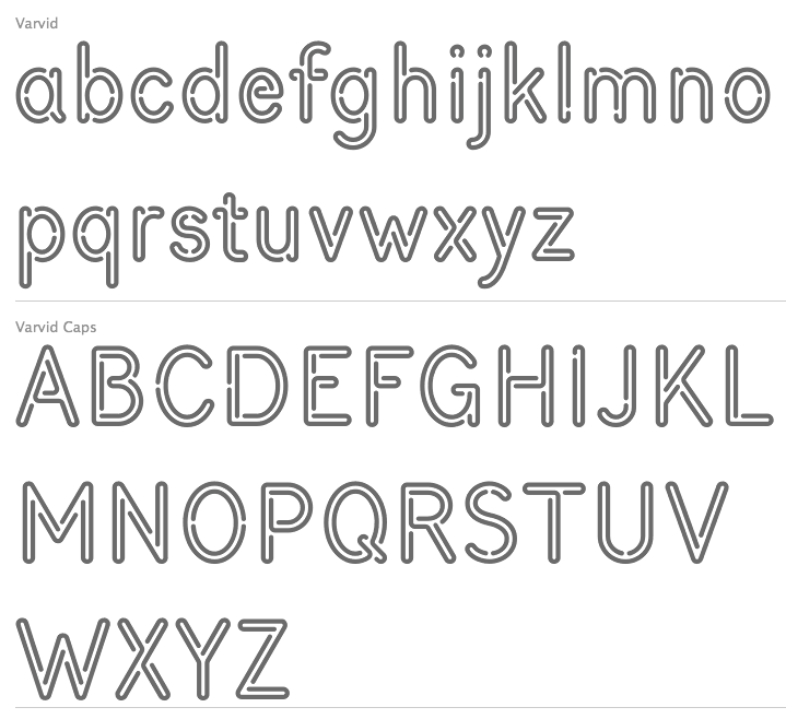
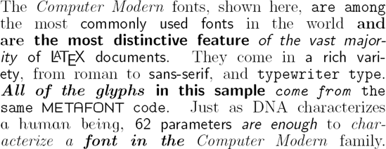
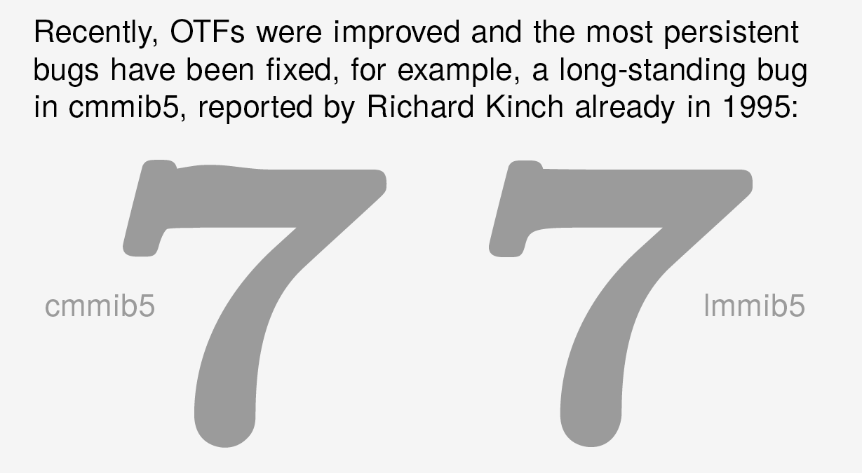
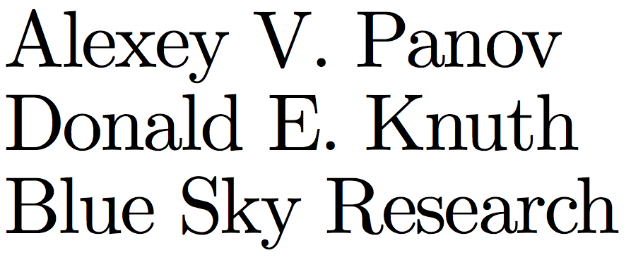
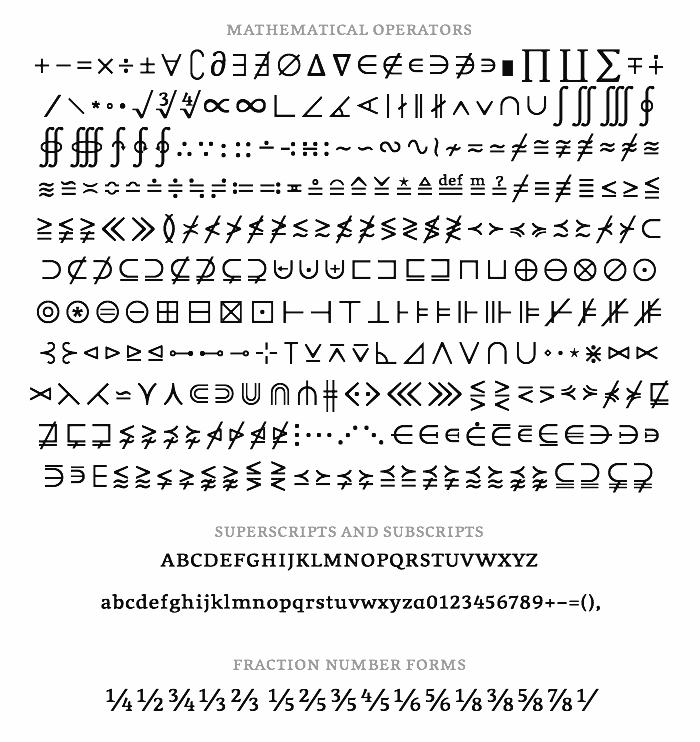
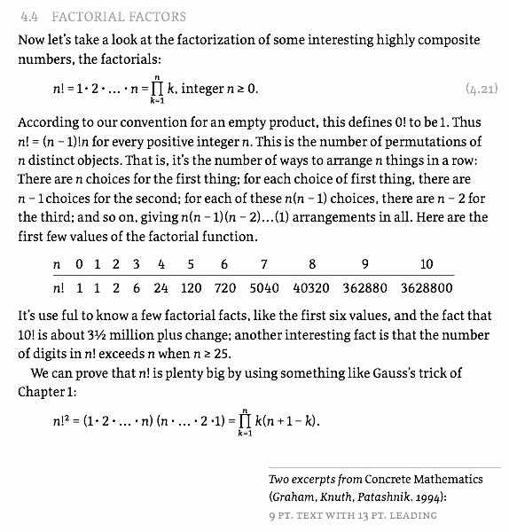
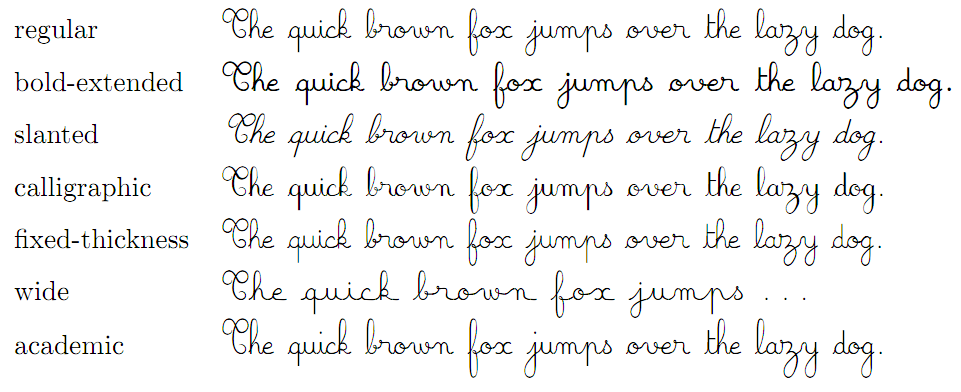
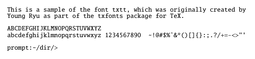
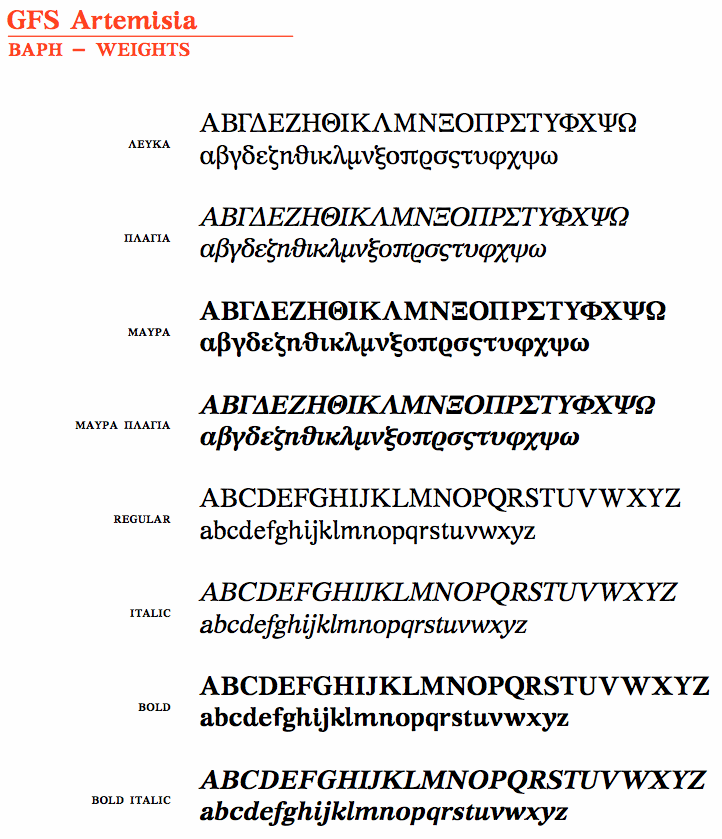
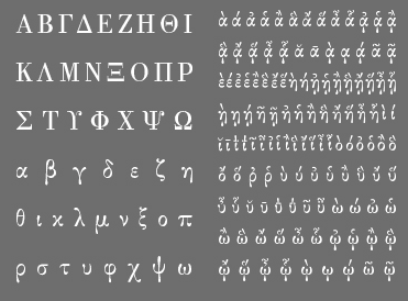
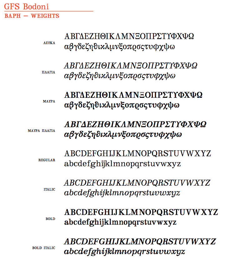
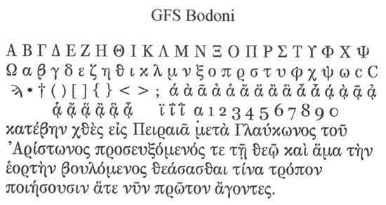
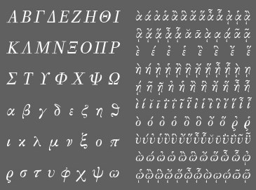
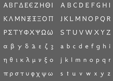
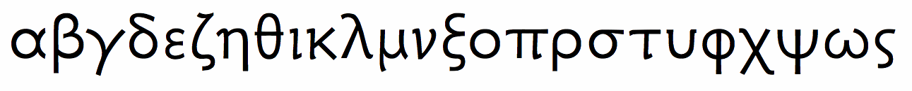
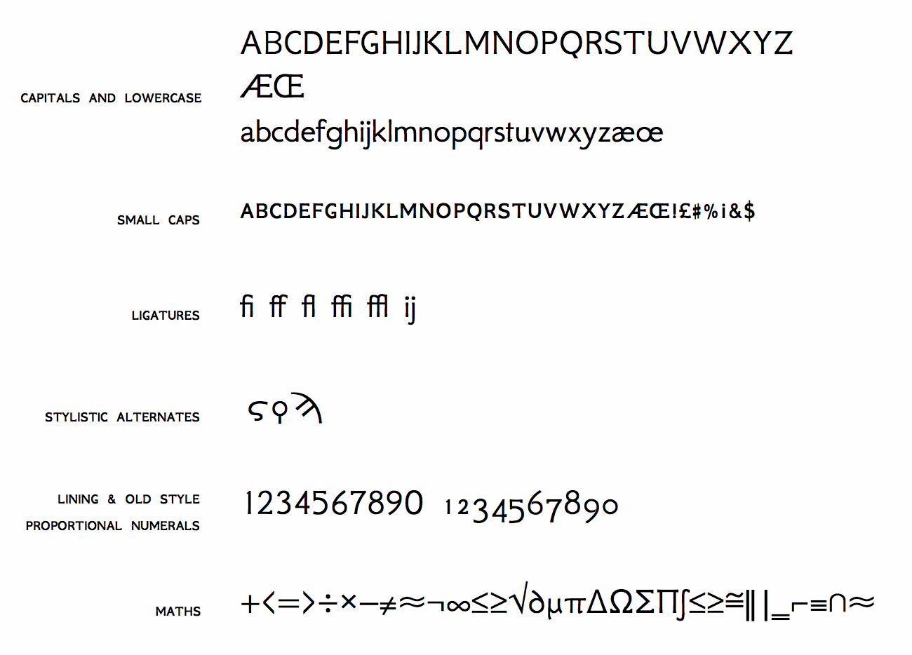
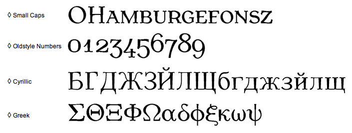
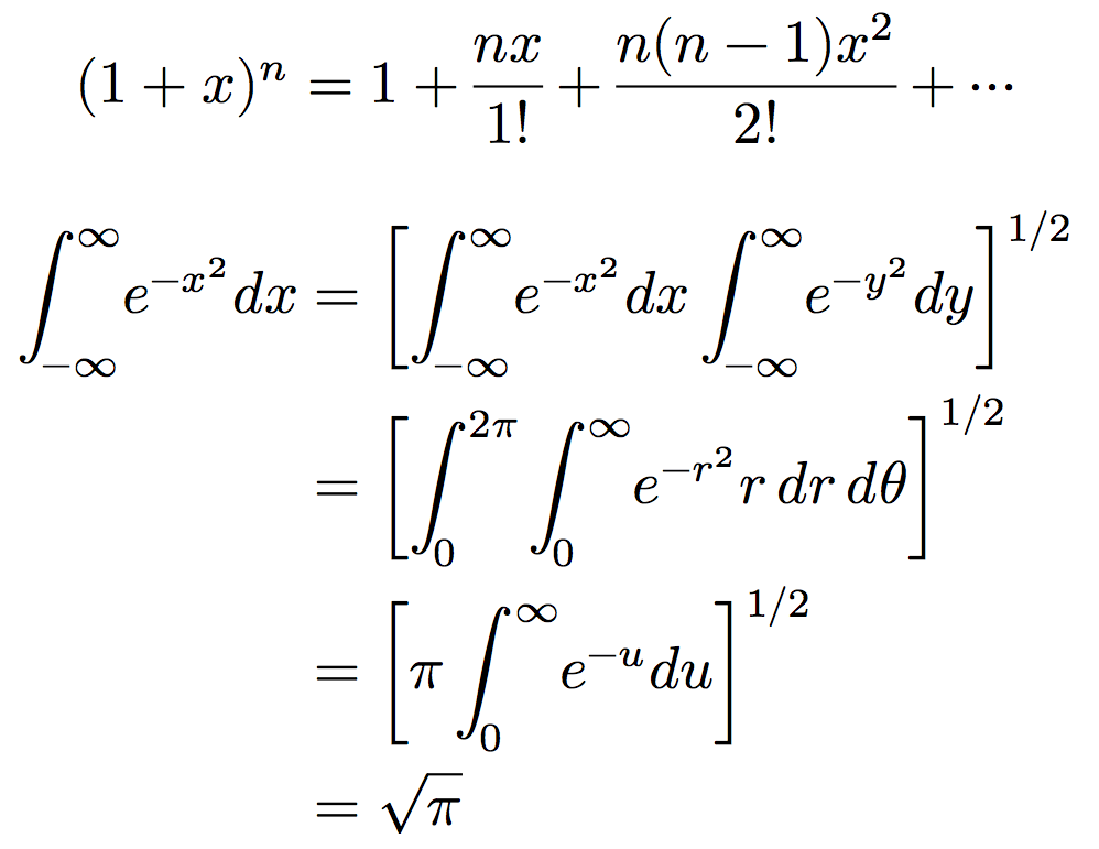
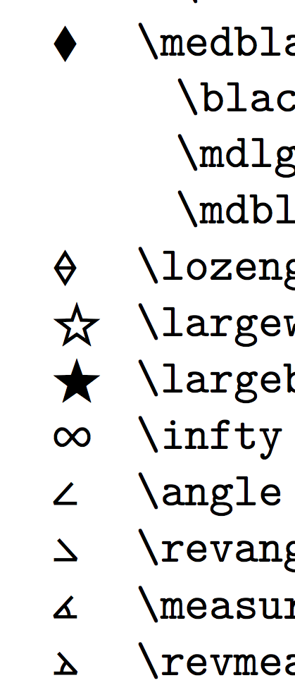
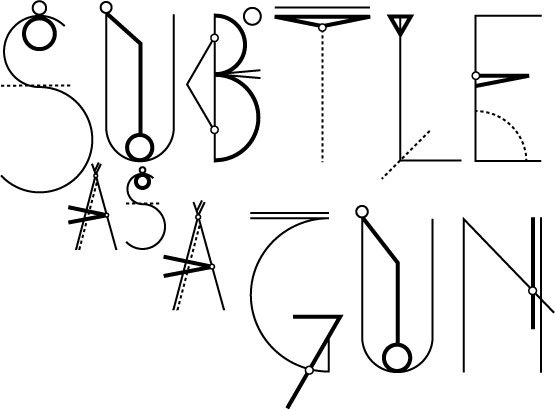
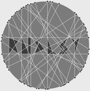
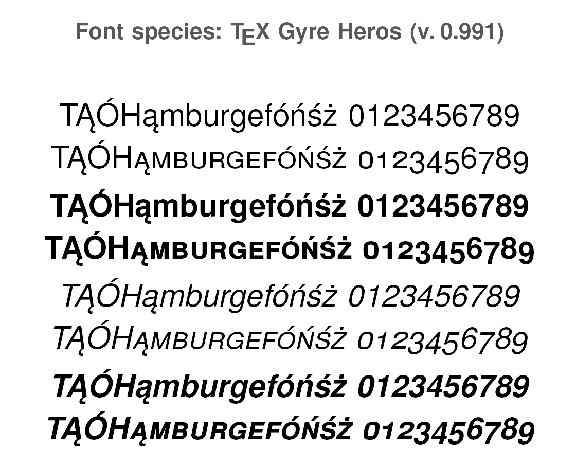
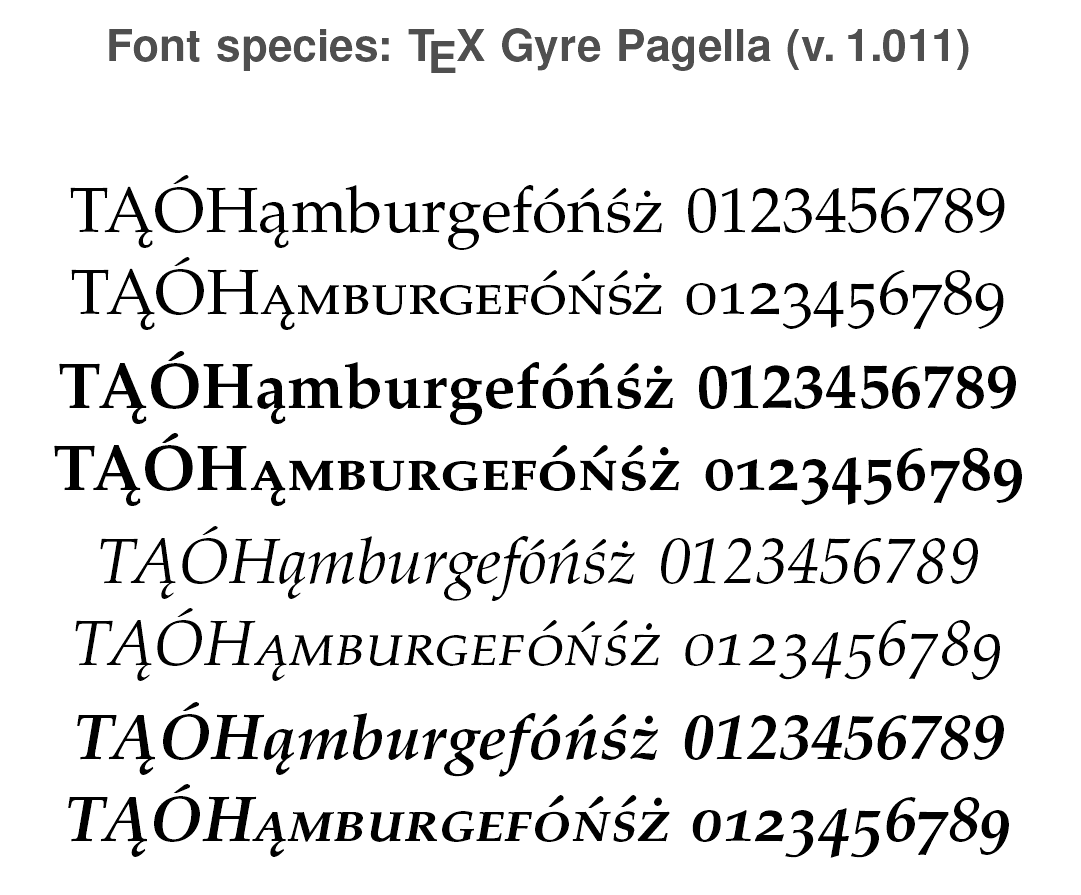
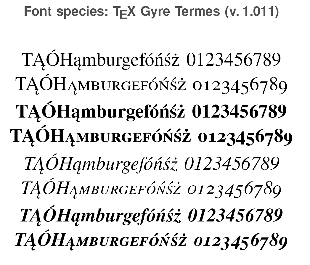
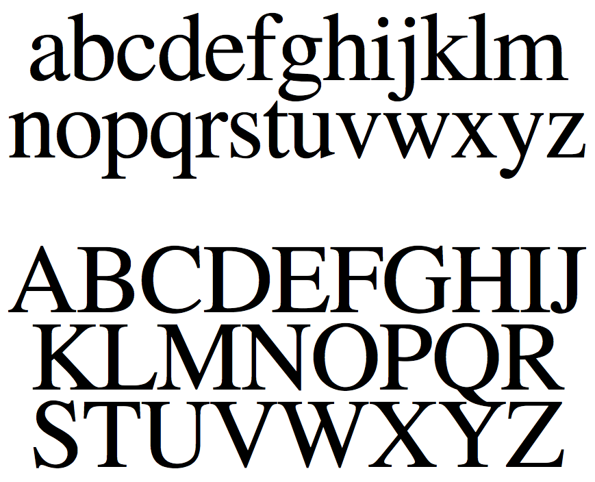
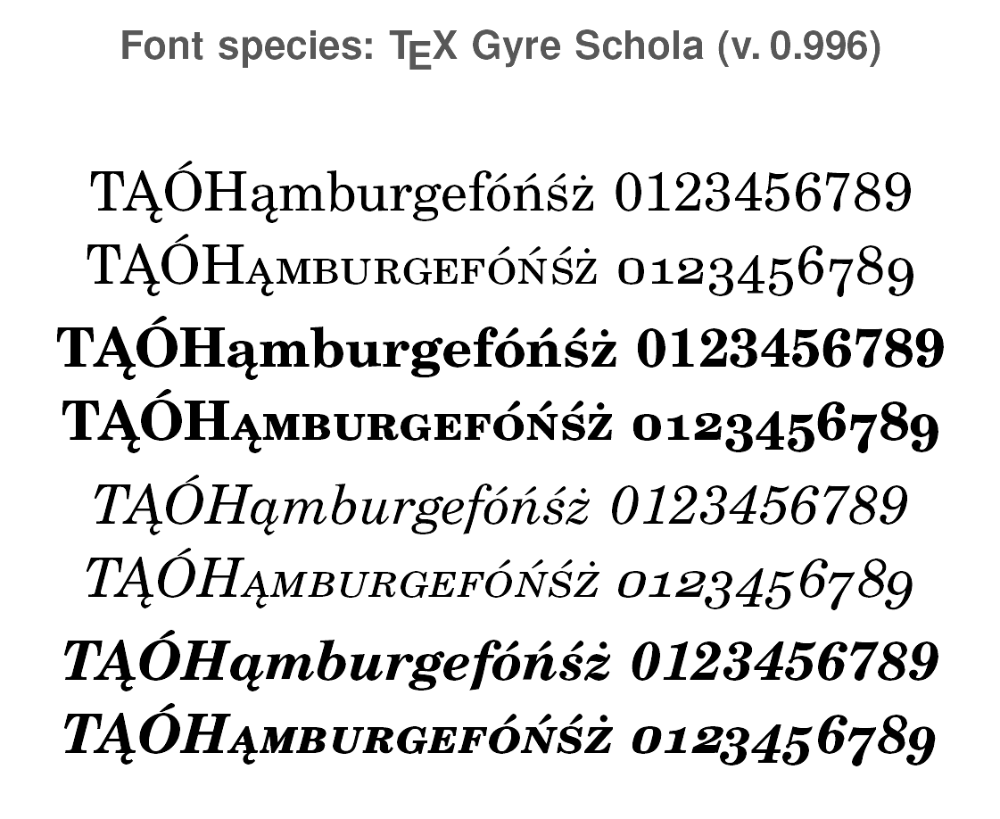
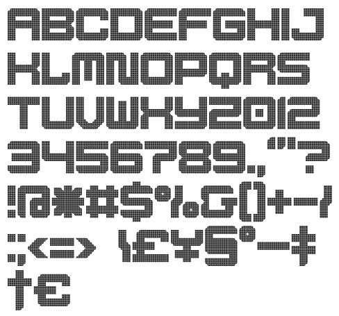
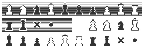
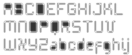
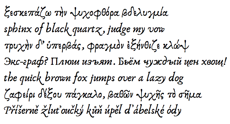
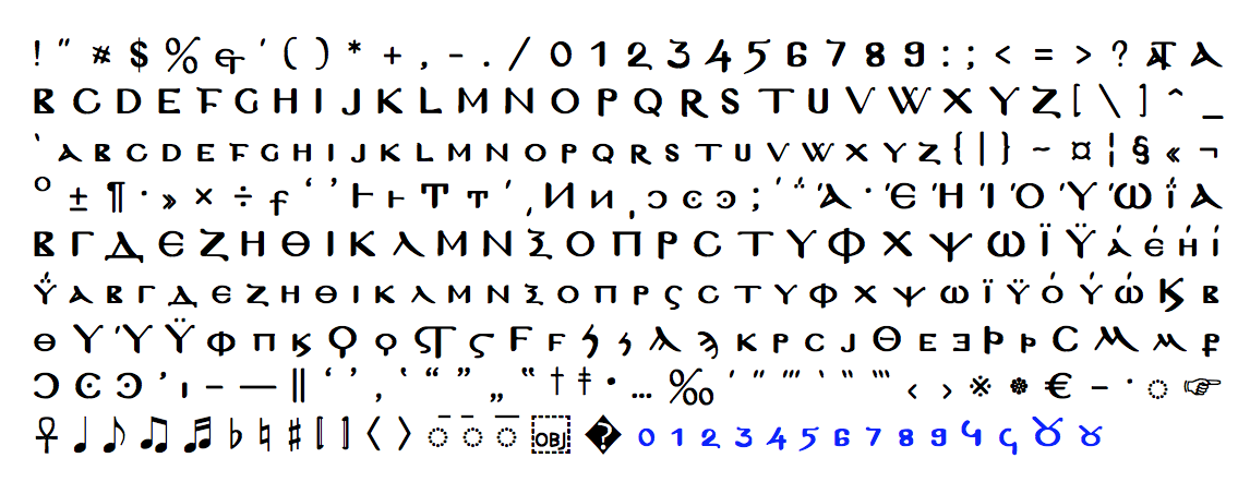
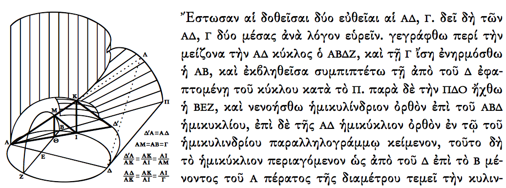
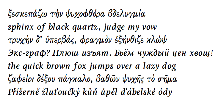
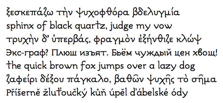
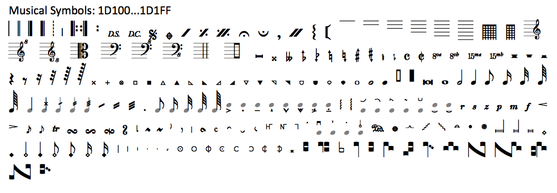
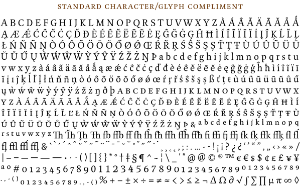
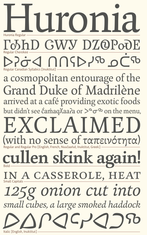
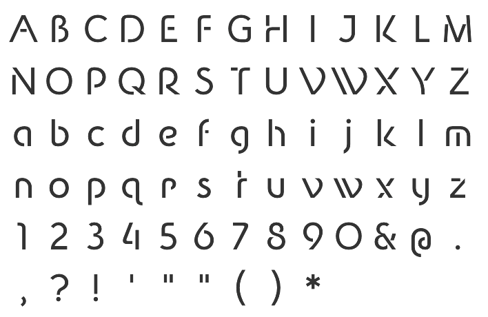
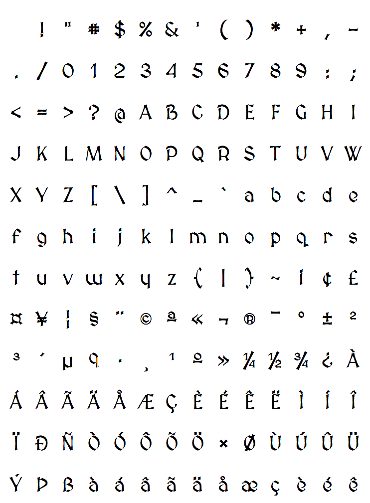
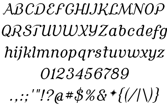
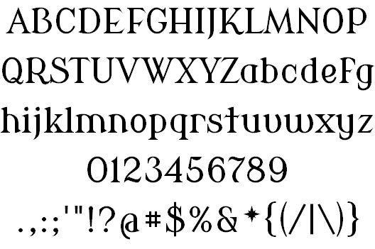
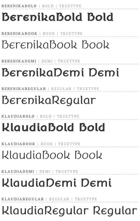
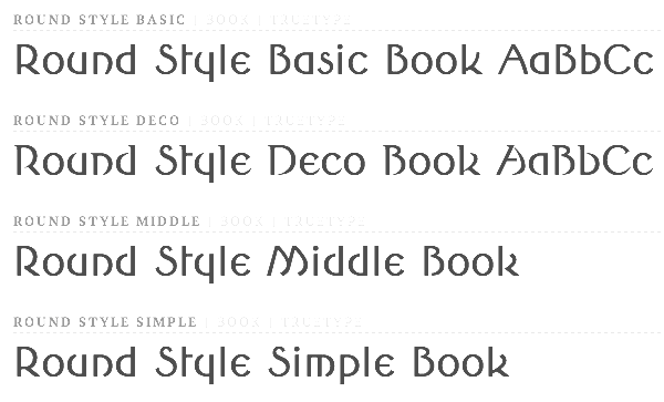
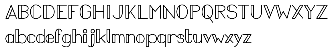