TYPE DESIGN INFORMATION PAGE last updated on Wed May 6 15:51:36 EDT 2026
FONT RECOGNITION VIA FONT MOOSE

|
|
|
|
|
Type personalities | ||
|
|
|
|
SWITCH TO INDEX FILE
Abattis
|
Dave dreams of a free culture of visual communication around the world, so he decided to free fonts. His Masters Thesis written in 2008 at the University of Reading is entitled The Free Font Movement. In 2009, for his MA work at Reading, he designed Cantarell, a free humanist sans family, done together with Jakub Steiner, free at CTAN, Github and Open Font Library. OFL page. Cantarell was there at the launch of Google Fonts and has become widespread. In 2010 it was selected as the default User Interface font for GNOME 3. Petra Sans (2017) is a further development of Cantarell by Cristiano Sobral. Irene Vlachou added Greek support for Cantarell in 2018. The current state of Cantarell as reported on Github: After the GNOME project adopted the typeface in November 2010, minor modifications and slight expansions were made to it over the years. Pooja Saxena initially worked on the typeface as a participant of the GNOME outreach program and later developed her own Devanagari typeface Cambay, which included a redesigned Latin version of Cantarell. It was backported to the GNOME branch of Cantarell by Nikolaus Waxweiler, who also performed other janitorial tasks on it. The overall quality of the design was however far from good, given that the regular and bold face were worked on seperately and without consistency and had low quality outlines, and the oblique variants were simply slanted uprights without much correction. The GNOME design team also requested lighter weights. Up to this point, the work on Cantarell was mainly done with libre tools such as FontForge. Given the decaying state of FontForge (arcane user interface, heaps of quirky and buggy behavior) and the very early development status of alternatives such as TruFont, Nikolaus Waxweiler started redrawing Cantarell in the proprietary and Mac-only Glyphs.app under mentorship from Jacques Le Bailly ("Baron von Fonthausen"). Later, Alexei Vanyashin and Eben Sorkin reviewed the design. Finally, in 2009 or 2010, he started work on the Google Font Directory. Dave works as a typographic consultant to the Google Fonts project and gives financial support to libre type projects including FontForge, Glyphr Studio and Metapolator. Klingspor link. Kernest link. Google Plus link. Font Squirrel link.. [Google] [More] ⦿ |
Ad Hoc Design
| Guy Schockaert was born in Kortrijk, Belgium, in 1949. After studying graphic arts and visual communication at the Institut Saint-Luc in Bruxelles (1966-1970) he became an assistant of Michel Olyff before becoming self-employed as a graphic designer in 1971. His graphic studio Ad hoc Design specialized in corporate identity, books and brochures for a range of clients including Alfac, 3M, Plantin, Sic and RTBF. Schockaert advocated rigour and emotion in his career. He gave many and was active in teaching. From 1997 until 1999, he was the president of Icograda (International Council of Graphic Design Associations). He was one of the initiators of Design for the World, an organisation that is dedicated to finding design solutions to humanitarian problems. Since 2003 he has been President of Ydesign Foundation. His awards include Médaille de Bronze, Prix Plantin-Moretus (1989), Brno Biennale Honorary Membership (1996), Icograda President's Award (2007), and the Red Dot Award (2004). On January 11, 2013, he sent out this disturbing message by email (including to me): Dear friends. I left our world this morning convinced that a paradise exists somewhere for graphic designers. My computer will be mute from now on. I loved you all. And indeed, a few minutes later, obituaries started popping up all over the web. Linkedin page. [Google] [More] ⦿ |
Adam Twardoch (b. 1975) was raised in Tychy, Poland, and graduated from the University of Frankfurt/Oder, Germany. He worked at for Agentur GmbH, a Frankfurt/Oder-based design firm. Since 1991, Adam has advised numerous type designers on Central European extensions of their typefaces and has created localized versions of over fifty fonts. He frequently writes on type-related matters, and is the founder of Font.org, a (now defunct) website featuring articles about typography in English and Polish. Adam Twardoch is Director of Products of FontLab (since 2004), and is typographic consultant at Linotype (since 2002) and Tiro Typeworks (since 2001), and general font specialist at MyFonts (2000-2012). Since 2012 he is based in Berlin. Adam Twardoch is working in the field of font technology, multilingual typography, CSS webfonts, Unicode and OpenType. His typefaces:
Speaker at ATypI 2013 in Amsterdam. Speaker at ATypI 2016 in Warsaw and at ATypI 2018 in Antwerp. [Google] [MyFonts] [More] ⦿ | |
Afrikan Alphabets
|
Saki Mafundikwa (Harare, Zimbabwe) is director of the Zimbabwe Institute of Vigital Arts (ZIVA). Author of Afrikan Alphabets, the story of writing in Afrika (Mark Batty Publ., 2003). In this book, he covers all south of the Sahara, and divides things as follows: |
Alan Marshall worked at the Musée de l'imprimerie in Lyon, France, from 1995 until his retirement in 2015. He was director of the Museum from 2002 until 2015. A type and book expert, Alan Marshall published Tout le monde connaît Roger Excoffon (2011). Musee de l'imprimerie link. [Google] [More] ⦿ | |
Type historian at Reial Academia de Bones Lletres in Barcelona, who has a PhD in art history from Universitat Autonoma de Barcelona (UAB). Born in Barcelona in 1971, Corbeto is responsible for all the publishing activities of the Real Academia de Buenas Letras de Barcelona and the Asociación de Bibliófilos de Barcelona. His field of investigation is the history of printing types and, in particular, the work of Spanish punchcutters throughout the second half of the eighteenth century. At ATypI 2006 in Lisbon, he spoke about the efforts around 1750-1770 to set up the Royal Library type foundry by Juan de Santander and Gerónimo A. Gil. Speaker at ATypI 2009 in Mexico City, where he talked about the punches from the Spanish Royal Printing House. Soon he will publish a specimen and text book on all this. His books: Muses de la impremta. La dona i les arts del llibre (segles XVI-XIX) (ed., with M. Garone) (Associació de Bibliòfils de Barcelona, 2009); Especímenes tipográficos españoles. Catalogación y estudio de las muestras de letras impresas hasta el año 1833 (Calambur, Madrid, 2010); Daniel B. Updike, impresor e historiador de la tipografía (Campgrafic, Valencia, 2011); Tipos de imprenta en España (Campgrafic, Valencia, 2011), Las letras de la Ilustración. Edición, imprenta y fundición de tipos en la Real Biblioteca (Catálogo de la exposición en la Biblioteca Nacional, Madrid, 2012) e Història de la tipografia. L'evolució de la lletra des de Gutenberg fins a les foneries digitals (coauthor with M. Garone, Pagès Editors, Lérida, 2012). [Google] [More] ⦿ | |
Italian architect and graphic designer, b. 1974. He obtained a degree with a thesis on Neue Tipografie and is studying towards a PhD at the University of Palermo (Italy) where he studies countemporary type design, in collaboration with the Department of Typography of the University of Reading. Speaker at ATypI 2007 in Brighton: New professional identity of type designer. [Google] [More] ⦿ | |
Author, educator, historian and type personality who taught at Rochester Institute of Technology from 1947-1977. He wrote Anatomy of a Typeface (1990, David R. Godine). He died in 2002 in Sun City, FL. Obituary. [Google] [MyFonts] [More] ⦿ | |
Alexander Tochilovsky is a graphic designer, typographer, curator and educator, who graduated with a BFA from The Cooper Union (New York), and holds an MFA from Cranbrook Academy of Art (California). He is currently the Curator of the Herb Lubalin Study Center of Design and Typography. Since 2007 he has taught typography and design at the Cooper Union School of Art, and also teaches the history of typeface design at Type@Cooper, the postgraduate certificate program he co-founded in 2010. [Google] [More] ⦿ | |
Alexey Dombrovskiy was born in 1964 in Russia (Uzlovaya, Tula region). He graduated from the Tula Polytechnical Institute in 1986. He works in book design. He cooperates with various publishing houses and designs books for the Russian Academy of Sciences, the Russian Entomological Society, the Moscow State University, the Tula State University, and printed matter for the Bolshoi Theatre, the Moscow Kremlin Museums, the State Hermitage Museum. Author of some articles on the history of initials, a topic about which he spoke at ATypI 2008 in St. Petersburg. In that talk, he covered these phases of initial caps development in Russia:
| |
Allan Haley was the principal of Resolution, a consulting firm with expertise in type; his clients included Apple, Adobe, Linotype, Xerox, IBM, and Agfa Monotype. He was also the Chairman of the Advisory Board of the Goudy International Center at RIT. He was the Typographic Consultant to Compugraphic Corporation. Haley was principal of Resolution, a consulting firm with expertise in fonts, font technology, type and typographic communication. Allan joined ITC in 1981, and became its executive vice president of ITC. He wrote for publications such as U&lc, How, Dynamic Graphics, and Step-by-Step Graphics. He is highly regarded as an educator, and he is a frequently requested speaker. He has written five books on type and graphic communication. Presently, Allan Haley is Director of Words & Letters at Monotype Imaging. At ATypI in Rome in 2002, he spoke about the development of ITC Bodoni. His books:
| |
Typographer and editor at Production Type who studied at Emerson College and worked briefly at Font Bureau. He worked as design director for Seattle Met and City Arts, redesigned Fretboard Journal (2013) and has designed for O, the Oprah Magazine, Nylon and Nick, Jr. [Google] [More] ⦿ | |
Andrew Boag's writings about type and typography. Cofounder of "Boag associates in London, ex-typography teacher at the University of Reading (1985-1990), and special projects manager at Monotype. Dead link. [Google] [More] ⦿ | |
Anna Chaykovskaya was born in Severodvinsk in 1961. An art-critique, journalism, teacher. Since 2001 Anna Chaykovskaya is an assistant editor-in-chief of the "Kuitpohod" magazine in Moscow. At ATypI 2008 in St. Petersburg, she spoke about the end of the era of wood type. [Google] [More] ⦿ | |
Anna Shmeleva is a freelance journalistic author. She has worked with a number of local and professional periodicals in Russia on machine translation of texts, speech recognition, artifical intelligence, computer graphics and type design. Together with Vladimir Yefimov, she is the author of a series of books entitled Great typefaces, volumes 1 and 2. At ATypI 2008 in St. Petersburg, she spoke about Script typefaces and graphology. She is associated with ParaType. [Google] [More] ⦿ | |
Director of the Gutenberg Museum. In 2016, Petra Eisele, Annette Ludwig and Isabel Naegele published Futura: Die Schrift (in German). The English version Futura: The Typeface (Laurence King) followed in 2017. [Google] [More] ⦿ | |
Annette O'Sullivan trained as a graphic designer and worked in design studios in New Zealand prior to further study in typography at the London College of Printing. She has an MA degree in typography and graphic design. While in Britain, she worked in publishing and museum design, notably for The Museum of the Royal Welch Fusiliers, Caenarfon Castle, North Wales, the Hong Kong Museum of Coastal Defence, Hong Kong and the Royal Armouries Artillery Hall, Fort Nelson. She currently lectures in typography at Massey University, Wellington, and continues to explore contemporary typographic application within a historic context. [Google] [More] ⦿ | |
Anthony Cahalan has broad-ranging national and international experience in graphic design, marketing, public relations and design education. He is currently Deputy Head of the School of Design and Architecture and Associate Professor of Graphic Design at the University of Canberra. He studied visual communication at Sydney College of the Arts, has a Master of Design from the University of Technology Sydney and completed his PhD in typography at Curtin University of Technology in Perth. Cahalan's doctoral thesis was entitled Type, trends and fashion: A study of the late 20th century proliferation of typefaces. It was published by Mark Batty in 2008. The book blurb: New York : Mark Batty Publisher, 2008, quarto, cloth in dust jacket. 348 pp. First Edition. Changes in technology and stylistic developments in the design, use and reproduction of typeface designs were exponential in the last two decades of the twentieth century. This was due in no small part to the availability of the desktop computer and associated software. Anthony Cahalan investigates this late twentieth century proliferation of Western typefaces by analyzing and interpreting the phenomenon from the perspective of those studied: graphic designers and similar experienced users of typefaces, rather than the general population of computer users. This book documents the way these design and typography professionals saw the type design industry from the inside to provide fascinating "snapshots in time" of typeface design during this exciting period.Speaker at ATypI 2010 in Dublin. [Google] [More] ⦿ | |
Font technology specialist at Linotype, Germany. He was born in Manisa (Turkey) in 1974 and grew up in Marburg (Germany) before moving to Frankfurt in 1994. He studied political science and computer science at the Johann-Wolfgang-Goethe Universität and later at the Fernuniversität Hagen. He joined Linotype as an intern in 2000 before becoming the full time Font Technology Specialist in 2002. At ATypI 2008 in St. Petersburg, he spoke about Automation in font production. Speaker at ATypI 2011 in Reykjavik on the topic of web fonts. [Google] [More] ⦿ | |
Typographer at the Vilnius Academy of Art, Lithuania. [Google] [More] ⦿ | |
Autograff
| AutoGraff is a research project aimed at computationally modelling the perceptual and dynamic processes involved in the production of graffiti art and calligraphy. The purpose of the study is to develop computer graphics and robotic systems that are capable of generating traces, letters, and patterns that are similar to the ones made by an expert human artist. The project is driven by Daniel Berio and Frederic Fol Leymarie at the University of London. Daniel Berio is a researcher and artist from Florence, Italy. Since a young age Daniel was actively involved in the international graffiti art scene. In parallel he developed a professional career initially as a graphic designer and later as a graphics programmer in video games, multimedia and audio-visual software. In 2013 he obtained a Masters degree from the Royal Academy of Art in the Hague, where he developed drawing machines and installations materializing graffiti-inspired procedural forms. In 2021, Daniel obtained a PhD at Department of Computing Goldsmiths, University of London under the supervision of Frederic Fol Leymarie. Daniel Berio's PhD thesis is entitled AutoGraff: Towards a computational understanding of graffiti writing and related art forms. The abstract of this spectacular work that mixes art and mathematical modeling: The aim of this thesis is to develop a system that generates letters and pictures with a style that is immediately recognizable as graffiti art or calligraphy. The proposed system can be used similarly to, and in tight integration with, conventional computer-aided geometric design tools and can be used to generate synthetic graffiti content for urban environments in games and in movies, and to guide robotic or fabrication systems that can materialise the output of the system with physical drawing media. The thesis is divided into two main parts. The first part describes a set of stroke primitives, building blocks that can be combined to generate different designs that resemble graffiti or calligraphy. These primitives mimic the process typically used to design graffiti letters and exploit well known principles of motor control to model the way in which an artist moves when incrementally tracing stylised letterforms. The second part demonstrates how these stroke primitives can be automatically recovered from input geometry defined in vector form, such as the digitised traces of writing made by a user, or the glyph outlines in a font. This procedure converts the input geometry into a seed that can be transformed into a variety of calligraphic and graffiti stylisations, which depend on parametric variations of the strokes. Co-author of StrokeStyles: Stroke-based Segmentation and Stylization of Fonts (ACM Transactions on Graphics, vol. 41 (3), pp. 1-21, 2022). In this paper by Daniel Berio (Goldsmiths, University of London), Frederic Fol Leymarie (Goldsmiths, University of London), Paul Asente (Adobe Research, San Jose, CA), and Jose Echevarria (Adobe Research, San Jose, CA), the authors develop a method to automatically segment a font’s glyphs into a set of overlapping and intersecting strokes with the aim of generating artistic stylizations. The segmentation method relies on a geometric analysis of the glyph’s outline, its interior, and the surrounding areas. It uses the medial axis, curvilinear shape features that specify convex and concave outline parts, links that connect concavities, and seven junction types. We show that the resulting decomposition in strokes can be used to create variations, stylizations, and animations in different artistic or design-oriented styles while remaining recognizably similar to the input font. [Google] [More] ⦿ |
Bald Condensed
| Based in Gent, Yves is a Belgian type expert, who is a regular at several type forums such as Typophile and Typographica. He is much appreciated for his insightful type critiques as well as his type identification skills. Owner and typographic designer of Don Q Design, and art director and typographic designer at Magelaan. Yves started reviewing type in his Bald Condensed column on Typographer.org. Since ca. 2008, Yves was editor-in-chief for the international design and typography blog The FontFeed, and Unzipped, his blog on the FontShop BeNeLux home page. After primarily working for FontShop for a decade, he has found a new home from 2016 until 2019 at Type Network, for which he is a design writer and producer. Speaker at ATypI 2017 Montreal. Twitter page. [Google] [More] ⦿ |
Barry Roseman is a graduate of Occidental College and Art Center College of Design. He earned a Masters Degree in Graphic Design from Yale University and studied at the School of Design in Basel, Switzerland. He is currently an Assistant Professor at Atlanta College of Art. He spoke at ATypI 2005 in Helsinki on The design innovations and typographic beauty of transportation timetables. [Google] [More] ⦿ | |
Born in New York in 1900, she died in London in 1969. A typographer, writer, and art historian, she worked for the British Monotype Corporation for most of her life, and was famous for her energy, enthusiasm and speeches. Collaborator of Stanley Morison. She created a typeface called Arrighi. She is famous for The Crystal Goblet or Printing Should be Invisible (The Crystal Goblet, Sixteen Essays on Typography, Cleveland, 1956, and Sylvan Press, London, 1955), which is also reproduced here and here. The text was originally printed in London in 1932, under the pseudonym Paul Beaujon. Here are two passages:
Drawing of her by Eric Gill. Life story. Beatrice Warde was educated at Barnard College, Columbia, where she studied calligraphy and letterforms. From 1921 until 1925, she was the assistant librarian at American Type Founders. In 1925, she married the book and type designer Frederic Warde, who was Director of Printing at the Princeton University Press. Together, they moved to Europe, where Beatrice worked on The Fleuron: A Journal of Typography (Cambridge, England: At the University Press, and New York: Doubleday Doran, 1923-1930), which was at that time edited by Stanley Morison. As explained above, she is best known for an article she published in the 1926 issue of The Fleuron, written under the pseudonym Paul Beaujon, which traced types mistakenly attributed to Garamond back to Jean Jannon. In 1927, she became editor of The Monotype Recorder in London. Rebecca Davidson of the Princeton University Library wrote in 2004: Beatrice Warde was a believer in the power of the printed word to defend freedom, and she designed and printed her famous manifesto, This Is A Printing Office, in 1932, using Eric Gill's Perpetua typeface. She rejected the avant-garde in typography, believing that classical forms provided a "clearly polished window" through which ideas could be communicated. The Crystal Goblet: Sixteen Essays on Typography (1955) is an anthology of her writings. Wood engraved portrait of Warde by Bernard Brussel-Smith (1950). [Google] [MyFonts] [More] ⦿ | |
Seyed Behdad Esfahbod MirHosseinZadeh Sarabi is an Iranian-Canadian software engineer, type expert and free software developer. He worked at Google in Mountain View, CA, and at Facebook (2019-2020). At the time he quit Facebook, his annual salary, as reported by The New York Times, was 1.5 million dollars. Behdad Esfahbod was born in 1982 in Sari, Iran. While at high school Esfahbod won a silver in the 1999 International Olympiad in Informatics and then gold in 2000. He studied computer engineering at Sharif University in Tehran while discovering the world of computer typography and open source. In 2003 he moved to Canada, studied computer science at the University of Toronto (MSc, class of 2006), became a regular contributor to GNOME---he was a director at GNOME Foundation from 2007 to 2010, serving as the president from 2008 to 2009---and many other open source projects. Esfahbod was among the founders of Sharif FarsiWeb Inc. which carried out internationalization and standardization projects related to open source and Persian language. He worked at Red Hat, Google, and generally became the go-to person regarding everything font and text rendering in open source projects. Among the projects he has led are the cairo, fontconfig, HarfBuzz, and pango libraries, which are standard parts of the GNOME desktop environment, the Google Chrome web browser, and the LibreOffice suite of programs. He received an O'Reilly Open Source Award in 2013 for his work on HarfBuzz. In 2012, he obtained an MBA from the University of Toronto as well. Speaker at ATypI 2014 in Barcelona. The abstract of his talk there explains the current status of the FontTools package: FontTools/TTX is a Python package for converting OpenType font fonts to / from XML. It was developed in early 2000s by Just van Rossum and has been in wide use by the type community since, mostly for testing and inspection, but its development has had stopped for the most part. In Summer 2013 I resurrected FontTools development by adding support for many tables that have not been supported before (EBDT/EBLC, CBDT/CBLC, sbix, COLR/CPAL, SVG, ...), as well as implementing new tools: a full font subsetting tool, font inspection tool, font merge tool. In this talk I will talk about the community gathered around the new FontTools development as well as my plans to expand FontTools into a full Open Source font production pipeline. Speaker at ATypI 2015 in Sao Paulo. Speaker at ATypI 2016 in Warsaw on The Open Source Python Font Production Pipeline. Addendum: Read his personal story involving psychological torture by the Iranian government. New York Times article in August 2020 about his Iranian experience: Esfahbod was arrested by Islamic Revolutionary Guards Corps' intelligence unit during a 2020 visit to Tehran. He was then moved to Evin prison, where he was psychologically pressured and interrogated in solitary confinement for seven days. They downloaded all his private data from his devices. Iranian security forces let him go based on his promise to spy on his friends once he was back in United States. According to Linkedin, he is now based in Edmonton, Canada. Wikipedia link. [Google] [More] ⦿ | |
Benderski Design
| Gabriel Amijai Benderski Perez (b. 1988) is a designer based in Montevideo, Uruguay. He received a BA from ORT University, and creates typographically relevant posters and logos. [Google] [More] ⦿ |
Benedikt Bramböck studied visual communication in Austria and Switzerland and type design in The Hague. He interned and later was employed by Fontshop International in Berlin. Since 2015 he works for Alphabet Type and is part of the team behind Berlin's Typostammtisch. Speaker at ATypI 2016 in Warsaw. [Google] [More] ⦿ | |
Type director and manager at Scangraphic in the 1980s and 1990s. Author of a number of thick specimaen volumes including Scangraphic Digital Type Collection A-F (1985), Scangraphic Digital Type Collection G-Z (1985), Scangraphic Digital Type Collection Index (1988), Scangraphic Digital Type Collection Supplement 1 (1988), and Scangraphic Digital Type Collection Supplement 2 A-Z Body types (1988). [Google] [More] ⦿ | |
Bianca specializes in the technical aspects of type design. As a font engineer with a background in civil engineering, communication and typeface design, she joined the Brixton, UK-based Dalton Maag type foundry in 2011. Until 2018 she headed their Skills & Process team, responsible for training and development, knowledge management, and for the implementation of font development processes. In 2018, she was appointed Creative Director and became responsible for ensuring that Dalton Maag remains at the forefront of type innovation. She directed the design of brand typefaces and complex type systems for international clients such as the Amazon, AT+T, BBC, Bodyform, Goldman Sachs [Goldman Sans], and Jacobs Engineering Group [Jacobs Chronos], and oversaw the design and refinement of wordmarks and font modifications. Speaker at ATypI 2018 in Antwerp, at ATypI 2017 in Montreal and at ATypI 2016 in Warsaw. [Google] [More] ⦿ | |
Bill Dawson (XK9, Los Angeles) is a graphic designer who has interesting things to say about type--his Typethos series of type quotes is a must-read. At [T-26], he designed Megahertz (1998, techno family) and Leger (monoline minimalist sans family). Klingspor link. Behance link. XK9 link. [Google] [MyFonts] [More] ⦿ | |
Inventor of Cleartype. In 2012, Anthony Wing Kosner wrote: One of the true innovators of the reading of text on the screen, Bill Hill, died yesterday. Hill will be remembered primarily as one of the inventors of Microsoft's ClearType screen typography system, but his impact on our screen experience spanned a quarter century. Robert Scoble, interviewed Hill many times, says that Hill worked behind-the-scenes, but was one of the greats. Hill started out as a newspaper writer for 20 years in Scotland. In 1986 he joined Aldus on their seminal PageMaker layout program. He was approached by Microsoft in 1994 to run its typography group. He left Microsoft in 2009 and worked on screen-reading projects. He died Wednesday of a sudden heart attack. He realized early that the iPad would be trouble for Microsoft and Amazon. "The trouble is trying to innovate at Microsoft, which is a company of geeks, run by geeks, and dominated by Windows," he complained candidly. All of his achievements were rooted in a respect for our humanity and a desire to make our tools work for us. He considered the most important operating system to be not Windows or Linux, but "Homo Sapiens Version 1.0. It shipped about a hundred thousand years ago. There’s no upgrade in sight. But it's the one that runs everything. [Google] [More] ⦿ | |
Bill designed Busted (2008, Canada Type: grunge family) and the luxurious families Didot Headline (2009, Canada Type) and Didot Display. From 2009 until 2011, he cooperated with Patrick Griffin at Canada Type on a monumental revival of Alessandro Butti's Semplicità typeface---the new family is called Semplicità Pro. The designers write: Bill and I spent some time looking closely at Futura, the instant popularity of which in the late 1920s triggered Butti's design. This was for the most part a pleasant process of rehashing what constitues a geometric typeface, musing over the fundamental phallacy of even having such a classification in type while in reality very little geometry is left after the application of the optical adjustments inherently needed in simplified alphabet forms, trying to understand how far such concepts can go before entering into minimalism, and scoping the relativity between form simplicity and necessary refinement. Mostly academic, but very educational and definitely worth the ticket. [...] For an answer to Futura, Semplicità was certainly quite adventurous and ahead of its time. It introduced aesthetic genetics that can be seen in popular typefaces to this very day, which is to say eighty years later. Though some of that DNA was too avant-garde for the interwar period during which Semplicità lived out its popularity, much of it remains as an essential aesthetic typographers resort to whenever there is call for modern, techno, or high-end futuristic appeal. The most visibly adventurous forms at the time were the f and t, both which having no left-side crossbar, with the f's stem also extended down to fully occupy the typeface's descender space. Aside from those two letters, Semplicità's radical design logic and idiosyncracy become more apparent when directly compared with Futura. [...] Futura attempted to go as far as geometry could take it, which ultimately made it too rigid and considerably hurt its viability for text setting. Renner himself acknowledged some of its flaws, and even proposed alternate fucntionality treatments, with a more humanist aproach applied to some forms, all of which went nowhere because Futura's momentum and revenue were deemed undisruptable by some- thing so trivial as aesthetic or functionality. William Dwiggins' Metro design, a direct descendent of the Renner's design, went almost diametrically the opposite way of Futura, with the deco facets considerably magnified and the geometry toned down. Butti decided a design that finds the middle ground in that aesthetic tug of war was probably a better idea than either extreme. In 2016, Patrick Griffin and Bill Troop co-designed Bunyan Pro, which is the synthesis of Bunyan, the last face Eric Gill designed for hand setting in 1934 and Pilgrim, the machine face based on it, issued by British Linotype in the early 1950s---the most popular Gill text face in Britain from its release until well into the 1980s. [Google] [MyFonts] [More] ⦿ | |
In 2013, she graduated from the Plantin Institute's type design program under Frank E. Blokland. Her graduation typeface there was the children's storybook font Calina. At Plantin, she also attempted a Jacques Francois rosart revival. She writes that for Google Fonts, she developed Dinah (for Latin and Devanagari), but there is no record of that at Google Fonts. Custom fonts by Blondina include Barefoot (for bare Greetings greeting cards) Presently, she is a PhD student at the Aix-Marseille University, and is based in Aix-en-Provence. Since 2015, she organizes Typote, mobile workshops for training in calligraphy, lettering, typeface design and graphic design. [Google] [MyFonts] [More] ⦿ | |
Type technician at SIL International, who helped with many font packages. One of his tools is ViewGlyph which can be used for testing and viewing truetype fonts on Windows machines. [Google] [More] ⦿ | |
Kraimer worked at Ascender Corporation since 2004 until it was sold to Monotype. He has worked at the Chicago Tribune, and at Monotype Typography and Agfa Monotype, where until 2004, he was Vice President, responsible for managing the Worldwide Font Development Team. Today, he works at the Accounts Office of Monotype from Elk Grove Village, IL. [Google] [More] ⦿ | |
Director of the Type Club of Toronto, and printer and conservator at Massey College, University of Toronto, Brian is one of the type personalities of Canada. He currently teaches at Humber College in Toronto. [Google] [More] ⦿ | |
Born in 1945, Steinert started out with Linotype in 1973 in several functions. In 1996, he created Linotype Library GmbH, where he was Managing Director from 1997-2006. Under his guidance, Linotype managed to publish some impressive text families. Throughout his career, he has been heavy-handed and quick-triggered in the enforcement of trademarks. However, he has also collected the praise of many for being one who defended the development of high quality fonts. As reported by Ulrich Stiehl, who documents the demise of Linotype in 2006 and its sale to Monotype, Steinert once called Monotype's fonts nefarious evil knock-off clones (probably referring to Book Antiqua, a Monotype forgery of Hermann Zapf's Palatino, Arial, a Monotype forgery of Max Miedinger's Helvetica, and Segoe, a Monotype forgery of Adrian Frutiger's Frutiger). The irony is that Monotype acquired the Linotype GmbH from the Heidelberger Druckmaschinen AG in August 2006, and that was the end of the line for Steinert and Linotype. [Google] [More] ⦿ | |
Cameron Moll is a type specialist. He writes extensively on type design and typography. He sells EPS format glyphs based on the work of master Italian calligrapher M. Giovambattista Palatino (ca. 1515–1575), as featured in Libro di M. Giovambattista Palatino Cittadino Romano, published in Rome around 1550 AD. [Google] [More] ⦿ | |
Carol Wahler (Westport, CT) has been Executive Director with the Type Directors Club since 1983. She has a B.A. degree in Art History from from William Paterson University. Her husband Allan is president of A to A Studio Solutions in Stamford, CT. Carol is best known for her involvement, passion and hard work for the Type Directors Club competitions and exhibitions. Carol Wahler was honored with the 2018 SOTA Typography Award. [Google] [More] ⦿ | |
Keith Tam writes this: "A fellow of the Society of Graphic Designers of Canada and partner/founder of the design firm Trio, Carole Charette recently exhibited her MA thesis project titled Sixx Styles at the Emily Carr Institute of Art&Design in Vancouver. The exhibit consisted of 12 posters created as reinterpretations of six chosen typographic styles in the twentieth century including Constructivism, De Stijl, Bauhaus, New Typography, International Style and New Functionalism. She gave a fascinating lecture at the institute last Monday titled Zeitgeist and Typography, which was a culmination of her academic research on the cultural study of typographic styles in the twentieth century at Université Laval, Québec City. The lecture included two very engaging multimedia presentations." [Google] [More] ⦿ | |
British printer who obtained a Ph.D. in typography and graphic communication at the University of Reading in 1999. After a stint as a freelance journalist and writer, specializing in the graphic arts, she wrote four books on design and printing. She is a partner of Typevents. She and Shelley Gruendler became Executive Directors of ATypI in 2005, and will mainly be in charge of organizing the ATypI meetings. Currntly (in 2010) she is a Research Fellow at the Birmingham Institute of Art & Design, Birmingham City University. Speaker at ATypI 2010 in Dublin, where she looked at the British typeface trends from 1920-80 through the work of three of the leading UK printers of the period: The Curwen Press [London] that enjoyed promoting artists' and ornamental continental founts; The Kynoch Press [Birmingham] which favoured English revival types; and Percy Lund Humphries [Bradford] that was interested mainly with continental sans serif types. [Google] [More] ⦿ | |
Catherine Dixon is a freelance designer, writer, and Senior Lecturer in Typography at Central Saint Martins College of Art&Design, London. She completed her PhD, A description framework for typeforms: an applied study at Central Saint Martins in 2001. She has worked together with Phil Baines on book designs for Phaidon Press; Laurence King; and for the award-winning Penguin Books Great Ideas series. She is a frequent contributor to Eye. Other writing includes a web site and the book Signs: lettering in the environment (Laurence King 2003). Speaker at ATypI 2006 in Lisbon on the topic of Nicolete Gray's Lisbon (with Phil Baines). At ATypI 2009 in Mexico City, she spoke on Lambe-lambe letters: Grafica Fidalga, São Paulo a project she undertook with Henrique Nardi (Tipocracia). Speaker at ATypI 2010 in Dublin, where she dealt with a lettering project for the Pozza Palace in Dubrovnik, and took people on a lettering walk of Dublin. Speaker at ATypI 2013 in Amsterdam. Keynote speaker at ATypI 2015 in Sao Paulo. [Google] [More] ⦿ | |
Wellington, New Zealand-based designer and typographer, b. 1966. She spoke at ATypI 2005 in Helsinki on I live at the edge of the universe like everybody else. She also organized TypeSHED11, a boutique five-day international typography symposium held in Wellington, New Zealand, during February 2009. [Google] [More] ⦿ | |
Malee attended Parsons the New School of Design and graduated with a BBA in Design and Management. She is an entrepreneur and worked in branding in New York City before co-founding Sharp Type with Lucas Sharp in 2015 where, as CEO, she handles strategy, brand management, graphic design, sales, and communication. Malee is the founder of The Malee Scholarship, a non-profit offering financial support, and mentorship to women of color entering the type industry. [Google] [More] ⦿ | |
Charles Geschke is the founder, with John Warnock, of Adobe (in 1982), and the inventor of PostScript. The type 3 and type 1 font formats are an essential part of the PostScript language. [Google] [MyFonts] [More] ⦿ | |
Essays and papers by Charles Poynton on typography and design. [Google] [More] ⦿ | |
CEO of Bitstream, and creator of MyFonts.com in 1999. Born in 1946 in China, he died in 2010. [Google] [MyFonts] [More] ⦿ | |
San Francisco-based commentator and artist. Writer and director of the video clip Behind the Typeface in which he showcases Cooper Black (1922) and Goudy Heavyface (1925), its Monotype rip-off by Goudy himself. Interview by Karen Huang. [Google] [More] ⦿ | |
Christoph Stahl (b. 1975, Marburg, Germany) studied at Kunsthochschule Kassel in 2002, and teaches at the Central Academy of Fine Arts, Beijing since 2003. First in the Computer Art Studio, and later in the School of Design and City Design School, Stahl wrote a doctoral thesis on Hanzi of the West, Letters of the East (2008- 2010). He earned a P.h.D. in Visual Communication at Central Academy of Fine Arts School of Design in 2010. Speaker at ATypI 2012 in Hong Kong: Hanzi of the West, letters of the East. [Google] [More] ⦿ | |
Graduate of the Master of Design program (MDes) at NSCAD University, 2010, in Halifax, Nova Scotia, where he was born and still lives. Typographer and enthusiastic supporter of open source projects. He says: I conduct experimental research designed to support or refute typographic conventions in accordance with objective measures of human performance and empirical data. Useful subpage on type literature. [Google] [More] ⦿ | |
Clare Bell received a BA degree from Central Saint Martins College of Art & Design in London in 1999 after working as a designer in Dublin for eight years. She also worked in the design department of the Guardian newspaper for five years before returning to Dublin where she is undertaking a PhD entitled Typography, Culture & Society: An analysis of the visual representation of the Irish language in Northern Ireland at the Dublin Institute of Design and Technology, where she is a typography tutor. At ATypI 2005 she spoke on Typographic tales from the edge of empire, and deals mainly with the story of uncial, from the Book of Kells to present day murals in West Belfast. She co-organized ATypI in Dublin in 2010. Currently, she is Associate Researcher at the Graduate School of Creative Arts and Media. Speaker at ATypI 2018 in Antwerp. [Google] [More] ⦿ | |
Lin obtained an MA in 2002 from Hochschule fuer Grafik und Buchkust Leipzig (Academy of Visual Arts) and a PhD in 2012 from the School of Design, China Central Academy of Fine Arts (CAFA). He is Associate Professor at CAFA. Speaker at ATypI 2012 in Hong Kong: Chinese typeface recognition in public space. The talk summarizes the factors that influence legibility of Hanzi characters, and deals with the proportion of black and white using statistical analysis. Using statistical analysis, the author discovers the relationship between major Hanzi typefaces, their strokes, texture and legibility. Based on statistics and calculation, this paper examines mathematical relationships between different parameters, and the threshold of black and white in terms of recognizability, ultimately ways of analyzing and testing the legibility of Hanzi typefaces. This paper tests the accuracy of this theory by experimenting with typefaces used in directional signs on highways. [Google] [More] ⦿ | |
Daniel Berio
| |
Daniel Rodríguez Valero received his PhD in Arts in 2006 from University of Barcelona, where he also got a Postgraduate in Digital Typography. He teaches Typographic Design and Digital Typography in the Arts Faculty (University of Barcelona) since 1999, and Graphic Design in Advertising studies (University of Alicante) since 2002. He teaches Digital Typography at the máster ibérico em design, Oporto (Portugal). He has created a new system for type design called Constructor in collaboration with Marc Antoni Malagarriga I Picas, a programmer. Constructor is a glyph editor based on calligraphic curves, which he presented at TypeTech, ATypI in Brighton in 2007. He writes: Constructor is a new tool for type design, open source and cross-platform, based on a calligraphic heritage that provides new possibilities. It can be combined with production tools like Fontographer or FontLab, because its finality is to construct outlines extrapolating some instructions or parameters given by the user. It works with only one master and produces different letterforms that can be copied/pasted to a font editor. It will help to design quickly a complete family, so the benefits of this new system for type designers are tremendous. He claims to be inspired in part by Gerrit Noordzij's theory of type design as explained in The stroke of the pen. [Google] [More] ⦿ | |
Dave Crossland
| |
Type software specialist who in the 1990s at Apple helped develop the TrueType font format through his contributions involving international data structures. Opstad was also one of the two principal authors of Apple's GX Line Layout program, an algorithm for automatically generating text with various typographic effects for QuickDraw GX applications. In addition, Opstad led the development of Apple's FontSync utility, a feature in the Mac OS 9.x operating system for controlling font attributes such as kerning and spacing. Opstad holds six patents in type technology. In 2004, he joined Agfa Monotype. He has more than 30 years experience in multilingual typographic development, starting at Xerox in the 1980s, where Opstad was part of a development team that invented the Unicode standard for multilingual digital exchange. [Google] [More] ⦿ | |
A computational geometry professor at the University of California at Irvine. [Google] [More] ⦿ | |
Editor of TypoGraphic, the journal of the International Society of Typographic Designers (ISTD). Author of "About Face: Reviving the Rules of Typography" (Rotovision Books, 2002). He also edited "TypoGraphic Writing: An Anthology of Writing from Thirty Years of TypoGraphic". [Google] [More] ⦿ | |
In 1952 Kindersley submitted MoT Serif to the British Ministry of Transport, which required new lettering to use on United Kingdom road signs. The Road Research Laboratory found Kindersley's design more legible than Transport, a design by Jock Kinneir and Margaret Calvert, but nevertheless chose Transport. Many of the street signs in England, especially in Cambridge use Kindersley's fonts. The book typeface Octavian was designed by Will Carter and David Kindersley for the Monotype Corporation in 1961. He also created Itek Bookface. Kindersley was known for his letterspacing system. Author of Optical Letter Spacing for New Printing Systems (Wynkyn de Worde Society/Lund Humphries Publishers Ltd, 1976) and Computer-Aided Letter Design (with Neil E. Wiseman). The Cardozo Kindersley workshop, which Kindersley founded and was later continued by Cardozo, publishes a number of typefaces based on Kindersley's work. They include Kindersley Street (2005, aka Kindersley Grand Arcade) which is based on Kindersley Mot Serif (1952). It was designed for the Grand Arcade, Cambridge. London street signs that were designed by David Kindersley served as the basis of a complete lapidary typeface by Boris Kochan and Robert Strauch of Lazydogs Type Foundry, called Streets of London (2013). Image: Stone cut alphabet from 1979 displayed in the University of Amsterdam' Special collections. Linotype link. FontShop link. MyFonts link. Wikipedia. Klingspor link. [Google] [MyFonts] [More] ⦿ | |
Technical leader for Google Fonts who is based in San Jose, CA. Speaker at ATypI 2013 in Amsterdam: The Rapid Adoption of the Web Fonts & The Opportunities that Lie Ahead. He also spoke at ATypI 2014 in Barcelona. Speaker at ATypI 2016 in Warsaw. [Google] [More] ⦿ | |
French graphic designer, journalist and photographer. In 2004, he started work in Istanbul for a branding company. Director of the collection Atelier Perrousseaux, and frequent speaker at design and type meetings. Author of
Creator of a nice poster for a Turkish debate held in November 2011 on the theme of freedom of expression, entitled Ghetto. [Google] [More] ⦿ | |
He heads Studio Verso, a site-design consultancy in San Francisco. Author of The Euler project at Stanford Stanford, CA (1985, Stanford University, Department of Computer Science). CV at FontBureau. Interview. FontShop link. Klingspor link. MyFonts link. [Google] [MyFonts] [More] ⦿ | |
Type collector. Katherine Fries and Erin Beckloff write: His extraordinary collection of 19th-century type. Seventy-three years ago Peat's collection began with an 1873 Franklin Type Foundry specimen book filled with ornate Victorian faces. He now holds a period of typographic history in his basement print shop in the form of 4,000 fonts of type and a rare collection of specimen books of the same era. Acquired from backyard chicken coops, transported in cigar boxes, and recast from the ATF Vault---both the fonts and stories of the acquisitions are essential elements of the artifacts' history. Without knowing the future significance of his unique collection, from 1962-1971 Peat printed 38 pages of his One Line Specimen book. [Google] [More] ⦿ | |
Dawn Shaikh received her PhD in human factors psychology in 2007 from Wichita State University. Throughout graduate school, she worked on a grant from Microsoft's Advanced Reading Technologies group. Her master's thesis focused on line length in news&narrative articles. She worked on the legibility of ClearType fonts, and on that of onscreen fonts. Her dissertation focused on the perception of typeface personality. After graduation, ironically---despite Microsoft scholarships throughout her life---, she joined arch enemy Google, where she worked on Google Web Fonts, Docs, Ebooks, Android, and Internationalization. Speaker at ATypI 2011 in Reykjavik on the topic of typefaces for Android OS (with Steve Matteson). [Google] [More] ⦿ | |
Author of "abcdefg" [a better constraint driven environment for font generation] (1989 Raster Imaging and Digital Typography conference, pp. 54-70), as employee of Xerox PARC. She describes an experimental system that automates the generation of letters in a font from four master characters (o, h, p and v). [Google] [More] ⦿ | |
Deka Design
|
In 2002, he designed the Venetian typeface family ET Bembo for Edward Tufte / Graphics Press. Tufte says that Bonnie Scranton and he himself co-designed the font but the extent of this collaboration is unclear. That typeface family is now available for free download from Tufte's Github site, where it is catalogued under the name ET Book. Later extensions enclude Daniel Benjamin Miller's XETBook (2019) and Michael Sharpe's ETbb (2020). [Google] [More] ⦿ |
Professor Dennis Y. Ichiyama teaches in the School of Visual&Performing Arts at Purdue University in West Lafayette, Indiana. From 2000 until 2010, he researched wood type. His current research is on American wood type manufacturer Wm Page and Chromatic Wood Type. Speaker at ATypI 2010 in Dublin. He was involved in the making of the documentary about wood type simply called Typeface---for example, he designed a poster for it. [Google] [More] ⦿ | |
Designing with Type
| Craig was the Design Director for Watson-Guptill Publications and is a member of the New York Art Directors Club, Association Typographique Internationale (ATypI), Type Directors Club (TDC), Typophiles, and a past member of the American Institute of Graphic Arts (AIGA). He teaches typography and design at The Cooper Union and lectures widely. Designing with Type is a growing resource for typography students and educators maintained by James Craig, author of Designing with Type: A Basic Course in Typography (1999, Watson Guptill). That book was updated to Designing with Type, 5th Edition: The Essential Guide to Typography (2006, by James Craig and Irene Korol Scala, published by Watson Guptill). Links to commercial foundries. Also check the student design subpage. [Google] [More] ⦿ |
Proofreader and book designer from Bogotá, Colombia. He has a degree in Social Communication from Universidad Javeriana and a MA in Theory&History of Typography&Graphic Communication from the University of Reading. Furthermore, he is s"Creative Director at Página Maestra Editores. [Google] [More] ⦿ | |
Dmitry Krasny
| |
Doug Wilson (b. 1982) is a designer, filmmaker, and self-proclaimed font detective. Born and raised in the Midwest, he joined Process Type Foundry (Minneapolis, MN) early in his career. Doug received his BFA in Graphic Design from Missouri State University focusing on typography and letterpress printing. In 2012 Doug released his first documentary, Linotype: The Film, about the Linotype type casting machine. Since 2008, Doug has taught typography, design, and letterpress printing as an adjunct professor at Missouri State University. He has documented vernacular typography all across the United States. [Google] [More] ⦿ | |
DU Qin is PhD Candidate at China Central Academy of Fine Arts (CAFA) in Beijing. His thesis is concerned with Chinese typography. Du Qin was involved in curatorial and organisational work of ICOGRADA Congress in Beijing as a core member of the CAFA team in 2009. He graduated from Nanjing University with a BA in English and studied design in Designskolen in Denmark and Swinburne University of Technology in Australia before his current research work at CAFA. Speaker at ATypI 2012 in Hong Kong: A study on text image and typographical texture of Chinese typography. [Google] [More] ⦿ | |
Designer and occasional type critic working at studio Experimenta in New Zealand. [Google] [More] ⦿ | |
dynTypo
| Vítor Quelhas was born in Porto, Portugal, in 1979. He received an MA in Multimedia Arts at Fine Arts School of the University of Porto (FBAUP), Portugal, with a thesis on Dynamic Typography. He studied Communication Design/Graphic Arts at FBAUP, where he graduated in 2002. In 2001/02 he studied abroad as an ERASMUS student in Communication Design at Willem de Kooning Academie, Rotterdam, The Netherlands. He is an invited Assistant Professor of Computation and Fine Arts, Communication Design, at the Department of Visual Arts, Bragança Polytechnic Institute, since 2002. As a designer, he has been responsible for different projects, including DynTypo, his research website concerning dynamic typography. From the latter site: dynTypo is a collection of work and research by various designers, programmers and artists interested in the possibilities of dynamic and interactive typography in the multimedia arts scene. There are many links, many of which go to John Maeda's lab at MIT. Speaker at ATypI 2006 in Lisbon on Dynamic typography. Alternate URL. Another URL. And another one. [Google] [More] ⦿ |
Born in Detroit in 1938, Ed Fella is a former commercial artist and professional graphic designer who practiced for 30 years in Detroit. After receiving his MFA from Cranbrook in 1987, he taught in the graduate Graphic Design program at CalArts in Los Angeles for another 30 years. He is currently a Professor Emeritus and continues working on campus in his studio on a wide-ranging series of his own idiosyncratic projects that stubbornly resist categorization although they freely partake in the conventions of typography, photography, illustration and fine art. His typefaces:
Author of Edward Fella: Letters on America, Photographs and Lettering. From the book's blurb: [This book] gives insight into his idiosyncratic world by combining and juxtaposing examples of his unique hand lettering with his photographs of found vernacular lettering. In 1997 he received the Chrysler Award, and in 1999 he got an Honorary Doctorate from CCS in Detroit. His work is in the National Design Museum and MOMA in New York. Claire Agopia wrote Edward Fella "I am the vernacular" (2007) for her graduation from Ecole Estienne. Ed Fella poster by Guadalupe Sanchez (2013). FontShop link. [Google] [MyFonts] [More] ⦿ | |
Elena Veguillas is a Spanish designer and journalist based in London. She completed her MA (Res) in Typography & Graphic Communication at the University of Reading and is presently pursuing a Ph.D. at Central Saint Martins College of Art & Design in London, exploring the relationship between architectural lettering and early corporate identity. In May 2013 Elena became part of the TypeTogether team, taking care of the foundry's communication and design projects from their offices in London. Ex-editor of Iconographic Magazine. She also is co-founder of the publishing house Tipo E (Tipo Editorial), which is dedicated to publishing original Spanish texts about (principally Spanish) typography. She also publishes a newsletter about type, lettering and graphic heritage, Circular de tipografía (in Spanish). [Google] [More] ⦿ | |
Ellen Lupton is a writer, curator, and graphic designer. She is director of the MFA program in graphic design at Maryland Institute College of Art (MICA) in Baltimore. She also is curator of contemporary design at Cooper-Hewitt National Design Museum in New York City. Author of Thinking with Type (Princeton Architectural Press, 2004). Visit also the interesting Thinking with type web page, which features a fun section on "crimes against typography", notes on type classification, a course outline, and tons of other educational material. See also here and here. Author of Laws of the Letter (with J. Abbott Miller). Ellen Lupton was the keynote speaker at AypI2006 in Lisbon. In that talk, summarized here, Ellen Lupton discusses the benefits of truly free fonts (Perhaps the free font movement will continue to grow slowly, along the lines in which it is already taking shape: in the service of creating typefaces that sustain and encourage both the diversity and connectedness of humankind.) and provides key examples: Gaultney's Gentium, Poll's Linux Libertine, Peterlin's Freefont, Bitstream's Titus Cyberbit, and Jim Lyles' Vera family. She is the editor of D.I.Y.: Design It Yourself (2006). In 2007, she received the AIGA Gold Medal. Her introduction to the major typefaces. Speaker at ATypI 2010 in Dublin. [Google] [More] ⦿ | |
Head honcho at ParaGraph Int. and cofounder (in 1998) and director of ParaType in Moscow. Emil Yakupov lived in Russia and died in Moscow in 2014. At ATypI 2008 in St. Petersburg, he spoke about truetype hinting. Adam Twardoch wrote this a day after emil's death on February 25, 2014: Emil Yakupov has passed away. His heart stopped after his regular sports exercise. He was 56. Together with Vladimir Yefimov (who had died almost exactly two years ago), Emil co-founded ParaType in 1998, a company that not only revolutionized the Cyrillic typeface world but was instrumental in building a bridge between the Russian typographic culture and the rest of the world. More than anybody else, Emil was the architect and tireless upholder of that bridge. Under Emil, ParaType has published hundreds of original Cyrillic typefaces and digital revivals of classic Russian and Soviet typeface designs. But perhaps more importantly, it was Emil who has created vital business relationships with Bitstream, ITC, Linotype, Monotype, FontShop and many other font foundries. As a result of this relationship, numerous major Western font families have received high-quality Cyrillic companions, and were introduced to millions of users in Russia. It was Emil, Vladimir and the rest of the ParaType team who have greatly contributed to the transformation of the visual culture in the Cyrillic-writing world. Emil was also instrumental in introducing me to Russia. I first met him at the ATypI 1998 conference in Lyon. He gave me the ParaType font catalog, which to me was a revelation. After browsing it, I "got" Cyrillic. I understood how it works, and fell in love in it. I would later spend hours looking at the catalog, and the ParaType fonts. At the same conference, I also met Yuri Yarmola, now my co-conspirator at Fontlab Ltd., and a friend of Emil's. Looking at the photo from Lyon 1998, I'm now surprised how little Emil changed over the last 16 years. When I last saw him in Amsterdam five months ago, he had the same energy. Emil has introduced me to other Russian type designers. I visited the ParaType offices in Moscow a few times, and was always met with great hospitality. At all the type conferences over the years, I always sat down with Emil, and we talked---about typography mostly, but also about family. Emil was a quiet, wise, kind and incredibly modest man equipped with a cheeky smile and subtle dry wit. He put tremendous personal efforts into publications created by ParaType and events organized by his company---these efforts were always about culture rather than pure business. [Google] [More] ⦿ | |
London-based designer who wrote a Ph.D. thesis on typeface design of the late 1980s and early 1990s (at Kingston University, 199): "New Faces: type design in the first decade of device-independent digital typesetting (1987-1997)". Her thesis is on-line. [Google] [More] ⦿ | |
Eric Kindel is a designer, writer and Lecturer in the Department of Typography&Graphic Communication at The University of Reading. He lives in London. Eric Kindel's project at Central Saint Martins College of Art&Design (London) includes an on-line survey of typeforms. At ATypI in Rome in 2002, he spoke about stencil letters ca. 1700. This talk was followed by a talk on the same topic at ATypI 2006 in Lisbon (with Fred Smeijers). His research (jointly with Fred Smeijers, James Mosley and Andrew Gillmore) involves stencil making, ca. 1700 according to an apparatus escribed in a late seventeenth-century text compiled by Gilles Filleau des Billettes for the French Royal Academy of Sciences. He also researches the Parisian stencil maker Gabriel Bery, from whom Benjamin Franklin purchased a large set of letter stencils and decorative borders in 1781. The stencil set survives in the collections of the American Philosophical Society (APS) in Philadelphia, and was first examined in 2001 as part of the project described above. Editor of Typeform dialogues: a comparative survey of typeform history and description, compiled at Central Saint Martins College of Art&Design (Hyphen Press, 2004), which has articles by himself and Catherine Dixon (who writes on type classification). He describes his research on stencil letters at Reading as follows: The period under consideration begins in the sixteenth century and ends in the present day. The intention is to recover, if possible, a relatively continuous history of stencil letters and stencilling (in the Americas and Europe) by drawing together artefacts and practices that are in many cases now largely forgotten. In addition to forming a broad view of how stencil letters have been designed, made and used over the past five centuries, specific practices will also be examined through an on-going series of articles and papers. The first, Marked by time, was published in issue 40 of Eye magazine: it offered two contrasting instances of stencil letter-making in Germany and the United States in the mid-twentieth century. Another, Stencil work in America, 1850-1900, was published in Baseline 38 and unearths innovations in the manufacture and use of stencils in America in the second half of the nineteenth century, and the stories of some of their makers. The article also draws on the writings of Mark Twain for whom stencils served as a literary device on several occasions. And a third, longer, article Recollecting stencil letters has been published in Typography papers 5. It discusses the many forms stencil letters take, and how their form is influenced by a number of factors. The article is based on the study of period writings and MSS., patent specifications, collected artefacts and other primary documents and materials. See also Patents progress: the Adjustable Stencil (Journal of the Printing Historical Society, no. 9, 2006). In Typography papers 7, he wrote about another stencil method in a paper entitled The Plaque Découpée Universelle: a geometric sanserif in 1870s Paris (2010). Speaker at ATypI 2011 in Reykjavik on the topic of stencils. Speaker at ATypI 2013 in Amsterdam: Futura Black, circa 1860. Speaker at ATypI 2016 in Warsaw on The stencilled poster in Paris in the 19th century. Speaker at ATypI 2018 in Antwerp on the geness of the French stencil style. In 2013, Christopher Burke, Eric Kindel and Sue Walker co-edited the wonderfully informative book Isotype Design and Contexts 1925-1971 (Hyphen Press), which includes a full discussion of Otto Neurath's work. [Google] [More] ⦿ | |
Eric Menninga has worked with text at Adobe since 2005, and is responsible for implementing many of the typographic features in InDesign. Some of his features include the multi-line and paragraph composition engines, the glyph palette, nested styles, and OpenType feature support. Lately, he is exploring the space between glyphs and specifying the page layout with text. Menninga joined Amazon Kindle in 2011, where he developed the new KFX Kindle Format and has been working to improve digital book layout and typography. Speaker at ATypI 2018 in Antwerp on the topic of typography in book design. [Google] [More] ⦿ | |
Erich Andreas Alb was born in Zürich in 1945. He trained as compositor (lead) and as Monotype keyboard operator, and studied typography and type from 1969 until 1971 at the Basel Gewerbeschule under Robert Büchler (the director was Emil Ruder) and André Gürtler. He has been an instructor for type apprentices in Basel, and a free-lance book designer in Zürich and Cham/Zug since the 80s. He also is owner, publisher and editor at Syntax Press (which he founded in 1964) and later at Syndor Press Cham/Switzerland (from 1996 until 2002). He sold Syndor Press in 2002 to Niggli Verlag Sulgen. Editor of several books by Adrian Frutiger, Hans Ed. Meier and René Groebli (a photographer). Author of "Adrian Frutiger Formen und Gegenformen/Forms and counterforms" (Cham, 1998), "Adrian Frutiger Lebenszyklus/Life cycle" (Cham, 2000), and An Introduction to the History of Printing Types (London, 1998; the original publication was in 1961). He spent much of his time assisting Frutiger, André Gürtler, H.E. Meier, Alfred Hoffmann and other important figures in Swiss typography who are/were also his close friends. [Google] [MyFonts] [More] ⦿ | |
Erik Brandt teaches typography and visual communication at Virginia Commonwealth University in Doha, Qatar, and has been active in university teaching since 1998. Educated internationally, his research interests focus on issues of globalization that affect and drive the complexities of inter-cultural visual communication systems. His career began as a cartoonist in Japan, and has since found focus largely in print media. He maintains a small graphic design studio, Typografika, and has also received recognition for his short films. He is currently Chair of the Design Department and Professor of Graphic Design at MCAD (Minneapolis College of Art and Design) in Minneapolis, Minnesota. Author of Ficciones Typografika (2019). Speaker at ATypI 2006 in Lisbon. Designer of these experimental typefaces at FontStruct in 2008: Pixel System 26 (an update of Zirkel System (1999), a circle font also by Brandt). [Google] [More] ⦿ | |
Erik Vorhes
| |
Evan Adams graduated with a Computer Science degree from Oregon State University and has been with Google since 2005. He worked on Google Slides, ensuring consistent line-breaking in the face of different browsers, OSs, font files, font-rendering engines, zoom levels and kerning. Adams is currently part of the Google Fonts team, where he focused on discovering the best strategies for delivering Korean fonts. Speaker at ATypI 2018 in Antwerp. Graduate of the TDi program in 2018 at the University of Reading. [Google] [More] ⦿ | |
Typographer at the Cyprus University of Technology. [Google] [More] ⦿ | |
Florian Hardwig (b. near M¨nchen) is a graphic designer based in Berlin, Germany, where he runs a studio together with Malte Kaune, Kaune & Hardwig. Since 2007, he has been teaching Typography at the Brunswick School of Art. Florian can frequently be found on Typophile, where he is one of the moderators of the Type ID Board. Co-editor of Fonts In Use, he collects and takes pictures of peculiar letterforms in print and in the wild. He spoke at ATypI 2007 in Brighton. His "manuscribe" is a research project on international school scripts and the dialects of handwriting. His slides on this project. In 2017, he helped Jan Middendorp start up the Fust & Friends foundry in Berlin. Fust & Friends link. Flickr page. Comparison of Bauer Bodoni and Linotype Didot. A piece on school scripts. [Google] [More] ⦿ | |
Type commentator and analyzer in San Francisco who has written on Hrant Papazian's bouma theory, Futura, web typography, chirography and readability. [Google] [More] ⦿ | |
Author of Pixaçao: Sãp Paulo Signature (2007, XGPress), and Cholo Writing: Latino Gang Graffiti in Los Angeles (2009, Dokument Press). [Google] [More] ⦿ | |
Francisco Calles studied graphic design at the UNAM, Mexico, and obtained a Master's Degrees in Visual Arts, Design Management and Design Processes. A frequent speaker at and organizer of type conferences, he publishes Tiypo magazine, and is the director of the National Typography Conference in Mexico and coordinator of the Mexico chapter of the Latin American Typography Biennial. He is a professor at several universities in Mexico, president of the Mexican Association of Graphic Design Schools, Encuadre, and coordinator of the Masters in Typesetter Design of the Centro de Estudios Gestalt (CEG) in Veracruz [Maestro en Diseño Tipográfico del Centro del Estudios Gestalt del puerto de Veracruz]. Speaker at ATypI 2009 in Mexico City. He lives in Veracruz. [Google] [More] ⦿ | |
Author of Typencyclopedia: A User’s Guide to Better Typography. A type guru, he is Professor emeritus of Rochester Institute of Technology and founder of Electronic Publishing Magazine in 1976. He occasionally writes on early printing technology, such as here. [Google] [More] ⦿ | |
When Monotype Imaging bought Linotype in August 2006, Bruno Steinert resigned his position as Linotype's Managing Director on September 1, 2006, and was immediately succeeded by Frank Wildenberg in that position. Frank ihas a mechanical engineering degree from Technische Universiät Darmstadt, Germany (1986-1992), and studied at the EAE Business School in Barcelona, Spain (1998-200), and joined Linotype in 2005. He is based in Frankfurt. Linkedin link. [Google] [More] ⦿ | |
Dirty dozen typefitting tricks for designers. [Google] [More] ⦿ | |
Computer scientist and computational artist who teaches at the Department of Computing Goldsmiths, University of London, since 2004. He studied at Polytechnique Montreal (class of 1986), McGill University (MEng, 1989) and Brown University (PhD, 2002). He researches creative robotics. He is the co-founder of London Geometry (in 2011), a leading consultancy, providing professional training for the games industry and developing serious games and interactive graphics solutions. In 2021, he supervised Daniel Berio's PhD thesis entitled AutoGraff: Towards a computational understanding of graffiti writing and related art forms. The abstract of this spectacular work that mixes art and mathematical modeling: The aim of this thesis is to develop a system that generates letters and pictures with a style that is immediately recognizable as graffiti art or calligraphy. The proposed system can be used similarly to, and in tight integration with, conventional computer-aided geometric design tools and can be used to generate synthetic graffiti content for urban environments in games and in movies, and to guide robotic or fabrication systems that can materialise the output of the system with physical drawing media. The thesis is divided into two main parts. The first part describes a set of stroke primitives, building blocks that can be combined to generate different designs that resemble graffiti or calligraphy. These primitives mimic the process typically used to design graffiti letters and exploit well known principles of motor control to model the way in which an artist moves when incrementally tracing stylised letterforms. The second part demonstrates how these stroke primitives can be automatically recovered from input geometry defined in vector form, such as the digitised traces of writing made by a user, or the glyph outlines in a font. This procedure converts the input geometry into a seed that can be transformed into a variety of calligraphic and graffiti stylisations, which depend on parametric variations of the strokes. [Google] [More] ⦿ | |
Gabriel Benderski
| |
San Diego-based designer at the Exploding Font Company (San Diego) of Head Honchettes, Oskar and Nicotine. At Monotype, he published the dingbat typeface Head Honchos. At T-26, he contributed Superior and Superior Smudged (1996). In the 1990s, he also designed the free grunge font Gutter: I designed this ugly grunge font for the cover of a noir novel by Peter Plate called "One Foot Off the Gutter". I took Franklin Gothic, splattered it with whiteout, xeroxed it a ton to degrade it further, and rescanned it. Klingspor link. FontShop link. Hustwit is best known for Helvetica, a documentary film about Helvetica and the influence of type in our lives, by Gary Hustwit, released in 2007. From the web site: Helvetica is a feature-length independent film about typography, graphic design and global visual culture. It looks at the proliferation of one typeface (which will celebrate its 50th birthday in 2007) as part of a larger conversation about the way type affects our lives. The film is an exploration of urban spaces in major cities and the type that inhabits them, and a fluid discussion with renowned designers about the choices and aesthetics behind their use of type. Helvetica encompasses the worlds of design, advertising, psychology, and communication, and invites us to take a second look at the thousands of words we see every day. The film was shot in high-definition on location in the United States, England, the Netherlands, Germany, Switzerland, France and Belgium. [...] Interviewees in Helvetica include some of the most illustrious and innovative names in the design world, including Erik Spiekermann, Matthew Carter, Massimo Vignelli, Wim Crouwel, Hermann Zapf, Stefan Sagmeister, Michael Bierut, Jonathan Hoefler, Tobias Frere-Jones, Experimental Jetset, Michael C. Place, Norm, APFEL, Pierre Miedinger, Bruno Steinert, Otmar Hoefer, Rick Poynor, Lars Müller, and many more. Screened in Montreal on May 5, 2007, at Concordia University, the reaction was unanimously positive. The editing, pace, music and visual content are just perfect. The humour of Hustwit shines through when he pits the rationalists (pro-Helvetica people) against the emotionalists (the grunge crowd). The interviews with Massimo Vignelli (very funny), Wim Crouwel, Erik Spiekermann (about Helvetica: "bad taste is everywhewre"), Paula Scher (she said that Helvetica was used by the war corporations in Vietnam and is the cause of the Iraq war) and Michael Bierut are very entertaining. Maybe on purpose, maybe not, Hustwit used the Germans as a comical counterweight. [Google] [MyFonts] [More] ⦿ | |
Influential French type activist, b. Le Florez, 1927, d. Paris, 1998. Author of Aide au choix de la typo-graphie (Atelier Perousseaux, Reillanne, 1998) and Pour une sémiologie de la typographie (1979). Well-known for leading the Rencontres internationales de Lure for many many years. In 2014, Sabrina Ekecik developed a typeface, Blanchard, that is based on Blanchard's handwriting. [Google] [MyFonts] [More] ⦿ | |
In 2004, he became Agfa Monotype's new vice president of type development. He has worked in the industry for more than 25 years. Greve most recently headed the font development team for electronic paper products at Gyricon LLC, a subsidiary of Xerox Corp., while serving as director of software operations and customer services. There, he earned a patent for font design processes for segmented displays. Prior to Gyricon, Greve was vice president and general manager at Galápagos Design Group, a type company where he was in charge of third-party partnerships and product development. Prior to that, Greve spent 15 years at Bitstream Inc., ultimately serving as vice president of product development, where he was responsible for type operations and the development efforts of two engineering groups. [Google] [More] ⦿ | |
Proprietor and founder of The Bieler Press. Specializing in letterpress, printing, typographic design and fine press artists' books. Lecturer at The Otis College of Art and Design. [Google] [More] ⦿ | |
Gerry Leonidas is a Lecturer and Course Director of the MA in Type Design in the Department of Typography&Graphic Communication at the University of Reading, England. He is a practicing designer of Greek and Latin typefaces, and a regular consultant on typography and type design. From 2017 until 2020, he was president of ATypI. Brief CV. Site with the list of his graduates. Speaker at ATypI 2008 in St. Petersburg. Speaker at ATypI 2009 in Mexico City. Speaker at ATypI 2011 in Reykjavik and at Typecon 2012 in Milwaukee. Speaker at ATypI 2012 Hong Kong: Digging into the ATypI Archive. Speaker at ATypI 2016 in Warsaw. | |
Gloria Kondrup
| |
Gregor Kaplan (Seattle, WA) has been a software engineer at Adobe since 2000. His work has focused on text, text layout applications and fonts, in addition to work on testing, validation and web services. Gregor was the first Adobe employee to join Typekit four weeks after their acquisition. His work on Dynamic Augmentation and the subsetting system has been the basis for all Typekit served fonts for since 2013. Speaker at ATypI 2016 in Warsaw on Supporting East Asian Web fonts with Dynamic Augmentation. He writes: In 2015 Typekit launched support for East Asian Web fonts using a technology called Dynamic Augmentation (DA). DA allows Typekit to generate font subsets then add in additional font content without data loss or the need to redownload a fully formed subset when content changes via user actions such as form fields, comment areas, or navigates to a new page as well as automated processes such as RSS feeds. This talk proposes to investigate the nature of text generally, how computers store and render it, and how those things relate to fonts. We use fonts everyday. We see them everywhere. But what is a font? How are they built? How can the structure of the data be manipulated to produce a losses, efficient mechanism to add content on the fly and eliminate performance impacts. [Google] [More] ⦿ | |
Guy Schockaert
| |
Hungarian professor at the Department of Computer Graphics and Library and Information Science, Institute of Mathematics and Informatics, University of Debrecen, Debrecen, Hungary. She is a frequent speaker on Hungarian typography at EuroTEX and TUG metings. Author of Contemporary Hungarian Types and Designers (TUGboat, vol. 24, 2003, pp. 527-529). [Google] [More] ⦿ | |
Han Jiaying (b. 1961, Tianjin, China) graduated from Xi-Yan Academy of Fine Arts. He is the founder of Han Jiaying Design Company, a member of Alliance Graphique Internationale (AGI) and a guest professor of the City Design School of China Central Academy of Fine Arts. He is the winner of the golden award of Design for Asia Awards, was voted the most influential designer of 2015 by Forbes, and has claimed awards in International Poster Triennial in Toyama, International Biennale of the Poster in Mexico, and International Biennial of Graphic Design in Brno. He founded Han Jiaying Design Company in 1993 and has opened studios in Shenzhen, Beijing, Shanghai and Hong Kong. [Google] [More] ⦿ | |
Type historian in the Frankfurt area who is associated with the Klingspor Museum in Offenbach, Germany. He has diligently compiled information on most German typefaces ever made. In 2008, Spatium Magazin has just released a DVD containing a collection of 3,000 images scanned from the pages of many 20th century German type foundry catalogs. The news announcements and forum discussions are positive. Four DVDs in all are planned. Included are scans of type specimen cards, brochures, and catalogs from various foundries, such as Bauer, Klingspor, Ludwig & Mayer, Stempel, C. E. Weber, Berthold, Genzsch & Heyse, Joh. Wagner, Flinsch and Schelter & Gieseke. In addition, books like Seemann's Handbuch der Schriftarten, Abraham Horodisch's Die Schrift im schönen Buch unserer Zeit, and Emil Wetzig's Ausgewählte Druckschriften in Alphabeten are scanned as well. Table of contents. All images on the DVD are at 150 dpi resolution. Author of Bleisatzschriften des 20. Jahrhunderts aus Deutschland (2008, Offenbach) and Bleisatzschriften des 20. Jahrhunderts International (2009, Offenbach), both in DVD format. [Google] [More] ⦿ | |
Son of Mike Parker who works at FontBureau. [Google] [MyFonts] [More] ⦿ | |
Haruta Design Studio
| Haruta Yukari is a graphic designer. Author of Kawaka Ikehara, A Hundred Vistas of Letters #98 (Robundo, 2000), Kawaka Ikehara: A Man between Calligraphy and Type, Japanese Modern Type: Shozo Motoki And His Surroundings (the Committee of the Japanese Modern Type: Shozo Motoki and His Surroundings and NPO Modern Printing Preservation Society, 2003), and a thesis titled Early Modern Hiragana Type and Its Designer: Kawaka Ikehara and His Surroundings (Japan Society of Typography Journal #09, 2016). She is the principal of Haruta Design Studio and a lecturer at Robundo Shinjuku Private Typography School from 2006 to 2018. Speaker at ATypI 2019 in Tokyo. [Google] [More] ⦿ |
Heidrun Osterer (b. 1966, Switzerland) is a graphic designer and CEO of Feinherb Visuelle Gestaltung. She is also the co-founder of the Swiss Foundation Type and Typography. In addition, she is a part-time lecturer of screen typography at the Vocational School of Design in Zürich. Consultant of the Swiss Typographic Magazine STM. Since 2001, she carried out research on the professional career of Adrian Frutiger. Her book, coauthored with Philipp Stamm, on Frutiger's life is Adrian Frutiger - Typefaces The Complete Works (2009, Birkhäuser). She spoke about this work at ATypI 2008 in Petersburg. [Google] [More] ⦿ | |
Ph.D. student at the University of Reading. Thesis topic: Linotype's early Greek phototypes. [Google] [More] ⦿ | |
Henning Krause (Usingen, Germany) joined Monotype as manager of CP Font Production in Bad Homburg, Germany. Before that, Krause designed the FF Magda Clean family (FontFont) and FF Zwo (with Joerg Hemker). Various sources have FF Magda Clean (+Mono) designed by Cornel Windlin (of Lineto) in 1995 and others by Windlin jointly with Critzler and Henning Krause. FF Zwo (2002) is by Henning Krause and Joerg Hemker. For corporations, he digitized typefaces, designed new ones, and modified existing ones for special purposes. He founded Formgebung in Berlin-Mitte in 1993. His digitizations/modifications include the Dr. Oetker Headline face, the Commerzbank sans family, ITS Gothic, and Ikea-Medium. Original types include AMS Headline and the Chio Font System, both designed from existing logotypes. His fonts Trivia-Regular (2006) and Trivia-Pict (2006), both published with Fontshop, could at one point be downloaded from DaFont [link died]. Monotype link. [Google] [MyFonts] [More] ⦿ | |
Hoffmitz Milken Center for Typography
| Gloria Kondrup is Executive Director of the Hoffmitz Milken Center for Typography (HMCT), which was founded in 2015 in memory of Professor Leah Hoffmitz Milken, a typographer, letterform designer and faculty member at ArtCenter. It is based in Pasadena, CA. Speaker at ATypI 2017 Montreal: Is our Sabon your Sabon?. Speaker at ATypI 2018 in Antwerp on the topic of typographic voices of protest and persuasion. [Google] [More] ⦿ |
Argentinian typography expert. In 2020, he co-authored Legibilidad y tipografia: la composicion de los textos (Campgrafic, Spain) with José Scaglione. [Google] [More] ⦿ | |
Aka Dr. HumBug, retired professor from Delaware Technical&Community College. He had a popular free language font site, which he closed down ca. 2005. He resides in Wilmington, DE, and published a book on monetary units (bank notes and coins) in 2006. [Google] [More] ⦿ | |
Hugo Puttaert was born in Brussels in 1960. He studied art and worked as an artist before starting his own design studio, visionandfactory which was set up in 1990. He is also responsible for graduation projects in Sint Lucas Antwerp (art department Karel de Grote-Hogeschool), where he teaches typography and graphic design. He was also in charge for the Citype Conferences in Antwerp (1997,1999). Speaker at ATypI 2005 in Helsinki. [Google] [More] ⦿ | |
Type specialist at Korea's Sandoll type foundry. In his talk at ATypI 2018 in Antwerp, Hyewon introduced Sandoll's Jeongche typeface (together with Chorong Kim): Sandoll shows an example of expanding the typographic environment (of Hangul) by introducing the JeongChe typeface project, the font family that reflects the classification of ages, started in early 2017. It raises questions about the current Korean font paradigm that has been fixed firmly for a long time, and gives a proposal for a brand-new standard style to make the printing environment much richer. [Google] [More] ⦿ | |
From Westport, CT, Ilene Strizver is the founder of The Type Studio. She consults on type, designs type and writes about typography and visual communication. She co-designer ITC Vintage (1996) with Holly Goldsmith. She was the Director of Typeface Development for International Typeface Corporation (ITC) where she developed more than 300 text and display typefaces with type designers such as Sumner Stone, Erik Spiekermann, Jill Bell, Jim Parkinson, Tim Donaldson, and Phill Grimshaw. Her essay on spacing and kerning. Essay on rags (ragged lines), orphans (short last lines) and widows. She published "Type Rules! The designer's guide to professional typography". [Google] [MyFonts] [More] ⦿ | |
German type personality (b. 1973, Fulda) who studied visual communication at the Bauhaus University in Weimar. She is involved in type at the Museum für Druckkunst Leipzig and in the DIN committee for type classification. Founder of Kupferschrift, a type expertise firm based in Weimar and Düsseldorf. Alternate URL. She is a professor of Kommunikationsdesign und Typografie and head of the department FB Design at the HBK (Hochschule der Bildenden Künste) Saar. She researches the classification of typefaces, the history of grotesks and legibility. She is co-author of Helvetica Forever (Lars Müller Publishers) and Buchstaben kommen selten allein, a typographic reference book. Speaker at ATypI 2011 in Reykjavik. Speaker at ATypI 2013 in Amsterdam. At the latter meeting she introduces Type Record, a data base on typefaces run by her and Nick Sherman. Speaker at ATypI 2016 in Warsaw. Speaker at ATypI 2017 Montreal. [Google] [More] ⦿ | |
Graduate of the TDi program in 2018 at the University of Reading. Kim Irin is a visual designer in the Google Fonts team, based in New York City. She has focused on developing design systems and visual identities, and has contributed to UX/UI projects such as the Material Design guidelines, the SPAN design and technology conference, and surfacing variable fonts in Google Fonts. She recently led a project to add more Korean fonts to the Google Fonts library. Speaker at ATypI 2019 in Tokyo, on the topic of variable fonts in Google Fonts. [Google] [More] ⦿ | |
Irin Kim is a visual designer on the Material Design team at Google, based in New York City. She has focused on developing design systems and visual identities, and worked on variable fonts in Google Fonts. Kim recently led a project to add more Korean fonts to the Google Fonts library. Speaker at ATypI 2018 in Antwerp. [Google] [More] ⦿ | |
Irma Boom is a Dutch graphic designer who specializes in book making. Boom worked at the Dutch Government Publishing and Printing Office in Den Haag for five years before she founded her Amsterdam studio in 1991, Irma Boom Office. Boom works in the cultural and commercial sectors. Her clients include the Rijksmuseum Amsterdam, Paul Fentener van Vlissingen, Inside Outside, Museum Boijmans, Zumtobel, Ferrari, Vitra International, NAi Publishers, and Camper. Speaker at ATypI 2013 in Amsterdam [abstract verbatim from the ATypI site]: The new Rijksmuseum identity and typeface family. The Rijksmuseum in Amsterdam is the national museum for Dutch art and history, and is home to many masterpieces including works by Rembrandt, Johannes Vermeer, and Frans Hals. Earlier this year [2013], after a lengthy and spectacular renovation, the museum re-opened to critical acclaim. Along with the renovation the Rijksmuseum got a new identity as well, designed by Irma Boom Office. Deciding for a predominantly typographical solution, Irma Boom invited Bold Monday [Paul van der Laan] to design a series of typefaces. [Google] [More] ⦿ | |
Professor of Typography at the University of Mainz, Germany. Coauthor of Neue Schriften / New typefaces (2014, Niggli), which contains a type exhibition held in 2013 at the Gutenberg Museum in Mainz, Germany. It also has interviews with 25 type designers. In 2016, Petra Eisele, Annette Ludwig and Isabel Naegele published Futura: Die Schrift (in German). The English version Futura: The Typeface (Laurence King) followed in 2017. [Google] [More] ⦿ | |
Principal of Ishan Khosla Design, New Delhi, who has an MFA in Design from the School of Visual Arts, New York. At Typography Day 2012 he spoke on Typocraft: Creating an Indian Typographic Identity. Founder in 2012 of Typecraft Initiative (Type Design based on India's Rich Living Craft Tradition). The partners in that project are Andreu Balius and Sol Matas. Khosla's typefaces:
| |
James Clough co-founded the ACI (Associazione Calligrafica Italiana). He is a member of the Nebiolo History Project, and has been CAST's editor and adviser since its inception in 2013. In 2015, James Clough and Chiara Scattolin coauthored Alphabets of Wood: Luigi Melchiori & the history of Italian wood type (Tipoteca Italiana, Cornuda, Italy). David Wolske writes: Alphabets of Wood is the most recent and arguably the most beautiful addition to the new wave of wood type scholarship. It is also important because it is the first publication to seriously examine the historical and cultural significance of Italian wood type manufacturers. In the first part of the book, James Clough calligrapher, writer provides a broad historical overview of wood block printing, from fourteenth- and fifteenth-century hand carved imagery and text through the nineteenth-century American origins of moveable wooden type. In Chapter 6 Clough introduces us to Luigi Melchiori, a skilled designer and manufacturer of wood type, active during the late nineteenth and early twentieth centuries in the Veneto Region of Italy. Through beautifully paced layouts, sumptuous photography, and a richly textured typographic palette, Melchiori's life, work, and legacy are situated in the context of other Italian wood type manufacturers. In the second part of Alphabets of Wood, Chiara Scattolin digs deep into the archive of wood type fonts, specimen books, tools, and documents held by Tipoteca Italiana. Detailed testimonies from peers help to humanize "the Bodoni of wood type," making it easy for contemporary typographers, graphic designers, letterpress printers, and artists to recognize themselves in the pride and craftsmanship Melchiori brought to his work. Every chapter of the book is illustrated with stunningly handsome antique wood type specimens. Two eight-page letterpress inserts on a toothy, soft-white paper stock provide an arrestingly modern counterpoint. The Stamperia of Tipoteca Italiana printed all sixteen frame-worthy pages using original wood type from Tipoteca's Wood Type Archive. Typographically the book echoes the best of Italian design, finding a harmonious balance between industrial sharpness and sensuous fluidity. He also wrote Signs of Italy (2015, Lazy Dog Press). [Google] [More] ⦿ | |
James Craig
| |
James Mosley (born 1935) is a retired librarian and historian who specialized in the history of printing and type design. From 1958 until 1999, Mosley was librarian of St Bride Printing Library, London. He was lecturer and professor in the Department of Typography and Graphic Communication at the University of Reading, UK, 1964-present. He was a founding member of the Printing Historical Society and the first editor of its Journal. He is currently a faculty member in the Rare Book School, University of Virginia, Charlottesville, and in the Ecole de l'Institut d'histoire du livre, Lyon. He is a Senior Research Fellow in the Institute of English Studies, University of London. A specialist of type history from 1400 until today, he has written many articles, including "Les caractères de l'Imprimerie Royale" in "Le romain du roi: la typographie au service de l'état, 1702-2002" (2002, Lyon: Musée de l'Imprimerie). Among his recent writings are studies of the Italian 16th-century calligrapher Giovan Francesco Cresci, the origins in England of the modern sans serif letter, and notes to a facsimile edition of the Manuel typographique (1746) of Fournier le jeune. Speaker at ATypI 2007 in Brighton. He has a blog. At ATypI 2010 in Dublin, he spoke about the types of the Proclamation of the Irish Republic. [Google] [MyFonts] [More] ⦿ | |
Jan Middendorp, born in the Den Haag, Netherlands, lived in Leiden, Amsterdam and Gent (Belgium) before moving to Berlin in 2005. He died in December 2023. An independent writer, translator and consultant, he taught (taught) at Weissensee Art College in Berlin and the Plantin Institute of Typography in Antwerp. During the past twenty years Jan has edited, written and co-written a number of well-known books on graphic design and typography, including Hey, there goes one of mine! (2002), Dutch Type (2004), Shaping Text (2012), Hand to Type (2012), Type Navigator (2011, with TwoPoints. Net), Creative Characters (2010) and Made with FontFont (2006, with Erik Spiekermann). He had an ongoing collaboration with the Bibliothèque typographique of Ypsilon Editeur in Paris and with MyFonts, where he edited the popular interview newsletter Creative Characters. In 2017, he founded Fust & Friends. In 2023, received the TDC Medal. | |
Director of Obx Labs and professor of design at Concordia University, Montreal, since 2002. With Bruno Nadeau, he developed creative type software called Mr. Softie. His bio at Concordia: Jason Lewis is an Assistant Professor of Computation Arts program at Concordia University. His research explores the semantics of interaction, and his creative practice revolves around experiments with dynamic, interactive and performative text. He teaches Interactive Media and Advanced Topics in Computational Media. Before entering academia he spent ten years leading projects in places such as Interval Research and the Institute for Research on Learning. He studied philosophy and computer science at Stanford University, and then art and design at the Royal College of Art, London, where he received an MPhil. [Google] [More] ⦿ | |
Ph.D. student at the University of Reading. Thesis topic: Typographic genres in newspapers. [Google] [More] ⦿ | |
Jay Rutherford (b. Sarnia, Canada, 1950) studied graphic design in Kingston and Halifax. He opened his own design studio in the early 1980s in Nova Scotia and taught at the Nova Scotia College of Art and Design. In 1992, he worked at Meta Design in Berlin on FF Meta and FF Transit. In 1993, he became Professor of Visual Communications at the Bauhaus University Weimar in Germany until 2003. In 2004, he taught at the Faculty of Design and Art of the Free University of Bolzano, Italy, but returned to Weimar after that. In 1988, Jay Rutherford digitized Egmont Inline (after Sjoerd Hendrik de Roos's 1933 font), but did not publish it. He designed an OEM for his university called Unisyn, which is based on Syntax (with changes to the a, e and g in the italic versions, and a few other minor modifications). His projects include DDIA (Digital Design Image Archive: DDIA is putting high-quality, keyword-searchable images on a secure website for teachers and researchers in design), about which he spoke at ATypI 2006 in Lisbon (PDF of Jay's presentation). Speaker at ATypI 2017 Montreal. [Google] [More] ⦿ | |
Jean-Pierre Lacroux (1947-2002) had a wonderfully informative site with tons of useful links, many to French sources, and many concerned weith orthotypography. Subpages: Bibliography on pens, paper and writing. Bibliography on ancient and modern typography. Sadly, on November 12, 2002, Lacroux passed away. His pages remain on the web, a testimony to the many hearts he touched with his kindness. A tribute entitled Typographique tombeau de Jean-Pierre Lacroux (148 pages, 2003, PDF file) was published under the editorship of Thierry Bouche and Éric Angelini. Look for Lacroux's principle: the minimal typographic quality of a text is inversely proportional to its literary value. [Google] [More] ⦿ | |
Typographic aficionado who contributes links to the St. Bride Printing Library in London. This page has links to the main type sites on the web. I can't resist this wonderful short autobiography of Jef, and I do not want to translate it, because it would lose its punch: Jef Tombeur, ex-vagabond professionnel&auto-stoppeur en Europe, au Moyen-Orient et en Amérique du Nord depuis l'âge de 15 ans, s'est rapidement tourné vers le journalisme par désoeuvrement. Vendre à la criée The International Times et The Black Dwarf à Londres, puis Le Monde à Strasbourg, l'y incita. Laissant tomber facs et école de journalisme, il contribua à rédiger, composer, gérer l'hebdomadaire franco-alsacien Uss'm Follik (Issu du Peuple), ce que facilitèrent ses origines bretonnes. Repéré ensuite à Belfort, Niort, Reims, devenant progressivement grand reporter et de moins en moins pigiste pour Libération et d'autres. Chef de desk à l'Agence Centrale de Presse, il en diffusa la dernière dépêche puis retourna à la rue et aux facultés. Ayant traduit divers auteurs anglophones au passage, tel Tom Coraghessan Boyle (cf. www.tcboyle.net), il s'est de nouveau passionné pour la typographie, en devenant le seul journaliste spécialisé français (notamment pour Création Numérique ou Pixelcreation.fr). Envisage de devenir chômeur en fins de droits et propagandiste plénipotentiaire pour Phil Martin en Afrique avant d'avoir atteint, prochainement, si possible, 55 ans. Localisé fréquemment chez Ali (bar La Gitane, près de Strasbourg-Saint-Denis, Paris) ces temps derniers. Author in 2004 of Femmes&métiers du Livre, Women in the Printing Trades, which appeared with Talus in Belgium. It describes women typographers and printers throughout history. [Google] [More] ⦿ | |
Jeff Wu is the General Manager of Arphic Technology. He has led Arphic R&D Division for more than 20 years. His specialties are development of font technology and products. Also, he is familiar with font design and application in versatile devices. He worked as a Software Engineer and Manager of Software department in Mitac Internationl Corp. before Arphic. He received his B.S and M.S degrees in computer science from National Chiao-Tung University of Taiwan. Speaker at ATypI 2018 in Antwerp on Chinese font design: There are about twenty-eight thousand Chinese characters that need to be designed. The average number of strokes in a Chinese character is 12. In Arphic JingXi Hei, for example, the average number of control points for each stroke is about 100. Therefore, there are about 33,600,000 control points to deal with when developing a Chinese typeface. When creating a Variable Font, the control points of every pole of every axis need to correspond, so it is a huge work to design, test the transfer to a Variable Font, and fix the design and control points. In this talk Jeff Wu shares the problems he met in developing Chinese Variable Fonts and how he overcame them: 1) The traps that must be avoided when designing strokes. 2) How many axes are proper for Chinese typefaces? 3) When transfering to Variable Fonts, how to set up the parameters of each table. 4) How to avoid different results when setting up the same parameter on different platforms (OS, browser, applications).. [Google] [More] ⦿ | |
Author of the essay: "Electronic Typography: The New Visual Language" (1994). [Google] [More] ⦿ | |
Jiang Hua is a designer, researcher and curator. His research on MeiShuZi (Chinese modern typography) explores design methodology with Chinese characters. Jiang received a Ph.D. in communication design. He teaches at CAFA (Central Academy of Fine Arts, Beijing). Speaker at ATypI 2012 in Hong Kong: Homage to Meishuzi. [Google] [More] ⦿ | |
Jim Felici discusses extreme letter spacing. He is the author of The Complete Manual of Typography (Peachpit Press, 2003). This book is reviewed by John Berry. [Google] [More] ⦿ | |
Managing Director, FSI Fonts und Software GmbH in Berlin. Interview in 2009, in which she explains the growth of FontShop / FontFont since the early days in 1989, helped by Petra Weitz, Alex Branczyk and the Dutch twins. [Google] [More] ⦿ | |
Joanne Chew is a visual storyteller, graphic artist, creative director and aspiring writer. Born and raised in Kuala Lumpur, Malaysia, she graduated from Parsons the New School for Design in New York and worked in several boutique design firms in New York and Singapore. Joanne now runs Fictionist Studio, a multi-disciplinary design studio. [Google] [More] ⦿ | |
Joe Clark
| |
Joe Clark's essays on typography. Typoblog: his old blog on type. Newest URL for his type blog. Author of the must-read book Building Accessible Websites (2002). At ATypI 2003 in Vancouver, he spoke about typography for online captioning. ATypI writes: Toronto journalist, author (Building accessible websites, New Riders, 2003), and accessibility consultant Joe Clark has followed typography as long as he.s followed accessibility for people with disabilities: over 20 years. He is director of the Open&Closed Project, a public-private-academic partnership in research and standardisation in captioning, audio description, subtitling, dubbing, and related fields in audiovisual accessibility. At ATypI 2007 in Brighton, he spoke about Type in the Toronto Subway. [Google] [More] ⦿ | |
Curator of the Museum Enschedé who lived (lives?) in Haarlem. [Google] [More] ⦿ | |
Johannes Küster
| |
Boston-based software and web site developer for Bitstream and MyFonts, who was born in Leicester, England, in 1939. Since joining Bitstream in 1986, John Collins developed several pieces of font technology, including Fontware, Speedo, 4-in-1, TrueDoc and, most recently, the world's smallest stroke-based fonts for Chinese, Japanese and Korean languages. These developments have resulted in five U.S. patents. In 1999 John Collins became leader of the MyFonts team. He is also Vice President and Chief Technology Officer at Bitstream Inc., the parent company of MyFonts. Pic. [Google] [More] ⦿ | |
Ex-developer of U&lc, the well-known type magazine at ITC in New York. After ITC's demise, he moved to San Francisco, and is best known nowadays for his excellent articles on typography at CreativePro.com. He is the author and designer of Dot-font: Talking About Fonts and Dot-font: Talking About Design (Mark Batty Publisher, 2006), and the editor of Language Culture Type (ATypI/Graphis, 2002), Contemporary Newspaper Design, and U&lc: influencing design&typography. He also wrote Now Read This (Microsoft, 2004), a book about Microsoft's ClearType project. He writes and consults extensively on typography, and he has won numerous awards for his book designs. He lives in Seattle with the writer Eileen Gunn. John Berry was on the board of the Type Directors Club from 1999 to 2003, and was President of ATypI from 2007 until 2013. In 2008, he joined Microsoft as a Program Manager in the typography team. He is the founder and director of Scripta Typography Institute. At ATypI in Rome in 2002, he spoke about the Bukvaraz type competition. At ATypI 2004 in Prague, he spoke about newspaper type. John was the closing plenary speaker at ATypI 2007 in Brighton. Speaker at ATypI 2013 in Amsterdam and at ATypI 2019 in Tokyo. [Google] [MyFonts] [More] ⦿ | |
John Giannopoulos has been in and around the type industry since 1983, going back to the phototypesetting days with Compugraphic. Currently, he is Monotype's Director of Strategic Alliances responsible for partnering with major internet companies to advance the use of excellent typography across the web. He writes: John's personal goal is to see industry-wide web font adoption hit and exceed 25% by the end of 2013. This will ensure web font use will quickly move past early adopters and into the mainstream. Speaker at ATypI 2013 in Amsterdam: The Rapid Adoption of the Web Fonts & The Opportunities that Lie Ahead. His talk at ATypI 2014 in Barcelona was on a similar topic. John is based in Woburn, MA. [Google] [More] ⦿ | |
| |
Graduate of University of Missouri-Kansas City. Kansas City, MO-based graphic designer who writes and edits TypeTogether's monthly newsletters and typeface descriptions since 2015. Type Together link. His bio in his own (eloquent) words: Joshua Farmer works as a freelance writer and editor, consultant, and graphic designer. He champions simplicity, clarity, and excellence in all things; shoddy is not his cup of tea. This commitment has allowed him to build a client roster that, besides TypeTogether, includes Martina Flor, Underware, Tobias Frere-Jones, Laura Worthington, Neil Summerour (Positype and Swash & Kern), Joana Correia (Nova Type), the Association Typographique Internationale (ATypI), the 365Typo books, TYPE Magazine, and others. Josh's wide-ranging background and interests help him approach text from the perspective of a designer and design from the mindset of an editor. [...] Josh stumbled onto a love for type when he noticed his writing could undergo a significant change in voice with a simple change of typeface. Joshua and his family currently make their home amidst an arts resurgence in America's silicon prairie, Kansas City, where he teaches typography at [...] Kansas City Art Institute (KCAI). [Google] [More] ⦿ | |
Sacramento-based letterpress printer and typesetter. Obtained a BA in Literature from CSU Sacramento. He works as a graphic designer for the California State Legislature, and runs the successful type blog Typographica with Stephen Coles as well as Hewn and Hammered. He also runs the successful type blog Typographica with three others. Recently, he started Urban Cartography. [Google] [More] ⦿ | |
His publications include Book Design in Switzerland, "Book Design: Theory and Practice", Detail in typography (Agfa Compugraphic, Wilmington, 1987), Designing Books: Practice and Theory (with Robin Kinross, 1996), "Book typography" (Agfa Compugraphic, Wilmington, 1990), "Jost Hochuli's Alphabugs" (Agfa Compugraphic, Wilmington, 1990), "Jost Hochuli: Printed matter, mainly books", Buchgestaltung in der Schweiz, "Kleine Geschichte der geschriebenen Schrift" (Verlag Typophil, St. Gallen, 1991, Agfa Compugraphic-Reihe), Das Detail in der Typographie. Buchstaben, Buchstabenabstand, Wort, Wortabstand, Zeile, Zeilenabstand, Kolumne (Compugraphic Corp., Wilmington, 1987), "Bücher machen. Eine Einführung in die Buchgestaltung, im besonderen in die Buchtypographie" (Compugraphic Corp, Wilmington, 1989). Winner of the Gutenberg Prize in 1999. He is part of the type foundry ABC Litera together with Roland Stieger and Jonas Niedermann. At ABC Litera, he designed the sans family abc Allegra (2011). Allegra was released in 2019 at Nouvelle Noire. He writes: The counter shapes of the capital letters follow the model of the Roman Capitalis Monumentalis of the first and first half of the second century AD, whereas the lower case letters derive from the skeleton proportions of early Roman types from the first half of the 16th century. Earlier in his career, he designed quite a few typefaces, including a Trajan woodcut that served Roland Stieger as model for his typeface Alena (2012). An 8-minute documentary by Nouvelle Noire about the making of Allegra (by Jost Hochuli) and Alena (by Roland Stieger), produced in 2020 by Nouvelle Noire. [Google] [More] ⦿ | |
Speaker at ATypI 2012 Hong Kong: Towards typographic diversity. Behance link. [Google] [More] ⦿ | |
Designer, with David Poullard, in 2001, of Métropolitaines, a revival of the (Paris) Metro art nouveau typeface originally designed by Hector Guimard in 1901. See also here. Linkedin link. Author of these books at Zeug: Alphabet, Xavier Dupré, itinéraire typographique / typographical itinerary. [Google] [More] ⦿ | |
Born in Hamburg in 1950, Willrodt worked for some years at the University of Hamburg in theoretical particle physics, and got a Ph.D. in theoretical particle physics in 1976. Willrodt joined URW 1983 as a software developer, where he was introduced to Peter Karow's Ikarus font editor. He has been the main developer of the Ikarus font production system since 1985, developing interpolation, autotracing, and hinting algorithms as well as special algorithms for Kanji separation. He ported Ikarus from DEC to Sun UNIX, and developed Ikarus for URW's Asian customers. On March 1, 1995, after URW ceased to exist, Jürgen co-founded URW++ with Svend Bang, Hans-Jochen Lau and Albert-Jan Pool, a URW spin-off group of design and production experts. Since then he has been managing director at URW++, and is responsible for font production and font tools development (Ikarus, OT Master and DTL FontMaster). He designed the calligraphic scripts Concerto Pro (2007) and Sonata Pro (2007) with Peter Rosenfeld at Profonts. At ATypI 2008 in St. Petersburg, he spoke about automating the font production process and editing OpenType fonts. His also spoke at ATypI 2014 in Barcelona. [Google] [MyFonts] [More] ⦿ | |
German co-founder with Stefan Huebsch of Typocalypse Types in 2009. [Google] [MyFonts] [More] ⦿ | |
Born in Turku, Finland, in 1955. Lecturer at the University of Art and Design in Helsinki since 1996. He has mainly focused on teaching lettering and basics of typography at both the BA and MA levels. He also arranged the first digital font design courses in UIAH in 1994-1995. He has a small studio on Harakka Island just off the Helsinki coastline. He was the main organizer of ATypI 2005 in Helsinki. [Google] [More] ⦿ | |
He set up the Jung-Lee Type Foundry together with Jungmyung Lee in Amsterdam. Jungka (2013-2016) is a sans typeface family by Jungmyung Lee and Karel Martens, who write: We wanted to make a grotesk font positioned somewhere between Akzidenz grotesk, Helvetica and Univers---not as dry and distant as Univers, but devoid of the quirky uniformity of Helvetica. Jungka is more reminiscent of Akzidenz Grotesk than the other two typefaces.. In 2018, Karel Martens and Jungmyung Lee released Pirelli. They write: Pirelli is a revival of an anonymous grotesk typeface that Karel Martens once came across. Its mostly horizontal and vertical features with a mono-line structure and an absence of flourishes give it a concise expression. Yet, it has the distinctive motif of unusually high-waisted capitals, visible in all letters with bars, such as E, F, and P. This feature gives Pirelli the atmosphere of earlier Art Nouveau and Secessionist lettering. Author of Patterns (2021, Roma Publications). [Google] [More] ⦿ | |
Karel van der Waarde studied graphic design in the Netherlands and the UK. In 1995, he started a design research consultancy in Belgium specializing in the testing of pharmaceutical information design. This company develops patient information leaflets, instructions, forms, protocols, and the information architecture for websites. Karel van der Waarde publishes and lectures about visual information. At that time, he was based in Elewijt, Belgium, and edited Information Design Journal. Old URL. Currently, he teaches (part time) at the Basel School of Design (FHNW, Switzerland). Since 2017 he is professor Visual Communication at Swinburne University, Melbourne, Australia. [Google] [More] ⦿ | |
Graphic designer and professor in the visual communications program at the University of Washington, Seattle. Author of Designing Type (2005, Yale University Press). Karen Cheng is Associate Professor in the Visual Communication Design program at the University of Washington in Seattle, where she teaches type design and typography. She was previously an instructor at the School of Design at the University of Cincinnati, where she received her Masters degree in Graphic Design. Speaker at ATypI 2007 in Brighton on Teaching type in the city. Speaker at ATypI 2018 in Antwerp. [Google] [More] ⦿ | |
TeX type expert. Additional URL. He has been helpful to the type community throughout his career. For example, in the ly1 package, one finds all necessary UNIX files to be able to make Latex use the standard 35 PostScript fonts [This package was created by David Carlisle in 1997, updated by Walter Schmidt in 2001, and again by Karl Berry in 2010]. [Google] [More] ⦿ | |
Writer/consultant Kathleen Tinkel runs Tinkel Design in Westport, CT. She wrote a useful article on the recognition of fonts: What type is this?. [Google] [More] ⦿ | |
German type expert, 1948-2005. At the Berlin-based Berthold AG, he was responsible for the digitizing of its library. After its demise in 1993, he worked for its successor, H. Berthold Systeme GmbH, and this company made the collection available since 1997 as The Berthold Type Collection. In 2000, he founded Babylon Schrift Kontor (or BSK) which also had on board Wolfgang Talke, Bernd Pillich, and the type experts René Kerfante and Frank Sax. [Google] [More] ⦿ | |
Graphic designer and typographer, b. Essen, 1956. He studied communication design at the University of Applied Sciences in Hamburg. After working as a freelancer and artist, he became head of the preprint studio Workshop in 1988. In 1994, he set up Types and More, a type publication. In 1996, he co-founded the media agency FarbTon with Jörn Iken, Birgit Hartmann and Albert-Jan Pool. He lectures at the University of Applied Science Anhalt-Dessau. Speaker at ATypI 2006 in Lisbon. His typefaces include the hookish typeface BioSphere. [Google] [More] ⦿ | |
Kollontai researches typography and native languages of Brazil. She obtained her bachelors degree in graphic design from the University of Brasilia in 2007, and during that time she was a trainee at the Fundação Nacional do Índio, the governmental protection agency for indigenous people interests and culture, where she worked on editorial projects in various native languages. She won the young scientist award from the Brazilian Society of Information Design. She currently works in the Institute for Brazilian Studies at the University of São Paulo. Speaker at ATypI 2009 in Mexico City on the topic of type and native languages in postcolonial America. She lives in Sao Paulo. [Google] [More] ⦿ | |
Aussie essay about typography. "Kurt Brereton teaches at the University of Technology Sydney, and writes on type and design. " [Google] [More] ⦿ | |
ATypI states: A thirty-five year veteran of the type industry, Larry began his career as a letter drawing artist for the Mergenthaler Linotype Company in 1968, where he honed his design and management skills. Departing Mergenthaler in 1982, Larry signed on with Bitstream, Inc to form and manage the explosive growth of their design staff in the 1980s. Larry concluded his Bitstream service as Vice President of Type Operations in 1994. Larry founded Galápagos Design Group, Inc immediately thereafter, where he still serves as President. Among other typographic pursuits, Larry serves as a member of the Board of Directors of the Museum of Printing in North Andover, Massachusetts. [Google] [MyFonts] [More] ⦿ | |
Laurence Penney (born Isleworth, London, 1969, based in Bristol, UK) is a digital type specialist and dynamic (or variable) font technology expert, who has his own blog. His work has had a major impact on the type technology world we know today. At university (B.Sc. Computer Science) he created a prototype parametric font system, and wrote that it was a weird and unusable font production system, proving to himself that over-automation of type design is a Bad Thing. He was involved in Type Chimerique: Type Chimirique (formerly Kendrick Digital Typography) is a small organization dedicated to digital fontology. In other words, we specialize in everything to do with digital type. We design, hint and customize type to your requirements---avoiding automatic systems whenever there's a suspicion of inferior quality, writing our own tools where existing ones aren't enough. We're particularly into TrueType, and take commissions for writing custom TrueType (and OpenType) editing tools---for glyph outlines and other parts of the font file. We also design, adapt and hint and Type 1 fonts. From 1993 onwards, he went freelance and (in his own words) divined the black art of TrueType hinting, tweaking fonts for Microsoft, Linotype and indie designers. In 1999 he was hired as a founder member of MyFonts, at the time only an idea within Bitstream (Cambridge, MA). He enlarged the team and helped the company to become market leader by a wide margin. In particular, he helped create the site's unique balance between newbie appeal and an extensive typographic resource. He developed MyFonts.com's in-house software, contributed editorial content, and co-managed the distributor's contacts with foundries and designers. At ATypI 2004 in Prague, Penney spoke about EULAs. From 2016 he has been a consultant in variable fonts. He presents aspects of the technology at conferences and universities, and wrote the open source Fit-to-Width library. His Axis-Praxis website (2016-present) is the first place that anyone can play with variable fonts. Laurence also lectures on font technology at typographic conferences and is visiting lecturer at Reading University. Speaker at ATypI 2019 in Tokyo on the topic of Parametric Fallback Fonts for the Web. Related to that talk, he set up FauxFoundry with Irene Vlachou in 2019. FauxFoundry provides tools for providing Greek fonts that match a Latin counterpart. [Google] [MyFonts] [More] ⦿ | |
British freelance writer, lecturer, consultant and columnist for Print Week, d. 2008. For 20 years he was Director of International Marketing for the Pre-press Division of AM International, and was Typesetting Systems Advisor to Crosfield Electronics and Monotype. Author of Electronic Typesetting: a quarter century of technological upheaval (1984), Leonard Jay: Master Printer-Craftsman (1963), Type Design Developments 1970-1985 (1985), Dictionary of Graphic Arts Abbreviations (1986), A Concise Chronology of Typesetting Developments 1886-1986 (1988), A Modern Encyclopedia of Typefaces 1960-1990 (1990), and Typomania (1999). He also wrote The Monotype Chronicles. Phil Baines: He was one of the good guys, always generous with his time and advice. [Google] [MyFonts] [More] ⦿ | |
Speaker at ATypI 2018 in Antwerp. [Google] [More] ⦿ | |
Letterspace
| Biannual newsletter of the Type Directors Club in New York. Very informative, with a nice book review section by Paul Shaw. His brief bio: he is a calligrapher and typographer working in New York City. In his 18 professional years as a lettering designer he has created custom lettering and logos for many leading companies, including Avon, Lord&Taylor, Rolex, Clairol and Esté Lauder. Paul has taught calligraphy&typography at New York's Parsons School of Design for over ten years and conducted workshops in New York and Italy. His work has been exhibited throughout the United States and Europe. His publishing credits include "Blackletter Primer" and "Letterforms", as well as articles for Print, Fine Print, Design Issues and Letter Arts Review. He is the recipient of awards from the Type Directors Club, AIGA, the New York Art Directors Club, Print and How magazines. He won a National Endowment for the Humanities fellowship to study the type designs of Morris Fuller Benton, and a Newberry Library fellowship to study the work of George Salter. Paul's experience in using research libraries to study historical manuscripts will be shared with tour participants wishing to visit the Vatican Library. He has been a partner in LetterPerfect since 1995. Paul Shaw's home page. [Google] [More] ⦿ |
Liu Zhao (b. 1976) is a designer, teacher and researcher. She is lecturer at the School of Design of the Central Academy of Fine Arts (CAFA) in China. She studied under Professors Wang Min and Huang Ke Jian. Her PhD thesis at CAFA was on he history of Chinese typefaces. Speaker at ATypI 2012 in Hong Kong: The front and behind. That talk deals with the logical and scientific approach for Chinese type design, the influence of calligraphy and state propaganda on the choice of typefaces (examples include Songti Two which was used to typeset the work of Mao Zedong, and Songti One which wasused in Ci Hai, China's famous lexicon and dictionary), and the importance of aesthetics for Chinese characters (examples include Songti's contrast between horizontal and vertical stroke widths due originally to calligrapher Yan Zhen-qing). Liu Zhao runs the Chinese branch of TypeTogether. [Google] [More] ⦿ | |
Or Lou Dorfsman. Celebrated graphic designer, b. 1918, Manhattan, d. 2008, Roslyn, NY. U&LC wrote in 1988: For more than forty years, Lou Dorfsman was responsible for much of the design and advertising done by CBS, Inc. As Vice President and Creative Director of Advertising and Design, his work has set a standard aspired to by corporate communicators around the world. This retrospective exhibition also includes graphic design, exhibition design and advertising done for other clients, including Dansk Designs International. The recipient of many design awards, Lou Dorfsman was elected to the Art Directors Club Hall of Fame in 1978, the same year that he was awarded the annual medal of the American Institute of Graphic Arts. By 1964, he was selected as the director of design for all of CBS and was later promoted to senior vice president and creative director for marketing communications and design in 1968. In this role he maintained creative control over the network's use of the CBS Eye logo to its proprietary CBS Didot typeface created in the 1970s by Freeman Craw. He would go on to win the TDC Medal in 1995. [Google] [More] ⦿ | |
She is co-author, with Steven Heller, of Italian Art Deco, British Modern, Dutch Moderne, Streamline, French Modern, Deco Type, Deco España, German Modern, Design Connoisseur, "Typology Type Design from the Victorian Era to the Digital Age" (Chronicle Books, San Francisco, 1999), Typology, Stylepedia, Euro Deco, Scripts, Shadow Type, Belles Lettres, Cover Story, and Stencil Type. Fili has also written Elegantissima, Grafica della Strada, Graphique de la Rue, The Cognoscenti's Guide to Florence, and Italianissimo. A member of the Art Directors Hall of Fame, she has received the medal for Lifetime Achievement from the AIGA and the Type Directors Club. Her book cover (done with Jessica Hische) won a design award at TDC 55. Fili was also honored with the 2018 SOTA Typography Award. In 2015, she made a futuristic counterless typeface, Mardell, which is named after retired Hamilton type cutter Mardell Doubek. It was published in 2016 as HWT Mardell in the HWT (Hamilton Wood Type) collection over at P22. In 2017, Louise Fili, Nicholas Misani and Rachel Michaud co-designed the art nouveau typeface Montecatini, which is inspired by Italian travel posters from that era. In 2019, Louise Fili, Nicholas Misani and Andy Anzollitto expanded this typeface to the 24-style Montecatini Pro. Marseille (2017) is co-designed with Nicholas Masani and Andy Anzollitto. It is an art deco-inspired letterform that is based on Louise Fili's cover design for the Marguerite Duras novel The Lover. Keynote speaker at TypeCon 2018 in Portland, OR. [Google] [MyFonts] [More] ⦿ | |
Lucie Lacava (b. Italy) is a design consultant based in Montreal. Her company Lacava Design Inc. founded in 1992 has developed an international expertise in editorial design and visual identity, recognized for its architectural approach to design and streamlined use of custom typography. Her most prestigious awards include the Society for News Design "Best of Show" and "World's Best Designed Newspaper". Lacava has lectured internationally on the topics of newspaper design and typography. She has served as a judge for news and design organizations and has been published in critical books on the topic of newspaper design. Lacava is past president of the Society for News Design (2001). As Lacava Design Inc, she has her finger in almost every newspaper design contract in Canada, and has designed a large number of newspapers all over the world. In 2003, she redesigned La Presse in Montreal (and at that occasion, she created the italic typeface Montreal). In 2008, she did El Espectador in Colombia, and The National. In 2009, the redesign of the Atlanta Journal-Consitution was hers. She is best known for the designs of Le Devoir and The Baltimore Sun. Wikipedia link. [Google] [More] ⦿ | |
Basel-based designer at Hartmann Bopp. Editor of Typografischen Monatsblätter and typography professor at the Haute École des Arts du Rhin in Mulhouse, France. [Google] [More] ⦿ | |
Manuel Sesma ovbtained a PhD under Raquel Pelta. He is a teacher, researcher, translator and an editor who specializes in typography, and is currently teaching in the Department of Design and Image at the Complutense University of Madrid. He co-directs the publishing house Tipo e with Elena Veguillas. At ATypI 2014 in Barcelona, he spoke about Maximilien Vox and the French Graphie Latine movement against modernity. [Google] [More] ⦿ | |
Italian designer Marco Fornasier studied at Universita IUAV di Venezia (2008) and became a professor at IUAV San Marino University in 2010. He set up branding and design studio Huge in Padua in 2007. He writes about type and typography in articles such as these: Max Bill is not a type designer, Scrivee con la macchina: prologo, Scrivere con la macchina: como funziona and Scrivere con la macchina: scenari. Linkedin link. [Google] [More] ⦿ | |
Marek Z. Jeziorek was born and grew up in Poland, and studied mathematics, informatics and mechanics of the University of Warsaw. In 1976, he relocated to the United States, where he obtained an MSc in Computer Science in 1980 from UW (University of Wisconsin, Madison). He worked as compiler engineer at Intel and joined Google in 2003. Marek joined Google's font team in July 2015 as a Technical Program Manager. Speaker (with Behdad Esfahbod) at ATypI 2016 in Warsaw on the topic of The Open Source Python Font Production Pipeline: The Open Source Python Font Production Pipeline is a set of tools build by the open source community, including Google developers. It has been used by Google to produce Google's Noto font families. It can be used by anybody to automate their font production as well. The pipeline takes various inputs (e.g., *.glyphs files) and compiles them into multiple binaries (*.TTF and *.OTF files among others). This presentation is about why Google wanted to have an open source font toolchain, how the toolchain [aka pipeline] was architected, engineered and debugged and how Google uses it to produce and validate Noto fonts. [Google] [More] ⦿ | |
A graduate of the University of Cincinnati, Ohio and of the Atelier national de Recherche typographique (Paris). She is a professor of applied typography at the Ecole Estienne in Paris since 1994. Her work is centered around the use of writing within an architectural context, as a vehicule of information, or an element of architectural identity. [Google] [More] ⦿ | |
Glenda de Guzman worked for Font Bureau in the 1990s. A graduate of Rochester Institute of Technology, she has extensive knowledge writing OpenType code, having worked on Google's Noto project for several years, and having been employed by Monotype for two decades. She is knowledgeable with the intricacies of complex South Asian scripts, Arabic, and also symbolic scripts. In particular, she was involved in the development, refinement, and quality assurance of many non-Latin Noto fonts including Noto Nastaliq Urdu, Noto Sans Newa (Newari), Noto Myanmar, Noto Sans Javanese, and Noto Sans Signwriting. In 2021, now called Maria Glenda Bellarosa, she joined Type Network as its new Library Manager. [Google] [More] ⦿ | |
At Typography Day 2012 she spoke on Typographic Culture of Hong Kong. Speaker at ATypI 2012 in Hong Kong: Typography between Chinese complex characters and Latin letters. Speaker at ATypI 2013 in Amsterdam: Hanzigraphy. In the latter talk, she deals with the problem of the joint use of Latin and Chinese on pages. The research project Hanzi-Graphy: Typographic translation between Latin letters and Chinese characters will be published late in 2013 by a publisher in Hong Kong. In 2014, she graduated from the MATF program at the University of Reading. Her graduation typeface was Gion, a serif typeface for multi-lingual typesetting in Latin, Japanese and Chinese. She writes: As a contemporary interpretation of Modern typefaces, Gion synthesises historical stylistic features of Modern typefaces with characteristics and qualities that enhance comfortable and continuous reading in longer text. Speaker at ATypI 2016 in Warsaw on Tanaka Ikko and the Japanese Modern Typography. A convergence of Western inspiration and Japanese aesthetics. In that presentation, she spoke about Tanaka Ikko (1930-2000), the Japanese grand master of graphic design, and emphasized his encounter with typography. [Google] [More] ⦿ | |
Graphic designer, type researcher and typographer (b. 1971, Argentina), who teaches at different Mexican universities. She majored in Graphic Communication Design at Universidad Autónoma Metropolitana, campus Xochimilco, at Mexico City (1991-1994). She followed the Master Degree Program in Industrial Design at Univerisdad Nacional Autónoma de México (1996-1998), specializing in design history and theory. She studied type design at Schule für Gestaltung, Basel, Switzerland (2000). She published articles about design criticism, history of typography and gender at Dediseño, DX, Hoja por Hoja and Libros de México in Mexico, Tipográfica (Argentina), and Design Issues. She is partner of Editorial Designio, a Mexican press, and associated editor of Tiypo, the first Mexican magazine of typography. Currently, she works on a history of Mexican Graphic Design and researches type design for indigenous Latin-American languages. She spoke at and helped organize ATypI 2009 in Mexico City. At ATypI 2009 in Mexico City, she spoke on Colonial Typography for Native Languages of Latin America (XVI-XIX Century). [Google] [More] ⦿ | |
She spoke at ATypI in Lisbon on vernacular Brazilian type and the current state of Brazilian type design. On her site we can find some sketchbooks, and a proposal for a blackletter face, among many other type-related goodies. At KABK, she designed the type system Chic (2011). This family includes fashion mag styles from a roman sans to curly caps and a "chic" didone. In 2013, she created the beveled caps typeface O Melhor de Sao Paulo, which is based in part on Jackson Cavanaugh's Alright Sans Ultra. In 2014, Crystian Cruz and Marina Chaccur co-designed the sans custom typeface UOL for the Brazilian internet provider. Behance link. [Google] [More] ⦿ | |
Information designer (1953-2021) who founded Text Matters in 1990 together with his wife, Sue Walker, and lived in Reading. He was a frequent contributor to ATypI meetings, and was specially interested in information design, book design, web typography and page layouts. Mark was actively associated with and working for ATypI since about 1994. Speaker at ATypI 2011 in Reykjavik. Speaker at ATypI 2012 Hong Kong: Designing in the dark. Speaker at ATypI 2013 in Amsterdam on the typography of marginalia. Obituary at ATypI. Quoting from that obituary: He had a way of making everyone feel special and included. Mark's laughter was hearty, genuine, and infectious, his brilliant ocean-colored eyes sparkling as he delivered witty remarks in mellifluous tenor. [Google] [More] ⦿ | |
Ex-president of International Typeface Corporation (ITC) and of ATypI from 1995-2004. In 2004, he became Honorary President of ATypI. In 2002, he set up Mark Batty publisher LLC. He published a book on the life and work of Gudrun Zapf von Hesse: Gudrun Zapf von Hesse Bindings - Handwritten Books - Typefaces Examples of Lettering and Drawings (West, New York, 2002). He also published Warning (2005) on the warning signs and the multitude of funny/sad ways in which people can end their lives. [Google] [MyFonts] [More] ⦿ | |
| |
Born in London in 1961. He lives in London, where he is the founder and Director of International Design UK (1998-2004). At ATypI 2004 in Prague, he spoke about Microtypography: Designing the new Collins dictionaries. [Google] [More] ⦿ | |
Born in 1925, died in 2008. Former president of ATypI who was also a board member of a Swiss chocolate company. Unknown to most, he supported many ATypI meetings privately, behind the scenes. I quote a text written by Erich Alb in 2008 which describes part of the history of ATypI: [...] There was never an official language [at ATypI]. But since it was a Swiss based society/association with international focus it was clear and normal, language would be English, French and German. I have a programm from the Budapest congress 1992 in hand, which is printed both in english and German. - Lectures and the General Meeting in the Annual Congress was mostly in english, and has been simultaniously (!!) translated by Gertraude Benöhr, Secretary for Walter Greisner at Stempel Foundry (she worked later in the Gutenberg-Gesellschaft Mainz for decades). I remember in the 70's, when John Dreyfus organized lectures and speaking in the General Assembly, he did that in english and french himself. This was the same when Martin Fehle (also a former President) organized the Meetings. - During the Paris congress mid 80's we all visited the National Museum, when I was translating infos from the guide simultaneously into English and German. Big changes came with Type'90, when a huge load of Americans attended the congress, and from then on suddenly english became the "official language". From that year onwards no translations were done anymore. (Occasionally some professsional simultan-translators have been organized like at Rome, but this has cost a fortune). Sponsoring: It never has been said in public, that prior to Type'90 mostly Type foundries (Haas'sche, Linotype, Agfa et.al) paid/sponsored the congress, and reasonable congress fees were payable by some 100 to 150 attendees. The financer and Board member of a Swiss chocolate company, Mr Fehle, was sponsoring congress' to a large amount from his own pocket, when Foundries closed one after the other. Fehle never wanted people to know that he was helping out, but by being quiet it probably led many guys to think, that the type companies were paying for all of ATypI. Only insiders knew the truth. And that gave a false perspective to the new people taking over ATypI about how the finances were. (BTW: The word "sponsoring" started in late 80's I think, and if one had an idea, he was looking for sponsors first. But earlier we've had an idea and just did it (!), looking afterwards how we maybe could raise some money). Changes came early 90's when the organization needs lots of members to be able to afford fancy conferences. And to get lots of attendees they have to do entertainment ... Earlier Mr Fehle helped bankroll ATypI for many years. An incredible story. But no one knew it (except the Swiss) and so he was treated very rudely. An embarrassment. - Around Christmas '07 his wife died after many years of illness, and Mr Fehle looked after her for a long time. He is now in bad health himself. I always wanted to see him for an interview re early years in ATYPI, but he was too busy as "nurse". I still feel bad for what happened to him at ATypI. That is the reason I'm not member anymore since a few years. Beside that, I didn't like the fancy conferences (in contrast to the serious ones we've had with 100 engaged attendees). After Fehle's death, Alb wrote this to the type board: Mr. Fehle was a very gentle person. He was a long standing member of the Board for Lindt&Sprüngli chocolate company in his home town Kilchberg/Zürich (Switzerland). With his great know how on finance and organisation he was an important consultant. Furthermore he worked for Haas'sche Schriftgiesserei (Type foundry) for almost 30 years, being responsible for the whole licening business and financial consulting. For about 8 years he was President of ATypI end of 80s to early 1990s. He spoke German/French/English, but his English was a bit funny to listen. American members (many joining because of Type 87 and Type90) did not take him seriously and got a bit suspicious who Fehle was. Martin Fehle had been generously financing ATypI. He organized with his close friend Alfred Hoffmann the congress at Basle which was mainly sponsored by Fehle, but also many congresses have been paid by Martin Fehle - probably not many knew that. He wasn't the man to make a big fuss about his own public relation. Sadly he never was accepted much at ATypI, but his big involvement was for Sprüngli chocolate, Haas'sche, and also for the liberal Party in his home town. At his time for ATypI the organization seemed sclerotic and he got voted out. The old board probably never believed they would be booted out. It was a real shame. I have felt very bad for Martin Fehle. He was a great man, very important for ATypI. I was going to visit him last summer but he was ill. I will miss him - he was one of those great sample of the "old generation". [Google] [More] ⦿ | |
Mary Ann Bolger lectures in design history and critical theory at the Dublin Institute of Technology (DIT). With Clare Bell, she organized the Dublin 2010 ATypI conference. Mary Ann holds an M.A. from the Royal College of Art, where she is completing a PhD on post-war Irish graphic design and typography. She is the author of a book on Irish graphic design, Design Factory: On the Edge of Europe (Amsterdam: BIS, 2009). Speaker at ATypI 2018 in Antwerp. [Google] [More] ⦿ | |
Mary designed the beautiful pottery-style fattish poster typeface Dumpling (2012, Positype). This was a cooperation with Neil Summerour during her internship at Positype (2011-2016), but I let him explain the experience: Dumpling was drawn, digitized and mastered by an 18-year old over a semester-long Senior Concentration in Graphic Design at the South Carolina Governor's School for the Arts. Seriously, think about that! What were you doing when you were a senior in high school? I watched this unfold as her teacher, guiding where I needed to, encouraging when necessary, but ultimately putting her through a ridiculously tedious, painful and compressed process. She did not falter, she did not complain, she worked. In her own words (taken from an excerpt of her concentration paper), "In the middle of all this, I went to Charlotte, NC and saw and opera, the set designer was Jun Kaneko, [and afterwards] went to the Mint where we attended his talk (subsequently meeting him) and then perused a gallery of his work. His large ceramic forms made me realize how connected type is to sculpture. The medium may be different, but the ideas of negative space and forms interacting with each other and the view to convey a message are essentially the same. Architecture too, is surprisingly connected to type. I find myself gravitating towards the word, entasis a way of describing my letterforms, though they have no reference to the Parthenon or Classicism. In type you need balance, continuity, a little unexpectedness, and a good amount of math." [...] Mary Catherine, after completing her digitization, final tweaks, etc. in FontLab, turned the font over to me for OpenType coding and testing. In 2015, she co-designed Couture with Neil Summerour. This elegant typeface was inspired by Corvinus (Imre Reiner). On August 26, 2017, she presented the results of the second Font Purchasing Habits Survey in a 40-minute talk at TypeCon in Boston, MA. Twitter link. Dribble link. FontShop link. Home page. [Google] [MyFonts] [More] ⦿ | |
Speaker at ATypI 2019 in Tokyo. [Google] [More] ⦿ | |
He dismissed Emigre as a garbage pail of design. Famous for his designs and opinions, he once said that a designer should only use these five typefaces: Bodoni, Helvetica, Times Roman, Century and Futura. Another quote along the samne lines: In the new computer age, the proliferation of typefaces and type manipulations represents a new level of visual pollution threatening our culture. Out of thousands of typefaces, all we need are a few basic ones, and trash the rest. In his Vignelli Canon (free PDF book on design), he mentions these six: Garamond (1532), Bodoni (1788), Century Expanded (1900), Futura (1930), Times Roman (1931) and Helvetica (1957) [However, in that booklet he uses 8 different type families: the above six, and Gill Sans and Univers]. Yves Peters' reaction: Massimo Vignelli clearly hasn't got a clue. It's not the first time a quote of his makes me cringe. I hope you appreciate I'm trying real hard to stay polite. Frankly, if I ever heard anyone say: "a music lover should only listen to 5 artists: Elton John, Celine Dion, Billy Joel, Whitney Houston and Luciano Pavarotti" I'd go to great lengths to ridicule the billy sastard. Nevertheless, in the eyes of many designers, he is a role model and an icon. Vignelli published New York City Transit Authority Graphics Standards Manual (1970, New York, as Unimark International). Famous quotes:
Discussion of his work by the typophiles. Report of his presentation at ATypI 2006 in Lisbon. Wikipedia link. FontShop link. Klingspor link. [Google] [More] ⦿ | |
British-born Matt Soar is an intermedia artist and filmmaker in the Department of Communication Studies at Concordia University, Montreal. He has written extensively about graphic design, visual communication, and cultural production for scholarly and professional audiences. Soar's project Lost Leaders (2011 onwards) is an archival, scholarly, and artistic exploration of the histories of US film leader standards. Soar is co-founder and director of the Montreal Signs Project, a growing collection of commercial and civic signs from around the city. He is in post-production on Les Enseignistes de Montréal, a web documentary on the histories of signmaking. On his web site, there are interesting articles on Roger Excoffon's typefaces Nord, Banco, Choc and Mistral, as found on the streets of Montreal. Speaker at ATypI 2017 Montreal. [Google] [More] ⦿ | |
Mauricio studied in the Masters program in type design at Centro de Estudios Gestalt, Veracruz, Mexico, and is a member of Círculo de Tipógrafos in Mexico. Before that, he obtained a degree in visual communication from Escuela Nacional de Artes Plásticas at UNAM, and was professor of typography and the history of the book. [Google] [More] ⦿ | |
Alternate URL. He co-authored (with George Sadek, who died in 2007) Typography: Polyglot (1991) and its second edition, Typographia Polyglotta (1997). Bio in Russian. Maxim lives in the Bronx. Codesigner with John Hudson, Joshua Darden, Eben Sorkin, and Viktoriya Grabowska, of Omnes Cyrillic. [Google] [MyFonts] [More] ⦿ | |
Brooklyn, NY-based contributor and administrator of The League of Moveable Type. Home page. In 2020, League Spartan Variable was released, thanks to Micah Rich and Tyler Finck. League Spartan was an early free font of The League of Moveable Type. Github link. Google Fonts link. [Google] [More] ⦿ | |
Mike Duggan is a lead typographer in the ClearType and Advanced Reading Technologies team at Microsoft, and an expert on all aspects of font hinting. Mike has a degree in Visual Communications from the National College of Art&Design in Dublin, Ireland. He previously worked for Compugraphic and Monotype Typography. Mike joined Microsoft in 1999, where he develops hinting of new typefaces targeted for screen legibility. Mike was the lead program manager on the recent optically scaled Sitka font family, designed by Matthew Carter, and was the typographic technical lead on the ClearType Font Collection project. Speaker at ATypI 2011 in Reykjavik on the topic of Cleartype hinting. [Google] [More] ⦿ | |
Designer at and cofounder of the Galapagos Design Group. Coauthor of Leary, M., Hale, D.&Devigal A., Web Designer's Guide to Typography (Indianapolis: Hayden Books, 1997). Hinting specialist. Designed the Startrek font Galaxy at Bitstream. He began his career more than 20 years ago at Compugraphic Corp. where he was part of the team that developed the Intellifont scalable font format. Leary also developed typefaces while working at Bitstream. His wide range of expertise includes typographic hinting and international font development. In 2004, he joined Agfa Monotype. [Google] [MyFonts] [More] ⦿ | |
Born in London, 1934, Michael Twyman died in 2025. British typographic historian and founder, in 1968, of the renowned Reading University course, Typography&Graphic Communication. Michael Twyman was Professor and later Emeritus Professor of Typography&Graphic Communication at the University of Reading. Since the early 1960s he took groups of students to Rome and Florence on a regular basis to study inscriptional lettering. At ATypI in Rome in 2002, he spoke about the inscriptional lettering in Rome&Florence. His research focused on 19th century printing, and specifically on the early history of lithography. His books include "Lithography 1800-1850", "Printing 1770-1970", "Early lithographed books", "Early lithographed music" and "The British Library guide to printing". Interview by Garrett Boge. LetterPerfect interview. Speaker at ATypI 2014 in Barcelona. Obituary by Sue Walker. [Google] [MyFonts] [More] ⦿ | |
Recipient of the 2012 SOTA Typography Award. In 2009, he created Starling (Font Bureau) and Starling Italic [a total of 12 styles], named after Starling Burgess, who Mike believes was the real creator of Times-Roman, and not the cunning Morison. Font Bureau: In 1904 William Starling Burgess, Boston racing sailor, designed his second type. Six years later, now the Wright Brothers' partner, Starling quit type, returning the drawings to Monotype. Frank Pierpont collected the nameless roman for British Monotype, passing it to Stanley Morison in 1932 for The London Times. Mike Parker found the original superior, and prepared this Starling series for Font Bureau, who found it to be "the right stuff". In this picture, one can compare, top to bottom, Times New Roman (1931, Monotype), Starling (2009) and Plantin (1913, Monotype). All have their historic roots in Granjon's work of 1567. Warning: Many [most] typophiles believe that this Starling Burgess story is all made up by the gang of Parker (which includes the Font Bureau people). Whatever the truth is, it's a good story. Cyrus Highsmith quotes this from the 2011 TDC Medal ceremony honoring Mike Parker: I met Mike Parker in the late 90s, soon after I'd graduated from college. It was the dotcom era. My friends from school all got these amazing jobs making websites for hundreds of thousands of dollars a year. I had just started working at Font Bureau, making typefaces, for quite a bit less. But I didn't mind. This was an exciting time for me. I was living with my girlfriend in Cambridge, above the store where she worked. I took the train to get to the office. It was the beginning of my adult life. Then one day at work, I was hunched over a my desk, probably kerning, in comes Mike Parker. He seemed to tower over everything. He spoke in this booming mid-atlantic accent. Who was this guy? I had thought I was a grown-up. But suddenly, in Mike's presence I was a small child again, staring with my mouth hanging open, terrified of this improbable older person in the room. I tried to make myself invisible when he was around. Soon enough this all changed though. Soon we became good friends, in fact. Mike was a even frequent house guest. I remember helping him carry his impossibly heavy garment bag from the train station to my apartment. I still don't know what was in there. We'd have dinner together, me, Mike and my wife-to-be Anna. Mike enthusiastically ate everything Anna put in front of him. At these dinners, I learned about Starling Burgess and Times New Roman, how Helvetica came to America, that Adrian Frutiger was very kind but Stanley Morison was a rascal, and that Matthew Carter liked the Batman TV show. I think for Anna's sake, Mike talked about other things also. We heard about his first exposure to the radical new theory of plate tectonics when he was a student at Yale, ancient tribes of lost people, the melting of the polar ice caps, and how much he liked his son Harry. These conversations would often go on for hours, late into the night. Meanwhile, I was working as an assistant type designer, learning my craft. In my own time, I was drawing some of my own first typefaces. Part of Font Bureau's release process at that time was to send a specimen of the new typeface to Mike. Then he would write the 60-70 word blurb about it for the specimen page. It was marketing. We called them the font bios. It was through this process, that I got to know Mike. After I sent him a specimen of my typeface, he would call me at the office or at home so we could talk about it. And we'd talk for hours. And thanks to these conversations, I learned about ideas in my work I didn't know I had, how my typeface fit into typographic history, how it fit into the future. Mike took my work seriously in a way that no one else did. This made a big difference to my development as a designer at a very critical early stage of my career. I will always be grateful to Mike for that. Highly recommended video. The ultimate tribute to Mike Parker by Font Bureau. [Google] [MyFonts] [More] ⦿ | |
Min-Young Kim received a master's degree from Musashino Art University, and is presently the marketing lead for custom/OEM solutions at Fontworks Inc. Speaker at ATypI 2019 in Tokyo on the topic of typography for augmented reality: Fontworks is collaborating with Hirose/Tanikawa/Narumi labs in the department of Computer Science at Tokyo University and Hirota labs in the department of Information Engineering at the University of Electro-Communications, Tokyo, on research into optimal typography for augmented reality (AR). Despite its short name, a lot of consideration needs to go into AR because of devices that vary from small watches, smartphones, and tablets to heads-up displays in cars. In order to choose the best font, one needs to be fully aware of the purpose and environment of its intended typographic setting. This talk offers a progress report on the labs' research. [Google] [More] ⦿ | |
Modern Typography
|
His typefaces:
The crew in 2012 includes Paul Barnes (Principal), Christian Schwartz (Principal), Vincent Chan (type designer), Berton Hasebe (type designer, who worked at Commercial type from 2008 until 2013) and Mark Record (font technician). Miguel Reyes joined in 2013. Hrvoje Zivcic helps with font production. View Christian Schwartz's typefaces. His St Bride Type Foundry. Dafont link. Klingspor link. [Google] [MyFonts] [More] ⦿ |
Assistant Professor and a researcher at the Department of Textiles, Graphic Arts and Design in Slovenia, where he teaches Integration of Design & Technology, Creative Typography, Information Design and Typeface Design. In 2016 Nace defended his PhD thesis on the use of typography in connection with colour combinations in different aspects of communication design. His research work employs eye-tracking technology. [Google] [More] ⦿ | |
Natalia is a graphic designer in Buenos Aires. Natalia graduated from the School of Architecture, Design and Urban Planning (FADU), University of Buenos Aires (UBA). Since 1998, she has been a teacher at FADU / UBA. Presently, she is Assistant Professor in Typography 2, Cosgaya Chair (Bachelor Degree, FADU/UBA) and is in charge of the project Design for non-profit at FADU/UBA. She founded Ezena / Argumentos Visuales, a studio specialized in editorial design and web development. She is coeditor of OERT (Open Educational resources for Typography). [Google] [More] ⦿ | |
Nathan Davis is trained in sculpture and installation, and received his MFA in Design from the California College of the Arts in San Francisco. Nathan runs a creative studio called Arcadian Studio with his partner Jennifer Davis, and is an Assistant Professor Virginia Commonwealth University in Qatar. His talk at ATypI 2014 in Barcelona was entitled TYPO TAPAS Type of Place: Global Vernacular Type Archive. His aim is to develop a global user-generated archive of vernacular typography in the 21st century. [Google] [More] ⦿ | |
Type expert in Sassuolo near Modena, Italy. [Google] [More] ⦿ | |
Designer (b. 1947, Willisau, Switzerland) of several multicolored type experiments, such as one called Children are the rhythm of the world (2004, stencil letters). The pictures below are taken from the thesis of Thomas L'Excellent. Since 1998, Niklaus teaches at the Staatlichen Akademie der Bildenden Künste in Stuttgart. [Google] [More] ⦿ | |
Born in Asunción in 1970. Graduated in graphic design. Worked in newspapers as graphic designer until 1999, when he opened his own studio A4 design. He studied at the Tecnológico de Monterrey (Guadalajara, Mexico), in Buenos Aires, and in Sao Paulo, teaches at the Universidad Católica de Asunción, and specializes in the history of Paraguayan design. At ATypI 2009 in Mexico City, he talks about the Guarani language. [Google] [More] ⦿ | |
Otmar Hoefer is the Director of Font Marketing at Linotype Library. In the late 1970s, while he was still a college student, Hoefer began working at D. Stempel AG as a printing technician. After Mergenthaler-Linotype GmbH acquired D. Stempel AG, Hoefer remained with the company, eventually ending up in the marketing department. Hoefer is very active as a volunteer with the Klingspor Museum. Hoefer also raises donkeys and mules in his spare time. Hoefer is the son of the famed calligrapher and type designer Karlgeorg Hoefer. Speaker at ATypI 2011 in Reykjavik on the topic of the treasures in the Klingspor Library in Offenbach. [Google] [More] ⦿ | |
Paul Baker's type-related book, right here on the web. He created Alphabet26 in 2001, an implementation of a unicase font proposal by Bradbury Thompson. Writings on "Evaluating typography and typesetting". He digitized Andromaque Uncial (1958, Victor Hammer) in 1995. [Google] [More] ⦿ | |
Paul Barnes
| |
Drawing of her by Eric Gill. Life story. Beatrice Warde was educated at Barnard College, Columbia, where she studied calligraphy and letterforms. From 1921 until 1925, she was the assistant librarian at American Type Founders. In 1925, she married the book and type designer Frederic Warde, who was Director of Printing at the Princeton University Press. Together, they moved to Europe, where Beatrice worked on The Fleuron: A Journal of Typography (Cambridge, England: At the University Press, and New York: Doubleday Doran, 1923-1930), which was at that time edited by Stanley Morison. As explained above, she is best known for an article she published in the 1926 issue of The Fleuron, written under the pseudonym Paul Beaujon, which traced types mistakenly attributed to Garamond back to Jean Jannon. In 1927, she became editor of The Monotype Recorder in London. Rebecca Davidson of the Princeton University Library wrote in 2004: Beatrice Warde was a believer in the power of the printed word to defend freedom, and she designed and printed her famous manifesto, This Is A Printing Office, in 1932, using Eric Gill's Perpetua typeface. She rejected the avant-garde in typography, believing that classical forms provided a "clearly polished window" through which ideas could be communicated. The Crystal Goblet: Sixteen Essays on Typography (1955) is an anthology of her writings. Wood engraved portrait of Warde by Bernard Brussel-Smith (1950). [Google] [MyFonts] [More] ⦿ | |
Paul Dijstelberge (b. 1956, The Netherlands) is a book historian and associate professor for the history of the book at Amsterdam University. He also is curator at the Amsterdam Special Collections. Paul lives in Leiden. Speaker at ATypI 2013 in Amsterdam: A fresh look at some early modern typefaces. [Google] [More] ⦿ | |
Since 1986, he is the custodian of the John M. Wing Foundation on the History of Printing at the Newberry Library in Chicago, one of North America's most important type and calligraphy collections. As a historian of education and printing, he spoke at ATypI in Rome in 2002 on the lack of interest on the part of historians in general for the history of type. [Google] [More] ⦿ | |
Freeware Russian fonts and keyboard software. Lots of useful links and information. Russification page for Netscape/Windows. [Google] [More] ⦿ | |
Born in London in 1952, Paul Luna is a professor at the University of Reading. He designed the Oxford Shakespeare, the Oxford English Dictionary second edition and the Revised English Bible. At ATypI in Rome in 2002, he spoke about the type used in dictionaries. At ATypI 2008 in St. Petersburg, he spoke about the phototypesetting era, 1950-1970. Speaker at ATypI 2017 Montreal. [Google] [More] ⦿ | |
New York-born graphic designer and art director (1914-1996). He is the author of Thoughts on Design, Design and the Play Instinct, The Trademarks of Paul Rand, and Paul Rand Miscellany, as well as numerous papers on design, art, typography. Paul Rand is best known for his corporate logo designs, including the logos for IBM, UPS, Enron, Morningstar, Inc., Westinghouse, ABC, and NeXT. He was one of the first American commercial artists to embrace and practice the Swiss Style of graphic design. Rand was a professor emeritus of graphic design at Yale University in New Haven, Connecticut where he taught from 1956 to 1969, and from 1974 to 1985. He was inducted into the New York Art Directors Club Hall of Fame in 1972, and was an inspiring speaker. In 1984 he was awarded the TDC Medal by the Type Directors Club in New York. Interview. Art Chantry called him a corporate whore and explained it this way: He sort of invented the term in graphic design circles. He even designed logos that went on nuclear warheads. His final project was the Enron logo. Despicable, really. His typefaces include Westinghouse Gothic and Westinghouse Gothic Light. Mac McGrew writes: Westinghouse Gothic is a contemporary condensed gothic of uniform line weight, developed in 1960 by graphics design consultant Paul Rand for Westinghouse Electric Corporation. It was derived from lettering Rand had done earlier for the company logotype and originally used on signs; that was condensed to save space with the long name. It is distinguished by the unusual st ligature, for use in the company name. In 1964 that company had matrices made by Monotype, with exclusive rights to the typeface for two years. A lighter version was cut a few years later. MyFonts writes: A giant of American graphic design, with the logos of IBM, Westinghouse, American Broadcasting Co., United Parcel Service, and NeXT Computer to his credit. Author of several books on the graphic design process. From 1935 he ran his own studio in New York. From 1956 he was a professor of graphic design at Yale. He continued designing until well into the 1990s. In his 1999 biography of Rand, Stephen Heller writes: He was the channel through which European modern art and design Russian Constructivism, Dutch De Stijl and the German Bauhaus was introduced to American commercial art. Author of these texts:
| |
Paul Shaw
| |
Reader at the Department of Typography&Graphic Communication of the University of Reading (since 1980). Born in 1949, he died on March 8, 2011 [obituary by Sue Walker]. Editor in 1996, 1997 and 2002 of Typography Papers. At ATypI 2004 in Prague, he spoke about East-European emigres in Britain who had an impact on professional typography there. At ATypI 2006 in Lisbon, he spoke about typographic support for wayfinding. Speaker at ATypI 2010 in Dublin. [Google] [More] ⦿ | |
Partner at Pentagram, who teaches design at SVA in New York City. TDC medalist in 2006. In her recent redesign of the visual identity for The New School, a private university in New York City, Scher commissioned Peter Bilak of Typotheque to design the (bespoke) variable font Neue. Neue's letterforms, based on Bilak's font Irma, are governed by a custom algorithm that alternates regular, extended and very extended widths of the same font within a block of type. Keynote speaker at ATypI 2017 Montreal. Recipient of the 2017 SOTA Typography Award. [Google] [More] ⦿ | |
Peggy Re is an Associate Professor in the Visual Arts Department at UMBC (Maryland) where she teaches graphic design and typography. She curated Typographically Speaking: The Art of Matthew Carter, and edited a publication with the same title. At ATypI 2005 in Helsinki, she spoke on Matthew Carter's typefaces. [Google] [More] ⦿ | |
His Flickr page has many nice shots of old presses (lithography, copperplate, etc.). He is working on this octagonal face and a rhythmic broad nib pen. In 2012, Peter published a free pixel typefaces Thirtysix and Six. In 2014, he started work on a gorgeous letterpress style typeface, Ijskelder, which was released in 2020. Dafont link. [Google] [More] ⦿ | |
At ATypI 2004 in Prague, she spoke about "The development of diacritical marks". With Paul Stiff, she emabarked upon a project called The optimism of modernity. It aims to tell the story of an incomplete and now almost forgotten project: that of modernity in British typography. This is envisaged as a matter not of style but of design as a visible form of social philosophy and as an optimistic claim on enlightenment. They wrote: The modern typographers included professional practitioners and academics; their reasoning was channelled into unpaid work in study groups and expert panels, working parties, and internally circulated policy papers. (Examples: in 1965 the Typographers' Computer Working Group, TCWG, was constituted; and 1966 saw the first meeting of the Working Party on Typographic Teaching, WPTT.) Some of their work emerged in British Standards on publishing and printing, in professional periodicals, in academic journals and monographs. But most of their invisible work has lain dormant since completion or suspension. This work is largely undocumented. Many of the principal participants are dead: Anthony Froshaug, Maurice Goldring, Ernest Hoch, Jock Kinneir, Herbert Spencer. We will interview surviving participants and establish facts about the existence and accessibility of documents. We hope for access to the papers of some British Standards panels; we will interview participants in the work of the WPTT and the TCWG, and other groups. We will establish registers of documents, chronologies of events, and network diagrams of participants. This work will lead to the writing and publication of an account of this brief enlightenment in British typography. Speaker at ATypI 2016 in Warsaw on Designing young readers through typography. Link at Reading, where she is a Research Fellow. LinkedIn link. Ljubljana university link with a full bio. Facebook link. Another URL. [Google] [More] ⦿ | |
General Mananger of Monotype who is based in Berlin. Before that, she was Managing Director at FontShop International in Berlin. Currently, she also sewrves as a Board Member of ATypI. [Google] [More] ⦿ | |
British graphic designer who was born in 1958 in Kendal, Westmorland, and died in 2024. Baines graduated from St Martin's School of Art in 1985 and the Royal College of Art in 1987. He worked as a freelance graphic designer, was Professor of Typography at Central Saint Martins College of Art&Design (now a university) in London (from 1991 until retiement), ran Phil Baines Studio, maintained Public Lettering (about type found in cities), and was Typographic Advisor to the Central Lettering Record CD-Rom project. He designed FUSE Classic 1, Can You (1989), Ushaw (FUSE 8, FontShop, 1993), Toulon (1994), Horncastle (1994), VereDignum LT Std in Alternate, Decorative and Regular weights (2003, Linotype Taketype 5 collection) and Can You Read Me (FUSE 1, 1991). His pages on public lettering in London. His books include Signs, lettering in the environment (with Catherine Dixon, 2003) and Type&Typography (2002, with Andrew Haslam). Author of Rookledge’s Classic International Typefinder (Christopher Perfect, Gordon Rookledge, Phil Baines). At ATypI 2007 in Brighton, he spoke on From the Motor Car Act to motorways. He has also a good reputation for taking people on typographic city tours, as he did in 2006 at ATypI in Lisbon, and at ATypI 2010 in Dublin. Linotype link. FontShop link. Speaker at ATypI 2010 in Dublin in which he explained how he and Catherine Dixon produced the lettering for the Pozza Palace in Dubrovnik on commission for the Serbian Orthodox Church. Obituary in The Guardian. Local download of that obituary. [Google] [MyFonts] [More] ⦿ | |
Philipp Acsany studied type design in Leipzig, Germany. After freelancing as a technical consultant for Lineto and an internship at Fontshop International/Monotype in Berlin he now works as a font engineer and programmer at Alphabet Type. Speaker at ATypI 2016 in Warsaw. [Google] [More] ⦿ | |
Prolific German author, who has written these books: "Hommage für Georg Trump" (1981, with G.G. Lange), Typographie, Herkunft, Aufbau, Anwendung (Schlütersche Verlagsanstalt, Hannover, 1989), Typographie (1998, Könemann Verlag, with Friedrich Friedl, Nicolaus Ott and Bernard Stein), Typographical Ornaments (Blandford Press, 1985, with Helmut Huber), Ornaments (1995, Bruckmann Verlag, with Helmut Huber and Lenore Lengefeld). He is docent in typography at the Akademie für das Grafische Gewerbe in Munich. [Google] [More] ⦿ | |
Swiss typographer and author, b. 1966, Schaffhausen. Coeditor with Heidrun Osterer of Adrian Frutiger - Typefaces The Complete Works (2009, Birkhäuser). Creator in 1995 of PhonogrammeF (Feinherb, Visuelle Gestaltung). [Google] [More] ⦿ | |
Priscial Farias (b. 1964, Sao Paulo, Brazil) has a doctorate in communication from the Pontifícia Universidade Católica de Sao Paulo and was affiliated with the foundry Tipos do acaso. She is head of the design program at SENAC Sao Paulo, and professor at FAU, USP (University of Sao Paulo's School of Architecture and Urbanism), president of the Brazilian Information Design Society (SBDI), and editor of the book Fontes digitais brasileiras: de 1989 a 2001 (Sao Paulo: ADGBrasil/Rosari). Author of Tipografia digital: o impacto das novas tecnologias (2AB Editora, 1998). At ATypI 2009 in Mexico City, she spoke on Brazilian vernacular type design and digital technologies. Biography. Speaker at ATypI 2010 in Dublin and at ATypI 2015 in Sao Paulo, where she reported on the defunct Brazilian type foundry, Funtimod. Klingspor link. At [T-26] she designed Cryptocomix10, LowTech, Quadrada (1998), Seu Juca (2009, 3-d, hand-printed) and Nova (a text family started in 2002). She also designed Disneybats, Ruraldings and Juca. [Google] [MyFonts] [More] ⦿ | |
Randa Abdel Baki is a scholar, graphic designer and artist, currently living in Beirut. She chairs the Graphic Design Department and is an Assistant Professor at Lebanese American University. Among the courses she teaches are Intro to Typography and Advanced Typography classes with an emphasis on Arabic type and layout design. Currently, her interest is on highlighting successful bilingual compositional methods, solving the challenges of Arabic and Latin bilingual type layouts. Speaker at ATypI 2010 in Dublin where she explained bilingual (Latin&Arabic) layout systems. [Google] [More] ⦿ | |
Raquel Pelta
| |
Mexican type magazine started in 2003. It also showcases typefaces by most Mexican typec designers. Director: Héctor Montes de Oca. Editor: Francisco Calles. Coeditor: Nacho Peón. Design: Héctor Montes de Oca and Nacho Peón. Editorial Board: Luis Almeida, Francisco Calles, Eduardo Danilo, Gonzalo García, Uziel Karp, David Kimura, Domingo Martínez, Gabriel Martínez, Héctor Montes de Oca, Ángeles Moreno, Eric Olivares, Enrique Ollervides, Ignacio Peón. Alternate URL. [Google] [More] ⦿ | |
This information is copied from Richard's own site. Richard Fink is a consulting font technologist and developer focused on web fonts for multiple languages that look good on any screen and any device. His technical skill with fonts evolved out of his interest in screen readability and the revolution in human expression summed up in the title and tag line of his original blog - in what may have been the first time a web font - scalable, selectable, and search engine friendly - was used to brand a site: Encouraged by Microsoft's screen font innovator, the late Bill Hill, and also Thomas Phinney, at one time a key member of the Adobe Type team but who is, today, President of Fontlab, the industry leader in font design and production software, Rich began blogging at Readable Web where, almost immediately, his insightful analysis of Microsoft's proprietary Embedded OpenType (EOT) web font format earned him a mention in web standards evangelist Jeffrey Zeldman's iconic book Designing With Web Standards. Rich was also invited, along with other web typography visionaries like Dave Crossland, who would soon become the driving force behind Google Web Fonts, to speak at Kernest.com founder Garrick Van Buren's FontConf - The Unconference for Web Fonts & @Font-Face - in St. Paul, Minnesota. Rich was also invited to Dublin, Ireland to speak before the annual conference of the Association Typographique Internationale (ATYPI). Rich is also a frequent contributor to font-related online forums such as Typedrawers, and the Google Web Fonts Forum. Rich has written full-length articles for the long-running web design publication AListApart. First with the seminal Web Fonts At The Crossing - key parts of which made their way into a book by the brilliant Zoe Mickley Gillenwater, now Senior Designer at Booking.com, titled Stunning CSS3. This was soon followed by The Look That Says Book – an article about the various techniques for achieving Hyphenation & Justification in web typography using HTML, CSS, and JavaScript. As an activist, Rich helped push the adoption of web fonts early on in a number of ways. First, with his development of EOTFAST, a Windows command-line tool for converting TrueType fonts into fully compressed Embedded OpenType (EOT) fonts in a way that avoided copyright or patent infringement of the Monotype Corporation's MicroType compression algorithm – a barrier that most in the industry at the time wrongly assumed was insurmountable. Even today, with many other TTF-to-EOT conversion options available, the carefully researched documentation that shipped with EOTFAST - remains the best literature available on the subject and is still being referenced and recommended by font makers today - 6 years and counting after it was published! Simultaneously, Rich collaborated with Google's Paul Irish and Ethan Dunham, founder of the highly influential web font distribution and sales sites Font Squirrel and Fontspring to develop the backward-compatible “?#iefix” CSS @font-face syntax that solved the parsing problem in versions of Internet Explorer prior to IE9 as first reported by Mozilla's John Daggett in the W3C's WWW-Font mailing list. This syntax was documented and flagged as best practice by CSS expert Eric A Meyer in his reference books CSS Fonts and CSS: The Definitive Guide and it can be found "under the hood" in the style sheets of hundreds of millions of web pages viewed by internet users every day. Then, in collaboration with designer Garrick Van Buren founder of Kernest.com, the web's first open-source web font service and, in that sense, direct ancestor and proof-of-concept for Google Web Fonts, Rich became Font Director of Kernest.com's next incarnation Kernest Konstellations, a project that pioneered the extensive use of open-source web fonts within working HTML5 design templates. More recently, Rich has been involved with quality control efforts at Google Web Fonts with a focus on best practices for font construction, the development of advanced multilingual HTML web font test pages, Python-based font testing tools, and a new taxonomy for font character sets. In keeping with the general move away from dedicated blogging sites, Readable Web is now static. Instead, Rich aggregates links and posts comments at his managed Facebook Page FontFriday. He also writes an occasional analysis or essay as FontFriday on Medium.com. You can follow Rich as FontFriday on Twitter at @FontFridayTweet. [Google] [More] ⦿ | |
Denver-based and British-born Rick Griffith, who has taught graphic design and typography at the University of Colorado Denver, the Rocky Mountain College of Art and Design and the University of Denver, is interviewed by Joel Warner. [Google] [More] ⦿ | |
London-based founding editor of Eye in 1990. Author of Typographica (2001, Princeton Architectural Press), described by the editor as follows: The magazine Typographica--brainchild of founder, editor, designer, and renowned typographer Herbert Spencer--had a brief life, a total of 32 issues published over nineteen years. But its influence stretched--and stretches--far beyond its modest distribution and print runs of the time. Indeed, for many graphic designers, Typographica is something of an obsession, to be collected if and when found, savored, and poured over for designs and techniques not seen since. Remarkably, Spencer never intended to turn a profit, so no expenses were spared in the making of the magazine. Different papers, letterpress, tip-ins, and more were all employed in the presentation of an eclectic range of subject matter: Braille, locomotive lettering, sex and typography, typewriter typefaces, street lettering, matches, and avant-garde poetry all found their way into the magazine. Rick Poynor, founding editor of Eye, recreates the excitement of Typographica in this carefully researched, accessibly written, and beautifully illustrated book that pays tribute to the man and the magazine that changed the course of graphic design. Author of Typography Now: the Next Wave (1991), and frequent invited speaker at meetings. His other books include The Graphic Edge, Design Without Boundaries, and Obey the Giant. At ATypI 2004 in Prague, he spoke about the crossroads of civilizations. [Google] [More] ⦿ | |
One of the cofounders (with Matthew Carter, Mike Parker and Cherie Cone) of Bitstream in 1981. [Google] [More] ⦿ | |
Other books by him include A Short History of the Printed Word (1999, with Warren Chappell).
Discussions of The Elements of Typographic Style: The typophiles [John Savard: Sounds like The Elements of Typographic Style is the masterwork it was acknowledged to be, but one that has to be taken with a grain of salt. It is a rich mine of information, but it does not set the bounds for all that can be done in typography], Sam Potts [ETS's position on typography after all isn't so different from saying the best movies were made in the 40s in Hollywood and so we, today, should be making black and white movies to uphold the tradition. Imagine a filmmaking manual that argued for this.], Mark Simonson, Maurce Meilleur. In 2016, he published Palatino: The Natural History of a Typeface: This book provides a detailed and sumptuously illustrated history of the evolution of all members of the Palatino tribe: foundry Palatino, Linotype Palatino, Michelangelo, Sistina, Aldus, Heraklit, Phidias, American Palatino, Enge Aldus, Linofilm Palatino, Zapf Renaissance, PostScript Palatino, Palatino Nova, Aldus Nova, and Palatino Sans. It includes new specimens of the foundry and Linotype faces printed by hand directly from the metal, as well as hundreds of color illustrations documenting the artistry and care expended in creating these components of our typographic heritage. He spoke at ATypI 2008 in St. Petersburg and at ATypI 2010 in Dublin. [Google] [MyFonts] [More] ⦿ | |
President and CEO of Monotype Imaging in 2006. His CV says: In 1986, he co-founded the OEM type software business at Compugraphic Corp. In 1989, when Agfa-Gevaert Inc. merged with Compugraphic, Givens headed an expanded division of the OEM type group as vice president and general manager as part of the U.S. operation. Under his leadership, the OEM type business grew into a worldwide force in the design and development of fonts and font technologies for printer manufacturers, software developers and creative professionals. In 1998, Givens led the merger of Agfa Corp.s Typographic Systems Division and Monotype Typography, a company with a rich history of more than 100 years in font development. The combined organization became Agfa Monotype Corp. In 2004, Givens spearheaded the management-led initiative to separate from Agfa. In November, 2004, TA Associates, a leading private equity and buyout firm, became the majority share owner of the new company, Monotype Imaging Inc. Givens is on the board of directors of Monotype Imaging. He holds a bachelors degree from Millikin University in Decatur, Ill. and a masters degree in higher education from Indiana University. In 2006, Monotype Imaging absorbed Linotype and China Type. [Google] [More] ⦿ | |
British typographer, editor and writer, and proprietor of Hyphen Press. After graduating (1975) and postgraduating (1979) from the Department of Typography & Graphic Communication at the University of Reading, he began to do editorial typography. He wrote a thesis on Otto Neurath and Isotype in 1979. Author of Modern Typography (1992, here is the second edition) and Unjustified Texts (2002). He works for Hyphen Press. Interviewed by Andy Crewdson. [Google] [MyFonts] [More] ⦿ | |
Type personality, columnist at Adobe and Eyewire, and author of several books on typography, including A Blip in the Continuum (with John Tollett), How to Boss Your Fonts Around, The Non-Designer's Design Book (with Carole Quandt), The Non-Designer's Type Book (with Nancy Davis), and several Mac books. Alternate URL. [Google] [More] ⦿ | |
In 2013, David Jonathan Ross and Roger Black revived Nebiolo's Forma for the redesign of Hong Kong Tatler, a fashion mag, supervised and commissioned by Roger Black, who was then based in Hong Kong. Read about the whole process in this piece by Indra Kupferschmid. Page specially dedicated to DJR Forma. Frequent speaker at type meetings, including, for example, ATypI 2006 in Lisbon, ATypI 2009 in Mexico City (as co-organizer and session chair) and ATypI 2017 Montreal (keynote). Home page. His current interests include web typography, typeface delivery for the web and small portable devices, newspaper design, and newspaper web design. [Google] [MyFonts] [More] ⦿ | |
Typographer, designer and journalist educated at Indiana University, where he has been teaching typography since 1995. He has been graphic design consultant since 1981. Author of two books: Typography and Newspaper Design and Typography: How make it clear. His company Design Research International has offices in Vienna (Austria) and Florida (USA). At ATypI 2004 in Prague, he spoke about Newspaper type. [Google] [More] ⦿ | |
Ph.D. student at the University of Reading. Thesis topic: Documenting performance art in print - A new Information Design challenge. [Google] [More] ⦿ | |
Rosemary Sassoon
| |
German type personality who studied printing and typography in Berlin, and is active since 1971 in book printing, magazines, corporate design and screen design. Author of "Typografie professionell" (2001, Galileo Press). First chair of the Typografische Gesellschaft München. [Google] [More] ⦿ | |
Saki Mafundikwa
| |
Ph.D. student at the University of Reading. Thesis topic: The typeface designs of Eric Gill. [Google] [More] ⦿ | |
Graduate of the MFA graphic design program at OTIS College of Art and Design. Speaker at ATypI 2010 in Dublin, where he addressed the topic of the emergence of a sub language called P-English by which chat and email users utilize Roman English characters to convey messages in Persian language. This led him and Spiekermann to design appropriate OpenType typefaces with smart glyph replacements. Sam lives in Los Angeles. [Google] [More] ⦿ | |
Indian typographer at the National Institute of Fashion Technology in New Delhi. At Typography Day 2012 he spoke on All That I Have Learned About Devanagari----Evolution of the Devanagari script and development of letter-form design based on Vox-ATypI classification of type. [Google] [More] ⦿ | |
Sassoon Williams
| Born in 1931, Rosemary Sassoon is a British handwriting and script expert who has worked a lot on didactic scripts for children. She obtained a PhD from the University of Reading for her work on how models and teaching methods affect children's handwriting. She is the author of these texts:
She is best known for her Sassoon Primary font family (primary school writing; see the 2000 typeface Sassoon Infant). Her fonts were developed by Adrian Williams of Club Type. At MyFonts, they operate as Sassoon-Wiliams. The list:
FontShop link. Klingspor link. [Google] [MyFonts] [More] ⦿ |
Scott Kellum
| |
Screenfont.ca
| Joe Clark (Toronto) is developing special fonts for captioning and subtitling for TV and film. Joe's motto is Watching TV is bad enough. Reading TV shouldn't be worse. Two interesting sub-pages: Here he explains the difference between captioning and subtitling. Captions are basically for the deaf, and are manually turned on. They not only describe what is said or heard but also mention or show things about the intonation, style, language, or nature of the voices or sounds. Subtitling is mostly used to translate. It is generally automatically turned on, and shown at the bottom of the screen. On this page, Joe lists the main issues with captioning and subtitling and lists the many problems with popular subtitling typefaces such as Bitstream's Tiresias or Monotype's Arial. Speaker at ATypI 2007 in Brighton. [Google] [More] ⦿ |
Professor of the history of typography and type design at Ecole Estienne in Paris (since 1997) and, since 2009, at the Ecole supérieure d'art et de design d'Amiens. Born in 1971, he was trained at the same school by Franck Jalleau and Michel Derre in type design and calligraphy. He holds a PhD from the University of Reading. Morlighem lives in Paris. At ATypI 2009 in Mexico City, he spoke on the contributions of José Mendoza to French typography. José (Martin Majoor and Sébastien Morlighem, introduction by Jan Middendorp, 2010, Bibliothèque typographique) describes Mendoza's contributions. In 2010, Sandra Chamaret, Julien Gineste and Sébastien Morlighem wrote Roger Excoffon et la fonderie Olive. In 2012, he was a Ph.D. student at thE university of Reading and had as thesis topic 'The 'modern face' in France and England (1780-1830): typography as an ideal of progress. Author of the essay Robert Thorne and the origin of the modern fat face (2017, 28 pages): It is usually believed that the typefounder Robert Thorne (1753-1820) was the first to have introduced in the early 19th century the fat face, a swollen offspring of the new modern types then in vogue. Sébastien Morlighem's essay intends to reassess his precise role in its development as well as other English founders. It is built on a re-reading of several key texts and a careful survey of original specimen books from the Thorne, Caslon & Catherwood, Fry & Steele and Figgins foundries. Co-edited with Alice Savoie in the Poem Pamphlet series. Speaker at ATypI 2019 in Tokyo on the topic of The Sans Serif in France: The Early Years (1834-1844). [Google]
[More] ⦿
| |
Shelley Gruendler holds a PhD and an MA in The History and Theory of Typography and Graphic Communication from the University of Reading, England in 2004 and a Bachelor of Environmental Design in Graphic Design from North Carolina State University. Shelley Gruendler is a designer and typographer working in the United States and England. She has written for the American national biography and the forthcoming Spirit of St Bride and The education of a typographer. She will soon publish a biography of Beatrice Warde. Born in the USA, she moved to England in 1998, and is a partner of Typevents, a company that organizes type and graphic design meetings. In 2005, she and Caroline Archer became Executive Directors of ATypI. She founded Typecamp, a traveling course in the USA and Canada on matters related to type. ATypI link. At ATypI 2003 in Vancouver, she spoke about Beatrice Warde. [Google] [More] ⦿ | |
Argentinian professor of typography at Universidad de Buenos Aires (FADU/UBA) and at Universidad Nacional del Litoral (FADU/UNL). [Google] [More] ⦿ | |
Lead Program Manager in Microsoft's typography group in Seattle. A graduate of the typography and graphic communication program at The University of Reading, Si is responsible for most of Microsoft's western and middle-eastern typefaces, the Microsoft typography web site, and works with Microsoft's diverse software, hardware and marketing groups on font-related issues. He has been working on web fonts, font embedding, font packaging and font redistribution issues since 1996. He spoke on the business of type, and about typography at Microsoft, such as, e.g., at ATypI 2008 in St. Petersburg. At ATypI 2009 in Mexico City, he was on the panel of the web fonts discussion group. [Google] [More] ⦿ | |
Simone Wolf, born in Germany, now lives and works in Italy from where she runs her studio typevents Italy. She has worked in the graphic arts field since 1999, specializing in marketing, consultancy and PR. She also organizes seminars, conferences and events. She has been a visiting professor at universities in Milan and Florence. [Google] [More] ⦿ | |
Sonja Knecht was born in Indonesia, grew up in Venezuela and lives in Berlin. Calling herself a Texterin, Sonja Knecht runs an interesting type blog related to Edenspiekermann. In 2011, she started to work for TYPO Berlin as an editor, team leader and moderator. One of her funniest pieces is the interview with Erik Spiekermann on the topic of Don't work for arseholes. Don't work with arseholes. One of Erik's quotes: Aus einem traurigen Arsch kommt niemals ein fröhlicher Furz. Speaker at ATypI 2016 in Warsaw on Text in need. [Google] [More] ⦿ | |
Lesotho-based typographer. At Typography Day 2012 she speaks on Innovative applications of Typography - Ancient African Typographic Symbols in Contemporary Publication Design. [Google] [More] ⦿ | |
Author of The Anatomy of Type: A Graphic Guide to 100 Typefaces (2012, Harper Design) and The Geometry of Type: The Anatomy of 100 Essential Typefaces (2013, Thames & Hudson, UK). Amazon link. Speaker at ATypI 2017 Montreal. His typefaces:
| |
Microsoft's first program manager for type at Microsoft, starting in 1989. He is independent since 2010 and lives in the Pacific Northwest. His contributions to Microsoft are nicely summarized by John Berry here. [Google] [More] ⦿ | |
Born in York, UK, 1973. Studied graphic design, Reading, UK, 1991-95. Cofounder of the magazine Dot Dot Dot. [Google] [More] ⦿ | |
Stuart Gill is the Tech Lead and Manager of Google's Text and Font team. He and his team have built the Noto family of fonts that are used in Google's products. They also build and support many of the core font and text libraries and tools used at Google and in open source. His talk at ATypI 2014 in Barcelona was on the development of the world's first open source Pan-CJK (Chinese Japanese Korean) font family, Noto. [Google] [More] ⦿ | |
Ph.D. student at the University of Reading. Thesis topic: Isotype revisited. [Google] [More] ⦿ | |
Sumanthri Samarawickrama is a senior lecturer in the Department of Integrated Design, Faculty of Architecture, University of Moratuwa, Sri Lanka. Her area of research concerns the anatomy of Sinhala letterforms. This has led her to document the evolution of Sinhala type. She completed a master's degree in visual communication design at Lasalle College of the Arts, Singapore, and a PhD in typography at the University of Moratuwa. Speaker at ATypI 2019 in Tokyo on the topic of Sinhala Wood-Block Type. [Google] [More] ⦿ | |
Susanna Stammbach (b. 1957) runs her own information systems&signage design studio in Basel and teaches at the Hochschule für Gestaltung in Luzern, Switzerland. [Google] [More] ⦿ | |
Born in Buchen in 1973, Sybille is a free-lance graphic designer since 2001, and as a typography teacher at the Akademie für Kommunikation in Stuttgart. [Google] [More] ⦿ | |
San Francisco-based type persona, who used to work at Garage Fonts/Phil's Fonts, and then at Fontshop (until 2005). Coeditor with Richard Kegler and James Grieshaber of Indie Fonts (2002) and Indie Fonts 3 (2007). Coauthor with James Grieshaber of Font: Classic Typefaces for Contemporary Graphic Design. Involved in Typelife. MyFonts page. Presently Executive Director, SOTA (Society of Type Afficionados) and TypeCon. In December 2015, she was appointed executive Director of ATypI. [Google] [MyFonts] [More] ⦿ | |
Teal Triggs is director of postgraduate studies, faculty of art, design and music, Kingston University, London. She has written on graphic design, typography, and feminism. Her books include Type Design: Radical Innovations and Experimentation, and The Typographic Experiment: Radical Innovation in Contemporary Type Design (Thames&Hudson, 2003). [Google] [More] ⦿ | |
Canadian founder (with Yuri Yarmola) of FontLab, where he was President. MD (1975) and MBA from Wharton. At ATypI in Rome in 2002 he spoke about Fontlab 4, but more importantly, about a new font format, called Photofonts that allows complete typographic control of web pages yet retains all the benefits of standard HTML text. At ATypI 2004 in Prague, he spoke about EULAs, font licensing and FontLab. At ATypI 2009 in Mexico City, he spoke on EULA's, once again, and about Fontgrapher V, all fresh and revived. I got a chuckle from this quote of his at ATypI 2009 in Mexico City: Fonts are the Rodney Dangerfield of software. Speaker at ATypI 2011 in Reykjavik. [Google] [MyFonts] [More] ⦿ | |
Font connaisseur. Author of "Ce monde odieux" (2001). Bitstream font samples. Other font samples. [Google] [More] ⦿ | |
Thomas is a virtual encyclopedium of typefaces and type designers. [Google] [More] ⦿ | |
Font technology expert who runs his own type tech blog. Thomas Phinney (Portland, OR) has MS in printing from the Rochester (NY) Institute of Technology, and an MBA from UC Berkeley. He is freelance type consultant, font detective and type designer. Thomas Phinney was in Adobe's type group from 1997 until December 2008, mostly as Product Manager for Fonts&Global Typography, based in Seattle. At Adobe, he was involved in the technical, design, historical and business aspects of type, and worked closely with other font developers and customers. In 2008, he joined Extensis, where he was senior product manager for font solutions. In 2014, he joined the FontLab team, where he became Vice President and then CEO. In 2019, he left FontLab to become a full-time font detective. Phinney created Geode (2004, Adobe) and Hypatia Sans (2005-2007, Adobe, an elegant geometric sans family, complete with coverage of East European languages, Greek and Cyrillic). Hypatia Sans Pro (2009) is a more complete family that was finished with the help of Paul Hunt. In 2012, he started work on Cristoforo, a revival of Hermann Ihlenburg's Victorian typeface Columbus (1890, ATF) and its accompanying American Italic, also by Ihlenburg. Kickstarter project. Phinney notes that it is known as the typeface of Call of Cthulhu, the H.P. Lovecraft roleplaying game, and as the original logo for Cracker Jack. In 2013, Cristoforo Italic, a cooperation with Andrea Leksen, was shown at Leksen Design. In 2019, he worked on Science Gothic At ATypI 2004 in Prague, he spoke about the demise of multiple masters, and the future of OpenType and type 1. At ATypI 2005 in Helsinki, he announced the phasing out of type 1 at Adobe. He has spoken at nearly all of the TypeTech parts of the annual ATypI meetings, and has been on the ATypI board since 2006. At ATypI 2008 in St. Petersburg, he spoke about web fonts and on OpenType. Speaker at ATypI 2010 in Dublin. His talk at ATypI 2011 in Reykjavik was entitled TSI: Type Scene Investigations. The title of his talk at ATypI 2013 in Amsterdam was Free Fonts: Threat, or Menace? Speaker at ATypI 2016 in Warsaw. Klingspor link. [Google] [MyFonts] [More] ⦿ | |
Principal of GIRVIN / Strategic Branding&Design, Seattle, involved in branding for the entertainment industry (e.g., the movie The Matrix). He studied calligraphy with Lloyd Reynolds at Reed College in Portland, Oregon. Speaker at ATypI in Rome in 2002. He designed many custom typefaces, some of which with the creative director at Girvin Seattle, Chie Sharp Masuyama. A partial list of Girvin's commissioned typefaces:
| |
Timothy Speaker was born and raised in Saginaw, Michigan. Tim received a Bachelor of Science degree in English Literature and Master of Arts and Master of Fine Arts degrees from the University of Wisconsin-Madison. He teaches graphic and type design at Anderson University in Anderson, SC. [Google] [More] ⦿ | |
Torsten Buck joined Adobe in 2001 as Head of Type Development, directing design and production of Roman and Asian fonts in the Adobe Type Library as well as all font tool developments such as the OpenType Development Kit. Prior to that, he was setting up a design and production system for Japanese fonts at Fontworks with focus on a highly designer-friendly user interface. [Google] [More] ⦿ | |
Typedia: Type News
| Erik Vorhes (Chicago, IL) writes the type news at Typedia. Erik Vorhes is a web developer, accessibility advocate, design technologist, and writer. Speaker at TypeCon 2012 in Milwaukee and at TypeCon 2013 in Portland. His work can be viewed at Dribble. [Google] [More] ⦿ |
Typetura
| Scott Kellum is the Los Angeles-based founder of Typetura, a typography as a service company offering both bespoke and ready-made typographic solutions which can enable easy variable font usage online. Type Network interview in 2022. [Google] [More] ⦿ |
Typoma
| Typoma is Johannes Küster's place in the web. He is a mathematician, type designer and designer, who graduated in mathematics from Munich Technical University. During his studies, he got involved in the typesetting and production of mathematical books. In 2000, he founded his own office, typoma, and is now working mainly on typesetting scientific books, designing mathematical fonts, and writing and talking about mathematical typesetting and scientific typography. Johannes lives in Holzkirchen, Germany. At ATypI 2004 in Prague and at ATypI 2005 in Helsinki, he spoke about fonts for mathematics. Speaker at ATypI 2011 in Reykjavik. His contributions:
|
Vítor Quelhas
| |
Vinod Balakrishnan is a lead senior computer scientist in the Photoshop Engineering team, based in San Jose, California. He has been part of the typography team at Photoshop since 2002. He has worked on bringing variable fonts, OT-SVG fonts, the Glyphs panel, and different script support to Adobe products. Speaker at ATypI 2019 in Tokyo on the topic of the type 1 font format. [Google] [More] ⦿ | |
Visual.gi
| Raquel Pelta's Spanish web site (Visual Magazine). Has lots of type information, but many links do not work for me. Raquel Pelta is a graphic design historian who holds a PhD in Arts from Facultad de Bellas Artes de la Universidad de Barcelona. She was professor of history of design at Elisava School of Design (University Pompeu Fabra, Barcelona), and editor of Visual magazine (2001-2004). She is curator of exhibitions related to the first and second Spanish Typographical Conferences, held in Valencia in 2004 and 2006. At ATypi 2006 in Lisbon she spoke about the post-war resurgence of Spanish type design. Since 2006, she teaches at the Facultad de Bellas Artes de la Universidad de Barcelona. Biography. [Google] [More] ⦿ |
Product Management Director, Monotype (Woburn, Massachusetts). He holds an MBA from NYU's Stern School of Business, an MSEE from WINLAB, Rutgers University, and a BSEE from the University of Madras. [Google] [More] ⦿ | |
Vladimir Levantovsky is a senior technology strategist at Monotype Imaging Inc. and currently serves as a chair of the W3C WebFonts Working Group and a chair of the ISO SC29/WG11 ad-hoc group on font format representation. Born in Ukraine, Vlad moved to the USA in 1995. He has been involved in the work of various industry consortiums and standards organizations since 2002, and is passionate about advancing typographic capabilities on CE and mobile devices and on the Web. He has been an active contributor to the development of various technology platforms, including hardware-accelerated vector graphics (OpenVG), Java ME profiles for mobile devices (JSR-271 and JSR-287), DVB Multimedia Home Platform, OMA Rich Media Environment and core font technology standardization at ISO/IEC. Speaker at ATypI 2012 in Hong Kong: Evaluating fonts legibility in automotive environment. Excerpts of the abstract: Can typeface design make a difference in minimizing glance times [in vehicles] while maximizing the time that drivers' eyes stay on the road? Monotype Imaging has partnered with the MIT AgeLab to study the impact of typeface design on driver demand. He goes on: Data from two separate experiments, each involving over 40 participants ranging from 36 to 74 years of age was collected in a real-time driving simulation in which participants were asked to respond to a series of address, restaurant identification and content search menus that were implemented using two different typeface designs. The results were collected and analyzed using eye tracking equipment and video recordings. Among participants, a Square Grotesque typeface resulted in a noticeable increase in visual demand as compared to the Humanist typeface. Total glance time and number of glances required to complete a response showed consistent results. He also spoke at ATypI 2015 in Sao Paulo. [Google] [More] ⦿ | |
His typefaces include Bitstream Kis Cyrillic, AdverGothic (1989, after Advertisers Gothic by Robert Wiebking from 1917), Futuris, Futura PT (1991, 22 styles in all, after Renner's famous 1927 design), Compact (1991, ParaGraph, based on Anons by Gennady Baryshnikov), Decor (1989, after a typeface by Gennady Baryshnikov), Zhikharev (1989, after a 1953 original by Igor Zhikharev), Arthur (1994, TypeMarket, based on Agfa Marigold by Arthur Baker, 1989), Fraktura (1987, a Latin Fraktur typeface based on Justus E. Walbaum's Walbaum Fraktur), PT Didona (1992), PT ITC True Grit (1997, a Cyrillic version of Michael Stacey's ITC True Grit from 1995), PT Octava (2000, earlier (1996) called Scriptura Russica, a family commissioned by the Russian Bible Society and based on Lectura, 1969, by Dick Dooijes and Stone Print, 1991, by Sumner Stone. Octava won the Grand Prix of the Golden Biennale in 1996), Standard Poster (1992, based on a design from 1986 at Polygraphmash, inspired in turn by the fat didone style of the Ossip Lehmann type foundry (St.Petersburg)), Mason Sans Cyrillic (2002, Paratype, extending the Mason Sans family of Barnbrook at Emigre (1992)), Petersburg (1992), PT Compact (1991), PT ITC Fat Face (1993, with the help of Gennady Baryshnikov), PT ITC Zapf Chancery (1993, with the help of Gennady Baryshnikov), PT ITC Flora (1993, with help from Emma Zakharova, an extension of Unger's 1989 font ITC Flora), PT Pragmatica (1989, with Alexander Tarbeev and later Isabella Chaeva), the Cyrillic version of ITC Avant Garde Gothic (Paratype, 1993), the Cyrillic version of ITC Charter (1999, called PT ITC Charter) and the Cyrillic version of Barnbrook's Mason. He oversaw the development of the PT Sans (Open Font Library link) and PT Serif superfamilies in 2010-2011. PT Serif was co-designed with Olga Umpeleva and Alexandra Korolkova. In 2012, Isabella Chaeva and Vladimir Yefimov created a Cyrillic version of Roundhand BT (1966, Matthew Carter) for ParaType. The typeface was posthumously released. Yefimov Serif (2014) is a contemporary serif face, with low contrast, squarish shapes of round glyphs and emphasized business-like nature. It is one of the last original typefaces by Vladimir Yefimov. The typeface was completed by Maria Selezeneva and released by ParaType in 2014. The companion typeface is Yefimov Sans (2015, by Alexandra Korolkova and Maria Selezeneva). Adam Twardoch's announcement of his death: Today, the co-founder of ParaType, prolific type designer and teacher Vladimir Yefimov has died in Moscow. Both his original typefaces and his masterful Cyrillic extensions of existing Latin typefaces were truly impressive. He even attempted multi-script extensions such as that of ITC Avant Garde. Among my favorite text typefaces (or actually, serif screen typefaces) is Vladimir's Octava. Matthew Carter praised Vladimir's Cyrillic version of ITC Charter, which I think is one of the finest Cyrillic alphabets ever designed. I was also very fond of Vladimir's Cyrillic extension of Kis, which John Hudson described as "one of his favourite Cyrillic text types as well as a remarkable exercise in historic imagination." Vladimir often collaborated with other designers, many of them were his former students. One of the last projects that he participated in was the monumental PT Sans (Open Font Library link, Github link) and PT Serif project. But he was not only dedicated, skillful and artistically refined---but also kind, generous, modest, warm and funny. I first met him in 1998 at the ATypI Lyon conference, and greatly enjoyed all the subsequent occasions that I could spend some time with him. It's been a great pleasure and a true privilege knowing him (a bit). Brief CV. At ATypI 2004 in Prague, he spoke about the origin and history of Cyrillic letters. At ATypI 2008 in St. Petersburg, he spoke about designing Latin/Cyrillic fonts. FontShop link. Klingspor link. Paratype link. Google Plus link. [Google] [MyFonts] [More] ⦿ | |
Ukrainian type design teacher at the Kharkov Academy of Designa and Arts. Author of Modernist and Postmodernist Types (2006), a 148-page book that illustrates the work of the students of the Kharkiv Academy of Design and Fine Arts. Author also of Display Type (20007, Kharkiv). [Google] [More] ⦿ | |
Wang Min is the deputy director of the Academic Committee and a Yangtze River Scholar chair professor of Central Academy of Fine Arts, an executive director of AGI and chairman of AGI China. He used to serve as a chair professor of the School of Design of Hong Kong Polytechnic University and the IMI art director of Beijing Organizing Committee of the Olympic Games (BOCOG), teach at the School of Art of Yale University and act as senior art director and chief designer of Adobe. [Google] [More] ⦿ | |
Will Hill (b. Tokyo, 1954) is a typographer, designer, educator and visual artist with a background in graphic design and illustration, whose work is concerned with type, letters and the visual properties of language. Much of this work deals with the typography of environment and architecture. In 2006, he completed an MA in Typeface Design at the University of Reading. This included the design of a dual Latin/Cyrillic typeface, and a dissertation exploring aspects of postmodernity in typographic revivals. Will Hill is Senior Lecturer in Graphic Design at Anglia Ruskin University, Cambridge, UK and heads the MA program in Typographic Design there since 2005. Author of The Complete Typographer (Page One in the UK and Wylie in the US, 2005; also Thames and Hudson, 2010), and is co-author of Art and Text (Black Dog, 2011). He has recently collaborated with sculptor Harry Gray on the artwork Discover and Acquire for Clare College, Cambridge and the Romsey R, a major sculptural commission for Cambridge council. Designer of P22 Dichromate (2020, at P22). P22 Dichromate is a new modular-based display font system that comprises two interlocking fonts. These may be used independently or overlaid to create chromatic color combinations. Speaker at ATypI 2010 in Dublin, at TypeCon 2011 in New Orleans, and at ATypI 2013 in Amsterdam. In Amsterdam, he addressed the problem of type classification. Speaker at ATypI 2017 Montreal. [Google] [MyFonts] [More] ⦿ | |
A major player in the phototypesetting era. He founded Photon Inc and cofounded Compugraphic. One of Compugraphic's first original designs (1979, by Constance Blanchard, Renee le Winter) was based on sketches by John Matt required a name, and it became Garth Graphic (1979, Compugraphic), to honor Bill Garth after his death. Read about Garth Graphic here. Matt Antique (1980) is now available at Bitstream. [Google] [MyFonts] [More] ⦿ | |
William S. Peterson is a University of Maryland professor, who had some nice pages on modern fine printing, with interesting contributions on George Allen, William Morris, Charles Ricketts, Henry Stevens, Daniel Berkeley Updike, and Emery Walker. Reservocation publishes an interview regarding his book The Well-Made Book (2003, a collection of Daniel Berkeley Updike Essays). I quote a passage: In the first half of the twentieth century, the best typefaces were almost always produced by Monotype, but that firm unfortunately fumbled the ball when the era of hot metal came to an end. Monotype's digital versions (and, slightly earlier, the versions for phototypesetting) of its own library of typefaces were often embarrassingly bad: Perpetua, Bembo, Bell, and Centaur, for example - all great Monotype triumphs in the days of letterpress printing - seem to me, now essentially unusable in their present forms. The Monotype typefaces that still look good in the twenty-first century are mainly ones that were a bit heavy to begin with, such as Poliphilus, Bulmer and Ehrhardt. [...] Of the typefaces designed since the digital revolution, my favorites for bookwork are Adobe Caslon, Founder's Caslon, Minion, Galliard, and Miller. [Google] [More] ⦿ | |
Yukari Haruta
| |
FontLab co-developer (in 1991), and font software guru. He lives and works in St Petersburg, Russia, as Vice President Research&Development of FontLab Ltd. At ATypI 2008 in St. Petersburg, he spoke about letter fitting in FontLab Studio, and about glyph metrics and kerning. He spoke again at ATypI 2009 in Mexico City, as well as at countless type tech meetings all over the world. Pic of Yarmola and Ted Harrison at ATypI 1998. Harrison is currently the President of FontLab, and Yarmola is Vice-President. At ATypI 2013 in Amsterdam, he introduced a new type design tool that should make the process lighter and smarter. Speaker at ATypI 2016 in Warsaw. [Google] [MyFonts] [More] ⦿ | |
Yves Peters
| |
German design journalist and typographer, born in Berlin, and based in München. She writes and talks about the importance of type in society. See also here. [Google] [More] ⦿ |
 Abattis is a free software type foundry launched in 2009 by Dave Crossland. Auto-description on his

 Blondina lived and worked in Martinique, France for eight years. She graduated in 1999 from Insitut régional d'art visuel de la Martinique (IRAVM). Blondina founded Atelier Elms in Cave Hill, Barbados, in 2002. Her clients can be found in the United States, the British Virgin Islands, Martinique, Dominica and Barbados. She returned to settle in Barbados in November 2003.
  English stonecutter (b. Codicote, 1915; d. Cambridge, 1995). An ex-apprentice of Eric Gill, he set up his own shop in Cambridge in 1939. His carved plaques and inscriptions in stone and slate can be seen on many churches and public buildings in the United Kingdom. He and his third wife Lida Lopes Cardozo, also a stonecutter, designed the main gates of the British Library.
  Educated at Stanford (M.Sc. in digital typography in 1985 under the supervision of Donald Knuth and Charles Bigelow) and before that at the University of Colorado at Boulder (undergraduate math degree in algorithms under Hal Gabow). Type designer. Creator of these architecturally-inspired type families:
  Dmitry Krasny is the founder and creative director of Deka Design, a visual communications firm in New York City. He has been teaching courses in typography, information design, and book design since 1994, and served as Chair of Communication Design Department of Kanazawa International Design Institute (KIDI), Japan. He served on the jury of the TDC2 Type Directors Club's Type Design Competition 2004.
  François Chastanet (b. 1975, Bordeaux) is an architect and a graphic designer in Toulouse, France. He specializes in signage systems for transportation networks. Graduate of the École d'Architecture et de Paysage de Bordeaux, he pursued research in 2001 at the Atelier National de Recherche Typographique in Nancy, and completed a DEA in architectural&urban history at the École d'Architecture de Paris-Belleville in 2002. He currently teaches graphic design and typography at the École Supérieure des Beaux-arts de Toulouse. At ATypI 2006 in Lisbon, he spoke on Pixaçao letterforms, the shantytown graffiti letterforms found in the 1990s in Sao Paulo. In 2009, he and Alejandro Lo Celso cooperated with two students, Laure Afchain and Géraud Soulhiol, on an identity type for the city of Toulouse called
  James Clough (b. 1947, London) studied typographic design at the London College of Printing. In 1971 he moved to Milan to work as a designer, typographer and calligrapher. Since 1990, he has been teaching the theory and history of typography and visual communication at various institutions including the Milan Polytechnic University (since 2002) and the ISIA of Urbino. He lectures on many aspects of calligraphy, type design and the history of typography in Italy, Britain and Switzerland. Recent essays of his research for English and Italian publications include a study of the various editions of the Hypnerotomachia Poliphili (first printed by Aldus Manutius in 1499), types used by the earliest printers in Milan and Venice, the 20th century revivals of Bodoni's types and a study of historical and contemporary script types. In 2005 he curated the Mondovì Museum of Printing. He is on the scientific board of
  John Warnock (d. 2023) was the founder, with Charles Geschke, of Adobe (in 1982), and the inventor of PostScript. The type 3 and type 1 font formats are an essential part of the PostScript language. He also proposed the PDF file format. [
 Swiss typographer and book designer, b. 1933, Sankt Gallen. After study at the Kunstgewerbeschule St.Gallen, he trained as a compositor with the printer Zollikofer and at the Kunstgewerbeschule Zürich; his education as completed in 1959 in Adrian Frutiger's class at the École Estienne. Since then he has practised as a freelance graphic designer, eventually specializing in book design. In 1979 he co-founded the co-operatively run publishing company VGS Verlagsgemeinschaft St.Gallen, for which much of his book design work has been done. He has taught at the schools at Zurich and then St.Gallen since 1967.
  Sociologist and typeface designer. Born in France, Julie is based in London. Graduate of the
  Graduate of Ecole Estienne in Paris, b. 1973. Teacher at Ecole Estienne since 2009 and at University of Paris-Est Marne-la-Vallée. In 2010, Sandra Chamaret, Julien Gineste and Sébastien Morlighem wrote
  Karel Martens (b. 1939) is a Dutch graphic designer and teacher. He designed postage stamps, and authored many books. In 1996 he received the Dr. H.A. Heineken Award, and in 2012, he was honored with the Gerrit Noordzij Prize. He taught at the Art Academy in Arnhem, the Jan van Eyck Academy in Maastricht (1994-1999), and at the School of Art of Yale University (as a visiting lecturer, since 1997). In 1997 he founded
  Founded in 1989, Louise Fili Ltd is a graphic design studio specializing in brand development for food packaging and restaurants. Formerly senior designer for Herb Lubalin, Louise Fili was art director of Pantheon Books from 1978 to 1989, where she designed close to 2,000 book jackets. She has received Gold and Silver Medals from the Society of Illustrators and the New York Art Director's Club, the Premio Grafico from the Bologna Book Fair, and three James Beard award nominations. Fili has taught and lectured extensively, and her work is in the permanent collections of the Library of Congress, the Cooper Hewitt Museum, and the Bibliothèque Nationale.
 From her CV: Having lived and worked as a half-Japanese and half-German in Germany for a long time, the focus of my artworks was to create books about Japanese culture. The intention of writing and designing books about Japanese topics was to make German readers curious about the strange and foreign culture and to give them insights into it. In the last eleven years I have published six books talking about Japanese culture. Since 1998, I ran my own design office with a focus on corporate design, corporate publishing and catalogue design. Since 2002 I was teaching at several Universities in Germany. Moving to Hong Kong and teaching as an assistant professor at the Academy of Visual Arts of Hong Kong Baptist University (HKBU) since 2010 gives me new influences and inspiration for starting research projects focused on Chinese typography. My background of teaching typography as well as graphic design in Germany over eight years gives me the necessary background for starting a research project not only to learn more about my new cultural environment, but also to make the Hong Kong design culture more visible to international audiences.
  Marina is a Brazilian graphic designer and teacher, who graduated from Fundação Armando Alvares Penteado FAAP. She has an MA from the London College of Communication. In 2011, she obtained a
 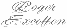 Mark Solsburg (d. 2024) was the head of the Type Directors Club and of Fairfield, CT-based
  Boston-based American type designer who joined
  Famous Italian typographer and graphic designer, b. 1931, Milan, d. 2014. Designer, with Tom Carnase, of WTC Our Bodoni (1989). In 1966, he set up Unimark International in New York City, which became the largest disign firm of its day. He left Unimark in 1971, to set up Vignelli Associates in New York City with his wife Lelli.
  Maxim Zhukov (b. Moscow, 1943) specializes in multilingual typography. He was a typographic coordinator for the United Nations in New York from 1977 until 2003. Solomon Telingater was one of his mentors. Early on, he designed some typefaces such as Meandr (1972). He taught at the Moscow Printing Institute in 1984-1985, and at the British School of Art and Design in Moscowand is affiliated with the Type Directors Club and ATypI. He now teaches at Parsons School of Design in New York. He also taught a course on advanced typography at The Cooper Union, also New York.
  Born in London in
  Modern Typography is a dot com web presence organized by the London-based type designer and graphic designer, Paul Barnes (b. 1970), typophile extraordinaire. It is promised to have plenty of material for the typophile. In the 1990s, Paul Barnes worked for Roger Black in New York where he was involved in redesigns of Newsweek, US and British Esquire and Foreign Affairs. During this time he art-directed Esquire Gentleman and U&lc. He later returned to America to be art director of the music magazine Spin. Since 1995 he has lived and worked in London. He has formed a long term collaboration with Peter Saville, which has resulted in such diverse work as identities for Givenchy and numerous music based projects, such as Gay Dad, New Order, Joy Division and Electronic. Barnes has also been an advisor and consultant on numerous publications, notably The Sunday Times Magazine, The Guardian and The Observer Newspapers, GQ, Wallpaper, Harper's Bazaar and Frieze. Following the redesign of The Guardian, as part of the team headed by Mark Porter, Barnes was awarded the Black Pencil from the D&AD. They were also nominated for the Design Museum Designer of the Year. In September 2006, with Schwartz he was named one of the 40 most influential designers under 40 in Wallpaper. He cofounded Commercial Type with Christian Schwartz. Author of Swiss Typography: The typography of Karl Gerstner and Rudolf Hostettler (Modern Typography, 2000).
  [
[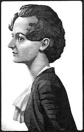 Paul Beaujon was the pen name of Beatrice L. Warde. Born in New York in 1900, she died in London in 1969. A typographer, writer, and art historian, she worked for the British Monotype Corporation for most of her life, and was known for her energy, enthusiasm and speeches. Collaborator of Stanley Morison. She created a typeface called Arrighi. She is famous for
  Flemish web log about the history and mechanics of type, run by Belgian graphic designer Peter Van Lancker (b. Ghent). There is a lot of information on the early printing and typefounding by
  This Slovenian researcher in languages and typography obtained her Ph.D. at the Department of Typography and Graphic Communication from the University of Reading, UK, in 2004 on the topic of the development of special characters in Slavonic languages. She won a typographic excellence award from the Type Directors Club of New York in 1999. In 2008 she won an invited tender for visual identity of Ljubljana---World Book Capital 2010, and was recipient of The most beautiful Slovene book award in 2011. She is the ATypI delegate for Slovenia and was a graphic designer and teacher in Ljubljana. In 2008 she started to teach at the
  Author of
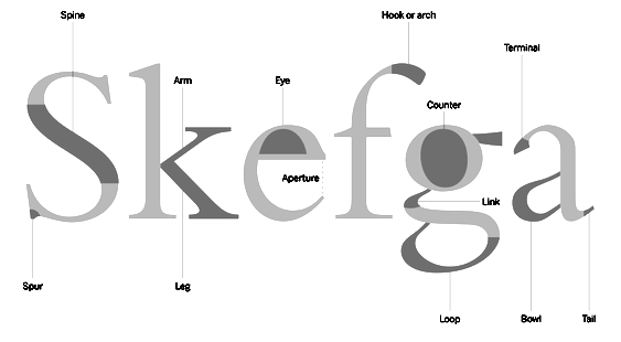 Aka
Aka 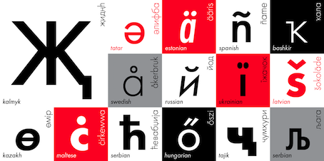 Vladimir Yefimov (b. Moscow, 1949, d. Moscow, 2012) was the art director and a co-founder of ParaType, Ltd., Moscow (since 1992; before that, starting in 1988, it was called ParaGraph, and he had been staff designer there since its inception). He lectured on type design at the Stroganov Higher School of Arts and Crafts, Moscow (1995-96) and the Higher Academical School of Graphic Design, Moscow (1997-98). He worked at the type department of NPO Polygraphmas (1973-1991). He is the designer of many Cyrillic typefaces, and several Indian, Greek, and Hebrew typefaces, and author on typography and type design.
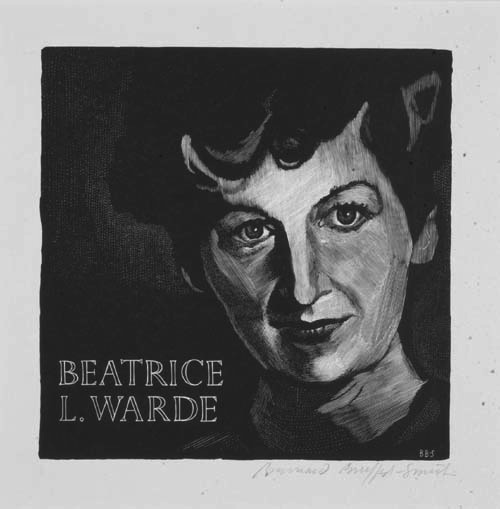
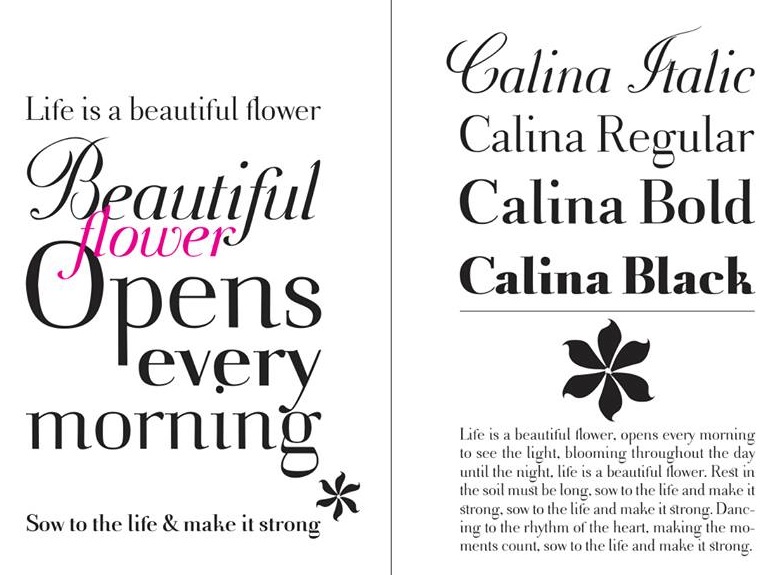
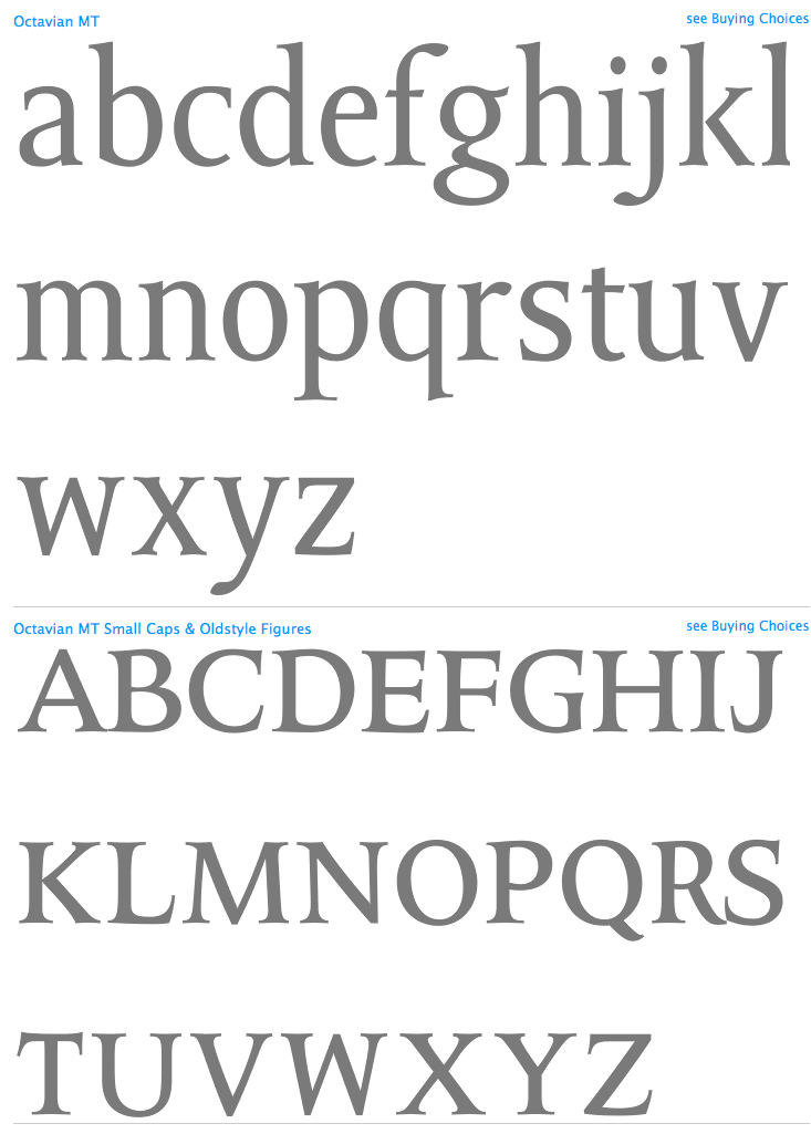
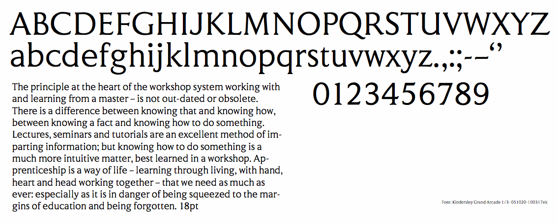
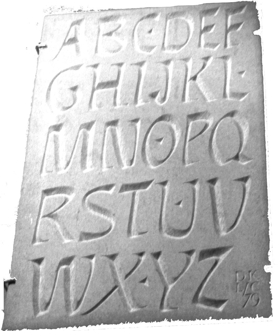
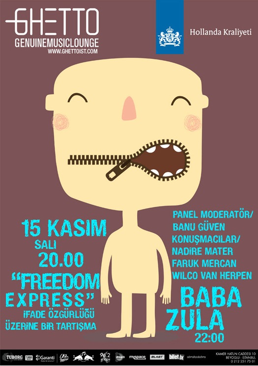
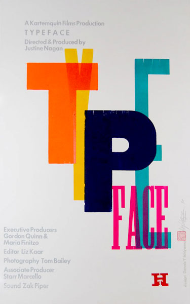
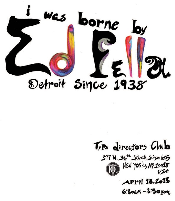
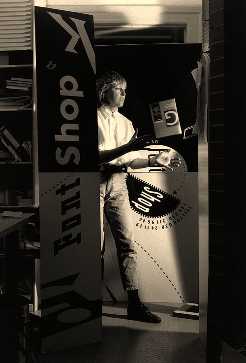
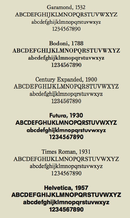
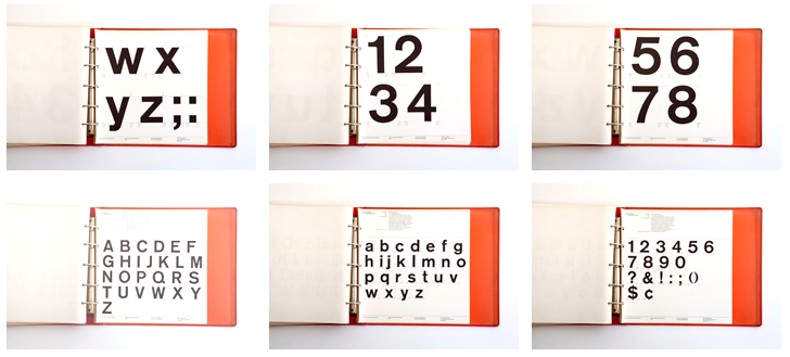
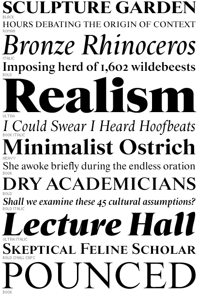
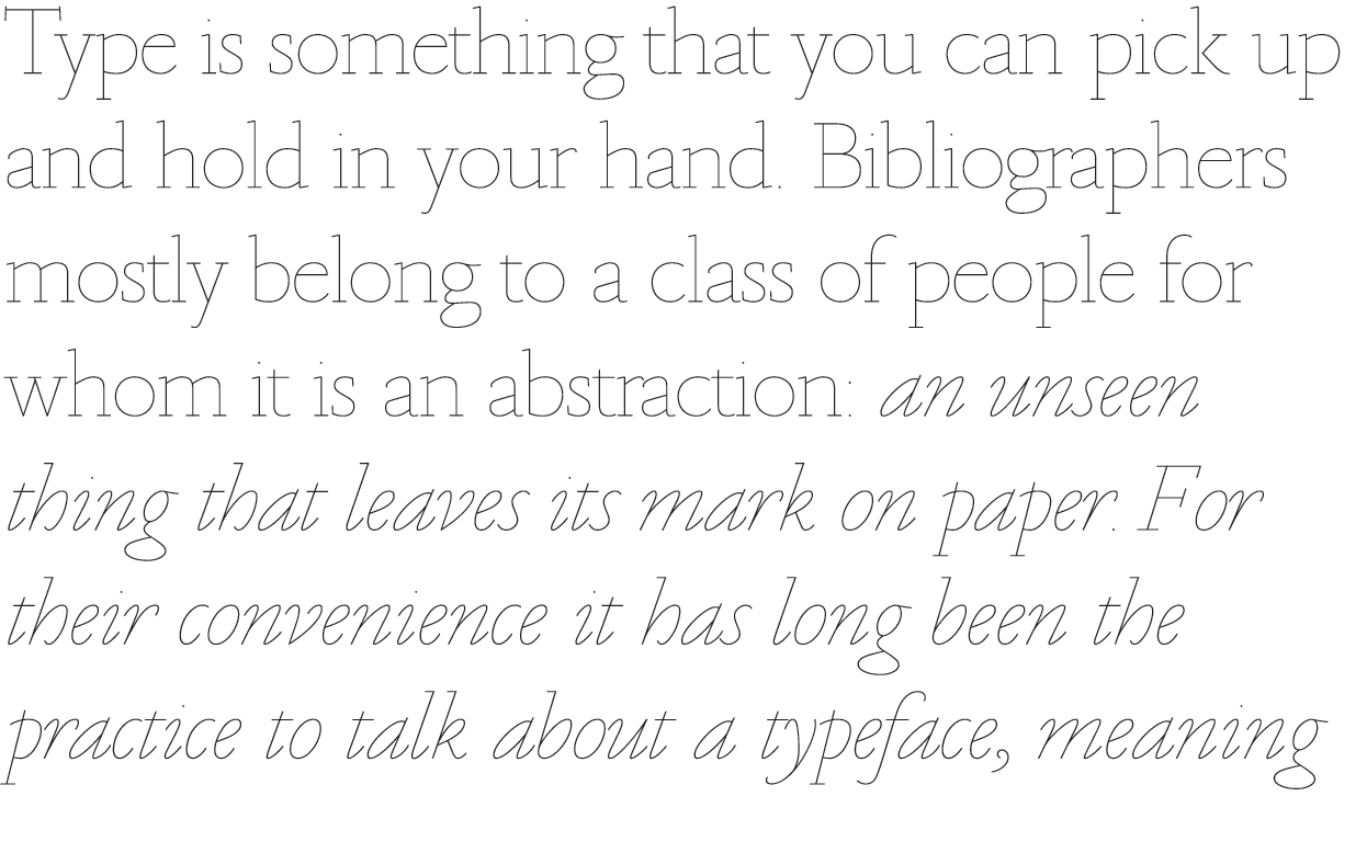
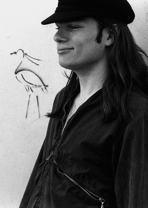
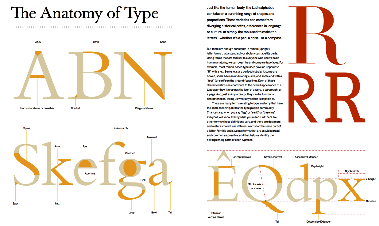
|
|
|
|