| | |
2D Typo
[Lukyan Turetskyy]

|
 Lviv-based Ukrainian designer (b. 1979) of the octagonal stencil typeface Depot Trapharet (2006, brutalist), and of the free car rallye dingbat typeface Rallye Symbols (2008). Dafont link.
 In 2010, he went commercial as 2D Typo. The first typeface at 2D typo was the modular pixelish Pressure Drop 2D (2010). This was followed by Ornamental Deco 2D (2010, art deco ornaments), Rally Symbols 2D (2010), Mascaron2D (2010, by Iryna Korchuk), Depot Trapharet 2d (2010, a stencil based on the tram lettering in Lviv), Ascetic 2D (2005-2010), Hutsulyandiya (2010, extraordinary ornaments by Iryna Korchuk), Simeon (2010, calligraphic), Cranked Pipe 2D (2011), Tripyllia 2D (2011, ornaments of the neolithic Trypillya culture), and Ukrainian Barokko (2010, a calligraphic typeface by Genadij Zarechnjuk), Historism Border (2011, border ornaments), Moreske 2D (2012, ornaments), Geomanticus (2012, modular squarish sans). Typefaces from 2013: Bandelwerk (borders), Digital Stitch, Modern Wave (ornaments based on Alphonse Mucha), Hopferian (Roman caps after engravings by Daniel Hopfer (1470-1536)---typeface completed with help of Mariya Sokil), Simple Ribbon (art nouveau dingbats). In 2014, he created Angusto (an elegant narrow shaded display typeface family), Vindemiam (ornamental borders), Squamish (ornamental borders), UA Map (maps of Ukraine dingbats) and Bohemian Border. In 2014, Dmitry Rastvortsev, Lukyan Turetsky, and Henadij Zarechnjuk cooperated on the design of the free Latin / Cyrillic handwriting typeface Kobzar KS, which is based on the handwriting of Taras Shnvchenko, a famous Ukrainian poet, artist and philosopher. Typefaces from 2015: Finetitle (ornaments for headers), Gothic Herbarium (a floriated ornamental font based on the Gothic Revival ornaments developed by Augustus Pugin (1812-1852)), Old Depot (rough stencil), Francesca (decorative caps). Typefaces from 2016: Geometric Harmony (geometric ornaments), Dubster (which he describes as a technocratic modular font). Typefaces from 2017: Military Symbols. Typefaces from 2018: Strapwork (four ornamental typefaces with friezes, borders and motifs modeled after Balthasar Bos (1554) and 16th century mannerism). Typefaces from 2020: Lo Fi Copy (grungy and pixelish). Typefaces from 2021: Kolm Keltek (classical ornaments), Microdot (a dot matrix font). [Google]
[MyFonts]
[More] ⦿
|
300 images from 1800 sites
|
This site compares icons for web pages, such as arrows and pointers. It is very useful for dingbat designers to get ideas. Run by Ro London. [Google]
[More] ⦿
|
A2 Type
[Henrik Kubel]
|
 A2-Type (or simply, A2) is a type foundry set up in the autumn of 2010 by the London based design studio A2/SW/HK. The designers are Henrik Kubel and Scott Williams. A2's bespoke type design is mainly the responsibility of Henrik Kubel, though every typeface is developed and approved by both partners. Kubel is self-taught, making his first typefaces while studying at Denmark's Design School from 1992 until 1997. Their typefaces:
 - 4590
- 60 Display.
- Amplify (2013) won an award at TDC 2014.
- Antwerp (2011). A readable text family designed by Kubel during an Expert Type Design Class in 2011 at Plantin Genootschap in Antwerp.
- A2 Archi (2005, Henrik Kubel): an octagonal face.
- A2 Aveny-T (2000, Henrik Kubel): Poster typeface commissioned as aprt of the identity of the Aveny-T theatre in Copenhagen.
- Agriculture.
- Archi.
- Banknote.
- A2 Battersea (1999, Henrik Kubel): inspired by Meta, DIN and Transport Alphabet. Followed in 2012 by Battersea Slab.
- Bauhouse.
- A2 Beckett (2008). A condensed sans family with the masculinity of Impact.
- Boing.
- Copenhagen
- A2 CPH Tram (2009, Henrik Kubel): revival of an odd mini-serifed type found on the exterior of Danish trams, ca. 1920.
- A2 CWM (2008, Henrik Kubel): constructivist type designed for the headlines and cover of Cold War Modern Design 1945-1970. Octagonal.
- Dane.
- A2 Danmark (2008, Henrik Kubel): a display stencil family.
- A2 Ergonomics (2011).
- Flavin Medium. A neon tube font.
- A2 Flowers (2005, Henrik Kubel): arrows, fists, flourishes, ornaments.
- A2 FM: slab serif family.
- Foundation (2018) in Sans (Number 44, Condensed, Wide), Serif, and Serif Didot subfamilies. These are all revivals of skeletal typefaces. Foundation Sans Number 44 was inspired by Circular Gothic No. 44 (1879, Charles E. Heyer, for the Great Western Type Foundry). Foundation Sans Condensed and Foundation Sans Wide are derived from two types described as Caractères pour Marques de Linge (typefaces for marking on linen) in the Signes section of the first volume of Spécimen Général des Fonderies Deberny et Peignot (ca. 1934). Foundation Serif is based on Caractère No. 7, another Caractère pour Marques de Linge in that 1934 Deberny & Peignot specimen book. Kubel's inspiration for Foundation Serif Didot was a sheet of lettering (dated 1939) he discovered in the archive of the influential Danish architect and graphic/industrial designer Gunnar Biilmann Petersen, 1897-1968.
- Grand. A stencil typeface.
- A2 Grot 10 (2009, Henrik Kubel): a take on the Grot Series by Stephenson Blake. Grot 12 followed in 2015.
- A2 Impacto (2005-2011, Henrik Kubel): Impact?
- A2 Klampenborg (1997, Henrik Kubel): industrial style sans.
- Kunstuff.
- London (2010).
- Magna.
- Maximum.
- A2 Mazarin (2017). A2 writes: Originally designed as a Garamond-inspired metal typeface by Robert Girard ca. 1921-1923, and published under the name Astrée by Deberny Peignot, the typeface was soon recut and renamed Mazarin by the English foundry Stephenson Blake in 1926. That single style original has now been expertly restored and reimagined as a contemporary typeface in multiple styles.
- Melissa Script (2010).
- A2 Monday (2003-2016, Henrik Kubel): based on 19th century English vernacular serif signage type.
- Moscow Sans (2014-2015). Award winning custom fonts and pictogram system for Moscow Metro. Art directed and designed by A2 (Scott Williams and Henrik Kubel) with Margaret Calvert as type and pictogram consultant. Cyrillic script designed in collaboration with Ilya Ruderman.
- Naive.
- New Grotesque Square series (2015). A newspaper typeface modeled after a Stephenson Blake typeface. Followed by New Grotesque Round in 2015-2016.
- New Rail Alphabet (2009). A refreshed and expanded version of Margaret Calvert's alphabet from the 1960s which saw nationwide use with British Rail, BAA, and the NHS. Developed in cooperation with Margaret Calvert.
- New Transport (with Margaret Calvert). A digital version of Transport, the Jock Kinnear and Margaret Calvert typeface for the British road signs. New Transport will be commercially released in September 2013.
- Register (2012-2017). A text typeface family inspired by French renaissance types.
- Regular (2012-2016). Think Futura in new clothes. Accompanied by Regular Slab.
- Sans, Slab and Serif typefaces for a redesign of The New York Times Magazine in 2015. The starting point for the Serif font is the Stephenson Blake Garamond-ish metal typeface Mazarin also known as Astrée from French foundry Deberny & Peignot. The slab fonts used for pull quotes and headlines are a continuation of the magazines existing Stymie font but in a condensed format. The sans fonts are linked to the industrial grotesque types, with metal type specimen versions of Futura and Akzidenz fonts as loose models for inspiration.
- Nosferato.
- Ole.
- Outsiders (+Outsiders Light and many other weights). A slab serif family.
- Parsons Green Medium.
- A2 Record Gothic (2019, Henrik Kubel), after Robert H. Middleton's American grotesk, Record Gothic (1027, Ludlow). Kubel writes: In celebration of Record Gothic's eclectic history, we designed four related but independent styles: Slab, Mono, Stencil and Outline.
- Square.
- Staton.
- Tagstyle.
- Test.
- Triumph.
- A2 Typewriter (2000, Henrik Kubel): based on Olivetti Typewriter 22.
- A2 Vogue Floral: a fashion mag modern display face in two styles.
- Vogue Paris. Granshan 09 Type Design Competition. 1st Prize, Display fonts.
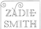
- A2 Zadie (2005, Henrik Kubel): inspired by Edwardian railings surrounding the Royal Army Military College in London. Used on the cover of the Zadie Smith bestseller On Beauty (2005, Penguin Press, NY). Granshan 10 Type Design Competition. 3rd Prize, Display fontt described as an ornamental blackboard bold type.
- In 2014, Scott Williams and Henrik Kubel (A2 Type) co-designed A23D, a 3d-printed letterpress font. It was fabricated by model making specialists Chalk Studios. The font is presented by New North Press, which specializes in traditional letterpress printing. Adrian Harrison made a short film about the birth of the font, charting its progress from preliminary sketches to first inking and printing at New North Press. A23D won an award in the TDC 2015 Type Design competition.
- English 1766 (2017). Kubel's take on Caslon.
- Regular (2017). A sans family inspired by Memphis, Karnak, Stymie and Futura.
- Schwiss (2018). Inspired by Akzidenz Grotesk and Helvetica.
Custom type by them include an alphabet for Qantas Airlines (2017), a masthead for Toronto Life (2010), a custom typeface for Banca Sella (2018), Qualcomm (2017), Arne Jacobsen (2018?), Evening Standard Newspaper (2018: 43 fonts), New York Times Magazine's Olympics issue (2018: a monowidth font for stacking), Eurosport Pyeongchang 2018, Weekendavisen (2007-2010), Design Museum London (2010), Faber&Faber (2009-2010), Afterall Publishing (2006-2010), Faulkner Browns Architects (2007), Penguin Press (2005), and Norrebro Bryghus (2005). At ATypI 2013 in Amsterdam, he spoke about New Transport. Winner of the type design prize at the Tokyo Type Directors Club TDC 2019, with Matt Willey, for the New York Times Magazine Olympic font. [Google]
[MyFonts]
[More] ⦿
|
Aah Yes
|
 Southampton, UK-based foundry, est. 2006. Font families include Regalese (2008, 8 weights with stylish rounded serifs), Arrow Heaven (2007, 6 styles of fonts with 62 arrows in 40 orientations each), Lydiard (2007, sans cum comic book), Demigrunge (2007), Nidex (2007, caps-only grunge), Rocksolid (2007), Perio (2007, a grungy didone), Havenbrook (2007, a 22-style family), Sudoku Blank (2007), Pikelet (2007, grunge headline face), Sanzettica (2007, a 40-style geometric sans family, but the x-weight is unacceptably large), Hunniwell (2007, felt tip style), Meriden (2007, display sans family), Saint Val (2007), Funkywarp (2006), Cheedo (2006, bi-lined), Old Forge (2006, roman style), Blank Manuscript (2006, music font), Disgrunged ABCD (2006), Disgrunged 1234 (2006), Beeble (2006), Choob Stripes (2006), Diffie (2006), Pixettish (2006), Caldicote (2006, a 13-style serif family), Starbell (2006), Tuzonie (2006, grunge), Cabragio (2006, free-flowing informal), Deltarbo (2006, sans), Write (2006, an almost architectural script), Dascari (2006, an informal headline sans), Smeethe (2006, comic strip face), Crockstomp (2006, grunge), Dorkihand (2006), Meltifex (2006, melting letters), Rappica (grunge), Blue Sugar (2007, grunge), Front Desk (2007), Powdermonkey (2007), Sideshadow (2007), Spiky (2007), Zebra Spots (2007), Amescote (2007, a 6-weight sans), Mivron (2007, outline sans), Puggu (2007, comic strip font), Luzaine (2007), Overlapper (2007), Satron (2007), Stubble (2008, grunge), Newsanse (2008, a 15-style large x-height disaster), Rysse (2008, an 11-style grunge family), Chelp (2008, grunge), Snather (2008: thin, rounded squarish), Keybies (2008, piano key font), Quickle (2008), Pevensey (2008: 21 styles, each with 1200 glyphs, transitional style), Spiraltwists (2008), Music Sheets (2009), Snazzy (2009), Shelflife (2012, a macho sans), Langton (2012, a workhorse sans family), Indipia (2012, a corroded family), Bradwell (2012, condensed sans), Dunsley (2013, a hand-drawn sans), Darnalls (2013, antiqued book face), Stamppad (like a rough rubber stamp pad), Heavenly Bodies, Stripated (2016), Slonk (2016: an ornamental font with a pearl in each outline), Guitar Chords (2016).
 Typefaces from 2017: Time Exactly (just type in the four numbers of any time from 0000 to 2359 and it will give you that clock face, in one of 60 styles of your choice), Rebista, Magg (a corroded condensed sans typeface family), Sanstone. Typefaces from 2018: Hypersans (12 weights), Martian Tiles, Dominoes (a domino tile font). Typefaces from 2020: Yafferbuddle (a cartoon font). View the Aah Yes typeface library. [Google]
[MyFonts]
[More] ⦿
|
Aeolien
[J. Fürst Gardiner]
|
 Creator at FontStruct of Aeolien (2011, alphadings), Gazebo Line Aeo (2012), Chateau d'Air (2013, castles), Like Fabergé (2013, oval), Fold Line (2013, a sewing font), Toothache (2013), Linoleum (2013), Sandor Basic Stripes (2013), Compass Norden (2013, a dot matrix font), Sambuccus (2013), Abneuroniques (2013, neurotic typeface), Zebra (2013, horizontally striped), Amazed (2013, maze font), Card Reading (2013), 3paths (2013), Raidho (2013), Floraeolien (2013, flower dings), the Art of Square series (2013), and Ostara Egg Box (2013, ornamental caps for Easter).
 Typefaces from 2014: Ceques (op-art), Indentional, The Tunnels of Tralyoxx, ClickPop Beads, Blue Moon, Nurdal's Walk (LED font), Dumultix (techno, in De Stijl fashion, based on Mondrian), Wever Ding, My Unintended, Haltero, Linuta, Murexa, Abfahrt, Arrivee Mercredi, Mabon (vintage slab serif, art nouveau), Treat or Trick, Aerix Stencil Serify, Noba M, Plaque Emaille (white-on-black), Gleiteri, Strega nona, Kubetus (artsy), Kubetuffo, Pixiel, Werner, Free Masonry, Airy Brickwork, Aerix Stencil Sans, Sim Card, Kerbe, Fool's Beans, Gift Tag (alphadings), Tag Letters, Varsity Outline UC. Typefaces from 2015: 3Fino, S-chablo Sans (stencil), August, Shifted (op-art), Arroed, Apprentice Quill, Spitze, Melusine. Aka Jutta Gi. FontStruct link. [Google]
[More] ⦿
|
Alan Carr
|
Partial list of Alan Carr's fonts, made principally between 1992 and 2004: AdLib, AdLibEx, AdLibTh, AdLibWd, Algeria, Animals, Anwik, Arcitectura, BeeBopp, BeeBoppWide, Blast, BlueCard, BusinessIndustrial, BusinessIndustrialDingbats, Busorama, Carolus, CarrAnimalDingbats, CarrArrowsfilled, CarrArrowsoutline, CarrAstroDings, CarrBalloons, CarrDingbats1, CarrDingbats2, CarrDings, CarrElecDingbats, CarrElectronicDingbats, CarrGovernment, CarrKeys, CarrSpace, CarrXmasDingbats, Carrick-Regular, CarrickCaps-Caps:001.001, CaslonAntique, CaslonAntiqueItalic, CaslonAntiqueLefty, CharlemagneBold, Choc, ChocWd, Coco, ComicBook2, Croissant, CroissantEx, CroissantLefty, CroissantWd, Desoto, Electrik-Italic, Electrik, ElectrikCn, ElectrikEx, ElectrikWd, Empire, Enviro, EnviroCapsLefty, ErasContour-Italic, ErasContour, ErasContourEx, ErasContourLeftyWide, ErasContourTh, ErasContourWd, Fletcher-Gothic (art nouveau face, made famous by the TV show Murder She Wrote), Fountainpen, Fragola, Frankfurt, FrankfurtCn, FrankfurtExtended, FrankfurtLefty, GlypicItalic, Graphik, GraphikShadow, Halt, Hobo, HoboLeftified, KabelBook, KabelLeftieBook, Keypunch, KeypunchLeftie, Leigh, Lithos, MathSymbol, MtypeCursive, NewYorker, NewYorkerEngraved, Omnibus, Paintbrush-Italic, Paintbrush, PaintbrushCn, PaintbrushLeftified, PaintbrushWd, PaperClip-Bold, PaperClip-Italic, PaperClip, PaperClipCn-Italic, PaperClipEx-Italic, PaperClipWd, PaperClipsBentToTheLeft, Quadrille, QuickSilver, Revere, Roller, Squire, States, Stop, Tatum, TestFrogRemix, UnitedStates, Uptight-Italic, Uptight, UptightCn, UptightEx, UptightLefti, UptightTh, XmasDings, YankeeEngravedNormal. Dafont link. Fontsy link. Fontspace link. Abstract Fonts link. [Google]
[More] ⦿
|
Alex Cottles
[The Routine Creative]
|
 [More] ⦿
|
Alexander Lange
|
 Karlsruhe-based software developer. Creator of the large (and free) Unicode font Quivira (2005). It covers mathematics, chess, astrological symbols, arrows, fists, Latin, Greek, Cyrillic, Hebrew, Armenian, Georgian, Tifinagh, Coptic, emoticons, Vai, and Braille, to name just a few ranges. Alexander graduated in computer science at the Hochschule Mannheim University of Applied Sciences (degree: Diplom-Informatiker (UAS)). [Google]
[More] ⦿
Karlsruhe-based software developer. Creator of the large (and free) Unicode font Quivira (2005). It covers mathematics, chess, astrological symbols, arrows, fists, Latin, Greek, Cyrillic, Hebrew, Armenian, Georgian, Tifinagh, Coptic, emoticons, Vai, and Braille, to name just a few ranges. Alexander graduated in computer science at the Hochschule Mannheim University of Applied Sciences (degree: Diplom-Informatiker (UAS)). [Google]
[More] ⦿
|
Alexander Sizenko
|
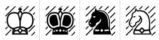 Russian creator of the free chess font Chess 7 (2008), the free pixel fonts LED Stadion 7 (2013), Dash Dot Square 7 (2013), Enhanced Dot Digital 7 (2013), Small Dot Digital 7 (2013), Modern Dot Digital 7 (2013), Square Dot Digital 7 (2013), Bold Dot Digital 7 (2013), Serif Dot Digital 7 (2013), Serif LED Board 7 (2013), Modern LED Board 7 (2013), Half Bold Pixel 7 (2013), Dash Pixel 7 (2013), Serif Pixel 7 (2013), Power Pixel 7 (2013), Enhanced LED Board 7 (2013), Thin Pixel 7 (2013), Smallest Pixel 7 (2013), Modern LCD 7 (2013), Advanced LED Board 7 (2012), Digital 7 (2008, LED face), Post Pixel 7 (2013), Triple Dot Digital 7 (2013), Dash Dot Square 7 (2013), Enhanced Dot Digital 7 (2013), Dash Digital 7 (2013), Light Pixel 7 (2013), High Pixel 7 (2013), Mini Pixel 7 (2012), Long Pixel 7 (2013), LED Counter 7 (2013), Digital Counter 7 (2013), LED Digital 7 (2013), LED Board 7 (2013), Light LED Board 7 (2013), Advanced LED Board 7 (2013), Printed Circuit Board 7 (2013), Brick LED 7 (2013), Rounded LED Board 7 (2013), Pixel Dingbats 7 (2013), Square Wood 7 (2013), Small Bold Pixel 7 (2013), Rounded Pixel 7 (2013), Line Pixel 7 (2013), Bold LED Board (2013), Narrow Rectangle 7 (2013), Dot Digital 7 (2013, +Advanced), Square Metal 7 (2012), Stencil Pixel 7, Computer Pixel 7 (2012), Small Pixel 7 (2012), LED Counter Plus 7 (2013), LED 7 Display (2012, +Light), Neon Pixel 7 (2012), Old Pixel 7 (2012), Square Stone 7 (2012), Square Pixel 7 (2012), Pixel Font 7 (2012, +Outline), Pixel LCD7 (2012), Advanced Pixel 7 (2012), Ice Pixel 7 (2012), Void Pixel 7 (2012), Dash Dot LCD 7 (2012), Dash Dot Square 7 (2013), Enhanced Dot Digital 7 (2013), Double Pixel 7 (2012), Advanced Pixel 7, Advanced Dot Digital 7 (2013), ZX Spectrum 7 (2012), Bubble Pixel 7, Cyrillic Pixel 7, Basic Square 7 (2013), Basic Sans Serif 7 (2013), Effective Way 7 (2013), Arrow 7 (2013), Abricos 7 (2013), Computer 7 (2013), Disco 7 (2013), Software Tester 7 (2013), Elegant Line 7 (2013), Soft Lines 7 (2013), Effective Way 7 (2013), and the free LED display font Digital-7 (2008).
 Typefaces from 2014: Game Font 7, Square Sans Serif 7, High Sans Serif 7, Smooth Line 7, Bright Line 7, Double Line 7, Rounded Line 7, Rounded Sans Serif 7, Android 7, Arial Narrow 7, Bold Sans Serif 7, Light Sans Serif 7 (avant-garde sans), Modern Sans Serif 7, Software Kit 7 (dingbats), Advanced Sans Serif 7m Strong Line 7. Typefaces from 2015: Steel Blade 7, Semi Rounded Sans Serif 7, Bold Game Font 7, Double Force 7, Roman Font VII, Game Sans Serif 7, Sans Serif Plus 7, Soft Sans Serif 7, Smooth Pixel 7, Clear Metal 7, Military Font 7 (stencil). Typefaces from 2019: Clear Line 7. Open Font Library link. Fontspace link. See also here. Aka Chess 7 and as Style 7. [Google]
[More] ⦿
|
Alexander Wise
|
Graphic designer, who has made Thin (2009, octagonal), Arrow (2009), Decade (2009), Fat (2009), Hiploe (2009), Player (2009, upright connected script), Mini (Bauhaus style), Winter (paperclip face), and Unic (experimental). Some typefaces can be bought. Old link at Die Gestalten. [Google]
[More] ⦿
|
Alexandra Schwarzwald
|
 Type designer who joined Neue as business partner in October 2020. She was born and raised in Berlin, Germany, and studied at HTW University of Applied Science. She worked at FontShop International as a font technician. Subsequently Alexandra supported Monotype's font marketing teams for brands such as FontShop, FontFont, Linotype, MyFonts and Fonts.com. In 2018 she became a full-time employee of the Monotype London Office holding the position of a Senior Graphic Designer.
 Designer of Neue UXUI Icons (2020, at Neue), a seven-style set of icon fonts. Each font in turn contains 1155 icons covering areas such as office equipment, social media, controls, layout, music, navigation and weather, in addition to about 200 arrows. She added the 6-icon set Neue OS Icons later in 2020. In 2021, she released Neue UXUI Icons Rounded. With Alexander Roth, she designed the soft versions of Roth's Neue Radial family in 2021: Neue Radial Soft A, Neue Radial Soft B (18 styles), Neue Radial Soft C, Neue Radial Soft D. [Google]
[MyFonts]
[More] ⦿
|
Amirul Ikram Ariffin
|
Bandar Seri Begawan, Brunei Darussalam-based designer of the free arrowed display typeface Montrilo (2014). [Google]
[More] ⦿
|
Andrew Buckle
[Graphicxtras]
|
[More] ⦿
|
Andrew Buckle
|
Maidstone, United Kingdom-based programmer. Designer of the experimental typefaces Circula Track (2016) and GX Stretched Lines (2016), and the free grungy handcrafted typeface GX Ruff Stuff (2016). Behance link. [Google]
[More] ⦿
|
Andrew West
[BabelStone]
|
[More] ⦿
|
Andy Cruz
[House Industries]
|
 [MyFonts]
[More] ⦿
[MyFonts]
[More] ⦿
|
Anna Galindo
|
Graphic designer in Colorado Springs, CO, who created the handcrafted Arrow typeface in 2016. Behance link. [Google]
[More] ⦿
|
Anna Maria Wozniak
|
Polish designer of the free arrow typeface 4rrows (2014). [Google]
[More] ⦿
|
Apropos Creations (or: CreatiFonts)
|
This outfit made the following truetype alphadings in 1994: ACBlock, ACOval, AC1Chanukah, AC1Christmas, AC1Easter, AC1EasterBunny, AC1EasterEgg, AC1HoliDings1, AC1HoliDings2, AC1Holly, AC1Menorah, AC2Balloons1, AC2Balloons2, AC2Banner1, AC2Banner2, AC2BannerEnds, AC3Butterfly, AC3DiamondRing, AC3Family, AC3Hearts1, AC3Hearts2, AC3ILoveYou, AC3LoveDings1, AC3MothersLove, AC3Roses, AC3WeddingBands, AC3Wildflower, AC4Arrows1, AC4Arrows2, AC4Congratulations, AC4CourtiDings1, AC2Birthday, AC2Clown, AC2Forks, AC2ItsABoy, AC2ItsAGirl, AC2PartyDings1, AC2TeddyBear, AC2YoureInvited, AC3Anniversay, AC3BeMine, AC4FireWorks, AC4GetWell, AC4GoodBye, AC4GoodLuck, AC4HotAirBalloon, AC4Pencils, AC4ShootingStar, AC4SmileyFace, AC4ThankYou, AC4Welcome. Nowadays, they sell 10USD font paks under the name CreatiFonts in 4 categories: Holiday, Party, Love, Courtesy. [Google]
[More] ⦿
|
Architaraz Type (or: Kassymkulov Design)
[Zhalgas Kassymkulov]
|
 Architaraz Type (Kassymkulov Design) is located in Shanghai, China, and Taraz, Kazakhstan. Its type designer, Zhalgas Kassymkulov, was born in 1986 in Kazakhstan. His initial type designs were all done with the help of FontStruct. In 2013, he went commercial as Architaraz Type.
 He made a gridded modular typeface called Targeted (2011). Sliced (2011) is a counterless stencil face. Discostructed (sic) (2011) is a texture face. Mono Dot (2011) is a thin dot matrix face. Mono Hor (2011) is a horizontally striped version of it, Mono Ver (2011) a vertically striped version, and Mono Bold (2011) a bold version. Promo (2011) is purely geometric. Semiz (2011) and Semiz Light (experimental) are partly art deco. Audio (2011) is based on the logo of audiojelly. Arro (2011) has letters with arrowed terminals. Hexa (2011) is hexagonal. Happi (2011) is a fat finger face. Semiz Black (2011) is a free fat pixel face. Creations from 2012: Pearls of Margar, Korgan, Phunni, Carbo, Carbo ii, Lenta, Phunni, Jambul, Extraterrestrial (sci-fi), Rap My Hip-Hop, Armada 1991 (monospaced), Venus (white on black), Garage Garbage (bold avant-garde design), WHAQ, Extra Fontestrial, Algae, A Tasbaqa, Salem (rounded bold typeface), Thaiana Jones, Salem (fat rounded face), Audio 2012, Balapan, Dalmat, Bonn (an art nouveau army stencil face), Mgla, Teris (white on black), Degoratix (curly), Barney Stencil (a fantastic brushy stencil), Lentalicious, Blackway Str, Schengbers (a great piano key stencil family), Tramcar Typo, Mgia, Brushure (a fat curvy display face), Extralien, Serrific Terif, Missinger, Tolkyn, Murt, Twisture, Soliture, Threedure, Antillic, Garage Garbage, Arro, Happi, Schengbergs Hi. Typefaces from 2013: AT Dombra (psychedelic typeface after Motter Ombra), AT Hoppy (fat letters), AT Liniya (blackboard bold), AT Karagai, Hed Kandi (techno face), AT Traffa Stencil, AT Schema, Naation, AT Nayman, AT Roughin, AT Rooktura Stencil, AT Duba, AT Archistency, AT Liena, AT Bombarda (fat stencil face), AT Sulfur ii, AT Mad Pilot, AT Tasbaqa, Vaia Con Dios, Betaport, Mooltyashka, AT Stincel (a lively stencil font), Millio, Tamshy, Offelia, Jalgas (retro script: a winner in the FontStruct Connected Script Competition), Laffa (connected stencil script), Dlinalys, Diagona, Kitara (psychedelic), Archtitalic, Bonn (bony stencil), Teka 1, Teka 2, Unknownim, Khara (ultra-heavy slab face), Shlab (slab serif), Unknownim (slab serif), Archtalic, Argyn, Linea Runde, Mechatraps (+Plain), Eliksir, Drilliant, Katamaran (art deco), Lagman, Neurojet (experimental), Jazzure (bullet hole display face), Diagon, Aroth, Pharaoh's Delight (piano key / art deco typeface), Cocomi, AT Burshak, AT Sulfur, AT Taspa, AT Affina. Commercial typefaces done in 2013: KD William, William Shakespears, AT Archistency (piano key stencil face) AT Bombarda (piano key stencil face), AT Audio, AT Argyn. Typefaces from 2014: AT Sudoku (each letter is actually a sudoku puzzle!), AT Tactica (tic tac toe voard), AT Sudoku+, AT Pixtensans, AT Ayna, AT Kerey, AT Giveaway, AT Lagman, AT Asotika, AT Tugan, AT Yertegi, AT Nudgera, AT Diagona, AT Golovkin (stencil typeface named after middleweight boxer Gennady GGG Golovkin), AT Arachis (stencil), AT Tugan (fat rounded sans), AT Baktera, AT Jumpa Jumpa (stencil), AT Nudgera, AT Digitta, AT Archaus, AT Ladya (ball terminal stencil), AT Yin Yang, At Keste, AT Yazyk (rounded stencil), AT Sulfurian (techno stencil), AT Fasten Your Seatbelts (diagonally cut stencil), AT Buckle Up (like AT Fasten Your Seatbelts), AT Droppix, AT Knitka (knitting font), AT Sagat, AT Wild Archid (african theme font), AT Steglo. Typefaces from 2015: ATAday, ATArchistruct, ATAttache, ATBogomol, ATCastleryRock, ATChaperon, ATKitay (oriental simulation), ATQuba, ATRaushan, ATRoyal, ATShlanga, ATSkos, ATTrassa, AT Giveaway 4, AT Sherit, AT Ribborn. Typefaces from 2016: ATArchaus2, ATArchistructOutline, ATDornach, ATDrogo, ATEnschede, ATExtrema, ATGiveawayNo5, ATGiveawayNo6, ATHadamard, ATTwelve, Windows Icon Font. Typefaces from 2017: ATBals, ATBevelour, ATEsrever, ATHitchook, ATImagiro, ATLauda, ATMigdalia, ATRozalla, ATUniversiade, ATYangster, ATZabor, ATThinnetry. Typefaces from 2018: KD Eight, KD Tramcar, KD Algae Brush, Forza Juve (inspired by Juventus FC's logo), KD Hachure (a multiline typeface family), KD Half Arc, KD Space Band, KD Hachure (+Inline, +Outline), KDAnniversary, Armiya (army stencil), KD Baba Yaga (multiline). Typefaces from 2019: KD Para, KD Pempo (a multiline art deco font). Typefaces from 2021: KD Ziberia (based on Antonio J. Morata's Ziberia typeface from 2011), KD Dekorat (a modular labyrinthine or Maya genre set of capital letters). FontM link. Behance link. FontStruct link. [Google]
[MyFonts]
[More] ⦿
|
Ari Rafaeli
[ARTypes]
|
 [MyFonts]
[More] ⦿
[MyFonts]
[More] ⦿
|
Arthur Baker
[Arthur Baker Designs (or: Glyph Systems)]
|
 [MyFonts]
[More] ⦿
[MyFonts]
[More] ⦿
|
Arthur Baker Designs (or: Glyph Systems)
[Arthur Baker]
|
 American calligrapher in Andover, MA, who worked for many foundries, and ran several studios. He ran Glyph Systems in Andover, MA, and before that, Alpha Omega and Maverick Designs. Baker grew up in Berkeley, CA, and attended school on the West Coast and New York City. After serving in the U.S. Army, he studied under calligrapher Oscar Ogg and had private lessons with George Salter and Tommy Thompson. Some of Baker's earliest designs were made available through Photo-Lettering Inc., and his first widely-available commercial typeface was published in 1965. Baker's first book was published in 1973. Arthur Baker died in 2016 at the age of 86. Tribute by Allan Haley. His typefaces were all calligraphic:
 - Amigo (Adobe), Amigo (Linotype). Designed by Arthur Baker in 1989 for Agfa Compugraphic, Amigo is based on spontaneous pen lettering and an exaggerated calligraphic look.
- Arrows (Arthur Baker). Made in 1995.
- Baker Signet (Monotype), Baker Signet (Bitstream), Baker Signet (Adobe), Baker Signet (Linotype). Originally designed as a photo type in 1965 for VGC, it was Baker's first commercial design. Baker Signet features in the word Coke on the Coca Cola bottles. Halley writes: Tall ascenders and angled weight transfer show a subtle foundation in late 15th century typefaces. Baker Signet can also be found at VGC as Baker Argentina No 1 (1976) and Baker Danmark One (1976). Baker Signet, in its display text weights, was at the basis of Sigvar (Softmaker).
- Calligraphica (Arthur Baker), Calligraphica (IHOF). Created in 1995.
- Cold Mountain (Arthur Baker). Designed in 1995.
- Collier Script (Arthur Baker). Designed in 1995.
- Daybreak (Arthur Baker). Designed in 1995.
- Duckweed (Arthur Baker), Duckweed Sans (Arthur Baker). Designed in 1995.
- Feathers (Arthur Baker), Fishface (Arthur Baker), Florettes (Arthur Baker), Flowery (Arthur Baker), Hands (Arthur Baker). Designed in 1995.
- Hiroshige Sans (Arthur Baker), Hiroshige (Adobe). Hiroshige was designed in 1986 by Cynthia Hollandsworth of AlphaOmega Typography, Inc. The typeface was originally commissioned for a book of woodblock prints by nineteenth-century Japanese artist Ando Hiroshige, whose work influenced many impressionist artists. Hiroshige Sans (Arthur Baker) followed in 1995.
- ITC Tiepolo (ITC), ITC Tiepolo (Adobe). Tiepolo was designed at AlphaOmega Typography for the International Typeface Corporation in 1987.
- Kigali (Arthur Baker), Kigali (Adobe). Designed by Arthur Baker in 1994 for URW, Kigali is a wide-bodied display type with bold, uneven pen-drawn strokes that taper dramatically downward. There also is a textured version called Kigali ZigZag.
- Marigold (Monotype), Marigold (Adobe). Marigold was first released by Agfa Compugraphic in 1989.
- Mercator (Arthur Baker), Mercator (IHOF). Designed in 1995. Based on the lettering of Flemish map maker Gerardus Mercator (1512-1594).
- The Maverick Designs Collection (1994): New Amigo (Arthur Baker), New Marigold (Arthur Baker), New Oxford (Arthur Baker), New Pelican (Arthur Baker), New Visigoth (Arthur Baker).
- Oakgraphic (Arthur Baker). Designed in 1995.
- Oxford (Adobe). Designed for Agfa Compugraphic in 1989. It is a robust and lively non-connecting script with several bi-form characters.
- P22 Matador (IHOF). P22 Matador (2007) is a contemporary Roman font based on the manuscript tradition (digitized by Michael Clark).
- Pelican (Linotype), Pelican (Adobe). Released by Agfa Compugraphic in 1989.
- Plumes (Arthur Baker). Designed in 1995.
- Sassafras (Arthur Baker), Sassafras (Adobe). Designed for URW in 1995, Sassafras is based on the natural inline effect created when writing with a split-metal nibbed pen.
- Swirls (1994), Swooshes (1994). Ornaments.
- Visigoth (Adobe), Visigoth (Linotype). Visigoth was created in 1988 by Arthur Baker for AlphaOmega Typography. He designed it specifically for setting the text of A Dante Bestiary published in 1989 for Ombondi Editions in New York.
Some explanations by Freddy Nader: The Baker Argentina and Danmark typefaces were variations on his Signet. Baker originally made Signet for Headliners International in the 1960s, where he worked full time. In 1972 he was approached by VGC and told that they would pay him royalties as well if he made the same typeface for them. Royalties were a relatively new thing back then - Tommy Thompson was the very first person to ever earn royalties in type (in 1944 for his Thompson Quill script for Photo Lettering Inc), and he wasn't a type designer per se, he was a calligrapher. Lured by the idea of royalties coming his way from two different directions for the same face, Baker did a Signet for VGC. When Bob Evans, owner of Headliners, found out, he threatened to sue VGC for trademark infringement (copyright for typefaces was unheard of at the time - every major photo type house had "similar" fonts, and whenever someone got exclusives made by outside designers under a royalty program, it was only a matter of weeks before they were knocked off and changed slightly by other type houses, big and small). So in order to avoid a trademark infringement lawsuit, VGC called their typeface Baker Signet, instead of just Signet, and went further by asking Arthur Baker to make a lighter version and a condensed version. The lighter version was called Baker Argentina, the condensed version was called Baker Danmark. The "Number One" prefix was added to both so that when the inevitable knockoffs happened, type buyers would know which type was made first. About Baker Sans, Freddy writes: The Baker Sans was a knockoff of Helvetica. It was a massive family of a lot of fonts, rendered very ugly by camera stretching and slanting. Eddie Bauer used it as their corporate typeface for a long time in order to avoid the expensive fees of licensing Helvetica. Tim Ryan ended up digitizing it for Arthur Baker in the mid 1990s for a lot of money. That digital version is now being sold by ITF under one of its many companies (either Arthur Baker Design, or Arthur Baker Designs, or maybe Maverick Designs). MyFonts link. Klingspor link. View Arthur Baker's typefaces. Linotype link. MyFonts page. Another MyFonts page. And still another MyFonts page. FontShop link. View Arthur Baker's typefaces. [Google]
[MyFonts]
[More] ⦿
|
ARTypes
[Ari Rafaeli]
|
 ARTypes is based in Chicago, and is run by Ari Rafaeli, earlier possibly known as Richard Everds. List of their typefaces categorized by revival type:
 - Hermann Eidenbenz: Graphique (1946) now called Graphique AR, a shadow face.
- Jan van Krimpen (Enschedé) revivals: Romulus Kapitalen (1931), Romulus Open (1936), Curwen Initials (Van Krimpen did these in 1925 for The Curwen Press at Plaistow, London), and Open Kapitalen (1928).
- Jacques-François Rosart: Rosart811, a decorative initial typeface that is a digital version of the 2-line great primer letters cut by J. F. Rosart for Izaak&Johannes Enschedé in 1759 (Enschedé no. 811).
- Stephenson Blake revivals: Borders, Parisian Ronde.
- Rudolf Koch (Klingspor) revivals: Holla, Koch-Antiqua-Kursiv Zierbuchstaben, Maximilian-Antiqua, Neuland 24pt.
- Bernard Naudin (Deberny&Peignot) revival: Le Champlevé.
- W. F. Kemper (Ludwig&Mayer) revival: Colonia. P.H. Raedisch: Lutetia Open (2007) is based on the 48-pt Lutetia capitals engraved by P. H. Raedisch under the direction of Jan van Krimpen for Enschedé in 1928.
- Richard Austin: Fry's Ornamented (2007) is a revival of Ornamented No. 2 which was cut by Richard Austin for Dr. Edmund Fry in 1796. Stephenson, Blake&Co. acquired the type in 1905, and in 1948 they issued fonts in 30-pt (the size of the original design), 36-, 48- and 60-pt.
- Max Caflisch (Bauer) revival: Columna.
- Elisabeth Friedlaender (Bauer) revivals: Elisabeth-Antiqua, Elisabeth-Kursiv (and swash letters). Linotype Friedlaender borders.
- Herbert Thannhaeuser (Typoart) revival: Erler-Versalien.
- O. Menhart (Grafotechna) revivals: Manuscript Grazhdanka (cyrillic), Figural, Figural Italic (and swash letters). Also, Grafotechna ornaments (maybe not by Menhart).
- Hiero Rhode (Johannes Wagner) revival: Hiero-Rhode-Antiqua (2007).
- F. H. E. Schneidler (Bauer) revival: Legende.
- Herbert Post revival: Post-Antiqua swash letters.
- Georg Trump (Weber) revivals: Trump swash letters, Trump-Gravur (called Gravur AR now). The outline caps typeface Forum I-AR is derived from the Forum I type designed by Georg Trump (1948, C. E. Weber). Signum AR-A and Signum AR-B (2011) are based on Trump's Signum (1955, C.E. Weber). Palomba AR (2011) is based on Trump's angular calligraphic typeface Palomba (1954-1955, C.E. Weber). Amati AR (2011) is based on a Georg Trump design from 1953.
- Hermann Zapf revival: Stempel astrological signs.
- F.H. Ernst Schneidler: Zentenar Initialen is based on the initials designed by Prof. F. H. E. Schneidler, ca. 1937, for his Zentenar-Fraktur types.
- Isaac Moore: Old Face Open (Fry's Shaded) is a decorative Baskerville which was probably cut by Isaac Moore for Fry ca. 1788. A revival was issued in eight sizes by Stephenson Blake in 1928.
- Border units and ornaments: Amsterdam Apollo borders, Gracia dashes, Primula ornaments, Bauer Bernhard Curves, Weiß-Schmuck, Curwen Press Flowers, Klingspor Cocktail-Schmuck, Nebiolo fregi di contorno, Attika borders, English (swelled) rules, Künstler-Linien, an-Schmuck, Primavera-Schmuck.
- Freie Initialen are derived from initials made for the Stempel Garamond series. The type was issued in 1928 in three sizes (36, 48, and 60 pt); the AR version follows the 60-pt design.
- Initiales Grecques, based on Firmin Didot's design, ca. 1800.
- Emil A. Neukomm revivals: Bravo AR (2007; originally 1945).
- Ernst Bentele revivals: Bentele-Unziale (2007).
- Joseph Gillé: Initiales ombrées (2007) is based on Gillé's original all caps typeface from 1828.
- Maria-Ballé-Initials (2007), after an original font from Bauersche Giesserei.
- Raffia Initials (1952, Henk Krijger): revived by ARTypes in 2008 as Raffia.
- Ornaments 1 AR (2010): from designs from 18th and 19th century typefounders that were ancestors of the Stephenson Blake foundry.
- Ornaments 2 AR (2010): Ornaments 2 contains designs for the Fanfare Press by Berthold Wolpe (1939) and for the Kynoch Press by Tirzah Garwood (ca. 1927).
- Ornaments 3 AR (2010): based on designs by Bernard Naudin for Deberny et Peignot, c. 1924; and ornaments based on designs by Oldrich Menhart, Karel Svolinsky and Jaroslav Slab for the state printing office of Czechoslovakia and Grafotechna.
- Ornaments 4 AR (2010): based on the Amsterdam Apollo and Gracia ornaments and the Amsterdam Crous-Vidal dashes (designed by Crous-Vidal).
- Ornaments 5 AR (2010): based on the Amsterdam Primula ornaments designed by Imre Reiner, 1949.
- Ornaments 6 AR (2010): based on designs for the Curwen Press by Edward Bawden and Percy Smith.
- Yü Bing-nan revival: Freundschafts-Antiqua AR (2010). Freundschafts-Antiqua (which was also called Chinesische Antiqua) was designed in 1962 by the Chinese calligrapher Yü Bing-nan when he was a student at the Hochschule für Grafik und Buchkunst at Leipzig in 1960.
- Sans Serif Inline (2011). Based on the 36-point design of the Amsterdam Nobel Inline capitals (1931).
- Hildegard Korger revivals: Typoskript AR (2010) is based on a metal type which was produced in 1968 by VEB Typoart, Dresden, from a design of the German calligrapher and lettering artist Hildegard Korger.
- Hans Kühne revival: Kuehne-Antiqua AR (2010) revives a Basque typeface by Hans Kühne.
- The Troyer AR ornaments (2010) are based on the first series of ornaments designed for American Type Founders by Johannes Troyer in 1953.
- The Happy Christmas font (2011) is a snowflake font that is based on designs by Amsterdam and Haas, c. 1950. December Ornaments (2011) contains the 36 Amsterdam designs which were originally issued in 24 and 36 point.
- Walter Diethelm: Diethelm AR (2011) revives Walter Diethelm's Diethelm Antiqua (1948-1951, Haas).
- Walter Brudi revivals: Pan AR (2010, based on a 1957 font by Brudi).
- Hermecito (2013) is a 46-style type system based on an angular serif. It covers Cyrillic, Latin, Greek and several other scripts. Besides being eminently readable, it also has extensive coverage of mathematical and phonetic symbols. Renzo (2013) is along the same lines but with sharpened serifs.
- Spiral (2014) is a revival of a typeface called Spiral designed by Joseph Blumenthal and cut bu Louis Hoell in 1930. In 1936, Monotype reissued that type as Emerson 320.
- Custom typefaces include Fabrizio (2016), a classical serif typeface family for Hebrew, Latin, Cyrillic and Greek, with hints of Garamond and Caslon. Ari writes that Fabrizio made its first appearance in Saggi di Letteratura Italiana: Da Dante per Pirandello a Orazio Costa, by Lucilla Bonavita, printed at Pisa in March 2016 by Fabrizio Serra Editore for whom the type was specially designed.
MyFonts link. View the typefaces made by Ari Rafaeli / ARTypes. [Google]
[MyFonts]
[More] ⦿
|
Austin Owens
|
 Snellville, Atlanta, GA-based designer (b. 1977) of the playful fonts Austie Bost Dreamboat (2015), Austie Bost There For You (2015), Austie Bost Envelopes Print (2014), Austie Bost Take A Chance (2014), Austie Bost Lifted Up (2014), Austie Bost Arrow Mania (2014, arrows), Austie Bost Envelopes (2014), Austie Bost Versailles (2014: thin curly script), Austie Bost Chunky Description (2014), Austie Bost Descriptions (2014), Austie Bost Wibbly (2014: a great curly poster typeface), Austie Bost Somersaults (2014), Austie Bost Cartwheels, Austie Bost Roman Holiday Sketch (2014), Austie Bost Matamata (2014), Austie Bost Serifina (2013, a curly script), Austie Bost Happy Holly (2013), Austie Bost Bumblebee (2013), Austie Bost Toy Chest (2013), Austie Bost All My Love (2013), Bost Chunkilicious (2013), Austie Bost in Wonderland (2013), Austie Bost You Wear Flowers (2013), Austie Bost Rest of Our Lives (2013, penmanship font), Austie Bost Simple Simon (2013, a curly face), Austie Bost Dust Into Diamonds (2013), Austie Bost Small World (2013), Austie Bost High Altitudes (2013), Austie Bost Marketplace (2013), Austie Bost Starlit Beach (2013), Austie Bost Cherry Cola (2013), Austie Bost Hooked on a Feeling (2013), Austie Bost in a Rush (2013), Austie Bost Blueberry Muffins (2013), Austie Bost Kitten Klub (2013), Austie Bost Mud Pies (2013, a connect-the-dots typeface), and Austie Bost Crazy Days (2012) and of the dingbat typeface Austie Bost Christmas Doodles (2012).
 Home page. Dafont link. [Google]
[More] ⦿
|
Ayi Studio
|
 Ayi Studio (Mexico City) published the constructivist typeface family Alek Rodchenko (by Miguel Angel Padrinan Alba and Victor Manuel Flores Lopez), Ayi Dingbats (arrows, emoji, geometric and symbols dingbat font set by Miguel Angel Padrinan Alba) and Fideo (ornaments, dividers and arrows, by Miguel Angel Padrinan Alba) in 2016.
 Typefaces from 2017: Pixa Circle, Pixa Square (pixel typeface family), Ayi Dingbats. Behance link. Home page. [Google]
[MyFonts]
[More] ⦿
|
BabelStone
[Andrew West]
|
 UK-based Andrew West's great intro page to the 'Phags-pa script, a Brahmic script based on Tibetan that was used for writing Mongolian, Chinese and other languages during the Mongolian Yuan dynasty (1271-1368). Although it is no longer used for Mongolian and Chinese, it is still used to a limited extent as a decorative script for writing Tibetan. Unlike other Brahmic scripts, 'Phags-pa was written vertically from left to right after the manner of the Uighur-derived Mongolian script. The script is named after its creator, the Tibetan lama known by the title 'Phags-pa Lama "Reverend Lama" (1239-1280). Font subpage with samples of BabelStone Phags-pa Book, BabelStone Phags-pa Tibetan A, BabelStone Phags-pa Tibetan B, BabelStone Phags-pa Seal. These fonts were made in 2006 by Andrew West. In 2007, he added the free Zhang Zhung Opentype fonts for Zhang Zhung scripts: sPungs-chen, sPung-chung and Bru-sha, sMar-chen and sMar-chung. The Zhang Zhung culture was an ancient culture that flourished in the western and northern parts of Tibet before the introduction of Buddhism into the country during the 7th century. The extinct Zhang Zhung language is a distinct language related to but separate from Old Tibetan.
 Andrew West's free font BabelStone Modern was designed between 2008 and 2013. This font has almost 2000 glyphs and covers, e.g., Latin, Cyrillic, Ogham, and Braille, and has hundreds of symbols, including a large set of arrows, mathematical symbls, domino tiles, and dingbats. BabelStone Han (2017) is a Unicode Han font in Song/Ming style with G-source glyphs used in Mainland China. The font is derived from Arphic's AR PL Mingti2L Big5 and AR PL SungtiL GB fonts, converted to Unicode mappings, and expanded to cover a wide range of traditional and simplified characters in the CJK, CJK-A, CJK-B, CJK-C, CJK-D, CJK-E, and CJK-F blocks, as well as a large number of currently unencoded characters in the Private Use Area. A few glyphs for non-CJK symbol characters are derived from images uploaded to Wikimedia Commons by Christopher J. Fynn. The number of glyphs is closeto 40,000. [Google]
[More] ⦿
|
Baobaby Studio
|
 Type foundry in Opoczno, Poland. Their type designs include the all caps poster typeface WILK (2012: This font was created specially for fairy tale of Little Red Riding Hood and it was inspired by the big bad wolf), STIFF (2012, a squarish typeface), Borba (2012, a minimalist monoline sans typeface), Borba Sans (2012, a rounded monoline sans family), Frykas Regular (2012, a minimalist monoline sans typeface), Pasek (2012, an octagonal paper-fold typeface based on two-sided paper), Vintage Wedding (2012, a set of 355 icons divided in three fonts, Table, Arrows, and Symbols, but there also other icons such as telephones, neckties, hearts, wedding gear, and so forth), and Retro Frames (2012).
 Typefaces from 2014: Bread and Confectionary, Dairy, Vegetables, Meat and Seafood, Fruits. Typefaces from 2017: Cacko (a slightly curvy sans family). Typefaces from 2018: Fajny, Fajowy. [Google]
[MyFonts]
[More] ⦿
|
Barbara Bigosinska
|
 Barbara Bigosinska received her master degree in Graphic Design at the Academy of Fine Arts in Katowice, Poland. In 2013, she graduated from the Type & Media program at the KABK in Den Haag. At KABK, Barbara Bigosinska designed the angular text typefaces Barbear and Sambukka in 2013. Since 2014, she runs her own studio in The Hague, offering type design and typography services to international clients.
 For her type revival project at KABK, she picked Lutetia (2013) and writes: Lutetia was designed as a commission from Enschedé by Jan van Krimpen. The drawings of the typeface were ready in the middle of 1924 and first cut and cast in 16 point size in the Enschedé Type Foundry. For the first time the typeface was used in the book dedicated to the exhibition that took place in Paris in 1925. Therefore the name Lutetia reffers to the Roman name of Paris. Her KABK graduation typeface family was Mala (2013). Loaded with opentype features and choices of widths, Mala was created for cartographic purposes. It was published by Bold Monday in 2016. In 2016 she published Abelard at Indian Type Foundry and wrote: Abelard is a modern (or neoclassical) family with 10 font styles. It is a contemporary take on classic types like Baskerville, Bulmer, and Scotch Roman that has been optimised for text embedding on eReaders. The design features elements ensuring even text color, including case-sensitive forms, prominent punctuation marks, ligatures, and four sets of figures. Each font also contains ornaments resembling pen nibs, bullet points, and arrows. In 2017, she published the didone fashion mag typeface family Rion and the text typeface Neco at Fontstore. Rion was republished in 2018 at Indian Type Foundry. Typefaces from 2018: Bonny (a decorative serif font family published by Indian Type Foundry; see also Bonny at Fontshare). In 2019, Noopur Choksi and Barbara Bigosinska published the sturdy wedge serif text typeface family Sapien at Indian Type Foundry. Still in 2019, Manushi Parikh and Barbara Bigosinska released the octagonal athletics font Fielder at Indian Type Foundry. Somehow this octagonal typeface seems to have been evolved into the 5-style free typeface Nippo at Fontshare. In 2021, Barbara Bigosinska released the 12-style didone family (+two variable fonts) Boska at Fontshare. Boska has quite extreme contrast and some calligraphic hooks in the c, f, k, r, s, x and z glyphs that make it perhaps less suitable for text but more in line with fashionable displays. Bevellier (2019-2021; by Arya Purohit and Barbara Bigosinska) is a 16-style (+variable) rounded condensed organic sans family. In 2021, Barbara Bigosinska, Rafa Buchner and Diana Ovezea set up Blast Foundry. At Blast Foundry, she designed the wonderfully expressive sharp-edged display typeface Sharf. Boska was published as a free font at Fontshare. Behance link. Bold Monday link. [Google]
[MyFonts]
[More] ⦿
|
Barta Karoly
|
 Hungarian creator of the bouncy black comic book typeface Model (2009). He also updated Maurizio Loreti's BrushScriptX and placed the updates here. His roman caps typeface Livio (2010) is based on S.G. Moye's Livia (1991). He also updated Thatcher Ulrich's Tuffy family in 2010, and made the handy Zapfian dingbat typeface DTP Dingbats (2008), which has fists and arrows, among other things. [Google]
[More] ⦿
Hungarian creator of the bouncy black comic book typeface Model (2009). He also updated Maurizio Loreti's BrushScriptX and placed the updates here. His roman caps typeface Livio (2010) is based on S.G. Moye's Livia (1991). He also updated Thatcher Ulrich's Tuffy family in 2010, and made the handy Zapfian dingbat typeface DTP Dingbats (2008), which has fists and arrows, among other things. [Google]
[More] ⦿
|
Becky Higgins
|
Designer at ScrapNFonts/Creating Keepsakes of CK Winter (handwriting), CK Whirl, CK Voluptuous, CK Typeset, CK Twigs, CK Twiggy, CK Tulips, CK Toddler, CK Teacher's Pet, CK Tall Type, CK Tall Trees, CK Sunshine, CK Summer, CK Strips, CK Stars&Stripes, CK Stitches, CK Stacks, CK Stars, CK Arrows, CK Artisan, CK Balloons, CK Bouquet, CK Checks, CK Chick, CK Child's Play, CK Choppy Block, CK Chunky Block, CK Circle Serif, CK Classic, CK Concave, CK Contemporary Capitals, CK Cracked, CK Crayons, CK Crooked Classic, CK Cute, CK Daydream, CK Delight, CK Designer, CK Eclectic, CK Fairytale, CK Fiesta, CK Flair, CK Flourish, CK Flower Garden, CK Flower Power, CK Fortune, CK Fraternity, CKFun, CK Funky Wave, CK Gala, CK Geometric, CK Happy Kids, CK Hearts, CK Higgins Handprint, CK Holly & Berries, CK Hopscotch, CK Italic, CK Jot, CK Keystroke, CK Lazy Days, CK Leafy Capitals, CK Letter Home, CK Logs, CK Marker, CK Nostalgia, CK Pencils, CK Plain Jane, CK Posies, CK Pretty, CK Primary, CK Pumpkin Patch, CK Quake, CK Quick, CK Quilt Squares, CK Rocket Ships, CK Roses, CK Signature, CK Simple, CK Sketch, CK Skinny Serif, CK Slice, CK Sloppy, CK Southwest, CK Spiky Block, CK Spiky Classic, CK Split Box, CK Sports Balls, CK Stacatto, CK Windsong, and CK Zig Zag. [Google]
[More] ⦿
|
Ben Grib
[Black Bird Foundry]
|
[More] ⦿
|
Bitstream Cyberbit
|
From Bitstream's web page: "Bitstream Cyberbit is our award-winning international font. Based on one of our most popular and readable type designs (Dutch 801 BT [note: Bitstream's version of Times and Times New Roman]), it includes all the typographic characters for most of the world's major languages. Cyberbit is now available! The product release includes the roman weight of Dutch 801 BT, a "serif" font. (A serif font has small finishing strokes at the end of the main stems, arms, and tails of characters, while a sanserif font does not.) The font is in TrueType format for Windows 95 and Windows NT. Future releases will provide support for "sanserif" typefaces, other platforms, other font formats, and even more languages. Bitstream Cyberbit is a work in progress. Bitstream is now distributing the roman weight of Cyberbit, free of charge, over the Internet! Remember, this release is in TrueType format for Windows 95 and Windows NT". --- Well, Bitstream no longer offers the font. It is still out there however. Try here, here, here, or here. Has these unicode ranges: Basic Latin, Latin-1 Supplement, Latin Extended-A, Latin Extended-B, Spacing Modifier Letters, Greek, Cyrillic, Hebrew Extended (A and B blocks combined), Thai, Latin Extended Additional, General Punctuation, Currency Symbols, Letterlike Symbols, Number Forms, Arrows, Mathematical Operators, Miscellaneous Technical, Box Drawing, Block Elements, Geometric Shapes, Miscellaneous Dingbats, Alphabetic Presentation Forms, Combining Diacritical Marks, Enclosed Alphanumerics, Arabic, Arabic Presentation Forms-A and -B, CJK (Chinese, Japanese, Korean) Symbols and Punctuation, Hiragana, Katakana, Bopomofo, Hangul Compatibility Jamo, Enclosed CJK Letters and Months, CJK Compatibility, Hangul, CJK Unified Ideographs, CJK Compatibility Ideographs, CJK Compatibility Forms, Small Form Variants, and Halfwidth and Fullwidth Forms. [Google]
[More] ⦿
|
BJU Press Pre-Cursive Fonts
|
Free truetype fonts with dots and/or arrows for helping kids write: PrecursiveNew, PrecursiveNewArrow, PrecursiveNewDashed (2000). Produced by "Handwriting for Christian Schools". See also here. [Google]
[More] ⦿
|
Black Bird Foundry
[Ben Grib]
|
 Ben Grib (Black Bird Foundry, and Black Bird Press, South Africa) created the Western signage typefaces Excelsior and Indiana Headline in 2015. He also made the handcrafted signage typeface Deputy Serif (2015). On Behance, we read that the foundry is associated with Chris Bushey in Bongoville, Gabon. Chris made the Victorian signage typeface Fancy Pants (or Foxtrot). They also made several great sets of icons and drawing including Animalia, Le Kitchen and Fruits. [Google]
[More] ⦿
Ben Grib (Black Bird Foundry, and Black Bird Press, South Africa) created the Western signage typefaces Excelsior and Indiana Headline in 2015. He also made the handcrafted signage typeface Deputy Serif (2015). On Behance, we read that the foundry is associated with Chris Bushey in Bongoville, Gabon. Chris made the Victorian signage typeface Fancy Pants (or Foxtrot). They also made several great sets of icons and drawing including Animalia, Le Kitchen and Fruits. [Google]
[More] ⦿
|
Blambot!
[Nate Piekos]
|
 Blambot Comics Fonts was founded in 1999 by graphic designer and illustrator, Nate Piekos, and is located in East Providence, RI. Blambot has a huge number of original free comics fonts and balloons by Nate Piekos (East Providence, RI, b. RI, 1975). Comic Lettering is an alternate URL, where you can also order logo designs, custom fonts, and custom lettering. Fontspace link. The fonts:
 - 2021: Collect Em Now BB (a comic strip font), Spinner Rack Pro BB.
- 2020: Out of Line Pro BB, Ready for More BB, Nightmark BB, Tight Spot BB, Budrick BB, Flannel Shirt BB (a sans family).
- 2019: Tire Swing BB, Ready For Anything BB.
- 2018: Invulnerable BB.
- 2017: Collect Em All BB, Spinner Rack BB.
- 2016: Friend Or Foe Tall BB, Friend Or Foe BB, Astrogator BB, Out Of Line BB.
- 2015: Susurrus BB (sans family), Inkcantation BB (slightly creep jhand-drawn serif font), Blambastic BB, Brushzerker BB.
- 2014: Hundredwatt BB, Piekos Toons BB, Beelzebnrush BB, Astounded Round BB, Astounder Squared BB, Sleuth Serif BB, Crypto Creep BB, Wretched Remains BB (brushy Halloween font), Mech Effects 1 BB, We Come in Peace BB, Manga Master BB.
- 2013: Unearthed BB (Celtic), Always Angry BB, Sequentialist BB, Might Makes Right BB, Fight To The Finish BB, Palooka BB, ManlyMen BB, Trash Cinema BB, Bulletproof BB, Ticking Timebomb BB (LED font), Potty Mouth BB (dingbats), Vengeful Gods BB (Greek simulation face), Blowhole BB (fat finger font family), Shrunken Head BB, Perihelion (+Condensed: elliptical sans).
- 2012: Dungeon Dweller BB, Mark of the Beast BB (Halloween font), Monsterific BB, Tough as nails BB, Longbow BB (a rough-edged blackletter), Gamma Rays BB, Inkslinger BB (a true comic book style family), Saucer BB (sketch font), Smells Like Tacos BB, Mutant Academy BB, Destroy Earth BB, Mandroid BB, Fundead BB, Stupid Head BB, Spellbreaker BB, Elevations BB (2012, a blueprint typeface), Revenger BB (angular family).
- 2011: Silver Bullet BB (a fat hand-drawn blackletter face), Shallow Grave BB, Imaginary Friend BB, Highjinks BB, ShallowGrave BB, Quahog BB (angular, calligraphic), Mumble Grumble BB, Action Figure BB, Piekos FX Rough BB, ChainsawzBB, Heavy Mettle, Billy The Flying Robot BB, Longbox BB.
- 2010: Ninjutsu BB, Protest Paint BB, Rock Steady BB, Ladylike BB, Protest Paint BB (grunge), Tone Deaf BB, Clown Teeth BB, Irish Stout BB (beer label face), Sans Sanity BB, Straight To Hell, Unmasked, Piekos FX BB, Hometown Hero BB, Piekos Professional; BB, Big Bad Bold BB, Crash Landing, HoneyMead BB, Secret Origins (2010).
- 2009: Dragonbones BB, MeanStreets BB, Two Fisted BB, RedStateBlueState BB, Scream Queen, Fresh Meat BB, Gone Fission BB, Black Hole, Life Form, Crimewave BB, Firepower BB, Artists Alley BB, Stronghold BB, Village Idiot, Raging Red Lotus (2009, oriental simulation), Dwarven Axe BB, Silver Age BB, Flyboy BB (2009, techno), Giant Sized Spectacular BB (2009).
- 2008: Snake Oil Salesman (old typewriter face), Earthman and Earthman Extended (a nice 12-style retro sans family), Clairvoyant BB, KrakHead BB [one of my favorites], Blambot FXPro BB, Sangre BB, Dearly Departed BB, Boogers, Bada Boom BB, Old Crone BB (2008, bewitched style).
- 2007: Fire Fight BB, After Dark BB, Post Mortem BB, Fold and Staple BB (with Brandon J. Carr), Dunce Cap BB, DeathRattle BB, Potty Mouth BB, Dominatrix BB (grunge), Shore Leave BB (based on sailor tattoos), Cloudsplitter BB, Drawing Board (inspired by Tekton), Warhorse BB, Warmonger BB.
- 2006: Duty Calls BB, Hellfire BB, AveAveBB, Indie Star, Blamblam BB, Braaains BB (dingbats), Musashi BB, Atland Sketches, Double Life BB, SkinDeep BB, SkinDeep Swashes BB, Newsflash.
- 2005: KeelhauledBBBold, KeelhauledBB, MainframeBBBold, MainframeBB, Alter Ego BB, Entrails, Mastermind BB, Zooom BB, Whitechapel BB (handwriting), Sucker Punch, Crimefighter, 10c Soviet, CyranoBB, Praetorium, Spectre Verde, Hired Goons, Afterlife BB (2005, tall ascendered face), Seven Monkey Fury (oriental simulation face), Spectre Verde, FeedbackBB.
- 2004: Atland, Creative Block, Midnightsnack BB, Bloody Murder BB, Seven Swordsmen, Webletterer, Rackum Frackum, Oh Crud, CatholicSchoolGirlsBB, Antihero, Dark Arts, Bearded Lady BB, BottleRocket, Streetcred, Lowrider, Extra pickles (2004).
- 2003: Square Jaw BB, Shinobi, Bar Brawl, Holy Mackerel (2003, Craterface BB, Zombie Guts, Knuckle Sandwich, Workingman, Fat Stack BB, Santa's Big Secret, ArrMatey, Tokyo Robot, JackLanternBB, Perils of Piekos, Turntablz, Wicked Queen (2003, free), Golden Oldie, Badaboom, OhCrap, Whoop Ass, Damn Noisy Kids, Paperboy, Armor Piercing, Radioactive Granny, Sidekick International, Digital Strip, Mighty Zeo, Arcanum, Zud Juice, Ale&Wenches, Bar Brrawl, Bar Brawl BB, Armored Science BB, Blamdude, Shinobi, Man of Science, Sidekick BB (2003).
- 2002 and earlier: AndroidNation, Blambot-Custom, Blambot-Standard, Captain-Spandex, Casket-Breath, Concetta, Dupuy-Bold, Edible-Pet-II, Edible-Pet, Edible-PetInternational, Enchilada, Evil-Genius, Flat-Earth-Scribe, Gunhead-Chick, Lovecraft's-Diary, Mouth Breather, Mighty-Tomato, MonkeyChunks, Monkeyboy, Mummy-Loves-You, Mutant-Supermodel, Nate's-Choice, PiranhaSexual, Red-Right-Hand, Roboshemp, Space-Pontiff, Squeezy-Cheez, Urinetoast, Voodoo-Doll, YellaBelly, Zartz!, TwelveTonFishstick, TwelveTonSushi, A.C.M.E.-Explosive!-Bold, A.C.M.E.-Explosive!, GrungeUpdate, Mothership, Twelve-Ton-Goldfish, Whoop-Ass, WickedQueen BB, Winter-in-Gotham, 13 O Clock, ACMEInternational, ChroniclesofaHero, ChroniclesofaHeroBold, FanboyHardcore, KidKosmic, LetterOMatic, MangaTemple, GorillaMilkshake, Caeldera, Belizarius, Bottix, ChatteryTeeth, OrangeFizz, OrangeFizzItalic, Pythia, SpiritMedium. Direct access.
- Commercial fonts: Knuckle Sandwich, Utility Belt, Tentacle Jones, Rocketboy, Seargent Six-Pack, Secret Identity, Edible Pet 3, Piekostype, LintMcCree Mysteries, Doc Seismic, Mike Allred's AAA, AAARGH, Allred's Aliens Invade, Asteroids for Lunch, Action Away, Allred's Amazing Stupendous, ArmorPiercing, Mars Police, Irezumi, Holy Macxkerel, Hudson VC, CreepingEvil, BlambotPro (great), Creeping Evil, Rooftop Run, AAA Redmeat, Eurocomic, Comic Geek, Jack Armstrong (nice), Rivenshield (useful), Howard Bros (nice), Mighty Zeo, Cajun Boogie, Betty Noir, Sand Diego '02, Wrecking Ball, Miskatonic, Roswell Wreckage, WizardSpeak, Glass Jam, BucketOBlood, Three Arrows, Damn Noisy Kids, Humbucker, Oh Crap, Caveman, Blambot Casual, 10CentComics, BettyNoir, BigBlokeBB, BlamDudeBB, BlamDudeBBItalic, CajunBoogie, DetectivesInc, Irezumi, IrezumiItalic, SpiritMedium, VanHelsing.
Over 1000 free fonts here: 10CentSoviet, 10CentSovietBold, ACMEExplosive, ACMEExplosiveBold, ACMESecretAgent, ACMESecretAgentBold, ACMESecretAgentItalic, AleandWenchesBB, AleandWenchesBBBold, AndroidNation, AndroidNationBold, AndroidNationItalic, AnimeAce, AnimeAceBold, AnimeAceItalic, Arcanum, ArcanumBold, ArcanumItalic, ArmorPiercing, ArmorPiercing20BB, ArmorPiercing20BBItalic, ArmorPiercingItalic, ArrrMateyBB, BadaBoomBB, BattleLines, BettyNoir, BigBlokeBB, BlamDudeBB, BlamDudeBBItalic, BlambotCustom, Bottix, BottleRocketBB, BottleRocketBBBold, Caeldera, CajunBoogie, CatholicSchoolGirlsBB, ChroniclesofaHero, ChroniclesofaHeroBold, CreativeBlockBB, CreativeBlockBBBold, CrimeFighterBB, CrimeFighterBBBold, DamnNoisyKids, DarkArtsBB, DetectivesInc, DigitalStrip, DigitalStripBold, DigitalStripItalic, DwarfSpiritsBB, EvilGeniusBB-Bold, EvilGeniusBB, FanboyHardcore, FanboyHardcoreBold, FanboyHardcoreItalic, FatStackBB, FeastofFleshBB, FeastofFleshBBItalic, FeedbackBB, FeedbackBBItalic, FlyboyBB, GorillaMilkshake, GorillaMilkshakeItalic, Irezumi, IrezumiItalic, JackLanternBB, KeelhauledBB, KeelhauledBBBold, KidKosmic, KidKosmicBold, KidKosmicItalic, LetterOMatic, LetterOMaticBold, LetterOMaticItalic, MainframeBB, MainframeBBBold, MangaTemple, MangaTempleBold, MangaTempleItalic, MarsPolice, MarsPoliceItalic, MightyZeo20, MightyZeo20Bold, MightyZeo20Italic, MightyZeoCaps20, MightyZeoCaps20Bold, MightyZeoCaps20Italic, Miskatonic, MouthBreatherBB, MouthBreatherBBBold, NewsflashBB, OhCrap, OhCrudBB, OrangeFizz, OrangeFizzItalic, PraetoriumBB, PsiphoonBB, Pythia, RagingRedLotusBB-Italic, RagingRedLotusBB, RoswellWreckage, SanitariumBB, SantasBigSecretBB, SergeantSixPack, SevenMonkeyFuryBB, SevenSwordsmenBB, ShockTherapyBB-Italic, ShockTherapyBB, SpectreVerdeBB, SpectreVerdeBBBold, SpiritMedium, SwingSetBB, TurntablzBB, TurntablzBBBold, TwelveTonFishstick, TwelveTonSushi, Umberto, Vampiress, VillageIdiotBB, WarmongerBB, WebLettererBB, WebLettererBBBold, WhoopAss, WickedQueenBB, WizardSpeak, WizardSpeakWorn, Yoshitoshi, YoshitoshiBold, YoshitoshiItalic, ZudJuice, ZudJuiceBold, ZudJuiceItalic. Dafont link. Klingspor link. Fontspace link. View the Blambot typeface liubrary. [Google]
[MyFonts]
[More] ⦿
|
BluGraphic (or: Graphic Pear)
[Wassim Awadallah]
|
 BluGraphic (Wassim Awadallah, Beirut, Lebanon; but also claimed to be in Bern, Switzerland) specializes in free vector format graphics and typefaces. These include the modular sans typeface family Form (2014), and a collection of vector format icons (2013), weather symbols (2013) and arrows (2014). In 2017, he designed the tall sans typeface Giraffey, Viana Script, Valencia, Quenos (didone caps), Soigné (italic fashion mag typeface), Rhama Gothic (blackletter), Florence Script, Alvania, Prink Script, Virtuous Slab, Less Sans, Amigo Script and Holland Script. In 2018, he designed Strain and Tempo (a free modular typeface).
 Typefaces from 2019: Lemon&Fresh, Germany (script), Cremona (a free fashion sans), Designer (sans). Behance link. BluGraphic link. [Google]
[More] ⦿
|
Blythe Smethurst
|
Freelance photographer and designer in Brisbane, Australia, who created the arrowed display typeface Scout in 2013. Behance link. [Google]
[More] ⦿
|
Borges Lettering (was: CBdO Fonts Foundry)
[Charles Borges de Oliveira]
|
 The CBdO Fonts Foundry is headed by Charles Borges de Oliveira (b. New Orleans, 1971) and is located in Arlington, WA. Borges's typefaces are mostly scripts, signage typefaces and comic book style typefaces. many of them were first done at or are copublished with Letterhead Fonts.
 He also sells through Font Bros and Letterhead. Klingspor link. View the typeface library of Charles Borges. Fontspring link. Interview in 2013. View Charles Borges's typefaces. Adobe link. [Google]
[MyFonts]
[More] ⦿
|
Brock Bearden
|
Creator of the rough counterless hand-printed Hello Brock (2009). Wild Arrows (2009, Fontcapture) is experimental. [Google]
[More] ⦿
|
Bureau 205 (was: Trafik)
[Damien Gautier]
|
 Damien Gautier (b. 1971) studied typography in the Atelier de création typographique at l'Ecole Estienne, Paris. He co-founded Trafik, a type studio in Lyon. More recently, his fonts are distributed via 205 Corp and 205 TF, which he founded. He also teaches graphic design at Ecole Nationale Supérieure des beaux-arts de Lyon. He runs the publishing house Editions deux-cent-cinq which publishes books on graphic design and typography.
 At Typotek, he designed LeQuincaillerie (fifties font, 2000), LeMenuiserie (2000), LeConfiserie (2000, an electronic panel font), LeConfiserie Couleur, L'ekran Dix (a pixel font), LeBoucherie-Ornament (2000), LeBeaune (1995-2011, a flared roman lettering typeface created at first for the town of Beaune in Burgundy), Alcala (1994). For Salomon (the ski company brand font), Damien Gautier received a Trophée d'Or nomination at the Integraphic Congress in Paris in 2003. MyFonts, where his foundry is called Trafik, and then Damien Gautier, then "205", Editions 205, and finally Bureau 205, sells these typefaces: Colonel (stencil), Laikran (pixel family), Le Bazar, Le Beaune, Le Chaufferie, Le Confiserie, Le Confiserie Couleur, Le Gendarmerie, Le Menuiserie, Le Quincaillerie, Pam (2005, counterless), Plaak (2013-2014, a large sans caps family inspired by French street name signs; co-designed with Olivier Raimbaud and Corentin Noyer), Robin (2010, a dingbat typeface with arrows, co-designed with Delphine Sigonney). In 2010, Gautier created Caporal (an elegant clean stencil face), Le Francois (a set of stylish capitals). In 2009, Damien Gautier designed Bloo (a wedge-serifed typeface). Salomon is a corporate typeface family. Typefaces of Damien Gautier and Quentin Margat in 2010: Amiral (cargo stencil), Alcala (started in 1994, finished in 2010, this text family is based on renaissance forms and was used to print a Bible). With Quentin Margat, he created some typefaces in 2011 such as Maax (an information design sans family), Norr (styles include a didone, a slab serif, and two sanses), Colonel, and Beretta (dot matrix family). In 2013, Damien Gautier designed Maax Mono and Maax Rounded, both at Editions 205. In 2019, he published Plaax as an extension of Plaak. Subfamilies include Sathonay (super-condensed), Griffo, Pradel, Terme, Foch and Ney, from super-condensed to wide. In 2021, Damien Gautier published the experimental sans typeface Heliuum in which letters can have different baseline heights. Klingspor link. View Damien Gautier's typefaces. Interview by Type Today. [Google]
[MyFonts]
[More] ⦿
|
Cadson Demak
|
 Thai foundry in Bangkok (ex Cadson Demak pi), est. 2002. It originally published picture fonts designed by several designers including Anuthin Wongsunkakon, Supisa Wattanasansanee, and Pitipa Silapipat.
 These included Pok Pong (2008, crazy animals---a great typeface), Planto (2008, plants), PawPack (2007, animals), POBox (2002), Gun Smith (2007, guns), Sun Burst (2007, kaleidoscopic), Arronts (2008, arrows), Cake Walk (2008, food dings), PalPack (2008), RetroTraveler (2008), Speak-Up (2008, text ropes), Road Show (2007, road sign outlines). Fonts sold through T26 and MyFonts. Home page. In 2009, Latin fonts were added, such as Option Sans (Anuthin Wongsunkakon: a reworking of his Coupe), Carbon Plus (Anuthin Wongsunkakon: a reworking of his Carbon of 2003 at T26), and Bangkokean (Anuthin Wongsunkakon) and Knight Sans (by Ekaluck Peanpanawate). Cadson Demak himself designed Bangkokean (2009, serif family), Carbon Plus (2009, rounded octagonal), Gun Smith (gun dingbats), Symbloc (dingbats), and Sun Burst (caleidoscope style dingbats) at T-26. In 2008, he created Robo (T-26, robot dingbats). In 2009 he made Bolder (a shadow face). Due (2011) is a clean humanist sans family. New Son Gothic No1 through No 7 (2012) is a widely spaced gothic sans family. In 2015, Cadson Demak published the free Thai / Latin loopless Thai and Latin sans typeface family Kanit (2015, Google Fonts), the free sans family Dizhitl, the free Thai / Latin didone display typeface Chonburi (Google Fonts link; Github link), the free Thai / Latin typeface Sriracha (deverloped with Pablo Inpallari), and the free informal Latin / Thai script typeface Itim (Google Fonts link. Github link). Typefaces from 2016 include Trirong (Google fonts), Taviraj (Google Fonts), Google Font Athiti (Thai and Latin: Github link), the Google Font Maitree, the sans typeface Mitr (Google Fonts), Prompt (Google Fonts), Pridi (Google Fonts, and the Google Font Pattaya (a Thai extension of pablo Impallari's Lobster: Github link). Typefaces from 2018: Texpi Sans (Latin only), Srisakdi, Niramit, Mali (handcrafted), Krub (sans), KoHo (sans), Kodchasan (monoline rounded sans), K2D, Fahkwang (Peignotian, inspired by old Thai newspapers), Charmonman (inspired by Zapfino), Chakra Petch (octagonal), Bai Jamjuree. Github link. [Google]
[MyFonts]
[More] ⦿
|
Carol Brooksbank
|
Carol Brooksbank offers the dingbat fonts "Stars, Splats&Arrows", Bricks, and Barnyard. Dafont link. Another URL. [Google]
[More] ⦿
|
Carolina Giovagnoli
|
 Born in Rosario, Argentina, in 1976, she studied type design at UBA in Buenos Aires from 2009 until 2010, and co-founded the type coop Huerta Tipográfica. Carolina is currently based in Berlin.
 Her graduation typeface at FADU-UBA, Andada, was awarded at the Second Bienal Iberoamericana of Design (BID 10) and at Tipos Latinos 2012. Andada is a warm text typeface designed specially for Argentinian and Paraguayan (Guarani) text. Andada is free at Google Fonts and Open Font Library. It was commercially released at Huerta Tipografica in 2020 as Andada ht Pro. In 2021, Google Fonts published Andada Pro. With Andrés Torresi, she developed Cambo (2011, Huerta Tipográfica), a family for Latin and Khmer [a free weight at Fontsquirrel]. Robots ht, which uses layering to construct robots, won an award at Tipos Latinos 2014. There is a useful accompanying font called Robots HT Arrows. Winner at Tipos Latinos 2018 of a type design award for Robots HT. In 2014, Huerta Tipografica published the free text typeface family Caladea which was designed by Carolina Giovagnoli and Andrés Torresi. Caladea is based on Lato and is metric-compatible with Microsoft's Cambria. In 2015, Andrés Torresi and Carolina Giovagnoli developed the Devanagari typeface family Sarali at Huerta Tipografica (free at Google Web Fonts). The Latin part is based on Torresi's Telex (2012). Sura (2015, Google Web Fonts) is a Devanagari typeface family designed by Carolina Giovagnoli. It is based on the original Latin typeface Andada, a serif typeface for text. Winner at Tipos Latinos 2018 of a type design award for Laura HT. In 2020, she designed the stone cut typeface Das ABC der Scheren. In 2021, she released Weg, an experimental font based on interweaved lines. [Google]
[MyFonts]
[More] ⦿
|
Charles Borges de Oliveira
[Borges Lettering (was: CBdO Fonts Foundry)]
|
 [MyFonts]
[More] ⦿
[MyFonts]
[More] ⦿
|
Christian Schwartz
|
 Christian Schwartz was born in 1977 in East Washington, NH, and grew up in a small town in New Hampshire. He attended Carnegie Mellon University in Pittsburgh, Pennsylvania, where he graduated in 1999 with a degree in Communication Design. After graduation, he spent three months as the in-house type designer at MetaDesign Berlin, under the supervision of Erik Spiekermann. In January 2000, he joined Font Bureau. Near the end of 2000, he founded Orange Italic with Chicago-based designer Dino Sanchez, and left Font Bureau in August 2001 to concentrate full-time on developing this company. Orange Italic published the first issue of their online magazine at the end of 2001 and released their first set of typefaces in the beginning of 2002. Presently, he is an independent type designer in New York City, and has operated foundries like Christian Schwartz Design and Commercial Type (the latter since 2009). He has designed commercial fonts for Emigre, FontShop, House Industries and Font Bureau as well as proprietary designs for corporations and publications. In 2005, Orange Italic joined the type coop Village.
 His presentations. At ATypI 2004 in Prague, he spoke about "The accidental text face". At ATypI 2006 in Lisbon, he and Paul Barnes explained the development of a 200-style font family for the Guardian which includes Guardian Egyptian and Guardian Sans. FontShop's page on his work. Bio at Emigre. At ATypI 2007 in Brighton, he was awarded the Prix Charles Peignot. Jan Middendorp's interview in October 2007. Speaker at ATypI 2009 in Mexico City, where he announced his new type foundry, simply called Commercial. FontShop link. Font selection at MyFonts. A partial list of his creations: - FF Bau (2001-2004): Art direction by Erik Spiekermann. Released by FontShop International. He says: Bau is based on Grotesk, a typeface released by the Schelter&Giesecke type foundry in Leipzig, Germany at the end of the 19th century and used prominently by the designers at the Bauhaus. Each weight was drawn separately, to give the family the irregularity of the original, and the Super is new.
- Neutraface (2002, House Industries) and Neutraface Condensed (2004). Art directed by Ken Barber and Andy Cruz. MyFonts offers Neutraface Slab Text, Neutraface Slab Display, Neutraface Display and Neutraface Text. Schwartz states: Neutraface was an ambitious project to design the most typographically complete geometric sans serif family ever. We didn't have many actual samples of the lettering that the Neutras used on their buildings, so it ended up taking a lot of interpretation. There was no reference for the lowercase, so it's drawn from scratch, looking at Futura, Nobel, and Tempo for reference. Stephen Coles reports: Reminiscent of the recent FB Relay and HTF Gotham, Neutraface is an exaggerated Nobel with nods to Bauhaus and architectural lettering. Yes, and maybe Futura? Maggie Winters, Ioana Dumitrescu, Nico Köckritz, Nico Kockritz and Michelle Regna made great Neutraface posters.
- Neutraface No. 2 (2007), discussed by Stephen Coles: By simply raising Neutrafaces low waist, most of that quaintness is removed in No. 2, moving the whole family (which is completely mixable) toward more versatile, workhorse territory. This release is surely Houses response to seeing so many examples of Neutraface standardized by its users. Also new is an inline version. Who doesn't love inline type? It so vividly recalls WPA posters and other pre-war hand lettering. There are other heavy, inlined sans serifs like Phosphate, but one with a full family of weights and text cuts to back it up is very appealing. A typophile states: Designed by Christian Schwartz for House Industries, Neutraface captures the 1950s stylings of architect Richard Neutra in a beautiful typeface meant for application on the screen, in print, and in metalwork. If you are ever in need of a classy retro face, they don't get any more polished than this.
- At House Industries, Christian Schwartz, Mitja Miklavcic and Ben Kiel co-developed Yorklyn Stencil.
- Farnham (2004, Font Bureau) and Farnham Headline (2006, Schwartzco). Commissioned by Esterson Associates and de Luxe Associates. Winner of an award at TDC2 2004. Based on work by Johannes Fleischman, a German punchcutter who worked for the Enschedé Foundry in Haarlem in the mid-to-late 1700s. Schwartz: Truly part of the transistion from oldstyle (i.e. Garamond) to modern (i.e. Bodoni) Fleischman's romans are remarkable for their energy and "sparkle" on the page, as he took advantage of better tools and harder steel to push the limits of how thin strokes could get. In the 1800s, Fleischman's work fell into obscurity as tastes changed, but interest was renewed in the 1990s as digital revivals were designed by Matthew Carter, the Hoefler Type Foundry, and the Dutch Type Library, each focusing on a different aspect of the source material. I think the DTL version is the most faithful to the source, leaving the bumps and quirks inherent to metal type untouched. I've taken the opposite approach, using the source material as a starting point and trying to design a very contemporary text typeface that uses the basic structure and character of Fleischman without duplicating features that I found outdated, distracting, or unttatractive (i.e., the extra "spikes" on the capital E and F, or the form of the y).
- FF Unit (2003-2004, Fontshop, designed with Erik Spiekermann). A clean and blocky evolution of FF Meta intended as a corporate typeface for the Deutsche Bahn (but subsequently not used).
- Amplitude (2001-2003, Font Bureau), Amplitude Classified and Amplitude Headline. A newspaper-style ink-trapped sans family, unfortunately given the same name as a 2001 font by Aenigma. Winner of an award at TDC2 2004. The typeface selected by the St Louis Post Dispatch in 2005. One of many agates (type for small text) successfully developed by him. This page explains that they've dumped Dutch 811 and Bodoni and Helvetica and Franklin Gothic and News Gothic (whew!) for various weights of Amplitude, Poynter Old Style Display and Poynter Old Style Text. AmplitudeAubi was designed in 2002-2003 by Schwartz and Font Bureau for the German mag AutoBild.
- Simian (2001, House Industries): SimianDisplay-Chimpanzee, SimianDisplay-Gorilla, SimianDisplay-Orangutan, SimianText-Chimpanzee, SimianText-Gorilla, SimianText-Orangutan. Designed at Font Bureau. Art Direction by Ken Barber and Andy Cruz. Schwartz: "Although Simian's roots are in Ed Benguiat's logos for the Planet of the Apes movies, Simian wound up veering off in its own direction. The display styles look very techno, and we really went nuts with the ligatures, since this was one of House's first Opentype releases."
- Publico (2007): A predecessor of Guradian Egyptian. Schwartz writes: During the two year process of designing the typeface that would eventually become Guardian Egyptian, Paul Barnes and I ended up discarding many ideas along the way. Some of them were decent, just not right for the Guardian, including a serif family first called Stockholm, then renamed Hacienda after the legendary club in the Guardian's original home city of Manchester. Everyone involved liked the family well enough, but it didn't fit the paper as the design evolved, and several rounds of reworking left us more and more unsure of what it was supposed to look like. In the summer of 2006, Mark Porter and Esterson Associates were hired to redesign Publico, a major Portuguese daily newspaper, for an early 2007 launch. He asked us to take another look at Hacienda, to see if we might be able to untangle our many rounds of changes, figure out what it was supposed to look like in the first place, and finish it in a very short amount of time. Spending some time away from the typeface did our eyes a world of good. When we looked at it again, it was obvious that it really needed its "sparkle" played up, so we increased the sharpness of the serifs, to play against softer ball terminals, and kept the contrast high as the weight increased, ending up with an elegant and serious family with some humor at its extreme weights. As a Spanish name is not suitable for a typeface for a Portuguese newspaper, Hacienda was renamed once more, finally ending up as Publico. Production and design assistance by Kai Bernau. Commissioned by Mark Porter and Esterson Associates for Publico
- Austin (2003): Designed by Paul Barnes at Schwartzco. Commissioned by Sheila Jack at Harper's&Queen.
- Giorgio (2007): Commissioned by Chris Martinez at T, the New York Times Sunday style magazine. Small size versions produced with Kris Sowersby. Not available for relicensing. A high contrast condensed "modern" display typeface related to Imre Reiner's Corvinus. Ben Kiel raves: Giorgio, like the fashion models that it shares space with in T, the New York Times fashion magazine, is brutal in its demands. It is a shockingly beautiful typeface, one so arresting that I stopped turning the page when I first saw it a Sunday morning about a year ago. [...] Giorgio exudes pure sex and competes with the photographs beside it. The designers at T were clearly unafraid of what it demands from the typographer and, over the past year, kept on finding ways to push Giorgio to its limit. Extremely well drawn in its details, full of tension between contrast and grace, it is a typeface that demands to be given space, to be used with wit and courage, and for the typographer to be unafraid in making it the page.
- Empire State Building (2007): An art deco titling typeface designed with Paul Barnes for Laura Varacchi at Two Twelve Associates. Icons designed by Kevin Dresser at Dresser Johnson. Exclusive to the Empire State Building.
- Guardian (2004-2005): Commissioned by Mark Porter at The Guardian. Designed with Paul Barnes. Not available for relicensing until 2008. Based on an Egyptian, this 200-style family consists of Guardian Egyptian (the main text face), Guardian Sans, Guardian Text Egyptian, Guardian Text Sans and Guardian Agate.
- Houston (2003): Commissioned by Roger Black at Danilo Black, Inc., for the Houston Chronicle. Schwartz: As far as I know, this typeface is the first Venetian Oldstyle ever drawn for newspaper text, and only Roger Black could come up with such a brilliant and bizarre idea. The basic structures are based on British Monotype's Italian Old Style, which was based on William Morris's Golden Type. The italic (particularly the alternate italic used in feature sections) also borrows from Nebiolo Jenson Oldstyle, and there is a hint of ATF Jenson Oldstyle in places as well.
- Popular (2004): Commissioned by Robb Rice at Danilo Black, Inc., for Popular Mechanics. An Egyptian on testosterone.
- Stag (2005): Commissioned by David Curcurito and Darhil Crooks at Esquire. Yet another very masculine slab serif family. Schwartz writes I showed them a range of slab serifs produced by French and German foundries around 1900-1940, and synthesized elements from several of them (notably Beton, Peignot's Egyptienne Noir, Georg Trump's Schadow, and Scarab) into a new typeface with a very large x-height, extremely short ascenders and descenders, and tight spacing. Also, we find Stag Sans (2007, Village) and Stag Dot (2008, Village).
- Plinc Hanover (2009, House Industries). A digitization of a blackletter font by Photo Lettering Inc.
- Fritz (1997, Font Bureau). Schwartz: "Fritz is based on various pieces of handlettering done in the early 20th century by Ozwald Cooper, a type designer and lettering artist best known for the ubiquitous Cooper Black. Galapagos Type foundry's Maiandra and Robusto are based on the same pieces of lettering."
- Latino-Rumba, Latino-Samba (2000, House Industries). Art Direction by Andy Cruz. Designed with Ken Barber. Jazzy letters based on an earlier design of Schwartz, called Atlas (1993).
- Pennsylvania (2000, FontBureau). A monospaed family inspired by Pennsylvanian license plates. Schwartz: "Thai type designer Anuthin Wongsunkakon's Keystone State (1999, T26) is based on the exact same source."
- Plinc Swiss Interlock (by Christian Schwartz and Adam Cruz for House Industries). Based on originals by PhotoLetteringInc.
- Luxury (2002, Orange Italic, co-designed with Dino Sanchez). Gold, Platinum and Diamond are the names of the 1930s headline typefaces made (jokingly) for use with luxury items. The six-weight Luxury family at House Industries in 2006, contains three serif text weights called Luxury Text, as well as three display typefaces, called Platinum (art deco), Gold, and Diamond (all caps with triangular serifs).
- Los Feliz (2002, Emigre). Based on handlettered signs found in LA.
- Unfinished typefaces: Masthead, Reform, Bitmaps, Bilbao, Boyband, Addison, Elektro, Sandbox, Vendôme, Bailey.
- Fonts drawn in high school: Flywheel (1992, FontHaus), Atlas (1993, FontHaus, a "a fairly faithful revival of Potomac Latin, designed in the late 1950s for PhotoLettering, Inc"), Elroy (1993, FontHaus), ElroyExtrasOrnaments, Hairspray (1993, "a revival of Steinweiss Scrawl, designed in the mid-1950s by Alex Steinweiss, best known for his handlettered record covers": HairsprayBlonde, HairsprayBrunette, HairsprayPix, HairsprayRedhead), Twist (1994, Precision Type and Agfa), Zombie (1995, Precision Type and Agfa), Morticia (1995, Agfa/Monotype), Gladys (1996, an unreleased revival of ATF's turn-of-the-century Master Script).
- Ant&Bee&Art Fonts (1994-1995): three dingbat fonts, Baby Boom, C'est la vie, and Raining Cats&Dogs, based on drawings by Christian's aunt, Jill Weber. Released by FontHaus.
- Digitizations done between 1993-1995: Dolmen (Letraset), Latino Elongated (Letraset), Regatta Condensed (Letraset), Fashion Compressed (Letraset), Jack Regular (Jack Tom), Tempto Openface (Tintin Timen).
- Hand-tuned bitmap fonts: Syssy, Zimmer's Egyptian, Elizzzabeth, Newt Gothic, Trags X, Tibia, Fibula, Tino, Digest Cyrillic (based on Tal Leming's Digest). Free downloads of the pixel typefaces Newt Gothic, Tibula and Fibia here.
- At Village and Orange Italic, one can get Local Gothic (2005), now in OpenType, a crazy mix of Helvetica Bold, Futura Extra Bold, Franklin Gothic Condensed and Alternate Gothic No. 2. It is a collection of alternates one can cycle through---thus a for of randomization.
- FF Oxide (2005), a Bank Gothic style stencil family. FF Oxide Light is free!
- Graphik (2008), a sans between geometric and grotesk made for thew Wallpaper mag. Kris sSwersby writes: In a sweltering typographic climate that favours organic look-at-me typefaces bursting with a thousand OpenType tricks, Graphik is a refreshing splash of cool rationality. Its serious, pared-back forms reference classic sans serifs but remain thoroughly modern and never get frigid. Any designer worth their salt needs to turn away from the screen&pick up the latest copy of Wallpaper magazine. There you will find one of the most beautiful, restrained sans serifs designed in a very long time. See also Graphik Wide (2018).
- In 2011, he created a 22-style revival of Helvetica called Neue Haas Grotesk (Linotype), which offers alternates such as a straigt-legged R and a differently-seriffed a. It is based on the original drawings of Miedinger in 1957.
Schwartz also made numerous custom fonts: [Google]
[MyFonts]
[More] ⦿
|
Cleversomeday
[Kay Hall]
|
Designer (b. 1995) of the free arrow dingbat font Arrow Crafter (2015). Dafont link. [Google]
[More] ⦿
|
CorelDraw dingbats
|
The CorelDraw dingbats can be found in many places. The fonts: Animals-1, Animals-2, Arrows1, Arrows2, Awards, Balloons, Borders1, Borders2, Buildings, Bullets1, Bullets2, Bullets3, Bullets-4(Japanese), Bullets-5(Korean), Business&Government, Borders1, Borders2, Boxes, Charting, Clocks, CommonBullets, Computers, Chinese-Generic1, Electronics, Festive, Food, Furniture, GeographicSymbolsNormal, Household, Hygiene, HomePlanning, HomePlanning2, Japanese-Generic1, Kidnap, Korean-Generic1, Landmarks, LandscapePlanning, Medicine, Military, MilitaryID, MorseCode, Music, MusicalSymbolsNormal, NauticalFlags, OfficePlanning, People, Plants, Science, Semaphore, Signs, Space, SportsFigures, Sports&Hobbies, Stars1, Stars2, SymbolProportionalBT-Regular, Shapes1. [Google]
[More] ⦿
|
Corporate Signature Fonts
|
Arrow (Bold, Medium) is a free corporate type family at PPG Industries in Pittsburgh. [Google]
[More] ⦿
|
Cosmorama (or: Laser Printing Solutions)
[Kenneth Hirst]
|
Esoteric fonts and special symbols by Kenneth Hirst. Includes shareware and full version ($$) fonts such as Astro (1993), Alchemy, American Indian (2001, dingbats), Arabic, Flowchart, SpecialPi, Sequoyah (for Cherokee), CircleBullets, ArrowBullets, GD Enochian (2011, Enochian and Astrology symbols based on the Golden Dawn system), Siddiqua (Arabic: Laser Printing Solutions. P.O. Box 5362, Irvine, CA 92616), Starfisher Uni (2014, an astrological & sans font originally designed by Laser Printing Solutions). Some of his fonts. Fontspace link. Another Fontspace link. Open Font Library link. [Google]
[More] ⦿
|
Crafty Little Nodes
[Justina Tracy]
|
Aka Crafty Little Noodles. American designer Justina Tracy (Vincennes, b. 1990) designed these scrapbook and crafter fonts in 2017: Overcoat, Oodles (dingbats), Nurse Stethoscope Alphabet, Super Hero, Arrows, Christmas Time, Holly Jolly (Christmas dingbats), Humorism (handcrafted), Flower Kit (dingbats). Typefaces from 2018: Carrot Cake, Monogram Handlettered Caps, Rain On, Gallon Sour, Lovable & Ornaments, Explore, Hungry Monkey, Rounds, Teacher Monogram, Baseball Monogram, Oink Owl. She also designed the handcrafted typefaces Bamf, Arrows, Baseball Monogram, Carrot Cake, Flower Kit, Lovable, Mardugo, Mint Cakes, Monkey Boy, Monogram, Naktu, Oodles, Overcoat, Seeing Double, SuperHero, Ariana Leanne, Binge Watch, Cranberry Pinecone, Gallon Sour, Oink Owl, Pearl, Plantelope, Rain On, Sideshow, Holiday Colors, CLN Yellow Tea, CLN Matcha Tea, CLN Honey Bush, CLN Chamomile, CLN Box Dingbat, Foamy Dessert Print (2019) and Foamy Dessert (2019). Typefaces from 2020: Another, Aries, Before Forever, Christmas, Christmas Dudes, Chunky Sweater, Ellen & James, Fall Font Bundle, Flourish Bits, Fontastic Bundle, Graders, Hello Homelands, Honorary, Leathery, Light Twist, Master Plan, Melon Farmer, Monday Thoughts, Mounds of Donuts, Outlined, Shelter, Split Fancy Monogram Trio, Spooky Dudes, Ten Really Fun Cut Friendly Fonts, Unicorns, Whatchathink, Willow Hill. Typefaces from 2021 include Sunday Monday, Christian Markus, Aries (a constellation font), Michaela, Willow Hill (inline), Hello Classy (a scrapbook font), Kitchen, and Nursing. All images removed by request. [Google]
[More] ⦿
|
Creative Folks
|
Designer of the arrowed hipster typeface Boho Spirit (2017) and the heavy brush typeface Cheeky (2017). [Google]
[More] ⦿
|
cuneiform
|
FontStructor who made the dingbat typeface UpDownArrows (2010). [Google]
[More] ⦿
|
CybaPeeCreations (or: Typoasis)
[Petra Heidorn]
|
 CybaPee is the nom de plume of Petra Heidorn who lives near Hamburg. She has created many typefaces (listed below) between 1997 and 2005 and has cooperated with several type designers on interesting projects. She is undoubtedly best known for her successful web site Typoasis (discontinued in 2016), where one could download her own creations, and those of her many friends. Petra was also heavily involved in several attempts to revive blackletter fonts, in cooperation with Manfred Klein, Dieter Steffmann, Paul Lloyd and others. She organized several revivals of the typefaces of Rudolf Koch and Ernst Schneidler. She also managed the extensive web presence of Manfred Klein.
 In 2016, she allowed me to host her fonts on my site. Download page. Download all her fonts in one zip file. Her typefaces: - AlphanatismConHeads (2001). Stamped style.
- ArabDancesMediumItalic (2002). An Arabic simulation typeface done with Manfred Klain's assistance.
- Azimech (1999).
- Bauernschrift (2004). After a 1911 typeface from Bauersche Giesserei.
- Bayreuth (2003). A nice scan-version of Bayreuth Fraktur by Ernst Schneidler for C.E. Weber in 1932.
- Bibelschrift (2004). Codesigned with Manfred Klein, Bibelschrift revives a Fraktur from 1926-1928 used by the Bremer Presse, est. 1911. The Bremer Presse was bombed by the Americans in 1944.
- BirthdayGreetz (1999).
- Brahms Gotisch (2005). A blackletter typeface co-designed with Manfred Klein. It is a revival of a 1937 Genzsch&Heyse typeface designed by Heinz Beck.
- Burte Fraktur (2003). After Christian Heinrich Kleukens for the Mainzer Presse, 1928.
- CalliBrush (1999).
- Camouflage (1999). Textured.
- Chaos-Theorie (2000). A Halloween or vampire font.
- Charon (1999). An angry and / or scary typeface.
- Crystopian.
- CursedKuerbis (1999).
- Cyclin (2000). An ironwork font.
- DecoCaps (1999). Ornamental caps.
- DeutscheDruckschrift (2004). A revival of Heinz König's 1888 blackletter typeface for Genzsch&Heyse.
- DeutscherSchmuck (2004). Codesigned with Manfred Klein, this ornamental dingbat font is a revival and extension of the Schmuck für Deutsche Druckschrift by Eduard Ege, Genzsch and Heyse, 1922.
- DiamondDreams (1999). A pearly all caps typeface.
- Ellipsoideogram (2000). An italic headline sans.
- Epitough (1999). A sans.
- Extemplary (1999).
- Funtastique (1999). An exagerrated, almost bubbkly, art nouveau typeface.
- Gondoliere (2000). A light-hearted poster typeface.
- Gotika (2005). After Reiner's 1933 blackletter typeface for Bauer.
- Greex (1999). A Greek emulation typeface.
- Hans Sachs Gotisch (2005). Based on a typeface by that name of Albert Auspurg, 1911, Genzsch&Heyse.
- Hartwig-Schrift (2005). A blackletter typeface that revives Hartwig Poppelbaum's Hartwig Schrift from 1927-1928.
- Hasenchartbreaker (1999). A handcrafted typeface.
- Heimat (2005). After Wilhelm Weimar's Heimat from 1917, Genzsch&Heyse.
- HelvAssim (1999). A naughty take on Helvetica to needle Linotype.
- Hohenzollern (2004). Based on Carl Albert Fahrenwaldt's blackletter typeface for Bauersche Giesserei, 1902.
- HollandGotisch (2005). Designed together with with Manfred Klein, this is a revival of the textura typeface Nederduits (aka Fleischmann Gotisch) by Johann Michael Fleischmann, ca. 1750.
- InkyDinky (1999).
- IsleOfTheDead (1999). An angular handcrafted typeface reminiscent of the movie titling of Dr. Caligari.
- Jaecker-Schrift (2005). Revival of the 1912 blackletter typeface by Wilhelm Jaecker for D. Stempel.
- Kleukens-Fraktur (2004). A Schwabacher based on a design by Friedrich Wilhelm Kleukens, 1910.
- KrasniFellows (1999). An old Slavonic emulation typeface.
- KuehneRevised (2003). A blackletter typeface.
- LadyIce-Italic, LadyIce-SmallCaps, LadyIce, LadyIceRevisited, LadyIceRevisitedUpper. An organic monoline sans typeface family developed together with Apostrophe.
- Leibniz-Fraktur (2003). A Schwabacher typeface based on a house font at Genzsch & Heyse, 1912.
- LeontineLoew. A warm and plump informal typeface.
- LightBats (1999). Dingbats.
- Lupinus (1999).
- Lurzing-Initials (1997). A decorative caps typeface based on a 1908 typeface by Karl Lürzing that depicts naked figures.
- Manuskript Gotisch (2004). A revival of a 1514 Textura typeface by Wolfgang Hopyl, which was a house typeface at the Bauersche Giesserei in 1899.
- ModerneSchwabacher (2005). After a ca. 1900 typeface by the Otto Weisert foundry called Moderne Halbfette Schwabacher.
- MonkeyHouseParty (2001).
- MothproofScript (1999). A calligraphic typeface. The name is a take on frostmoth, one of Petra Heidorn's early aliases.
- MuseAsis (2002). Artsy fartsy.
- Napapiiri (1999).
- Neudeutsch (2004). After a 1900 original by Otto Hupp for Genzsch&Heyse.
- NeueFraktur, NeueFrakturExtraBold (2004). Revivals of typefaces by Johannes Wagner Schriftgiesserei in 1927.
- NinjaLine (2000). An outlined graffiti typeface.
- Nordland (2005). Based on a typeface by Heinz Beck for Trennert&Sohn, 1935.
- Oetztype (1999). German expressionist. Named after the Tyrolian Iceman, Oetzi.
- Oktoberfest (1999).
- Pachyderm (1999). A nice ultra-fat typeface.
- PeesCelticItalic, PeesCelticPlain, PeesCelticOutline (1999). Ornamental Celtic caps.
- Pegypta, Pegyptienne (1999). Hieroglyph-inspired typewriter fonts.
- PostmoderneFraktur (1999).
- Rammstein (1999). A tall condensed typeface.
- ResPublica (2000).
- RoteFlora (1999). Garffiti style typeface.
- RoyalGothic (1999). A swashy set of initials.
- SadLisa. A kitchen tile font designed to support Lisa Jenkins in a copyright battle.
- Sagittarius (1999). An arrowed typeface.
- SailingJunco (1999). A stencil typeface.
- Scalper-Bold, Scalper, ScalperInk (2001). Grunge style.
- SchmalfetteGotisch (2004). Codesigned with Manfred Klein, this semi-Textura typeface is based on a type of Ernst Schneidler.
- SchneidlerInitialen (2004). After F.H.E. Schneidler.
- Schneidler Schwabacher (2004). After F.H.E. Schneidler.
- SchwabachDeko (2005). This is Verzierte Schwabacher by Carl Kloberg, Leipzig, 1891. In 2005, Petra co-designed a similar revival of Verzierte Schwabacher with James Arboghast, simply called Verzierte Schwabacher. Her SchwabachDeko attempted to be as close as possible to the original.
- Scoglietto (1999). A text typeface.
- SerpentisBlack (2004). Digitization of a typeface by E.W. Tieffenbach for Officina Serpentis, 1913. This in turn is based on a Gotico-Antiqua by Peter Schoeffers (Mainz, 1462) which was refined in the late 15th century by Creussner and Koberger.
- SlimlinerMicro (1999).
- Smoke-Rasterized-Medium (2001). Degraded and textured.
- SoftAutumn (1999).
- Stoertebeker (1999). A mediaeval typeface with a rough outline.
- SunnySide (2000).
- Symphonie (2005). A digitization of Imre Reiner's Symphonie from 1938 (renamed Stradivarius in 1945).
- TaraType (1999). A lapidary typeface named after Petra's friend, Sabine Taranowski.
- Teutonia (2004). Based on a typeface by Roos & Junge, ca. 1900.
- TipTop (2004). Based on a typeface from Schriftgiesserei Julius Klinkhardt, Leipzig, ca. 1900. Virtually identical to Teutonia.
- ToolTime (1999). Dingbats.
- TypesourceFanclub (2001). A heavy semi-slab serif.
- Urdeutsch (2004). A rounded blackletter typeface based on Urdeutsch (1924-1925, Adolf Heimberg for Genzsch&Heyse).
- Vogeler Caps (2002). Based on Heinrich Vogeler's decorative blackletter caps typeface Jugendstil Initialen (1905).
- Weiss-Gotisch (2004). A revival of E.R. Weiss's typeface by that name, published in 1936 at the Bauersche Giesserei.
- WelcomeY2K (2000). A casual typeface.
- XmasTerpiece, XmasTerpieceSwashes (2001). A Fraktur font based on Rhapsodie by Ilse Schuele.
Dafont link. Klingspor link. Fontspace link. [Google]
[More] ⦿
|
Damien Gautier
[Bureau 205 (was: Trafik)]
|
 [MyFonts]
[More] ⦿
[MyFonts]
[More] ⦿
|
Damien Gosset
|
Parisian designer (b. 1981) of PixArrows (2010, pixelized arrows), BeijingWigoWhat (2005, Indic simulation face), Coin Locker Datura (2005), Fucked Plate (2005, grunge typeface entirely based on old license plates), Destroyed License Plate (2005), BonesBummer (2005, scratchy handwriting), VerArmy (2005, stencil), Knife Fight (2005), Veru Serif (2005), Belgian Army (2005, no longer offered), Bnko (2005, no longer offered), Abuse (2005, handwriting) and Sweeep (2005, typewriter simulation), PoscaMadThrasherz (2009, graffiti), Rififi Serif (2010, pixel face), Sorcery 6128 (video game font) and Satan 1981 (2018). Typefaces from 2020: Boulder Dash 6128 (a pixel font), 8Bit Arcade (a video game font), Popincourt 1981 (a condensed squarish sans), Blackletter 97, Turfu 97, Peng Chau Nights (squarish), Eighty Nine 75020, Discomobile 1972 (Western), Lavomatic 2000. Alternate URL. [Google]
[More] ⦿
|
Dario Ferrando
|
 Graphic designer from Italy, freelancing in Berlin. Specializing in icons. He created the large free icon sets Linea (2014, including music, weather, e-commerce, software, arrowed and other subsets: free) and Outlined Icon Set (2014, free). See also PixsHub in New York City. [Google]
[More] ⦿
Graphic designer from Italy, freelancing in Berlin. Specializing in icons. He created the large free icon sets Linea (2014, including music, weather, e-commerce, software, arrowed and other subsets: free) and Outlined Icon Set (2014, free). See also PixsHub in New York City. [Google]
[More] ⦿
|
Darkopal
|
Designer in 2009 of the comic book style typefaces Arrow-Head-Italic, Arrow-Head, Arrow-Head-Bold, Buy-or-Sale, Buy-or-Sale-Lower-Int.-Regular, John-Doe-Bold-Bold, John-Doe-Bold-Italic, John-Doe-Italic, John-Doe-Regular, Spooky-Boogey-Bold, Spooky-Boogey-Bold-Italic, Spooky-Boogey-Italic, Spooky-Boogey-Regular, The-Mighty-Thor, Ultimate-Marvel, 25-Cent-Comics. [Google]
[More] ⦿
|
Dave Williams
|
UK-based designer of the large pixel fonts in the Haeccity DW family (2007). From the web site: There are all the basic Latin characters with standard punctuation, most extended Latin (accented), spacing and (common) combining diacritics, Greek and extended Greek, Cyrillic, a sort of a bash at Armenian, a sort of a bash at Glagolitic, Ogham, Runic, Gothic, mathematical and logic operators, most arrows, miscellaneous letter-like and currency symbols, box-drawing and OCR characters, astrological symbols, dingbats (I got fed up about three-quarters of the way through the stars, but most of them are there), common ligatures (ff, fi, fl, ffi, ffl, st), fractions, IPA symbols, openface and monospace characters. Also small caps for the basic Latin and Greek alphabets. Alternate URL. [Google]
[More] ⦿
|
David A. Occhino
[David Occhino Design (was: Treehouse Graphic Design)]
|
[More] ⦿
|
David Occhino Design (was: Treehouse Graphic Design)
[David A. Occhino]
|
Treehouse Graphic Design was David Occhino's font outlet. It is now called David Occhino Design. The Treehouse collection specialized in Startrek, futuristic, Disney and Indiana Jones style fonts, but has widened lately. Most fonts are commercial, but there are a few free ones: - Exclusive Designs: Tangaroa (2009, tiki font), TradeWind, Nautilus, Graviton, Voyager, Cinema, Firefly, Forest, Emblem.
- Signage typefaces: Craftsmen (2010), Craftsmen Ornaments (2010).
- Movie Fonts: Safari (1996, based on the famous Indiana Jones movie logo created by Mike Salisbury and David Willardson; version 2 in 2011), Venture, Astro, Galax-E, Time Travel, Iron Hero, Knight, Blade, Aeronaut (1997, avant-garde).
- Art Deco Fonts: Aeronaut (1997; Aeronaut 2.0 in 2011), Cinema, Pan-Pacific (2010: based on the classic 1940s lettering style that was used for the signage for the famous Pan-Pacific Auditorium).
- Theme Park Fonts: Kingdom (1996, blackletter), Mansion, Encounter, World.
- Sci-Fi Fonts: Astro SE, Basestar, Blade, Encounter, Galax-E, Graviton, Nautilus, Time Travel, Voyager.
- Halloween Fonts: Hocus Pocus, Nautilus, Mansion 3.0 (1996-2009), MansionCryptBats (2009, free).
- Education Fonts: School.
- Free Fonts: Aurebesh (for Star Wars, 1997), Forbidden Eye, Tangaroa Glyphs (Hawaiian petroglyphs, 2009), World Symbols, Big Thunder Dingbats (2009: Western dingbats).
- Western fonts: Big Thunder (2009).
- Fonts I can no longer find: Aurebesh, DNealianArrows, DNealianGuides, DNealianRegular, Starspeeder, StarspeederUpright, Pyramid's Venture, Victorian Mansion.
Abstract Fonts link. [Google]
[More] ⦿
|
DCO (or: dcoxy medina, or: Atelier Oxydes)
[Greg Médina]
|
 DCO (or: dcoxy medina, or: Atelier Oxydes) is Greg Médina. Atelier Oxydès is located in St Maurice de Cazevieille, France. He specializes in very funny drawings. Creator of these typefaces in 2012: the fun figurine dingbat typefaces called Alien DCO and Warrior DCO, the hilarious typeface dingbat fonts Zombiz and Teubé, Bubbledco, Profilsdco, Ovni (futuristic dingbats), Punkskull DCO (2012), and the kaleidoscopic Formes (2012).
 Typefaces from 2013: Felicity (ornaments), Gross Brush (grunge), Dark Forest, Follow The Arrow, Snow for Santa, Eat My Cookie, Cooking Set (dingbats), Florality, Big Bang Comix, Babydoll (geometric monoline sans, with a shadow style), Dirty Macadam, Elegance Two (frames), My Sweet Sunshine, Lucie Mandragore, Pimp My Christmas (dingbats), Magic Kiss, Women and Shoes, Halloween Bell, Dust Scratches, Elegance (ribbon ornaments), Dumbass Town, Meaning of Life, Life Style Memory, Tribal Tattoo Addict, Ornaments Soul, Lost Area, Funny Toys, Space Dude, Sick Crew, Teubé 5, Teubé 3, Teubé Hat, Teubé Bot, Plastic Pets, Girl Power, Alien Dude, Formes 2, Alien DCO2, Teubé2. Typefaces from 2014: Gants de Soie, Anne Exilum, Kaboom & Bang, Dcoxy Stamp (a baby-themed dingbat font), Rooster Serif, King Rooster (constructivist), Speak Easy, Skater Girls Rock, TheCinthia Edito, Bad Spirit, Birdy Game (creamy typeface), Shell Gate (tattoo font), Mandala Home, Macaroni&Cheese, Holy Moly (rounded comic book sans), Delphine et Mathias Script (tattoo font), Limonade de Camomille (signage script), Indians Lives (signagecscript), Ether Cute Poison (signage script), Tartare de Violettes (vampire or tattoo script), Karl Wright Script, Bubble & Soap, Break The Silence, Spooky Night, Right Balance, Peanut Butter Cookies, Rabbit Hole (brush script), Smile Parade, Radio Trust, Oakland Sista, Dust & Blast, Psycho (weathered shadow typeface), Bowling Shoes (connected script), Ornament Mix (dingbats), Shuriken Dance Like A Tiger (script), Arthus Hightone (tattoo script), Dark is the Night, City of Angel, From Brush to Caps, Donovan Quidaw (a ronde), Not A Drope (brush face), Karl Wright, Kerala Quest, Rock and Roll Street, Ray Morgan Style, Wind of Change, Mama Love, Mama Punch (athletic lettering), Queen Luna, Kelly Brush The World, Shadow Boxing (an upright connected script), Header Ornament, Sweet Dreamz, Zombie Morning (brush typeface), Dragonfly on my Nose, Estella Cello, Djah Beat, Roses Kingdom (uopright connected script), Buddha Moon, War Brush, Icarus Kharma, Cheese Cake, Badiane (upright loopy script), Meny Please, Young Shark (spurred typeface), Keep It Up (heads), Purple Shadow (Victorian decorative typeface), Tears of Joy (flourishes), Hilarious, Teubé Tribute. Typefaces from 2015: Radical Beat (tattoo script), Raisin des Sables (script), Bandits (tattoo script), Vinegar Stroke, Mad Rats, Sliced by Hand, Ready to Ride, Chardons, Mr Sunshine, Chardons Brush, Gueules de Loup, Atlantic Mail (rhythmic script), Daily Quantum, La Maison de Papier, Friday Night (supermarket signage style), Butter Kings (tattoo script), Lady Bohemia (tattoo script), Kilowatts, Akodia (a lava lamp typeface), Moustache Club, Brioche au Potiron (avant garde sans), Bisous (signage script), Deadly Inked (tattoo script), Spider Monkey (poster font), Qualité Deluxe Platinium (signage script), Distillated, Blood Shade, Ribambelle (thin script), Burning Man, Amandes Salées (tattoo script), Bring Me That Glyph (alchemic), Mad Potato Bill, Authentic Ratatouille, Fugu + Maki (a great set of thin-veined poster fonts), Une Sale Histoire de Yak (script), Pamela Wants to Ride, Sani Andrew des Kiwis, Grilled Chicken, Ancestral Katana Sword, Magic Bean Salade, Alice And The Wicked Monster, Rhum Banane, Honey Moon (borders and filets), Rookies Showtimes (signage font), Digging The Grave. Typefaces from 2016: Watch Out (brushed typeface), America Stars, Grown Localy (sic), Winter in Alaska (glaz krak style), Dusty Muffin, Gillie & Hilda, Chatelain des Radis, Manhattan Avenue (heavy script), Seasider, Suburban Pledge, Baldaquin, Original Woody, Your Fear (vampire script), Drone Nation, Big Car Short Gun, Cameltoe Kalypse, Doctor Cosmicucumber, La Cithare (connected script), Agatha Needs Flesh (script), Bostella (script), Jonquilles, La Cité des Mille Reines, Shotgun, Thunder Strike, Atelier Omega, Aldebaran, Bichette, Bulldozer (brush font), La Citadelle des Papillons. Typefaces from 2017: Polibrush (monoline sans), Endless Wall, Chicken Socks, Barry Kades, Sansaul Petronika, Stubborn Shark, Sharky & Meduza, Oblivion (script), Brainfish Rush, Summer Fever, Bethanie Snake, Last Shade (weathered), Raku (heavy brush), Lily of the Valley, The Bully (grungy signage script), Stick & Kick, Sketch (brush script), Joly Death (blood drip type), Bambino, Gatalike, Lucia (connected monoline script), Gatalike, Island of Dreams, Snow Riders, Amtrash, Stardust (signage script). Typefaces from 2018: Mustardy, Wawie Patch, Anathematise, Delich (an SVG dry brush font), Sweet Spot (doodles), Detrimental, Shitzu & Porko (a comic book font family), Detective Bildo, Daylight & Moonlight (brush script), Deadline Countdown, Rotten Pumkin (sic), Rhapsodize, Chunks (heavy script), Shenanigans (dry brush), Cassandre, Ridiculous, Slam, Lithium Hill (dry brush), Litchis Island (a painted script), Snowballs City, Litchis on Velvet, Brainfish, Burglar, Action Protocol, Snowballs Season, Shania & Heinz (brush script), Slamers, Madera studio, Chaude Sourie, Barber Street. Typefaces from 2020: Pickle Juice, Klaxon Gaston, Mezalia Sumatra (hatched), Bozos (squarish), Niktalope, Livie (a fat finger script), Ornamentis, Artisanalerie, Marbles Trick, Komou, Black Swan, Historic Seattle, Iconic Poopies (yes, poop-shaped icons!), Thurdy Sticks, House Marker, Zorgho, Blue Mist, Dreambats (dingbats), Strike Block (dingbats), Esteban+Solina, Rusty+Gosh. Typefaces from 2021: Shelter (script), Seekers, Game On (sketched, 3d), Green Room (a marquee font), Madame Viviane (script), Lemon Sangria (inline), Chicken Pot Pie (arched), Wombats (squarish), Chico Rocket (inline), Red Bee (a half-black typeface). Dafont link. Old URL. [Google]
[More] ⦿
|
DejaVu Fonts
[Stepan Roh]
|
The DejaVu fonts form an open source font family based on the Bitstream Vera Fonts. Free download. Its purpose is to provide a wider range of characters (see Current status page for more information) while maintaining the original look and feel through the process of collaborative development. Included are DejaVuSans-Bold, DejaVuSans-BoldOblique, DejaVuSans-Oblique, DejaVuSans, DejaVuSansCondensed-Bold, DejaVuSansCondensed-BoldOblique, DejaVuSansCondensed-Oblique, DejaVuSansCondensed, DejaVuSansMono-Bold, DejaVuSansMono-BoldOb, DejaVuSansMono-Oblique, DejaVuSansMono-Roman, DejaVuSerif-Bold, DejaVuSerif-BoldOblique, DejaVuSerif-Oblique, DejaVuSerif-Roman, DejaVuSerifCondensed-Bold, DejaVuSerifCondensed-BoldOblique, DejaVuSerifCondensed-Oblique, DejaVuSerifCondensed. Authors and contributors comprise Adrian Schroeter, Ben Laenen, Dafydd Harries, Danilo Segan (Cyrillic), David Jez, David Lawrence Ramsey, Denis Jacquerye, Dwayne Bailey, James Cloos, James Crippen, Keenan Pepper, Mashrab Kuvatov, Misu Moldovan (Romanian), Ognyan Kulev, Ondrej Koala Vacha, Peter Cernák, Sander Vesik, Stepán Roh (project manager; Polish), Tavmjong Bah, Valentin Stoykov, and Vasek Stodulka. The idea is to eventually cover most of unicode. Currently, this is covered: Latin (+supplement, extended A and part of extended B), IPA, Greek, Coptic, Cyrillic, Georgian, Armenian, Hebrew, N'ko, Tifinagh, Lao, Canadian aboriginal syllabics, Ogham, Arabic, math symbols, arrows, Braille, chess, and many dingbats. Alternate download site. Wiki page with download information. Fontspace link. Open Font Library link. [Google]
[More] ⦿
|
Delphine Sigonney
|
French codesigner of the arrows typeface Robin (Editions 205, with Damien Gautier). [Google]
[MyFonts]
[More] ⦿
|
Denis Kara
[Tag Design]
|
[More] ⦿
|
Dick Pape
[Dick Pape: Design Elements]
|
 [More] ⦿
|
Dick Pape
[Go Media: digitizations by Dick Pape]
|
[More] ⦿
|
Dick Pape: Design Elements
[Dick Pape]
|
 Dick Pape's digitization of design elements, in 43 truetype fonts called Design Elements. Created in 2010, this is a gold mine of useful dingbats. Typeface design Elements 4g contains chess pieces. My preferred typeface is 6e, which has tens of fists. Font 7a has snow crystals. Number 6a consists of arrows.
 Download here. [Google]
[More] ⦿
|
Dingbat Crazy
|
Fantastic and huge dingbat archive by Ozmee. Ozmee's own dingbats: AngelsBears, Arrows1, BoysSamplerPack, FreeMixFreeware, Holialphadecorative, Munchkins, Shapes1, ValentineDayNormal, Easterdc, Frames1Normal, Boysdc, Sealifedc. [Google]
[More] ⦿
|
Dingbat Crazy (was: Fonts R Us)
|
Possibly the greatest dingbat archive, about 1200 fonts strong, it went silent after about a decade. [Google]
[More] ⦿
|
Dominika Langosz
|
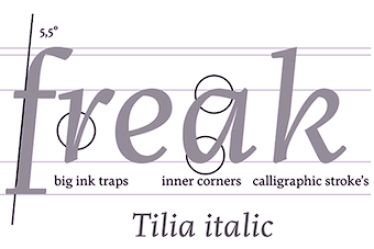 Wroclaw, Poland-based type designer, who joined Three Dots Type, Marian Misiak's type foundry, in 2017. Creator of Broken Stamp (2013), an angular typeface developed during Typeclinic 6 in 2013. During Typeclinic 7, he created the calligraphic humanist serif typeface Hazel (2013).
 In 2014, he designed the text typeface Tilia. At Typeclinic 2015, he added Tilia Italic, and at Typeclinic 11th International Type Design Workshop, he completed Tilia Heavy (2015). Tilia was further extended at Typeclinic 12th International Type Design Workshop in 2016. At the 13th Typeclinic in Slovenia in 2016, Damian designed Juno, and adjusted Tilia. At Three Dots Type in 2019, he released the didone typeface family Heneczek Pro, which was co-designed with Dominika "Nika" Langosz. He wrote: Named after Teodor Heneczek, Silesian printer and publisher who started out the first Polish-language printing house in Upper Silesia (XIX century). Heneczek was ordered by the Municipal Public Library in Piekary Slaskie to commemorate the 200-th birthday of Teodor Heneczek. An extended and upgraded version of Heneczek called Heneczek Pro was designed for display purposes and text-heavy documents. Heneczek features a great set of arrows and pointers. Behance link. Another Behance link. [Google]
[More] ⦿
|
Dominika "Nika" Langosz
|
 Polish designer of Heneczek Pro (2018), a didone family that was published by Wroclaw-based Three Dots Type. They wrote: Named after Teodor Heneczek, Silesian printer and publisher who started out the first Polish-language printing house in Upper Silesia (XIX century). Heneczek was ordered by the Municipal Public Library in Piekary Slaskie to commemorate the 200-th birthday of Teodor Heneczek. An extended and upgraded version of Heneczek called Heneczek Pro was designed for display purposes and text-heavy documents. Heneczek features a great set of arrows and pointers. [Google]
[More] ⦿
Polish designer of Heneczek Pro (2018), a didone family that was published by Wroclaw-based Three Dots Type. They wrote: Named after Teodor Heneczek, Silesian printer and publisher who started out the first Polish-language printing house in Upper Silesia (XIX century). Heneczek was ordered by the Municipal Public Library in Piekary Slaskie to commemorate the 200-th birthday of Teodor Heneczek. An extended and upgraded version of Heneczek called Heneczek Pro was designed for display purposes and text-heavy documents. Heneczek features a great set of arrows and pointers. [Google]
[More] ⦿
|
Donald Choque
|
 Designer of a set of pictograms in Emmanuel Besse's road signage typeface Signal Compressed which was published in 2018 by the French type foundry Production Type.
 In 2019, ENSAD alumni Donald Choque and Yoann Le Goff set up Atelier Choque Le Goff in Paris. Together they published Sharknose Thin (2020). [Google]
[More] ⦿
|
Donald Tarallo
[Tarallo Design]
|
 [MyFonts]
[More] ⦿
[MyFonts]
[More] ⦿
|
Dora Zadorozhnya
|
Uzhhorod, Ukraine-based designer of the experimental Cyrillic typefaces Architect and Savage in 2016. Behance link. [Google]
[More] ⦿
|
DownHill Publishing
[Ramón Abajo]
|
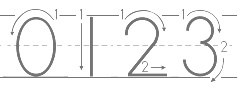 Free and commercial school fonts by Ramón Abajo, all made in 1999 or 2000: Ramon is a high school Spanish teacher in California. His fonts are floating around in cyberspace. His fonts were also for sale at Fonts 4 Teachers (or: Tiende Escolar). They are now available via New York City-based DownHill Publishing, which was founded in 1998 in Los Angeles, California. A list: AbcAlegria, AbcAmSignLang, AbcAmSignLangLetter, AbcBulletin, AbcClocks, AbcCursive, AbcCursiveArrow, AbcCursiveArrowDotted, AbcCursiveDotted, AbcCursiveDottedLined, AbcCursiveLined, AbcDNManus (AbcDNManusArrow, AbcDNManusArrowDotted, AbcDNManusDotted, AbcDNManusDottedLined, AbcDNManusLined, AbcDNManuscript), AbcDomino, AbcFaces, AbcHeadlines, AbcKids, AbcMath, AbcPhonicsOne, AbcPhonicsTwo, AbcPrint, AbcPrintArrow, AbcPrintArrowDotted, AbcPrintDotted, AbcPrintDottedLined, AbcPrintLined, AbcTeacher.
 The DownHill Publishing fonts are grouped into Print Writing, D'Nealian, Box Writing, Cursive Writing, Phonics, Sign Language, Seasonal, Decorative. [Google]
[More] ⦿
|
Dr. Shirley J. Rollinson
|
At Shirley J. Rollinson's site in Portales, New Mexico, an archive with Greek, Coptic, Hebrew and dingbat fonts. A sampling: AWI105 (Amien World International), Alex, Altrussisch, AltrussischBold, AltrussischBoldItalic, AltrussischItalic, American-PresidentsSAMPLE, AngloSaxonRunes, AngloSaxonRunes1, AngloSaxonRunes2, Animals, Animals2, AntoniousJJencom, AntoniousJJencomHollow, AntoniousJJencomThin, AntoniousJJencomWide, AntoniousNormal, AntoniousNormalHollow, AntoniousNormalThin, AntoniousNormalWide, AntoniousOLOverLine, AntoniousOLOverLineHollow, AntoniousOLOverLineThin, AntoniousOLOverLineWide, Athenian, Athletes, BSTGreek, BSTHebrew, Basics, CU_SYMBL, CarrAnimalDingbats, CarrArrowsfilled, CarrArrowsoutline, CarrDingbats2, CarrDings, CelticPatterns, ChayaBold, ChemCycles, ChristianCrosses, ClassifiedDingbats, CommonBulletsNormal, Coptic-Regular, Coptic-Regular, CopticNormal, Dastafarin-Regular, Dingbat-Cats2, DivChem, DwarfRunes, DwarfRunes1, DwarfRunes2, Eggs, FOOD, Fabeldyr-2, Flower-Show, FontForFree, Futura-Thin, Futura-ThinItalic, GermanicRunes, GermanicRunes1, GermanicRunes2, GideonMedium, Grammata, Greek-Regular, Greek-Regular, Greek, GreekOldFace, GreekOldFaceC, HWGreek, Hebpar, Hebrew-Italic, Hebrew-Regular, Inter, Ismini, KirillicaWincyr, Kitchentile, KoineMedium, Koptos-Regular, Korinthus-Italic, Korinthus, Kur2siv-Italic, Lashon-Tov, Lavra-Plain, Linear-B, LudlowDingbats, MENA-1, Martin-Vogel's-Symbols, Medicine, MendelSiddurBold, MendelSiddurMW-Bold, Milan-Greek, MonitorNormal, New-Dingcats, Noam-New-Hebrew, NovaNormal, Novgorod-Plain, Ornaments, Paleo-Hebrew-NormalA, PecanSoncHebrew, Pni2na, Pointers, QuiltersDelight, RK-Meroitic-(Demotic), RK-Meroitic-(Hieroglyphics), RK-Meroitic-Transscript, RK-Persian-Cuneiform, RK-Sanskrit, RK-Ugaritic-Transscript, RK-Ugaritic, Rashi, Roman-Catholic, RuthFancy, SILDoulosIPA, SILGalatia, SILGalatiaBold, SILGalatiaExtras, SILGalatiaExtrasBold, SILManuscriptIPA, SILSophiaIPA, SPAchmim, SPDamascus, SPDoric, SPEdessa, SPEzra, SPIonic, SPTiberian, Sgreek-Fixed, Sgreek-Medium, ShalomOldStyle, ShalomOldStyle, ShalomScript, ShalomStick, ShebrewMedium, States, Statuer, Symbol-Accentuated, SymbolMW-Bold, SymbolMW-BoldItalic, SymbolMW-Italic, SymbolMW-Normal, TLHelpCyrillic, TattooNo1, TattooNo2, TimesNewRomanNavajo, TimesNewRomanNavajoBold, TimesNewRomanNavajoBoldItalic, TimesNewRomanNavajoItalic, TorahSofer, TransliterationItalic, Tzipporah, Ugarit, VintageDingbats, WarnSymbols1, WarnSymbols2, WarnSymbols3, WarnSymbols4, WarnSymbols5, YourKeys, ZapfDingbats, button_by_fanta, fantas-second, hebrew, persische-Keilschrift. [Google]
[More] ⦿
|
Editions 205
[Quentin Margat]
|
 French foundry and publishing house, est. 2011 by Damien Gautier and Quentin Margat, and located in Villeurbanne. Their fonts:
 - Amiral. A stencil face by Damien Gautier.
- Bloo. A geometric family by Damien Gautier.
- Caporal. A semi-stencil by Damien Gautier and Quentin Margat.
- Colonel. A stencil by Damien Gautier and Quentin Margat.
- LeBeaune. A lapidary engraved roman caps font by Damien Gautier and Quentin Margat, originally intended for the wine city of Beaune. Le Beaune New was published in 2013.
- LeChaufferie. A large multiline opentype typeface by Damien Gautier.
- LeFrançois. A Peignotian titling face by Damien Gautier.
- Beretta (2011-2012). A dot matrix typeface by Damien Gautier.
- Alcala (2011). A roman typeface family by Damien Gautier and Quentin Margat.
- Maax (2011). An information design sans typeface family. In 2013, Damien Gautier added Maax Mono and Maax Rounded, and in 2019 Maax raw.
- Norr. A versatile family originally intended for the visual identity of the region of Valenciennes. It includes a round style, a slab style, a sans, and a didone style.
- Robin (2010). An arrows dingbat typeface by Damien Gautier and Delphine Sigonney.
There is also a publishing component to Editions 205. Works published by them include Tout le monde connaît Roger Excoffon (2011), which was written by Alan Marshall (director of the Musée de l'imprimerie, Lyon), Tony Simoes Relvas, and Thierry Chancogne. Behance link. Klingspor link. [Google]
[MyFonts]
[More] ⦿
|
Eisuke Furukawa
[Hyperion Graphics]
|
[More] ⦿
|
Elmar Kniprath
[Indolipi]
|
[More] ⦿
|
Elsie Flannigan
|
Designer of CK Smile (multiline font), CK High Energy Doodles, CK Squares&Arrows, CK Circles&Swirls, CK Credit Card, CK Jr. High Girl, CK Elsie, CK Funky, CK Neat Freak, CK Bohemian, CK Evie. Most of these are handwriting fonts. [Google]
[More] ⦿
|
EmDash
[Marshall Bohlin]
|
EmDash is Marshall Bohlin's foundry in Northfield, IL. Fonts: ArchiText, Arrow Dynamic, BulletsNStuff, GendarmeHeavy, Perky, Story, Upstart, Briar, Konway, Palomar, Caspian. [Google]
[More] ⦿
|
Emily Kryzhanovski
|
Aka Ash Lumiere and Emily Kryz. Canadian designer (b. 1995) of the Indian arrow-themed typeface Artemis Curse (2016). [Google]
[More] ⦿
|
Emily Peacock
|
American designer of a decorative typeface that is based on arrows (2016). [Google]
[More] ⦿
|
ETH Productions
|
 Fontstructor who made Dot Serif (2012), fs Gold (2012, kitchen tile face) and Kidnapper (2012, dot matrix face).
 In 2013, he added fs Slyte, fs Kingsletter (blackletter), fs Gardenia, fs Accordion, fs Badminton (+Mono), fs Lollipop Script, fs Monopixel (Serif, Regular), fs Sphinx, fs Quotable, fs Recalibur, fs Informe 04, FS Typewriter (a huge font that covers Latin and Cyrillic), FS Uno (monospaced), Menora, Excalibur, Cirplex (a circular font), 5x5 Monopixel, Medievia, fs Tahoma 8px, Standard Serif, Zapphire Round (kitchen tile face), fs Smilies, fs Gridded (+lc), fs Midnight Gambler, fs Semiserif Mono, fs Almostencil, fs Glass (textured face), fs Will I Am Not, fs Magnifique (a connected script), fs Karmina, fs Kursiv, fs Handwritten, fs Markitaraz, fs Neon, fs Himali (a connect-the-dots typeface), fs Fontstruct, fs Phille (kitchen tile font), fs Phoneta, fs Curves, fs Wizdom, fs Handwritten, fs Sly Small, fs Quark, Williomnot, fs Sanstruct, fs Direction (arrowed letters). Typefaces from 2014: FS Score 3D, FS Vincent, FS Vandyx, FS Wizdom, FS Dot Serif, FS Handwritten, FS Lost (a labyrinthine font for Latin and Cyrillic that won an award in the 2014 FontStruct InLine Font Competition). Other typefaces from 2014 include FS Cookie, FS Cookie Clean, FS Pentagale, FS Gardenia, FS Monopixel Regular, FS Shattern (glaz krak face), FS Zeblin, FS Intrepid (labyrinthine). Typefaces from 2015: FS Pentagale (a marker pen font). [Google]
[More] ⦿
|
Ethan Paul Dunham
[Fonthead Design]
|
[MyFonts]
[More] ⦿
|
Faberfonts
[Frank Béla]
|
 Frank Béla (b. 1978, Orosháza, Hungary) is a graphic design student at Krea Art School in Budapest who uses the pseudonym Fabergraph. Home page. Blog. In 2010, he started out commercially as Faberfonts. Dafont link. Behance link. Klingspor link.
 He created the ink trap font Portrait Of A Lady (2009), FR Irisz (2009, didone family), Pontifex (2009), the hand-printed Munkácsy 1120 (2009), the unicase Reka Sans (2009), the thick-thin Azur (2009), the simple sans Babyface (2009), the medieval sorcery font Elmulas (2009), the Valentine;s Day font Sapet (2009), the avant garde sans family Hopper Sans (2009) and the ultra-fat typeface Rendezvous (2009). Callimachos (2009) is a fun triple-lined hand-printed headline typeface (with a Cyrillic version added in). Azur Title Font (2009) is a hairline slabbed typewriter type. Pasta Simpla (2009, followed by FR Pasta Mono in 2010) is another experimental jewel. Hobbista (2009) mixes symbols and glyphs. FR Rama Nous (2009) is a free modular font. In 2009, he also made Arrow, Enamel Paint Type, Belonging (Roman caps). Commercial fonts made in 2010: FR Unalom, FR Sniccer (stencil), FR Ceruza, FR Minta (a dingbat typeface to make labyrinthine patterns; +Two), FR Tabula (beveled face), FR Smaragdina, FR Mintry One and Two (pattern fonts), and a custom alphabet for Esquire Russia, FR Hopper (monoline sans family). Activity in 2011: A didone-inspired typeface called MFA Dagi that was was commissioned for a catalog of an exhibition at The Museum of Fine Arts (Budapest, Hungary). [Google]
[MyFonts]
[More] ⦿
|
Factor Design
[Olaf Stein]
|
 In 1993, Olaf Stein and Johannes Erler founded their studio Factor Design in Hamburg. Today, Factor Design is a team of designers and project managers working with clients in Germany and throughout the world. Designers in 1993 of the FontFont fonts FFDingbats-ArrowsOne, FFDingbats-ArrowsTwo, FFDingbats-BasicForms, FFDingbats-Number, FFDingbats-SignsOne, FFDingbats-SignsTwo, FFDingbats-SymbolsOne. Its 2009 extension FF Dingbats 2.0 is due to Johannes Erler and Helmut Skibbe. FontShop link for Stein. [Google]
[MyFonts]
[More] ⦿
In 1993, Olaf Stein and Johannes Erler founded their studio Factor Design in Hamburg. Today, Factor Design is a team of designers and project managers working with clients in Germany and throughout the world. Designers in 1993 of the FontFont fonts FFDingbats-ArrowsOne, FFDingbats-ArrowsTwo, FFDingbats-BasicForms, FFDingbats-Number, FFDingbats-SignsOne, FFDingbats-SignsTwo, FFDingbats-SymbolsOne. Its 2009 extension FF Dingbats 2.0 is due to Johannes Erler and Helmut Skibbe. FontShop link for Stein. [Google]
[MyFonts]
[More] ⦿
|
Filiz Sahin
|
Filiz Sahin is an American interactive designer, originally from Istanbul. Her work includes Geogram (2012, an octagonal typeface), Wave Me In (2012, a free wavy EPS-format font), Knit Type (2012, a free stitching font), Stitching Font (2012), Ant Type (2012, another stitching font), Drop Type (2012, a free EPS format ornamental caps face), Spider Type (2012, a modified Helvetica Bold), and a hand-drawn all ornamental caps face (2009). Muscle Type (2012) is a free EPS-format font inspired by bundles of muscles. Sablon (2012) is an organic all-caps type family. Hair Type (2012) consists of strands of hair. Dooooodle Type (2012) are doodled ornamental caps. El Yazi (2012) is a 2d and 3d school script font on EPS format. Cosmo Path (2012) is a free spaceship-inspired EPS vector font. Che's Bone (2012) is a bone-themed typeface. Mood Type (2012, free) is a beautiful EPS-format font that takes inspiration from modern Swedish furniture. Doodleista (2012) is a condensed poster face. Typefaces from 2013: Look Up (a hand-drawn arrowed poster typeface). Typefaces from 2014: Mink (free hand-printed font). Typefaces from 2018: Tonton (a children's book font), Tonton Green (crocodile skin texture). Cargo Collective link. [Google]
[More] ⦿
|
Florian Klauer
[Fonts With Love (was: Heimat Design)]
|
 [MyFonts]
[More] ⦿
[MyFonts]
[More] ⦿
|
Fontforecast
[Hanneke Classen]
|
 Fontforecast is a type foundry in the Netherlands that was set up by Hanneke Classen in 2013. Hanneke designed Graduate Script (2013, a connected script), Graduate Ornaments (2013), Bachelor Script (2013), Tyfoon Script (2013) and Tyfoon Sans (2013).
 Her greatest work to date is the 16-font Chameleon family (2013). It includes Chameleon Basic (a calligraphic script that can be used for layering), Chameleon Pen, and Chameleon Sketch. This combination of poster styles was also seen in Laura Worthington's Charcuterie a few months earlier, so a trend seems to be developing. Santa's Pen (2013) is derived from Chameleon. Typefaces from 2014: Wingman Brush and Wingman serif, Wallet, Perron (hand-drawn contrasting designs for use on posters). Typefaces from 2015: Bambusa Pro (a great bamboo pen script collection), Mucho Sans (a 12-style geometric sans), Stylist Pro (a great dip pen connected calligraphic typeface), Salt & Spices Pro (a script family). Typefaces from 2016: Dragonflight Pro (brush script, +Sans), Salt + Spices Mono (the monoline version of Salt & Spices Pro), Kinfolk Pro (brush script accompanied by many ornamental fonts containing arrows and flowers). Typefaces from 2017: Somersault (a brush script duo), Delish Pro (brush script), Les Tulipes Pro (a layered calligraphic typeface family). Typefaces from 2018: Sabbatical. You Work For Them link. Creative Market link. [Google]
[MyFonts]
[More] ⦿
|
Fontguru
|
Creator of free octagonal and / or modular typefaces in 2011: Arrows, Square Sharp, Round Edges, Edgy, Slim-Rounded, Sharps, Narrow Lines, Shapes (faces). [Google]
[More] ⦿
|
Fonthead Design
[Ethan Paul Dunham]
|
 FontHead Design (Wilmington, DE) sells cool fonts designed by Ethan Dunham (b. 1972, Glens Falls, NY), who now heads Fontspring. A partial list: Mother Goose (2008), Allise, GoodDogCool, Fontheads (dingbats), Randisious, Greyhound (1997, an arts and crafts face), Rochester, Samurai, AsimovSans, Gurnsey20, Scrawl, BadDog, Holstein, SlackScript, Bessie, SloppyJoe (gone?), Blearex, HandSkriptOne, SmithPremier, BlueMoon, HolyCow, SororityHack, Bonkers, HotCoffeeFont, SpillMilk, BraveWorld, Isepik, Sputnik, Brolga, TekStencil, Carnation, Mekanek (1995), Teknobe (1995), Merlin, Toucan Grunge (gone?), Tycho, TypewriterOldstyle, MotherGoose, Croissant, Democratika (now Americratika--I think Emigre forced FontHead to change the name), Noel (1996-1997, Lombardic all caps face, with an open version added), LillaFunk (gone?), Margo Gothic (gone?), Toddler (gone?), NoelBlack, WashMe, Diesel, Orion, Gritzpop, Pesto, BattleStation, CircusDog, Dandelion, DraftHand, Flowerpot, Navel, ShoeString, Stiltskin, ZipSonik. Plus JohnDoe, and old typewriter font. Free fonts: Font Heads (dings), Smith Premier, Vladimir, Tycho, Typewriter Oldstyle, ScareCrow, Millennia, SpillMilk, GoodDog, Holstein, Red Five. All formats, Mac and PC. In the comic font series, look for Stan Lee (now Comic Talk), FH Excelsior (now Titlex), Grimmy (now Flim Flam), and Kirby (now Grit).
 Dafont link. Fonts created in 1999: AppleSeed, Caterpillar, Chinchilla, ChinchillaBlack, ChinchillaDots, CrowBeak, CrowBeakLight, CyberMonkey, DanceParty, DingleHopper, FourScore, FourScoreTitling, Hopscotch, HopscotchPlain, Ladybug, Leaflet-Regular, LeafletBold, LeafletLight, ReadOut, ReadOutSuper, Smoothie, Swizzle, TwoByFour, VeryMerry. Made in 2001: ButterFinger, ButterFingerSerif, CatScratch, Catnip, FighterPilot, FrenchRoast, Handheld, HandheldItalic, HandheldRaised, HandheldRaisedItalic, HandheldRound, HandheldRoundItalic, Kingdom, OldGlory, Quadric, QuadricSlant. MyFonts page. In 2006, several dingbats fonts were added, such as the ClickBits Arrow series and the ClickBits Icon series. In 2008, he created InfoBits Things and InfoBits Symbols, Abigail, Assembler, Click Clack, Drawzing (children's font, crayon or chalk style), El Franco (grunge), Good Dog New (hand-printed), Helion (futuristic), Lead Paint (brush), Schema (architectural lettering), Skizzors (paper cut font), Tachyon (2008, techno, futuristic). Free font download. This place has Allise, Americratika, AppleSeed, AsimovSans, Asterix-Blink-Italic, Asterix-Blink, Asterix-Italic, Asterix-Light-Italic, Asterix-Light, Asterix, BadDog, BattleStation, Beckett, Bessie, BlackBeard, Blearex, BlueMoon, Bonkers, BraveWorld, Brolga, BrownCow, Carnation, CatScratch, Caterpillar, Chinchilla, ChinchillaBlack, ChinchillaDots, CircusDog, CornDog (2004), Croissant, CrowBeak, CrowBeakLight, CyberMonkey, DanceParty, Dandelion, Dannette-Outline, Dannette, DayDream, Democratika, Diesel, DingleHopper, DoomsDay, DraftHand, Flowerpot, Font-Heads, FourScore, FourScoreTitling, FunkyWestern, Goliath, GoodDog-Bones, GoodDog-Cool, GoodKitty, Greyhound, Grimmy, Gritzpop, GritzpopGrunge, Gurnsey20, HandskriptOne, Holstein-Bold, Holstein, HolyCow, Hopscotch, HopscotchPlain, HotCoffeeFont, HotTamale, Isepik, JohnDoe, JollyJack, Keener, Klondike-Bold, Klondike, Ladybug, Leaflet-Regular, LeafletBold, LeafletLight, LillaFunk, Log Jam (+Inline), MargoGothic, MarvelScript, MatrixDot-Condensed, MatrixDot, Mekanek, Merlin, Millennia, Mondo-Loose, MotherGoose, Navel, Network, Noel, NoelBlack, Oatmeal, Orion, Pesto, Randisious, ReadOut, ReadOutSuper, RedFive, Rochester, Samurai, Scarecrow, Scrawl, ShoeString, ShoeStringRound, SlackScript, SloppyJoe, SmithPremier, Smock, Smoothie, SororityHack, SpaceCowboy, SpillMilk, Sputnikk, StanLee-Bold, StanLee-BoldItalic, StanLee-Regular, Stiltskin, Submarine, Swizzle, TekStencil, Teknobe, Torcho, ToucanGrunge, TwoByFour, Tycho, Typewriter2, TypewriterOldstyle, VeryMerry, Vladimir, WashMe, Watertown-Alternate, Watertown-Black, Watertown-Bold, Watertown, ZipSonik-Italic, ZipSonik, ZipSonikSketch-Italic, ZipSonikSketch. Font Squirrel carries ElliotSix (simple handwriting), GoodDog (children's hand) and Millennia (squarish). In fact, in 2009-2010, Ethan Dunham became a very active web font persona, offering a commercial web font service, Fontspring, and a free font service, Fontsquirrel. Klingspor link. Creative Market link. [Google]
[MyFonts]
[More] ⦿
|
Fontomania (or: Fontilizer)
[Omer Agiv]
|
Omer Agiv (Fontomania) made freeware Latin, Hebrew and dingbat fonts such as Amraheb, Electroni, Jumang, Krashim-signs, LironAgiv, Moshe, Outline, Samurai, Samuraiheb, Sunnyday, Transport, Worms, arrow, boards, bw, dotty, goggles, krashim, leaves, nuni, nurit, wood-sticks, Dinorific, omerh. Some fonts are commercial. Personal handwriting font service for 55USD (Latin, Hebrew or Arabic). Personal signature for 10USD. Some commercial fonts at 8 to 12 dollars, such as Smily, Cookie (curly), Orenh (handwriting), Geometry, Tal, Jifa, Sun, Hairy, ABC, Chains, Liner, Chinese, Arak, Parkinson, Papio, Tropical Sickness and IceSticks. The free and commercial Hebrew fonts include the Tapuach package (8 fonts). Fontomania also sells the 13-font 44 USD-"Silver Collection" on CD. Free handwriting font download: Janet Luther. At Elifont, one can download Wood Sticks, Samurai, Liron, Ice Sticks, and Boards. Dafont link. Old URL. [Google]
[More] ⦿
|
Fonts With Love (was: Heimat Design)
[Florian Klauer]
|
 Heimat Design in Lage (Bielefeld), Germany, is the design studio and foundry of Florian Klauer, who set up Fonts with Love in 2015.
 . In 2010, Florian made the monoline sans typefaces Florin Sans (2010) and Heimat Grotesk that are characterized by their large x-heights. Iconized (2013) contains more than 220 icons like arrows, filetype, media, eCommerce, network and devices, contact, service navigation and social network-icons. Klartext Mono (2014) is a monospaced monoline sans with a large x-height and superelliptical curves. In 2016, he published the text typeface family Ethos. In 2017, he designed a corporate typeface for the German sports channel Sport1. Klingspor link. Behance link. Fontspring link. Old Heimat Design link at MyFonts. Florian Klauer's personal page. [Google]
[MyFonts]
[More] ⦿
|
Fonts&Things
|
An exemplary archive, nicely stocked, clearly presented, and, most importantly, with the sources of the (freeware/shareware) fonts clearly identified. Newest fonts. Themes. Collected works. Graffiti fonts. There are also original dingbat fonts: Buttons-Hollow (2003), Buttons-Solid (2003), Circle-Things2 (2003), Cut-Outsfor3DFX (2002), FnT_BasicButtons1 (2000), FnT_BasicShapes1 (1999), Heart-Things (2004), Hearts-for3DFX (2003), Square-Things (2003), Stars-for3DFX (2002), Fontsnthings 250th (2012), Pincel Handwrite (2012). There are also free alphadings such as Alphashapes Raindrops, Alphashapes Sunshine (+2), Alphashapes Male, Alphashapes Female, Alphashapes Houses, Alphashapes Shells, Alphashapes Gears (+2, +3), Alphashapes Stars 3, Alphashapes Stars 4, Alphashapes Flowers (+2), Alphashaps Xmastrees (2005), Alphashapes Gravestones (2012), Alphashapes Meltdowns (2012), Alphashapes Pumpkins (2012), Alphashapes Grids (2012), Alphashapes Xmas Balls (2012) and Alphashapes Skulls (2012). Original dingbat fonts: Bricks-nThings, Buttons-Hollow, Buttons-Solid, Circle-Things, Circle-Things2, Clover Things, Crosses n Hearts, Cut-Outsfor3DFX, Cut-Outsfor3DFX2, Grids-nThings, Grids-nThings2, Heart-Things, Heart-Things2, Heart Things 3 (2008), Hearts n Arrows (2008), Hearts-for3DFX, Slats-nThings, Slats-nThings2, Square-Things, Square-Things2, Star-Things, Star-Things2, Star-Things3, Stars-for3DFX, Symmetric-Things, Symmetric-Things2, Tile-Things, Hearts-for3DFX, Heart-Things, Heart-Things2, FnT_BasicButtons1, FnT_BasicShapes1. DaFont link. [Google]
[More] ⦿
|
Fontschmiede
[Frank Baranowski]
|
 Obsolete German foundry, est. 2010 by Michel M and Frank Baranowski (b. Altenmedingen, 1960), and located in Neuenkirchen, where he runs the graphic design studio Cylex. Baranowski studied Graphic Design at the Hochschule fuer Bildende Kuenste in Braunschweig, Germany. His fonts:
 - Alphabutts Initials (2004-2008). Letters to fit into circles.
- Clayborn (2004). A massive font.
- Concrete (2004-2010).
- Destroya (2005-2008).
- Dodgy Ultra (2009). A blocky font.
- Elemenz Initials (2004).
- Funtype (2008-2010). A handcrafted typeface.
- Journal74 (2012). A retro font family.
- Kaleido (2004).
- Karoline (2005). A backslanted script.
- Line44
- Monumental (2009).
- MrsBeasley+ (1995-2010). Psychedelic.
- Musical (2004).
- NewTelegraph (2011, +Arrows).
- Patchwork (2005). A beatnik font family.
- Phoenikia (1998). Greek emulation.
- Silverblade (2010). A decorative, perhaps medieval, family.
- Sputnik (2010). An oriental simulation face.
- Superia (2006-2010).
- Tambourine (2004-2010). Art nouveau.
- Und4.
Some of Baranowski' fonts are released under the label Transkrypt. Open Font Library link. [Google]
[MyFonts]
[More] ⦿
|
Frank Baranowski
[Fontschmiede]
|
[MyFonts]
[More] ⦿
|
Frank Baranowski
[Transkrypt]
|
[MyFonts]
[More] ⦿
|
Frank Béla
[Faberfonts]
|
 [MyFonts]
[More] ⦿
[MyFonts]
[More] ⦿
|
G. Adam Stanislav
[Pantartheon]
|
[More] ⦿
|
G. Knight
|
G. Knight made an arrow font for highway signs, called Highway Arrows. [Google]
[More] ⦿
|
GalloFonts (was: Graphics by Gallo)
[Gerald Gallo]
|
 GalloFonts is part of Graphics by Gallo, founded in 1974 by Gerald Gallo (b. Lucernemines, PA, 1941), and based in Bethesda, MD. The fonts: Bullish (squarish), Display Brutal Rough (2015), Display Black Serif Rough (2015), Pristine Light (2014: caps only squarish sans family), Display Pump (2014), Display University (2005, athletic lettering), Angulatte Light, Angulatte Medium, Angulatte Bold, Anniversary Seals (2003), Basic Bullets, Blooming Ornaments (2008), Brashee Regular, Brashee Bold, Calendar Font One, Calendar Font Two, Calendar Font Three, Carved Initials, Chiseled Initials, Cleancut, Dexterous (2010, art nouveau), Diamond Monogram - 2 Characters, Diamond Monogram - 3 Characters, Display Black Serif (2010, angular), Display Dots Five (2010), Display Dots Six (2010), Display Grungy (2010), Display Robust (2010), Dooddle, Embossed Shallow, Embossed Medium, Embossed Deep, GG Casual Light (2002, was Gallo Casula: hand printing family), GG Casual Medium, GG Casual Bold, GG Dingbats (was Gallo Dingbats, like Zapf Dingbats), GG Serif (1993, was Gallo Serif), Geometric Arrows, Geometric Ornaments, Gnarlee, Greetings, Home Sweet Home, Isometric Initial Caps - Bird's Eye View (1994), Isometric Initial Caps - Worm's Eye View, Isometric Ornaments, Jackolantern Assortment (2002) Just Bugs, Kruede Light, Kruede Regular (handwriting), Kruede Bold, Leaf Assortment (1994), Leaves Falling, Logotype, Magnificent Ornaments (2006, Victorian era decorations), Make Tracks (2002, animal footprints), Number Ornaments, Numbers 0-99 Style One - Circle Negative, Numbers 0-99 Style One - Circle Positive, Numbers 0-99 Style One - Diamond Negative, Numbers 0-99 Style One - Diamond Positive, Numbers 0-99 Style One - Square Negative, Numbers 0-99 Style One - Square Positive, Numbers 0-99 Style Two - Circle Negative, Numbers 0-99 Style Two - Circle Positive, Numbers 0-99 Style Two - Diamond Negative, Numbers 0-99 Style Two - Diamond Positive, Numbers 0-99 Style Two - Square Negative, Numbers 0-99 Style Two - Square Positive, Numbers 0-99 Style Three - Circle Negative, Numbers 0-99 Style Three - Circle Positive, Numbers 0-99 Style Three - Diamond Negative, Numbers 0-99 Style Three - Diamond Positive, Numbers 0-99 Style Three - Square Negative, Numbers 0-99 Style Three - Square Positive, Ornate Initials - Style One (2002), Ornate Initials - Style Two, Ornate Initials - Style Three, Pleasant Hand Light (2002) Pleasant Hand Medium, Pleasant Hand Bold, Precision, Rolling Ball Cursive, Serene (1993), Slender, Smiling Faces, Snowflake Assortment (1994), Snowflakes Falling (2001), Sport Numbers, Star Assortment (2002), Stature (2010, compressed sans), Swiss Folk Ornaments - Critters&Things, Swiss Folk Ornaments - Floral, Swiss Folk Ornaments - Geometric, Time Clocks, Woozee, Display Prominent (2005), Ultimate Ornaments (2005), Cross Ornaments (2005), Heraldic Creatures (2006), Victorian Leaf Ornaments (2006: great!), Quilt Patterns One (2007), Holy Ornaments (2007), Oriental Ornaments (2007), Gothic Initials One through Six (2007-2008), Interlaced Ornaments (2007), Modest Ornaments (2008), Art Nouveau Flowers (2008), Art Nouveau Ornaments (2008), Quilt Patterns Two (2008), Display Gothic (2008, blackletter), Plant Assortment (2008), Birds Flying (2009), Happy Go Lucky (2009, Victorian), Fish Fresh (2009), Display Dots One (2009, dot matrix face), Display Art Two and Three (2009, art nouveau alphabets), Display Dots Two Serif and Sans (2009, dot matrix typefaces), Display Dots Three Serif and Sans (2009), Display Dots Four Serif and Sans (2009), Display Robust (2010), Quilt Patterns Three and Four (both 2009), Gothic Initials (Seven, Eight, Nine: 2009), Carefreed (2009, a Halloween script?), Glorita (2009, casual condensed sans), Fancy Flowers (2010), Rectilinear Ornaments (2010), Display Brutal (2010, grunge), Cross Stitch Graceful (2010), Cross Stitch Regal (2011), Cross Stitch Formal (2010), Cross Stitch Discreet (2010), Cross Stitch Classic (2010), Display Dots Seven (2011), Cross Stitch Majestic (2011), Cross Stitch Elaborate (2011), Cross Stitch Medieval (2011), Cross Stitch Ornaments (2013), Display Squares One and Two (2011, gridded or dot matrix typefaces), Display Digits One through Seven (2011), Display Crisp (2012, octagonal), Blue on Blue (2012, shadow face), Green on Green (2012, 3d shadow face), White on White (2012), Orange on Orange (2012, a 3d shadow face), Victorian Ornaments (2012), Printers Plant Ornaments (2012, a floral typeface), Simple Ornaments, Numbers Style Three Diamond Positiv Regular (2012), Charisma (2013, inspired by the hand lettering used by draftsmen and architects), Display Explicit (2013), Display Uncanny (2013, unicase), Display Carlos (2013, a piano key typeface), Mighty Oaks (2013, stylized oak leaves), Sweet Hand (2014), Fast Hand (2014), Medallion Ornaments (2016), Vigorous (2016, octagonal), Heavy Duty (2016, a bold condensed sans), Tight Hand (2016), Hasty Hand (2016), Neat Hand (2016), Bullish (2017), Impossible Ornaments (2018: based on Escher's ideas), Flair Hand (2018), Severe (2018: squarish).
 Typefaces from 2022: Flashie (technio caps), Illustrious (chamfered caps), Sturdie (condensed, squarish), Jubilant (squarish), Noteworthy, Sensuous (art deco), Loftie (chamfered caps), Pudgie, Brilliante (squarish), Fervent (an all caps condensed slab serif), Bevelle (a beveled chamfered slab serif), Lankie (a gas pipe font), Rotunde (a blocky sans), Rigide (a 6-style squarish sans). View Gerald Gallo's typefaces. [Google]
[MyFonts]
[More] ⦿
|
Gareth Finucane
|
Designer at FontStruct, aka Garphynk, located in San Francisco. He created afternoon (condensed pixel face), Blocparty (constructivist poster style), Bloc Party Outline, foldz (dot matrix), tuesday, xtrude (3d shadow face). All fonts made in 2008. In 2011, he added Arrowback, and in 2012 Duffica (counterless). Behance link. Home page. [Google]
[More] ⦿
|
George Douros
[Unicode Fonts for Ancient Scripts]
|
 [More] ⦿
|
Gerald Gallo
[GalloFonts (was: Graphics by Gallo)]
|
 [MyFonts]
[More] ⦿
[MyFonts]
[More] ⦿
|
Gilberto De la Rosa
|
Gilberto De la Rosa (Tijuana, Mexico) designed Fast Forward Font (2013, a typeface with arrows on the glyphs) during his graphic design studies. [Google]
[More] ⦿
|
GNU Freefont (or: Free UCS Outline Fonts)
[Steve White]
|
 The GNU Freefont is continuously being updated to become a large useful Unicode monster. GNU FreeFont is a free family of scalable outline fonts, suitable for general use on computers and for desktop publishing. It is Unicode-encoded for compatability with all modern operating systems. There are serif, Sans and Mono subfamilies. Also called the "Free UCS Outline Fonts", this project is part of the larger Free Software Foundation. The original head honcho was Primoz Peterlin, the coordinator at the Institute of Biophysics of the University of Ljubljana, Slovenia. In 2008, Steve White (aka Stevan White) took over. URW++ Design&Development GmbH. URW++ donated a set of 35 core PostScript Type 1 fonts to the Ghostscript project.
 - Basic Latin (U+0041-U+007A)
- Latin-1 Supplement (U+00C0-U+00FF)
- Latin Extended-A (U+0100-U+017F)
- Spacing Modifier Letters (U+02B0-U+02FF)
- Mathematical Operators (U+2200-U+22FF)
- Block Elements (U+2580-U+259F)
- Dingbats (U+2700-U+27BF)
Yannis Haralambous and John Plaice. Yannis Haralambous and John Plaice are the authors of Omega typesetting system, which is an extension of TeX. Its first release, aims primarily at improving TeX's multilingual abilities. In Omega all characters and pointers into data-structures are 16-bit wide, instead of 8-bit, thereby eliminating many of the trivial limitations of TeX. Omega also allows multiple input and output character sets, and uses programmable filters to translate from one encoding to another, to perform contextual analysis, etc. Internally, Omega uses the universal 16-bit Unicode standard character set, based on ISO-10646. These improvements not only make it a lot easier for TeX users to cope with multiple or complex languages, like Arabic, Indic, Khmer, Chinese, Japanese or Korean, in one document, but will also form the basis for future developments in other areas, such as native color support and hypertext features. ... Fonts for UT1 (omlgc family) and UT2 (omah family) are under development: these fonts are in PostScript format and visually close to Times and Helvetica font families. - Latin Extended-B (U+0180-U+024F)
- IPA Extensions (U+0250-U+02AF)
- Greek (U+0370-U+03FF)
- Armenian (U+0530-U+058F)
- Hebrew (U+0590-U+05FF)
- Arabic (U+0600-U+06FF)
- Currency Symbols (U+20A0-U+20CF)
- Arabic Presentation Forms-A (U+FB50-U+FDFF)
- Arabic Presentation Forms-B (U+FE70-U+FEFF)
Yannis Haralambous and Wellcome Institute. In 1994, The Wellcome Library The Wellcome Institute for the History of Medicine 183 Euston Road, London NW1 2BE, England, commissioned Mr. Haralambous to produce a Sinhalese font for them. We have received 03/09 official notice from Robert Kiley, Head of e-Strategy for the Wellcome Library, that Yannis' font could be included in GNU FreeFont under its GNU license: Sinhala (U+0D80-U+0DFF). Young U. Ryu at the University of Texas at Dallas is the author of Txfonts, a set of mathematical symbols designed to accompany text typeset in Times or its variants. In the documentation, Young adresses the design of mathematical symbols: "The Adobe Times fonts are thicker than the CM fonts. Designing math fonts for Times based on the rule thickness of Times =,, +, /, <, etc. would result in too thick math symbols, in my opinion. In the TX fonts, these glyphs are thinner than those of original Times fonts. That is, the rule thickness of these glyphs is around 85% of that of the Times fonts, but still thicker than that of the CM fonts." Ranges: Arrows (U+2190-U+21FF), Mathematical Symbols (U+2200-U+22FF). Valek Filippov added Cyrillic glyphs and composite Latin Extended A to the whole set of the abovementioned URW set of 35 PostScript core fonts, Ranges: Latin Extended-A (U+0100-U+017F), Cyrillic (U+0400-U+04FF). Wadalab Kanji Comittee. Between April 1990 and March 1992, Wadalab Kanji Comittee put together a series of scalable font files with Japanese scripts, in four forms: Sai Micho, Chu Mincho, Cho Kaku and Saimaru. The font files were written in custom file format, while tools for conversion into Metafont and PostScript Type 1 were also supplied. The Wadalab Kanji Comittee has later been dismissed, and the resulting files can be now found on the FTP server of the Depertment of Mathematical Engineering and Information Physics, Faculty of Engineering, University of Tokyo: Hiragana (U+3040-U+309F), Katakana (U+30A0-U+30FF). Note that some time around 2009, the hiragana and katakana ranges were deleted. Angelo Haritsis has compiled a set of Greek type 1 fonts. The glyphs from this source has been used to compose Greek glyphs in FreeSans and FreeMono. Greek (U+0370-U+03FF). Yannis Haralambous and Virach Sornlertlamvanich. In 1999, Yannis Haralambous and Virach Sornlertlamvanich made a set of glyphs covering the Thai national standard Nf3, in both upright and slanted shape. Range: Thai (U+0E00-U+0E7F). Shaheed Haque has developed a basic set of basic Bengali glyphs (without ligatures), using ISO10646 encoding. Range: Bengali (U+0980-U+09FF). Sam Stepanyan created a set of Armenian sans serif glyphs visually compatible with Helvetica or Arial. Range: Armenian (U+0530-U+058F). Mohamed Ishan has started a Thaana Unicode Project. Range: Thaana (U+0780-U+07BF). Sushant Kumar Dash has created a font in his mother tongue, Oriya: Oriya (U+0B00-U+0B7F). But Freefont has dropped Oriya because of the absence of font features neccessary for display of text in Oriya. Harsh Kumar has started BharatBhasha for these ranges: - Devanagari (U+0900-U+097F)
- Bengali (U+0980-U+09FF)
- Gurmukhi (U+0A00-U+0A7F)
- Gujarati (U+0A80-U+0AFF)
Prasad A. Chodavarapu created Tikkana, a Telugu font family: Telugu (U+0C00-U+0C7F). It was originally included in GNU Freefont, but supoort for Telugu was later dropped altogether from the GNU Freefont project. Frans Velthuis and Anshuman Pandey. In 1991, Frans Velthuis from the Groningen University, The Netherlands, released a Devanagari font as Metafont source, available under the terms of GNU GPL. Later, Anshuman Pandey from Washington University in Seattle, took over the maintenance of font. Fonts can be found on CTAN. This font was converted the font to Type 1 format using Peter Szabo's TeXtrace and removed some redundant control points with PfaEdit. Range: Devanagari (U+0900-U+097F). Hardip Singh Pannu. In 1991, Hardip Singh Pannu has created a free Gurmukhi TrueType font, available as regular, bold, oblique and bold oblique form. Range: Gurmukhi (U+0A00-U+0A7F). Jeroen Hellingman (The Netherlands) created a set of Malayalam metafonts in 1994, and a set of Oriya metafonts in 1996. Malayalam fonts were created as uniform stroke only, while Oriya metafonts exist in both uniform and modulated stroke. From private communication: "It is my intention to release the fonts under GPL, but not all copies around have this notice on them." Metafonts can be found here and here. Ranges: Oriya (U+0B00-U+0B7F), Malayalam (U+0D00-U+0D7F). Oriya was subsequently dropped from the Freefont project. Thomas Ridgeway, then at the Humanities And Arts Computing Center, Washington University, Seattle, USA, (now defunct), created a Tamil metafont in 1990. Anshuman Pandey from the same university took over the maintenance of font. Fonts can be found at CTAN and cover Tamil (U+0B80-U+0BFF). Berhanu Beyene, Prof. Dr. Manfred Kudlek, Olaf Kummer, and Jochen Metzinger from the Theoretical Foundations of Computer Science, University of Hamburg, prepared a set of Ethiopic metafonts. They also maintain the home page on the Ethiopic font project. Someone converted the fonts to Type 1 format using TeXtrace, and removed some redundant control points with PfaEdit. Range: Ethiopic (U+1200-U+137F). Maxim Iorsh. In 2002, Maxim Iorsh started the Culmus project, aiming at providing Hebrew-speaking Linux and Unix community with a basic collection of Hebrew fonts for X Windows. The fonts are visually compatible with URW++ Century Schoolbook L, URW++ Nimbus Sans L and URW++ Nimbus Mono L families, respectively. Range: Hebrew (U+0590-U+05FF). Vyacheslav Dikonov made a Braille unicode font that could be merged with the UCS fonts to fill the 2800-28FF range completely (uniform scaling is possible to adapt it to any cell size). He also contributed a free Syriac font, whose glyphs (about half of them) are borrowed from the free Carlo Ator font. Vyacheslav also filled in a few missing spots in the U+2000-U+27FF area, e.g., the box drawing section, sets of subscript and superscript digits and capital Roman numbers. Ranges: Syriac (U+0700-U+074A), Box Drawing (U+2500-U+257F), Braille (U+2800-U+28FF). Panayotis Katsaloulis helped fixing Greek accents in the Greek Extended area: (U+1F00-U+1FFF). M.S. Sridhar. M/S Cyberscape Multimedia Limited, Mumbai, developers of Akruti Software for Indian Languages (http://www.akruti.com/), have released a set of TTF fonts for nine Indian scripts (Devanagari, Gujarati, Telugu, Tamil, Malayalam, Kannada, Bengali, Oriya, and Gurumukhi) under the GNU General Public License (GPL). You can download the fonts from the Free Software Foundation of India WWW site. Their original contributions to Freefont were - Devanagari (U+0900-U+097F)
- Bengali (U+0980-U+09FF)
- Gurmukhi (U+0A00-U+0A7F)
- Gujarati (U+0A80-U+0AFF)
- Oriya (U+0B00-U+0B7F)
- Tamil (U+0B80-U+0BFF)
- Telugu (U+0C00-U+0C7F)
- Kannada (U+0C80-U+0CFF)
- Malayalam (U+0D00-U+0D7F)
Oriya, Kannada and Telugu were dropped from the GNU Freefont project. DMS Electronics, The Sri Lanka Tipitaka Project, and Noah Levitt. Noah Levitt found out that the Sinhalese fonts available on the site metta.lk are released under GNU GPL. These glyphs were later replaced by those from the LKLUG font. Finally the range was completely replaced by glyphs from the sinh TeX font, with much help and advice from Harshula Jayasuriya. Range: Sinhala (U+0D80-U+0DFF). Daniel Shurovich Chirkov. Dan Chirkov updated the FreeSerif font with the missing Cyrillic glyphs needed for conformance to Unicode 3.2. The effort is part of the Slavjanskij package for Mac OS X. range: Cyrillic (U+0400-U+04FF). Abbas Izad. Responsible for Arabic (U+0600-U+06FF), Arabic Presentation Forms-A, (U+FB50-U+FDFF), Arabic Presentation Forms-B (U+FE70-U+FEFF). Denis Jacquerye added new glyphs and corrected existing ones in the Latin Extended-B (U+0180-U+024F) and IPA Extensions (U+0250-U+02AF) ranges. K.H. Hussain and R. Chitrajan. Rachana in Malayalam means to write, to create. Rachana Akshara Vedi, a team of socially committed information technology professionals and philologists, has applied developments in computer technology and desktop publishing to resurrect the Malayalam language from the disorder, fragmentation and degeneration it had suffered since the attempt to adapt the Malayalam script for using with a regular mechanical typewriter, which took place in 1967-69. K.H. Hussein at the Kerala Forest Research Institute has released "Rachana Normal" fonts with approximately 900 glyphs required to typeset traditional Malayalam. R. Chitrajan apparently encoded the glyphs in the OpenType table. In 2008, the Malayalam ranges in FreeSerif were updated under the advise and supervision of Hiran Venugopalan of Swathanthra Malayalam Computing, to reflect the revised edition Rachana_04. Range: Malayalam (U+0D00-U+0D7F). Solaiman Karim filled in Bengali (U+0980-U+09FF). Solaiman Karim has developed several OpenType Bangla fonts and released them under GNU GPL. Sonali Sonania and Monika Shah covered Devanagari (U+0900-U+097F) and Gujarati (U+0A80-U+0AFF). Glyphs were drawn by Cyberscape Multimedia Ltd., #101, Mahalakshmi Mansion 21st Main 22nd "A" Cross Banashankari 2nd stage Banglore 560070, India. Converted to OTF by IndicTrans Team, Powai, Mumbai, lead by Prof. Jitendra Shah. Maintained by Monika Shah and Sonali Sonania of janabhaaratii Team, C-DAC, Mumbai. This font is released under GPL by Dr. Alka Irani and Prof Jitendra Shah, janabhaaratii Team, C-DAC, Mumabi. janabhaaratii is localisation project at C-DAC Mumbai (formerly National Centre for Software Technology); funded by TDIL, Govt. of India. Pravin Satpute, Bageshri Salvi, Rahul Bhalerao and Sandeep Shedmake added these Indic language cranges: - Devanagari (U+0900-U+097F)
- Gujarati (U+0A80-U+0AFF)
- Oriya (U+0B00-U+0B7F)
- Malayalam (U+0D00-U+0D7F)
- Tamil (U+0B80-U+0BFF)
In December 2005 the team at www.gnowledge.org released a set of two Unicode pan-Indic fonts: "Samyak" and "Samyak Sans". "Samyak" font belongs to serif style and is an original work of the team; "Samyak Sans" font belongs to sans serif style and is actually a compilation of already released Indic fonts (Gargi, Padma, Mukti, Utkal, Akruti and ThendralUni). Both fonts are based on Unicode standard. You can download the font files separately. Note that Oriya was dropped from the Freefont project. Kulbir Singh Thind added Gurmukhi (U+0A00-U+0A7F). Dr. Kulbir Singh Thind designed a set of Gurmukhi Unicode fonts, AnmolUni and AnmolUni-Bold, which are available under the terms of GNU license from the Punjabu Computing Resource Center. Gia Shervashidze added Georgian (U+10A0-U+10FF). Starting in mid-1990s, Gia Shervashidze designed many Unicode-compliant Georgian fonts: Times New Roman Georgian, Arial Georgian, Courier New Georgian. Daniel Johnson. Created by hand a Cherokee range specially for FreeFont to be "in line with the classic Cherokee typefaces used in 19th century printing", but also to fit well with ranges previously in FreeFont. Then he made Unified Canadian Syllabics in Sans, and a Cherokee and Kayah Li in Mono! And never to be outdone by himself, then did UCAS Extended and Osmanya.... What next? - Armenian (serif) (U+0530-U+058F)
- Cherokee (U+13A0-U+13FF)
- Unified Canadian Aboriginal Syllabics (U+1400-U+167F)
- UCAS Extended (U+18B0-U+18F5)
- Kayah Li (U+A900-U+A92F)
- Tifinagh (U+2D30-U+2D7F)
- Vai (U+A500-U+A62B)
- Latin Extended-D (Mayanist letters) (U+A720-U+A7FF)
- Osmanya (U+10480-U+104a7)
George Douros, the creator of several fonts focusing on ancient scripts and symbols. Many of the glyphs are created by making outlines from scanned images of ancient sources. - Aegean: Phoenecian (U+10900-U+1091F).
- Analecta: Gothic (U+10330-U+1034F)
- Musical: Byzantine (U+1D000-U+1D0FF)&Western (U+1D100-U+1D1DF)
- Unicode: many miscellaneous symbols, miscellaneous technical, supplemental symbols, and mathematical alphanumeric symbols (U+1D400-U+1D7FF), Mah Jong (U+1F000-U+1F02B), and the outline of the domino (U+1F030-U+1F093).
Steve White filled in a lot of missing characters, got some font features working, left fingerprints almost everywhere, and is responsible for these blocks: Glagolitic (U+2C00-U+2C5F), Coptic (U+2C80-U+2CFF). Pavel Skrylev is responsible for Cyrillic Extended-A (U+2DEO-U+2DFF) as well as many of the additions to Cyrillic Extended-B (U+A640-U+A65F). Mark Williamson made the MPH 2 Damase font, from which these ranges were taken: - Hanunóo (U+1720-U+173F)
- Buginese (U+1A00-U+1A1F)
- Tai Le (U+1950-U+197F)
- Ugaritic (U+10380-U+1039F)
- Old Persian (U+103A0-U+103DF)
Primoz Peterlin filled in missing glyphs here and there (e.g., Latin Extended-B and IPA Extensions ranges in the FreeMono family), and created the following UCS blocks: - Latin Extended-B (U+0180-U+024F)
- IPA Extensions (U+0250-U+02AF)
- Arrows (U+2190-U+21FF)
- Box Drawing (U+2500-U+257F)
- Block Elements (U+2580-U+259F)
- Geometrical Shapes (U+25A0-U+25FF)
Jacob Poon submitted a very thorough survey of glyph problems and other suggestions. Alexey Kryukov made the TemporaLCGUni fonts, based on the URW++ fonts, from which at one point FreeSerif Cyrillic, and some of the Greek, was drawn. He also provided valuable direction about Cyrillic and Greek typesetting. The Sinhala font project has taken the glyphs from Yannis Haralambous' Sinhala font, to produce a Unicode TrueType font, LKLUG. These glyphs were for a while included in FreeFont: Sinhala (U+0D80-U+0DFF). Fontspace link. Crosswire link for Free Monospaced, Free Serif and Free Sans. Download link. [Google]
[More] ⦿
|
Go Media: digitizations by Dick Pape
[Dick Pape]
|
Digital fonts made between 2008-2010 by Dick Pape, based mainly on Go Media sources: GoMedia-Arrows, GoMedia-Banners, GoMedia-Crests, GoMedia-Currency, GoMedia-Doodads, GoMedia-Flocks, GoMedia-GrimeyBrushstrokes, GoMedia-Halftonecircles, GoMedia-Halftones, GoMedia-Heraldry, GoMedia-Paintsplatters, GoMedia-Radial, GoMedia-Scribble, GoMedia-Shields, GoMedia-Skulls, GoMedia-Splatter, GoMedia-Spraypaint, GoMedia-ThinOrnaments, GoMedia-Trees, GoMedia-TribalWings, GoMedia-Tribals, GoMedia-USSkylines, GoMedia-Wings, GoMediaDestroy. Download here. [Google]
[More] ⦿
|
Graphicxtras
[Andrew Buckle]
|
Graphicxtras by Abneil Software Ltd sells sets of dingbat fonts including Abstract fonts, Animal fonts, Border fonts, Arrow fonts, Christmas, Circle fonts, Crescents, Cross fonts, Doodle fonts, Dots, Easter Eggs, Flower fonts, Frame fonts, Goth, Halloween, Hearts, Lines, Overlays, People silhouettes, Polygons, Rosettes, Round Font, Scrap Book, Spirals, Stars, Swirls, Tiles etc, Tribal, Type, Wedding, Buttons, Checkerboard designs. They were made by Andrew Buckle between 2008 and 2011. [Google]
[More] ⦿
|
Greg Médina
[DCO (or: dcoxy medina, or: Atelier Oxydes)]
|
 [More] ⦿
|
Hanneke Classen
[Fontforecast]
|
 [MyFonts]
[More] ⦿
[MyFonts]
[More] ⦿
|
Hargitai's Antique Fonts
[Henrik Hargitai]
|
Henrik Hargitai (Budapest, Hungary) digitized a number of alphabets and is making them freely available to the world. He is a scientist (astronomer) at Eötvös Loránd University's Institute of Geography and Earth Sciences (Planetary Science Research Group) and Institute for Art Theory and Media Studies. His fonts: - Landerer Pesti Hirlap 1843 PIC2: created from a copy of an 1843 issue of Pesti Hirlap, a daily newspaper printed by Landerer and Heckenast's Printing House in Pest.
- Magyar Piktogram: Various pictograms related to Hungarian art, geography, culture, folk motifs. Including maps of Hungary, ornaments (Aldus letters etc.), peasant portraits, coat of arms, and cartouches.
- Pointer Ornaments: arrows and fists.
- Primus Antique HU (three styles): Primus was the only font for newspaper Linotype machine typesetting between 1950 and 1990 in Hungary. The letters of this font are digitized from a copy of the Fövárosi Mozimüsor (Capital Movie Guide) from the 1960s.
- Widmanstadius Grecz 1610 (2003, four styles): A renaissance antiqua that is based on a Hungarian language Bible printed in the Printing House of George Widmanstadius in the town of Graz in 1610.
[Google]
[More] ⦿
|
Helen Priputen
|
Helen Priputen (Kosice, Slovakia) created the arrowed typeface Hell Font (2012) during her graphic design studies. [Google]
[More] ⦿
|
Hell Van Raven
|
Bratislava, Slovakia-based designer of the arrowed typeface Hell Font (2014). Behance link. [Google]
[More] ⦿
|
Helmut Ness
|
Graphic and type designer Helmut Ness was born 1972 in Frankfurt, Germany and lives and works in Berlin. He co-founded Fuenfwerken, which is based in Wiesbaden and Berlin. He and his team worked on several information design projects for the Munich Transport Authority including metro and tram maps, and timetables. Designer of Linotype Russisch Brot (1997, with Markus Remscheid). In 1988, Werner Schneider made "Euro Type" for the German Federal Transportation Ministry in order to optimize the legibility of and standardize transportation typefaces. In 2002, Helmut Ness cooperated with him and produced the 22-weight and 14-dingbat family Linotype Vialog, which is now used in the subway of Munich and on some products of Pfizer. Since 2006, it is also the corporate font of RENFE, the Spanish train authority. The dingbats (which have many arrows) are called Vialog Signs. Creator of the iFontMaker font TouchHel (2010, hand-printed). Linotype page. FontShop link. Klingspor link. [Google]
[MyFonts]
[More] ⦿
|
Henrik Hargitai
[Hargitai's Antique Fonts]
|
[More] ⦿
|
Henrik Kubel
[A2 Type]
|
 [MyFonts]
[More] ⦿
[MyFonts]
[More] ⦿
|
Hermann Zapf
|
 Prolific master calligrapher and type designer, born in Nuremberg in 1918. Most of his life, he lived in Darmstadt, where he died in 2015. He is best known for Palatino, Optima, Melior, Zapf Dingbats, Zapfino, and ITC Zapf Chancery. He created alphabets for metal types, photocomposition and digital systems.
 He studied typography from 1938 until 1941 in Paul Koch's workshop in Frankfurt. From 1946 until 1956, he was type director at D. Stempel AG type foundry, Frankfurt. In 1951 he married Gudrun von Hesse. From 1956 until 1973, he was consultant for Mergenthaler Linotype Company, Brooklyn and Frankfurt. From 1977 until 1987, he was vice president of Design Processing, Inc., New York (which he founded with his friends Aaron Burns and Herb Lubalin), and professor of Typographic Computer Programs, Rochester Institute of Technology, Rochester, New York. Students at RIT included Kris Holmes and Charles Bigelow, who together created the Lucida type family. Other prominent students include calligrapher/font designer Julian Waters and book designer Jerry Kelly. From 1987 until 1991, he was chairman of Zapf, Burns&Company, New York. He retired in Darmstadt, Germany, but consulted on many font projects until a few years before his death. In the 1990s, Zapf developed the hz program for kerning and typesetting. It was acquired by Adobe who used ideas from it in InDesign. Awards: - 1969 Frederic W. Goudy Award, Rochester Institute of Technology, Rochester, New York.
- 1973 Gutenberg Prize, City of Mainz.
- 1975 Gold Medal, Museo Bodoniano, Parma.
- 1985 Honorary Royal Designer for Industry, Royal Society of Arts, London.
- 1987 Robert Hunter Middleton Award, Chicago.
- 1994 Euro Design Award, Oostende.
- 1996 Wadim Lazursky Award, Academy of Graphic Arts, Moscow.
- 1999 Type Directors Club award for Zapfino (1998), New York.
- 2010 Bundesverdienstkreuz 1. Klasse.
Some publications by Hermann Zapf: Feder und Stichel (1949, Trajanus Presse, Frankfurt) About Alphabets (1960) Manuale Typographicum (1954 and 1968). Only 1000 copies were printed of the original. Typographic Variations (1964), or Typografische Variationen (1963, Stempel), of which only 500 copies were printed. Orbis Typographicus (1980) Hermann Zapf and His Design Philosophy (Chicago, 1987) ABC-XYZapf (London, 1989) Poetry through Typography (New York, 1993) August Rosenberger (Rochester, NY, 1996). Alphabet Stories (RIT Cary Graphic Arts Press, Rochester, 2008). Review by Hans Hagen and Taco Hoekwater. My collaboration with Don Knuth and my font design work [just an article], TUGboat 22:1/2 (2001), 26-30. Local download. List of his typefaces: - Alahram Arabisch.
- Arno (Hallmark).
- Aldus Buchschrift (Linotype, 1954): Italic, Roman. Digital version by Adobe.
- Alkor Notebook.
- Attika Greek.
- Artemis Greek.
- Aurelia (1985, Hell).
- AT&T Garamond.
- Book (ITC New York). Samples: Book Demi, Book Demi Italic, Book Heavy, Book Heavy Italic, Book Medium Italic. The Zapf Book, Chancery and International fonts are under the name Zabriskie on the SoftMaker MegaFont XXL CD, 2002.
- Brush Borders.
- Comenius Antiqua (1976, Berthold; see C792 Roman on the SoftMaker MegaFont XXL CD, 2002).
- Crown Roman and Crown Italic (Hallmark).
- Chancery (officially called ITC Zapf Chancery): Bold, Demi, Italic, Light, Liht Italic, Mediu Italic, Roman.
- Civilité (Duensing). Mac McGrew on the Zapf Civilité: Zapf Civilite is perhaps the latest typeface to be cut as metal type, having been announced in January 1985, although the designer, Hermann Zapf, had made sketches for such a typeface as early as 1940, with further sketches in 1971. But matrices were not cut until 1983 and 1984. The cutting was done by Paul Hayden Duensing in Kalamazoo, Michigan. The first Civilité typeface was cut by Robert Granjon in 1557, based on a popular French handwriting style of the time. Other interpretations have been made from time to time, notably the Civilité (q.v.) designed by Morris Benton in 1922 for ATF. The new Zapf design has the same general character but with a more informal and contemporary feeling. A smooth flow between weights of strokes replaces the stark contrast of thick-and-thin in older interpretations. There are several ligatures, and alternate versions of a number of characters, including several terminals. Only the 24-point Didot size is cut or planned.
- Charlemagne (Hallmark).
- Digiset Vario (1982, Hell): a signage face.
- Edison (Hell), Edison Cyrillic. Scans: Bold Condensed, Book, Semibold Italic, Semibold, Book Italic.
- Euler (American Mathematical Society). Zapf was also consultant for Don Knuth on his Computer Modern fonts. In 1983, Zapf, Knuth and graduate students in Knuth's and Charles Bigelow's Digital Typography program at Stanford University including students Dan Mills, Carol Twombly, David Siegel, and Knuth's computer science Ph.D. students Scott Kim and John Hobby, completed the calligraphic typeface family AMS Euler for the American Mathematical Society (+Fraktur, Math Symbols, +script). Taco Hoekwater, Hans Hagen, and Khaled Hosny set out to create an OpenType MATH-enabled font Neo-Euler (2009-2010), by combining the existing Euler math fonts with new glyphs from Hermann Zapf (designed in the period 2005-2008). The result is here. The Euler digital font production was eventually finished by Siegel as his M.S. thesis project in 1985.
- Firenze (Hallmark).
- Festliche Ziffern (transl: party numbers).
- Frederika Greek.
- Gilgengart Fraktur (1938, D. Stempel). Some put the dates as 1940-1949. It was released by Stempel in 1952. Revivals include RMU Gilgengart (2020, Ralph M. Unger), and Gilgengart by Gerhard Henzel.
- Heraklit Greek (1954). A digital revival was first done by George Matthiopoulos, GFS Heraklit. Later improvements followed by Antonis Tsolomitis and finally in 2020 by Daniel Benjamin Miller.
- Hunt Roman (1961-1962, Pittsburgh). A display typeface exclusively designed for the Hunt Botanical Library (Hunt Institute for Botanical Documentation since 1971), situated on campus of Carnegie Mellon University in Pittsburgh, to accompany their text typeface Spectrum. Review by Ferdinand Ulrich.
- International (ITC, 1977). Samples: Demi, Demi Italic, Heavy, Heavy Italic, Light, Light Italic, Medium, Medium Italic.
- Janson (Linotype).
- Jeannette Script (Hallmark).
- Kompakt (1954, D. Stempel).
- Kalenderzeichen (transl: calendar symbols).
- Kuenstler Linien (transl: artistic lines).
- Linotype Mergenthaler.
- Melior (1952, D. Stempel; see Melmac on the SoftMaker MegaFont XXL CD, 2002). Samples: Bold, Bold Italic, Italic, Roman.
- Michelangelo (1950, D. Stempel, a roman caps face; a digital version exists at Berthold and at The Font Company).
- Marconi (1975-1976, Hell; now also available at Elsner&Flake and Linotype; according to Gerard Unger, this was the first digital type ever designed---the original 1973 design was intended for Hell's Digiset system; Marconi is a highly readable text face).
- Medici Script (1971).
- Musica (Musiknoten, transl: music symbols; C.E. Roder, Leipzig).
- Magnus Sans-serif (Linotype, 1960).
- Missouri (Hallmark).
- Novalis.
- Noris Script (1976; a digital version exists at Linotype).
- Optima (1955-1958, D. Stempel--Optima was originally called Neu Antiqua), Optima Greek, Optima Nova (2002, with Akira Kobayashi at Linotype, a new version of Optima that includes 40 weights, half of them italic). Samples: Poster by Latice Washington, Optima, Demibold Italic, Black, Bold, Bold Italic, Demibold, Extra Black, Italic, Medium, Medium Italic, Regular, Italic. Digital clones: Zapf Humanist 601 by Bitstream, O801 Flare on the SoftMaker MegaFont XXL CD (2002), Opus by Softmaker, Columbia Serial by Softmaker, Mg Open Cosmetica, Ottawa by Corel, October by Scangraphic, CG Omega by Agfa compugraphic, Chelmsford by URW, Classico by URW and Optus by URW.
- Orion (1974).
- Palatino (1948, D. Stempel; the original font can still be found as Palazzo on Softmaker's XXL CD, 2002), Palatino Nova (2005, Linotype), Palatino Sans (2006, Linotype, with Akira Kobayashi), Palatino Greek, Palatino Cyrillic. Palatino was designed in conjunction with August Rosenberger, In 2013, Linotype released Palatino eText which has a larger x-height and wider spacing. Palatino samples: black, black italic, bold, bold italic, italic, medium, roman, light, light italic. Poster by M. Tuna Kahya (2012). Poster by Elena Shkarupa. Poster by Wayne YMH (2012). Zapf was particularly upset about the Palatino clone, Monotype Book Antiqua. Consequently, in 1993, Zapf resigned from ATypI over what he viewed as its hypocritical attitude toward unauthorized copying by prominent ATypI members.
- Phidias Greek.
- Primavera Schmuck.
- Pan Nigerian.
- Quartz (Zerox Corporation Rochester, NY).
- Renaissance Antiqua (1985, Scangraphic). Samples: Regular, Bold, Book, Light Italic, Swashed Book Italic, Swash Italic.
- Saphir (1953, D. Stempel, see now at Linotype).
- Sistina (1951, D. Stempel).
- Scriptura, Stratford (Hallmark).
- Sequoya (for the Cherokee Indians), ca. 1970. This was cut by Walter Hamady and is a Walbaum derivative.
- Linotype Trajanus Cyrillic (1957).
- Textura (Hallmark).
- URW Grotesk (1985, 59 styles), URW Antiqua, URW Palladio (1990).
- Hallmark Uncial (Hallmark).
- Virtuosa Script (1952, D. Stempel). Zapf's first script face. Revived in 2009 as Virtuosa Classic in cooperation with Akira Kobayashi.
- Venture Script (Linotype, 1966; FontShop says 1969).
- Winchester (Hallmark).
- World Book Modern.
- ITC Zapf Dingbats [see this poster by Jessica Rauch], Zapf Essentials (2002, 372 characters in six fonts: Communication, Arrows (One and Two), Markers, Ornaments, Office, based on drawings of Zapf in 1977 for Zapf Dingbats).
- Zapfino (Linotype, 1998, winner of the 1999 Type Directors Club award), released on the occasion of his 80th birthday. This is a set of digital calligraphic fonts. Zapfino Four, Zapfino Three, Zapfino Two, Zapfino One, ligatures, Zapfino Ornaments (with plenty of fists). Poster by Nayla Masood (2013).
Books and references about him include: - Hermann Zapf: A Life in Letters (2016, Julian Waters).
- What Our Lettering Needs: The Contribution of Hermann Zapf to Calligraphy & Type Design at Hallmark Cards (2011, Rick Cusick, RIT Cary Graphic Arts Press, Rochester).
- Hermann Zapf and the World He Designed: A Biography (2019, Jerry Kelly, The Grolier Club, New York).
- Laudatio for Professor Hermann Zapf (Frank Mittelbach). TUGboat 22:1/2 (2001), 24-26. Local download.
- Book review: Hermann Zapf and the World He Designed: A Biography, by Jerry Kelly (Barbara Beeton). TUGboat, Volume 40 (2019), No. 3.
Pictures of Hermann Zapf: with Lefty, with Rick Cusick, in 2003, with Frank Jonen, with Jill Bell, with Linnea Lundquist and Marsha Brady, with Rick Cusick, with Rick Cusick, with Stauffacher, a toast, with Werner Schneider and Henk Gianotten, with Chris Steinhour, at his 60th birthday party. Pictures of his 80th birthday party at Linotype [dead link]. Linotype link. Klingspor link. [Google]
[MyFonts]
[More] ⦿
|
House Industries
[Andy Cruz]
|
 Foundry located in Yorkly, DE. House Industries is run by Rich Roat and Andy Cruz with designer Ken Barber as Typography Director. Originally founded in 1993 by principals Andy Cruz and Rich Roat, House Industries has grown into a studio which sells unique display typography, illustration and design services, and, most recently, clothing and accessories. Fonts sell for 50 USD per face, and about 175 USD for ten. Many of the typefaces are grungy or special effect fonts, and all font names have the word "house" in them, as in the graffiti font Phathouse. Custom font service available. Alternate URL. Free fonts: United Stencil, House Slant, SpaceAgeRound.
 Type designers: Andy Cruz (Warehouse, Roughouse), Allen Mercer, Ken Barber, Jeremy Dean, Kristen Faulkner, Nicole Michels, David Coulson, Tal Leming, Ben Kiel. The early typefaces by House include United Sans (octagonal and stencil), Neutra (2002, a 30-weight stylish architectural sans family named after architect Richard Neutra), Global Font (renamed to Bullet), the Chalet Milan, Cologne, Hong Kong, Los Angeles, Paris, New York, London and Tokyo font families (in versions called 60s, 70s and 80s), Chalet Silhouettes, the Simian font collection (2001: OrangUtan, Chimpanzee, Gorilla, Sacred Scroll). In 2003, they released the Shag Collection, which includes Shagbats, Exotica, Mystery and Lounge. Andy Cruz designed Roughouse (1993) and Printhouse (1994), and co-designed Spookhouse and HauntedHouse in 1996 with David Coulson. House published House (2004, Gestalten Verlag), a 240-page specimen book. Also in 2004, they released five typefaces based on the lettering of Ed Benguiat: Ed Interlock (1400 ligatures), Ed Roman (animated bounce), Ed Script, Ed Gothic andi Bengbats. In 2005, they started digitizing the PhotoLettering collection, which they had acquired in 2003. This was done in partnership with Christian Schwartz and Erik van Blokland. They published Holiday Gothic, Holiday Sans and Holiday Script in the same year. In 2006, the 105-font family United was published. The six-weight Luxury family, also done in 2006, contains three serif text weights called Luxury Text, as well as three display typefaces, called Platinum (art deco), Gold, and Diamond (all caps with triangular serifs). They were designed by Christian Schwartz and Dino Sanchez. In 2007, we welcome Burbank, a large casual and quirky sans family, and Blaktur, a blackletter typeface which an award for display typeface at TDC2 2008. The lively signpainting typefaces Studio Lettering Sable, Studio Lettering Slant and Studio Lettering Swing also won awards in that competition. Show and Tell is their blog. In 2009, the low-to-zero contrast Alexander Girard family was published. It consists of Girard Sky, Girard Script, Girard Display, Girard Sansusie and Girard Slab in many weights and styles. It was created by Laura Meseguer based on the lettering used to announce the textile designs that Alexander Girard did for Herman Miller in 1955. Additions in 2010 include Eames Century Modern (+Poster Numerals, Cover Numerals, Thin, Ornaments, Stencil, +Black Stencil), a 26-style family of medium-to-low contrast modern typefaces in the Clarendon mode that feature nifty tricks on the ligature side---jointly developed by Erik van Blokland and House Industries type designers Andy Cruz and Ken Barber. Blacktur is a blackletter family. In 2012, House Industries was busy digitizing typefaces from the Photo-Lettering collection. Some of the typefaces in that collection have the prefix Plinc or PLINC in the name. This included typefaces such as Worthe Numerals (fat didone numbers) and Norton Tape (by Kimberly Winder; based on the stencil paperfold typeface Norton Tape by S.E. Norton). Among typefaces added in 2013 and 2014, we note Velo Serif designed by House Industries, Christian Schwartz, Mitja Miklavcic and Ben Kiel. At MyFonts: Velo Serif Text and Velo Serif Display. In 2016, they published Municipal Cast. Municipal (a font family inspired by the beefy iron letterforms on manhole covers; by Ken Barber, Quentin Schmerber of Production Type, Teja Smrekar, and Ben Kiel), which was released in 2020. In 2021, House Industries started selling its fonts through MyFonts. [Google]
[MyFonts]
[More] ⦿
|
House of Lime
[Merethe Liljedahl]
|
 Defunct type foundry that had free original dingbats, alphadings and fonts, mostly from scanned art by Merethe Liljedahl (House of Lime) in Landskrona, Sweden.
 The font list: Abstract, Africa, African Design, African Eggs, AfricanPattern, AlphaRemember, AlphaSausage, AlphaThin, AmishQuilts, AngelsFairies, Angelsaroundtheworld, AngloText, Animal, AnimalDesign, AntiqueStuff, AntiqueStuffII, AroundSports, Aroundthehouse, ArtDecoMotif, ArtNouveauBild, ArtNouveauBlume, ArtNouveauFlowers, ArtNouveauFramesandBorders, ArtNouveauInitials (2001), ArtNouveauInitialsA, ArtNouveauInitialsB, ArtNouveauInitialsC, AsianArt, AsianArtII, BOO, BabyTime, BackToSchool (2000, pencil-themed face), Bagsandstuff, BagsandstuffII, Balloons, Baseball, Big Lou (2003, art deco), BirdStencilDesign, BirdStencilDesignII, Birdies, Bzzy (2004, alphadings), Books, Butterflies, Buttons (2006), Calender, CamelotCaps (2000), CarstensOwls, Cats, CelticElements, CelticElementsII, CelticMotif, Celtics, Cherub, CheshireInitials (2001), Chiseled (2006), ChristmasTime, ChristmasWreath, ChubbyDotty, ChubbyTrail, Cornerflair (2002), CrayolaKiddyFont, Curly Fleur Caps, DBLCeltic, DBLCorners, DBLFacesfromthepast, DBLFlowerDelight, DBLMedievalDesign, DancerInTheDark, DancerInTheDarkII, DancerInTheDarkIII, DecorativeOrnamental, Decorette, Decorina (2001), DesignMotif, DesignerCorners, DesignerCorners, DesignerDing, DesignerDividers, DesignerFrames, DesignerFramesTwo, DesignerMix, DesignerMixII, DesignerMixed, DesignerMotifs, DesignerMotifsThree, DesignerMotifsTwo, DesignerPlus, DesignerStuff, Dividers, DividersTwo, DoggyBag, DogsandCats, Dolphins, Dot Trail (2002), DoverChineseMotifDesign, DoverFloral, DoverFloralandDesignII, DoverJapaneseDesign, Dragons, Durbin Initials (2009), EasterBunny, EasterHoppy, EasterTime, EatingOut, Egypt, ElectionTime (2000), Elegance, EvelynsHeart, EvsDragons, ExtraOrnamentalNo2, FaceofaLady, Faces2Faces, FacesOfTheCentury, Faith, Fans, Fashion, FashionLadies, FleurCornerCaps (2000), FloralDesign, FloralStencilDesign, FloridVictorianOrnament, FlowerandFairyAlphabet, Folklore, FolkloreII, Fontanesi, Framed, Frames, FramesAndBorders, FramesAndBordersII, FramesAndBordersIII, FramesandBackgrounds, FramesandHeaders, Fromthegarden, Fruityandveggie, Furballs, GailsUnicorn, GardenTime, Geisha, Genzsch Initials, GermanCaps, GothicCornerCaps, GothicFlourish, GrafikText, GuinevereCaps, HalloweenKiddyFont, Hats, HatsII, HatsIII, HatsIV, HatsV, HeartsofLime, Heraldics, Horses, Houses, HousesII, Howling, Iconettes, Inmygarden, Inyourgarden, Itsserved, Jars, JustFrames, KarensKitties, KeyasTurtles, KiddyDing, KiddyFlakey (2002), KiddyFrames, KiddyHalloween, KiddyToys, KidsAlphabet, KittytheCat, Ladiesofthe20s, Leaves, LimeBlossomCaps (1999), LimeGloryCaps (2000), LisasDragons, LittleHeroes, LizsGibsonGirls, LovePoision, Maskes, MedievalAlphabet (2000), MedievalMotif, MedievalMotifTwo, MexicanMotif, MirrorImage, MosaicCaps (2000), Motif, Mousie (2000, alphadings), MoyrasParrots, Music For Your Ears (2006), MutansII, Mutants, Mythical, NavyBlues (2000, white on black buttons), OldFashionedIllus, OldFloralIllustration, OldFolksShuffle (2000), Onthefarm, OrientalDesign, OrientalIcons, OrientalIconsII, OrientalIconsIII, OrientalIconsIV, OrientalView, OrnamentalCorners, OrnamentalDecoration, OrnamentalDecorationII, OrnamentalElements, OrnamentalElementsII, OrnamentalFramesI, OrnamentalInitialsA, OrnamentalInitialsB, OrnamentalInitialsC, OrnamentalInitialsD, OrnamentalInitialsE, OrnamentalInitialsF, OrnamentalInitialsG, OrnamentalInitialsH, OrnamentalInitialsI, OrnamentalInitialsJ, OrnamentalInitialsK, OrnamentalInitialsL, OrnamentalInitialsM, OrnamentalInitialsN, OrnamentalInitialsO, OrnamentalInitialsP, OrnamentalInitialsQ, OrnamentalInitialsR, OrnamentalInitialsS, OrnamentalInitialsT, OrnamentalInitialsU, OrnamentalInitialsV, OrnamentalInitialsW, OrnamentalInitialsX, OrnamentalInitialsY, OrnamentalInitialsZ, OutOfAfrica (2000), Paisley, Paisley Caps, PaisleyII, Party (2004, Mexican simulation face), Pentagon (2003, Western face), PhilliBoo, PokemonKiddyDing, Retro Elite (2003, art deco), RibbonCaps, Rose, Rosegarden, Scary, Scary House, Scrapper's Arrows, ScrappersCorner, ScrappersElements, ScrappersElementsII, ScrappersElementsIII, ScrappersElementsIV, ScrappersElementsV, ScrappersKeys, ScrappersStencil, ScrappingDoodles, Scream, Sealife, September11, Shaking Salsa, Ships, SimplyFriends, Skeleton, Smelly, SomeoneSpecial, Spiders (2001), SplatterCaps, Spooky, Sporty (2004), Spring (2003, Victorian ornamental typeface), Square Frame (2006), Stamped Flowers, Starlite, Stars, Stencil, StripesCaps (2000), SugarFootStrut, Sun and Moon, Sunflowers, Sunny Days (2004), SunshineKiddyFont, Tattoo, TheGoddess, ThePerfectMan, ThemeCorners, TiffanyCorners, TiffanyCornersII, TiffanyCornersIII, Tiles, Tools, TraditionalFloralDesign, TraditionalFloralDesignII, TraditionalFloralDesignIII, Trapeze (2004), TreasuryofDesign, Treesandleaves, Tulips, TylersPokemon (2000), UncasWomen, Valentine, VictorianWindow, Wedding, Wildflower, WildflowerII, WildflowerIII, WildflowerIV, YesterdaysBeauty, YourSign, Yummi, Zodiac. Designer Menues (commercial dings, 2001). In 2006, these commercial dings: Scrapping Corners, Scrappers Fills. Direct access to the dingbats. Direct access to fonts. Fontspace link. Dafont link. Abstract Fonts link. [Google]
[More] ⦿
|
Hyperion Graphics
[Eisuke Furukawa]
|
Hyperion, a Japanese outfit, has commercial fonts, mostly made by Eisuke Furukawa: Cosmotron11, Gigantic, Inferno, Hellfire and Starlight9 are all pixel or futuristic fonts. Eisuke Furukawa also made Zodiacok (1999), Falcon and Believer, another pixel font. Other fonts, some of which used to be shareware: Biomechanic, Capsule-3, Controler-demo, DotfontEng, TECSCRIR, TECSCRIS, Hexaglamorous, Mirage/Illusion, Overloader, Es, DotFontKat, MirageJap, PhantomK, Stargate, Crossbreed, Future 3000, Reflex. Font Pavilion site. At Shift Factory, we find FBI, Hyperion, Techno Script, Dreamer, Biomechanic 2.0, Controller-demo, Capsule 3, Falcon, Controller, and Galaxy. Free fonts as of 2012: Ghost, Neutral10 (pixel font), Vector (arrow font), Believer12 (pixel font), Phantom, Overloader, ControllerDemo, Capsule, ES10 (pixel font), ES, Mirage. [Google]
[More] ⦿
|
iFutureMix
|
FontStructor who made these typefaces in 2010: Blocktastica (ultra fat octagonal outline face), CenturyGothicAgain, SlikDotte (dot matrix), MinSha, ThreeAngular, ThreeAngularSquared, SkiAndSkate, SonicFlow, Cutigure, ArrowMade, CrunchMunch, SquaryBubs, Thinilistic (ultra condensed), AvanteChromatica (a gorgeous multiline ornamental face), Face3DLeft, TehLicRoamBers. Additions in 2011: Durnata, Slash Sans, Faces B&W. In 2012, he added Lumino. [Google]
[More] ⦿
|
Igor Ovsyannykov
[Inspiration Feed]
|
[More] ⦿
|
Indolipi
[Elmar Kniprath]
|
 Indolipi is a multipurpose tool box for indologists and linguists that contains Open Type fonts for most Indian scripts, a Latin font for "instant" transliteration of Indic scripts, and a Unicode based Latin font for writing of scientific texts in a western language containing all transliteration signs used by indologists as well as all presently valid IPA signs. All fonts were made from 2004 until 2006 by Elmar Kniprath (Asien-Afrika institut, University of Hamburg, Germany): e-Bengali OT (for Assamese and Bengali), e-Grantamil (for Grantha Sanskrit, Tamil and Manipravala), e-Grantha OT (for Sanskrit), e-Gujarati OT, e-Kannada OT, e-Malayalam OT (for modern Malayalam), e-Malayalam OTC (for Malayalam with classical orthography), e-Nagari OT (for Sanskrit and Nepali), e-Nagari OTH (for Hindi), e-Nagari OTM (for Marathi), e-Nagari OTR (for Rajasthani), e-Panjabi OT (for Gurmukhi script), e-Sinhala OT, e-Tamil OT (for modern Tamil), e-Tamil OTC (for Tamil with classical orthography), e-Telugu OT, e-Latin Indic (for "instant" Latin transliteration of Indic Unicode texts), e-PhonTranslit UNI (for writing indological texts in a language based on Latin script, also containig all valid IPA signs and a lot of arrows, mathematical and logical signs). Download page. [Google]
[More] ⦿
Indolipi is a multipurpose tool box for indologists and linguists that contains Open Type fonts for most Indian scripts, a Latin font for "instant" transliteration of Indic scripts, and a Unicode based Latin font for writing of scientific texts in a western language containing all transliteration signs used by indologists as well as all presently valid IPA signs. All fonts were made from 2004 until 2006 by Elmar Kniprath (Asien-Afrika institut, University of Hamburg, Germany): e-Bengali OT (for Assamese and Bengali), e-Grantamil (for Grantha Sanskrit, Tamil and Manipravala), e-Grantha OT (for Sanskrit), e-Gujarati OT, e-Kannada OT, e-Malayalam OT (for modern Malayalam), e-Malayalam OTC (for Malayalam with classical orthography), e-Nagari OT (for Sanskrit and Nepali), e-Nagari OTH (for Hindi), e-Nagari OTM (for Marathi), e-Nagari OTR (for Rajasthani), e-Panjabi OT (for Gurmukhi script), e-Sinhala OT, e-Tamil OT (for modern Tamil), e-Tamil OTC (for Tamil with classical orthography), e-Telugu OT, e-Latin Indic (for "instant" Latin transliteration of Indic Unicode texts), e-PhonTranslit UNI (for writing indological texts in a language based on Latin script, also containig all valid IPA signs and a lot of arrows, mathematical and logical signs). Download page. [Google]
[More] ⦿
|
Ingrimayne Type (was: The Bovine Rebellion)
[Robert Schenk]
|
 Ingrimayne Type was established in 1988 by Robert Schenk to sell his fonts via the web and via CDs such as the No-Hype Type CD (2500 typefaces in trueType and PostScript, with mostly original typefaces). Robert Schenk (b. 1946, Minnesota) lives in Rensselaer, IN. Before Ingrimayne, Schenk's type was distributed by Wayzata Technology. Free fonts at his site included Red Letter, Zirkle, Sallonext, Zarrow, Serpent.
 Specimen book. Alternate URL. Dingbat fonts: XPhyngern (1990, pointing fingers), XPointedDesert and XSimpleHands (1994, more fists), Schneeflaken (two snow fonts, now available as XSchneeFlaken), ComputerBugz (nice butterflies, now available as XCompuTerBuggz), Galaxies (around the theme of the sun and stars), GlitzyFlash (1990), Grandecort (1994), LeakOrLeach (1995), Baumfuss (1990), LeafMeAlone (leaves), StarsAndStripes, StarPieces, Fingers, SimpleHands, PointedDesert, IngyDing (1996, 3 dingbat fonts in the style of Zapf Dingbats; in 2010 overhauled into one 1400-ornament monster face, Ingy Ding MCD, containing smilies, arrows, Zapfian ornaments, dice, chess pieces, fists, weather dingbats, and so forth), IngyDingLeftovers. A list of fonts: - A: Aabced-Bold-Italic, Aabced-Bold, Aabced-Italic, Aabced-Regular, Aabced, AabcedBold, AabcedBoldItalic, AabcedExtraBold, AabcedItalic, AabcedRoman, AabcedXBold-Bold, AabcedXBold, Abagail-Regular, AbagailJackson, AccruedInterest, AcornSwash-Regular, AcornSwash, AcornSwashAltern-Regular, AcornSwashAltern, AcornSwashRoman, Accrued Interest, Albert Betenbuch (blackletter), AlbertBetenbuchExtrude, AllSmiles, AmericanMorseCodeIT, AnarckWarp, Anarckhie, AnarckhieBold, AnarckhieBoldItalic, AnarckhieDecayed, AnarckhieItalic, AnarckhieJiggled, AnarckhieRagged, AnarckhieShadow, AndrewAndreasBold, AndrewAndreasPlain, AndrewAndreasXBold, Andrew Andy College (athletic lettering), AndrewAndyStencil, AndrewAndyStencilBold, AndyEight, AntsyPantsy, ArgentBobSquish, Argenta, ArgentaBobbWig, ArgentaBobbed, ArgentaBold, ArgentabObbed, Asterx-Regular, Asterx, Auldroon-Regular, Auldroon (blackletter), AndrewAndyKactus, AntsyPantsy.
- B: Baker Half (2004, an experimental hexagonally designed family), Balboat-Regular, BalboatBold, BalboatPlain, Bannetters (2021: letters for tilted banners), Barefoot, BaumSquiggle, Baumfuss-Regular, Baumfuss, BaumfussTwo-Regular, BaumfussTwo, Bear Anark (2021: a 10-style slab serif), BearButteTBold, BearButteTBoldItalic, BearButteTItalic, BearButteTPlain, BearButteTSpecial, BeastlyFont, Bene, BeneCryptExtrude, BeneCryptine-Regular, BeneCryptine (blackletter), BeneCryptineDistorted, BeneScriptine-Regular, BeneScriptine (blackletter), BetterEuroika, BetterEuroikaBold, BetterEuroikaBoldItalic, BetterEuroikaHybrid, BetterEuroikaHybridBold, BetterEuroikaItalic, BetterIngriana, BetterIngrianaBold, BetterIngrianaBoldItalic, BetterIngrianaHybrid, BetterIngrianaHybridBold, BetterIngrianaItalic, BetterKamp, BetterKampBold, BetterKampBoldItalic, BetterKampItalic, BetterTypeRightBold, BetterTypeRightBoldItalic, BetterTypeRightItalic, BetterTypeRightMedium, BetterTypeRightPlain, BetterTypeRightThin, BetterTypeRightThinItalic, BetterTypeRiteSpec, BetterTypeRiteSpecBold, Big-Regular, BigBottom, Big Stripes Mono (2021), Bigtop-Regular, Bigtop, Bilevel, Billowed (2022), BiteOfApple, Bizaro, BizaroRES, Blockboys, Bluster Left, BobsExtraPictures, BobsStandardChess, Bouncer (2019), Bowling, Bright Ideas (2020: lightbulb alphadings), BringInTheFrowns, Brrrrr-Regular, Brrrrr, BuggyFont, BumberShoot.
- C: Caltic (2020), CemeteryWalk (2018), Cennerik-Bold, Cennerik-Regular, Cennerik, CennerikBold, CennerikEBold, CennerikExtraBold, CennerikPlain, CennerikSpiked, CennerikXBold-Bold, ChainLetterOne, ChainLetterTwo, CheckMateRES, ChessNut, ChessNutTwo, Chessterton, ChesstertonTwo, Circlet, Ckornoments (2020), Close Together (2020), CoffeeMug, Coffinated (2020: letters boxed into coffins), CompassOne, CompuTerBuggz, ConcavWarp, ConcavexCaps, ConcavexCapsWave, ConcavexStepper, CoughingNails, Court-Regular, CourtGesture, CourtJesterFrizzy, CrippledFont, CuthbMangle, CuthbeNick, Cuthbert.
- D: DavidBurry, DavidFarewell, DavidFarewellBold, David Farewell Stencil, Dear John, Demotte-Bold, Demotte-Regular, Demotte, DemotteBold, DemotteWarp, Dinner-Regular, Dinner, DinoTracks (2021), Dottie, DrivEddie, Dschoyphul.
- E: EdsDream, EdwardEdwinBold, EdwardEdwinPlain (1994, copperplate script), Eggad (2020), Eldroon, Erkball, ErkballBold, Euroika-Bold-Italic, Euroika-Bold, Euroika-Italic, Euroika-Regular, EuroikaBold, EuroikaBoldItalic, EuroikaItalic, EuroikaKamp, EuroikaKampBold, EuroikaKampBoldItalic, EuroikaKampItalic, EuroikaRoman, Euroika, Eyebel, EyebelBold, EyebelRuff.
- F: FabFours (2015, patterned typeface), Fangs ALot (2022), FansiPensle (1990, connected signage script), FansiPensleBold, FansiPenslePlain, FansiPensleTwo, FansiPensleTwoBold (1990), FansiPensleTwoPlain, Febdrei, FebdreiBold, Federhozen-Bold-Italic, Federhozen-Italic, Federhozen-Regular, Federhozen, FederhozenBold, FederhozenBoldItalic, FederhozenItalic, FederhozenPlain, FeggoliteDancing, FeggoliteDancingItalic, FeggoliteHatched, FeggoliteKeyed, FeggoliteMonoBold, FeggoliteMonoPlain, FeggoliteRuffled, Fezdaz, Fishhook, FiveOhOne, FiveOhTwo, FlagDayFour, FlagDayOne, FlagDayThree, FlagDayTwo, Fly High, FlyHighBold, FlyHighBoldItalic, FlyHighItalic, ForTheBirds, FourJuly, FourJulyG, FourJulyH, Framo-Regular.
- G: GLitzy, GLitzyBarbed, GLitzyPlain-Regular, GLitzyStripe, GLitzyVStriped, Galexica-Bold-Italic, Galexica-Bold, Galexica-Italic, Galexica-Regular, Galexica, GalexicaBold, GalexicaBoldItalic, GalexicaExtraBold, GalexicaItalic, GalexicaMono-Bold, GalexicaMono-Regular, GalexicaMono, GalexicaMonoBold, GalexicaMonoPlain, GalexicaPlain, GalexicaXBold-Bold, GlitzyCurl-Regular, GlitzyCurl, GlitzyFlash-Regular, GlitzyFlash, GlitzyJewel-Regular, GlitzyJewel, Gothamburg (blackletter), GothamburgBold, GothamburgShadowed, GothicHorror, GothicRock, GranCanaries, GrancMitSripes, GrandecortBold, GrandecortHoly, GrandecortMedium, GrandecortShadow, GretchenHelloBold, GretchenHelloPlain, Grundee.
- H: Hammered, HandanaBold, HandanaPlain, HandmadeFont, HeartMatrixed, Hermainita, HermainitaBold, HermainitaPlain, Hexonu (2020: hexagonal), HeyPumkin, HippityDippityBold, HippityDippityInline, HippityDippityPlain.
- I: IanSegoe, IggoliteMono, IngBurried, IngDingLeftover, Ingone, IngoneSaw, IngoneShadow, IngrianEuroikHybrid, IngrianEuroikHybridBold, IngrianEuroikaH, IngrianEuroikaHBold, IngrianEuroikaHBoldItalic, IngrianEuroikaHItalic, Ingriana, IngrianaBold, IngrianaBoldItalic, IngrianaCasual, IngrianaCasualBold, IngrianaCasualBoldItalic, IngrianaCasualItalic, IngrianaCasualPlain, IngrianaExtraBold, IngrianaItalic, IngrianaPlain, IngyArrows, IngyArrowsTwo, IngyDingThree, IngyDings, Ingy Star Tilings (2019), InsideLetters, InternationalMorseCodeIT, IrritationOne, IrritationTwo.
- J: JabcedHy, JabcedHyBold, JabcedHyBoldItalic, JabcedHyItalic, JasperSqueeze, JasperSqueezeBold, JasperSqueezeBoldItalic, JasperSqueezeEB, JasperSqueezeEBItalic, JasperSqueezeItalic, JenneriCurved, Jennerik, JennerikBold, JennerikExtraBold, JennerikInfml-Bold, JennerikInfml, JennerikInfmlBold, JennerikInfmlExtraBold, JennerikInfmlPlain, JennerikInfmlXBold, JennerikRoman, Jester, JesterRES (Tuscan), JesterTwo (Tuscan), Jestres, JetJanBoldItalicGray, the Jet Jane family [JetJaneButton, JetJaneMonoBold, JetJaneMonoBoldItalic, JetJaneMonoCapsBold, JetJaneMonoCapsPlain, JetJaneMonoCapsThin, JetJaneMonoItalic, JetJaneMonoPlain, JetJaneMonoThinBook, JetJaneMonoThinItalic].
- K: KampFriendshipBold, KampFriendshipBoldItalic, KampFriendshipItalic, KampFriendshipPlain, KampIngrianaH, KampIngrianaHBold, KampIngrianaHBoldItalic, KampIngrianaHItalic, KampIngrianaHybrid, KampIngrianaHybridBold, KampRipple, Karlisbad, KiddyChessFont, KlipJoint, Knaudens-Regular, Knaudens, Kneebls, KneeblsBold, KneeblsExtruded, KneeblsPlain, KneeblsRuffled, KneeblsThin, KnewFont, KnewFontBold, KnewFontJagged, KnewFontPlain, KnewFontWaisted, KnewFontWaistedBold, KnightMares, KolSpotted, KolStriped, KolkFizzy, Kolkman-Bold, KolkmanDimly, KolkmanGray, KolkmanShatter, KolkmanStriped, Kwalett (2020), Kwersity, KwersityBold, KwersityWider, KwersityWiderBold, Kwodsity, KyhotaBarbed, KyhotaOne, KyhotaTwo.
- L: LaserTrain, LaserTrainBold, LastBigFling, LastBigFlingBold, LastMinuteChess, Laudens, LeakorLeach, LeakorLeachLeft, LeefMeAlone, LeefMeAloneHoles, LeekorLeech, Lentzers (2020), Letrinth, LetterTrain-Regular, LetterTrain, LetterTrainBold, LetterTrainBoldItalic, LetterTrainItalic, LetterTrainPlain, Lettergical (1994, blackletter with Lombardic capitals), LettergicalWave, LetunicalBold, LetunicalInline, LetunicalNormal, LetunicalShadow, LetunicalWarp, Library-Italic, Library-Regular, Life After College (2008, athletic lettering family), LineDrive, LineDriveBold, LineDriveOutlined, LineDrivePlain, LineDriveShadow, Lopsickles (a Hobo-style top-heavy font) (2021).
- M: MITuscan, MMCheckered, MMDrawings, MMPattern, Mangaled, Masheen (1990, octagonal font), MasheenBold, MasheenConvicted, MasheenFlag, MasheenIIID, MasheenOutlined, MatthewTwo, MattsFastFont, MedicineShelf, MedievalGunslinger, MedievalGunslingerShadow, Metavoria (2021: playful), Minimalist-Regular, Minimalist, Minniesoda, MinniesodaBold, Modsten-Bold, Modsten-Regular, Modsten (stencil, 1990), ModstenBold, ModstenRoman, MoreTexture, MousyFont, MushmellowBold, MushmellowCactus, MushmellowOutline, MushmellowPlain, MuskitosCaps, MuskitosCapsShadDown, Myhota, MyhotaBarbed, MyhotaBold, MyhotaHatched, MyhotaHatchedBold, MyhotaPlain, MyhotaWithSpikes.
- N: NailsNStaples, NairobiNormal, NeedALilly, NerdishHex, NerdishHexBold, Neu Altisch (blackletter), NeuAltischBold, NeuAltischGray, NeuAltischPlain, NeuAltischShadLeft, NeuAltischShadow, NeuAltischWormEaten, NeuropolMedium, NewLaudens, NewLibrary, NewLibraryItalic, NewNerdShadowed, NewNerdishBold, NewNerdishPlain, NewNerdishThin, NoPainRight, NoPainRightBold, NopainLeft, NopainLeftBold.
- O: OakParkAve, OakParkAvePlain, OakParkBlvdPlain, OakParkExtruded, OakParkSpeckled, OakParkSquaRe, OakParkZiggy, OakParksTripped, Old Harold Ree (1992, a modification of PhederFract, which was a calligraphic fraktur typeface also by Schenk), OldHaroldReeBold, OldHaroldReePlain, Onyon (1997).
- P: PastedWarp, PattyDay, PawnShop, Pedestrian, PencilFat, PencilIn, PencilOut, PensleCaligraf-Bold, PensleCaligraf-Regular, PensleCaligraf, PensleCaligrafBold, PensleCaligrafPlain, PeterPierreBold, PeterPierreCondensed, PeterPierrePlain, PeterPierreXBold, Pheder Frack (blackletter), PhederFrackBold, PhederFrackDtsh, PhederFrackDtshBold, PhederFrackDtshThin, PhederFrackPlain, PhederFrackShadowed, PhederFrackThin, PhrackCack, PhrackSle, PhrackSleBold, PhrackSlePlain, Phraxtured (blackletter), PhraxturedDeutsch, PhraxturedPlain, PhraxturedShadowed, Phyngern, Pigknot, PigknotBold, PlainPensle, PlainPensleBold, PlainPensleBoldItalic, PlainPensleItalic, PlainPenslePlain, PlainPensleXBold, PlainPensleXBoldItalic, Porker, PorkerGrey, Poultry Sign (2020), PutMyFootDown, Pzytupid.
- Q: Qualettee, QualetteeBold, QualetteeMedium, Quatsity (2020), Quidic, QuidicHatched, QuidicHoley, QuidicItalic, QuidicRoman, QuidicShotUp, Quirtly, Qwatick (1992), QwatickBold, QwatickPlacard.
- R: Ranger (1996, octagonal), RangerWider, Rankensteen, Rataczak-Regular, RataczakBold, RataczakBoldItalic, RataczakCandied, RataczakCondItalic, RataczakCondPlain, RataczakExtraBold, RataczakItalic, RataczakRoman, RataczakSwash, Rauchens, Razephu, Red-Regular, RedLetter, Renslaer, RoomingHouse, Rosary, RosaryBold, RoundUp, RoundUpBold, RoundUpShadow, RoundWhy (2019: Western), RoundWhyBold, RummageSaleOne, Rumpled, RundigPencilBold, RundigPencilMedium, RundigPencilNormal, Rundigsburg (1994), RundigsburgBold, RundigsburgMedium, RundigsburgPlain, RundigsburgShadowLeft, RundigsburgShadowRight.
- S: SafetyPinned, Salloon, SalloonAStripe, SalloonCracked, SalloonHStripe, SalloonStripeBottom, SalloonStripeEnds, SalloonStripeMiddle, SalloonStriped, Saloon-Regular, SaloonExt, SaloonFrilled, Samsheriff (2020), Sansduski Mono (2022), Sansduski (squarish) (2022), Sansville, SansvilleBold, SarahfSlob, SarahfSlobItalic, SchneeFlaken, SchneeFlakenTwo, Screwged, Sdrawkcab-Regular, Sdrawkcab, Seasick, SeasickBold, SeasickMirror, SeasickMirrorBold, SeasonsGreetings, SeederChess, SeederChessSmall, Sergury, Serpent-Regular, ShadyCharacters, Sihmittree (2019), ShirlyUJest, SimpleChessFont, Sirpent, SJURecord (2019: blackletter), Skagwae, SkagwaeMono, Skigway, SkwareDots, SlimpiSquares, Slippery Fishes (2022), SmokeHausShadow, SmokeHaus (1998), SmokeHouseRough, SmokeHouseShatter, SmokeHouseWave, Snuggels (2020; hexagonal), Spicandspan, SquiggleRES, SquiggleRESBold, Stamper, Substance, SusiScript, SusiScriptBold, SusiScriptPlain, Swanville-Regular, Swanville, Swirlity, SwirlityBold, SwirlityScript, SwirlityText.
- T: Tape Up (2022: a tape font), Tescellations (2012), Tessie Letters (2019), Tessie Some More (2020), Tessie Dingies (2012), TOCinRings, TRGrunge, Tacky (2005), Talloween, TapedUp, Teapot (1999), Teethee, TessieSpinners, TessieMiscellaneous (2018), TessieMoreStuff (2018), TessieXtraBirds (2018), TessieMoreBirds, TessieAnimals, TessieBugs (2019), TessieOddsNends (2019), TessieStandingBirds (2018), TessieFlyingBirds (2018), TessiePuzzlePieces (2018), TexturesOne, TiedUp, Tieroh, TierohBold, TierohSans, TierohSansBold, Tinkerer, TiredOfCourier (1992, + Bold, +BoldItalic, +Italic, +Plain, +Thin, +ThinItalic), ToothBrush, TootsieBold, TuskcandyBold, TuskcandyInline, TuskcandyPlain, Twigglee-Regular, Twigglee (1990, inspired by the hand lettering on the plates in a 19th century book on ornaments by Owen Jones), TwiggleeBold, TwiggleePlain, TwiggleeWarped, TwoTonedStoned.
- U: UUeirdieBold, UUeirdieRoman, UUeirdieWarp, Undulate (a wavy typeface) (2021), Undulated (2021), Unikled, UnikledBold, UnikledPlain, UnikledSpotted, UnivoxAtomLight, UpsideDown, UrbanScrawl.
- V: ValManGal, Valenteena, ValenteenaBroken, ValentinaContour, Valentine-Regular, Valgal, ValgalBold, Vglee, Vinetters (2020), VunderScriptBold, VunderScriptPlain.
- W: WalcomeOne, WalcomeOneBold, Watchmaker, WatchmakerBold, WaterCloset, WaterWorksCaps (1992), WaterWorksCaps-Bold, WaterWorksCaps-Regular, WaterWorksCapsBold, WaterWorksCapsPlain, Weaving (2022), WeirdChessFont, Wetetque (1991, an all caps multiline family), WetetqueBold, WetetquePlain (1991), Whichit, WhichitBold, WhichitTwo, WhichitTwoBold, Woven (2022), WrenchedLetters, WurstCactus, WurstHassen, WurstchenDotted, WurstchenOutlined, WurstchenSplatted, WyomingMacroni, WyomingMacroniPegged, WyomingMacroniShadRight, WyomingMacroniShadowed, Wyoming Pastad (1994, Western slab face), WyomingPastadShadLeft, WyomingPastadShadowed, WyomingSpaghettiBold, WyomingSpaghettiPlain, Wyoming Strudel (Far West type).
- X: XBobsExtraPictures, XBobsStandardChess, XChessNut, XChessNutTwo, XChesstertonTwo, XCompuTerBuggz, XGalaxies, XGalaxyOne, XIngDingLeftover, XIngyArrows, XIngyArrowsBetween, XIngyArrowsTwo, XIngyDingIII, XIngyDingTwo, XIngyDings, XInterntnlMorseCodeIT, XKiddyChessFont, XKnightMares, XLaserTrainBold, XLaserTrainPlain, XLastMinuteChess, XLeef Me Alone (leaf dingbats), XMMCheckered, XMMDrawings, XMMPattern, XMattsAnimalsOne, XMoreTexture, XPatColumRow, XPatCzeckerz, XPawnShop, XPhyngern (fists), XPointedDesert, XRoomingHouse, XSchneeFlaken (1995), XSchneeFlaken, XSchneeFlakenTwo, XSeederChess, XSeederChessSmall, XSimpleHands, XStarPieces, XStarsAndStripesOne, XStarsAndStripesTwo, XStellaStern, XStellaSternBright, XSternStellaNight, XTexturesOne, Xahosch, Xaltid, XaltidBold, XaltidPlain. The X fonts are predominantly dingbats.
- Y: YahoschBold, YahoschMedium, YahoschPlain, YahoschWormy, Yassitf (2019: a sans), YngreEBStripe, Yngreena, YngreenaBold, YngreenaBoldItalic, YngreenaExtraBold, YngreenaItalic, YngreenaPlain, Youbee, YoubeeBold, YoubeeBoldItalic, YoubeeItalic, YoubeeShadow.
- Z: Zarrow-Regular, Zarrow, ZcriptBold, ZcriptPlain, Zebraw, ZebrawOS, Zigzaggy (2021), ZimpleBlack, Zimric (2020), ZirkStressed, ZirkleOne-Bold, ZirkleOne-Regular, ZirkleOne, ZirkleOneBold, ZirkleOneRoman, ZumbelsburgBold, Zumbelsburg (blackletter, 1996).
Klingspor link. Dafont link. Abstract Fonts link. View Robert Schenk's typefaces. View Ingrimayne's typeface library. [Google]
[MyFonts]
[More] ⦿
|
Inkybrain
[Jeffree Benet]
|
Jeffree Benet (Inky Brain, Prague, Czechia) created the free arrowed font Arrowrifficly (2011). Prague Post link. Behance link. [Google]
[More] ⦿
|
Inspiration Feed
[Igor Ovsyannykov]
|
 Warrenton, VA and Washington, DC-based designer in 2015 of Bitcraft, Tokyo Typeface (inspired by inkan seals), Pixel Patterns, Flight (dot matrix typeface), Hand Drawn Arrows, Hype (techno), Galaxy (techno/futuristic), Fluffy, Detective (typewriter font), Funky (hand-drawn font), Hacker (a cyber typeface), Yeti (handcrafted) and Game Over (video game font).
 In 2016, he designed Architect. Creative Market link. Behance link. [Google]
[More] ⦿
|
J. Fürst Gardiner
[Aeolien]
|
[More] ⦿
|
Jacques Paris
[MapInfo related programs]
|
[More] ⦿
|
Jan Thor
[jGaramond]
|
[More] ⦿
|
Jean-François Porchez
[Typofonderie (was: Porchez Typofonderie)]
|
 [MyFonts]
[More] ⦿
[MyFonts]
[More] ⦿
|
Jeff Levine
[Jeff Levine: Dingbats and Alphadings]
|
 [MyFonts]
[More] ⦿
[MyFonts]
[More] ⦿
|
Jeff Levine
[Jeff Levine: Additional typefaces]
|
 [MyFonts]
[More] ⦿
[MyFonts]
[More] ⦿
|
Jeff Levine: Additional typefaces
[Jeff Levine]
|
 This is a list of fonts by Jeff Levine not categorized anywhere else on my pages.
 - A: Adelanto JNL (2009), Adhesive Letters JNL (2011), Adhesive Serif Letters JNL (2015), Adventure Film JNL (2021: a casual sans based on the titles and credits for Texas Across the River, 1966), Afternoon Edition JNL (2015), Air Circus JNL, Aisle Seats JNL (2006, based on letters cut by the Redikut Letter Company of Hawthorne, CA), Album Cover JNL (2008), Alleway JNL (2012, a condensed sans), Allograph JNL (2007), Alphacal JNL (2008, outlined, and like Juneway JNL, based on water-applied decals once made by the Duro Decal Company (now Duro Art Industries) of Chicago), Alton JNL (2010: a bold display sans), Amateur Printer JNL (2007, grunge), Ampersorts JNL (2011: ampersands), And So Forth JNL (2011), Anecdote JNL (2009), Announcement Board JNL (2018: white-on-black), Antique Packaging JNL (2019: Victorian), Antique Price Tags JNL (2019), Arcaro JNL (2013, a calligraphic typeface based on the movie credits of the ABC TV series Naked City, 1958-1963, starring detective Frank Arcaro), Antique Show Card JNL (2018: based on an alphabet from the first Speedball Lettering Book in 1915), Arch Creek JNL (2010, an all caps revival of Beton), Ardball (2006), Arrevederci JNL (2018), Arrow Callouts JNL (2021: an arrow-themed alphading font), Art Deco Monograms JNL (2015), Arte Critique JNL (2009), Artist Colony JNL (2009), Arts District JNL (2014), Art Student JNL (2010), Art Techno JNL (2017), Astrospy JNL (2008: techno), Awkward Gothic JNL (2008), Axelby JNL (2013).
- B: Backpage Article JNL (2010), Bal Harbour JNL (2008), Balcony Seats JNL (2007, narrow retro sans), Ball Game JNL (2018), Bandmaster JNL (2021: based on the opening movie titles from the 1940 musical comedy Strike up the Band starring Judy Garland and Mickey Rooney), Barricade (2011, a great shadowed caps face), Bayview JNL (2008, based on Inland Type Foundry's Studley), Best Bet JNL (2014, a slab serif redesign of Beton), Bike Decals JNL (2008), Billing and Shipping JNL (2010), Bingo Player JNL (2010), Birch Beer JNL (2008), Bitmap Typewriter JNL (2017), Bit Part JNL (2017: extra condensed), Bit Player JNL (extra-condensed tall poster font) (2015), Bloktor Mosaik JNL (2007), Blue Parrot (2006), Bluesman JNL (2014: based on the lettering of the blues album "I'm Jimmy Reed" released on the legendary Vee-Jay label out of Chicago), Bold Display Sans JNL (2016: based on an imge in a Speedball book), Bonehead JNL (2013, bones), Bookkeeper JNL (2019: based on R. Hunter Middleton's slab serif, Karnak), Bookkeeping JNL (2019, like an extra bold version of R. Hunter Middleton's slab serif Karnak (1936)), Boss Jock JNL (2021: an informal font based on the title and credits from the 1965 film Strange Bedfellows), Box Lunch JNL, Brass Rail JNL (2015), Brazil Nut JNL (2015), British Cinema JNL (2021, based on the hand lettered titles and credits from the 1945 British film The Way to the Stars), British Vehicle JNL (2020; based on the UK license plate font created by Charles Wright in 1935; with Ahmed Eraqi), Broadcast JNL (2015), Broadletter JNL (2009), Brochure Sans JNL (2022: based on Sans Serif No.7 from the 1921 Miller & Richard type specimen book), Brogado (2006), Brookside JNL (2016), Brushmark JNL (2011), Brush Off JNL (2017), Bulk Weight JNL (2017), Bum Steer JNL (2015), Burger Joint (2006), Burger Royale JNL (2007), Burlesk Queen JNL (2020: blocked letters), Business Helpers JNL (2014), Business Letter JNL (2021: based on the squarish typeface Geometric in the 1894 catalog of the John Ryan Foundry in Baltimore, MD).
- C: Calendar Blocks JNL (2009), Calling Card JNL (2010), Callouts JNL (2011, in Circle and Square styles; white letters on black background), Canby (2006, a squarish caps face), Candle Wax JNL (2014, based on the movie poster for Bell, Book and Candle starring James Stewart), Cast And Crew JNL (2015, condensed monoline), Cast Shadow JNL (2010), Casual Lunch JNL (2009), Casual Friday JNL (2008, roman lettering), Casual Tune JNL (2015), Catalog Serif JNL (2015), Catalog Sheet JNL (2022: based on an extra condensed serif typeface from the 1892 MacKellar, Smiths & Jordan type foundry specimen book), Catch Words JNL (2009), Channel Tuning JNL (1999), Channel Surfing JNL (2010), Charlies Bar BQ JNL (2008, heavy slab serif), Charmer JNL (2014), Chive Turkey JNL (2007), Chunky Nouveau JNL (2020), Circuletter JNL (2016), Ciribiribin JNL (2014), Classification JNL (2015), Classroom JNL (2009), Cling Vinyl JNL (2009), Coal Train (2004), Cocktail Hour JNL (2016, a beatnik typeface based on the opening title for the 1962 Blake Edwards film Days of Wine and Roses starring Jack Lemmon and Lee Remick), Coffee Bar JNL (2021: a squarish typeface), Coldfield JNL (2008), College Nouveau JNL (2018), Colmar JNL (2018), Columnist JNL (2020, after Morris Fuller Benton's News Gothic, 1908, ATF), Commentary JNL (2010, almost typewriter type---easy on the eye), Composer JNL (2017), Concierge JNL (2014), Conscription JNL (2017), Corkboard JNL (2010: a rounded all caps family), Cornfield JNL (2008), Crepe Paper JNL (2018), Criminal Intent JNL (2018: based on the trailer of the 1942 movie Mr. and Mrs. North), Crown Heights JNL (2007, slab serif caps), Cruise Director JNL (2021: an inline typeface based on a hand-lettered title on the poster for the 1933 musical comedy film Melody Cruise), Courtship JNL (2018), Cover Letter JNL (2019), Curtain Up JNL (2018), Cyberglass (2010, techno), Cybrox JNL (2012, grunge).
- D: Dance Hall JNL (2011), Dance Lesson JNL (2015, a wedge serif in the style of Latin Wide), Rotisserie Menu JNL (2021: based on a 1928 menu for the restaurant Rotisserie Du Cardinal), Dangits JNL (2009), Danish Script Initials JNL (2019, based on letters designed by Copenhagen-born industrial artist and letterer Gustav Boerge Jensen (1898-1954), Date Book JNL (2021; based on the credits of the movie The Awful Truth, 1937), Decal (2006), Decalcomania JNL (2017), Deco Of Tomorrow JNL (2014), Deconstructed JNL (2012), Decorative Panels JNL (2009), Deco Template JNL (2018: squarish), Deerfield JNL (2006, Bank Gothic style), Department Store JNL (2019), Desk Jockey JNL (2008), Deskplate JNL (2011: an all caps copperplate font), Desk Job JNL (2018), Detective Client JNL (2021: based on the cast credits of the 1941 film, The Maltese Falcon), Detention JNL (2007, hand-printed), Diamond Callouts JNL (2019, letters in triangles), Diamond Jim (2010), Diamondwood JNL (2015, rhombic), Dip Pen JNL (2017, rounded, handcrafted), Disclaimer JNL (2010, condensed thin headline face), Display Board JNL (2020: based on Paul Renner's Futura Display from 1932), Display Inline JNL (2009), Displayced (2006, LED font), Display Roman JNL (2014), Doggone It JNL (2019: based on the movie posters for the 1962 film, Mono Cane), Do It Yourself JNL (2008), Doo Wop Initials JNL (2007), Doowop (2006), Dormitory Decals JNL (2009), Double Take JNL (2008), Drafting Class JNL (2021: based on an all caps alphabet in The Essentials of Lettering by Thomas E. French and Robert Meiklejohn (circa 1912)), Dreamy JNL (2017), Dual Line Roman JNL (2021: an inline titling typeface), Duonor JNL (2010), Durable JNL (2016, based on a 1940s cover of a catalog for the Duro Decal Company of Chicago).
- E: Eastport JNL (2019: an interpretation of Morris Fuller Benton's 1931 classic, Stymie Extra Bold), Eat More Fruit JNL (2016), Eccentric Sans JNL (2018), Edessa JNL (2009: chiseled stone look, faux Greek), Editorial Comment JNL (2009, grotesk caps-only headline face), Edits and Credits JNL (2008), Egg Farm JNL (2021: based on the opening titles and credits of the 1947 film comedy The Egg and I), Electric Newspaper JNL (2021: a dot matrix font based on the moving message board electric newspaper from 1931 installed by the Los Angeles Times---in partnership with the Richfield Oil Company---on its building), Electrostatic JNL (2017, textured), Elite Resort JNL (2017, slab serif), Elsinor (2006), Endless Journey JNL (2009), Ensemble Inline JNL (2014), Entitled JNL (2007, squarish as in Bank Gothic), Evening Edition JNL (2009), Evening Event JNL (2021; based on hand lettering from the title credits for the 1950 film All about Eve), Evening Paper JNL (2015), Evening Walk JNL (2018), Expressions (smilies).
- F: Factual JNL (2010,headline face), Fairgrounds (2006), Fancy Free JNL (2016: decorative caps), Fancy Show Card JNL (2021), Farragut JNL (2008, hairline geometric), Fastenating JNL (2012, paper clip font), Federal Agent JNL (2021: a condensed typeface based on the opening title of the 1959 premiere season of The Untouchables), Feltboard JNL (2008), Fence Post JNL (2012), Festival Nights (fancy letters), File Clerk JNL (2020, Jeff Levine: based on Cushing (1897)), File Folder JNL (2010, Bank Gothic style family), Film Crew JNL (2009), Fincastle JNL (2011, all caps sans titling face), First Responder JNL (2017: a left-slanted version of Catalog JNL), Flagstaff JNL (2010), Flatbush Beanery (2006), Flipboard JNL (2011), Flivver (2006, a slab-serif display font), Floor Tiles JNL (2009), Florida (2006, retro), Food Vendor JNL (2011), Fordham JNL (2011, all caps slab serif), Formal Invite JNL (2021: thin, condensed serif lettering found in a 1937 magazine ad for Chris Craft boats), Formal Notice JNL (2020: a revival of an alphabet by Samuel Welo in Studio Handbook for Artists and Advertisers), Frankly Plain JNL and Franky Ornate JNL (2010, all caps typefaces after Franklin Gothic), Frantic Pace JNL (2016, a bouncy retro party font), Free Form Retro JNL (2021: an all caps sans based on the titles and credits from the 1960 French film Le Passage Du Rhin), French Calligraphic JNL (2019), French Cinema JNL, French Serif Moderne JNL (2009), French Slab Serif JNL (2018: based on the 1934 French lettering instruction book L'Art du Tracé Rationnel de la Lettre), French Song JNL (2021: a whimsical typeface based on the titles and credits of the 1952 British comedy Song of Paris), Freunlaven JNL (2006, psychedelic), Front Row JNL (2017: a tall condensed typeface that reinterprets Morris Fuller Benton's Empire from 1937), Fruit Juice JNL (2020), Fun and Games (2011, a casual retro typeface redrawn from the lettering found on the cover of a 1935 Speedball Lettering Pen book).
- G: Gene Condensed JNL (2014), Generic Sans JNL (2022: modeled after Condensed Blair from the 1907 specimen book of the Inland Type Foundry), Generic Gothic JNL (2013: an interpretation of Franklin Gothic Condensed), Genesee JNL (2010), Gift List JNL (2016), Gift Wrap JNL (2014), Gilbert JNL (2011, after Eric Gill's sans), Go Home JNL (2017), Good Sport JNL (2019), Goose Creek JNL (2021: based on hand lettered credits from the 1942 British film comedy The Goose Steps Out), Go To Town JNL (casual inline type style) (2015), Gothic Grotesk JNL (2020; a revival of Royal Gothic (1930s, Stevens, Shanks & Sons), which in turn was based on Charter Oak (1899, Keystone Foundry)), Greenwich Village JNL (2014), Groovy 3D Caps JNL, Groovy Happening JNL (2005, psychedelic, in the style of Action Is), Groovy Summer (2006, a casual sans), Guadalajara JNL (2014, a Mexican party font), GummedAlphabet JNL (2011), Gummed Letters JNL (2010).
- H: Halavah Twist JNL (2007; see also its extension Zydeco JNL in 2009), Hallandale (2006), Halliday JNL (2013: an outlined typeface based on Beton Open Condensed), Handbills And Posters JNL (2015), Handmade Caslon JNL (2015), Handmade Dropshadow JNL (2010), Handmade Gothic JNL (2011, inspired by lettering samples in a 1941 Speedball Lettering Pen instructional booklet), Handmade Headline JNL (2018: a 1940s style typeface), Handmade Roman JNL (2011), Hand Stamped JNL (2006, rubber stamp look), Hanford (2010, a sans headline family), Hash and Beans JNL (2007), Headstone Roman JNL (2015), Hectonoid JL (2008), Heller Sans JNL (2019: after an experimental alphabet by Steven Heller), Highbrow Cafetorium JNL (2009), Hippie Comics JNL (2021: based on poster lettering in the 1920 edition of How to Paint Signs and Sho Cards by E. C. Matthews), Home Address JNL (2019), Home Economics JNL (2018), Home Room JNL (2009), Horse Puckey JNL (2008), Hotel Suite JNL (2017), Hoxie JNL (2008).
- I-J: Impecunious JNL (2017), Impressionable JNL (2012, based on a rubber stamp set), Incarceration JNL (2020), Industriality JNL (2015), Informational Gothic (2013: The Wood-Regan Instruments Company (Wrico) of New Jersey manufactured for decades a line of lettering kits called the Wrico Sign Maker. With only special ink pens, plastic templates and a template guide anyone could letter clean, clear signs, posters and notices. This typeface is based on one of those kits), Informational Sans JNL (2021: squarish, caps only), Initial Seals JNL (2012), Inkpad Letters JNL (2011), Inline Lettering JNL (2011, inspired by the opening title of a classic 1940s horror film, The Invisible Man's Revenge), Inlet JNL (2017), Inline Square JNL (2017), Innerspring JNL (2015), Intermediate JNL (2019: based on a home movie titling kit from circa the 1950s or 1960s called the Magna Tech Titler Number 312, modeled after Futura Bold), Interoffice Memo (2011), Intrigue JNL (2014, based on the hand-lettered movie titles from one of the William Powell / Myrna Loy Thin Man series of films), Island Time JNL (2015), Jalopy (2014), Jive Jump (2006), Jobseeker JNL (2011: hand-printed), Juneway (2006, modeled after a set of water-applied decals made by the Duro Decal Company of Chicago), Jungle Drums JNL (2017, African theme), Junior Printer JNL (2015), Just Great JNL (2016: angular display typeface).
- K-L: Katydid JNL (2015, a connect-the-dots typeface), Katz Pajamas JNL (2017), Keyden Drop Caps JNL (2021: a set of slab serif framed capitals based on John Alden Initials, shown in the 1906 edition of the Keystone Type Foundry specimen book), Key Largo JNL (2011, all caps slab serif), Lakeland JNL (2013), Kiddie Blokz JNL (2010), Kids Activities JNL (2017, handcrafted), Lamp Post JNL (2012, an interpretation of Post Old Style, ca. 1901), Last Date JNL (2018), Lasting Impression JNL (2008), Late Breaking News JNL (2016, headline sans), Late Hours JNL (2021: inspired by the hand lettered titles for the 1961 film The Children's Hour), Lecture Hall JNL (2012), Lefferts (2006, squarish display face), Legal Brief JNL (2021), Legal Eagle JNL (2017, with engraved lines), Les Folies JNL (2009, Victorian), Lettering Lesson JNL (2021: a bold serif typeface based on the 1922 instructional booklet from the St. Louis Show Card School), Lettering Pen JNL (2015, handcrafted), Library Book Initials JNL (2018: Library Book Initials JNL was modeled from examples of Sidney Gaunt's Publicity Initials; originally sold in metal type by Barnhart Brothers and Spindler as a companion to the Publicity Gothic typeface), Liebestraum JNL (2014, a decorative caps font), Limited Appeal JNL (2016), Linem Up (2010), Lobby Card JNL (2010), Local News JNL (2021: a condensed sans based on the hand lettered title for the 1954 film Power of the Press), Location JNL (2017), Longbranch Initials (2006, for decorative monograms), Longacre JNL (2013, fat rounded sans), Long And Thin Initials JNL (2015), Loose Leaf JNL (2010), Love Notes JNL (2011: alphadings), Luminum JNL (2007).
- M: Made in Japan (2014), Mailbox Letters JNL (2008), Main Feature JNL (2017, a marquee sans), Mainline JNL (2014), Manual Typewriter JNL (2017: allegedly after a 1933 example by Morris Fuller Benton), Manufactory JNL (2019, a wedge serif not unlike the ones used in advertizing in the late 19th century), Manufacturer JNL (2020: a reinterpretation of the Extra Bold Extended weight of Bauersche's Venus Grotesk (ca. 1907)), Marble Cutter JNL (2015, based on dies used for stamping text into marble headstones or other monuments manufactured by The Vermont Marble Company (Vermarco), which operated from the 1880s until 1976), Marching Band JNL (2019), Margate JNL (2013, based on water-applied decals manufactured in 1962 by the American Decalcomania Company for Goodyear), Marketing Strategy JNL (2017), Marking Device JNL (2014), Maryland JNL (2014), Matchbook JNL (2014: based on lettering on a matchbook from the Carrousel Restaurant in Miami Beach), Mayville JNL (2009), McCadden JNL (2013, inspired by the hand-lettered credits for the George Burns and Gracie Allen Show [1950-1958]), Meal Ticket JNL (2008, squarish), Merchandiser JNL (2010), Merchandising JNL (2014, brush signage script), Merchant Trade JNL (2020, after the Matthews Series by Inland Type Foundry, 1901), Merrymakers JNL (2020), Midnite Movie JNL (2017, inspired by the hand lettered title credits from the 1961 Hammer Pictures film Curse of the Werewolf), Millport (2006, squarish display face), Mimeograph Template JNL (2019: based on a plastic lettering guide manufactured by the Albert Blake Dick Company of Chicago), Misdirection JNL (2009), Mixed Messages JNL (2007, ransom note), Mocombo JNL (2010, an African look typeface that is a slightly modified version of one of the numerous alphabets created by the late Alf R. Becker for Signs of the Times Magazine during the period of the 1930s through the 1950s), Model Railroad JNL (2015), Moderator JNL (2013), Modern Appliances JNL (2014), Monoline Rounded JNL (2014), Monster Movies JNL (2018: a Halloween font), Monthly Meeting JNL (2013), Monthly Newsletter JNL (2011), Monthly Statement JNL (2018: based on the 1934 French lettering instruction book L'Art du Tracé Rationnel de la Lettre), Morning Edition JNL (2021), Morning Paper JNL (2015), Morningside Heights JNL (2015), Morningstar JNL (2012, named after Jeff's friend, Estella Dawn Roberts of Stella Roberts Fonts), Movieland JNL (2008), Movie Night JNL (2011), Movie Set JNL (2021: an all caps wedge serif based on a 1911 movie poster for the film How Bella Was Won), Movie Show JNL (2021: an all caps wedge serif based on a 1911 movie poster for the film How Bella Was Won), Moving Message JNL (2015, dot matrix typeface), Musical Arrangements JNL (2014), Musical Comedy JNL (2021: hand-printed), Musical Score JNL (2015), Music Course (2019), Mystery Show JNL (2018: modeled after the hand lettered titles found on various early episodes of the 1950s TV suspense program Alfred Hitchcock Presents).
- N: Naroid Initials JNL (2010, one of the most ultra-compressed sets of initials available in digital type), Narrow Minded JNL (2014), National Spirit JNL (2009), Newark JNL (2014: a strong slab serif), New Car Tag JNL (2020: based on the new license plates in Florida, which were introduced in 2018), Newsbreak JNL (2008), Newsbreaker JNL (2016; a vintage newspaper titling typeface), News Crew JNL (2017), Newshawk JNL (2007, a condensed sans), Newspaper Publisher JNL (2021: based on a headline in the 1917 edition of Logansport, Indiana Pharos-Observer), Newsprint JNL (2011), Newsreel Caps JNL (2014), Newsreel Text JNL (2021), News Ticker JNL (2021: based on the New York Times Square ticker operational in the 1930s), Newsworthy JNL (2011: a condensed headline sans), New Thin Roman JNL (2019, based on an alphabet called Compressed Roman in Essentials of Lettering, 1912), Nightcap JNL (2011), Nighthawk JNL (2009, a retro headline sans), No Entry JNL (2021: a bold blocky slab serif based on the hand lettered titles and credits from the 1958 war film The Young Lions), Nondescript JNL (2012), Nouveau Date JNL (2021: arts and crafts style), Nouveau Fashion JNL (2018), Nouveau Spur JNL (2019: neither art nouveau nor spurred), Nouveau Standard JNL (2018), Nouveau Handlettered JNL (2017), Nouveau Lettering JNL (2019, based on a 1916 slab serif alphabet by Thomas Wood Stevens), Nouveau Romance JNL (2017), Nouveau Roundcorner JNL (2015), Nouveau Square JNL (2017, squarish), Nouveau Standard JNL (2018), Nouveau Work JNL (2018), Nouveau Years JNL (2019), Nouveau Yorke JNL (2015), Novelty Nouveau JNL (2021), Now Playing JNL (2010).
- O: Oblogram JNL (2008, techno), Occidental Tourist JNL (2009), Odditype JNL (2006, computer simulation), Off Duty JNL (2021: based on the hand lettering from the titles and credits of the 1964 French film comedy Le Gendarme de Saint-Tropez), Office Staff JNL (2021: a version [with serifs added] of Popularity JNL---a condensed art deco design based on a popular typeface known as Radiant), Office Space JNL (2021: based on Condensed Edina from the 1921 Miller & Richard type specimen book), Office Work JNL (2021: a squarish typeface based on the title and credits of the 1965 film Mirage), Off The Wall JNL (2008). Old Bodoni Wide JNL (2016), Old Songs JNL (2018), Old Tijuana JNL (2018: in the serape style of pseudo-Mexican lettering found on ad designs of the 1930s and 1940s), Order Form JNL (2021: after MacKellar, Smiths & Jordan's Lining Gothic Extended from their 1892 catalog), Ordinary Gothic JNL (2017: gaspipe style), Outline Sans JNL (2018), Overnight JNL (2017), Oversimplified JNL (2019), Overton JNL (2017, based on early letter designs of Rudolf Wolf).
- P-Q: Pacific Atoll JNL (2021: a stylized slab serif type design based on the movie title lettering for the 1942 wartime film Pacific Rendezvous), Pacific Island JNL (2017: a tiki font based on the sheet music cover for the title song from the 1957 Marlon Brando movie Sayonara), Packaged Cookies JNL (2021; based on the first Oreo Sandwich package from 1923), Packaged Goods JNL (2016), Park Slope JNL (2014), Parfum de Paris JNL (2014), Paint Store JNL (2006), Parking Lot Sale JNL (2021: a flag font), Parkitechture (2006), Part and Parcel JNL (2009), Partial Eclipse JNL (2012), Patriotica JNL (2011, American flag face), Pavement JNL (2010, based on the extra-condensed lettering used on roadway information signs as revised by the U.S. Government in 2000), Pendraw Roman (2006), Pen Elegant JNL (2018, after an alphabet from a 1918 lettering instruction book by William Hugh Gordon), Pen Gothic JNL (2017: a rounded sans), Penmanshift JNL (2006, ronde style), Pen Nib Square JNL (2019), Penny Wise JNL (2017), Pen Sans Rounded (2019: based on a Speedball book from 1940), People Talk JNL (2021; a squarish all caps typeface based on a title card with cast credits for the 1935 movie The Whole Town Talking starring Edward G. Robinson and Jean Arthur), Performer JNL (2014, re-drawn from condensed hand lettering found on a piece of vintage sheet music), Personal Invitation JNL, Personalization (2019: a squarish typeface), Personal Note JNL (2011), Photo Developer JNL (2021), Picz JNL (2009), Pillow Puff JNL (2008, fluffy and cloud-like lettering), Pistol Twelve JNL (2008), Pitkin JNL (2006, a hand-lettered sans), Plastic Display JNL (2010, sketched from photo examples in an old sales promotion sheet for the Movitex Do-It-Yourself Plastic Sign Kit by Pryor Marking Products of Chicago), Plastic Template JNL (2011), Pleasantville JNL (2012, a condensed slab serif), Pocket Initials JNL (2008), Podunk JNL (2007), Political Poster JNL (2021: a condensed casual sans inspired by the hand lettering on a 1940 campaign poster for Franklin Delano Roosevelt), Pool Deck JNL (2015), Popstix JNL (2013), Pop Tune JNL (2014), Popularity JNL (2014, after Radiant), Port Of Call JNL (2015), Postal JNL (2009, white on black, as on stamps), Poster Contoured JNL (2018), Poster Pen JNL (2017), Poster Inline JNL (2014), Poster Plain JNL (2012), Poster Project JNL (2020), Post Production JNL (2021: a slab serif modeled after title card of the 1950 Humphrey Bogart and Gloria Grahame drama In a Lonely Place), Prehysteric JNL (2010), Presentation JNL (2011, a slabby family), Press Run JNL (2015, a reinterpretation of the classic typeface Cheltenham Condensed), Pricing Labels JNL (2010), Printed Letters (2006, made from stamped impressions made by a 1940s childrens sign making set), Printing Set JNL (2006, based on a rubber stamp alphabet), Printing Sorts JNL (2009), Prismatiq JNL (2009, shadow face), Privilege Sign JNL (2021: based on above-the-store signage for many newspaper stands, soda shops, candy stores, luncheonettes and pharmacies of the 1950s and early 1960s), Privilege Sign Two JNL (2021: based on decorative signage for many drive-ins, motels, food stores and other businesses of the 1940s), Promotional Copy JNL (2012), Proofreader JNL (2011, a rounded slab serif face), Prospect Heights JNL (2015), Public Notice JNL (2009), Public Transportation JNL (2008), Public Utility JNL (2012), Public Works JNL (2007: emulates the hand-cut lettering silk screened onto metal), Publication JNL (2010, a revival of DeVinne, 1890), Punch Tape JNL (2016, dot matrix font), Quick Meal (2019: a hand lettered interpretation of Morris Fuller Benton's 1905 design Miehle Extra Condensed Title), Quick Poster JNL (2019), Quick Response JNL (2015, based on QR codes), Quick Titling JNL (2019), Quorfid JNL (2010).
- R: Raccoon Coat JNL (2014), Radio Interference (2019: grungy), Radio Show JNL (2019: based on a logo from the TV show Car 54 Where Are You?), Rail Bum JNL (2016, basically Morris Fuller Benton's Hobo with slab serifs added), Railway Station (2019: a spurred wedge serif), Recording Artist JNL (2019), Record Jacket JNL, Recreation JNL (2013, outlined shadow face), Red Border Labels JNL (2015), Rendering (2011, architectural draftman's lettering), Reprint JNL (2013), Restaurant And Lounge JNL (2015, handcrafted), Retail Merchant (2006), Retail Monoline JNL (2021: a stylish thin headline typeface), Retail Packaging JNL (2019), Recruitment JNL, Retail Price JNL (2021, +Inline; for catchy price cards), Retail Shop JNL (2018: based on vintage New York City neon signage), Retirement JNL (2021: a flared headline typeface based on the hand lettered film credits for the 1937 movie Make Way for Tomorrow), Retro Packaging JNL (2018), Retro Resort JNL (2011), Reveler JNL (2019), Reverberation JNL (2011, horizontally striped face), Reverse Calendar Blocks JNL (2011), Rhineland Roman JNL (2017), Ritz Slab Serif JNL (2018), Road Picture JNL (2021: modeled after the hand lettered title and credits for the 1940 Bob Hope-Bing Crosby semi-musical comedy Road to Singapore), Roadside Diner JNL (2021: a signpainting font in the style of pre-war Miami), Rockaway JNL (2006, titling sans), Rock Concert JNL (2021; an all caps curly Victorian typeface inspired by the opening title and credits for the 1964 motion picture comedy Send Me No Flowers starring Rock Hudson, Doris Day, and Tony Randall), Roma Initial Caps JNL (2009), Rotisserie Menu JNL (2021: based on a 1928 menu for the restaurant Rotisserie Du Cardinal), Rough Print JNL (2012, rubber stamp lettering), Roundpoint Pen JNL (2011, based on instructional lettering found in an old Speedball Pen textbook), Roughshod (2006), Running Board JNL (2017, monoline, pen-lettered), Rural Route JNL (2010), Rustic Inn JNL (2014).
- S: Salad Bar JNL (2013), Sales Convention JNL (2021: a squarish typeface based on a menu printed in 1937 for the Starlight Room of the Waldorf-Astoria in New York City), Sales Pitch JNL (2014), Sales Slip JNL (2013), Sandcastle JNL (2011), Sans Poster Bold + 3D, Savings And Loan JNL (2014), Scandals JNL (2017), School Project JNL (2015, based on self-adhesive poster board letters once made by the E-Z Letter Stencil Company and sold under the name Quik Stik), Schoolroom JNL (2020: a school font based on the type style used for the Superior Sign and Chart Printer No. 929), School Age (2019: based on Trixy Toy Educator, a 1930s-era set of letters and numbers for teaching children, manufactured by the Durrel Company of Gardner, MA), Schoolyard Blues JNL (2018), Sea Cruise JNL (2015), Scoreboard JNL (2014: dot matrix typeface), Screentext JNL (2010, pixel), Screenwriter JNL (2021; based on the all caps hand lettered credits from the 1950 Humphrey Bogart film In a Lonely Place), Second Guess JNL (2017), Second Impression JNL (2008), Sennetarium JNL (2008, after lettering in a Charlie Chaplin movie), Semi Calligraphic JNL (2018), Sentzoff Coupon (2006, stitched), Series A Signage JNL (2018: this is based on Highway Gothic, also known as FHWA, by the United States Federal Highway Administration; the widths varied from A (condensed) to F (wide), but A was discontinued, hence the motivation to create Series A Signage), Serif Callouts JNL (2017), Sew What JNL (2010, stitching face), Shareholder JNL (2015), Shelf Numbers JNL (2008), Shelf Tags JNL (2017), Shicken Zoop JNL (2008, Hebrew), Shipping Carton JNL (2012), Sign and Poster JNL (2009, die-cut letters), Sign and Display JNL (2019: a companion of Sign and Poster), Shopkeeper JNL (2010, after a a vintage rubber stamp sign and chart printing set), Shopping Guide (2019), Short Subject JNL (2016, based on some hand-lettered title cards from various vintage Columbia Pictures two-reel comedies), Show Card Freehand JNL 2021; based on the title and credits for the 1951 Dick Powell and Rhonda Fleming film Cry Danger), Show Card Pen JNL (2021: based on an alphabet in the 1920 edition of How to Paint Signs and Sho Cards by E. C. Matthews), Show Card Sans JNL (2021: based on an alphabet in the 1922 book Modern Show Card Writing), Showmanship JNL (2017), Show Poster JNL (2021: A vernacular typeface based on a design from the 1960 edition of Samuel Welo's Studio Handbook for Artists and Advertisers), Shutterbug JNL (2021: a blocky typeface based on the signage of Jerry Lewis's Camera Exchange on Vine Street in Hollywood in 1950), Sightseeing Boat JNL (2021: based on the titles and credits for the 1966 romantic comedy The Glass Bottom Boat), Sign Expert JNL (2021: based on an alphabet in The Expert Sign Painter, 1922), Sign Studio JNL (2019: a multiline typeface modeled after an alphabet found in Martin Meijer's Album de Lettres Arti (1949)), Sign Template JNL (2015, based on one of the many plastic lettering guides manufactured by the now-defunct Wright-Regan Instrument Company also known as Wrico), Silent Film JNL (2021: a display slab serif used by the Uptown Theater in Wichita, Kansas, in 1928), Silent Movies JNL (2021; a rounded monolinear sans of the interbellum period), Silly Behavior (2019: a shaded bouncy letter font that revives a 1930 alphabet from 100 Alphabets Publicitaires dessinés par M. Moullet), Simplicity JNL (2014), Simply Grotesk JNL (2012, Peignotian), Simply Nouveau JNL (2017), Slab Compact JNL (2019), Sleuth JNL (2013, after the trailer for the 1936 movie After The Thin Man), Slim Chance JNL (2015, an ultra-narrow font based on an image of vintage packaging for Aquapruf Ear Drum Protectors), Slim Nouveau JNL (2017), Snack Shop JNL (2007, the retro diner look in a bold outline face), Snorkel JNL (2014), Snow Job JNL (2017, inspired by the hand-lettered titles for the 1964 Rankin-Bass animated holiday classic Rudolph the Red Nosed Reindeer), Socialite JNL (2009), Soda Fountain JNL (2015, bilined), Solid Serif JNL (2014), Songbook JNL (2014), Song Composer JNL (2017), Song Merchant JNL (2017), Song Plugger JNL (2014), Song Publisher JNL (2015), Song Stylist JNL (2016), Song Vendor JNL (2017), So Unusual JNL (2021: based on the hand lettered credits for the 1942 film comedy I Married a Witch), Southwest Serenade JNL (2015), Special Edition JNL (2021: based on a newspaper headline font used in 1924), Specimen Book JNL (2020: based on Lining Antique (1889. Illinois Type Foundry) and Central Lining Antique (1892, Central Type Foundry)), SplintersJL (2004), Sporting Event JNL (2021: a slab serif based on the title and credits of a British boxing film from 1953 called The Square Ring), Sportsboard JNL (2020: a flipboard font), Sport Shaded JNL (2009), Spring Fashion JNL (2010), Spring Season JNL (2020: textured caps), Spur Handlettered JNL (2008), Squarity JNL (2008), Stage Production JNL (2020), Stage Show JNL (2021: based on the movie credits for 9 Garcons...Un Coeur starring Edith Piaf), Stamp of Approval JNL (2007), Stamped Metal JNL (2012, beveled), Starlight Sans, Stationer JNL (2018), Stellator JNL (2006, a high-tech modular font), Stenographer JNL (2021: close to Bank Gothic Condensed), Stickball JNL (2017), Stonecut JNL (2014), Store Clerk JNL (2020: outlined), Store Tags JNL (2011), Streetcar JNL (2019: a vintage railroad wagon lettering font), Streeter JNL (2013, based on Beton Bold Condensed), Stylish Title JNL (2021: based on the cover title of the July 1935 issue of Harper's Bazaar), Subscription JNL (2018), Summer Holiday JNL (2021; based on the hand lettered production credits for the 1930 film Holiday), Summertime Breeze JNL (2021: based on the opening title sequence for the 1958 film The Long, Hot Summer), Sunlight JNL, Sunny South JNL (2015), Sunshine Susie JNL (2018), Supporting Cast JNL (2011), Surf Bum (2019), Swing Band JNL (2013: inspired by the title lettering from "Hi-De-Ho", a 1930s all-black cast film starring legendary bandleader Cab Calloway), Swing Vote JNL (2020: a beatnik font).
- T: Tabloid Edition JNL (2021: based on a headline newspaper font from UK's Daily Mail in 1918), Tabloid News (2019: an all caps condensed slab serif), Tabloid Press JNL (2015), Take Charge JNL (2016, based on the opening title card for the 1936 film The Charge of the Light Brigade starring Errol Flynn, Olivia de Havilland, Donald Crisp and David Niven), Tallahassee Chassis JNL (2007, modeled from a toy rubber stamp set imported from Japan), Tall And Narrow JNL (2015), Tamiami JNL (2009, Victorian, known as "Cuba"), Tea Bag JNL (2013), Tea Time JNL (2014), Technerd JNL (2011, a thin technical/mechanical face), Technopen JNL (2013: a rounded techno sans from a 1929 instructional booklet for the Esterbrook Drawlet Pens), Teenagers JNL (2021: a beatnik font that was inspired by the hand lettered opening credits for The Many Loves of Dobie Gillis, a teen-oriented television comedy that ran from 1959 to 1963 on CBS), Teen Years JNL (2021: a blocky sans inspired by the hand lettered name for the Joyce Records label (circa 1956)), Template Basic JNL (2021: a simple sans), Template Sans (2019: based on a lettering template by the Wright-Regan Instrument Company (Wrico)), Template Shadow (2019), Tenement JNL (2020: based on a Cooper Black style alphabet by Harry Lawrence Gage that was shown in Thomas Woods Stevens's book Lettering (1916)), Terrace JNL (2015), Terror JNL, That Stuff JNL (2009), Theater Lights JNL (2014), Theater Tickets JNL (2021: Based on the marquee signage for Detroit's Majestic Theater built in 1934), Theatrics JNL (2009, 3d face), Thin Mint JNL (2011), Thinly Disguised JNL (2016), Three Day Pass JNL (2009), Tiler JNL (2012, a gridded face), Title Block Sans JNL (2011, an avant-garde titling face), Too Much Information JNL (2007), Top Billing JNL (2008, dot matrix), Top Forty (2019: handcrafted), Topographic Sans JNL (2018: a mapmaking sans featured in a U.S. Army Corps of Engineers topographic drafting manual), Toucan Tango JNL (2007, multiline face), Tough Guy (2006, shaded titling face), Tough Stuff JNL (2008), Toy Decals JNL (2018), Toy Letters JNL (2018: based on die-cut letters and number by Village Toys (circa 1930s or 1940s)), Toyprint JNL (2009, grunge), Trade Journal JNL (2010), Trade Printer JNL (2007, Victorian-era sans emulation), Train Car JNL (2021: based on the hand-lettered opening credits of Alfred Hitchcock's Strangers on a Train (1951)), Transactive JNL (2007, dot matrix), Transcendental JNL (2017), Tribal Council JNL (2011, jungle lettering with a linocut look), Trilium JNL (2010, triline face), Tropicano JNL (2013, a wavy typeface), Tunesmith JNL (2014, Victorian), Twelve Oaks (2006), Two Cents Plain JNL (2012), Two Reeler JNL (2006; see also its follow-up typeface Positive Vibe JNL, 2007, both modeled after title cards of an early Charlie Chaplin movie), Two Step Nouveau JNL (2018), Type Catalog (2011, bilined all caps face), Typemonger JNL (2022: based on Two Line Sans Serif from the British type specimen book of Vincent Figgins (circa 1860)), Typesetter JNL (2011), Type Vendor JNL (2012), Typewriter Sans JNL (2015), Type Wronger JNL (2013, old typewriter typeface).
- U-V: Unpretentious JNL (2014), Urmeba JNL (2012, named after amoebas and co-designed with Ray Larabie; a barf font), Used Cars (2012), Utica JNL (2010, squarish all caps face), Vacation Resort JNL (2021: based on the hand lettered cast and production credits for the 1942 musicl comedy Holiday Inn starring Bing Crosby and Fred Astaire), Vaudevillian JNL (2017), Utility Signage JNL (2017), Vehicle JNL (2010, a condensed block font as for car plates), Vendor JNL (2010, Victorian era ribbon face), Vertical Roundpoint JNL (2011, found in a 1941 edition of the Speedball Lettering Pen instruction book and re-drawn digitally by Jeff Levine), Victorian Typewriter JNL (2020), Vintage Designs JNL (2009, dingbat which has some fists), Vintage Price Tags JNL (2015), Vododeo JNL (2014).
- W: Washington Heights JNL (2016), Wavely (2010), Weekend Date JNL (2020), Weeneez JNL (2011, wiener-shaped glyhs), Welcome Home JNL (2009), Werble JNL (2010), What A Night JNL (2018), Whoosh JNL (2007), Wild About Myself JNL (2015), Willoughby JNL (2006, based on 1950s toothpaste lettering), Window Sign JNL (2013), Wine Cellar JNL (2014), Winery JNL (2012: a soft-serifed caps face), Winkle Picker JNL (2021: a cut paper font based on the 1963 movie poster for an Italian documentary called Sexy Nudo), Winter Garden JNL (2017), Wireline JNL (2021: a paperclip font), Wire Mesh JNL (2009), Work Force JNL (2011), Wynwood JNL (2009).
- X-Y: Yankee Doodle Boy JNL (2017), Yard Sale JNL (2013), Yargo JNL (2009, hand-printed), Yayazout JNL (2008, fun titling face), Yorso Square JNL (2007).
- Z: Zera JNL (2007, intersecting rings), Zodor JNL (2010), Zoning Department JNL (2012), Zydeco JNL (2009).
[Google]
[MyFonts]
[More] ⦿
|
Jeff Levine: Dingbats and Alphadings
[Jeff Levine]
|
 Before 2006, Jeff Levine was mostly known for his free dingbats, having made over one hundred of them. He keeps making them, but now commercially, and less frequently. The list is long though:
  Dingbats: 50s Yesterdings, Action is the Sequel, ActionIsJL, Alpha Test, Another Dingbat Font JL, Antique Decorations JNL (2012), Antique Embellishments JNL (2009, nice 1800 style dings, including a great fist), Antique Ornaments JNL (2009), Antique Stencils JNL (2013), Apartment-Life-JL, Arrow Callouts JNL (2021: an arrow-themed alphading font), Artsy Parts JL, Attention Getters JNL (2009), Auto-Store-JL, Bachelor Pad, Bank-Visit-JL, Bijou, Boat Decals JNL (2008, squarish), BookshelfTitlesJL, BottomsUp!JL, Buttons-and-Switches-JL, Carnival Days, Cartoon Cavalcade (2014), City-Signs-JL, Classic Clips JNL (2015), Clown Alley JNL (2009, clown typefaces), Cobb-Shinn-Stock-Cuts (7 fonts), Collected-Dings-JL, Columbia Shuttle Memorial Font (2003), CroakersJL, DecoPics, Decorative Arrows JNL (2011), Decorative Elements JL, Dekka Dense, Desk Draswer JNL (2010), Ding Dong Dingbats, Dingdangits JNL, Dingfont100JL, Dingits JNL (2009, flags), DiskettesJL, Doctor's-Dings-JL, Dont Bug Me JNL (2009), Double Nines JNL (2011, a domino tile font), Drug-Store-Items-JL, ElectricalItemsJL, Embossing Seals JNL (2014), Error-MessagesJL, Even More Dings JL, FloorTilePatternsJL, FontCollectingJL (2003), Frantic, FunInTheSunJL, Funny-Faces-JL, Fun Signs JNL (2013: comprises twenty-six humorous signs from a 1930s-era sales list of products manufactured by the Koehler Sign Company of St. Louis, Missouri), Geometric Patterns JNL (2013), GoingPostalJL, Got A Ding For You JL, Graphic Arts JL, Grocery-Items-JL, Handbill JNL, Handy Dandies JNL (2014: fists), Hurricane-Preparations-JL, Ink Spots JNL (2013), It's Your Ding JL, JeffreyPrintJL (8 fonts), JewishCultureJL, Kilroy Was Here JL (very funny), Law-and-Order-JL, Leathercrafter JNL, Letter Delivery JNL (2014), Letterpress Assistants JNL (2015), Letterpress Assortment JNL (2016), Letterpress Cuts JNL (2015), Letterpress Embellishments JNL (2014), Letterpress Illustrations JNL (2015), Letterpressers JNL (2015), Letterpress Extras JNL (2014), Letterpress Helpers (2014), Letterpress Nostalgics JNL (2015), Letterpress Ornamentals JNL (2014), Letterpress Pieces JNL (2015), Letterpress Retro JNL (2015), Letterpress Sorts JNL (2016), Letterpress Stock Cuts JNL (2015), Lifeline, LittleBalerina, Loung-Lizards-Lite-JL, Message Helpers JNL (2014), Messages&Memos JL, Militaria JNL (2014), Miscellany JNL (2012), Mixed Bag O' Dings JL, Monthly Calendar JNL, Mordings JNL (2010: this includes weather dings, snow dingbats, and a beautiful quill), More Antique Stencils JNL (2013), More Printing Helpers JNL (2010, has some fists), Mr.MuellerJL, Old Favorites JNL (2009, fists), Old Labels JNL (2019), One Ding After Another JL, Opz Popz JNL (2019: 52 geometric dingbats), Outer Space JL, OuterSpace, Picnics-&-Parties-JL, Pictora JNL (2009, dings), Point Made JNL (2011, fists and arrows), Point of Sale JNL (2013), Point Taken JNL (2009, fists), Price Tag JNL (2011), Print Art JNL (2013: contains nice fists), Print Assistants JNL (2013), Print Damosel (2013), Print Embellishments JNL (2013), Print Enhancers JNL (2013), Printers Assistants JNL (2015), Printers Decorations JNL (2015), Printers Choice (2014), Printers Dingbats JNL (2015), Printers Drawer JNL (2015), Printers Helpers JNL (2015), Printers Helpmates JNL (2014, with many fists), Printers Impressions (2014), Print Helpers JNL (2013), Printers Leftovers JNL (2013), Printers Lot JNL (2014), Printers Parts JNL (2013), Printers Pictures JNL (2014), Printers Playthings JNL (2014), Printers Playtoys JNL (2014), Print Promoters JNL (2015), Print Sellers JNL (2015), Printers Stock Cuts JNL (2015), Printers Stuff JNL, Print Illustrations JNL (2013), Printing Extras JNL (2009), Printing Press Cuts JNL (2013), Printing Press Designs JLN (2013), Printing Press Elements JNL (2013), Print Marks JNL (2013), Print Oddities JNL (2014), Print Partners JNL (2014), Print Shop Classics JNL (2013), Print Shop Cuts JNL (2015), Print Shop Delights JNL (2015), Print Shop Parts JNL (2012), Print Shop Relics JNL (2014), Print Shop Sorts JNL (2015), Print Shop Treasures JNL (2015), Print Spots (2013), Printy Things JNL (2013), Prismatiq JNL, Rail Line JNL (2014), Ranger Ray's Rocketeers JL, Remnants-JL, Remnant Sorts JNL (2011: contains many nice fists and plumes), Screen Scrawls JL, Sendit Safely JNL (2010), Service Men JNL (2015), Shinn Kickers (2014: after Cobb Shinn's cartoon characters), Shopping Center JL, Sign Helpers JNL (2009, a collection of silhouette images carefully redrawn from two distinct sources, the Webway sogn kits of the Holes-Webway Company of St. Cloud, MN, and the cling vinyl sign kits made in the 1950s and 1960s by the Joseph Struhl Company (now known as Magic Master Industries)), Silhouettes&StuffJL, Silly-Symbology-II, Silly-Symbology-JL, SimplerTimesJL, Sixties Pin Buttons JNL (2018), Sixties Symbols JNL (2009), SmallTalkJL, Son of the Bride of Foo JL, Star Time, Star Time 3 and 4, Star Time Too, Storm-Track-JL, Sunbursts JNL (2013), SunDings, Sundings2JL, SymbologicaJL (2003, has smilies), TaxingMomentsJL, TeeVeeSet, Thataway JNL (2020: arrows), These Foolish Dings JL, Things-Collected-JL, TimePiecesJL, Toddler JNL, Top 40 JL, Trinkets JL, Tune Up JNL (2015: a musical symbol font), Typesetter Helpers JNL (2014), Typesetter Trinkets JNL (2014), Typesetter Treasures JNL (2014), Typesetter Ornaments JNL (2012), Type Toys JNL (2015), Type Warmers JNL (2015), Vintage Stencil Borders JNL (2016), Vintage Stencil Motifs (2014), VitaminShopJL, Voter JNL (2020), Whatzis JNL (2009, question marks), Winner-Take-All-JL. Dingbats: 50s Yesterdings, Action is the Sequel, ActionIsJL, Alpha Test, Another Dingbat Font JL, Antique Decorations JNL (2012), Antique Embellishments JNL (2009, nice 1800 style dings, including a great fist), Antique Ornaments JNL (2009), Antique Stencils JNL (2013), Apartment-Life-JL, Arrow Callouts JNL (2021: an arrow-themed alphading font), Artsy Parts JL, Attention Getters JNL (2009), Auto-Store-JL, Bachelor Pad, Bank-Visit-JL, Bijou, Boat Decals JNL (2008, squarish), BookshelfTitlesJL, BottomsUp!JL, Buttons-and-Switches-JL, Carnival Days, Cartoon Cavalcade (2014), City-Signs-JL, Classic Clips JNL (2015), Clown Alley JNL (2009, clown typefaces), Cobb-Shinn-Stock-Cuts (7 fonts), Collected-Dings-JL, Columbia Shuttle Memorial Font (2003), CroakersJL, DecoPics, Decorative Arrows JNL (2011), Decorative Elements JL, Dekka Dense, Desk Draswer JNL (2010), Ding Dong Dingbats, Dingdangits JNL, Dingfont100JL, Dingits JNL (2009, flags), DiskettesJL, Doctor's-Dings-JL, Dont Bug Me JNL (2009), Double Nines JNL (2011, a domino tile font), Drug-Store-Items-JL, ElectricalItemsJL, Embossing Seals JNL (2014), Error-MessagesJL, Even More Dings JL, FloorTilePatternsJL, FontCollectingJL (2003), Frantic, FunInTheSunJL, Funny-Faces-JL, Fun Signs JNL (2013: comprises twenty-six humorous signs from a 1930s-era sales list of products manufactured by the Koehler Sign Company of St. Louis, Missouri), Geometric Patterns JNL (2013), GoingPostalJL, Got A Ding For You JL, Graphic Arts JL, Grocery-Items-JL, Handbill JNL, Handy Dandies JNL (2014: fists), Hurricane-Preparations-JL, Ink Spots JNL (2013), It's Your Ding JL, JeffreyPrintJL (8 fonts), JewishCultureJL, Kilroy Was Here JL (very funny), Law-and-Order-JL, Leathercrafter JNL, Letter Delivery JNL (2014), Letterpress Assistants JNL (2015), Letterpress Assortment JNL (2016), Letterpress Cuts JNL (2015), Letterpress Embellishments JNL (2014), Letterpress Illustrations JNL (2015), Letterpressers JNL (2015), Letterpress Extras JNL (2014), Letterpress Helpers (2014), Letterpress Nostalgics JNL (2015), Letterpress Ornamentals JNL (2014), Letterpress Pieces JNL (2015), Letterpress Retro JNL (2015), Letterpress Sorts JNL (2016), Letterpress Stock Cuts JNL (2015), Lifeline, LittleBalerina, Loung-Lizards-Lite-JL, Message Helpers JNL (2014), Messages&Memos JL, Militaria JNL (2014), Miscellany JNL (2012), Mixed Bag O' Dings JL, Monthly Calendar JNL, Mordings JNL (2010: this includes weather dings, snow dingbats, and a beautiful quill), More Antique Stencils JNL (2013), More Printing Helpers JNL (2010, has some fists), Mr.MuellerJL, Old Favorites JNL (2009, fists), Old Labels JNL (2019), One Ding After Another JL, Opz Popz JNL (2019: 52 geometric dingbats), Outer Space JL, OuterSpace, Picnics-&-Parties-JL, Pictora JNL (2009, dings), Point Made JNL (2011, fists and arrows), Point of Sale JNL (2013), Point Taken JNL (2009, fists), Price Tag JNL (2011), Print Art JNL (2013: contains nice fists), Print Assistants JNL (2013), Print Damosel (2013), Print Embellishments JNL (2013), Print Enhancers JNL (2013), Printers Assistants JNL (2015), Printers Decorations JNL (2015), Printers Choice (2014), Printers Dingbats JNL (2015), Printers Drawer JNL (2015), Printers Helpers JNL (2015), Printers Helpmates JNL (2014, with many fists), Printers Impressions (2014), Print Helpers JNL (2013), Printers Leftovers JNL (2013), Printers Lot JNL (2014), Printers Parts JNL (2013), Printers Pictures JNL (2014), Printers Playthings JNL (2014), Printers Playtoys JNL (2014), Print Promoters JNL (2015), Print Sellers JNL (2015), Printers Stock Cuts JNL (2015), Printers Stuff JNL, Print Illustrations JNL (2013), Printing Extras JNL (2009), Printing Press Cuts JNL (2013), Printing Press Designs JLN (2013), Printing Press Elements JNL (2013), Print Marks JNL (2013), Print Oddities JNL (2014), Print Partners JNL (2014), Print Shop Classics JNL (2013), Print Shop Cuts JNL (2015), Print Shop Delights JNL (2015), Print Shop Parts JNL (2012), Print Shop Relics JNL (2014), Print Shop Sorts JNL (2015), Print Shop Treasures JNL (2015), Print Spots (2013), Printy Things JNL (2013), Prismatiq JNL, Rail Line JNL (2014), Ranger Ray's Rocketeers JL, Remnants-JL, Remnant Sorts JNL (2011: contains many nice fists and plumes), Screen Scrawls JL, Sendit Safely JNL (2010), Service Men JNL (2015), Shinn Kickers (2014: after Cobb Shinn's cartoon characters), Shopping Center JL, Sign Helpers JNL (2009, a collection of silhouette images carefully redrawn from two distinct sources, the Webway sogn kits of the Holes-Webway Company of St. Cloud, MN, and the cling vinyl sign kits made in the 1950s and 1960s by the Joseph Struhl Company (now known as Magic Master Industries)), Silhouettes&StuffJL, Silly-Symbology-II, Silly-Symbology-JL, SimplerTimesJL, Sixties Pin Buttons JNL (2018), Sixties Symbols JNL (2009), SmallTalkJL, Son of the Bride of Foo JL, Star Time, Star Time 3 and 4, Star Time Too, Storm-Track-JL, Sunbursts JNL (2013), SunDings, Sundings2JL, SymbologicaJL (2003, has smilies), TaxingMomentsJL, TeeVeeSet, Thataway JNL (2020: arrows), These Foolish Dings JL, Things-Collected-JL, TimePiecesJL, Toddler JNL, Top 40 JL, Trinkets JL, Tune Up JNL (2015: a musical symbol font), Typesetter Helpers JNL (2014), Typesetter Trinkets JNL (2014), Typesetter Treasures JNL (2014), Typesetter Ornaments JNL (2012), Type Toys JNL (2015), Type Warmers JNL (2015), Vintage Stencil Borders JNL (2016), Vintage Stencil Motifs (2014), VitaminShopJL, Voter JNL (2020), Whatzis JNL (2009, question marks), Winner-Take-All-JL. - Alphadings: Dentist (2020), Looky Here JNL (2009, alphadings), Love Notes JNL (2011), Sensual Initials JNL (2009, alphadings after his own French Art Initials JNL), Suninitials JNL (2008: alphadings), Eurasian Stenciinitials JNL (2010).
[Google]
[MyFonts]
[More] ⦿
|
Jeffree Benet
[Inkybrain]
|
[More] ⦿
|
Jeruel Aaron Amar
|
Designer from Quezon City, The Philippines, b. 1993, who used FontStruct in 2009 to make Pointers and Pointersoft (pixel arrow fonts), Eleaves, AcidSpeed, Parallelofont (octagonal), Missing Block, Acid Square, The First Font, Danubee (organic), Thorns, ReilyBill Richkid, Tabloid, StillAliveForNow, StillAlive, and The Curve. In 2009, he added Unbranded, Nokia 6000, Quickening, Bump it up, Corte (3d shadow face), Unbranded, Piloton (techno; +Piloton G, 2012), Tahoma (pixel family), Raft, Paper Company (octagonal), Afro Style, Arko, 7th Service (stencil), Thorns, and Afro Superstar. In 2012, he created Afro Superstar, Malibata Neue, a modernized and simplified Baybayin/Alibata (ancient Filipino writing), Gumball. In 2014, he designed the free gravestone typeface Furgatorio and an ancient Filipino script font, Malibata (2014, FontStruct). In 2015, he added XOX, the futuristic Babayin typeface Maria Stellar, and the techno sans typefaces Dozer One and Dozer Two. In 2016, he designed the marker pen font Jeboy and the coffin font Furgatorio Sans. Typefaces from 2017: Alta (a fashion design sans). Typefaces from 2018: Matatas One (a free Baybayin typeface), Cubao (free; inspired by the signboards hanged on Jeepneys, SUVs, buses and other transport vehicles within and outside the Metro; in 2022, a variable font was added), Quiapo (handcrafted all caps sans), Alta Kratos (alchemic; with Jean Pierre Cruz). He explains the genesis of Quiapo which is based on signs hanging in jeepneys: Quiapo Free is a brush typeface dedicated to the Filipino sign makers, Jeepney drivers, and the daily commuters in the streets of Metro Manila and anywhere in the Philippines. Typefaces from 2019: Maria Stellar X (a futuristic font for Latin and Baybayin). Typefaces from 2020: Hayskul, Kawit (a brushed lava lamp font), Dangwa (brush script), HPB (a stylish all caps sans created for the Christian Fellowship Church founded in Plaridel, Bulacan, Philippines), and the Baybayin fonts Malibata Redux (prismatic), Titulo Tagalog, MKBYN Clara (cursive, pixelized), Malamaya. Typefaces from 2021: Goth Gothic (a free blackletter / tattoo font), Copula (a retro inline typeface). [Google]
[More] ⦿
|
jGaramond
[Jan Thor]
|
Jan Thor developed Unicode versions of Garamond in 2001. His family, called jGaramond, covers Basic Latins, Latin-1 Supplement, Latin Extended - A, Latin Extended - B, Latin Extended Additional, Mathematical Operators, Letterlike Symbols, Currency Symbols, Arrows, Number Forms, IPA Extensions, Spacing Modifier Letters, Combining Diacritical Marks, Greek, Greek Extended. Bold, Italic and Regular weights only. See also here. [Google]
[More] ⦿
|
JK Creative
|
Indonesian type cooperative. In 2021, they released these typefaces: Pixel Retro, Arrangers (a display typeface with embedded arrows). [Google]
[MyFonts]
[More] ⦿
|
JLH Fonts
|
 JLH Fonts (or: jhnri4) is the American creator of Making a list checking it twice (2012), Judges (2012, grungy), Janitor (2012), Remix (2012), Arrows (2012), Chalk Line Outline (2012), Pretzel (2012, art nouveau titling face), At Sign (2012), Portmanteau (2012), Seattle Avenue (2012), Sunflower Harvest (2012), Double Strike (2012: a hand-drawn blackboard bold typeface family), Sierra Nevada Road (2012), The Radical Sign (2012), The Jewish Bitmap (2012), The Inequality Grapher (2012), Thin Pencil Handwriting (2012), Marker Scribbles (2012), Grunge Handwriting (2012), Tally Mark (2012, prison wall counting), Gold Plated (2012), Overhaul (2012), Apex Lake (2012, ornamental caps), Halogen (2012, in the style of Comic Sans), Signs For Advertising (2012), and Hand Drawn Shapes (2012).
 Typefaces from 2013: Vengeance (calligraphic), Calligraserif, Heavy Equipment (sans caps), ViaFont (art deco sans based on the Viacom logo), Bromine (a typeface that started out in iFontmaker), Topeka, Printed Circuit Board (based on the Hewlett-Packard logo), Fondue, Northampton, World Tour (ransom note font), Aquifer (an antiqued Garamond), Floppy Disk. Typefaces from 2014: Scratched Letters, Airbrush, Broken Glass (glaz krak font), Byzantine Empire, Office Junk (ransom note font). Dafont link. Old Fontspace link. Blogspot link. Google Plus link. Fontspace link. [Google]
[More] ⦿
|
Joe Clark
[Joe Clark: Type in the Toronto subway]
|
[More] ⦿
|
Joe Clark: Type in the Toronto subway
[Joe Clark]
|
Joe Clark tells us about the typeface used in the Toronto subway: The Toronto subway has a typeface all its own. You can compare it to a few other fonts, but no other typeface is exactly the same. And, for 50 years, pretty much the only place you found it was on permanent, virtually indestructible wall signage. The typeface, in its original form, is a geometric sansserif in upper case only, with ten numerals, ampersand, period, and apostrophe, and an arrow (though a few other arrows are found on period signage). The typeface is often misidentified at Gill Sans, a typeface that will later become important in TTC typographic history. Even highly expert designers have misidentified the typeface as Gill. Vaguely comparable typefaces are Verlag, Bernhard Gothic, Metro, Neutraface, and Eagle. [...] By all accounts, no one alive today knows who designed the Toronto subway typeface. The original drawings (TTC 1960) do not credit an artist. (Since the drawings are dated 1960.12.12, they were drawn after the first installation of letters on a subway wall. That makes the absence of credit even more surprising; it may mean the designer had already been forgotten six years after the subway opened.) The subway typeface does not have a name, although the TTC claims (2007a) it is known internally as the Station font. That name has not taken root with transit fans outside the TTC. No stable name for the typeface in common use apart from "the TTC font." [Google]
[More] ⦿
|
Joe Treacy
[Treacyfaces]
|
[MyFonts]
[More] ⦿
|
Johannes Erler
|
Johannes Erler was born in 1965 in Hamburg. While studying graphic design in Kiel, he worked with Lo Breier in Hamburg and on joint projects with Neville Brody. In 1992 he graduated in communication design from the Muthesius Academy, School of Applied Arts in Kiel. His thesis was about a typeface with information and warning symbols for packaging. FontShop liked the concept and published it as FF Care Pack in 1992. He created the octagonal family FF Pullman in 1997. FontShop's Jürgen Siebert soon suggested that a modern alternative to Zapf Dingbats would be needed. Though Hermann Zapf's symbol font was pre-installed on nearly every computer, it was too incomplete, inconsistent, and out of date, according to Siebert. The result was FF Dingbats, co-designed with Olaf Stein and launched in 1993, just as Johannes Erler and Olaf Stein launched Factor Design. The fonts have become a fixture in communication design worldwide. In 2007, the extensive update FF Dingbats 2.0 by Johannes Erler and Helmut Skibbe was published. This was followed in 2014 by FF Dingbats 2.0 UI and FF Dingbats 2.0 Inverted UI. FFDingbests (with Olaf Stein) is a free sampler of FF Dingbats. Erler Dingbats (2011) is free. Fontshop link. Klingspor link. [Google]
[MyFonts]
[More] ⦿
|
John Desrosiers
[Soft Horizons]
|
[More] ⦿
|
Juan-José Marcos
[Kid Letters]
|
[More] ⦿
|
Judith Jöhren
[Yokkmokk]
|
[MyFonts]
[More] ⦿
|
Justina Tracy
[Crafty Little Nodes]
|
[More] ⦿
|
KA Designs
[Kaitlynn Albani]
|
KA Designs is Kaitlynn Albani's shop on the web. She created these handcrafted typefaces in 2018: Earthy, Beautiful Awakening, Gingerbread Cookies, Mink Beach (SVG font), Grateful, Chic, Jellyfish, Haunted House, Cozy, Harvest, Winter Wonderland, Literally, Jingle Bells, Iced Coffee, November, Animal Crackers, All the Thangs, Country Market, Scarecrow, Hayride, Superstitious, Sweet Dreams, Pinecone, Autumn Sky, Cake Batter, Birthday Cake, Sprinkled Donut, Handwritten Monogram, lackout, Mimosa, Safari, Frosting, Timeless, Creep it Real, Sloth Life, Halloween, Fragments, Sky, Starfish, Blueberry Lemonade, Snicker, Mademoiselle, Effortless, Seashore, Beach Shop, apple Cider, You Gon Learn, Apple Pie, Pumpkin Season, Winter Wishes, Little Bird, Sunshine, Oatmeal, Kandi, North Pole (a doodle font), Bamk (a cartoon font), Fall Fun, Sassy, Country Farmhouse, Skipjack, Sidewalk, Boardwalk (textured, almost tattoo style), Chalkboard, Maryland, Mishap, Kashing, Adventure (doodles), Pink Flamingos, Charming, Skeleton, Cloudy, Kiwi Smoothie, Whaley Fun, Lemondrop, Ghost Tales, Karrilee, Ladybug, Saturday, Honeydew, Floaties, Dream (floral caps), Cookie Monster, Nora, Sailboat, Bearly, Fall Breeze, Ocean, BlueberryShake, Calm, Wishful, Summertime, Fairytale, Dotty, Spring, The Park, Farm House, Going Camping, Bright Lights, Vanilla Cupcake, The Bakery, Cheesecake, Kate Johnson (signature script), Foxtrot, Dotty, Dairytale, Wishful, Bonfire, Calm, Cats+Dogs, Spring Sunshine, Mason, Water Park, Lumineuse (a nice art deco typeface), Raspberry, Forest Friends, Alpine Forest, Everlasting, One Teaspoon, Bonfire, Blushed, Farmhouse, Twigs, Summer Break, Fanactus (cacti), Sophisticated Outfit, Koalifications, Whimsy, Cookie Jar, Unicorn Wishes, Lots of Love, Believe, Tropical (dingbats), Alpaca My Lunch, Very Berry Smoothie, Valentine (dingbats), Tuesday, Spring Fling (doodle font), Gingerbread, Calm, Baked Goods, Park, Bearly Awake, Moonwake, Grateful, Blooming, Friday, Lakehouse, Beautiful Awakening, Sophisticated, SaltWater, Serendipity, All the Things (doodles), Monday Blues, Sunday Morning (fat finger font), Silence, Pink Lemonade, Lemonade, Hoptrot, Blueberry Shake, Lynchburg, Alpenglow, Darlington Park, The Lighthouse, Extraordinary, In Lust. Typefaces from 2019: Absolutely, Amsterdam, Arrows, Asteroid, Beautiful Disaster, Believe, Birthday Cake, Black Kitten, Bloomy, Builder, Bunny Ears, Butterflies, Cinnamon, Cloud Nine, Dandy Dandelions, Day Dreamer, Fairytales, Fancactus, Friendship (comic book font), Grapefruit, Guilty, Guilty, Handwritten Font Bundle Harvie, Hey Style, Hi Valentine, Island Tea, Joy & Hugs, La Vie (dry brush), La Vie, Little Bear, Little Kitty, Little Reindeer, Logan Ann, Lovebirds, Lucky Charm, Marvelous, Melon, Merry and Bright, Mintsy, Molly & Elroy, One Wish, Pink Polka, Pink, Sassy, Saturday, Sky, Snickerdoodle, Starburst, Sugar Cupcake, Sugar and Nutmeg, Sweet Dreamer, Sweetheart, The Scarlett, The Shaker, Things (dingbats), Ultimately, Unlikely Friends, Valencia Font, Valentine's Day Font, Walking on Mars, Washington, Wildflowers, Wink (cartoon font), Wonderful (cartoon font). Typefaces from 2020: Silverway. Typefaces from 2021: Harlots (a thin monoline script and sans font duo), Magic Charm. Typefaces from 2022: The California (decorative serif), Like Totally (psychedelic), Limited Edition (psychedelic), Moonstone Style (script), Alysar (calligraphic), Barley (a scrapbook script), Moonshire (a scrapbook script), Wild Mango (a modern display serif). [Google]
[More] ⦿
|
Kaiser Zhar Khan
|
 Kaiser Zhar Khan (b. 1980, Chile), aka Zanatilja, used to run a new defunct archive called True Type Fonts. He also designed many typefaces himself. The most famous among these is his free African-themed typeface South Afirkas 2100 (2009), which is downloadable from Dafont.
 In 2012, he made Stickerman Bad Times, Rock X Start TFB, Aespiro TFB, Perspectivo TFB (3d face), Desgarvuda (textured face), Estancofida TFB (textured face), LEDisplay TFB, Restroom Signs TFB, Chinese Cally TFB, Discontinuo, Suast Ornad TFB (a textured face), Scoolar TFB (3d face), Katakana TFB, Hiragana TFB, Dragons TFB, Arrows TFB, Old Retro Keys TFB, Pycuaf, Pycuafodi, Dragon Ball TFB, Escaned (texture face), Chess TFB, Seagram TFB, Army Weapons TFB, Stamp Seal TFB, Logos TFB, Scripto TFB, Another Ornaments TFB, Vintage Auto Cars TFB, Simple (a monoline sans), Travesia TFB (information design dings), Music TFB (dingbats), Xmas Cartoon, Wings of Wind TFB, Mickey M TFB, Pincel Handwrite, Jigsaw Pieces TFB, Valentines Day TFB (heart dingbats), Proportional TFB (squarish sans), Stars TFB, Working Signs TFB, Signs Language TFB, Ornaments Labels and Frames, Snowflakes TFB, Christmas Nativity TFB, Chinese Zodiac TFB, Zodiac TFB, Only Skulls, Calendar Note TFB, Sports TFB (sports silhouettes), Old Retro Labels TFB, 11 Vator TFB, Xmas TFB (Christmas dings), Trees TFB, Clothing Logos TFB, Dirty Sweb, Can Dog TFB, Ornaments, Finger Print, Kitty Kats TFB, Batman Logo Evolution TFB, Light TFB (avant garde sans), Digital Display TFB (LED face), Skullx (dingbats), Tribal Tattoo (dingbats), Klingon, The Meme Font (dingbats), Rongorongo (a system of glyphs discovered in the 19th century on Easter Island), Strangferfixcs, Hotel Transilvania and Frankenwine. Typefaces made in 2013: Pudahuel Sans, Variada TFB (simple circle-and-arc-based sans), Estorea TFB, New LED Board TFB, Rayada TFB (textured face), New Barcode Font TFB, Estrellas TFB (stars), Estrellass (sic) TFB, Spirits Dots Drinks, Mero Ornad TFB (fishnet textured), Toolz TFB, New Stencil TFB, Logocarsbats TFB, Caritons TFB (smilies), Illustrations TFB (scanbats), Edgebat TFB (knives), Crossbats TFB (crosses), Abstrec TFB (organic sans), Frames TFB, BitxMap Font TFB, Austera Simple TFB, Traffic Signs TFB, Extranger Sol TFB, Rifle Bats TFB, New X Digital TFB (LED typeface family), Dasgastada TFB, El Alambre TFB, Punk Not Dead TFB, Triangled TFB, Noxtrey Auf TFB, Cross LED TFB (+Bold), Cursi Extra TFB, Hearts Shapes TFB, Ornamentsss TFB, Eggfaces TFB, Orniste TFB, Shadded TFB (sic) (shadow face), Spoghetti Western (sic) (Italian Far West face), Groovy Font (shaded), Fireguns TFB (dingbats), Only Revolver TFB (dingbats), Aeg Flyon Now (condensed sans), Espinuda TFB, T1 Logoso TFB, Social Logos TFB, Hearts and Flowers for valentines, Astrology Astrological TFB, Ornametss TFB, Astrology TFB, Old Ornaments, Old Foundry Prints TFB, Old seals TFB, English Two Line TFB (pearly alphabet from 1796), Amame TFB (dot matrix face), Fontesda TFB (sketched face), Flowers Dots Bats TFB, Queen Destroy TFB, Bicycle TFB (dingbats), Stone Army, Ancient Weapons TFB, Numismatic Bats TFB, Elizabethan Initials TFB, Anome Ibul, Big Daddy LED, Mavole Sinpo TFB (spurred), Dowted Remix TFB (dot matrix face), QR Font TFB, Another Barcode, Display Free TFB (LED face), Cadabra Debilex, Initials TFB, Music Logos TFB, Toxic Waste TFB, Ornad Dentro TFB, Logos and Logos TFB, Amore Mio, Hearts Shapes TFB, Another X Display TFB (dot matrix), Pro Display TFB (dot matrix), Juino Net, Quiwo Luse TFB, Aliencons Two, Cargante TFB, News Board TFB, Aliencons TFB, Barcode TFB, Birthday Balon TFB, Birds TFB (silhouettes), Le Fish (fish silhouettes), Motos TFB, Love You Too TFB (Valentine's day font), LED LCD 123, Noteame (fat sans), Badopus TFB (monoline script), Estrellado TFB, Love You TFB (Valentine's Day font), Cubs LED TFB (LED / dot matrix typeface), Text Inside TFB (textured face), Kuwa Ronmcie Q (circle-based face), Zebra TFB, Distrogrunge TFB, Carillas TFB (smilies). Another URL. [Google]
[More] ⦿
|
Kaitlynn Albani
[KA Designs]
|
[More] ⦿
|
Karl Nayeri
[Prime Graphics (was: PolyType)]
|
[MyFonts]
[More] ⦿
|
Kat Rakos
[Kat's Fun Fonts]
|
[More] ⦿
|
Kat's Fun Fonts
[Kat Rakos]
|
Katsfunfonts had free alphadings and dingbats by "Kat Rakos". It was rumoured to go commercial, after initially having been a free font foundry from ca. 2000-2006. Dafont link. Since 2008, I have not been able to relocate the foundry. Direct access. List of fonts: Home Is Where The Heart Is, Mirror Mirror, Crayons, Wedding Bells, On The Go, Hip Star, Santa's Bag, Julie's Turtle Rescue, Holly, Eight Santas, Five Bunnies, Balloon, KRAFerretforAngel, KRAmishHeart, KRAngler, KRAnniversaryDinner, KRApple, KRArrowHeart, KRBabyBsFirstDayOut, KRBirdy, KRBirthdayCake, KRBirthdayCakeDings, KRBiteYourLip, KRBlackbird, KRBlazingSun, KRBullseye, KRBurningLove, KRButterfly, KRButterflyTwo, KRCaliforniaSun, KRCallMe, KRCameraFun, KRCandyKiss, KRCaramelApple, KRClover, KRCoffeeDings, KRCoffeeLove, KRConstruction, KRCowJuice, KRCrow, KRCupcake, KRDeclaration, KRDunkers, KREasterDings, KREasterRabbit, KREightBall, KRFathersDayDings, KRFirstBloom, KRFirstYearsDings, KRFlowerFrame, KRFooball, KRFootballFun, KRGardenforSue, KRGravestone, KRHalloweenKitten, KRHeartBalloons, KRHockeyFun, KRHoleInOne, KRHunnybee, KRIDo, KRInTheSpotlight, KR Irish Kat (2002, five fonts), KRIrishSpudman, KRKrazyKat, KRLilAngel, KRLilMikesRobot, KRLilNote, KRLincoln, KRLotsaTimeDings, KRMagicRabbit, KRMagicTea, KRMaverick, KRMoodRing, KRMorningMust, KRMothersDayDings, KRMovieTime, KRMovingDay, KRMrBunny, KRNghtsBrew, KRNicksLilRacer, KRNicksPuppy1, KRNutsy, KROffToWork, KROhMan, KROrangeBlossom, KRPRincEsS, KRPianoMan, KRPopcornTime, KRPotOGold, KRRachelsChalkboard, KRRamarasTwink, KRRibbonFrame, KRRingOShams, KRRonnysRose, KRSamisMark, KR Santas Bag, KR Saras New Kitten, KRSchoolDays, KR Scrappin Babies, KRScribbleHeart, KR Seeds, KRSeahorse, KR Shake, KRShootingStarLeft, KR Shroom (2001, psychedelic), KRSilverSpoons, KRSkooter, KR Sleep Over (2001), KRSnowboarder, KR St Patricks Day Dings (2001), KR St Patricks Frames (2002), KRStPattysHat, KRStevesSolo, KRStrawberry, KRSunnyDays, KRSwirl, KRSwordInTheStone, KRTeaTime, KRThoughts, KRThreeFlowers, KRTriton, KRTwinkTwo, KRValentineDings, KRValentineHeart, KRVotive, KRWashington, KRWeatherDings, KRWingsofLove, KRWintryMix, KRWomanOh, KRYoYo, KRZodiacDings, KRBalloon, KRCrayons, KREightSantas, KRFiveBunnies, KRHipStar, KRHolly, KRHomeIsWhereTheHeartIs, KRJuliesTurtleRescue, KRLittleLeague, KRMirrorMirror, KROnTheGo, KRSantasBag, KRSummerCandy, KRWeddingBells, KRBabiezTwo, KRBabiez, KRBackToSchool, KRBadBoyz, KRBadGirlz, KRDriverz, KRGardenz, KRGunz, KRHaHa, KRMadTeaParty, KRPeoplez, KRScrappinBabies, Batty, Birthday Letters, Cane Letters, Drak, Jigsaw Joey, Kaboomerang, Corners 2, Crescent Moons, Fruitsy, Halloween Signs 2, Happy Fruit, KR A Day At The Zoo, KR Black Kat, KR Love Letters, KR Filled With Flowers, KR That Silly Hunnybee!, KR Sara's New Kitten, KR Trilobe, KR Squished Mosquito, All Cracked Up, Love Lies Bleeding, OokieBookie, KRAllSmiles, KRChristmas2002Dings1, KRChristmas2002Dings2, KRNative, KRSillyArtPeople, KRAHuntingTheyWent2005, KRAllAboutTheHeart, KRAllAmericanAlpha, KRAllSmiles, KRAllSport, KRAnchorsAway, KRAnimalLines, KRAnimalOutlines, KRAnotherTwelve, KRArborDays, KRAstro1, KRAstro2, KRAstro2005, KRAstro3, KRAutumn2004, KRBackyardScraps, KRBalloonBunch, KRBamboo, KRBarnyardScraps, KRBigBang, KRBigCity, KRBloomBonanza, KRBooCity, KRBooLane, KRBootown, KRBooville, KRBunnyDings, KRChineseZodiacSymbols, KRChristmas2002Dings1, KRChristmas2002Dings2, KRChristmas2002Dings3, KRChristmas2002Dings4, KRChristmas2002Dings5, KRChristmasDings2004, KRChristmasDings2004Five, KRChristmasDings2004Four, KRChristmasDings2004Six, KRChristmasDings2004Three, KRChristmasDings2004Two, KRChristmasJewels20053, KRChristmasJewels20054, KRCircleScraps, KRCircularFlair, KRCivilWar, KRClassicFleur, KRClassicFleur2, KRClassicFleur3, KRClassicFleur4, KRColorMeChristmas2002, KRColorMeWindowScenes, KRCourtship, KRCrazyCrow, KRCupids2003, KRCuteAsABug, KRDecoFleurCorners, KRDreamcatcher, KREaster2003, KREasterSquares, KRFastFood, KRFireInTheSky, KRFishies, KRFlairFrenzy, KRFleurFlair1, KRFleurFlair10, KRFleurFlair11, KRFleurFlair12, KRFleurFlair13, KRFleurFlair2, KRFleurFlair3, KRFleurFlair4, KRFleurFlair5, KRFleurFlair6, KRFleurFlair7, KRFleurFlair8, KRFleurFlair9, KRFleurFlairCorners, KRFleurFlairLines, KRFleurFlairLines2, KRFleurFlairLines3, KRFloweryFleur, KRFloweryFleur2, KRFloweryFleur3, KRForYou, KRFourLittlePixies, KRFrames, KRFreeFallin, KRFromTheDeskOf, KRFromTheDeskOf2, KRFrostedCake, KRFunFrames2005, KRGetWellDings, KRGraphed, KRHarvestBounty, KRHeartalicious, KRHeartfelt, KRHeartily, KRHeartiness, KRHeartsAlong, KRHeartsGalore, KRHeartsUp, KRHomeOnTheRange, KRHousehold, KRJenTheQueenOVino, KRJointed, KRJungleScraps, KRJustDucky, KRJustTheFlowers, KRKatPeople, KRKatPeople2, KRKatWear, KRKatlingsEight, KRKatlingsEleven, KRKatlingsFifteen, KRKatlingsFive, KRKatlingsFourteen, KRKatlingsNine, KRKatlingsSeven, KRKatlingsSix, KRKatlingsSixteen, KRKatlingsTen, KRKatlingsThirteen, KRKatlingsTwelve, KRKatsCats, KRKatsGotANewValentine, KRKitchen, KRLeafyAlpha, KRLibations, KRLilBuddies, KRLilMites, KRLippy, KRLoveAngels, KRLoveStruck, KRMarkerThin, KRMedalOfHonor, KRModerna, KRMusicAngels, KRMusicalMuse, KRNADings, KRNative, KRNickysDinos, KRNickysEaster, KROffice, KROfficeParty, KROnlineLove, KROverlyCloverly, KRPartyLife, KRPenned, KRPyramid, KRRNBookplates, KRRPG, KRRachelLovesThe4th, KRRinglets, KRScrapTeddies, KRScrapTeddiesTwo, KRScrappinAnimals, KRScrappinBears, KRScrappinBunnies, KRScrappinSquares, KRScraps, KRSeemsFishyToMe, KRSignage, KRSillyArtDings, KRSillyArtHoliday, KRSillyArtPeople, KRSimpleFleur, KRSimpleFleur2, KRSimpleFleur3, KRSimpleFleur4, KRSimpleFleur5, KRSimpleFleur6, KRSketched, KRSomeFunBars, KRSpringBounty, KRSpringMe, KRSpringMeToo, KRStPats2003, KRStarryEyed, KRStarryNight, KRStarsSwirls, KRSummerGarden, KRSwashBuckler, KRTakeTheMysteryTrain, KRThanksgiving2002, KRTheEX1, KRThroughTheirEyes, KRTwinkle, KRValentine2003, KRVased, KRVeggieFrames, KRVerticalFlair, KRWelcome2003, KRWithHeart, KRWoodcutFleurs, KRYummy, KRBitsOShea, KRFloralScript, KRHeartfilled, KRKelticFive, KRKelticFour, KRKelticSix, KRKelticThree, KRKelticTwo, KRKindaFlakey, KRLittleBuzz, KRLyndasLady, KRShams, KRTigrrr, KRValentineKids2006, KRWeeFolk, KR Scrappin Animals, KRBarbed, KRCuoriDivertenti1, KRCuoriDivertenti2, KRCuoriDivertenti3, KRCuoriDivertenti4, KRCuoriDivertenti5, KRCuoriDivertenti6, KRCuoriDivertenti7, KRCuoriDivertenti8, KREastertime1, KREastertime2, KREastertime3, KREastertime4, KRLilShams1, KRLilShams2, KRLilShams3, KRLilShams4, KRLilShams5, KRLilShams6, KRLilShams7, KRLilShams8, KRLilShams9, KRSnowflakeButtons1, KRSnowflakeButtons2, KRSoftStencil, KRSpringbet07, KRBeautifulFlowers. Dafont link. Fontspace link. [Google]
[More] ⦿
|
Kay Hall
[Cleversomeday]
|
[More] ⦿
|
Kenneth Hirst
[Cosmorama (or: Laser Printing Solutions)]
|
[More] ⦿
|
Khaled Hosny
[Libertinus]
|
[More] ⦿
|
Kid Letters
[Juan-José Marcos]
|
Kid Letters is a set of eleven instructional style truetype fonts designed in 2005-2006 by Juan José Marcos, a professor of classical languages in Plasencia, Spain. 60 Euros for the set: KidLetters-Bold, KidLetters, KidLettersArrows, KidLettersDotted, KidLettersDottedGuided1, KidLettersDottedGuided2, KidLettersDottedSquared, KidLettersGuided1, KidLettersGuided2, KidLettersMajuscules, KidLettersSquared (2006). This font family is specifically designed for teaching kids how to write, using aids such as dotted glyphs, lined letters, directional arrows and a combination of these. Letters do link to each other in a natural fashion. These manuscript fonts contain all the common signs, as well as accented characters - acute accent, grave accent, circumflex, tilde, diaeresis or umlaut mark, ring, cedilla, ae and oe ligatures, o slash and German double s - for Western European languages (Spanish, French, Portuguese, Italian, German, Dutch, Danish, Norvegian, Swedish and Icelandic, among others) and current symbols. [Google]
[More] ⦿
|
Kimberly Geswein
|
 Born in Missouri in 1979, Kimberly moved first to Texas and later (in 2007) to China, and most recently, to Orlando, FL. She made some free fonts (often handwriting styles), and also ran a personal handwriting font service [those fonts have names that start with KGD]. MyFonts link. FontSquirrel link. Home page. Fontspace link. Dafont link. Fontsy link. Abstract Fonts link. Fontspring link. Klingspor link. Google Web Font Directory link. Creative Market link. Family home page. Her fonts, by year:
 - 2007: The grunge typefaces XiaoGao, More-than-Enough, Eat More Chocolate, JoyfulJuliana (2007, and its Pro version, 2010), LoveYaLikeASister, Colourmepurple, KingcooLKC and You Are Loved (in 2009, Roger S. Nelsson completed it to You Are Loved Pro). She also made the handwriting typefaces Patient Paige, Promised Freedom, Xiao Gao, Complete in Him (made into a commercial Pro version by Roger S. Nelsson), Burst My Bubble (commercialized at CheapProFonts as Burst My Bubble Pro), JustMeAgainDownHere, Surrendered Heart, It Ain't Rocket Science (in 2010, Roger S. Nelsson made a Pro version at CheapProFonts), Sue-Ellen-Francisco, and the curly Jheri Curls and Tuna-and-Hot-Dogs-on-Rye.
- 2008: the handwriting typefaces Come Unto Me and Loved by the King.
- 2009: BattyGirl, Bina Bina, Lollipop, NeverLetGo, Scrogglet, Sunshine In My Soul, YooHaeMool, Celebrate The Day (extended by Roger S. Nelsson in 2009 to Celebrate The Day Pro), Mighty To Save, King Kool KC Pro (kid's hand; done with Roger S. Nelsson, CheapProFonts).
- 2010: Shelter Me (handwriting), Elizajane (handwriting), Written on his hands (handwriting), Contrary Mary (hand-printed), Shining Like Stars (hand-printed), Give You Glory, Nothing You Could Do, Who Needs Consistency, happyhanneke, Zeyada, He Formed My heart, Change Tomorrow Today, Frangipani Rose, Blocked Off, Throw My Hands Up In The Air, Indie Flower, You Wont Bring Me Down, Addis Ababa, Cedarville Pnkfun (1 Cursive, 1 Print), Swanky and Moo Moo, Husband of the Millennium, Soggy Kitten, The Truth of a Thousand Lies, Soli Deo Gloria, Annie Use Your Telescope, Waiting for the Sunrise, La Belle Aurore, Airplanes In The Night Sky Pro, Dawbing of a new day, Shadows into light (+Two), Covered by your grace, Architect's Daughter.
- 2011: A Safe Place to Fall, Shark in the Water, Architects Daughter (architectural lettering), A Year Without Rain, My Hands Are Holding You, Discover Beauty, Lavender Lime, Later Allie-gator, You Found Me, I missed you, Kate The Great, Pizza Is My Favorite, A Hundred Miles, Hanging by a thread, My Lucky Penny, Jar of hearts, Never grow up, My Lucky Penny, Beautiful Every Time, Never Say Never, Swanky and Moo Moo, Over the Rainbow, Sue Ellen San Francisco, Pineapple Delight, Viva La Vida, The Only Exception, Written in the stars, we are broken, The Only Exception, Brick by boring brick, She paints me blue, Beautiful every time, Jar of hearts, Dancing in the Minefields, My Hands are Holding You, You Found Me, Blessings through raindrops, Stars from our eyes, From where you are, Throw my hands up in the air, The great escape, Today I Feel (emoticons), Cedarville Cursive, Coming home, Learning to trust, Viva La Vida, Janda Siesta Sunrise, Janda Curlygirl Chunky, Janda Curlygirl Pop, Janda Sparkle and Shine, Janda Love and Rain, Janda Fabulous, Janda Capslock, Janda Siesta Sunset, Janda Snickerdoodle Serif, Janda Everyday Casual, Janda Curlygirl Serif (hand-printed blackboard bold font), Janda Curlygirl Chunky, Janda Romantic, Janda Scrapgirl Dots, Janda Quick Note, Talking to the moon, Set fire to the rain, KG Shadow of the day, Just realize, Ignite the light, Love ya like a sister, Loved by the king, Give you glory, KG small town southern girl, KG Shadow of the day, Gloria Hallelujah, KG Sunny Afternoon, KG Hope for a cure, Janda Polkadot, Janda Capslock, KG June Bug, KG Fall For You, KG Luck of the Irish, KG Domo Is My Favorite, Gloria Hallelujah, KG Love You Through It (2011), KG Shadow of the Night (2011), KG Keep Your Head Up (2011), KG Dancing on the rooftop (2011), KG Party on the Rooftop (2011), KG Like A Skyscraper, KG Mulally, KG God Gave Me You, KG Les Bouquinistes de Paris (neatly hand-printed), Janda Swirlygirl (curly), Janda Sparkle and Shine, Janda Lova and Rain (curly), The Great Escape, KG Legacy of Virtue, KG Sweet N Sassy, KG Legacy of Virtue, Just Realize, KG Like a skyscraper, Janda Christmas Doodles, Just Realize, Janda Everyday Casual, Janda Snickerdoodle Serif, Love Ya Like A Sister (sketch face), The Only Exception, KG Luck of the Irish, Janda Fabulous, KG God Gave Me You, KG You Wont Bring Me Down, Set Fire To The Rain, KG You Wont Bring Me Down, KG Mercy in the morning, KG Heart Doodles, KG Skinny Latte.
- Typefaces from 2012: Janda Apple Cobbler, Janda Swirly Twirly, Janda Manatee, Janda Polkadot (2012), Shadows Into Light (2012, architectural style: see Google Web Fonts), Never Let Go, Janda Spring Doodles, Beautiful every time, Janda scrapgirl Dots, Written in the stars, Nothing you could say, KG Ray of Sunshine, More than enough, A hundred miles, Waiting for the sunrise, Janda Safe and Sound, Janda Silly Monkey, Janda Quirkygirl (curly font), From where you are (paint brush face), KG Empire of Dirt, KG Strawberry Limeade, KG A Thousand Years, Janda Amazing Grace, Janda Happy Day, Janda Elegant Handwriting (connected script), KG Somebody that I used to know, KG Kiss me slowly (curly), KG Call me maybe, KG Two is better than one, KG Ten Thousand Reasons, KG Beautiful Ending (grunge), KG Payphone (a nice cleanly hand-printed typeface), Janda Shine Your Light On Us, KG Beautiful Ending, KG Ten Thousand Reasons (chalkboard font), KG Only Hope, KG Eyes Wide Open (connected script), KG All Things New (high-contrast script face), KG Change This Heart (monolined and informal), Janda Stylish Script, KG Be Still and Know, KG Seven Sixteen, KG This is not goodbye, Janda Someone Like You, KG One Thing, KG I Like To Move It, KG Makes You Stronger, Janda As Long As You Love Me, KG The Fighter, KG Chasing Pavements (textured typeface), KG Always a Good Time, KG Grace for Today, KG Turning Tables (brush script), KG Falling Slowly, KG One More Night, KG Attack of the Robots, KG Ways to Say Goodbye (an upright script---one of her best typefaces to date), KG Janda Truly Madly Deeply, Janda Closer To Free, Ignite The Light, Janda Cheerful Script, Janda Hide and Seek, Janda Flower Doodles (a very useful dingbat set), Janda Celebration Script (swashy script), KG What the teacher wants, KG True Colors (connect-the-dots font), KG True Colors, Janda Closer to Free (chunky script), KG How Many Times, KG Behind These Hazel Eyes, KG Lego House (monoline rounded sans), KG Covered by your grace, KG Follow you into the world, KG Dark Side, KG Part of Me (neatly printed typeface), KG Begin Again, KG Cold Coffee, KG Something To Believe In (a stamped font).
- Typefaces from 2013: KG The Last Time, KG Feeling 22, Today I Feel (smilies), KG Primary Penmanship (a very clean rounded hand-printed typeface), KG Teacher Helpers (dingbats), KG Fractions (geometric dingbats), KG Flavor and Frames, KG Primary Dots (school font), KG Build A Game, KG Faith Hope and Love, KG As The Deer, KG Just Give Me A Reason, KG Girl on Fire, KG Daylight, KG I Want Crazy, KG Flavor and Flames Two, KG Flavor and Flames Three, KG Flavor and Flames Four, KG Flavor and Flames Five, KG Skinny Love, KG Traditional Fractions, KG Hard Candy, KG Alphabet Regurgitation, KG Second Chances (sketched typeface), KG Math Bar Models, KG Next to You (sketched typeface), KG Next to Me (+Sketched), KG Love Somebody, KG Beneath Your Beautiful, KG Primary Italics (school font, lined and regular), KG Wake Me Up (typewriter type), KG A Little Swag, KG Royals, KG What Does The Fox Say, KG Drops of Jupiter, KG Let Her Go, KG Why You Gotta Be So Mean, KG Tangled Up In You (sketched typeface), KG Chasing Cars, KG Melonheadz, KG Let Her Go (+outline and athletic lettering styles), KG By The Grace of God, KG Counting Stars, KG Christmas Trees, KG Bless Your Heart.
- Typefaces from 2014: KG Summer Sunshine, KG Say Something, KG I and Love and You, KG Corner of the Sky (rounded Comic Sans lookalike), KG All of Me (letterpress emulation), KG Flavor and Frames Six, KG Flavor and Frames Seven, KG Happy, KG First Time In Forever, KG Defying Gravity (white on black letters), KG When Oceans Rise, KG Summer Sunshine (shaded and arched poster lettering), KG Primary Whimsy, Janda Stylish Monogram, KG Modern Monogram, KG Already Home, KG Only Human, KG Miss Kindergarten, KG Arrows, KG No Regrets, KG Broken Vessels Sketch (sketched typeface), KG Manhattan Script, KG I Need A Font, KG Shake It Off, KG All of the Stars, KG-I-Need-A-Heart-Font, KG Red Hands (plump rounded sans), KG Blank Space (a typeface with metallic texture), KG Thank You Stamp, KG Tribeca Stamp, KG Candy Cane Stripe.
Typefaces from 2015: Janda Stylish Script, KG Chelsea Market Script, KG Adipose Unicase, KG Geronimo Blocks, KG Miss Speechy IPA (covers the entire phonetic alphabet), KG Thinking Out Loud, KG Tightrope, Kg Pdx Bridgetown, KG Camden Market Script (watercolor brush), KG Neatly Printed, KG PDX Blocks, KG Summer Storm, KG A Teeny Tiny Font, KG Piece By Piece, KG Sorry Not Sorry. Typefaces from 2016: KG Miss Kindy Collection, KG Satisfied Script, KG Who Tells Your Story, KG Life Is Messy, KG Inimitable Original, KG Eliza Schuyler Script. Typefaces from 2017: KG Compassion, KG Eliza Schuyler Script, KG Inimitable Original, KG She Persisted, KG Rise UP. Typefaces from 2018: KG Crossing a Line, KG Do You Love Me, KG One More Light, KG Laughter Lines. Typefaces from 2019: KG No Matter What (monoline script), KG Love is Love is Love. Typefaces from 2021: KG Ever Since New York. Creative Market link. Google Plus link. Open Font Library link. [Google]
[MyFonts]
[More] ⦿
|
Kinetic Plasma Fonts (was: Cannot Into Space Fonts)
[Robert Jablonski]
|
 Cannot Into Space Fonts is the free font studio of Robert Jablonski (b. 1991), who is based in Indiana. Before this studio, Robert used to make fonts at FontStruct under the alias Rabbid Bahh. Mew Too (b. 1991, Indiana) is co-lead designer for Cannot Into Space Fonts. Jasper (b. 1996) joined in 2015.
 The fonts include first and foremost the large geometric sans typeface family Nordica (2014) and the large grotesque family Hussar (2014). Other typefaces: Warszawa (2016: a wide display sans), Camo3 (2016, camouflage pattern fonts), Armata (2016, sans), Bolshevik (2016, constructivist), Rabbid Highway Sign II (2015, a sans, followed by IV in 2016), Rocketfuel (2015, by Mew Too), Charger (2015, a sans by Jasper; see also the 2016 typeface Charger Pro), Kabina (2015), Just Breathe (2015), Polan Stronk (2015), Apple Storm (2015), Numb Bunny (2015), Hi (2015, with Mew Too), Hussar Motorway (2015, an arrow font), Hussar Szturm (2015), Hussar Print (2015), Happy Time (2015, transitional; done with Mew Too and forked from TeX Gyre Termes), Distraught (2015), Curly Kue (2014), Filament (2014), Thicker Than (2014), BigWriter (2014), SuplexDriver (2014), Loogie Hawk (2014), Squared Hand (2014), Polan Writings (2014), Waterfire (2014), RDJ Hand (2014, a pixel typeface), Bwahh (2014, FontStruct font), DinKursivschriftEng, DinKursivschriftGhostEng, DinKursivschriftLeftEng, PolanCannotInto (2014, +DIN, +Shqip), PolskiDINKursivschrift (2014), Rabbid-Highway-Sign (2014, FontStruct font). Typefaces from 2015: Warsaw Gothic (a modification of a font by The League of Movable Type, 2009), Sztylet Bold (not a "Cannot Into Space Fonts" font, this heavy geometric sans is a derivative of Hussar by "Crazy Dave" at Plus One Fonts), Trueno (by "Jasper"; an extensive sans family based on Julieta Ulanovsky's Montserrat (2014)), Passageway (based on an Ascender design from 2010), Fog Sans (a derivative of Intel's Clear Sans from 2012), Asimov (a derivative of Roboto), Rocketfuel, Be Happy (a smiley doodle font by Mew Too), CSF Camouflage Kit (dingbats), Stormning Aesir (an outlined version of Stormning, with Mew Too), Blink (a condensed sans in nine styles, by Mew Too), DIN Kursivschrift (an update of the earlier font), Stormning (a Norse runic font co-designed with Mew Too; followed in 2016 by Ny Storming), Analytik, Through The Black, Ruined Serif, Warp Storm, Give A Hoot (2016: sans family). Special mention: Hussar Techniczy (2015), Hussar Ekologiczny (2015), Hussar Paneuropjskich (2015, a hacker font). In Jablonski's own words, it is an April Fool's day joke font. We were inspired to make it by Erik Spiekermann's April Fool's day joke font "FF Mt", which was a disemvoweled version of Meta, and by "Lato Saves Billions", by Lukasz Dziedzic and Adam Twardoch, a Miniaturized version of Lato. Hussar Paneuropjskich (Polish for Paneuropean) is a "universal European font". Designs made with FontStruct: Bwahh, Rabbid Highway Sign, Handwriting series, Waterfire, Numbbunny, Squarish, Proton, Jag Elskar Dig (I Love You), Applestorm, BigWriter, Squared Hand, Gib Font Plox, Blanket, Dictator, Krieg Font, Thicker Than..., HoneyBee, Just Breathe, Reckless Catfish, Tape, Polanwritings, Filament Serie, Curlykue, Børk Börk, Loogie Hawk, Take Off, Piccolo, Suplexdriver, Kabina, Polanstronk, Subtitle, CiSf OpenHand, Mewtoo Hand, Distorted series, I Like Turtles, Analytik, Koop, Carwash, Anarchic Type, Messed Up, Drag You Down, Blindside, Through The Black, Warpstorm, Ruined Serif, Distraught, Photofail, Sprayer, PlasticEraser. Typefaces from 2016: Ember, Retroscape (a pixel typeface made with FontStruct). Typefaces from 2018: Hussar Motorway (arrows), Anxiety, Mew Too Catdings. Typefaces from 2019: Connection II (pixel font). Fontspace link. FontStruct link. Dafont link. Open Font Library link. One Drive link to download all his fonts at once. [Google]
[More] ⦿
|
Kris Alans
|
Designer of the remarkable free display typeface Alanesiana (2017)C: Alanesiana is a font created in accordance with the idea to read the text in a slightly insecure form, and supports exactly 5650 characters. Each character has its own character, looks different from the rest, but all are made in a similar style and have a similar thickness, so the text still looks consistent, making it perfect for longer texts as opposed to many other decorative fonts that tire the reader. What is important Alanesiana supports not only Latin alphabet but also Cyrillic, Greek, Hebrew, Armenian, Georgian and phonetic and mathematical symbols as well as some emoticons and other symbols, alphabets such as Coptic. [Google]
[More] ⦿
|
K.T. Kristian Möller
[KTKM]
|
 [MyFonts]
[More] ⦿
[MyFonts]
[More] ⦿
|
KTKM
[K.T. Kristian Möller]
|
 Karl Thomas Kristian Möller's foundry in Stockholm, est. ca. 2010, is called KTKM. He did a revival called Baskerville Old Face KTKM (2010), which aims to improve over the old Stephenson Blake version, about which Jan Tschichold wrote: The so-called Baskerville Old Face of the type foundry Stephenson Blake&Co. of Sheffield [...] is probably not immediately linked to Baskerville, but it is very much influenced by it. It is one of the most beautiful types of which the mats still exist; it has an incomparably different spirit than the streamlined re-cuts of today's Baskerville. Even keeping the general restraint extremely expressive. According to Berthold Wolpe (Signatures No. 18), the punches were cut and shown in samples in 1776 by Isaac Moore, who came from Birmingham to Bristol.
 Corporate typefaces by him include Quality Arrows (pictograams for Quality Hotel park in Södertäje, Sweden) and Hemköp Hand (for a grocery store). Unpublished typefaces: KM Caslon Antiqua (based on the Haas version), KM Caslon Kursiv, KM In Pectore (a display version of Bembo), KM Minerva (after a Linotype typeface by Reynolds Stone), KM Philatelie (an original antiqua), KM Ratio Latein Text (after Friedrich Wilhelm Kleukens's famous typeface Ratio Latein, 1925), KM Signwriter (a Trajan typeface after Eric Gill's instructions for the W.H. Smith bookstore), KM Universalitet. In 2013, he created Volunta Roman and Italic (a didone typeface). [Google]
[MyFonts]
[More] ⦿
|
Le Thi Thu Huong
|
 Hanoi, Vietnam-based designer (b. 1990) of the clean connected handwriting font Haiku's Script (2011), and of the chalk typeface Quinquennial (2012).
 In 2012, he made the connected script typeface Simplesnails, the grungy typefaces Humble Wall and HKH Old Glyphs, the facial expression dingbat typeface Simplesymbol, Yore Script, and HKH Spring Buds. Typefaces from 2013: Long Time No See Sam, Jump Burn IP, Old Bookshop HK (grungy script), Can't Write Quickly in Winter (a 504-glyph Latin / Vietnamese connected script). Typefaces from 2014: Stretch Out Your Fingers (crayon font), Seeds of Yesterday, Into The Wild, Erase Old Year, Can't Judge a Book by its Cover, Words are but wind, Quick Pick your Hat, Looking Forward to the week-end, Go Around The Books (+Arrows, +Symbols), HKH Cold Cactus, Mini Smile (smilies), Nunanunong, Long Clam, Trips of Darkness, 24Boughs Different Regular, 24 Bough Regular, Bikinny Demo, When You're Gone (brush face). Typefaces from 2015: Grey World, Overthink, Thank you Drf (script), Many a Little Makes a Mickle (dot matrix font). Typefaces from 2016: Baragaki (barbed wire font), Before I Fall. Fontspace link. Behance link. Devian Tart link. Aka Poemhaiku. [Google]
[More] ⦿
|
Libbie Bischoff
[Type du Nord]
|
[More] ⦿
|
Libertinus
[Khaled Hosny]
|
 The extensive open source font family Libertinus is a fork of the Linux Libertine and Linux Biolinum fonts that started as an OpenType math companion of the Libertine font family, but has grown as a full fork to address some of the bugs in the fonts. The family consists of:
 - Libertinus Serif: forked from Linux Libertine.
- Libertinus Sans (lapidary): forked from Linux Biolinum.
- Libertinus Mono: forked from Linux Libertine Mono.
- Libertinus Math: an OpenType math font for use in OpenType math-capable applications like LuaTeX, XeTeX or MS Word 2007+. See also the slightly modified Libertinus T1 Math (2017) by Michael Sharpe.
- Libertinus Keyboard.
Portions of the fonts are copyright of Khaled Hosny (2012-2016), while the Linux Libertine material is originally due to Philipp H. Poll (2003-2012). All fonts have over 2000 characters, and cover all European languages, including Greek, Hebrew and Cyrillic. In addition, there is an excellent coverage of symbols in addition, of course, to the plentiful mathematical symbols. Khaled Hosny was the primary contributor and maintainer from 2012 until 2020, and passed the poupon in 2020 to Caleb Maclennan. Github link. [Google]
[More] ⦿
|
Lisa Müller
|
 One of the designers at the Dortmund, Germany-based type foundry Yokkmokk, b. 1987, Gelsenkirchen. With Judith Jöhren, she co-designed Monostep in 2014. Monostep is a monospaced typewriter typeface that includes Geometrics (with many arrows) and Washing Icons. Yokkmokk link. [Google]
[MyFonts]
[More] ⦿
One of the designers at the Dortmund, Germany-based type foundry Yokkmokk, b. 1987, Gelsenkirchen. With Judith Jöhren, she co-designed Monostep in 2014. Monostep is a monospaced typewriter typeface that includes Geometrics (with many arrows) and Washing Icons. Yokkmokk link. [Google]
[MyFonts]
[More] ⦿
|
Lukyan Turetskyy
[2D Typo]
|
[MyFonts]
[More] ⦿
|
m12
|
Designer in 2009 of Calculator Digits (LED face), Blocks (pixel face), Dael, Calligraphy and Cursors (arrows). [Google]
[More] ⦿
|
Manfred Klein
[TypOasis 2007]
|
 [MyFonts]
[More] ⦿
[MyFonts]
[More] ⦿
|
Manfred Klein
[TypOasis 2005]
|
 [MyFonts]
[More] ⦿
[MyFonts]
[More] ⦿
|
Manfred Klein
[Typoasis output before 2001]
|
 [MyFonts]
[More] ⦿
[MyFonts]
[More] ⦿
|
Manfred Klein
[TypOasis, 2002]
|
 [MyFonts]
[More] ⦿
[MyFonts]
[More] ⦿
|
Manfred Klein
[TypOasis 2004]
|
 [MyFonts]
[More] ⦿
[MyFonts]
[More] ⦿
|
Manfred Klein
[Manfred Klein: Arrows]
|
[MyFonts]
[More] ⦿
|
Manfred Klein
[TypOasis 2003]
|
 [MyFonts]
[More] ⦿
[MyFonts]
[More] ⦿
|
Manfred Klein: Arrows
[Manfred Klein]
|
 Arrows are another favorite theme in Manfred Klein's oeuvre. He has designed these typefaces: ArrowFaces, ArrowbixDown, ArrowbixOneDown, ArrowbixOneUp, ArrowbixTwoDown, ArrowbixTwoUp, Arrowbytes, ArrowsCompetition, ArrowsOSeven, Arrowy-Three, BatzBatz, DingsbumsBats, FourEarsArrows, KarrowsB, PfeileOne-Normal, PfeileThree-Normal, PfeileTwo-Normal, SomeArrows, YumiyaArrows-vsTwo, YumiyaArrowsTwoB.
 Download page. Download all these fonts in onze zip file. [Google]
[MyFonts]
[More] ⦿
|
Manfred Klein: Font Hosting
|
 In July 2017, Typoasis / Moorstation shut down. Run by Petra Heidorn out of Hamburg, Germany, it hosted her own fonts, as well as those of the popular and talented type designer and artist Manfred Klein (Frankfurt, Germany). Manfred, who was an active type designer from the late 1990s until about 2007, created over 3600 fonts in that period. Those fonts are now hosted at my site, thanks to Petra Heidorn. Manfred's oeuvre is too large to consume and analyze in one sitting or even one month.
 This zip file contains all his fonts. For those interested in particular styles, please visit this web page for downloads of individual fonts, or fonts grouped by these themes: 3d, Africa, aliens, animals, architecture, arrows, astrology, birds, calligraphy, cave style, codex, Christmas, dada, decorative caps, didone style, dingbats, display style, Egypt, eyes, fists, Fraktur, handcrafted typefaces, Karla, kids, Laurens, masks, medieval styles, Mexico, monsters, native themes, ornaments, painters, peace, people, pixel fonts, runes, Sans, serif, slab, stencil, stone age, typewriter, uncial, wood and woodcuts. [Google]
[More] ⦿
|
MapInfo Corporation
|
Corporation in Troy, NY, who made map and travel symbols in 1995, such as MapInfoShields, Map-Symbols, SPSSMarkerSet, MapInfoArrows, MapInfoCartographic, MapInfoMiscellaneous, MapInfoOil&Gas, MapInfoSymbols, MapInfoRealEstate, MapInfoTransportation, MapInfoWeather. Some can be found here. [Google]
[More] ⦿
|
MapInfo related programs
[Jacques Paris]
|
Fleches (1998) is a TrueTypeFont (file name : fleche01.ttf) that was developped by Jacques Paris specifically for use with GRADARRO.mbx. It contains 63 different straight and vertical arrows, in a monospace font. [Google]
[More] ⦿
|
Maria Sergushova
|
During her studies in Los Angeles in 2017, Maria Sergushova designed an arrowed typeface that was inspired by the Game of Thrones TV series, the arrowed typeface Devanas Trap, and Around The World Dingbats. [Google]
[More] ⦿
|
Marshall Bohlin
[EmDash]
|
[More] ⦿
|
Maziyyah Matassan
|
Bandar Seri Begawan, Brunei Darussalam-based designer of the free hipster (tribal pattern) typeface Izelis (2014). [Google]
[More] ⦿
|
McAndrian Edmund Jinggan
|
Kuala Belait, Brunei-based designer of the free arrowed Latin typeface Gasinglisma (2016). [Google]
[More] ⦿
|
Merethe Liljedahl
[House of Lime]
|
 [More] ⦿
|
Michael D. Adams
[Roadgeek Fonts]
|
[More] ⦿
|
Michael Strassburger
|
[T-26] designer of Imperfect (1994, sans), Arrowmatic (1994, arrowed dingbats). [Google]
[MyFonts]
[More] ⦿
|
Michel Lun
[Peax Web Design]
|
[More] ⦿
|
Microvector
|
Designer of hundreds of black and white, and color vector icon sets in or about 2020. These include Animal Tracks Icon Set, Arrows Icon Set, Bacteria Germ Icon Set, Belgium Icon Set, Dandelion Icon Set, Diamond Icon Set, Flamingo Icon Set, Funny Monsters Icon Set, Gender Symbols Icon Set, Germs Icon Set, Memphis Graphic Elements, Optical Military Aims Icon Set, Sexual Positions Icon Set, Web Loading IconSet. [Google]
[More] ⦿
|
Mies Hora
[Ultimate Symbol Fonts]
|
 [More] ⦿
|
Mikko Sumulong
[Mix Fonts]
|
 [MyFonts]
[More] ⦿
[MyFonts]
[More] ⦿
|
Mix Fonts
[Mikko Sumulong]
|
 Aka Mikomix, her real name is Michelle Karla Sumulong, b. Anchorage, Alaska. Mikko grew up in Antipolo City in the Philippines, went to college back in Anchorage, Alaska, lived in New York City, took a two-year break in Alaska, and now resides in Manila / BGC in the Philippines.
 Creator of Trippy Tarot (a handcrafted liquid serif font) (2022), Mix Blimp (emulating a painted script) (2021), Mix Label (a fat finger font) (2021), Catchphrase (a hand-crafted text typeface) (2021), Loopy Lola (2021), Mix String Cheese (a fat finger font) (2021), Mix Modern (a 5-style sans) (2021), Sassitude (2020: a fat finger font), Adorkable (2019), Marker (2018), Before (2018), Pinta (2018: hand-painted), Drybrush (2018), Festival (2018), Striped & Solid (2018), Hjarta (2018: doodled and sketched), Upright (2018), Plump (2018), Sueno (2018: a monoline script), Mix Palmer (2018: a fat finger font), Blimp (2018), Mix Doodle (2018), Mix Directions (2018: arrows), Somn (2017), Mix Scribble (2017), Mix Modern (2017), Mix Tumble (2017), Mix Zakka (2017), Mix Old Girl (2017, script), Mix Underground (2017), Mix Sonatina (2016), Mix Sonata (2016), Mix Skye (2016), Mix Giants (2016), Mix Java (2016), Mix Turvy (2016), Mix Grungy (2016), Mix Amie (2016), Mix Motley (2016), Mix Mini Caps (2016), Mix Narrow (2016), Mix Wander (2016), Mix Caravelle (2016, brush script), Mix Abuzz (2016, brush script), Mix Redux (2016), Mix Sonnet (2016), Mix Yonder (2016, brush font), Mix Brush (2016), Mix Ornare (2016), Mix Klunker (2016), Mix Stitch (2013-2016), Mix Rego (2016), Mix Freo (2016), Mix Quixotic (2015), Mix Jib (2015), Mix Fickle (2015), Mix Kitsch (2015), Mix Plump (2015), Mix Punch Out (2015), Mix Lean (2015), Mix Pisa (2015), Mix Duple (2015, bilined), Mix Swift (2015), Mix Bamboo (2015), Mix Brescia (2015, a handcrafted blackboard bold font), Mix CD (2015), Mix Carpathia (2015), Mix Giants (2015), Mix Squiggle (2015), Mixbrush (2015), Mix Connect Dots (2014), Mix Partial (2014), Mix Modern Outline (2014), Mix Spotted (2014), Mix Striped (2014), Mix Outline (2013), Mix Shaded (2013), Mix Cut Outs (2013), a paper cut out typeface, Mix Narrow, and Mix Serif (2013, a weathered typeface). Designer of the free fonts Mix Comic, MixCrosshatch, MixDemiSans, MixNarrowSerif, MixTitanica, all hand-traced designs or sketched typefaces made with iFontmaker in 2014. Dafont link. Creative Market link. [Google]
[MyFonts]
[More] ⦿
|
Mountain Lake Software
|
Children's handwriting fonts: School Text [Plain, Bold, Lined, Lined-Bold, Arrows], all made in 1994. Commercial Kiddo font. Based in San Francisco. Register to obtain the free font Dracula. Their free lined educational font SchoolScriptLined (1994) is here. [Google]
[More] ⦿
|
Mr. Komomo
|
Designer of the metafonts Hand Arrow Mark and Return Mark. [Google]
[More] ⦿
|
MyFonts: Arrows
|
A list of commercial typefaces that contain arrows. [Google]
[More] ⦿
|
Nate Piekos
[Blambot!]
|
 [MyFonts]
[More] ⦿
[MyFonts]
[More] ⦿
|
Nils Thomsen
[Nils Types]
|
 [MyFonts]
[More] ⦿
[MyFonts]
[More] ⦿
|
Nils Types
[Nils Thomsen]
|
 Nils Thomsen or Nils Thomsen-Habermann, (Kiel, Germany) is a graduate of the Masters program in type design at KABK, 2010. Before that, he did a Bachelor of Arts in 2009 at Muthesius Academy of Arts and Design Kiel, Germany. From 2011 Nils Thomsen worked at Bureau Johannes Erler in Hamburg for two years. He set up Nils Types in 2013 and co-founded Typemates with Jakob Runge (Ortenbach) and Lisa Fischenbach (Hamburg).
 During this time he participated in the redesign of the German daily, the Süddeutsche Zeitung, ca. 2012, contributing to its new corporate typeface, SZ (Serif, Sans, Sans Condensed, Text, 40 fonts in all). Nils writes: In 2011 and 2012 I participated on the corporate typeface for the German daily, "Süddeutsche Zeitung", at the office "Bureau ErlerSkibbeToensmann". Hand in hand with type designer Henning Skibbe and art director Christian Tönsmann the different styles and weights were carefully designed. The technical part was edited by fontshop.com. SZ Text is based on Excelsior (Chauncey H. Griffith, 1931). The new typeface got narrower and the capitals smaler and lighter. To this we added lots of new details, which worked better and made it overall more efficient in tight columns and line spacing. SZ Serif is based on SZ Text and replaced the "Times" (Stanley Morison, 1931). Higher contrast and slightly narrower letter shapes makes it more useful for headline typography. SZ Sans is designed for strong headlines and replaces "Helvetica" (Max Miedinger, 1957). Simple and silent shapes gives the right touch to the neutral character of "Süddeutsche Zeitung". SZ Sans Condensed is made for tables in the sport or economy segment. It replaces FF Unit (Erik Spiekermann & Christian Schwartz, 2003-2011). His typefaces: - Conto Compressed, Conto Narrow, Conto Condensed, all made in 2015.
- Jabana (2014), Jabana Alt (2015) and Jabana Extras (2015). A compressed rounded font family, with dingbats, designed for menus. It is the first font in his own foundry, Nils Types, est. 2013. It was inspired by having a Schorle at Hamburg's coffee bars. There also is a custom version of Jabana for Lufthansa Magazin.
- Meret (2010) was his KABK graduation project. Meret is a typeface family for news, designed for tight columns and narrow interlinear space. The family includes six weights from light to black in upright and italic style. Christian Schwartz selected Meret in 2011 for use in the American magazine Fast Company. Meret won an award in 2013 at the Communication Art Magazine competition, and in 2011 at the Letter.2 type design competition, organized by the Association Typographique Internationale. It is now part of the OurType foundry collection.
- Perpetua (revival): Done at KABK in 2009-2010.
- Tretton (2009): an elliptic sans that constituted his Bachelors graduation project.
- Conto (2014). A minimalist sans family. Extended some time later in 2014 to Conto Slab.
- In 2016, Lufthansa Magazin commisioned Nils Thomsen and Max Nelles (of G+J Corporate Editors) to create a fun hand-drawn font.
- Comspot and Comspot Tec (2017). A large typeface family with rounded corners and a typewriter feel.
- Mikkel (2018, TypeMates). A versatile creamy / bouncy grocery market or cartoon script family.
- In 2019, Jakob Runge, Nils Thomsen and Lisa Fischbach released Halvar and wrote: Halvar, a German engineered type system that extends to extremes. With bulky proportions and constructed forms, Halvar is a pragmatic grotesk with the raw charm of an engineer. A type system ready to explore, Halvar has 81 styles, wide to condensed, hairline to black, roman to oblique and then to superslanted, structured into three subfamilies: the wide Breitschrift, regular Mittelschrift and condensed Engschrift. Halvar Stencil, which was released simultaneously, is a German engineering stencil font family.
[Google]
[MyFonts]
[More] ⦿
|
Nirali Shah
|
During her studies at Sophia Polytechnic in Mumbai, Nirali Shah designed Jamini Roy (2014), a decorative typeface that was inspired by ancient paintings. In 2015, she designed the waterpipe-themed alphading typeface Hukka and the Gujarati display typeface Kai Po Che. During her studies in Ahmedabad, India, Nirali Shah designed the Latin typeface Arrow Narrow (2017). [Google]
[More] ⦿
|
Noemi Fernandez Selva
[Tanaestel]
|
 [More] ⦿
|
Octavio Lacerda
|
As a student in Rio de Janeiro, Brazil, Octavio Lacerda designed the arrowed connect-the-dots typeface Bullseye (2016). [Google]
[More] ⦿
|
Olaf Stein
[Factor Design]
|
[MyFonts]
[More] ⦿
|
Old Arrows
[Riccardo Dossena]
|
Old Arrows is a type 1 font package published as a free set of fonts on CTAN in 2015, and updated in 2017. The Old Arrows fonts were derived from an old version of Blue Sky Computer Modern Math Symbols (1991-1992, released by AMS) by deleting many characters with FontForge. This package provides cm old-style arrows with smaller arrowheads, associated with ordinary LaTeX commands. It can be used in a document that contains other amssymb arrow characters, like \twoheadrightarrow, which also have small arrowheads. The package is maintained by Riccardo Dossena. [Google]
[More] ⦿
|
Old Arrows
|
A free type 1 font owned by the American Mathematical Society, dated 1997. [Google]
[More] ⦿
|
Olivier Umecker
|
Young French designer, born in Ringendorf, associated with Typotek. He lives in Strasbourg. Noted for the font family Les Insectes (first prize in the symbols category of the 1998 ITC type competition; available from ITC) and Linotype Modulo (1997). At Typotek, he designed Coda (1997), Inky (1998), Nouilles (1999), Lysana (interesting dingbats, 1998), Ebe (1998), Error (pixel font, 1998), and Sanstitre (2001). He is also part of L'atelier de découpage typographique, where he designed typefaces such as La Sabine (1998). Yisana won an award at Bukvaraz 2001. He also made the arrow font La Girouette (1998). [Google]
[MyFonts]
[More] ⦿
|
Omer Agiv
[Fontomania (or: Fontilizer)]
|
[More] ⦿
|
Only The Originals
|
 Istanbul, Turkey-based designer of these typefaces in 2016: La Alorta Script, Acarita Script, Qillimition, Saturday, Amsterdam (a great all caps dry brush typeface).
 Typefaces from 2015: LatiRil, Angela Hope, Wild Animal (brush font), Happy Hour, Deleted Font, The Cranberries (dry brush script), Jungle (fat dry brush), La Rose, Natural (dry brush), Moonlight (brush script), Wall (a mural brush or crayon script), Jessica, Tropical Juice, Julietta, Jesi Joe (this handcrafted typeface includes Aztec arrows and zodiac signs). Behance link. [Google]
[More] ⦿
|
Ozmee
[Ozmee's Dingbat Fonts]
|
[More] ⦿
|
Ozmee's Dingbat Fonts
[Ozmee]
|
Free dingbat fonts by Ozmee: AngelsBears, Arrows1, Critters1DCSemiBold (2001), FreeMixFreeware, Holialphadecorative, Munchkins, ValentineDayNormal, Easterdc, Frames1Normal, MonkeysDCPrimates, Boysdc, Monkeysdc, Frames1, AlphaHoli. [Google]
[More] ⦿
|
Page Studio Graphics (or: Pixymbols)
[Roger Vershen]
|
 Page Studio Graphics is Roger Vershen's Oro Valley, AZ-based company specializing in symbols and symbol fonts, founded by him in 1986. Roger Vershen died in Tucson, AZ, in 2003.
 The fonts (grouped under the name PIXymbols) include ADA symbols v.2.0, Africa, Alphabox, Alphacircle, Ameslan (ASL), Antorff (blackletter), Antorff Fractions, Apothecary, Arrows, Astrology, Backstitch, Boxkey, BoxNLines, Braille grade 2, Casual, Chalk Casual, PIXymbols Chess, Command Key, Courex (typewriter family), Crossword, PIXymbols Deco Glass (2001), Digit&Clocks (+LED symbols), Dingbats&Online, DOSScreen, Fabric Care, FARmarks (Federal Aviation Regulations lettering), Flagman (semaphore), Fractions, Gridmaker, Highway Gothic (U.S. Department of Transportation's Standard Alphabets for Highway Signs), PIXymbols Highway Gothic 2002, Highway Signs (U.S. Department of Transportation), Hospital&Safety, LCD, Linea (2002, prismatic), Luna, Malkoff (calligraphic font), Marina, Meeting, Mejicana (2001, a Mexican party font), Menufonts, Morse, Musica (instruments), Newsdots, Orchestra, Passkey, Patchwork, PCx, Phone, PIXymbolsMusica, Prescott (2001, Western), Penman (2001, connected script), PrimerD (letters with lines), Recycle, Roadsigns, Shadowkey, Signet (family), Signet Shadow, Squared, Strings, Stylekey, Tolerances&Datum, Travel&Hotel, TV List, Unikey, US Map, Vershen (2001), Xcharting, Xstitch. They also sell EPS files of all Arms of Swiss cantons, and many nice initial caps. Look also for Faux Hebrew (simulated Hebrew), as part of the Faux package that also includes Faux Sanskrit, Faux Runic, Faux Hebrew, Faux Japanese, Faux Arabic, Faux Chinese and Faux Chinese Sans. Alternate URL. Previews at MyFonts. Klingspor link. View the Page Studio Graphics typeface library. [Google]
[MyFonts]
[More] ⦿
|
Pantartheon
[G. Adam Stanislav]
|
G. Adam Stanislav runs Pantartheon. He designed the medieval crosses typeface Crusader (free at Open Font Library) in 2016. In 2017, he designed the free arrow font Video Pointers at Open Font Library. [Google]
[More] ⦿
|
Pavel Teimer
|
 Czech type and graphic designer, 1935-1970. He created a Walbaum/Didot-style roman in 1967 called Teimer's Antiqua. It was submitted to Grafotechna in 1967 but never manufactured. Suitcase Type Foundry (Tomas Brousil) started work on its digitization in 2005, and published it in 2006. Some letters were modified. The 24-style family is called Teimer Std. In 1992, Klara Kvizova and Jan Solpera copublished the booklet Teimer's antiqua - a design of modern type roman and italics. [Google]
[MyFonts]
[More] ⦿
Czech type and graphic designer, 1935-1970. He created a Walbaum/Didot-style roman in 1967 called Teimer's Antiqua. It was submitted to Grafotechna in 1967 but never manufactured. Suitcase Type Foundry (Tomas Brousil) started work on its digitization in 2005, and published it in 2006. Some letters were modified. The 24-style family is called Teimer Std. In 1992, Klara Kvizova and Jan Solpera copublished the booklet Teimer's antiqua - a design of modern type roman and italics. [Google]
[MyFonts]
[More] ⦿
|
Peax Web Design
[Michel Lun]
|
French creator of mostly (free) hand-printed fonts. Typefaces from 2019: PW Halloween. Typefaces from 2018: PW Christmas Stars, PW Christmas Time, PW Cartoonist (marker pen font for cartoons), PW Stixs, PW Hairz, PW Foodblog (dingbats), PW Haunted, PW Balloon. Typefaces from 2017: PW Skriptt. Typefaces from 2016: PW Xtra Thin, PW Line Font, Sharp Brush, PW Straight, PW June 16, W Feb16. Typefaces from 2015: PW cartoon marker, PW Fine, PW Xmas 2015, PW Beardfont (sketched), PW Strokes, PW June Font, PW Irregular, PW Irregular 2, PW Kool, PW Mambo, PW Stripes, PW Big Blocks, PW 2015, PW Jazzy. Typefaces from 2014: Gingerbread, Dolphins, Christmas Candles, Tinsel Letters, PW Handy Social Icons, PW Christmas Tinsel, PW Alabama, PW Rectangular, PW Odissey, PW Rounded Scratch (iFontmaker), PW Roughs, PW August, PW Barbecue, PW June Script, PW Bella, PW Another Script, PW Curves and Dots, PW Rounded Script, PW April, PW Ghost (brush face), PW Brusheez, PW Fairy Tales, PW Shaded (3d and shaded), PW Perspective, PW Infinity, PW Dotted, PW Scared, PW Tribe, PW Icons, PW Cactus, PW Filament, PW Opened, PW Toonz (cartoon dingbats), PW Rectangle, PW Squared, PW School Script. Typefaces from 2013: PW Smokey, PW Very Scratchy, PW Oblique, PW Foodicons, PW Scratchy, PW Simple Handwriting, PW Curly Regular Script, PW Loops, PW Twirly, PW Hachures, PW Script 09, PW Narrow (clean hand-printed typeface), PW Stretched, PW Noodle Thing, PW Left Hand, PW01 Script, PW New Arrows, PW Manuel Free, PW Brush Me, PW Arrow Font, PW Signature Two, PW Patchworks, PW Bold Script, PW Small Icons, PW Fatscratch, PW 403, PW Scritch, PW Gothic Style, PW Quick Write, PW Chalk (scratchy face), PW Cinderblox (collage font), PW Little Hearts, PW Scriptease, PW Cool Font, PW Peax Valentine Love, PW Tornado, Peax Drawnicons, PW Verticalized, Peax Webdesign Free Icons, PW Bubbles, PW Broderie, PW Schools Out, PW Scolarpaper, PW Back to School (lined school font), PW Groovy, PW Marker, PW Patchy Work, PW Scratched (sketched face), PW Fly Me To The Moon, PW Dolmen, PW Survival, PW Handscript, PW Script, PW Ornaments, PW Freshpaintings. Typefaces designed in 2012: PW Savane, PW Brush Script, PW Whoops, PW Happy New Year (party font), PW Children, PW Simple Script, PW Double Script, PW She's Amazing, PW Happy Christmas, PW Graffiti, PW Comics, PW Christmas Gifts, PW Circle, PW Worlds End 2112, Peax Webdesign Circles, PW Signature, PW Christmas, Five Years Old, PW Signatures, PW Yummy Donuts, PW Chains, PW Lettres Barres, PW Slimy, PW Windy, PW Zigzag, PW Ficelles, PW Trombone (paperclip style), Sketch Icons, Handylined, PW Fluidhand, PW Serif Scratch (sketched face), Simple Rounded (puffy cloud face), Stripped Rounded, Peax Handwriting, Animaletters (alphadings), Peax Webdesign Arrows, UI Mockup, Friday Free Dots, Sunday Script, Gel Stripped, Cheveux d'ange, Mywriting (fat finger font), Xperience Pasta, Decomposition Phase 1. Fontspace link. Dafont link. Peax Web Design link. [Google]
[More] ⦿
|
Peter Bilak
[Typotheque]
|
 [MyFonts]
[More] ⦿
[MyFonts]
[More] ⦿
|
Peter Jonsson
[TTD Fonts (Typical Type Design Fonts)]
|
[More] ⦿
|
Peter Rempel
[PR Fonts]
|
[MyFonts]
[More] ⦿
|
Petra Heidorn
[CybaPeeCreations (or: Typoasis)]
|
 [More] ⦿
|
Pini Hemo
|
Pini Hemo (or Hamou) is an Israeli type designer at Masterfont. Creations, ca. 1997-2002, include Autonomy MF, Autopia MF, Hadasa Blur MF, Yahav MF, Aadir MF, Algom, April MF, Arela, Bitel MF, Computer, Congres MF, Dahlia MF, Democratia MF, Domino, Evitar, Galileo MF, Goni MF, Ido MF, Ielai MF, Kahos, Keren, Koral, Liri, Migzert Bold, Miriam MF, Misgarot, Naama, Namog, Nastasia MF, Nekudot, Noa Extented MF, Noaa, Omeer MF, Ooptimis MF, Opoos MF, Optimi MF, Orsula MF, Oxford MF, Petra, Petros MF, Pini, Pini Agol, Pixel, Radius MF, Semalim, Shalem MF, Sticker MF, Sticker Gas MF, Tushtush Bold, Yalon, Yarden. Additional URL at MyFonts, where one can buy these Hebrew fonts: Aadir MF, April MF, Arrows MF, Bitel MF, Congres MF, Dahlia MF, Democratia MF, Edipus MF, Evitar MF, Galileo MF, Goni MF, Haim MF (1997-1998, Masterfont, designed by Eventov Elizov, Zvika Rosenberg and Pini Hemo), Ido MF, Ielai MF, Kahos MF, Keren MF, Liri MF, Maya MF, Misgarot MF, Naama MF, Namog MF, Nastasia MF, Nekudot MF, Noa Wide MF, Noaa Square MF, Omeer MF, Optimi MF, Opus MF, Orsula MF, Oxford MF, Petra MF, Petros MF, Pini Agol MF, Pini MF, Pixel MF, Radius MF, Semalim MF, Shalem MF, Sticker Gas MF, Sticker MF, Tepeer MF, Tushtush MF, Yalon MF, Yarden MF, Zorba MF. [Google]
[MyFonts]
[More] ⦿
|
PR Fonts
[Peter Rempel]
|
 Peter Rempel (b. 1958) is a Winnipeg-based calligrapher. Nice graphic about classical roman types. He designed some exquisite shareware fonts: PR Uncial Creepy (2010), PR Agamemnon Bold (2008), PR-Uncial (2003), PR-UncialAltCapsExtended, PR-UncialAlternateCapitals (1998), Demo-ofGabrielCondensed, Demo-ofGabrielRegular, Demo-version:Gabrielextended, PR-CelticNarrow (1998), Magickal Signs, PR Runes (2000), PR Rune Stones (2000), Pi Rho Runestones (1998), PR Astrological (1998), PR Compass Rose (2007), PR Viking (2007; +Alternates) and Pirho Herakles (1998, an Etruscan-style or Greek simulation font). In preparation: PR Alchemyst, PR Snaggly, PR Monk's Holiday.
 He writes about himself: educated in music composition and visual design. In his family home, there were many wall plaques with German Bible verses, rendered in a variety of gothic and fraktur lettering styles. In the 1980s he discovered the art of calligraphy, first through the speedball lettering textbook, and later by joining the calligraphers Guild of Manitoba. He has studied a variety of lettering styles, but his strongest interest is in the letter styles of the Middle Ages, starting with the German Fraktur styles he knew from childhood, and extending back, into uncials, runic shapes, and the Classical Roman Letter. The Chancery cursive, or Italic hand, which to many people is synonymous with calligraphy, never held much interest for him. He released his first shareware fonts in 1996. In 2010, he went partially commercial. His first pay font is PR Pointers (2010, an arrows font). In 2011, he designed the commercial typefaces PR Mapping and PR Stars. In 2012, he published PR Arco (arcs for framing curved lines of text, in a style common on Victorian posters and almanac covers) and PR Hydra (a Greek simulation font). Typefaces from 2013 include PR Snowflakes 01, PR Bramble Wood 1 and 2, PR Valendoodle 01 (Valentine's Day ornaments), PR Swirlies (in series numbered 01 through 13), PR Swirlies Frames, PR HallowDoodles (Halloween dingbats), PR Nouveau Ornaments (art nouveau), PR Viking (a rune simulation face), PR Foxtail 01, PR Foxtail 02, PR Scrolls 03, 04 and 05 (2014), PR Sprucewood (2014), PR Swells One (2014), PR Xmas Doodles (2014), PR Hearts Take Wing 01, PR Mysticon 01 (star dingbats), PR Pointers 01 (arrows), PR Valknut (Norse god symbolism), PR Scrolls, PR Uncial (1998), PR Dim Sum (brush face), PR Columban (a Celtic uncial, named after Irish monk Columbanus), PR Columbian. Typefaces from 2014: PR Cauldron (a scary Celtic style font), Vanaheim (a flared display typeface influenced by Nordic runes). Typefaces from 2015: PR Hallow Doodles 03, PR Ex Cathedra (Trajan capitals). MyFonts link. MyFonts foundry link. Klingspor link. Fontsy link. Dafont link. Castles&Crypts link. [Google]
[MyFonts]
[More] ⦿
|
Prime Graphics (was: PolyType)
[Karl Nayeri]
|
Sports glyphs, dingbats, ornaments, by Karl Nayeri, made in 1993 at PolyType, now Prime Graphics. Nayeri studied at University of Paris I (Panthéon-Sorbonne) and Institute of Technology of Tehran. He now lives in West Palm Beach, FL. His fonts: Polytype-Optix, PolytypeAllure, PolytypeAnimals, PolytypeArrowtek, PolytypeArtdeco, PolytypeBirds, PolytypeBusIcon, PolytypeCorners, PolytypeCorners, PolytypeFruits, PolytypeHolidays, PolytypeImages, Polytype Leisure (2004), PolytypeOptyx, PolytypeOrnaments, PolytypePatterns, PolytypeVegetables. MyFonts sells these typefaces by Nayeri: Achiva, Arius, Aviana, Balboa, Betique, Bohemian, Boracho, Bristol, Exvoto, Fouras, Fulton, Janus, Kaptiva, Montique, Polyma, Polytype Animals, Polytype Images, Polytype Birds, Polytype Ornaments, Polytype Sports, Polytype Fruits, Polytype Arrowtek, Polytype Leisure, Polytype Business Icons, Polytype Vegetables, Polytype Allure, Polytype Holidays, Polytype Art Deco, Polytype Optyx, Polytype Corners, Polytype Artimus I Frames, Polytype Artimus II Frames, Polytype Brutus I Frames, Polytype Brutus II Frames, Polytype Dumas I Frames, Polytype Dumas II Frames, Polytype Medoc I Frames, Polytype Medoc II Frames, Polytype Numa Frames, Polytype Patterns, Shiraz, Signum, Sombrero, Soraya (2004, avant garde), Vasco, Vitalique, Wichita, Woko, Xerxes, Yakima, Zealous. For a period of time, he permitted distribution of his library to International Type Fonders, but now his fonts can be bought from MyFonts. The typophiles raised an argument about Soraya (2004), which seemed very close to Cirkulus (Michael Neugebauer, Letraset). Klingspor link. Images of some of Nayeri's typefaces. Catalog. The Prime Graphics typeface library. [Google]
[MyFonts]
[More] ⦿
|
Primedia Scrapbooking
|
Scrapbooking company related to the brand Creating Keepsakes (or: CK), which in turn is run by Tracy White. Creating Keepsakes made fonts which lead to the web site Scrap N Fonts. They are selling over 1,000 fonts whose names all start with CK or LDJ. They are of the playful kind. The older fonts: CKAnythingGoes, CKArrows, CKArtisan, CKAshleyAlpha, CKBabyBottle, CKBalloons, CKBamboo, CKBarbedWire, CKBeachcomber, CKBella, CKBlackTie, CKBlock, CKBlockRose, CKBouquet, CKBreeze, CKBroadPen, CKBubbles, CKButterfly, CKBuzz, CKCalligraphy, CKCalligraphy, CKCalligraphy, CKCamp, CKCandles, CKCandyCorn, CKCatsDogs, CKCelebration, CKChecks, CKChemistry, CKChick, CKChildsPlay, CKChoppyBlock, CKChristmasBerries, CKChristmasMemories, CKChunky, CKChunkyBlock, CKClassic, CKColumn, CKConcave, CKConstitution, CKContemporaryCapitals, CKContemporaryCapitals, CKCorners, CKCorral, CKCracked, CKCrayons, CKCrescent, CKCrookedClassic, CKCurly, CKCursive, CKCute, CKDaydream, CKDelight, CKDiva, CKDoodles, CKEasyGoin, CKEclectic, CKElegant, CKElusive, CKEvolution, CKExpedition, CKExtra, CKFairytale, CKFanClub, CKFantasy, CKFiesta, CKFillIn, CKFishBones, CKFishingPole, CKFlair, CKFlourish, CKFlowerGarden, CKFlowerPower, CKFootnote, CKFortune, CKFrankenstein, CKFraternity, CKFrayed, CKFreedom, CKFreestyle, CKFreezing, CKFresh, CKFriend, CKFrosting, CKFun, CKFunBoxes, CKFunkieFun, CKFunkyWave, CKGala, CKGameNight, CKGardenVariety, CKGeometric, CKGifts, CKGirl, CKGlyph, CKGrandstand, CKGrandstand, CKGrapevine, CKGroovy, CKGutenberg, CKHandprint, CKHandprint, CKHappyCamper, CKHappyKids, CKHarvest, CKHearts, CKHigginsHandprint, CKHollyBerries, CKHopscotch, CKHunting, CKHustle, CKIndigo, CKInky, CKItalic, CKJot, CKJournaling, CKJuneBugs, CKJustPlainWide, CKKeystroke, CKKiddo, CKKinder, CKKittyScratch, CKLala, CKLazyDays, CKLeafyCapitals, CKLeftyLisa, CKLetterHome, CKLogs, CKLongLanky, CKLoveLife, CKLumpy, CKMansPrint, CKMarker, CKMonogram, CKMuddy, CKMystery, CKNewsprint, CKNoah, CKNostalgia, CKOffRoad, CKOrnament, CKOuch, CKOverall, CKPaintbrush, CKPeekingPosies, CKPencils, CKPenman, CKPicketFence, CKPillow, CKPink, CKPlainJane, CKPlayBall, CKPopsicle, CKPorridge, CKPosies, CKPretty, CKPrimary, CKPrint, CKPumpkin, CKPumpkinPatch, CKQuake, CKQuick, CKQuickStitch, CKQuiltSquares, CKQuirky, CKRanch, CKRansom, CKRocketShips, CKRoses, CKRubberPencil, CKRugged, CKSassy, CKScript, CKScript, CKShadowedBlock, CKShearMadness, CKShiver, CKSignature, CKSimple, CKSimplicity, CKSimplicity, CKSingleSerif, CKSinkOrSwim, CKSketch, CKSkinnySerif, CKSlice, CKSlime, CKSloppy, CKSmokey, CKSmoothRock, CKSnow, CKSnowman, CKSouthwest, CKSpikyBlock, CKSpikyClassic, CKSpirit, CKSplitBox, CKSportsBalls, CKSportsBasketball, CKSportsBowling, CKSportsFootball, CKSportsGolf, CKSportsHockey, CKSportsPlain, CKSportsSoccer, CKSportsTennis, CKSportsVolleyball, CKSpringtime, CKSpringtime, CKSquiggle, CKStacks, CKStalk, CKStenography, CKStitches, CKStoneAge, CKStorybook, CKStrips, CKSugarCookie, CKSummerDays, CKSunshine, CKSweetBows, CKSweetDreams, CKSwirl, CKTags, CKTakeaHike, CKTallTrees1, CKTallType, CKTeachersPet, CKTemplate, CKTies, CKTimeless, CKTipsy, CKToDoList, CKToddler, CKToggle, CKTools, CKTrellis, CKTulips, CKTwiggy, CKTwigs, CKTwilight, CKTypeset, CKTypewriter, CKUrban, CKVogue, CKVoluptuous, CKVoluptuous, CKWanted, CKWavey, CKWedding, CKWeddingRose, CKWendy, CKWhereItsAt, CKWhirl, CKWildnCrazy, CKWildnCrazy, CKWindsong, CKWinter, CKWired, CKWrangler, CKWreaths, CKZigZag, CkBlockhead, CkCircleSerif, CkStars, CkStarsStripes, Frankieghost, LDSpecs, ck_jewels. Their designers: Ali Edwards, Allison Kimball, Andie Smith, Ashley Bennett, Becky Higgins, Beth Opel, Candice Stringer, Candice Stringham, Cherie Mask, Cindy Knowles, Deb Anderson, Deb Perry, Elizabeth Cass, Elsie Flannigan, Emily Magleby, Francesca Saccarola, Jennifer Antoini, Jillustratin, Jillustration, Kim Crothers, Kim Hughes, Kim Shields, Leora Sanford, Lettering Delights, Jillustration, Lisa Botte, Lori Buehrig, Maegan Jenn, Marna Hill, Monica Moss, Peay Carter, Rebecca Sjonger, Renee Senchenya, Sara Winnick, Shannon Zickel, Simple Scrapbooks, Stacy McFadden, Stephanie Ford, Susan Cyrus, Talia Audenart, Tammy Moore, TexType, Tiffany Tillman, Tracey Odachowski, TXT Type, TxType, Wendy Groff. [Google]
[More] ⦿
|
Primoz Peterlin
|
Slovenian font and font software specialist, who works at the Institute of Biophysics of the University of Ljubljana, Slovenia. Early on, he created type 1 outlines for the Devanagari fonts of Frans Velthuis, which dated back to ca. 1990. But his main project was the Free UCS Outline Fonts project, which was part of the Free Software Foundation. It morphed into the GNU Freefont project that set out to provide three monster fonts, FreeMono, FreeSerif and FreeSans, to cover many Unicode blocks. Primoz himself filled in missing glyphs here and there (e.g., Latin Extended-B and IPA Extensions ranges in the FreeMono family), and created the following UCS blocks: - Latin Extended-B (U+0180-U+024F)
- IPA Extensions (U+0250-U+02AF)
- Arrows (U+2190-U+21FF)
- Box Drawing (U+2500-U+257F)
- Block Elements (U+2580-U+259F)
- Geometrical Shapes (U+25A0-U+25FF)
In 2008, he ceded the command of that project to Steve White. [Google]
[More] ⦿
|
Quentin Margat
[Editions 205]
|
[MyFonts]
[More] ⦿
|
Ramón Abajo
[DownHill Publishing]
|
[More] ⦿
|
Red River Parish
|
Located in Coushatta, LA, this Parish site has an archive with some free "school fonts": FirstGrader, LearningCurve, LearningCurveDashed, MSDWTManu, PrimerPrintBold, PrimerPrintMedium, PrintBold, PrintClearly, PrintDashed, SchoolText, SchoolTextBold, AbcPrint, AbcPrintArrow, AbcPrintDotted, AbcPrintDottedLined, AbcPrintLined. [Google]
[More] ⦿
|
Ricardo Rodrigues dos Santos
[Vanarchiv]
|
 [MyFonts]
[More] ⦿
[MyFonts]
[More] ⦿
|
Riccardo Dossena
[Old Arrows]
|
[More] ⦿
|
Richard Savidge
|
St. Augustine, FL-based designer of the arrowed typeface Sharp Turns (2019). [Google]
[More] ⦿
|
Roadgeek Fonts
[Michael D. Adams]
|
Memphis, TN-based Michael Adams (Roadgeek Fonts) developed a series of (free) heavy sans US highway sign fonts in 2002: Roadgeek2000SeriesB, Roadgeek2000SeriesC, Roadgeek2000SeriesD, Roadgeek2000SeriesE, Roadgeek2000SeriesEModified, Roadgeek2000SeriesF, RoadgeekTransportHeavy, RoadgeekTransportMedium. In 2005, he extended his font collection to include UK, German and US highway signs: - Roadgeek 2005 Series B/C/D/E/E(M)/F fonts are intended to closely approximate Highway Gothic fonts
- Roadgeek 2005 Series 1B/2B/3B/4B/5B/6B are intended to closely approximate the new fonts, and are inteded for dark-on-light background signs.
- Roadgeek 2005 Series 1W/2W/3W/4W/5W/5WR/6W are close kin to the -B fonts, but are intended for light-on-dark background signs.
- Roadgeek 2005 Transport Heavy and Transport Medium should approximate the fonts used on British highway signs.
- Roadgeek 2005 Engschrift and Mittelschirft should approximate the fonts used on German highway signs.
- Roadgeek 2005 Arrows 1&2, Icons, and SignBacks are intended to help you in approximating U.S. highway signs, and are based on sign specifications from the Nebraska online MUTCD/SHS manuals.
Additional links: Fontspace link. Fontreactor link. Home page. Download the full Roadgeek 2005 collection. There was some controversy in 2022 when type xdesigners learned that the highway signs in Argentina used Roadgeek 2005, while the license obviously states that use on actual highway signs is not allowed. [Google]
[More] ⦿
|
Robert Bucan
|
German designer of the multi-layered font Linotype Not Painted (1997). Own web site. He also created Braille Blindenschrift, Braille Extended Grid, Braille Extended Square (Elsner&Flake), and a set of arrow fonts called Creative Arrows. [Google]
[MyFonts]
[More] ⦿
|
Robert Bucan
|
American designer at Linotype of Linotype Not Painted and Linotype Creative Arrows One, Two, Three and Four (2002, part of TakeType 4). Home page. [Google]
[More] ⦿
|
Robert Jablonski
[Kinetic Plasma Fonts (was: Cannot Into Space Fonts)]
|
 [More] ⦿
|
Robert Remy
|
Designer of ArrowFonts (1988), to be found on various font archives. [Google]
[More] ⦿
|
Robert Schenk
[Ingrimayne Type (was: The Bovine Rebellion)]
|
 [MyFonts]
[More] ⦿
[MyFonts]
[More] ⦿
|
Roger Vershen
[Page Studio Graphics (or: Pixymbols)]
|
 [MyFonts]
[More] ⦿
[MyFonts]
[More] ⦿
|
Roman Gornitsky
[Temporary State (was: Abstrkt)]
|
[MyFonts]
[More] ⦿
|
R-Type (or: Rui Abreu)
[Rui Abreu]
|
 R-Type was founded by Rui Abreu in 2008. Rui graduated from FBAUP (Faculdade de Belas Artes da Universidade do Porto) in 2003. He has been working as an interactive media designer in different design agencies, and he has been designing typefaces. Based in Porto, he created Tirana (2006, sans family at T26), Catacumba (2007, a gorgeous bold didone titling face, T26; in 2009 at Fountain/PsyOps), Cifra (2006, a lovely ten weight sans family, T26), Nomada (2007, a monoline slab serif), Salto Alto (2006, avant garde sans family, with octagonal influences), Foral (2008, monoline slab serif; published by Fountain in 2010), and Forma (2006, stencil family, T26).
 In 2008, he published Orbe (Fountain), an exotic all-caps blackletter inspired by Portuguese and Lombardic calligraphy [it deservedly won an award at TDC2 2009; Orbe Pro at MyFonts], Gesta (2008, sans family), Gesta Condensed (2012), Gesta Semi Condensed (2012), Gira Sans (2012, a grotesque family), Foral Pro (2011, an elliptical slab serif), Catacumba (2011, a high-contrast ball terminal wedge serif family), Aria Pro (2011, a delicate high-contrast transitional serif family), Forma Solid (T26). In 2013, Rui published Aria Text (a rational (transitional) toned-down version of Aria that comes in three sets of optical sizes, G1, G2, and G3), the geometric sans family Azo Sans and Azo Sans Uber, a geometric sans with a humanist element. Grafolita Script (2013) is a connected typeface family that borrows ideas from signage scripts. Typefaces from 2014: Litania (medieval-style typeface with roman capitals, Lombardic capitals, and Carolingian minuscules; nice fists accompany the type), Signo (a dynamic sans serif with reverse contrast, designed for editorial and branding). Signo won an award in the TDC 2015 Type Design competition. Typefaces from 2015: Montblanc (a custom sans for the Montblanc company that won the IF Design award in 2015), Usual (a neutral sans with large x-height). In 2010, Peter Bruhn started a typeface but he died before it was finished. In 2015, Rui Abrey and Göran Söderström finished it as Bruhn Sans (Fountain Type). In 2010 Peter was commissioned to design a wordmark for the documentary Harbour of Hope. The type was to ellicit Malmö's harbor, and Peter found inspiration from the painted type of industrial tankers docked in his hometown. Typefaces from 2016: Grifo, Symbio and Symbio Arabic (at Typotheque; prize winner at Granshan 2016), Sul Sans (a geometriclly constructed sans with features frequently seen on signs and buildings in Portugal). Typefaces from 2017: Sul Mono (a typewriter style), Grifito, Grifinito (condensed versions of the sharp-edged display typeface Grifo), Aquino (by Rui Abreu and Ricardo Santos; a display calligraphic stencil typeface inspired by a liturgic book made by Portuguese friar Tomas Aquino in 1735). Typefaces from 2018: Gliko Modern (an award winner at the Type Directors Club's Type Design Competition 2019). Typefaces from 2019: Flecha (a sharp and streamlined old-style typeface made for editorial design that won an award at 23TDC in 2020), Staff (a neo-grotesk from X Wide to XXX Condensed). Typefaces from 2020: Flecha Bronzea (M, L: the condensed version of Flecha). Typefaces from 2021: Azo Super (a heavy display font), Staff Grotesk (a low key sans family derived from Abreu's 2019 font, Staff), Gineto (a grotesque developed from the brevier size of Gothic no. 4, a nineteen century design by the New York type foundry Farmer, Little & Co), Chassi (in three optical sizes, S, M and L: a revival of Garamond as a genre, slightly reinterpreted for our times; I duisagree though with the word "slightly"). MyFonts interview in August 2013. MyFonts page. T-26 page. Old home page. Klingspor link. Fountain Type link. View Rui Abreu's typefaces. [Google]
[MyFonts]
[More] ⦿
|
Ruhee Shah
|
Ahmedabad, India-based designer of the arrowed typeface Destine (2016). [Google]
[More] ⦿
|
Rui Abreu
[R-Type (or: Rui Abreu)]
|
 [MyFonts]
[More] ⦿
[MyFonts]
[More] ⦿
|
RUSH Font Project
[Sami Artur Mandelbaum]
|
From the web site: The Rush Font Project is a collaboration between Rush fans who have pooled their resources to compile a library of all available fonts used in the album art of Rush [...] The Rush Font Project is a collaboration between Eric Hansen, Hank Niemczyk and Sami Mandelbaum, whose assistance in creating the Rush fonts has been invaluable. Special thanks to Dave Ward, creator of the "Hemispheres" font. The fonts, mostly dated 2005-2006: AShowofHands, Anatomy, AnatomyFill, AnatomyGuides (a Codex-style typeface), AnatomyGuides, AnatomyOutline, AnatomyOutline, Bravado, CaressofSteel, Chronicles, Counterparts-Italic, Counterparts, DerTrommler-Regular, Dreamline, Exit...StageLeft-Bold, Exit...StageLeft-BoldItalic, Exit...StageLeft-Italic, Exit...StageLeft, FarewellToKings, FeedBack (Arnold Boecklin ripoff?), FlyByNight, GhostRider, GraceUnderPressure, GrandDesigns, GrandDesignsLined, Hemispheres, HoldYourFire, HoldYourFireBlack, JacobsLadder, Kofia, Limbo-Italic, MaskedRider, MomosDanceParty, MovingPictures, MyFavoriteHeadache, OBaterista, OneLittleVictory, PermanentWaves (the text says that this is a Stu's Diner font from 1999), PoweWindows, Presto, R30, R40, Replay-Bold, Replay-Regular, RoadShow, RollTheBones-Bold, RollTheBones, Signals, Snakes&Arrows-Bold, Snakes&Arrows, Snakes&ArrowsLight, SpiritofRadio, Strangiato, SummertimeBlues, Syrinx, TestForEcho-Italic, TestForEcho, VaporTrail, Victor, WorkInProgress-Bold, WorkInProgress-BoldItalic, WorkInProgress-Italic, WorkInProgress, WorkInProgressSwash-RomanItalic, WorkingMan. Mandelbaum made Chronicles and FlyByNight. Unclear who "made" the other fonts. I say "made", because this sure looks like an exercise in renaming commercial fonts. [Google]
[More] ⦿
|
Russ Rowlett
|
Russ Rowlett (University of North Carolina) made the Pointers font (arrows). Urban Fonts carries his upright script New Venice (2007). Dafont link. [Google]
[More] ⦿
|
Ruud Aarbodem
|
Ruud Aarbodem from the Sector Informatica, Haagse Hogeschool, Den Haag, has a 45-truetype dingbat font file, and an 89-type 1-dingbat font file in his archive. Included are AmericanIndian, Animals, Arrows1, Arrows2, Borders1, Borders2, Boxes, BrailleFont, Buildings, Bullets1, Bullets2, Bullets3, Business&Government, CSLCyrilGothic, CSLShalomOldStyle, CarrElectronicDingbats, Carta, Charting, Clocks, CommonBullets, Computers, Czar-Bold, DavysDingbats, DavysOtherDingbats, Electronics, Festive, Fleurons, Food, Furniture, GeographicSymbolsNormal, GildeSorts, Hanzi-Kaishu, HomePlanning, HomePlanning2, Household, Hygiene, Landmarks, LandscapePlanning, Medicine, Military, MilitaryID, MiniPics-ASL, MiniPics-ConfettiMedium, MiniPics-Digidings, MiniPics-International, MiniPics-LilCreatures, MiniPics-LilDinos, MiniPics-LilFeatures, MiniPics-LilFishies, MiniPics-LilFolks, MiniPics-NakedCityDay, MiniPics-NakedCityNight, MiniPics-UprootedLeaf, MiniPics-UprootedTwig, MiniPics-Zafrica, MiniPics, MorseCode, Music, MusicalSymbolsNormal, NauticalFlags, OfficePlanning, PCOrnaments, People, Plants, Qwerty-Mac, Qwerty-PC, Science, Semaphore, Shapes1, Shapes2, ShpfltnatA, Sign, Signs, Sonata, Space, Stars1, Stars2, Swifty, SymbolProportionalBT-Regular, Technology, Tools, Tracks, Transportation, Weather. [Google]
[More] ⦿
|
Sami Artur Mandelbaum
[RUSH Font Project]
|
[More] ⦿
|
Sarah L. Roberts
|
During her graphic design studies at Leeds College of Art, Sarah Roberts created an arrowed typeface called Native Americans (2012). [Google]
[More] ⦿
|
Sarah Stroup
|
Web designer and developer in Terre Haute, IN. She created Default Icons in 2012, a font that has many useful arrows and other web symbols. [Google]
[More] ⦿
|
SBA Factory
[Yumi Manabe]
|
Yumi Manabe (SBA Factory) is the Japanese designer of Usuality (2011, sans), Plaid (2011, texture face), Shibuya Now (2011, silhouettes), For Buttons (2011, dingbats), Peacerful Day (2011, hand-printed) and Good Bye Lullaby (2011). In 2012, she made Simple Direction Arrows and Oozing. Dafont link. [Google]
[More] ⦿
|
Soft Horizons
[John Desrosiers]
|
A font collection by this Los Angeles outfit of John Desrosiers has flooded many archives. All fonts have the SH letters in their names. There is a fair amount of cloning, but there are also many first-time revivals (such as Lainie Day, based on a 1943 script by Bluemlein). The list of fonts: AceBinghamS, AceBinghamSH, AddisonLibbySH, AlfonsoWhit, AlfonsoWhiteheadSH, AndyMacarthurSH, AnneBoleynSH, AntonioMountbattenS, AntonioMountbattenSH, ArrowsAPlentySH, AssadSadatS, AssadSadatSH, AutomationRimmed, OttoMasonSH, BIGCSHAD-Normal, BIGCSHAD-NormalEx, BIGCSHAD-NormalWide, BIGCSHADLefty, BeauTerrySH, BennieGoetheSH, BibiGodivaSH, BibiNehruSH, BlondieBurtonSH, BookwomanDemiItalicSH, BookwomanDemiItalicSH, BookwomanDemiSH, BookwomanDemiSH, BookwomanExpLightSH, BookwomanExptLightSH, BookwomanLightItalicSH, BookwomanLightItalicSH, BookwomanLightSH, BookwomanLightSH, BookwomanMonoLightSH, BookwomanMonoLightSH, BookwomanSwashDemiSH, BookwomanSwashDemiSH, BookwomanSwashDemiSH, BookwomanSwashLightSH, BookwomanSwashLightSH, BrailleS, BrailleSH, BuckyMerlinS, BuckyMerlinSH, CameronStendahlSH, CarlTellerSH, CarrieCattSH, CassTaylorSH, ChartreuseParsonsSH, ChasThirdSH, ChaseCallasSH, ChaseCallasSH, ChildBonaparteSH, ChuckWarrenChiselSH, ChuckWarrenDesignSH, ChuckWarrenDesignSH, ClaudeCaesarS, ClaudeCaesarSH, CluKennedySH, CoffeeCamusInitialsSH, ColetteColeridgeSH, CooperPlanck2LightSH, CooperPlanck4SH, CooperPlanck6BoldSH, CooperPlanck8HeavySH, CybilListzSH, DizzyDomingoSH, DizzyFeiningerSH, DocTermanBoldSH, DodoCasalsSH, DodoDiogenesSH, EdithDaySH, EmGravesSH, EngelEinsteinSH, ErnestBlochSH, ErnestBlochSH, ExxPresleySH, FarEast, FleurFordSH, ForefrontBookObliqueSH, ForefrontBookObliqueSH, ForefrontBookSH, ForefrontBookSH, ForefrontDemiObliqueSH, ForefrontDemiObliqueSH, ForefrontDemiSH, ForefrontDemiSH, FractionsAPlentySH, FredFlahertySH, GabbyGauguinSH, GarryMondrian3LightItalicSH, GarryMondrian3LightSH, GarryMondrian4BookItalicSH, GarryMondrian4BookSH, GarryMondrian5SBldItalicSH, GarryMondrian5SBldSH, GarryMondrian6BoldItalicSH, GarryMondrian6BoldSH, GarryMondrian7ExtraBoldSH, GarryMondrian8UltraSH, GarryMondrianCond3LightSH, GarryMondrianCond4BookSH, GarryMondrianCond5SBldSH, GarryMondrianCond6BoldSH, GarryMondrianCond7ExtraBoldSH, GarryMondrianCond8UltraSH, GarryMondrianExpt3LightSH, GarryMondrianExpt4BookSH, GarryMondrianExpt5SBldSH, GarryMondrianExpt6BoldSH, GarryMondrianSwashSH, GeorgeMelvilleSH, GraceAdonisSH, HankKhrushchevSH, Heavenetica2ULtOblSH, Heavenetica2ULtSH, Heavenetica3ThinOblSH, Heavenetica3ThinSH, Heavenetica4LtOblSH, Heavenetica4LtSH, Heavenetica5OblSH, Heavenetica5PSBldOblSH, Heavenetica5PSBldSH, Heavenetica5SH, Heavenetica6MedOblSH, Heavenetica6MedSH, Heavenetica7BoldOblSH, Heavenetica7BoldSH, Heavenetica8HvyOblSH, Heavenetica8HvySH, Heavenetica9BlkOblSH, Heavenetica9BlkSH, Heavenetica9PUBlkOblSH, Heavenetica9PUBlkSH, HeaveneticaBoxedBoldSH, HeaveneticaCond2ULtOblSH, HeaveneticaCond2ULtSH, HeaveneticaCond3ThinOblSH, HeaveneticaCond3ThinSH, HeaveneticaCond4LtOblSH, HeaveneticaCond4LtSH, HeaveneticaCond5OblSH, HeaveneticaCond5SH, HeaveneticaCond6MedOblSH, HeaveneticaCond6MedSH, HeaveneticaCond7BoldOblSH, HeaveneticaCond7BoldSH, HeaveneticaCond8HvyOblSH, HeaveneticaCond8HvySH, HeaveneticaCond9BlkOblSH, HeaveneticaCond9BlkSH, HeaveneticaCond9PUBlkOblSH, HeaveneticaCond9PUBlkSH, HeaveneticaExtd2ULtOblSH, HeaveneticaExtd2ULtSH, HeaveneticaExtd3ThinOblSH, HeaveneticaExtd3ThinSH, HeaveneticaExtd4LtOblSH, HeaveneticaExtd4LtSH, HeaveneticaExtd5OblSH, HeaveneticaExtd5SH, HeaveneticaExtd6MedOblSH, HeaveneticaExtd6MedSH, HeaveneticaExtd7BoldOblSH, HeaveneticaExtd7BoldSH, HeaveneticaExtd8HvyOblSH, HeaveneticaExtd8HvySH, HeaveneticaExtd9BlkOblSH, HeaveneticaExtd9BlkSH, HeaveneticaMonoBoldSH, Hebroid, HeleneHissBlackSH, HenryPatrickSH, KarlKhayyamSH (Arabic simulation face), KarlaJohnson5CursiveSH, KarlaJohnson5RegularSH, KarlaJohnson6BoldCursiveSH, KarlaJohnson6BoldSH, KarlaJohnson7ExtraBoldCursiveSH, KarlaJohnson7ExtraBoldSH, KarlaJohnson8HeavyCursiveSH, KarlaJohnson8HeavySH, LainieDaySH, LatinoPal3LightItalicSH, LatinoPal3LightSH, LatinoPal4ItalicSH, LatinoPal4RomanSH, LatinoPal5DemiItalicSH, LatinoPal5DemiSH, LatinoPal6BoldItalicSH, LatinoPal6BoldSH, LatinoPal7ExtraBoldSH, LatinoPalBlackSH, LatinoPalCond4RomanSH, LatinoPalCond5DemiSH, LatinoPalCond6BoldSH, LatinoPalExptRomanSH, LatinoPalSwashSH, LeeToscanini3LightSH, LeeToscanini5RegularSH, LeeToscanini7BoldSH, LeeToscanini9BlackSH, LeeToscaniniInlineSH, MarcusHobbesSH, MartinMaxxieSH, MaudeMeadSH, MikePicassoSH, NealCurieRuledSH, NealCurieSH, NewMilleniumSchlbkBoldItalicSH, NewMilleniumSchlbkBoldSH, NewMilleniumSchlbkExptSH, NewMilleniumSchlbkItalicSH, NewMilleniumSchlbkRomanSH, NewMilleniumSchlbkSHBold, NewMilleniumSchlbkSHBoldItalic, NewMilleniumSchlbkSHItalic, NewMilleniumSchlbkSHRoman, NigelSadeSH, OttoMasonSH, PaulPutnamSH, PcEncodingLowerSH, PcEncodingSH, PennSilvaSH, PhilSimmonsSH, Polonaise, RobWebsterExtraBoldSH, SalTintorettoSH, SamBarberInitialsSH, SamPlimsollSH, ShellyMarisSH, ShlomoAleichemSH, SissyRomeoSH, SlimStravinskySH, SpruceByingtonSH, SueVermeer4LightItalicSH, SueVermeer4LightSH, SueVermeer5MedItalicSH, SueVermeer5MediumSH, SueVermeer6DemiItalicSH, SueVermeer6DemiSH, SueVermeer7BoldItalicSH, SueVermeer7BoldSH, SunYatsenSH, SuzanneQuillSH, SymbolsAPlentySH, TamFlanahanSH, TempsExptBoldSH, TempsExptItalicSH, TempsExptRomanSH, TempsSwashSH, TessHoustonSH, TexCatlinObliqueSH, TexCatlinSH, TonyWhiteSH, WaltHarringtonSH, WesHollidaySH, WesHollidaySH, XavierPlatoSH, YuriKaySH, ZappedChancellorMedItalicSH, ZappedChancellorSHMedItalic, The Heavenetica family, for example, is a clone of Helvetica. [Google]
[More] ⦿
|
SPSS
|
Turkish archive of map symbol fonts: MapInfoShields, Map-Symbols, SPSSMarkerSet, MapInfoArrows, MapInfoMiscellaneous, MapInfoOil&Gas, MapInfoSymbols, MapInfoRealEstate, MapInfoTransportation, MapInfoWeather. Many of these fonts are from MapInfo Corporation. [Google]
[More] ⦿
|
Stepan Roh
[DejaVu Fonts]
|
[More] ⦿
|
Steve White
[GNU Freefont (or: Free UCS Outline Fonts)]
|
[More] ⦿
|
Taco Hoekwater
|
Free type 1 fonts, created from metafont source code by Taco Hoekwater, using Hobby's metapost to get .eps files, and then Kinch's metafog to get .pfb files. Hinted and touched up manually with FontLab v3.0c. Included are: rsfs{5,7,10}, wasy{5,7,10,b10}, stmary{5,6,7,8,9,10}, xipa{10}, logo{8,9,10,bf10,sl10}. Go to ps-type1/hoekwater of the respective metafont font directories. Check also here or here. Taco also created arrow10, a font that contains about all the arrows and harpoons that Unicode, MathML, the STIX group and Taco Hoekwater could come up with. (Quote from Taco himself.) [Google]
[More] ⦿
|
Tag Design
[Denis Kara]
|
Saint Petersburg, Russia-based designer of Morion Bold (2016). The Latin part is not free. The Cyrillic part, including some arrows, is free. In 2018, he designed the octagonal typeface Salut. Graphicriver link. [Google]
[More] ⦿
|
Tanaestel
[Noemi Fernandez Selva]
|
 Catalan children's book author. Designer of the dingbat typefaces Tanaestel Doodle Leaves (2019), Tanaestel Doodle Arrows 01 (2019) and Tanaestel Doodle Frames O1 (2019). [Google]
[More] ⦿
Catalan children's book author. Designer of the dingbat typefaces Tanaestel Doodle Leaves (2019), Tanaestel Doodle Arrows 01 (2019) and Tanaestel Doodle Frames O1 (2019). [Google]
[More] ⦿
|
Tarallo Design
[Donald Tarallo]
|
 Donald Tarallo obtained a BA in Studio Arts and Graphic Design from Clark University, and an MFA in Graphic Design from Rhode Island School of Design (RISD). He also studied with André Gürtler and Wolfgang Weingart in the Weiterbildungsklasse at the Basel School of Design in Switzerland. Since 1998, Don has maintained a freelance practice working on projects in identity, publication, and web design. He has taught at Clark University, Guangzhou Academy of Fine Art, Rhode Island School of Design, Samsung Art and Design Institute, Siena Art Institute, and Bridgewater State University. Don currently teaches at Fitchburg State University in Fitchburg, MA.
 In 2017, he published the geometric sans serif typeface Binario. Donald writes: The design was inspired by elements of Italian Art Deco, early 1900s advertising, and shop signage. Binario pays homage to early modernism's optimism, modularity, and efficiency. Binario was followed in 2019 by Binario Soft. He also designed the geometric solid dingbat font FormPattern (+FormPattern Color, 2018; by Donald and Alex Tarallo) and the dingbat fonts Poeta and Poeta Color in 2017. In 2018, he designed the 8-weight sans family Scanno. In 2019, he released the zodiac sign font Starsigns, the art deco typeface Varese and FormPattern Color Three (2019: a typeface for creating borders and frames; with Alex Tarallo). In 2020, he released FormPattern Color Six (done with Alex Tarallo) and the plump bubblegum art deco typeface Varese Soft. Typefaces from 2021: East (a condensed sans in six weights; includes a variable font). [Google]
[MyFonts]
[More] ⦿
|
Temporary State (was: Abstrkt)
[Roman Gornitsky]
|
 Moscow, and before that, St. Petersburg, Russia-based foundry, first called Abstrkt, and later extended to The Temporary State. All fonts are by Roman Gornitsky (b. 1986, Leningrad). In 2020, the foundry was located in Leipzig, Germany. Roman's fonts:
 - Krisis Sans (2008).
- Lawyer Gothic (2008).
- Littera Plain (2008) and Littera Text (2008). An interpretation of the most popular sans family in Russia.
- Proto Sans (2008). A 42-style constructivist family.
- Vremena (2009) and Vremena Grotesk (2009) each have eight styles, and are their interpretation of Times and Arial, respectively. See also Nowie Vremena (2011). Vremena was extended in 2016-2017 to the free typeface Wremena.
- Fun City (2010). An extensive family of typefaces designed for multi-layered use. Each letter is designed on the same grid, so overlays can create great effects.
- The Stroke Sans (2010).
- Differentura (2010). A grotesk.
- Lineatura (2011). A great art deco-meets avant garde family.
Twentytwelve (in styles Slab N, Sans R, Sans C, Serif C, Sans G, Sans). Created in 2011-2012 at the Jan van Eyck Academy in The Netherlands, and inspired by Paul Renner's original designs for Futura. Extended in 2017 as Five Years Later. - Manege (2016). Manege was initially designed for the celebration of 200 years of Manege Central Exhibition Hall in Moscow: The shapes of the typeface are heavily influenced by monumental typefaces of late 1950s Stalinist architecture, as well as hand-drawn title pages of Soviet books of the same period and typefaces like Telingater, Lazurski, Trajan and even some Romain du Roi. Initially designed for all caps typesetting, Manege tries to combine in itself monumentality with clumsiness, a particular mixture of feelings one often gets from looking at old stone-carved inscriptions.
- Panama and Panama Monospace (2017). A text typeface in the style of Century.
- Soyuz Grotesk (2017). This free almost experimental sans is based on a Cyrillic version of Helvetica made by two students of the Moscow print Institute in 1963, Yuri Kurbatov and Maxim Zhukov.
- Steinbeck (2018). A playful sans.
- Gramatika (2020). Initially developed as a Helvetica-like typeface for Experimental Jetset's new visual identity of V-A-C Foundation (Moscow/Venice), it became a retail font (with some additions and changes) in 2020. Special attention was paid to spacing and multi-language diacritics, as well as dingbats that include arrows, chess symbols and weather icons.
- Pressuru (2020). A compact sans.
[Google]
[MyFonts]
[More] ⦿
|
Thanarat Vachiruckul
[Type 714]
|
 [MyFonts]
[More] ⦿
[MyFonts]
[More] ⦿
|
The Routine Creative
[Alex Cottles]
|
 Dallas, TX (was: Richmond, VA)-based designer of the sans typefaces Mint (2016), Amber (2016), Foodie (2016) and Daughter (2016), the rounded sans typeface Fox & Bower (2016), the minimalist sans typeface Avenue (2016), the handcrafted typefaces Yesterday (2016), Creative Queen (2016) and Love Note (2016), the art deco typeface Retro Deco (2016), the retro connected Avocado Script (2016), and the beveled typeface Suburbia (2016).
 Typefaces from 2017: Color Block (a color font), Trailer (monoline connected script), Quirk (partially stackable sans), Big (brush font), Fighter, Pineapple Pen, Banana, Augustine, Eleven (sans), Partay, Coachella, Mentalist (hairline sans), Rice (slab serif), Honey Oak, Powhatan (inspired by native American Indian themes such as arrows). Typefaces from 2018: Espresso (sans), Atlantic (brush), Salmon (modern all caps sans), Wild Child (handcrafted), Kangaroo, Traveler (monoline script), Valentina (a basic sans), Brother. Typefaces from 2019: Whiskey Ranger, American Mortar (a masculine vintage display font), Original Gangster, Hula Hoop. [Google]
[More] ⦿
|
Time Peace
|
 FontStructor who made the horizontally-striped typeface Strobes (2012), Simplicity (2012), Smashel (2012), Extora (2012, textured face), Dead Stirrup (2012), Checker (2012), Slice (2012), and Tesla (2012, based on the logo of the electrical company Tesla).
 In 2013, we find Hearty (Valenttine's Day font), Anubis (retro futurism), Tockice (connect-the-dots), Swirl, Teeny Dots (dot matrix face), Specs (arrowed letters), Atlas Regul (art deco marquee face), Smash (dot matrix face), Steam (steam punk, mechanical), Apricot (dot matrix), Peach, Koverkav (tall connected script), Zastava (art deco), Syncopation (avant garde), Centrivid, Time Script, Grey Sans (a textured sans), Seriphagy, Mona, Lightheart (a Broadway style art deco face), Lower (tall ascenders), 2Time, DotoMagy (dot matrix face), Finolin, Remaster (horizontal stripes), Whimsy, Procol (vertical striping), Ceremonio (vertical striping), Island, and Quindle. In March 2013, he published Circles and wrote I finally nailed a perfect circle, which many consider the holy grail over at FontStruct. That is to say, the imperfections in the circle are only visible at large point sizes---quite an achievement. Typefaces from 2014: Cybertron, Puzzler, Just Peachy (blackboard bold), Bubble Pop, Pointy (arrowed face), Gypsy Train (bilined, frilly), Mad Hatter (card font), Origami, Pointers (hexagonal), Angled (deco), Owlarium, Blossum (floral), Jarvis (wooden plank font), Cocktail Bar, Circuit Breaker, Every Good Boy, Circus Comes to Towne (sic) (circus font), Fruit Stripes (art deco, striped). Typefaces from 2015: Cogsworth (connect-the-dots), Neomorph (techno). [Google]
[More] ⦿
|
Tiponautas
|
 Type design collective founded in 2011 by Luis Alonso (Barcelona), Ricardo Santos (Lisbon) and Charlie Zinno (Buenos Aires).
 Ricardo Santos and Luis Alonso co-designed designed the techno sans families Lab Slab Pro (2011) and Lab Sans Pro (2011). In 2012, Ricardo Santos published the great and large garalde family Tramuntana Pro (which has optical corrections), accompanied by Tramuntana Dingbats (a set of beautiful arrows). Behance link. [Google]
[MyFonts]
[More] ⦿
|
Tomas Kindahl
|
 Aka Rursus, this Swedish viking calls himself a nerd and a cyber vagabond---exactly my kind of guy! Designer of the slab typewriter font for Latin and Cyrillic called Rursus Compact Mono (2007-2010), an Open Font Library font that covers everything under the sun: Basic Latin, Latin-1 Supplement, Latin Extended-A, Latin Extended-B, IPA Extensions, Spacing Modifier Letters, Combining Diacritical Marks, Greek and Coptic, Cyrillic, Cyrillic Supplement, Armenian, Arabic, Runic, Phonetic Extensions, Phonetic Extensions Supplement, Latin Extended Additional, Greek Extended, General Punctuation, Superscripts and Subscripts, Currency Symbols, Number Forms, Arrows, Mathematical Operators, Miscellaneous Technical, Optical Character Recognition, Enclosed Alphanumerics, Geometric Shapes, Miscellaneous Symbols, Miscellaneous Mathematical Symbols-A, Latin Extended-C, Lycian, Carian, Old Italic, Gothic, Phoenician. [Google]
[More] ⦿
Aka Rursus, this Swedish viking calls himself a nerd and a cyber vagabond---exactly my kind of guy! Designer of the slab typewriter font for Latin and Cyrillic called Rursus Compact Mono (2007-2010), an Open Font Library font that covers everything under the sun: Basic Latin, Latin-1 Supplement, Latin Extended-A, Latin Extended-B, IPA Extensions, Spacing Modifier Letters, Combining Diacritical Marks, Greek and Coptic, Cyrillic, Cyrillic Supplement, Armenian, Arabic, Runic, Phonetic Extensions, Phonetic Extensions Supplement, Latin Extended Additional, Greek Extended, General Punctuation, Superscripts and Subscripts, Currency Symbols, Number Forms, Arrows, Mathematical Operators, Miscellaneous Technical, Optical Character Recognition, Enclosed Alphanumerics, Geometric Shapes, Miscellaneous Symbols, Miscellaneous Mathematical Symbols-A, Latin Extended-C, Lycian, Carian, Old Italic, Gothic, Phoenician. [Google]
[More] ⦿
|
Tommy Ekola
|
Designer of Cmarrows (1998), a metapost format set of arrows. Tommy was (is?) at the Department of Mathematics of the Royal Institute of Technology in Stockholm, Sweden. [Google]
[More] ⦿
|
Transkrypt
[Frank Baranowski]
|
 Frank Baranowski (b. 1960, Altenmedingen), of Neuenkirchen in Northern Germany, runs the Transkrypt foundry and has been designing typefaces since 1990. He studied Graphic Design at the Hochschule fuer Bildende Kuenste in Braunschweig, Germany. In 2003 transkrypt was started as a website to show typographic experimental projects, exercises on types and also typefaces, which were designed by Frank Baranowski. He also set up Fontschmiede. His most extensive project, the Lyrix Projekt, is a kind of typographic anthology of pop lyrics. He describes transkrypt as "a space for unusual and unused type-design and typography". He designs mainly experimental typefaces, such as Kaleido (2004), Clayborn (2004, slightly grungy), Concrete, EF Mrs. Beasley (1995, nice fat round letters, Elsner&Flake), Sputnik (2004, URW++, an oriental look family), Phoenikia, Tambourine (2004, URW++), BB Mr. Beasley (1995, Linotype) and EF Musical (Elsner&Flake, serifed and playful). His experiments also include Lyrix (type motifs from pop songs), Quak (Quadrat-Kreis System, a grid system for constructing letters as parts of circles and lines), Patchwork (2005), Pardon (2005) and Kryptik-Zyklus (his own type posters and art).
 Latest creations: Karoline (2005), New Telegraph (2007, slab serif), Funtype (2009, hand-printed), Monumental (2009, a fat typeface made for stacking), Dodgy Ultra (2009, fat face). He has a page on "Typen mit Schwung". He also designed many elaborate initial caps typefaces, such as Tookatooth Initialen, Schnabel, Alien Initials, Siamesisches Alphabet (Thai simulation face), Banderol Initialen. In 2010, he started Fontschmiede with Michel M, where further fonts, commercial and free, can be found: Mrs Beasley, Sputnik, Superia, Tambourine, Destroya, Alphabutts and Elemenz are free. In 2011, he published New Telegraph Arrows at Fontschmiede. In 2012, he created Journal 74 (Fontschmiede), a retro font family. MyFonts site. Linotype page. View the transkrypt typeface library. [Google]
[MyFonts]
[More] ⦿
|
Treacyfaces
[Joe Treacy]
|
 Joseph Treacy's West Haven, CT-based foundry selling hundreds of fonts. Names start with TF. In total, 320 typefaces by Joe Treacy himself and a few independent designers. The entire collection costs about 5000 dollars. Individual fonts at about 29 USD a shot. Treacyfaces acquired the phototype collection from Headliners (New York), so some of Treacy's typefaces are digitizations from that collection. Joe's typefaces include DuffyScript, Armada, EmpireState, Grange, Montauk, TFNeueNeuland, TF Nouveau Riche, Polaris, Poynder, TF Renoir, Romantiq, Saginaw, Siena, TFAdefabc, TFAdepta, TFAkimbo, TFArdent, TFArrow, TFAvian, TFBaccarat, TFBrynMawr, TFCaslon, TFCaslonDisplay, TFCaslonTen, TFCavalier, TFCoffeebean, TFDashes, TFDierama, TFFatType, TFFinny, TFForever, TFFoxfire, TFGary (handwriting of Gary Eckstein, done by Gary), TFGuestSten, TFGuestcheck, TFHabitat, TFHoneyspot, TFHotelmodCalligr, TFHotelmodTwo, TFHotelmoderne, TFMaltbyAntique, TFMasterstroke, TFOverfield, TFPosneg, TFPuzzle, TFRaincheck, TFRoux, TFRouxBorders, TFShotelmoderne, TFSimper, TFSolution, TFSquiggleCncery, TF Hotel Moderne, ThreeTen, TodaySB, TF Trantino, Vignette, TFMatterhorn, TFForever Monospace, TFCrossword Script and Serif, TF Cavalier Upright, TF Burko OSF, TF Barchowsky Fluent Hand, TF Bistro, TF Avian OSF, TF Arrow Italic, TF Ardent Monospace, TF Accidentals, TF Adepta OSF.
 Klingspor link. [Google]
[MyFonts]
[More] ⦿
|
Truetype Mapping Fonts
|
A 20-font archive with transportation and map symbol fonts. It contains the ESRI fonts, MARLOTP, Map-Symbols (by MapInfo Corporation, Troy, New York, 1995), and MapInfoArrows, MapInfoCartographic, MapInfoMiscellaneous, MapInfoOil&Gas, MapInfoSymbols, MapInfoRealEstate, MapInfoTransportation, and MapInfoWeather. [Google]
[More] ⦿
|
TTD Fonts (Typical Type Design Fonts)
[Peter Jonsson]
|
TTD Fonts is a Swedish font foundry of Peter Jonsson and Michael Gisselberg. Started in 1989, it has over 300 commercial symbol fonts ad ornamental fonts. The list: Aboriginal Symbols, Aboriginal Symbols Two, Abstract Butterflies, Abstract Cars, Abstract Chiks, Abstract Insect Two, Abstract Magpies, Abstract Raptors, Abstract RT, Abstract Trees, Abstract Trees Two, Adinkra Amulets Four, Adinkra Amulets One, Adinkra Amulets Three, Adinkra Amulets Two, Adinkra Symbols Four, Adinkra Symbols One, Adinkra Symbols Three, Adinkra Symbols Two, Aeroplanes, Ageless Symbols, American Rock Art, Ancient Symbols, Ancient Symbols Two, Anglo-Saxon Runes, Animal Skull Art, Animal Skulls, Animal T-shirts, Animals, Animals Reverse, Antique Escutcheons, Antique Mirrors, Apples and Pears, Aquarium Fish, Aquatic Heaven, Arboreal One, Arboreal Two, Arrows, Ballerina, Ballerina Framed, Ballet, Ballet Art, Ballet Framed, Baseline Bullets, Basically Stars, Bats Galore, Batty Stars, Bike ART, Bird Paradise, Bird T-shirts, Birds, Birds of Prey, Birdy, Black n White, Body One, Body Three, Body Two, Body Art, Body Vision, Bodyesque, Bonsai Trees, Borders, Borders Fat, Boxed Bullets, Brass Instruments, Bug World, Bugs, Bullet Images, Bullet Perfect, Bullets, Bullets Two, Bullets Three, Butterflies, Butterflies Inside, Butterfly Dreams, Button Maker One, Button Maker Two, Car Park, Chairs, Chapter Head Vikings One, Chapter Head Vikings Two, Chapter Head Vikings Three, Chapter Head Vikings Four, Chickadee, Chili Peppers, Chinese Amulets, Chinese Lucky Charms, Chinese Symbols, Christian Crosses, Churinga Stones, Circular Symbols, Classic Car Signs, Common Animals, Common Bullets, Common Signs, Crests, Cross Hair, Crosses Framed, Cultural T-shirts, Daggers, Dance Art, Dinosauria, Dolphins, Dolphins Two, Dolphin Art, Don't Bug Me, Dream Cars, Eagle Flight, Elder Futhark, Electric Guitars, Elephant Walk, Encircled Animals, Encircled Birds, Encircled Butterflies, Encircled Suns, Enclosed Stars, Eternal Circles, Eternal Circles Two, Eternal Circles Three, Eternal Circles Four, Evening Star, Exotic Fruit, Falconidae, Famous Actresses, Famous Faces One, Famous, Fantasy Skulls, Fantasy Skulls Dark, Fantasy Swords, Fast Cars, Feather Art, Feathers, Feathers Three, Feathers Two, Feather Art Three, Flintlock Pistols, Floor Lamps, Flowery, Flutterflies, Fluttering Wings, Frog Art, Frogs, Frogs Two, Fruit Collection, Fruit Two, Furniture One, Furniture Two, Futhark Amulets, Garden, Garden Tools, Glassware Light, Glassware Medium, Good Morning, Grasses, Grass Decor, Gunslinger, Hallristningar, Harriers, Hawks and Buzzards, Hieroglyphs, Highlighted Animals, Horse Plaques, Horse Play, Horse Signs, Horses, Human Symbols, Human Symbols Two, Hummingbirds, Insect Markers, Insect T-shirts, Insectia, Insect Header One, Insect Header Two, Iron Horse, John Dalton Elements, Katana Tsubas, Kinda Fishy, Kites, Lamps, Le Ballet, Lepidoptera, Liqour Glasses, Little Fishes, Lizards, Magical Symbols One, Magical Symbols Two, Magpies, Mandatory Signs, Martial Arts, Martial Arts Framed, Martial Arts Weapons, MC Aprilia, MC BMW, MC Ducati, MC Harley D, MC Honda, MC Indian, MC Kawasaki, MC Suzuki, MC Yamaha, MC Art, MC Header One, MC Header Two, MC Old Sign, MC Windrider, Medieval Weapons, Metal Plates, Mix Bats, Mix Max, Modern Dance, Modern Dance Framed, Modern Mirrors, Morningstar, Movie Swords, Music One, Native American Petroglyphs, Native American Symbols, Normal Futhark, Normal Runes, Ornamental Fantasy Skulls, Ornamental Horses, Pacific Reef, Parrot World, Parrots, Penguins, Penguin Art, Penguins Framed, Pica, Pictograph Symbols, Pictograph Symbols Two, Pinup Girls, Plants, Plate Circles, Power Tools, Prima Ballerina, Prima Ballerina Framed, Rec Signs RA Series, Rec Signs RG Series, Rec Signs RL Series, Rec Signs RM Series, Rec Signs RS Series, Rec Signs RW Series, Recycle, Recycle Two, Religio, Religioso, Religious Symbols, Road Warning Signs, Roosters, Rooster Signs, Rooster Vanes, Royal Buttons, Royal Buttons Two, Royal Signs, Rune Stones Dark, Running Horse, Safety Warning Signs, Scissors, Scooters, Seabirds, Short Twig Futhark, Short Twig Runes, Simple Cartouche, Skull Sculptures, Snow, Soaring High, Solar System, Solaris, Sports, Square Symbols, St Symbol Signs, St Symbol Signs Two, Star Inside, Star Simplicity, Star Symbols, Steering Wheels, Sun Birds, Sun Flower, Sun Symbols, Sunset, Sunset Birds, Super Cars, Swedish Rock Carvings, Tasseography, Tattoo, Terns, Textile Care Symbols, Theban, Titty Dee, Tools, Toys, Traffic Signs, Transportation, Tree Leaf, Tree Silhouettes, Trees, Triangular Symbols, Triple Bugs, Tropical Fish, Twisted, Unicorn Art, Unicorn Signs, Unicorns, War Axes, Warning Signs, Vases&Urns, Washing Symbols (Celcius), Washing Symbols (Fahrenheit), Vegetables, Vehicle Country Codes: English Speaking Countries, Vehicle Country Codes: Europe, Vehicle Country Codes: European Union (+ candidate countries), Vehicle Country Codes: The Americas, Vehicle US States Codes, Wheel Trims Two, White Butterflies, White Dolphin, White Leaf, Viking Stones, Viking Symbols, Wild Animals, Wild West, Wild West Framed, Wine, Wine Decanters, Vintage Car Signs One, Vintage Cars, Vultures, Yin Yang Ornamental, Yoga One. [Google]
[More] ⦿
|
TX fonts and PX fonts
[Young Ryu]
|
Young U. Ryu from the Department of Mathematics, University of Texas at Dallas developed Type 1 fonts for use in mathematical texts set in TEX, in 2000. It was based on Adobe Times and Helvetica, the TX fonts. His PX fonts are type 1 fonts based on Adobe Palatino, URW Palladium and Adobe Helvetica for doing mathematics. After some modications by Thomas Esser in 2002, more recent versions of the TX fonts and pxfonts were placed on the CTAN archive. In the documentation, Young adresses the design of mathematical symbols: The Adobe Times fonts are thicker than the CM fonts. Designing math fonts for Times based on the rule thickness of Times =, , + , / , < , etc. would result in too thick math symbols, in my opinion. In the TX fonts, these glyphs are thinner than those of original Times fonts. That is, the rule thickness of these glyphs is around 85% of that of the Times fonts, but still thicker than that of the CM fonts. He contributed these ranges to the GNU Freefont project: Arrows (U+2190-U+21FF), Mathematical Symbols (U+2200-U+22FF). [Google]
[More] ⦿
|
Type 714
[Thanarat Vachiruckul]
|
 Designer whose last name is sometimes spelled Vachirukul. He published the dingbat typefaces Bulleta One and Two (2011) at the Thai foundry Katatrad. This pair of typefaces is meant to provide bullets for lists and tables.
 In 2014, Thanarat created the rounded humanist sans typeface Montio (Montio), the stencil typeface Vanage (Katatrad), the fashion mag didone sans typeface family Vage, and the monoline thin sans family Malina (Katatrad). His typeface Muttayat won an award in the Thai typeface category at Granshan 2014. In 2015, still at Katatrad, Thanarat Vachiruckul created the humanist sans typeface family Rigo. Typefaces from 2016 include Danos (a sans family inspired by the classic industrial grotesque and geometric typefaces) and Stenka (stencil). Prompt won an award at Granshan 2016 in the Thai typeface category. Typefaces from 2017: Sango (rounded sans), Ramston (a humanist sans in 20 styles published by Katatrad), Cabarno (a condensed sans typeface family published by Katatrad). Typefaces from 2018: Kodchasan (Google Fonts, Cadson Demak), K2D (Google Fonts, Cadson Demak). Typefaces from 2019: Hergon Grotesk (Katatrad). You Work For Them link. [Google]
[MyFonts]
[More] ⦿
|
Type du Nord
[Libbie Bischoff]
|
 TDN (Type du Nord) is a San Francisco (was: Minneapolis)-based foundry that produces funky fonts for designers who like to keep it friggity fresh. Typefaces designed by Libbie Bischoff, who finished the Type West program in San Francisco in 2020:
 - Designer Dingbats (2020).
- Doris (2017): Doris is a typeface that combines classic serif forms with those found in Celtic manuscripts which is characterized by sharp angles and open counters. The typeface is inspired by and dedicated to Doris Bischoff, a classic American woman, the daughter of Irish immigrants, and a world traveler.
- Guster (2018). A chunky serif.
- Mort (2017), described as a chunky personality-filled display font.
- Mercredi (2020). A text typeface.
In 2021, Libbie started a font-a-week program for 52 consecutive weeks, in the spirit of The Pyte Foundry: Frostie, Fan Gurl, Mercredi (a text typeface), Buds (an alphading font), Stockinette (a knitting magazine script), Spook City, Drench, Drench II, Cruz Control, Squiggees (doodles), Backflip (a slab serif), Backflip2, Backflip Mono, Byffy (blackletter), Rogier (an italic caps font with vampire serifs), Pattern Dingbats (including kitchen tile numbers), Shellphone (a Tuscan Western typeface with mermaid curves), Stilt House (numbers only), Stilt House II, Mort (Dutch deco), Mort Variable (with a rotation axis), Trimmies (borders), Rhub, Roundy Road, Yolker (inspired by egg yolks), Knotical, Knotical II, Mr. Rightside, Piecees (a dingbat font), Scraps2, Dazzle Razzle, Dazzle Razzle II, Mrs. Barb, Alexander The Babe, Scraps. Continuing that list in 2022: BudsII, Designer Dingbats (Sunbursts and Squiggles; Shapes), 414 (beveled numbers), Pulp, Socko, Ms Sherwood (a monospaced script), Clay Class, Lavandula (her graduation typeface at Type West in 2020), Backflip3, Backflip4, Pointees (an arrow font), Maede. Home page of Libbie Bischoff. [Google]
[More] ⦿
|
TypOasis, 2002
[Manfred Klein]
|
 The fonts produced in 2002 by Manfred Klein: Bauhouse, ClassiCaps Xmas 2002, GGothique MK, Lombardic, Mouse Traces, Music Elements, DreiDreiDreiBlack, Griffo's Font, Noisy Buttons, Hamlet ToBeOrNot, Oszillo Caps, Cave Paintings, Rodgauer (a CODEX-like font), Prinz Eugen (medieval font), DreiDee Sketches, Typo Cubes, AustralBats, RoundMouseBats, Torynitialen, Wood Cutted, FlowerPower, Graf Typo (a CODEX-like family), Solitaire, Breeze, Eyes, Lead Types Heap, Petit Fleur, ABCari, Floralalpha, Karlas ABC-Start, OliJo Bold, Athena Handwritten, The BroadWay, MK Squares, Incunitials, Luc's Plants, Monte Petito, Before Alphabets 4, Threedimensional, Blind Reading, Zebral Caps, Before Alphabets 3, Braille Latin, Tangoasis, Katrins (handwriting of Katrin Dillmann, Manfred's daughter), Laurens Erste (handwriting of Laurens Dillmann, Manfred's grandson), Tangodoni, Typesetters TV, Unscreen, Caps MKS, Haunted, Mouse Scribbles, RunishMK, Fatsans, Rotten Script, Stormy, Strong Dots, Caro Mio, Reduce 2 Max, Pudels Kerning, Cheerio, Gersans, ArabDances (Arabic simulation font, with Cybapee), Slab Serif Written, Shalom (Hebrew simulation), Bloxx Serif, Kara Ben Nemsi (an Arabic simulation font), Remember Cassandre, Wieynk Caps Round, Fragment Caps, Golden Swing, Tango Macabre (a gorgeous font in which letters are made with skeletons), Eye Beings, Frax Handwritten, HotsBlots, Latin China (oriental lettering), Dinos Fragments, HotchPotch, SketchBats, AmorE, Chinawestern (oriental simulation), Valentine Flies, AmorEatPersia, AmorEmoticons, Artfacts, The Kiddies, ConstrAccident, Kochs Roots, AnimSilhous, Framed Frax Caps, K-Arrows, GridEx Gallery, K-Arrows B, Swinging Petidoni, Big Swinging SlabS, Relief Caps, Shapes 1-3, Petitscript, Shapes Four, Fullsize Sans, Petitscript Italic, Shapes A 1-3, Imperium Serif, Big Broken, Semaphore, MKalligFrax, Pix Caps, Slabsoft, Windy City, Slabsoft, Windy City, Timeless, Against Rules, Berolina, FabCreatures, CookinDada, FoodnDrinks One, HabSpass-HaveFun, Mighty, Klammeraffen Italic, Elefontitis Xtreme, Cairotiqua Freestyle, Eastereggs, Cave People, RandoMiKa, Big Ella, Hands Subversive 1+2, Build Your Own People, Antroposofia, EasterChicken, GridRiding, Irish Sketches, KidPicts, MatrixbuK, Dornspitz Grotesk, PeaceBats, Arte FS, Eagles Buttons, BlowinInWind, Cave Popart, Karla 1B, Crosses, SharkJockey, Toscanienne, SilhousTwo, Kleins Three Pixel, Religionen, Shapes One-Popart, Shapes Two, ShapesTwo, QuickBats, QuickWritten, KidsDrawings, QuickBats 1.1, Shapes Strokebrushes, SteepQuickHand, Steepiqua, Sleepklill, Steepodoni, New Aliens, SteepTypewriter, CarpetParts, Fourfeeters, Steepidien, Yumiya Arrows, HotHats FS, Eyes Gallery, Steeprump, Zebra Shapes, GrafFitty, KidsArt, Klones, Belly Sans Condensed, Tshirts Springtime, Landscapes, Pastfuturum, typOasis Uncial, ABC Thru, Parma Petit, SpaceLiving, FS Funkturm, TorysTools, Aero Sans, MouseToons, Parma Petit Outline, KL1 MonoCaseKrux, Remember Reiner, Frungtura FS, Perforation Strip, Weimar, Gothic Caps, HumanPartsPoetry, Archetypo Bricks, Human Parts, Big Dots, Spiders Club, MirrorBlack, Mirror Chicken, MonoMouse, MousefraKtur, AmericanNatives, DaVincy Cut, Mouse Liturgic Sketches, MKlunger FS, Waldoni New Torsi, Bradburys Shadow Paseo, Horses, Jessica Plus, Farm Animals, Fat Free Frax, BugsNFriends, Gut Joe Black, People Sketches, Human Parts, Cycling, MousePen, Unknown Heads, NowTheWeather, Qbicle MK, Strange Friends, AfroBats, AmNativeTwo, Bayreuth Fraktur, FingerSinging, Cuxhaven Times, Schwabach Duemille, Balloons, MathRosetts, Folks, Frankophile, Caslonish Fraxx, Has Bodoni Scribbled, Peace Damaged, Wrong Types Shadows, AnimaliaScissored, Bredda, Variations In Geo Dur, QuarrelerPlus, Montages Surrealistiques, Twinset Sans, The Muscle Fetish, Mammothisch, Animali Silhouetti, EleFontissimo, Neopan, Animals Two, Loopings, Logovals, Spiderish FS, Jugendstil FS, LucSan Faces, Crazy Written, Luc Plants Growin Again, Klein Hollywood, For Kids, Total Krass, Pesces Bizarri, Headbirthes Two FS, Stampede, Tribut to Warhol, DadaSchwitters, Van Doesburg, KleinScribere, MK Uncilae, FranKlein, Tschich and Near Jan Tschich (unicase type suggested by Jan Tschichold in 1929), MK Logo Sketches, Something FS, Stencilia, Kritzel Three, Steep Oldstyle, Steepimbo, Cairotiqua Light, SteepSlab, Toms Beings (a great!!!! collection of critters), FraktSketch, MouseGrafitty, Luther Stencil, RudolfsBats, Blackberry Plants, Circus Klein, Klein Reunion, Squashed Random, Strokey, Uncial Buttons, WaComToon, JohannesButtons, BlackWhiteGrids, Johannes Buttons / Bricks+Traces, MAntiKwa, Vehicles, EyesNStrokes, Babelfish Children, Chaos, MKarolingish, Swiss Cheese, Archibeta, Frankly Spoken, Hardware, Neptunia, Rotunda Espagna, Hardware, Arabuttons, Bodoni Flying, Eggheads Crying, PopNonsens, ScrapTiqua, St Dinah, Confusica, Crazygrams, Human Redesign, Crazyness, MKorsair, Big Caesar, MoveU, MyMedieval, RodauButtons, RodauButtonsInverse, Owls&Friends, Obliqua Romana, Oggi Angular, JohG Diamonds, Ornamen, SlabStick, Morbus Parkinson Fraxx, FolksTypo, AidaSerifaCondensed, Big Cheese, Viecher, MKOCR, Decollagena, Concrete Poets, Swinging Sans, KlausBFraktur, Peitinho, Openbuttons, MCapitals, Cavebats 1-4, BonSans, Folks, Gotica Caps, SketchesForPainting, XmasSketches, FolksCircleNegative, FolksCirclePositive, FolksDecoon-Light, KarlasBats, KleinSlabSerif, KleinSlabSerifBold, CantaraGotica (Fraktur), Logomatique (experimental, minimalist), LogomatiqueShadow, LogomatiqueBold, WorkWithGrids1202, WorkWithGridsButtons, WorkWithGridsRandom, WorkWithGridsStageC, Living Yesterday, Xmas 2002, Schneesterne, CaveBats 1A+2B, Nautilus, LateBirds, SpiralusKrux, SpiralusFaces, Smokescreen (with Petra Heidorn). [Google]
[MyFonts]
[More] ⦿
The fonts produced in 2002 by Manfred Klein: Bauhouse, ClassiCaps Xmas 2002, GGothique MK, Lombardic, Mouse Traces, Music Elements, DreiDreiDreiBlack, Griffo's Font, Noisy Buttons, Hamlet ToBeOrNot, Oszillo Caps, Cave Paintings, Rodgauer (a CODEX-like font), Prinz Eugen (medieval font), DreiDee Sketches, Typo Cubes, AustralBats, RoundMouseBats, Torynitialen, Wood Cutted, FlowerPower, Graf Typo (a CODEX-like family), Solitaire, Breeze, Eyes, Lead Types Heap, Petit Fleur, ABCari, Floralalpha, Karlas ABC-Start, OliJo Bold, Athena Handwritten, The BroadWay, MK Squares, Incunitials, Luc's Plants, Monte Petito, Before Alphabets 4, Threedimensional, Blind Reading, Zebral Caps, Before Alphabets 3, Braille Latin, Tangoasis, Katrins (handwriting of Katrin Dillmann, Manfred's daughter), Laurens Erste (handwriting of Laurens Dillmann, Manfred's grandson), Tangodoni, Typesetters TV, Unscreen, Caps MKS, Haunted, Mouse Scribbles, RunishMK, Fatsans, Rotten Script, Stormy, Strong Dots, Caro Mio, Reduce 2 Max, Pudels Kerning, Cheerio, Gersans, ArabDances (Arabic simulation font, with Cybapee), Slab Serif Written, Shalom (Hebrew simulation), Bloxx Serif, Kara Ben Nemsi (an Arabic simulation font), Remember Cassandre, Wieynk Caps Round, Fragment Caps, Golden Swing, Tango Macabre (a gorgeous font in which letters are made with skeletons), Eye Beings, Frax Handwritten, HotsBlots, Latin China (oriental lettering), Dinos Fragments, HotchPotch, SketchBats, AmorE, Chinawestern (oriental simulation), Valentine Flies, AmorEatPersia, AmorEmoticons, Artfacts, The Kiddies, ConstrAccident, Kochs Roots, AnimSilhous, Framed Frax Caps, K-Arrows, GridEx Gallery, K-Arrows B, Swinging Petidoni, Big Swinging SlabS, Relief Caps, Shapes 1-3, Petitscript, Shapes Four, Fullsize Sans, Petitscript Italic, Shapes A 1-3, Imperium Serif, Big Broken, Semaphore, MKalligFrax, Pix Caps, Slabsoft, Windy City, Slabsoft, Windy City, Timeless, Against Rules, Berolina, FabCreatures, CookinDada, FoodnDrinks One, HabSpass-HaveFun, Mighty, Klammeraffen Italic, Elefontitis Xtreme, Cairotiqua Freestyle, Eastereggs, Cave People, RandoMiKa, Big Ella, Hands Subversive 1+2, Build Your Own People, Antroposofia, EasterChicken, GridRiding, Irish Sketches, KidPicts, MatrixbuK, Dornspitz Grotesk, PeaceBats, Arte FS, Eagles Buttons, BlowinInWind, Cave Popart, Karla 1B, Crosses, SharkJockey, Toscanienne, SilhousTwo, Kleins Three Pixel, Religionen, Shapes One-Popart, Shapes Two, ShapesTwo, QuickBats, QuickWritten, KidsDrawings, QuickBats 1.1, Shapes Strokebrushes, SteepQuickHand, Steepiqua, Sleepklill, Steepodoni, New Aliens, SteepTypewriter, CarpetParts, Fourfeeters, Steepidien, Yumiya Arrows, HotHats FS, Eyes Gallery, Steeprump, Zebra Shapes, GrafFitty, KidsArt, Klones, Belly Sans Condensed, Tshirts Springtime, Landscapes, Pastfuturum, typOasis Uncial, ABC Thru, Parma Petit, SpaceLiving, FS Funkturm, TorysTools, Aero Sans, MouseToons, Parma Petit Outline, KL1 MonoCaseKrux, Remember Reiner, Frungtura FS, Perforation Strip, Weimar, Gothic Caps, HumanPartsPoetry, Archetypo Bricks, Human Parts, Big Dots, Spiders Club, MirrorBlack, Mirror Chicken, MonoMouse, MousefraKtur, AmericanNatives, DaVincy Cut, Mouse Liturgic Sketches, MKlunger FS, Waldoni New Torsi, Bradburys Shadow Paseo, Horses, Jessica Plus, Farm Animals, Fat Free Frax, BugsNFriends, Gut Joe Black, People Sketches, Human Parts, Cycling, MousePen, Unknown Heads, NowTheWeather, Qbicle MK, Strange Friends, AfroBats, AmNativeTwo, Bayreuth Fraktur, FingerSinging, Cuxhaven Times, Schwabach Duemille, Balloons, MathRosetts, Folks, Frankophile, Caslonish Fraxx, Has Bodoni Scribbled, Peace Damaged, Wrong Types Shadows, AnimaliaScissored, Bredda, Variations In Geo Dur, QuarrelerPlus, Montages Surrealistiques, Twinset Sans, The Muscle Fetish, Mammothisch, Animali Silhouetti, EleFontissimo, Neopan, Animals Two, Loopings, Logovals, Spiderish FS, Jugendstil FS, LucSan Faces, Crazy Written, Luc Plants Growin Again, Klein Hollywood, For Kids, Total Krass, Pesces Bizarri, Headbirthes Two FS, Stampede, Tribut to Warhol, DadaSchwitters, Van Doesburg, KleinScribere, MK Uncilae, FranKlein, Tschich and Near Jan Tschich (unicase type suggested by Jan Tschichold in 1929), MK Logo Sketches, Something FS, Stencilia, Kritzel Three, Steep Oldstyle, Steepimbo, Cairotiqua Light, SteepSlab, Toms Beings (a great!!!! collection of critters), FraktSketch, MouseGrafitty, Luther Stencil, RudolfsBats, Blackberry Plants, Circus Klein, Klein Reunion, Squashed Random, Strokey, Uncial Buttons, WaComToon, JohannesButtons, BlackWhiteGrids, Johannes Buttons / Bricks+Traces, MAntiKwa, Vehicles, EyesNStrokes, Babelfish Children, Chaos, MKarolingish, Swiss Cheese, Archibeta, Frankly Spoken, Hardware, Neptunia, Rotunda Espagna, Hardware, Arabuttons, Bodoni Flying, Eggheads Crying, PopNonsens, ScrapTiqua, St Dinah, Confusica, Crazygrams, Human Redesign, Crazyness, MKorsair, Big Caesar, MoveU, MyMedieval, RodauButtons, RodauButtonsInverse, Owls&Friends, Obliqua Romana, Oggi Angular, JohG Diamonds, Ornamen, SlabStick, Morbus Parkinson Fraxx, FolksTypo, AidaSerifaCondensed, Big Cheese, Viecher, MKOCR, Decollagena, Concrete Poets, Swinging Sans, KlausBFraktur, Peitinho, Openbuttons, MCapitals, Cavebats 1-4, BonSans, Folks, Gotica Caps, SketchesForPainting, XmasSketches, FolksCircleNegative, FolksCirclePositive, FolksDecoon-Light, KarlasBats, KleinSlabSerif, KleinSlabSerifBold, CantaraGotica (Fraktur), Logomatique (experimental, minimalist), LogomatiqueShadow, LogomatiqueBold, WorkWithGrids1202, WorkWithGridsButtons, WorkWithGridsRandom, WorkWithGridsStageC, Living Yesterday, Xmas 2002, Schneesterne, CaveBats 1A+2B, Nautilus, LateBirds, SpiralusKrux, SpiralusFaces, Smokescreen (with Petra Heidorn). [Google]
[MyFonts]
[More] ⦿
|
TypOasis 2003
[Manfred Klein]
|
Manfred Klein's typefaces from 2003: FictionBeings, MK Silhouetta Round, FlyOnYou, Karlas Bats, Maenneken, Spiralish Two, WhoIsTheTerrorist, Avanti Dilettanti, Aggressors Bats, Aztecish, Corrodet, Lorbeer, BastardusSans, BaumWell, Bodonitown, WellrockSlab, Cassandra, PreventiveWarOval, Damagedpixfont, EuropeanTypewriter, KarlasStrokemen, PreventiveWarQuestion, Birds With Types, Cubism Creatures, MourningTrauer, BirdsXtreme, BirdsToolbox, WantedTerrorists, TheRoots, MK Latino Plain, AndBullets, Androidish, BirdsToolbox, BookHeads, CorrodetClassicaps, Damagedpixfont, LateBirds, LateBirdsFS, LateBirdsThree, MKStencilsansBlack, MatisseTraces, MexiKOrnaments, MkLatinoPlain, NonCommercial, PreventiveWarQuestion, QuickBirds, SpiralusFaces, SpiralusKrux, TheRoots, WantedTerrorists, WhereIsTheBirdsDealer, BlueMoonsByDay, BlueMoonsInverse, BruchschriftMK, HalfsAreEnoughLatin, Latine, RandomFrax, Solitaires, SuperSansMKringel, SuperSansStrange, WildBirds, AreHalfsEnough, GeometricWanderlust, HeadfeetersPartialDisturbed, LuziFer, MouseStrokes3D, MouseStrokesCont, MouseStrokesInverseShadow, OlisWebButtonsInvers, PeaceThruGuns, SaulsRandomBirds, Fragmenta, Remi Wacom, Crazy World, Democratic Peace Warriors, OrnithoLogics, People, HelloCleoPetra, VertigoComic, Romi Petito (Miro drawings imitated), LogoFacesToolbox, WirewalkersVertigo, AidaSerifObliqueMedium, BuddhasBigArmy, GridExerciseSerif, Guernica38Remember, LogoFacesArtists, LogoModaRoma, LogoModels, LogoModelsBowToBoss, Silhouettes03, SteepTypewriterMedium, SuddenFall, WoodTypesMK, BrokenSans, FutstencilSerif, MKTypobricks, SegmentaSans, WhyMar, Xperimentypo FS, HouseGhosts, MKEyeMinals, StrangeBeings, AlwaysBig, Old Constructed Caps, Fat Floralphabet, MannohK Serif, TheyWasNiceMurdersAlways (an anti-war font basic on Guernica), DadaDa, FrancoforteSerifus, Arrowbytes, DingsbumsBats, HeadsTorsi, VollkegelSerif, NiceMurders, Burklein, Comicontemporary, ConstrxiaBlackInline, DadasDreams, EgyptAxt, KleinBricksNegative, AntiquaInGrid, GiveMeFive, Bitsbats, SilhouettesInGrids, BigSlabHammer, BurkleinOblique, JustOldFashion, KleinsanBold, Oliver, Gipfelkoepfe, HolySimplicity, Standing Buttons, 52 Letters, FriendlyFire, Lettersoup, Manga Axt, SplinterMKaps, GiambattistaVsPetit, TypoGhosts, ZagZag, MotionTools, MouseDroodles, Topnotches, TypoAnarchycalEyes, LaCittaShadow, Venezia, ReadingHelpersInvers, RoughRockys, SchulVokalDots, Analphabetism, Circularia, HalfCircleAlphabetXP, Multistrokes, Unzialish, ChildrenDingbats, EveryPictureTellsAStory, OgiRema, CrazyCrazySans, Sketched Alphabet, HerrCoolesWriting, Julius Caesar Black, AliensNew, PadBats, WaPicts, ImperiumLatineSerif, KleinsForgottenRoman, Helixal, MKDrawings, MKDrawingsPeople, FriendlyFireBullets, BirdsAndOtherBeings, Pinocchionish, PointGallery, Spiralicus, AfroDesigns, Frontal, MangaMaterial, NiceNeighbours, HerdeckeSans, ParmaCrazy, QuadrigAlphabetTwo, HellasDust, WildBradoni, Sketchiqua, FragmentuM, LogoHalfnHalf, MKSzene, Neudoerffer, StrokesNBullets, CircusStars, Facialish, Kleerikale, Kleinkeys, OnKleesTraces, NearAldus, NearJanTschich, Climbers, Krakelfabet, Amoebats+Climbats, ClimbersPhantasies, Karlas, Anarchists, Masks, SpaceCrew, Latins, Characters, FrontalButtons, GernKleinThree, MouseScribbles, Scannings, KidsFirstPrintFont, CuneyChars, VenetianBlind, MKartoonKoepfe, MouseAsBrush, SilhouFaces, TaurusCowboys, ShakeySlabserif, BodoniXT, EyelecBats, HowDrawAFish, Klill-LightTallX, MissingLinks, SansBroadway, Serifsketchia, SprayersFriends, LetterBuildings, SpaceAttacks, MouseAsPainter, MouseLearnMiro, CybaPee, ConstrxiaBlack, LetterBuildingsRoundContrast, RunningLetters, ZenFrax, ZenFraxCondensed, Gestures, HotJuly, JulySketches, KleinsBirds10, RoundHeads, SketchedBats, CybaPeeBlack, MKSansTallX, MKSerifTallX, BlaxxerifaBeta, CyclopsBlax4Dirk, Cyclop, EclectHeads, Graphis, TheManyMKFaces2, PetitLatin, Bowing, BowingInverse, ElectronicFaces, MKSansTallXMedium, MKSerifTallXMedium, ConstruCaps, PhantasticBeings, SpaceBeings, Traffic, HopeRound, Artefakte, AstroBats, AstroBatsFS, AstrobatsTwo, BabelSans-Bold, BabelSans-BoldOblique, BabelSans-Oblique, BabelSans, CalendarDigits, Drivers, DynamicBeings, FloralOne, FloralTwo, GreekArt, JamboRound, LinoCapsA, LinoCapsAR, LinocapsB, LinocapsBR, LombardiCaps-Round, LombardiCaps, LosAngeles, OsterinselPlus, PixCaps, PixCapsRound, PixCapsShadow, SecretWriting, SlabTallX-Medium, SlabTallX, SportsCartoons, ToolsMK, TypoSlabserif-Light, WeLoveAmericasWisdom, Pixelsplitter, Gonzales Sans, Spiralanautics Two, Circulum, Handiqua, typOasis-Initials, Griddies, InCrossFires, MKreatures, Weapons, Imprimerie, FarmersWrite, MKPixelProject, VeryOblique, AgroFont, SketchedMen, Imprimerie Bold, FoolOnTheHill, FoolsThree, TeleCom, AllesNurGeklaut, MKImprovisations, ZigZagOne, ZigZagTwo, ZigzagAnimals, RunishQuill, DomesticAnimals, HappyBirthday, KLEINigkeiten, TypoLatinSerif, DoodlesWritten, PointerSisters, QuadratZiffern, TypoShadows, MonAmourFraktur, SchaftstiefelKaputt, Birds11, Impossibile, PersonaRondo, Brandomi, GeoSansLight (based on Futura), LatinCondensed, AidaOopsXtra, BodoBlackSquares, BodoDisks, ThreeDeeTwoBeta, TypoBoxesRdTwo, Let'sDance, SilhouettesSocled, StoneAgeFeelings, BorisBlackBloxx (used by Brisbane for its branding), BorisBlackBloxxDirty, Latinia, JonasFragments, WildThingShadow, BallettAbsurdo, CarneVale, CatsDogs, HalloWien, Völkerfreundschaft, OldSansBlack, SteinAntikLight, AntiquaInGrid, SteinAntik, AnimalsMeetings, ArteAfrique, BraveOldWorld, Minidom, MonsTheSecondA, MonsTheSecondB, NipponsMonsBats, SpontanoCondenso, Stadtmusikanten, WacoGraphireSketches, KlitschKOtiqua, IronFraktur, Mons03Beta, Mons04, Pointillism Toolbox, BlackGapSans, DingsUndDas, DingsUndDasRunde, Faces, ForAlchemistsOnly, HalloWienTheTramps, MediaevalBats, MonsTheFifth, Peacetiqua, PickABack, TheTrampsTrash, Abstracta-Bold, AbstractaGrid, EdgedFaces, EdgedFacesKantig, HelloViennaMacabre, Menschen, SchulVokalDotless, Tremolo-DemiBold, Tremolo, Typomolecule, WacoFaces, DirtyThinkwitz, GetierAnimalish, Katrina-Normal, KleinsTypesoup, Koepp, Movieboards, NeudoerfferScribbleQuality, NewEarthCitizens, NewsRoar, OldTypographicSymphony-Regular, OldTypographicSymphony-Round, RupturedSans, SketchesByDuerer, SketchesInTypoasis, SlimSansSerif-Bold, SlimSansSerif, Snoutlike, Squaredances, Wacollection, Wacominals, AntikWaCom, FraxBrix, MKBritishWriting, MKRunes-Light, MKRunes, PointsNDotsImprovisations, DadaGrid, ReadItOrDada, VisualImpressions, AugenEyes, DuerersMinuskeln, GothicMajuscles, KyrillaSansSerif-Black, KyrillaSansSerif-Bold (Cyrillic simulation), LombarDuerer, Mdoodled, WittewittMajuscles-Flourish, WittewittMajuscles-FlourishBricks, ScribbleABit, DadaMeetsStoneage, HarpersBizarre, KarawaneSilhous, KritzelBirds, LightUnciale, Look, Nonserif-Regular, PalatinosTypeSoup, SansXHigh, StoneAgeAgain-Normal, TypoasisBoldGothic, UnderlineMonospace, Wacomedians, AbstractConcretLogo, Animalia, AnimaliaTwo, ClassizismAntiquaBook, HansFraktur, IrishUnciAlphabet, MBats, MKBats, Olivia-Normal, SlabserifXhigh, SuprematismFour, SuprematismOne, SuprematismThree, SuprematismTwo, TypesAntiques, WasWoodcuts, AnimalShadows, ArtGoesPixeled, BellaMusica, BirdsOThree, BlaxxConPersona, CaricaturesHeads, CartoonHeads, Children, FraxInCage, FraxInCageLeftOblique, FraxInCageRightOblique, HansSchoensCapsInGrid, HollaMediaeval-Bold, HollaMediaeval-BoldOblique, HollaMediaeval-Oblique, HollaMediaeval, KleinFeodoraCaps, Leibniz-Regular, NewEarthResidents, OtherPeople, PickUpBats, VierfachRund, WacomicCondensed-Medium, WysiwygBats, XmasBalls. [Google]
[MyFonts]
[More] ⦿
|
TypOasis 2004
[Manfred Klein]
|
 Manfred Klein's typefaces from 2004: Bauernschrift (the original Bauernschrift, published in 1911 by Bauersche Gießerei, had a Jugendstil form and a classical gothic form), ArthritishSpringtime, Declared, DigitsCarpet, FraktKonstruct, GalleriaGeometricaA, GalleriaGeometricaB, Logotrainer, MKLatin-Bold, MKLatin-BoldOblique, MKLatinLight, MkLatinLight-Oblique, OldiesButGoodies, RomaMonumentalBC, SportSatyre-Medium, Uncitronica-Medium, Nasenbear, CircusEarth, FolksXXHeavy, PoliticiansWorking, AlkoInitialsFramed, AlkoInitials, CutAwayOne, FragmentBO4, FragmentF, LetterSoupMainz, MKaos-Regular, Menschenskinder, RodGauApesInitials, StoneCapsIngrid, TangramBlack, TangramWhiteBlack, TixBats, TypoApish, Ubahn-Light, Ubahn, UltraCondensedSansSerif, WalbaumTorsoThree-Regular, ArrowFaces, Associations, AssociationsBirds, DotCapsMK, FrakturaFonteria, GuernicaMemories, MultiCapsOne, MultiCapsTwo, Schwabach, SketchesOfSpain, DotsCapsTwo, KleerikaleConBlack, ManiaK, MonksWriting, MonospaceTypewriter, PablosChildren, RuebenNosesFour, SometimesSmiley, TherapeuticApplications, TraditionellSans-Bold, TraditionellSans-Normal, VForVictory, EuroGyptians, Fabeltiere04, GiambattistaDueMille-Oblique, GiambattistaDueMille, KlillLightCondensed, PhonebookFont, PreColumbus, StrokeBorn-Bold, StrokeBorn, TracesOfKandinsky, Amputation, EarthquakeTypewriter, HandwrittenSlim, MyPrivateZoo, PotatoMonsters, RoundOpArt, Sansumi-DemiBold, Sansumi-Regular, Sansumi-UltraLight, Santana-Black, Santana-BlackCondensed, Santana-Bold, Santana-RegularCondensed, Santana, SantanaXtraCondensed, WacObats, Warlord, AfterAtomWar, AnAlphaBetIsmXtreme, AnalphabetismBats, Eulenspiegel, FlyingWomen, FraktalConPablos, KleinsTypen, Napoleodoni, BackgroundBricks, Decreations, Faustant, Faustitalic, GeoGraphics, GuantanamoHumanism, LipoDVectorized, MKritzeleien, Napoleodoni-Bold, ReadingRailroad3D, ReadingRailroad, SchoenspergerCaps, StageGlyphs, StageGlyphsTwo, CarneVale, Cock-Bold, Cock-Italic, Cock (high ascender face), FranklySpokenTwo, GenManipulated, GenManipulatedRounded, KarlasAndManfreds, Lipsiantiqua-Regular, PostConstructivism, PostConstructivismInvers, SketchedCassiusBroken, SpaceGarbage, WinterCoat, Artistiques-Bricks, DoubleBrokenTextura, GoetheGothic, GoetheGothicBold, GoetheGothicOblique, PabloSansCaps, PreRomanCaps, RodgauHeads, ScribblesCalligraphique, SomeParts, SomePartsAlphabet, WomanWithDoveTwo, WritersFont, Russian, SpikyBrush, TechnoMK, Bastarda-K, LuFraktorso, OldGreekButtons, SchwabachScribbles, ToscanButtons, TrajanusBricks, Couples, LookForLeonardo, Morphes, NanaBallett, Rocky, BeastlyBats, ChildrenSketchings, CloseUp, IdenOfMarch, OrnaRosettes, StrangePeople, SurReal, TrajanSmallCaps, Aprilapril, Confuseyecons, Cucumbers, DuererUnd, Exhumations, MankBalloons, MankZieglers, OptimusPrinceps, OptimusPrincepsSemiBold (roman Trajan style), SlabRomana-Bold, SlabRomana-BoldOblique, SlabRomana-Oblique, SlabRomana, CapsRandomish, CapsRandomishBricks, CondensansPaneurope-Medium, CondensansPaneurope-MediumOblique, CondensansPaneurope-Oblique, CondensansPaneurope, HansSchoenspergerRandomish, HelloSirPeter, MankSans-Medium, MankSans-MediumOblique, MankSans-Oblique, MankSans, StencilBricksMK, StencilBricksRandom, AfriquArtes, EggsOne, EggsTwo, EggsnPills, FaceToFace, KarlasWelt, LookBrokenTypes, Schablonski-LessFat, Schablonski (stencil), BlaxxOnGrid, DancingVampyrish, EmkaSansCondensed-Bold, EmkaSansCondensed, Othermil, OwlsNOtherWitches, PrisonBricks, Renaiss-Italic, Runners, VignettSketches, AbsoluteImprovisations, Aparta, BlackLiving, Blowing, BullerBuPapercut-BoldOblique, BullerBuPapercut, CryArgentina, EnFace, EyeBeings, KidsPhantasies, Klats, Linearus, LinearusCentSix, Monofred-UltraLight, Pabloesques, Planless-Bold, Planless, ScribbleDichFrei, SilhouettesAnimalish, Spontifex, Spontifex, TokyoFrankfurtRound, XamStern, BlackSplinters, Linolphabet, Tomahawked, Typobricks, AmericanInhabitants, HypocriSymbols, LastWit, MK-Symbols, StrokesFonds, ThinkBats, UseBats, Klimes, MonoSpatial, Architypogra, CaslonDadaesque, Cuneate, CuneateCaps, MauMauKlein, FatGrafCalliKlein, CavePaint, Goblins, NudesSilhous, RainyDay, AidaSerifaShadow, BodonisBulemy, SuperSansCondLight, Adonis-Bold, Batmania, CactusBlossom, CrazyCrazySans, Eyeballs, FacesAndCaps, FigaroFigaro, FraxBricKs, LaughBajazzo, M-sKetches, MKGrotesque, MoreMonK, NextGeneration, Orcas, PragRoman, RomanGridCaps, StrangeCharacters, TypoTracesOne, Typotraces-Cinque, Typotraces-Four, Typotraces-Three, Typotraces-Zwo, UmDieEckePlus, Vampyrish, VespasianCaps, VespasiansFlorials, Wacofaces04, ZagzagHeads, Klexalfabeta, GotischeMajuskel, PompejiPetit, Birrrdds, Spontcomic, SprayersSujets, TypoElements, WacoMusish, BemBolz, BrokenRoman-Bold, MarinumBreezed, SansFat, Africaans, AllHands, AlwaysPeople, BauAHaus-Black, DeconstructaWide-ExpandedUltra, GrafFittyPunk, LeArchitect, MiszellenKOne, MiszellenTwo, OhLauri, Shamanbats, TrajanusBriX-Invers, TrajanusBricks, TrajanusBricksXtra, Wenceslas-Oblique, Wenceslas, Monofred Ultralight Update, GenotypiPrototype, VivaBodoni, WhatsHappened, Cancellereska, JuniusIrish, LombardPlattfuß, SketchesDuererInvers, TornielloInitials, Birds-Relaunch, KoeppHeads, MiszellenThree, ImperiumCond, KleinsWrittenCaps, SigismundoDiFanti, Zwiebelfisch, ChildWritten, KleinKallig, GoGo, FantasyBats, KarlasMiszellen, LosAngelesBold, MiszCinque, MiszellenQuattro, MouseTraps, LittleRock, Dinotiqua-Heavy, MountFirtree, FarmFont, Karlas704, MesoFaunaBats, PhaistosAlphabet, Quicktypes, AbstractBats, AztecBats, BienMaya, ForefathersSketches, HumanDeformations, MiszellenJuly, NativeAmericans, OldEgyptGlyphs, PeoplesParts, RainmansWeatherreport, SheAndHe, MKlimesCondensed, SansBlack, WinterthurCondensed, MonoSerifBased70, Rehacles, RustiCalligraphia, ScrapDealer, Vampyriqua, Zebraesq, FracturiaSketched, FracturiaSketchedCaps, OrnamentInitials, CavePeoplePainting, FontBetaOne, HierobatsSketches, PrehistFantasies, Roundlings, VampyrBats, WacoheadsTwo, Cybatiqua, HassianUncial, PittoresqJugendstil, BonFood, PoeticRound, ReligionSpirituality, Running Gnomes, WesternPastHeroes, WritersReaders, AdAstra, Practiqua, DistroyA, DottyShadow, QuickMary, QuickMax, StrokeyHand, EasterIslandsToday, EthnicReconstructions, MotherAfrica, Scherenschnitt, Napoleon, Newspaper, RoundSlabSerif, DisPropBold, FishHooks, VariationsForImre, GoticaBastarda, ImresFraktur (modeled after a blackletter by Reiner), ToskanaCapsRound, KidsStuff, MKDingBats, Offbeats, PeopleSketches, StrangeTypes, WeatherBats, MoldauQua, Postertypes, ThinManGiambattista, AnimalTypeFaces, DoubleFaces, ItalianEvolution, TodayRunes, BeachBats, MiszellenEight, PrettyPeople, ZeroPoints, Scherenschnitt, ScissorThree, Crosses, MayanMexican, MKarlasBats, LimesCondensed, SkiCargo, MonogramsToolbox, SerifCaps, SpaceDreams, TaxTaxation, ArrowsCompetition, Damaged, TypewriterCondensed, AfricanAngels, AfricanArtifacts, AfricanQueens, CaviarBats, CircusClowns, Hands, HelloDoc, MedicoBats, ModernPeace, SchoolStuff, LatinumTall-X, LucaPacioliCaps, LucaPacioliRough, UnclassicQuill-Condensed, ChildrenBats, Sketched, Egypt, SlimSans, WeekdaysRomanSlant, AbcariFond, Gastronom, HalfEnough-Bold, HelloweeniA, Mkristall, Stoerung, WildQuill, Artests, Burlesque, Exercises, FacesFaces, MenFiftyTwo, MSkizzen, BradbOGilvy, Centuriqua-Ultra, Ogirema, Africain, Angelinos, Assoziazione, BadCircumstances, FacesTypes, Gymnastics, HalloweenTwo, KidsStuffAdded, Proportions, Roaring29, ToyToy, WellnessBoom, WoodcutsOne, WoodcutsTwo, Bamboo, SansBlackSmall, FilledABC, FolksInCubes, SprayersTypes, JoeCaxton04, AfricEggs, BusinessPeople, DueMillePix, EarlyMidage, Musicus, NiceBoys, Sculpturs, SilhouettA, WildAnimalsOne, WoodcutAnimals, RomanSerif, RomanSerifOblique, DiskO-LightInverse, GreeKish, BatsDa, Djungle, E-Motions, EyesTests, HalloweensUfos, OldEgyptOne, OldEgyptTwo, RareClothes, SeeItInMuseum, SFAliens, Shamanish, TrafficVehicles, Users, Sansibar-CXCondensed, KidsFirstABC, KleinsKrempelTypes, QuasimodoCaps, VisitCard, ZigZagThree, QuadrataRomaMediumOblique, Climbers, EmkaBats, Homunculus, ReligiousSymbols, Schoolish, GrotesqueBoldTallX, RightSo, RomanWoodcut, Diogenes, HappyBirdsday, ProthesisBlack, StylosCapitale, Kinderkram, ReallyAnimalishOne, ReallyAnimalsTwo, VoteMe, JoaoCond-Light, JoaoImprovisations, LeiterplattenSans, ProthesisCaribiqu, ArmadaPirata, Bikers, DancingPeople, DeepSwimmers, Engel, MusicMuseal, PiratesOne, PiratesTwo, PiratesThree, PiratesSymbols, PreColumbats, RohrschachEtcetera, SciencesBats, Swimming Beautys, TrialNError, TwelveYearsAfter, WintersAbstract, WoodcutsAgain, YoungScene, UglyQua, SchneidlerSolitaires, Bibelschrift (with Petra Heidorn), CircusAir, FreeLife, Mirodish, Pixelsoup, PrositBats, Sports, Unlucky, WorkingClassHero, XmasOne, Zoobats, GeosansLightOblique, HoffmanFL, HamletOrNot (with Petra Heidorn), AstroCalligraphs, AstroDingbats, AtHome, BiblishPictures, BusyPeople, FamousBuildings, Landscapes, MoreDancing, Neighbours, RomansAntePortas, Seefahrer, Shopping, TheaterSymbols, Callimundial, OgiremaSlab, Delitsch Initialen, HartzVier, Hingehudelt, Hingeschludert-Black, MatisseThree, MrKlein, RemiDur, Burgfest, DelitschInitialen, UncialeOrnamentale, UncialeXpressLight, AbermalsAnimals, Buddhism, BuyMe!, LifeEyecons, LifeIcons, Tourists, Wintersports, FourEarsArrows, MensFriends, MKartoonsHeads, OetzisTimesWillCome, SportsTraining, XmasBatzz, ClassicBats, FramesAnd, HistoricMoments, OldFramesSymbols, PabloInTown, RomanArchitectura, Sleep, VeryBusy, BrokenHand, Burtinomatic (blackletter based on Burte Fraktur), MonumentA, Athena, DisPropSans, Zyprian, MiscellenDec04, MiszellenK, MoreBusy, OldTestament, ScienceFictions, Taucher, XmasOnMoon, Weiß Fraktur (with Petra Heidorn), DeutscherSchmuck (with Petra Heidorn, based on Schmuck für Deutsche Druckschrift by E. Ege, 1922), SchmaleGotischMK (after type by Ernst Schneidler), SchmalfetteGotisch (with Petra Heidorn, again based on Ernst Schneidler), SchneidlerSchwabachInitials, Serpentina, Schooltime, HistoricPeople, WYSIWYG, MK-Signatures, TheManyMKFaces. [Google]
[MyFonts]
[More] ⦿
Manfred Klein's typefaces from 2004: Bauernschrift (the original Bauernschrift, published in 1911 by Bauersche Gießerei, had a Jugendstil form and a classical gothic form), ArthritishSpringtime, Declared, DigitsCarpet, FraktKonstruct, GalleriaGeometricaA, GalleriaGeometricaB, Logotrainer, MKLatin-Bold, MKLatin-BoldOblique, MKLatinLight, MkLatinLight-Oblique, OldiesButGoodies, RomaMonumentalBC, SportSatyre-Medium, Uncitronica-Medium, Nasenbear, CircusEarth, FolksXXHeavy, PoliticiansWorking, AlkoInitialsFramed, AlkoInitials, CutAwayOne, FragmentBO4, FragmentF, LetterSoupMainz, MKaos-Regular, Menschenskinder, RodGauApesInitials, StoneCapsIngrid, TangramBlack, TangramWhiteBlack, TixBats, TypoApish, Ubahn-Light, Ubahn, UltraCondensedSansSerif, WalbaumTorsoThree-Regular, ArrowFaces, Associations, AssociationsBirds, DotCapsMK, FrakturaFonteria, GuernicaMemories, MultiCapsOne, MultiCapsTwo, Schwabach, SketchesOfSpain, DotsCapsTwo, KleerikaleConBlack, ManiaK, MonksWriting, MonospaceTypewriter, PablosChildren, RuebenNosesFour, SometimesSmiley, TherapeuticApplications, TraditionellSans-Bold, TraditionellSans-Normal, VForVictory, EuroGyptians, Fabeltiere04, GiambattistaDueMille-Oblique, GiambattistaDueMille, KlillLightCondensed, PhonebookFont, PreColumbus, StrokeBorn-Bold, StrokeBorn, TracesOfKandinsky, Amputation, EarthquakeTypewriter, HandwrittenSlim, MyPrivateZoo, PotatoMonsters, RoundOpArt, Sansumi-DemiBold, Sansumi-Regular, Sansumi-UltraLight, Santana-Black, Santana-BlackCondensed, Santana-Bold, Santana-RegularCondensed, Santana, SantanaXtraCondensed, WacObats, Warlord, AfterAtomWar, AnAlphaBetIsmXtreme, AnalphabetismBats, Eulenspiegel, FlyingWomen, FraktalConPablos, KleinsTypen, Napoleodoni, BackgroundBricks, Decreations, Faustant, Faustitalic, GeoGraphics, GuantanamoHumanism, LipoDVectorized, MKritzeleien, Napoleodoni-Bold, ReadingRailroad3D, ReadingRailroad, SchoenspergerCaps, StageGlyphs, StageGlyphsTwo, CarneVale, Cock-Bold, Cock-Italic, Cock (high ascender face), FranklySpokenTwo, GenManipulated, GenManipulatedRounded, KarlasAndManfreds, Lipsiantiqua-Regular, PostConstructivism, PostConstructivismInvers, SketchedCassiusBroken, SpaceGarbage, WinterCoat, Artistiques-Bricks, DoubleBrokenTextura, GoetheGothic, GoetheGothicBold, GoetheGothicOblique, PabloSansCaps, PreRomanCaps, RodgauHeads, ScribblesCalligraphique, SomeParts, SomePartsAlphabet, WomanWithDoveTwo, WritersFont, Russian, SpikyBrush, TechnoMK, Bastarda-K, LuFraktorso, OldGreekButtons, SchwabachScribbles, ToscanButtons, TrajanusBricks, Couples, LookForLeonardo, Morphes, NanaBallett, Rocky, BeastlyBats, ChildrenSketchings, CloseUp, IdenOfMarch, OrnaRosettes, StrangePeople, SurReal, TrajanSmallCaps, Aprilapril, Confuseyecons, Cucumbers, DuererUnd, Exhumations, MankBalloons, MankZieglers, OptimusPrinceps, OptimusPrincepsSemiBold (roman Trajan style), SlabRomana-Bold, SlabRomana-BoldOblique, SlabRomana-Oblique, SlabRomana, CapsRandomish, CapsRandomishBricks, CondensansPaneurope-Medium, CondensansPaneurope-MediumOblique, CondensansPaneurope-Oblique, CondensansPaneurope, HansSchoenspergerRandomish, HelloSirPeter, MankSans-Medium, MankSans-MediumOblique, MankSans-Oblique, MankSans, StencilBricksMK, StencilBricksRandom, AfriquArtes, EggsOne, EggsTwo, EggsnPills, FaceToFace, KarlasWelt, LookBrokenTypes, Schablonski-LessFat, Schablonski (stencil), BlaxxOnGrid, DancingVampyrish, EmkaSansCondensed-Bold, EmkaSansCondensed, Othermil, OwlsNOtherWitches, PrisonBricks, Renaiss-Italic, Runners, VignettSketches, AbsoluteImprovisations, Aparta, BlackLiving, Blowing, BullerBuPapercut-BoldOblique, BullerBuPapercut, CryArgentina, EnFace, EyeBeings, KidsPhantasies, Klats, Linearus, LinearusCentSix, Monofred-UltraLight, Pabloesques, Planless-Bold, Planless, ScribbleDichFrei, SilhouettesAnimalish, Spontifex, Spontifex, TokyoFrankfurtRound, XamStern, BlackSplinters, Linolphabet, Tomahawked, Typobricks, AmericanInhabitants, HypocriSymbols, LastWit, MK-Symbols, StrokesFonds, ThinkBats, UseBats, Klimes, MonoSpatial, Architypogra, CaslonDadaesque, Cuneate, CuneateCaps, MauMauKlein, FatGrafCalliKlein, CavePaint, Goblins, NudesSilhous, RainyDay, AidaSerifaShadow, BodonisBulemy, SuperSansCondLight, Adonis-Bold, Batmania, CactusBlossom, CrazyCrazySans, Eyeballs, FacesAndCaps, FigaroFigaro, FraxBricKs, LaughBajazzo, M-sKetches, MKGrotesque, MoreMonK, NextGeneration, Orcas, PragRoman, RomanGridCaps, StrangeCharacters, TypoTracesOne, Typotraces-Cinque, Typotraces-Four, Typotraces-Three, Typotraces-Zwo, UmDieEckePlus, Vampyrish, VespasianCaps, VespasiansFlorials, Wacofaces04, ZagzagHeads, Klexalfabeta, GotischeMajuskel, PompejiPetit, Birrrdds, Spontcomic, SprayersSujets, TypoElements, WacoMusish, BemBolz, BrokenRoman-Bold, MarinumBreezed, SansFat, Africaans, AllHands, AlwaysPeople, BauAHaus-Black, DeconstructaWide-ExpandedUltra, GrafFittyPunk, LeArchitect, MiszellenKOne, MiszellenTwo, OhLauri, Shamanbats, TrajanusBriX-Invers, TrajanusBricks, TrajanusBricksXtra, Wenceslas-Oblique, Wenceslas, Monofred Ultralight Update, GenotypiPrototype, VivaBodoni, WhatsHappened, Cancellereska, JuniusIrish, LombardPlattfuß, SketchesDuererInvers, TornielloInitials, Birds-Relaunch, KoeppHeads, MiszellenThree, ImperiumCond, KleinsWrittenCaps, SigismundoDiFanti, Zwiebelfisch, ChildWritten, KleinKallig, GoGo, FantasyBats, KarlasMiszellen, LosAngelesBold, MiszCinque, MiszellenQuattro, MouseTraps, LittleRock, Dinotiqua-Heavy, MountFirtree, FarmFont, Karlas704, MesoFaunaBats, PhaistosAlphabet, Quicktypes, AbstractBats, AztecBats, BienMaya, ForefathersSketches, HumanDeformations, MiszellenJuly, NativeAmericans, OldEgyptGlyphs, PeoplesParts, RainmansWeatherreport, SheAndHe, MKlimesCondensed, SansBlack, WinterthurCondensed, MonoSerifBased70, Rehacles, RustiCalligraphia, ScrapDealer, Vampyriqua, Zebraesq, FracturiaSketched, FracturiaSketchedCaps, OrnamentInitials, CavePeoplePainting, FontBetaOne, HierobatsSketches, PrehistFantasies, Roundlings, VampyrBats, WacoheadsTwo, Cybatiqua, HassianUncial, PittoresqJugendstil, BonFood, PoeticRound, ReligionSpirituality, Running Gnomes, WesternPastHeroes, WritersReaders, AdAstra, Practiqua, DistroyA, DottyShadow, QuickMary, QuickMax, StrokeyHand, EasterIslandsToday, EthnicReconstructions, MotherAfrica, Scherenschnitt, Napoleon, Newspaper, RoundSlabSerif, DisPropBold, FishHooks, VariationsForImre, GoticaBastarda, ImresFraktur (modeled after a blackletter by Reiner), ToskanaCapsRound, KidsStuff, MKDingBats, Offbeats, PeopleSketches, StrangeTypes, WeatherBats, MoldauQua, Postertypes, ThinManGiambattista, AnimalTypeFaces, DoubleFaces, ItalianEvolution, TodayRunes, BeachBats, MiszellenEight, PrettyPeople, ZeroPoints, Scherenschnitt, ScissorThree, Crosses, MayanMexican, MKarlasBats, LimesCondensed, SkiCargo, MonogramsToolbox, SerifCaps, SpaceDreams, TaxTaxation, ArrowsCompetition, Damaged, TypewriterCondensed, AfricanAngels, AfricanArtifacts, AfricanQueens, CaviarBats, CircusClowns, Hands, HelloDoc, MedicoBats, ModernPeace, SchoolStuff, LatinumTall-X, LucaPacioliCaps, LucaPacioliRough, UnclassicQuill-Condensed, ChildrenBats, Sketched, Egypt, SlimSans, WeekdaysRomanSlant, AbcariFond, Gastronom, HalfEnough-Bold, HelloweeniA, Mkristall, Stoerung, WildQuill, Artests, Burlesque, Exercises, FacesFaces, MenFiftyTwo, MSkizzen, BradbOGilvy, Centuriqua-Ultra, Ogirema, Africain, Angelinos, Assoziazione, BadCircumstances, FacesTypes, Gymnastics, HalloweenTwo, KidsStuffAdded, Proportions, Roaring29, ToyToy, WellnessBoom, WoodcutsOne, WoodcutsTwo, Bamboo, SansBlackSmall, FilledABC, FolksInCubes, SprayersTypes, JoeCaxton04, AfricEggs, BusinessPeople, DueMillePix, EarlyMidage, Musicus, NiceBoys, Sculpturs, SilhouettA, WildAnimalsOne, WoodcutAnimals, RomanSerif, RomanSerifOblique, DiskO-LightInverse, GreeKish, BatsDa, Djungle, E-Motions, EyesTests, HalloweensUfos, OldEgyptOne, OldEgyptTwo, RareClothes, SeeItInMuseum, SFAliens, Shamanish, TrafficVehicles, Users, Sansibar-CXCondensed, KidsFirstABC, KleinsKrempelTypes, QuasimodoCaps, VisitCard, ZigZagThree, QuadrataRomaMediumOblique, Climbers, EmkaBats, Homunculus, ReligiousSymbols, Schoolish, GrotesqueBoldTallX, RightSo, RomanWoodcut, Diogenes, HappyBirdsday, ProthesisBlack, StylosCapitale, Kinderkram, ReallyAnimalishOne, ReallyAnimalsTwo, VoteMe, JoaoCond-Light, JoaoImprovisations, LeiterplattenSans, ProthesisCaribiqu, ArmadaPirata, Bikers, DancingPeople, DeepSwimmers, Engel, MusicMuseal, PiratesOne, PiratesTwo, PiratesThree, PiratesSymbols, PreColumbats, RohrschachEtcetera, SciencesBats, Swimming Beautys, TrialNError, TwelveYearsAfter, WintersAbstract, WoodcutsAgain, YoungScene, UglyQua, SchneidlerSolitaires, Bibelschrift (with Petra Heidorn), CircusAir, FreeLife, Mirodish, Pixelsoup, PrositBats, Sports, Unlucky, WorkingClassHero, XmasOne, Zoobats, GeosansLightOblique, HoffmanFL, HamletOrNot (with Petra Heidorn), AstroCalligraphs, AstroDingbats, AtHome, BiblishPictures, BusyPeople, FamousBuildings, Landscapes, MoreDancing, Neighbours, RomansAntePortas, Seefahrer, Shopping, TheaterSymbols, Callimundial, OgiremaSlab, Delitsch Initialen, HartzVier, Hingehudelt, Hingeschludert-Black, MatisseThree, MrKlein, RemiDur, Burgfest, DelitschInitialen, UncialeOrnamentale, UncialeXpressLight, AbermalsAnimals, Buddhism, BuyMe!, LifeEyecons, LifeIcons, Tourists, Wintersports, FourEarsArrows, MensFriends, MKartoonsHeads, OetzisTimesWillCome, SportsTraining, XmasBatzz, ClassicBats, FramesAnd, HistoricMoments, OldFramesSymbols, PabloInTown, RomanArchitectura, Sleep, VeryBusy, BrokenHand, Burtinomatic (blackletter based on Burte Fraktur), MonumentA, Athena, DisPropSans, Zyprian, MiscellenDec04, MiszellenK, MoreBusy, OldTestament, ScienceFictions, Taucher, XmasOnMoon, Weiß Fraktur (with Petra Heidorn), DeutscherSchmuck (with Petra Heidorn, based on Schmuck für Deutsche Druckschrift by E. Ege, 1922), SchmaleGotischMK (after type by Ernst Schneidler), SchmalfetteGotisch (with Petra Heidorn, again based on Ernst Schneidler), SchneidlerSchwabachInitials, Serpentina, Schooltime, HistoricPeople, WYSIWYG, MK-Signatures, TheManyMKFaces. [Google]
[MyFonts]
[More] ⦿
|
TypOasis 2005
[Manfred Klein]
|
 Fonts published in 2005: Mirobattz, MK-SchmalHands, OperaSemper, BarlosRandom, BarlosRandomRings, JuliusC2, LambordicCaps, MyElectronicSchwabach, QuickJuliusC, AsABird, Climbers-2005, FunnyCharacters, MasKs, Myths, OurPoliticians, PeaceOnEarth, StadtLandFont, RandomUnciale, BirdsNFishes, Circus, GreekMythes, MK-Doodles, SomeSketches, TypoOrnaments, Zettelkasten, Draculas, MonkeyUncialica (2005, based on AI-UnciTronica (1994)), VollkegelTypewriter, AfricanissimaInvers, AfroParts, BirdsCuts, Horoscopish, KarlasUndOpas, MArteFact, Occasiones, OutdoorSports, SomeSymbols, Stages, WildFaces, Bodidota, SaiGon, ForJeffTwo, SilhousForJeff, KochRootsRoundBold, Africanissima, DirtyVectors, EgyptianSilhouettes, Egypticons, FaceToolsbox, FromTheMoon, GangsMembers, Geobatz, Overheads, GaranitialRings, ZeitGeisterbahn (nice curly face), ZigZagDisplays, AfricQuattro, CyberDinxx, FlyingOne, KiddiesR, Polygonish, SecurityPeople, Services, Signals, SundriesBats, Surrealbats, ThingsAndSomethings, MKAbel, MKAbelRough, Anarchica, FragmentAZ, PiratiquaVertical, AbstractFragments, HeadToHead, Hispaniola, MarineBats, ModernArts, NewYork, Piratical, ShadowPlaying, SomeSilhous, TafelrundeKnights, Wonderlanders, Woodcuts5, CantzleyAD1600, ChildrensWorld, ForgottenArtOne, ForgottenArtTwo, Musicians, PiCaSolitaires, Risky, Women, Blackredis, CyberCaligraphic, Desastra, EtruskRough, KleinSchwabach, Beardfaces, Hanswurste, Heads+Hands2, HumanHeads, KinderUndEngel, PlayingChildren, PoliticiansOrArtists, BohrDonni, KleinSlabBlaxx, KleinSlabserif, BlaxBloxx, BradburysBoldShadow, GridConcrete, Easteria, EyesNoseMouth, Fabulous, Getier, GetierTwo, Lifestyle, Madhubania, TheHammerSlab, Cyrillatina, Diversitia, Letterbeings, Biblical, Casting, FaceLab, Mythologicals, ZooWoodcuts, BalloonDigits, BirthdayDigits, Florabetic, MovingLetters, Piratiqua, Clausewitz-Fraktur, ArtMonsters, Jokers, MansPartsPlaying, ShipsNBoats, DoradoHeadline, Nilland, Nilland-SmallCaps, EveryLetterTellsAStory, AncientBats, Apish, CaveNTribalArt, Drawings, FarmersLife, Kampfsport, WeInside, Carissima, HelpUsGiambattista, ManTiquaBlaXX, EyesAlphabet, ArtistsTraces, FitnessSilhouettes, MusiciansFriends, Offbeat, OldBirdsDesigns, Testroom, Vectortrials, Viechereien, WebTubbies, FrancophilSans, Winterthur Condensed, Biblicals, FineArts, Karlchens, LaughOrNot, RareAnimals, RenaissanceWoodcuts, ShoppingBats, DirtyHatchCaps, FrenzyWut, ManFont, StackCaps, Vampyrs, ArtesCocktail, Blackheads, Geoplays, KarlasInterpreted, KarlasSketches, SeeAndAct, DancingSuperserif, KleinsSansCondBold, CompositLetters, VaticanianInitials, BeautyMaking, FantasticCreations2, FantasticCreatures, HelmbuschCrest, HeraldryPartsOne, Insects, Musikantenstadel, OwlsAndMore, StrangersOnEarth, Surrealism, Winners, BlackIsBeauty, WeissGotnitials, AfterLastWar, CuteFaces, Fishing, NastyHorrorShow, RenaissancePeople, TypicalFaces, VikingDesigns, ZigzagZoo, ChristianInitials, EinsteinsWorlds, Relative, HumanABC, 5thCenturyCaps, BalletSketches, Denkmal, LadiesGentlemen, Maritime, MensBestFriends, NewAliens, OldArtGallery, Sportler, WetWorld, Anarchistica, Archeologicaps, MissalUncialeBricks, MissalUncialeMaster, SnowCupsCaps, AbstractFaces, AnimalShadows2, OnStage, OrnamFaces, VisitTheNil, WhoWasTheArtist, Petita, FlyingHollander, Goudament, GoudamentBricks, 20thCenturyArt01, 20thCenturyTwo, 20thCenturyThree, AnthropolTraces, ChiefCook, Prehistorish, TheIkeaUniform, WebWideWorld, NoArtOnlyChaos, MKantzley, BatsAntiques, CelticOrnamBats, ColumbusTraces, InLandBetween, MiszellMay, Phantabats, StrangersInTheDays, StrangersTwo, MediaevalItalique, LinoLeumInvers, MouseCuts, ExcuseMe, LookingMasreel, VasarelyWasHere, VirtualWoodcuts, Senats-Antiqua, BastardaMajuskel1300, Abstractions, AfriqueDrawings, DancingTraces, Floranimals, FlyWithMe, InsectsMK, InternationalSigns, YouAndMe, ZockersHomeland, Cuban AnimalsAnywhere, ArtistSketches, Circularium, GirlsGirls, It'sAllTheater, Monstrous, MythologicBats, PuzzleParts, SteubenHelpsPresident, TangramAnimals, ToonCharsOne, ToonCharsTwo, DolbyFraxCaps, BirdsEtcetera, DadaSays, MasereelThree, MasereelTwo, RoundMarks, TangramBam, TangramBumBirds, Punktum!, ArtEtcetera, BauhausFragments, CatsCo, CreaturesShadows, MagicMoments, MPictures, Professions, SwimmingHotelTitanic, ElectrUnciale, MKancellerescaCaps, Arrowy-Three, BeautyFaces, FantasyBeings, HundeDogsChiens, MoreClimbing, MWaKomia, CorrosClassicClimbers, MKapish, MKapsMixed, MünchnerFraktur, MKapishTwo, MouseToonsTwo, OpenParlament, SchauSchau, ScienceBats, Scurile, SansKleinCut, DadadaBats, FightersForFreedom, HumanFollowUp, IndustrialBats, ClownsAlphaBeta, InkAlphabet, FlyingHistory, HumanInside, KinderKinder, KinderAbsurdo, LeuteHeute, MKarla, PeaceAndNightmares, PosterFrames, SometimesDocCanHelp, Tourism, RoundSans, AnimalComedians, ArteStuff, AthletenEins, BirthdaySurprises, Heads4Ads, MagicBats, NightlifeRoaring Twenties, Woodcuts06, Clothes, Idols, KarlasZeichnungen, Mangalia, RomanticShadows, AugenWappen, BoatsShipsAhoi, Cherubians, DesignBasics, DesignersWeAll, ILikeBW, OldEyeCatchers, OldSignArts01, OurLeadersArms, SpeakingHands, TodayArms, WappenAltNeu, Zoology, AnimalShadowsDrei, DrawingTraces, Haringe, MeteoSat, OldArts, Peculiar, PointToPoint, PrestoWritten, ToolsInstrumentsGadgets, PlantsLetters, BatzBatz, Characters-A, ConstructionFreehand, Grandparents, HelloVienna2005, Hobbies, Horses, RefuelStation, StillLeben, BlaxSlabXXL, Magyarish, GotikaButtons, FantasyPix2, From KarlasIdeas, GrandfathersDesigns, Martial01, BusinessAsUsual, CalligrSketches, CharactersB, DramaAndCo, EarlySurrealismus, GraphicAnimals, Maskenball, OldTypoPieces, Sammelsuriart, Tanzbar, Trivialiartes, Bayreuther-BlaXXL, BubbleToBird, DesignElementsTwo, Floralia, MicroBeings, MicroBeingsTwo, Outside, SansSerifVarying-Black, XmasGinger2005, LettersAnimales. BlackStrokeBeings, Coincidences, HeadsConstructed, Maskenball04, OldFashionPeople, ProBeauty, Dyonisius, ArtDekoParts, Austranimals01, ConfusEyecons2005, DesignPartsSix, DueTresQuattro, EyeEye, EyeSee, GenesisSketches, Western, AntiKwa, OldTypefaces, BrokenLinoCut, EgyptianFreehand, Hurrikanish, LettersBats, AbstractFaces03, Botanicals, BrickToBrick, EyesAugenMouth, DiskJockeys, ToolsSymbols, Back2School, BeforeE-Mail, CircledHeads, CircleFaces, CircleMixes, EyeMen, GeometricGlyphs, IAmSailing, SchiessScheibe, SchnörkelCaps, MagicHelloWien, Mittelalter, PeaceFighters, StrokeToBirds, UpUpAndAway, XmasPromotions, ArteNero, ArtFound, EighteenMayanMonths, PeaceWeapons, PopIcons, Strokemen, TypologicalAccidents, VectorPaintings, WebFolks, WoodcutBats, Zoological, ArtistsOr, Characters-C, Characters-C, ChildrenAnimalsFriends, Christmas05, DramaticArts, FlightDreamsTwo, FlightsDreams, FlyBirdFly, GeometricFaces, HeadsVectorAttempt, IhrHunde, Letterly, NewDinos, NiceNeighbours02, OldFashionedClichees, OldstyleZoo, PatternsAnimals, PeopleSurreal, QuakeRoman, SpiralTraces, Vectories, XmasCaps, XmasCapsRound, BooksBats, CountryLife, MoreSilhousFrame, PhantasticSketches, Precassos, SilhouetteSituations, SilhouetteSquaresInvers, SomeSilhous2, SpaceStationHokus, TypoPieces, WoodcutsFound, AfricanSymbols, BauhausReminisce, CeltishParts, ClassicoAntiqua, Florenius, MotherAfricaArchetypo, NewTechnoFaces, Scherenschnitte, SomeSilhouBatsOne, VectorPaintingsOne, AllThatStress, Ancestors, HorosCopies, LittleFriendsTwo, LosAngelesBatzz, OurLittleFriends, Pabloesque2005, PopArtes, SomeNewSilhous, SomeSilhousPlus, Webmasters, XmasGsuffa. [Google]
[MyFonts]
[More] ⦿
Fonts published in 2005: Mirobattz, MK-SchmalHands, OperaSemper, BarlosRandom, BarlosRandomRings, JuliusC2, LambordicCaps, MyElectronicSchwabach, QuickJuliusC, AsABird, Climbers-2005, FunnyCharacters, MasKs, Myths, OurPoliticians, PeaceOnEarth, StadtLandFont, RandomUnciale, BirdsNFishes, Circus, GreekMythes, MK-Doodles, SomeSketches, TypoOrnaments, Zettelkasten, Draculas, MonkeyUncialica (2005, based on AI-UnciTronica (1994)), VollkegelTypewriter, AfricanissimaInvers, AfroParts, BirdsCuts, Horoscopish, KarlasUndOpas, MArteFact, Occasiones, OutdoorSports, SomeSymbols, Stages, WildFaces, Bodidota, SaiGon, ForJeffTwo, SilhousForJeff, KochRootsRoundBold, Africanissima, DirtyVectors, EgyptianSilhouettes, Egypticons, FaceToolsbox, FromTheMoon, GangsMembers, Geobatz, Overheads, GaranitialRings, ZeitGeisterbahn (nice curly face), ZigZagDisplays, AfricQuattro, CyberDinxx, FlyingOne, KiddiesR, Polygonish, SecurityPeople, Services, Signals, SundriesBats, Surrealbats, ThingsAndSomethings, MKAbel, MKAbelRough, Anarchica, FragmentAZ, PiratiquaVertical, AbstractFragments, HeadToHead, Hispaniola, MarineBats, ModernArts, NewYork, Piratical, ShadowPlaying, SomeSilhous, TafelrundeKnights, Wonderlanders, Woodcuts5, CantzleyAD1600, ChildrensWorld, ForgottenArtOne, ForgottenArtTwo, Musicians, PiCaSolitaires, Risky, Women, Blackredis, CyberCaligraphic, Desastra, EtruskRough, KleinSchwabach, Beardfaces, Hanswurste, Heads+Hands2, HumanHeads, KinderUndEngel, PlayingChildren, PoliticiansOrArtists, BohrDonni, KleinSlabBlaxx, KleinSlabserif, BlaxBloxx, BradburysBoldShadow, GridConcrete, Easteria, EyesNoseMouth, Fabulous, Getier, GetierTwo, Lifestyle, Madhubania, TheHammerSlab, Cyrillatina, Diversitia, Letterbeings, Biblical, Casting, FaceLab, Mythologicals, ZooWoodcuts, BalloonDigits, BirthdayDigits, Florabetic, MovingLetters, Piratiqua, Clausewitz-Fraktur, ArtMonsters, Jokers, MansPartsPlaying, ShipsNBoats, DoradoHeadline, Nilland, Nilland-SmallCaps, EveryLetterTellsAStory, AncientBats, Apish, CaveNTribalArt, Drawings, FarmersLife, Kampfsport, WeInside, Carissima, HelpUsGiambattista, ManTiquaBlaXX, EyesAlphabet, ArtistsTraces, FitnessSilhouettes, MusiciansFriends, Offbeat, OldBirdsDesigns, Testroom, Vectortrials, Viechereien, WebTubbies, FrancophilSans, Winterthur Condensed, Biblicals, FineArts, Karlchens, LaughOrNot, RareAnimals, RenaissanceWoodcuts, ShoppingBats, DirtyHatchCaps, FrenzyWut, ManFont, StackCaps, Vampyrs, ArtesCocktail, Blackheads, Geoplays, KarlasInterpreted, KarlasSketches, SeeAndAct, DancingSuperserif, KleinsSansCondBold, CompositLetters, VaticanianInitials, BeautyMaking, FantasticCreations2, FantasticCreatures, HelmbuschCrest, HeraldryPartsOne, Insects, Musikantenstadel, OwlsAndMore, StrangersOnEarth, Surrealism, Winners, BlackIsBeauty, WeissGotnitials, AfterLastWar, CuteFaces, Fishing, NastyHorrorShow, RenaissancePeople, TypicalFaces, VikingDesigns, ZigzagZoo, ChristianInitials, EinsteinsWorlds, Relative, HumanABC, 5thCenturyCaps, BalletSketches, Denkmal, LadiesGentlemen, Maritime, MensBestFriends, NewAliens, OldArtGallery, Sportler, WetWorld, Anarchistica, Archeologicaps, MissalUncialeBricks, MissalUncialeMaster, SnowCupsCaps, AbstractFaces, AnimalShadows2, OnStage, OrnamFaces, VisitTheNil, WhoWasTheArtist, Petita, FlyingHollander, Goudament, GoudamentBricks, 20thCenturyArt01, 20thCenturyTwo, 20thCenturyThree, AnthropolTraces, ChiefCook, Prehistorish, TheIkeaUniform, WebWideWorld, NoArtOnlyChaos, MKantzley, BatsAntiques, CelticOrnamBats, ColumbusTraces, InLandBetween, MiszellMay, Phantabats, StrangersInTheDays, StrangersTwo, MediaevalItalique, LinoLeumInvers, MouseCuts, ExcuseMe, LookingMasreel, VasarelyWasHere, VirtualWoodcuts, Senats-Antiqua, BastardaMajuskel1300, Abstractions, AfriqueDrawings, DancingTraces, Floranimals, FlyWithMe, InsectsMK, InternationalSigns, YouAndMe, ZockersHomeland, Cuban AnimalsAnywhere, ArtistSketches, Circularium, GirlsGirls, It'sAllTheater, Monstrous, MythologicBats, PuzzleParts, SteubenHelpsPresident, TangramAnimals, ToonCharsOne, ToonCharsTwo, DolbyFraxCaps, BirdsEtcetera, DadaSays, MasereelThree, MasereelTwo, RoundMarks, TangramBam, TangramBumBirds, Punktum!, ArtEtcetera, BauhausFragments, CatsCo, CreaturesShadows, MagicMoments, MPictures, Professions, SwimmingHotelTitanic, ElectrUnciale, MKancellerescaCaps, Arrowy-Three, BeautyFaces, FantasyBeings, HundeDogsChiens, MoreClimbing, MWaKomia, CorrosClassicClimbers, MKapish, MKapsMixed, MünchnerFraktur, MKapishTwo, MouseToonsTwo, OpenParlament, SchauSchau, ScienceBats, Scurile, SansKleinCut, DadadaBats, FightersForFreedom, HumanFollowUp, IndustrialBats, ClownsAlphaBeta, InkAlphabet, FlyingHistory, HumanInside, KinderKinder, KinderAbsurdo, LeuteHeute, MKarla, PeaceAndNightmares, PosterFrames, SometimesDocCanHelp, Tourism, RoundSans, AnimalComedians, ArteStuff, AthletenEins, BirthdaySurprises, Heads4Ads, MagicBats, NightlifeRoaring Twenties, Woodcuts06, Clothes, Idols, KarlasZeichnungen, Mangalia, RomanticShadows, AugenWappen, BoatsShipsAhoi, Cherubians, DesignBasics, DesignersWeAll, ILikeBW, OldEyeCatchers, OldSignArts01, OurLeadersArms, SpeakingHands, TodayArms, WappenAltNeu, Zoology, AnimalShadowsDrei, DrawingTraces, Haringe, MeteoSat, OldArts, Peculiar, PointToPoint, PrestoWritten, ToolsInstrumentsGadgets, PlantsLetters, BatzBatz, Characters-A, ConstructionFreehand, Grandparents, HelloVienna2005, Hobbies, Horses, RefuelStation, StillLeben, BlaxSlabXXL, Magyarish, GotikaButtons, FantasyPix2, From KarlasIdeas, GrandfathersDesigns, Martial01, BusinessAsUsual, CalligrSketches, CharactersB, DramaAndCo, EarlySurrealismus, GraphicAnimals, Maskenball, OldTypoPieces, Sammelsuriart, Tanzbar, Trivialiartes, Bayreuther-BlaXXL, BubbleToBird, DesignElementsTwo, Floralia, MicroBeings, MicroBeingsTwo, Outside, SansSerifVarying-Black, XmasGinger2005, LettersAnimales. BlackStrokeBeings, Coincidences, HeadsConstructed, Maskenball04, OldFashionPeople, ProBeauty, Dyonisius, ArtDekoParts, Austranimals01, ConfusEyecons2005, DesignPartsSix, DueTresQuattro, EyeEye, EyeSee, GenesisSketches, Western, AntiKwa, OldTypefaces, BrokenLinoCut, EgyptianFreehand, Hurrikanish, LettersBats, AbstractFaces03, Botanicals, BrickToBrick, EyesAugenMouth, DiskJockeys, ToolsSymbols, Back2School, BeforeE-Mail, CircledHeads, CircleFaces, CircleMixes, EyeMen, GeometricGlyphs, IAmSailing, SchiessScheibe, SchnörkelCaps, MagicHelloWien, Mittelalter, PeaceFighters, StrokeToBirds, UpUpAndAway, XmasPromotions, ArteNero, ArtFound, EighteenMayanMonths, PeaceWeapons, PopIcons, Strokemen, TypologicalAccidents, VectorPaintings, WebFolks, WoodcutBats, Zoological, ArtistsOr, Characters-C, Characters-C, ChildrenAnimalsFriends, Christmas05, DramaticArts, FlightDreamsTwo, FlightsDreams, FlyBirdFly, GeometricFaces, HeadsVectorAttempt, IhrHunde, Letterly, NewDinos, NiceNeighbours02, OldFashionedClichees, OldstyleZoo, PatternsAnimals, PeopleSurreal, QuakeRoman, SpiralTraces, Vectories, XmasCaps, XmasCapsRound, BooksBats, CountryLife, MoreSilhousFrame, PhantasticSketches, Precassos, SilhouetteSituations, SilhouetteSquaresInvers, SomeSilhous2, SpaceStationHokus, TypoPieces, WoodcutsFound, AfricanSymbols, BauhausReminisce, CeltishParts, ClassicoAntiqua, Florenius, MotherAfricaArchetypo, NewTechnoFaces, Scherenschnitte, SomeSilhouBatsOne, VectorPaintingsOne, AllThatStress, Ancestors, HorosCopies, LittleFriendsTwo, LosAngelesBatzz, OurLittleFriends, Pabloesque2005, PopArtes, SomeNewSilhous, SomeSilhousPlus, Webmasters, XmasGsuffa. [Google]
[MyFonts]
[More] ⦿
|
TypOasis 2007
[Manfred Klein]
|
 Fonts published in 2007: Bloxxy, DodgesCaps, DrawingWithTypefaces, MKaputtExpanded, SuprematismK, CrossesCirclesEtc, FewYearsLater, Humunkuli, PictoGramma-Sketches, JustOldFashionedCond, TechnicalAlphabetExtraBlack, CurvedBeings, RememberWinter, VIP, DeconstructionCaps, Kater Rino, KeilschriftOblique, ZierCaps, DecadentaFrax, Lifestyle, Barnard, HandmadeTypewriter, MonaKo, BeforeAlphabetsGallery, BrailleHeadline, CaveMeetings, ClassicaCaps, CrazyDingdingsOne, FloraliaCaps, JugendstilCaps, MicroTypes, NonSense, Schraffura, WoodPecker, Serena, TokayOSeven, GotenborgFraktur, EasterIslandsPopart, EgyptIconsToday, KLArtifacts, LogosExercises, Mayakowski, NativeDesigns, OldAmericanSymbols, SomeArrows, TechnicFreaks, JonasLight, JonasMajuscles, JonasMinuscles, WrittenFrax, Actions, ArtsBeforeComputer, ButterflyAndCo, DadasStoneage02, MAnimalsK, MythologicalFantasy, NativeAmericans, NextOnEarth, Petroglyphs07, Silhous1900, Symbolica, TrafficTransportations, WebWoodcuts, DeconStruct-LightOblique, AdonisGreekSquares, ArtNoveauDecadente, BigCats, BirdSymbols, Books, Dadada, DeconStruct-Black, DeconStruct-BlackOblique, DinkPatz, ImprovisatedBats, MsKetches, NewCaveDrawingsDrei, OldNewspaperTypes, OrnamElements, QuickKleinSketches, RunishQuill-BlackSquares, Sansumi-Bold, Sansumi-ExtraBold, SpaceWinningFra, AnglosaxOblique, AstrologyBatsOne, CaveStars, EyesAndSoOn, FlyingCarpetsOSeven, GesturesMK, PixelsDream-DemiBold, SymbolicaThree, VectorizedSignets, Ballerinas, BirdsBirds, Butterfly, EgyptSilhous, Insects, JeffsLittleHelpers, LinolCuts, MythosChina, TypoSignals, FrakturInRings, ImresFraxCaps, SpaceEggs, CarolusKlein, DesignElementsTwo, HandsUpHandsDown, MinidomInvers, SignalsTypoTwo, GothicLetters, JohannesGLastTraces, MKFraktConstruct, MatisseTraces2007, Minidom-07, MouseAlphabets, MyRobots, OpArtCarpets, ReinersImOval, Swimming, AnarchoSquares, BradburySans-Light, CantzleyInverseCaps, FamousPix-Circles, FamousPix, HeadsCallSketches, HeadsHandsSketches, MaritimeSquares, MasqueradesK, MouseScribblesKTwo, ScherenschnittOSeven, ScissorCuts, SketchesSelection, BradburysSquares, DevilsAlphabets, HeidEcker, HybrideBetween, KL1MonoSansInvers, LombardInitials, MonoAlphabetMultiSized, Nonsensiqua, WalNussCaps, StrangeBlackletter, ArtesBats, ArtElements, ElectronicPoetry, EyeEyeOnBlack, FabCreaturesInverted, FlyingOparts, Humans (Silhous), Improvisations01, ModernArtBats, NewAliens, Perform02, SimplyDrawings, Sportive01, UpUpAndAway, VectorAnimals, VectorImprovisations, VectorImprovK1, VectoryStarFrames, WappneDichNow, Deconstruct2007, ClassicapsC, ComicNumerals, GearingZahnradABC, JuliusCaesarDisks, KlillMonograms, Pixfabet, QuasiModoButtons, RoundAbout, SilhouOtto, KaiserRotbartCaps, PopFraxFrankfurt, PopFraxFrankfurtCondensed, AnimalishMK, ArteFacte2007, FlagsMaritime, HistoricPeople, Humorix, KarlasNrThree, Kopffüßler, MathEmoticons, MedicalCasesFirst, MKartoons, Mouseworx, NextGeneration, PoesieConcrete, SimpleSilhouettes, Vectorism, Waxworks, CalligImprovis, CorrodetClassicapsBlack, HansSachsCaps, NipponLatin-Bold, OlderTypoTraces, Pompeji, Primeval, RememberZwart, RococoCoquete, SatanicAlphabet, TwilightCaps, Wacomiqua, Ancestors07, Bewitched, Birds+Friends, BirdsSinging, BlackBats, GoodOldTimes, HumanMirror, KleinsMousetraps, Musicians, MythsK, NewYork, OlympicToys, Panique, PeopleAndOthers, Pharaonica, Prehistoric, Pueblo, RememberStoneage, Scherenschnitte, Sculptures, SilhouettesABZ, SilhousKette, Traffic, Woodcuts2007, YoungMusicians, FrakturInitials07, AmericanBeforeColumbus, ArteCave, Aztecish, BeautyWorks, Birds07, BorderElements, CatDogHorse, ChaoticHeads, Education, Figures, Forbidden, FromOldArtists, HandsUp, InGarden, Insects07, KidsArt, Kringel, MedicalBats, ModernGarbage, Mythological, OldAdPosters, Planets, SilhouPeopleTwo, SketchAsScatchCan, SunAndFriends, TravelEtc, Tribalism, TypoBackgrounds, TypographicEdges, TypogrBanners, TypoSigns, VeryOldBirds, AroundTheClock, ArrowsOSeven, BarlosiusEdged, BrokenSansCaps, CaveOSeven, CavePaintings, DingsbumsPlus, EgyptHieros, FraxHandwritten-RoundCaps, GreeceArtDesign, HandsOnly, HumanDrawingsA, HumanLandscapes, KidsKids, Moneymoney, MouseImprovisations, MusicInstruments, MusiciansTwo, MyFreudsWorld, Mythical, NipponBats, OldTribalSymbols, PhaistosToday, PlantenNBlomen, RememberBauhausFaces, Swinging, TribalFigTwo, TribalisticaFigures, TypoAlphabetReaders, VariousPeople, WildHeads, JahnsCaps, Kletteralphabet, StencilBricks97, TypomaniacsSpecial, Zwiebelfisch, AstrologishSymbols, AufmBau, BeachWater, CavePeopleTraces, EarlyAmericans, EasterAnimals, Farmers, Frames, FreudsFreeWorld, HappyNewYear, HouseWorks, Humorica, KleinsElectronicJokes, LandAndTownscapes, OldTypoElements, OtherEyes, Pifont, RatsFatzBats, ReligSymbols, Sasurium, SpaceCommedians, TwoToTeaBlues, WaterfrontFriends, Weddings, Yogaism, TypewriterScribbled. [Google]
[MyFonts]
[More] ⦿
Fonts published in 2007: Bloxxy, DodgesCaps, DrawingWithTypefaces, MKaputtExpanded, SuprematismK, CrossesCirclesEtc, FewYearsLater, Humunkuli, PictoGramma-Sketches, JustOldFashionedCond, TechnicalAlphabetExtraBlack, CurvedBeings, RememberWinter, VIP, DeconstructionCaps, Kater Rino, KeilschriftOblique, ZierCaps, DecadentaFrax, Lifestyle, Barnard, HandmadeTypewriter, MonaKo, BeforeAlphabetsGallery, BrailleHeadline, CaveMeetings, ClassicaCaps, CrazyDingdingsOne, FloraliaCaps, JugendstilCaps, MicroTypes, NonSense, Schraffura, WoodPecker, Serena, TokayOSeven, GotenborgFraktur, EasterIslandsPopart, EgyptIconsToday, KLArtifacts, LogosExercises, Mayakowski, NativeDesigns, OldAmericanSymbols, SomeArrows, TechnicFreaks, JonasLight, JonasMajuscles, JonasMinuscles, WrittenFrax, Actions, ArtsBeforeComputer, ButterflyAndCo, DadasStoneage02, MAnimalsK, MythologicalFantasy, NativeAmericans, NextOnEarth, Petroglyphs07, Silhous1900, Symbolica, TrafficTransportations, WebWoodcuts, DeconStruct-LightOblique, AdonisGreekSquares, ArtNoveauDecadente, BigCats, BirdSymbols, Books, Dadada, DeconStruct-Black, DeconStruct-BlackOblique, DinkPatz, ImprovisatedBats, MsKetches, NewCaveDrawingsDrei, OldNewspaperTypes, OrnamElements, QuickKleinSketches, RunishQuill-BlackSquares, Sansumi-Bold, Sansumi-ExtraBold, SpaceWinningFra, AnglosaxOblique, AstrologyBatsOne, CaveStars, EyesAndSoOn, FlyingCarpetsOSeven, GesturesMK, PixelsDream-DemiBold, SymbolicaThree, VectorizedSignets, Ballerinas, BirdsBirds, Butterfly, EgyptSilhous, Insects, JeffsLittleHelpers, LinolCuts, MythosChina, TypoSignals, FrakturInRings, ImresFraxCaps, SpaceEggs, CarolusKlein, DesignElementsTwo, HandsUpHandsDown, MinidomInvers, SignalsTypoTwo, GothicLetters, JohannesGLastTraces, MKFraktConstruct, MatisseTraces2007, Minidom-07, MouseAlphabets, MyRobots, OpArtCarpets, ReinersImOval, Swimming, AnarchoSquares, BradburySans-Light, CantzleyInverseCaps, FamousPix-Circles, FamousPix, HeadsCallSketches, HeadsHandsSketches, MaritimeSquares, MasqueradesK, MouseScribblesKTwo, ScherenschnittOSeven, ScissorCuts, SketchesSelection, BradburysSquares, DevilsAlphabets, HeidEcker, HybrideBetween, KL1MonoSansInvers, LombardInitials, MonoAlphabetMultiSized, Nonsensiqua, WalNussCaps, StrangeBlackletter, ArtesBats, ArtElements, ElectronicPoetry, EyeEyeOnBlack, FabCreaturesInverted, FlyingOparts, Humans (Silhous), Improvisations01, ModernArtBats, NewAliens, Perform02, SimplyDrawings, Sportive01, UpUpAndAway, VectorAnimals, VectorImprovisations, VectorImprovK1, VectoryStarFrames, WappneDichNow, Deconstruct2007, ClassicapsC, ComicNumerals, GearingZahnradABC, JuliusCaesarDisks, KlillMonograms, Pixfabet, QuasiModoButtons, RoundAbout, SilhouOtto, KaiserRotbartCaps, PopFraxFrankfurt, PopFraxFrankfurtCondensed, AnimalishMK, ArteFacte2007, FlagsMaritime, HistoricPeople, Humorix, KarlasNrThree, Kopffüßler, MathEmoticons, MedicalCasesFirst, MKartoons, Mouseworx, NextGeneration, PoesieConcrete, SimpleSilhouettes, Vectorism, Waxworks, CalligImprovis, CorrodetClassicapsBlack, HansSachsCaps, NipponLatin-Bold, OlderTypoTraces, Pompeji, Primeval, RememberZwart, RococoCoquete, SatanicAlphabet, TwilightCaps, Wacomiqua, Ancestors07, Bewitched, Birds+Friends, BirdsSinging, BlackBats, GoodOldTimes, HumanMirror, KleinsMousetraps, Musicians, MythsK, NewYork, OlympicToys, Panique, PeopleAndOthers, Pharaonica, Prehistoric, Pueblo, RememberStoneage, Scherenschnitte, Sculptures, SilhouettesABZ, SilhousKette, Traffic, Woodcuts2007, YoungMusicians, FrakturInitials07, AmericanBeforeColumbus, ArteCave, Aztecish, BeautyWorks, Birds07, BorderElements, CatDogHorse, ChaoticHeads, Education, Figures, Forbidden, FromOldArtists, HandsUp, InGarden, Insects07, KidsArt, Kringel, MedicalBats, ModernGarbage, Mythological, OldAdPosters, Planets, SilhouPeopleTwo, SketchAsScatchCan, SunAndFriends, TravelEtc, Tribalism, TypoBackgrounds, TypographicEdges, TypogrBanners, TypoSigns, VeryOldBirds, AroundTheClock, ArrowsOSeven, BarlosiusEdged, BrokenSansCaps, CaveOSeven, CavePaintings, DingsbumsPlus, EgyptHieros, FraxHandwritten-RoundCaps, GreeceArtDesign, HandsOnly, HumanDrawingsA, HumanLandscapes, KidsKids, Moneymoney, MouseImprovisations, MusicInstruments, MusiciansTwo, MyFreudsWorld, Mythical, NipponBats, OldTribalSymbols, PhaistosToday, PlantenNBlomen, RememberBauhausFaces, Swinging, TribalFigTwo, TribalisticaFigures, TypoAlphabetReaders, VariousPeople, WildHeads, JahnsCaps, Kletteralphabet, StencilBricks97, TypomaniacsSpecial, Zwiebelfisch, AstrologishSymbols, AufmBau, BeachWater, CavePeopleTraces, EarlyAmericans, EasterAnimals, Farmers, Frames, FreudsFreeWorld, HappyNewYear, HouseWorks, Humorica, KleinsElectronicJokes, LandAndTownscapes, OldTypoElements, OtherEyes, Pifont, RatsFatzBats, ReligSymbols, Sasurium, SpaceCommedians, TwoToTeaBlues, WaterfrontFriends, Weddings, Yogaism, TypewriterScribbled. [Google]
[MyFonts]
[More] ⦿
|
Typoasis output before 2001
[Manfred Klein]
|
 These are all free creations by Manfred Klein before or in 2001: Aftermath Manhattan, Aida Oops, Airdried Parma Font, Aliens, Amazon, AnthroPosoph, Architypo, Bullets 1+2, Casual Stencil, Cats, Circle Initials Freestyle, ClassiCaps, Claudius Imperator, Creepy, DisProporz, Dizzy, Eagle Konfetti, Feathered, First TypoManiacs, Flying Carpets, Furioso, Glitter, Glyptographs, Grid Exercise, Grid Scribbles, Headbirth (a great font with caricatures of men composed of deformed letters only), Headfeeter, Headfeeter 3, Hello Mr Pharao, IntourisTiqua, Kenzotiqua, Kidge&KidgeBoxes, Kleins BinAerfabet, Kleins First Bricks, Kleins Moons, Kleins Pharao I+II, Kleins Round Fragments, Kleins Sausages, Kleinsan (Japanese letterform simulation), Klill For Typesetters, Linoleu, Mannes Heads, MK Bats, MKonstrukTshirts, MutanTrios, My Nippon, Neu Gothic, Old Roman Klein, Oli Klein Bats (drawing by Manfred's son, 2001), Papercuts, Petra Font, Pointilism, Pompeji, Rainy Day, Remember Manhattan, Remember Scribbled Type?, Roots Koch Three, Rosett Klung, Sailing Strong Breeze, Sanstencil, Scribbled Astrobats, ScribbleDoni, SternenHimmel, Total Floral, Uncial Virtual, Uncitron Swinging Bold, Xmas Gingerbread, Grid Zebra, RuniK100-Bold, RuniKleinFreeform (2001, great simulated runes), Brix Round, AZ-Fusione, ClassiCaps Xmas, AngloSaxon, Betonia, Was A Screenfont, Kleins First Script, PetriFree, Aida Serif, Roaring Twenties, RoaringTwenties 2, TypeWriters Substitute, Free Bradbury, Twiggy, Arrowbix, Solunciale, Dada's Traces, AppleWine, Sumo Heavy, Petit San, Sketch Cameos Round, NipponToon, CrazyTimes, Give Euro A Face, Kids Kas, DymoFontInvers, K-Neptuns, Smile And Train, Free Bradbury Sans, Funny Faces, PointerSisters, Kritzel One, Quick Greek, Kleins Heraldry Box, Mercato Light+Bold, Silhous, Vertigo, CircleSigns, Warum 2001, MKlammeraffen, Dillefanten, Hallelujah, OhRosetta, Backgrounders, Cave AB, Broken ABC, XPFourTwoContour Medium, Karlas 1st Font, Frogs And Men, Pixel Nonsens, Latin Lovers Runes, Roundheads, Wacbats, CalliPsoGrafia, Typeface Eggs, Gourmet Icons, Hacke It!, Square Heads, FroxXMedium, FirstBricksMirored, Sportive, WacbatsItalic, MKartuhns, Typos, Free People, OliJo Sans Italic, FlyingSwimming, Clone Products, OliJo, Gutenbergs Traces.
 Some of these fonts saw rather unknown extensions. For example, TypeWriters Substitute had Bold and Italic extensions by Manfred after Ramsey Margolis (Wellington, Aotearoa New Zealand) asked for them. His friend John Houston who worked for the Guardian in the UK supplied Opentype versions of these fonts. [Google]
[MyFonts]
[More] ⦿
|
Typofonderie (was: Porchez Typofonderie)
[Jean-François Porchez]
|
 Jean-François Porchez (b. 1964) lived in Malakoff near Paris until 2006, when he moved to Sèvres, and from there to Clamart in 2008. He studied at the Atelier Nationale de Recherche Typographique (or ANRT), and caught the world's attention when he created a new type family for Le Monde in 1994. His fonts Angie and Apolline were prize-winning entries at the Morisawa Typeface competition. He received the Charles Peignot award in 1998, and many awards at Bukvaraz in 2001 for fonts such as Ambroise and Anisette. He runs an increasingly important foundry, Porchez Typofonderie, and is the main typographical driving force in France today. He set up ZeCraft. Until 2004, he taught typography at ENSAD in Paris, and teaches occasionally at Reading. From 2004 until 2007, he was President of ATypI. His fonts:
 - Airco Std (2020). An italic at 27 degrees to evoke speed.
- Allumi PTF (2009---Eurostile meets Frutiger). Allumi comes in 27 styles. In 2021, Allumi Inline was added. Allumi Dingbats (2009) is free: it has several fists and arrows.
- Alpha Poste (2005). A sans family for the group La Poste.
- Ambroise, Ambroise Firmin (condensed) and Ambroise François (extra condensed) (2001, 30 fonts in all). Inspired by late style (1830s) Didot's, and with g, y and k as in the types of Vibert, the Didot family punchcutter as per the specimen books of the Fonderie Générale. This family was updated and extended with a new italic in 2016 as Ambroise Pro.
- Angie (1995, FontFont). A flared humanist sans in six styles.
- Anisette (1997, Font Bureau), Anisette Petite (2001-2008). Anisette is an art deco / avant garde family. The Petite is trending towards a more standard geometric sans. Anisette Pro Petite appeared in 2013.
- The Typelab fonts Antwerpen (1993) and Antarée (1993).
- Apolline (1995-1998, Porchez Typofonderie).
- Arcane (1997, Ogilvy-Quérac).
- Ardoise (2010). An extension of the Charente typeface (1999), which Porchez designed for the daily La Charente Libre, following the simple style of Franklin Gothic. The typeface extension to normal widths was developed from 2006 by Porchez and was used in 2010 in the redesign of the magazine Pelerin. Porchez: Ardoise PTF and its 45 series could be considered as an homage to Antique Olive. [...] It is virtually immune to distortion.
- Audace Std (2020). A curvy sans.
- Bienvenue (1999-2000, for France Telecom), Francetelecom-Demi (1999-2000, also for France Telecom).
- Charente (2000).
- AW Conqueror (2010). Jean-François Porchez was approached at the end of 2009 by Reflex Image to create a set of typefaces to relaunch the Conqueror papers collection. AW Conqueror is a family of free fonts available at the slow, chaotic and dysfunctional Conqueror.com / Arjo Wiggins web site. Styles include AW Conqueror Sans, AW Conqueror Slab, AW Conqueror Inline, AW Conqueror Didot and AW Conqueror Carved (with horizontal stripes as in money fonts). Not to be confused with the 2005 family called Conqueror by Yuri Gordon.
- Courrier (1997).
- Deréon (2005). Custom design for Beyoncé Knowles, remotely related to Dwiggins' Caledonia.
- Disney Channel (1997).
- Henderson Serif & Sans [2006). A Baskerville-meets-Arial family conceived by J.-F. Porchez, but extended and perfected by J.-B. Levée.
- La Terre (1994-2000). Circulated on abf under the names BAAAAALaTerre-Regular in 2002.
- Le Monde Journal (1997), Le Monde Sans (1997), Le Monde Livre and Le Monde Livre Classic (1997), Le Monde Journal Ipa (2003, a phonetic family), Le Monde Costa (Costa Crociere), Le Monde Courrier (2002).
- Linotype Sabon (2002). An interpretation of Tschichold's Sabon. This project was conceived at Type Sexy Night in Leipzig with a thoroughly drunk Bruno Steinert.;
- Lion (1998, Peugeot automobiles).
- Pyrénée (1996, Albert Boton, Carré Noir).
- Mencken (2005). For the Baltimore Sun, dubbed a contemporary Didot by JFP himself. Mencken replaces Retina for the stock tables and small print---Retina was originally created by typographer Tobias Frere-Jones of Hoefler&Frere-Jones for use in The Wall Street Journal, but seems harder to read than Mencken). In 2017, it was developed into a 163-style family, consisting the low contrast transitional Mencken Text, and the Scotch didone Mencken Head. It was also used near the end of presidential campaign of Emmanuel Macron. It is named after American journalist and satirist Henry Louis Mencken (1880-1956). For a retail version, see Mencken (2020, Typofonderie).
- Parisine (1996). Read about the history here. Parisine Office was done in 2005 for the RATP. Other weights include Parisine Clair, Parisine Sombre, Parisine Plus.
- Renault Identité (2004). Designed for Renault, and based on lettering by Eric de Berranger.
- Retiro (2006-2009). A Didot headline suitably ibericized for the magazine Madriz. Winner at TDC2 2010.
- Singulier (2012) is a geometric sans typeface created for Yves Saint Laurent Parfums. It was inspired by the monogram and logotype called Yves Saint Laurent that was created by Cassandre in the early 1960s.
- Sitaline (a corporate type for SITA, 1998).
- Vuitton Persona (2007). An all-capital two-color custom font designed for Louis Vuitton Malletier. Retail since 2008.
- Ysans was conceived in 2010 and published in 2017. Influenced by Cassandre's lettering, this geometric sans is aimed at the fashion industry. Its beveled multiline version is Ysans Mondrian.
- In 2020, he designed Arteria, a compressed display typeface family inspired by Italian shop signs and wood types.
- In 2021, Porchez developed the wonderful copperplate calligraphic typeface family Altesse, which is a typographic adaptation of the scripts engraved by the French copperplate masters from the 19th and 20th centuries. Altesse comes in many optical sizes. It won the grand prize in the 2022 Tokyo TDC competition.
- In late 2021, he released Astronef Super, a retro-futuristic typeface family with seven weights pushed to the extreme on both ends.
FontFont write-up. Adobe write-up. Bio. At ATypI 2004 in Prague, he spoke about Parisine and legibility. In 2014, Adverbum published the French/English book Jean François Porchez L'excellence typographique---The haute couture of typeface design, which has pieces by Karen Cheng, Aaron Levin, Muriel Paris and Sumner Stone. Linotype link. Behance link. Another Behance link. FontShop link. MyFonts link. MyFonts interview in 2009. Behance link. Speaker at ATypI 2010 in Dublin. View the typefaces made by Typofonderie Porchez. Adobe link. [Google]
[MyFonts]
[More] ⦿
|
Typotheque
[Peter Bilak]
|
 Typotheque is an initiative of Peter Bilak and ui42 out of Bratislava (Slovakia), and later, The Netherlands: Typotheque is an Internet-based independent type foundry. It offers quality fonts for PC and Macintosh platforms in standard European character set and in CE (central european) character set. All fonts have full (european) character sets, are thoroughly tested and manually kerned.
 Typotheque also offers its own type utilities: AccentKernMaker and FontAgent. In 2000, with Stuart Bailey, Peter Bilak co-founded art and design journal Dot Dot Dot. Along with Andrej Kratky he co-founded Fontstand.com, a font rental platform. Peter is teaching at the Type & Media postgraduate course at the Royal Academy of Arts, The Hague. Free fonts: Remix Typotheque and RaumSüd. Commercial fonts: Fedra Sans (2001, 30 weights), Holy Cow (2000), Champollion (2000), Eureka (2000), Eureka Phonetik (2000), Eureka Arrows (2000), Eureka Glyphs (2000), Jigsaw (Light and Stencil, 2000, by Johanna Balusikova), Fedra Mono (2002), Fedra Bitmaps (2002), Fedra Serif (2003, 48 weights, with a characteristic shy female A, toes pointing inwards), Fedra Serif Display (2006) and Fedra Arabic (2006) . Greta (2006-2007, Greta Text and Greta Display) is a newspaper type family designed initially for the main Slovak newspaper, SME. Greta Text won an award at TDC2 2007. It is also being used by the Sunday Times (along with Sunday Times Modern by Emtype and Flama by M. Feliciano). Greta Symbol (2012) is a 10-style 1200-glyphs-per-style superfamily of symbols commonly used in newspapers, magazines and online publications. Finally, Greta Mono (by Peter Bilak and Nikola Djurek) saw the light in 2015. Codesigner with Daniel Berkovitz of Greta Sans Hebrew (2015), which won an award at TDC 2016 and was released in 2017. Greta Sans supports Latin, Greek, Cyrillic, Armenian, Arabic, Hebrew, Devanagari, Thai and Hangul. Greta Sans was designed by Peter Bilak, produced together with Nikola Djurek. Irina Smirnova designed the Cyrillic version. The Latin part has been published in 2012, the Cyrillic and Greek in 2015. In 2015, Greta Sans was recognised by the Tokyo TDC. The Arabic version was designed by Kristyan Sarkis and published in 2015. Greta Sans Devanagari was published in 2017, designed by Hitesh Malaviya at ITF under the supervision of Satya Rajpurohit. The Thai version was designed by Smich Smanloh from Cadson Demak, and published in 2019. This Hangul version was designed by Sandoll designers Yejin We and Jinhee Kim, and directed by Chorong Kim. In 2005, Collins Fedra Sans and Serif were published for use in the Collins dictionaries. A slightly modified version of Fedra Sans is used by the Czech Railways. In 2008, Peter Bilak, Eike Dingler, Ondrej Jób, and Ashfaq Niazi created the 21-style family History at Typotheque: Based on a skeleton of Roman inscriptional capitals, History includes 21 layers inspired by the evolution of typography. These 21 independent typefaces share widths and other metric information so that they can be recombined. Thus History has the potential to generate thousands of different unique styles. History 1, e.g., is a hairline sans; History 2 is Peignotian; History 14 is a multiline face; History 15 is a stapler face, and so forth. In 2009, Bilak published the extensive Irma (Sans, Slab) family, which includes a hairline. Typotheque's other designer is Johanna Balusikova. Collection of over 90 articles on type design by by Stuart Bailey, Michael Bierut, Peter Bilak, Andrew Blauvelt, Erik van Blokland, Max Bruinsma, David Casacuberta, Andy Crewdson, Paul Elliman, Peter Hall, Jessica Helfand, Steven Heller, Roxane Jubert, Emily King, Robin Kinross, Rosa Llop, Ellen Lupton, Martin Majoor, Rick Poynor, Michael Rock, Stefan Sagmeister, and Dmitri Siegel. In 2011, he created Julien, a playful geometric display typeface loosely inspired by the early 20th century avant-garde. It is based on elementary shapes and includes multiple variants of each letter. It feels like a mix of Futura, Bauhaus, and geometric modular design. Julien (2012) is a playful geometric display typeface loosely inspired by the early 20th century avant-garde. Karloff (2012, Typotheque: Positive, Negative, Neutral) is a didone family explained this way: Karloff explores the idea how two extremes could be combined into a coherent whole. Karloff connects the high contrast Modern type of Bodoni and Didot with the monstrous Italians. The difference between the attractive and repulsive forms lies in a single design parameter, the contrast between the thick and the thin. Neutral, the offspring, looks like a slab face. They were made by Peter Bilak, Nikola Djurek and Peter van Rosmalen. Lumin (2013) is a family that includes slab-serif, sans serif, condensed and display typefaces, and no attept is made to make them uniform in style. Lava (2013) is a magazine typeface originally designed for Works That Work magazine. It was extended to a multilingual workhose typeface family. It as extended in 2021 to Lava 2.0, at which time they added a variable version of Lava that does this size-specific tracking optimization automatically---Typotheque calls it optical spacing. By 2021, Lava covered Latin, Greek, Cyrillic, Devanagari, Telugu and Kannada. Typotheque collaborated with type designers Parimal Parmar, who drew the Devanagari; and Ramakrishna Saiteja, who drew Kannada and Telugu companions for Lava Latin, designed by Peter Bilak. For Musée des Confluences in Lyon, France, Typotheuqe designed the custom sans typeface Confluence (2014). For Buccellati Jewellery and Watches in Milan, Typotheque made the classy sans typeface Buccellati in 2013. In 2016, Peter Bilak, Nikola Djurek and Hrvoje Zivcic published the Uni Grotesk typeface family at Typotheque. It is based on Grafotechna's 1951 typeface Universal Grotesk, which in turn is based on 1934 design by Vladimir Balthasar. Noteworthy also is the prismatic style Uni Grotesk Display. In 2016, Peter Bilak designed the wayfinding sans typeface family November for Latin, Greek, Cyrillic and Hebrew. Its rounded version is October. November, co-designed by Peter Bilak, Irina Smirnova and Kristyan Sarkis, won two awards at Granshan 2017. November Stencil was published in 2018. The Q Project was conceived in 2016 by Peter Bilak, and published in June 2020. Nikola Djurek produced the Q Shape 01, loosely based on the Edward Catich's basic brush strokes from his book The Origin of the Serif: Brush Writing and Roman Letters. Bilak explains: The Q Project is a game-like [modular] type system that enables users to create a nearly infinite number of variations. Inspired by toys like Lego or Meccano, Q invites you to explore its vast creative space and discover not only new solutions, but also new problems. Q consists of ix uppercase Base fonts and 35 attachments that can be added as individual layers (Q Base and Serifs). It also comes with a variable font with a motion axis (Q Mechanic), as well as three levels of basic shapes that can be combined into new forms (Q Shapes). In 2021-2022, Typotheque custom-designed the humanist sans typeface NRK Sans for the Norwegian broadcaster, NRK. History won an award at ProtoType in 2016. Behance link. Typedia link. [Google]
[MyFonts]
[More] ⦿
|
Tze Yang Chew
|
Singapore-based designer of Arrow (2015). [Google]
[More] ⦿
|
Ultimate Symbol Fonts
[Mies Hora]
|
 Dingbat font foundry, whose designer(s) include Mies Hora. This useful collection of fonts was made before 2004, and finalized before 2006: USF Arrows-One, USF Arrows-Two, USF Arrows-Three, USF Arrows-Four, USF Auto National ID Plates, USF Arrows Pointers, USF Astronomy, USF Banners, USF Bells Bows, USF Birds-One, USF Birds-Two, USF Banners Bells Bows, USF Birds, USF Circular Designs, USF Circular, USF Dingbats-One, USF Dingbats-Two, USF Dingbats-Three, USF Dingbats-Four, USF Dingbats-Five, USF Dingbats-Six, USF Dingbats, USF Fish, USF Flourishes Accents-One, USF Flourishes Accents-Two, USF Flourishes Accents-Three, USF Flourishes Accents, USF Highway International-One, USF Highway International-Two, USF Highway USA-One, USF Highway USA-Two, USF Highway USA-Three, USF Highway USA-Four, USF Highway International, USF Highway USA, USF Insects, USF Leaves, USF Moons, USF Nature, USF Pointers-One, USF Plantlife, USF Pinwheels, USF Plantlife, USF Radials, USF Recreational SEGD-One, USF Recreational SEGD-Two, USF Recreational SEGD, USF Sealife, USF Spiral Rotors, USF Shapes-One, USF Shapes-Two, USF Shapes-Three, USF Shapes-Four, USF Shapes-Five, USF Snowflakes, USF Stars-One, USF Stars-Two, USF Suns-One, USF Suns-Two, USF Symbol Signs DOT-One, USF Symbol Signs DOT-Two, USF Symbol Signs DOT-Three, USF Sealife, USF Shapes, USF Stars, USF Suns, USF Suns Moons, USF Symbol Signs DOT, USF Typographic Devices-One, USF Typographic Devices-Two, USF Typographic Devices-Three, USF Typographic Devices, USF Zodiac. Monotype link. [Google]
[More] ⦿
Dingbat font foundry, whose designer(s) include Mies Hora. This useful collection of fonts was made before 2004, and finalized before 2006: USF Arrows-One, USF Arrows-Two, USF Arrows-Three, USF Arrows-Four, USF Auto National ID Plates, USF Arrows Pointers, USF Astronomy, USF Banners, USF Bells Bows, USF Birds-One, USF Birds-Two, USF Banners Bells Bows, USF Birds, USF Circular Designs, USF Circular, USF Dingbats-One, USF Dingbats-Two, USF Dingbats-Three, USF Dingbats-Four, USF Dingbats-Five, USF Dingbats-Six, USF Dingbats, USF Fish, USF Flourishes Accents-One, USF Flourishes Accents-Two, USF Flourishes Accents-Three, USF Flourishes Accents, USF Highway International-One, USF Highway International-Two, USF Highway USA-One, USF Highway USA-Two, USF Highway USA-Three, USF Highway USA-Four, USF Highway International, USF Highway USA, USF Insects, USF Leaves, USF Moons, USF Nature, USF Pointers-One, USF Plantlife, USF Pinwheels, USF Plantlife, USF Radials, USF Recreational SEGD-One, USF Recreational SEGD-Two, USF Recreational SEGD, USF Sealife, USF Spiral Rotors, USF Shapes-One, USF Shapes-Two, USF Shapes-Three, USF Shapes-Four, USF Shapes-Five, USF Snowflakes, USF Stars-One, USF Stars-Two, USF Suns-One, USF Suns-Two, USF Symbol Signs DOT-One, USF Symbol Signs DOT-Two, USF Symbol Signs DOT-Three, USF Sealife, USF Shapes, USF Stars, USF Suns, USF Suns Moons, USF Symbol Signs DOT, USF Typographic Devices-One, USF Typographic Devices-Two, USF Typographic Devices-Three, USF Typographic Devices, USF Zodiac. Monotype link. [Google]
[More] ⦿
|
Unicode Fonts for Ancient Scripts
[George Douros]
|
 This is a fantastic source of free high-quality fonts for scripts of the greater Aegean vicinity, Egyptian Hieroglyphs, Meroitic, Sumero-Akkadian Cuneiform, Musical Symbols and all Symbol Blocks in the Unicode Standard. George Douros is their Greek font designer. His free fonts come with this exemplary footnote: In lieu of a licence: Fonts in this site are offered free for any use; they may be opened, edited, modified, regenerated, posted, packaged and redistributed. Many of his fonts contributed to important section in the GNU Freefont project. Here is the list:
 - Abidos (2018). An attempt to catalogue about 8000 Egyptian hieroglyps. His Nilus font (2018) catalogues the Gardiner hieroglyphs.
- Aegean (2007-2012). Covers Basic Latin, Greek and Coptic, Greek Extended, some Punctuation and other Symbols, Linear B Syllabary, Linear B Ideograms, Aegean Numbers, Ancient Greek Numbers, Ancient Symbols, Phaistos Disc, Lycian, Carian, Old Italic, Ugaritic, Old Persian, Cypriot Syllabary, Phoenician, Lydian, Archaic Greek Musical Notation. Other things in it: Linear A, Cretan Hieroglyphs, Cypro-Minoan, Ancient Greek Alphabets, Phrygian, Old Italic Alphabets (Cumaean, Archaic Etruscan, Neo Etruscan, Ancient Latin, Lugano, Faliscan, Marsiliana, Messapic, Middle Adriatic South Picene, North Picene, Oscan, Umbrian), the Arkalochori Axe and Anatolian Hieroglyphs.
- Aegyptus (2007-2020) and Gardiner. Over 7000 hieroglyphs. In addition, we have Basic Latin, Greek and Coptic, Egyptian Transliteration characters, some punctuation and other symbols.
- Akkadian (2007). Basic Latin, Greek and Coptic, some Punctuation and other Symbols, Ugaritic, Cuneiform, Cuneiform Numbers and Punctuation.
- Alexander (2007, text typeface built around the Greek letters originally designed by Alexander Wilson in 1744; compare with Wilson Greek (1996, Matthew Carter) and Junicode (2006, Peter S. Baker)). The Latin and Cyrillic parts are based on Garamond.
- Alfios. Lowercase upright Greek were designed in 1805 by Firmin Didot (1764-1836) and cut by Walfard and Vibert. The typeface, together with a complete printing house, was donated in 1821 to the new Greek state by Didot's son, Ambroise Firmin Didot (1790-1876). Lowercase italic Greek were designed in 1802 by Richard Porson (1757-1808) and cut by Richard Austin. They were first used by Cambridge University Press in 1810. Capitals, Latin and Cyrillic, as well as the complete bold weights, have been designed in an attempt to create a well-balanced font. The font covers the Windows Glyph List, Greek Extended, various typographic extras and some Open Type features (Numerators, Denominators, Fractions, Old Style Figures, Historical Forms, Stylistic Alternates, Ligatures); it is available in regular, italic, bold and bold italic.
- Anaktoria. Douros: Grecs du roi was designed by Claude Garamond (1480-1561) between 1541 and 1544, commissioned by king Francis I of France, for the exclusive use by the Imprimerie Nationale in Paris. Greek in Akaktoria is based on a modern version of Grecs du roi prepared by Mindaugas Strockis in 2001. Lowercase Latin stems from the titles in the 1623 First Folio Edition of Shakespeare. Scott Mann & Peter Guither prepared a modern version for The Illinois Shakespeare Festival in 1995. Cyrillic has been designed to match the above Greek and Latin.
- Analecta (2007, Byzantine style). An ecclesiastic scripts font, in Byzantine uncial style, covering Basic Latin, Greek and Coptic, some Punctuation and other Symbols, Coptic, typographica varia, Specials, Gothic and Deseret.
- Anatolian
- Aroania: In 1927, Victor Julius Scholderer (1880-1971), on behalf of the Society for the Promotion of Greek Studies, got involved in choosing and consulting the design and production of a Greek type called New Hellenic cut by the Lanston Monotype Corporation. He chose the revival of a round, and almost monoline type which had first appeared in 1492 in the edition of Macrobius, ascribable to the printing shop of Giovanni Rosso (Joannes Rubeus) in Venice. Aroania is a modern recast of Victor Scholderer's New Hellenic font, on the basis of Verdana.
- Asea (2020, Latin-Greek-Cyrillic). A modern font based on Firmin Didot's Greek type.
- Assyrian.
- Atavyros. Douros writes: Robert Granjon (1513-1589) produced his Parangonne Greque typeface (garmond size) at the instigation of Christophe Plantin as a counterpart to Garamond's Grec du roi, in Antwerp Holland, between 1560--1565. It was used in Plantin's multilingual Bible of 1572. Versions of Granjon's type were used for the 1692 edition of Diogenes Laertius and for the Greek-Dutch edition of the New Testament in 1698, both published by Henric Wetstenium in Amsterdam. A digital revival was prepared by Ralph P. Hancock for his Vusillus font in 1999. Latin and Cyrillic are based on a Goudy typeface.
- Avdira. Douros: Upright is based on the lowercase Greek letters in the typeface used by Demetrios Damilas for the edition of Isocrates, published in Milan in 1493. A digital revival was prepared by Ralph P. Hancock for his Milan (Mediolanum) font in 2000. Italic Greek were designed in 1802 by Richard Porson (1757-1808) and cut by Richard Austin. They were first used by Cambridge University Press in 1810.
- Maya. Maya covers the glyphs in J. Eric S. Thompson's A Catalog of Maya Hieroglyphs (1962, University of Oklahoma Press).
- MusicalSymbols (2007) or Musica (2013). Basic Latin, Greek and Coptic, some Punctuation and other Symbols, Byzantine Musical Symbols, (Western) Musical Symbols, Archaic Greek Musical Notation. There is also the Greek musical notation font EE Music (2018) for Hellenic ecclesiastic music.
- UnicodeSymbols (2007, in the Computer Modern style) and UniDings (2013). It has every imaginable symbol: Basic Latin, Latin-1 Supplement, Latin Extended-A, IPA Extensions, Greek, Cyrillic, Cyrillic Supplementary, General Punctuation, Superscripts and Subscripts, Combining Diacritical Marks for Symbols, Letterlike Symbols, Number Forms, Arrows, Mathematical Operators, Miscellaneous Technical, Control Pictures, Optical Character Recognition, Box Drawing, Block Elements, Geometric Shapes, Miscellaneous Symbols, Dingbats, Miscellaneous Mathematical Symbols-A, Supplemental Arrows-A, Supplemental Arrows-B, Miscellaneous Mathematical Symbols-B, Supplemental Mathematical Operators, Miscellaneous Symbols and Arrows, CJK Symbols and Punctuation, Yijing Hexagram Symbols, Vertical Forms, Combining Half Marks, CJK Compatibility Forms, Specials, Tai Xuan Jing Symbols, Counting Rod Numerals, Mathematical Alphanumeric Symbols, Mahjong Tile Symbols, Domino Tile Symbols.
- Symbola (2013) is an unbelievably rich font. It contains Basic Latin, IPA Extensions, Spacing Modifier Letters, Combining Diacritical Marks, Greek and Coptic, Cyrillic, Cyrillic Supplement, General Punctuation, Superscripts and Subscripts, Currency Symbols, Combining Diacritical Marks for Symbols, Letterlike Symbols, Number Forms, Arrows, Mathematical Operators, Miscellaneous Technical, Control Pictures, Optical Character Recognition, Box Drawing, Block Elements, Geometric Shapes, Miscellaneous Symbols, Dingbats, Miscellaneous Mathematical Symbols-A, Supplemental Arrows-A, Braille Patterns, Supplemental Arrows-B, Miscellaneous Mathematical Symbols-B, Supplemental Mathematical Operators, Miscellaneous Symbols and Arrows, Supplemental Punctuation, Yijing Hexagram Symbols, Combining Half Marks, Specials, Byzantine Musical Symbols, Musical Symbols, Ancient Greek Musical Notation, Tai Xuan Jing Symbols, Counting Rod Numerals, Mathematical Alphanumeric Symbols, Mahjong Tiles, Domino Tiles, Playing Cards, Miscellaneous Symbols And Pictographs, Emoticons, Ornamental Dingbats, Transport And Map Symbols, Alchemical Symbols, Geometric Shapes Extended, Supplemental Arrows, and Symbols of occasional mathematical interest. It is one of a hanful fonts that dares to have a glyph that shows the middle finger. Github link for free download. see also Symbola Goomoji (2013).
- Unidings. Various glyphs and icons.
Since George permits redistribution, I am offering his work for download here. [Google]
[More] ⦿
|
Víctor García
|
 Argentinian graphic and type designer (b. 1948) based in Buenos Aires. He was creative director, art director and graphic designer at several advertising agencies in Buenos Aires, which led to various exhibits such as at the Biennale of Brno and the Japan Design Foundation in Osaka. His type presentation won an award at the XIV-th. International Computer Art competition. He is an occasional contributor to design publications and has been a correspondent of the Munich magazine novum since 2002. His works have been published in Argentina, Japan, Germany, Great Britain, Spain, and the United States. '
 His type designs include: - MotionBats (2009).
- GarciaToons (2008): GarciaToons Bunny, GarciaToons Cat, and GarciaToons Mouse are the styles. Garcia Toons won an award at Tipos Latinos 2010.
- Ole Flamenco-Ole Torero (2004). Ole Flamenco-Ole Torero won the tpG Prize at Letras Latinas, 2nd Latin American Type Biennial (2006). The dingbat typefaces Ole Flamenco and Ole Torero were both published by Neufville Digital.
- Bix Bats (2003). The styles are called Arrow, Funny, Shiny and Wired. The family was published as part of the Linotype Taketype 5 collection.
- Tangomaniacs (2002). As part of Taketype 4 at Linotype, he made the extratangordinary superpassodoble dingbat fonts Linotype Tangomaniacs Day and Tangomaniacs Night (2002).
- Bix Plain (2000, Linotype).
- Zootype (1997-1999): 2nd Prize at the 2nd International Type Design Contest, Linotype Library (1997). In this ingenious font, animals appear out of nowhere in the characters. Stylish, classy, and above all, perfect. At Linotype, we can find Zootype Air, Land and Water (1999). Dedicated web page.
For other work, see a design done in 2001 for the Japan Design Foundation. MyFonts link. FontShop link. Klingspor link. Behance link. View Victor Garcia's typefaces. [Google]
[MyFonts]
[More] ⦿
|
Vanarchiv
[Ricardo Rodrigues dos Santos]
|
 Ricardo Rodrigues dos Santos (or just Ricardo Santos, b. 1976 in Lisbon) is a Portuguese type designer. He ran VanArchiv (est. 2000) from Loures, Portugal. He changed the name to Ricardo Santos and sells his work through MyFonts.
 In 2014, Aprígio Morgado, Ricardo Santos and Rúben Dias cofounded Tipos dasLetras in Lisbon. Klingspor link. Behance link. FontShop link. Ricardo's early masterpiece is Atlantica (2005), a 28-weight transitional family. His typefaces Insectos Project (1997, geometric sans) Base Geometric Sans Serif (1998, geometric sans) Focus (1999, geometric sans) and Zeit Geist (2000, decorative) are discussed by a type forum. He made the sans families Boom (1997, decorative), Van (1998-2001, geometric sans) Urbis (2001, geometric sans) Baseniv (2001), geometric sans) RS1 (1998, decorative), Mitron (2001, decorative) Van Condensed (1998-2004, geometric sans), Van Dingbats (2004, travel dingbats), Focus and Focus Dingbats (2006, sans), and Lisboa (2000-2005, a humanist sans, with dingbats based on the symbology of Lisbon city, published with Fountain, and later at Vanarchiv as Lisboa Swash (2015), Lisboa (2017), Lisboa Sans (2017), Lisboa Tamil (2018). Lisboa Sans Tamil (2019), and Lisboa Hebrew (2018)). At Tiponautas: Lab Sans Pro (LuisAlonso+RicardoSantos--LabSlabPro-2011b.png">2011, by Luis Alonso and Ricardo Santos) is a geometric sans-serif typeface with a technological and minimalist look and is suitable for use in large sizes. Tramuntana 1 Pro (2012) was inspired by the late Renaissance and Manneiist spirit during 2009 for his Masters in Advanced Typography (Eina-Barcelona). This project was also inspired by Robert Granjon, Garamond and Sabon typefaces. The name tramuntana (Tramontane) is the Catalonian word for the cold wind that comes from the Pyrenees mountains and goes as far as the Balearic Islands. It was designed for editorial proposes (books and magazines). Tramuntana Dingbats (2012) is a set of artistic arrows. Typefaces at Tipos da Letras: TDL Ruha Hairline and Latin (2014, with Abrígio Morgada and Rúben Dias: a modern slab and wedge serif pair). See also TDL Ruha Crown (2017). In 2014, Ricardo Santos designed the geometric humanist sans typeface family Grafia Sans. Typefaces from 2015, at Tiponautas: Xaloc (a Latin text typeface with flaring and stroke modulation, divided over subfamilies called Caption, Text, Subhead and Display). At Vanarchiv, still in 2015, he published the 20-style calligraphic text families Escritura and Escritura Display. In Escritura, Santos worked in elements of chancery and renaissance writing, Its angular open letters make this typeface useful for texts. It was extended in 2017 to Escritura Hebrew. Typefaces from 2016: Aircrew (published at Tiponautas), which is a neutral, humanist sans-serif family optimized for wayfinding and signage applications in display sizes. Aircrew features large x-height, vertical terminals, low contrast, and short ascenders and descenders. Typefaces from 2017: Aquino (by Rui Abreu and Ricardo Santos; a display calligraphic stencil typeface inspired by a liturgic book made by Portuguese friar Tomas Aquino in 1735), Gazeta (text and editorial use). Typefaces from 2019: Gazeta Slab, Gazeta Stencil Ds, Lisboa Sans Hebrew, Lishbona Naskh (an Arabic typeface based on Lisboa Sans). Typefaces from 2020: Linka (2020: a rounded organic sans that can be morphed into a linked cursive script, complete with initial, medial and final forms), Linka Stencil (2020), Nouveau LX Expanded, Nouveau LX Stencil, Nouveau LX (based on Hermann Hoffmann's Herold (1913, Berthold), but with a different capital R). Typefaces from 2021: Miragem (an 18-style serif typeface with wedgy terminals), Typefaces from 2022: Quebra Expa, Quebra Ex Condensed, Quebra (a large slightly techno sans family with large squarish counters), Van Condensed Hebrew. [Google]
[MyFonts]
[More] ⦿
|
Vladimir Nikolic
|
 Belgrade, Serbia-based designer (b. 1981) of these typefaces:
 - The dingbat fonts Canavarlar (2020: funny men), Haircut (2020: women's hairdos), Ornament Borders (2020), Gourdy (2020: birds), Lizards (2020), Mantra (2020), All Star (2020), Speel (2020), Soavely (horses) (2020), Forma (2020), Hell Beasts (2020), Mistresses (2020), Paraiso (2020), Crow (2020), Traverser (2020: crosses), Cats (2020), Dogs (2020), Negative-Heads (2020), Otu (2020), Wakazi (2020), Risk (2020), Wurm (2020), Beard Man (2020), Hoder (2020), Damen (2018), Damen 2 (2020), Foliga (2020), Solo Drinker (2020), Congress (2020), Farmacy (2020), Elections (2020), Emergency (2020), VN Arrows (2020), Hexagonos (2020), Automobiles (2020), Cars (2020), Emoji Boom (2020), Bestia (2020), Aliens (2020), Insect (2020), Bytost (2020), Monstero (2020), Aveto (2020), Dancing Cat (2020), Atradimas (2020), Womanhood (2020), Figur (2020: an alien insect font), Halfwits (2020), Silly Donkey (2020), Crazy Monkey (2020), Round Masks (2020), The Quick Dog (2020), Flying Birds (2020), Maskid (2020), Monstra (2020), Bull Skulls (2020), War Items (2020), Public Transport (2020), Loomad (2020), Mokhabiso (2020: African patterns), Record (2020), Mulher (2020), Heroez (2020), Bulls (2020), Madarak (2020: birds), Bold People (2020), Munari (2019: a collection of drawings based on Bruno Munari's book "Artista e designer" from 1966), Screws (2019), White Mouse (2019), Schepselen (2019), Glatze (2019), Crosses (2019), Chefs (2019), Diamond Blocks (2019), Hexagons (2019), Maumbo (2019), Circles (2019), Enfeite (2019), Pigs (2019), Mythos (2019), Kreaturen (2019), Baby Alien (2019), Body Moving (2019), Various Boys (2019), Lines and Objects (2019), Mouvman (2019), Watch (2019), Credit Card (2019), Cycles (2019), Devil Emoji (2019), Fare (2019), Mund (2019), Labbra (2019), Circular Ornaments (2019), Cranium (2019), Ugok (2019), Ansigter (2019), Tsim (2019), Schmetterlinge (2019), Jungfrau Maria (2019: religious icons), Knights Helmets (2019), Kinderskizzen (2019), Wolves (2019), Various Cats (2019), Owls (2019), Spiral Object 3D (2019), Zodiac Signs (2019), Cyborg (2019), Duck (2019), Cat 3D (2019), Object 3D (2019), Circle and Line (2019), Various Girls (2019), Dulcet (2019), Erotic Symbols (2019), Frauen (2019), Pierre the Vampire (2019), Robotter (2019), Middle Finger (2019), Claudio The Cat (2019), Medusa (2019), Veggie (2019), Pablo (2019), Fishes (2019), Dream of Picasso (2019), Stam (2019), Animality (2019), Ink Drops (2019), Faces (2019), Bayan (2019), Froggy (2019), Senhoras (2019), Diamondo (2019), Skallen (2019: skulls), Swimmers (2019), Churches (2019), Easter Icons (2019), Lippen (2019), Gullar (2019), Bankwesen (2019), Creatures with Horns (2019), Vehicles (2019), Various Hands (2019), 3D Animals (2019), Abantu (2019), Herr (2019), Menge (2019), Funny Aliens (2019), Mustachos (2019), Kids Drawings (2019), Tierfarm (2019), Troep (2018), Women Heads (2018), Cats and Dogs (2018), Wanita (2018), Eyez (2018), Animales (2018), Peoples (2018), Mobile Icons (2018), Controllers (2018), Womano (2018), Lost in Space (2018), Blumen (2018: flowers), Tetriso (2018), Snowflake (2018), Meine (2018: masks), Horoscopicus (2018), Esoterica (2018), Astrologicus (2018, astrolical symbols), Abbild (2018: African masks), Being (2018: monsters), Gebell (2018), Headed (2018), Falter (2018), Filling (2018), Anichka (2018), Cyclopia (2018), Buggus (2018), Opa (2018), Messe (2017), Head of Idol (2018), Diavolo Nero (2017: funny silhouettes).
- The boxed or encircled alphabets Audience Capitals (2020), Galileo (2020), Compare (2020), Compare-Light (2020), Hexagonas (2020), Select (2020), Before (2020), Before-Dark (2020), Boxes (2020), Boxes-Extravagant (2020), Boxes-Fancy (2020), Calf-Negative (2020), Capital-Relationship (2020), Pyxidas (2020), Capitalica (2020), Tundra (2020), Ordinary Capitals (2020), Broadway Capitals (2020), Browser Capitals (2020), Capitalismo (2019), Schwarzenberg Capitals (2019), Retrospective Capitals (2019), Official Capitals (2020), Impression (2020), Oriental (2020), and Letters in Circles (2018).
- Shadowed caps: Cleopatra (2021), Farmers Market (2021), Erkekler (2021), Assignation (2021), Greek Tragedy (2021), Distorted (2021), Lightshow (2021), Credenza (2021), Ragusa (2021), Comunismo (2021), Scordia (2021), Gazelle (2021), Organ (2021), Strizhi (2021), Umoya (2021), Ninja Justice (2021), Unlimited (2021), Unicorns (2021), Labyrinth (2021), True Artisans (2021), Poker (2021), Donald (2021), Ferrari (2021), Booster (2021), Madness (2021), Favorita (2021), Vitamin (2021), Robot (2021), Robust (2021), Engine (2021), Whether (2021), Nucleus (2021), Trunk (2021), Ombre (2021), Viscosus (2021), Jewelry (2021), Verge (2021), Pursue (2021), Keener (2021), Visor (2021), Korvo (2021), Squash (2021), Scum (2021), Darker (2021), Education (2021), Cimice (2021), Tomb (2021), Bambola (2021), Calla (2021), Rump (2021), Complex (2021), Razor (2021), Driveller (2021), Karambol (2021), Princino (2021), Berger (2021), Adopted (2021), Bugbear (2021), Samara (2021), Talisman (2021), Waterway (2021), Megabus (2021: a marquee font), Roller (2021), Numerica (2020), Bond (2020), Gloom (2020: a marquee font), Chalkboard (2020: sketched), Unboxing (2020: techno), Antennas (2020), Secca (2020), Umfo (2020), Sabbia (2020), Squirrel (2020), Byzan (2020), Debtor (2020), Bridge (2020), Familie (2020), Lake (2020), Roma (2020), Tissue (2020), Bombay (2020), Osteology (2020), Restroom (2020), Speaker (2020), Bebika (2020), Center (2020), Gismo (2020), Fierce (2020), Gambler (2020), Afterparty (2020), Birdbrain (2020), Boner (2020), Divine (2020), Gelatin (2020), Lost (2020), Marshland (2020), Quadri (2020), Shadow (2020), Stairs (2020), Superba (2020), Techno (2020), Underman Book (2020), Wired Capitals (2020), Fineliner (2020), Fictive Kinship (2020), Exotica (2020), Ural (2020), Devianza (2020), Kultur (2020), Unmute (2020), Antiqua (2020), Chains (2020), Scheme (2020), Stumble (2020), Aroma (2020), Beans 2 (2020), Cover (2020), Cronica (2020), Fundament (2020), Horna (2020), Loce (2020), Mademoiselle (2020: art nouveau), Melodia (2020), Penny (2020), Taikun (2020), Assault (2020), Athletica (2020), Baraka (2020), Brassica (2020), Builder (2020), Chancellery (2020), Gwara (2020), Pliez (2020), Recinzione (2020), Right (2020), Rimes (2020), Seal (2020), Service (2020), Scorpions (2020), Terraces (2020: American flag font), Wedding Cabbage (2020), Wild Girl (2020), Tragedy (2020), Indos (2020), Starfish (2020), Vintage (2020), Adriatica (2020), Funeral (with American flag texture) (2020), Voleur (2020), Calzino (2020), Peshkop (2020), Metzger (2020), Asshole (2020), Puppet (2020), Broeksel (2020), Hals (2020), Escort (2020), Vortex (2020), Dades (2020), Boild Hedgehog (2020), Mermer (2020), Grower (2020), Rainbow (sketched) (2020), Baise (2020), Necklace (2020), Angels (2020), Smuggler (2020), Dommage (grungy) (2020), Squalor (2020), Fusto (2020), Course (2020), Fisheye (2020), Baiser (2020), Banda (2020), Cantaloupe (2020), Canto (2020), Begriff (2020), Trapeze (2020), Arabeska (2020), Silver (2020), Wasco (2020), Kosaken (2020), Triangle (2020), Banquet (2020), Demode Capitals (2020), Cultus Capitals (2020), Idiot Capitals (2020), Granary Capitals (2020), Liberta (2020), Montblanc (2020), Granary (2020), Blanket (2020), Tuyaux (2020), Wolf (2020), Comeback (2020), Oliba (2020), Idiot (2020), Trailer (2020), Bricks (2020), Toys (2020), Luxury (2020), Hertz (2020), Signal (2020), Serenada (2020), Kurven (2020), Schnecke (2020), Mona (2020), Sierra (2020), Search (2020), Tranchante (2020), Eccentric (2020), Fast (2020), Mosquito (2020), Speed-of-Light (2020), Thanks (2020), Album (2020), Boyhood (2020), Ending (2020), Trend (2020), Universal-Serial-Bus (2020), Fixed (2020), Kings (2020), Holiday (2020), Range (2020), Numbers (2020), Shipman (2020), Officer (2020), Video (2020), Order (2020), Route (2020), Cosa-Nostra (2020), Clowns (2020), Unique (2020), Voyeur (2020), Shape (2020), Brigadier (2020), Allora (2020), Spartacus (2020), Advisor (2020), Ambis (2020), Cables (2020), Genesa (2020), Horse (2020), Laptop (2020), Pork (2020), Mafioza (2020), Mucho (2020), Athens (2020), Audience (2020), Rotor (2020), Mundo (2020), Olympus (2020), Border (2020), Scale (2020), Survival (2020), Trouble (2020), Turnabout (2020), Catharsis (2020), Parade (2020), Discoteque (2020), Rude (2020), Fame (2020), Safran (2020), Ausweis (2020), Mechanica (2020), Moscowian-Party (2020), Beers (2020), Strengthen (2020), Tempo (2020), Unreal (2020), Poetico (2020), Bach (2020), Bach-Fat (2020), Energy (2020), Alexandra (2020), Basket (2020), Cushion (2020), Model (2020), Organiser (2020), White (2020), Anabela (2020), Cannibal (2020), Casablanca (2020), Castle (2020), Control (2020), Crazy (2020), Crazy-Gradient (2020), Emotion (2020), Honey-Bunny (2020), Knockout (2020), Linearo (2020), Murmure (2020), Polished (2020), Reon (2020), Sparrow (2020), Storms (2020), Street-Stars (2020), Franchise (2020), Pencil (2020), Ruanda (2020), Pepito (2020), Megalomania (2020), Rouleaux (2020), Frozen (2020), Together (2020), Saldo (2020), Museum (2020), Network (2020), Hunk (2020), Cultus (2020), Creator (2020), Flow (2020), Blocchi (2020), Possession (2020), Bad Germans (2020), Discounted (2020), Traversal (2020), Mangalica (2020), Murmansk (2019), Summer Candy (2019), Question (2019), Second Channel (2019), 3D Models (2019), Memory (2019), Computer (2019), Diversity (2019), Elastic Letters (2019), Businessman (2019), Kuchen (2019), Demode (2019), Objective (2019), Medication (2019), Nonsense (2019), Plagiat (2019), Toledo (2019), Tricks (2019), Common (2019: a trompe-l'oeil font), Mafia (2019), Releases (2019), Extradition (2019), Shoot To Kill (2019), Groowing (2019), Enough (2019), President (2019), Silence (2019), Dressed (2019), Already (2019), Hocus Pocus (2019), Password (2019), Ready (2018) and Messages (2017).
- The ornamental caps typefaces Mahal (2021), Stamp (2021), Hell Door (2021), Tangram (2021), Custom (2021), Remake (2021), Studio (2021), Adagio (2021), Oxidizer (2021), Mondial (2021), Paraglide (2021), Tattoo (2021), Developer (2021), Dama (2021), Lobby (2021), Gabaritos (2021), Sence (2021), Ombre (2021), Cresa (2021), Anniversary (2021), Wire (2021), Triton (2021), Lamina 92021), Hangup (2021), Years (2020), Dowry (2020), Sephora (2020), Jewels (2020), Straightforward (2020), Dance (2020), Necklace (2020), Maria (2020), Taxi2 (2020), Outlaw (2020), Combat (2020), Chewed (2020), Fantasy (2020), Observation (2020), Cure (2020), Pioneer (2020), Near (2020), Kleid (2020), Unitas (2020), Tomato (2020), Blader (2020), Canal (2020), Baked Snails (2019), Alcoholic (2019), Bonjour (2019), Zylinder (2019), Phenomenal (2019), Surfaces (2019), Success (2019: as in De Stijl), Retailer (2019: multilined), Havana (2019: multilined), Mechanismo (2019) and Pencil Letters (2019).
- The display typefaces Trader (2020), Oysters (2020), Furious Ride (2020), Portfolio (2019), Pontos (2019), Swordsman (2019), Regular (2019), Andrey (2019), Retrive (2019), Connected (2019), Locator (2018), Tracking (2018), Iceberg (2018: snow-capped letters), New Amsterdam (2018), Ana (2018), Enemy (2018), New Yorkers (2018), Happy Day at School (2018), Focused (2018), Modish (2018), Beholder (2018) and Principality (2017).
- The alphadings Birthdays and Parties (2021), Bahanalia (2020), Icecreams (2020), Brailler (2020), Night Dreams (2020), Flower Capitals (2020), Jingle Bells (2020), Neuron Capitals (2020), Easter Time (2020), Hearts and Arrows (2018), Penguins (2018), Kitties (2018), Doggy (2018), Teddy Bears (2018), International Capitals (2018), Aafia Capitals (2018), Answer Capitals (2018), Beholder Capitals (2018).
- The circuit font Simple Repairs (2021).
- The 3d typefaces Sharp (2021), Edited (2021), Three Dimensions (2020), Rental (2020), Shiny Blocks (2020), Turbulence (2020), Labor (2020), Worship (2020), Fantasy-3D (2020), Zucker (2020: stacked blocks) Perfetto (2020), Rude-3D (2020), Lover (2020), Kasten (2020), 3D Models (2019), Tricks (2019) and Metallic (2019).
- The multiline typefaces Yiphi (2021), Porker (2020), Formula (2020), Laguna (2020), Hypochondria (2020), Majestic (2020), Vibes (2020), Tubes (2020), Yogurt (2020), Turkish (2020), Question (2019), Pancake (2019), Remained (2017), Liquidrom (2018), Second Channel (2019), 3D Models (2019), However (2019), Confarreatio (2018) and Fudged (2018).
- The textured typefaces Incompetent (2021), Autumn (2021), Sangria (2021), Studio (2021), Kino (2021), Elixir (2021), Espace (2020), Mistress (2020), Heritage (2020), Silicone (2020), Hornettio (2018), Ignorant (2018), Americans (2020: the American flag embedded into the glyphs), Pollution (2020), Jakob (2019), Diversity (2019), Townscape (2019), Patriotic (2019: American flag theme), Meshes (2018), Complained (2019), Duration (2018) and its solid counterpart, Duration Book (2018).
- The Slavonic emulation typeface Russian Land (2017) and the Cyrillic emulation typefaces Monarch (2021), Cold War (2021), Beograd (2020), Ukrainian Princess (2019), Territory (2019), Kalinka (2019), Rubles (2018), Maniac (2018), Jurij (2018), Kachusha (2018), Soviet Program (2018), Armenia (2017), Fontograd (2018) and Russian Spring (2017).
- The constructivist typefaces Tokarev (2017), Russiano (2018), Suggested (2018), Hungaria (2018) and Schwachsinn (2018).
- Art deco typefaces: Cavalier (2021), Performer (2021), Angelica (2019), Protocol (2019), Retrospective (2019), Leculier (2018, after an alphabet in Georges Leculier's art deco lettering book from ca. 1930), Better (2018), Critical (2017).
- Art deco caps: Reverse (2020), Bathroom (2019), Idiotism (2019).
- The chess fonts Schach (2020) and Wisdom Chess (2020).
- The weather icon font Weather Symbols (2020).
- The decorative sans typefaces Shock (2021), Energia (2021), Pitviper (2021), Nemesis (2021), Addiction (2021), Nehad (2021), Chewer (2021), Nightfall (2021), Gourmet (2021), Flipside (2021), Layered Letters (2019), Imbecile (2019), Answer (2018), Hours (2018), Abandoned (2018), Sea Gardens (2017), Forvertz (2018), Yeysk (2018) and Closeness (2018).
- Sans: Wollicht (2021), Ministro (2021), Lonely (2021), Noix (2021), Messina (2021), Samara (2021), Rickrack (2021), Broadcaster (2021), Catamaran (2021), Official (2019).
- Comic book fonts: Reset (2021).
- Artsy fonts: Hornstick (2021), Kikundi (2021), Shanghai (2021), Skewed (2021), Company (2021), China (2020).
- The headline sans typefaces Finance (2020), Marija (2020), Fashion (2020), Magazine (2020), Policemen (2020), Impressum (2019), Educated Deers (2019), Hindenburg (2019) and Fixation (2018).
- The rounded organic sans typefaces Hofmann (2020), Adelino (2020), Available (2018) and Biysk (2018).
- The handcrafted typefaces Diana (2020), Flood In London (2019), Milord (2018), Sex and Breakfast (2018), Sweet Handwrite (2018), Industrial Revolution (2018), Oh Maria (2017), Sofija (2017) and Travelling (2017).
- The bubblegum typefaces Roller (2020), Jellies (2020), Designero (2019), Bubblicious (2019) and Icecreamer (2017), and its oily companions Gummy (2018) and Liquid (2018).
- The heavy deco typefaces Guest (2019), Bigger (2018), Hours (2018), Intransitive (2018: Dutch deco), Theatrical (2017) and Consequences (2017).
- The beveled fonts Iron (2020), Rising (2020), Novgorod (2020), Troy (2020), Fake Hope (2019), Diamond Ring (2019), Playback (2018) and Member (2018).
- The starred caps typefaces Farmers Market (2021), Donald (2021), Citizen (2021), Wizard (2021), Adrenaline (2021), Diabolo (2021).
- The stencil fonts Browser (2019), Serbia (2019), Belgrado (2019), Further (2019), Generals (2018), Mayor (2018) and Olga (2018).
- The semi-stencil all caps typefaces Restaurant Menu (2019), Queen Dea (2019), Latest (2019) and Large (2019).
- The fat rounded sans typefaces Guest (2019) and Subscribe (2019).
- The Western fonts Newlywed (2020) , Tombola (2019), Permission (2019), Alexander (2019), Retrosonic (2019), Kasplysk (2019).
- The experimental typeface Typo Layer (2019).
- The German expressionist outline typeface Robert (2018).
- Current Moment (2019): a digitized "Zuccini" plate by Frits Jonker.
- The LED fonts Remaster (2021), Ringing (2022), Gigabytes (2020), Error (2020) and Technology (2018).
- The octagonal athletic lettering fonts Academy (2021), Junk (2020), Barbara (2019), Soccer (2020), and Soccer League (2018) and the outlined athletic font Onderneming (2018).
- Leculier (2018). After an alphabet in Georges Leculier's art deco lettering book from ca. 1930.
- The speed fonts Live News (2020) and Speed Racing (2019).
- Essere (2018).
- The squarish typefaces Archipelago (2021), Haine (2020), Augsburg (2020), Legionary (2020), Cyber Princess (2019), Professor (2019), Layers (2018) and Cataclysmo (2017).
- Driving Around (2018).
- The decorative floral caps typefaces Floral Capitals (2018) and Narcissus (2018).
- Gradientico (2018). A textured didone.
- The Greek simulation font Meteora (2018).
- Griddy Blocks (2018) and Blocky Letters (2018).
- Decorattio (2018).
- Ordinary (2018) and Mina is Gone (2018).
- The trilined typeface Trio (2017).
- The connected handwriting typeface Eric's (2016).
- The military typefaces Login (2018), Commanders (2017) and Hunt (2017, after an alphabet by the Hunt Brothers in their 1930s book Lettering of Today).
- The neon typeface Bubble 3D (2017), and the neon and shadow font family Magia (2019).
- Schaeffer (2017). A revival of the famous multiline typeface Fatima (1933, Karl Hermann Schaefer).
- The grungy typefaces Horizont (2020), Cosmas (2020), Drunk Millionaire (2019), Leave No Fingerprints (2018), Haziness (2017) and Victorious (2017).
- The molecular typeface Neuron (2019).
- The inline caps typefaces Panther (2021), Africa (2021), Look (2019) and Speed (2019).
- The inline typefaces Green (2020), Bernard (2020), and Games (2017).
- The display serif typefaces Kandinsky (2021), Funia (2021), Army Guys (2021), Hoodie (2019).
- The marquee typefaces Squad (2021), Grotto (2021), Megabus (2021), Plagiat (2019), Dropped (2019), Casino (2018) and Chicago (2018).
- The layerable marquee font Rockefeller (2018).
- Movie fonts: Film Letters (2018).
- The outlined typeface Important (2018).
- The white-on-black typeface Circusant (2019).
- The didone typeface Vogue (2018).
- The geometric solid typeface family Ivan (2019).
- The geometric sans typeface Occupied (2017).
- Rise of Kingdom (2017).
- Cartoonish (2017).
- Hesitation (2017). A rounded handcrafted poster font.
- Leben and Leben Shadow (2018).
- Braillenum (2018).
- The condensed grotesks Around (2020), Heinrich (2019) and Schwarzenberg (2019).
- Schreibmaschine (2017). A dusty old typewriter font.
- The vintage initial caps typefaces Nautiica 3d (2018), Fantasy Capitals (2018) and Herne Capitals (2018).
- The Arabic emulation typefaces Bayram (2020) and Sinbad (2018).
- Herne (2018).
- Passage (2018).
- Knotty (2018).
- The Mexican style font Mexicanera (2018), Dilemma (2018: Mexican Calavera skulls), and Mexican Tequila (2018).
- The techno typefaces Flight 21 (2019), Cyber Princess (2019), Passionate Relationship (2019), Neighbor (2018), Bombardment (2018) and Leprosy (2018).
- The avant-garde typeface Typolino (2018).
- Regensburg (2018).
- The ultra-fat typefaces Crime (2020), Owners (2018) and Housebreak (2019).
- The prismatic typefaces Jumble (2020), Boogie Woogie (2019), Running (2019), Bigger Italic (2018; based on Bigger Book), Linerine (2018) and Cosmology (2018).
- Failed (2018).
- The codex typefaces Grille (2020), Compass (2020) and Measurements (2018).
- Damages (2018).
- The circle-themed fonts Sparks (2020) and Condition (2018).
- The textured typefaces Mitesser (2020), Object (a meshed font) (2020), Noisy Walk (2020), Brightness (2020), Mistress (2020), Heritage (2020), Silicone (2020), Hornettio (2018) and Ignorant (2018).
- The oriental simulation fonts Dasvidaniya Book (2020), Pearl Harbor (2020), Chinese Dragon (2019), Sudoku (2019), Hiroshima (2019) and Kamikaze (2018).
- Monograms: Quintete (2020), Formogram (2020), Diamond Monogram (2020), Ribbon-Monogram (2020), Bulged Monogram (2020), Monogramus (2019), Blocky Monogram (2018) and Monograma (2018).
- Blackletter: Bramble Princess (2021), Drunks (2021), Cosmopolite (2020).
- Fists: The-Point (2020).
- Scanbats: Retro-People (2020), Vladimir (2019: Putin scanbats), Portraits de Femmes (2019: scanbats), Notre Dame and Notre Dame de Paris (2019: scanbats), Hollywood Actors (2019: scanbats), European Leaders (2018: scanbats), Trumpolina (2018: Trump scanbats).
- Word fonts: Black-Lives-Matter (2020).
- Plank fonts: Wooden Planks (2020).
- The outlined typefaces Carwash (2020), Hypno (2020), George (2020), 3D Letters (2018), Milk & Chocolate (2018: trilined), Czar (2018), Classica (2018) and Created (2018).
- The glitch fonts Elderberry (2021), Sparkle (2021), Eclairages (2021), Nectar (2021), Check Your Connection (2020), Horizons (2020) and Searching For Signal (2019).
- The glaz krak font Smashed (2018).
- The circus font Amigo (2020).
- The kitchen tile font New Message (2020).
- The 3d dingbats typefaces Basic Objects (2020: geometric shapes) and Jigsaw Puzzles 3D (2018).
- The modular typefaces Orenburg (2018), Broadway (2018) and Assyrian (2018).
- Escher style: Illusion (2019), Vologda (2019).
- Slinky typefaces: Rings (2020), Zylinder (2019), Pipes (2019).
- Lombardic caps: Moher (2020), Dublin (2020), Moderno (2020).
- Ransom note caps: Today (2020).
- Artistic font: Meute (2020).
- Halftone fonts: Tourner (2020), Cinquecento (2020), Devotion (2020), Gulliver (2020), Bamboo (2020).
- Ornaments: Adornos (2020).
- Antique caps: Grandes (2020), Reveler (2020: from Draughtsman's Alphabets (1877) by Hermann Esser)).
- Funny faces: Isitolo (2020).
- Angular caps: Milk (2020), Strike (2020), Worldwide (2020).
- Tall sans caps: Bungler (2020), Shakeout (2020).
- Mecano typefaces: Shakers (2020).
- Titling sans: Steinberg (2020).
- Titling serif: Love (2020).
- Break (2020).
- China (2020).
Creative Fabrica link. [Google]
[More] ⦿
|
Walter J. Diethelm
|
Born in Zürich, 1913. Died in Zürich, 1986. Designer of Diethelm Antiqua (or Diethelm Roman) (Haas, 1948-1950; Linotype, 1957: a stocky text typeface), Sculptura (1957), Arrow (1966, VGC, a Peignotian or lapidary face), Abacus, Aktiv, Capitol, and Gloriette. Digitizations include Sculptura (by Jason Castle in 2005), Seta Reta NF (2010, Nick Curtis, after Arrow), and Diethelm AR (2011, Ari Rafaeli, after Diethelm Antiqua, 1945). Klingspor link. Swiss type design link. Swiss Type Design on Diethelm Walter. [Google]
[MyFonts]
[More] ⦿
|
Wassim Awadallah
[BluGraphic (or: Graphic Pear)]
|
[More] ⦿
|
Werner Schneider
|
 German scribe, type designer and calligrapher, born in Marburg in 1933 or 1935, who studied under Friedrich Poppl at the Werkkunstschule in Wiesbaden from 1954 to 1958, where he started teaching in 1959. He became a professor at the Fachhochschule Wiesbaden in 1973.
 He designed Medita (1979), Sublima (1981), Schneider-Antiqua (1987, Berthold) and Schneider Libretto BQ (1995, Berthold: a didone family). In 1988, he made "Euro Type" for the German Federal Transportation Ministry in order to optimize the legibility of and standardize transportation typefaces. In 2002, in cooperation with Helmut Ness, this family evolved into the 22-weight and 14-dingbat signage family Linotype Vialog and Vialog LT Signs (mainly arrows), which is now used in the subway system of Munich. In 2003, he created the Senatus family (Berthold), after Roman inscriptions. In 2006, he designed the calligraphic family Sunetta. In 2007, he published the text type system Satero Sans and Satero Serif at Linotype. The Aeneas font family by Tiro Typeworks (1994) is based on his work. Linotype bio. FontShop link. Klingspor link. View Werner Schneider's typefaces. [Google]
[MyFonts]
[More] ⦿
|
Wilson Thomas
|
 Designer (aka Funk King, b. Fort Knox, KY) who lives in Orlando, FL, and/or Apopka, FL. He used FontStruct in 2008-2009 to make over 550 decorative fonts, and became one of the world's top experts on FontStruct, FontShop's on-line font editor. Most of his fonts were withdrawn in 2012. He did a few commercial typefaces at his commercial foundry, Funk King. His creations include
 - A Bit Eccentric.
- Alphabots
- Alphadings: Picnic Basket (2014), Rat Race (2014), Pod Invasion (2014), On Hangers (2012, a commercial series that includes Pants on Hangers, etc), Dog Tag, Black Bird, Easter Egg Dots, Ser Egghead T. handlebar, Ovoidotta (now called Sniff), Play Book, BuddhaBuddha, Swizzle Sticks, Computer Backplate, Milky Way, Sprout, Football, Clapboard (for movie makers), Teed Off, Book Stack, Speaker Box, Ant Farm, Sound and Vision, Speaker Grill, Tom Tom, Caged Type, Conga Lounge, Spinal, Add Van, Frostruct, Picket Fence, Regatta, Cranestruct, Impossible Alphabet, Igloo Village, Mortar Board, Jack, Marionette, Golden Gate (+Short, +Solid), Crossed, Eff U ("the finger"!), Tall Big Top, Jackpot, Skulls&Cross Bones Redux, Crosshairs, Drama Club, Good Day Sunshine, Butterfly, Steps and Windows, Heartbroken, O Christmas Tree, Christmas Lights, Candle, Supper Time (alphadings of plates), Sands of Time (alphadings of hour glasses), Fishbones (commercial since 2012), Handy (alphading with hands), Hang Ten (feet alphadings) and High Five (hand alphadings), Armade and Ghost Ship Armada (ship alphadings), Cut Here (stitching alphadings), Schematic (electric circuit alphading), Masquerade, Mortar Board, Gear Bits, Gearswork, Hi-Lo Gears, Gears, Resistor, Gear Shift, Castle, Castle with Flags, Antique Keys, Rounded Keys, Pods, Piano Keys (+Alt, +Correct), Framework, Dixieland Jazz, Spats, and City of New Orleans (the last three are alphdings based on the same Victorian alphabet), Saturn, Piggy Bank, Voodoo Doll, Dice, Fist Bump.
- Antennas, Antennas Outline
- Antiquity
- Arcostellati, Arcostellato, Arcangolo, Arcontorno (2011): a blackletter family.
- Architect, Ruled, Gridworks, Blueprint (Solid, Dashed), Quadular (+Serif), Isometric Modified (+Light, +Bold Outline), Isometric (a 3d gridded family: +Basic Latin, +Basic Latin Lite, +More Latin, +Bold, +Black).
- Art deco: Arc Neuvo (rounded letters), Arc Nuevo (2012, commercial), Toneelschuur (based on the letterhead created for the Theatre Toneelschuur Haarlem), Shift (bold), Eye Spy (this says Peter Sellers), Mod Squad.
- Atomic.
- Avenue, Avenue Alphabet (white on black).
- Badge
- Ball And Chain (neat), Ball Bearings.
- Balls and Bats
- Banjo (2012).
- Barber Shop
- Barcoded
- Basket
- Beachwear (horizontally striped)
- Beat Block, Beat Box.
- Beatnik.
- Beltway.
- Birdseye
- Birdsteps
- Bitten
- Blackletter: Abbey
- Blanket Serif Caps, Blanket Sans Serif
- Block Inline Block
- Block Mosaic (great gridded letters)
- Blockheads
- Blood Sweat&Tears
- Bolla Fratturato (2011): outlined blackletter face.
- Bolt, Bolted
- Bon Mots.
- Break, Balance Beam, After Party (2010).
- Bubble Zwrap (2010).
- Build A Bridge
- Buzz Kill
- Cafe Fumante.
- Carp Black, Carp Blanc
- Caterpillar, Tall Caterpillar.
- Cattails
- Chain Gang, Krazy King
- Channel
- Check Mate (checkered flag font).
- Cherry Bomb.
- Chubby
- Cinder Block (2010): a 3d typeface with texture thrown in.
- Circuit Board Solid, Circuit Board Outline, Circuit Board Outline Numbers, Circuit Board Simple, Micro Clean, Microcircuitz, Circuit Board Simple, Schematode (2013).
- Circus Maximus Outline
- Cirquela (2012). a non-FontStruct font, this is his first hand-printed typeface.
- Clean
- Cobblestones
- Code Hijack (2014).
- Compass (+Plain)
- Connected scripts: Cruise, Jet Cruise (2009), Notched Script (upright, connected), Rough Script (italic, connected), square Script (pixelish, connected).
- Computer Backplate, Milky Way.
- Contempole
- Crimped Pincushion (2010).
- Crispy Inline (classy)
- Crooked Marker, Marker
- Crop Circles
- Crownbar.
- Curls And Twirls
- Cut Here
- Daisies (nice rounded square letters with painted daisies)
- Decoscriptic, Decoish.
- Diamonds Are Forever, Liberty (dot amtrix fonts)
- Didactic fonts: Back to School.
- Digital, Digital Whimsy (gorgeous fonts in which the meat of the glyphs is made up of 0's and 1's), Digital Italics, Digital Non-italics.
- Dingbats: Digital Biz Bitz (2012), Capitalist Pictograms (2012), Kapitalist Kit (2011), Weather System (2011), Twelve Days of Christmas (2010), Learning For Business (2010), Calder Symbols (2010), Mad Aliens (2010), FSEmoticons, Maven Pictograms, Temp (weather dings), Sports Wave, Bullet Arrows
- Dinner at 8
- Diode
- Directional
- Ditier Cycles (2010): a grunge version of J. Hughes's Dirt Cycles.
- Disco Ball, Disco Salvation.
- Doggie Tracks (2010).
- Dollars and Cents.
- Domestic Bliss (+Solid), Blissful Hearts (Valentine's Day alphadings).
- Domino, Dominodot
- Dot matrix fonts: Belly Button (2013), Fandangle (2013), Trace Remains (2013), Billiards (2013), Pome (2013), Cow Poke (2013), Rouletto (2014), Crawler (2014), Zephyrelli (2012), Yoyo (2012), Carousel (2011), Corsivo Punti (2011), Wisp (2011), Amusement (2011), Menagerie (2011), Junk (2011), Iphont (white on black dot matrix face), Lyrical (dot matrix script), Petits Pois, Elli, Industrial Magic, Wind Chime, Domestic Bliss (2010, +Serif, +Sans Serif), Ying Yang (2009)
- Double Decker
- Eau de Kerning.
- Efficiency (2010).
- Eiffel family: mechanical.
- Electrifunkified (2013).
- Emergency
- eq Regular, eq Radio Waves, eq Tight.
- Erector Set (2010).
- Extension Cord
- Fairy Tale (curly)
- Fantastic
- Fast Cars, Fast Lane, Fast Forward
- Fifty Famous Fairy Tales (bi-lined and bejeweled)
- Flair Ornate, Flaired Script, Flair, Flaired
- Floor Plan
- Flash (gridded face)
- Folk Art (wooden plank simulation)
- Font Troll
- Fractal, Wireframe, Hemisphere, Origami (now Mummification): experiments in glyph partitioning.
- Funk, Funky palms
- Gancio (2014). Hand-drawn.
- Gemstone (letters in a mosaic)
- Glyphs made from broken objects: Broken Combs, Broken Glasses
- GI Joe
- Grain
- Graphont
- Grid1, Grid2, Pas De Grille Pli Isométrique (+Plombé), Grille Noir Pli Isométrique (+Plombé), Grille Intrépide Pli Isométrique (+Plombé), Grille Facile Pli Isométrique (+Plombé).
- Grunge typefaces: Feather (2010).
- Gummy (2010).
- Happily Ever After (2010).
- Heath Robinson (gorgeous mechanical font).
- Hexcavated (2010).
- High Anxiety.
- High Wire (dotted).
- Honeycomb Black (hexagonal).
- Horizontally Phased (like IBM logo from afar), Vertically Phased, Field Goal.
- Hot Diggity Dog (2010): a monoline rounded sans.
- Void.
- Inline: Hi-Fi Deco, Track (+Filled), Crispy Inline
- Imperfect Optical Experiment.
- Ironside, Ironworks.
- Isomixed (+Inline, +Inverted, +Light, +Inline Light), Isomixerd Moire (nine textured styles).
- Jacks (2010): a stitching font.
- Jeannie
- Jelly Bean series: I's, Wide, O's, Split
- Jetsons (futuristic).
- Jolly Swash 9+Tall, +Tall Wide Tail).
- Kaleidoscope, Kaleidoscope Solid
- Kitchen tile typefaces: MadisonAveAvenue (2010), Edgar Fernhout (2012).
- Lace
- Ladder
- Last Days Of Summer, Endless Summer, Beach.
- Lattice, Lattice Black
- Lean
- Leaves
- l-e-display
- Little Miss Muffet.
- Loom.
- Love, Love Letters
- Martini
- Metroliner and Metroliner Deluxe.
- MICR fonts: Wedge Solid.
- Mike
- Mitered, Zietgeist: striped 3d typefaces.
- Modal.
- Modern Ancient (chiseled font imitation)
- Molecular (+Complex, +Complex 1), Dense Molecular Complex (1 through 5), Molecular Architecture, Tessellation 1 (+Continuous), Tessellation 2.
- Monkey Bars.
- Montreal (+Italics)
- Monumental, Less Monumental,
- Mortar Booted (+Thick, Separated, Mission, Booted Mission).
- Mouthy
- Music fonts: Fret Full (2010), Fret Station (2010).
- MyBlock
- Mystere (2012, grunge).
- Necklace
- Ninja.
- Oblique
- Octovision Remix
- Open&Shuttered Day, Open&Shuttered Night
- Oriental simulation/look: Shoji Pixel, Shoji Stage&Screen Soapbox, Chinese Democracy, Asian Influence.
- Origami City (2010): formerly Simply Elevated Black. Simple Elevation (2012) is in the same family.
- Outline Habitat
- Ozmosis (2014), Ozian (2014), Cardinal (2014), Emblem (2014), Oblio (2014), Hollow Branch (2014)
- Pallina (2010, + Stampino, +Diluente).
- Palm, Tall Palm
- Paperclip typefaces: Neue Werner Paperclip (2012).
- Patterns
- Pavers
- Piccadilly (2010).
- Pipes
- Pisa.
- Pixel Dust, Pixels Dusted, Zogg Domination (video game font)
- Plaid
- Pop Arc (2010). In the same style: Conveyor Belt, Milk Bottle, Cookie Cutter, Erector Set (2010).
- Popsicle Sticks (nice vertically striped glyphs).
- Playbook (2010).
- Power Grid, Power Gridlocked
- Process This (2010) and Flowcahrt (2010): based on graphs of computer programs.
- Pump Boys (2010).
- Puzzle
- Quagmire (2010)
- Radio Waves
- Razorback Block
- Receipt (2012): a dot matrix face.
- Regular Habitat
- Relativity
- Remixintag (2011, a clone of Wallachia by Intaglio).
- Repeat
- Ribbodini (2010, ribbon font).
- Riveted
- Road Trip
- Sausalito Nautica (2011).
- Say What? (Exaggerated ink trap face)
- Scaffoldini (2010): a 3d gridded face. Followed by Scaffo (2012), Scaffoldini Senza Griglia (2010), Scaffoldini Ascendente Contrario SG, Scaffoldini Ascendente Senza Griglia, Scaffoldini Contrario Senza Griglia, Scaffoldini Ascendente, Scaffoldini Contrario, and Scaffoldini Ascendente Contrario, Scaffoldini Prospettico (+Contrario, +SG).
- Scichosis.
- Scripts: Diode (+Dioded, Diodoubled, Diodocked, Diodedocked, Diodiced), Scherzando, Fontstitution, Rough Script, Scriptilicious, Whipped Cream, 45 Degrees, Script Town (2013), Aloha (2013), Sinal Strength (2013), Ink Well (2013).
- Skulls, Skully
- Slice N dice
- Skyscraper.
- Small Wonder, Small World
- Snowflake (2010).
- Soap.
- Sole
- Soma (2009): 3d letters mades from cubes.
- Spooky Eyeballs (2009).
- Squiggles
- Stained Glass, Stained with Cross
- Starburst
- Stencil fonts: GI Joe (2012, military), Kid's Stencil (white on black), Black Tie, Matchstick, Stensei, Stencillated, Tri-Fold, Tri-Fold Cut, Tri-Fold Rounded, Stencil, Stencil Plate, Stencil Face, Semi Stencil, Psuedo Stencil, Psychedelic Stencil.
- Stitching fonts: Cross Worded (2013), Cut Here (2014), Sampler
- T-Shirts on a Clothesline
- Swamp Frog and Tadpole: artsy fat letters
- Swamp Funk, Mojo (curly letters)
- Swatches.
- Tabular
- Tall Habitat
- Techno look: Technified, Slick, Tangential (2010).
- Tanqueray (2010): octagonal face.
- Teepee (wood look)
- Tennis themed: Racket, Net Ball, World Cup.
- Tetrominoes Black (2010): a 3d typeface cloned from TP2 Marriott's Tetrominoes.
- Textile
- Texture fonts: Global (2011, globes), SS Half Tone (One, Two, Three), SS Watermark, SS Silk Screen (2010). These brush texture typefaces were cloned from Swifted Strokes by Mike Lee. Tramarada (2011) has a stunning woven look.
- Thalistic.
- The Adventure of the Dancing Men (2011, dingbats).
- The Big Top
- The Real McCoy
- Tiki.
- Time
- Timpani, Timpaniless, Timpaniblok, Alien Crop Circles (outer space face).
- Toothpaste (2011): imitating oozing toothpaste.
- Trapezoidot, Zoidot, Dotz (dotted typefaces).
- Upright connected scripts: Madie (2009)
- Valentine's fonts: Hearts and Flowers, Hearts and Arrows, Keys to your Heart, Bed of Hearts
- Vapors and Mirage: evaporating glyphs.
- Vibration (2010). This multiline typeface was followed by Echo (2010).
- Victorian fonts: Alouette, Swamp Funk
- Void.
- Waveform
- WPA Household Arts Stripes, WPA Household Arts Chex, WPA Household Arts (poster stencil face)
- Wee The People, Small World.
- Werner Paperclip (2009), Paperclip (2010): paperclip typefaces after a 1974 original by Ad Werner.
- Western fonts: Bolo (2010), Bow Tie (2010), Bowl (2010), Western Doodle, Sparky, Buckaroo, Diamond Buckaroo, Saloon and Desert Rose. Western style alphadings: Cart Before The Horse, Wagon Train
- Weird
- White on black typefaces: Tabs, Dot Keys, Rounded Keys, Block Keys, Keys.
- Wiggles
- Wim Crouwel-related fonts: Unknown Crouwel #1, Edgar Fernhout (2012: a Wim Crouwel tribute font in kitchen tile style taken from a 1963 poster), Kalender 1976 Letters (octagonal based on a Wim Crouwel calendar from 1976), Kalender 1976, Brusselmans (based on a Wim Crouwel poster), Rabobank (based on a Wim Crouwel poster), Brabant (based on a Wim Crouwel poster)
- Woodcut, Woodcut Recut, Woodcut Banjo.
- Woven.
- Wrenched
- Yay Team
- Zebeast (Zebra-striped letters)
- Zodiac Block
In 2012, he added these fonts at MyFonts: Architect, Black Tie, Carousel, Check Mate, Cobblestones, Cruise, Dog Tag, Edgar Fernhout (2012), Fifty Famous Fairy Tales, Fratturato Digitale (pixelish blackletter face), Ghost Town, Jackpot, Jelly Bean, Keyboard, Kingdom (a castle font), Lagniappe (Victorian), Lyrical, Madie, Matchstick, Menagerie, Q Typ, Scaffo, Sprinkle, Stained Glass, Stencillated, Stensei (stencil), Sweet Valley, Toothpaste, Vibration MF, Yoyo, Zephyrelli. Typefaces from 2013 (no longer freely downloadable!): Pome (dot matrix), Cow Poke (dot matrix), Sausalito Nautica, Cut Here (stitching typeface), Belly Button (dot matrix face), Rouletto (bejeweled typeface), Picnic Basket (alphadings), Fandangle (dot matrix), Trace Remains (dot matrix), Billiards (dot matrix), Cross Worded, Script Town, Schematode (connect-the-dots), Electrifunkified, Aloha, Signal Strength, Ink Well, Satellite, Supper Time (alphadings), Mike (alphadings), Licorice, Conga Lounge OF, Monkey Bars, Daisies, Fractal OF (textured face), Saloon OF, Ball and Chain, Say What. Typefaces from 2014: the multilined or inline typefaces Ozmosis, Ozian, Cardinal, Hollow Branch, Emblem, and Oblio. The alphading typefaces Rat Race and Picnic Basket. The pearly dot matrix typeface Rouletto and Crawler. The video game typefaces Pod Invasion and Zogg Domination. The stitching typeface Cut Here. The pixelized typeface Code Hijack. Klingspor link. Dafont link. Fontspace link. Additional URL. Myfonts link. MyFonts foundry link. View Wilson Thomas's commercial typefaces. [Google]
[MyFonts]
[More] ⦿
|
WireBite (or: Fonts911)
|
WireBite (London, UK) started producing fonts in 2013. The fonts are free for personal use but require a license for commercial applications. In 2013, we find Western, Retro, Borgan, Mathco, Japan, Spray, Arrows (arrowed letters), London (inline face), Jeno, Enemy, Agenda, Toro, Fronqui (hand-drawn caps), Striped, Splatter (grunge), Soviet (constructivist), Squares (textured), New York (hipster face), and Barker. The textured typeface Soul Drive (2013) is possibly also made by them. Typefaces from 2014: Wyatt (outlined), Arcade (pixel font), Goo Goo, Finkleman. Behance link. Possible other Behance link, as Fonts911. Fonts911 link. [Google]
[More] ⦿
|
Wojciech Kalinowski
|
Wojciech Kalinowski was born in Wroclaw, Poland in 1969. Since 1990, he has designed and carved inscriptions and reliefs in stone, commemorative plaques, and gravestones. He also deals with computer graphics, digital typeface and logo design, and wallpapers. His typefaces are free and are available from the Open Font Library (or OFL). He created New Shape (2012, organic sans), Medieval Sharp (2011, blackletter), which originated 15 years earlier from a stone inscription alphabet. Consola Mono (2011, OFL) is a monoline monospaced sans for Latin, Greek and Cyrillic. Classica (2011) is a classical roman family. SquareAntiqua (2011, OFL) is a wavy informal face. Cursive Sans and Cursive Serif (ca. 1997, OFL) and Modern Antiqua (1997, OFL) are also based on stone inscriptions. Klaudia and Berenika (2011) is a Celtic style family. Roundstyle (2011) is a sans display family. Modern Antiqua (2011) has a strange name for a font that is neither modern (i.e., didone) nor Antiqua---it is an organic, or liquid, typeface with the gothic flavor of Jonathan Barnbrook's types. Kalinowski started the NovaCut typeface ca. 1986. Around that time, he developed Gothica, which served as a model for Nova Cut. Gothica was released in 2020. The uncial typeface family Celtica was released in 2020 and can be downloaded at Open Font Library. He created the free monospaced "programming" fonts NovaCut, NovaFlat, NovaOval, NovaRound, NovaSlim, NovaSquare, and NovaMono (2011, OFL): NovaMono is the monospace font especially created for programming, text editors and for terminal-use. NovaMono contains a large number of symbols, operators and other miscellaneous signs. NovaMono is a missing part of NovaFont Family. Nova Font is the family of six fonts. There are: NovaCut, NovaFlat, NovaOval, NovaRound, NovaSlim and NovaSquare. Now, the seventh part of the family - NovaMono. The following Unicode ranges are supported: - Controls and Basic Latin - 0000-007F (all)
- Latin 1 - 0080-00FF (all)
- Latin A - 0100-017F (all)
- Latin B - 0192, 01C4-01CC, 01E4, 01E5, 01F1-01F3, 01FA-021B, 0237
- Spacing Modifier Letters - 02C6, 02C7, 02C8, 02D8-02DD, 0308
- Greek and Coptic - 0370-03FF (all)
- Latin Extended Additional - 1E0C-1E0F, 1E24, 1E25, 1E36, 1E37, 1E80-1E89, 1E9E, 1EF2-1EF5, 1EF8, 1EF9
- General Punctuation - 2000-206F (all)
- Superscripts and Subscripts - 2070-209F (all)
- Currency Symbols - 20A0-20CF (all)
- Letterlike Symbols - 2100-214F (all)
- Number Forms - 2150-218F (all)
- Arrows - 2190-21FF (all)
- Mathematical Operators - 2200-22FF (all)
- Miscellaneous Technical - 2302, 2308-230B, 2310, 2319, 231C-2323, 2329, 232A, 2335, 239B-23AE, 23B0-23B7
- Geometric Shapes - 25A0, 25A1, 25A3, 25AA-25CC, 25CF-25D7, 25E0-25FF
- Miscellaneous Symbols and Arrows - 2B12-2B1C, 2B1F-2B28, 2B2C-2B2F, 2B53, 2B54
In 2020, he published Simply Sans. Klingspor link. Open Font Library link. Fontspace link. [Google]
[More] ⦿
|
Yokkmokk
[Judith Jöhren]
|
Yokkmokk is a design studio in Dortmund, Germany. Designers inclide Lisa Müller (b. 1987, Gelsenkirchen) and Judith Jöhren (b. 1982, Dortmund). Its typefaces include Uwerette (2014: display type) and Monostep (2014: monospaced typewriter typeface by Judith Jöhren and Lisa Müller; includes Geometrics (with many arrows) and Washing Icons). [Google]
[MyFonts]
[More] ⦿
|
Young Ryu
[TX fonts and PX fonts]
|
[More] ⦿
|
Yumi Manabe
[SBA Factory]
|
[More] ⦿
|
Zhalgas Kassymkulov
[Architaraz Type (or: Kassymkulov Design)]
|
 [MyFonts]
[More] ⦿
[MyFonts]
[More] ⦿
|
Zia Jamel
|
Zia Jamel or Zia Sohel. Bangladesh-based designer of ZiaHW (2013, fat finger font), Leafs (2013, dingbats), Brush Moon, Christmas Go, Gerbera, and Arrow Symbols (2014). Typefaces from 2016: Fleurs (flower dingbats), Yarrow (outlined stencil). Dafont link. Home page. [Google]
[More] ⦿
|

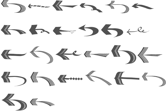
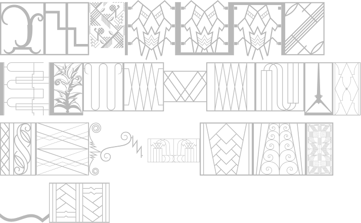
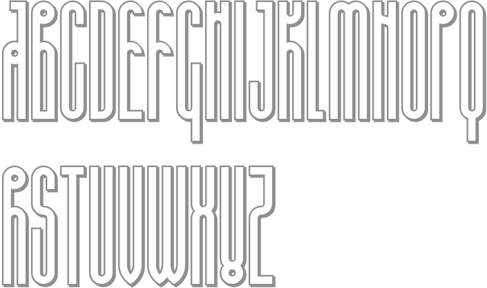
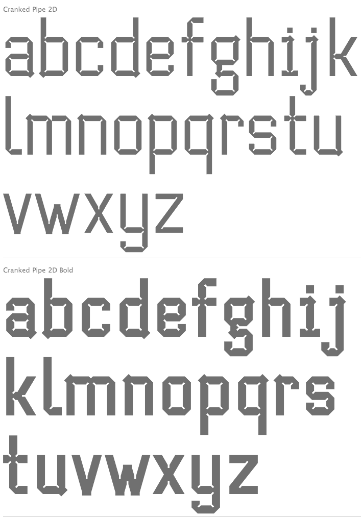
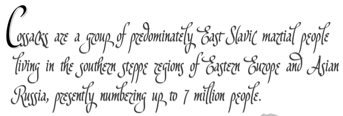
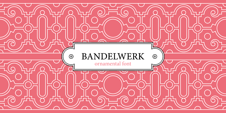
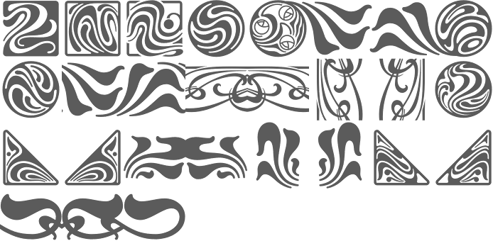
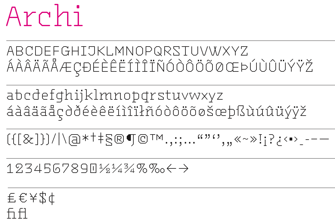
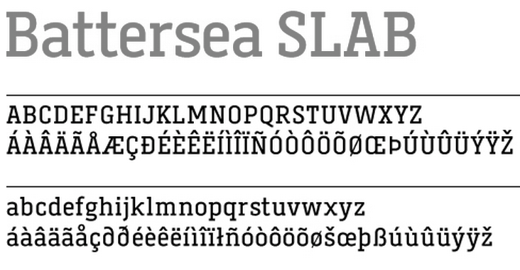
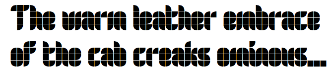
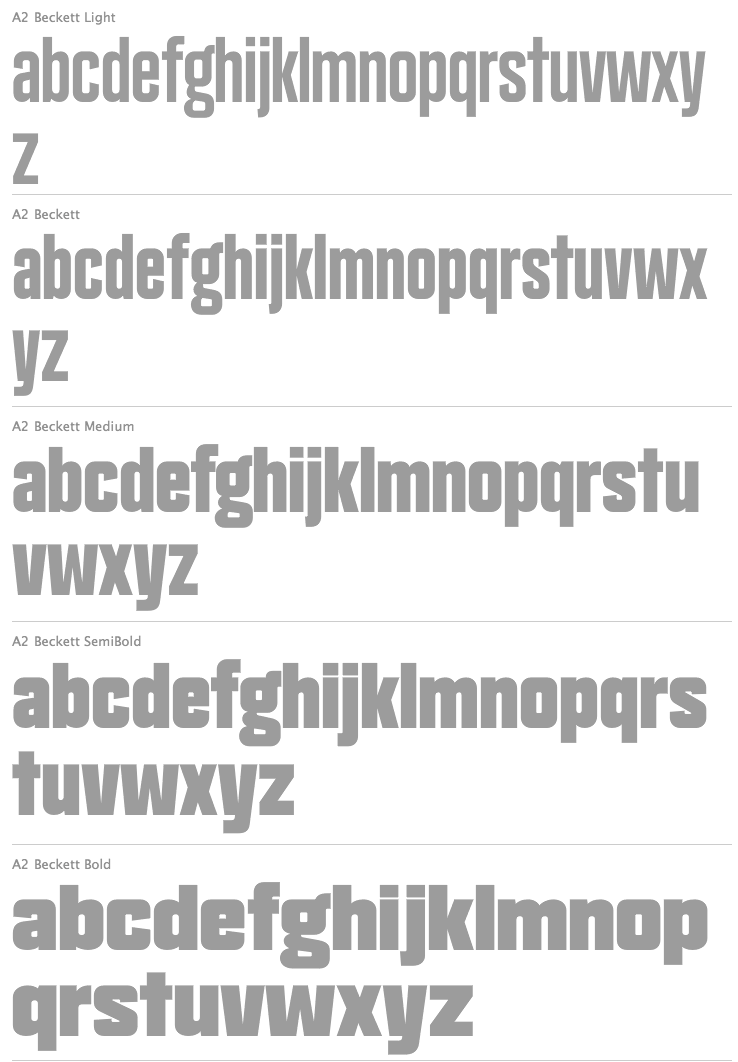
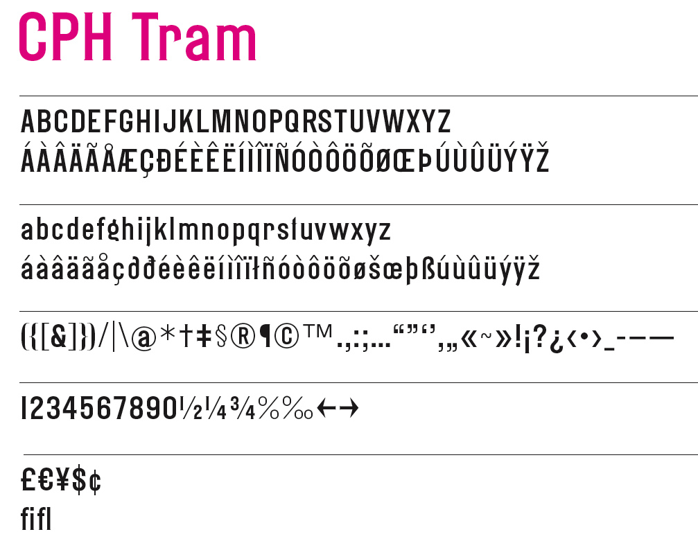
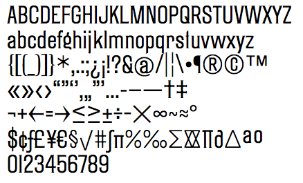
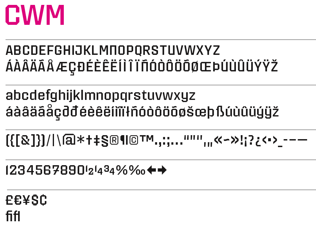
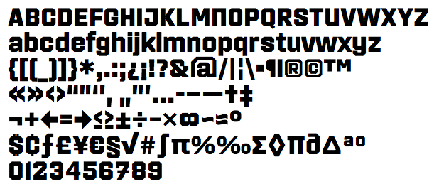
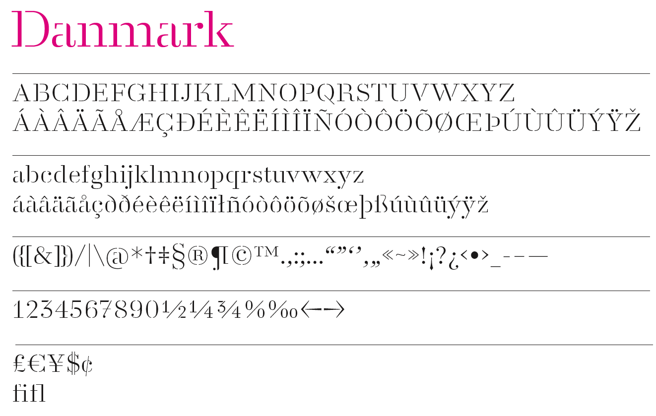
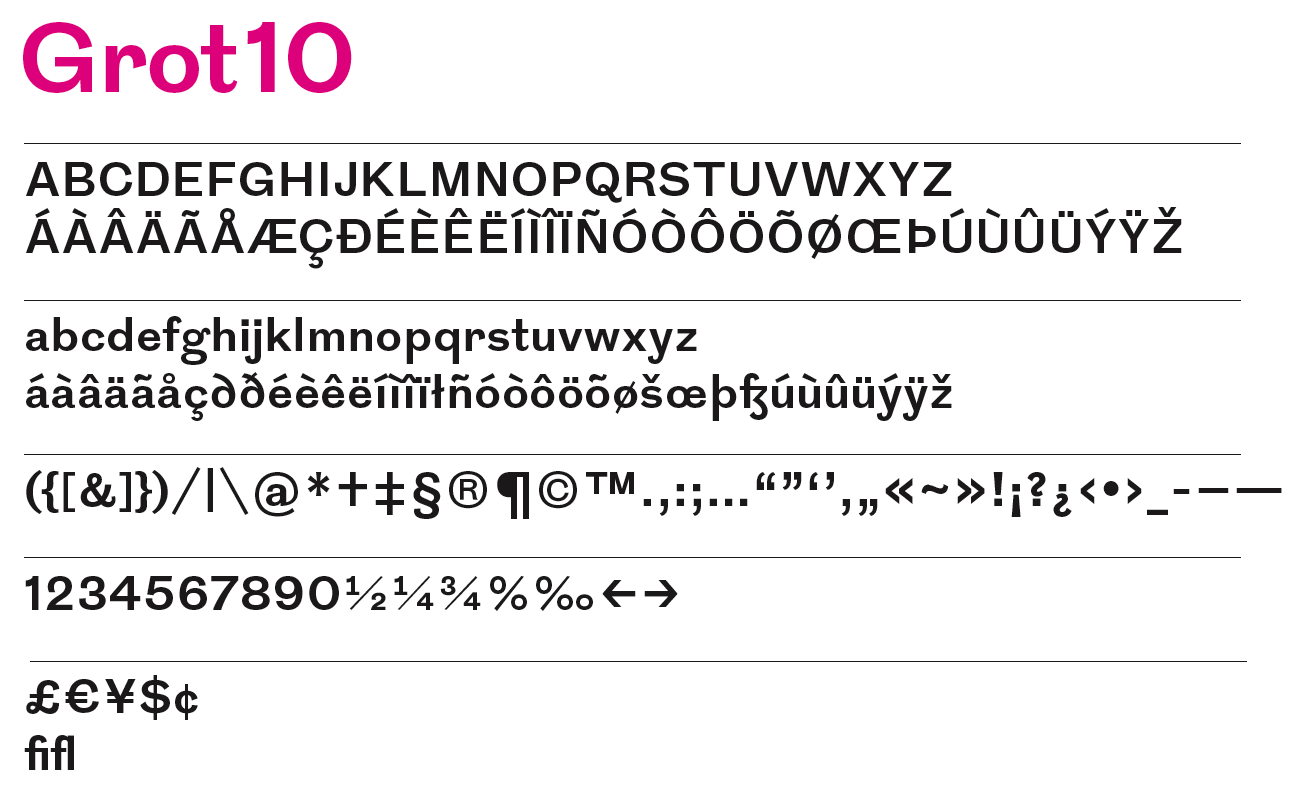
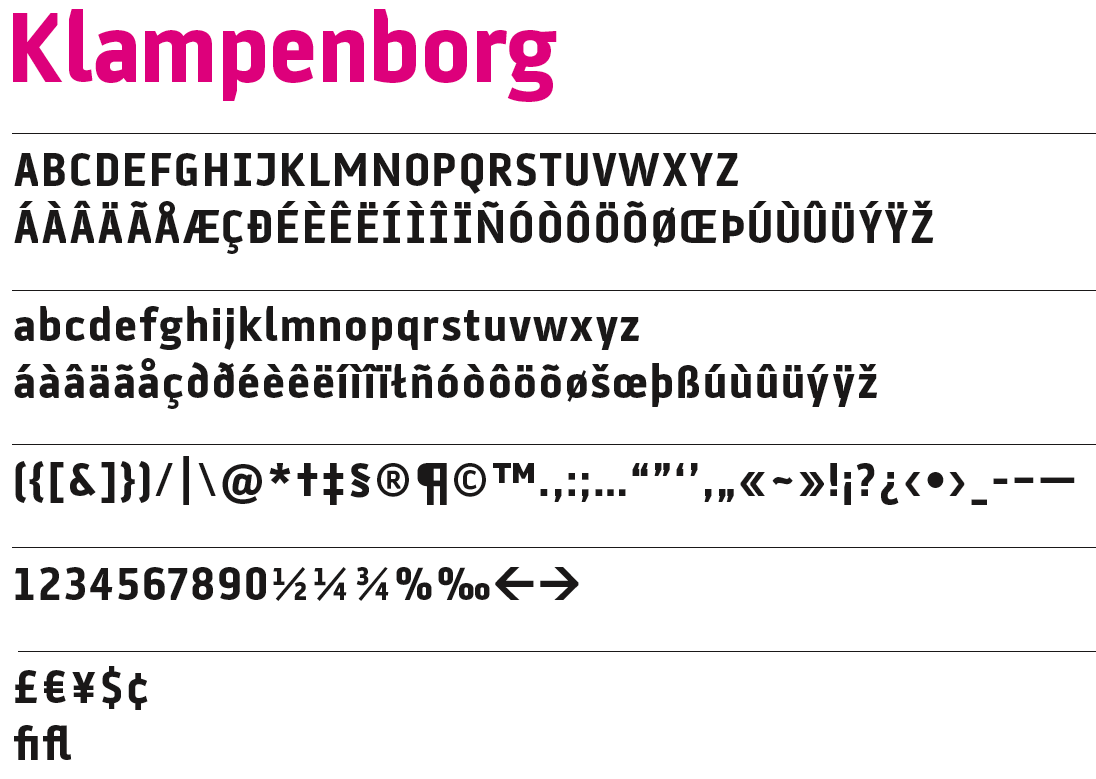
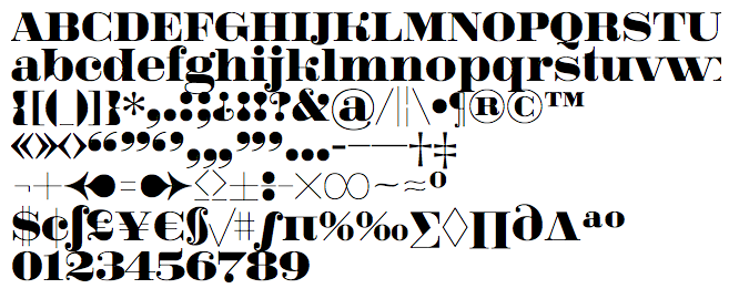
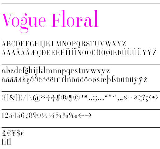
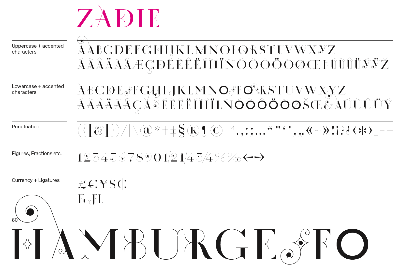
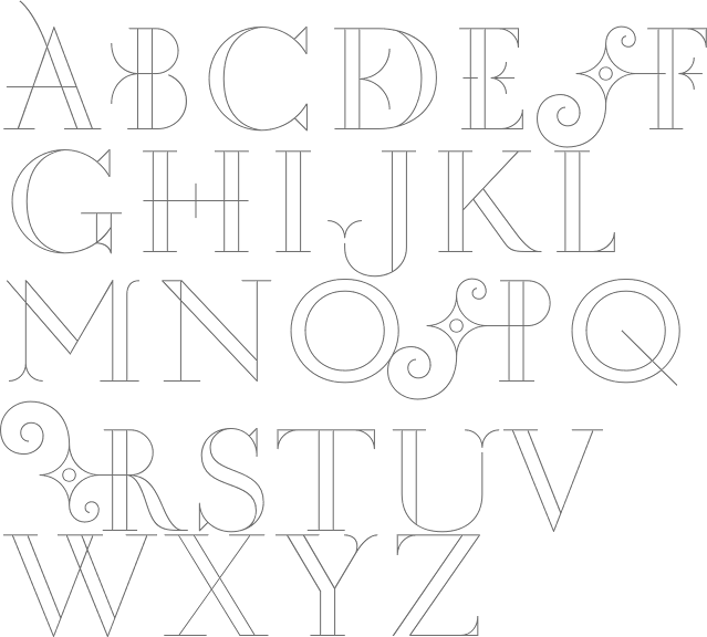
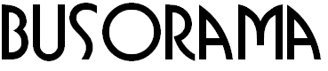
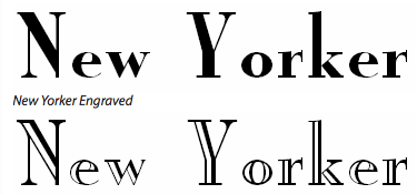
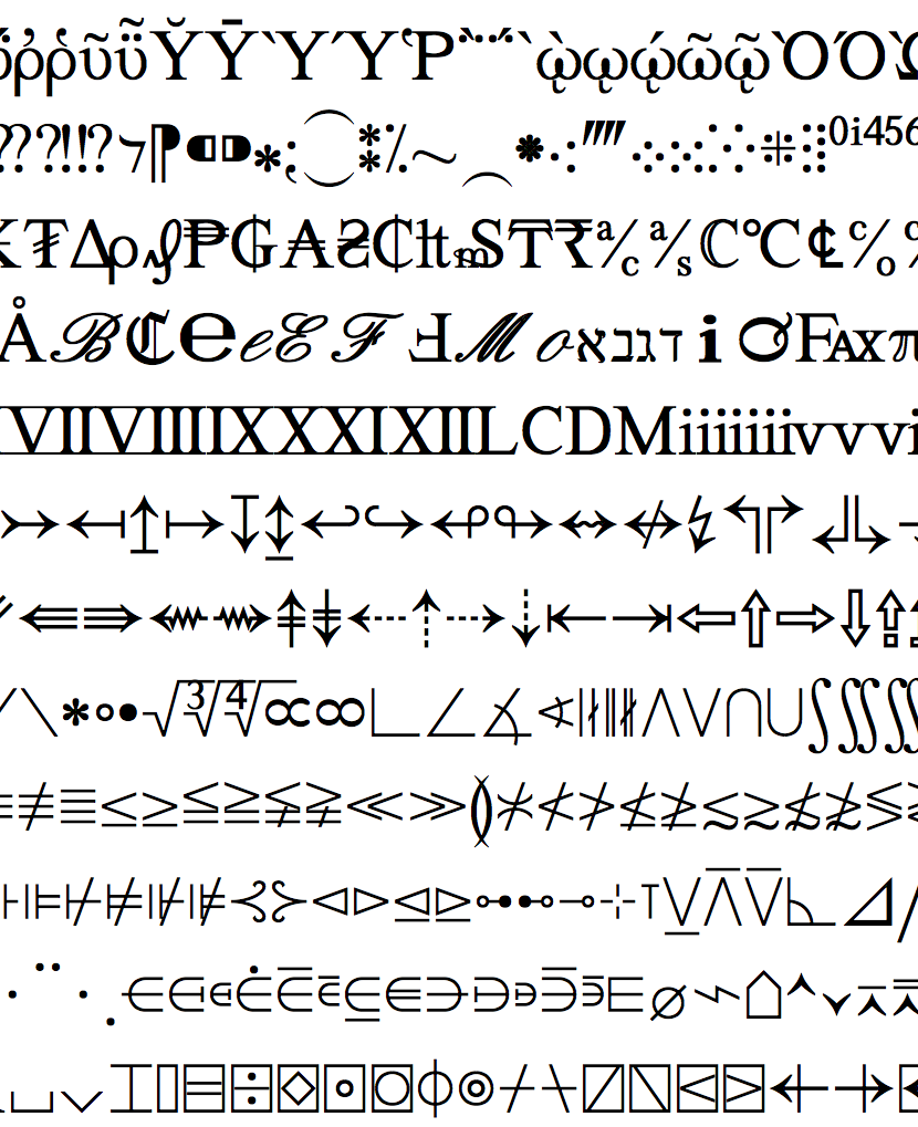
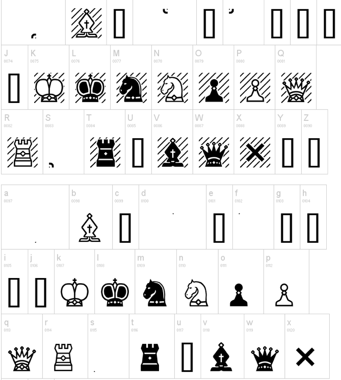
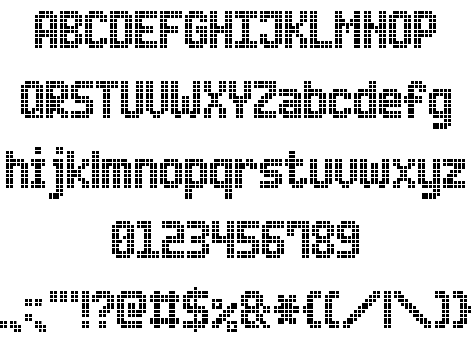
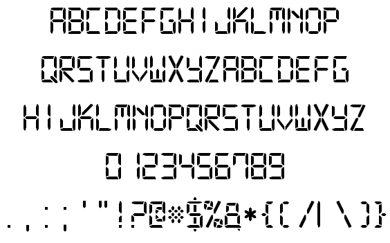
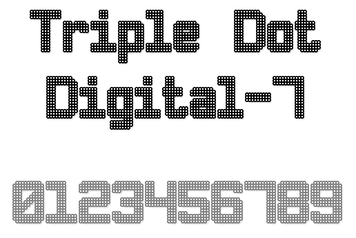
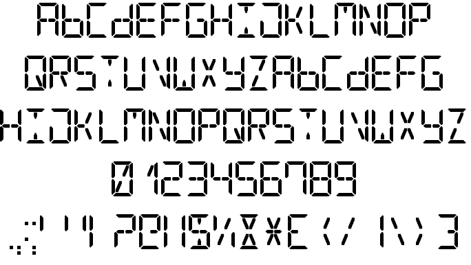
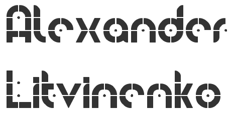
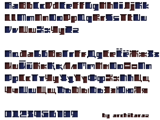
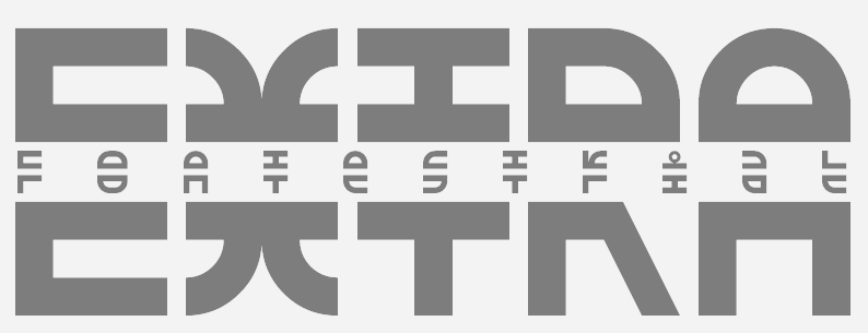
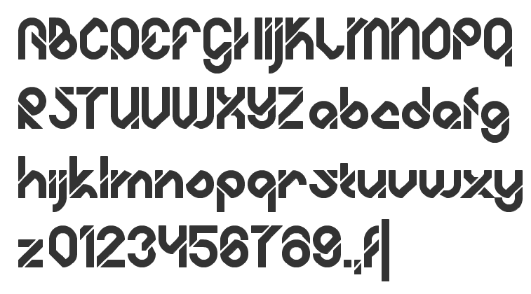
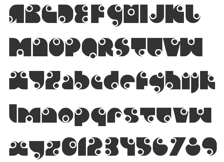
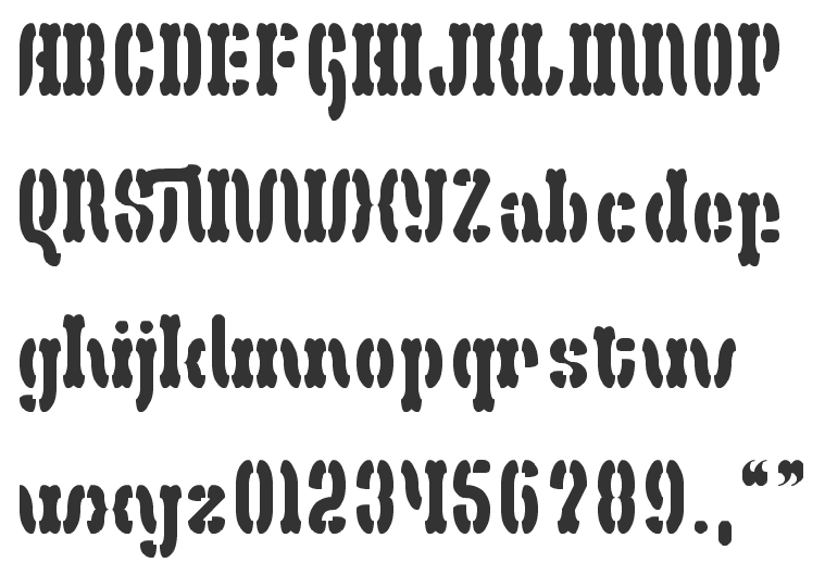
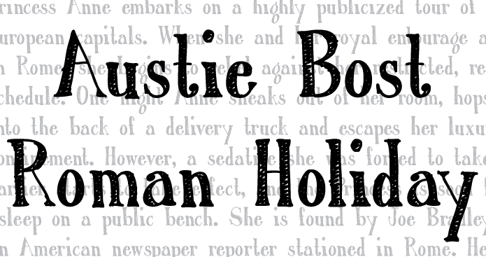
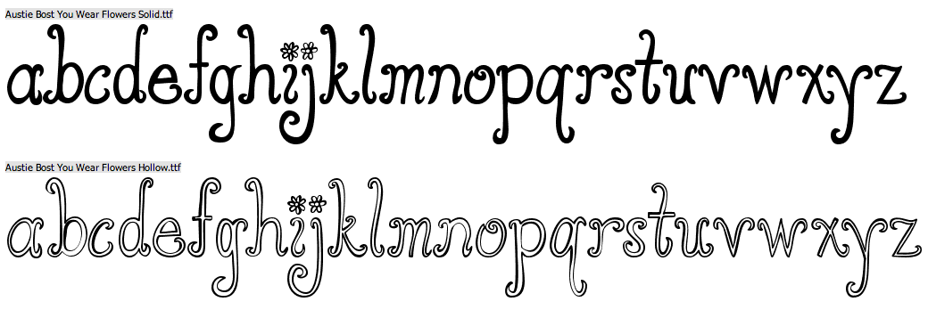
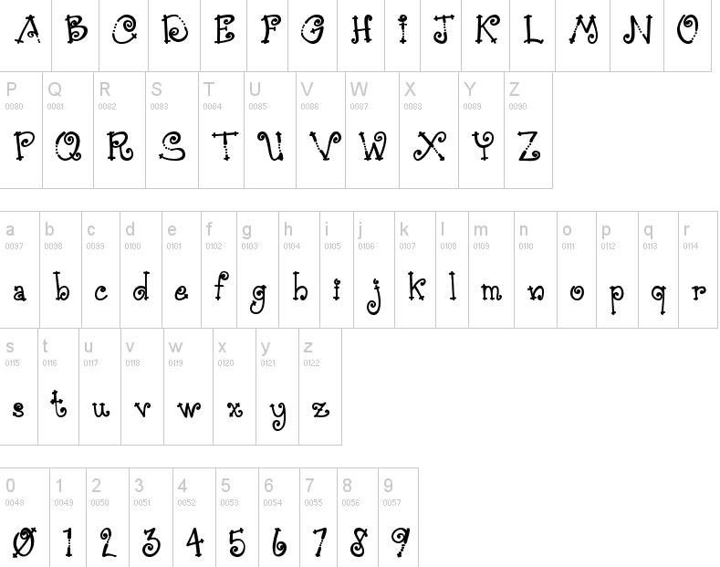
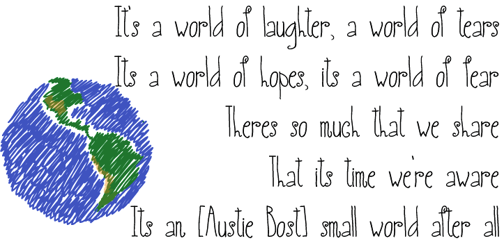
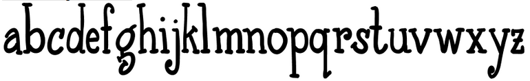
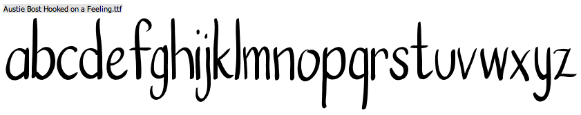
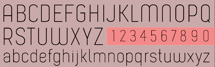
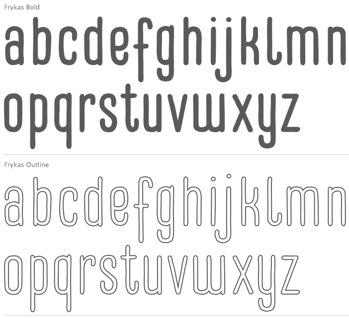
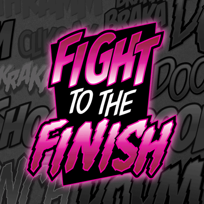
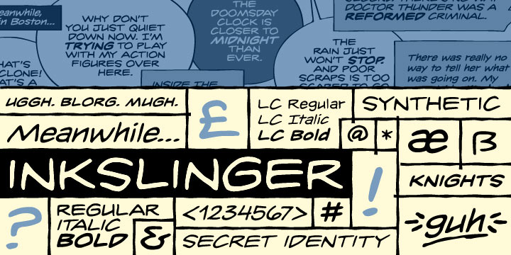
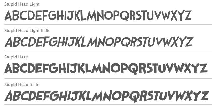
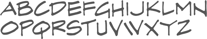
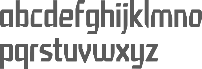
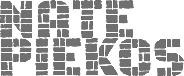
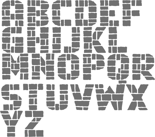
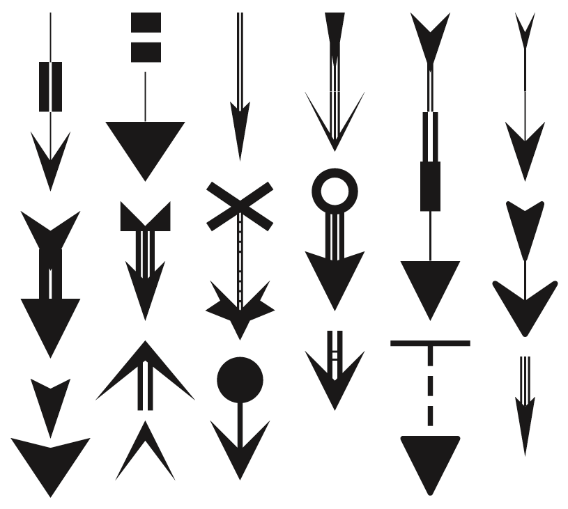
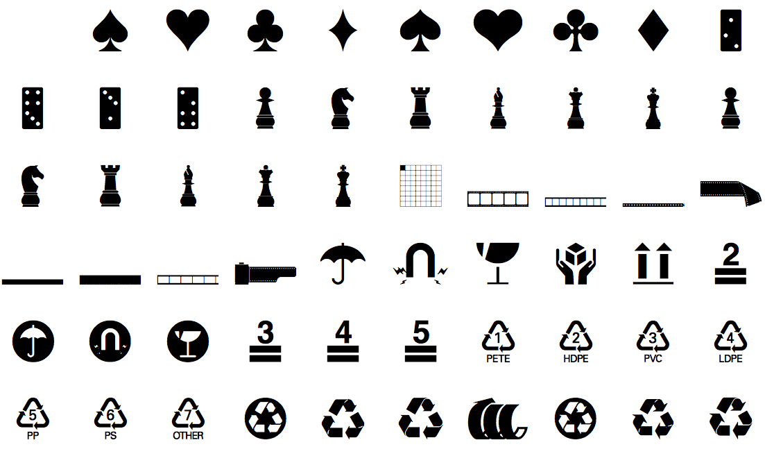
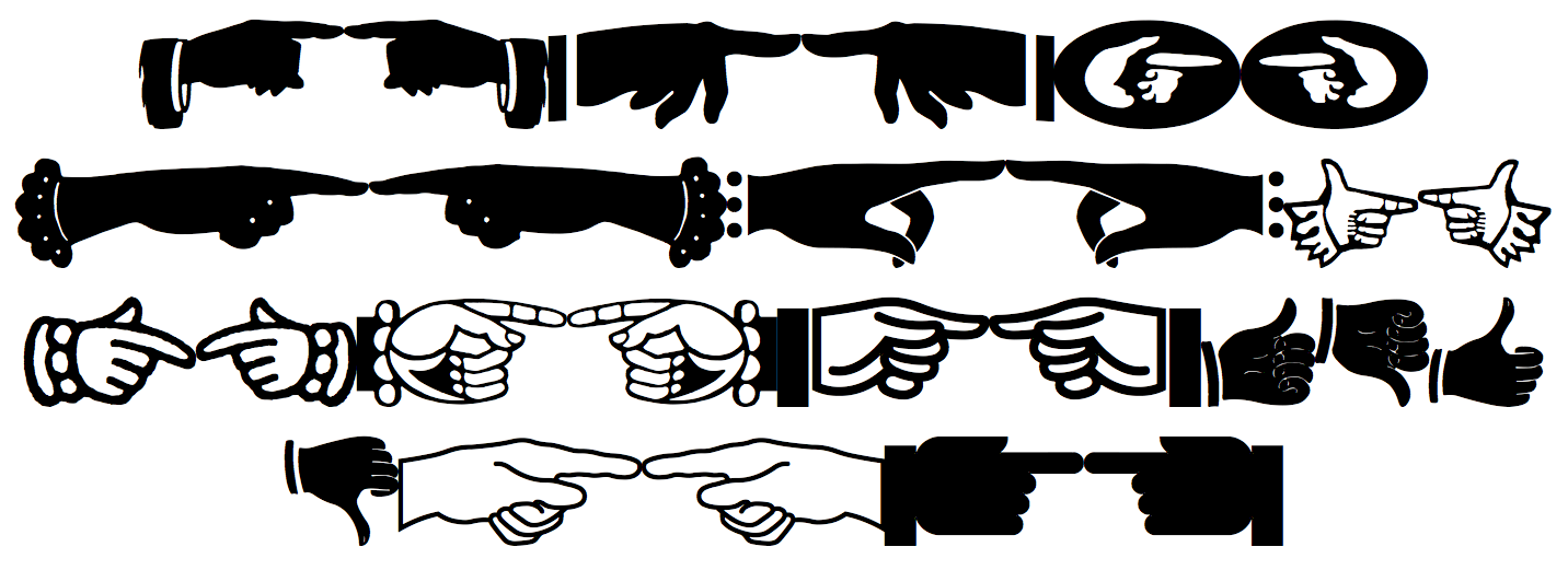
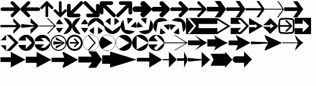
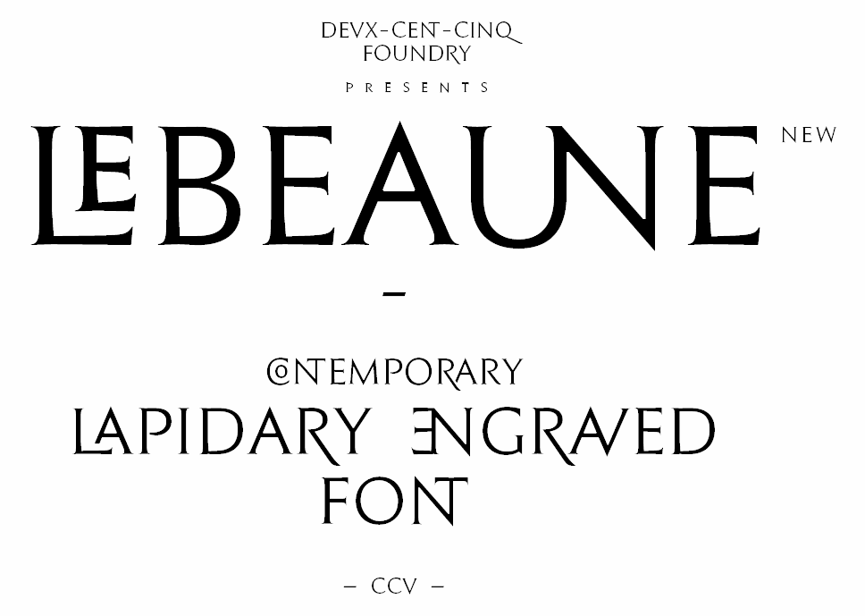
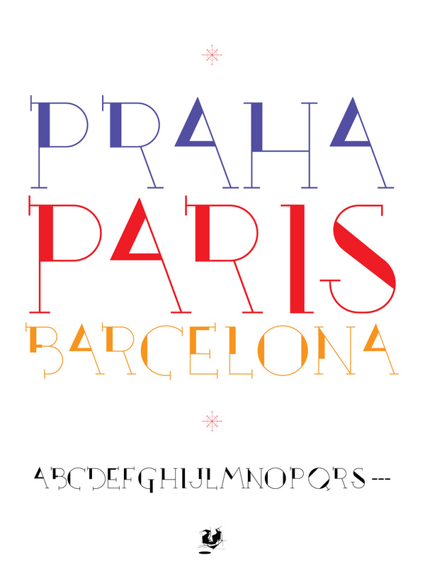
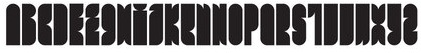
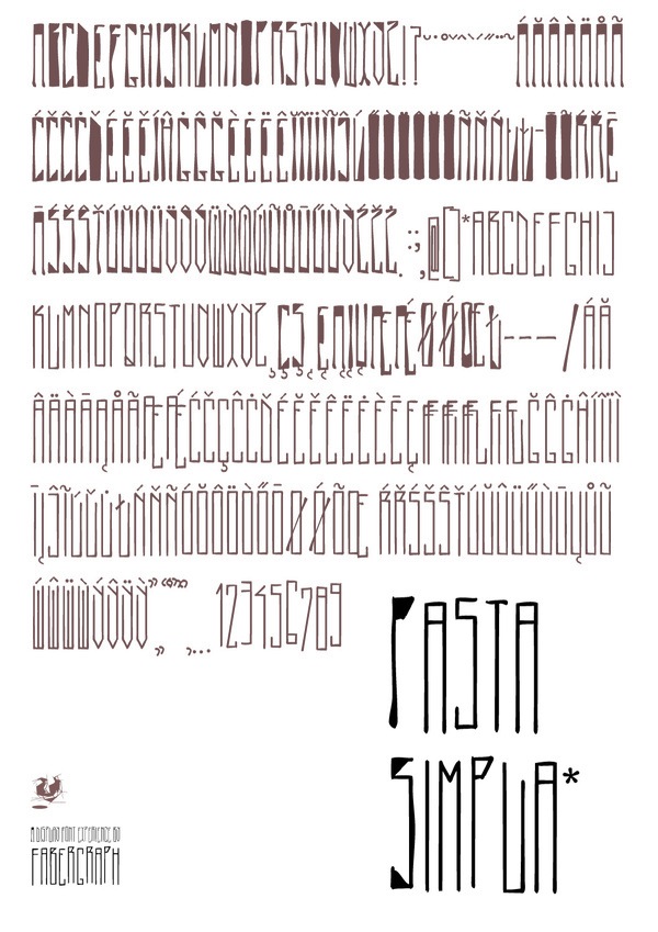
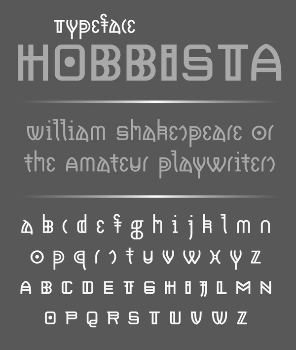
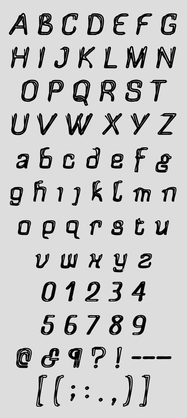
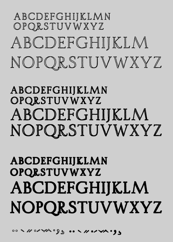
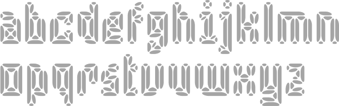
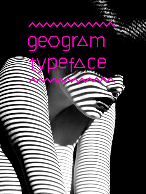
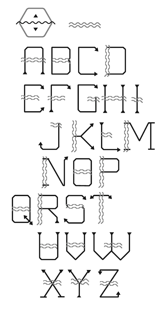
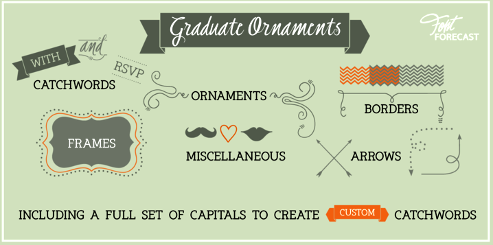
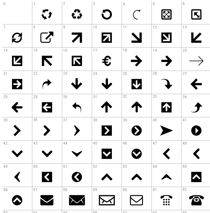
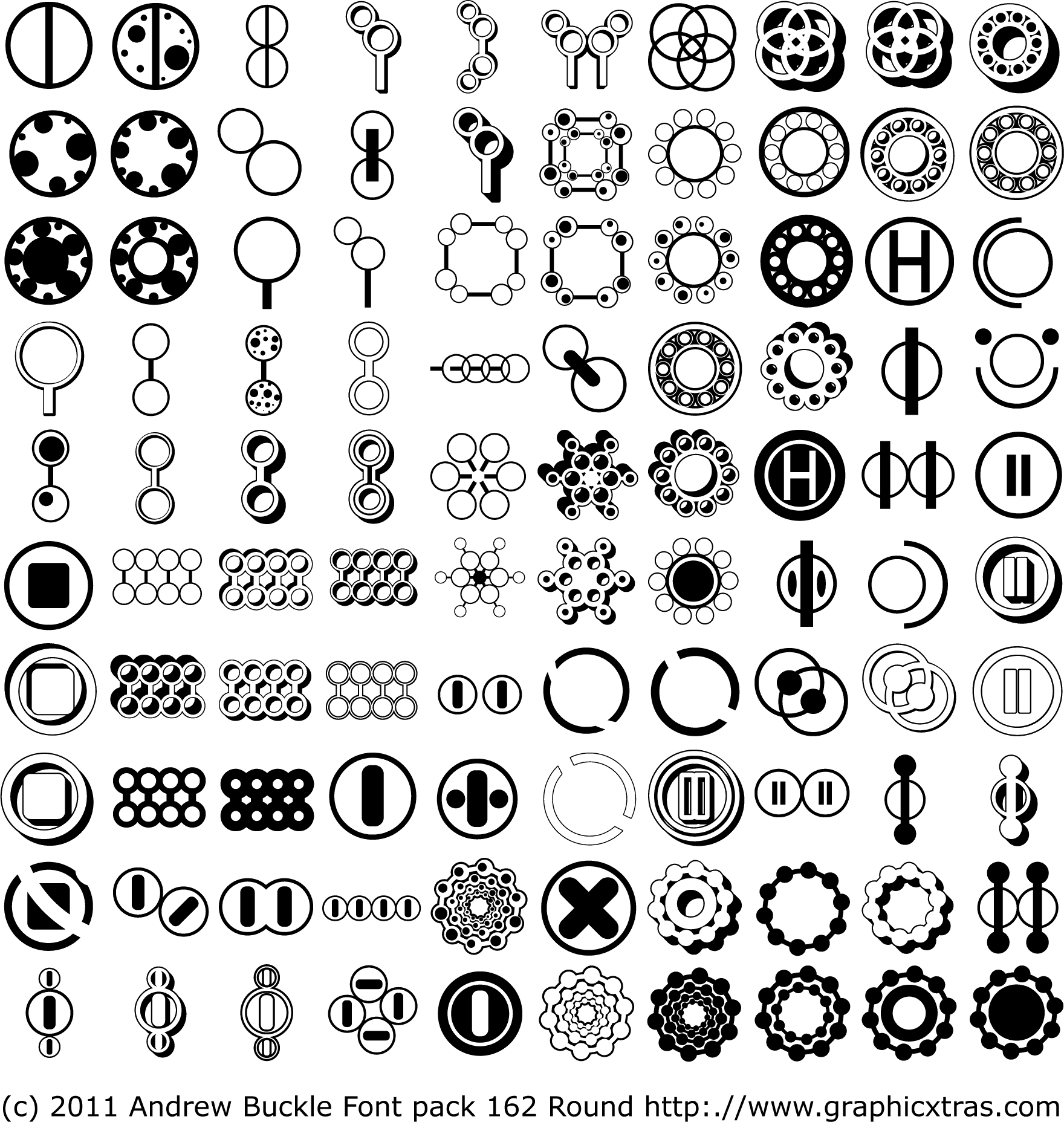
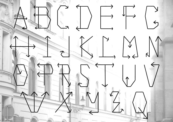
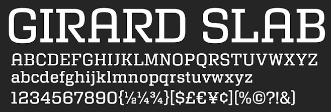
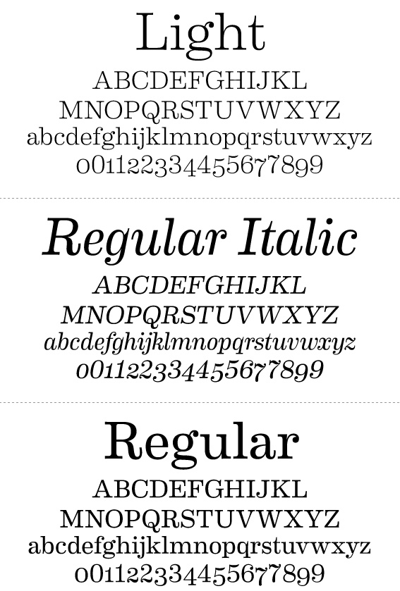
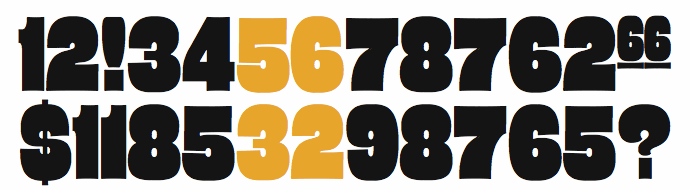
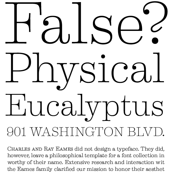
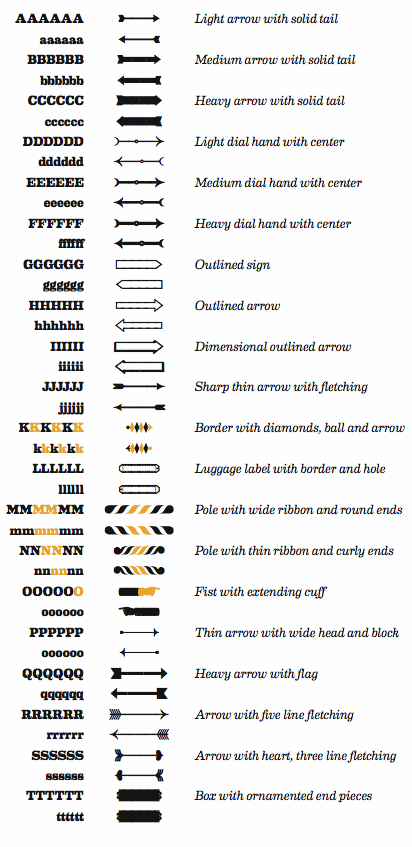
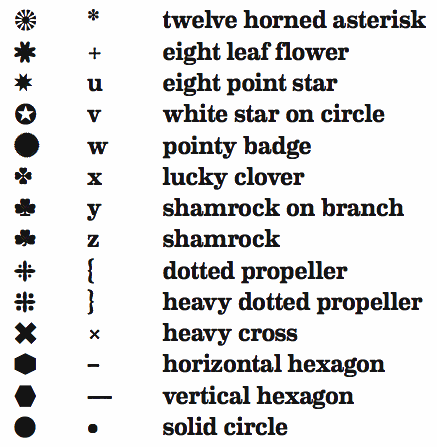
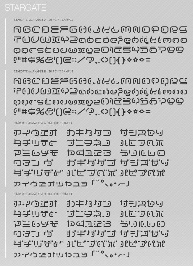
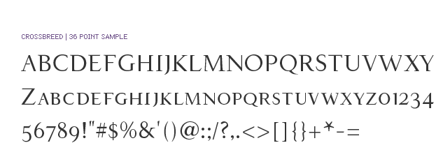
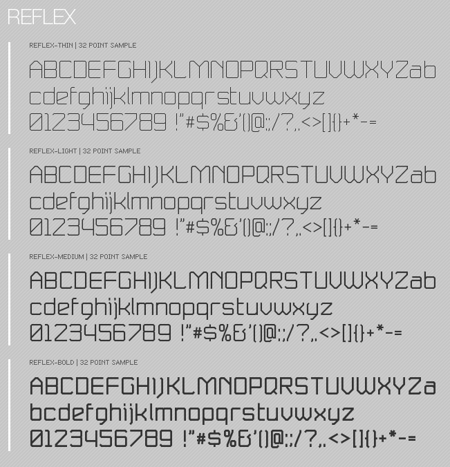
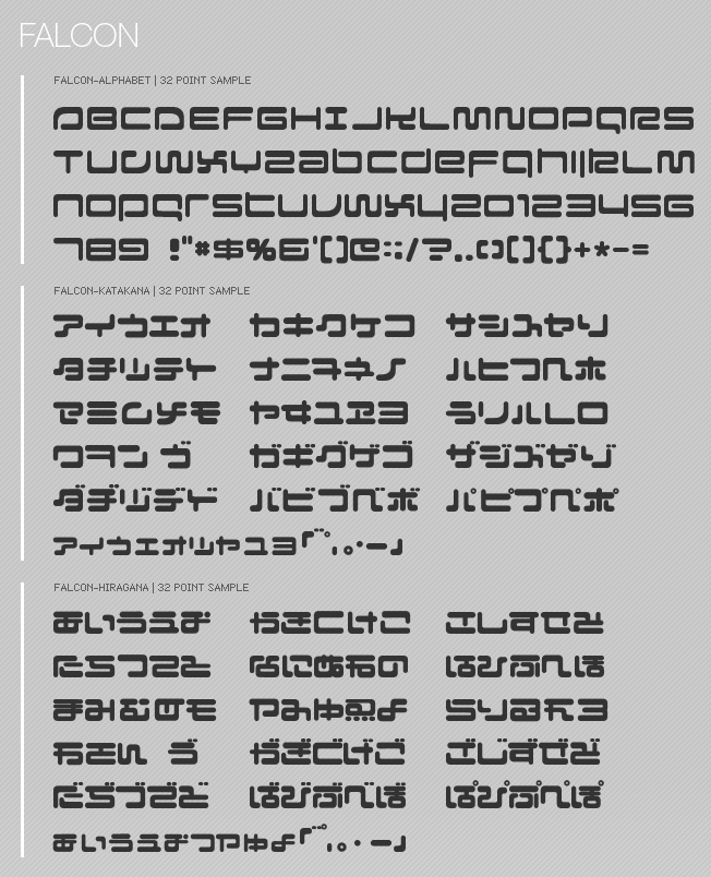
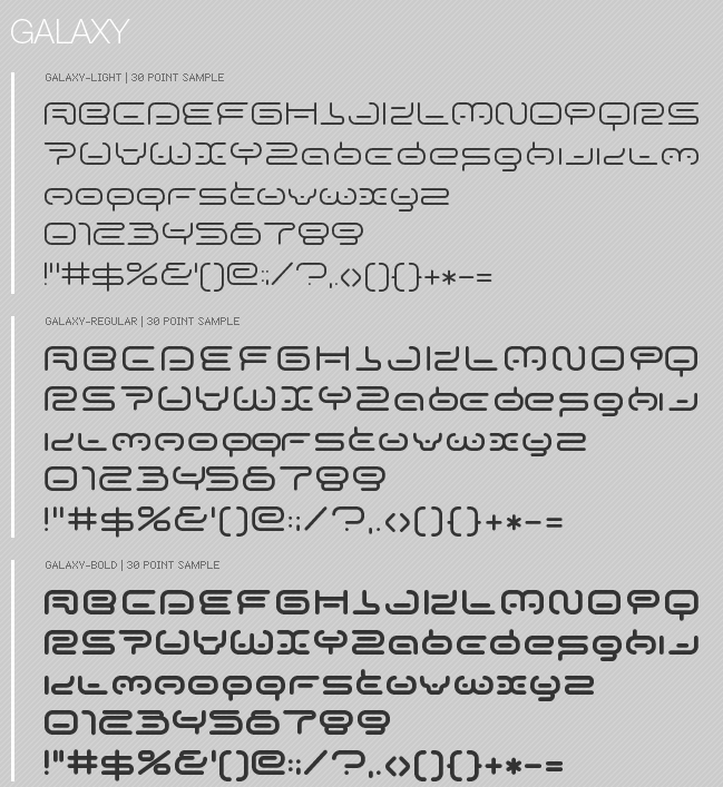
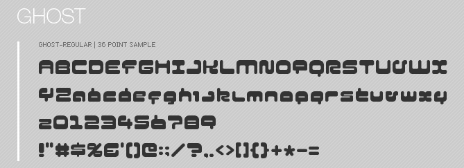
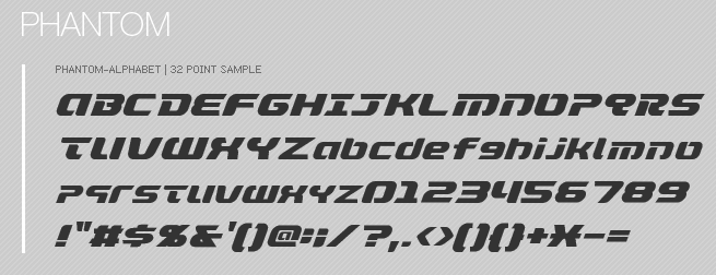
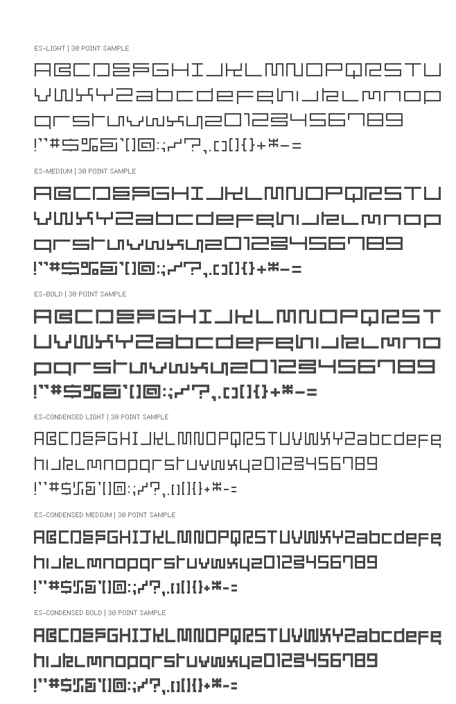
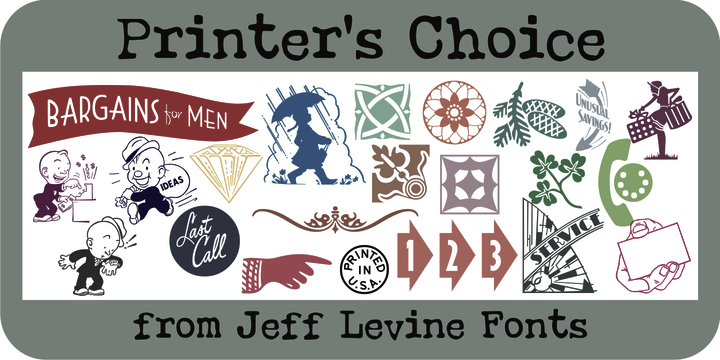
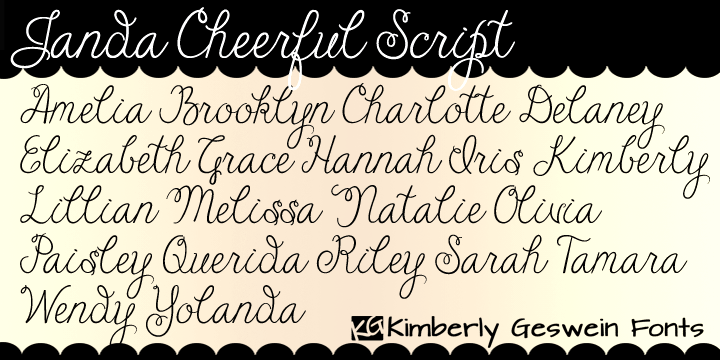
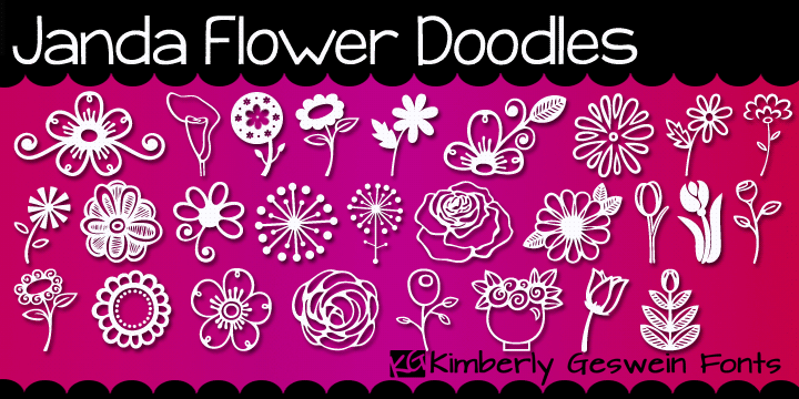
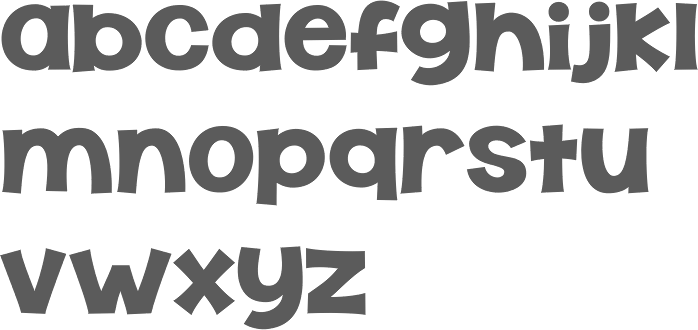
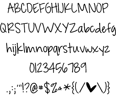
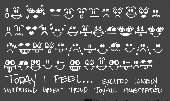
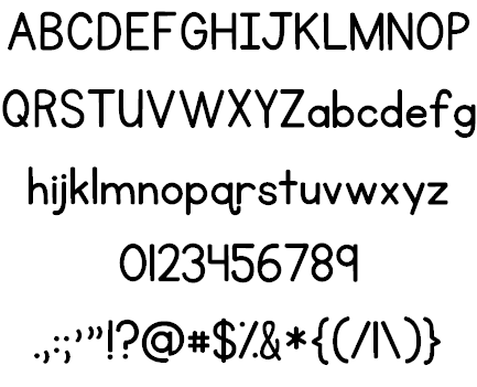
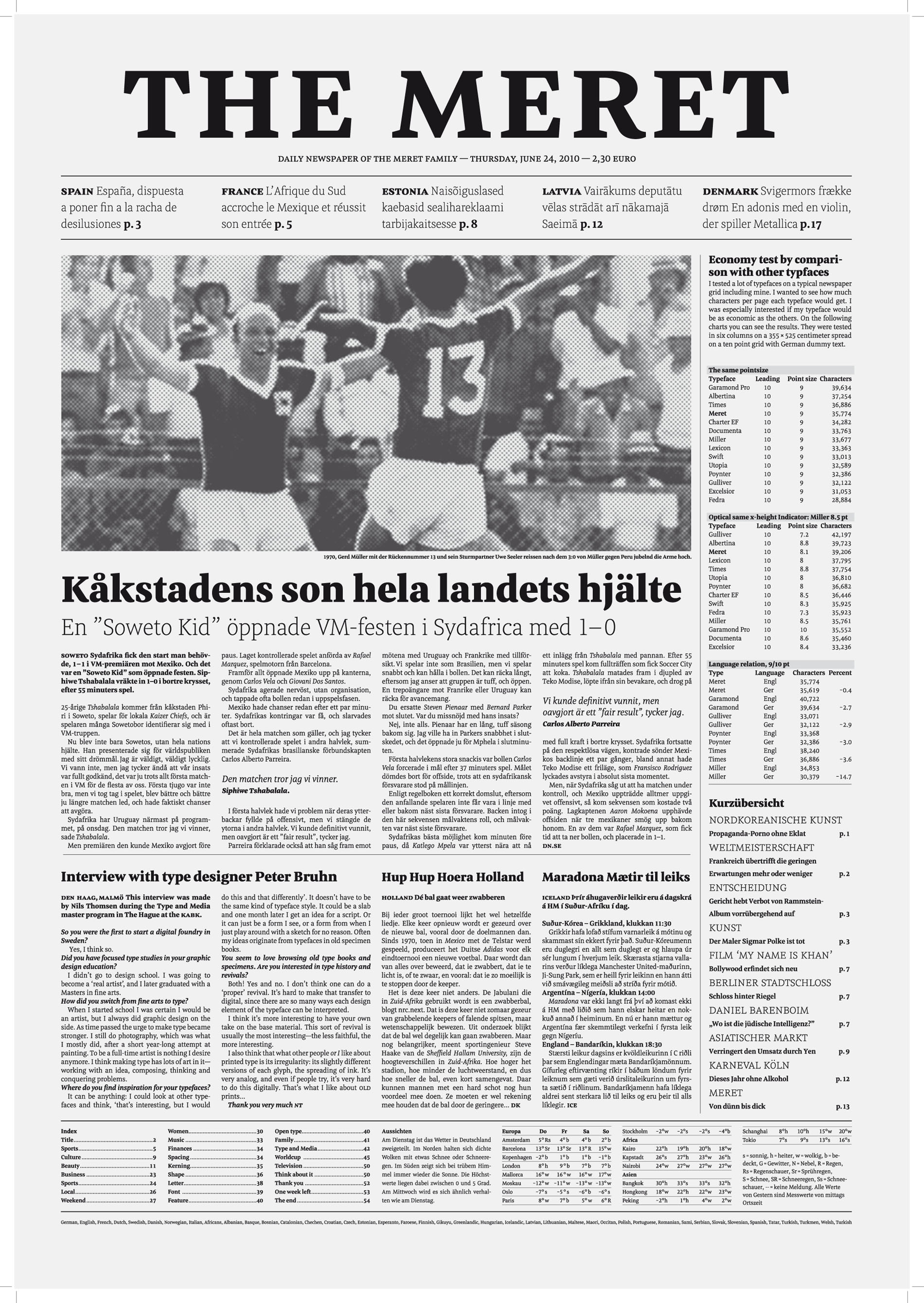
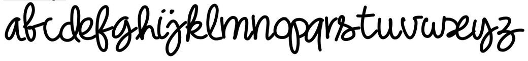
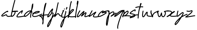
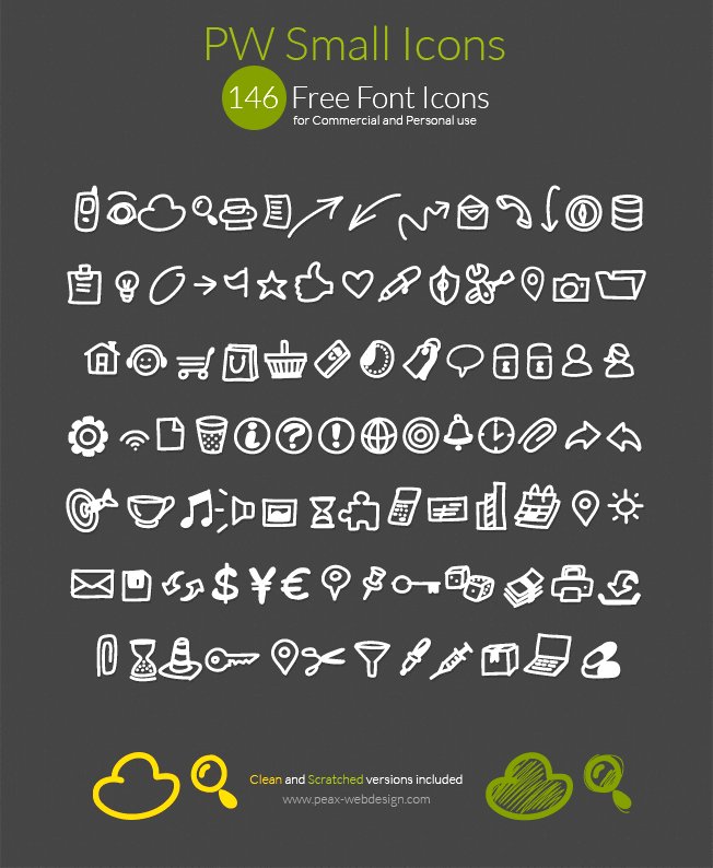
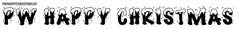
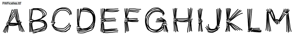
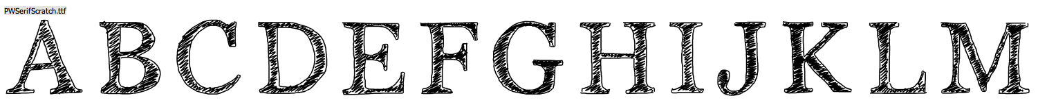
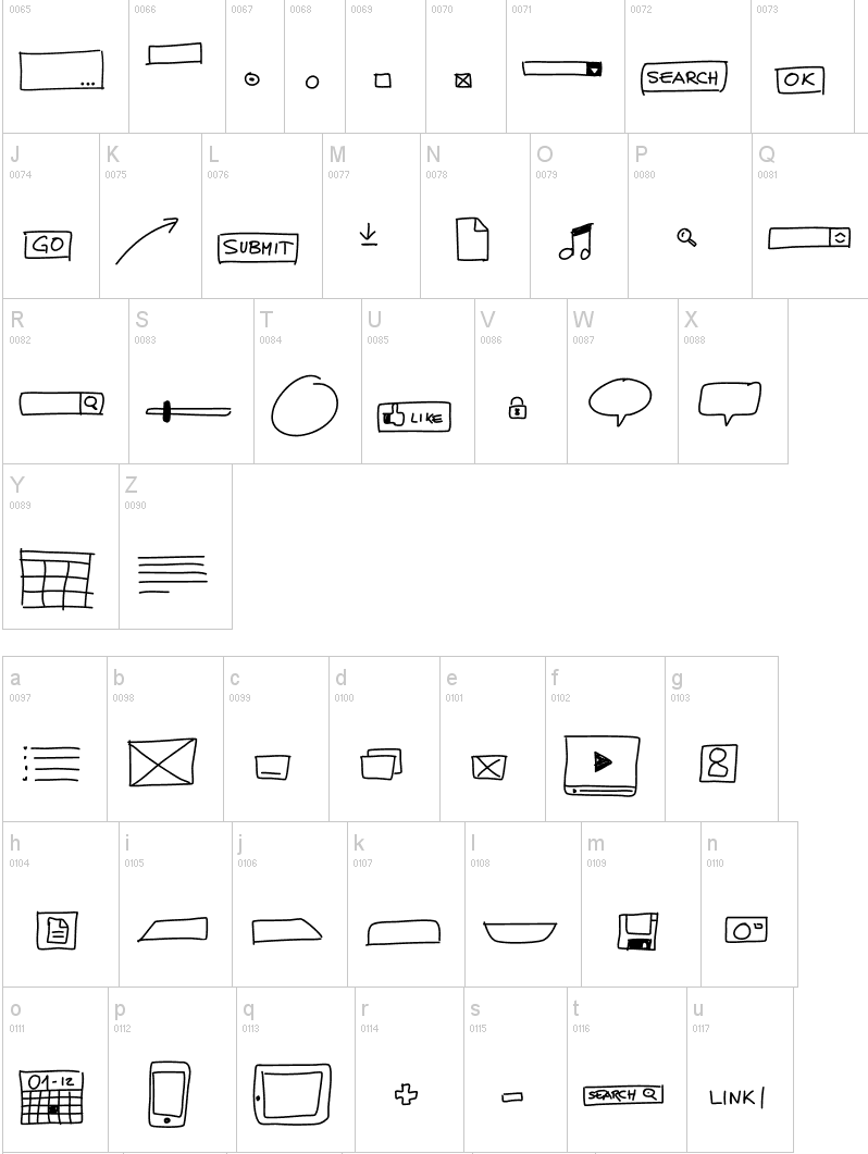
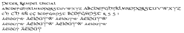
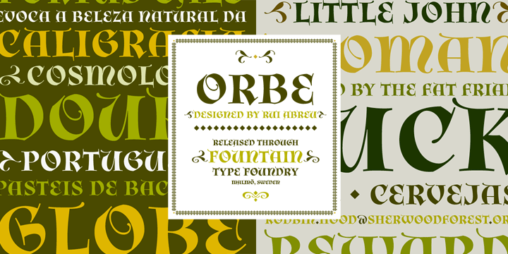
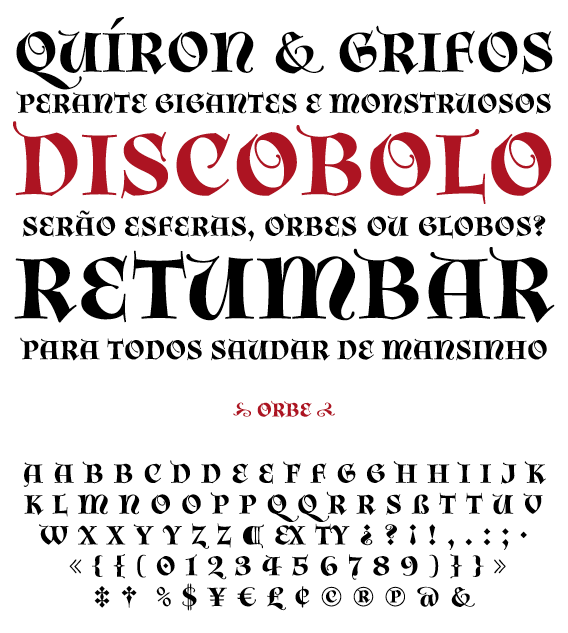
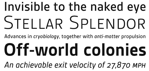
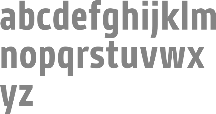
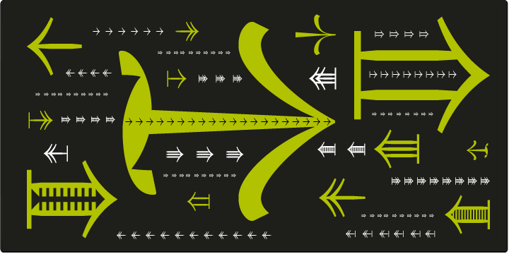
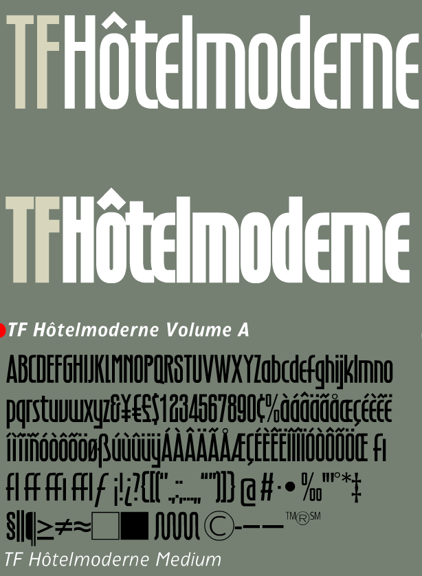
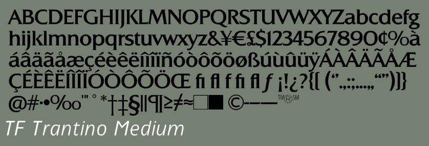
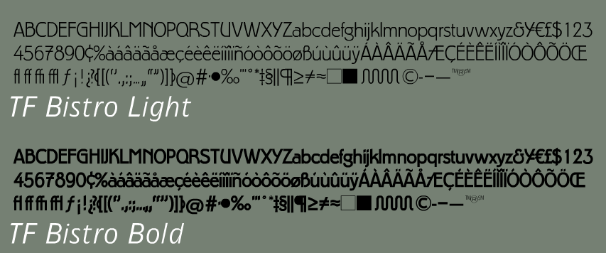
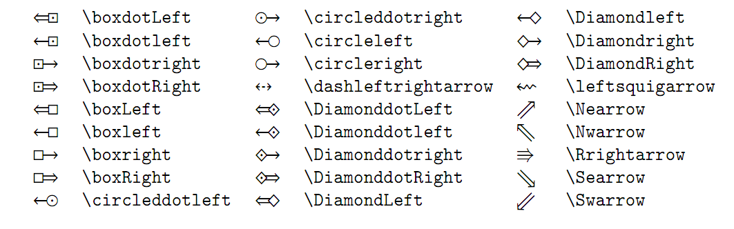
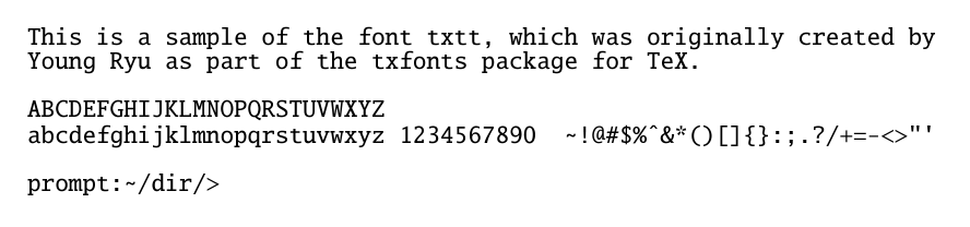
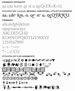
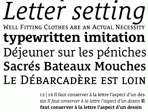
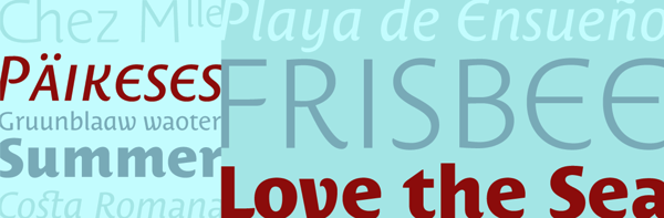
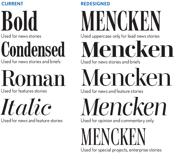
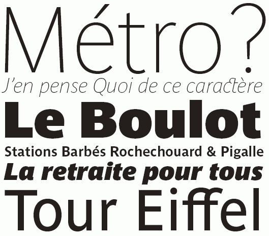
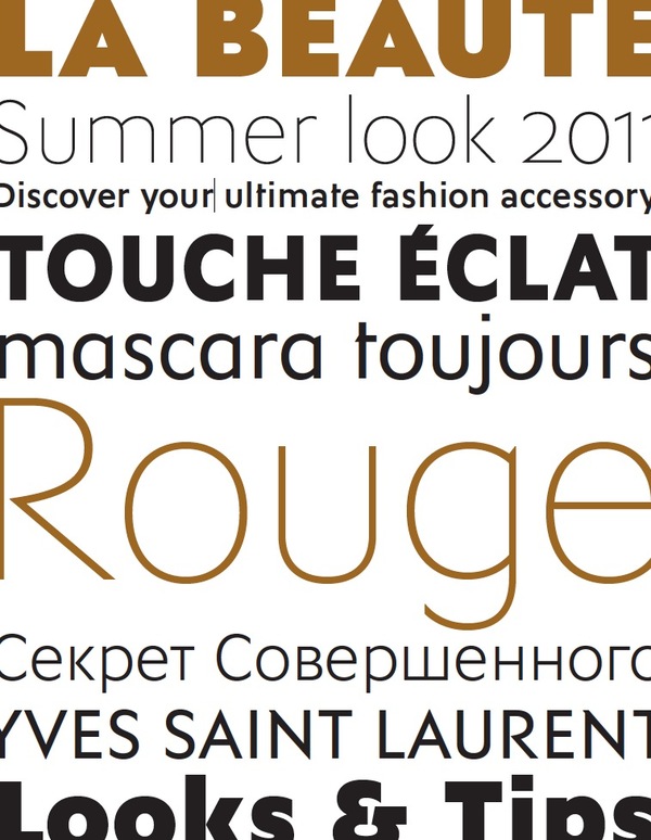
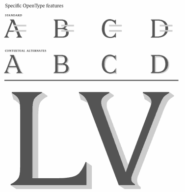
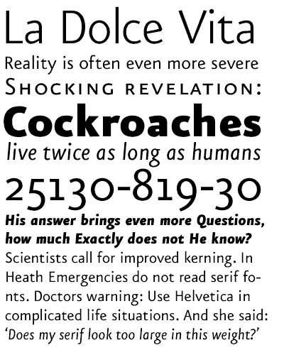
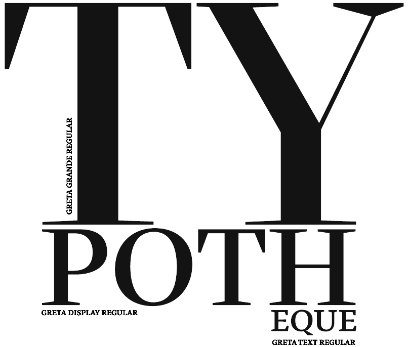
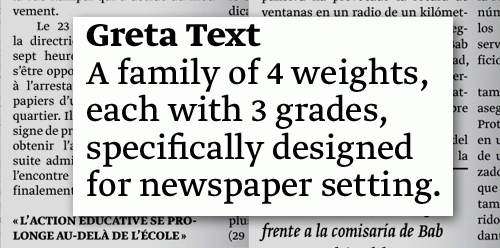
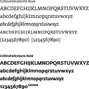
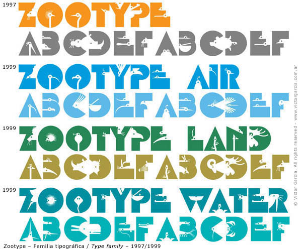
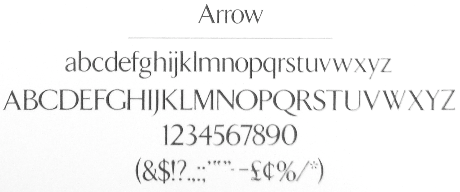
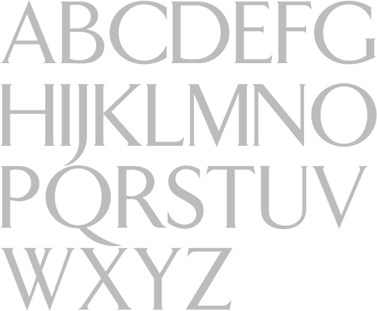
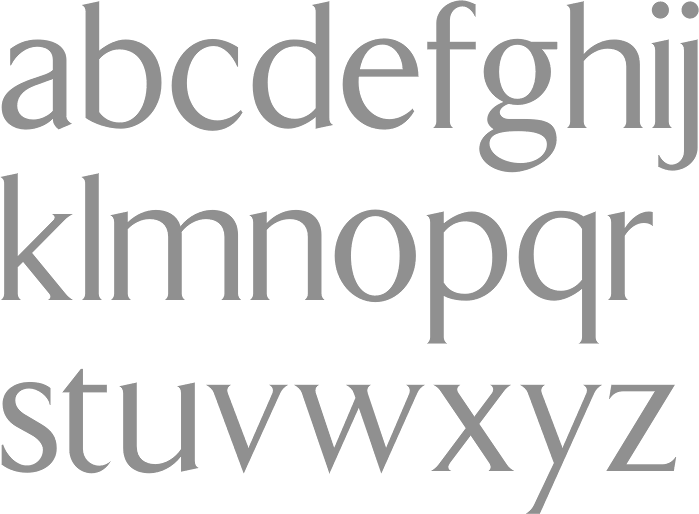
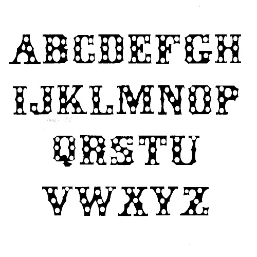
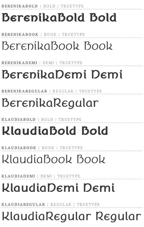
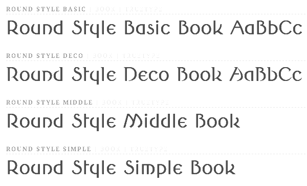
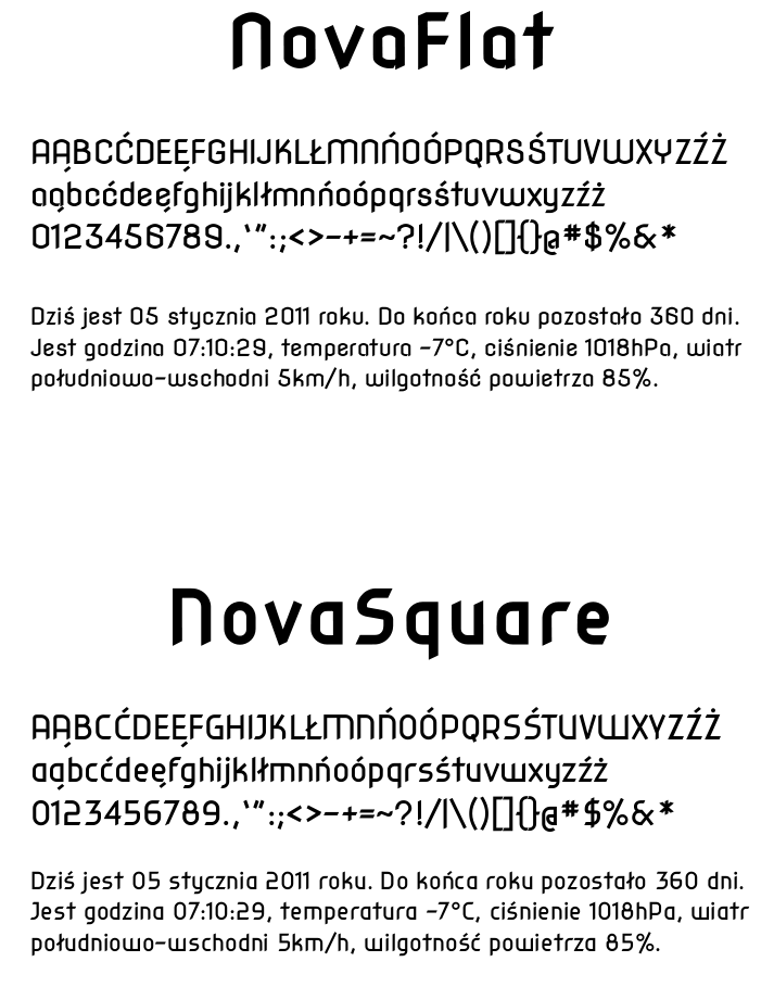
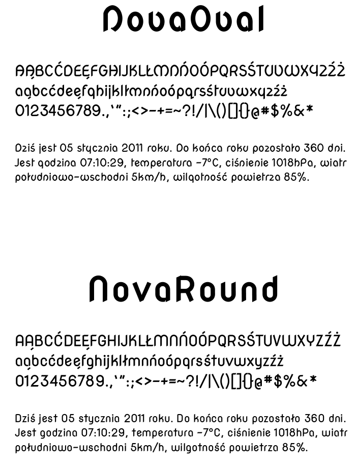
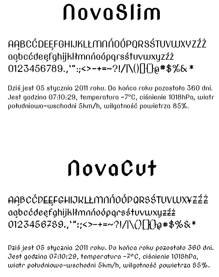
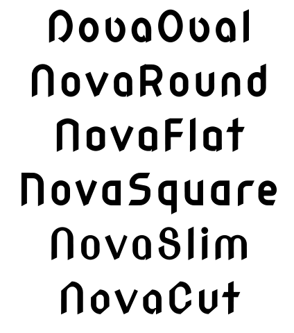