TYPE DESIGN INFORMATION PAGE last updated on Thu Apr 16 21:27:11 EDT 2026
FONT RECOGNITION VIA FONT MOOSE

|
|
|
|
|
Multicolor typefaces | ||
|
|
|
|
SWITCH TO INDEX FILE
38 Lineart Studio (or: Grayscale, or: Fontsources)
|
In 2018, he released the hexagonally-patterned color font Space, the nervous monoline display typeface Barcelona, the monoline script Brandy, the tattoo and metal band blackletter font Amstha, Twinkle (hexagonal texture), Premium Quality, Hightide (signage script), Ashley Pages, Bold Grunge (a wood style Western font), Rabbit House, Strongbold (brush style), Onthel (a rhythmic signage script), Cafeine, Seulanga (calligraphic), Sweet Bubble, Downhill, Architecture (technical writing font), Wisethink (rough brush), Emerald, Ghotic, Oakland (signage script), Parthenon (signage script), Strawberry Night (script), the formal calligraphic font Beauty Athena, the inline font Epicentrum, and the signature font Attitude in 2018. Typefaces from 2019: Ghoust (a marker font done at Cititype), Diamant Handwriting (a signature font), Utrecht (with Siti Saribanon Nurjannah), Exhibitionist (a fine rhythmic script), Holimount, Prague Metronome (a thin signature script), Allegroost (a brush typeface), Anisha (script), Kyoto Northern, ChiQuel (a Victorian display typeface that can be layered), Hillstone (a dry brush script), Malique, Ginchiest (a retro signage script), Kid Knowledge, Haghia, Khatija Calligraphy, Bernound, Graffity, Brandy Script (monoline), Downhill, Concept (sketched, blueprint font), Konya (signature script), Blacksmith, Curve Calibration (condensed sans). Typefaces from 2020: The Pallace (a great natural inky signature script by Muhammad Ridha Agusni and Siti Saribanon Nurjannah), Chipen (inline, all caps), Jakarta (a flowing inky script by Muhammad Ridha Agusni and Siti Saribanon Nurjannah), Rhode White (a great signature script by Muhammad Ridha Agusni and Siti Saribanon Nurjannah), Bailamore (a creamy signage script), Vogie (a sporty / techno sans family of 72 fonts, plus a variable font), Rollingtime (a brush script jointly designed by Muhammad Ridha Agusni and Siti Saribanon Nurjannah), Piedmont (a heavy connected handwriting script advertized as a masculine signature font), Whiplash (an all caps dry brush font), Aceh (a 36-style geometric sans), Youthink, Sacred Letter (a vintage weathered script), Serif Sketch (by Muhammad Ridha Agusni and Siti Saribanon Nurjannah), Corinthiago, Smart Chameleon (a handcrafted typewriter font by Muhammad Ridha Agusni and Siti Saribanon Nurjannah), Hiroshima Gyoshi (a brush font inspired by Japanese calligraphy), Roughmarker (dry marker font), Brotherhood, Blugie (a fat finger font), Rome Ionic (an all caps roman typeface), Black Orchestra (a great horror or black metal font), Black Orchestra (a horror font). Typefaces from 2021: Magreb (an 8-style renaissance serif typeface), Toxide (calligraphic; Celtic; uncial), Redtone (a 14-style geometric sans), Moula (an 18-style geometric sans for Latin, Greek and Cyrillic), Zouk (blackletter), Zagreb (an inky signature script by Muhammad Ridha Agusni and Siti Saribanon Nurjannah), Alsace (Victorian), Backbone (a black metal blackletter typeface), Roundkey (a 24-style condensed, but not round, sans), Wordwalker (a marker pen font by Muhammad Ridha Agusni and Siti Saribanon Nurjannah for Cititype), Sweet Bubble (a bubblicious font), Souljah (an elegant inky calligraphic script). Creative Fabrica link. Another Fontbundles link. [Google] [MyFonts] [More] ⦿ |
During his grpahic design studies in Norwich, UK, Aaron Hocking created the rounded modular typeface Theo (2016) which can be used for coloring and overlays. [Google] [More] ⦿ | |
FontLab's Adam Twardoch takes us on a tour of multicolor font format proposals in 2014. [Google] [More] ⦿ | |
Bangalore, India-based designer of a colorful set of capitals in 2015. [Google] [More] ⦿ | |
Adobe: OpenType-SVG is a font format in which an OpenType font has all or just some of its glyphs represented as SVG (scalable vector graphics) artwork. This allows the display of multiple colors and gradients in a single glyph. Because of these features, we also refer to OpenType-SVG fonts as color fonts. OpenType-SVG fonts allow text to be shown with these graphic qualities, while still allowing it to be edited, indexed, or searched. They may also contain OpenType features that allow glyph substitution or alternate glyph styles. Color fonts like Trajan Color Concept and EmojiOne Color will appear just like typical fonts in your programs' font menus but they may not display their full potential, since many programs don't yet have full support for the color components. If your software program doesn't support the SVG artwork within the fonts, glyphs will fall back to a solid black style. Color can still be applied to this fallback style, as it will work like a typical OpenType font. [Google] [More] ⦿ | |
Fano, Italy-based designer of the decorative multi-colored geometric caps typeface Afivez (2015). Behance link. [Google] [More] ⦿ | |
Warsaw, Poland-based designer of magnificent experimental typefaces in various vector formats. These include:
| |
During her studies at Nicolaus Copernicus University in Torun, Poland, Aleksandra Paczkowska designed the Illustrator-format multi-colored font Juice (2014). [Google] [More] ⦿ | |
| |
| |
Alex Cottles
| |
La Mirada, CA-based designer of Soda Lime, a colorful typeface of broken glass (2015). [Google] [More] ⦿ | |
Leesburg, VA-based designer of the colorful stencil typeface Cut Font (2017). [Google] [More] ⦿ | |
Codesigner with Donald Tarallo at Tarallo Design of FormPattern Color (2018),d FormPattern Color Three (2019: a typeface for creating borders and frames) and FormPattern Color Six (2020), Varese Outlined (an all caps geometric outline font) (2020). [Google] [MyFonts] [More] ⦿ | |
He is the codesigner with Andreu Balius of SuperVeloz (2005, TypeRepublic), a digital version of his grandfather's typeface. It won an award at the TDC2 2005 type competition. Balius says about this typeface originally created by Joan Trochut from 1920-1980: Super-Veloz could be considered as an Ornamental type design, but in its core it is an experimental typeface based on a set of modular features that, with the combining of its modules, a great range of typefaces, ornaments ---even illustrations---, could be made. That is perhaps the most interesting experiment in early modern type design ever made in Spain during the immediate years after the War. The lecture, considering the borders between type design and ornament design, will introduce the context where Joan Trochut's Super-Veloz was produced (from sketches to published brochures and speciments) in 1942. Also will explain how Super-Veloz works. It is really a "type-ornament" design that could be considered on the edge of what we call type design. Alex has created design, illustration and typography for a diverse range of clients: Nike, Adidas, The Rolling Stones, Katy Perry, BBC, Coca-Cola, Pepsi, The Guardian, The New York Times and Time Magazine. Alex Trochut's lettering must be seen to be believed---it has to be genetic transmission. Recurring themes include adorned initials and modular types. His numerical all-caps alphabet for British Airways is phenomenal and pushes the bling-bling to the fashionable extreme. Stunning dollar sign drawn by him in 2007 for Acido Surtido. In 2009, he published Neo Deco at HypeForType. Noteworthy type treatments of that year include Nixon and the Futurecraft logo. In 2012, he designed Trojan Font (like Trajan). He also did some stunning multiline alphabet for V Magazine. Also noteworthy is a swashy calligraphic logo for Wiz Khalifa and Atlantic Records. In 2013, Barcelona-based creative agency, Herraiz Soto commissioned Alex Trochut to create an original typeface collection titled Raw for Notegraphy. In 2017, he made the color font Megazero at Fontself in Opentype SVG format. In 2018, Alex Trochut and Sudtipos cooperated on Utopian and Dystopian. Utopian is a color font family based on primary colors and pure geometric shapes, influenced by Bauhaus and De Stijl. Dystopian, its black and white companion with square features of Renner's original Futura drawings, emits a darker look and evokes Trumpian gloom and doom. Behance link. Debutart link. Klingspor link. [Google] [MyFonts] [More] ⦿ | |
Alexey Popov
| |
Graduate of ESMA (Ecole Supérieure des Métiers Artistiques) in Nantes, France. As a student in 2016 at Ecole Sup de Pub in Bordeaux, he designed a bicolored modular typeface. [Google] [More] ⦿ | |
Grenoble, France-based designer of the pixelish video game typeface Space (2016) and the blocky color font Modular (2016). Behance link. [Google] [More] ⦿ | |
During her studies at the British Higher School of Art in Moscow, Alina Smolina created a layered Cyrillic typeface called Colored (2013). Blow to Didot (2013) is a deconstructed didone typeface. Stick Wand (2013) is a Cyrillic stick font. [Google] [More] ⦿ | |
| |
A.M. Mudasir
| |
Ampersand (or: Vladocar)
|
Typefaces from 2016: Urban Stencil, Slab Classico, Slab Lungo. Typefaces from 2020: Barista (handcrafted, blackboard bold), Alphabet and Letters, Autumn Leaves SVG, Azzurro SVG, Blue Orange Color SVG, Bold Unicorn, Branch, Bubble Letter (a bubblegum font), Christmas Stars, College Sport, Color Cubes, Color Dots, Color Hearts, Color Stars, Comic Next, Crazy Brush Neue, Dashed Line, Dino World, Dog Paw, Doodle Classic, Dripping Zombie Halloween, Galactica Grid, Grigio 3D SVG Color, Halloween Monster, Hammer, Hand Drawn, Hipster Hand Drawn, Jungle Zoo, Love Stencil 3D, Milan Stencil, Moustache, Old School 80s, Old West, Pumpkin Halloween, Retro 3D SVG, Santa Ugly Sweater, Slab Forte, Snowflakes Christmas, Space Slab, Star Slab, Stitched Letters SVG, Stitched Line, Swiss Cheese, Turquoise Brush SVG, Urban Brush SVG, Zombie Attack Halloween. [Google] [More] ⦿ |
Amuki Studio
|
In 2012, she designed the modular color font INTI, and the cultural pattern typeface family Sara. In 2014, she designed the modular typeface Oraculo and the bribeware display typeface Lineas Y Puntos. Amaru Creador won an award at Tipos Latinos 2014. In 2015, she created the free display typeface Abyaster, and the multiline Bolivian pattern typeface Khurus. Her typefaces Modular 46 and Tiwanacu (decorative Nazca-themed caps) won awards at Tipos Latinos 2016. Typefaces from 2016: Criolla (an ornamental circus font, extended to Criollabat in 2019). In 2017, she designed an extraordinary multiline ancient Mexican culture-themed decorative typeface, Coatl Serpiente, and published the Arhuaca op-art patterns. Typefaces from 2017: Tinkuy Patterns (a free op-art pattern font related to native Andean cultures; in 2021, published by Sudtipos with gdigitization by Alejandro Paul), M46C (experimental, and modular), Entorno (a modular prismatic typeface), Arhuaca (a precolombian pattern font). Typefaces from 2020: Nunka Anent Dingbat, Sébastien (a set of color typefaces inspired by Truchet's tilings). [Google] [More] ⦿ |
Alajuela, Costa Rica-based designer of the colored geometric caps typeface HHola (2015), which, like most of her other work, seems to be for the children's market. [Google] [More] ⦿ | |
During her studies in Rennes, France, Anaïs Marie designed the decorative color typeface Pastel (2019). [Google] [More] ⦿ | |
Saint Petersburg, Russia-based designer of the colorful Cyrillic initial caps alphabet Razrabotka (2017). [Google] [More] ⦿ | |
During her studies at UDLA in Quito, Ecuador, Andrea Palacios designed the chromatic ornamental caps typeface Curvus (2015). [Google] [More] ⦿ | |
Santa Ana, CA-based designer of a multicolor geometric solid alphabet called Geometric Type (2016). [Google] [More] ⦿ | |
During his studies in Toronto, Andrew Cooper created the Robotech typeface (2013). In 2015, he created the multi-colored Toy Alphabet. Behance link. [Google] [More] ⦿ | |
American designer of the colorful lego block font Blocks Type (2017). [Google] [More] ⦿ | |
Anicons (2019) is the first animated color variable icon font. Made by Wenting Zhang and Hua Shu, it combines variable font and color font technologies. Their Github page explains how to proceed in html. Anicons is free. [Google] [More] ⦿ | |
Anita Jürgeleit
| |
Graduate of Banja Luka College, Bosnia. Duesseldorf, Germany-based designer of a great colorful shaded all caps typeface in 2019. [Google] [More] ⦿ | |
Indore, India-based designer of Elegant (2015, bichromatic), Line Art (2015, free), Bullet (2015), Sketch Font (2015), Advertise (2015, a sans), Chic (2015, a display typeface), and a few untitled display typefaces. [Google] [More] ⦿ | |
Anmark
| Homel, Belarus-based type designer. In 2017, she released the handcrafted typefaces Arumit, Poplava, Jopsy, Spaigo, Sputra, Munigva, Nimbostratus, Millennials, Tatima and Scopanik. Typefaces from 2018: Magic Ivy (a floral font), Queenly (a signature font), Forgotten Melody (script), Autumn Embrace, Le Jardin (floral), Quaint Garden, Gentle Whisper (calligraphic, woith a Floral style), Odour (a calligraphic font with floral caps), Jubilation, Limerence (a free calligraphic typeface with floriated caps), Snip (a paper cutout typeface), Cranberry Jam, Seascape Script, Imperfect, Herbarium, High Spot, Malanko (a geometric color font). Typefaces from 2019: Melancholie (a great handwriting font), Quaint Garden, Magic Ivy (a leafy decorative script), Star Dust, Deja Vu (Clean, Ink), Allure And Grace, Melancholie (a signature script). [Google] [MyFonts] [More] ⦿ |
Cambridge, UK-based designer of the experimental stick figure typeface Line Eyes (2016) and a colorful geometric all caps tape font (2016). Behance link. [Google] [More] ⦿ | |
Designer of the playful typeface Redrum (2014), and of the experimental typefaces Muscari (2014), Eat (2014), Milk (2014), Forest Fish (2014) and Polychrome (2014). Anna is based in Saint Petersburg, Russia. [Google] [More] ⦿ | |
Anna Markovets
| |
Budapest, Hungary-based designer of the triangulated typeface Chaos (2016), a playful stencil font (2019), the glitch font Say Hello (2019), and the textured New Ways (2019). [Google] [More] ⦿ | |
Anna Zakharchenko
| |
| |
Antenah Studio
|
He designed the free minimalist all caps monoline sans typeface Rosarina and the free hipster typeface Spacer in 2016. Typefaces from 2017: Mold (a geometric vector font), Bulky (blocky). In 2018, he published the free art deco typeface Rousseau Deco, the free pixel font Game Over (made with FontStruct), the outline color font Mold, the free font MD Tall 2. Typefaces from 2019: Disket Mono, NY Bricks (free: blackboard bold style). Typefaces from 2020: Lkdown (a free all caps COVID 19-inspired typeface published by Rostype; Cyrillic characters by Denis Ignatov), Catallina (a free all caps art deco sans typeface published by Rostype; Cyrillic characters by Denis Ignatov). Typefaces from 2021: Adversal (a futuristic (all caps) display font inspired by the work of Wim Crouwel and the experimentation with grids). Behance link for Mariano Diez. Behance link for Antenah Studio. [Google] [More] ⦿ |
All fonts are in vector format. Aka Malina Shop. [Google] [More] ⦿ | |
Antonio Cerri
| |
Antonio Vignali
| |
Anugraha Design
|
In 2017, she also published a wood type collection:
Creative Market link. [Google] [More] ⦿ |
In 2021, she contributed GT Maru Emoji (+Color) to Thierry Blancpain's rounded sans typeface superfamily, GT Maru. [Google] [More] ⦿ | |
Anza Letters
|
Her typefaces from 2020: Orchid (an ornamented sans), Avocado (a stylish display serif), Wanderlust, Snowflake, Warmth (a retro brush font for Latin and Cyrillic), Sunshine, Breaking Rules (a paper cutout typeface), Feel Free, Bravo (a prismatic SVG font for Latin and Cyrillic), Virgo (a serif stencil), Grotesque, Ander, America, Quirky Spring (a playful rounded hand-drawn typeface), Retro Vibes. Typefaces from 2019: Nuova (a modern stencil family), Caramel (an upright script), Daenerys (a script and serif duo), Didone (an over-the-top swashy ball terminal didone), Mood Board (script), One Upon A Time (an octagonal and script font duo), Abstract, Summer in Paris (font duo), Nordic Dream, Organic, Poster (a heavy sans), Throne (a free dry brush SVG font), Primavera (brush script), Emotion Sans, Emotion SVG, Emotions Brush, Mobile (a modular sans), Fleuriste (a decorative duoline font), Lovely (a tall monoline script), School SVG, Aloha SVG (a watercolor script), Sport, Alpha & Omega (a signature script), Rio Love, Delight Grunge, Quirky, Oh My Child (textured). Typefaces from 2018: Protect, Shadow (an all caps fashion mag titling sans family in ten styles), Ultra Violet (sans), Fall in Love Script, White Christmas (a brushed SVG font), Golden Leaves Script, Alesya (script), Rush. [Google] [More] ⦿ |
Apple proposes SBIX tables for Opentype fonts as a solution for multicolor fonts. This table would contain PNG format images of the glyphs. Because of this, scaling is once again a problem. Support for this format is in iOS4+ and OSX 10.7+. However, there is no support for this solution outside the Apple environment. [Google] [More] ⦿ | |
Aring Typeface
|
View Mans Grebäck's typefaces. Abstract Fonts link. Fontspace link. MyFonts link. Another URL. Dafont link. Klingspor link. Buy fonts directly from Måns Grebäck. Old URL. [Google] [MyFonts] [More] ⦿ |
Arkara (or: Fopifopi)
| Edy Bagus Pamungkas (aka Arkara) is a Jakarta, Indonesia-based type designer born in 1986 or 1989. His typefaces:
Behance link. Dafont link. Buy Edy's fonts at Creative Market. Dafont link for Fopifopi. Fopifopi link. Creative Market link for Fopifopi. Old Tumblr link. [Google] [More] ⦿ |
Arthur Reinders Folmer
| |
Artyway
| Ukrainian designer in 2020 of the squarish typeface Researcher (a futuristic or sci-fi typeface) and Delivery. In 2021, he released Contourism (a minimalist futuristic font in regular and color versions), Geommaze (a labyrynthine font), Angled (a sports shirt font), Steel Race (a techno typeface), Alro (a simple monoplinear Bauhaus-inspired sans typeface), the futuristic typefaces Futurism and Xspace, and the speed or sports fonts Designer and Speed. Catalog in 2022: Alro Headline, Argo Bauhaus, Audio Logo, Bamboo Headline, Bestseller, Bold Geometric, Car, Childish Kids, Childrens Headline, Contour Architecture, Cropped Logo, Cyrillic Modern Sport, Digitally Headline, Futurism Headline, Futuristic Mars, GYM, Geometric Cut Angles, Geometric High, Geometric Maze, Headline Blade, Headline Design, Headline Speed, Headline Steel, Kids, Kids Headline, Lorean, Negative Space, Researcher, Robot Love, Rocket Movement, Rounded Modern, Scandia Headline, Simple Maze, Space, Sphinx (techno, stencil), Sport, Sport Style, Stencil Headline, Terminator Headline, Turbo Sport, X-Space. [Google] [MyFonts] [More] ⦿ |
Arve Båtevik
| |
Pittsburgh, PA-based designer of the colored typeface Elodie (2015), which uses only one design principle---overlaying quarter circles. [Google] [More] ⦿ | |
Atelier de Design Holistique
|
In 2017, he designed Sharpness Grotesk. Typefaces from 2018: Joplin (a free experimental pair of typefaces that play on positive and negative spaces), 518 (a free color font), Meta (a courageously named emoji-enriched free monoline rounded sans; I am sure that under pressure from FontShop, it was renamed 518 after a few weeks), Spectacle (free), Fracture (a free blackletter font). Typefaces from 2019: Abac (free). Typefaces from 2020: Spectacle (free). Behance link. Another URL. Yet another URL. [Google] [More] ⦿ |
Verona, Italy-based designer of the geometric solid color font Loxi (2018) [Google] [More] ⦿ | |
| |
Graphic designer in Sydney, Australia, who created Network Typeface (2014). This modular chromatic typeface lends itself easily to glyph compositions in Latin, Chines and devanagari, and is also usefl for creating icons. Behance link. [Google] [More] ⦿ | |
Brisbane, Australia-based designer of the multiline prismatic and chromatic typeface Everest (2015). Behance link. [Google] [More] ⦿ | |
London-based designer (b. 1990) of the heavy typeface Mundial (2020), which is based on retro soccer fonts. Mundial also has a colored version. [Google] [More] ⦿ | |
During her studies at MIT Institute of Design in Pune, India, Bhagyashree Tathawade created a colorful all caps alphabet called Maths Glossary (2016). [Google] [More] ⦿ | |
Chilean designer of an animal alphabet in 2016. [Google] [More] ⦿ | |
Bilal Ahmed
| |
Behance link. Old URL. Ultratypes link. [Google] [More] ⦿ | |
Jakarta, Indonesia-based designer of the color all caps typeface Mags (2018). [Google] [More] ⦿ | |
Designer and illustrator in Liverpool, UK, who created Personal Type Font (2015: arched caps), Colour Line Type (2015) and Geometric Type (2015, using colored solids). [Google] [More] ⦿ | |
Graphic designer in Namur, Belgium. In 2015, she designed a colorful monoline typeface called Play. Behance link. [Google] [More] ⦿ | |
Captain Ludd represents the children of the Rosa Parks school, and is based in saint Etienne, France. They created some simple fun typefaces such as the paper cutout typeface Frechette (2019), the color font La Platine (2019), and the straight-edged La Rosa (2019). [Google] [More] ⦿ | |
Melbourne, Australia-based designer of the modular typeface Empress (2016). Behance link. [Google] [More] ⦿ | |
During her studies, Setapak, Malaysia-based Chan HueySze designed the colorful decorative caps typeface The Hobbit (2019). [Google] [More] ⦿ | |
Charles Gibbons
| |
| |
Choo Studio
| Saint Petersburg, Russia-based designer of these display typefaces in 2018: Wood You (a wooden tiles font), Pretty Weirdo (pixel style), Pixel Glitch, Cloudy, Sparkle, Retro Kiddo. [Google] [More] ⦿ |
During his studies at the Schule für Gestaltung Basel, Christoph Ruppli created a hexagonal typeface (2014) and a bicolored geometric solid font called Duplex (2014). In 2015, still exploring the geometry of type design, he created Blox and Square. [Google] [More] ⦿ | |
Feature test for color font support in browsers. [Google] [More] ⦿ | |
Rob Roy Kelly describes the early history: Chromatic types were first produced as wood type by Edwin Allen, and shown by George Nesbitt in his 1841 Fourth Specimen of Machinery Cut Wood Type. Both William H. Page in 1859, and J.G. Cooley in c.1859, showed several pages of Chromatic type in each of their wood type specimen books. Page showed these types in most of his specimen books in the 1870s. The high point of Chromatic wood type production came in 1874 when the William H. Page Wood Type Co. issued their 100-page Specimens of Chromatic Type & Borders. Though Hamilton, Morgans & Wilcox, and Heber Wells all showed samples of Chromatic types through the rest of the century, none of these ever reached the level of intricate precision attained in Page's 1874 masterpiece. Free copy of William H. Page's Specimen of Chromatic Wood Type Borders Etc (1874). Local download of this PDF file. [Google] [More] ⦿ | |
| |
Cina Catteau
| |
Barcelona, Spain-based designer of a colorful geometric all caps typeface, Geo Type (2018). [Google] [More] ⦿ | |
Buenos Aires-based designer of the colorful textured typeface Amazulojo (2015). [Google] [More] ⦿ | |
During his studies in Siena, Italy, Clément Thévenoux designed the modular multicolor typeface Drama Queers (2017). [Google] [More] ⦿ | |
An introduction to and tutorial on color fonts, written in 2017 by the Fontself team. [Google] [More] ⦿ | |
Tool to build color fonts using Google color-font format (CBDT/CBLC). [Google] [More] ⦿ | |
The handwriting of Lord Byron led Pancini to develop the brush script typeface Byron (2013, Zetafonts). MyFonts credits him with the rounded avant garde sans family Antipasto (2007), but elswhere we read that this typeface is made by Matteo di Iorio, so there is some confusion. It was extended in 2017 by Pancini as Antipasto Pro. In 2014, Cosimo Lorenzo Pancini and Francesco Canovaro co-designed Amazing Grotesk (+Ultra). He also designed the calm bold geometric rounded sans typeface Cocogoose (2014; replaced by Cocogoose Pro in 2017) and the stylish deco font Offensive Behaviour. Cocogoose Letterpress is free. Cocogoose is part of the Coco Gothic family, a collection of twelve typefaces each inspired by the fashion mood of every decade of last century, named after fashion icon Coco Chanel. Cocogoose is Coco Gothic for the 1940s. See also Coco Gothic Pro (2021). In 2015, Pancini published the grand family Coco Gothic. This Latin / Greek / Cyrillic typeface family features a small x-height and sligghtly rounded corners to make the avant garde and geometric sans typefaces in vogue in the 1970s come alive again, ready for 21st century fashion magazines. It comes with substyles that recreate many moods, including art nouveau and arts and crafts (Cocotte), Italian propaganda style and Italian deco (Cocosignum), hipster style (CocoBikeR), or Bauhaus (Cocomat). Coco Gothic was initially developed as a corporate font for Lucca Comics & Games Festival 2013. The rounded geometric sans family Cocomat (by Cosimo Lorenzo Pancini, Deborah Manetti and Francesco Canovaro) was inspired by the style of the twenties and the visions of Italian futurists like Fortunato Depero, Giacomo Balla and Antonio Sant'Elia. Updated in 2019 as Cocomat Pro. Still in 2015, Cosimo and Zetafonts published the connected creamy baseball script Bulletto, the grungy handvetica Neue, and the calligraphic wedding typeface Hello Script. In 2015, at Zetafonts, Cosimo Lorenzo Pancini designed CocoBikeR (2015) to celebrate the hipster and bike cultures. CocoBikeR (for Latin, Greek and Cyrillic) is part of the successful Coco Gothic typeface family. In 2017, Pancini designed the 1930s Italian art deco typeface families Cocosignum Maiuscoletto and Cocosignum Corsivo Italico. In 2021, he published the 48-style (+variable) font family Coco Gothic Pro. This is a redrawn and expanded set of fonts: Inspired by a biography of Coco Chanel and trying to capture the quintessential mood of classical fashion elegance, Cosimo Lorenzo Pancini designed Coco Gothic looking for the effect that the first geometric sans typefaces (like Futura, Kabel or the italian eponyms like Semplicita) had when printed on paper. The crisp modernist shapes acquired in printing charme and warmth through a slight rounding of the corners that is translated digitally in the design of Coco Gothic. [...] A distinguishing feature of Coco Gothic Pro is the inclusion of ten alternate historical sets that allow you to use the typeface as a true typographic time machine, selecting period letterforms that range from art deco and nouveau, to modernism and to eighties' minimalism. Equipped with such an array of historical variants, Coco Gothic Pro becomes an encyclopedia of styles from the last century. There is also attention to Darkmode and there is coverage of Cyrillic and Greek. Typefaces from 2016: Adlery (a curly brush script), Kitten (Fat, Swash, Swash Monoline, Slant, Bold: signage script family), Adlibitum (a blackletter typeface by Cosimo Lorenzo Pancini and Francesco Canovaro), Morbodoni (a display didone by Cosimo Lorenzo Pancini and Francesco Canovaro). In 2016, Cosimo Lorenzo Pancini, Andrea Tartarelli, Giulia Ursenna Dorati and Andrea Gaspari co-designed the 1940s vintage brush script typeface Banana Yeti, which is based on an example by Ross George shown in George's Speedball 1947 Textbook Manual. The Zetafonts team extended the original design to six styles and multilingual coverage. The ExtraBold is free. Still in 2016, Pancini designed Calligraphunk, an experimental typeface that mimicks polyrythmic calligraphy, by alternating two sets of lowercase letters to emulate handwriting. In 2016, Cosimo Lorenzo Pancini, Matteo Chiti, Luca Chiti and Andrea Tartarelli co-designed the retro connected brush script font family Advertising Script, which is based on an example from Ross George's Speedball 1947 Textbook Manual. Beatrix Antiqua (2016, by Francesco Canovaro, Cosimo Lorenzo Pancini and Andrea Tartarelli). This humanist sans-serif typeface is part of the Beatrix family (Beatrix Nova, etc.) that takes its inspiration from the classic Roman monumental capital model. Its capitals are directly derived from the stone carvings in Florence's Santa Croce Cathedral. Beatrix keeps a subtle lapidary swelling at the terminals suggesting a glyphic serif, similar to Hermann Zapf's treatment in Optima. Amazing Grotesk (2016) is based on a logo designed by Francesco Canovaro. Studio Gothic (2017, by Francesco Canovaro, Cosimo Lorenzo Pancini and Andrea Tartarelli) is an 8-style geometric sans family based on Alessandro Butti's geometric sans classic, Semplicita. Hello Script and Hello Sans can be used for layering and coloring. The Christmas-themed version is Hello Christmas. Pancini designed the 64-strong typeface family Body Grotesque and Body Text in 2017-2018, together with Andrea Tartarelli. It was conceived as a contemporary alternative to modernist super-families like Univers or Helvetica. In 2017, Cosimo Lorenzo Pancini and Andrea Tartarelli co-designed the sans typeface family Kabrio, which gives users four different corner treatment options. Anaphora (2018). Anaphora is a contemporary serif typeface designed by Francesco Canovaro (roman), Cosimo Lorenzo Pancini (italic) and Andrea Tartarelli. It features a wedge serif design with nine weights from thin to heavy. Its wide counters and low x-height make it pleasant and readable at text sizes while the uncommon shapes make it strong and recognizable when used in display size. Anaphora covers Latin, Greek and Cyrillic. Canovaro's Arista served as a basis for the 29-style monolinear rounded sans typeface family Aristotelica (2018) by Cosimo Lorenzo Pancini and Andrea Tartarelli. See also Aristotelica Pro (2020). In 2018, he designed the italics for Cosimo Lorenzo Pancini's Domotika typeface family. Between 2018 and 2021, Cosimo Lorenzo Pancini and Andrea Tartarelli developed the 8-weight humanist sans typeface Domotika for Latin, Cyrillic and Greek, further into the 18-style Domotika Pro (2021). In 2018, he published Radcliffe, with Andrea Tartarelli, a Clarendon revival with Text and Casual subfamilies. Radcliffe (a Clarendon revival by Cosimo Lorenzo Pancini and Andrea Tartarelli), and added the layerable condensed Cocogoose Narrows to the Cocogoose family. Codec (2018) by Cosimo Lorenzo Pancini, Francesco Canovaro and Andrea Tartarelli is a geometric sans typeface family in which all terminal cuts are horiontal or vertical. See also Codec Pro (2019). His Double Bass (2018) is a jazzy 4-style typeface family that pays tribute to Saul Bass's iconic hand lettering for Otto Preminger's The Man with the Golden Arm film title sequence and other movies, Bass's vibrating, almost brutal cut-out aestethics, and the cartoonish lettering and jazzy graphics of the fifties. In 2018, he published the sharp wedge serif typeface Blacker to pay homage to the 1970s. In 2019, that was followed by Blacker Pro (Cosimo Lorenzo Pancini and Andrea Tartarelli, who write: Blacker Pro is the revised and extended version of the original wedge serif type family designed by Cosimo Lorenzo Pancini and Andrea Tartarelli in 2017. Blacker was developed as a take on the style that Jeremiah Shoaf has defined as the "evil serif" genre: typefaces with high contrast, oldstyle or modern serif proportions and sharp, blade-like triangular serifs). Still in 2018, he designed the swooping polyrhythmic calligraphic typeface Calligraphunk. In 2018, Cosimo Lorenzo Pancini and Andrea Tartarelli designed Holden, a very Latin cursive sans typeface with pointed brush aesthetics and fluid rhythmic lines. In 2019, Cosimo Lorenzo Pancini, Francesco Canovaro and Andrea Tartarelli published the monolinear geometric rounded corner amputated "e" sans typeface family Cocogoose Classic, the sans family Aquawax Pro, and the condensed rounded monoline techno sans typeface family Iconic. In 2019, Cosimo Lorenzo Pancini, Andrea Tartarelli and Maria Chiara Fantini at Zetafonts published a slightly calligraphic Elzevir typeface, Lovelace. In 2019, the lapidary typeface family Beatrix Antiqua (Francesco Canovaro) was reworked by Cosimo Lorenzo Pancini together with Andrea Tartarelli and Maria Chiara Fantini into a 50-style type system called Monterchi that includes Text, Serif and Sans subfamilies. Monterchi is a custom font for an identity project for a famous fresco in Monterchi, developed under the art directorship of Riccardo Falcinelli. Tarif (2019) is a typeface family inspired by the multicultural utopia of convivencia---the peaceful coexistence of Muslims, Christians and Jews in tenth century Andalusia that played an important role in bringing to Europe the classics of Greek philosophy, together with Muslim culture and aesthetics. It is a slab serif typeface with a humanist skeleton and inverted contrast, subtly mixing Latin zest, calligraphic details, extreme inktraps, and postmodern unorthodox reinvention of traditional grotesque letter shapes. The exuberant design, perfect for titling, logo and display use, is complemented by a wide range of seven weights allowing for solid editorial use and great readability in body text. Matching italics have been designed with the help of Maria Chiara Fantini and Cosimo Lorenzo Pancini, while Rania Azmi has collaborated on the design of the arabic version of Tarif, where the humanist shapes and inverted contrast of the Latin letters find a natural connection with modern arabic letterforms. Late in 2019, Cosimo Lorenzo Pancini released the fun typeface family Hagrid at Zetafonts, which writes: Crypto-typography---the passion for unknown, weird and unusual character shapes---is a disease commonly affecting type designers. Cosimo Lorenzo Pancini has celebrated it in this typeface family, aptly named Hagrid after the half-blood giant with a passion for cryptozoology described by R. K. Rowling in her Harry Potter books. Extreme optical corrections, calligraphic counter-spaces, inverted contrast, over-the-top overshoots: all the inventions that abound in vernacular and experimental typography have been lovingly collected in this mongrel sans serif family, carefully balancing quirky solutions and solid grotesque design. In 2020, Pancini released Stinger (2020, a 42-style reverse contrast family by Francesco Canovaro, Cosimo Pancini, Andrea Tartarelli and Maria Chiara Fantini) and Boring Sans (a typeface family designed along two variable axis: weight and weirdness). As part of the free font set Quarantype (2020), Cosimo Lorenzo Pancini designed Quarantype Embrace, Quarantype Hangout, Quarantype Hopscotch, Quarantype Joyride, Quarantype Sackrace, and Quarantype Uplift (with Maria Chiara Fantini). In 2020, Cosimo Lorenzo Pancini and Mario De Libero revived Nebiolo's Carioli (1928) as Cairoli Classic and Cairoli Now at Italian Type / Zetafonts. They extended the original weight and width range and developing both a faithful Classic version and a Now variant. The Cairoli Classic family keeps the original low x-height range, very display-oriented, and normalizes the design while emphasizing the original peculiarities like the hook cuts in curved letters, the high-waisted uppercase R and the squared ovals of the letterforms. Cairoli Now is developed with an higher x-height, more suited for text and digital use, and adds to the original design deeper inktraps and round punctuation, while slightly correcting the curves for a more contemporary look. Cairoli Variable has a weight and width axis. In 2020, Cosimo Lorenzo Pancini and Mariachiara Fantini---with the help of Solenn Bordeau---released Erotique at Zetafonts. Erotique evolved from Lovelace, an earlier Zetafonts typeface. Zetafonts describe this evil serif as follows: it challenges its romantic curves with the glitchy and fluid aestethic of transmodern neo-brutalist typography. Late in 2020, they added Erotique Sans, the sans version of Erotique, also designed by Cosimo Pancini and Maria Chiara Fantini. Late in 2020, he co-designed the 46-style font family Eastman Grotesque together with Francesco Canovaro and Andrea Tartarelli. This monolinear sans with a tall x-height comprises an interesting Eastman Grotesque Alternate subfamily with daring and in-your-face glyphs. The typeface evolved from Zetafonts' earlier Bauhaus-inspired typeface Eastman (2020). Later fonts in this family include Eastman Condensed (2021, by Francesco Canovaro, Cosimo Pancini and Andrea Tartarelli). In 2020, Cosimo Pancini, Andrea Tartarelli and Mario De Libero drew the 60-style Cocogoose Pro Narrows family, which features many compressed typefaces as well as grungy letterpress versions. Sunshine Pro (2020, Zetafonts) was designed by Cosimo Lorenzo Pancini and Solenn Bordeau expanding the original Sunshine design by Francesco Canovaro, part of the Quarantype collection (2020), which in turn was designed as a typeface for good vibes against Covid-19. Sunshine Pro is an experimental Clarendon-style font with variable contrast along the weight axis---contrast is reversed in light weight, minimized in the regular weight and peaks in the bold and heavy weights. Coco Sharp (2021) is a 62-style sans feast, with two variable fonts with variable x-height, by Francesco Canovaro, Cosimo Pancini and Andrea Tartarelli. Co-designer of Heading Now (2021), a 160-strong titling font (+2 variable fonts) by Francesco Canovaro, Cosimo Pancini, Andrea Tartarelli and Mario De Libero that provides an enormous range of widths. Keratine (2021, Cosimo Pancini, Andrea Tartarelli and Mario De Libero). A German expressionist typeface that exists in a space between these two traditions, mixing the proportions of humanistic typefaces with the strong slabs and fractured handwriting of blackletter calligraphy. Pancini, its main designer, writes that it explores the impossible territory between antiqua and blackletter. Geppetto (2021) is a frivolous Tuscan font that started out as a revival of a condensed Tuscan wood type family appearing in the 1903 Tubbs Wood Type catalog and which was probably derived from an 1859 typeface by William Hamilton Page. Pancini built a variable font on top of it and calls it a font for fake news. In 2021, Pancini added Coco Tardis as a variable font with a time travel slider to the Coco Gothic family. Millard Grotesque (2021) is a true "grot" in the Akzidenz Grotesque sense of the word. This typeface family was designed by Cosimo Lorenzo Pancini and Andrea Tartarelli. Pancini's Descript (2021) is a variable script font with two axes, slant and speed of writing. Milligram (2021) is a very tightly set grot by Cosimo Pancini and Andrea Tartarelli. [Google] [MyFonts] [More] ⦿ | |
Craft Supply
|
Typefaces from 2018: Rustelyn (script), Sweet Buttermilk (Script, Sans), Lucylane (a monoline script), Blusty Script, Riffle (a skyline typeface), Melvis, Deluce (a luxury serif), Dutchy, Aguero (a luxury serif font), Finland, Finland Rounded (rounded monoline sans), Coldiac (an all caps luxury serif), Tigreal (a vintage slab serif), Road Race, Road Race Extra, Logam (sans), Houston Sports (spurred), Studly (a layered font), Morning Gold, Houston Italic, Comodo (sans), Rainly (brush SVG), Offlander (condensed sans), Offlander Rough (free), Salvalyn, Bafora (dry brush SVG font), the sans typeface Bondie Condensed, Bondie Extrude, Troye Serif (display didone), Troye Sans, Troye Script, Boardley Script (layerable retro signage font), Rotterin (a free signage script), Giveny (caps only fashion serif), CS Mulan (Victorian), Pastelyn, Belgium (a distinguished all caps sans), Finland (sans), Rickies (brush), Bravely, Houston (a semi-octagonal font by Wahyu Hadi Yuana), Pommel (a free script by Wahyu Hadi Yuana), Prestage (condensed all caps sans), Prestage Outline, Lovelyn (display serif), Espoir (a Peignotian font by Wahyu Hadi Yuana and Nazzar Saputra), Espoir Serif, CS Juicy (a color font), Retrocycles (monoline display sans), Fadelyn (script and sans), CS Gordon, CS Harley (sans), CS Maria, CS Nancy (sketched), CS Rocky, CS Roger, CS Rosalia, CS Sandreas. Typefaces from 2019: Giroud (a free copperplate font), Cattus, Rovey, Vendeur, Colbiac, Angelic Bonques Script, Angelic Bonques Sans (a formal sans), Railly (dry brush), Gold Coast (vintage, all caps), Gold Coast Rough, Souther (brush script), Passtyn (Script, Sans), Larissa, Duskey (a weathered vintage typeface by Wahyu Hadi Yuana and Trio Nazzar Saputra), Rolves, Kitten Days, Jadyn Maria (signature script), Betty Rose, Fenord (a heavy sans), Adelya, Groce, Qualey, CS Nancy Inline, Manyland, Marques (wedge serif), Jocker (a vintage layered spurred typeface family), Nordin (sans), Masitha (script), Croco (Peignotian sans). Typefaces from 2020: Marques Vintage, Monocole (all caps sans), Mondeur, Espano (all caps, serif), Celine Peach (Sans, Script), Marlyn. Typefaces from 2022: Funkley (funky and psychedelic). [Google] [MyFonts] [More] ⦿ |
Graphic designer at Leo Burnett Colombia in Bogota. In 2017, he created the free Greek simulation typeface Hector, the free blackletter typeface Santiago and the free vector format bicolored typeface Adan. [Google] [More] ⦿ | |
CRR TNN
|
In 2011, he made Labyrinthus, a multilined all caps family: inspect each glyph and note that there is one point of entrance and one exit. Still in 2011, the decorative family Atlantide and the futuristic all caps typeface Silver Chisel appeared. In 2012, he designed the techno family Steel. Typefaces from 2013: Firebird (techno, automotive, speed font family). In 2014, he made Luna Crescente, a layered multicolor 3d typeface. Typefaces from 2016: Xandra (script), Xova (a 5-layer techno/logo font), Xova Rounded, Maria Script (heavy signage script). Typefaces from 2020: Bilya Layered, Xova Layered, Labyrinthus Rounded. Typefaces from 2021: Astralys (futuristic caps), Labyrinthus Pro (labyrinthine). |
Cruz Fonts
|
Cruz created many display typefaces for Agfa/Monotype, Bitstream, Phil's Fonts and Garage Fonts. Presently Ray Cruz is working as Type Director at Y&R NY, and is an adjunct professor at FIT and Kean University teaching type design. Bio at Garagefonts.
Bio at Garagefonts. P22 link. FontShop link. PDF catalog. View Ray Cruz's typefaces. Klingspor link. [Google] [MyFonts] [More] ⦿ |
Cruzine
|
Creative Market link. Behance link. Dafont link. [Google] [More] ⦿ |
Cucu Supriyadi
| |
Web and graphic designer and lettering artist in Mexico City, who created Future Block (2009, a fat futuristic octagonal face). He used Fontself in 2019 to created the color font Candyfont. [Google] [More] ⦿ | |
Vienna, Austria-based designer. In 2019, Birgit Palma and Daniel Triendl co-designed the colorful textured caps typeface Kenya. [Google] [More] ⦿ | |
| |
During her studies at Universidade do Estado de Minas Gerais, Danielle Santiago (Belo Horizonte, Brazil) created the chromatic display typeface Bolinho (2015). [Google] [More] ⦿ | |
In 2017, he designed the free wayfinding sans typeface Agané, which is based on Adrian Frutiger's Frutiger and Avenir, FF Transit by Erik Spiekermann and Bob Noorda's Noorda. With Giulia Gambino, he co-designed the free icon font Agane Icons. In 2018, Danilo De Marco and Giulia Gambino codesigned the free blackboard bold typeface K95 for K95, a communication and graphic agency based in Catania, Italy. In 2019, De Marco designed the didone display typeface family Herbert, which is named after Herbert Lubalin. Herbert Regular is free. Still at K95, he published Points & Lines (2019). Still in 2019, he also designed the free geometric color typeface Huber Alphabet, which is named in honor of Max Huber. [Google] [More] ⦿ | |
David Jonathan Ross
| |
During his studies, Logroño, Spain-based David Perez Olarte designed Egyptian (2017, in Colored, Outlined and Background styles) as a modification of Rockwell. Its texture is based on hieroglyphs. [Google] [More] ⦿ | |
| |
Wellington, New Zealand-based digital designer. in 2019, she made the textured all caps color font Naumai, which is based on the geometric patterns found in traditional Maori art forms, weaving and tukutuku patterns. [Google] [More] ⦿ | |
Photographer and graphic designer in New Delhi, India. Designer of a multicolor graphic solid typeface called Symbograph (2015). [Google] [More] ⦿ | |
Moscow-based designer of the Cyrillic display typeface Circus (2017), which combines Bodoni and PF Agora Slab. He also created the Cyrillic potato print typeface Soil (2017). [Google] [More] ⦿ | |
Designsuh
| Seoul, South Korea-based designer of Myoungwon (2021), a 12-style rounded monolinear colored sans for Latin. [Google] [MyFonts] [More] ⦿ |
Ann Arbor, MI-based designer of a colorful display typeface in 2017. Behance link. [Google] [More] ⦿ | |
During her studies at the University of Dammam in Saudi Arabia, Al Jubayl Industrial City-based Dhay Almindeel designed a colorful decorative typeface (2018) that was inspired by the geometric patterns found in Turkish rugs and carpets. [Google] [More] ⦿ | |
Zagreb, Croatia-based designer of the vector fonts Animal Typography (2016), Drop Cap (2016, colorful flower-themed initials) and Blurred (2016). In 2017, she designed Spring Alphabet and Modern Tribe. Behance link. Creative Market link. Her company is called Polar Vectors. [Google] [More] ⦿ | |
| |
Madrid-based designer of a colorful geometric solid typeface (2016). [Google] [More] ⦿ | |
| |
DJR Type
|
In 2018, he was the tenth winner of the Charles Peignot Prize. His typefaces:
Speaker at ATypI 2016 in Warsaw and at ATypI 2017 in Montreal. Klingspor link. Home page. Adobe link. [Google] [MyFonts] [More] ⦿ |
Dogukan Karapinar
| |
Donald Tarallo
| |
| |
Dyslexic Font
| The Dyslexic Font designed in 2022 by Lausanne, Switzerland-based artist Rocio Egio (b. Alicante, Spain) and Gurugram, India-based creative designer Pranav Bhardwaj uses colours, inversions and tilted positions. It is meant to emulate Egio's own experience with the alphabet. [Google] [More] ⦿ |
Typefaces from 2016: Cineris (an all caps lapidary typeface). | |
Caracas, Venezuela-based designer of the striped colored alphabet Kinetic (2019). [Google] [More] ⦿ | |
Edy Bagus Pamungkas
| |
El Universo Sael
|
|
Graphic design studio in San Salvador, El Salvador, founded by Laura Avila and Luis Sagastume. Designers of the geometric caps typeface Impossible (2016). Behance link. [Google] [More] ⦿ | |
Elena Choo
| |
Elharrak Fonts
|
Typefaces from 2019: Flags World Color, Font Arabic Flags, martphone Color Pro, Font Logos Programs, Font Google Color, Font Logos Technology, Font 90 Icons. Typefaces from 2020: Font-Bitcoin-Color, Font-Canada-Color, Font-Shapes-2019, Quran-karim-114-elharrak-fonts, Type-Icons-Color-2019, allah-names-3, allah-names-4, allah-names-99, allah-names-color, flags-color-world, font-100-icons, font-120-logos, font-bottons-music-pro, font-bottons-music, font-larache-color, font-tanger-color, social-networks-colors. [Google] [More] ⦿ |
Graphic designer in Milan, Italy, who created a colorful all caps collage alphabet in 2017. [Google] [More] ⦿ | |
Elvina Gafarova
| |
Elvina Studio (was: Elvi Nova)
|
|
Emoji is the Japanese term for the picture characters or emoticons used in Japanese electronic messages and webpages. The word literally means picture (e) letter (moji). The characters are used much like emoticons. Some emoji are very specific to Japanese culture, such as a bowing (apologizing) businessman, a typeface wearing a typeface mask, a white flower used to denote "brilliant homework" or a group of emoji representing popular foods: ramen noodles, dango, onigiri, Japanese curry, and sushi. The three main Japanese operators, NTT DoCoMo, au, and SoftBank Mobile (formerly Vodafone), have each defined their own variants of emoji. Some emoji character sets have been incorporated into Unicode, allowing them to be used outside Japan. Emoji have started appearing in Gmail (accessed via Google Labs). Several SMS applications for Android powered phones also provide plugins that allow the use of Emoji. Apple's Mac OS X operating system supports emoji as of version 10.7 Lion with the Apple Color Emoji typeface. [Google] [More] ⦿ | |
Quoting wikipedia: Hundreds of Emoji characters were encoded in the Unicode Standard in version 6.0 released in October 2010 (and in the related international standard ISO/IEC 10646). The additions, originally requested by Google (Kat Momoi, Mark Davis, and Markus Scherer wrote the first draft for consideration by the Unicode Technical Committee in August 2007) and Apple Inc. (whose Yasuo Kida and Peter Edberg joined the first official UTC proposal for 607 characters as coauthors in January 2009), went through a long series of commenting by members of the Unicode Consortium and national standardization bodies of various countries participating in ISO/IEC JTC1/SC2/WG2, especially the United States, Germany, Ireland (led by Michael Everson), and Japan; various new characters (especially symbols for maps and European signs) were added during the consensus-building process. The core emoji set as of Unicode 6.0 consists of 722 characters, of which 114 characters map to sequences of one or more characters in the pre-6.0 Unicode standard, and the remaining 608 characters map to sequences of one or more characters introduced in Unicode 6.0. There is no block specifically set aside for emoji. The new symbols were encoded in seven different blocks (some newly created), and there exists a Unicode data file called EmojiSources.txt that includes mappings to and from the Japanese vendors' legacy character sets. Additional link. [Google] [More] ⦿ | |
EmojiOne is the open emoji standard. It uses the COLR/CPAL layered format. Adobe's Github link. [Google] [More] ⦿ | |
Estudio Cao
|
Behance link. Home Page. Behance link. [Google] [More] ⦿ |
Typefaces from 2017: Medieval Inventor Sketches, Braille, Vintage Hippie Alphabet, Sign Language Interpreter Font, Blueprint Style. [Google] [More] ⦿ | |
| |
Ravensburg, Germany-based designer of the vintage poster typeface Bearmountain (2016), the formal calligraphic script typeface Marlow Script (2016), and the handcrafted Lakewood (2016). Typefaces from 2017: Colorful Cleo (a hand-stamped color font), Stamped Stanley, Sunderland (monoline script), Old Brighton Typewriter, Declarity (eroded), Change The Channel (grungy), Southwell (monoline script). Creative Market link. Behance link. [Google] [More] ⦿ | |
Fabrika de Typos
|
In 2017, he created the colored Memphis-style typeface Denoise. Commercial typefaces: Circus de Terror, Rapariga (curly), Indiana, Hard Core, Iemanjai, Disorder, Joy, Deusdeti, Deux ex Machina, Comunista, Destroyer, Off Set, Pleasures Poesie Noire, Helena, Base, Clean, Casulo, Serial killer. Creations in 2012: Big Pig, Suicidal Tendencies. In 2015, he made FDT Wonderland. Dafont link. Yet another URL. Behance link. [Google] [MyFonts] [More] ⦿ |
Designer of the EPS format children's font Pastel (2015), Masking Tape Alphabet (2015), and Donut Vector Font (2015). [Google] [More] ⦿ | |
Feel Free Design
| Belgrade, Serbia-based designer of the square-shaped experimental typeface Lena's Font (2013) and the colorful geometric solid typeface Geometry (2015). Jelena can best be described as a minimalist artist and illustrator. Behance link. [Google] [More] ⦿ |
| |
In 2011, he made the monoline organic sans typeface Lerótica (free at OFL). In 2012, he created Nabatea (stone chisel typeface), V de Vacia (a grungy outline face), Sabática (organic), the straight-edged data style typeface Gabardina, the grotesk typeface A Bebedera, the shadow typeface B de Bonita, D Puntillas, and the deconstructed Qebrada. In 2013, he designed Yacarena Ultra, H.H. Agallas, Nacimiento (a dymo label font), J Airplane Swash (a psychedelic typeface named after Jefferson Airplane), CA Garrutas (grunge), CA Gatintas (grunge), I Am Telefono (the largest phone dingbat and scanbat typeface on earth), Wach Op-Art (kaleidoscopic icons), K.O. Activista, I Am Hueca, X Template (stencil), H.H.Samuel (rounded sans), U2 Metalona (a beautiful white-on-black display face), M F Plexus Italic, J.M. Nexus Grotesque (an "thin inline" fat grotesque), Wachinanga, Tabaquera, Pabellona (grunge), El Pececito (video game font), the poster typeface Hobby of Night (OFL), H2O Shadow (outline version of Fabada), Zabatana Poster (a didone-inspired poster font), Oaxaquena Tall, Yacimiento (wood style wedge serif), and Rabanera. Typefaces from 2014: Babalusa Cut, A Cuchillada, Sabandija (a plump round display typeface), F2 Tecnocratica, F1 Secuencia Quad (pixel face), La Pejina FFP (bilined), Tabaiba Wild, Gabachita (ultra-condensed rounded sans). Typefaces from 2015: Tabarra Pro (Swiss style sans family for Latin, Cyrillic and Greek), A Sogra Ruth (ultra-condensed art deco), Gaban (an outline version of Tabardo), Tabardo (a heavy blocky font), Wacamoler Caps (a Tuscan typeface inspired opening credits of the Western movie Winchester '73 directed by Anthony Mann in 1950), Ubicada (condensed geometric sans), Rabiosa (neurotic font), Zacatecas (condensed shaded sans), F3 Secuencia Round, La Babaca (a powerful black condensed sans in the style of Impact), Obcecada Sans + Serif (condensed with almost disappearing descenders), Eacologica Round Slab (a nice commercial font with an incomplete set of numerals), Palim Script (curly), Vacaciones (signage face), de La Cruz. Typefaces from 2016: Yugoslavia (calligraphic), Love Box (stencil), Cienfuegos (connected retro script named after the Cuban her Camilo Cienfuegos), Gaitera Ball (round fat script), The Black Box (a retro banner font), Durum Kebab (shadow sans), Jolgoria In Town (script), Yerbaluisa (signage script), Escobeta One (brush script), Posteratus Rex, Bastardilla (a cursive font), Rotulona Hand, The Juke Box (retro juke box lettering), Angelique Rose (connected monoline script), Promenades, Bucanera (a swashbuckle font), Lucemita, Panama Road (a casual calligraphic font), Deslucida, Disoluta, Sucesion Slab, Tabarra Pro Round, Qebab Pro Shadow, Monserga (white on black), Indulta SemiSerif. Typefaces from 2017: Partizano Serif (a retro poster font; free demo), Jack Stanislav (a great condensed movie poster font), Fontanero (rounded fat sans), Yonky (fat slab serif), Zigzageo, Libertatus (manual serif fonts based on a Czech poster from 1935), Libertatus Duas (slab serif), Flamante Sans, Flamante Serif, Flamante (Round, SemiSlab, Stencil, Seca, Cairo, Roma), Seisdedos Dead (rough stencil fonts), Neo Latina (stencil), Carta Magna (blackletter), La Sonnambula (signature script), Bola Ocho (an eightball font), Clandestina (textured, layered), Acratica (signage script), Penitencia Inline, Autarquica (outlined vernacular style), Caminata One (shaded signage typeface), Sin Razon (wedge serif), Glotona Black and White (a layered tattoo style font duo), Glotona Dots (the textured versions of Glotona), 6th Aniversario, Tribal Box (squarish sans, with tattoo ornaments and a great environment for borders), Candy Pop (bubblegum font), Sargento Gorila (army stencil font), Libertinas + co (a curly calligraphic script; the free version has no numerals). Typefaces from 2018: Gudariak (a free color SVG font: Vicente Ballester Marco (Valencia 1887-1980) was a graphic designer and Valencian poster artist affiliated with the CNT (Confederacion Nacional del Trabajo) who created political propaganda posters of clear modernist and post-cubist influence during the Spanish Civil War. The Gudariak typeface is inspired mainly by one of the posters he made for the Government of Euskadi and also in others where the author continues to explore this particular typographic style. ), Farisea Fraktur, Octuple Max (techno), Ordeal Eroded, Panfleta Stencil, Secuela (free), Fragua Pro (condensed sans family), Getho (a geometric semi-sans), Cowboya Tuscan (a curly Tuscan circus font), Txuleta Deco (a striped art deco typeface), Coltan Gea (slab serif), Getho Semi Sans, Cowboys (a Tuscan typeface), Drystick Geo Grotesk, Diezma, Grifa Slab, Coltan Gea (slab serif family), Paloseco (geometric and grotesk), Stoica (a color SVG font), Letrera Caps (a rounded square style layered and color font that pays homage to the sans serif inline genre), Enagol Math (a condensed rounded slab serif based on carefully applied mathematical ratios), Heptal, Velocista, Octagen Condensed, Octagen Black, Sextan Serif, Sextan Cyrillic, Quickat (signage script), Octagen (condensed sand with short descenders), Wolframia Script (flowing handwriting), Pentay Slab, Pentay Sans, Pentay Book, Cuatra, Judera (Flat and Ring: monospaced, unicase and totally sqaurish), Quotus (slab serif), Tripleta Grotesk (a 16-style geometric sans family). Typefaces from 2019: Pervitina Dex (sci-fi), Megalito Slab, Obesum Caps, Jane Roe (sans), Icons Opentype, Felona (stencil: a variable font), Neo Fobia, Bocartes Fritos (food icons), Red Thinker (a squarish monoline sans), Pena Caldaria (blackletter). Typefaces from 2020: Anoxic (a squarish monoline sans). Typefaces from 2021: Humato (a sturdy font for weightlifters), Probeta (a squarish techno sans family in 42 styles), Speeday (a speed emulation sans). Creative Market link. OFL link. Behance link. Dafont link. Devian tart link. Abstract Fonts link. Fontspace link. [Google] [MyFonts] [More] ⦿ | |
Filippo Salmina
| |
Font Bud
|
In 2015, he set up his own commercial type foundry. Typefaces from 2018: URLOP (a 14-layer color font, with some SVG styles, and covering many multiline and stencil styles). Typefaces from 2019: Antifa (for anti-fascist---an ironic use of the blackletter style used by neonazi / fascist groups in Poland), Fushar and Fushar Arabic (a Latin / Arabic colorable and layerable comic book font family). Typefaces from 2020: Achtung (an extension of Epilepsja, covering Cyrillic as well). [Google] [MyFonts] [More] ⦿ |
Font Kitchen
|
In 2019, he released the rounded geometric sans typeface Pastrami. Typefaces from 2020: Latte (a vintage serif family in 16 styles and a variable font). Fontsquirrel link. Open Font Library link. [Google] [MyFonts] [More] ⦿ |
Font Studio Four
|
FontStructor (aka Four, or Font Studio Four) who made the dot matrix typeface Numbat (2012), the athletic lettering typefaces Atletica (2011) and Atletica Serif (2011), and the texture typeface Milky Way (2011). In 2011, he created Things That Go (car silhouette dingbat face). Faces from 2012: Crazy Fredericka (poster stencil face), Twisty, Remix Chinese Whispers, Toastbread (wavy, 3d) and Plywood (3d), Field Day (blackboard bold), Transfer Window (bilined), Walk in the woods (dot matrix face), Rock Paper Scissors (bilined), One Way Ticket (bilined), White Knight (outlined blackletter), Black Knight (blackletter), Shelf Life (stylish), Oystercatcher, Broken Promises (multiline typeface), Tarmac, Hibernation (German expressionist face), Glendalough (nibbed face), Tartan Permutations (multiline face), Return Flight, Orbital Flight, Quatermaster, Featherstone, Gorilla Republic, Granny's Bear Hunt (stencil), Detour Ahead (multiline face), Shanghai Express (angular), Cassiopeia, Camelopardalis. Creations in 2013: Solo, C Is For Cookie, Early Riser, Firelighter, Timberline (an angular script), Lupo, Polkastruct, Bridger, Six Quinces, Dompteuse, Scandalous, Lane Seven, Singel (cross stitching font), Shadowbox, Hide And Seek, Playroom, Realta 1, Glimpse, Sinistra, Crash Test Dummy, Flightpath, Close Shave, Popover, Switchboard (electrical circuit font), Black and Amber, Wavelength (prismatic), Sightline (multilined), Structurosa Outline, Sparky, Trasna (stencil), Hold Your Horses (Western), Lupo (a winner in the FontStruct Connected Script competition), Skate Park (multiline face), Circumscript, Blinker, Bobs Your Uncle, Snowcat (inline face), Cottage Industry (house silhouettes), Causeway, Springville, Longitude, Pebble Dash, Tulipano, Hitchhiker, Stretcher, Whalewatcher, Solituda, Carbonium, Railway Sleeper (shaded face), Bricklayer Sans, Candyfloss, Milvi, Bluebell Carpet, Pinball Dingo, Spinfish (blackboard bold), Pelicano (piano key typeface), Metropolaris, Glimpse. Typefaces from 2014: Thornbrush, Retro Pixel, Spacepixel, Level Rebel, Plutona, Blue Saloon, Seriosa, Bullwhacker, Spiegeltent, Stencilitis, Circumscript, Touchline Script, Brushland, Dordogna, Southbound, Things That Go (ar dingbats), Pacemaker Backslant, Hibernation (wood type emulation), Touchline Script, In Stitches, Stagefright, Process, Cabin Fever, Hamelin, Olingo, Black and Amber, Surftide, Move Over (stencil like Futura Black), Blackrock (rounded stencil), Windway (stencilish), Olingo (bubblegum face), a set of African-themed fonts (Bakelite, Amuletta, Spooner, Chevronel, Yellowhammer, Pinto), Rush Hour, Canario, Nova Zembla (sci-fi), Sleepless, Things That Go (vehicle dings), Cottage Industry (silhouettes of houses), Glimpse, Ticket to Ride (in the style of Tkachenko's Perfopunt), Oluna, Eyeliner, Linearo, Goldfinger, Permanent Black (fat rounded stencil), Solas (artsy dot matrix face). Typefaces from 2015: Structurosa Italic, Ketting, Panenka, Nook, Companero, Circularity (textured), Recap Stencil, Beach Street, Life Cycle, Waterway, Rock Paper Scissors, Microwave, The Pattern Exchange, Alphabetical Order, Bloem, Synopsis, Microwave, Marbello, Dustcloud, Timberline, Boxthorn. Typefaces from 2016: Proost, Blueback (a retro wood cut look). Typefaces from 2017: Appalachia, Chocomotion, CloseShave, CounterCulture (3d), Crocosmia (prismatic), FarewellOphelia, FromAToB, Hinterland, Madagascar (an art deco alphabet), Micrologue, PhoenixPark, PillowTalk, Roetsj, Shadowbox, Sinistra, Skatepark, Soulmates, Spacepixel, Stagefright, ThePatternExchange, Tulipano, UpsAndDowns, Velodrome. Typefaces from 2018: Hoek, Breach (paperclip style). Typefaces from 2019: Krabbel, Nollaig Shona (trilined), Night Swimming, Kwadrant, Soulpatch, Sylvestra. Typefaces from 2020: Bramble Pie (Western), Dialogue (prismatic), Greylock, Juggle, Tomorrow Never Comes (a great bubble font). Typefaces from 2021: Offstruct RGB (a color pixel font). Dafont link. Behance link. FontStruct link. Hellofont link. [Google] [More] ⦿ |
A major font editor originally marketed by Pyrus, which also published TypeTool, BitFonter, AsiaFont Studio, TransType, FONmaker, ScanFont, FontFlasher, SigMaker, and CompoCompiler. It acquired Fontographer. This popular commercial font editor can be used for designing and editing glyps, drawing type, kerning, spacing, and hinting. FontLab VI was released in December 2017. It covers multi-color and variable fonts on both Mac and Windows. [Google] [More] ⦿ | |
Fontself
| Lausanne and/or Paris-based type site related to a project conceived and designed by two graphic designers, Franz Hoffman and Pierre Terrier from studio koilinen, and a software developer, Marc Escher. A quote: It provides the ability to create fonts that preserves the gestures of a given handwriting and the original look of the drawing appliance (ball-point pen, pencil, ink, paper, etc.) Fontself allows one to make fonts directly in Adobe Illustrator and Adobe Photoshop. It appears that one can create, with their commercial software an Opentype font by simple dragging and dropping an image with the individual letters. It works on both Mac and Windows. This, in turn can be used to simulate handwriting. Fonts (format unclear, not downloadable) include grunge typefaces (Agrotesk, Linexspray), handwriting (Psycho, Mascara, Meriem, Bic, Ehcadnarac, Manu, Signo, Manuscript), and scanned text typefaces (Baskerville, Garabig, Franklin Multi, Sabon, Gothique, Dido). Fontself also provides an editor for creating color fonts. Creative Market link. [Google] [More] ⦿ |
Fontself, which sells a color font editor, explains the history of color fonts. [Google] [More] ⦿ | |
Fontself's collection of color fonts on Creative Market, started in 2017. [Google] [More] ⦿ | |
| |
In 2020, he published the powerful ink-trapped poster display typeface Robusta Sans Condensed, the art deco typeface Poiret Sans, and Modesta Sans. In 2021, he released the wide sans extravaganza Tacos Display. In 2021, he released the modular color font Leisure Display. [Google] [More] ⦿ | |
Frisk Web
|
|
FS Design
|
Filippo was born in 1975 in Switzerland. His work is sold through MyFonts. Mimix (2008) is an informal and playful italic serif family. He is massaging Mimix into a sans family that mixes various styles, old and new. Sintesi (2010), Sintesi Sans (2012), Sintesi Semi (2013), and Sintesi SemiSans (2011) are sans typefaces with personality---the former has Peignotian contrast, while the latter two are almost monolined and eem little bit angry with the world. In 2012, he published the humanist italics only sans family Stile. In 2013, Filippo created Pixwar, a typeface in which an opentype feature is used to create a grunge effect. Typefaces from 2014: Xtoxina, Rtoxina, Ptoxina. Typefaces from 2016: Geometrico (geometric sans). Typefaces from 2017: Segno (a monoline informal sans; almost a brush typeface). Typefaces from 2020: Colore (a layerable color font), Teorema (a 24-style geometric sans). Italicfonts.com web site. Mimix web site. [Google] [MyFonts] [More] ⦿ |
London, UK-based designer of the colored typeface Logo (2017). [Google] [More] ⦿ | |
San Francisco-based designer of the rounded sans typefaces Round (2019), Round Color (2019) and Faint (2019). [Google] [More] ⦿ | |
Long Beach, CA-based illustrator. Designer of a textured colored decorative typeface called Thai (2016). [Google] [More] ⦿ | |
Gala Studio
|
Typefaces from 2017: GS Candy Melt (by Galina Bleikh and Lilia Chak), GS Slim One (by Galina Bleikh and Lilia Chak: a great font for in-store advertizing), GS Slim One Bestiary (by Galina Bleikh and Lilia Chak), Escapism, Candy Melt (a colourful candy store / bubblegum / children's book font). Creative Market link. [Google] [MyFonts] [More] ⦿ |
Galyna Tymonko
| |
Geengraphy
| Bangkholaem, Thailand-based designer of the stencil typefaces Berex (2020), Chavy (2020), Qugey (2020), Quora (2020), Agory (2020), Mova (2020), Avakan (2020), Urban (2020), Minimal (2020), Quater (2020), Ergosy (2020) and Havena (2020), the circle-based font Abadon (2020), and the modular typefaces Rough Rider (2020) and Botrio (2020). Earlier, he designed tens of other fonts, mostly of a techno or modular nature, including some color fonts. [Google] [More] ⦿ |
Typefaces from 2017: Hibiscus, Blackye (a delicious black rounded sans for Latin, Greek and Cyrillic), Somma (geometric sans), Tryal (formal calligraphic), Love Moon, Urbanpolis (sans). Typefaces from 2019: Dynamo (a retro-futuristic typeface), Hellen (a revival of the flared classic Koch Antiqua from 1922). Typefaces from 2020: Auster (a serif family), Giovanna and Giovanna Sans (a luxurious roman caps typeface). Typefaces from 2021: Yacht (a ligature-themed display serif), Milagre (by Edileno Capistrano Filho and Genilson Santos; a free party font based on text seen on azulejos [tiles] at Fundação Casa de Jorge Amado in Largo do Pelourinho, Salvador, Brazil, with text by writer James Amado, lettering by artist Floriano Teixeira and engraving on the tiles by ceramist Udo Knoff in 1987), Arienne (a frivolous all caps font), Mirabela (a fashion mag serif), Serafina (a decorative serif). Typefaces from 2022: Kolbo (a pure wedge serif display typeface), Amabella (a sharp-edged serif). [Google] [More] ⦿ | |
Newcastle upon Tyne, UK-based designer of the free colorful multiline typeface Olympic Font (2016). [Google] [More] ⦿ | |
Minneapolis, MN-based designer of the children's alphabet Animal ABCs (2016). Shae also created the multicolor typeface RGB Type (2016). [Google] [More] ⦿ | |
Gluk Fonts
|
Creator of the free artsy font Wanta (2008), of Resagnicto (2010), of Rawengulk (2010), of Rawengulk Sans (2011), of Reswysokr (2011), of the bold slab serif typeface Zantroke (2011), and of the free calligraphic typefaces Odstemplik (2009), promocyja (2008) and Konstytucyja (2008). He published the elegant serif family Foglihten (2010), which includes the inline typefaces Foglihten No. 1 (2011), Foglihten Fr02 (2011), Foglihten No. 3 (2011) and Foglihten No. 4 (2012). The latter is inspired by the Polish Constitution of May 3, 1791. Foglihten Petite Caps Black (2012) and Foglihten Black PCS (2012) are high-contrast fat didone typefaces, minus the ball terminals. The series continues with Foglihten No. 6 (2012) and Foglihten No. 7 (2013). Qumpellka No 12 (2011) is a flowing italic. Opattfram01 (2011) is a dingbat typeface with onamental patterns. The Okolaks family (2008) has a bit of an art deco feel. It covers East-European languages as well as Cyrillic. Sportrop (2008) is a neat multiline face. Gputeks (2008) is a delicate decorative face. Szlichta07 (2008) on the other hand is an experimental typeface based on tilting the horizontal edges about ten degrees up. Kawoszeh (2008) is a curly Victorian pre-art nouveau face. Spinwerad (2009) and Itsadzoke S01 (2010) and Itsadzoke S02 are display didones. Znikomit (2011) is an impressive lachrymal hairline slab face. See also Znikomit No. 25 (2012) and Znikomit No. 24 (2012; image by Benjamin Frazzetto). Creations from 2012: Charakterny, Garineldo, Mikodacs (an Impact-like black display sans), Yokawerad (a didone headline face), Resagokr, Nikodecs, Garineldo SC. Typefaces from 2013: Etharnig, Namskin, Namskout (a layered heavy display face), Prida 65 (spurred antique face), Ketosag, Prida 61, Gatometrix, Glametrix, Gallberik. Typefaces from 2014: VECfont FogV4, EtharnigV (a bi-colored font), Risaltyp, Wabroye, Kleymissky, Sortefax (an outline font with engraved versions as on dollar bills), Dragerotypos (blackboard bold), Resamitz. Typefaces from 2015: Prida 36, Sudegnak No. 3 (script), Vecfont Sudegnak (cartoonish), PridaEn (a vector font for color), Prida S4, Prida01, Prida02 Calt. Typefaces from 2016: BroshN, Tofimpelik (+Candy), Prosh3, Digitalt, Agreloy (a lovely curly Victorian typeface), Gluk Mixer (ransom note font), Fogtwo No 5. Typefaces from 2017: Prosh 4B (a variable color font), BroshK2 (an origami style color font, in OpenType SVG format), Fuetargio (a multiline bejeweled typeface). Typefaces from 2018: BroshK, Rostef (all caps titling typeface), Fogthree. Typefaces from 2019: ResotE, ResotE-Pastels (a color font), ResotYc (a decorative unicase font), Resot Yg, Liserif (a kinetic SVG font). Typefaces from 2020: Digico M (a color font), Resotho (a wide all caps geometric sans). Dafont link. Digart link. Fontspace link. Dafont link. Open Font Library link. Scribus Stuff link. Fontspace link. Kernest link. Abstract Fonts link. Behance link. Font Squirrel link. Klingspor link. Creative Market link. [Google] [MyFonts] [More] ⦿ |
In 2013, Google proposed its solution for color fonts based on PNG-format images for the glyphs of a font. While this is great because of the number of images is only limited by one's creativity, there is a scaling problem before pixelization will be visible. In the Opentype CBDT/CBLC tables, the images are stored, bloating up the font file. The standard uncolored glyph table, GLYF, should not be present. Hence there is no way to fall back if CBDT/CBLC is not supported. As of 2014, it is already implemented in FreeType, which is used on Android and Linux. [Google] [More] ⦿ | |
Graphic Out
|
|
Designer of the watercolor brush font Claretta (2017), the color SVG glitch font Anaglyph (2018), and several sets of decorative caps (not in any font format though). [Google] [More] ⦿ | |
Greyletter
|
|
Grzegorz Luksza
| |
Guna Desk
| Electrical engineer and designer in Chennai, India, who created the colorful typeface Velaikkaran (2017). Behance link. [Google] [More] ⦿ |
Guna Seelane
| |
Happy Letters
|
Typefaces from 2019: Bonjour, Poster (+Bold, +Color), Tropical, Wedding Heart Monogram, Sweet Dreams, Holly Jolly, Just Case, Circle Around (curly), Summer Beach, Love Story Monogram, Inspiration (a great brushy script), Monogram Valentine (decorative caps), Christmas Snow. [Google] [MyFonts] [More] ⦿ |
Harbor Type
|
In 2014, he created the free font Densia Sans, which is condensed and has a tall x-height and some contrast. Graviola (2014) is a soft sans family, with possible applications in information design and wayfinding. It won an award at Tipos Latinos 2016. In 2016, he published Graviola Soft, an even softer version. He also published the fresh corporate sans typeface family Malva, which can be recognized by the typically Latin American curvy tail on the lower case a and l. Malva was a winner at Tipos Latinos 2018. A variable font option was added in 2019. In 2017, Henrique Beier published Rocher, a wonderful layered stone emulation font, Flintstone style. It won an award at Tipos Latinos 2018. He has a free variable color version with bevel and shadow axes, Rocher Color (2018). In 2019, Henrique Beier and Ana Leydner, assisted by Luisa Leitenperger, co-designed Kiperman at Harbor Type. This sturdy 4-style text typeface family pays homage to Brazil's publishing icon Henrique Leao Kiperman (d. 2017). Harbor Type also released the branding and packaging sans typeface family Dona in 2019. In 2020, Henrique Beier joined Fabio Haag Type, where he promptly published the circular sans family Igual. In 2021, he assisted with the engineering and design of Salva (Fabio Haag Type), a versatile workhorse sans family: Eduilson Coan was the lead designer. He was supported by the Fabio Haag Type team of Henrique Beier, Ana Laydner and Fabio Haag himself. Seiva (2021). Designed by Henrique Beier, Eduilson Coan and Fabio Haag, this distant relative of Didot is an exotic sans family. Partitioned into Text, Display and Poster subfamilies, it also welcomes variable font technology. [Google] [MyFonts] [More] ⦿ |
| |
During her studies in Madrid, Spain, Hazel Nguyen designed the colored wooden block / geometric solid color typeface Creario in 2017. She also designed the squarish typeface Glime (2017). [Google] [More] ⦿ | |
Hello Velocity
| Laurianne Froesel is based in Strasbourg, France. iDuring an internship at Hello Velocity, a digital brand identity studio based in New York and Boston, founded by ex-RISD classmates Kevin Wiesner, Lukas Bentel and JS Tan, Laurianne designed the free color font Brand New Roman (2018), which consists of colored company logos, and pokes fun at capitalism. In 2019, Laurianne released Brand New Roman V2. [Google] [More] ⦿ |
Henrique Beier
| |
As a student at MICA, Baltimore, MD-based Henry Becker designed the moiré-pattern typeface Chromogenic in 2015. Behance link. [Google] [More] ⦿ | |
London-based graphic designer who created a multicolor initial caps alphabet in 2019. [Google] [More] ⦿ | |
Hoatzin Designs
| Islamabad, Pakistan-based designer of the free decorative colored caps and bird silhouette font Birda (2019). [Google] [More] ⦿ |
| |
Huebert World
|
|
Hugh Adams
| |
During his studies at London College of Communications, Hugh van der Lande designed the colorful geometric solid typeface Brixton Village (2016) and the chromatic typeface Hacker (2017). Behance link. [Google] [More] ⦿ | |
Seoul, Korea-based designer of an all caps Latin color typeface in 2017 during his studies at Konkuk University. [Google] [More] ⦿ | |
Costa Rican designer of the decorative display typefaces Piano Latino (2018: with color and solid versions) and Caribe (2016). [Google] [More] ⦿ | |
| |
Kyiv, Ukraine-based designer of Go Green (2017) and Snow (2017), and the Batik India Color Font (2017). In 2018, she designed the decorative leaf (color) font Onferia, the Valentine's Day font Hots, and the handcrafted typeface Doodling. [Google] [More] ⦿ | |
Infillism is a new type design word coined by Stephen Coles. It refers to the creation of textured or derivative typefaces based on classical skeletons or outlines such as Helvetica. [Google] [More] ⦿ | |
For Ludovine Loiseau's course at ERG in Brussels, Ingrid Bourgault (b. Quebec) created the free font Brush Lettering One (2014, OFL), which is based on Eben Sorkin's Merriwaether Bold Italic (2013). In 2015, she drew an experimental alphabet based on the grid system of the excellent Belgian newspaper Le Soir [on par with De Standaard], and created an experimental multicolor modular typeface. Behance link. [Google] [More] ⦿ | |
London-based designer of these handcrafted typefaces in 2015: Newington (rough fat brush), Raid (rough brush), Evering, Stria, Buchanan (brush), Haight, Lytchett (handcrafted blackboard bold), Jervis (sketched), Theydon, Quavery. Typefaces from 2017: Blue Neon, CMYK (a color font), Popsicle (a color font), Emoji (a bitmap color font), Neon (a color OpenType font), Arrival (an arrival or departure signage font in colour OTF format). Typefaces from 2018: Gold Foil (an SVG based opentype font). [Google] [More] ⦿ | |
Ion Lucin
| |
Ionyc type
|
|
Ukrainian designer of the colorful Geometric Alphabet (2016: vector format) and Funny Geometric Alphabet (2016). Creative Market link. [Google] [More] ⦿ | |
| |
Ekaterinburg, Russia-based designer of an EPS format brightly colored all caps font (2017). [Google] [More] ⦿ | |
Aka Julia Musdotter. Russian creator of the vector format typefaces Alphabet With Stitches (2016), Green Wooden Game Alphabet (2016), and Orange (and other colors) Vector Stone Game Alphabet (2016). [Google] [More] ⦿ | |
Ivan Phillipov
| |
Graphic designer in Toronto, who created the avant garde typeface Roundtancle Sans (2014) and of Kolour (2015). Behance link. [Google] [More] ⦿ | |
Ivanna Ivashka
| Or Ivanna Pliskova. Moscow-based illustrator, who designed these decorative typefaces in 2018: Lazy Meow, Ivanka, Backstage (outlined, bilined), Watermelon (color font), Magnolia (floral caps) and Folk Kit. In addition, she drew several sets of floral and other icons, such as in her Romantic Collection. [Google] [More] ⦿ |
Ivanna Pleshkova
| |
| |
Saint Augustine, FL-based designer of a multicolor geometric solid alphabet called Back to the Basics (2015). [Google] [More] ⦿ | |
Jamie Clarke
| |
Jamie Clarke Type
|
His commissioned led him to the Kelmscott Bakehouse K (2016), a decorative letter commissioned by Kelmscott Bakehouse and based based on William Morris's ats and crafts style. Typefaces from 2017: Rig Shaded (a large 3d shaded typeface family---the best such collection available to date). Typefaces from 2018: Shovel Knight Drop Caps (partial woodblock print alphabet), Rig Solid (a superb family of layered 3d fonts). Typefaces from 2020: Span (a 3-style a modern glyphic type family that flaunts its engraved heritage with sweeping serifs and sculptural forms). Typefaces from 2021: Rig Sans (a 16-style geometric sans). Author of the very informative article The Evolution of Chromatic Type (2017). Creative Market link. Behance link. [Google] [MyFonts] [More] ⦿ |
During her graphic design studies at Huddersfield, UK, Jasmine Barnes created the geometric figure typeface Sally Trace (2013), which is named after artist Sally Trace. [Google] [More] ⦿ | |
Javier Royo
| |
Javirroyo
|
|
Jean-Baptiste Levée
| |
Jelena Gagic
| |
In 2014, he designed the multicolor layered typeface Bron and Bron Shadline. Bron is based on Zelek, designed in the early 1970s by Polish type designer Bronislaw Zelek at Mecanorma. This typeface was originally made for dry transfer lettering sheets. It is has been redrawn and refreshed by Adatte. Also in 2014, he created Day and Collins Logotype (2014, based on catchwords and fists fond in a 1910 wood type catalog by Day & Collins, London). In 2015, he designed Marcel, an angular upright script typeface that was inspired by Jacno (1948) by French type designer Marcel Jacno. In 2016, Jeremia designed Script Typewriter Rough, which is the very first complete cursive digital typewriter font ever made after the original 1960 Smith-Corona Electra 210 typewriter. Behance link. [Google] [MyFonts] [More] ⦿ | |
| |
St. Louis, MO-based designer of the color font Chromatype (2018). [Google] [More] ⦿ | |
Designer of Ice Cream Font (2015, multicolored geometric typeface). [Google] [More] ⦿ | |
Jim Parkinson
| |
Joel Maillot
| |
Trece Martires, Philippines-based lettering artist and type designer, known for the official typeface of the American industrial tools maker Stanley Black & Decker. In 2019, he designed these typefaces: the colorful decorative caps typefaces Pinas, Habi and Habi Pinas, Florida, Military Industrial, the free vernacular typeface BBT Martires, the script typeface Cute Bouncy, the modular typeface Arturo, the corporate font Stanley Black&Decker and the variable sans typeface Dinamika. Typefaces from 2020: Nilad Pro (a display serif inspired by the flourishing bud of the yamstick mangrove or nilad), Leandro (inspired by the brutalist architecture of Filipino architect Leandro Locsin). [Google] [MyFonts] [More] ⦿ | |
Jose Alfonso
| |
Guayaquil, Ecuador-based designer of the experimental geometric typeface Geart (2015). [Google] [More] ⦿ | |
Juan Guillermo Navarro Barrios
| |
Designer at First Image (UK) of the 3d sans typeface Fiesta (2014). [Google] [More] ⦿ | |
| |
Juliy Art
|
Typefaces from 2018: Marshmallow (a rounded sans), Sweetness, Forever, Friends, Little Bear, Little Mouse (children's book font), Funnybear, Scapegrace (a children's font), Jimmy Timmy, Lazy Olov (a Scandinavian color font, plus dingbats). Typefaces from 2019: Autumnbirds. Typefaces from 2020: Astrology Mystical, Jumper. Typefaces from 2021: Lettergame (letters for children's games), Zodiac, Circus. Typefaces from 2022: Lazycat (children's script), Lazydog, Airballon (a bubblegum font; +Cyrillic). [Google] [More] ⦿ |
Juliya Kochkanyan
| |
Kaer
|
Typefaces from 2017: OneLine Bold (rounded fat color font). Typefaces from 2019: Antique Initials (regular and color; with a flower pattern), OneLine Overlap (a color font). Typefaces from 2020: Pagesso (a lava lamp font), Avery (a monolinear connected sans), Sailem (an inline art deco font), Old Stamp (a fingerprint font), Silvery (a display typeface on the theme of thick and thin), Blueberry Spot, Coffee Chalk (a textured typeface), Allegro (a blueprint type), Northern Monk (beveled), Westland (blackletter), Neon Line, Bronze (art deco, +color, +texture), Shtrih (dry brush), Geoline (sketched, textured), Flowline, Foliageant (floral, curly), Northern Runes (rune emulation), Neon (color font), Parallel Lines, Bronzen Abundance (a display family with textured and color options), Sharp Stroke (a heavy brush typeface), Renaissance Initial, Celtic Spiral, Lace Line. Typefaces from 2021: Atta Weird (a font for LSD addicts), Three Neon Lines, Dead Saint (a Halloween alphabet), Lockdown Christmas (a dot matrix font), Nordic Folk (a layerable typeface family with Scandinavian texture; plus Nordic Folk Icons), Hewy (a display typeface), Planny (a blueprint font), Sportlight (a speed font), Wesloy (a brush serif font), Carle (a 3d polygonal children's book font; +Shadow, +Colored), Absundo (a playful dual weight font), Wide Plump (a geometric solid typeface), Colton (a condensed boutique serif), Aztec Initials (+a colored version), Adrim (a thin floriated sans), Northern Monk (an inscriptional ustav-inspired typeface), Sogia (a decorative serif). Typefaces from 2022: Asl Line (an American Sign Language font). [Google] [MyFonts] [More] ⦿ |
Kaitlyn Hebden (Wells, ME) first studied at the University of Redlands in Redlands, CA, and then at the University of New South Wales in Sudnay, Australia. She designed the multicolored all caps typeface Liquid Bass during her studies in Sydney in 2015. [Google] [More] ⦿ | |
At Racahna Sansad College of Applied Arts and Craft, Mumbai-based Kajol Bhalerao designed the textured caps typeface Katti Batti (2018) and the Rajasthani dance-inspired color typeface Ghoomar (2018). [Google] [More] ⦿ | |
Kaligra.co (was: Newflix, Icarus Bro, and Artlantis)
|
Typefaces from 2018: Floresto (an interlocking sans), The Florest (another vintage interlockig sans), Western Lake, Uicon (icon sets), Farmer, Snowy, The Northwest, George, George Round, Enriq (a fashion mag sans, +Round), Victoria (sans), The Nomads, Brewski (vintage type), Oregon Vintage, Lighthouse (Sailor Rounded), The Sailor, Jenny, Maxim Sans. Typefaces from 2019: Marisa, Wanderlust, The Riverfall, Karin, Larosa Sans, Carose (sans), Las Valles, Carino (sans). Typefaces from 2020: Mikela (decorative serif), Lamore, Rosie Sans, Kelly (decorative serif), Hipster Script, Taylor, Snowy Floral (a color font). Harahap also made many icon sets, such as Gamers, Galaxy, Fruits, E-Commerce, Christmas, Agriculture, Adventure. Typefaces from 2021: Valky Wolgen (a decorative serif) or simply Valky. Typefaces from 2022: Kelly (a display typeface with large rhombic tittles), Larosa (a stylish all caps sans). [Google] [MyFonts] [More] ⦿ |
During her studies in Philadelphia, PA, Karishma Pinto designed a colorful geometric solid typeface (2017). [Google] [More] ⦿ | |
Graphic artist in Bogota, Colombia, sopecilaizing in big brash in-yoour-face typefaces, mostly in some vector format. These include Very Cool (2019), Comic Font (2019), Big Sale (2019: 3d), My Hero (2019: a color font), and Next (2019: techno, chrome style). [Google] [More] ⦿ | |
Graphic designer in Singapore. Creator of Honk (2012), an ornamental caps typeface on the theme of musical instruments. She also designed the triangulated colored typeface Rainbow Puke (2012) and the geometric solid typeface Playful Type (2014). [Google] [More] ⦿ | |
Kiev, Ukraine-based designer of the rounded monoline color stencil font Yanchuk Kate (2017). [Google] [More] ⦿ | |
| |
KB Studio
|
|
Durban, South Africa-based designer of the decorative plant-themed typeface iJusi Afrika (2017). [Google] [More] ⦿ | |
During his stiudies at Chapman University, Kenley Tiesmeyer (Orange, CA) designed the color font Marble Sans (2017). Behance link. [Google] [More] ⦿ | |
Kuala Lumpur, Malaysia-based designer of the multicolor display typeface Divergence (2014), which was her graduation project at IACT College. [Google] [More] ⦿ | |
During her studies at the Leeds College of Art, Kirsty Shaw designed a colorful geometric typeface, Party (2015). [Google] [More] ⦿ | |
Kourosh Beigpour
| |
Ksenya Kuznetsova
| |
Konya, Turkey-based designer of Tangram (2019), which comes in color and black-and-white. [Google] [More] ⦿ | |
Yala, Thailand-based designer of Cute (2018: a colorful Latin display typeface) and several Thai typefaces. [Google] [More] ⦿ | |
Kurt Harahap
| |
Girona, Catalunya-based designer of the triangulated typeface Threetype (2016). She also made Citric Type (2016). [Google] [More] ⦿ | |
During her studies in London, Laura Mays designed the mosaic typeface Whimsy Wall (2018), which has a color font style. [Google] [More] ⦿ | |
Lauren Ashpole
| |
Laurianne Froesel
| |
Lauritta Ivanova
| |
| |
Lyon, France-based designer of the rounded sans color typeface Garage Solidaire (2017) and the color typeface Déplacement (2017). [Google] [More] ⦿ | |
Graphic designer in Luque, Paraguay, who created the chromatic number typeface Circus Numeros in 2015. [Google] [More] ⦿ | |
LGF Fonts (or LG Tipos)
|
Manuel specialized initially in sexy silhouette fonts: Sexy Spanish Erasmus Girls (2007), Chicas y Mujeres (2007), Sexy Spanish Woman (2007), Gimnasia (2009). He also made the distressed typefaces TNewPro (2009) and Carboncillo Palo (2007), Galería Coruña (2008, Victorian), the geometric display typeface WFF Lage Grafica (2007) and the elegant upright script Lage Goyesca (2008). In 2009, he published Sistemas Font BT, which seems to be a copy of or very close to the well-known stencil typeface Futura Black BT. Fuck This Copy (2011) is a counterless grunge face. In 2012, he published LGF Goyesca, LGF Disco Inferno, LGF Terra Demo and LGF Patuko (fat finger face). In 2013, he created Belter (a vinyl disk font), LGF Besitos Square, LGF Besitos Round, LGF Lovevelyn, LGF Lage Logo TresD (a 3d shadow face), and the inline typeface Elucidar Titulares. Fonts from 2015: LGF Centelleo, LGF Cup. Typefaces from 2016: Circus LGF (an art deco layered family, ideal for coloring), Primavera LGF (based on Richard Gans's Primavera, and extended with a bold weight), Alicia LGF (a Broadway style art deco typeface based on Fatima, a font designed by Karl Hermann Schaefer in 1933 at Schriftguss), Mario LGT, LGF Avadar (an inline display typeface), ImanRG (a great shadow headline typeface after Richard Gans's Iman), Lgf Besitos Round Light (an architectural font). Typefaces from 2017: Decorativa RG (after Richard Gans), Elucidar, Ornato, Escorial RG (after Richard Gans), Rias Altas Ribadeo, Escritura Luis XVI (after Richard Gans), Maruxa (a script typeface after Richard Gans), Ortegal, Gauntlet LGt (a great neon / metal / disco typeface), LGF A Lage Logo (origami), Alage Evo + Evo Century (octagonal). Typefaces from 2018: Ornamentos Orlas y Vinetas. Typefaces from 2020: Patri LG (a belle epoque display typeface). Typefaces from 2021: Volvoreta RG LG (or Bolboreta; a revival of Richard Gans's Decorativa). Dafont link. Klingspor link. Abstract Fonts link. [Google] [MyFonts] [More] ⦿ |
Lille, France-based designer of the bicolored typeface Beans (2016). Behance link. [Google] [More] ⦿ | |
Lilia Chak
| |
Lilla My
| |
| |
Bogota, Colombia-based designer of the experimental colored typeface Infinite in 2018. [Google] [More] ⦿ | |
| |
| |
Lucaz Mathias
| |
| |
Lukasz and Wojciech Bachur
| |
Lux Font
|
Typefaces from 2019: Bonita (inky script), Aquatype (a watercolor brush font), Boldini (an art deco sans accompanied by a color SVG font that plays with transparency), Klark (an all caps art deco typeface). Typefaces from 2020: Retroline (an 8-style color sans family), Pacardo (a 6-style geometric sans), Minimaly (a 6-style minimalist sans), Echowarp (warped and colored), Longtype (a tall 6-style sans), Dewave (a wavy font family in 12 styles), Culoare (a color hologram font with glitch effects: eleven SVG styles; this font is identical to Cosmos), Anaglyph (a glitch font), Cosmos (eleven space-bright colored hologram and technical glitch fonts: the font was renamed Culoare because of trademark issues), Doodly, Bumbon, Charmini (a soft text typeface family). Typefaces from 2021: Blureo (a blurry font), Culoare v.2 (neon type), Miluero (a colored sans), Multilinear (an experimental color font with identical glyphs stacked vertically), Neotype (a semi-colored font based on Boldini), Pationi (hand-printed), Retrotype (flared weathered caps), Baluno (a multicolor cartoon font), Retrio (a huge family of echo fonts, with some color options; Retrio is not retro, but nevertheless evokes electro music and discos), Colarino (an 31-style multicolored all caps family based on Pacardo). [Google] [MyFonts] [More] ⦿ |
London, UK-based designer of a beveled colored all caps typeface in 2019. [Google] [More] ⦿ | |
Her typefaces:
| |
| |
Paris, France-based designer of the color font Constellation (2018). [Google] [More] ⦿ | |
MaGo Fonts
|
In 2016, we find her in San Rafael, Argentina. That year, she designed Bernal Sans and the romantic serif typeface Gorni. Typefaces from 2017: Bernal Drop Caps (a color font), New Ayres. Typefaces from 2018: Bolonqui (brushed). Typefaces from 2019: Niceto (a layerable humanist sans for logos). Dafont link. Behance link. Hellofont link. Wordpress link. Creative Market link. Tumblr link. [Google] [MyFonts] [More] ⦿ |
Illustrator in Saint Petersburg, Russia, who designed the handcrafted typeface Betulla (2018) and the color font Funny (2018). [Google] [More] ⦿ | |
Serbian designer of these vector format typefaces in 2015: Alphabet Buttons Type Machine, Alphabet Vector Neon Color, English Cream Alphabet, Flat Icons Alphabet, Alphabet Chalk Vector, Vector Alphabet Set White Shadow. Typefaces from 2016: Neon Pink, Neon Green and Pink, Pink Color Neon, Pink Yelllow Neon, Ornament Font, Alphabet Paper Vector Pink, Colored Font Flat, Flat Font White And Grey, Minimalistic, Creative, 3D Vector Font, 3D Font, Pop Art Creative Fonts, Neon Buttons, Neon (ornamental caps), Love Letter, Love Alphabet (Valentine's Day vector fonts with superimposed hearts), Creative Fun Fonts, Colored Font Flat Design, ColorfulFontNeon, Old Style, Paint Colorful, Simple & Minimalistic, Colorful Metallic. Typefaces from 2017: Pink, Silver, Minimalistic, Neon Modern, Sports, Cream Color, Font Trendy, Pink (White, etc.) with Shadow, Neon White Color Outline. [Google] [More] ⦿ | |
References for making variable color fonts: [Google] [More] ⦿ | |
Mexico City-based designer of Funky Letters (2018), a colorful geometric set of capitlas. [Google] [More] ⦿ | |
Manuel Lage
| |
San Sebastian, Spain-based designer of a colorful ornamental caps alphabet in 2016. [Google] [More] ⦿ | |
Marcelo Magalhães Pereira
| |
Calgary, Alberta-based designer of the free cartoonish color font Scratch Grotesk (2017). [Google] [More] ⦿ | |
Marcio Hirosse
| |
Maria Dolgich (Tomsk, Russia) created Astron (2013), a constellation connect-the-dots typeface, and the chromatic pixelish typeface Zoom Zoom Stage (2013). In 2015, she designed the chromatic typeface Jazzy, and in 2016 the 3d typeface Open Space and the experimental typefaces Sever and Ellipse. In 2017, she added the variable width typeface More Or Less. In 2018, she developed the semi-pixel font Antipode and the slinky Gradient. [Google] [More] ⦿ | |
Maria Grønlund is a Lystrup, Denmark-based digital artist who experiments with elaborate glyphs. She created, e.g., Embryo Letters (2013), Shredded Alphabet (2011), I See Numbers (2011). In 2017, she published the plumpish color font Abelone at Fontself. [Google] [More] ⦿ | |
Rio de Janeiro, Brazil-based designer of the colored geometric solid typeface Convex (2018). [Google] [More] ⦿ | |
Mariano Diez
| |
During her studies in Nantes, France, Marie Gauvrit designed a handcrafted textured all caps typwface (2015). [Google] [More] ⦿ | |
Mariel Gornati
| |
Aka Popmarleo Shop. Creator of these commercial typefaces: Modern Slim (2015, ultra-condensed sans), Cartoonish Narrow Alphabet (2014; colored and in EPS format). [Google] [More] ⦿ | |
Måns Grebäck
| |
Parisian architect and designer. Creator of the multicolored geometric poster typeface Literacy Day (2015, with Gabrielle Millecam), which was created for UNESCO's Day of the Alphabet. Behance link. [Google] [More] ⦿ | |
| |
| |
Mark van Wageningen
| |
Las Palmas de Gran Canaria, Spain-based designer of the molecular bi-colored typeface Fila (2019). [Google] [More] ⦿ | |
Katowice, Poland-based designer of the modular color typeface Halka (2018). [Google] [More] ⦿ | |
| |
Matt Bailey
| |
Matt Braun
| |
Matt Lyon
| London-based designer of the free typewriter font HammerKeys done for (at?) Max Factor in 1998. In 2017, he published the children's book color font Playbox at Fontself. Dafont link. Behance link. [Google] [More] ⦿ |
Matt Lyon
| |
Max Infeld
| |
Illustrator in Copenhagen, Denmark, who created the colorful 3d decorative caps typeface Imaginary in 2017. Behance link. [Google] [More] ⦿ | |
Toronto, Ontario-based art director. In 2014, she created a colorful decorative caps alphabet. Behance link. [Google] [More] ⦿ | |
Graduate of at Leeds Arts University, class of 2019. Leeds, UK-based designer of a colorful typeface (2019). [Google] [More] ⦿ | |
Arnhem, The Netherlands-based creator of Mahagony Script (2008, FontStruct), a calligraphic pixel script, and Excellent (2008, FontStruct), a kitchen tile typeface. In 2014, he created DataBits, Maender (a multicolored font for children's books), and an untitled 3d prismatic typeface. In 2015, he created the grid-based typeface Metric Font. FontStruct link. [Google] [More] ⦿ | |
Details and specifications for the SVG table in OpenType-SVG fonts, by Microsoft. [Google] [More] ⦿ | |
Microsoft's solution for color fonts involves the creation of COLR/CPAL tables in Opentype fonts. Already implemented in 2014, each glyph has one or more accompanying color glyphs, and when they are overlapped they create the final colored glyph. Not as versatile as PNG images or SVG tables, Microsoft was the fastest out of the gate though---they already released their own implementation in Windows 8.1, and Mozilla is working on supporting this in Firefox. [Google] [More] ⦿ | |
Mikolaj Grabowski
| |
| |
During her Bachelor's studies, she created the experimental Latin / Hangul typeface Bang. She designed Core Label (2012, S-Core": with Hyun-Seung Lee). Hyun-Seung Lee, Dae-Hoon Hahm and Min-Joo Ham jointly designed the programmers' typeface Eco Coding (2012) and the huge Core Sans, Core Sans G (geometric), Core Sans M and Core Sans N, Core Sans NR, and Core Sans N SC families (supported codepages are MS Windows 1252 Latin1, MS Windows 949 Korean (Hangul) consisting of 11,172 letters and KS Symbols (Korean Symbols)). In 2013, Hyun-Seung Lee, Dae-Hoon Hahm and Min-Joo Ham jointly designed the layered type system Core Circus---as a reaction to the hugely successful Trend typeface by Latinotype, I guess. The slab version is Core Magic (2014). See also Core Circus Rough (2014) and Core Magic Rough (2014), both jointly designed by Hyun-Seung Lee, Dae-Hoon Hahm and Dong-Kwan Kim. Core Slab M (2013) is a 31-style companion of Core Sans M---it is a soft rounded slab with some seriffy tails mixed in with standard slab terminals. Core Mellow (2013) is a condensed organic rounded sans family that comes in 21 weights. In 2014, Hyun-Seung Lee, Dae-Hoon Hahm and Min-Joo Ham co-designed Core Sans D, Core Sans A, Core Rhino, Core Narae Pro (a Comic Sans alternative) and Core Deco (a 14-style art deco family). The rounded versions of the Core Sans E, D and G families were designed in 2015 by Hyun-Seung Lee, Dae-Hoon Hahm and Dong-Kwan Kim under the names Core Sans ES, Core Sans DS, and Core Sans GS. In 2015, Min-Joo Ham designed the Latin / Hangul typeface Koppla (2015) as a graduation project from the TypeMedia program of KABK, Den Haag. Koppla comes in title, bold, book, text and italic styles. In 2017, at Fust & Friends, where she is part of the founding group of designers, she published the layered colorable retro script typeface family Teddy, which is loosely inspired by an alphabet drawn by Ernst Bentele in 2017. The family was awarded at TDC Typeface Design 2018. In 2019, she released Dunkel Sans at Future Fonts and wrote: Dunkel Sans is a buzzing heavy weight display font, perfect to leave a fierce impression on posters and signage applications. Seol Sans (2018) is a full Korean font family developed by Minjoo Ham, Akira Kobayashi and the Monotype Design Team. It features Neue Frutiger (an extension of Adrian Frutiger's Frutiger) for its Latin glyphs, and works harmoniously with Neue Frutiger World and Monotype's CJK typefaces: Tazugane Gothic (Japanese) and M XiangHe Hei (Chinese). Variable fonts published in 2022: M XiangHe Hei SC Pro Variable, M XiangHe Hei SC Std Variable, M XiangHe Hei TC Variable, Seol Sans Variable, Tazugane Gothic Variable, Tazugane Info Variable. In 2020, she released Blazeface Hangeul at Future Fonts. In 2020, Minjoo Ham and Mark Frömberg set up Hypertype in Berlin, a studio that specializes in Latin and Hangul scripts. They promptly designed Neutronic and Neutronic Hangul, which are proportional descendants of Mark Frömberg's earlier monospaced typeface, Gintronic. At Github, Minjoo Ham and Mark Frömberg published the Latin / Hangul typeface family Hahmlet (2020). Hahmlet is inspired by a poster for the Korean Hamlet movie from the 1940s, created by an unknown letterer. Free download at Google Fonts. Adobe link. [Google] [MyFonts] [More] ⦿ | |
| |
Mohamed Elharrak
| |
Hamburg, Germany-based designer of the typeface Skribble Schrift (2014), Chair Design Alphabet (2016), and the free geometric solid color font Geometric (2017). [Google] [More] ⦿ | |
Hamburg, Germany-based designer of the free modular all caps typeface MGGeometricColor NoColor (2019) and the freeGeometric Color. Both were made with Fontself. Other fonts by Monika include MG Skribble. [Google] [More] ⦿ | |
Al Qatif, Saudi Arabia-based designer of the colorful display typeface Game Over in 2017. [Google] [More] ⦿ | |
Typefaces from 2022: Mahbook. Typefaces from 2021: Mareh, Tashweeq (a truly spectacular Arabic typeface in which glyph is a piece of modern geometric art), Mithqal, Dardashah (an inline Arabic display typeface), Lakhbatah, Lafet, Hawadeet, Caricaturey (a comical and comic book font), Mopaxel (a pixelish color font), Teraaz, Tashweesh (pixelish), Najmy, Rakan. Typefaces from 2020: Tashkeel (a color font), Talasem, Naghamah (a children's book font), Qafashat, Makana (a fat display typeface), Shakhabeet, Meshkal (Arabic for kaleidoscope: an Arabic display font that is inspired by the kaleidoscopic geometries), Kahraman. Typefaces from 2019: Mostaqbali, Wafir (condensed), Modhesh, Graffitica, Lamhah, Lattouf, Laftah, Kaleel, Mawzoon. Typefaces from 2018: Moltaqa, Khorafi, Mateen, Jadeer, Taiween, Lafeef (rounded), Tamema, Ikseer, Origami (a color font), Fenoon, Dahka, Tajreed, Oajoubi. In 2017, he designed Etlalah, Tashabok, Olfah, Zahey, Alama, Takween (based on the Mashrequi writing style), Loabah, Makeen, Maheeb, Enferad, Paxalah (a pixelish Arabic typeface), Mozarkash (deco style). Earlier typefaces: Fokaha (2016), Khetab (2016, Kufic), Taleeq (2016), Saiihah (2016, an experimental Arabic typeface), Ahaleel (2016), Inseyab (2016, a monoline Arabic typeface), Ostouri (2015, a heavy calligraphic Arabic typeface), Kaleem (2015, Arabic display typeface), Ebhaar (2015), Tarhaal (2015), Jazeel (2014), Hetaf (2014), Bareeq (2014), Tawasul (2014), Wahaj (2013), Bedayah (2013, a geometric Arabic typeface), Atyaaf (2013, a multiline display face), Aqlaam (2012, Arabic), Falak (2012, Arabic typeface), Ahlan (2012, Arabic typeface), the hairline Arabic typeface Khayal (2012), the fat octagonal typeface PolyFont (2012), the corporate typeface Tasreeh (2012), the comics book font Nokta (2012), Ekleel (2012), Friendo (2012), Retro Town (2012, free demo), and the pixel typefaces Kufigraph (2012), Raqami (2012) and Pixelogist (2012). Arabic typefaces made in 2013: Fekrah, Fenoon (square Kufic style). Creative Market link. Dafont link. Behance link. You Work For Them link for Scribo Studio. [Google] [More] ⦿ | |
Mozilla and Adobe joined forces when they proposed SVG tables for use in multicolor fonts. Bezier-based glyphs are thus replaced by SVG images. The SVG graphics language is quite powerful (almost like PostScript), and the images can be scaled for clean output. This format is supoorted in Firefox version 26 and higher, and is a persnal favorite of mine among the choices. However, one could also have achieved this by PostScript or by encoding the old Type 3 font format, and I am wondering if font design is not making a full circle back to something equivalent tp type 3. [Google] [More] ⦿ | |
| |
Muhammad Ridha Agusni
| |
OpenType-SVG color font based on Multicolore Vector Typeface. [Google] [More] ⦿ | |
Designer in Toronto, who designed the color font Anatomia in 2019. [Google] [More] ⦿ | |
MyFonts pages on the theme of chromatic type. See also here. A long list of chromatic typefaces. [Google] [More] ⦿ | |
| |
Myoungwon Suh
| |
Lettering artist in Moscow who designed Pluvo Script (2019), White Frost (2019) and the color SVG script font Primus in 2018. [Google] [More] ⦿ | |
| |
As a student at Jakarta Institute of Arts, Nadya cord designed the (color?) display typeface Zeidler46 (2018), which is named after the architect of the Wisma BNI 46 building in Jakarta. The pointy end of that building provided inspiration for the typeface. [Google] [More] ⦿ | |
Minsk, Belarus-based designer of a colored textured EPS format Latin alphabet in 2017. She also designed various sets of icons. [Google] [More] ⦿ | |
| |
Natasha Anisimova
| |
Nazzar Saputra
| |
Neil Patel
| |
Copenhagen, Denmark-based designer (b. Bulgaria) of the free vector format geometric solid typeface Metra (2019). [Google] [More] ⦿ | |
Neogrey
|
In 2012, the free round monoline typeface Syntha and the techno typeface Arkitech Medium were published. Multicolore (2012) is a free EPS-format round sans typeface for coloring (a monochromatic version is free in truetype format). In 2013, he designed Arkitech Bold and in 2019 Arkitech Stencil. In 2014, he created the free roundish squarish typeface Ronduit (+Capitals). Typefaces from 2015: Tricolore (multicolored rounded sans), Lausanne (a free font inspired by the Prada and Louis Vuitton fashion house logos). In 2017, he designed a free color font called Color Tube. Typefaces from 2019: Konstruktor (constructivist), Red October Eroded, Arkitech Stencil. Typefaces from 2020: Syntha Nova (a free round sans advertized as the electronic music font), Fattern (a free color font with textures and patterns influenced by Romero Britto's work). Typefaces from 2021: Cimero Pro (a free color SVG font). Alternate URL. Dafont link. Fontspace link. Abstractfonts link. Behance link. Creative Fabrica link. [Google] [More] ⦿ |
Raanana, Israel-based designer of the wonderful 3d triangulated Hebrew font Polygon (2017). For the mathematically inclined, this is a beauty. In 2017, she added the 3d Hebrew typeface City and in 2019 the color Hebrew font Kashit. In 2019, he designed the colored Hebrew children's font Illustrated Animals. [Google] [More] ⦿ | |
During her studies at Iscom, French communication designer Noémie Boudet created a color art deco typeface (2020). [Google] [More] ⦿ | |
Initially a color font, Noto Emoji was enlarged in 2021 to a five-weight black and white version that includes 3663 emojis. Google Fonts link. [Google] [More] ⦿ | |
Novo Typo (was: Atelier van Wageningen)
|
In January 2015 Mark started the Typewood project. Typewood is a research project about designing, deconstructing, and transforming multicolored digital typefaces into wooden type for letterpress. Ziza, a corresponding project with lead type, followed in 2016. Both projects show the future of multicolored typeface design through the revitalization and deconstruction of typographic traditions. Mark wrote several books about chromatic type design such as the Novo Typo Color Book (2017) and Color and Type (Princeton Architectural Press, 2019). The display type Stavba (inspired by Rodchenko's constructivist lettering) appeared in 1994 as a part of his presentation for his final examination at the Gerrit Rietveld Academie in Amsterdam, and was later renamed Ärst. He continues making display types on his own account. He created the fonts Linotype Cerny (1995, caps only), Linotype Laika and Linotype Sjablony (a roughened stencil font) in 1997. Fontshop and 2Rebels sell his Gagarin family (2000), which include Anna (constructivist and unicase), Boris, Christa, Dmitri (MICR), Eleno, Fjodor, Gregor, Hektor (stencil), Igor, Youri, Leonora (with Nele Reyniers), Magda (with Nele Reyniers), Ossip and Petrov (LED simulation). As he tells it, four Russians, Gustav Klucis, Vladimir Majakovski, Alexander Rodchenko en Gregory Rasputin each had an affair with Anna Gagarin, and out of all that came forth Boris, Christa, Dimitri, Elena, Fjodor, Gregor, Hektor, Igor, Jouri, Kurt, Leonora, Magda, Nina, Ossip, Petrov, Quirina, Rudolf and Sonia. Atelier Van Wageningen made the curly typeface HC type (2010) for packaging. Typefaces from 2012 include NT Lucien, NT Plakaty (poster font), NT Theo, the NT Gagarin family, NT Zkumavka (rough stencil based on stencils from the 1920s in Russia; first published in 1995-2002 at Two Rebels), NT Cornelia (wood type caps), NT Novo (with Novo Alla, Bila, Cela, Dada, Enno, Fika, Gigo, Halu (art deco)), Louis Douze and Therese Quatorze, Caren (a soft-edged corporate typeface for a Dutch women's organization, Vrouwen van Nu). Typefaces from 2013: NT Guru (a layered ornamental type system), Sjiq (with a crazy roofed lower case s), and flower photographic typefaces such as Fall, Lily and Pure. Novo Typo also made several corporate typefaces. Typefaces from 2014: NT Wolf (layered typeface), NT Yaki (hipster layered font family), NT Fest (a curly inline caps face). Typefaces from 2015: NT Fata (a layered decorative font family), NT Rashmir (Indic simulation inspired by Sanskrit; styles Amal, Baya and Cyra), Bixa (Bixa Color minisite: a multicolored wood type; winner at TDC 2016 and ProtoType in 2016). Creative Market link. Behance link. Linotype link. FontShop link. Another Behance link. Klingspor link. [Google] [MyFonts] [More] ⦿ |
Nubefy
| Nubefy groups Ale Cota and Rosana Martinez. Based in Sao Paulo, Brazil, they designed the floral typefaces Spring Color (2018), Spring Noir (2018), Autumn Color (2018), Autumn Noir (2018) and Spring (2018), the decorative caps typeface Winter Light (2018), the wavy Copacabana (2017), the display typefaces Dark Forest and Green Forest (2017), the colorful Summer Bold (2017), Summer (2017), and Summer Light (2017, + dingbats). Home page of Rosana Martinez. [Google] [More] ⦿ |
Oddsorts
|
FontShop link. Oddsorts link. [Google] [MyFonts] [More] ⦿ |
Oi
| Vilnius, Lithuania-based designer of the rounded sans typefaces Colloid (2019) and Multicolore (2019), which also have animated and colored versions. Multicolore was designed by Ivan Filipov, so one must assume that Oi Vaidas added the coloring and/or the animation. [Google] [More] ⦿ |
Oi Vaidas
| |
Kaliningrad, Russia-based designer of the handcrafted poster typeface Pumpkin (2016). It comes with a colored vector format set of letters. In 2017, she designed the children's book font Sunny Dino, and the handcrafted Spring. [Google] [More] ⦿ | |
Chelyabinsk, Ri=ussia-based designer of the colorful decorative caps typeface Loki Color (2018). [Google] [More] ⦿ | |
Kiev, Ukraine-based designer of Christmas Icons (2015), Linear Font (2015: a bilined typeface) and Colorful Bright Alphabet (2015). [Google] [More] ⦿ | |
Graphic designer in Grenoble, who designed the squarish bicolored typeface Zibazouges and the stitching typeface Typoz in 2016. Behance link. [Google] [More] ⦿ | |
During his studies, Bath, UK-based Olly Corps designed the geometric solid color typeface Auto Colour (2017). [Google] [More] ⦿ | |
Opentype SVG is a font format in which an OpenType font has all or just some of its glyphs represented as SVG (scalable vector graphics) artwork. This allows the display of multiple colors and gradients in a single glyph. Because of these features, type designers refer to OpenType-SVG fonts as color fonts. OpenType-SVG fonts allow text to be shown with these graphic qualities, while still allowing it to be edited, indexed, or searched. They may also contain OpenType features that allow glyph substitution or alternate glyph styles. Color fonts like Trajan Color Concept (Adobe) and EmojiOne Color (Adobe) appear just like typical fonts but the challenge is to bring out their full potential by widening the number of aplications and browsers that support them. [Google] [More] ⦿ | |
Tools and sample files for making OpenType-SVG fonts, at Github, by Adobe. [Google] [More] ⦿ | |
Toronto-based designer (b. Spain) of the animated geometric color typeface Utopian (2018). [Google] [More] ⦿ | |
Behance link. [Google] [MyFonts] [More] ⦿ | |
Paper Moon Type & Graphic Supply
|
|
Parkinson Type Design
|
MyFonts interview. FontShop link. More FontShop material on him. Klingspor link. View Jim Parkinson's typefaces. Obituary by Stephen Coles. [Google] [MyFonts] [More] ⦿ |
In 2012, he created Muse, Gotham Streets (a prismatic typeface), Slinky, Stencil, Tulipe (counterless), Bad Billy (multilined, art deco), The Great Carnival (beveled caps), Web Font (prismatic), Jump Jump Font (octagonal), Fashion (a horizontally striped typeface), OK (prismatic), The Aviator (horizontally striped poster face), La Bonne Aventure (prismatic and slightly art deco), the rope-themed typeface Noeud Marin, the shaded boat name typeface Bleu Marine, the multiline caps typeface Origami, the moustache-inspired caps typeface Mous Type (ornamental moustache-shaped capitals), the multilined display typeface Empire, the hand-drawn Une Typo Faite A La Main, and the prismatic typeface Anabelypster. After a bout of salmonella, he created Intestino, still in 2012. In Motion (2012) is an awesome prismatic art deco typeface. Images of his stunning work from 2011: i, ii, ii, iv, v, vi, vii, viii, ix, x. His Cathédrale project (2011) starts from a squarish face and transforms it gradually into one that contains the features of a cathedral. Creations in 2013: Shapes (geometric font), Gold Deco, Dentelle, Twist, Sleek (a thin slab serif), Say Say Say (multiline, prismatic, hypnotic), Metrick (a gridded typeface), Film Noir (an overlay type system), Tam Tam, Diner (a striped all caps typeface), Spot Light Font (prismatic), Flora, Bright Diamond, Incandescent, XVII (multilined display face), Konga (a multiline script), Shiny Diamond, Splash (paint font), Chicago (prismatic neon tube face), Taxi (a wonderful multiline typeface), Papale (religious symbology alphabet made to mock the papal system), Empreinte (pure op-art), Broken Arrow Font (multiline caps face), Liquid Paper Font, Sunset (prismatic), Boogie (Broadway-style art deco family), New Art Deco (prismatic art deco face), Poule de Luxe, Burnout (a prismatic typeface), Marble Maze Font, M Gagnon (ornamental caps influenced by the design work of Denis Gagnon). FontStruct fonts: Test3 (2012), Jump Jump 2 (2012). Typefaces made in 2014: Moiré, Decora, Magnetic, Noise (TV noise emulation), Yes (multilined font), Broderie (braided letters), SAS (multilined), Full House, Heart Font (prismatic), 1976 (inspired by the 1976 Olympic Games in Montreal), Gold (prismatic art deco typeface), Lace, Bike. Typefaces from 2015: Detour, Allie X, Grad Font, Duct Tape, Mint Julep (bilined art deco beauty), Hourglass, Stuntman (prismatic), La Dame de Coeur (playing card font), Fog. Typefaces from 2016: Road Free (a free prismatic font), Solitaire (card font), Joliette, Denis (named after Montreal's mayor, Denis Coderre), Montreal (a prismatic typeface based on the logo of the city of Montreal), Cherry Cola Font, Bro & Co (multilined art deco beauty), Macramee (multilined). Typefaces from 2017: The Simple Font (sans), Le Cabinet (multilined neo deco). Typefaces from 2018: Atrium (a sublime multiline art deco beauty), Pride (a color font to support the LGBT community). Typefaces from 2019: Columbarium (a beveled typeface), The Invisible Font, The Usual Font, Recettes d'Ici (handcrafted style for menu design), Vinyl (multiline), Gasoline (a gasoline spill textured font), Reflet, Mint Soda (a fashion mag extravaganza), Glamarrr (a sailor or pirate font). Typefaces from 2020: Siren (a wonderful mermaid-themed initial caps font, half Engravers MT and half mermaid), Homa (decorative caps), Luna (blocky caps), Chicken Bone, Happier (an all caps 3d color font), Dollara (a polygonal typeface), Stay Home, Mundo Disko (prismatic). Typefaces from 2021: Deliria, The National Bank Open font (created for a tennis tournament). Behance link. Hellofont link (for buying his fonts). Typefaces from 2022: Trumpets (deco caps). [Google] [More] ⦿ | |
Paul Bokslag
| |
Berkeley, CA-based designer of a handcrafted dada style font, a color font of corporate logos of the Fortune 500, and the handwriting font Old School in 2018. [Google] [More] ⦿ | |
| |
Peliken
|
In 2018, she added the stars-and-stripes color font America, the color ransom font Anon, the color font Mexifont, and the children's book font Hands Up. Typefaces from 2019: Handsup (a children;s book color font), Catsme (a cat-themed opentype SVG font), Crochet (an opentype SVG font). Typefaces from 2020: Branch (a Latin / Cyrillic typeface whose Latin component could be used for slavonic emulation purposes). [Google] [MyFonts] [More] ⦿ |
German artist. Designer at Linotype of the experimental 3-weight family Sinah Sans LT (1994, an Indic simulation font) and the oriental simulation font family Linotype Chineze (2002, part of TakeType 4). In 2003, he created Picture Yourself with Karin Huschka, also at Linotype and reaped an award for it at the Linotype International Type Design Contest 2003. The illustrations in Picture Yourself were based on ideas of the architect Oscar Niemeier. Sync (2018) is a 26-style layered font system for chromatic typesetting. The first sketches were inspired by some hand-painted characters on a weathered beach sign at the French Côte d'Argent. Linotype link. FontShop link. [Google] [MyFonts] [More] ⦿ | |
Peter Olexa
| |
Piank
|
|
Pierre Terrier
| |
Pixel Ambacht
| Dutch site mainly concerned with font technology. Interesting sub-pages:
|
Pixel Ambacht's multicolor font page
| Pixel Ambacht (The Netherlands) lists the issues multicolor fonts have to grapple with in an article written in 2014 [text below quoted verbatim from his site]:
|
Dutch site where one can test whether one's browswer accepts multicolor fonts in one of the main multicolor font proposals as of 2014---Microsoft COLR/CPAL, Adobe/Mozilla SVG, Google CBDT/CBLC, Apple SBIX. As of mid-July 2014, all tests were negative for me on Chrome and Safari, and only Adobe/Mozilla SVG worked on Firefox. [Google] [More] ⦿ | |
Pixelambacht: ChromaCheck
| This web page informs the viewer of the browser's support for different color font formats, including OpenType-SVG. Source code by Roel Nieskens. There is a very useful tool called ChromaCheck: Include chromacheck-min.js in a web page to add classes to the html element for each supported color formats, chromacheck-svg if there's support for SVG-in-OpenType, chromacheck-color if there's support for COLR/CPAL, chromacheck-sbix if there's support for Apple SBIX, chromacheck-cbdt if there's support for CBDT/CBLC. [Google] [More] ⦿ |
Pixelwerk (was: Sobaka Pavlova)
|
|
Popskraft Lab
|
In 2018, he designed the spurless sans Alterhard and the plump script font AlPuzato. In 2019, he published the wide display sans typeface AlterGlam and Beebzz Rounded. Typefaces from 2020: Cattyfox, Alterglam (a wide and fashionbable geometric sans family, started in 2019), Neonlife (a multiline neon font). Typefaes from 2021: Arbus (a 9-style informal supermarket sans), Revolancer (letters turned ninety degrees; followed in 2022 by the 9-style display sans Revolancer ProBeaverist (a 9-style monolinear vernacular marker pen font), Exelancer (a 10-style futuristic typeface), Alterhard (a 9-style gaspipe sans) (a 9-style condensed spurless sans with large x-height, started in 2018). [Google] [MyFonts] [More] ⦿ |
New Delhi, India-based designer of the multicolor geometric all caps typeface Life (2017). [Google] [More] ⦿ | |
Production Type
|
Speaker at ATypI 2013 in Amsterdam and ATypI 2014 in Barcelona. Speaker at ATypI 2016 in Warsaw. Behance link. Old URL. Klingspor link. Home page of Jean-Baptiste Levée. [Google] [More] ⦿ |
Pui Sai Kwok (A Better Hell, London, UK) designed a colorful decorative alphabet in 2016. Behance link. [Google] [More] ⦿ | |
| |
Putra Cetol Studio
|
Typefaces from 2019, mainly calligraphic except if specified otherwise: Attaira (art deco and script), Arshaka (a great vampire blackletter font), Honey Berry, Vanetta, Safiar (font duo), Havina, Eurolite (a modular sans), Florita (font duo), Silky Candy, Ultimate Slayer (brush), Zahiya (a ronde), Networld (a mesh font), Stranger Creature, Amella, Grimscy, Visaka (a tall spurred wedge serif), Micayla, Rougher (brush), Slatter, Rygid (a straightened script), Mixy Missy (an oily script), Qunky (a formal script), Marceila (upright script), Glamoury (calligraphic), Thicxer, Madhen (script), Secret Darling, Keshia, Mahaputra (a spurred swashy Victorian typeface), Busther (brush style), Sherley, Shanela, Rotters (script), Sweety Lovers (script), Aliyah, Laureta, Tashia, Smash Wall (a glaz krak typeface), Delacruz (techno), Elvino (techno), Crava (a vintage display typeface), Bornena (curly script), Vintage Queens (for vintage signage), Kanaya, Yuanita, Daysha, Thickline, Maze Line (labyrinthine), The Doctor (a signature font), West Kingdom (fat signage script), Pixel Bit, Barstrip, Arjunka, Waffle Latte (monoline and connected), Strip Deco (Broadway style), Corlita Script, Fathur (signature script), Royal King (inline, vintage), Boldest (an oily fat font), High Mount (titling sans), Stasya, Ultimate Class (a thin monline script), Hai Eisya (geometric sans), Dirty Rock (grunge), Hello Eisya, Boldline, Dvorak (dry brush), Ayana, Bigdot, Ghaya, Scary Night, Keytip (Victorian), Melodious Script, Lusya, Nachelle. Typefaces from 2020: Techno Board (a circuit font), Happy Christmas Party, Roadstone (a signage script), Cavilay Script (wild calligraphy), Urban Sketart (a fine mural art font), Shecarea, Rose Thorns, Retroparty (a bold script), Lovely Couple, Macrosty (a bold script), Amarithe, The Bold Street (a fat graffiti font), Rahaely (script), Nightcrow (a fiery font), Vintage King (a grungy vintage signage script), Vintage Party (a signage script), Gayesha, Water Splash, Clarinta (a wide hairline calligraphic script), Kinghawk, Audrena (a monoline script), Royal Queen, Headbrush, Coldcoast (script), Mahacara, Goldenlife (an upright signage script), Lyodra (a monoline script), Mayla (wild inky calligraphy), Faylake (a fat finger font), Grandmora (monoline script), Qonitya, Clowney (an inky script), Shafiqa (a rabbit ear script), Spirly (curly, Victorian), Quentara, Roxer, The Excited (signature script), Street Road (modular), Rasputia (a calligraphic script), Retroking. Typefaces from 2021: Antique Vignette (a stylish script with extreme contrast), Love Paradise (a scrapbook font), Vintage Reclame (an upright retro advertizing script), Bulky Book (in the piano key genre), Scarf Bandana, Double Pineapple, Lychee Farmland, Single Tangelo (a cuddly casual typeface), Grandtown (a bold retro script), Dizzy Fence (a beatnik font), Cheesy Bread (a bold supermarket font), Roughpen, The Night Lamp (a horror brush font), Monokind Script (a monoline script), Cristaloak (a script with a weathered outline), Cute Love Story (a scrapbook font), My Love Letter (a monoline scrapbook script), Feldberg (a dynamic display typeface), Morrello (a rounded wide display serif), Quaker Ladies (Victorian), Spooky Monsta, Abstract Style (a geometric solid typeface), Ballsye (a fat finger font), Burning Hammer (a font with flaming letters), Falsetto Signature, Kharinniswa (a bold and wide serif typeface), Roshmary (a condensed monolinear sans), Unpredictable (a condensed display sans), Surprise Spring (script), Handaru (a wide script), Queen Veronica (a monolinear script), Strong Grandpa (a bold retro signage font), Rahardian (a signage script), Candrika (a vintage spurred typeface), Euphoria Party (a psychedelic font), Spookies Identity (this is what a font infected with pestilence or leprosy would look like), Alvarisky, Springate (script), The Knight (script), Hello Audrey (an upright script), Winslet (a bold script), Hello Audrey (an upright script), Winslet (a bold script), My Beautiful Story (an inky script), Romantic Dates (calligraphic), Blossom Heart (script), Happy New Year Party. Typefaces from 2022: Japanese Emperor (emulating Japanese), Binlay (script), Child Krafter, Fresh Spring (a scrapbook script), Our Infinity Love (a wonderful connected script with a warm rhythm), East Aurora (a bold slab serif), Heathfield (a bold vintage serif). Creative Fabrica link. [Google] [MyFonts] [More] ⦿ |
Putra Novembria Candra Kusuma
| |
In 2019, he designed the geometric typeface Minsk Sans, the color font Bahnhof, the spindly fashion mag typeface Atticus, and the display sans typeface Saudade. In 2020, he released the free display typeface Gaia Condensed. [Google] [More] ⦿ | |
Chinese creator at the School of Visual Arts in New York City of a colorful geometric decorative caps typeface in 2016 that was inspired by ACME Studios. Behance link. [Google] [More] ⦿ | |
Other fonts by him from 2012 include Geoda (a geometrically designed font), Modula Mono (a monospaced bold organic caps set, available from Ten Dollar Fonts), Mana (alchemic), and Marina (this three-style text family is his final project for the Masters in Advanced Typography at EINA). In 2013, he designed the 900-glyph geometric display sans typeface Sifonn Pro (Ultra Types), which is loaded with interlocking pairs. There is a basic tweetware version. In 2015, he published Yorokobu Isometric for the Yorokobu cover---it is a 3d Escher-style typographic piece. In that year, he also made a set of travel / wayfinding icons called Trippeo, the circle-based Rotula Display. Typefaces from 2016: 36Dot (colorful 3d caps set), Bosanova (prismatic titling typeface). Behance link. Home page. Utratypes link. [Google] [More] ⦿ | |
Ray Cruz
| |
Ray Larabie
| |
| |
Long Beach, CA-based designer of the colorful all caps typeface Candy Worm (2017). [Google] [More] ⦿ | |
Typefaces from 2017: Puffy Fluffy (a monoline children's book script), Coffee Morning Sans, Smouchy Font Duo, Adventura (marker pen font, +Speedol, +Letter), Marbelous Script (retro style). Typefaces from 2018: Roseberry (vintage, spurred), Junkoung (spurred and vintage). Typefaces from 2020: Milkie Wylkie, Slice o Paper (cutout typeface), Geometricity (a layerable geometric color font), Coffee Morning with Milk, Junkoung, Lick a Candy (script), Lick Candy Sans, Neu Marbelous, Creamy Milky, Manieskoew. Typefaces from 2021: Kwash Brush. [Google] [MyFonts] [More] ⦿ | |
A program that allows one to build fonts up from multicolored, multilined and concentric circles. Called Responsive Type Alphabet, the software is written in "Processing" (www.processing.org), a language and development environment designed to make visual software development simple and easy to learn. Concept by Hudson-Powell, and implemented by Julien Gachadoat, Michael Chang, Brian Cort and Michael Zancan. A example typeface is Bicolor. The pictures below are taken from the thesis of Thomas L'Excellent. [Google] [More] ⦿ | |
Rian Magee
| |
Ringlet T
|
Typefaces from 2016: Cooking Icons, Font Bracket. [Google] [More] ⦿ |
RM WD
|
In 2016, he designed the calligraphic typeface Gerolinda. This OpenType-feature-laden typeface family, at 1900 glyphs per weight for six weights, leaves all other calligraphic typefaces from the past decade in the dust. It is as if the Italian penmen from the renaissance period are being reborn through Antonio's hand. In fact, he intended something very specific---the recreation of an Italian gentlewoman's hand (his own words). One of his projects was inspired by the Italian Futurismo artists in the early 1900s whose style is close to Italian art deco. Typefaces in the project include Italiano Doc (2018), Italiano Fushion Color (2021: the color version of Italiano Fushion) and Italiano Fushion New (2021: all caps). Typefaces from 2018: Ziletti Pop (a layerable pre-psychedelic font influenced by Girolamo Ziletti (1552-1583) in Venice) and Eletric Lady (a light copperplate calligraphic script). In 2020, he published Parmesan Revolution (a didone with mirrored letters, perhaps in the hope of emulating Cyrillic), Venice Revolution, Jannson Map (a wonderful 18th century map font about which Antonio writes: This font is inspired by Johannes Janssonius, well known as Jan Janszoon or Jan Janssonius (b. Arnhem, 1588, d. Amsterdam, 1664), a Dutch cartographer, publisher and engraver who was married to Hondius's daughter. He authored many masterpieces of cartography just like Willem Blaeu and Hondius). [Google] [MyFonts] [More] ⦿ |
Mebane, NC-based designer of the playful modular experimental typeface Birdie (2016). Home page. [Google] [More] ⦿ | |
Toronto-based designer of AJ Fosik Script (2016), a colored decorative caps typeface based on A.J. Fosik's work [AJ Fosik was born and raised in Detroit, Michigan. In 2003, he received a BFA in Illustration from Parsons School of Design in New York City. He is currently based in Portland, Oregon]. [Google] [More] ⦿ | |
| |
Robyn Makinson
| |
Roch Modrzejewski
| |
Rocio Egio
| |
Rosario, Argentina-based designer of the splended colorful all caps typeface JEM (2016) and the equally colorful Colour Type (2016). [Google] [More] ⦿ | |
Roel Nieskens
| |
Roel Nieskens
| |
Roel Nieskens
| |
Art director in Lima, Peru, who designed the creamy colored typeface Stella in 2016. [Google] [More] ⦿ | |
ROHH
|
In 2016, he published the 27-style vintage condensed sans typeface family Ganges (sans), the 27-style Ganges Slab, the script typeface Rumi (based on handwriting discovered at Jagiellonian University Library in Krakow), the curvy sans serif family Kasia, Pusia (a rounded organic sans family) and the clean geometrc sans typeface family Tosia. Typefaces from 2017: Akwe Pro (a 164-style grotesk typeface characterized by a tapered italic f, large x-height and stroke endings cut at a 10 degree angle), Paneuropa Nova (a minimalist geometric sans that revives Paneuropa (1931, Idzikowski Foundry), itself a take on Futura), Paneuropa Retro (closer to the original than Nova). Typefaces from 2018: Karibu (a 100-strong sans family), Bozon (a minimalist geometric grotesk), Qualion (a 30-style modern geometric grotesk), and Qualion Text. Qualion Round was added in 2020. Typefaces from 2019: Montreux Grotesk (132 fonts: advertized as a universal sans, it is a slightly more geometric approach to Helvetica and Swiss design in general), Amfibia, Eckhart (a 74-font family of modernized didones in Poster, Text, Display, Headline and Color subfamilies). Typefaces from 2020: Conthey (a unicase sans), Teramo (56 fonts in for optical sizes, and two variable fonts; an angular serif with design proportions of 15th and 16th century masters such as Francesco Griffo or Claude Garamond). Typefaces from 2021: Conthey Inline (42 styles, a layerable retro look; includes three variable fonts), Rothorn (a 20-style geometric sans; includes a variable font), Kefir (an eight-style typeface with the plumpness of Cooper Black and Windsor; +a variable font). Typefaces from 2022: Paneuropa 1931 (an 18-style revival of Paneuropa, a Polish Futura relative made by Idzikowski Foundry in 1931). [Google] [MyFonts] [More] ⦿ |
Roland Hüse
| |
Roman Korolev
| |
Graphic designer in Lima, Peru, who created the multicolor modular geometric typeface Mixiear (2014). [Google] [More] ⦿ | |
Rosana Martinez
| |
Timisoara, Romania-based designer of the multicolor rounded geometric sans typeface Epic Colorfont (2017), which was created using Fontself. It can be bought here. [Google] [More] ⦿ | |
Communication designer in Lisbon, Portugal, who created these typefaces in 2014: Caffein (stencil), Bludaneve (stencil), 2 Bee (monoline rounded sans), Rotas de Portugal (stencil), Arte no Feminino (dot matrix), Lusofonia (chromatic type), Caixa Alta (condensed sans), Horizontes Aventura (brush typeface). Typefaces from 2015: Crosslines (prismatic mulriline font family), Quarta Parede (origami font), Ponte Romana (sans). Behance link. [Google] [More] ⦿ | |
Runes & Fonts (or: My Handwritings)
|
Typefaces from 2013: November Sky (art deco sans), Windy Wood, Cool Weekdays, Yellow Peas Light (clean thin monoline sans; free), Back To The Future 4, Yellow Peas Demo (hairline sans), Yellow Peas Bold, Pagan Winter (bilined), Beer Money (brush face), Poor Weekdays (+Serif), Hun Legion (inspired by ancient Hungarian runes), Freehand Roman, Esthajnal (inspired by ancient Hungarian runes), Buffalo Chicken (a connected script), Telihold. Typefaces from 2014: Sunny Winter (thin script), Sunny Merry Christmas (dingbats), Fox in the snow (connected hand), Dersu Uzala Brush (Asian brush), Good Karma (connected script), Stitch Warrior, Chickpeas, Jaspers Handwriting, Margarita in August, Wheatland, Slim Extreme (a gorgeous geometric hairline sans), Sparkler (a clean geometric sans), Factory Worker, Brushido (Japanese simulation font), Mojito in June, Mesa Grande, Altering The Future, Black Olives (thin calligraphic script), Hangyaboly (comic book font), Fecske (Peignotian sans), Windy Rain, Rainy Wind (calligraphic script), Comic Roman, Wizard of the Moon, Urban Stone (grunge version of Urban Tour), Urban Tour (avant garde sans), Wacky Sushi (hiragana emulation), Constrocktion (multilined typeface). Typefaces from 2015: She Always Walk Alone (handcrafted), Transatlantic Cruise (an outline script), Csemege (upright connected script), Milano Traffic (sketched typeface), Undergrunge Tornado (a great brush font, +Cyrillic, +Hiragana, +Katakana), Dirt Road, Kikelet, Kikelet Brush, Have A Great Day (rough brush script), Sorsod Borsod, City Birds (script), Loonaria, Texas Grunge (brush script), Solaria (minimalist techno), Biloxi Script, Chicken Fried Steak, Texas Grunge (brush face), Sharky Spot, Autumn Chant (connected script). Typefaces from 2016: Tribal Case (decorative caps), Shopping Script, Biloxi Calligraphy, Tribal Case (tattoo font), Ting Tang, Alaska Script, Take It Easy (fat finger font), Mi Amor (wide monoline handwriting), Spring Script, Fox in the Snow (connected school script), Kazincbarcika Script (a gorgeous calligraphic script). Typefaces from 2017: Interconnected, Bar Hoppers, Ciao Baby (retro signage script), De Rotterdam, Abigail Script. Typefaces from 2018: Christmas Wish Calligraphy, Christmas Wish Monoline, Chicago Moonshine (art deco), Poker in October (a layered color typeface), Personalitype (connected monoline script), Yellow Peas (sans), The Laughing Wolf (script), Italian Breakfast, Saturday Champagne, Teach (by Moataz Ahmed), Long Night (signature script), Relapse (rough brush script), Just Be (brush script), Air in Space (stencil), Beach Script, Interconnected, Beaumaris (slab serif). Typefaces from 2019: Christmas Wish (calligraphic script), Brachetto (a formal calligraphic typeface developed together with lettering artist Leah Chong), Mulled Wine Season, Colder Weather (spurred), Unlocking Your Dreams (brush script), Gold Under The Mud (a fine scratchy brush script), The Mumbai Sticker (script). Typefaces from 2020: Delugional, Roberts Script, Alone Together Script (a swashy tattoo script), Shopping Script (a signature font), Shape Variable Script (a variable script font that can be programmedi to react to music), Jam Session (blackboard bold), Un Jour Merveilleux (a script), Stars + Love. Typefaces from 2021: Long Story Short (a monolinear signature script), The Racoon Quest (a condensed all caps typeface), Delugional (Greek emulation), Neon Love (a monolinear neon sign script font released at Schriftlabor). Fontspace link. Dafont link. Creative Market link, Old URL. Home page. Another Fontspace link. Creative Fabrica link. [Google] [MyFonts] [More] ⦿ |
Oulu, Finland-based designer of these typefaces in 2018: Nova (based on Gill Sans Ultra bold), a colorful dot-based typeface, and the bilined Lufont. [Google] [More] ⦿ | |
Ryan Martinson
| |
Hvidovre, Denmark-based designer of the free display typeface Triangle (2016) and an all caps color font in 2018. [Google] [More] ⦿ | |
Kanpur, India-based designer of the colorful typeface Modify (2016). [Google] [More] ⦿ | |
French designer of the modular color font Morphe (2019). [Google] [More] ⦿ | |
During her studies in Mumbai, Sanika Salvi designed the colorful bird-themed typeface Flock (2018). [Google] [More] ⦿ | |
At the Accademia di Belle Arti di Roma, Saoirse Nat developed her first typeface, Strip Font (2014), which appears to be a multicolored set of vector format letters. [Google] [More] ⦿ | |
Sarawut Klabkasem
| |
Nuneaton, United Kingdom-based designer of the geometric display typeface Memphis (2017). This project was done during her studies at Sheffield Hallam. [Google] [More] ⦿ | |
Create OpenType-SVG color fonts from a set of SVG source files. [Google] [More] ⦿ | |
Scott Banks
| |
King's Lynn, UK-based designer of a set of colorful geometric letters (2015). [Google] [More] ⦿ | |
Illustrator in Nizhniy Novgorod, Russia. Creator of the geometric bicolored Latin alphabet Retro (2014). [Google] [More] ⦿ | |
Seventh Imperium
|
Creative Market link. Another Creative Market link. [Google] [MyFonts] [More] ⦿ |
Shahab Siavash
| |
London, UK-based designer of the colored geometric solid typeface Magnified Paper Type (2015). [Google] [More] ⦿ | |
Vancouver, BC-based motion designer. For a children's TV channel, she designed the bicolored rounded sans typeface families Fun and sans Fun in 2018. [Google] [More] ⦿ | |
| |
At the NZSE School of Design and Animation in Auckland, New Zealand, Shishun Jiao created a colored geometric solid typeface (2015). Behance link. [Google] [More] ⦿ | |
Si47ash Fonts
|
In 2017, he designed SepidKhan (Persian Braille), Si47ash Dali, Si47ash NaPeyda, Si47ash Kaboos, Si467ash Garmalad, Si47ash Sangestan, Si47ash Dibacheh, Si47Ash Mash Nazanin, Si47ash Bulb (grungy Arabic typeface) and Si47ash Ruby. Typefaces from 2018: Si47ash Fontball (a Persian and Arabic color font), Si47ash Sorkhabi, Si47ash Mana, Si47ash Mashgh, Rainbow Dream Font (a Persian color font in the style of Gilbert), Si47ash Dirin, Si47ash Barbad, Si47ash Apadana, Si47ash Eima (modular, stencil), Dream Fonts (color fonts for Latin and Persian), Shabdiz. In 2020, he released Hezareh. Typefaces from 2021: Chelleh (a chubby font for Latin, Persian and Arabic), Astaneh (a Persian / Arabic typeface). Open Font Library link. Dribble link. Alternate URL. Yet another link. [Google] [MyFonts] [More] ⦿ |
Typefaces from 2015: Neon, Buckley, Buckley Serif, Bold Riley (a handcrafted serif), Balham to Brooklyn (fifties script), Petit Jardin, Gently Script, Troupe (an inline Tuscan typeface), Mr. Blue Sky (an inline typeface), Moorgate (fat brush font), Sunshine, Dogtown (grunge), Gods Own Junkyard (neon sign font, named after Chris Bracey's neon sign store in London), Teardrop (watercolor brush with dripping ink), Western Grit (spurred), In The Wood, Gallow Tree (free brush font), Thirsty Dog (scratchy brush), Dear Prudence. Typefaces from 2016: Get Lucky, Take Me To The River, Lawless (vintage display typeface), Not My Type (old typewriter font), Roadhouse Blues, Just Like Heaven, Resize, Atomic Dustbin, Mind The Gap (stencil family), Munky (a fun children's book typeface), Hunky Dory (a handcrafted children's book typeface), Little Wonder (brush script), Mister Rooster, Whippin Piccadilly (handcrafted), Bangers & Mash, Mr. Chumley. Typefaces from 2017: Hunky Dory, Circus Freak, Fake Empire, Gilly Script, Banoffee (a kooky handcrafted typeface), Tuck Shop (a chalk font), Fake Empire (grunge), Mu-Th-Ur (a free octagonal typeface inspired by the film Prometheus). Typefaces from 2018: Be More Human (for Reebok), Higgs Boson Blues (SVG font), Fierce (dry brush SVG font), Yeah Foil Balloon (color font), Wild Irish Rose (brush script). Typefaces from 2021: Beautiful Freak, Neon. Behance link. Another Behance link. Envato link. [Google] [More] ⦿ | |
Singpentinkhappy (or: Colors Happy)
| Designer in Banten, Indonesia, b. 1981. Creator in 2020 of Batique (a batik-themed textured font), Rambejaji (a fat finger font), Gemagus (a brush font), Ndasem (a 16-style minimalist organic sans), Jekulo (a 20-style rounded sans) and Kakuati (a display sans). In 2019, he designed a colorful decorative caps typeface. [Google] [More] ⦿ |
Typefaces from 2017: Skrova (textured layered round sans), Deux Inline, Allergen Icons, Drone Attack (dingbats), Walrus Rough, Walrus Bold. Typefaces from 2018: Confetti (a stackable multicolor font). | |
Sloth Astronaut (or: Cosmic Store)
| Tanya Butskaya (Sloth Astronaut, Almaty, Kazakhstan) designed the Latin / Cyrillic wood print emulation typeface Wood Burn (2016), the poster typeface Snow On The Roof (2016), the grungy Disappear (2016), Waterfall (2016), and the handcrafted Ugly Alligator (2016). Typefaces from 2017: Love at First Bite (Latin and Cyrillic poster typeface). Typefaces from 2018: Lost in Space (a futuristic color SVG font), Bomond (a textured ink font), Into the Wild. |
Buenos Aires, Argentina-based graphic designer who created the experimental bicolored retro typeface Cuca (2015). This was a course project for Tano Veron at Universidad de Palermo. [Google] [More] ⦿ | |
The art of Claudio Baldrich inspired Sol Kaufer, during her studies at Universidad De Palermo in Buenos Aires, to design the colorful figurine typeface Abecedario Claudio Baldrich (2019). [Google] [More] ⦿ | |
Sömestr Studio
|
In 2015, he created the deco typeface A Demetracopulo, named after the architect, and the octagonal typeface Rolanti. Typefaces from 2019: Intern Color (the layerable color font version of Intern Sans), Intern Sans (a monolinear sans family). [Google] [MyFonts] [More] ⦿ |
| |
Malaysian designer of a colourful jewelized all caps typeface in 2017. [Google] [More] ⦿ | |
Store Norske Skriftkompani
|
Personal site. [Google] [More] ⦿ |
Struvictory Art
|
Typefaces from 2019: Runista, Runista Symbols, Wigwams, Aronia, Norwolk (a Nordic folklore font, +Symbols), Solarica (a tribal font family), Agnostic Font (a hipster font), Modesto (arts and crafts style font), Wigwam and Wigwam Symbols (a tribal font), Sealife. Typefaces from 2020: Moonwild (a celestial font and symbol set), Moonwild Decorative, Okaeri (a Japanese emulation foint), Quizles (a stencil serif), Doubleganger (a Peignotian typeface for fashion magazines that plays on two different widths), Hedonist (a great modern poster sans). Typefaces from 2021: Hygge Adore (a hairline slab serif), Geonica (a great geometric deco typeface), Le Tarot (a spurred celestial font), Stonage (stone age letters and patterns), Foliart (floriated, blackboard bold; originally called Foliar), Mystyline Decorative, Ajoure (a folk art font that includes a set of symbols). Typefaces from 2022: Nomad Decorative (a decorative boho font). [Google] [MyFonts] [More] ⦿ |
Studio in London. Their typefaces and alphabets include a patterned illustrated type (2015) and a colored geometric typeface for Square Art 11 (2011). Behance link. [Google] [More] ⦿ | |
| |
Zephyr (2013) is a striped ornamental caps typeface. In the ornamental caps style, Tano also made Las Mejores Cosas De La Vida No Son Cosas (2013). Boxing (2013) is a condensed sans headline face. In 2014, he made the free multicolored vector format typeface Mondrian, which is named after De Stijl artist Piet Mondrian. In the same vane, he made the decorative caps typeface Kandinsky (2014). Keplerian (2014) is an alchemic typeface. In 2014, Tano Veron and Yai Salinas co-designed the free vector format colored display typeface Carioca. In 2015, he published Natureza (alchemic / hipsterish), Theremin (great variable-width san; free download), Mapuche (a free native symbol font), Pettoruti Type (a colorful cubsy typeface influenced by the cubist Argentinian painter Emilio Pettoruti (1892-1971), Sandre (based on Cassandre's Bifur), Dionisia (a great free art deco poster typeface), Jekyll & Hyde (a free EPS format vintage display pair of typefaces), Binary Font (free), the free sci-fi typeface Houston, the free hipster typeface Belladona, the tweetware constructivist font Moscu, the decorative caps typeface Guernica (named after Picasso's famous civil war painting from 1937), the free vector format typeface Miro and the tweetware colored circus font Circo. Typefaces from 2017: Hot Rod (free art deco style), Hangar (rounded sans), Belladona Stencil, Bardo (an all caps typeface described as classic, transgressive and badass as Shakespeare, it has a bit of the art deco charm of the The New Yorker typeface). Behance link. Dafont link. [Google] [More] ⦿ | |
Tanya Butskaya
| |
Tarallo Design
|
In 2017, he published the geometric sans serif typeface Binario. Donald writes: The design was inspired by elements of Italian Art Deco, early 1900s advertising, and shop signage. Binario pays homage to early modernism's optimism, modularity, and efficiency. Binario was followed in 2019 by Binario Soft. He also designed the geometric solid dingbat font FormPattern (+FormPattern Color, 2018; by Donald and Alex Tarallo) and the dingbat fonts Poeta and Poeta Color in 2017. In 2018, he designed the 8-weight sans family Scanno. In 2019, he released the zodiac sign font Starsigns, the art deco typeface Varese and FormPattern Color Three (2019: a typeface for creating borders and frames; with Alex Tarallo). In 2020, he released FormPattern Color Six (done with Alex Tarallo) and the plump bubblegum art deco typeface Varese Soft. Typefaces from 2021: East (a condensed sans in six weights; includes a variable font). [Google] [MyFonts] [More] ⦿ |
Istanbul, Turkey-based designer of the colorful all caps typeface Font Block (2017). [Google] [More] ⦿ | |
Aka TasiPas. Mezhdurechensk, Siberia-based designer of the serif typeface Quffer (2018), the sans typeface Harbinger (2018), the handcrafted Latin typeface Buxton (2018) and the colourful plump decorative typeface Circus (2018). [Google] [More] ⦿ | |
Teo Georgiev (b. 1992) is a Bulgarian illustrator and graphic designer based in Helsinki who was studying towards an MA at Aalto University in Helsinki in 2020. In 2013, he published the colored all caps typeface Helvetica Warped. [Google] [More] ⦿ | |
The Living End
|
In 2011, she went commercial at MyFonts as Lauren Ashpole Foundry, located in Brooklyn, NY. Her fonts there include Starry Night (1998), Sewing Patterns (2010, silhouettes of women), Sewing Patterns 2 (2012), Origami Bats (2010), Horseshoes And Lemonade (1998), Forgotten Playbill (2011), Bikes (2011, dingbats), Paper Hearts (2012, a Valentine's Day font), and Candy Randy (1998). Typefaces from 2014: Hellmuth (2014, based on the Tuscan writing on the Hellmuth Building) . Typefaces from 2015: Herbaceous Border (2015, floral caps). Typefaces from 2016: Bar Book (dingbats), Parallel Lines. Typefaces from 2017: Sewing Patterns 3. Typefaces from 2018: Roundabout (a display type with circus font textures), Mistletoe (a color SVG font). Typefaces from 2019: Thornback (sketched). Typefaces from 2020: Sacremende (a chunky, slightly messy display font inspired by the retro California aesthetic and, in particular, old surf rock posters). Typefaces from 2021: Space Time (a starry stackable shadow font). Abstract Fonts link. [Google] [MyFonts] [More] ⦿ |
The Memphis Group was an Italian design and architecture group founded in Milan by Ettore Sottsass in 1981 which designed Postmodern furniture, fabrics, ceramics, glass and metal objects from 1981 to 1987. The Memphis group's work often incorporated plastic laminate and was characterized by ephemeral design featuring colourful decoration and asymmetrical shapes, sometimes arbitrarily alluding to exotic or earlier styles. Wikipedia: On December 11, 1980, Ettore Sottsass organised a meeting with designers, and in 1981 formed a design collaborative named Memphis. The name was taken after the Bob Dylan song "Stuck Inside of Mobile with the Memphis Blues Again" which had been played repeatedly throughout the evening's meeting. They drew inspiration from such movements as Art Deco and Pop Art, including styles such as the 1950s Kitsch and futuristic themes. The group produced and exhibited furniture and design objects, annually from 1981 until 1988. The result was a highly acclaimed debut at the 1981 Salone del Mobile of Milan, the world's most prestigious furniture fair. The group's members included Alessandro Mendini, Martine Bedin, Andrea Branzi, Aldo Cibic, Michele de Lucchi, Nathalie du Pasquier, Hans Hollein, Arata Isozaki, Shiro Kuramata, Matteo Thun, Javier Mariscal, Luciano Paccagnella, Peter Shire, George Sowden, Marco Zanini, Paola Navone, Ettore Sottsass, and the journalist Barbara Radice. Sottsass left the movement in 1985, and it disbanded in 1991. In 2012, Bertrand Pellegrin called the movement a shotgun wedding between Bauhaus and Fisher-Price. Type designers have brought the Memphis design principles back to life in numerous typeface projects. The arrival of color fonts has facilitated this. See here. | |
The Routine Creative
|
Typefaces from 2017: Color Block (a color font), Trailer (monoline connected script), Quirk (partially stackable sans), Big (brush font), Fighter, Pineapple Pen, Banana, Augustine, Eleven (sans), Partay, Coachella, Mentalist (hairline sans), Rice (slab serif), Honey Oak, Powhatan (inspired by native American Indian themes such as arrows). Typefaces from 2018: Espresso (sans), Atlantic (brush), Salmon (modern all caps sans), Wild Child (handcrafted), Kangaroo, Traveler (monoline script), Valentina (a basic sans), Brother. Typefaces from 2019: Whiskey Ranger, American Mortar (a masculine vintage display font), Original Gangster, Hula Hoop. [Google] [More] ⦿ |
The State of Web Type maintains the latest info on browser support. [Google] [More] ⦿ | |
During his studies, Thomas Schrobiltgen (Besançon, France) designed the tricolored typeface Tricholography in 2015 and an ornamental typeface in 2016. [Google] [More] ⦿ | |
Tipos Pereira Type Foundry
|
In 2008, he designed the slightly grungy comic book family Folk (+Outline, Shadow, Sketches, Solid) and the minimalist circular organic sans typefaces Giro Outline (2010) and Giro Light (2009, his graduation work at Faculdade Senac de Comunicação e Artes). Creator of the sans typeface Mono MMM 5 (2009). Initially, his typefaces were free (see Dafont, Abstract Fonts, or FontSquirrel). In 2010, he went commercial as Tipos Pereira. In 2012, he published the Londrina family of poster typefaces in four styles, Solid, Shadow, Outline and Sketches. These fonts are free at Google Web Fonts. Clinton Street (2012) is a titling typeface that was developed while Marcelo was at The Cooper Union in New York. Google Font Coiny (2015, Github link: a rounded yummy vernacular typeface for Latin and Tamil). In 2017, he designed Stubby, an 11-style rude, fat, widish rounded sans family inspired by vernacular type. It was followed in 2019 by Stubby Rough. In 2018, he published the 3d signage color font Pool. Tyepfaces from 2020: East Broadway (a 40-style and variable font family based on vinyl cut letters found in the Lower East Side neighborhood, from the East Broadway subway station to 13th Street and 1st Avenue in New York). Dafont link. Klingspor link. Kernest link. Abstract Fonts link. Google Plus link. Behance link. Fontspace link. Font Squirrel link. [Google] [MyFonts] [More] ⦿ |
| |
Tri Noviantika Aldilasari
| |
Twinbrush Image Forge
|
In 2018, he published the font dup Summer Escape, the great Opentype SVG-format brush typeface Maverick and the color / SVG font Candy. Typefaces from 2019: Quentin (a sturdy text typeface), Brada Sans, Summer Escape (font duo). Typefaces from 2020: Candelabra (a blackletter / tattoo font), Merchant Ledger (typewriter font), Mythshire (chancery script), Hedliner Sans (all caps). [Google] [More] ⦿ |
Twitter Emoji (Twemoji)
|
Twitter link. Github link. CTAN link for Twemoji Mozilla (in color). Github link for Twemoji Mozilla (in color). Note that the resulting font will only be useful on systems that support layered color TrueType fonts; this includes Windows 8.1 and later, as well as Mozilla Firefox and other Gecko-based applications running on any platform. [Google] [More] ⦿ |
High Point, NC-based designer of the set of colored numerals FunType (2016). This typeface was done for a typography class at High Point University. [Google] [More] ⦿ | |
Type This Studio
|
Co-designer with Michael Hoffmann of the stamped font URW Urban (2013). She also made the strong-willed handwriting typeface Quendel (2013, URW++; extended in 2015 to include the textured Quendel Wood and the eroded Quendel Crayon) and Hangulatin (2014, URW++). Hangulatin applies the principles of Hangul to make letter combinations in Latin. See also Hangulatin EN (2016). In 2015 she created the slim vintage / steampunk typeface Nitaah One (URW++) and the handsome super-tall 1970s cocktail lounge sans Allioideae (URW++, Latin and Cyrillic). In 2018, she set up her own type foundry, and published Umba Sans, a 30-style family that exudes joy and is useful for display applications. It is accompanied by Umba Soft (2018) and Umba Slab (2019). Typefaces from 2019: Cosima (a low contrast workhorse sans), Captura (a simplified geometric sans), Famosa (+the pearl-studded Famosa Diara), Diara (a colorable wedding font package including ornaments), Crossfit (an elliptical sans family), Hyper (a wonderful packaging font). Typefaces from 2020: Orangina (a creamy supermarket typeface), Mireille (a decorative serif) , Marilka (a snappy 4-style modern text typeface characterized by the vertical terminals atop a, c, f, s and z), Lovebeat (a Valentine's Day font). Typefaces from 2021: Every Core (an 8-style serif), Headlines (a 12-style + 2 variable font headline sans), Every (a 24-style serif). Typefaces from 2022: Crossfit Core (a 5-style rounded technical sans), Horizona (a 9-style harlequin typeface), Cosima Core Edition (an 8-style sans), Famosa Core Edition (a fashion mag family with hints of Victoriana), [Google] [MyFonts] [More] ⦿ |
Type with pride
|
Gilbert (2017) was designed by Robyn Makinson (who is based in New York City) and is the copyright of Ogilvy & Mather. A Chinese version was added in 2018 by Real (Tianjin, China). In 2020, Robyn Makinson added the curvy hipster typeface Bedrock Display. Robyn Makinson's home page. Robyn also uses the alias Robyn Mak. [Google] [More] ⦿ |
Typearture Type Foundry
|
In 2013, he designed Angellocks, a semi-blackletter typeface. In 2016, he designed Utopia Initials and the ABC of Bad Events. Typefaces from 2017: The Disclosure Dingbats, Fabel, Pegacorn Initials. Typefaces from 2019: Schijn Variable (a gemstone-styled variable font, with layering and outlines). Schijn won an award at 23TDC. Typefaces from 2020: Gimme (experimental color fonts including Constructo and Battleships; +a variable font). Typefaces from 2021: Sugarshop. Future Fonts link. [Google] [MyFonts] [More] ⦿ |
A lively discussion about the preparation and use of OpenType-SVG fonts on the TypeDrawers forum. [Google] [More] ⦿ | |
Typodermic
|
The Typodermic fonts:
MyFonts interview. Fontspace link. Fontspring link. Catalog of the typefaces in the Larabie Fonts collection. Klingspor link. Catalog of the Typodermic library in decreasing order of popularity. Extensive (large page warning) Typodermic catalog. Font Squirrel link. Creative Fabrica link. Fontsquirrel link. Fontdaily link. [Google] [MyFonts] [More] ⦿ |
My initial reaction is disappointment---I thought that color fonts were going to be real fonts that incorporate fancy code in opentype or truetype font tables, with freedom to access all colors in the color cube. But these are just images with colors chosen by the designers and image sizes set to two choices. It is a valid effort, but the ultimate step has to be full inclusion in a standard font format, fully scalable and color-controllable. [Google] [More] ⦿ | |
Lima, Peru-based designer of the colored Tetris-inspired typeface Fontris (2017). [Google] [More] ⦿ | |
Vanessa Zuñiga
| |
Moscow-based designer at Leo Burnett Moscow. Creator of the Cyrillic poster typeface Moms Alphabet (2014) and the fun Monster Alphabet (2015). [Google] [More] ⦿ | |
| |
Viktoryia Strukouskaya
| |
Vladimir Carrer
| |
Vyacheslav Chapkevich (SVT Design) created the colorful EPS format typeface Summer Font in 2017. [Google] [More] ⦿ | |
Queens, NY-based designer of the experimental stencil typeface Neon (2014). [Google] [More] ⦿ | |
Will Hill (b. Tokyo, 1954) is a typographer, designer, educator and visual artist with a background in graphic design and illustration, whose work is concerned with type, letters and the visual properties of language. Much of this work deals with the typography of environment and architecture. In 2006, he completed an MA in Typeface Design at the University of Reading. This included the design of a dual Latin/Cyrillic typeface, and a dissertation exploring aspects of postmodernity in typographic revivals. Will Hill is Senior Lecturer in Graphic Design at Anglia Ruskin University, Cambridge, UK and heads the MA program in Typographic Design there since 2005. Author of The Complete Typographer (Page One in the UK and Wylie in the US, 2005; also Thames and Hudson, 2010), and is co-author of Art and Text (Black Dog, 2011). He has recently collaborated with sculptor Harry Gray on the artwork Discover and Acquire for Clare College, Cambridge and the Romsey R, a major sculptural commission for Cambridge council. Designer of P22 Dichromate (2020, at P22). P22 Dichromate is a new modular-based display font system that comprises two interlocking fonts. These may be used independently or overlaid to create chromatic color combinations. Speaker at ATypI 2010 in Dublin, at TypeCon 2011 in New Orleans, and at ATypI 2013 in Amsterdam. In Amsterdam, he addressed the problem of type classification. Speaker at ATypI 2017 Montreal. [Google] [MyFonts] [More] ⦿ | |
Graphic designer in Toronto, who created the colorful Fromanger alphabet in 2016. [Google] [More] ⦿ | |
Wood Type Revival
|
Their typefaces include
|
Xerographer Fonts
|
Creations in 2012: Perspect (3d face), Nuevo Stencil, Dingus, Dirty Serif, Skinny Serif, Batt Marber, Hollavetica (2012, grunge), Stick Tickle, Carve Your Table (2012), Stripe Fest (2012, 3d, hand-printed), Craycray For You, Feed The Bears, Yummy Nubs, Yum Nub Extended, Sleeping in Lecture (2012, informal 3d face), Zombie Checklist (2012, hand-printed), Lisas First Class (2012, hand-printed), Stick Four, Two Stick, Spacetime, Drunk Tattoo, Bantum Caps (2012, hand-printed stencil face), Funny Zebra, Sick Future (2012, grungy), Fuzzy Handcuffs, Black Spiral, Happy Caps, Come Party, Hellawood, Chronic Gothic, Ice Cream Party, Grassevent (2012, texture face), Electrical (2012, letters cracked by lightning), Rockster, Strungout, Bubbletea (2012, bubblegum font), Yumernub, Nighthour, Pointy, Simplehand, Linerstencil, Stickchop, Tapetype, Rolling Deep (2012, based on arcs of circles), Pony Rides, Bambu, Stolen Script, Secret Sauce, Eighties, Negative, Turds, Identify (2012, a fingerprint font), Another Party, Mighty Roping, Copy Stand, Cloudstorm, Teardrops, Friends Forever, Delicious Applepie (texture face), Crackvetica, Stormtime (grungified face), Therp (2012: 3d face), Spookies, Freeline (3d engraved face), Super Serious, Robot Shadow (2012: 3d face), Great Arrows, Great Shadow (2012: textured face), Alien Fur, Graffical, Bent Out, Splatish, Seamonster, Thirds Hand (2012: 3d outline face), Particle Physics, Poster Script (2012: rough script), Badazzle (2012, texture face), Serifvetica, Make Impact (2012, a 3d headline typeface), Stenciltration, Naughty Pipe, Qrurl, FunHaus, Flame Time, Steller Script, Summer Festival (2012, grungy caps), Major Earthquake (2012, grungy outline text face), Hot Sweat (2012, texture face), Metal Crime (2012, a cracked marble typeface), Summer Blacktop, Great Farmer, an angular typeface, Lucky Scratcher, Future Moon (textured face), Shatter Web (2012, a glaz krak face), Power Play (2012, another glaz krak face), Magic Crystal (2012, yet another glaz krak typeface), Rough Cut, Rock Harder (2012, texture face), Shred Hard, Clock Work, Major Veins, Paint Scratch, Break Away, Quick Comic, Summer Scriptastic, Absolute Money, Brush Sand, Playhouse, Pleasure Wash, Meat Market (dripping blood font), Paper Folder, Scratchingly, Fresh Sticks, FunTrucks, Quick Rodeo, Poster Bold, Open Bars (horizontal stripes), Outline Twelve, Spot Event (grungy outline face), Final Slash (textured typeface), Munchies, Meltasstic, Some Bubbles, French Sugar (very curly script), Cream Cone, Zap Deal, Crack Snacks, High Method, Crack Bars, Wall Fresh, Star Wonder, CurlyQue, Summer Script, Happy Lines, Just Marker, Solid Marker, Straight Hand, Wurm Fun, Rave Time (sketched face), Graff Caps, Erect Angle (outlined and hand-printed), Circle Caps, Story Time, Upper Side, Lower Side, Tech Haus (sketched), Boneyard, Status Update, Eigth Grade (sic), Table Shank, Serial Lover, Freaky Night (blood drip font), Future Girlfriend, Summer Scare, Faster Stronger, Smoking Cracks (texture face), After School, Cutting Edge, Animal Cracker, Sticky Mad, Comic Chub, Right Way, RockLess, CleanFade, Exploded Capital, Size Matters, EightBite, Extra Dimension, Cap Scratched, FanCom, Optic Nerd, Spooky Stencil, Five Dozen, Great Mix, LowCase, Swirl Insertion, Lube Splash, Organic Vines, Fall Greetings, Plant Type, Fast Brush, Hair Bows, Limo Caps, Bold Shake, Path Check, PopCap, Angle Stroke, Scratch Point, China Town (oriental simulation), Gunky Ick, Super Fade (textured), Practical Script, Delicious Outline, Fourth Dimension, College Scribble (sketch font), Dirty Western, Freeky Typewriter, Creature Builder, Bang Time (a rough brush), Fall Harvest (sketch face), EuroParty, Fire Proof, Eye Scare, Empire Caps, Pleasure Castle (a great barbed face), Scribble Time (sketched font), Star Rising (poster font), Dottline, Euro Horror, Metal Show (metal band font), Fantastic Sunset, Toxic Waste, Alien Waffle (textured face), Rewind Forward, Stitchy Times, Snug Bum, Star Fishy, Ghost Clouds, Epic Slash, Childs Persprective, Thin Fine, Metal Event (chiseled face), Tight Box, Saber Husk, Major Scare, Terminal Event, Pirates Bay, Wicked Cockney, Great Splunk, Diamond Cut, Treehause Horror, Indie hand, Sweet Revenge, Chronical Script, Peaceful Violence, Basic Header, Hand Work, Ninja Turtle, AquaColor, Furry Sack, Mad Style, Alien Dot, Dirty Feature, Wine Basement (connected script), Pen War (scratchy script), Angelina, Skate Around, Wide Thin (brush face), Frisky Vampire, SuperBling, Chronic Harvest, Fur Handcuffs, Darth Fader (textured face), House Rave, Snow Frosting, Post News, Straight Baller (white on black poster face), Heavy Weight, Angry Nerds (brush face), Future Style (hand-printed 3d face), Liner34, Tweak Diner, Frosty Holiday, Zap Control, Kids Outline, Shock Treatment, Flesh Digster, Shredding Harder (grungy scratchy typeface), Metal Chakra (barbed wire face), Childs Funtime, Super Cut, Holy Scriptacular, Tangent Print, Chung Flew, Lucky Money, Oven Bread, Soda crack, Quick Dirty, Victory Cut, College Dropout (athletic lettering), Comic Shadow, Mystery Forest (sketched), Code Danger, Slash King, Phat Rave (sketched), Tiger Tails, Major Rules, Cloud Home, Flower Header (floriated caps), Tiny Friends, Tasty Sundae, Leaking Type, Saturday Evening, Agenda Clash, Tripple Dots, Plain Handline, Cutefold, Gift Exchange, Reaganald Script, Broadway Event (marquee face), Gotfaded (textured face), Disco Rush, Some Lines, Inside Flower, Scratch This, Alien Sweater (stitch font), Fantom Bantum, Stripe Fun, Thrift Store, Legit Outline, Country Gold, Chrome Fancy, Barnyard Massacre (Treefrog style), Holiday Event, Art Times, Flesh Shop, Heart Baller, Free Kittenz, CreamPuff, Outline Around, Quivering Noodle, Rocking Lines, Tugboat, Comic Bubble, Hand Shadow, Sans College, Winter Ice, Cutout Poster, Woodblock Cutter, Handy Stencil, Dirty Cursive. The following typefaces were designed by Matt Barber: Gateway Drug (2013), Crankdeal (2012, a hand-printed poster face), Mad Caps, Third Leg (multiline typeface), Late Nights, Sewn Tight (2012, stitch font), Black Widow (2012). The following typefaces were co-designed with Dylan Tellesen in 2012: Dingleberry (+Solid), Threed, Brushingtons, Excellent Stencil, Handrelief, Partyline, Basic Chrome, Spot Lights, Big Spit, Code Bars, Color Blind, Skullvetica, Diamond Plate, Blambu, Hounds, Knity (texture face), Eightballer, Another Line (a basic straight-edged monoline sans), Rocking Poster, Robotic Revolution, Organic Nature, Underground Event, Surf Shack, Greater Shadow, Razor Slice, Big Print (textured face), Scripty Caps. Typefaces made in 2013: Fresh Maker, Lucky Dogs, Quickly Write, Gourmet King (glaz krak font), Austin Lights, Pony Maker, Crystal House (grunge), Secret Event (textured face), Indian Tiger, Great Camp, Cowboy Would, Western Racing, Stripe Attack (textured font), Art Bang (grunge), Quick Scratch, Cold Brew, Fresh Twist, Nine Eight, Going Fast, Mega Riches, Taste Bomb (textured face), Brighten Days, Supergraf (a brushy graffiti face), Last Hand, Spring Ninja (brush face), Circuit City, Global Village, Yard Gnome, Lite Hand, Metal Block (Zero, Two, Three: scanbats), Indie Rock, Ancient Story, Super Drag, Slight Rocking, Over Scribble, Quickly Caps, Crack Deco, Victory Time (faded formal script), Futuristic Outline, Another Student, More Party, Brush Grunge, Zipper Fries, Diamond Lux, Splatter Funtime, Durh Shapes, Frosty Winter, Whole Space, BlockWood, Soda Water, Magic Scribble, Seaming Stitchy, Thrash Party, Line Fever, Great Bush, Right Price, Tight Carve, American Freedom, Jimbos Print, Quick Cut (faded face), Super Cracks (glaz krak face), More Party, Half Faded (textured face), Charcoal Script, Future Lines, Dot Outline, Half Tones, Shady Walk, Quick Slash, School Notes (sketched face), Block Party, Wonderful Party, Heart Stripe, Heart Beat, Heart Hole, Paint Balls, Golden Lights, Spring Party (texture face), Shockvetica (glaz krak face), Safe Paper, Sword Fighting, Camo Wear (textured face), Disco Night (art deco), Reverse Frick, Scratchy Fun (sketched), Fun Origami, Special Exit, Kid Print, an old typewriter collection (Dirty Olympia, Sterling Keys, SuperKeys, Quiet Type, Hermes Rocket, Double Studio, Light Fingers), Designer Pixels, Beauty Salon (Treefrog script), Headshot, Mega Bone, Fantastic Habits, Fridge Letters (textured), Kids Blocks (scanbats), Theater Event (grunge), Circle Pixels, Taste Bomb, Kite High, Run Away (3d) Dirty Coal (brushy), Dot Sticks, Twerk Fifty, Dance Lights (textured), Steam Rose (textured), Donkey Punch, Fold Line (origami), Tiger Nuts (textured), Fun Bear, Standard Header (letterpress, 3d), Marble Wasteland, Bender Lines, Magical Springtime, Open Hatch (hand-printed), Retro Tastic, Space Zombie (hand-printed), Mad Triangle (textured typeface), Sweaty Party (a fun sketched typeface), Freaky Manor (gothic typeface), Special Brand (texture face), Western Clown, Company Problem, Derp Icons, Pixel Hour (textured face), Basic Scratch, Indie Sellout, Next Level (textured face), Third Rail (grunge), Real Trap (athletic lettering), Bang Party, Title Solution (textured face), Special Third (textured face), Deal Maker (textured typeface), Liquor Bank (3d), Electrical Neue, Eighties Locker (grunge), Visual magnets (textured typeface), Final Relief (textured), Comic Tans, Bright Headline (hand-printed), Tiger Bawl, Cut Away (cutout letters), Kings Castle (textured face), Southern Riots (grunge), Slick Wave (textured face), Smash Break (texture face), Thin Simple, Super Rocket, Kids Game, Eighties Shades, Melt Factory, Pirate Zombie (grunge), Doktor Scratch, Mix Tape (textured face), City Tags, Gotcha (3d face), Wild Scratch (textured), Inter Fade (textured), Urban Labels (textured), Hot Tropics, Quantum Pixel (grungy), Minus Plus, Lower Scratch, Flying High, Broken Mustangs (script), Byte Shades (textured), Bolt Light (textured), Just Quick, Hotrocks, Total Event, Racing Flow, Energy Drink (textured), Inside Box (a wonderful metal-look textured typeface), Heat Wave (a wide poster face), Great Miami (arched typeface), Disco Midnight, Clean Scratch, Vegas Nights (textured and smudgy), Pirate Disco, Swift Chops, Zero Hype, Dot Tricks (grungy), Shaken (glaz krak font), Great Points (textured), High Level (textured), Break Time (textured), Circus Party, Crash Site (glaz krak face), Lower Resolution, Fifty Hours (script), For Sale (script), Broken Fixed (script), Hieroglyph Licks, Think Plan, Fancy Shadow, Forwards Backwards, High Sales, Slash Thirty (blood drip face), Universal Freaky, Event Shark, Bone King, Sharking, Magnetic, Paper Shreads, Summer Watermelon, Bubble Yums, Crazy Eyes, Danger Waffles (textured face), Early Scare, Farm Barns, Freckle Jackson, Greater Sales, Indian Summer, Mixed Thirty, Positive Warp, Reasonable Speculation, School Party, Scratching Matters, Lemonade Summer, High Style (textured face), Biology, Aweseome Style, Box Lines, Cloud Ahead, Going Around, Hot Flash, Major Stripe (sketched face), Pixel Draw, Summer Fire, SuperTack, Sure Real (Treefrog style), Totally Straight, Mega Gothic, Basic Hand, Chief Scare, Plain Slice, Sail Away, Gone Away, Chubby Muffin, Crack King, Dirty Jobs, Paris Label, Phone Home, Kids Party, Zombie Stitch, Moden Post, Rock Bait (Treefrog style script), Tent Sale (brush face), Event Maker, Quantum Ants, Cheap Horror, Extra String, Scratch Times, Snorkel Whisp, Dirty Looks, Bould, Window Crash (glaz krak face), California Harvest, Twerking Nasty, College Movie, Easy Horror, Brush Some, Autumn Two, Season Fourteen, Always Never, Fresh Bone, Scare Camp, Twinkle Fingers, Dirty Bandit, Metal Clash, Simple Folks, Sunrise Disco, Danger Zone, Swift Break, Dusty Salmon (textured face), Urban Poster, Tasty Drips (dripping paint font), HardLine (3d font), Technophilia, Zombie State, Come Inside, Popular Invite, Tough Horror, Wonderful Phonograph, Zombie Scratch, Thunder Crack, Fresh Riot, Metal Atlas, Grunge Shack, Gif Wrap, Punk Inside, Disco Break, Quantum Future, Major Black (textured), Stone Bird, Fantastic Party, Quick Money, Fast Time, Hecka Grunge, Electric Night, Tasty Swirl, Helping Stranger, Radical Llamas, Real Gold, Double Shadow, Space Cats, Space Fight, Furious Racing (textured typeface), Snow Flakes, Solid Event, First Place, Total Shock, Hairy Fun, Cats String, Dragons Breath, Stripe Disco, College Bytes, Late Club, Road Skin (textured), City Heights (textured), Easy Bricks, Insert Fun, Grunge Kids (textured), Solid Brand, Winter Decor (snow crystal font), Doctor Meow, Real Fast, Major Sketchy, Easy Romance, Globtastic, Noses, Strike King, Salty Would, First Contact, Extra Zero, Space Bang, First Avenue, Dirty Shocker, Delicious Candy, Drop Inside. Typefaces from 2014: Divide Conquer, Mad Pic Nic (textured), American Lights (dry brush), Chromest, Absolute Invite, Fancy Sauce (simulates an oriental typeface), Fair House, Gansta Walk (graffiti typeface), Spring Away (script), Heavy Load (fat brush), Amazing Sunshine, Club House, Magic Status, Big Party, Ocean Twelve, Lost Type, Spring Harder (textured), Escape Great, Fine Things, Cut Five, House Boat (textured), Splat Matrix, We Spring (gunge), Great Band (textured), Sky Limit, Four Six, Quick Sales (textured), Vegas Neon, Xero Typique, Ink Special, Bad Luck (glaz krak face), Handing Over, Megaphilia, Late Drank, Atlas Grunge, Right Track (textured), Square Deal, Great Party, Next Wave, Doges Walk, Dirty Locals, Boulder Scare, Clean Easy, Come Around, Fresh Holiday, Half Light (a condensed brush face), Light Curls, Lower Case, Magic Beauty, Much Funky, Plain Lines, Ten Fresh, Simply Fresh, Windy Metro, Play Along, East City (textured), Bernal Heights (grunge), Metalblock Delta (textured), French Disco (textured), City Magic (textured), Thunder Head, Lucky Diamonds, Great Storm, Neon Taste (textured), Night Hawk, Trap Music (a sketched typeface), Close Race, Major Label, Fresh Track (an all-caps brush typeface), Jack Trades, Cut Blox, Metal Block Theta (textured), Fired Bread, Angry Beavers (script face), Get Real, Lost Ray, Slot Machine, Animal Planet, Very Rich, Hawt Would, Above Ground, Grave Pain, Heaven Gate, Countrry Diamonds, Master Strike, Great Ending, Dreaming Pandas, Olden Times, String Tyme, Wrecking Ball, Great Nineties (sketch face), Lightning Blaze, Club Night, Certain Times, Clean Bubbles, Disco Party, Stoned Heights (glaz krak font), Can Opener, Metal Block Tango, Disco Fresca, Static Heights, Chronic Deal, Fire Block, Capital State, Burger Hut, Chicken Waffles, Bro Hugs, Indie Hype, Smoking Pistols, Mega Play, Light Break, Fadevetica, Metal Block Serif, Dream Stencil, String Piano (grunge), Binaty Waters (textured), Soth West, Magic Pens (fat finger font), Mega Bits (dot matrix), Zebra Disco, Luxury Import, Rapid Sloths (Treefrog-style handwriting), Spring Rage, Delicious Mocha (textured), Tropic Disco, Sprung Breakers, Urban Trails, Many Times (textured), Spring Headliner (textured), Party Lights (rounded stencil), Slick Ride (grungy), Burn Side (textured), City Stencil (grungy), Love Joy (textured), Neon Disco, Witches Brew (halftone texture), North Beach (textured), Metal Black Naked, Metal Block Ultra, Wet Razors, Cat Meow (sketchy face), Dance Away, Salty Beach (textured typeface), Great Horizons, American Western, Start Menu (halftone texture typeface), Zip Down, World Peace, Super Round, Spring Fruit, Open Lounge, Magic Kids, Fresh Candy, Four Stars, Gold Ring, Fun Time, Dark Box, Major Clue, Alert Notice, Love Riot, High Boat, Real Hard, Canada Mist (textured), Flavor Maker (textured), Spring Daisy, Great Springtime, Danish Crack (glaz krak), High Rating, Awesome Play, Flash Dance, Super Awesome, Paint Night, Pixel Drip, Ready Start, High Flight, House Music, Alternative Nineties, Technologic, Beaver Scratches, Spring Bump, Fancy Animal, Graph Master, Many Lines, Quality Control, Hot Discovery, Disco Trap, Ripe Dusk, Spring Dance, Electrical Storm, Electro House, North Cowboy, BiteTyme, BubLight, ChronicSales, ColdSpring, DeliciousFrosting, FloweringBuds, FrenchDance (white on black), Frequency, GetAround, GiftCards, LargeCrayon, MadSkilz, MetalShred, PeaceFight, ProximaFour, RightPlace, RockingTimes, ShwedyBawls, ThinkLight, WildThang, Make Out (crayon font), Clean Dirty (another crayon font), Digital River, Jaged Edge (sic), Loathing Fear (a great Treefrog style typeface), Metal Spectacular, Quit Work (crayon font), Special Delivery, Big Crump, High Fence (glaz krak face), Delicious would, Neon Tech, Right Brew, After Work, Pit Stop (textured), Strong Void, Love Scratch, Maiden Voyage, News Worthy, Mint Coin, Hipster Bike, Ready Made, Ten Dimensional, New Highs, Banlieue Disco (textured face), Punk Event, Soup Kitchen, Such Money, The Pulse, Thirdly (3d face), Train Station (a great ultra-fat rounded sans), Goldfinger (script), Neurotick, Hawt Comix, Talking Louder, Mind Storm, Astral Projections, AncientSprawl, BeautifulThangs, BoulderRough, ChronicMethodMB, CleanSimpleDT, DropKickMB, EasyDoughDT, FairBanks, FaultLineDT, FiftyShadowsDT, FrenchPirates, FuelControl, FunMeatsDT, GrandCircleDT, GreatFriendsDT, GreatSails, HawtFriend, JuicyCultureDT, JustWriteDT, LearningMachine, LearningMachineItalic, Marijuana, MegaLife, RedPanda, SecretTickleMB, SlickRoadsDT, SmokingParadise, StarDancing, StringTheory, StrongEventDT, ThinkingAcademicDT, ThugLoveDT, California Delights (connected script), Super Freak (textured), Extra Highs, Slime Bawls, Metal Witch, Grape Soda, Little Spooky, Such Frosting, Monster Slash, Burn Time (textured), Quick Fade (textured), Urban Animal, Prison Escape, Super Fear (dripping blood font), Final Days, Racing Numbers, Pirate Spider, Walking Dead, Hatch (textured), Strawberry Longcake (curly), Mad Zombies, More Dimension (3d), Popular Culture, Princess Cake, Wine Tasting (vampire script), Toxic Powers, Zombie Treats (rough brush), Total Eclipse (brush), Whisky Lickers, Brain Washers, CityVetica, Turn Up, Basic Sharpie, Electronic Voyage, Swingers, Heavy Loading, Solid Waste (textured typeface), Swingers, HighLines (sketched typeface), IceCold (textured), ManyGifts, OpenStore, PlaidEvent (textured), RustyNail, SickDream, WantedPirates, BreakingNews, FantasticSeasons, FantasyMachine, FluShots (rough brush), GreatWinter, HeavenlyWings (sketched), KentuckyBourbon, LoveBombs (rough brush), MicroBrew, Slashtacular, XmasLite, Golden Dabs (grunge), Urban Paints, Making Ideas, Just Brains. Typefaces from 2015: Extra Reaper (horror font), DigitalStream, EightyOne (sketched), GrandStencil, GrandZeroes, LightFuze, LiquidMagic, MetalReason, MiamiShades (shadow font), TakenBlack, TakenBlackItalic, TeaParty, WinterCrops, WonderInk (tattoo font), YoungRanger (connected script), Late Noise, Dark Papers (textured), College Thrash (sic), CrispyBones, DrawingMachine, JusticeWanted, KrampsHandso, PolarBears, SolutionFive, Shock Colours, Washer (textured), Dynamatics (textured font), Flowery Death, Pushing Sticks (dry brush font), Righty Marks (marker pen font), Baked Trains (graffiti font), Chronic Delivery (signage script), Intaglio Plains, Modern Reality (dry brush script), Nuevo Trenta, Rastaerize, World Shocker, Grape Blaster, Slate, Stencil Disco, Technocracy, Yarden Tawns, Flaunts (textured), Ringlead (textured), Freshly Thinking (script font), Plutonium (textured), Space (textured), Boulevard, Nuevo Disco, Stamp Ink, Educated, Krusty Signs, Quagent, Dusty Hotels, Cracked (glaz krak face), Amplitudes (techno sans), Frozen Rita, Beast Mode Suite (an avant garde family; +Disco), Epicenter (athletic lettering), Kitchen Cowboy (modular and spurred), Forest Lakes, Northern Montgomery, Biometric (techno family), Modernism, Higher Pixels, Grandious Vengeance (scratchy script), Second Avenue, Just Perforate, Grave Danger, California Designs, Natural Products, Boxing Chocolates, Beyond Space (textured), Asterisk, Katchy Markers (rough dry brush), Black Ties (sketched), Twenty Singles, Great Shake, Monster Energy (textured), Precious Moments (vampire script), Nuevo York (a vampire script), Faux Antique (another vampire script), Zero College, Fun Sized (drop shadow face), Blueberry Waffle, Stale Marker, 12 ounces, Raw Diet, Megadeal, Blklite (textured), Prison Break, More Candy, Fuel Tanks, Hot Bone, Break Point, Fresh Waters, Lower Haight, Carnal Devices, Juicy Boxes (sketched font), Special Case, Urban Life (dingbats), World Beings (dingbats), Twenty Something (textured), Many Fun, Expensive Solutions (brush), Dopeframes, Fun Lines, This Way (handcrafted arrows), Rinse Wash, Trap House (crayon font), Love Marks (dingbats), Viral Fun (scanbats), Grape Dragon (brush script), Juicy Rags, Pleasure Riot. Typefaces from 2016: Reinebow (a color SVG font), DecoRated (art deco), Recreational (3d, outlined), Tiny Shack (3d, outlined), Sugar Cakes, Regime Change, Treasure Hunt, Taco Fiesta (Mexican simulation font), Crystal Breath, Purple Drank, Denominator, Perceptual (art deco), Realismo (futuristic), Banquetier (a monoline deco typeface), Continents, Asperian, Fonderian, DeadTasty, Distinguished, DraftHouse, FreakyTwenties (white on black poster typeface), LuckyTricks, (outlined) MajorChronic, (outlined) Moulden (outlined), OldeBarnsby, (outlined) Marquez (crayon script), Hand Typist, Fauquier, Blockchain (3d style), Zombie Story, Private Fort, Spiral, Spherism, Swaingarm Yori, Solarium (outlined techno typeface), Tracksion, Hail Stormz (grunge), Paper Scraps, BombingStencil (textured), ExtraSprinkles (textured), MagneticFriends, PerfectChisle, PrizedStudy (sketched), RealPrizesItalic (tattoo script), RealPrizesVeryItalic, SketchyBuilder, Tragic Prequel, Twisty Pixel, Movie Nite, Gaslighter, BeautyScript, BlackSmith, Education (grungy athletic lettering), Kickstop (white on black), LemonadeHustler, PrinceCharming, SurfPoint, Wickers, BigTangle (triangulated), FlavoredCrayons, FreshCandies, RedlightDistrict, SingleOrigin, SnakeBite, SpringRaces (children's script), Valencia (dry brush script), BoldDrink (textured), BrandStruck (sketched), CarteBlanche, DarkStars (sketched), FreightCarts, HipsterFactory (sketched), HugeCrunch (textured), LateVaping, Masquerade, Neturality (white on black), Playgrounds, Prescriptivism, RockSolid, SewModern, SimpleLucky, TotalFreak, Transylvania, WasteFactory, WickedSeventies, WindowMarkers, Boards (sketched), BigSmoke, BrightSigns, ClubSport, DatBox (3d, white-on-black), EasyPeople (signage script), GouldenTreatise, Invertage (white-on-black), SpaceTransit, Above Stars, Band Stand, Market Crash (glaz krak typeface), Opiated Values, Stamped Envelopes, Higher Bounties, Gothic Friends (blackletter tattoo font). Typefaces from 2017: Abraxeous, Schwifty (outlined shadow font), Freaks (scary font), Musky Dawn, Tigerian (tiger-striped letters), Banqued (sketched), Basket of Candy, Bouquet (handcrafted blackboard bold), Percolation, Scrapbuckets, Guangzhou (oriental simulation), Budtender (outlined), Cryptographic, Moleculan (connect-the-dots style), Robustly Brewing, Wonder Age, Graphemic, Simulacre (bilined), Squanch (squarish), Wysterium (a hatched display typeface), Value Stamp, Discover Earth, Dreaming Castle, Metal Shard, Warm Showers, Ripe Apricots, Plenty of Metal, Spackler (dry brush), Falconers, Ephemerian, Brackish Pond, Lemon Shower, Delinquence, Couper Blaque, Pelanquier, Karpow, Graphisme, Martienso, Bacon Request, Corpsey, Cloudier (cloud-themed font), Draft Quick (draftsman font), Forgivable Sin, Manufactured Consent, Comedy Show (shaded), AvailableReservation, CandyDelish, ForgeMelt (textured), FreshSteaks, FunSpace (textured), Gouldage, StuckBrayers, Substrate, SunsetBreak (textured). Typefaces from 2018: Infinity Lights, Prescribe, Huge Party, Fun Play (a 3d shadow font), Clown Shoes, Astronmica (hipster style), Bronium, Mastum, Brisquet (bilined), Mega Dose, Space Melons, Retaillistic (stencil), Algorithma (bilined), Basket Fries (crayon font), Elusive, Splasher, Midcentury, Miswak, Parabolic, Xelita. Typefaces from 2019: Brewski, Trash Fort, Rough Path, Uncertainty, Scrizbels, Psychographia, Caustic, Zipties, Light Roast, Liquor Market, Boublies, Monolithic, Brick Roads, Blokqued, Chonkies, Brushings, Fugly Stick, Fresh Bagel, Scratchers, Fentanyl, Crypto Prices, Chonky, Mucho Fiesta, Leather Jackets (grungy), Peroxide (shattered letters), Postructure (sketched), Lubricants (brushed), Train Yard, Shipment (rough stencil), Action (halftone font), Bathing in Acid. Dafont link. Github link. [Google] [More] ⦿ |
Xiangdong Zeng
| |
Yahya Rifandaru
| |
In 2014, Yai made the free decorative caps typeface Craft (for craftsmen), the Greek-inspired caps typeface Hera and Destroy (2014: futuristic ornamental initials. Free download). In 2014, Tano Veron and Yai Salinas co-designed the free vector format colored display typeface Carioca. In 2015, Yai Salinas created the hipster typeface Hera, the free blueprint font Craft Font, free vector font Helana (color, all caps) and the free decorative caps typeface Sea. Typefaces from 2016: The free experimental draftsman typeface Lieben, the free textured ink-saving Arial GTI and Times GTI, the high contrast didone-inspired free fashion mag typeface Ginebra (revitalized in 2022 as GinZwei), the free decorative blackletter typeface Ethelvina, and the free thin connect-the-dots typeface Fina (which was designed for Design Hooks). Typefaces from 2017: Gaia (floral caps), Aires (a free color font at Fontself), the free textured color typeface Electra, the free colorful all caps Ariel Black typeface. Typefaces from 2018: Mercurio SVG (+color), Iris SVG, Russia 2018 (color fonts), Portugal, Sppain, Germany, England, France, Argentina, Flux (a nicely textured all caps color slab serif), Agatha (a free tall condensed slab serif). Typefaces from 2019: Margo (floral initial caps), Renata (a text family), Flora (textured caps), Easter (textured caps), Antiça, Crack (decorative caps), Christmas, Itze (a colorful textured all caps typeface), Demeter, Regia (floriated caps), Venus (free). Typefaces from 2020: Kaliope (a delicate and daring fashion mag display typeface), Acelga (a warm text typeface), Mora, Cut & Paste (a ransom note font), Nagy (Memphis-style exuberant capital letters), Block (3d), Konga (a wonderful color font). Typefaces from 2021: Mood Font (colourful and festive), Cleo (decorative caps). Flickr page, where she goes under the name Dopamina. Behance link. Dafont link. Creative Market link. [Google] [More] ⦿ | |
Samsun, Turkey-based designer of the plump color font Konsept (2019). [Google] [More] ⦿ | |
Yehor Lisnyi
| |
Yellow Design Studio
|
Via MyFonts, they sell fonts such as Cardium (2021: an almost geometric font family in 54 styles), Draft Natural (2019), Draft (2018: a 144-style sans superfamily, followed by Draft B later in 2018), Lullabies (2016, watercolor brush script), Kiln (2016, an eroded caps only letterpress typeface), Canvas Acrylic Megafamily (2016, by Ryan and Rena Martinson), Sucrose (2015, a letterpress emulation family with eight levels of textured distress), Sant Elia Script (2015), Lulo (2014, a stackable chromatic typeface family), Lulo Clean (2014), Thirsty Soft (2014, a vintage signage script family), Eveleth (2014, a detailed vintage letterpress emulation family), Gist (2014, an inline slab serif; one weight is free), Gist Rough (2014, rough letterpress), Verb (2012, a very open sans family; +Verb Condensed, 2013, +Verb Compressed, 2013 +Verb Extra Condensed, 2013), Thirsty Script (2012, a retro connected signage script, which by his own admission, is based on Jack Edmondson's Wisdom Script, a fact he did not originally mention in the typeface description), Thirsty Script Shadow (2012), Thirsty Rough (2012), Thirst Script Extrabold (2014), Anodyne (2012, grungy caps), Veneer (2012, letterpress style), Veneer Clean (2016), and Veneer Extras (2012, dingbats), Melany Lane (2011, a connected school script), Skitch (2011, sketch / blackboard bold face); +Skitch Shaded, Magesta Script (2010, a grungy calligraphic script), and Wausau (2010, an all caps grunge face). Klingspor link. Creative Market link, Dafont link. [Google] [MyFonts] [More] ⦿ |
Zilap (or: Mr. Zilap, or Zilap Estudio)
|
Typefaces from 2017: Zilap Sound (hipster style), Zilap Precolombino, Zilap Mystery, Zilap Combat, Zilap Africa, Zilap Monograma, Zilap Black Storm, Zilap Nitro (a racetrack font), Zilap Evolution, Zilap Deep Sleep. Typefaces from 2018: Zilap Sensitive, Zilap Russia (constructivist, Cyrillic simulation), Zilap Exclusive (pearled), Zilap Orion (futuristic). It is unclear if Juan Navarro is the same as Luis Jaramillo, because his fonts are published under Luis Jaramillo's label, LJ Design. Typefaces from 2019: Zilap Destiny. Typefaces from 2020: Zilap Romance. Fontspace link. Facebook link. Fontspace link. LJ Design Studios link. [Google] [More] ⦿ |
Zimages
|
Typefaces from 2019: Great Canadian (a textured all caps typeface). Fontplanet link. Creative Fabrica link. [Google] [More] ⦿ |
Zinaida Zaiko
|

 Architect and designer in Banda Aceh, Indonesia, b. 1980, who set up Grayscale, then 38 Lineart, and finally
  Russian designer of the (vector format) decorative typeface Robot (2016) and the ironwork typeface Twig (2016). In 2017, he designed Fat Boy (colorful caps) and Hiking Icons. [
 Aka Malena. Kharkiv, Ukraine-based designer of these typefaces:
 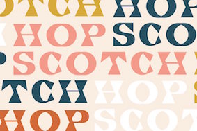 [
[ Brooklyn, NY-based grandson of Joan Trochut of Super-Veloz fame, b. 1981, Barcelona. After completing his studies at Elisava Escola Superior de Disseny in Barcelona, Alex established his own design studio in Barcelona before relocating to New York City.
  [
[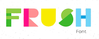 Saint Petersburg, Russia-based designer of the color typeface Frush (2018). [
 Verona, Italy-based web and type designer. In 2015, he made the commercial typefaces Hand Drawn Font, Monster Font and Hammer Font (spurred vintage style).
 [
[ [
[ During her studies at Copenhagen School of Design and Technology, Copenhagen, Denmark-based Anne Louise Rom created a colorful geometric solid typeface (2015). [
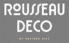 Mariano Diez ran Antenah Studio in Rosario, Argentina, and is now associated with the free font foundry
  Russian designer of the LED lights font LED (2015), the colorful 3d typeface Isometric (2016), and the bubblegum font Bubble Letters (2016). In 2017, he designed the colorful geometric all caps alphabet Memphis and the colorful sketched typeface Funky.
  [
[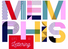 Pokhara, Nepal-based designer whose work is characterized by bold colorful geometric patterns and constructions. Typefaces from 2017 include Roam (which Cina calls a tribal type) and the color font Beach Towel.
  Anya Danilova is a type designer from Moscow, currently based in The Hague. She studied at Moscow State University of Printing Arts and worked as a graphic designer at Labs Studio and as a type designer at Bureau Gorbunov. She now works on type-related projects and is always open to new collaborations. Graduate of the
 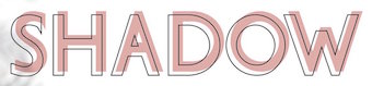 Miass, Russia-based type designer offering mainly handcrafted script or brush fonts. Her typefaces from 2021: Fruity Morning (a color SVG font), Coffee Break, Gradient Quirky, Aster Glow, Vintage, WMN Power, Carnival (and party masks), Snowflake Christmas, Cupid, Vegan.
  Måns Grebäck (Aring Typeface, Örebro, Sweden) is a prolific Swedish designer (b. Lindesberg, Sweden, 1990), who lives in Borlänge, Sweden. Måns Grebäck has a bachelor's degree in graphic design from the University of Dalarna (2012). In 2010, he went commercial, and started selling fonts through
 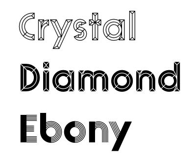 [
[ Designer in Camboulazet (was: Albi and Toulouse), France, who created the didone display typeface Black Italic in 2014, and the blackletter Gothique, the wavy Dancing Font, Tape Font, Mosaique, the splendid Mono Gorille, Curiosité, the
  Novocherkassk, Russia-based designer of two Cyrillic color fonts in 2017. [
 Austrian graphic designer and illustrator located in Barcelona. Lecturer at FH Salzburg & EINA Barcelona since 2016. She created the ornamental caps alphabet
  [
[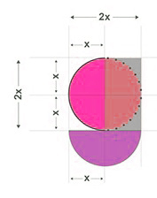 Minneapolis, MN-based designer of the colorful geometric typeface Rudi Display (2015).
 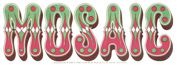 Fancy metal or wood type from the second half of the 19th century. According to Ringwalt in his American Encyclopedia of Printing and Bookbinding (1871): type made of metal or wood for color printing and so arranged that there are duplicate or triplicate copies of each letter, which, after being printed, respectively, in different colors, on a given space, blend together in a harmonious whole. Chromatic types were shown regularly in foundry type specimen books of the 1840s and 1850s.
  Chromatic, layered, or stackable typefaces include
  [
[ Born in Firenze in 1969. Cofounder with Francesco Canovaro and Debora Manetti of the Italian design firm in Firenze called Studio Kmzero. He co-designed some typefaces there such as
  Kediri, Indonesia-based designer of the monoline script and sans typeface Quetty (2017), the rhythmic script font Quitman (2017), the geometric sans typeface Francy (2017), the signage script font Danilla (2017), the all caps sans typeface family Stockport (2017), Stockport Rounded (2017) and the great creamy super-heavy signage script typeface Kidding Script (2017).
  Antonio Cerri (b. 1972, Catania, Italy) freelances in web, graphic and motion design from San Giovanni La Punta, Sicily. He created some typefaces in 2010, such as the futuristic CRR NTN (+
 Peter Olexa (Bratislava, Slovakia, b. 1978) created the (typically retro / vintage) mostly commercial typefaces Slow SVG (2020: a brush font), Hurley (2020), Royal (2020: vintage caps), Wagoon (2020), Snow (2020: a 3d color SVG font), Venomous (2020: spurred, grungy), Behofeel (2020), Chasmophile (2020: formal calligraphy), Angelic (2019: dry brush), Boutique Paris (2019), Umbrella (2019), Cellica Bold (2019), Abigaile (2019), Ragtime (2019: a brush font), Ragtime Marker (2019), Futu (2018), Kiko (2018), Pineapple (2018), Urban (2018: inline), Plasma (2018), Evolve (2018: inline), Hallowen (sic; 2018), Phantom (2018), Palam (2018), Alter (2018), Chrome (2018), Rhino (2018), Giant (2018), Valeria (2018), Ruas (2018), Strife (2018), Giant (2018), Atari (2018), Octopus (2018), Green Light (2018), Atlantis (2018), Maroon (2018), Secure 3D (2018), Cube (2018), Billionaire (2018: art deco), Savana (2018: bejeweled), Castile (2018), Starla (2018), Brodo (2018), Nomos (2018), Brisk (2018, art deco), Tron (2018), Jewel (2018), Forest (2018), Noxa (2018), Ama Deust Inline (2018), Goliath Inline Grunge (2017), Arbatosh (2017: Victorian), Momoco (2017), Heyro Fun (2017), Calliope Fun (2017), Steampunk Gears (2017), Ponds (2017: Victorian), Zahra (2017: inline grunge), Green Light (2017: inline grunge), Jordan Bold Grunge (2017: inline), Metalic 3D (2017), Mecha Grunge (2017), Buffalo (2017), Queen (2017), Lacoste Inline (2017), Ollie (2017, sans family), Nomos (2017), Blue North (2017: spurred), Murray (2017), Atlantis (2017), Montana (2017, outlined), Speedhunter Line (2017), Star Black Inline (2017), Gatsby Inline (2017: art deco), Jibril (2016: spurred), Hallowen (sic) (2016), Kiko (2016), Sailor (2016, tattoo font), Annabel (2016), Zalora (2016), Geno (2016), Marin (2016), Starship (2016), Mozza Shadow (2016), Meravin (2016), Venomous (2016), Amora Inline Grunge (2016), Rocket Shadow (2016), Hydrant (2016), Boston Inline Grunge (2016), Skywalker (2016, art deco), Ocela (2016), Columbus (2016), Raven (2016), Nomura Grunge (2016), Stella (2016), Salada (2016), Vultron (2016), Majestic (2016), Napoleon (2016), Temu (2016), Rodeo (2016, Western style family), Brooklyn (2016), Thunder (2016, Victorian label typeface family), Murray Inline Grunge (2016), Opera (2016, Victoriana), Flamingo Shadow (2016), Blue North Inline Grunge (2016), Montana Bold Outline (2016), Monophone Fancy (2016, retro style), Marin Victorian (2016), Westwood (16-style Western font family), Mozza (2016, +Inline, +Shadow, +Grunge), Speed Hunter (2016), Metro Grunge (2016), Annabel (2016, Victorian), La Forest (2016, blackletter), Star (2016, decorative caps, with outlined and inline versions), Phoenix (2016, a spurred typeface), Gatsby (2016), Bureno (2016, a Victorian display typeface), New York (2016, letterpress emulation), Capella (2016), Almanac Italic Grunge (2015), Anabel (2016, roman caps), Regolith (2015), Chocoleta (2015, hand-printed), Sailor (2015), Turmeric (2015), Ultimatum (2015), Heyro (2015, a rough brush font), Calliope (2015, a rough brush), Glass Beads (2015), Red Paprika (2015), Greenkitchen (2015), Artistico (2015, grungy), Brush Shop (2015), Graceful (2015, irregular script), Brush Wall (2015), Nickainley (2015, connected script), Harloft (2015, a warm brush script), Detective Typewriter (2015), Not Perfect (2015), Good Vibes (2015), Cool Story (2014), Get Coffee (2014), Think Happy (2014), Say Less (2014), Let's Do This (2014), Just Be Cool (2014), Brooklyn Coffee (2014, a spurred poster typeface), Bronx Shoes (2014), Nevermind (2014), RockNRoll (2014), Bluegrass (2014), Memento (2014, spurred Victorian face), Melody (2014) and Grazioso (2014). He runs
 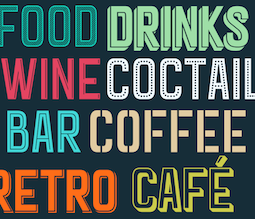 [
[ Italian art ditrector, graphic designer and visual artist. In 2022, he published the colourful Artphabet, which was inspired by Ettore Sottsass and the Memphis movement, as well as by artists such as Peter Blake, Alighiero Boetti, Robert Brownjohn, Fortunato Depero, Milton Glaser, Alessandro Mendini, Piet Mondrian, Bruno Munari and Piet Zwart. [
 Web designer in Milano, Italy (and before that, Lugano, Switzerland, and Catania, Sicily), who created the didone typeface Rachel and the
 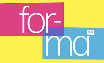 [
[ Or just David Samuel. Designer and illustrator in Lagos, Nigeria, who developed the children's book color font Kidag in 2018. [
 Graphic and lettering designer in Istanbul, who created these typefaces:
  Graphic designerr in Moscow who made a colorful Cyrillic stencil alphabet dedicated to Neville Brody (2015). Other typefaces for Latin and Cyrillic include Hollow Pixels (2015), Adhesive Tape (2015), and Multicolore (2015, a rounded sans done for his graduation). He also designed the pictograms Olympic Gods (2015) and Sportsmen (2015).
 [
[ [
[ Designer of display typefaces. Typefaces from 2022: Color Letter Beads Alphabet (for children's books), Earl Grey (a vintage serif), Psychic Sister (a vintage font duo), Letter Beads.
  Graduate of L'École de communication visuelle in Lille, France, ca. 2014, who became art director at
  Buenos Aires, Argentina-based designer of the color font Enterline (2018, with Alejandro Paul at Sudtipos). [
 Moroccan icon designer. He created the free icon font Smartphone Pro in 2018. Other icon fonts include Font 90 Icons, Font Islamic Color, Type Icons, Social Logos Color, Icons Color, Shapes, Social Color Pro, Font logos Color, Font Color Icon, Icons Font Color, Social Media Series, Font Social Media, Social Media, Social Media Pro, Font 120 Icons, Font Hearts Love, Mandalas Pro, Nature Pro, Shapes Pro, Color Qatar, Color Germany, Color Saudi Arabia, Font Morocco Algeria, Font Color Germany, Color Morocco Algeria.
  Russian graphic designer who loves soft tones. Creator of these typefaces:
  Lucaz Mathias (Estudio Cao, Jacarei, Brazil) designed the blackboard bold art deco typeface family
  Designer of HandDrawn Cute Funky (2016), Glitch (2016), Glossy Golden Metal (2016), Black Newspaper Letters (2016), Colorful Newspaper Letters (2016, ransom note font), Isometry (2016), Hand-Drawn Dirty Ink Font (2015), Lighting Bulb Pixel (2015) and Retro Type Grunge Font (2015). In 2016, he published Bright Red Neon Letters, Bright Realistic Neon Letters (vector format), Decorative Red Font (EPS format) and Transparent Letters With Long Shadow (vector format).
  Warsaw-based graphic designer, who created the
  Fabrika de Typos is a Brazilian fondry run by Marcio Hirosse (b. 1969) in Sao Paulo. He made
  Locust Grove, OK-based lettering artist who designed the
  Las Palmas de Gran Canaria, Ampuero and Laredo, Spain-based designer (b. 1971) who set up deFharo. Creator of the monoline sans typeface
 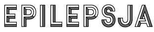 During his studies in Warsaw, Poland, Mikolaj Grabowski designed the interesting stackable typeface family
  Bay City, MI-based designer of Spartan MB (2017), a
  Paul Bokslag is a Kilkenny, Ireland-based type designer.
  Lettering and logo design artist who used
  Guadalajara (was: Tlaquepaque), Mexico-based designer of Rupestre Display (2019), the
  Lukasz and Wojciech Bachur are the Szczecin, Poland-based designers of
 Gala Studio (Israel) was founded by Galina Bleikh and Lilia Chak. Lilia Chak is an artist and designer, b. Saint Petersburg, Russia. She graduated from the Stieglitz St. Petersburg State Academy of Art and Industry. Since 1990, she lives in Jerusalem. In 2015, Lilia created the acrylic brush typeface Pink, 3D Ink, the crayon fonts Orange Oil Pastel and Red (based on watercolors), the sketched typeface ABC Handwritten, the watercolor brush typefaces Red Handdwritten, Black Handwritten, Blue Handwritten and Green Handwritten, Bold, the brush typeface Ink, and the sketch font Chalk Expressive.
  Genilson Lima Santos is the Salvador, Brazil-based designer (b. 1985, Bahia) of Stilu (2015, sans), Jenelson (2006), the stroked font Styllo (2007), the brushy
  Aka Grzegorz Luk and just Gluk, Grzegorz Luksza is a Polish type designer (b. 1973) who specializes in ultra-decorative and experimental typefaces.
  Lahore, Pakistan and/or London, UK-based designer of Contour (a titling sans), Chubby (2019), the free display sans Linicircle (2017), the free rounded sans typeface Roudge or Wasey E (2019), the modular typeface Bract (2019), the copperplate serif Billag (2019), the color font Taster (2019), Zonta (2019), the techno or architectural lettering font Italichno (2018), the geometric shape fonts Shape (2019) and Shape Out (2019), and the semi-stencil typeface CoolCut (2019).
 [
[ Donetsk, Ukraine-based designer of the handcrafted typeface Espresso (2017), Advertis (2017: ornaments). In 2018, she published Delight (a script typeface),
  Henrique Beier (Harbor Type, Porto Alegre, Brazil) is the designer of the excellent angular semi-calligraphic text typeface
  British printing company founded by
  [
[ During her studies in Lima, Peru, Houston Quispe created the colorful connect-the-dots typeface Pntgrph (2015). [
 Melbourne, Australia-based designer of the opentype SVG color font Newport Tracks (2019) and the rough brush script Yiayia (2017). [
 Graphic designer from Belgrade, Serbia, who now works at Rainy Dot in Berlin. He created these typefaces:
  New York City (and before that, Madrid)-based illustrator who created the minimalist typeface Minim (2012), the scratchy typeface Displaced (2013), the
  During her studies at Escola d'Art i Superior de Diseny de Valencia, EASD, Isa Lloret (Trieste, Italy) created a geometric solid alphabet that was inspired by the Bauhaus work of Josef Albers, and colored it according to Kandinsky's paradigm of relating color to shape.
  [
[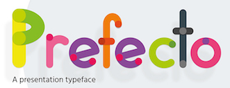 London, UK-based designer of the colorful rounded sans typeface Prefecto (2017). [
 [
[ Jamie Clarke (Bristol and London, UK, and at some point, Sydney, Australia) creates illustrative type and lettering. He ran his own digital agency for ten years, and retrained after that period by studying type design at the University of Reading and letterpress at the St. Bride Foundation in London. His commercial typefaces include
  [
[ Illustrator based in Barcelona. In 2018, he designed the pointillist pebble-themed color font
  [
[ Lausanne, Switzerland-based type designer. He created
  Cali, Colombia-based designer of a colorful experimental typeface dedicated to Andy Warhol (2015). [
 [
[ [
[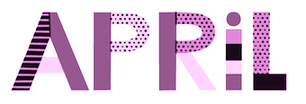 Colorblok founder Juliana Pedemonte's illustration and motion graphic work first appeared on VH1, MTV and Nickelodeon Latin America in 2003. Born in Bahia Blanca, Argentina, she studied at the University of Buenos Aires. In 2018, with Alejandro Paul at
  Ukhta, Russia-based illustrator, b. 1989. Designer of the 3d shadow typeface Funny Rails (2015). Her company is called JuliyArt. In 2017, she designed the textured (sketched) typefaces Yeti and Smoothies, Bebegul, the squarish Latin / Cyrillic typeface Zazoo, and Tribal.
  [
[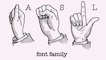 Roman Korolev (Kaer, Vologda, Russia) designed the wood stick brush typeface WoodStick in 2016.
  Aka Icarus Bro and as Newflix, est. 2017. Medan, Indonesia-based designer of the geometric sans typefaces Gerald (2017), Gerald Round (2017), Amora Sans (2017), Gaston (2017) and Louisa (2017), and the decorative floriated caps typeface Winter Color (2017).
  Graphic designer in Pune, India. Designer of the rounded marker typeface Bublont (2017), which comes with shaded, outlined and coloured substyles.
  Type foundry in Los Angeles, CA, run by Kourosh Beigpour. Its typefaces:
  [
[ [
[ [
[ [
[ [
[ Illustrator in Buenos Aires who heads
  LGF fonts is the foundry of Manuel Lage Novo, a Galician type designer in La Coruña, b. 1970. He inherited the Richard Gans collection.
  [
[ [
[ Moscow-based designer of the Cyrillic connect-the-dots typefaces Eyeye (2015) and Fire Sans (2015), which were school projects at HSE Art and Design School. She also created thge colorful blocky typeface TwoPic (2015). [
 Or Elisabetta Borriello. Rome, Italy-based designer of the sci-fi typeface Blade Stencil (2015), a modular type created for a school project in Bolzano. In 2016 she designed the decorative bicolored typeface Flamingo. [
 Award-winning graphic designer and illustrator in Barcelona, whose work and letter designs are characterized by flashy and colorful contructions. She studied at the University of Salamanca (2008) and ELISAVA (2013). Her type designs include 36 Days of Type (2016) and Ahoy (2013, a decorative rope font, which can be bought
  Graphic designer in Brno, Czechia. He made the striped vector format font Candy Type (215), and a wonderful coloful decorative caps alphabet called Flat Alphabet (2015) and the equally interesting Circular Stamp Retro Vector Type and Circular Stamp Marine Vector Icons.
  [
[ Odessa (was: Donetsk), Ukraine-based designer of these fonts in 2018: Monte Karlo, Monblank, Manchester, Gabrielle (upright script), California, Casablanca (script and sans duo), Fabiano (rounded sans).
  Lynne Yun is a type designer based in Brooklyn who specializes in lettering and calligraphy. She holds a BFA from School of Visual Arts and a postgraduate certificate in typeface design from Type@Cooper. Lynne has worked with a broad range of clients (including Anheuser-Busch, Samsung, Sherwin-Williams and London Book Review to name a few) and held positions at Apple, Publicis, Deutsch, and was a full-time type designer at Monotype, starting in 2017. Lynne Yun is the founder of the Brooklyn-based studio
  During her studies, Macy Rajacich (Minneapolis, MN) designed a wonderful all caps color alphabet (2018). [
 Mariel Gornati (Mago Fonts, Bernal and/or San Rafael, Argentina) is the creator (b. 1988) of the connected script typeface
  [
[ [
[ [
[ [
[ [
[ During her studies in Nantes, France, Marion Videlin Roy created the alchemic typeface Aventura (2015) and the decorative caps typeface Kata (2015: created for the catalog of Grandir d'un monde à l'autre). [
 Graphic designer in Bristol, UK, who designed the colorful geometric solid typeface Mod in 2015. He also created various sets of icons for brands.
  [
[ Argentinian illustrator who is based in Buenos Aires. He studied at University of Buenos Aires. In 2018, together with Alejandro Paul at
  [
[ [
[ San Salvador, El Salvador-based designer of the colorful all caps Reef Font (2017). [
 Min-Joo Ham (Seoul, South Korea, b. 1985) is a type designer, typographer and a graphic designer who studied graphic design at the Seoul Women's University (2005-2009). After that, she designed typefaces at the Korean type foundry S-Core. In 2015, she graduated from the TypeMedia program in Den Haag, and settled in Berlin.
  Designer in Brooklyn, NY, who created the circular compass-and-ruler virtual identity typeface Brooklyn Bridge Park in 2016. Its glyphs are sectioned for easy coloring and stretching.
  Alexandria, Egypt and Stockholm, Sweden, and Riga, Latvia-based creator of these Arabic typefaces in 2022: Anteeqa.
  New York City (was: Zaporizhzhia, Ukraine)-based designer of color display typefaces for Latin and Cyrillic such as Fargo (2019), Baku (2019: rounded, fat, textured and layerable), Arco (2019), Ryde (2019: an engraved "money font"), Wellington (2019: SVG format), Fairbanks (2019), Frat (2018: layerable, octagonal, athletic lettering) and Moscow (2019: Western style). [
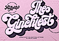 [
[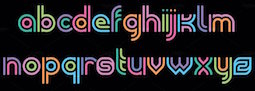 Designer of these display typefaces in 2021, including some glitch and old computer emulation fonts: Thorn, Stone, Sezane, Point Break (free), Sunday, Error, Zombie, Vinyl, Paloma (computer emulation; includes Cyrillic), Point (a color logo font), Sisterhood, Reptide. [
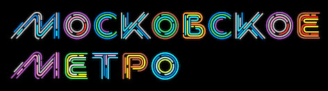 Illustrator and motion graphics artist in Moscow, who garduated from Moscow State Academic Art College (2011), and started studies at the Stroganov Moscow State Academy of Industrial and Applied Arts in 2011. During her studies in Moscow, Nadira Filatova created the Cyrillic typeface Berliitz (2014) and the 3d Latin display typeface Think of Jack (2014). In 2020, she designed the stunning
 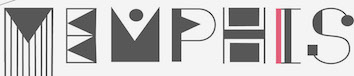 During her studies in Kharkiv, Ukraine, Anastasiia Sokha designed an elaborate deco typeface called Memphis (2015). The name refers the Memphis Style promoted by the Memphis group in 1981, for whom decoration and styling was a game to combat austere modernism. They achieved this by combining flashy geometric shapes with bright colors. [
 [
[ [
[ [
[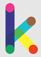 Ivan Phillipov (Neogrey, also written as Ivan Filipov) has offices in Plovdiv, Bulgaria and Turkey. He designed the techno typefaces Research Remix (1993), Neogrey (2004) and Red October (2004, inspired by Soviet poster art; can be used for Cyrillic simulation; followed by
  An extensive free dingbat typeface designed in 2013 by Monotype Imaging.
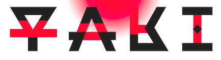
 Illustrator from Mar del Plata, Argentina, who is now based in Buenos Aires. He designed these typefaces:
  Scott Banks (Atlanta, GA) specializes in digital fonts with a printed letterpress or hand-lettered look and feel. In 2022, he released
  Jim Parkinson's Parkinson Type Design was based in Oakland, CA. This prolific type designer was born in 1941 in Richmond, CA, and lived in Oakland, CA. After a long struggle with Alzheimer's, he died on June 26, 2025 at his home in Oakland. Originally, a letterer, he went digital in 1990. His Keester and
  Super-talented Montreal-based illustrator and digital artist.
  [
[ Rio de Janeiro-based designer of the striking bicolored geometric poster / logo typeface Fluxorama (2017).
  Or Ksenia Kuznetsova. Moscow-based designer of the tribal patterned color typeface
  [
[ Bontang, Indonesia-based designer of the colorful and flashy typeface Metro Neon (2017).
  Sochi and/or Moscow, Russia-based designer of Stuva (2018: futuristic), Geometric Pattern (2016), the fine poster typeface Tall Stripes (2016, for Latin) and the colored EPS format deco typeface Five Decor (2016). [
 Alexey Popov, or Alex Pop for short (Popskraft Lab, Buchardo, Argentina, and now New York City) designed the children's book / cartoon font family
  Jean-Baptiste Levée is a French type designer based in Paris. He is a co-founder of the Bureau des Affaires Typographiques, and teaches typeface design at ESAD Amiens (and before that, at the Caen-Cherbourg school of Arts & Media and at the University of Corte). His latest work is mostly published at
  Torino, Italy-based designer of the colorful decorative caps typeface Mousta (2013). [
 Karanganyar, Indonesia-based designer, b. 1989, of these typefaces in 2018:
  [
[ Pristina, Kosovo (was: Turana, Albania)-based student-designer of the alphading typeface Albanian Flag (2014). In 2017 he designed the
  Barcelona-based designer of the alchemic typeface
  [
[ [
[ During her studies in Singapore, Razana Kamarudin created a great geometric stick typeface (2015) and a colorful geometric solid alphabet (2014). [
 Aka Rendy Messenjah. Bandung, Indonesia-based designer of these typefaces in 2016:
 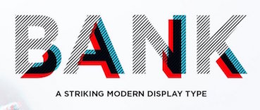 [
[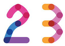 Omsk, Russia-based designer of an experimental Latin typeface created by superimposing circles (2015), and Point (2015). She also created a set of icons and several color fonts in 2015, including the
  Graphic designer designer, b. 1959, Parma, Italy. He studied at the Art Institute in Parma. After graduation in 1983 from the Urbino ISIA Academy, Antonio spent 20 years working as Senior Art Director and Creative Director for various international advertizing agencies in Milan (Pirella Lowe, Armando Testa, Young & Rubicam).
  Parisian graphic designer who created a bicolored circle-based typeface called Graphic Stroke (2014), Something In The Way (2015, a rounded monoline stencil font), Impossible Font (2015, inspired by Escher), and Pattern Font (2015).
  [
[ [
[ Roch Modrzejewski (ROHH, Krakow, Poland) established ROHH in 2015. That same year, he published the organic script typeface
  [
[ Kazincbarcika, Hungary-based type designer Roland Hüse (b. 1980) sells his fonts through My Handwritings (Kazincbarcika, Hungary), which was renamed Runes&Fonts. His first font is
  [
[ [
[ Bandung, Indonesia-based type foundry est. 2015, showcasing typefaces designed by
  North Ascot, United Kingdom-based designer of the colorful number font Yoga birds (2018). [
 Graphic designer who was based in Rasht, Iran, who dabbles in experimental Persian type design. Reportedly, he is based in Canada in 2020. He has made
  London-based creator of the
  Sjoerd Kulsdom (Dot By Dot) is the Arnhem and/or Amsterdam-based designer of the curly typeface Spring Is In The Air (2011), the polygonal cut-out typeface Cardboard Cat (2016), the informal typeface Merijntje (2014) and the multiline typeface Monogram Rounded (2016). Sjoerd is associated with Ontwerpstudio Dot by dot.
  Istanbul, Turkey-based designer (b. 1993, Bandirma) who studied fine arts at Marmara University and set up his own commercial type foundry in 2014. Creator of the free poster font Bakunin (2014: Regular, Outline, Stencil), which is named after anarchist philosopher Mikhail Alexandrovich Bakunin.
  London, UK-based designer of a colorful geometric solid typeface in 2017, that could be considered in the Memphis Design Group style. [
 Norwegian type designer, b. 1991, who graduated from Westerdals School of Art in Oslo in 2015 and ECAL in 2017. At ECAL in Lausanne, he finished an MA in Art Direction and completed an exhaustive comparative study of the Geometric Sans genre. He joined
  Struvictory Art (Hrodna, Belarus) is run by Viktoryia Strukouskaya and
  Bangkok, Thailand-based designer of the colorful all caps typeface Dee (2019) for Siam Center. [
 Buenos Aires-based creator of the children's hand font
  Donald Tarallo obtained a BA in Studio Arts and Graphic Design from Clark University, and an MFA in Graphic Design from Rhode Island School of Design (RISD). He also studied with André Gürtler and Wolfgang Weingart in the Weiterbildungsklasse at the Basel School of Design in Switzerland. Since 1998, Don has maintained a freelance practice working on projects in identity, publication, and web design. He has taught at Clark University, Guangzhou Academy of Fine Art, Rhode Island School of Design, Samsung Art and Design Institute, Siena Art Institute, and Bridgewater State University. Don currently teaches at Fitchburg State University in Fitchburg, MA.
  Dallas, TX (was: Richmond, VA)-based designer of the sans typefaces Mint (2016), Amber (2016), Foodie (2016) and Daughter (2016), the rounded sans typeface Fox & Bower (2016), the minimalist sans typeface Avenue (2016), the handcrafted typefaces Yesterday (2016), Creative Queen (2016) and Love Note (2016), the art deco typeface Retro Deco (2016), the retro connected Avocado Script (2016), and the beveled typeface Suburbia (2016).
 As a graphic design student in Dublin, Ireland, Tom Gillan created the colored ball font Motyf 2018 (2017). [
 Dungiven, Londonderry, Northern Ireland-based designer of these typefaces: Bank (2017: layered and arched), Locus Sans (2017: layered all caps rounded sans), Erin (2017: uncial Celtic style).
  The Twemoji library offered support for +2k emojis in 2018, including skin tone and gender modifiers. The free font one
  Graduate of the University of Applied Sciences, Hamburg, Germany, who was initially associated with
  Gilbert Baker (1951-2017), the creator of the iconic Rainbow Flag, was both an LGBTQ activist and artist, and was known for helping friends create banners for protests and marches. To honor the memory of Gilbert Baker, NewFest and NYC Pride partnered with
  Arthur Reinders Folmer (or Arthus) is from Haarlem, The Netherlands.
  Ray Larabie (b. 1970, Ottawa, Canada) ran Typodermic in Mississauga, ON, which opened in the Fall of 2001. In 2006, it moved to Vancouver, BC, and in 2009 it moved on to Nagoya, Japan.
  Typopixo is a boutique type foundry specialized in multi-color webfonts, possibly run [my guess] by Mark van Wageningen. It was launched in January 2014. Based in Amsterdam, Typopixo collaborates with skilled typedesigners, lettering artists, Javascript developers and HTML experts. The site accepts submissions. Techncally, to use their fonts, one needs to do four things: include a JQuery javascript file (in the web page), include the Typopixo library, include the font PNG file (purchased from them), and include the font .js file (comes with the purchase). From that point on, the fonts work precisely as normal fonts. At launch time, these were the designers:
  [
[ Singapore-based designer of the
  [
[ Foundry specializing in digital versions of old wood type. Set up in 2011 by Matt Griffin, all font licenses refer to
  Max Infeld (b. 1981, aka Xerographer Fonts) from Chico, CA, makes free fonts and offers a free font-making service. He surged onto the font scene in 2012, and is currently located in Ojai, CA.
  Graphic designer from Buenos Aires, Argentina, at some point located in Madrid, Spain, who made the
  Yellow Design Studio is a fine art, graphic design and typography studio based in Sanibel, FL, and before that, in Madison, Wisconsin. The font designer is
  Juan Guillermo Navarro Barrios runs the design and illustration studio Zilap in Medellin, Colombia. In 2014, he created the hipster typeface Zilap Normal. In 2015, with the cooperation of
  Illustrator and designer in Minsk, Belarus. Creator in 2018 of the modular squarish typeface family Domino, the geometric color font Love Birds, Xmas Cookies, the bicolored octagonal font Quarta, the stone carving font Brave Viking, the color stitching font Lovely Day, the color art deco typeface Trigon Wheel, the stitching font Crossstitch, Patriot, the brush font Red & Black, and the color SVG Opentype font Lavender Time.
  [
[
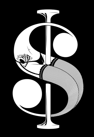
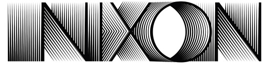
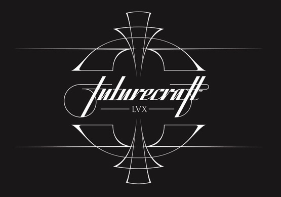
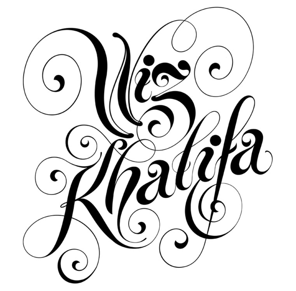
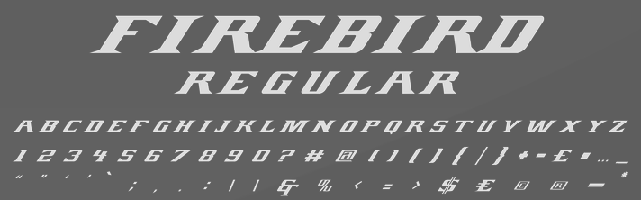
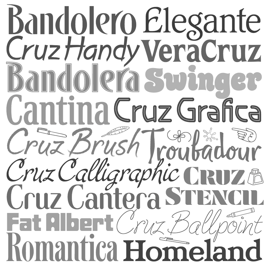
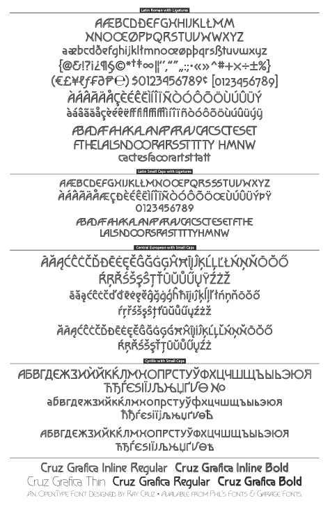
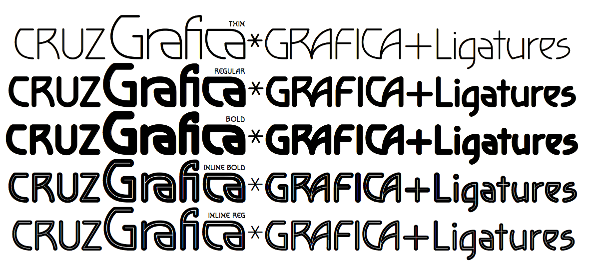
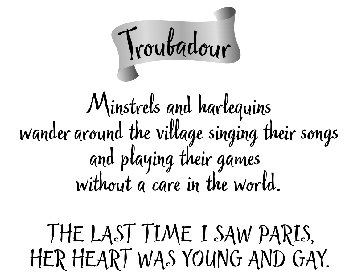
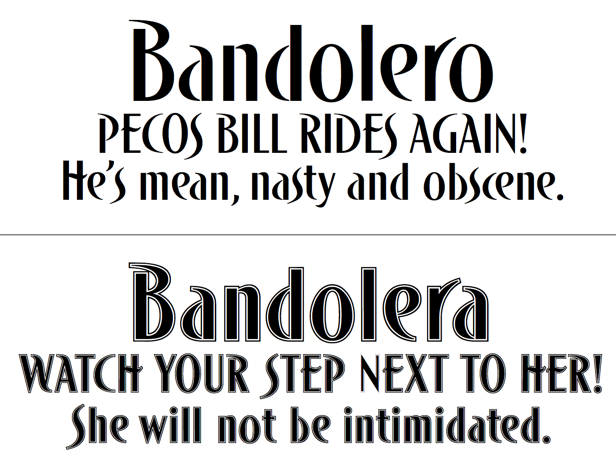
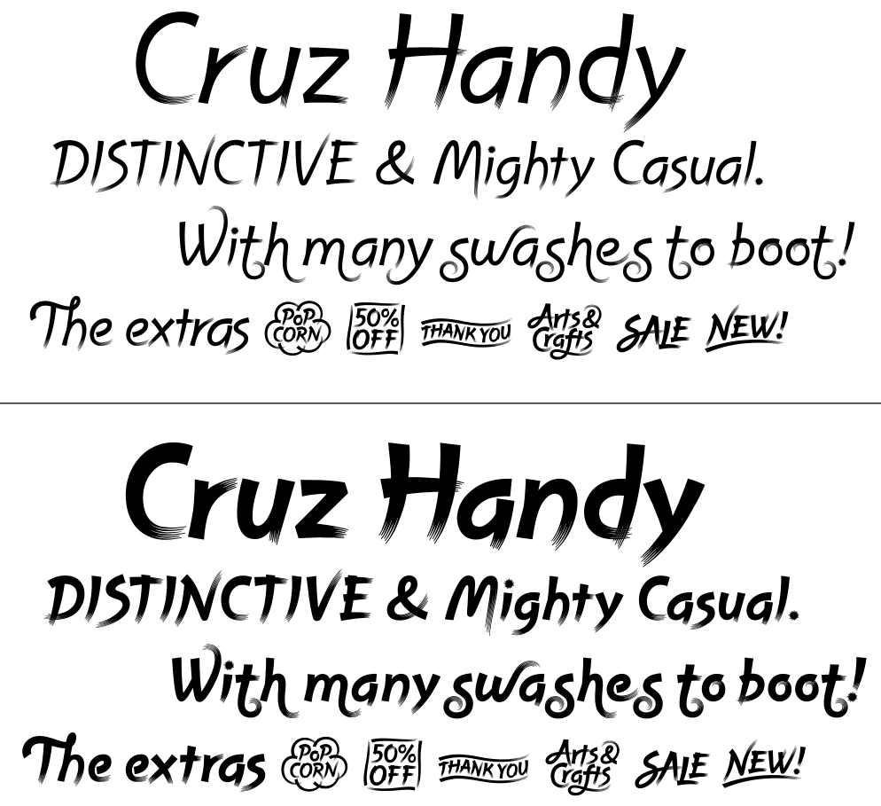
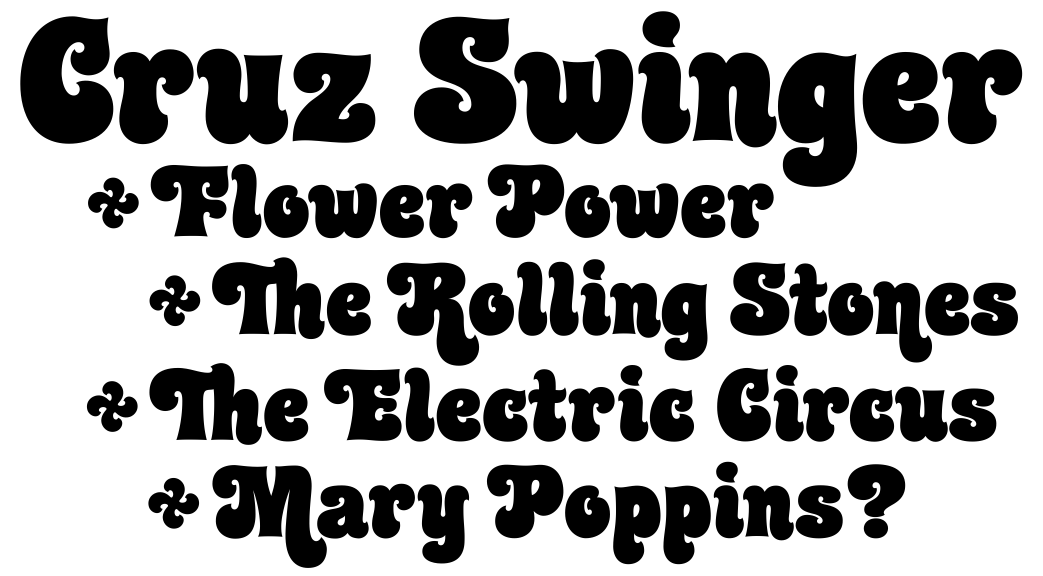
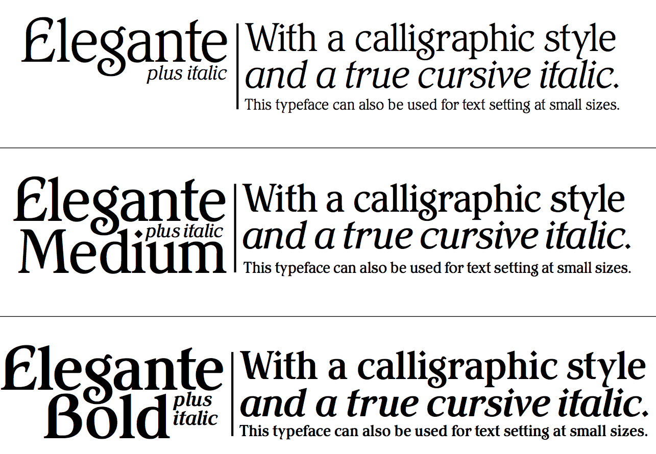
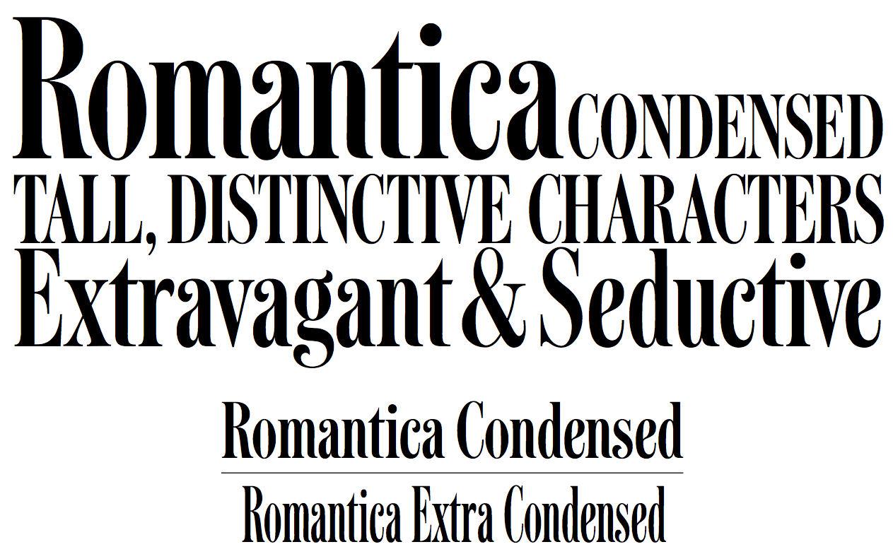
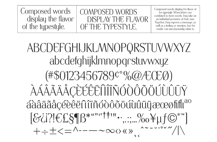
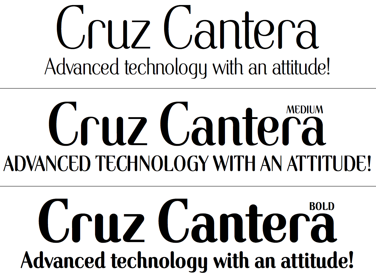
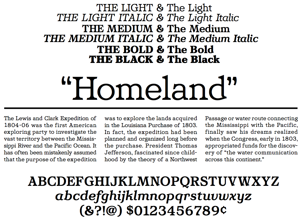
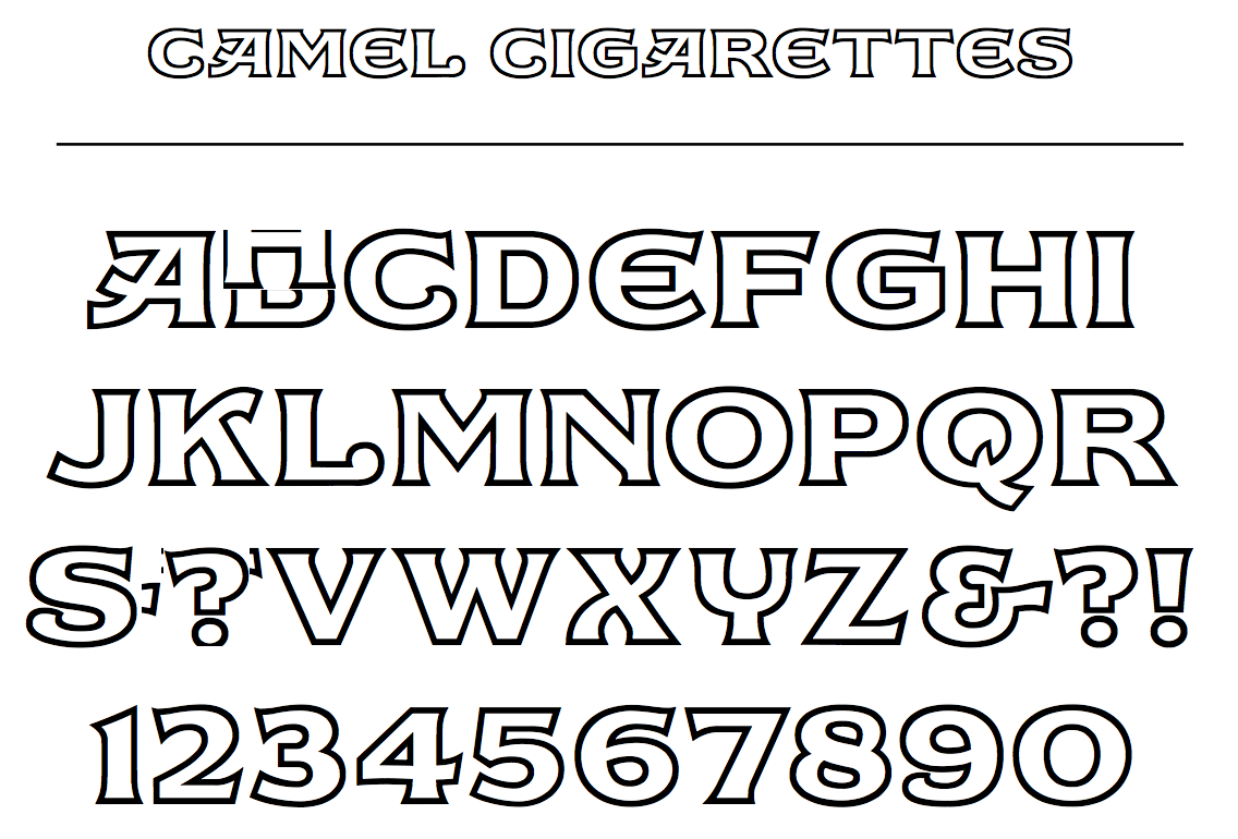
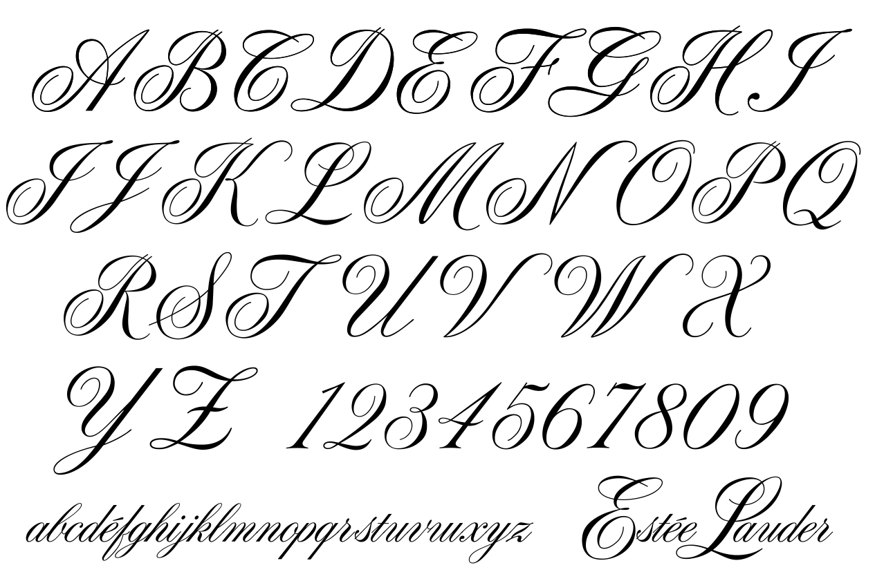
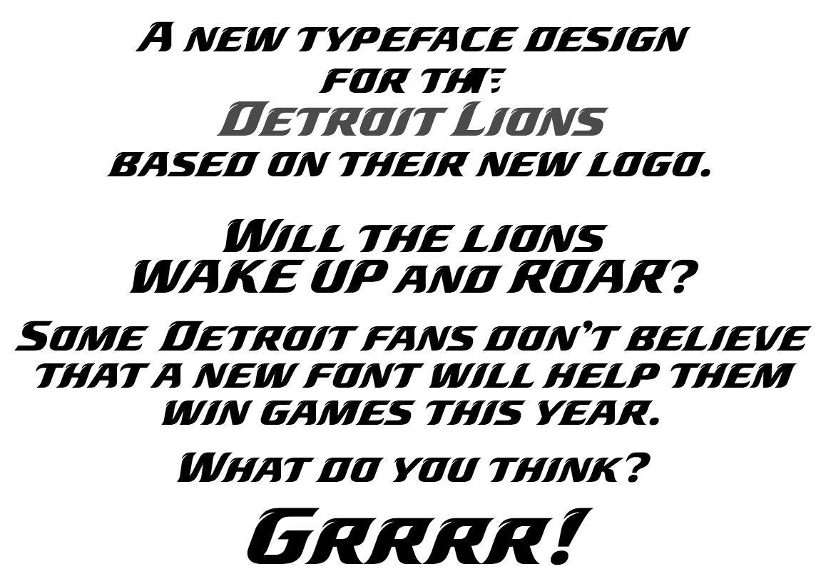
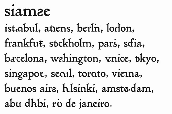
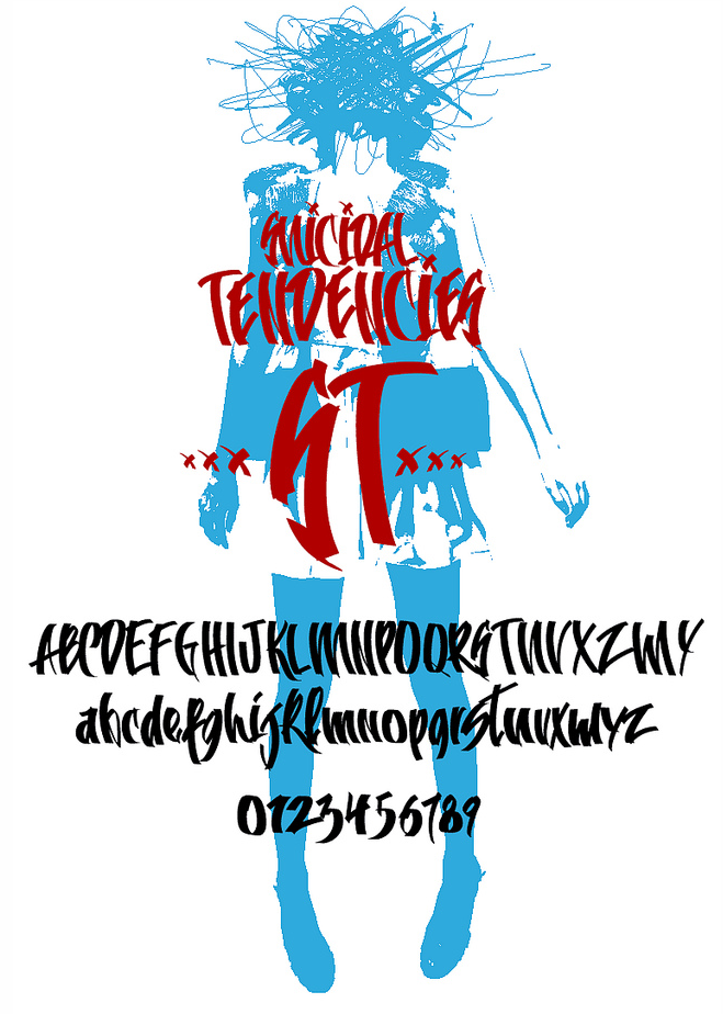
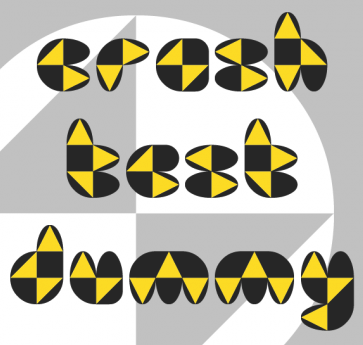
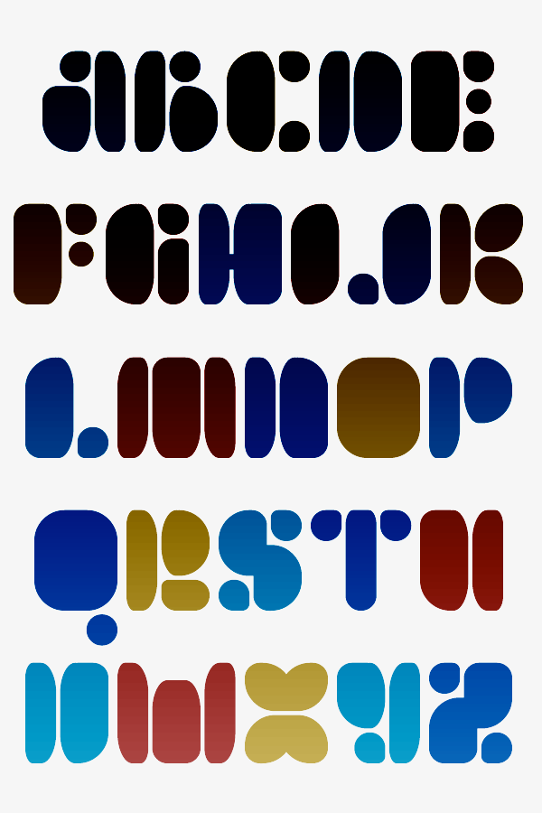
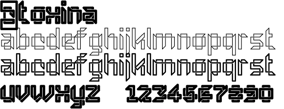
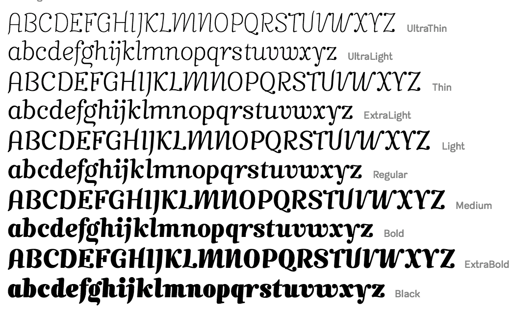
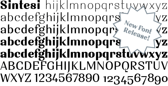
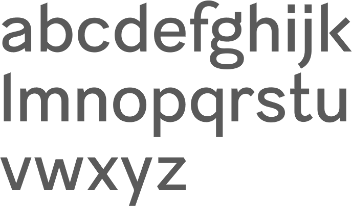
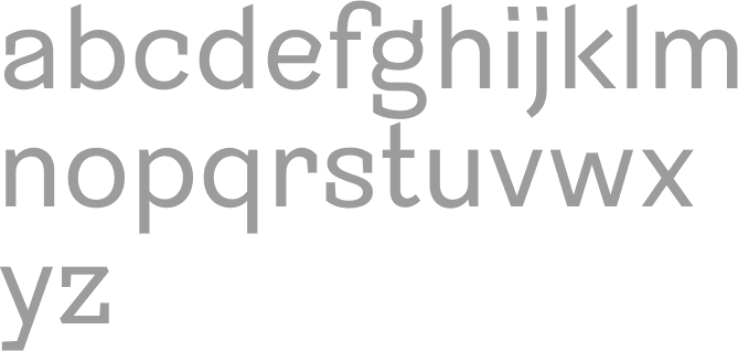
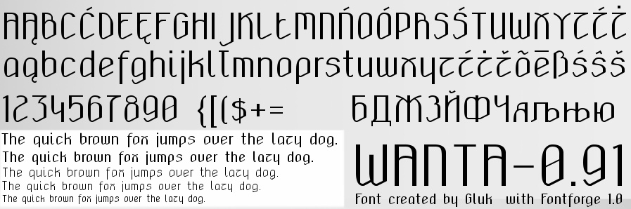
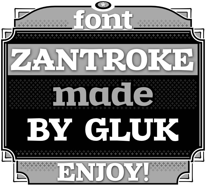
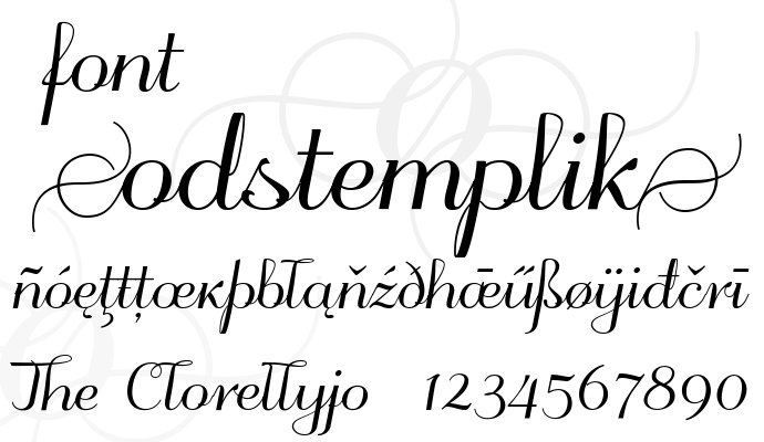
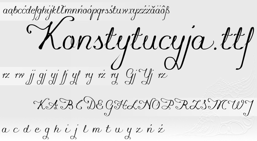
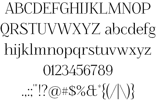
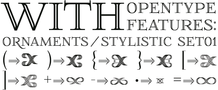
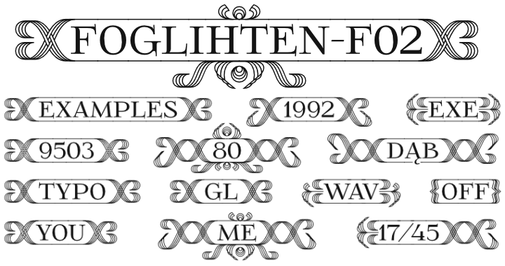
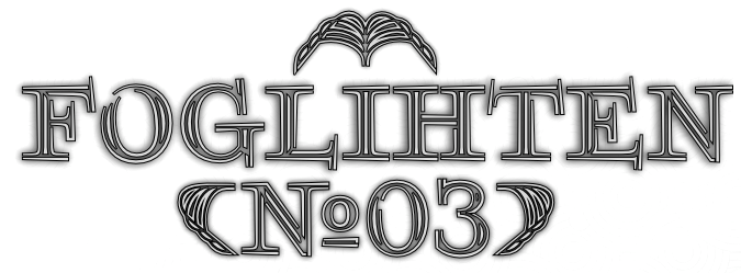
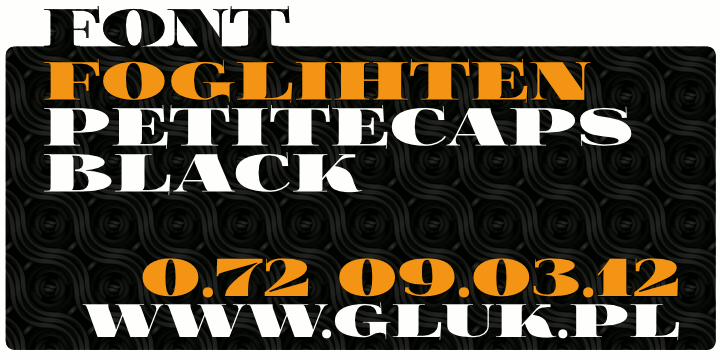
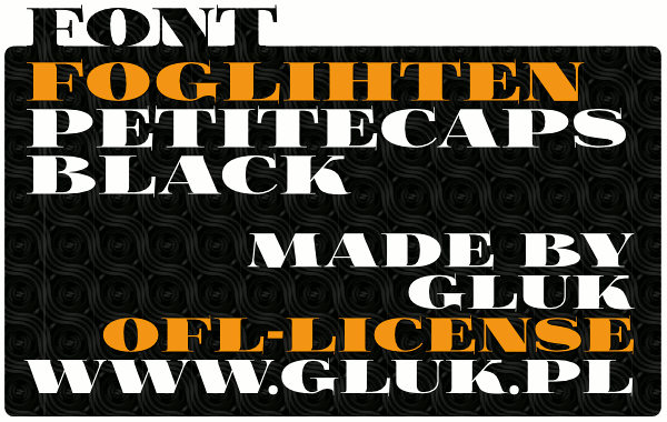
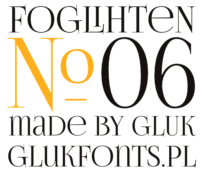
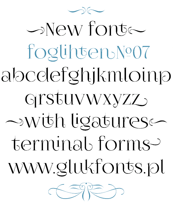
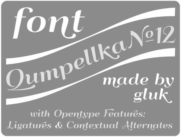
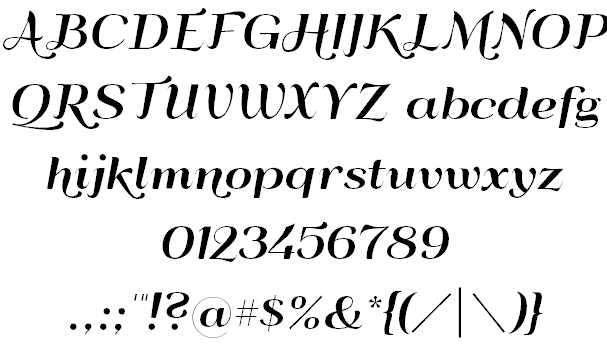
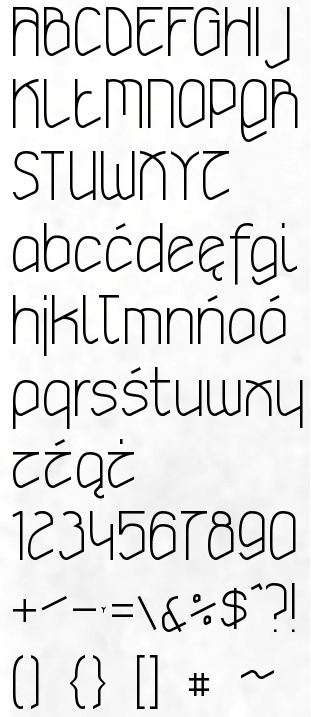
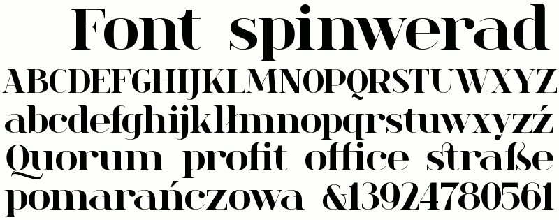
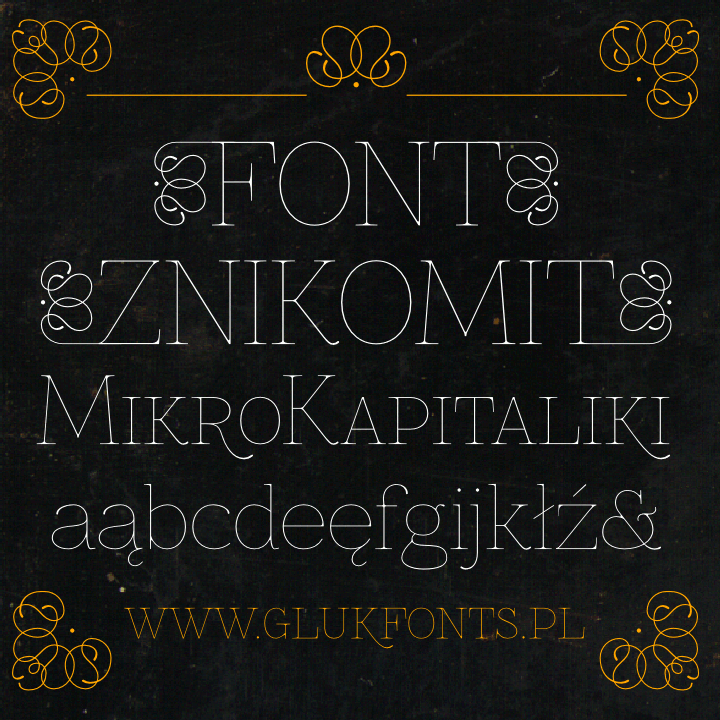
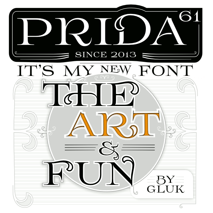
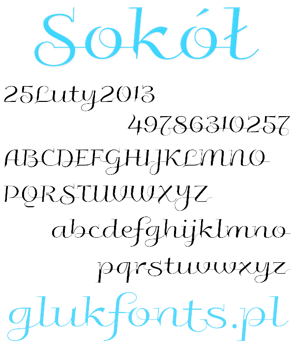
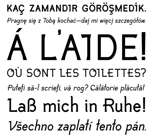
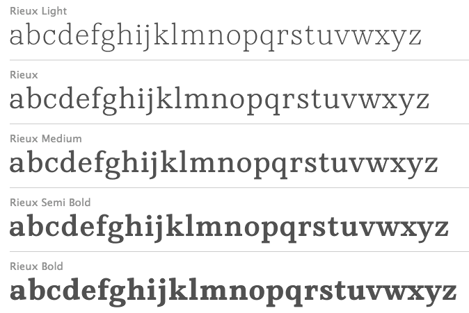
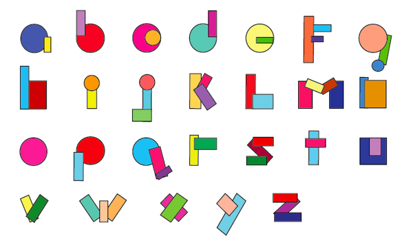
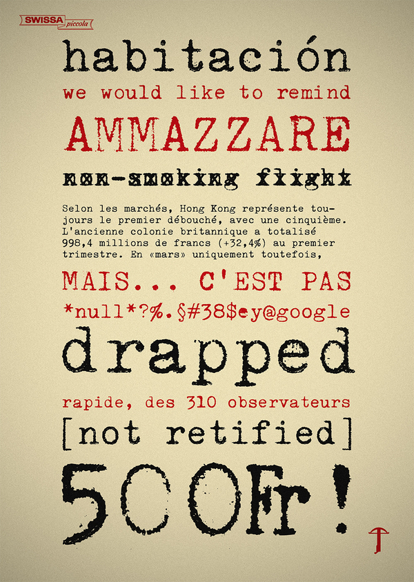
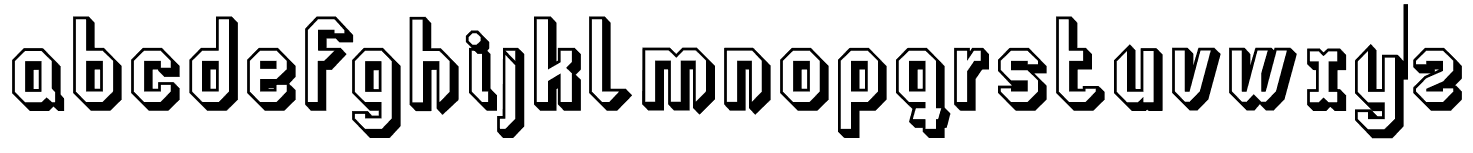
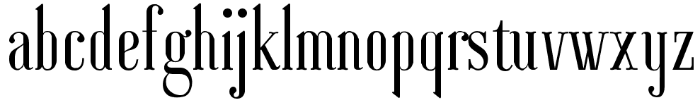
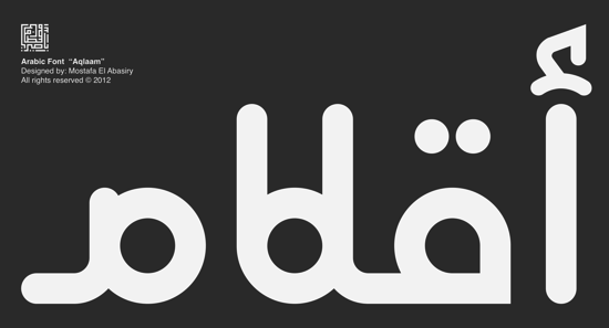
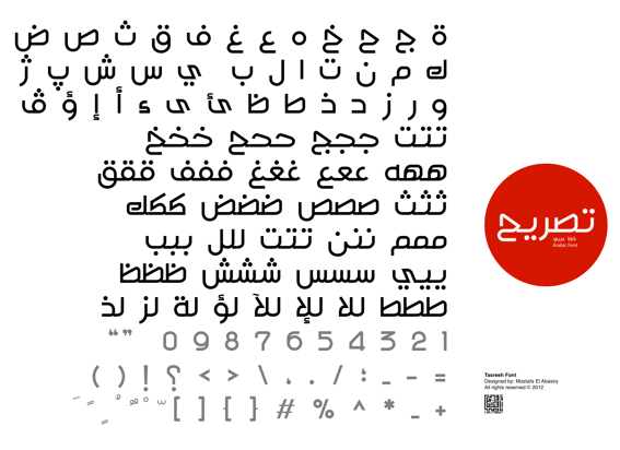
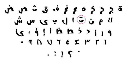
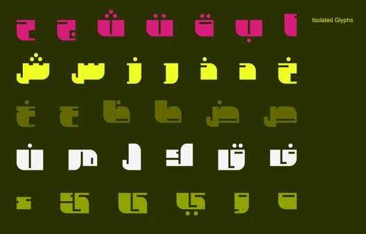
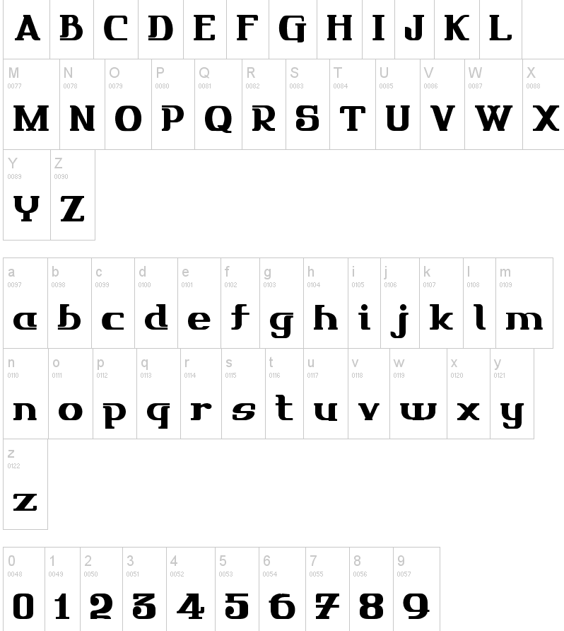
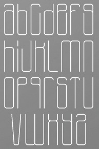
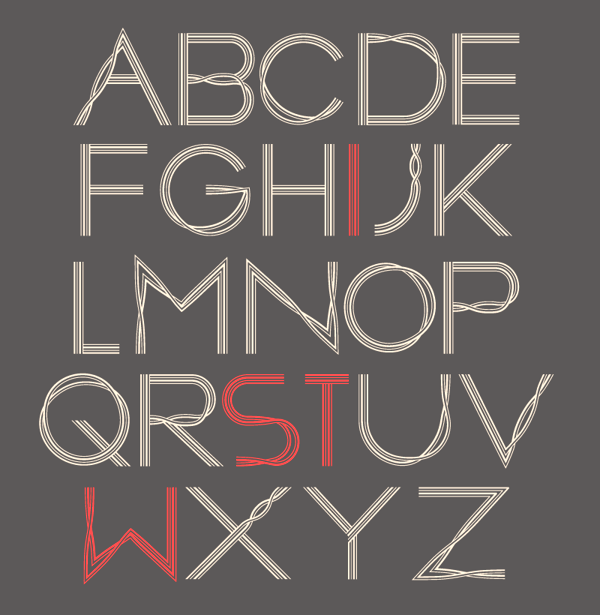
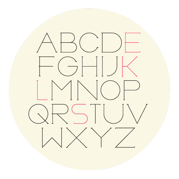
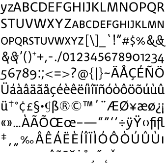
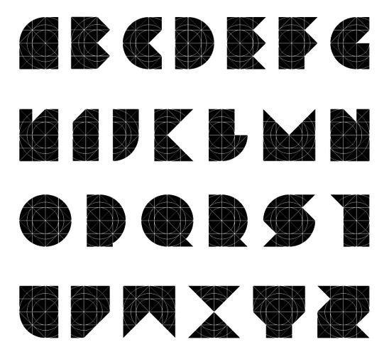
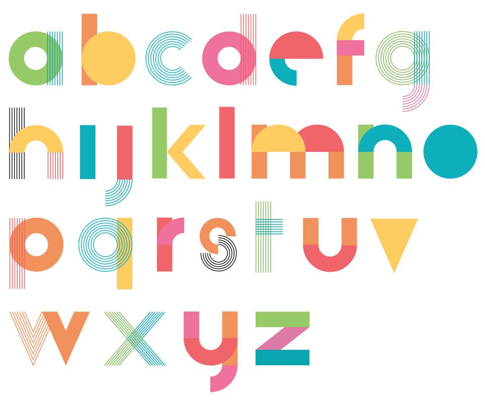
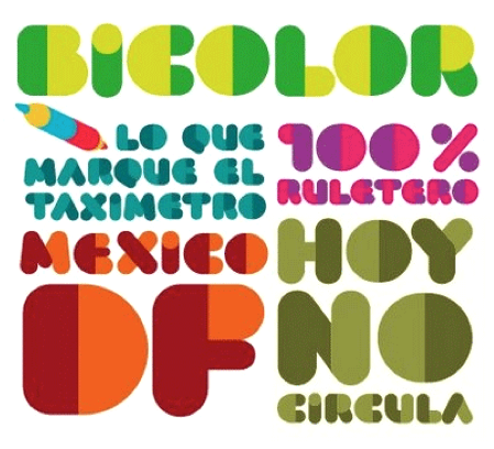
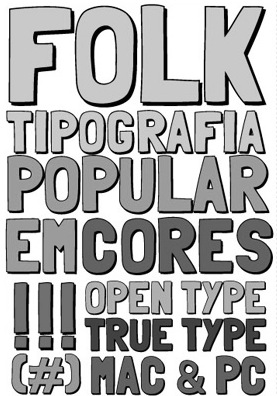
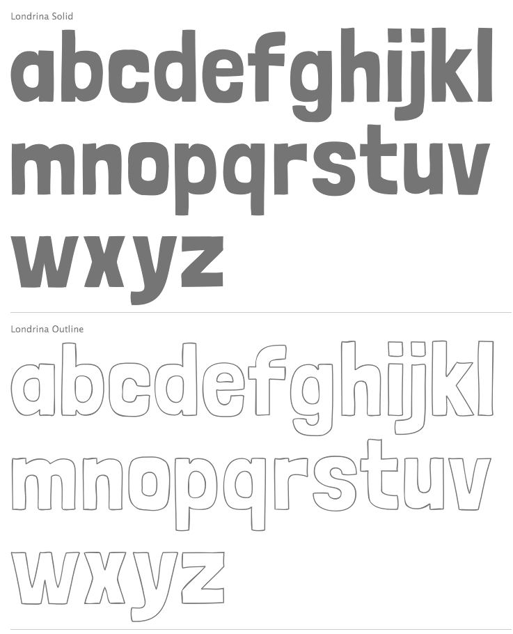
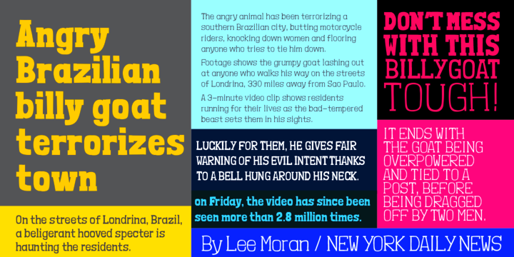
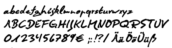
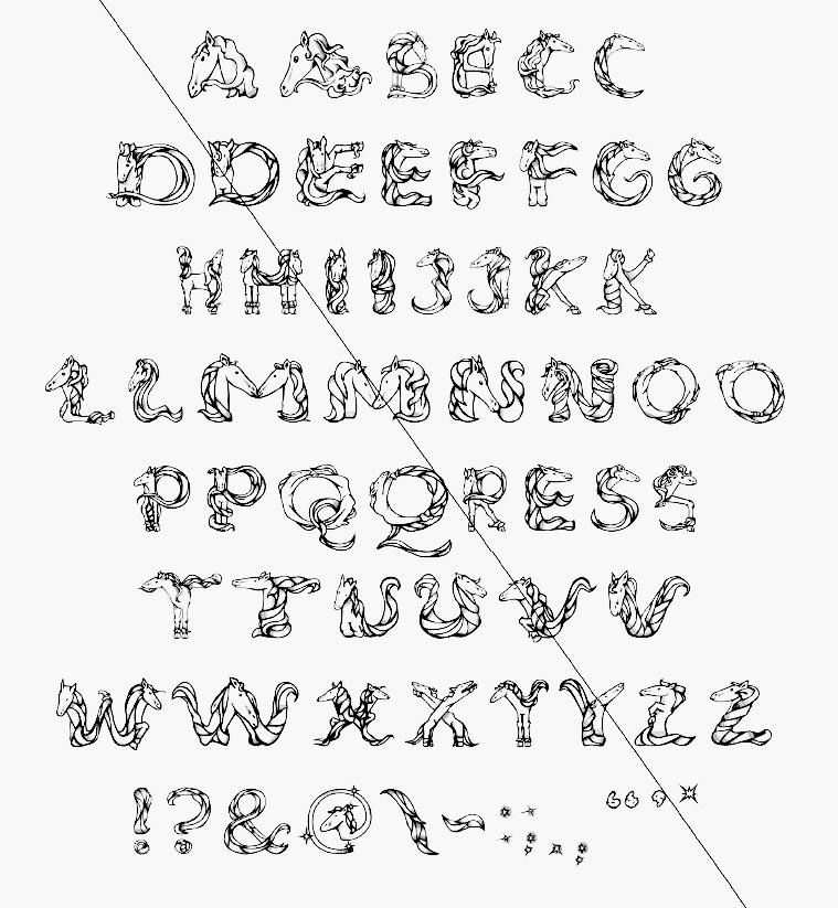
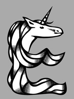
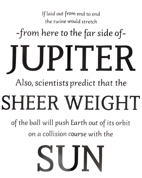
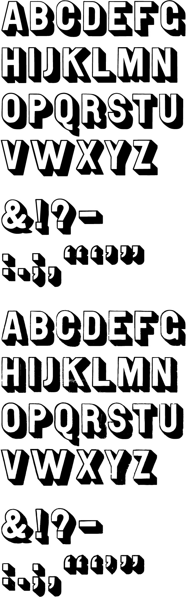
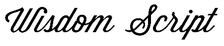
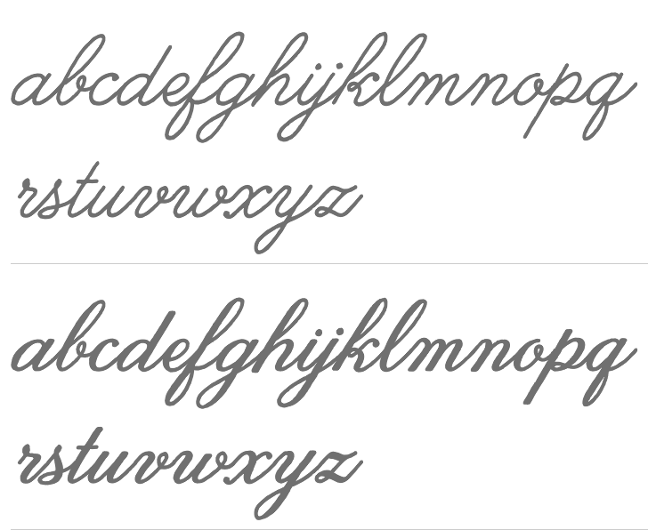
|
|
|
|