TYPE DESIGN INFORMATION PAGE last updated on Fri May 1 17:06:17 EDT 2026
FONT RECOGNITION VIA FONT MOOSE
|
|
|
|
|
Type scene in California | ||
|
|
|
|
SWITCH TO INDEX FILE
101 Editions
| Founded by Carolina de Bartolo, 101 Editions is the San Anselmo, CA-based publisher of the book Explorations in Typography: Mastering the Art of Fine Typesetting and its iOS companion app. 101 Editions also offers full-service creative direction for a wide range of visual communications. It specializes in contract publishing, typographic consulting and custom typefaces. Explorations in Typography Mastering the Art of Fine Typesetting is both the title of a 2011 book and the name of a web site by Carolina de Bartolo and Erik Spiekermann. The site is worth a visit, as users can "set" their own text. Their own blurb: [The book] is a vast collection of beautiful typesetting examples. Page after page, a brief article by Erik Spiekermann has been set in hundreds of different ways in hundreds of different typefaces, creating an extended visual taxonomy of typesetting that allows you to learn by looking. With complete type specifications on every page and examples set in hundreds of typefaces (many from the FontFont library), the aggregate effect is an ersatz type catalog as well as an extensive resource of typesetting ideas. Her typefaces include Txt101 (2014: a fresh typeface for mock text and borders, designed in collaboration with Chiharu Tanaka at Psy/Ops). Carolina graduated from the School of Design at Carnegie Mellon University. [Google] [MyFonts] [More] ⦿ |
323 Productions
|
Old web site. Dafont link. Fontspace link. [Google] [More] ⦿ |
Californian designer of several series of handcrafted typefaces. The names of the typefaces start with APL. [Google] [More] ⦿ | |
Art director in Santa Monica, CA, who created Tube Alphabet in 2014. Behance link. [Google] [More] ⦿ | |
Aaron Sittig
| |
| |
San Bernardino, CA-based designer of Dongle (2018). [Google] [More] ⦿ | |
Abstract Office (was: Subtext Office)
|
And a mere two weeks after its release, Utopique had to be renamed Anomique, undoubtedly because of an oligopolistic complaint by Adobe to protect its trademarked name Utopia. In 2013, he designed the 3-style custom typeface McBean for the California Institute of the Arts as an extension to the school's branding. McBean was expanded to sixteen styles in 2017 for general release, including McBean Sans, Slab, Italic and Beast. Later typefaces: Reynaldo (Reynaldo is an athletic slab-serif trained for confident display typography. Reynaldo is inspired by the antics of 19th century Clarendons with traces of industrial signage, from wrought-iron details to layered brush-strokes), Safety Gothic (a bold octagonal typeface). [Google] [MyFonts] [More] ⦿ |
AcuteType
| This outfit used to sell and give away fonts made by Stirling H. Alexander until it closed in 1996. Based in Orinda, California, they also were into custom handwriting and custom calligraphic fonts. Free typefaces included Lingbats and Ling Print Brush. Alexander made a dozen fonts in all. Acutetype morphed into a porn site and then another site since 1996, but Stirling H. Alexander has nothing to do with that. [Google] [More] ⦿ |
Graphic designer in Los Angeles who created Navy Seal (2013). Behance link. [Google] [More] ⦿ | |
Adam Nienow
| |
San Jose, CA-based designer of the graffiti typeface Origraph (2014). [Google] [More] ⦿ | |
Adam Wojewidka (San Francisco) created the computer code-inspired typeface 32 Bit Risc (2014). Behance link. [Google] [More] ⦿ | |
San Diego, CA-based designer of the free all caps art deco sans typeface Brooks Type (2016). [Google] [More] ⦿ | |
Brazilian art director, graphic designer and illustrator based in Los Angeles. Born in 1981 in Sao Paulo. Behance link. He designed various display typefaces for his projects: Mariana (2005) is an experimental typeface for the Havaianas web site. Cristiane (2005) is a Bank Gothic-inspired sans. Mathews (2005) and Ana Rayssa (2005, upright connected script) are experimental types. Antonio (2005) is a fat rounded sans. Josefa (2005) is a grunge typeface created for Brahma Bier. Adilson (2005) is a super-fat display face. Rose (2005) and Douglas (2005, also a super-fat display face) were created for Sensorama ID. Other typefaces include Mark, Mike and Cris. [Google] [More] ⦿ | |
Admix Designs
|
Google Font Directory link. Additional Google link. Klingspor link. Devian Tart link. Cargo collective link. [Google] [More] ⦿ |
The company that changed typesetting by the introduction of PostScript and type 1 fonts. Adobe Systems, based in San Jose, California, was started by John Warnock and Chuck Geschke in 1982. In 1999 it became a billion dollar company. The success of the PostScript graphics programming language, a printing industry standard since the mid-1980s, explains its early success. The company grew thanks to other popular products such as Adobe Illustrator and Photoshop, and thanks to the introduction of the PDF format for document. Sumner Stone was the Director of Typography from 1984 to 1991. He initiated Adobe's design program, where classic fonts (including Garamond and Caslon) were revived by type designers such as Robert Slimbach, Carol Twombly, and others. New type designs such as Minion and Myriad saw the light. The Adobe type design group was later headed by David Lemon, with the help of Thomas Phinney. Other gems in the Adobe arsenal include the PostScript Type 3 format, which permit designers to use programming tools (loops and calculations) to show typefaces. This font format was dropped after a decade (although one can still use it in PostScript programs) because ATM, Adobe's Type Manager for screens, cannot ghandle them. The Multiple Master format, which allows an infinite number of fonts to be interpolated between a set of master designs was also promising. It too was dropped in 1999 after about a decade. Catalog of Adobe fonts in order of popularity. Catalog of fonts in alphabetical order [large web page warning]. See also here. [Google] [MyFonts] [More] ⦿ | |
Adrian Ortiz
| |
Adrian Saucedo, a graphic designer in San Diego, created Monster Alphabet (2013). [Google] [More] ⦿ | |
Santa Rosa, CA-based designer of a floriated caps typeface in 2015. Adriana grew up in Northern California. [Google] [More] ⦿ | |
Adriel Almirol
| |
Aerotype
|
Creative Market link. View Stephen Miggas's typefaces. [Google] [MyFonts] [More] ⦿ |
Aesthetic Type
|
|
Student at Otis College of Art and Design in California who created a monoline sans typeface called Seymour (2012). [Google] [More] ⦿ | |
Designer, b. Shanghai, China, who is based in Los Angeles. Designer of the didone typeface Touch (2019). [Google] [More] ⦿ | |
San Diego-based designer of the angular typeface Vampire (2011). [Google] [More] ⦿ | |
AisleOne
| Interesting graphic design and typography news and blog site by Antonio Carusone. His CV in his own words: Born in Queens, NY into a colorful Italian family, Antonio Carusone has been in the creative arts since he was a child. His early artistic talents led him to NYCs esteemed, High School of Art and Design, where he graduated in 1997. He then attended Pratt Institute in Brooklyn, NY and The Academy of Art College in San Francisco, where he studied Computer Animation. Currently Antonio resides in NYC, where he is a Senior Art Director at Ogilvy. Prior to Ogilvy he was an Art Director at Atmosphere BBDO where he worked on projects which have included Lays, Dial, Red Stripe, AOL, NFL, Gillette, Cingular, Audi, Verizon, and Bank of America. Type subpage. Commercial typefaces: Enotmik (2008, a monocase display typeface available in two weights, Light and Bold. Designed on a grid, Enotmik (2008) is made up of 90 and 45 degree angles). See also here. [Google] [More] ⦿ |
San Jose, CA-based designer of Klapp Klapp (2016), which is a typeface inspired by Yukimi Nagano, the lead singer of soul band Little Dragon. Behance link. [Google] [More] ⦿ | |
In 2012, he published the smilie alphading typeface Say Cheese at Linotype. Linotype page. Adobe page. [Google] [MyFonts] [More] ⦿ | |
His typefaces:
| |
Noted type historian in Berkeley, CA. Alastair Johnston is a partner in Poltroon Press, Berkeley. He taught college level courses in typography for over 30 years. He has published scores of books and won the Award of Excellence in the AIGA Just Type Show. His published works include bibliographies and discographies, as well as Alphabets to Order: The Literature of Nineteenth-Century Typefounders' Specimens (New Castle, 2000), Nineteenth-century American designers & engravers of type by William E. Loy (co-editor/designer; Oak Knoll Press, 2009), Hanging Quotes (Cuneiform Press/University of Houston, Texas, 2011), Typographical Tourists: Tales of tramping printers (Poltroon Press, 2012) and Transitional Faces: The Lives and Work of Richard Austin, type-cutter, & Richard Turner Austin, wood-engraver (Poltroon Press, 2013). [Google] [More] ⦿ | |
Mysterious outfit that used to be located at 731 S La Brea Avenue in Los Angeles, CA 90036. It set type primarily for advertising agencies. Between 1997 and 2000, Art Paquette modified and improved some existing fonts. There is also an Aldus company related to Mark Myers in San Diego that used to bundle its fonts with TypeTwister---this was a different company not connected to Aldus Type Studio. The San Diego company changed its name to Aldus Digital Graphics, was bought by Supreme Graphics in 2011, and is no longer in business. Fonts from Aldus that are traveling the internet include AestheticPlain, AllegroSwashes, Angel, Angel, AssayExtraExtended, AssayRimmed, Cardinal, Cruickshank, Dainty, Dominican, FantasiaCaps (based on Fantasia from the Aridi Initial Caps Vol. III), GothicCaps (based on Gothic from the Aridi Initial Caps Vol. I), Lettresombrees, LubnaCaps (based on Lubna from the Aridi Initial Caps Vol. II), Nabel (based on Nabel from the Aridi Initial Caps Vol. I), Napoli (based on Napoli from the Aridi Initial Caps Vol. II), Penelope, Regal (based on Regal from the Aridi Initial Caps Vol. I), Romant (based on Romant from the Aridi Initial Caps Vol. III), Royal (based on Royal from the Aridi Initial Caps Vol. II), Spire, SpireAlt, SpireExtraLight, SpireExtraLightAlt, SpireShaded, WahingtonAntiqueOpen. [Google] [More] ⦿ | |
Graphic designer from Escondido, CA. He created the fat counterless slab typeface Manzana (2010). [Google] [More] ⦿ | |
During her studies at SJSU, Milpitas, CA-based Aleisha Marie La Roque designed the angular typeface Chunk (2018). [Google] [More] ⦿ | |
Creator of this hairline typeface for the San Francisco magazine (2008). [Google] [More] ⦿ | |
San Francisco-based designer of the circle-based typeface Roundabout (2016). [Google] [More] ⦿ | |
San Francisco-based designer of the text typeface Pudra (Powder) (2016). Behance link. [Google] [More] ⦿ | |
Alex Buka (Archy Studio, in Vienna, Austria, and Marina del Rey, CA) created Designosaur (2012, a bold sans typeface). Dafont link. [Google] [More] ⦿ | |
Illustrator from Los Angeles. Designer at You Work For Them who made the hand-lettered typeface Por Vida (2008). [Google] [More] ⦿ | |
La Mirada, CA-based designer of Soda Lime, a colorful typeface of broken glass (2015). [Google] [More] ⦿ | |
Creator of Coop Blackletter (2016, a soft blackletter version of Cooper Black), Dequindre (2015, based on the capitals of Fette Buhe Fraktur by Walter Buhe, 1914-1915), Teip (2014, a multiline layerable all caps typeface), Pila (2014, techno stencil), Handu (2012, hand-drawn sans-serif inspired by the hand-painted type and signage on the streets of Kolkata, India), Atrium (2012, a squarish sans family based on the pen art of W.E. Dennis), Saugatuck (2011, grunge) and Sello (2011, a unicase hand-drawn, geometric sans-serif with a touch of retro). Behance link. Klingspor link. MyFonts foundry link. Home page. [Google] [MyFonts] [More] ⦿ | |
Creator of the erotic alphading alphabet Effing (2010). Alex lives in Brooklyn, NY, was born in New York City, and was raised in Los Angeles. [Google] [More] ⦿ | |
Alex Orvell (San Francisco) created the grotesque caps typeface Posterijen in 2013. It was inspired by Dutch postal design, hence the name. [Google] [More] ⦿ | |
Graphic designer in West Covina, CA. Creator of the modern psychedelic typeface Essencea (2011). [Google] [More] ⦿ | |
Los Angeles-based creator of Runyon Canyon Chalk Typeface (2013) and Pendleton (2013, experimental typeface). Behance link. [Google] [More] ⦿ | |
Scottish type designer, b. 1935. He studied architecture and graphic design in London and founded Marshall Arts. In 1980, he moved to Santa Barbara, CA. Creator of Ingram BT (2004, Bitstream), a tall typeface with Arts and Crafts features. [Google] [MyFonts] [More] ⦿ | |
Alexander McCracken
| |
Born and raised in California, Alexander Ponce (Riverside, CA) developed the prohibition era typeface family Brewhibition in 2014 during his graphic design studies. [Google] [More] ⦿ | |
Art director and graphic designer in San Francisco who likes the color red. Behance link. Creator of stylish logotype, found art, or display typefaces: Baroquen (2010), Bent Type (2010), Decoder, Determinant (2010, art deco), Edgewise (2009; art deco stencil, also called a piano key face), Elektrotrash (2009), Estereo (2010), Metrobloc (2010; modular), Eurobloc (modular), Victropolis (serifed), Determinant (more art deco). Behance link. The web page is rather confusing, so it's hard to tell which images are of fonts and which are just pictures of alphabets. Some fonts are free, such as the grungy Antechamber (2011). [Google] [More] ⦿ | |
During her studies, Santa Clarita, CA-based Alexandria Pico created an angular poster typeface (2015). [Google] [More] ⦿ | |
Graphic designer from Long Beach, CA. She created an illustrated caps typeface inspired by contortion, called Grotesque Beauty (2011). Parakeet (2011) is a display face. [Google] [More] ⦿ | |
Website developer and graphic designer in San Diego, CA. Creator of the unconnected handcrafted typefaces Olive Love (2015), Little Beetle (2015), Sailboat (2015, horizontally striped font), Christmas Card Font (2015), Grotto (2015, textured), Jello Fever (2015), Enchanted (2015), California (2015, horizontally striped), Happy Baby (2015) and Pretty Girl (2015). Typefaces from 2016: Valentine (connected script). Creative Market link. Another Creative Market link. Behance link. [Google] [More] ⦿ | |
| |
Graphic designer in Los Angeles who created a grungy ransom note font in 2012. [Google] [More] ⦿ | |
Los Angeles-based fraduate of the TDi program at the University of Reading, UK, 2017. [Google] [More] ⦿ | |
At San Francisco State University, Alissa Barendse designed the 3d outline typeface Surface (2016). [Google] [More] ⦿ | |
Graphic design student at Cal State University in Long Beach, class of 2013. Creator of the all caps typeface Dance Robot Dance (2013). [Google] [More] ⦿ | |
During her studies at the California College of the Arts, San Francisco, Allison Ho (Berkeley, CA) created the modular typeface Virtuoso (2015). Behance link. [Google] [More] ⦿ | |
Graphic designer in San Diego, CA, who created the modular typeface Futuristic Military (2017). [Google] [More] ⦿ | |
Cargocollective link. [Google] [More] ⦿ | |
Graphic and web designer in Sacramento, CA, who created a Baskerville-themed magazine cover in 2016. [Google] [More] ⦿ | |
Alphabet Soup (or: Michael Doret)
|
Fonts sold by MyFonts. Behance link. FontShop link. His typefaces:
Creative Market link. View Michael Doret's typefaces. The typeface libray at Alphabet Soup. [Google] [MyFonts] [More] ⦿ |
Daly City, CA-based designer of the high-contrast typeface Madonna (2016). Behance link. [Google] [More] ⦿ | |
Santa Clarita, CA-based designer of an experimental alphabet in 213 during her final year of studies at the Art Institute of California, Los Angeles. [Google] [More] ⦿ | |
During her studies, Amanda Childress (Apple Valley, CA) created the fashion mag typeface Amity Pro in 2014. This typeface is inspired by Didot and Avenir. Creative Market link. [Google] [More] ⦿ | |
During her graphic design studies at Chapman University, Amanda Norris (Orange, CA) created the bird cage-themed typeface Bye Bye Birdie (2014). [Google] [More] ⦿ | |
Her typefaces include
Typecache link. [Google] [More] ⦿ | |
American Type Founders Collection (or: TypoBrand LLC; or: ATF Type)
|
Type Network link. [Google] [MyFonts] [More] ⦿ |
California City, CA-based designer of the free squarish typeface Simple (2015). [Google] [More] ⦿ | |
As a student at California State University, San Bernardino, Amourette Chuzel (Palm Springs, CA) designed the vintage all caps typeface Dion (2019). [Google] [More] ⦿ | |
A Handbook of Types (PDF catalog). [Google] [More] ⦿ | |
San Francisco-based designer of the handcrafted typefaces Shanghai (2017, brush font), Prague (2017, handcrafted in art nouveau style), Palm Springs (2017), Buenos Aires (2017). Creative Market link. [Google] [More] ⦿ | |
Graphic designer at ABC Design in Abilene, TX, who created the connected script typeface Sassy Pants in 2013. [Google] [More] ⦿ | |
At Atlantic Fonts, she designed the hand-printed typefaces Kinglet (2012, curly), Honey Bee (2011), Once (2010) and Clue (2010). In 2013, Amy published the playful poster typefaces Trail Map (2013) and Merci. Farmstand (2013) is a hand-printed typeface that is accompanied by the dingbat font Farmstand Goodies. Wheat (2013) is a stylish rough-edged script face. Eeeek (2013) is a Halloween dingbat typeface. Solstice (2013) is hand-printed. Typefaces from 2014: Shoebox, Reading (bouncy typeface), Lion (an African-themed typeface), Suntea (a children's book script), Fini (cartoon font), Fini Things (girly dingbats), Catbird (whimsical). Typefaces from 2015: Goby (a great children's book font with fun sea life dingbats called Goby Graphic), Laughing Gull (a fun cartoonish font), Digby (Atlantic Fonts). Typefaces from 2016: Sanderling(children's script), Dinghy (beatnik style) and Dinghybats, Storyboard (a primitve painter's font), Quince (a handcrafted typeface), Kiwi (a juice bar font accompanied by the dingbat font Kiwi Fruits). Typefaces from 2017: Meow (a children's script), Answer (handcrafted, unicase), Peapod (a textured patterned all caps typeface). Typefaces from 2018: Junglegym, Turmeric. Typefaces from 2019: Pattycake (a children's book font), Espadrille (a mixed case monoline display sans), Galavant (a cartoon font with interlocking letters), Seaglass. Typefaces from 2020: Darcy (a wonderful beatnik typeface), Parula (hand-drawn with lots of oomph due to its energetic line variations). Typefaces from 2021: MollyO (a scrapbook script), Rabbet (a fat finger font). Old URL under the name Amy Dietrich Russell. [Google] [MyFonts] [More] ⦿ | |
Saint Cloud, MN-based designer of a fat 3d poster typeface in 2014, during her studies at St. Cloud State University. It was inspired by Macklemore & Ryan Lewis's song "Gold" featuring the chorus to the song. [Google] [More] ⦿ | |
Amy E. Conger
| |
Amy Hood
| |
In 2012, she created the tall high contrast fashion typeface Kilimanjaro. Her Textappeal lettering from 2014 is also noteworthy. Her experimental typeface Floating Typescapes won an award at ProtoType in 2016. Behance link. Old Behance link. [Google] [More] ⦿ | |
| |
AND
|
The studio is run by Jean-Benoît Lévy (b. 1959, Pully, Switzerland). Lévy is a visual communicator who has been active since 1983 in Switzerland. After his studies at the Basel School of Design with teachers such as Wolfgang Weingart and Armin Hofmann, he opened his studio AND in 1987. Jean-Benoit received his green card in 2001 and is now sharing his time between United States and Europe. He designs logos, corporate identities, postage stamps, coins, posters, and books. [Google] [MyFonts] [More] ⦿ |
And Repeat
|
Future Fonts link. [Google] [More] ⦿ |
Andeh Pinkard
| |
San Diego, CA-based designer of the floriated caps typeface Entanglement (2015). [Google] [More] ⦿ | |
Hacienda Heights, CA-based designer of the display typeface One Shot (2016). [Google] [More] ⦿ | |
Santa Ana, CA-based designer of a multicolor geometric solid alphabet called Geometric Type (2016). [Google] [More] ⦿ | |
Designer in San Francisco. In 2014, she created Ksztalt (2014). This contemporary sans typeface was inspired by the architecture of the Jewish Museum of San Francisco, and the shapes of modern Hebrew letters. She is motivated by this quote by Antoine de Saimt-Exupery: A designer knows he has arrived at perfection not when there is no longer anything to add, but when there is no longer anything to take away. Behance link. [Google] [More] ⦿ | |
Balius won a Bukvaraz 2001 award for Pradell. Pradell also won an award at the TDC2 Type Directors Club's Type Design Competition 2002. SuperVeloz (codesigned with Alex Trochut) won an award at the TDC2 2005 type competition. At ATypI 2005 in Helsinki, he spoke on Pradell and Super-Veloz. Speaker at ATypI 2006 in Lisbon. At ATypI 2009 in Mexico City, he spoke about the Imprenta Real. Coorganizer of ATypI 2014 in Barcelona. Author of Type at work. The use of Type in Editorial Design, published in English by BIS (Amsterdam, 2003). FontFont link. Linotype link. Behance link. His production:
| |
| |
Andrew H. Leman
| |
His own fonts include Gothickella (2017, blackletter), Sailorette Tattoo (2015), Elkwood (2014, sans), Snowinter (2014, sans), Rebel Pixy (2014, tattoo script), Pride of the Young (2014, hipster style), Scribblet (2014), Tall & Slim (2014, a great tall-legged poster typeface), Tribal Threat (2014), Boldenstein (2014), Fireflies (2014), Rio Frescata (2014, curly), Alpaca Scarlett (2014), Alpaca Solidify (2014), Vanity Script (2014: a vampire script), SC Gretchin and Timmy (2013), Fun In The Jungle (2013), Pixelic War (2013), A Glitch In Time (2013), Giraffe And Co (2013, an African-themed typeface), Chameleon Dreams (2013: a fantastic wacky party typeface), Angelic Serif (2012), Angelic Peace (2012), Pyrite Script (2012), Pyrite Crypt (2012), Body Piercing And Chains (2012), Love til Killed (2012), Hollywood Capital (2012), Donaldo Regrecka (2012), Deadly Black Chain (2012), Dirt2 Copperbolt (2012, grungy copperplate), Truskey (2011, grunge), Sick Capital Kingston (2011), Full Moon On (2011), Grafitik Riot (2011, graffiti face), Electric Panda (2011), Last Draft (2011, grunge typewriter), CaliforniabyDirt2 (2010), JusticebyDirt2 (2010), SC Gum Kids (2010), SC Tinas Baby Shower (2010), Little Ryan (2010, handwriting), Sick Capital Vice (2010), Star Avenue (2009), Cute Tattoo (2009), DuerTWO (2009), Dirt2Stickler (2009), Ithornët (2009, grungy blackletter), NoXWay (2009, graffiti grunge), Skulls and Splatters (2009), Hacjiuza (2009, hand-drawn blackletter; +Dirty), Popstar Autograph (2009, comic book style script), The Quickest Shift (2009, curly script), DuerTwoo (2009, bloody horror font), Malgecito (2009, grunge), Ithornët (2009, grungy medieval pirate font), Little Bliss (2009), Loyal Fame (2009, curly script), Angelic War (2009, grunge), Soulstalker (2009, grungy blackletter), Kings of Pacifica (2009, ransom note font), GanixApec (2009), GoodPeace (2009), KatyBerry (2009), OffTheDrugs (2009), ThinFranq (2009), WILDAFRICA (2009, African-theme multiline face), St. Andrew (2009, a spray type font), Hawaii Lover (2009, grunge calligraphic script), Aristotle Punk (2009, grunge), Juicy Hunt (2009, grunge), Dead Hardy (2009, Victorian), Kate Perry (2009, fifties script), Kate Berry (2009, fifties script), Vloderstone (2009, hairline slab serif), Good Peace, Off The Drugs, Thin Franq (2009, hairline), Ganix Apec (2009, sans), Jailbox1 (2009, grunge), Blast Beat (2008), Ghosttown-BC (2008, Western style), Dead Secretary (2008, grunge), DIRT2-DEATH (2008, grunge), Robot Head (2008), Alpaca 54 (2007, grunge), Hawaii Killer (2007, Coca Cola grunge), Splinter2 (2007, grunge based on Franklin Gothic), Everyday Ghost (2007, grunge), Plague Death (2006, grunge), SEXtalk69 (2007), Screamz1 (2007). [Google] [More] ⦿ | |
In 2017, he designed the display sans typeface Quokka. Creative Market link. [Google] [More] ⦿ | |
Californian designer with Linnea Lundquist of a great roman transitional family Aitken commissioned in 2002 for Arion Press. Arion Press writes: Hoyem has taken advantage of twenty-first century technologies in order to revive what is believed to be the first type family cut and cast in America. In 1796 two Scotsmen named Binny and Ronaldson started a type foundry in Philadelphia, the first in the country to endure. By 1800 they had produced a remarkably beautiful and utilitarian type, identified simply as Roman No. 1. It is a Transitional face, between Old Style (as in Caslon) and Modern (as in Bodoni). The type was used by Jane Aitken, daughter of Robert Aitken, the famous printer of the American Revolution, and an accomplished printer herself, for the printing of the first American translation of the Bible, by Charles Thomson, in 1808. It was reintroduced by American Type Founders Company in 1892 under the name Oxford and was used by a succession of fine printers, such as Daniel Berkeley Updike, Bruce Rogers, and the Grabhorn Press. Arion Press has 1,200 pounds of the original type that once belonged to the Grabhorn Press. Oxford was cast for hand composition only and was not adapted for Linotype or Monotype composition. The matrices are now in the collection of the Smithsonian Institution and unavailable for further casting. In 2002, Hoyem worked with type designer Linnea Lundquist, assisted by Andrew Crewdson, to create a digital version of this historic face, which he renamed Aitken. The Memoirs of Benjamin Franklin is its first use for book printing. The Aitken design has been optimized for letterpress printing, allowing for the spread of ink biting into paper just like with the original metal type design cut by Binne&Ronaldson. For this book, the type has been printed from photopolymer plates. [Google] [More] ⦿ | |
Long Beach, CA-based designer of Geometric Type (2015), an experimental typeface that is based on curves and tangential lines. Behance link. [Google] [More] ⦿ | |
Interactive developer in San Diego, who created the meccano typeface Erector Set in 2014. Behance link. [Google] [More] ⦿ | |
Andrew Zhao
| |
Graphic designer in Vancouver and/or San Francisco. He created the free font Neighborhood Type (2009). Klingspor link. Abstract Fonts link. [Google] [More] ⦿ | |
From 2005 until 2018, Andy worked at the Hoefler&Co. type foundry, where he contributed to the typefaces Vitesse, Forza, Ideal Sans, Archer, Surveyor, and spearheaded the design of Operator and Obsidian (2015: a decorative copperplate engraved emulation typeface---various kinds of 3d illumination in Obsidian were obtained by an algorithmic process. In 2019, he co-developed Mingei Mono for the Mingei International Museum along with Yomar Augusto. In 2020, he released Tilt. Tilt is a family of (variable) typefaces inspired by three dimensional lettering found in storefront signage. Subfamilies: Tilt Neon (mimics the construction of neon tube lettering), Tilt Prism (based on prismatic lettering, cast or cut in a material), Tilt Warp (resembles peeling vinyl stickers). The variable fonts have two axes, horizontal rotation and vertical rotation. Github link. [Google] [More] ⦿ | |
| |
Andy Hinomiya
| A student at Caltech who created the fat finger font PuchiMono in 2013. Wonderful blurb too: PuchiMono is a handwritten coding font that emphasizes readability and style. No other font can compare. [Google] [More] ⦿ |
San Francisco-based MIT graduate, designer of the iconized alphabet font Anillo. [Google] [More] ⦿ | |
San Francisco-based designer of the 3d shadow typeface Pemex Placas (2016). It is inspired by graffiti artist Pemex's style of cholo block letters seen in gang graffiti. Behance link. [Google] [More] ⦿ | |
Stanford, CA-based designer of these free handcrafted typefaces in 2018-2019: Qtpi, Sicko (horror font), Good Day, Maze (3d), Efflux. She writes that these five fonts were designed in ten hours. [Google] [More] ⦿ | |
Creator of the pixel typeface New Noise (2014), which was influenced by Pachinko games. This typeface was finished during her studies at UCLA. [Google] [More] ⦿ | |
Graphic designer in San Francisco, CA, who drew Emotional Alphabet in 2019. [Google] [More] ⦿ | |
For a school project in San Francisco, Angie Cheng created the connect-the-dots typeface Constellation Type (2013). [Google] [More] ⦿ | |
For a school project in Los Angeles, Anie Ajamian started from Gill Sans and created a trimmed version of it called Elie Sans (2013). Behance link. [Google] [More] ⦿ | |
San Jose, CA-based designer of the sturdy titling typeface Hansen (2014). [Google] [More] ⦿ | |
Anna Grosh was born in Krasnoyarsk City, Siberia and now resides in San Francisco, California. She earned a Bachelor degree in Architecture from the Krasnoyarsk State Academy of Architecture and Construction, and completed a Masters in Interior Design at the Open Social Academy of Design in Moscow. She is in the process of getting her second masters in graphic design at the Academy of Art University. She specializes in typographic design, illustration and graphic design. In 2010, she embarked on an ornamental typeface. She is working on an ornamental caps typeface. Old Behance link. [Google] [More] ⦿ | |
Anna Seslavinskaya
| |
Prolific artist in san Francisco, who drew a colorful decorative bird-themed all caps alphabet called Flock (2019). [Google] [More] ⦿ | |
At Chapman University, Annie Brennan (Orange, CA) designed the display typeface Sugar Wraith (2019). [Google] [More] ⦿ | |
During her studies at California State University Long Beach, Ansherina Bohol designed the display typeface High Beam (2014). [Google] [More] ⦿ | |
Graphic designer in San Diego, CA. Creator of the display sans Disconnected (2013): Disconnected is a typeface that was designed for Disconnected Salon in North Park, San Diego. The typeface was created to mimic the letters of Disconnected Salon's original logo. This typeface will also be used for a lot of Disconnected's upcoming marketing campaigns including Graphic Ts, billboards, and more. Behance link. [Google] [More] ⦿ | |
California State University, San Bernardino-based student designer of the display typeface Barba (2014). [Google] [More] ⦿ | |
South Californian designer of a flame font, Sotoflame (2002). Involved with B.J. Harvey in Apollo 26. [Google] [More] ⦿ | |
Anthony Vallejos (Irvine, CA) created the tattoo / blackletter typeface Love=Evol (2011). [Google] [More] ⦿ | |
Antonio Carusone
| |
Speaker at Typecon 2012 in Milwaukee. His blog from Reading. Unger's Workshop at Reading. Flickr link. Speaker at ATypI 2018 in Antwerp. [Google] [More] ⦿ | |
Creator (b. 2000, California), aka Cheese, of the shaky fat finger typeface Mom (2013), and of the hand-printed typefaces India Blaze (2013), Brian Font (2013), Boss (2013), CheezyPie (2013), Swerve (2013), Banana (2013), Awesome (2013), Dumplings (2013), Curviness (2013), Pie (2013), Pickle Puff (2013), Superfont (2013), BoxyRobo (2013), Panneer Is Awesome (2013), Coolfont (2013), asdfghjkl (2013), Zepher (2013), Blackcity (2013) and Random (2013). He also made Pie1 (2013), Areo (2013, a black on white pixel face), Cool (2013) and Cheese (2013). Fontspace link. [Google] [More] ⦿ | |
Anwar Ibrahim
| |
Apollo 26
| B.J. Harvey is the Californian designer at Chank's Store of the free "bj's Halloween Fontpak " (4 fonts, 2001). He is working on a ton of other fonts, like Apollo Sans, Motorpsycho, Geek Gothic (a comic book face), Apollo46, Zimmer, Nu Cairo, Sotoflame (2002), Japanasonic, Japanacea, Japanorama, Eurmama (oriental simulation font), Jawa (oriental simulation), SD Police (stencil, not for sale), Rigby, Neopolitik, Metis, Motorpsycho. Opened Apollo26 in July 2002, where you can buy Flame N Skull, DEFCON 1 through 5 (or: Billabong, Special effects, X-Games 23, Von Zipper and Machine). APOLLO26SumoX (2002) is free. [Google] [More] ⦿ |
The Apple Design team won two awards at 25 TDC in 2022, pne for SF Arabic (a contemporary interpretation of the Naskh style with a rational and flexible design; this extension of San Francisco serves as the Arabic system font on Apple platforms. Like San Francisco, SF Arabic features nine weights and variable optical sizes that automatically adjust spacing and contrast based on the point size of text. The typeface features an extensive repertoire that covers numerous vocalization, tone and poetic marks, extended vowel signs, honorifics and Quranic annotations. SF Arabic provides support across the following languages: Arabic, Kashmiri, Kurdish, Sorani, Mazanderani, Northern Luri, Pashto, Persian, Rohingiya, Sindhi, Urdu, and Uyghur) and SF Symbols 3 (over 600 new symbols including representations of devices, game controllers, health, communication, objects, and tools; it prides greater control over how color is applied to symbols, and has a variable font srtyle as well). [Google] [More] ⦿ | |
Applied Aesthetics
| Swiss-American designer who won an award at Bukvaraz 2001 for the slab serif typeface Tourist. In 2020, he designed the experimental typeface Zigzag. He works at MetaDesign in San Francisco. [Google] [More] ⦿ |
Atkinson Hyperlegible (2019-2020) is a free neo-grotesque typeface created by Applied Design Works for Braille Institute of America, Inc, which is based in Los Angeles. Named after Braille Institute founder, J. Robert Atkinson, it has been developed specifically to increase legibility for readers with low vision, and to improve character recognition. The project was the winner of the Graphic Design category in Fast Company's 2019 Innovation by Design Awards. In this video, Craig Dobie, Brad Scott, and Elliott Scott provide a behind-the-scenes look at the development of Atkinson Hyperlegible. Google Fonts link. The physical 4-style font family was designed by Elliott Scott, Megan Eiswerth, Linus Boman and Theodore Petrosky. Atkinson Hyperlegible differentiates common misinterpreted letters and numbers using various design techniques:
| |
April Carter Grant
| |
BFA Graphic Design student at California State University, Long Beach. She writes in 2012: Chromosthesia is an experimental typeface designed in a Typography 2 class. The concepts as well as ideals of Vassily Kandinsky were used to construct each letter by using common shapes found in his paintings. [Google] [More] ⦿ | |
Aqua Type
| Santa Barbara, CA-based type designer who created Death Ray (2012, electrical shock alphabet). [Google] [MyFonts] [More] ⦿ |
Type foundry in Santa Barbara, CA. [Google] [MyFonts] [More] ⦿ | |
Arabetics
|
His typefaces include Zena (2009), Layal (2007), Mehdi (2005: follows the guidelines of the Mutamathil Taqlidi type style), Sabine (2008: it too follows the guidelines of the Mutamathil Taqlidi type style), Fallujah (2005), Mutamathil Falujah, Yasmine Mutamathil, Mutamathil Taqlidi, Arabic Mutamathil, Arabic Mutamathil Mutlaq (2004), Arabic Mutamathil Tibaah, Arabic Mutamathil Mutlaq Tibaah, Arabic Mutamathil Muttasil and Arabic Mutamathil Tibbaah Muttasil. Mutamathil and Mutamathil Taqlidi include optional Lam-Alif ligatures. See also Kufa Mutamathil (2011). Other font families: Nasrallah, Silsilah, Yasmani, Mutamathil, Yasmine Mutamathil, Amudi, Amudi Mutamathil, Anbar (2008), Handasi, Yasmine Mutlaq, Jazm (2010), Jalil (2011). In 2012, he added Nuqat, Nastarkib, Lahab, Ibrani, Hallock, Arabetics Latte (for Latin and Arabic), and Banan (Mutamathil Taqlidi type style). In 2005, he created Handasi, about which he writes: The idea behind Handasi, Arabic word for engineered, was to design a font without a single curve that would at the same time resembles traditional curves-rich Nask style. The font strictly uses straight lines. The design of Handasi is based on the Mutamathil Taqlidi design style where each letter is represented by one normal glyph assigned the basic Unicode number and an additional final shape glyph to letters capable of dual connection within traditional Arabic text. No initial, medial, or standalone shapes are provided. Arabetics Symphony (2012) is a sans serif Latin typeface with a comprehensive support for the Arabetic scripts, including Quranic texts. In 2013, he published PF Nuyork Arabic at Parachute. His Arabetic fonts from 2013 include Nagham, Arabetics Harfi (for Latin and Arabic), Camille, Raqmi and Raqmi Monoshape. In 2015, he published Hazim (in Mutamathil Taqlidi style), Sada (for small devices, in Mutamathil Taqlidi type style), Khatt, which follows the Arabetics Mutamathil Taqlidi style. Typefaces from 2016 include Mashq, possibly the first typeface implementation ever of the early Quranic scripts of the Early Mashq, Mashq Kufi, and Mashq Ma'il. The font family design is primarily based on the scripts of the Quran manuscripts of the Topkapi Museum, the Bergstraesser Archive, and other scattered samples. Typefaces from 2018: Arabetics Detroit. Typefaces from 2020: Arabetics Aladdin. Hiba Studio link. [Google] [MyFonts] [More] ⦿ |
aRc (or: Azelea Rodgers Creations)
|
A graduate from Skyline College, she created the alphabet tracing font Kerp (2008) for kids in pre-kindergarten. She also made Rosebud (2008, letters composed of thorny rose stems), Asvet Mono (2009, a playful stencil), Azelea (2009), Edil Script (2010), Laureen (2010, a calm calligraphic script), Alexy (2011, a ribbon script), and Lelet Script (2009). [Google] [MyFonts] [More] ⦿ |
San Ysidro, CA-based creator of the display typeface Alzheimer (2014). [Google] [More] ⦿ | |
Palm Springs, CA-based designer of a custom bilined typeface in 2018. [Google] [More] ⦿ | |
Designer in Los Angeles, who created Pucker Up (2013), a lipstick typeface. Behance link. [Google] [More] ⦿ | |
During her studies at San José State University in California, Ariel Soon designed the display typeface Tenderly (2017). Behance link. [Google] [More] ⦿ | |
| |
Armel Design
| Graduate of Santa Monica College, class of 2021, who is based in Los Angeles. Designer of the display typeface Bad Tour (2021). Linkedin link. [Google] [More] ⦿ |
Armel Patanian
| |
Arnie Gabriel Gonzales
| |
Student at City College of San Francisco. Working on StelklBlack (2005), a school project font that has Broadway display influences. [Google] [More] ⦿ | |
Arthur Baker
| |
Arthur Baker Designs (or: Glyph Systems)
|
Some explanations by Freddy Nader: The Baker Argentina and Danmark typefaces were variations on his Signet. Baker originally made Signet for Headliners International in the 1960s, where he worked full time. In 1972 he was approached by VGC and told that they would pay him royalties as well if he made the same typeface for them. Royalties were a relatively new thing back then - Tommy Thompson was the very first person to ever earn royalties in type (in 1944 for his Thompson Quill script for Photo Lettering Inc), and he wasn't a type designer per se, he was a calligrapher. Lured by the idea of royalties coming his way from two different directions for the same face, Baker did a Signet for VGC. When Bob Evans, owner of Headliners, found out, he threatened to sue VGC for trademark infringement (copyright for typefaces was unheard of at the time - every major photo type house had "similar" fonts, and whenever someone got exclusives made by outside designers under a royalty program, it was only a matter of weeks before they were knocked off and changed slightly by other type houses, big and small). So in order to avoid a trademark infringement lawsuit, VGC called their typeface Baker Signet, instead of just Signet, and went further by asking Arthur Baker to make a lighter version and a condensed version. The lighter version was called Baker Argentina, the condensed version was called Baker Danmark. The "Number One" prefix was added to both so that when the inevitable knockoffs happened, type buyers would know which type was made first. About Baker Sans, Freddy writes: The Baker Sans was a knockoff of Helvetica. It was a massive family of a lot of fonts, rendered very ugly by camera stretching and slanting. Eddie Bauer used it as their corporate typeface for a long time in order to avoid the expensive fees of licensing Helvetica. Tim Ryan ended up digitizing it for Arthur Baker in the mid 1990s for a lot of money. That digital version is now being sold by ITF under one of its many companies (either Arthur Baker Design, or Arthur Baker Designs, or maybe Maverick Designs). MyFonts link. Klingspor link. View Arthur Baker's typefaces. Linotype link. MyFonts page. Another MyFonts page. And still another MyFonts page. FontShop link. View Arthur Baker's typefaces. [Google] [MyFonts] [More] ⦿ |
Oxnard, CA-based designer of the creamy font Complex Roots (2018). [Google] [More] ⦿ | |
At the Art Center College of Design in Los Angeles, Ashley Cheou designed Grotesk Regular (2019). [Google] [More] ⦿ | |
Californian designer of the bilined constructivist typeface Comrad Viet (2011). [Google] [More] ⦿ | |
At California College of the Arts in San Fracisco, Ashley Sabatino designed a CSS-based typeface in 2016. [Google] [More] ⦿ | |
San Francisco-based designer of the display typefaces Mille Crepe (2017) and Music (2017). [Google] [More] ⦿ | |
Asketic Design Studio
|
Home page. Dedicated web site for the Cirulis font. You Work For Them link. [Google] [MyFonts] [More] ⦿ |
Astrolux
| Commercial foundry in Oak View, CA, est. 2011, by Glenn Parsons (b. New York City). Creator of UXB Stencil and its companion UXB Spray in 2011, rough stencil typefaces. He also designed the tattoo typeface Dragon Fang (2011), Sugarbang (2012, comic book style), and the octagonal wedge typeface Spacepod (2012). In 2013, Glenn created the comic book style typefaces Rocket Pop, Rocket Pop Outline and Koo Koo Puff. Signal 1885 (2013) is a vintage cursive script. In 2014, he published Hexxes (a hexagonal typeface family), the retro futuristic mutant typography typeface Redrail Superfast. Typefaces frrom 2015: Barn Owl (layered eroded wood style). Typefaces from 2016: Bonewire, Tin Sign (vintage weathered style). Typefaces from 2017: Digideco (retro-futuristic). Typefaces from 2018: Fabbabi (a retro headline type), Surfoid, Smilodon (crayon font). Typefaces from 2021: Fluffenhaus (a display typeface about which Glenn writes: The glyphs are soft serve ice cream, sorta Cooper Black after too much party. A fun playful look that suggests the 1960s and 1970s). Typefaces from 2022: Monoicono (encircled icons related to environmental, health, weather, emergency, quality control, and synergy). [Google] [MyFonts] [More] ⦿ |
Los Angeles, CA-based designer of the free race car font Draco (2021). [Google] [More] ⦿ | |
Atlantic Fonts
|
Typefaces from 2013: Rowboat, Judlebug (a children's book script). Typefaces from 2014: Atlantic Doodles, Began (elliptical futuristic wide sans), Steamboat (semi-calligraphic ribbon style script). Typefaces from 2015: Hightide (hand-lettered script). Klingspor link. [Google] [MyFonts] [More] ⦿ |
Student who graduated in 2008 from Ecole Estienne in Paris. She wrote a thesis on Albert Boton, and developed a gothic typeface that was published in the magazine Etapes. She presently works at Uzik in Los Angeles. [Google] [More] ⦿ | |
Audrey Gould (Audrey Gould Design, San Francisco, CA) created several customn typefaces in 2013 and 2014. Several of these seem to have been for Nike. [Google] [More] ⦿ | |
Aure Font Design
|
Typefaces from 2018: Aure Brash (an outline font that speaks with the cheeky inuendo of a sassy parrot), Aure Nox (semi-haunted; with modulated stems), Aure Teddy (art nouveau style), Aure Declare (a text typeface family accompanied by several sets of extraordinary and quite complete astrological symbols), Aure Sable (also with astrological symbols), Aure Wye, Aure Jane. Typefaces from 2019: Aure Zeritha. [Google] [MyFonts] [More] ⦿ |
Aurora Isaac
| |
Artist, graphic designer, and photographer in San Francisco. In 2011, he earned a Bachelor's degree in Visual Arts from California State University, Monterey Bay. Creator of the free antique-look display typeface Passau (2013). Behance link. [Google] [More] ⦿ | |
| |
Newbury Park, CA-based outfit where Slimbach and Stone worked at one point. Its staff designed (and in some cases, imported, via Autologic SA in Lausanne, Switzerland) some nice typefaces in the mid eighties such as the Champfleury family (1985), Geometrica (1985), Kis-Janson (1985), Media (1976, André Gürtler, Christian Mengelt and Erich Gschwind), Melencolia (1985), Signa (1978, André Gürtler, Christian Mengelt and Erich Gschwind) and Trinité (1981, Bram de Does, part Bobst Graphic, part Autologic). [Google] [More] ⦿ | |
Thousand Oaks, CA-based developer of electronic prepress technologies. Active in the newspaper industry. Bought by Agfa on October 4, 2001. [Google] [More] ⦿ | |
Autumn Lane Paperie
|
Typefaces from 2022: Tiramisu Sans (a scrapbook font), Delvey Modern Serif Font (a boudoir font). Typefaces from 2020: Duchess Script, Moxie, Sanibel, Bitte, Brioche. Typefaces from 2019: Angeleno Brush Script, Tropical Trail Script, Waterssong Brush Script, Key Larrgo (brush script), Homebrewer, Wild Children, River Road, Dear Journal, Catalunya Script, Sassfras, Azusa sans, Fall Ember (wild calligraphy), Blossomberry, Souls Wuld (font duo), Inverness, Beach Say Script, Bolabos Script, Wyldling Script, Unbridled Script, Delish, Reynolds Square, Jamjar Script, Globetrotter (signature script), Mardi Gras, La Boheme Script, The Glen Brush (a Treefrog script), Boogie Down, Fete Casual Script, Resfeber Script, Salt and Sea, Barcelona Nights, Farmhouse Country, Friday Vibes Script, Katiekate Font Duo, Ethanol Sans, Kirsteny Sans, Lilykins Sans. Typefaces from 2018: You Are Capable of Amaz, Sweet Tea Always, Welcome to our Home, Gypsy Soul, Salt and Sea, Be a Pineapple, May Your Coffee Be Strong, Adventure Awaits, Seas The Day, Ocean Child, Beach Daze, Sunday Funday, Barcelona Nights, Save Water Drink Wine, Sasshole, Keep Calm and Craft On, Flipflops and Tanlines, Salty Hair Don't Care, Cardio is Hardio, On wednesdays We Drink, All You Need Is Love And tacos, Sunshine and Tanlines, Beach Hair Don't Care, Farmhouse Country, As For Me and My House, I Run on Vitamin Sea, Cruise Hair Don't Care, Sunrise Sunburn Sunset, Flipflop Tribe Handlett, She's Whieskey in a Teacup, The Snark is Strong with this one, Friday Vibes, The Sass is Strong With This One, Shady Beach SVG, Resting Beach Face Hand, Remember Who You are, Home is Where the Heart is, Fresh from the farm SVG, Motivated Handlettered, Bride, I Need a Hug, Ethanol Sans, The hangover is Strong, Slay, Good Vibes Only, Momboss, Wildflowers, Pinot, Ink-Credible, Mother of Girls, You Had Me At Merlot, Love Herat, Whiskey Makes Me Frisky, Team Mom, Need More Tattoos, Maybe Swearing, Y'All, This Girl, Queen of Caffeine, Island Girl, Watch Me Sip Chardonnay, Sugar Spice Cocktail, Namastay, Sassy Handlettered SVG, Made with Love, That Wife Life, Socially Awkward, Katiekate Inline, Auttie, Ampersand Mania, Sugar Love, Party dress, Dream, Springbreak, Whiskey Girl Script, Irton Inline+Solid, Patisserie Script. Earlier typefaces: Warmth (2017), The Island Sans (2018), Parkchester Script (2017), Backyard Garden (2017), Just Daring Hearts (2017), Lush sans (2017), Conquistador Serif (2017), Oh Savannah (2017: signature font), Plumeria Brush Script (2017), Orange Grove (2017), Cherokee Rose (2017: calligraphic script), Sweet Jasmine (2017: calligraphic), Florida Girl (2017), Florida Girl Sans (2017), Magnolia Plantation (2017), Breakwater (2017), Miami Vibes (2017), Coquina Clam (2017), Sugar Dumplin Sans (2017), Sea Breeze (2017), Chicken & Waffles (2017), Da Beach (2017), She Sells Seashells (2017), Bless Your Heart (2017), Buttermilk Biscuit Sans (2017), Lovely Nirvana (2017), Just Darling (2017), Croissant (2017), Summer Market (2017), Rose Bud (2017), Spring Market (2017), Amazeballz Brush (2015), Auttie Girl Hand (2015), Stabby Penguin (2015, dry brush script), Giraffy (2015), Smirk (2014), AJ Normal (2014, children's hand emulation) and Beck Callig (2014). Creative Market link. Creative Market link for Bourbon Lettering. Creative Market link for Beck McCormick. Creative Fabrica link. [Google] [More] ⦿ |
Outfit in Oakland, CA, which made the geometric typeface Hitchcock (2010). Behance link. [Google] [More] ⦿ | |
AvanType
|
His Hebrew designs: Casablanca, Derby, Falafil, Girnata, Rituals, Talona. His Latin fonts include Adorey, Alluremda, Granada, Merkory and Stocky. He won an award at Bukvaraz 2001 for Maqsaf. At TDC2 2003, he won a Certificate of Excellence in Type Design for Falafil. His Arabic typefaces include Chiaka, Ghirnata (1996), Sinan (1992), Alwadi (1996), Onwan (1998), Shallal Ultra Light (1995), Saljook (1997), Barhoom (1995), Alkhoury (1997), Sayaf, Maqsaf and Qasab (1998). He won an award at TDC2 2006 for Hogariet (2005, a Hebrew face) and at TDC2 2008 for Al Rajhi (an Arabic text family). [Google] [More] ⦿ |
Azelea Rodgers
| |
Balsamiq Studios
| Sacramento, CA-based designer of the free Google font Balsamiq Sans. Balsamiq Sans is a rounded sans typeface created for the Balsamiq Wireframes software and has been in use since version 2.1 in 2011. It contains 942 glyphs in two weights with italics/obliques, and includes the basic and extended Latin character set, Cyrillic, some symbols, dingbats, mathematical symbols and technical symbols. Github link. [Google] [More] ⦿ |
Sacramento, CA-based designer. Cargocollective link. He created geometric logotypes called Virtuous (2012) and Espionage (2012). [Google] [More] ⦿ | |
Barmoor Foundry
|
Typefaces from 2017: Barmoor (inspired by Garamond), Nobbin (a quirky children's book font used in the book Nothing To Do). Typefaces from 2018: P22 Muschamp Pro (P22: midway between a beatnik type and a curly vampire script). Typefaces from 2019: P22 Schneeberger (a curly and playful handcrafted typeface family). Sabingrafik link. Typefaces from 2021: P22 Torrone (an art deco script). |
Barsha Dahal (Oakland, CA) created the Lady Boy typeface in 2013. Behance link. [Google] [More] ⦿ | |
Beary Design (or: Letter Beary)
|
|
Beatnik lettering probably started in the fifties via magazines and movie credits. Hand-drawn, the letters are bouncy, uneven and often interlocking. Several examples of beatnik lettering were given by Jeremy Gullotto (Pasadena, CA) in 2013. [Google] [More] ⦿ | |
Becca Line
| San Francisco-based designer of the figurine-themed decorative initial caps typeface Keith Haring (2012; during his studies at the University of San Francisco). Muni Streetcar Display Font (2015) is inspired by the San Francisco Muni System Light Rail Display. |
Beck McCormick
| |
Bedoobie Designs
| Riverside, CA-based designer of the poster typeface OC Life (2019). [Google] [More] ⦿ |
Seyed Behdad Esfahbod MirHosseinZadeh Sarabi is an Iranian-Canadian software engineer, type expert and free software developer. He worked at Google in Mountain View, CA, and at Facebook (2019-2020). At the time he quit Facebook, his annual salary, as reported by The New York Times, was 1.5 million dollars. Behdad Esfahbod was born in 1982 in Sari, Iran. While at high school Esfahbod won a silver in the 1999 International Olympiad in Informatics and then gold in 2000. He studied computer engineering at Sharif University in Tehran while discovering the world of computer typography and open source. In 2003 he moved to Canada, studied computer science at the University of Toronto (MSc, class of 2006), became a regular contributor to GNOME---he was a director at GNOME Foundation from 2007 to 2010, serving as the president from 2008 to 2009---and many other open source projects. Esfahbod was among the founders of Sharif FarsiWeb Inc. which carried out internationalization and standardization projects related to open source and Persian language. He worked at Red Hat, Google, and generally became the go-to person regarding everything font and text rendering in open source projects. Among the projects he has led are the cairo, fontconfig, HarfBuzz, and pango libraries, which are standard parts of the GNOME desktop environment, the Google Chrome web browser, and the LibreOffice suite of programs. He received an O'Reilly Open Source Award in 2013 for his work on HarfBuzz. In 2012, he obtained an MBA from the University of Toronto as well. Speaker at ATypI 2014 in Barcelona. The abstract of his talk there explains the current status of the FontTools package: FontTools/TTX is a Python package for converting OpenType font fonts to / from XML. It was developed in early 2000s by Just van Rossum and has been in wide use by the type community since, mostly for testing and inspection, but its development has had stopped for the most part. In Summer 2013 I resurrected FontTools development by adding support for many tables that have not been supported before (EBDT/EBLC, CBDT/CBLC, sbix, COLR/CPAL, SVG, ...), as well as implementing new tools: a full font subsetting tool, font inspection tool, font merge tool. In this talk I will talk about the community gathered around the new FontTools development as well as my plans to expand FontTools into a full Open Source font production pipeline. Speaker at ATypI 2015 in Sao Paulo. Speaker at ATypI 2016 in Warsaw on The Open Source Python Font Production Pipeline. Addendum: Read his personal story involving psychological torture by the Iranian government. New York Times article in August 2020 about his Iranian experience: Esfahbod was arrested by Islamic Revolutionary Guards Corps' intelligence unit during a 2020 visit to Tehran. He was then moved to Evin prison, where he was psychologically pressured and interrogated in solitary confinement for seven days. They downloaded all his private data from his devices. Iranian security forces let him go based on his promise to spy on his friends once he was back in United States. According to Linkedin, he is now based in Edmonton, Canada. Wikipedia link. [Google] [More] ⦿ | |
Ben Balvanz
| |
Ben Debaan
| |
Temecula, CA-based designer of the handcrafted typeface Fargo (2016), which is based on the Coen Brothers classic Fargo. [Google] [More] ⦿ | |
Ben Goetting hails from Brooklyn, but is now based in southern California. In 2014, he designed an all caps rounded blackletter typeface called Grandmaster Clash. [Google] [More] ⦿ | |
Californian designer of the grungy but interesting Mexican look typeface Taco font (shareware). [Google] [More] ⦿ | |
FIDM graduate (b. 1990) who works as a graphic designer in Los Angeles. Creator of a strong octagonal headline typeface in 2012 called Vincent. Dafont link. Behance link. Cargo Collectrve link. [Google] [More] ⦿ | |
Ben Truelove
| |
Los Angeles-based designer of an inky hand-drawn poster typeface (2014). Behance link. [Google] [More] ⦿ | |
Benjamin Woodlock
| |
Los Angeles, CA-based designer of the free squarish display typeface Orale Sans (2021). Other fonts, all in the motorcycle gang blackletter tattoo style, include Kanye Killed It (free), Calidad (free), Appreciation (free) and Chibi OE. [Google] [More] ⦿ | |
Creator of the handwriting typeface Steavie Weavie (2005). Digital type student at City College of San Francisco. [Google] [More] ⦿ | |
Berkeley Fonts
| Oakland, CA-based Richard Lasseigne (Berkeley Fonts) made these Devanagari and Sanskrit typefaces in 1988-1994: TmsNagari, BF_Devanagari. [Google] [More] ⦿ |
During his studies at the Art Institute in San Diego, CA, Bernardo Rojas created the ornamental caps alphabet Paat (2014). [Google] [More] ⦿ | |
Betatype
|
While at Brigham Young University, he designed Alexandre (2004, a roman influenced by blackletter), Blackletter No.36, Uncial New (2004, an uncial with a unicase feel), Aloe (2003), Betatype No. 28 (2003, a semiserif), Ulysses (2003), Pill Aberration, Raisin Nut, Pill Gothic (2001, a sans family published in 2004 at Umbrella Type/Veer), Beezer Sans, Uncial Slab, Sketch No. 26, Sketch No. 25, Dear Sarah (2004, a contextual handwriting typeface done with great care, available from Umbrella Type), and Factory. Betatype published these fonts:
Google Plus link. [Google] [MyFonts] [More] ⦿ |
Los Angeles-based multimedia designer. In 2018, he published these display typefaces: Cubart (3d), Esquare, Slinky, Dumber, Dumberer, Blockage (3d), Chizzeld, Lotty Dotty, Dimetia, Nockt, Domals, Hangerz, Sirkly, Geomiez, Diamonz (rhombic), Cirquetta (labyrinthine), Whetted, Solark, Eggo. [Google] [More] ⦿ | |
Bigelow&Holmes
|
|
Bill Dawson (XK9, Los Angeles) is a graphic designer who has interesting things to say about type--his Typethos series of type quotes is a must-read. At [T-26], he designed Megahertz (1998, techno family) and Leger (monoline minimalist sans family). Klingspor link. Behance link. XK9 link. [Google] [MyFonts] [More] ⦿ | |
Bill Duncan
| |
Billie Heitzman (b. Arizona) graduated from the University of Southern California with a degree in fine arts and advertising. Creator of Hot Goo (2012). [Google] [More] ⦿ | |
Bizzarro Foundry
| American designer of Growth (2018: a curly font inspired by the Parkmerced neighborhood in San Francisco), Quandary (2018). [Google] [More] ⦿ |
Blackdreamist
|
Creator of Minimalisto (2012). Benthem (2012) is a wonderful free art deco typeface family. Ambrosia (2014) is an all caps display typeface. Behance link. Cargo Collective link. [Google] [MyFonts] [More] ⦿ |
Blake Bedard
| |
Another URL. Behance link. [Google] [More] ⦿ | |
Santa Barbara, CA-based designer of the freeware fonts Printer's Ornaments, Matador, Isla Bella, Taco Salad (1994), ItalianMosaicOrnaments, and Muddy's Water. Blake Haber is married to Michelle Dixon, who runs the foundry Dixie's Delights. Fontspace link. Dafont link. [Google] [More] ⦿ | |
Bob Aufuldish
| |
Bonnie Shaver-Troup
| |
Boondox
| Free package in 2011 maintained at the CTAN TeX archive by Michael Sharpe from UCSD, who writes: The PostScript fonts in this package were derived from the STIX OpenType collection, with regular and bold weights of calligraphic, fraktur and double-struck (aka blackboard bold). The font names: BoondoxCalligraphic-Bold, BoondoxCalligraphic-Regular, BoondoxDoubleStruck-Bold, BoondoxDoubleStruck-Regular (blackboard bold style), BoondoxFraktur-Bold, BoondoxFraktur-Regular. Still in 2011, he published Dutch Calligraphic, a reworking of Elzevier's free math calligraphic font ESSTX13. Another CTAN download site. [Google] [More] ⦿ |
His slab serif graduation typeface Grotto (2017) plays on the contrast between industrial massiveness and catwalk aesthetics. [Google] [More] ⦿ | |
Californian designer of fonts at Garagefonts, including the texture dingbat font family GF Millennium (1997-1998). [Google] [More] ⦿ | |
Valencia, CA-based designer of the serif typeface Need a crit (2003). [Google] [More] ⦿ | |
During his studies in Los Angeles, Bradley Krebs created circle-based the bullet hole typeface Grooph (2015). [Google] [More] ⦿ | |
The Braille Institute of America is located in Los Angeles, CA. In 2019, Elliott Scott, Megan Eiswerth, Linus Boman and Theodore Petrosky co-designed the totally free sans typeface family Atkinson Hyperlegible. Named after Braille Institute founder, Robert J. Atkinson, this font is characterized by differentiated letterforms, angled terminals, and a genuflexed lower case q. Fontsquirrel link. [Google] [More] ⦿ | |
Based in Cayucos, CA, Brandi Stansbury (b. 1978) designed the hand-printed typeface Brandeez (2013). [Google] [More] ⦿ | |
| |
Los Angeles-based student-designer of the 3d typeface ISO (2014). [Google] [More] ⦿ | |
Brandon Duffany (from Southington, CT) studied Computer science at Cornell University, and is now based in Mountain View, CA. Creator of the hand-printed Sharp Curve (2009). [Google] [More] ⦿ | |
Brandon Johnson (Ragnarama, Costa Mesa, CA) created the display typeface Alabaster in 2014. Behance link. [Google] [More] ⦿ | |
Designer, photographer, and animator based in Southern California. He created a Tuscan display typeface in 2012. [Google] [More] ⦿ | |
Branislav S. Cirkovic
| |
Brazilian graphic designer based in San Bernardino, CA. She created the vernacular typeface Graninha Extra (2016) which is based on mural ads in Sao Luis, Maranhao, Brazil. [Google] [More] ⦿ | |
Northern Californian illustrator and calligrapher. She designed ITC Cancione (1997), which includes some floral ornaments and tendril-like flourishes. Straight from the wineries in Napa Valley. Linotype link. FontShop link. Klingspor link. [Google] [MyFonts] [More] ⦿ | |
Sacramento, CA-based designer of the decorative caps typeface Oceanic (2016). [Google] [More] ⦿ | |
| |
Brett Jackson is a San Diego-area type designer. Empty web page. [Google] [More] ⦿ | |
Brett Roeder
| |
Graphic designer in San Francisco, who created the backslanted typeface Atomic in 2013. Behance link. [Google] [More] ⦿ | |
Brian A. Jaramillo
| |
Cranbrook Academy of Art student who designed Thermal (2001). [Google] [More] ⦿ | |
Brian Bonislawsky
| |
Brian Jaramillo
| |
Brian Jaramillo Harvey
| |
San Francisco-based student-designer of Patina, an italicized sans-serif mono-spaced display font inspired by retro classic car typography. [Google] [More] ⦿ | |
Brian Stell works in the Font and Text team within Google's Internationalization Engineering group. He has been focused on engineering to make web fonts fast for all languages including Chinese, Japanese, and Korean. Speaker at ATypI 2013 in Amsterdam: Roboto: faster than a speeding bullet. The abstract sounds interesting: This talk looks at the current status of Google's work to deliver fonts 'instantly' to Chrome users. With 'instant' fonts, website designers no longer have to choose between web fonts (that slow the site down) or 'web safe' fonts (that are only available in limited styles). Imagine being free to use your branding fonts in extra-light, book, normal, medium, bold, or ultra-bold - with italic, condensed, and slab variants. A brief overview of how the technology works is presented along with references to more information. Also discussed are efforts to make this work on other major browsers. [Google] [More] ⦿ | |
Brian Toth
| |
During her studies at SJSU, Brianna Depue (Fremont, CA) designed the art nouveau typeface Mucha (2015). Behance link. [Google] [More] ⦿ | |
Bright Ideas Fonts
|
Typefaces in alphabetical order with a few additional fonts mentioned separately later: Abraham, Accumulation, Adderley, Aerosol, Akimbo, Alexander, Amadeus-Regular, Amadeus, Amadeuz, Anderson, Arkitex, Arthur, Ashley, Asphalt, Asphalt'Wicker', Avante, Aztecan, Backlit, Balcony, Banshee, Barbarian, Barnaby, Barney, Beanbag, Bender, Bicycle, Billie, BlackRose, Blanchard, Blazed, Blossom, Bodkin, Bogsley, Boingo, Bonham, Botica, Bradley, Braxton, Brittany, Brownie, Bubbly, Bullwinkle, Bumper, Bunker, Butterscotch, Cajalco, Camelot, Candles, CandlesChrome, Candy, Canterbury, Cappuccino, Capsule, Carbiner, Carousel, Carrington, Carson, Casanova, Catfish, Cathedral, Catnip, Cecily, Ceremony, Challenge, Chamberlain, Chance, Chantilly, Cheetah, Chilled, Chocolate, Chopstick, Chump, Conniption, Corrigan, Corrosion, Crawford, Cyborg, Daffodil, Dakota, Danferno, DantesInferno, Darcie, Daytona, Delineator, Dementia, Diamondhead, Donika, Donnah, Dribble, Einstein, Elizabeth, Energy, Espresso, EspressoBI, FabreseDemi, Fairytale, Fallbrooke, Fiancee, Fido, Fionah, Fontana, Fonture, Fortress, Framed, Frankie, Frazier, Freddy, Frederick, Frizbee, Funhouse, Futana, Gapetto, Gatsby, Gemini, Gershaw, Gobbledygook, Godfrey, Goliath, Gonzales, Gonzo, Gothica, Graphitti, Grasshopper, Grendel, Griffin, Groovy, Habibe, Hannah, Hansel, Haskel, Havisham, Hawthorne, Henderson, Hendrix, Higgins, Highland, Holmes, Horton, Humphry, Hutchinson, Incense, Independence, IndependencefromBrightIdeas, Interpret, Invisible, Jacinda, Jacoby, Jaddarack, Jagger, Jamboe, Jangazoo, Jeremy, Jigsaw, Jokester, Joplin, Joseph, Joshua, Jubilee, Junior, Kaboom, Kamden, Karissa, Katherine, Kaufman, Kayleigh, Kendra, Kennedy, Khaki, KhakiBold, KhakiBoldOblique, KhakiOblique, Khakiripp, Khakiwrink, Kilcher, Killian, Kincade, Kingdom, Kinison, Klinker, Komodo, Kramer, Kromeon, Kryski, Kurrajong, Kyanna, Labrador, Leallie, Leland, Licorice, Limousine, Lindsy, Liquitek, Lockleer, Lockwood, Londonderry, Loyalty, Machine, Maddox, Madman, Magazine, Magellan, Maggie, Magician, Majesty, Malachite, Malone, Mandolin, Margarita, Marilyn, Marley, Marmalade, Marquardt, Martin, Mascara, Masters, McMahon, Mckinsey, Mechanizm, Meddler, Michelle, Milano, Millenium, Moccasin, Mongrel, Monolyth, Monster, Montey, Montoya, Moonstar, Morgan, Morrison, Morteza, Moteefe, Muskrat, Mustard, Napkin, Neolite, Newlywed, Nirvana, Noodles, Nouveau, OldWood, Oliver, Omicron, Pajama, Palooza, Panache, Paperclip, Papercut, Parbuckle, Parkinson, Paschico, Patches, Patriot, Patton, Payton, Pebbles, Pegasus, Perkins, Phantom, Picante, Picasso, Pickles, Pigeon, Pinhead, Pirouette, Platinum, Poodle, Pugsly, Quantum, Quentin, Radford, Ragetta, Ramirez, Rampart, Ramsey, Rapunzel, Rathskeller, Ravage, Ravish, Razor, Rebecca, Recess, Rediculous, Reefrash, Remeus, Revenge, Rhackoon, Rhodes, Ricksha, Riesling, Rockafella, Rockford, Rockola, Romance, Romulus, Rookie, Rutger, Ruxton, SMCChicago, SMCHollywood, SMCMiami, SMCMonteCarlo, SMCPhoenix, Sabien, Sampson, Samurai, Sangrial, Sapphire, Sapporo, Sawyer, Scarab, Scarlet, Scirocco, Scorpio, Scratch, Scrubblack, Scrubbold, Scrubcle, Scrublight, Sebastian, Seymour, Shakah, Shardee, Sheela, Skatty, Sketcher, Skyline, Skywalker, Snoozie, Snowboard, Squared, Stacker, Starsky, Stencil, Stencilla, Stiltskin, Sublime, Sundance, Surkle, Surrender, Swashed, Swingreg., Tagger, Tamarin, Tamborine, Tanner, Tantrum, Tarzana, Taylor, Teriyaki, Thompson, Thrash, Thrust, Tiddwell, Trapeze, Trident, Trinket, TrujillietXtra, Tuolumne, Twinkle, Tybette, Urbana, Vargas, Ventolin, Ventura, Vitrono, Vulmere, Waynne, Weiland, Whitney, Windsong, Winslow, Winton, Wonton, Wookie, Zargon, Ziggie. Additional fonts not in the list above: Andrew, Boogie, Fracas, Mandrel, Sinclair, Tuxedo, Varsity. Annotations:
|
Bright Ideas Magazine
| 50USD/month, edited by "Bright Ideas". Bright Ideas is produced under the direction of Creative Director Gail Conwell. [Google] [More] ⦿ |
Ventura, CA-based designer of the display typeface Pad Thai (2013). [Google] [More] ⦿ | |
Brittani Renee (Brittani Design) grew up in the Santa Cruz Mountains. She graduated from San Jose State University in 2012, where she published the display typeface Duet (2012), which is based on Julia Childs' personality. [Google] [More] ⦿ | |
During her studiesm, Pasadena, CA-based Brittany Thomas created the display typeface Hipstache (2014). [Google] [More] ⦿ | |
Bryan Mason
| |
Los Angeles-based designer of College New Modern (2011). [Google] [More] ⦿ | |
Cabarga type (was: Flashfonts)
|
Abstract Fonts link. [Google] [MyFonts] [More] ⦿ |
Los Angeles (and before that, Istanbul)-based creator of the cube-shaped counterless typeface Cube (2012) and of the experimental alphabet Comic (2012). In 2017, Cagri designed the free all caps sans headline typeface Womby. Behance link. [Google] [More] ⦿ | |
Student at DeVry University, Bakersfield, CA. Creator of the hand-printed typeface Eric Thin (2011). [Google] [More] ⦿ | |
During his studies at Brown University (Providence, RI) and at Type West, Calder Hansen designed the experimental display typeface Rinca (2019). Calder explains: The contrast axis of a typeface is a line describing how weight is distributed in the letters. Strokes parallel to the axis are thick; strokes perpendicular to it are thin. Rinca is an exploration of what happens when the contrast axis is curved rather than straight. It is based on the shapes created by a broad-nib pen that changes angle as it draws based on its position relative to the arc of the axis. This creates a texture that is strange but self-consistent. [Google] [More] ⦿ | |
Art director in San Diego, CA, who created the piano key typeface Peel and the outlined display typeface Do Good Work in 2016. Behance link. [Google] [More] ⦿ | |
Redding, CA-based designer of the poster typeface Shasta (2014). Creative Market link. [Google] [More] ⦿ | |
California Historical Society
| Archivist at the California Historical Society in San Francisco, who reproduced, highlighted and commented on many nice images of classical typefaces. Jaime writes: All the materials I select for Type Tuesdays come from the Kemble Collection, which features type founders' specimen books, printing and graphic design periodicals, ephemera and much more. Behance link. [Google] [More] ⦿ |
Nineneteenth century San Francisco-based foundry, also called Wm. Faulkner&Son, and Painter&Co. [Google] [More] ⦿ | |
San Francisco-based foundry, est. 1941 and located at 440 Battery Street, not to be confused with a foundry of the same name in the 19th century. California Type Foundry Price List [and] Specimens was published ca. 1947. The typefaces shown are primarily Lanston Monotype typefaces: 20th Century, Caslon, Coronet, Eden, Flash, Onyx, Stymie, Swing, Tourist Gothic, Ultra Bodoni and Valiant. [Google] [More] ⦿ | |
California Type Foundry (21st century)
|
|
Calligraphics
|
Fonts at Calligraphics: Caterina (1998), Aperto (1995, a stressed sans family), Harmonica (2005, script), DemiTasse (2001), Gargoyle (2001, a rounded informal script) and Espresso (2001). FontShop link. Linotype link. Klingspor link. View Paul Veres's typefaces. [Google] [MyFonts] [More] ⦿ |
Graphic designer in Irvine, CA. He created the custom typeface Whistle (2011). [Google] [More] ⦿ | |
Cameron McEfee
| |
Fort Collins, CO-based designer of Roofroots (2015), a typeface custom-made for Roofroots. Behance link. [Google] [More] ⦿ | |
San Diego, CA-based designer of the hipster typeface Sonora (2015). [Google] [More] ⦿ | |
San Francisco-based designer of the display typeface Glitch (2018). [Google] [More] ⦿ | |
Carl Anderson
| |
Carl Crossgrove
| |
Commercial lettering artist, scribe, teacher and sign painter in Santa Cruz, CA, since 1977. Rohrs has been teaching lettering and typography since 1984 at Cabrillo College and UC Santa Cruz extension. His mentors included Father Edward Catich, Hermann Zapf and Karlgeorg Hoefer. Codesigner at Wolfram Research of some Mathematica fonts, such as Math5, Math5Bold (1998). Since 2015, editor of Alphabet, the quarterly journal of San Francisco's Friends of Calligraphy. [Google] [More] ⦿ | |
Illustrator and poster designer in Chicago in the 1920s and 1930s, who lived from 1880 (b. Stockton, CA)-1972 (d. Des Plaines, IA). Many of the ornamental typefaces in the Barnhart Brothers&Spindler catalog of 1931, Typefaces: border designs, typecast ornaments, brass rule: selective specimens of preferred matter, are due to Junge. His typefaces:
| |
San Francisco-based designer of the horizontally striped typeface Construct (2016). [Google] [More] ⦿ | |
Fresno, California-based designer of the brushy signage typeface Brandit (2015). Creative Market link. Behance link. [Google] [More] ⦿ | |
Carl's Web Log
| Type web log run by Carl Anderson in Portland, OR. Carl Anderson is the designer of Cyclist (2005), a font done as a project in Amy Conger's class at the City College of San Francisco. [Google] [More] ⦿ |
Carly Plaskett (Carly Lane Design, San Francisco, CA) created the late art deco typeface Fillmore (2012). Behance link. [Google] [More] ⦿ | |
Carmel Type (or: Just Lucky)
|
He created the vintage shaded typeface Lastra (2014, improved in Lastra Display in 2015), Westward Numerals (2014), Steel Cut (2014, numerals), Chisel (2014, numerals), Show Stopper (2014, a signage typeface), Ballpoint Script (2014; released in 2019 at Typeverything), Awning Display (2014), Brite Script (2014, Ten Dollar Fonts), Handsome Script (2014, a calligraphic copperplate script), the signage typeface Sideshow (2014) and the Tuscan typeface Magnifique (2013, +Inline, +Shadow). Typefaces from 2015: Numerals (Book Club, Butcher Block, Chisel, Chisel Shadow, Chisel Fill, Elegante, Elegante Fancy, Yuma), Dolcetto (a stunning swashy calligraphic copperplate script for stately occasions), Lumber Co (an Italian Western wood style font family at The Designers Foundry; together with Jason Carne), Rubber Boots (a text typeface with considerable contrast), Stockpile (numerals), Luxus Gothic (blackletter), Yuma Numerals. In 2015, Jason Carne and Drew Melton co-designed the large condensed titling typeface family Skyward and wrote: Robust, towering, and geometrically refined, Skyward is a surefire classic cocktail of equal parts utility and elegance. Stuffed Crust, bold and loud, will be a hit too. Drew writes: Big and greasy never looked so good. Typefaces from 2016: Boulangerie (a Tuscan typeface by Drew Melton), Motor City (by Drew Melton and Jason Carne; an industrial strength slab serif; the name Motor City was already taken by Casey Cole in 2012, so we'll wait and see if there will be a name change in the works). Creative Market link. Behance link. Ten Dollar Fonts link. Carmel Type link. [Google] [MyFonts] [More] ⦿ |
In her typography class, Carmela Ocampo (Claremont, CA) created Grotesque, a typeface that was inspired by the alien creature in Watchmen by Alan Moore. [Google] [More] ⦿ | |
San Francisco, CA-based designer of the creamy typeface Tape Font (2017), which is inspired by the rolling waves and the movements of the ocean. Behance link. [Google] [More] ⦿ | |
Carol Liao (Los Angeles) created a Plantin specimen booklet in 2011. [Google] [More] ⦿ | |
Linotype link. FontShop link. Typophile link. A book about Twombly by Nancy Stock-Allen (Oak Knoll Press, Newcastle, 2016): Carol Twombly: Her Brief But Brilliant Career in Type Design. Her typefaces:
View the typefaces made by Carol Twombly. [Google] [MyFonts] [More] ⦿ | |
Carolina de Bartolo
| |
Caroline David
| |
Co-designer, with Micah Rich and Tyler Finck, of League Gothic (2009-2011), which is modeled after Morris Fuller Benton's Alternate Gothic No. 1 (1903), and League Spartan Bold (2014), which is a revival of ATF's Spartan. Kernest link. Klingspor link. The League of Movable Type link. [Google] [More] ⦿ | |
Caroline Hadilaksono
| |
Art director, teacher, designer and illustrator in San Francisco, who designed several typefaces ca. 2016: Express Ultra Edges, Critter, Cordial, Melior Ultra, Meliuor Light, Beloved. Behance link. [Google] [More] ⦿ | |
During her studies at UCSD, Carolyn L created the hand-printed typeface Caro (2013). [Google] [More] ⦿ | |
Casady&Greene (Fluentlaserfonts)
|
The FLF series includes Abilene (Western), Alexandria (1986, slab serif family), Black Knight (1991, blackletter), Bodoni FLF (1986), BodoniUltra (1986, a fat didone), Bonnard (art nouveau), ButtonHighlight, ButtonPlain, Calligraphy (1986), Campanile (a great didone face), Checkbox, Chicago FLF (free at OFL), Collegiate (1988, sports lettering), Coventry Script (calligraphic), Cutouts FLF (1992, cargo stencil), Desperado, Dorovar Carolus (1988, Carolingian; see also D790 at Softmaker and Carolingia (1991, William Boyd)), DryGulch, Epoque (art nouveau), FattiPatti, Fletcher Gothic (1992, art nouveau), Galileo (1987, didone), Gazelle (1988, calligraphic script), Gatsby (1986, pure art deco), Giotto, Gregorian (1986, English Gothic style blackletter), Harlequin FLF (1990), Highland Gothic (1992), Jott, Kasse (1992), Kells (modern round Gaelic font, 1988), KeyCaps, La Peruta, Meath (modern round Gaelic font, 1988), Michelle (1992, art deco, marquee face), Micro, MicroExtend FLF (1986, like Microgramma), Monterey (1986, Peignotian), Moulin Rouge (1992, an art nouveau typeface by Richard A. Ware), Nouveau (1990, art nouveau), Paladin (1988, blackletter), Pendragon (1991), Phoenix Script FLF (1990), Prelude (1986, connected script), Regency Script (1986, calligraphic copperplate script), Right Bank (1986, art deco), Ritz (1986, art deco in the style of Broadway), Rocko (1992, rounded like VAG Round), SansSerif FLF (1986, a large geometric sans family), Sedona Script (1990, connected, calligraphic, semi-psychedelic), Slender Gold (1992, script), Vertigo (1992, condensed monoline sans), VertigoPlus, Zephyr Script (1986, brush script). Many fonts were digitized by Richard Ware, and some were designed by Mike Wright. The contact was Terry Kunysz in Salinas, CA. On July 3, 2003, Casady&Greene closed it doors permanently. However, one of its designers, Mike Wright, writes: I believe that all the fonts that were developed by the company are now in the public domain. Robin Casady and I are thinking of putting up a site with free downloads of all of the old C&G public domain fonts--mainly as a way of attracting Mac users to see iData 2. Robin Casady in 2003: I founded Casady Company in 1984 to publish fonts for the new Macintosh. The name changed with incorporation to CasadyWare, Inc. Around this time I met Mike Greene who was looking for a software project to do after SpellsWell. I talked him into doing a program that became QuickDEX. Later CasadyWare, Inc. merged with Greene, Inc. and became Casady & Greene, Inc. Over the years, my role in management reduced as my interests in other areas developed. In the last ten years I have had no official management duties at C&G. About a year ago I removed myself from the Board of Directors. Some fonts could be found at TypOasis [defunct link]. Fontex link. Font Squirrel link. [Google] [More] ⦿ |
Oakland, CA-based designer (b. 1975) at FontStruct in 2008 of the smudged typefaces Smudge New Roman and Chinese Chairs, as well as the experimental typefaces Navajo Blankets, Progesterone, Guru Blackletter (Indic font simulation), June Cleaver (dot matrix), Sugandha Shringar (Indic font simulation), Aravinda Incense Sticks (more Indic font simulation) and Guru Saksha (still more Indic simulation). Wayang Kulit (2008, caps only) was inspired by Javanese shadow puppets. Dafont link. Graffiti fonts made by him in 2008: Professional Muse, Gladiator Cruel. On the side he runs a business selling pin-up calendars. Fontsy link. Home page. Full name Casey Castille Nassberg (nee Shelton). [Google] [More] ⦿ | |
Castle Type
|
|
Creator of a calligraphic alphabet in 2010. She lives in Petaluma, CA. [Google] [More] ⦿ | |
American type designer, b. 1992, who has a BFA in Graphic Design from RISD, class of 2014. She currently teaches Graphic Design in the MFA program at California College of the Arts. In 2016, she published the free Google Font Yatra One (original design from 2014), a free Latin / Devanagari / Marathi brush typeface inspired by the hand-painted signage of a local railway in Mumbai. Github link. [Google] [More] ⦿ | |
In 2001, Cathy Davies obtained an MFA in Photography/Integrated Media from the California Institute of the Arts. She used to offer her free fonts at "Free fonts of the Television Age", a site that disappeared. Her original fonts include SoftHits, Chemist (script), Chemist Periodic, Stereo HiFi (fifties look), Slumber Party (1997), and Good Girl. Another URL. And another one. Fontsquirrel link. Dafont link. Fontspace link. Klingspor link. [Google] [More] ⦿ | |
At the University of Reims, Céline Thierry (Chaumont, France) designed the display typeface Astro (2017). Behance link. [Google] [More] ⦿ | |
Designer from Los Angeles. Creator of 3D Wire Alphabet (2011). Behance link. [Google] [More] ⦿ | |
Cedar Publishing
| Type designer, b. Hillsboro, OR, 1957, who got interested in fonts while working as a typesetter on a Linotype typesetting machine at a small newspaper in San Diego in the late 1970s. He recently began designing fonts working from old galleys to resurrect some of the old fonts he used to use, and has decided to make these fonts available to the public. Fonts made by Luke Owens (Cedar Publishing): Owens (1994), Endorse (1995), Same-Sex Marriage Script LDO (2004: script face), Broadsheet LDO (2002: Regular, Bold, Italic, Bold Italic), Oregon LDO (an extensive sans family, 2004: Regular, Bold, Black, Oblique, Bold Oblique, Black Oblique), Portland LDO (Regular, Bold, Italic, Bold Italic, 2004: based on Palatino), Snail Mail LDO (2004), Oregon LDO Condensed (Regular, Bold, Black, Oblique, Bold Oblique, Black Oblique), Oregon LDO Extended (Regular, Bold, Black, Oblique, Bold Oblique, Black Oblique), Oregon LDO Vanishing (Regular, Bold, Oblique, Bold Oblique), Waukegan LDO (2004, another sans family: Regular, Bold, Black, Oblique, Bold Oblique, Black Oblique: based on Eurostile) and Waukegan LDO Extended (Regular, Bold, Black, Oblique, Bold Oblique, Black Oblique), and the family 1066 Calligraphy (1999). Pic. Fontspace link. [Google] [MyFonts] [More] ⦿ |
Celebrity Fontz
|
In 2009, they added Tough Dude (childish handwriting), Western Americana (famous signatures), and Coulant Classique (calligraphic). In 2010, he created a mix of calligraphy and brush in Classic Cool, as well as an ordinary hand-printed Wet Pussycat, and the all caps typefaces Snowflake Drop Caps, Crumpled Parchment (grunge), Mauro Poggi Ornamental Caps, and Flowery Drop Caps. Lil'Punk (2010) is a grungy hand-printed face. 20th Century German (2010), Maurice Dufrene Initials (2010, art nouveau) and Sassa Mixed (2010, inspired by Swiss art from 1939) are ornamental caps typefaces. First Ladies (2011) consists of signatures of first ladies. Parisian Ornamentals (2011) is an ornamental shadow caps typeface modeled after an alleged 1810 design by J. Gillé [ahem, Gillé died in 1789...]. Other 2011 designs: Landscape Alphabet, Hollywood Stars (signatures), American Revolution (signatures), American Authors. In 2012, he published Cartoon Characters Vol. 1, Medieval Times (illuminated caps), Pretzel Dough, Cats (alphadings), Bellflower (Victorian caps), Florid Renaissance (floriated caps), Victorian Ornamentals, Griffith Initials, Mother's Hand, Art Deco Flowery Initials (which are Victorian or art nouveau, and not really art deco in my view), Santerini Initials (inspired by Italian hand-etched designs dating back to 1839), 19th Century American Initials (art nouveau ornamental caps), Godfrey Sykes Initials (inspired by the decorations of Godfrey Sykes, whose work was greatly influenced by that of Raphael and Michelangelo), Alphabet of Death (a series of Northern-Renaissance-style woodcut letters based on the work of Hans Holbein the Younger), Lombardia Illuminata (Lombardic ornamental capitals), Straight Angles, Body Art (silhouettes), Italian Gothic (a full set of decorative initials inspired by 16th-century Italian calligrapher Giovanni Battista Palatino), Letters And Lace (ornamental caps), 26 Flowers (floriated drop caps), Brushwork (oriental brush face), Sfondo Fiorito (flourished caps). Typefaces from 2013: English Monarchs (signatures of British monarchs), Kitchen Utensils (ornamental caps), Devilish, Papillon Woodcuts (a digital revival of an ornate alphabet by French engraver Jean-Michel Papillon dating back to 1760). Typefaces from 2015: Kids at Play (ornamental caps). Klingspor link. [Google] [MyFonts] [More] ⦿ |
Celeste Prevost is a designer and iconographer working out of San Francisco, California under the name Design is Fine. She created the thunder-and-lightning typeface Hand of God (2010). Klingspor link. Abstract Fonts link. [Google] [MyFonts] [More] ⦿ | |
Graphic designer in San Diego, who created the EverQuest Next font and icon set in 2015. [Google] [More] ⦿ | |
West Hollywood, CA-based designer of the handcuff-inspired typeface Ergo (2014). [Google] [More] ⦿ | |
San Diego, CA-based designer of the decorative blackletter typeface Old Style Loser (2017), the connected monoline script Alpine Hand (2017), the horror brush script The Letter Evil (2017), the spurred sans titling typeface Cape Horn (2017) and American Gothic (2017). His life's motto: I like to draw letters, take photographs, and drink whiskey...but not always in that order. Creative Market link. Behance link. [Google] [More] ⦿ | |
Chad Reichert is the proprietor of spirit3design, a studio specializing in graphic design and typographic endeavors. He received his undergraduate degree in graphic design from Valparaiso University, attended graduate school at the California Institute of Arts and completed his MFA in graphic design from the Minneapolis College of Art and Design. Chad is also an assistant professor at the College for Creative Studies in Detroit. He teaches time-based media, typography, visual communications and graphic design history. His fonts: the rounded squarish typeface Nicollet (2003), Tense, Eve Three (text type), Construct, Bandwidth (pixel family), Fancysingle, Nicollet, Stitch (stitching font), Hudson, Palio, Stargazer. [Google] [More] ⦿ | |
Character
|
His typefaces:
Fontspace link. Dafont link. Fontspace link. And another one. See also at abfonts. Dafont link. [Google] [More] ⦿ |
Charis Marshall (Los Angeles, CA) created Shrapnel Sans in 2014. [Google] [More] ⦿ | |
Charles Bigelow
| |
Henry Charles Bukowski (b. Andernach, Germany, 1920, d. San Pedro, CA, 1994) was a German-American poet, novelist, and short story writer. His writing was influenced by the social, cultural, and economic ambience of his home city of Los Angeles. Typefaces styled after Bukowski's work: Bukowski (2014, Ingi Kristján Sigurmarsson), Buk (2017, Jefferson Camargo). Dedicated web site. Some quotes:
| |
Charles Geschke is the founder, with John Warnock, of Adobe (in 1982), and the inventor of PostScript. The type 3 and type 1 font formats are an essential part of the PostScript language. [Google] [MyFonts] [More] ⦿ | |
Charles Siu
| |
Charlie Edmiston (Los Angeles, CA) created Measly (2013), a free modular display sans typeface. Behance link. [Google] [More] ⦿ | |
San Francisco, CA-based designer of the wide display typeface Tempeh (2020). [Google] [More] ⦿ | |
Californian designer (b. 1993) with a great motto: No I won't design something just for you. If I make it, it has to be publicly available. Creator of Liquid Crystal (2012, the ultimate LCD typeface family), Linkin Park (2012), Unbound Pro (2012, a free industrial stencil typeface), Adele, a monoline avant garde sans headline face, modeled after the cover of the CD album Adele 21 by singer and song writer Adele. Couture Bold (2012, free font) is a solid thick sans all caps typeface based on the Chanel logo. Open Font Library link. Home page. Devian tart link. Aka styrofoamballs. [Google] [More] ⦿ | |
Quoting RTEA about this graffiti artist: Chaz Bojorquez believes that true self expression comes from the soul. At an early age, in the 1950's, he experienced the graffiti tradition of the East Los Angeles Mexican-Americans. Los Angeles 'Cholo' style graffiti was dictated by a [time-honored] code of writing. Allegiance to that code of traditional writing brought you respect. In 1968, out of high school with a liberal arts/mathematics diploma, and one year of state college, Chaz enrolled into Chouinard art school (known today as Cal Arts). He also studied Asian calligraphy from Master Yun Chung Chiang (Master Chiang studied under Pu Ju, brother of the last emperor of China). Following these experiences, in 1969 he combined the tradition and honor from Cholo gang graffiti and his education from Chouinard with the spiritual skills of Asian calligraphy. Chaz was one of the first graffiti writers from Los Angeles with his own style. After more than decade of tagging in the streets in the 1970's and early 1980's, came a deeper need to understand: why do we do graffiti? [Google] [More] ⦿ | |
Chelsea Weaver (Portland, OR and before that, Camarillo, CA) studied graphic design at California State University Channel Islands. She designed Newspaper (2012, an experimental typeface) and Piri Piri (2013, a curvy display typeface). [Google] [More] ⦿ | |
Chen Li
| |
Graduate of Iowa State University, now based in San Francisco. In 2016, she designed the display typeface The Curl, which is inspired by curled paper. She also made Tarot Card Icons (2016). Behance link. [Google] [More] ⦿ | |
During her studies, Fullerton, CA-based Cherrie Wang designed the teardrop typeface Drop (2016). [Google] [More] ⦿ | |
San Francisco-based commentator and artist. Writer and director of the video clip Behind the Typeface in which he showcases Cooper Black (1922) and Goudy Heavyface (1925), its Monotype rip-off by Goudy himself. Interview by Karen Huang. [Google] [More] ⦿ | |
San Diego, CA-based designer of the experimental threaded typeface Mercurial (2016). [Google] [More] ⦿ | |
| |
Freelance designer in San Jose, CA. Graduate of TypeWest, class of 2021. His graduation typeface was Turbochron is a retrofuturistic monolinear techno type family that pays homage to cars of the late 20th century. [Google] [More] ⦿ | |
CHOMP font collection
| CHampions Of the Mac Proletariat. Fonts created by Elliot Weinstein (freeware). Included are many East-European language fonts such as Bryansk, Cracow, and Sverdlovsk. There is also a phonetic font. Other fonts are Chefdijon (with cooking symbols), Fontana, Fraction Fonts, Newport News and Riverside. Can't find the fonts any longer. Elliot Weinstein used to run Devonian International Software Company out of Montclair, CA. [Google] [More] ⦿ |
Choz Cunningham
| |
Graphic designer in Agoura Hills, CA. Creator of some experimental typefaces in the period 2012-2014. | |
San Francisco-based designer of the sans typeface Hill (2005). [Google] [More] ⦿ | |
Los Angeles, CA-based designer of the display typeface Fresas (2016) for a reality show pitch for MTV. Behance link. [Google] [More] ⦿ | |
Chris Papasadero
| |
Gilroy, CA-based designer of the athletic lettering font Faithful 49ers (2015). Behance link. [Google] [More] ⦿ | |
Christian Robertson
| |
During her studies at California State University, Long Beach, Christina Cedeño created Grow (2014), a typeface inspired by outdoor living wall panels. [Google] [More] ⦿ | |
Graphic designer in Long Beach, CA, who created the modular typeface Notts (2013). [Google] [More] ⦿ | |
Christopher Simmons
| |
FontShop link. MyFonts link. FontBureau link. Adobe link. At ATypI 2011 in Reykjavik, he spoke on CFF on the web. The abstract is quite promising and the talk may quite opossibly be the highlight of the technical program at that meeting: Digital type outlines are described, for the most part, in either of two fundamental formats: PostScript or TrueType. Today, OpenType fonts convey PostScript outlines with CFF (the Compact Font Format), which is an optimized successor to the original Type 1 font format. Although the world of print output has been dominated by PostScript Type 1/CFF, the TrueType format has prevailed in the Windows and Mac OS operating systems. TrueType is well known for its accommodation for extensive hinting instructions, evident in many Windows core fonts which have become de facto standards on the web.In the explosion of web fonts during recent years, TrueType's reputation as a screen font format and its superior rendering in Windows browsers has made it a virtual requirement for those seeking consistency and quality in type rendering with web fonts. However, with recent improvements in text rendering from Microsoft's DirectWrite, CFF rendering quality will soon be comparable to TrueType in the next generation of Windows browsers. Despite its second class status on the web today, CFF still possesses advantages worth assessing as its rendering quality on screens approaches parity with TrueType. For example, CFF is inherently compact, and its PostScript (Bezier) paths are the default format for virtually all font designers. This presentation will explain the technical and practical advantages of the CFF font format and compare them to TrueType. It will examine what the future holds for CFF as a web font format, and make the case for CFF as a worthy, if not superior, solution for web typography. Klingspor link. Speaker at ATypI 2016 in Warsaw. [Google] [MyFonts] [More] ⦿ | |
Murrieta, CA-based designer, b. 1986. His Flickr page. He created the pixelish typeface Alpha Quadrant (2010). [Google] [More] ⦿ | |
Christy Elizabeth Kong
| |
Chuck Davis
| |
Ciara Rouze
| During her studies at Milwaukee Institute of Art and Design, Milwaukee, WI Ciara Rouze (Mammoth Lakes, CA) designed the handcrafted silhouette alphabet font Bad Cabbage (2017). [Google] [More] ⦿ |
Cigdem "Chi" Michalski (ChiChiLand, San Francisco, CA) is an illustrator whose work is mainly related to children. One of her typographic posters, Sweet Little Ones (2015), is especially appealing. [Google] [More] ⦿ | |
Some type courses are offered here: GRPH 151 Lettering and Type and GRPH 152 Digital Font Creation. Both taught by Amy Conger. [Google] [More] ⦿ | |
Ckongfu
| Irvine, CA-based designer of Ancient Khan (2018). [Google] [More] ⦿ |
Clanbadge
| Clanbadge is a foundry in San Jose, CA. MyFonts link. Daniel Isdell (b. 1955, Washington, DC) sells a great font, The Celtic Knot Font (2001), that permits one to make thousands of Celtic knot patterns. An interesting idea, to say the least. The clue is here. MyFonts link. On MyFonts, he writes: Daniel Isdell Dan Isdell is a graphic artist, web designer and programmer living in San Jose, California. He has been a font addict from an early age, first with pencils and markers and then with good old Speedball pens. He designed his first full font at age 15. Attending a technical high school gave him the opportunity to learn typesetting by hand with movable metal type. His parents were both bookbinders and one of his first jobs was working at a real type foundry, where part of his job was stocking the linotype machines with fresh lead and melting galleys full of no longer needed type. Later, working as an engineer allowed him to use computers and CAD systems to design letterforms. As a Senior Web Design Engineer and graphic artist he had the opportunity to apply his love of typography to logos and user-interface design. Although he has yet to publish any of his letterform fonts, he has released the Celtic Knot Font. Its development stemmed from his interest in his hereditary Scottish culture, and the study of Celtic knotwork as embellishments for his leatherwork, knife-making and jewelry-making hobbies. The Celtic Knot Font has been a big success with well over 8000 copies sold. [Google] [MyFonts] [More] ⦿ |
Graphic designer and photographer in San Diego, CA. During her studies at The Art Institute of California-San Diego in 2016, she designed a few display typefaces, including a silhouette alphabet. [Google] [More] ⦿ | |
Los Angeles, CA-based designer of an experimental geometric typeface (2016). Behance link. [Google] [More] ⦿ | |
Cliff Little (Little Type House, Los Angeles) created these typefaces in 2017: Westbot (Western), Wild Things (handcrafted), Glitch. Creative Market link. [Google] [More] ⦿ | |
San Francisco, CA-based designer of the ghouly fonts Double Feature (1997, a blood drip font) and RockyHorrorPictureShow. In 2015, she created War Text Inverse. Dafont link. Fontspace link. [Google] [More] ⦿ | |
Los Angeles-based designerLos Angeles-based designer. He designed Futata (2012). [Google] [More] ⦿ | |
| |
Roseville, CA-based graphic designer who created the custom draftsman's hand typeface Jasmine Victoria (2013). [Google] [More] ⦿ | |
Los Angeles-based creator of the techno fonts Divlit (2009) and East Lift (2010). Home page. Alternate URL. Fontsy link. Abstract Fonts link. [Google] [More] ⦿ | |
Frontend developer in San Luis Obispo, CA, who designed a great set of SVG format open source icons called Feather (2018). See also here. [Google] [More] ⦿ | |
Californian creator (b. 1988) of the unicase fat finger typeface Just Cole (2012). Other creations include Just Coles Block (2012, outlined face) and Just Coles Cursive (2012). Dafont link. [Google] [More] ⦿ | |
Comicraft (was: Active Images)
|
In 2014, John Roshell published the school font Dash To School. Typefaces from 2015: Samaritan Lower (by Richard Starkings and John Roshell), Dusk Till Dawn Buried (expressionist). Typefaces from 2016: Questionable Things (with John Roshell: a question mark font). Typefaces from 2017: Evil Schemes (by Richard Starkings and John Roshell), Regeneration, Obey Obey Obey (by Starkings and Roshell). Typefaces from 2018: Samaritan Tall Lower (by Starkings and Roshell), Blah Blah Upper (by John Roshell and Richard Starkings), Evil Doings (by Richard Starkings and John Roshell). Typefaces from 2020: Elektrakution (a Greek simulation font family by Richard Starkings and John Roshell), This Man This Monster (by John Roshell and Richard Starkings). Typefaces from 2021: Richard Starkings Brush (2021; a comic book typeface by Richard Starkings and John Roshell), Scoundrel (a comic book face by Richard Starkings and John Roshell). Creative Market link. View Comicraft's typefaces. Fontsquirrel link. [Google] [MyFonts] [More] ⦿ |
Computer Modern fonts
|
The Computer Modern fonts, and their derivatives, are the main fonts used by the scientific community thanks to the TeX typesetting system. Derivatives include Lucida (by Knuth's colleague at Stanford, Charles Bigelow). Lucida is used by Scientific American. The commercial MathTime font family originally developed for the American Mathematical Society (AMS) by Michael Spivak, and then extended by Y&Y, and the AMS, includes a large set of mathematical characters. Included in the CTAN subdirectories, where one can download the fonts and the sources, are now three sets of type 1 PostScript fonts, Basil K. Malyshev's BaKoMa fonts, the American Mathematical Society (or Bluesky) versions, and the Paradissa font collection for Computer Modern, Euler and Computer Modern Cyrillic, also by Basil K. Malyshev. There are also PostScript type 3 versions of the Computer Modern fonts. Doug Henderson made some outline fonts (in metafont). Concrete is a metafont family designed for Knuth's Concrete Mathematics book by Knuth himself between 1987 and 1999. In the three decades that followed the development in the late seventies, only rarely have glyphs been corrected or altered---one such instance was an error in cmmib5. Truetype version of the fonts are here. Download Computer Moder Unicode (or CM Unicode) either in PostScript or OTF formats. This family is called CMU (2007) and font names are standardized as CMU Serif, CMU Typewriter Text Regular, CMU Bright Bold Extended, and so forth. This set was created by Alexey V. Panov. [Google] [MyFonts] [More] ⦿ |
Computer Safari
| Computer Safari (located in Woodland, CA) is a foundry whose early-90s fonts, all made by Jay Pierstorff, are still around in some archives. Look for Airlock-Regular (a trekkie stencil face), Alchemi, Cappiona, LeroyFont, MotorCity, NCC1701A-Regular, NCCINLINE-Regular, Quadrant, Romulus-Plain, Safari-Plain, Sashimi-Regular. Free fonts at the site, all made in 1992: Cappiona, College, LeroyFont, MotorCity, Quadrant. The other fonts can be bought on the SafariGold CD. |
British designer (b. 1968, South East London) of Platelet (1993, inspired by California license plate systems---organic and dysfunctional, and in my view an eyesore) and Boks (1994) at Emigre. A graduate from CalArts in 1994, he returned to London in 1999 for a Masters in Typeface Design at Reading University. He is also a freelance typographic designer whose latest font project is called Protocol, which he originally developed Protocol (2001) as a student at the University of Reading. He works in San Francisco. At ATypI in Rome in 2002, he spoke about the Euro currency symbol. FontShop link. [Google] [MyFonts] [More] ⦿ | |
Cool Fonts Online
| Cool Fonts in Long Beach, CA, was created in 1995 by Todd Dever (b. 1962, USA). It offers Todd Dever's funky and sometimes grungy font creations. Very incomplete trial version fonts are downloadable for inspection. List of fonts: Block Dog (1996), Black Dog (2009, 3d-hand-drawn), Jean Splice (1999), Freak, Smash (old typewriter), Overexposed, RingOfFire, Zapped, Z-Rex, BlackDog, Poozer (2006), Truncheon (2006), Yaroslav (avant-garde, art deco), Twiddly Bitz (pixel font), Tritto (handwriting), Skribler, KillerAnts, Goombah, Bokonon (haunted style). Full versions sold at Philsfonts and MyFonts sells BlackDog, Bokonon, Cowboy Burt, Freak, Goombah, Jean Splice, Killer Ants, Newt Juice, Okra Cubo, Overexposed, Poozer, Ring O Fire, Skribler, Smash, Snoofer, Tritto, Truncheon, Twiddlybitz, Yaroslav, Z-Rex, Zapped. Creative Market link. [Google] [MyFonts] [More] ⦿ |
Designer of Compunabula (2015: a low resolution, 8-bit alphabet imagined for our high resolution world), NE10 (2010, a stencil / neon tube typeface), This (a stencil typeface), Area (2008, Umbrella Type, an art deco nightclub face; hints of Avant Garde), Mode (2007, experimental modular type, Umbrella and later Canada Type, Babbage (2005, Umbrella Type, a capricious typewriter font), Sange (2002, a dot matrix blackletter font), Brea and Brea Light (2004, a dot matrix blackletter family at Umbrella Type; republished in 2021 at Canada Type), Mince and Mince Shadow (2004, Umbrella Type), DecadesOS (2002, for Decades Inc), Air-Port (1999), Attractor (2001, based on Alexei Tylevich's NoGlow), Granule (2009, fat rounded sans), Cartridge (2001), Claes (2001, based on a Wim Crouwel design), Consume (1996), Den (1998, for the Digital Entertainment Network), Digital (1997, for "The Apartment"), Empire (1995), Fascia (2002), Hobart (2001, a kitchen tile font), Pea (2005, Veer: letters made up of springs), Phia (another kitchen tile font), Progress (2001, for Progress City), Rasputin, RMX, Savante (1999), Sears (2000), Stencil, Thirty, Untitled and WebType (2000). Many of these fonts are futuristic, experimental, logo-inspired or minimalist. Behance link. [Google] [MyFonts] [More] ⦿ | |
Github link. Google Fonts link. In 2021, he published the sans family Urbanist at Google Fonts. Urbanist is a low-contrast, geometric sans-serif inspired by modernist typography and design. The project was launched by Corey Hu in 2020 with nine weights and accompanying italics. It also includes two variable fonts. [Google] [More] ⦿ | |
Graphic designer, b. 1990, who lives in Sacramento, CA. Creator of the free fonts Lazy (2007) and Sketchathon (2008) that can be downloaded from Dafont. [Google] [More] ⦿ | |
Graphic designer in San Francisco, CA, who made the experimental typeface Sci-Fi (2010). Home page. [Google] [More] ⦿ | |
Counterpoint Type Studio
|
In 2014, he added Swashington. In 2015, he designed Plectrum CP (a Peignotian sans typeface family with very large x-height). Later in 2015, he set up Jukebox Collection. Typefaces from 2016: Schmalfette CP. He writes: SchmalfetteCP is the result of another collaboration between designers Jason Walcott and Rob King. King suggested that Walcott revive this wonderful and somewhat forgotten sans serif typeface from the mid 1950s. Originally designed by Walter Haettenschweiler in 1954, Schmalfette Grotesk was used for many years in the German magazine Twen. The typeface was notoriously hard to acquire at the time and graphic designers in the USA often resorted to cutting letters from the Twen magazines and reusing them in their own designs. Later, when digital type came along several typefaces very similar were created that claimed to be digital revivals of Schmalfette Grotesk. However, they are actually only loosely based on the original. The proportions are different and in some cases a lower case was added. The original font was all caps. [Google] [MyFonts] [More] ⦿ |
Freelance graphic designer in Los Angeles who created the art deco typeface Lily Carver (2014). Behance link. [Google] [More] ⦿ | |
Cover Poets
| Cover Poets is a type foundry set up by UCLA music librarian and font enthusiast Matthew Vest (Los Angeles, CA) in 2020. Matthew focuses on new fonts inspired by 20th century architects and designers. His typefaces:
|
Cozy Fonts Foundry
|
Creator of the Arabic simulation typeface Aladdin (2012), Skratchbook (2012), Toms Finger (2013, hand-printed cartoon typeface, +Toms Pinky, +Toms Thumb), Noodlerz (2013), Posterface (2014, +Sans; modular poster font family), Speener (hand-printed), Victory Script (2015), Archiva (2016: a useful rounded yet squarish condensed typeface family, +Stencil, +Dropline), Slenderz (2016: a handcrafted sans family), and Ds Hand (2016, based on the hand of Danielle Nikosey). Typefaces from 2017: Civic Sans (a 13-style sans family for billboards). Typefaces from 2018: Irongate. Typefaces from 2019: Flintlock. Typefaces from 2020: Planetype (futuristic, modular), Slatz (an ultra-condensed sans and serif family). Typefaces from 2021: CF Cozyscript (a monolinear retro school script), CF Nixt (a seven-style simple monolinear geometric sans in the mid-century American and Swiss traditions, perhaps leaning closest to Avenir). Typefaces from 2022: Neuliner (a 7-style metro-retro font). [Google] [MyFonts] [More] ⦿ |
Los Angeles, CA-based designer of some typefaces. [Google] [More] ⦿ | |
Klingspor link. Linotype link. [Google] [MyFonts] [More] ⦿ | |
During his studies in Rialto, CA, Creed Manceras designed the modular typeface The Grid (2013). [Google] [More] ⦿ | |
Typographer, illustrator and web designer in Westwood Village, CA. Graduate from UCLA's Design|Media Arts program. . Designer of the octagonal techno typeface Digital Circuit (2010). [Google] [More] ⦿ | |
Graphic designer from San Diego. Creator of some great type posters in 2009 and 2010. [Google] [More] ⦿ | |
San Diego-based designer (b. 1983) of Handwritten Crystal (2008). Dafont link. [Google] [More] ⦿ | |
Design company in San Francisco made up of three Danes (Toke Nygaard, Per Jorgensen and Michael Schmidt) and an American, Michael Buzzard. Their typographic output thus far is limited to the Buildingletters Project. [Google] [More] ⦿ | |
Curtis Clark of the Biological Sciences Department at California State Polytechnic University in Pomona, CA, designed these fonts between 1992 and 1998: Linear B, Piecharts, Female and Male Symbols (1996), Moon Phases, Celtic Ogham, Elder Futhark, Beth-Luis-Rearn, Beth-Luis-Nion and Woolbats (occult dings, astrological symbols). Free downloads. His site is also called Mockingbird Font Works. Dafont link. Fontspace link. [Google] [More] ⦿ | |
Cuttlefish Fonts
| Cuttlefish Fonts offers free original fonts by Cupertino, CA-based graphic designer Jason Pagura, such as Rutaban (2001), Bernur (1996, sans), Gemelli (handwriting), Gohan (fat finger comic book lettering, updated into ShinGohanSix in 2007), Bolonewt (2003), Antherton Cloister (2003, based on insect antennae. Discussed here) and Rutager (2001). He was working on Palormak (2006, futuristic). Between 2006 and 2010, he published Agamemnon, a large and warm transitional slab serif typeface with wood type influences that covers Latin, Cherokee, Cyrillic and Greek. Later typefaces include Cartmeign and Posterony (2007, anthroposophic). Dafont link. 1001fonts link. [Google] [More] ⦿ |
Cyberian Khatru
| Cyberian Khatru is a studio specializing in logos and fonts inspired by fantasy, science fiction, and comic books. Its founder is Filipno type designer Ronnie Cruz, b. 1966, Asinaan, Panaasinan. Cyberian Khatru is located in Hayward, CA. His fonts include techno and gothic typefaces such as Bone Voyage (2010), Iron Warrior (2010, octagonal), and Jupiter Squadron (futuristic). Shanghai Babe (2010) is an oriental simulation face. Blue Thunderbird (2011) is based on native American symbolism. Brush With Death (2011) is a brush face. Byrning Bridgez (2011) is a trekkie font. [Google] [MyFonts] [More] ⦿ |
New York-born and Los Angeles-based designer at the Typebox foundry, where she designed Wirish, and co-designed the funny dingbat typeface TX Signal Simplifier (2002). Obtained an MFA in graphic design in 2000 from the California Institute of the Arts, and worked for some time after that at Disney. She also created the Medusa typeface. CV. FontShop link. [Google] [MyFonts] [More] ⦿ | |
During her studies in Los Angeles, Dalice Travillion designed Boduura (2017), a blend of Bodoni and Futura. [Google] [More] ⦿ | |
Dan Borufka
| |
Australian / Canadian programmer who lives in Los Angeles. In 2021, he designed Flow, a typeface for wireframing, prototyping and experimenting, which just consists of horizontal strokes of varying lengths. Flow is free at Google Fonts. Github link. [Google] [More] ⦿ | |
Designer at Apostrophic Laboratory, of Desyrel (handwriting font) and Lilly in 2000. Born in Québec, she now lives in Los Angeles. Obsolete URL. [Google] [More] ⦿ | |
Corona, CA-based designer of the custom font Ichii (2014), which was inspired by the Japanese splatter film Ichi the Killer. The letters are made up of many chopped up body parts. [Google] [More] ⦿ | |
Born and raised in Los Angeles, Daniel Curiel designed the squarish sci-fi typeface Spazoid (2017). [Google] [More] ⦿ | |
Daniel L. Isdell
| |
San Dieo-based designer of Bit Squared (2014), which was a project at Brigham Young University. [Google] [More] ⦿ | |
Sacramento, California-based designer of Vertigo (2014), a hobbly sans typeface that was inspired by Hitchcock's movie. Vertigo and a few hand-drawn fonts can be bought at Simmons's site. He also designed the hand-drawn poster typeface Strongman (2014). Behance link. [Google] [More] ⦿ | |
Daniel Robichaud
| |
During his studies, Daniel Williams (Angwin, CA, b. 1986) combined the famous monospaced OCR font Data Control and the wedge serif typeface Narkisim Regular to obtain Corrupt Data (2014). He designed Meat Hook in 2014 using FontStruct. [Google] [More] ⦿ | |
Freelance graphic designer in Los Angeles. Behance link. She got a BFA in Graphic Design from California State University of Long Beach (2012). | |
Graphic designer in San Diego who used Doyald Young's Gallant to make beautiful posters entitled Brahms Letters (2011) for an event that took place at the Lincoln Center of the Performing Arts in New York, featuring the work of Johannes Brahms. Home page. [Google] [More] ⦿ | |
San Jose, CA-based designer of the school project typeface Allure (2016). Behance link. [Google] [More] ⦿ | |
San Francisco-based designer of the genie-inspired typeface shown here (2007). [Google] [More] ⦿ | |
Daphne Designs
| Graphic designer and fashion model Julia Beynon (Daphne Designs, Los Angeles) created the handwriting all caps outline typeface Bully Boys (2003), downloadable from DaFONT. [Google] [More] ⦿ |
Darden Studio
|
|
San Diego-based designer of the decorative initial caps typeface Reaper (2014, based on Blackmoor). This typeface was done for an assignment at The Art Institute of California-San Diego. [Google] [More] ⦿ | |
Los Angeles-based Darren Duterte (b. 1993) designed the sans typeface Kamay at Otis College of Art and Design in 2016. [Google] [More] ⦿ | |
Darren M. Boudreau
| |
His early typefaces: Mushman (2012) is a techno-sans typeface inspired by the adventurous spirit of actor Steve McQueen, who raced motorcycles under the false name "Harvey Mushman." His second typeface, Bronson (2012, free if you ask), is a display type inspired by Danny "Tunnel King" Lewinski, Charles Bronson's character in The Great Escape. In 2013, he created the elegant (free) futuristic typeface Astroman. In 2014, Darren designed the free hipster typeface Skandi, which was inspired by Nordic runes. Behance link. [Google] [More] ⦿ | |
Darren Odden (Odden Creative Media, San Francisco, CA, and before that, Santa Cruz, CA) revived the decorative typeface Aphrodite (1970s, Richard Nebiolo, PhotoLettering Inc) in 2015 first as Neue Riesling and then as Gillespie. Earlier digital revivals of Aphrodite include Riesling (1994, Bright Ideas) and Mighty Ditey (Nick Curtis). Behance link. Home page. [Google] [More] ⦿ | |
| |
Dave Lawrence
| |
Savage Monsters Industries is Dave Savage, a one man studio specializing in fun graphics for web and print. Products and services include illustration, graphic design, original fonts, hand lettering, and animation, Dave Savage's work has shown in gallery shows in New York, Los Angeles, Kansas City, DC, Atlanta, Durham, Cleveland, and Seattle. The Savage Monsters Secret Lair is currently located in the Pacific Northwest, but was oroginally in Los Angeles. He has been creating fonts since 1994. These are mainly grungy, scary and comic book typefaces. Typefaces in alphabetic order: BackwaterSaint, BlockoEmpty, BlockoSolid, BlockoSupremo, Bloodsnot, Burnout, CheapFantasy, Cluck, Comic, Creepy, Enchilada, FancyTrashBag, FancyTrashDiamond, FancyTrashJewel, FancyTrashNeon, Fiendish, FonziesErawaxEmporium, Gladwell, GladwellDisintegrated, GoonheadDeluxe, GrafIcks, GreekFreak, IndustrialSpill, IronSpleen, KookyKarakturs, LardoDeluxe, MidnightCoffee, NuggetBoy, Pirate, PortlyShoplifter, SavageBlock, SavageMonsters, Scratch, SlimShoplifter, SpikedPunch, SuggestionBox, UphillBattle, WiggleVision, Zombie. In 2018, Aaron Bell and Dave Sac=vage co-designed Industrial Spill, Tipsy Waitress (beatnik, cartoonish) and Super Chill MC. [Google] [MyFonts] [More] ⦿ | |
Dave Simpson
| |
| |
David Calavitta (Hold Fast Hope) is the Californian designer of the Tuscan typeface Bee's Knees (2016, based on an emroidery sample book rom the 1930s) and the brush typeface Sloth (2016). Creative Market link. [Google] [More] ⦿ | |
Los Angeles-based graphic designer who created Paperclip Type in 2015. Behance link. [Google] [More] ⦿ | |
| |
David Hamuel
| |
David Jonathan Ross
| |
David Kazaryan
| |
David Koeth, a designer and professor in Bakersfield, CA, created the Problem Child Typeface (2012). [Google] [More] ⦿ | |
Technical leader for Google Fonts who is based in San Jose, CA. Speaker at ATypI 2013 in Amsterdam: The Rapid Adoption of the Web Fonts & The Opportunities that Lie Ahead. He also spoke at ATypI 2014 in Barcelona. Speaker at ATypI 2016 in Warsaw. [Google] [More] ⦿ | |
San Francisco-based poster artist and writer, b. 1945, d. 2023. Author of A Constructed Roman Alphabet, a Geometric Analysis of the Greek and Roman Capitals and of the Arabic Numerals (David R. Godine, Boston, 1982). Each character of his roman alphabet is described using compass and ruler in the style of the romain du roi. Wonderful! He also wrote An Introduction to the Elements of Calligraphy (3rd ed. 1968; reprint, Berkeley, California: Saint Heironymous Press, 1975). In 2017, he designed an art nouveau poster based on a 1921 poster by Jugendstil artist Leopold Forstner. Wikipedia page. [Google] [More] ⦿ | |
David Lemon (b. 1953) studied painting at the San Francisco Art Institute. At the California College of Arts and Crafts, he studied graphic design (BFA, 1979). After eight years in the magazine and newspaper sector, he joined the type design staff at Adobe Systems in 1986, where he managed the group which designs and produces Adobe's non-Asian fonts, and presently manages the entire Type Development team. Designer of the Copal font family (1994, Adobe: a fat poster family). He is involved in Adobe's OpenType project. Under his management, support for type 1 fonts and multiple master fonts was halted. He announced his retirement in early 2017, and settled in Lihue, Hawaii. At ATypI meetings he is invariably the tallest participant, and often the only one wearing a cowboy hat. Speaker at ATypI 2013 in Amsterdam. Linotype link. FontShop link. [Google] [MyFonts] [More] ⦿ | |
High school graphic design teacher in Corona, CA and an Associate Professor at Riverside City College. Creator of Tusken Slant (2011), a display face. [Google] [More] ⦿ | |
David Myriad Rosenbaum
| |
David Myriad's FontORama
| David Myriad Rosenbaum (El Sobrante, CA) created high quality free fonts for Ugaritic (Ugaritic 3.1) and old Phoenician (Phoenician Moabite). Fontspace link. [Google] [More] ⦿ |
Burlingame, CA-based designed associated with Distler&Nong, and Shiftype. Creative Alliance designer of the dingbat typeface Nucleus One. [Google] [More] ⦿ | |
Author of Letter Perfect The Art of Modernist Typography 1896-1953 (San Francisco, 2001). [Google] [More] ⦿ | |
David Schweinsberg
| |
He heads Studio Verso, a site-design consultancy in San Francisco. Author of The Euler project at Stanford Stanford, CA (1985, Stanford University, Department of Computer Science). CV at FontBureau. Interview. FontShop link. Klingspor link. MyFonts link. [Google] [MyFonts] [More] ⦿ | |
He used FontStruct in 2008 to make the dotted typeface Pullchain, which could be used for teaching children how to write. Codesigner at American Type Founders Collection of ATF Alternate Gothic (2015, Mark van Bronkhorst, Alan Dague-Greene, David Sudweeks, Igino Marini, & Ben Kiel). ATF Alternate Gothic is a new, significant digital expansion to 40 fonts of Morris Fuller Benton's classic 1903 design. In 2019, Sudweeks designed the serif typeface family MVB Dovetail at MVB Fonts. Abstract Fonts link. [Google] [MyFonts] [More] ⦿ | |
Daze Fonts
| Free handwriting fonts by Jason Daze from Los Angeles: Shumway, Battled, Vesty Mess, Angrydragon, Pahants. [Google] [More] ⦿ |
D.C. Scarpelli
| |
Dead Image Design
| Greg Jacobson is a print designer and poster artist in Los Angeles. He founded Dead Image Design and does custom font design (besides many other things). He made Millesime (2008), an old style typeface with weathered outlines. It can be downloaded at Chank's place. Other fonts (without downloads): DID Alexius Script (connected, calligraphic), DID Crunk Deco, DID The Skinny, Jascha Hand, Gadoosh (hand-printed), Marquee Slop, Garbanceras. [Google] [More] ⦿ |
Dear Sue Fonts
| Dear Sue Fonts is a type foundry created by Nifty Denny design studio in 2020 and is based in Los Angeles, CA. In 2020, one of its designers, Ming Ong, created Oggie Marker and Camp Wendigo (a brush font). Typefaces from 2021: Slippery Slope (a handdrawn storybook font). [Google] [MyFonts] [More] ⦿ |
Los Angeles-based designer of Funderful (2013), a colorful hand-painted all caps alphabet (2013). Behance link. [Google] [More] ⦿ | |
Born in Caracas, Deborah is currently studying fine arts at California State University. She made a great type poster that explains typographic terminology. [Google] [More] ⦿ | |
Deffeyes Design
|
|
Los Angeles, CA-based designer of the blocky 3d typeface Alien Child (2016). Behance link. [Google] [More] ⦿ | |
Deliberate Design
| Eric Eaton is a graduate from the California College of Arts and Crafts, San Francisco, CA (1997). He is a design director at Wired Digital in San Francisco, since 1996. He has made some experimental fonts (not downloadable): Bricks Are is a 2001 take on Akzident Grotesque, JAT is a 2000 serif face. Deliberately (2001) is a stencil face, Labyrinth (1999) is the ultimate pixel face, 3 by 3. Popva (1993) is based on a version of a logo for the City of New York (Street Cinema). [Google] [More] ⦿ |
San Francisco-based designer of this calligraphic cursive script (2007). [Google] [More] ⦿ | |
Delve Fonts (was: Delve Media Arts)
|
Adobe link. [Google] [MyFonts] [More] ⦿ |
Delve Withrington
| |
Demonics
|
Typefaces from 2013: dm Yes, dm Legimono. Typefaces not mentioned above includePixtalic (pixel), Mecca, No, Silo, Glatajn, Lm, Legimono, Stuckingranite (3d), Solidus, Subfour (piano key stencil), dm-Blockd, dm-Cantilever, dm-Eiros-aliens, dm-Eiros-typicals, dm-Informe-00, dm-Informe-01, dm-Informe-02, dm-Informe-11, dm-Kronos, dm-Me, dm-mecca, dm-Metrigue, dm-Minium, dm-New-Humanist, dm-no, dm-Pop, dm-readable-sans, dm-regulr, dm-Scythe, dm-silo, dm-Solidis, dm-Solidus, dm-Spira, dm-Subfour-Lb, dm-Subfour, dm-Supernova, dm-Xu, dm-Yes-{c}, dm-Yes. [Google] [More] ⦿ |
Denise Clendenin
| |
Born in Hong Kong in 1968, Dennis Poon was a designer in San Francisco and Stockholm. He currently works at Philips in Singapore. At the Typebox foundry, he designed TxElf (2002, blockish almost-bitmap font), TX Hex (2002) and TX Gitter (2001, a simplified Codex-like face). FontShop link. Klingspor link. [Google] [MyFonts] [More] ⦿ | |
MyFonts wrote this analysis of his work: Dennis Ortiz-Lopez is a hugely talented New York type designer. lettering artist&typographer, with around 600 typefaces to his credit. Typographic quality in the magazine market doesn't get much better than Rolling Stone magazine---well, guess who was their typographer (as well as InStyle, Sports Illustrated, People, etc.). Dennis made a successful transition to the digital era around 1989, keeping up his prodigious output. Dennis is also known by his Hebrew name, Siynn bar-Diyonn. Dennis follows the footsteps of great American type designers such as Morris Fuller Benton and Herb Lubalin. And he likes contrasts, too: his typefaces are very narrow or very wide, very thin or very fat. If you love Franklin Gothic but always felt like it's not fat and wide enough. try [Google] [MyFonts] [More] ⦿ | |
During his studies in Long Beach, CA, Derek Dubler created the experimental typeface Bomboy (2014), which has circle-encased letters. [Google] [More] ⦿ | |
Southern California-based designer (b. 1998) of the blackletter pixel typeface Digi Castle (2018). [Google] [More] ⦿ | |
San Jose, CA-based designer of the comic book typefaces Dojo Toon (2018) and Dojo Pen Master (2018), and the modular display typeface Dojo Kick (2018) [Google] [More] ⦿ | |
Design Panoply
|
|
Founded in 2009, by designers Ben Wright and Paul Stafford, DesignStudio is a global brand and design agency with offices in London and San Francisco. For AirBNB, they commissioned Lineto to create a typeface family Circular Air Pro (based on Circular LL). [Google] [More] ⦿ | |
Santa Monica, CA-based designer of some experimental typefaces. [Google] [More] ⦿ | |
Westwood, CA-based designer of the toothpaste emulation typeface Halcyon (2016) during his studies at UCLA. Behance link. [Google] [More] ⦿ | |
During his studies, Devin Doty (Santa Monica, CA) created the all caps typeface Scrap Metal Type. [Google] [More] ⦿ | |
Graduate of the University of Washington, b. Los Angeles. In 2005, he founded DeLapp Design. Designer of the display typeface Gaq. [Google] [More] ⦿ | |
Dian Haniffan Hadi
| |
Orange, CA-based designer of the eerie typeface Nocturnal (2014). Behance link. [Google] [More] ⦿ | |
Diane Ehlers
| |
Diane Pascual
| |
Temple City, CA-based designer of Fancy Fan (2014), a decorative typeface based on oriental fans. [Google] [More] ⦿ | |
During his studies, Thousaand Oaks, CA-based Diego Buller designed Isometrika (2015, a 3d typeface), Ciago Sans (2016) and Portfolio (2016, a monoline sans typeface family). Behance link. [Google] [More] ⦿ | |
During her studies, Playa del Rey, CA-based Dillan Watts designed the display typeface Juicy (2017). [Google] [More] ⦿ | |
Dixie's Delights
|
Dafont link. Alternate URL. [Google] [More] ⦿ |
| |
DJR Type
|
In 2018, he was the tenth winner of the Charles Peignot Prize. His typefaces:
Speaker at ATypI 2016 in Warsaw and at ATypI 2017 in Montreal. Klingspor link. Home page. Adobe link. [Google] [MyFonts] [More] ⦿ |
DKNG Studios
| Designer in Los Angeles who co-founded DKNG Studios in 2005 together with Dan Kuhlken. Graduate of Type West in San Francisco, class of 2020. His graduation typeface there was Parlor. He explains: Equally at home in your favorite childhood pizza parlor or an establishment with classier fare, Parlor pays homage to 1970s fast food culture, but beyond the surface its historical roots are in Victorian Era wood type specimens. [Google] [More] ⦿ |
| |
Based in San Francisco, Dominic Pedruco created Vendre (2014), a sans typeface for fashion magazines. Behance link. [Google] [More] ⦿ | |
Los Angeles, CA-based designer of the free handcrafted display typeface Dominique (2016) and the handcrafted typefaces Chase (2016) and Alyssa Kayla (2016). In 2017, Dominique designed the condensed handcrafted typeface Dorothy Miranda and the outline typeface Lestrade. Typefaces from 2018: Gregson, Grainne, Sofia Amoti, Amelie Camille (handcrafted sans), Karlie Elizabeth (hatched). Typefaces from 2019: Elisabeth Clara, Gina Ann, Noah and Nicole (a fat finger font), Karla Camilla, Anna Kay. Creative Fabrica link. [Google] [More] ⦿ | |
| |
In 2016, he designed the text and inline typeface Summa Inline at Delvefonts. See also here. [Google] [More] ⦿ | |
Donald E. Knuth
| |
In 1983, Hermann Zapf and Donald Knuth headed a project to develop a font set called Euler. One implementation of that is AMS Euler Text. Author in 1998 of Digital Typography (CSLI Publications). His METAFONT Book is free. In 2013, he received the Peter Karow Award in typography. [Google] [MyFonts] [More] ⦿ | |
San Diego-based designer of Foxxy Type (2013). [Google] [More] ⦿ | |
Doug Alves
| |
San Francisco-based designer of Dalliance (2007), a sans based on Frutiger. [Google] [More] ⦿ | |
Designer of Jackass (1996) at the Exploding Font Company in San Diego. [Google] [More] ⦿ | |
Down10
| Down10 is San Francisco-based Jesse Burgheimer, the designer of the wormy font Munificent (1997) based on the logo of the Muni (San Francisci Municipal Railway) designed by Walter Landor, of Swerve (2000, octagonal), of Jamtoaster (2000, based on the logo of Adaptec), and of McLawsuit (2000, based on McDonald's lettering for the arches). Spokes (2004) is a heavy geometric typeface based on the English IDM recording artists Plaid, from the cover of their album Spokes. The original typeface design was made in The Designers Republic for Warp Records. There is also a Down10---probably Jesse Burgheimer---at FontStruct, where several modular typefaces made in 2015 can be downloaded: Billing-Black, Billing-Bold, Billing-Heavy, Billing, Bitties, Changeup, Enforcement-Bold, Enforcement-Light, Enforcement, Fipi-Lele, Fipi-Lele-Shadow, Foilness (a textured halftone typeface), Grateful (Western font), MICRal (a MICR font), Munificence (an inline typeface), Ordinance-Bold, Ordinance-Light, Ordinance (stencil font), Scanlord, Stripelane, Tracking-Blur, Tracking-Outline, Tracking (pixel typeface). Fontspace link. Dafont link. FontStruct link. Home handwriting (or: Android Fonts) at Dafont offers Foilnes. [Google] [More] ⦿ |
DownHill Publishing
|
The DownHill Publishing fonts are grouped into Print Writing, D'Nealian, Box Writing, Cursive Writing, Phonics, Sign Language, Seasonal, Decorative. [Google] [More] ⦿ |
Doyald Young
| |
Doyald Young: Logotypes and Letterforms
|
Steve Heller writes: When digital programs like Fontographer made it easy for anyone with a computer to create typefaces, many of them purposefully inelegant, he advocated a high level of craftsmanship that he believed had been lost. In so doing, Mr. Young challenged a new generation to reject so-called grunge design in favor of precision. When the American Institute of Graphic Arts awarded Young its 2009 Medal for Lifetime Achievement, Marian Bantjes wrote Taste. Practicality. Formality. Understated prestige. The combination of those qualities forms as perfect a descriptor of Young's work as any you are likely to find, both in the process and the result. Although he is widely known for his elegant curves and scripts, he has never been a showy designer---there is not a trace of ego in his work. The range of letterforms able to flow at any time from his hand is great, and there is no way to particularly define Young's mark unless you have seen the hand-drawn comp. That is where his work is unmistakable: perfect letterforms drawn in pencil at a surprisingly small size without so much as a mark of hesitation or awkwardness. The style varies but the fluidity and perfection do not. Links and media: Scott Erickson's movie on Doyald Young. FontShop link. Klingspor link. Short obituary and video. Longer video about his life. Steven Heller's obituary in the New York Times. Obituary by Marian Bantjes for AIGA. He was adored and respected for his craft and gentleness. Portrait. Another portrait (credit: Louise Sandhaus). Author of several influential texts:
His typefaces include the extra bold condensed sports scripts fonts Home Run Sanscript (1999) and Home Run Script (1999, a connected bold retro signage script), Young Gallant (2010, a formal calligraphic script based on the alphabets his teacher, Leach, trained him on), ITC Eclat (1985, 1992, fat script face, which was used for titles by Comedy Central and the Queen Latifah movie Beauty Shop), Young Finesse (2003, an Optima-inspired thin headline typeface used in his book, Fonts&Logos), Young Finesse Italic (2006), Guts (1976, VGC), and Young Baroque (1984, 1992, Letraset; calligraphic Spencerian copperplate script; this is copied by Castcraft as OPTI Yen Script). [Google] [MyFonts] [More] ⦿ |
DR Fonts
| Originally from Montreal, Daniel moved to Los Angeles to create visual effects and contributed to the movies Apollo 13, The Fifth Element and Titanic. He developed an interest in animation, created the short film Tightrope, and directed the feature-length cartoon Pinocchio 3000. Daniel Robichaud worked for the Canadian Broadcasting Corporation, Digital Domain and FOX. At Letraset, he published the semi-stencil typeface Epitaphe. In 2021, he set up DR Fonts and released the 20-style techno sans font family Absentia Sans (2021) and the 20-style Absentia Slab. [Google] [MyFonts] [More] ⦿ |
Dr. Kulbir Singh Thind (San Mateo, CA) designed a set of Gurmukhi Unicode fonts, AnmolUni and AnmolUni-Bold, which are available under the terms of GNU license from the Punjabu Computing Resource Center. He is a specialist on Gurbani, Gurmukhi and Punjabi fonts. Alternate URL at Sikhpoint. Sikhnet link. Alternate URL at Punjab online. His fonts:
| |
Dreamer Design
| Robin Spehar at Dreamer Design (Topanga Canyon, CA) is the winner of an award at the TDC2 Type Directors Club's Type Design Competition 2002, with Dreamer DD, a comic book font. Their commercial fonts include balloon fonts (Optimus, Roman Star, Prime, Lance a Lot), dead poet fonts (Keats, Whitman, Blake, Thoreau), historical fonts (Pike Hand, Zeus, Plate, Emperor), futuristic fonts (Hal, Omega, Didg), character fonts (It's Evil, Raven, Talon, Visigoth), and comic book fonts (Staccata, Shrapnel, Topple, Quagmire). [Google] [More] ⦿ |
Drew Melton
| |
Carlsbad, CA-based creator of the Pictos1 and Pictos2 series of commercial dingbats. He drives home the point that for icons and logos, one can now use CSS and @font-face to use scalable fonts instead of static images. [Google] [More] ⦿ | |
Clovis, CA-based designer of the architectural typeface Eames (2014), designed to honor Eames's architecture. [Google] [More] ⦿ | |
Dustin Lee
| |
| |
Rocklin, CA-based designer of the decorative modular sans typegace Tronica Rounded (2019). [Google] [More] ⦿ | |
Echo Foxx Studios
| Michigan (was: Los Angeles)-based designer of the outlined handcrafted typeface Tropikal (2016), the floral caps typeface Rhea (2017), and Into The Wilderness (2017). In 2018, she designed the ink splatter font duo of Forest and Pine (free demo). [Google] [More] ⦿ |
During his graphic design studies in La puente, CA, edgar salazer created a scanbat alphabet typeface (2013). [Google] [More] ⦿ | |
Web design consultant from San Diego, CA. Creator of the display typeface Pueblo Unido (no downloads). [Google] [More] ⦿ | |
San Francisco-based designer of the extreme stencil typeface Mars (2015), which was finished during his studies at San Francisco State University. Behance link. [Google] [More] ⦿ | |
| |
Edward Dalton Pelouze
| |
Born in Detroit in 1938, Ed Fella is a former commercial artist and professional graphic designer who practiced for 30 years in Detroit. After receiving his MFA from Cranbrook in 1987, he taught in the graduate Graphic Design program at CalArts in Los Angeles for another 30 years. He is currently a Professor Emeritus and continues working on campus in his studio on a wide-ranging series of his own idiosyncratic projects that stubbornly resist categorization although they freely partake in the conventions of typography, photography, illustration and fine art. His typefaces:
Author of Edward Fella: Letters on America, Photographs and Lettering. From the book's blurb: [This book] gives insight into his idiosyncratic world by combining and juxtaposing examples of his unique hand lettering with his photographs of found vernacular lettering. In 1997 he received the Chrysler Award, and in 1999 he got an Honorary Doctorate from CCS in Detroit. His work is in the National Design Museum and MOMA in New York. Claire Agopia wrote Edward Fella "I am the vernacular" (2007) for her graduation from Ecole Estienne. Ed Fella poster by Guadalupe Sanchez (2013). FontShop link. [Google] [MyFonts] [More] ⦿ | |
Born in 1799, died in 1876. Edward Pelouze was the second son of Edmund Pelouze, and a key figure in the Pelouze type foundry family. In 1817, he worked for the Boston Type Foundry, and later in Boston, he worked for Phelps, Dalton and Co, He moved to New York to work as a typefounder for White's (1829) and set up his own foundry, the Pelouze Foubndry, in 1830. In the central part of his life, he moved type equipment to San Francisco and set up a foundry there in 1848. But he returned to Boston, where he bought the Boston Type Foundry in 1853 with John K. Rogers, to form the John K. Rogers Foundry. His three sons, whom he had introducted to typefounding, would all become successful typefounders as well. Not to be coinfused with his son, Edward Dalton Pelouze or his grandson, Edward Craige Pelouze. [Google] [More] ⦿ | |
Riverside, CA-based designer of the decorative all caps alphabet Yummy Calamari (2017). [Google] [More] ⦿ | |
San Francisco-based designer of the water splash font Splash (2017). [Google] [More] ⦿ | |
elbow
| Patrick Lindsay Gravette's San Francisco-based graphic design company. They have about 10 original fonts. Check out the free fonts GraElbow-AnglicanPaper, Elbow-Profilactic, Elbow-SaulWeintraub, Elbow-ado, Elbow-c64, Elbow-hhgg, Elbow-tils, Elbow-xtctype-Heavy, Elbow-xtctype-Light (old typewriter). Fonts are in type 1 and truetype. [Google] [More] ⦿ |
Electric Typographer
| Judith Sutcliffe (Audubon, IA) is the Electric Typographer (est. 1986, Santa Barbara, CA). She has made absolutely exquisite highly original typefaces, which are sold by many foundries and vendors, including Will-Harris. Her typefaces: Abelard (1988, mediaeval), LeonardoHand (Da Vinci's handwriting--greeeeaaaat), Lutahline (clean hand-printed family), ArabiaFelix, Petroglyph (nice dingbat series), AuntJudy, BlockParty, PetroglyphHawaii, ItalianAElectric, TaglienteInitials (another great calligraphic font), TommysType (letters on a clothesline), Kiilani, and Troubador (1988-1989, mediaeval) and Troubador Initials (1989). Atomic Type sells her fonts. Other fonts: Petroglyph Hawaii (1993), Daylilies, Greene, GreeneGreene, Insecta, Leaves, OldstyleChewed, Finfont, Flourish, Hawaii Set, Maskerade, Santa Barbara Electric (1989, a Lombardic / uncial face; + Barbara Svelte, + Barbara Plump), Schampel, Electric Stamps, Daly Hand, Kiilani, Mesopotamia (1992). Emodigi site. At Will-Harris House, we find these fonts by Judith Sutcliffe: Catastrophe, Tommy, Daly Hand and Daly Text (based on the casual calligraphy of Pacific Northwest artist George Daly), Finfont (fish), Daylilies, Leaves, Flourish (calligraphic family), Greene&Greene (architectral lettering), a Hawaiian set consisting of Kiilani, Hibiscus (alphadings), and RockArt dingbats, Insecta (dings), Oldstyle Chewed, Leonardo (neat handwriting of DaVinci simulated), Petroglyphs, Schampel (blackletter), Serpent, Maskerade (masks), Tagliente (nice old-fashioned lettering and caps). FontShop link. Another FontShop link. Klingspor link. [Google] [MyFonts] [More] ⦿ |
San Diego, CA-based designer of the modular typeface Index (2016). [Google] [More] ⦿ | |
| |
Eliot Peper (The Frontispiece, Oakland, CA) is a self-publishing author. In 2016, he designed the squarish typeface Cumulus for one of his book covers. [Google] [More] ⦿ | |
San Francisco-based graphic designer who created the custom typeface Holland Mail (2005). [Google] [More] ⦿ | |
San Francisco-based creator of the ink blot typeface Kleck (2012). Elise can also be found under EG Design Studios, and under Elise Wong. Behance link. [Google] [More] ⦿ | |
San Diego, CA-based designer of a decorative caps alphabet in 2014. [Google] [More] ⦿ | |
Elliot Weinstein
| |
San Diego-based designer of the Western typefaces Wood Print (2015), Sky High (2014) and Faroest (or Forest) (2014). Dafont link. Home page. Behance link. [Google] [More] ⦿ | |
Los Angeles-based creator of the very modular typeface Haus (2014). [Google] [More] ⦿ | |
San Diego, CA-based designer of a modular typeface (2015). [Google] [More] ⦿ | |
Emigre
|
Lea Chapon's thesis at Estienne in 2006 was entitled Emigre : typographie et critique de la typographie---strangely, it was removed from the school's web site---Emigregate? The typophiles are not gentle with their critique. In the collection, we find these fonts: Arbitrary (1992), Awkward (1991), Berkeley (1990), Citizen (1990), Elektrix (1990), EmigreEight (1990), EmigreFifTeen (1990), EmigreFourTeen (1990), EmigreTen (1990), EmperorEight (1990), EmperorFifTeen (1990), EmperorNineTeen (1990), EmperorTen (1990), IndustrySans, KubotaFont (1991), Lunatix (1990), Marvelous (1991), Matrix (1988-1991), NeoTheo, Oblong (1990), STICadillac (1990), Sample (1990), Senator (1990), Simplex, TemplateGothic (1991), TotallyGlyphic (1990), TotallyGothic (1990), Transportation (1990), UniversalEight (1990), UniversalNineTeen (1990), VariexBold (1990), VariexLight (1990), VariexRegular (1990), Zenith (1990). Also, by designer:
View Zuzana Licko's typefaces. Alphabetical listing of Zuzana Licko's typefaces. [Google] [MyFonts] [More] ⦿ |
During her studies in San Francisco, Emilee Serafine created Kip Script (2014). Behance link. [Google] [More] ⦿ | |
Letterer and graphic designer based in Los Angeles. In 2016, Emily created a drop cap alphabet. In 2017, she designed Iva Sans and the dot matrix typeface Dotty (free at FontStruct). Behance link. [Google] [More] ⦿ | |
Emily Atwood is an independent designer based in New York City. She has previously worked as a Senior Designer at Pentagram Design in New York City for Paula Scher, leading identity, editorial, campaign and web design projects. In 2014, she earned her Bachelor of Arts in Visual Art at Fordham University in the Bronx, New York, and obtained a BFA in Graphic Design + Digital Media at Laguna College of Art + Design in 2017. She is currently involved in the Type at Cooper Extended Program Certificate in Type Design at The Cooper Union in New York City. She is also an adjunct instructor in the design departments for Laguna College of Art and Design in Laguna Beach, California and The School of Visual Arts in New York City. Her typefaces:
| |
Graphic designer at Vision Design Studio in North Long Beach, CA. Creator of the seventies funk style typeface Groove (2014). Behance link. [Google] [More] ⦿ | |
As a student in San Diego, CA, Emily Kluzak created a decorative handcrafted alphabet (2016). [Google] [More] ⦿ | |
| |
Santa Monica, CA-based designer of the modern decorative caps typeface Geometric Alphabet (2016). Behance link. [Google] [More] ⦿ | |
Emma Linh Stark is a brand designer, writer, and artist based in San Jose, California. Graduate of Type West in San Francisco, class of 2020, and art director at Service Now in Santa Clara since 2019. Her Type West graduation typeface was the quirky reverse contrast Sway (2020). [Google] [More] ⦿ | |
New media artist in San Francisco, who designed the humanist sans typeface Egg in 2013. [Google] [More] ⦿ | |
E-phemera (was: HPLHS Prop Fonts, and earlier: Prop Fonts)
|
View Andrew Leman's typefaces. View the E-phemera typeface collection. [Google] [MyFonts] [More] ⦿ |
Erewhon
|
|
Eric Eaton
| |
Los Angeles-based designer of the calligraphic typeface Doyald (2004). He is working on this sans. [Google] [More] ⦿ | |
San Francisco-based designer who modified Tobias Frere-Jones's Hightower (Font Bureau, 1996) for Rolling Stone. That custom font is called Abbey. [Google] [More] ⦿ | |
During his studies in 2016, Eric Liu (Fremont, CA) designed a display typeface. [Google] [More] ⦿ | |
| |
| |
Californian graphic and web designer, b. 1984. Behance link. He created the monospaced squarish font Confection Cubes (2010). Free download here. Dafont link, where his name is Eric Zwierzynski. [Google] [More] ⦿ | |
Ho Chi Minh City, Vietnam-born designer who lives in Los Angeles. as a student there, he designed the all caps Sweet Alphabet (2017). [Google] [More] ⦿ | |
Erica Sirotich (San Francisco) iwsmages inspired by children, animals and anthropomorphic critters. She designed Creature Alphabet (2012) for a children's print for Cuddlefish Press. These letterforms are based on the Adelle Basic font from Type Together. [Google] [More] ⦿ | |
Fullerton, CA-based designer of Old English Caslon (2017), a hybrid of Old English and Caslon. [Google] [More] ⦿ | |
During his studies in Riverside, CA, Erick Campos designed an LED alphabet (2015). [Google] [More] ⦿ | |
Erik Adigard
| |
Erik Marinovich
| |
Graphic designer and typographer in Los Angeles. In 2010, he created the slightly organic and slightly rounded Noni Sans as part of a student project at the Art Center College of Design. [Google] [More] ⦿ | |
In October 2003, he received the third Gerrit Noordzij Prize, which is given every other year to a designer who has played an important role in the field of type design and typography. It is an initiative of the postgraduate course in Type&Media at the Hague Royal Academy of Art with the Meermanno Museum (The Hague). His essay on information design. Biography. Bio at Linotype. Laudatio by John Walters of Eye Magazine. Blog. Presentation at ATypI 2006 in Lisbon. Presentation at ATypI 2008 in St. Petersburg. Interviewed in 2006 by Rob Forbes. Speaker at ATypI 2010 in Dublin. He made the following typefaces and type families:
Picture of Eric Spiekermann shot by Chris Lozos at Typo SF in 2012. View Erik Spiekermann's typefaces. [Google] [MyFonts] [More] ⦿ | |
San Francisco-based designer of the brushed display typeface Happy Camper (2016). [Google] [More] ⦿ | |
Orange, CA-based designer of the triangulated typeface Spacewink (2017). [Google] [More] ⦿ | |
Redwood City, CA-based designer of a Disney-inspired alphading font (2019). [Google] [More] ⦿ | |
Designer in San Diego, who created an alphabet with matches, called Ignite (2011). [Google] [More] ⦿ | |
Erin Wheatley (Erin Wheatley Design, Pasadena, CA) created the curly typeface Romeo (2013). MyFonts link. Behance link. [Google] [MyFonts] [More] ⦿ | |
During his studies, Sacramento, CA-based Ernest Karchmit designed a stunning lettering piece entitled Logic (2017). Behance link. [Google] [More] ⦿ | |
Born in 1887 in Vienna, Austria, Ernst Deutsch first worked as a costume designer and studied under Gustav Klimt. In Paris, he worked on costumes for Coco Chanel, before moving to the United States in 1929, where he changed his name to Ernst Dryden and was employed from 1933 onwards as a costume designer for Universal, Columbia and Selznick in Hollywood. He died in Los Angeles in 1938. Designer of Tango Kursiv (1913, +Fett; aka IKA Schriften), and the prototypical silent movie fonts Tango Antiqua (1913), and Tango Antiqua Halbfett (1916), all published by J. Klinkhardt in Leipzig. Digital revivals by Nick Curtis (Rhumba Script NF: free revival of Tango Kursiv) and Oliver Weiss (Walden Font) (WF Paletti, 2016-2017). [Google] [More] ⦿ | |
As a student, Huntington Beach, CA-based Errol Olson created a circuit board font in 2016. [Google] [More] ⦿ | |
Esquivel Type foundry (was: Aeasea Type Foundry)
|
Typefaces from 2014: Isomoth Pro, Knell (a hand-drawn art deco-styled poster face), Goodway Slab, Fissure, Metros (a geometric sans family with two free weights). In 2015, he made the didone-style typeface Wolf Shadow, the slab serif Bark Slab, and Bowie Sans. Typefaces from 2017: Leonidas (vintage, almost wood type, all caps typeface family), Legion. Creative Market link. Newer Creative Market link. [Google] [More] ⦿ |
| |
Mary (aka Estranged Illusions, b. 1986) is from Sault Ste Marie, Ontario. She created a nice typographic poster entitled Power of Words (2008). [Google] [More] ⦿ | |
Delano, CA-based designer of Yujkore Handwriting (2009), which was made with Fontifier. All his fonts in one zip file. Direct access to YUJKORE0.eot and to yujkorehandwriting.ttf. This file contains Mac-specific versions of the font. [Google] [More] ⦿ | |
Evan Adams graduated with a Computer Science degree from Oregon State University and has been with Google since 2005. He worked on Google Slides, ensuring consistent line-breaking in the face of different browsers, OSs, font files, font-rendering engines, zoom levels and kerning. Adams is currently part of the Google Fonts team, where he focused on discovering the best strategies for delivering Korean fonts. Speaker at ATypI 2018 in Antwerp. Graduate of the TDi program in 2018 at the University of Reading. [Google] [More] ⦿ | |
Located in Bakersfield, CA, Evan Eckard created the hipster typeface Socalibre (2014), which has a distant relationship with Californian graffiti. Other commercial typefaces include the rounded sans typeface Road House (2014) and the semi-stencil typeface Brigade (2014). | |
| |
Exclamachine Type Foundry
| Choz Cunningham (b. 1975, Santa Cruz, CA) is a Las Vegas and more recently, Nashville, TN-based designer and artist, who set up Exclamachine in 2005. Until 2012, exclamachine published free fonts. In 2012, it went commercial via MyFonts. Designer of Whiskey Songs (2007), Crass Roots, Crass Roots Alt (2016), and Crass Roots OFL (2007, stencil), Misqot (2006), The Troubles (2006), Limberjack (2006, an ornate wood titling font), this blackletter-inspired serif face (2006), Futurelic (2006, futuristic), Zugzwang (2006), Sketchy Times Bold (2005, grunge), Sketchy Times (2005, grunge), Basket of Hammers (2005, a nice wallpainting/graffiti font). His company, also called Exclamachine Foundry, where these fonts can be downloaded: The Black Bloc (2006, blackletter-inspired), MISQOT (2006), Kutura Frontalis (2006), PaulMaul (2006), Zugzwang (2006), Sketchy Times (2006), Carlos Caffeinated (2006), Basket of Hammers (2006), Disc Inferno (2006, LED simulation), Rosda Laevigata)2007, handprinting), and this heavy metal band font (2006). In 2012, Choz published the commercial typefaces MISQOT (scratchy) and Paul Maul XT (irregular hand-printed face). Typefaces from 2013: FinFang (comic book style caps), Lestatic Slashed (+Condensed), Lestatic Obsidian Outline (grungy), Lestatic Lashed (Arabic simulation face), Lestatic Celerite, Lestatic Carved, Lestatic CSS, Lestatic Withered Condensed, Lestatic Withered, Lestatic Sliced. Dafont link. Open Font Library link. Home page. Fontspace link. [Google] [MyFonts] [More] ⦿ |
Mission Viejo, CA-based designer of Caveman (2019). [Google] [More] ⦿ | |
Foundry located in San Diego, CA. Vendor of fonts by a variety of artists:
| |
Fabrice Ducouret
| |
Fabulous Rice Fonts
| Fabrice Ducouret (Fabulous Rice, b. 1981) was a Paris-based film maker and designer. He uses the funny pseudoname Subarashi Sakana. His home town is Chatenay-Malabry but he currently lives in Berkeley, CA. Fabrice created Kwaliteit (2007, dymo label font), Message in a bottle (a simple hand-printed face), Scrawling, Smoothie (primitive hand), Diskoboll (2002), Colcothar (2008, African bold sans), April 16 (2008, child's script), Fly Leg (another children's hand), No Futur (2008, grunge), GeoffDarrow (3d hand-printed outline face), Fabrice Handwriting, and Anthracite (2003, shaded metal surface simulation). In 2010, he went commercial. His commercial typefaces include Tar Teen (2010, an art deco all caps family). In 2012, he published commercial versions of these fonts: Smoothie (hand-printed), Peau Lisse (ornamental caps), Open Hype (hand-printed), Kwaliteit (grunge), Herod (grunge), Fontaine (hand-printed), Ferric (hand-printed caps), Fabrice (hand-printed), Dumb Thick (hand-printed), Deadly Thin (hand-printed), Darrow (outlined 3d face), Colcothar (a great hand-drawn poster face: based on a calligraphic alphabet I often use for my comic books, my film title sequences, or my notebooks), Bold Mine (hand-printed), Ask for Damage (hand-printed), April 16 (child's hand), Anthracite, 3X3 (dot matrix). Sworded (2015) and Metal Cry (2015) are great layerable typeface families. View Fabrice Ducouret's typefaces. Dead Dafont link. Behance link. Klingspor link. [Google] [MyFonts] [More] ⦿ |
Facsimile Fonts
| Foundry which offers fonts by Robert Trogman, a graphic designer now living in Palm Springs, CA, where he runs Trogman Signs. His fonts include
He writes for Recognition Review as Dr. Type and gives seminars on typographic design. A type consultant, he was at one point lecturer on typographic layout and design for California State University at Los Angeles. As Trogman explains to Harold Lohner about Roberta: I originally hand cut this font in 1962. It is based on a Belgian restaurant sign. I named it after my daughter Roberta. Many Mexican food companies used this font, but they didn't know it was from Europe. Dan Solo was going to digitize it for me, but he retired from the font business last year. Just give me credit for the design and it is all yours to do what you want. Trogman's picture. Roberta D was remade by Ralph M. Unger in 2003 for URW. Trogman, however, is upset with URW: URW++ has been warned by me to stop selling typefaces I originally licensed to Berthold Fototype, Stempel, Bitstream, Mecanorma and Letraset. They have never responded to my accusation of piracy. He is a graduate from the University of California at Santa Barbara. [Google] [MyFonts] [More] ⦿ |
Fade Hurricane
| A multidisciplinary branding, signage, logo and design studio based in Southern California. Designer of the octagonal machismo typeface Power Slam (2021). [Google] [More] ⦿ |
Fascination Workshop
| Jason Warriner's foundry located in Oakland, CA. Their dingbat fonts include Moon Phases (2008) and On The Ground (2008). Jason was born in 1974 in Woodland, CA and has an MFA from the School of the Art Institute of Chicago. [Google] [MyFonts] [More] ⦿ |
Featherbeat
| Los Angeles-based designer of the monoline script Silverlake (2015) and of the free handcrafted typeface Refuge (2015). In 2021, he released Vintage Varsity, (a handcrafted rounded chamfered varsity font). [Google] [MyFonts] [More] ⦿ |
Motion designer in Orange, CA, who created Connect-The-Dots (2013). [Google] [More] ⦿ | |
| |
Designer born in Duesseldorf, Germany, but living in Los Angeles. Creator of the free fonts King Georg (2012, blackletter), Cinerama (2012), Stadium1946 (2012), Stadium1956 (2012), SoCal (2012, a graffiti face), Tight Writer (2012, old typewriter font). Dafont link. [Google] [More] ⦿ | |
Fontalicious
|
At T-26: Marshmallow (2001, rounded monoline geometric face), Superfly (2002, a Western font), Thursdoo (2002), Pacfont Good (2002), Thug (2002), Dokyo (2002, a free competitor of Futura Extra Black and Folio Extra Bold), Supreme (2002), Fresh (2002, at Chank's place), Juice (2002), Pinball (2002, not free), RunTron1983 (2002), Pixel Pirate (2002), Odysseus (2002). Rascal Miniatures, Wonderkid, Smilage Regular, Milk with Peanut Butter and Barnaby Candy machine are 2009 comic book style creations. Other 2009 fonts include Gringo Enchilada, Brute Strength, Blonk and Sparkle, Cheri Liney, Metroflex, Weltron (techno family), Sanka, Rolloglide (multiline), Pussycat, Poppycock, Pasteris, Moog Schmoog, Moog Synthesizer, Magnum, Krupke, Joinks, Jabbie, Hustle, Hungrumlat, Gravity, Fresh, FineOMite, Dunebug 45mph, Coney Island, Blackjack, Atomic, Air Regular, Shatner, Pixel Pirate, Munkeyshine, Thursdoo, Swinkydad, Surf Safari, Supreme, Stoney Billy, Speed Freaks, Bike Riding Chopper (Tuscan), Popcorn Loaded (ultra fat), Malibu Oceanside, Snafurter (Sinaloa?), Der Weiner Stentzel (stencil), Wordworth Byte, Blingo Diamond and Tiger Roams Jungle (art deco chic). Fonts from 2014: Blonk, Kangaroo, Giant, Jingles, Rascal, Coopman, Sinafurter (Sinaloa meets Frankfurter), Supergum (bubblegum font), Tiger, Popcorn, Der Weiner Stentzel (rounded stencil), Milk, Plague (scary font), Wonder (popart), Globitron (art deco), Death Squad (brush face), Spring Break, Tigra (stencil),Tigra (stencil), Fantastic, Parker (signage script) and the vector sets Mid Century Patterns, Banners (01, 02, 03, 05), Campus (01, 02, 03, 04: athletic lettering), Chickabiddles, Holiday 03, Jewelry, Lip Service 03, Optical Illusions, Seals, On The Radio, Viva, Hipster, Geometric Patters (+02). Interview. Alternate URL. Dafont link. Yet another URL. And another one. Many fonts sold since 2007 by Font Bros (see here for the announcement). URL from 2005-2007. Behance link. [Google] [MyFonts] [More] ⦿ |
Fontasmic
|
|
FontBoy
|
Bio at Emigre. MyFonts site. FontShop link. View Bob Aufuldish's typefaces. Klingspor link. [Google] [MyFonts] [More] ⦿ |
Berlin-based FontShop International, started by Erik Spiekermann, Joan Spiekermann, and Neville Brody in 1989/1990, offers its own line of digital fonts under the FontFont label. The FontFont library contains around 2,000 original fonts. Its designers included Just van Rossum, Erik van Blokland, David Berlow, Max Kisman, Tobias Frere-Jones, Fred Smeijers, Martin Majoor, and many others. FontShop has offices in San Francisco as well. In July 2015, FontShop and FontFont were bought by Monotype. They are focusing on web fonts today. Their initial web font package included DingbestWeb, DroidsWeb, InfoWeb-Bold, InfoWeb-Italic, InfoWeb-Normal, KosmikWeb, MarketWeb, PixelsDream (by Zuzanna Licko), SheriffWeb-Bold, SheriffWeb-Italian, SheriffWeb-Roman, TrademarkerWeb, TypestarWeb-Black, TypestarWeb-Normal. The free fonts page has InterOffice (two dingbat fonts made in 2001 by Andreas Jung, Markus Hanzer, David Berlow, Fedor Hüneke, Erik van Blokland, Robert Snider, chester, Hans Reichel, Nicole Kapitza, Christoph Kalscheuer, Joachim Müller-Lancé, Paul Neville, Barbara Klunder, György Szönyei, Matthias Thiesen, Norbert Reiners, Joancarles Casasín, Gert Wiescher, Fabrizio Schiavi, Mindaugas Strockis, Theo Nonnen, Alan Greene, Donald Beekman, Martin Wunderlich, Critzler, Stefan Kisters, Dung van Meerbeeck, Ole Søndergaard, Nick Shinn, and Mårten Thavenius), FF Dingbest (by Johannes Erler and Olaf Stein), FF Xcreen, and many Euro symbols to go with their standard fonts. Catalog of FontFont's typefaces [large web page warning]. [Google] [MyFonts] [More] ⦿ | |
| |
Fontmenu.com
| Michel Bujardet (a Frenchman living in West Hollywood, CA) runs Matchfonts, and started Fontmenu.com in August 2001. Commercial fonts, and free demos in all formats. A partial list of fonts:
Alternate URL for his shareware typefaces. MyFonts link for his commercial typefaces. Alternate MyFonts link. Fontspace link. Dafont link. [Google] [MyFonts] [More] ⦿ |
Font editor first developed at Altsys and later taken over by Macromedia and finally, in 2005, by FontLab. The latest version (5.0, Mac and Windows) was released by FontLab in June 2010 and costs 400 USD. I applaud the fact that it still supports type 1 and in particular, type 1 multiple master format. But it also produces OpenType fonts and TrueType fonts. It is loaded with yummy features. The original creators included Jim von Ehr, David Spells, James Brasure, Tom Irby, John Ahlquist, Kevin Crowder, Parry Kejriwal, David Fung, and Eon Chang. The pre-FontLab Fontographer was sold by Macromedia, Inc., 600 Townsend Street, San Francisco, CA 94103, USA. Fontographer v4.1 had a list price of $495, but was generally available for under $300. Fontographer used its own format for files, which has the same mathematical basis as Type 1, but could generate .TTF files. A copy of FOG4.1 was recently placed on alt.binaries.fonts. Free copies are floating around on some Russian FTP sites but you'll have to do your own detective work. Description. Technical notes. In April 2005, Adobe bought Macromedia. John Hudson remarks about this sale: Regarding Fontographer: it is very unlikely indeed that Adobe's purchase of Macromedia will lead to a new version of Fontographer. It is much more likely that the produce will be retired completely, and will simply no longer be available. The history of Fontographer and FontLab has shown very clearly that for a large software company like Macromedia or Adobe a font tool is simply not worth development investment. The potential market is simply too small to interest them. Font tools need to be developed by small companies seeking a niche market, and FontLab has demonstrated that this approach can be very successful. I suggested some years ago that Macromedia should simply give the Fontographer code, including the aborted 5.0 version, to Jim Gallagher. He has spent a good portion of his life nursing this code and providing tech support to Fontographer users, so if there is any future to Fontographer it seems to me that he deserves to guide it and to benefit from it, if possible. Perhaps Adobe might consider this. They have been generously supportive of the makers of FontLab, DTL FontMaster, etc., with their OpenType SDK code, so clearly encourage competition in the font tools business. Giving Fontographer to Jim for a dollar, and letting him do whatever he wants with it -- which might include open sourcing it, I suppose -- seems to me the best thing that could be done with this product. Otherwise, it might as well be withdrawn from the market, because it is never going to be updated by Adobe or any other large software company." In May 2005, Adobe/Macromedia sold Fontographer to FontLab, where Jim Gallagher (Der Fontmeister) will continue development of the software. In November 2005, Fontographer 4.7 was published--for the first time, it could be used on Mac OS X. [Google] [More] ⦿ | |
FontPanda
| FontPanda (Los Angeles, CA) offers a free font making service via scans of templates. There is a subpage of fonts made by them. This service started in July 2012. The fonts are on the web site for a few days. Typefaces from 2014: Suzanna, Learn to Spell, Extra Grotesque, Lost and Found, Jolly Beggar, Chicken Scratch, Travis Sans MS, Teenishly Beautiful, White Bear Lake, Supernova, BigHonk Handwriting, Dave The Eagle, Chips & Salsa, Treat Yo Self, Light of the world, Stretchy Pants, Hermes Epoca, Torpedo Empire (old typewriter font), Ripper, Bailey Bowers. Typefaces from 2013: Happy Pappy, I am Seventeen, Jason Sharpie, Serif Sketch, Asdf, QJae, Kimmun, Everything Rhymes with Orange, Jennilyn's Everyday, Tickets to Elton John, Simply Lin, Black Jack (fat finger font), I Eat Crayons, Wrtty, Sajid, Weaselbee Beans, Hammer, Jimmy Flashcard, Stampede, Spooky Spiders, Scrawl, Lavalamp, Pizza by Alfredo, Marmelade Toast, Morning Coffee, Zack and Sarah, Pinky Promise, Shipwreck, Indigo Unicor (hand-printed), Madman (fat finger font), Soft Script (an elegant über-curly script), Sugarpie, West Coast, Jenny Penny, Ordinary Day, Little Miss Wonderful, No Other Name, Swagmasta, Marivi Handwriting, Black beauty, Circular Quay, Stamping Nico, Loose Typewriter, Minneapolis, Perpetua Evenity, Mockup, Dizzy Does It, Heina's Hurry, Inkyflutterby. The typefaces from 2012 include: Pen2, Alice Oranges, Daydreamer, Sparkly Lights, Rags to Riches, Lauvik, Lighthouse, Slippery Dip, Chicken Scratch, Straight and Narrow, Christmas Gift, Light at the end, Upcycled Mama, Violety Crumble, Minnie Mousse, The Toadfrog, Enchanted Castle, Chase's Sketch, Bee Burts, Think Thick, Kristen always not so normal, Elmo, Dina's Handwriting, Fall is still like summer, Lemonjuice, I Still Believe, Iced Latte, Snow White, McEnneking, Lara Prints Bold, Lara Prints, Laura's Letters, Casual Perfectionist, Capitol Chase, Jeans Font, Paresh, Skitser Swift, B-McE, Top of the world, Skitser Square, Santa Barbara, Zay, Skitser Cartoon, Skitser Marker, Skitster Fineliner, Charlotte, Yafont, Fancy Nancy, Swan, Beehives are sticky, Little Bird, Ginjah Ninjah, Aye Bay Bay, The Joynt, Afromatic, Allen, Typo (old typewriter), Innocent, DH Hand Scribblies, Crae, Kiki, Distinctly Dan, Jorgieporgiepuddinpie, Megaink, The Hand of Tes, Rithondinmin, Alain Perso, Slim Jim, Wisdom is better, Betsilicious, My Derp Handwriting, Love You Heaps, College RA, Rich's Riting, AaaaaalRock, Joshie, Lo Style, Ishwar, Straight Up Zody, Calli Girl, Josie1, AllieO, FunkyPunky, Mariposa, Nic's Handwriting, Mari's Handwriting, Hanna Handwriting, KSA Font. Dafont link. [Google] [More] ⦿ |
Free Mac fonts by Sigler Design in San Francisco: Gong, Gooch, Assface, Ditch Pudding, Bran Black. [Google] [More] ⦿ | |
Established in 1989 in Berlin by Erik Spiekermann, Joan Spiekermann and Neville Brody. Also offices in San Francisco, Australia, Austria and Norway. It has a formidable collection of fonts, better known as the FontFont collection. It is a major source of new type, and organizes a Conference in Berlin each year, called TYPO Berlin. In 2015, FontShop was sold to Monotype. Fontshop team. Designers. Subpages: FontFeed (font news), FontStruct (free modular fontre), FontBook, Font education. Catalog of FontFont's typefaces [large web page warning]. [Google] [MyFonts] [More] ⦿ | |
For Personal Gain
|
|
Form Studio (Los Angeles, CA) created the didone display typeface Metropolitan (2014). Behance link. [Google] [More] ⦿ | |
Type commentator and analyzer in San Francisco who has written on Hrant Papazian's bouma theory, Futura, web typography, chirography and readability. [Google] [More] ⦿ | |
Forrest Norvell
| |
Graphic designer, artist and surf kook, who studies graphic design at California State University Channel Islands. He was born in San Diego and grew up in Hawaii. Behance link. Creator of Bajai (2012), a poster typeface inspired by Bali. [Google] [More] ⦿ | |
FotoStar
|
The FotoStar collection includes Blippo (1970), Handel Gothic (by Robert Trogman), Buxom (a beveled 3-d athletic lettering typeface sold, e.g., by Elsner&Flake as Buxom SB, Scangraphic) and Embrionic (an ink-trapped typeface family revived by Claude Pelletier). Yagi Link Double was revived by Alex Haigh as Miyagi (2008, Thinkdust). Yagi Bold and Yagi Double were revived in 2010 by Gus Thessalos as Retro Mono Wide and Retro Stereo Wide, respectively. Gus Thessalos revived Yagi Link Double as Retro Stereo Thin. Nick Curtis revived Horse Tank as Feedbag NF (2015), Welling Black as Well Said Black NF (2014) and Angelica as Vauxhall NF (2014). Claude Pelletier too revived Angelica: see his free font Angelica CP (2011). In 2015, Harold Lohner revived Roberta, which Trogman cut based on an art nouveau sign in a Belgian restaurant in 1962. FotoStar is a small web page made by yours truly that showcases some typefaces in the FotoStar collection taken from their catalog, Film Font Digest FotoStar Graphic Supply. |
Foundry 73
|
Typefaces from 2017: Piko, Block Head (a layerable squarish typeface family), Old Boy, Falcon SS (sans serif), Falcon SR. Behance link. [Google] [More] ⦿ |
Foundry-X
|
|
Digital artist in Baja California, who created the pixel typefaces Squarebit, 1980, Newsgeek, Toy, VGA Typewriter, That Boy, and Heartbit in 2016. In 2017, he designed the pixel font Awkward. Creative Market link. [Google] [More] ⦿ | |
| |
Frank Grießhammer
| |
Frank Hainze
| |
Graphic designer in San Diego and Tijuana, who created the block typefaces Powinaky, Liber and SqL in 2010. Baika (2010) is a thin avant-garde face. On Behance though, he mentions Barcelona as his home base. Finalist in the 17th Annual San Diego Latino Film Festival's Poster Competition. Besides some custom typefaces, he also designed experimental typefaces such as Liber13 (high-contrast squarish poster face) and Lisa The Lush. [Google] [More] ⦿ | |
Fred Brady
|
Designer of Quake, a quite useless font showing wiggly characters. See also here. Linotype link. [Google] [MyFonts] [More] ⦿ |
Graphic designer in Modesto, CA. He created the bold grungy typeface Abridge (2009). [Google] [More] ⦿ | |
Long Beach, CA-based [T-26] designer of the headline typeface Roppongi (1997). Klingspor link. Behance link. [Google] [MyFonts] [More] ⦿ | |
Freehand Profit is a Los Angeles based artist who earned his name as a graffiti artist in DC and Northern Virginia. In 2005 he graduated Corcoran College of Art&Design with a BA in Fine Arts. Creator of the squarish typeface Westrider 2057 (2011), which was inspired by classic West Coast graffiti letter styles. Dafont link. [Google] [More] ⦿ | |
Californian designer of the grungy sans typeface Fliped (sic) (2018). [Google] [More] ⦿ | |
Froyo Tam is a transmedia artist and curator, working across many disciplines in design, photography, and animation. She runs Y2K Aesthetic Institute together with Evan Collins. Froyo is a graduate of Art Center College of Design in Pasadena, California. Designer of the free techno display typeface Ferrite Core (2019) and Ultra Hi Gloss (2019). [Google] [More] ⦿ | |
Fryda Berd
| |
Milan and Los Angeles-based studio, aka Fukstudio and Fukstudiola. In 2017, they published Rodeo (2017, an angry angular typeface family), Ultra Boost (unorthodox), Uncaged, Mocha, Prima Donna Script, Antica Roma (handcrafted), Maxfield (a script inspired by Rick Owens), Vittorie, Castello (blackletter font) and Merch (weathered blackletter). Towards the end of 2017, all typographic activity ceased, and the say to have jumped to retail clothing. Instagram link. Graphicriver link. Creative Market link. [Google] [More] ⦿ | |
Graphic designer in Los Angeles and/or Baltimore (where Fumi is studying at the Maryland Institute College of Art (MICA) in 2014) who made a typographic goldfish poster for TDC59 in 2013. Behance link. [Google] [More] ⦿ | |
Typography meeting held from May 27-29, 1998, in San Francisco. A report by Chris Macgregor. [Google] [More] ⦿ | |
Fwis
|
|
Type designer from Los Angeles. His creations include Funny Book Sans (2010, comic book face) and Orange Whip (2005, a multiline comic book face). [Google] [MyFonts] [More] ⦿ | |
G. Alex Gonzalez
| |
G. R. Bourne
| |
G. William Music Production
| Bill Duncan sells music fonts she made for use with Finale. These include: BDNotes, Brackets, BracketsBold, ChordSuffix, ChordSymbol, EnclosureSans, EnclosureSerif, EngraverTime (not for sale), Hairpins, Salzedo, Loops&Squiggles, Rehearsal, RehearsalSans, RehearsalDbl, RehearsalSansDbl, Rolls, RollsBig, TempoTime, TempoTimeSans. Now located in Seattle, GWMP was founded in 1984 by Bill Duncan as a commercial music production company. [Google] [More] ⦿ |
San Francisco-based designer of the rounded sans typefaces Round (2019), Round Color (2019) and Faint (2019). [Google] [More] ⦿ | |
Cypress, CA-based artist Gabe Ferreira (was, but no longfer is Crate Art Design in Long Beach, CA) designed the wedge serif typeface Thera Standard (2010), the slab serif typeface Crate (2010), and the octagonal techno typeface Time Never Quits Turning (2012). Facebook page. [Google] [More] ⦿ | |
Gabe Silverstein is a product designer from Los Angeles. Designer of Foxtale (2022), which was inspired by an ancient Hebraic scriptural style, boasting flared seraphs. [Google] [MyFonts] [More] ⦿ | |
Creator of Gabee The Gomba (2013, a free fat finger typeface). Born in Los Angeles in 1997. Dafont link. [Google] [More] ⦿ | |
Long Beach, CA-based illustrator. Designer of a textured colored decorative typeface called Thai (2016). [Google] [More] ⦿ | |
San Francisco-based designer of the inline typeface Parkmerced (2019). [Google] [More] ⦿ | |
GagaFonts (or: Gaga Design)
| Jens Gehlhaar is a filmmmaker and type designer. He has directed commercials for Nissan, Apple, Emirates Airlines and Microsoft. As a creative director, Gehlhaar has worked on a broad range of projects for Coca-Cola, MTV, EPSN, Volkswagen and more. His foundry, Gaga Design (or GagaFonts) is/was based in Bad Ems, Germany. Gehlhaar also hangs his pyjamas in California. At GagaFonts he released the JensHand family (1995), Amoebia and AmoebiaRain (1993, organic family), Cornwall (1993, sans), Blindfish (1992), Capricorn (1994, free at Die Gestalten), Copycat (1994), GagaSingles (Amati, Lettuce and Somnolence, 1993), RemGothic, MoveYourHead, SophiesDream, Westpark and Gagamond (1993). All are available through DsgnHaus and Apply Design. Many aree also available via Radar Design at Faces. In 2019, FontFont released Gehlhaar's FF Neuwelt in 33 styles. He writes: FF Neuwelt is open, inviting, highly legible, and strikingly handsome. Combining the straightforward clarity of a geometric sans with a welcoming warmth, FF Neuwelt's eight display and text weights, vast range of alternates and extended character set, make for a family with few limitations. [Google] [MyFonts] [More] ⦿ |
Gail Conwell
| |
Behance link. [Google] [More] ⦿ | |
Designer at FontStruct, aka Garphynk, located in San Francisco. He created afternoon (condensed pixel face), Blocparty (constructivist poster style), Bloc Party Outline, foldz (dot matrix), tuesday, xtrude (3d shadow face). All fonts made in 2008. In 2011, he added Arrowback, and in 2012 Duffica (counterless). Behance link. Home page. [Google] [More] ⦿ | |
Los Angeles-based designer of the geometric typeface Zev (2013) and the pixel typeface Terrage (2014). In 2014, he made the grungy typeface Rekaptcha. Aka Terrage. Dafont link. [Google] [More] ⦿ | |
San Diego-based designer at the Exploding Font Company (San Diego) of Head Honchettes, Oskar and Nicotine. At Monotype, he published the dingbat typeface Head Honchos. At T-26, he contributed Superior and Superior Smudged (1996). In the 1990s, he also designed the free grunge font Gutter: I designed this ugly grunge font for the cover of a noir novel by Peter Plate called "One Foot Off the Gutter". I took Franklin Gothic, splattered it with whiteout, xeroxed it a ton to degrade it further, and rescanned it. Klingspor link. FontShop link. Hustwit is best known for Helvetica, a documentary film about Helvetica and the influence of type in our lives, by Gary Hustwit, released in 2007. From the web site: Helvetica is a feature-length independent film about typography, graphic design and global visual culture. It looks at the proliferation of one typeface (which will celebrate its 50th birthday in 2007) as part of a larger conversation about the way type affects our lives. The film is an exploration of urban spaces in major cities and the type that inhabits them, and a fluid discussion with renowned designers about the choices and aesthetics behind their use of type. Helvetica encompasses the worlds of design, advertising, psychology, and communication, and invites us to take a second look at the thousands of words we see every day. The film was shot in high-definition on location in the United States, England, the Netherlands, Germany, Switzerland, France and Belgium. [...] Interviewees in Helvetica include some of the most illustrious and innovative names in the design world, including Erik Spiekermann, Matthew Carter, Massimo Vignelli, Wim Crouwel, Hermann Zapf, Stefan Sagmeister, Michael Bierut, Jonathan Hoefler, Tobias Frere-Jones, Experimental Jetset, Michael C. Place, Norm, APFEL, Pierre Miedinger, Bruno Steinert, Otmar Hoefer, Rick Poynor, Lars Müller, and many more. Screened in Montreal on May 5, 2007, at Concordia University, the reaction was unanimously positive. The editing, pace, music and visual content are just perfect. The humour of Hustwit shines through when he pits the rationalists (pro-Helvetica people) against the emotionalists (the grunge crowd). The interviews with Massimo Vignelli (very funny), Wim Crouwel, Erik Spiekermann (about Helvetica: "bad taste is everywhewre"), Paula Scher (she said that Helvetica was used by the war corporations in Vietnam and is the cause of the Iraq war) and Michael Bierut are very entertaining. Maybe on purpose, maybe not, Hustwit used the Germans as a comical counterweight. [Google] [MyFonts] [More] ⦿ | |
Gaston Yagmourian (b. Argentina) is an independent design director as well as an MFA instructor at the Academy of Art University in San Francisco, CA. Wonderful artsy fonts designed by Yagmourian include Daliesque, KikinCaps, KikinLow, Notgarmon, Surreal, U27fog, U26fog, and Slantalic. Some used to be shareware, some payware. In any case, Gaston has withdrawn from the font business, and that's it. Sad for such a talented person! Ooops---he came back via Behance in 2011, and showed us the custom typeface San Diego Zoo (2011), which was done with Chiharu Tanaka. In 2012, he published Rantifusa Bold (wood type style). Link to Etsy shop. [Google] [More] ⦿ | |
During her studies, San Francisco-based Genevieve Holtmeyer created the vintage handcrafted typeface Beguile (2015). Behance link. [Google] [More] ⦿ | |
Ukrainian art director in San Mateo, CA, b. 1983. Graduate of International Solomon University in 2004. Designer of the beautiful blackletter typeface Betali (2014). Behance link. [Google] [More] ⦿ | |
Los Angeles-based creator of the very cleverly and beautifully executed futuristic uncial typeface (if you can picture such a beast!) Saoirse Smalls (2006). [Google] [More] ⦿ | |
GeoBo Fonts
| GeoBo Fonts is a San Diego-based foundry, established in 2004 by G.R. Bourne. Their typefaces can be bought at MyFonts: Daisy (2004, a bouncy display face), Gothika, Scimitar, Raven, Nifty, RomanSanSer (2004, designed to have features of both University and Times-Roman), BlackThorne. Klingspor link. [Google] [MyFonts] [More] ⦿ |
Geoff Alleger lives near San Francisco, and was born in 1981. At Devian Tart, he designed a wonderful (but not downloadable) font, Imagination. [Google] [More] ⦿ | |
Los Angeles-based designer of the display sans typeface Breathe (2015). Behance link. [Google] [More] ⦿ | |
George Williams writes: I have been slowly working to provide free unicode postscript fonts for the three major groupings of styles used by European (Latin, Greek and Cyrillic anyway) type designs: serif, sans-serif and typewriter (or Times, Helvetica and Courier). Monospace is my approximation to Courier. Close examination will reveal that it is a bad copy of courier. Caslon Roman (1992-2001) is a serif font (designed by William Caslon in 1734), it's not a bad copy of Times, it's a bad copy of something else. Caliban is a bad copy of Helvetica. If Microsoft can call their version of Helvetica Arial, then Caliban seems appropriate for mine. Yet another URL. George Williams is best known as the inventor and creator of FontForge, the biggest and best free font editor today. It made him the darling of the Open Software community. Interview with OSP. Fontspace link. Dafont link. Abstract Fonts link. [Google] [More] ⦿ | |
Graphic design student in Los Angles in 2015. While interning, also in 2015, he created a custom kitchen tile font for Playboy. [Google] [More] ⦿ | |
Whittier, CA-based designer of Jeep (2012, a blackboard bold face). [Google] [More] ⦿ | |
Italian-Venezuelan designer who grew up in both countries, graduated from The American School of Milan (ASM) in Milan (2009), and currently enrolled in the BFA program at Otis College of Art and Design. With James Kenneally, she designed the free fun informal typeface Reacoo (2012). [Google] [More] ⦿ | |
Gilbert Garcia graduated in 2012 from the Otis College of Art and Design in Los Angeles. Creator of Tova Hei (2012, an open typeface typeface). [Google] [More] ⦿ | |
Los Angeles-based designer of the free children's font Mathieu (20155). Behance link. [Google] [More] ⦿ | |
Los Angeles-based graphic and type designer (b. 1994, Scottsdale, AZ) who studied at Chapman University. He designed the children's script typeface Mathieu (2016). Behance link. [Google] [MyFonts] [More] ⦿ | |
San Francisco-based web and graphic designer. Creator of the handwriting typeface NeonGigi-Medium (2005). Digital type student at City College of San Francisco. [Google] [More] ⦿ | |
Mountain View, CA-based designer of the monoline marker pen font Leo & Penny (2017). Behance link. [Google] [More] ⦿ | |
| |
Born in Seattle, raised in San Diego, and working in NYC, Glenn Pajarito currently is Senior Art Director at Saatchi & Saatchi X. Creator of a corporate hand-printed typeface family for Wendy's called Wendy's Breakfast (2012). [Google] [More] ⦿ | |
Glenn Parsons
| |
Report by John Berry in Creative Pro about a type event he organized on August 10 2000 in San Francisco. [Google] [More] ⦿ | |
Gloria Kondrup
| |
Glyfyx
| Creative studio in San Francisco run by James Beall. Creator of the pixelish typeface family Bitblox (2013) which includes styles such as Regular, Embiggened, Stackable, Outline, Dimensional, Monospaced, Blocked and Dingbats. Bitblox was created for Glyfyx, Inc. by James Beall and PSY/OPS Type Foundry. PSY OPS link. Bitblox link. [Google] [MyFonts] [More] ⦿ |
Glyphobet (was: mattt's fonts)
|
Check out his Alphabet Soup Project, which randomly mixes glyphs from several languages. Ljubljana in particular (2007), with its Greek, Cyrillic and Latin glyphs, is stunning. In 2010, he set up shop at MyFonts as Glyphobet. His fonts there include the bewitched Zenith (2010), Ljubljana (2010), Haylurker (2010), and the experimental Breuckelen (2010). Anadolu (2010) was inspired by the distinct style of sign lettering in rural Turkey. Home page. Alternate URL. Dafont link. Klingspor link. Abstract Fonts link. [Google] [MyFonts] [More] ⦿ |
Gold Tooth Graphics
| Sacramento, CA-based graphic designer and illustrator. Creator of these typefaces in 2021: Forge (a rough typeface that was crafted by hand), Cali Style (script), Recess, Orange County, Long Beach (vintage caps). [Google] [More] ⦿ |
Golden Doodle Fonts
| Los Angeles, CA-based designer of the simplified rounded sans typeface Golden Quips (2018), and the script typefaces Golden Memory (2018) and Golden Grace (2018: monoline). [Google] [More] ⦿ |
Grace Lee (Pasadena, CA) created the Pole Dancing all-caps typeface in Yee Chan's class at Art Center College of Design in 2013. [Google] [More] ⦿ | |
Graffiti Fonts (or: Highground Industries, or: Highground Graffiti Fonts, or: Fulltime Artists)
|
Commercial graffiti fonts: first, there is a group of such fonts by Matt Napolitano, who runs the site (Dim Basic, Wild Style, Pilot Rase, RaseOne Original, RaseOne Outline, Human Rase, New Digital). There are free contributions by Ray Larabie (Funboy, Bomr, Degrassi, Graffiti Treat, Hawkeye, Yytrium), and Johan Waldenström (Writers, Writers2, writers3, Writers Bold, Writers Condensed, Homeboy, 08Underground, 5Cent, B-Boy, Subway). Fonts from 2019: Rase Nicolous. Fonts from 2018: Descent, Rase Grimm. Fonts from 2017: San Jose (graffiti font), Strokes (dry brush style). Fonts from 2014: Wild Style (graffiti). Fonts from 2013: RapScript (graffiti), Olde Crilt (blackletter). Fonts from 2012: Rase GPL (squarish, free at OFL). Fonts from 2011: Gang Bang (2011, graffiti tag style), Scrawl (graffiti style). Fonts from 2010: Stencil Font, Wild Style (tattoo or metal band font), New English (blackletter), Mad Props (brush), Graffick (futuristic), Olde Gangsta (blackletter), Back Spin, Ruckus, Pre Cursive (2007: lined school font; free at Open Font Library), Caption (brush), CaliCholo (brushy wall writing by LA gangs), Skin Art (an all caps tattoo family), Ballers (calligraphic brushy script). Fonts from before 2010: Standard Cap (2007, brush face), Hardway (2005, graffiti), Burner (2006), Scraper (2007, caps only paintbrush face), Fresh Paint (2006, like Scraper), Street Artist (2008, tag font for graffiti), Rase Downe (2006, graffiti face), Tough Guy (2001, mechanical family; +Stencil College), Dafunk, Fatcap, Pilot Rase, Califas (2006), Califas Chisel (2013), Scrawler (2006), Wild Style (2006), Rase Tribals (2006), Uni Wide (2006, graffiti font), Rase One (2004), Magik Marker (2006), Paint Cans (2003), Rase Basic (2003), Same Gang (2004). Klingspor link. OFL link. Graffiti Fonts link. Full Time Artists link. [Google] [MyFonts] [More] ⦿ |
Graham Bradley
| |
Graham Hicks Product Designer at Slack in San Francisco, and maker of Emoji Finder. Originally from Connecticut, Graham studied Industrial Design at Carnegie Mellon before spending almost two decades working as a designer in California. For the Type West program, he designed the chunky typeface Clinker (2019), and wrote: Clinker is a chunky display typeface built from thick overlapping strokes. Its misaligned construction leaves gaps at the corners, creating an unusual texture while still remaining readable. [Google] [More] ⦿ | |
San Francisco-based designer at Testpilotcollective (TPC) of the squarish font family Command Module (2002), and the dot matrix font Control Module. [Google] [MyFonts] [More] ⦿ | |
Graham J Design
| San Francisco-based designer of the handcrafted typeface G-Money (2017). Creative Market link. [Google] [More] ⦿ |
Graham Jeong
| |
Los Angeles, CA-based digital artist, who, I am sure, is a Tom Waitz admirer. Designer of the Sleezy Motel font (2010). Behance link. [Google] [More] ⦿ | |
Blog related to a bookseller in Oakland, CA. They state: Grain Edit is a blog that covers contemporary graphic design and illustration as well as design from the from the golden era of advertising (1950s-1970s). Besides found tidbits of news, interviews and events we will be posting obscure kids books, annuals, type catalogues, corporate manuals, and designer monographs from our shelves. Type subpage. Archives. [Google] [More] ⦿ | |
Grant Beaudry
| |
Los Angeles-based designer of the hand-crafted typeface Escapar (2021). [Google] [More] ⦿ | |
Greek House of Fonts
| Sebastian Riessen is the San Diego-based creator of the rounded fat typeface Greek House Fat (2006-2009, caps only). Dafont link. Free fonts: Greek House Basic, Krakt and Symbolized. Pay fonts: Greek Curlz, Greek Collegiate, Greek Ole English, Greek Script, Greekhouse 70s, Greek Applique, Applique Outlined, Greek Ancient, Greekhouse Heavy, Greek Junior High, Collegiate Outline, Wicked Olde English, English Skript, Greek HouseSymbolized (2012), Greek Fathouse, Greek Marker Bold, Greek Freight Tag, Greekhouse Scribbled, Greekhouse Studz, Greekhouse Stitched. Fontspace link. Klingspor link. [Google] [More] ⦿ |
CleanIcons is a 5-dollar set of icons in both graphic and font formats. It was designed in 2012 by Greg D. Mathews, a software engineering student at San Jose Stae University. [Google] [More] ⦿ | |
Greg Lindy
| |
Greg Meronek
| |
Greg Thompson
| |
Greg Thompson Type
| Born in Nebraska, 1958, and resident of Mount Dora, FL. He graduated in 1985 from the Art Center College of Design in Los Angeles, California. In 1989 he began using Fontographer to make PostScript versions of existing typefaces for Chicago area design firms. At the invitation of Roger Black and David Berlow he became the first independent designer to contribute to the Font Bureau library. After Font Bureau, he joined Type Network. In 2021, he followed Sam Berlow to The Type Founders. Greg Thompson designed these typefaces:
FontShop link. View Greg Thompson's typefaces. Article about Greg Thompson at Type Network. [Google] [MyFonts] [More] ⦿ |
Graphic designer in Lompoc, CA, who made the ornamental caps typeface ABC (2010). [Google] [More] ⦿ | |
Gregory W. Jacobson
| |
Gregoryfonts
| Californian Greg Meronek's creations: the freeware fonts Roller Coaster, Cutted, PissOffTheProfessor, Radioactive Roman, and Woodring Bold. Also, some fonts by Jason Fasi: Night Sky, The Floopi Family and Hozenozzle Thin. Greg also made Cyn Regular, Charcoal First (1997), Cetus, Again and Again, A La Carte (by Gavin Kalinthia?), Gregorio, Greg Sans, Jasona Davina, Mondo Techno, Moron, Mopey Lady, Mashnote, OoLaLa, PooPoo, Peoni, Oldendays, OldDogsNewTricks Caps. Find also Naz Grunge, Roller Coaster, and Woodring Bold. His commercial fonts include the nice artsy Bluff, Bubba Enbloque (Garagefonts), Greg Sans, Gregorio, Harumph, HOZENOZZLE, HOZENOZZLE New, Hozenozzle Thin, Jasona Davina, Mashnote, Mondo Techno, Mopey LADY, Moron, Old Dog New Tricks Caps, Oldendays, Oldendays 2, Ooo la la, Pensmooth, Peon, Piss Off The Professor, PooPoo, Ugly Face, and Woodring Bold. Dafont link. [Google] [More] ⦿ |
Glendale, CA-based graduate of the Art Center College of Design, who created an unnamed slab serif typeface in 2013. Behance link. [Google] [More] ⦿ | |
Guilhem Greco
| |
New Auberry, CA-based creator of Bellisima (2013), a slightly grungy poster font in the style of Bernhard Bold. [Google] [More] ⦿ | |
Graphic designer of a character in the September 11 charity font done for FontAid II. Based in Ventura, CA. He also seems to be the designer of ACMc, a pixel version of Clarendon. [Google] [More] ⦿ | |
Graphic designer in Minneapolis, MN, and San Francisco, CA, who made the custom typeface UV Vodka (2012, 3d). At Dribble, he showcased Messing With Type (2012, a yet unnamed cursive typeface). Behance link. [Google] [More] ⦿ | |
His typefaces include:
| |
San Diego-based designer of Rarity Font (2012), a medium-bold sans typeface. [Google] [More] ⦿ | |
Guy Noren (Berkeley, CA) is a photographer and digital artist. Behance link. He created the hairline sans Gleam (2011). [Google] [More] ⦿ | |
Los Angeles-based designer of Maze Technology (2003, octagonal). [Google] [More] ⦿ | |
Los Angeles-based graduate of the Art Center College of Design with a BFA in Graphic Design. Klavika and Meta inspired Gyum Kevin Heo in the design of Kevin Sans (2012). [Google] [More] ⦿ | |
H2D2
| Graphic and web design company in Frankfurt. Fonts to their credit: LT Mhai Thaipe (1997, Thai simulation script by Markus Remscheid, Linotype), LT Russisch Brot (1997, Linotype, a grunge typeface by Helmut Ness and Markus Remscheid), H2D2 Flame (OCR-A face, commercial), H2D2 Pochi (commercial headline face), H2D2 Lefthand (2006, children's handwriting, free). Special designs include a stencil font based on the license plates in Tobago, Alevita (based on Helvetica), H2D2TEXT-8PT (pixel face), Bizz Screen 10pt (pixel face), Audioplast (for a music label by that name), Norma (a futuristic typeface for V2). Offices in Frankfurt and San Francisco. I suspect that the type designer is Markus Remscheid. Dafont link. [Google] [MyFonts] [More] ⦿ |
Habib Khoury
| |
| |
Graphic designer in Los Angeles, CA, who created the hipster typeface Ex Machina (2015), which is described as cryptic, mechanical and surreal. [Google] [More] ⦿ | |
San Diego, CA-based creator of a decorative caps typeface in 2015. [Google] [More] ⦿ | |
While studying graphic design at the Academy of Art University in San Francisco, Hanisha Amin (b. UK), who was raised in Arkansas, created an unnamed techno typeface in 2013. Behance link. [Google] [More] ⦿ | |
Fresno, CA-based designer of Paperclip (2018). [Google] [More] ⦿ | |
American designer (I presume) of the formal art deco typeface Catsby (sic) (2017). [Google] [More] ⦿ | |
Hannah is a graduate of the University of Cincinnati's College of Design (Bachelor of Science in Design). She grew up in Cincinnati and currently lives in San Francisco. In 2012, she created the multined typeface simply called Illumination. Behance link. [Google] [More] ⦿ | |
Catalog. FontShop link. Klingspor link. [Google] [MyFonts] [More] ⦿ | |
Printer, and one of the last (metal) typefounders in the USA. Located at P.O. Box 6, Nevada City, CA 95959. Some of his typefaces are listed here. [Google] [More] ⦿ | |
Harris Design
|
Jim Harris made the old shareware fonts Bellerose (1992, an avant-garde face: poster by Benbouzid Fatim-Zohra), Bellerose Pro (various weights are done in 2016), Mazama, Premium Thin, RhyoliteVertical (1990) and Andesite (1991) which can be found on many archives. He also made Harris Modern Extended. Old home page. Creative Market link. Dafont link. FontShop link. [Google] [MyFonts] [More] ⦿ |
Art director in Los Angeles. Creator of Black Light Type (2012), a colorful alphabet poster. [Google] [More] ⦿ | |
Moreno Valley, CA-based designer of Slug Alphabet (2015). [Google] [More] ⦿ | |
"HazGear SafetyFont is a superb collection of over 100 Protective Gear symbols in a TrueType font. It's easy to use, provides superior resolution and detail, and maximum compatibility with all major computer applications, including word processing, spreadsheet, drawing, and database programs." One safety font for 100 USD, five for 200USD. From Molecular Arts Corporation in Anaheim, CA. [Google] [More] ⦿ | |
Californian illustrator who drew Alphabeast (2010), a hairy monster alphabet. [Google] [More] ⦿ | |
Hebrew Type
| Informative web site on the history of Hebrew, mainly concerned with typography and bookmaking. It is run by Hillel Smth, a graphic designer and illustrator based in Los Angeles. [Google] [More] ⦿ |
Hector Santos
| |
Hector Santos
| |
Hector Santos
| |
New Jersey native who lives in San Francisco. He states: "Over the years I've had the good fortune to be very involved with photolettering and type design. In the 1980's I set headlines, letter by letter by letter, on a VGC Typositor at Phil's Photolettering in Washington DC. The desktop computer quickly destroyed that entire industry, and that is how I became involved with computer graphics. In the early 1990s, I designed type for FontBank, and consulted for several other type companies, including Microsoft and Galoob Toys. It's nearly impossible to make a living in type design these days, as the industry was basically done in by a combination of legal precedents and rampant piracy. Having worked on "conventional" / Wester / Roman fonts for so long, I've acquired a preference for unusual or obscure fonts or alphabets. I am always available for type design work or consulting." His designs (not downloadable) include Coptic Chelt, Fruthrak Sans, Ojibway Futurae, Cyrillic-Helv-Flash-8pt, KTR-katakana10, Celestia, Daggers, Enochian Times and Nugsoth. [Google] [More] ⦿ | |
Dedicated web site. FontShop link. Picture. Klingspor link. Revivals of his work:
A list of commercial typefaces based on Herbert Bayer's work. [Google] [MyFonts] [More] ⦿ | |
Herbert F. Van Brink
| |
Mexican-American artist, based in Los Angeles. He began his career illustrating books around 1910. Later achieved fame as a poster designer, creating the Chief and other posters for the Santa Fe Railroad in the 1930s. His lettering on a 1923 ad for Piera Nova was the inspiration for Raconteur NF (2008, Nick Curtis). It is an über-stylish art deco typeface ideally suited for the lounge of Elliot Spitzer's Emperor's Club. [Google] [MyFonts] [More] ⦿ | |
Herofonts (was: Hypefonts)
|
Typefaces from 2014: Primetime, Polar Vortex (grungy, 3d, beveled), Crushed, Flexsteel (techno), Diamond Dust (an eroded script), Delicacy, Primetime (sans). Typefaces from 2015: Above (thin sans), Quartzo, Stargazer, Neoteric (geometric sans). Typefaces from 2017: Meteora (a slab serif originally coded in Metafont), Blackthorns (squarish sans), Crystal Symphony (calligraphic). Typefaces from 2018: Mirfak, Maybe One Day, Youth Touch (script), Nightmare Pills (grunge). Typefaces from 2019: Moonglade (a sharp monoline sans), Dreamwood, Deadmobil (grungy), Miralight (script). Dafont link. Fontspace link. Creative Market link. Behance link. Creative Market link for Herofonts. [Google] [More] ⦿ |
Hex
| Hex was founded by Nick Sherman (b. 1983). Nick is a typographer and typographic consultant based in New York City and Los Angeles. He is a co-founder of Fonts In Use and a graduate of the Type@Cooper typeface design program at Cooper Union. He serves on the board of directors for the Type Directors Club, the Adobe Typography Customer Advisory Board, as well as the artistic board for the Hamilton Wood Type & Printing Museum. He has taught typography, typeface design, letterpress printing, and responsive design at MassArt and Cooper Union. He previously worked at Font Bureau, Webtype, and MyFonts, directing web design and promotional material for typefaces. Originally from Hyannis Port and Boston, MA, he studied graphic design at MassArt in 2005. His degree project there, entitled A Modern Day Specimen Book, is beautifully presented, and leads us through thoughts on type classification to the idea of type molecules, with the nodes in the molecules representing styles or descriptions or dates, and the edges representing typefaces. He is interested in wood type, and occasionally helps out the organizers of the TypeCon conferences. As a designer at MyFonts (from 2007 until 2010), he was in charge of the interviews, presentations, and web designs of their successful and useful pages. In 2010, he joined Font Bureau. Flickr page. He is the founder of Woodtyper, an online journal focused on large and ornamented type and related matters. He also set up the type documentation project Type Record together with Indra Kupferschmid. His type designs:
He wrote Type from the Crypt about horror fonts. He started the Flickr group called Manicule about pointing hands (fists; see, e.g., here and here). He wrote the long essay on printing fists called Toward a History of the Manicule (2005). Check out this pic he took of Lucha Libre posters in Mexico City in 2009. He also designed the poster for the 2008 documentary on wood type called Typeface. Speaker at ATypI 2011 in Reykjavik. Speaker at ATypI 2013 in Amsterdam. Future Fonts link. [Google] [More] ⦿ |
Californian creator of the hand-printed typefaces Hilary, Patty, My Cursive, Rachelle, Jack, and Gia (2012, iFontMaker). [Google] [More] ⦿ | |
Hillel Smith
| |
Hoffmitz Milken Center for Typography
| Gloria Kondrup is Executive Director of the Hoffmitz Milken Center for Typography (HMCT), which was founded in 2015 in memory of Professor Leah Hoffmitz Milken, a typographer, letterform designer and faculty member at ArtCenter. It is based in Pasadena, CA. Speaker at ATypI 2017 Montreal: Is our Sabon your Sabon?. Speaker at ATypI 2018 in Antwerp on the topic of typographic voices of protest and persuasion. [Google] [More] ⦿ |
Holly Goldsmith
| |
Holt510
|
Typefaces from 2021: Main Drag, Rumpunch (all caps, retro). [Google] [More] ⦿ |
Sacramento, CA-based designer of Phi (2015), an informal typefaces in which glyph proportions are related to the golden ratio. [Google] [More] ⦿ | |
Hoodzpah
|
Amy also did some movie title projects for Disney. Typefaces from 2021: Chapman Ave (a layered vintage font), Santa Ana Sans, Seat Geek Headliner (a corporate sports typeface). [Google] [More] ⦿ |
HowJoyful Studio
| Crestine, CA-based Joy Kelley (b. Chile) designed these script typefaces in 2017: Joyful Letters, Darling Letters, Bold Lady, Amapola, Stand & Roam. Creative Market link. [Google] [More] ⦿ |
Hrant H. Papazian
| |
Hugo Baeta is a designer and front-end developer living in San Francisco. Originally from Lisbon, Portugal, Hugo studied web design and new media at the San Francisco Academy of Art University and, in 2019, type design at Type West, where ihis graduation typeface as Madrigal. He writes: Madrigal is a sans serif type family, inspired by Southern European, fascist-era type, with a transformed blackletter structure, and a cinched silhouette. Named after Mrs. Madrigal from Armisted Maupin's Tales of the City, this type family embodies a lot of the fictional character's traits. Madrigal has variable thickness. [Google] [More] ⦿ | |
Hype Type Studio
| Los Angeles, CA-based Paul Hutchison runs Hype Type Studio. He created several custom typefaces ca. 2012. In 2013, he published the didone stencil typeface Stencil Two at Ten Dollar Fonts. Behance link. [Google] [More] ⦿ |
hyperdigitalinteraction
| Mill Valley, CA-based Ken Phipps designed about 30 freeware fonts including ChewMe, Veiney, Spam, Wasup, O-Rama, Waisted3, AvantXerox, Psychmetal, Squint, Wholsed, Cudegrated, Cudelight, BGSmoothed. Direct access. [Google] [More] ⦿ |
Hypoetical
| Designer (b. 1979, San José, CA) who made the graffiti typeface Hypografic (2010) and the fingerpainted typeface Fingerlinger (2012). Fontspace link. Dafont link. [Google] [More] ⦿ |
Ian Lynam
| |
Before Ian Lynam Creative Direction and Design, Ian was involved in Wordshape, and I guess he still is. The main people are Ian Lynam, Simon Gane and Selena Hoy. MyFonts link. Creative Market link. [Google] [MyFonts] [More] ⦿ | |
Ian Stone
| |
Incantation
| Incantation in Highland Park, CA, sells the fonts of Pei-Ti Ying, such as the runic font Incantation Runic (2002). [Google] [MyFonts] [More] ⦿ |
Inception 8
| Darren M. Boudreau (Inception 8) is the Canadian-born, Los Angeles-based designer of Resident Evil Movie (2003), a tweaked TimesNewRoman. Alternate URL. [Google] [More] ⦿ |
Ink Me This
|
|
Los Angeles, CA-based designer of the display typeface Gossamere (2017). [Google] [More] ⦿ | |
Irwin is a designer and artist from San Diego, California. During his studies at Type West in 2019, Irwin designed the sharp, curvy, reversed-stress typefcae family Cleaver. [Google] [More] ⦿ | |
| |
Ivan Gulkov (San Francisco) created several types in the Vyaz lettering style, which is an interlocking condensed style based on 13th century church Slavonic titular letters. [Google] [More] ⦿ | |
Author of articles Typodarium 2012 (Verlag Hermann Schmidt Mainz, August 2011), The 3D Type Book (Laurence King Publishing, June 2011), and Typography 31 / TDC 2010 Annual (Collins Design, Dec. 2010). He published Foundation: Process and Reflection (2011, The Cooper Union). His typefaces:
| |
Jack Stauffacher (b. 1920 or 1921, d. 2017, Tiburon) was a master printer who worked with metal and wood type and printed everything from business cards and tickets to fine art books and museum monographs. Jack was at Carnegie Tech (now Carnegie Mellon) during the early 1960's. He started the Laboratory Press and taught the creative possibilities of letterpress. He left there about 1964. Later he ran the Greenwood Press in San Francisco, and lived in Tiburon. Robert Harlan describes Jack Stauffacher's involvement in Sumner Stone's "Cycles" font. John Berry on Jack Stauffacher and his use of large wooden letters in illustrations. Jack wrote a lot about typography, e.g., Janson, a Definitive Collection (The Greenwood Press, 1954), Hunt Roman: the birth of a type, (1965), and Inscriptions at the Old Public Library of San Francisco (2003, edited by Jack). Hunt Roman is a type designed by Hermann Zapf in the early sixties in collaboration with Jack Stauffacher. [Google] [More] ⦿ | |
At California State University Dominguez Hills, carson, CA-based Jacqueline Lobos designed the display typeface Sharly in 2019. [Google] [More] ⦿ | |
Aurora is a newspaper type. Bitstream's digital clone is News 706, now simply called Aurora. Mac Mc Grew: Aurora is a newspaper typeface designed by Jackson Burke for Linotype in 1960, and is made only in 81/2-point, combined with its own italic or a choice of standard bold typefaces, as far as we can determine. Of course, its origins go back to the German grotesques, ca. 1928. Mac McGrew: Majestic is a newspaper typeface produced by Linotype staff designers in 1955. It is similar to Corona, but was made in very few sizes. Mac McGrew writes about Trade Gothic: Trade Gothic is a Linotype family of gothics designed by Jackson Burke, and is basically very nearly the same as News Gothic. An early typeface on that machine was Gothic No. 18, which in small sizes was like a nineteenth- century face, but in large sizes was essentially the same as News Gothic Condensed. In 1948, with the return to popularity of American gothics after European sans serifs had replaced them for a while, the small sizes were recut, to match the larger ones, and all were paired with Gothic No. 20, an adaptation of Alternate Gothic No.2. The following year more condensed versions of both weights were offered as Gothic No. 17 and 19. The bolder weight was very similar to Alternate Gothic No.1, but the lighter weight retained its round-sided design, unlike News Gothic Extra Condensed. As the popularity of these typefaces continued to grow, Linotype changed the name to Trade Gothic Condensed and Extra Condensed, with their bold typefaces, and in 1955 added Trade Gothic and Trade Gothic Bold in normal widths. The light or regular weight is virtually the same as News Gothic, but the bold weight has flat sides on its round letters, making it a wider version of Alternate Gothic, unlike the News Gothic Bold developed about the same time by Intertype and a little later by other sources. (In a 1977 Linotype specimen book, the names reverted to Gothic Nos. 17 to 20.) Trade Gothic Extended and Bold Extended were announced early in 1959; for this bold weight the flat sides finally gave way to round sides, more like the News Gothics from other sources. Compare Monotone Gothic, which is essentially a wide version of News Gothic. In 1962 the last of this family appeared as Trade Gothic Light and Italic, the upright typeface being similar to Lightline Gothic. Unfortunately, Trade Gothic regular had been called Light (in distinction from its bold mate) in some Linotype literature, leading to some confusion when the actually lighter version appeared later. Altogether it has been a very popular and widely used series. Compare News Gothic, Alternate Gothic, Monotone Gothic, Lightline Gothic, also Record Gothic. Digital versions of Trade Gothic appeared at Adobe and Linotype. In 2008-2009, Akira Kobayashi and Tom Grace unified and extended Trade Gothic to Trade Gothic Next (17 styles). SoftMaker has Transfer Gothic and URW offered Tradus. Links to implementations: Trade Gothic (Adobe), Trade Gothic (Linotype), Trade Gothic Next (Linotype), Trade Gothic Next Soft Rounded (Linotype), News Gothic (Bitstream), News Gothic (ParaType), News Gothic (Tilde), News Gothic (URW++), News Gothic (Adobe), News Gothic (Linotype), Trade Gothic for Nike 365 (Linotype), Monotype News Gothic (Monotype), News Gothic No. 2 (Linotype), News Gothic SB (Scangraphic Digital Type Collection), News Gothic SH (Scangraphic Digital Type Collection), News Gothic EF (Elsner+Flake), News Gothic No 2 (URW++). In 2017, Lynne Yun (Monotype) made a layerable and colorable extension of Trade Gothic called Trade Gothic Display. Fontshop link. Klingspor link. Linotype link. FontShop link. View various versions of Jackson Burke's Trade Gothic. View digital versions of Trade Gothic. Another catalog. And another one. [Google] [MyFonts] [More] ⦿ | |
Whittier, CA-based designer of the decorative caps typeface Simpson (2016). [Google] [More] ⦿ | |
San Jose, CA-based designer of an untitled text typeface in 2014. Behance link. [Google] [More] ⦿ | |
Laguna Niguel, CA-based designer of the heavy metal font Helvetica Metal (2018). It was bound to happen some day---the use of the word Helvetica to denote a typeface or font, and not necessarily a font that looks like Helvetica. One could say that Helvetica was xeroxed. [Google] [More] ⦿ | |
Howard Beach, CA-based designer of Viola (2014), an ornamental caps typeface. [Google] [More] ⦿ | |
This Californian jewelry designer made a jewelry alphabet called The Temporium (2010). [Google] [More] ⦿ | |
Bakersfield, CA-based designer (b. 2003) of the cyberpunk typeface Adapt (2020-2022). [Google] [More] ⦿ | |
Jaime Henderson
| |
Jaime Van Wart
| |
| |
Pasadena, CA-based designer of Bounce (2018). [Google] [More] ⦿ | |
Brentwood, CA-based designer of the hand-printed typeface Craft Script (2014). [Google] [More] ⦿ | |
Californian designer of Surfstyle (2014). Behance link. [Google] [More] ⦿ | |
Jake&Dan (or: Creatogether)
| Jake Rathmanner and Dan Borufka run a design studio with offices in Vienna and San Francisco, called Jake&Dan, and also called Creatogether. In 2010, they published a free font, the futuristic Danarama. Behance link. [Google] [More] ⦿ |
Torrance, CA-based designer, who, during his studies at OTIS College of Art and Design, created Newfangled Grotesk (2016). Behance link. [Google] [More] ⦿ | |
James Beall
| |
James Williams is an artist and designer residing in the San Francisco Bay Area, where he recently concluded a residency at Headlands Center for the Arts. During his studies at Type West in 2019, James Williams designed Barry, a typeface that was influenced by the early 20th century typeface Berthold Bloch and the robust curves of early neon lettering. [Google] [More] ⦿ | |
James Molgaard is a print designer in Hayward, CA. Behance link. He had the idea in 2011 to create glyphs out of bi-colored circles for testing color-blindness. His font is called Color Blind Font (2011). [Google] [More] ⦿ | |
Graphic designer in Irvine, CA. In 2017, he created the handcrafted typeface No Look. [Google] [More] ⦿ | |
Californian graphic designer who created the all-caps breast-inspired alphabet called Venusian (2011). [Google] [More] ⦿ | |
James J. Connell
| |
James J. Connell Fonts
| A designer from Pasadena, CA, who graduated in 2007 from the Art Center College of Design in Pasadena, CA. In 2008, he set up James J. Connell Fonts. His font designs include Paine (2008, humanist almost Peignotian sans; one style only) and Sumi Strokes (2008, simple abstract brush strokes). [Google] [MyFonts] [More] ⦿ |
Fontspace link. [Google] [More] ⦿ | |
Typefaces from 2016 include the handcrafted Kindling. In 2017, he made 56th Street (free at Pixel Surplus). Typefaces from 2019: Ignite (a condensed squarish all caps typeface). [Google] [More] ⦿ | |
James M. Harris
| |
James S. Ferguson
| |
James T. Edmondson
| |
Whittier, CA-based designer of Vato Land (2011, runic simulation face) and of the tattoo/graffiti typeface Latos Vocos (2013). Klingspor link. [Google] [MyFonts] [More] ⦿ | |
Denver, CO-based designer of the handcrafted Quipley (2017) and the poster sans typeface Milkbox (2017). Creative Market link. [Google] [More] ⦿ | |
At Type Cooper 2020, Jamie designed Ruhling, wich is loosely inspired by Elizabeth Friedländer's almost fat face Elizabeth. [Google] [More] ⦿ | |
Laguna Niguel, CA-based designer of the barbed wire typeface Hardwired (2017) and the circuit typeface Wired (2017). Behance link. [Google] [More] ⦿ | |
Graphic design student at the Art Institute of California in Los Angeles, who made the display typeface Iron Kabinet (2011). He also made the 3d typeface Puzzle (2011). Jamie lives in Culver City, CA. Behance link. [Google] [More] ⦿ | |
Beirut, Lebanon-based illustrator and letterer. Graduate of the American University of Beirut who started additional studies at The Academy of Art University, San Francisco, ca. 2016. Designer of the brushy Cola Pen Type typeface (2016). [Google] [More] ⦿ | |
Los Angeles, CA-based designer of the hexagonal typeface Sambo (2017). Behance link. [Google] [More] ⦿ | |
San Diego, CA-based designer of the graffiti font Cholo Goth (2018). [Google] [More] ⦿ | |
Jane Choi is a graphic designer in Los Angeles. In 2013, she created a 3d outline typeface called Jane's Alphabet. [Google] [More] ⦿ | |
Valencia, CA-based designer of the hexagonal and minimalist typeface Covert (2015). [Google] [More] ⦿ | |
Los Angeles, CA-based designer of Lemon Meringue (2017, handlettered font) and Fiorella (2017, connected script font). Creative Market link. [Google] [More] ⦿ | |
San Jose, CA-based creator of the geometric typeface Legorreta Light Display (2012). Behance link. [Google] [More] ⦿ | |
Creator of the DNA-inspired experimental typeface Typosomes (2012). [Google] [More] ⦿ | |
Janice Fishman
| Janice Fishman (Sunnyvale, CA) was previously known as Janice Prescott. Her typefaces include
Linotype link. FontShop link. MyFonts link for Janice Prescott. Monotype link for Janice Prescott. FontShop link for Janice Prescott. Klingspor link. [Google] [MyFonts] [More] ⦿ |
Janice Prescott
| |
During her graphic design studies in Los Angeles in 2013, Janine Roberson created a few pen-drawn alphabets. [Google] [More] ⦿ | |
Oakland, CA-based motion graphic designer, who created the typeface Conch (2012). [Google] [More] ⦿ | |
Graduate of Art Center College of Design in Pasadena, California. Montclair, CA-based designer of Bear's Monsterbet (2014, an ornamental monster alphabet). Behance link. [Google] [More] ⦿ | |
Jared Benson
| |
Jared Eberhardt
| |
Angwin, CA-based graphic designer, who created the stick typeface Madeon (2012) and the experimental typeface Glimatude (2012). [Google] [More] ⦿ | |
Jason Anthony Walcott
| |
Jason Anthony Walcott
| |
Jason Anthony Walcott
| |
Jason Castle
| |
| |
Jason Daze
| |
Los Angeles-based designer of the boomerang-themed typeface xFont (2013), of the hexagonal typeface Buzz (2013), and of the experimental typeface Halvesvetica (2013). [Google] [More] ⦿ | |
Designer in Oxnard, CA, who made a blackletter face in 2010. He also designed Futura Holiday Dingbats (2010). [Google] [More] ⦿ | |
Klingspor link. Behance link. [Google] [MyFonts] [More] ⦿ | |
Jason Munninghoff
| |
Jason Pagura
| |
Jason Vagner and Stephen Coles man the Californian branch of FontShop in San Francisco. [Google] [More] ⦿ | |
Jason Warriner
| |
Graphic designer in San Francisco, who created the modular sans typeface Descansa in 2016. Behance link. [Google] [More] ⦿ | |
During her studies, Canyon Country, CA-based Javiera Schmidt Silva designed the sans typeface Humm (2017). [Google] [More] ⦿ | |
JAW Fonts (Jukebox Type)
|
The original list of typefaces includes Acroterion JF (2002, formal script), Adage Script JF (2002, formal script), Alpengeist, Andantino (2003), AnnabelleJF (2002, a formal script), Baileywick Curly, Baileywick Festive, Baileywick Gothic, Baileywick Happy Grams (star dingbats), Baroque Text JF (2003, a great Fraktur font based on a hand-lettered alphabet drawn by Ross George), Boxer Script, Bronson Gothic, Buena Park (2001, Victorian vintage type influenced by Clarendon), Cathexis (2010, a heavy poster font), Cavetto, CharadeJF (2001, informal script), Debonair, Fairy Tale, Fanfare (2004, a bouncy serif family), Fenway Park, Friki Tiki, Geometric Soul (2004, an art deco all caps face), Gypsy Switch, Holiday Times, Hucklebuck (2003, upright connected signage face), Jeffriana, John Andrew JF, KonTiki (a family published in 2002 containing Aloha, Enchantment, Hula, Kona, Lanai, Lounge and Trader), Lady Fair, Luxury Royale (2003), Manual Script JF (2002), Martini (2004, a brush script), Mary Helen, Opulence JF (2002, formal script font), Peregroy, Periwinkle (2006), Cabernet (2006, frilly didone), Polynesian (2004, Hawaiian-look typeface that could also pass for an oriental simulation face), Primrose JF (2002, formal script), Rambler Script, Randolph, Retro Repro (2002, based on a script by Jerry Mullen from 1953), Saharan, Scriptorama (Hostess, Markdown and Tradeshow), Shirley Script JF (2003), Southland, Spaulding Sans, Stanzie, Stella Ann (2005), Stephanie Marie JF (2003), Tamarillo (2005), TwisterJF (2003), Valentina Joy, Varsity Script, Viceroy, Walcott Gothic (Fountain, Hollywood and Sunset), Groovin (2005, Umbrella Type), Wonderboy. The fonts of this West Hollywood, CA-based foundry can be bought at MyFonts.com. In 2003, he started Jukebox Type and started offering his fonts at Veer. In October 2003, Veer acquired Jukebox Type outright. In 2005, they added Rootin Tootin (Western style), Dulcimer (soft script), Block Party, Dandelion, Marmalade (idyllic script). In 2006, he created Jukebox Bookman, a 6-weight family, and the brush script typeface Stephanie Marie. In 2007, he added Hellenic Wide (after a 19th century ATF font), GiggleScript JF, Savoir Faire (after a handlettered slogan in 1940 for Chesterfield cigarettes), Lollipop. 2008 additions: Hogwash (paintbrush face), Antiquities Technobaby. 2009 additions: Cynthia June (calligraphic). Typefaces from 2010: Eloquent (a didone in the style of Pistilli). Counterpoint Type Studio was established by Walcott in 2013. In 2013, Jason designed the psychedelic typeface Califunkia and the calligraphic script typeface Profiterole. Domani CP (2013, CounterPoint)) is a faithful digital revival of an old photo-typositing typeface called ITC Didi. Originally designed by Herb Lubalin and Tom Carnese, Domani brings to life a font that has been somewhat neglected by the digital era until now. This is the list of fonts sold by MyFonts in 2015. It is just a subset of the fonts made by Walcott:
Klingspor link. View the Jukebox Type typeface library. View the JAW Fonts typeface library. [Google] [MyFonts] [More] ⦿ |
Jay Pierstorff
| |
Student at the Academy of Art University, San Francisco. He created the squarish typeface Proto (2011). [Google] [More] ⦿ | |
J.D. Beltran
| |
Los Angeles-based designer of Bold Griod Font (2016). Behance link. [Google] [More] ⦿ | |
Jean-Benoît Lévy
| |
During her studies at San Francisco State University, Jeanette Silva-Torres designed the flared display typeface Winkel (2017). [Google] [More] ⦿ | |
Jeanie Chong
| |
San Diego-based designer of Cerus (2010), an octagonal typeface inspired by arcade games. Free download. Designmoo link. [Google] [More] ⦿ | |
Behance link. He designed a calligraphic faux logo for the 19th century composer Donizetti, and shows in images how Doyald Young guided him in that design. [Google] [More] ⦿ | |
Pasadena, CA-based designer of NchoV (2010), a typeface inspired by schools of anchovis. [Google] [More] ⦿ | |
Jeff Kahn is a professional designer with expertise in brand identity, logo and logotype design, and packaging design. Some of his clients include Landor & Associates, Proctor & Gamble, Sierra Club, Revlon, Purina, Hewlett Packard, IBM, TaylorMade, and Hyatt Hotels. Jeff graduated from Art Center College of Design with a BFA, where Doyald Young was his teacher. He is located in Santee, CA. In 2012, he created Touch Tone Extra Condensed Light, and wrote: Touch Tone introduces a condensed lowercase and oblique italics to the uppercase font inspired by the Dr. Strangelove movie titles designed by Pablo Ferro. Touch Tone's naive hand-drawn strokes rely on a quirky variable width-brush. They are looser, more textured, tactile, more informal, with quirky nervous lines. Typefaces from 2013: Sedona. In 2014, Jeff published the rounded organic sans typeface Cushy (2014). In 2017, he published Hot Tamale. In 2018, he added Clarendon Rough. [Google] [MyFonts] [More] ⦿ | |
Jeff Kellem
| |
Cranbrook Academy of Art student who designed Unamerican (2000), Belief, and New Deal. [Google] [More] ⦿ | |
Jeff Rubow is an American graphic designer, illustrator and type enthusiast. At Lindstrom Design in Glendora, CA, he published Sticks (a comic book face) and Mr Jenkins (comic book style) in 2010. [Google] [MyFonts] [More] ⦿ | |
Los Angeles-based designer, b. 1988, of the grungy typeface Franc Gothique Brush (2014). Dafont link. [Google] [More] ⦿ | |
Jeff Warrington
| |
Other fonts by Keedy include HardTimes (1990), NeoTheo (1989), Jot, LushUs (part of FUSE 4, see also here), SkelterBold, and Zanzibaralt. Author of Emigre: Graphic Design into the Digital Realm (1993, Rudy Vanderlans, Zuzana Licko, Mary E. Gray, Jeffery Keedy). [Google] [MyFonts] [More] ⦿ | |
She studied at The Art Institute of California in LA, and obtained a Bachelors of Science in Graphic Design in 2008. She created the curly hand-printed typeface Much Ado (2011). [Google] [More] ⦿ | |
Designer living and working in Los Angeles. Behance link. In 2011, she created a hand-drawn Animal Alphabet. [Google] [More] ⦿ | |
Lake Forest, CA-based graphic designer who created the soft handcrafted typeface XO Brush in 2017. Behance link. Dafont link. [Google] [More] ⦿ | |
Burbank, CA-based designer who made the fashion mag typeface Jaylinn (2012). Behance link. [Google] [More] ⦿ | |
Los Angeles-based creator of the calligraphic poster Shit Will Alays Butt Out (2012). Behance link. [Google] [More] ⦿ | |
Jens Gehlhaar
| |
Art director in Simi Valley, CA. Creator of the roman caps typeface Louie (2014). Behance link. [Google] [More] ⦿ | |
Los Angeles-based designer of the alchemic or hipster typeface High Tighto (2014). Behance link. [Google] [More] ⦿ | |
Jeremy Mickel
| |
Jeremy Taylor
| |
Los angeles-based designer of the modular typeface Zingers (2012). [Google] [More] ⦿ | |
During his studies in Northbridge, CA, Jerry Xiong created the decorative typeface Orchit (sic) (2014). [Google] [More] ⦿ | |
Designer and illustrator in San Clemente, CA, who graduated from the Art Institute of California. Her typefaces include Siewert (2013, a custom techno typeface for Siewert Shipping Co) and Crux (a display typeface). [Google] [More] ⦿ | |
Jess Burns
| Graphic and web designer in San Diego, CA, who created the script typeface Musical Alphabet in 2013. In 2014, she published Roundabout, Paisley Numerical Font, and Strobe Font (a textured typeface inspired by epilepsy). [Google] [More] ⦿ |
Jess Frederick
| |
Jesse Burgheimer
| |
Graphic designer in Los Angeles, who created Direction Slab (2012), and Utility Mono (2012, squarish, monospaced and monoline). Substitution Code (2012) is an experimental typeface. [Google] [More] ⦿ | |
Designer in Los Angeles who did a nice cover for George Schneider Photography (2012). Behance link. [Google] [More] ⦿ | |
San Diego, CA-based designer of Kryponita (2016), a typeface that is probably inspired by kryptonite bike locks. [Google] [More] ⦿ | |
Costa Mesa, CA-based designer of the decorative caps typeface Damp (2015). [Google] [More] ⦿ | |
Orange, CA-based designer of the handcrafted typeface Get Quarky (2017). [Google] [More] ⦿ | |
As a student at California State University, Fullerton, Jessica Garcia designed the typeface Compressed (2016). [Google] [More] ⦿ | |
San Francisco-based web designer who made a stylish Optima poster in 2010. [Google] [More] ⦿ | |
San Diego, CA-based designer of the school project font Place Base Neon (2016: multilined). [Google] [More] ⦿ | |
Santa Ana, CA-based designer of a photographic alphabet called The Old Shanghai (2019) as well as a decorative 3d alphabet (2019). [Google] [More] ⦿ | |
Jill Bell
| |
Jill Bells's Cyberstudio
| A graduate of UCLA and Otis/Parsons, Los Angeles-based Jill Bell has worked as a graphic artist, primarily creating letter forms, logotypes, signage, calligraphic elements, icons, and handwriting pieces, starting ca. 1980. At one point, she worked as sign painter in a shop and as a production artist for Saul Bass. Original fonts and artwork by Jill Bell include It's A Breeze, ITC Clover (1997), ITC Gigi (1995), ITC Hollyweird (1995), ITC Carumba (1995), ITC Caribbean (1996), ITC Smack (1995, ink-stain typeface), ITC Stranger (1997), Jill's Miro, Bruno (handwriting font), Swank (2000, Agfa: a fuzzy-edged calligraphic font). At TypeCon 2016 in Seattle, she had a timely talk: The Best of Clients at the Craziest Time: Hand-lettering & Font Design for the Trump Hotels. The abstract: It began with creating a logotype for The Spa by Ivanka Trump. The lettering was so well received by Ivanka, their ad agency and others running the Trump hotel empire that Bell's lettering quickly became the de facto style for their current advertising and branding: from hand-lettered headlines to a font to be used throughout the Trump hotels. Autobiography. FontShop link. [Google] [MyFonts] [More] ⦿ |
Graphic designer/student at City College of San Francisco. Working on this fifties face (2005). [Google] [More] ⦿ | |
Berkeley, CA-based Jill Wing created GAAHK Latin (2014), a Latin equivalent of Jason Kwan's Chinese techno typeface GAAHK that was created for the Graphic Arts Association of Hong Kong. [Google] [More] ⦿ | |
Behance link. [Google] [More] ⦿ | |
Jim Kurrasch
| |
Jim Kurrasch's Kanji
| Jim's Kanji are shareware kanji characters (2550 in all) drawn in 1994 by Jim Kurrasch from Goleta, CA. James Kenneth Kurrasch (1948-2003), a Vietnam veteran and Japanese sword expert, died in 2003. His fonts can be downloaded here and here. They were converted to type 1 in 1999 by Jim Parsons (Verge). [Google] [More] ⦿ |
Jim Parkinson
| |
San Francisco-based designer. In 2010, he created the slab typeface Midern, and the geometric logotype typeface EO. [Google] [More] ⦿ | |
Linotype link. Linotype interview. FontShop link. Pic. His talk at ATypI 2014 in Barcelona was entitled OpenType features for Script Typefaces. Linotype link. Klingspor link. [Google] [MyFonts] [More] ⦿ | |
Peruvian type designer based in Los Angeles. [Google] [More] ⦿ | |
Californian graphic designer. She created Jin Gothic (2013, a slab serif) during her studies. [Google] [More] ⦿ | |
San Francisco, CA-based designer of Prototypeface (2017). Behance link. [Google] [More] ⦿ | |
John Moy Jr, or Jj, is a graphic and industrial designer based in San Francisco. Behance link. Creator of La, a monospace sans serif typeface for Latin and Thai. Winner of TFACE: Thai Typeface Competition 2011. [Google] [More] ⦿ | |
Los Angeles, CA-based designer of the squarish display typeface Window (2018). [Google] [More] ⦿ | |
Joachim Müller-Lancé
| |
Los Angeles-based designer of vintage chic. Her handwriting fonts include Newtown (2015), Highschool (2015), Kyron (2015), Solo (2015), Tamara (2015), KK (2015). [Google] [More] ⦿ | |
Joe C. VanDerBos
| |
Joe Prince
| |
Californian (b. San Jose, 1970) who studied philosophy, science and literature at San Diego State University before he attended California Institute of Art where he received a B. F. A. in Graphic Design. He started his freelancing career in San Diego and worked his way up the Coast to Seattle where he has worked for an architecture firm. He designed FF Inkling (1997, a rabbit-eared upright script). FontShop link. Klingspor link. [Google] [MyFonts] [More] ⦿ | |
In 2016, he published the vintage rail car display typeface Pullman, and the equally nostalgic Clarendon-inspired 49ers Faithful display typeface. Joel writes: Faithful is based on the iconic SF monogram introduced in the early 1960s, and a continuation of the 49ers' logo-type introduced in mid-to late 1980s. It was developed in cooperation with Benjamin Mayberry, the creative manager of the San Francisco 49ers. | |
Ventura, CA-based designer of the free curly script typeface Peony Charming (2013) and of Olive Charming (2013). She is a calligrapher and wedding blogger. In 2014, she designed Daisy Charming and Rose Charming. Dafont link. [Google] [More] ⦿ | |
Orange, CA-based graphic designer. Creator of the curvy typeface Stoked (2014), which was inspired by the surf culture. In 2016, he designed Trailhead. Behance link. Newer Behance link. [Google] [More] ⦿ | |
Fontspace link. [Google] [More] ⦿ | |
John B. Wundes
| |
Ex-developer of U&lc, the well-known type magazine at ITC in New York. After ITC's demise, he moved to San Francisco, and is best known nowadays for his excellent articles on typography at CreativePro.com. He is the author and designer of Dot-font: Talking About Fonts and Dot-font: Talking About Design (Mark Batty Publisher, 2006), and the editor of Language Culture Type (ATypI/Graphis, 2002), Contemporary Newspaper Design, and U&lc: influencing design&typography. He also wrote Now Read This (Microsoft, 2004), a book about Microsoft's ClearType project. He writes and consults extensively on typography, and he has won numerous awards for his book designs. He lives in Seattle with the writer Eileen Gunn. John Berry was on the board of the Type Directors Club from 1999 to 2003, and was President of ATypI from 2007 until 2013. In 2008, he joined Microsoft as a Program Manager in the typography team. He is the founder and director of Scripta Typography Institute. At ATypI in Rome in 2002, he spoke about the Bukvaraz type competition. At ATypI 2004 in Prague, he spoke about newspaper type. John was the closing plenary speaker at ATypI 2007 in Brighton. Speaker at ATypI 2013 in Amsterdam and at ATypI 2019 in Tokyo. [Google] [MyFonts] [More] ⦿ | |
At Letterhead Fonts, he designed these typefaces: 20 Six Letters (with Noel Weber), 20 Six Panels (with Noel Weber), LHF Bergling Panels (2012, after J.M. Bergling, ca. 1900), Boston Ballpark, LHF Classic Panels 2 (2011, with Kaitlin Sims), Cool Blue 2 (2014, based on Letterhead's Cool Blue from 2002), General Store, Hambone, Heritage, Kips Bay, Metro 39 (inline, art deco), Monogram Diamond (based on J.M. Bergling), Monogram Oval, LHF Pipeline (2012, inspired by Alf Becker), LHF Ridgecrest (2012), Ringer, LHF Encore (2014: Victorian calligraphic designs), Woodmere, LHF Brooklyn (2015), Bella Vista (2015). Klingspor link. Letterhead Fonts link. [Google] [MyFonts] [More] ⦿ | |
John Desrosiers
| |
Irvine, CA-based designer of the alchemic typeface Runes (2015). [Google] [More] ⦿ | |
Lancaster, CA-based designer (b. 1979) of the dot matrix typeface 60s Scoreboard (2016, FontStruct). Dafont link. [Google] [More] ⦿ | |
John J. Palmer
| |
John Kellogg (b. 1986) is the Californian creator of the graffiti font Jungle Life (2002). [Google] [More] ⦿ | |
John M. Fiscella
| |
John Merrifield
| |
Designer at Adobe of the human skateboard figures alphabet font, Rad (Adobe, 1993-2002). Linotype page. [Google] [MyFonts] [More] ⦿ | |
John Roshell
| |
Some fonts: Altogether OOky, Addams-AltogetherOoky, Addams-Capitals, Addams-Regular, CCBithead-Bark, CCBithead-Byte, CC Bryan Talbot (2008, created for Bryan Talbot's Alice in Sunderland), CCHooky-Open, CCHooky-Solid, CCAlchemite, CCChills, CCDigitalDelivery, CCDivineRight-Regular, CCDoubleBack-Future, CCDoubleBack-Past, CCElsewhere-Regular, CCFlameOn, CCFrostbite, CCGrimlyFiendish-Regular, CCJimLee, CCJoeMadInt, CCLosVampiros, CCMeanwhile, CCMeltdown, CCMonsterMash, CCSpills, CCSplashdown, CCStormtrooper (1997), CCTheStorySoFar-Regular, CCThrills, CCToBeContinued, WildAndCrazySFX. With Richard Starkings, he designed Achtung Baby (2001), Adamantium and DoubleBack in 2001 for Agfa/Monotype. Other designs: Dave Gibbons (2006), UpUpAndAway (2005), Forked Tongue (2005), Paranoid Android (2005), Snowmany Snowmen (2005), Gibbous (2006), Astronauts in Trouble, Chatterbox, Red Star, Tough Talk, Sean Phillips, Atomic Wedgie, Pass The Port, Divine Right, Shoutout, Battle Scarred, Danger Girl, Primal Scream, PhaseSonStun, Yeah Baby, Nuff Said (2005), Trick Or Treat, MonsterMash, CarryOnScreaming, Chills, Goosebumps, CreepyCrawly, GrimlyFiendish, IncyWincySpider, Spookytooth, Meltdown and TrickOrTreat dingbats, BiffBamBoom, Spellcaster, Cheese And Crackers, FaceFont, Hedge, Meanwhile, Wildwords International, Comicrazy, Storyline (2006), Happy Holidays (2007), Foom (2007). MyFonts sells these fonts by him: Adamantium, Alchemite, Altogether Ooky (vampire script), Area51, Aztech, Battle Cry, Bithead, Chills, Dave Gibbons, Dead Mans, Destroyer, Digital Delivery, Divine Right, Drop Case, Elsewhere, Euphoria, CC Fairy Tale (2007), Face Front, Fighting Words, Flame On, Foom, Frostbite, Gibbons Gazette (2009, Gobbledygook, Golem (2002), Grimly Fiendish, Happy Holidays, Hellshock, Hip Flask, Holier Than Thou, Hooky, Hyperdrive, Joe Kubert, Meanwhile, CCMild Mannered (2007), Monologous, Near Myth, Overbyte, Phat Boi, PhilYeh, Rough Tongue, Sanctum Sanctorum, Scott McCloud, Smash, Speeding Bullet, Spills, Splashdown, Spookytooth, Stonehenge Runes, Stormtrooper, Storyline, Thats All Folks, The Story So Far, Thingamajig, Thrills, Tim Sale, Tim Sale Brush, Timelord, Treacherous, Treasure Trove (2007), Up Up And Away, Wild And Crazy, Zzzap, Deadline (2007), Kickback (2007, with David Lloyd), Sticky Fingers (2007, scary). Typefaces made in 2008: Ratatatat (2008), CC Mad Scientist (2008), HammerHorror (2008), EnemyLines (2008, based on WWII lettering used by the nazis), Cutthroat Lower (2008), Philyeh (2008), Doohickey Lower (2008), CC Sign Language (2008, fruit vendor lettering). Typefaces made in 2009: SpillProof (2009), Slaphappy (2009), Hooky (2009, spraycan style), Long Underwear (2009), Digital Delivery (2009), Grande Guignol (2003, art nouveau), Bronto Burger (2009), Elsewhere (2009, art nouveau), Exterminate (2009, stone carving face), You Blockhead (2009), CC Rugged Rock (2009), Creations in 2010: Wild Words Lower (2010), Back Beat (2010), Rick Veitch (2010, based on the lettering of comic book artist Rick Veitch), Credit Extension (2010), Shiver (2010, with Richard Starkings), Shake (2010, with Richard Starkings), Elephantmen (2008-2010, squarish family). Contributions from 2011: Knobbly Knees, Ed McGuinness (comic book script family), Big Top, Clean Cut Kid, Dash Decent (a very round almost-bubblegum family), Fancy Pants (connected script), Goth Chic (blackletter). Fonts from 2012: Lunar Modular, Lunar Orbiter, Lunar Rover, Geek Speak, Ancient Astronaut, Totally Awesome (comic book caps face). Fonts from 2013: Samaritan and Samaritan Tall (with Richard Starkings), Ghost Town (a family of seven gold rush era typefaces), Colleen Doran (a comic book family: A Distant Soil is a classic bold and beautiful science fiction/fantasy comic book series by creator, writer, artist and letterer Colleen Doran. A Distant Soil is being remastered and re-released by those awfully nice chaps at Image Comics and Colleen commissioned Comicraft to create the definitive bold and beautiful Colleen Doran font, based on her original pen lettering), Mega City (an elliptical in-your-face advertising signage typeface family), Soliloquous (fat rounded hand-printed comic book family), Excalibur Stone, Excalibur Sword, Legendary Legerdemain (+Leggy), Cool Beans (beatnik font). Fonts from 2014: Shaky Kane (based on the comic books by that name), Resistance Is Lowered (techno), Hero Sandwich Ingedients, Hero Sandwich Combos (a layered set of informal typefaces combined in many ways), Monstrosity (a ghoulish typeface), HighJinks, Onomatopedia, Killzone, Killswitch, Killjoy. Fonts from 2014: Mike Kunkel (based on the hand of comic book artist Mike Kunkel). In 2015, John Roshell (Comicraft) created the comic book typeface family The Sculptor based on Scott McCloud's lettering. Other fonts from 2015 include AB Flock Poster, Hypnotique, Samaritan Lower (by Richard Starkings and John Roshell), Graveyard Smash, Maladroit, Extra Extra (pen-lettered newspaper headline font family), Merry Melody, Temporal Shift and Temporal Gap (computer emulation typeface), Temporal Shift and Temporal Gap Expanded, Temporal Shift and Temporal Gap Compressed, Danger Girl Hex (with Jeffery Scott Campbell), J. Scott Campbell Lower (with Jeffery Scott Campbell). Typefaces from 2016: Victory Speech Lower, Man Of Tomorrow, Thrills, Holy Grail, A Likely Story, Victory Speech, Questionable Things (with Richard Starkings), The Story Begins + Ends, Pixel Arcade (video game font), Schadenfreude (octagonal style), Vengeance Is Mine. Typefaces from 2017: Right In The Kisser, Music To My Eyes">, True Believer. Typefaces from 2018: Metcon (+a stencil version, Metcon Rx), Summer Fling, Samaritan Tall Lower (by Starkings and Roshell), Blah Blah Upper (by John Roshell and Richard Starkings), Ultimatum, Wuxtry Wuxtry (art nouveau), Single Bound (a sans), Evil Doings (by Richard Starkings and John Roshell), Prince of Darkness (a gothic layered font family), Empire State Gothic, Empire State Deco. Typefaces from 2019 by John Roshell: Whatchamacallit (a variable cartoon sans with weight, width and italic axes), Ask For Mercy, Excelsius, Space Race, When Suddenly. Typefaces from 2020: FX Machina (squarish, octagonal), Origin Story, Cybervox, CCQuigglesmith (a beatnik font), Ripped Bam Boom, Dynamic Duo, If This Be Doomsday, Elektrakution (a Greek simulation font family by Richard Starkings and John Roshell), Whatchamacallit, CCMighty Mouth, This Man This Monster (by John Roshell and Richard Starkings), Simply Marvelous, Meanwhile Uncial, Transylvanian (a jungle font), Shark Snack, Letterhack Sans, Letterhack Serif. Typefaces from 2021: Ultimatum MFV (a 21-style chamfered military typeface family including several stencil fonts), Grim N Gritty, Richard Starkings Brush (a comic book typeface by Richard Starkings and John Roshell), Scoundrel (a comic book face by Richard Starkings and John Roshell), Tall Tales (a fat finger font). Typefaces from 2022: Beyond Belief. | |
Benicia, CA-based designer of the FON-format font Electronic (2004). Alternate URL. [Google] [More] ⦿ | |
| |
John Shaver
| |
| |
During his studies in Long Beach, CA, Johnny Ung created the decorative typeface Flip (2014). [Google] [More] ⦿ | |
Jolie O'Dell has been a professional copywriter, journalist, and editor in the SF Bay area since 2000. She created the grunge typefaces Dude Ranch (209) and Gun Show (2009). Her ChampagneCoupe face mixes a monoline sans with art nouveau elements. Dafont link. [Google] [More] ⦿ | |
San Francisco-based designer of the free modular typeface Exan (2016). [Google] [More] ⦿ | |
San Diego, CA-based designer of the circle-based typeface Expancel (2015), the experimental 3d typeface Optical, Hustle, the organic typeface Ed's Lawn and Gardening (2015) and a brush script typeface. [Google] [More] ⦿ | |
Behance link. [Google] [More] ⦿ | |
Fremont, CA-based designer of the modular Ankiewicz Block typeface family (2015). Behance link. [Google] [More] ⦿ | |
Web and graphic designer in Santa Clara, CA. He created the grotesk typeface Haus in 2010. Behance link. [Google] [More] ⦿ | |
Book cover designer, whose whimsical handlettering was fontified by Fontshop in the 2006 Hewlett-Packard headline font, HP PSG (2006, FontShop), used in its Flash ads. Discussion at typophiles. Aka Gray318. [Google] [More] ⦿ | |
Jonathan Hasson of Hasson Graphics in San Francisco created the monoline typeface Salient (2012). Behance link. [Google] [More] ⦿ | |
Jonathan Holt
| |
Creator of a few typeface anatomy posters for typefaces such as Baskerville and Archer, in 2012. Jonathan is a graphic design student in Fremont, CA. [Google] [More] ⦿ | |
Long Beach, CA-based designer of the handcrafted typeface Quite Blankly (2018). [Google] [More] ⦿ | |
At he Type @ Cooper program in 2012, Jordan Gushwa designed Bettie Cooker. Design Research Committee is the studio of Jordan Gushwa and company currently located in Doha Qatar. Jordan is a graduate of Cranbrook 2d where he studied under Elliott Earls. [Google] [More] ⦿ | |
Jorge de Buen (b. 1956, Mexico City) studied Graphic Design in Mexico City. In 1994 he moved to Tijuana to work in marketing and communication projects for the Agua Caliente race and sports books. He has conducted several workshops and conferences at many important Latin American institutions. The second edition of his book Manual de diseno editorial (Santillana, 2000) is published in 2003, and the third edition in 2009. He spoke at ATypI 2003 in Vancouver on a new approach to typometry, and at ATypI 2009 in Mexico City on quotation marks (las comillas), where he pointed out that the <<...>> used in Spanish were just a natural evolution of the standard quotation marks (66...99). He designed Unna Romana (2003), Unna (2004, serif family, done at Imprimatur) and Bardahlkia (1994). He often shows up in LA for type activities. He moved to Querétaro in 2009 and is graphic designer there---his studio is called Imprimatvr. The first typeface published at Imprimatvr is Caliente (2012). In 2011, he placed Unna up for free download at the Google Font Directory, and started cooperating with Hector Gatti and Pablo Cosgaya at Omnibus Type. At Tipos Latinos 2012, Jorge won an award in the text category for Unna regular. Klingspor link. [Google] [MyFonts] [More] ⦿ | |
Jose Arroyo (Arroyo Designs, Los Angeles) created a nice typographic poster entitled Math Is The Answer (2013). During the Syrian crisis of 2013, he made a typographic peace poster. Behance link. [Google] [More] ⦿ | |
Los Angeles-based creator of the hand-printed typeface Caldera (2014). [Google] [More] ⦿ | |
Jose Jimenez
| |
San Jose, CA-based designer of the vector format chrome look typeface Retro 80s (2017), which is based on Futura Bold outlines. Behance link. [Google] [More] ⦿ | |
Creator of the modular typeface Phresh (2013). [Google] [More] ⦿ | |
San Jose-based designer (b. 1983) of the free lava lamp font Juiced (2013). Dafont link. [Google] [More] ⦿ | |
Portland, OR-based creative director where he works at Nike. Before settling at Nike in Portland, he worked at Landor Associates, Stone Yamashita Partners, Chronicle Books, Pentagram, and CKS Partners and was living some of that time in San Francisco. He graduated from the College of DAAP at the University of Cincinnati. His type designs include the Sgiv1Text family in 1999, at first done as an OEM for Silicon Graphics Inc. This SGI corporate typeface evolved a couple of years later into the retail font Monolein (T-26). He also designed the Sempra Energy Corporate Typeface and the modern family ITC Tactile (2002). The latter font family won an award at the TDC2 2003 competition. FontShop link. Klingspor link. Behance link. [Google] [MyFonts] [More] ⦿ | |
Joshua Hadley worked at Ascender Corporation from 2004 until its demise. He studied at the Rochester Institute of Technology in the School of Printing Management and Sciences. He was briefly involved in type design, creating the Native American-themed Blackfoot (a collection of fonts for creating decorative borders), and working at Monotype's Palo Alto, CA, office. Between 1994 and 2004, he developed a number of programs, techniques, and procedures for developing fonts of all sorts. These included simple scripts for font development, a graphics-intensive kerning editor, and programs to make complex multi-script fonts of fifty thousand glyphs. With Steve Matteson, Hadley designed (a reincarnation of) Binner Gothic (original by John F. Cumming). Currently, Josh Hadley is a software developer for Monotype's Font Tools and Technology group. [Google] [More] ⦿ | |
Joshua Darden
| |
Sacramento-based letterpress printer and typesetter. Obtained a BA in Literature from CSU Sacramento. He works as a graphic designer for the California State Legislature, and runs the successful type blog Typographica with Stephen Coles as well as Hewn and Hammered. He also runs the successful type blog Typographica with three others. Recently, he started Urban Cartography. [Google] [More] ⦿ | |
Designer at FontStruct in 2008 of the squarish typefaces SFmunicipal M and N (squarish, and a kitchen tile version), inspired by lettering on the older MUNI trains in San Francisco. [Google] [More] ⦿ | |
Art director who was in North Hollywood, CA, and is now based in Charlotte, NC. Developer of custom typefaces for the 2009 film Long Nights Moon. Promotional poster. In 2016, he designed the delightfully irregular Uptown Sans. Home page. Creative Market link. Behance link. [Google] [More] ⦿ | |
Creator of Frank Gina Typeface (hmmm---the name suggests what this is about), Friday Night Type (2009, alphadings made out of used condoms), and the calligraphic Albinoni Script (2009). He is a 2007 graduate of the Art Center College of Design in Pasadena, CA. [Google] [More] ⦿ | |
Los Angeles-based designer of the dot-themed typeface Left Behind (2015). [Google] [More] ⦿ | |
Californian graphic designer who created Best (2002, pixel font), ElCajonBoulevard (2002, narrow font), ZTermBlock (2001, pixel font), ZTerm (2001, pixel font). [Google] [More] ⦿ | |
Located in San Jose, CA, Joy Coleman is the creator of the Dr Seuss typeface in 2010. [Google] [More] ⦿ | |
Joy Kelley
| |
Type designer who worked at Adobe, and who created Autologic Kis-Janson italic. [Google] [More] ⦿ | |
Los Angeles-based designer of a monoline display typeface in 2015. Behance link. [Google] [More] ⦿ | |
Designer (b. Los Angeles, 1968, aka "Dibujado") of KLONP (2003), ProdottoInCina (2005), Lethality (2003), Cullit (2003), Cmon Near (2003), Smite (2003), Ciao (2003), WOH (2003), Yeh (2003), Unocide (2003), Pizarron (2003), Peels (2003), daBoss (2003), TheShaker (2003), Nusaliver (2003), Arbust (2003), RobustA (2003), Mousey (2001), Faces Plain (2003), OilBats-Basic (2003), 5x5-Basic (2003, pixel font), Peacechild (2003), PeaceNow-Basic (2003), blunt (2003), PineLintGerm Mousey 2.0 (2003), ClubDia (2003, grunge font), ARashNaziBlurb 1.0 (2003, grunge font), Blunter (2003, handwriting). Alternate URL. Yet another URL. [Google] [More] ⦿ | |
Juan Leon (Pasadena, CA) created an unnamed modular geometric typeface in 2013. [Google] [More] ⦿ | |
Juan Mondragon (San Jose State University, class of 2013) created the decorative typeface Onda in 2013. This wavy typeface was inspired by Frank Gehry's architecture. Behance link. [Google] [More] ⦿ | |
Graphic designer in Dublin, CA, who created several experimental typefaces in 2013, including Twirl It (ornamental caps). [Google] [More] ⦿ | |
Judith Sutcliffe
| |
Jukebox Collection
|
View the Jukebox Collection typeface library. [Google] [MyFonts] [More] ⦿ |
Julia Beynon
| |
| |
San Francisco, CA-based designer of Braillephabet (2018), a connect-the-dots Braille emulation typeface. [Google] [More] ⦿ | |
Julian Bittiner
| |
California-based designer of the fat finger font Scenders (2017). Creative Market link. [Google] [MyFonts] [More] ⦿ | |
Bakersfield, CA-based designer of the handcrafted typeface Scenders (2016). Behance link. [Google] [More] ⦿ | |
At San Jose State University, Julie Ma (Milpitas, CA) designed the industrial octagonal typeface Syzygy (2019). [Google] [More] ⦿ | |
Los Angeles-based creator of the Peach Fuzz typeface (2012) and of Circa (2012, a circular arc typeface). Behance link. [Google] [More] ⦿ | |
Los Angeles, CAbased designer of the experimental circle-based typeface Westworld (2018). [Google] [More] ⦿ | |
San Francisco-based designer of A Modern Typeface (2011), which is a refreshing take on the didone genre by lengthening and making oblique the thick slanted strokes. [Google] [More] ⦿ | |
Graduate of California Institute of the Arts (MFA) and Konkuk University (BFA). Valencia, CA-based designer of Rabbit (2018), a typeface with rabbit shoe-themed serifs. [Google] [More] ⦿ | |
Located in Oaxaca de Juarez, Mexico, Justin Allen (b. California) used FontStruct to create the tall skinny font Delgado (2013), which was inspired by public lettering in Oaxaca. Behance link. [Google] [More] ⦿ | |
Artist in San Francisco who designed the decorative caps typeface Fiend in 2016. [Google] [More] ⦿ | |
For a JANM (Japanese American National Museum) exhibit on the topic of the atomic bombs of 1945, Justin Chen (Torrance, CA) designed a custom typeface (2017). [Google] [More] ⦿ | |
San Francisco-based graphic designer who drew the Canopy alphabet (2009, letters in the form of a canopy). [Google] [More] ⦿ | |
Los Angeles-based designer of the handcrafted typefaces Chloe Lavender (2016, connected signage script), Black Coffee (2016), Wooden Atelier (2016, a weathered stencil font), Explore (2016), Caleb (2016, free) and Savannah (2016). He also designed the blackletter typeface Religion (2016). | |
Californian designer of GFHypnotrance (1996) at GarageFonts. FontShop link. . [Google] [More] ⦿ | |
Justin Lee is a digital designer based in Oakland, CA, who studied computer science and design at the University of Pennsylvania. He currently works as a product designer at Udemy, an online education company. In 2019, for the Type West program, he designed Maxine. He writes: Maxine deviates from the traditional elegance of pointed pen calligraphy by introducing concavity and flares. Maxine Display features high contrast and a rigid and condensed skeleton making it appropriate for large sizes. [Google] [More] ⦿ | |
| |
Sloane is a designer, artist and independent publisher working in West Los Angeles. He has collaborated with Ghostly International, Total Luxury Spa, 2x4, Sharp Type, Columbia GSAPP and many others. Justin has been part of exhibitions at MoMA PS1, Printed Matter, The Tokyo Institute of Photography and The Museum of Arts and Design. He released his debut 2-style typeface, Simula, with Sharp Type in 2019, with assistance of Lucas Sharp and My-Lan Thuong. Simula is an elegant unconventional yet functional typeface with strong calligraphic traits. [Google] [More] ⦿ | |
Kris Yoo was born and raised in Seoul, Korea. She is an interaction designer in Newport Beach, CA. She created a pictogram font (2012) and as a Peignotian sans called Kris Sans (2012). Behance link. [Google] [More] ⦿ | |
Los Angeles-based designer of the hand-printed typeface Hunky Uncle (2014). She operates as Domo Designs. [Google] [More] ⦿ | |
Studio X as founded by Kai Buskirk in 1987 and became an official design studio 1988. Kai L. Buskirk (b. 1967, California) is the son of a German immigrant. At Fontspace, one can download his free fonts, such as the minimalist sans typeface A Beat By Kai (2011). Dafont link. [Google] [More] ⦿ | |
Illustrator in San Diego who designed Alphabet Crystals in 2015, and Fantasie Tales and Pretzel in 2016. She also created several untitled modular typefaces using FontStruct in 2016. [Google] [More] ⦿ | |
During her studies in San Diego, Kaitlyn Rasmussen created the angular emotional typeface Anxiety (2015). [Google] [More] ⦿ | |
During her studies at San Francsco State University, Kaitlyn White designed Construct Regular (2015). [Google] [More] ⦿ | |
Kamal Mansour, educated in Cairo, used to run Kappa Type in Palo Alto, CA, and was involved in software, fonts and keyboards for some languages. Thereafter, he joined Monotype in 1996 where he is now involved in OpenType implementations for various scripts including Latin, Arabic, and Hebrew. At Monotype, from his base in Los Altos, CA, his responsibilities includes growing the library of non-Latin scripts, investigating potential products, in-house consulting, as well as assisting customers with font specifications. He spoke at ATypI 2005 in Helsinki on Nastaliq style through open type, about which he writes: Designed by Pakistani calligrapher Mirza Jamil, Noori Nastaliq is a calligraphic Urdu script typeface originally devised for use on a Monotype imagesetter in the 1970s. Once this proprietary equipment became obsolete, Noori Nastaliq could not be readily implemented for many years with the digital technology at the time. With the advent and maturation of OpenType technology, Noori Nastaliq is once again alive. In spite of the many graphic complexities of Nastaliq style such as its oblique alignment to the baseline and its cursive connections, OpenType proved sufficient for the task. In 2015, Patrick Giasson and Kamal Mansour co-designed the Arabic script typeface Bustani at Monotype. Bustani is the first OpenType font to offer full classical Naskh contextual shaping. It covers Arabic, Farsi and Urdu. Bustani won an award at TDC 2016. Speaker at TypeCon 2012 in Milwaukee and at ATypI 2015 in Sao Paulo. [Google] [MyFonts] [More] ⦿ | |
kame Design (was: kametype)
|
Linotype link. FontShop link. Klingspor link. Creative market link. View Joachim Müller-Lanceé's typefaces. [Google] [MyFonts] [More] ⦿ |
Northridge, CA-based designer of the display typeface Armenika (2016). [Google] [More] ⦿ | |
Karl Nayeri
| |
Californian designer. Creator of the typeface 101 (2009). [Google] [More] ⦿ | |
Southern California-based Kassi Tamres created the calligraphic typeface Mog Gothic in 2011 at iFontMaker. Other creations there include Gizmo Hand (2011). [Google] [More] ⦿ | |
Graduate of CalArts who lives in Los Angeles. She designed the thin geometric typeface Acquiesce in 2015. [Google] [More] ⦿ | |
Kat Madrigal (UC Berkeley, CA) designed the clean sans typeface Purifico in 2019. [Google] [More] ⦿ | |
Los angeles, CA (and before that, Belgrade, Serbia)-based designer of Geometric Hurricane (2016). [Google] [More] ⦿ | |
Los Angeles, CA-based designer of the alchemic typeface Cogni (2016). Behance link. [Google] [More] ⦿ | |
San Francisco, CA-based designer of the hipster typeface Duboce (2016). [Google] [More] ⦿ | |
Downey, CA-based designer of the seashell-inspired typeface Shellter (2018). [Google] [More] ⦿ | |
Irvine, CA-based designer of the brush font Moon Beam (2020), the script font Fly By Night (2020), and the rubber stamp font Porthallow (2020). [Google] [More] ⦿ | |
Katie Orenstein, an art history graduate of UCLA, started KO Design in Los Angeles in 2010. Creator of the iFontMaker font KO Fancy Pants (2010, a hand-printed face). [Google] [More] ⦿ | |
During her studies in San Diego, CA, Kayla Eldenburg designed a balackletter alphabet (2015), the lava lamp typeface Paisley (2015), and a silhouette font (2016). [Google] [More] ⦿ | |
Orange, CA-based designer of Motion Font (2015, a simple light sans typeface). Behance link. [Google] [More] ⦿ | |
North Hollywood, CA-based graphic designer who created the Midnight Leaves display typeface (2013). [Google] [More] ⦿ | |
Long Beach, CA-based designer of the display typefaces Reboot (2012) and Hello Deer (2012). [Google] [More] ⦿ | |
KB Studio
|
|
Bachelor of Science in Graphic Design from the Art Institute of California, 2012. Creator of an experimental typeface in 2012. Keal also made Skate Plaza (2012). Behance link. [Google] [More] ⦿ | |
Estonian designer who made a Basque / slab serif face in 2011. In 2013, she created the tweetware font Jannsen and was located in San Francisco. Devian Tart link. Behance link. Dafont link. [Google] [More] ⦿ | |
Keith Hayden
| |
| |
Graphic designer in Murrieta, CA. In 2021, she designed the display sans typeface Quirk. [Google] [More] ⦿ | |
Los Angeles-based designer of a squarish industrial typeface in 2016. Behance link. [Google] [More] ⦿ | |
Graduate of the San Francisco Art Institute who cooperated on the typeface Kuchar (2012). She also made the free font Puff Paint (2013). [Google] [More] ⦿ | |
Graphic designer in the San Francisco Bay area who created the curly script typeface Dame in 2012. [Google] [More] ⦿ | |
Orange, CA-based designer of the modular typeface Chardonnay (2016). [Google] [More] ⦿ | |
Graphic designer and typographer in Clifton Park, NY. In 2010, he created TechnoServe and Modular. [Google] [More] ⦿ | |
Chapman University graduate who was born and raised in Redlands, CA. In 2012, she created the caps typeface Not For Fake Lovers, which was inspired by French iron work. [Google] [More] ⦿ | |
San Jose, CA-based designer of the outlined display typeface Essentials (2019). [Google] [More] ⦿ | |
Dr. Ken Lunde is Manager of CJKV Type Development at Adobe Systems Incorporated, San Jose, CA. He holds a Ph.D. (1994) in Linguistics from The University of Wisconsin-Madison. He wrote Understanding Japanese Information Processing (O'Reilly&Associates, 1993), and CJKV Information Processing (O'Reilly&Associates, 1999). He also wrote CJKV Information Processing: Chinese, Japanese, Korean&Vietnamese Computing (O'Reilly). In 2010, Adobe will release the first genuinely proportional Japanese font, Kazuraki (by Japanese type designer Ryoko Nishizuka), which was developed at Adobe in 2009 under his management. Ken managed the Source Han Sans project---these are open source fonts released in 2014 by Adobe and Google for Japanese, Chinese and Korean. He also headed the development of Source Han Serif. In 2018, Ken Lunde and Masataka Hattori co-designed Soukou Mincho (free at Fontsquirrel). In 2019, he created the experimental variable font Width at Adobe. Github link. Speaker at ATypI 2019 in Tokyo on the topic of The History of Japan's Era Name Square Ligatures, and in particular, the two-kanji square ligatures for the five most recent eras, Reiwa (2019), Heisei (1989), Shouwa, Taishou and Meiji. [Google] [More] ⦿ | |
Burbank, CA-based art director who created the futuristic family Krakatoa (2004). [Google] [More] ⦿ | |
Ken Phipps
| |
Ken Russell
| |
Menlo Park, CA-based designer of the pixelish Snake Font (2016), which is based on the 8-bit phone game Snake. This typeface was done during Kendra's studies at Texas State University in San Marcos, TX. [Google] [More] ⦿ | |
Kenji Wai Chang was raised In Macau. In 2006, Kenji moved to the United States to study graphic design at San Jose State University. Her Mirage typeface (2012) is based on Salvador Dali's paintings. [Google] [More] ⦿ | |
Typefaces from 2013 include Samuel Display (+Clean, +Ruff), Industry Display (+Raised, +Inline, +Lined: an octagonal typeface family), Winter Display (a spurred typeface), Delilah Display, Wellington Display. The Condensed weight of this family is tweetware. Rockefeller Display has mini-slabs characteristic of copperplate. Barker Display is a condensed straight-edged typeface. Elizabeth Display has so many different crazy terminals that it must be classified as high-Victorian. Typefaces from 2014: Euclid Display (octagonal, free), Cornelius Display (weathered slab serif), Quentin Display. Typefaces from 2015: Magnolia Display (free), Bear Display (a heavy octagonal typeface), Mable Display (spurred vintage typeface). Typefaces from 2016: Bear (modular and squarish), Rosemary Display (a great slab serif family), Magnolia Display, Quentin Display v.2, Ember Display (a high-contrast didone), Elder Display (a free transitional style typeface). Typefaces from 2018: Kenjiboy Village Plus (reverse stress psychedelia). | |
During his stiudies at Chapman University, Kenley Tiesmeyer (Orange, CA) designed the color font Marble Sans (2017). Behance link. [Google] [More] ⦿ | |
Student at City College of San Francisco who created this handwriting font. [Google] [More] ⦿ | |
Freelance designer and animator, who lives and works in San Francisco. He created the train station display family Next Stop (2005). [Google] [MyFonts] [More] ⦿ | |
Type designer from Huntington Beach, CA, who created Negatori, Eclipse and Castro. [Google] [More] ⦿ | |
Ventura, CA-based creator of the chiseled look typeface ABC (2012). [Google] [More] ⦿ | |
Graduate of the Academy of Art University in San Francisco, CA. Web and graphic designer in San Francisco who created the typeface Konverse (2013, octagonal). [Google] [More] ⦿ | |
Kestrel Montes
| |
Ketchup n Mustard
| Art director in Los Angeles, who studied at NC State University (class of 2008). Jaime Van Wart was a full-time product and visual designer for IBM's Lotus software group, and designed original typefaces and custom lettering. She created the Victorian typefaces Restoration and Vodarna in 2009. In 2018, she designed the display sans typeface Gipsy, the modulated sans Pacific, the blackletter typeface Eastwatch, and the geometric sans typeface Admiral. [Google] [More] ⦿ |
| |
San Francisco-based designer of the hexagonal typeface Hex Song (2015). Behance link. [Google] [More] ⦿ | |
San Jose, CA-based designer of the cartoon fonts Dojo Toon (2017), Dojo Wave (2017) and Ann Telnaes (2017: based on the handwriting of political cartoonist Ann Telnaes). Other fonts: Dojo Block (2017), Ronin (2018: brush style). Behance link. [Google] [More] ⦿ | |
Kidon Bae
| |
| |
San Diego, CA-based illustrator who created the decorative caps set Ocean Alphabet in 2015. [Google] [More] ⦿ | |
Woodland Hills, CA-based creator of Grunge Type (2010). [Google] [More] ⦿ | |
Graphic designer in Long Beach, CA, who created an experimental typeface called Replay (2013) based on the shapes of ribbons and wheels of cassette tapes. [Google] [More] ⦿ | |
Kimmy Design
|
Kimmy created a gracious curly calligraphic script face, Madeleine (2010), which is based on a logo she designed for Hotel Le Sirenuse. At Dafont, one can download Kuppel (a hairline display sans) and Hammer Head, both done in 2010 as well. Phase two of Kimmy's career started late in 2010 as Kimmy Design, where one now has to pay for Madeleine (2010) and Katelyn (2011). Addison (2011) is a wood type Western circus poster font in two styles, West and Circus. In 2012, Kimmy created the counterless art deco typeface Chelsnuts, the worn wood type typeface Cpl Kirkwood, Elizabeth Script, and Paper Cutout Pro. In 2013, Kimmy published Lunchbox Slab, the grungy Appareo, the condensed minimalist sans family Maxwell Sans, its companion Maxwell Slab, the scriptish typeface Lunch Box, and the bold headline family Station (inspired by old train station typography). Typefaces from 2014: Catalina (hand-drawn typeface family with sub-styles called Anacapa, Avalon, Clemente Script, Typewriter and Extras, ideal for hand-drawn menus, table cards, chalkboards, and wall quotes), Amorie (a skinny hand-drawn family, with styles called Modella, Nova, SC and Extras). Typefaces from 2015: Avaline Script, Baker Street (vintage hand-drawn typeface family), Burford (a 16-style vintage layered family), Burford Rustic (layered font family). Typefaces from 2016: Bourton (a layered font for vintage yacht club or whiskey bar logos; it is the sans version of Burford; sufamilies include Drop, Lines and Outlines), Rainier (handcrafted). Typefaces from 2017: Evanston Alehouse (octagonal, beer bottle style, slightly copperplate), Bourton Hand. Typefaces from 2018: Clifton (his MATD graduation typeface): Clifton is a modern type family with many weights and contrast styles. It supports Latin scripts as well as Greek, Cyrillic and Arabic. Originally intended as a book typeface, it was designed so that all the weights and styles would work together as a cohesive family. Typefaces from 2019: Refinery (an 85-style octagonal family based in early 20th century signage), Evanston Tavern (Evanston Tavern is a square typeface and the sans-serif version to Evanston Alehouse. Inspired by the years that prefaced the ratification of the American Prohibition, this typeface mimics the signage commonly seen outside of saloons, taverns and alehouses during that time.), Winslow Book (a playful modern Scotch). Typefaces from 2020: Roadhouse (a layering typeface family that is part of the greater Evanston type collection, which is inspired by American typefaces commonly used at the turn of the century leading up to prohibition), Winslow Title (a decorative didone family), Winslow Title Script (monoline), Hawkes (Sans, Script, Variable Width Sans). Typefaces from 2021: Madley (a 12-style soft slab serif). Typefaces from 2022: Bourton Text (an elliptical sans in 42 styles). [Google] [MyFonts] [More] ⦿ |
Kimmy Kirkwood
| |
Kiosk Fonts
|
His alphabets from 2008: Fleischwurst Fett (blackletter), Drückerei (grunge by Haiko Günther), Sommerfest, Rex Mundi (by Haiko Günther), PX Barok (a stitching and needle typeface), Ghana Signpainters Divine Healer (by Haiko Günther), Pappe (randomized cut-out face), Wüste Fraktale (a pixel blackletter by Haiko Günther), A4, Ghana Signpainters Safari (by Haiko Günther), Ghana Signpainters Cocktail (comic book and ad style by Haiko Günther), Format, Black Frituur (blackletter by Haiko Günther), Monaural (geometric), Steelcut (based on Woodcut; by Haiko Günther), Coswig, Roundenau (very rounded). In 2009, he did revivals of Memphis (original by Rudolf Wolf, 1929) and Stempel Elan (original by Hans Möhring, 1936). The latter typeface was published by Linotype. In 2013, he made HWT Tuscan Extended (Hamilton Wood Type). Hamilton Wood Type explains: It is based on the 1872 William Page & Co. version, while also bearing a very close resemblance to the Morgans & Wilcox Tuscan Extended and No. 2106 from Tubbs Manufacturing Co. It is similar to the Heber Wells Tuscan Extended. All four manufacturers were eventually acquired by Hamilton. The Hamilton designation for this design was simply No. 303. The National Printers' Material Co. of New York also offered a similar Tuscan Extended. FontShop published his school project font Quixo as FF Quixo in 2013. Quixo won an award at TDC 2014. In 2014, Frank designed the free Source Serif typeface family at Adobe, to accompany Paul Hunt's Source Sans Pro (2012). It is a transitional family influenced by Perre Simon Fournier's styles from 1742. Google Web Fonts download link. CTAN download. He designed the Latin, Greek, and Cyrillic glyphs that are included with Source Han Serif (2017). In 2021, Frank Griesshammer updated Source Serif. This new version of Source Serif supports six weights and five optical sizes, both in static and variable formats. Design changes were made from the original Source Serif Pro. At Adobe, he participated in Adobe Handwriting (based on the handwriting of Frank Grießhammer, Ernest March and Tiffany de Sousa Wardle). Speaker at ATypI 2011 in Reykjavik. Speaker at ATypI 2013 in Amsterdam where he spoke on a renewed effort at Adobe with respect to kerning. In 2019, Colophon and Frank Griesshammer released DM Serif Display and DM Serif Text at Google Fonts. Based on Adobe Serif Pro (by Frank Griesshammer), it is a high-contrast transitional typeface with only one weight. Github link. Klingspor link. Old URL. Old home page. [Google] [MyFonts] [More] ⦿ |
Dafont link. Fontsy link. Designmoo link. Abstract Fonts link. [Google] [More] ⦿ | |
Kisman Studio (was: Holland Fonts)
|
His early typefaces: ExtendedMaxMixOne (1991), Rosetta, Jacque (1991, FontFont), Fudoni (1991), the experimental font Linear Konstruct (FUSE 2). He wrote a coffeetable book on typography in the streets of Paris, but no book store in Paris seems to have it, and I have looked! He is editor of Tribe. In 2002, he started Holland Fonts. His fonts there: Bebedot Blonde (2002), Bebedot Black, Bfrika (2002, an interesting African lettering font), Cattlebrand (2002), Chip 96 (2002), Chip 02 (2002), Circuit Closed (2002), Circuit Open, Interlace Single (2002), Interlace Double, Mundenge Rock (2002), Nevermind (2003, a cut-out style reminiscent of Saul Bass's movie titling types), Pacific Sans (2003), Pacific Serif (2003), Pacific Standard L, Pacific Standard B, Pacific Classic L (2002, artsy, stylish), Pacific Classic B, Quickstep Regular (2002, an angular font), Quickstep Bold, Quickstep Sans R, Quickstep Sans B, Submarine (2003, an octagonal font family), Traveller Regular (2002), Traveller Bold, Tribe Mono (2003, a tech font), Zwartvet (2002, a Van Doesburg/ De Stijl type font). Four free ransom note fonts made in 2003: Dutch Doubles, Frisco Remix, We Love Your Font, MaxMix One. At Union Fonts, he (re-)published Bebedot, BFRIKA, Cattlebrand, Chip01, Chip02, Pacific, Quickstep, Submarine and Traveller in 2003, and Mata Hari (Indic simulation typeface in weights called Exotique, Hollandaise and Parisienne) and Xbats (2004, Christmas dingbats) in 2004. In 2017, Max Kisman was asked to design a naked font for the Dutch printing association, Drukwerk in de marge. It is called Genitaal XXX. Speaker at ATypI 2004 in Prague. FontShop link. Klingspor link. Illustration Daily link. His bestselling fonts at MyFonts. Pic. [Google] [MyFonts] [More] ⦿ |
Art director who runs KK Design in San Francisco. He created the bulby liquid typeface Dreamer (2011). Behance link. [Google] [More] ⦿ | |
Scientist from San Diego, CA, who made these screen and/or pixel typefaces at FontStruct in 2010: Light Bar, Light Dot, Pokemon Pixel. [Google] [More] ⦿ | |
Kosal Sen
| |
Cranbrook Academy of Art student who designed Heft (2002). [Google] [More] ⦿ | |
Kourosh Beigpour
| |
Kreative Korporation (was: Relay Fonts, or: Kreative Software)
| Relay Fonts (Rebecca Bettencourt, aka Beckie RGB, and also known as Kreative Korporation and Kreative Software) offers a number of free fonts.
Dafont link. Fontspace link. Abstract Fonts link. Klingspor link. Open Font Library link. [Google] [More] ⦿ |
Kristen Ankiewicz offered lovely type 3 fonts and postscript examples of fancy things such as curlicue letters, and beads. She also has a lovely Celtic alphabet done in Adobe Illustrator. Fractal postscript demos as well. All free, of course. The fonts are here. Kirsten runs Ankiewicz Studios, an art studio in San Francisco. [Google] [More] ⦿ | |
Graduate of the University of Califiornia at Santa Barbara. Designer of a floral alphabet in 1983 simply called Kristi's Caps. [Google] [More] ⦿ | |
Kristie Drews
| |
Graphic designer who graduated from Chapman University, and who is based in Irvine, County, CA. The wrought iron of New Orleans inspired her typeface French Quarter (2011). Kristin Hinkley design. [Google] [More] ⦿ | |
Graphic designer and illustrator in San Diego who made several decorative hand-printed typefaces such as Animal, Dash Sans, Slabby Strings, Woolly Bully. Behance link. [Google] [More] ⦿ | |
| |
Kristine Arth (San Francisco, CA) is the founder and principal designer behind Lobster Phone. During a workshop at Type Paris 2018, she designed Mademoiselle Didot, a curvaceous typeface that celebrates the human form with references to Firmin Didot and Eero Saarinen. [Google] [More] ⦿ | |
| |
Designer in Los Angeles who created a South Miami style deco typeface in 2012. [Google] [More] ⦿ | |
Art director in San Francisco who created the poster typeface Chocolate Heads (2014). Behance link. [Google] [More] ⦿ | |
Kyle Miller Creative is located in Los Angeles. Kyle created a free set of numerals (in vector format) called Ledgewood (2013) as an homage to West Coast modernism. Behance link. [Google] [More] ⦿ | |
Los Angeles, CA-based designer of the octagonal typeface Poutine (2016), which was influenced by Russian constructivism. [Google] [More] ⦿ | |
La Lettre de Luxe
| Los Angeles-based designer of these handcrafted typefaces in 2017: Emmerin (emulation of chalk writing), Bull Run, Gingha (curly font), Abbazzo Comic, Basic Bits (a casual monoline sans typeface), Fairelyn Fantasy, Lipstick on the Mirror, Murderino, Murderino2. Creative Market link. Creative Market link for Design Tyrant. [Google] [More] ⦿ |
San Diego, CA-based designer of the handcrafted typeface School Girl (2016) and the dry brush typeface Paintbrush (2016). [Google] [More] ⦿ | |
L'Abécédarienne's Original Handlettered Fonts
| Amy Conger's free fonts: Halcyon (handwriting), Splurge (handwriting), Ticket Caps, Thicket (1999), Respess Capitals (2003), Duerer Latin (1995-1997), Cricket (1997, double-stroked hand), Gaudin, Revolving Door, Duerer Everyday Tools. Mostly original, mostly handlettered fonts, plus a gallery of unusual lettering and texts. She teaches type design at the City College of San Francisco. Dafont link. Alternate URL. [Google] [More] ⦿ |
Lalelum
| Based in Los Angeles, California, Lalelum was founded by designer David Kazaryan in 2021. In 2022, he released Square Cat (a blocky art deco typeface). [Google] [MyFonts] [More] ⦿ |
In 2016, as a student in San Francisco, LaLuna created the experimental typeface Coded using HTML CSS, and Javascript. This typeface is interactive and its edges point to a specific direction a user wants to explore. [Google] [More] ⦿ | |
Graphic designer in San Jose, CA, who created the angular typeface Summer Color (2012) and the artsy typeface Cheesy (2012). Before California, Lana lived in Shanghai. | |
Fontstructor who made My Orchard (2012, a fattish modular typeface). Aka Sunburned Surveyor. Home page. Landon is a land surveyor in California and Nevada and lives in Stockton, CA, after graduating from the Flathead Valley Community College in Montana. [Google] [More] ⦿ | |
| |
Born and educated in Los Angeles, Lara moved to Europe to study at the Hochschule für Gestaltung in Offenbach. At typeoff.de, she created the experimental typeface Argos (2004). [Google] [More] ⦿ | |
During her studies in San Diego, CA, Lara Khodanian designed the pixelish typeface Hundertwasser (2014). [Google] [More] ⦿ | |
Lara has a Bachelor of Arts, Sociology (1993) from UCLA, a Masters in Fine Arts from the School of Visual Arts in New York City (2007), and a certificate in typography from the Cooper Union in New York (2011). She taught at Pratt in New York from 2007 until 2009, at the School of Visual Arts in New York from 2007 until 2011, and at the New Hampshire Institute of Art from 2012 onwards. Lara designed a few typefaces during her career. Behance link. [Google] [More] ⦿ | |
Lawrence Robert Brady (b. International Falls, MN, 1936-d. Salida, CO, 2023) was an American calligrapher, type designer, graphic designer, and educator. He studied Fine Arts at Montana State College and then completed a Masters Degree in design from California State University Long Beach. He taught for some time at Cerritos College. Brady's type designs include the titling font he designed in the 1980s for the J. Paul Getty Trust and Museum in Los Angeles (he was commissioned by Saul Bass to work on the museum's identity). Obituary. [Google] [More] ⦿ | |
Larry Young
| |
Laura Bennett
| |
Laura Bennett Design
| Los Angeles-based designer. During her studies at Lipscomb University in Nashville, TN, Laura Bennett designed a constructivist typeface (2012). In 2014, she designed Egidio. In 2020, she designed the dry brush font Mattina Sera with the help of New Tropical Design. [Google] [More] ⦿ |
| |
Laura Pol
| |
Los Angeles-based creator of a typographic logo for The Little Bureau (2012). Behance link. [Google] [More] ⦿ | |
Laura is a graphic designer and illustrator based in the Bay Area. Graduate of TypeWest, class of 2021 At TypeWest, she designed the curvy display typeface Emerald (2021). [Google] [More] ⦿ | |
Santa Rosa, CA-based creator of the display typeface Ambrosia (2016). Behance link. [Google] [More] ⦿ | |
Graphic designer in Orange, CA. Creator of the display typeface Flunk (2014). Behance link. [Google] [More] ⦿ | |
Lauren Ashpole
| |
San Diego, CA-based student-designer of the initial caps typeface Flower Sans (2015). Behance link. [Google] [More] ⦿ | |
| |
| |
Berkeley-based brand director at Quip. Graduate of Type West in San Francisco, class of 2020. Her graduation typeface there was Gramercy, a high contrast, high drama typeface, with both display and text styles. [Google] [More] ⦿ | |
Lauren Kobayashi (Bakersfield, CA) created the Wedgie typeface in 2012. [Google] [More] ⦿ | |
| |
Based in Orange County, CA, Lauri Johnsen is working on the stencil typeface Tuscan Stencil (2005) and Breccia Stencil (2004). Designer of a 2-pixel (!!!) font described here (2004). [Google] [More] ⦿ | |
Dafont link. FontShop link. [Google] [MyFonts] [More] ⦿ | |
Sonoma-based Adobe art director and designer of the Adobe font Giddyup (1993, with rope letters). And of the ornament font Giddyup Thangs. From her web page: Laurie Szujewska is the principal of Szujewska Design, a firm specializing in graphic design and typography for use in the education and entertainment of children. Ms. Szujewska received her MFA in Graphic Design from the Yale School of Art, where she studied with Paul Rand, Bradbury Thompson, Wolfgang Weingart, Armin Hofmann and Edward Tufte. She joined Silicon Valley's Adobe Systems early in its formation, serving as art director in Adobe's type products division under the leadership of Sumner Stone. Szujewska was responsible for the design of the award-winning Adobe Original type specimen books series, the magazine Font and Function, and the creation of the typeface Giddyup. The recipient of numerous design awards, she has taught design and typography at the California College of Arts and Crafts in San Francisco and Minneapolis College of Art and Design. She also studied and maintained a studio at the Center for Book Arts, New York City. MyFonts page. Poster by Joao Esse Andrade (2013). [Google] [MyFonts] [More] ⦿ | |
Designer and illustrator in Woodland Hills, CA, who designed the knife-edged custom display typeface Evoliti in 2016. [Google] [More] ⦿ | |
Culver City, CA-based designer of the display typeface Clockwork Orange (2017). [Google] [More] ⦿ | |
Creator of a gorgeous ironwork caps typeface (2014) that can be viewed here. He is part of the design collective WOW in Cupertino, CA. [Google] [More] ⦿ | |
During her studies in San Diego, CA, Leanna jones created the decorative typeface Ecru (2013): Ecru is a typeface designed specifically for a multicultural fashion and lifestyle magazine. Henna tattoos have played a large role in the development of the typeface as well as inspiration from floral patterns found in Southeast Asia. The font is meant to embody the beauty of this culture by incorporating these motifs within each letter. [Google] [More] ⦿ | |
San Francisco-based designer of the artsy typeface Tanah (2013). Behance link. [Google] [More] ⦿ | |
Lee Hendrix and Thea Vignau-Wilberg wrote The Art of the Pen Calligraphy from the Court of the Emperor Rudolf II (2002, Getty Publications, Getty Museum, Los Angeles). The promotional blurb about this beautiful booklet: The court of Holy Roman Emperor Rudolf II produced nothing more amazing than the Mira colligrophioe monumenta, a flamboyant demonstration of two arts-calligraphy and miniature painting. The project began when Rudolf's predecessor commissioned the master calligrapher Georg Bocskay to create a model book of calligraphy. A preeminent scribe, Bocskay assembled a vast selection of contemporary and historic scripts. Many were intended not for practical use but for virtuosic display. Years later, at Rudolf's behest, court artist Joris Hoefnagel filled the spaces on each manuscript page with images of fruit, flowers, insects, and other natural minutiae. The combination of word and images is rare and, on its tiny scale, constitutes one of the marvels of the Central European Renaissance. The manuscript is now in the collections of the Getty Museum. Forty-eight of its pages are reproduced in this book, containing samples of classic italic hands; historical, invented, and exhibition hands; Rotunda, a classicizing humanist script based on Carolingian minuscule; classically based scripts; and Gothic blackletter and chancery. Other publications include An Abecedarium: Illuminated Alphabets From The Court Of Emperor Rudolf Ii An Abecedarium: Illuminated Alphabets From The Court Of Emperor Rudolf II (1997). [Google] [More] ⦿ | |
San Francisco, CA-based designer of Impression Display (2013). [Google] [More] ⦿ | |
Oakland, CA-based designer of the hairy display typeface Wet Dog (2013). [Google] [MyFonts] [More] ⦿ | |
Graphic designer who lives in Tustin, CA. Creator of the techno font Steel (82013). Behance link. [Google] [More] ⦿ | |
Metal band performer (Impaled), and designer of the great dripping blood font Solstice of Suffering and of the gothic font Incantation (1995). His company, called GraveTech, was located in San Pablo, CA. Dafont link. [Google] [More] ⦿ | |
Designer of Walt Disney Animation Studios. North Hollywood, CA-based designer of Malfeasance (2019). [Google] [More] ⦿ | |
Agfa Creative Alliance designer Leslie Cabarga has the following thesis: all free fonts are either of poor quality or are in some way pirated. This is a disappointing view from a talented type designer. Clearly, there are top-of-the-line original free fonts out there made by the likes of Apostrophe, Nick Curtis, Manfred Klein, Petra Heidorn and Dieter Steffmann. On the other hand, Cabarga is right about the abundance of poor quality fonts (unfortunately, both free and commercial), and the proliferation of pirated fonts, renamed time and again, but the renaming is mostly done by commercial companies (often cheap CD vendors). The page used to be here. [Google] [More] ⦿ | |
Leslie Cabarga
| |
Graphic designer based in Los Angeles, who created a a rounded signage typeface called Chubs (2012). [Google] [More] ⦿ | |
LetterCult
|
Behance link. Brian is located in Signal Hill, CA. [Google] [More] ⦿ |
Letterform Archive
| A great source of typographic images collected since 1980 by Rob Saunders, who is based in San Francisco. A visual treasure trove, well-documented. Rob Saunders has been collecting letterforms for over 35 years, while pursuing a career as a designer, teacher, children's book publisher, and marketing consultant. His collection contains many books and ephemera of historical and inspirational interest to type designers. He founded Letterform Archive in 2013 to share his collection with the design community. Frequent speaker at TypeCon meetings. Speaker at ATypI 2015 in Sao Paulo. [Google] [More] ⦿ |
LetterGraphics
|
The 1968 catalog of Lettergraphics featured typefaces like the psychedelic Mod Poster in Alfred Roller's Viennese secession style. The 1974 catalog of Lettergraphics shown in ULC 1974 includes these typefaces:
Digital revivals:
|
Letterhead Fonts
|
Free fonts "Letterhead Tuscan" (handlettering), Quadrex (2006, 3d effect font), and Wal-Mart People (dingbats). Early display fonts include Esoteric (1999), Wall Dog, Double Gild, Convecta, Smalts, Splash, Lisa. His Atkinson collection has a few nice lettering alphabets: Heavy Sign Script, Eccentric French, Fancy Roman and Modern 1908 Classic (now called Cafe Nouveau). Mike Stowe designed Old Blackletter in 2001. Ken McTague made the hand-lettered style typeface Boston Truckstyle. Designed by Brian Kniceley in 2000: LHF Henderson Church, LHF Ohnimus Florid, LHF Ohnimus Spiked, LHF Strong Tea House, Strong Caliope, Strong Nouveau. Fonts made around 2000 by Chuck Davis: LHFActionMovie LHF Bulletin Plug, LHF Classic Block, LHF Condensed French, LHF Convecta (2005, beveled face), LHF Cool Blue, LHF Crouching Tiger, LHF Def Artist, LHF Def Writer, LHF Double Gild, LHF Eccentric French Lt, LHF Esoteric, LHF Heavy French Roman, LHF Heavy Sign Script, LHF Jami (2000), LHF Letterhead Tuscan, LHF Lisa, LHF Modern 1908 Classic, LHF Quantum (2001, techno family), LHF Smalts, LHF Splash, LHF Tuscan Full Block (Western style), LHF Wall Dog, LHF Letterhead Tuscan. Fonts made in 2001 by Chuck Davis: LHF Advertisers Plug ATK, LHF Argentine Solid, LHF Boston Truckstyle, LHF Esoteric New, LHF Grants Antique, LHF Mister Kooky, LHF Mister Spooky, LHF Scriptana (2003, angular calligraphic script). The following are all by Chuck Davis: Kung Faux (2021: oriental simulation), LHF Antique Shop, LHF Fat Cat (2011, a round informal typeface influenced by Alf Becker's rounded block letterstyle), LHF Bank Note (2007), Quadrex (2005), Menace (2004, comic book style), Michelle (2004, calligraphic script), LHF Ambrosia (2004, free), Sofia Script (2003), Stanford Script (2003), Sarah Script (2003), Fancy Full Round (2003, a Western typeface inspired by Al Imelli, ca. 1900), Matthews Thin (2003, tall caps face), New Modern Classic (2003), LHF Birgitta (2003, roman style typeface, inspired by an E.C. Matthews book), LHF Happy Fun Ball (2003, comic book style), CD Esoteric, OldSignFont, Robin, LHFDefWriter, LHFDefArtist, LHF Amarillo (2001, a spurred serif), LHFBeckerMonogramEnglish, LHFBeckerPosterScript, LHFBeckerRoundedBlock, LHFConclaveFLATreg, Cool Blue (2003), LHFConclaveFLATwide, LHFConclaveROUNDreg, LHFConclaveROUNDwide, LHFConclaveSHARPreg, LHFConclaveSHARPwide, LHFCrouchingTiger, LHFCrouchingTigerCONVEX, LHFEquinox, LHF Esoteric3 (2004), LHFMirageBOLD, LHFMirageITALIC, LHFMirageREG, LHFMonogram, LHFQuantumCONVEX, LHFQuantumREG, LHFRomanaClassico, LHFScriptana (great lettering font), LHFTimberlodge, Village, Kelly Ann, Outlaw, Hensler (2002, a cigar box face), Antique Half Block (2002, wood type), Spurred Egyptian, Wolverine, Ortlieb, Super Thick&Thin, Denise, Hensler, Charlotte, Antique Half Block (2002), Supabad (2003), Brianna (2003, techno), Happy Fun Ball (2003, comic book family), Naylorville (2004), LHF Grant's Antique (2004, caps only Victorian face), Michelle (2004), Cafe Corina (2006, a decorative 19th century style free font by Chuck Davis), LHF Ambrosia (2004, a purely Victorian free font by Chuck Davis), Lincoln (2006), No Fishin (2006), LHF Bell Boy (2004, a free art deco font, Chuck Davis), LHF Full Block (2003; free slab serif athletic number typeface by Davis), Mike's Block (free slab serif by Davis), Old Block (free athletic numbering typeface by Davis), LHF Old Stock (2007), (2007, lettering from old stock market certificates), Hick Sticks (2007, letters made from sticks), LHF Fast Slant (2007, comic book style), LHF Cartoon Cowboy (2009), LHF Big Daddy (2012, fat signage family), LHF Comic Caps 2 (2014), LHF Advertisers Square (2014, after a signage alphabet by Al Imelli, 1922), LHF Asylum (2015, scratchy brush), LHF Black Rose Script (2016), LHF Mastercraft (2017). Typeface categories: 3D, 30's and 40's, 50's and 60's, Art Deco, Art Nouveau, Bold, Calligraphic, Cartoon, Casual, Circus, Condensed, Convex, Corners, Decorative, Distressed, Early 1900's, Extended, Fire Truck, Formal, Gothic, Graffiti, Inline, Late 1800's, Layered, Light, Modern, Old English, Ornaments, Panels, Prismatic, Racing, Railroad, Ribbons, Roman, Sanborn Map Co., Sans Serif, Scripts, Scrollwork, Shadow, Stock Certificate, Swashes, Victorian, Western, Word Art. Designers: Arthur Vanson, Brad King, Bruce Bowers, Charles Borges, Chuck Davis, Dan Sawatzky, Dave Correll, Dave Smith, David Parr, Denise Bayers, Duncan Wilkie, Francis Lestingi, Jeff Marshall, John Davis, John Studden, Kaitlin Sims, Ken McTague, Mark Searfoss, Mike Erickson, Mike Jackson, Patrick Kalange, Rob Cooper, Steve Contreras, Tom Kennedy. At one point, Chuck Davis was running Blu Creative Media, where he published BLU Esoteric (1999). Interview at MyFonts. Letterhead link. Behance link. [Google] [MyFonts] [More] ⦿ |
New York City-based web and graphic designer (b. 1984, Los Angeles) who created the bilined headline typeface Doubletri (2011). She studied first at Tel Aviv University and then Instituto Europeo di Design i Barcelona. Home page. [Google] [More] ⦿ | |
Liborio Gonzalez (Liborio Designs, Anaheim, CA) created the Con Safos display typeface in 2010. [Google] [More] ⦿ | |
Lighthouse
| David Hamuel (Lighthouse) is a Chatsworth, CA-based illustrator and designer. Creator of commercial Hebrew fonts in the Umbrella Type Collection at Veer: Shirah Joie, Shirah 25, Poster 1492, Kitra 77, Hannah Joie, Hamuel Nine Five, Ayasha. These fonts can also be purchased from MyFonts: Ayasha, Hamuel Nine Five, Hannah Joie, Kitra 77, Poster 1492, Shirah 25, Shirah Joie. Most fonts were made in 2006. [Google] [MyFonts] [More] ⦿ |
Graphic designer in Los Angeles, who created the floral typeface Talavera in 2017. [Google] [More] ⦿ | |
San Francisco-based designer of this bouncy hand-printed typeface (2007). [Google] [More] ⦿ | |
Codesigner, at Polygraph in Falls Church, DC, with Jason Mannix of the blackletter face Enzian (2011), which was awarded at TDC2 2011. The blurb about Enzian at TDC: Enzian is the product of a German research fellowship sponsored by the Alexander von Humboldt Foundation. We set out with two goals: to better understand the technical nuance and complicated history of German Blackletter and produce an original typeface inspired by our findings. Klingspor link. [Google] [MyFonts] [More] ⦿ | |
Lindstrom Design
| Nils Lindstrom is a Glendora, CA-based logotype and type designer. He is the creator of the elegant script typeface Elfin (2007, a fanciful reinterpretation of the elvish type found inside the ring in J. R. Tolkien's Lord of the Rings), and the heavyweight upright signage script Beppo (2011). Jeff Rubow designed Sticks (comic book face) and Mr Jenkins (comic book style) at Lindstrom in 2010. In 2017, he designed Athellia (an upright condensed formal script). In 2022, he released Smart Deco (a tall and pure deco typeface). MyFonts link. [Google] [MyFonts] [More] ⦿ |
Fontsquirrel link. [Google] [MyFonts] [More] ⦿ | |
Linnea Lundquist
| |
Noted calligrapher, who also designs type. Stigmata won the Silver prize in the Morisawa Type Design Competition in 1999. It is her fantastic interpretation of European Gothic Cursive writing from the Middle Ages and early Renaissance. Linnea is responsible for the roman transitional family Aitken commissioned in 2002 for Arion Press. Arion Press writes: Hoyem has taken advantage of twenty-first century technologies in order to revive what is believed to be the first type family cut and cast in America. In 1796 two Scotsmen named Binny and Ronaldson started a type foundry in Philadelphia, the first in the country to endure. By 1800 they had produced a remarkably beautiful and utilitarian type, identified simply as Roman No. 1. It is a Transitional face, between Old Style (as in Caslon) and Modern (as in Bodoni). The type was used by Jane Aitken, daughter of Robert Aitken, the famous printer of the American Revolution, and an accomplished printer herself, for the printing of the first American translation of the Bible, by Charles Thomson, in 1808. It was reintroduced by American Type Founders Company in 1892 under the name Oxford and was used by a succession of fine printers, such as Daniel Berkeley Updike, Bruce Rogers, and the Grabhorn Press. Arion Press has 1,200 pounds of the original type that once belonged to the Grabhorn Press. Oxford was cast for hand composition only and was not adapted for Linotype or Monotype composition. The matrices are now in the collection of the Smithsonian Institution and unavailable for further casting. In 2002, Hoyem worked with type designer Linnea Lundquist, assisted by Andrew Crewdson, to create a digital version of this historic face, which he renamed Aitken. The Memoirs of Benjamin Franklin is its first use for book printing. The Aitken design has been optimized for letterpress printing, allowing for the spread of ink biting into paper just like with the original metal type design cut by Binny&Ronaldson. For this book, the type has been printed from photopolymer plates. In 2008, she joined Mark van Bronkhorst at Sweet Fonts and designed Sweet Upright Script with him. [Google] [MyFonts] [More] ⦿ | |
Liquisoft
| Ryan Ford (Liquisoft) is a Southern California-based designer and typographer, b. 1982. Creator of Fonce Sans (2005-2006, a Swiss-style family), and Stapler. Home page. MyFonts page. Behance link. Not to be confused with Ryan Ford, the son of Randy Ford (ARRF Designs). Klingspor link. [Google] [MyFonts] [More] ⦿ |
Living Scripts of the Philippines
| "Fonts for the Buhid, Hanunóo, and Tagbanwa scripts still used in the Philippines are available.": 25USD for six fonts in any format you like. Send check to Sushi Dog Graphics, P.O. Box 26A54, Los Angeles, CA 90026. Page by Hector Santos. [Google] [More] ⦿ |
| |
Liz Fu (Liz Fu Studio, San Francisco) designed the thin Scandinavian sans typeface Productiv in 2017. Behance link. [Google] [More] ⦿ | |
During her design studies at Chapman University in Orange, CA, Lizz Bacon created the hand-drawn typeface Split Ends (2014). [Google] [More] ⦿ | |
LLW Studio
|
In 2010, she made Ocean Beach, Studio Neon, a classical multiline display family. Market Street Neon (2011) is a multiline caps face. Asta (2011), named after the pup in the Thin Man movies from the 1930s and early 1940s, is an art deco / streamline moderne all-caps display font. In 2015. Lori created the Christmas holiday font Studio Ribbon. Klingspor link. [Google] [MyFonts] [More] ⦿ |
Lord Type
| Mikey Weeks (Encinitas, California) is the founder of and creative director at MDAVIDWEEKS. He also runs the type foundry Lord Type (est. 2021). In 2021, he released El Camio (a throwback display font paying homage to the classic automotive typography of the 50's and 60's) and The Life (a surfy throwback font).. [Google] [MyFonts] [More] ⦿ |
At the Art Institute of California in San Diego, Lorena Corona designed a modular kitchen tile typeface (2016). [Google] [More] ⦿ | |
Californian designer who made a bird feather font called Bye Bye Birdy (2010). Loretta May Design. [Google] [More] ⦿ | |
Lori LeBeau-Walsh
| |
Extinct type foundry. They published Type specimen book for Los Angeles Type Founders (early 1970s). [Google] [More] ⦿ | |
Designer in San Francisco who created the art deco typeface Golden Empire (2015). Behance link. [Google] [More] ⦿ | |
American designer of the techno display typeface Linotype Spacera (1996, part of TakeType 4). Based in California. [Google] [More] ⦿ | |
As a student, San Jose, CA-based created the pixelish typeface Bitzy (2016, FontStruct). FontStruct link. [Google] [More] ⦿ | |
She is co-author, with Steven Heller, of Italian Art Deco, British Modern, Dutch Moderne, Streamline, French Modern, Deco Type, Deco España, German Modern, Design Connoisseur, "Typology Type Design from the Victorian Era to the Digital Age" (Chronicle Books, San Francisco, 1999), Typology, Stylepedia, Euro Deco, Scripts, Shadow Type, Belles Lettres, Cover Story, and Stencil Type. Fili has also written Elegantissima, Grafica della Strada, Graphique de la Rue, The Cognoscenti's Guide to Florence, and Italianissimo. A member of the Art Directors Hall of Fame, she has received the medal for Lifetime Achievement from the AIGA and the Type Directors Club. Her book cover (done with Jessica Hische) won a design award at TDC 55. Fili was also honored with the 2018 SOTA Typography Award. In 2015, she made a futuristic counterless typeface, Mardell, which is named after retired Hamilton type cutter Mardell Doubek. It was published in 2016 as HWT Mardell in the HWT (Hamilton Wood Type) collection over at P22. In 2017, Louise Fili, Nicholas Misani and Rachel Michaud co-designed the art nouveau typeface Montecatini, which is inspired by Italian travel posters from that era. In 2019, Louise Fili, Nicholas Misani and Andy Anzollitto expanded this typeface to the 24-style Montecatini Pro. Marseille (2017) is co-designed with Nicholas Masani and Andy Anzollitto. It is an art deco-inspired letterform that is based on Louise Fili's cover design for the Marguerite Duras novel The Lover. Keynote speaker at TypeCon 2018 in Portland, OR. [Google] [MyFonts] [More] ⦿ | |
| |
Lucas Benjamin Sharp
| |
New York City-based FontStructor, born in The Philippines and raised in california, who made the modular typefaces Duo (2013) and Death Trap (2014). FontStruct link. Behance link. [Google] [More] ⦿ | |
Long Beach, CA-based designer of Beetle Legs (2011). [Google] [More] ⦿ | |
Luke D. Owens
| |
During his studies, Luke Davisson (Napa, CA) created the hairline sans typeface Clean & Mean (2014). [Google] [More] ⦿ | |
Walnut Creek, CA-based studio that specializes in patterns. In 2014, Lunova published the hexagonal Flowers for Metatron typeface. [Google] [More] ⦿ | |
Lux Typographics (was: Intersection Studio)
|
Typefaces, first available via Thirstype, include Lux Sans (2003), Section (2003, a sans family), Omega (a connected display face), Crank8 (2005, with Henk Elenga, as seen in Esquire Magazine; designed specifically as the font for Elenga's retrospective show and catalog), Autoknit (knitting font), Carinho (for Johnson & Johnson), Forge (for an Alaskan seafood company), SH Grotesk (for Simply Hired), Splenda, GDT Gothic (for the identity of the film The Girl with the Dragon Tattoo), Gustan (+Gustan Display, Gustan Densa, Gustan Forma and Gustan Signa), Resource Grotesk (for Resource Decor), and Nova (2003). Lux Typographics joined the type coop Village in 2005. In 2012, Lindy published the rounded sans family Colette. In 2016, Monica Maccaux and Greg Lindy joined forces for the creation of the cursive school script font ABC Mouse Cursive. Still in 2016, he designed the sans typeface family Fabriga with exclusively horizontal and vertical terminals. Typefaces from 2017: Cahuenga. Klingspor link. Village link. Defunct Thirstype URL. [Google] [MyFonts] [More] ⦿ |
| |
San Francisco-based designer, a graduate from San Jose State Univerisity with a BFA in graphic design. She created a beautiful typographic poster of Charlie Chaplin (2011). [Google] [More] ⦿ | |
Graphic designer in San Jose, CA, who created a great-looking web site and set of postcards for a hearing loss project called Barriod (2012). [Google] [More] ⦿ | |
Sacramento, CA-based designer of the sans titling typefaces Shirtline (2019) and Hightree (2019). [Google] [More] ⦿ | |
Mabak, b. 1990, is the Californian designer of the handwriting font Rankaze's Handwriting (2007). Home page. [Google] [More] ⦿ | |
Graphic design student at Cal State University in Long Beach, 2012. Creator of the clean sans typeface Macillac Sans (2012). [Google] [More] ⦿ | |
Makers of Fontographer. Macromedia, Inc., 600 Townsend Street, San Francisco, CA 94103, USA. Fontographer v4.1: list price $495, but available for under $300. For example, Diskovery sells it to students in the US for 228USD (129+99), Windows and Mac. Also included in Macromedia Graphics Studio bundle, which may be available as a competitive upgrade. A well-established font editor on the Mac and the PC, the tool used for many fonts currently on the market. A demo version is available from Macromedia on CD. Fontographer uses its own format for files, which has the same mathematical basis as Type 1, but can generate .TTF files. A copy of FOG4.1 was recently placed on alt.binaries.fonts. Free copies are floating around on some Russian FTP sites but you'll have to do your own detective work. Latest deal: for 200USD, get the Macromedia Designers bundle, which included Fontographer, Freehand, Xres,&Extreme 3D. [Google] [More] ⦿ | |
M-A-D
| M-A-D is an interdisciplinary design agency with primary expertise in branding and visual communications. Located in Sausalito, CA, its main designer is Erik Adigard. In 2012, Erik Adigard and Joachim Müller-Lancé co-designed the rounded octogonal monospaced typeface family Oktal Mono (Delve Fonts). [Google] [More] ⦿ |
Graphic designer in San Diego, CA. In 2013, she designed Structured (2013), a technical / architectural typeface with joyous rhythm and New York style sophistication. [Google] [More] ⦿ | |
Magpie Fonts
|
Creations from 2012 include West n Wild (a Far West face), FutureDeco2-MP (art deco), Trellis MP (caps with Dalmatian spots). [Google] [More] ⦿ |
Creative director in San Francisco, who created the modular compass-and-ruler typeface Sinjary (2014). [Google] [More] ⦿ | |
San Diego, CA-based designer of the experimental Latin typeface Human (2016). [Google] [More] ⦿ | |
Metal type foundry (est. 1915) located at 1802 Hays Street, San Francisco, CA 94129. Some of its types are listed here. From their site: The venerable firm of Mackenzie&Harris, established in 1915, is the oldest and largest type foundry for letterpress printers in the United States. Also known as M&H Type, it offers for sale an extensive selection of fonts of type for hand composition and keeps current with printing technology by providing digital typography as well as traditional lead typecasting and Monotype composition. M&H Type is associated with Arion Press, fine printers and publishers of deluxe limited-edition books, and the Grabhorn Institute, which sponsors educational and apprenticeship opportunities. All share the premises of a handsome1928 industrial building in the Presidio national park of San Francisco. Types available from them. [Google] [More] ⦿ | |
Manchaware
| Adrian Ortiz (aka Manchaware, b. 1983, Davis, CA) designed Bemani (2004). [Google] [More] ⦿ |
| |
Pasadena, CA-based designer of Motive (1995). [Google] [More] ⦿ | |
| |
| |
Carson, CA-based designer who studied at the Art Institute of Los Angeles. In 2016, he designed a modular rhombic typeface. [Google] [More] ⦿ | |
Marc Jones Barry Kimbrough
| |
San Jose, CA-based designer of Afro (2015), a sans typeface based on SF Comapct. [Google] [More] ⦿ | |
Norwalk, CA-based designer of the display typeface Basket (2014). [Google] [More] ⦿ | |
Marco Calamato
| |
San Diego, CA-based Venezuela-born designer of a star-themed alphabet for a typography course at graduated the Art Institute of California San Diego in 2016. [Google] [More] ⦿ | |
Californian designer of Byte (2011, experimental). [Google] [More] ⦿ | |
Graphic designer in San Francisco. Creator of the sharply cut experimental typeface Seattle (2018). [Google] [More] ⦿ | |
Marcus Wesson
| |
Marek Z. Jeziorek was born and grew up in Poland, and studied mathematics, informatics and mechanics of the University of Warsaw. In 1976, he relocated to the United States, where he obtained an MSc in Computer Science in 1980 from UW (University of Wisconsin, Madison). He worked as compiler engineer at Intel and joined Google in 2003. Marek joined Google's font team in July 2015 as a Technical Program Manager. Speaker (with Behdad Esfahbod) at ATypI 2016 in Warsaw on the topic of The Open Source Python Font Production Pipeline: The Open Source Python Font Production Pipeline is a set of tools build by the open source community, including Google developers. It has been used by Google to produce Google's Noto font families. It can be used by anybody to automate their font production as well. The pipeline takes various inputs (e.g., *.glyphs files) and compiles them into multiple binaries (*.TTF and *.OTF files among others). This presentation is about why Google wanted to have an open source font toolchain, how the toolchain [aka pipeline] was architected, engineered and debugged and how Google uses it to produce and validate Noto fonts. [Google] [More] ⦿ | |
Los Angeles, CA-based designer of the hipster typeface Chimera (2016). Behance link. [Google] [More] ⦿ | |
Margo Chase
| |
Margo Chase Design (was: Gravy Designs)
|
Margo Chase created or enabled some exquisite typefaces such as Celtic Envision, Box Gothic, Bradley, Edit, Evolution (1998), Kruella (1997), Portcullis (by Brian Hunt), Pterra-dactyl, Shiraz (1998), Tribe (by Ferris Emery) and Vitriol. Many of these fonts have a gothic flavour. Richard Lipton's Ecru, Talon and Shogun typefaces at Font Bureau are based on Margo Chase's lettering. Klingspor link. View Margo Chase's typefaces. Wikipedia link. Video at Lynda.com. [Google] [MyFonts] [More] ⦿ |
During her studies in Los Angeles in 2017, Maria Sergushova designed an arrowed typeface that was inspired by the Game of Thrones TV series, the arrowed typeface Devanas Trap, and Around The World Dingbats. [Google] [More] ⦿ | |
Orange, CA-based designer of the decorative typeface Melody and a Korean typeface in 2018. [Google] [More] ⦿ | |
San Francisco-based designer of Modular Alphabet (2019). [Google] [More] ⦿ | |
Based in San Francisco, Marina Sauri designed the paper fold typeface Streamers (2009) as part of a project at EINA (Escola de disseny i Art de Barcelona). [Google] [More] ⦿ | |
California-based [T-26] designer of Aurelius (1994, a spindly typeface ideal for dungeon party announcements), and Riot. [Google] [MyFonts] [More] ⦿ | |
Mark Caneso
| |
San Francisco-based designer of the sci-fi typeface Hyperion (2012). Behance link. [Google] [More] ⦿ | |
Mark Harris (Thousand Oaks, CA) studied typography at UCLA. Designer in 1998 of Crumudgeon (sic) and CrumudgeonDeceased (for Bayer), and of TwoVooDoo. At Garagefonts, he published Lelk (2000, a cute irregular font), Bone Spurs (1998) and GF Cheebop (1998). At T-26, he published the dingbat font Form (1997). FontShop link. [Google] [MyFonts] [More] ⦿ | |
Mark Heliger (San Diego, CA) had a 46-year career in the publishing industry including pre-print production, typography and graphic design. From 2013 until his death in 2019, he directed Gallery Yosemite in Oakhurst, CA. He inked and digitized the handwriting of Matt Groening for The Simpsons at Skillset/Alpha Graphics in mid 1990. In 2019, his friend Paul Feldman explained the genesis of that font: I worked on the project with him and was at Matt Groening's home in Venice California when he inked the samples of his handwriting for us. We designed the font with alternate letters so it would look little less like a typeface. In the end we handed the finished font Groening and Groening Bold to his art director Millie Smythe. This all happened because it was the first year of the Simpsons and Matt became too busy to chalk every text balloon for his other print projects. Millie went on to direct Futurama. We had NDAs and contracts to keep that font from the public for many years. There were many digital versions based on the font used by the Simpsons:
| |
Mark Neil Hogan is based in Oak Park, CA. Designer of Unknown (2013), a typeface that will please all UFO enthusiasts because it is based on crop circles. In its genre, it is one of the most successful executions. [Google] [More] ⦿ | |
Dafont link. [Google] [More] ⦿ | |
Los Angeles-based designer of Magra (2015), a humanist sans typeface. [Google] [More] ⦿ | |
Designer in San Francisco, who created the thin sans display typeface Nemo (2018) that is characterized by its filled-in joins. [Google] [More] ⦿ | |
Mark van Bronkhorst
| |
| |
Markus Remscheid
| |
Type designer and artist at Lettering Delights who made mostly alphadings and scrapbooking fonts. She was an art major at the University of California and started drawing in 1990. A partial list: Love Hearts, Hannukah Tags, Pine, Fall Sprigs, Boo, Peachy Jardin, Palm, Boat'n, She Shells, By The Sea, Fore, Field O Daisies, Boy Party, Girl Party, Spring Fling, XOs, Sweet Pinks, Little Sprigs, Floral Treat, Dottie Petite Fleur, Floral Treat, Holly Peppermint, Merry Joy, Mistletoe Kisses, Stocking Stuffers. [Google] [More] ⦿ | |
Fort Loudon, PA-based creator of the military fonts CrappyWehrmachtTypewriterBold (1996), SS-Runes, WWIIGermanTacSymbols (1998). [Google] [More] ⦿ | |
| |
| |
Southern Californian who designed ITC Eastwood (1997, grunge), and Fear. The flared typeface Teen (2000) is due to Martin Archer and Ray Larabie. Home page. FontShop link. [Google] [MyFonts] [More] ⦿ | |
Martin Grasser
| |
During his graphic design studies at Rialto, CA, Marvin Sum created the display typeface Illuminati (2015). [Google] [More] ⦿ | |
Mary Huang
| |
Masselyn
| Valencia, CA-based designer of these handcrafted typefaces in 2017: Darlin One, Lucky Lisp, Nonsuch Nonsense, Hitherto, Lovely Bones. Creative Market link. [Google] [More] ⦿ |
Match Fonts
|
Interesting typefaces: Boulon (letters with bolts), Bujardet Freres (French restaurant type), Calebasse (1997, semi-psychedelic), Chinoiseries (Chinese look-alike), Cristolikid (LCD), Diodes Light, Grecques, Halloween, Malabars, Metroplitain (art nouveau), Monogram, Octogone, Osselets (bones), Parador, Ruban Dis-Moi, SilBooettes, TSF et Compagnie, Venitienne, Yiddilatin, Zebrues, and the dingbats Dinosotype, Alphabetzier, Nahkt Hieroglyphics, Norman Prince (children's handwriting), Angelots, Sceaux, Seraphiques, Talismans, La Main Guided, La Main Solid (both children's tracing fonts), Bordini, Bordofixed, BoumBoum, ChapClerk, Dactylographe (nice!), Halotique (sans serif), Tortillon (2001, art deco), Normographe (great too!), Normafixed, Oloron, Parlante (serif family), Presse (typewriter), Technicien. Plus handwriting fonts Skrypta, Skryptaag (upright and connected), Willegha. a Morse Code font. The Halloween pack includes Coulures, Halloween, Osselets and SilBooettes. Fixed width fonts include Dactylographe, Oloron, Bordo, Norma. Direct access. Interview and photo. Alternate URL (in French), with many more fonts, such as the handwritten Pierre, Mariette. MICR E13 B font. Fontspace link. [Google] [MyFonts] [More] ⦿ |
Mateo Mok
| |
Commercial site that offers TrueType and PostScript fonts for use in Mac text processing software. By Mountain Lake Software in San Francisco. They advertise "The affordable way to type math", but omit to mention that TEX and the Computer Modern fonts are free and better than any other competing product as of 1999. [Google] [More] ⦿ | |
Matt Chisholm
| |
| |
San Diego, CA-based designer of Viper Fangs (2016, free), Coffin (2016, free spiked hexagonal typeface), Judas (2015, free metal band font), Demon Letter (2015, a free blackletter font), Metal Blackletter (2015) and Metal Curve (2015, free). Behance link. [Google] [More] ⦿ | |
Matt Vlach is a California-based graphic and type designer, and art director. Graduate of TypeWest, class of 2021. At TypeWest, he developed De Spira (2021), a research-driven revival, remix, and reinterpretation typeface [based on] scans from an original copy of Pliny The Elder's "Natural History". His graduation typeface at Type West was the Windsor genre yummy retro display serif typeface The Hills (2021). [Google] [More] ⦿ | |
Matthew Aaron Desmond
|
Free types as of 2010: Marble Roman, Environ regular, Dorkbutt, Europa, Exsect, Inthacity, Liquidy Bulbous, Lustria (2012, Google Web Fonts), Stomper. Commissioned types: 77kids (2007, for the children's brand; the sketched typefaces were done with Justin Thomas Kay), AE Aerie (2005-206, American Eagle Outfitters), AE Newburgh (2005-206, American Eagle Outfitters), AE Summer Fonts (2007, all for American Eagle Outfitters), EEL Futura (2006, for Enjoying Everyday Life), Nike World Cup (2006), Virgin America (2006). Typefaces from 2019: Starfire (2019, a retro geometric sans). Orphaned types that disappeared or were planned but never executed: BrotherMan, Caprice, Convolve, HipstersDelight, Lugubrious, ModestaSmallCaps, Serifity, Skitzoid, Sliver, ThrowupSolid, Auresh (1998, futuristic; Test Pilot Collective), Kcap6 (1998, with Cina; Test Pilot Collective), Epiphany (1997; Test Pilot Collective), Testacon (with Kral and Cina; Test Pilot Collective), Civicstylecom (1999; Test Pilot Collective), Lutix (1998; Test Pilot Collective), Xerian (1997; Test Pilot Collective), Swoon, Furtive (2004, a sans), the display typeface Flathead (2004), the blackletter typeface Bahn (2004), Mesotone BT (2006, Bitstream, a monoline sans), Practical (a monoline connec script, planned in 2007 but not published), Poliphili (planned in 2007, as a revival of an Aldus/Griffo font), Wutupdo (1996, Garage Fonts), GFDesmond (Garage Fonts), Drone, Golden Times (2014, a corporate small caps typeface for the University of Minnesota), Vapiano (2014: hand-printed typeface for Vapiano International). Behance link. View Matt Desmond's typefaces. Fontspring link. Fontsquirrel link. [Google] [MyFonts] [More] ⦿ |
Designer in Ladera Ranch, CA. He studied Art and Design at California Polytechnic University San Luis Obispo before taking work at Surfer Magazine. Creator of a nice Happy Newyear 2013 poster, as well as a great typographic cycling poster called Jedidiah (2012). Behance link. [Google] [More] ⦿ | |
San Francisco-based designer, developer, photographer, and musician. Behance link. He created the typeface Sender (2011). [Google] [More] ⦿ | |
Matthew Butterick
| |
Matthew Desmond
| |
Long Beach, CA-based creator of the modular typeface Mr Joker (2013). [Google] [More] ⦿ | |
Matthew Lew
| |
Matthew Napolitano
| |
Matthew Vest
| |
| |
During her studies at San Francisco State University, Maura O'Docharty created the (Edwardian) decorative caps typeface Edweirdian (2014). [Google] [More] ⦿ | |
During her studies at the University of South California in Los Angeles, Maureen Perry created a set of numerals (2014). [Google] [More] ⦿ | |
Brazil-born Mauricio Mir now works as a designer in Oakland, CA. From 2011 until 2013, he studied at Laney College, where a school project led him to develop the Avon typeface. [Google] [More] ⦿ | |
| |
| |
Max Infeld
| |
Max Kisman
| |
Max Privalov
| |
Corona, CA-based designer of the decorative caps typeface Marvel (2013). [Google] [More] ⦿ | |
MB Type
|
In 2010, he published Typography for Lawyers. MyFonts link. FontShop link. Klingspor link. Font Bureau link. He has some great one-liners, such as The only good Copperplate is a dead Copperplate. Matthew Butterick's creations:
|
MCKL (was: Mickel Design)
|
He is working on this VAR-Rounded sans serif style face (2007) that was based on plastic cut letters seen in New York's subway. See also here and here. Mickel's typefaces:
Klingspor link. Village link. Speaker at ATypI 2018 in Antwerp. [Google] [More] ⦿ |
Mean Tangerine
| Pixel foundry run by Santa Cruz, CA-based (was: Calgary, Alberta-based) designer Tyler Young. He writes about his Mean tangerine foundry: Mean Tangerine began in 2003, when founder Tyler Young recognized a need for fonts that would hold their shape in small sizes on screen. Running an online motocross/supercross magazine at the time, he found himself wanting all the selection of traditional PostScript type but within the pixel font world. Without many options, Young began designing his own fonts by hand, translating his designs into published fonts. Mean Tangerine was named for one of his favorite childhood songs by the Beatles, "Savoy Truffle" His typefaces include the kitchen tile pixel typeface Trixie&Blinker (2004, pixel versions of kitchen tile letters), the pixel typeface Slim (2006, very readable!), the pixel typeface Minus (2005), the dot matrix family Soda (2005), the pixel typeface Consist, the pixel typeface Tex Standard 7 (2007), the script pixel typeface Katie (2005), the futuristic display typefaces Flipper (2004), Atom (2003), Nuetron (2003, "inspired by Andreas Lindholm's industrial work"), the pixel typefaces Fredman (2004), Checker (2004), Belleville (2004), Errata Properus (2003), Dorothy (2003), Dope (2004, pixel font), Khaki (2004, pixel family), Commence (2004, pixel family), Biceps (2004, pixel family) and Rolos ( (2002-2003), Shale Modern (2003, pixel face), Arc Classic, Astromo 2017, Chip Classic, Chip Modern, Astromo 2018, Biceps, Bri++LeModern, Celophane Classic, Chain, Chain Unicase, Chaos, Clarus, Clarus even, Clarus Hi, Clarus Lo, Cursor, Disclosure, Dope Classic, Dope Short, Dorothy, Electron Classic, Gumdrop Bubble (2002-2003), Ice Classic, Montessa, Money Narrow, Resolution, Roma, Roma Mini, Screen Sans, Screen serif, Sheriff's Girl Tight, Troy, and Raster (2004). He also runs Tyler Young Creative, an impossible site that does not display at all on my browser. Behance link. Their 142-font library can be had for 100 dollars. Elsewhere, we read that he is located in Santa Cruz, CA. [Google] [MyFonts] [More] ⦿ |
Mediumextrabold (or: M XB Foundry)
|
|
Megami Studios (or: Incstone design by Megami)
|
At MyFonts, one can buy Voynich, Reaver, Orthotopes, Semiautonomous Subunit Clade (2009, sci-fi), Gauche Display (2010), American Sensation (2010, a techno family), Onigiri (2012), and Shibuya Dancefloor (2009, a techno family), Une Nuit Parisienne (2010, a techno family), Xero (2010, a sans family with irregular stroke widths). Some time in 2009, their fonts went commercial and their address changed to Ashburn, VA. In 2013, Megami Studios published the cartoonish family Pennywhistle, and in 2018 The Happiest Cruise In Anaheim (inspired by signage at Disney World) and Doki Doki Tokimeki (for mangas). Typefaces from 2019: Ferrocarbon (an industrial octagonal design), Shenandoah Clarendon. |
Californian designer of Ruban (2016) for a project at St. John's University in New York City. [Google] [More] ⦿ | |
During her studies, Santa Barbara, CA-based Megan Hamrick designed Flat Line Type (2017). [Google] [More] ⦿ | |
Creator of the curly blackletter typeface German Type (2014). Megan is involved in The Student Advertising Graphics Association, which is the student chapter of the American Institute of Graphic Arts, Los Angeles at CSU Northridge. It groups graphic designers and CSUN students interested in visual communication. [Google] [More] ⦿ | |
| |
Graphic designer in Carlsbad, CA, who made the thin hand-drawn floriated typeface Flourish (2012). [Google] [More] ⦿ | |
Californian designer (b. 1991) who, with the help of Fontcapture, created the mostly hand-printed typefaces Quirk, CutiePop (2009), Cloudy (2012), Fourth Grader (2012), MeganBats and MeganHand (2009). Sweetie Hand was drawn in 2013. Dafont link. Devian Tart link. [Google] [More] ⦿ | |
Naguna Niguel, CA-based designer of Cabin Hand (2015). [Google] [More] ⦿ | |
San Diego, CA-based designer of the decorative caps typeface Seahorse (2015) and of a set of tree dingbats (2015). [Google] [More] ⦿ | |
Melinda Haverstock (Placentia, CA) created Oakley Women's Script (2012) for the eyewear company. [Google] [More] ⦿ | |
Hayward, CA-based designer of the elegant typographic poster You've got red on you (2014). [Google] [More] ⦿ | |
San Diego-based designer of the children's handwriting font Krissa (2018). [Google] [More] ⦿ | |
Campbell, CA-based designer of Gregothic (2017), a Latin / Arabic blackletter typeface that is influenced by Gregorian chants. [Google] [More] ⦿ | |
During her studies, Fontana, CA-based Mercedes Rodriquez created the counterless poster typeface Full Face (2015). [Google] [More] ⦿ | |
Kernest link. Typedia link. Fontown link. [Google] [More] ⦿ | |
Sacramento, CA-based designer of the arts and crafts / art nouveau sans typeface After Dark (2017). Creative Market link. [Google] [More] ⦿ | |
Californian creator of the fat finger typeface Mosaical (2012). Dafont link. [Google] [More] ⦿ | |
Software engineer and type designer based in San Francisco, originally from Bangkok. At Type@Cooper West, Mew Varissara Ophaswongse (who graduated there in 2018) developed the reverse stress typeface family Sandwich (2019), which contains styles called Hoagie (a cartoon font), Lettuce Italic, Lettuce Regular, Sandwich Bold, Sandwich Italic, and Sandwich Regular. Sandwich won an award at the Type Directors Club's Type Design Competition 2019. Still at Type@Cooper West, Mew designed Fraktur Alemannia, a revival of a Ludwig & Mayer typeface from 1910. Designer of Konstrukt (2020), which is based on the geometric solid alphabets of André Vlaanderen (1928). She developed TypeTuner, a browser extension that allows the user to apply a local font to any web page, as well as to configure values for variable font axes. [Google] [More] ⦿ | |
M&H Type (or: Mackenzie&Harris Typographers and Typefounders) | Mackenzie&Harris Typographers and Typefounders since 1915. Located in the Presidio in San Francisco, they offer metal type. Their 119-page catalogue was published in 1994. [Google] [More] ⦿ |
Micaela Ballew is a graphic designer born and raised in the Napa Valley, California. In 2014, she was working towards her BFA at Pacific Union College. Designer of Typeaux (2014), a hybrid typeface based on Didot and American Typewriter. [Google] [More] ⦿ | |
Klingspor link. FontShop link. FontFont link. [Google] [MyFonts] [More] ⦿ | |
Michael Angeles
| |
San Francisco-based designer of the party animal dingbat font Bartalk (1996, T26). In 2015, he made a paperclip typeface. Klingspor link. Cargo Collective link. [Google] [MyFonts] [More] ⦿ | |
Michael Doret
| |
Fremont, CA-based designer of the graffiti font dapalini (2014). [Google] [More] ⦿ | |
Beaumont, CA-based designer of the display typeface Gotcha (2017). [Google] [More] ⦿ | |
Michael Jarboe
| |
Michael Jarboe
| |
Orange, CA-based designer of 35mm (2013), a film strip typeface. Behance link. [Google] [More] ⦿ | |
Michael Sharpe
| |
Michael Sharpe
| |
Michael Sharpe
| |
Michael Sharpe
| |
Michael Sharpe
| |
Michael Sharpe
| |
Graphic designer in Long Beach, CA, who graduated from the Art Institute of California. Creator of the futuristic typeface Ascension (2011). [Google] [More] ⦿ | |
Californian graphic designer who made Caramel (2009, handwriting), Scribble (2009, based on his own hand), Slevdog (2009, based on his own hand) and Dora (2009, outlined and hand-drawn), mostly with Fontcapture. Dafont link. [Google] [More] ⦿ | |
San Francisco-based designer of Galvanize (2007), an industrial geometric sans face. [Google] [More] ⦿ | |
Michael Stickley graduated with a BFA in Drawing and Painting and developed a focus on early 20th century art, architecture, and design, which grew into an interest in typography and type design. He works as a graphic designer in the print, interactive, and broadcast fields. Long Beach, CA-based designer of the Arts&Crafts / Goudy-inspired P22 Stickley Text Pro (2009, P22). P22 published Stickley Optical Font family in 2013. [Google] [MyFonts] [More] ⦿ | |
Michael Vanderbyl
| |
Program Director, Graphic Design program California Institute of the Arts. Designer of the Fraktur font Dominatrix (1994) and of Kookoo (1994). In 2012, he designed the techno typeface Aviator. Interview in 2000. [Google] [More] ⦿ | |
Michel Bujardet
| |
Michel Bujardet
| |
Campbell / San Diego, CA-based designer of the decorative didone typeface Misha Nova (2017) and the minimalist sans typeface South America (2017). Behance link. [Google] [More] ⦿ | |
During her studies at the University of Redlands in California, Michelle Dang created the embroidery font Life's Thread (2013). [Google] [More] ⦿ | |
Michelle Dixon
| |
| |
MicroLogic Software
| Frank Hainze (Emeryville, CA) used to sell typefaces such as Adorable, Artisan, Celebrity, Crescent, Duchess, Elegance, Formal, Heather, Imperial, ImperialBold, ImperialBoldItalic, ImperialItalic, Legend, MajesticBold, MasonBook, MasonBookOblique, MasonDemi, MasonDemiOblique, Opera, Salsa, Samurai, Victorian (blackletter, 1994), Wedding. No longer in business. The fonts are still out there, however. For example, check Samurai here. Ulrich Stiehl documents all forged fonts on the PrintMaster CD and reports that the quality is remarkably good. Examples: Advantage = ITC Avant Garde Gothic, Architect = Adobe Tekton, Editor = ITC American Typewriter, Enchanted = ITC Korinna, Fantasy = ITC Tiffany, Gallery = ITC Galliard, Geneva = Linotype Helvetica, Gourmand = ITC Garamond, Imperial = ITC New Baskerville, Manuscript = Linotype Palatino, Mason = ITC Lubalin Graph, Mirage = ITC Benguiat, Optimum = Linotype Optima, Tiempo = Monotype Times. [Google] [More] ⦿ |
He graduated from the Master of Arts in Typeface Design programme at the University of Reading, where he developed text typeface named Calouste with extensive support for the Latin and Armenian scripts. Calouste (2005) won an award at TDC2 2006. In April 2006, he joined Adobe's type development department. He had a hand in these Gerard Unger fonts in 2006, custom produced for the University of Reading: RdgSwift-Bold, RdgSwift-BoldItalic, RdgSwift-Italic, RdgSwift-Regular, RdgVesta-Bold, RdgVesta-BoldItalic, RdgVesta-Italic, RdgVesta. In 2013, he created the beautiful typeface Gothic Round (Hamilton Wood Type): After Hamilton bought out Page, Wells and Morgans & Wilcox, they briefly offered the various cuts from their former competitors before standardizing. In settling on which version would best inform this new digitization, designer Miguel Sousa of Adobe looked at specimens from the Newberry Library in Chicago as well as visiting and printing at the WNY Book Arts Center and of course the Hamilton Wood Type Museum to get a full immersion into this font project. Ultimately it was settled upon to use exemplars from multiple cuts to create a more pleasing hybrid. The Upper case was primarily based on the Heber Wells version, while the lower case referenced the Wm. Page version. Overall some of the most jarring quirks found in various versions were left out in favor of a solid type. [Google] [MyFonts] [More] ⦿ | |
Mika Yokota (Los Angeles, CA) designed several unnamed geometric (triangular, hexagonal, circular) typefaces in 2013. [Google] [More] ⦿ | |
Los Angeles-based designer of the typeface Ogham English (2015). [Google] [More] ⦿ | |
Mike Doughty
| |
Mike Emory
| |
Laguna Beach, CA-based designer of the playful alphabet Bow Typed (2014). Behance link. [Google] [More] ⦿ | |
Mike Kohnke
| |
During his studies at Point Loma Nazarene University, Mike Marcoux (Mission Beach, CA) created Bitmap Alphabet (2014). [Google] [More] ⦿ | |
Pasadena, CA-based graphic designer. Creator of the art deco typeface Blade (2012). [Google] [More] ⦿ | |
Author of Mastering Layout: The Art of Eye Appeal and Ninety-Nine Showcards: A Photo Album, and frequent contributor of articles on layout to SignCraft magazine. MyFonts: Few sign artists in recent times have had as much influence on sign layout as Mike Stevens. He not only mastered lettering and layout, but is also credited with starting a renaissance in sign lettering on the West Coast. Nick Curtis also created some typefaces that were inspired by him, such as Mikeys Roman NF (2011), Marky Marker NF (2008, comic book font) and Mikey Likes It Corpulent NF (2008, signage face). . [Google] [MyFonts] [More] ⦿ | |
Mike Teal (Mike Teal Design, Victorville, CA) created the condensed sans typeface Sacredd (2013). Behance link. [Google] [More] ⦿ | |
Mikelis Bastiks
| |
Mike's Sketchpad: Free Font Archive
| From Studio City, CA, Mike Doughty's free font archive. This page also has his tech fonts, "Generic Tech", in all formats for all computers. Mike created Wichita in 1997 with Chank Diesel. Alternate URL. Has a good dingbat archive. [Google] [More] ⦿ |
Mikey Weeks
| |
Oxnard, CA-based designer of the grungy typeface Mexico Hypoxic Zone (2020). [Google] [More] ⦿ | |
Miller Type Foundry
|
Creator in 2009 of the sans and headline sans family Mr. Jones. The Richard Miller all caps sans family (2009) is testosterone-powered. It was followed by the softer Richard Miller Rounded (2009), the rounded signage typeface Kalico (2010), Manwriting (2010), Nikaia (2010, a contemporary sans family), Nikaia Script (2010), Swagg (2011, humanist sans family with one slab serif "r" thrown in to make a statement), Westin Black (2011, a take on Cooper Black), Gilman (2011, a text family), Gilman Sans (2011, to accompany Gilman Serif for large bodies of text), and Project Fairfax (2009, stencil). In 2014, Miller published the multi-width geometric typeface Uniform. That was followed in 2015 by Uniform Rounded and Uniform Italic. In 2016, he published the large techno typeface family Tactic Sans: Tactic Sans was created to be as versatile as a special forces operator. Tactic Round is its rounded cousin. Towards the end of 2016, he finished the geometric sans typeface family Mercenary. Typefaces from 2017: Veronica Script and Caps, Blunt. Typefaces from 2018: Intervogue (a revival of Vogue (1929, Stephenson Blake) and Intertype Vogue, competitors of Kabel and Futura in the 1930s), Intervogue Soft. Typefaces from 2019: American Auto (a retro monoline script family). Typefaces from 2020: Uniform Pro (a 42-style geometric sans). Fontsquirrel link. Behance link. Another Behance link. [Google] [MyFonts] [More] ⦿ |
Mindy Duits (Huntington Beach, CA) created the decorative typeface Flloyd in 2014. Its design is inspired by Frank Lloyd Wright's stained glass windows. [Google] [More] ⦿ | |
MINE San Francisco
|
|
Ming Ong
| |
Mini Press
| Hand lettering artist in Los Angeles. In 2020, she designed the hand-drawn typefaces Pen & Ink and Paperly, the mini-serifed display typeface Rincon and the brush font Quilotoa. Typefaces from 2021: Kindred (hand-crafted), Kindred (handlettered), Jungle Giant (a monolinear font duo), Kumbaya (a hand-drawn sans), National Forest (a rounded sans similar to those used on park signs; accompanied by a bold script). [Google] [MyFonts] [More] ⦿ |
Missy Barclay (Long Beach, CA) created a stencil typeface called Stencil (2012) that uses some ball terminals. Behance link. [Google] [More] ⦿ | |
| |
During his studies at Califonia College of the Arts, Mitch Greer designed the decorative and surreal typeface Dream and Fog (2019), and the experimental Octopus (2019) and East West Back And Forth (2019). [Google] [More] ⦿ | |
Californian designer of the very black typeface Chub Rock (2002). [Google] [More] ⦿ | |
Fantastic commercial fonts by Mohr Design, located in Santa Barbara, CA: JM Tiles Round / Tiles Block are great kitchen tile fonts for making logos, JM Elements Mono / Elements Duo is hip and JM Janomo Dot / Janomo Line is futuristic. The company has been in design since 1974, but has only ventured into type design recently. [Google] [More] ⦿ | |
Graduate of the Pratt Institute, 2006. San Francisco-based illustrator and painter who drew an animal alphabet in 2012. [Google] [More] ⦿ | |
In 2019, she designed the monoline script font Cantaloupe. In 2020, she released the handcrafted Outside Voice, the monoline script Honeydew, the monolinear all caps ligature-rich art deco typeface Lempicka for Latin and Greek, and the Tuscan typeface Wiley. In 2021, she designed Very Matcha (a retro serif) and Charlot (a vintage all caps typeface). Releases from 2022: Magritte (a surrealist serif; dreamy and slightly psychedelic). [Google] [MyFonts] [More] ⦿ | |
San Jose, CA-based designer of the display typeface Frida (2016), which is named after Frida Kahlo. [Google] [More] ⦿ | |
Los Angeles, CA-based designer of Branchlike (2014), a tree branch-inspired display typeface. This typeface was developed during her studies. [Google] [More] ⦿ | |
In 2013, she designed Kryptonian Script for Warner Bros' Man of Steel. In 2015, she created a typeface based on strings, Two Pencil Typeface, as well as the experimental typeface Motorix (released by the Psy/Ops type foundry in San Francisco). In 2016, Monica Maccaux and Greg Lindy joined forces for the creation of the cursive school script font ABC Mouse Cursive. Behance link. Blue Taco Design. [Google] [More] ⦿ | |
Monterey Software
| Free Code 39 TrueType font offered by this Los Angeles-based company run by Tom Hoskins. [Google] [More] ⦿ |
Morgan Blodgett (Aliso Viejo, CA) created an untitled blackboard bold typeface in 2013. [Google] [More] ⦿ | |
Morgan Stockton was born in Merced, CA, and grew up in Lansing, KS. During her studies in Kansas City, MO, she created the display typeface Jemma (2014). [Google] [More] ⦿ | |
Graduate of Westerdals School of Communication, Oslo. San Francisco-based associate creative director and art director at the ride-sharing company Lyft, who, in 2020, made the shaky handwriting font Shake, which is based on the handwriting of Halvorsen's mother, who is struck with Parkinson's disease. [Google] [More] ⦿ | |
Mortimer Leach was a lettering specialist. He worked on national accounts both in New York and in Los Angeles, and for twenty years maintained his own freelance studio. He was best known for his work in advertizing, and won many awards for lettering. During the 1950s, Mortimer Leach became Director of the Lettering Department at Art Center School, Los Angeles. He wrote Lettering for Advertising (1956) and Letter Design in the Graphic Arts (1960). The former book deals with American display lettering techniques in the Mid-Twentieth Century. Leach uses Caslon, Bodoni and Futura to demonstrate how, and how not, to create beautiful headline lettering for advertisements. His influence cannot be underestimated. His students include type designers like Rick Cusick. Inspired by Mortimer's lettering, Riley Cran named a 56-style didone typeface family after him, Mort Modern (2017). [Google] [More] ⦿ | |
During his studies at the Rhode Island School of Design (class of 2018), Mostyn Griffith (Palo Alto, CA) created the display typefaces Solum Serif (2015) and Lenor Black (2016). [Google] [More] ⦿ | |
Children's handwriting fonts: School Text [Plain, Bold, Lined, Lined-Bold, Arrows], all made in 1994. Commercial Kiddo font. Based in San Francisco. Register to obtain the free font Dracula. Their free lined educational font SchoolScriptLined (1994) is here. [Google] [More] ⦿ | |
Southern Californian who created the grunge typefaces Mr.Ortiz (2009) and DyslexicEnglishTeacher (2009). [Google] [More] ⦿ | |
Commercial music fonts made by "Rachel". The MusicEd Fingerings font collection contains Flute, Oboe, Clarinet, Bassoon, Sax and Brass. The basic MusicEd font (truetype) is a general music font with, in addition, Kodály and Orff style notation, keyboard tablature and Curwen/Kodály handsigns. MusicEd is run by MusicTeachersTools.Com, located in Castro Valley, CA. [Google] [More] ⦿ | |
MusiQwik Fonts
| Robert Allgeyer's MusiQwik series of music fonts (2001-2008) is now hosted by me. In 2009, Allgeyer wrote: Welcome to my now-obsolete home page. In early 2009, I removed my web site from the Internet. I have done enough of it, and reached the stage in my life where I want to spend time doing other things. I have left this page for a couple of extra months, so that occasional visitors can find it, before I finally remove everything. I now live in Ormond Beach, Florida USA. Formerly, I was in Aptos, California USA. My name is prominent on the Internet due to my music fonts, fiction, essays, and travel comments. However, do not confuse me with the Midwestern jazz musician, the artist, the dancer, or any number of others with my same name. His free fonts besides MusiQwik and MusiSync, include Bongos, FretQwik, and MusiTone, all made in 2001. NWC Scriptorium has further fonts by him: NWslur (2002), Romital (2002, text font). In 2005, he added NoteHedz. Fontspace link. [Google] [More] ⦿ |
MvB Design
|
In the list below, unless explicitly mentioned, Mark van Bronkhorst is the designer: GryphiusMVB (2003), MVB Solano Gothic (2007-2009, six Bank Gothic lookalikes done for the city of Albany, CA), MVB Celestia Antiqua One and Two (1993-1996, a rustic font family in the Caslon Antique genre; it contains zodiac signs), MVB Greymantle (1993, Kanna Aoki), MvB Magnesium (1992-2003, Adobe: a hefty, contrasted, all-caps sans serif with angled terminals that pays homage to American sign lettering), Magnolia MvB (1997), Airedale (1992), BovinePoster or MVB Bovine (1993), DickAndJane (1994), MildewRoman (1994), QuercusRegular (1993), PFAnimals (1993), PFCommerceCommunication (1992), PFFoodDrink (1992), PFHolidaysCelebrations (1992), PFHouseholdItems (1993), PFTransportTravel (1992), QuercusHard (1993), MVB Emmascript (1996, Kanna Aoki), MVB Café Mimi (1996-2003, Kanna Aoki), MVB Pedestria (2002, a sans family by Akemi Aoki), MVB Pedestria Pict (2002, dingbats by Akemi Aoki), MVB Verdigris (2003-2011, a garalde close to Sabon), MVB Fantabular and MVB Fantabular Sans (2002, Akemi Aoki, monospaced, typewriter-style), MVB Grenadine One and Two (2003, sans families by Akemi Aoki), MVB Peccadillo (2002, by Holly Goldsmith and Alan Greene), MVB BossaNova (Holly Goldsmith, 1997), BatmanForever1 (1994, Maseeh Rafani/Warner Bros and Mark van Bronkhorst), Breakdown (1996), HornyDave (1995, based on illustrations of Georgia Panagiotopoulos), HypnoclipsLogoFont (1997), Ovidius (1993), Subterfuge (1995), ZedGothicMvB (1996), HotsyTotsy, MVB Sirenne Six, MVB Sirenne Text, MVB Sirenne Display (2002, display serif family by by MvB and Alan Greene), Veriris Pro Text (2003-2011). MVB Sacre Bleu (2007) is an award-winning handwriting typeface about which Joshua Lurie-Terrell writes: Sacre Bleu is the most flexible and accessible informal script of 2007, and rivals some of the best typefaces in this vein from the past decade. He compares it with Christian Robertson's Dear Sarah, Dave Farey's Lettres Eclatees, Letterror's Salmiak and Nick Cooke's Olicana, another very successful face. In 2008, Mark set up Sweet Fonts, where he and Linnea Lundquist designed Sweet Upright Script (2008), and Mark published the quintuple line blackboard board family Sweet Titling No. 22 (2010), Sweet Square (2011---in the style of Bank Gothic), Sweet Sans Pro (2011, a sans family from Hairline, Sweet Gothic to Heavy. He says: The family is based on antique engraver's lettering templates called masterplates. Professional stationers use a pantograph to manually transfer letters from these masterplates to a piece of copper or steel that is then etched to serve as a plate or die. This demanding technique is rare today given that most engravers now use a photographic process to make plates, where just about any font will do. But the lettering styles engravers popularized during the first half of the twentieth century---especially the engraver's sans---are still quite familiar and appealing. It is in the style of Burin Sans and Sackers Gothic. And Embarcadero MVB (2010, a near-grotesque superfamily). In 2012, van Bronkhorst released MvB Mascot (a signage script). In 2013, MVB published the utilitarian sans family MVB Solitaire. For Whole Foods Market, he created the corporate typefaces Grace's Hand and Molly Text in 2014. In 2015, Mark van Bronkhorst set up TypoBrand LLC in Berkeley, CA. As part of TypoBrand, he published several typefaces that are modern digital reinterpretations of ATF typefaces. The collection is published by TypoBrand LLC under the names ATF Type or American Type Founders Collection. At ATF Type foundry, they co-designed, sometimes with others, classics such as ATF Alternate Gothic (2015), ATF Brush (2015), ATF Egyptian Antique (an expansion of Schraubstadter's Rockwell Antique by Mark van Bronkhorst, Igino Marini, and Ben Kiel), ATF Garamond (2015), ATF Headline Gothic (2015), ATF Livermore Script (by Mark van Bronkhorst, Igino Marini, and Ben Kiel), ATF Poster Gothic (2015), ATF Railroad Gothic (2016), and ATF Wedding Gothic (2015). In 2017, he designed the plastic template font family MVB Diazo. Type Network link. Linotype link. FontShop link. Alternate URL. Klingspor link. View Mark van Bronkhorst's typefaces. [Google] [MyFonts] [More] ⦿ |
my Fontbook
| Jeremy Taylor's wonderful free web font viewer to browse and display one's font collection. Created in 2009. He lives in San Diego. [Google] [More] ⦿ |
Nacionale
|
|
California-based designer of the handcrafted typefaces Blueberry (2017), Muffin (2017), Fish Taco (2017) and Fried Egg (2016). Creative Market link. [Google] [More] ⦿ | |
Los Angeles-based designer of the text typeface Dudamel (2019), which is named after conductor Gustavo Dudamel. It was developed during a workshop at Type Paris 2019. [Google] [More] ⦿ | |
San Francisco-based creator of the charming ink splatter logotype Colaito (2013). Behance link. [Google] [More] ⦿ | |
Creative director, strategic brand builder, and illustrator living in San Francisco. Her graduation typeface at Type West in 2019 was Meltdown, a warm Latin text typeface named to describe the state of the union in 2019 under the supreme narcissist. Her studio is called Natiko Design. [Google] [More] ⦿ | |
Designer of the spooky font Goosebumps (2021) during her studies at Chapman University in Orange, CA. [Google] [More] ⦿ | |
During her studies, Oakland, CA-based Natasha Smith created the rounded sans typeface Lunar Heights (2014). [Google] [More] ⦿ | |
Long Beach, CA-based graphic designer who created interesting typographic examples including Artacular (2010) and Haberdashery (2010). Home page. [Google] [More] ⦿ | |
Nathan Davis is trained in sculpture and installation, and received his MFA in Design from the California College of the Arts in San Francisco. Nathan runs a creative studio called Arcadian Studio with his partner Jennifer Davis, and is an Assistant Professor Virginia Commonwealth University in Qatar. His talk at ATypI 2014 in Barcelona was entitled TYPO TAPAS Type of Place: Global Vernacular Type Archive. His aim is to develop a global user-generated archive of vernacular typography in the 21st century. [Google] [More] ⦿ | |
Nathan Goldman
| |
| |
American designer (b. 1993 aka LuigiFreak101) of the octagonal typeface Mario Luigi 2 (2007) and the handwriting typefaces Scoder Hand (2008) and Scoder Refined (2011). Alternate URL. The designer lives in Los Angeles. [Google] [More] ⦿ | |
Atlanta, GA (and before that, San Clemente, CA)-based designer, with Riley Cran, of Calafia Casual Script (2017, Lost Type). Behance link. [Google] [More] ⦿ | |
Graphic design and art direction studio. They created the custom art deco typeface Olimpyc (2007). It is a cooperative run from Baltimore and San Francisco by Liam Devowski, Benjamin Domanico, Joyce Kim, and Samuel Ortiz-Payero. [Google] [More] ⦿ | |
Hebrew site at Stanford. Free Hebrew web fonts, including Elrofont, made at Stanford (it seems). [Google] [More] ⦿ | |
Codesigner, with Apostrophe at Apostrophic Laboratory, of Icklips, Pieces of Eight (a pirate dingbat font), and Powderfinger, all made ca. 2000. [Google] [More] ⦿ | |
Neutura
| Neutura was formed in 2003 by Alexander McCracken, who is located in San Francisco. His typefaces have a large geometric component: Aerion, Aperture (slab serif family), Autobahn, Belfast (octagonal black-bowled headline face), Cerie Outline, Children (paperclip face), Circle (avant garde style), Deuce (ultrafat), Deuce Round (fat and counterless), Estrella (2011, a high-contrast fat vogue didone titling face), Frank (fat and counterless), Frank Stencil, Frank3, Gulden Draak (blackletter), Interpol (texture face), Magnum (2006, for Neo2 magazine: free), Maisalle, Neutrino (ultra-fat futuristic beauty, 2006), Neutura (clean geometric sans family), Orange (geometric hairline sans), Orange Round, Rabbit, Register (architectural sans), Royale (fat decorative didone), Sabre (octagonal), Sarcophagus (very original blackletter), Slayer Heavy, Spade (fat and counterless), SPQRExlight, Syrup (paperclip font), Vendella (2011), Wafer (ultrafat). At T-26, he published Children (2006, a paperclip font), Deuce and Sarcophagus. Behance link. Klingspor link. Abstract Fonts link. [Google] [MyFonts] [More] ⦿ |
New Typography
|
He developed Mako (2007), a type family for text and image in magazines. Earlier, he created AutoPacHousehold. Nobile (2010) is part of the Google font directory. Through the Open Font Library, one can get the source Fontforge code for this open source sans family. About Mako, he writes that he submitted the font to Fontsmith, which sat on it for a while and rejected it, only to publish a few weeks later Lurpak, which according to Vernon is too similar to his rejected design. Free fonts at Google Code by Vernon, as of the end of 2010 include Coda (a heavy elliptical face), Nobile (mentioned above), Corben (a curvy bold typeface in the style of Cooper Black), and Gruppo (a thin sans). In 2011, he added Coustard (a slab serif family), Damion (connected signage script), Smythe (Victorian), Radley (display face), Oswald (a reworking of the Alternate Gothic style: see this dedicated page; Oswald was updated continually by Vernon Adams until 2014. Vernon added Light and Bold weights, support for more Latin languages, tightened the spacing and kerning and made many glyph refinements throughout the family based on hundreds of users' feedback. In 2016 the family was updated by Kalapi Gajjar and Alexei Vanyashin to complete the work started by Vernon, and support languages that use the Cyrillic script), Candal (sans), Pacifico (connected signage face), Bangers (comic book face), Anton (heavy sans), Bevan (a reworking of Beton, a traditional slab serif display typeface created by Heinrich Jost in the 1930s), Six Caps (a condensed headline face), Meddon (a display font created from the handwritten script of an Eighteenth century legal document), Rokkitt (an Egyptian), Paytone One (headline face), Holtwood One SC (wood block simulation face), Monofett (white on black), Carter One (casual face), Francois One (gothic sans), Sigmar One (think mid twentieth century pulp magazine advertising), Bigshot One, Metrophobic, Mako, Francois One, Nunito (rounded; CTAN link), Shanti, Sigmar, Muli (minimalist sans), Kameron (an Egyptian), Stardos Stencil, Bowlby One, Bowlby One SC (fat poster face), Tienne (serif), Monoton (a multiline face in the style of Koch's Prisma, 1931), Sancreek (emulating an ornamental wood font), Amatic SC (hand-printed poster family), Sancreek (a Tuscan face), Oswald (in the old Alternate Gothic tradition of sans typefaces---a free Google font; CTAN link), Rammetto (based on the Stephenson Blake uppercase display font Basuto, released in 1926), and Michroma (modeled after Microgramma). Typefaces made in 2012 include Bench Nine (Google Web Fonts: based on old Stephenson Blake typefaces), Oxygen (a sans typeface available from Google Web Fonts; forked in 2016 at Open Font Library as Comme and in 2017 as Oxygen Sans, with two new oblique styles), Oxygen Mono (Google Web Fonts), Norican (free script font at Google Web Fonts based in part on Stephenson Blake's Glenmoy from the 1920s), Cutive (free at Google Web Fonts, based on the IBM typewriter typefaces Executive and Smith-Premier), Pontano Sans (Google Web Fonts: a light basic sans), Trocchi (Google Web Fonts: derived from Nebiolo's Egiziano, and Caslon & Co's Antique No.4 and Ionic No.2), Seymour One (Google Web Fonts: derived from Sigma One), Anaheim (sans, Google Web Fonts), Cutive and Cutive Mono (Google Web Fonts: based on the typewriter typefaces of IBM's Executive and the older Smith-Premier). Typefaces from 2013: Mondo (sans), Anton (grotesque). In 2016, Jacques Le Bailly extended Nunito to a full set of weights, and an accompanying regular non-rounded terminal version, Nunito Sans. Another extension of Nunito is Iunito (2019, unknown designer). In 2020, Jacques Le Bailly, Cereal and Vernon Adams (posthumously) released the sans typeface family Mulish at Google Fonts. Mulish is a minimalist sans, designed for both display and text typography. It was initially drawn in 2011 by Vernon Adams under the name Muli and then refined until 2014. In 2017 the family was updated by Jacques Le Bailly to complete the work started by Vernon after he passed away, in collaboration with his wife Allison, an artist who holds the trademark on the typeface family name. In August 2019, it was updated with a variable font weight axis. Donations to Vernon's family. Memorial. Fontspace link. Dafont link. Google Plus link. Fontsquirrel link. Klingspor link. Github link. Fontsquirrel link. [Google] [More] ⦿ |
newpx
| Michael Sharpe (UCSD) created newpx, a free font package at CTAN: This package, based on pxfonts, provides many fixes and enhancements to that package, splitting it in two parts---newpxtext and newpxmath---which may be run independently of one another. It provides scaling, improved metrics, and other options. For proper operation, the packages require that the packages newtxmath and pxfonts be installed and their map files enabled. The text package relies on an extension of the TeXGyrePagella Type1 fonts that is provided with this package. Note that TeXGyrePagella is a math and scientific text font based on Palatino. This package is meant to be a replacement for Young Ryu's pxfonts---a complete text and math package with roman text font provided by a Palatino clone, sans serif based on a Helvetica clone, typewriter typefaces, plus math symbol fonts whose math italic letters are from a Palatino Italic clone. [Google] [More] ⦿ |
newtx
| Michael Sharpe (UCSD) created newtx, a free font package at CTAN: This package, based on txfonts, provides many fixes and enhancements to the txfonts package, splitting it into two separate packages---newtxtext and newtxmath, which may be run independently of one another. It provides scaling, improved metrics, and other options. In particular, newtxmath offers a libertine option which substitutes Linux Libertine (provided with TeXLive and MikTeX) italic and Greek letters for the default Times letters, providing a good match for the Libertine text font, which is heavier than Computer Modern but lighter than Times, and in my experience, looks very sharp and clear on the screen. Newtxtt (2014) is a typewriter font subfamily. [Google] [More] ⦿ |
Nic
| |
Graduate (BFA) from San Jose State University, 2011. San Jose, CA-based designer of the stitching font Octave (2011). Behance link. [Google] [More] ⦿ | |
Nicholas Larimer
| |
Nicholas Pavkovic, who has a math and music education, writes about his 1988 creation, Pulp Modern: | |
Designer of the free handcrafted typeface Bizzack (2016) during his studies at Expression College in Emeryville, CA. Behance link. [Google] [More] ⦿ | |
Designer and art director from San Diego, CA, who studied at San Diego State University. Working on this display sans face (2006) and on Stitch Gothic (2006, sans). This other display sans (2006) is a large family that competes with DIN, Franklin Gothic (slightly) and Interstate (1993, Tobias Frere-Jones). [Google] [More] ⦿ | |
Nick Oeffling (b. Santa Monica, CA) designed the zebra-textured fingerprint-inspired typeface Touch in 2016 during his studies at Chapman University in Los Angeles. It was created to celebrate the fifteen year anniversary of the film noir thriller Memeno. [Google] [More] ⦿ | |
Palm Springs, CA-based designer of Cathedral Sans (2015). Behance link. [Google] [More] ⦿ | |
Dallas, TX (was: San Diego, CA)-based designer (b. 1983) who specializes in typefaces and tattoo designs. Creator of the free spurred font FT Anchor Yard (2012), the squarish typeface Jetpacks (2018), the tattoo fonts Last Forever, Mag Lines and Round Liner, the rounded spurred typeface Heck Yes (2018), and the hand-drawn typefaces Space Slant (2018) and Leatherwork (2013). In 2019, he released the display typefaces Fresh Flowers and Welcome to Texas. In 2020, he released the Western reverse contrast font Texicali, the squarish typeface House+Home, the black metal font Degenerate, and the handcrafted typefaces Motel, Paerland, Nick Q Hand and Show Poster. [Google] [More] ⦿ | |
As a student in Emeryville, CA, Nick Seils designed the free typeface Seils Sans (2015). [Google] [More] ⦿ | |
Nick Sherman
| |
Palo Alto, CA-based designer of the free font Woodshop. It was at one point freely downloadable. [Google] [More] ⦿ | |
During her graphic design studies at Pratt, Brooklyn, NY-based Nicola Householder (originally from San Francisco) designed the display typeface Adler (2014) and Moiré typeface (2016). [Google] [More] ⦿ | |
Los Angeles-based designer of the bloated counterless typeface Pine (2021). [Google] [More] ⦿ | |
Visual designer in Los Angeles, CA, who created the experimental typeface Flip The Serif (2015). Behance link. [Google] [More] ⦿ | |
Nicole Jaffe (Los Angeles) created the viny typeface Splinter (2012). [Google] [More] ⦿ | |
Creator in San Francisco of the hand-lettered caps alphabet Pointer Rustic (2013). [Google] [More] ⦿ | |
Los Angeles-based creator of Lollipop Fonts (2012, spiral designs). [Google] [More] ⦿ | |
Trabuco Canyon, CA-based designer of the origami typeface Scout Entertainment (2017). [Google] [More] ⦿ | |
Nienow Brand
| San Diego, CA-based graphic designer. In 2021, he released these vintage display typefaces: Almetz, Cedros, Desert Display, Highline, Lanai (a tiki font), Mesa, Morro, Ramona, Rincon Script, Saratoga, Seagaze. [Google] [More] ⦿ |
Designer in Los Angeles, where he studies at Cal State. Behance link. Designer of Gauge (2010, a pixel display face) and Base (2010, an artsy ultra-fat display face). [Google] [More] ⦿ | |
Encinitas, CA-based designer of an art deco alphabet (but not a font) in 2015. Behance link. [Google] [More] ⦿ | |
Niklas Design
|
|
Niklas Johnson
| |
Born in Bosnia and Herzegovina in 1985, he moved to California, where he graduated in 2011 from Cal State in LA with a degree in graphic design. He still lives in Los Angeles. Behance link. Creator of the squarish typeface Base (2012) and the pixelish typeface Square Warz (2012), which was modeled on the Space Invaders game. [Google] [More] ⦿ | |
During her communication design studies in Los Angeles, Nikoo Nooryani created the grungy typeface Civic Detritus (2013). [Google] [More] ⦿ | |
Nils Lindstrom
| |
Nimbus 15
|
|
Graduate of Academy Of Art University, who grew up in Taipei, Taiwan. San Francisco, CA-based designer of the rounded stencil typeface tube (2016). [Google] [More] ⦿ | |
No More Bad Type
| Jeanie Chong (b. Hong Kong) graduated from Otis College of Art and Design and now lives in Los Angeles (since 2007) where she is a graphic designer, and started No More Bad Type. Creator of the thin typeface Steno (2010-2012). [Google] [More] ⦿ |
Noah Johnson
| |
Typefaces from 2013: 5Zanin, 5Tintin, Chyldren, 5 Goldminer (Western font), 5 Circuit Board, 5 Mikrothin (pixelish), 5 Crayoned, 5Blockletter, 5 Mikropix, 5 Computron, 5 Letterblack, 5 Singlebrik, 5 Kitty, 5 Mikrodotz, 5 Didgit (+Solid, +Stencil), 5 Microchip, 5 Hexpix, 5 Band (ultra-condensed), 5 Futurex, 5 Zero, 5 Pixwriter, 5 Caveman, 5 Ultramini, 5 Foundation, 5 Structonix, 5 Stenserif, 5 Psycho (labyrinthine), 5 Med Grids, Skribal, 5 Carnival (Western, slab serif), Undersea, Jester, 5 Winter Sans, 5 Zlash, 5 Darius, 5 Drop That Bass, 5 Computerized (LED face), 5 Kallum Sans Neue (octagonal), 5 Final Frontier, 5 Muta Sans, 5 Med Grid, 5 Dagger Unicase, 5 Threezy, 5 Curvo, 5 Railway Script (upright connected script), 5 Champagne, 13/5 Atom Sans, S Tekknosystem (techno), 5 Maach, 5 Dotmatrix 1979, 5 Skware cat Scratch Fever, 5 Pixdeath, 5 Metrik (octagonal), Droido, Skribble Black, Kindergarten, 5 Recieptprint (pixel face), 5 Monopix (pixel face), 5 Contrastio, 5 Beans, 5 Beans II, 5 Geomedings, 5 Fatal Error, 5 Identification Mono, 5 Megabam, 5 Futurebit, 5 Space Station, 5 Computers in Love. Typefaces from 2014: 5 Kreeper, Mad Pixels, 5 Zonex, Robot Killer, Roman New Times (grunge), Devastation. Dafont link. Another Dafont link as Noah the Awesome. Aka Winter Design Studio. [Google] [More] ⦿ | |
NONBook
| NONBook is Ryan Maelhorn's foundry located in Bellefonte, PA. Ryan Maelhorn (b. 1978, State College, PA) created the free font Mob (2012, bold sans), the commercial Mob Pro (2012), and Bounce (2012). In 2014, he published the grungy typeface Mottle. |
Norstandard is a new standard in the Armenian font encoding that works on both Mac and PC. A collection of Armenian truetype fonts using this standard can be had as part of a 75 USD package. By Windsor Productions, Pasadena, CA. [Google] [More] ⦿ | |
San Diego, CA-based designer of the squarish typeface Happy Idiot (2016). [Google] [More] ⦿ | |
NSM Worldwide (or: Greek House of Fonts)
| San Diego-based designer (b. 1971) of the free fonts Halloween Too (2015: dripping blood font), Joe Caps Underwood (2015: an old typewriter font), Bad Pad Distressed (2013) and Social Icons (2013), and of the ransom note fonts Distressed Ransom Note (2013), Scary Halloween (a blood drip font) and Yet Another Ransom Note (2013). In 2016, he designed the dot matrix typeface Ugly Sweater and Ugly Sweater Font Icons. Typefaces from 2017: Kurlz, Collegiate Greek, Greek House Varsity (Greek athletic lettering), Greek House Brotherhood (varsity font), Joe Underwood (distressed typewriter). Typefaces from 2018: Hallowed Eve (dripping blood font). [Google] [More] ⦿ |
Nuform Type Foundry
|
In 2015, he designed the retro Viktor Script with James Edmondson at Oh No Type. At Future Fonts, he published Brzo (2020: a display typeface inspired by the boldness of 90s basketball graphics), the reverse stress typeface Jaws (2018) and the vintage typeface Hermanos (2018-2021). He writes: Hermanos is a dedication to the hand painted signs found in the mission district of San Francisco. Its flared serifs, narrow stature and cheerful spirit make Hermanos a perfect compliment for packaging, restaurants and editorial headlines. Designer of Ozik (2022), a bizarre four-weight display typeface that pays homage to the iconic lettering featured on Black Sabbath's Vol.4 album. Future Fonts link. [Google] [More] ⦿ |
OCR-A: Richard Wales
| Metafont definition for the OCR-A Optical Character Recognition Font. By Richard B. Wales from UCLA's Computer Science Department. [Google] [More] ⦿ |
Octicons
| Octicons is a font made for font-based icons on web pages. It was developed by new media designer Cameron McEfee (San Francisco) in 2009. Github link. Another link. [Google] [More] ⦿ |
Oh No Type
|
Author of Some Tips on Drawing Type (2021). Klingspor link. Behance link. Dribble link. Old home page. Future Fonts link. Adobe link. [Google] [More] ⦿ |
Santa Cruz, CA-based designer of a modular typeface (2014). [Google] [More] ⦿ | |
Olio is a digital design and branding studio based in Los Angeles, California. In 2019, they published Laura pol's sci-fi typeface Brutux OL. [Google] [More] ⦿ | |
Olio Studio (was: Pol Designs)
| Graphic designer in Venice, CA, and before that, in Miami, FL. During her studies, Laura Pol (Pol Designs) created the free blackboard bold display typeface Wamed001 (2013) and the modular typeface Aroma Bold and Light (2013, free). In 2014, she designed the alchemic typeface Tyde, the sans typeface Kohmar, and the free geometric sans typeface Aqua Grotesque that reminds us of the 1940s. In 2015, she designed the free squarish typeface Novu-M. In 2019, she designed the sci-fi typeface Brutux OL at Olio Studio. In 2021, she published Poster West and the monospaced pixel fonts Digi A and Mono B at Olio Studio.. Personal home page. Behance link for Pol Fesigns. [Google] [More] ⦿ |
Fresno, CA-based designer of Mr Suave (2015). [Google] [More] ⦿ | |
During her studsies in San Diego, Olivia Armitage created a the pixelish Richard Meiere Custom Typeface (2014). [Google] [More] ⦿ | |
Oneless Act
|
|
Onetreeink
| Marco Calamato (Onetreeink, CA) designed the geometric condensed typeface Gravity (2010). Behance link. [Google] [More] ⦿ |
San Francisco-based creator (b. 1993) of the music note-themed typeface Sing With Me (2013). [Google] [More] ⦿ | |
The FontShop message from Petra Weitz starts like this: Heard all the hullaballoo about OpenType, but bored to death by technical jargon? We don't blame you. and goes on as follows: With its scalability and typographic features, OpenType is clearly the font format of the future. It recommends: OpenType does everything that the old PostScript and TrueType formats can do, and they are compatible with all modern operating systems and software. Ditch those old files and upgrade your favorite fonts to OpenType. OK, time for a reality check: TrueType and PostScript are both scalable and have neat typographic features---they are not different from OpenType features. In its basic form, OpenType is a raw shell around TrueType and PostScript. In its sophisticated form, it offers built-in ligatures and glyph replacement information. One could also have glyph replacement and ligature functionality with PostScript and TrueType, a fact often omitted by the OpenType supporters! I have been using ligatures with type 1 fonts for over 15 years in a TeX environment, so the OpenType hype is quite incredible to some oldtimers like me. To advise people to ditch those old files is just commercial spam: pay a second time for the same fonts, please. To hear all this from FontShop, which I consider one of the best font companies, is quite disappointing. [Google] [More] ⦿ | |
During her studies, San José, CA-based Orizema Cruz designed the display typeface Echo (2017). She writes: Designed for Trent Reznor (singer-songwriter and film score composer of over thirty years) this typeface is inspired by the lyrics and sound of his industrial rock project Nine Inch Nails. [Google] [More] ⦿ | |
San Jose, CA-based designer of a hipster typeface in 2017. [Google] [More] ⦿ | |
Chioco, CA-based designer of the modular typeface Aim (2016). [Google] [More] ⦿ | |
Outfit is the Los Angeles-based husband and wife team of Larry Nguyen and Wendy Tuan (a graduate of the University of California at Berkeley). At Type Department, they published the attention-grabbing eccentric display typeface Buona Display (2021). [Google] [More] ⦿ | |
Graphic designer in Pasadena, CA. Creator of the all caps display typeface wallclock (2015). Behance link. [Google] [More] ⦿ | |
Ozan Karakoc Design Studio is based in Los Angeles, CA. Ozan (b. Turkey) studied at Marmara University. In 2017, he created the free minimalist monoline sans typeface Atiba (2017). IN 2018, he designed the free sans typeface Medel. [Google] [More] ⦿ | |
P.J. Bell (MIXFIT) lives in Los Angeles. A digital artist, he made the counterless experimental typeface No Retnuoc in 2010. [Google] [More] ⦿ | |
Scott Makela (of the Cranbrook Academy of Arts) designed Dead History for Emigre. Born in St. Paul, MN, in 1960. In 1999, he died at age 39 in Detroit from a rare virus. Scott made Dead History (1990, Emigre) by using the "blend fonts" option in Fontographer to mix Bell Centennial, VAG Rounded and a shareware font. The Fight Club movie uses a font by him that looks like Folio Bold Italic. Interestingly, it took a friend of mine only one hour to replicate that movie font. FontShop link. [Google] [MyFonts] [More] ⦿ | |
San Francisco-based foundry (at 409 Washington Street), also called Hawks&Shattuck, and A.E.&W.F. Shattuck. Its work can be seen in Type Foundry Specimen Book and Price List of Printing Types Rules Borders Ornaments Machinery Tools and Supplies (1893: san Francisco) and Handy Book of Specimens (1899). In 1895, Gustave Schroeder joined the company to produce original typefaces. Typefaces and ornaments include Pacific Bikes (1895), Pacific Cubs (1895), Aldus Italic (1895, by Gustave Schroeder), Sierra (by Gustave Schroeder), Pacific Victoria Italic (1898, a version with lowercase of Nicholas Joseph Werner's Victoria Italic of 1891 at Central Type Foundry). [Google] [More] ⦿ | |
Paeak Khmer '98
| Khmer font links and help. A free Khmer text editor (Paeak Khmer '98) and free Khmer fonts (Aksor Khmer&Aksor Khmer Moul, 1997) by Phylypo Tum who was at UCLA when the fonts were first published. See also here. [Google] [More] ⦿ |
Also called Page Tech Inc. San Diego-based outfit that produced a package of (renamed?) fonts in 1991-1994: Alamo (Western font), Announce, Articulate, Aurora, Baxter, Bethel, Bockloo, Calculator, Calico (stencil font, +Cyrillic), Campfire, Centurion, CheckStub (MICR font), Excellence, Freedom, Graduate, Indio, LaCosta, Maryland-Italic, Maryland, Merced, Mettler, Miami (Broadway?), NovaScript, Oakland, Oxford, Palomar, Parker, Parsec, Quincy, SanDiego, Shadow, Silicon, Springer, Sunnyvale, TopHat. | |
Orange County, CA-based designer of Puebla Picado (2015, a Mexican party font). [Google] [More] ⦿ | |
Palmer and Rey
|
Digitizations: In 2010, Nick Curtis created a digital version of their Courier, and called it Pony Xpress NF. Rightly So NF (2011, Nick Curtis) is a squarish typeface based on Geometric Gothic from the 1884 specimen book of Palmer and Rey---it is hard to imagine that this almost pixelish style was around at that epoch. Oxford was revived by Nick Curtis as Palmer Oxonian NF (2011). Octic was revived in 2012 by Nick Curtis as Easy Eights NF. Alto Rey NF (2014, Nick Curtis) revives an 1884 wedge serif design. [Google] [MyFonts] [More] ⦿ |
Products include FastFont, a simple TrueType builder, ParaNoise, a builder for PostScript fonts with random contours, FontLab, a universal font editor and ScanFont, a font editor with scanning module. Random, customized fonts. Multilingual fonts including, Latin, Cyrillic, Arabic, Greek, Georgian and Hebrew fonts for Macintosh and Windows. Catalog. Designers. Alternate URL. Famous typefaces by Paratype include Academy, Pragmatica, Newton, Courier, Futura, Petersburg, Jakob, Kuenstler 480, ITC Studio Script, ITC Zapf Chancery, Amore CTT (2004, Fridman), Karolla, Inform, Hafiz (Arabic), Kolheti (Georgian), Benzion (Hebrew). The PT Sans (Open Font Library link), PT Serif and PT Mono families (2009-2012) are free. PT stands for Public Type. Another download site. PT Sans, for example, consists of PTSans-Bold, PTSans-BoldItalic, PTSans-Caption, PTSans-CaptionBold, PTSans-Italic, PTSans-Narrow, PTSans-NarrowBold, PTSans-Regular. Other free ParaType fonts include Courier Cyrillic, Pushkin (2005, handwriting font), and a complete font set for Cyrillic. Type designers include Vladimir Yefimov, Tagir Safayev, Lyubov Kuznetsova, Manvel Schmavonyan and Alexander Tarbeev. They give this description of the 370+ library: The Russian constructivist and avant garde movements of the early 20th century inspired many ParaType typefaces, including Rodchenko, Quadrat Grotesk, Ariergard, Unovis, Tauern, Dublon and Stroganov. The ParaType library also includes many excellent book and newspaper typefaces such as Octava, Lazurski, Bannikova, Neva or Petersburg. On the other hand, if you need a pretty typeface to knock your clients dead, meet the ParaType girls: Tatiana, Betina, Hortensia, Irina, Liana, Nataliscript, Nina, Olga and Vesna (also check Zhikharev who is not a girl but still very pretty). ParaType also excels in adding Cyrillic characters to existing Latin typefaces -- if your company is ever going to do business with Eastern Europe, you should make them part of your corporate identity! ParaType created CE and Cyrillic versions of popular typefaces licensed from other foundries, including Bell Gothic, Caslon, English 157, Futura, Original Garamond, Gothic 725, Humanist 531, Kis, Raleigh, and Zapf Elliptical 711. Finally, ParaType offers a handwriting font service out of its office in Saratoga, CA: 120 dollars a shot. View the ParaType typeface library. Another view of the ParaType typeface collection. [Google] [MyFonts] [More] ⦿ | |
Parker Bennett works at Mogulsoft in LA. He is the designer of a character in the September 11 charity font done for FontAid II. In 2014, he published Stack Icons (Branding, Social, and Social Minimal). Github link. [Google] [More] ⦿ | |
Parkinson Type Design
|
MyFonts interview. FontShop link. More FontShop material on him. Klingspor link. View Jim Parkinson's typefaces. Obituary by Stephen Coles. [Google] [MyFonts] [More] ⦿ |
Interior designer in Los Angeles. In 2015, she drew a decorative flowery all caps alphabet. [Google] [More] ⦿ | |
Patrick Broderick
| |
Sonora, CA-based designer of the techno typeface Concept 01 (2015). [Google] [More] ⦿ | |
San Diego, CA-based designer of the fractured display typeface Control Type (2016). Behance link. [Google] [More] ⦿ | |
Patrick Lindsay Gravette
| |
Fountain Valley, CA-based designer of the experimental Source Font (2017). Behance link. [Google] [More] ⦿ | |
Orange, CA-based designer of the spurred display typeface Toro (2016) which shows some vintage Spanish influence. [Google] [More] ⦿ | |
Californian graphic and type designer who claimed to be influenced by the impressionists. Patty King died in 2002, just after submitting ITC Bette. Check ITC's Women in Type. Her mostly calligraphic typefaces:
ITC wrote this after her death, about her last font, ITC Bette: Known to her friends as Patty and her family as Trisha, King grew up in northern California. Though she displayed artistic inclinations at an early age, it wasn't until her mid-twenties that she decided to pursue her talent and returned to college to study graphic design. Patty gravitated easily to calligraphy, lettering, and then typeface design. Over the succeeding years, a diverse list of clients commissioned her services. Sadly, this is the last typeface design ITC will license from Patty King. She succumbed to a prolonged illness just prior to completing the design. At her request, all royalties from the sale of this---and all her other ITC fonts---will be donated to the charity she identified before her passing. FontShop link. Klingspor link. Patty King at MyFonts. View Patty King's typefaces. [Google] [MyFonts] [More] ⦿ | |
Paul Brent
| |
Paul Cooley Design (Los Angeles) has an interesting blog worthy of a visit. He is working on a sans workhorse face. [Google] [More] ⦿ | |
Paul D. Hunt
| |
San Francisco, CA-based designer of these typefaces in 2015: Pierre (a sans typeface for the new magazine Designing 7x7), Foundry Gridnik Unicase (octagonal), and Pachinko Bold Italic. [Google] [More] ⦿ | |
Paul Ferguson
| |
Paul Hutchison (Hype Type Studio) is a British Designer and Art Director based in Los Angeles, California. Paul and the brand team at Nike Football (David Frank, Mason Caldwell, Maria Cortinas) were commissioned to design and build a custom typeface for the Nike Football Program. This resulted in the Nike Fottball Typeface (2016). Behance link. [Google] [More] ⦿ | |
Paul Hutchison
| |
Designer who drew a character in the September 11 charity font done for FontAid II. [Google] [More] ⦿ | |
Paul Kreizenbeck
| |
Paul Lukes
| |
Paul Veres
| |
Berkeley, CA-based designer of a handcrafted dada style font, a color font of corporate logos of the Fortune 500, and the handwriting font Old School in 2018. [Google] [More] ⦿ | |
In 2012, he designed Obscura and wrote: Obscura is derived from Tim Burton and his inspiration of German Expressionist films during the 1920s. Distorted perspectives, jagged angles and contrast between light and dark. Still in 2012, he created the (virtual) design and a (virtual) information pictogram set for Santa Clara Valley Medical Center. [Google] [More] ⦿ | |
Chisinau, Moldova, and later Carlsbad, CA-based creator of Corporation Font (2011), an all caps sans face: I began building this font when I felt lack of business class type of fonts that should be professional, straight and legible. The font gives a feeling of power, confidence and quality. In 2014, he designed the minimal sans typeface family Englandia. In 2015, he made the free futuristic typeface Artificial Mind. Behance link. [Google] [MyFonts] [More] ⦿ | |
Pazu Guy is a South Californian youngster, b. 1994. She created the handwriting font Michie! (2008). [Google] [More] ⦿ | |
San Diego, CA-based designer of the decorative typeface Papagaio (2018). [Google] [More] ⦿ | |
Pei-Ti Ying
| |
Peter Cho
| |
| |
Californian designer of the smeared typefaces Static (1992), Poltergeist (1995), Realstamp (1996) at GarageFonts. FontShop link. MyFonts link. [Google] [MyFonts] [More] ⦿ | |
Modesto, CA-based creator of the hand-printed Dry Erase DFCG (2009). [Google] [More] ⦿ | |
San Francisco poster artist (b. 1968), whose hand-lettered alphabets are in the art nouveau tradition. His alphabets are being digitized by Scriptorium. Fonts there include NevinsHand, Nevins Avant and Exotique (the latter font looks like lettering of Alphonse Mucha). [Google] [MyFonts] [More] ⦿ | |
Brisbane, Australia and Long Beacg, CA-based designer (b. 1990) who created the heavy techno typeface Geometric Black (2012) which was influenced by old Russian propaganda posters. Dafont link. Behance link. [Google] [More] ⦿ | |
Creator of the handwriting typeface Leafon (2005). Digital type student at City College of San Francisco. [Google] [More] ⦿ | |
Phelan Riessen
| |
Philatype
|
Kosal was embroiled in a minor controversy. He claimed that Wilton's commercial font Shallow (2005) was based on Kosal Says Hi. Wilton subsequently removed it from its site. Also called Typophilesal Ko, and Koleslaw. 1001 Fonts link. Klingspor link. Behance link. Dafont link. Behance link. Fontspring link. Alternate URL. Creative Market link. [Google] [MyFonts] [More] ⦿ |
Philip Cronerud
| |
Philip Cronerud
| |
San Francisco, CA-based designer of the rounded pixelish typeface FP Pixelbits (2017, free at FontStruct). Home page. [Google] [More] ⦿ | |
Phylypo Tum
| |
Pilcrow Type
|
He created Howard (2006, a digitization of Benton's Sterling), P22 Allyson (2006, based on Hazel Script by BB&S; a winner at Paratype K2009), the P22 FLWW Midway font family (2006-2018: Midway One, Two and Ornaments; based on the lettering found on the Midway Gardens working drawings of Frank Lloyd Wright from 1913---tall-legged and casual), Kilkenny (2005, P22), a Victorian-style font based on the metal types named Nymphic and Nymphic Caps which were designed by Hermann Ihlenburg in 1889. This typeface has almost 1000 glyphs and comes in OpenType format. It includes Cyrillic characters. Check the studies here and here. For another revival of Nymphic Caps, see Secesja by Barmee. Designer of the display typefaces Seventies Schoolbook (2004) and Interlocq (2004). Hunt also digitized Goudy's Village (2005). Village was originally designed by Fredric Goudy in 1903 for Kuppenheimer & Company for advertising use, but it was decided it would be too expensive to cast. It was later adopted as the house face for Goudy's and Will Ransom's Village Press. The matrices were cut and the type cast by Wiebking. The design was influenced by William Morris's Golden Type. This Venetian typeface was digitized by David Berlow (1994, FontBureau) and by Paul D. Hunt (2005). Hunt's version was eventually released in 2016 by P22/Lanston as LTC Village. He revived Hazel Script (BB&S), which he renamed Allyson (2005). Still in 2005, he created a digital version of Sol Hess' Hess Monoblack called LTC Hess Monoblack. In 2006, he published a nice set of connected calligraphic script fonts, P22 Zaner. Bodoni 175 (2006, P22/Lanston) is a revival of Sol Hess' rendition of Bodoni. He was working on Junius (2006), a revival/adaptation of Menhart Antiqua. Frnklin's Caslon, or P22 Franklin Caslon, was designed in 2006 by Richard Kegler and Paul Hunt in collaboration with the Philadelphia Museum of Art. This slightly eroded font set includes faithfully reproduced letterforms digitized directly from images of impressions made by Benjamin Franklin and his printing office circa 1750. It comes with a set of ornaments. In 2007, he used Goudy's 1924 typeface Italian Old Style in the development at P22/Lanston of LTC Italian Old Style. That typeface was remastered and extended to cover several languages by James Grieshaber in 2011. In 2014, Paul Hunt finished work on the wood type revival font HWT Bulletin Script Two (P22 & Hamilton Wood Type). This backslanted psychedelic typeface can be traced back to the wood type manufacturers Heber-Wells (Bulletin Condensed, No. 5167), Morgans and Wilcox (Bulletin Script No. 2, No. 3184), Empire Wood Type (1870: Bulletin Script), Keystone Type Foundry (1899: Bulletin Script), Hamilton (117), and Wm. H. Page & Co (No. 111 through No. 113). Free fonts at Google Web Fonts: Source Sans Pro (2012; Source Sans Pro for the TeX crowd), Source Code Pro (2012, a companion monospaced sans set by Paul D. Hunt and Teo Tuominen). Source Serif Pro, its Fournier-style relative, was developed at Adobe by Frank Grießhammer. They can also be downloaded from CTAN and Open Font Library. Fun creations at FontStruct in 2008-2009: Possibly (a stencil loosely based on the Mission Impossible series logo), Probably (same as Possibly but not stenciled), Med Splode, Arcade Fever, negativistic_small, New Alpha_1line, New Alpha_4line, New Alpha_bit, New Alpha_dot [dot matrix font], New Azbuka [after Wim Crouwel's New Alphabet from 1967], positivistic, slabstruct_1, slabstruct_too, structurosa_1, structurosa_bold, structurosa_bold_too, structurosa_caps, structurosa_faux_bold, structurosa_leaf, structurosa_script, structurosa_soft, structurosa_tape, structurosa_too, structurosa_two, Slabstruct Too Soft, Structurosa Clean Soft, Structurosa Script Clean, Structurosa Clean, Structurosa Clean Too, Structurosa Clean Leaf, Structurosa Boxy, Stucturosa Script Heavy. In 2010, he designed he programming font Sauce Code Powerline. Well, this is probably a renaming of Source Code by some hackers. Just mentioning that sauce Code is on some Github pages. Klingspor link. Google Plus link. [Google] [MyFonts] [More] ⦿ |
Dead link. Anti-piracy site run by Dixon, CA-based Tim Starback from Emigre, ca. 2000. Tim's email on these pages: starback@mother.com. This page is like Police Academy I--how to become a font policeman in five easy lessons. This linked Piracy-Watch.com [link also defunct], a site concerned with software piracy, which was of marginal interest anyway as fonts are not software. [Google] [More] ⦿ | |
Sebastian from San Francisco is a scientist. He is working on a font tentatively called Primus (2006) (was: Tensa). See also here. He also wirks on the serif typeface Tosca (2006). [Google] [More] ⦿ | |
Fontsquirrel link. Fontspace link. Github link. [Google] [More] ⦿ | |
Planet Lar
| Larry Young (San Francisco) runs Planet Lar and is the designer of LYBinkyFont (1999), a comic book font based on the letterforms of comic book artist John Heebink. Alternate URL. [Google] [More] ⦿ |
Page by Jaime Henderson about PM, a trade publication dedicated to the work and stylish inclinations of production managers, was started in 1934 by the PM Publishing Company of New York. As a publication of Sol Cantor and Dr. Robert L. Leslie's type firm The Composing Room, PM provided young American art directors with an introduction to modern design, especially the work of European designers and styles. After an eight year run, the publication's focus on graphic design brought about a title change to AD, and Intimate Journal for Production Managers, Art Directors, and their Associates. For those interested in touching PM, both PM and AD are available in the California Historical Society's library in san Francisco. [Google] [More] ⦿ | |
Poetic Poetical
| Poetic Poetical is a design studio based in San Francisco. One of its designers is Seungeun Chung. In 2019, Seungeun Chung designed the 3-style geometric sans typeface family Neuville. [Google] [MyFonts] [More] ⦿ |
Polyglyphic
|
In 2013, he published the slightly flared and calligraphic sans called Sandena. He confesses to influences of Optima and Palatino. [Google] [MyFonts] [More] ⦿ |
Commercial script typefaces from 2017: Rochambeau Script, Stutterheim Script. | |
Poole Foundry
| Wesley Poole's foundry based in Kaneohe, HI, and established in 2006. Wesley Poole (b. California, 1952) was a sign painter and wine label designer in the Napa Valley (his companies were called Oasis Graphics and then Titus&Poole, and Poole Aert&Design) for almost 25 years before moving to Hawaii in 2002 due to multiple sclerosis. Typefaces:
Klingspor link. [Google] [MyFonts] [More] ⦿ |
Popkern
|
Github link. Type Tomorrow link. [Google] [MyFonts] [More] ⦿ |
| |
Povi Pullinen (Regular Studio, os Angeles, CA) designed the Western display typefaces Home Cook'n and Dastardly Bandits in 2017. Behance link. [Google] [More] ⦿ | |
Practical Lettering Studio
| Noah Johnson the designer behind Practical Lettering Studio, a vintage-style type foundry based in Los Angeles. Designer of the free fat finger font Noah (2016). Commercial typefaces include:
|
Press Gang Studios (was: Shonenpunk, or: Andeh Fonts, or: Teabeer Studios)
| Press Gang Studios is the latest name of Andeh Pinkard's place on the web, Before that, it was called Shonenpunk, and before that, Andeh Fonts, and before that, Teabeer Studios. Andeh Pinkard (b. 1980) is the Whittier, CA-based comic artist and designer (b. 1979) of these free (and often, comic book) fonts:
Links: Devian Tart link. Dafont link. Another Devian Tart link. At FontStruct, he made pinkee_1. Fontspace link. Another Devian Tart link. 1001 Fonts link. Klingspor link. [Google] [More] ⦿ |
Prime Graphics (was: PolyType)
| Sports glyphs, dingbats, ornaments, by Karl Nayeri, made in 1993 at PolyType, now Prime Graphics. Nayeri studied at University of Paris I (Panthéon-Sorbonne) and Institute of Technology of Tehran. He now lives in West Palm Beach, FL. His fonts: Polytype-Optix, PolytypeAllure, PolytypeAnimals, PolytypeArrowtek, PolytypeArtdeco, PolytypeBirds, PolytypeBusIcon, PolytypeCorners, PolytypeCorners, PolytypeFruits, PolytypeHolidays, PolytypeImages, Polytype Leisure (2004), PolytypeOptyx, PolytypeOrnaments, PolytypePatterns, PolytypeVegetables. MyFonts sells these typefaces by Nayeri: Achiva, Arius, Aviana, Balboa, Betique, Bohemian, Boracho, Bristol, Exvoto, Fouras, Fulton, Janus, Kaptiva, Montique, Polyma, Polytype Animals, Polytype Images, Polytype Birds, Polytype Ornaments, Polytype Sports, Polytype Fruits, Polytype Arrowtek, Polytype Leisure, Polytype Business Icons, Polytype Vegetables, Polytype Allure, Polytype Holidays, Polytype Art Deco, Polytype Optyx, Polytype Corners, Polytype Artimus I Frames, Polytype Artimus II Frames, Polytype Brutus I Frames, Polytype Brutus II Frames, Polytype Dumas I Frames, Polytype Dumas II Frames, Polytype Medoc I Frames, Polytype Medoc II Frames, Polytype Numa Frames, Polytype Patterns, Shiraz, Signum, Sombrero, Soraya (2004, avant garde), Vasco, Vitalique, Wichita, Woko, Xerxes, Yakima, Zealous. For a period of time, he permitted distribution of his library to International Type Fonders, but now his fonts can be bought from MyFonts. The typophiles raised an argument about Soraya (2004), which seemed very close to Cirkulus (Michael Neugebauer, Letraset). Images of some of Nayeri's typefaces. Catalog. The Prime Graphics typeface library. [Google] [MyFonts] [More] ⦿ |
Prive Studios (was: Government Studios, or: GVMNT)
|
Typefaces from 2012: the bamboo cut-tipped caps typeface Envy Races (with possible use in fashion mags), the Peignotian typeface Counterfeit Black, and the wide wedge-serifed slightly engraved high-contrast titling typeface Black Feud. In 2014, Government Studios designed the spiky all-caps typeface Spotlight and the flared typeface Opium (which was designed using the herbarium specimens of Papaver somniferum). In 2016, the Government Studios label was replaced by Prive Studios, and Max Privalov became Max Prive. As Max Prive, he designed the sans typefaces Skin in 2016 and Muguet in 2017. Typefaces from 2018: Merrant (a 3-style geometric grotesk straight from the Futura era). HypeForType link. [Google] [MyFonts] [More] ⦿ |
Production First Software
| Production First Software offers edriginal, revival and historic designs and specializing in non-latin scripts including Armenian, Cyrillic, Greek, Hebrew, Thai, mathematical symbols and pi characters. It is run by John M. Fiscella in San Francisco since 1990, with most typefaces created immediately after that. John M. Fiscella designed the fonts for symbols and many of the alphabetic scripts for the unicode charts and all typefaces complky with unicode standards. List of typefaces: BernalPF, Blck2LineGothicPF Logo, Blck3LineGothicPF Logo, Blck4LineGothicPF Logo, CourPF, CourPF Bold, CourPF BoldOblique, CourPF Oblique, EdwardianMansePFTitling, EriePF, EuroPF-Bold, EuroPF-BoldOblique, FiftiesPopPF, GrandVictorianPFTitling, HlvPF Bold, HlvPF BoldOblique, HlvPF Medium, HlvPF Oblique, ItalianatePF, ItalianateMulticolor1PF, ItalianateMulticolor2PF, ItalianateMulticolor3PF, ItalianateSansPF, LafayettePF, LosPFBold, MisionPFAntique, MisionPFBold, MisionPFBook, MisionPFBookMetal, MisionPFLight, MisionPFTitling, PalouPFTitling, PiazzaPFScript, RadioPF, RadioCityPF, SymbolPF Bold, SymbolPF BoldItalic, SymbolPF Italic, TexMexPF, TmsPF Bold, TmsPF BoldItalic, TmsPF Cursive, TmsPF Italic, TmsPF Rom +, TmsMathPF Cursive, TmsHebWidePF Rom, UnvPF Bold, UnvPF BoldOblique, UnvPF Oblique, UnvPF Medium, UviewPF Bold, UviewPF BoldOblique, UviewPF Oblique, UviewPF Medium, ZenonPFTitling. [Google] [MyFonts] [More] ⦿ |
ps type (was: ppwrkstudio)
|
His typefaces include the free sans Quatro and the commercial contemporary sans FB Ratio (2009, Font Bureau, a sans family in 6 styles that grew out of ps Ratio and ps Ratio Headline). In 2009, Quatro became commercial. It was followed by ps Quatro Slab and Quatro Ultra Black in 2010 and Quatro Sans in 2012. Other typefaces include Campaign Grotesk (2015, FontShop), ps Caneso (2010, monoline sans), Runda, ps Untitled, ps Untitled Sans, ps Turiya Light (2009, organic sans), ps Runda (2010, sans), ps Neplus Ultra (2010, ultra thick slab), ps Dot Test (dot matrix face), and ps Fovea (2009, contemporary slab). Also in the works is the dot matrix typeface FF Diode (2009). Typefaces from 2016: Hatch (slab serif, which can be bought here). Typefaces from 2017: Ditch (a great inline typeface), Blue Sky (a sans family for branding). Typefaces from 2019: Pika Ultra (an ultra fat script). Typefaces from 2020: Campaign (Sans, Serif, Slab). Typefaces from 2021: Decoy (a 12-style soft inky serif), Hoss Grotesk (Hoss Sharp and Hoss Round: grotesques), Condenser (a 36-style condensed sans family), Hegante (a fat brush typeface), Naylor Stencil (a custom typeface for Brooklyn-based artist Jason Naylor). |
Psy--Ops Type Foundry
| Psy/Ops is Rodrigo Cavazos's foundry which initially consisted of artists and designers from the San Francisco Bay Area mainly interested in experimental type, type on the fringe.
View Rodrigo Cavazos's typefaces. Klingspor link. FontShop link. View the Psy-Ops typeface library. Dafont link. [Google] [MyFonts] [More] ⦿ |
In 2002, Jared Benson and Joseph Pemberton formed PUNCHCUT in Emeryville, CA, where they "design, operate and produce Typophile, a collaborative, online typographic community." In 2012, they published the free sans typeface Amble at Fontsquirrel. Pemberton writes: In 2010 Sun licensed it for inclusion in the JavaFX SDK for mobile handsets. Any similarity to Droid stems from a similar creative brief over at Ascender Corp. [Google] [More] ⦿ | |
San Francisco, CA-based designer of Genius-M (2018) and Genius-P (2018), two abstract art typefaces influenced by Piet Mondrian and Pablo Picasso, respectively. [Google] [More] ⦿ | |
| |
Quiet Design Fonts
| Quiet Design Fonts is a Grass Valley, CA-based design consulting firm, which sells the Architect Small Block font (2004, by Ron Dunant), a serious competitor for Comic Sans. The company is run by Ron and Mary Ann Dunant. MyFonts site. [Google] [MyFonts] [More] ⦿ |
Rabin Deka
| |
Scottish graphic/ux design student located in Los Angeles. In 2019, she designed the didone fashion mag typeface Effrontée. [Google] [More] ⦿ | |
San Francisco-based graphic designer who created an untitled circle-based experimental alphabet in 2013. [Google] [More] ⦿ | |
Designer in San Diego, CA, who created a typographic Shoe Canvas (2015). [Google] [More] ⦿ | |
Rachel Kick
| |
Oakland, CA-based designer of the outlined typeface Substratum (2016), which is inspired by modern artist Charley Harper who is best known for his highly stylized wildlife paintings and screenprints. [Google] [More] ⦿ | |
Glendale, CA-based designer of Sourwood (2017), Ruthie (2017: an oldstyle type), and NPS Geo 1940s and NPS Geo 1940s Press (2017: a sans typeface family). [Google] [More] ⦿ | |
Designer from Culver City, CA, who made an unnamed heavy display sans in 1995. [Google] [More] ⦿ | |
Rafael Dinner
| |
Rafael Dinner's fonts
|
|
Rafael Valente (Redondo Beach, CA) created the ornamental typeface Diamonds Fall (2012). [Google] [More] ⦿ | |
Los Angeles-based designer of the sans typeface Live Evil (2016). [Google] [More] ⦿ | |
Ramón Abajo
| |
Ramon Tejada
| |
Randy Jones
| |
| |
San Francisco-based artist and photographer who runs Atomica Media. Creator of the handwriting typeface Atomica Tica (2005). Digital type student at City College of San Francisco. [Google] [More] ⦿ | |
Inconsolata (2005) became an instant hit as a monospaced programming font. It was modified by Raph Levien and Kyrill Tkachev as late as 2011. Further modifications were done by Michael Sharpe. CTAN link. See also Open Font Library for this relative of Franklin Gothic. Raph is working on a revival of ATF Century Catalogue, and proposes it as a replacement for the skinny Computer Modern fonts used in TeX. Other fonts in the pipeline include Century Catalogue, Bruce Rogers' Centaur types, Museum Caps, LeBe Titling, LeBe Book, ATF Bodoni and ATF Franklin Gothic. Raph's type page, where one can download his didone fonts ghr10 and ghmi10 (2009) and look at Soncino Italic (2009), a lively informal text font. In 2007, he finally published the Museum Fonts package (see also Open Font Library) based on historical metal Centaur fonts, all free. He writes:
Speaker at ATypI 2011 in Reykjavik and at ATypI 2015 in Sao Paulo. Klingspor link. [Google] [More] ⦿ | |
Californian creator of the white-on-black font Knockout (2009). Home page. [Google] [More] ⦿ | |
Open Font Library link. Github link. Linkedin link. Aka rsms. [Google] [More] ⦿ | |
Ratne Research
| Between 1998/99-2004, San Jose, CA-based Rabin Deka (now in Mount Prospect, IL) developed Aadarsha Ratne Internet, an Assamese font that can be found here and here. [Google] [More] ⦿ |
Raul Esquivel
| |
Ray Buetens
| |
| |
| |
Publishers of Type Book (1955, San Francisco), a 300+ page book with specimens of the most important typefaces of that time. [Google] [More] ⦿ | |
Rebecca Bettencourt
| |
Great design blog with "free lessons", including several ones on typefaces and typography. Located in El Segundo, CA. [Google] [More] ⦿ | |
San Francisco-based designer of the Peignotian typeface In Flux (2016). This typeface was created during her studies at San Francisco State University. Behance link. [Google] [More] ⦿ | |
Long Beach, CA-based designer of the colorful all caps typeface Candy Worm (2017). [Google] [More] ⦿ | |
Graphic designer and illustrator in Laguna Beach, CA. Creator of the display typeface family Kingdom (2012), which includes a multiline style. [Google] [More] ⦿ | |
Reserves (or: AE Type)
|
The earliest typefaces: Base (stencil), Evac (octagonal), Claes (a heavy blacked out display typeface named after Swedish sculptor Claes Oldenburg), Raider, Error (LED simulation face), Reserves03 (2009), Output II (2009), Scape (octagonal stencil), Void, Vacant (2009, monoline stencil), Debacle (2009), Scam (2009; a fun geometric experiment), Immortality, Asecs, Analog SE, Scheme (pixel face). Typefaces made in 2010: Idiom (2010, a piano key family inspired by P22 Albers), Vector RG (2010, an octagonal typeface inspired by the 1979 Atari Asteroids video game UI screen font), Sevigne (2010, monoline geometric avant-garde sans that looks a bit like a stencil), Velvet (2010, a heavy rounded block retro typeface inspired by the typeset album covers of the protopunk rock band The Velvet Underground), Monocle (2010, monospaced and monoline geometric sans). Typefaces made in 2011: Scape (2011, rounded monoline stencil family), Velvet (2011), Defense (2011, octagonal slabbed stencil), Offense (2011, strong octagonal mechanical family), Vanitas Bold (2011, Peignotian fashion mag typeface rooted in didones). In 2012, Mike published Enamel (a condensed sans family---the inline version of Sorren), Sorren (a condensed sans influenced by neo-grotesque designs, and dada in style), Sorren Ex, Vanitas Stencil and Memoire (a charming fashion mag monoline hairline stencil). Typefaces from 2013: A large Neue Haas Grotesk / Helvetica-style sans family called Acronym, from Hairline to Extra Black and Outline. Typefaces from 2014: Reload (octagonal), Reload Stencil (military stencil). Reload Alt and Reload Alt Stencil were added in 2015. Typefaces from 2015: Averes Title (a sharp geometric sans titling typeface), Averes Title Roman (fashion mag styles). Klingspor link. Behance link. Flickr site. Behance link. MyFonts link. |
RetroSupply Co
|
Typefaces from 2016: Night Hawk (art deco), Over Easy (art deco), Leutner (multilined: the text is unclear whether Dustin designed this himself, or whether Aaron Sechrest is the designer), Transistor (super-condensed, retro), Komrade (a layered constructivist font), Firebox (a western typeface co-designed with Scott Fuller). Typefaces from 2017: Blockprint, Machine Shop. Typefaces from 2021: Lovestruck (psychedelic). Behance link. Creative Market link for Dustin Lee. [Google] [More] ⦿ |
Oakland, CA-based graphic designer and typographer. She created RF Franklin Phonetic (2011), RF Shavian (2011), and RF Deseret (2011). These were all designed to be part of the RF Phonetic Suite, a group of typefaces designed to support historic phonetic English alphabet reform. She also completed the Tamil typefaces Jatiya (2007, Tamil complement to the open-source Latin/Greek/Cyrillic typeface Gentium, designed by Victor Gaultney) and Surai (2011). [Google] [More] ⦿ | |
As a student at San Francisco State University, Ricardo Baltazar designed an innovative techno display typeface inspired by window signs in San Francisco. He called it Windw St (2016). Behance link. [Google] [More] ⦿ | |
Richard B. Wales
| |
Richard Beatty
| |
Graphic and web designer in Anaheim, CA, who created the rounded monoline typeface Space in 2017. [Google] [More] ⦿ | |
Richard Lasseigne
| |
American codesigner with Andrew Leman of Penitentiary Gothic (2003): a commercial license plate font identical to that for California. It has five styles including three-dimensional embossing effects. [Google] [MyFonts] [More] ⦿ | |
Richard Miller
| |
Based in San Francisco, Richard Perez (kinny Ships) has some nice examples of fresh typography, including a brilliant colorful poster made in 2009. Via HypeForType, one can buy his experimental typeface Protozoa. [Google] [More] ⦿ | |
Founder of Comicraft in Los Angeles. Designer of comic book fonts. At Agfa in 2001, he published the comic book fonts Achtung Baby, Adamantium and DoubleBack (with John Roshell). He designed a large number of typefaces at Comicraft, including one named after himself, Richard Starkings (2011). FontShop link. Klingspor link. [Google] [MyFonts] [More] ⦿ | |
Richard Starkings
| |
Very inventive graphic designer in San Francisco. He has created great typographic posters such as Gecko (2009), as well as a pixelish experimental typeface called Pheobo (2009). [Google] [More] ⦿ | |
Calligrapher, b. Stockton, CA. Art director of Letter Arts Review magazine since 1992. Designer of Nyx (1997-2002, Linotype, Adobe). Presently, Rick was Manager of Font Development at Hallmark Cards near Kansas City, MO, until some time between 2012 and 2016. Nyx won an award at Bukvaraz 2001. Author of What Our Lettering Needs The Contribution of Hermann Zapf to Calligraphy & Type Design at Hallmark Cards (2012, RIT Cary Graphic Arts Press). This books deals with Hermann Zapf's years (1966-1973) as a consultant to Hallmark Cards. Zapf's typefaces there include Crown Roman, Jeannette, Hallmark Uncial, Crown Italic. Linotype link. [Google] [MyFonts] [More] ⦿ | |
Richard Alden Griffin (1944-1991) was a Californian artist and one of the leading designers of psychedelic posters in the 1960s. He died on his Harley Davidson in an accident. He indirectly inspired many digital typefaces. For example, Nick Curtis's Ponsonby NF is based on a 1967 poster by Rick Griffin. This poster from 1984 inspired Nick Curtis to make the futuristic typeface Circuit Bored NF. Rick Griffin (2010) by Jasmin Roslan is also based on Rick's lettering. And so is the psychedelic typeface Rick Griffin (2006) by Keith Bates. [Google] [More] ⦿ | |
Rick Hutchinson
| |
Rick Morton (ImagiMedia, Newbury Park, CA) designed the hand-printed typeface Tickyric (2010). [Google] [More] ⦿ | |
New York and Pasadena, CA-based designer of the display family Hierarchy, which won an award at the TDC2 2001 competition (Type Directors Club). Rie studied with Jens Gehlhaar at the Art Center College of Design. [Google] [More] ⦿ | |
Rik Verlin Livingston
| |
RK Type
| Ryin Kobza (RK Type, San Francisco) created the art deco family Verano (2011), the free font Masher (2012), and the 70s pixel fonts 3d Mine (2016), Code Mine (2016) and Datamine (2017). [Google] [More] ⦿ |
Rob Barba
| |
Aka Maker21. Los Angeles-based designer (b. 1975) at T-26 of the 6-weight octagonal family Nightjar Text (2006) and its 7-weight curly/blackletter sister family Nightjar (2006). Alternate URL. Klingspor link. [Google] [MyFonts] [More] ⦿ | |
Rob Saunders
| |
Robby Woodard
| |
Robert Allgeyer
| |
In 2013, he published the brush script typeface French Kiss. [Google] [MyFonts] [More] ⦿ | |
Other books by him include A Short History of the Printed Word (1999, with Warren Chappell).
Discussions of The Elements of Typographic Style: The typophiles [John Savard: Sounds like The Elements of Typographic Style is the masterwork it was acknowledged to be, but one that has to be taken with a grain of salt. It is a rich mine of information, but it does not set the bounds for all that can be done in typography], Sam Potts [ETS's position on typography after all isn't so different from saying the best movies were made in the 40s in Hollywood and so we, today, should be making black and white movies to uphold the tradition. Imagine a filmmaking manual that argued for this.], Mark Simonson, Maurce Meilleur. In 2016, he published Palatino: The Natural History of a Typeface: This book provides a detailed and sumptuously illustrated history of the evolution of all members of the Palatino tribe: foundry Palatino, Linotype Palatino, Michelangelo, Sistina, Aldus, Heraklit, Phidias, American Palatino, Enge Aldus, Linofilm Palatino, Zapf Renaissance, PostScript Palatino, Palatino Nova, Aldus Nova, and Palatino Sans. It includes new specimens of the foundry and Linotype faces printed by hand directly from the metal, as well as hundreds of color illustrations documenting the artistry and care expended in creating these components of our typographic heritage. He spoke at ATypI 2008 in St. Petersburg and at ATypI 2010 in Dublin. [Google] [MyFonts] [More] ⦿ | |
Californian poster artist in the flower power era. Designer of the film fonts Botsch Glob and Botsch Toe. These fonts were shown in a Lettergraphics ad in U&LC in 1974. Classic posters list. [Google] [More] ⦿ | |
A collection of over 10,000 volumes focusing on traditional letterpress printing. It has many type specimen books and permits photocopying. It is part of the San Francisco Public Library. [Google] [More] ⦿ | |
Robert Lievanos
| |
For Warnock Pro, he got an award at the Type Directors Club (TDC2) 2001 competition. In 1991, he received the Prix Charles Peignot for excellence in type design. Minion Pro Greek, Minion Pro Cyrillic&Greek and Brioso Pro won awards at the TDC2 Type Directors Club's Type Design Competition 2002. At TDC2 2006, he won an award for Garamond Premier Pro. Arno Pro won an award at the TDC2 2007 competition. In 2018, he received the Frederic W. Goudy Award for Typographic Excellence at Rochester Institute of Technology. Bio at Linotype. Minion Pro now ships with Acrobat Reader and covers all European languages, including Greek and Cyrillic. View Robert Slimbach's typefaces. FontShop link. [Google] [MyFonts] [More] ⦿ | |
| |
Robert Trogman
| |
Robert Trogman
| |
A software guy and musician from San Francisco, Robey did not like the monospaced Menlo font that comes with Max OS X.6. He tweaked it and created the better-looking free typeface Mensch (2010). Mensch, as Menlo, is a font for showing computer code. [Google] [More] ⦿ | |
Los Angeles, CA-based designer of the funky fifties typeface Lounge Serif (2017). Behance link. [Google] [More] ⦿ | |
Robin Spehar
| |
Rodrigo Xavier Cavazos
| |
Roger Schami (b. 1991), aka Hoodboi, is a designer in Los Angeles, who, during his BFA studies at ACCD (Art Center College of Design) in 2012, created Blok, a display typeface designed for the 2015 Milan Work Expo. Blok uses standard heavy geometric shapes. Founder of RO-SC (2019), andv art director at Seoul Projects since 2020. [Google] [More] ⦿ | |
Glendale, CA-based designer of an all caps 3d alphabet in 2018. [Google] [More] ⦿ | |
Ron Caltabiano's music fonts
| Ronald Caltabiano (b. 1959) is an American arts administrator and composer of contemporary classical music, with his music showing elements of modernism and romanticism. A composer, he has served on the faculties of the Manhattan School of Music, Peabody Institute (Peabody Conservatory) of the Johns Hopkins University, and San Francisco State University, where he also was Associate Dean of the College of Creative Arts until June 2011. In January 2011 Ronald Caltabiano was named dean of the Jordan College of Fine Arts at Butler University (Indianapolis, Indiana). He designed some music fonts. Downloadable demo fonts and online purchase were available, but seem to have disappeared. The fonts included Ghent Percussion Font Set (2 fonts), Sicilian Numerals (Figured Bass and Roman Numerals), and Rehearsal Font Set (3 fonts). [Google] [More] ⦿ |
Ron P. Dunant
| |
Ronald Caltabiano
| |
Ronnie Cruz
| |
During her studies at Cranbrook, Rosalind Carnes designed an experimental modular typeface (2013) and an experimental oily typeface called Here Here Type (2013). [Google] [More] ⦿ | |
Mountain View, CA-based designer of the monolinear sans typeface Give Me The Scoop (2020). [Google] [More] ⦿ | |
During her studies, Riverside, CA-based Rosie Lomas designed a handcrafted vintage typeface called Middle of the Night (2017). [Google] [More] ⦿ | |
Ross Milne
| |
Rotodesign
| Santa Cruz, CA-based Patrick Broderick's fonts at Rotodesign: Anhedonia, Blurb!, Bootleg, Castaway, Conundrum, Creature, Crunky, DamagedGoods, HorrorHotel, Jinky, KlippyDingbats, Maynard, Moto, MotorheadGrotesk, Omnivore, Papercut, Potrzebie, RotodesignDingbats, Salaryman, Squaresville, UtilityBoldCondensed, Whiffy, Zombie (a very fat brush face). See also here. |
Roxaboxen
|
During his studies at Type@Cooper in 2012, he designed Anacapa, and writes: Anacapa is an attempt to subtly express, in type, the identity of my home state: the cool, gray calm of beach volleyball courts in the early morning, the dispersed energy of Los Angeles, the warmth of the sunlight on the rocky Central Coast... It is an imagined piece of California's vernacular, designed to be as flexible and complex as the emotional range it seeks to capture. His typeface Madtown (2019, Future Fonts) is inspired by letters from the American West, in particular the styles that have a capital oh with wedge-shaped serifs. In 2019, he also released the arts and crafts-inspired Mara des Bois at Future Fonts. Other typefaces by Graham include Ogilvy Serif (2021, with Jeremy Mickel), and Bacterium (2014, a molecular typeface done for Alexander Issey Inc; it has multiple versions for each glyph). Graham also helps with type design at MCKL Type, Jeremy Mickel's type foundry in Los Angeles. Future Fonts link. Home page. [Google] [More] ⦿ |
LA-based creator of Pea Missive Cursive (2007, handwriting). [Google] [More] ⦿ | |
Born in Voorburg, The Nerherlands, in 1955, Rudy VanderLans is the co-founder in 1984 of Emigre, a digital type foundry and publisher of graphic design related software and printed materials based in Northern California. At Emigre, he designed Variex (1988, a monoline geometric face), Suburban (1993), and Oblong (1988). Interview. Another interview. FontShop link. Klingspor link. [Google] [MyFonts] [More] ⦿ | |
Russell Bean
| |
Venice, CA-based winner in the Chartpak Designer Velvet Touch Transfer Lettering Typeface Competition in 1988 for his architectural drawing typeface Architect. [Google] [More] ⦿ | |
Ruthi Auda is an artist, designer, and explorer in Long Beach, CA, who graduated from Biola University in 2008. Art Director and Owner of CAMP Design Group. Creator of the beveled all-caps typeface Camper (2013). [Google] [More] ⦿ | |
| |
Los Angeles-based designer of Pliny (2018), a typeface that is based on the beer label for Pliny the Elder from Russian River Brewing. He also designed the octagonal mechanical typeface Mascot (2018) and the experimental Mash (2018). In 2019, he published East Bay (garffiti-inspired, constructivist), Lightning, Lost Boy, Horror, Roar, Group Therapy, Uncle Fuzz, Feeding The Streets and Old Horror Movie Style Font. [Google] [More] ⦿ | |
Graphic designer in San Francisco. Behance link. Creator of the Tape Type alphabet (2012). [Google] [More] ⦿ | |
Los Angeles-based graphic and type designer, b. 1975. MyFonts link. He created these typefaces: Fairport (2007, an all caps poster typeface), Pentangle (2009, art deco), Fortress (2009, ultra black), Calendaar (2009, monospaced), Occidental (2009, sans), Sir Lord Baltimore (2009, serif family). Fonts from 2010: Auberon (2010, a fat didone display face). His latest typefaces include Abraxis (2013, a decorative alchemic typeface) and VolumeFour (2018: a heavy, geometric art deco sans-serif display typeface inspired by the custom lettering of Black Sabbath's Vol 4 album). Klingspor link. [Google] [MyFonts] [More] ⦿ | |
Ryan Ford
| |
Ryan Hutson is a graphic and type designer based in the Bay Area. Graduate of TypeWest, class of 2021. His wedge-serifed graduation typeface, Tanrie, revisits 20th century American book jackets to explore how particular lettering traits can be distilled across a typeface. He explains: It draws inspiration from the idiosyncratic qualities of lettered pieces across the works of W.A. Dwiggins, George Salter, and Philip Grushkin. [Google] [More] ⦿ | |
| |
| |
Designer in Los Angeles, who created the Portsmouth typeface (2012), which is based on the letters he designed for the Portsmouth Brewery logo while studying at UCLA. It was published in 2012 by Open Window and by Rocket Type (with Dathan Boardman). In 2013, Ryan co-designed the round-edged display typeface family Aldin with Dathan Boardman of Open Window. The poster typeface Portsmouth Second Fleet (2013, +Textured, by Ryan Lyse and Dathan Boardman) is the rag tag, wild bunch companion to Portsmouth. Typefaces from 2019: Delmonico (a vintage typeface by Dathan Boardman and Ryan Lyse). [Google] [MyFonts] [More] ⦿ | |
This Ryan Smith is a designer in the San Francisco Bay area. He created the display typeface Revolver Bold in 2013. [Google] [More] ⦿ | |
Ryan Maelhorn
| |
Designer born in Laguna Beach, CA. He used iFontmaker in 2011 to create Akzidenz-Grotesk Ultralight Hand. [Google] [More] ⦿ | |
Fontana, CA-based creator of the Decaying Monsters decorative caps alphabet (2015). [Google] [More] ⦿ | |
Californian designer of the free ultra-black display typeface Boredom (2015). [Google] [More] ⦿ | |
Ryin Kobza
| |
During her studies in San Francisco, Rylee Jackson designed the minimalist Avenir Altered (2017). [Google] [More] ⦿ | |
Saad Dean Abulhab
| |
Orange, CA-based designer of Cookie Cutter Typeface (2012). [Google] [More] ⦿ | |
Sadie Taylor
| |
From the Molecular Arts Corporation in Anaheim, CA: "SafetyFonts is a superb collection of five TrueType fonts, each containing over 100 safety symbols. Topics covered include Hazardous Materials, Personal Protective Gear, Bio-hazards, Health, and Emergency Medical Services. " 200 USD for a pack of five fonts (Mac or PC). HazGear font. [Google] [More] ⦿ | |
Saige Rouze
| |
During her studies in San Francisco, Salila Trk created Pavena (2015, a calligraphic typeface) and Blunt (2015, a handcrafted typeface). [Google] [More] ⦿ | |
Graphic design student in Oceanside, CA. Behance link. Creator of the octagonal industrial typeface Factory (2012). [Google] [More] ⦿ | |
Moreno Valley, CA-based designer of the typeface Glory (2015). [Google] [More] ⦿ | |
Graduate of the MFA graphic design program at OTIS College of Art and Design. Speaker at ATypI 2010 in Dublin, where he addressed the topic of the emergence of a sub language called P-English by which chat and email users utilize Roman English characters to convey messages in Persian language. This led him and Spiekermann to design appropriate OpenType typefaces with smart glyph replacements. Sam lives in Los Angeles. [Google] [More] ⦿ | |
Corona, CA-based designer of the decorative caps alphabet Wild Lavender (2017). [Google] [More] ⦿ | |
San Jose, CA-based designer of Build An Alphabet (2014). [Google] [More] ⦿ | |
Samuel Goldstein
| |
San Francisco-based designer of the geometric sans serif typeface Mote (2015). Behance link. [Google] [More] ⦿ | |
Son of Wesley Poole, born in California in 1984. Sam lives and works with his father Wesley in Hawaii, and has cooperated with him on these fonts that were published by Poole Foundry:
| |
San Francisco Art Institute
| Students at the San Francisco Art Institute got together to create the hand-printed typeface Kuchar (2012). These include Cory Bates, Tyler Cross, Michael Figge, Erin Hall, Elise Inferrera, Antonia Kimatian, Roman Koval, Joey Kuo, Riho Kurematsu, Noell Nelson, Kelly Nettles, Kegan Snyder, Dayna Rochelle Stanley, and San Francisco Art Institute professor J.D. Beltran. Kuchar is based on the handwriting of filmmaker George Kuchar, as found on the labels of his VHS and mini-DV tapes. Dafont link. [Google] [More] ⦿ |
San Francisco Type Foundry
| Edward Dalton Pelouze was a typefounder, 1824-1864. Son of Edward Pelouze, Edward Dalton set up the San Francisco Type Foundry in 1853. His father had a few years before that moved type machinery to San Francisco fromn the East Coast. Edward Dalton returned to New York City in 1858 to work for James Conner. He was killed in a battle in the Civil war in 1864. The San Francisco Type Foundry was sold to Painter in 1866. [Google] [More] ⦿ |
San Francisco-based designer of some experimental typefaces: Noise (2016) is a typeface that morphs from serif to sans serif and light to bold depending on the audio input that it receives. Moire Type (2016) was developed in order to express sound through letters. Finally, Camper (2016) is a grotesque headline sans designed for Camper. Behance link. [Google] [More] ⦿ | |
During her studies at Type West in 2019, Sara Paske designed Sanni, a 4-style no-nonsense almost monolinear sans family. [Google] [More] ⦿ | |
| |
During her studies at Art Institute of San Diego, Encinitas, CA-based Sarah Crow designed the decorative Indiana Jones Alphabet (2015). Behance link. [Google] [More] ⦿ | |
During her studies in El Cajon, CA, Sarah Lasiter created the caps alphabet Contortion (2013). [Google] [More] ⦿ | |
Sascha Hopson is a multidisciplinary designer based in Oakland, California. He is passionate about brand systems, iconography, typography, color theory, and spatial design. Outside of design, he is preoccupied with community, cities, film, transportation, Black art, and natural wine. Graduate of TypeWest, class of 2021, where his graduation typeface was Spades, Spades is a display face with expressive ink traps and sharp serifs with five weights ranging from thin to black. Spades was inspired in part by the early Black Arts Movement and 70s sci-fi cinema. [Google] [More] ⦿ | |
Sassy Rose's Graphics Garden (or: Sassy Graphics)
|
Fontspace link. Dafont link. Catalog. Old dead URL. [Google] [More] ⦿ |
Sawyer Hume
| |
Schessa Garbutt received a B.A. in Fine Arts from the University of Southern California and founded Firebrand in Inglewood, CA. Graduate of TypeWest, class of 2021, where Schessa designed the art nouveau genre display text typeface Thumbalena Display. [Google] [More] ⦿ | |
Scorpion Tree
| Foundry, est. 2011 in Irvine, CA, by Brett Roeder. Brett designed the squarish modular typeface Scorpion Tree (2011). [Google] [MyFonts] [More] ⦿ |
Boulder, CO-based designer of the free truetype font Puzzled, ca. 2000. [Google] [More] ⦿ | |
Designer of Gypsy Eyes (2009, a scratchy hand). Scott is a recent graduate of the BFA Graphic Design Program at San Jose State University now living in Berkeley, CA. [Google] [More] ⦿ | |
Californian designer who made Optical Dillusion (2011, psychedelic druggie multiline font), Miterra (T-26, 2000, pixel family) and Love (2011). Behance link. [Google] [MyFonts] [More] ⦿ | |
Scott Kellum
| |
| |
Scout Studio
| Sacramento, CA-based designer of the vintage signage typeface Blind Pig (2016). Creative Market link. [Google] [More] ⦿ |
A typeface by Frederic Goudy from 1941. The Italic followed in 1944. Mac McGrew: Scripps College Old Style was designed and cut in 1941 by Frederic W. Goudy, as a private typeface for the school of that name in Claremont, California. Goudy calls it a straightforward, simple design that displays no freakish qualities. It was used by students at the school for experimental design projects which were printed on an old handpress. The italic was cut three years later. Digital revivals:
| |
The San Diego Macromedia User Group (SDMMUG) organized a two-talk meeting on November 14, 2002, featuring B.J. Harvey and Brett Jackson, who spoke about the efficient generation of fonts. [Google] [More] ⦿ | |
Designer and art director who was active in New York City and Los Angeles from 2000 until today. At TypeParis 2017, he created Binge Watcher, a low contrast slab serif intended for big, bold messaging [Google] [More] ⦿ | |
Sean Lee, a graphic designer in Pasadena, CA, created the calligraphic typeface Satisfactory Script (2012). [Google] [More] ⦿ | |
San Diego, CA-based designer of Future Militia Impact Stencil (2015). Behance link. [Google] [More] ⦿ | |
Sean Somics (Santa Barbara,CA) created the typographic poster Design With Type (2011). [Google] [More] ⦿ | |
Graduate of San Jose State University. San Jose, CA-based designer of Diva (2012), a modular typeface that was influenced by the style of Mariah Carey. Behance link. [Google] [More] ⦿ | |
Glendale, CA-based designer of the outlined typeface Lattice (2015). [Google] [More] ⦿ | |
Sebastian Riessen
| |
During her studies, Santa Ana, CA-based Selene Chang designed Klink (2018, FontStruct). [Google] [More] ⦿ | |
Los Angeles-based designer of over 100 icon sets, each consisting of between 10 and 20 icons. [Google] [More] ⦿ | |
New media designer in Sunnyvale, CA, who created the hairline serif typeface Tenuis in 2014. Behance link. [Google] [More] ⦿ | |
Seungeun Chung
| |
Los Angeles, CA-based designer of Greek and Roman Mythology Typeface (2017). [Google] [More] ⦿ | |
San Rafael, CA-based designer of a curly typeface in 2012, possibly called Sweet Pea and/or Shan Serif. [Google] [More] ⦿ | |
Los Angeles-based creator of Prototypeface (2012, experimental). [Google] [More] ⦿ | |
Creative and art director from Tiburon, CA. He has made many typefaces: Hamburg (modular, as in train stations), Xorben (sans family, soon to be free), Dani (grunge), Antiquity (rough outlined-serif), Ledgement (chancery hand), Ridalin (modern sans with a stunning hairline weight), Statement (dot matrix), Xerak-024 (dot matrix), Rivec, Colorspace (dot matrix). Behance link. [Google] [More] ⦿ | |
Sharp Type
|
Type catalog, 2010. [Google] [MyFonts] [More] ⦿ |
Shaver Studios, located in central California, created the futuristic squarish typeface Uzi (2010). [Google] [More] ⦿ | |
Adjunct Professor in the Department of Liberal Studies, John F. Kennedy University. Creator of the Phoenician symbol dingbat font Kadosh Samaritan (2000-2003), which can be found at the site of Orinda Lodge, Orinda, CA. He writes: The Samaritan typeface is a particularly ornate and fascinating form of the Semitic alphabet. It presents the letters of the Hebrew script in a form more akin to ancient Phoenician than modern Hebrew. The characters in Kadosh Samaritan are based on the Samaritan letters as found in the Masonic writings of Albert Pike (1809-1891). This typeface will be useful to Biblical scholars as well as to researchers of the literature of Freemasonry. Kadosh Samaritan follows the modified Michigan-Claremont encoding scheme found in the popular Scholars Press Hebrew fonts. This allows the user to transform unpointed Hebrew set in a Scholars Press font into Samaritan characters simply by changing the font. To facilitate this function, I have duplicated some characters where appropriate because in Tiberian there are special versions of certain letters (kaf, mem, nun, peh, tzadi) when they come at the end of a word. This was not done in ancient manuscripts, and there are no final forms of Samaritan glyphs. On the many keys unused by Samaritan characters, Kadosh Samaritan offers a number of useful kabbalistic and Masonic symbols, with a particular emphasis on the Scottish Rite. Among the supplements to be found are the double-headed eagle, the logo of the Scottish Rite Research Society, and the various crosses used in Scottish Rite signatures. Another URL. [Google] [More] ⦿ | |
Graphic designer at Astro Studios in San Francisco. In 2016, he created the free monospaced typeface Arkitextura. Behance link. [Google] [More] ⦿ | |
During her studies at the Art Institute of Los Angeles, Sheena Tyler designed the outlined typeface Hi-Jack (2016). [Google] [More] ⦿ | |
New media designer in San Francisco, who created the inline typeface Ribbon Folds in 2014. [Google] [More] ⦿ | |
Milpitas, CA-based student-designer of an untitled display typeface in 2015. [Google] [More] ⦿ | |
San Francisco, CA-based designer of the experimental and modular typefaces Morph Code (2018) and Phyto (2018). [Google] [More] ⦿ | |
San Francisco, CA-based designer of the experimental typeface Infinity (2016), in which the glyphs are drawn without lifting the pen. [Google] [More] ⦿ | |
With a BFA in 1989 from the Basel School of Design and an MFA from the California Institute of Arts in Valencia in 1996, she became art director of the USC School of Architecture in Los Angeles, and she is now working as a designer and art director for institutional publications and she teaches at the University of Houston in the graphic communications program (since 2002). Cholla won at Bukvaraz 2001. She also won an award at Granshan 2008. Kontour joined Type Network in 2016. She designed these typefaces:
CV. Bio at Emigre. FontShop link. Behance link. Interview by MyFonts. Type Network link. [Google] [MyFonts] [More] ⦿ | |
Photgrapher and designer in Santa Barbara, CA, who created a couple of typefaces in 2018. [Google] [More] ⦿ | |
Sign DNA
|
Note: Nick Curtis: Dave Simpson purchased the rights to [Nick Curtis's] Creampuff for $167, and has been selling it for the past 11 years or so as Waldo. [Google] [More] ⦿ |
Art director in Orange County, CA. Behance link. Designer of X-Acto Type (2011, techno face). [Google] [More] ⦿ | |
During his studies at the University of Southern California in Los Angeles, Simone Arora designed a super-tall sans typeface in 2016. [Google] [More] ⦿ | |
Slanted Hall
| Slanted Hall features the type designs of Jeff Kellem, who is located in the Silicon Valley Bay Area, California. In 2012, after a 20+ year hiatus, Jeff Kellem returned to type design. The first typeface release of 2013, 1403 Vintage Mono Pro, includes Latin (including Vietnamese), Cyrillic, Greek, and Hebrew. An updated version was released in early 2016. He writes: 1403 Vintage Mono was inspired by the 1960s era IBM 1403 mainframe line printer and the 52 glyphs on the A and H print chains. It is an all uppercase, monospace (fixed width) font and has been expanded way beyond what the original printer supported. He is working on 1403 Hebrew Sans. In the 1980s, Jeff focused on music notation fonts while working on music notation software research and is also designing new typefaces for scoring, with planned releases in 2020. [Google] [More] ⦿ |
Slub Design (was: Lawn Dart Fonts)
| Slub Design is the new outfit of Ray Buetens and Staci Sambol, a husband and wife graphic design team from Santa Cruz, CA. Free fonts: Alfredo's Dance, BeetleJ, I-SEE-SPIRALS, Mrs.-Strange, MyDogSpotGrid-Bold, PYGLT-Crumbled, Polyglot (a hacker fontfamily), StubMM (multiple master). As Lawn Dart Fonts, Ray Buetens offered free fonts such as Alfredo's Dance, ISeeSpirals, Mrs. Strange, Polyglot, BackBod, MyDogSpot, DebMel, KrazyKool (by Julian Buetens), BeetleJuice, and his masterpiece, the monospaced multiple master font stubMM. Dafont link. [Google] [More] ⦿ |
Sluggo Design
| Cletus (G. Alex Gonzalez of Long Beach, CA) made three free fonts: ElHombre (1999), OlKelly, and the handwriting font Arnett. Handwriting and signature font service as well. Hombre at Chank. At MyFonts, one can buy Orange Whip (2005), a multiline caps face, and El Hombre. [Google] [MyFonts] [More] ⦿ |
Small Cap Graphics
|
She designed Novella (1996, DsgnHaus: an Arts and Crafts font), ITC Bodoni Six (1994, with Jim Parkinson, Sumner Stone, Janice Fishman), ITC Bodoni Twelve (1994, with Sumner Stone, Jim Parkinson and Janice Fishman), ITC Bodoni Seventy-Two (1994, with Sumner Stone, Jim Parkinson, Janice Fishman), Bossa Nova MvB (1995, at MvB Design), MVB Peccadillo (2002, with Alan Dague-Greene), Havergal (1994, Agfa), and ITC Vintage (1996, with Ilene Strizver). At Bitstream, she designed Melanie BT (a script typeface), Liorah (2000, a connected script), Hank BT, Missy BT, Ryan BT (2000, jungle font), Raven, Raven Evermore. Linotype link. FontShop link. Klingspor link. View Holly Goldsmith's typefaces. [Google] [MyFonts] [More] ⦿ |
Smart Minds
| Paul Lukes (Paul Lukes Design) lives in San Francisco, and is involved as Smart Minds in advertising branding. He designed the futuristic Acoma Lower Case in 2009. [Google] [More] ⦿ |
Soft Horizons
| A font collection by this Los Angeles outfit of John Desrosiers has flooded many archives. All fonts have the SH letters in their names. There is a fair amount of cloning, but there are also many first-time revivals (such as Lainie Day, based on a 1943 script by Bluemlein). The list of fonts: AceBinghamS, AceBinghamSH, AddisonLibbySH, AlfonsoWhit, AlfonsoWhiteheadSH, AndyMacarthurSH, AnneBoleynSH, AntonioMountbattenS, AntonioMountbattenSH, ArrowsAPlentySH, AssadSadatS, AssadSadatSH, AutomationRimmed, OttoMasonSH, BIGCSHAD-Normal, BIGCSHAD-NormalEx, BIGCSHAD-NormalWide, BIGCSHADLefty, BeauTerrySH, BennieGoetheSH, BibiGodivaSH, BibiNehruSH, BlondieBurtonSH, BookwomanDemiItalicSH, BookwomanDemiItalicSH, BookwomanDemiSH, BookwomanDemiSH, BookwomanExpLightSH, BookwomanExptLightSH, BookwomanLightItalicSH, BookwomanLightItalicSH, BookwomanLightSH, BookwomanLightSH, BookwomanMonoLightSH, BookwomanMonoLightSH, BookwomanSwashDemiSH, BookwomanSwashDemiSH, BookwomanSwashDemiSH, BookwomanSwashLightSH, BookwomanSwashLightSH, BrailleS, BrailleSH, BuckyMerlinS, BuckyMerlinSH, CameronStendahlSH, CarlTellerSH, CarrieCattSH, CassTaylorSH, ChartreuseParsonsSH, ChasThirdSH, ChaseCallasSH, ChaseCallasSH, ChildBonaparteSH, ChuckWarrenChiselSH, ChuckWarrenDesignSH, ChuckWarrenDesignSH, ClaudeCaesarS, ClaudeCaesarSH, CluKennedySH, CoffeeCamusInitialsSH, ColetteColeridgeSH, CooperPlanck2LightSH, CooperPlanck4SH, CooperPlanck6BoldSH, CooperPlanck8HeavySH, CybilListzSH, DizzyDomingoSH, DizzyFeiningerSH, DocTermanBoldSH, DodoCasalsSH, DodoDiogenesSH, EdithDaySH, EmGravesSH, EngelEinsteinSH, ErnestBlochSH, ErnestBlochSH, ExxPresleySH, FarEast, FleurFordSH, ForefrontBookObliqueSH, ForefrontBookObliqueSH, ForefrontBookSH, ForefrontBookSH, ForefrontDemiObliqueSH, ForefrontDemiObliqueSH, ForefrontDemiSH, ForefrontDemiSH, FractionsAPlentySH, FredFlahertySH, GabbyGauguinSH, GarryMondrian3LightItalicSH, GarryMondrian3LightSH, GarryMondrian4BookItalicSH, GarryMondrian4BookSH, GarryMondrian5SBldItalicSH, GarryMondrian5SBldSH, GarryMondrian6BoldItalicSH, GarryMondrian6BoldSH, GarryMondrian7ExtraBoldSH, GarryMondrian8UltraSH, GarryMondrianCond3LightSH, GarryMondrianCond4BookSH, GarryMondrianCond5SBldSH, GarryMondrianCond6BoldSH, GarryMondrianCond7ExtraBoldSH, GarryMondrianCond8UltraSH, GarryMondrianExpt3LightSH, GarryMondrianExpt4BookSH, GarryMondrianExpt5SBldSH, GarryMondrianExpt6BoldSH, GarryMondrianSwashSH, GeorgeMelvilleSH, GraceAdonisSH, HankKhrushchevSH, Heavenetica2ULtOblSH, Heavenetica2ULtSH, Heavenetica3ThinOblSH, Heavenetica3ThinSH, Heavenetica4LtOblSH, Heavenetica4LtSH, Heavenetica5OblSH, Heavenetica5PSBldOblSH, Heavenetica5PSBldSH, Heavenetica5SH, Heavenetica6MedOblSH, Heavenetica6MedSH, Heavenetica7BoldOblSH, Heavenetica7BoldSH, Heavenetica8HvyOblSH, Heavenetica8HvySH, Heavenetica9BlkOblSH, Heavenetica9BlkSH, Heavenetica9PUBlkOblSH, Heavenetica9PUBlkSH, HeaveneticaBoxedBoldSH, HeaveneticaCond2ULtOblSH, HeaveneticaCond2ULtSH, HeaveneticaCond3ThinOblSH, HeaveneticaCond3ThinSH, HeaveneticaCond4LtOblSH, HeaveneticaCond4LtSH, HeaveneticaCond5OblSH, HeaveneticaCond5SH, HeaveneticaCond6MedOblSH, HeaveneticaCond6MedSH, HeaveneticaCond7BoldOblSH, HeaveneticaCond7BoldSH, HeaveneticaCond8HvyOblSH, HeaveneticaCond8HvySH, HeaveneticaCond9BlkOblSH, HeaveneticaCond9BlkSH, HeaveneticaCond9PUBlkOblSH, HeaveneticaCond9PUBlkSH, HeaveneticaExtd2ULtOblSH, HeaveneticaExtd2ULtSH, HeaveneticaExtd3ThinOblSH, HeaveneticaExtd3ThinSH, HeaveneticaExtd4LtOblSH, HeaveneticaExtd4LtSH, HeaveneticaExtd5OblSH, HeaveneticaExtd5SH, HeaveneticaExtd6MedOblSH, HeaveneticaExtd6MedSH, HeaveneticaExtd7BoldOblSH, HeaveneticaExtd7BoldSH, HeaveneticaExtd8HvyOblSH, HeaveneticaExtd8HvySH, HeaveneticaExtd9BlkOblSH, HeaveneticaExtd9BlkSH, HeaveneticaMonoBoldSH, Hebroid, HeleneHissBlackSH, HenryPatrickSH, KarlKhayyamSH (Arabic simulation face), KarlaJohnson5CursiveSH, KarlaJohnson5RegularSH, KarlaJohnson6BoldCursiveSH, KarlaJohnson6BoldSH, KarlaJohnson7ExtraBoldCursiveSH, KarlaJohnson7ExtraBoldSH, KarlaJohnson8HeavyCursiveSH, KarlaJohnson8HeavySH, LainieDaySH, LatinoPal3LightItalicSH, LatinoPal3LightSH, LatinoPal4ItalicSH, LatinoPal4RomanSH, LatinoPal5DemiItalicSH, LatinoPal5DemiSH, LatinoPal6BoldItalicSH, LatinoPal6BoldSH, LatinoPal7ExtraBoldSH, LatinoPalBlackSH, LatinoPalCond4RomanSH, LatinoPalCond5DemiSH, LatinoPalCond6BoldSH, LatinoPalExptRomanSH, LatinoPalSwashSH, LeeToscanini3LightSH, LeeToscanini5RegularSH, LeeToscanini7BoldSH, LeeToscanini9BlackSH, LeeToscaniniInlineSH, MarcusHobbesSH, MartinMaxxieSH, MaudeMeadSH, MikePicassoSH, NealCurieRuledSH, NealCurieSH, NewMilleniumSchlbkBoldItalicSH, NewMilleniumSchlbkBoldSH, NewMilleniumSchlbkExptSH, NewMilleniumSchlbkItalicSH, NewMilleniumSchlbkRomanSH, NewMilleniumSchlbkSHBold, NewMilleniumSchlbkSHBoldItalic, NewMilleniumSchlbkSHItalic, NewMilleniumSchlbkSHRoman, NigelSadeSH, OttoMasonSH, PaulPutnamSH, PcEncodingLowerSH, PcEncodingSH, PennSilvaSH, PhilSimmonsSH, Polonaise, RobWebsterExtraBoldSH, SalTintorettoSH, SamBarberInitialsSH, SamPlimsollSH, ShellyMarisSH, ShlomoAleichemSH, SissyRomeoSH, SlimStravinskySH, SpruceByingtonSH, SueVermeer4LightItalicSH, SueVermeer4LightSH, SueVermeer5MedItalicSH, SueVermeer5MediumSH, SueVermeer6DemiItalicSH, SueVermeer6DemiSH, SueVermeer7BoldItalicSH, SueVermeer7BoldSH, SunYatsenSH, SuzanneQuillSH, SymbolsAPlentySH, TamFlanahanSH, TempsExptBoldSH, TempsExptItalicSH, TempsExptRomanSH, TempsSwashSH, TessHoustonSH, TexCatlinObliqueSH, TexCatlinSH, TonyWhiteSH, WaltHarringtonSH, WesHollidaySH, WesHollidaySH, XavierPlatoSH, YuriKaySH, ZappedChancellorMedItalicSH, ZappedChancellorSHMedItalic, The Heavenetica family, for example, is a clone of Helvetica. [Google] [More] ⦿ |
Designer in Modesto, CA, who created the ornamental caps typeface Native Voices (2012). She also made beautiful typographic posters entitled Berlin (2012) and Languages Matter (2012). For Trattortia Sorrent Panini, she made a custom art deco typeface. [Google] [More] ⦿ | |
Californian foundry that sells a few artists' fonts: Stanyan, Garamouche, Monet, Cezanne, TerraCotta (based on Frank Lloyd Wright's hand), Dard Hunter. Part of Stampington Company. [Google] [More] ⦿ | |
Designer in Vacaville, CA. I like the 3d headline typeface Gazette used by him in a poster in 2011. Home page. [Google] [More] ⦿ | |
San Jose, CA-based designer of the signature font Lifestyle (2018). [Google] [More] ⦿ | |
Speezbag (Los Angeles) created an unnamed modular typeface in 2013. [Google] [More] ⦿ | |
Graphic designer in Los Angeles who created the speed-themed techno typeface Fantastic in 2016. [Google] [More] ⦿ | |
Designers in Santa Maria, CA, of Chevron Dingbats (1994) and McBoing Boing (1994, a comic book face). Dafont link. Fontspace link. Fontfreak link. [Google] [More] ⦿ | |
Californian graphic designer, b. 1980. Her work includes a nice typographic poster entitled Phoenix rising in type (2008). [Google] [More] ⦿ | |
San Francisco-based designer of this fun curly font (2007). [Google] [More] ⦿ | |
| |
Web designer in San Francisco who created the decorative didone typeface Ogee in 2018. [Google] [More] ⦿ | |
Stanley Diaz (San Francisco, CA) is a web and visual designer who studied at the Academy of Art University in San Francisco (2012). He created Byzantium (2012): It was byzantine-inspired. It is a serif typeface with sharp angled serifs, along with a relatively large x-height which gives it great legibility at small sizes. Behance link. [Google] [More] ⦿ | |
One free TrueType font, Ancient Plate. Sells sets of about 20 standard text fonts, grouped as the "Freiman Display Fonts" or "Bassin Floating Fonts". No designer names, no info on how the fonts were made and by who. Other fonts: Paghetti (1994, according to them, based on SWFTE's Stimpson), Z-DabbleDown (1998), STAR:JWBrass (1998), Chris, Diped Thick (shadowed outline font), Kakuk, STAR-Bold, STAR-Light, STAR-Openface, STAR-OpenfaceBold, STAR-Typewriter, STAR-TypewriterBold, STAR, STAR:GizmoFloat, STAR:RazorMaidFloat, STAR:Schlimeyer-Book, STAR:SharonAClassic, STAR:Z-DabbleDown, Sling, State-Shadow, Willshire-Classic, Willshire-ClassicBold, Willshire-ClassicGravure, Willshire-Squire, Willshire-SquireExtended, Willshire-SquireExtendedBold, Willshire-SquireUltra, Willshire-SquireUltraBold. The fonts used to be here, as part of the Netstar company in Phoenix. Inside the fonts, we find the address "14252 Culver Drive, Suite A828, Irvine, CA 92714". Dafont link. [Google] [More] ⦿ | |
Static Type
| Mike Emory at Static Type in Menifee, CA, is the designer of the graffiti font DieDieDie (2001) and of Mikey (2001). Alternate URL. [Google] [More] ⦿ |
Graphic designer in Los Angeles who created the very flared typeface Conflux in 2017. Behance link. [Google] [More] ⦿ | |
American designer from San Francisco (b. 1986) who created this frilly hand-printed font (2008). [Google] [More] ⦿ | |
Visual designer in San Francisco. Creator of the vintage Victorian typeface Isabella (2013), dedicated to her great-grandmother, Isabella Perez. Behance link. [Google] [More] ⦿ | |
Riverside, CA-based designer of the barbed wire emulation font Double Edge (2015) and the all caps Peignotian typeface Parker Elite (2015). [Google] [More] ⦿ | |
| |
Author of The Anatomy of Type: A Graphic Guide to 100 Typefaces (2012, Harper Design) and The Geometry of Type: The Anatomy of 100 Essential Typefaces (2013, Thames & Hudson, UK). Amazon link. Speaker at ATypI 2017 Montreal. His typefaces:
| |
San Jose, CA-based designer. Behance link. Creator of the floriated caps typeface Morris (2011). This typeface was based largely on work done at San Jose State University while completing a BFA degree in graphic design. [Google] [More] ⦿ | |
Burbank, CA-based designer of the free labyrinthine vector format typeface family Remus (2016). [Google] [More] ⦿ | |
Stephen Miggas
| |
Irvine, CA-based designer of the experimental typeface Myot (2014). She also created Future Phone Icons (2014). [Google] [More] ⦿ | |
Stephy So (Irvine, CA) designed the modular stencil typeface MYOT (2014) which is based on straight edges, semicircles and quarter circles. MYOT stands for make your own type. [Google] [More] ⦿ | |
San Francisco-based creator of the free pixel typefaces Marietta Five (2013, FontStruct) and Marietta Seven (2015). Dafont link.Urb Rapper [Google] [More] ⦿ | |
Steve Cooley (from Silicon Valley) used iFontMaker in 2010 to create a number of hand-drawn dingbats and fonts: CooleyAloha, CooleyCasual, CooleyCats, CooleyChunk, CooleyDraftsmanship, CooleyGreetingCardSans, CooleyGreetingCardSerif, CooleyInconsistentDouble, CooleyInverted, CooleyQuestionableSans, CooleySlowball, CooleyUrbanScrawl, Rawr, RobotArms. At FontStruct in 2008, he created Pew Pew Pew (futuristic), Netlabel Round, and Redneck Astronaut (ray and laser gun dingbats). Blog. [Google] [More] ⦿ | |
Steve Deffeyes
| |
Steve Dell teaches digital art design at Miami ad School in California. His site has an Adobe InDesign course, where one can find a beautiful type history primer, and a zipped font folder with these fonts: ACaslonPro-Italic, AGaramondPro-Regular, AJensonPro-Regular, ArnoPro-Bold, ArnoPro-Italic, ArnoPro-Smbd, BickhamScriptPro-Bold, BickhamScriptPro-Regular, BlackoakStd, GrotesqueMTStd-Black, GrotesqueMTStd-Bold, GrotesqueMTStd-BoldExtended, GrotesqueMTStd-Condensed, GrotesqueMTStd-ExtraCond, GrotesqueMTStd-Italic, GrotesqueMTStd-Light, GrotesqueMTStd-LightCond, GrotesqueMTStd-LightItalic, GrotesqueMTStd, HelveticaNeueLTStd-Bd, HelveticaNeueLTStd-Blk, HelveticaNeueLTStd-It, HelveticaNeueLTStd-Md, HelveticaNeueLTStd-Roman, MFCFranklinCornersFive-Regular, MFCFranklinCornersFive-Regular, MFCFranklinCornersFour-Regular, MFCFranklinCornersFour-Regular, MFCFranklinCornersSix-Regular, MinionPro-Regular, MyriadPro-Bold, MyriadPro-It, MyriadPro-Regular, NewsGothicStd-Bold, NewsGothicStd-BoldOblique, NewsGothicStd-Oblique, NewsGothicStd, NuevaStd-Bold, NuevaStd-BoldCond, NuevaStd-Regular. [Google] [More] ⦿ | |
| |
CBC interview in 2012. Fontspace link. FontShop link. At ATypI 2011 in Reykjavik, he spoke on typefaces for Android OS. His typefaces:
Klingspor link. Fontspace link. View Steve Matteson's typefaces. [Google] [MyFonts] [More] ⦿ | |
| |
Canadian graduate (b. Ottawa) from the type design program at the University of Reading in 2010. He grew up in Halifax. Interested through his wife in the Mayan culture, Steve designed the typeface Yukatek at Reading. His motivation: A modern text typeface for books, with custom features for Mayan languages. In 2011, Steve joined the Adobe Type Team. Steve also designed fonts for House Industries, such as Plinc Italiano (2015: a digital revival by Steve Ross and Ken Barber at House Industries of Dave West's 1960s Photo Lettering Inc Bodoni-style italic called Italiano). Grid Büro link. [Google] [More] ⦿ | |
Graphic designer in Hollywood, CA. He created the handwriting typeface Wookieebyte (2010). [Google] [More] ⦿ | |
Graphic designer in Oaklnad, CA, who created The Loop (2016), a modular typeface that is inspired by The Loop in Chicago. Behance link. [Google] [More] ⦿ | |
Stiff Upper Glyph
|
Tumblr link. [Google] [More] ⦿ |
Stirling H. Alexander
| |
Based in San Francisco. Creator of the Tuscan typeface Stari Grad (2014), which was inspired by Dubrovnik, Croatia. Behance link. [Google] [More] ⦿ | |
Stone Type Foundry
|
At ATypI 2007 in Brighton, he spoke about The foundation of the humanist sans serif. As of 2008, his entire collection can be licensed for 20 computers in an educational lab for just 300 dollars. Scripps College pages. CV at Agfa. Bio at Linotype. Page at Emodigi. His lecture in 2007 on W.A. Dwiggins. PDF file of his work. Signature. 2012 Newyear's card. Interview by MyFonts in 2014. FontShop link. Klingspor link. View Sumner Stone's typefaces. Summary overview of Sumner Stone's typefaces. [Google] [MyFonts] [More] ⦿ |
Collage artist in San Francisco who made the avant garde monospaced sans typeface Ambiguous in 2014. [Google] [More] ⦿ | |
In 2013, he created the distinctive typeface Auger for Auger Paris: Created by Raymond Jacquet in 1946, the studio, which has the distinction of being one of the last existing typography and wood engraving studios, has been managed by the typographer and engraver Vincent Auger since 2004, who perpetuates this prestigious studio. To improve the image of the studio, the aim of the new identity was to think up a character relating to the book and its history. The design is based on a more contemporary didone, while strongly influenced by Art Deco aesthetics. He joined Studio Dumbar in Rotterdam. Graduate of the School of Applied Arts of Rennes (France) and of DSAA LAAB Academy in 2014. In 2014, he started work at Prologue Films in Los Angeles. At Fontfabric, he published the free Latin / Cyrillic stencil font Rafale (2014) and the art deco font Auger. Behance link. Old URL. Another Behance link. [Google] [More] ⦿ | |
San Diego-based designer of the school project font Handy (2013). Behance link. [Google] [More] ⦿ | |
Sumner Stone
| |
Earlier work by her includes some calligraphy, a corporate typeface for the KADK (2012), and an unnamed slab serif typeface (2012). [Google] [More] ⦿ | |
Born in 1954 in Ithaca, NY, Susan designed some of the original bitmap fonts for the original Mac in 1983-1984, including Chicago, New York, Monaco (download), FiveDots, Geneva, Cairo (dingbat font), LosAngeles, Athens and San Francisco (1984, ransom note font), while being a Creative Director at Apple (1982-1985). For Danger Research, she created the bitmap fonts Hamilton 5, Hamilton 6, Waverley 5, Waverley 6, Bryant 7 (2000). Interview with Cybergrrl. Atomic Media sells these pixel fonts of hers: Kare Five Dots (family), Ramona (script pixel font), Harry, Everett, Kare Six Dots (family), Biology (dings), Kare Dingbats, MiniFood, Ned, Sampler. She explains the choice of names for the original Mac fonts: The first Macintosh font was designed to be a bold system font with no jagged diagonals, and was originally called "Elefont". There were going to be lots of fonts, so we were looking for a set of attractive, related names. Andy Hertzfeld and I had met in high school in suburban Philadelphia, so we started naming the other fonts after stops on the Paoli Local commuter train: Overbrook, Merion, Ardmore, and Rosemont. (Ransom was the only one that broke that convention; it was a font of mismatched letters intended to evoke messages from kidnappers made from cut-out letters). One day Steve Jobs stopped by the software group, as he often did at the end of the day. He frowned as he looked at the font names on a menu. "What are those names?", he asked, and we explained about the Paoli Local. "Well", he said, "cities are OK, but not little cities that nobody's ever heard of. They ought to be WORLD CLASS cities!" So that is how Chicago (Elefont), New York, Geneva, London, San Francisco (ransom note font), Toronto, and Venice (Bill Atkinson's script font) got their names. Kare is also known for the original set of Mac icons. The Apple fonts shown below are outline fonts made by Bigelow & Holmes on commission, based on Susan Kare's original pixel fonts. Susan Kare did not design the outline fonts sold by Apple at MyFonts. [Google] [MyFonts] [More] ⦿ | |
San Francisco-based creative consultant and designer (b. 1961), and Fonttype designer of Letter Gothic Slang. [Google] [MyFonts] [More] ⦿ | |
Sushi Dog Graphics
| Los Angeles foundry of Hector Santos, who created commercial fonts for Tagalog, Buhid, Hanunuo'o and Tagbánuwá. Baybayin is the name of the former Filipino writing system. Today there are three forms of the baybayin still being used in the Philippines. These are the scripts of the Buhid and Hanunuo'o peoples of Mindoro and the Tagbánuwá people of Palawan. [Google] [More] ⦿ |
Sweet Fonts Collection
|
|
Swell Type
|
Typefaces from 2021: Beardstown (a gritty hardworking retro all caps font), Goodland (49 styles; inspired by painted signs on industrial buildings in the town of Goleta, California; +a variable font with width, weight and slant axes). Typefaces from 2022: Beachwood (an 81-style (+variable) chamfered font based on vintage street signs in Los Angeles, and named for Beachwood Drive which leads to the famous Hollywood sign), Beachwood (an 81-style (+variable) chamfered font based on vintage street signs in Los Angeles, and named for Beachwood Drive which leads to the famous Hollywood sign). Custom fonts, many of them done for Rovio: Angry Birds, AB Flock, AB Stella, Avatar, Bad Piggies, Clash Royale, Fairy Tale Twist, Looney Tunes Dash, Marvel Strike Force, Rovio Game. [Google] [MyFonts] [More] ⦿ |
Graphic designer in San Diego, who created the alchemic typeface Navajo (2012). Behance link. [Google] [More] ⦿ | |
Tagalog Script
| Tagalog Script (from the Philippines): 20USD for six fonts in any format you like. Send check to Sushi Dog Graphics, P.O. Box 26A54, Los Angeles, CA 90026. Page by Hector Santos who lives in Los Angeles. [Google] [More] ⦿ |
Production Artist at City College of San Francisco, who lives in Dale City, CA. Working on the digitization of an ultra-thin curly font: Dengo (2005). Also working on Natura (2005), a really irggular scribbly face. [Google] [More] ⦿ | |
San Francisco-based designer of the condensed typeface Cosmopolis (2013). [Google] [More] ⦿ | |
San Francisco-based type persona, who used to work at Garage Fonts/Phil's Fonts, and then at Fontshop (until 2005). Coeditor with Richard Kegler and James Grieshaber of Indie Fonts (2002) and Indie Fonts 3 (2007). Coauthor with James Grieshaber of Font: Classic Typefaces for Contemporary Graphic Design. Involved in Typelife. MyFonts page. Presently Executive Director, SOTA (Society of Type Afficionados) and TypeCon. In December 2015, she was appointed executive Director of ATypI. [Google] [MyFonts] [More] ⦿ | |
At KABK, she designed the Guia family in2010 for pedestrian wayfinding. In 2009, she did a revival (still at KABK) of Frank Hinman Pierpont's 1925 face, Horley Old Style. In 2016, she designed the pixel font TatiFox (FontStruct). Also check her type portraits: Ang San Suu Kyi, Jose Ramon Horta, Mahatma Gandhi, Martin Luther King, Nelson Mandela. In 2018, House Industries published Coryn Didot and writes: Coryn Didot updates the Modern type style's elegant hairline strokes and crisp serifs by introducing a seductive squircular silhouette. Truly a font for lovers of alluring typography. Coryn Didot is based on a Photo-Lettering alphabet drawn by C.E. "Les" Coryn. The original appeared in the company's 1965 Alphabet Thesaurus Vol. 2 under the name Galax Didot. A revised design, introduced in the early 70s as Galaxy Didot, served as the basis for House Industries' version which was digitized by Tania Raposo in 2013. [Google] [More] ⦿ | |
Huntington Beach, CA-based designer of the brush typeface Happy Dance (2017). Creative Market link. [Google] [More] ⦿ | |
Los Angeles, CA-based designer of the textured typeface Goldfish (2017). [Google] [More] ⦿ | |
For a typography class in san Diego, Tatiana Tamayo designed a handcrafted typeface called Tetris (2016). [Google] [More] ⦿ | |
Graphic designer and painter (b. San Francisco, 1981) who created the free hairline octagonal typeface Pomegranate in 2007 for Neo2, a Spanish magazine. She also has many nice typographic posters in her gallery. In 2008, Dick Pape captured some of her work in his scanbat typeface Tauba Auerbach. [Google] [More] ⦿ | |
Publishers in 1939 in San Francisco of Types, Borders and Miscellany of Taylor & Taylor, with Historical Brivities on their Derivation and Use. [Google] [More] ⦿ | |
Designer in New York City. Behance link. Creator of the free typefaces Manhattan Hand, The Missus Hand and The Missus Hand Oblique (2011). [Google] [More] ⦿ | |
Graphic designer in Fountain Valley, CA, who created Section 3 (2015, a constructivist typeface), Super Neon (2015, a neon light stencil typeface), and Remote Security Camera Icons (2015, on commission for Zettaguard's remote IP camera viewing/management website). [Google] [More] ⦿ | |
Teri Kahan
| |
Teri Kahan Design
| Teri Marie Kahan (b. Seattle, 1954, d. Costa Mesa, CA, 2012) had a grapphic design business in Costa Mesa, CA. She designed the dingbat font ITC Connectivities (1996), ITC Surfboard (1997), the new age dingbats ITC Holistics (1998), the Hawaian-styled brush typeface ITC Puamana (2004, script), ITC Kahana (2004), and the caps-only elegant ITC Cherie (1997). She also made the Lexus Font for Toyota. Autumn 2002 issue of the Journal of the Society for Calligraphy, in which her work and life is featured. View Teri Kahan's typefaces. Obituary. [Google] [MyFonts] [More] ⦿ |
Art student in California. Creator of the experimental typeface Betamaze (2008, FontStruct). [Google] [More] ⦿ | |
Terrestrial Design
|
Other fonts by Crossgrove include Othello (2002, with Steve Matteson), Wakerobin (based on hand-painted billboards, posters and signage lettering of the mid-19th century), Scripsit (which was named Judges' Choice in Serif Magazine's 1996 type design competition), Tarantella Script, Ranunculus, Penmark, Curlz MT (1995, Monotype; with Steve Matteson). Beorcana (2006) is a 28-part serifless roman in the style of Optima or typefaces like Albertus, Stellar, Tiepolo, Barbedor, Lydian and Amira. In the making since 1992, this flared calligraphic book typeface was released by Monotype in 2006. Stephen Coles states: Beorcana is Crossgrove's best and most complete design yet. I can declare from personal experience that it is beautifully drawn and sets very well, small or large, thanks to three optical size masters. It will be a hit with fans of calligraphic sans serifs like Optima. It won an award at TDC2 2007 and was one of the best types of 2007. Florian Hardwig writes: The typeface has no serifs, yet its the opposite of a grotesque. It exhibits the rhythmic contrast and the humanist proportions of a renaissance roman. Its letters please with vividly dancing forms in every detail. However, this obvious calligraphic derivation never seems inappropriately fancy even the spruce swash italics are down-to-earth in a convenient way. The Thin isn't anemic and the Ultra isn't heavy-handed. Crossgrove really knows his stuff. Beorcana Pro (2006-2013) comes in Regular, Display and Micro styles. Nebulon (2008) is an organic typeface that won an award at TDC2 2009. This retro-futuristic, soft superelliptical display sans-serif design was renamed Biome a year later. With Rod McDonald, he created Egyptian Slate (2009, Monotype). Linotype published ITC Galliard Etext in 2013, after the 1978 garalde typeface by Matthew Carter called ITC Galliard. It lists Carl Crossgrove as its designer. In 2014, Crossgrove published the Burlingame typeface family at Monotype. He calls this sans collection sturdy, muscular and decisive. From 2003 until 2014, he designed the OEM Monotype font Halesworth Etext. In 2017, he published the comic book typeface family Cavolini at Monotype. Still in 2017, Karl Leuthold, Juan Villanueva and Carl Crossgrove co-designed the breezy script typeface Sagrantino (Monotype) in Regular, Highlight and Shadow substyles. In 2018, Monotype's Carl Crossgrove, Charles Nix, Juan Villanueva and Lynne Yun co-designed Walbaum, a reimagined superfamily with 69 total fonts, in five optical sizes. Monotype writes: Walbaum was meticulously crafted by Monotype's Carl Crossgrove, Charles Nix, and Juan Villanueva to bring Justus Erich Walbaum's high contrast didone style masterpiece to the 21st century. Walbaum has over 600 glyphs with OpenType typographic features like small capitals, old style and lining figures, proportional and tabular figures, fractions and ligatures. Also included in the family are three decorative and ornament fonts. At the end of 2018, he published the rough-edged calligraphic typeface Amarone at Monotype. Typefaces from 2019: Mundo Serif (Monotype). Linotype page. Adobe's page. MyFonts page. FontShop link. Klingspor link. View Carl Crossgrove's typefaces. [Google] [MyFonts] [More] ⦿ |
| |
Terry Kunysz
| |
During his studies, Terry ma (Pasadena, CA) created the ironwork typeface Cloture (2014). [Google] [More] ⦿ | |
Test Pilot Collective (est. 1998) is a type foundry located in San Francisco, CA, USA. Typeface designs by Joseph Kral, Matt Desmond, and Michael Cina. The fonts were available via Makambo: 6X7OCT (Michael Cina), AMBER (Matt Desmond), AMERICANGOTHIC (Matt Desmond), AOLSUCKS (Joseph Kral), ATARIBABY (Joseph Kral), Auresh (StarTrek font, Matthew Desmond, 1998), BASIS (Matt Desmond), Bastard (Michael Cina, 1998), BEAT (Matt Desmond), Braille (Joseph Kral, 1999), CALIPER (Michael Cina), CAM (Michael Cina), Cheese (Michael Cina, 1998), CINAHAND (Michael Cina), Civicstylecom (1999, Matt Desmond), COMPOSITE (Michael Cina), CROSSOVER (Michael Cina), CURBDOG (Matt Desmond), DATDATA (Joseph Kral), DESMONDTEXT (Matt Desmond), DOUBLEOSEVEN (Joseph Kral), ER9 (Matt Desmond), Europa (Matthew Desmond, 1998), FIREFLYLOVE (Joseph Kral), FORMATION (Michael Cina), FOURFORTY (Joseph Kral), GOTHICOANTIQUA (Matt Desmond), HALFWIT (Joseph Kral), INVOICE (Matt Desmond), JOESFOOT (Joseph Kral), Kcap6 (dingbats by Michael Cina and Matthew Desmond, 1998), KRALHND (Joseph Kral), Lakestreet (grunge font by Joseph Kral, 1998), LUNARMOD (Matt Desmond), Lutix (StarTrek font, Matthew Desmond, 1998), MAETL (Michael Cina), MECHANICAL (Joseph Kral), NANOCODE (Joseph Kral), NASH (Michael Cina), OCRJ (Joseph Kral), OCRK (Joseph Kral), OCTOBRE (Joseph Kral), OPENLUNCH (Joseph Kral), PLATFORMS (Joseph Kral), PYROTECHNICS (Joseph Kral&Michael Cina, 1998), RAZORSUITE (Joseph Kral), REFLECTOR (Joseph Kral), RETRON (Matt Desmond), SAARIKARI (Joseph Kral), SCREWMOPHEAD (Joseph Kral), SELECTOR (Michael Cina), SHAOLINSTYLE (Joseph Kral), SHIFTY (Matt Desmond, 1998, also [T26]), Stem (Michael Cina, 1998), STICK26 (Joseph Kral), Stomper (Matthew Desmond, 1999), SUBITO (Joseph Kral), Testacon (by Cina, Desmond and Kral, 1999), TRISECT (Michael Cina), TRYPTOMENE (Joseph Kral), TWINSITES (Joseph Kral), ULTRAMAGNETIC2 (Michael Cina), UNISECT (Michael Cina), WOODDALE (Matt Desmond), WRONGWAY (Joseph Kral), Xerian (Matthew Desmond, 1997), XERXES (Joseph Kral, 1998), ZEBRAFLESH (Joseph Kral). They made a custom font for Citibank, a modification of Joe Kral's OCRK (1998). MyFonts site. Dafont link. MyFonts link. [Google] [MyFonts] [More] ⦿ | |
Berkeley, CA-based designer. His typefaces include TT240 (an octagonal design), TT Gothick, TT Quilt, and TT Turf C (2021: a display typeface developed during a workshop at TypeCooper; TT Turf C is inspired by wrist movements in different dance styles such as Turfing (Oakland) and Khmer Apsaras (Cambodia)). [Google] [More] ⦿ | |
The Ampersand Forest
|
|
Oakland, CA-based designer of Tiki Serenade (2019: calligraphic) and Anaiyah Sunshine (2019: a brush script). [Google] [More] ⦿ | |
The Gypsy Goddess
| San Francisco, CA-based designer of the brush typeface Boho Babe (2019). [Google] [More] ⦿ |
The League of Movable Type
|
In-house free font creations include League Gothic (2009-2011) [League Gothic is a revival of an old classic, and one of our favorite typefaces, Alternate Gothic No.1. It was originally designed by Morris Fuller Benton for the American Type Founders Company (ATF) in 1903. The company went bankrupt in 1993. And since the original typeface was created before 1923, the typeface is in the public domain.] and League Spartan (2014) [a bold geometric sans based on ATF's Spartan]. In 2017, they started an on-line type design course with type designer Thomas Jockin. [Google] [More] ⦿ |
The Lexend Project
|
Bonnie writes: Lexend is a variable typeface designed by Bonnie Shaver-Troup and Thomas Jockin in 2018. Applying the Shaver-Troup Individually Optimal Text Formation Factors, studies have found readers instantaneously improve their reading fluency. Lexend was expanded to Arabic in January 2020. The Shaver-Troup Formulation was applied to Arabic with advise from Arabic typeface designer, Nadine Chahine. Lexend is based on the Quicksand project from Andrew Paglinawan, initiated in 2008. Quicksand was improved in 2016 by Thomas Jockin for Google Fonts. Thomas modified Quicksand for the specialized task of improving reading fluency in low-proficiency readers (including those with dyslexia. In 2019, Thomas Jockin released the free seven font family Lexend (Deca, Exa, Giga, Mega, Peta, Tera and Zetta) at Google Fonts, together with Bonnie Shaver-Troup. Github link. Dedicated site. Thomas Jockin writes that Lexend is empirically shown to significantly improve reading-proficiency. As prescription eyeglasses achieve proficiency for persons with short-sightedness, Lexend's families were developed using Shaver-Troup Formulations. We will eventually release all seven families as a single variable font featuring its own custom axis. Lexend is thus an implementation of Bonnie Shaver-Troup's 2000 study, in which she theorized that reading performance would improve through the use of (1) hyper expansion of character spacing [which creates a greater lag time and reduces potential crowding and masking effects], (2) expanded scaling, and (3) a sans-serif font [to reduce noise]. Lexend is indeed hyper-widely spaced. [Google] [More] ⦿ |
The Living End
|
In 2011, she went commercial at MyFonts as Lauren Ashpole Foundry, located in Brooklyn, NY. Her fonts there include Starry Night (1998), Sewing Patterns (2010, silhouettes of women), Sewing Patterns 2 (2012), Origami Bats (2010), Horseshoes And Lemonade (1998), Forgotten Playbill (2011), Bikes (2011, dingbats), Paper Hearts (2012, a Valentine's Day font), and Candy Randy (1998). Typefaces from 2014: Hellmuth (2014, based on the Tuscan writing on the Hellmuth Building) . Typefaces from 2015: Herbaceous Border (2015, floral caps). Typefaces from 2016: Bar Book (dingbats), Parallel Lines. Typefaces from 2017: Sewing Patterns 3. Typefaces from 2018: Roundabout (a display type with circus font textures), Mistletoe (a color SVG font). Typefaces from 2019: Thornback (sketched). Typefaces from 2020: Sacremende (a chunky, slightly messy display font inspired by the retro California aesthetic and, in particular, old surf rock posters). Typefaces from 2021: Space Time (a starry stackable shadow font). Abstract Fonts link. [Google] [MyFonts] [More] ⦿ |
The MicroFoundry
| From the Center for Digital Innovation at UCLA, Hrant Papazian designs and works with type, and is a specialist of Armenian. He has even done multiple master fonts for Armenian. Born in 1968 in Beirut, Hrant specializes in Armenian fonts and legibility issues in general. Designer of Linotype Maral. Founder of The Microfoundry, where he practices type design for Latin, Arabic, Cyrillic, Hebrew, Armenian and Georgian. The company is located in Glendale, CA. Latin typefaces: Harrier, TMF Daam (with sub-version Domination, Brutaal and Cristaal, all useful as dungeon typefaces), TMF Paphos, TMF Patria (serif). Armernian fonts: Linotype Maral, TMF Arasan (see here for a download), TMF Roupen. Georgian: TMF Akhalkalak. Other fonts: Brutaal, Cristaal, Trajic NotRoman (unpublished, a destructured version of Trajan, submitted to and rejected by Emigre), and DominationAvailable. In 2004, he joined Ultra Pixel Fonts, where he made the pixel typeface Mana. An entertaining speaker and all-round type boulevardier, he will be remembered for many of his insightful and entertaining quotes. He invented the word Helvomita, and once replied this to a poster: I will now Fartura in your general direction. Bio at MyFonts.com. Bio at Linotype. Bio at ATypI. Interview by Daidala. He won an award at Granshan 2008. Speaker at ATypI 2009 in Mexico City. FontShop link. Speaker at ATypI 2010 in Dublin. [Google] [MyFonts] [More] ⦿ |
Foundry in Oakland, CA est. 2011. Creators of the unique monoline handwriting font Odell (2011). [Google] [MyFonts] [More] ⦿ | |
Symposium on hand and computer on June 10-11, 2001, in the San Francisco Public Library. Speakers: Robert Bringhurst, Dan Carr, Peter Koch,&Christopher Stinehour. [Google] [More] ⦿ | |
California-based design team run by Kyle R. Thompson, an art director/designer based in the San Francisco Bay Area. In 2017, Kyle published the Peignotian typeface Vincenza Display. [Google] [MyFonts] [More] ⦿ | |
| |
Thomas Goss from Arroyo Grande, CA, is the designer of the freeware kid handwriting font Child's Play (1998). He is working on Uncle Pablo. Dafont link. [Google] [More] ⦿ | |
Illustrator in the San Francisco area, b. 1970. Dafont link. Creator of the signage typeface Tom Bombadill (2009), Bone Hymie (2009), Tioem Handwriting (2009), Tioem Open (2009), Tioem Black Distressed (2009), Dullard (2010, 3d, sketched), Flim-Flam (2009). He also made the lined didactic font Life Lessons (2009), the multilined scratchy typefaces The Spaz (2010) and Scrum Bucket (2009), the grungy Rock Biter (2009), Truffle Shuffle (2009, Kafkaesque), Metal Up Your Ear (2009), Griswold (2009), Seismacrap (2009), Snarky's Machine (2009, 3d shadow face), and Grog-Binge (2009, hand-printed). Creations in 2010: ChickenButt (textured comic book face), Janky, SailorLarry-ExtraFancy (ornamental caps), SailorLarry-Fade, SailorLarry-Fancy, SailorLarry. [Google] [More] ⦿ | |
In 2012, he designed the (free) curly upright typeface family Mocha Script. In 2013, he designed the blood splatter font Sin. In 2014, he created the layered cartoonish font Storyland, the ink splatter typeface Isaiah 53, the wide typeface Lightyear, the blackletter typeface Easy Company, and the roundish typeface Thunder Pants (extended in 2016: see further on). Typefaces from 2015: Aventuras Stencil, Stella Grace (children's script), Sunshine Sans (+Spurred, +Stencil, +Rounded), Sugarfoot (Western), Country Bluegrass (Western), Baker Street Script, Yellowstone. Typefaces from 2016: Thunder Pants (handcrafted collection that includes the Halloween font Scaredy Pants, Narly Pants, Touchdown Pants, and Spangled Pants), Blacklisted (Peignotian sans), Old Glory, Survivor Wood (a wooden plank font modeled after the Survivor TV series), Survivor Display (cleaned-up version with several inline styles). Behance link. Creative Market link. Newer Creative Market link. [Google] [More] ⦿ | |
THUNKdesign from San Francisco. No access without Shockwave. Some great fonts though: Clog is fantastic! JetBlack, Tubular, CropCircle, Connected, Fang. Goopdrop, SpacedOut, Crown round out the fonts. No idea how or where to order the fonts, or who the designer is. [Google] [More] ⦿ | |
San Diego, CA-based student-designer of the rune-inspired display typeface Hyberia (2017). [Google] [More] ⦿ | |
Tiffany Profet
| |
Now Tiffany de Sousa Wardle. She obtained a Bachelors of Fine Arts with an emphasis in Graphic Design from Brigham Young University, worked in magazine design in New York City, and returned to her native Utah to teach as an adjunct professor in Graphic Design at BYU while based in Pleasant Grove, UT. At Reading (UK), she obtained a Master of Arts in the Theory and History of Typography and Graphic Communication. Presently, she is based in San Jose, CA. She manages a great web page on type books and is involved in many typographic projects: Interrobang (A SOTA Publication), Indie Fonts III (a type book), TypeCulture (another type book), the Society of Typographic Aficionados (as a board member), the Association Typographique Internationale, Typophile (as a moderator). Since 2021, Tiffany Wardle is content development director at The Type Founders in New York. She designed a Bauhaus-style rounded font not available for public consumption. She also made the gorgeous font Affiché (2002), which is inspired by turn-of-the-century posters of Charles Loupot. At Adobe, she participated in Adobe Handwriting (based on the handwriting of Frank Grießhammer, Ernest March and Tiffany de Sousa Wardle). [Google] [MyFonts] [More] ⦿ | |
American artist, b. Santa Monica, CA, 1967. His work is influenced by psychedelic art, tiki type, and popart. House Industries is rumoured to be making typefaces based on Tim Biskup's work. In 2016, Ana Palacios designed Tim Biskup, also based on his work. Wikipedia link. [Google] [More] ⦿ | |
Tim Middleton
| |
Tim Ryan
| |
Long Beach, CA-based designer of the elliptical display typeface Cactus (2017). [Google] [More] ⦿ | |
Graphic designer in San Francisco who created the labyrinthine typeface Maze (2015) and the free Food and Drink Icons (2015). [Google] [More] ⦿ | |
Tive Inc
| Kidon Bae is a multi-disciplinary designer from Los Angeles, California, currently residing in Seoul, South Korea. In 2017, Kidon created a custom modular typeface for Tive Inc's branding. Behance link. [Google] [More] ⦿ |
TLai Enterprises
| Tom C. Lai from Berkeley, CA, makes and markets stencil and military sign fonts, such as MD Military Stencil A (2001, commercial), Amarillo USAF (shareware, octagonal typeface), AmarilloUSAF Pro (2001, commercial), LongBeachUSN (commercial US Navy and Marine Aircraft fonts), and sci-fi fonts such as Gravicon (shareware) and SteelWolf (commercial). Foxtrot Medium. More direct access. Other fonts by him: Chesslaer (1991), Schneller (1991). Dafont link. [Google] [More] ⦿ |
ToadFonts (was: AquaToad)
|
|
Designer of the all caps shadow font Los Angeles (2020, FontStruct). [Google] [More] ⦿ | |
Todd Dever
| |
Californian designer who created the experimental Bigheaded Alphabet (2011). [Google] [More] ⦿ | |
Californian anime artist. Creator of the runic simulation typeface Runic Facade (2007). [Google] [More] ⦿ | |
Tom C. Lai
| |
Tom Hoskins
| |
Thomas Mullaney is Associate Professor of Chinese History at Stanford University, where he is currently working on a project entitled Hot Metal Empire: Script, Media, and Colonialism in Asia, Africa, and the Middle East, a history of Linotype and its career in the non-Latin alphabetic world. He is also completing a two-volume history of China's development of a nonalphabetic information infrastructure encompassing telegraphy, typewriting, and computing. Speaker at ATypI 2016 in Warsaw on The Font that Never Was. The summary of this intersting piece of history dating back to 1921: Since the invention and popularization of hot metal printing in the United States and Europe, engineers and entrepreneurs dreamt of a day when linotype and monotype technologies would conquer the Chinese language, just as they had Arabic, Armenian, Burmese, Devanagari, Hebrew, Korean, and over one hundred other scripts. In the early 1920s, the much-celebrated release of a new font---the Chinese Phonetic Alphabet by Mergenthaler Linotype, and later by the Monotype corporation---led many to believe that the day had finally come. In this presentation, I chart out the quixotic history of Linotype and Monotype's efforts to enter the Chinese market, examining the linguistic challenges that had long prevented China's absorption into a Western-dominated "hot metal empire," the design process by which artists in Brooklyn and London crafted these new fonts, and ultimately the profound cultural misunderstandings that doomed the projects to failure. Speaker at ATypI 2019 in Tokyo on the topic of Sinotype III, the first Chinese bitmap font (which he is trying to revive). [Google] [More] ⦿ | |
Tom Nikosey
| |
Aka Mojombo over at GitHub in San Francisco. From 2003 until 2007, he made a free pixel font called CubeSixel on a 7x7 grid. It is designed for use at 8pt size with no aliasing. Inside, the font is dated 2003 and owned by Cube6 Media. [Google] [More] ⦿ | |
Tom Tor
| |
He was commissioned in 2009 to design S-21, a modernist face (in his own words). Sisamouth was designed in 2009 in honor by Cambodian singer Sinn Sisamouth. Typefaces from 2010: Black Bees (a fat stencil pair). In 2013, he designed the Latin typeface Chams and the geometric sans typeface Enso. [Google] [More] ⦿ | |
Tommi Sharp Gill is a freelance designer from East Tennessee based in San Francisco. She is a graduate of the Type@Cooper West program. At Future Fonts, she published the potato font Taters. At Type du Nord, she released the free vintage label font Cortinas (2022). [Google] [More] ⦿ | |
Tommy of Escondido's Alien Fonts Page
| The best Startrek and Alien Fonts page. Many fonts here are made by Tommy of Escondido (in real life: Californian Ben Debaan), Mike H. Lee and Josh Dixon. You will find: Bajoran, Borg, Cardassian, Dominion/Jem Hadar canon, Ferengi, Tim Miller Ferengi, Old Style Klingon, Hollow, New Style Klingon, Q'onos, Rihannsu Romulan, Trill, Old Vulcan beta release, Modern Vulcan, Qo'noS (1998), Kazon, Fabrini, Preserver, Binar, El Aurian, Malcorian, Voth, Vidiian, Krenim, Nyrian, Taresian. Centauri, Cardassian, B5 Windings, Binar, StarTrek, Babylon 5, SF Alien fonts. Also, a Dune Chakobsa language page. Great alian fonts page. Has special pages with Startrek fonts such as Kilrathi, Babylon 5 alien fonts, made principally by Mike H. Lee (Vorlon, Minbari, Minbari type II, Shadow, Narn, Pak'ma'ra, The Great Machine of Epsilon 3, Centauri, Babylon 5 wingdings, Markab, Brakiri, Gaim, Drazi, Hyach, Abbai, Llort, Anti-Life Runes, B5 Station Human). We also find New Aurabesh by Peter Schuster, Yavin 4 by Tommy of Escondido, Ewok by Mike H. Lee, Guild by Mike H. Lee&Josh Dixon, Fremen by Mike H. Lee, Josh Dixon&John Quijada, Galach (Imperial) by Mike H. Lee, Josh Dixon, Dinotopian by Mike H. Lee&Josh Dixon, Drac by Mike H. Lee&Josh Dixon, Krell by Mike H. Lee, Kromagg by Mike H. Lee, Kzinti by Daniel U. Thibault, SG-1 Go-ald by Tommy, Thomas More Utopian by Mike H. Lee, Visitor by Tommy. Newest fonts: ST Insurrection Son'a.ttf, Twighlight Zone "to serve man" Kanamit.ttf, Babylon 5 Life Machine ttf. Time Digital on Ben Debaan. [Google] [More] ⦿ |
Tonalcase
| Half of Tonalcase in Los Angeles is Jeff Warrington. In 2010, Jeff designed the grotesque typeface Lodgecode. YWFT link. [Google] [More] ⦿ |
Tony Evreniadis
| |
| |
An orphaned needle-themed beauty designed in 2010 by a Californian new media designer. [Google] [More] ⦿ | |
During her studies, Murrieta, CA-based Tracey Wallace designed the free French, feminine, dreamy, whimsical, and playful typeface Amélie (2017), which is named after the 2001 movie. [Google] [More] ⦿ | |
Tracy Sabin
| |
Tracy Tatsumoto earned an MFA in design from California College of the Arts in San Francisco. During her studies at Type West in 2019, Tracy Tatsumoto designed the angular almost stone-cut typeface family Libraz. [Google] [More] ⦿ | |
| |
Behance link. [Google] [More] ⦿ | |
| |
Bi-monthly mag from FontShop San Francisco launched in January 2001. Edited by Max Kisman. [Google] [More] ⦿ | |
Truly Type
|
In 2016, Cronerud set up Truly Type, and writes: We are a San Francisco based type publisher, founded in 2016. Trulytype is used as a platform to produce and distribute typefaces made in close collaboration with a growing number of artists, institutions, writers and designers. The typefaces at Truly Type:
|
Tu Nguyen
| |
San Diego-based designer of these handcrafted typefaces in 2018: Butter Me Up, Adventure in Woodfall, Silly Rabbit. [Google] [More] ⦿ | |
| |
TuNeuwin
| San Diego, CA-based designer, b. 1988, of mainly children's book fonts. These fonts are all from 2018: Trash Panda (dry brush), Christmas Workshop (curly)m Lemon Lime Octopie (font duo), Tropical Flamingo (font duo), Mushroom Growing, Simple Love (a Valentine's Day font), Christmas Puppies, Star Bright Moon Light (font duo), Tiki Tiki Festival, Rudolph's Holiday Party, See You Later Alligator, Worthy Story (inky script), Orange You Glad?, Silly Rabbit (a rabbit ears script). [Google] [More] ⦿ |
Turncoat Studio
| Los Angeles-based designer of the handcrafted wayfinding typeface Jaywalker (2017) and the hand-printed Boy Detective (2017). Creative Market link. [Google] [More] ⦿ |
Los Angeles, CA-based designer of the display typeface Muck (2017). Behance link. [Google] [More] ⦿ | |
Graphic designer in Bakersfield, CA, who created the electronic dance flyer font Electro Rush in 2015. Behance link. [Google] [More] ⦿ | |
Tyler Young
| |
Tymime Fonts
| Ian Stone (Gardena, CA, b. 1989) runs Tyime Fonts. He designed the offbeat 1950s cartoon font Bucktooth (2013), the fun cartoon font Boshi (2015) and the retro typeface Quirkophonic. Earlier, in partnership with Tavish Stone, Ian Stone created the free comic book typeface Wayoshi (2011), which was inspired by the logos of the Wario Land and Yoshi series. Tymime Fonts is a subsidiary of Eyedelon Productions. Old URL. Dafont link. Aka Flaming Eyeball Productions. [Google] [MyFonts] [More] ⦿ |
The Continuing Education Department of The Cooper Union, in partnership with Letterform Archive, offers a post graduate certificate in Typeface Design, public workshops and a lecture series in San Francisco, California. This one-year certificate program is the equivalent of the Extended program that has been offered on campus in NYC (the "regular" Type Cooper program) since 2010. The program started in January 2016. Core classes meet on Monday and Tuesday evenings plus one weekend per term, and elective classes meet mostly on weekends and sometimes evenings. Teachers include Sumner Stone, Jessica Hische, Jim Parkinson and Rob Saunders. The program coordinator is Cara Di Edwardo. Classes take place in The Monotype Classroom at Letterform Archive Type Annex. [Google] [More] ⦿ | |
Type Arts
| Foundry located in Thousand Oaks, CA, run by James S. Ferguson. [Google] [More] ⦿ |
Type Associates
|
In the early seventies, he designed a five-weight Avant-gardish family named Virginia (now also digitized). He then worked for the Los Angeles studio of Lettergraphics International in charge of lettering, logo design and converting type designs to film fonts. It was at this time (1973) that the Washington Family was completed. Upon his return to Australia that year, he teamed up with a long time colleague to form a design and art group in Sydney. Russell has been responsible for the creation of many Australian icons, including the Qantas logo. Russell Bean has served on the executive committees of The Australian Type Directors' Club and Australian Graphic Design Association. Typefaces available from MyFonts include Bougainville (1994-2005, a condensed sans family), Bougainville Neo (2021: 16 styles), Fremantle (1994), Beanwood Script (1997, a calligraphic script co-designed with David Wood), Craigie Halpen, Eumundi Sans [also available in the Agfa Creative Alliance], Eumundi Serif, Linear, Melissa, Rhodamine Blue, Sanguine (2004, handwriting), Semaphone (brush writing), Washington (1973, art deco family--really nice geometric letterforms with at least one hairline weight), and Xaltier. He designed ITC Christoph's Quill (2004), Billabong (2006, 1950s handlettering), Charleston Caps (2007, art deco) and the comic book lettering typeface Rhapsodie (2006). In 2007, he added the Threepoints East, North and West sans typefaces. About the Avant-Garde-style geometric sans family Virginia (2008), Bean writes: she was the most popular headline typeface around, at least in my home town in the year of her release circa 1970. That was the year my five-weight design won the inaugural (and only) Lettergraphics International Alphabet design competition and shut out 5000 competitors. Alas, Lettergraphics ceased to trade from its LA studios after the mid-80s and Virginia's two-inch film fonts were left to collect dust on the cutting room floor. The Koomerang family and Karmel (flare-legged retro display) were added in 2008. In 2009, Bean created Comp Sans 226, Argyle Rough, Empirical (12-style DIN-like sans family), Dotmap (pixel family) and Macquarie Heavy. In 2010, he made the poster signage typeface Hangtime. In 2013, he published the hand-printed typeface famiy Progeny. He is associated with Keith Morris in the type foundry Bean & Morris. In 2015, Russell created Macaroni Sans. In 2017, he added the calligraphic script typeface My Pimp. Typefaces from 2019: Aodaliya (an ultra-condensed typeface family). FontShop link. Klingspor link. [Google] [MyFonts] [More] ⦿ |
Type Cargo (was: Evening Office)
|
Typefaces from 2017 include the neo deco typeface Drake. Typefaces from 2020: Camp, Mr. Poster (a painted look, SVG format). [Google] [More] ⦿ |
Type Revivals (or: SourceNet)
|
His fonts are distributed by ITF and Monotype and Precision Type. Font list: AES, AcmeTR, AdmiralTR, AlpineWhiteTR, AncientTextTR, AssayTR, August family, AutomationTR, BinnerGothicTR, BinnerTR, BlackboardLinedTR, BlackboardTR, BoboCapsTR, BonGuia, Bondage-Oblique, Bondage-Regular, BoomerangTR (1995, a typical art nouveau face), CameraStencilTR, CartoonPartyCapsTR, ChopinTR, CiviliteTR, ClaudiusTR, CollegeCapsTR, CoreDumpTR, DirectionTR, EclipseCapsTR, EngravedTR, ExpressTR, FlairTR, FrenchCapsTR, GabrielleTR, GaelicCapsTR, GoudyMediaevalTR, HelvinBlackTR, HelvinTR, HostessTR, KhayyamTR (Arabic simulation face), KiddoKapsTR, KleukensTR, LadyDawnTR, MaximeTR, ModTR, PencilCapsTR, PlayBlocksTR, SaltinoTR, SansPlateCapsTR, SchoolScript-Bold, SchoolScript (1994), SchoolScriptDashed, SchoolScriptLined-Bold, SchoolScriptLined, ShalimarTR (Indic simulation), ShalomTR (Hebrew simulation), SimplexTR, SpringtimeTR, SukiakiTR (Japanese simulation), SusieQTR, VarianteInitialsTR, WashingtonTextTR, XerxesTR (Greek simulation face, now at Monotype), SchoolOblique. Santa Barbara, CA-based SourceNet used to market school fonts, ca. 1992-1994, such as those listed above: SchoolScript-Bold, SchoolScript (1994), SchoolScriptDashed, SchoolScriptLined-Bold, SchoolScriptLined, but also DnealianCursive, DnealianCursiveLined, DnealianManuscript, DnealianManuscriptLined. [Google] [MyFonts] [More] ⦿ |
The graduates of Type West in San Francisco in 2019, and their revival and other typefaces:
| |
Instructors: Graham Bradley, Maria Doreuli, James Edmondson, Grendl Löfkvist, Kel Troughton. [Google] [More] ⦿ | |
A program at the Letterform Archive in San Francisco. Students graduating in 2021: Chris Pauley, Chris Skillern, Claire Shin, Creighton Tynes, Duc Cao, Habib Placencia Adissi, Jamie Otelsberg, Karla Pasten, Laura Tjho, Matt Vlach, Michelle Devlin, Pranavi Chopra, Roy Tatum, Ryan Hutson, Ryan Molloy, Sascha Hopson, Schessa Garbutt, Tamara Segura, Vanna Vu. [Google] [More] ⦿ | |
Typebox
|
The typefaces: 9volt, Belt 9 (2003), Infolinga (2003, communication dingbats), Reflux, Sylmar, Svolt, TX Blotch (inky), TX Manifesto (includes a stencil font), TxSwitch (2002), TX Map Bits (2003, pixel map icons), TX Hex, TX Signifier, TX Tiny Tim, TX Toolshop (ornaments), TX Wirish, TX Monodular, TX Lithium, TX Gitter, TX Elf (pixel family) and TX Cortina (1997, an LED style typeface by Joachin Müller-Lancé). At AND in 2006, Mike Khnke created the hand signal dingbat font H-AND-S together with Jean-Benoît Lévy, Diana Alisandra Stoen, Sylvestre Lucia and Joachim Müller-Lancé. Free fonts by Mike Kohnke: Free Farm (pixel font), Free Fix, Free Lithium Katakoto (by Akira Kobayashi), Free Signal Signifier (2002), Free Tinka, Free Toolshop (dingbats). TX Signal Signifier was made jointly by Mike Kohnke, Akira Kobayashi, Jean Benoit-Levy, Joachin Müller-Lancé, Kevin Roberson, McShane Adigard Design, Diana Stoen, and Cynthia Jaquette in 2003. FontShop link. Klingspor link. [Google] [MyFonts] [More] ⦿ |
TypeCon 2004 was held in San Francisco's Hotel Nikko from July 22-25. Speakers include Roger Black, Matthew Carter, John Downer, Dave Farey, David Lance Goines, Shelley Gruendler, Allan Haley, Michael Harvey, Cyrus Highsmith, Alastair Johnston, Max Kisman, Akira Kobayashi, Mike Kohnke, Tony de Marco, Joachim Müller-Lancé, Jim Parkinson, Claudio Rocha, Freda Sack, Erik Spiekermann, and Armin Vit. Reports by Cheshire Dave, Typographica, the Typophile community. Photos by Karl Frankowski, Andy Clymer, Chris Lewis, Gary Munch, Joshua Lurie-Terrell, Keith Tam, Frank Jonen, Jill Bell, Zara Evens, Joshua again, Mark Simonson, Jan Middendorp, Richard Kegler, Max Kisman. [Google] [More] ⦿ | |
TypeCon 2010 took place at the Century Plaza Hyatt Regency in Los Angeles, from August 17-22. The speakers included Akira Kobayashi, Doyald Young, Jill Bell, Teri Kahan, Andrew Byrom, Sean Adam, Richard Kegler, Kevin Larson, J.-F. Porchez, Hrant Papazian, Hank Richardson, Matthew Carter, John Downer, Gerald Bieler, Chaz Bojorquez, Ricardo Martins, Johanna Drucker, Kris Sowersby, Denise Gonzales Crisp, Shelley Gruendler, Miguel Sousa, Adam Twardoch, Satya Rajpurohit, Roger Black and Adrian Wilson. [Google] [More] ⦿ | |
TypeDesigner
| David Schweinsberg (Pasadena, CA) is developing a Unified Font Object Editor for macOS in 2021 called TypeDesigner. [Google] [More] ⦿ |
Typeface
| Free software that takes a picture of a typeface taken with the computer camera, and creates a typeface according to the mood. Announced as a typographic photobooth, Typeface is a software program by Mary Huang that lets users choose an instance of a parametric font depending upon a human face. Software by Mary Huang, a graduate of CIID in Denmark. She is originally from California where she studied Design and Media Arts at UCLA. Alternate URL. [Google] [More] ⦿ |
Typefaced! Fonts
| Paul Ferguson is/was a designer in San Francisco who used to work for Organic Online, Inc. He ran "Typefaced! Fonts", but that site has disappeared. [Google] [More] ⦿ |
List of all (metal) typefaces available for sale from these six US typefounders:
| |
Typekit
| Typekit was founded by Ryan Carver, Bryan Mason and Jeffrey Veen in 2008, and is located in San Francisco. Typekit, the software, is a 2009 pay-as-you-go proposal for web page fonts, but there is a monthly bandwidth limit: We've been working with foundries to develop a consistent web-only font linking license. We've built a technology platform that lets us to host both free and commercial fonts in a way that is incredibly fast, smoothes out differences in how browsers handle type, and offers the level of protection that type designers need without resorting to annoying and ineffective DRM. As a Typekit user, you'll have access to our library of high-quality fonts. Just add a line of JavaScript to your markup, tell us what fonts you want to use, and then craft your pages the way you always have. Except now you'll be able to use real fonts. This really is going to change web design. We'll be launching this summer with a great collection of beautiful and hardworking typefaces. We'll offer a free version of the service to get you started, and a low-cost way to grow from there. A truly scalable professional version will follow soon after. Interview with Bryan Mason. As of 2011, the only type designer on staff is Tim Ahrens. In October 2011, Typekit was acquired by Adobe. [Google] [More] ⦿ |
Typelove Fontworks
| Californian Ben Truelove designed the 70s style computer font family Reboot for Latin and Hebrew in 2019. [Google] [MyFonts] [More] ⦿ |
Typetura
| Scott Kellum is the Los Angeles-based founder of Typetura, a typography as a service company offering both bespoke and ready-made typographic solutions which can enable easy variable font usage online. Type Network interview in 2022. [Google] [More] ⦿ |
Typezilla
| Type blog by a Los Angeles-based ad agency art director. [Google] [More] ⦿ |
TYPO, one of Europe's popular design conferences [see TYPO Berlin and TYPO London], added an annual event in San Francisco, starting in 2012. TYPO San Francisco 2012 took place at Yerba Buena Center for the Arts (YBCA), April 5-6, 2012 centering around the theme Connect. The speakers were mostly graphic designers, not type designers---the type design community is represented by Jim Parkinson (type designer), Jessica Hische (type designer), Yves Peters (type critic) and Neville Brody (type destroyer). Flickr group. [Google] [More] ⦿ | |
TYPO's annual event in San Francisco took place at Yerba Buena Center for the Arts (YBCA), April 11-12, 2013 centering around the theme Contrast. The speakers included a mix of type and graphic designers, with an occasional software guy thrown in for good measure. The list: Jessi Arrington, Ludovic Balland, Marian Bantjes, Peter Bil'ak, Matthew Butterick, Keetra Dixon, Jens Gehlhaar, Meena Kadri, Erik Kessels, Somi Kim, Travis Kochel, Eike (Hort) Koenig, Faythe Levine, Tom Manning, Christoph Niemann, Mike Salisbury, Satsuki Shibuya, Erik Spiekermann, Jeff Veen, Armin Vit, Ursus Wehrli. [Google] [More] ⦿ | |
TYPO's annual event in San Francisco took place at Yerba Buena Center for the Arts (YBCA), April 10-11, 2014 around the theme of rhythm. The speakers included a mix of type and graphic designers, with an occasional software guy thrown in for good measure. The list included type designers Boris Kochan, Gabriel Martinez Meave, Dan Rhatigan, René Knip, David John Ross, Yanone and Sibylle Haggman. The star speaker was Victor Moscoso, a poster artist from the psychedelic era. [Google] [More] ⦿ | |
TYPO's annual event in San Francisco took place at Yerba Buena Center for the Arts (YBCA), April 30-May 1, 2015 around the theme of focus. The speakers included a mix of type and graphic designers, with an occasional software guy thrown in for good measure. The list includes Yusef Alahmad, Jen Bilik, Nadine Chahine, Menno Cruijsen, Sarah Deragon, Tobias Frere-Jones, Agustin Garza, Nataly Gattegno, Daniel Gjøde, Adam Lewis Greene, Sarah Hyndman, Alastair Johnston, Chip Kidd, Ellen Lupton, Thomas Phinney, Louise Sandhaus, Rob Saunders, Joachim Sauter, Mark Simonson, Sumner Stone, and Tash Wong. [Google] [More] ⦿ | |
TypoFlat
| TypoFlat is a personal and experimental project of interactive designer Branislav S. Cirkovic in Southern California. He created several free vector (EPS) faces such as Drea, Dron, Monk and Superstar (free here), all experimental and/or futuristic. Dick Pape digitized these typefaces in 2010---they can be downloaded here. [Google] [More] ⦿ |
Typographic Collaboration (or: Typophile.com)
| Executive Creative Director and Punchcut Founder. Typophile.com is run by Jared Benson, who is Jonathan Hoefler's webmaster since 1999, from San Francisco. Incredible web pages! Jared designed Review Beta, Yakuza (Japanese letters), Benson Caps (pixel font), Benson Linear (pixel font), Pixeltrap (2003), Bitmuni (2003, based on San Francisco MUNI train windows: a fantastic creation!), Trinary (2003, a crazy bar-coding typeface invention), Benson Nonlinear (another font for small point sizes), Freiburger (2003, based on a scan from from D.B. Updike's Printing Types, Vol 1, pg. 87. This was the type used for the first Bible printed in France: Freiburger, Gering and Kranz, Paris 1476) and Academic. At FontStruct, he created the Singularity family in 2009. Typophile.com is a general information site on type with essays, discussions, tutorials, examples, beautifully organized. On April 8, 2002, Jared spilled hs coffee on one of the most interesting places in the type world with this message: While we encourage healthy debate and meaningful discussion, posts containing inflammatory remarks and/or personal attacks will be deleted in their entirety by the board moderator. [Google] [MyFonts] [More] ⦿ |
Typomancy
| Great blog with commentary on type and type design by San Francisco-based Forrest Norvell. Not updated since 2005. [Google] [More] ⦿ |
Messages, announcements, discussions, links, a world web site by and for type designers, Typophile is/was managed by Jared Benson, Joe Pemberton, and their firm Punchcut in San Francisco. Typophile's moderators are/were Jared Benson, Joe Pemberton, Christian Robertson, Stephen Coles, Yves Peters, Paul Hunt, Dan Reynolds, Tamye Riggs (now resigned), Zara Evens, Eben Sorkin, and Tiffany Wardle. Regular censorship, but one of the best, if not the best, home for type designers on the web. There was a brief hiatus in 2015 and 2016, but the site reopened in November 2016. The new layout is for mobile devices and looks absolutely awful on big screens. Messages are limited to 329 characters. [Google] [More] ⦿ | |
Typotopo
| Peter Cho's web page with many type experiments. He explains: TYPOTOPO is a collection of works loosely themed around typography, virtual spaces, and technology. Digital technology can allow for new ways to express visualand textualmessages. Craft plays an important role in our digitally-mediated world. Through the experiments on this site, I am exploring how craft can apply to software artifacts, interactive systems, and other works created using the computer. Peter Cho won a Tokyo Type Directors' Club TDC 2002 awar for his interactive typography, "letterscapes". Letterscapes is a collection of twenty-six interactive typographic landscapes, encompassed within a dynamic, dimensional environment. In each landscape, a letter of the alphabet serves as the starting point for a playful, mouse-driven experience. Peter Cho is a designer and programmer based in San Francisco. He holds a masters degree from the MIT Media Laboratory. [Google] [More] ⦿ |
UC Berkeley
| The University of California at Berkeley releases freely downloadable versions of Goudy's 1938 Venetian font Berkeley Oldstyle, now called University Old Style. History of the font in the "readme" file: Goudy was commissioned in 1938 to design a new family of typefaces for the University Press at the University of California-Berkeley. He preferred the name University Old Style, but the University staff preferred adding the name of the state. In his translations of Goudy's types, Richard Beatty returned to Goudy's preference for naming the family--it fits computer menus more easily. Beatty's translations are based on Goudy's original designs and do not reflect the changes made by Monotype when they were given permission to copy the typefaces and sell them under the name of 'Californian.' In 1995, Beatty was commissioned by the University of California at Berkeley to design additional typefaces that would be heavy enough for campus signage and with a family relationship to Goudy's University Old Style. In 2000, Beatty was commissioned by the University of California at Berkeley to design demi-bold typefaces that fit between the roman and bold in weight and black typefaces that go beyond bold in weight without the variations of the fonts designed by Beatty specifically for signage. The family comprises UniversityOS, UniversityOSBlack, UniversityOSBlack-Italic, UniversityOS-Bold, UniversityOS-BoldItalic, UniversityOSDemi, UniversityOSDemi-Italic, UniversityOS-Italic, UniversityOSSC, UniversityOSSCBlack, UniversityOSSCBlack-Italic, UniversityOSSC-Bold, UniversityOSSC-BoldItalic, UniversityOSSCDemi, UniversityOSSCDemi-Italic, UniversityOSSC-Italic, UniversityOSTitling, UniversityOSTitling-Bold, UniversityOSSCSign, UniversityOSSCSign-Italic, UniversityOSSign, UniversityOSSign-Italic, UniversityOSSignTitling. [Google] [More] ⦿ |
Úlfur Kolka is a graphic designer in Reykjavik, Iceland (and now, Inglewood, CA), who created the poster lettering typeface Andmaeli (2010), which is based on Helgi Hoseasson's protesting signs. Home page. [Google] [More] ⦿ | |
Urban Hook-Upz
| Fresno, California-based designer of King David (2020: graffiti), Southside (2020: graffiti), Mr. Brown (2020: designed in memory of the Catawba Brown family of North Carolina), Fresno Vato (2019: based on the Mexicano Tag style of Central California), Best of Merit 9 (2019: a graffiti font), The Scribber (2017, graffiti font), Asian Influence (2016), Mestizos Unidoes (2016, graffiti style), Plan A Emcee (2016, graffiti style), Graffiti Cheecks Style (2016), Tha Funk (2016, graffiti), Zig Or Zag (2016, graffiti style), Urban Hook-Upz (2006, graffiti font) and Sexy Slant (2014). [Google] [More] ⦿ |
URW Garamond No. 8
|
The fonts were modified and fixed, first by Ralf Stubner, then by Gael Varoquaux (in 2009), and finally by Michael Sharpe (University of California at San Diego) in 2012 who added old style figures and small caps. Michael also provides full TeX support. The font was renamed NewG8 by Michael Sharpe who developed it further between 2013 and 2017. Uli Stiehl points out that URW Garamond No. 8 is a digitization of Garamond Antiqua by Compugraphic, also called CG Garamond Antiqua. When Agfa took over Compugraphic and Monotype took over Agfa, CG Garamond survived in the Monotype collection. It was also in the Hewlett Packard (HP) Laserjet printers. [Google] [More] ⦿ |
Use Type-1 Fonts in PDF Papers
| Chen Li (UC Irvine) takes us through the exercise of insuring that PDF files generated from Latex sources use type 1 fonts and not poor botmap substitutes. Information on dvips. [Google] [More] ⦿ |
Monterey, CA-based student-designer of a display sans typeface in 2018. [Google] [More] ⦿ | |
Palmer&Rey was a foundry in San Francisco in which Valentine J.A. Rey was a partner with John J. Palmer. Rey was involved in it from 1882 until 1892. Their work includes typefaces by Gustave F. Schroeder. [Google] [More] ⦿ | |
Vander Font (was: Joe VanDerBos Type foundry)
| Joe VanDerBos (ex-VanDerBos Type foundry, now Vander Font) is the designer in Sonoma, CA, of Retrofit (1995), available from DsgnHaus, and of the scratchy font CandyKitchen, available from MyFonts. He also made Beachbuoy (2003), Charminette (2003, fifties lettering) and Ovallique (2004, a Dom Casual retrofitted elliptical seventies TV-era typeface). Joe VanDerBos has worked as an illustrator and designer for 15 years in Austin, Chicago, San Francisco. He holds a BFA in Graphic Design from Western Michigan University, and resides in Sonoma County, California. His business provides web development, illustration, custom typography and animation to clients in the technology, financial services, travel and publishing industries. [Google] [MyFonts] [More] ⦿ |
Vanderbyl Design
| In 2006, TDC 27 gave an award for logotype design to Michael Vanderbyl and Ellen Gould of Vanderbyl Design in San Francisco. [Google] [More] ⦿ |
Los Angeles-based designer with BA degrees in fine art and communications from UCLA, and a degree from the Art Center College of Design. Creator of the Peignotian typeface Vevey Type (2011, Lost Type). Vevey is a condensed sans inspired by the Swiss riviera. Klingspor link. [Google] [More] ⦿ | |
Vernon Adams
| |
Versus Twin
|
View the typefaces published by Versus Twin. View the typefaces made by Brian Bonislawsky. [Google] [MyFonts] [More] ⦿ |
The effect of TrueType fonts on AutoCAD performance. Essay by Greg Robinson, of LTCC in San Francisco. [Google] [More] ⦿ | |
| |
San Francisco-based designer of Kult (2012), a monoline headline or poster sans family that includes an inline style. It took inspiration from the Chalet Comprime typeface by House Industries. [Google] [More] ⦿ | |
During her studies in San Diego, CA, Vina Rathakoune designed the sci-fi typeface Astra Display (2013), a custom display font for the Japanese band 4Sho. [Google] [More] ⦿ | |
San Francisco, CA-based designer of Kidag 3D (2018: a 3d version of David Samuel Oluwadamilare's Kidag font) and the modular 3d typeface Mod (2018). [Google] [More] ⦿ | |
Cupertino, CA (was: Palermo, Sicily)-based designer of Gravity, a compass-and-ruler font that is going to be used as an official font by Accademia di Belle Arti Palermo. He created the free experimental type family Mun (2012). He graduated from the MATD program at the University of Reading in 2015. His graduation project was Ruota (2015). Ruota is a superfamily is designed for the digital era, and intends to harmonize Latin, Greek, Cyrillic, Thai and Arabic. Behance link. Graphicbox link. Dafont link. Behance link. [Google] [More] ⦿ | |
Vinod Balakrishnan is a lead senior computer scientist in the Photoshop Engineering team, based in San Jose, California. He has been part of the typography team at Photoshop since 2002. He has worked on bringing variable fonts, OT-SVG fonts, the Glyphs panel, and different script support to Adobe products. Speaker at ATypI 2019 in Tokyo on the topic of the type 1 font format. [Google] [More] ⦿ | |
Californian graphic design student. Creator of the squarish typeface Iphone Font (2011). [Google] [More] ⦿ | |
San Francisco-based designer of Dysektid Grotesque (2014), an octagonalized grandchild of Akzidenz Grotesk. She was born and raised in New York, and received her design education from the Maryland Institute College of Art. Behance link. [Google] [More] ⦿ | |
Visualize United
| Graphic designer and art director in Grevena, Greece, was was at GreekTV.com in San Francisco, and studied at the University of Michigan, class of 2017. His typefaces include Flow (2016, a rounded Latin / Greek sans typeface for use in titles and logos), Funky Handwriting Font (2016), Nipson (2013) and Helexpo (2013, trade fair icons and logos). At MyFonts in 2023, he published the display typefaces VU Rock n Roll, Soul and VU Milwaukee. [Google] [MyFonts] [More] ⦿ |
During his studies at San Francisco State University, Vito Tassinari designed the trilined all caps typeface Traq (2018). [Google] [More] ⦿ | |
California-based designer of My Icon Set (2017). Creative Market link. [Google] [More] ⦿ | |
Vivian Hunag (Rosemead, CA) created the avant-garde sans typeface Eureka in 2014 during her studies at LACHSA. Behance link. [Google] [More] ⦿ | |
A design company based in San Francisco. The site includes an interesting article on "Information Interaction Design". [Google] [More] ⦿ | |
Alan Liu from the Department English, University of California, Santa Barbara, CA, has a page offering a small archive of downloadable old English fonts for the Mac, including AELFRIC, New York Old English, Nero, Vimose, and The Junius Package. [Google] [More] ⦿ | |
Los Angeles-based outfit with many Mexican influences. Alternate page. In 2010, they designed a number of gothic (blackletter or horror) fonts, including Fontorror, Pakalian, Posada Diablo, Llorona, Nican Mopohua Regular (grungy), Kansas Rainbow (based on the lettering in the 1939 Wizard of Oz movie), Otto Regular (in Saul Bass's movie style), and Federico Fellini Amarcord (art deco--after the movie). Infante, Pendleton Demibold, Volturi, Barathion, Schindler Active (inspired by the style of Austrian and later American architect Rudolph Schindler (1887-1953)), and Captiva were created in 2011, Nutcracker Script was designed in 2012, and Boxeo, John Carpenter Halloween Movie Font, Mimiloco (influenced by the Mexican and Korean cultures dominating the Los Angeles scene) and Cinderella Slipper Font in 2013. Personal web page. [Google] [More] ⦿ | |
Production artist/student at City College of San Francisco, who lives in Dale City, CA. Working on this brush face. [Google] [More] ⦿ | |
Wally Olins
| |
San Francisco-based designer who is working on a Bifur-Matra style typeface in 2011. [Google] [More] ⦿ | |
Cranbrook Academy of Art student who designed Whyx (1999). [Google] [More] ⦿ | |
We Are Not You
|
|
North Hollywood, CA-based designer of the simple geometric typeface called Feeling Right (2012). [Google] [More] ⦿ | |
Lettering artist and graphic designer in Los Angeles. Her first typeface was the brush script Moka (2012), which was finished while she was studying at Type@Cooper. [Google] [More] ⦿ | |
Robert Wesley Wilson is a psychedelic era poster artist, b. Sacramento, CA, 1937. He now lives in Aurora, MO. Colin Brignall writes: His most favoured form of lettering developed as a direct influence of Alfred Roller's lettering for an exhibition of Secessionist design in 1903. This lettering was generally rectangular in form and therefore ideally suited for Wilson whose work often involved wrapping words around predetermined, free-flowing areas in order to fill up space. White space being considered bete noire to the psychedelic poster designer whose style of work was intended as a reaction to the prevailing clean Swiss style of typography! Colin concludes: Wes Wilson disappeared from the San Francisco scene as quickly as he and his contemporaries and their highly individual art form breezed in, heading for the Ozark mountains in Missouri in the early 1970s to live, apparently, a reclusive lifestyle. [...] His legacy though is an incredible art form that forty-five years on is revered as truly classic of its time. Wilson's style is also known as the Fillmore Poster lettering style. Several typefaces were made that are based on Wes Wilson's lettering. These include Wes Wilson (2007, Keith Bates), Mojo (1996, Jim Parkinson, Adobe), Butterfield (1993, David Nalle), Genie (2006, Rebecca Alaccari, Canada Type), Jonah (2005, Rebecca Alaccari, Canada Type), Roller Poster (2006, HiH: named after Alfred Roller), and Peace and Love Solid by Leslie Cabarga. View some of the digital typefaces that are based on Wes Wilson's work. Facebook link. [Google] [More] ⦿ | |
Wesley Poole
| |
San Jose, CA-based abstract 3d artist. Designer of emprok (2007), a graffiti tag font. [Google] [More] ⦿ | |
Willem Van Lancker is a designer and writer. He works for Google and lives in San Francisco's Mission District. Between 2009-2011, Willem Van Lancker designed ODD (an ultra fat face, done for RISD), Nads Slab (a slab stencil typeface done for the athletic teams of RISD) and Medgadget (a squarish typeface designed for but never used by the online journal of medical technologies, Medgadget). Behance link. [Google] [More] ⦿ | |
William Gillies (b. 1911, San Francisco) was an illustrator and lettering artist. He designed the clean hand-printed typeface Gillies Gothic for the Bauersche Giesserei in 1935, where he also published Florentina in 1934. Gillies Gothic is also called Flott. Mac McGrew writes: Gillies Gothic is an unusual monotone cursive style, rather than a gothic in either meaning of that term. It was designed by William S. Gillies of New York City in 1935, in two weights, but cast only by Bauer in Germany. Aside from the fact that it is not a connected script, it is somewhat similar to Kaufmann (q.v.), although many letters have unusual forms. Medium and hairline weights are said to have been designed, but not cut. For a digital version, see Giulio Pro (SoftMaker), Giulio No2 (2012, SoftMaker), Gillies Gothic (ITC), Gillies Gothic EF (Elsner+Flake), Gillies Gothic (Linotype), Gillies Gothic (URW++), Gillies Gothic SH (Scangraphic Digital Type Collection), Gillies Gothic SB (Scangraphic Digital Type Collection), Opti Goal Gothic Bold (by Castcraft), Gillies Gothic (by Philip Kelly, 1982), Gillies Gothic MN (by Mecanorma), G731 Script (by Softmaker), and Gillies Gothic Bold (by Dan Solo). FontShop link. Klingspor link. View William Gillies's typefaces. [Google] [MyFonts] [More] ⦿ | |
Graphic designer from El Segundo, CA, who did a beautiful typographic poster/experiment called Sunsilk (2009). [Google] [More] ⦿ | |
Typefounder, 1828-1903. Son of Edward Pelouze, William Starr set up the Wm Pelouze Type Foundry in 1856n San Francisco. However, after a few years he quit the typefounding business to make a fortune elsewhere. [Google] [More] ⦿ | |
San Francisco, CA-based designer of the rounded signage script typeface Bucareli (2015). [Google] [More] ⦿ | |
Disciple of Charlton V. Howe, who together with Howe was considered as the master of the engraver's script. Born in Santa Cruz, CA, in 1882, he died in Brooklyn, NY, in 1954. Partly educated by C.P. Zaner in 1909, he met William E. Dennis (for whom he penned some diplomas and did some other artwork) and became a partner in The Dennis and Baird Studio in Brooklyn. [Google] [More] ⦿ | |
Creator of the free typeface Davy Crockett (2015), a great titling display type that is genetically related to the fat face didones. In 2016, he designed Highground (Bold, Stencil), a typeface he started during his studies in 2016 at Type@Cooper West. He writes: The early stages of Highground were inspired by Nicholas Jenson's Rotunda. [...] Highground is a fun typeface for your punk band to make shitty posters to hang on electrical poles around town. [Google] [MyFonts] [More] ⦿ | |
Wolff Olins
|
WO specializes in brand typing. One of their custom typefaces is Renault (1972). It is a somewhat industrial transitional typeface family. Digital versions include R690 Roman (on the SoftMaker MegaFont XXL CD, 2002), Renault (URW) and Renault EF (Elsner and Flake). In 1993, National Westminster contracted them to make the NatWest corporate family, which was then drawn by David Quay and Freda Sack, and digitized by Bruno Maag. Wolff also designed the beautiful Tate Gallery Corporate Typeface. During his employment at Wolff Olins (UK), Michael Barbosa started work on Metroplis (1995) for Metroplisboa, the Lisbon subway. This typeface was subsequently drawn by Freda Sack and David Quay at The Foundry, London. Typedia link. Linotype link. FontShop link. Wikipedia link. [Google] [MyFonts] [More] ⦿ |
WoodardWorks Type Design (was: Robby Woodard Design and Illustration)
|
In 2019, he added extreme weights (from hairline weights to extra black weights) to Joshua Darden's popular Freight series: Freight Big Compressed Pro (2019, a sturdy rational newspaper masthead and book cover typeface by Robby Woodard and Phil's Fonts), Freight Display Compressed Pro (2019), Freight Text Compressed Pro (2019), Freight Sans HPro Hairlines, Freight Sans HCnd Pro Hairlines, Freight Sans HCmp Pro, Freight Sans UPro Ultra Black. Typefaces from 2020: P22 Posies (a six-font system for creating multi-colored floriated initial caps in the spirit of illuminated manuscripts), P22 Bangersfield (P22: a casual monoline comic book font designed to replace or compete with Comic Sans). Typefaces from 2021: Quirkwood (Canada Type: a reverse stress Western font; Canada Type describes it as a spaghetti western with Shazam and Wile E. Coyote cast in prominent starring roles, a bluegrass album of Edith Piaf covers). Typefaces from 2022: ,a href="https://canadatype.com/product/robbins/">Robbins (a soft flared slightly undulating sans). Fontspace link. Klingspor link. Kernest link. View Robby Woodard's commercial typefaces. [Google] [MyFonts] [More] ⦿ |
Wordshape
|
Speaker at ATypI 2019 in Tokyo on the topic of From Bijin-ga to Brutus, in which he explains the work of graphic designers Hokuu Tada (1889-1948) and Seiichi Horiuchi (1933-1987). [Google] [MyFonts] [More] ⦿ |
Work Progress
| Ramon Tejada's design consultancy in Los Angeles, CA, is called Work Progress. Ramon is a graduate of Wheaton College (MA), Bennington College (MFA), and Otis College Of Art & Design in Los Angeles (2013) (MFA). Creator of the sans display typeface Ron (2013). [Google] [More] ⦿ |
Working Format
|
|
Writ Large Fonts
| Writ Large Fonts is Samuel Goldstein's micro-foundry located in Los Angeles, California, est. 2012. Samuel's first font is the butterfly dingbat typeface Royal Flutter Dingbats (2012), and an accompanying alphading typeface Royal Flutter (2012). He also designed WL Lunatrix (2012), WL Scribble Flinger (2012), WL Rasteroids (2012, a simulation of text on low resolution and rasterized monitors), WL Rasteroids Monospace (2012), WL Rasteroids Old (2012), WL Entangle Metal (2012), WL Circuits Circuits (2012) and WL Scrawl My Children (2012). In 2020, he published the 12-style WL Dot Matrix. [Google] [MyFonts] [More] ⦿ |
Wundes
|
|
Calligrapher and designer in Los Angeles, who did calligraphic work for Halle Berry, Dustin Hoffman, Joe Walsh, John Travolta and Oprah Winfrey, Tom Hanks and Rita Wilson, Ozzy Osbourne, Quincy Jones, and Elizabeth Taylor. Her work has appeared in magazines such as Brides, Modern Bride, Elegant Bride, Inside Weddings, Martha Stewart Weddings, Letter Arts Review, People and US Magazines, as well as print, television, and films such as Disney's Pirates of the Caribbean: Dead Man's Chest At Delve Fonts, she published the calligraphic typeface Quita in 2019. [Google] [More] ⦿ | |
Xerographer Fonts
|
Creations in 2012: Perspect (3d face), Nuevo Stencil, Dingus, Dirty Serif, Skinny Serif, Batt Marber, Hollavetica (2012, grunge), Stick Tickle, Carve Your Table (2012), Stripe Fest (2012, 3d, hand-printed), Craycray For You, Feed The Bears, Yummy Nubs, Yum Nub Extended, Sleeping in Lecture (2012, informal 3d face), Zombie Checklist (2012, hand-printed), Lisas First Class (2012, hand-printed), Stick Four, Two Stick, Spacetime, Drunk Tattoo, Bantum Caps (2012, hand-printed stencil face), Funny Zebra, Sick Future (2012, grungy), Fuzzy Handcuffs, Black Spiral, Happy Caps, Come Party, Hellawood, Chronic Gothic, Ice Cream Party, Grassevent (2012, texture face), Electrical (2012, letters cracked by lightning), Rockster, Strungout, Bubbletea (2012, bubblegum font), Yumernub, Nighthour, Pointy, Simplehand, Linerstencil, Stickchop, Tapetype, Rolling Deep (2012, based on arcs of circles), Pony Rides, Bambu, Stolen Script, Secret Sauce, Eighties, Negative, Turds, Identify (2012, a fingerprint font), Another Party, Mighty Roping, Copy Stand, Cloudstorm, Teardrops, Friends Forever, Delicious Applepie (texture face), Crackvetica, Stormtime (grungified face), Therp (2012: 3d face), Spookies, Freeline (3d engraved face), Super Serious, Robot Shadow (2012: 3d face), Great Arrows, Great Shadow (2012: textured face), Alien Fur, Graffical, Bent Out, Splatish, Seamonster, Thirds Hand (2012: 3d outline face), Particle Physics, Poster Script (2012: rough script), Badazzle (2012, texture face), Serifvetica, Make Impact (2012, a 3d headline typeface), Stenciltration, Naughty Pipe, Qrurl, FunHaus, Flame Time, Steller Script, Summer Festival (2012, grungy caps), Major Earthquake (2012, grungy outline text face), Hot Sweat (2012, texture face), Metal Crime (2012, a cracked marble typeface), Summer Blacktop, Great Farmer, an angular typeface, Lucky Scratcher, Future Moon (textured face), Shatter Web (2012, a glaz krak face), Power Play (2012, another glaz krak face), Magic Crystal (2012, yet another glaz krak typeface), Rough Cut, Rock Harder (2012, texture face), Shred Hard, Clock Work, Major Veins, Paint Scratch, Break Away, Quick Comic, Summer Scriptastic, Absolute Money, Brush Sand, Playhouse, Pleasure Wash, Meat Market (dripping blood font), Paper Folder, Scratchingly, Fresh Sticks, FunTrucks, Quick Rodeo, Poster Bold, Open Bars (horizontal stripes), Outline Twelve, Spot Event (grungy outline face), Final Slash (textured typeface), Munchies, Meltasstic, Some Bubbles, French Sugar (very curly script), Cream Cone, Zap Deal, Crack Snacks, High Method, Crack Bars, Wall Fresh, Star Wonder, CurlyQue, Summer Script, Happy Lines, Just Marker, Solid Marker, Straight Hand, Wurm Fun, Rave Time (sketched face), Graff Caps, Erect Angle (outlined and hand-printed), Circle Caps, Story Time, Upper Side, Lower Side, Tech Haus (sketched), Boneyard, Status Update, Eigth Grade (sic), Table Shank, Serial Lover, Freaky Night (blood drip font), Future Girlfriend, Summer Scare, Faster Stronger, Smoking Cracks (texture face), After School, Cutting Edge, Animal Cracker, Sticky Mad, Comic Chub, Right Way, RockLess, CleanFade, Exploded Capital, Size Matters, EightBite, Extra Dimension, Cap Scratched, FanCom, Optic Nerd, Spooky Stencil, Five Dozen, Great Mix, LowCase, Swirl Insertion, Lube Splash, Organic Vines, Fall Greetings, Plant Type, Fast Brush, Hair Bows, Limo Caps, Bold Shake, Path Check, PopCap, Angle Stroke, Scratch Point, China Town (oriental simulation), Gunky Ick, Super Fade (textured), Practical Script, Delicious Outline, Fourth Dimension, College Scribble (sketch font), Dirty Western, Freeky Typewriter, Creature Builder, Bang Time (a rough brush), Fall Harvest (sketch face), EuroParty, Fire Proof, Eye Scare, Empire Caps, Pleasure Castle (a great barbed face), Scribble Time (sketched font), Star Rising (poster font), Dottline, Euro Horror, Metal Show (metal band font), Fantastic Sunset, Toxic Waste, Alien Waffle (textured face), Rewind Forward, Stitchy Times, Snug Bum, Star Fishy, Ghost Clouds, Epic Slash, Childs Persprective, Thin Fine, Metal Event (chiseled face), Tight Box, Saber Husk, Major Scare, Terminal Event, Pirates Bay, Wicked Cockney, Great Splunk, Diamond Cut, Treehause Horror, Indie hand, Sweet Revenge, Chronical Script, Peaceful Violence, Basic Header, Hand Work, Ninja Turtle, AquaColor, Furry Sack, Mad Style, Alien Dot, Dirty Feature, Wine Basement (connected script), Pen War (scratchy script), Angelina, Skate Around, Wide Thin (brush face), Frisky Vampire, SuperBling, Chronic Harvest, Fur Handcuffs, Darth Fader (textured face), House Rave, Snow Frosting, Post News, Straight Baller (white on black poster face), Heavy Weight, Angry Nerds (brush face), Future Style (hand-printed 3d face), Liner34, Tweak Diner, Frosty Holiday, Zap Control, Kids Outline, Shock Treatment, Flesh Digster, Shredding Harder (grungy scratchy typeface), Metal Chakra (barbed wire face), Childs Funtime, Super Cut, Holy Scriptacular, Tangent Print, Chung Flew, Lucky Money, Oven Bread, Soda crack, Quick Dirty, Victory Cut, College Dropout (athletic lettering), Comic Shadow, Mystery Forest (sketched), Code Danger, Slash King, Phat Rave (sketched), Tiger Tails, Major Rules, Cloud Home, Flower Header (floriated caps), Tiny Friends, Tasty Sundae, Leaking Type, Saturday Evening, Agenda Clash, Tripple Dots, Plain Handline, Cutefold, Gift Exchange, Reaganald Script, Broadway Event (marquee face), Gotfaded (textured face), Disco Rush, Some Lines, Inside Flower, Scratch This, Alien Sweater (stitch font), Fantom Bantum, Stripe Fun, Thrift Store, Legit Outline, Country Gold, Chrome Fancy, Barnyard Massacre (Treefrog style), Holiday Event, Art Times, Flesh Shop, Heart Baller, Free Kittenz, CreamPuff, Outline Around, Quivering Noodle, Rocking Lines, Tugboat, Comic Bubble, Hand Shadow, Sans College, Winter Ice, Cutout Poster, Woodblock Cutter, Handy Stencil, Dirty Cursive. The following typefaces were designed by Matt Barber: Gateway Drug (2013), Crankdeal (2012, a hand-printed poster face), Mad Caps, Third Leg (multiline typeface), Late Nights, Sewn Tight (2012, stitch font), Black Widow (2012). The following typefaces were co-designed with Dylan Tellesen in 2012: Dingleberry (+Solid), Threed, Brushingtons, Excellent Stencil, Handrelief, Partyline, Basic Chrome, Spot Lights, Big Spit, Code Bars, Color Blind, Skullvetica, Diamond Plate, Blambu, Hounds, Knity (texture face), Eightballer, Another Line (a basic straight-edged monoline sans), Rocking Poster, Robotic Revolution, Organic Nature, Underground Event, Surf Shack, Greater Shadow, Razor Slice, Big Print (textured face), Scripty Caps. Typefaces made in 2013: Fresh Maker, Lucky Dogs, Quickly Write, Gourmet King (glaz krak font), Austin Lights, Pony Maker, Crystal House (grunge), Secret Event (textured face), Indian Tiger, Great Camp, Cowboy Would, Western Racing, Stripe Attack (textured font), Art Bang (grunge), Quick Scratch, Cold Brew, Fresh Twist, Nine Eight, Going Fast, Mega Riches, Taste Bomb (textured face), Brighten Days, Supergraf (a brushy graffiti face), Last Hand, Spring Ninja (brush face), Circuit City, Global Village, Yard Gnome, Lite Hand, Metal Block (Zero, Two, Three: scanbats), Indie Rock, Ancient Story, Super Drag, Slight Rocking, Over Scribble, Quickly Caps, Crack Deco, Victory Time (faded formal script), Futuristic Outline, Another Student, More Party, Brush Grunge, Zipper Fries, Diamond Lux, Splatter Funtime, Durh Shapes, Frosty Winter, Whole Space, BlockWood, Soda Water, Magic Scribble, Seaming Stitchy, Thrash Party, Line Fever, Great Bush, Right Price, Tight Carve, American Freedom, Jimbos Print, Quick Cut (faded face), Super Cracks (glaz krak face), More Party, Half Faded (textured face), Charcoal Script, Future Lines, Dot Outline, Half Tones, Shady Walk, Quick Slash, School Notes (sketched face), Block Party, Wonderful Party, Heart Stripe, Heart Beat, Heart Hole, Paint Balls, Golden Lights, Spring Party (texture face), Shockvetica (glaz krak face), Safe Paper, Sword Fighting, Camo Wear (textured face), Disco Night (art deco), Reverse Frick, Scratchy Fun (sketched), Fun Origami, Special Exit, Kid Print, an old typewriter collection (Dirty Olympia, Sterling Keys, SuperKeys, Quiet Type, Hermes Rocket, Double Studio, Light Fingers), Designer Pixels, Beauty Salon (Treefrog script), Headshot, Mega Bone, Fantastic Habits, Fridge Letters (textured), Kids Blocks (scanbats), Theater Event (grunge), Circle Pixels, Taste Bomb, Kite High, Run Away (3d) Dirty Coal (brushy), Dot Sticks, Twerk Fifty, Dance Lights (textured), Steam Rose (textured), Donkey Punch, Fold Line (origami), Tiger Nuts (textured), Fun Bear, Standard Header (letterpress, 3d), Marble Wasteland, Bender Lines, Magical Springtime, Open Hatch (hand-printed), Retro Tastic, Space Zombie (hand-printed), Mad Triangle (textured typeface), Sweaty Party (a fun sketched typeface), Freaky Manor (gothic typeface), Special Brand (texture face), Western Clown, Company Problem, Derp Icons, Pixel Hour (textured face), Basic Scratch, Indie Sellout, Next Level (textured face), Third Rail (grunge), Real Trap (athletic lettering), Bang Party, Title Solution (textured face), Special Third (textured face), Deal Maker (textured typeface), Liquor Bank (3d), Electrical Neue, Eighties Locker (grunge), Visual magnets (textured typeface), Final Relief (textured), Comic Tans, Bright Headline (hand-printed), Tiger Bawl, Cut Away (cutout letters), Kings Castle (textured face), Southern Riots (grunge), Slick Wave (textured face), Smash Break (texture face), Thin Simple, Super Rocket, Kids Game, Eighties Shades, Melt Factory, Pirate Zombie (grunge), Doktor Scratch, Mix Tape (textured face), City Tags, Gotcha (3d face), Wild Scratch (textured), Inter Fade (textured), Urban Labels (textured), Hot Tropics, Quantum Pixel (grungy), Minus Plus, Lower Scratch, Flying High, Broken Mustangs (script), Byte Shades (textured), Bolt Light (textured), Just Quick, Hotrocks, Total Event, Racing Flow, Energy Drink (textured), Inside Box (a wonderful metal-look textured typeface), Heat Wave (a wide poster face), Great Miami (arched typeface), Disco Midnight, Clean Scratch, Vegas Nights (textured and smudgy), Pirate Disco, Swift Chops, Zero Hype, Dot Tricks (grungy), Shaken (glaz krak font), Great Points (textured), High Level (textured), Break Time (textured), Circus Party, Crash Site (glaz krak face), Lower Resolution, Fifty Hours (script), For Sale (script), Broken Fixed (script), Hieroglyph Licks, Think Plan, Fancy Shadow, Forwards Backwards, High Sales, Slash Thirty (blood drip face), Universal Freaky, Event Shark, Bone King, Sharking, Magnetic, Paper Shreads, Summer Watermelon, Bubble Yums, Crazy Eyes, Danger Waffles (textured face), Early Scare, Farm Barns, Freckle Jackson, Greater Sales, Indian Summer, Mixed Thirty, Positive Warp, Reasonable Speculation, School Party, Scratching Matters, Lemonade Summer, High Style (textured face), Biology, Aweseome Style, Box Lines, Cloud Ahead, Going Around, Hot Flash, Major Stripe (sketched face), Pixel Draw, Summer Fire, SuperTack, Sure Real (Treefrog style), Totally Straight, Mega Gothic, Basic Hand, Chief Scare, Plain Slice, Sail Away, Gone Away, Chubby Muffin, Crack King, Dirty Jobs, Paris Label, Phone Home, Kids Party, Zombie Stitch, Moden Post, Rock Bait (Treefrog style script), Tent Sale (brush face), Event Maker, Quantum Ants, Cheap Horror, Extra String, Scratch Times, Snorkel Whisp, Dirty Looks, Bould, Window Crash (glaz krak face), California Harvest, Twerking Nasty, College Movie, Easy Horror, Brush Some, Autumn Two, Season Fourteen, Always Never, Fresh Bone, Scare Camp, Twinkle Fingers, Dirty Bandit, Metal Clash, Simple Folks, Sunrise Disco, Danger Zone, Swift Break, Dusty Salmon (textured face), Urban Poster, Tasty Drips (dripping paint font), HardLine (3d font), Technophilia, Zombie State, Come Inside, Popular Invite, Tough Horror, Wonderful Phonograph, Zombie Scratch, Thunder Crack, Fresh Riot, Metal Atlas, Grunge Shack, Gif Wrap, Punk Inside, Disco Break, Quantum Future, Major Black (textured), Stone Bird, Fantastic Party, Quick Money, Fast Time, Hecka Grunge, Electric Night, Tasty Swirl, Helping Stranger, Radical Llamas, Real Gold, Double Shadow, Space Cats, Space Fight, Furious Racing (textured typeface), Snow Flakes, Solid Event, First Place, Total Shock, Hairy Fun, Cats String, Dragons Breath, Stripe Disco, College Bytes, Late Club, Road Skin (textured), City Heights (textured), Easy Bricks, Insert Fun, Grunge Kids (textured), Solid Brand, Winter Decor (snow crystal font), Doctor Meow, Real Fast, Major Sketchy, Easy Romance, Globtastic, Noses, Strike King, Salty Would, First Contact, Extra Zero, Space Bang, First Avenue, Dirty Shocker, Delicious Candy, Drop Inside. Typefaces from 2014: Divide Conquer, Mad Pic Nic (textured), American Lights (dry brush), Chromest, Absolute Invite, Fancy Sauce (simulates an oriental typeface), Fair House, Gansta Walk (graffiti typeface), Spring Away (script), Heavy Load (fat brush), Amazing Sunshine, Club House, Magic Status, Big Party, Ocean Twelve, Lost Type, Spring Harder (textured), Escape Great, Fine Things, Cut Five, House Boat (textured), Splat Matrix, We Spring (gunge), Great Band (textured), Sky Limit, Four Six, Quick Sales (textured), Vegas Neon, Xero Typique, Ink Special, Bad Luck (glaz krak face), Handing Over, Megaphilia, Late Drank, Atlas Grunge, Right Track (textured), Square Deal, Great Party, Next Wave, Doges Walk, Dirty Locals, Boulder Scare, Clean Easy, Come Around, Fresh Holiday, Half Light (a condensed brush face), Light Curls, Lower Case, Magic Beauty, Much Funky, Plain Lines, Ten Fresh, Simply Fresh, Windy Metro, Play Along, East City (textured), Bernal Heights (grunge), Metalblock Delta (textured), French Disco (textured), City Magic (textured), Thunder Head, Lucky Diamonds, Great Storm, Neon Taste (textured), Night Hawk, Trap Music (a sketched typeface), Close Race, Major Label, Fresh Track (an all-caps brush typeface), Jack Trades, Cut Blox, Metal Block Theta (textured), Fired Bread, Angry Beavers (script face), Get Real, Lost Ray, Slot Machine, Animal Planet, Very Rich, Hawt Would, Above Ground, Grave Pain, Heaven Gate, Countrry Diamonds, Master Strike, Great Ending, Dreaming Pandas, Olden Times, String Tyme, Wrecking Ball, Great Nineties (sketch face), Lightning Blaze, Club Night, Certain Times, Clean Bubbles, Disco Party, Stoned Heights (glaz krak font), Can Opener, Metal Block Tango, Disco Fresca, Static Heights, Chronic Deal, Fire Block, Capital State, Burger Hut, Chicken Waffles, Bro Hugs, Indie Hype, Smoking Pistols, Mega Play, Light Break, Fadevetica, Metal Block Serif, Dream Stencil, String Piano (grunge), Binaty Waters (textured), Soth West, Magic Pens (fat finger font), Mega Bits (dot matrix), Zebra Disco, Luxury Import, Rapid Sloths (Treefrog-style handwriting), Spring Rage, Delicious Mocha (textured), Tropic Disco, Sprung Breakers, Urban Trails, Many Times (textured), Spring Headliner (textured), Party Lights (rounded stencil), Slick Ride (grungy), Burn Side (textured), City Stencil (grungy), Love Joy (textured), Neon Disco, Witches Brew (halftone texture), North Beach (textured), Metal Black Naked, Metal Block Ultra, Wet Razors, Cat Meow (sketchy face), Dance Away, Salty Beach (textured typeface), Great Horizons, American Western, Start Menu (halftone texture typeface), Zip Down, World Peace, Super Round, Spring Fruit, Open Lounge, Magic Kids, Fresh Candy, Four Stars, Gold Ring, Fun Time, Dark Box, Major Clue, Alert Notice, Love Riot, High Boat, Real Hard, Canada Mist (textured), Flavor Maker (textured), Spring Daisy, Great Springtime, Danish Crack (glaz krak), High Rating, Awesome Play, Flash Dance, Super Awesome, Paint Night, Pixel Drip, Ready Start, High Flight, House Music, Alternative Nineties, Technologic, Beaver Scratches, Spring Bump, Fancy Animal, Graph Master, Many Lines, Quality Control, Hot Discovery, Disco Trap, Ripe Dusk, Spring Dance, Electrical Storm, Electro House, North Cowboy, BiteTyme, BubLight, ChronicSales, ColdSpring, DeliciousFrosting, FloweringBuds, FrenchDance (white on black), Frequency, GetAround, GiftCards, LargeCrayon, MadSkilz, MetalShred, PeaceFight, ProximaFour, RightPlace, RockingTimes, ShwedyBawls, ThinkLight, WildThang, Make Out (crayon font), Clean Dirty (another crayon font), Digital River, Jaged Edge (sic), Loathing Fear (a great Treefrog style typeface), Metal Spectacular, Quit Work (crayon font), Special Delivery, Big Crump, High Fence (glaz krak face), Delicious would, Neon Tech, Right Brew, After Work, Pit Stop (textured), Strong Void, Love Scratch, Maiden Voyage, News Worthy, Mint Coin, Hipster Bike, Ready Made, Ten Dimensional, New Highs, Banlieue Disco (textured face), Punk Event, Soup Kitchen, Such Money, The Pulse, Thirdly (3d face), Train Station (a great ultra-fat rounded sans), Goldfinger (script), Neurotick, Hawt Comix, Talking Louder, Mind Storm, Astral Projections, AncientSprawl, BeautifulThangs, BoulderRough, ChronicMethodMB, CleanSimpleDT, DropKickMB, EasyDoughDT, FairBanks, FaultLineDT, FiftyShadowsDT, FrenchPirates, FuelControl, FunMeatsDT, GrandCircleDT, GreatFriendsDT, GreatSails, HawtFriend, JuicyCultureDT, JustWriteDT, LearningMachine, LearningMachineItalic, Marijuana, MegaLife, RedPanda, SecretTickleMB, SlickRoadsDT, SmokingParadise, StarDancing, StringTheory, StrongEventDT, ThinkingAcademicDT, ThugLoveDT, California Delights (connected script), Super Freak (textured), Extra Highs, Slime Bawls, Metal Witch, Grape Soda, Little Spooky, Such Frosting, Monster Slash, Burn Time (textured), Quick Fade (textured), Urban Animal, Prison Escape, Super Fear (dripping blood font), Final Days, Racing Numbers, Pirate Spider, Walking Dead, Hatch (textured), Strawberry Longcake (curly), Mad Zombies, More Dimension (3d), Popular Culture, Princess Cake, Wine Tasting (vampire script), Toxic Powers, Zombie Treats (rough brush), Total Eclipse (brush), Whisky Lickers, Brain Washers, CityVetica, Turn Up, Basic Sharpie, Electronic Voyage, Swingers, Heavy Loading, Solid Waste (textured typeface), Swingers, HighLines (sketched typeface), IceCold (textured), ManyGifts, OpenStore, PlaidEvent (textured), RustyNail, SickDream, WantedPirates, BreakingNews, FantasticSeasons, FantasyMachine, FluShots (rough brush), GreatWinter, HeavenlyWings (sketched), KentuckyBourbon, LoveBombs (rough brush), MicroBrew, Slashtacular, XmasLite, Golden Dabs (grunge), Urban Paints, Making Ideas, Just Brains. Typefaces from 2015: Extra Reaper (horror font), DigitalStream, EightyOne (sketched), GrandStencil, GrandZeroes, LightFuze, LiquidMagic, MetalReason, MiamiShades (shadow font), TakenBlack, TakenBlackItalic, TeaParty, WinterCrops, WonderInk (tattoo font), YoungRanger (connected script), Late Noise, Dark Papers (textured), College Thrash (sic), CrispyBones, DrawingMachine, JusticeWanted, KrampsHandso, PolarBears, SolutionFive, Shock Colours, Washer (textured), Dynamatics (textured font), Flowery Death, Pushing Sticks (dry brush font), Righty Marks (marker pen font), Baked Trains (graffiti font), Chronic Delivery (signage script), Intaglio Plains, Modern Reality (dry brush script), Nuevo Trenta, Rastaerize, World Shocker, Grape Blaster, Slate, Stencil Disco, Technocracy, Yarden Tawns, Flaunts (textured), Ringlead (textured), Freshly Thinking (script font), Plutonium (textured), Space (textured), Boulevard, Nuevo Disco, Stamp Ink, Educated, Krusty Signs, Quagent, Dusty Hotels, Cracked (glaz krak face), Amplitudes (techno sans), Frozen Rita, Beast Mode Suite (an avant garde family; +Disco), Epicenter (athletic lettering), Kitchen Cowboy (modular and spurred), Forest Lakes, Northern Montgomery, Biometric (techno family), Modernism, Higher Pixels, Grandious Vengeance (scratchy script), Second Avenue, Just Perforate, Grave Danger, California Designs, Natural Products, Boxing Chocolates, Beyond Space (textured), Asterisk, Katchy Markers (rough dry brush), Black Ties (sketched), Twenty Singles, Great Shake, Monster Energy (textured), Precious Moments (vampire script), Nuevo York (a vampire script), Faux Antique (another vampire script), Zero College, Fun Sized (drop shadow face), Blueberry Waffle, Stale Marker, 12 ounces, Raw Diet, Megadeal, Blklite (textured), Prison Break, More Candy, Fuel Tanks, Hot Bone, Break Point, Fresh Waters, Lower Haight, Carnal Devices, Juicy Boxes (sketched font), Special Case, Urban Life (dingbats), World Beings (dingbats), Twenty Something (textured), Many Fun, Expensive Solutions (brush), Dopeframes, Fun Lines, This Way (handcrafted arrows), Rinse Wash, Trap House (crayon font), Love Marks (dingbats), Viral Fun (scanbats), Grape Dragon (brush script), Juicy Rags, Pleasure Riot. Typefaces from 2016: Reinebow (a color SVG font), DecoRated (art deco), Recreational (3d, outlined), Tiny Shack (3d, outlined), Sugar Cakes, Regime Change, Treasure Hunt, Taco Fiesta (Mexican simulation font), Crystal Breath, Purple Drank, Denominator, Perceptual (art deco), Realismo (futuristic), Banquetier (a monoline deco typeface), Continents, Asperian, Fonderian, DeadTasty, Distinguished, DraftHouse, FreakyTwenties (white on black poster typeface), LuckyTricks, (outlined) MajorChronic, (outlined) Moulden (outlined), OldeBarnsby, (outlined) Marquez (crayon script), Hand Typist, Fauquier, Blockchain (3d style), Zombie Story, Private Fort, Spiral, Spherism, Swaingarm Yori, Solarium (outlined techno typeface), Tracksion, Hail Stormz (grunge), Paper Scraps, BombingStencil (textured), ExtraSprinkles (textured), MagneticFriends, PerfectChisle, PrizedStudy (sketched), RealPrizesItalic (tattoo script), RealPrizesVeryItalic, SketchyBuilder, Tragic Prequel, Twisty Pixel, Movie Nite, Gaslighter, BeautyScript, BlackSmith, Education (grungy athletic lettering), Kickstop (white on black), LemonadeHustler, PrinceCharming, SurfPoint, Wickers, BigTangle (triangulated), FlavoredCrayons, FreshCandies, RedlightDistrict, SingleOrigin, SnakeBite, SpringRaces (children's script), Valencia (dry brush script), BoldDrink (textured), BrandStruck (sketched), CarteBlanche, DarkStars (sketched), FreightCarts, HipsterFactory (sketched), HugeCrunch (textured), LateVaping, Masquerade, Neturality (white on black), Playgrounds, Prescriptivism, RockSolid, SewModern, SimpleLucky, TotalFreak, Transylvania, WasteFactory, WickedSeventies, WindowMarkers, Boards (sketched), BigSmoke, BrightSigns, ClubSport, DatBox (3d, white-on-black), EasyPeople (signage script), GouldenTreatise, Invertage (white-on-black), SpaceTransit, Above Stars, Band Stand, Market Crash (glaz krak typeface), Opiated Values, Stamped Envelopes, Higher Bounties, Gothic Friends (blackletter tattoo font). Typefaces from 2017: Abraxeous, Schwifty (outlined shadow font), Freaks (scary font), Musky Dawn, Tigerian (tiger-striped letters), Banqued (sketched), Basket of Candy, Bouquet (handcrafted blackboard bold), Percolation, Scrapbuckets, Guangzhou (oriental simulation), Budtender (outlined), Cryptographic, Moleculan (connect-the-dots style), Robustly Brewing, Wonder Age, Graphemic, Simulacre (bilined), Squanch (squarish), Wysterium (a hatched display typeface), Value Stamp, Discover Earth, Dreaming Castle, Metal Shard, Warm Showers, Ripe Apricots, Plenty of Metal, Spackler (dry brush), Falconers, Ephemerian, Brackish Pond, Lemon Shower, Delinquence, Couper Blaque, Pelanquier, Karpow, Graphisme, Martienso, Bacon Request, Corpsey, Cloudier (cloud-themed font), Draft Quick (draftsman font), Forgivable Sin, Manufactured Consent, Comedy Show (shaded), AvailableReservation, CandyDelish, ForgeMelt (textured), FreshSteaks, FunSpace (textured), Gouldage, StuckBrayers, Substrate, SunsetBreak (textured). Typefaces from 2018: Infinity Lights, Prescribe, Huge Party, Fun Play (a 3d shadow font), Clown Shoes, Astronmica (hipster style), Bronium, Mastum, Brisquet (bilined), Mega Dose, Space Melons, Retaillistic (stencil), Algorithma (bilined), Basket Fries (crayon font), Elusive, Splasher, Midcentury, Miswak, Parabolic, Xelita. Typefaces from 2019: Brewski, Trash Fort, Rough Path, Uncertainty, Scrizbels, Psychographia, Caustic, Zipties, Light Roast, Liquor Market, Boublies, Monolithic, Brick Roads, Blokqued, Chonkies, Brushings, Fugly Stick, Fresh Bagel, Scratchers, Fentanyl, Crypto Prices, Chonky, Mucho Fiesta, Leather Jackets (grungy), Peroxide (shattered letters), Postructure (sketched), Lubricants (brushed), Train Yard, Shipment (rough stencil), Action (halftone font), Bathing in Acid. Dafont link. Github link. [Google] [More] ⦿ |
LA-based designer of the ornamental caps typeface Under The Sea (2011). [Google] [More] ⦿ | |
xtypa
| Xtypa is Aaron Sittig's type site. Aaron is a student at the University of California at Berkeley who has set out to develop a text face to set his papers in. See also here. He is working on Gematria (2003), a mix between a grotesque and a humanist sans, and Wedge. [Google] [More] ⦿ |
Los Angeles-based designer of Octopus Type (2015). Behance link. [Google] [More] ⦿ | |
Los Angeles-based designer of the experimental typeface Structurhythm (2013). [Google] [More] ⦿ | |
Y.B. Oh (YB Studio, Los Angeles, CA) designed the rounded sans (stencil) typeface family Neon (2017). [Google] [More] ⦿ | |
| |
Designer and artist based in Irvine, CA. In 2021, he created a decorative all caps typeface called Spectrum. [Google] [More] ⦿ | |
He also designed the vintage high-contrast Latin typeface Antiqua Roman (2015) which is based on letters drawn by Fritz Helmuth Ehmcke in 1907. In 2018, Yuanchen designed Mary Roman and AI. [Google] [MyFonts] [More] ⦿ | |
Graduate of Central Academy of Fine Art in China. During her studies at Art Center College of Design, Los Angeles, CA-based Yuanyuan Su designed Metamorphosis (2018). [Google] [More] ⦿ | |
Yuexin Huo
| |
| |
Los Angeles-based creator of a geometric deco stencil font in 2014. Behance link. [Google] [More] ⦿ | |
Born in Taipei. During her studies at Art Center College of Design in Pasadena, CA, Julie designed Juju Sans (2013). [Google] [More] ⦿ | |
Japanese graphic designer based in Oakland, California. In 2018, he designed the octagonal stencil typeface September. [Google] [More] ⦿ | |
Codesigner of Ghetto, with Joshua Trees, at Fake I.D. in Los Angeles. [Google] [More] ⦿ | |
During her studies at CSULB, Mission Viejo, CA-based Yvanna do Couto designed the tall decorative typeface Guarden (2015), taking inspiration from an ancient key. [Google] [More] ⦿ | |
YX Type
|
In 2019, he set up YX Type, and promptly published Monarky. He writes: Rooted in Fyodor Dostoevsky's Crime and Punishment, it captures the anguish and distortion and suppresses them into ruthless letterforms. Top-heavy stems, heavy serifs, and low-contrast forms are all extractions of Dostoevsky's dilemma. Still in 2019, he added the 14-style sans family Hua. Typefaces from 2022: Blizka (an angular serif inspired by calligraphy; 13 styles), Promea (a 14-style grotesk). [Google] [MyFonts] [More] ⦿ |
Zachary Bizzarro
| |
Head of Growth and Marketing at Creative Market. Designer of these fonts in 2015: Let's Go Dancing, Zack's Scratch, Lost Highway. Creative Market link. [Google] [More] ⦿ | |
Designer of the monoline sans typeface Rowe (2012). Zack lives in Emeryville, CA. Behance link. [Google] [More] ⦿ | |
Zack Suhadolnik is an artist in San Francisco. Creator of the Back Hand ornamental typeface (2012), which was inspired by a piece done by artist Andrew Walker. [Google] [More] ⦿ | |
From September 1 until October 31, 2001, there was an exhibition on calligraphy and type design honoring the work of Hermann and Gudrun Zapf in the San Francisco Public Library. Photo reportage by Jill Bell. [Google] [More] ⦿ | |
San Francisco, CA-based designer of a deco typeface in 2016. Behance link. [Google] [More] ⦿ | |
Graphic designer and visual artist living in Los Angeles. She created the caps typeface Bitch Tits (2013). Behance link. [Google] [More] ⦿ | |
Zono Fonts
| Wonderful collection of Mac and PC fonts by Rik Verlin Livingston. Direct download. The fonts: Zono (comic book style), ZonoBold (comic book style), ZonoCreatureCaps (2000), Zono Dingbats (2000: a gonzo dingbat face), ZonoPlanetClipArt, ZonoToon, ZonoToonBold, ZonoToonCompressed. Dafont link. Rik Verlin graduated in 1987 from the San Francisco Art Institute. [Google] [More] ⦿ |
Campbell, CA-based creators of the free icon font Foundation Icons (2012). [Google] [More] ⦿ | |
Zuzana Licko
|
|
|
|
|


 Original anarchist fonts by 323 Productions (Arnie G. Gonzales, Los Angeles, CA): the formidable dingbat font Anarquia v1.0 beta, with revolutionary glyphs, and drawings of the world's great anarchists. And
  Palo Alto, CA-based designer of a stunning
  Benjamin Woodlock (Subtext Office, Los Angeles, CA) designed
  Joe Prince (Admix Designs) was a student at Academy of the Canyons near LA, 2007-2011. His typefaces:
 Aesthetic Type (Cardiff, CA) was founded in 2014 by multi-disciplinary creative Michael Jarboe alongside his partner Robin Jarboe. Michael holds a BFA in Painting from the Maryland Institute College of Art (MICA) and Robin a BA in Art History from the University of California San Diego. Before Aesthetic Type, Michael Jarboe ran the type foundry Reserves. Aesthetic Type published the hairline sans typeface Anon Line (2019), and Anon Grotesk (2014-2018). [
 Alan Blackman has a BA in anthropolgy and sociology from Queens Collede, NY (1950) and a BLitt in social anthropology from Oxford University, England (1957). He graduated from the California College of Arts and Crafts in Oakland in the late 1950s. He was a letterform instructor at the Academy of Art College in San Francisco. His first typeface,
  Type designer (formerly Alan Greene) who is presently at MvB Design in charge of font production. Before that, he was head of custom font creation at FontShop San Francisco, and was also briefly at T26.
  Alex Jacque (b. 1986, Virginia) is a designer and developer based in Oakland, CA (was: Baltimore, MD). He studied at the University of Michigan School of Art&Design and was located at that time in Ann Arbour, MI. He obtained an MFA from the Maryland Institute College of Art.
  Ali Sabet (Pixopop foundry, Irvine, CA) is the creator of
  Graphic designer at Oak Studios in Brooklyn, NY, and now working as Alonzo Felix Studio in San Francisco. After earning a BFA in graphic design at LSU he studied typographic application and theory in London and type design at Type@Cooper in New York, 2011-2012. He created the circus billboard typeface
  Michael Doret is a commercial hand lettering artist in Hollywood, CA, but
 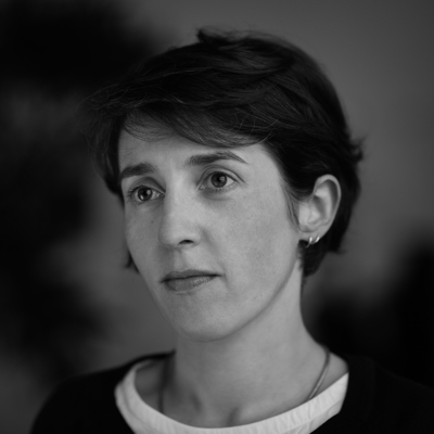 French graphic and type designer, b. Paris, who graduated from
  Mark van Bronkhorst set up TypoBrand LLC in Berkeley, CA. As part of TypoBrand, he published several typefaces that are modern digital reinterpretations of typefaces at American Type Founders by famous type designers such Morris Fuller Benton. The collection is published by TypoBrand LLC under the names
  Typeface importer and vendor and foundry located on Fourth Avenue and Park Avenue South in New York City, with offices in Burbank, CA, and Chicago, IL. Their typefaces included Annonce Grotesque. Amsterdam Continental ceased operations.
  American designer, b. 1967, California. Married to Ken Russell, who runs
  [
[
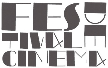 During her studies at Escola Superior de Artes e Design (ESAD) in Porto, Portugal, Ana Patrícia Ferreira created a poster typeface family in 2014 that was patterned after Joan Trochut Blanchard's Super-Veloz.
  Swiss design company, est. in Basel in 1987. It expanded in 2000 and created an office in San Francisco.
  And Repeat is an art and design studio based in the Bay Area, founded by Martin Grasser. Grasser's typefaces:
  Born in Barcelona in 1962,
  Andrew Byrom was born in Liverpool, England in 1971. After Graduating from the University of East London in 1996 he opened his own design studio and worked for various clients including Penguin Books, The British Academy of Composers and Songwriters, The Industrial Design Centre, Time Out Online and The Guardian Newspaper. Around this time he also began teaching graphic design at The University of Luton and Central Saint. Martins. Byrom moved to the USA in 2000 to teach at Northern Illinois University in DeKalb, IL. He has recently been commissioned to design typefaces and type treatments for Elle Decoration, The New York Times Magazine, McGraw-Hill, and Turner Classic Movies. In 2006 he moved to Long Beach to take up an Associate Professor position at California State University, where he is currently the Area Head of the Graphic Design Department. He created the experimental typeface
  [
[ Andrew Hart is a Corona-based American digital photographer (b. 1988), who runs
  Riverside, CA-based designer of the grungy letterpress typeface family Calamity (2016), the rounded sans poster typeface Tiny Tim (2016) and the heavy poster typefaces Industrious (2016: Industrious is the font friend that will punch you in the mouth when you need it), Third Rail (2016, inspired by old train signage), Reach Sans (2016, +Inline) and Templeton (2016, wood type influences). Andrew taught design at California Baptist University.
  Andy Clymer grew up in Irvine, CA and studied at San Diego State University in 1998. At that time, he was working on
  At UC Davis, andy Do created the nice multicolor lettering piece Rebirth (2019). [
 [
[ Italian designer from Sassuolo, Modena (b. 1979). He obtained an MA in typeface design from the University of Reading (2009), based on his Latin / Cyrillic typeface Enquire and his dissertation on the work of the Officine Simoncini. After Reading, he started an internship and eventually worked as a full-time employee in the type group at Apple in Cupertino, CA. He left Apple in September 2016 and is now working on his own typefaces in Milano, Italy.
 Applied Design Works was founded in 2015, with offices in New York and Los Angeles. In their own words, Applied specializes in design, planning, strategy, and implementation for a broad range of mission-driven organizations. Their team includes Craig Dobie, Founding Creative Director, Brad Scott, Founding Managing Director, and Elliott Scott, Creative Director.
  Arabetics is run by the Iraqi-American New York-based type designer, librarian, and systems engineer
  aRc was established in 2008 by
  Riverside, CA-based designer of the calligraphic Orris Root (2017), the bush script Light Butterfly (2017), the hairline calligraphic typeface Bounderas Script (2017), the calligraphic script Pink Coyotes (2017), and the Treefrog brush script Moodellyna (2017). [
 [
[ American calligrapher in Andover, MA, who worked for many foundries, and ran several studios. He ran
  Outfit in San Francisco, London and Riga, Latvia, est. 2007. Most typefaces are designed by Mikelis Bastiks and Aigars Mamis. These include:

 [
[ Autograph is a brand consultancy in Emeryville, CA, specialized in art direction and graphic design. People include Aaron Pou, Donerik Dela Cruz and Mark Hausler. They designed the sans typefaces
  Or Rebecca McCormick. Californian designer of some handcrafted typefaces.
  Israeli designer Habib Khoury (born in Fassouta, Upper Galilee, 1967) is presently Executive Creative Director of Avant Design Communications, which specializes in trilingual typography and communications. The type division, AvanType, offers commercial Latin, Arabic and Hebrew typefaces. He holds a Masters degree from Central Saint Martins College in London. Habib spent several years in Haifa, London, and New York, and is now based in Cathedral City, CA.
  Barmoor Foundry showcases handcrafted and script fonts created by Californian illustrator Tracy Sabin. Typefaces from 2016:
  Or Dian Haniff. Yogyakarta, Indonesia (and/or San José, CA)-based designer of
 Bigelow&Holmes was founded by Charles Bigelow and Kris Holmes. Charles Bigelow (b. 1945, Detroit) is a type designer and teacher, who runs his own studio, Bigelow&Holmes. Bigelow was a colleague of Donald Knuth at Stanford University when Knuth developed his Computer Modern typeface family for TeX. In mid-2006, Bigelow accepted the Melbert B. Cary Distinguished Professorship at Rochester Institute of Technology's School of Print Media. Before that, he taught at Stanford University, Rhode Island School of Design, and other institutions. Typefaces designed by Bigelow:
  Blackdreamist is Keith hayden's type foundry in Kansas City, MO. Keith Hayden is graphic designer, specializing in photo-manipulations, illustrations, and branding. Born in Kansas City, where he lives and works, Keith studied at the Art Institute of San Diego, and then at the Art Institute of Kansas City where he received a Bachelors degree in Graphic Design.
  Graphic designer who was first in New York City and later in Venice, CA. Artist who sells via
  [
[ Croatia-born graduate of School of Design in Zagreb and the
 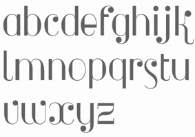 Iowa-based typographer and graphic design who was born in California. He created
  Designer and illustrator at Hatch in San Francisco, who hails from Boerne, TX. His typefaces include
  [
[ A foundry which made over 500 fonts, mostly in 1998-1999, and was located in Carlsbad, CA, where Gail Conwell edited their Bright Ideas Magazine at that time, and Rick Hutchinson is listed as one of the directors / managers / owners.
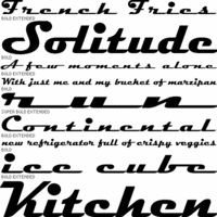
 This type foundry was started in 2019 by Dave Lawrence, perhaps to honor and revive the California Type Foundry from the 20th and 19th centuries. Their typefaces:
 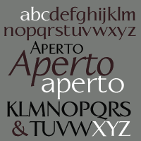 Calligraphics is Paul Veres' outfit in Berkeley, CA.
  [
[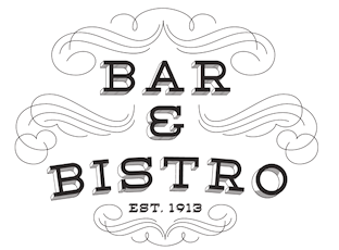 Drew Melton (Carmel Type and
  Born in 1959 in Concord,
  Designer currently living in Los Angeles. She graduated from Otis College of Art and Design graphic design program, with a minor in illustration, and founded the open source type cooperative
  Casady&Greene, Inc. started out as two separate little companies, CasadyWare and Greene, Inc. CasadyWare, which was founded by Robin Casady in August 1984, began producing Fluent Fonts, which were bitmapped typefaces for the Macintosh. The 1984 set of fonts have copyright lines that mention Richard A. Ware. As soon as PostScript fonts appeared, CasadyWare got hold of the first version of Fontographer and produced the first downloadable PostScript fonts, even beating Adobe, the originators of PostScript, to the punch. These were marketed as Fluent Laser Fonts (FLF) out of Carmel, CA.
 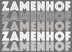 Designs by
  Specializing in celebrity signature fonts, this Arcadia, CA-based foundry (est. 2008) is run by
  Prolific Woodland Hills, CA-based typophile and type designer (1937-2013) whose portfolio consisted largely of revivals and who used the alias Character for his typographic work. The Los Angeles Times posted
  [
[ Chiharu Tanaka was born and raised in Japan. She completed her Bachelor's degree of Textile Design in Tokyo and worked at design companies for a few years. She subsequently received her MFA in Graphic Design from the Academy of Art University in San Francisco in 2009, and remained in San Francisco area ever since. She worked as a graphic and type designer for John McNeil Studio (2009-2010), Landor Associates (2009-2010), Psy/Ops (2010-present) and Morisawa (2016-present). Her typefaces:
 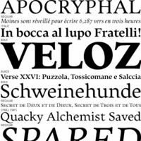 Born in Los Altos, CA, Christopher Slye studied art history at the University of California at Santa Cruz and worked as a graphic designer until joining the type group at Adobe in 1997, where he assisted with the design and production of Adobe's type library. He was involved in the creation of Adobe's OTF fonts, and had a hand in both
  [
[
 Comicraft was founded by Richard Starkings and John Roshell in 1992. Located in Santa Monica and Los Angeles, they do lettering and design for the comic book industry and make comic book fonts. At one point they were also called Comic Book Fonts. The current presidents are Rita Simpson and
  Donald Knuth's
  Graduate from Cal Arts (1996), who runs
  Machine learning engineer who studied at UC Berkeley.
 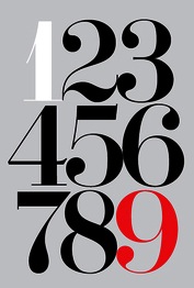 Established in 2013 by Hollywood, CA-based Jason Walcott (formerly operating as
  Type designer (b. 1951, New York) in New York City, who studied at Pratt. His type foundry, Cozy Fonts, is located in Bell Canyon, CA.
  San Francisco-based designer of
  Joshua Darden is an exceptionally gifted typeface designer with a studio in Brooklyn, NY. Joshua Darden (b. 1979, Northridge, CA) founded the
  Graphic designer who started in Los Angeles, where he ran
  At California Institute of the Arts, Santa Clarita, CA-based Dasol Jung designed Cropcircle (2015) and the experimental 3d typeface Symbiosis (2015). In 2016, she designed the Asian look eyelash-inspired typeface Wishlash.
  [
[ Graduate of Drexel University, where he studied under
  Los Angeles-based designer, sign letterer and illustrative typographer. The TDC Annual in 2009 shows
  [
[ Educated at Stanford (M.Sc. in digital typography in 1985 under the supervision of Donald Knuth and Charles Bigelow) and before that at the University of Colorado at Boulder (undergraduate math degree in algorithms under Hal Gabow). Type designer. Creator of these architecturally-inspired type families:
  David Sudweeks pursued graphic design at Brigham Young University where he focused his studies on lettering and type. After completing a brief apprenticeship with type designer Mark van Bronkhorst in California, David took up the position of Type Director at FontShop San Francisco. He now works primarily from his home studio outside Raleigh, North Carolina writing and curating type as a member of
  [
[ Steve Deffeyes from Fairfax, CA, is the designer of free fonts such as Sabon Sans,
 FontStructor in Los Angeles (and before that, Oakland, CA), who made
  [
[ Prolific NY-based designer (born in East Los Angeles) who specializes in faithful revivals of old masters and logotype, in Latin and Hebrew. He made over 500 fonts including. He is also a translator and illuminator of Biblical period Hebrew and Aramaic. His clients include The Vatican (Pope John Paul II's Holocaust commemerative CD) and Hadassah, the Women's Zionist Organization of America. His specialties are translations worded in the language and style of the period in which the Biblical text was composed. His translation and enumeration of kabbalistic writings, otherwise known as Hebrew Mysticism and numerology, demonstrate the mathematical base of Biblical miracles.
  Californian designer of San Luis (2017, brush script), Grembo Duo (2017), the hand-brushed Eiffel (2016, with iconic dingbats such as a kakmadam poodle), the monoline script typeface Cosmodrome (2016), the brush script typeface Maloishes Emellie (2016) and (2016), the whimsical typeface Canterbury (2016), the casual script typeface Wendell (2015), the hand-drawn sans poster typeface Tender (2014), the letterpress emulation typeface Blocklyn (2016), the art deco typeface Nouvelle (2014) and the tall poster typefaces Simplesse (2013) and Hensel (2013).
  [
[ This used to be a wonderful page, but Michelle Dixon seems to have retired from the font making business. There used to be five shareware dingbats fonts: African Ornaments One, Cave Painting Dingbats One, Mayan Dingbats, Pre-Columbian Ornaments One, and Printers' Ornaments One (Mac PS), plus about 45 other original fonts (not shareware). In her wonderful collection, the following of Michelle Dixon's creations stand out: Arrighi Copybook, ItalianMosaicOrnaments, Beautiful, LondonHouse, Love Letter Typewriter, Gaudy Medium, Rusty Nail-Medium (the last four are all old typewriter fonts), and the display fonts Isla Bella (art nouveau), La Negrita, Arty Nouveau, Victorian, Art Nouveau Fonts, Bad Dog-Black, Berlin, Caslon Frenzy, Dixon's Vixens Caps, AntiqueMonoTW, DangerousTypoWriter, Elegant Nouveau Initial Caps, Fruitbasket, Matador, Manhattan, Modern Scribe, Ovid, Spillage, Tacos, Tolstoy, Typewriter, Love Letter, Basketcase, ChiliPepperDingbats, Postage Stamps, Garish Monde,
 Los Angeles and Albuquerque, New Mexico-based designer of the octagonal typeface
  Graphic illustrator in Aliso Viejo, CA. Creator of a decorative monster alphabet typeface in 2014.
  Don Sterrenburg (Camarillo, CA) has been active in an array of visual disciplines since 1963, holding positions in graphic design, type design, and art direction. He has taught lettering and typography at four U.S. universities. Sterrenburg is the recipient of several awards for design and typographic excellence from the Printing Industries of America and the U.S. Small Business Administration.
  Professor of computer science at Stanford University, who by himself changed the world of mathematical and scientific typesetting when he developed TeX in the 1980s. That system needed fonts, so he developed a program called Metafont that permits a simple software description of a glyph. And with Metafont, and the help of Hermann Zapf, he created the Computer Modern type family. This is a tour de force, because each letter in the 72 original fonts has only one descriptive program that contains several parameters. Different parameter settings yield the typefaces, from italic to roman and bold, from 5pt to 10pt and 17pt optical settings, and from sans to serif and typewriter. Since a few years ago, he is Professor Emeritus of The Art of Computer Programming at Stanford University.
  Free and commercial school fonts by Ramón Abajo, all made in 1999 or 2000: Ramon is a high school Spanish teacher in California. His fonts are floating around in
  [
[ Graphic designer, typographer, type designer, author, teacher and lecturer, born in 1926 in Holliday, TX. He died on February 28, 2011 due to complications following a heart operation. He attended Los Angeles City College, Los Angeles Trade Technical Jr. College, and Art Center College of Design where he has taught for 27 years and holds the honorary title Inaugural Master of the School. Doyald drew characters, often of a
 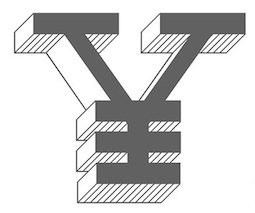 [
[ [
[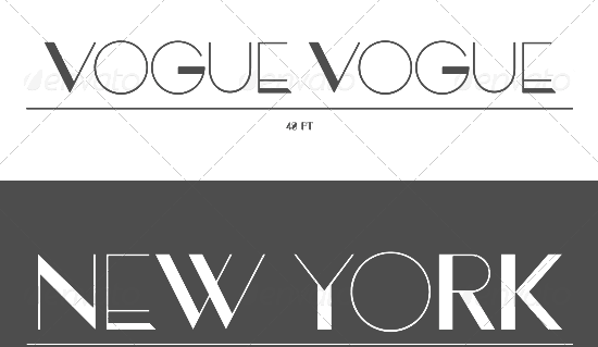 Dwight Creative (San Diego, CA) developed several commercial typefaces in 2012-2013. These include: Novatny, Arik, Erora, El Reon, Firmin, and Sofian. Buy the fonts via
 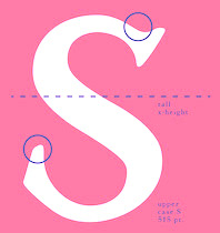 Los Angeles, CA-based designer of Ribbon Serif (2016). [
 Victorille, CA-based designer of these typefaces in 2015: Mafia (art deco), Rude (vintage display style). [
 Sacramento, CA-based foundry established in 1984 by Zuzana Licko (b. 1961, Bratislava) and Rudy Vanderlans. They were "in" during the grungy early 1990s, but ran out of steam and
  For a project at MICA in San Francisco, emily Tai created the rounded sans typeface family Betty (2015).
  Andrew Leman is a prop designer in Hollywood, CA. The type foundry
  Erewhon (nowhere) is a transitional font based largely on Andrey V. Panov's Heuristica, but with so many changes that Michael Sharpe, its designer at UCSD in San Diego, decided in 2014 to offer it as an enhanced alternative. Heuristica (2008-2012) extended the Utopia font family made available by the TEX Users Group, adding many accented glyphs, Cyrillic glyphs, ligatures, superior and oldstyle fixed-width figures in all styles. Erewhon has 1398 characters and is free at CTAN. [
 Creative director in the San Francisco Bay area. In 2015, he designed the sans typeface family Affogato. [
 Art director and typographer in La Mirada, CA. He created the upright monoline connected script typeface
  [
[ German type designer and graphic designer par excellence, born in 1947 in Stadthagen. He set up MetaDesign in Berlin in 1979. In 1988 he set up FontShop, home of the FontFont collection. He holds an honorary professorship at the Academy of Arts in Bremen, is board member of ATypI and the German Design Council, and president of the ISTD (International Society of Typographic Designers). In July 2000, Erik left MetaDesign Berlin. He now lives and works in Berlin, London and San Francisco, designing publications, complex design systems and more typefaces. He collaborated on the publication of the comprehensive
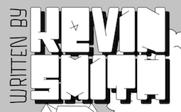 Los Angeles, CA-based designer of the movie title sequence typeface Clerks (2017) and the ultra fat display typeface Grand (2018). Typefaces from 2020: Abi (textured caps), Octubre, Magnolia Varsity, Grand (blocky letters), Arrested, Twenty-Five. [
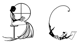 Davis, CA-based designer of the decorative caps typeface Girly Alphabet (2014). [
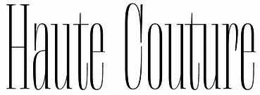 Florence Fu is a writer and designer based in the Bay Area, by way of New York. She holds a B.A. in art history and a B.S. in journalism from Northwestern University. Currently, she is the Editorial Associate at Letterform Archive, where she writes about the collection and supports exhibitions. In 2019, she graduated from the type design program at
 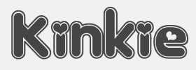 Original fonts by Ben Balvanz from Cedar Rapids, Iowa (b. Cedar Rapids, 1975), who now lives in South California. His
  Fontasmic is located in Hesperia, CA. It is run by
 Not to be confused with the software. Creator of the free font
  Graphic designer in San Francisco. His work includes the
  Los Angeles-based company that distributed a 5000+ library of two-inch film fonts for display typefaces, some of which were original, such as Yagi Double (the CNN logo font) and Yagi Link Double. It ceased operations in 1985. Trogman maintains a design studio in Palm Springs, California.
  Graduate of the Art Institute of Pittsburgh and the Academy of Art University in San Francisco, class of 2005. Freelance designer in San Francisco who created the free outlined hipster bitmap typeface EightBit (2015,
  Foundry-X is a digital type foundry distributing original display type by
  Santa Cruz, CA-based designer (b. 1968) of ASL Hands by Frank (2020). [
 Fwis is a graphic design group in Portland, Cupertino and Brooklyn. One of its art directors is Chris Papasadero. As a sideline, they will design an occasional font.
  George Williams's site (now defunct) site was a discovery! George Williams (b. 1959) wrote spline-generating code and then went on to produce several fonts with his software between 1987 and 1998:
  Graduate in 1992 from the Rochester Institute of Technology with a BS in Printing. While a co-op student for Monotype Typography in California, she hinted fonts. She has also carried out research at Microsoft with Robert Norton. She joined Font Bureau in 1994, but moved a few years later to Southern California.
  A type designer from Santa Cruz, CA (and now Oakland, CA), Matt Chisholm (Glyphobet; was: mattt's fonts) created mainly handwriting and display fonts. He obtained a BA in Mathematics from UC Santa Cruz. All his fonts were initially free---these included MRPHONE1, MRPHONE2, MRPHONE3, MRPHONE4, MRPHONEAlternates, CheckerHat, EverydayFont (Roland Berger, 1994),
 [
[ [
[ Punchcutter, b. 1861 (Berlin), who made many typefaces. He worked at the Central Type Foundry and then ATF in the late 1800s, and was living in St. Louis, MO, in 1891 and in Mill Valley, CA in 1892. The Inland Printer announced in 1895 that Schroeder had joined the Pacific States Type Foundry in San Francisco. His typefaces straddle the Victorian, arts and crafts and art nouveau eras.
  Habib is a graphic designer based in San Francisco specializing in typography and identity systems.
  German animation artist who lives in Southern California where he works for Disney Feature Animation. He is a member of the Academy of Motion Picture Arts and Sciences. His typefaces were mostly made at Agfa-Monotype:
  James M. Harris' Colorado Springs, CO-based foundry sells five fonts designed by himself,
 Herofonts (was:
  [
[ Designer and illustrator, living and working (as Senior Communications Designer at HelloSign) in Oakland, CA. In 2020, he published these display typefaces, all more or less related to the San Francisco area: Twin Lakes (a reverse stress Western slab serif), Northern California (n interlocking font), Cannery Row (a slab serif), Juicebar (squarish), Front Street Tiki (tiki fonts), Laurel District Script, Discography, Worlds Fair, Mechanics Special, Hella Good. Many of his fonts are loaded with interlocking pairs of letters.
  Hoodzpah is a branding and design studio headquartered in Southern California, and run by Amy and Jennifer Hood. Their fonts in 2020 include Lone Pine (a reverse contrast Western font by Amy Hood inspired by Route 395 in California, Beverly Drive (a left-leaning script by Amy Hood), Beale (a display font by Amy Hood inspired by Memphis, TN), and Palm Canyon Drive (a retro monoline script by Amy Hood inspired by Palm Springs, CA).
  [
[ Graphic designer (b. Plattsburgh, NY, 1972) and type designer who studied graphic design at Portland State University and the California Institute of the Arts. He currently runs a multidisciplinary creative studio specializing in unique solutions for international clients. The studio has been based in Tokyo since 2005. Lynam writes for a number of design, typography, and cultural publications including Font Magazine, This American Life, PingMag, and Neojaponisme. In 2008, he released his book Parallel Strokes, an investigation into the intersection of type design and graffiti. He created these commissioned fonts: Diesel Sans, Tri (dot matrix as in billboard lights). He also made Hanger, Garland Sans (based on stencil letters used by British designer, educator and theorist Ken Garland, 1929-2021), Inversion (uncial), Cruller (a fantastic handlettered typeface based on a German lettering book from 1910), Bon Appetit (a custom cut Antique Olive for Bon Appetit magazine), Cooper Pink, Cooper Swash Italic Traditional & Cooper Swash Italic Custom, Cooper Italic (2010, after Cooper's original from 1924), Cooper Initials (2010),
  Santa Rosa, CA-based designer of these typefaces in 2017: Perfunktorily, Que Sera (monoline script), Emma Lou, Picky Girl, Daffodilias (monoline script), Standing Up, Eclipse (blackboard bold), Verbatim, Another Wild, Argentinian Nights (calligraphic), Great Mischief (calligraphic), Beyond March (calligraphic), Echo Falls (inky calligraphic pen script), Des Montagnes, All Formal Monogram, All Hand, All Formal, All Modern, Nectar (thin sans).
  Russian graphic designer working out of San Francisco. His work includes a few nice Cyrillic typographic pieces, some icon sets and digitally revived Vjaz lettering (2014). [
 New York City-based type and brand designer, who has a BFA (2008-2011) from California State University at Long Beach, and used to work in Los Angeles. He studied typeface design at The Cooper Union for the Advancement of Science and Art in 2011.
 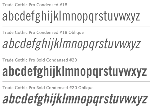 Born in San Francisco in 1908, Burke died in 1975. He studied at the University of California in Berkeley. From 1949 until 1963, he was type director for Mergenthaler-Linotype, succeeding C.H. Griffith. He developed the TeleTypesetting System (TTS) for magazines and designed some fonts for native American languages. He designed Trade Gothic (1948-1960), Majestic (1953-1956) and Aurora (1960).
  Los Angeles, CA-based designer of the modular, grid-based Octagonal Typeface (2015).
  Ripon, CA-based designer of
  Graphic designer in Seattle, WA (was: San Jose, CA), who created the
  [
[ Jamie Otelsberg is a visual designer originally from Los Angeles, CA, and living in Essen, Germany. She is currently working for a Bay Area-based design firm and volunteering at a human-computer interaction lab in Kerala, India. She currently works at OH No Type Co. in Oakland, California.
 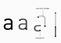 Graphic designer in Garden Grove, CA.
  [
[ [
[ [
[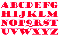 [
[ Graphic designer in San Francisco. Designer of the macho sans typeface Westlake Industrial (2015)---this geometric sans is influenced by Futura and Kabel but gained some testosterone on the way.
  Designer and illustrator in Long Beach, CA, b. 1984, Santa Rosa, CA, whose foundry is simply called Jason Mark Jones. He created
  [
[ JAW Fonts (and before that, JAW Arts Fonts, and
  Jee Sook Kim (Pasadena, CA, but born in Seoul, Korea) writes about his typeface
  Born in 1957 in Battle Creek, USA, Jeffery Keedy is an educator, designer, type designer, and writer, who has been teaching in the Graphic Design Program at California Institute of the Arts since 1985. He is best known for
  [
[ Jim Bogenrief (Pasadena, CA) modified ITC Tiffany when he created the fancy didone fashion mag typeface
  [
[ Type designer who worked at Adobe from 1989-2002 and for Monotype from 2003 until today. His typefaces in chronological order:
  [
[ Freelance designer in Stockton, CA, who graduated from Sacramento State University. Creator of the
  Joey Lopez (of Joey Lopez Design) is studying towards a Bachelors degree at the Art Institute of California, Orange County. He has created several free typefaces:
  Type designer from Southern California, who designs type at Reno, NV-based Letterhead Fonts, which in turn is run by Chuck Davis. Many of his designs are Victorian / Western.
  [
[
 During his studies at the University of Notre dame, John salazar (Garden Grove, CA) created Kandinsky Alphabet (2015). [
 [
[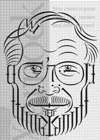 John Warnock (d. 2023) was the founder, with Charles Geschke, of Adobe (in 1982), and the inventor of PostScript. The type 3 and type 1 font formats are an essential part of the PostScript language. He also proposed the PDF file format. [
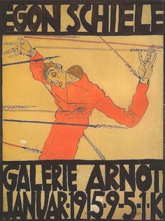 Jon Cox is a graphic designer in Santa Ana, CA. His work includes a beautifully lettered poster in the style of Egon Schiele (2013).
  [
[ [
[ [
[ This is the new foundry of Hollywood, CA-based Jason Walcott, who formerly ran
  Art director who studied at San Diego State University and California State University. In 2014, she created the dadaist typeface Fat Julia for the Yogurtland brand . [
 Designer and artist at Surrealistic Designs in Merifee, CA. As a student he created a decorative all caps alphabet based on sails (2014).
  Joachim Müller-Lancé is a German designer (born St. Wendel, Saar, 1961), who was trained in Basel and at the Cooper Union in New York. He had his own studio in Barcelona, where he taught information design at Elisava School. He was lead information designer for Barclays Global Investors in San Francisco for 3 years. Currently, he lives in Umkirch near Freiburg and/or San Francisco. Timeline of his achievements:
 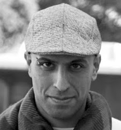 Type foundry in Los Angeles, CA, run by Kourosh Beigpour. Its typefaces:
 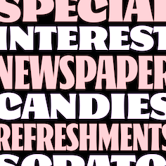 California native who attended Cooper West in 2018. During that study year, he started the design of Oaks, which was published in 2020 at Future Fonts. Oaks is a display typeface with a friendly attitude and a great deal of character. [...] It is based on the sign painting letter structure of the late 1800s with influences from Showcard greats like Ross F. George and E. C. Mathews. Originally designed as a toolkit for the small country grocery stores I grew up visiting in Sonoma County, California. [
 West Sacramento, CA-based designer of the rounded sans
 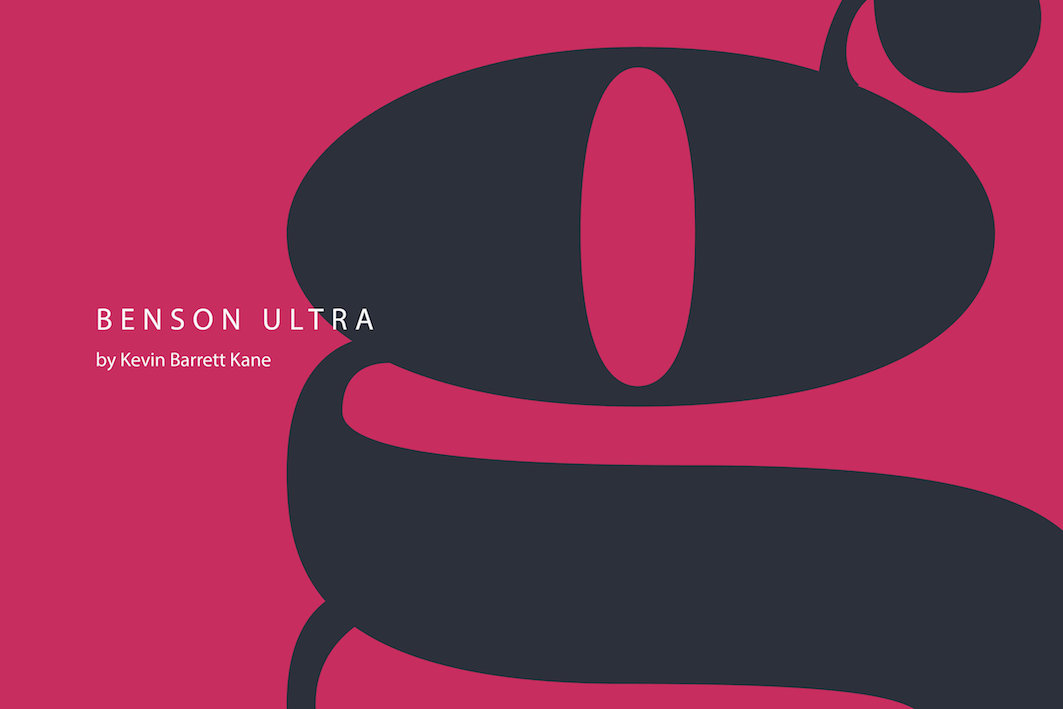 Book and type designer in Denver, CO (and San Francisco, CA) with an exquisite taste for fine classical typefaces. He cofounded
 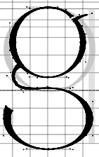 Fine artist, fashion photographer and graphic designer in San Francisco. She created
  Kimmy Kirkwood (b. 1988, Seattle, WA) (Kimmy Design) studied at Chapman University, and lives in Santa Monica, Orange County. He graduated in 2018 from
 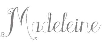 [
[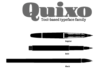
 Graphic artist and illustrator from Martinez, CA. Designer of
 [
[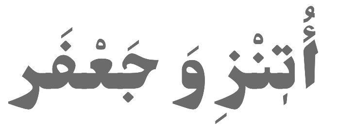 [
[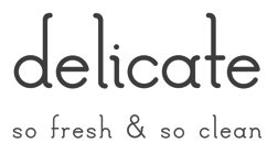 Kristina Ramos (Union City, CA) created the curvy tall-legged sans typeface
  Design student in San Francisco who made the fun typre drawning called
  Los Angeles, CA-based designer. Creator of the tall hairline typeface
  Laura Garcia is a graphic designer and illustrator from Nicaragua where she worked several years in advertising and marketing agencies. In 2019, for the
  [
[ Lauren E. Hart is an art director and graphic designer in San Francisco. At
  During a study period at Type@Cooper West in San Francisco, Lauren Hostetter (Sacramento, CA) designed the Dutch style text typeface Hydraulis (2016).
  Freelance graphic designer in San Diego, who created these typefaces in 2013:
  Freelance computer illustrator in Pacifica, CA. Author of "Creating Great Web Graphics". Some free art. Designed a few typefaces
  [
[ Brian Jaramillo's page that highlights remarkable work by type designers, letterers, sign painters, graffiti artists, stone carvers, calligraphers, poster artists, and graphic designers. Its founders are Brian Jaramillo and Ray Frenden (a custom letterer), and frequent contributors include Jonathan Selig,
  Photolettering foundry run by Marc Jones Barry Kimbrough in Culver City, CA. Russell Bean worked for the Los Angeles studio of Lettergraphics International in charge of lettering, logo design and converting type designs to film fonts. It was at this time (1973) that the Washington family (digital version at Type Associates, Russell Bean's present company) was completed. The company ceased operations in the mid-1980s.
 During her studies at San Jose State University, Linh Nguyen (Vietnam) designed the cursive display typeface Novus (2017), the serene Renaissance-style text typeface family
  Liz Conley is an illustrator, graphic designer and type designer from Portland, Oregon. Now based in San Francisco, she designed the blackboard bold typeface
  Lori LeBeau-Walsh (
 [
[ Founded in 1989, Louise Fili Ltd is a graphic design studio specializing in brand development for food packaging and restaurants. Formerly senior designer for Herb Lubalin, Louise Fili was art director of Pantheon Books from 1978 to 1989, where she designed close to 2,000 book jackets. She has received Gold and Silver Medals from the Society of Illustrators and the New York Art Director's Club, the Premio Grafico from the Bologna Book Fair, and three James Beard award nominations. Fili has taught and lectured extensively, and her work is in the permanent collections of the Library of Congress, the Cooper Hewitt Museum, and the Bibliothèque Nationale.
 Lu Feng is a graphic designer living in Valencia, CA. She graduated in May 2017 with an MFA in graphic design from California Institute of the Arts, where, in 2015, she designed the rope-inspired rounded geometric sans typeface Loop Sans.
  [
[ Lux Typographics (Los Angeles, CA) was established in 1996 by Greg Lindy and Michael Rey. It is mainly involved in custom typography. Greg Lindy is the sole type designer for Lux Typographics and is a founding member, along with Michael Rey, of
  Lyam Bewry is a graphic designer living and working in San Francisco (in 2020). Before 2020, he worked in London for studios including Magpie, Pentagram, Paul Belford Ltd and GTF. At Type Cooper 2020, he designed
  Monterey, CA-based Diane Ehlers (Magpie Fonts, Font Queen 100) made all her fonts with either Fontstruct or Font Creator from High-Logic. FontStruct (2008-2010) carries AllLinedUp-MP, Bigfoot-MP, ChainOfFools-MP, ChipOffTheOldBlock-MP, FancySansationCaps-MP, Fuzzy Concept, KnotMyFont-MP (multilined face), LeanMeanFontMachine-MP, New-Sansation-MP,
  San Diego-based creator of the curly typeface
  Student at Rocky Mountain College of Art and Design majoring in Communications Design. Mara lives in Colorado. Mara's font
  British graphic designer who created a wonderful
  Margo Chase (b. 1958, d. 2017, Apple Valley, CA) was an American graphic designer. Originally a biology major with intentions of becoming a veterinarian, Chase studied design at California Polytechnic Colege, San Luis Obispo. She created logos for the TV shows Buffy the Vampire Slayer and Angel. Her company, Margo Chase Design (founded in 1986) was involved in the branding of numerous entities, such as Target stores, as well as celebrities such as Cher, Madonna and Selena. Chase Design Group has offices in Los Angeles, New York, Chicago and the UK. Chase lived in Los Angeles, California. In addition to working as a graphic designer, Chase taught at the California Institute of the Arts in Valencia, Art Center College of Design in Pasadena, and Long Beach State University. She
  [
[ Based in North Hills, CA (was: Spring Valley, Canoga Park, Van Nuys, or San Diego, all in California), b. ca. 1968. Designer of
  American type designer in Santa Barbara, CA. His typefaces:
  Illustrator and animator who graduated from the Academy of Art University in San Francisco. Creator of the beautiful
  Illustrator, designer, artist and art director in San Francisco. Graduate of CCA (with a BFA) and of
  Match Fonts is the West Hollywood, CA-based foundry led by Michel Bujardet (b. Bordeaux, France, 1951), who is Mike Budge on alt.binaries.fonts. They make and sell interesting font paks. A particular favorite of mine is the
  [
[ San Francisco, CA-based designer of the sans typeface Bowie (2015) and the hand-drawn typefaces Zafu (2015, in Zafu Fluffed and Zafu Firm versions; rounded and ideal for posters), Couch (2015), Lisa (2014) and Matta Sans Condensed (2014).
 [
[ [
[ Matthew Wyne (Wyne Enterpises, San Francisco) designed the distressed wood type typeface custom typeface Be Block Web for The Gap in 2017. He explains how he managed to reduce an existing 600k font to about 100k in size without compromising the effect. In 2018, he published the text typeface Clef, a Venetian-inspired font (loosely based on Centaur) that is optimized for text. It features classical proportions, asymmetrical serifs, moderate contrast and a humanist axis. Cleft is the house font of Wyne Enterprises. [
 Italian illustrator in Venice, CA, who designed the fun
  Type designer from Torrance, CA, who made the futuristic monoline typeface
  [
[ [
[ [
[
 Commercial type foundry based in San Francisco. Their typefaces, some of which were made by Philip Cronerud:
 Illustrator in San Francisco who obtained an MA in graphic design in 2014 from Savannah College of Art and Design. Creator of Breezeblocks (2014), a typeface inspired by the band Alt-J and their single, Breezeblocks.
  In 2009, Californian Meredith Mandel graduated with a BFA in Communication Arts from the Otis College of Art and Design. At
  Mike Abbink (b. 1967) earned a BFA in Fine Arts, and another one in Graphic Design and Packaging from Art Center in Pasadena. Born in 1967, he was a graphic designer at Meta Design San Francisco doing corporate and web design. In March 1999 he co-founded Method, Inc., a San Francisco-based company specializing in communication strategy, interaction and graphic design. Mike Abbink is the Executive Creative Director of the Brand Experience and Design Team within IBM Studios. Before that, he worked as a Creative Director for the Museum of Modern Art, Wolff Olins (New York), Saffron Consultants, Method (also co-founder) and as a Design Director at Apple Computer. His typefaces:
 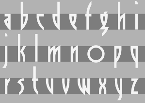 [
[ [
[ [
[ During her studies, Torrance, CA-based Michelle Uyeda created the ball terminal-laden didone display typeface Doheny (2015). [
 Miguel Sousa is a Portuguese graphic designer with a big interest in Typography and Typeface Design. After completing his five-year degree in Technology and Graphic Arts from the Instituto Politécnico de Tomar in 2002, he worked for the children's books publisher O Bichinho de Conto for one year, as a graphic designer, typographic designer, book designer, web designer and web developer. Before going to Reading he also worked in MBV Design as a graphic designer, web designer and web programmer.
  Designer and old-timer in the signpainting business in San Jose, CA, who influenced sign layout in a big way. Mike Stevens died of a heart attack in 1989 at the age of 46. At the SignDNA foundry, we find reincarantions of many of his alphabets, such as Magic, Stix (art deco), Happy Script, Master, ArRoyo, Tahoe, Staton, BigSur, DuVall, BigRed, BigMedicine, Tenor, Phoenix, Vasona. His
 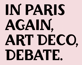 [
[
 MINE is the studio of Christopher Simmons, a Canadian-born, San Francisco-based designer, writer, design advocate and educator. He is the author of four books, the most recent of which, Just Design, focuses on design for social change. In 2015, he created a custom corporate headline sans typeface.
 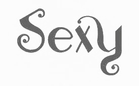 Designer in San Francisco, who created the curly display typeface Zingara in 2014.
  Calligrapher and lettering artist from Los Angeles who graduated from The American University of Paris and UCLA's Design Communication Arts program (class of 2009). Today, Molly lives in Athens, Greece. She wrote these books:
  Graphic designer, who has an MFA in Graphic Design at Otis College of Art & Design (Los Angeles) in 2012. She currently teaches graphic design at the University of Nevada, Las Vegas and is Creative Director at Blue Taco Design in Las Vegas. Monica created a few experimental typefaces in 2012, such as

 Brazilian graphic artist and illustrator based in Los Angeles, CA.
  Creative director at Meta Design in San Francisco. In 2014, Stan Zienka and Neha Hattangdi coidesigned the grid-based hipster typeface family Mica.
  Vernon Adams (born England, 1967) was a furniture restorer, woodcarver and typeface designer. On August 24, 2016 Vernon Adams passed away from injuries sustained in a scooter accident in May of 2014.
  Swedish graphic designer, b. 1991, who obrained a Masters degree at IED in Florence, Italy. He is currently based in Stockholm. His typefaces:
  Nimbus 15 (2015-2016) is a free font package developed and maintained by UCSD's Michael Sharpe. The package is intended to provide a set of basic Latin (OT1, T1 and TS1), Greek and Cyrillic based on the Nimbus Core 2015 released by Artifex in October 2015. That core contains the URW++ clones of Courier, Helvetica and Times. The individual fonts in this package, with prefixes zco (Courier, 3 weights), zhv (Helvetica, 2 weights) and ztm (Times, 2 weights), are provided in both otf and pfb format. The font named zcoN-Regular is a narrow version of zco-Regular, and is much better suited to rendering code than the latter. [
 Californian FontStructor (aka winty5, b. 2002) who made these typefaces in 2012: 5Stenserif, 5Stencipix,
  Erik Marinovich (Croatia) ran/runs
  Oakland, CA-based designer, whose company is called
  Design studio in Los Angeles where one can buy these fonts by Tom Tor:
  Typefounders and printing press in San Francisco. The Miller&Richard Type Foundry of Scotland opened a branch in San Francisco in 1878, headed by John J. Palmer. This branch was sold to Palmer and Valentine J. A. Rey in 1882. In 1884, Palmer&Rey acquired the assets of the Pacific Type Foundry. The company then merged into American Type Founders in 1892. They published
  The main digital type foundry in Russia. ParaType was established as a font department of ParaGraph International in 1989 in Moscow, Russia. At that time in the Soviet Union, all typeface development was concentrated in a state research institute, Polygraphmash. It had the most complete collection of Cyrillic typefaces, which included revivals of Cyrillic typefaces developed by the Berthold and Lehmann type foundries established at the end of 19th century in St. Petersburg, and artwork from Vadim Lazurski, Galina Bannikova, Nikolay Kudryashov and other masters of type and graphic design of Soviet time. ParaType became the first privately-owned type foundry in many years. A license agreement with Polygraphmash allows ParaType to manufacture and distribute their typefaces. Most of Polygraphmash staff designers soon moved to ParaType. In the beginning of 1998, ParaType was separated from the parent company and inherited typefaces and font software from ParaGraph. The company was directed by Emil Yakupov until February 2014. After Yakupov's death, Irina Petrova took over the reins.
  Jim Parkinson's Parkinson Type Design was based in Oakland, CA. This prolific type designer was born in 1941 in Richmond, CA, and lived in Oakland, CA. After a long struggle with Alzheimer's, he died on June 26, 2025 at his home in Oakland. Originally, a letterer, he went digital in 1990. His Keester and
  [
[ Graphic and interaction designer and photographer, based in San Jose, CA. He created the thin chic curly typeface
  San Francisco, CA-based designer of the rounded monospaced sans typeface Neha Mono (2016). In 2017-2018, he published the
 [
[ [
[ Type and graphic designer from Joseph City, AZ. His first degree was from Brigham Young University. He was a type designer at
  Los Angeles-based
  Studio in Los Angeles, CA, Palo Alto, CA, and/or Dar Es Salaam, Tanzania. In 2017, they published Blackmeans Script, the
  Letterer, open source supporter, and visual designer from Russia (b. 1988) who is based in San Francisco. Graduate of BHSAD (the British Higher School of Art and Design) in Moscow, class of 2013. She founded Popkern. Her typefaces:
  Illustrator in Los Angeles. In 2018, he designed the African style typeface Safari, Chunkee, and the futuristic typeface Zzyzx.
  Max Privalov's foundry, Government Studios (was: GVMNT), was based in Los Angeles. Government Studios was originally a film studio, designing fonts for future film projects.
  Mark Caneso is a graphic and type designer who lived in Garden Grove, CA, Kapolei, HI, Beaverton, OR, Austin, TX, and now, Mount Pleasant and/or Charleston, SC. He founded ppwrkstudio (or: ps type) in 2004.
  San Leandro, CA-based designer of 208 (2009) and Mouse (2009), experimental typefaces.
  MIT student who designed his own fonts at MIT, TrueType and PostScript. Illusion of 3D. Check out Reverb, ArgentumSilver, Daisy, StilettoBlack, StilettoSilver, Diamond,
  [
[ Los Angeles, CA-based designer of the decorative caps typeface Mini Henna (2016).
  Type and technology expert and computer scientist presently working for Google in Mountrain View, CA. His blog was totally dedicated to free and open software. Raph Levien is a software engineer and tech lead of Android Text on the Android UI Toolkit team at Google. A well-known software guru, he was a lead developer for Gfonted and Spiro (a font editor), and helped out with Gimp, among many other things. Raph's previous work includes Google Fonts and the open source Ghostscript PostScript/PDF engine. The topic for his PhD in Computer Science from the University of California, Berkeley, is on better techniques for interactively designing curves, and he also used these tools to design Inconsolata, one of the fonts available on the font API (see
  Swedish software expert who lives in San Francisco and who has worked for Dropbox, Facebook, Spotify, Lear Corporation and Spray. His own company is called Notion. His typefaces:
  [
[ Irvine, CA-based creator of a great piano key style poster entitled Schweizisk Stil (2014). [
 Rea Irvin (b. San Francisco, 1881, d. US Virgin Islands, 1972) was an art director for the New Yorker magazine. In 1925, he designed Irvin, the typeface that became the alphabet used by
  Reserves (and, since 2012,
  Dustin Lee (RetroSupply Co, Portland, OR, and before that, Palo Alto, CA) sells RetroType, an add-on for Illustrator to make text appear retro. After setting up RetroSupply in 2013, he made the handcrafted poster fonts Roaster (2015) and Wild Fire (2015), the bold octagonal typeface Authority (2015, in standard, rounded and distressed sub-styles; inspired by public transport typefaces from the 1970s; with Scott Fuller), the monoline connected script typeface Palm Canyon Drive (2015: inspired by California in the 1940s and 1950s), the cartoon font Nincompoop (2015; we find this note: Nincompoop was designed by award-winning illustrator, designer, teacher and author Von Glitschka. Until now, this font was part of Von's personal collection of resources. Now you can have this hand crafted typeface for your personal arsenal), the multiline logo font family Solid 70 (2015), and the semi-blackletter typeface Unlucky (2015).
 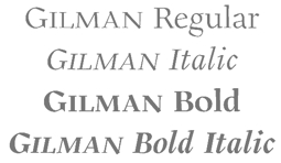 [
[ [
[ Illustrator and graphic designer who is Director of Creative Investigation at
  Author of
 After a start at Autologic in Newbury Park in 1983, this prolific American master craftsman (b. Evanston, IL, 1956) helped pioneer digital type design at Adobe (which he joined in 1987) and created
  San Jose, CA-based designer (as a student at San Jose State University) of the experimental compass-and-ruler typeface Medici (2018). [
 [
[ [
[ A Lebanese American, Graham Bradley grew up in Pasadena, CA. He studied twentieth-century European history at the University of California, Berkeley, and graduated in 2009. He also graduated from the Type@Cooper program at The Cooper Union in New York. Graham designs printed materials, lettering, typefaces, and the occasional website. He is located in California. Before founding Roxaboxen, Graham was the first employee at Frere-Jones Type, where he worked with Tobias Frere-Jones on Mallory and Retina. He is an instructor at Type West at the Letterform Archive.
 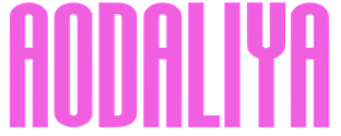 [
[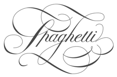 Got to like the swashy lettering in the
  Designer in Los Angeles who created
  Graphic designer and illustrator in Walnut Creek, CA, who set up his own type foundry in 2014. He created these typefaces:
  Graphic Design graduate from The Art Institute of Los Angeles at Santa Monica. In 2013, she created
  Tens of original dingbat fonts made by Denise Clendenin (who is based in California) in 1998-1999: Americana, AmericanaTwo, ArtDeco, ArtNouveau1,
  [
[ Aspiring architect, amateur graphic designer, and amateur typographer in San Luis Obispo, CA. Gifted a flair and taste for techno, he created Gears of Peace (2010), Disco Diva (2007, multilined, all caps), PerfectDarkZero (2010, stencil), and Nuss Motorsports (2010; stenciled upper case). [
 Lucas Sharp is a designer (b. 1986, San Francisco) set up Sharp Type in Brooklyn, NY, and later in New York City proper. Before that, Lucas Sharp was involved with
  Swiss designer
  SignDNA is run by Dave Simpson (Winters, CA). Commercial sign and display fonts, including many scripts, often by Dave Simpson himself. Other designers:
  Holly Goldsmith has a BA in Art from Brooklyn College. She worked first at (Mergenthaler) Linotype, then at Photo Lettering and World Typeface Center before moving to Los Angeles. In LA, she worked at Xerox's type design department for a few years before starting her own company, Small Cap Graphics, where she is engaged in both graphic design and custom type design, with clients such as Agfa Monotype, ITC, DsgnHaus, Disney Corporation and Margo Chase Design.
  Designer, illustrator and letterer in Oakland, CA.
 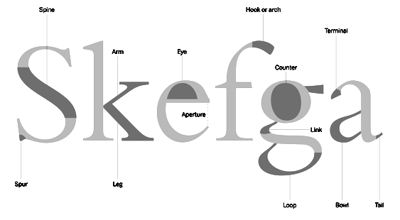 Aka
Aka  [
[ Illustrator in Oakland, CA, who created the art deco typefaces Casablanca (2015) and New York-Paris (2015). Many of his illustrations are rooted in the French art deco style of Cassandre.
  Rochester Institute of Technology's School of Printing graduate who lived in California and in Holland, MI, and now resides in Louisville, Colorado. He was a disciple of Chuck Bigelow and Kris Holmes.
 Stiff Upper Glyph is John Merrifield's type foundry in Seattle, WA (and before that, Los Angeles, CA), est. 2012. Their typefaces:
 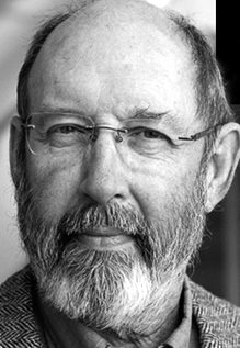 The
The  Istanbul-born graphic designer and typographic researcher, now located in Geneva, Switzerland. During his studies in the Master of Graphic Design program in Rennes (France), he created
 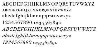 [
[ Sun Helen Isdahl Kalvenes (b. Stavanger, Norway) was based in Copenhagen, Denmark, and is now in Oakland, CA. In 2012-2013, she studied towards an M.A. in Type Design at the KADK (Royal Danish Academy of Fine Art School of Design). In 2013, she graduated from the
  From
From 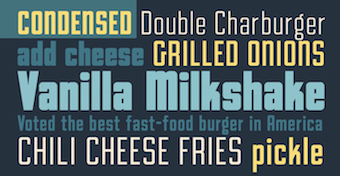 Type foundry set up in 2020 by Comicraft's John Roshell, who is based in California. In 2020, he released the squarish all caps family
 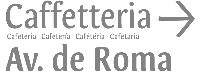 Graphic designer from Portugal who obtained a Bachelors in Graphic Design from ESAD.CR in Caldas da Rainha, and a
  Terrestrial Design is Carl Crossgrove's web site. Crossgrove graduated from Rochester Institute of Technology in Printing /Typography, and has shown a life-long interest in calligraphy and lettering. Now based in San Francisco, he has worked at Adobe, where he designed the Multiple Master hand-printed (semi-Celtic or stone-carved) families
  During his studies, Oakland, CA-based Terry Gatechair created the experimental typeface Spiro (2015). For a neighborhood cafe that is connected to the sex-positive/BDSM scene in San Francisco, Terry created several art nouveau lettering pieces influenced by Kolomon Moser. [
 [
[ Scarpelli's design and production clients have included the California Attorney General's Office, Napa/Sonoma Magazine, the American Cancer Society, Catholic Healthcare West, UC Hastings School of Law, Chevron, Frito Lay, the Oakland A's and the San Francisco Giants. He regularly designs theater graphics for companies throughout the Bay Area, and is resident Graphic Designer for 42nd Street Moon, Bay Area Musicals, and Silicon Valley Shakespeare. Additionally, he has created and edited several art books in the collection of the San Francisco Museum of Modern Art. His original training is in the theater. With his husband Peter Budinger, he has written and directed several plays, and appeared in numerous productions. They were theater majors, playwrighting students, and improv disciples together at Yale University. Scarpelli is currently Associate Director of the School of Web Design + New Media at the Academy of Art University, San Francisco. He designed these typefaces:
  Another cooperative where one can submit open source fonts, which is currently located in Anaheim, CA. Initial contributors in 2009 are Micah Rich, Caroline Hadilaksono, Haley Fiege, and Andrea Bergamini. The project was started by Micah Rich and Caroline Hadilaksono. Their manifesto: As designers on the web, we have a calling to raise the standards of the web-design world. We're not the only ones who value good design, and it's time for the web world to catch up with it. We understand the challenges that comes with the internet, but with our recent discovery of @font-face, we started getting excited. For those who aren't up to speed, @font-face is a fairly new addition to web styling, letting a designer specify the location of their own font files. Instead of having to design with just a handful of web-friendly fonts, we'll be able to use any typeface we desire. Well, that's our vision, anyway. There are people who design typefaces for a living, and we want them to make money off of something that they do well. This revolution is not a movement against type foundries and type designers; it's quite the opposite. The kind of revolution we want is a change in the way people think about doing business. We want type foundries and typographers to start thinking, "Maybe there's nothing wrong with giving things away sometimes." It's not always about the money, sometimes it's also about making a contribution to the society, in this case, the design community. Giving one typeface away for free will most likely only boost sales, and it's a good deed. We want more people to look at it like that: like they have a responsibility to do something good for their peers. We're not asking type designers and type foundries to sacrifice profit, we're asking them to contribute to a greater cause, to create a community where we not only have a high design standard for print and web alike, but also a community where we're able to share our creations, knowledge, and expertise with our peers and the world.
  Bonnie Shaver-Troup, EdD, the creator of the Lexend project (which is based in Irvine, CA), is focused on making reading easier for everyone. As an educational therapist, Bonnie created the first Lexend typeface in early 2001 aiming to reduce visual stress and to improve reading performance for those with dyslexia and other struggling readers. Today, Bonnie's goal is to make the Lexend fonts accessible to a larger spectrum of users.
  Free fonts made by Brooklyn, NY-based (and before that, Huntington Beach, CA-based) Lauren Ashpole (b. 1982, Corpus Christi, TX):
  Los Angeles-based creator of the experimental typeface
  Thomas Ramey, a graphic designer from Austin, TX, who grew up in Pasadena, TX, and was located in San Francisco and Nashville, TN, now operates out of Seattle, WA. He created the hybrid font
  Randy Jones, who runs AquaToad and ToadFonts, is a free lance graphic designer who was in New York, but now lives in San Francisco, CA, where he is a freelance graphic designer and principal of Aquatoad Design. His typefaces:
 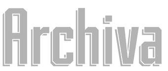 [
[ Digital artist from Los Angeles (b. 1988) who created the geometric sans typeface Modeno (2008, Futura or Bauhaus style). [
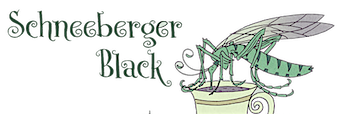 [
[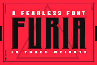 Tran La (Los Angeles, CA) is a game designer who calls himself Mr. Fedex, because he always delivers. Creator of the fearless font
  Trevor Tarczynski (Studio Destro, Los Angeles) created a number of typefaces in 2013:
  Jeremy Tribby is a multi-disciplinary designer from California. He studied art and art history at UC Berkeley and is a graduate of
  Art director and photographer in San Francisco, who created a thick slab typeface in 2014 called I Love My Friends (athletic lettering style).
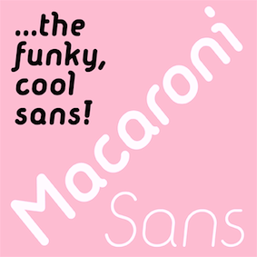
 Santa Barbara, CA-based designer who created these typefaces in 2016: Portland, Salt & Wax, Modern Outdoor (stencilish, with a sketched shadow).
 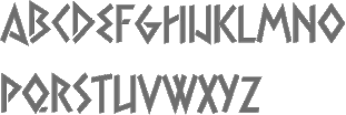 Tim Ryan is a Thousand Oaks, CA-based type designer and font enthusiast, who has helped me out generously with font links in the 1990s.
  A program at the Letterform Archive in San Francisco. Students: Michelle Liane Adams, Libbie Bischoff, Martha Sue Coursey, Nurullah Gokdogan, Nathan Goldman, Lizzy Ha, Lauren Jochum, Kevin Barrett Kane, Emma Linh, Leigh Maki, DJ Murphy, Michael Stark, Jess Smith, Jeremy Tribby, Kristina Yuen, Bert Zhang.
  With Joachim Müller-Lancé, Mike Kohnke (Oakland, CA) is the American cofounder (b. 1967) of the
  A set of four Garamond fonts developed by URW in 2000, and released in the public domain bu URW. There are
  [
[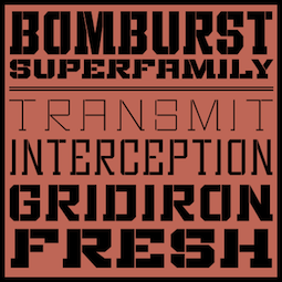 Foundry, est. 2004 by Brian Bonislawsky and Brian Jaramillo (Harvey) and located in Long Beach, CA, and Las Vegas, NV. The fonts are realeased through Veer/Umbrella. Jaramillo has been associated with DEFCON and Apollo26, while Bonislawsky was active at Astigmatic and Font Diner.
  Los Angeles-based designer of these typefaces in 2019: Rex Modified (a multi-line modification of Fontfabric's Rex), Elftal (a soccer shirt font inspired by Wim Crouwel's grid method), Art Deceau (a soccer shirt font inspired by art deco). [
 Los Angeles-based group interested in art direction, typography, print design, branding and graphic design. They designed these typefaces:
  Winston Scully is a type designer, lettering artist, and graphic designer living and working in San Francisco, California. He graduated from Southeastern Louisiana University, worked for a while in branding and packaging from Baton Rouge, LA, and studied at Type@Cooper West in San Francisco, before setting up
  Wallace "Wally" Olins (b. 1930, London; d. 2014) co-founded the famous design company Wolff Olins in 1965. Presently, it has offices in London, San Francisco, Barcelona, New York and Tokyo. This company is guilty of many custom typefaces, and employed at some point people such as Jeremy Tankard.
  Robby Woodard is the Fresno, CA-based designer of fonts at
  Commercial fonts at this boutique type foundry and publisher operating in Tokyo, jointly run by Ian Lynam and Thien Huynh.
  Ross Milne (b. 1985) works and lives in Vancouver, Canada where he studied at the Emily Carr University. After graduating with a degree in Communication Design (2007), he moved to Den Haag, where he studied type design at the
  Graphic designer
  Max Infeld (b. 1981, aka Xerographer Fonts) from Chico, CA, makes free fonts and offers a free font-making service. He surged onto the font scene in 2012, and is currently located in Ojai, CA.
  Arcadia, CA-based designer of the Peignotian typeface Never (2014). Ying grew up in Taiwan.
  Yuanchen Jiang is a designer working in graphic design, motion, branding and storytelling, who is based in Los Angeles. He is a graduate of Yale University School of Art (MFA), class of 2015, and China Central Academy of Fine Art (BFA). Developer of a series of typefaces for
  [
[ Graphic designer in San Francisco. While studying at The Cooper Union in New York, she created a revival of the bulky condensed bold modern typeface
  During his studies at Rhode Island School of Design, Yuexin Huo (Glendale, CA) created the text typeface family Monark (2018) and Monark Neue (2019). Other typefaces include Hourglass (2018), Slab (2018: an angular typeface-not a slab serif), Stonehenge (2018: an angular typeface) and Hotel (2018).
  [
[