| | |
100 Beste Schriften aller Zeiten
|
 German FontShop-sponsored site listing the hundred best fonts of all times, compiled by a jury in 2007. There is a lot of good information about each of the fonts mentioned. PDF file compiled by the jury: Stephen Coles, Jan Middendorp, Veronika Elsner, Roger Black, Ralf Herrmann, Claudia Guminski (FontShop) and Bernard Schmidt-Friderichs. Visualization of the list. The list:
 - (1) Helvetica
- Garamond
- Frutiger
- Bodoni
- Futura
- Times
- Akzidenz Grotesk
- Officina
- Gill Sans
- Univers
- (11) Optima
- Franklin Gothic
- Bembo
- Interstate (1993, Tobias Frere-Jones)
- Thesis
- Rockwell
- Walbaum
- Meta
- Trinité
- DIN
- (21) Matrix
- OCR A und B
- Avant Garde
- Lucida
- Sabon
- Zapfino
- Letter Gothic
- Stone
- Arnhem
- Minion
| | - (61) Blur
- Base
- Bell Centennial
- News Gothic
- Avenir
- Bernhard Modern
- Amplitude
- Trixie
- Quadraat
- Neutraface
- (71) Nobel
- Industria, Insignia, Arcadia
- Bickham Script
- Bank Gothic
- Corporate ASE
- Fago
- Trajan
- Kabel
- House Gothic 23
- Kosmik
- (81) Caecilia
- Mrs Eaves
- Corpid
- Miller
- Souvenir
- Instant Types
- Clarendon
- Triplex
- Benguiat
- Zapf Renaissance
| - (91) Filosofia
- Chalet
- Quay Sans
- Cézanne
- Reporter
- Legacy
- Agenda
- Bello
- Dalliance
- Mistral
| Follow-up in English. Credit for some images below: Danielle West. [Google]
[More] ⦿
|
100types
[Ben Archer]
|
Educational and reference site run by Ben Archer, a designer, educator and type enthusiast located in England (who was in Auckland, New Zealand, before that). Glossary. Timeline. Type categories. Paul Shaw's list of the 100 most significant typefaces of all times were recategorized by Archer: - Religious/Devotional: Gutenbergs B-42 type, Gebetbuch type, Wolfgang Hoppyl's Textura, Breitkopf Fraktur, Ehrhard Ratdolt's Rotunda, Hammer Uncial, Zapf Chancery, Peter Jessenschrift, Cancellaresca Bastarda, Poetica.
- Book Publishing&General Purpose Text Setting: Nicolas Jenson's roman, Francesco Griffo's italic, Claude Garamond's roman, Firmin Didot's roman, Cheltenham family, Aldus Manutius' roman, William Caslon's roman, Pierre-Simon Fournier's italic, Ludovico Arrighi da Vicenza's italic, Johann Michael Fleischmann's roman, ATF Garamond, Giambattista Bodoni's roman, Nicolas Kis' roman, Minion multiple master, Unger Fraktur, John Baskerville's roman, Lucida, Optima, Bauer Bodoni, Adobe Garamond, Scotch Roman, Romanée, ITC Stone family, Trinité, ITC Garamond, Sabon, ITC Novarese, Charter, Joanna, Marconi, PMN Caecilia, Souvenir, Apollo, Melior, ITC Flora, Digi-Grotesk Series S.
- Business/Corporate: Akzidenz Grotesk, Helvetica, Univers, Syntax, Courier, Meta, Rotis, Thesis, Antique Olive.
- Newspaper Publishing: Times Roman, Bell, Clarendon, Century Old Style, Ionic, Imprint.
- Advertising and Display: Futura, Robert Thorne's fat typeface roman, Vincent Figgins' antique roman (Egyptian), Memphis, Fette Fraktur, Avant-Garde Gothic, Deutschschrift, Peignot, Erbar, Stadia/Insignia, Penumbra, Compacta, Bodoni 26, WTC Our Bodoni.
- Prestige and Private Press: Romain du Roi, Golden Type, Johnston's Railway Sans, Doves Type, Walker.
- Signage: William Caslon IV's sans serif, Trajan.
- Historical Script: Snell Roundhand, Robert Granjon's civilité, Excelsior Script.
- Experimental/expressive: Mistral, Beowolf, Dead History, Behrensschrift, Eckmannschrift, Neuland, Element, Remedy, Template Gothic.
- Onscreen/multimedia: Chicago, Oakland, OCR-A, Base Nine and Base Twelve, Evans and Epps Alphabet.
- Telephone Directory publishing: Bell Gothic.
Link to Archer Design Work. [Google]
[More] ⦿
|
Akshata Shanbhag
|
Graphic designer in Melbourne, Australia, who created the hybrid all caps typeface Baskerone in 2015 as a mix of Baskerville and Didot. As a student, she created various display typefaces. [Google]
[More] ⦿
|
Alain Hurtig
[Sarah Eaves]
|
[More] ⦿
|
Alexander Slobzheninov
|
 Designer from Siberia who graduated from Ladislav Sutnar Faculty of Design and Art, University of West Bohemia and is now based in Prague, Czechia. Type, graphic and motion graphics designer who created these typefaces:
 - Octarine (2017). A geometric sans typeface family with two free weights).
- Fivo Sans (2017, free) and Fivo Sans Modern (2017, free).
- Wacom (2017). This is a simplified techno sans concept font not actually used by Wacom.
- Objective and Subjective, two mischievous typeface families published in 2018. Objective was slightly altered and merged with Chris Simpson's Metropolis (2015) in 2020 by Cristiano Sobral in Metropolitano.
- The 42-font sans family Agrandir (2018). Available from Pangram Pangram.
- The 7-weight Swiss neo-grotesk Gestalte (2018) that is characterized by mathematically precise horizontal and vertical strokes and terminals.
- The Baskerville grandchild AS Grafier (2018). A corporate typeface for the identity of Other Poets Society. There is a free beta version, and comes with a variable font option. Published by Pangram Pangram in 2019. The variable font Grafier can also be purchased from Type Tomorrow.
- The Latin / Cyrillic Object Sans (2018), which is in the Swiss sans style. For the Cyrillic, he was helped by Sonya Yasenkova. Available from Pangram Pangram.
- The cyrillization of Jeremy Landes's Le Murmure in 2019.
- Relaate (2019-2020). A multi-genre typeface in which the lower case t and e try to reach for the sky.
- Right Grotesk (2020, Pangram Pangram). Neutral, functional, slightly hipsterish. First in 51 styles, and then extended to 130 styles, and some variable fonts as well.
- In 2021, he set out to design one typeface per day for 36 consecutive days. The typefaces explore various ideas and cover almost every imaginable type style: Casual Digital Goose, Chill Out, Damn Low Tech, Flying, Gravity Itself, Ligatureless, Ploite Green Finger, Pretty Dumb Idea, Rembrandt, Those Games, Weird, What A Feature.
- Typefaces from 2022: Right Sans, Right Gothic (a 98-style variable type family), Weird Serif (a didone for vampires).
Future Fonts link. Type Tomorrow link. [Google]
[More] ⦿
|
Alexei Chekulayev
[Double Alex Team]

|
 [MyFonts]
[More] ⦿
[MyFonts]
[More] ⦿
|
Alina Zhen
|
During her studies in New York City, Alina Zghen created Super Sharp (2014, FontStruct). [Google]
[More] ⦿
|
Alonzo Gutierrez
|
Graphic and web designer in Sacramento, CA, who created a Baskerville-themed magazine cover in 2016. [Google]
[More] ⦿
|
Alphabet Innovations International -- TypeSpectra (Was: MM2000)
[Phil Martin]
|
 Born in Dallas in 1923, and retired in Florida, Phil Martin had an exciting life, which started as a bombardier in WWII, and went on as a piano bar singer, publisher, cartoonist, comedian and typographer. He died in October 2005.
 Phil established Alphabet Innovations International in 1969 and TypeSpectra in 1974, and designed most of his 400 typefaces (read: film fonts for use in the VGC Photo Typositor) there: Agenda (1976), Americana (1972), Arthur (1970, by Roc Mitchell), Aurora Snug (1969), Avalon (1972), Baskerville (1969), Beacon (1987), Bluejack (1974), Borealis (1970, by Roc Mitchell), Britannic (1973), Bulletin (1971), Celebration (1969, by Roc Mitchell), Century S (1975), Cheltenham (1971), Clearface (1973), Cloister (1975), Corporate (1971, by Roc Mitchell), Corporate Image (1971, by Roc Mitchell), Courier B EF (2004, originally done at Scangraphic), Didoni (1969, a knock-off of Pistilli Roman with swashes added), Dimensia and Dimensia Light (1971, by Roc Mitchell), Dominance (1971), Egyptian (1970), Eightball (1971, some report this incorrectly as a VGC face, which has a different typeface also called Eightball: it was digitized by FontBank as Egbert. Alphabet Innovations' Eightball had other versions called Cueball and Highball, and all three were designed by George Thomas who licensed them to AI), Fat Chance (Rolling Stone) (1971), Fotura Biform (1969), Franklin (1981), Garamond (1975), Globe (1975), Goudy (1969), Harem (1969, aka Margit; digitized and revived in 2006 by Patrick Griffin and Rebecca Alaccari as Johnny), Helserif (1976---I thought this was created by Ed Kelton; anyway, this typeface is just Helvetica with slabs), Helvetica (1969), Introspect (1971, revived in 2012 by SoftMaker as Looking Glass, and by Castcraft as OPTI Looking Glass), Jolly Roger (1970, digitized in 2003 by Steve Jackaman at Red Rooster; Martin says that Jolly Roger and Introspect are his two most original designs), Journal (1987), Kabell (1971), Kabello (1970), King Arthur [+Light, Outline] with Guinevere Alternates (1971, by Roc Mitchell), Legothic (1973), Martinique (1970), Mountie (1970), News (1975), Palateno (1969), Pandora (1969), Pazazzma (1980), Perpetua (1969), Plantin (1973), Polonaise (1977; digital version by Claude Pelletier in 2010, called Chopin Script), Primus Malleable (1972), Quaff (1977), Quixotic (1970), Report (1971), Romana (1972), Scenario (1974), Sledge Hammer (1971), Son of Windsor (1970), Stanza (1971, by Roc Mitchell; this angular typeface was later published by URW), Stark (1970), Supercooper (1970), Swath (1979), Threadgil (1972), Thrust (1971), Timbre (1970), Times (1970), Times Text (1973), Trump (1973), Tuck Roman (1981), Viant (1977), Vixen (1970), Weiss (1973), Wordsworth (1973). In 1974, he set up TypeSpectra, and created these type families: Adroit (1981), Albert (1974), Analog (1976), Bagatelle (1979), Cartel (1975), Caslon (1979), Criterion (1982), DeVille (1974), Embargo (1975), Heldustry (1978, designed for the video news at the fledgling ABC-Westinghouse 24-hour cable news network in 1978; incorrectly attributed by many to Martin's ex-employee Ed Kelton: download here), Innsbruck (1975: revived in 2018 by Olexa Volochay as Tyrol), Limelight (1977), Oliver (1981), Opulent [Light and Bold] (1975, by George Brian, an amployee at Alphabet Innovations), Quint (1984), Sequel (1979), Spectral (1974), Welby (1982). His fonts can be bought at MyFonts.com and at Precisiontype. He warns visitors not to mess with his intellectual property rights, but I wonder how he can have escaped the ire of Linotype by using the name Helvetica. In any case, the fonts were originally made for use on photo display devices and phototypesetters. Some are now available in digital format. Near the end of his life, Phil's web presence was called MM2000 (dead link). Check his comments on his own typefaces. URW sells these typefaces: URW Adroit, URW Agenda, URW Avernus (after Martin's design from 1972), URW Baskerville AI, URW Beacon, URW Bluejack, URW Cartel, URW Cloister, URW Corporate, URW Criterion, URW Didoni, URW Fat Face, URW Globe, URW Goudy AI, URW Heldustry, URW Helserif, URW Introspect, URW Legothic, URW Martin Gothic, URW Martinique, URW Pandora, URW Polonaise, URW Quint, URW Scenario, URW Souvenir Gothic, Souvenir Gothic Antique (the Souvenit Gothic family was designed by George Brian, an employee of Alphabet Innovations at the time: it was AI's first text family), URW Stanza, URW Stark, URW Timbre, URW Viant, URW Wordsworth. Interview. Bye Bye Blackbird performed by Phil Martin in Largo, Florida. The final message on his last web page, posted posthumously read: MARTIN, PHIL, 82, of Largo, died Tuesday (Oct. 4, 2005) at Largo Medical Center. He was born in Dallas and came here after retiring as a writer, singer-songwriter, commercial artist, and comedian. As a high school student, he worked as an assistant artist on the nationally syndicated Ella Cinders, and at 18 wrote and drew Swing Sisson, the Battling Band Leader, for Feature Comics. He was an Army Air Forces veteran of World War II, where he served as a bombardier in Lintz, Austria. On his 28th mission shelling the yards in Lintz, his B-24 was hit and he was listed as missing in action until the war in Europe ended. He was a comedian on The Early Birds Show on WFAA in Dallas. As a commercial artist, he founded two multinational corporations to market typeface designs and is credited for designing 4 percent of all typefaces now used. He also wrote columns and articles for typographic publications. Locally, he sang original lyrics to old pop standards in area piano bars, and in 1999 produced 59 issues of the Web book Millennium Memorandum, changing the title to MM2000 when he issued the first edition of the new Millennium on Jan. 3, 2000. Survivors include his wife, Ann Jones Martin; and a cousin, Lorrie Hankins, Casper, Wyo. National Cremation Society, Largo. Phil Martin's digital typefaces. FontShop link. Klingspor link. [Google]
[MyFonts]
[More] ⦿
|
Andrea Morris
|
Graphic designer who works typography into some of her work, such as this Baskerville poster (2010). Behance link. She lives in Kansas City. [Google]
[More] ⦿
|
Andy Budd
|
Managing Director of Clearleft in Brighton, UK. He has a blog, where people were prompted for the names of type families, if they could only buy six of them. Continued here and here. The totals are tallied for you: - Akzidenz Grotesk (2 votes): Akzidenz Grotesk is the classic alternative to its dowdy and overused relation, Helvetica. If you ever feel the need to use Helvetica, resist the urge and try Akzidenz instead.
- Avenir or Avenir Next (2 votes): Futura is a wonderful typeface, although is can feel slightly sterile at times. Adrian Frutiger set about humanizing Futura and created Avenir in 1988. Avenir is a beautiful typeface but is restricted to just 12 weights. In 2004 the typeface was completely revised and Avenir Next was released with a stunning 96 weights. If you are looking for a modern sans, you need look no further.
- Neutraface (2 votes): Designed by Christian Schwartz for House Industries, Neutraface captures the 1950s stylings of architect Richard Neutra in a beautiful typeface meant for application on the screen, in print, and in metalwork. If you are ever in need of a classy retro face, they don't get any more polished than this. [...] Tired of Futura and Gill Sans? Neutraface is a beautiful art-deco alternative. Modern yet retro, this typeface comes with loads of ligatures and 7 beautiful figure styles. If this typeface was a drink it would be a Vodka Martini, shaken, not stirred.
- Engravers Gothic: For a period of about two years, I attempted to inject this font into every single project I worked on. Even if I couldn't fit it into the main scene, I screened it back somewhere in the distance just to feel better about myself. For a brief time, I was actually creating design projects for the sole purpose of using Engravers Gothic in them. It was at this point that I sought professional help.
- Myriad: Its quite simply the most readable sans-serif typeface ever invented for print at least. On the web, that'd be Lucida Grande, but thanks to Apple, I don't really have to buy that now, do I?
- Meta: Like a good mullet, this typeface has something for everyone. Its clean lines make it ideal for logotype, headings, and other professional applications, but its curvy flourishes keep it from looking sterile or uptight.
- Agency: Originally designed in 1932, and then expanded to multiple weights and widths in the 1990s by David Berlow, this typeface can be made to look futuristic or retro. Im partial to flexible typefaces, and Agency is second-to-none in this regard. Use it for old movie posters. Use it for your pathetic Star Trek Convention flyers. Agency feels at home in any environment.
- Palatino: Also abused in both web and print work, Palatino is undeniably versatile and (imho) a much better option overall than Times.
- Proxima Nova: I am counting down the minutes until this typeface is available. No joke.
- Dynasty Light: Someone please give me an excuse to use this in my next project. I take that back: no excuse needed.
- Trajan Pro: I am a sucker for classic Roman letterforms, and it doesn't get much better than Trajan.
- Warnock Pro Light Italic: I stumbled across this gorgeous typeface just recently, and its one of the hottest italics I have had the pleasure of using in recent months.
- Frutiger: Originally designed for the signage at Charles De Gaulle Airport in Paris, Frutiger is a beautifully fluid and legible typeface. Without doubt the most influential typeface in the past 30 tears, Frutiger has been the inspiration for many amazing fonts including the excellent Myriad Pro.
- DIN Schriften: DIN stands for Deutsche Industrie-Norm, the German industrial standard. Originally used for German road signage, this typeface was the darling of 90s graphic designers, and like FF Meta, is starting to make a comeback. With its wide open letter forms DIN is am extremely clear and legible typeface, great at any size.
- Mrs Eaves: If I had to choose one serif typeface it would be Mrs Eaves. Named after John Baskervilles wife, this stylised version of Baskerville is loved by graphic designers around the world. Mrs Eaves is a modern serif that retains an air of antiquated dignity. Playful without being too scripty, its a fully featured typeface with a beautiful collection of ligatures.
[Google]
[More] ⦿
|
Angie Arscott
|
Argentinian graphic designer, b. 1984. Dafont link. She used Baskerville Bold to derive a condensed and ancient-looking typeface Sir William (2009). [Google]
[More] ⦿
|
Angus R. Shamal
[ARS Type (was ARS Design)]
|
[MyFonts]
[More] ⦿
|
Antonella Rodriguez
|
During her studies at UADE, Buenos Aires-based Antonella Rodriguez created Milec (2011), a titling typeface that is a cross of American Typewriter and Baskerville. [Google]
[More] ⦿
|
Antonis Tsolomitis
[Laboratory of Digital Typography and Mathematical Software]
|
 [More] ⦿
|
Antonis Tsolomitis
[Sophia Kalaitzidou]
|
[More] ⦿
|
Apple: Leopard system fonts
|
The fonts installed in Mac OS X 10.5 (Leopard) are: - In /Library/Fonts, OTF format: ACaslonPro-Bold, ACaslonPro-BoldItalic, ACaslonPro-Italic, ACaslonPro-Regular, ACaslonPro-Semibold, ACaslonPro-SemiboldItalic, AGaramondPro-Bold, AGaramondPro-BoldItalic, AGaramondPro-Italic, AGaramondPro-Regular, ArnoPro-Bold, ArnoPro-BoldCaption, ArnoPro-BoldDisplay, ArnoPro-BoldItalic, ArnoPro-BoldItalicCaption, ArnoPro-BoldItalicDisplay, ArnoPro-BoldItalicSmText, ArnoPro-BoldItalicSubhead, ArnoPro-BoldSmText, ArnoPro-BoldSubhead, ArnoPro-Caption, ArnoPro-Display, ArnoPro-Italic, ArnoPro-ItalicCaption, ArnoPro-ItalicDisplay, ArnoPro-ItalicSmText, ArnoPro-ItalicSubhead, ArnoPro-LightDisplay, ArnoPro-LightItalicDisplay, ArnoPro-Regular, ArnoPro-SmText, ArnoPro-Smbd, ArnoPro-SmbdCaption, ArnoPro-SmbdDisplay, ArnoPro-SmbdItalic, ArnoPro-SmbdItalicCaption, ArnoPro-SmbdItalicDisplay, ArnoPro-SmbdItalicSmText, ArnoPro-SmbdItalicSubhead, ArnoPro-SmbdSmText, ArnoPro-SmbdSubhead, ArnoPro-Subhead, BellGothicStd-Black, BellGothicStd-Bold, BickhamScriptPro-Bold, BickhamScriptPro-Regular, BickhamScriptPro-Semibold, BirchStd, BlackoakStd, BrushScriptStd, ChaparralPro-Bold, ChaparralPro-BoldIt, ChaparralPro-Italic, ChaparralPro-Regular, CharlemagneStd-Bold, CooperBlackStd-Italic, CooperBlackStd, EccentricStd, GaramondPremrPro-It, GaramondPremrPro-Smbd, GaramondPremrPro-SmbdIt, GaramondPremrPro, GiddyupStd, HiraKakuPro-W3, HiraKakuPro-W6, HiraKakuStd-W8, HiraKakuStdN-W8, HiraMaruPro-W4, HiraMaruProN-W4, HiraMinPro-W3, HiraMinPro-W6, HoboStd, KozGoPro-Bold, KozGoPro-ExtraLight, KozGoPro-Heavy, KozGoPro-Light, KozGoPro-Medium, KozGoPro-Regular, KozMinPro-Bold, KozMinPro-ExtraLight, KozMinPro-Heavy, KozMinPro-Light, KozMinPro-Medium, KozMinPro-Regular, LetterGothicStd-Bold, LetterGothicStd-BoldSlanted, LetterGothicStd-Slanted, LetterGothicStd, LithosPro-Black, LithosPro-Regular, MesquiteStd, MinionPro-Bold, MinionPro-BoldCn, MinionPro-BoldCnIt, MinionPro-BoldIt, MinionPro-It, MinionPro-Medium, MinionPro-MediumIt, MinionPro-Regular, MinionPro-Semibold, MinionPro-SemiboldIt, MyriadPro-Bold, MyriadPro-BoldCond, MyriadPro-BoldCondIt, MyriadPro-BoldIt, MyriadPro-Cond, MyriadPro-CondIt, MyriadPro-It, MyriadPro-Regular, MyriadPro-Semibold, MyriadPro-SemiboldIt, NuevaStd-BoldCond, NuevaStd-BoldCondItalic, NuevaStd-Cond, NuevaStd-CondItalic, OCRAStd, OratorStd-Slanted, OratorStd, PoplarStd, PrestigeEliteStd-Bd, RosewoodStd-Regular, StencilStd, TektonPro-Bold, TektonPro-BoldCond, TektonPro-BoldExt, TektonPro-BoldObl, TrajanPro-Bold, TrajanPro-Regular.
- In /Library/Fonts. TTF format: AlBayan, AlBayanBold, AndaleMono, AppleMyungjo, Arial-Black, Arial-BoldItalicMT, Arial-BoldMT, Arial-ItalicMT ArialHB, ArialHBBold, ArialMT, ArialNarrow-Bold, ArialNarrow-BoldItalic, ArialNarrow-Italic, ArialNarrow, ArialRoundedMTBold, ArialUnicodeMS, Ayuthaya, Baghdad, BrushScriptMT, Chalkboard-Bold, Chalkboard, ComicSansMS-Bold, ComicSansMS, Corsiva, CorsivaBold, CourierNewPS-BoldItalicMT, CourierNewPS-BoldMT, CourierNewPS-ItalicMT, CourierNewPSMT, DecoTypeNaskh, DevanagariMT-Bold, DevanagariMT, EuphemiaUCAS-Bold, EuphemiaUCAS-Italic, EuphemiaUCAS, Georgia-Bold, Georgia-BoldItalic, Georgia-Italic, Georgia, GujaratiMT-Bold, GujaratiMT, Impact, InaiMathi, Kailasa, Kokonor, Krungthep, KufiStandardGK, LiSongPro, MicrosoftSansSerif, MonotypeGurmukhi, Mshtakan, MshtakanBold, MshtakanBoldOblique, MshtakanOblique, NISC18030, Nadeem, NewPeninimMT, NewPeninimMTBold, NewPeninimMTBoldInclined, NewPeninimMTInclined, PlantagenetCherokee, Raanana, RaananaBold, STFangsong, STKaiti, STSong, Sathu, Silom, Tahoma-Bold, Tahoma, TimesNewRomanPS-BoldItalicMT, TimesNewRomanPS-BoldMT, TimesNewRomanPS-ItalicMT, TimesNewRomanPSMT, Trebuchet-BoldItalic, TrebuchetMS-Bold, TrebuchetMS-Italic, TrebuchetMS, Verdana-Bold, Verdana-BoldItalic, Verdana-Italic, Verdana, Webdings, Wingdings-Regular, Wingdings2, Wingdings3.
- In /Library/Fonts, in DFONT format: #Gungseouche, #HeadlineA, #PCmyoungjo, #Pilgiche, AmericanTypewriter, Apple Chancery, Apple LiGothic Medium, Apple LiSung Light, Baskerville, BiauKai, BigCaslon, CharcoalCY, Cochin, Copperplate, Didot, Futura, GenevaCY, GillSans, Hei, HelveticaCY, Herculanum, Hoefler Text, Kai, MarkerFelt, Optima, Osaka, OsakaMono, Papyrus, Skia, Zapfino.
- In /System/Library/Fonts, OTF format: AquaKana-Bold, AquaKana, HiraMinProN-W3, HiraMinProN-W6, HiraKakuProN-W3, HiraKakuProN-W6.
- In /System/Library/Fonts, TTF format: AppleBraille-Outline6Dot, AppleBraille-Outline8Dot, AppleBraille-Pinpoint6Dot, AppleBraille-Pinpoint8Dot, AppleBraille, AppleSymbols, AppleGothic, GeezaPro-Bold, GeezaPro, Thonburi, Thonburi-Bold, LiHeiPro, STXihei, STHeiti.
- In /System/Library/Fonts, DFONT format: Courier, Geneva, Helvetica, HelveticaNeue, Keyboard, LastResort, LucidaGrande, Monaco, Symbol, Times, ZapfDingbats.
[Google]
[More] ⦿
|
Ari Rafaeli
[ARTypes]
|
 [MyFonts]
[More] ⦿
[MyFonts]
[More] ⦿
|
Arkandis Digital Foundry
[Hirwen Harendal]
|
 French foundry, est. 2007, which published many extensive free sans and sans serif families by Hirwen Harendal, who supports Open Source projects. The purpose of ADF is to provide a large number of high quality fonts (174 fonts as of the end of August 2007). Harendal has help from Clea F. Rees, most notably on the TeX part and the extensive Venturis family.
 His typefaces: - Accanthis (2009: an alternative for Galliard or Horley Oldstyle).
- AlbertisADF (from URW-A028), Albertis Titling.
- Ameris ADF (from URW n33012t).
- ArrosADF (from URW n021003L).
- AurelisADF (2009, almost art nouveau).
- Baskervald ADF (7 years of work according to Harendal: an alternative for New Baskerville).
- BerenisADF (2008, a didone family), BerenisNo2 (2008).
- BirkenADF (from URW-n033014t).
- ColonnadeADF (from URW-n033014t).
- EditorialisADF (from URW-n033014t).
- Electrum (like Eurostile and URW City).
- FenelrisADF (sans).
- FrontonADF Titling (from URW-n033014t).
- GaramondeADF (from URW-g043004t), GaramondNo8ADF (from URW g043024t).
- Gillius ADF and Gillius ADFN (from Vera Sans, an alternative for Gill Sans MT).
- HelvetisADF (from URW U001).
- Ikarius (2008, semi-serif; inspired by Hypatia Sans), IkariusNo2 (2008), Ikarius-Serie (2009).
- Irianis (2008; IrianisADFMath (2009) was made for the TeX math community).
- Keypad (2010). a dingbat face.
- LibrisADF (sans, patterned after Lydian).
- MekanusADF (2009, typewriter style).
- Mint Spirit (2012) and Mint Spirit No. 2 (2012). An original minimalist sans design. The truetype version is Mintysis (2012).
- NeoGothisADF (2009).
- OldaniaADF (2009, art nouveau).
- OrnementsADF (2009).
- PalladioADFStyle (a Palatino derived from URW g043023t).
- RomandeADF (with hints of Caslon, Times and Tiffany; CTAN download).
- Solothurn (2011). A family developed for Scribus, a free text preparation package that competes with Adobe's InDesign.
- SwitzeraADF (derived from Vera).
- SymbolADF (2008, bullets and arrows).
- Teknis: under development.
- TribunADF (2009, like Times New Roman).
- Universalis ADF (2008-2009, a take on Futura). Open Font Library link.
- VenturisADF, VenturisOldADF, VenturisTitlingADF and VenturisSansADF (2007: alternatives for Utopia).
- Verana Sans and Serif (from Bitstream Vera Sans and Serif).
Kernest link. [Google]
[More] ⦿
|
ARS Type (was ARS Design)
[Angus R. Shamal]
|
 ARS Type is an Amsterdam-based foundry with some commercial fonts by Angus R. Shamal. Shamal had earlier published fonts with T-26 and Plazm. Fonts can be bought via Fontshop.
 The fonts: AudioVisual1, Code, Kamp, Kamp Serif, Retro City, OCRU, Toycube, Mortal, Maquette (1999-2000), Angelring, ARS Bembo, Contrast, Dandy, EcologyModern, Hartu (handwriting), Temper, ARS Novelty (2011, a free hybrid style face), ARS Polythene (pixel font family), Misanthry, Syntax (OsF format sans serif), CensorSans (1994), CensorSerif (1994), Credit (1995), Epilogue.pfa (1995), Exert (T-26), Humain-Graphica (1995), Humain-Synthetica (1995), Platrica (1994), Roscent (1995), ARSFortune (2000, futuristic), ARS Region (2002, Bauhaus sans), District (experimental), Descendiaan (1998), Zero Rate (futuristic), Tegel (1998, stencil, kitchen tile), Twenty (octagonal, techno), Trio (dot matrix fonts), Maquette (1999), Region, Product (2007, sans typefaces), Mr Archi, Prime (display), Deviata (unicase face), Forum I-AR (after Forum I, a 1948 font by Georg Trump), Freie Initialen-AR (2007, after a 1928 set of caps for Stempel Garamond), Fry's Ornamented (2007; a revival of Ornamented No. 2 which was cut by Richard Austin for Dr. Edmund Fry in 1796), Graphique-AR (2007; a shaded typeface based on a 1946 design by Eidenbenz for Haas), Gravur-AR (2007; a digital version of a type designed by Georg Trump and issued as Trump-Gravur by Weber in 1960), Initiales Grecques (after a Firmin Didot design, ca. 1800), Lutetia Open (2007; based on Jan Van Krimpen's Lutetia), Old Face Open (2007; a digitization of Fry's Shaded, an open all caps Baskerville cut by Isaac Moore for Fry, ca. 1788), Open Capitals (2007, after Jan Van Krimpen's 1928 typeface for Enschedé called Open Kapitalen), Romulus Capitals (2007; after the caps series by Jan Van Krimpen, 1931), Romulus Open (2007; after the Open series by Jan Van Krimpen, 1936), Rosart 811 (2007; open caps after Enschedé no. 811 by Rosart), Zentenar Initialen (2007; based on blackletter initials of F.H.E. Schneidler, ca. 1937). Fontshop link. Designer link at FontShop. [Google]
[MyFonts]
[More] ⦿
|
ARTypes
[Ari Rafaeli]
|
 ARTypes is based in Chicago, and is run by Ari Rafaeli, earlier possibly known as Richard Everds. List of their typefaces categorized by revival type:
 - Hermann Eidenbenz: Graphique (1946) now called Graphique AR, a shadow face.
- Jan van Krimpen (Enschedé) revivals: Romulus Kapitalen (1931), Romulus Open (1936), Curwen Initials (Van Krimpen did these in 1925 for The Curwen Press at Plaistow, London), and Open Kapitalen (1928).
- Jacques-François Rosart: Rosart811, a decorative initial typeface that is a digital version of the 2-line great primer letters cut by J. F. Rosart for Izaak&Johannes Enschedé in 1759 (Enschedé no. 811).
- Stephenson Blake revivals: Borders, Parisian Ronde.
- Rudolf Koch (Klingspor) revivals: Holla, Koch-Antiqua-Kursiv Zierbuchstaben, Maximilian-Antiqua, Neuland 24pt.
- Bernard Naudin (Deberny&Peignot) revival: Le Champlevé.
- W. F. Kemper (Ludwig&Mayer) revival: Colonia. P.H. Raedisch: Lutetia Open (2007) is based on the 48-pt Lutetia capitals engraved by P. H. Raedisch under the direction of Jan van Krimpen for Enschedé in 1928.
- Richard Austin: Fry's Ornamented (2007) is a revival of Ornamented No. 2 which was cut by Richard Austin for Dr. Edmund Fry in 1796. Stephenson, Blake&Co. acquired the type in 1905, and in 1948 they issued fonts in 30-pt (the size of the original design), 36-, 48- and 60-pt.
- Max Caflisch (Bauer) revival: Columna.
- Elisabeth Friedlaender (Bauer) revivals: Elisabeth-Antiqua, Elisabeth-Kursiv (and swash letters). Linotype Friedlaender borders.
- Herbert Thannhaeuser (Typoart) revival: Erler-Versalien.
- O. Menhart (Grafotechna) revivals: Manuscript Grazhdanka (cyrillic), Figural, Figural Italic (and swash letters). Also, Grafotechna ornaments (maybe not by Menhart).
- Hiero Rhode (Johannes Wagner) revival: Hiero-Rhode-Antiqua (2007).
- F. H. E. Schneidler (Bauer) revival: Legende.
- Herbert Post revival: Post-Antiqua swash letters.
- Georg Trump (Weber) revivals: Trump swash letters, Trump-Gravur (called Gravur AR now). The outline caps typeface Forum I-AR is derived from the Forum I type designed by Georg Trump (1948, C. E. Weber). Signum AR-A and Signum AR-B (2011) are based on Trump's Signum (1955, C.E. Weber). Palomba AR (2011) is based on Trump's angular calligraphic typeface Palomba (1954-1955, C.E. Weber). Amati AR (2011) is based on a Georg Trump design from 1953.
- Hermann Zapf revival: Stempel astrological signs.
- F.H. Ernst Schneidler: Zentenar Initialen is based on the initials designed by Prof. F. H. E. Schneidler, ca. 1937, for his Zentenar-Fraktur types.
- Isaac Moore: Old Face Open (Fry's Shaded) is a decorative Baskerville which was probably cut by Isaac Moore for Fry ca. 1788. A revival was issued in eight sizes by Stephenson Blake in 1928.
- Border units and ornaments: Amsterdam Apollo borders, Gracia dashes, Primula ornaments, Bauer Bernhard Curves, Weiß-Schmuck, Curwen Press Flowers, Klingspor Cocktail-Schmuck, Nebiolo fregi di contorno, Attika borders, English (swelled) rules, Künstler-Linien, an-Schmuck, Primavera-Schmuck.
- Freie Initialen are derived from initials made for the Stempel Garamond series. The type was issued in 1928 in three sizes (36, 48, and 60 pt); the AR version follows the 60-pt design.
- Initiales Grecques, based on Firmin Didot's design, ca. 1800.
- Emil A. Neukomm revivals: Bravo AR (2007; originally 1945).
- Ernst Bentele revivals: Bentele-Unziale (2007).
- Joseph Gillé: Initiales ombrées (2007) is based on Gillé's original all caps typeface from 1828.
- Maria-Ballé-Initials (2007), after an original font from Bauersche Giesserei.
- Raffia Initials (1952, Henk Krijger): revived by ARTypes in 2008 as Raffia.
- Ornaments 1 AR (2010): from designs from 18th and 19th century typefounders that were ancestors of the Stephenson Blake foundry.
- Ornaments 2 AR (2010): Ornaments 2 contains designs for the Fanfare Press by Berthold Wolpe (1939) and for the Kynoch Press by Tirzah Garwood (ca. 1927).
- Ornaments 3 AR (2010): based on designs by Bernard Naudin for Deberny et Peignot, c. 1924; and ornaments based on designs by Oldrich Menhart, Karel Svolinsky and Jaroslav Slab for the state printing office of Czechoslovakia and Grafotechna.
- Ornaments 4 AR (2010): based on the Amsterdam Apollo and Gracia ornaments and the Amsterdam Crous-Vidal dashes (designed by Crous-Vidal).
- Ornaments 5 AR (2010): based on the Amsterdam Primula ornaments designed by Imre Reiner, 1949.
- Ornaments 6 AR (2010): based on designs for the Curwen Press by Edward Bawden and Percy Smith.
- Yü Bing-nan revival: Freundschafts-Antiqua AR (2010). Freundschafts-Antiqua (which was also called Chinesische Antiqua) was designed in 1962 by the Chinese calligrapher Yü Bing-nan when he was a student at the Hochschule für Grafik und Buchkunst at Leipzig in 1960.
- Sans Serif Inline (2011). Based on the 36-point design of the Amsterdam Nobel Inline capitals (1931).
- Hildegard Korger revivals: Typoskript AR (2010) is based on a metal type which was produced in 1968 by VEB Typoart, Dresden, from a design of the German calligrapher and lettering artist Hildegard Korger.
- Hans Kühne revival: Kuehne-Antiqua AR (2010) revives a Basque typeface by Hans Kühne.
- The Troyer AR ornaments (2010) are based on the first series of ornaments designed for American Type Founders by Johannes Troyer in 1953.
- The Happy Christmas font (2011) is a snowflake font that is based on designs by Amsterdam and Haas, c. 1950. December Ornaments (2011) contains the 36 Amsterdam designs which were originally issued in 24 and 36 point.
- Walter Diethelm: Diethelm AR (2011) revives Walter Diethelm's Diethelm Antiqua (1948-1951, Haas).
- Walter Brudi revivals: Pan AR (2010, based on a 1957 font by Brudi).
- Hermecito (2013) is a 46-style type system based on an angular serif. It covers Cyrillic, Latin, Greek and several other scripts. Besides being eminently readable, it also has extensive coverage of mathematical and phonetic symbols. Renzo (2013) is along the same lines but with sharpened serifs.
- Spiral (2014) is a revival of a typeface called Spiral designed by Joseph Blumenthal and cut bu Louis Hoell in 1930. In 1936, Monotype reissued that type as Emerson 320.
- Custom typefaces include Fabrizio (2016), a classical serif typeface family for Hebrew, Latin, Cyrillic and Greek, with hints of Garamond and Caslon. Ari writes that Fabrizio made its first appearance in Saggi di Letteratura Italiana: Da Dante per Pirandello a Orazio Costa, by Lucilla Bonavita, printed at Pisa in March 2016 by Fabrizio Serra Editore for whom the type was specially designed.
MyFonts link. View the typefaces made by Ari Rafaeli / ARTypes. [Google]
[MyFonts]
[More] ⦿
|
Association for Insight Meditation (or: Aimwell)
[Bhikkhu Pesala]
|
 Bhikkhu Pesala, a Buddhist monk based in London, designs free fonts. His original we page was called Aimwell (Association for Insight Meditation). On that site dedicated to Pali fonts, there was a file with Bhikkhu Pesala's free fonts. Most of Pesala's fonts have well over 1000 glyphs, cover Latin, Vietnamese and Greek, and have an enormous set of symbols including chess symbols and astrological signs.
 The present list of fonts, with some older ones removed: - Acariya (2016): a Garamond style typeface derived from Guru, but with suboptimal kerning.
- Akkhara (2006). Derived from Gentium.
- Balava (2014): a revival of Baskerville derived from Libre Baskerville.
- Cankama (2009). A Gothic, Black Letter script.
- Carita (2006). An all caps roman.
- Garava (2006). Designed for body text. It has a generous x-height and economical copy-fit. The family includes Extra-Bold and Extra-Bold Italic styles besides the usual four. Typeface Sample
- Guru (2008). A condensed Garamond style typeface designed for economy of copyfit in Buddhist publications. 100 pages of text set in the Pali typeface would be about 94 pages if set in Garava, or 92 pages if set in Guru.
- Hari (2016): a hand-writing script derived from Allura by Robert E. Leuschke, released under the SIL license.
- Hattha (2007). A felt marker pen typeface.
- Jivita (2012): an original sans typeface for body text.
- Kabala (2009). A sans serif typeface designed for display text or headings. Kabel?
- Lekhana (2008). Pesala's version of Zapf Chancery.
- Mahakampa (2016): a hand-writing script derived from Great Vibes by Robert E. Leuschke.
- Mandala (2007). A geometric sans designed for decorative body text or headings. Has chess symbols.
- Nacca (2016): a hand-writing script derived from Dancing Script by Pablo Impallari.
- Odana (2006). A calligraphic almost blackletter brush font suitable for titles, or short texts where a less formal appearance is wanted.
- Open Sans (2016): a sans font suitable for body text. Includes diacritics for Pali and Sanskrit.
- Pali: Pesala's version of Hermann Zapf's Palatino.
- Sukhumala (2014): derived from Sort Mills Goudy.
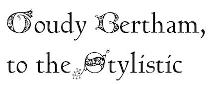
- Talapanna (2007). Pesala's version of Goudy Bertham, with decorative gothic capitals and extra ligatures in the Private Use Area.
- Talapatta.
- Veluvana (2006). A heavy brush style. The Greek glyphs are from Guru. Small Caps are greater than x-height.
- Verajja (2006). A Pali word meaning "variety of kingdoms or provinces." It is derived from Bitstream Vera.
- Verajja Serif.
- Yolanda (2008). Calligraphic.
[Google]
[More] ⦿
|
ATF typefaces
|
PDF file by David Tribby that lists all ATF typefaces. Text file listing those 1600 typefaces. The Cary Collection at RIT has many matrices, listed here (PDF) and here (HTML). A google docs spreadsheet with the ATF typefaces, all compiled by David Tribby. The same in HTML. Scans of some typefaces: ArtGothic (1897 catalog), Baskerville (1941), Caslon Oldstyle Roman No. 471, Caslon Oldstyle Italic No. 471, Chaucer, Chessmen (1897 catalog), Childs, Columbian (1897 catalog), Columbus, Culdee, DeVinne Initialen, Elandkay (1897 catalog), Erratic Outline, Ferdinand, Jenson Italic, Koster (1897 catalog), Laclede, Ronaldson Title Slope (1897 catalog), Santa Claus Initials, Skjald, Virile Open (1897 catalog), 20th Century, Bodoni Ultra, Clearface, Dietz Text, European Grotesque No. 2, Goudy Kennerley, Impact, News Gothic Condensed, Onyx, Palance Script, Palatino, Stymie, Typo Upright, Atlanta Series, Childs Series, Columbus Outline Initials, Contour No. 7, DeVinne Shaded, Erratck Outline, Johnson Series, Koster Series, Longefellow Series, McCullagh Series, Mural Series, Quaint Roman No. 2, Quaint Series, Rubens Series, Samoa Series, Victoria Series. [Google]
[More] ⦿
|
Audhia Pramatha
|
At Binus University, Jakarta, Indonesia-based Audhia Pramatha designed Allemande (2019), which is a playful modification of Baskerville. [Google]
[More] ⦿
|
Babylon Schrift Kontor
[Klaus Bartels]
|
Commercial German foundry, est. 2000 by Klaus Bartels (1948-2005). BSK also has on board Wolfgang Talke, Bernd Pillich, and the type experts René Kerfante and Frank Sax. It specializes in major text families, mostly based on fonts from the Berthold collection. Bartels was previously responsible for the digitization of that collection at Berthold, so this is a natural progression. Some amount of renaming of the typefaces seems to have been necessary. Partial list: Adlon Sans BSK, Adlon Serif BSK, Admira BSK, Albion Script BSK, Albion Script 2 BSK, Alte Schwabacher BSK, Ancora BSK, Atlantica BSK, Avenue BSK, Babylon Schreibschrift BSK, Baskerville BSK, Baskerville Text BSK, Bodoni BSK, Bodoni Expert BSK, Bodoni Condensed BSK, Bodoni Text BSK, Bodoni Text Expert BSK, Carissa BSK, Caslon Text BSK, Centra BSK, Champion BSK, Cogita BSK, Elega BSK, Fabiana BSK, Fonica BSK, Francesa BSK, Garamond BSK, Garamond Expert BSK, Herold Reklameschrift BSK, KG privata BSK, KG privata II BSK, KG vera BSK, KG vera II BSK, Lettura BSK, Mirage BSK, Mirage Expert BSK, Mirage New BSK, Pintura BSK, Signal BSK, Standard-Grotesk BSK, Standard-Grotesk Condensed BSK, Standard-Grotesk Extended BSK, Standard-Grotesk Classic BSK, Standard-Grotesk Next BSK, SG Next Condensed BSK, SG Next Extended BSK, SG Next Rounded BSK, SG Next Stencil BSK, SG School BSK, SG School 2 BSK, Story BSK, Supersonic BSK, T & T Form BSK, T & T Form Condensed BSK, T & T Form Ey BSK, Tomos-Antiqua BSK, Tomos-Mediaeval BSK, Trump Tower BSK, Unger Fraktur BSK, Walbaum BSK, Walbaum Expert BSK, Walbaum Fraktur BSK, Walbaum Text BSK. I have no idea what happened after Bartels' death--the page disappeared! [Google]
[More] ⦿
|
Baptiste Feuillatre
|
Nantes, France-based designer of the deformed Baskerville typeface Skerfold (2014). This was a school project at l'École de Design Nantes Atlantique. [Google]
[More] ⦿
|
Baskerville
|
 Baskerville is a transitional typeface originally designed by English type designer John Baskerville, circa 1754. Baskerville Old Face was designed by Isaac Moore in 1768. Various versions of these two type families are sold throughout the world. Some discussion here. Here is a quick overview:
 - Baskerville Original Pro (or Baskerville 10 and 120 Pro) by Frantisek Storm (2010). Based on original documents and developed and extended with great care.
- ITC New Baskerville. George Jones designed this version of Baskerville for Linotype-Hell in 1930. The International Typeface Corporation (ITC) licensed it in 1982. At Electronic Font Foundry. Bitstream's version is called NewBaskervilleITCbyBT.
- BaskervilleMT (1990): Monotype Baskerville (Agfa). Note: The 1989 versions floating around are called MBaskerville. Monotype Baskerville eText was published in 2013 by Linotype.
- BaskervilleEF is the Elsner&Flake Baskerville. See also Visual Graphics Corporation.
- Berthold Baskerville (1992, Günter Gerhard Lange), aka BaskervilleBQ. Adobe sells BaskervilleBE (1992). A version of this used to be at BSK (Babylon Schrift Kontor).
- Baskerville AI (URW).
- JohnBaskerville: The great 48-weight family made by Frantisek Storm in 2000 at Storm Type.
- BaskervilleBT: Bitstream's version, 1990. Bitstream also offers Baskerville No.2BT.
- URW Baskerville (1994), an extensive family sold by URW. They also have their own collection of NewBaskervilleItc, as well as BaskervilleOldFace.
- Mrs Eaves (1996): Zuzana Licko's revival of Baskerville, published by Emigre in 1996. Comments here.
- Baskerville 1757 is a family published by Timberwolf Type. It was drawn by Lars Bergquist and is directly based on Baskerville's 1757 edition of Virgil. It comes with a wonderful Baskerville Caps font.
- Baskerville Classico is a font drawn by Franko Luin (1995, of Omnibus) and available from Linotype.
- FrysBaskervilleBT is Bitstream's version of Baskerville Old Face, and they attribute it to Edmund Fry and Isaac Moore.
- URW Baskerville Old Face (Stephenson Blake, vendor: URW).
- BaskervilleOldFaceEF by Elsner&Flake.
- Among the derived fonts, we cite these sources: BaskervilleSSi is Southern Software's family. Image Club Graphics has a set of NewBaskerville fonts. Mannesmann-Scangraphic has ShNewBaskervilITC and ShBaskervilleNr1 (1991). EFF Baskerville is available at BuyFonts.Com. Digital Typeface Corporation has BaskervilleHandcut, a 4-weight family (1991). Primafont offers Nebenan and Nuabaum (which are ITCNewBaskerville versions) and Basel. SWFTE offers Baskerton. Softmaker has a range of Baskerville fonts. Qualitype has a QTBasker family. BP Graphics has a Baskerville family.
Baskerville posters by Andrew Henderson (2010), Sara Lee (2010), Edna Marcela Pena Fajardo (2011), and Gracemarie Louis (2013). View over 80 Baskerville typefaces. [Google]
[More] ⦿
|
Baskerville Display PT
|
 Baskerville Display PT (2016) is a Latin / Cyrillic type family intended for large and extra large point sizes developed by the type design team of Paratype. [Google]
[More] ⦿
Baskerville Display PT (2016) is a Latin / Cyrillic type family intended for large and extra large point sizes developed by the type design team of Paratype. [Google]
[More] ⦿
|
BaskervilleF and Baskervaldx
[Michael Sharpe]
|
BaskervilleF (Michael Sharpe, 2016) is a fork from the Libre Baskerville fonts (Roman, Italic, Bold only) released under the OFL by Paolo Impallari and Rodrigo Fuenzalida. Libre Baskerville was optimized for web usage, while BaskervilleF is optimized for traditional TeX usage, normally destined for production of PDF files. A bold italic style was added and mathematical support is offered as an option to newtxmath. The (free) fonts are provided in OpenType and PostScript formats. The Baskervaldx fonts (OpenType and PostScript Type 1) by Michael Sharpe are libre fonts from 2020 based on the BaskervalADF Std fonts developed by Hirwen Harendel and Arkandis Digital Foundry (ADF) in 2014. [Google]
[More] ⦿
|
Beatrice Warde's The Crystal Goblet
|
A fantastic essay by Beatrice Warde in Sixteen Essays on Typography, Cleveland, 1956. She compares typography with wine tasting. See also here. [Google]
[More] ⦿
|
Beaumarchais
[Pierre-Augustin Caron de Beaumarchais]
|
French editor, author, printer and typefounder (b, 1732, d. 1799) who ran a foundry in Kehl (Germany) from 1781 onwards. He had acquired the types, punches and matrices of John Baskerville (Birmingham) from John Baskerville's widow in 1775 for 3700 pounds. In 1795 the Beaumarchais foundry was partly sold to Franz Laurent Xavier Levrault (1762-1821) who ran the Levrault family print shop in nearby Strassbourg (est. 1675). Levrault in turn was sold in 1854 and became Berger-Levrault. The latter company resettled in Nancy, France, in 1873. Beaumarchais's ex-employee Jaquot continued as independent typefounder in Strassbourg. Beaumarchais was the first to print the complete work of Voltaire, best known as the Kehl edition, under the name "Imprimerie de la société littéraire typographique". The name Beaumarchais also pops up in type designs. For example, David Nalle designed a typeface called Beaumarchais. The typeface 1785 GLC Baskerville (2011, Gilles Le Corré) was inspired by one of the types sold to Beaumarchais by Baskerville's widow. [Google]
[More] ⦿
|
Ben Archer
[100types]
|
[More] ⦿
|
BERTLib (Fontstuff)
|
Fontstuff, est. 2005, sells BERTLib, the "Berlin Electronically Remastered Type Library". It has offices in London. Berthold, which folded in 1993, had a 2000+ type collection, which came in the hands of Freydank, Körbis, Pillich, Talke GbR in 1996 who lent it out to Berthold PrePress GmbH in 1997 under the name The Berthold Type Collection. Babylon Schrift Kontor GmbH, the company of Klaus Bartels, offered type 1 fonts from this collection for sale since 2000, but it disappeared some time later when Bartels died. BERTLib acquired the original Ikarus data of the Berthold Type Collection (over 2000 fonts) and set out to make high quality OpenType fonts with full support of all European languages, and fully Unicode-compliant. Slowly, these fonts are now being released by BERTLib. Not to be confused with Berthold Types Ltd from Chicago, who produced its library from Berthold type 1 data, not Ikarus data, of the same collection. Because of typename protection by Berthold Types, BERTLib had to change some font names. Some fonts also cover Cyrillic and Greek, but Maltese and Turkish are standard in all typefaces. More research needs to be done about the Berthold bankruptcy in 1993. They had a lot of debts. How can two different companies "acquire" or "get" the rights and sources of their collection? Who took care of the debts? Were there some underhanded deals? BERTLib twice refused to send me a list of types to which their own names can be matched. No names of digitizers or font BERTLib font designers or BERTLib owners are given. And finally, one has to pay 2.50 Euros just to see a sample of a font. All that makes me think that this company is one of businessmen rather than passionate type designers. Typefaces from these type designers/foundries have been or are being converted right now: Aldo Novarese, American Typefounders, Bernd Möllenstädt, Bertram Grosvenor Goodhue, Bruce Rogers, Claude Garamond, David Quay, Eric Gill, Erik Spiekermann, Facsimilie Fonts, Frederic Warde, Friedrich Berthold, Georg Trump, Giambattista Bodoni, Gustav Jaeger, Günter Gerhard Lange, Hermann Hoffmann, Herbert Post, Inland Type foundry of St. Louis, John Baskerville, Justus Erich Walbaum, Karl Gerstner, Louis Oppenheim, Morris Fuller Benton, Nicolas Cochin, Otl Aicher, Schriftenatelier Taufkirchen, Thomas Maitland Cleland, William Caslon. I created this page with remarks on their fonts. [Google]
[More] ⦿
|
Bhikkhu Pesala
[Association for Insight Meditation (or: Aimwell)]
|
 [More] ⦿
|
Bitstream: Cyrillic fonts
|
Cyrillic fonts at Bitstream include BankGothicRUSSMedium, Dutch801CyrillicBT-Roman, Swiss721BT-Roman, Swiss721BT-Italic, Swiss721BT-Bold, Swiss721BT-BoldItalic, Dutch801BT-Roman, Dutch801BT-Italic, Dutch801BT-Bold, Dutch801BT-BoldItalic, BaskervilleBT-Roman, BaskervilleBT-Italic, BaskervilleBT-Bold, BaskervilleBT-BoldItalic, CenturySchoolbookBT-Roman, CenturySchoolbookBT-Italic, CenturySchoolbookBT-Bold, CenturySchoolbookBT-BoldItalic, PosterBodoniBT-Roman, ZurichBT-Roman, ZurichBT-Italic, ZurichBT-Bold, ZurichBT-BoldItalic, ZurichWin95BT-Black, FuturaBlackBT-Regular, Courier10PitchBT-Roman, Courier10PitchBT-Bold, Monospace821BT-Roman, Monospace821BT-Bold, AdLibBT-Regular, OzHandicraftBT-Roman, ChiantiBT-Roman, ChiantiBT-Italic, ChiantiBT-Bold, ChiantiBT-BoldItalic. [Google]
[More] ⦿
|
Bitstream font analogue
|
 Bitstream font name equivalences. The original file, dated 2007, was at Fontinfo.net, but dispappeared some time ago. Here is that list in text format:
 Aachen == Charlemagne; Ruhr; Vanadium; Westlake Ad Lib == Alibi Adsans == Ad Gothic; Angro; Humanist 970; News Ad Akzidenz Grotesk == Ad Grotesk; Gothic 725; Grigat; Standard; Wayland Albertus == Adelon; Alburt; Flareserif 821 Aldus == Breklum; Luce; Mannucci Roman Alternate Gothic No.2 == Alpin Gothic; Gothic Amazone == Amazonia; Fredrika Amelia == Computer 651; Orbit; Orea American Text == Blackletter 851; National Text Americana == AM; American Classic; Aston; Colonial; Concord; Flairserif 721; Freedom; Independence Antique No. 3 == Egyptian 710 Antique Olive == Alphavanti; AO; Berry Roman; Gibson Antique; Incised 901; Oliva; Olivanti; Olive; Olive Antique; Oliver; Olivette; Olivette Antique; Olivia; Provence Antique Roman Open == Roman Stylus Antique Roman Shaded == Roman Shaded Arnold Bocklin; Auckland == Bock; Expo; Medusa; Nouveau; Youth; Freeform 715 Asta == Albany; AS; Astro; Aztec; Corolla; Dutch 823 Auriol == Freeform 721; Robur; Skylark Aurora Bold Condensed == Anzeigen Grotesk; Aura; Aurora; Grotesque Condensed Aurora == Empira; News 706; News No.12; News No.2; Polaris; Regal Baker Signet == Keene; Signature; Signatur Vario; Signete Balloon == BL; Freehand 041; Lasso Bank Gothic == Bond Gothic; Commerce Gothic; Deluxe Gothic; Magnum Gothic; Square 021; Stationer's Gothic Baskerville == Baskenland; Baskerline; Basque; Beaumont; BK; Transitional 401 Baskerville No.2 == Euro Baskerville; Transitional 404 Bauer Bodoni == Bodoni B; Euro Bodoni; Headline Bodoni; Modern 405 Bell Centennial == Gothic 762 Bell Gothic == Directory Gothic; Furlong; Gothic 761; Paddock Belwe == Belter; Welby Bembo == Aldine 401; Aldine Roman; Ambo; BE; Bem; Bernstein vario; Bingo; Griffo; Latinesque Berling == Carmichel; Revival 565 Bernhard Modern == Beacon; Bernie; BN; Duchess; Engravers Oldstyle Bernhard Tango == Aigrette; Carmine Tango Bingham Script == Freehand 591 Bison == Bison; Blizzard; Brush 738 Bitstream Alisal == Calligraphic 456 Bitstream Amerigo == Flareserif 831 Bitstream Arrus == Lapidary 721 Bitstream Carmina == Calligraphic 811 Bitstream Charter == Transitional 801 Bitstream Cooper == Freeform 741 Bitstream Fournier == Transitional 601 Bitstream Iowan Old Style == Venetian 801 Bitstream Oz Handicraft == Freehand 701 Bitstream Ventana == Humanist 800 Blippo == Geometric 755 Block == Black; Block; Gothic 821; Hobble Bloc == Geometric 885 Bodoni == BO; Bodoni No. 2; Brunswick; Empiriana; Gorvind; Modern 421 Bodoni Campanile == Modern 735; Palisade Bookman == Bookface; Bookman Antique; Bookprint; Revival 710 Bremen == Exotic 011 Britannic == Gallery; Grenoble Broadway == Big City; BW; Deco; Hudson; Moderne; Modernistic; Ritz; Showtime Brody == Brophy Script Bruce Old Style == Bruce; No. 31; Old Style No.3; Old Style No.7; Revival 704 Brush Script == Bombay; BR; Brush; Brilliant Bold Script; Brush 451; Punch Cable == Geometric 231; Kabel; Kabello; Kobel Caledonia == Calderon; Caledo; California; Cornelia; Edinburgh; Gael; Gemini; Highland; Laurel; Transitional 511 Candida == Candide Cascade == Freehand 471; Kascade Script Caslon 540 == Caslon 74; CL; Caslon 2; Caslon 484; Caslon 485 Caslon Bold == Caslon No. 3; New Caslon; Caslon 74 Bold Caslon Old Face == Caslon Old Style; Caslon; Caslon 128; Caslon 471; Caslon 76 Cataneo == Chancery 731 Centaur == Arrighi; Centaurus; Venetian 301 Century Expanded == Century Light/II; Century X; Cambridge Expanded; CE; Century; Century Bold Century Oldstyle == Cambridge Oldstyle Century Schoolbook == Century Text; Century Textbook; CS; Schoolbook; Cambridge Schoolbook; Century Medium; Century Modern Chapel Script == Mahogany Script; Monterey Cheltenham Old Style == Cheltonian; Chesterfield; Gloucester; Kenilworth; Nordhoff; Sorbonne; Winchester Choc == Staccato 555 City == Square Slabserif 711; Town Clarendon == Clarique; Clarion; Cerebral Cloister Black == Abbey; Cloister Black Codex == Calligraphic 421 Concorde == Dutch 809; Chinchilla; Concert Cooper Black == Bitstream Cooper; Burlesque; Coop; CP; Ludlow Black; Pabst; Plymouth; Rugged Black Copperplate Gothic == Atalante; Copperplate; Formal Gothic; Gothic No.29; Gothic No.30; Gothic No.31; Gothic No.32; Gothic No.33; Lining Plate Gothic; Mimosa; Spartan Corona == Aquarius; Cardinal; CR; Crown; Elmora; Ideal; Koronna; News 705 BT; News No.3; News No.5; News No.6; Nimbus; Quincy; Royal; Scotsman Royal; StarNews; Vela Coronet == Pageant; Ribbon 131 Courier == Messenger Davida == DaVinci De Vinne == Congressional; Industrial 731 Della Robbia == Cantoria; Canterbury; Dahila; Firenze; Westminster Old Style Diotima == Calligraphic 810; Diotima Dom Casual == Ad Bold; Brush 431; Brush Roman; Dom Casual; Polka Eckmann == Freeform 710 Egyptian 505 == Egyptios; Egypt 55 Egyptienne == Humanist Slabserif 712; Egyptien Electra == Avanta; Elante; Illumna; Selectra; Transitional 521 Embassy == Boston Script; Florentine Script; Hellana Script; Script No.1; Script No.2 Englische Schreibschrift == English 157; English Script Engravers' Old English == Old English; Old English Text Engravers' Roman == Lining Litho Engravers Roundhand == Roundhand No. 1; Signet Roundhand; Snell; Snell Roundhand Eurostile == Aldostyle; Astron; ES; Eurogothic; Europa; Gamma; Micro; Microstyle; Square 721; Waltham Excelsior == Angeles; Berlin; Camelot; Commerce No.1; Commerce No.2; Digi-Antique; Esquire; EX; Excel; Excella; League Text; News 702; News No.10; News No.14; Opticon; Paragon; Primus; Victoria Fairefax; Fairfield == Fairmont; Savant; Transitional 551 Financial == Letter Gothic Folio == Haverhill Fraktur == German Gothic Franklin Gothic == Gothic No.16; Pittsburgh Frutiger == CG Frontiera; Concorde; Freeborn; Humanist 777; Provencale; Roissy; Siegfried Fry's Baskerville == Baskerville Display; Baskerville F; Baskerville Old Face; Transitional 409 Futura == Alphatura; Atlantis; FU; Future; Photura; Sirius; Utica Gando == Gando Ronde Garamond == Aldine 511; American Garamond; Canberra; Carrera; Garamond No.2; Garamond No.3; Garamond No.49; Garamont; GD; Grenada Gill Sans == Eric; Gillies; Glib; Graphic Gothic; Hammersmith; Humanist 521; Sans Serif 2 Gothic No.13 == Gothic No.4 Goudy Old Style == Grecian; Number 11; Goudy; Goudy Bold; Goudy Extra Bold Granjon == Elegant Garamond; Garamont Premier; Grandeur Grotesque 126 == Gothic 720 Hanseatic == Swiss 924; Geneva 2 Hanoverian; Helvetica Compressed == Helvetica Pressed; Spectra Compressed; Swiss 911; Claro Compressed; Geneva 2 Compressed; Helios Compressed Helvetica Inserat == Swiss 921; Geneva 2 Sera; Geneva Inserat; Helios Inserat Helvetica Monospaced == Monospace 821 Helvetica == Aristocrat; CG Triumvirate; Claro; Corvus; Europa Grotesk; Geneva/2; Hamilton; HE; Helios/II; Helv; Helvette; Holsatia; Megaron/II; Newton; Spectra; Swiss 721; Vega; Video Spectra Hobo == Hobnob; Tramp Imperial == Bedford; Emperor; Gazette; New Bedford; News No.4; Taurus Imprint == Period Old Style; Dutch 766 Impuls == Impuls; Brush 439 Ionic No. 5 == Ionic-326; Ionic/2; News 701; News Text Medium; Rex; Windsor; Zar; Corinth; Doric; Ionic 342; Dow News; Ideal; Regal Italian Script == Lorraine Script; Lucia ITC American Typewriter == Amertype; AT; Newriter; Typewriter 911 ITC Avant Garde Gothic == AG; Avanti; Cadence; Geometric 711; Suave; Vanguard ITC Bauhaus == BH Geometric 752 ITC Benguiat Gothic == BT; Informal 851 ITC Benguiat == Beget; BG; Revival 832 ITC Berkeley Oldstyle == Venetian 519 ITC Bolt Bold == Square 821 ITC Bookman == Revival 711; Bookman; BM ITC Busorama == Geometric 075; Omnibus; Panorama; ITC Century == Centrum ITC Galliard == Seville ITC Garamond == Garamet ITC Kabel == Kabot ITC Korinna == Kordova ITC New Baskerville == Transitional 402 ITC Serif Gothic == Line Gothic ITC Souvenir == Sovran; SV ITC Tiffany == Jewel ITC Zapf Chancery == Chancelor Janson == Jason; Journal; Kis; Kis-Janson; Nikis; Dayton; Jan/Dutch Jefferson == Freehand 575 Kaufmann == Swing Bold; Tropez Liberty == Bernhard Cursive; Bernhard Schonschrift; Lotus; Viant Libra == Libretto; Libby Uncial Life == Fredonia Linotype Modern == Modern 880; Telegraph Modern London Text == Belvedere; Blackletter 686 Lydian Cursive == Granite Cursive; Lisbon Cursive Lydian == Granite; Lisbon Madison == Century 725 Mandate == Command; Freehand 521 Matt Antique == Garth Graphic Melior == Ballardvale/2; CG Melliza; Hanover/II; Lyra; Mallard; Matrix; ME; Medallion; Metrion; Uranus; Ventura; Vermilion; Zapf Elliptical Memphis == Alexandria; Cairo; Geometric Slabserif 703; Nashville; Pyramid Meridien == Zenith; Equator; Latin 725; Latine; Maximal Metro == Chelsea; Geometric 415; Gothic No.2; Gothic No.3; Megamedium; Meteor Mirarae == Calligraphic 808 Mister Earl == Freehand 651 Mistral == Aeolus; Missive; Staccato 222; Zephyr Script Neuland == Othello; Informal 011 Neuzeit Grotesk == Genneken; Geometric 706; Grotesk S News Gothic == Alpha Gothic; CG Trade; Classified News; Gothic Bold-131; Gothic No.17; Gothic No.18; Gothic No.19; Gothic No.20; Gothic-130; Lightline Gothic; Record Gothic; Toledo; Trade Gothic Nuptial Script == Bridal Script; Floridian Olympian == Olympus; Dutch 811 Ondine == Formal Script 421; Mermaid Onyx == Arsis; Onyx; Poster Bodoni Compressed Optima == Athena; CG Omega; Chelmsford/II; Musica; October; OP; Optimis; Optimist; Oracle/II; Orleans; Roma; Ursa; Zapf Humanist; Zenith Oscar == Formal 436 Palatino == Andover/II; CG Palacio; Compano; Elegante; Malibu/2; Paladium; Palatine; Palermo; Parlament; Patina; Pontiac; Zapf Calligraphic Palette == Brush 445; Palette Park Avenue == Parkway; PA Peignot == Exotic 350; Monterey; Penyoe Perpetua == Felicity; Lapidary 333; Percepta; Perpetual Piranesi Italic == Minuet Plantin == Aldine 721; Atlantic; PL; Planet; Plantin Poster Bodoni == Bodoni Extrabold/No. 2; Modern 721 Prestige == Prestige Elite Primer == Rector; Scholasta; Century 751; Premier; Bancroft Profil == Decorated 035 Raleigh == Cartier Rockwell == Slate; Geometric Slabserif 712; Rockland Romana == Romanisch; De Vinne; De Vinne Ornamental; French Old Style; Lorimer; Romaans Sabon == Berner; Classical Garamond; September; Sybil/2; Symposia Serifa == Seriverse; Sierra; Monty; Seraphim Shelley == Operinia Simoncini Garamond == Garamond Simoncini; Garamondus; Italian Garamond; Spartan == Technica; Techno; Times Gothic; Twentieth Century; Geometric 212; Sans; Sparta Star Trek == Square 051 Stempel Garamond == Euro Garamond; Garamond; Garamond Antiqua; Garamond Royale; Original Garamond Stempel Schneidler == Amalthea; Bauen Schrift; Bauer Text; Brewer Text; Kohinoor; Schneidler; Schneidler Old Style Stuyvesant == Wintergreen Stymie == ST Syntax == Synthesis; Cintal; Humanist 531; Symphony; Synchron Textype == Century 731 Times Roman == TmsRmn; TR; Varitimes; Claritas; Dutch 801; English; English 49; English Times; Euro Times; London Roman; Pegasus; Press Roman; Sonoran Serif; Tempora; Tiempo; Timeless; Times New Roman Torino == Contessa; Galileo; Industrial 736; Loren Trump Mediaeval == Activa; Ascot; Continental; Knight; Kuenstler 480; Mediaeval; Olympus; Renaissance; Saul Typo Upright == French Script; Interscript; Kaylin Script; Linoscript; Parisian Ronde Umbra == Durante; Meandme; Plastica Univers == Alphavers; Aries; Boston; Eterna; Galaxy; Kosmos; Swiss 742; UN; Versatile; Zurich University Roman == Ace; Celtic; Collegette; Forum Flair; Opera; Orna; Stunt Roman Wedding Text == Linotext; Marriage Windsor == Winslow [Google]
[More] ⦿
|
Björn Larsson
|
Creator of EGC New Baskerville Display (2012) for exclusive use of Electrolux Grand Cuisine. [Google]
[More] ⦿
|
Bradbury Thompson
|
 Born in Topeka, KS, 1911-1995. Head of Mademoiselle magazine, and a general master of design. He served on the faculty of the Yale School of Art for over thirty years. Typographically, he is best known for his proposal, published in Westvaco Inspirations 180 in 1950, to have a unicase alphabet, tentatively called Alphabet 26. We cite from that page: Alphabet 26 is Bradbury Thompson's radical proposal for the redesign of the alphabet. We present excerpts from an essay that he wrote to accompany a printed piece that he planned to have published at the beginning of 1996. Brad Thompson died before its completion. Much of the material here first appeared in Thompson's The Art of Graphic Design (Yale, 1988). The text has been edited for presentation here. Paul Baker, with feedback from Thompson, has produced the new digital version of Alphabet 26 which is used in this presentation. Note: Paul Baker's version uses Baskerville for the mix. Paul Baker's grandmother and Thompson's mother were sisters. Here is a quote from the inside flap of The Art of Graphic Design, slightly repetitive: The art director of Mademoiselle and design director of Art News and Art News Annual in the decades after World War II, he also designed the formats for some three dozen other magazines, including Smithsonian. Thompson is in addition a distinguished designer of limited edition books, postage stamps, rationalized alphabets, corporate identification programs, trademarks, and sacred works (most notable, the Washburn College Bible, in which the words are set in the cadence of speech). His hallmark has ever been the adaptation of classic typography to the modern world. Thompson is perhaps most well known as the designer of more than sixty issues of Westvaco Inspirations, a magazine published by the Westvaco Corporation.... Bradbury Thompson has served on the faculty of the Yale School of Art for over thirty years.... His profession has honored him with all of its highest awards, including those of the American Institute of Graphic Arts, the National Society of Art Directors, the Art Directors Club, the Type Directors Club, [now the American Center for Design], and the Society of Publication Designers. Digital versions based on his ideas have been made by Manfred Klein (see his KLBradbury family, 2007). Biography. Picture. [Google]
[MyFonts]
[More] ⦿
Born in Topeka, KS, 1911-1995. Head of Mademoiselle magazine, and a general master of design. He served on the faculty of the Yale School of Art for over thirty years. Typographically, he is best known for his proposal, published in Westvaco Inspirations 180 in 1950, to have a unicase alphabet, tentatively called Alphabet 26. We cite from that page: Alphabet 26 is Bradbury Thompson's radical proposal for the redesign of the alphabet. We present excerpts from an essay that he wrote to accompany a printed piece that he planned to have published at the beginning of 1996. Brad Thompson died before its completion. Much of the material here first appeared in Thompson's The Art of Graphic Design (Yale, 1988). The text has been edited for presentation here. Paul Baker, with feedback from Thompson, has produced the new digital version of Alphabet 26 which is used in this presentation. Note: Paul Baker's version uses Baskerville for the mix. Paul Baker's grandmother and Thompson's mother were sisters. Here is a quote from the inside flap of The Art of Graphic Design, slightly repetitive: The art director of Mademoiselle and design director of Art News and Art News Annual in the decades after World War II, he also designed the formats for some three dozen other magazines, including Smithsonian. Thompson is in addition a distinguished designer of limited edition books, postage stamps, rationalized alphabets, corporate identification programs, trademarks, and sacred works (most notable, the Washburn College Bible, in which the words are set in the cadence of speech). His hallmark has ever been the adaptation of classic typography to the modern world. Thompson is perhaps most well known as the designer of more than sixty issues of Westvaco Inspirations, a magazine published by the Westvaco Corporation.... Bradbury Thompson has served on the faculty of the Yale School of Art for over thirty years.... His profession has honored him with all of its highest awards, including those of the American Institute of Graphic Arts, the National Society of Art Directors, the Art Directors Club, the Type Directors Club, [now the American Center for Design], and the Society of Publication Designers. Digital versions based on his ideas have been made by Manfred Klein (see his KLBradbury family, 2007). Biography. Picture. [Google]
[MyFonts]
[More] ⦿
|
Brill
[John Hudson]
|
 E.J.Brill is an academic publisher in Leiden, The Netherlands. In 1989, DecoType produced the first ever computer-typeset Persian and English dictionary for them. In 2009, Brill has resumed its 325 year old tradition of Arabo-Dutch typography by adapting Tasmeem for its Arabic texts. In 2008, Brill commissioned John Hudson to make a text face. Hudson's PDF explains how Brill had been working mostly with Baskerville, so the new Brill typeface is also transitional, but narrower, resulting in savings of paper. Greek and Cyrillic are covered by Brill as well.
 In 2012, Brill was made available for free download for non-commercial use. While Brill is an original design by John Hudson, the blackletter range of characters was made by Karsten Lücke. Gerry Leonidas and Maxim Zhukov were consulted for Greek and Cyrillic, respectively. The fonts follow Unicode and contain nearly all symbols people in the humanities may ever need. [Google]
[More] ⦿
|
British Letter Foundry
[John Bell]
|
 John Bell (1746-1831) was a London-based publisher of several periodicals and newspapers. He founded the British Letter Foundry in 1788, with Richard Austin as punchcutter. The foundry closed in 1798.
 John Tranter tells the story: John Bell, an English publisher and bookseller, advertised a book called The Way to Keep Him in The World newspaper in London in June 1787, saying: 'J. Bell flatters himself that he will be able to render this the most perfect and in every respect the most beautiful book, that was ever printed in any country.' That was a tall order. In his quest for perfection he set up a type foundry, and hired a young punchcutter named Richard Austin to cut a new typeface for him. The face, named after Bell, was based on a typeface designed some thirty years before by John Baskerville, another perfectionist. Baskerville had said 'Having been an early admirer of the beauty of Letters, I became insensibly desirous of contributing to the perfection of them.' Though Baskerville went broke eventually, his typeface was indeed very close to perfection, and went on to become one of the most popular typefaces of all time. John Bell's type foundry didn't do well. He closed down his shop within two years and went on to other things, and his typeface sank almost without trace in England. Newer trends in typefaces (Didot in France, and Bodoni in Italy) eclipsed the modest elegance of Richard Austin's design. The Americans, though, took a shine to it. It was copied as early as 1792, and always remained popular there. A complete set of type cast from Bell's original matrices was purchased by the American Henry Houghton in 1864 and installed at his Riverside Press. He thoughtlessly labelled it 'English Copperplate'. Later, the distinguished American book designer Bruce Rogers used the typeface frequently, naming it 'Brimmer', after the author of a book he'd seen the typeface used for when he worked as a young man at the Riverside Press. The designer Daniel Updike also worked at Riverside, and also used the 'English Copperplate' type extensively in later years, naming his version of it 'Mountjoye'. Bell's type would have remained obscured by these disguises perhaps forever, but for the alert eye of Stanley Morison. He was doing research at the Bibliothèque Nationale in Paris in 1926 when he came across a copy of the first specimen sheet of type samples issued from John Bell's foundry in 1788. No copy of it existed in England at that time, and Morison recognised the typeface immediately as the original of the 'Brimmer' and 'Mountjoye' fonts used in America. He researched the matter and in 1931 published an important monograph which, as the type scholar Alexander Lawson says, 'returned the name of John Bell to its proper place in the pantheon of English printers'. The typeface was unique in another way. Until Richard Austin cut the typeface in 1788, all numerals were traditionally written like lower-case letters -- small, with some numerals hanging below the line. Bell is the first typeface to break with that tradition cleanly: Austin's numerals are larger than lower-case letters (at two-thirds the height of the capitals) and sit evenly along the line. The trend was taken up. These days the numerals in most printed matter are (unfortunately) the full size of the capital letter, and are called titling figures, ranging figures, or lining figures. See also here. FontShop link. [Google]
[MyFonts]
[More] ⦿
|
British Standards for Type Classification
|
Typeface classification according to "British Standards 2961:1967" (or BS 2961), British Standards Institution, London, 1967. - Humanist: Centaur, Jenson, Verona, Kennerley.
- Garalde: Stempel Garamond, Garamond, Caslon Old Face, Granjon, Sabon, Bembo.
- Transitional: New Baskerville, Baskerville, Caslon, Fournier, Perpetua.
- Didone: Bodoni, Bauer Bodoni, Torino, Walbaum.
- Mechanistic: Clarendon, Memphis, Rockwell, Lubalin.
- Lineal
- Lineal Grotesque: Franklin Gothic Demi-Bold, Franklin Gothic, News Gothic, Alternate Gothic.
- Lineal Neo-Grotesque: Helvetica Light, Akzidenz Grotesk, Folio, Helvetica, Univers.
- Lineal Geometric: Avant Garde Medium, Avant Garde, Futura, Eurostile, Erbar.
- Lineal Humanist: Gill Sans, Goudy Sans, Optima.
- Incised: Albertus, Latin, Friz Quadrata.
- Script: Brush Script, Mistral, Park Avenue, Zapf Chancery.
- Manual: Neuland, Broadway, OCR-A, Pritchard.
- Black Letter: Fette Fraktur, Old English, Goudy Text, Wilhelm Klingspor-Schrift.
- Non-Latin.
[Google]
[More] ⦿
|
Bruno Mauricio
|
Bruno Mauricio (Braga, Portugal) created Innerville (2013) by taking Baskerville as a model. [Google]
[More] ⦿
|
Candace Uhlmeyer
[DH Type Visionaries]
|
[More] ⦿
|
Castcraft Software Inc (or: OptiFont)
|
Castcraft [3649 W Chase Ave Skokie, IL 60026], showed off a comprehensive library of fonts, all with extended character sets for multi-language typography. OptiFont is a trademark filed in 1990 by Fredric J. Kreiter of Castcraft. Castcraft sold a CD-ROM Type Library Volume 1 at 200 USD. Its entire font collection was sold for 1000 USD. It also made some custom fonts. Most post-1990 fonts have the prefix OPTI. For example, OPTI-Peking is an oriental simulation font. OPTI-Favrile is a copy of Tom Carnase's Favrile (WTC). A visitor warned me that there is absolutely zero security when you order from this outfit, so you are warned--this is a dangerous site! It seems that Manny Kreiter (d. 2005) was the last President&CEO, and that his family (Abe, Harry and Ned Kreiter) have been at it since the days of metal type (1936) starting as Type Founders of Chicago. I found this on their pages: Castcraft has licensing [sic] the entire 20,000 TypeFaces from "Type Films of Chicago" and the entire "Solotype Alphabets" collection. Mike Yanega claims that most of their fonts are clearly not original any more than most of Bitstream's are original, and like them they re-name many of their fonts to avoid copyright issues. Their fonts all appear to be a "dead collection" of copies of relatively old designs that have already appeared in many other collections from the likes of WSI and SSi. In 2010, John Brandt reports: Castcraft, aka Type Founders of Chicago, moved decades ago from Hubbard St in Chicago to a close-in suburb (Skokie? Niles?) and was still operating within the past few years when I happened to drive by. I failed to find any current incarnation, but they used several names even years ago as a prominent pirate. Besides pirated fonts (Typositor to later, generally poor digital), they were a big metal vendor (I have a partial metal set of Helvetica gifted as they left downtown in the 1970s), and also had a guy (whose name escapes me) who did fabulous high-end signage, from sand-blasted glass to the created-on-building inscribed metal logo for a well-known Michigan Ave mall. Longtime owner Manny Kreiter died in 2005, but whether Boomie or any of the others who may still be around kept it going is unknown. Aside from simply having ANY version of their many offerings, most would consider their collection worthless. Anyone who has a digital "OPTIfont" and a font editor can readily view the problems, including usually several times too many Bezier points within any character. I counted 78 control points on a minimal character, for instance, that should have had less than a dozen. Mark Simonson: Castcraft was notorious in the sixties and seventies for pirating film fonts for headline setting machines, such as the Typositor. They would acquire a film fonts from franchisees of VGC (who also made the Typositor) or Filmotype or Alphabet Innovations, and then make duplicates and sell them to typesetting houses, usually changing the font names. Companies like Alphabet Innovations even put deliberate mistakes into individual fonts sent to franchisees just to try to see where Castcraft was getting them. Florian Hardwig: OPTI is a label used by Castcraft (also/previously known as Typefounders of Chicago and Type Films of Chicago) for digital fonts they produced around the early 1990s. My understanding is that virtually all of them are based on designs by others, made and distributed without authorization and without compensating the original designers or IP holders. Technically, many were likely based on the copies Castcraft previously made for phototype. They typically have names different from the original to avoid trademark issues. The company is long defunct and, ethical issues aside, the fonts are of subpar quality. Listing of Castcraft fonts (compiled by myself). The 802 fonts listed here are all dated between 1990 and 1994. I know there are at least 1,000 digital fonts made by them, so my list is incomplete. This link maintained by alt.binaries.fonts regulars contains most OPTI fonts for free download. It contains in particular some scans of one-line listings (i, ii, iii), and lists of name equivalences (i, ii). Mediafire link. Picture of Ned, Abe, Harry and Manny Kreiter. Defunct Castcraft Software link. Typophile discussion. Font name equivalences (by Philippededa, 2012). List of equivalences of Castcraft names. List of Castcraft typefaces as of July 2014. [Google]
[More] ⦿
|
Century
|
 Mac McGrew tells the story of the development of Century. Quoted verbatim, with only minor editorial changes.
 - 1894: Century Roman was designed by Linn Boyd Benton at the request of Theodore L. De Vinne, publisher of Century Magazine at his De Vinne Press in New York City. Benton was the mechanical genius of the young American Type Founders Company. DeVinne was regarded as an outstanding printing craftsman, who was dissatisfied with the types then available for magazine and book work. As he wrote later, Readers of failing eyesight rightfully ask for types that are plain and unequivocal, that reveal, the entire character at a glance, and are not discerned with difficulty by body marks joined to hairlines and serifs that are but half seen or not seen at all. Century Roman was planned to get as many characters per line as the typeface previously used for the magazine, but because the x-height was increased, it appeared to be condensed. Hairlines were thickened for greater clearness. It was made only as foundry type, handset for several years for Century Magazine and for numerous books. Although shown in ATF specimen books, it was not used to any great extent by other printers because it was considered a little too narrow. A wider version, called Century Broad-Face or Century Roman No.2, was thereafter designed by Benton, but little used except by De Vinne.
- L. B. Benton's principal interest was the mechanical end of the typecasting industry, and he turned his attention back to this. About this time his son, Morris Fuller Benton, joined ATF after graduation from Cornell, and was assigned the task of unifying and updating the numerous styles of type the company had inherited from its many predecessors. One of the younger Benton's early assignments was redesigning Century Roman, extending it slightly to meet the Typographical Union standards of the day, on which rates for typesetting were based. The result was named Century Expanded, issued in 1900 [Image by Heather Leonhardt]. DeVinne, showing it in his company specimen book, said, The expansion is upward, enabling one to get much matter in small space---essentially what he had said of the earlier face. But it is obviously expanded in width also, compared with the original face. (Note: Some sources, including a publication by ATF itself and De Vinne's own specimen book, credit the elder Benton with designing Century Expanded. But study reveals that the typeface shown by De Vinne is not quite as wide as that later shown by ATF. Apparently the elder Benton designed an early version, cut it in one trial size, then turned the task over to his son. Undoubtedly, though, he collaborated in the redesign.). Century Expanded and Italic were made in an unusual number of sizes, including 4-, 41/2-, 5-, 51/2-, 6-, 7-, 8-, 9-, 10-, 11-point, and all the usual sizes to 72-point. The two smallest sizes were identical as to typeface except for length of descenders, likewise 51/2- and 6-point.
- 1904: Century Bold and Italic were designed by Morris Benton and released by ATF in 1905. Although the name doesn't include "Expanded," they are obviously the companion boldfaces.
- Century Bold Condensed and Extended were both designed in 1906 but not released until 1909 and 1910 respectively; both were also by Benton.
- 1938: Century Bold Condensed Italic was designed by Sol Hess for Monotype. Linotype cut Century Bold Extra Condensed as a newspaper headline typeface to fit the limits of its standard magazines.
- Meanwhile, the development of the Century family took a different turn when Benton designed Century Oldstyle in 1906. Released in 1908-09, this typeface is much like Century Expanded in weight and height, but with old-style serifs. An ATF ad in 1909 called it the newest and by far the best old-style ever designed. Century Oldstyle Bold was designed and cut in 1909 and Bold Italic in 1910, while Bold Condensed was designed in 1911 but not released until 1915. Although closely related, the Century Oldstyle family is not really a part of the Century Expanded family. Another related typeface is Schoolbook Oldstyle (q.v.). Also see University Old Style.
- Retreating, perhaps, from the large x-height of Century Oldstyle, a modified oldstyle named Century Catalogue was brought out by Benton in 1917 with longer ascenders but essentially the same general design. Curiously, Century Catalogue Italic was cut from the patterns for Baskerville Italic. Except for the caps A, V, and W and the omission of swash letters, the typefaces are almost identical in the 18-point size; in smaller sizes the Century typeface is wider, as modified by pantagraph during the cutting of mats.
- A third family of Century followed when Ginn&Company, publishers of schoolbooks, asked ATF to develop a typeface for maximum legibility. After many studies of eyesight and reading factors dating from 1912, Century Schoolbook and Italic were designed by Morris Benton in 1917-19 and released in 1918-1921. Century Schoolbook Bold was designed in 1919 and cut in 1923.
- The only Century design by an "outsider" during Benton's life, other than modifications for the composing machines, was Century Bold Condensed Italic by Sol Hess in 1938, mentioned above.
- 1964: Long after the end of Morris Benton's distinguished career, the immortal family was enriched with another member---Century Nova and Italic---designed by Charles E. Hughes, who had been commissioned by ATF for the project. This is a condensed face, following the spirit of Century Expanded. Unknowingly, Hughes brought Century back to just about the same proportions it had started with some 70 years earlier.
- Century Expanded and its variations have been copied extensively by Monotype, Linotype, Intertype, and Ludlow, under the same names. Century Schoolbook is also offered by Monotype and Intertype, while Ludlow calls its version Century Modern, offered in 1964. Some of these typefaces suffer a bit from adaptation to the mechanical restrictions of the various machines, but they are essentially the same. Intertype's Century Schoolbook Bold, though, while necessarily much narrower than the original, is a handsome typeface in its own right. Century Oldstyle is also made by Monotype, but its version differs substantially from the original; capitals are wider and fitting is looser throughout. This modification was required for keyboard sizes but was carried into display sizes as well. Linotype offered a faithful copy of Century Oldstyle in 24-point only-originally under the same name; later it was renamed Old Style No.7, although it is not at all the same typeface as smaller sizes shown under that name. Intertype offered Century Oldstyle only in 36-point, but copied the Monotype version in some small sizes under the name Old Style No.9. Monotype Century Oldstyle has another distinction. Quite a number of typefaces have alternate long descenders, but this typeface also has alternate long ascenders in the 12-point size. With these, it is suggestive of Century Catalogue. Western Type Foundry and its successor, BB&S, offered Century Roman; however, this was a copy of Century Expanded rather than the original Century Roman of ATF. Three mystery names turned up in the preparation of this section of the book. An Intertype list includes "Cent. Schoolbook Bd. with Italic," but if this means Bold Italic, no other trace of it has been found. A Monotype list includes "Century Mono-Photo, No. 520," and "Century Text, No. 618," both indicated as being made as matrices for metal typesetting, but it has been impossible to identify them otherwise.
[Google]
[More] ⦿
|
Century: A timeline
|
A timeline on the development of Century, with bits and pieces taken from The Century family (Paul Shaw, for Fine Print magazine), which in turn was based on material from Mac McGrew. Also check these typophile opinions. I have added personal comments and items to complete the picture. - Theodore Low DeVinne (1829-1914), printer of The Century magazine, designed a stronger, bolder and more readable typeface for the magazine and commissioned Linn Boyd Benton (1844-1932) of ATF to cut it.
- L.B. Benton cut it on the newly invented Benton punch-cutting machine and in 1895 was christened Century Roman. Afterwards, a companion typeface was created for ATF by L.B. Benton: Century no. 2, later called Century Broad-face. This typeface became the basis for Century Expanded, designed by L.B.'s son, Morris Fuller Benton in 1902 [Image by Heather Leonhardt]. Over the course of three more years, the italic, bold and bold italics were developed.
- Then after a few more years, Morris Fuller Benton developed Century Oldstyle. Paul Shaw writes While the essential appearance of Century Roman and Century Expanded derived from Bodoni and Didot, that of Century Oldstyle seems to have been based on Caslon.
- 1915: Century Book, a redevelopment of Century Oldstyle.
- Soon after, ATF was approached by Ginn&Co., the textbook publisher, with a request for a new typeface for schoolbooks. M.F. Benton began review of research done at Clark University on the relationship between the legibility of type and the eyesight of children. Consequently, Benton increased the space between letters, the x-height of each letter, and the weight of each stroke, and balanced the color of the type by opening up the counters. The result was Century Schoolbook, completed in 1919.
- In 1964, ATF commissioned Charles E. Hughes to design a new proportion for Century Expanded... the result, Century Nova, was more condensed.
- Under license from ATF, Tony Stan designed the sixteen-weight ITC Century family between 1975 and 1980 for International Typeface Corporation. [ITC Century Light and Ultra were released in 1975 while the other styles appeared only in 1980]. It has the large x-height that is characteristic of many typefaces of ITC in that time period. Nick Shinn: The color of ITC Century is not good at smaller text sizes.
- David Berlow: New Century Schoolbook was designed from 1979 until 1981 in the New York Lettering office of Merganthaler Linotype based on Century Schoolbook, long after the Bentons had passed on. It was the second face, after New Baskerville, that was digitized and expanded using Ikarus (digital technology). The Bitstream version [Century Schoolbook] is a near exact copy, only being moved from a 54 unit to a 2000 or so unit design. Matthew Carter did a lot of the work on New Century Schoolbook.
- Grad (Phil Martin, 2004, Mark Simonson Studio) was a redesign of the classic Century Schoolbook for Martin's personal use in the early '90s.
- See also Modern Century by SoftMaker. In addition, Centrum is an old Bitstream name for ITC Century back when they were in the cloning business.
View various commercial digital versions of Century Schoolbook. [Google]
[More] ⦿
|
Chauncey H. Griffith
|
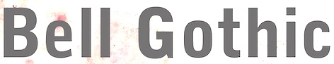 Kentucky-based type designer and printer, 1879-1956. He was a Linotype salesman who directed the growth of the Linotype library from 1915 to 1948, and improved the look of the world's newspapers. He worked to establish Linotype as the composing machine of choice in America. He continued as a consultant to Linotype well into his retirement.
 Claus Eggers Sorensen writes: In 1922 Chauncey H. Griffith was promoted to Vice President of Typographic Development at Mergenthaler Linotype. He immediately started the development of new typefaces to replace the prevailing modern style typefaces. The issue troubling the moderns was their high contrast design. Especially the hairline parts of the cast lines could break of while printing, and counters could clog with ink and pulp. Faster printing meant transferring the cast lines with the stereotype process to a letterpress cylinder for high-speed rotary printing on endless rolls of paper stock. C. H. Griffith's new approach was to engineer new typefaces to the printing method. That meant drawing inspiration from the Egyptienne style as seen in the Clarendon typeface, with its very sturdy lower contrast design, and Theodore Low De Vinne and Linn Boyd Benton's Century Roman, which possessed elegance and legibility. The first product of these efforts was Ionic No. 5. It was an instant success, within eighteen months it was used by more than 3000 newspapers all over the world. C. H. Griffith and Mergenthaler Linotype continued to refine the design in subsequent iterations: Excelsior (1931), Paragon (1935), Opticon (1935), Corona (1941). These became known as the Legibility group. Ionic No. 5, Excelsior and Paragon form the Linotype Legibility Group. He designed or co-designed the following fonts, all at Mergenthaler: - Baskerville (1939, Linotype).
- Bell Gothic (1937-1938). Now available at Bitstream. Font Bureau has its own version, Griffith Gothic (1997-2000, by Tobias Frere-Jones): Of all his work, Chauncey Griffith claimed one type, Bell Gothic, as his own design. Griffith Gothic is a revival of the 1937 Mergenthaler original, redrawn as the house sans for Fast Company. Tobias Frere-Jones drew a six weight series from light and bold, removing linecaster adjustments and retaining the pre-emptive thinning of joints as a salient feature. Mac McGrew: Bell Gothic was developed in 1937 by C. H. Griffith of Mergenthaler Linotype, primarily for use in the New York City telephone directory, but quickly became standard for telephone books nationwide. The aim was to eliminate roman types with objectionably thin serifs and hairlines. Furlong and Market Gothic were specialized adaptations of this typeface for newspaper work, the former with special figures and other characters for setting racetrack results, the latter in 1941 with other special characters for stock market details. The basic Bell Gothic was also cut by Intertype in 1939. Compare No. 11 and No. 12, shown under Numbered Faces, previously used for directory work. Imitations include OPTI Benet (Castcraft). Poster by Jaime Schweitzer. View digital versions of Bell Gothic.
- Bookman (1936, after the 1960 original by Alexander Phemister at Kingsley ATF).
- Corona (1941), a narrow newspaper typeface with large x-height. Corona was designed to meet the rigorous requirements of high-speed printing, and is still the chosen type of many American daily newspapers. Mac McGrew: Corona was drawn and cut by Linotype under the direction of C. H. Griffith in 1941. It is a member of the "Legibility Group" of faces designed for easy reading under newspaper conditions of stereotyping and high-speed printing with inks that could be trapped in close quarters. Royal on Intertype is a 1960 copy of Corona. Digital revivals include C795 Roman (Softmaker), News 705 BT (Bitstream).
- Elegant Garamond (Bitstream). This Granjon design was made by Chauncey H. Griffith based on models by George William Jones, and before that, Robert Granjon.
- The didone-style newspaper typeface Excelsior (1931, Linotype). At Bitstream, this is News 702. URW calls it Excius, and SoftMaker's version is Exemplary. Mac McGrew: Excelsior was cut for Linotype in 1931 under the direction of C. H. Griffith. It is a plain type, but designed for the utmost readability, with only slight variation from thick to thin, and careful fitting that makes the characters flow into easily recognizable words. Long or short descenders are available in certain sizes. Like a number of Linotype typeface intended primarily for newspaper work, Excelsior is available in closely graded sizes, including odd and some half-point multiples.
- Granjon (1928-1930, with George William Jones at Linotype). MyFonts: Claude Garamond's late Texte (16 point) roman was the model used by George W. Jones when he designed this typeface for Linotype&Machinery in 1928. To avoid confusion with the Garamond romans based on Jannon's seventeenth century work, L&M called the typeface Granjon, after the designer of the italic used as a model, thus creating confusion with the typefaces based on Granjon's romans, Plantin and Galliard. Granjon is a little less crisp in cut than either Sabon, Stempel Gararmond or Berthold Garamond, but makes a magnificent and most readable text face, as shown in Reader's Digest since its founding. Mac McGrew: Granjon was designed for Linotype in 1928 by George W. Jones, distinguished English printer, to meet his own exacting requirements for fine book and publication work. It is derived from classic Garamond sources, but with refinements made possible by modern methods of punch cutting. In fact, one critic has called it "the purest form of Garamond." It is named for Robert Granjon, mid-sixteenth-century punch cutter noted in particular for his italics, from which the present Granjon Italic was derived. Granjon Bold, by C. H. Griffith, was added in 1931. Lanston Monotype acquired reproduction rights to the typeface from Mergenthaler.
- Ionic No. 5 (Linotype, 1925). Mac McGrew: Ionic is a general name for a style of typeface which is closely related to the Clarendons (q.v.). Plain, sturdy designs with strong serifs and little contrast, the Ionics were popular in the latter part of the nineteenth century. Although many founders offered them, they were generally gone by early in this century. A few received a new lease on life when they were copied by Monotype, Linotype, or Intertype. Two new Ionics appeared in this century. Ionic No.5 was designed by C. H. Griffith in 1926 for Linotype, as a newspaper text face. It features a large lowercase with short ascenders and descenders, with no fine lines or serifs to break down in stereotyping, and no small openings to fill up with ink. This is one of a few typefaces made in many closely graded sizes: 5-, 51/2-, 6-, 61/2-, 63/4-, 7-, 71/2-, 8-, 9-, 10-, and 12-point. Intertype's Windsor, developed in 1959, is comparable. Ionic Condensed was designed by Griffith in 1927, also for Linotype. It is a refinement of traditional designs, intended for newspaper head- ings, and has most of the general characteristics of the text face. Ionic Extra Condensed is essentially the same, a little narrower and without lowercase, also for newspaper headlines.
- Janson (1932). Mac McGrew: Janson is adapted from types often attributed to Anton Janson, seventeenth-century Dutch letter founder, although researchers have shown that the originals were cut by Nicolas Kis, a Hungarian punchcutter and printer. The Linotype version was done in 1932 under the direction of C. H. Griffith, based on the 14-point size of about 1660. The Monotype version was adapted by Sol Hess in 1936, in collaboration with Bruce Rogers. Both versions are sharp and clear cut, and rather compact. They bear some resemblance to the types of William Caslon, which were based on later, similar Dutch types.
- Memphis (1929): the prototypical Egyptian of Rudolf Wolf. Mac McGrew: Memphis is the Linotype copy of the popular German square-serif typeface known as Memphis or Girder, designed by Rudolf Weiss about 1929, which did much to revive interest in this old style. Memphis Light and Bold were introduced by Linotype in 1933, Italics and Unique Caps in 1934, Medium in 1935, and other variations up to 1938. The Extra Bold versions were designed by C. H. Griffith. Alternate characters are available in some versions to more nearly approximate the appearance of Stymie or Beton (q.v.). The Lining versions are comparable to small caps in the regular versions, being propor- tionately wider and heavier than caps, and have no lowercase; there are several sizes each in 6- and 12-point, permitting various cap-and-small-cap combinations, in the manner of Copperplate Gothic. Also see Ward; compare Cairo, Karnak. Digital versions are everywhere. The Bitstream version is Geometric Slabserif 703.
- Linotype Monticello was designed by Griffith in 1946. Its design is based on James Ronaldson's Roman No.1 and Oxford Typefaces from American Type Founders and was revised by Matthew Carter while he was working at Linotype between 1965-1981. Mac McGrew: Monticello is a Linotype recreation of America's first great typeface, Binny&Ronaldson's Roman No.1, cut about 1796 by Archibald Binny in Philadelphia. His was the first permanent American type foundry. After about 30 years, the Binny typeface fell into disuse. The matrices survived, though, and a few fonts were cast about 1892 and the typeface was renamed Oxford (q. v.). In 1943 Princeton University Press announced plans for publishing a 52-volume edition of The Papers of Thomas Jefferson. As President, Jefferson had personally written to friends in France, introducing a Binny&Ronald- son representative who was seeking a source of antimony to replenish the shortage which threatened the young typefounding industry in this country. Jefferson also referred in this letter to the importance of type to civilization and freedom. In addition, the popularity of this typeface coincided with the most prominent years of Jefferson's life. Therefore Linotype suggested that a recutting of the typeface would be most appropriate for the Jefferson books, and the publisher heartily agreed. C. H. Griffith, Linotype typographic consultant, made a detailed study of Binny's type and redrew it in 1946 for the requirements of Linotype composition and modern printing conditions. It is a vigorous transitional face, somewhat similar to Baskerville but slightly heavier and a little crisper.
- Opticon (1935, Linotype). Mac McGrew: Opticon was designed in 1935 by C. H. Griffith for Linotype. It is a member of what that supplier calls its Legibility Group of typefaces designed primarily for newspaper use. It is essentially the same as Excelsior, but with stems and thick lines weighted slightly, for printing on hard-surfaced paper.
- Paragon (1935, Linotype). Mac McGrew: Paragon was designed by C. H. Griffith for Linotype in 1935. It is a member of that company's Legibility Group of typefaces, planned primarily for sharp and clean printing under the difficult inking and printing conditions of newspaper production, but also useful and popular for other periodical work. This typeface is lighter and airier than most such typefaces; otherwise it is much the same style. Compare Excelsior, Ionic, Opticon, Textype.
- Poster Bodoni (1920). Digital versions of Poster Bodoni or a textured ornamental version of it include Poster Bodoni (Bitstream), Modern 721 (Bitstream), OPTI Poster Bodoni Compressed (Castcraft), Bodoni Poster (Softmaker), Bodnoff (Corel), Poster Bodoni (Tilde), Poster Bodoni WGL4 (Bitstream), Saphir (Linotype), Bodoni Poster (Linotype), Bodoni poster (Adobe; same as the Linotype version), and Bodoni Ornamental (FontMesa).
- Ryerson Condensed was designed by C. H. Griffith in 1940 for Linotype, as a modernization of Globe Gothic Condensed.
- Textype (1929, Linotype). Mac McGrew: Textype was designed in 1929 by C. H. Griffith for Linotype. Although intended as a newspaper face, Textype with its smaller x-height and longer ascenders than most newspaper typefaces also became popular for magazines and other publications, as well as for a certain amount of advertising and general printing. There is an 18-point size in roman with italic, also a bold and bold italic. The 18-point size and the bold italic are both rare in newspaper typefaces. Compare Excelsior, Ionic, Rex, etc.
- Non-Latin typefaces: Porson and Metro Greek; thirteen Arabic designs adaptable for use throughout the Moslem world; Hebrews; the Indian scripts devanagari, Gujarati, and Bengali; Sinhalese for use in Ceylon, Tamil, and Syriac.
Klingspor link. Linotype link. FontShop link. Font Bureau link. Pic. [Google]
[MyFonts]
[More] ⦿
|
Christopher Haanes
|
 Oslo-based Norwegian who was born in Cheltenham, UK, in 1966. Haanes teaches calligraphy, lettering and typography, and is a freelance calligrapher, book designer and typographer. He designed many alphabets, which are mostly calligraphic, but he has also drawn some old Roman lettering and blackletter alphabets. His blog (in Norwegian) has interesting typographic threads, such as this educational comparison between Antiqua typefaces like Brioso, Adobe Jenson, Bembo, Adobe Garamond, ITC New Baskerville and Linotype Didot. This thread looks at sans typefaces. He designed a calligraphic alphabet specifically for Cappelen Damm in 2008, which was digitized by Sumner Stone as Litterat. [Google]
[More] ⦿
Oslo-based Norwegian who was born in Cheltenham, UK, in 1966. Haanes teaches calligraphy, lettering and typography, and is a freelance calligrapher, book designer and typographer. He designed many alphabets, which are mostly calligraphic, but he has also drawn some old Roman lettering and blackletter alphabets. His blog (in Norwegian) has interesting typographic threads, such as this educational comparison between Antiqua typefaces like Brioso, Adobe Jenson, Bembo, Adobe Garamond, ITC New Baskerville and Linotype Didot. This thread looks at sans typefaces. He designed a calligraphic alphabet specifically for Cappelen Damm in 2008, which was digitized by Sumner Stone as Litterat. [Google]
[More] ⦿
|
Chun Chou R
|
Graphic designer at Dhurakij Pundit University in Bangkok. Creator of the Japanese picture font Basker Jap (2012). All design elements are taken from Baskerville Old Face. In 2013, Chun created TK Zygote (2013), a transitional Latin / Thai serif font. [Google]
[More] ⦿
|
Claude Jacob
|
Printer in Strasbourg, France, who set up shop in 1784, together with "Rolland". They were known as Rolland&Jacob. He was the student of Baskerville. Specimen. Deux Points de Gros Romain (1780-1790). Deux points de petit texte (ca. 1785). Some of his fonts also made it to the J.P. Lindh foundry in Stockholm in 1818. Jacob's revival of Baskerville was distributed by the Berger-Levrault Foundry from 1815. It was sold there as Caractères dans le genre Baskerwille, and is closer to Didot than Baskerville. That revival in turn was digitally revived in 2018 by the ANRT (Atelier National de Recherche typographique) students as Baskervville (with two v's). Github link. Google Fonts download link. The students involved graduated in 2017 from ANRT: Alexis Faudot, Rémi Forte, Morgane Pierson, Rafael Ribas, Tanguy Vanloeys, and Rosalie Wagner. [Google]
[More] ⦿
|
Claus Eggers Sørensen
|
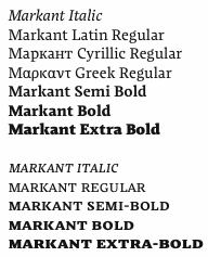 Also known by insiders as El Pato Loco Atomico. Danish type designer (b. 1973, Kulby, Vestsjalland, Denmark) who obtained his BDes from The Gerrit Rietveld Academie in Amsterdam, and his MA in typeface design from The University of Reading (2009), based on his type family Markant, which was specifically designed for newspapers and cares about ink traps, wide open bowls, inflection points and other special features. It supports Greek and Cyrillic as well.
 He says: I created a new design again taking inspiration from the early sketches of Dwiggins' Experimental No. 223. I was able to use the very open aperture design of the e in this experiment. The a again explored a inflexion points within the counters, and this was too integrated in the design. Finally lightly rounded wedge shaped base serifs were chosen. In 2011, Claus placed Playfair Display with Google Web Fonts. He explains: Playfair Display is a transitional design. From the time of enlightenment in the late 18th century, the broad nib quills were replaced by pointed steel pens. This influenced typographical letterforms to become increasingly detached from the written ones. Developments in printing technology, ink and paper making, made it possible to print letterforms of high contrast and fine hairlines. This design lends itself to this period, and while it is not a revival of any particular design, it takes influence from the printer and typeface designer John Baskerville's designs, the punchcutter William Martin's typeface for the Boydell Shakespeare (sic) edition, and from the Scotch Roman designs that followed thereafter. As the name indicates, Playfair Display is well suited for titling and headlines. It was followed in 2012 by Playfair Display SC. Free download at CTAN and at Open Font Library. Free download of Playfair Display Italic. In 2014, Claus designed Inknut Antiqua, a free angular text typeface family for low resolution screens, designed to evoke Venetian incunabula and humanist manuscripts, but with the quirks and idiosyncrasies of the kinds of typefaces you find in this artisanal tradition. Google Fonts link for Inknut Antiqua. Open Font Library link. Inknut Antiqua covers Latin and Devanagari. Claus lives in Amsterdam. Google Font Directory link. Speaker at ATypI 2011 in Reykjavik on the topic of typography for touch-screen devices. Klingspor link. [Google]
[More] ⦿
|
Commercial math fonts
|
Listing produced by the math Font Group (part of TUG): [Google]
[More] ⦿
|
Daniel Benjamin Miller
|
 Daniel Benjamin Miller (b. 2000, New York) is an undergraduate student in philosophy at McGill University. His type design work:
 - BMucicFont (2020). Based on the Steinberg Media music fonts for LilyPond music software.
- Salieri (2020). A revival of Jan Tschichold's Sabon (1964-1967).
- GFS Heraklit. This started out from Zapf's Heraklit Greek (1954). A digital revival was first done by George Matthiopoulos. Later improvements by Antonis Tsolomitis and in 2020 by Daniel Benjamin Miller.
- NX Baskerville Bold Italic (2020). An addition to Libre Baskerville (2012, Rodrigo Fuenzalida and Pablo Impallari).
- He added OpenType support and made some minor adjustments to ET Bembo (2002, Dmitry Krasny / Deka Design), releasing the result as XETBook (2019). In 2020, that font family was extended by Michael Sharpe as ETbb.
- In 2019, he started working on Regis, an original face inspired by the work of Pierre-Simon Fournier and Monotype 178 Barbou.
- RW Garamond (2019) is a freeware Garamond font in OpenType format. RW stands for Rudolf Wolf, the designer who created Stempel's version of Garamond from the Egenolff-Berner specimen. RW Garamond is a modified version of URW Garamond No. 8. and GaramondX, with changes being made to support OpenType (better vertical metrics, added diacritics, better kerning, more mathematical symbols, Greek for mathematics, character variants). Copyrights: 2000, URW++; 2005, Ralf Stubner; 2009, Gaël Varoquaux; 2012-2017, Michael Sharpe; 2019, Daniel Benjamin Miller.
- Domitian (2019). Based on URW's Palladio which in turn is based on Hermann Zapf's Palatino. Domitian is a project to develop a full-featured, free and open-source implementation of Palatino design. "Domitian" refers to the builder of the Flavian Palace, which is located on the Palatine Hill. Miller added true small caps and old style figures to URW's Palladio. The metrics have been adjusted to more closely match Adobe Palatino, and hinting has been improved.
- Garamond Libre (2019). Based on Unicode Fonts for Ancient Scripts (George Douros, 2017). CTAN link. Miller writes: Garamond Libre is a free and open-source old-style font family. It is a "true Garamond," i.e., it is based on the designs of 16th-century French engraver Claude Garamond. The roman design is Garamond's; the italics are from a design by Robert Granjon. The upright Greek font is after a design by Firmin Didot; the "italic" Greek font is after a design by Alexander Wilson. The font family includes support for Latin, Greek (monotonic and polytonic) and Cyrillic scripts, as well as small capitals, old-style figures, superior and inferior figures, historical ligatures, Byzantine musical symbols, the IPA and swash capitals. Miller added a bold italic.
- The STEP fonts (2019), free at CTAN and Github, created to be metrically compatible with Adobe's digitization of Linotype Times. STEP is based on the STIX and XITS fonts, and includes support for OpenType mathematical typesetting, usable with LuaTeX, XeTeX and Microsoft Office. It contains an original STEP Greek (2020) in Elzevir style.
- Courier Ten (2020). This is Courier 10 Pitch BT, made available by Bitstream, offered here in OpenType format as well as Type 1 for use with LaTeX. Package maintained by Daniel Benjamin Miller starting in 2020.
- MLModern (2021). He explains: MLModern is a text and math font family with (LA)TEX support, based on the design of Donald Knuth's Computer Modern and the Latin Modern project [note: 2003-2009, by B. Jackowski and J. M. Nowacki]. Some find the default vector version of Computer Modern used by default in most TEX distributions to be spindly, sometimes making it hard to read on screen as well as on paper; this is in contrast with the older bitmap versions of Computer Modern. MLModern provides a sturdy rendition of the Computer Modern design. [...] A script by Chuanren Wu was used to blacken the fonts before manual adjustment.
- MFB Oldstyle (2024). A public domain font based on Morris Fuller Benton's classic serif font, Century Oldstyle.
Miller is a supporter of free and open-source fonts, as well as free and open-source software. He uses FontForge for design, and releases all his work under free licenses: I really just want people to be able to use my designs, improve them and share them. First, on a pragmatic level, I know that my work will be imperfect, and I'd like others to be able to use their judgment to make adjustments (which I hope they'll also release under a free license). Second, I think that too much material (and not just fonts) is behind barriers of restricted access and artificial scarcity. This kind of thing---useful tools and information---wants to be free, so let it out for everybody to use. Github link. [Google]
[More] ⦿
|
Daniele Catalanotto
|
 Graphic designer in Sierre and Lausanne (Switzerland). During his studies at ECAL (Lausanne), he made a cinematographic signage typeface called Geraldine (2011, named after Geraldine Page). Baskervilaine (2013) is a tweaked version of Baskerville. Severine (2013) is an ornamental caps typeface. Le Moche (2012) is a grotesk typeface. Sugarnir (2013) is a rune font.
 In 2014, he designed the sans typeface Fryda (free beta version). Behance link. [Google]
[More] ⦿
|
David Ottley
[Graphic Workman]
|
[MyFonts]
[More] ⦿
|
David Thometz's top 10 favorite text typefaces
|
- Hightower (Font Bureau: Tobias Frere-Jones, 1994-1996, based on Nicolas Jenson) and Cloister Old Style (Font Company/URW++; Nicolas Jenson; Morris Fuller Benton, 1897): "Nicolas Jenson's model is, in many typophiles' judgement, simply the best roman ever designed. Morris Fuller Benton's Cloister Old Style is by far my favorite of all the attempts to revive Jenson. ITC's Legacy Serif is too sterile, Adobe Jenson Pro lacks the same charm, and Monotype's Centaur is just a bit too spindly. Monotype's Italian Oldstyle and Jim Parkinson's Parkinson are good, but diverged a bit too much from the original form. Cloister Old Style has enough meat on its bones to print well at small sizes, but its forms are intriguing enough to keep it interesting at larger sizes. The Font Company/URW++ cut is the best that I've found, although its outlines are on the klunky side. Tobias Frere-Jones' Hightower is another font based on the same form. I haven't had it long enough to judge it completely fairly, but so far it has satisfied my expectations. It is slightly more sterile than Cloister, but not such that it completely loses its charm, and its outlines are better that any cutting of Cloister that I've yet come across. "
- Cheltenham Old Style (Bitstream; Hannibal Ingalls Kimball, Bertram Grosvenor Goodhue, Morris Fuller Benton, 1896-1911; 1990): "Demand the original design, as Bitstream's version has followed, and burn all copies of ITC's bastardization. Cheltenham Old Style is absolutely not for everyday use. Still, for those occasions when it is appropriate, it's a font you can kick off your shoes by the fire to read."
- Stempel Garamond (Stempel/Linotype AG; Claude Garamond, c.1480-1561; 1924): "This is a truly beautiful text font, and the only "Garamond" in which both the roman and the italic are based on Claude Garamond's work, and not Jean Jannon's."
- Mrs Eaves (Emigre; Zuzana Licko, 1996): Emigre's version of Baskerville isn't particularly true to Baskerville's design, but Zuzana Licko's alterations result in a fresh, new typeface that is well-suited to the realities of today's digital printing demands. The italic is especially beautiful, and the range of ligatures is (with a few exceptions) a bonus.
- FF Scala and FF Scala Sans (FontShop; Martin Majoor, 1990).
- HTF Didot (Hoefler Type Foundry; Firmin Didot, c.1784; Jonathan Hoefler, c.1992?) and Didot LH (Linotype AG; Firmin Didot, c.1784; Adrian Frutiger, 1992): "Didot is currently my favorite of the didone fonts, and both of these versions are good, each having different strengths. Still, Berthold Bodoni Old Face, Berthold Bodoni Antiqua, Bauer Bodoni and Berthold Walbaum slip into my top tier from time to time."
- Perpetua (Linotype AG; Eric Gill, c. 1925-1930; 1959; 1991): Strangely, Perpetua's flowing grace and stately structure is often too beautiful to be used for certain texts, which is why I don't use it even as often as I'd like.
- Serapion (Storm Type Foundry; Frantisek Storm, 2001): Serapion is klunky and untamed, but filled with a beautiful energy. William Berkson says in 2012: Well, I don't think Serapion is a good text face, because it's color is too uneven. You can get variety by doing uneven color, easily. To get variety while also getting even color to me is the challenge. Storm is a good designer, but to me this one is not a success. Large it's ugly as well, if you ask me. To me it's visually incoherent.
- Plantin (Agfa-Monotype; Frank Hinman Pierpont, ?): The original is much better than its descendant, Times New Roman.
- Bookman/Old Style (Ludlow, 1925; Merganthaler-Linotype, 1936; Agfa-Monotype ?): AGFA-Monotype has the best version that I've found; Bitstream's is okay. Avoid ITC's parody.
[Google]
[More] ⦿
|
Dean Allen
|
Dean Cameron Allen died in 2018 at the age of 51. Obituary in The Globe and Mail: It is with unspeakable sorrow that we announce the sudden passing of Dean Cameron Allen, on January 13, 2018 at the age of 51. He leaves behind his parents, James and Holly; his brother, Craig; an adoring family; longtime partner, Gail; and a legion of loving friends and admirers around the world. Renaissance man, trailblazer and autodidact extraordinaire, Dean was a person of dazzling wit, charm and erudition. Graphic designer, typographer, teacher, web pilgrim, critic, author, Weimaraner tamer, song and dance man, chef... he brought titanic intelligence, insight and humour to everything he did. And whatever room he was in, he was the weather. He was instrumental in bringing clean, elegant design and typographical rigour to the early internet. And in raising online writing to a fresh and thrilling new art form. A source of inspiration to many, he was generous with his guidance and praise. Equally at home with the bawdy as the sublime, he could wield his humour like a cudgel or dashing sleight of hand. And salvage even the most dire situation with laughter. He moved from his native Vancouver to France in his thirties, and had perfected the bise and Gallic shrug by day two. He was a loving stepfather, and gave full, raucous meaning to the term 'bon vivant'. O, combien tu nous manques. His absence is unfathomable. We miss him with every breath. Dean used to run a site called Textism, that had Essays and opinions on typography, ca. 2000-2003, but the site disappeared some time later. It included a critical comparison of twenty great text typefaces: Jenson, Bembo, Granjon, Elzevir, Caslon, Fleischmann, Baskerville, Fournier, Bell, Bulmer, Miller, Centaur, Janson, Electra, Fairfield, Dante, Aldus, Sabon, Albertina. [Google]
[More] ⦿
|
DH Type Visionaries
[Candace Uhlmeyer]
|
Candace Uhlmeyer provided a bit of type history through the work of Johannes Gutenberg (1398-1468), William Caxton (1422-1491), Aldus Manutius (1450-1515), William Caslon (1692-1766), John Baskerville (1706-1775), Giambattista Bodoni (1740-1813), William Morris (1834-1896), Frederic W. Goudy (1865-1947), Eric Gill (1882-1940), and Jan Tschichold (1902-1974). [Google]
[More] ⦿
|
Dieter Hofrichter
[Hoftype]
|
 [MyFonts]
[More] ⦿
[MyFonts]
[More] ⦿
|
Double Alex Team
[Alexei Chekulayev]
|
 Cyrillic type outfit, whose fonts were mostly designed by Alexey Chekulaev in the mid 1990s as extensions of Latin fonts. Double Alex stands for Alexey Gunin and Alexey Chekulaev. The list of fonts, all in Cyrillic and many in Latin as well:
 - Decorative: Angelica (1996), Apostol, Arabskij (1993, Arabic simulation typeface based on an artwork of designer Oleg Snarsky), ArtScript, Blagovest (a series of Old Slavonic types), BorjomiDecor, CalipsoCyrillic, CalligraphRuss, Camerton, CooperDAT, CoventryCyr, Demosfen, Drops, E2, E4, Electronica, ElectronicaS, Eskiz, 1, Eskiz, 2, FavoritTraf, Finist, Hitman, Inicial, Italiansky, Jokey, Josephine, KeyFont, Kisty, Manuscript, Mistica, Mobul, Nelma, Ottisk, Petrovsky, PresentDAT, Radius, Repriza, SansDecor, Strob, SuvenirRus, TabloFont, Triline, Verbena, Vodevile.
- Sans serif: Acsioma (1996), AcsiomaNext, Apical (1995, based on Agfa Aurora; Apical Bold is identical to Bitstream's Aurora Bold Condensed; for another version, see Castcraft's OPTI-Aurora Grotesk No. 9), Bastion, BastionKontrast (1992; co-designed with Alexey Gunin, and based on Helvetica), Blits, Block A, Block B, Bloknot, CyberCyr, Ecyr, Eurofont, Favorit, Favorit, Condensed, Freestyle, Kekur, Mania, MetRonom, Normalize, Orenburg, PaperGothic, Pinta, Plastica, Positiv, Pravda, Priamoj, PriamojProp, Regina, Rostislav, Rotonda, Rubrica, Sistemnyj, TornadoCyr.
- Serif: Adamant, Alliance (1995, based on Berkeley Old Style by Frederic W. Goudy, 1938), APCCourier, APCGaramond, BaskervilleDAT, Bodoni Cyrillic (1970), Borjomi, ClassicRuss, Coliseum, Diet Didot (2006, published by Paratype in 2014 as DietDidot), Egypetskij, Grand, Grenader, Ideal, Jargon, Laguna, Latinskij, Legenda, Madrigal, Metropol, Shakula (1996, a heavy slab serif by Alexey Chekulaev, based on Monotype's Rockwell), Surpriz (1993, by Alexey Chekulaev, based on ITC Souvenir by Benguiat), Talisman, Vacansia.
- Special: Interfont, Plumb.
Alexei Chekulayev is the Russian designer of Rubrica (1996, Double Alex Font Studio), Angelica (1996, Double Alex Font Studio), Acsioma (1996, Double Alex Font Studio) and Alliance (1995, Double Alex Font Studio, a Cyrillic version of Goudy's Berkeley Oldstyle). He worked on these Linotype families: Univers, Sabon, Wiesbaden Swing, Stencil (1997, after the 1937 original by Gerry Powell), San Marco, and Linotype Bariton (1997: a great poster typeface in the Zeitgeist of the 1930s). In 2014, he designed these typefaces at Paratype: Suvenir Rus (inspired by (psychedelic) artwork of Grigory Klikushin; the original at Double Alex is from 1994), Demosfen (Greek simulation font). Still in 2014, Chekulaev and Akira Kobayashi (Monotype) won a Granshan 2014 award for the Cyrillic typeface SST. Typefaces from 2021: Ice Cream (a supermarket font), Altruiste (a ten-style decorative slab serif), Postulat (a 16-style geometric slab serif). Linotype link. Klingspor link. Another MyFonts link. Paratype link. View Alexey Chekulayev's typefaces. [Google]
[MyFonts]
[More] ⦿
|
Dunwich Type Founders
[James Walker Puckett]
|
 Dunwich Type Founders (or: DTF) in Boulder, CO (was: New York City) is run by James Walker Puckett (b. 1978, Virginia), who graduated from the Corcoran College of Art and Design in Washington, DC. Blog. Behance link. Fontspring link. Type Library. Typefaces:
 - Armitage (2010). A grotesque sans family.
- The squarish signpainting family Downturn (2009).
- He is working on a (nice!) revival of Fry's Baskerville, which is based on a scan of types cut in 1768 by Isaac Moore.
- Lorimer (2011) is a gothic sans serif that was inspired by 19th century inscriptions in the yard of New York's St. Mark's Church. Some weights are free. In 2011, this was followed by Lorimer No. 2 and Lorimer No. 2 Condensed. In 2012, there was an announcement that Lorimer was no longer being distributed. But that was contradicted in 2015, when James placed Lorimer No. 2 Stencil (2011) at the Dafont site for free download.
- New Constructivist Beta (2007).
- Recovery (2008, TypeTrust). The grunge version of Recovery is Black Monday (2009, with Silas Dilworth): it has several glyphs for randomization.
- The 1829 specimen book of Alonzo W. Kinsley's Franklin Letter Foundry led James Puckett to develop the splendid ornamental didone fat face Sybarite (2011), which comes in many optical weights.
- The friendly superelliptical black poster typeface Gigalypse (2012).
- Becker Gothics (2013). A revival of five typefaces from Ornamental Penmanship (1854, George Becker): Egyptian, Egyptian Rounded, Stencil, Tuscan and Concave. All have Western and wood type influences.
- Ironstrike and Ironstrike Stencil (2014). Ironstrike pays homage to industrial and constructivist lettering.
- Uniblok (2015). A free blocky font.
- Rhodium Libre (2015, free at Google Fonts), designed for use on screens at small sizes and the Latin and Devanagari scripts. Historical models for Rhodium's design are Fortune (aka Volta; by Konrad Bauer and Walter Baum) and Rex (by Intertype).
- Padyakke (2015) is a libre Kannada font.
- Antarctican (2017, Dunwich Type Founders): Antarctican hybridizes ruler and compass geometry and American wood type. Some styles are monospaced.
- Barteldes (2018). A fashion mag typeface family.
- Margherita (2021). A free sturdy typeface family based on urban lettering in Italy.
Creative Market link. https://fonts.ilovetypography.com/fonts/dunwich-type-founders">I Love Typography link. Github link. Fontsquirrel link. [Google]
[MyFonts]
[More] ⦿
|
Dyana Weissman
[Kerns&Cairns]
|
 [MyFonts]
[More] ⦿
[MyFonts]
[More] ⦿
|
Edmund Fry
|
British typefounder, d. 1835. Son of Joseph Fry, the founder of the Fry Letter Foundry in Bristol. Quoted from MyFonts: In 1784 he introduced a raised roman letter for the blind, and was awarded a prize by the Edinburgh Society of Arts. Louis Braille's system of lines and dots ultimately proved better. In 1787, he and his brother Henry took over the Fry Letter Foundry from their father. Credited with many great typefaces, including Fry's Baskerville (1768) and Fry Moxon (or Graisberry), a Gaelic typeface, Fry A Gothic Capitals (ca. 1819), an angular transitional Gaelic face, and Fry B Gaelic Capitals, a transitional Gaelic typeface (Everson mentions the date 1836, but that would be one year after his death...) and Priory Text. Mac McGrew writes: Priory Text was the blackletter of the Fry Foundry in England, with some sizes dating back to about 1600, and most sizes shown in 1785. It was revived by Talbot Baines Reed for his History of the Old English Letterfoundries in 1887, and DeVinne used it for his edition of Philobiblon in 1889. The Dickinson foundry, a forerunner of ATF, issued it as Priory Text about that time. It is very similar to Caslon Text (q.v.). BB&S made a near-duplicate type, originally called Reed Text, but later shown as Priory Black Text. Although the latter was shown as late as 1925, these typefaces had generally been replaced earlier by Cloister Black (q. v.) and other Old English typefaces with more refined draftsmanship. About the Gaelic types, Brendan Leen writes: In 1819, Edmund Fry cut a type once again commissioned by the British and Foreign Bible Society. The design of the Fry type signifies a departure from the angular minuscule toward the more rounded form of the half-uncial, a characteristic of Irish typography in the nineteenth century. Sample of Fry Irish type from The Two First Books of the Pentateuch. Author of Pantographia (1799, Cooper&Wilson, London), a work that shows the scripts of many languages [a careful digitization of some can be found in the font family Pantographia (2010) by Intellecta Design]. The full title is Pantographia; Containing Accurate Copies of All the Known Alphabets in the World; Together with an English Explanation of the Peculiar Force or Power of Each Letter: To Which Are Added, Specimens of All Well-Authenticated Oral Languages; Forming a Comprehensive Digest of Phonology. Examples from that book: Bastard, Bengallee and Berryan, Bulgarian and Bullantic, Chaldean. Local download. Author of Specimen of Printing Types by Edmund Fry, letter founder to the King, and Prince Regent, Type street, London (1816). Local download. FontShop link. [Google]
[MyFonts]
[More] ⦿
|
El Corsario
|
Rapidshare links to several font families such as Helvetica, GillSans, Futura, Frutiger, Bodoni, Baskerville. [Google]
[More] ⦿
|
Elena Tzaregorodtseva
|
 Or Yelena Tzaregorodtseva. Russian type designer who designed
 - Baskerville (1961, at Polygraphmash). See here for the URW+ version of this family.
- The sans family TextBook (1958, at Polygraphmash). This was digitized at Paratype in 2008 (Isabella Chaeva and Emma Zakharova).
- Paratype Journal Book (first designed at the Polygraphmash type foundry in 1951-53 by Lev Malanov and Elena Tzaregorodceva, based on the typeface Excelsior (1931, Mergenthaler Linotype, Chauncey H. Griffith); digital version at Paratype, 1994).
- Schoolbook (1949-1961, Polygraphmash; based on Shkolnaya (school) typeface (1939, project manager Evgeny Chernevsky), which in turn was a version of Century Schoolbook of American Type Founders (1915-1923, Morris F. Benton). URW writes: The low-contrast text typeface of the Ionic-Legibility group, it is designed expressly for schoolbooks and children books. The digital version by Paratype is from 1996.
URW has Latin, East European and Cyrillic versions of all these typefaces, TextBook excepted. Fontshop link. [Google]
[MyFonts]
[More] ⦿
|
Elisabeth Bolzon
|
Graphic designer in London. At TypeParis 2017, she designed the Baskerville / Garamond hybrid Basgar. [Google]
[More] ⦿
|
Elizabeth Taylor
|
At Leeds University Union (Leeds, UK), Elizabeth Taylor designed Baskerville Botanics (2017). Behance link. [Google]
[More] ⦿
|
Emigre
[Zuzana Licko]
|
 Sacramento, CA-based foundry established in 1984 by Zuzana Licko (b. 1961, Bratislava) and Rudy Vanderlans. They were "in" during the grungy early 1990s, but ran out of steam and out of fashion around the turn of the century. They had their own magazine, and were in the limelight in the 1990s. Massimo Vignelli famously said at a meeting: Emigre is the worst thing that ever happened to this country. It's unbelievable the damage they have done. A total disaster. [Laughter] You laugh, but you should cry.
 Lea Chapon's thesis at Estienne in 2006 was entitled Emigre : typographie et critique de la typographie---strangely, it was removed from the school's web site---Emigregate? The typophiles are not gentle with their critique. In the collection, we find these fonts: Arbitrary (1992), Awkward (1991), Berkeley (1990), Citizen (1990), Elektrix (1990), EmigreEight (1990), EmigreFifTeen (1990), EmigreFourTeen (1990), EmigreTen (1990), EmperorEight (1990), EmperorFifTeen (1990), EmperorNineTeen (1990), EmperorTen (1990), IndustrySans, KubotaFont (1991), Lunatix (1990), Marvelous (1991), Matrix (1988-1991), NeoTheo, Oblong (1990), STICadillac (1990), Sample (1990), Senator (1990), Simplex, TemplateGothic (1991), TotallyGlyphic (1990), TotallyGothic (1990), Transportation (1990), UniversalEight (1990), UniversalNineTeen (1990), VariexBold (1990), VariexLight (1990), VariexRegular (1990), Zenith (1990). Also, by designer: - Nancy Mazzei and Brian Kelly: Backspacer (1993).
- Zuzana Licko: BaseMono (1997, a monospaced family), BaseNine (1995), BaseTwelve (1995), Dogma (1994), Filosofia (1996, Emigre's (unicase) version of Bodoni), Hypnopaedia (1997), Journal (1993), the Lo-Res family (pixel fonts at sizes 9, 12, 15, 21, 22, 28, made in 2001), Modula (1990-1995), MrsEaves (1996, Emigre's version of Baskerville), Mr Eaves Sans (2009), Mr Eaves Modern (2009), Narly (1993), Program OT (2013, a rounded sans family), Quartet (1993), SodaScript (1995), Solex (2000), Tarzana (1998), Triplex (1990), Whirligig (1994).
- Bob Aufuldish and Eric Donelan: BigCheese (dings, 1993), ZeitGuys (1994, funny dingbats).
- John Hersey: Blockhead (1995, Alphabet and Illustrations), Thingbat (1995).
- Conor Mangat: BoksHeavy (1994), BoksThin (1994), Platelet (1994, inspired by California license plate systems---organic and quite dysfunctional).
- John Downer: Brothers (1999), Council (1999), Triplex Italic (1990), Vendetta (1999).
- Sibylle Hagmann: Cholla (1999).
- Frank Heine: DallianceFlourishes (2001), DallianceRoman (2001), DallianceScript (2001), Motion (1993), OaklandEight (1990), OaklandFifTeen (1990), OaklandSix (1990), OaklandTen (1990), Remedy (1992).
- P. Scott Makela: DeadHistory (1994).
- Miles Newlyn: Democratica (1992-1993), Missionary (1992), SabbathBlack (1994).
- Rodrigo Cavazos: EideticNeo (2000).
- Jonathan Barnbrook: Exocet (1992), Manson (1993), Mason (1993).
- Edward Fella: FellaParts (1993), Outwest (1993).
- Jeffery Keedy: KeedySans (1991).
- Mark Andresen: NotCaslonOne (1995).
- Claudio Piccinini: Ottomat (1996).
- Rudy VanderLans: Suburban (1994).
Alternate URL. View Zuzana Licko's typefaces. Alphabetical listing of Zuzana Licko's typefaces. [Google]
[MyFonts]
[More] ⦿
|
Eurotypo
[Olcar Alcaide]
|
 Institute in Benalmadena, Spain (was: Santa Severa), where one can take 4-week courses at 1450 Euros a shot on the Etruscan alphabet, Trajan, Cuadrata and Rustic Roman Capital letters, and related subjects. They also organize lettering tours in Italy and guided tours in various musea. The teachers are Alberto Di Santo (Professor of the visual communication, Tor Vergata University, Rome; Professor of Graphic Design, Istituto Europeo di design, Rome; Professor of editorial design, La Sapienza University, Rome; Professor of Typography, C.F.P. Sinalunga, Siena) and Olcar Alcaide (b. 1952, Argentina, Professor of Graphic and Typography Design, University of Buenos Aires; Professor of Typography, University of Lanús, and Professor of Graphic Design, Marbella Design School, Spain). Type link jump page.
 Eurotypo is also the foundry of Olcar Alcaide. Catalog of Olcar Alcaide's typefaces. In 2010, he published the text family Antium and the warm signage typefaces Mijas Ultra and Lila Pro Heavy. Typefaces from 2011 include Lila pro, Atenea (a humanist sans family), Agerola Script (a fat flowing signage face), Teja (signage face), Zalea (yet another signage face), and Nabu Pro (a connected signage script). Equalis (2011M, with Juan Lavalle) is a monoline slab typeface with a huge x-height and wide open counters. It was followed by Equalis Stencil (2011). Ravel (2011) is a fat signage script face. Atenea Egyptian (2011) is a solid slab serif family. Berta (2011) is a signage brush typeface with connected and unconnected versions. Optic Art (2011) is an ornamental typeface with building blocks that can be used for overlays. Creator of Eurotypo Bodoni Bold (2011). Typefaces from 2012: Cubus (dingbats), Saxo Deco (art deco), Moliere (2012, an elegant didone family with outspoken ball terminals), Melon Script (a fat curvy signage script family), Riky (comic book family), Chipa (a signage and package design script), Heket (an expressive curly script), Lenga (a slab serif typeface family), Mikal (brush script). Duktus is a 1940s style script in the style of Donatello (1935, Wagner & Schmidt), Troubadour (1927, Wagner & Schmidt), Liberty Script (1927, Willard T. Sniffin), Trafton Script (1933, Howard Allen Trafton), and Coronet (1937, R.H. Middleton). Picture. Typefaces from 2013: Dignus (influenced by Bank Gothic and Eurostile), Bague (old Dutch style with little contrast, in the style of Jan Van Krimpen), Lugo (a heavy signage or advertising script), Brittes (copperplate script), Talis (contrast-rich sans family), Fiesole (display family with an awkward back-curled lower case d), C Duflos (after a bâtarde coulée by Claude Duflos, a French engraver who was acitve around 1690). Typefaces from 2014: Talks (creamy signage script), Fiume (calligraphic script), Predy, Daevon (copperplate script), Beily (letterpress style), Ritts (a heavy script-like display family), Ritts Cursive (in the style of the brush signage scripts descending from Robert E. Smith's Brush Script for ATF in 1942). Typefaces from 2015: Valentia (a semi-copperplate calligraphic script followed by Valentia Condensed in 2016), Stabia, Digatte Quill (connected script), Digatte (connected monoline cursive script). Typefaces from 2016: Duero (signage script), Turia (calligraphic script), RRollie (a lapidary typeface based on the roman inscriptions), Valentia Nit (a copperplate typeface enriched with swashes and extensions). Typefaces from 2017: Citix (a great calligraphic / penmanship script), Citix Two Condensed, Alfabetica (humanist sans), Merick. Typefaces from 2018: Fortezza (a stiifened didone), Portoluce, Hotdogger (a cursive brush font family), Hotdogger Extras (dingbats), Favarotta, Vikive (a grotesque family), Aretino (a renaissance text typeface), Mirabella, Lectio. Typefaces from 2019: Palio (a condensed tall didone), Fractus (blackletter), Blackduck (blackletter), Sgraffio (copperplate script). Typefaces from 2020: Eolia A (a 12-style low contrast grotesque typeface), Breda (a 12-style geometric sans), Breda Two (six additional condensed styles), Marcus Traianus (in the Trajan style, with lowercase included as well), Eurotypo Sans, Eurotypo SII, Eurotypo BKL (a Baskerville-inspired family), Cannoli (a retro brush lettered signage script). Typefaces from 2021: Zornale (a 7-style text family inpsired by the Zornale, an original manuscript that contains a daily record of the books acquired by the Venetian bookseller Francesco de Madiis, between 1481 and 1488), Alacant (a 14-style slab serif with elliptical shoulders), Tre Giorni (a carefully designed script in solid and outline styles), Due Giorni (a rhythmic calligraphic script), Sagasti (a text typeface with straight serifs), Calcis (a 10-style sans), Rufolo (an 8-style lapidary typeface influenced by Robert Hunter Middleton's Stellar (1929), William A. Dwiggins' Albertus (1932) and Hermann Zapf's Optima (1952)). Typefaces from 2022: Zornale Title. Creative Market link. Klingspor link. [Google]
[MyFonts]
[More] ⦿
|
Fonderie Deberny&Peignot
|
 The timeline of this French foundry of the 19th century and early 20th century:
 - Gustave Peignot's type foundry was taken over by his son Georges Peignot when Gustave died. Georges's son Charles took it over when Georges and his three brothers were all killed in The Great War.
- 1923: The foundry becomes Deberny&Peignot when the Laurent&Deberny foundry was purchased. Merger with Girard et cie.
- 1923-1960: Charles Peignot directed the creation of a series of original designs.
- Phototype era: Starting in the late fifties, the company prepared the fonts for Lumitype, European Photon. In the sixties, Charles Peignot invested heavily in Lumitype, which used up some of the money to buy control of Deberny&Peignot, and let Charles go.
- Deberny&Peignot closes in 1979 (some say 1972...), at which time the designs passed to the Haas'sche type foundry in Basel/Münchenstein. Haas in turn was merged into D. Stempel AG in 1985, then into Linotype GmbH in 1989, and is now part of Monotype Corporation. Starting in 1925, Deberny & Peignot types were distributed in the United States by Continental Type Founders Association.
Their collection includes typefaces by: - A.M. Cassandre: Acier Noir (1936), Bifur (1928-1929), Peignot (1937), Touraine (1947, with Charles Peignot).
- Bernard Naudin: Naudin (1911-1924). A set of open capitals that complement this typeface were sold in France as Champlevé and in the United States as Sylvan.
- Robert Girard: Astrée (1921). The Stephenson Blake version is Mazarin (1926).
- Georges Auriol: Auriol (1901-1904), Auriol Laberur, Auriol Champlevé, Française allongée, Française légère, Robur Pale (ca. 1912; variations are known as Royal Lining and Claire de Lune).
- Marcel Jacno: Chaillot, Film (1934), Jacno (1950), Scribe (1937).
- Imre Reiner: Contact (1952), Floride (1939).
- Maximilien Vox: Eclair (1935).
- Georges and Charles Peignot: Le Garamont (1912-1928). That is to say, from 1912-1914, they directed the development of this Garamond based on Jean Jannon's roman. The typeface was finished by Henri Parmentier in 1926.
- M. Deberny: Sphinx (1925).
- Henri Bellery-Desfontaines: Bellery-Desfontaines (1910-1912).
- P. Roy and A. Marty: Cochin, Nicolas-Cochin (1912), and Moreau-le-Jeune (later copied by Ludwig & Mayer as Sonderdruck).
- A. Giraldon: Giraldon (1900).
- Eugène Grasset: Grasset (1898).
- Adrian Frutiger: Égyptienne, Méridien (1957), Ondine (1954), Phoebus (1953), Président (1954), Univers (1957).
- Rémy Peignot: Cristal Initiales (1955).
- G. Vidal: Amethyste (1954), Bolide (1954).
They also published Banjo (1930), Baskerville (1916), Calligraphiques Noires (1928, see also Ludwig&Mayer), Compactes Italiques, Cyclopéen, Firmin Didot, (cut from the original punches), Fournier-le-Jeune (1913), La Civilit&eacutye;, Olympic (1937, also known as Slimblack), Pharaon (1933), Polyphème (1926), Romain Ancien (1899, an Elzevir), Série 16, Série 18, Style moderne (ca. 1903, sold today as Fantastic), the garalde typeface Ancien, and the didone typeface Gras Vibert [for a digital version of Gras Vibert, see Vibertus (2007, Latrs Yörnqvist)]. Many specimen books were published by them. For their vignettes, see Spécimen de vignettes typographiques (Paris, Rue Visconti, 17, près le Palais des Beaux-Arts, faubourg Saint-Germain. [1870]) and Vignettes typographiques: attributs mélanges armes, médales (Paris, 1886). Early work is shown in Les créations de la fonderie typographique Deberny et cie depuis 1878 (1889) and in Les nouvelles creations de la fonderie typographique Deberny&cie (1895). Fancy type is shown in Les caractères d'affiches. Extrait du Livret typographique (Paris, 1905). Older fleurons are in Nouvelle série des fleurons de la fonderie de Laurent et Deberny (ca. 1844). Other publications by them include Album de clichés et gravures (1934), Premières épreuves du Caractère Peignot dessiné par A. M. Cassandre (Paris: 1937). Digital revivals include Sonderduck Antiqua (2008, Gerhard Helzel). Sphinx (1925) was revived by Steve Jackaman as Sphinx RR (1925), and by Douglas Olena as FFD Sphinx (1995). Peignot foundry genealogy. View the digital typeface that are descendants of Deberny. FontShop link. References: Wikipedia. History of Peignot, by Georges Peignot's grandson Jean-Luc Froissart. Rochester Institute of Technology: History of Deberny et Peignot [dead link]. And finally, the book L'or, l'âme et les cendres du plomb. L'épopée des Peignot, 1815-1983 (2004, Jean-Luc Froissart: Paris: librairie Tekhnê). [Google]
[MyFonts]
[More] ⦿
|
Fonderie Peignot et Fils
|
 French foundry established and run by Georges Peignot and his son Charles. In 1923 it merged with Girard Et Cie to become Fonderie Deberny&Peignot. Their collection includes Nicolas Cochin (1912) and typefaces by:
 - G. Auriol: Auriol (1903).
- G.+C. Peignot: Garamont (1912-1928).
- A. Giraldon: Giraldon (1900).
- Eugène Grasset: Grasset (1898).
They also published the Garalde typeface Ancien, Série 16 (19050 [digitized as Seizieme Pro in 2013 by Coen Hofmann], the didone typeface Gras Vibert [for a digital version of this, see Vibertus (2007, Lars Törnqvist)], and Sphinx (1925) [which was revived by Steve Jackaman as Sphinx RR, and by Douglas Olena as FFD Sphinx (1995)]. Many specimen books were published by them. For their vignettes, see Spécimen de vignettes typographiques (Paris, Rue Visconti, 17, près le Palais des Beaux-Arts, faubourg Saint-Germain. [1870]). Early work is shown in Les créations de la fonderie typographique Deberny et cie depuis 1878 (1889) and in Les nouvelles creations de la fonderie typographique Deberny&cie (1895). Fancy type is shown in Les caractères d'affiches. Extrait du Livret typographique (Paris, 1905). Older fleurons are in Nouvelle série des fleurons de la fonderie de Laurent et Deberny (ca. 1844). Peignot foundry genealogy. MyFonts hit list for typefaces by Peignot or in the style of Peignot's typefaces. Compare Peignotian typefaces. [Google]
[More] ⦿
|
Font Chameleon
|
A fantastic software program, available during the mid nineties, and brought to the market by Ares Software Corporation. It allowed to mix and match and extend and blend and parametrically shake fonts. Its auto-hinting features were unequaled. The program is still around in some archives, but here is a local download of Font Chameleon 1.5 (1994-1995). Laurence Penney's take: FontChameleon (created by the same team that brought us FontMonger and Letraset FontStudio) was an extremely powerful font manipulation program. Its power resulted from taking direct control of outline editing away from the user. Using a new way of representing fonts, where each character was defined as a set of "difference descriptors" from a generic outline, Ares created close approximations of 150 well-known fonts. These all shipped with Version 1.0 - which cost around $300. Using on-screen slider controls, you could adjust the weight, width, x-height, slant and tracking of these fonts, as well as blending one font into another! In general, all characters of all fonts were defined in terms of repositionings of the same set of control points (though letters such as 'a' and 'g' had more than one point-set for obvious reasons). Exploiting stylistic consistency within a font, these repositionings could be parametrized so that each font was expressible as a 2K parameter set - compared with 40K to 60K for standard font formats. So this new power could save 95% of your fonts' disk space too. A simple use of FontChameleon's blend feature would be to interpolate between Helvetica Regular and Helvetica Bold. With my second try on the program, I tried a more crazy use: interpolating between Garamond and Futura. Wow! All the grunge fonts you'll ever need, and then some! (Ernie Brock, one of its developers, told me how ideal TrueType was for much of the blending. You could use its interpolated on-curve points to vary a corner from sharp to curved: just bring two consecutive off-curve points together, and... we have a corner point.) Now that Ares is owned by Adobe, and bearing in mind the potential personality clash with multiple masters, FontChameleon (along with all of Ares' other font products) has been discontinued. Font Chameleon video FontChameleon 1.5 Professional was released in 1994 with 220 preset "flexible" fonts, including italics. This release was a massive expansion of available base fonts which covered most classic serif and sans serif font families from Berkeley Old Style to Ares Sans 46, which was a synthetic reincarnation of Frutiger. In 1994 it was advertised for $149.95. According to Nicholas Fabian, These flexible fonts, called font descriptors average only around 4K of space. Every time a new font is needed in an application, a fully functional TrueType or Postscript Type 1 font can be generated in a matter of seconds. When a font is created in FontChameleon, it is a fully-hinted font with quality second to none. ontChameleon fonts have unparalleled flexibility. Design parameters of a font are changed using slider bars which universally modify all the characters in any of the fonts in the font descriptor list. Slider bars control the weight, length of ascenders, depth of descenders, width (condense/extend amount), cap height, number height, x-height, slant and tracking. Even two different fonts can be blended together to create a new font, which leads to potentially millions of useful font variations. The Font Chameleon flexible fonts: - Ares Serif 1 (Similar to Aachen Bold): Aachen Bold.
- Ares Serif 5 (Similar to Americana): Americana, Americana Bold and Americana Extra Bold.
- Ares Sans 7 (Similar to Antique Olive): Antique Olive Condensed Bold, Antique Olive Light, Antique Olive Roman, Antique Olive Italic, Antique Olive Bold, Antique Olive Black, Antique Olive Compact, Antique Olive Nord and Antique Olive Nord Italic.
- Ares Sans 8 (Similar to Avant Garde): Avant Garde Extra Light, Avant Garde Extra Light Oblique, Avant Garde Book, Avant Garde Book Oblique, Avant Garde Medium, Avant Garde Medium Oblique, Avant Garde Demi, Avant Garde Demi Oblique, Avant Garde Bold and Avant Garde Bold Oblique.
- Ares Serif 10 (Similar to Bauer Bodoni): Bauer Bodoni Roman and Bauer Bodoni Black.
- Ares Serif 11 (Similar to Bembo): Bembo and Bembo Extra Bold.
- Ares Serif 13 (Similar to Berkeley Old Style): Berkeley Old Style Book, Berkeley Old Style Book Italic, Berkeley Old Style Black and Berkeley Old Style Black Italic.
- Ares Serif 16 (Similar to Bookman): Bookman Light, Bookman Light Italic, Bookman Medium, Bookman Medium Italic, Bookman Demi, Bookman Demi Italic, Bookman Bold and Bookman Bold Italic.
- Bodoni: Bodoni, Bodoni Bold and Bodoni Poster.
- Caslon: Caslon Book and Caslon Black.
- Ares Serif 26 (Similar to Cheltenham): Cheltenham Condensed Light, Cheltenham Condensed Ultra, Cheltenham Condensed Book, Cheltenham Condensed Bold, Cheltenham Light, Cheltenham Book, Cheltenham Bold and Cheltenham Ultra.
- Ares Serif 27 (Similar to City): City Light, City Italic, City Bold, City Bold Italic.
- Century: Century Condensed Light, Century Condensed Book, Century Condensed Book Italic, Century Condensed Bold, Century Condensed Bold Italic, Century Light, Century Book, Century Book Italic, Century Bold, Century Bold Italic, Century Ultra, Century Condensed Ultra.
- Century Old Style: Century Old Style and Century Old Style Bold.
- Courier: Courier, Courier Oblique, Courier Bold and Courier Bold Oblique.
- Cooper Black: Cooper Black.
- Ares Serif 37 (Similar to Cushing): Cushing Book and Cushing Heavy.
- Ares Sans 38 (Similar to Doric Bold): Doric Bold.
- Ares Sans 40 (Similar to Eurostile): Eurostyle Bold Condensed, Eurostyle Condensed, Eurostyle, Eurostyle Oblique, Eurostyle Bold and Eurostyle Bold Oblique.
- Franklin Gothic: Franklin Gothic Extra Condensed, Franklin Gothic Book, Franklin Gothic Book Oblique, Franklin Gothic Demi, Franklin Gothic Demi Oblique, Franklin Gothic 2 Roman, Franklin Gothic Heavy and Franklin Gothic Heavy Oblique.
- Ares Sans 46 (Similar to Frutiger): Frutiger Light, Frutiger Light Italic, Frutiger, Frutiger Italic, Frutiger Bold, Frutiger Bold Italic, Frutiger Black, Frutiger Black Italic and Frutiger Ultra Black.
- Futura: Futura Condensed Bold, Futura Condensed Bold Oblique, Futura Condensed, Futura Condensed Oblique, Futura Condensed Light, Futura Condensed Light Oblique, Futura Condensed Extra, Bold, Futura Condensed Extra Bold Oblique, Futura Light, Futura Light Oblique, Futura Book, Futura Book Oblique, Futura, Futura Oblique, Futura Heavy, Futura Heavy Oblique, Futura Bold, Futura Bold Oblique, Futura Extra Bold and Futura Extra Bold Oblique.
- Ares Serif 48 (Similar to Galliard): Galliard Roman, Galliard Italic, Galliard Ultra and Galliard Ultra Italic.
- Garamond: Garamond Condensed Bold, Garamond Condensed Book, Garamond Condensed Light, Garamond Condensed Ultra, Garamond Light, Garamond Light Italic, Garamond Book, Garamond Book Italic, Garamond Bold, Garamond Bold Italic, Garamond Ultra and Garamond Ultra Italic.
- Ares Sans 52 (similar to Gill Sans): Gill Sans Condensed, Gill Sans Bold Condensed, Gill Sans Light, Gill Sans, Gill Sans Bold and Gill Sans Extra Bold.
- Ares Serif 53 (Similar to Glypha): Glypha Thin, Glypha Thin Oblique, Glypha Light, Glypha Light Oblique, Glypha, Glypha Oblique, Glypha Bold, Glypha Bold Oblique, Glypha Black and Glypha Black Oblique.
- Gothic 13: Gothic 13.
- Goudy Old Style: Goudy Old Style and Goudy Old Style Extra Bold.
- Ares Sans 57 (similar to Helvetica): Helvetica Ultra Compressed, Helvetica Extra Compressed, Helvetica Compressed, Helvetica Narrow, Helvetica Narrow Oblique, Helvetica Narrow Bold, Helvetica Narrow Bold Oblique, Helvetica, Helvetica Oblique, Helvetica Bold and Helvetica Bold Oblique.
- Ares Sans 60 (Similar to Helvetica Neue): Helvetica Neue Ultra Light, Helvetica Neue Ultra Light Italic, Helvetica Neue Thin, Helvetica Neue Thin Italic, Helvetica Neue Light, Helvetica Neue Light Italic, Helvetica Neue Roman, Helvetica Neue Italic, Helvetica Neue Medium, Helvetica Neue Medium Italic, Helvetica Neue Bold, Helvetica Neue Bold Italic, Helvetica Neue Heavy, Helvetica Neue Heavy Italic, Helvetica Neue Black and Helvetica Neue Black Italic.
- Ares Serif 65 (Similar to Janson): Janson Roman, Janson Bold.
- Ares Sans 63 (Similar to Kabel): Kabel Book, Kabel Medium, Kabel Demi, Kabel Bold and Kabel Ultra.
- Ares Serif 67 (Similar to Leawood): Leawood Book, Leawood Medium, Leawood Bold and Leawood Black.
- Letter Gothic: Letter Gothic, Letter Gothic Slanted, Letter Gothic Bold and Letter Gothic Bold Slanted.
- Ares Serif 69 (Similar to Lubalin Graph: Lubalin Graph Book, Lubalin Graph Book Oblique, Lubalin Graph Demi and Lubalin Graph Demi Oblique.
- Ares Serif 71 (Similar to Melior): Melior, Melior Bold.
- Ares Serif 73 (Similar to Meridien): Meridien, Meridien Bold.
- Ares Serif 75 (Similar to New Baskerville): New Baskerville Roman, New Baskerville Bold.
- News Gothic: News Gothic, News Gothic Oblique, News Gothic Bold and News Gothic Bold Oblique.
- Ares Serif 78 (Similar to New Century Schoolbook): New Century Schoolbook Roman, New Century Schoolbook Bold.
- Ares Serif 85 (Similar to Palatino): Palatino Roman, Palatino Italic, Palatino Bold Italic and Palatino Bold.
- Ares Serif 88 (Similar to Plantin): Plantin Light, Plantin, Plantin Bold.
- Prestige Elite (Similar to Prestige): Prestige Elite, Prestige Elite Slanted, Prestige Elite Bold and Prestige Elite Bold Slanted.
- Ares Serif 92 (Similar to Rockwell): Rockwell Condensed, Rockwell Light, Rockwell Light Italic, Rockwell, Rockwell Italic, Rockwell Extra Bold.
- Ares Serif 94 (Similar to Serifa): Serifa Light, Serifa Light Italic, Serifa, Serifa Italic, Serifa Bold and Serifa Black.
- Ares Sans 95 (Similar to Serif Gothic): Serif Gothic Light, Serif Gothic Bold and Serif Gothic Black.
- Ares Serif 99 (Similar to Stempel Garamond): Stempel Garamond Roman and Stempel Garamond Bold.
- Ares Serif 104 (Similar to Times): Times Roman, Times Italic, Times Bold Italic and Times Bold.
- Ares Serif 106 (Similar to Times New Roman): Times New Roman, Times New Roman Bold.
- Ares Serif 109 (Similar to Trump Mediaeval): Trump Mediaeval Roman, Trump Mediaeval Bold.
- Ares Sans 108 (Similar to Trade Gothic): Trade Gothic Light, Trade Gothic Light Oblique, Trade Gothic Condensed (18), Trade Gothic Condensed (18) Oblique, Trade Gothic Condensed (20) Bold, Trade Gothic Condensed (20) Bold Oblique and Trade Gothic Bold (2) Oblique.
- Ares Sans 110 (Similar to Univers): Univers Condensed Thin (39), Univers Ultra Condensed (59), Univers (55), Univers (55) Oblique, Univers (85) Extra Black, Univers (85) Extra Black Oblique, Univers (53) Extended, Univers (53) Extended Oblique, Univers (93) Extra Black and Univers (93) Extra Black Oblique.
- Walbaum: Walbaum, Walbaum Book, Walbaum Bold, Walbaum Book Medium and Walbaum Book Bold.
Finally, a note by Guy Jeffrey Nelson, published here with his permission: I was one of the kids who pushed points around developing Font Chameleon. I worked for the Font Bureau at the time, under the great David Berlow. Tobias Frere-Jones was there with me along with Elizabeth Holzman and Kelly Ehrgot Milligan, working obscene hours to get hundreds of fonts hinted. Never eating, barely sleeping, we lived in the studio at 18 Tremont at the time. At one point we picked up some gag "old lady" tourist sunglasses to shield our burning eyes from the glare of the old CRT monitors. Our "conference room" was empty beyond eight folding beach chairs, and at least one of us would be getting a tight 30 minutes of sleep in there through the days. But through it all there was time for meeting girls in the hall (I married the one I met. She is beside me now 28 years later.) smoking cigarettes and eating Junior Mints, dropping 60 pound monitors down the stairs, playing practical jokes on David, Sam Berlow and Harry Parker (I left and cut my hair for the first time in years and returned as my twin brother) and just general insanity in the Golden Age of digital font foundries. What fun it was to have Eric Spiekerman, Neville Brody, Matthew Carter, Roger Black and other design greats come by in the fog of war during the Font Chameleon project and others. [Google]
[More] ⦿
|
Fontself
[Pierre Terrier]
|
Lausanne and/or Paris-based type site related to a project conceived and designed by two graphic designers, Franz Hoffman and Pierre Terrier from studio koilinen, and a software developer, Marc Escher. A quote: It provides the ability to create fonts that preserves the gestures of a given handwriting and the original look of the drawing appliance (ball-point pen, pencil, ink, paper, etc.) Fontself allows one to make fonts directly in Adobe Illustrator and Adobe Photoshop. It appears that one can create, with their commercial software an Opentype font by simple dragging and dropping an image with the individual letters. It works on both Mac and Windows. This, in turn can be used to simulate handwriting. Fonts (format unclear, not downloadable) include grunge typefaces (Agrotesk, Linexspray), handwriting (Psycho, Mascara, Meriem, Bic, Ehcadnarac, Manu, Signo, Manuscript), and scanned text typefaces (Baskerville, Garabig, Franklin Multi, Sabon, Gothique, Dido). Fontself also provides an editor for creating color fonts. Creative Market link. [Google]
[More] ⦿
|
FontSite
[Sean Cavanaugh]
|
Online font site run by Sean Cavanaugh (b. Cape May, NJ, 1962) out of Camano Island, WA. This used to be called Title Wave Studios. Since 1996, Sean Cavanaugh is the head of FontSite. In the archives, one can/could find essays on writing style, rules of typography, and a comparison by Thomas Phinney (program manager of Latin Fonts at Adobe) of T1 and TTF. The Fontsite 500 CD (30 USD) offers 500 classical fonts with the original names, plus a few names I have not seen before, such as Bergamo (=Bembo by Francesco Griffo), Chantilly (=Gill Sans), Gareth (=Galliard), Noveo sans (=Neuzeit Grotesk), Palladio (=Palatino), Savoy (=Sabon), URWLatino, Unitus, Toxica, Publicity, Plakette, Pericles, Opus (=Optima), Melville, Function, Flanders, Cori Sans, Binner. Uli Stiehl provides proof that many of the fonts at FontSite are rip-offs (identical to) of fonts in Martin Kotulla's (SoftMaker) collection. This is perhaps best explained that Sean Cavanaugh's last real job was director of typography for SoftMaker, Inc., where he oversaw the development and release of SoftMaker's definiType typeface library and associated products [blurb taken from Digital Type Design Guide: The Page Designer's Guide to Working With Type, published in 1995 by Hayden Books]. Free fonts: Bergamo, CartoGothic (1996-2009), CombiNumerals. At MyFonts, the CombiNumerals Pro and CombiSymbols dingbat families are available since 2010. The site has a number of fonts with the acronym FS in the name, so I guess these are relatively original (but I won't swear on it): Allegro FS, Beton FS, Bodoni Display FS (+ Bold, Demibold), Bodoni No 2 FS (+ Ultra, Bodoni Recut FS (+Bold, Demibold), and so forth. His 500 Font CD has these fonts: - Garalde, Venetian: Bergamo, Bergamo Expert, Bergamo SC&OsF, Caslon, Caslon Expert, Gareth, Garamond, Garamond Expert, Garamond SC&OsF, Garamond Condensed, Garamond Modern, URW Palladio, URW Palladio Expert, Savoy, Savoy Expert, Savoy Small Caps&OsF, Vendôme.
- Slab Serif: Clarendon, Glytus, Typewriter, Typewriter Condensed.
- Script: Commercial Script, Deanna Script, Deanna Swash Caps, Hudson, Legend, Mistral, Park Avenue, Phyllis, Phyllis Swash Caps, Vivaldi.
- Uncial: American Uncial, Rosslaire.
- Blackletter: Fette Fraktur, Fette Gotisch, Olde English.
- Borders and symbols: Celtic Borders, Deanna Borders, Deanna Flowers, Picto, Sean's Symbols.
- Transitional: URW Antiqua, Baskerville, Baskerville Expert, New Baskerville.
- Didone, modern: Bodoni, Bodoni Expert, Bodoni Small Caps&OsF, Modern 216, Walbaum.
- Sans serif: Chantilly, Franklin Gothic, Franklin Gothic Condensed, Franklin Gothic Cnd. SC&OsF, Function, Function Small Caps&OsF, Function Condensed, Goudy Sans, Opus, Opus Small Caps&OsF, Syntax, Letter Gothic.
- Decorative: Ad Lib, Algerian, Arnold Boecklin, Binner, Caslon Antique, Chromatic, Copperplate Gothic, Davida, Delphian Open Titling, Function Display, Glaser Stencil, Goudy Handtooled, Handel Gothic, Hobo, Honeymoon, Horndon, Mercedes, Mona Lisa, OCR-A&OCR-B, Plakette, Reflex, Salut, Stop, Toxica, VAG Rounded.
Some more fonts: Alperton, Anaconda, Arizona, Bamboo, Bellhop, Bellows Book, Bernhard Modern FS (2011), Boehland (a revival of Johannes Boehland's Balzac, 1951), Le Havre. MyFonts link. Fontspace link. His art deco fonts, as always without "source" and confusing Victorian, art nouveau, and psychedelica with art deco, include Rimini, Arnold Boecklin, Eldamar, Erbar Deco, Rangpur, Pinocchio, Azucar Gothic, Boyle, Busorama FS, Winona, Abbott Old Style, Almeria (after Richard Isbell's Americana) and Adria Deco, Bernhard Modern FS (2011). FontSpring link. [Google]
[MyFonts]
[More] ⦿
|
FotoStar
[Robert Trogman]
|
 Los Angeles-based company that distributed a 5000+ library of two-inch film fonts for display typefaces, some of which were original, such as Yagi Double (the CNN logo font) and Yagi Link Double. It ceased operations in 1985. Trogman maintains a design studio in Palm Springs, California.
 The FotoStar collection includes Blippo (1970), Handel Gothic (by Robert Trogman), Buxom (a beveled 3-d athletic lettering typeface sold, e.g., by Elsner&Flake as Buxom SB, Scangraphic) and Embrionic (an ink-trapped typeface family revived by Claude Pelletier). Yagi Link Double was revived by Alex Haigh as Miyagi (2008, Thinkdust). Yagi Bold and Yagi Double were revived in 2010 by Gus Thessalos as Retro Mono Wide and Retro Stereo Wide, respectively. Gus Thessalos revived Yagi Link Double as Retro Stereo Thin. Nick Curtis revived Horse Tank as Feedbag NF (2015), Welling Black as Well Said Black NF (2014) and Angelica as Vauxhall NF (2014). Claude Pelletier too revived Angelica: see his free font Angelica CP (2011). In 2015, Harold Lohner revived Roberta, which Trogman cut based on an art nouveau sign in a Belgian restaurant in 1962. FontShop link. FotoStar is a small web page made by yours truly that showcases some typefaces in the FotoStar collection taken from their catalog, Film Font Digest FotoStar Graphic Supply. Images of some of his fonts. [Google]
[MyFonts]
[More] ⦿
|
Fountain--A Friendly Type Foundry
[Peter Bruhn]
|
 Fountain is a Swedish foundry in Malmö, founded in 1994 by Peter Bruhn (1969-2014). In 2008, its designers include Rui Abreu, Lee Basford, Lars Bergquist, Felix Braden, Lotta Bruhn, Peter Bruhn, Lucas Brusquini, Matthew Chiavelli, Stefan Claudius, Thomas Crolla, Jay David, Stefan Hattenbach, Peter Hoffman, Nina Hons, Sylvia&Daniel Janssen, Randy Jones, Gábor Kóthay, Martin Lexelius, Ricardo Santos, Góran Sóderstróm, Simon Schmidt, and Dirk Uhlenbrock.
 Some offerings over the years: the avant-garde Anarko (nice!), the curly Pizzicato (also nice), Pussy, Udo, Barbera, Gas, the gorgeous bottle dingbats Mini (by Peter Bruhn), Kundera, the free downloads Animals, Doggystyle, Egg, Egg Cameo, Fat Ultra, Kundera, Maceo, Mothafucka, Pavement, Pavement-Kana and Sevenet. All of the aforementioned typefaces have mostly been designed by Peter Bruhn. They also do custom work. Other fonts: Jinchi1, Hebrew, Greek. Recent fonts by Simon Schmidt include CloseCall, CloseGridder, Ogra and Schlager. Martin Fredrikson Core made the fat display typeface Filt (based on Antique Olive, it now has a Greek weight as well), Borgstrand, FTN Sauerkrauto [see also Sauerkrauto Pro (2000)], and Malmo Sans. Matthew A. Chiavelli made Ultura (1996). Peter Hoffmann created Alita. Lars Bergquist published Paracelus (a modern version of Schwabacher), Baskerville 1757 (2002), Montrachet, Monteverdi, and Waldstein (a Scotch typeface). Steve Payne designed COMA. Felix Braden made Sadness and Grimoire. Lee Basford created Nuephoric. Peter Bruhn made the commercial fonts Mayo, Ketchupa, Mustardo and the free fonts Partisan, Jinichi, Lipo-D, Dopil, Deuzhood, Azteak (initial caps) and Anticca. Lotta Bruhn designed Lucifer. Stefan Caludius made Dekoria (2003), a Tuscan titling face. Fountain released Stefan Hattenbach's sans family Stalemate in 2004, which was originally an OEM family designed for but not used by a German IT company, Gretel (by Sylvia&Daniel Janssen), Scrixel 8 and 16 (pixel families by Thomas Crolla). View Peter Bruhn's typefaces. [Google]
[MyFonts]
[More] ⦿
|
Fragtype
[Rodrigo Fuenzalida]
|
 Graphic and type designer from Caracas, Venezuela, b. 1981, who moved first to Buenos Aires and then to Santiago in Chile. While mainly a type designer, he also practices calligraphy. He was involved in and set up multiple type foundries, including Fragtype. Fuenzalida designed these typefaces:
 - The art deco faces Erre.
- The experimental typefaces Tructura, Tangram, Sicodelica (multiline), SuperC (2009, tall condensed) and Pixid (2010, pixel face).
- Concrete Stencil (2010). Stencil meets calligraphic script.
- Fux (2010). A rounded monoline sans.
- 7Tees.
- Aushaus: letters like music notes. This is also called Aubhaus.
- Gerd (2009). An artsy stylish piano key font that used to be free.
- LINE_A and K5 (multiline).
- Cubo (aka Khubo, 2009, Die Gestalten). This 3d geometric family was a grand prize winner in the experimental typeface category at Tipos Latinos 2010.
- Factur (2011) is an angular typeface.
- Isosibilia. A 3d face. This typeface won an award winner in the experimental typeface category at Tipos Latinos 2010.
- The connected upright script face Nedo.
- The grunge typeface Belt.
- The stencil Bodoni typefaces Giambo Stencil (2009, Die Gestalten) and Giambattista.
- Titan (2011). A fat rounded poster face, downloadable from Google Web Fonts.
- Fux (2010). A basic monoline sans family.
- Poetsen One (2012) is a rounded signage sans typeface co-designed with Pablo Impallari.
- Racing Sans (2012). A techno typeface that conjures up speed. Codesigned with Pablo Impallari, it is free at Google Web Fonts.
- With Nicola Massi, he created the textura typeface Pirata+One (2012, Google Web Fonts).
- Hermeneus One (2013, with Pablo Impallari) is a slab serif.
- Tweegi (2013) is an elegant super-condensed serif typeface family.
- Kardia (2014) is a rounded slightly elliptical warm-hearted sans family.
- Libre Baskerville (2012, Google Web Fonts, Open Font Library, Github, and CTAN) was developed together with Pablo Impallari. It is based on 1941 ATF specimens, but it has a taller x height, wider counters and minor contrast that allows it to work on small sizes in any screen.
- Libre Caslon (2012-2014). A free typeface family co-designed with Pablo Impallari.
- Raleway (2010-2013). This popular free sans typeface family was started by Matt McInerney in 2010 and completed by Pablo Impallari and Rodrigo Fuenzalida in 2013. In 2017, it was extended to Rawline.
- Libre Bodoni (2014) was developed by Pablo Impallari and Rodrigo Fuenzalida based on Morris Fuller Benton's Bodoni types---they optimized the glyphs for use on the web. Github link. Google Fonts link.
- Latina (2015) is a humanist sans typeface family developed with the Latinotype team. It won an award at Tipos Latinos 2016. Its headline styles have exaggerated humanist features, while its text styles are more subdued.
- In 2016, Latinotype published the 32-style Corporative Sans Round Condensed, which was developed by Elizabeth Hernandez and Rodrigo Fuenzalida, under the supervision of Luciano Vergara and Daniel Hernandez.
- Libre Franklin (Pablo Impallari and Rodrigo Fuenzalida) is a revival of Morris Fuller Benton's 1912 classic, Franklin Gothic. Created in 2015, it was only published in 2016 at Google Fonts. Github link.
- Taberna (2016). A vintage copperplate style family based on design trends in bar signage, liquor packaging and street wear. Codesigned by Jorge Cisterna at Latinotype.
- Letteria Script (2017, Latinotype). A signage script family.
- Winner at Tipos Latinos 2018 of a type design award for Mixta (Joya Type Foundry).
- In 2018, Daniel Hernandez and Rodrigo Fuenzalida enlarged the fat all caps slab serif Latinotype typeface Rita that was originally started in 2010.
- Market (2018, Latinotype) is inspired by hand-painted grocery store signs.
- In 2019, Latinotype published the great super-slab typeface Breton which was designed by Daniel Hernandez and Rodrigo Fuenzalida.
- In 2018, he published Multiple at Latinotype. Partly geometric and partly humanist, it has Sans and Slab subfamilies.
In 2019, Alfonso Garcia and Rodrigo Fuenzalida released Utily Sans at Latinotype. Utily Sans is a slightly humanist take on Futura. In 2019, Fuenzalida released Atenas through Los Andes. It emerged as a mixture of science fiction and calligraphy, with notable influences of Eurostile and Microgramma. There is a fully stocked stencil subfamily, Atenas Stencil. - Mixta (2020, Latinotype). A total of 54 typefaces with these subfamilies: Mixta Sharp, Mixta Pro, Mixta Didone. Includes weights from Hair to Heavy.
- Spock (2020). A 48-style demi-sans and demi-slab family by Luciano Vergara, Cesar Araya and Rodrigo Fuenzalida.
- In 2020, he co-designed Ragtag (a ragtag of capitals) with Alexander Wright for In-House International.
- Mixta Essential (or: Mixta Ess) (2020, Latino Type). A 12-style hybrid of a didone-inspired rectangle-shaped serif and a sharp wedge serif.
- In 2020, Rodrigo Fuenzalida, Alexander Wright and Michelle Benaim Steiner co-designed the exaggerated reverse stress (or: Italian) typeface Pata Slab at In-House International. All uppercase characters were built to fit precisely inside a square, so they are all the same width and height.
- Mumford (2021). An 18-style display sans.
- Outfit (2021, Google Fonts). Github link. This geometric font family was originally designed for the brand company Outfitio and On Brand Investments Pty Ltd. It includes a variable font.
- In 2022, Rodrigo Fuenzalida and Alexander Wright published the decorative angular typeface family Broker at In-House International.
Klingspor link. Abstract Fonts link. Behance link. Kernest link. YWFT link. Creative Market link. MyFonts link. Dafont link. Another Behance link. Google Fonts link. [Google]
[MyFonts]
[More] ⦿
|
Frank Hainze
[MicroLogic Software]
|
[More] ⦿
|
Franko Luin
[Omnibus Typographi]
|
[MyFonts]
[More] ⦿
|
Frantisek Storm
[Storm Type Foundry]
|
 [MyFonts]
[More] ⦿
[MyFonts]
[More] ⦿
|
Fry
[Joseph Fry]
|
Founded in 1764 in Bristol by Joseph Fry and Isaac Moore who interpreted the work of Baskerville and Caslon. Joseph retired in 1787 and left the company to his sons Edmund and Henry. The foundry moved to Type Street (now Moore Street) in London. Joseph's son Edmund sold up to the Fann Street Foundry in 1828. The foundry no longer exists. [Google]
[MyFonts]
[More] ⦿
|
Gabriella Thompson
|
 Saratoga, FL-based designer of Armature (2014, experimental typeface) and Arqueado (2012, a combination of Baskerville and Arcus, a display typeface inspired by arches). The Armature typeface was finished during her studies at Ringling College of Art and Design in Florida. Gabriella was born in Panama and raised in Kansas City.
 Behance link. [Google]
[More] ⦿
|
George William Jones
|
 British printer and typographer (born 1860 in Upton-on-Severn, died 1942 in Worcestershire). From 1921 until his retirement in 1938, he was "printing adviser" to Linotype&Machinery Ltd in Britain. He was director of typography for the British Printer, and reached the acme of his career as Printer to the King and Queen of Belgium. All his typefaces except Venezia are Linotype typefaces. His typographic work includes these typefaces:
 - About 1913, when at the press "At the Sign of the Dolphin" located in Gough Square off Fleet Street, he developed Venezia, a new typeface exclusive to his press. He retained Edward Prince to cut the punches and based his design on a Jenson precedent found in Caesar's "Commentaries" printed around 1470. Jones had the matching italic designed by Frederic Goudy. He sold the punches and matrices to Stephenson Blake in 1927. MacMcGrew: Venezia was produced by Keystone Type Foundry and first shown in 1899. It appears to have been inspired by the same models as Jenson Oldstyle, but features more generously bracketed serifs and a generally more pleasing appearance. Except for the unusual link between the bowls of the g, it is very agreeable. For a later modification of this design, see Laureate.
- Granjon Old Face, first shown in the British trade press of December 1924. He based this on books produced by the Parisian printers Jacques Dupuys in 1554 and Jean Poupy in 1582 (according to Lawrence Wallis). Its roman is a true Garamond. Linotype states that it was based on the typeface sample of the Frankfurt font foundry Egenolff from the year 1592, with the romans by Claude Garamond and the italics by Robert Granjon. Linotype's Granjon gets a date of 1928, and is attributed jointly to George W. Jones and Chauncey H. Griffith. Image of Linotype Granjon. Berry, Johnson and Jaspert write: [Mergenthaler Linotype; Linotype (London) 1928-1931] Designed for Linotype under the supervision of George W. Jones. Although named after another French type designer, Robert Granjon, this roman is the best reproduction of the Garamond type we have. It was based on a sixteenth century Paris book printed in a roman which appears under the name Garamond on a specimen sheet of the Egenolff-Berner foundry at Frankfurt, 1592. The capitals are tall in comparison with Bembo, but sufficiently narrow and light to prevent their being too conspicuous. The middle strokes of the M are slightly overhanging, the bowl of the P is not closed, the R ends in a foot serif on the line. The lower-case Garamond g with a small bowl is well reproduced. The italic is less distinguished than the true old-face italics. The A is rather like CASLON. There is a straight shanked h and a number of swash capitals. The large bowl of the g differentiates this design from the Garamond, so-called, italics.
- Estienne (1928-1929, Linotype London and Mergenthaler Linotype). Berry, Johnson and Jaspert write: Another Garamond design due to G.W. Jones, named after the famous family of Paris printers. This roman differs from Granjon in the greater height of the ascenders and length of the descenders. It is also lighter in colour. Other distinguishing marks are, the R which tapers off and descends below the line, and the g with a larger bowl. The italic has less inclination than the Granjon. The Q has a tail after the Goudy model. In the lower case the serifs on the tops of ascenders are inclined; the curve of the bowl of the p continues beyond the main stroke. The Haas Estienne is an entirely different design. Mac McGrew: Estienne is a distinguished book typeface designed by George W. Jones, the eminent English printer, and released by Linotype in 1930. It is related to Garamond but more delicate, with longer ascenders and descenders. The roman makes a distinctive and very attractive appearance in text, but the italic is rather loosely fitted, necessitated by fitting the long ascenders and descenders to straight matrices. It is named for a distinguished sixteenth- century French printing family. Compare Granjon, Garamond.
- Drawings for Linotype Baskerville are dated 1930 and the first public showing occurred in The London Mercury of November 1931. Jones wanted this to be a true revival, as close to the original as possible. Also, see ITC New Baskerville.
- (Linotype) Georgian (1931-1932) goes back to 18th century type by Alexander Wilson in Scotland. It was probably never digitized. Berry, Johnson and Jaspert relate it to Stephenson Blake font, and write about it: A transitional roman dating from c. 1790, perhaps from the Fry Foundry, but its early history is obscure. The serif formation and differentiation of colour are approaching the modern face. The capitals, in larger sizes, are rather heavy. Descenders are short. The g has a curled ear. The italic supplied with Georgian seems to be an earlier design, a Fry copy of Caslon's italic. Cf. the slope of the A, the swash J and T. Linotype Georgian is similar to the Stephenson Blake design, but there are a number of small differences, e.g., the serif on the lower arc of the C and the straight serifs on the arms of the E.
- Early on in his career, he designed a number of decorative caps alphabets, including the art nouveau style Grange and Dorothy.
Adobe write-up. Bio by Lawrence Wallis. Klingspor link. View typefaces designed by George William Jones. [Google]
[MyFonts]
[More] ⦿
|
Gilles Le Corre
[GLC --- Gilles Le Corre]
|
 [MyFonts]
[More] ⦿
[MyFonts]
[More] ⦿
|
Giovanni Mardersteig
|
 German type designer (b. Weimar, 1892, d. Verona, 1977). He started out in Kurt Wolff's München-based press in 1919, founded the Officina Bodoni, which moved first to Montagnola and then in 1926 to Verona. In 1968, he won the Gutenberg Prize. Here is the laudatio of Rudolf Hagelstang for the first Gutenberg prize winner (in German): Die Jünger Gutenbergs sind eine internationale Gesellschaft. Wenn wir heute einen ihrer Meister ehren, so blicken wir dabei weder auf die Stadt noch auf Länderfahnen, sondern fühlen uns mit dem Preisträger Giovanni Mardersteig als Bürger jenes Landes, das das Vaterland der Vaterländer ist: die Kunst. He became a perfectionist and printed exquisite books of the highest typographical standards. Hagelstang said that Mardersteig came as close to the ideal as possible. People referred to him as the prince among printers, the "Fürst der Drucker" or "Principe dei stampatori". His typefaces:
 - Dante (1947-1952, Officina Bodoni; 1957-1959, Monotype). The first digital release of Dante was in 1993. It was cut from 1947 until 1954 by Charles Malin for the private press of Officina Bodoni in Verona. This is a marvelously balanced serif family based in part on Luca Pacioli's renaissance face. It also has a Dante Titling style. Adobe says this about the family: Giovanni Mardersteig started work on Dante after the Second World War, when printing at the Officina Bodoni returned to full production. He drew on his experience of using Monotype Bembo and Centaur to design a new book typeface with an italic which worked harmoniously with the roman. Originally hand-cut by Charles Malin, it was adapted for mechanical composition by Monotype in 1957. The new digital version has been redrawn, by Monotype's Ron Carpenter, free from any restrictions imposed by hot metal technology. It was issued in 1993 in a range of three weights with a set of titling capitals, and is now available from Adobe. Dante is a beautiful book typeface which can also be used to good effect in magazines and periodicals. Monotype issued Dante Etext in 2013.
- Fontana (1961, Monotype): designed for the Glasgow publisher Collins in 1936 (for the Collins dictionary), and based on a type cut by Alexander Wilson of the Glasgow Letter Foundry about 1770. It is an old style numbered typeface with some relationship to Baskerville.
- Griffo (1928-1930, Officina Bodoni): designed for use in Mardersteig's own private press. Related to Dante, but more flowing.
- Zeno (1937, Officina Bodoni). Based on early Italian romans; the punches were cut by Charles Malin.
Books on the Officina Bodoni include Giovanni Mardersteig: stampatore, editore, umanista (Valdonega, 1989). The Officina Bodoni: an account of the work of a hand press, 1923-1977 (Valdonega, 1980; a translation of "Die Officina Bodoni: das Werk einer Handpresse, 1923-1977" by Maximilian-Gesellschaft (1979)). In 1967, Monotype published The Work of Giovanni Mardersteig with 'Monotype' Faces (London). This text was set in Monotype Dante and printed by Stamperia Valdonega Verona. It contains an insert with an advance specimen of the Monotype Dante Series no. 592, designed by Hans Mardersteig. [Google]
[MyFonts]
[More] ⦿
|
GLC --- Gilles Le Corre
[Gilles Le Corre]
|
 French painter born in Nantes in 1950, who lives in Talmont St Hilaire. His fonts include 2010 Cancellaresca Recens (inspired by a chancery type of Francisco Lucas from the late 16th century), 2009 Handymade (comic book style), 2009 Lollipop (chancery style), 2009 GLC Plantin, 2009 Primitive (2009, a rough-edged roman script), 2008 Script 2 (2008), GLC Ornaments One (2008) and 2008 Xmas Fantasy (2008: blackletter). In 2008, he started GLC -- Gilles Le Corre and became commercial. Creative Market link. He is best known for his historic revivals:
 - 161 Vergilius (2010)
- 750 Latin Uncial (2010): inspired by the Latin script used in European monasteries from circa 5th to 8th, before the Carolingian style took over. The uppercases were mainly inspired by a 700's manuscript from Fécamp's abbey in France.
- 799 Insular (2010): inspired by the so-called insular style of Latin script that was used in Celtic monasteries from about 600 until 820.
- 825 Karolus (2009), and 825 Lettrines Karolus (2009).
- 1066 Hastings (2009).
- 1350 Primitive Russian (2012) was inspired by a Russian Cyrillic hand of Russkaja Pravda. It has rough-edged Latin charaters and many old Russian glyphs.
- 1420 Gothic Script (2008).
- 1431 Humane Niccoli (2010), after writings of Florence-based calligrapher Niccolo Niccoli (1364-1437).
- 1456 Gutenberg (2008, based on a scan of an old text). Followed by 1456 Gutenberg B42 Pro, which was based on the so called B42 character set used for the two Gutenberg Latin Bibles (42 and 36 lines).
- 1462 Bamberg (2008).
- 1467 Pannartz Latin (2009): inspired by the edition De Civitate Dei (by Sanctus Augustinus) printed in 1467 in Subiaco by Konrad Sweynheym and Arnold Pannartz, who was the punchcutter.
- 1470 Sorbonne (2010) was inspired by the first French cast font, for the Sorbonne University printing shop. The characters were drawn by Jean Heynlin, rector of the university based on examples by Pannartz. It is likely that the cutter was Adolf Rusch.
- 1470 Jenson-SemiBold (2008).
- 1475 BastardeManual (2008, inspired by the type called Bastarde Flamande, a book entitled Histoire Romaine (by Titus Livius), translated in French by Pierre Bersuire ca. 1475, was the main source for drawing the lower case characters).
- 1479 Caxton Initials (2009): inspired by the two blackletter fonts used by the famous William Caxton in Westminster (UK) in the late 1400s.
- 1483 Rotunda Lyon (2010): inspired by a Venetian rotunda found in a 1483 book called Eneide printed in Lyon by Barthélémy Buatier (from Lyon) and Guillaume Le Roy (from Liège, Belgium).
- 1484 Bastarda Loudeac (2008).
- 1470 Jenson Latin (2009), inspired by the pure Jenson set of fonts used in Venice to print De preparatio evangelica in 1470.
- 1491 Cancellarasca Normal and Formata (2009): inspired by the very well known humanist script called Cancellaresca. This variant, Formata, was used by many calligraphers in the late 1400s, especially by Tagliente, whose work was mainly used for this font.
- 1492 Quadrata (2008).
- 1495 Lombardes (2008): a redrawn set of Lombardic types, which were used in Lyon by printers such as Mathias Huss, Martin Havard or Jean Real, from the end of 14OOs to the middle of 1500s.
- 1495 Bastarde Lyon (2008, based on the font used in the "Conte de Griseldis" by Petrarque).
- 1499 Alde Manuce Pro (2010): inspired by the roman font used by Aldus Manutius in Venice (1499) to print Hypnerotomachia Poliphili, the well-known book attributed to Francesco Colonna. Francesco Griffo was the punchcutter. The Italic style, carved by Francesco Colonna, illustrates the so-called Aldine style.
- 1509 Leyden (2008; a Lombardic typeface inspired by the type used in Leyden by Jan Seversz to print Breviores elegantioresque epistolae).
- 1510 Nancy (2008, decorated initial letters was inspired by those used in 1510 in Nancy (France, Lorraine) for printing of Recueil ou croniques des hystoires des royaulmes d'Austrasie ou France orientale[...] by Symphorien Champion; unknown printer).
- 1512 Initials.
- 1514 Paris Verand (based on initial caps that Barthélémy Verand employed for the printing of Triumphus translatez de langage Tuscan en François.
- 1522 Vicentino (2011). Based on Ludovico Vicentino Arrighi's 1522 typeface published in La Operina.
- GLC 1523 Holbein (2010, after Hans Holbein's Alphabet of Death.
- GLC 1525 Durer Initials (2010). Sample R.
- 1529 Champ Fleury Pro and 1529 Champ Fleury Initials (2010): based on Geofroy Tory's original drawings and text face.
- 1532 Bastarde Lyon (2008, based on work by an anonymous printer in Lyon (France) to print the French popular novel Les Grandes et inestimables Chroniques du grand et enorme geant Gargantua).
- 1533 GLC Augereau Pro: inspired by one of Antoine Augereau's three roman typefaces: the Gros Romain size, used in 1533 to print Le miroir de l'&aciorc;me..., a poetic compilation by Marguerite de Navarre, sister of the French king François I.
- 1534 Fraktur (2009; inspired by the early Fraktur style font used circa 1530 by Jacob Otther, printer in Strasbourg (Alsace-France) for German language printed books).
- 1536 Civilité manual (2011). Based on a handwritten copy of Brief story of the second journey in Canada (1535) by French explorer Jacques Cartier.
- 1538 Schwabacher (2008, based on a font used by Georg Rhan in Wittemberg (Germany) to print Des Babsts Hercules [...], a German pamphlet against roman catholicism written by Johannes Kymeus).
- 1540 Mercator Script was inspired by an alphabet of Gerardus Mercator, who is known for his maps as well as his Literarum Latinarum, quas Italicas cursoriasque vocant, scribendarum ratio (1540).
- 1543 Humane Petreius (2012) was inspired by the typeface used in Nuremberg by Johannes Petreius for De Revolutionibus Orbium Coelestium, the well-known mathematical and astronomical essay by Nicolas Copernicus.
- 1543 German Deluxe (2009): a Schwabacher inspired by the sets of fonts used in 1543 by Michael Isengrin, printer in Basel, to print New Kreüterbuch, which is a book with numerous nice pictures, the masterpiece of Leonhart Fuchs, father of the modern botany.
- 1543 HumaneJenson-Bold (2008, after the typeface used in Vesalius' 1543 book De humani corporis fabrica).
- 1543 HumaneJenson-Normal (2008, same source).
- 1545 Faucheur (2011) is a rough garalde typeface that was inspired by the set of fonts used in Paris by Ponce Rosset, aka Faucheur, to print the story of the second travel to Canada by Jacques Cartier, first edition, printed in 1545.
- 1546 Poliphile (2009), inspired by the French edition of Hypnerotomachie de Poliphile ("The Strife of Love in a Dream") attributed to Francesco Colonna, 1467, and printed in 1546 in Paris by Jacques Kerver.
- 1550 Arabesques (2008, caps).
- 1557 Civilité Granjon (2010).
- 1557 Italique (2008, based on Italic type used by Jean de Tournes in Lyon to print La métamorphose d'Ovide figurée).
- 1565 Renaissance (2010), inspired by French renaissance decorated letters.
- 1565 Venetian Normal (2008, initial decorated letters that are entirely original, but were inspired by Italian renaissance engraver Vespasiano Amphiareo's patterns published in Venice ca. 1568).
- 1584 Rinceau (2008, a set of initial letters is an entirely original creation, inspired by French renaissance patterns used by Bordeaux printers circa 1580-1590).
- 1584 Pragmatica Lima (2011). Based on fonts used in 1584 by Antonio Ricardo to produce the first publication ever printed in Southern America.
- 1585 Flowery (2009): inspired by French renaissance decorated letters.
- 1589 Humane Bordeaux (2008, inspired by the Garamond fonts used by S. Millanges (imprimeur ordinaire du Roy) in Bordeaux ca. 1580-1590. The alphabets were used to reprint L'instruction des curés by Jean Gerson).
- 1590 Humane Warszawa is a rough-edged garalde typeface inspired by a font carved circa 1590 for a Polish editor.
- 1592 GLC Garamond (2008, inspired by the pure Garamond set of fonts used by Egenolff and Berner, German printers in Frankfurt, at the end of sixteen century. Considered the best and most complete set at the time. The italic style is Granjon's).
- 1610 Cancellaresca (2008, inspired by the Cancellaresca moderna type of 1610 by Francesco Periccioli who published it in Sienna).
- 1613 Basilius (2012) was based on the hand-drawn types used by Basilius Besler (Germany) for the carved plates of his botanical manual Hortus eystettensis.
- GLC 1619 Expédiée (2015). A grungy Civilté.
- 1621 GLC Pilgrims (2010).
- 1634 René Descartes (2009), based upon his handwriting in a letter to Mersenne.
- 1638 Civilité Manual (2010). Inspired by a French solicitor's document dated 1638.
- GLC 1648 Chancellerie (2011). Inspired by the hand-written 1648 Munster peace treaty signed by roi Louis XIV and Kaiser Ferdinand II.
- 1651 Alchemy (2010): a compilation created from a Garamond set in use in Paris circa 1651.
- GLC 1669 Elzevir (2011) was inspired by the font typefaces used in Amsterdam by Daniel Elzevir to print Tractatus de corde, the study of earth anatomy by Richard Lower, in 1669. The punchcutter was Kristoffel Van Dijk.
- GLC 1672 Isaac Newton (2012) is based on the hand of Isaac Newton.
- GLC Morden Map (2011). Based on an engraved typeface used on a pack of playing cards published by Sir Robert Morden in 1676.
- 1682 Writhed Hand: very irregular handwriting.
- 1689 GLC Garamond Pro (2010): inspired by Garamond fonts used in an edition of Remarques critiques sur les oeuvres d'Horace by DAEP, published in Paris by Deny Thierry and seprately by Claude Barbin.
- 1689 Almanach (2009): inspired by the eroded and tired fonts used by printers from the sixteenth century to the early years of twentieth for cheap or fleeting works, like almanacs, adverts, gazettes or popular novels.
- 1695 Captain Flynt.
- 16th Arabesques (2008, an exquisite ornamental caps scanfont).
- 1715 Jonathan Swift (2011). An example of the hand of Irish poet and novelist Jonathan Swift (1667-1745). It is a typical exemple of the British quill pen handwriting from about 1650-1720.
- GLC 1726 Real Espanola (2012). Based on the set of typefaces used by Francisco Del Hierro to print the first Spanish language Dictionary from the Spanish Royal Academy (Real Academia Española, Dictionario de Autoridades) in 1726. These transitional styles are said to have been the first set of official typefaces in Spain.
- 1741 Financiere (2009): inspired by the Fournier's font Financière. While it appears handwritten, it was in fact carved in 1741 by Pierre Simon Fournier le jeune and published in his Manuel Typographique in Paris (1764-1766).
- 1742 Frenchcivilite (2008).
- 1751 GLC Copperplate (2009), a 6-style family about which Gilles says: This family was inspired by an engraved plate from Diderot&Dalembert's Encyclopedia (1751), illustrating the chapter devoted to letter engraving techniques. The plate bears two engravers names: "Aubin" (may be one of the four St Aubin brothers?) and "Benard" (whose name is present below all plates of the Encyclopedia printed in Geneva). It seems to be a transitional type, but different from Fournier or Grandjean.
- 1756 Dutch (2011).
- 1776 Independence (inspired mainly from the font used by John Dunlap in the night of 1776 July 4th in Philadelphia to print the first 200 sheets of the Congress' Declaration of Independence establishing the United States of America).
- 1781 La Fayette (2010): a formal bâtarde coulée script with caitals inspired by Fournier (1781).
- 1785 GLC Baskerville (2011). Le Corre explains: The Baskerville's full collection was bought by the French editor and author Pierre-Augustin Caron de Beaumarchais who used it to print---in Switzerland---for the first time the complete work of Voltaire (best known as the Kehl edition, by the "Imprimerie de la société littéraire typographique"). We have used this edition, with exemplaries from 1785, to reconstruct this genuine historical two styles.
- 1786 GLC Fournier (2010), based on several books printed in Paris just before the Didot era set in. The Titling characters are based on hymns printed by Nicolas Chapart.
- 1790 Royal Printing (2009): inspired by various variants of Romain du Roy.
- 1791 Constitution (2011).
- 1792 La Marseillaise (2011). Based on the original manuscript of the French revolutionary song La Marseillaise which later became the French national hymn---it was composed in one night (April 25, 1792) by captain Rouget de Lisle.
- 1805 Austerlitz Script Light: a typical French handwriting style from that period, named after one of the few battles that Napoleon actually won.
- 1805 Jaeck Map (2011). Inspired by the engraved characters of a German map, edited in Berlin at the end of 1700s. The engraver was Carl Jaeck or Jaek (1763-1808).
- 1809 Homer (2011), a grungy typeface named after the "homer" message pigeons.
- 1815 Waterloo (2008): a handwriting typeface originating in Napoleon's government. Why do I feel that GLC is nostalgic for the era of Napoleon? Their own present dwarf-version of Napoleon is not exactly a huge success.
- 1820 Modern (2009) was inspired by a didone font used in Rennes by Cousin-Danelle, printers, for a Brittany travel guide.
- 1822 GLC Caslon (2010): inspired by a Caslon set used by an unknown Flemish printer from Bruges, in the beginning of 1800s, a little before the revival of the Caslon style in the 1840s.
- 1845 Mistress (2009): calligraphic script.
- 1848 Barricades Italic, a quill pen italic.
- 1859 Solferino (2009).
- 1863 Gettysburg (2008; inspired by a lot of autographs, notes and drafts, written by President Abraham Lincoln, mainly the Gettysburg address).
- 1864 GLC Monogram Initials (2011) was inspired by a French portfolio containing about two hundred examples of Chiffres---deux lettres, created for engravers and jewelers in Paris in 1864, and drawn by French engraver C. Demengeot.
- 1871 Victor Hugo (2011). Based on manuscripts from the final part of the life of Victor Hugo (1802-1885).
- 1871 Whitman Script (2008) and 1871 Dreamer Script (2008): inspired by manuscripts by American poet Walt Whitman. See also 1871 Dreamer 2 Pro (2012).
- 1880 Kurrentschrift (2010): German handwriting, based on late medieval cursive. It is also known as "Alte Deutsche schrift" ("Old German script"). This was taught in German schools until 1941.
- 1883 Fraktur (2009): inspired by fonts used by J. H. Geiger, printer in Lahr, Germany.
- 1885 Germinal: based on notes and drafts written by Émile Zola (1840-1902).
- GLC 1886 Romantic Initials (2012).
- 1890 Registers Script (2008): inspired by the French "ronde".
- 1890 Notice (2009): a fat didone family.
- 1902 Loïe Fuller (art nouveau face).
- 1906 Fantasio (2010): inspired by the hatched one used for the inner title and many headlines by the popular French satirical magazine Fantasio (1906-1948).
- 1906 French News: a weathered Clarendon-like family based on the fonts used by Le Petit Journal, a French newspaper that ran from 1863 until 1937.
- 1906 Fantasio Auriol (2010), inspired by the set of well known Auriol fonts used by the French popular satirical magazine Fantasio (1906-1948).
- 1906 Titrage (2009): a didone headline typeface from the same newspaper.
- Underwood 1913 (2007, an old typewriter font, whose commercial version is Typewriter 1913), and 1913 Typewriter Carbon (2008).
- 1920 French Script Pro (2010).
- 1920 My Toy Print Set, 1925 My Toy Print Deluxe Pro (2010): inspired by rubbert stamp toy print boxes called Le petoit imprimeur.
- 1968 GLC Graffiti (2009).
- 1917 Stencil (2009; with rough outlines).
- 2010 Dance of Death (2010): based on Hans Holbein's Alphabet of Death.
- 2009 Primitive (2016).
- 2009 GLC Plantin Pro (2016).
- 2010 Pipo Classic: a grungy typewriter slab serif family.
- 2010 Cancellaresca Recens (2016).
- 2011 Slimtype (2011, +Italic) and 2011 Slimtype Sans (2011): an old typewriter typeface.
Creative Market link. Fontspring link. [Google]
[MyFonts]
[More] ⦿
|
Graphic Workman
[David Ottley]
|
 David Ottley (the Graphic Workman) is a typographer and graphic designer in the UK. His typefaces:
 - Erno (2011), introduced as follows: Erno is a humanist sans serif typeface inspired by the brutalist manifestos and architectural practice of the 1960's. Informed by a study of traditional English typefaces by designers such as William Caslon, Eric Gill and John Baskerville. The name for the typeface is taken from the Hungarian born brutalist architect, and inspiration for Bond villian, Erno Goldfinger.
- Luminare (2016, The Northern Block).
- Stencil Book (2010).
[Google]
[MyFonts]
[More] ⦿
|
Greek Font Society
|
 The Greek Font Society was founded in 1992 by the late Michael S. Macrakis (1924-2001) as a Non-Profit Organization with the expressed aim of contributing to the research of Greek typography. The Society was founded initially by the Kostopoulos Foundation, with further support provided by the Greek Ministry of Culture, the Leventis Foundation, Regis College-USA, the Maliotis Foundation and the Girondelis Foundation. From 2004 until 2006, the Board of Directors consists of M.V. Sakellariou (President). L. Macrakis (Vice-President), D.G. Portolos (Secretary), L.G. Savidis (Treasurer), G.E. Agouridis, A.G. Drimiotis, and A. Giakoumakis. GFSs type design programme began through the collaboration of painter-engraver Takis Katsoulidis with type designer George D. Matthiopoulos. Since then, GFS has designed a growing list of Greek polytonic (fully-accented) fonts which include various historical revivals and new designs with respect to typographic tradition. In addition, GFS was commissioned to design fonts for the Athens Academy, The Athens Archeological Society, the Institute of Speech amongst others. Furthermore, GFS organised an International Conference, Greek Letters: from Tablets to Pixels at the Institute Français dAthènes in 1995, and has been active in the publication of works on Typography. For this aim GFS edited and designed the proceedings of the Conference: Michael S. Macrakis (edit), Greek Letters: from Tablets to Pixels, Oak Knoll Press, Newcastle-Delaware, 1996. The artistic collaborators include George D. Matthiopoulos, Michail Semoglou and Natasha Raissaki. Finally, they are making some high quality free fonts, such as:
 - GFS Didot (1994, a didone designed by Takis Katsoulidis and digitized by George Matthiopoulos; a matching Latin alphabet is based on Hermann Zapf's Palatino). Open Font Library link.
- GFS Bodoni (1992-1993): a didone designed by Takis Katsoulidis and digitized by George Matthiopoulos. See also GFS Bodoni Classic (Greek only).
- GFS Olga (1995, a serif designed and digitized by George Matthiopoulos, based on the historical Porson Greek type (1803)).
- GFS Callierges Greek, based on the types of Zacharias Callierges (15th century), digitized by George Matthiopoulos.
- GFS Porson Greek, digitized by George Matthiopoulos in 1995. This is based on the types of Richard Porson of the 18th century.
- GFS Artemisia (2001), by painter-engraver Takis Katsoulidis and digitized by George D. Matthiopoulos. Open Font Library link.
- GFS Complutensian Greek, digitized by George Matthiopoulos and Antonis Tsolomitis. This was based on the types of Arnaldo Guillen de Brocar (16th century). Now called GFS Complutum (2007).
- GFS Neohellenic (1993-2000, Takis Katsoulidis and George D. Matthiopoulos). They explain: In 1927, Victor Scholderer (British Museum Library curator), on behalf of the Society for the Promotion of Greek Studies, got involved in choosing and consulting the design and production of a Greek type called New Hellenic cut by the Lanston Monotype Corporation. He chose the revival of a round, and almost monoline type which had first appeared in 1492 in the edition of Macrobius, ascribable to the printing shop of Giovanni Rosso (Joannes Rubeus) in Venice. New Hellenic was the only successful typeface in Great Britain after the introduction of Porson Greek well over a century before. The type, since to 1930s, was also well received in Greece, albeit with a different design for Ksi and Omega. GFS digitized the typeface (1993-1994) funded by the Athens Archeological Society with the addition of a new set of epigraphical symbols. Later (2000) more weights were added (italic, bold and bold italic) as well as a Latin version. A further extension, GFSNeohellenicMath, was published in 2018: The font GFSNeohellenicMath was commissioned to the Greek Font Society (GFS) by the Graduate Studies program "Studies in Mathematics" of the Department of Mathematics of the University of the Aegean, located on the Samos island, Greece. The design copyright belongs to the main designer of GFS, George Matthiopoulos. The OpenType Math Table embedded in the font was developed by the Mathematics Professor Antonis Tsolomitis. The font is released under the latest OFL license, and it is available from the GFS site at http://www.greekfontsociety-gfs.gr. The font is an almost Sans Serif font and one of its main uses is for presentations, an area where (we believe) a commercial grade sans math font was not available up to now.
- GFS Elpis (2006, Natasha Raissaki), an original design which tries very hard to match the Greek and Latin parts of its alphabet.
- GFSSolomos (2006) by George D. Matthiopoulos.
- GFS Theokritos, a redesign by George D. Matthiopoulos of a font created by Yannis Kefallinos (1894-1958) in the 1950s. Free at Open Font Library.
- GFS Baskerville (2007) by Antonis Tsolomitis.
- GFS Gazis (2007, George Matthiopoulos), about which they write: During the whole of the 18th century the old tradition of using Greek types designed to conform to the Byzantine cursive hand with many ligatures and abbreviations - as it was originated by Aldus Manutius in Venice and consolidated by Claude Garamont (Grecs du Roy) - was still much in practice, although clearly on the wane. GFS Gazis is a typical German example of this practice as it appeared at the end of that era in the 1790s. Its name pays tribute to Anthimos Gazis (1758-1828), one of the most prolific Greek thinkers of the period, who was responsible for writing, translating and editing numerous books, including the editorship of the important Greek periodical (Litterary Hermes) in Wien.
- These majuscule typefaces were made by George Matthiopoulos in 2006 and 2007: GFS Ambrosia, GFS Eustace, GFS Fleischman-Regular, GFS Garaldus, GFS Jackson-Regular, GFS Nicefore. He writes: GFS Ambrosia has the main characteristics of the majuscule forms of the early Christian tradition while GFS Nicefore is a typical byzantine sample of the 5th-7th century period. GFS Jackson is an edition of the font cut, in 1788, by Joseph Jackson on commission by the Cambridge University in preparation of the edition of the Beza codex containing the New Testament from the 5th-6th century. Theodore Beza was the erudite scholar from Geneva who had given the codex as a gift to the University in 1581. GFS Eustace is a typical example of byzantine woodcut initials used in many similar forms in Italy for Greek editions of the Bible, Prayers and other theological literature from the 15th to 19th centuries. GFS Fleischman, on the contrary, is based on a typeface cut by Johann Michael Fleishman, typecutter of the Dutch Enschedé foundry in the baroque style that prevailed in the mid-18th century.
[Google]
[More] ⦿
|
Greg Mako
|
During his studies at the Ringling College of Art and Design in sarasota, FL, Greg Mako experimented with font blending designs: Hardgrove (Futura Medium + Georgia), Rivera (Baskerville + Bell Gothic), Cesta (Helvetica Light + Bodoni), Irizarry (Gill Sans + Adobe Jenson MM Swash), Kravette (Frutiger + Garamond), Mako (Helvetica Neue Ultralight + Stone Sans Semi), Poppe (Bellevue + Apex New Light), Parilla (Helvetica Neue + Harrington). Behance link. [Google]
[More] ⦿
|
Günter Gerhard Lange
|
 Known to his peers as GGL. German type designer, born in Frankfurt-an-der-Oder in 1921, d. 2008. He fought in World War II and lost his leg in a battle in France. Starting in 1941, Lange studied as apprentice of Georg Belwe at the Academy of Graphic and Book Arts in Leipzig. After graduation in 1945, until 1949, he was assistant of Professor Walter Tiemann, while also practicing painting and graphic design independently. In 1949, he continued his studies with Professors Hans Ullmann and Paul Strecker at the Hochschule für Bildende Künste in West Berlin. From 1950 onwards, he worked at Berthold AG in Berlin, where he designed his first type, Arena in 1951. In 1955, he became Reader in Typography at the Meisterschule für Graphik, Druck und Werbung in West Berlin. One of his many students was Manfred Klein. He also was Advisor in Visual Communications and Reader at the U5 Academy of Graphic Design and Art Direction Munich, and Instructor at the School of Applied Art in Vienna. H. Berthold AG's artistic director from 1961 to 1990, Lange was responsible for the creation and meticulous production of many of Berthold's typefaces. According to Dieter Hofrichter, his motto was 8 point is the moment of truth (when proofing typefaces). In 1989 he received the Frederic W. Goudy Award from the Rochester Institute of Technology (RIT). Recipient of the year 2000 TDC medal. After ten years of retirement from his position as Berthold AG's artistic director, Lange resumed his design activities in 2000 at Bertholdtypes (now Berthold Direct Inc) in Chicago. Bio at ATypI.
 Lange's own designs include his revivals of many classical typefaces. Here is a list, all Berthold typefaces: - Akzidenz Grotesk AG Book (1969-1972; see Atkins on the SoftMaker MegaFont XXL CD, 2002), AG Book Stencil Pro, AG Old Face (1984), AG Schoolbook.
- Arena (1951-1959): a condensed stocky roman. Now called Arena New.
- Berthold Baskerville (1961). Berthold Baskerville Book appeared in 1980.
- Berthold Bodoni Old Face (1983; see Giambattista on the SoftMaker MegaFont XXL CD, 2002).
- Bodoni Antiqua (1935).
- Boulevard (Berthold, 1955). Imitated by Opticast (Brandenburg), Greenstreet (Koepenick), Lanston (Francis No.982) and in Regency. Boulevard was revived digitally by P22 as LTC Francis in 2018.
- Caslon Buch (1977).
- Champion (1957, a paint brush typeface revived in 2010 by Ray Larabie as Gloss).
- Concorde (1969; see C791 Roman on the SoftMaker MegaFont XXL CD, 2002, CJ by Itek, Chinchilla by Scangraphic, Transport by Varityper, Contus by URW, Dutch 809 by Bitstream, and Concept by SoftMaker), Concorde Nova.
- Deepdene (1982-1983), a revival of Frederick Goudy's Deepdene of 1927-1934.
- Derby (1952-1953). This script typeface was digitally revived by Gerhard Helzel, and in 2019 by Ralph M. Unger as Turnier.
- El Greco (1964).
- Franklin Antiqua (1976; see F820 Roman on the SoftMaker MegaFont XXL CD, 2002).
- Berthold Garamond (1972).
- Imago (1982).
- Publica. This Peignotian sans typeface was the source of inspiration for Ralph M. Unger's Bravura Pro (2013).
- Berthold Script (1977; see B690 Script on the SoftMaker MegaFont XXL CD, 2002).
- Solemnis (1952-1953, refreshed in 2003; a hybrid uncial remade by Harold Lohner in 2000).
- Walbaum Buch (1975) and Walbaum Standard (1976).
- Whittingham (with Dieter Hofrichter, 2000).
Yvonne Schwemer-Scheddin writes a day after his death: Dear type friends, yesterday morning, the 2nd of December 2008, Günter Gerhard Lange died, 87 years old. We lost an upright, steadfast fighter for quality in type design. Not only Berthold's artistic director, but a friend and objective adviser to many who needed personal help or an evaluation in type design. GGL was Berthold. For Berthold GGL "enhanced" many type designs of other well known type designers. His valued critizism was a great help, because it came from a positively tuned man. GGL transferred the lead heritage and its classical type typefaces into photocomposition and into the digital format on a high aesthetic and historically authentic level - as for instance Garamond or Van Dijk. Akzidenz-Grotesk is not thinkable without GGL. Bodoni Old Face one of the best contemporary text typefaces. With his sans serif Imago you can be different and yet classical. And the Americans should be pleased with the revival of Deepdene, which he also turned into a well working textface with a distinct character. But perhaps most important of all, he relentlessly encouraged the young, teaching and talking up to almost the end. Thus opening fences, eyes and hearts to art, architecture, literature and for the values of studies and love for the correct details without which the whole would not function. He was a rare communicator, because he lived his convictions and values. He became an example, a light of orientation. We lost a passionate type lover and expert---an authentic man. An era has come irreversible to its end. Credit for some images below: Danielle West. [Google]
[MyFonts]
[More] ⦿
|
H. Berthold AG
|
 H. Berthold Systeme AG was founded in 1858 in Berlin by Hermann Berthold. Also known as H. Berthold Messinglinienfabrik und Schriftgiesserei, the type foundry was the largest in the world by 1918, with offices in Stuttgart, St. Petersburg, Leipzig, Riga, Budapest and Vienna. It grew by acquisitions of many other foundries, see., e.g., here. A partial list:
 - 1897 Bauer&Co, Stuttgart, 100%, Germany
- 1898-1900 Branch St. Petersburg, 100%, Russia
- 1901 Georg Ross&Co. St. Petersburg + new Branch in Moscow, 100% Russia
- 1905 J. H. Rust&Co. Vienna, 100%, Austria
- 1907 A. Haase, Prague, 100%
- 1908 Ferdinand Theinhardt GmbH Berlin, 100%, Germany
- 1912 St. Petersbrug Branch of Flinsch (later Bauer), 100%, Russia
- 1917 Emil Gursch Berlin, 100%, Germany
- 1918 Gottfried Böttger, Leipzig, 100%, Germany
- 1918 A. Kahle, Weimar, 100%, Germany
- 1920 Julius Klinkhardt, Leipzig, 100%, Germany
- 1922 C. Kloberg, Leipzig, 100%, Germany
- 1926 Poppelbaum, Vienna, 50% - 50% to D. Stempel A.G., Austria
- 1926 First Hungarian Type Foundry, Budapest, 50% - 50% D. Stempel A.G, Hungary
- 1929 Genzsch&Heyse, Hamburg 33% - 33% Bauersische Gießerei (Bauer) - 33% D. Stempel A.G., Germany
Typesetting MPEG4 movie, ca. 1935. To complement its typesetting equipment business activities, Berthold developed the Berthold Exklusiv Collection, a collection of typefaces created solely for Berthold by distinguished designers. Günter Gerhard Lange began his association with Berthold in 1952, and was artistic director from 1961-1990. In March 1991, Adobe Systems and H. Berthold AG announced that Adobe was to produce PostScript versions of numerous Berthold Exklusiv ("BE") typefaces - these typefaces were later to be known as Adobe Berthold BE fonts. Until 1999, Adobe marketed its versions of 365 Berthold Exklusivs under agreements with H. Berthold AG, and later Berthold Types Limited. H. Berthold AG also produced its own digital versions of their entire library using the Ikarus system - some of these fonts are later to be known as Berthold BQ. In 1993 the company reported insolvency. A follow-up company, H. Berthold Systeme GmbH was formed, but it finally was dissolved in 1995. Shortly before dissolution, the Berlin-based H. Berthold company signed license agreements with and transferred certain rights and trademarks to a Chicago-based US company that later took the name Berthold Types Limited, now called Berthold Direct Inc. This company now offers digital versions of the "Exklusiv" Berthold typefaces. Some of its history is explained in this letter. Old blackletter typefaces from the metal era: Ballade (ca. 1927, Paul Renner), Berthold-Fraktur (1909), Bismarck-Fraktur (1860), Breda-Gotisch (1928, house font), Englische Schreibschrift (1972, version One, version Two; for digital versions elsewhere, see English 157 by Bitstream, or Elegant Script by SoftMaker), Deutschland (ca. 1934), Hansa Kursiv (ca. 1895: art nouveau style, the light version of Regina Kursiv), Schraffierte Gotisch (before 1900; aka Stella), Mainzer Fraktur (1901, Carl Albert Fahrenwaldt for Bauer and Berthold), Morris-Gotisch (before 1905, for Bauer and Berthold), Post Fraktur (1935, Herbert Post), Prinzeß Kupferstichschrift (1905, digitized by Ralph M. Unger as Prinzess Gravur in 2010), Regina Cursiv (ca. 1895: revivals include Carlsbad (2018, Ralph M. Unger), Regina Cursiv (2007, HiH), Toffee Script (2010, Tomi Haaparanta)), Sebaldus-Gotisch (1926: revival by Ralph M. Unger in 2019 as Sebaldus; see also the earlier revivals by Ingo Preuss and Dieter Steffmann, both called Sebaldus), Straßburg (1926, a blackletter face; the digital version by Delbanco is called DS Strassburg; see also Strasburg by Gerhard Helzel), Trump-Deutsch (1936, Georg Trump). House typefaces include Isolde (1912, script face), Augustea Kursiv (1906) and Augustea Fett. Hebrew fonts in their collection include Meruba, Stam, Mirjam and Frank Ruehl. Some of the Berthold collection can nowe be bought through Monotype Imaging and Linotype. [Google]
[MyFonts]
[More] ⦿
|
Hans-Peter Greinke
|
Graphic designer in Berlin, b. 1936, Deutsch Wette. He designed typefaces in the 1980s at the East German type foundry Typoart. These include Typoart Baskerville (1982), Typoart Egyptienne (1989) and Typoart Walbaum (1984). These typefaces can be purchased from Elser & Flake. [Google]
[More] ⦿
|
Hausschriften
|
 A list (in German) of typefaces used by companies (often specially designed). Translated and partially reprodused here. We also took info from this subpage.
 | Company | Type | Alternate type | Yet another type | Still another type | | | | | | | ARD | The Sans | The Serif | | | | AirBerlin | Meta | | | | | Airbus | Helvetica Neue | Times New Roman | Arial | | | Akzo Nobel | Symbol | | | | | Aral | Aral V2 Medium | Baskerville BQ | | | | Audi | Audi Antiqua | Audi Sans | | | | BMW | BMW Helvetica | | | | | Bonnfinanz | Frutiger | Adobe Garamond | Bodoni Book | | | Bosch | Bosch Sans/Serif | | | | | Bundesregierung | Demos | | | | | CDU | FF Kievit | | | | | Credit Suisse | Credit Suisse Type | | | | | DHL | Frutiger | Minion | | | | DRK | Gill Sans | Rockwell | | | | DSK | The Sans5 | | | | | DaimlerChrysler | Corporate ASE | | | | | Deutsche Bahn | Helvetica | | | | | Deutsche Bank | DeuBa Univers | | | | | Deutsche Post | Frutiger | Helvetica | | | | E.ON | Polo | | | | | Ford | Ford Light/Bold | | | | | Heineken | Heineken Sans/Serif | | | | | Henkel | Helvetica Neue | Swift EF | Arial | Times New Roman | | IKEA | Ikea | | | | | Langenscheidt | Trade Gothic | | | | | Linde AG | Linde Dax | | | | | Lufthansa | Helvetica | | | | | Mephisto | Futura Book | | | | | Mercedes | Corporate A/E/S | | | | | Mitsubishi | Alpha Headline | | | | | Nissan | NissanAG | | | | | Nivea | Nivea Sans | | | | | Nokia | Nokia Sans/Serif | | | | | Opel | Opel Sans | | | | | Pioneer | Meta | | | | | Porsche | Franklin Gothic | | | | | Roche | Minion | Imago | | | | School | Chevin | | | | | Shell | Futura LT Bold | | | | | Siemens | Siemens Sans/Serif/Slab Serif | | | | | Sparkass | Sparkasse Lt/Rg | | | | | TUI | Tui | | | | | Tengelmann | Syntax | | | | | UBS | UBS Headline | Frutiger 45 | | | | UPS | Dax | | | | | VW | VW Headline | Utopia | | | | Velux | Futura | | | | | Volvo | Volvo Broard | | | | | WDR | Meta | Minion | | | | Zeche Zollverein | Chevin | | | | | Company | Typeface | Foundry | Designer | Basis | Application | | | | | | | | Škoda | Skoda Sans | Dalton Magg | | | | | 3Sat | Gill Sans | Monotype | Eric Gill | | | | ADAC | Franklin Gothic | Linotype | Morris Fuller Benton | | | | AEG | Rotis | Agfa | Otl Aicher | | | | AMD | Gill Sans | Monotype | Eric Gill | | | | ARD | The Sans | LucasFonts | Lucas de Groot | | | | ARD | The Serif | LucasFonts | Lucas de Groot | | | | AVM | Info | FontFont | Erik Spiekermann, Ole Schäfer | | | | AVM | Meta | FontFont | Erik Spiekermann | | | | AWD | AWD | | | Interstate | | | AXA | Eras | ITC | | | | | Adidas | AdiHaus | | | DIN | | | Adobe | Myriad | Monotype | | | | | Adobe | Minion | Agfa | Robert Slimbach | | | | AirBerlin | Meta | FontFont | Erik Spiekermann | | | | Airbus | Times New Roman | Monotype | | | | | Airbus | Arial | Monotype | Patricia Saunders, Robin Nichols | | | | Airbus | Neue Helvetica | Linotype | | | | | Akzo Nobel | Symbol | | | | | | Aldi | Futura | Elsner+Flake | Paul Renner | | | | Allianz | Formata Condensed | | | | Headlines | | Apple | Apple Myriad | | | | | | Aral | Baskerville BQ | | | | | | Aral | Aral V2 Medium | | | | | | Arcor | Memphis | Linotype | Chauncey H. Griffith | | | | Arvato | Bliss | | | | | | Audi | Audi Antiqua | | | | | | Audi | Audi Sans | | | Univers | | | B.Braun Melsungen AG | Rotis | Agfa | Otl Aicher | | | | BMW | BMW Type | | | Helvetica | | | Beck's | Syntax | Linotype | Hans Eduard Meier | | | | Berliner Zeitung | Walbaum | Linotype | J. E. Walbaum | | Headlines | | Berliner Zeitung | Utopia | Monotype | | | Text | | Bertelsmann | Utopia | Monotype | | | | | Bertelsmann | Univers | Linotype | Adrian Frutiger | | | | Bonnfinanz | Bodoni Book | Bitstream | Giambattista Bodoni | | | | Bonnfinanz | Adobe Garamond | Agfa | Claude Garamond, Robert Slimbach | | | | Bonnfinanz | Frutiger | Linotype | Adrian Frutiger | | | | Bosch | Bosch Serif | | | | | | Bosch | Bosch Sans | | | | | | Bulthaup | Rotis | Agfa | Otl Aicher | | | | Bundesagentur für Arbeit | Corporate S | URW++ | Kurt Weidemann | | | | Bundesregierung | Neue Demos | | | | | | Bundesregierung | Neue Praxis | | | | | | C&A | CA Info Type | | | | | | C&A | CA Corporate Type | | | | | | CDU | CDU Kievit | | | Kievit | | | Canon | DendaNew | | | | | | Commerzbank AG | Commerzbank Headline | | | Stymie Black | | | CosmosDirekt | Geometric Slabserif 703 | Bitstream | | | Logo | | CosmosDirekt | Univers Condensed | Linotype | Adrian Frutiger | | | | Credit Suisse | Credit Suisse Type | | | | | | DA direkt | Frutiger | Linotype | Adrian Frutiger | | Fliesstext | | DA direkt | Linotype Ergo | Linotype | | | Logo | | DAB Bank | DAB Bank Officina | | | Officina | | | DHL | Frutiger | Linotype | Adrian Frutiger | | | | DHL | Minion | Agfa | Robert Slimbach | | | | DRK | Helvetica | Linotype | Max Miedinger | | | | DRK | Arial | Monotype | Patricia Saunders, Robin Nichols | | | | DSK | The Sans | LucasFonts | Lucas de Groot | | | | Delta Airlines | Delta | Dalton Magg | | | | | Der Spiegel | Spiegel Sans (a 32 style American gothic family) | LucasFonts | Lucas de Groot | Franklin Gothic | | | Der Spiegel | Spiegel Serif | LucasFonts | Lucas de Groot | Linotype Rotation | | | Detax | Frutiger | Linotype | Adrian Frutiger | | | | Deutsche Bahn AG | DB Sans Condensed | URW++ | | | | | Deutsche Bahn AG | DB Sans | URW++ | | | | | Deutsche Bahn AG | DB Head | URW++ | | | | | Deutsche Bahn AG | DB News | URW++ | | | | | Deutsche Bahn AG | DB Serif | URW++ | | | | | Deutsche Bank | Deutsche Bank Univers | | | Univers | | | Deutsche Post AG | Frutiger Condensed | Linotype | Adrian Frutiger | | Headlines | | Deutsche Post AG | Minion | Agfa | Robert Slimbach | | Fliesstext | | Deutsche Telekom | TeleAntiqua | URW++ | | | | | Deutsche Telekom | TeleGrotesk | URW++ | | | | | Deutsche Telekom | TeleLogo | URW++ | | | | | Deutsche Welle | Bembo | Agfa | Francesco Griffo, A. Tagliente | | Fliesstext | | Deutsche Welle | DW Interstate | | | Interstate | | | Die Grünen | Corpus Gothic | Fountain | Peter Bruhn | | | | Die Linke/PDS | Meta | FontFont | Erik Spiekermann | | Fliesstext | | Die Welt | Franklin Gothic | Linotype | Morris Fuller Benton | | | | Die Welt | Excelsior | Linotype | Chauncery H. Griffith | | Text | | Die Welt | TimesBQ | | | | Headlines | | Direct Line | Gill Sans | Monotype | Eric Gill | | | | Dr. Oetker | Dr. Oetker Tiffany | | | Tiffany | | | Dänisches Bettenlager | Futura | Elsner+Flake | Paul Renner | | | | E-Plus | Frutiger | Linotype | Adrian Frutiger | | | | E-Plus | OCR Plus | Linotype | Adrian Frutiger | OCR F | | | EnBW AG | DIN | FontFont | | | | | Erco | Univers | Linotype | Adrian Frutiger | | | | Erco | Rotis | Agfa | Otl Aicher | | | | Eurex (Deutsche Börse AG) | Syntax | Linotype | Hans Eduard Meier | | | | Ev. Johanneswerk | Arial | Monotype | Patricia Saunders, Robin Nichols | | | | Ev. Johanneswerk | Helvetica | Linotype | Max Miedinger | | | | FC Bayern München AG | FCB Interstate | | | Interstate | | | FSB | News Gothic | Linotype | Morris Fuller Benton | | | | FSB | Univers | Linotype | Adrian Frutiger | | | | Festo AG | Meta | FontFont | Erik Spiekermann | | | | Financial Times | Utopia | Monotype | | | | | Financial Times | Walbaum | Linotype | J. E. Walbaum | | | | Ford | Ford Extended | | | Helvetica | | | Frankfurter Allgemeine Zeitung | Eighteen | | | | | | Frankfurter Allgemeine Zeitung | Times Ten | | | | | | Frankfurter Allgemeine Zeitung | FAZ Fraktur | URW++ | | Fette Gotisch | | | Fraunhofer-Gesellschaft | Frutiger | Linotype | Adrian Frutiger | | | | Fujitsu Siemens Computer | Rotis | Agfa | Otl Aicher | | | | GE (General Electric Company) | GE Inspira | | | | | | Germanwings | Bliss | | | | | | Gothaer (Versicherung) | Meta | FontFont | Erik Spiekermann | | | | Heidelberg Gruppe | Heidelberg Gothic | | | News Gothic | | | Heidelberg Gruppe | Heidelberg Antiqua | | | Swift | | | Heineken | Heineken Sans | | | | | | Heineken | Heineken Serif | | | | | | Henkel | Swift | | | | | | Henkel | Neue Helvetica | Linotype | | | | | Henkel | Arial | Monotype | Patricia Saunders, Robin Nichols | | | | Henkel | Times New Roman | Monotype | | | | | IGEPA | IGEPA Raldo | URW++ | | | | | ING DiBa | Stone Sans | | | | | | Ikea | Ikea Sans | | | Futura | | | Ikea | Ikea Serif | | | New Century Schoolbook | | | Industrie- und Handelskammer | Rotis Sans | Agfa | Otl Aicher | | | | Industrie- und Handelskammer | Rotis Serif | Agfa | Otl Aicher | | | | J.M. Voith AG | Voith Helvetica | | | Helvetica | | | Jaguar | DIN | FontFont | | | | | Jet (Tankstelle) | JetSans | | | | | | Kabel Deutschland | Kabel Unit | | | FF Unit | | | LBS | LBS The Sans | | | The Sans | | | Langenscheidt | Trade Gothic | Linotype | Jackson Burke | | | | Lekkerland | LL Sari | | | FF Sari | | | Linde AG | Linde Dax | | | FF Dax | | | Linotype Library GmbH | Univers | Linotype | Adrian Frutiger | | | | Lufthansa | Helvetica | Linotype | Max Miedinger | | | | MINI | MINITypeRegular | Dalton Maag | | | Fliesstext | | MINI | MINITypeHeadline | Dalton Magg | | | Headlines | | Mazda | BaseTwelve Sans | | | | Headlines | | Mazda | Frutiger | Linotype | Adrian Frutiger | | Text | | McDonald's | Akzidenz Grotesk | | | | | | Mecklenburg Vorpommern | Myriad Pro | | | | | | Mecklenburg Vorpommern | Lithograph | | | | | | MediaMarkt | Franklin Gothic | Linotype | Morris Fuller Benton | | | | Mephisto | Futura Book | Elsner+Flake | Paul Renner | | | | Mercedes | Corporate E | URW++ | Kurt Weidemann | | | | Mercedes | Corporate A | URW++ | Kurt Weidemann | | | | Mercedes | Corporate S | URW++ | Kurt Weidemann | | | | Mitsubishi | Alpha Headline | | | | | | Mobilcom | Neue Helvetica Extended | Linotype | | | | | Müller (Drogerie) | MuellerSchrift | | | Gill Sans | | | Münchner Rück | Univers | Linotype | Adrian Frutiger | | | | N-TV | Info Office | FontFont | Erik Spiekermann, Ole Schäfer | | Laufbänder | | NDR | NDR Sans | | | | | | Nissan | NissanAG | | | | | | Nissan | Nissan Standard | URW++ | | | | | Nivea | Nivea Sans | | | | | | Nokia | Nokia Sans | | Erik Spiekermann | | | | Nokia | Nokia Serif | | Erik Spiekermann | | | | OBI | Obi Sans | Elsner+Flake | | | | | Opel | Opel Sans | | | Futura | | | PAGE (Magazin) | GST Polo | TypeManufactur | Georg Salden | | | | Paul Hartmann AG | Frutiger Next | Linotype | Adrian Frutiger | | | | Peugeot | Gill Sans | Monotype | Eric Gill | | | | Pioneer | Meta | FontFont | Erik Spiekermann | | | | Plus (Supermarkt) | The Sans | LucasFonts | Lucas de Groot | | | | Porsche | News Gothic | Linotype | Morris Fuller Benton | | | | Porsche | Franklin Gothic | Linotype | Morris Fuller Benton | | | | Postbank AG | Frutiger | Linotype | Adrian Frutiger | | | | Premiere World | Premiere Gothic | | | Franklin Gothic | | | Puma | Puma Pace | Dalton Magg | | | | | Quelle (Versandhaus) | Quelle Interstate | | | Interstate (1993, Tobias Frere-Jones) | | | RBB | Interstate (1993, Tobias Frere-Jones) | Font Bureau | Tobias Frere-Jones | | | | RTL aktuell | Bank Gothic | Bitstream | Morris Fuller Benton | | | | RWE | RWE Corporate | | | | | | Rama | Rama Typo | | | | | | Ravensburger | The Sans | LucasFonts | Lucas de Groot | | | | Roche | Minion | Agfa | Robert Slimbach | | | | Roche | Imago | | | | | | Roche | Minion | Agfa | Robert Slimbach | | | | Roche | Imago | | | | | | SPD | The Sans | LucasFonts | Lucas de Groot | | | | Saab | Gill Sans | Monotype | Eric Gill | | | | Sat.1 | SAT1DigitalSans | | | Digital Sans | | | School | Chevin | | | | | | Schwäbisch Hall AG | Charlotte Sans | | | The Sans | | | Shell | Futura LT Bold | Elsner+Flake | Paul Renner | | | | Siemens | Siemens Serif | URW++ | | | | | Siemens | Siemens Sans | URW++ | | | | | Siemens | Siemens Slab | URW++ | | | | | Smart | Smart Courier | | | Courier | | | Sparda Bank | Clarendon | Linotype | H. Eidenbenz | | Headlines | | Sparda Bank | ITC Officina Sans | Agfa | Erik Spiekermann | | Fliesstext | | Sparkasse | Sparkasse Light | Dalton Magg | | | | | Sparkasse | Sparkasse Regular | Dalton Magg | | | | | Stuttgarter Zeitung | DTL Argo | | | | | | Stuttgarter Zeitung | Gulliver | | | | | | Süddeutsche Zeitung | Excelsior | Linotype | Chauncery H. Griffith | | Text | | Süddeutsche Zeitung | Helvetica | Linotype | Max Miedinger | | Headlines | | TU Dresden | DIN Bold | FontFont | | | | | TU Dresden | Univers 45 | Linotype | Adrian Frutiger | | | | TUI | Tui | Dalton Magg | | | | | Tagesspiegel (Berlin) | Franklin Gothic | Linotype | Morris Fuller Benton | | | | Tagesspiegel (Berlin) | Poynter | Font Bureau | | | Fliesstext | | Tagesspiegel (Berlin) | Californian | Font Bureau | Frederic W. Goudy, David Berlow | | Headlines | | Talkline | Neue Helvetica | Linotype | | | Text | | Talkline | Rockwell | Monotype | F. H. Pierpoint | | Headlines | | Taz (Berlin) | Taz III | LucasFonts | Lucas de Groot | | | | Taz (Berlin) | LF Taz | LucasFonts | Lucas de Groot | | | | Taz (Berlin) | The AntiquaE | LucasFonts | Lucas de Groot | | | | Taz (Berlin) | TazText | LucasFonts | Lucas de Groot | | | | Tchibo | Interstate (1993, Tobias Frere-Jones) | Font Bureau | Tobias Frere-Jones | | | | Tengelmann | Syntax | Linotype | Hans Eduard Meier | | | | UBS | Frutiger 45 | Linotype | Adrian Frutiger | | | | UBS | UBS Headline | | | | | | UPS | UPS Sans | | | | | | VW | Utopia | Monotype | | | | | VW | VW Headline | | | | | | Vattenfall | Interstate | Font Bureau | Tobias Frere-Jones | | | | Velux | Futura | Elsner+Flake | Paul Renner | | | | Vobis | Interstate (1993, Tobias Frere-Jones) | Font Bureau | Tobias Frere-Jones | | | | Vodafone | Vodafone Font Family | Dalton Magg | | InterFace | | | Volvo | Volvo Broard | | | | | | WDR | Minion | Agfa | Robert Slimbach | | | | WDR | Meta | FontFont | Erik Spiekermann | | | | Wilo AG | Wilo Plus | | | FF Plus | | | Xbox 360 | Convection | | | | | | Xerox | Walbaum | Linotype | J. E. Walbaum | | | | Yello Strom | Yello DIN | | | FF DIN | | | ZDF | Handel Gothic | URW++ | | | Logo | | ZDF | Swiss 721 | | | Helvetica | | | ZF Friedrichshafen | ZF Serif | URW++ | | | | | ZF Friedrichshafen | ZF Sans | URW++ | | | | | Zeche Zollverein | Chevin | | | | | | comdirect | Dax | FontFont | Hans Reichel | | | | dm Drogeriemarkt | DM Cochin | | | Cochin | | | dm Drogeriemarkt | DM The Sans | | | The Sans | | | e·on | GST Polo | TypeManufactur | Georg Salden | | | | kabel eins | DIN 1451 | FontFont | | | | | mdr (Mitteldeutscher Rundfunk) | can you (read me?) | | | | | | tegut... | tegut-Sans | | | Officina Sans | | Credit for some images below: Danielle West. [Google]
[More] ⦿
|
Henry Caslon
|
 British typefounder from the famous Caslon family. Author of Specimen of Printing types (1841), which showcases the typefaces of Caslon, Son and Livermore. PDF file of that book. Excerpts: Albion No. 1, Double Pica No. 3, Five Line Pica Open, Four Line Pica Shaded, Italian [this is a famous Western face, dating from 1821, and entitled the Italian Monstrosity by James Clough (who considers it not a monstrosity at all---the title refers to bad reputation of Caslon's Italian in the eyes of type critics such as T.C. Hansard and Nicolete Grey)], Nine Line Pica, Ornament No. 113, Ornament No. 159, Seven Line Pica Italian, Sixteen Line Pica Compressed, Ten Line Pica Compressed, Two Line Letters No. 4, Two Line Pica Chessmen.
 Images of some type specimen from Henry Taylor Wyse's book of 1911: AngloSaxon, Antique Old Style, Baskerville, Black No. 4, Cheltenham, Cheltenham Bold Outline, Cheltenham Heavy Italic, Cheltenham Old Style, Cheltenham Old Style, Lining Carlton, Morland, Morland Italic, Old Face, Old Face Heavy, Old Face Italic, Original Black, Ornaments. [Google]
[More] ⦿
|
Henry Taylor Wyse
|
Scottish author of Modern type display and the use of type ornament (1911, Edinburgh), a book which can be found in full on the web. See also here. PDF of that book, and the text file. Most of the specimens discussed in the text are from H.W. Caslon Typefounders, Stephenson Blake, Charles Reed and Miller & Richard. [Google]
[More] ⦿
|
Henry Taylor Wyse: The early British typefounders
|
Henry Taylor Wyse writes in 1911 in Modern type display and the use of type ornament: GUTENBERG, the inventor of printing, as well as his immediate successors, cut their own punches, made their own matrices, and cast their own type. In the early part of the sixteenth century } however, as the number of printers increased, type-founding as a regular business began to be developed, and periodical markets for the sale of type were held throughout Europe. In England the pioneers of printing, Caxton, Wynkn de Worde, and Pynson, were founders as well as printers, casting type however mostly for their own use. One of the most noted of these founder-printers was John Day, who began business in 1546. He cut founts of Roman, Saxon, and Italic letters, and was the first English founder-printer who cut Roman and Italic letters which would range as one fount. After Day's death, English printers had to depend upon Dutch matrices from which to receive their supplies of type. The year 1585 witnessed a revival of the Oxford University Foundry and Press under Joseph Barnes. During the next century it received two important gifts. Dr John Fell, its Chancellor, in 1677 presented it with a complete foundry, consisting of over seventy sets of punches and matrices for Roman, Italic, Oriental, Saxon, and black letter founts, as well as all the necessary utensils and apparatus requisite for a complete printing office. In the same year Francis Juvinus presented similar gifts to the University. In the middle of the seventeenth century type-founding and printing began to be carried on as separate businesses in England. Joseph Moxon (1659-1683), Robert and Sylvester Andrews (1683-1733), and Thomas and John James (1710-1782) all figure as early English type-founders. Joseph Moxon combined the business of type-founder and printer with that of hydrographer to the King. In 1669 he printed what is supposed to have been the first type-founders' specimen issued in England. Moxon was suc- ceeded by Robert Andrews and his son Sylvester, who had established a type-foundry in Oxford. This was purchased in 1733 and removed to London by Thomas James, who had been an apprentice to Robert Andrews, but had left his service before 1710, being joined by his son John at a later date. It does not appear that they cut any punches for themselves ; they depended upon Holland for their supply of matrices. By 1758 James' Foundry had absorbed no fewer than nine of the old English foundries. Varying fortunes of the Caslon firm form an interesting chapter in the history of type-founding in England. William Caslon I. (1692-1766) may be said to have been the first English type-founder who whole-heartedly devoted himself to the cutting of punches and the casting of type. Originally an engraver of gun barrels, he attracted the attention of Mr Watts, an eminent printer of his day. This printer, struck by the neatness and taste displayed by Caslon in his engraving, and being in need of a new fount of type, enquired whether he thought he could cut letters for him. After one day's consideration, he replied that he thought he could, and straightway began to cut a series of punches for the type which is now known as Caslon Old Face. It is inter- esting to know that Benjamin Franklin, who later became the well-known American printer, ambassador, and statesman, was at this time a journeyman printer in the service of Mr Watts. The efforts of Caslon gave such satis- faction the type he had produced was so much better than that in common use that the Society for the Promotion of Christian Knowledge, being in need of a new Arabic fount, commissioned him to cut it for them. In the same year (1720) he cut a Pica Roman and Italic fount. His next perform- ance was a Pica Coptic fount for Dr Wilkins' edition of the Pentateuch. These successful founts soon made him famous, and by 1730 he had eclipsed most of his competitors, and secured the exclusive custom of the King's printer. About 1733 he cut a black letter fount, and in 1734 issued his first specimen from Chiswell Street, and it contained no fewer than thirty-eight founts, all of which, with the exception of three, were from his own hand. These thirty-five founts represented the untiring industry of fourteen years. The production of this specimen placed Caslon at the head of his profession, and his type was regarded as the standard. It was illustrated in the second edition of Ephraim Chambers's Cyclopaedia in 1738. In 1739 Caslon purchased half of Robert Mitchell's matrices, the other half being bought by John James. In 1742 Caslon assumed his eldest son, Wm. Caslon II., as a partner, and in the specimen of the same year the firm appears as Wm. Caslon & Son. Caslon II. was as expert as his father at punch-cutting, and the following notice appears in " Ames' Typographical Antiquities," published in 1749: "The art seems to be carried to its greatest perfection by William Caslon and his son, who, besides the type of all manner of living languages now by him, has offered to perform the same for the dead, that can be recovered, to the satisfaction of any gentleman desirous of the same." The "Universal Magazine" of June 1750 contains an article on letter-founding, accompanied by a picture of the interior of Caslon's Foundry. The print includes representations of four casters at work, one rubber (Joseph Jackson), and one dresser (Thomas Cottrell). Punch-cutting and justifying was carried on in secret by the Caslons themselves, but Jackson and Cottrell found means to observe them at work, and learned for themselves the manual part of the "art and mystery." In the year 1757 a movement for higher wages was made by the men in Caslon's employment. The increase of wages was granted, but Jackson and Cottrell, the ringleaders, were dismissed. In the specimen of 1764 eighty-two different founts were illustrated, more than twice as many as had been shown in the specimen of 1734. Most of the new founts had been cut by Caslon II. Caslon I. was in many ways a cultured man, being extremely fond of music. He was married three times. His first family consisted of one daughter and two sons William, who succeeded him, and Thomas, who became an eminent bookseller. Caslon I. died at Bethnal Green on January 23, 1766, aged seventy-four. In 1766 Caslon II., who had succeeded to the business on the death of his father, issued a specimen on the title-page of which the original name of Wm. Caslon appears. Caslon II. died in 1778, aged fifty-eight, leaving the business to his son William (Caslon III.). In 1792 Caslon III. disposed of his interest in Chiswell Street to his mother and sister-in-law. Mrs Caslon senior died in 1795, and as her will was the object of some litigation, the estate was thrown into Chancery, and the foundry put up to auction. It was bought by Mrs Henry Caslon for 520, whereas seven years previously one-third share of the concern had been sold for 3000. In buying the foundry, Mrs Henry Caslon determined to revive the business, and for this purpose secured the services of Mr John Isaac Drury, who cut new Canon, Pica, and Double Pica founts. At the same time, Mr Nathaniel Catherwood, a distant relative, was introduced as a partner. By 1808 the foundry had regained its former position. Both Mrs Henry Caslon and Mr Catherwood died in 1809. In 1802 the firm appeared as Caslon & Catherwood, but in 1809 it was styled Wm. Caslon & Son once more. From 1814 to 1821 the partnership included John James Catherwood, brother of a former partner. From 1830 to 1834 it was styled Caslon & Livermore, then in 1839, Caslon Son and Livermore ; in 1846 Caslon & Son ; and in 1850, H. W. Caslon & Co., Ltd. the name by which it is now so widely known. When, in 1757, Wm. Caslon I. summarily dismissed his two workmen, Joseph Jackson and Thomas Cottrell, he little thought that his action would lead to the starting of two new businesses, which would develop into rivals of his own and his successors. Thos. Cottrell started as a type-founder in 1757, and had associated with him for some time, Joseph Jackson, his unfortunate coadjutor. Cottrell's business eventually developed into that of Sir Charles Reed & Sons, while Jackson's foundry, established in 1763, at length became that of Stephenson, Blake & Co., both firms being joined under the same management in 1906. The story of the ups and downs of these firms would be too lengthy for narration in such a work as this, but it may be interesting to relate that the foundries, or at least the punches and matrices of about a dozen concerns were absorbed by Thos. Cottrell's successors. These belonged to Joseph Moxon, 1659-1683 ; R. & S. Andrews, 1683-1733 ; Thomas & John James, 1710-1782 ; Fry and Pine, 1764-1776 ; Joseph Fry & Co., 1776-1782 ; Edmund Fry & Co., 1782-1794 ; Edmund Fry and Isaac Steele, 1794-1799 ; Fry, Steele & Co., 1799-1808 ; and Edmund Fry & Son, 1816-1829, at which date William Thorowgood, who was the then living successor of Thos. Cottrell, took over the business of Edmund Fry & Son, then known as the Polyglot Letter Foundry. In 1838 the style of the firm was Thorowgood & Besley ; in 1849, Besley & Co. ; in 1861, Reed & Fox; and in 1877, Sir Charles Reed & Sons. The foundry started by Joseph Jackson in 1763 was put up to auction after his death in 1792, and was acquired by Caslon III., who had left the Chiswell Street firm. In 1807 it belonged to Wm. Caslon, Junior, son of Caslon III. In 1819, Wm. Caslon, Junior, disposed of the foundry to Blake, Garnett & Co., who had become partners for the purpose of acquiring it, and the entire stock was removed to Sheffield. In 1830 the firm was known as Blake & Stephenson, while in 1841, it went under the style of Stephenson, Blake & Co., the name which, in association with Sir Charles Reed & Son, it now bears. An obituary notice of Thomas Cottrell, written by his friend Nicols, throws a curious light upon the usages of the time, and is as follows : " Mr Cottrell died, I am sorry to add not in affluent circumstances, though to his profession of a letter founder, were superadded that of a doctor for the toothache, which he cured by burning the ear ! " It is interesting to notice that many of the early type-founders forsook other occupations to follow that of punch-cutting. Joseph Moxon was a hydrographer ; Caslon I. was an engraver of gun barrels ; Alex. Wilson of St Andrews, the first Scotch type-founder, and Joseph and Edmund Fry were all doctors, while John Baskerville of Birmingham was successively a footman, a writing master, a printer, and finally a type-founder. Baskerville seems to have been in many ways a remarkable man. He spent six years of effort and over 600 in improving the typography of his own day. He made everything required for his business, punches, matrices, type, ink, and even printing presses. His type was of beautiful and elegant form ; and the issue in 1757 of the first book printed with it (Virgil) was hailed with delight by the entire literary world. This was not sufficient, however, to compensate him for the years of labour he had spent on his founts. The printers of his own day preferred the bold Caslon Old Face, which had taken them by storm. He spared no effort to bring his founts into the market, but without success. His entire stock of type-punches and matrices were eventually purchased by Beaumarchais for the "Societe Litteraire Typographique " for 3,700, and transferred to France. [Google]
[More] ⦿
|
High Bold
|
High Bold, an information design company in Paris, created several interesting modular typefaces. They married Neo Sans Ultra and Baskerville Italic in Caractère Hybride (2012). Circle (2012) is a modular typeface based solely on circles. Eight Font (2012) is another magnificent modularly designed typeface family. Behance link. [Google]
[More] ⦿
|
Hirwen Harendal
[Arkandis Digital Foundry]
|
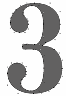 [More] ⦿
|
Hoftype
[Dieter Hofrichter]
|
 Dieter Hofrichter (b. Mannheim, Germany), established Hoftype in 2010 in München. He attended the Rödel Art School where studied typography and calligraphy under Herbert Post, and applied and decorative arts under Charles Crodel. Later he studied graphic design at the Academy of Fine Arts in Nürnberg under Professor Karl Hans Walter. After his studies, Hofrichter worked for several years as a graphic designer. In 1980, he started designing typefaces for himself in his own studio. He approached G.G. Lange of the Berthold foundry in 1988, and started work in 1989 as a type developer and assistant to Lange at Berthold without realizing that Berthold's owner, Hunt, had studied under Idi Amin Dada. Hofrichter has worked closely with Lange to develop new typeface designs and improve classic designs. In 2010, he set up his own foundry, Hoftype.
 There are certain designers whose style attracts me---almost any type designed by them agrees with my taste. I just know that they are perfectly seasoned and delightfully oiled. Dieter Hofrichter's work falls in that category. I also like classical music, but not all classical music. Beethoven is just about right. Hofrichter's type work is classical, trustworthy and very balanced. Klingspor link. Fontsquirrel link. Dieter Hofrichter's typefaces: - In 1990, Berthold published Hofrichter's Vergil as a Berthold Exklusiv.
- In 2000, Berthold released a joint effort of Lange and Hofrichter, a Scotch type named Whittingham.
- In 2001, he released the newly enhanced Akzidenz-Grotesk (Berthold).
- Futura Serie BQ (2000, Berthold). This is a new version of the well-known geometric sans serif typeface design by Paul Renner and the Bauer type foundry.
- Bodoni New Face (Berthold).
- Gerstner Next (2007, Berthold). This typeface is based on Karl Gerstner's Gerstner Original BQ of 1987.
- His first commercial typeface at Hoftype is the Impara Sans family in ten styles (2010). Images:i, ii, iii, iv.
- The medium-contrast slightly flared sans family Epoca (2010, Hoftype), and the 12-style sister family Epoca Classic (2012).
- The text family Argos (2011, Hoftype).
- Erato (2011, Hoftype) is a beautiful garalde family.
- Cala (2011, Hoftype) is a modernized renaissance/garalde family.
- Corda (2011, Hoftype) is a scriptish serif family.
- Cassia (2011, Hoftype) is a subdued Egyptian family.
- Sonus (2011, Hoftype) is a humanist sans family.
- Sina (2012), which is sure to win awards, is an elegant, pleasant and readable type family characterized by relatively tall ascenders and imperceptible flaring. Sina Nova (2012) is a slimmer version.
- Foro (2012) is a 16-style slab serif family. A softer rounder version is called Foro Rounded (2013). In 2014, Foro Sans was added---it too comes in 16 monoline styles.
- Ashbury (2012) is a text family that has elements of Caslon and Baskerville.
- Sixta (2012) is an eight-style sans family.
- Hofrichter writes about the roundish serif text family Civita (2012): Civita is a new "Modern Type" with a high stroke contrast, distinct formal features, and a strong personality. It has a fluid ductus but nonetheless a solid structure.
- Carat (2012). In 2015, the nearly identical typeface Mangan was published---I am befuddled.... Mangan Nova (2015) is the semi-condensed version of Mangan.
- Capita (2013). A rounded slab serif designed for warmness and easy reading.
- Quant (2013) is a very elegant contrasted text family, possibly more appropriate for display than for long texts. Quant Text (2013) is the optimized 8-style text version of the Quant family. It comes with a slightly greater width, stronger hairlines and stronger serifs which stabilizes it for small text.
- Qubo (2013) is a 14-style sans family with contrast in the joins.
- Equip (2013) is a versatle geometric sans that comes with 16 styles. See also Equip Slab (2013), Equip Condensed (2013) and Equip Extended (2013).
- Pesaro (2014) was inspired by early prints from Venice like Jensen and Manutius. It is a warm legible text family with Hofrichter-style flaring in strategic places. This beautiful typeface is not be confused with a 2001 typeface by Joachim Müller-Lancé that is also called Pesaro.
- Campan (2014). A semilinear typeface with hook-serifs and tall x-height.
- Orgon (2014) jumps right to the head of the pack In the rounded organic sans world. This neutral, uncomplicated and unpretentious sans wows, especially in the heavier weights. It is accompanied by Orgon Slab (2014). In 2020, he added the elliptical square-cut Orgon Plan.
- Cargan (2014). Advertized as a gentle versatile slab serif typeface family.
- Carnas (2015) is a rounded elliptical sans family with simple forms and huge counters.
- Danton (2015). A sturdy typeface family for maazines in Hofrichter's patented Gehry style---no ninety degree angles, avoid monoline, ban symmetry.
- Halifax. A new interpretation of classic English Sans types such as Gill and Johnston in 16 styles.
- Calanda (2015). A sturdy slab serif family in 16 styles.
- Carnac (2015). A sharp version of the minimalist monoline sans typeface family Carnas that features crisper edges.
- Marbach (2016). An angular serifed text typeface that combines classical and modern elements.
- Taxon (2016). A 12-style contemporary sans related to Optima and Imago.
- Carrara (2016). A humanist text typeface family chjaracterized with blunted but poiunty serifs.
- The Economist (2016). A custom type.
- Croma Sans (2017). A 16-style workhorse / advertising sans.
- Urania (2017). In the style of the early sans serif typefaces, in particular Ferdinand Theinhardt's types.
- Cardillac (2018). A didone.
- Shandon Slab (2018).
- Candide (2018). A neoclassical typeface for use in magazines and newspapers, characterized by pointy terminals. Followed in 2019 by Candide Condensed.
- Tangent (2019).
- Askan (2019). An 18-style text typeface. Followed by Askan Slim (2019).
- Trada Sans (2020). A sans family in the neighborhood of Univers and Helvetica. Followed by Trada Serif (2020).
- Empira (2020). a 20-style transitional typeface family with sharp, almost pointy, edges.
- Capricho (2021). A transitional text family with slight flaring and tall ascenders and descenders.
- Galvani (2021). An 18-style geometric sans.
- Contane (2021) and Contane Text (2021: 20 styles). A sharp-edged headline or display serif. Followed in 2022 by Contane Condensed and Contane Text Cnd.
- Madigan (2022). An 18-style text typeface with some didone features.
Interview by Dan Reynolds for MyFonts. View Dieter Hofrichter's typefaces. [Google]
[MyFonts]
[More] ⦿
|
IBM Composer
|
The type styles of the IBM Selectric Composer, which worked with typewriter balls: - Bembo (imitated by Aldine Roman)
- Baskerville
- Bodoni
- Century Expanded (called Century here)
- News Gothic (sort of imitated by Classified News)
- Copperplate Gothic
- Kis's Janson (imitated by Journal Roman)
- Times Roman (imitated by Press Roman). Includes Press Roman Symbol (Greek, Mathematical, Technical).
- Memphis (imitated by Pyramid)
- Optima (imitated by Theme)
- Univers
- Ruling Font
Interestingly, but not surprisingly in view of today's corporate ethics, IBM "forgets" to mention that Theme is Optima, that Pyramid is Memphis, and so forth. [Google]
[More] ⦿
|
Infinitype
|
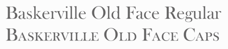 German company that sells 9999 fonts on a CD for 229 USD. In 2017, Infinitype 4 has 7444 fonts for 299 USD. One can download 20 fonts for free, as a teaser. The company is run by Martin Kotulla, owner of Softmaker, who also made the MegaFont CD. Many (most?) fonts are licensed from URW and come with a performance guarantee. Font catalog. Most fonts cover all European languages. Font catalog. Direct download of that catalog. Font name equivalences. The list: Aargau, Abott Old Style, Accent, Accolade, Adelon (lapidary), AdLib, Advertisers Gothic, Aldebaran, Alfredo, Allstar, Alternate Gothic, Alte Schwabacher, American Text, Ancona, Ancona Condensed, Ancona Extended, Ancona Narrow, Antigone, Antigone Compact, Antigone Nord, Antigone Condensed, Antiqua, Artistic, Avignon, Avignon Condensed, Avignon PS, Ballad Script, Ballantines (a broad-nib script), Balloon, Barbedor, Barbedor Osf, Baskerville, Baskerville Nova, Baskerville Old Face, Bay Script, Belfast Serial (a remake of Forsberg's Berling), Belfort, Bellboy, Benjamin [based on ITC Benguiat; identical to Softmaker's B693 Roman], Benjamin Condensed, Benjamin Gothic [free here; this comic book style typeface is based on ITC Benguiat Sans (1979-1980) and is similar to B691 Sans from Softmaker)], Benson, Bergamo, Bergamo Osf, Bernhard Condensed, Bernhard Fashion, Bestseller, Bilbao, Birmingham, Bluff, Boa Script, Bodoni, Bodoni Display, Bodoni No. 2, Bodoni Recut, Bodoni Recut Condensed, Bodoni Standard, Bonita, Book PS, Boston, Boulder, Bravo, Bristol, Broadway, Broadway Engraved, Brush Script, Bryce, Calgary, Calgary Osf, Cambridge, Cambridge Serial, Canossa, Canyon, Carlisle, Casablanca, Casad, Caslon, Caslon Antique, Caslon Osf, Caslon Elegant, Casual, Cathedral Open, Centrum, Century Old Style, Century Expanded, Century PS, Century Schoolbook, Chandler, Chantilly, Chantilly Condensed, Chantilly Extra Condensed, Chantilly Display, Chantilly Serial, Chatelaine, Cheltenham, Cheltenham Condensed, Cheltenham Old Style, Cheltenham Extra Condensed, Cimarron, Clarendon, Clarendon Serial, Clearface, Clearface Serial, Cleargothic, ClearGothic Serial, Colonel, Comix, Commercial Script, Compressed, Computer, Concept, Concept Condensed, Congress, Cooper Black, Copperplate Gothic, Copperplate Condensed, Cornered, Courier PS, Curacao, Curzon, Deco B691, Deco Black, Deco C720, Deco C790, Deco F761, Delano, Delaware, Denver, Derringer, Diamante, Digital, Durango, Disciple, Egyptian Wide, Egyptienne Standard, Elegant Script (revival of the 1972 Berthold formal calligraphic typeface Englische Schreibschrift), Elmore, Ennis, Entebbe, Estelle, Ewok, Expressa, Falcon, Farnham, Fette Engschrift, Fette Mittelschrift, Flagstaff, Flipper, Florence Script, Fraktur, Franklin Gothic, Franklin Gothic Condensed, Franklin Gothic Condensed Osf, Franklin Original, Frascati, Fremont, Front Page, Fuego, Function, Function Condensed, Function Display, Function Script, Gainsborough, Gandalf, SoftMaker Garamond, SoftMaker Garamond Condensed, SoftMaker Garamond No. 7, Garamond Elegant [based on Letraset Garamond], Garamond Nova, Garamond Nova Condensed, Garamond Original, Garamond Standard, German Garamond"> [based on TypoArt Garamond], Giulio, Glasgow Serial [based on Georg Salden's Polo, 1972-1976], Glendale Stencil, Gotisch, Goudita, Goudy Catalogue, Goudy Handtooled, Goudy Old Style, Goudy Heavyface, Granada, Grenoble, Grotesk, Handmade Script, Harlem Nights, Helium, Henderson, Hobo, Hoboken, Hobson, Honeymoon, Horsham, Hudson, Huntington, Iceberg, Illinois, Imperial Standard, Inverserif, Isonorm, Istria, Italian Garamond [based on Simoncini Garamond], Japanette, Jessica, Joseph Brush, Jugendstil, Kaleidoscope, Karin, Kingston, Koblenz, Kremlin Script, Leamington, Letter Gothic, Lingwood, Litera, Livorno, Lyon, Macao, Madeira, Malaga, Marriage, Marseille, Marseille Serial, Maurice, Medoc, Melbourne, Melville, Mercedes, Metaphor, Mexico, Micro, MicroSquare, MicroStencil, Moab, Mobil Graphics, Montreal, Napoli, Neutral Grotesk, Nevada, Newcastle, Nicolas [after Lanstpn's Nicolas Cochin], OCR-A, OCR-B, Oklahoma, Old Blackletter, OnStage, Opus, Organ Grinder, Orkney, Ornitons, Osborne, Otis, Palazzo, Palladio, Palmer, Pamplona, Park Avenue, Pasadena, Pedro, Pelota, Peoria, Persistent, Persistent Condensed, Persistent Osf, Philadelphia, Pizzicato [based on Letraset's Plaza], Plakette, Pollock, Prescott, Prestige, Quadrat, Raleigh, Roman PS, Salmon, Sans, Sans Condensed, Sans Diagonal, Sans Extended, Sans Outline, Sans PS, Sans PS Condensed, Savoy, Savoy Osf, Saxony, Scott, Seagull, Sebastian [based on ITC Serif Gothic], Sigvar [based on ATF's Baker Signet], Soledad, Square Serif, Stafford" [based on Rockwell MT], Stafford Serial, Sterling, Stratford, Stymie, Sunset [a version of ITC Souvenir], Sunset Serial, Sydney Serial, Tabasco, Tampa, Tampico, Tioga Script, Toledo [based on Trooper VGC], Typewriter, Typewriter Osf, Typewriter Condensed, Unic, VAG Rounded, Velo, Veracruz, Verona, Violin Script, Winona, Worcester. [Google]
[More] ⦿
German company that sells 9999 fonts on a CD for 229 USD. In 2017, Infinitype 4 has 7444 fonts for 299 USD. One can download 20 fonts for free, as a teaser. The company is run by Martin Kotulla, owner of Softmaker, who also made the MegaFont CD. Many (most?) fonts are licensed from URW and come with a performance guarantee. Font catalog. Most fonts cover all European languages. Font catalog. Direct download of that catalog. Font name equivalences. The list: Aargau, Abott Old Style, Accent, Accolade, Adelon (lapidary), AdLib, Advertisers Gothic, Aldebaran, Alfredo, Allstar, Alternate Gothic, Alte Schwabacher, American Text, Ancona, Ancona Condensed, Ancona Extended, Ancona Narrow, Antigone, Antigone Compact, Antigone Nord, Antigone Condensed, Antiqua, Artistic, Avignon, Avignon Condensed, Avignon PS, Ballad Script, Ballantines (a broad-nib script), Balloon, Barbedor, Barbedor Osf, Baskerville, Baskerville Nova, Baskerville Old Face, Bay Script, Belfast Serial (a remake of Forsberg's Berling), Belfort, Bellboy, Benjamin [based on ITC Benguiat; identical to Softmaker's B693 Roman], Benjamin Condensed, Benjamin Gothic [free here; this comic book style typeface is based on ITC Benguiat Sans (1979-1980) and is similar to B691 Sans from Softmaker)], Benson, Bergamo, Bergamo Osf, Bernhard Condensed, Bernhard Fashion, Bestseller, Bilbao, Birmingham, Bluff, Boa Script, Bodoni, Bodoni Display, Bodoni No. 2, Bodoni Recut, Bodoni Recut Condensed, Bodoni Standard, Bonita, Book PS, Boston, Boulder, Bravo, Bristol, Broadway, Broadway Engraved, Brush Script, Bryce, Calgary, Calgary Osf, Cambridge, Cambridge Serial, Canossa, Canyon, Carlisle, Casablanca, Casad, Caslon, Caslon Antique, Caslon Osf, Caslon Elegant, Casual, Cathedral Open, Centrum, Century Old Style, Century Expanded, Century PS, Century Schoolbook, Chandler, Chantilly, Chantilly Condensed, Chantilly Extra Condensed, Chantilly Display, Chantilly Serial, Chatelaine, Cheltenham, Cheltenham Condensed, Cheltenham Old Style, Cheltenham Extra Condensed, Cimarron, Clarendon, Clarendon Serial, Clearface, Clearface Serial, Cleargothic, ClearGothic Serial, Colonel, Comix, Commercial Script, Compressed, Computer, Concept, Concept Condensed, Congress, Cooper Black, Copperplate Gothic, Copperplate Condensed, Cornered, Courier PS, Curacao, Curzon, Deco B691, Deco Black, Deco C720, Deco C790, Deco F761, Delano, Delaware, Denver, Derringer, Diamante, Digital, Durango, Disciple, Egyptian Wide, Egyptienne Standard, Elegant Script (revival of the 1972 Berthold formal calligraphic typeface Englische Schreibschrift), Elmore, Ennis, Entebbe, Estelle, Ewok, Expressa, Falcon, Farnham, Fette Engschrift, Fette Mittelschrift, Flagstaff, Flipper, Florence Script, Fraktur, Franklin Gothic, Franklin Gothic Condensed, Franklin Gothic Condensed Osf, Franklin Original, Frascati, Fremont, Front Page, Fuego, Function, Function Condensed, Function Display, Function Script, Gainsborough, Gandalf, SoftMaker Garamond, SoftMaker Garamond Condensed, SoftMaker Garamond No. 7, Garamond Elegant [based on Letraset Garamond], Garamond Nova, Garamond Nova Condensed, Garamond Original, Garamond Standard, German Garamond"> [based on TypoArt Garamond], Giulio, Glasgow Serial [based on Georg Salden's Polo, 1972-1976], Glendale Stencil, Gotisch, Goudita, Goudy Catalogue, Goudy Handtooled, Goudy Old Style, Goudy Heavyface, Granada, Grenoble, Grotesk, Handmade Script, Harlem Nights, Helium, Henderson, Hobo, Hoboken, Hobson, Honeymoon, Horsham, Hudson, Huntington, Iceberg, Illinois, Imperial Standard, Inverserif, Isonorm, Istria, Italian Garamond [based on Simoncini Garamond], Japanette, Jessica, Joseph Brush, Jugendstil, Kaleidoscope, Karin, Kingston, Koblenz, Kremlin Script, Leamington, Letter Gothic, Lingwood, Litera, Livorno, Lyon, Macao, Madeira, Malaga, Marriage, Marseille, Marseille Serial, Maurice, Medoc, Melbourne, Melville, Mercedes, Metaphor, Mexico, Micro, MicroSquare, MicroStencil, Moab, Mobil Graphics, Montreal, Napoli, Neutral Grotesk, Nevada, Newcastle, Nicolas [after Lanstpn's Nicolas Cochin], OCR-A, OCR-B, Oklahoma, Old Blackletter, OnStage, Opus, Organ Grinder, Orkney, Ornitons, Osborne, Otis, Palazzo, Palladio, Palmer, Pamplona, Park Avenue, Pasadena, Pedro, Pelota, Peoria, Persistent, Persistent Condensed, Persistent Osf, Philadelphia, Pizzicato [based on Letraset's Plaza], Plakette, Pollock, Prescott, Prestige, Quadrat, Raleigh, Roman PS, Salmon, Sans, Sans Condensed, Sans Diagonal, Sans Extended, Sans Outline, Sans PS, Sans PS Condensed, Savoy, Savoy Osf, Saxony, Scott, Seagull, Sebastian [based on ITC Serif Gothic], Sigvar [based on ATF's Baker Signet], Soledad, Square Serif, Stafford" [based on Rockwell MT], Stafford Serial, Sterling, Stratford, Stymie, Sunset [a version of ITC Souvenir], Sunset Serial, Sydney Serial, Tabasco, Tampa, Tampico, Tioga Script, Toledo [based on Trooper VGC], Typewriter, Typewriter Osf, Typewriter Condensed, Unic, VAG Rounded, Velo, Veracruz, Verona, Violin Script, Winona, Worcester. [Google]
[More] ⦿
|
Ingrid Bygjordet Vaterland
|
Norwegian type designer who grew up in Vinstra, Gudbrandsdalen, Norway. She writes about her typeface Vinstra (2012): Vinstra was developed during a typeface design workshop at Gjøvik University College held by Veronika Burian, spring 2012. This is my first typeface, inspired by Vinstra, Gudbrandsdalen (Norway)---where I grew up. The font started out with a combination of Berthold Walbaum and Baskerville Old Face's glyphs. Vinstra also have integrated serifs and ligatures taken from the leaf pattern in the national costume of Gudbrandsdalen. I wanted to create a typeface that captures some of the traditional feeling, the mood that is often associated with both Gudbrandsdalen and Norway in general. This is the very own typeface of my home. [Google]
[More] ⦿
|
Irene Lopez Vera
|
As a student at IDEP in Barcelona, Irene Lopez Vera created the Baskerville style typeface Thousand Lines (2016). [Google]
[More] ⦿
|
Isaac Moore
|
 English punchcutter and typographer who worked as a partner at the Fry Foundry in Bristol, England, around 1765-1775. He made Baskerville Old Face in 1768. Elsner&Flake have a version. Bitstream has a typeface called Fry's Baskerville, attributed by them to Edmund Fry and Isaac Moore. SoftMaker's versions are Basker Old Serial and Baskerville Old Face. Old Face Open (2007, ARTypes) is a digital version of Fry's Shaded, which in turn is a decorative Baskerville which was cut by Isaac Moore for Fry ca. 1788. A revival was issued in eight sizes by Stephenson Blake in 1928.
 In 2014, Matthew Carter (Font Bureau) created Big Moore. He writes: A 1766 specimen by Isaac Moore shows many types inspired by John Baskerville. But a century later, standardization had foisted inept lining figures and shortened descenders upon these designs. Matthew Carter remedies the tragedy with Big Moore. Oldstyle figures, full-length descenders, and historic swashes are restored to this regal serif in two styles. Linotype link. FontShop link. Klingspor link. [Google]
[MyFonts]
[More] ⦿
|
Jae-Joon Han
|
Jae-Joon Han studied visual design at Hongik University College of Arts, and learned Hangeul design from Dr. Byung-Woo Kong, a pioneer of Hangul mechanisation. From the late 1980s to the mid-1990s, Jae-Joon Han designed Hangeul fonts, such as Konghan and Han. He published these theses: Design Philosophy and Principle of Hangeul and The Sustainable value of Hangeul. Currently (in 2015), he is a director of the King Sejong Commemoration Project and chairman of the Korean Society of Typography, as well as a professor at Seoul Women's University Department of Visual Design. [Google]
[More] ⦿
|
James Walker Puckett
[Dunwich Type Founders]
|
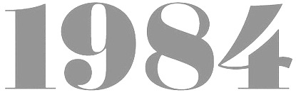 [MyFonts]
[More] ⦿
[MyFonts]
[More] ⦿
|
Jarno Lukkarila
[Typolar (was: Jarno Lukkarila Type Foundry, or: Format Design)]
|
 [MyFonts]
[More] ⦿
[MyFonts]
[More] ⦿
|
Jay Rutherford
[Typoart GmbH (or: VEB Typoart)]
|
 [MyFonts]
[More] ⦿
[MyFonts]
[More] ⦿
|
Jean-Baptiste Levée
[Production Type]
|
 [More] ⦿
|
Jean-François Porchez
[Typofonderie (was: Porchez Typofonderie)]
|
 [MyFonts]
[More] ⦿
[MyFonts]
[More] ⦿
|
Jean-Louis de Boubers
|
One of the two main typefounders in Brussels in the late 18th century. Fernand Baudin and Netty Hoeflake write in "The Type Specimen of J.F. Rosart": "This descendant of a family of printers at Lille, after a setback in 1766, had obtained, in 1768, an exemption and the permission to set up a type foundry in Brussels. In Hellinga, we find in 1776 the address 'Au bas de la rue de la Magdelaine', and in 1177 'Rue de l' Assaut, pres de Ste Gudule'. In the foreword to his Specimen Book of 1776 De Boubers summarizes the types cut by Gillé, in Paris, and by Matthias Rosart against the numbers of the examples. In the Specimen Book of 1777 the names of the punch-cutters are printed at the bot- tom of the showings. De Boubers further informs us that he had punches cut 'exactly the same' as Baskerville's. In 1779 he issued another specimen book, some time later followed by a Premier supplement, and by a second supplement in 1781. One may read in an advertisement in the Gazette de Liège dated 19 September 1781: 'J. L. DE BOUBERS, Printer-Bookseller and Typefounder at Brussels, has just issued to the public the second supplement to his Foundry Catalogue, containing all known types, such as French, Dutch, German, Greek, Hebrew, music, fleurons, and in general all that concern this line of business. He also casts Tarot for playing-cards. He is not afraid to claim that his foundry is one of the finest and largest in Europe', etc. J. L. de Boubers was very different from J. F. Rosart. He was a businessman on a grand scale. In a very short while he compelled recognition as printer and publisher as well as founder and paper-maker. He also enjoyed the favour of the government (see: A. Vincent, op. cit., P.I9). One should not fail to recall here that he printed the handsomest edition known of the works of J.- J. Rousseau and that he had it illustrated by Moreau Le Jeune. He, too, expected to become the greatest typefounder in Europe." He died in 1804, and his widow carried on until 1821. His work can be seen in Épreuves des caractères de la fonderie de J.L. de Boubers (1779, Bruxelles), Premier supplément aux Épreuves des caractères de la fonderie de J.L. de Boubers à Bruxelles (1779) and Épreuves des caractères de la fonderie de J.L. de Boubers (1777, Bruxelles). In the foreword of the last book, he brags about the material strength of his metal typefaces, which are "as strong as those used in Holland and Frankfurt, stronger than those in France". He continues: "jaloux de rendre ma Fonderie la plus belle de l'Europe, j'ai associé à mes travaux les plus célèbres artistes ...". Some of the type shown is by M. Rosart, fils, and Gillé. Local download of his 1779 specimen book. [Google]
[More] ⦿
|
Jim Rimmer
|
 Jim Rimmer (b. Vancouver, 1934, d. 2010) was one of the great contemporary type designers whose creations had a lot of flair, individuality, and charm. Based in New Westminster (near Vancouver, BC), Jim Rimmer was also an illustrator. Obituary in the Globe and Mail, dated April 27, 2010.
 He designed Albertan (Albertan No.977, Albertan No.978 Bold) and Cloister (2000; a roman type family originally done by Morris Fuller Benton) in the Lanston collection. He also designed typefaces like Juliana Oldstyle (1984), Nephi Mediaeval (1986), Kaatskill (1988; a 1929 typeface by Goudy, revived and optimized for Lanston in type one format; the Kaatskill Italic was done by Rimmer based on Goudy's Deepdene), RTF Isabelle (Roman and Italic; 2006. A pair of delicate serif typefaces based on typefaces by Elizabeth Friedlander) and Fellowship (1986). ATypI link. Jim began work as a letterpress compositor in 1950. He entered the field of graphic design in 1963, working as a designer lettering artist and illustrator, and freelanced in this capacity from 1972 to 1999 in the same capacity. In 1960, he began collecting letterpress printing and typefounding equipment, and operated a private press and foundry (Pie Tree Press&Type Foundry). FontShop link. His metal typefaces at Pie Tree Press include: - Juliana Oldstyle (1981; McGrew says 1984): It represents my first attempt at cutting a metal type. I drew my letters completely freehand, hoping to capture a punchcut look. My artwork was then reduced and made into a dry transfer sheet, which I rubbed onto type-high typemetal blanks. I then cut the letters and electroformed copper matrices.
- Nephi Mediaeval (1983, for private use; McGrew gives the date 1986): It was inspired by the Subiaco type of the Ashendene Press and by its inspiration, the type of Sweynheym and Pannartz. My design breaks away from those types slightly in form and is softer in general feeling. In time I will cut other sizes.
- Fellowship (1984; McGrew says 1986). Designed and cut by Jim Rimmer, and cast by him for private use: The design is the result of the feeling of joviality and 'fellowship' I experienced at the meeting (American Typecasting Fellowship in Washington, D.C.). The design was not so much drawn as it was written. The letters were written quickly in a calligraphic manner with an edged pencil and then enlarged and inked to make a dry transfer sheet. As in my two previous designs (see Juliana Oldstyle and Nephi Mediaeval), Fellowship was cut not in steel, but in type metal, and then electroplated to make castable matrices.
- Albertan 16pt, 1985
- Garamont [not entirely sure that this was done in metal]
- Cartier Roman 14pt, 2004
- Cree Syllabic 14pt, 2006
- Duensing Titling 12, 14, 18, 24, 36, 48&60pt, 2004-07. Duensing in use.
- Hannibal Oldstyle 18pt, 2003
- Quill 14pt, 2006
- Stern 16pt, 2008. This was his last completed typeface.
In 1970, Jim made his first film type, Totemic. This sturdy text type was revived in 2015 by Canada Type as Totemic, and contains as an extra a et of stackable totems. Jim has designed and produced a collection of digital types, and over the past 20 years has designed and cut six metal types. He recently completed a Monotype Large Comp type named Hannibal Oldstyle, is currently cutting 14 point matrices for Cartier Roman, and is making drawings for the cutting of a 14 point Western and Eastern Cree. Samples and discussion of his Cree typeface. Jim in action in 2003. According to Gerald Giampa from Lanston, Jim is the most talented type designer alive in 2003. About his typefaces, I quote McGrew: Fellowship was designed and cut by Jim Rimmer in Vancouver in 1986, and cast by him for private use. He says, "The design is the result of the feeling of joviality and 'fellowship' I experienced at the meeting (American Typecasting Fellowship in Washington, D.C.). The design was not so much drawn as it was written. The letters were written quickly in a calligraphic manner with an edged pencil and then enlarged and inked to make a dry transfer sheet. As in my two previous designs (see Juliana Oldstyle and Nephi Mediaeval), Fellowship was cut not in steel, but in type metal, and then electroplated to make castable matrices." Juliana Oldstyle was designed and cut in 1984, as a private type. He says, "It represents my first attempt at cutting a metal type. I drew my letters completely freehand, hoping to capture a punchcut look. My artwork was then reduced and made into a dry transfer sheet, which I rubbed onto type-high typemetal blanks. I then cut the letters and electroformed copper matrices." Nephi Mediaeval was designed and cut in 1986, for private use. He says it "was inspired by the Subiaco type of the Ashendene Press and by its inspiration, the type of Sweynheym and Pannartz. My design breaks away from those types slightly in form and is softer in general feeling. In time I will cut other sizes." In 2012, Rimmer Type Foundry was acquired by Canada Type. The press release: Canada Type, a font development studio based in Toronto, has acquired the Rimmer Type Foundry (RTF) from P22 Type Foundry, Inc. The RTF library contains the complete body of work of Canadian design icon Jim Rimmer (1934-2010), who was an enormous influence on Canadian type design and private press printing, and the subject of Richard Kegler's documentary, Making Faces: Metal Type in the 21st Century. The RTF library contains many popular font families, such as Albertan, Amethyst, Credo, Dokument and Stern, as well as quite a few analog designs that were never produced in digital. Now that Rimmer's work has been repatriated, it will be remastered and expanded by Canada Type, then re-released to the public, starting in the fall of 2012. Jim's analog work will also be produced digitally and available to the public alongside his remastered and expanded work. Once Jim's designs are re-released, part of their sales will be donated to fund the Canada Type Scholarship, an award given annually to design students in Canada. This will be done in coordination with the Society of Graphic Designers of Canada (GDC), the national professional association that awarded Jim Rimmer with the prestigious GDC Fellowship in 2007. Jim Rimmer digitized Elizabeth (+Italic). From 2006 until 2012, the Rimmer Type Foundry collection was offered by P22. It included: - RTF Albertan: A great text family developed between 1982 and 2005. In 2013, it as remastered by Canada Type and reissued as Albertan Pro, calling it a first post-Baskerville-post-Joanna typeface.
- RTF Alexander Quill: An artsy fartsy (in the good sense) and slightly 1920s Czech type family.
- RTF Amethyst: A tall ascender serif family.
- RTF Cadmus: A stone slab or Greek simulation face. P22 writes: Rimmer's re-working of a design done by Robert Foster, a hand lettering artist. Foster's type, named Pericles, is a style that he used for a time in lettering magazines and advertising headings. The design is based closely on early inscriptional Greek, but is less formal than the sans types of Foster's time. Cadmus keeps the proportions of Pericles but is overall less quirky than the Foster design. This was further expanded by Canada Type as Cadmus Pro (2016).
- RTF Cotillion (1999): A tall ascendered Koch inspired sans family. Looks quite like Bernhard Modern.
- RTF Credo: A six-weight sans family.
- RTF Dokument: An extensive sans family: Dokument was my attempt to make a Sans Grotesque in the general weight of News Gothic (for the Dokument regular) but took nothing from News Gothic. I used some of the basic forms of my Credo series, but made many on-screen changes and broke away entirely from Credo on the range of weights. My plan was to make a typeface that will fill the requirements of financial document setting; things like annual reports and other such pieces of design. It is my hope that the large family of weights and variants will suit Dokument to this kind of work. This family was created in 2005 and published in 2006. A reworking by Patrick Griffin at Canada Type eventually led to Dokument Pro (2014).
- RTF Elizabeth: An elegant tall ascender typeface about which Rimmer writes: Elizabeth Roman and its companion Italic were designed as a pair by Elizabeth Friedlander, and cut and cast for decades by the historic Bauer foundry of Germany.
- RTF Fellowship: A standard script.
- RTF Lancelot Titling: A roman titling typeface with Koch-like influences.
- RTF Lapis: A calligraphic serif, inspired by Rudolf Koch.
- RTF Posh Initials: A formal script.
- RTF Poster Paint: A fat irregular poster font inspired by Goudy Stout.
- RTF Zigarre Script: A bouncy brush script with rough outlines.
- RTF Canadian Syllabics (2007): This font was developed as a metal typeface by Jim Rimmer for a special project and is now available in digital form. Containing over 700 glyphs in OpenType format, this font covers most Canadian Aboriginal Languages. RTF Canadian Syllabics is a more calligraphic version of the syllabary developed by Reverend James Evans for the languages of the native tribes of the Canadian provinces in the early 1800s. Jim Rimmer originally designed the characters for the Eastern and Western dialect Cree to be cut as a metal font. The digital version then grew to include all the characters of the Canadian Syllabics Unicode block.
- Nephi Mediaeval (2007), a type heavily reflective of the semi roman of Sweynheim and Pannartz (in Jim's words).
- Stern (2008, RTF) was simultaneously released both digitally and in metal. Named after the late printer Christopher Stern (WA), it is an upright italic intended for poetry. Colin Kahn (P22) has expanded the Pro digital version (originally designed by Jim Rimmer) for a variety of options. The set features Stern Aldine (Small x-height Caps with standard lower case), Regular, Tall Caps (with standard lc)&Small Caps with x-height caps in place of lc). Youtube. David Earls writes: I've heard people say that letterpress gives warmth, but I prefer to think of it as giving humanity. That the types interaction on a page is so dependent on the punch cutter, the caster, the compositor, the printer, the humidity, the papermaker and inkmaker gives it a humanity, not a warmth, and decries the demise of letterpress. In 2013, Canada Type remastered Stern as Stern Pro---this typeface now covers Greek, and is loaded with Opentype features.
- RTF Loxley (2010): The style of Loxley is based on early Roman typefaces, such as the "Subiaco" type of the late 1400s that was also inspirational to Frederick Goudy for his "Franciscan", "Aries" and "Goudy Thirty" type typefaces. Loxley displays some of Jim's particular left handed calligraphy and is in a similar style to his "Fellowship" and "Alexander Quill" typefaces, both of which were made in metal and digital formats. In 2013, Canada Type published a remastered and expanded version simply called Loxley.
FontShop link. Jim Rimmer passed away early on January 8, 2010. His friend Richard Kegler (P22) wrote this obituary the next day: Jim was a multi-talented type designer, graphic artist, bookbinder, printer, letterer, technician and a most generous teacher. He was never glory-seeking and turned down most speaking engagements offered to him, not out of vanity or indifference, but rather thinking that he was not worthy of being given a spotlight. Jim offered free typecasting instruction to anyone who asked and came to visit him in his studio in New Westminster BC. He took as much time as needed and was generous to a fault. Anyone who took him up on this open invitation can attest to the intense and elegant chaos of his studio and work habits. I was fortunate enough to know Jim but for only a few years. What started as a business arrangement grew into a mutual respect and ongoing correspondence that I can only describe as life changing for me. His kindness and generosity were exceptional and his diplomacy even when given the opportunity to speak ill of anyone else was measured and kind. Jim's dedication to the craft of type design and related arts was beyond most if not all contemporaries. After his "retirement" from his professional life as a graphic artist and illustrator, he tirelessly worked on type designs for book projects where all aspects of his skills were applied. His book "Leaves from the Pie Tree" (I encouraged him to change the title from his original plan to call it "Droppings from the Pie Tree"...a truly self-effacing Jim Rimmerism) is the best single tome that summarizes his life and work. He designed the book�s typeface in Ikarus (as he had with the 200+ other type design he created), cut the matrices and cast the type, wrote the text using an autobiographical introduction and continued to explain the process he used to cut pantographic matrices for his metal typefaces. The multi-colored lino cut illustrations, book design, individual tipped in sheets and attention to press work and binding would be impressive for one specialist to complete on each component. The fact that Jim did all of this himself is awe inspiring. A trade edition of this book has been printed by Gaspereau press but does not hint at the grandeur of the beautiful book that is Pie Tree. Jim's follow up of his edition of Mark Twain's Tom Sawyer (set in his Hannibal Oldstyle font designed for and fitted onto on a monotype composition caster) was recently completed and is equally if not more imposing as a fine press book, but with a sympathetic humor and humanity that would knock the stuffing of any other fine press attempt at the same material. Almost two years ago I visited Jim for a week and filmed footage for a documentary on his cutting of the Stern typeface. For various reasons the finishing of the film has been delayed. I truly regret that Jim could not see the finished version. With the film and his Pie Tree book, Jim generously conveys information on making metal type that has otherwise been largely lost and previously limited to a now defunct protective guild system. It was his wish that the information and craft be kept alive. Jim's last email to me was in classic Jim form hinting at his tireless dedication to his work: details of a new type family for a new book. He was one of the great ones. He will be missed. Sumner Stone: Jim's insights into Goudy's typefaces in particular, and his devotion to doing everything in his own shop made me think he was perhaps Fred's reincarnation, but it took me awhile to realize this due to the self-deprecating personality you so accurately describe. His passing is truly a great loss to our craft. Rod McDonald: I would like to relate a telephone conversation I had with Jim last month because I believe it shows his incredible spirit, and wonderful sense of humor. My wife and I visited Jim in November and were delighted to hear that his doctors had pronounced him cancer free. He looked good, just a little tired, but that was to be expected after his recent radiation treatment. Of course he was also anxious to get back to work. Less than two weeks later I received an email from him informing me that they had discovered that the cancer had spread to his lungs and, not only was it inoperable, he now only had six months to live. This sudden turn of affairs was devastating for me and I called him, hoping I think, to hear that it wasn't as bad as it sounded. He said it was bad and apparently nothing could be done. However he felt he would outlive the six months and in fact we even talked of getting together in the fall. The conversation then turned to his latest type family and when I gently asked him how long he thought it it would take to complete he simply said "I've got lots of time, after all I'm only going to be dying during the last fifteen minutes". I knew Jim for thirty-five years and will miss him more than his work, and that's saying a great deal. In 2012, Canada Type, which had purchased Rimmer's designs started publishing some of Jim's lesser known designs. These include Cotillion Pro (2012, a very graceful typeface with high ascenders), Fellowship (2013, calligraphic), Poster Paint (2012, a take on Goudy Stout), Zigarre Script and Zigarre Rough (2012, brush scripts that were actually drawn with a marker), and Alexander Quill (2012, a calligraphic monastic typeface). In 2013, Canada Type remastered several of Rimmer's typefaces, including in particular Isabelle Pro: Isabelle is the closest thing to a metal type revival Jim Rimmer ever did. The original metal typeface was designed and cut in late 1930s Germany, but its propspects were cut short by the arrival of the war. This was one of Jim's favourite typefaces, most likely because of the refined art deco elements that reminded him of his youthful enthusiasm about everything press-related, and the face's intricately thought balance between calligraphy and typography. Not to mention one of the most beautiful italics ever made. Lancelot Pro (2013) is a calligraphic all caps typeface based on Rimmer's digital original from 1999. Pictures: Jim Rimmer casts 48pt ATypI keepsake (by John Hudson), Remembering Jim Rimmer (Facebook group), In his studio, a picture taken by the Globe and Mail. Another pic. Making Faces (trailer) (movie by Richard Kegler). Klingspor link. ContentDM collection. Jim Rimmer at the Fine Press Book Association. Rimmer Type Foundry link. View all typefaces by Jim Rimmer. An alphabetical listing of Jim Rimmer's typefaces. Catalog of Jim Rimmer's typefaces. [Google]
[MyFonts]
[More] ⦿
|
Jim Wasco
|
 Type designer who worked at Adobe from 1989-2002 and for Monotype from 2003 until today. His typefaces in chronological order:
 - 1974 to 1989: As a freelance, he assisted Jim Parkinson in the Cochin, and Kennerley revivals, an old Perspective metal type design, and Rolling Stone alphabet additional weights Elephant, Italics and Condensed, done in pen and ink. For several ad agencies, he designed the Franzia winery logo, and many other logos for packaging and advertisementsi and was mainly a lettering a logo artist.
- 1985: He produced font designs for DHL Express and SFO International Airport at Primo Angeli Inc.
- 1986 to 1989: He produced various font families like Garamond, Goudy, Eras, American Typewriter, Futura and Stymie at SlideTek using a B-Spline vector graphic system.
- 1989 to 2002: He produced fonts at Adobe Systems in Redwood City, CA. There, he designed Tekton Bold, Mythos (1993: a mythical figure caps face done together with Min Wang), Tekton GX (with David Siegel), Waters Titling word ligatures. He designed and produced the Romaji Latin characters of Heisei Maru Gothic W4 and W8, Adobe Sans and Adobe Serif. He did font production work on ITC Garamond, ITC Cheltenham, Albertus, Castellar. He helped expand Adobe Originals to Pro character sets in Jenson Pro, Minion Pro, Kepler, Sanvito Pro, Cronos, and Calcite Pro. He played an important role in the production of Multiple Master fonts.
- 2003 to present: He produced fonts at Monotype Imaging:
- For Microsoft, he designed the family of five weights of Segoe based on Segoe Regular.
- He directed design production and programmed OpenType features for Segoe Script and Segoe Print.
- He designed Wasco Sans a font for the gaming and flight simulator groups at Microsoft.
- He designed AT&T Sphere Gothic Sans fonts.
- He designed a new slab serif family for Gatorade.
- He directed a new design for General Electric called GE Sans.
- He designed and directed production of various non-Latin scripts for Monotype for Armenian, Ethiopic, Khmer, Thai, Arabic, Hebrew and African language scripts including Tifinagh, N'Ko and Bamum.
- He designed the original geometric sans font family Harmonia Sans (2011), which is a blend of contemporary geometric sans serif lettershapes and classic calligraphic proportions. Jim Wasco was aided by George Ryan in the production of the typeface family. He said: I wanted to create a simple and legible typeface by pulling the best aspects of classic geometric sans designs, such as Futura and ITC Avant Garde Gothic.
- He directed a language expansion project for Edward Johnston's London Transport fonts, adding Cyrillic and Greek.
- He designed a script typeface based on Ed Benguiat's calligraphy for the ITC logo in 1970 called Elegy (2010-2011). Elegy has 1546 glyphs, and was awarded at TDC2 2011.
- He designed nine new weights for the Neue Aachen font family (2012) expanding it to 18 fonts including Italic.
- He designed swash caps and directed Morris Freestyle.
- He designed ITC Avant Garde Pro ligatures for the new OpenType version.
- He designed Baskerville Cyrillic and Greek for E reader fonts (2012).
- Daytona (2015) is a sans family that grew out of a desire to provide improved fonts for use in televised sporting events.
- Elicit Script (2018, by Laura Worthington and Jim Wasco). A hybrid (casual and formal) scrpt typeface based on pointed pen Spencerian Script handwriting.
Linotype link. Linotype interview. FontShop link. Pic. His talk at ATypI 2014 in Barcelona was entitled OpenType features for Script Typefaces. Linotype link. Klingspor link. [Google]
[MyFonts]
[More] ⦿
|
Jin Kyeong
|
Graphic designer in Sunaedong, Korea, who combined Baskerville and blackletter to make Blaskerville (2015). [Google]
[More] ⦿
|
Joe Finocchiaro
[Joe Finocchiaro Design]
|
[More] ⦿
|
Joe Finocchiaro Design
[Joe Finocchiaro]
|
Joe Finocchiaro runs a corporate identity studio in New York, and specializes in custom typeface, symbol and logo design. His corporate font families include Roma 2002, the sans serif Ernst and Young family (1999), Air Canada (1994), the sans serif font Etna (2002), the sans serif family Largo (2002), a stencil font for the Performing Arts Center of Greater Miami (1999, based on Futura), the CHW font (1997) for Catholic Healthcare West (serif), Cargill (1994), the beautiful flared sans serif Wunderman Cato Johnson (1997), the PNC font (1993, for the PNC Bank, based on Fry's Baskerville, 1768), the Lincoln Life font (1994, in all-caps style like Bank Gothic), the Scotiabank corporate alphabet, the serifed Clinique (1997) for Clinique Laboratories Inc, Colgate (1993, based on Eras), the didone font Formica (1996), the didone family Tiffany, Tiffany Numerals, Tiffany SmallCaps (2000) for Tiffany&Co, the condensed sans family Schlumberger (1998), the sans family Orazio (2002), a logotype for Iberia (1997) and Univers AirService (1997), The NewYorkTimes (2000, a logo-matching typeface), some type for Avis (1999). He cleaned up the Cunard typeface (by Eric Gill), the Arthur Andersen typeface (1999) and the Deloitte Touche corporate typeface. Joe accepted money from the unscrupulous polluter Monsanto, the questionable Sultan Bin Abdulaziz Al-Saud Foundation and the crooks at Arthur Andersen. [Google]
[More] ⦿
|
Joel Ling
|
During his studies in Singapore, Joel Ling created the display typeface Notched (2013), partly by removing serifs from Baskerville. [Google]
[More] ⦿
|
Johanna Lo Bosco
|
For her thesis project at Accademia di Belle Arti di Palermo, Italy, Johanna Lo Bosco designed the text typeface Jolly NS (2019), which was inspired by Perpetua and Baskerville, and the warm 9-style sans typeface Ponyo (2020), [Google]
[More] ⦿
|
John Baskerville
|
 Birmingham-based British writing master, stonecutter, letter designer, typefounder and printer (1706-1775). Designer of transitional typefaces. In 1757, he created his famous serif typefaces, which were called transitional as they were somewhat between the old style typefaces of William Caslon and the modern types of Bodoni and Didot. He increased the thick-thin contrast over that found in Caslon's types, making the serifs sharper and more tapered, and shifted the axis of rounded letters to a more vertical position. The curved strokes are more circular in shape, and the characters became more regular. In 1757, Baskerville published his first work, a collection of Virgil, which was followed by some fifty other classics. In 1758, he was appointed printer to the Cambridge University Press. It was there in 1763 he published his master work, a folio Bible, which was printed using his own typeface, ink, and paper. The modern types became more popular than Baskerville, and people had to wait until 1917 when Bruce Rogers revived Baskerville's type for the Harvard University Press, followed by Stanley Morison's revival in 1924 for the British Monotype Company. Linotype introduced it in 1931.
 In modern times, we find the 1978 rendering of ITC New Baskerville by Matthew Carter and John Quaranda. Linotype offers 38 Baskerville typefaces. URW Baskerville has 51 styles. Publications include Essai d'épreuves des caractàres de la fonderie de Baskerville (Paris, ca. 1750). Local download. Biography by Nicholas Fabian. CV in Spanish. Wikipedia. In 2009, the Baskerville Project was conceived, an animated movie with David Osbaldestin as its Creative Director, and Caroline Archer and Ben Waddington as researchers. Linotype link. FontShop link. [Google]
[MyFonts]
[More] ⦿
|
John Bell
[British Letter Foundry]
|
[MyFonts]
[More] ⦿
|
John Gustave Dreyfus
|
Born in London in 1918, died in London in December 2002. Assistant University Printer, Cambridge University Press 1949-56 Cofounder of ATypI with Charles Peignot in 1957. He was the typographic advisor to The Monotype Corporation (now Agfa Monotype) from 1955-1982, having taken over from Stanley Morison. President, Association Typographique Internationale 1968-1973. Sandars Reader in Bibliography, Cambridge University 1979-1980. He was a great writer about typographic matters. Author of Aspects of French Eighteenth Century Typography (The Roxburghe Club, Cambdridge, 1982). Obituary and biography by Nicolas Barker. Winner of the Gutenberg Prize in 1996. Reflections on his life by various typographers. [Google]
[MyFonts]
[More] ⦿
|
John Handy
|
British punchcutter who cut Baskerville's punches, and who was active in the mid 1700s. He died in 1792. In the type design arena, we find a typeface named after him, John Handy LET Plain (By Timothy Donaldson, Letraset). [Google]
[MyFonts]
[More] ⦿
|
John Hudson
[Brill]
|
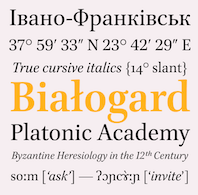 [More] ⦿
|
John Hudson
[Tiro TypeWorks]
|
[More] ⦿
|
John Quaranta
|
American designer/perfecter of ITC New Baskerville (1978-1982) based on glyphs drawn by George William Jones, John Baskerville (ca. 1757), and Matthew Carter. In 1978, he revived New Caledonia, after a W.A. Dwiggins original from 1938-1940. FontShop link. [Google]
[MyFonts]
[More] ⦿
|
John Stephenson
[Stephenson Blake]
|
 [MyFonts]
[More] ⦿
[MyFonts]
[More] ⦿
|
Jonathan Tipton-King
|
Creator of a few typeface anatomy posters for typefaces such as Baskerville and Archer, in 2012. Jonathan is a graphic design student in Fremont, CA. [Google]
[More] ⦿
|
Joseph Fry
[Fry]
|
[MyFonts]
[More] ⦿
|
Joseph Fry
|
Born in Birmingham, 1728-1787, Fry was a punchcutter. He became a typefounder in 1764 when he set up the Fry Letter Foundry in Bristol together with William Pine, a printer. He designed Fry's Baskerville (1768) and Old Face Open (Fry's Shaded) (1788). [Google]
[MyFonts]
[More] ⦿
|
Kak
[Katerina Kozhukhova]
|
 Kak is a Russian type and design magazine run by Peter Bankov and Katerina Kozhukhova. Alexander Tarbeev designed the typefaces KakC and DenHaag for the mag. This sub-page explains how to tell Bembo, Garamond, Janson, Caslon and Baskerville apart. Katerina Kozhukhova also designed a bouncy hand-printed typeface, Ka (Letterhead). [Google]
[More] ⦿
Kak is a Russian type and design magazine run by Peter Bankov and Katerina Kozhukhova. Alexander Tarbeev designed the typefaces KakC and DenHaag for the mag. This sub-page explains how to tell Bembo, Garamond, Janson, Caslon and Baskerville apart. Katerina Kozhukhova also designed a bouncy hand-printed typeface, Ka (Letterhead). [Google]
[More] ⦿
|
Kaly McKibben
|
Kaly McKibben, aka ncfwhitetigress, is a student at Ringling College of Art + Design in Sarasota, FL, class of 2015. She blended Andale Mono and Baskerville to get Andille (2012). [Google]
[More] ⦿
|
Katerina Kozhukhova
[Kak]
|
[More] ⦿
|
Kenneth Ormandy
|
 At Type@Paris 2016, Kenneth Ormandy (Vancouver, Canada) designed the Baskerville revival Johannise. [Google]
[More] ⦿
At Type@Paris 2016, Kenneth Ormandy (Vancouver, Canada) designed the Baskerville revival Johannise. [Google]
[More] ⦿
|
Kerns&Cairns
[Dyana Weissman]
|
 American type designer, b. 1980, who graduated from the RISD, and worked at Font Bureau (as Senior Custom Designer) and Type Network (as Custom Type Director) in Boston. She set up Kerns & Cairns, also in Boston. Interview at Daidala. Interview by Christian Palino. Her typefaces:
 - Materot: calligraphic.
- She expanded the Benton Sans family into an ultra for Toyota, commissioned by Saatchi&Saatchi.
- Baskerville was modified by her for Northeastern University (via Korn Design).
- She made a font for learning handwriting for TouchMath.
- Apotek (2020): a squared counter typeface family based on lettering on old medicine bottles seen in Oslo.
- Benton Modern Display (2008), co-designed with Richard Lipton at Font Bureau: Benton Modern Text was first prepared by Font Bureau for the Boston Globe and the Detroit Free Press. Design and proportions were taken from Morris Fuller Benton's turn-of-the-century Century Expanded, drawn for ATF, faithfully reviving this epoch-making magazine and news text roman. The italic was based on Century Schoolbook.
- A redesign of Matthew Carter's Postoni (1997), called Stilson (2009, with Richard Lipton and Jill Pichotta): Since 1997, The Washington Post's iconic headlines have been distinguished by their own sturdy, concise variation on Bodoni, designed by Matthew Carter. For the 2009 redesign, Richard Lipton, Jill Pichotta, and Dyana Weissman expanded the family with more refined Display & Condensed styles for use in larger sizes. Originally called Postoni, the fonts were renamed in honor of The Post's founder, Stilson Hutchins.
- Escrow Reading Edge (2016, Font Bureau). An extension of Cyrus Highsmith's Scotch Roman, Escrow (2006).
- Syfy Hero and Syfy Sidekick.
- Waldorf Astorai. An art deco typeface inspired by the lettering on the facade of Waldorf Astoria Hotel at 301 Park Avenue in New York City.
- Comedy Sans. A 12-style typeface commissioned by Comedy Central.
- Firdevs (2022). A digitization of a Victorian typeface drawn in Silivri Prison by political prisoner and journalist Fevzi Yazici, and named after Fevzi's wife.
- CTV Sans. For the Canadian TV network.
- ESPN College Football. A custom varsity font family developed together with Victoria Rushton and loyalkaspar.
- Peacock Sans (2020, with Victoria Rushton). A custom typeface for Peacock, NBC Universal's video streaming platform.
- GRab=vity Grotesk (2021, with Victoria Rushton and CSTM Fonts).
FontShop link. Type Network link. [Google]
[MyFonts]
[More] ⦿
|
Kevin Teh
|
During his studies at Billy Blue College of Design in Sydney, Australia, Kevin Teh designed the transitional typeface Hanglo (2016), which was inspired by Baskerville and Century Schoolbook. [Google]
[More] ⦿
|
Klaus Bartels
[Babylon Schrift Kontor]
|
[More] ⦿
|
Kris Holmes
|
 Born in Reedly, CA, in 1950. She studied calligraphy at Reed College with Lloyd Reynolds and Robert Palladino, and she studied roman brush writing in a workshop with Fr. Edward Catich. In New York, she studied lettering with Ed Benguiat at the School of Visual Arts. Later she studied calligraphy and type design with Hermann Zapf at Rochester Institute of Technology. She received her B.A. from Harvard University and her MFA from UCLA School of Theater, Film and Television, specializing in Animation. In 2012, she was honored with the Frederic W. Goudy Award in Typography from Rochester Institute of Technology, for her achievements in the lettering and typographic arts. Kris Holmes teaches type design at the Rochester Institute of Technology.
 Kris Holmes worked as a staff designer at Compugraphic Corporation in type design. She was part of the team that helped design the city fonts for Apple: Chicago, Geneva, Monaco, New York. [Kris did the truetype versions.] She founded the Bigelow&Holmes foundry in 1976 with Charles Bigelow. Kris Holmes has created over 300 typefaces, including the scripts Isadora, Kolibri, Apple Chancery, and Apple Textile. With Charles Bigelow, she co-designed Apple Capitals. Creator of the ubiquitous Lucida family around 1985 (with Charles Bigelow): Lucida Blackletter, Lucida Bright, Lucida Calligraphy, Lucida Casual, Lucida Console, Lucida Fax (1985), Lucida Handwriting, Lucida Math, Lucida Mono, Lucida Sans, Lucida Sans Typewriter, Lucida Typewriter (1994), Lucida. includes Greek, Cyrillic, Arabic, Hebrew, Thai, and Devanagari scripts. In addition to their popularity in computer operating systems like Macintosh OS X, Microsoft Windows, and Plan 9 from Bell Labs, Lucida typefaces have been widely used for scientific and technical publishing in Scientific American, Notes of the American Mathematical Society, and other mathematical, technical and scholarly books. Also with Bigelow, Kris designed the Lucida Icons, Stars, and Arrows fonts, which Microsoft later purchased and reassembled into Wingdings fonts. Other type designs by Holmes include ITC Isadora (1983), Sierra (1983, Hell: font now sold by Linotype), Leviathan (1979), Baskerville (revival in 1982), Caslon (revival, 1982), Galileo (1987), Apple New York (1991), Apple Monaco (1991), Apple Chancery (1994 [the Bitstream version is Cataneo]), Kolibri (1994, URW, since 2005 available as OpenType Pro with over 1200 glyphs), Wingdings (1990-1992, a dingbat font made with Charles Bigelow, now owned by Microsoft and Ascender) and AT Shannon (a simple lapidary sans family, with Janice Prescott, 1982, Agfa; now owned by Monotype Imaging). For the Go Project, Kris Holmes and Charles Bigelow designed the free typeface families Go and Go Mono in 2016. The font family, called Go (naturally), includes proportional- and fixed-width faces in normal, bold, and italic renderings. The fonts have been tested for technical uses, particularly programming. These fonts are humanist in nature (grotesques being slightly less legible according to recent research) and have an x-height a few percentage points above that of Helvetica or Arial, again to enhance legibility. The name Go refers to the Go Programming Language. . Fontsquirrel link. FontShop link. Klingspor link. Kernest link. View Kris Holmes's typefaces. [Google]
[MyFonts]
[More] ⦿
|
K.T. Kristian Möller
[KTKM]
|
 [MyFonts]
[More] ⦿
[MyFonts]
[More] ⦿
|
KTKM
[K.T. Kristian Möller]
|
 Karl Thomas Kristian Möller's foundry in Stockholm, est. ca. 2010, is called KTKM. He did a revival called Baskerville Old Face KTKM (2010), which aims to improve over the old Stephenson Blake version, about which Jan Tschichold wrote: The so-called Baskerville Old Face of the type foundry Stephenson Blake&Co. of Sheffield [...] is probably not immediately linked to Baskerville, but it is very much influenced by it. It is one of the most beautiful types of which the mats still exist; it has an incomparably different spirit than the streamlined re-cuts of today's Baskerville. Even keeping the general restraint extremely expressive. According to Berthold Wolpe (Signatures No. 18), the punches were cut and shown in samples in 1776 by Isaac Moore, who came from Birmingham to Bristol.
 Corporate typefaces by him include Quality Arrows (pictograams for Quality Hotel park in Södertäje, Sweden) and Hemköp Hand (for a grocery store). Unpublished typefaces: KM Caslon Antiqua (based on the Haas version), KM Caslon Kursiv, KM In Pectore (a display version of Bembo), KM Minerva (after a Linotype typeface by Reynolds Stone), KM Philatelie (an original antiqua), KM Ratio Latein Text (after Friedrich Wilhelm Kleukens's famous typeface Ratio Latein, 1925), KM Signwriter (a Trajan typeface after Eric Gill's instructions for the W.H. Smith bookstore), KM Universalitet. In 2013, he created Volunta Roman and Italic (a didone typeface). [Google]
[MyFonts]
[More] ⦿
|
Kulagina
|
Creator of Glace Accidental Typeface (2012). Kulagina is based in Saint Petersburg, Russia. She describes the process of creating Glace: This typeface was created by transforming Baskerville type into something new. Each letter was drawn on a paper by ink and then pressed with a CD cover. The received print has been scanned and retouched. [Google]
[More] ⦿
|
L'abbé Jaugeon
|
In 1675, Colbert invites the Acadé'mie des Sciences to make a grand study of all machines used in the arts. In 1696, l'abbé Jaugeon obliges with a study entitled "Etude des Arts de construire les caractères, de graver les poinçons de lettres, d'imprimer les lettres". From 1692 on, Jaugeon created a mathematical/geometric theory of letters, all inscribed in a 48 by 48 grid (for upper case) or a 16 by 48 grid (lower case). This gridding was to lead to the type style associated with Louis XIV, the Grandjean. Fast forward 200 years to Arthur Christian, director of the Imprimerie Nationale from 1895-1906, who wanted to prove that Jaugeon's ideas were also esthetically justified by asking Hénaffe (official punchcutter of the Imprimerie) to reproduce precisely Jaugeon's designs. The resulting typeface is called Jaugeon or Hénaffe. Noteworthy is that Philippe Grandjean in his Romain du roi was greatly inspired by Jaugeon. Grandjean made 21 typefaces and 44 initial caps sets, all between 1693 and 1745. [Google]
[More] ⦿
|
Laboratory of Digital Typography and Mathematical Software
[Antonis Tsolomitis]
|
 The Department of Mathematics of the University of the Aegean (Samos, Greece) has established a laboratory on Digital Typography and Mathematical Software in 2006. It supports the Greek language with respect to the TeX typesetting system and its derivatives. Antonis Tsolomitis (who lives in Karlovassi, Samos, and is a professor of Mathematics at that university) writes: After the support for Greek was added by A. Syropoulos and the first complete Greek Metafont font was presented by Claudio Beccari there was an obvious need, to be able to use a scalable Greek font with LaTeX. With this in mind, we developed the first Greek fontfamily in Type1 format with complete LaTeX support, called "Kerkis". Their Greek font Epigrafica (2006) is a modification of MgOpen-Cosmetica, which in turn was based on Optima. Tsolomitis is the author of the math font family Kerkis, and of GFS Complutum (2007, with George D. Matthiopoulos), which is based on a minuscule-only font cut in the 16th century (see also here).
 About GFS Complutum, they write: The ancient Greek alphabet evolved during the millenium of the Byzantine era from majuscule to minuscule form and gradually incorporated a wide array of ligatures, flourishes and other decorative nuances which defined its extravagant cursive character. Until the late 15th century, typographers who had to deal with Greek text avoided emulating this complicated hand; instead they would use only the twenty four letters of the alphabet separately, often without accents and other diacritics. A celebrated example is the type cut and cast for the typesetting of the New Testament in the so-called Complutensian Polyglot Bible (1512), edited by the Greek scholar, Demetrios Doukas. The type was cut by Arnaldo Guillén de Brocar and the whole edition was a commision by cardinal Francisco Ximénez, in the University of Alcalá (Complutum), Spain. It is one of the best and most representative models of this early tradition in Greek typography which was revived in the early 20th century by the eminent bibliographer of the British Library, Richard Proctor. A font named Otter Greek was cut in 1903 and a book was printed using the new type. The original type had no capitals so Proctor added his own, which were rather large and ill-fitted. The early death of Proctor, the big size of the font and the different aesthetic notions of the time were the reasons that Otter Greek was destined to oblivion, as a curiosity. Greek Font Society incorporated Brocar's famous and distinctive type in the commemorative edition of Pindar's Odes for the Athens Olympics (2004) and the type with a new set of capitals, revived digitaly by George D. Matthiopoulos, is now available for general use. He also made GFS Solomos (2007) and GFS Baskerville (2007; note that several sites state that GFS Baskerville Classic is due to Sophia Kalaitzidou and George D. Matthiopoulos). In 2010, Tsolomitis published txfontsb, in which he added true small caps and Greek to the txfonts package. These fonts form a family called FreeSerifB, in type 1, that covers Latin, Greek, many Indic languages, Armenian, chess symbols, astrology, music, domino, and tens of other ranges of symbols. GFSNeohellenicMath was published in 2018: The font GFSNeohellenicMath was commissioned to the Greek Font Society (GFS) by the Graduate Studies program "Studies in Mathematics" of the Department of Mathematics of the University of the Aegean, located on the Samos island, Greece. The design copyright belongs to the main designer of GFS, George Matthiopoulos. The OpenType Math Table embedded in the font was developed by the Mathematics Professor Antonis Tsolomitis. The font is released under the latest OFL license, and it is available from the GFS site at http://www.greekfontsociety-gfs.gr. The font is an almost Sans Serif font and one of its main uses is for presentations, an area where (we believe) a commercial grade sans math font was not available up to now. In 2019, Tsolomitis released the free New Computer Modern package. An outgrowth of Knuth's Computer Modern, the fonts cover Latin and accented Latin letters and combinations, Greek (monotonic and polytonic), Hebrew, Cherokee and Cyrillic, and basically any possible math glyph. He writes in 2020: As far as the NewCMMath font is concerned, this is a derivative of lm-math with a huge amount of improvements and new glyphs. Currently the font should at least match STIX fonts in glyph coverage. [...] Finally, a long awaited feature, a Book weight for ComputerModern is added (math included). It produces slightly heavier output suitable for book production with high resolution printing. Further changes were added in 2021. [Google]
[More] ⦿
|
Ladislas Mandel
|
 Born in 1921 in Transylvania, he trained at the Fine Arts Academy of Budapest (Hungary) and then at the Beaux-Arts in Rouen (Normandy, France). Ladislas Mandel was a stonecutter, painter and sculptor. However, he spent his life in France, mostly as a type designer at Deberny&Peignot, where he worked since 1954. In 1955, he headed the type atelier. He was taught by and cooperated with Adrian Frutiger during nine years at Deberny, finally succeeding Frutiger in 1963 as type director. In 1955, he was in charge of the transformation of the Deberny type repertoire from lead to phototype. He created original designs under the label International Photon Corporation, and turned independent designer in 1977. After that, he specialized in typefaces for telephone directories, and made, e.g., Colorado in 1998 with Richard Southall for US West. He cofounded the ANCT in Paris in 1985 and taught there and at Paris VIII. In 1998, he published the book Ecritures, miroir des hommes et des sociétés (éditions Perrousseaux), which was followed in 2004 by Du pouvoir de l'écriture at the same publisher. He died on October 20, 2006.
 - His typefaces for the Lumitype-IPC (International Photon Corporation) catalogue include originals as well as many interpretations of famous typefaces: Arabica Arabic (1975), Aster (1960-1970), Aurélia (1967), Baskerville (1960-1970), Bodoni (1960-1970), Bodoni Cyrillic (1960-1970), Cadmos Greek (1974), Cancellaresca, (1965) Candida (1960-1970), Caslon (1960-1970), Century (1960-1970), Clarendon (1960-1970), Edgware (1974), Formal Gothic (1960-1970), Frank Ruehl Hebreu (1960-1970: this is one of the most popular Hebrew typefaces ever), Gill Sans (1960-1970), Gras Vibert (1960-1970), Hadassah (1960-1970), Haverhill (1960-1970), Imprint (1960-1970), Janson (1960-1970), Mir Cyrillic (1968), Modern (1960-1970), Nasra Arabic (1972), Néo Vibert (1960-1970), Néo-Peignot (1960-1970), Newton (1960-1970), Olympic (1960-1970), Plantin (1960-1970), Rashi Hebreu, Sofia (1967), Sophia Cyrillic (1969), Sphinx (1960-1970), Textype (1960-1970), Thai (1960-1970), Thomson (1960-1970), Times Cyrillic (1960-1970), Univad (1974), Weiss (1960-1970).
- Types done or revived at Deberny&Peignot: Antique Presse (1964, Deberny&Peignot), Times (1964). A note here: many type experts believe that Antique Presse is not by Mandel. According to Production Type, it was established that Adrian Frutiger, then art director of Deberny&Peignot, was more likely the mind behind Antique Presse. As further proof, Antique Presse quite blatantly follows Frutiger's Univers pattern on many levels.
- Types for phone directories: Clottes (1986, Sneat - France Telecom), Colorado (1998, U.S. West, created with the help of Richard Southall), Galfra (1975, Seat, Promodia, Us Seat, English Seat: there are versions called Galfra Italia (1975-1981), Galfra Belgium (1981), Galfra UK (1990), and Galfra US (1979-1990)), Lettar (1975, CCETT- Rennes), Letar Minitel (1982-1983), Linéale (1987, ITT-World Directories), Lusitania (1987, ITT-World Directories), Nordica 1985 (ITT-World Directories: Nineuil says that this is done in 1987-1988), Seatypo Italie (1980).
- Other typefaces: Portugal, Messidor (1983-1985, old style numerals font for the Imprimerie Nationale), Solinus (great!!, 1999), Laura (1999).
Ladislas Mandel, l'homme derrière la lettre is Raphael de Courville's thesis in 2008 at Estienne. In 1999, Olivier Nineuil wrote Ladislas Mandel: Explorateur de la typo français (Etapes graphiques, vol. 10, pp. 44-64). Olivier Nineuil's description of his achievements. [Google]
[MyFonts]
[More] ⦿
|
Lars Bergquist
[Timberwolf Type]
|
 [MyFonts]
[More] ⦿
[MyFonts]
[More] ⦿
|
Laurie Millotte
|
Young French graphic designer who graduated in 2006 from Ecole Estienne. She lives temporarily in Vancouver. Typefaces by her include Personal (handwriting) and Funambule (experimental). Her thesis at Estienne was entitled Baskerville: rupture ou continuité? [Google]
[More] ⦿
|
Lazar Dimitrijevic
[Posterizer KG]
|
 [MyFonts]
[More] ⦿
[MyFonts]
[More] ⦿
|
Lazy Dog Foundry (or: Franklin Type Founders)
[Willie Ford]
|
St. Paul, MN-based foundry run by Willie Ford, who at one point headed the graphic design deartment at Sarah Lawrence College in Yonkers, NY. Franklin Type Founders includes a collection of fonts from Lazy Dog Foundry but has also a library of fonts licenced from International Typeface Corporation (ITC) and, with the backing of URW++, from a number of smaller foundries. Some Lazy Dog fonts: Belmondo, Berliner, BigBlack, Boomerang, Bostonia (a gothic font), Chieftain Solid / Inline, Cypress, Durango, Emporium, Glorietta, GrecoDeco Solid / Inline, Harpers, Isadora, Little Louis, Manhattan, Medina, Minneapolis, Mississippi, Neuland Solid / Inline, Nova Bold, Riverboat, Schwere, Shrifteen, Socrates, Tombstone Outline / Solid, Thermo, Uptown, Yitsui. All fonts made in 1992. I have been looking for Willie Ford. The most interesting match is here. Font Factory sells these Franklin Type Founders fonts: Aster, Augustea, Barcelona, Baskerville Hancut, Berliner, Beton, Big Black, Blackboard, ITC Bolt Bold, Boomerang, Bordeaux, Bostonia, Brody, Bullfinch, Busorama, Cabaret, Camellia, Castle, Catherine, Chelmsford, Chieftan, Chisel, Colwell, Cypress, Diskus, Durango, Einhorn, Emporium, Erin Lynn, Fat Face, Flash, Glorietta, Greco, Harpers, Harris, Herald, Honda, Horndon, Ice Age, Isadora, Latin Tall, Lazy Script, Legriffe, Liberty, Lindsay, Little Louis, Madison, Magna, Magnus, Manhattan, Marker, Medina, Minneapolis, Mississippi, Nadall, national Modern, National Oldstyle, Nevision Casual, Nova, Pajamas, Phyllis Script, Piccadilly, Plaza, Primus, Punch, Quentin, Railroad, Recess, Riverboat, Rumpus, Scaffold, Schwere, Schrifteen, Slipstream, Socrates, Sophie, Sterling, Superstar, Synchro, Thermo, Timeless, Times Coop, Titus Light, Tombstone, Uptown, Victorian Script, Vienna, Weifz Rundfchrift, Windsor, Worcester, Yitsui. [Google]
[More] ⦿
|
Liam Basford
|
Graphic designer from Birmingham who is studying typography and graphic design at the University of Reading in 2013. He used Baskerville as a model to create the transitional typeface Virgil (2013). Behance link. [Google]
[More] ⦿
|
Linotype Library GmbH
|
Large type German foundry Linotype controlling over 4000 fonts. The company was located in Bad Homburg since 1998. It was acquired by Monotype Imaging in 2006, after more than a decade under the helm of Bruno Steinert. On January 29, 2024, Monotype sent this message: As part of a consolidation of its online offerings, the Monotype Group has decided to discontinue the operation of Monotype GmbH's online store LinoType, effective 28.03.2024, and to transfer/novate this business unit in its entirety to MyFonts Inc. of 600 Unicorn Park Drive, Woburn, MA 01801---also a company of the Monotype Group. And that is the end of Linotype. Linotype wrote about itself in 2008: Linotype GmbH, based in Bad Homburg, Germany and a wholly owned subsidiary of Monotype Imaging Inc., looks back onto a history of more than 120 years. Building on its strong heritage, Linotype develops state-of-the-art font technology and offers more than 9,000 original typefaces, covering the whole typographic spectrum from antique to modern, from east to west, and from classical to experimental. All typefaces (in PostScript(tm) and TrueType(tm) format as well as more than 7,000 fonts in OpenType(tm)) are now also available for instant download at www.linotype.com. In addition to supplying digital fonts, Linotype also offers comprehensive and individual consultation and support services for font applications in worldwide (corporate) communication. It publishes frivolous/experimental font collections under the name Taketype (1 through 4 now), and regularly publishes reworked classic and original text type families such as Compatil, Vialog, Satero, Linotype Sabon, Linotype Frutiger, Linotype Optima, and Linotype Univers. Its designers. A time line: - 1886: Ottmar Mergenthaler invented the Linotype machine.
- 1890: Mergenthaler establishes the Mergenthaler Linotype Company in Brooklyn, USA.
- 1895: The D. Stempel foundry was born.
- 1915: D. Stempel takes over the type foundry Roos&Junge, Offenbach (established in 1886).
- 1917: D. Stempel acquires a majority share of the type foundry Klingspor Bros., Offenbach.
- 1918: D. Stempel takes over the type foundry Heinrich Hoffmeister, Leipzig (established in 1898).
- 1919: D. Stempel acquires the type division of W. Drugulin, Leipzig (established in 1800) and a share of the type foundry Brötz&Glock, Frankfurt (established in 1892).
- 1927: D. Stempel acquires a shareholding in the Haas'sche type foundry in Basel/Münchenstein (established in 1790).
- 1933: D. Stempel acquires a shareholding in the type foundry Benjamin Krebs (Successors), Frankfurt (established in 1816).
- 1956: D. Stempel AG acquires full ownership of the type foundry Klingspor Bros., Offenbach (established in 1906).
- 1963: Linotype takes over the type foundry Genzsch + Heyse, Hamburg (established 1833).
- 1970: Stempel takes over part of the type collection of C.E. Weber (Stuttgart, est. 1927).
- 1972: The Haas'sche type foundry in Basel/Münchenstein takes over the type foundry Deberny&Peignot, Paris.
- 1978: The Haas'sche type foundry takes over Fonderie Olive, Marseille (established in 1836).
- 1985: Linotype takes over of the type division of D. Stempel AG.
- 1989: Linotype takes over the Haas'sche type foundry (established in 1790).
- 1990: Linotype AG merges with Hell GmbH to become Linotype-Hell AG.
- 2006: Acquired by Monotype Imaging.
- 2024: On January 29, 2024, Monotype sent this message: As part of a consolidation of its online offerings, the Monotype Group has decided to discontinue the operation of Monotype GmbH's online store LinoType, effective 28.03.2024, and to transfer/novate this business unit in its entirety to MyFonts Inc. of 600 Unicorn Park Drive, Woburn, MA 01801---also a company of the Monotype Group. And that is the end of Linotype.
MyFonts link for Linotype Design Studio. Catalog of the typefaces in Linotype's library [large web page]. View Linotype's library of typefaces in alphabetical order. [Google]
[MyFonts]
[More] ⦿
|
Louise Riström
|
Swedish art director who made Homemade Baskerville (2010). [Google]
[More] ⦿
|
Loyalist College
|
An assignment given by Hersh Jacob at Loyalist College in Belleville, Ontario led to a number of pages on the main type designers such as Bodoni, Garamond, Goudy, Baskerville, and Dwiggins. [Google]
[More] ⦿
|
Luciano Perondi
[Molotro]
|
 [MyFonts]
[More] ⦿
[MyFonts]
[More] ⦿
|
Maggie Janssen
|
 Graduate of the University of Minnesota Duluth, class of 2012. Located in St. Paul, MN, she created Dotted (2013), a typeface inspired by the Ishihara color blind tests and taking the forms of Baskerville. [Google]
[More] ⦿
Graduate of the University of Minnesota Duluth, class of 2012. Located in St. Paul, MN, she created Dotted (2013), a typeface inspired by the Ishihara color blind tests and taking the forms of Baskerville. [Google]
[More] ⦿
|
Marath Salychow
|
 Marath Salychow (b. 1980) is the Moscow-based designer of the free typefaces Alhueia (2001, for Greek) and Akademie Alte (2016, for Latin and Cyrillic; based on a Berthold original from 1910).
 In 2017, he designed the free typeface Literaturnaya, which is modeled after Anatoly Schtschukin's Literaturnaya (1936). He also made the free didone typeface Chekhovskoy that year, after the Elizavetinskaya typeface (1904, Lehmann foundry, Saint Petersburg). Typefaces from 2018: Elisabethische (after Jelisawethinskaja, 1904, Lehmann Foundry), MGA (a great Latin / Cyrillic Garamond), Akademitscheskaya (a revival of the Akademitscheskaya Berthold Garnitur from 1910). Typefaces from 2019: Kornilow. A free didone-Baskerville hybrid for Latin and Cyrillic, named after White Army general Lawr Georgijewitsch Kornilow. Open Font Library link. [Google]
[More] ⦿
|
Marcela Garza Garza
|
During her graphic design studies at the University of Monterrey, Marcela Garza Garza (Nuevo Leon, Mexico) created the experimental multiline typeface Cromwell Road (2013) and Spinto (2013). Spinto is inspired by Italian advertisements from 1890 until 1920, and has didone and Baskerville roots. In 2014, she designed the book typeface Econ. [Google]
[More] ⦿
|
Matthew Butterick
[MB Type]
|
[MyFonts]
[More] ⦿
|
Matthew Carter
|
 Matthew Carter (born in London in 1937, and son of Harry Carter) is one of today's most influential type designers. He trained as a punchcutter at Enschedé in 1956. In 1963 he was hired by Crosfield, a firm that pioneered the new technology of photo-typesetting, to lead their typographic program. He worked for Mergenthaler Linotype (1965-1981), and co-founded Bitstream Inc. with Mike Parker in 1981, adapting many fonts to digital technology. In January 1992, he founded Carter&Cone with Cherie Cone, and often collaborated with Font Bureau. In 1995, he won the Gold Prize at the annual Tokyo Type Directors Club competition for Sophia. In 1997, he received the TDC Medal for significant contributions to the life, art, and craft of typography. In 2010, he received a MacArthur grant. He lives in Cambridge, MA.
 John Berry on Carter's art (2002). Apostrophe comments on Berry's article. Interview. His fonts: - The Microsoft screen fonts Verdana (1996), Georgia (1996), Georgia Greek, Georgia Cyrillic, Nina and the humanist sans typeface Tahoma (1994). Georgia (in roman and italic only) is a screen version of Miller, Carter's Scotch design. Nina was designed to address the requirements on smaller screens such as phones, and was used in Windows Mobile smartphones before Microsoft switched to Segoe. The Greek and Cyrillic versions of Nina were developed by François Villebrod. Georgia Pro (2010, Ascender) was developed from Georgia with the help of Steve Matteson. For Verdana Pro (2010, Ascender), Carter was assisted by David Berlow and David Jonathan Ross.
- Apple's Skia (1993), a sans serif designed with David Berlow for Apple's QuickDraw GX technology, now called AAT. [Carter's Skia and Twombly's Lithos are genetically related.]
- Monticello (2003), based on Linotype's Monticello (1950), which in turn goes back to Binny&Ronaldson's Monticello from 1797, a typeface commissioned by Princeton University Press for the Papers of Thomas Jefferson. It is in the Scotch roman style.
- Miller (1997, Font Bureau), an extremely balanced family co-designed by Carter, Tobias Frere-Jones and Cyrus Highsmith. Carter explains: Miller is a Scotch Roman, a style that had its beginnings in the foundries of Alexander Wilson In Glasgow and William Miller in Edinburgh between about 1810 and 1820. It is considered that the punchcutter Richard Austin was responsible for the types of both Scottish foundries. Miller is a revival of the style, but is not based on any historical model. Now, there is also a 16-weight newspaper version, Miller Daily (2002), and an 8-weight Miller Headline (2002). This was followed by News Miller, a typeface designed for the Guardian. Note: Georgia (1996) is a screen version of Miller, and Monticello (2002) is a later modification. A comparison of these typefaces.
- Alisal (1995, +Bold).
- ITC Galliard (1978), a recreation of Robert Granjon's garalde letters. This typeface was originally conceived in 1965. Bringhurst recommends a Carter and Cone version of this font, called Galliard CC: it has old style figures and small caps. Further versions include Aldine 701 (Bitstream), Matthew (Softmaker), ITC Galliard Etext (2013, Carl Crossgrove, Linotype), and Gareth (Softmaker).
- The ITC Charter family (1987 for Bitstream and known as Bitstream Charter; licensed to ITC in 1993; see the Elsner&Flake version of ITC Charter). An upgraded commercial version was released by Bitstream in 2004 under the name Charter BT Pro.
- Vincent (1999), a font commissioned for use in Newsweek. It is named after Vincent Figgins, an English foundry owner and punch cutter who lived in the late 18th century.
- Walker (1994), designed for The Walker Art Center.
- Ionic Number One (1999, Carter&Cone).
- Mantinia (1993, Font Bureau), based on inscriptional forms, both painted and engraved, by the Italian renaissance artist Andrea Mantegna.
- Big Caslon (1994, Font Bureau), a display typeface based on the largest romans from William Caslon's foundry.
- Big Figgins (1992) and Big Figgins Open (1998, based on the decorative didone types shown in the specimens of Vincent Figgins of 1815 and 1817). Big Figgins was called Elephant and Elephant Italic in Microsoft's Truetype Fontpack 2.
- Sammy Roman (1996), loosely based on the 17th century romans of Jean Jannon. A beautiful typeface designed to accompany kanji and kana typefaces produced by Dynalab in Taiwan.
- Sophia (1993, Font Bureau), a mix with Greek, uncial and classical Roman influences.
- Shelley Script (1972), a family of formal scripts, split into Andante, Volante and Allegro. It is based on intricate English scripts of the 18th and 19th centuries attributed to George Shelley.
- Cochin (1977, at Linotype). MyFonts writes: In 1913 Georges Peignot produced a typeface based on Nicolas Cochin's eighteenth century engravings. In 1977, Matthew Carter expanded this historic form into a three part series.
- Bell Centennial (Linotype-Mergenthaler, 1975-1978), a legible heavily ink-trapped family designed by Matthew Carter as a replacement of Bell Gothic at Mergenthaler. There are also digital Linotype and Bitstream versions. AT&T commissioned the font to replace their previous typeface choice Bell Gothic for their 100th Anniversary.
- Cascade Script (1965-1966, Linotype, now also known as Freehand 471 BT in the Bitstream collection). Paratype's extension of Freehand 471 to Cyrillic is by Oleg Karpinsky (2011).
- New Century Schoolbook was designed from 1979-1981 in the New York Lettering office of Merganthaler Linotype based on Morris Fuller Benton's Century Schoolbook from 1915-1923. It was the second face, after New Baskerville, that was digitized and expanded using Ikarus (digital technology). The Bitstream version [Century Schoolbook] is a virtually exact copy, only being moved from a 54 unit to a 2000 or so unit design.
- Auriol (Linotype), an art nouveau family (including Auriol Flowers 1 and 2 and Auriol Vignette Sylvie) based on the lettering of the painter and designer Georges Auriol. MyFonts explains: Auriol and Auriol Flowers were designed by Georges Auriol, born Jean Georges Huyot, in the early 20th century. Auriol was a French graphic artist whose work exemplified the art nouveau style of Paris in the late 19th and early 20th centuries. In 1900, Georges Peignot asked Auriol to design fonts for Peignot&Sons. The resulting Auriol font was the basis for the lettering used by Hector Guimard for the entrance signs to the Paris Metro. It was re-released by Deberny&Peignot in 1979 with a new bold face, designed by Matthew Carter. These decorative fonts with a brush stroke look are well-suited to display settings. The Peignot drawing office insisted on a more normal appearance in the boldface, calling it Robur. Matthew Carter has returned to Auriol's original design for the whole series.
- Helvetica Greek (Linotype).
- Helvetica Compressed (Linotype, 1974, with Hans-Jörg Hunziker).
- Wilson Greek (1995), compatible with Miller Text, and based on a type cut by Alexander Wilson for the Glasgow Homer of 1756. See here.
- Olympian (1970, Linotype), designed for newspaper use. This is Dutch 811 in the Bitstream collection. The custom typeface Milne (Carter&Cone) done for the Philadelphia Inquirer is based on Olympian.
- Gando, a French "ronde" typeface based on the work of Nicholas Gando (mid 1700s), and designed for photo-typesetting at Mergenthaler by Carter and Hans-Jörg Hunziker in 1970. Very similar to Bitstream's Typo Upright.
- Fenway (1998-1999, Carter&Cone), commissioned by Sports Illustrated to replace Times Roman.
- Snell Roundhand (1965-1966): a connected cursive script based on the 18th-century round hand scripts from English writing masters such as Charles Snell. Early in the digital era, Matthew published this in the Bitstream collection as Roundhand BT. A Cyrillic version by Isabella Chaeva and Vladimir Yefimov was released by ParaType in 2013.
- Auriga (1970). (Wallis dates this in 1965 at Linotype.)
- CRT Gothic (1974).
- Video (1977).
- V&A Titling (1981).
- Deface (in the FUSE 18 collection).
- Madrid (2001), done for the Spanish newspaper El País.
- Milne, done for the Philadelphia Inquirer (a revised version of Olympian). Not available.
- Durham, a sans serif family for US News&World Report.
- Airport.
- Century 725 (Bitstream, for the Boston Globe: after a design by Heinrich Hoffmeister).
- For Microsoft: Georgia, Verdana, Tahoma (1994), Nina.
- Freehand 471 (Bitstream). A chunky slightly angular script.
- New Baskerville. [Matthew Carter says that this is wrongly attributed to him. It was directed by John Quaranta.]
- Postoni [or Post-Bodoni], for the Washington Post, which is still using it. See here.
- Le Bé, a Hebrew typeface that was used in the Pennyroyal Caxton Bible.
- Rocky (2008, Font Bureau, with Richard Lipton), for the Herald in Scotland.
- Time Caledonia.
- Wiredbaum, for WIRED.
- Wrigley (for Sports Illustrated). Matthew Carter designed Roster in the 1990s, and it was adopted as a display face for Sports Illustrated under the name Wrigley. Jesse Ragan was instrumental in later expanding the family from its original seven styles to the current 60. In 2015, Carter & Cone and Font Bureau released an expanded 60-style family of this typeface under the new name Roster.
- Benton Bold Condensed (for Time Magazine).
- Foreman Light (for the Philadelphia Inquirer).
- Newsbaum (for the New York Daily News).
- Carter Latin: Matthew was commissioned in 2003 to create a new design to be cut in wood type by the Hamilton Wood Type&Printing Museum in Two Rivers, WI. He came up with an all-caps, chunky, Latin-serif design.
- Times Cheltenham (2003), which replaces in 2003 a series of headline typefaces including Latin Extra Condensed, News Gothic, and Bookman Antique.
- The Yale Typeface (2004), inspired by the late fifteenth-century Venetian typeface that first appeared in Pietro Bembo's De Aetna, published by Aldus Manutius. This extensive family is freely available to members of Yale University.
- DTL Flamande (2004, Dutch Type Library), based on a textura by Hendrik van den Keere. Since 2018, available from URW++. Additions to DTL Flamande by Lukas Schneider.
- Meiryo UI, Meiryo UI Bold, Meiryo UI Bold Italic, Meiryo UI Italic (2004). Meiryo is a modern sans serif Japanese typeface developed by Microsoft to offer an optimal on screen reading experience and exceptional quality in print, as part of the Cleartype project. The Japanese letterforms are generously open and well-proportioned; legible and clear at smaller sizes, and dynamic at larger display sizes. The beauty of Meiryo is that it sets text lines in Japanese with Roman seamlessly and harmoniously. Meiryo was designed by a team including C&G Inc., Eiichi Kono, Matthew Carter and Thomas Rickner. It won a 2007 type design prize from the Tokyo Type Directors.
- Suntory corporate types (2003-2005), developed with the help of Akira Kobayashi and Linotype from Linotype originals: Suntory Syntax, Suntory Sabon, Suntory Gothic, Suntory Mincho.
- Rocky (2008, Font Bureau): A 40-style high contrast roman family that is difficult to classify (and a bit awkward). Developed with Richard Lipton.
- Carter Sans (2010, ITC), based on epigraphic letters used in inscriptions. Created for the identity of the Art Directors Club 2010 class of its Hall of Fame, one the laureates in the 2010 Hall of Fame. Codesigned by Dan Reynolds, this chiseled typeface is loosely based on Albertus.
- In 1997, he designed Postoni for the The Washington Post's headlines, a sturdy Bodoni.
- MS Sitka (2013). A typeface with six optical sizes that are chosen on the fly if an appropriate application is present. Developed at Microsoft with the help of John Hudson (Tiro Typeworks) and Kevin Larson (who carried out extensive legibility tests). German link. Typophile link. Sitka won an award at Modern Cyrillic 2014.
- Van Lanen Wood Type (Hamilton Wood Type, 2002-2013). Carter started work on the wood type in 2002, but technical accuracy issues postponed the implementation. Digital versions were finally done in 2013 by P22's Hamilton Wood Type.
- Big Moore (2014, Font Bureau): A 1766 specimen by Isaac Moore, former manager of Joseph Fry's foundry in Bristol, England, shows many types inspired by John Baskerville. But a century later, standardization had foisted inept lining figures and shortened descenders upon these designs. Matthew Carter remedies the tragedy with Big Moore. Oldstyle figures, full-length descenders, and historic swashes are restored to this regal serif in two styles. Big Moore won an award in the TDC 2015 Type Design competition.
- Role (2019, Sans, Slab, Serif, Soft). A superfamily published at Morisawa and Fontelier. Matthew Carter, Shotaro Nakano, and Kunihiko Okano co-designed Role Serif at Morisawa.
Speaker at ATypI 2013 in Amsterdam. Speaker at ATypI 2019 in Tokyo on the topic of Expressing Vocal Tones through Typography. Linotype link. FontShop link. Favorite quote: Watching me work is like watching a refrigerator make ice. Another quote: A typeface is a beautiful collection of letters, not a collection of beautiful letters. View Matthew Carter's typefaces. Matthew Carter's fonts. The typefaces made by Matthew Carter. See also here. Wikipedia page. Klingspor link. [Google]
[MyFonts]
[More] ⦿
|
MB Type
[Matthew Butterick]
|
 Matthew Butterick (b. 1970, Michigan) grew up in New Hampshire. He got his B.A. degree from Harvard University in visual&environmental studies, also studying mathematics and letterpress printing. His work is in the permanent collection of the Houghton Library at Harvard. Butterick started his design career at the Font Bureau as a typeface designer and engineer. At the beginning of the Internet era, he moved to San Francisco and founded website design and engineering company Atomic Vision. Atomic Vision was later acquired by open-source software developer Red Hat. More recently, Butterick got a law degree from UCLA and has been practicing civil litigation in Los Angeles, Butterick Law Corporation. He operates a web site called Typography for Lawyers and another one called Butterick's Practical Typography.
 In 2010, he published Typography for Lawyers. MyFonts link. FontShop link. Klingspor link. Font Bureau link. He has some great one-liners, such as The only good Copperplate is a dead Copperplate. Matthew Butterick's creations: - Agitprop: in the FUSE 12 collection.
- Wessex (1993): A family published at Font Bureau in 1993. Font Bureau writes: Initially conceived by Matthew Butterick as a Bulmer revival, Wessex took on characteristics of Baskerville&Caledonia as design proceeded. In 1938, W.A. Dwiggins had taken the hard necessities of the non-kerning line-caster italic duplexed onto the same widths as roman, and turned them into design virtues. Inspired by the surprising beauty of his wide-bodied Caledonia italic, Butterick used it as a model for Wessex.
- Hermes (1995, 2010, Font Bureau). Blurb at Font Bureau: Schriftguss and Wollmer called it Hermes; Berthold called it Block. Hermann Hoffmann's 1908 design inspired FB Hermes, which evokes the German grotesks that were workhorses of factory printing 100 years ago. Blunt corners suggest the wear and tear of rough presswork. Matthew Butterick created the original styles in 1995. In 2010, he added more weights, italics, and alternate glyphs to expand the family's versatility. Currently, the family contains Hermes Classic and Hermes Maia.
- Triplicate. A large family of typewriter fonts that feature both monospacing and proportional spacing.
- HeraldGothic (1993, Font Bureau). A condensed typeface with bevelled, or octagonal, corners.
- Chunk.
- Alix FB (2011, Font Bureau). A monospaced family based on two IBM selectric typewriter face, Prestige Elite and Light Italic.
- Equity (2011) is a readable text family, based on Ehrhardt.
- Berlin Sans (1994). Font Bureau: Berlin Sans is based on a brilliant alphabet from the late twenties, originally released by Bauer with the name Negro, the very first sans that Lucian Bernhard ever designed. Assisted by Matthew Butterick, David Berlow expanded this single font into a series of four weights.
- Advocate and Advocate Slab (2015-2017). A large sans and slab family. Caps only.
- Concourse (2013-2017). A large sans family.
- Valkyrie (2018).
- Century Supra (2018). A modern typeface.
[Google]
[MyFonts]
[More] ⦿
|
Melvin Poppelaars
|
Digital artist in Breda, The Netherlands, who made some nice posters that showcase Baskerville (2010). [Google]
[More] ⦿
|
Michael Best
|
Many free Sanskrit-diacritic typefaces here, all designed by Murari Dasa (was Madhava Dasa), aka Michael Best, who is the oldest son of Pratyatosa Dasa. The fonts: Tamal (1993, based on Times Ten), Bhaskar (NewBaskerville), Devanagari (well, this is a true Devanagari font done in 1995), Drona (Dutch), Garuda (FuturaCondensed), Gaudiya (Goudy), Hladini (Helvetica), Karuna (Courier), Shanti (Sabon), Avatar (Avenir), Bhimasena (Benguiat), Gauranga (FormalScript), Kunti (KuenstlerScript), Kurma (Cooper), Uttama (University Roman), Yama (TempHeavyCondensed). In 1996-1997, Best designed the Tamil font Indevr20, with copyright to The Bhaktivedanta Book Trust. All his fonts on one zip file. [Google]
[More] ⦿
|
Michael Sharpe
[BaskervilleF and Baskervaldx]
|
[More] ⦿
|
MicroLogic Software
[Frank Hainze]
|
Frank Hainze (Emeryville, CA) used to sell typefaces such as Adorable, Artisan, Celebrity, Crescent, Duchess, Elegance, Formal, Heather, Imperial, ImperialBold, ImperialBoldItalic, ImperialItalic, Legend, MajesticBold, MasonBook, MasonBookOblique, MasonDemi, MasonDemiOblique, Opera, Salsa, Samurai, Victorian (blackletter, 1994), Wedding. No longer in business. The fonts are still out there, however. For example, check Samurai here. Ulrich Stiehl documents all forged fonts on the PrintMaster CD and reports that the quality is remarkably good. Examples: Advantage = ITC Avant Garde Gothic, Architect = Adobe Tekton, Editor = ITC American Typewriter, Enchanted = ITC Korinna, Fantasy = ITC Tiffany, Gallery = ITC Galliard, Geneva = Linotype Helvetica, Gourmand = ITC Garamond, Imperial = ITC New Baskerville, Manuscript = Linotype Palatino, Mason = ITC Lubalin Graph, Mirage = ITC Benguiat, Optimum = Linotype Optima, Tiempo = Monotype Times. [Google]
[More] ⦿
|
Mike Charness
[WSI: Weatherly Systems Inc]
|
[More] ⦿
|
Mitek
|
Czech site with several free fonts developed in a mathematically precise manner: - A Unicode-compliant serifed typeface Mides (2004), which has well over a thousand glyphs and fills most of the early part of the Unicode table.
- Tapir (2004; a sans family with simple geometric shapes and lines of constant thickness comes in metafont and type 1).
- Faldix.
- Fixka (handprinting style glyphs), FixkaBold, FixkaBoldItalic, FixkaItalic.
- TriGande (a sans family), TriGandeB lunet, TriGandeBlunetBold, TriGandeBlunetBoldItalic, TriGandeBlunetItalic, TriGandeBold, TriGandeBoldItalic, TriGandeItalic.
- Zabyris, ZabyrisBold.
- Bobdel.
- Boisik (2008) is a 20-font Baskerville-inspired metafont family with math symbols and full Czech accents. It has an Opentype version as well.
Most typefaces come in type 1 and metafont versions. Metafont-only typefaces include Bobdel, Midings and Mishapes. Alternate URL for Tapir. I can't figure out who designed these typefaces. [Google]
[More] ⦿
|
Modern Typography
[Paul Barnes]
|
 Modern Typography is a dot com web presence organized by the London-based type designer and graphic designer, Paul Barnes (b. 1970), typophile extraordinaire. It is promised to have plenty of material for the typophile. In the 1990s, Paul Barnes worked for Roger Black in New York where he was involved in redesigns of Newsweek, US and British Esquire and Foreign Affairs. During this time he art-directed Esquire Gentleman and U&lc. He later returned to America to be art director of the music magazine Spin. Since 1995 he has lived and worked in London. He has formed a long term collaboration with Peter Saville, which has resulted in such diverse work as identities for Givenchy and numerous music based projects, such as Gay Dad, New Order, Joy Division and Electronic. Barnes has also been an advisor and consultant on numerous publications, notably The Sunday Times Magazine, The Guardian and The Observer Newspapers, GQ, Wallpaper, Harper's Bazaar and Frieze. Following the redesign of The Guardian, as part of the team headed by Mark Porter, Barnes was awarded the Black Pencil from the D&AD. They were also nominated for the Design Museum Designer of the Year. In September 2006, with Schwartz he was named one of the 40 most influential designers under 40 in Wallpaper. He cofounded Commercial Type with Christian Schwartz. Author of Swiss Typography: The typography of Karl Gerstner and Rudolf Hostettler (Modern Typography, 2000).
 His typefaces: - The (free) font Pagan Poetry (2001), done for one of the sleeves on Björk's albums. The font was made for Show Studio (see also here and here).
- Codesigner with Christian Schwartz in 2005 of the 200-font family Guardian Egyptian for The Guardian, about which he spoke at ATypI 2006 in Lisbon.
- In 2007, he worked with Peter Saville on the Kate Moss brand. As a font, he suggested a variation on Brodovitch Albro, a typeface by Alexey Brodovitch, the famous art director of Harper's Bazaar from 1934-58. The Creative Review reactions to this typeface are a bit negative though.
- In 2003, he created Austin, a high-contrast modern typeface. Now available at Schwartzco and at Commercial Type, Christian Schwartz writes: When hired to design a new headline typeface for Harper's&Queen, Britain's version of Harper's Bazaar, Paul thought to flick back through the pages of its 60's precursor, the über cool Queen. The high contrast serif headlines were lovely, but a little too expected in a contemporary fashion magazine. Some time poring through specimens in St Bride's Printing Library inspired the perfect twist: rather than taking our cues from Didot or Bodoni, we would start with [Richard] Austin's first creation, turn up the contrast, tighten the spacing and make a fresh new look that would look bold and beautiful in the constantly changing world of fashion. The end result is Richard Austin meets Tony Stan, British Modern as seen through the lens of late 1970s New York. iThe Cyrillic version was designed in 2009 and 2016 by Ilya Ruderman (CTSM Fonts).
- Dala Floda (1997-now) is based on gravestone inscriptions, and was turned in 2010 into a logotype stencil family at Commercial Type. As a stencil family, it is praised by the typophile community. Realted is the semi-stencil typeface family Dala Moa.
- Publico was designed from 2003-2006 with Christian Schwartz, Ross Milne and Kai Bernau. Originally called Stockholm and then Hacienda, and finally Publico for a Portuguese newspaper by that name. Publico Text Mono (Christian schwartz and Paul Barnes) was commissioned in 2012 for Bloomberg Businessweek. Greg Gadzowicz added the italics, which are optically corrected obliques, in keeping with the un-designed aesthetic, in 2014.
- Brunel (1995-now): an English modern, this is an anthology of the late eighteenth and nineteenth century English foundries. It was drawn from original source material, most notably the Caslon foundry and the work of John Isaac Drury).
- Marian (2012) is a type experiment based on Garamond, consisting of 19 hairline styles with names referring to dates between 1554 and 1812. Commercial Type writes: Marian is a series of faithful revivals of some of the classics from the typographic canon: Austin, Baskerville, Bodoni, Fournier, Fleischman, Garamont, Granjon, Kis and van den Keere. The twist is that they have all been rendered as a hairline of near uniform weight, revealing the basic structure at the heart of the letterforms. Together they represent a concept: to recreate the past both for and in the present. [...] Faithful to the originals, Marian comes with small capitals in all nine roman styles, with lining and non-lining figures, with swash capitals (1554, 1740, 1800&1820), alternate and terminal characters (1554&1571). And like the hidden track so beloved of the concept album, Marian is completed by a Blackletter based on the work of Henrik van den Keere.
- His classics series, mostly influenced by old Britsh type foundries, includes Figgins Sans (original 1832), Besley Grotesque, Caslon Antique, Fann Street Clarendon, Caslon Italian, Blanchard, Thorowgood Sans, Antique No. 6, Antique No. 3, and Ornamented (original c. 1850 at Caslon, Barnes use a Steven Shanks interpretation).
- VF Didot (2013) is a custom Didot by Paul Barnes and Christian Schwartz for Vanity Fair, as requested by its design director, Chris Dixon. Based on work of Molé Le Jeune, a punchcutter used by the Didot family in the early part of the 19th century, VFDidot has 7 optical sizes and up to 5 weights in each size, plus small caps and even a stencil style.
Early in 2014, Christian Schwartz, Paul Barnes and Miguel Reyes joined forces to create the manly didone typeface family Caponi, which is based on the early work of Bodoni, who was at that time greatly influenced by the roccoco style of Pierre Simon Fournier. It is named after Amid Capeci, who commissioned it in 2010 for his twentieth anniversary revamp of Entertainment Weekly. Caponi comes in Display, Slab and Text subfamilies. In 2014, Dave Foster and Paul Barnes (Commercial Type) designed Marr Sans. They write: The influence of Scotland in typefounding belies the nation's small size. Marr Sans, a characterful grotesque design, was inspired by a typeface from the 1870s found in the work of James Marr & Co. in Edinburgh, successors to Alexander Wilson & Sons. From a few lines in three sizes, and only one weight, Paul Barnes and Dave Foster have expanded the family from Thin to Bold, plus an Ultra Black weight, a wider companion to the six lighter weights. While Graphik and Atlas represent the greater homogenity of twentieth century sans serifs, Marr, like Druk, revels in the individuality of the nineteenth century, and is like an eccentric British uncle to Morris Fuller Benton's Franklin and News Gothics. - Le Jeune (2016, Greg Gazdowicz, Christian Schwartz and Paul Barnes): a crisp high-contrast fashion mag didone typeface family in Poster, Deck, Text and Hairline sub-styles, with stencils drawn by Gazdowicz. This large typeface family comes in four optical sizes, and was originally developed for Chris Dixon's refresh of Vanity Fair.
- Marian Text (2014-2016) is a grand collection of ultra thin typefaces designed at Commercial Type by Miguel Reyes, Sandra Carrera, and Paul Barnes. Marian Text 1554 depicts the old style of Garamond & Granjon; John Baskerville's transitional form becomes Marian Text 1757; the modern of Bodoni, with swash capitals and all, becomes Marian Text 1800, and the early Moderns of the Scottish foundries of Alexander Wilson & Son of Glasgow, and William Miller of Edinburgh, become Marian Text 1812. And like the original, a black letter: Marian Text Black, referencing the forms of Hendrik van den Keere.
- Gabriello (2015) is a soccer shirt font designed by Paul Barnes and Miguel Reyes: Inspired by brush lettering, Gabriello was commissioned by Puma. First used by their sponsored teams at the 2010 Africa Cup of Nations, it was later used at that year's World Cup, held in South Africa. It was used on the kits worn by Algeria, Cameroon, Cote d'Ivoire, and Ghana.
- Sanomat (2013-2017). This custom typeface by Paul Barnes was originally commissioned by Sami Valtere in 2013 for his acclaimed redesign of Helsinging Sanomat in Finland. Sanomat is now available for retail via Commercial Type in two subfamilies, Sanomat (serif) and Sanomat Sans.
- Chiswick (2017), a series of three typefaces families based on vernacular forms found in the British Isles from the eighteenth century.
- Darby Sans, Darby Sans Poster, Darby Serif, done together with Dan Milne, and published in 2014 and 2019 at Commercial Type, respectively.
- The Commercial Classics series from 2019:
- Brunel (Paul Barnes): Elegant and hardworking, Brunel is the Anglo variant of the high contrast Modern style. Based on designs that were cut first for Elizabeth Caslon at the end of the eighteenth century, we have expanded them to encompass a range of weights and sizes: from a roman to an emphatic black and from a text to a hairline for the largest sizes.
- Caslon Doric (Paul Barnes): The sans was the natural progression of nineteenth-century innovations. From the pioneering faces of Caslon and Figgins in the second and third decades, they quickly became a phenomenon across Europe and the United States, but it was only in the second half of the century that the British foundries would embrace lowercase forms and make faces that could be used in multiple sizes. Caslon Doric is the synthesis of these styles, from narrow to wide and from thin to heavy.
- Caslon Italian (Paul Barnes, Tim Ripper, Christian Schwartz): Perhaps the strangest and ultimate example of experimentation in letterforms during the early nineteenth century was the Italian. Introduced by Caslon in 1821, it reverses the fat face stress---thins becomes thicks and thicks become thins---turning typographic norms on their heads. This new version extends the forms into new territory: a lowercase, an italic, and another one of the more unusual ideas of the time, the reverse italic or Contra.
- Isambard (Paul Barnes and Miguel Reyes): The boldest moderns were given the name fat face and they pushed the serif letterform to its extremes. With exaggerated features of high contrast and inflated ball terminals, the fat face was the most radical example of putting as much ink on a page to make the greatest impact at the time. These over-the-top forms make the style not only emphatic, but also joyful with bulbous swash capitals and a wonderfully characterful italic.
- Caslon Antique (Paul Barnes and Tim Ripper): The slab serif or Egyptian form is one of the best letters for adding a drop shadow to. Its robust nature and heaviness support the additional weight of a prominent shading. First appearing in the 1820s, the style was pioneered and almost exclusively shown by the Caslon foundry, who introduced a wide range of sizes and, eventually, a lowercase.
- Caslon Sans Serif Shaded (Jesse Vega and Paul Barnes): The addition of graphic effects to typefaces was one of the most popular fashions of the nineteenth century, with the most common being the shaded form. Fashionable throughout this period, they largely disappeared from the typographic landscape, but their simple graphic qualities offer much potential today.
- Rapha (2018, Serif, Sans). A bespoke typeface at Commercial Type for the cycling clothing company.
- In 2019, Commercial Type released Caslon Ionic by Paul Barnes and Greg Gazdowicz. They write: Bolder and more robust than the modern, yet lighter and more refined than the Egyptian, the Ionic with its bracketed serif was another innovation of the nineteenth century. Lesser known than Thorowgood's Clarendon, Caslon's Ionic No. 2 is a superb example of the form and greatly influenced the newspaper fonts of the next century. With additional weights and a matching Egyptian companion, Antique No. 6, it is a masterpiece of type designed to be robust and legible. Antique No. 6 was designed by Paul Barnes in 2019.
- In 2019, Commercial Type released the Thorowgood Grotesque collection by Paul Barnes and Greg Gazdowicz. It is accompanied by the subfamilies Thorowgood Grotesque Dimensional (beveled) and Thorowgood Grotesque Open (based on Thorowgood's Seven-Line Grotesque Open), and the related condensed headline typeface Thorowgood Egyptian.
The crew in 2012 includes Paul Barnes (Principal), Christian Schwartz (Principal), Vincent Chan (type designer), Berton Hasebe (type designer, who worked at Commercial type from 2008 until 2013) and Mark Record (font technician). Miguel Reyes joined in 2013. Hrvoje Zivcic helps with font production. View Christian Schwartz's typefaces. His St Bride Type Foundry. Dafont link. Klingspor link. [Google]
[MyFonts]
[More] ⦿
|
Molotro
[Luciano Perondi]
|
 Molotro is Luciano Perondi's type foundry, which he runs with Stefano Minelli and Valentina Montagna. This Italian type designer (b. Busto Arsizio, 1976) lives in Busto Arsizio (Varese). At ATypI in Rome in 2002, he spoke about the logo-grammatic approach to type design: "Carattere senza un nome importante". His ATypI 2002 report is here. In this enlightening piece, you can read about his opinions on type. In 2000 and the following few years, he lectured at the Basic Design Lab of the Politecnico di Milano. In 2003 he founded the Research Team EXP. The research team, formed by type designers and psychologists, studies the reading process, the influences of the irregularity of typefaces on reading and the non linear script. EXP is now starting to work on the effects of presbiopia on reading and on how an adequate design of types could help presbiopian readers.
 He was appointed associate professor of Design at the IUAV Venice in 2018 and he is also a member of the Alpaca cooperative of designers. From 2003 until 2007 he ran the Molotro studio. From 2005 until 2013 he was on the editorial board of the Italian design magazine Progetto Grafico. He has lectured in many Italian universities. From 2013 until 2016, he was the Director of the ISIA Urbino. In 2012 Stampa Alternativa published his book on non-linear writing, Sinsemie: scritture nello spazio. In 2013, he became a member of the cooperative foundry CAST, and is now its chief designer. At ATypI 2005 in Helsinki, he spoke about How does the irregularity of letters affect reading? His type designs include - Solferino Text (2007), a great transitional understated text typeface for the Corriere della Sera newspaper. Done with Leftloft (Andrea Braccaloni).
- Minotype (2006, aka Ninzioletto, a stencil face).
- Zotico/Zotica (2004, a sans family for the Milano Film Festival).
- Ninzioletto (2004, a stencil typeface designed for the Venice sign system).
- Tecnotipo (2005, designed for Tecno).
- Quinta (2006).
- DeA (2003, for DeAgostini).
- Ccunami.
- Csuni (which stands for Carattere Senza Un Nome Importante).
- Csuni1885 (2003, for Mattioli1885; see also Experience1885).
- Mattioli1885.
- DeA, for DeAgostini (2003).
- Sessantacinque (2003).
- Eye of Goat: designed in 2005 by Perondi, Valentina Montagna and Federico Zerbinati. It is a medieval ornaments typeface (free for a limited time).
- Nanoline (hairline sans).
- Decima (2005), a sans.
- Lontano (2003). A Caslon-style typeface commissioned for the Matteoli 1885 edition.
- Brera (2007, a sans family by Leftloft and Molotro).
- Voland (2010). A commissioned Baskerville typeface for the Italian publishing house Voland.
- Under the identity design and art direction of FF3300, Molotro created the sans typeface family Divenire, in Regular, Italic and Mono subfamilies, for the Italian Democratic Party in 2012-2013. Since 2014, Divenire can be bought as a reatil font at CAST.
- Dic Sans (2014). This elliptical sans was inspired by Aldo Novarese's Eurostile. It has its own idiosyncracies, and comes with a gorgeous Dic Sans Extra Bold weight (2014). On the nomenclature---French are allowed to operate Sans Dic, and Americans are permitted to typeset with Extra Bold Dic.
- Tribasei 16-000 (2006). An experimental typeface.
- Macho Modular (2015, CAST). Macho was originally designed in 2010 for MAN (Museo d'Arte Provincia di Nuoro) and is based on the idea of modular widths of the 20th-century typesetting systems, as required by the Olivetti Margherita and the hot-metal Linotype machine. It was followed by Macho Moustache (2018, CAST).
Klingspor link. Google Plus link. [Google]
[MyFonts]
[More] ⦿
|
Monotype ESQ Fonts
|
Monotype's ESQ fonts (enhanced screen quality) are designed for TVs and monitors. A list of their fonts: Albertus, Albany, Andalé LineDraw, Andalé M Sans, Andalé Mono, Andalé Mono bold, Andalé Mono CP437, Andalé Mono CP737, Andalé Mono CP850, Andalé Mono CP852, Andalé Mono CP855, Andalé Mono WGL, Andalé Sans, Andalé Sans bold, Andy, Andy bold, Apollo, Apollo italic, Apollo semi bold, Arial, Arial black, Arial black italic, Arial black Latin 1/2/5, Arial black WGL, Arial bold, Arial bold italic, Arial bold italic Latin 1/2/5, Arial bold italic WGL, Arial bold Latin 1/2/5, Arial bold WGL, Arial CE, Arial CE bold, Arial CE bold italic, Arial CE italic, Arial italic, Arial italic Latin 1/2/5, Arial italic WGL, Arial Latin 1/2/5, Arial Monospaced, Arial Monospaced bold, Arial Monospaced bold oblique, Arial Monospaced oblique, Arial Narrow bold italic Latin 1/2/5, Arial Narrow bold Latin 1/2/5, Arial Narrow italic Latin 1/2/5, Arial Narrow Latin 1/2/5, Arial Rounded, Arial Rounded bold, Arial Tur, Arial Tur bold, Arial Tur bold italic, Arial Tur italic, Arial WGL, Monotype Baskerville, Monotype Baskerville bold, Monotype Baskerville bold italic, Monotype Baskerville bold italic Latin 1/2/5, Monotype Baskerville bold Latin 1/2/5, Monotype Baskerville italic, Monotype Baskerville italic Latin 1/2/5, Monotype Baskerville Latin 1/2/5, Bell, Bell bold, Bell bold italic, Bell italic, Bembo, Bembo bold, Bembo bold italic, Bembo italic, Monotype Bernard condensed, Binner Gothic, Blueprint Web, Blueprint Web bold, Monotype Bodoni book, Monotype Bodoni book italic, Book Antiqua bold italic Latin 1/2/5, Book Antiqua bold Latin 1/2/5, Book Antiqua CE, Book Antiqua CE bold, Book Antiqua CE bold italic, Book Antiqua CE italic, Book Antiqua italic Latin 1/2/5, Book Antiqua Latin 1/2/5, Bookman Old Style, Bookman Old Style bold, Bookman Old Style bold italic, Bookman Old Style bold italic Latin 1/2/5, Bookman Old Style bold Latin 1/2/5, Bookman Old Style italic, Bookman Old Style italic Latin 1/2/5, Bookman Old Style Latin 1/2/5, Buffalo Gal, Century Gothic bold italic Latin 1/2/5, Century Gothic bold Latin 1/2/5, Century Gothic italic Latin 1/2/5, Century Gothic Latin 1/2/5, Century Schoolbook, Century Schoolbook bold, Century Schoolbook bold italic, Century Schoolbook bold italic Latin 1/2/5, Century Schoolbook bold italic WGL, Century Schoolbook bold Latin 1/2/5, Century Schoolbook bold WGL, Century Schoolbook CE, Century Schoolbook CE bold, Century Schoolbook CE bold italic, Century Schoolbook CE italic, Century Schoolbook italic, Century Schoolbook italic Latin 1/2/5, Century Schoolbook italic WGL, Century Schoolbook Latin 1/2/5, Century Schoolbook WGL, Monotype Clarendon, Monotype Corsiva Latin 1/2/5, Courier CE, Courier CE bold, Courier CE bold italic, Courier CE italic, Courier LD, Courier LD bold, Courier LD bold italic, Courier LD italic, Courier New bold italic Latin 1/2/5, Courier New bold italic WGL, Courier New bold Latin 1/2/5, Courier New bold WGL, Courier New CP437, Courier New CP437 Bold, Courier New CP737, Courier New CP737 Bold, Courier New CP850, Courier New CP850 Bold, Courier New CP852, Courier New CP852 Bold, Courier New CP855, Courier New CP855 Bold, Courier New italic Latin 1/2/5, Courier New italic WGL, Courier New Latin 1/2/5, Courier New WGL, Courier Tur, Courier Tur bold, Courier Tur bold italic, Courier Tur italic, Creepy, Creepy Latin 1/2/5, Cumberland, Curlz, Cyrillic: Arial, Cyrillic: Arial bold, Cyrillic: Arial bold inclined, Cyrillic: Arial inclined, Cyrillic: Courier, Cyrillic: Courier bold, Cyrillic: Courier bold inclined, Cyrillic: Courier inclined, Cyrillic: Times Bold A, Cyrillic: Times Bold inclined A, Cyrillic: Times New Roman A, Cyrillic: Times New Roman inclined A, EraserDust, EraserDust Latin 1/2/5, Facade Condensed, Felix Titling, Footlight, Footlight light, Monotype Franklin Gothic extra condensed, Monotype French Script, Forte, Monotype Garamond, Monotype Garamond bold, Monotype Garamond bold italic, Monotype Garamond bold italic Latin 1/2/5, Monotype Garamond bold Latin 1/2/5, Monotype Garamond bold WGL, Monotype Garamond italic 156, Monotype Garamond italic 156 WGL, Monotype Garamond italic Latin 1/2/5, Monotype Garamond Latin 1/2/5, Monotype Garamond WGL, Gill Alt One bold italic Latin 1/2/5, Gill Alt One bold italic WGL, Gill Alt One bold Latin 1/2/5, Gill Alt One bold WGL, Gill Alt One italic Latin 1/2/5, Gill Alt One italic WGL, Gill Alt One Latin 1/2/5, Gill Alt One WGL, Gill Sans, Gill Sans ALT1, Gill Sans bold, Gill Sans bold ALT1, Gill Sans bold condensed, Gill Sans bold extra condensed, Gill Sans bold italic, Gill Sans bold italic ALT1, Gill Sans bold italic Latin 1/2/5, Gill Sans bold italic WGL, Gill Sans bold Latin 1/2/5, Gill Sans bold WGL, Gill Sans condensed, Gill Sans condensed bold Latin 1/2/5, Gill Sans condensed Latin 1/2/5, Gill Sans extra bold, Gill Sans extra bold Latin 1/2/5, Gill Sans extra condensed bold Latin 1/2/5, Gill Sans italic, Gill Sans italic ALT1, Gill Sans italic Latin 1/2/5, Gill Sans italic WGL, Gill Sans Latin 1/2/5, Gill Sans light, Gill Sans light ALT1, Gill Sans light italic, Gill Sans light italic ALT1, Gill Sans shadow, Gill Sans Shadow Latin 1/2/5, Gill Sans ultra bold, Gill Sans ultra bold condensed, Gill Sans ultra bold condensed Latin 1/2/5, Gill Sans ultra bold Latin 1/2/5, Gill Sans WGL, Ginko, Ginko Latin 1/2/5, Gloucester bold, Gloucester bold condensed, Gloucester bold extended, Gloucester Old Style, Glowworm, Glowworm Latin 1/2/5, Haettenschweiler, Haettenschweiler Latin 1/2/5, Haettenschweiler WGL, Impact, Impact Latin 1/2/5, Impact WGL, Imprint Shadow, Kidprint, Kidprint Latin 1/2/5, Monotype Letter Gothic, Monotype Letter Gothic bold, Monotype Letter Gothic bold oblique, Monotype Letter Gothic Latin 1/2/5, Monotype Letter Gothic LineDraw, Monotype Letter Gothic LineDraw bold, Monotype Letter Gothic oblique, Monotype Letter Gothic WGL, Letter Gothic CP437, Letter Gothic CP437 Bold, Letter Gothic CP737, Letter Gothic CP737 Bold, Letter Gothic CP850, Letter Gothic CP850 Bold, Letter Gothic CP852, Letter Gothic CP852 Bold, Letter Gothic CP855, Letter Gothic CP855 Bold, Monotype Lydian, MICR, Monotype News Gothic, Monotype News Gothic bold, Monotype News Gothic bold condensed, Monotype News Gothic bold italic, Monotype News Gothic bold italic Latin 1/2/5, Monotype News Gothic bold italic WGL, Monotype News Gothic bold Latin 1/2/5, Monotype News Gothic bold WGL, Monotype News Gothic CE, Monotype News Gothic CE bold, Monotype News Gothic CE bold italic, Monotype News Gothic CE italic, Monotype News Gothic condensed, Monotype News Gothic Cyr, Monotype News Gothic Cyr bold, Monotype News Gothic Cyr bold inclined, Monotype News Gothic Cyr inclined, Monotype News Gothic Gre, Monotype News Gothic Gre bold, Monotype News Gothic Gre bold inclined, Monotype News Gothic Gre inclined, Monotype News Gothic italic, Monotype News Gothic italic Latin 1/2/5, Monotype News Gothic italic WGL, Monotype News Gothic Latin 1/2/5, Monotype News Gothic WGL, Nimrod, Nimrod bold, Nimrod bold italic, Nimrod italic, Monotype Old English Text, Monotype Onyx, Ocean Sans bold, Ocean Sans book, OCR-A, OCR-B, Pepita, Perpetua, Perpetua bold, Perpetua bold italic, Perpetua italic, Plantin, Plantin bold, Plantin bold EXPERT, Plantin bold italic, Plantin bold italic EXPERT, Plantin EXPERT, Plantin italic, Plantin italic EXPERT, Rockwell, Rockwell bold, Rockwell bold condensed, Rockwell bold italic, Rockwell condensed, Rockwell italic, Rockwell light, Rockwell light italic, Sabon, Sabon italic, Sabon semi bold, Sabon semi bold italic, Sassoon Infant Pro, Sassoon Infant Bold, Sassoon Sans, Sassoon Sans Bold, Monotype Script bold, Monotype Sorts, Swing bold, Theatre Antoine, Theatre Antoine Latin 1/2/5, Thorndale, Times New Roman bold F, Times New Roman bold italic F, Times New Roman bold italic Latin 1/2/5, Times New Roman bold italic WGL, Times New Roman bold Latin 1/2/5, Times New Roman bold WGL, Times New Roman CE, Times New Roman CE bold, Times New Roman CE bold italic, Times New Roman CE italic, Times New Roman F, Times New Roman italic F, Times New Roman italic Latin 1/2/5, Times New Roman italic WGL, Times New Roman Latin 1/2/5, Times New Roman Tur, Times New Roman Tur bold, Times New Roman Tur bold italic, Times New Roman Tur italic, Times New Roman WGL, Twentieth Century bold, Twentieth Century bold condensed, Twentieth Century bold italic, Twentieth Century bold italic Latin 1/2/5, Twentieth Century bold Latin 1/2/5, Twentieth Century condensed bold Latin 1/2/5, Twentieth Century condensed medium Latin 1/2/5, Twentieth Century medium, Twentieth Century medium condensed, Twentieth Century medium italic, Twentieth Century medium italic Latin 1/2/5, Twentieth Century medium Latin 1/2/5, Twentieth Century ultra bold, Twentieth Century ultra bold Latin 1/2/5. [Google]
[More] ⦿
|
Monotype: The Foundation Collection
|
 In 2016, Monotype published its Foundation Collection (75 fonts for 490 dollars: see this PDF file) described as follows in its corporate promo: This carefully-curated type collection draws from the acclaimed Monotype, Linotype, ITC, Bitstream and other libraries to provide a strong foundation for any designer's type library. No Futura, Gill Sans, Times or Helvetica? No recent hot fonts? Luckily, the collection contains Litterbox ICG and Smile ICG. So, I would replace "carefully-curated" by "random", and "strong" by "rickety".
 The fonts: Akko Pro-Regular, Akko Pro-Italic, Akko Pro-Bold, Akko Pro-Bold Italic, Ashley Inline MTStd, Avenir Next LTPro-Medium, Avenir Next LTPro-Medium It, Avenir Next LTPro-Bold, Avenir Next LTPro-Bold It, Ayita Pro, Ayita Pro-Italic, Ayita Pro-Bold, Ayita Pro-Bold Italic, Baskerville MTStd-Regular, Baskerville MTStd-Italic, Baskerville MTStd-Bold, Baskerville MTStd-Bold It, Bodoni LTPro, Bodoni LTPro-Italic, Bodoni LTPro-Bold, Bodoni LTPro-Bold Italic, Bodoni Std-Poster, Bodoni Std-Poster Italic, Cariola Script Std, Centaur MTPro-Regular, Centaur MTPro-Italic, Centaur MTPro-Bold, Centaur MTPro-Bold Italic, Charter ITCStd-Regular, Charter ITCStd-Italic, Charter ITCStd-Bold, Charter ITCStd-Bold Italic, Chicory, Clarendon BT Pro Light, Clarendon BT Pro Roman, Clarendon BT Pro Bold, Clarendon BT Pro Black, DINNext LTPro-Regular, DINNext LTPro-Italic, DINNext LTPro-Bold, DINNext LTPro-Bold Italic, DIN Next Slab Pro Light, DIN Next Slab Pro Black, Eclat, Litterbox ICGStd, Malabar LTPro-Regular, Malabar LTPro-Italic, Malabar LTPro-Bold, Malabar LTPro-Bold Italic, Neue Haas Unica Pro Ultra Light, Neue Haas Unica Pro, Neue Haas Unica Pro Italic, Neue Haas Unica Pro Bold, Neue Haas Unica Pro Bold Italic, Neue Haas Unica Pro Black, Pokerface, Schmutz Pro-Clogged, Scooter, Shelley Script LTPro, Smile ICG-Medium, Stempel Garamond LTPro-Roman, Stempel Garamond LTPro-Italic, Stempel Garamond LTPro-Bold, Stempel Garamond LTPro-Bold It, Titanium Motors Std-Oblique, Titanium Motors Std-Regular, Trade Gothic Next LTPro-Rg, Trade Gothic Next LTPro-It, Trade Gothic Next LTPro-Bd, Trade Gothic Next LTPro-Bd It, Unit Slab OT-Ita, Unit Slab OT-Bold, Unit Slab OT, Unit Slab OT-Bold Ita, William Lucas Std. [Google]
[More] ⦿
|
Morris Fuller Benton
|
 Prolific American type designer (b. 1872, Milwaukee, d. 1948, Morristown, NJ), who published over 200 alphabets at ATF. He managed the ATF type design program from 1892 until 1937. Son of Linn Boyd Benton. MyFonts page on him. Nicholas Fabian's page. Linotype's page. Klingspor page. Unos tipos duros page. His fonts include:
 - 1897: Cloister Old Style (ATF). [Stephenson Blake purchased this from ATF and called it Kensington Old Style, 1919] [Cloister (2005, P22/Lanston) is based on Jim Rimmer's digitization of Benton's Cloister.]
- 1898: Roycroft. Mac McGrew on Roycroft: Roycroft was one of the most popular of a number of rugged typefaces used around the turn of the century, when printing with an antique appearance was in vogue. It was inspired by lettering used by the Saturday Evening Post. then a popular weekly magazine, and has been credited to Lewis Buddy, a former Post artist and letterer, but ATF says it was designed "partly" by Morris Benton, about 1898. Gerry Powell, director of typographic design for ATF in the 1940s, says, "Roycroft was first known as Buddy, changed when it was adopted by Elbert Hubbard for the Roycroft Press." Henry L. Bullen, ATF librarian and historian, says, "The first font of type to be made from matrices directly engraved on the Benton machine was 24-point Roycroft. October 4, 1900." While the machine was originally designed in 1884 to cut punches rather than matrices, it is doubtful that no fonts of mats were cut before 1900. Roycroft is also said to be the first typeface for which the large size of 120-point was engraved in type metal, with matrices made by electrotyping. Many typefaces of the day had a number of alternate characters. For this face. ATF gave specific instructions for their intended use: "M with the short vertex, in words the letters of which are open; R with the long tail, as a final letter in all-cap words; the wide h, m, and n, as a final letter only; t with the swash tail, as a final letter but not too frequently; u with the descending stroke, in words having no descending letters; ct ligature, wherever possible; the long s and its combinations, in antique work." Roycroft Open was cut in 1902, probably from the same patterns as the parent face. Roycroft Tinted is a very unusual face, in which the typeface is engraved with the equivalent of a halftone screen of about 25 percent tone value, with a black shadow on the right side; this typeface was cut by the Dickinson Type Foundry branch of ATF in Boston, and includes the same special characters as Roycroft. Compare Post Oldstyle.
- 1900: Century Expanded (1900: poster by Heather Leonhardt). This was a complete redraw of Century Roman which was designed in 1894 by his father, Linn Boyd Benton, for Theodore Low DeVinne, the publisher of Century Magazine. Digitizations by Elsner&Flake, Bitstream and URW.
- 1901: Linotext (aka WedddingText).
- 1901-1910: Engravers.
- 1901: Wedding Text (some put this in 1907), Old English Text, Engravers' Old English (a blackletter font remade by Bitstream). Wedding Text has been copied so often it is sickening: Wedding Regular and Headline (HiH, 2007), Dan X. Solo's version, Comtesse, Elite Kanzlei (1905, Stempel), Meta, Lipsia, QHS Nadejda (QHS Soft), Blackletter 681, Marriage (Softmaker), Wedding Text TL (by Tomas Liubinas).
- 1902: Typoscript.
- 1902-1912: Franklin Gothic. Digital versions exist by Bitstream, Elsner&Flake (in a version called ATF Franklin Gothic), Red Rooster (called Franklin Gothic Pro, 2011), Linotype, and ITC (ITC Franklin Gothic). Discussion by Harvey Spears. Mac McGrew: Franklin Gothic might well be called the patriarch of modern American gothics. Designed in 1902 by Morris Fuller Benton, it was one of the first important modernizations of traditional nineteenth-century typefaces by that designer, after he was assigned the task of unifying and improving the varied assortment of designs inherited by ATF from its twenty-three predecessor companies. Franklin Gothic (named for Benjamin Franklin) not only became a family in its own right, but also lent its characteristics to Lightline Gothic. Monotone Gothic, and News Gothic (q.v.). All of these typefaces bear more resem- blance to each other than do the typefaces within some other single families. Franklin Gothic is characterized by a slight degree of thick-and-thin contrast; by the double-loop g which has become a typically American design in gothic typefaces; by the diagonal ends of curved strokes (except in Extra Condensed); and by the oddity of the upper end of C and c being heavier than the lower end. The principal specimen here is Monotype, but the basic font is virtually an exact copy of the ATF typeface in display sizes, except that Monotype has added f- ligatures and diphthongs. Franklin Gothic Condensed and Extra Condensed were also designed by Benton, in 1906; Italic by the same designer in 1910; and Condensed Shaded in 1912 as part of the "gray typography" series. Although Benton started a wide version along with the others, it was abandoned; the present Franklin Gothic Wide was drawn by Bud (John L.) Renshaw about 1952. Franklin Gothic Condensed Italic was added by Whedon Davis in 1967. Monotype composition sizes of Franklin Gothic have been greatly modi- fied to fit a standard arrangement; 12-point is shown in the specimen-notice the narrow figures and certain other poorly reproportioned characters. The 4- and 5-point sizes have a single-loop g. Gothic No. 16 on Linotype and Inter- type is essentially the same as Franklin Gothic up to 14-point; in larger sizes it is modified and more nearly like Franklin Gothic Condensed. However. some fonts of this typeface on Lino have Gagtu redrawn similar to Spartan Black. with the usual characters available as alternates; 14-point is shown. Western Type Foundry and later BB&S used the name Gothic No.1 for their copy of Franklin Gothic, while Laclede had another similar Gothic No. 1 (q.v.). On Ludlow, this design was originally known as Square Gothic Heavy with a distinctive R and t as shown separately after the Monotype diphthongs; when the name was changed to Franklin Gothic in 1928, it was redrawn, closer to Franklin Gothic but still a bit top-heavy; the unique R was retained in standard fonts but an alternate version like that of ATF was made available separately; also a U with equal arms, a single-loop g, and a figure 1 without foot serifs. Ludlow Franklin Gothic Italic, partially shown on the third line of the specimen, is slanted much more than other versions, to fit the standard 17 -degree italic matrices of that machine. Modern Gothic Condensed and Italic (q.v.) are often though not properly called Franklin Gothic Condensed and Italic, especially by Monotype users. Also see Streamline Block.
- 1903: Alternate Gothic (ATF). See Alternate Gothic Pro Antique (Elsner&Flake), Alternate Gothic No2 (Bitstream), Alpin Gothic (by Team77), League Gothic (2009-2011, The League of Movable Type), and Alternate Gothic No1, No2 and No3 (see the URW version). Mac McGrew: Alternate Gothic was designed in 1903 by Morris F. Benton for ATF with the thought of providing several alternate widths of one design to fit various layout problems. Otherwise it is a plain, basic American gothic with no unusual features, but represents a more careful drawing of its nineteenth-century predecessors. The Monotype copies in display sizes are essentially the same as the foundry originals, with the addition of f-ligatures. The thirteen alternate round capitals shown in the first line of Alternate Gothic No.1 were designed by Sol Hess in 1927 for Monotype, hence the "Modernized" name; with these letters the design is sometimes referred to as Excelsior Gothic. Monotype keyboard sizes, as adapted by Hess about 1911, are considera- bly modified to fit a standard arrangement; caps are not as condensed as in the original foundry design. In 6-point, series 51 and 77 are both the same width, character for character, but some letters differ a bit in design. Note that these two narrower widths are simply called Alternate Gothic on Monotype, while the wider version is Alternate Gothic Condensed! Alternate Gothic Italic, drawn about 1946 by Sol Hess for Monotype matches No.2, but may be used with other widths as well. Condensed Gothic on Ludlow, is essentially a match for Alternate Gothic No.1, but has a somewhat different set of variant characters, as shown in the third line. There is also Condensed Gothic Outline on Ludlow, introduced about 1953, essentially an outline version of Alternate Gothic No.2. On Linotype and Intertype there is Gothic Condensed No.2 which is very similar to Alternate Gothic No. 1 in the largest sizes only, but with even narrower lowercase and figures. Also compare Trade Gothic Bold and Trade Gothic Bold Condensed. For a free version of Alternate Gothic No. 1, see League Gothic (2009-2011, The League of Movable Type).
- 1904: Bold Antique, Whitin Black [see OPTI Bold Antique for a modern digitization], Cheltenham (digitizations by Bitstream and Font Bureau, 1992), Cloister Black (blackletter font, see the Bitstream version: it is possible that the typeface as designed by Joseph W. Phinney).
- 1905: Linoscript (1905). Originally at ATF it was named "Typo Upright". Clearface, about which McGrew writes: Clearface was designed by Morris Benton with his father, Linn Boyd Benton, as advisor. The bold was designed first, in 1905, and cut the following year. The other weights and italics were produced through 1911. As the name implies, the series was intended to show unusual legibility, which it certainly achieved. The precision of cutting and casting for which ATF is noted produced a very neat and handsome series, which had considerable popularity. Clearface Heavy Italic has less inclination than the lighter weights, and is non-kerning, a detail which helped make it popular for newspaper use; the specimen shown here is from a very worn font. Some of the typefaces have been copied by the matrix makers. But the typeface Monotype calls Clearface and Italic is the weight called Bold by other sources. Monotype also includes Clearface Italic No. 289, a copy of the lighter weight. Revival and expansion by Victor Caruso for ITC called ITC Clearface, 1978. Also, American Extra Condensed, an octagonal mechanical typeface revived in 2011 by Nick Curtis as Uncle Sam Slim NF.
- 1906: Commercial Script (versions exist at Linotype, URW, Bitstream (called English 144), SoftMaker (2012), and Elsner&Flake), Miele Gothic, Norwood Roman.
- 1907: Lincoln Gotisch, named after Abraham Lincoln. This found found its way from ATF to Schriftguss, Trennert und Sohn, and Ludwig Wagner. Digital revivals include Delbanco's DS Lincoln-Gotisch. Compare with Comtesses, Lipsia, Elite Kanzlei, Lithographia and Wedding Text.
- 1908: News Gothic, Century Oldstyle (digital versions by Bitstream, Elsner&Flake, and URW), Clearface Gothic (1907-1910: digital revivals include Clear Gothic Serial (ca. 1994, SoftMaker) and Cleargothic Pro (2012, SoftMaker). McGrew: Clearface Gothic was designed by Morris Benton for ATF in 1908, and cut in 1910. It is a neat, clean gothic, somewhat thick and thin, which incorporates some of the mannerisms of the Clearface (roman) series. However, it can hardly be considered a part of that family. There is only one weight, and fonts contain only the minimum number of characters.
- 1909-1911: Rugged Roman. McGrew: Rugged Roman was designed for ATF by Morris F. Benton in 1909-11. It was patented in 1915, but the earliest showing seems to have appeared in 1917. It is a rugged face, as the name says, of the sort that was popular early in the century, but appears to have no relation to other typefaces having the name "Rugged." It somewhat resembles Roycroft, but is lighter. But to add to the uncertainty, fonts contained a number of ligatures of the kind which were more common in the early 1900s, in addition to the usual f-ligatures.
- 1910: Cloister Open Face, Hobo (1910, strongly influenced by the Art Nouveau movement; Hobo Light followed in 1915), ATF Bodoni (Bitstream's version is just called Bodoni, and Adobe's version is called Bodoni Book or Bodoni Poster or Bodoni Bold Condensed, while Elsner&Flake call theirs Bodoni No Two EF Ultra; Font Bureau's version has just two weights called BodoniFB-Bold Condensed and Compressed). McGrew writes about Hobo: Hobo is unusual in two respects---it is drawn with virtually no straight lines, and it has no descenders and thus is very large for the point size. It was designed by Morris F. Benton and issued by ATF in 1910. One story says that it was drawn in the early 1900s and sent to the foundry without a name, which was not unusual, but that further work on it was continually pushed aside, until it became known as "that old hobo" because it hung around so long without results. More time elapsed before it was patented in 1915. The working name was Adface. Hobo was also cut by Intertype in three sizes. Light Hobo was also drawn by Benton, and released by ATF in 1915. It is included in one list of Monotype typefaces, but its series number is shown elsewhere for another Monotype face, and no other evidence has been found that Monotype actually issued it.
- 1911-1913: Venetian, Cromwell. Mac McGrew: Cromwell is a rather playful typeface, designed by Morris Benton in 1913 but not released by ATF until three years later. It uses the same capitals as Cloister (q.v.) and has the same small x-height with long ascenders and descenders, but otherwise is quite different, with much less formality. Notice the alternate characters and the double letters including overhanging f's.. Cromwell was digitized by Nick Curtis in 2010 as Cromwell NF. Mac McGrew on Venetian: Venetian and Italic were designed by Morris F. Benton for ATF about 1911, with Venetian Bold following about two years later. They are rather reserved transitional typefaces, almost modern, instead of classic designs of Venetian origin as the name implies. The result is closer to Bodoni than to Cloister. The working title was Cheltenham No.2, but the relationship to that family is not apparent. It is carefully and neatly done, but never achieved widespread use. Compare Benton, a later typeface by the same designer, which has similar characteristics but more grace and charm.
- 1914: Adscript, Souvenir, Garamond (with T.M. Cleveland).
- 1916: Announcement, Light Old Style, Goudy Bold. Mac McGrew writes: Announcement Roman and Announcement Italic were designed by Morris F. Benton in 1916, adapted from steel or copperplate engravings, but not completed and released until 1918. These delicate typefaces have had some popularity for announcements, social stationery, and a limited amount of advertising work, but are a little too fancy for extensive use. Oddly, some of the plain caps shown in the specimens, both roman and italic, do not seem to appear in any ATF specimens. Foundry records show that a 48-point size of the roman was cut in 1927, but no other listing or showing of it has been found. In fact, sizes over 24-point were discontinued after a few years, and all sizes were discontinued in 1954.. Digitizations: Announcement Roman was revived by Nick Curtis in 2009 and called Society Page NF. Rebecca Alaccari at Canada Type revived it as Odette in 2004. See also Castcraft's OPTI Announcement Roman.
- 1916-1917: Invitation. For a digital revival, see Sil Vous Plait (2009, Nick Curtis).
- 1917: Freehand.
- 1917-1919: Sterling. Digitizations include Howard (2006, Paul D. Hunt), Argentina NF (2009, Nick Curtis), and Argentina Cursive NF.
- 1918: Century Schoolbook (1918-1921). (See ITC Century (Tony Stan, 1975-1979), or the Century FB-Bold Condensed weight by Greg Thompson at Font Bureau, 1992. For Century Schoolbook specifically, there are versions by Elsner&Flake, Bitstream and URW. Bitstream has a monospaced version.) URW Century Schoolbook L is free, and its major extension, TeXGyre Schola (2007) is also free.
- 1920: Canterbury. Mac McGrew: Canterbury is a novelty typeface designed by Morris F. Benton for ATF in 1920, when trials were cut, but not completed for production until 1926. It features a very small x-height, with long ascenders and descenders; monotone weight with minute serifs; and a number of swash capitals. It is primarily suitable for personal stationery and announcements. Compare Camelot Oldstyle. Digital versions were done by Nick Curtis in his Londonderry Air NF (2002-2004), and Red Rooster in the series Canterbury, Canterbury OldStyle, and Canterbury Sans.
- 1922: Civilité. Mac McGrew on the ATF Civilité: Civilite in its modern adaptation was designed by Morris Benton in 1922 and cut by ATF in 1923-24. The original version was cut by Robert Granjon in 1557 to imitate the semi-formal writing then in vogue, and is believed to be the first cursive design cut in type. It became popular for the printing of poetry and for books of instruction for children, where the type itself could serve as a perfect model of handwriting. The first of these books was titled La Civilite puerile, printed at Antwerp in 1559. The books were so popular that the design came to be known as "civility" type. Other interpretations of the letter have been made, including Cursive Script, cut in the nineteenth century in 18-point only from French sources by ATF predecessors and by Hansen, but Benton's seems more attractive and legible to modern eyes. The French pronunciation of ci-vil'i-tay is indicated by the accented e, which was used only in ATF's earliest showings. The many alternate characters were included in fonts as originally sold; later they were sold separately and finally discontinued, although the basic font was still listed in recent ATF literature. Also see ZapfCivilite. Compare Freehand, Motto, Verona.
- 1924: Schoolbook Oldstyle.
- 1926-1927: Typo Roman.
- 1927: Chic (American Typefounders; doubly shaded capitals and figures), Gravure, Greeting Monotone, Goudy Extra Bold. The art deco typeface Chic was revived by Nick Curtis as Odalisque NF (2008) and Odalisque Stencil NF (2010).
- 1928: Parisian, Bulmer (revival of William Martin's typeface from 1792 for the printer William Bulmer; digital forms by Monotype, Adobe, Linotype, and Bitstream), Broadway (1928-1929, see two styles offered by Elsner&Flake, Linotype, Bitstream, and 11 weights by URW), Goudy Catalogue, Modernique, Novel Gothic (ATF, designed with Charles H. Becker), Dynamic. Novel Gothic has seen many digital revivals, most notably Telenovela NF (2011, Nick Curtis), Naked Power (Chikako Larabie) and Novel Gothic SG (Jim Spiece). Images of Bulmer: i, ii, iii, iv, v, vi, vii, viii, ix, x, xi, xii.
- 1929: Louvaine. McGrew: Louvaine series was designed by Morris F. Benton for ATF in 1928. It is an adaptation of Bodoni (the working title was Modern Bodoni), and many of the characters are identical. Only g and y are basically different; otherwise the distinction is in the more abrupt transition from thick to thin strokes in this series. In this respect, Ultra Bodoni has more affinity to Louvaine than to the other Bodoni weights. The three weights of Louvaine correspond to Bodoni Book, Regular, and Bold. This series did not last long enough to appear in the 1934 ATF specimen book, the next complete one after its introduction. Compare Tippecanoe.
- 1930: Benton, Engravers Text, Bank Gothic (see Bitstream's version), Garamond-3 (with Thomas Maitland Cleland), Paramount (some have this as being from 1928: see Eva Paramount SG by Jim Spiece). McGrew: Paramount was designed by Morris Benton in 1930 for ATF. It is basically a heavier companion to Rivoli (q. v.), which in turn is based on Eve, an importation from Germany, but is heavier than Eve Bold. It is an informal typeface with a crisp, pen-drawn appearance. Lowercase is small, with long ascenders and short descenders. Vertical strokes taper, being wider at the top. It was popular for a time as an advertising and announcement type.
- 1931: Thermotype, Stymie (with Sol Hess and Gerry Powell). Stymie Obelisk is a condensed Egyptian headline face---the latter was revived by Nick Curtis as Kenotaph NF (2011).
- 1932: Raleigh Gothic Condensed (the digital version by Nick Curtis is Highpoint Gothic NF (2011)), American Text (blackletter). Mac McGrew: Raleigh Gothic Condensed was designed by Morris F. Benton for ATF in 1932. It is a prim, narrow, medium weight gothic face, with normally round characters being squared except for short arcs on the outside of corners. The alternate characters AKMNS give an even greater vertical appearance than usual. At first, this typeface was promoted with Raleigh Cursive as a stylish companion face, although there is no apparent relationship other than the name. Compare Phenix, Alternate Gothic, Agency Gothic.
- 1933: American Backslant, Ultra Bodoni (a great Bodoni headline face; see Bodoni FB (1992, Font Bureau's Richard Lipton). About Agency Gothic, McGrath writes: Agency Gothic is a squarish, narrow, monotone gothic without lower- case, designed by Morris F. Benton in 1932. It has an alternate A and M which further emphasize the vertical lines. Sizes under 36-point were added in 1935. Agency Gothic Open was drawn by Benton in 1932 and introduced in 1934; it follows the same style in outline with shadow, and probably has been more popular than its solid companion. Triangle Type Foundry, a Chicago concern that manufactured matrices, copied this typeface as Slim Open, adding some smaller sizes. ATF's working titles for these typefaces, before release, were Tempo, later Utility Gothic and Utility Open. Compare Raleigh Gothic Condensed, Poster Gothic, Bank Gothic. Digital versions include Warp Three NF (2008, Nick Curtis), which borrows its lowercase from Square Gothic (1888, James Conner's Sons), FB Agency (1995, David Berlow at FontBureau), Agency Gothic (by Dan Solo) and OPTI Agency Gothic (by Castcraft).
- 1934: Shadow, Tower (heavy geometric slab serif), Whitehall. Font Bureau's Elizabeth Cory Holzman made the Constructa family in 1994 based on Tower. Digital versions include Warp Three NF (2008, Nick Curtis), which borrows its lowercase from Square Gothic (1888, James Conner's Sons), FB Agency Gothic (1995, David Berlow at FontBureau) and Agency Gothic by Castle Type. Eagle Bold followed in 1934. McGrew: Eagle Bold is a by-product of the depression of the 1930s. The National Recovery Administration of 1933 had as its emblem a blue eagle with the prominent initials NRA, lettered in a distinctive gothic style. Morris Benton took these letters as the basis for a font of type, released later that year by ATF, to tie in with the emblem, which businesses throughout the country displayed prominently in advertising, stationery, and signs; naturally it was named for the eagle. Compare Novel Gothic. USA Resolute NF (2009, Nick Curtis) is based on Eagle Bold.
- 1935: Phenix. This condensed artsy sans was revived in 2011 at Red Rooster by Steve Jackaman and Ashley Muir as Phoenix Pro.
- 1936: Headline Gothic. For a digital version, see ATF Headline Gothic (2015, Mark van Bronkhorst, Igino Marini, & Ben Kiel at American Type Founders Collection).
- 1937: Empire. This ultra-condensed all caps skyline typeface was digitally remade and modernized by Santiago Orozco as Dorsa (2011). Jeff Levine reinterpreted it in 2017 as Front Row JNL. Bitstream also has a digital revival.
Linotype link. FontShop link. Picture. Typefaces alphabetic order: - Adscript
- Agency Gothic (+Open
- Alternate Gothic No.1 (+No.2, +No.3)
- American Backslant
- American Caslon&Italic
- American Text
- Announcement Roman&Italic (1916). For digital revivals or influences, see Friendly (2012, Neil Summerour), Odette (2004, Canada Type) and Society Page NF (2009, Nick Curtis).
- Antique Shaded
- Bank Gothic Light (+Medium, +Bold, +Light Condensed, +Medium Condensed, +Bold Condensed). For digital versions, see Bank Gothic AS Regular and Condensed (2008, Michael Doret).
- Baskerville Italic
- Benton (Whitehall)&Italic
- Bodoni&Italic (+Book&Italic, +Bold&Italic, +Bold Shaded, +Bold Open)
- Bold Antique (+Condensed)
- Broadway (+Condensed). The prototyical art deco typeface (1928-1929).
- Bulfinch Oldstyle (1903).
- Bulmer&Italic
- Canterbury
- Card Bodoni (+Bold). 1912-1916.
- Card Litho (+Light Litho)
- Card Mercantile
- Card Roman
- Century Expanded&Italic
- Century Bold&Italic (+Bold Condensed, +Bold Extended)
- Century Oldstyle&Italic (+Bold&Italic, +Bold Condensed)
- Century Catalogue&Italic
- Century Schoolbook&Italic (+Bold)
- Cheltenham Oldstyle&Italic (+Condensed, +Wide)
- Cheltenham Medium&Italic (+Medium Condensed, +Medium Expanded, +Bold&Italic, +Bold Condensed&Italic, +Bold Extra Condensed&Title, +Bold Extended, +Extrabold, +Bold Outline, +Bold Shaded&Italic, +Extrabold Shaded, +Inline, +Inline Extra Condensed, +Inline Extended)
- Chic
- Civilite
- Clearface&Italic (1907, +Bold&Italic, +Heavy&Italic)
- Clearface Gothic: a flared version of Clearface.
- Cloister Black
- Cloister Oldstyle&Italic (+Lightface&Italic, +Bold&Italic, +Bold Condensed, +Cursive, +Cursive Handtooled, +Title&Bold Title)
- Commercial Script
- Copperplate Gothic Shaded
- Cromwell.
- Cushing Antique (1902).
- Della Robbia Light
- Dynamic Medium
- Eagle Bold
- Empire (1937). A skyline typeface.
- Engravers Bodoni
- Engravers Old English (+Bold)
- Engravers Bold
- Engravers Shaded
- Engravers Text
- Franklin Gothic&Italic (+Condensed, +Extra Condensed, +Condensed Shaded)
- Freehand (1917). Mac McGrew: Freehand, a typeface based on pen-lettering, was designed for ATF by Morris Benton in 1917. The working title before release was Quill. Derived from Old English, it is an interesting novelty, and has had quite a bit of use. Compare Civilite, Motto, Verona.
- Garamond&Italic (+Bold&Italic, +Open)
- Globe Gothic (+Condensed, +Extra Condensed, +Extended, +Bold&Italic)
- Goudy Bold&Italic (+Catalogue&Italic, +Extrabold&Italic, +Handtooled&Italic, +Title)
- Gravure
- Greeting Monotone
- Headline Gothic
- Hobo&Light Hobo (1910). For digital versions, see Informal 707 (Bitstream), Hobbit (SF), Homeward Bound (Corel), Hobo No2 (2012, SoftMaker), Bogo (2016, Harold Lohner), and Hobo (Bitstream).
- Invitation (+Shaded)
- Light Oldstyle
- Lightline Gothic&Title (1908). For a revival, see Benton Gothic Thin NF (2014, Nick Curtis).
- Lithograph Shaded (1914, with W.F. Capitain).
- Louvaine Light&Italic (+Medium&Italic, +Bold&Italic)
- Miehle Extra Condensed&Title
- Modernique
- Monotone Gothic&Title
- Motto (1915). Mac McGrew: Motto is a calligraphic typeface designed by Morris F. Benton for ATF in 1915. It is similar to the same designer's Freehand, drawn a couple of years later, but has plainer capitals, heavier thin strokes, and shorter descenders. But letters combine into legible words with a pleasant, hand-lettered appearance. Also compare Humanistic, Verona. For a digital version, see Motto by Juan Kafka.
- News Gothic (+Condensed, +Extra Condensed&Title)
- Norwood Roman
- Novel Gothic
- Othello
- Packard (+Bold)
- Paramount
- Parisian
- Pen Print Open
- Phenix
- Piranesi Italic (+Italic Plain Caps, +Bold&Italic, +Bold Italic Plain Caps)
- Poster Gothic (1934).
- Raleigh Gothic Condensed (1934).
- Rockwell Antique
- Roycroft
- Rugged Roman
- Schoolbook Oldstyle
- Shadow
- Souvenir (1914). Revived in 1977 by Ed Benguiat as ITC Souvenir, but a total failure as a type design. Simon Garfield: Souvenir was the Comic Sans of its era, which was the 1970s before punk. It was the typeface of friendly advertising, and it did indeed appear on Bee Gees albums, not to mention the pages of Farrah Fawcett-era Playboy. Mark Batty from International Typeface Corporation (ITC) on one of his best-selling fonts: A terrible typeface. A sort of Saturday Night Fever typeface wearing tight white flared pants. Garfield also retrieved this quote by type scholar Frank Romano in the early 1990s: Real men don't set Souvenir. Digital revivals also include Sunset Serial by Softmaker, and ITC Souvenir Mono by Ned Bunnel.
- Sterling&Cursive
- Stymie Light&Italic (+Medium&Italic, +Bold&Italic, +Black&Italic)
- Thermotypes
- Tower Condensed (1934). Revived by Photo-Lettering Inc as PL Tower.
- Typo Roman&Shaded
- Typo Script and Typo Script&Extended (1902)
- Typo Shaded
- Typo Slope
- Typo Upright&Bold
- Ultra Bodoni&Italic (+Condensed, +Extra Condensed)
- Venetian&Italic (+Bold)
- Wedding Text&Shaded
View Morris Fuller Benton's typefaces. A longer list. A listing of various digital versions of News Gothic. More News Gothic-like typefaces. Even more News Gothic-like typefaces. [Google]
[MyFonts]
[More] ⦿
|
Mrs. Eaves
|
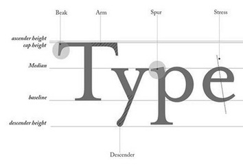 The type and design communities react to Mrs. Eaves, Zuzana Licko's version of Baskerville. Of those comments, Keith Tam's is the winner: " Mrs Eaves was a typeface designed by a graphic design-driven type designer for graphic designers. Yes, it may have been inspired by Baskerville, but I'm afraid it is no Baskerville. This is by no means a demeaning comment. While Baskerville has a calculated, crisp and stately charm to it that evokes neoclassical architecture, Mrs Eaves is soft spoken, warm, low contrast and has a distinct feminine touch to it. This subtle femininity is very rarely seen in contemporary type design, except perhaps some (almost stereotypical) script typefaces. I think Mrs Eaves is probably a typeface for graphic designers rather than typographers, as are many other Émigré fonts. Rebecca wrote that Mrs Eaves is perhaps a 'tolerable' display face, but not for text. I can't make up my mind. Mrs Eaves's distinctive features and small x-height certainly makes it tough to use for continuous text in most cases (not 'invisible' enough); on the other hand the generous spacing, robust serifs and low think-thin contrast make it somewhat unrefined for display use and lend it more towards the league of typefaces for small sizes. Perhaps it is this paradox that makes Mrs Eaves so appealing to graphic designers? I think that's Émigré's mission: to design typefaces that are on the threshold between text and display. Wait, it's the ligatures! They are simply delicious. Who can resist...? The best piece I've ever seen set in Mrs Eaves is their specimen booklet. I've only seen the offset lithographed version, but I imagine the letterpressed one would be quite exquisite. I don't think Mrs Eaves became popular because of trend. For a contemporary seriffed typeface to become a classic, that's quite something. I do think Mrs Eaves have some uniquely distinctive attributes that stand on her own two feet. It really can't be compared with ephemeral typefaces like Template Gothic, though also by Émigré. They are not really in the same league. Overused typefaces by graphic designers are quite different from overused typefaces by general users. The former became overused because of the aesthetics/formal characteristics, while the latter became overused simply because they are widely available. Whether they are inherently good typefaces is another matter. I disagree with the comment that Georgia should only be used for screen. It is an extremely good workhorse typeface for general used, in my opinion, for print, made by a master type designer, Matthew Carter. It should replaced Times New Roman as the default typeface for general office correspondence and documents. It is probably the best free font there is." [Google]
[More] ⦿
The type and design communities react to Mrs. Eaves, Zuzana Licko's version of Baskerville. Of those comments, Keith Tam's is the winner: " Mrs Eaves was a typeface designed by a graphic design-driven type designer for graphic designers. Yes, it may have been inspired by Baskerville, but I'm afraid it is no Baskerville. This is by no means a demeaning comment. While Baskerville has a calculated, crisp and stately charm to it that evokes neoclassical architecture, Mrs Eaves is soft spoken, warm, low contrast and has a distinct feminine touch to it. This subtle femininity is very rarely seen in contemporary type design, except perhaps some (almost stereotypical) script typefaces. I think Mrs Eaves is probably a typeface for graphic designers rather than typographers, as are many other Émigré fonts. Rebecca wrote that Mrs Eaves is perhaps a 'tolerable' display face, but not for text. I can't make up my mind. Mrs Eaves's distinctive features and small x-height certainly makes it tough to use for continuous text in most cases (not 'invisible' enough); on the other hand the generous spacing, robust serifs and low think-thin contrast make it somewhat unrefined for display use and lend it more towards the league of typefaces for small sizes. Perhaps it is this paradox that makes Mrs Eaves so appealing to graphic designers? I think that's Émigré's mission: to design typefaces that are on the threshold between text and display. Wait, it's the ligatures! They are simply delicious. Who can resist...? The best piece I've ever seen set in Mrs Eaves is their specimen booklet. I've only seen the offset lithographed version, but I imagine the letterpressed one would be quite exquisite. I don't think Mrs Eaves became popular because of trend. For a contemporary seriffed typeface to become a classic, that's quite something. I do think Mrs Eaves have some uniquely distinctive attributes that stand on her own two feet. It really can't be compared with ephemeral typefaces like Template Gothic, though also by Émigré. They are not really in the same league. Overused typefaces by graphic designers are quite different from overused typefaces by general users. The former became overused because of the aesthetics/formal characteristics, while the latter became overused simply because they are widely available. Whether they are inherently good typefaces is another matter. I disagree with the comment that Georgia should only be used for screen. It is an extremely good workhorse typeface for general used, in my opinion, for print, made by a master type designer, Matthew Carter. It should replaced Times New Roman as the default typeface for general office correspondence and documents. It is probably the best free font there is." [Google]
[More] ⦿
|
MyFonts: Baskerville
|
 Top-ranked fonts at MyFonts in the Baskerville or transitional styles. [Google]
[More] ⦿
Top-ranked fonts at MyFonts in the Baskerville or transitional styles. [Google]
[More] ⦿
|
MyFonts: English typefaces
|
View the typefaces tagged English at MyFonts. I think that they mean typefaces made in England or with historical ties to England (Baskerville, Caslon, Fry, Stephenson Blake). [Google]
[More] ⦿
|
Neil Summerour
[Positype]
|
 [MyFonts]
[More] ⦿
[MyFonts]
[More] ⦿
|
Neufville Digital
|
 Fundicion Tipografica Neufville SA is a foundry based in Barcelona, headed by Wolfgang Hartmann, which writes about itself: Neufville Digital produces and markets the fonts from Fundicion Tipografica Neufville, Bauersche Giesserei, Ludwig&Mayer, Fonderie Typographique Française and Fundicion Tipografica Nacional.
 List of typefaces. MyFonts link. Fonts include a newly digitized Futura family (Paul Renner, 1928), in the Bauer Classics collection. In the collection Grafia Latina, we find Diagonal ND (Antoni Morillas, 1970), Uncial Romana (Ricardo Rousselot, 1996), Pascal ND (José Mendoza y Almeida, 1959), Sully-Jonquieres (José Mendoza y Almeida, 1980), Fidelio ND (José Mendoza y Almeida), Llerda ND, Paris ND, Flash ND and Arabescos ND, all by Enric Crous Vidal (1945 to 1953). They write: Within the GRAPHIE LATINE collection Neufville Digital releases the works of famous typographers like José Mendoza y Almeida, René Ponot, Tomas Vellvé, Antonio Morillas, Ricard Giralt Miracle, Ricardo Rousselot, Juan Trochut and others. The BAUER CLASSICS collection includes the many typefaces from the Bauersche Giesserei. The first fontfamily available is FUTURA that has been completely digitized anew to meet today's professional demands. Many other fonts are to follow. Neufville Digital produces and markets the fonts from Fundición Tipográfica Neufville, Bauersche Giesserei, Ludwig&Mayer, Fonderie Typographique Française and Fundición Tipográfica Nacional. You will certainly be familiar with famous typefaces like Futura, Bauer Bodoni, Weiss, Folio, Imprimatur and many others from the rich type founding era. Neufville Digital digitizes them from their original artwork using state of the art technology and makes them available in compliance with the latest standards. Among the fonts to be reissued, we cite a few. From Ludwig&Mayer: Allemannia Fraktur (1908), Allright (1936), Altenburger Gotisch (1928), Bastard Mediaeval, Beatrice (1931), Chic, Cochin (1922), Commerciale, Diplomat (1964), Firmin Didot (1929), Hallo (1956), Kombinette (1932), Krimhilde (1934), Kupferplatte (1950), Largo (1939), Magnet (1951), Wolfram (1930). From FT Neufville: Antiqua (1850). From FT Nacional: Astur (1940), Belinda (like 15th century Spanish calligraphic writing, with fine curved serifs on the tips of the ascenders), Cervantes, Elzeviriano, Hispalis (1940), Imperio (1949), Inglés (1940), Interpol (1950), Numantina (1940; for a digital version, see Nick Curtis's Numancia NF (2011)), Radar (1940), Romana, Victoriana (1940). From the Bauersche Giesserei: Astoria (1911), Azurée (1908), Baron (1911), Baroness (1911), Baskerville-Antiqua (1923), Batarde (1915), Bauer Bodoni (1926), Fette Antiqua (1850), Lithographia (1895), Manuskript Gotisch (1899), Noblesse (1908), Steile Futura, Stephanie (1890), Times-Antiqua, Venus (1907). From FT Française: Bizerte, Italienne, Romantiques (1937), Stylo (1937). Their Catalogo de tipos (1978) shows many other typefaces too, so, with some repetition, we find the handwriting/script typefaces Vigor, Sinfonia, Privat, Sirena, Maxim, Litografia, Leyenda (Legend), Bernhard Cursive and Adagio, the federal money typeface Azuree (1908), the typewriter family Ibematic, OCR A-1, the blackletter typeface Gotico (or Manuskript-Gotisch), the outline fonts Royal and Columna, the checkbook typeface Litho, the display typefaces Nobleza and Carnaby, the Egyptian family Epoca (=Beton), as well as Homera (=Hyperion), Corvinus, Volta and Impressum. Galaxy ND (2006) is a mysterious, organic and quite useless typeface. Go here for a description of the old printing machines. Check also the Fundicion Tipografica Bauer in Barcelona and Visualogik Technology and Design in the Netherlands. Showcase of Neufville's fonts. Neufville Digital's typeface library. Neufville Digital's collection of fonts: [Google]
[MyFonts]
[More] ⦿
|
Nicolas Nores
|
Argentinian digital artist who made AfterLife (2012), a slightly modified Baskerville, for a project. [Google]
[More] ⦿
|
Olcar Alcaide
[Eurotypo]
|
 [MyFonts]
[More] ⦿
[MyFonts]
[More] ⦿
|
Omnibus Typographi
[Franko Luin]
|
 Fonts designed by talented Swedish designer Franko Luin (born in Trieste, Italy in 1941, to Slovenian parents). Luin immigrated to Sweden in 1961. After studying at the Grafiska Institutet during the 1960s, Franko Luin spent two decades as a print designer for Ericsson before becoming independent. In the 1990s he was involved in multimedia and typeface design. In 1996, he founded his own typographic studio, Omnibus Typografi. At some point, he led a course in Web Typography at the Berghs School of Communication in Stockholm. Franko Luin passed away on September 15, 2005, in Tyresö, Sweden. Autobiography. Obituary by Dan Reynolds. Linotype pages on Luin.
 His typefaces, all at Linotype: View Franko Luin's typefaces. [Google]
[MyFonts]
[More] ⦿
|
OSX fonts
|
 A list of the basic Latin fonts in a standard OS X installation, anno 2004. See also here: #Gungseouche.dfont, #HeadlineA.dfont, #PCmyoungjo.dfont, #Pilgiche.dfont, AlBayan.ttf, AlBayanBold.ttf, AmericanTypewriter.dfont, Apple Chancery.dfont, Apple LiSung Light.dfont, Apple Symbols.ttf, AppleMyungjo.dfont, Arial, Arial Black, Arial Narrow, Arial Rounded Bold, ArialHB.ttf, ArialHBBold.ttf, Ayuthaya.ttf, Baghdad.ttf, Baskerville.dfont, BiauKai.dfont, BigCaslon.dfont, Brush Script, Chalkboard.ttf, CharcoalCY.dfont, Cochin.dfont, Comic Sans MS, Copperplate.dfont, Corsiva.ttf, CorsivaBold.ttf, Courier New, DecoTypeNaskh.ttf, DevanagariMT.ttf, DevanagariMTBold.ttf, Didot.dfont, EuphemiaCASBold.ttf, EuphemiaCASItalic.ttf, EuphemiaCASRegular.ttf, Fang Song.dfont, Futura.dfont, GenevaCY.dfont, Georgia, GillSans.dfont, GujaratiMT.ttf, GujaratiMTBold.ttf, Gurmukhi.ttf, HelveticaCY.dfont, HelveticaNeue.dfont, Herculanum.dfont, Hoefler Text.dfont, Kai.dfont, Krungthep.ttf, KufiStandarGK.ttf, MarkerFelt.dfont, MonacoCY.dfont, MshtakanBold.ttf, MshtakanBoldOblique.ttf, MshtakanOblique.ttf, MshtakanRegular.ttf, Nadeem.ttf, NewPeninimMT.ttf, NewPeninimMTBold.ttf, NewPeninimMTBoldInclined.ttf, NewPeninimMTInclined.ttf, NISC18030.ttf, Optima.dfont, Papyrus.dfont, PlantagenetCherokee.ttf, Raanana.ttf, RaananaBold.ttf, Sathu.ttf, Silom.ttf, Skia.dfont, Song.dfont, Thonburi.ttf, Times New Roman, TimesCY.dfont, Trebuchet MS, Verdana, Webdings, Zapfino.dfont. [Google]
[More] ⦿
A list of the basic Latin fonts in a standard OS X installation, anno 2004. See also here: #Gungseouche.dfont, #HeadlineA.dfont, #PCmyoungjo.dfont, #Pilgiche.dfont, AlBayan.ttf, AlBayanBold.ttf, AmericanTypewriter.dfont, Apple Chancery.dfont, Apple LiSung Light.dfont, Apple Symbols.ttf, AppleMyungjo.dfont, Arial, Arial Black, Arial Narrow, Arial Rounded Bold, ArialHB.ttf, ArialHBBold.ttf, Ayuthaya.ttf, Baghdad.ttf, Baskerville.dfont, BiauKai.dfont, BigCaslon.dfont, Brush Script, Chalkboard.ttf, CharcoalCY.dfont, Cochin.dfont, Comic Sans MS, Copperplate.dfont, Corsiva.ttf, CorsivaBold.ttf, Courier New, DecoTypeNaskh.ttf, DevanagariMT.ttf, DevanagariMTBold.ttf, Didot.dfont, EuphemiaCASBold.ttf, EuphemiaCASItalic.ttf, EuphemiaCASRegular.ttf, Fang Song.dfont, Futura.dfont, GenevaCY.dfont, Georgia, GillSans.dfont, GujaratiMT.ttf, GujaratiMTBold.ttf, Gurmukhi.ttf, HelveticaCY.dfont, HelveticaNeue.dfont, Herculanum.dfont, Hoefler Text.dfont, Kai.dfont, Krungthep.ttf, KufiStandarGK.ttf, MarkerFelt.dfont, MonacoCY.dfont, MshtakanBold.ttf, MshtakanBoldOblique.ttf, MshtakanOblique.ttf, MshtakanRegular.ttf, Nadeem.ttf, NewPeninimMT.ttf, NewPeninimMTBold.ttf, NewPeninimMTBoldInclined.ttf, NewPeninimMTInclined.ttf, NISC18030.ttf, Optima.dfont, Papyrus.dfont, PlantagenetCherokee.ttf, Raanana.ttf, RaananaBold.ttf, Sathu.ttf, Silom.ttf, Skia.dfont, Song.dfont, Thonburi.ttf, Times New Roman, TimesCY.dfont, Trebuchet MS, Verdana, Webdings, Zapfino.dfont. [Google]
[More] ⦿
|
Pablo Impallari
|
 Very prolific Argentinian type designer (b. 1976) located in Rosario. His extensive repertoire:
 - In 2010, he embarked upon an open source font project about a connected retro / signage script Lobster, which features carefully crafted opentype ligatures. In 2011, he added the upright script family Lobster Two. Alexei Vanyashin and Gayaneh Bagdasaryan added support for Russian, Ukrainian, Belarusian, Macedonian, Moldovan, and Serbian languages. Open Font Library link for Lobster.
- At the end of 2010, together with Edgar Tolentino (Mexico), he started a commercial font project about Terminal Dosis [or simply Dosis], a monoline basic and simple sans, now available at Google Web Fonts.
- Cabin (2010) is a free humanist sans face in the style of Gill. It was followed by Cabin Sketch (+Bold) in 2011. Open Font Library link for Cabin. For TeX support, see here.
- Dancing Script (2011) is an informal script in the spirit of Murray Hill or Mistral.
- Quattrocento (2011) is a classic roman titling face. Quattrocento Sans (2011) is a monoline sans. Quattrocento has been suggested by some as a free replacement of Friz Quadrata. CTAN link. Open Font Library link.
- Miltonian and Miltonian Tattoo (2011) are fun hand-printed typefaces.
- Creations from 2012: Poetsen One (signage face), Domine (Google Web Fonts; he says that It's is friendly in appearance because it combines the classic elements of familiar typefaces that have been in use from more than 100 years like Clarendon, Century, Cheltenham and Clearface), New Rocker (Google Web Fonts: blackletter tattoo font), Monda (Google Web Fonts and GitHub, a free sans family), Milonga (Google Web Fonts: a Victorian font inspired by the art of the tangueros), Ranchers (retro poster typeface at Google Web Fonts and Open Font Library, co-designed with Brenda Gallo), Petit Formal Script (Google Web Fonts), Cantora (Google Web Fonts: a friendly semi formal, semi condensed, semi sans serif; see also the Open Font Library), Kaushan Script (a readable brush script that is free at Google Web Fonts), Racing Sans (a techno typeface that conjures up speed; co-designed with Rodrigo Fuenzalida, it is free at Google Web Fonts and Open Font Library), Life Savers (Google Web Fonts).
- Libre Baskerville (2012, Google Web Fonts and CTAN) was developed together with Rodrigo Fuenzalida. It is based on 1941 ATF specimens, but it has a taller x height, wider counters and minor contrast that allows it to work on small sizes in any screen.
- Pablo Impallari and Rodrigo Fuenzalida extended McInerney's Raleway. Download here and at Open Font Library.
- Libre Caslon (2012) in four styles. See also the TeX support files for this free typeface. Co-developed by Rodrigo Fuenzalida and Pablo Impallari.
- Clement Numbers (2013). A commercial didone set of numbers from a 1838 specimen book by Fonderie Clément.
- The 45-font typeface family Encode Sans (2014, with Andres Torresi), its 5x9 matrix ranging from Compressed to Wide, and Thin to Black. Extended in 2019 to Plata Sans.
- Libre Bodoni (2014) was developed by Pablo Impallari and Rodrigo Fuenzalida based on Morris Fuller Benton's Bodoni types---they optimized the glyphs for use on the web. Github link. Google Fonts link.
- Caveat (2015, free handcrafted Google Font), Caveat Brush.
- Libre Clarendon is being planned.
- Amiko (2015). A Latin / Devanagari sans / screen typeface by Pablo Impallari, Rodrigo Fuenzalida and Andres Torresi. Github link.
- In 2016, Google Fonts published the free Latin / Bengali signage font Galada (2015). It is based on Pablo Impallari's Lobster (for Latin). The Bengali was developed as a studio collaboration by Jeremie Hornus, Yoann Minet, and Juan Bruce at Black Foundry in France. Github link.
- Libre Franklin (2016, Google Fonts). A large free typeface family that revives Morris Fuller Benton's Franklin Gothic (1912). Github link.
Dafont link. Fontspace link. Google font directory link. Klingspor link. Abstract Fonts link. Fontsquirrel link. Google Plus link. On Snot and Fonts link. Another Google Plus link. Creative Market link Behance link. Blog. Home page. [Google]
[More] ⦿
|
Paul Barnes
[Modern Typography]
|
 [MyFonts]
[More] ⦿
[MyFonts]
[More] ⦿
|
Paul Shaw
|
Paul Shaw's choice of 100 best typefaces of all times: - 1-10: Gutenberg's B-42 type, Nicolas Jenson's roman, Francesco Griffo's italic, Claude Garamond's roman, Firmin Didot's roman, Akzidenz Grotesk, Gebetbuch type, Cheltenham family, Helvetica, Aldus Manutius' roman.
- 11-20: William Caslon IV's sans serif, William Caslon's roman, Pierre-Simon Fournier's italic, Futura, Times Roman, Chicago, Bell, Ludovico Arrighi da Vicenza's italic, Univers, Romain du Roi.
- 21-30: Johann Michael Fleischmann's roman, Clarendon, ATF Garamond, Giambattista Bodoni's roman, Century Roman, Nicolas Kis' roman, Minion multiple master, Unger Fraktur, John Baskerville's roman, Lucida.
- 31-40: Ionic, Golden Type, Robert Thorne's fat typeface roman, Wolfgang Hopyl's textura, Vincent Figgins' antique roman (Egyptian), Johnston's Railway Sans, Optima, Bauer Bodoni, Adobe Garamond, Breitkopf Fraktur.
- 41-50: Bell Gothic, Courier, Trajan, Mistral, Doves Type, Scotch Roman, Syntax, Snell Roundhand, Memphis, Robert Granjon's civilité.
- 51-60: Fette Fraktur, Ehrhard Ratdolt's rotunda, Romanee, ITC Stone family, Trinité, ITC Garamond, Avant-Garde Gothic, Oakland, Deutschschrift, Hammer Uncial.
- 61-70: Beowolf, Meta, OCR-A, Sabon, ITC Novarese, Zapf Chancery, Rotis, Base Nine and Base Twelve, Peter Jessenschrift, Excelsior Script.
- 71-80: Bitstream Charter, Peignot, Erbar, Cancellaresca Bastarda, Joanna, Dead History, Behrensschrift, Eckmannschrift, Poetica, Marconi.
- 81-90: PMN Caecilia, Stadia, Imprint, Souvenir, Thesis, Apollo, Penumbra, Melior, Neuland, Flora.
- 91-100: Element, Walker, Remedy, Template Gothic, Digi-Grotesk Series S, Compacta, Antique Olive, Bodoni 26, Evans and Epps Alphabet, WTC Our Bodoni.
[Google]
[More] ⦿
|
Pavao Burcar
|
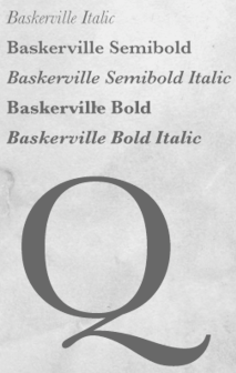 Croatian graphic designer in Zagreb who made a stunning Baskerville poster in 2010. [Google]
[More] ⦿
Croatian graphic designer in Zagreb who made a stunning Baskerville poster in 2010. [Google]
[More] ⦿
|
Peter Bruhn
[Fountain--A Friendly Type Foundry]
|
[MyFonts]
[More] ⦿
|
Phil Martin
[Alphabet Innovations International -- TypeSpectra (Was: MM2000)]
|
 [MyFonts]
[More] ⦿
[MyFonts]
[More] ⦿
|
Pierre Terrier
[Fontself]
|
[More] ⦿
|
Pierre-Augustin Caron de Beaumarchais
[Beaumarchais]
|
[More] ⦿
|
Positype
[Neil Summerour]
|
 Positype was founded in 2002 by Athens and/or Jefferson, GA-based designer and type designer Neil Summerour (b. 1972, Azores, Portugal). Neil began developing typefaces in 1996 with the 1996 Olympic Brick Paver Project proprietary typeface. He is the co-principal and senior designer of Athens-based interactive, design, and advertising agency Genetic:ICG. In the summer of 2003, he began teaching Advanced Electronic Design in the Graphic Design Department at The University of Georgia.
 Swash & Kern is the bespoke lettering and typeface design alter ego of Neil Summerour. In 2001, Neil published his first two type designs with [T-26] Digital Type Foundry in Chicago, IL. Since then, he has released tens of font families including hiragana and katakana fonts. Positype fonts are sold by Myfonts.com and [T-26]. Klingspor link. Facebook link. Blog. Behance link. Union Fonts link. The list of his fonts: - Aago (2017). A 54-style sans family.
- Aaux, Aaux Office (2002), Aaux Pro (2004), Aaux Next (2009, 72 typefaces), Aaux Alphanumera, Aaux Emoticons.
- Agent Sans (2021). An economical 22-style sans intended to be warm although the name seems to contradict that.
- The Air superfamily (2011), which consists of 81 sans typefaces. Followed by Air Soft (2011), Air Pro (2021), Air Pro Condensed (2022) and Air Pro XCondensed (2022). He writes about Air: Heavily influenced by Summerour's Aaux Next typeface and Akzidenz-Grotesk, the typeface features a very efficient footprint, logical weight options, small caps, expanded numeral sets, extensive language support, and 5 total widths.
- Altar (8-weight Gothic family).
- Akagi (2008): 20 style sans family. Extended and refreshed in 2011 into Akagi Pro.
- AMP (at Union fonts).
- Anago (2012) is a softly rounded sans family, the product of a designer addicted to designing sans families.
- Anarcharsis (2002): a serif family inspired by incomplete rubbing made from a stone wall located in the Bahamas.
- Angel Script (2009, TypeTrust).
- Baka (2005, a fantastic scratchy handwriting face), Baka Too (2006; followed in 2010 by Baka Expert).
- The Bodoniesque family (Umbrella Type).
- Cherry Blossoms (2018). A crayon script.
- Claustrum (2003).
- Clear Sans (2013). Starting from a monoline rather geometric set of thin weights, this typeface family morphs into a more humanist beast, with a, b, d and g having a squeezed look at the intercepts. And maybe because of that, this unclassifiable typeface is quite appealing. Followed by Clear Sans Text and Clear Sans Screen.
- Courage (2019). A high contrast ultra black poster typeface.
- Couture (2015) and Couture Sans (2015). Summerour was charmed by Imre Reiner's Corvinus when he designed this extremely high-contrast pair of fashion mag typeface families together with Mary Catherine Pflug.
- Cynapse (2003; or Cynapse Pro. 2004, 12 weights). A sans family.
- In 2018, Martina Flor and Neil Summerour published the layerable Tuscan typeface family Decorata.
- Delphi (2014). A decorative multiline typeface by Lily Feinberg and Neil Summerour.
- Directors Gothic (2013, Lettering Inc). A large retro sans family.
- Donatora (2004).
- Dream Big (2019). A swashy script typeface with weathered edges.
- Ego (2003, octagonal family).
- Epic (2007-2009, a 12-style contemporary garalde).
- Ether, Ether Connected.
- Eva (2003).
- Filmotype Dancer (2012).
- Filmotype Harvard (2015). Based on a Filmotype brush script from 1955.
- Filmotype Horizon (2011).
- Flirt Script (2014). Flirt Script won an award at TDC 2014.
- Friendly (2012). In part based on Morris Fuller Benton's upright script typeface Announcement.
- Fugu (2009, rough-outlined script family, winner at TDC2 2010).
- Ginza (2008, a squarish techno family), and Ginza Narrow (2011).
- Good Karma (2017). A sumi brush font. See also Good Karma Smooth (2020).
- Grava (2018, twenty fonts) and Grava Display: Quirky and sharp, Grava is Neil Summerour's injection of warmth within the geometric sans font category.
- Halogen (2012). An organic wide techno sans family. In 2014, he added Halogen Slab and Halogen Flare (flared). All have hairlines.
- Headcold (2004).
- Hype (2019). A collection of 432 low contrast gothic sans typefaces consisting of three subfamilies of 144 fonts each: Hype vol 1, Hype vol 2, Hype vol 3.
- Ice Cream (2021). A creamy vernacular non-connected script for food packaging.
- Iru1, Iru2.
- Juicy (T-26, 2004, brushdrawn family).
- Kari and Kari Pro (2005): a connected upright script. Kari Display (2009). Redrawn in 2020 and released as Kari (2020).
- Kryptk Flash (2003).
- Kurosawa Bastard, Kurosawa Hand, Kurosawa Sans, Kurosawa Serif, Kurosawa Hiragana, Kurosawa Katakana.
- Love Script (2014). A high energy high contrast brush pen / marker script. Love Script won an award in the TDC 2015 Type Design competition.
- Luce (2004).
- Lush Script (2011). A connected script inspired by the 1940s.
- Lust (2012), a curvy hight-contrast didone in the Pistilli style. Neil: The result yielded a rather diverse typographic gene pool: a little Scotch Modern, a little Didone and Didot, a dominant dose of Caslon, and a pinch of Baskerville-- all wrapped up in the leggy body of a Brazilian supermodel. A confident, self-reliant typeface that shows just enough to keep everyone staring and leave them wanting more. Followed by Lust Slim (2014). In 2015, these were extended to the large families Lust Pro [dedicated page] and Lust Pro Didone.
- Lust Script (2013). This is a curvier, sexier (Neil's words) version of Lust. For use in fashion magazines and large sizes.
- Macha (2012). A sans family. In 2015, this was followed by Lust Hedonist, which has Didone, Italic and Script sub-styles---the ultimate fashion mag typeface. In 2021, he added Lust Sans (a 12-style high-contrast fashion mag typeface family), Lust Didone (a 6-style contribution to the fat face genre), Lust Stencil (six styles), Lust Text (ten styles).
- The Type Trust: Magneta (2009, The Type Trust). Includes a Condensed subfamily.
- Marshmallow (2017). A super-creamy high-contrast script typeface straight from a parisian bonbonnerie.
- Murecho (2021). Murecho is a low-stroke contrast, flat terminal sans serif Japanese typeface designed for text settings in Japan. It covers Hiragana, Katakana, and Kanji (JOYO+). It also supports Latin, Cyrillic, and Greek.
- Muscle (2009, TypeTrust---a futuristic family).
- Nori (2010): a calligraphic brush typeface obtained by applying the Pilot Japan Kanji Fude brush pen on paper. It has over 1100 glyphs, 250 ligatures, 487 alternate characters, 125+ swash and titling alternates, lining and old style numerals. Awarded at TDC2 2011.
- Organic (2009). A rounded warm sans family. In 2021, he published the 16-style Organic Pro.
- Penumbra.
- Plastek (2004-2009).
- The R.E.M. Athens project involves three fonts published in 2009, REM Orange, REM Accelerate and REM Tourfont. They are based on ideas by Chris Bilheimer for the band R.E.M. (Michael Stipe and Chris Bilheimer). Both attended the fine arts program at the University of Georgia. Michael Stipe, singer and lyricist, formed R.E.M. in 1980. Bilheimer began working with the band in 1994.
- In 2019, Martina Flor and Neil Summerour released the extensive typeface family Ribbons at Positype.
- Romp (2009, condensed hand-printed).
- Reserve (2018). A text typeface family designed to accompany Summerour's Scotch typeface family.
- Rhythm (2011). An italic inline and solid display family based on ATF's Ratio (ca. 1930) and Herbert Thannhaeuser's Adastra (1928).
- Rough Love (2014). A brushy crayon script.
- Scotch (2017). An 31-style scotch roman typeface family consisting of Scotch Text, Scotch Display (more contrast), Scotch Deck (for subheads) and Scotch Dingbats. In 2020, he added Scotch Compressed to the set.
- Shameless (2013). A connected penmanship-style script.
- Sneakers (2003-2004): athletic lettering family. Also, Sneakers Script and Sneakers Max (2019: rounded and ultra fat).
- So Lovely (2019).
- Tactical (2011, octagonal mechanical face; +Stencil).
- In 2012, he won the Second Akashi Prize in the kanji (!!!) category of the Morisawa Type Design Competition for Tegaki. Tegaki also won at TDC 2013.
- Truss Ultra Light (2006): hairline architectural font.
- Vekta Serif (2009), Vekta Neo and Vekta Sans (2009, a sans family at TypeTrust).
- Wasabi Condensed and Wasabi (2010): an organic elliptical family, based on Iru.
- Yumi (2003, techno font, Union Fonts).
His life in hiw own words: Neil Summerour is a type designer, lettering artist, calligrapher and designer based in Georgia, USA with one foot in Takamatsu, Japan. After graduating from The University of Georgia Lamar Dodd School of Art with a BFA in Graphic Design, he soon found himself opening his own studio to deal with the flow of freelance work. [...] Neil opened his personal type foundry, Positype, in 2000 to feed his ever-growing desire for type design. He later co-founded TypeTrust (2002) with Silas Dilworth as his addiction to type and lettering grew. [...] He was an adjunct art professor at The University of Georgia in graphic design and taught graphic design at the Governor's School for the Arts. [...] As a typeface designer, he has published over 60 typeface families and produced numerous custom typefaces for clients worldwide. [...] He has won the Type Directors Club Certificate of Excellence in Type Design in 2010 and 2011 for Fugu and Nori, respectively. Showcase of Neil Summerour's fonts. [Google]
[MyFonts]
[More] ⦿
|
Posterizer KG
[Lazar Dimitrijevic]
|
 Lazar Dimitrijevic, who set up the foundry Posterizer KG, was born in 1981 in Bajina Basta, Serbia, and lives in Kragujevac, Serbia. He obtained a Master of Graphic Design from the Department of Graphic Design, FILUM Kragujevac, Serbia. Presently, he is art director at Design Studio BOX.
 His first font, Art Decor (2009), is a brush typeface in the style of Treefrog. Koma Latin (2009) is a roughly outlined script face. Bajka (2010) is a wonderfully entertaining Baskerville family (Latin, Cyrillic, dingbats, ornamental caps) made for children's fairy tale books. Scarface (2010) is a sublime scratchy hand ideal for torture movies. Kaligraf Latin (2010) is a rough-edged calligraphic face. In 2012, he published Collage BB (hand-drawn didone), the heavy Egyptian typeface Posterizer KG at DizajnDesign. This font was created for Celebration of 5 years anniversary of Design Studio Box from the city of Kragujevac (KG), the industrial city of Serbia. Posterizer KG (+Rounded) contains all the Latin and Cyrillic glyphs. Posterizer KG Inline and Posterizer KG Rough (a letterpress emulation version) were added in 2013. Posterizer KG Sketch followed in 2015. Still in 2012, he designed the ink splatter typeface Oops, and the calligraphic typefaces Cal Humanistic Cursive (a renaming of Cal Humanist Corsiva, posibly under pressure from Monotype), Cal Humanist Minuscule and Cal Humanist Corsiva. He also creates stunning calligraphic works. Cal Roman Capitals (2012) is a Trajan typeface. In the same calligraphic series, we find Cal Rustic Capitals (2012), Cal Square Capitals (2012), and Cal Uncial (2012). Typefaces from 2013: Posterizer KG Sketch, Cal Expressive, Cal Bakerly (calligraphic script in the style of Arthur Baker), Cal Cursive Roman, Cal Rustic Black, Cal Neuland Bold (after the German expressionist typeface Neuland by Rudolf Koch), Cal Gothic Bastard, Cal Gothic Fraktur, Cal Fraktur Modern, Cal Rotunda, Cal Gothic Textura, Cal Carolingian Minuscule, Cal Carolingian Gothic, Cal Insular Minuscule, Cal Insular Majuscule, Cal Beneventan Minuscule. Typefaces from 2014: Cal Neuland Shadow, Mozzart Sketch (a decorative hand-sketched version of Mozzart Sans, a slightly rounded, neo-Grotesque corporate font, that was originally created for the Belgrade-based company Mozzart DDO; followed in 2015 by Mozzart Rough). In 2015, he designed Drina (brush typeface), My Way (a TreeFrog style handwritten face). Typefaces from 2016: Bali Beach (brush script), Omorika (a rustic handcrafted sketched serif typeface). Typefaces from 2017: Workshop Brush (dry brush), Workshop Marker, Workshop Pencil. Typefaces from 2018: Miro (after the lettering in Joan Miro's art), Ernest (based on the hand of Ernest Hemingway), Natron (rounded condensed sans; +Pictograms). Typefaces from 2019: My Tara (a thick brush script), Natron Rough, Kalli Hand, Kalli Sketch. Typefaces from 2020: Panorama KG (based on the principle nothing below the baseline), Hubble (a rhythmic display typeface with thorny serifs), Liceum (a rhythmic calligraphic script for Latin and Cyrillic), Cal Fraktur Brush, Cal Roman Black, Cal Roman Modern, Cal Uncial Rough. Typefaces from 2021: PKG Roman Capitals (Trajan capitals with a hand-drawn finish, for Latin and Cyrillic), Monodia (a slab serif and its glitched version). [Google]
[MyFonts]
[More] ⦿
|
Poul Steen Larsen
|
Poul Steen Larsen of the Danmarks Biblioteksskole digitized Baskerville Book in 1995. Liber is a roman bookface done for the Danish library school publications in 1993, which was released in 2000. Other fonts include Mega (1996) and Colonna (1996). He is currently a professor at the Royal School of Library and Information Science in Denmark. [Google]
[More] ⦿
|
Presidential Election Fonts 2008
[Sam Berlow]
|
 Sam Berlow (Font Bureau) is interviewed on New York Public Radio (WNYC radio) about the candidates' fonts. On the same topic, he also published a piece in the Boston Globe. Quotes:
 - Bush&Cheney in 2004: It had that incredible NASCAR feel with that slanted sans serif saying "We are going really fast, hang on".
- Obama [who uses Gotham for headlines]: It's classy, very metrosexual. If it were a suit, it would be Armani.
- Hillary Clinton [who uses a modified Baskerville]: It's a high-wasted serif from the 70s, the pants pulled up too high. It feels like a bad Talbot suit, it does not quite feel right.
- McCain: [About his logo] The star with the yellow bars clearly says he is a general.
- Huckabee: About a way to improve on Huckabee's cluttered and confusing look, Sam muses If it didn't look like a Daytona 500 car, that would be a good start.
[Google]
[MyFonts]
[More] ⦿
|
Print and Penmanship 1450-1830
|
Course by James Mosley at l'Institut de l'Histoire du Livre (IHL) in Lyon, France, from October 14-17, 2002. Limited to twelve persons. 450 Euros. A beautiful course content: Introduction---the writing, of the Roman capital to the tiny Gothic. The discovery of the Roman capital in Italy to the 15 E century. L B Alberti, Felice Feliciano, Luca Pacioli, Geoffroy Tory, Albrecht Dürer. The invention of printing works and Gothic character. The Italian writing: scrittura umanistica and corsiva cancellaresca. Roman characters and italics in Italy and France, 1470-1600. Nicolas Jenson, Francesco Griffo, Claude Garamond, Pierre Haultin, Robert Granjon, Guillaume Bé. Literature of the engraving of the punches and the foundry of the characters: Joseph Moxon (London, 1683), Jacques Jaugeon (Paris, 1704) Pierre-Simon Baker (Paris, 1764). Characters with the "taste hollandois". Hendrik van den Keere, Nicolas Briot, Christoffel van Dijk, Nicolas Kis, Joseph Moxon, William Caslon. Towards a new penmanship 1560-1740 G.F. Cresci, Lucas Materot, Louis Barbedor, Charles Snell, George Bichkam. Of the "Roman of the roi" in Didot. Philippe Grandjean, John Baskerville, Pierre-Simon Baker, François-Ambroise (and others) Didot, Giambattista Bodoni. A new typography: use of the conceited person-face, antique and the Egyptian woman in printed publicity. [Google]
[More] ⦿
|
Production Type
[Jean-Baptiste Levée]
|
 Jean-Baptiste Levée is a French type designer based in Paris. He is a co-founder of the Bureau des Affaires Typographiques, and teaches typeface design at ESAD Amiens (and before that, at the Caen-Cherbourg school of Arts & Media and at the University of Corte). His latest work is mostly published at Production Type which he manages. He designs custom and retail typefaces, and has won multiuple awards for his type designs. Other designers publishing at Production Type include Yoann Minet, Sandra Carrera, Yohanna My Nguyen, Emmanuel Besse, Mathieu Réguer, Quentin Schmerber and Loic Sander. In 2020, the support team included Hugues Gentile, Dorine Sauzet, Suehli Tan and Igino Marini. Levée's typeface portfolio:
 - Vuitton Persona (2007): a family made under the supervision of Porchez for Vuitton's bags.
- Wallpaper corporate typeface (2008): Under the art direction of Meirion Pritchard and Christian Schwartz, this 2-style sans was developed for the architectural magazine Wallpaper. It is a self-confessed blend of Meta and Amplitude.
- Le Monde Courrier (2008): an extension and OpenType completion of the glyph tables of Porchez's LeMonde Courrier (2002).
- Panorama (2004-2008): an elegant full-fledged sans family from hairline to extended bold, and from Extra Condensed to Extra Extended. It can be bought at Production Type.
- Henderson Serif & Sans (2006): This is a Baskerville family conceived by J.-F. Porchez, but extended and perfected by Levée. The Sans is in the style of Arial with large x-height. The Typofonderie page does not mention Levée.
- Retiro (2007): Done with J.-F. Porchez for Madriz Magazine. This is a didone family with juicy and classy alternates. It became a retail font at Typofonderie in 2015.
- Pimkie (2006): a playful feminine display face.
- Seenk Serif and Seenk Sans: a text family done with Christophe Badani in 2005.
- Expert (2009): a unicase typeface done for magazine, ca. 2009.
- Acier BAT (2009-2010, BAT Foundry): an extensive family that builds on Cassandre's 1930 font by the same name.
- Gemeli and Gemeli Mono (by Levée, assisted by Emmanuel Besse and Hugo Marucco). This sans family can be bought at Production Type. For Gemeli Micro (2018), Gemeli's x-height was enlarged, extenders shortened, stance widened, spacing loosened, and forms simplified.
- Synthese.
- Carrefour Origin (2011). A tall thin face. This custom typeface led to the vretail typeface family Origin Super Condensed.
- Cogito Atelier Malte Martin. The sans family Cogito can be bought at Production Type.
- Telerama Dogon. This is a matchstick or campground face.
- Nathan Enfantine (2011) and Enfantine (2015). A simple upright connected (school?) script.
- RMNGP Constellation (2013) is the bespoke dot matrix typeface of Réunion des Musées Nationaux---Grand Palais for their on-site, online and printed communications.
- Vanité for Vanity Fair France (2013).
- Plinc Beaux Arts Didot (2014). A classical didone digitized from the original Photo-Lettering film matrix by Jean-Baptiste Levée for House Industries.
- Countach (2014, Production type). Described as follows by the designers and team, Superscript2, J.-B. Levée, Sandra Carrera and Irina Smirnova: Countach, the tough compact sans supercharged with brawn & brains. Developed for The Crew, a critically acclaimed auto racing video game, Countach evokes the muscular and mechanical dynamics of fast cars and urban adventure.
- Reception Semi (2014). A hybrid corporate typeface for Unibail / Rodamco.
- Renault Carname for Renault cars. This typeface won an award in the TDC Typeface Design competition in 2017.
- Fournier Orchestre de Paris (2014): Fournier ODP is the exclusive corporate typeface of Orchestre de Paris. Named after Pierre-Simon Fournier Le Jeune (1712-1768), punchcutter and typefounder. Famous for his musical founts, the Parisian Pierre-Simon Fournier is considered one of the first French moderns. The typeface borrows from the numerous alphabets produced by Fournier, retaining only the finest cuts and adding its own peculiarities: anachronical ampersand, reversed letters in reverence to poster ephemeras of the times. The Graphiques series are designed to allow for polychromic settings. The Gothic series are a nod to the residues of modernism. Faithful to the tradition of optical sizes, different designs have been assigned to different scales of use. By Jean-Baptiste Levé, who was assisted by Yoann Minet, Mathieu Réguer, Laurent Bourcellier and Roxane Gataud.
- Libé (2015). Rob Mientjes writes about this custom typeface family done for Libération: Libé is a family of a wide array of sans serif fonts and a set of stubborn typewriter fonts with a slightly sloppy underline style. The sans part of the family is a hybrid Excoffon, nineteen-seventies, tight-but-not-touching fever dream. If the spirit of Excoffon is alive, it has possessed Libé Sans. The Typewriter styles are a typographically successful, if unexpected, match.
- Granville (2015). A Peignotian (or modulated) sans published by Production Type.
- Minotaur (2014, with Yoann Minet). Minotaur won an award in the TDC 2015 Type Design competition.
Proto Grotesk (2014). Proto Grotesk won an award in the TDC 2015 Type Design competition. Review by André Mora, who writes: This beast is a strong sans serif with two mean weights. While others were busy breeding show dogs, Proto emerged from the love den of a couple of mutts high as hell. It ain't tame. It'll never be domesticated. Proto Slab and Proto Slab Condensed followed later. - Cobalte (2015, Production Type). A flared lapidary sans serif family.
- Courrèges (2016) for the fashion house.
- Boreal (2016). A sans family.
- Columbia Sans and Columbia Sans Display (2016, Jean-Baptiste Levée). Initially intended as a sans version of Times New Roman, Levée's explorations take him far afield through his flirtation with reverse stress and his back-rotated small o. He writes: Columbia is an unorthodox blend of multiple historical models. It excavates the so-called Elzevir style, an example of permeability between French and Dutch flavours. The type's restrained nature eschews caricature, giving paragraphs a clean texture while retaining the classical touch expected from late Renaissance typefaces. Initially commissioned by science magazine Sciences & Avenir, Columbia strikes a balance between rigorous topics and an approachable, informal tone.
- ARC (2016). A custom multiline typeface for the City of Paris (L'Arc de l'Innovation).
- Spectral (2017). A 7-style sharp-edged book face by Jean-Baptiste Levée related to Mrs. Eaves, and freely available at Google Fonts. Levée describes the influence of the French Elzevir on Spectral. The type experts opine that the spacing is too loose.
- Alpine (2017). A custom sans family for the new Alpine Vision automobile.
- Antique Gothic (2017). A condensed vintage sans with extreme x-height, designed by Jean-Baptiste Levée, with the help of Emmanuel Besse, Yoann Minet, Quentin Schmerber, Hugues Gentile, Pauline Fourest, and Kristina Jandova.
- Cardinal Classic and Cardinal Fruit (2018). A large transitional typeface family by Jean-Baptiste Levée, Yoann Minet and Quentin Schmerber. The tightly set and high impact photojournalism typeface family Cardinal Photo was added in 2020.
- Media Sans (2018). A typeface family with tight spacing and some extra condensed styles to be used in headlines and on posters. It was influenced by Frutiger's Antique Presse (at Deberny & Peignot) and some European typefaces of the 1960s and 1970s, such as the tightly letterspaced Brasilia, the squarish caps of Eurostile, and the oddly contrasted Antique Olive.
- LVMH Air (2018). A knife-edged fashion typeface family custom designed for LVMH (Moet Hennessy & Louis Vuitton), a French multinational luxury goods conglomerate that specializes in snob appeal.
- Duperré Sans (2018). A custom sans by Jean-Baptiste Levée and Quentin Schmerber for École Duperré.
- Acier (2019). A bi-colored revival of Cassandre's Acier (1930, Deberny & Peignot).
- Tesseract (2019). A display typeface with edges as sharp as a bamboo-cutting machete. Stuff for James Bond movies.
Speaker at ATypI 2013 in Amsterdam and ATypI 2014 in Barcelona. Speaker at ATypI 2016 in Warsaw. Behance link. Old URL. Klingspor link. Home page of Jean-Baptiste Levée. [Google]
[More] ⦿
|
Ralf Herrmann: The 10 best fonts from the Google Webfonts Directory
|
 Ralph Herrmann's top ten fonts at the Google Font Directory at the end of 2011:
 - Abril Fatface: a fat didone display typeface by Type Together.
- Hammersmith One: Nicole Fally's low-contrast typeface inspired by the Johnston UK lettering tradition.
- Droid Sans, Droid Sans Mono&Droid Serif by Steve Matteson / Ascender. I disagree.
- Lato: a sans family by Lukasz Dziedzic.
- Vollkorn: a workhorse family by Friedrich Althausen.
- Ubuntu: an 8-style sans family by Dalton Maag.
- Playfair Display: a Baskerville-era style by Claus Eggers Sorensen.
- UnifrakturMaguntia (2010): a blackletter typeface by J. Mach Wust that is based on Berthold's Mainzer Fraktur which is in turn based on a 1901 typeface by Carl Albert Fahrenwaldt.
[Google]
[More] ⦿
|
Ray Medamiedo
|
Ray Medamiedo (Puebla de los Angeles, Mexico) is an illustrator who created a grungy hand-drawn version of Baskerville called Baskervalley (2013). This seems to have been renamed Baketvalley Old Face. Behance link. Dafont link. Fontspace link. [Google]
[More] ⦿
|
Richard De Pesando
|
 Hastings, UK-based designer of very funny typographic typefaces of Eric Gill, John Baskerville, Claude Garamond and William Caslon (2016). [Google]
[More] ⦿
Hastings, UK-based designer of very funny typographic typefaces of Eric Gill, John Baskerville, Claude Garamond and William Caslon (2016). [Google]
[More] ⦿
|
Richard T. Austin
|
 London-based punchcutter (1768-1830) who had his own foundry, The Imperial Letter Foundry, in London. Before that, he had worked at John Bell's British Letter Foundry from 1788-1798 (when the foundry closed) as a punchcutter, and at William Miller's foundry in Edinburgh. His typefaces:
 One of the most remarkable digital revivals and extensions of his work is also called Austin. Originally designed by Paul Barnes as headline type for the British magazine of fashion Harper's & Queen, of Hearst Magazines UK, Austin is a loose revival of the typefaces cut by Richard Austin in the late 18th century. Referencing Austin's original creation, Paul Barnes turned up the contrast, tightened the spacing and came up with a fresh, new, bold and beautiful look for the constantly changing world of fashion. Barnes himself describes the face as "a British Modern with the styling and sheen of New York in the 1970s." The Cyrillic version was designed in 2009 and 2016 by Ilya Ruderman (CTSM Fonts). FontShop link. Klingspor link. Wikipedia link. View Richard T. Austin's typefaces. Alexa Stephenson's detailed image of Bell. View Richard Austin's typefaces. [Google]
[MyFonts]
[More] ⦿
|
Robert Trogman
[FotoStar]
|
 [MyFonts]
[More] ⦿
[MyFonts]
[More] ⦿
|
Robin Mientjes
[Tiny Type Co]
|
 [More] ⦿
|
Rodrigo Fuenzalida
[Fragtype]
|
 [MyFonts]
[More] ⦿
[MyFonts]
[More] ⦿
|
Sam Berlow
[Presidential Election Fonts 2008]
|
 [MyFonts]
[More] ⦿
[MyFonts]
[More] ⦿
|
Sandra Romano Martin
[Semata]
|
[More] ⦿
|
Sarah Eaves
[Alain Hurtig]
|
Alain Hurtig has absolutely fantastic pages on the work and life of John Baskerville. Baskerville lived most of his life with Sarah Eaves, née Ruston, the wife of Richard Eaves, and married her only after Richard's death. Sarah Baskerville managed Baskerville's printing shop until the liquidation of the studio in 1785, when the matrices were sold to Beaumarchais. The pages compare Baskerville's letters with Mrs. Eaves, Zuzana Licko's version of Baskerville. See also here, on Zuzana Licko's "Baskerville" typeface Mrs Eaves, published with Emigre. [Google]
[More] ⦿
|
Scangraphic
|
 This company evolved in 1983 from Dr Boeger Photosatz GmbH (est. ca. 1934). The timeline:
 - 1934: Marius Böger founded the first company to manufacture and market photocopying machines and reprographic devices.
- 1950: Dr. Böger Duplomat Apparate GmbH was founded. Its objective is the production of diazo (blue-printing) machines, equipment for diffusion transfer processing and photographic reproduction.
- 1955: One of the company's first innovative products comes onto the market, the first vertical reproduction camera.
- 1958: Intercop, a Dr. Böger subsidiary, started marketing a range of rapid processing machines, vertical repro cameras and processors for proofs and offset plates.
- 1969: Dr. Böger Photosatz was founded.
- 1976-81: Dr. Böger Photosatz develops its Copytronic phototypesetter. This machine worked on the basis of an opto-mechanical principle, and was set out to compete with Berthold's Diatronic. Hundreds of fonts from the headline library were reworked to meet the needs of the new machines. Although a small number of around 10 machines could be built and sold in Germany and Switzerland, many technical problems with the new equipment drained the financial resources. Thus the Copytronic machine is withdrawn from the market. The company survives by producing its succesful reproduction cameras for Agfa Gevaert. After a few difficult years, Dr. Böger Photosatz sets out to develop its digital typesetting system called Scantext. The output device is a CRT-machine with a resolution of 1000 lines per cm. The Copytronic type library is digitized using a video camera with a typical resolution of 512 x 512 pixels to the em quad. Bernd Holthusen proudly describes it as the fastest type digitizing system in the world. From 1971 until the mid 1980s, it designed and manufactured a family of photolettering machines for headline typesetting and offered a library of more that 1000 film fonts for that application. These were popular under the brand name VISUTEK in the UK (In the rest of Europe they were labelled and sold as Copytype, a trademark by Dr. Böger Photosatz GmbH). Additionally they were the creators and makers of a wide range of process cameras and film processing systems marketed worldwide under the Agfa brand
- 1981: The company produces the phototypesetting system Scantext 1000. By the beginning of 1985 around 750 Bodytypes were available for the Scantext system.
- 1983: The company evolves into Scangraphic. More than 2000 fonts were digitised by the Scangraphic company under the personal supervision of Bernd Holthusen, principally by Volker Küster (1984-1989), Jelle Bosma (1988-1991) and Albert-Jan Pool (1987-1991). These fonts were produced originally for the proprietary "Scantext" CRT digital output device and subsequently for the Scangraphic family of laser imagesetters. Quoting Pool: By the time we had completed the Ikarus Database in order to be able to convert our headline fonts to Postscript, URW had finished its Type1 converter. Our first PostScript product was a Macintosh-CD Rom with the complete library of headline fonts (those with Sh in the name) on it. The fonts were released in Type1 format for the Macintosh environment starting in 1991.
- 1984: Scangraphic starts working on its library of headline fonts, using a proprietary high resulution short vector format which enables output sizes up to 90 mm cap height. After developing its own digital outline font format, Scangraphic starts making use of URW's Ikarus technology to produce a library of headline fonts. As from 1989, Ikarus outlines were made to fit the metrics of the Scangraphic library of bodytype fonts in order to replace the proprietary pixel based font format by digital outlines. Thus the basis was laid for converting the complete library of headline and bodytype fonts into the PostScript Type1 format.
- 1989: The owner/partners sold the business to the large German company Mannesmann AG (and the font collection is sometimes referred to as the Mannesmann-Scangraphic collection), becoming Mannesmann Scangraphic GmbH in Wedel near Hamburg.
- 1994: Mannesmann breaks the umbilical chord and the company becomes Scangraphic Prepress Technology GmbH.
- 2004: the company moves from Wedel/Hamburg to Seligenstadt, Germany. The company still operates on the European mainland making and selling high resolution film and plate imaging systems. The font department is no longer in operation.
- End of 2004: Elsner&Flake buy the font collection, and start selling the fonts under the Elsner&Flake umbrella. The 2500-strong font collection has names that either have a suffix SB (for body types) or SH (for headline types, also called supertypes). Among the tens of examples, we find classics such as Jakob Erbar's Koloss SB.
- 2006: Ulrich Stiehl publishes a document in which he discusses the collection of fonts. He reports clear correspondences with known font families, examples including Ad Grotesk (=Akzidenz-Grotesk by Berthold), Artscript No 1 (=Künstlerschreibschrift fett by Stempel/Linotype), Black (=Block by Berthold), Chinchilla (=Concorde by Berthold), Cyklop (=City by Berthold), Esquire (=Excelsior by Linotype), Europa Grotesk (=Helvetica by Linotype), Europa Grotesk No. 2 (=Neue Helvetica by Linotype), Flash (=Okay by Berthold), Freeborn (=Frutiger by Linotype), Gentleman (=Glypha by Linotype), Grotesk S (=Neuzeit Buch by Stempel), Madame (=Madison by Stempel), Matrix (=Melior by Linotype), October (=Optima by Linotype), Parlament (=Palatino by Linotype), Paxim (=Palatino by Linotype), September (=Sabon by Linotype), Synchron (=Syntax by Stempel), Vega (=Volkswagen VAG Rundschrift). There are also originals like Volker Küster's Today Sans Serif and Neue Luthersche Fraktur, Zapf Renaissance by Hermann Zapf, and Forlane by Jelle Bosma. Küster, Pool, Zapf and Bosma have nothing to do with the non-original fonts in the collection. The typophile community shrugs Stiehl's complaints off.
- 2008: The Scangraphic collection can be bought at Elsner&Flake.
Examples of Scangraphic fonts: Pi Travel+Transportation, Pi Greek Maths, Pi Communication, Pi Signs+Symbols, Futura Round SB, Futura Round SH. A technical discussion by Yves Peeters. MyFonts link. Link to Scangraphic PrePress Technology GmbH in Seligenstadt. Elsner&Flake shop. Home page. View the Scangraphic typeface library. Another link to the Scangraphic typeface library. [Google]
[MyFonts]
[More] ⦿
|
Schriftklassifikation nach DIN 16 518
|
 Type classification (in German) according to the DIN 16 518 system invented in 1964. Pages by Bernhard Schnelle. I will use his German nomenclature, and quote his examples of each style.
 - I. Venezianische Renaissance-Antiqua: Amalthea, Ascot, Berkeley Old Style, Centaur, Concorde, Deepdene, Eusebius, Goudy Italian, Guardi, Horley Old Style, Jersey, Lutetia, Menhart-Antiqua, Normandy, Seneca, Schneidler-Mediaeval, Trajanus, Verona, Weidemann, Worcester Round.
- II. Französische Renaissance-Antiqua [garalde types]: Aeterna, Aldus-Buchschrift, Bembo, Berling, Charter, Comenius-Antiqua, Garamond, Granjon, Leipziger Antiqua, Meridien, Michelangelo, Octavian, Palatino, Perpetua, Plantin, Sabon-Antiqua, Trump-Mediaeval, Van Dijck, Vendome, Weiß-Antiqua.
- III. Barock-Antiqua [transitional types]: Baskerville, Bernhard Modern, Bookman, Caledonia, Caslon, Century, Century Schoolbook, Cheltenham, Cochin, Diotima, Ehrhardt, Imprimatur, Janson, Life, Nicolas Cochin, Poppl-Antiqua, Raleigh, Schoolbook, Scotch, Tiffany, Times.
- IV. Klassizistische Antiqua [modern or didone types]: Bauer Bodoni, Bodoni-Antiqua, Linotype Centennial, Corvinus, De Vinne, Linotype Didot, Ellington, Falstaff, Fat Face, Fenice, Madison-Antiqua (Amts-Antiqua), Normande, Tiemann-Antiqua, Torino, Walbaum-Antiqua.
- V. Serifenbetonte Linear-Antiqua [slab serif]: Aachen, Clarendon, Memphis, Old Towne, Pro Arte Schadow-Antiqua, Serifa, Volta.
- VI. Serifenlose Linear-Antiqua [sans]: Akzidenz-Grotesk, Antique Olive, Avant Garde Gothic, Cosmos, Delta, Erbar-Grotesk, Eurostile, Folio, Franklin Gothic, Frutiger, Futura, Gill, Helvetica, Univers.
- VII. Antiqua-Varianten: Abbot Old Style, Amelia, Americana, Arnold Böcklin, Banco, Calypso, Churchward, Cooper Black, Dynamo, Eckmann, Glaser Stencil, Hobo, Lasso, Mexico Olympic, Plastica, Profil, Souvenir, Stop, Superstar, Tintoretto, Traffic, Washington, Windsor, Zipper.
- VIII. Schreibschriften [scripts]: Arkona, Amazone, Bison, Boulevard, Brush Script, Caprice, Charme, Choc, Diskus, Englische Schreibschrift, Künstler-Schreibschrift, Lithographia, Mistral, Reiner Script, Rondo, Signal, Swing, Vivaldi.
- IX. Handschriftliche Antiqua: American Uncial, Antikva Margaret, Arcade, Codex, Delphin Dom Casual, Hadfield, Klang, Koch-Antiqua, Libra, Lydian, Ondine, Poetica, Post-Antiqua, Prima, Ritmo, Solemnis, Studio, Time Script.
- X. Gebrochene [Fraktur, blackletter], subdivided into Xa Gotisch, Xb Rundgotisch, Xc Schwabacher, Xd Fraktur, Xe Fraktur-Varianten.
- XI. Fremde Schriften [foreign types]: all non-Latin typefaces.
[Google]
[More] ⦿
|
Schrift-Klassifikationen
|
Type classification at typografie.info. By Ralf Hermann. Interesting to get used to the German terminology, so here we go: - Venezianische Renaissance-Antiqua (ca. 1470): Venetians such as Berkeley Old Style, Centaur, Deepdene, Horley Old Style, Kennerley Old Style, Trajanus, Schneidler-Mediaeval, Seneca.
- Französische Renaissance-Antiqua (ca. 1540, humanist): Garamond, Aldus-Buchschrift, Bembo, Berling, Diethelm-Antiqua, Goudy, Palatino, Sabon-Antiqua, Trump-Mediäval, Weiss-Antiqua.
- Barock-Antiqua (1750, transitional): Baskerville, Caslon, Imprimatur, Janson-Antiqua, Poppl-Antiqua, Tiffany, Times-Antiqua.
- Klassizistische Antiqua (1800, didone, modern): Bodoni-Antiqua, Didot, Madison-Antiqua, Torino, Walbaum-Antiqua.
- Serifenbetonte Linear-Antiqua (1850, slab serif) Egyptienne: American Typewriter, Beton, City, Lubalin Graph, Memphis, Rockwell, Serifa, Stymie.
- Serifenbetonte Linear-Antiqua Clarendon: Clarendon, Impressum, Melior, Volta.
- Serifenbetonte Linear-Antiqua Italienne: Figaro, Hidalgo, Memory, Old Towne, Pro Arte.
- Serifenlose Linear-Antiqua (1850, sans): Akzidenz-Grotesk, Avant Garde Gothic, Avenir, Berthold Imago, Franklin Gothic, Frutiger, Futura, Folio, Gill Sans, Helvetica, Kabel, Meta, Neuzeit-Grotesk, Rotis Sans, Stone Sans, Syntax, Univers.
- Antiqua-Varianten: Arnold Böcklin, Blur, Eckmann, Exocet, Mambo Bold, Moonbase Alpha, Revue.
- Schreibschriften: Ariston, Ballantines, Berthold-Script, Commercial Script, Diskus, Englische Schreibschrift, Künstlerschreibschrift, Lithographia, Mistral, Slogan.
- Handschriftliche Antiqua: Arkona, Delphin, Dom Casual, Express, Impuls, Justlefthand, Poppl-College, Post-Antiqua, Vivaldi.
- Gebrochene Schriften (blackletter): Gotisch (Fette Gotisch, Wilhelm-Klingspor-Gotisch), Rundgotisch (Tannenberg, Wallau, Weiss-Rundgotisch), Schwabacher (Alte Schwabacher, Renata), Fraktur (Fette Fraktur, Neue Fraktur, Unger-Fraktur, Walbaum-Fraktur, Zentenar-Fraktur), Fraktur-Varianten (Breda-Gotisch, Breite Kanzlei, Rhapsodie).
[Google]
[More] ⦿
|
Sean Cavanaugh
[FontSite]
|
[MyFonts]
[More] ⦿
|
Semata
[Sandra Romano Martin]
|
 Professor in the Departamento de Filologia Clasica of the Universidad Autonoma de Madrid, Spain. Semata was her outlet for publishing her typefaces, which were all developed for classic studies, and cover Greek and Latin:
 The transitional Times-style polytonic Greek typeface Asteria (2004). - Dioxipe (2004). In the Apla (didone) style of Monotype 90. The upper case is identical to Paratype's New Standard, which was used in the previous century to publish the works of Lenin.
- Adite (2003). Inspired by Souvenir.
- Korinthia (2004). A Latin and Greek Sabon!
- Hipermestra (2003).
- Oxoniensis (2003). Inspired by Baskerville.
Her web site and free fonts disappeared. Web archive link. At one point, one could download the fonts here. Semata no longer publishes fonts. Old link for Semata. [Google]
[More] ⦿
|
Serif fonts
|
Serif fonts have sub-categories in most classification systems. Here are a few that recur in most classification systems. - Renaissance, or old style typefaces, such as Garamond or Palatino. Also called garalde, these typefaces show almost no variation in thickness. Terminal balls are non-existent.
- Baroque or transitional typefaces, such as Baskerville or Times Roman. These have greater variations in thickness.
- Classicist, didone, or modern typefaces. These are created according to geometrically precise norms, and show a great variation in thickness. Examples include Bodoni, Didot and Walbaum.
- Slab serif typefaces such as Rockwell or Memphis. These are characterized by slabby or blocky serifs.
[Google]
[More] ⦿
|
Simon Pascal Klein
|
Designer from Canberra, Australia, but born in Mainz, Germany. Leader of Open Baskerville, an open source project for a digital revival of the famous Baskerville typefaces. Open Baskerville is based upon Fry's Baskerville, a Baskerville derivative from ca. 1768 created by Isaac Moore, a punchcutter who worked for John Baskerville. Besides Klein, contributors include James Puckett and Robin Mientjes. Typophile discussion. OFL link. They explain the project: In order to be historically correct and entertain typophiles, Open Baskerville is to be a revival of a Baskervillian ‘clone’ by Isaac Moore, a punchcutter who worked for the type foundry of Joseph Fry in Bristol and later in London. It is believed that he did so because Baskerville had little financial success, never selling his types which were at their making considered vulgar in their stark contrast of the lettershapes and ‘damaging to the eyes’. Further, no other printer had the technology to accurately print with the high-contrast, sharp hairline punches at the time anyway. Fry’s Baskerville was created as a derivative of Baskerville that could be used with the less expensive papers, presses, and the inks that were common. Moore created a huge series of fonts in this style, complete with ornaments, a (subjectively weak) italic, and old-style figures for the text weights. The typeface was cut around 1766 and the original matrices still exist. They were purchased from the Fry foundry by Stephenson, Blake & Co. in 1910 having already acquired the Fry foundry materials off the Sir Charles Reed foundry. The surviving punches and even original matrices are in the collection of the Type Museum, London and The Smithsonian National Museum of American History, though both inaccessible, the latter due to their location in a warehouse containing asbestos. Sadly only two complete original specimens exist, both in libraries that are currently inaccessible. The first, a broadside specimen printed in Bristol in 1766 is currently housed at the Providence library and the second specimen is in the Royal Library in Stockholm. A copy of the 1766 specimen was reprinted in Updike’s Printing Types, figure 276 though obtaining a high-quality scan is desireable. A contact attempt was made at the Providence with no luck whereas the cost of having a Stockholm copy digitized is presumed to be around the USD $100 mark — this is an option worth considering. There is a very large, multi-page specimen in the Library of Congress, but it only shows the ‘Quosque Tandem… ’ quote and it cannot be photographed. Stephenson, Blake are likely to have edited and extended the typeface, as there are subtle variations and differences in the 24-, (possibly 30-,) 36- and 48-point specimens that were made in 1913 and consequently most of the accessible specimens feature them. Below are featured two extracts from two separate scans of Stephenson, Blake specimens. They are both of the Stephenson, Blake Fry’s Baskerville, which in some sizes was produced entirely from the original matrices. In the smaller sizes the letters with descenders were replaced with shorter descenders in the twentieth century when the baselines of of metal type were standardized. Stephenson, Blake 1960s specimen featuring their version of Fry’s Baskerville. Stephenson, Blake 1960s specimen featuring their version of Fry’s Baskerville. Morris Fuller Benton revived the Moore design for ATF and it first appears in the 1923 ATF specimen (also note a 12pt scan from 1923), as well as later again in the 1934 ATF specimen and in the 1941 ATF specimen. Interestingly Benton did not choose to use Moore’s italic, instead opting for an italic which was in fact copied from the type of Richard Austin that English Monotype later made under the name of ‘Bell’ and also very similar to ‘Bulmer’. So also up for discussion is the selection of an italic; Moore’s italic has been received poorly and as just noted, even Benton choose to replace it. We may do the same, using or basing it off an existing italic or if we’re feeling particularly fruity, draw our own. Dunwich Type Founders [James Puckett] explains in an abrasive style Open Baskerville's origins, and destroys it as a possible web font: In 2007 I was working in-house at an organization that used ITC New Baskerville as the serif typeface of its identity. New Baskerville is a great design, but it lacks the high contrast needed for large sizes. This inspired me to start work on Large Fry's, a revival of Fry's Baskerville by Isaac Moore. Large Fry's had extreme contrast for big print use. I left that job in 2008 and never finished Large Fry's. Later a heated discussion about free/open-source/libre fonts occurred on a web forum. I ended up releasing my unfinished Large Fry's into the public domain in hopes that some of the libre fonts geeks could turn it into something worthwhile. That never happened; the project went off track when open-source zealots wanted to move the entire thing to Fontforge, which nobody with type design skills really wants to use to design type. So the files wasted away in online repositories, which is not really a loss to anyone. Then, in 2010, web fonts happened. And someone decided to make web fonts out of Open Baskerville. This was a horrible idea---Open Baskerville was not intended to be a general purpose print font. It needs to be used larger than 36 pixels just to be readable. [Google]
[More] ⦿
|
Sir Charles Reed
|
Sir Charles Reed FSA (1819-1881) was a British politician who served as Member of Parliament for Hackney and St Ives, Chairman of the London School Board, Director and Trustee of the original Abney Park Cemetery Joint Stock Company, Chairman of the Bunhill Fields Preservation Committee, associate of George Peabody, lay Congregationalist, and owner of a successful commercial typefounding business in London. He was elected a Fellow of the Society of Antiquaries, and was knighted by the Queen at Windsor Castle in 1874. As a pastime he collected autographed letters and keys. Charles' son Talbot Baines Reed (1852-1893), an author of books for boys, wrote the standard reference work on the history of typefounders in England. The family settled in the London district of Hackney where Charles was active in public and religious affairs, with a particular interest in education. He became a member, and later chairman, of the London School Board, and helped to establish the Congregational Church Board of Education. From 1868 to 1881 he was one of Hackney's MPs. He also raised a family of five sons, the third of whom, named Talbot Baines after his distinguished uncle, was born at the family home, "Earlsmead", on 3 April 1852. Over the years, Charles expanded his business interests, and by 1861 had prospered sufficiently to acquire the Thorowgood type foundry in Fann Street, City of London. The business was called Stephenson Blake & Charles Reed & Sons at one point. A few scans from Henry Taylor Wyse's book of 1911, showing types owned jointly by stephenson Blake and Sir Charles Reed of Sheffield: AntiqueRoman, Athenian, Baskerville, Black No. 3, DeVinne, DeVinne Italic, Hallamshire Old Italic, Italian Old Style, Italian Old Style, Italian Old Style Italic, Lining Modern No. 20, Lining Old Style No. 5, Lining Westminster Old Style, Winchester Bold, Winchester Old Style, Winchester Old Style Italic. [Google]
[More] ⦿
|
SMF Baskerville
[Yannis Haralambous]
|
Yannis Haralambous designed SMF Baskerville (1999), a math font for the Société mathématique de France. His article on the subject is Une police mathématique pour la Société Mathématique de France: le SMF Baskerville, Cahiers GUTenberg, vol. 32, 1999, pp. 5-19. Yannis writes: SMF Baskerville is an attempt to make Greek letters matching Latin italic Baskerville ones. Many letters have been inspired by the design of the Porson Greek typeface. The variant pi is drawn as the author learned it in primary school: with a big curly stroke, instead of the horizontal bar found in other typefaces. The capital letters have been inspired by Adobe Mathematical Pi. [Google]
[More] ⦿
|
Solange Duhalde
|
Aka Sanaky. Chilean designer of Antagona (2017), an experimental typeface that mixes Baskerville and Gotham. [Google]
[More] ⦿
|
Sophia Kalaitzidou
[Antonis Tsolomitis]
|
Greek type designer who co-digitized GFS Baskerville with George D. Matthiopoulos in 2007. The Greek Font Society explains: John Baskerville (1706-1775) got involed in typography late in his career but his contribution was significant. He was a successful entrepreneur and possesed an inquiring mind which he applied to produce many aesthetic and technical innovations in printing. He invented a new ink formula, a new type of smooth paper and made various improvements in the printing press. He was also involved in type design which resulted in a Latin typeface which was used for the edition of Virgil, in 1757. The quality of the type was admired throughout of Europe and America and was revived with great success in the early 20th century. Baskerville was also involved in the design of a Greek typeface which he used in an edition of the New Testament for Oxford University, in 1763. He adopted the practice of avoiding the excessive number of ligatures which Alexander Wilson had started a few years earlier but his Greek types were rather narrow in proportion and did not win the sympathy of the philologists and other scholars of his time. They did influence, however, the Greek types of Giambattista Bodoni and through him Didot's Greek in Paris. The typeface has been digitally revived as GFS Baskerville Classic by Sophia Kalaitzidou and George D. Matthiopoulos and is now available as part of GFS' type library. Open Font Library link. [Google]
[More] ⦿
|
Stan Knight
|
Idaho-based author of - Historical Scripts from Classical Times to the Renaissance (1998, Oak Knoll Press, New Castle, DE). This is an excellent survey of bookhands containing full-page, enlarged illustrations and well-researched sources. It is a useful text for studying the history of manuscripts as well as the details of letter construction.
- Historical Types from Gutenberg to Ashendene (2012, Oak Knoll Press, New Castle, DE). This book covers Jenson, Griffo, Garamont, Caslon, Baskerville, Bodoni, Simon de Colines, Miklós Kis, Johann Michael Fleischman, and Richard Austin. It is reviewed by Alastair Johnston.
[Google]
[More] ⦿
|
Stanley Morison
|
 Stanley Arthur Morison was an influential British designer and type designer (b. 1889, Wanstead, d. 1967, London), who spent most of his creative energy at Monotype between 1920 and 1950.
 Designer with Victor Lardent of Times New Roman (1932) while consultant for the London Times. He designed Blado MT at Monotype (1923) (a revival of characters drawn by Ludovico degli Arrighi). He is also credited with revivals of Baskerville, Bell, Garamond (1922) and Bembo (1929). Mac McGrew writes: Bembo was cut in 1929 by the English Monotype corporation under the direction of Stanley Morison, and shortly thereafter by Lanston Monotype in America. It derives from the first roman type used by Aldus Manutius in the dialogue De Aetna, by Pietro Bembo, printed in Venice in 1495. Punches were cut by Francesco Griffo of Bologna, the designer responsible four years later for the first italic types. This typeface is probably the most popular and successful of the numerous typefaces revived by Morison as typographic adviser to the English company. Morison attributed its success to the fact that "it was inspired not by writing but by engraving; not script but sculpture." The italic is adapted from a 1524 typeface of Giovanni Taglienti, and has a natural grace of its own. English Monotype also made Bembo Bold and Bembo Bold Italic. Bio at Britannica. Biography by Nicholas Fabian. He wrote Four Centuries of Fine Printing (1924, New York: Farrar, Strauss and Company), Type Designs of the Past and Present (1926, The Fleuron Limited, London: a highly recommended 70-page treatise on the history of type), and First Principles of Typography (1936; reprinted in 1955). A Tally of Types was published by Cambridge University Press in 1973. His Letter Forms (2nd edition) was published by Hartleys & Marks in 1996. A quote from First Principles of Typography: Type design moves at the pace of the most conservative reader. The good type-designer therefore realizes that, for a new fount to be successful, it has to be so good that only very few recognize its novelty. Linotype link. FontShop link. Wikipedia link. [Google]
[MyFonts]
[More] ⦿
|
Start a design career
|
 The typophiles were asked in 2003 to list the 20 essential typefaces to start a design career. Here we go, unedited:
 - Sean Glenn: MetaPlus (FontShop), Helvetica Neue (Adobe), Mrs. Eaves (Emigre), Gotham (Hoefler Type Foundry), 20th Century (Monotype), Base (Emigre), Agency (Font Bureau), Simian (House Industries), Agenda (Font Bureau), OCR-B (Adobe), Formata (Adobe), Caxton (Adobe), Scala Sans (FontShop)
- Letter Tiep: Akzidenz Grotesk BQ, Univers, Frutiger Next (or Avenir?), Today Sans (or Syntax / Gill Sans?), The Sans, Trade Gothic (or News Gothic/Vectora?), Futura, Minion, Palatino, Berthold Baskerville (or Storm's John Baskerville / Monotype Bulmer), Filosofia, Lexicon nr2 ($$$), Officina Sans&Serif (or the FF Info series), Adobe Caslon, Bembo (or HTF Requiem), Stempel Garamond, Joanna (or Scala?), Clarendon (or Giza?)
- Jay Wilkinson: Akzidenz Grotesk BQ, Helvetica neue, Avenir (or Futura), Frutiger, Trade Gothic, Franklin Gothic, Optima, Bodoni (or Didot but not filosofia), Adobe Garamond, Adobe Caslon, Minion, Hoefler, Dante, Sabon, Perpetua, Requiem (or Bembo), Centaur, Clarendon, Shelly (or Snell Roundhand), Fette Fraktur (or Goudy Text)
- John Gordon: Blackletter, Centaur, Janson, HTF Requiem, Bembo, Caslon, Garamond, Baskerville, Palantino, HTF Didot, Perpetua, Electra, Clarendon, Akzidenz Grotesque, Helvetica Neue, Futura, Franklin Gothic, Trade Gothic, Poetica, Shelly
- Keith Chi'hnag tam: Minion Pro, Myriad Pro, Sabon Next, Monotype Baskerville (or Berthold), HTF Didot, Perpetua, Monotype Gill Sans, Berthold Akizidentz Grotesk, Thesis Sans, Swift, ITC Charter, FF Meta, PMN Caecilia, Adobe Caslon Pro, FB Miller, Adobe Syntax, ITC Franklin Gothic, Bitstream Futura, Monotype Bembo, Snell Roundhand
- H.D. Schnellnack: Neue Helvetica, FF DIN, Clarendon, Thesis Sans, Garamond Pro OTF or Neue Sabon, Myriad Pro OTF, Mrs Eaves OTF, FF OCR or FF Letter Gothic, Rotis Sans and SemiSans, Futura, Scala, TAZ III OTF, Univers, Bauer Bodoni, Franklin Gothic or Bureau Grotesque, Bell Gothic or Interstate (1993, Tobias Frere-Jones), Jenson Pro OTF or Warnock Pro or Kepler, Thesis Serif or Thesis Mono, Zapfino
[Google]
[More] ⦿
|
Stefanie McBride
|
Student at Texas State University in San Marcos, who was born and raised in Austin, TX. Behance link. Creator of the typeface Granger (2012), which combines Gotham and Baskerville Old Face. [Google]
[More] ⦿
|
Stephen Coles: What the iPad is missing
|
 Stephen Coles tears down the iPad's lack of typographic features---here is his list of items:
 - Missing in iBooks: Ragged Right Alignment and Hyphenation
- Missing in iBooks: Orphan/Widow Prevention, Proper Handling of Tables and Line Breaks
- Missing in iBooks: "Embeddable" Fonts The lack of support for embedded fonts is a catastrophic failure. It's a massive black mark against Apple for anyone who's interested in seeing publishers improve the standard of ePubs.
- Missing in iBooks: Font Options that Work for Books
- Missing in iPhone/iPad OS: a Legible, Flexible UI Font
- Missing in Pages: Accessible Text Options
- Missing in Mobile Safari: True @font-face Support
- Missing in Notes: Font Options
[Google]
[More] ⦿
|
Stephenson Blake
[John Stephenson]
|
 Founded in 1819 in Sheffield by toolmaker John Stephenson (died in 1864), silversmith William Garnett and financier James Blake, initially largely based on the purchase of the foundry of William Caslon III and IV in 1819. In 1829 Garnett left to become a farmer. The company was renamed Blake&Stephenson in 1830, but Blake died soon after. It became Stephenson, Blake&Co. in 1841. John Stephenson died in 1864, the year after he handed control to his son Henry. The company grew by acquiring most British typefoundries: Fann Street Foundry (1906); Fry's Type Street Letter Foundry; H.W. Caslon&Sons (1937); Miller&Richard (1952). The matrices and other old typographic equipment to Monotype and can be seen in the Type Museum of London. MyFonts provides this update: Members of both the Stephenson and Blake families still sit on the board of the present company. In 2001, according to managing director Tom Blake, the foundry was still producing some type in zinc, but by 2005 the company was wound up. There are plans to turn the former premises into an apartment complex.
 In 1996, all remaining materials (punches, matrices, specimen books) were sold to Justin Howes' Type Museum. The information in The Ancestry of British Typefounding and the complete list of the Stephenson-Blake typefaces comes from Roy Millington's Stephenson Blake The Last of the Old English Typefounders, The British Library, London, 2002. Today, Stephenson Blake continues in manufacturing only. Partial typeface list: Algerian (URW), Brittanic (Linotype), Baskerville Old Face (URW), Blackfriars (1920; a reversed-contrast Victorian typeface; digitally revied as a variable font by Roberto de Vicq de Cumptich at Delve Fonts as Tuppence), Carlton (1910s, digitized by Letraset in 1983; some say the original is F.H. Ehmcke's Ehmcke Antiqua, 1909), Chisel (an engravers typeface done in 1939 by Robert Harling; digital version at URW), Consort [the Stephenson Blake version of Clarendon], Doric Bold (Adobe), Elongated Roman (1937: a revival of the Victorian condensed and elongated fat faces, in the genre of Slimback), Fry's Ornamented No. 2 (many digitizations exist, e.g., Beffle (1991, David Rakowski)), Grotesque No 9 (URW), Impact (Linotype, Adobe), Kingston (with almost square counters and eyes), Klang (by Will Carter), Latin (URW), Latin Wide (1940), Latin Antique (1880s; a woodish typeface revived by Nick Curtis in 2011 as Indubitably NF; Monotype also had a metal version of this), Old Town No 536 (Western face, see Linotype), Playbill (a 1939 western saloon typeface by Robert Harling; digital versions at Bitstream, Linotype, and URW), Sans Serif Shaded (revived by Dieter Steffmann in 2002), Tea Chest (1939, an all-caps stencil typeface revived in 2011 by Nick Curtis as East India Company NF; Sigrid Claessens and Günther Flake revived Tea Chest Stencil in 1999 for Apply Interactive), Thorowgood, Verona (1923), Vivaldi (now at Linotype), Windsor (Bitstream, URW, Linotype, after a 1903 original by Sir William Kirkwood at Stephenson Blake), Wood Indexes (fists), Marina Script (1936, a copperplate script), Parisian Ronde (acquired from the Inland Type Foundry in 1905), Imperial Script (late 1800s formal script not unlike Firmin Didot's Anglaise, 1809), Bologna (script face, 1946), Glenmoy (script face, 1932, digitized and expanded in 2005 by Alejandro Paul as Mousse Script (Sudtipos) and in 2007 by Nick Curtis as Glengary NF, and in 2012 by Vernon Adams as Norican at Google Web Fonts), Francesca Ronde (1948), Granby (1930, a humanist sans family based on Edward Johston's types; revivals include one by Steve Jackaman and Ashley Muir called Granby Elephant (2011), and the main digital revival, from 2011, by Elsner and Flake called Granby EF), Recherché (revived by Nick Curtis as Plus de Vagues NF (2006)), Youthline Script (1952, a copperplate script for the banking and insurance industry, digitized and extended into a 7-weight family in 2005 by Rebecca Alaccari and Patrick Griffin as Sterling Script (2005)). Some type specimen, and a discussion of some typefaces, by yours truly. Scans of some old typefaces: Britannic Italic (1906), Flemish (for a digital semi-revival, see Dan Solo's Brussels), Freehand Script, Olympian. A few scans from Henry Taylor Wyse's book of 1911, showing types owned jointly by Stephenson Blake and Sir Charles Reed of Sheffield: AntiqueRoman, Athenian, Baskerville, Black No. 3, DeVinne, DeVinne Italic, Hallamshire Old Italic, Italian Old Style, Italian Old Style, Italian Old Style Italic, Lining Modern No. 20, Lining Old Style No. 5, Lining Westminster Old Style, Winchester Bold, Winchester Old Style, Winchester Old Style Italic. View digital typefaces that descend from the Stephenson Blake collection. [Google]
[MyFonts]
[More] ⦿
|
Steven Koswara
|
 Noir Serif (2013) was designed by Steven Koswara. This fashionable display typeface was allegedly inspired by Baskerville and Bodoni. [Google]
[More] ⦿
Noir Serif (2013) was designed by Steven Koswara. This fashionable display typeface was allegedly inspired by Baskerville and Bodoni. [Google]
[More] ⦿
|
Steven Wulf
|
Dortmund-based digital media designer who is working on this Bauhaus-inspired geometric sans (2006). Working on the Baskerville-like typeface Eris Avec (2006), the great masculine sans headline typeface Tobacco (or Tabak) (2007), this rough didone (2007) and the clean sans Knubbel (2007). [Google]
[More] ⦿
|
Storm Type Foundry
[Frantisek Storm]
|
 Storm Type is a major Czech foundry that offers the inspiring work of Frantisek Storm (b. 1966, Prague). Most typefaces are made by Storm himself. The typefaces:
 - Aaahoj: a ransom note font.
- Abald (2005): Abald adds to the number of "bad-taste" alphabets as seen on faded commercial inscriptions painted on neglected old houses.
- Academica: Josef Týfa first published Academia in 1967-68. It was the winning design in a competition for scientific typefaces, announced by Grafotechna. It was cut and cast in metal in 1968 in 8 and 10 point sizes in plain, italic and semi-bold designs. In 2003 Josef Týfa and Frantisek Storm began to work on its digital version. The new name Academica distinguishes the digital execution (and modifications) from the original Academia. In 2021, Frantisek Storm added Academica Sans.
- Aichel: originally designed for use in architecture (in this particular case for a UNESCO memorial plaque for a church built by Jan Santini-Aichel on Zelenà Hora). It has a stone-chiseled look.
- Alcoholica
- Alebrije (2015). A 42-cut exaggerated cocaine-driven typeface family with instantly recognizable v and w that have slabs on their baselines.
- Amor Sans and Amor Serif (2005).
- Amphibia (2016). A lapidary typeface family.
- Andulka (2004): 24 weights for use in books, mags and newspapers. Extended in 2011 to Andulka Sans.
- Antique Ancienne, Moderne&Regent (2000): Baroque typefaces.
- Anselm Sans and Serif (2007): 20 styles about which Storm writes The ancestry of Anselm goes back to Jannon, a slightly modified Old Style Roman. I drew Serapion back in 1997, so its spirit is youthful, a bit frisky, and it is charmed by romantic, playful details. Anselm succeeds it after ten years of evolution, it is a sober, reliable laborer, immune to all eccentricities. It won an award for superfamily at TDC2 2008. It covers Greek as well.
- Areplos (2005): Based on Jan Solpera's 1982 typeface with serifs on top and serifless at the bottom.
- Bahnhof: poster typeface from the 1930s.
- Baskerville Original Pro (2010) comprising Baskerville 10 Pro, Baskerville 10 Cyr, JBaskerville, and JBaskerville Text. This is an important and thoroughly studied execution starting from photographs of prints from Baskerville's printing office, ca. 1760.
- Beletrio and Beletria (2018). Beletria (26 styles) is intended as a modern book type. Beletrio is a peaceful accompanying sans.
- Bhang (2011) is a flat brush signage family of exceptional balance.
- Biblon (2000; note: ITC Biblon is a watered down version of Biblon, so please go for the original, not the ITC version). Biblon Pro (2006) is even better; 6 weights.
- Briefmarken (2008): letters that look dented like postage stamps.
- The 64-style Carot type system (2020), which consists of Carot Sans, Carot Display, Carot Slab and Carot Text.
- Clara Sans and Clara Serif (2014). Based on sketches by Rotislav Vanek, and published at Signature Type Foundry.
- Clichee
- Cobra (2001)
- Comenia Script (Radana Lencov&acaute;), an upright script with a handwritten look for teaching writing.
- Comenia Text (2006): a serif family for school books. Also called Comenia Pro Serif.
- Compur (2000).
- Coroner (2018). A blackletter first sketched in 1988.
- Defender (2008): a heavy slab family.
- Digita (2004)
- Dracula (2017). A great blackletter family.
- Dynamo Grotesk (1995): Storm's 60-weight sans family going back to the early sans traditions. In 2009, this was updated to Dyna Grotesk Pro.
- Enamelplate (2011).
- Etelka (2005, 42 styles): a corporate identity sans family, which became commercial in 2006. Four Etelka Monospace styles were added in 2008. Etelka Sans and Etelka Slab were released in 2019.
- Evil
- Excelsior Script (1995-1996), perhaps renamed Excelsor Script around 2000.
- Farao (a great Egyptienne font in 3 weights)
- Friedhof (2011). A family based on tombstone lettering from ca. 1900. It contains handtooled and shaded (Geist + Deko) variations.
- Gallus Konzept (2007, in many weights):
- Carolingian-Roman-Gaelic-Uncial script, or an exploration into how the Latin alphabet could look were the evolution of the Carolingian Minuscule to stop in the 8th century AD in Sankt Gallen.
- Genre: a modern face.
- Fenix 21 through 23 (2010): An elliptical sans family that includes a hairline (21).
- Header (2009): a magazine headline family.
- Hercules (2001). A didone family originally influenced by Monotype's fat face Falstaff (1935).
- Hexenrunen (2006, + Reverb): a runic simulation face.
- Ideal Gothic
- Inicia (2018). A sans originally drawn in the 1980s.
- Jannon (this is a formidable Garalde family). Jannon Pro appeared on MyFonts in 2010.
- Jannon Sans (2011).
- Jannon Text Moderne (2001): thicker hairlines and smaller x-height than Jannon Text, thus more generally useful
- Jasan (2017). A 36-strong sans family with lots of wide styles.
- JohnBaskerville (2000)
- JohnSans (2001, a 72-weight sans version of Baskerville)
- Josef Sans (2013, with Jan Solpera). A humanist sans family related to Josef Tyfa's Tyfa Roman (Tyfa Antikva).
- Juvenis (2003)
- Kompressor: techno typeface
- Lexicon Gothic: newspaper and magazine type family, created in 2000. Renamed Lexon Gothic.
- Libcziowes: based on the oldest lettering found in Bohemia, on a gravestone in Libceves dating from 1591
- LidoSTF (2001, free): a redrawn Times with lots of individuality, yet still a newspaper typeface
- Lokal Script (2009): a large hand-printed letter family.
- ITC Malstock (1996-1997), a condensed film poster face.
- Mediaeval
- Metron (2004, a digital version by F. Storm and Marek Pistora after a huge sans design from 1973 by Jiri Rathousky, which was commissioned by the Transport Company of the Capital City of Prague in 1970 to be used in the information system of the Prague Metro. In 1986, the metro started using Helvetica): this typeface is eminently readable!
- Modell: techno
- Monarchia [The Monarchia family, consisting of three designs, is a transcription of "Frühling" of the German type designer Rudolf Koch, enriched by a bold and text design]
- Moyenage (2008): a 25-style blackletter family for Latin and Cyrillic, almost an experiment in blackletter design and flexibility. Winning entry at Paratype K2009.
- Mramor (1988-2013). A roman caps typeface with lower case added. Storm: The text designs are discontinued since they were replaced by the related Amor Serif family (along with its -sans version). Even so, ten display styles are left.
- Negro
- Ohrada: condensed upper case
- Ornaments 1+2
- Ozdoby 1+2 (great dingbats): The set includes heraldic figures, leaves, decorative endings, various skull forms, weather signs, borders and many more.
- Patzcuaro
- Pentagramme
- Pentagraf: a slab serif
- Pepone and Pepone Stencil. Designed for setting belles-lettres, this serifed family defies classification.
- Pivo (2006), a connected diner script inspired by Bohemian beer labels.
- Plagwitz (2000, blackletter). Plagwitz poster by Lissa Simon (2012).
- Politic (2004): a clunky fat octagonal family made for billboards, flyers, posters, teabags, and matches for the green Party in the 2004 Czech elections. Caps only.
- Preissig Antikva + Ornaments: a 1998 digitization and interpretation of Preisig's polygonal type from 1925. The Pro version is from 2012.
- Preissig 1918: a typeface by Vojtech Preissig cut in linoleum
- Preissig Ozdoby
- Regent Pro (2015): a rustic Baroque typeface that oozes energy out of its semi-transitional semi-didone orifices.
- Quercus Whiteline, Quercus 10, Quercus Serif, and Quercus Sans (2015). Four large families, created for informational and magazine design, corporate identity and branding. The sans has a Gill flavor.
- Regula Text and Regula Old Face. Regula is named after the secular monastic order Regula Pragensis. Initially, the digitized font (regular old Face, which is now free) had jagged edges and a rather narrow range of applications until the summer of 2009, when Storm added text cuts. Regula was a baroque alphabet faithfully taken over from a historical model including its inaccuracies and uneven letter edges.
- Rondka (2001)
- Sebastian (2003, a sans with a funky italic), about which he writes: Sans-serif typefaces compensate for their basic handicap---an absence of serifs---with a softening modulation typical of roman typefaces. Grotesques often inherit a hypertrophy of the x-height, which is very efficient, but not very beautiful. They are like dogs with fat bodies and short legs. More# Why do we love old Garamonds? Beside beautifully modeled details, they possess aspect-ratios of parts within characters that timelessly and beauteously parallel the anatomy of the human body. Proportions of thighs, arms or legs have their universal rules, but cannot be measured by pixels and millimeters. These sometimes produce almost unnoticeable inner tensions, perceptible only very slowly, after a period of living with the type. Serifed typefaces are open to many possibilities in this regard; when a character is mounted on its edges with serifs, what is happening in between is more freely up to the designer. In the case of grotesques, everything is visible; the shape of the letter must exist in absolute nakedness and total simplicity, and must somehow also be spirited and original.
- Serapion (a Renaissance-Baroque Roman typeface with more contrast than Jannon)
- SerapionII (2002-2003): early Baroque
- Solpera (digitization of a type of Jan Solpera, 2000)
- SplendidOrnamenty (1998, a formal script font)
- Splendid Quartett: an Antiqua, a sans, a bold and a script. Stor writes: The script was freely transcribed from the pattern-book of the New York Type Foundry from 1882, paying regard to numerous other sources of that period.
- St Croce (2014). Based on worn-out lettering on tombstones in the St. Croce Basilica in Florence, this is a flared lightly stenciled typeface family.
- Technomat (2006): this typeface takes inspiration from matrix or thermal dot printers.
- Tenebra: a combination of the Baroque inscriptional majuscule with decorative calligraphic elements and alchemistic symbols
- Teuton (2001): a severe sans family inspired by an inscription on one German tomb in the Sudetenland
- Traktoretka
- Trivia Sans (2012), Trivia Serif (2012, a didone), Trivia Serif 10 (2012), Trivia Grotesk (2012, 48 cuts), Trivia Gothic (2013), Trivia Slab (2012), and Trivia Humanist (2013, a strong wedge serif family: I wanted a clear and majestic typeface for book jackets, LP cover designs, posters, exhibition catalogues and shorter texts).
- Tusar (2004): a digitization of a type family by Slavoboj Tusar from 1926
- Tyfa ITC + Tyfa Text: Designed by Josef Týfa in 1959, digitized by F. Storm in 1996.
- Vida Pro (2005), a big sans family designed for TV screens. Vida Stencil Demo is free.
- Walbaum Text (2002). Walbaum 10 Pro (2010) and Walbaum 120 Pro (2010) are extensive (and gorgeous!) didone families, the latter obtained from the former by optical thinning. Storm quips: I only hope that mister Justus Erich won't pull me by the ear when we'll meet on the other side. Advertised as a poster sans family, he offers Walbaum Grotesk Pro (2011).
- Wittingau (2016). A wonderful decorative blackletter typeface family, with a great set of Wittingau Symbols.
- Zeppelin (2000): a display grotesk
This foundry cooperates in its revivals with experienced Czech designers Ottokar Karlas, Jan Solpera and Josef Týfa. Alternate URL. Myfonts write-up. At ATypI 2004 in Prague, he spoke about his own Czech typefaces, on his Czech Typeface Project, and on the life of Josef Týfa. Linotype link. FontShop link. Klingspor link. [Google]
[MyFonts]
[More] ⦿
|
Tagir Safayev
|
 Tagir Safayev is a Russian type and graphic designer. He created more than one hundred fonts, among which ITC Stenberg (1997, Cyrillic simulation face), which was originally called Rodchenko (a stencil font). Tagir Safayev is also active in book design and advertising. From 1991 until 2003 he worked as a type developer for ParaType. In 1995 he received the Rodchenko Award of the Society of Designers of Russia for Rodchenko typeface [look for Rodchenko here (italic version) and here, or for the ParaType family (1996-2002)]. He is a member of the Moscow Artists Union and of the Association Typographique Internationale (ATypI), and a co-founder of the Type Designers Association, Moscow. He won an award at Bukvaraz 2001 for Serp'n'Molot (2001, meaning hammer and sickle; forms inspired by lettering of Sergey Chekhonin (1878-1936)). Professor of the National Design Institute of the Designers Union of Russia. Teacher at the Higher Academic School of Graphic Design in Moscow. Currently staff designer at ParaType in Moscow. Faces: Bloc (designed at ParaType in 1997 by Tagir Safayev for advertising and display typography; based on Block of H. Berthold, 1908 by Heinz Hoffmann), Black Grotesk (1997, based on Gasetny Chorny ("Newspaper Black"), of the O.I. Lehmann foundry, St.Petersburg, 1874, and Kompakte Grotesk (Haas)), PT Courier (1990, ParaGraph), PT Courier Monotonic Greek (1990), PT Courier Polytonic Greek (1990), PT DIN Condensed (1997), Birch (1995, handwriting, ParaGraph), PT FreeSet (1991-2000, based on the Frutiger typeface family), LEF Grotesque (1999), PT Epsilon (1995, handprinting), Etienne (Kremlin Pro (2010, Paratype), PT Hermes (1993; Based on Placard MT Condensed typeface (Hermes Grotesk by Wilhelm Woellmer, 1911) of the Lange type foundry (St.-Petersburg), an adaptation of Hermes Grotesk, of the Woellmer type foundry (Berlin, 1911). This sans serif with its old-fashion stability looks well in advertising and display typography), Bitstream Humanist Cyrillic 521 (1999), PT Plain Script (1995, comic book lettering), PT Irina (1995, caps-only comic book face), ITC Kabel Cyrillic (1993, after the Original Kabel, 1976, Vic Caruso), Frutiger (1992, after the 1976 original), Meta+ Cyrillic (2000), Mirra (1999), ITC New Baskerville Cyrillic (1993, ParaGraph), ITC Banco (2000: the Cyrillic version of the font by Phill Grimshaw, 1997, which in turn was based on Roger Excoffon's Banco at Fonderie Olive in 1952), Bank Gothic (1997: a Cyrillic version of the 1930-1933 original by Morris Fuller Benton at ATF), ITC Officina Sans Cyrillic (1995), PT Proun (1993, a Cyrillic version of Choose One/Ten), PT Rodchenko (1996), ITC Stenberg (1997), ITC Stenberg Inline (1997), Swift Cyrillic (2002), PT Yanus (1999, originally created as a corporate identity for Aeroflot), PT Unovis (2001, inspired by the Russian avant garde of the 1920s), this unfinished Cyrillic version of Trajan (1994-1996), and Serp n'Molot (2001). At ATypI 2008 in St. Petersburg, he spoke about the various Cyrillic adaptations of Cheltenham done in the last century, prior to his own Cyrillic extension for NYTimes Cheltenham, done in 2008.
 View Tagir Safayev's typefaces. [Google]
[MyFonts]
[More] ⦿
|
Tanveer Sagoo
|
London-based freelance designer. He created some nice typographic posters of Baskerville (2011). [Google]
[More] ⦿
|
Tatiana Barela
|
Denver, CO-based designer of Baskerunity (2017). [Google]
[More] ⦿
|
Tatiana Udalova
|
Student at the British Higher School Of Art and Design, and a designer in Moscow. She is a chuild of the remix era, and remixed Baskerville into Baskerville Pinthread (2011). [Google]
[More] ⦿
|
Textism: Baskerville
|
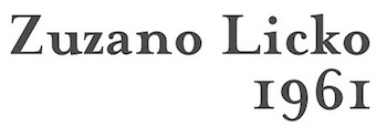 Based on John Baskerville's typefaces (1752), Textism likes George W. Jones' version of this font published as ITC New Baskerville: Compared to the slightly gothic feel of Caslon, Baskerville is purely neo-classical, in it is seen the straight lines and arches of neo-classical architecture. This digital version is ITC Baskerville, which is quite usable but unready for use in long-term reading. Excellent for display use however. See also Mrs Eaves, an interesting experiment in reviving Baskerville, aping the idiosyncratic nature of letterpress text in digital form.
 View digital versions of Baskerville. [Google]
[More] ⦿
|
The Typehead Chronicles of Thomas Christensen
[Thomas Christensen]
|
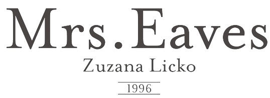 Information and specimen of all historically important typefaces: Akzidenz Grotesk, Aldus, Antique Olive, Avant Garde, Avenir, Baskerville, Bell, Bembo, Bodoni, Bulmer, Caslon, Centaur, Century Old Style, Cheltenham, Dante, Frutiger, Galliard, Garamond, Gill Sans, Goudy Old Style, Granjon, Helvetica, Janson (Kis), Minion, Mrs. Eaves, Optima, Palatino, Perpetua, Sabon, Syntax, Times New Roman, Today, Trump Medieval, Univers, Walbaum. [Google]
[More] ⦿
Information and specimen of all historically important typefaces: Akzidenz Grotesk, Aldus, Antique Olive, Avant Garde, Avenir, Baskerville, Bell, Bembo, Bodoni, Bulmer, Caslon, Centaur, Century Old Style, Cheltenham, Dante, Frutiger, Galliard, Garamond, Gill Sans, Goudy Old Style, Granjon, Helvetica, Janson (Kis), Minion, Mrs. Eaves, Optima, Palatino, Perpetua, Sabon, Syntax, Times New Roman, Today, Trump Medieval, Univers, Walbaum. [Google]
[More] ⦿
|
The Typographic Archives
|
Also called Graphion's Online Type Museum, or earlier, Graphion, a site by Michael sanbon that disappeared in 1999. Subsections: [Google]
[More] ⦿
|
The Typographic Library
|
The library comprises more the 4,000 items of typographic interest including reference books, journals and periodicals, trade literature, items of printed ephemera and collections of special interest. Free to the public. They explain: The Typographic Hub is part of the Birmingham Institute of Art&Design at Birmingham City University; the Hub works to promote the history, theory and practice of typographic design. Historically, the Midlands are England's typographic heart. William Caslon (1692-1766) the first grandée of English type design, was born in Cradley, whilst Birmingham was home to John Baskerville (1706-1775), creator of the world's most well-known and enduring typeface; and Leonard Jay, a teacher par excellence revolutionised 20th century British typographic education whilst Head of the Birmingham School of Printing (1925-1953). The Typographic Hub works to preserve this great heritage. [Google]
[More] ⦿
|
Thomas Christensen
[The Typehead Chronicles of Thomas Christensen]
|
[More] ⦿
|
Timberwolf Type
[Lars Bergquist]
|
 Lars Bergquist is the Swedish type designer (b. 1936) who runs Timberwolf Type in Sollentuna, just outside Stockholm. Bergquist designed numerous successful text families and display typefaces, including the free Beryll typeface. In 2016, the collection moved over to (was bought by?) 3IP. Some offerings:
 - Old Style romans: Sarabande (1998; based on Jean Jannon's famous "Garamond" of 1621), Pavane (1998, based on a text typeface by Rudolf Koch), Philomela (2000, also at PsyOps), Montrachet (2002, Fountain: a garalde family), Monteverdi (Fountain: with Granjon's Plantin Ascendonica italic).
- Baroque/transitional: Leyden, Leyden News (PsyOps, 2000), Baskerville 1757 and Baskerville Caps (1998; winner of a Bukvaraz award in 2001, available at Type Quarry).
- New Style Romans: Millennium, Eleonora (1999), Prospero (1998, a didone family), Waldstein (2003, Fountain: a Scotch typeface).
- Sans typefaces: Millennium, Millennium Sans, Millennium Linear, New Millennium, New Millennium Sans and New Millennium Linear (2000).
- Display typefaces: Diorite (2005, a calligraphic angular family), Corsiva Italica (2003), Paracelsus (2003, Fountain: a modern version of Schwabach), Foliant Blackletter (German 15th C Textur), Zeppelin Bauhaus Gothic, Berserk Scandinavian runes, Escorial (at PsyOps), Paestum (2001, a Greek simulation family), Sekhmet (2000), Praetorian, Pressroom (2003), Proconsular, Palaestra (the latter three are inspired by informal, painted Roman wall writing), Triumphalis Caps (also inspired by Roman imperial inscriptions), Bucintoro (1999, a modern version of the rotunda blackletter), Midnight (2000; a neon light/ blackboard bold family), Karolin Fraktur (at Psy/Ops: Fraktur modeled after the Bible of King Charles XII, printed in Stockholm in 1703), Rococo Titling (2001, ornate titling caps based on work done by Jacques-François Rosart (1714-1777) and Pierre Simon Fournier (1712-1768), and the Renaissance family Ronsard (at PsyOps, 2000).
Some fonts are available at Fountain, Psy/Ops and Type Quarry. Bukvaraz gave him an award for Absolut Type, a classic Renaissance family, so I wonder if that is not the same as Baskerville 1757. Lars says that Absolute Vodka complained, so the type is sold by Psy/Ops as Aalborg (2002). He published Whitenights at Linotype in 2003. FontShop link. Klingspor link. [Google]
[MyFonts]
[More] ⦿
|
Tiny Type Co
[Robin Mientjes]
|
 Tiny Type Co. was established by Dutch graphic and type designer Robin Mientjes in 2016, in Oslo, Norway. Robin writes about herself: Robin Mientjes is a genderqueer feminist type designer, with an obsession for baking, cooking, and thoughtful graphic design. She's been designing for print and web for fifteen years, and studied at the KABK. Her typefaces:
 - She contributed to the open source font project Open Baskerville (2009).
- Dover Display in Sans and Serif versions (2012-2016), with some contrast, sharp edges, and historic influences from the British types Caslon and Gill Sans. Dover Text (Sans and Serif) followed in 2017. Mientjes: Dover Serif Text is a modern Caslon, and Dover Sans Text is the Gill Sans you've always wanted to pair it with. Together, they do it all.
- Hume (2016): a collection of sans and display typefaces for the redesign of BNordaaker.
- Peaches. A pixel font designed for a comic book artist.
- Charlotte Greeven. A high-contrast didone typeface created for fashion designer and illustrator Charlotte Greeven.
- Antikva. An angular design based on Oldrich Menhart's Manuskript Antikva (1943). It was developed during her studies at KABK.
- Monumental Grotesk (2016). Based on the architectural lettering of Piet Zwart for his friend, Hendrik Berlage.
Home page. [Google]
[More] ⦿
|
Tiro TypeWorks
[John Hudson]
|
John Hudson and Wm. Ross Mills, the co-founders of Tiro Typeworks in 1994, design wonderful top-of-the-line fonts in Vancouver. Their commercial typefaces can be bought from I Love Typography since 2020. From the Tiro web page: Tiro Typeworks is an independent digital type foundry developing&marketing high quality typeface families for PC and Mac platforms. Our commitment is to continuing the independent tradition of typography, as it has existed for more than five hundred years, free from the influence of fashion and novelty. Tiro is increasingly involved in font technologies, and are avid advertisers for OpenType and work often with Microsoft and Linotype on projects. John has created or collaborated on typefaces for Arabic, Bengali, Burmese, Cyrillic, Devanagari, Ethiopic, Greek, Gurmukhi, Hebrew, IPA, Javanese, Kannada, Latin, Odia, Sinhalese, Soyombo, Telugu, Thai, and other writing systems. He is an expert contributor to Unicode, and a member of the W3C Web Fonts Working Group. Interview in 2008 by Hiba Studio. Tiro's typefaces: - Academia (1997, by Mills).
- The titling and display typeface Aeneas based on classical Roman capitals. This incomplete typeface was created by John Hudson based on glyphs drawn by an Austrian designer.
- 1530 Garamond (one of the most beautiful and faithful revivals of Claude's creations), by Mills.
- Manticore (John Hudson's own absolutely magnificent brainchild).
- Plantagenet (by Mills).
- Sylfaen was designed for Microsoft in 1998 by John Hudson and Wm. Ross Mills of Tiro Typeworks, and Geraldine Wade of Monotype Typography. Sylfaen is a Welsh word meaning "foundation"; an apt name since the font stemmed from research into the typographic requirements of many different scripts and languages. Sylfaen supports the WGL4.0 character set, for Pan-European language coverage. In addition to Latin, Greek and Cyrillic letterforms, the font contains the characters necessary for support of the Armenian and Georgian languages. [Download site, see also here].
- Hudson also does corporate identity work, such as HeidelbergGothicOsF (done for Heidelberger based on NewsGothic). Other clients included Microsoft, IBM and Apple.
- In 2001, Mills developed Pigiarniq (Download site), a multiscript typeface for native American languages. This project was commissioned by the government of Nunavut, a new Canadian territory. Note: please visit the page on James Evans' type cutting methods: it was this missionary who developed the Cree writing system which was later adapted for use with Inuktitut.
- Winner with Mamoun Sakkal and Paul Nelson at the TDC2 2003 competition for Arabictype.
- In 2003, he is publishing unicode-compliant fonts called SBL Greek, SBL Hebrew and SBL Latin, at the Society for Biblical Literature.
- In 2004, winner of an award at TDC2 2004 with Nyala, an Ethiopic text face, which has a nice Latin component as well.
- Hudson and Mills have, to date, designed and built fonts for the Arabic, Cherokee, Cyrillic, Ethiopic, Greek, Hebrew, Inuktitut (Canadian Aboriginal Syllabics), extended Latin, and Ogham scripts. These include, for example, Adobe Hebrew (2000-2008).
- Constantia (2004, a beautiful OpenType family made for Microsoft's ClearType project).
- Helvetica Linotype (2004), for which he received a TypeArt '05 award for the Cyrillic component.
- Vodafone Hindi (2007, with Tim Holloway and Fiona Ross) won an award at TDC2 2008.
- Gabriola (2008) is a script font by Hudson done for Microsoft---it is included in some Windows packages---see, e.g., here. It has many swashes and special ligatures, but it is not connected.
- Athena Ruby (2012), a winner at the TDC 2013 competition. Client: Dumbarton Oaks Research Library & Collection, Washington DC.
- Brill (2011, John Hudson, Alice Savoie, Paul Hanslow and Karsten Luecke) and Brill Greek (2021), Brill Cyrillic (2021) and Brill Latin (2021), all by the same foursome. This classic text typeface family was a winner at the TDC 2013 competition. Client: Koninklijke Brill NV, Leiden, The Netherlands.
- Slabo 27px and Slabo 13px (2013) are free Google Web Fonts. Optimized to be used at 27px and 13px, respectively, these fonts were created for use in online advertising.
- Codesigner with Eben Sorkin, Joshua Darden, Maxim Zhukov, and Viktoriya Grabowska, of Omnes Cyrillic.
- In 2018, Paul Hanslow, Ross Mills and John Hudson co-designed the free STIX Two family, which is based on Times Roman.
- Castoro (2020). Hudson writes: Castoro is a libre font family released under the SIL Open Font License. Castoro is a specific instance of an adaptive design developed for Tiro Typeworks' internal use as a base from which to generate tailored Latin companions for some of our non-European script types. The instance that has been expanded to create the Castoro fonts was initially made for the Indic fonts that we produced for Harvard University Press. In the Castoro version, we have retained the extensive diacritic set for transliteration of South Asian languages, and added additional characters for an increased number of European languages. The parent design here presented as the Castoro instance began as a synthesis of aspects of assorted Dutch types from the 16th through 18th Centuries. Castoro roman was designed by John Hudson, and the italic with his Tiro colleague Paul Hanslow, assisted by Kaja Slojewska. It is named Castoro after the busy beaver, a real workhorse in the Canadian forests. Google Fonts link. Followed in December 2020 by John Hudson's roman capitalis monumentalis typeface Castoro Titling.
- Clairvo (2021): Clairvo is a proof-of-concept font that uses OpenType Layout to implement the number system developed by Cistercian monks in the 13th Century. The number system records each number from 1 to 9999 as a unique sign based on encoding units, tens, hundreds, and thousands in quadrants: top-right, top-left, bottom-right, and bottom-left respectively. The Clairvo font uses OpenType glyph substitution to handle mirroring of the shapes in each quadrant, but relies mostly on contextual GPOS anchors to shift the glyphs around the quadrants. This means that all 9999 numbers can be represented my a minimal number of glyphs.
- Skeena (2021). A humanist sans typeface by John Hudson and Paul Hanslow developed for Microsoft for use as one of the default fonts in Office apps and Microsoft 365 products.
Klingspor link. [Google]
[More] ⦿
|
TypeShop Collection
[Walter Florenz Brendel]
|
 The TypeShop collection was at some point, ca. 2006, part of Elsner&Flake, and its fonts could be licensed via MyFonts. Elsner&Flake provided the history behind this collection and its developer, Brendel: The originator of the big TypeShop Font Collection was Walter Florenz Brendel (1930-1992). As far back as 1972 he had the idea of an electonic and digital system for typeface plotting and cutting as well as automatic modification and reproduction. Before 1972 when type users demanded their type color to be a little lighter or little darker, Brendel as the owner of over 28 typeshops across Europe employing about 600 people, could not meet their demands with the existing typefaces. Consequently he developed a method to satisfy their needs. Brendel was the originator of the concept and the contributor and partner in the development of IKARUS by Dr. Peter Karow. He cut typefaces based on mathematical increments that would allow type weights to be graduated in equal steps. Thanks to his perfectionism, type users can have the luxury of choosing a specific type weight out of seven from as many as 65 font-families in the TypeShop Collection. Mr. Brendel was an accomplished professional type designer. Lingwood, Montreal, Volkswagen, Derringer and Casablanca and many more were his creations. He was a design collaborator for Congress, Litera, Worchester and others. Today all of this fonts complete with a Euro currency symbol are available in four font formats including OpenType.
 That view of Brendel is perhaps not held by most type designers, who regard Brendel's collection as highly derivative. Albert-Jan Pool: Walter Brendel (1933-1992) was the founder of Brendel Informatik, Brendel & Pabst and the Type Shop group of phototypesetting houses. He also co-founded the European Typeface Corporation (ETC) which was connected with Typo Bach, another group of phototypesetting houses. Brendel's Serials were based on existing typeface designs, which had typically been made fit for creating a range of 7 weights from extra light to extra bold by interpolation. The Serials Typeface Collection used to be exclusively available through Brendel's Type Shops, Typo Bach and others. The German type designer Georg Salden created another range of exclusive typefaces, they were only available through the GST group of typesetting houses. Similar to Brendel's Type Shops and Adrian William's Club Type, the GST group also tried to enforce customer loyalty by offering typefaces that were exclusive to their group. As all of these typesetting houses worked for the same advertising agencies, their typeface libraries show many similarities. Some of these similarities were created on purpose, some of them not. Some of them are just copies, some of them are re-engineered designs, some of them are adaptations of existing designs, some of them are originals. Elsewhere, Elsner&Flake write: Brendel ordered the development of exclusive phototypesetting typefaces in the 70s and the beginning of the 80s for the phototypesetter he himself built, Unitype, which had their basis partially in historical but also in contemporary designs. For what it is worth, here are the font family names: Volkswagen TS, Clear Gothic TS, Franklin Gothic TS, Old Baskerville TS, Accolade TS, Baskerville TS, Belfast TS, Bernstein TS, Bodoni TS, Broadway TS, Casablanca TS, Casad TS, Castle TS, Colonel TS, Clearface TS, Congress TS, Denver TS, Derringer TS, Diamante TS, Digital TS (square gothic), Dragon TS, Enschede TS, Expressa TS, Florida TS, Formula TS, Garamond TS, Gascogne TS, Glasgow TS, Goudita TS, Goudy TS, Granada TS, Grenoble TS, Hamburg TS, Helium TS, Hoboken TS, Horsham TS, Koblenz TS, Leamington TS, le Asterix TS, Le Obelix TS, Limerick TS, Lingwood TS, Litera TS, Media TS, Melbourne TS, Montreal TS, Napoli TS, Nashville TS, Nevada TS, Ornitons TS, Pasadena TS, Penthouse TS, Plakette TS, Plymouth TS, Priamos TS, Quartz TS, Ragtime TS, Ravenna TS, Riccione TS, Rochester TS, Roundest TS, Salzburg TS, Seagull TS, Toledo TS, Veracruz TS, Verona TS, Wichita TS, Worchester TS. Name equivalences between the TypeShop collection and other fonts. View TypeShop's library of typefaces. Another link to TypeShop's library of typefaces. [Google]
[MyFonts]
[More] ⦿
|
Typoart GmbH (or: VEB Typoart)
[Jay Rutherford]
|
 Dresden (East Germany)-based font studio that evolved from the former East German centralized press, VEB Typoart. VEB Typoart operated from 1948 until 1989, when it was renamed Typoart GmbH. Typoart GmbH dissolved mysteriously in 1995, perhaps due to bankrupcy.
 MyFonts catalog of digitizations. Timeline as provided by Typoart-Freunde, a project of Jay Rutherford at the Bauhaus University in Weimar (and published in 2007 in a book by the same title, Heinz Wohlers Verlag, Harrlach): - 1945: Schriftguß KG (before that, Gebr. Butter) produces type again.
- 1946: Schelter&Giesecke in Leipzig becomes VEB Druckmaschinenwerk Leipzig.
- 1948: Schriftguß KG becomes VEB Schriftguß Dresden. This is the true start of Typoart.
- 1951: the foundry section of VEB Druckmaschinenwerk Leipzig is absorbed by the VEB Schriftguß Dresden. Herbert Thannhaeuser becomes art director. We see the name Typoart.
- 1952: Herbert Thannhaeuser publishes Papier und Druck, and creates Meister-Antiqua and Technotype.
- 1957: Typoart is in full production now. An eyecatcher is Albert Kapr's Leipziger Antiqua.
- 1958: Thannhaeuser publishes his Liberta Antiqua and Garamond Antiqua. The Party decides that all private industrial property now belongs to the state.
- 1961: Typoart absorbs Ludwig Wagner KG in Leipzig and Norddeutsche Schriftgießerei Berlin. The Berlin wall is built.
- 1962: There is some negative press about Typoart's domination by Thannhaeuser's designs. VEB Typoart is absorbed by Vereinigung Volkseigener Betrieb (VVB) Polygrafische Industrie.
- 1963: Thannhaeuser dies. Albert Kapr becomes art director.
- 1965: The annual production reaches 4,5 million matrices. Purchase of the Digiset machine, built by Firma hell in Kiel, which is the first machine for electronic typesetting.
- 1967: Sabon Antiqua appears.
- 1970: Typoart is now owned by SED. In the DDR, all phototype printing is now done in Berlin, Leipzig and Dresden.
- 1971: Typoart is now producing its own phototype for the Linotron 505. Their prime productions include Maxima (by Karl-Heinz Lange; based on Gert Wunderlich's Linear-Antiqua) and Prillwitz-Antiqua (Albert Kapr).
- 1973: Albert Kapr publishes Typoart-Typenkunst, in which 19 typefaces are showcased.
- 1976: Phototype fonts are developed for Diatype, Diacomp (such as Maxima, Liberta, Garamond-Antiqua, Tschörtner-Antiqua, Leipziger-Antiqua), and 2NFA (Russian). Detlef Schäfer becomes head of research and development.
- 1977: To help with the digital transition, Norbert du Vinage joins Typoart.
- 1980: New types include Kleopatra, Biga, Zyklop, Quadro and Molli.
- 1987: Albert Kapr hands the art directorship to Norbert du Vinage. Publication of the first phototype catalog by Typoart.
- 1989: Publication of Fotosatzschriften, Typoart's typeface program. Typoart folds.
- 1990: VEB Typoart is changed into a GmbH with 230 employees.
- 1991: Eckehart Schumacher Gebler acquires all of Typoart's matrices. This collection is kept in the Werkstätten und Museum für Druckkunst Leipzig GmbH. Typoart GmbH and HL Computer (Karl Holzer's company) are joined.
- 1995: Typoart GmbH still has 100 employees. It offers typefaces in truetype and postscript formats. Albert Kapr dies in Leipzig. The demise of Typoart is mysterious, and not much is known about who owes what to whom. The copyright status of its typefaces remained uncertain. This page mentions the present situation. Andreas Seidel explains that Typoart has digitized lots of its type typefaces using Ikarus, and that the rights are held by Mr. Holzer, who may be in some financial trouble. He says that no living Typoart designers have received any royalties or public recognition.
Typoart Freunde and Typowiki have partial lists of typefaces. Here is my own: - Agitator (1960). By Wolfgang Eickhoff. This rough-brush typeface was digitally revived in 2007 by Patrick Griffin at Canada Type as Merc.
- Alte Schwabacher: blackletter by Herbert Lemme.
- Antiqua (fett, kursiv fett and schmalfett) by Barbara Cain. A didone family.
- Baskerville (1982) by Volker Küster and Peter Greinke.
- Bembo: Typoart's version is by Erhard Kaiser.
- Biga: a shaded headline typeface made by Fritz Richter in 1985.
- Caslon-Gotisch: a blackletter typeface originally created by William Caslon in 1760, it was brought to Leipzig from England in 1904 by Carl Ernst Pöschel.
- Eckmann: a soft blackletter, dating from 1900.
- Egyptienne. By Hans-Peter Greinke.
- Erler Versalien (1953, Herbert Thannhaeuser). Digital versions: Erler Titling (2015, Ralph M. Unger), Missale Incana (2004, Andreas Seidel).
- Garamond (1955): the metal Typoart version is by Herbert Thannhaeuser. The digital version is Garamond No.5 at Elsner&Flake. See also here. URW published a different digital version, Garamond No. 4. And Infinitype / SoftMaker says that its German Garamond is based on TypoArt's.
- Fleischmann: a serif based on Fleischmann's historical face. An original cursive by Harald Brödel was added.
- Halbfette Baskerville: an interpretation of Baskerville by Volker Küster.
- Hogarth Script: an elegant script based on 18th century copperplate originals by William Hogarth. Font by Harald Brödel. Digital versions at URW, Softmaker (as Hobson), Alexandra Gophmann (Cyrillic version, 2005), Ralph M. Unger (as Gillray Pro, 2015), Castcraft (as OPTI Historic Script), Linotype and Elsner&Flake. Incredibly, Linotype owns the Hogarth Script trademark.
- Kis Antiqua: Hildegard Korger's interpretation of this classic Dutch Antiqua by Nikolaus Kis. For a digital revival, see Ralph Unger's Kis Antiqua Pro (2018).
- Kleopatra: a double-line decorative typeface by Erhard Kaiser (1985), digitized in 1989.
- Leipziger Antiqua: a very legible Antiqua designed by Albert Kapr in 1959, developed for phototypesetting by Hans-Peter Greinke, and further developed in digital form by Tim Ahrens in 2002 as Lapture.
- Liberta Antiqua and Kursiv: a robust house typeface from 1958 made by Herbert Thannhaeuser. Klingspor gives the date 1956.
- Lotto (1955). By Herbert Thannhaeuser.
- Luthersche Fraktur: a blackletter by Volker Küster and Herbert Lemme, digitized in 1989.
- Magna: a DDR magazine text typeface from 1968, by Herbert Thannhaeuser. In 1975, Albert Kapr added Cyrillic letters. Karl-Heinz Lange developed the phototype. URW, Linotype and Elsner&Flake (who owns the trademark) have a digital version.
- Maxima: a sans family by Gert Wunderlich (1970). Elsner&Flake (who owns the trademark), Linotype and URW have a digital version.
- Minima: Karl-Heinz Lange's narrow sans designed for the DDR's telephone directory in 1984. Revived by Ralph M. Unger in 2017 as Tablica.
- Molli: a comic book typeface by Harald Brödel.
- Neutra (1968): A variant of Clarendon, rendered more legible by Albert Kapr. Used in the DDR for advertising.
- Nidor: a slab serif by Harald Brödel.
- Norma-Steinschrift: a house sans.
- Prillwitz (1971-1987): a didone by Albert Kapr and Werner Schulze based on the original from 1790 by Johann Carl Ludwig Prillwitz. Elsner&Flake have a digital version. See also the 2015 revival by Ingo Preuss called Prillwitz Pro.
- Polo by Carl Pohl. URW++ has a digital version.
- Primus: a 1962 workhorse family (with Magna and Timeless) for the magazines in the DDR. Conceived in 1962, it was later adapted in Phototype by Karl-Heinz Lange. However, the Berthold Phototypes book of 1982 and Klingspor Museum put the date of creation at 1950.
- Publika: a sans typeface developed between 1981 and 1983 by Karl-Heinz Lange. Sometimes spelled Publica.
- Quadro: a four-line showstopper typeface by Erhard Kaiser.
- Roesner Versalien (1960). By Wolfgang Roesner.
- Schwabacher T09, T20 and T48. By Herbert Lemme.
- Sinkwitz Gotisch and Versalien (1950). By Paul Sinkwitz.
- Stentor: a brush script by Heinz Schumann (1964). Digital versions by Scangraphic, Ralph M. Unger (2013, as Tyton Pro), Elsner&Flake and URW. Rosalia (2004, Ingo Preuss) is based on Stentor.
- Super Grotesk: a legible sans by Arno Drescher (1930, Schriftguss). Super Grotesk Buchtype (kursiv and halbfett) are placed in 1951. For a digital version, see FF Super Grotesk (1999, Svend Smital).
- Technotyp (1951). By Herbert Thannhaeuser.
- Thomas Schrift (1956). By F. Thomas.
- Timeless (1982). See also Elsner&Flake and URW. In 2021, Ralph Unger revived and extended Timeless, calling it Korpus Serif Pro.
- Tschörtner Antiqua and Kursiv (1955). By Helmut Tschörtner.
- Typo Skript (1968). By Hildegrad Korger.
- Typoart Didot (antiqua, kursiv and halbfett). Added in 1958 by Herbert Thannhaeuser.
- Typoart Garamond (1955). By Herbert Thannhaeuser.
- Walbaum (1984): a didone by Hans-Peter Greinke based on Walbaum's originals.
- Zyklop: an art nouveau/Jugendstil face by Fritz Kossack.
References on Typoart: - Walter Begner: 25 Jahre Typoart Dresden In: Papier und Druck, Leipzig 6/1973.
- Walter Begner: Entwurf und Herstellung von Schrifttypen in Ostdeutschland. In: Leipziger Jahrbuch zur Buchgeschichte. Jahrgang 6 (1996), pages 405-436.
- Albert Kapr and Hans Fischer: Typoart Typenkunst. Leipzig, 1973.
- Albert Kapr and Detlef Schäfer: Fotosatzschriften, Itzehoe, 1989.
- Detlef Schäfer: Fotosatzschriften Type-Design+Schrifthersteller, VEB Fachbuchverlag Leipzig, 1989.
- Norbert du Vinage (as artistic director of Typoart): 40 Jahre Typoart---vier Jahrzehnte intensives Bemühen um niveauvolle Schriften. In: Papier und Druck, Leipzig 11/1988.
Personal home page of Jay Rutherford. MyFonts link. View Typoart's typefaces. [Google]
[MyFonts]
[More] ⦿
|
Typofonderie (was: Porchez Typofonderie)
[Jean-François Porchez]
|
 Jean-François Porchez (b. 1964) lived in Malakoff near Paris until 2006, when he moved to Sèvres, and from there to Clamart in 2008. He studied at the Atelier Nationale de Recherche Typographique (or ANRT), and caught the world's attention when he created a new type family for Le Monde in 1994. His fonts Angie and Apolline were prize-winning entries at the Morisawa Typeface competition. He received the Charles Peignot award in 1998, and many awards at Bukvaraz in 2001 for fonts such as Ambroise and Anisette. He runs an increasingly important foundry, Porchez Typofonderie, and is the main typographical driving force in France today. He set up ZeCraft. Until 2004, he taught typography at ENSAD in Paris, and teaches occasionally at Reading. From 2004 until 2007, he was President of ATypI. His fonts:
 - Airco Std (2020). An italic at 27 degrees to evoke speed.
- Allumi PTF (2009---Eurostile meets Frutiger). Allumi comes in 27 styles. In 2021, Allumi Inline was added. Allumi Dingbats (2009) is free: it has several fists and arrows.
- Alpha Poste (2005). A sans family for the group La Poste.
- Ambroise, Ambroise Firmin (condensed) and Ambroise François (extra condensed) (2001, 30 fonts in all). Inspired by late style (1830s) Didot's, and with g, y and k as in the types of Vibert, the Didot family punchcutter as per the specimen books of the Fonderie Générale. This family was updated and extended with a new italic in 2016 as Ambroise Pro.
- Angie (1995, FontFont). A flared humanist sans in six styles.
- Anisette (1997, Font Bureau), Anisette Petite (2001-2008). Anisette is an art deco / avant garde family. The Petite is trending towards a more standard geometric sans. Anisette Pro Petite appeared in 2013.
- The Typelab fonts Antwerpen (1993) and Antarée (1993).
- Apolline (1995-1998, Porchez Typofonderie).
- Arcane (1997, Ogilvy-Quérac).
- Ardoise (2010). An extension of the Charente typeface (1999), which Porchez designed for the daily La Charente Libre, following the simple style of Franklin Gothic. The typeface extension to normal widths was developed from 2006 by Porchez and was used in 2010 in the redesign of the magazine Pelerin. Porchez: Ardoise PTF and its 45 series could be considered as an homage to Antique Olive. [...] It is virtually immune to distortion.
- Audace Std (2020). A curvy sans.
- Bienvenue (1999-2000, for France Telecom), Francetelecom-Demi (1999-2000, also for France Telecom).
- Charente (2000).
- AW Conqueror (2010). Jean-François Porchez was approached at the end of 2009 by Reflex Image to create a set of typefaces to relaunch the Conqueror papers collection. AW Conqueror is a family of free fonts available at the slow, chaotic and dysfunctional Conqueror.com / Arjo Wiggins web site. Styles include AW Conqueror Sans, AW Conqueror Slab, AW Conqueror Inline, AW Conqueror Didot and AW Conqueror Carved (with horizontal stripes as in money fonts). Not to be confused with the 2005 family called Conqueror by Yuri Gordon.
- Courrier (1997).
- Deréon (2005). Custom design for Beyoncé Knowles, remotely related to Dwiggins' Caledonia.
- Disney Channel (1997).
- Henderson Serif & Sans [2006). A Baskerville-meets-Arial family conceived by J.-F. Porchez, but extended and perfected by J.-B. Levée.
- La Terre (1994-2000). Circulated on abf under the names BAAAAALaTerre-Regular in 2002.
- Le Monde Journal (1997), Le Monde Sans (1997), Le Monde Livre and Le Monde Livre Classic (1997), Le Monde Journal Ipa (2003, a phonetic family), Le Monde Costa (Costa Crociere), Le Monde Courrier (2002).
- Linotype Sabon (2002). An interpretation of Tschichold's Sabon. This project was conceived at Type Sexy Night in Leipzig with a thoroughly drunk Bruno Steinert.;
- Lion (1998, Peugeot automobiles).
- Pyrénée (1996, Albert Boton, Carré Noir).
- Mencken (2005). For the Baltimore Sun, dubbed a contemporary Didot by JFP himself. Mencken replaces Retina for the stock tables and small print---Retina was originally created by typographer Tobias Frere-Jones of Hoefler&Frere-Jones for use in The Wall Street Journal, but seems harder to read than Mencken). In 2017, it was developed into a 163-style family, consisting the low contrast transitional Mencken Text, and the Scotch didone Mencken Head. It was also used near the end of presidential campaign of Emmanuel Macron. It is named after American journalist and satirist Henry Louis Mencken (1880-1956). For a retail version, see Mencken (2020, Typofonderie).
- Parisine (1996). Read about the history here. Parisine Office was done in 2005 for the RATP. Other weights include Parisine Clair, Parisine Sombre, Parisine Plus.
- Renault Identité (2004). Designed for Renault, and based on lettering by Eric de Berranger.
- Retiro (2006-2009). A Didot headline suitably ibericized for the magazine Madriz. Winner at TDC2 2010.
- Singulier (2012) is a geometric sans typeface created for Yves Saint Laurent Parfums. It was inspired by the monogram and logotype called Yves Saint Laurent that was created by Cassandre in the early 1960s.
- Sitaline (a corporate type for SITA, 1998).
- Vuitton Persona (2007). An all-capital two-color custom font designed for Louis Vuitton Malletier. Retail since 2008.
- Ysans was conceived in 2010 and published in 2017. Influenced by Cassandre's lettering, this geometric sans is aimed at the fashion industry. Its beveled multiline version is Ysans Mondrian.
- In 2020, he designed Arteria, a compressed display typeface family inspired by Italian shop signs and wood types.
- In 2021, Porchez developed the wonderful copperplate calligraphic typeface family Altesse, which is a typographic adaptation of the scripts engraved by the French copperplate masters from the 19th and 20th centuries. Altesse comes in many optical sizes. It won the grand prize in the 2022 Tokyo TDC competition.
- In late 2021, he released Astronef Super, a retro-futuristic typeface family with seven weights pushed to the extreme on both ends.
FontFont write-up. Adobe write-up. Bio. At ATypI 2004 in Prague, he spoke about Parisine and legibility. In 2014, Adverbum published the French/English book Jean François Porchez L'excellence typographique---The haute couture of typeface design, which has pieces by Karen Cheng, Aaron Levin, Muriel Paris and Sumner Stone. Linotype link. Behance link. Another Behance link. FontShop link. MyFonts link. MyFonts interview in 2009. Behance link. Speaker at ATypI 2010 in Dublin. View the typefaces made by Typofonderie Porchez. Adobe link. [Google]
[MyFonts]
[More] ⦿
|
Typographica: Best of 2008
|
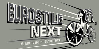 Typographica's Oscars for 2008, the unofficial but highly respected list of best types of the past year.
 - Orbe (Rui Abreu)
- Dolce&Dyna (Elena Albertoni)
- History (Peter Bilak)
- Carmen (Andreu Balius)
- Studio Lettering (Ken Barber, Tal Leming)
- ITC Franklin (David Berlow)
- Rocky (Matthew Carter)
- Birra Stout (Joshua Darden)
- Mary Read (Melle Diete)
- Marlene, Brioni, and Typonine Stencil (Nikola Djurek)
- Glosa (Dino dos Santos)
- Vista Slab (Xavier Dupré)
- FF Pitu (Lukasz Dziedzic)
- Givry (Tom Grace)
- Zócalo (Cyrus Highsmith)
- Archer (Jonathan Hoefler, Tobias Frere-Jones and Jesse Ragan)
- Expo Serif (Mark Jamra)
- Eurostile Next (Akira Kobayashi, Aldo Novarese, Alessandro Butti).
- Dessau (Gábor Kóthay)
- Arlt (Alejandro Lo Celso)
- FP Head Pro (Morten Olsen)
- Compendium and Calgary Script (Alejandro Paul)
- Memoir (Stephen Rapp)
- Bree (José Scaglione, Veronika Burian)
- Stag (Christian Schwartz)
- Modern Suite (Nick Shinn)
- Lakeside and Zanzibar (Mark Simonson)
- Hardys and Newzald (Kris Sowersby)
- Baskerville 10 (Frantisek Storm, John Baskerville, Otakar Karlas), Moyenage (Frantisek Storm), and Comenia (Frantisek Storm, Radana Lencová, Tomás Brousil)
- Mokka and Marat (Ludwig Übele)
- FF Trixie HD (Erik van Blokland)
- Benton Modern Display (Dyana Weissman, Richard Lipton)
[Google]
[More] ⦿
|
Typolar (was: Jarno Lukkarila Type Foundry, or: Format Design)
[Jarno Lukkarila]
|
 Jarno Lukkarila (b. 1978) works mainly in graphic design. As the author of the typography reference book Tekstuuri: typografia julkaisijan työvälineenä (2001, Helsinki: CredoNet) he is one of the few writing about the subject in the Finnish language. He ran a typography-oriented design studio called Format Design in Helsinki and lectures part time on typography in Finnish design schools. Lukkarila was recognized as a type designer in the Morisawa Awards 2002, where his Xtra Sans typeface received the bronze prize in the Latin category. Lukkarila studied type design at the Royal Academy of Art, the Hague, in the postgraduate course Type&Media highlighted by the writing and letter design workshop of Gerrit Noordzij in 2000. Before this he graduated as graphic designer in Finland. Format Design became Jarno Lukkarila Type Foundry, and in 2010 morphed into Typolar, which is based in London. Typolar is run with Teemu Ollikainen and Saku Heinänen.
 His type families, most of which start with an extreme hairline weight. - Xtra Sans: this won an award at TDC2 2007.
- In 2009, he finally published his 66-style Egyptian family Tanger Serif. Images: Medium Heavy, Narrow, Wide Ultra light.
- Calypso E (2010, E for Egyptian): a slab serif. Calypso I (2010, I for Italian) is a Victorian face.
- Vinkel (Typolar) was not designed by Lukkarila---it is a mini-slab serif family by Saku Heinänen.
- Altis (2011, Typolar). A readable sans family from Hairline to Black---ideal for information design.
- In 2012, he designed the custom Suunto UI Sans for the sports watch company Suunto.
- Typefaces from 2013 include the extensive Neuvos family. He writes about this small-serifed large-x-height family: Its large x-height, vertical stress and snug serifs make Neuvos an upfront and tough headliner. Although it has a hard-boiled cover, one can find hints of noble Transitional type like Baskerville underneath. Neuvos assures in editorial work and brings its Frutiger inherent calmness into branding or even signage systems. Neuvos Condensed was added in 2020.
- In 2014, he designed Walmer Marker (for signage applications).
- Typefaces from 2016: Etihad (a bespoke family for Etihad Airways), Alku Handwriting, motivated in this manner: The Finnish National Board of Education published a new recommendation for teaching handwriting in 2015. New letterforms were designed by Jarno Lukkarila (of Typolar) who participated in a committee set up for the renewal. This writing model will be used in virtually every Finnish primary and pre-primary school across the country from August 2016 on. Only a so called print writing will be provided by FNBE leaving the joined-up cursive writing as we've known it in the past.
- Era Grotesk (2020). A grotesk in the style of the early 1900s.
Klingspor link. Behance link. [Google]
[MyFonts]
[More] ⦿
|
URW Type Foundrty (was: urw++)
|
 URW++ Design&Development GmbH is a Hamburg-based foundry established in 1995 by Svend Bang, Hans-Jochen Lau, Peter Rosenfeld, and Jürgen Willrodt. URW stands for Unternehmensberatung Rubow Weber, named after Gerhard Rubow and Rudolf Weber, cofounders of the original URW company from which urw++ evolved. It offers a whole range of font services and has an extensive (7000+) font library. At the basis of the early development of many classy PostScript fonts. For example, in 1999, URW++ donated the 35 core PostScript fonts (renamed) under the GNU GPL license to the Ghostscript project. The great 3000-font CD costs about 2000DM. Other CDs are more expensive: on the ITF CD, each font is about 100DM! URW sells fonts and font families with complete rights (you can change, resell, embed, anything, except use the original name), with examples ranging from 2k for a complete family of 12 to 5k for a collection of 250 fonts. This practice continues until today: URW++ thus provides a great service to software developers who want to include high-quality typefaces in their software applications. URW has offices in many countries. In the first decade of the 21st century, freelance type designer Ralph M. Unger contributed most frequently to the URW library. OpenType collection guide (in PDF).
 Selected releases: URW Egyptienne, URW Grotesk (1985, Hermann Zapf), Anzeigen Grotesk (2009), Clarendon No 1 URW, Saa Series (an industrial sans: the official typeface for Australian road signage), Nimbus Sans (1987, a Helvetica clone), Nimbus Sans Novus, Nimbus Sans Europa (covering Latin, Greek, Baltic, Cyrillic, Central European, Turkish, Romanian, and so forth), Nimbus Roman No 9 (2001), Nimbus Sans Global and Nimbus Roman Global, each at about 2000 Euros, and each containing 35,000 glyphs, from kanji/Chinese/Korean to all European languages. House typefaces done for corporations: DaimlerChrysler Corporate ASE (after the Corporate ASE series for Daimler-Benz by Kurt Weidemann), Gardena Sans (2015, for Gardena), Siemens Schriftfamilie, Deutsche Telekom Schriftfamilie, ZF Friedrichshafen, Körber Argo, URW++ SelecType Raldo (2001, for Igepa). MyFonts lists their bestsellers. Catalog of their typefaces [large web page warning]. Another catalog of URW's typefaces. Eight-minute corporate movie produced in the summer of 2014. Adobe link. [Google]
[MyFonts]
[More] ⦿
|
US fonts in 40s and 50s
|
 Fonts popular in the US in the 40s and 50s as listed by typophiles: Alternate Gothic / Alpin Gothic, Futura, Garamond, Baskerville, Century, Caslon, News Gothic / Trade Gothic, Stymie / Memphis / Beton, Poster Bodoni, Onyx, Metrolite, Metromedium, Metroblack, Rockwell, Kaufmann, Balloon, Bank Script, Mademoiselle (Thompson), Alexey Brodovitch (Vogue). [Google]
[More] ⦿
Fonts popular in the US in the 40s and 50s as listed by typophiles: Alternate Gothic / Alpin Gothic, Futura, Garamond, Baskerville, Century, Caslon, News Gothic / Trade Gothic, Stymie / Memphis / Beton, Poster Bodoni, Onyx, Metrolite, Metromedium, Metroblack, Rockwell, Kaufmann, Balloon, Bank Script, Mademoiselle (Thompson), Alexey Brodovitch (Vogue). [Google]
[More] ⦿
|
Visual Graphics Corporation (or: VGC)
|
Foundry from the phototypesetting era, located on 138 NE 125th Street in North Miami, FL, and also at 5701 NW 94th Avenue in Tamarac, FL, with designers such as Ron Arnholm, Arthur Baker, Ray Baker, Stan Biggenden, Stan Davis, Ernst Friz, Louis Minott, John Russell, L. Scolnik, Dave Trooper and Ernst Volker. The company changed its name to VGC Corp. and became a subsidiary of VRG Group N.V. Inventors of the Photo Typositor. List of typefaces and designers as compiled by Tim Ryan. This list has errors, as pointed out in this discussion on typophile. My own list of typefaces. Typefaces in our list whose creators still need to be identified include Bubble (1982: Bubble Light, Bubble, and Double Bubble) and Rodin (ca. 1974). The 450-page book Visual Graphics Alphabet Library (1985) shows all of its typefaces. PDF version of their 1972 catalog. There are two components to the VGC collection, one is the standard collection of typefaces everyone must have (knockoffs, really), and the other one is the collection of originals. Freddy Nader explains: The reason for the VGC/Typositor catalog showing so many standards is this: in photo type days, every type house had to have a basic set of what was known as the "foundry types". These were your basic Garamonds, Baskervilles, Clarendons, etc. They simply did that in order to compete. Back then, the type house worked closely with the person designing the artwork (who usually worked for the publisher or the ad agency), and they were charging per word for display, and per page for text. So the type houses wanted to maintain a kind of continuity with their clients, and tried their hardest to be the exclusive supplier for a number of agencies. The very first photo type house, Photo-Lettering Inc, survived for the longest time on one client (J. Walter Thompson in NYC). As a side note, book publishers tried their best to stay away from photo type because of its very expensive prices. It was a hell of a lot cheaper to stick to metal type than pay the type house per page of layout. So if you look back at the mass paperback industry, it was still using metal type until late into the 1970s. They only switched to film type when competition between type houses became so fierce that the type prices dropped considerably. But film type was used in book for only a short time, then desktop publishing as we know it made it all obsolete. View some digital typefaces that are derived from the VGC library. Another digital catalog. [Google]
[MyFonts]
[More] ⦿
|
Walter Florenz Brendel
[TypeShop Collection]
|
 [MyFonts]
[More] ⦿
[MyFonts]
[More] ⦿
|
Wicky Syailendra
|
Bandung, Indonesia-based designer of the ornamental caps typeface Relics of Sailendra (2012). This typeface is a modification of Baskerville Old Style, with the flesh of the glyphs replaced by elements that are based on decorations found on some temples of the Sailendra dynasty. [Google]
[More] ⦿
|
Will Carter
|
Born near London in 1912, d. 2001. His typefaces: - Klang (1955). This typeface at Lanston Monotype was bought by Stephenson Blake from Monotype.
- Dartmouth (1961), Dartmouth Titling (for Letraset). Mac McGrew on Dartmouth: Dartmouth may be the last new typeface cut in metal. Paul Duensing says it was designed by Will Carter as a titling letter for the college of that name for signage and other display uses. It was based on Octavian Roman which Carter and David Kindersley had co-designed in 1960-61 for English Monotype. New figures for this cutting were drawn by Will Rueter of Toronto. Dartmouth was cut and cast in 22-point in 1991 at Duensing's Private Press and Type foundry.
- Octavian (1961, with David Kindersley).
Obituary: Founder of the Rampant Lions Press, who kept Cambridge supplied with fine printing and lettering of all kinds begun by Will Carter more than 60 years ago and continued by his son Sebastian, the Rampant Lions Press has been the leading English private press of the postwar period, following handsomely in the tradition of the Golden Cockerel and Nonesuch Presses. The Rampant Lions location in Cambridge and its close ties to the university guaranteed a stream of jobbing work in the early years---supporting it financially and spreading its reputation, as well as making it the obvious choice of printer for many books conceived within academia's groves. Both Will and Sebastian have been notable for their wide circle of friends and collaborators from the worlds of typography and lettercutting, fine printing, literary criticism, scholarly publishing and good bookselling. In addition to its own books, the Rampant Lions Press has always taken on work for other publishers, making printing not a solitary obsession, but a co-operative and convivial pleasure. Their customers have included Lord Rothschild, Dadie Rylands, Brooke Crutchley, Douglas Cleverdon and Ted Hughes, while those who produced illustrations for the press have included John Piper, Michael Ayrton, Anthony Gross, Leonard Baskin and John Buckland Wright. At a time when commercial publishing was increasingly done by lithographic methods, the Rampant Lions kept before the public examples of how much deeper, crisper and blacker good presswork from metal type can be. In reaction to photocomposition and then computer setting, there has been something of a revival of private printing, with presses of various degrees of accomplishment and preciousness emerging around the country; but the Rampant Lions was a crucial link back to the days when metal type was in everyday use. The changes in technology also gave it the opportunity to build up a collection of specialist fonts of type from foundries and from other presses, including the Golden Cockerel Roman. William Nicholas Carter was born in Slough into a very bookish family. He was, for instance, a great-great-nephew of the Eton master William Johnson Cory, famous for the Eton Boating Song and his translation of Callimachus' Epigram, "They told me, Heraclitus, they told me you were dead." Cory's Lucretilis was in due course handsomely printed at the Rampant Lions, with an introduction by John Sparrow. Will was the younger brother by seven years of the bookseller, biblio-historian and Housman scholar John Carter, who with Graham Pollard exposed the T. J. Wise forgeries of 19th-century pamphlets, in the classic case of bibliographic detection. Their cousin was the outstanding wood-engraver Reynolds Stone, who was to cut one of several devices for the Rampant Lions, as he previously had for Frances Meynell's Nonesuch. Will Carter's interest in printing began when he visited Oxford University Press in 1924 at the age of 12, where he was allowed to print a visiting card for himself using the 17th-century Fell type. A few days later, John Johnson, who was shortly to become Printer to the University of Oxford, sent the boy some type to experiment with, hoping that it would make for an amusing and useful hobby. After his schooling at Radley, Carter worked as a trainee with the printers Unwin Brothers for two years. He transferred to the Shenval Press, under James Shand, and then to Heffer's printing works in Cambridge in 1934, where he rose to be a designer. In his spare time, he began jobbing printing in Jordan's Yard on an octavo flat-bed Adana press, an Albion hand-press and later an Adana platten press. His first book, in an edition of just 50 copies, was the printer John Baskerville' Preface to his 1758 edition of Paradise Lost. "The pathetic part about it was that I took the text from Updike" wrote Carter years later, "and, beyond noticing a certain abruptness in the ending, didn't realise that it wasn't complete." The slump in the prices of rare books and modern first editions at the beginning of the 1930s made life difficult for private presses. Book-collecting had been fashionable in the giddy 1920s. Books had been bought as financial speculations and there were many eager customers, so it was possible to sell comparatively long runs. "Nonesuch limited editions sold to the full of their hundreds," wrote Sir Frances Meynell in My Lives in 1971. But after the crash of 1929-30, the next two decades saw a retrenchment in book collecting and publishing. Most of the successful new enterprises of the period were in the form of popular editions, such as Penguins, rather than fine collectors' items, and Carter could not support himself with Rampant Lions work alone. He married Barbara Digby in 1939 and moved to Chesterton Road, where they were to live for the rest of their lives. During the war he served in the Royal Navy in the South Atlantic and the Eastern Mediterranean, commanding a converted Greek sailing ship, transporting undercover agents around occupied Greece, until his demobilisation in 1946. Back in England he returned to Heffers, but in 1949 he steeled himself to pursue his passion, and the Rampant Lions Press, named after the family arms, became his full-time occupation. Happily, he was soon commissioned by Geoffrey Keynes to print 75 copies of Emblems of Experience by Siegfried Sassoon, for the author. Although much of his work consisted of printing wedding invitations, change-of-address cards and suchlike announcements, rather than books, it was so conspicuously fine that five years later an entire issue of the typographic world's house magazine, The Monotype Recorder, was devoted to Carter. In 1961 he served as president of the fine printers and typophiles dining society the Double Crown Club. And his life in letters extended beyond printing, into calligraphy, letter-cutting and type-design. In 1936 he had carved some lettering on a round breadboard for Brooke Crutchley, and he was to continue carving decorative alphabets---often of his own design---into different shaped panels for 60 years. In 1948, the year he published an essay on Chancery Italics in Printing Review, he met Eric Gill's last apprentice, the lettercutter David Kindersley, and learnt to cut in slate. The first of his commissions was the war memorial at Magdalene College, and he went on to produce many elegant gravestones and tablets. His lettering in stone and wood was exhibited in Frankfurt, Prague and New York, and his hand and eye were chosen for the foundation stone of the new British Library, cut and installed while St Pancras was still a building site. As he wrote, "the handling of type and the setting out of carved inscriptions came to influence each other. The setting of printer's caps in particular has reached a fine point of sensitivity as a result." This feeling for the shapes of letters led naturally to his designing his own. His typeface Klang was released by Monotype in 1955, and showed the influence of Rudolf Koch and his son Paul, in whose studio Carter had spend some months in 1938. (The type designer Hermann Zapf had been working nearby in Frankfurt at the time, and Carter considered him a major influence on his own lettering.) Later Carter and Kindersley collaborated on the design of another face, Octavian. Around 1963 Douglas Cleverdon approached the Rampant Lions to print an edition of The Rime of the Ancient Mariner, with ten copper-engravings that had been exe cuted by the artist and writer David Jones in 1928. This partnership was to lead to a series of books under the Clover Hill imprint, culminating in 1981 in the mighty (and mighty expensive) Engravings of David Jones. In 1974 Clover Hill Editions published William Morris's poem The Story of Cupid and Psyche, with wood-engravings designed by Edward Burne-Jones. The blocks for this large two-volume set had been engraved, mostly by Morris, for the Kelmscott Press in 1865 but had never been printed. Fortunately, Brooke Crutchley, by then the Cambridge University Printer, was able to persuade the University Library to lend Will and Sebastian the Kelmscott collection's black-letter Troy type for this edition, the most ambitious collaboration between father and son. Will Carter was artist-in-residence at Dartmouth College, New Hampshire, in 1969, where for Letraset he designed Dartmouth Titling, a slightly swaggering set of Roman capitals. He served on the Royal Mint's advisory committee from 1971 to 1991, and the architectural advisory panel of Westminster Abbey from 1979 to 1992. He was elected an honorary Fellow of Magdalene College in 1977, and appointed OBE in 1984. In the summer of 1982 a Rampant Lions retrospective was held at the Fitzwilliam Museum in Cambridge, for which the Carters wrote and printed a useful catalogue and checklist of the 172 books printed up to that time. By then the press had largely been handed over to Sebastian, and Will was devoting his time to carving and lettering. Over the years he produced many calligraphic book-jackets and title-pages, particularly for Cambridge University Press and Chatto&Windus. He also accepted commissions for book-labels for private collectors, many of which were doubtless pasted into volumes from the Rampant Lions Press. Will Carter's wife died in 1994, but he is survived by his son and three daughters. Will Carter, OBE, printer, type designer and lettercutter, was born on September 24, 1912. He died on March 17, 2001, aged 88. Catalog of his typefaces. Klingspor link. FontShop link. Linotype link. [Google]
[MyFonts]
[More] ⦿
|
William Martin
|
British typefounder and punchcutter (1757-1830) who trained under Baskerville, and was active as supplier to the Boydells, Nicols, the Bewicks, and Bulmer, 1776-1815. Born in Birmingham, he died in London in 1815 (others say 1830). In 1792, he designed the Bulmer typeface for the Shakespeare Press. Morris Fuller Benton's ATF version of the Baskerville style text typeface cut by William Martin for the English printer and publisher, William Bulmer, is called Bulmer. It is available from Bitstream in two styles, and from Monotype as Bulmer MT. ATF released the design in 1928. Adobe and Monotype, which have a multistyle family [much larger than the Bitstream family], now called Bulmer MT, write: Designed in 1792, the Bulmer types are named not after their designer, William Martin, but after the printer who used them so well in his Shakespeare [sic] Press editions. In fact, it was Morris Fuller Benton who gave them the name back in 1928 when he was creating revivals for American Type Founders. Originally, Martin's type was the English answer to the sharp, fine letterforms of Italy's Bodoni and France's Didot type foundries. But the Bulmer types did more than imitate the starkness of the modern-style Didot-Bodoni types. By condensing the letterforms, giving the strokes higher contrast, and bracketing the serifs slightly, Martin made his typefaces both beautiful and practical. Poster by Daniel Berkowitz. FontShop link. [Google]
[MyFonts]
[More] ⦿
|
Willie Ford
[Lazy Dog Foundry (or: Franklin Type Founders)]
|
[More] ⦿
|
WSI: Weatherly Systems Inc
[Mike Charness]
|
Mike Charness's Huntsville, AL-based foundry used to offer a huge number of handwriting fonts, and thousands of other fonts at rock bottom prices, in all font formats. It stopped selling fonts to end users or licensing fonts for redistribution in 2003, but continues OEM work. Lists of font names: - Robert Long discussed the fonts, and mentioned in some cases the original fonts they were modeled after (read: copied, tweaked and renamed).
- A partial list found in internet archives and corrected by Herbert Van Brink is here. A list annotated by Robert Long and kindly sent to me by Richard George, is here.
- Michael Yanega published a list of the WSI Hand names and their equivalences on the ClickArt Handwritten Fonts CD.
- Ulrich Stiehl provides a further list and explanations: Anastasia is Anna, Avian is Avant Garde, Basset is Baskerville, Bastian is Buster, Boston is Bodoni, Bulletin is Flyer, Aladdin is Legende, Palisade is Palatino, and so forth.
WSI had barcode fonts, MICR fonts (such as CheckNums-MICR), some foreign language fonts, and many dingbats. The full collection could at one point be downloaded here. The handwriting font collection (known as WSI Hand) was downloadable from here, here and here. Apparently, these handwriting fonts were obtained by first selling a handwriting font service, and then selling a CD with the created fonts. WSI is no longer selling fonts and has this ironic line: WSI's fonts are not freeware, but are commercial software protected by copyright. Now, how did WSI start up its business? I quote from this archived page: We don't sell directly to end users, but rather provide fonts to software publishers who sell our fonts under their own labels. Current and past licensees include PowerUp, Spinnaker, SoftKey, Wayzata, Canon, Fuji, Epson, Serif, Borland, Novell, Maxis, Cosmi, Xoom, Dynamix/Sierra Online, Synergistic Software, Expert Software, IMSI, Parsons Technology, MySoftware, Abstract Software, Dunlop Corp., Case Inc., GraphicCorp, CAI, Creative Wonders, The Learning Company, Current Inc., Pierian Springs Software, Lookout World, Palladium Interactive, Philips Publishing, AIG, Asymetrix, Media Graphics, Knowledge Adventure, WIZ Technology, Paper Direct, Sanctuary Woods Multimedia, GST/GSP, Baudville, Zedcor, and many others. [Google]
[More] ⦿
|
Yannis Haralambous
[SMF Baskerville]
|
[More] ⦿
|
Zuzana Licko
[Emigre]
|
 [MyFonts]
[More] ⦿
[MyFonts]
[More] ⦿
|
Zuzana Licko
|
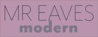 Zuzana Licko is the co-founder of Emigre, together with her husband Rudy VanderLans. Licko was born in 1961 in Bratislava, Czechoslovakia, and emigrated to the U.S. in 1968. She graduated with a degree in graphic communications from U.C. Berkeley in 1984. Her typefaces:
 - Base 9 and 12 (1995).
- Base 900 Sans
- Base Monospace (1997).
- Citizen (1986).
- Dogma (1994).
- Elektrix (1989).
- Fairplex (2002).
- Filosofia (1996). This has a unicase version.
- Hypnopaedia
- Journal (1990).
- Lo-Res (1985). Coarse resolution.
- Lunatix (1988).
- Matrix II (2007). A reworking of Matrix (1986).
- Modula Round and Ribbed,
- Modula (1985).
- Mr Eaves Modern, Mr Eaves Sans, Mrs Eaves XL Serif, Mrs Eaves (1996). Mrs Eaves is her best font, a Baskerville. Mrs Eaves XL (2009) is an extension and improvement of Mrs Eaves. Mister Eaves Sans and Mister Eaves Modern (2009, +XL Modern) are explained by them: Mr Eaves was based on the proportions of Mrs Eaves, but Licko took some liberty with its design. One of the main concerns was to avoid creating a typeface that looked like it simply had its serifs cut off. And while it matches Mrs Eaves in weight, color, and armature, Mr Eaves stands as its own typeface with many unique characteristics.
- Narly (1993).
- Oblong (1988). With Rudy VanderLans.
- Program (2013). For programming, with rounded corners.
- Puzzler (2005). A geometric pattern and decoration font.
- Quartet (1992).
- Senator (1988).
- Soda Script (1995). This may have some uses, but I can't think of any.
- Solex Tall Pack (1990).
- Tarzana
- Totally Gothic + Totally Glyphic (1990).
- Triplex (1989).
- Variex (1988). With Rudy VanderLans.
- Whirligig (1994).
Interview by Rhonda Rubinstein. Rudy VanderLans, Zuzana Licko and Mary E. Gray wrote Emigre (The Book): Graphic Design into the Digital Realm (1993, Van Nostrand Reinhold, New York). Her work is discussed by William H. Powes (in More from Eastern Europe: Czechoslovakia. Art Direction, vol. 45, pp. 62-63, 1994), Laurie Haycock Makela (in Three New Faces. Design Quarterly, vol. 158, pp. 22-25, 1993), Mike Jones (in Two Colors, one vision. Design, vol. 500, pp. 64-66, 1999) and Patrick Coyne (in Communication Arts, vol. 34, pp. 64-73, 1992). FontShop link. Klingspor link. View Zuzana Licko's typefaces. [Google]
[MyFonts]
[More] ⦿
|

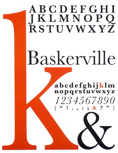
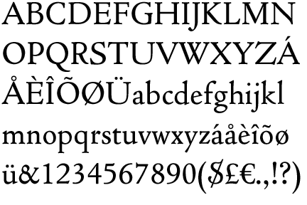
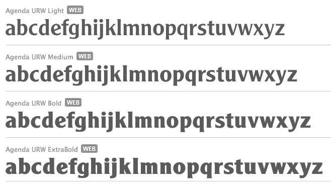
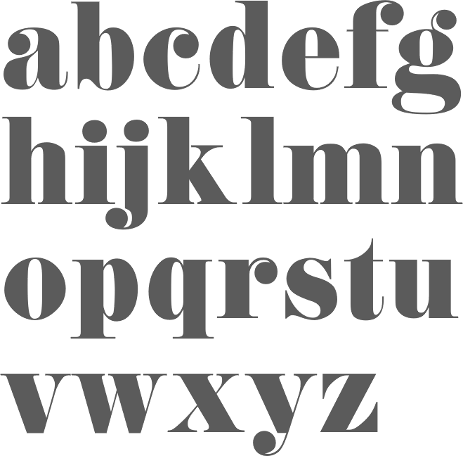
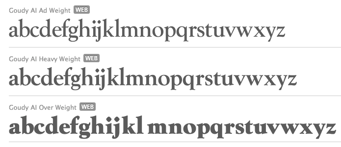
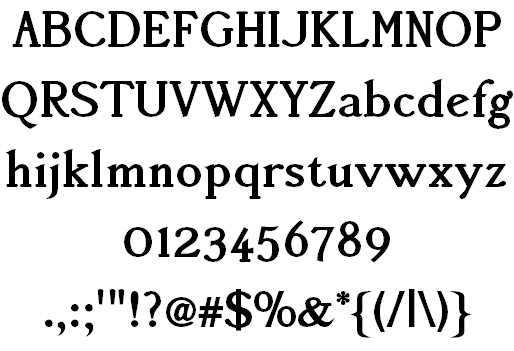
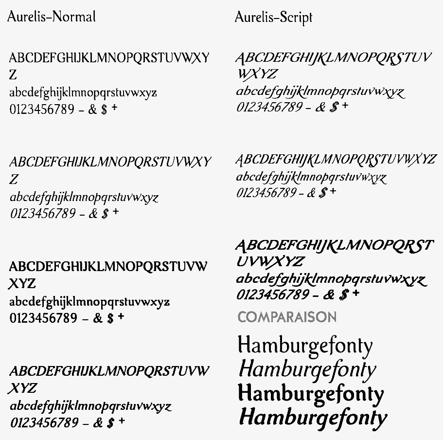
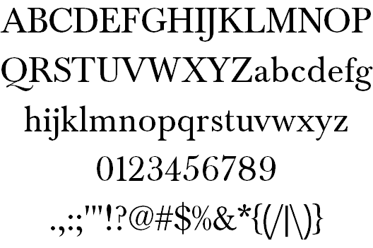
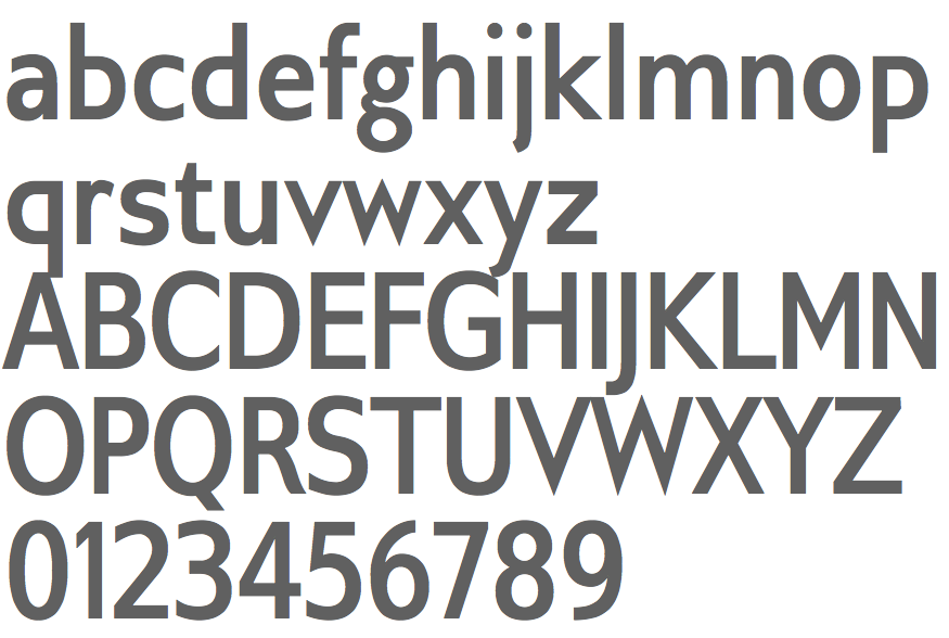
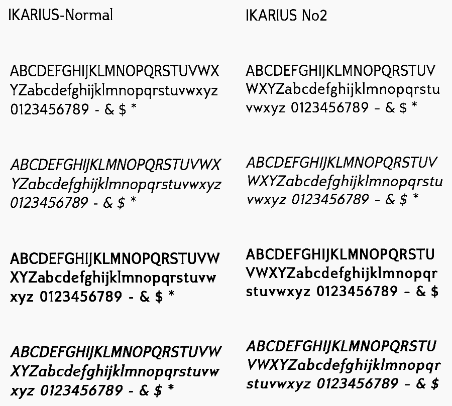
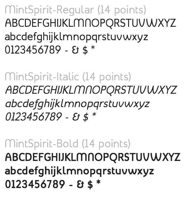
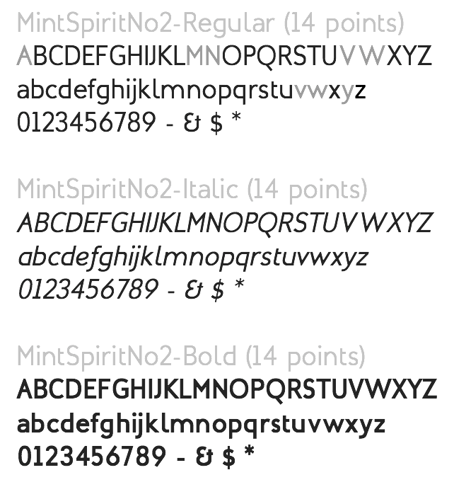
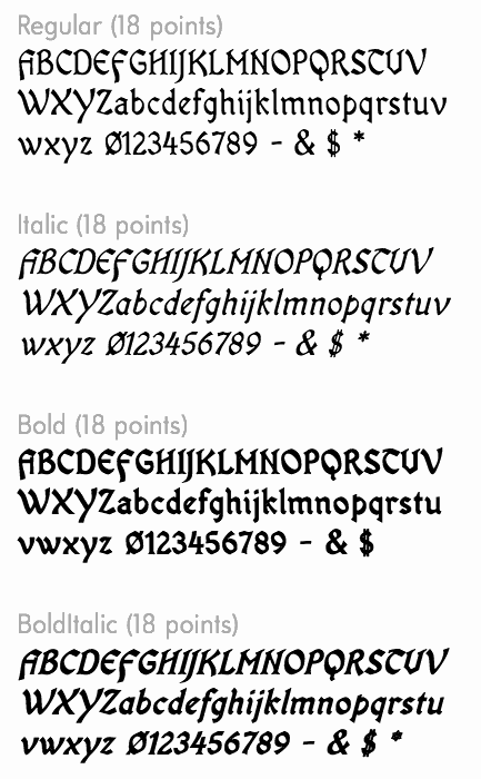
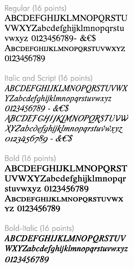
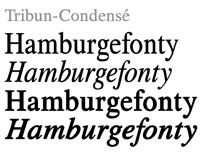
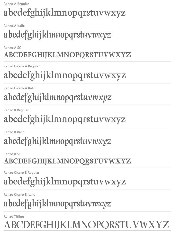
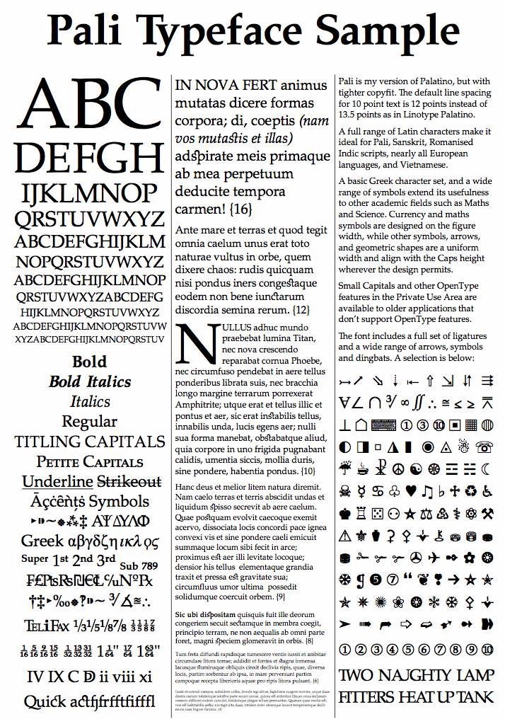
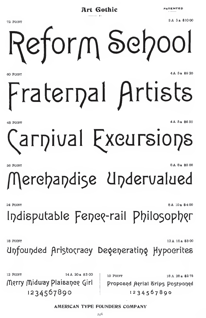
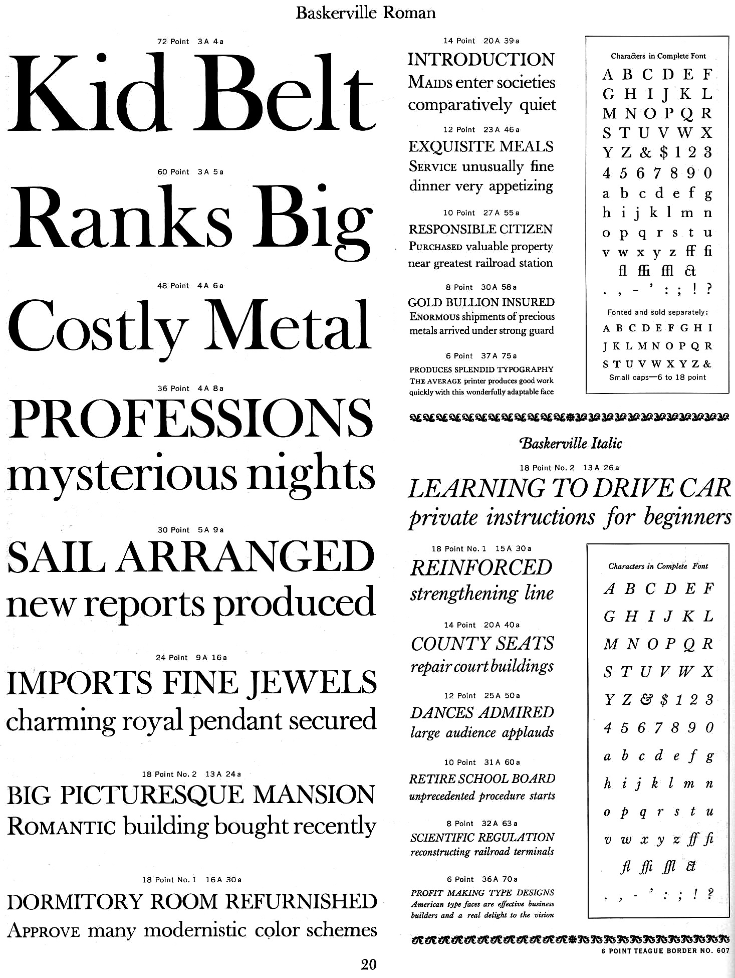
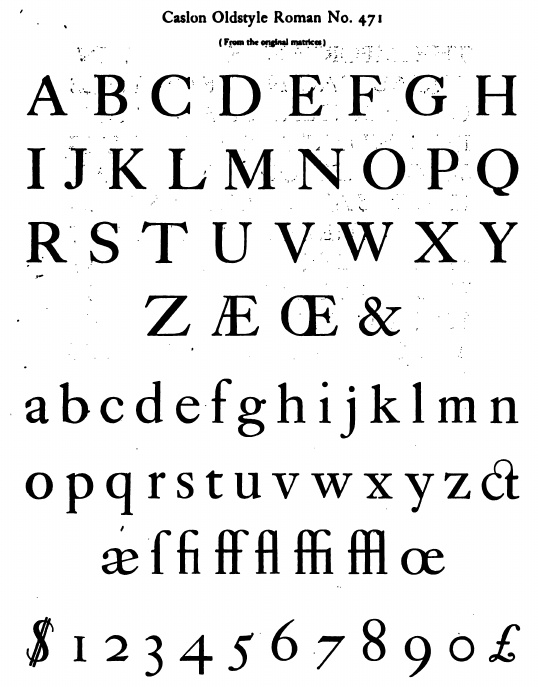
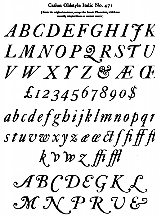
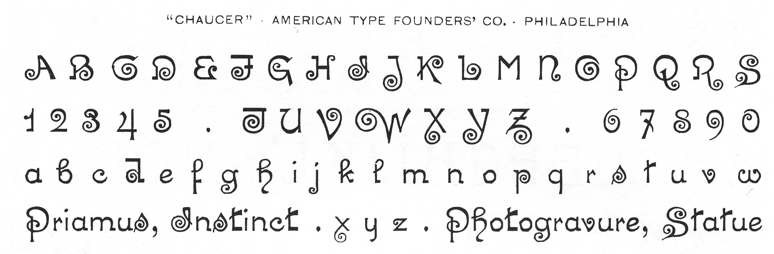
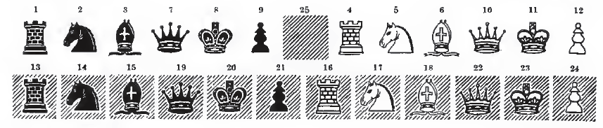
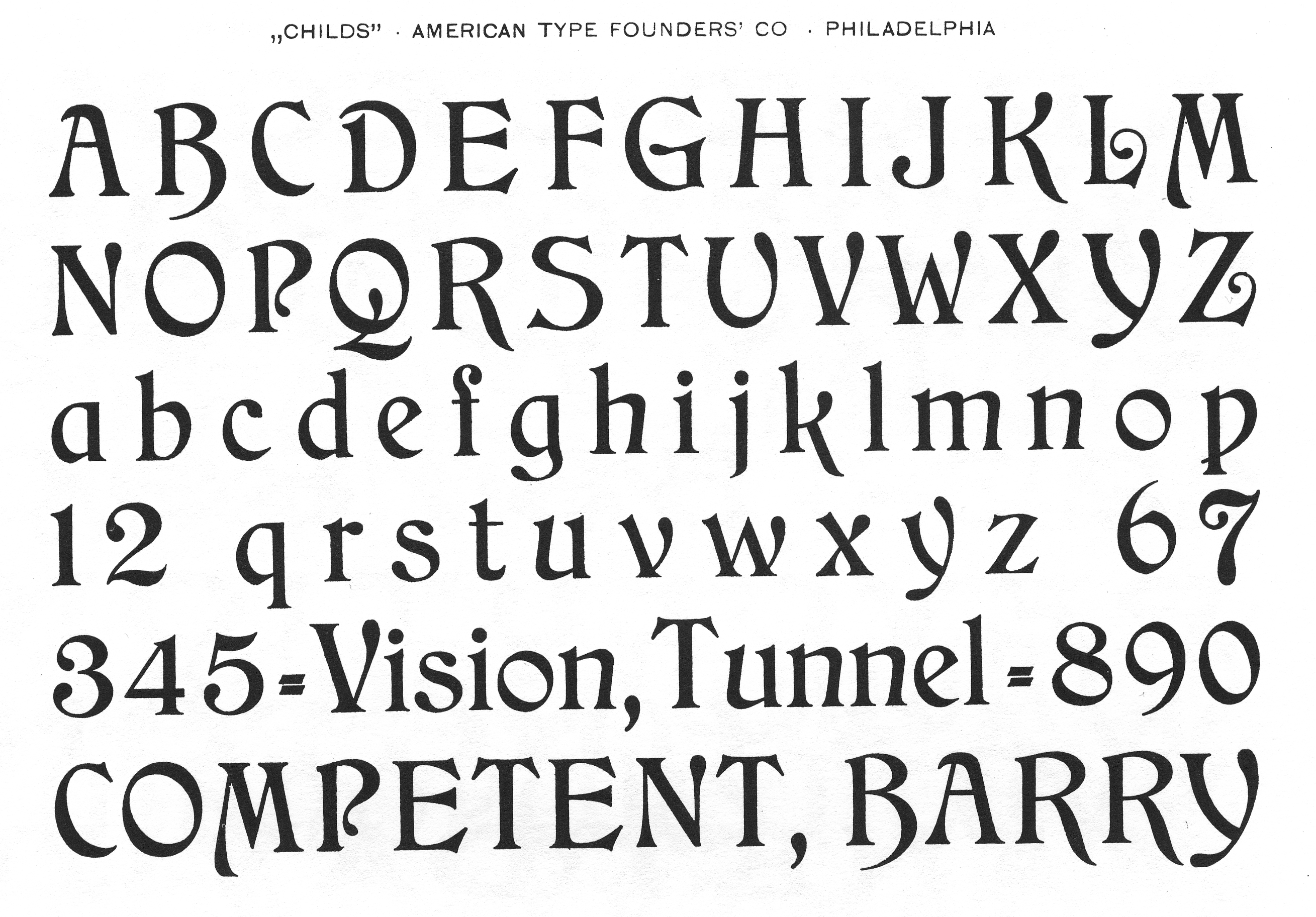
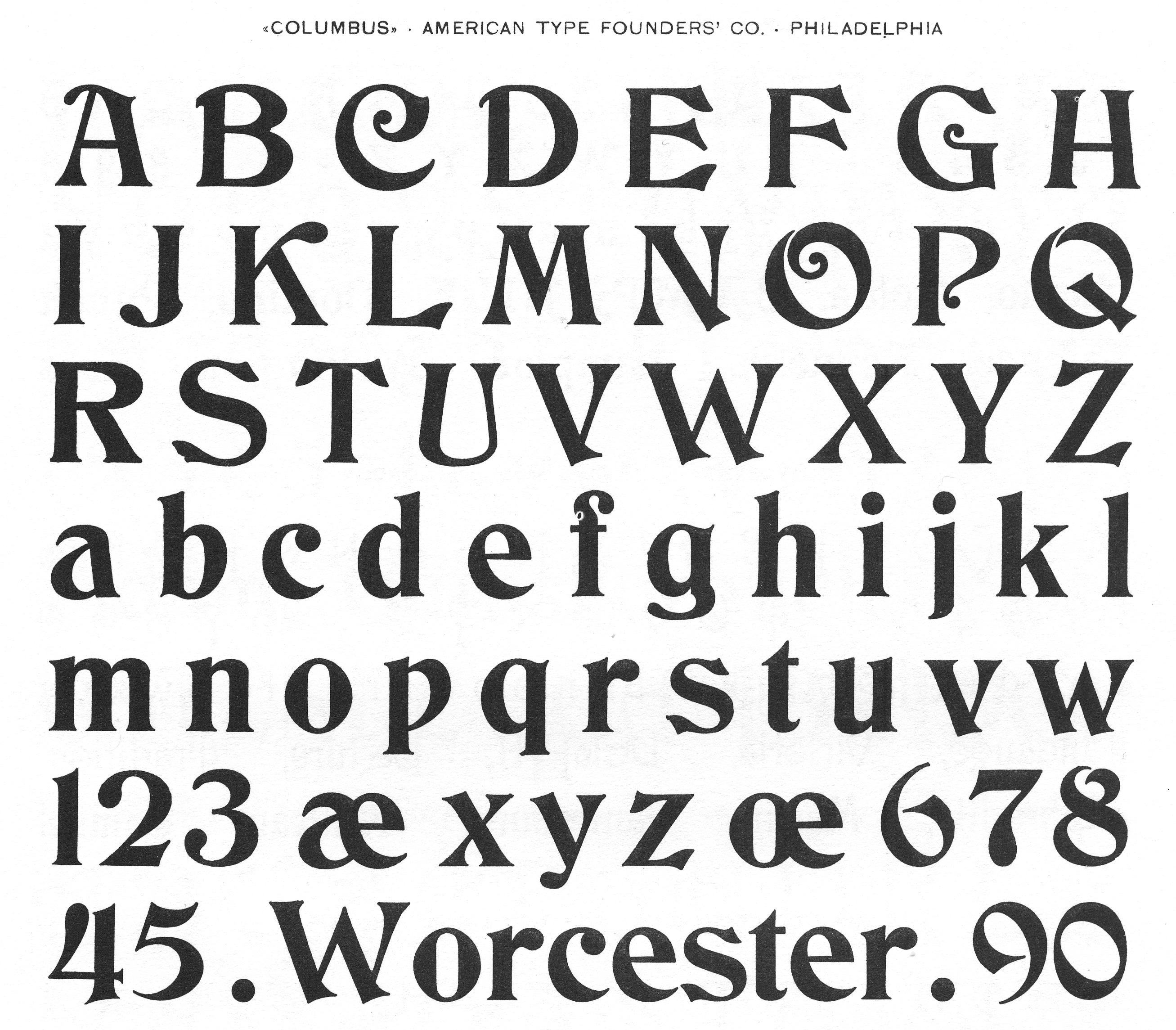
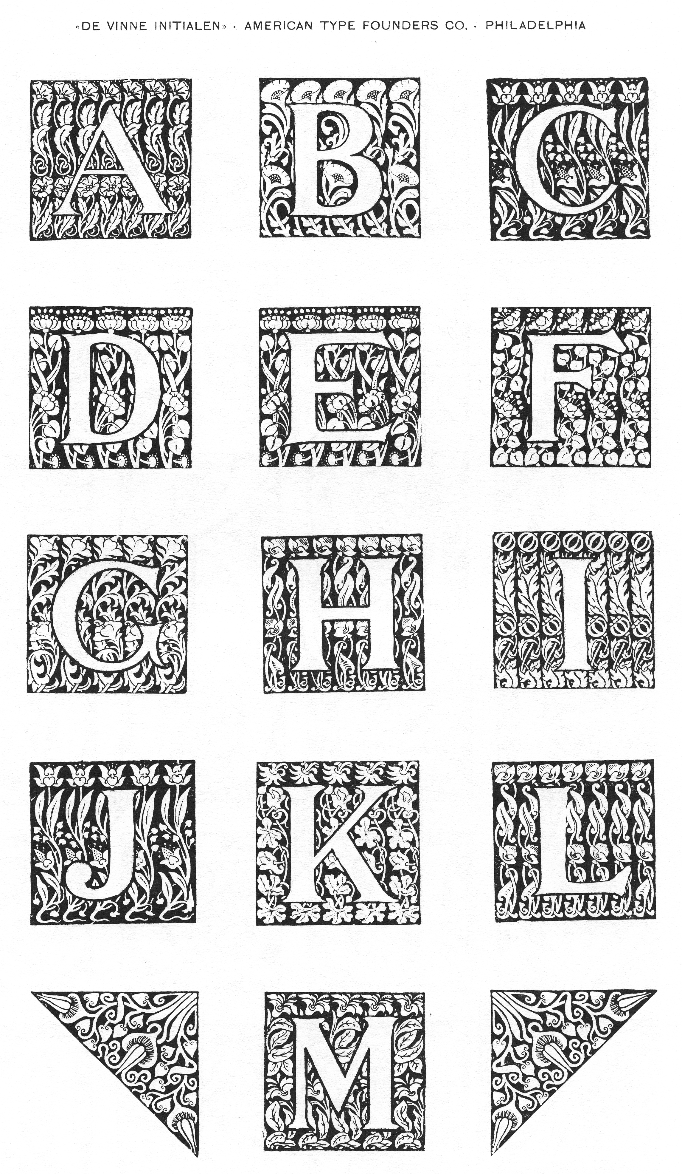
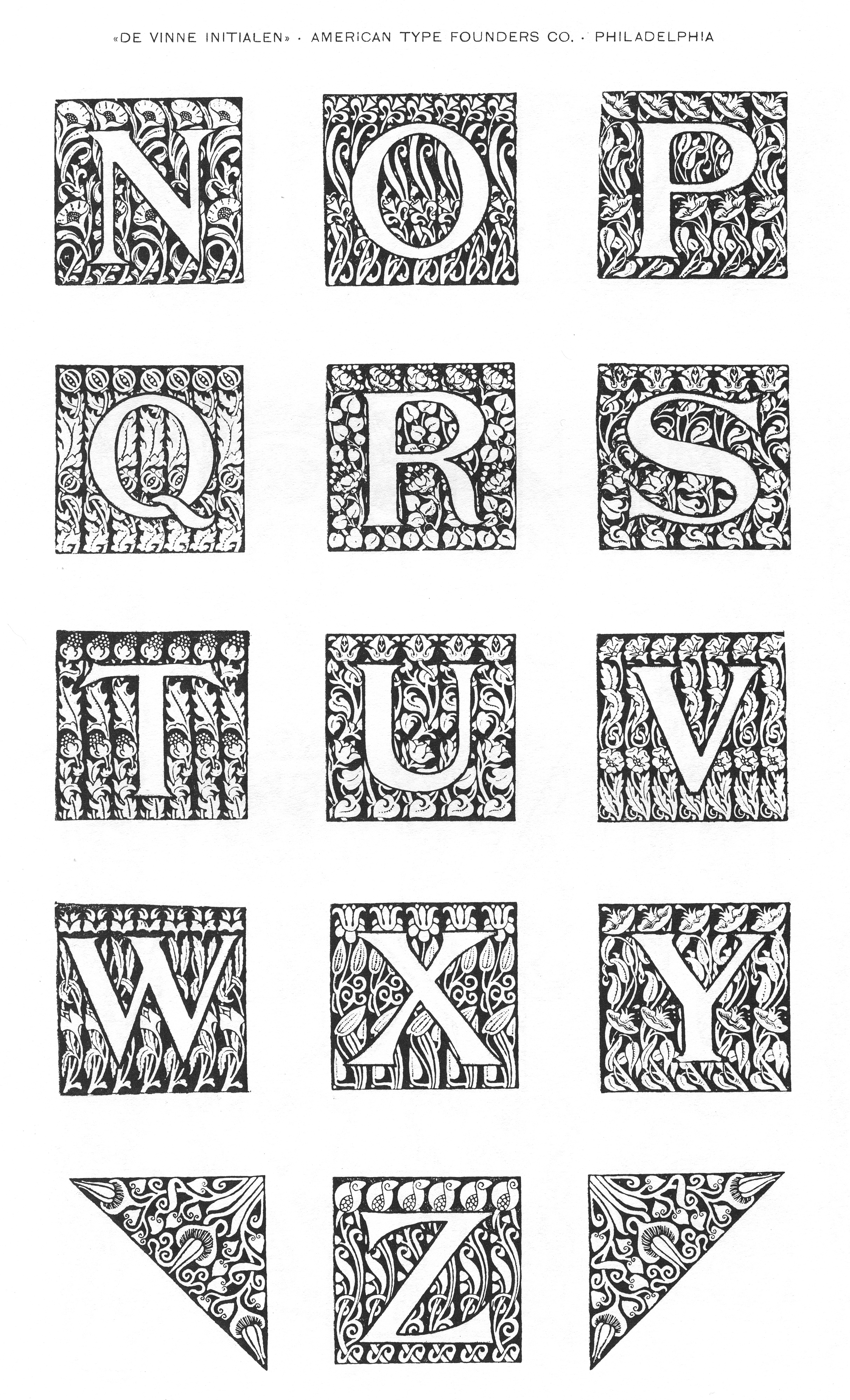
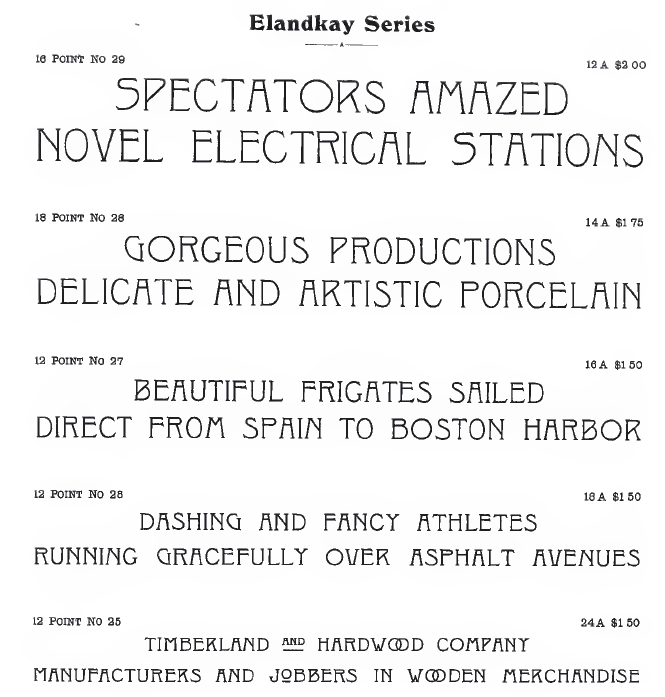
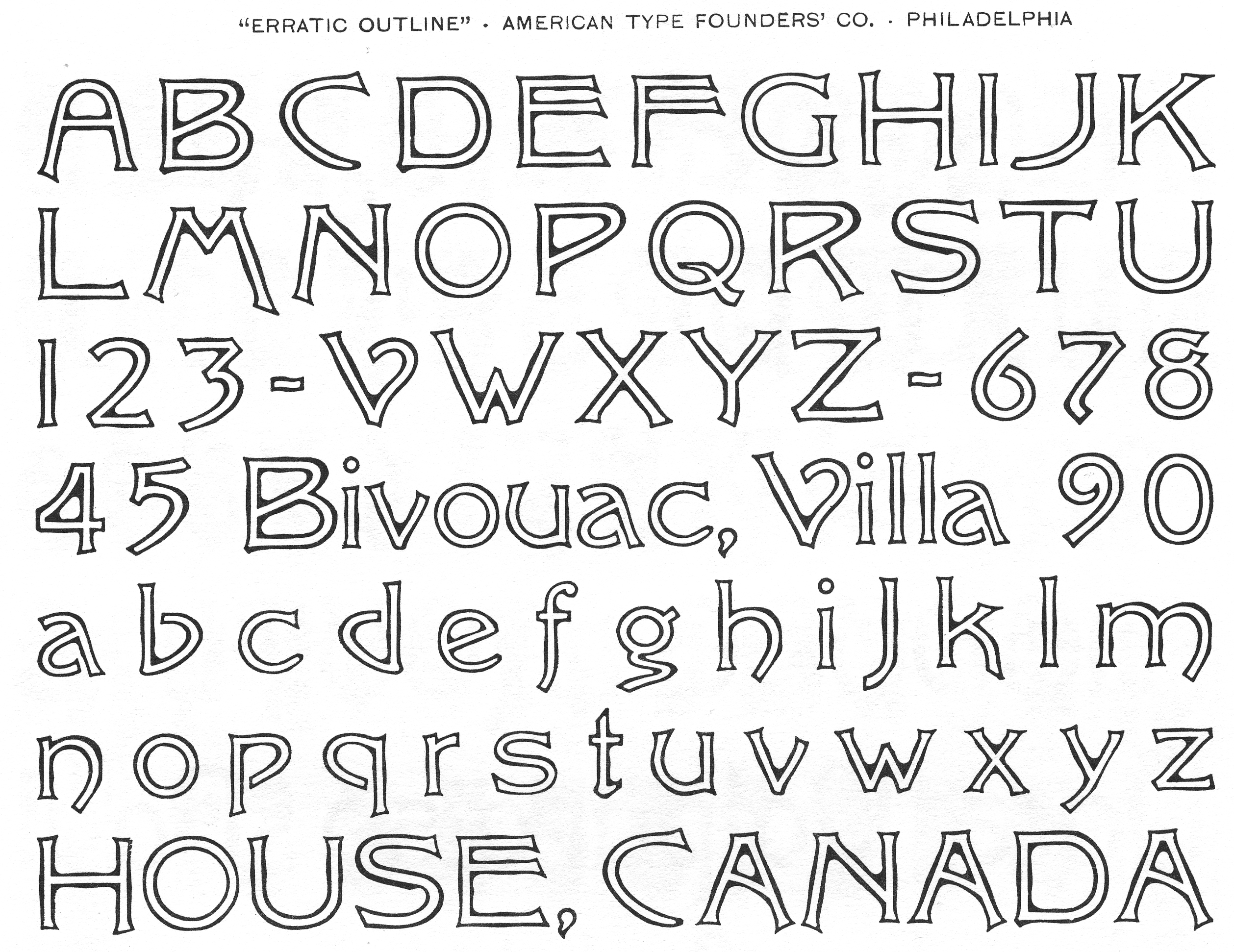
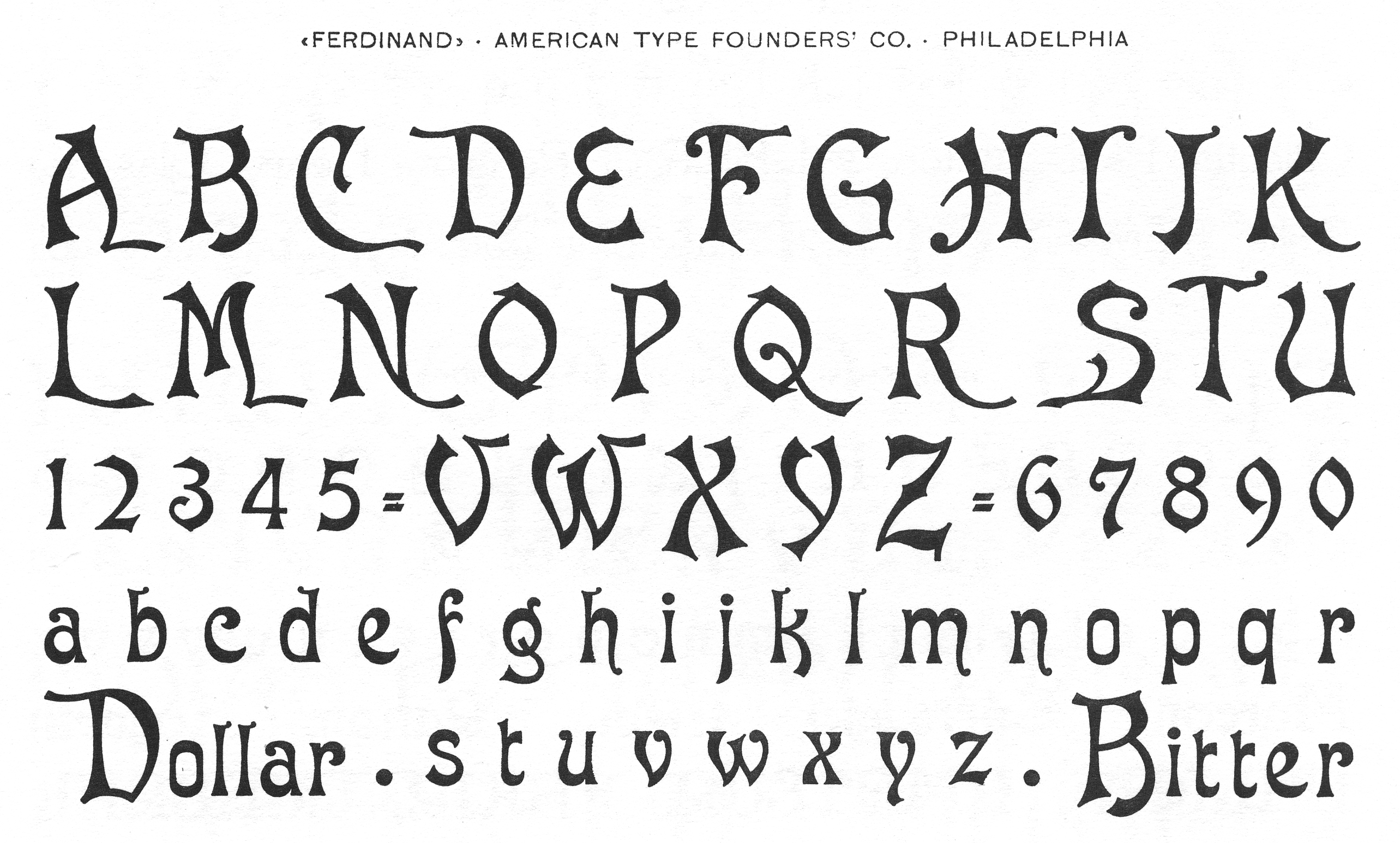
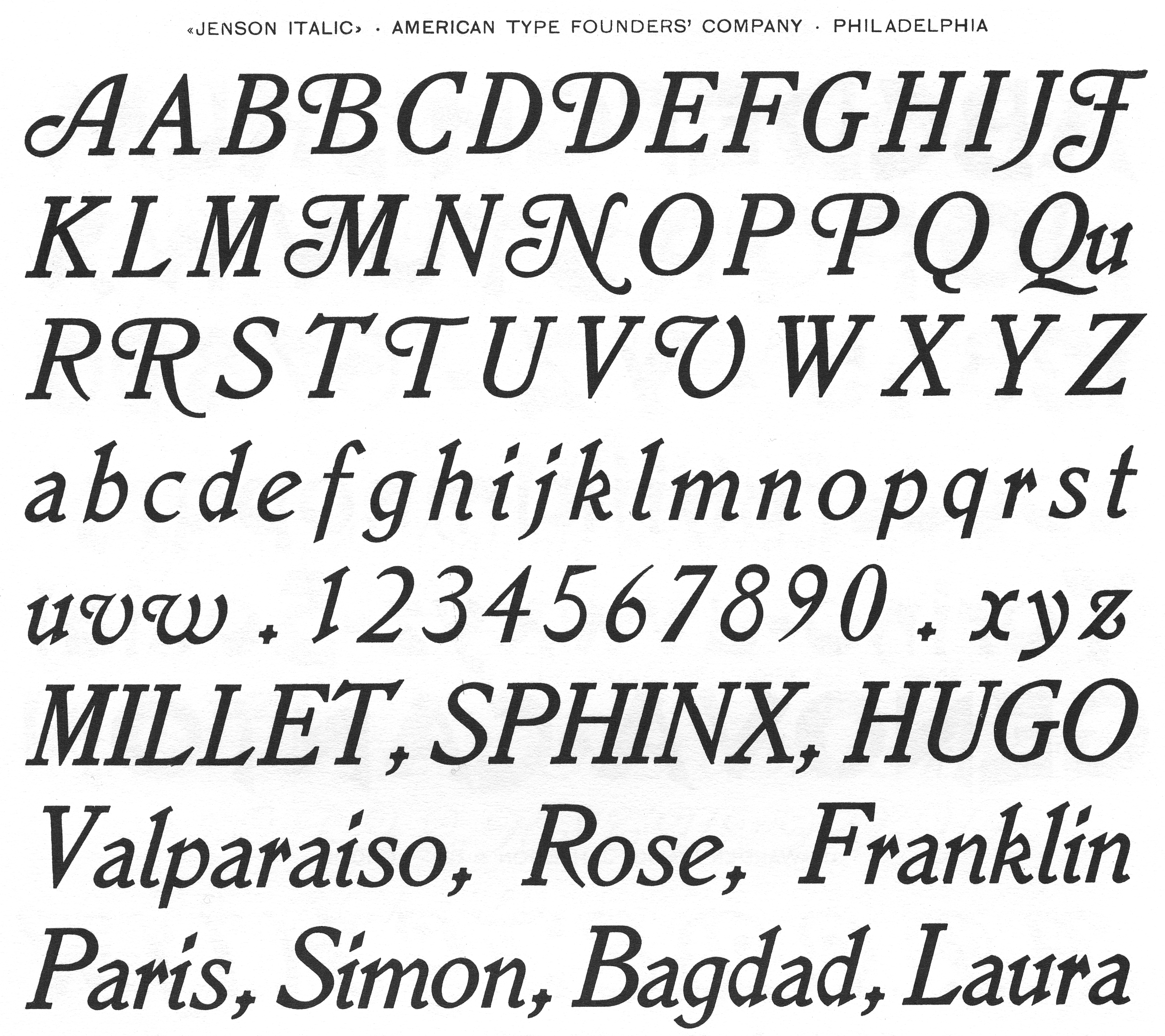
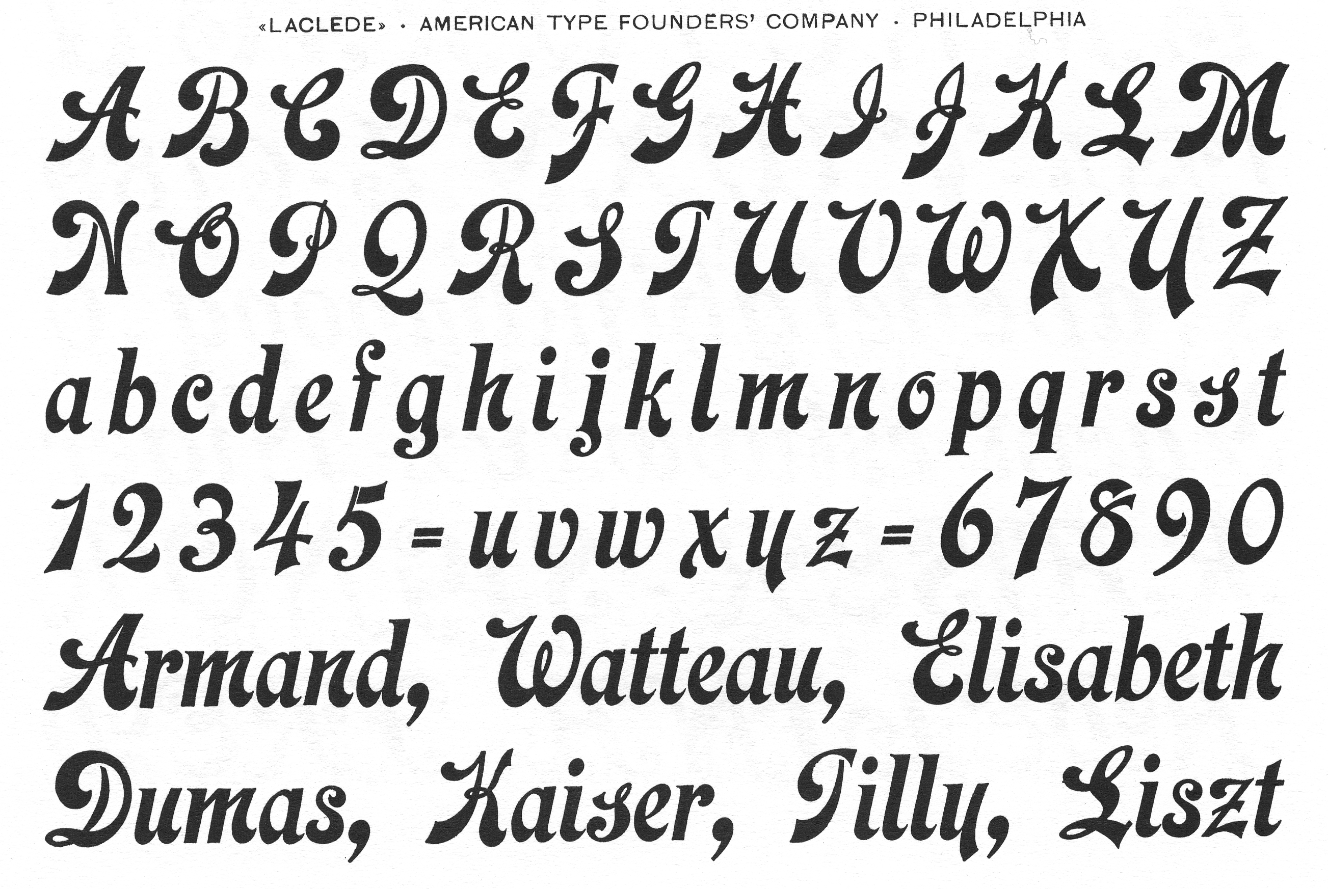
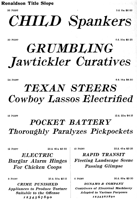
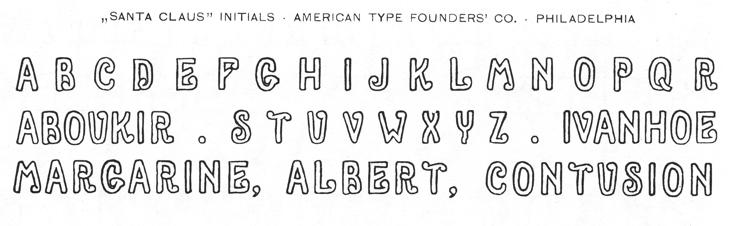
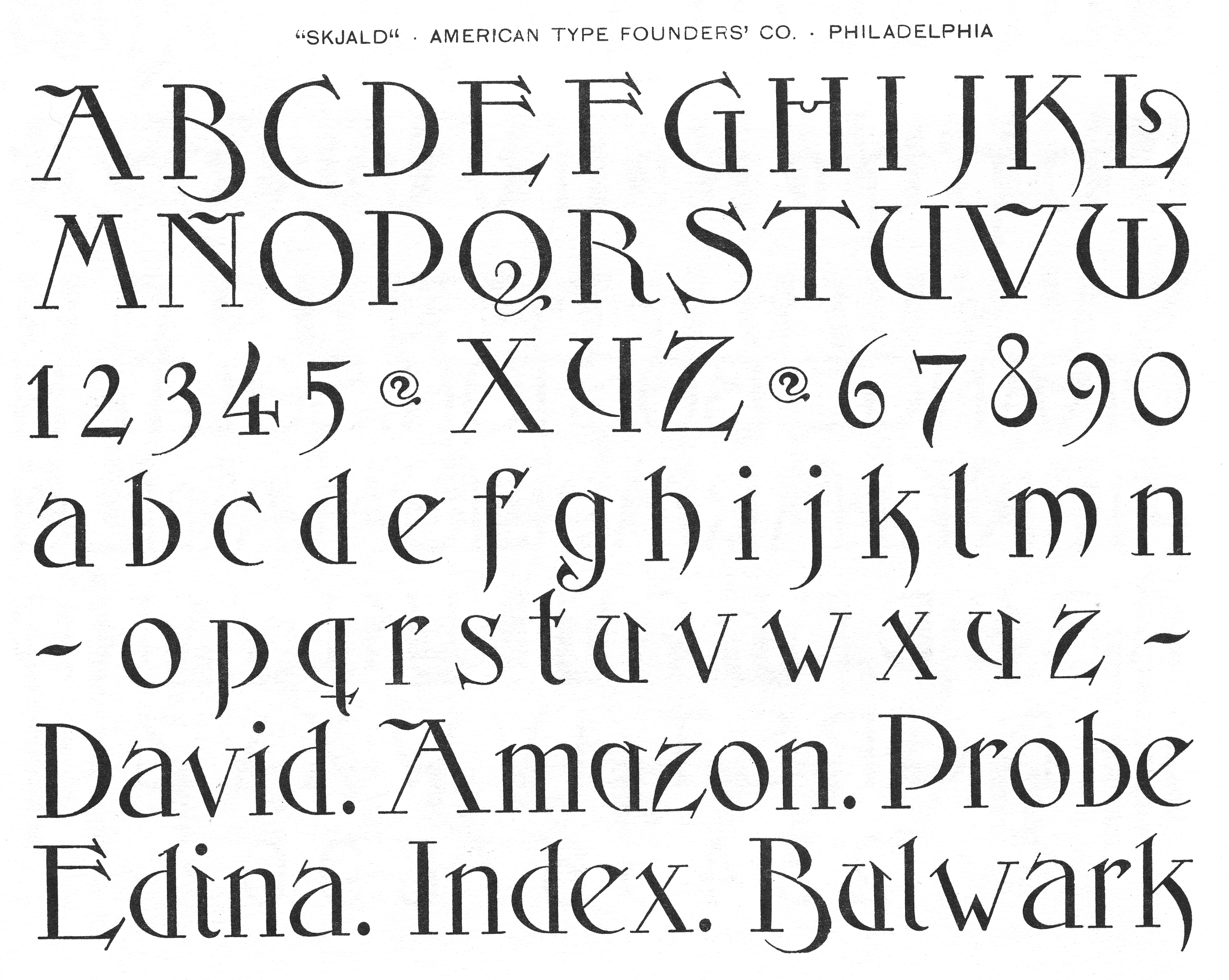
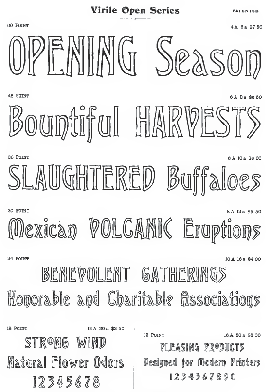
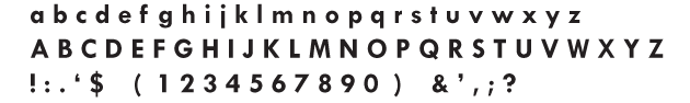
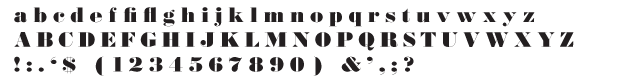
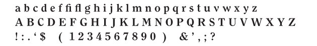
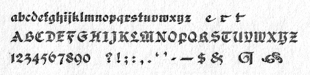
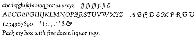
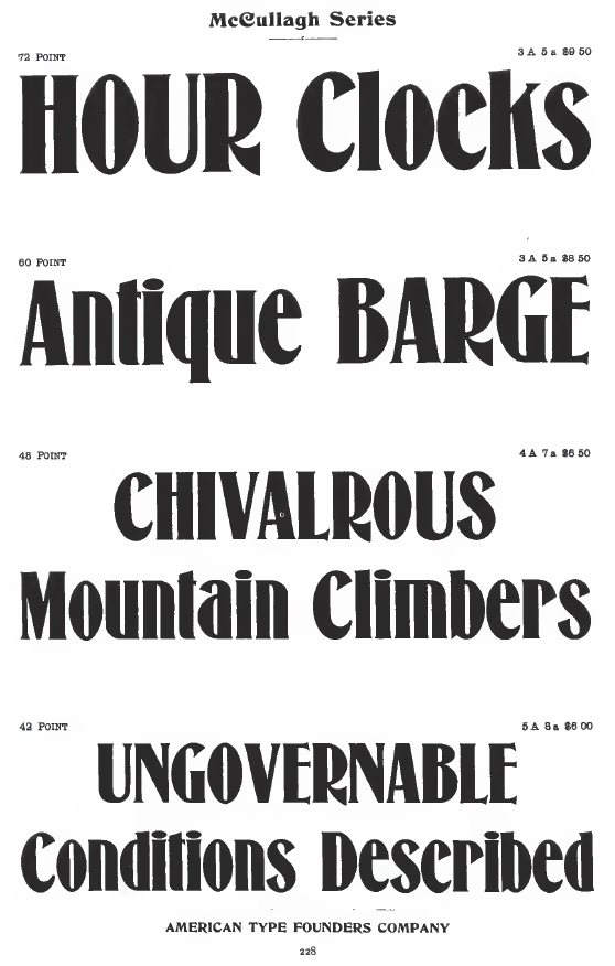
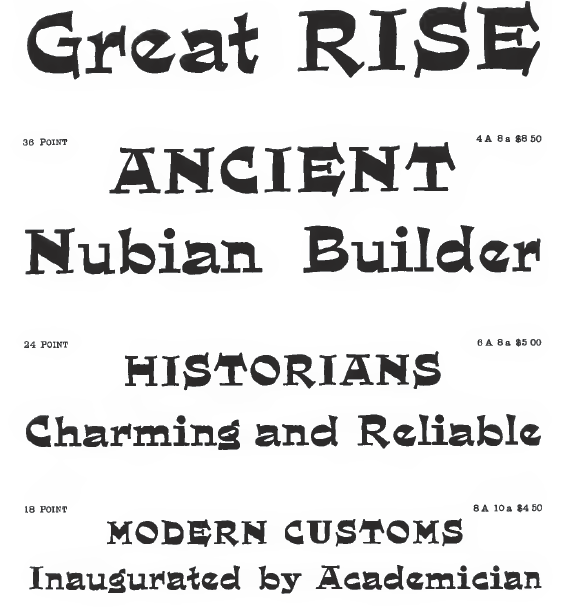
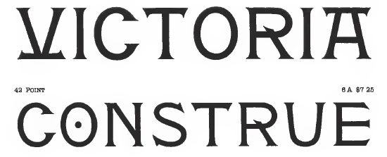
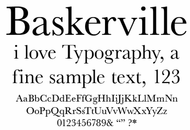
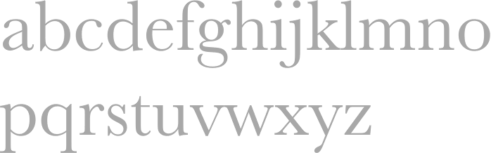
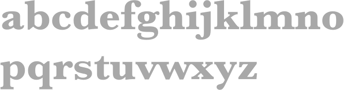
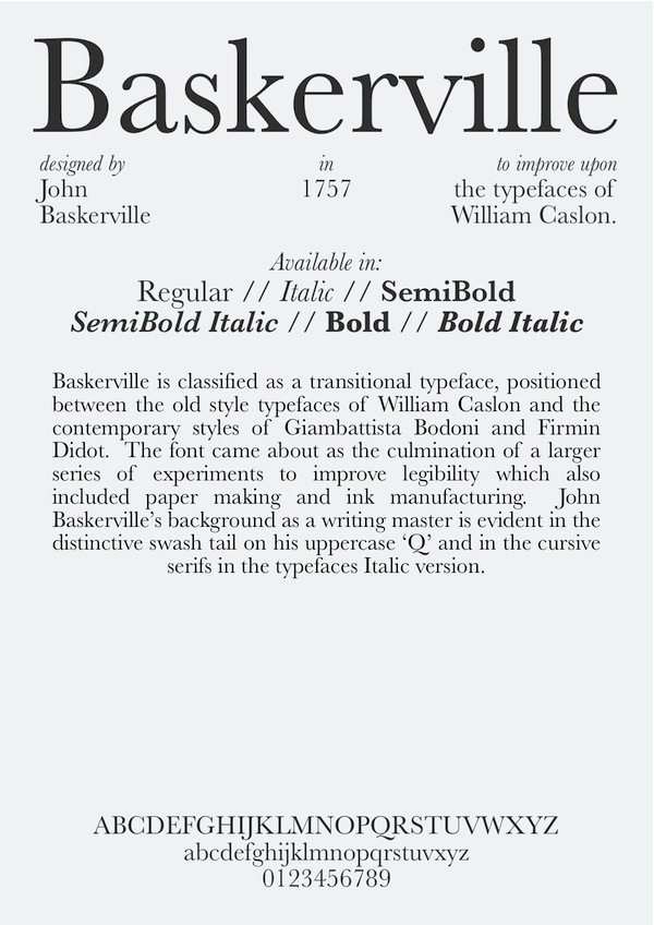
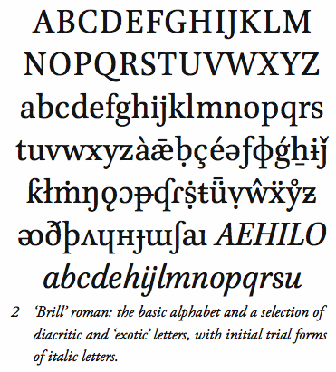
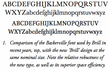
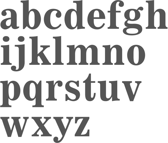
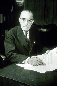
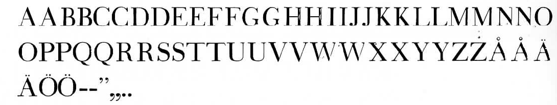
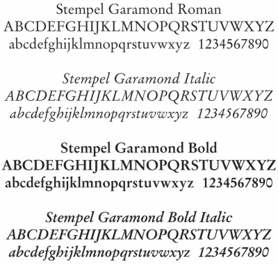
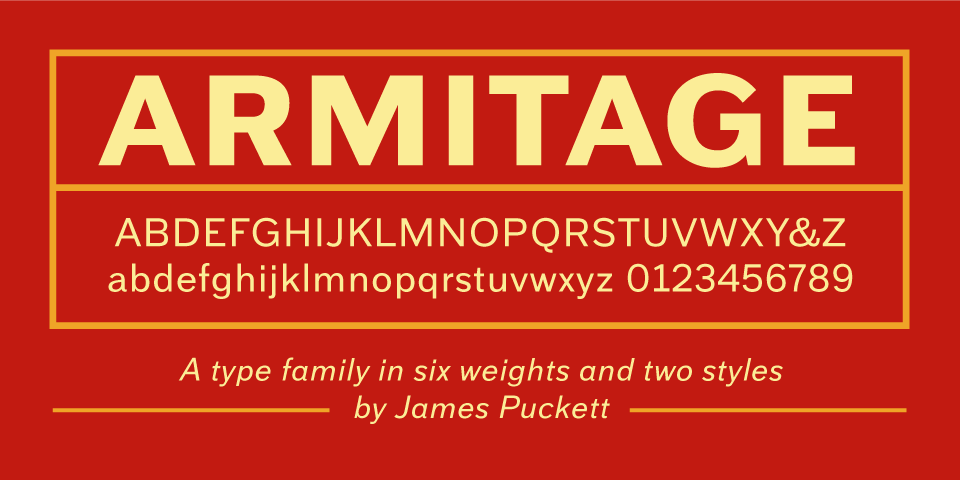
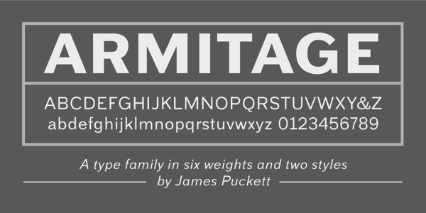
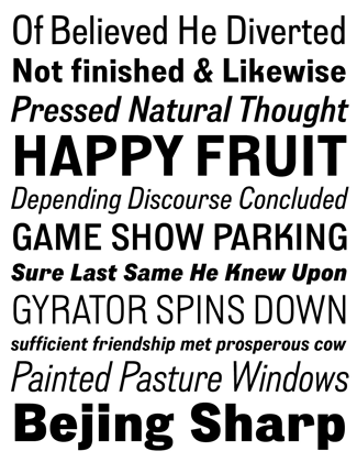
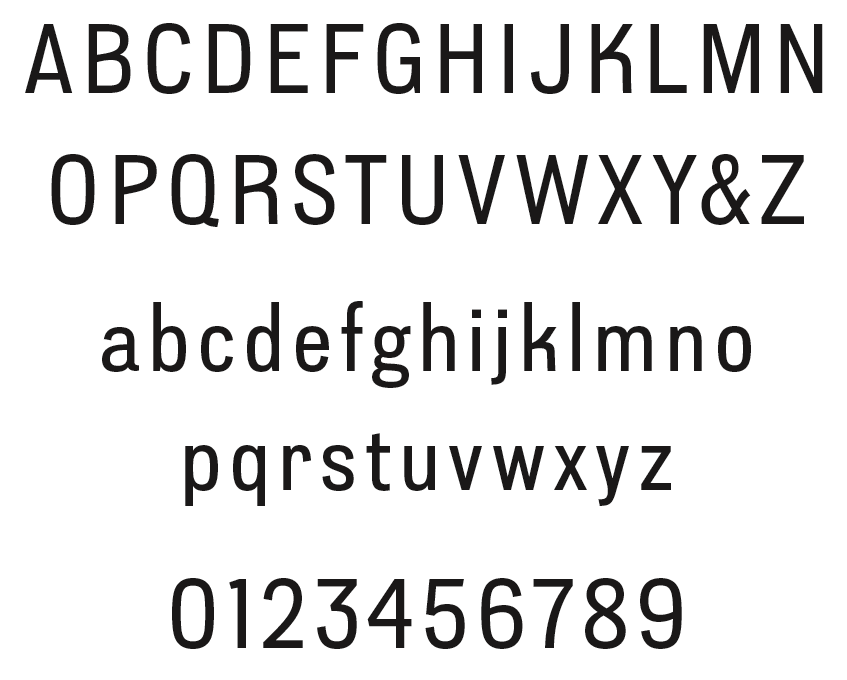
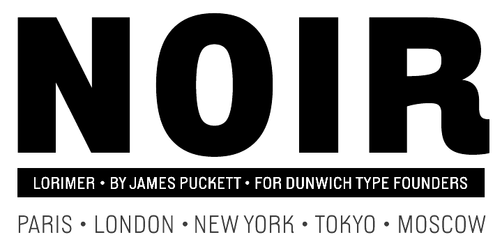
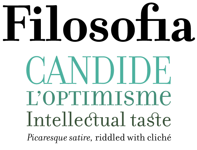
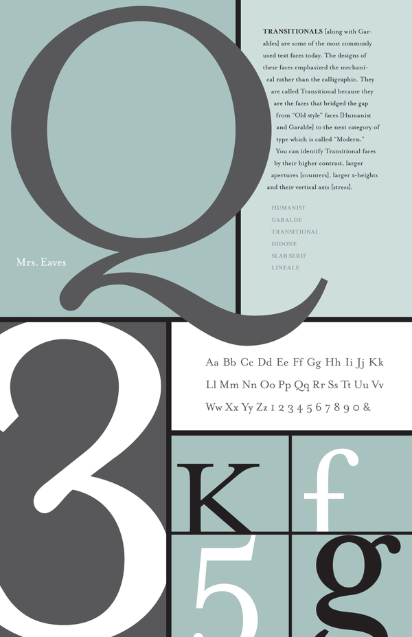
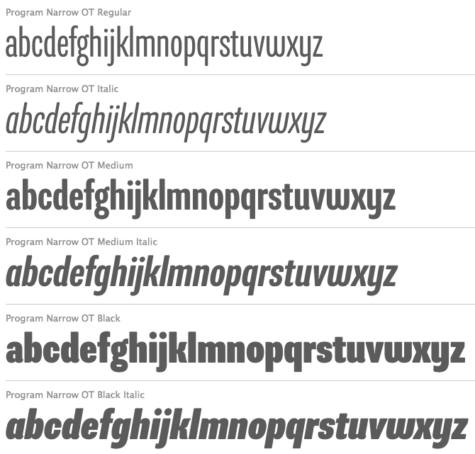
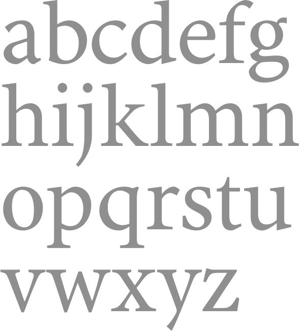
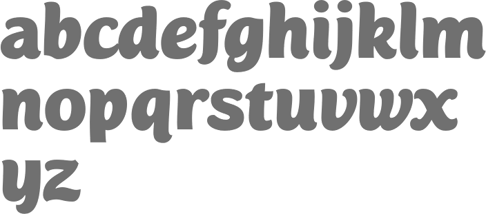
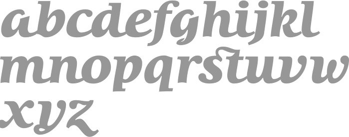
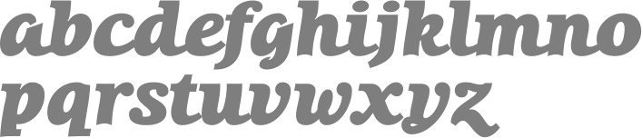
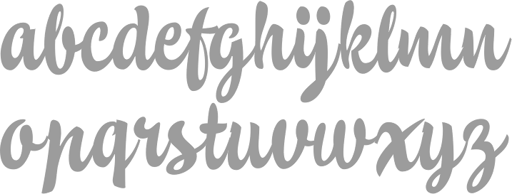
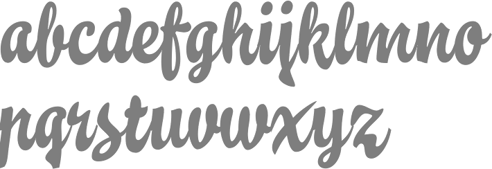
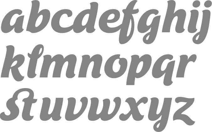
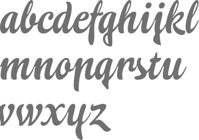
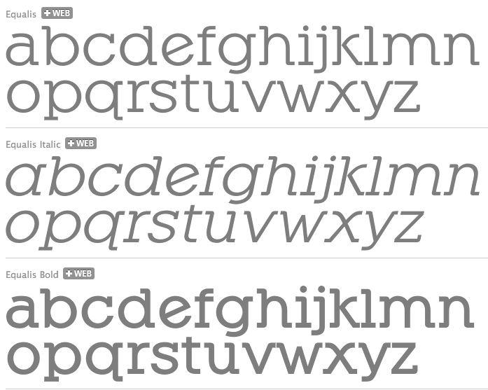
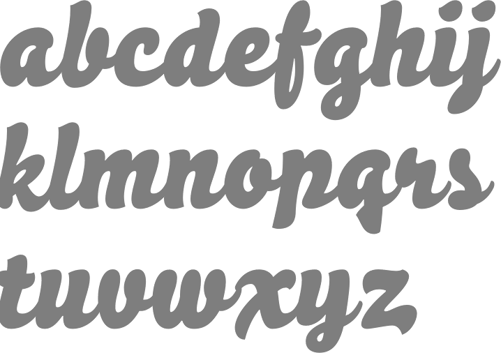
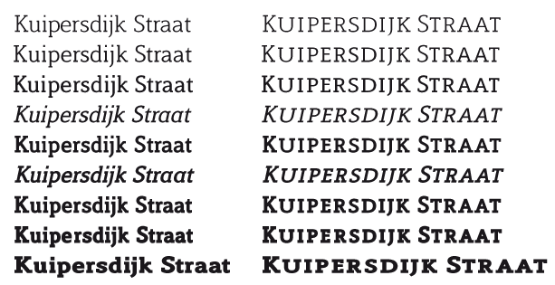
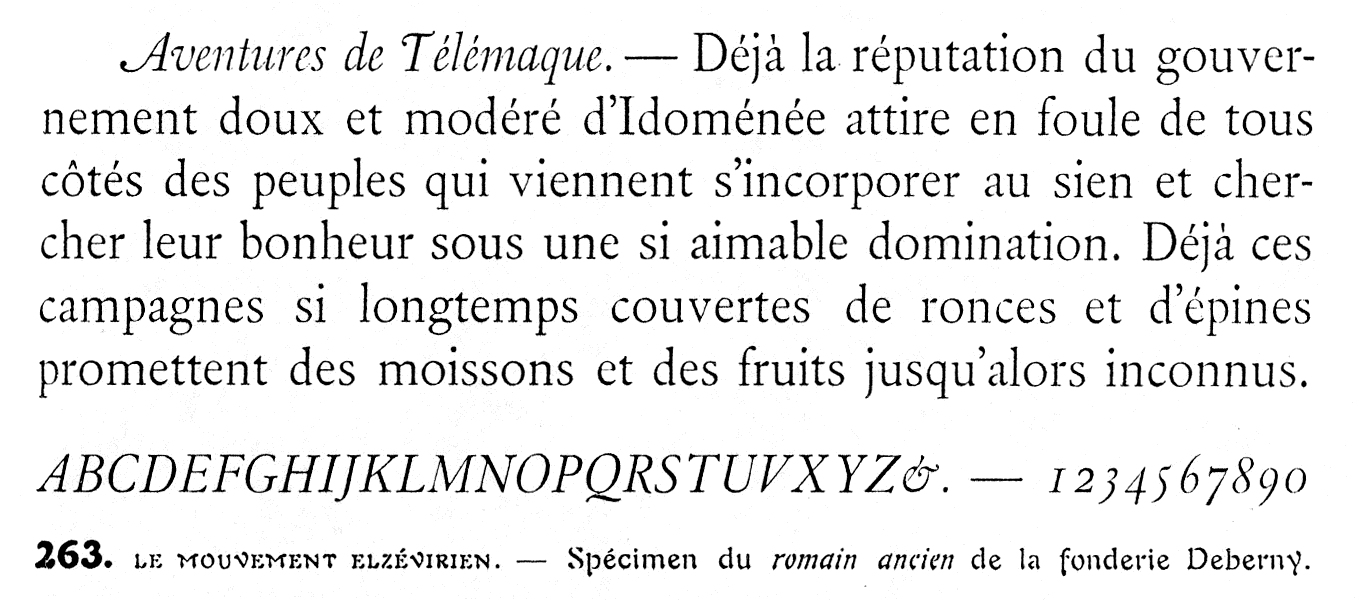
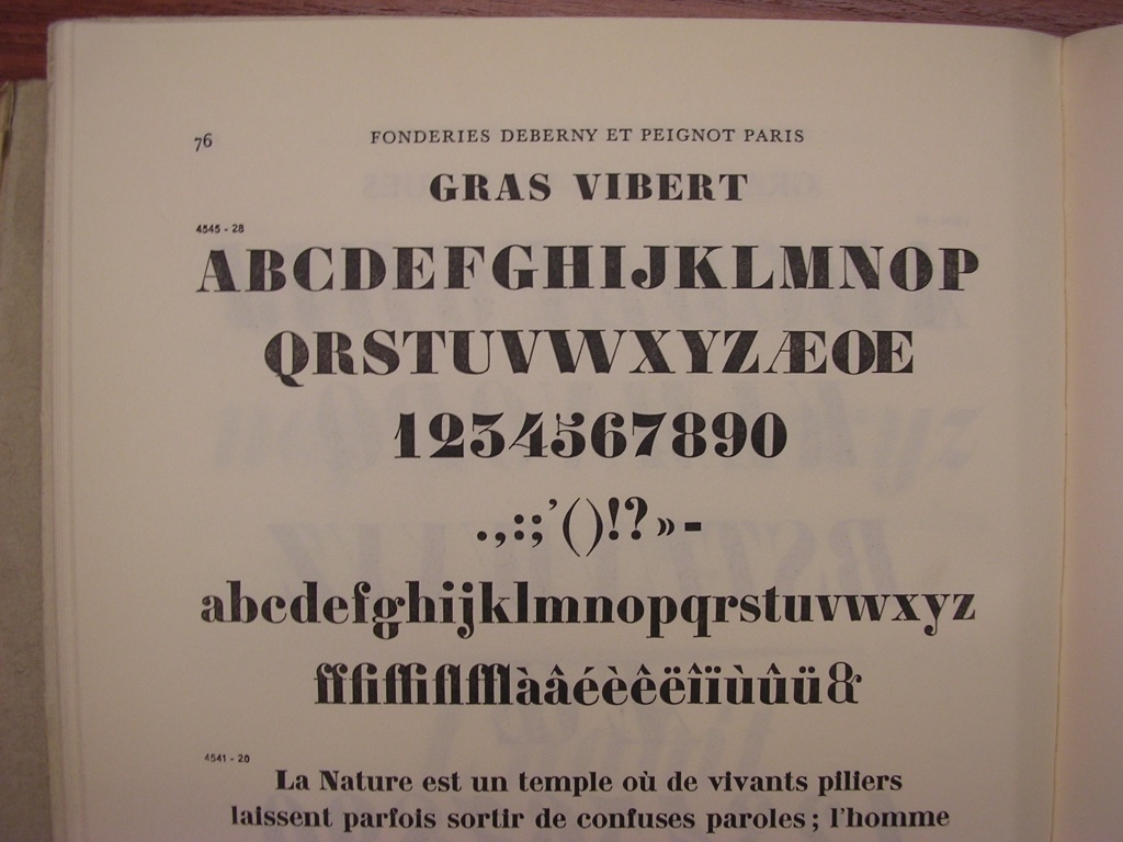
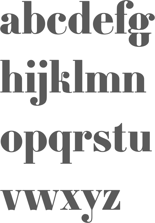
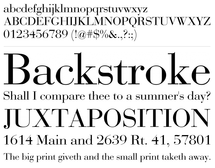
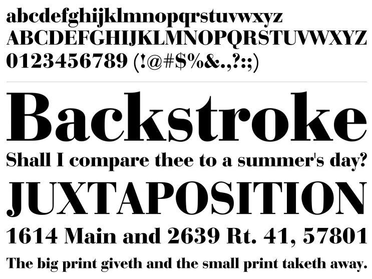
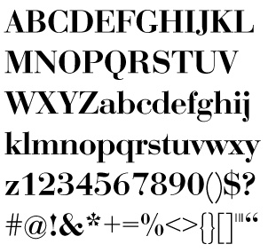
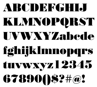
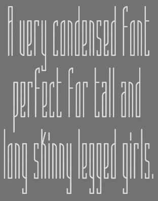
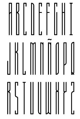
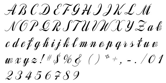
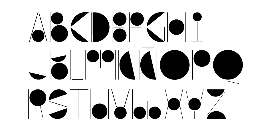
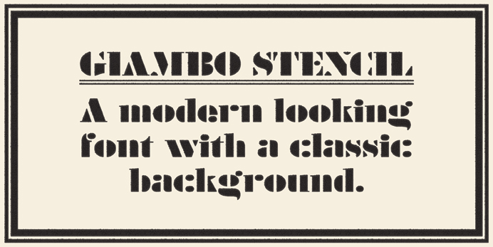
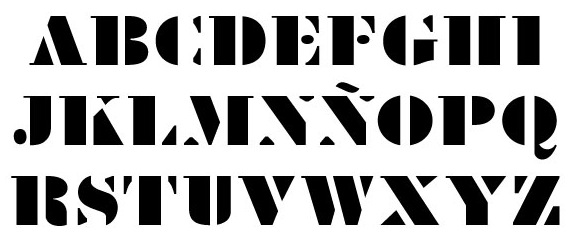
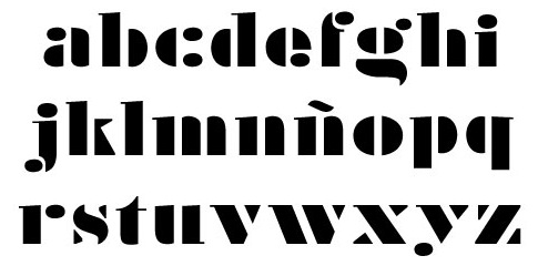
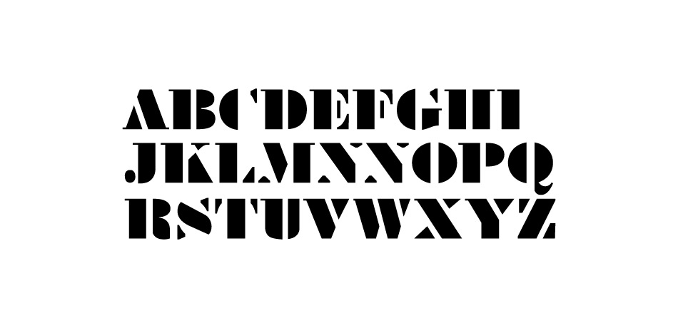
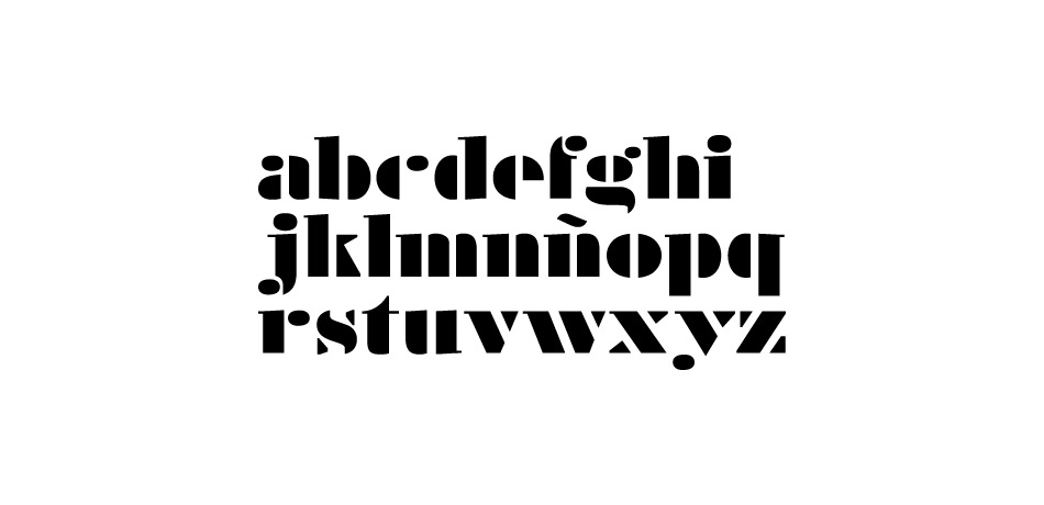
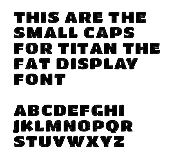
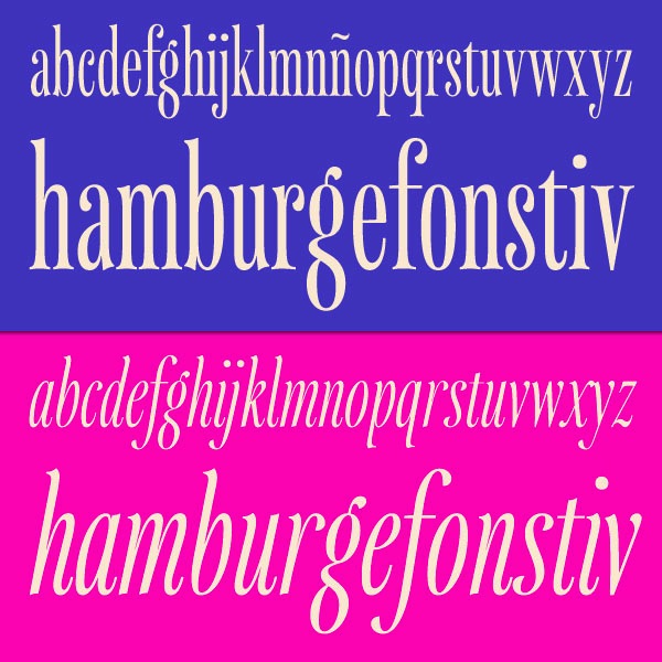
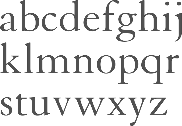
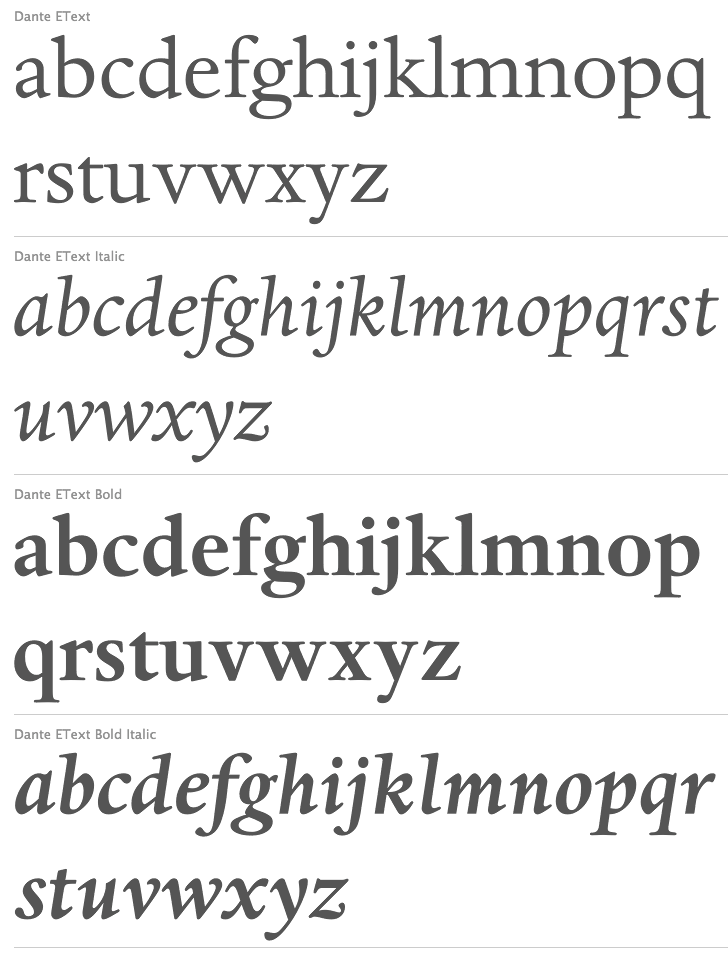
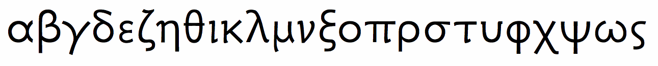
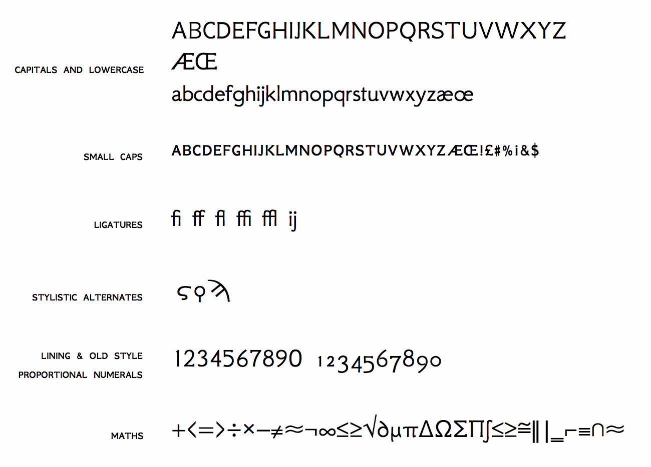
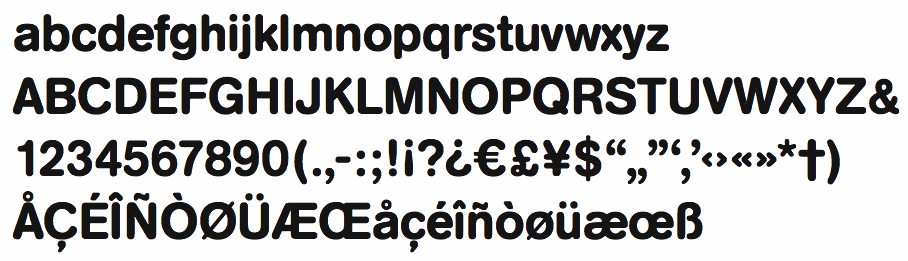
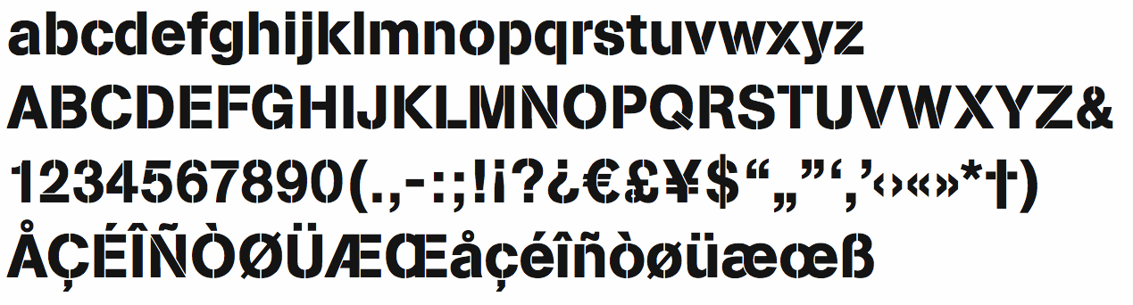
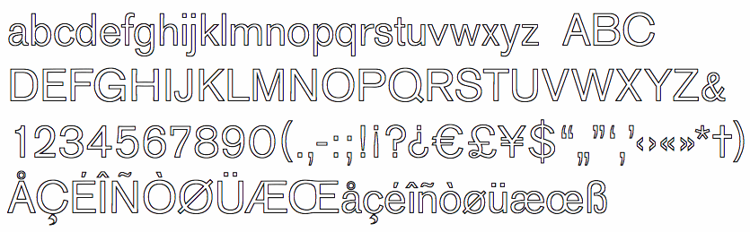
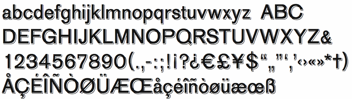
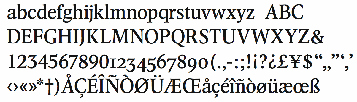
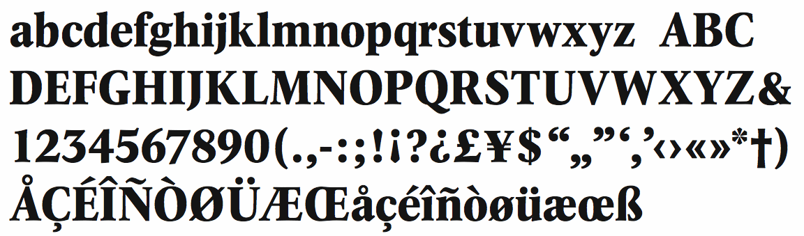
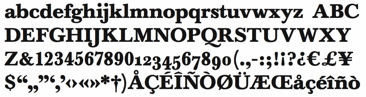
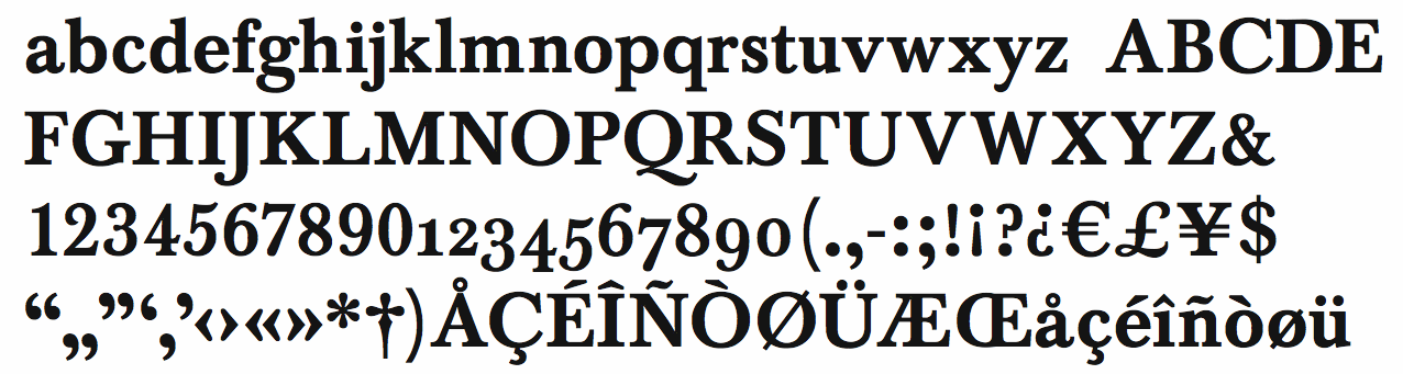
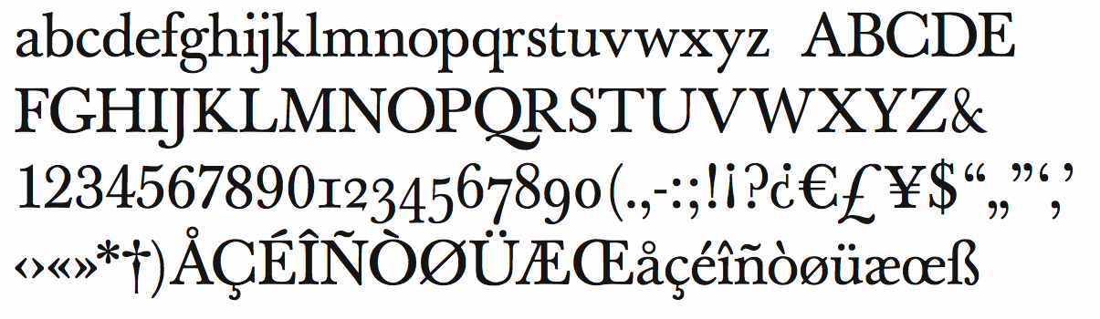
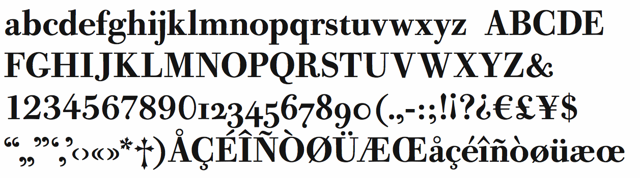
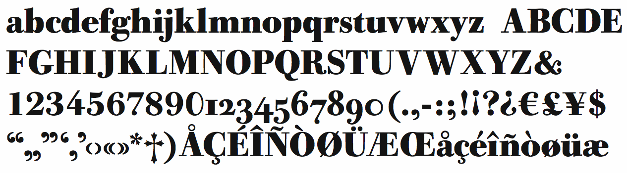
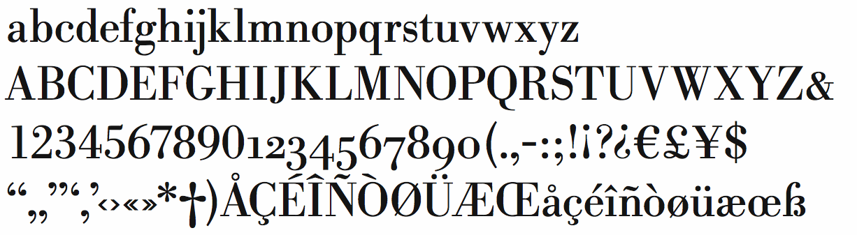
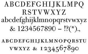
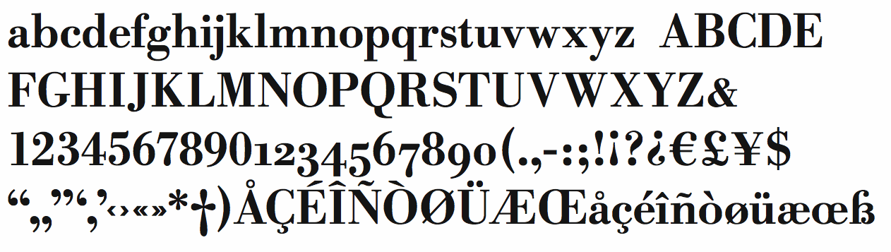
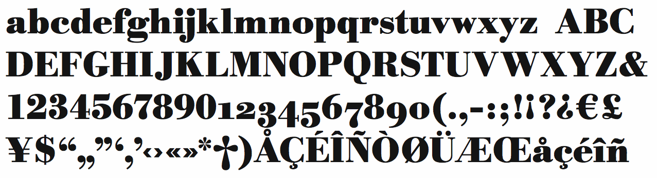
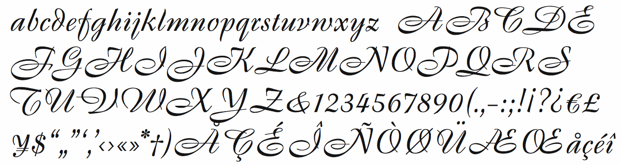
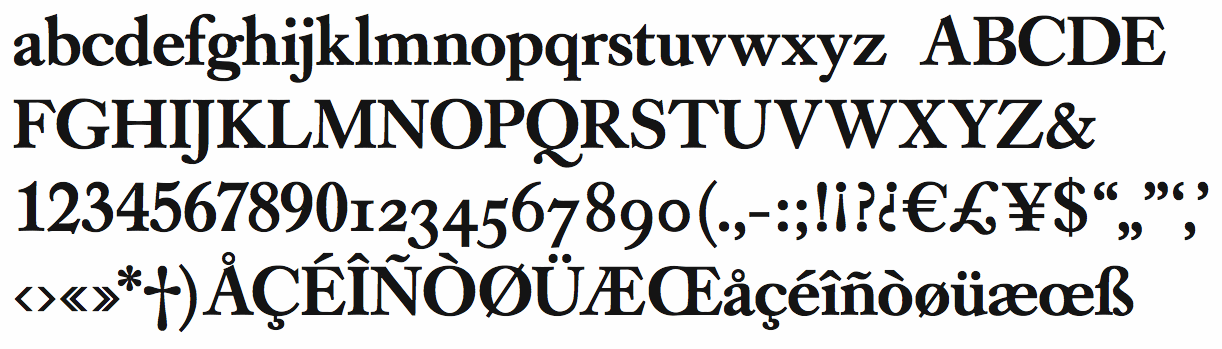
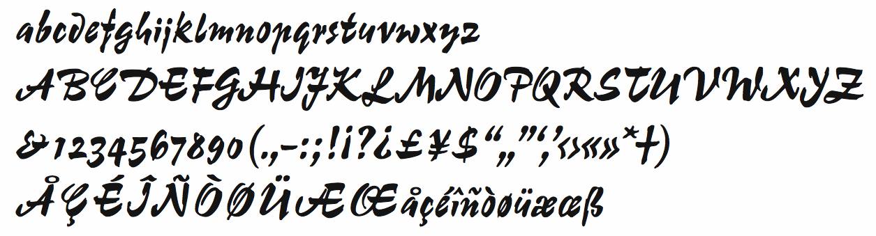
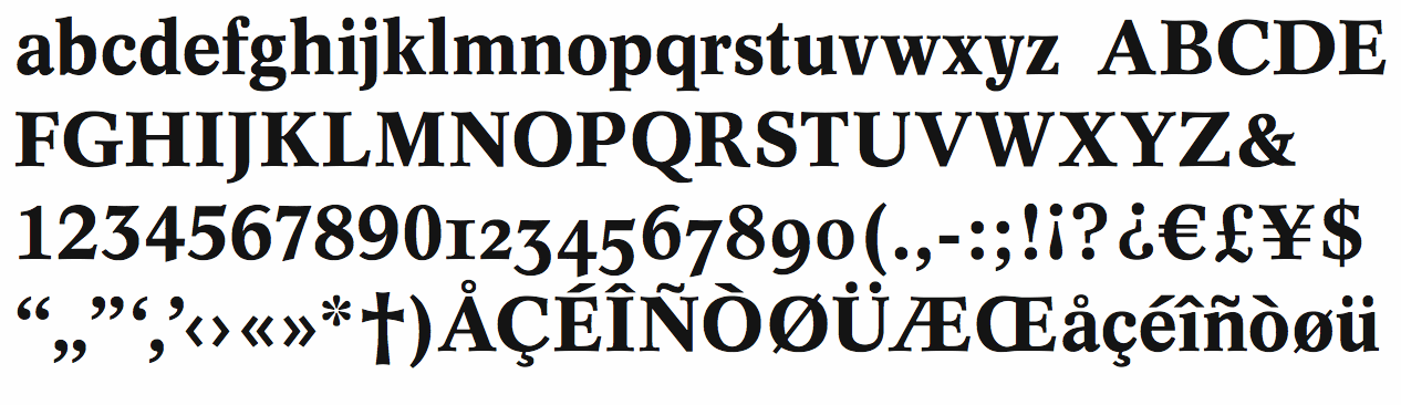
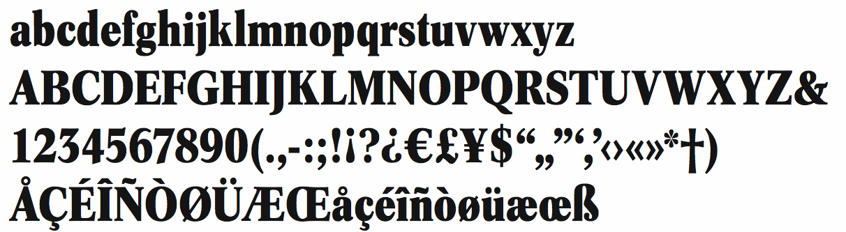
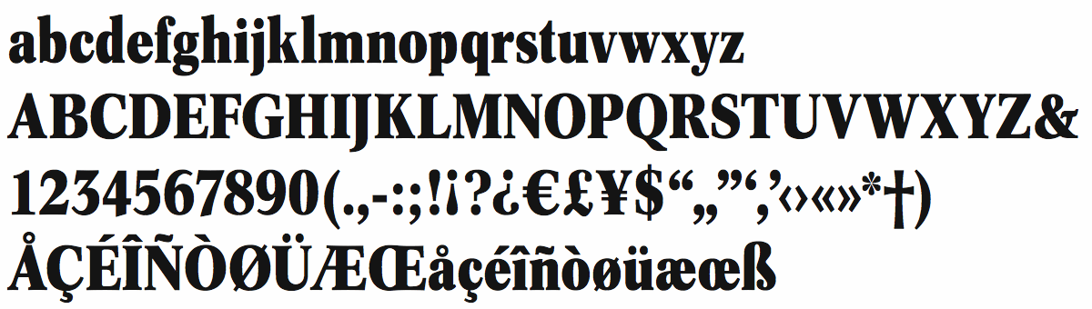
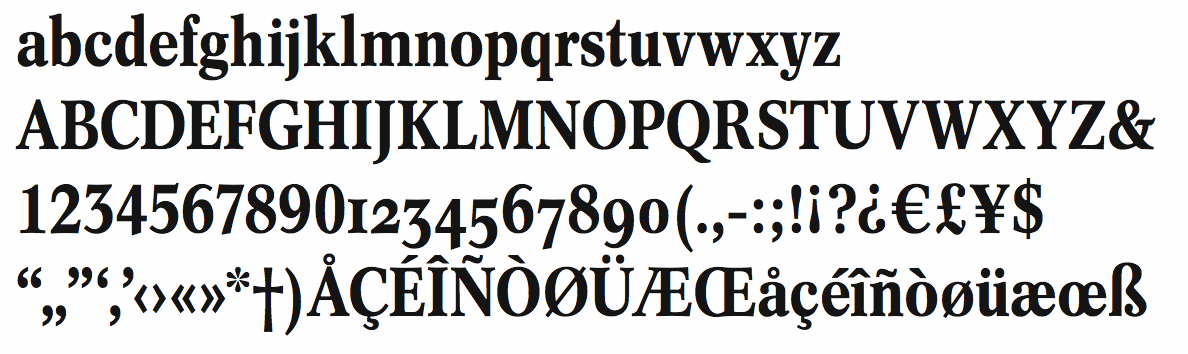
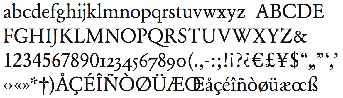
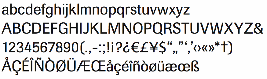
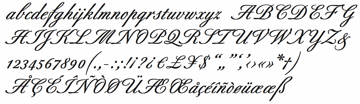
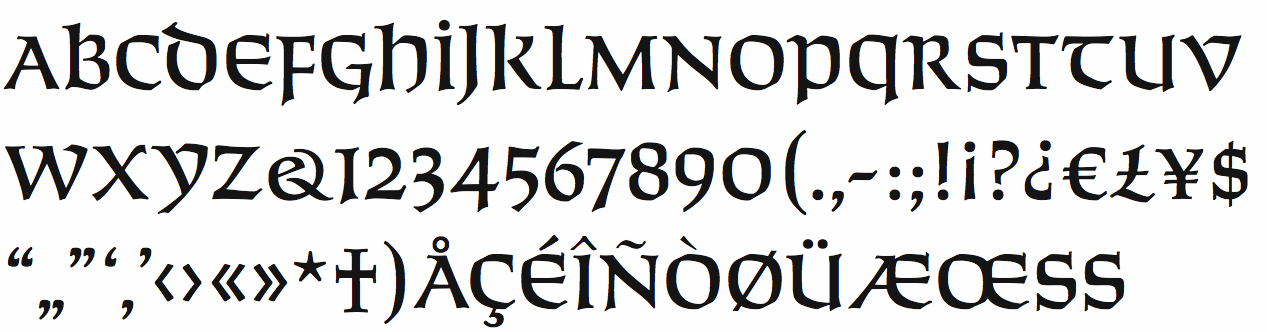
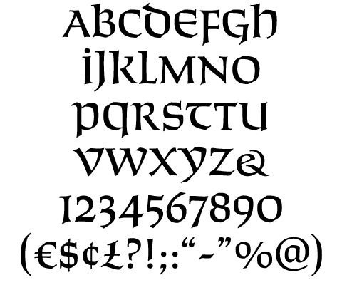
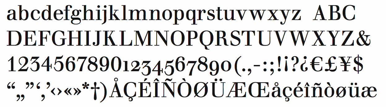
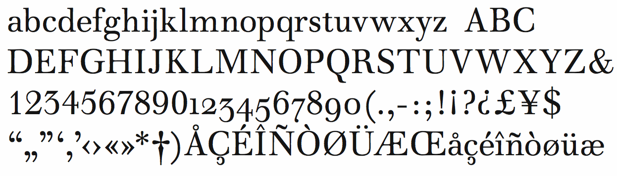
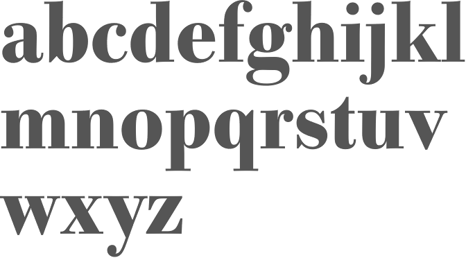
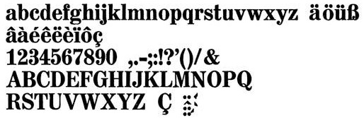
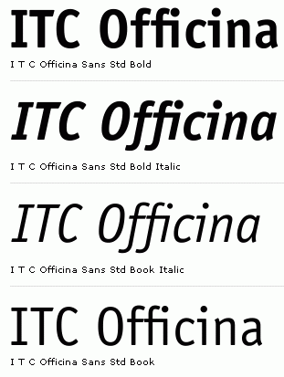
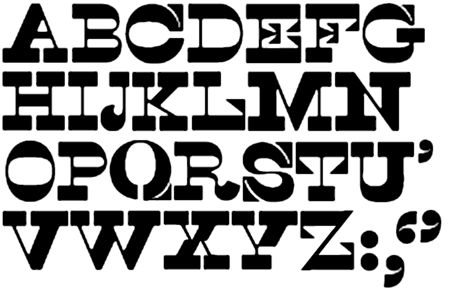
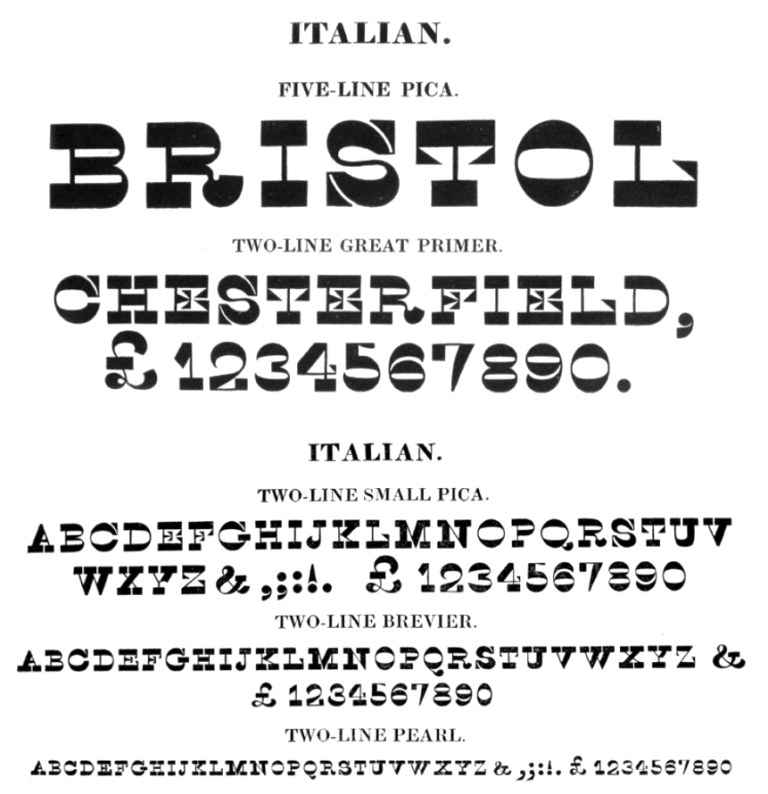
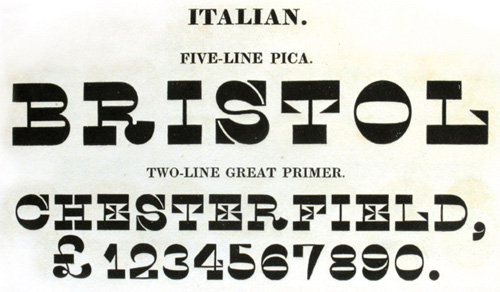
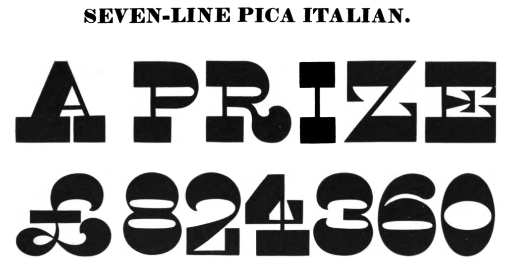
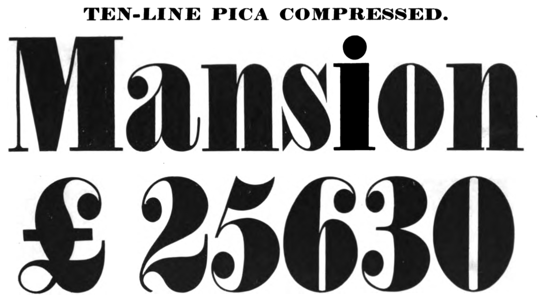
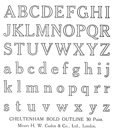
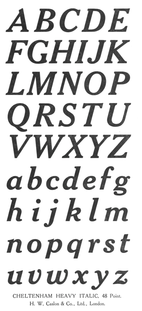
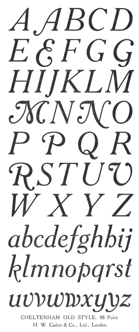
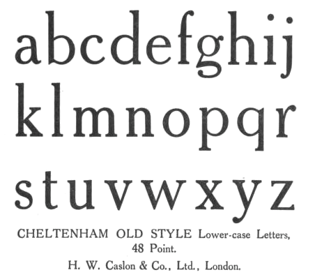
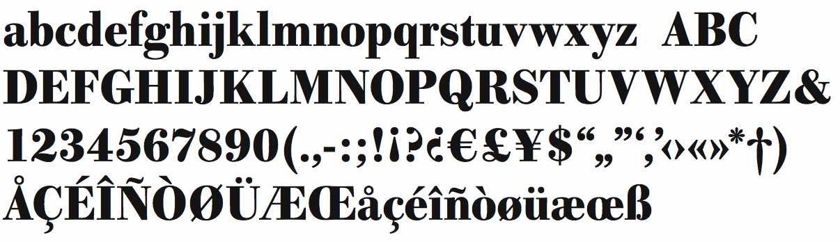
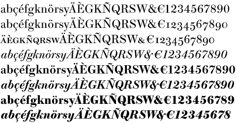
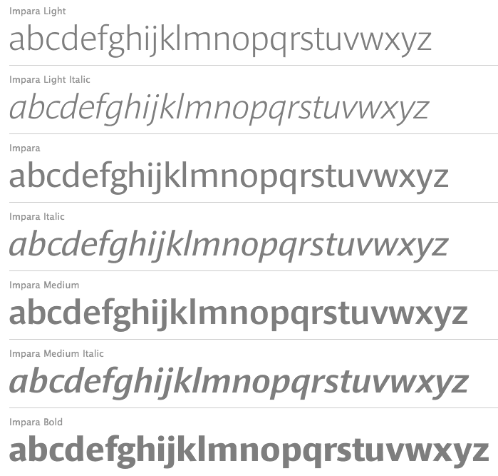
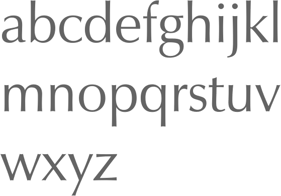
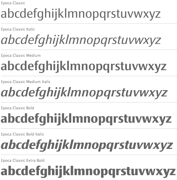
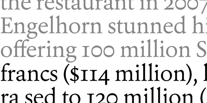
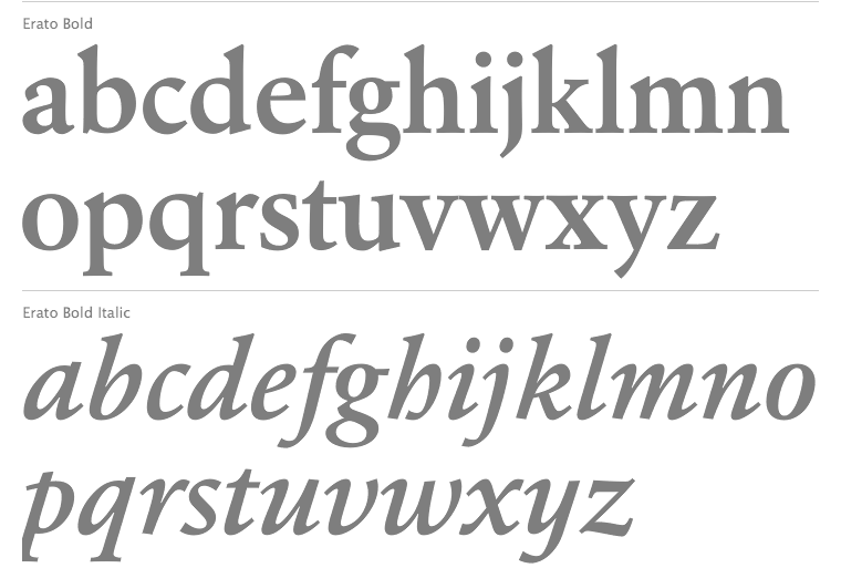
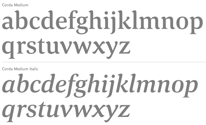
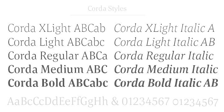
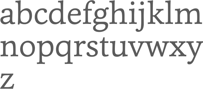
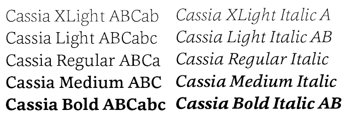
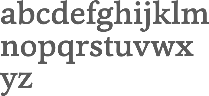
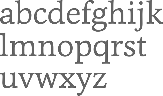
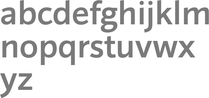
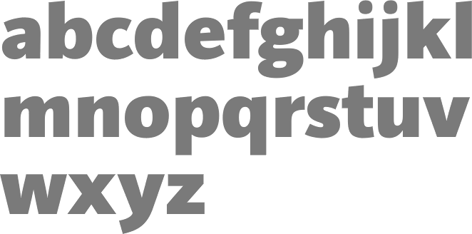
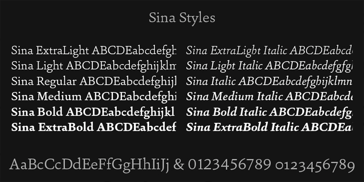
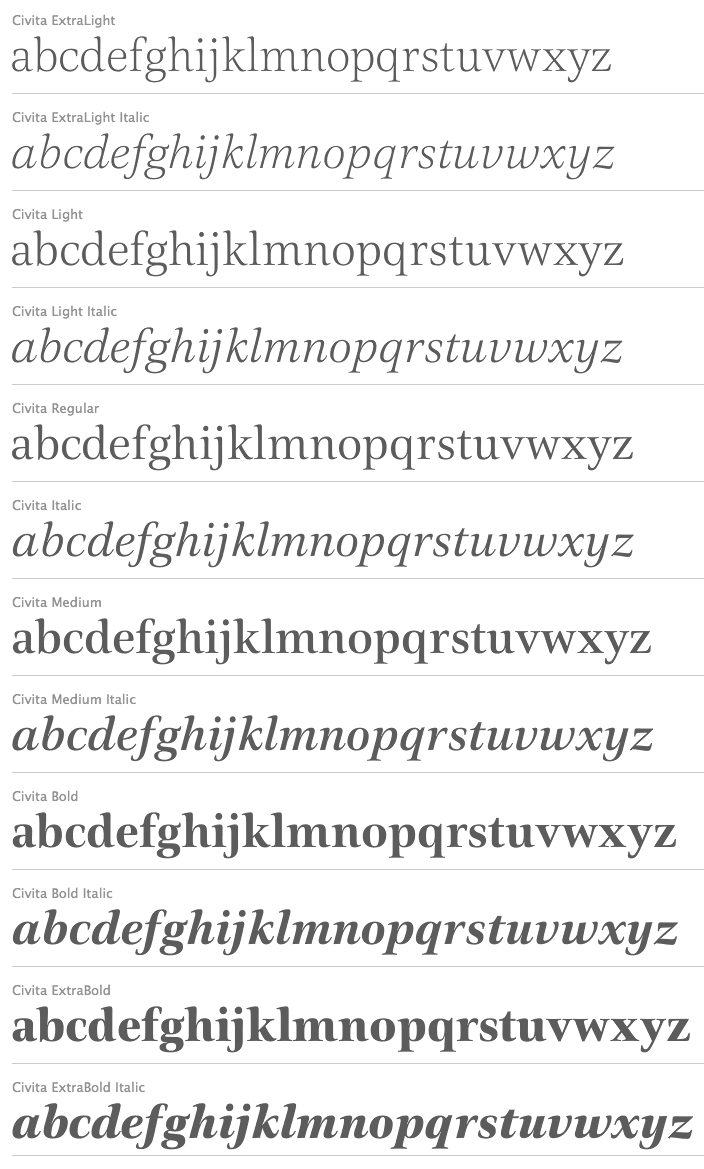
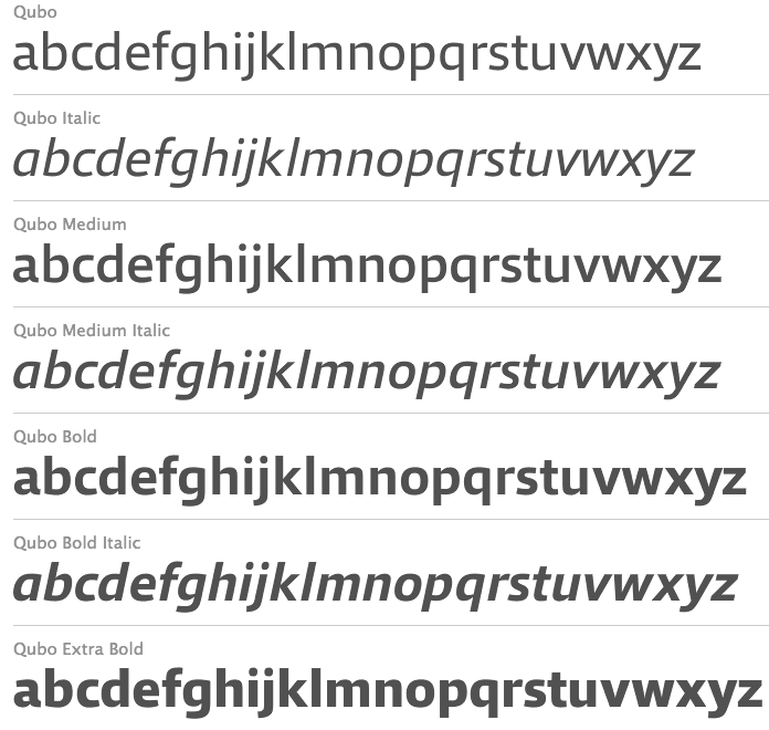
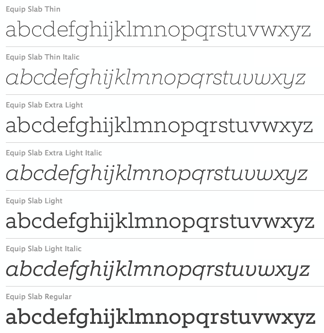
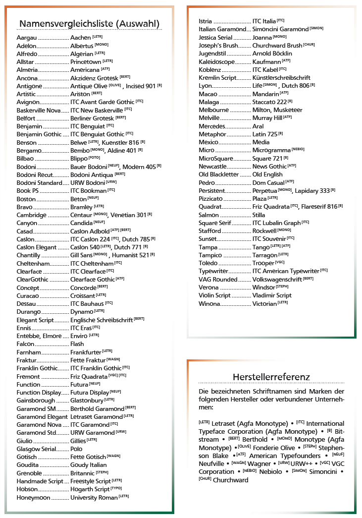
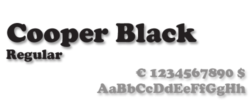
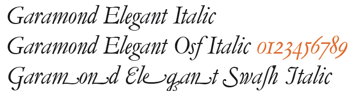
![German Garamond"> [based on TypoArt Garamond], Giulio,](Infinitype--GermanGaramond--basedonTypoartGaramond.png)
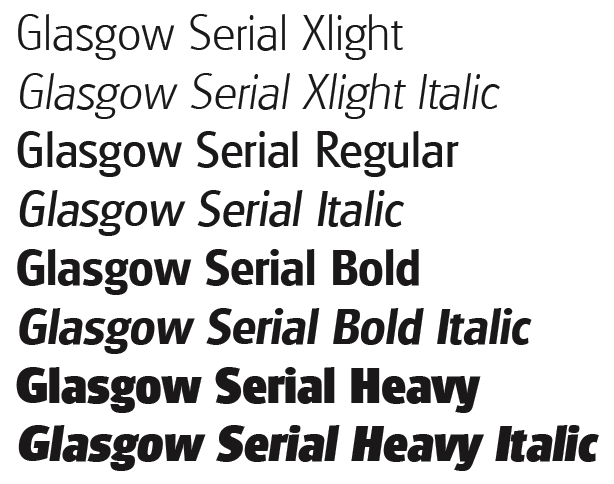
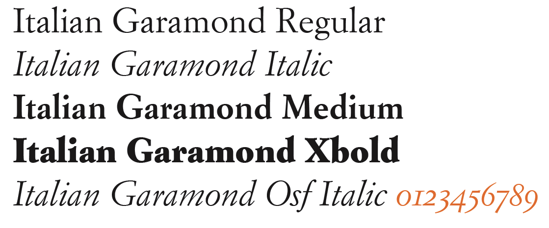
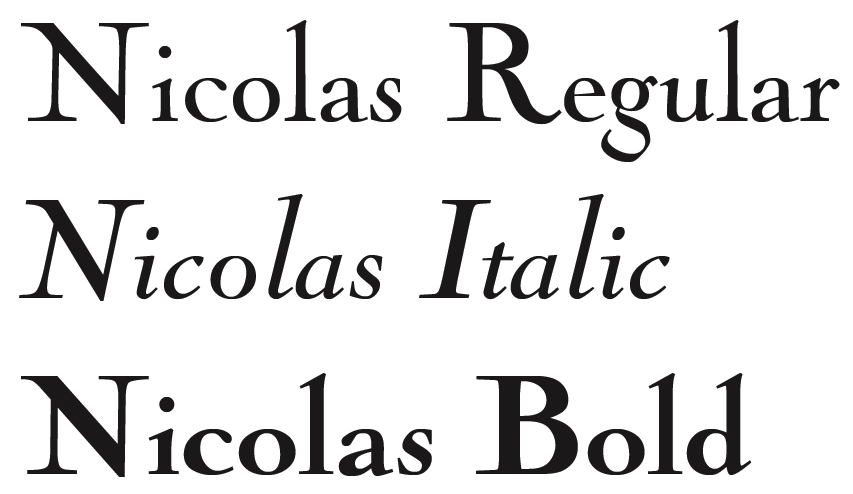
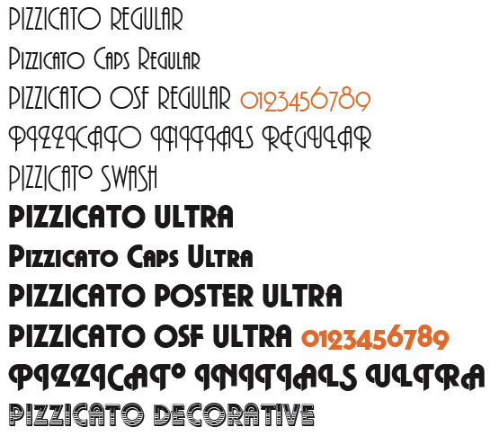
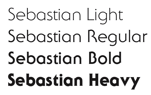
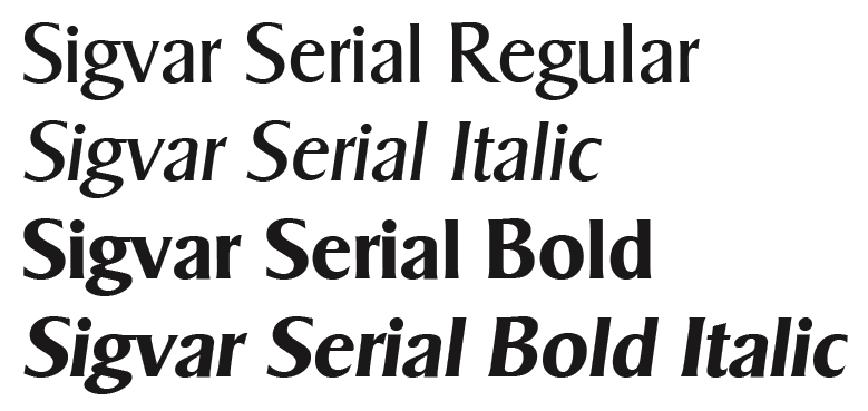
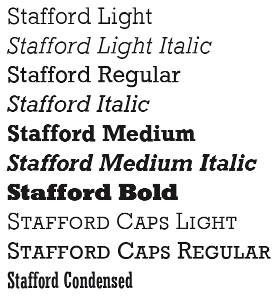
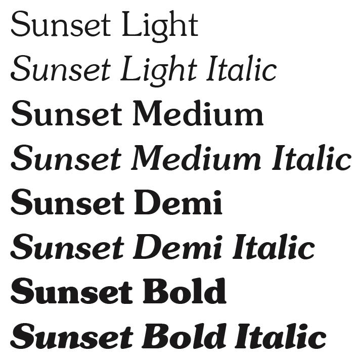
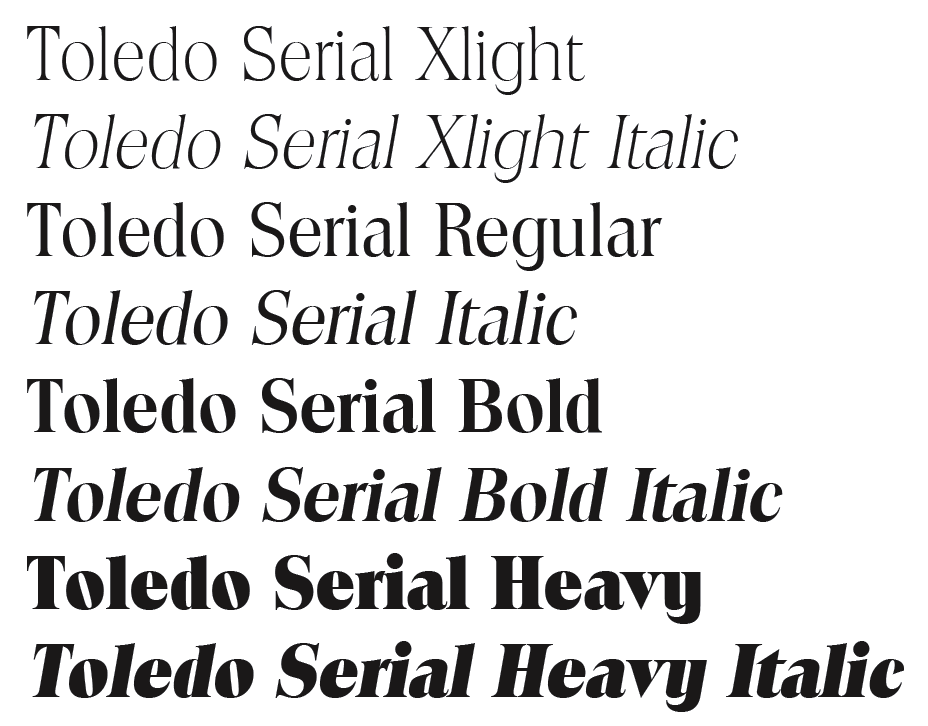
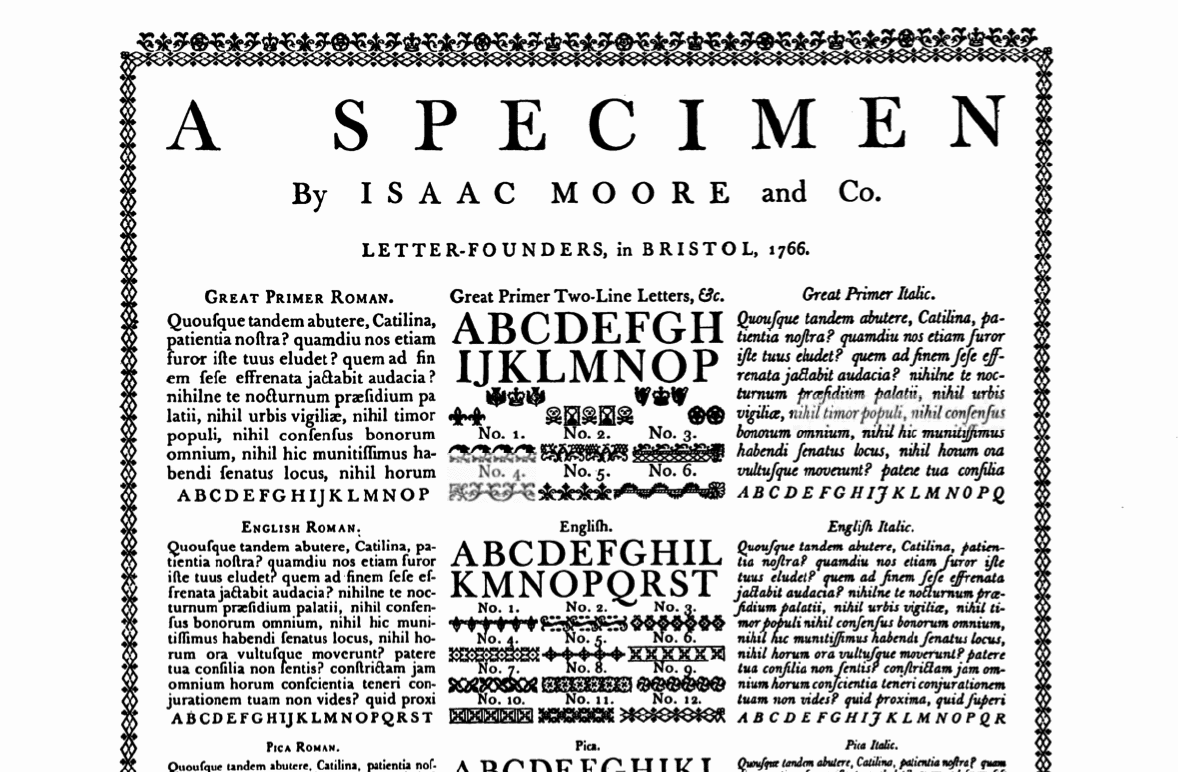
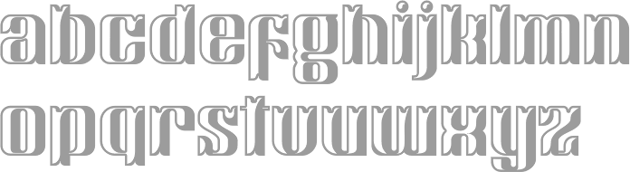
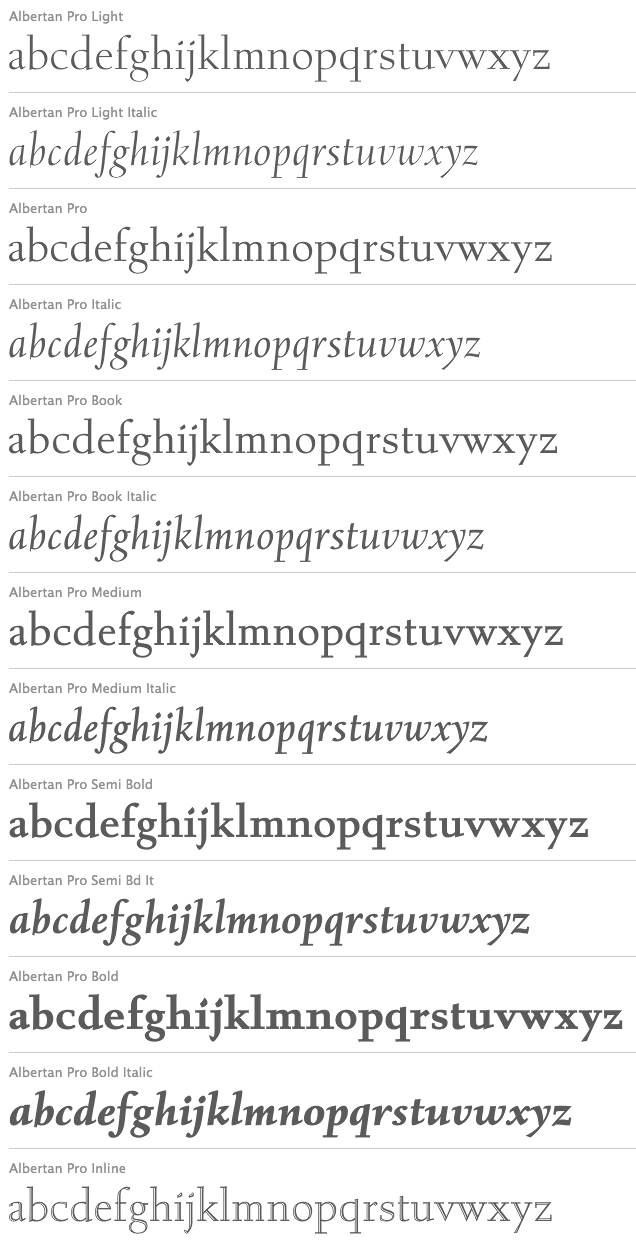
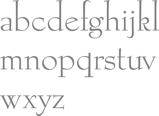
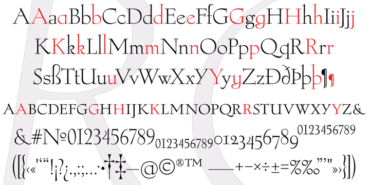
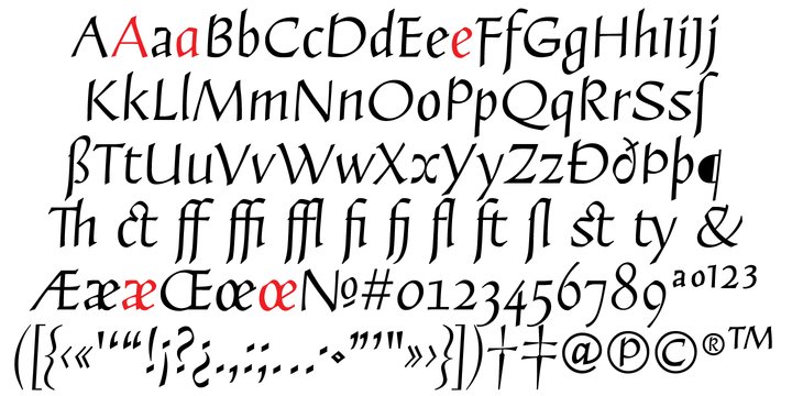
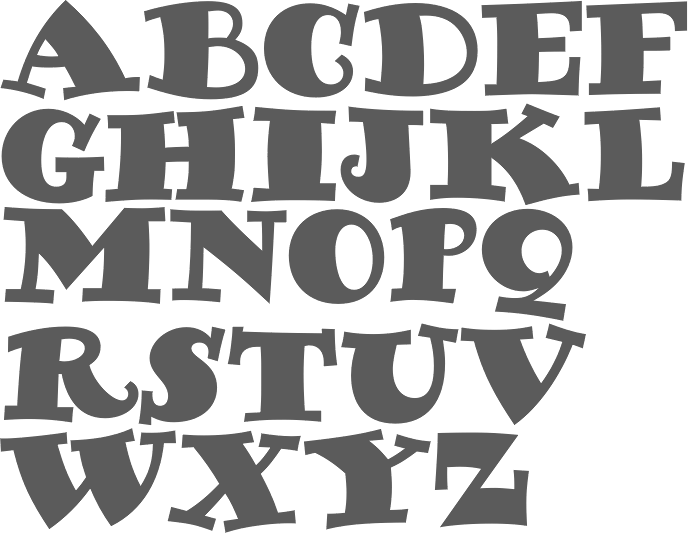
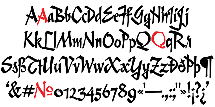
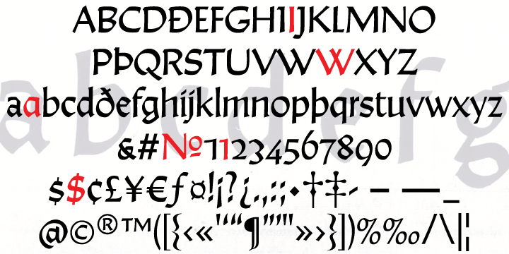
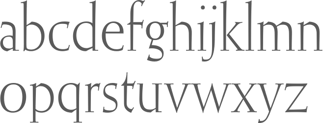
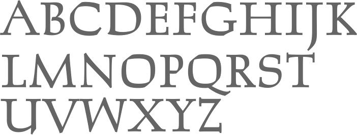
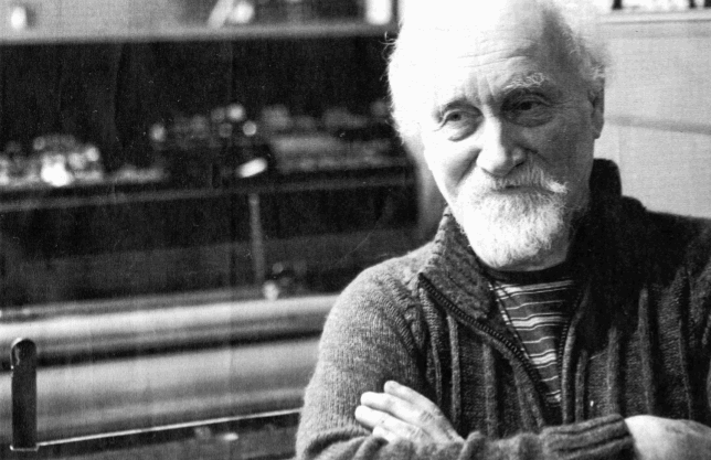
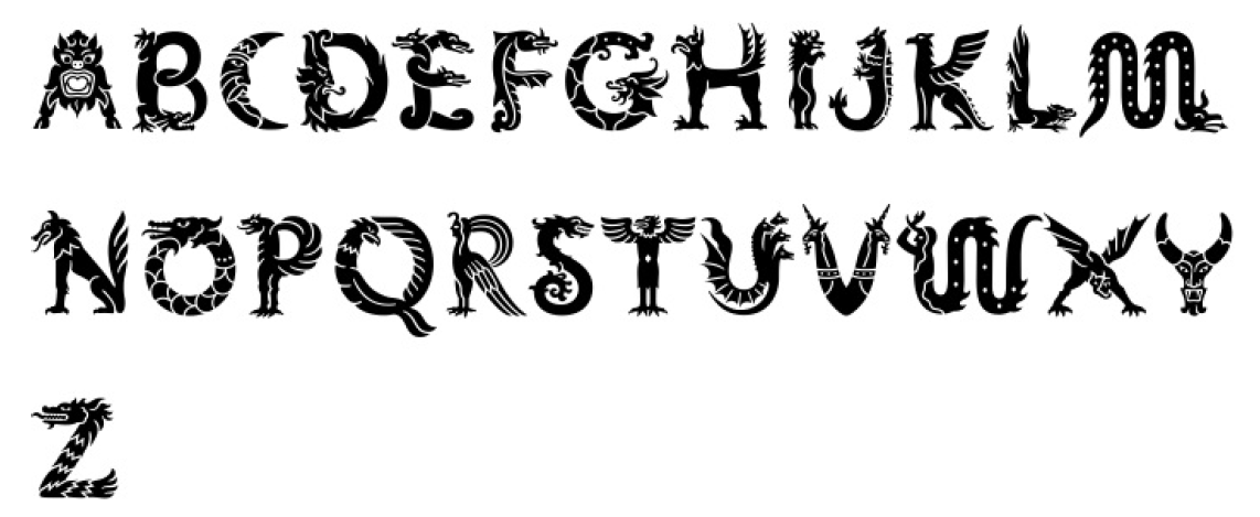
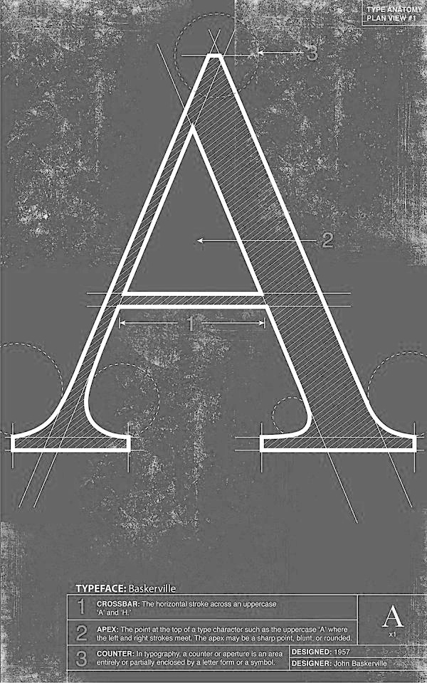
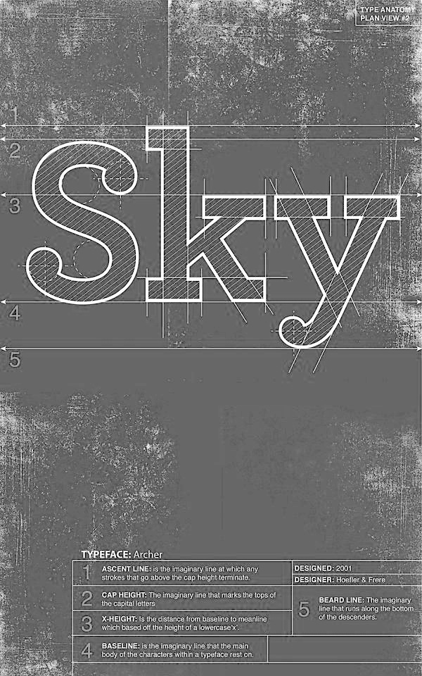
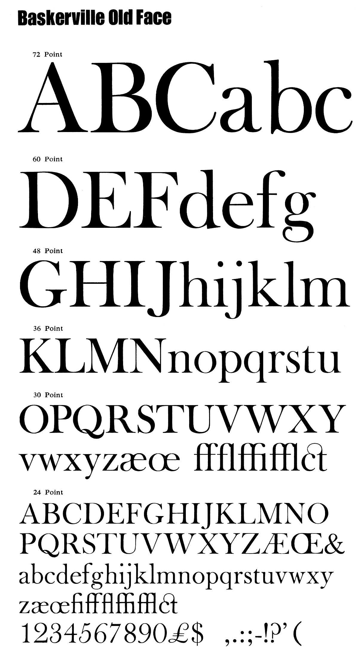
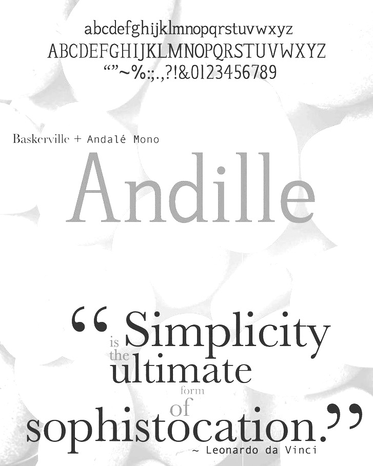
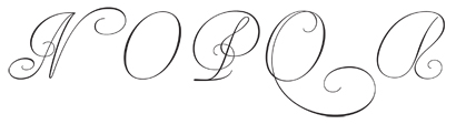
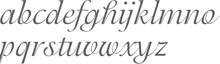
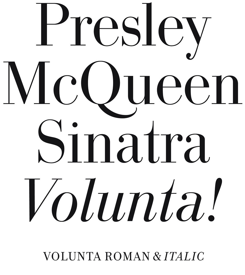
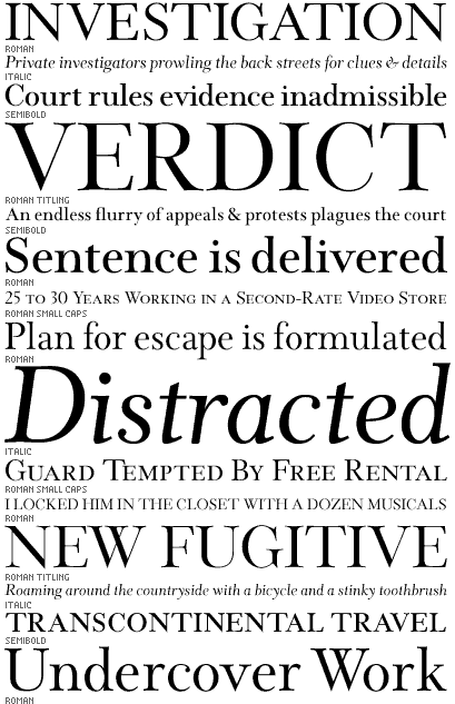
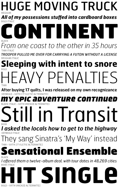
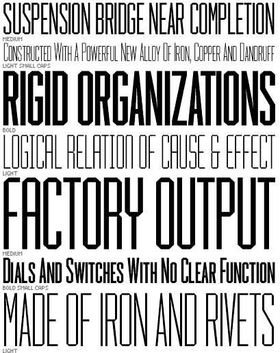
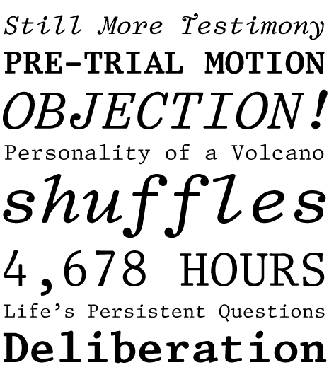
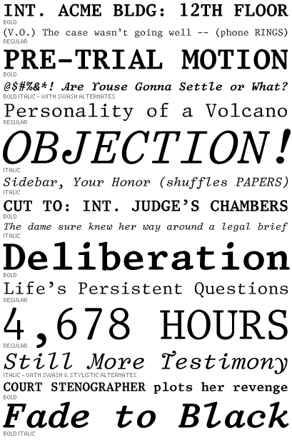
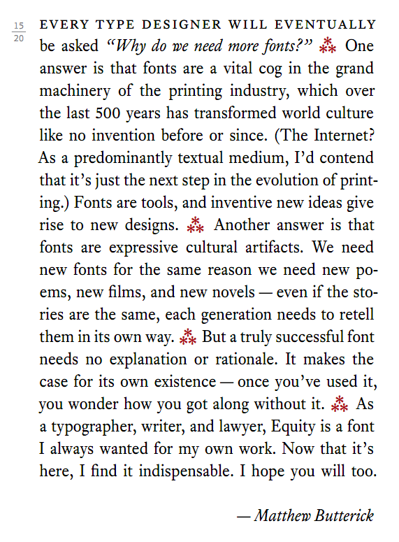
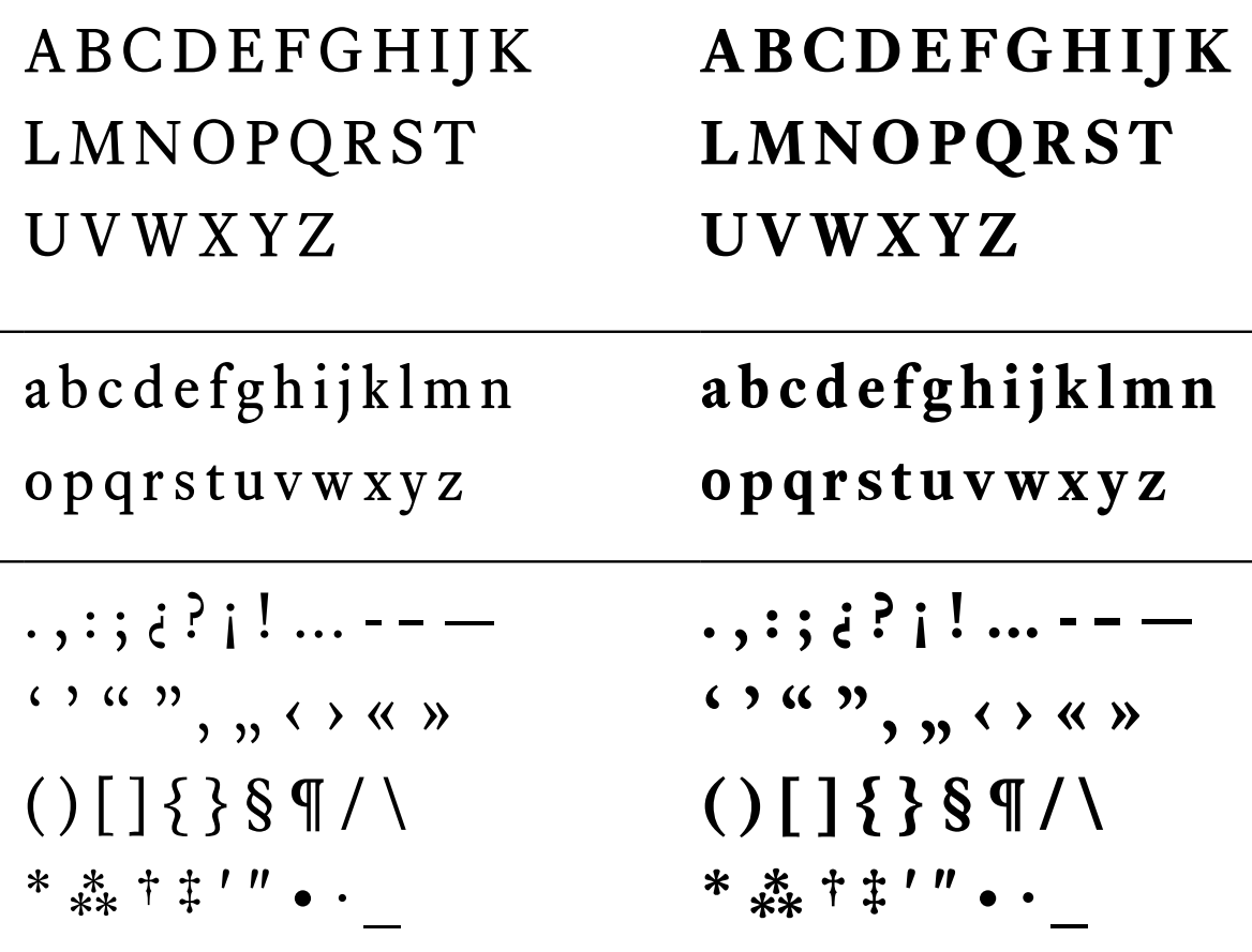
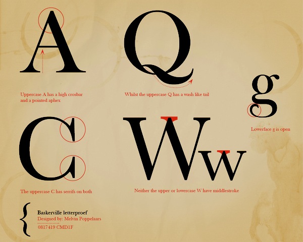
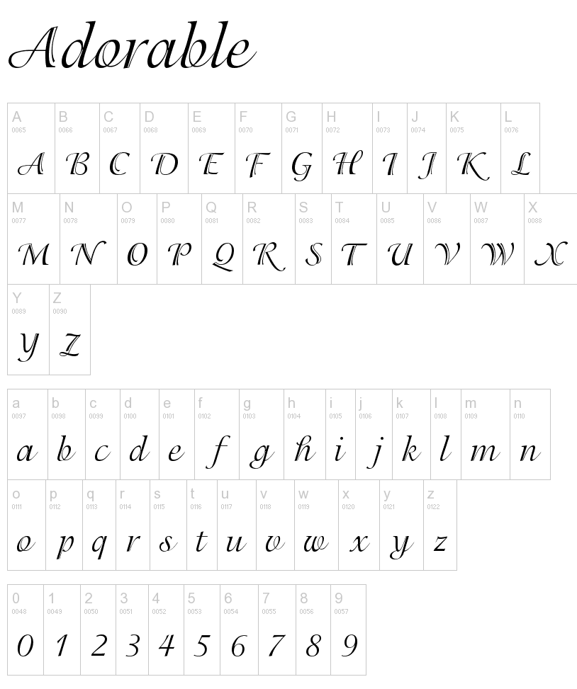
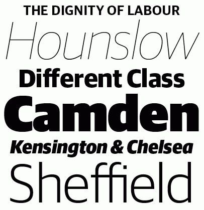
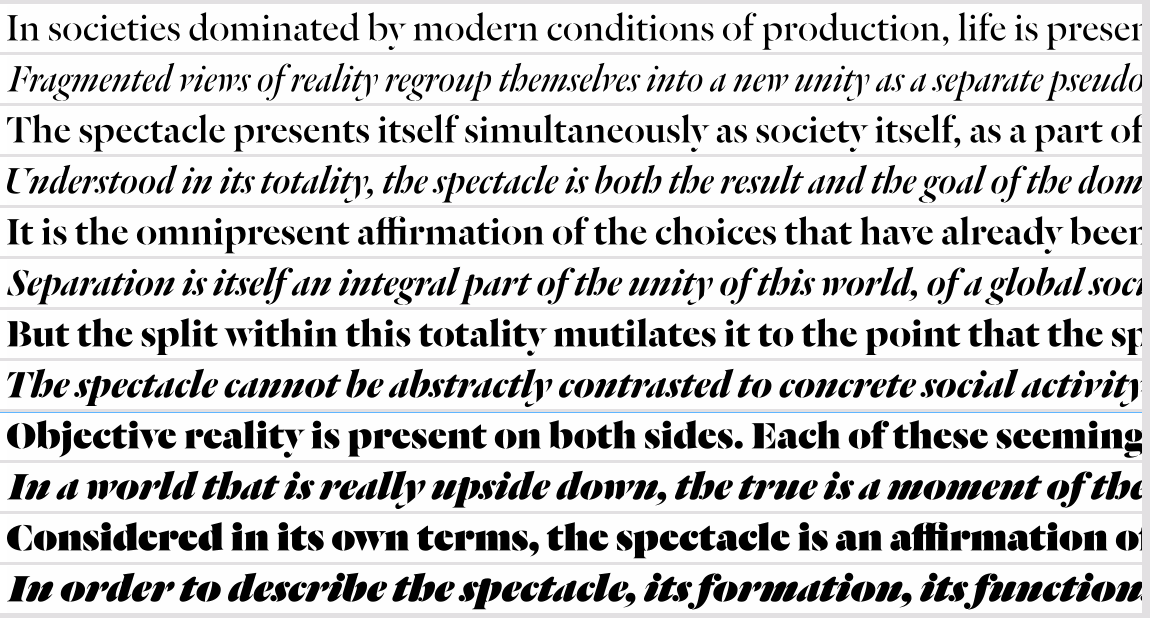
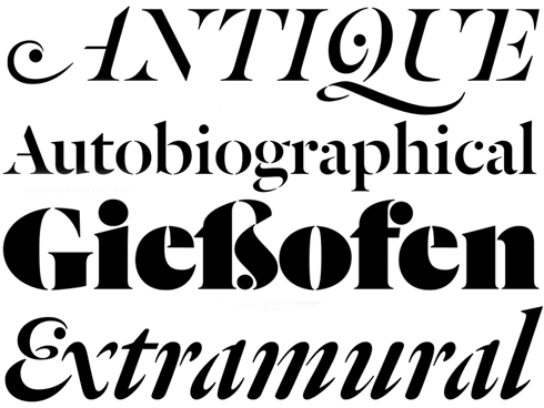
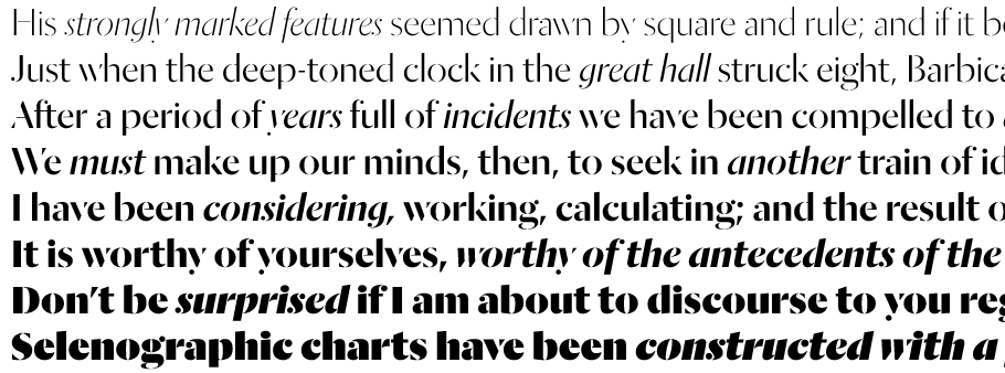
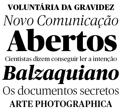
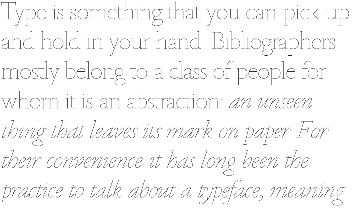
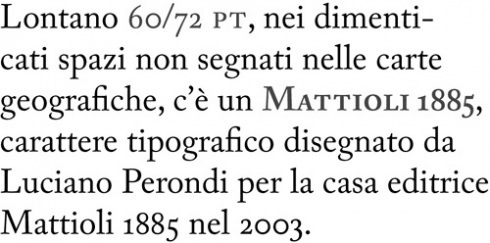
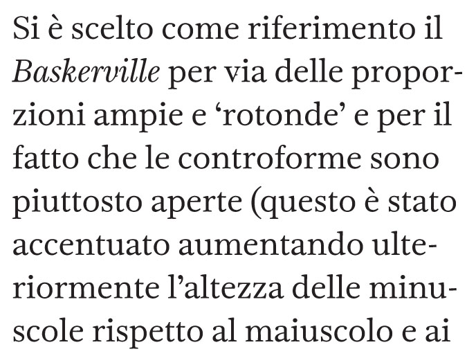
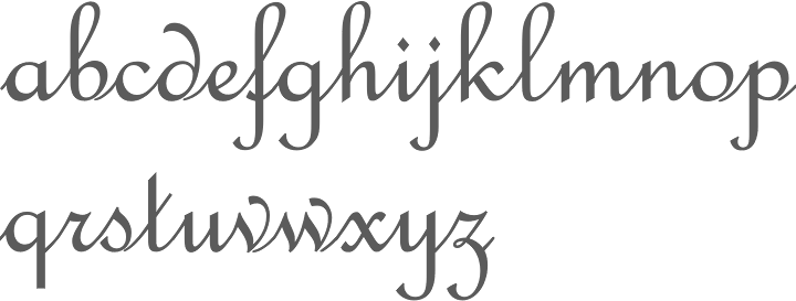
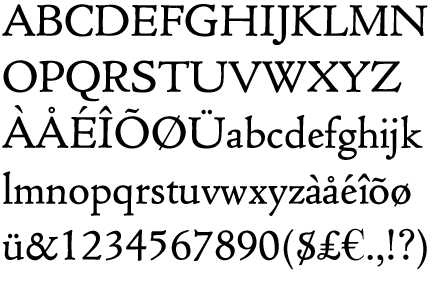
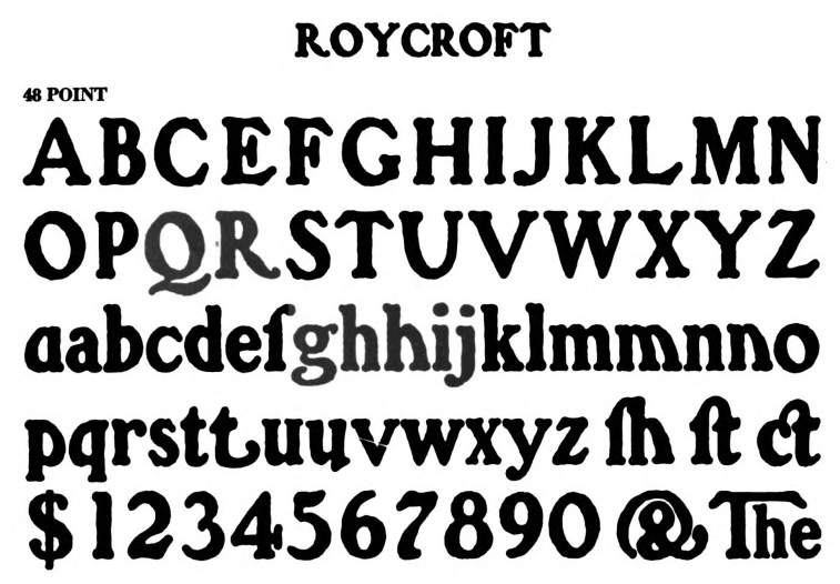
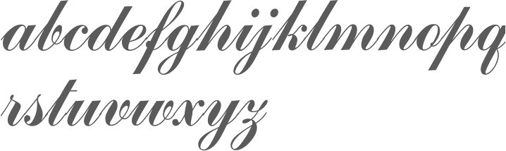
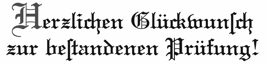
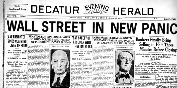
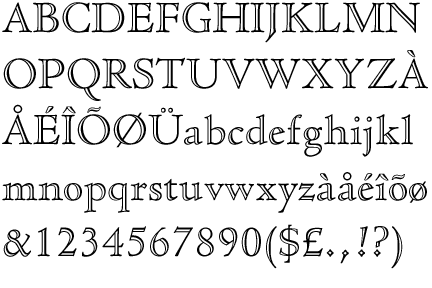
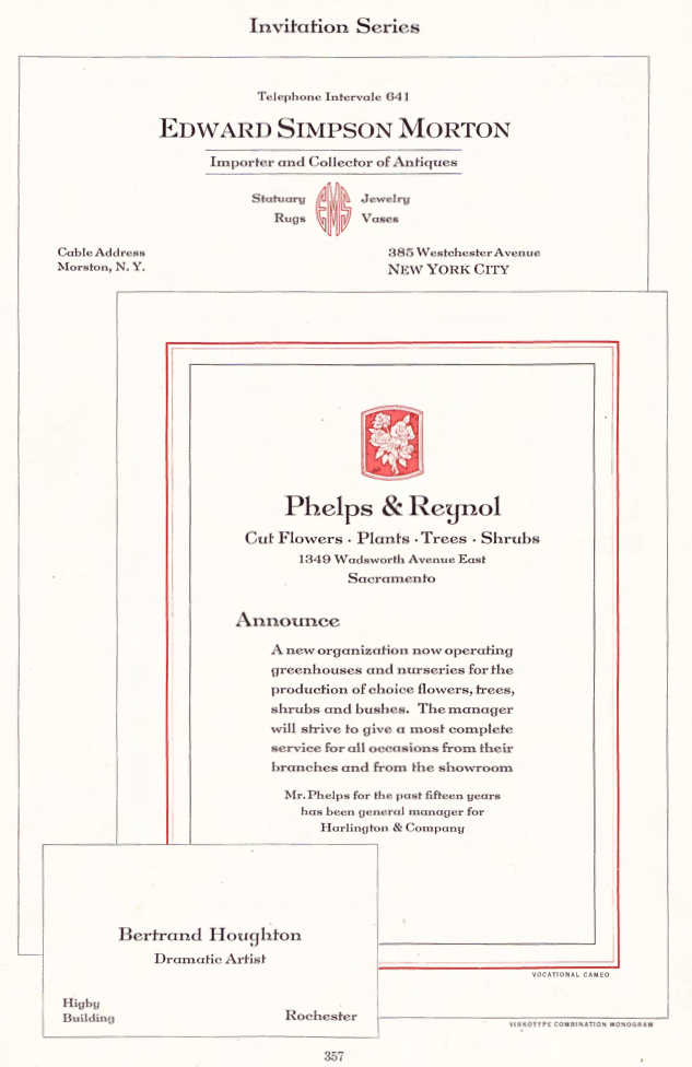
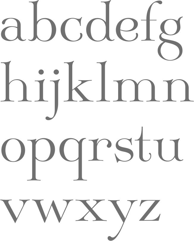
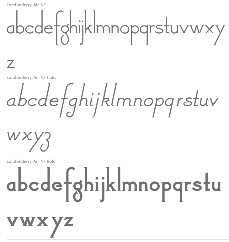
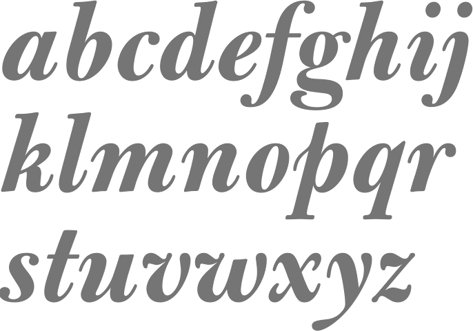
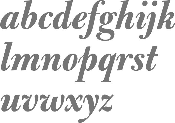
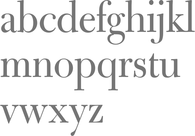
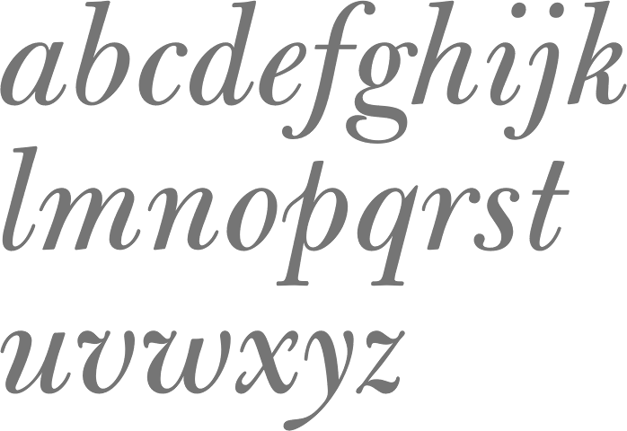
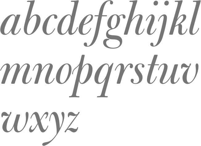
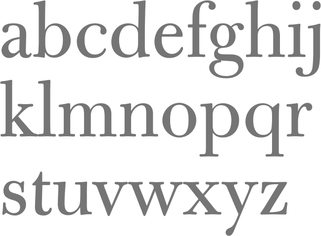
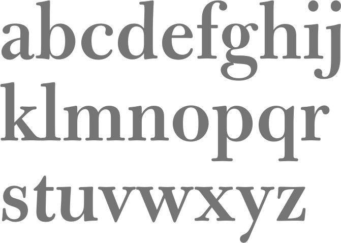
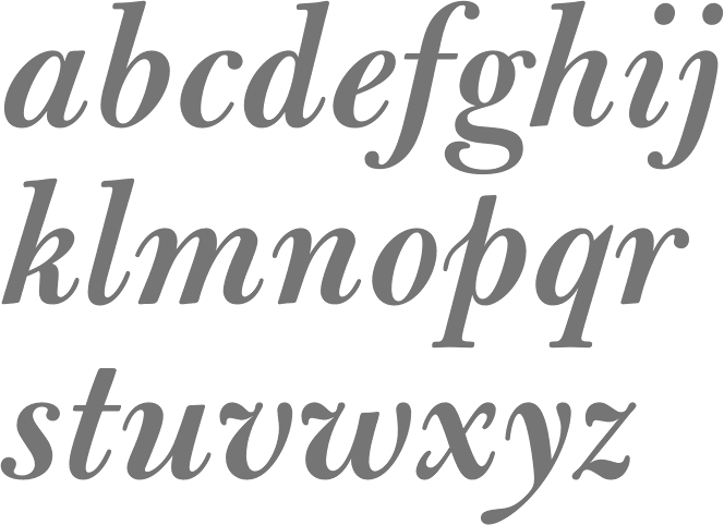
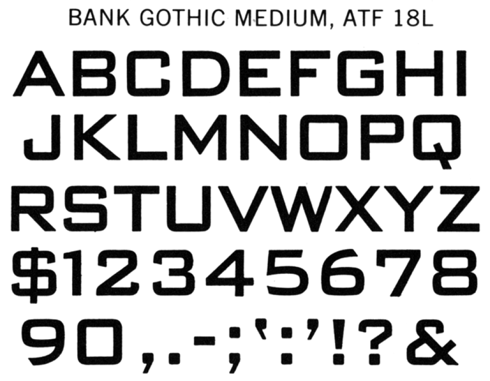
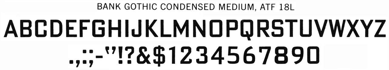
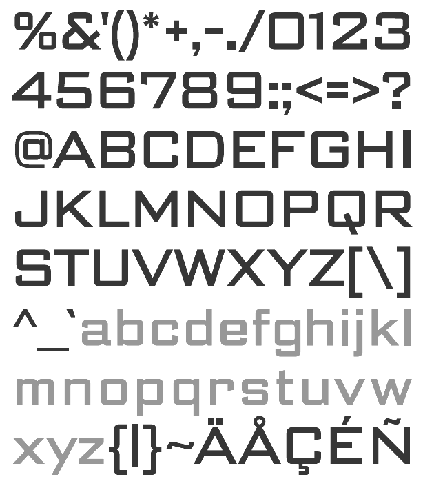
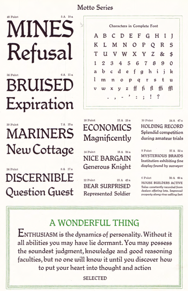
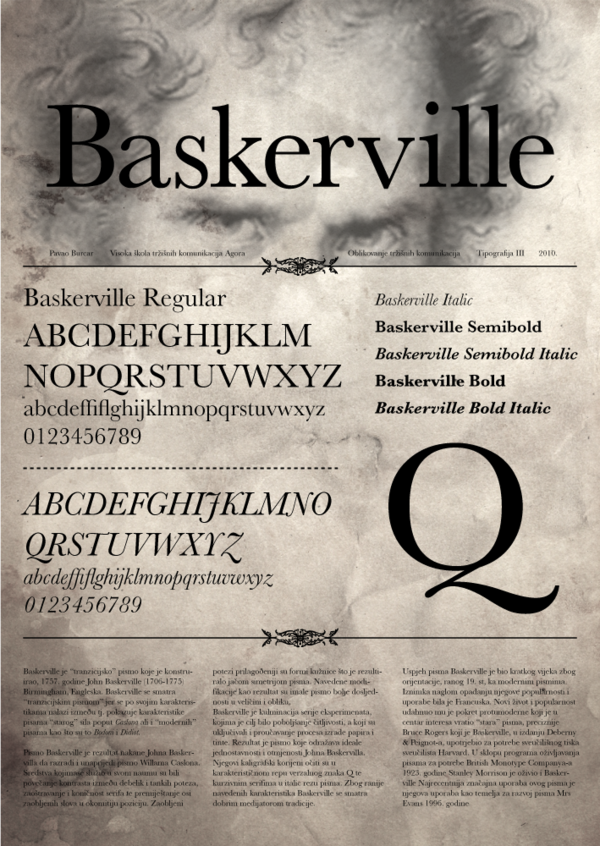
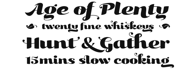
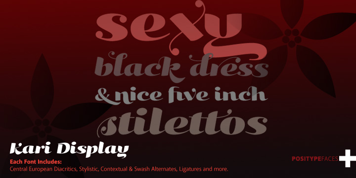
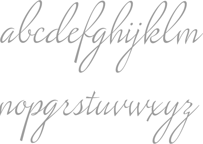
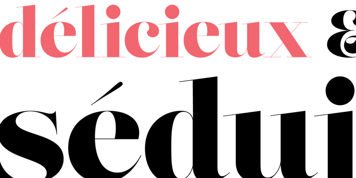
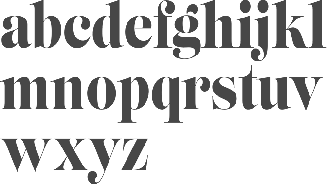
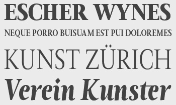
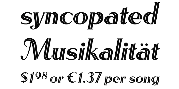
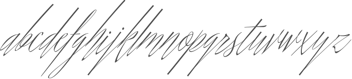
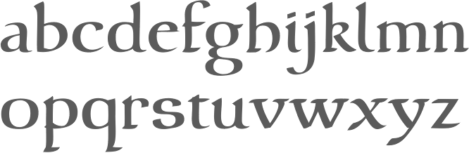
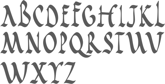
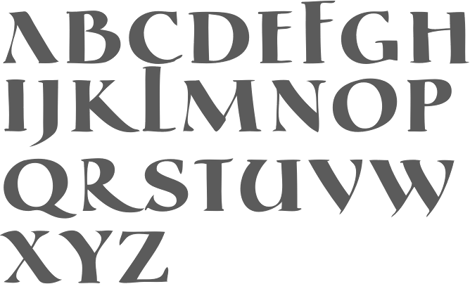
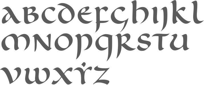
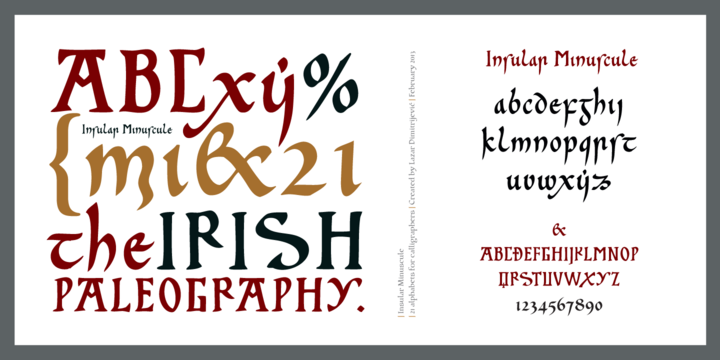
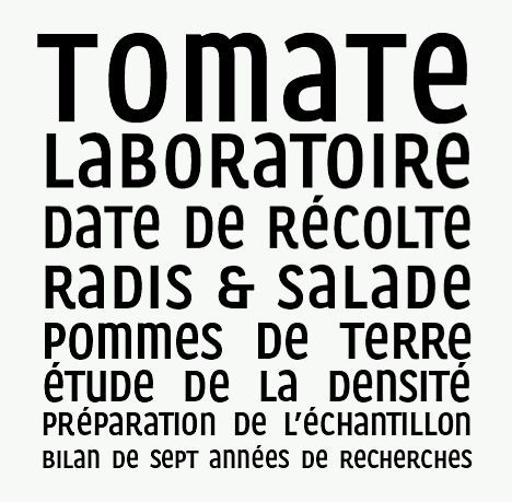
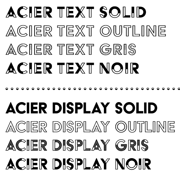
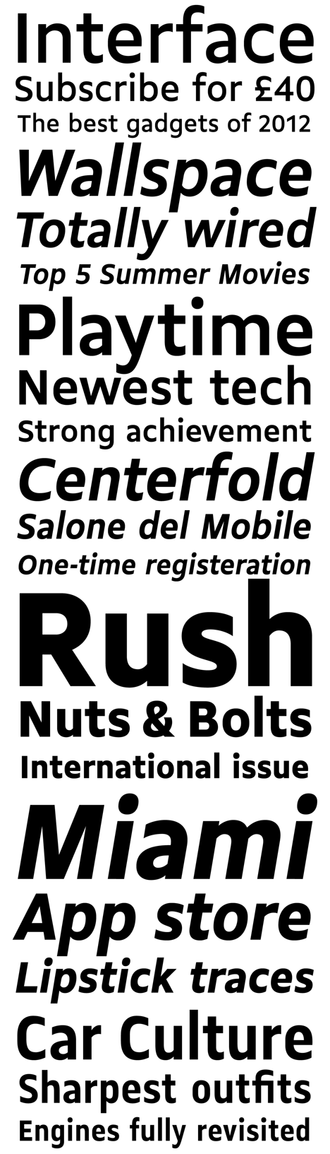
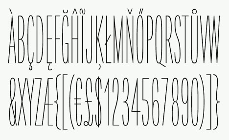
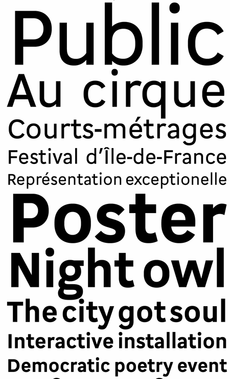
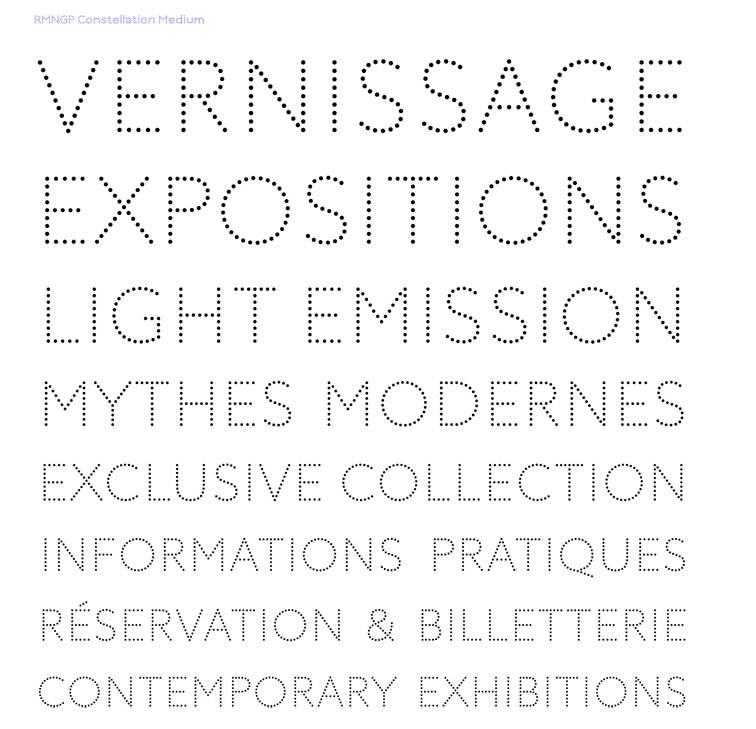
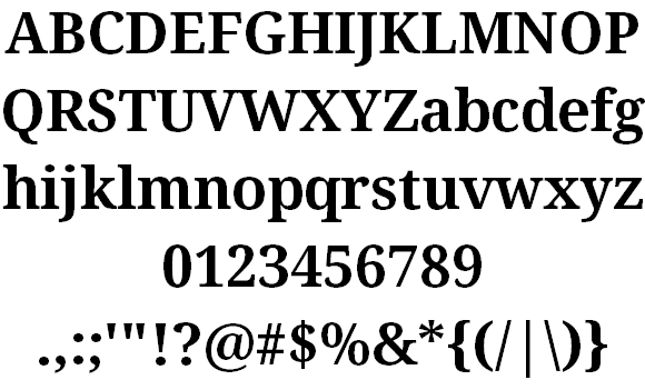
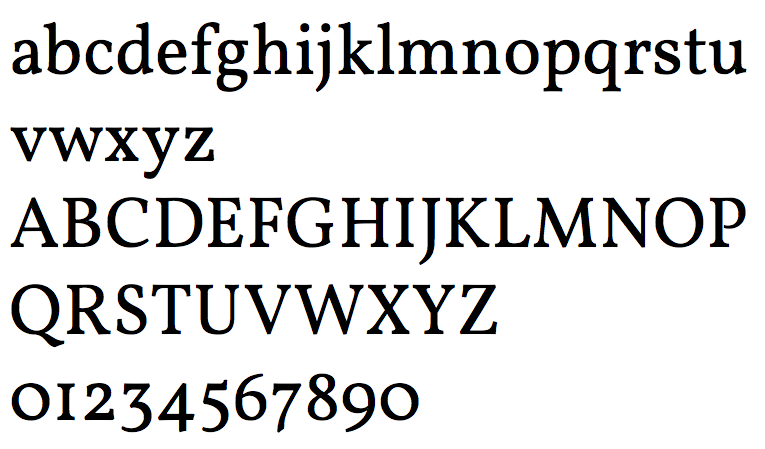
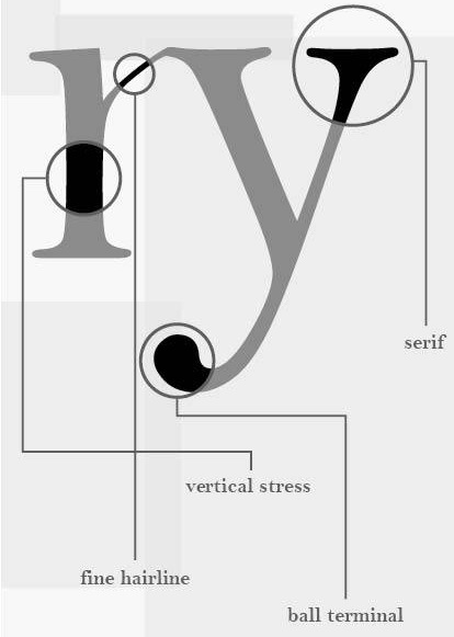
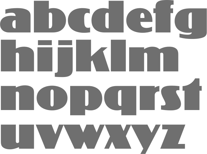
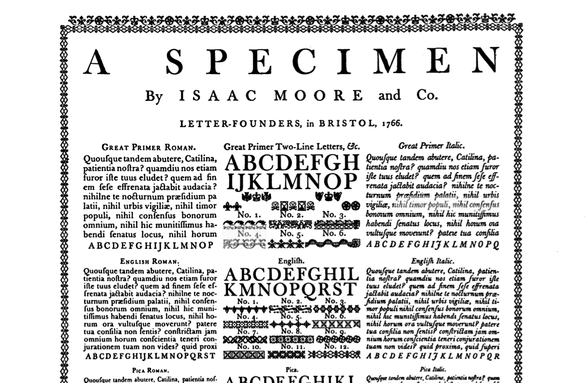
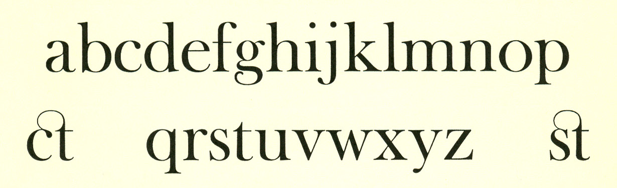
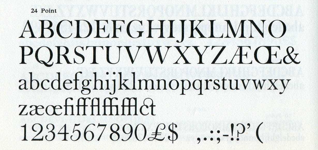
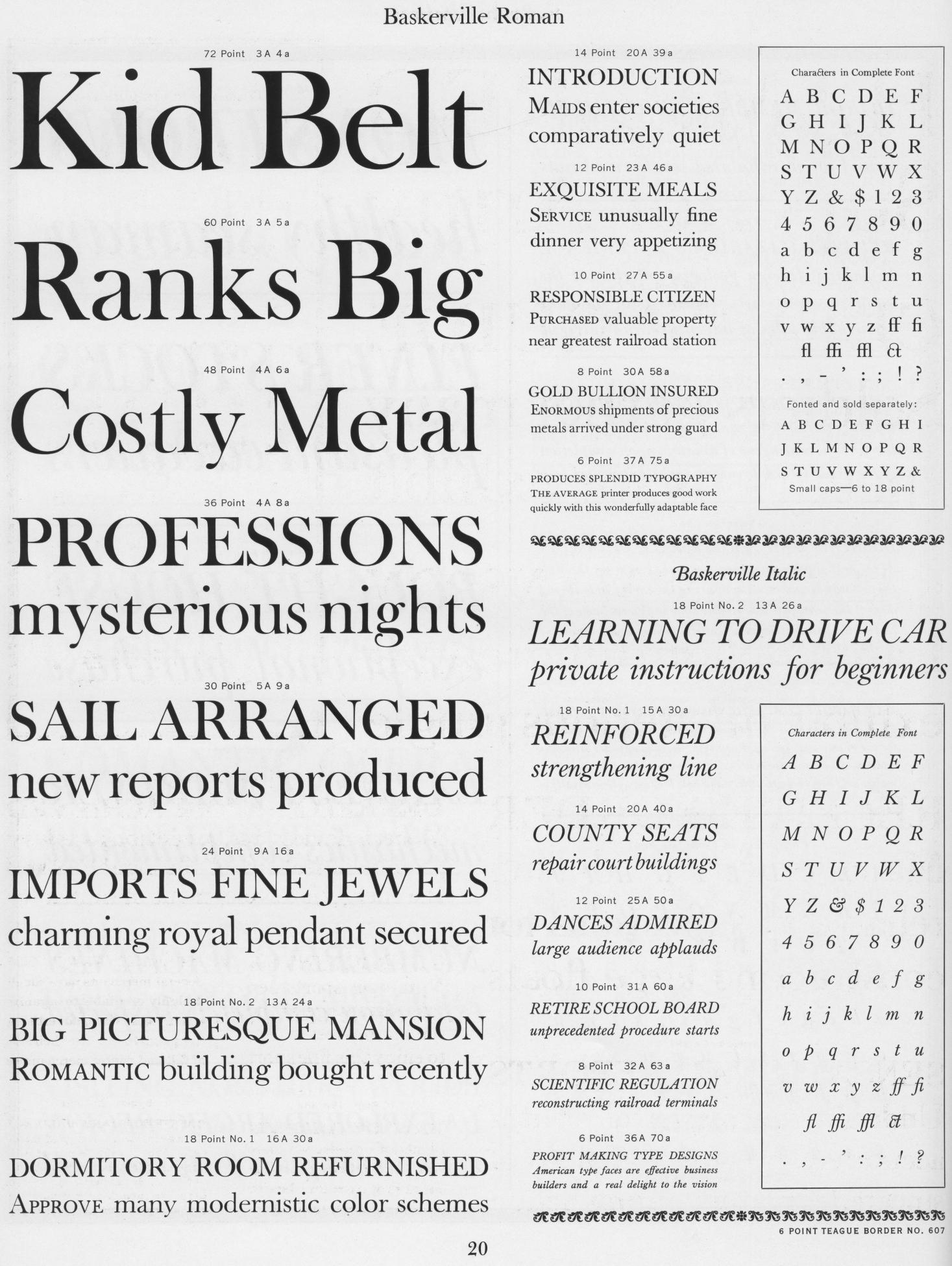
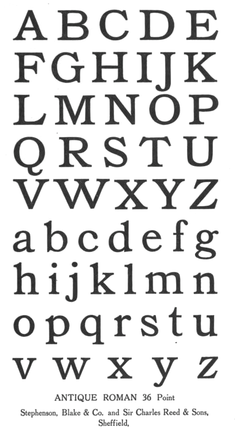
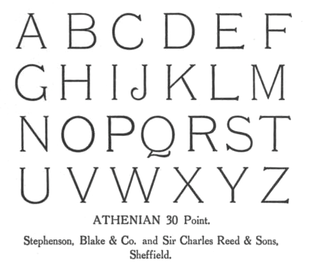
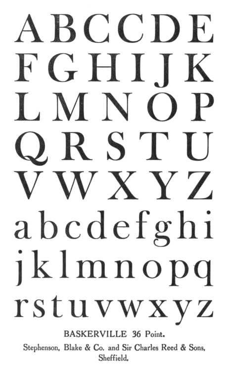
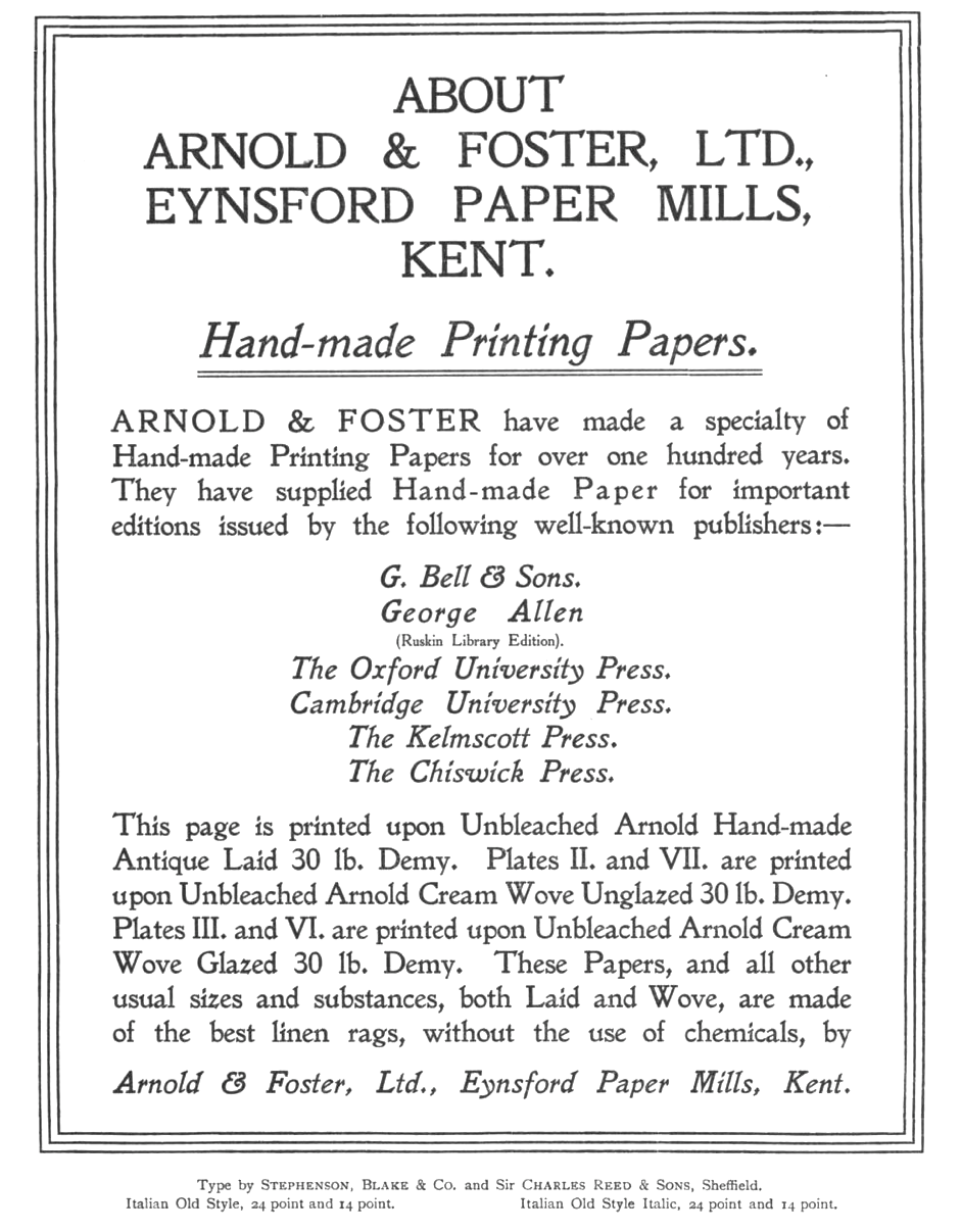
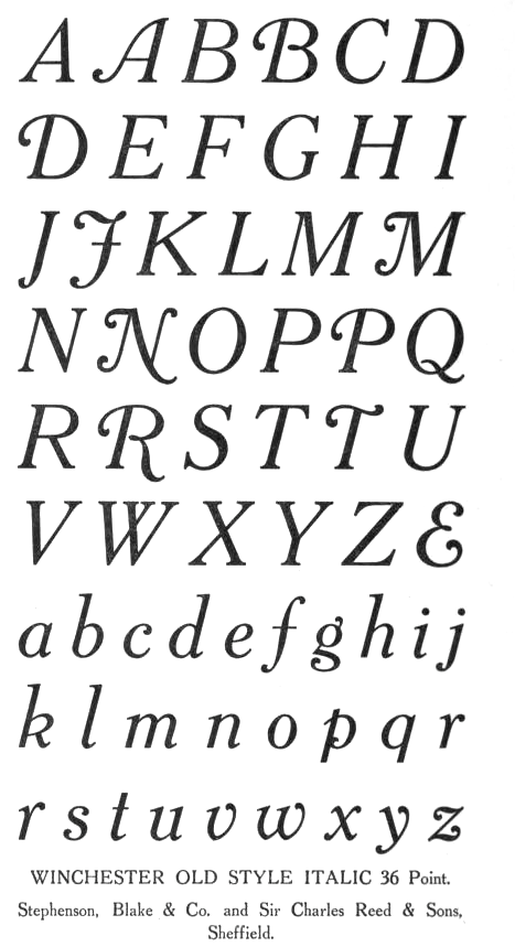
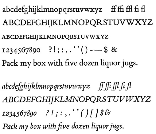
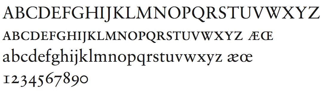
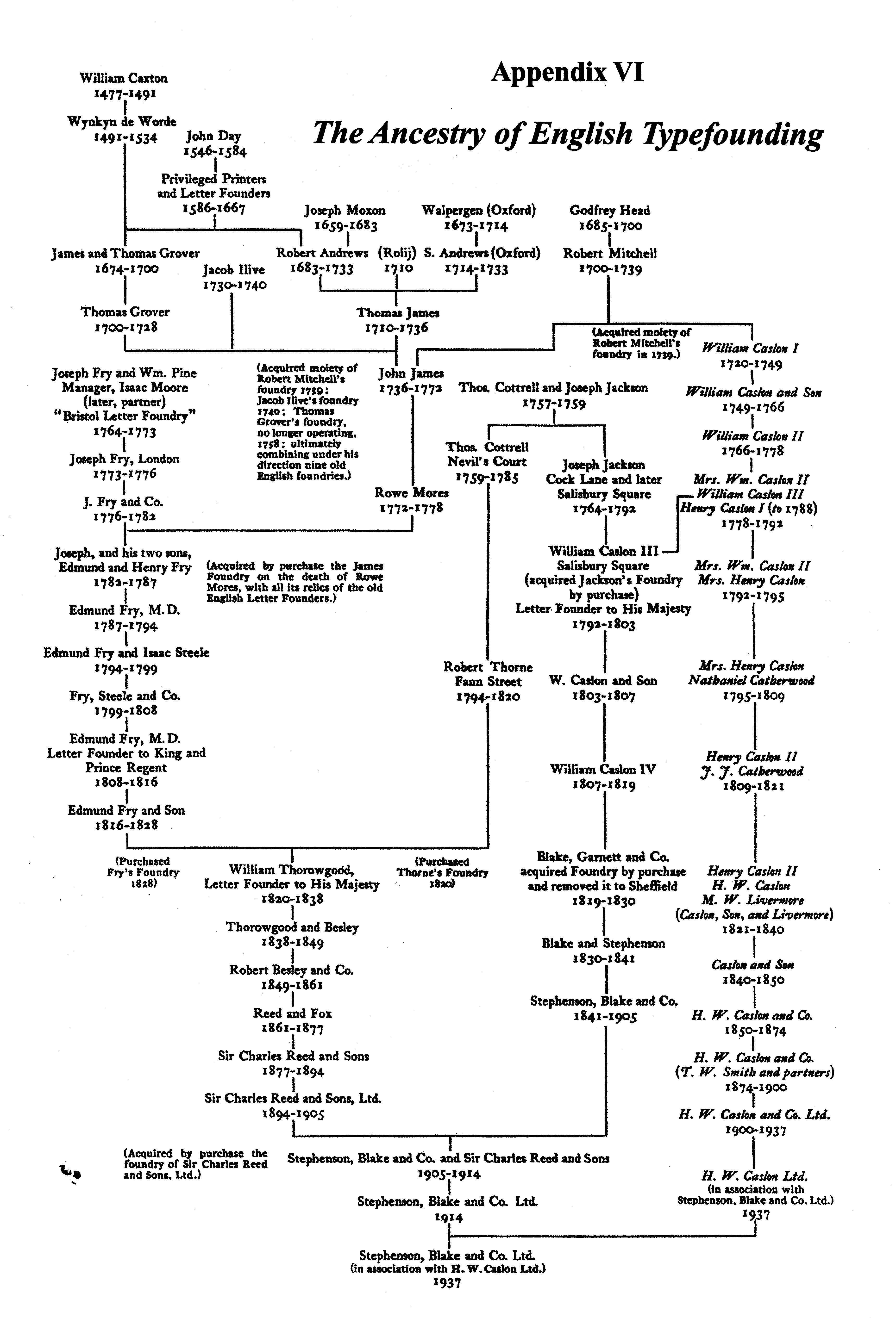
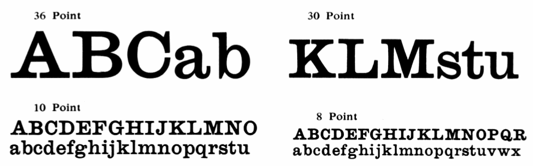
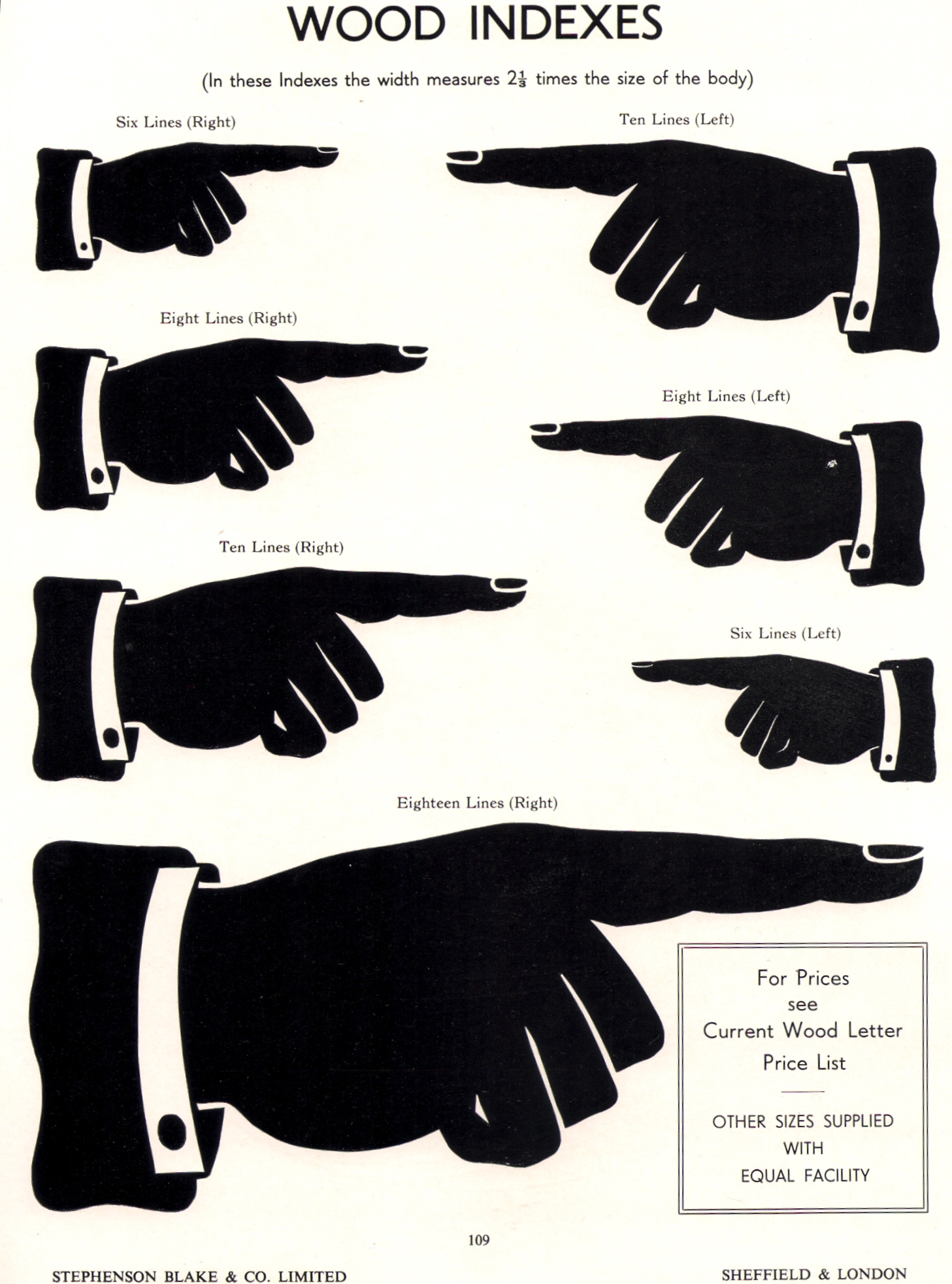
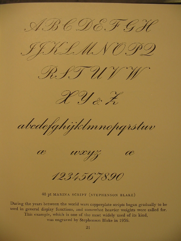
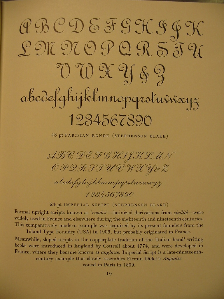
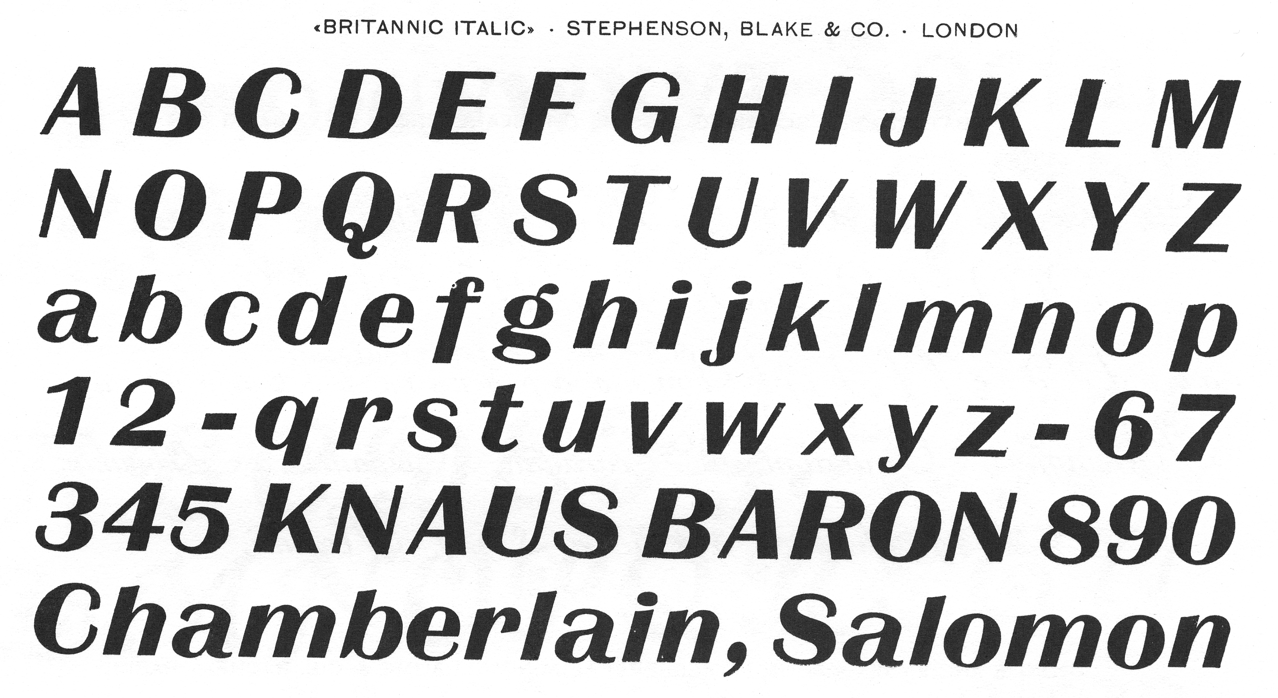
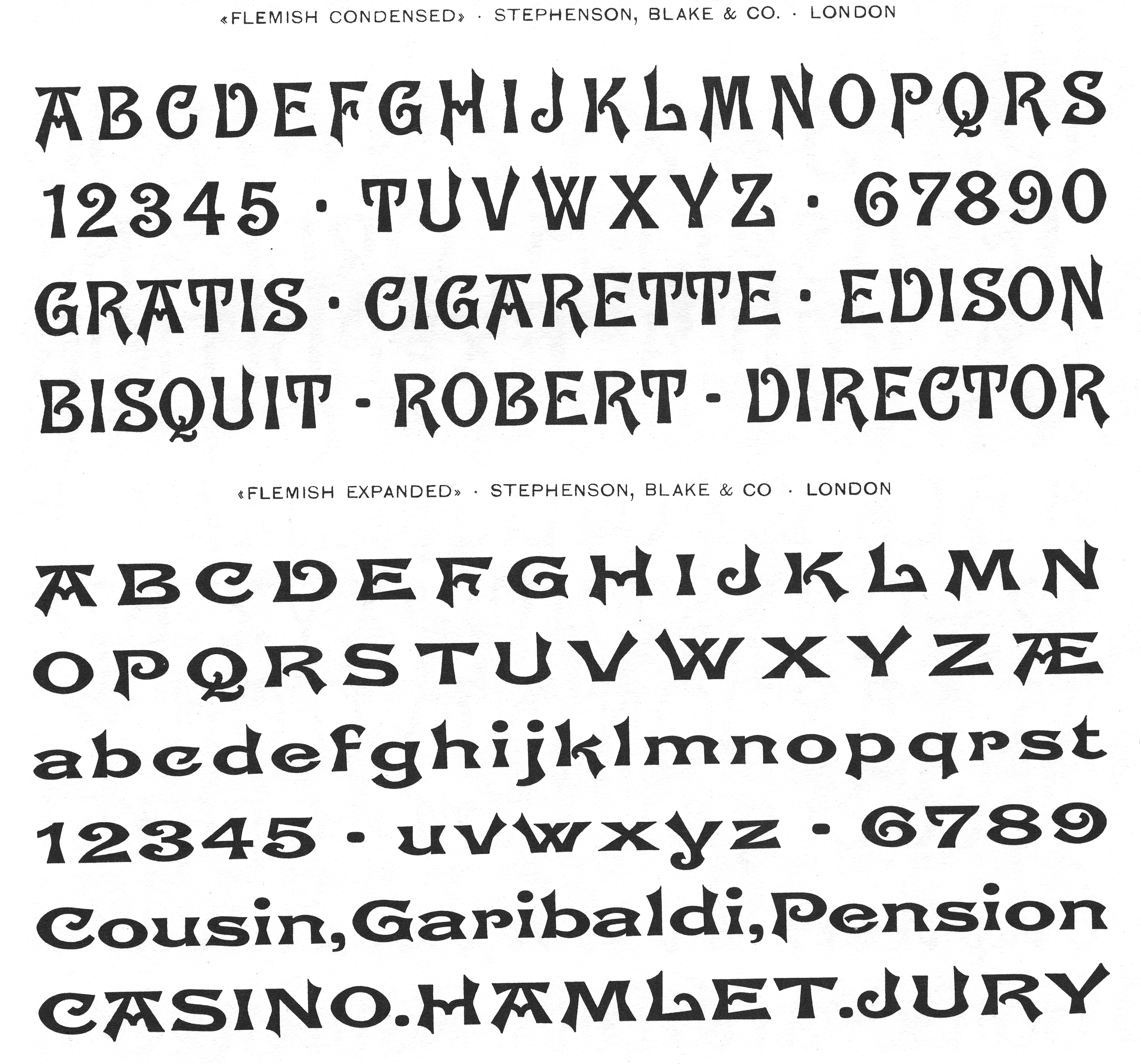
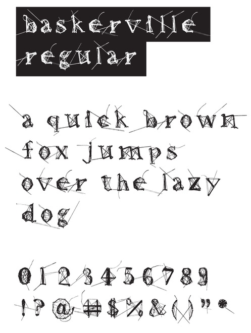
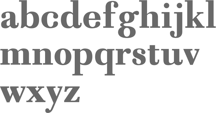
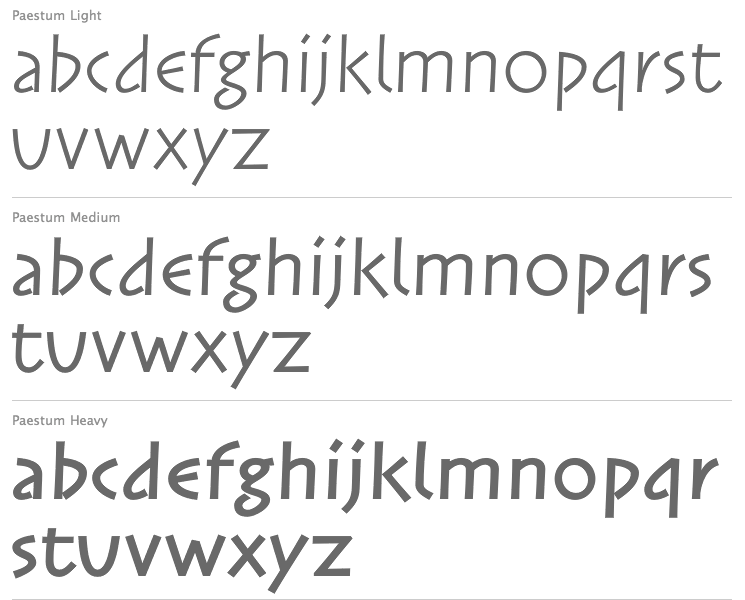
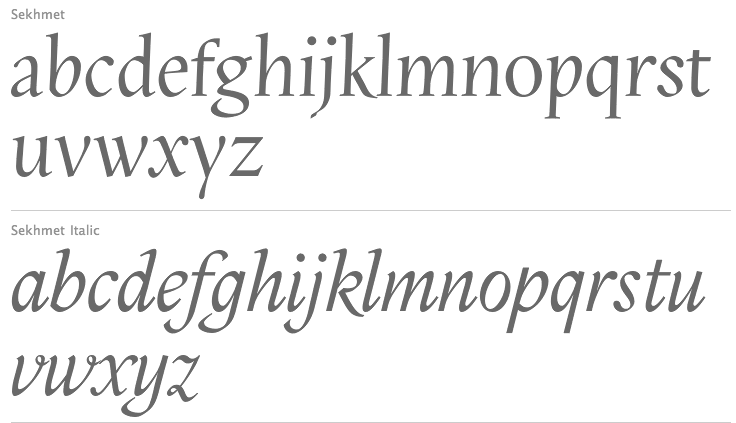
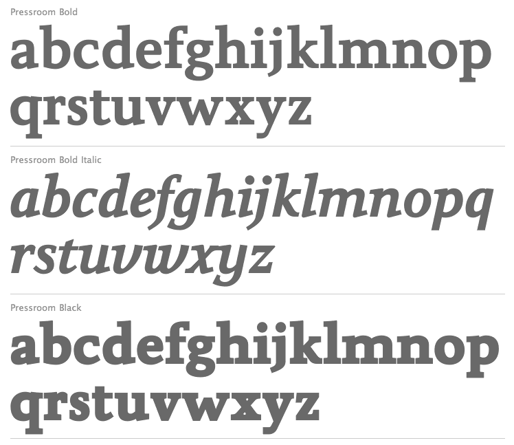
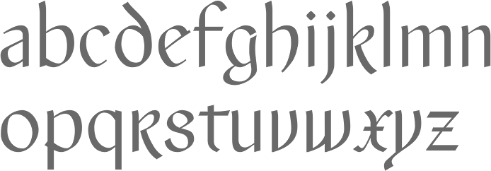
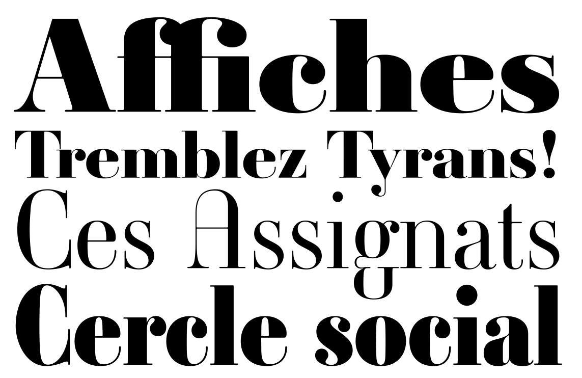
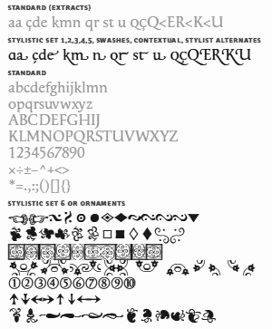
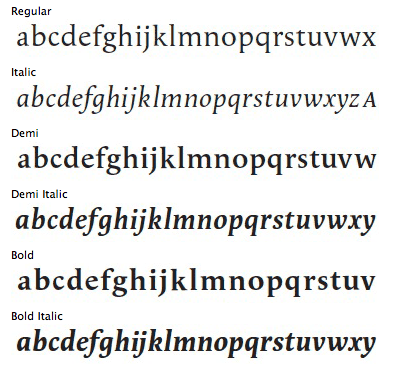
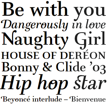
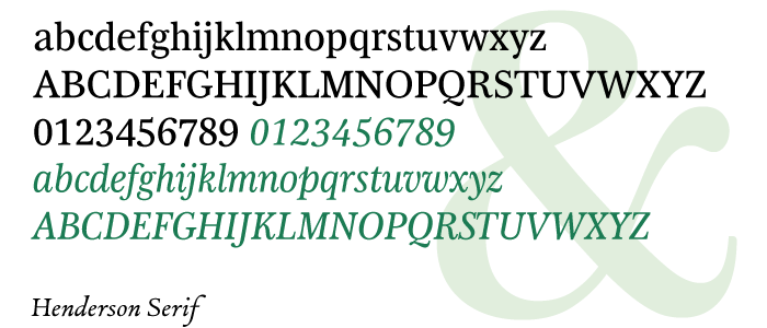
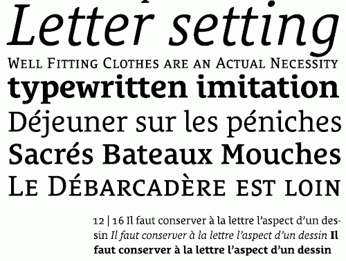
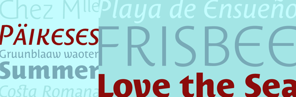
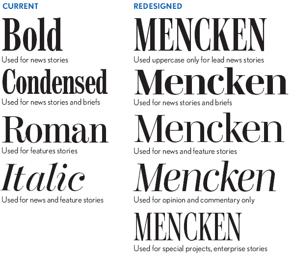
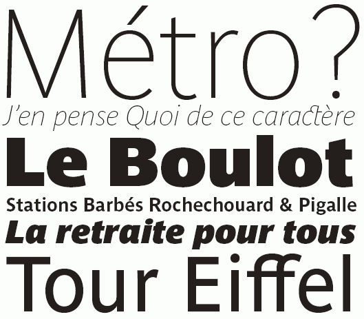
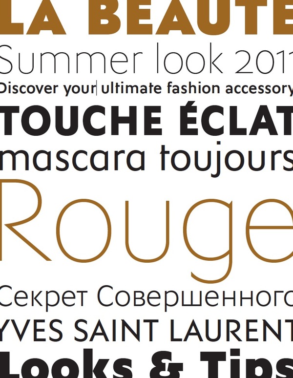
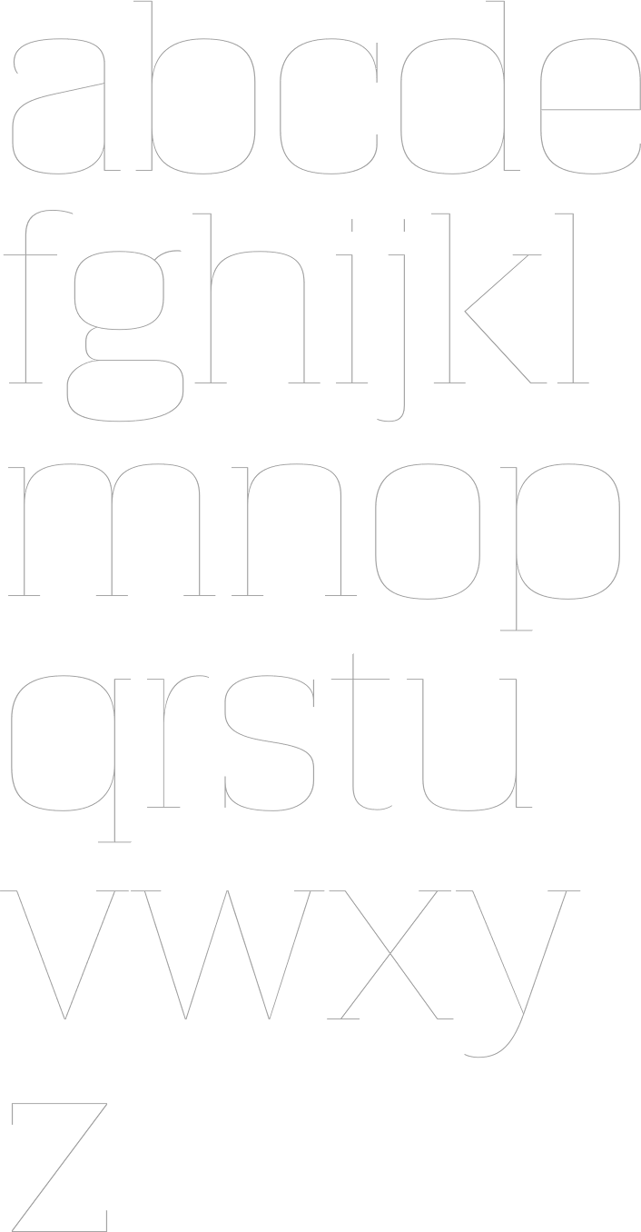
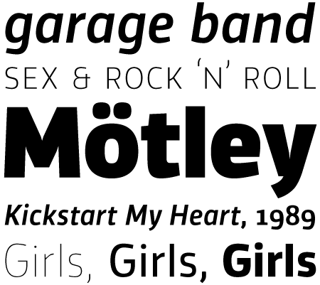
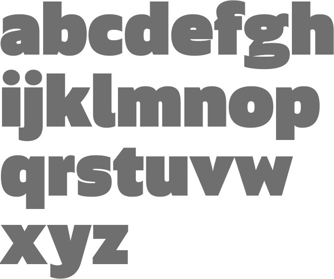
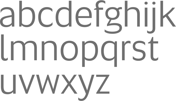
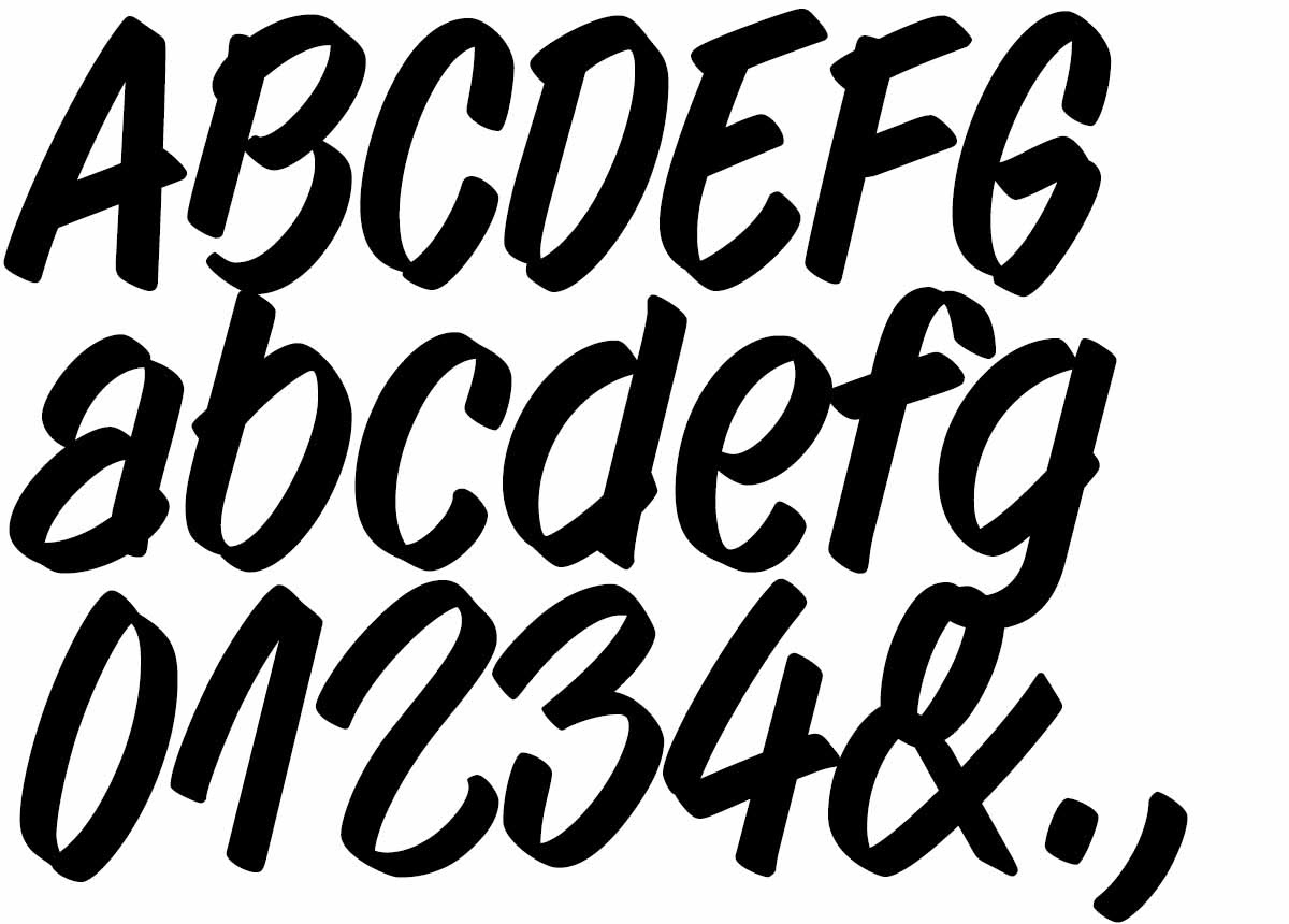
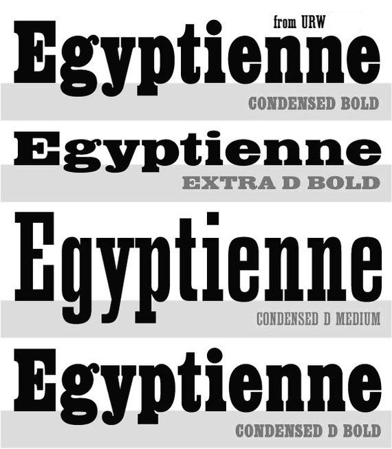
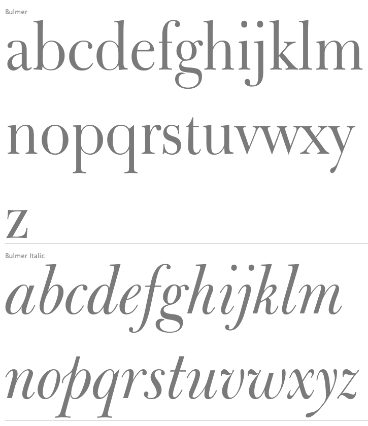
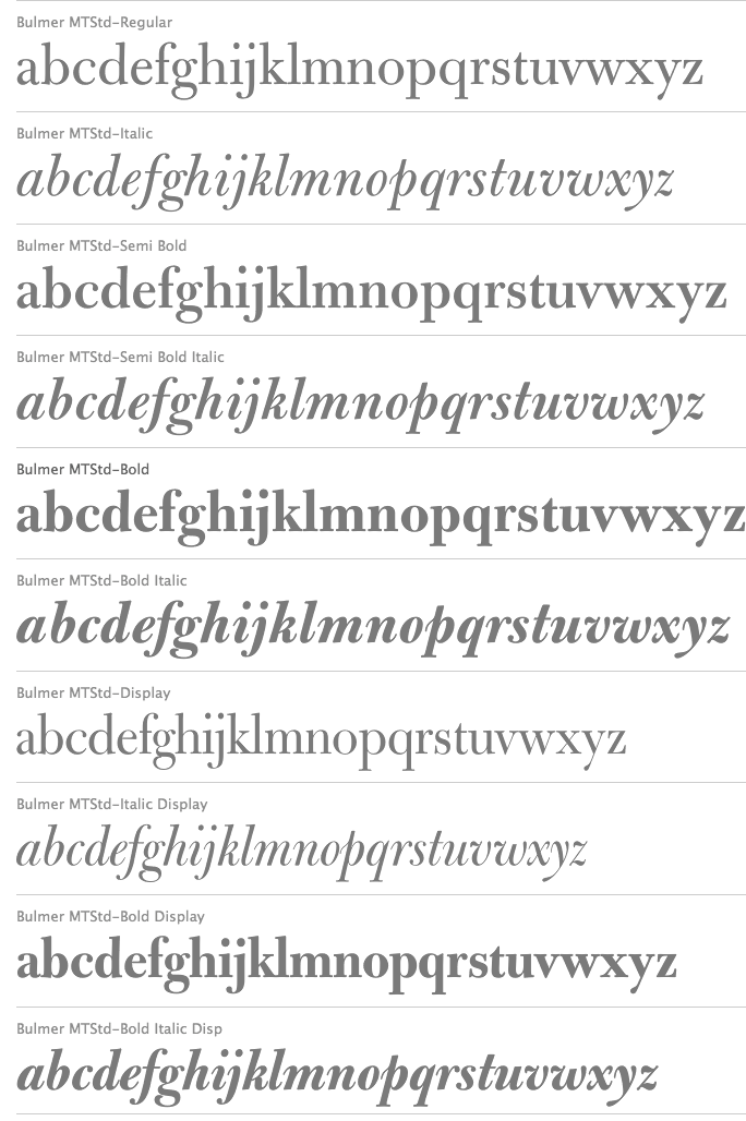
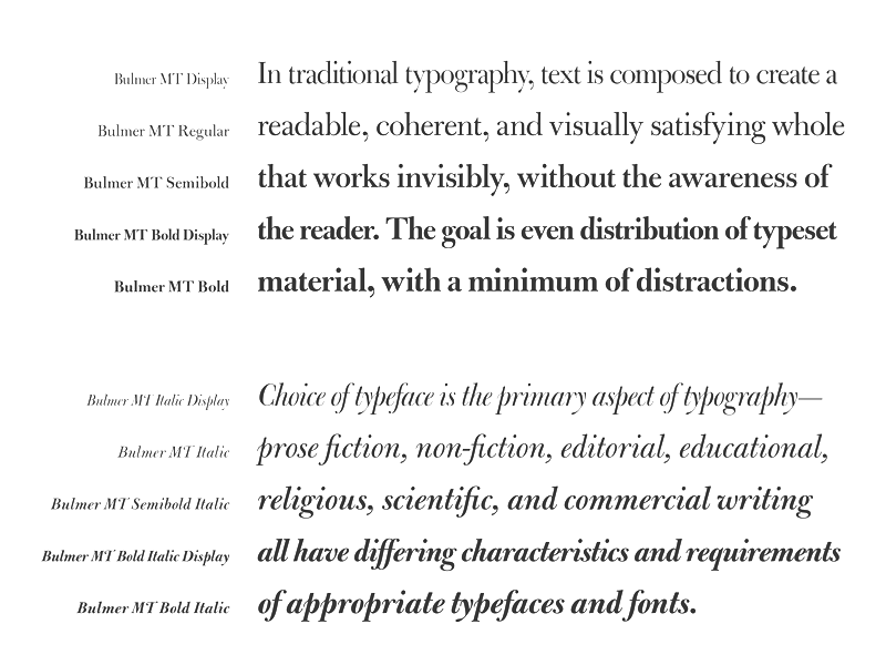
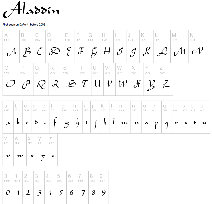
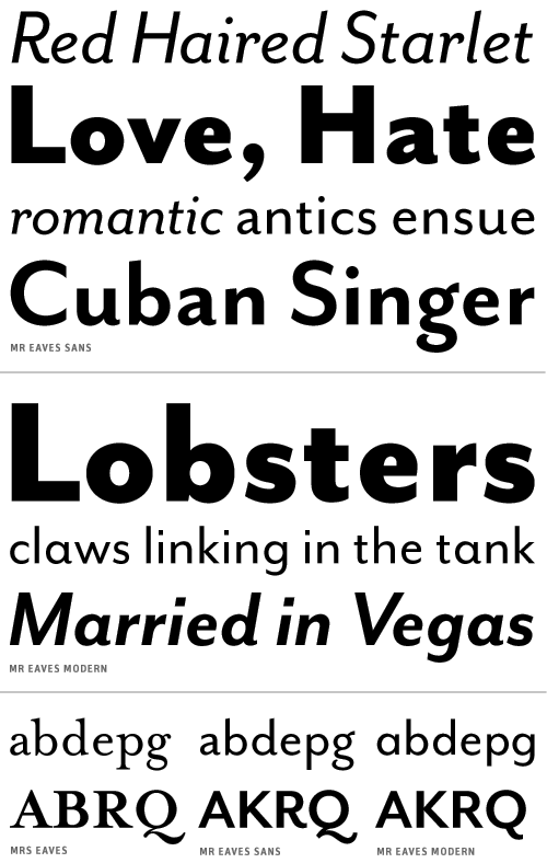