Madrid (and before that, Lebanon)-based Arabic type designer who runs the Arab type news and blog site called Arabic Typography. KHTT link. An ex-student of the KABK in 2006, he currently is a part time instructor of design and typography at Notre Dame University, Louaize, Lebanon, as well as a part time instructor of typography at the American University of Beirut (AUB), both since 2007. His Arabic type foundry is called 29letters.
At ATypI 2008 in St. Petersburg, he ran a workshop on the Arabic Kufi script. Speaker at ATypI 2010 in Dublin on the topic of political resistance and expression through graffiti in Lebanon and Palestine. His contributions to type design:
Massira. He has embarked on a project with Martin Majoor to design some Arabic fonts that fit Majoor's designs. He writes: Massira is my graduation typeface at Type&Media postgraduate course at The Royal Academy of Arts [KABK] in The Hague. Huda AbiFares contacted me while I was finalizing Massira and presented the opportunity to collaborate with the Dutch type designer Martin Majoor to design an Arabic typeface, which is part of the Typographic Matchmaking 01 project organized by Khatt Foundation. At first I was a bit worried due to the fact that it would be my first professional type design work and that the due date was too close. However, after taking a closer look at Martins type FFSeria and analyzing its characteristics, I noticed that the treatment of the stroke and the structure of the letters shared similarities with Massira. In both fonts the use of sharp broken curves and crispy feel is present. Consequently, I grew confident in project and decided to use Massira as a starting point for the new Arabic companion of FFSeria. Echo, which is Sada in Arabic, is the repetition of a sound caused by the reflection of sound waves from a surface. Accordingly, Sada is the echo of FFSeria. The modifications on Massira consisted of making Sada perform like FFSeria. It had to have the same point size, line space, color, contrast and feel as FFSeria. Concerning the details of Sada and the inclined angle of the vertical strokes, it was derived from the FFSeria Italic. So Sada has the same feel as the Roman but is inspired from the Italic.More on the Sada project. In 2009, Sada was renamed FF Seria and published by FontFont.
Bukra display type for Ibn Battuta Mall in Dubai, 2008. This Futura-like typeface saw a variable part added in 2020. Adrien Midzic and Swiss Typefaces aided with the Latin.
A corporate font under the heading, Arabic for Univers (2008). Zoghbi: An Arabic corporate typeface for a global shipping and transport company. The Arabic is intended to work with the Latin type Univers. Unfortunately, I can't mention the name of the company nor the design firm I did this Arabic type work for. I was the Arabic type consultant/specialist and associate type designer alongside Leah Hoffmitz. The font will used in all Arabic publications, ads and packaging for the company.
Baseet (2009) is a hybrid Neo-Naskh / Modern Kufi geometric typeface. It is a mixture of straight vertical, horizontal and diagonal pen stokes incorporated in-between curved corners and edges. In 2020, Pascal Zoghbi (29LT) and Ben Wittner released the monospaced Arabic / Latin typefaces 29 LT Baseet Variable and 28 LT Zawi Variable.
UAE Embassy Corporate Type (2010). This is a commissioned Latin typeface based on the same concept as of an Arabic font. Each of the 26 Latin letters has Caps, Initial, Medial and Final shape enabling the letters to connect as in the Arabic script. The drawing of the letters was all done using the Arabic calligraphic bamboo stick and based on the Naskh Calligraphic Style. Opentype help from Erik van Blokland.
The Mathaf Corporate Arabic-Latin Font (2011). Mathaf Arab Museum of Modern Art opened its doors to contemporary Arab art lovers in December 2010 in Doha, Qatar.
Nada Debs (2010): a contemporary geometric Kufi type commissionewd by Nada Debs.
29LT Azer, done with Ian Party and Wael Morcos: Azer in Arabic means friendly, ready to assist and lend a hand. This multilingual typeface combines simple lines with careful detailing to create a serious but approachable look. The Arabic is a Naskh / Kufi hybrid and retains a balance between calligraphic angular cuts and unadorned construction. The Latin is a humanist sans-serif with crisp cuts based on the broad nip pen calligraphic structure and contemporary outlines. The fonts include Arabic, Farsi, Urdu and Latin variants. Azer won an award at TDC 2014.
Pascal Zoghbi revived the 1950s font system by Nasri Khattar called Unified Arabic as UA Neo B and UA Neo B.
LT Makina. An old typewriter font.
LT Kaff.
LT Zarid (+Sans, +Stencil, +Slab, +Serif). Pascal Zoghbi designed all Arabic components. 29LT Zarid Display won an award at 23TDC in 2020. The whole family has variable styles since 2020. Jan Fromm designed the Latin for Slab, Sans and Stencil. Regarding the Latin parts: Zarid Serif Display and Text Upright were designed by Ramiro Espinoza; Serif Upright was designed by Ramiro Espinoza and Khajag Apelian; Serif Slanted and Text Slanted were designed by Jan Fromm. The Cyrillic and Greek extensions were designed by Krista Radoeva and released in July 2020. Finally, 20 LT Zarid Sans features a variable style with a single (weight) axis.
LT Zeyn. A great high-contrast fashion mag style typeface.
Other custom types include Expo 2020 Dubai, Swatch, Noor, MIA, Noto Naskh, Shawati, Hamsa, Fdx, Emirates Headlines, AlWatan Headlines.
Interesting graphic design and typography news and blog site by Antonio Carusone. His CV in his own words: Born in Queens, NY into a colorful Italian family, Antonio Carusone has been in the creative arts since he was a child. His early artistic talents led him to NYCs esteemed, High School of Art and Design, where he graduated in 1997. He then attended Pratt Institute in Brooklyn, NY and The Academy of Art College in San Francisco, where he studied Computer Animation. Currently Antonio resides in NYC, where he is a Senior Art Director at Ogilvy. Prior to Ogilvy he was an Art Director at Atmosphere BBDO where he worked on projects which have included Lays, Dial, Red Stripe, AOL, NFL, Gillette, Cingular, Audi, Verizon, and Bank of America.Type subpage. Commercial typefaces: Enotmik (2008, a monocase display typeface available in two weights, Light and Bold. Designed on a grid, Enotmik (2008) is made up of 90 and 45 degree angles). See also here. [Google]
[More] ⦿
Chilean foundry with both free and commercial typefaces. The free typefaces gre mostly out of Esos tipos de la UTEM, the Escuela de Diseño de la Universidad Tecnológica Metropolitana de Santiago de Chile.:
By Rodrigo Valenzuela: Maipo (2009, a precolombian native face), La Vega Fraktur (2008).
By Fabian Flores: Miliciana (2008), a militant poster face.
By Ariel Martinez: dfdDefensa (2009), a gothic angular face.
By Jonathan Vivanco: The Go Font (2008), an ultra fat credit card face.
By Sebastian Contreras: Basural (2008, grunge).
By Santiago Toro: Nahueltoro (2007), an exceptionally beautiful comic book style headline face.
By Matias Quiroz: dfdCanibalisma (2007), described as a font for zombies.
By Daniela Martinez: Lastarria (2007), a curly ornamental face.
By Felipe Vicencio: Chasquilla (2007), a graffiti face.
By Mariana Sanchez: dfd Animita (2007), an organic hand-printed face.
By Macarena Budin: Selfish Jean (2008), a condensed headline sans with some contrast.
By Macarenna Rocco: Revolucionaria (2009), a strong slab serif face.
By Flora Argemi: Rakatan Negra (2011). A comic book style.
By Alejandro Scaff and Javier Quintana: dfd Nueva Estadio (2009).
By Macarenna Rocco and Javier Quintana: dfd Revolucionaria (2009).
Italian designer from Sassuolo, Modena (b. 1979). He obtained an MA in typeface design from the University of Reading (2009), based on his Latin / Cyrillic typeface Enquire and his dissertation on the work of the Officine Simoncini. After Reading, he started an internship and eventually worked as a full-time employee in the type group at Apple in Cupertino, CA. He left Apple in September 2016 and is now working on his own typefaces in Milano, Italy.
Kai Bernau (b. 1978) studied graphic design at the University of Applied Sciences Schwabisch Gmünd in Germany before relocating to the Netherlands, where he graduated from the Design & Typography course of the KABK in The Hague in 2005 with his successful Neutral Typeface project. He continued in the KABK's Type and Media Master course where he graduated in 2006. Since 2011, Kai teaches type design in the Master in Art Direction program at ECAL in Lausanne, Switzerland. In 2005, Susana Carvalho and Kai Bernau formed Atelier Carvalho Bernau, which is based in The Hague, The Netherlands.
Typefaces:
In 2010, they published the free titling grotesk Jean-Luc (Godard), inspired by the movie titling in (1967). Bernau writies: We did not find out who originally made the lettering for these two movies. Some speculate it could have been Godard himself. Godard's interest in graphic design and typography is clear, with many of his other films employing such strong typography-only titles and intertitles. They are almost a self-sufficient entity, another character in the movie, another comment. This style of lettering is so interesting to us because it is such a clear renunciation of the pretty, classical title screens that were common in that time's more conservative films. It has a more vernacular and brutishly low-brow character; this lettering comes from the street: We can not prove this at all, but we think it may be derived from the stencil letters of the Plaque Découpée Universelle, a lettering device invented in the 1870s by a certain Joseph A. David, and first seen in France at the 1878 Exposition Universelle, where it found broad appeal and rapid adoption. We think this style of lettering was absorbed into the public domain vernacular of French lettering, and that the 2 ou 3 choses titles are derived from these quotidien lettering style, as it would seem to fit Godard's obsession with vernacular typography. We learned about the PDU through Eric Kindel's article in Typography Papers 7. In 2009, then-Werkplaats Typografie student Dries Wiewauters surprised us with a revival of the Plaque Découpée Universelle. Below, the JeanLuc alphabet (white) and the PDU alphabet (blue), to show similarities and differences.
Lyon Text and Lyon Display (2005-2010). These are two text families done at Commercial Type. They say: Lyon is a suite of contemporary reading typefaces for modern publications, based on historical models of the 16th century punch cutter Robert Granjon. Lyon reflects our convictions about modern digital typeface design: A decisively digital outline treatment that reveals our modern repertoire of tools, and the typeface itself as a modern design tool, paired with a certain Times-like unobtrusiveness in the Text sizes, contrasts nicely with Lyon's 16th century heritage.
Neutral (2005-2009). The Neutral typeface was Kai's graduation project from the KABK undergrad course. It is what one could call a basic sans. It first appeared as Neutral BP in the now defunct B&P Foundry. In 2014, Typotheque picked it up. Kai writes: Neutral was inspired by typefaces that seem ageless, remaining fresh and relevant even decades after they were designed. It was constructed based on a set of parameters derived by measuring and averaging a number of popular 20th-century Sans Serif fonts.
Custom typeface Munich Re (2008-2009) for the Munich Re Reinsurance group. MunichRe Sans takes roots in the grotesque types of the 1950s (among others, Dick Dooijes' Mercator for the Lettergieterij Amsterdam).
Custom typeface Harvard Museum Neutral (2008).
Atlas Grotesk (2012, by Kai Bernau, Susan Carvalho and Christian Schwartz, Commercial Type). A revival of Dick Dooijes's Mercator. See also Atlas Typewriter (2012, Commercial Type). Originally designed as a corporate typeface for Munich Re, it became a retail font. A Cyrillic version was added by Ilya Ruderman in 2020.
The custom typeface Proprio (2007-2009) for the Fabrico Proprio project. This is a willfully bare-bones grotesk family without any snootiness.
In 2016, Susana Carvalho and Kai Bernau published Algebra (Commercial Type): Algebra evolved from Granger, a headline typeface designed by Susana Carvalho and Kai Bernau for the US edition of Esquire. Algebra is a broad-shouldered slab serif typeface built on superelliptical forms. Its loose spacing gives a remarkably comfortable texture in text, and its crisp detailing gives a distinctive and serious feeling at display sizes, particularly with some negative tracking. Algebra references Adrian Frutiger's Egyptienne, Georg Trump's Schadow, and Hermann Zapf's Melior.
Many nice examples of creative typography, worked into a blog by Hungarian designer Dora Balla. In 2015, she made the experimental typeface HV Font. Home page. Behance link. [Google]
[More] ⦿
As Shirley Kaiser states: "An almost daily column about the web, design&development, typography, music and anything else". Type archive. [Google]
[More] ⦿
This is a multi-year project at Accademia di Belle Arti di Urbino (Italy) which has workshops and ateliers, and occasionally goes into type design. The type design activities, such as the free open source type family Titillium, are done under the leadership of Luciano Perondi. However, Titillium is a work in progress---it is unfinished and for Florian Hadwig's eye, a bit too close to Klavika.
Venezuelan graphic and type designer (b. San Cristóbal, Estado Táchira, Venezuela, 1977). He studied Graphic Design between 1995 and 1998 in the Instituto Universitario de Tecnología Antonio José de Sucre (IUTAJS) Extensión Mérida, Venezuela. He runs the design studio Andinistas in Bogotá, Colombia, which he set up in 1998 with a few others. Creator of the beautiful typeface Cazon (1999-2007, a grunge script in 7 styles that includes Gris, Negra, Uno, Dos, Tres, Dingbats A and B) and of Escuadra (2003), Biologia (2003), Denedo (2003; the discussion by typophiles centers around how interesting this 3d font is experimentally---a bit like the type version of M.C. Escher's drawings, full of impossibilities), Modelia (2006), Nikona and Nikona Dual (2006, octagonal, with Rafael Rincón), Avecedario, Btamax (1999-2008, comic book style and grunge), Día D, Nativa, Codiga Icons (dingbats), Codiga (1999-2007, an 8-style octagonal family including Codiga Stencil and Codiga Dingbats), Codiga Pura (octagonal face), Pepelepu, Gancho petare, Guerrilla, and Hirofórmica (grunge). His calligraphic script family Panamericana (2007) comes in many grungy and experimental flavors: Blanca, Gris, Negra, Uno, Dos, Tres, Cuatro, Cinco, Seis and Dingbats. With María Angélica Estrada Cano, he designed the hand-drawn font families Makika (2007) and Lita (2007; in five styles---Gris, Negra, Humo, Molis, and Dingbats). His blog. In the area of combat-ready explosion-inspired letters and dingbats, check his eight-weight family Hiroformica (2007, Andinistas; for a free version, see DaFont). In 2007, he created the calligraphic grunge family Rosadelia, and the grunge lettering and crow dingbats family Gancho Petare. In 2008, he published Heleodora (beautiful scratchy hand), Magola (Negra, Supra Negra and Stencil), Navaja 1 through 4 (a collection of grunge fonts with grungy dingbats), Lucrecia 1 through 3 (a fat connected script family ranging from clean to splattered), Pomarosa (irregular hand) and Pomarosa Dingbats, Bochalema (+Dingbats, a comic book family), and Alcira 1 through 3 (nice scribbly grunge scripts).
In 2020, he designed Man Ray (a wild and weathered calligraphic font, and a pirate era weathered caps typeface). [Google]
[MyFonts]
[More] ⦿
Portuguese graphic designer and Professor of Design who made several sets of pictograms in 2010. He has won the Portuguese National Design Award for 2009 and 2010. He also has a Portuguese blog with some discussions about type, called O Design e a Ergonomia. [Google]
[More] ⦿
Designs by Jason Castle from San Rafael, CA, who studied psychology at Dominican University of California. He does custom font design and sells commercial typefaces through MyFonts and FontShop. Blog. These include:
A: AfrikaBorders, Afrika Motifs, Agency Open (M. F. Benton, 1934, revival Jason Castle), Agency Gothic Inline, Ampersands, Azbuka (2005, a heavy slab serif).
Carisma (2007, a clean geometric sans), Carlos (art deco inspired by Elektra), Castle Fleurons, Chinoise (2008, based on hand lettering that is reminiscent of a style of ancient Chinese square-cut ideograms), Cloister Black, Copperplate Script, Cradley (2015, a Caslon titling family with Greek and Cyrillic, named after the birthplace of William Caslon).
D: Deko Initials (1993, discontinued in 2007; based on NADA0 drawn in 1972 by Marcia Loeb), Dionisio (2008, didone).
E: Eden (Bold, Light; originally designed by Robert H. Middleton in 1934).
F: Fat Freddie, Futura CT and Futura CT Inline (2007, based on Futura ND, but discontinued after only a few weeks).
L: Latin CT (2008, 6 styles), Latin Wide, Laureat, Lise Informal (2008, hand-printed), Lombardy.
M: Maximilian CS (Rudolf Koch, 1917), Metropolis Bold and Shaded (based on the 1932 Stempel cut as designed by W. Schwerdtner), Minotaur (2008, an original monoline design based on an Oscan votive inscription from the second century BC; looks like simulated Greek).
O: Ogun (2008, inspired by an Egyptian-style Russian block alphabet and useful for athletic lettering; formerly named Azbuka).
P: Plantain (2002, a digital version of Plantin Adweight, a 1913 typeface by F. H. Pierpont), PlantainStencil (2009), Progreso (2010, a condensed, unicase, serif gothic type design inspired by the hand-lettering on Russian posters from the 1920s).
R: Radiant, Radiant Extra Condensed CT (both Radiants are revivals of Roger Middleton's typeface by that name, 1940), Ransahoff (2002, ultra condensed didone), Rudolf (1992, based on Rudolf Koch's German expressionist work such as Neuland).
S: Samira (2008, art nouveau style; based on Peter Schnorr's Schnorr Gestreckt, from 1898), Shango (1993, based on Schneidler Initials by F.H.E. Schneidler (1936), and including a digital version of Schneidler Cyrillic (1992); extended in 2007 to Shango Gothic and in 2008 to a 3-d shadow version, Shango Chiseled, and in 2009 to Shango Sans), Sculptura (2005, an all caps typeface based on Diethelm's Sculptura from 1957), Sencia (2008, based on Spanish art deco stock certificate lettering from 1941), Sonrisa (2009, art deco family---Sonrisa Thin is free), Standard CT (a neo-grotesque family), Standard CT Stencil (2012: free).
Tambor (Light, Black, Inline, Adornado) (1992) (note: Jason claims that it was remotely based on Rudolf, which in turn was based on calligraphy of Rudolf Koch), Trio (an art deco sansserif), Trooper Roman (discontinued).
V: Vincenzo (2008, a slabby didone), Warrior (2009, a 3d font based on Ogun; +Shaded).
X: Xavier (art deco family based on Ashley Crawford by Ashley Havinden, 1930, revival by Jason Castle in 1992).
Z: Zagora, Zamenhof (2011: an all capsposter face with constructivist ancestry, named after the inventor of Esperanto), Zuboni Stencil (2009, Latin and Cyrillic, constructivist and perhaps even military).
Catapult is the graphic design studio of Anton De Haan and Philippe Pelsmaekers in Antwerp. Other people involved in Catapult include Karen Van Puymbroeck, Tom Vanwelkenhuyzen, Omar Chafai and Luk Mestdagh. For the house style of Zonienwoud, they designed SonGrotesque and SonGrotesque Stencil in 2010. [Google]
[More] ⦿
Typography blog, with many nice typographic posters. Changethethought was established in 2002 as the portfolio website for designer and art director Christopher Cox (Lakewood, CO). [Google]
[More] ⦿
Ballet Mechanique (2006). A custom-designed unicase font for musician Jeroen Borrenbergs, aka Ballet Mechanique.
Corporaet (2019). A 5-style humanistic sans intended for corporate branding.
Cucaracha (2005, Volcano Type). It includes Cucaracha Icons. A typeface commissioned by Boris Kahl for Kahl's Bastard Project.
Encrypted Wallpaper (2006) is a playful squarish typeface for creating textual wallpapers and decorations. Free at MyFonts.
Insider (2004). A custom sans face done for Insider Consulting in Duesseldorf, German. It became retail in 2011, and is sold as a warm grotesque family.
Insignety. a fashion stencil typeface for Amsterdam-based jeweler Insignety.
Jekyll, a sans typeface René describes as follows: CFF Jekyll Pro is a schizophrenic grotesk typeface with an edge. Its bright side is a versatile corporate font with an unexpected twist. Its dark side is awakened by creepy OpenType features, ligatures, swashes, and alternate glyphs, making it mutate into the evil Mr. Type.
Kris (2014). A vampire script or haunted house typeface co-designed with Corrie Smetsers.
Maastricht Sport. A suite of retail & customized fonts for Maastricht Municipality's Sports department. Based on Insider.
Maestricht. A highly personal script font, custom made from the handwriting of Maastricht-based film producer Jean-Paul Toonen, dating back to 1992. His handwriting is very dynamic, artistic and a tasteful blend between roman and italic style.
Motorman. A hand lettered logo font for the electric Meijs Motorman moped. This typeface was commissioned by design agency Stoere Binken Design.
Nantua (2003), Nantua Flava XL (2003, a futuristic display typeface originally sold through Union Fonts). In 2011, the octagonal typeface Nantua was offered for free download at Dafont.
Nordic Narrow is a clean, stylistic font with a Scandinavian touch. For an early development of the Nordic series, see Nordic A (2003, sans, sold through Fountain). Nordic Narrow Pro was published in 2014.
Plan (2005). A corporate typeface made for Plan A Ontwerp, a graphic design studio based in Eindhoven, The Netherlands, based on sketches by Frank Vogt.
Porta. a modular monoline unicase typeface.
Reethi Rah (2006). A great text typeface for editorial use, named after a resort on The Maldives.
SidB. An educational typeface commissioned by Noordhoff Publishers. SidB stands for Schrijven in de Basisschool (writing in elementary school) and is an independent method to teach kids elementary school writing. Not for sale. René also designed another eductaional font, Plantijn Schrift.
Siventi Logo Wide (2005). A Startrek face. Verkaart writes: This custom font was created from the Siventi Products BV logo, which was part of a Brand Identity concept done by Stoere Binken Design (SBD). The concept behind the handlettered Siventi logo was a playful concept, a colorful corporate identity that would change appearance like a chameleon to fit its purpose. Fresh and friendly on poppy plastic products, serious and distinguished on office desk materials.
Vagebond (2003) is a monoline elliptical geometric font that is inspired by 60s television design.
Other fonts designed by René Verkaart include BorVer, Bionix, FatBoy One, Freaky Animals, Kryptonite (1998), Porta, SBD Block (a corporate typeface for his own design studio, Stoere Binken Design).
Charis Tsevis was born in Athens in 1967. He studied Graphic Design and Advertising (Diploma) at the Deutsche Hohere Lehrastalt fur Graphic Design, Athens, Greece, and Visual Design (Master) at the Scuola Politecnica di Design, Milan, Italy. He is the Vice Head at the Graphic Design department of AKTO College of Art and Design / Middlesex University (in Athens), where he teaches editorial design and typography. He runs Tsevis Visual Design, his own studio in Athens, and collaborates with 'Parachute Type and Image Corporation' designing typefaces. He runs a type blog site. Charis is a regular columnist at RAM, the leading computer publication in Greece. He is also a regular columnist in +Design, an authority design Greek magazine covering aesthetics and design issues. Charis studied Graphic Design at the Deutsche Höhere Lehranstalt für Grafik und Werbung, Athens. He received his Master Degree in Visual Design from the Scuola Politecnica di Design, Milan, Italy. He worked for MBStudio in Milan and later for Apogevmatini, a national historic Greek newspaper. Since 1997 Charis runs his own design firm Tsevis Visual Design.
He has been designing fonts for several years, while experimenting with his students. PF Libera (2001-2006, handwriting) was his first and most successful design. Other typefaces include PFBeatnick, PFAmateur (2002), PFRadikale, PFBerkeley Blue, PFMacsimile. All were published at Parachute. Most of his typefaces cover Latin, Greek and Cyrillic.
There are two parts to this site which is associated with Miley Cyrus from Des Moines, IA. The first one deals with a 5 USD per font handwriting service based on templates. The other one is a free font foundry with about 80 original fonts. There is also a blog. [Google]
[More] ⦿
Chris Costello (b. 1959, Poughkeepsie, NY) graduated from Northeastern University in Boston. Since 1989, he works as a graphic, web and font designer and illustrator from his base in watertown, MA. From 2002 onwards, he has worked as a creative director and senior graphic designer for Coldwell Banker Residential Brokerage in Woburn, MA. Since 2010, hae also creates artistic designs and renderings for United States coinage and medal programs for the U.S. Department of the Treasury. He runs Costello Art, and is involved in graphic design and handlettering. His typefaces:
The simultaneously gorgeous and overused Papyrus (1983, Letraset). One variant is sold by Elsner&Flake as Papyrus EF Regular, and another is in the Linotype library. The Avatar 2009 movie poster features Papyrus, and many are getting tired of the ubiquity.
Letterpress Text. An antiqued rough outline family based on Caslon.
Internet entrepreneur and the founder of Lockergnome.com. Also famous for running a nice blog. Designer of the dingbat font Maulbats (1999) when he was involved in phantommenace.com. On his current page, you will find these handwriting fonts: Tony Steidler-Dennison (2002), Jake Ludington (2001), Chris Pirillo (1999, made by Philippe and François Blondel), Randy Nieland (2001). Creator of the Halloween fonts Skellingtonbats (2005) and Jack Skellingtonbats (1999). Dafont link. [Google]
[More] ⦿
Oslo-based Norwegian who was born in Cheltenham, UK, in 1966. Haanes teaches calligraphy, lettering and typography, and is a freelance calligrapher, book designer and typographer. He designed many alphabets, which are mostly calligraphic, but he has also drawn some old Roman lettering and blackletter alphabets. His blog (in Norwegian) has interesting typographic threads, such as this educational comparison between Antiqua typefaces like Brioso, Adobe Jenson, Bembo, Adobe Garamond, ITC New Baskerville and Linotype Didot. This thread looks at sans typefaces. He designed a calligraphic alphabet specifically for Cappelen Damm in 2008, which was digitized by Sumner Stone as Litterat. [Google]
[More] ⦿
American illustrator and designer who works at Portland Studios. Koelle Ornaments (2007) is a set of ornamental typefaces (One, Two, Light, Christian) based on his etchings and produced by Dooley Type (aka "insigne"). Blog. [Google]
[MyFonts]
[More] ⦿
Richard Rutter's type blog. To get a taste, under The future of web font embedding, he states: A call out to font foundries to stop fretting about web font embedding and instead make it work in their favour. [Google]
[More] ⦿
Zara Evens's blog. Some type content. Zara, who is a senior designer at Punchcut and co-manages Typophile, designed an outline blackboard-style font with FontStruct called In The Queue (2008). FontStruct link. [Google]
[More] ⦿
Manuel Eduardo Corradine Mora was born in Bogotá in 1973. He graduated from the School of Graphic Design of the National University of Colombia in 1996, and became a graphic designer. He started by custom-designing fonts and by making typefaces for his own company, Casa Papelera El Cedro (The Cedar Papermaking House), for printing invitation cards. With other designers like Carlos Fabián Camargo, John Vargas and César Puertas he formed Tipográfico in 2007 to strengthen the type discipline in Colombia. Corradine Fonts is Manuel Corradine's own foundry in Bogotá, Colombia, founded in 2006. Today, he is one of Colombia's principal type designers. He also teaches at Universidad Piloto de Colombia in Bogota.
Fonts from 2007: Kidwriting (a family which includes Kidwriting Dingbats 1 and 2), Garabata (a fantastic handwriting face), Garabata Dingbats, Hexagona Digital, Quadrat (grunge), Quadrat Old (grunge), Quadrat Dirty (grunge), Quadrat Broken, Quadrat Ugly, Neogot (experimental, 8 styles).
Fonts from 2008: Mucura (handwriting), Prissa (handwriting), Salpicon (a script), Cuento Serif (a bouncy hand-printed family), Memoria (brush script), Charco, Happy Day (comic book family with Happy Day Dingbats), Espectro (a swinging script with swashes and a Dingbats style), Furia (handwriting), Candelaria (based on house signs in the La Candelaria neighborhood of Bogotá), Old Village (1600's style), Old Village Ornaments, Rapidda (a successful simulation of quick handwriting), Hueca (an outline children's script), Antigua (an old swashbuckler family), Colegial (a great-looking hand script), Pincel (a fantastic paint brush family with accompanying splatter dingbats), Trazo (Corradine's handwriting), Arcos (a techno family), Caveman (a primitive stone-look type family), Rumba (two styles; an elegant flowing brush script), Parche (graffiti family), Elegance Monoline (a greeting card script typeface that won an award at Tipos Latinos 2008), Abuelito (script).
Fonts from 2009: Helga (flowing script), Mussica (+Swash, +Antiqued: a delicate Victorian typeface; followed in 2017 by Mussica Italic), Guarapo (hand-printed), Toxic (futuristic stencil), Emotion (comic book face), Bloque 3D, Rock and Cola, Betco's Hand, Telefante (comic book family), Nancy's Hand (more comic book hand-printing), Alambre (multiline/paperclip), Sensual (calligraphic hand), Zape (in the style of Tekton), Antrax Tech (grunge), Masato (handwriting), Hu Kou (oriental simulation).
Fonts from 2012: Tecna (a techno family co-designed with Sergio Ramirez), Neuron (a fantastic 16-style rounded elliptical sans family created together with Sergio Ramirez), Bucanera Soft (blackletter), Bucanera Antiqued (grungy blackletter), Official (a simple monoline sans family), Almibar (a connected calligraphic Spencerian script), Eterea (a roman all-caps family), Eterea LC (the lower case set), Canciller (an italic roman, done with Sergio Ramirez), Quarzo (2012, a formal copperplate script done with Sergio Ramirez).
Typefaces from 2013: Neuron Angled (still with Sergio Ramirez), Alianza Slab (a great-looking slab family), Alianza Italic and Alianza Script (a packaging font), all made jointly by Manuel Eduardo Corradine and Sergio Ramirez.
Typefaces from 2014: Whisky (a large blackletter family with inlines and fills for layering co-designed with Sergio Ramirez; related to German expressionism, it won an award at Tipos Latinos 2016), Whisky Italics, Beauty Script (with Juan Sebastian Rincon), Emblema and Emblema Headline (tall-legged art deco sans family by Duvan Cardenas), Wild Pen (a 1200-glyph set of typefaces that can be used to simulate handwriting thanks to smart replacements in Opentype), Sinffonia (a thin informal typeface with oodles of choices for swashes).
Typefaces from 2015: Be Creative (a vintage display typeface), Typnic (a varied handcrafted layered and script typeface family; rhymes with picnic), Typnic Headline Slab.
Typefaces from 2016: Naugles (thick display face based on the Naugles logo), Scrans (a modern signage script), Bloque (heavy slab family), Bloque Italic.
Typefaces from 2017: Cristal (layered, triangulated and beveled font family, including exquisite Cristal Dingbats and Cristal Frames), Almibar Pro (connected calligraphic script).
Editor of A web log of design and high drama which frequently comments on typographic matters such as web fonts (why pay for them?), traffic signs, and typeface use. He calls himself the world's toughest writer, and lives in the New England area (he graduated from Dartmouth, NH). In this piece entitled The Tell-Tale R Some Thoughts on Clearview, Cosmo writes this about the decision to start using Clearview for America's highway signs:
While I admit it's (much) easier to read, I can't say I'm exactly psyched about seeing it. There are a variety of reasons why. I suppose my gut reaction is that it no longer feels like I'm driving down a federally-funded expressway-it feels like I'm staring at ads.
While I've mentioned that Interstate has really picked up its public profile recently, Interstate isn't really the FHWA typeface. Tobias Frere-Jones got a lot of attention for Interstate because the edits he made were very subtle, yet somehow made the font tolerable for more than 12 characters at a time.
Clearview, on the other hand, was in use for advertising years before it ever appeared along the highway-most notably by megalith AT&T. I liked the old, ugly FWHA typeface because it was so odd and idiosyncratic. It was like watching a David Bowie in his "androgynous alien" days-no mistaking it for anything else, let alone a sweeping corporate rebranding.
FWHA's cold formlessness was also nice because it didn't encourage you to interact. One of Steve Jobs' most persistent design maxims is that products need to be anthropomorphic; it makes people want to engage with them.
Clearview is definitely more human than FHWA, but is that really a good thing? Do we really want people relating to and engaging with signage? Or do we want them to glance, comprehend, and get their eyes back on the road?
I'm also skeptical of the notion that legibility should be the only standard. Reading interstate signage-even with the old, weird FHWA face-is pretty damn easy. If you need the extra 200 feet to pick out an exit, what other details are you missing? Should you really be on the road? [Google]
[More] ⦿
Creattica was an image bank with a subsection on typography. It closed in 2014. An example of the sort of item showcased by them: the letter-based image called Bug (2010) by Ebru Selçuk. [Google]
[More] ⦿
Design site and blog, in Spanish. It is much more concerned with mag design than typogrophy. Run by four guys from Valencia: Javier Perez Belmonte, Diego Obiol, Tomas Gorria, and Herminio Javier Fernandez. [Google]
[More] ⦿
Graphic and type designer based in Jaén, Andalusia. Carlos investigates street signs and traditional lettersigns in his city for a university project called Rótulos chuléricos de Jaén. His web site, Cuchi qué tipo, is both a blog on type design (in Spanish) and a showcase for his own typefaces. His type designs:
Berganza (2021). A text typeface that tries to revive the humanist and renaissance types in use during Spain's siglo de oro (Golden Age) from roughly 1492 until 1681.
Guau (2020). A 20-style angular wedge serif text typeface and a variable font with three axes (italic, weight and width).
Chavea (2020). A school script typeface.
Perra and Despeñaperra (2019). Borrowing from the fat face genre.
Gajorra (2019). Glyphs shaped like the gajorros dessert from Cabra.
Type and culture blog by Vancouver-based designer David Arias. He created Isometrica (2008, a 3d pixel block face) and Toko (2009). Home page. [Google]
[More] ⦿
Czech designer (b. Brno) who graduated with a Masters in Informatics at the Masaryk University in Brno in 2005, spent a term at the Denmark's Designskole in Copenhagen in 2004 and graduated with distinction from the MA in Typeface Design at the University of Reading in 2007, where he wrote a thesis on his typefaces called Skolar and Surat. Skolar won an award at Paratype K2009. It was designed with scholarly and multilingual publications in mind. See, e.g., Skolar Devanagari. Later David founded Rosetta Type.
From 2004 to 2007, he ran his own design studio DAVI, with projects in graphic, web and interface design. Back in Brno, he worked with Tiro Typeworks (Canada) as an associate designer. At ATypI 2008 in St. Petersburg, he spoke about multi-script typography.
His typefaces include
CODAN (2005): a typeface inspired by the city of Copenhagen.
Skolar and Surat (2008). Skolar was designed for multilingual scientific publications and is a serifed typeface in the Menhart tradition. It was published in 2009 by Type Together, and it is also listed by Rosetta Type. Skolar Basic (2009, Type Together) is the official name of this 6-style text family. Surat is an accompanying Gujarati family. Related to that, he wrote The evolution of the Gujarati typographic script (2007, University of Reading). Rosetta writes: Skolar was originally designed for academic publications: its vast character set caters for 90+ Latin-script languages, and its Greek and Cyrillic extensions together with Latin transliterations add support for another 70+ languages. All scripts are available with small caps, superior and inferior letters, five sets of numerals and alternate character forms (see note about the versions below). A comprehensive set of arrows (easily accessed via OpenType) and bullets round off the character set to meet the needs of even the most complex editorial and academic text settings. The light and extrabold styles (upright and italics) were designed with help from Anna Giedrys and Elena Schneider. Skolar's Cyrillic harmonises well with the Latin in its careful balance of distinctive styling and solid performance. Designed in consultation with Alexandra Korolkova, it supports most Slavic languages as well as many others like Kazakh and Mongolian. Additionally, Skolar includes language-specific forms for Serbian and Bulgarian. The Greek is a modern interpretation of the classic styles found in academic works, and is characterised by lively, fluid forms and varying stress. It includes both monotonic and polytonic Greek, and was designed in consultation with Irene Vlachou and Gerry Leonidas. Complete Skolar family also supports Indic scripts Devanagari (codesigned with Vaibhav Singh) and Gujarati distributed separately. Skolar has received international praise at the 2008 ED Awards, and was also shortlisted as one of the best typefaces that year by I LOVE TYPOGRAPHY. In 2009, the Cyrillic was awarded a Special Diploma at the international type design competition Modern Cyrillic, and won the first prize in Granshan's Cyrillic text type category. In 2015, the 72-font family Skolar Sans (see also, Skolar Sans PE, 2016), codeveloped by David Brezina and Slava Jevcinova at Rosetta Type Foundry, won a silver medal at the European Design awards. Skolar PE was added in 2020.
Yrsa and Rasa (2015, open-source type families published by Rosetta with financial support from Google). The fonts support over 92 languages in Latin script and 2 languages in Gujarati script (Gujarati and Kachchi). The design and production are by Anna Giedrys and David Brezina. Yrsa is the name of the Latin-only type family. Rasa is the name of the Gujarati type family. They explain: Both type families are intended for continuous reading on the web (longer articles in online news, magazines, blogs). In Yrsa, a special consideration was given to Central and East European languages and proper shaping of their accents. Rasa supports a wide array of basic and compound syllables used in Gujarati. In terms of glyphs included Rasa is a superset of Yrsa, it includes the complete Latin. What makes Yrsa & Rasa project different is the design approach. It is a deliberate experiment in remixing existing typefaces to produce a new one. The Latin part is based on Merriweather by Eben Sorkin. The Gujarati is based on David Brezina's Skolar Gujarati.
In 2019, at Rosetta Type, together with Slava Jevcinova and William Montrose, he released the variable font Adapter (with three axes, for latin, Greek and Cyrillic).
In 2020, he released Handjet (started in 2018, at Rosetta Type), which is built on the principle of a dot matrix printer or handjet printer. Glyphs are made up of collections of individual modules that take 23 elemental shapes. The Handjet family covers Armenian, Arabic, Cyrillic, Greek, Hebrew and Latin. Github download link.
Gridlite (2020, Rosetta Type) is a modular pixel typeface with adjustable foreground and background patterning. It also has a variable type format with three axes, Weight, Background, and Element Shape.
Japanese foundry with excellent web pages on early 20-th century type design. Shin Oka, or Shinya Okabe (b. 1976, based in Himeji) created various revival fonts in or just before 2009, many connected in some way to Tom Carnase and the phototype era. He specializes in 1970s and 1980s typefaces, often with open counters and high contrast. His fonts:
Bentley (2010). This is the same as Avant Garde Gothic.
Tiffany Heavy With Swash (2011). A swashy Didot display face. This type was used by Quentin Tarantino's movie Jackie Brown in 1997. Tiffany Heavy (Ed Benguiat, Photolettering) is basically identical to Benguiat Caslon Swash (1960s) and to Foxy Brown (1974). Similar typefaces include LSC Book with Swash by Herb Lubalin and Tom Carnase (ca. 1970).
Wexford (2009): after the typeface of Richard A. Schlatter, VGC, 1972.
They are working on Permanent Massiv (after a 1962 Ludwig&Mayer font by Karlgeorg Hoefer---comparable to Impact or Compacta in its massiveness and masculinity), Michel, Didoni, Tiffany, Ginger Snap, Patriot, Motter Ombra, Pistilli Roman, Benguiat Caslon (a large size display Caslon by Ed Benguiat at PhotoLettering; digitized at House Industries by Christian Schwartz and Bas Smidt), and Via Face Don.
Design Sponge (est. 2004) is a daily website dedicated to home and product design run by Brooklyn-based writer, Grace Bonney. She has a list, with discussion, of her favorite fonts. [Google]
[More] ⦿
A lively and instructive blog that describe the journeys of a designer. There are several reports related to type design and typography. [Google]
[More] ⦿
Dingbats Brasil is an exhibition that features the first decade (1996-2006) of Brazil's production of digital pictorial alphabets - the dingbats - through thirty-five projects by 22 prominent contemporary designers. Curated by Brazilian graphic designer Bruno Porto in 2006 while acting as Coordinator of Illustration Studies for the Visual Arts Institute of Rio de Janeiro's UniverCidade, the exhibition has traveled South American countries in universities and academic events. This blog is not only intended to record the exhibition but also to keep track of the upcoming Brazilian symbol fonts (in +dingbatsbrasil) and related matters (in the dingblog). [Google]
[More] ⦿
Eightface had free truetype fonts by Dave Kellam who was a student at Queen's University. He currently lives in England. David's fonts were mostly made in 1998: Cof, Plastic Tomato (thick round letters), dawgbox (grunge), Stay Clear (sloppy paint-- nice !), Pigment 08 (artsy), Dimestore Hooker (great eroded font), Niner, After Shok, and Eau de Toilet. Plus Discount Inferno (double vision font), Millionair, Nineteen 77, Adlock, Grade, Issac. Dave Kellam was born in Brockville, Ontario in 1981. He joined Fontmonster, where he (re)published Stay Clear, Adlock, DawgBox, DimestoreHooker, DiscountInferno, and PlasticTomato.
Ms Coste 134, lettres cadeaux A and E (ca. 1399-1433), taken from the work of notaries Andreas Pererii, Johannes Pererii, Raymondus Pererii and Johannes de Bereysiaco, in Terrier de l'obéance du Grand Comtal du chapitre cathédral de Saint-Jean de Lyon.
Bethany Heck's blog on wood type and letterpress. I especially like her efforts to reassemble the mystery wood typeface Grecian in 2010. [Google]
[More] ⦿
German type designer and graphic designer par excellence, born in 1947 in Stadthagen. He set up MetaDesign in Berlin in 1979. In 1988 he set up FontShop, home of the FontFont collection. He holds an honorary professorship at the Academy of Arts in Bremen, is board member of ATypI and the German Design Council, and president of the ISTD (International Society of Typographic Designers). In July 2000, Erik left MetaDesign Berlin. He now lives and works in Berlin, London and San Francisco, designing publications, complex design systems and more typefaces. He collaborated on the publication of the comprehensive FontBook. Author of Stop Stealing Sheep & Find Out How Type Works (2nd Edition) (Adobe Press, Second Edition, 2002, First Edition, 1993). He taught typography at the Art Academy in Bremen, and is guest-lecturer at several schools around the world.
In October 2003, he received the third Gerrit Noordzij Prize, which is given every other year to a designer who has played an important role in the field of type design and typography. It is an initiative of the postgraduate course in Type&Media at the Hague Royal Academy of Art with the Meermanno Museum (The Hague).
He made the following typefaces and type families:
Lo-Type (1913, Louis Oppenheim) was digitally adapted by Spiekermann for Berthold in 1979-1980. BERTLib sells it as Adlon Serif ST.
PT 55 (1986), the precursor of FF Meta.
Berthold Block
Berliner Grotesk (1979-1980, Berthold): based on an old Berthold AG typeface from 1923.
FF Govan (2001, by Ole Schaefer and Erik Spiekermann).
The huge families FF Meta1, FF Meta2, FF Meta3 (2003), FF Meta Condensed (1998) and FFMetaCorrespondence. The FF Meta families (1985) were originally designed for Bundespost, which did not use it--it stayed with Helvetica for a while and now uses Frutiger. Meta comes with CE, Cyrillic, Greek and Turkish sets as well. Weights like Meta Light (Thin, Hairline) Greek are available too. Spiekermann is a bit upset that Linotype's Textra (2002, a typeface by Jochen Schuss and Jörg Herz) looks like a cloned of Meta. FF Meta Condensed won an award at Modern Cyrillic 2014.
Meta Serif (2007) by Christian Schwartz, Kris Sowersby and Erik Spiekermann. Later extensions by Ralph du Carrois and Botio Nikoltchev.
ITC Officina in versions Sans Book (1989-1990) and Serif Book (1989-1990).
Codesigner with Ole Schaefer (FontShop, 2000) of FF InfoDisplay and FF InfoText in 1997 and of FF InfoOffice in 2000.
NokiaSans and NokiaSerif (2002, company identity family). This was in cooperation with Jelle Bosma. Before Nokia Sans and Serif, Nokia used Rotis. Nokia Sans and Serif were replaced by Nokia Pure (Bruno Maag) in 2011.
Glasgow Type (1999), for the city of Glasgow, taking inspiration from the Rennie Macintosh types.
Heidelberg Gothic (1999).
Symantec Sans and Serif (2003): custom types.
FF Unit (2003-2004; see also here), another sans family, which won an award at TDC2 2004. This was followed by FF Unit Rounded. And FF Unit Rounded started according to Erik as Gravis, the largest Apple dealer in Germany. FF Unit Slab (2009) is the product of a cooperation between Kris Sowersby, Christian Schwartz, and Erik Spiekermann.
ITC Officina Display (2001).
FF Meta Thin Light and Hairline (2003) and FF Meta Headline (2005). Developed jointly with Christian Schwartz and Josh Darden.
Bosch Sans and Bosch Serif (2004).
The SeatMeta family (2003) for Seat.
DB Type in six styles (Serif, Sans, Head, Condensed, Compressed, News): designed in 2005 in collaboration with Christian Schwartz for the Deutsche Bahn (train system in Germany). Some typohiles say that it reminds them of Bell Gothic and Vesta.
A Volkswagen company family based on a correction of Futura.
The DWR House Numbers Series (2006): four fonts with numerals for house numbers: Contemporary House Numbers, Tech House Numbers, Classic House Numbers (based on Bodoni), Industrial House Numbers (stencil). DWR stands for Design Within Reach.
Tech (2008, FontStruct), a rounded squarish headline face.
Axel (2009): developed jointly with Erik van Blokland and Ralph du Carrois, it is a system font with these features:
Similar letters and numbers are clearly distinguishable (l, i, I, 1, 7; 0, O; e, c #).
Increased contrast between regular and bold.
High legibility on the monitor via Clear Type support.
Seems to outperform Courier New, Verdana, Lucida Sans, Georgia, Arial and Calibri, according to their tests (although I would rank Calibri at or above Axel for many criteria).
In 2013-204, Erik created HWT Artz, a wood type published in digital form by P22, which is based on early 20th century European poster lettering. Named after Dave Artz, a Hamilton Manufacturing retiree and master type trimmer, the proceeds of the sales will go to the Hamilton Wood Type and Printing Museum.
In 2015, Fontfont published FF Real, in 13 weights each for FF Real Text and FF Real Head. This typeface family by Erik Spiekermann and Ralph Olivier du Carrois is influenced by the German grotesques from ca. 1900 by foundries such as Theinhardt and H. Berthold AG.
In 2022, Erik Spiekermann, Anja Meiners, and Ralph du Carrois published the neo-grotesque superfamily Case at Fontwerk. It includes Micro and Text subfamilies.
Chilean type foundry and blog (in Spanish) which grew out of the Escuela de Diseño de la Universidad Tecnológica Metropolitana de Santiago de Chile. The team consists of Roberto Osses (the boss), Javier Quintana (type designer), Fabian Flores and Sebastian "Sea" Contreras. Roberto Osses is professor of digital type design at UTEM. He wrote MANIFIESTO, La Declaración Universal de los Derechos Humanos Ilustrada and has won several graphic design awards. The fonts are free. The font list:
By Rodrigo Valenzuela: Maipo (2009, a precolombian native face), La Vega Fraktur (2008).
By Fabian Flores: Miliciana (2008), a militant poster face.
By Ariel Martinez: dfdDefensa (2009), a gothic angular face.
By Jonathan Vivanco: The Go Font (2008), an ultra fat credit card face.
By Sebastian Contreras: Basural (2008, grunge).
By Santiago Toro: Nahueltoro (2007), an exceptionally beautiful comic book style headline face.
By Matias Quiroz: dfdCanibalisma (2007), described as a font for zombies.
By Daniela Martinez: Lastarria (2007), a curly ornamental face.
By Felipe Vicencio: Chasquilla (2007), a graffiti face.
By Mariana Sanchez: Animita (2007), an organic hand-printed face.
By Macarena Budin: Selfish Jean (2008), a condensed headline sans with some contrast.
By Macarenna Rocco: Revolucionaria (2009), a strong slab serif face.
Biblioteca (2015) by Roberto Osses, Cesar Araya, Patricio Gonzalez and Diego Aravena won an award at Tipos Latinos 2016.
Adreson V.V. de Sa (b. Ilha Solteira, SP, Brazil, 1974, aka Adreson74, or: Capa da Cyberjapa) is a Brazilian designer who lives in Porto Alegre. Creator of the free experimental fonts Quadradinho (2004), Aline II (2007, sans), Garrancho (2001, handwriting), Juliana (2002), Julifesta (2002), Bebete (2007, old typewriter), Rita (2007, fuzzy dots; caps only), and Drek (2002).
In 2007, he went commercial and started Estranho Tipo (also at MyFonts). His first type family there was the condensed tall sans family Aline II (2007). This was followed by Bebete (2007, old typewriter face). Future MyFonts font: Possessa (2008-?).
Geoff Washburn's typographic blog written from the point of view of a computer scientist. It was active from 2006 until 2010. In one experiment, he finds that the output of a font designed using Metatype1 (where a type 1 font is directly generated) is nearly indistinguishable from that of a font designed using Metafont, where a type 1 font is generated using mftrace. [Google]
[More] ⦿
Uruguayan foundry, est. 2011, which also acts as an open forum and blog, on which active participation is welcomed. Their first fonts (which used to be at TipoType) are both by Vicente Lamónaca. They are
Cavita (2015, a "Latin" grotesque, at TipoType) and Cavita Rounded (2016, Tipotype and Underground).
Chau FT. This family contains Chau Philomène (2010), Chau Trouville (2010), ChauMarbella (2010) and Chau La Madeleine (2010).
Económica FT (2007), an elliptical sans typeface family. See also Economica Pro (2007), Economica Next (2016: TipoType, and later Underground, by Vicente Lamonaca and José Perdomo) and Economica Cyrillic Pro.
Mary Todd (2014). A condensed sans for short bursts of text.
Muzarela (2011. 50 styles of this squarish family).
Other fonts in progress: El Tano (2011, a delightful and funky didone experiment by Lamónaca). Rodolfo Fernández Alvarez (who is from Montevideo, Asunción and Málaga) developedEzquerraCursiva (2010), a brush and signage face, based on the work of anarchist painter and letterer Francisco Ezquerra, who was active in Uruguay from ca. 1950 until ca. 1970, after fleeing Spain before World war II.
FDI stands for fonts dot info, est. 2004 by Ralf Herrmann and partner. This foundry is located in Jena, Germany. The legal entity behind it was the Rossbach & Herrmann GbR in the city of Jena which operated as Seite7 Designagentur. Rossbach & Herrmann GbR ceased in 2015. MyFonts link. The fonts dot info label will be retired in 2017 and replaced by FDI Type Foundry.
Ralf Herrmann (b. 1976, Pößneck, Germany) studied visual communication at Weimar's Bauhaus University and works as a web, graphic, and type designer. He has made a name for himself in the typography community with his internet typography subcommunity typografie.info. He researched the implications of cognitive map research applied to the design of maps and wayfinding systems. In 1999 he founded a design studio with a partner in the city of Jena. His typography projects included the German online community Typografie.info (2001), the type foundry FDI Type (2004) and the typography magazine TypoJournal (2009). He is the chairman of the Pavillon-Presse, a museum for the printing arts & typography in the city of Weimar. In 2015, he launched Typography guru. In his Letter Library, he archives historic and current type specimens of type foundries from around the world. He also wrote typography books and continues to write and provide content for various online and print magazines (like PAGE, Smashing Magazine, TYPO magazine, étapes, I Love Typography).
Typefaces published by FDI:
Krimhilde (2018). A digital revival, and a separate modern modification, of Albert Auspurg's semi-blackletter typeface Krimhilde first published by Ludwig & Wagner in 1933.
Iwan Reschniev (2008). By Sebastian Nagel. A Bauhaus style family of severe sans styles.
FDI Wiking (2021). A free blackletter font that revives Heinz K7ouml;nig's Wiking (1925, J.D. Trennert & Sohn, Hamburg).
Ralf Hermann designed several other typefaces outside FDI. These include Agendia (2002), a free experimental Antiqua-Schrift (see also here). Author of
Femme Type is a platform celebrating female type designers. Founded by ex-University of Arts London Chelsea graduate Amber Weaver, it features news stories and commentary. [Google]
[More] ⦿
Italian design studio run by Alessandro Tartaglia, graphic designer, strategist for FF3300, and professor at Politecnico of Bari.
Mariarosaria Digregorio and Enzo Ruta are the creators in 2007 of the techno typeface FF3300 Type. FF3300 is also an independent and freely downloadable pdf magazine about graphic design, typography, architecture and design, illustration, photography, street art and writing.
Tartaglia's typefaces include minimalist experimental types such as Valdrada (2007), Ipazia (2007) and Zoe (2007), as well as ISIA (custom-made for ISIA in Urbino; slabbed and slabless simple glyphs) and Handwriting (a commissioned grunge typeface for the Pollofriabile magazine in Rome).
Font Bureau's blog is more than a blog. It is the place where they announce new types, tell stories, and in general add a fourth dimension to all things typographic. [Google]
[More] ⦿
The "About" of March 1, 2010, reads: FONT A DAY is a place for me to put some of the free/shareware/etc fonts I come across on my internet travels. I am going to try to post at least one free font a day in a format that windows and mac people can use, and try to tell a little about the typeface and the designer whenever possible. The page is run by Ronald Sansone (Middletown, CT). By the end of 2010, holes started appearing in the updates. We are converging towards one or two a week. [Google]
[More] ⦿
Richard Keijzer is the Dutch designer of many art deco typefaces that are often based on typefaces found on buildings or in Dutch publications, reviving styles known as Dutch deco from the 1920s and 1930s. Starting in 2021, his typefaces will have the prefix RAK. Most of his fonts are free:
Mokum Betondorp (2005). A great art deco display typeface in the style of Broadway. He writes: I'm currently trying to reconstruct a font that was designed around 1924 by the architect D. Greiner in the Netherlands. He needed a special font to decorate some of the building in the then new subsurb Watergraafsmeer. The building project was a so-called garden village, that was nicknamed Betondorp (Concrete Village).
Mokum Plons, after a 1929 sign outside Het Sportfondsenbad in Amsterdam.
Mokum Tooneel (2006). Based on lettering by Anton Kurvers, a disciple of the Dutch architect Hendrik Wijdeveld (1885-1987).
Mokum Oorkonde (2006). Based on art deco lettering found in the archives of the city of Amsterdam.
Mokum Giro (2006). As found on the antique letterboxes of the Amsterdam Municipal Giro Service.
Mokum Expo (2006) takes inspiration from a 1975 poster for the Amsterdam Municipal Museum.
Mokum Cohen and Mokum Cohen Top (2006) are both art deco fonts based on lettering by Fré Cohen in the Annual Report of the Municipal Giro 1930.
Mokum Kruyswijk (2006, art deco) is named after Cornelis Kruyswijk (1884-1935), an architect in Amsterdam.
Mokum GGD was added in early 2007.
Quota (2007) is based on the sculptures made by Hendrik van den Eijnde for the main Post Office at the Neude in Utrecht. He finished it in 2018 and called the free typeface Post Utrecht, locally pronounced as Pos Utereg.
Mokum Stad (2008) is modeled after Dutch deco lettering found in Groningen and designed in 1925 by architect Siebe Jan Bouma. It was renamed and revived in 2022 as Rak Stad.
Mokum Schip (2013): My inspiration for this font came from a phone booth in Amsterdam. Not just "a" phone booth but one in the former Post Office in building complex The Ship in Amsterdam. This Post Office closed in 1999 and since then that part of the building houses Museum Het Schip.
Dudok (2014). A Dutch deco typeface based on letter types by Willem Marinus Dudok, a Dutch architect. More specifically, the typeface is based on samples found in the city hall and under the train station of Hilversum, The Netherlands.
Karbouw (2014). A typeface based on Dutch postal stamps from 1934 that showed a karbouw, a kind of water buffalo found in Indonesia.
Bungehuis (2015). Based on art deco facade lettering at the Bungehuis in Amsterdam.
Mokum Bengel (2018). After a design by Dick Greiner in 1922 for the Beursbengel in Amsterdam.
Rak Neude (2022). A Dutch deco typeface based on texts on the sculpture in the central hall of the former post office in Utrecht, ca. 1924.
Rak Wilhelminakerk (2022). Based on a memorial stone in Utrecht's Wilhelminakerk, a building designed by architect H.F. Mertens in 1930.
Rak Gelderlander (2020-2022). Based on the building facade of the De Gelderlander newspaper office at Lange Hezelstraat 21 in Nijmegen.
Rak Oldenkoppel (2022). The name Oldenkoppel combines Oldenhove en Oldenhoeck, two houses designed by Dutch architect Warners.
Rak Ortelius (2023). Named after a street in Amsterdam and a letter type by architects Gulden and Geldmaker.
Type blog and type jump site in Hungarian, run by Budapest-based studio Gidata Kft. On this sub-page, one can download free or demo versions of FontLab, Fontographer, FogLamp, TypeTool, BitFonter, AsiaFontStudio, TransType SE, TransType Pro, FonMaker, ScanFont, FontFlasher, FogLamp, and SigMaker. [Google]
[More] ⦿
Semi-lively forum on the technical aspects of font design, and not just about FontLab. Moderators: Yuri Yarmola (FontLab), Adam Twardoch (FontLab), Ted Harrison (FontLab), Der FontMeister (FontLab), Alex Petrov (FontLab), Sergey Malkin (Microsoft), Si Daniels (Microsoft), John Hudson, S.B.L. Hooker. [Google]
[More] ⦿
Gábor Kóthay (Fontmunkások) is a Hungarian type designer (b. 1962) who lives in Szeged. Gábor Kóthay's fonts include:
At T-26: Alphabet2, Alphabet4, Archetype, Axis No 1, Bacchus, and Tyrnavia in 2000, and the Roman inscription inspired family Minerva Modern, Minerva Display (a Roman family) in 2002. Also, Betabet sans, Betabet web, Gnosis (hairline italic), Oceanus (2004, hairline sans), Pelso (2004, hairline), Laureate (2004, hairline art deco), Picaresque (2004, irregular handwriting).
At FONTana: LaDanse, Y2K, Domino, QwertyRegular and Luxury, all in 1999-2000.
At P22: Driade (2005, Regular, Linea and Aged: calligraphic futuristic experiments), Zephyr (2001, curly; +Open Face), Schwarzkopf (2003, a Schwabacher face), La Danse (2001), Ambient (2001), the Schwabacher Fraktur font SchwarzKopf (2002), Caffe (2009: originally designed for the Artz Gallery Cafe in Budapest Hungary. The design is a contemporary handwriting style adapted from examples in lettering exercise books. It has been redrawn and expanded into six styles. The four weights were created by drawing the style using different mediums: Cappuccino in pen, Pastry in felt-tip, Lemonade in brush and Tobacco, the original, in pencil, and Poster and Poster Inline are additional styles).
At PsyOps: the formal script Anglia (2001), Berill (2001), SchwarzKopf (2002, Fraktur) and Plexo (2001).
At Job Art Studio (his own studio in Szeged, which he founded): Cats (free dingbats), Disasters (dingbats), Bubble (comic book font), 103 kék.
Custom typefaces: AquaFuturist (2008): a hairline unicase sans family with uncial influences. It is unclear if he had a hand in the typography of stockings, which I found on his site.
Type news and type blog located in Hungary, run by Tamas, Teufel, and Jobart (Eva and Gábor) and the Kóthay's (Eva, Sára, Kata and Gábor). [Google]
[More] ⦿
Stephen Coles set up this site about fonts in advertising and the media in 2010. The initial page reads: Our effort begins here, with a regularly updated collection of case studies and trend reports. We've invited experts from various fields to comment on how type is used (and misused) in graphic design today. In our first few installments, magazine designer Marc Oxborrow has an emotional reaction to the redesign of Bloomberg Businessweek, the Font Bureau's Sam Berlow notices that the type specimen has become a design genre, I point to some recent projects in which type and especially typeface selection plays a central role, and instructor and historian Indra Kupferschmid reminds us that the real Bauhaus was not all geometric and experimental letterforms. This blog is a prologue of more to come. Behind the scenes, we are building a searchable, sharable archive of typographic design, all indexed by typeface, industry, and medium. And you are invited to join us. [Google]
[More] ⦿
Hindi Rinny is a great Indian type blog and news place run by Erin McLaughlin (b. 1985), a graphic designer in Wichita, KS (and before that, Minneapolis, MN). After graduation from the type design program at the University of Reading in 2010, she joined Hoefler&Frere-Jones in New York. Erin has worked with independent foundries Frere-Jones Type, Universal Thirst, TypeTogether, as well as Adobe, IBM, Microsoft, and Google.
Originally from Milwaukee, she received a BFA in Graphic Design from the Minneapolis College of Art & Design before her MA at Reading. Erin created an angular typeface---à la Oldrich Menhart---, and added a matching Devanagari style---the harmonious ensemble is calledKatari. This typeface earned her the 2011 SoTA Catalyst award.
In 2015, she published the free Google Web Font typeface Khula for Latin and Devanagari. The Latin is based on Steve Matteson's Open Sans. GitHub link. Still in 2015, she published the useful free Devanagari typeface family Yantramanav at Google Web Fonts, to accompany Christian Robertson's Roboto. Adobe Kannada was also designed in 2015---the Latin part of that font was by Robert Slimbach.
In 2019, she aided with the Devanagari part of the free Google Fonts typeface IBM Plex Sans Devanagari (by Mike Abbink, Paul van der Laan, Pieter van Rosmalen, Erin McLaughlin).
In 2021, Erin McLaughlin and Wei Huang developed the traditional workhorse sans serif typeface Tenorite for Microsoft for use as one of the default fonts in Office apps and Microsoft 365 products. Elements such as large dots, accents, and punctuation make Tenorite comfortable to read at small sizes on screen.
In 2020, she published BhuTuka Expanded One at Google Fonts. BhuTuka Expanded One, originally designed in 2017, is a Gurmukhi companion to Aoife Mooney's BioRhyme Expanded Light typeface.
Berlin-based Ivo Gabrowitsch's type blog (in German). Ivo was Marketing Director at FontShop International. He was born in Wippra. He became Marketing Director at Monotype after FontShop was sold to Monotype. Their typefaces, all of which have variable versions:
Case (Erik Spiekermann, Anja Meiners, Ralph du Carrois). A sans superfamily.
Gemma O'Brien's type blog discusses many interesting typographic examples. O'Brien is an Australian artist specializing in lettering, illustration, and typography. Her calligraphy and designs can be seen in advertising campaigns, editorial publications, and large-scale murals around the world. She has collaborated with numerous global brands and publications including Apple, Adobe, and The New York Times. Several of her projects have received the Award of Typographic Excellence from the New York Type Directors Club. [Google]
[More] ⦿
Blog devoted to the support of free fonts. Ellen lupton's proposal of 2006, which she presented as keynote speaker at ATypI 2006 in Lisbon, is as follows: What if every type foundry on earth gave away one great typeface to humanity? Ellen Lupton gives five reasons:
To make a selfless gift to humanity.
To raise global awareness of typographic excellence.
To create a visual resource that will be used by students, citizens, amateurs, and professionals all over the world.
To contribute to a global design vocabulary.
To seed the world with a visual idea that could be built on and enriched by other designers serving smaller linguistic communities.
To the question Who needs free fonts?, she replies: The lack of access to high-quality free fonts encourages students to engage in criminal behavior. Such behavior also is endemic in the developing world, where the idea of paying for typeface licenses is often counter-intuitive. If typeface designers worked to populate a small but rich domain of high-quality typefaces that could be freely used by anyone on earth, they would help improve the accessibility of communications worldwide, while also raising the standards for typographic excellence.Another URL. Fierce discussion on Typophile, where in general, people do not want to give anything away for free. More reactions by typohiles. Brook Elgie says: Proposing free fonts to the ATypI is analogous to arguing for intelligent design to a society of evolutionary biologists. [Google]
[More] ⦿
Friday Fresh Free Fonts (Abduzeedo) is a Brazilian blog about design. Collection of some of the nicest free fonts found on Devian Tart. He also has Friday Fresh Free Fonts #23. The type pages are brought to you by Paulo Canabarro. Direct links: i, ii, iii, iv, v. [Google]
[More] ⦿
Typographic examples, a sort of blog and showcase of type drawn or used by designers. Run by Aaron Carambula, Erik Marinovich, Jason Wong, and Dennis Payongayong. [Google]
[More] ⦿
Type blog with occasional type showings, but the names of the bloggers and designers remain a mystery. Types shown here include experimental typefaces such as NIP (2009) and the blocky L7 (2009). [Google]
[More] ⦿
An Italian type foundry by Milan-based type designer Giangiorgio Fuga, ATypI member, teacher of typography at the Istituto Europeo of Milan, Politecnico of Milan, Italy and Unisinos of Porto Alegre, Brasil. His great type blogpage takes the pulse of Italian type design. Fuga designed gorgeous text fonts such as these:
Great news page about old books, the history of the book and type, incunabula, and important but forgotten artists. Ceased in 2008, but the archives are still there. [Google]
[More] ⦿
Google's answer to web fonts, including a directory of over 1,000 free fonts. Their goal was to have 1,000 fonts by the end of 2011, but they passed the 500 mark only in 2012, the 800 level in 2016, the 900 threshold in 2018, and 1,000 units in 2020. Blog.
On May 19, 2010, Typekit announced an open source collaboration with Google called the WebFontLoader: Now you can have complete control over how fonts are loaded and what happens when they're rendered. You can download the code and use it however you like, or link directly to the latest version via the Google Ajax APIs. [...] You can use WebFont Loader with fonts on your own server, links to the just-announced Google Webfont API, or any Typekit account. We've also made sure the code is modular, so other font hosting services can add to it in the future.
Google offers these fonts for free, and pays its designers a few thousand dollars. This prompted a reaction from Bruno Maag in 2012: Yes, Google with its free fonts, or libre fonts as they like to call them, is a particular bugbear of mine. Now, if someone wants to make their fonts available for free that is up to them; I have no problems with that. However, it is very different if a giant corporate entity which has a market valuation of a gazillion dollars is asking young and budding designers to submit their fonts for a measly few thousand dollars under the condition of an open source licence. I call this exploitation as well as a complete disregard for design. The result, unfortunately, is that in many cases the fonts are of not very good quality since they have been designed by inexperienced designers.
Blog related to a bookseller in Oakland, CA. They state: Grain Edit is a blog that covers contemporary graphic design and illustration as well as design from the from the golden era of advertising (1950s-1970s). Besides found tidbits of news, interviews and events we will be posting obscure kids books, annuals, type catalogues, corporate manuals, and designer monographs from our shelves.Type subpage. Archives. [Google]
[More] ⦿
Type information site and blog run since 2007 by graphic designer and web developer John D. Boardley from Kagawa, Japan. Now based in the UK, I Love Typography became a font vendor in 2020 under a junta that comprises John Boardley, Nadine Chahine and Julia Hines. Glossary. Examples of inspiring use of display/poster type.
Or Vera Evstafeva. Infonta is Vera Evstafieva's foundry in Moscow, est. ca. 2011. Born in Moscow to a family of artists and architects in 1980, Vera Evstafieva graduated from the Moscow State University of Printing Arts, the Faculty of Graphic Arts Technology, in 2003. She created the Rossica typeface in 2003 as her final project under the direction of Alexander Tarbeyev. After graduation she went to the Netherlands to continue her type design studies by attending the famous Type & Media course at the KABK in Den Haag. Her final work there was the Basileus typeface that included Cyrillic, Latin and Greek character sets. Another project at KABK saw her design a cursive pixel face, aafje. During 2004 and 2005 she completed a number of type design projects for Typotheque. In 2005 she started lecturing at the Moscow State University of Printing Arts, and went on to give lectures at the Institute of Modern Arts. Vera has been working as type designer and calligrapher at Art. Lebedev Studio since July 2005. She has been working as a freelance type designer and calligrapher since November 2007. Her live journal (in Russian). Another URL. Typedia link. MyFonts link. Vera now lives in Cambridgeshire, England.
Her typefaces:
She was working on a Latin-Greek-Cyrillic version of Civilité.
The gorgeous upright connected Cyrillic/Latin script ALS Dulsinea (2007, Art Lebedev).
The text family ALS Direct (2008, sans family, Art Lebedev Studio).
Amalta (2010, Infonta). A round calligraphic typeface for Latin and Cyrillic. It won an award at TDC2 2011 and at Modern Cyrillic 2014.
Rossica (2003). A typeface created for her final project under the direction of Alexander Tarbeyev at the Moscow State University of Printing Arts, the Faculty of Graphic Arts Technology.
Basileus is a typeface done while studying at KABK. It covered the Cyrillic, Latin and Greek character sets.
Another project at KABK saw her design a cursive pixel face, Aafje.
In 2015, Vera Evstafieva and Taisiya Lushenko co-designed the antiqua typeface Flai at Art Lebedev.
In 2014 and in collaboration with TypeTogether, Vera designed the Cyrillic for Literata, the custom typeface for the Google Play Books App.
With Veronika Burian, she designed Bree Cyrillic for Type Together's vast multiscript typeface family Bree.
Blog about information design, with occasional articles about typography, such as Web Design is 95% Typography (2008). That article has good common sense advice, so I quote passages.
Macro-typography (overall text-structure) in contrast to micro typography (detailed aspects of type and spacing) covers many aspects of what we nowadays call information design. So to speak, information designers nowadays do the job that typographers did 30 years ago: Typography has one plain duty before it and that is to convey information in writing. No argument or consideration can absolve typography from this duty. A printed work which cannot be read becomes a product without purpose. Optimizing typography is optimizing readability, accessibility, usability(!), overall graphic balance. Organizing blocks of text and combining them with pictures, isnt that what graphic designers, usability specialists, information architects do? So why is it such a neglected topic?
The main usually whiny argument against typographical discipline online is that there are only few fonts available. The second argument is that the screen resolution is too low, which makes it hard to read pixelated or anti-aliased fonts in the first place. The argument that we do not have enough fonts at our disposition is as good as irrelevant: During the Italian renaissance the typographer had one font to work with, and yet this period produced some of the most beautiful typographical work.
Information design is not about the use of good typefaces, it is about the use of good typography. Which is a huge difference. Anyone can use typefaces, some can choose good typefaces, but only few master typography.
It is part of a web designers job to make sure that texts are easy and nice to read on all major browsers and platforms. Correct leading, word and letter spacing, active white space, and dosed use of color help readability. But thats not quite it. A great web designer knows how to work with text not just as content, he treats text as a user interface. Treating text as a user interface is the only parameter for success. Successful websites manage to create a simple interface AND a strong identity at the same time.
Intellecta Design is a design company in Brazil run by Paulo W (b. 1970) from Recife. In 2020, he also set up Monocracy Types. Paulo W is a gaúcho (Brazilian southerner), with interests in multiple areas, including poetry (he has published the digital opus Magical Book), graphic design and, most recently, type design.
Free fonts: Inductive Resonance (2014: connected script), Retrodings (+Two, 2014), Living In The Past (outlined Tuscan face), Rough Ornaments Free (2014), CornPop Three (borders), Too Good To Be True (2013, retro script), Blanchard Inland (2013), Living Together (2013), Arresto (2013, brush script), Hertziano (2013, non-connected fat script), Japanese Tourist (2013), Nouveau Never Dies Free (2013), The Beat Goes On (2012, fifties script), Stencix (2012), Figgins Brute Trash (grunge), Fontaniolo Beveled (2011, ornamental caps), Czech Gotika (2011), Random Dingbats (2011), Victorian Free Ornaments (2011), Rustic (2011), Armorial (2011), Woman Silhouettes (2011), The Nile Song (2010, hieroglyphics), Smith Typewriter (2009), Sign Flags (2010, semaphore dingbats), Senectus Morbus (2010), MesoAmerica (2010, Indian symbols), ClassicSketches (2010, dingbats), Columns (2010, dingbats of Greek and Roman columns), EasyCuneiform (2010), EasyLombardicTwo (2010), EasyOpenFace (2010, blackboard bold style), Egidia (2010), Significante (2010, dingbats with, e.g., gender symbols), WhiteDominoes (2010, domino pieces), Easy Heraldics (2010), Intellecta Heraldics (2010), Heraldic Devices (2011), KidingsFree (2010, dingbats), RoughTuscan (2010), The French (2009, Fleur de Lys dings), AprendizCaligrafico (2010), Volitiva (2006, Trajan caps and chancery lower case, all based on work by Ludovico Vicentino Arrighi), Gaivota (2006), KurrentKupferstichThin (2006), PaulKlein (2010), PaulKleinTwo (2010), PortuguesArcaicoLectura (2005), ReproxScript (2009, based on Jerry Mullen's Repro Script from 1953-1954), RickGearyHomage (2007, scanbats), WestBalaio (2006, ornamental caps), Corto Maltese (2006, scanbats), Renaissance Coiffure (2006), Renaissance Ornaments (2007), Renaissance Shoes (2012, free), TTF Tattoef (2006, tattoo-inspired dingbats), ExperiTypo5 (2006), Lower Metal (2006), Geometric Serif PW (2006), Geometric (2006), Geometric Petras PW (2006), War II Warplanes (2005), Carbono (2005), Times New Vespasian (2005), BoldBold (2005), Vengeance (2005), Doppleganger (2005), Chancelaresca (2005), Cursivo Saxonio (2005), Gotische Minuskel 1269 (2005: a Kanzlei Schrift after Dekan Hermann zu Soest, 1269) and Guto Lacaz (2005, dingbats).
Richard Gans revival project: Gans Tipo Adorno, Gans Lath Modern, Gans Titular Adornada (2006), Gans Ibarra (2006, after Carlos Winkow's Elzeviriano Ibarra), Gans Antigua (2006), Gans Antigua Manuscrito (2006), Gans Radio Lumina (2006), Gans Fulgor (2006), Gans Carmem Adornada (2006), Gans Italiana (2006, extensive Italian-style slab serif family), Gans Titania (2007), Gans Titania Adornada (2007), Gans Titular (2007), Gans Gotico Globo (2007: 9 styles by Iza W), Gans Royality (2007: 3 styles by Iza W), Gans Headpieces (2008), Gans Rasgos Escritura (2010: filets---followed in 2011 by Rasgos Escritura Nuevos), Gan Esquinazos (2010, frames), Gans Blasones (2010, shields), Gans Neoclassic Fleurons (2008), Gans Classical Fleurons, Gans Ding.
Wood-inspired typefaces: Dead Wood Rustic (2007), Taranatiritza (5 wood type styles, after William Hamilton Page), Majestade (2007, by Iza W---two Tuscan style typefaces), Decorative Tuscanian (2007), Concave Tuscan (2010, wood type), Palermo (2007, by Iza W---Tuscan style family), Teatro (2009, Tuscan), Bruce Double Pica (2009, Tuscan; the Beveled weight is free), Antique Extended (2010, slab serif wood type), Dark Wood (2009, gothic), Dark Wood Beveled (2011).
Blackletter: Salterio (2012, +Trash, +Three, +Gradient, +Shadow, +Shadow Two), Leothric (2011, bastarda), Bruce 532 Blackletter (2011, after George Bruce), Schneider Buch Deutsch (2007, +Trash, +Shadow, +Shadow Two), Schneidler halb fette Deutsch (2009, +Beveled), Schneidler Zierbuchstaben, Hostetler Fette Ultfraktur Ornamental (2007, blackletter caps), Gothic 16 CG (2007), Gothic 16 CG Decorative (2007, blackletter caps), Schneidler Grobe Gotisch (2008, Iza W, T-26), Allerlei Zierat (2008, ornament fonts based on a 1902 catalog of Schelter & Giesecke), Allerlei Zierat Capitals (2007), Psalter Gotisch (2009, a blackletter after the Benjamin Krebs blackletter face by the same name, ca. 1890), Münster-Gotische (2009, a blackletter family after a 1896 typeface by the same created by Schelter&Giesecke), Koberger N24 Schwabacher (2007), Student's Alphabet (2007, blackletter), Like Gutemberg Caps (2007), Nürnberg Schwabacher, Gotische Frame (2007: four framed blackletter styles by Iza W), Gotische (2007: ten ornate blackletter styles by Iza W), Gothic Garbage, Gothic Shadow, Gothic Trashed, Gothic Flourish (2009), Gotica Moderna (octagonal, blackletter), AltDeutsch (2007, four severe blackletter fonts by Iza W), Fin Fraktur, Gotische Bouffard, Heimat RGS, Gothic Handtooled Bastarda (2006), HostetlerFetteUltfrakturOrnamental (2007, blackletter caps), Gothic Handtooled Bastarda (2006).
Historical revivals: Pantographia (2010: a digitization, as is, of several alphabets from Edmund Fry's Pantographia, 1799), Caslon2000, Caslon B, Delamotte Large Relief (2010), Figgins Brute (2007: 8 heavy Egyptian styles by Iza W based on Figgins' 1817 specimen book), Erased Figgins Brute (2007), Gras Vibert (2007, a didone family; followed by Gras Vibert Two in 2009).
Erotic or human alphabets: American Way of Life (2011), Roman Silhouettes (2011), Silvestre Weygel (2007, named after Martin Weygel'a erotic alphabet from 1560, which in turn was based on Peter Flötner's 1534 alphabet), Gravure (caps typeface made of human silhouettes), Innocence (2007, dingbats of girls).
Medieval chancery hand: Portugues Arcaico (2005, three medieval handwriting styles), Kurrent Kupfertisch (2006, a medieval hand done with Fernanda Salmona), Dovtrina Christam 1622 (authentic old manuscript face), Catania (2007, exquisite medieval caps in 3 styles by Iza W).
Typewriter typefaces: Remix Typewriter (2012), Smith Trash (2012), Neo Bulletin (2010, +Trash), Remington PW (old typewriter face), Olivetti Linea (old typewriter face), Erased Typewriter 2 (2007: 4 styles by Paulo W), RIP Typewriter (2009), Shadow Typewriter (2007), Underwood Typewriter (by Iza W).
Calligraphic: Broken Kiss (2015), Derniere Script (2015), Bradstone Parker Script (after Zaner's penmanship), Jan van den Velde Script (2011, based on the penmanship of Jan van den Velde as illustrated in vna den Velde's 1605 book Spieghel der schrijfkonste; developed jointly by Paulo and Iza W), Penabico (2010, with Iza W); Penabico is a free interpretation of the copperplate script styles to be found in the Universal Penman, London, 1741, by George Bickham---it contains over 1500 calligraphic glyphs and 250 ornaments. Samples of Penabico: i, ii, iii, iv, v, vi, vii, viii, ix), Easy Calig, Intellecta Mixed Script (2008), Spencerian Constancia (2008), Calligraphia Latina Soft4 (2010, quilled ornaments), Intellecta Script commercial (2009), Spencerian By Product (2009), Spencerian Palmer Penmanship Pro (2010), Indenture English Penman (2010), Calligraphia Latina (2008-2010, in weights called Soft2, Dense, 3, Soft4, Mixed, Square Edition).
Victorian, Edwardian: Engel (2007, by Iza W in 15 styles that have a 1870s look), Compendium (Victorian), Costado (2009, a Victorian / Western face).
Ornamental caps: Campi (2009), Doppel Mittel Lapidar Azure (2012), Musirte Antiqua (2012), The House of Usher (2012), Peterlon (2012), Dolphus Mieg Alphabet (2011, +Two), Dolphus Mieg Monograms (2011), Human Nature (2011), English Arabesque Revival 1900 (2011), Imprenta Royal Nonpareil (2011), XVI Century Shaw Woodcuts (2011), Ichweis Caps (2011), Cherubim Caps (2011), Rara Beleza (2011), Gothic 1880 Revival (2011), Angelicaps (2010), Unnamed Caps Two (2010), VertiCaps (2010) Rebimboca Caps (2010), Rebimboca Beveled (2012, free), Rebimboca Gradient (2012, free), Rebimboca Trash (2012, free), Rebimboca Outlined (2012, free), Republica Presente (2010), Speedball Metropolitan Caps (2010, after a design by Ross F. George), Nice Initials (2010), Morphelic (2010), DurerGotischCapitals (2010), Egmontian (2007, ornamental caps family), Saducismus Triumphatus (ornamental caps), Vogus (Victorian caps), Victorian Ornamental Capitals (2009) and Frompac 1889 Arabesque (2007) [both are classical arabesques published in Ludwig Petzendorfer's Schriften-Atlas. Eine Sammlung der wichtigsten Schreib- und Druckschriften aus alter und neuer Zeit nebst Initialen, Monogrammen, Mappen, Landeskarten und heraldischen Motiven fur die praktischen Zwecke des Kunstgewerbes, 1889], Lettrines Petin (+Ornée), Numa Initials (2006), Gradl Initialen, Vampirevich (2009, ornamental caps), Paulus Franck 1602 (2006, ornate caps), Geodec (2006, baroque caps), HostetlerFetteUltfrakturOrnamental (2007, blackletter caps), Cadels (2007, ornate caps by Iza W), Manuscript XIV Century (2007, by Iza W--four Lombardic caps), Merona (2007, by Iza W--ten Lombardic caps fonts), Selena (2007, by Iza W---ornate Victorian caps), Leyenda (great Victorian era ornamental caps), Mixed Capital Style (2007, caps), Lenda (2008, capitals), Kidnaped at Old Times (2008, ornamental caps, ransom note style), Mortised Capitals, Is NotABrazilian Font (hand-printed blackboard bold caps), Robur The Conqueror (2009, ornamental caps), Georgia Capitals (2009), Decadenceavec Elegance (exaggerated ornamental caps).
The American Advertise series: American Advertise No. 9 (2008), American Advertise No. 17 (2007, 19th century caps), American Advertise 018 and 019 (2008), American Advertise Square Series (2007), American Advertise 003 (2012), American Advertise 004 (2010), American Advertise 005 (2010), American Advertise 006 (2010, alphadings), American Advertise 007 (2010, ornamental caps).
Ornaments, fleurons: Transportation Dings *2015), Cornucopia of Dingbats Eight (2015), Animals Old Cuts Two (2015), Unpublished Ornaments Two (2013), Classix (2012), Cornucopia of Dingbats (2012-2014, +Two, +Three, +Four, +Five, +Six, +Seven), Cornucopia of Ornaments (2013; +Two, +Three, +Four, +Five, +Six, 2014), Cornucopia Caligrafica (2012), Vintage Hands (2012), Human Silhouettes (2012; +Free, 2013; +Two, 2013; +Human Silhouettes Three, 2013; +Four, 2013; +Five, 2014; +Six, 2014; +Seven, 2014; +Eight, 2014; +Nine, 2015), Easy Fleurons (2012), Floreale Two (2012), Neoclassic Fleurons Free (2011), Calligraphic Frames Soft (2011, +Two), Jugendstil Flowers Free (2011), Easy Ornaments (2011), Blasons (2011), Blasons Free (2012), Armorial (2011), Monograms Soft (2010, with Iza W), Easy Tiles (2010), Free Tiles (2010), Rough Fleurons Two (2010), Vegetable Breathe (2010), Corn Pop Plus (2010), Mortised Fleurons (2010), Mortised Ornaments (2011), Mortised Ornaments Free Two (2013), Golden Times (2010), Stahlhelme und Kronen (2010), Rough Fleurons (2006), Nouveau Never Dies (2009, ornaments), GeodecBruceOrnamented6 (2006, after a sample from the Bruce Type Foundry), Grave Ornamental (2006), BlackOrnaments (2008), Hera Hedelix (2009, ornamental tiles), Mortised Ornaments (2009), Soft Fleurons (2007), Half Flower (2007), Frames 1 (2007, by Iza W), Flower Essences, Micro Fleurons (2009), Naturella (2009, leaf and grape dingbats by Iza W), Black Fleurons (2010), Easy Fleurons Two (2011), Intellecta Borders (2008, by Iza W), Intellecta Style (2007, borders).
Fonts made before 2007: Brute Aldine (2007, Western family), Bad Situation (2007, after a design by Freeman Delamotte from 1864), Benjamin Franklin (2007), Geodec Petras Enhanced (2006), Deutsche Poster (2006), FatFontGrotesk (2006), Orchis (2006, an art deco family by Iza W), Fantis (2006), Frompac (2006, with Iza W), Geodec Fog (2006), Intellecta Modern (2006), Intellecta Modern 2 (2006), Intellecta Romana Humanistica (2006), Advantage (2006, together with Iza W), Biza (2006, together with Iza W), Elegancy (2006, together with Iza W), Estiliza (2006, a sans family together with Iza W), Experitypo 4, Stairway to Heaven, Copperplate PW, Dings PW, Roger Dean, Gliphs PW, Luxeuil, Watchtower Bible 1965, Gabinete Portugues (11 fonts), Elara (2009), Xilografuras (dingbats), Beta, Alta, Paleolitica Nacional, Shakespeare Studs, Copperplate collection (5 fonts), Wine, Ampersamp, James Poem, Leal Conselheiro, Haeckel Enygma, Iza B, Of, Lementa (2006, ornate family), Pirates (dingbats), Wire Clip (2009), Divina Proportione (2009, dingbats), Tharagaverung (2007), Correo (2009, a nice manly bold face), Titivilus (2007, Roman lettering), Pirates De Luxe (2007, dingbats), Geodec Minuskel (2006), Geodec Spyral (2006), Copperplate Decorative (2006), Feosa (2006), Francesco Decorative (2006, Iza W), Geodec Petras Enhanced (2006), Ibarra Flourished (2006), Intellecta Decorative 017 (2006), Intellecta Decorative 018 (2006), Intellecta Slab Bold (2006), Kansas Decorative (2006), Pingente (2006), Sixties Living (2006), Caractere Doublet (2007), DeutschePosterSteinschrift (2007; by Iza W), Bailarina (2007), GP Casual Script (2007), Colonia Portuguesa (2007), Contouration (2007), Deco Experiment 3 (2007), Floresco (2007), Flower Jars (2007, by Iza W---a very nice idea), Frutisis (2007), Intellecta Monograms (2007: 19 monogram fonts by Paulo W), Intellecta Monograms Random Sample (2012-2013: several typefaces), Peloponeso (2007, by Iza W), Porcupine (2007, by Iza W), Southern Flight (2007, by Iza W---condensed), TTF TTTOEF 4 (2007, by Iza W---dingbats), GeodecBruceFlourished, HostetlerNormande, Victorian Ultra Parphernalia (2007), Angels (2007), Angels Free (2013), Mondrongo (2007), Oorlog (2007).
Fonts in 2008: Das Riese (3d engraved caps, +Shadow), Economica (sans, T26), Antiqua Double 12, Bad Baltimore (+Beveled, +Typewriter), Calligraphia Latina (2008-2009, in weights called Soft2, Dense, 3, Mixed, Square Edition, Free), Fry's Alphabet, Grissom (bug dingbats, by Iza W), Latinish (by Iza W), Lettering Deco (by Iza W), Litho Romana Inland, Quadratta Serif (a slab serif by Fernando Diaz), TTF TATTOEF 7 (by Iza W).
Fonts made in 2009: Eingraviert (engraved; scans: i, ii, iii), Eingraviert Beveled (2011), Greko Roman Oldstyle, Ortodoxa do oriente, Sans Square, Speedball (by Iza W, Victorian style), Speedball Western Letters (after Ross F. George's lettering), Elara (2009), Intellecta Roman Tall, Force Brute & Ignorance, Sunamy Caps, Starret, The Pilgrim (alphadings), Renaisperian (alphadings), Real Caps Two, Mateus Bold (4 bold styles), Intellecta Crafts (arts and crafts family), Bruce 1490, Bradley Dingies (five dingbat typefaces, after William H. Bradley), Allerlei Zierat Renaissance, Grave Plus, the grungy Monkey series (Victorian Monkey, Monkey Poesy, Monkey Messed Gutenberg Caps, Monkey Was Here, Monkey Insinuation, Monkey In The Middle Ages), Montezuma (dingbats), Grotesque and Arabesque, Calhambeque (old car dingbats), Eiger (2009, a 3d sketched headline face).
Faces made in 2010: Polen, Pencraft (capitals were inspired in Swagger Capitals, an original design from Carl Stephen Junge, at Barnhart Brothers & Spindler; lowercase based Pencraft Specials, an ornamental variation of the Pencraft Oldstyle series, as displayed in the BBS catalog from 1922), Salamemingoe (children's hand), BarberPoles, Beware the neighbors (scary), BlackInitialText, CaligrafiaDivina, CornPop, CowboyHippiePro, Grotesca3-D, Nardis, Senzacuore, Speedball Metropolitan Poster (2010, after a design by Ross F. George), TagWood, Tosca, TypographyTribute, Zooland, Bubbleboddy-Fat, bubbleboddylight-Light, Pretoria Gross (a Victorian family done with Iza W), Wood Font Five (wood plank font), Wood Font Four, Herr Foch (art nouveau), Rebimboca, Octagon French (a 3d beveled typeface due to George Nesbitt, 1838), Picuxuxo (retro futuristic, comic book style), Large Old English Riband, Ornamental Riband, Kidings (Dutch dingbats), Hostil (originally done in 2007: a headline family; followed by Hostil Shadow Two (free, 2012) and Hostil Gradient (free, 2012)), Grotesca, Heptagon French, Antiquariaat (condensed), Cortinado, Sanoxio (3d headline face), Violentia (grunge), Swirlies (spiral dings).
Typefaces from 2014: Prester John, Animals Old Cuts, Take a Pebble, Corn Pop Five (borders), Kidnapped at German Lands (ransom note font), Kidnapped at German Lands 2, Kidnapped at German Lands 3, Kidnapped at German Lands 4 (finished in 2016).
Typefaces from 2015: Rogeer (script), Chart Moss, Eliensee, Speedball Ragged, State Bridge, Derniere Script, Grissom Four (dingbats of critters), Das Modern, Zona Pro (a sans family).
Typefaces from 2016: Ares Modernos, Soldier William Holmes (vintage handwriting), Doctor Russel (script), Hollandisch Closed (blackletter), Rough Flowers (floral ornaments), Equis (crosses), Mattaaus (a counterless poster font), Holland Morleau (a Kanzlei style blackletter font), Rough Vignettes, Rechnung (a bejeweled didone), Alphabet Fantasie (decorative caps), Phantasinian (blackletter), Loosing Memory (blackletter), Laandbrau (blackletter), Lord Radcliff.
A place where one can share publications. There is a subgroup on typography---no direct limk though. First click on design, then graphic arts, and then typography. The design and navigation is painful, as is the way books are shown. Downloads are nearly impossible. In short, the design of this design site gets an F. But there are some interesting publications there. Subgroups: Fonts (which has the FontFont 2009 catalog), Muestras tipograficas (which has about 60 specimen booklets), MICA (Comps of Form/Counterform and Type Specimen books for Tony Rutka's Typography 1 class at MICA, Spring 2010). [Google]
[More] ⦿
Italic 2.0 is an Italian blog and type project, very central to all that is happening on the type scene in Italy. There is also a book by the same title, dated 2008, edited by Marta Bernstein, Luciano Perondi, and Silvia Sfligiotti, with articles by Giovanni Lussu, James Clough, Antonio Cavedoni, Marta Bernstein, Luciano Perondi, Giangiorgio Fuga, and Silvia Sfligiotti. [Google]
[More] ⦿
New York City-based type and brand designer, who has a BFA (2008-2011) from California State University at Long Beach, and used to work in Los Angeles. He studied typeface design at The Cooper Union for the Advancement of Science and Art in 2011.
Author of articles Typodarium 2012 (Verlag Hermann Schmidt Mainz, August 2011), The 3D Type Book (Laurence King Publishing, June 2011), and Typography 31 / TDC 2010 Annual (Collins Design, Dec. 2010). He published Foundation: Process and Reflection (2011, The Cooper Union).
His typefaces:
Foundation Grotesque (2011-2012). Developed at The Cooper Union, it is vaguely based on an early 20th century typeface by Linotype called Philadelphia Gothic.
Alejandro Valdéz's web site and blog, in Spanish, from Asuncion, Paraguay. Sarakanda is a typeface he made for dyslexics. Arguing in terms of bouma (word outlines), the font was developed to create bouncy and individualistic boumas by working on the ends of the ascenders and descenders. His script typeface López won an award at Tipos Latinos 2010.
James Mosley (born 1935) is a retired librarian and historian who specialized in the history of printing and type design. From 1958 until 1999, Mosley was librarian of St Bride Printing Library, London. He was lecturer and professor in the Department of Typography and Graphic Communication at the University of Reading, UK, 1964-present. He was a founding member of the Printing Historical Society and the first editor of its Journal. He is currently a faculty member in the Rare Book School, University of Virginia, Charlottesville, and in the Ecole de l'Institut d'histoire du livre, Lyon. He is a Senior Research Fellow in the Institute of English Studies, University of London. A specialist of type history from 1400 until today, he has written many articles, including "Les caractères de l'Imprimerie Royale" in "Le romain du roi: la typographie au service de l'état, 1702-2002" (2002, Lyon: Musée de l'Imprimerie). Among his recent writings are studies of the Italian 16th-century calligrapher Giovan Francesco Cresci, the origins in England of the modern sans serif letter, and notes to a facsimile edition of the Manuel typographique (1746) of Fournier le jeune. Speaker at ATypI 2007 in Brighton. He has a blog. At ATypI 2010 in Dublin, he spoke about the types of the Proclamation of the Irish Republic. [Google]
[MyFonts]
[More] ⦿
An archive with 36 display style katakana fonts. Main page with more blogging on Latin and other typography. It is run by Sim Jun Han ("Jayhan") who graduated in graphic design from KBU International College, and now works in a games production company called John Galt Games Malaysia, located in Kuala Lumpur. [Google]
[More] ⦿
Swiss typographer at Fontnest (which he cofounded in 2002 with Pierre Schmidt&Fritz Menzer while studying at ECAL) who designed these fonts at Font Nest: Wellkrau (pixel face, with Peirre terrier and Aimée Hoving), TGV, Lafrui (a connected lettering font), Plan De Paris (lettering from an old plan of Paris), ScriptedPix (a connected screen font), Rhizompix (a screen font), Pix2x (an experimental screen font), CPC (screen font), Condpix (a screen font), Angula (angular face), Thin Flower, P-Text (sans; with Pierre Terrier), Handled_Matrix (a dirty screen font), Soul&Funk (2002), Russian (2002, a Cyrillic simulation font), After The Rain, mtrxs (with Sylvain Aerni: a dot matrix font), Helveliga (with Fabian Monod and Sylvain Aerni), Jawut OT (with Pierre Terrier, Franz Hoffmann, and Juerg Lehni), Circulaheute, Courrierbitmap. He is a digital editor and designer. With Pierre Schmidt and Fritz Menzer he created Electronest (a company). In 2008, he created the experimental type family Futura Domus. Alternate URL. Currently, Rigaud is a London-based artist, designer, digital editor and technologist producing both design and art work for companies, collectors, and institutions. He has a continuing interest in going beyond the traditional boundaries of the art, business, science and technology fields through hybrid collaborations.His type design blog. [Google]
[More] ⦿
Jennifer Kennard runs the Letterology blog. She teaches book design and experimental typography at Seattle Central Community College. In 2010, Sarah Palin inspired one of her students, Ryan Ogborn, to design Going Rogue. [Google]
[More] ⦿
Jessica Hische was born in Charleston, SC, in 1984. She is a Brooklyn-based hand-letterer and illustrator, who has worked for clients such as Tiffany&Co., Victoria's Secret, American Express, Target, The New York Times, The Boston Globe, Chronicle Books, Random House, and Penguin Books. Blog. She created various calligraphic and hand-lettered scripts such as Valentine Script (2009), Buttermilk (2009, a calligraphic connected script) and New York Times Buzzwords (2009). Creations in 2010: Snowflake, Snowflake ornaments. Typefaces from 2011: Bryan Who (quaint, antique). Fonts made in 2011: Brioche (a dessert menu script face).
She also has a site called Daily Drop CapCap, in which she adds a freedropcap every day (but this lasted four days only).
Her drop caps typeface family Minot (2013) and her initals Penguin Drop Caps (2013: a series of twenty-six collectible hardcover editions of fine works of literature, each featuring on its cover a specially commissioned illustrated letter of the alphabet by Jessica in collaboration with Penguin Art Director Paul Buckley) won awards in 2014 at the Communication Arts 4th Typography Competition: 2014.
In 2014, Jessica Hische created the script typeface Tilda at Font Bureau for Moonrise Kingdom.
Joe Clark's essays on typography. Typoblog: his old blog on type. Newest URL for his type blog. Author of the must-read book Building Accessible Websites (2002). At ATypI 2003 in Vancouver, he spoke about typography for online captioning. ATypI writes: Toronto journalist, author (Building accessible websites, New Riders, 2003), and accessibility consultant Joe Clark has followed typography as long as he.s followed accessibility for people with disabilities: over 20 years. He is director of the Open&Closed Project, a public-private-academic partnership in research and standardisation in captioning, audio description, subtitling, dubbing, and related fields in audiovisual accessibility. At ATypI 2007 in Brighton, he spoke about Type in the Toronto Subway. [Google]
[More] ⦿
Joel Reyes [Smashing Magazine: Fantastic Typography Blogs]
Ex-developer of U&lc, the well-known type magazine at ITC in New York. After ITC's demise, he moved to San Francisco, and is best known nowadays for his excellent articles on typography at CreativePro.com. He is the author and designer of Dot-font: Talking About Fonts and Dot-font: Talking About Design (Mark Batty Publisher, 2006), and the editor of Language Culture Type (ATypI/Graphis, 2002), Contemporary Newspaper Design, and U&lc: influencing design&typography. He also wrote Now Read This (Microsoft, 2004), a book about Microsoft's ClearType project.
He writes and consults extensively on typography, and he has won numerous awards for his book designs. He lives in Seattle with the writer Eileen Gunn.
John Berry was on the board of the Type Directors Club from 1999 to 2003, and was President of ATypI from 2007 until 2013. In 2008, he joined Microsoft as a Program Manager in the typography team. He is the founder and director of Scripta Typography Institute.
Born in 1984, Joke Gossé is Professor at Sint Lucas Antwerp and KDG Hogeschool, and is a graduate of type design at Reading, 2007-2008. She has her own type blog, and lives in Antwerp. Her typefaces:
For her Masters at Reading, she created Melville (2008), a contemporary book and poetry typeface for Latin and Cyrillic, which models the oblique axis structure of oldstyle typefaces.
Nostalgia (2009-2010) was intended for the cover of a book on glorious past of restaurants and hotels at the Belgian coast. It is an art deco all caps typeface based on stone inscriptions done by an architect in 1939 on a house in Knokke on the Belgian coast.
Codesigner with Jirs Huygen of Bakelandt (2014). This comic book typeface family with four sets of glyphs was custom-designed for comic book artist Hec Leemans based on the artist's handwriting. Bakelandt is the name of the Flemish comic book series.
Chilean graphic designer, b. 1986. Creator of the delicate display font Fragile Beta 02 (2007). Student in Santiago at Universidad Tecnológica Metropolitana. Blog. [Google]
[More] ⦿
Joe Allison (Joseph Allison Graphic Design) is a London, UK-based graphic designer.
As a FontStructor and student at Bristol UWE, he created Rebuild Metal, Newbuild Featherlight, Skylight, Newbuild, Picaresque, Newbuild Reflecto, Convention (a great experimental face), Newbuild Demi, Newbuild Bold, Newbuild Modular (octagonal), Familiar Face Inkjet, Familiar Face Grey (texture face) and The New Alphabet (a Wim Crouwel face) in 2008 and 2009. In 2010, he made Global Village (an organic grotesk).
Josh Scruggs is a graduate from Kansas University, who teaches type design there starting in January 2009. He is also an in-house type designer at Hallmark Cards. His type blog was called 26 Symbols. Creator of this brush script (2007), Halloween Haiku (2004, a calligraphic font), MJ (2003, a fresh curly modern font) and this typeface (2004). Josh is heavily into calligraphy as well. At Hallmark Cards, he designed typefaces such as Brownie (based on his own lettering) and Andrea (based on lettering by Peter Noth). [Google]
[More] ⦿
Kaiser Zhar Khan (b. 1980, Chile), aka Zanatilja, used to run a new defunct archive called True Type Fonts. He also designed many typefaces himself. The most famous among these is his free African-themed typeface South Afirkas 2100 (2009), which is downloadable from Dafont.
Kak is a Russian type and design magazine run by Peter Bankov and Katerina Kozhukhova. Alexander Tarbeev designed the typefaces KakC and DenHaag for the mag. This sub-page explains how to tell Bembo, Garamond, Janson, Caslon and Baskerville apart. Katerina Kozhukhova also designed a bouncy hand-printed typeface, Ka (Letterhead). [Google]
[More] ⦿
Keith Tam is a graphic designer and type designer born in Hong kong who has lived and worked in the UK and in Vancouver, Canada. He received his MA in Typeface Design at the Department of Typography&Graphic Communication at the University of Reading in 2002. Presently, he teaches art the School of Design, The Hong Kong Polytechnic University. In 2005, along with Michail Semoglou, Keith co-founded Type Initiative, a type foundry and design collective. Currently, he is Assistant Professor in the School of Design, The Hong Kong Polytechnic University. His fonts include Arrival (2005: a font developed during his graduate studies at Reading for reading signs from afar or while driving) and DGSans. Arrival can be bought at Incubator / Village.
historical context (reflecting the time and place of the content)
context of use (kind of paper, method of printing, etc)
stereotypes (established conventions, e.g. script type for wedding invitation)
uniqueness (in terms of distinguishing from others)
He also wrote articles on the slab serif in the 20th century, and the sans serif in the 20th century. At ATypI 2007 in Brighton, he spoke on Typographic bilingualism: a framework for the co-existence of Chinese and English texts. At ATypI 2008 in St. Petersburg, he spoke about issues in Chinese text design.
Kevin Allan King is from Toronto. He designed fonts for Canada Type from 2010 until 2017. In 2018, he graduated from the University of Reading's MATD program.
In 2010, he co-designed Robur and WagnerGrotesk, Slinger (an art nouveau face) and Sol Pro (a 20-style monoline sans family based on the classic Sol design by Marty Goldstein and C.B. Smith, published by VGC in 1973) with Patrick Griffin at Canada Type.
Still with Griffin at Canada Type, he revived a psychedelic / art nouveau typeface called Fortunata (1971, Karlo Wagner) and called it Spadina (2010). He also has a Facebook group on type crimes called TCI: Typographic Crime Investigators. Wagner Grotesk is the elaborate digital version of Edel Grotesque Bold Condensed (also known as Lessing, Reichgrotesk, and Wotan Bold Condensed), a 1914 typeface by Johannes Wagner, which was later adopted by pretty much every European type foundry, exported into the Americas, and used on war propaganda posters on either side of the Atlantic.
In 2011, he and Patrick Griffin published the refined Orpheus Pro family, which was based on the elegant Orpheus by Walter Tiemann (1926-1928, Klingspor), and its Italic which was called Euphorion (Walter Tiemann, 1936). Their enthusiastic description: The Orpheus Pro fonts started out as a straightforward revival of Tiemann's Orpheus and Euphorion. It was as simple as a work brief can be. But did we ever get carried away, and what should have been finished in a few weeks ended up consuming the best part of a year, countless jugs of coffee, and the merciless scrutiny of too many pairs of eyeballs. The great roman caps just screamed for plenty of extensions, alternates, swashes, ligatures, fusions from different times, and of course small caps. The roman lowercase wanted additional alternates and even a few ligatures. The italic needed to get the same treatment for its lowercase that Tiemann envisioned for the uppercase. So the lowercase went overboard plenty alternates and swashes and ligatures. Even the italic uppercase was augmented by maybe too many extra letters. Orpheus Pro has been a real ride. Images of Orpheus: i, ii, iii, iv, v.
In 2011, Griffin and King co-designed Walter Script, a calligraphic script that revives Troubadour (1926, Wagner&Schmidt).
Still in 2011, King and Griffin completed work on an exceptionally beautiful revival, Ratio Modern (the original by F.W. Kleukens is from 1923). This is a didone family with a refined humanist trait.
Still in 2011, he and Patrick Griffin created the 18-style sans family Recta, a considerableextension of Novarese's Recta. And they also completed Kumlien Pro, a revival and expansion of a beautiful transitional typeface designed in 1943 by Akke Kumlien. King Tut (2011) is a restoration and expansion of the original Egyptian Expanded, a single bold typeface cut in 1850 by Miller&Richard. Libertine (done with Patrick Griffin) is an angular calligraphic script inspired by the work of Dutchman Martin Meijer (1930s): This is the rebel yell, the adrenaline of scripts.
Paganini (with Patrick Griffin) is another jewel in Canada Type's drawers: Designed in 1928 by Alessandro Butti under the direction of Raffaello Bertieri for the Nebiolo foundry, Paganini defies standard categorization. While it definitely is a classic foundry text typeface with obvious roots in the oldstyle of the Italian renaissance, its contrast reveals a clear underlying modern influence. Patrick Griffin and Kevin Allan King did a revival called Paganini in 2011.
The year 2012 starts out with a bang. King and Patrick Griffin published Wonder Brush (partly based on a signage brush script called Poppl Stretto (1969) by Friedrich Poppl), Wagner Script (a revival of Troubadour (1926, Wagner&Schmidt)), Spade (a super-heavy slab face, done with Patrick Griffin; based on Farmer and Little's Antique No2 from 1867), and Louis (a faithful digital rendition and expansion of a design called Fanfare, originally drawn by Louis Oppenheim in 1927, and redrawn in 1993 by Rod McDonald as Stylus). King Wood (2012) is an octagonal flared wood type family with a set of dingbats, King Wood Extras. Monte Cristo (2012) is a grand type family with five styles and 1630 characters with many swashes and ways of connecting the calligraphic glyphs---it is the ultimate wedding font. The last joint project of King and Griffin in 2012 was Pipa, a pseudo-psychedelic groovy bellydancing font: Originally made for a health food store chain we cannot name, Pipa is the embodiment of organic display typography.
In 2013, Kevin Allan King and Patrick Griffin revived Georg Trump's transitional typeface Mauritius (1967, Weber).
In 2014, they designed the psychedelic typeface Jingo: This is the digital makeover and major expansion of a one-of-a-kind melting pot experiment done by VGC and released under the name Mardi Gras in the early 1960s. It is an unexpected jambalaya of Art Nouveau, Tuscan, wedge serifs, curlycues, ball endings, wood type spurs and swashes, geometry and ornamental elements that on the surface seem to be completely unrelated.
His graduatiuon type at MATD in 2018 was Mazina, a multi-script typeface system developed for complex literary texts. It supports Arabic, Latin, and several Canadian aboriginal scripts.
Edmonds, WA-based designer and illustrator at Miller Carney. Kim Carney's blog occasionally discusses typefaces. Home page. Flickr page. In 2010, she proposed the wiry viny typeface Tender Tendril. [Google]
[More] ⦿
Chilean typographical and type design society. The site has announcements and discussions. It was founded by the Peruvian typographer Victorino Laínez in 1853 in Santiago. Presently, the motors behind this society are Felipe Cáceres and Conrado Muñoz. [Google]
[More] ⦿
Laurence Penney (born Isleworth, London, 1969, based in Bristol, UK) is a digital type specialist and dynamic (or variable) font technology expert, who has his own blog. His work has had a major impact on the type technology world we know today.
At university (B.Sc. Computer Science) he created a prototype parametric font system, and wrote that it was a weird and unusable font production system, proving to himself that over-automation of type design is a Bad Thing.
He was involved in Type Chimerique: Type Chimirique (formerly Kendrick Digital Typography) is a small organization dedicated to digital fontology. In other words, we specialize in everything to do with digital type. We design, hint and customize type to your requirements---avoiding automatic systems whenever there's a suspicion of inferior quality, writing our own tools where existing ones aren't enough. We're particularly into TrueType, and take commissions for writing custom TrueType (and OpenType) editing tools---for glyph outlines and other parts of the font file. We also design, adapt and hint and Type 1 fonts. From 1993 onwards, he went freelance and (in his own words) divined the black art of TrueType hinting, tweaking fonts for Microsoft, Linotype and indie designers.
In 1999 he was hired as a founder member of MyFonts, at the time only an idea within Bitstream (Cambridge, MA). He enlarged the team and helped the company to become market leader by a wide margin. In particular, he helped create the site's unique balance between newbie appeal and an extensive typographic resource. He developed MyFonts.com's in-house software, contributed editorial content, and co-managed the distributor's contacts with foundries and designers.
At ATypI 2004 in Prague, Penney spoke about EULAs.
From 2016 he has been a consultant in variable fonts. He presents aspects of the technology at conferences and universities, and wrote the open source Fit-to-Width library. His Axis-Praxis website (2016-present) is the first place that anyone can play with variable fonts.
Laurence also lectures on font technology at typographic conferences and is visiting lecturer at Reading University.
Speaker at ATypI 2019 in Tokyo on the topic of Parametric Fallback Fonts for the Web. Related to that talk, he set up FauxFoundry with Irene Vlachou in 2019. FauxFoundry provides tools for providing Greek fonts that match a Latin counterpart. [Google]
[MyFonts]
[More] ⦿
This site had a blog and carried type news from "Typographe.com" (or: ATypI France), which was run in French by Jean-François Porchez, Damien Gautier, Jacques André, Nathalie Dumont, Guy Schockaert, Denis Ravizza, Matha Standún, Georges Plumet, Jack Yan and Jef Tombeur. Alternate URL. The team changed a bit in 2004 and included Martin L'Allier, Christophe Badani, Antoine Caillet, Xavier Dupré, Julien Janiszewski, Jean-Baptiste Levée, Georges Plumet, Jean-François Porchez, Jef Tombeur, and Jérôme Vogel. It existed from 2003 until 2012. [Google]
[More] ⦿
Font news in English, Spanish and Galego. Lots of updates! Goodies on type classification, font search, a type glossary, font identification, type articles, and related information. [Google]
[More] ⦿
Juan Pablo De Gregorio Concha lived in Santiago, Chile, where he founded Letritas in 2006. He is presently based in Barcelona. Home page of Sabia Usted. Blog with entries on themes such as legibility. Designer of these typefaces:
Chucara Serif (2003) and Chucara Text (2003): free at Dafont. Followed by Chucara Next (2021), a 16-style text typeface with inward serifs.
Los Niches (2007). A playful hairline sans, about which Anna Malsberger writes: The lowercase f puffs out its chest with exaggerated aplomb, and t splits into a script stem reminiscent of a table grab a cocktail and pull up a chair to watch the show.
Comalle (2008, Umbrella type). An organic roman with a comic book mind.
Beauchef (2011, Cabinet Type). Beauchef is an organic monoline sans serif typeface, originally created to meet the needs of the Center for Mathematical Modeling, University of Chile. The design is cold as steel and rather abstract and lifeless, which reflects the ideas most people have about advanced mathematics. However, true mathematicians like warm, curvy and passionate letters and symbols. Beauchef was republished by Latinotype in 2015.
Los Niches (2011). A clean monoline sans family with some swashes. Published by Latinotype in 2012.
Pret-a-porter (2016). A calligraphic script typeface family accompanied by Pret-a-porter Slab.
Isabel (2016). Designed together with Eleonora Lana, Isabel is a very Latin text typeface family, feminine and didone-inspired. It has a unicase style. In 2017, Juan Pablo de Gregorio and Eleonora Lana added Isabel Condensed and Isabel SemiCondensed.
Condell Bio Poster (2016). A fat rounded sans. The larger Condell Bio family (published in 2017) was started in 2006.
Molde (2017). A neo-grotesque inspired by the extreme sobriety of famous post-Bauhaus Swiss Movement of the mid-twentieth Century.
The great layered vintage typeface Biscotti (2018).
Juan Pablo De Gregorio Concha is the Chilean designer (b. 1978) of the hip Bodoni typeface Isbel la Romana (2002). Alternate URL. Creator of Chúcara (2003), a typeface developed as part of his thesis for the School of Design of the Catholic University of Chile. His blog, Letritas, has many interesting technical type discussions. His other blog is Garabatitos. I especially like his article on the logical decomposition of letter forms. [Google]
[More] ⦿
Luis Fernando Carvente Flores is a type designer and illustrator in Pueblo de Zaragoza, Mexico. Initially, he made free fonts published via Dafont, and using the foundry name El Serifde Chocolate.
Graphic design and typography site of Ryan G. Nelson, who reminisces a lot about 1980s style type design, the era at the end of phototype and the start of digital type. [Google]
[More] ⦿
On Art Lebedev's site, articles (snippets, really) on graphic and industrial design, interface engineering, typography, semiotics, and visualization. Has been up since 1997. Translated from Russian. [Google]
[More] ⦿
Type blog by women for women, in Spanish. Run in Santiago de Chile by Bárbara Urrutia, María Paz Alvarado, Denise Gray, Camila Aravena and Paula Fuenzalida. [Google]
[More] ⦿
Very beautiful, original and informative Brazilian blog (in Portuguese) run by Paulo W. This is at the top of the heap, even if your Portuguese is rusty. Last update in 2011. [Google]
[More] ⦿
His 1993 Scala text family (which includes both sans and serif sub-families, as well as goodies such as the fist font FF ScalaHands, 1998) is great and well-balanced---one of the best fist fonts ever made. Scala is in the style of W.A. Dwiggins's Electra.
He designed Telefont List and Telefont Text for the Dutch phone company PTT Telekom in 1994. He writes: The 1994 design of the Dutch telephone book can partly be seen as a reaction to the iconic 1977 phonebook designed by the modernist Wim Crouwel with Jolijn van der Wouw. Crouwel's late-modernist design, featuring the typeface Univers in lowercase-only text, had been christened The New Ugly by Dutch writers. In the following years, the original Crouwel design had been watered down considerably, and by the early 1990s, its usability had reached an all-time low. When Jan Kees Schelvis and Martin Majoor began their drastically renewed design of the phonebook, they set themselves a list of strict requirements: a new typeface, a better hierarchy, improved usability, and paper-saving typography. Majoor was responsible for both the new typeface (later named Telefont) as well as the book's microtypography. In 2018, it was announced that the last telephone book had been published.
He created Scala Jewels in 1997.
FF Seria and FF Seria Sans (2000). These families received awards at the Bukvaraz 2001 competition.
He started a project with Pascal Zoghbi on the development of Sada (2007), an Arabic companion of FF Seria. In 2009, Sada was renamed FF Seria Arabic and published by FontFont.
In 2010, he started work on Questa Sans (a typeface with a special y). The Questa project is a type project of Jos Buivenga and Martin Majoor---Questa is a squarish Didot-like font that Jos originally had planned in one display style only. It turned out to be a perfect basis to apply upon Martin's type design philosophy about the form principle of serif and sans. Questa was finished in 2014 and now includes Questa Sans, Questa Serif, Questa Slab and Questa Grande. Finally, the Questa project became the Questa Foundry.
To understand Majoor, read his article My type design philosophy. At ATypI 2004 in Prague, he spoke about his experiences as a designer and type designer in Poland.
The text José Mendoza y Almeida (Martin Majoor and Sébastien Morlighem, introduction by Jan Middendorp, 2010, Bibliothèque typographique) describes Mendoza's contributions to type design.
In 2010, designers Timo Gaessner (a graduate of Gerrit Rietveld Academy, Amsterdam) and Alexander Meyer started MilieuGrotesque (or: Meyer&Gässner) in Zurich, an independent platform for designers and editors, publishing and distributing a growing collection of typefaces and related publications. MilieuGrotesque reflects our ongoing interest and involvement with all things typographical in work and thought. The page features mainly typefaces designed by themselves:
Maison (2010) is a four weight proportional and a four weight monospaced aligned grotesque, based on a constructed principle to achieve an industrial flavour with a minimum of details and optical corrections. Originally designed for the use in the corporate design of Thomas Bendel Architect, Berlin, Maison evolved to a typeface that can be used for a large range of applications. By Gaessner.
They write: The Chapeau Typeface has been inspired by a letter printed on the back of a Johnny Cash cover, that he had a addressed to his fans in Germany. Apparently, this record - released sometime mid seventies - contained most of Cash's songs he had composed during his time at the air-force in Landshut, Bavaria, during the american occupation shortly after World War II. However, this poor offset reproduction of an original typed letter worked as a base of this geometric drawn, proportional aligned typeface. By Gaessner.
Lacrima (2010, Alexander Meyer): an attractive typewriter type. Meyer writes: Lacrima is a rounded slab-serif typeface family with a classic modern, industrial charm. The whole family is based upon a typewriter specimen of the so called IBM Golfball Typeface, Light Italic. A handwritten inspired italic, with swash elements and characteristic ink-drop endings. The new digital interpretation is featuring two corresponding upright versions: Lacrima-Serif and Lacrima-Senza - each version is available in three distinctive weights; Light, Regular and Bold.
Generika (Alexander Meyer, 2008): a rounded display sans. Meyer writes: Generika is inspired by an old Adler typewriter specimen. As an artefact of using a flaky carbon ribbon onto not-so-great paper, the actual outcome when used on the typewriter was badly printed with blurry corners. These blurry letterforms influenced the contemporary reinterpretation of this condensed and quite unusual typewriter typeface with its slightly rounded corners. The different weights are proportionately designed, making them useful for a diverse range of applications. Generika is also available as a monospaced version.
Brezel Grotesk (2011) by Stefanie Preis/Burri-Preis is a sans serif typeface, inspired by the character of classic ninetheen-century grotesques, an unpretentious typestyle, completed by the regular, yet organic shape of a Bavarian pretzel. Readable in small point sizes, yet remarkable at larger sizes, the letters have distinctive terminals. Designed in four weights to function in all text settings, Brezel is suited for a wide range of applications. Unlike most sans serif typefaces of the 19th century Brezel Grotesk comes with a true italic.
Boutique (2012, Milieu Grotesque). A Peignotian typeface.
Type blog by Ojay Juarez (TX). Aka mmolai. Ojay used Fontifier to create the handwriting font mmolaihandbasic (2008), and who used Fontcapture to make mminland or Inland (2009, free download), a Victorian typeface from the Inland Type Foundry. His blog.
Oliver Gries runs the Mono2 blog. He is the Ingolstadt-based German creator (b. 1977) of Mono2Poser (2006) and Mono2Schlitzer (2005, a scratchy handwriting font also called drlads). Dafont link. [Google]
[More] ⦿
Foundry, est. 2009 by Rob and Sonja Keller. Originally located in Berlin, Mota Italic is a type design studio specializing in unique, extensive type families. It relocated to Mumbai, India, at the end of 2014, and moved back to Berlin in 2020.
Rob Keller (b. 1981) is a typeface designer from Illinois. He attended the University of Illinois where he earned Bachelor (BFA) degrees in both Graphic Design and Sculpture. From 2006 until 2007 he attended the University of Reading, England, for the MA in Typeface Design program. Immediately following the dissertation submission, Rob moved to Frankfurt, Germany, to work at Linotype GmbH in the Product Marketing department. He left Linotype to be able to do type design full time, first as a freelancer then forming Mota Italic in 2009. Sonja Keller, now Sonja Stange, left Mota Italic in 2013 to join Type Together. From 2014 until 2020, Rob lived in Mumbai.
Mota Italic's fonts:
Vesper, a hookish and sturdy serif typeface with which Rob graduated from Reading in 2007 [Discussion by I Love Typography]. It includes Vesper Devanagari (2006) and Vesper Hebrew. The Vesper Devanagari character set was completed in 2014 through the collaboration with Kimya Gandhi. The free font Vesper Libre (2014) is a special web version that has been optimized for online use. Tiny details have been simplified and the character set is reduced for the perfect balance of beautiful web typography with fast page loading.
Mota Pixel (free), made in 2009.
In 2013, Rob created the ultra-fat counterless typeface Pufff with three f's.
When he was a student at Reading he announced that he was working on these font projects: Azul y Blanco Pin Pan Pun (hand-printed), Compilation Serif, New Orleans Light, Unicase Monospace, Untitled Experiment, Chef, Gemma. The large informal typeface family Gemma was finally published in 2009. It includes wonderful multiple master dingbats.
Brashy, a crazy large multi-glyph handcrafted typeface that emulates painted letters.
Sharad 76 (2016: free). A Devanagari only font by Kimya Gandhi (after his father's writing).
Chikki (2019 / Devenagari variable font.
Collection (2020). An allm caps font in which each letter has 50 variants, and all letters look like they cam from a different font.
Show Me The Mono (2020).
Type blog by Rob Keller. At the University of Reading, he published Linotype Devanagari: an abridged history of the typeface with analysis of the 1975 redesign (2007). Alternate URL for his blog. [Google]
[More] ⦿
Lauren Thompson (Nymfont, or Nymphont) is a designer from Las Vegas (b. 1982). She created the elegant sans typeface LT Oksana (2008), the grungy Frail 7 bedazzled (2008) and the classical ornament typeface Nymphette (2008). Her LT Nutshell Library (2008, an ornamental titling font and a display text font) was inspired by the "Nutshell Library," a book series by Maurice Sendak. LT Chickenhawk (2008) is a hand-printed outline font.
Nymph's handwriting (2009) followed a bit later. LT White Fang (2009) is an outline blackletter face. LT Sweet Nothings (+ Dingbats), Cupi de Locke and Damask Dings were added in 2009. Champagne&Limousine (2009) is an elegant geometric sans family. Caviar Dreams (2009) and LT Anomaly (2009) are sans families. Happy Phantom (2009, +Demi) is a typewriter-style slab serif.
Lemondrop (2012) is an art deco family. Tellural (2012) is a monoline sans typeface family. The 4-style serif typeface Aver (2012) is quite useful.
In 2013, she published Merveille (a ronde script), Xiomara (connected curly script), Connie (a late Victorian or early art nouveau typeface), Whipsmart (a clean flared sans), the classic ornamental font Dingleberries, Margot (a quaint almost art nouveau alphabet), and the informal Tuscan typeface Robinne Truecase.
Typefaces from 2016: Rolande (handcrafted), Knud (yummy script).
Russian graphic designer. With Jovanny Lemonad, he created the octagonal family Bender (2009, free at TypeType). In 2009, he made the diagonally shaded typeface Absu. In 2010, he made the free hand-printed font Five Minutes, the octagonal typeface Red Apple, the corporate family Articul (organic), Toothy (Helvetica with horns), and the free dot matrix typeface Dited. MyFonts link. Behance link. Cargocollective link (with downloads). Typetype link. [Google]
[MyFonts]
[More] ⦿
OSP stands for Open Source Publishing (Design Tools for Designers). It is a blog and a news site based in Belgium. OSP is also an open source type foundry. [Google]
[More] ⦿
London, UK, and Athens and Kifissia, Greece-based type foundry started in 2001 by Panos Vassiliou. It specializes in fine multilingual (usually Latin, Greek and Cyrillic) typeface families. He is a graduate of the University of Toronto, Canada with a major in Applied Science and Engineering. Following his University of Toronto graduation, he studied Graphic Communications at Ryerson University. Panos Vassiliou has conducted numerous seminars for Canadian companies such as Bank of Nova Scotia, Royal Bank and Sony Canada. He graduated from the University of Toronto/Canada, where he studied Applied Science and Engineering. He has been Creative Director for the Canadian design firm AdHaus, former Publisher of the monthly magazine DNA (Greece) and Secretary-General for the Hellenic Canadian Congress (Ontario, Canada). He has been designing typefaces since 1993, including commercial fonts as well as commissions from Vodafone, Nestlé, Ikea and National Geographic. He started Parachute in 2001 setting the base for a typeface library that reflected the works of some of the best contemporary Greek designers, as well as creatives around the world obsessed with type. Apart from its commercial line of typefaces, Parachute offers bespoke branding services for corporate typefaces and lettering. Customers include Bank of America, the European Commission, UEFA, Samsung, IKEA, Interbrand, National Geographic, Financial Times, National Bank of Greece, Alpha Bank and many others.
Other type designers at Parachute include Kanella Arapoglou, Alexandros Papalexis, Dimitris Foussekis, Aggeliki Skandalelli, Helen Gabara, Babis Touglis, Vangelis Karageorgos, George Toumbalis, Eva Karapidaki, Charis Tsevis, Pavlos Levendellis, Panos Vassiliou, and George Lygas.
PF Archive Pro (2004). He received a design award for his typeface Archive at the E AWARDS 2004. It has special typographic features and multilingual support for all European languages including Greek and Cyrillic.
Centro (Centro Sans, Centro Serif, Centro Slab) a typeface originally developed for the redesign of the Financial Times Deutschland. PF Centro Profamily (Sans, Serif, Slab, a trillion styles) won an European Design Award in May 2008 in Stockholm and at Paratype K2009. It was completed by PF Centro Serif Compressed, PF Centro Sans Condensed and PF Centro Sans Compressed in 2015. In 2016, he published PF Centro Slab Press.
PFChampion Script Pro (2004-2008). A much lauded connected calligraphic script that is based on a calligraphic script by Joseph Champion, 1709-1765. Winner at Paratype K2009 and Granshan 2010. Images: i, iiiii, iv, v. The 4245-glyph family comprises Cyrillic, Latin and Greek subfamilies.
Cosmonut (sic) (2002). A retro futuristoc typeface made by Dimitris Foussekis.
PF Das Grotesk Pro (2014). Panos writes: Das Grotesk was inspired by earlier nineteenth-century grotesques, but it is much more related to American gothic designs such as those by M.F. Benton.
DaVinciScript (2001-2006). A Treefrog-style script typeface by Vassiliou and Dimitris Foussekis.
PF Dekka (2014). This solid elliptical sans family was influenced by Monaco's outline version called MPW. It includes PF Dekka Mono.
PF Goudy Intials and PF Goudy Ornaments. A winner at Paratype K2009.
PF Grand Gothik (2019). A large grotesque typeface family with three subfamilies and a variable font option. He writes: Grand Gothik is a postmodern, multiscript, multifaceted and variable type system which shines at its heavier extended versions with its hip, expressive, almost brutal energy. Grand Gothik's design space includes 3 axes for weight, width and one for italics. It is available as a variable font or as five separate opentype families---compressed, condensed, normal, wide and extended. Each family comes with 9 weights spanning from Extra Thin to Black plus italics.
PF Highway Sans (2001-2015). Highway Sans Pro is based on the standard typefaces used for highway signs and other byways open to public travel in the United States. These standards were established by the US Federal Highway Administration in 1966 following several studies which were conducted at the California Department of Transportation in the 1940s. It covers Latin, Greek and Cyrillic.
House Square. A Bank Gothic lookalike.
PF Isotext (2005). Meant for technical documentation, it is modeled after Isonorm.
PF Marlet (2019). A sharp-edged humanist sans family fit for fashion mags: Marlet Titling, Marlet Finesse, Marlet Swash, Marlet Display, Marlet Text. PF Marlet, collected three awards one after the other, a year after appearing on Luc's best-of-2019 list. First, the coveted TDC Certificate of Typographic Excellence 2020 (at 23RDC), followed by another one from European Design Awards, a third distinction from Tokyo TDC and a fourth crown, Red Dot Award 2020, all in 2020.
PF Mellon (2019). A modernist variable grotesque influenced by nineteenth and early twentieth century condensed sans serif typefaces such as Stephenson Blake's Grotesque No.77 and ATF's Alternate Gothic.
PF Monumenta (2002-2006). A majestic lapidary roman family.
Psychedelia (2003, Dimitris Foussekis). A psychedelic typeface.
Regal Pro and Regal Finesse Pro: Award-winning high fashion display didone families, 2010-2012, originally designed for the Grazia magazine. Awards include Red Dot Awrd 2012, Communication Arts Annual Competition 2012, Creative Review Type Annual 2011, European Design awards 2011, EBGE awards 2011, Granshan Awards 2010. See also PF Regal Swash and PF Regal Stencil.
Technical guy who offers CSS and javascript tips regarding fonts and @fontface in web pages. Plenty of technical discussions in blog format. His comments on the Google Webfont API in 2010, right about the time he joined Google Chrome. [Google]
[More] ⦿
Spanish type foundry, est. 2016 by Pedro Arilla (b. 1984, Ejea de los Caballeros), who runs Don Serifa, a beautiful and informative Spanish type blog, and is based in Zaragoza, Spain. Pedro studied graphic design at Escuela Superior de Diseño de Aragón. In 2018, he joined Fontsmith as type designer.
His typefaces include the free didone typeface Valentina (2012).
In 2016, he published the humanist sans typeface family Mestre, which, in his own words, is a German & Dutch-inspired geometric sans-serif.
In 2017, Pedro graduated from the University of Reading with the multi-script typeface pair Rock (for Latin, Greek and Cyrillic) and Roll (for Latin, Arabic and Japanese).
In 2018, Fontsmith published the mammoth sans family FS Industrie.
Still in 2018, Arilla released FS Neruda at Fontsmith. This transitional storytelling text family is named after Chilean poet Pablo Neruda.
The Lost & Foundry family of fonts was designed in 2018 by Fontsmith's designers Stuart de Rozario and Pedro Arilla together with M&C Saatchi London: FS Berwick FS Cattle, FS Century, FS Charity, FS Marlborough, FS Portland, FS St James. The campaign was developed by Fontsmith, M&C Saatchi London and Line Form Colour. The crumbling typefaces of Soho were recovered to be sold online as a collection of display fonts, to fund the House of St Barnabas's work with London's homeless.
In 2020, Monotype released Bunbury, FS Rosa (a soft serif family influenced by Cooper Black and Windsor), FS Renaissance, a stencil serif typeface by Pedro Arilla and Craig Black.
[T-26] designer of these typefaces: 7Seconds, Anarko, Barbera, Bruhn Script, Capricorn38, CorpusGothic, Godlike, Leash, London-Seventy series, Mini (bird-themed dingbats), Pizzicato, RevivalBeta, Tainted.
At Fountain, which he founded in 1994, one can buy these typefaces: Adrian (2007, after Frutiger's Breughel), Anarko, Artistico, Barbera, Bruhn Script, Capricorn 38, Corduroy, Corpus Gothic, Deliverance, Drunk, Fatso (now discontinued, but revived in 2007 as Wood Grotesque), Farao (2003, an egyptienne based on ephemera and old woodprints; note that Storm has a similarly named Egyptienne!), Floppy, Fluida (2007, a high contrast calligraphic script), Gas, Godlike, Ketchupa, Deuzhood (with Wolfgang Bruhn), Azteak (free initial caps set), Leash, London, Mayo, Mini, Mercury (1998; Mercury Alternative is free at FontShop), Mustardo (now available as FF Mustardo), Plumpo (2007, comic book face), Pussy, Revival, Sect, South (2007, sans), Sporty (2007, influenced by 1950s American pop culture), Squirt, T-Formula, T-Grumpy, Tainted, Udo, Unica, Doggystyle, Egg, Kundera, Maceo, Motha Fucka, Pavement, Sevenet (pixel family), Dopil, Partisan, Lipo-D (pixel font) and Jinichi (dingbat font of typefaces).
Born in Budapest in 1957, but Parisian since 1957. Designer and type artist who made many custom and magazine fonts. Blog. There is an ongoing feud between Porchez and Gabor which has invaded the internet waves. Gabor's blog and Porchez's blog are the stages for this royal battle. Generally, Gabor decries the hypocrisy in the type industry and calls for the Foundation of a Sir Francis Drake Society. The Book Antiqua/Palatino case and the Bitstream/Linotype battle irked Gabor, and he likes to expose type designers whose fonts are too close to others. Amonghiscreations:
Flemish web log about the history and mechanics of type, run by Belgian graphic designer Peter Van Lancker (b. Ghent). There is a lot of information on the early printing and typefounding by Joos Lambrecht in Gent, ca. 1539.
Petter Andersson is a Swedish graphic designer currently based in Amsterdam who specializes in identity, typography, web and print design. In 2011, he created the simple geometric displaysansfamilyEkzakto. His blog. [Google]
[More] ⦿
Graphic designer and illustrator from Wroclaw, Poland, who made the original angular typeface Totalica (2010), and Paperbend (2010). He also has an active type blog. [Google]
[More] ⦿
Blog and open source font news, moderated by Nicolas Spalinger. The community's manifesto: We are members of the wider FLOSS community and we have a special interest in open fonts: appropriate licensing, collaborative typeface design, featureful open font design toolkit, packaging and availability of quality open fonts in the various distributions and OSes to cover the needs of language communities, publishers and artists, etc. We support the Open Font License as the recommended license for libre/open fonts. We are users, contributors and developers of various components of the open font design toolkit. Some components of the Open Font Design toolKit (OFDK) are:
Smith (framework for building, testing and releasing fonts - BSD)
pySILfont (collection of font production utilities - MIT)
Font::TTF (library for TTF font pre/postprocessing - Artistic2)
Positype was founded in 2002 by Athens and/or Jefferson, GA-based designer and type designer Neil Summerour (b. 1972, Azores, Portugal). Neil began developing typefaces in 1996 with the 1996 Olympic Brick Paver Project proprietary typeface. He is the co-principal and senior designer of Athens-based interactive, design, and advertising agency Genetic:ICG. In the summer of 2003, he began teaching Advanced Electronic Design in the Graphic Design Department at The University of Georgia.
Swash & Kern is the bespoke lettering and typeface design alter ego of Neil Summerour.
In 2001, Neil published his first two type designs with [T-26] Digital Type Foundry in Chicago, IL. Since then, he has released tens of font families including hiragana and katakana fonts. Positype fonts are sold by Myfonts.com and [T-26].
Aaux, Aaux Office (2002), Aaux Pro (2004), Aaux Next (2009, 72 typefaces), Aaux Alphanumera, Aaux Emoticons.
Agent Sans (2021). An economical 22-style sans intended to be warm although the name seems to contradict that.
The Air superfamily (2011), which consists of 81 sans typefaces. Followed by Air Soft (2011), Air Pro (2021), Air Pro Condensed (2022) and Air Pro XCondensed (2022). He writes about Air: Heavily influenced by Summerour's Aaux Next typeface and Akzidenz-Grotesk, the typeface features a very efficient footprint, logical weight options, small caps, expanded numeral sets, extensive language support, and 5 total widths.
Clear Sans (2013). Starting from a monoline rather geometric set of thin weights, this typeface family morphs into a more humanist beast, with a, b, d and g having a squeezed look at the intercepts. And maybe because of that, this unclassifiable typeface is quite appealing. Followed by Clear Sans Text and Clear Sans Screen.
Courage (2019). A high contrast ultra black poster typeface.
Couture (2015) and Couture Sans (2015). Summerour was charmed by Imre Reiner's Corvinus when he designed this extremely high-contrast pair of fashion mag typeface families together with Mary Catherine Pflug.
Cynapse (2003; or Cynapse Pro. 2004, 12 weights). A sans family.
In 2018, Martina Flor and Neil Summerour published the layerable Tuscan typeface family Decorata.
Delphi (2014). A decorative multiline typeface by Lily Feinberg and Neil Summerour.
Directors Gothic (2013, Lettering Inc). A large retro sans family.
Donatora (2004).
Dream Big (2019). A swashy script typeface with weathered edges.
Ego (2003, octagonal family).
Epic (2007-2009, a 12-style contemporary garalde).
Grava (2018, twenty fonts) and Grava Display: Quirky and sharp, Grava is Neil Summerour's injection of warmth within the geometric sans font category.
Halogen (2012). An organic wide techno sans family. In 2014, he added Halogen Slab and Halogen Flare (flared). All have hairlines.
Headcold (2004).
Hype (2019). A collection of 432 low contrast gothic sans typefaces consisting of three subfamilies of 144 fonts each: Hype vol 1, Hype vol 2, Hype vol 3.
Ice Cream (2021). A creamy vernacular non-connected script for food packaging.
Lush Script (2011). A connected script inspired by the 1940s.
Lust (2012), a curvy hight-contrast didone in the Pistilli style. Neil: The result yielded a rather diverse typographic gene pool: a little Scotch Modern, a little Didone and Didot, a dominant dose of Caslon, and a pinch of Baskerville-- all wrapped up in the leggy body of a Brazilian supermodel. A confident, self-reliant typeface that shows just enough to keep everyone staring and leave them wanting more. Followed by Lust Slim (2014). In 2015, these were extended to the large families Lust Pro [dedicated page] and Lust Pro Didone.
Lust Script (2013). This is a curvier, sexier (Neil's words) version of Lust. For use in fashion magazines and large sizes.
Macha (2012). A sans family. In 2015, this was followed by Lust Hedonist, which has Didone, Italic and Script sub-styles---the ultimate fashion mag typeface. In 2021, he added Lust Sans (a 12-style high-contrast fashion mag typeface family), Lust Didone (a 6-style contribution to the fat face genre), Lust Stencil (six styles), Lust Text (ten styles).
Marshmallow (2017). A super-creamy high-contrast script typeface straight from a parisian bonbonnerie.
Murecho (2021). Murecho is a low-stroke contrast, flat terminal sans serif Japanese typeface designed for text settings in Japan. It covers Hiragana, Katakana, and Kanji (JOYO+). It also supports Latin, Cyrillic, and Greek.
Muscle (2009, TypeTrust---a futuristic family).
Nori (2010): a calligraphic brush typeface obtained by applying the Pilot Japan Kanji Fude brush pen on paper. It has over 1100 glyphs, 250 ligatures, 487 alternate characters, 125+ swash and titling alternates, lining and old style numerals. Awarded at TDC2 2011.
Organic (2009). A rounded warm sans family. In 2021, he published the 16-style Organic Pro.
The R.E.M. Athens project involves three fonts published in 2009, REM Orange, REM Accelerate and REM Tourfont. They are based on ideas by Chris Bilheimer for the band R.E.M. (Michael Stipe and Chris Bilheimer). Both attended the fine arts program at the University of Georgia. Michael Stipe, singer and lyricist, formed R.E.M. in 1980. Bilheimer began working with the band in 1994.
In 2019, Martina Flor and Neil Summerour released the extensive typeface family Ribbons at Positype.
Romp (2009, condensed hand-printed).
Reserve (2018). A text typeface family designed to accompany Summerour's Scotch typeface family.
Rhythm (2011). An italic inline and solid display family based on ATF's Ratio (ca. 1930) and Herbert Thannhaeuser's Adastra (1928).
Scotch (2017). An 31-style scotch roman typeface family consisting of Scotch Text, Scotch Display (more contrast), Scotch Deck (for subheads) and Scotch Dingbats. In 2020, he added Scotch Compressed to the set.
Shameless (2013). A connected penmanship-style script.
Sneakers (2003-2004): athletic lettering family. Also, Sneakers Script and Sneakers Max (2019: rounded and ultra fat).
His life in hiw own words: Neil Summerour is a type designer, lettering artist, calligrapher and designer based in Georgia, USA with one foot in Takamatsu, Japan. After graduating from The University of Georgia Lamar Dodd School of Art with a BFA in Graphic Design, he soon found himself opening his own studio to deal with the flow of freelance work. [...] Neil opened his personal type foundry, Positype, in 2000 to feed his ever-growing desire for type design. He later co-founded TypeTrust (2002) with Silas Dilworth as his addiction to type and lettering grew. [...] He was an adjunct art professor at The University of Georgia in graphic design and taught graphic design at the Governor's School for the Arts. [...] As a typeface designer, he has published over 60 typeface families and produced numerous custom typefaces for clients worldwide. [...] He has won the Type Directors Club Certificate of Excellence in Type Design in 2010 and 2011 for Fugu and Nori, respectively.
Jean-Baptiste Levée is a French type designer based in Paris. He is a co-founder of the Bureau des Affaires Typographiques, and teaches typeface design at ESAD Amiens (and before that, at the Caen-Cherbourg school of Arts & Media and at the University of Corte). His latest work is mostly published at Production Type which he manages. He designs custom and retail typefaces, and has won multiuple awards for his type designs. Other designers publishing at Production Type include Yoann Minet, Sandra Carrera, Yohanna My Nguyen, Emmanuel Besse, Mathieu Réguer, Quentin Schmerber and Loic Sander. In 2020, the support team included Hugues Gentile, Dorine Sauzet, Suehli Tan and Igino Marini. Levée's typeface portfolio:
Vuitton Persona (2007): a family made under the supervision of Porchez for Vuitton's bags.
Wallpaper corporate typeface (2008): Under the art direction of Meirion Pritchard and Christian Schwartz, this 2-style sans was developed for the architectural magazine Wallpaper. It is a self-confessed blend of Meta and Amplitude.
Le Monde Courrier (2008): an extension and OpenType completion of the glyph tables of Porchez's LeMonde Courrier (2002).
Panorama (2004-2008): an elegant full-fledged sans family from hairline to extended bold, and from Extra Condensed to Extra Extended. It can be bought at Production Type.
Henderson Serif & Sans (2006): This is a Baskerville family conceived by J.-F. Porchez, but extended and perfected by Levée. The Sans is in the style of Arial with large x-height. The Typofonderie page does not mention Levée.
Retiro (2007): Done with J.-F. Porchez for Madriz Magazine. This is a didone family with juicy and classy alternates. It became a retail font at Typofonderie in 2015.
Expert (2009): a unicase typeface done for magazine, ca. 2009.
Acier BAT (2009-2010, BAT Foundry): an extensive family that builds on Cassandre's 1930 font by the same name.
Gemeli and Gemeli Mono (by Levée, assisted by Emmanuel Besse and Hugo Marucco). This sans family can be bought at Production Type. For Gemeli Micro (2018), Gemeli's x-height was enlarged, extenders shortened, stance widened, spacing loosened, and forms simplified.
RMNGP Constellation (2013) is the bespoke dot matrix typeface of Réunion des Musées Nationaux---Grand Palais for their on-site, online and printed communications.
Vanité for Vanity Fair France (2013).
Plinc Beaux Arts Didot (2014). A classical didone digitized from the original Photo-Lettering film matrix by Jean-Baptiste Levée for House Industries.
Countach (2014, Production type). Described as follows by the designers and team, Superscript2, J.-B. Levée, Sandra Carrera and Irina Smirnova: Countach, the tough compact sans supercharged with brawn & brains. Developed for The Crew, a critically acclaimed auto racing video game, Countach evokes the muscular and mechanical dynamics of fast cars and urban adventure.
Reception Semi (2014). A hybrid corporate typeface for Unibail / Rodamco.
Fournier Orchestre de Paris (2014): Fournier ODP is the exclusive corporate typeface of Orchestre de Paris. Named after Pierre-Simon Fournier Le Jeune (1712-1768), punchcutter and typefounder. Famous for his musical founts, the Parisian Pierre-Simon Fournier is considered one of the first French moderns. The typeface borrows from the numerous alphabets produced by Fournier, retaining only the finest cuts and adding its own peculiarities: anachronical ampersand, reversed letters in reverence to poster ephemeras of the times. The Graphiques series are designed to allow for polychromic settings. The Gothic series are a nod to the residues of modernism. Faithful to the tradition of optical sizes, different designs have been assigned to different scales of use. By Jean-Baptiste Levé, who was assisted by Yoann Minet, Mathieu Réguer, Laurent Bourcellier and Roxane Gataud.
Libé (2015). Rob Mientjes writes about this custom typeface family done for Libération: Libé is a family of a wide array of sans serif fonts and a set of stubborn typewriter fonts with a slightly sloppy underline style. The sans part of the family is a hybrid Excoffon, nineteen-seventies, tight-but-not-touching fever dream. If the spirit of Excoffon is alive, it has possessed Libé Sans. The Typewriter styles are a typographically successful, if unexpected, match.
Granville (2015). A Peignotian (or modulated) sans published by Production Type.
Proto Grotesk (2014). Proto Grotesk won an award in the TDC 2015 Type Design competition. Review by André Mora, who writes: This beast is a strong sans serif with two mean weights. While others were busy breeding show dogs, Proto emerged from the love den of a couple of mutts high as hell. It ain't tame. It'll never be domesticated. Proto Slab and Proto Slab Condensed followed later.
Cobalte (2015, Production Type). A flared lapidary sans serif family.
Columbia Sans and Columbia Sans Display (2016, Jean-Baptiste Levée). Initially intended as a sans version of Times New Roman, Levée's explorations take him far afield through his flirtation with reverse stress and his back-rotated small o. He writes: Columbia is an unorthodox blend of multiple historical models. It excavates the so-called Elzevir style, an example of permeability between French and Dutch flavours. The type's restrained nature eschews caricature, giving paragraphs a clean texture while retaining the classical touch expected from late Renaissance typefaces. Initially commissioned by science magazine Sciences & Avenir, Columbia strikes a balance between rigorous topics and an approachable, informal tone.
ARC (2016). A custom multiline typeface for the City of Paris (L'Arc de l'Innovation).
Spectral (2017). A 7-style sharp-edged book face by Jean-Baptiste Levée related to Mrs. Eaves, and freely available at Google Fonts. Levée describes the influence of the French Elzevir on Spectral. The type experts opine that the spacing is too loose.
Alpine (2017). A custom sans family for the new Alpine Vision automobile.
Antique Gothic (2017). A condensed vintage sans with extreme x-height, designed by Jean-Baptiste Levée, with the help of Emmanuel Besse, Yoann Minet, Quentin Schmerber, Hugues Gentile, Pauline Fourest, and Kristina Jandova.
Cardinal Classic and Cardinal Fruit (2018). A large transitional typeface family by Jean-Baptiste Levée, Yoann Minet and Quentin Schmerber. The tightly set and high impact photojournalism typeface family Cardinal Photo was added in 2020.
Media Sans (2018). A typeface family with tight spacing and some extra condensed styles to be used in headlines and on posters. It was influenced by Frutiger's Antique Presse (at Deberny & Peignot) and some European typefaces of the 1960s and 1970s, such as the tightly letterspaced Brasilia, the squarish caps of Eurostile, and the oddly contrasted Antique Olive.
LVMH Air (2018). A knife-edged fashion typeface family custom designed for LVMH (Moet Hennessy & Louis Vuitton), a French multinational luxury goods conglomerate that specializes in snob appeal.
Duperré Sans (2018). A custom sans by Jean-Baptiste Levée and Quentin Schmerber for École Duperré.
Acier (2019). A bi-colored revival of Cassandre's Acier (1930, Deberny & Peignot).
Tesseract (2019). A display typeface with edges as sharp as a bamboo-cutting machete. Stuff for James Bond movies.
Type and technology expert and computer scientist presently working for Google in Mountrain View, CA. His blog was totally dedicated to free and open software. Raph Levien is a software engineer and tech lead of Android Text on the Android UI Toolkit team at Google. A well-known software guru, he was a lead developer for Gfonted and Spiro (a font editor), and helped out with Gimp, among many other things. Raph's previous work includes Google Fonts and the open source Ghostscript PostScript/PDF engine. The topic for his PhD in Computer Science from the University of California, Berkeley, is on better techniques for interactively designing curves, and he also used these tools to design Inconsolata, one of the fonts available on the font API (see CTAN).
Inconsolata (2005) became an instant hit as a monospaced programming font. It was modified by Raph Levien and Kyrill Tkachev as late as 2011. Further modifications were done by Michael Sharpe. CTAN link. See also Open Font Library for this relative of Franklin Gothic.
Raph is working on a revival of ATF CenturyCatalogue, and proposes it as a replacement for the skinny Computer Modern fonts used in TeX. Other fonts in the pipeline include Century Catalogue, Bruce Rogers' Centaur types, Museum Caps, LeBe Titling, LeBe Book, ATF Bodoni and ATF Franklin Gothic.
Raph's type page, where one can download his didone fonts ghr10 and ghmi10 (2009) and look at Soncino Italic (2009), a lively informal text font.
In 2007, he finally published the Museum Fonts package (see also Open Font Library) based on historical metal Centaur fonts, all free. He writes:
Museum Sixty is based on 60 point metal Monotype Centaur. The source for A-Z& is the specimen page opening American Proprietary Typefaces, ed. David Pankow. The primary source for the lowercase is the original Centaur specimen booklet by Lanston Monotype, London, 1929.
Museum Fourteen is based on 14 point metal Monotype Centaur. The primary source is the text of Americal Proprietary Typefaces.
Museum Bible is based on 18 point metal Bible Centaur. The source is the booklet, "An Account of the Making of the Oxford Lectern Bible", Lanston Monotype, Philadelphia, 1936.
Museum Foundry is based on the 14 point original foundry version of Centaur, as cut by Robert Wiebking of Chicago. The source is "Amycus et Célestin", printed at the Museum Press in New York, 1916.
Giuseppe Salerno (aka Resistenza.es) is an Italian graphic designer, specializing in web design. He lived in Torino, Amsterdam, Madrid, and Valencia, and currently works in Valencia, Berlin and Turin. Studio Resistenza was cofounded by Giuseppe Salerno and Paco Gonzales.
Production in 2012: Ampersanders (a font with many ampersands), BLAQ (an ornamental blackletter caps typeface inspired by Henry W. Troy), The Bay (hand-printed all caps poster face), Bratislove (an artsy hand-drawn typeface), Modernissimo (decorative modern art-inspired caps), Clementina (hand-printed caps), Afrobeat Gothic (angular multiline face).
Typefaces from 2013: Glob (bubblegum face), Archivio (slab serif family with very open counters), Mina (connected script), Monster Hand (brush script), Berliner Fraktur (a flat brush fraktur inspired by Rudolf Koch), The Luxx (a redesign of the 2010 art deco sans typeface Luxx---a comparable typeface is Mostra Nuova by Mark Simonson), Starburst (calligraphic gestural light script), Caramello Script, Copperlove (copperplate script), Yma Italic (retro script), Sonica Brush.
Typefaces from 2014: Stencil Creek, Elastica (handcrafted typeface family), Elastica (hand-drawn poster family), Nautica (copperplate script, extended in 2018 to Nautica Sottile and the monoline version Nautica Line), Ingles (copperplate script), Peperoncino Sans (a decorative sans serif font system designed with a marker), Attica RSZ (inspired by Caslon Italian and Novarese's Estro), Montana (poster family, +Icona), Superb (a yummy creamy script, co-designed with Paco Gonzalez), Dolce Caffe 3D, Coming Home (a hairline curly script based on a childish handwriting), Rachele (a monoline connected script with a large x-height), The Crashed Fonts (a glaz krak family), Newland (inspired by Rudolf Koch's Neuland), Two Fingers (a funky hand-drawn family that includes, e.g., Two Fingers Bodoni, Two Fingers Courier, Two Fingers Poster [blackboard bold] and Two Fingers Script).
Typefaces from 2015: Modern Love (brush script), Mela (a gorgeous pointed brush / walnut ink typeface), Turquoise (a calligraphic serif type influenced by capitalis romana; not to be confused with Ahmet Altun's Turquoise typeface from 2011; co-designed with Paco Gonzalez, it was extended in 2019 in Turquoise Inline, and a new version was added in 2021, Turquoise Tuscan), Mina Chic (a wide connected calligraphic fashion mag script), Natura (connected fountain pen script, with accompanying Notebook, Icons and Stamps (initial caps) styles), Stencil Creek (inspired by Akzidenz Grotesk and influenced by street signs of the North West Pacific), Quaderno (monoline upright signage script).
Typefaces from 2016: Xmas Wishes, Gianduja (2016, a chocolate box script typeface family co-designed with Andrea Tardivo and Paco Gonzalez). Apero (a handcrafted emulation of sans and slab styles; the sans serif was inspired by vintage local liquor labels), Respect (a brush script sign painting typeface), Mentha (a calligraphic connected script typeface).
Typefaces from 2018: Pesto Fresco (a wonderful 28-font layerable font family for use in hand-lettered posters), Instamood (a casual script), Auster (an unconventional flared and reverse contrast sans; followed in 2019 by Auster Rounded by Paco Gonzalez and Giuseppe Salerno, and in 2020 by Auster Variable), Smoothy (brush script), Voguing (a multiline typeface inspired by the movement and glamour of the 80�s and New York ballrooms scene), Beach Please Vintage, La Bodeguita (calligraphic), Contigo (with Paco Gonzalez; see also Contigo Vintage ), Story Tales (folklore style, with many choices of textures and possibility of layering), DreamTeam (multilined).
Typefaces from 2019 by Giuseppe Salerno: SmoothyPro (with Paco Gonzalez), Auster Slab (a reverse stress slab).
Typefaces from 2020: Vermouth (a layerable font based on Italian signs from the 1960s), Big Mamma (a hand-printed slab serif by Giuseppe Salerno and Paco Gonzalez), Suerte (a reverse contrast display type, inspired by Aldo Novarese's Estro; with Paco Gonzalez), Norman (a fashion mag typeface by Paco Gonzalez and Giuseppe Salerno), Royale Italic (Tuscan; with Paco Gonzalez), Groupie (a psychedelic delight), Hello Fresh (with Paco Gonzalez), Nostalgia and Nostalgia Flowers (with Paco Gonzalez), Tresor (a romantic flared sans; with Paco Gonzalez), Pesto Fresco Italic (with Paco Gonzalez).
Typespec is a type foundry in Epsom, England, est. in 2011 by Robert Wilson (b. Brighton, 1984), a graphic designer based in London. Creator of HorseFace (2010, a mini-slabbed supergeometric typeface with didone roots), Block Face (2009, a free techno family).
Wilson went commercial in 2009, and started selling his fonts via MyFonts: Radium (2009) is a modular geometric typeface family---is this one of the first FontStruct fonts to be sold for money? Berfa (2011) is an ultra-black typeface.
Sebastian is the Buenos Aires (and before that, Quilmes), Argentina-based designer of OpusPix (2007, letters with hairline swashes), the sci-fi typeface Playmoon (2017), and Baire Stijl (2017: a De Stijl stencil font).
sIFR is a method to insert rich typography into web pages without sacrificing accessibility, search engine friendliness, or markup semantics. The method, dubbed sIFR (or Scalable Inman Flash Replacement), was developed in 2003 by Shaun Inman and later refined by Mike Davidson and Mark Wubben. It requires javascript, Flash, and some tags in the html code to designate text to be put in a font of one's choice. The on-the-fly replacement or overlay of text by a rectangle of Flash text is automatic, once sIFR is installed. The developer only needs to edit sifr.fla and export the font in .swf. Blog. [Google]
[More] ⦿
Sonja Knecht was born in Indonesia, grew up in Venezuela and lives in Berlin. Calling herself a Texterin, Sonja Knecht runs an interesting type blog related to Edenspiekermann. In 2011, she started to work for TYPO Berlin as an editor, team leader and moderator. One of her funniest pieces is the interview with Erik Spiekermann on the topic of Don't work for arseholes. Don't work with arseholes. One of Erik's quotes: Aus einem traurigen Arsch kommt niemals ein fröhlicher Furz.
A CBC piece by Nora Young on type and words, broadcast on April 23 and 26, 2008. It features parts of an interview of Patrick Griffin of Canada Type. [Google]
[More] ⦿
Erik Spiekermann's type blog. Copy is set in Espi Slab Regular, Head lines in Espi Sans Bold, Twitter Feeds in Espi Sans Regular and Bold. Espi is Erik Spiekermann's exclusive version of FF Unit and FF Unit Slab. Done with Typekit. [Google]
[More] ⦿
Stephen MacKley (Chicago) created Silverback Sans in 2013. He writes: It won first place at the Punchcutters Exhibition held in late November. Co-sponsored by the Society of Typographic Arts and the Illinois Institute of Art in Chicago, the exhibition pulled in around a dozen submissions. Rick Valicenti and Linda Blackwell judged.
Before Chicago, he was located in Washington, DC, where he ran a design blog.
2009: St Substance, St Booka Shade (purely geometric), ST Moviehead, an ultra-condensed family (Dafont), St. Atmosphere (fat, rounded), St Transmission (free), St Shadowplay, St-Lorie (connected upright script), StNotorious (after the titling font in Hitchcock's Notorious---a beautiful high-legged serif face), St Technique, St Atmos (a commercial ink trap plaything), St Mika, Apfelstücke (a hookish face).
2011: Elsa (sans), Villa Didot (this layered font family was created for the posters of the club VillaWuller).
2012: Florence (a swashy poster typeface that was also influenced by VillaWuller), St Transmission (industrial sans), Flenja (a narrow retro didone family), Christmas Numerals.
2013: Sarre (sans), Prism (prismatic, multiline typeface, influenced by Rudolf Koch's Prisma and Herb Lubalin's Avant garde).
2014: Timplan published a large antiqua family with wedge serifs in the heavier weights, Christel Text excepted, partitioned into three subfamilies, Christel Text, Christel Display, and Christel Poster. His main contribution in 2014 is the great Stereotesque (a grotesque family). Together with Lukas Bischoff, he created the athletic lettering typeface family Atletico.
In 2016, Sascha Timplan and Lukas Bischoff published the handsome sans typeface family Golden Sans [no relationship with Tarin Yuangtrakul's Golden Sans from 2010 or Heitor Latosinski's Golden Sans from 2013]. Free Golden Sans Light demo.
Steve Mehallo was born in San Francisco in 1967. He is a freelance graphic designer, educator, illustrator and font designer specializing in brand strategies, custom font development and logos. His clients have included Monotype, Microsoft, Ascender Corp, The Unicode Consortium, Netscape, TiVo, Nike, The David and Lucile Packard Foundation, The Learning Company and several more. He is also a past president of the Art Directors and Artists Club of Sacramento, board member of Another Poster for Peace, was the lead curator of the contemporary graphic design exhibition Spoken With Eyes at the UC Davis Design Museum and has taught design courses at UC Davis, Santa Clara University, The Art Institute of California and Sacramento-based American River College. First Redwood City, CA, and now Sacramento, CA-based. Creator of these fonts:
The street lettering font Alta California in 1994 (Agfa): Alta California is a ransom note-style sample of wood type and other types.
MartiniAtJoes family (1996-1997) is available through Agfa-Monotype and PsyOps: futuristic meets the 50s.
Niedermann Grotesk (2011). He writes: It is a peculiar style of lettering---which was originally inspired by the Sachplakat (object poster) work of Lucien Bernhard---and adapted for hot metal in 1908 by Hermann Hoffmann. 100 years ago, the style became a workhorse of the German printing industry.
Escoffier Capitaux (2008) is named for culinary legend Auguste Escoffier (1846-1835) and inspired by lettering used in vintage French advertising---including the work of commercial illustrator/fashion designer Ernst Dryden (1887-1938), with a hearty serving of 1960s ligatures influenced by the work of Herb Lubalin (1918-81) as well as a twist of Claude Garamond (1480ish-1561).
TwentyFourNinetyOne (2008, Ascender Corp) is a reinterpretation of the alphabet of 1919 by Theo van Doesburg.
Alejandro Paul's Argentinian foundry is called Sudtipos. Veer writes about Paul: Alejandro Paul is one of the founders of the Sudtipos project, the first Argentinian type foundry collective. He taught graphic design and typography at the Universidad de Buenos Aires from 1996 until 2004 and has worked as an art director in prestigious Argentina-based studios, handling high-profile corporate brands such as Arcor, Marta Harff, Morph, SC Johnson, Danone and Movicom. He has walked away with awards from several design competitions. In 2003, he began working with artist Angel Koziupa, designing fonts and lettering for several top packaging agencies. In 2006 he was a speaker at TMDG06, the largest Latin American graphic design event - more than 4,000 designers were in attendance. His work has been featured in publications around the globe, including Step and Creative Review. He has walked away with awards from numerous design competitions. He has received two Type Directors Club TDC2 awards, in 2008 for Burgues Script and in 2009 for Adios Script. He teaches a postgraduate typography program at the University of Buenos Aires, where he previously taught graphic design.
Sudtipos has made a reputation as the place to go to for script and signage type.
Faces include Brownstone Sans (2010), Brownstone Slab (2013), Politica (2008, an architectural lettering superfamily, used, e.g., by Discovery Channel), Domingo (by Ariel Garófalo), Plumero (connected handwriting font by Diego Giaccone, which is also in the Umbrella Type collection), Murga (display font by Alejandro Paul based on lettering of Angel Koziupa, 2003), and these typefaces by Alejandro Paul: Tierra, Latinaires (2003-2018), Reflex (unicase), Downtempo, and Stardust. Free fonts: Mosaico (2003, pixel typeface by Alejandro Paul), Mabella (2001, Ramiro Espinoza), Rolinga (Carlos Carpintero). Divina (2004) is a Latinized digitization of Kurrent (designed by Rudolph Koch in 1927 and cut in 1935). Myfonts link. Pictures of their fonts in use. YouWorkForThem link. Blog / Facebook group.
Additions in 2010: BusinessPenmanship (which is basedon models of American business education penmanship, ca. 1900). Poem Script is another Spencerian face---it won an award at TDC2 2011 and at Tipos Latinos 2012.
Fonts from 2011: Calgary Script (brush signage face), Viento (a lively version of Brisa, 2004, another font done with Angel Koziupa), Semilla (2011, a retro script based on an alphabet drawn by Ernst Bentele in 1953).
Fonts from 2012 include the angular pair Bayoneta Pro and Machete Pro, both co-designed by Alejandro Paul and Angel Koziupa. Platinus Script Pro (done with Angel Koziupa) is a wedding font.
His Hipster Script won an award in the TDC 2012 competition and at Tipos Latinos 2012.
In 2013, he created Seashore Script (described as a feminine script, it has horizontal stress and is backslanted; some may consider it an Arabic simulation typeface).
At Tipos Latinos 2014, Alejandro Paul cleaned up, winning awards for Bellissima Script, Seashore Script, Auberge Script (a penmanship font in the style of the French bâtarde and coulée), and Bayoneta.
Typefaces from 2014: Jugo Script (a supermarket script, done with Angel Koziupa), Courtesy Script (a connected Zanerian script based on a model from 1876).
Typefaces from 2015: Blog Script (an informal handwriting font, with Carolina Marando), Auberge Script (which was started in 2014).
Typefaces from 2016: Wink (a connected script font co-designed with Joluvian), Henderson Slab and Henderson Sans (a large slab serif family loosely based on an alphabet drawn in 1906 by Albert Du Bois for the Henderson Sign Painter Book), Prangs (a thinly connected italic didone named after Prussian-American printer and lithographer Louis Prang (1824-1909)).
Typefaces from 2017: In 2017, Tropical (with Joluvian: this package contains a bold, wet-looking display script, an inky, textured brush script, and hand-penned capitals with a felt-tip look).
Typefaces from 2018: Fixture (a 72-font grotesk family published by Sudtipos).
Typefaces from 2019: Replete Sans (a seven-style mainly art deco typeface inspired by early 20th century lettering on metropolitan buildings all over the world), Tafel Sans (a contemporary take on early- to mid-century geometric fonts).
Typefaces from 2020: Antica (a wedge serif based on Latin poster and billboard typefaces from the 19th century).
Typefaces from 2021: Statement Sans (an 18-style neo-humanist sans with an exquisite Black weight, by the Sudtipos team; it includes a variable font).
Vit "Tasuki" Brunner (Czechia) recommends the 14 best free fonts. Summarizing his recommendations:
Antykwa Torunska is an original typeface created by Polish type designer Zygfried Gardzielewski in 1960. It was digitized by Janusz Marian Nowacki. The font contains many diacritical marks, math symbols, and comes in many weights.
Typo Latin Serif is a slab serif (Egyptian) typeface with an extremely large x-height. It was created by Manfred Klein.
The DejaVu fonts are extensions of the free Bitstream Vera typefaces.
Palatino (Hermann Zapf) is gorgeous, period. Palladio L is a free Palatino clone created by URW in cooperation with Hermann Zapf. Download it in URW fonts pack (together with 79 other fonts).
Gentium, a typeface for many languages by Victor Gaultney. Extensive unicode support.
Type, lettering and typography blog by Alexander Jay (New York City). For example, in mid-October 2011, the pages feature images from Samuel Welo's book. [Google]
[More] ⦿
Typography and design blog and tips by Brian Hoff (Philadelphia, PA), started in 2008. Topics discussed include beautiful ampersands, and typical typographical mistakes. [Google]
[More] ⦿
Extensis Community Blog discussing the decision by Microsoft to drop Times New Roman font in 2006-2007 as the default font and to replace it by a sans serif, Calibri across Microsoft Office. In support, we have opinions like: Times New Roman was, is an anachronism chosen without much care, a font that represents the blandness and lack of brio in business-speak. In support, some people point to the US State Department's decision in 2004 to replace Courier 12 by Times New Roman 14, and to the good design of Times New Roman. Several people blasted Microsoft for replacing a serif typeface by a sans typeface as the default. There was support for Microsoft's contribution to fonts that work well on screen. [Google]
[More] ⦿
The Font Review Journal was created by Bethany Heck, a design director and typographic enthusiast who specializes in multi-typeface systems. The Font Review Journal is home to reviews and analysis of typeface designs both new and old. The site is aimed at designers who want to discover new typefaces to add to their arsenal, or those who want to learn to appreciate old favorites on a deeper level. [Google]
[More] ⦿
The Typographic Desk Reference (Oak Knoll Press, New Castle, DE, 2009) is Theodore Rosendorf's useful reference guide of typographic terms and type classification. There is a foreword by Ellen Lupton. The much larger Second Edition (2015) is coauthored wit Erik Spiekermann. Theo Rosendorf is based in Decatur, GA. [Google]
[More] ⦿
Font technology expert who runs his own type tech blog. Thomas Phinney (Portland, OR) has MS in printing from the Rochester (NY) Institute of Technology, and an MBA from UC Berkeley. He is freelance type consultant, font detective and type designer.
Thomas Phinney was in Adobe's type group from 1997 until December 2008, mostly as Product Manager for Fonts&Global Typography, based in Seattle. At Adobe, he was involved in the technical, design, historical and business aspects of type, and worked closely with other font developers and customers. In 2008, he joined Extensis, where he was senior product manager for font solutions. In 2014, he joined the FontLab team, where he became Vice President and then CEO. In 2019, he left FontLab to become a full-time font detective.
Phinney created Geode (2004, Adobe) and Hypatia Sans (2005-2007, Adobe, an elegant geometric sans family, complete with coverage of East European languages, Greek and Cyrillic). Hypatia Sans Pro (2009) is a more complete family that was finished with the help of Paul Hunt.
In 2012, he started work on Cristoforo, a revival of Hermann Ihlenburg's Victorian typeface Columbus (1890, ATF) and its accompanying American Italic, also by Ihlenburg. Kickstarter project. Phinney notes that it is known as the typeface of Call of Cthulhu, the H.P. Lovecraft roleplaying game, and as the original logo for Cracker Jack. In 2013, Cristoforo Italic, a cooperation with Andrea Leksen, was shown at Leksen Design.
, a revival and mega-extension of Bank Gothic. He writes: Science Gothic is a variable font, designed for Google Fonts. Thomas Phinney based the regular master on Morris Fuller Benton's Bank Gothic (1930-1934), created for American Type Founders. Science Gothic builds on and extends Benton's design by adding a lowercase, dramatic variation in weight and width, and a contrast (YOPQ) axis, somewhat reminiscent of Benton's Broadway (1927) and other period designs such as R. Hunter Middleton's Radiant (circa 1938-1940) for Ludlow. The design was created by a team of designers: Thomas Phinney, Vassil Kateliev and Brandon Buerkle, with a little help from Igor Freiberger early on. See also Merom Sans (2019-2020) at OFL.
At ATypI 2004 in Prague, he spoke about the demise of multiple masters, and the future of OpenType and type 1. At ATypI 2005 in Helsinki, he announced the phasing out of type 1 at Adobe. He has spoken at nearly all of the TypeTech parts of the annual ATypI meetings, and has been on the ATypI board since 2006. At ATypI 2008 in St. Petersburg, he spoke about web fonts and on OpenType. Speaker at ATypI 2010 in Dublin. His talk at ATypI 2011 in Reykjavik was entitled TSI: Type Scene Investigations. The title of his talk at ATypI 2013 in Amsterdam was Free Fonts: Threat, or Menace? Speaker at ATypI 2016 in Warsaw.
Colombian type cartel consisting of Manuel Eduardo Corradine, Carlos Fabián Camargo, John Vargas and César Puertas. The site is run as a blog and has several type education videos. In Spanish. Alternate URL. [Google]
[More] ⦿
Ukrainian type blog. People involved include Victor Kharyk, Andrey Shevchenko, Andrey Konstantinov, Gennady Zarechnjuk and Dmitri Rastvortshev. [Google]
[More] ⦿
Foundry based in Santiago de Chile, and headed by Tono Rojas and Kote Soto. Typographers include also Rodrigo Ramírez, Carolina Akel and Francisco Gálvez. Blog. [Google]
[More] ⦿
Spanish language type blog and type jump and news site. It has excerpts of many type articles, and subpages on type history, type design type designers and type foundries. [Google]
[More] ⦿
Catalan/Spanish typography and type design blog and information site. At Behance, Ana is listed under Buenos Aires, Argentina. The motor behind Tipos en Red is Ana Dorado, a talented letterer, calligrapher and typographer.
Tobias Brauer is a graphic design professor from Cincinnati, OH. He runs a blog that occasionally discusses type. In 2014, he published the sans typeface Apposite, originally designed in 2012. Tobias writes: In its earliest versions and derivations, the design of Apposite experienced aesthetic influence by trying to engineer a hybrid between Helvetica and FF DIN. However, as Apposite’s design progressed, and became much more refined, it also developed into a visual voice that speaks in a contemporary tone, reflecting Swiss, German, and American characteristics.
Travis Stearns (was: I am Mint Condition) is a graphic and type designer in Minneapolisa, MN. He created the hand-drawn Hugo typeface in 2008 at YouWorkForThem. Other fonts there: Herzog (2008, fat experimental caps, with Taechit Jiropaskosol), Magoo (comic book style), Pineapple (2009, an art deco blackboard bold typeface), YWFT Morricone (2009, a great spaghetti western ultra slab serif with Italian features), Enigmatic Hand, Seaweed, Wellsworth Script (neurotic), Grosskopf (great fat poster font), YWFT Thinaire, Pierre (hand-drawn), YWFT Absent Grotesque (2008), YWFT Basel (2009, a cross of Spartan and Optima), YWFT Isanti (2010, neatly handlettered), YWFT Neighborhood (2008, an eroded vintage text font), Alexios (2010, a modular ornamental experiment), Odon, BLKMTL (runes), Garnier (child's hand), Fridge (hand-drawn outline face), Hannah (2009, three version of different widths; hand-set), Michel (2009), YWFT Motown (2009, a geometric slab serif), Valley (2009, a ball and stick-themed font), Skute (2009, free at You Work For Them, patterned after Cassandre's Bifur).
Typefaces from 2012: Valley (a ball and stick display face), Basel (Basel is a heavy sans serif font that began as a revival of the metal type Spartan Black, an American copy of Futura developed in 1936, but ultimately took on a character of its own during the process).
An refreshing type blog out of Trondheim, but not updated since the end of 2012. They write about themselves: TTC (Trondheim Type Club) started out in 2008 by Aasmund Hegglid and Trond Aslak Øvrum. The idea was made in 2007 as something we missed in our town. A breeding place for type-fanatics. We are now a group of people with relations to the design/advertising industry in Trondheim, Norway. [Google]
[More] ⦿
Graphic designer who runs several blogs, including an interesting one on typography. Designer of Water Your Garden (2008), Ratt Attack (pure octagonalism), Tylor (2008, a triangular typeface). He also has a list of preferred geometric fonts:
Blog of Hello, a design studio based in rural Somerset, UK. Its main contributors are Jamie Gallagher, Martin Lee, and Gudrun Hoff. They are working on some fonts. [Google]
[More] ⦿
Type Theory is a journal of contemporary typography featuring news, views, reviews and interviews. Ty Wilkins founded Type Theory in January of 2009, but the last post was made in 2010. He graduated from Auburn University with a Bachelor of Arts in Graphic Design and currently works as a graphic designer for Gardner Design where he specializes in brand development. Ty Wilkins is the Macon, GA-based graphic designer who made the kitchen tile faceTY Psychology (2006), and the modular trapezoidal typeface TY Krypton (2006). [Google]
[More] ⦿
The team at Typecache consists of Taro Yumiba (an interactive designer/editor), Akira1975, Shohei Itoh (engineer), Shinsuke Okamoto (engineer), and James Chae. They write: Typecache.com is an online index for type foundries and font sellers, and showcases their collections of type. As typographic literacy grows, the site will hopefully be a useful resource for designers, art directors, and type enthusiasts.
Typedia is a community website to classify typefaces and educate people about them. Think of it like a mix between IMDb and Wikipedia, but just for type. Anyone can join, add, and edit pages for typefaces or for the people behind the type. Site created and run by Jason Santa Maria, Mark Simonson, Liz Danzico, Dan Mall, Mark Huot, Brian Warren, Ethan Marcotte, Stephen Coles, Ryan Masuga, Aaron Gustafson, Garrett Murray, and John Langdon. Blog. News. [Google]
[More] ⦿
Erik Vorhes (Chicago, IL) writes the type news at Typedia. Erik Vorhes is a web developer, accessibility advocate, design technologist, and writer. Speaker at TypeCon 2012 in Milwaukee and at TypeCon 2013 in Portland. His work can be viewed at Dribble. [Google]
[More] ⦿
Typeoff was an Offenbach-based German type collective, est. 2004 by Daniel John Andrew Reynolds (b. 1979, Baltimore, MD), who blogs happily and frequently. Dan grew up in various cities in the USA, received a BFA in graphic design from the Rhode Island School of Design (RISD) in 2002, and moved to Germany in 2003 to study typography with Professor Fritz Friedl at Hochschule für Gestaltung in Offenbach. Dan was an intern at Linotype, and is still affiliated with Linotype. In 2004, he founded Typeoff.de. In 2007 he moved to the University of Reading for an MA in typeface design. Afterwards, he returned to Germany where he is based in Berlin and, for some time. In 2017, he helped Jan Middendorp set up the new foundry Fust & Friends. In 2018, he submitted his type history PhD dissertation at the University of Braunschweig, Germany, and joined LucasFonts in Berlin.
Typefaces created by the collective include Argos, AT Stencil, Disco 3000, Ignaz Text, Ignaz Titling, India Gothic, Janus, Jeans, Pater Noster, Proportia, Sweet Pea, Teppic, Used to Love Her. The designers include the founder Dan Reynolds, and his collaborators David Borchers, Lara Glück, Till Hopstock, and Lukas Schneider.
Dan's own typefaces at TypeOff include Ignaz Text (2004, originally called Ignaz Textura, and based on letters he found on a sepulchral memorial outside of St. Ignaz church in Mainz (Germany)), Ignaz Lombard Caps (2004), Ignaz Titling (2004), Janus (2004, a pixel face), Pater Noster (2004-2009, an uncial), Proportia (2004, a geometric sans), Sweet Pea (2004, an octagonal face), and Used to Love Her (2004, experimental). He is working on a Lombard Capitals face (2004), Teutonia Serif (2005, based on Teutonia, a geometric display typeface that was cut in Offenbach by the Roos & Junge type foundry in 1902; this squarish family is released under the name Mountain at Volcano Type in 2006) and Farewell Street (2004, sans family). Working on this condensed didone (2007).
In 2007, he worked with Kobayashi at Linotype to produce a revival and extension of a 1930 sans family of Morris Fuller Benton, and named it MorrisSans (+Small Caps), which could be viewed as an organic version of Bank Gothic. Morris Sans was published in 2008 by Linotype.
In 2008, he designed the serif family Martel in partial fulfilment of the requirements for the MA in typeface design at the University of Reading---it covers Latin and Devanagari. Martel Sans was published in the (free) Google Fonts collection in 2015. It was finished in 2014 in cooperation with mathieu Réguer. Github link.
In 2013, Dan did a digital revival of Harold Horman's Western reverse stress typeface Carnival at House Industries. The original dates back to the 1940s when Horman co-founded PhotoLettering Inc.
Codesigner with Matthew Carter in 2010 of Carter Sans (ITC), a flared lapidary typeface family.
With Mathieu Réguer, he created the libre a monolinear, geometric sans typeface family Biryani (2015, Google Web Fonts) for Latin and Devanagari.
Lots of interviews and radio clips, nicely organized by person, font, location, and event. This will be a vlauable historic record of the state of the art of type design. [Google]
[More] ⦿
Prolific Russian designer (b. 1986) whose real name is Ivan Gladkikh and working alias is Jovanny Lemonad . Jovanny lives in St. Petersburg. From 2003 until 2008, he studied audovisual engineering at The Bonch-Bruevich Saint-Petersburg State University of Telecommunications. In the early part of his career, most of his typefaces were free. In 2013, he set up the commercial type foundry TypeType. Most of his typefaces cover both Latin and Cyrillic.
His typefaces include Scada Sans Two (2009), Furore (2009, octagonal), Fontin Sans Cyr (2009, the Cyrillic version of Jos Buivenga's Fontin Sans), Metro (2009, constructivist), Dited (2009, dot matrix: free), Days and Days One (2009, sans), and the attractive display typefaces Otscookie (2009, geometric and experimental), 20db (2008, high-contrast titling with didone features), Cuprum (2006-2012: a free sans family) and Molot (2008, with Roman Yershov). In 2008, he added to this list the grunge or handwriting typefaces FFUPuzzle, London (designed with Olga Kozlova) and Neucha (hand-printed), as well as the modern black display typeface 20db. Together with Eric Lebedco, he created the organic typeface Philosopher (2008). In 2006, he cooperated on the rounded Cyrillic typeface ZopaCyr. With Oleg Zhuravlev, he created the octagonal family Bender (2009, award winner at Paratype K2009). Creator of the corporate type family Ice and Flame (2009), an organic typeface based on Philosopher.
Typefaces from 2013: Imperial One (a free constructivist font based on the corporate font for the game role playing game The Mandate), Underdog (angular), Supermolot (an extension of his 2008 typeface Molot, a modern techie square grotesk with elements of Soviet style; extended in 2015 to TT Supermolot (by Olexa Volochay), in 2016 to TT Supermolot Condensed, and in 2018 to TT Supermolot Neue, by Roman Ershov, Marina Khodak, Nadezhda Polomoshnova, Ivan Gladkikh and the TypeType Team).
In 2014, TypeType published TT Slabs (followed in 2015 by Olexa Volochay's TT Slabs Condensed), TT Drugs (by Nadyr Rakhimov, Phill Nurullin and Olexa Volochay: followed in 2015 by TT Drugs Condensed), TT Souses (hand-drawn sans family geared towards children's books and village design applications), TT Prosto Sans (followed in 2016 by Olexa Volochay's TT Prosto Sans Condensed), TT Rounds (a basic rounded sans typeface family by Olexa Volochay and Nadyr Rakhimov), TT Days Sans (TypeType: a pro version of his free font Days), TT Squares (an octagonal typeface family; see also TT Squares Condensed, 2016, by Olexa Volochay), TT Russo Sans), and TT Rounds Black.
Typefaces from 2015: Free Ride, TT Compotes (a series of handcrafted typefaces), Hitch Hike (handcrafted typeface co-designed with Annastasia Samsonova), Accuratist (a hisper font by Jovanny Lemonad and Elena Shkerdina), Dita Sweet (a free art deco typeface co-designed by Ksenia Semirova and Jovanny Lemonad), TT Marks (a sign painting typeface family), TT Firs (a Scandinavian cold sans family, expanded in 2018 as TT Firs Neue by Philipp Nurullin and Ivan Gladkikh), Eleventh Square (art deco by Evgeny Tarasenko), TT Rounds Condensed, TT Books Script (a fifties style script), TT Crimsons (for short and emotional inscriptions), TT Masters (signage type), TT Inters (a great rhythmic script font), Frenchpress, TT Chocolates (a geometric grotesque with art deco hints), TT Bluescreens (30-style condensed sans family for movie trailers), TT Directors (designed for movie titling and trailers).
Typefaces from 2016: TT Lovelies Script, TT Chocolates Condensed (by Olexa Volochay), TT Bells (an old style typeface family based om broad nib pens; by Nadyr Rakhimov and Olexa Volochay), TT Walls (a wall menu script family), TT Lakes (54 fonts in all; by Olia Leykina and Olexa Volochay), TT Corals (with Olexa Volochay: humanist sans typeface family), Bristol (children's hand), TT Octas (octagonal style, by Olexa Volochay), TT Teds (a narrow geometric sans family), TT Blushes (brush script), Romochka (handcrafted), TT Coats (a handcrafted antiqua), Bully (with Aigul Gilmutdinova), TT Rabbits (ten handcrafted typefaces for children's books, with substyles April, Bro, Chilli, Dummy, Elf, Fatso, Goody, Hyper, Idol, Junior), Suwikisu (free African-themed typeface based on a design by Egor Myznik), TT Moons (a condensed serif family), TT Cottons, Matias (by Vitaliy Tsygankov and Jovanny Lemonad), TT Pines (a sans based on paper cutouts).
Typefaces from 2017: TT Backwards (an experimental script and grotesque font family inspired by the typographic scenery in the USSR in the late 70s and early 80s; by Tanya Cherkiz, Sergey Kotelnikov, Philipp Nurullin and the TypeType Team), TT Knickerbockers, TT Polls (modern modular slab serif inspired by American sports graphics; by Olexa Volochay, Tanya Cherkiz and Nadyr Rakhimov, TT Norms (by Nadyr Rakhimov and Olexa Volochay), TT Berlinerins (Script, Sans: based on vernacular type in Berlin, the sans emulates wood type), TT Milks, TT Pubs (didone; +Stencil), TT Limes (23 handcrafted typefaces, from Sans, to Slab and Dingbats), TT Hazelnuts (display sans).
He also has a lively type blog (in Russian).
Typefaces from 2018: Ivan Gladkikh and Pavel Emelyanov, with the technical assistance of Marina Khodak, Vika Usmanova and Nadyr Rakhimov, designed TT Commons. TT Commons is a universal sans family originally created for the branding and in-house use of TypeType, but it was finally released due to many requests. In 2018, Sofia Yasenkova, Philipp Nurullin, and Vika Usmanova designed the modern serif TT Tricks at TypeType. TT Tricks has many stencil styles. Still in 2018, Ivan Gladkikh, Alexander Kirillov, Philipp Nurullin, Vika Usmanova, Marina Khodak, and Nadyr Rakhimov published TT Severs. The TT Rounds family was reworked in 2018 into TT Rounds Neue by Ivan Gladkikh, Philipp Nurullin and the TypeType Team. At the end of 2018, TypeType published TT Supermolot Neue (Roman Ershov, Marina Khodak, Nadezhda Polomoshnova, Ivan Gladkikh and the TypeType Team).
In 2019, Pavel Emelyanov and Ivan Gladkikh released the 20-style geometric sans typeface TT Hoves, which is intended for use in architecture, design, industry, science, astronomy, drawing, high tech, research, space and statistics.
Typefaces from 2021: TT Commons Classic (a 24-style geometric sans by Ivan Gladkikh, the TypeType Team, Pavel Emelyanov and Marina Khodak; it includes two variable fonts).
Dutch type site and blog, with a glossary, and explanations of the main styles of typefaces. It is run by Milena Spaan, Sandra Kassenaar and Maurits de Bruijn. The former two are students, and the latter is a teacher at the Hogeschool voor de Kunsten Arnhem. [Google]
[More] ⦿
Fredrik Andersson's Swedish type blog. Be sure to read his entertaining report of ATypI 2008 in St. Petersburg where he was robbed of his camera by the police or the army. [Google]
[More] ⦿
Excellent type blog run by Joshua Lurie-Terrell and Stephen Coles, originally dubbed Typographica, and since June 2004 Typographicom. Matthew Bardram and Patric King were also part of the original crew, but they were either dropped or resigned. Redesigned and revived in 2009 here. [Google]
[More] ⦿
Typojungle was a great graphic design news page that featured new work on a daily basis. By and for art directors, it stopped some time in 2013. They said this about themselves: TypoJungle is an inspirational resource focused on typography, graphic design, books, exhibitions, minimalism and modernism, updated several times a day. TypoJungle is maintained by PixelJungle Team, it is a continuously evolving live project that showcases the best in international graphic design, print and typography projects.Subpage on foundries. The editor and designer was Steve Buffoni. [Google]
[More] ⦿
Graphic, multimedia and type designer from Basel, Switzerland, b. 1978. Her first degree was from Burg Giebichenstein HKD Halle (Germany). She was a freelance graphic and multimedia designer in Basel. Graduate of the Type & Media program at KABK in Den Haag in 2014, were her graduation typeface was Mica. She set up Typologic in Den Haag, The Netherlands, and started working as senior designer at Frere Jones Type in Brooklyn in the summer of 2016. She teaches at Yale School of Art.
Nina Stoessinger designed her first font in 2001, and obtained a degree in multimedia design in Halle, Germany, in 2008. She created a family of bitmap typefaces called Svenja (2004). Blog. Her funnyFF Legato illustration.
In 2010, she and Hrant Papazian set up Armenotype.
In 2011, Nina publishedFF Ernestine (extensions by Hrant Papazian), and writes: FF Ernestine was born from the search for a versatile monoline text typeface that would feel warm yet serious, feminine yet rigid, charming yet sturdy. Its rather large x-height and wide, open shapes enable it to work well down to small sizes; ligatures, stylistic and contextual alternates, a selection of arrows, and two sizes of small caps enrich its typographic palette. Nina Stössinger first drew the Roman as a study project at the postgraduate Type Design programme in Zurich, and the Italic in dialogue with Hrant Papazian's Armenian design. Both the Roman and the Italic (which doubles as a harmonious companion to the Armenian component) are available in four individually drawn weights.
In 2013, she published the free dotted typeface Sélavy together with Paul Soulellis: Sélavy is the result of a serendipitous collaboration with Paul Soulellis. For his project Library of the Printed Web, Paul was looking for a dotted typeface reminiscent of the punched-out caps on Marcel Duchamp's 1934 Green Box. As he could not find a typeface close enough, I [Nina] was spontaneously tempted to make one. This is it. Sélavy (named after Duchamp's pseudonym Rrose Sélavy) is a dotted typeface that does not follow a non-dotted model.
Mica (2014, KABK) is an attempt to create a serif text typeface with horizontals that are thicker than the verticals. It later was renamed Nordvest, which was published in 2016 by Monokrom and won third prize in the TDC Typeface Design competition in 2017.
With Tobias Frere-Jones, she designed Conductor.
In 2018, Tobias Frere-Jones and Nina Stössinger co-designed the modernized roman inscriptional typeface Empirica Headline (with contributions by Fred Shallcrass). It has original lower case letters and italics.
In 2021, Tobias Frere-Jones, Nina Stössinger and Fred Shallcrass designed Seaford for use in Microsoft's Office. They write: Seaford is a robust, versatile sans serif that evokes the familiarity and comfort of old-style seriffed type. With everyday Office users in mind---professionals typing up reports or correspondence, preparing school handouts or corporate presentations---we designed Seaford to be inviting, engaging, and effortlessly readable. A good font family for a miserable piece of software.
Justin Knopp graduated with a BA in Graphic Design from Central Saint Martins College of Art&Design in 1994. Now, he runs a letterpress shop in Colchester, UK, and makes beautiful cards (among other things). He also has a blog. [Google]
[More] ⦿
Typotect has a free pixel font by Minneapolis-based Karl Frankowski: Bew (2003). That font disappeared, to be replaced by the free typeface Subway R142 (2005). Frankowski also made Augustus (2008, YouWorkForThem, a hefty sans), KWQX (2003, a chunky font) and The Spectacle (2003, glyphs made of famous logos). It has a type blog. [Google]
[More] ⦿
Ukrainian designer, b. Kiev, 1957. Graduate of the Senior College for Print and Design in Kiev in 1982. Viktor became art director at Sphera in Kiev. Main type designer at Düsseldorf-based company Unique GmbH since 1998. In 2012, he cofounded Apostrof with Konstantin Golovchenko. He designs Armenian, Greek, Georgian, Devanagari, Hebrew, Cyrillic and Arabic fonts, and is particularly interested in revivals of ancient, forgotten, or historically important typefaces and writing systems. His work:
At Elsner and Flake, he published EF Bilibin (2004, uncial), EF Abetka (2004), EF Gandalf (2004, uncial), Bilbo (2004-2008, an uncial family), Kiev EF (2002), Lanzug EF (2002, letters as zippers), Rose Deco EF (2001), EF Elf (2002, imitating Tolkien's writing), EF Deco Uni (2001-2004), EF Deco Akt Light (2001-2004), EF Fairy Tale (2003-2008, caps face), EF Varbure (2004, an experimental family), Rose Garden EF (2001, initial caps ornamented with roses; the text is uncial), and Viktors Raven EF (a spectacular caps font with letters made out of a raven).
At MasterFont: Abetka MF (1999, with Alexeev), Kiev MF (1976-2003), and Netta MF (1999, text family). These fonts have Latin and Hebrew components.
At Paratype, he published Uni Opt (2007, Op Art letters based on free brush technique similar to experimental lettering of the early decades of the 20th century; for instance to Graficheskaya Azbuka (Graphic ABC) by Peter Miturich and works by Victor Vasareli), Joker (1978, a subtractive font---since 2000, also in Cyrillic, Latin, Hebrew, Greek, Georgian, Armenian and Arabic), Blooming Meadow (2007, flowery ornaments), Bogdan Rejestrowy and Bogdan Siczowy (2006, based on Ukrainian Skoropis (fast handwriting) of the 16th and 17th centuries, and named after Ukrainian Getman Bogdan Khmelnitsky. The character set contains Cyrillic, Old Slavonic, Glagolitic, Latin and Greek alphabets), Lidia (2006, a lined engraving typeface based on a 1967 font by Iraida Chepil for Polygraphmash).
Other work: Simeon 2D (2011, 2D Typo), some fonts at Face Typesetting (1970s), Getto (1970s), White Raven (2002), Handwritten Poluustav Ioan Cyrillic (1999-2001), Letopis (1983), New Zelek (1980s), UniAkt (2001, based on Unifont, an erotic caps face, done with Natalia Makievska).
Free fonts at Google Web Fonts, published via Cyreal: Iceberg (2012, octagonal).
Cyrillizations by Viktor Kharyk: Data 70 (1976; original from 1970 by R. Newman), ITC American Typewriter, Bullion Shadow (1984; of the shadow font Bullion Shadow (1978; original from 1970 by Face Photosetting), Calypso (1984; of Excoffon's 1958 original), Lazybones (1980s; of a 1972 Letraset font with the same name), Glagolitic (1983, Elvira Slysh, digitized in 2003), Augustea (1947, Allessandro Butti), Stencil (after a 1938 typeface by R.H. Middleton called Stencil), Columna (1980s; after Max Caflisch's original from 1955), Sistina (1951, Hermann Zapf), Weiss Kapitale (1935, Emil Rudolf Weiss), Vivaldi (1965, Friedrich Peter), ITC Tiffany (1974, Ed Benguiat, digitized in 1995), ITC Bookman Herb Lubalin (1974, digitized in 1980s), Berthold Cyrillic Helvetica Cyrillic (1980), Churchward Galaxy (1970s, J. Churchward, digitized in 1980s), Olive Bold Condensed (1980s, original of Roger Excoffon in 1962-1966), Motter Ombra (1980, original by O. Motter in 1975), Sinaloa (1981, original by Odermatt and Tissi in 1972), Serif Gothic (1990, original by Herb Lubalin and Tony DiSpigna in 1974), Dynamo (1980s, original of K. Sommer in 1930), EF Gimli and EF Gloin (2004-2010, mediaeval typefaces done at Elsner&Flake together with Marina Belotserkovskaja).
Other typefaces: Lili (multilined), Rutenia (by Henadij Zarechjuk and Viktor Kharyk).
At TypeArt 01, he won first prize with Varbur Grotesque (1999-2001, with Natalia Makeyeva), third prize with Joker (1970-2000), and honorable mention with Abetka. At TypeArt 05, he received awards for UniOpt (2002, Kafkaeqsue Op Art display style) and Blooming Meadow (dingbats). In 2009, his 2006 digitization of Anatoly Shchukin's 1968 typeface Ladoga (+Text, +Display, +Ladoga Armenian) won an award at Paratype K2009.
In 2016, Henadij Zarechnjuk and Viktor Kharyk designed Dnipro for Apostrof. The Cyrillic version of this font follows Ukrainian decorative traditions, initiated by Georgy Narbut and Mark Kirnarsky in the 1920s and continued until the 1980s. The Latin part has an uncial character.
Typefaces made in 2018: Algor, Zluka (with Henadij Zarechnjuk; named after The Act Zluka, or Ukraine's Unification Act of 1919), XX Sans, Yurch (developed by Henadij Zarechnjuk and Viktor Kharyk by samples of calligraphic lettering by Ukrainian book designer Volodymyr Yurchyshyn), heb? [Google]
[MyFonts]
[More] ⦿
Michael Cina (Minneapolis) is the cofounder of WeWorkForThem and YouWorkForThem (in 2002), also known as YWFT. Before that, he ran TrueIsTrue, and before that was partner in Test Pilot Collective (which he left in 2001), and before that he ran Cinahaus. YWFT is located in Knoxville, TN and/or Baltimore, MD. The creative director is Michael Paul Young.
Cina's fonts include the pixel fonts YWFT Caliper (1998), YWFT Bit (1998), 6x7oct (1998) and BlackGold; the handwriting font Cinahand; Blessed (1999, techno), YWFT Cam (1998, a slab serif based on industrial lettering), CommunityService, Crossover (1998, dot matrix with stars instead of dots), Composite (1998, octagonal), Formation (1999, a big octagonal family), Jute (2004, a masculine, military, sans-serif), YWFT Maetl (1999, octagonal, angular family), YWFT Moteur (a technical, retro, machine-like design; it briefly went under the name Alloy---in the early 2000s it was heavily used in the video gaming magazine Playstation), YWFT Novum (2002: a heavy block font that draws inspiration from a typeface originally used by the Swiss graphic designer Siegfried Odermatt), Pakt, Reversion (1997, squarish), Selector, Selek (1998, pixelish), YWFT Blackgold (2000, pixelish), Service (2001-2002, an octagonal family), YWFT Signature (1998), Trisect (1999, three-lined family), Unisect (1999, organic monoline sans), YWFT Ultramagnetic (1996, a popular rounded gothic typeface family), Ultramagnetic2 (1999), YWFT Ultramagnetic Expanded (2011), YWFT Ultramagnetic Rough (1996-2017), Unfinished. Bastard (1998), Kcap6 (with Matt Desmond), Cheese (1998), Novum (2002), Overcross (2002, unfocused letters), Stem (1998), Testacon (with Kral and Desmond, 1999), Praun (2002, pixel typefaces), OneCross (2002, pixelish stitching family), Estenceler (2004, a great stencil family a bit related to Milton Glaser's Glaser Stencil), Graphium (2004, octagonal Western style family), Expos (2004, graffiti or poster face), YWFT Pixacao (2007, after the Brazilian graffiti style), Vox (2007, monoline sans), Militia Sans (2007, like a Russian constructivist stencil), Jupiter (roman), Militia (2007, heavier stencil), Merc (2007, grunge), Guild (2007), Clarendon Text (2007, a complete revival), Jezebel (2007, script), Ambassador Script (2007, a digital revival of Novarese's typeface by that name), Enam (2002, influenced by Crouwel), Enigmatic Hand (2007), Dusty (2007, a Tuscan-eared Western font), YWFT Poplock (2007, experimental), YWFT Pakt (2004, geometric sans), Sudsy (2007), Black Sabbath (2008, ultra black slab serif, by Stefan Kjartansson), YWFT Belle (2008), YWFT Agostina (2008), YWFT Bitwood (2007-2017, pixelish Western typeface), YWFT Mullino (2009, letterpress emulation), Trithart (2008, grunge by Emma Trithart), YWFT Tapscott (2008-2017, informal and nostalgic all caps family, in the style of Rennie Mackintosh), Habano (2008, script), Amorinda (signage script), Retron (2008, connected script), MD01 (medical-themed dingbats), Adelaide (script), Centennial Script (calligraphic), Alexia (calligraphic), Ultramagnetic (experimental), Nash (1997, grunge), Amber (kitchen tile), Fab (3d), 6x7 Oct (1998, pixels and dots), Wool (2009, stencil), YWFT Matter (2009, a wide bold grotesque), YWFT Merriam (2009, a Clarendon-styled slab serif), Agostina Alternate (2011, with Michael Paul Young and Taechit Jiropaskosol), Ramsey (2012), YWFT Dessau (2013, schizograms and capitals like Bauhaus on drugs), YWFT League (2014, inspired by college football jerseys), YWFT Yoke (poster typeface done with Pintassilgo), YWFT Illuminati (2015, abstract capitals).
House fonts at YWFT by unknown designers: YWFT Knit (2010: knitting patterns), YWFT Motif (2015), Ramsey Condensed (2015), YWFT Roamer (2016), YWFT Whisky (alchemic), YWFT Psychosis, YWFT Processing (2001-2010: YWFT Processing was developed in 2001 for Casey Reas, the co-creator of the Processing programming language. We created this display face to be sharp, tall, unique and interesting...much like Mr. Reas himself. The font was derived from an original logo that already existed, and we continued the idea into a fully working six-weight font family. YWFT Processing was converted to Opentype format in 2010), YWFT Filbert (2012), YWFT Nim (2012, combining the hipster style with overlays for bevel and shadow effects), Dogma (2012, alchemic), Attic (spooky poster face, in EPS format), YWFT Yoke (textured all-caps), Riblah (2003, dot matrix), YWFT Fraktur (tattoo face), YWFT Burls (2013, fat poster typeface), YWFT Coltrane (2011, handdrawn poster typeface), YWFT Symplify (2013: haute couture snowflakes), YWFT Smoothie, YWFT Chance (2016), YWFT Skipper (2016), YWFT Wheatgrass (2016), YWFT Estee (2002-2017), YWFT Watermelon (2017), YWFT Ink (2017, originally designed in 2008), YWFT QUE, YWFT Burtonian (2017, named after Tim Burton), YWFT Crew (handcrafted), YWFT Maudlin (2017), YWFT Liana (2017; perhaps plumbing dingbats, who knows?), YWFT Victoria (2010: a bonbonnerie type), YWFT Valley (2017: a Memphis movement type), YWFT Wellsworth (2017), YWFT Harmony (2008-2017, a curly calligraphic script), YWFT Edger (2017), YWFT Chateau, YWFT Gummy (2002-2018), YWFT Blender (2018), YWFT Fluctuant (2018: a variable font), YWFT Gavin (a ransom note font) (2021), Ramsey (2021: a 54-style rounded squarish typeface), YWFT Hugo (2021: a child's hand).

 Madrid (and before that, Lebanon)-based Arabic type designer who runs the Arab type news and blog site called Arabic Typography.
 [
[ Chilean foundry with both free and commercial typefaces. The free typefaces gre mostly out of
  Italian designer from Sassuolo, Modena (b. 1979). He obtained an MA in typeface design from the University of Reading (2009), based on his Latin / Cyrillic typeface Enquire and his dissertation on the work of the Officine Simoncini. After Reading, he started an internship and eventually worked as a full-time employee in the type group at Apple in Cupertino, CA. He left Apple in September 2016 and is now working on his own typefaces in Milano, Italy.
  Foundry and studio run by
  This is a multi-year project at Accademia di Belle Arti di Urbino (Italy) which has workshops and ateliers, and occasionally goes into type design. The type design activities, such as the free open source type family
  Designs by
 Charis Tsevis was born in Athens in 1967. He studied Graphic Design and Advertising (Diploma) at the Deutsche Hohere Lehrastalt fur Graphic Design, Athens, Greece, and Visual Design (Master) at the Scuola Politecnica di Design, Milan, Italy. He is the Vice Head at the Graphic Design department of AKTO College of Art and Design / Middlesex University (in Athens), where he teaches editorial design and typography. He runs Tsevis Visual Design, his own studio in Athens, and collaborates with 'Parachute Type and Image Corporation' designing typefaces. He runs a type blog site. Charis is a regular columnist at RAM, the leading computer publication in Greece. He is also a regular columnist in +Design, an authority design Greek magazine covering aesthetics and design issues. Charis studied Graphic Design at the Deutsche Höhere Lehranstalt für Grafik und Werbung, Athens. He received his Master Degree in Visual Design from the Scuola Politecnica di Design, Milan, Italy. He worked for MBStudio in Milan and later for Apogevmatini, a national historic Greek newspaper. Since 1997 Charis runs his own design firm Tsevis Visual Design.
  Oslo-based Norwegian who was born in Cheltenham, UK, in 1966. Haanes teaches calligraphy, lettering and typography, and is a freelance calligrapher, book designer and typographer. He designed
  Manuel Eduardo Corradine Mora was born in Bogotá in 1973. He graduated from the School of Graphic Design of the National University of Colombia in 1996, and became a graphic designer. He started by custom-designing fonts and by making typefaces for his own company, Casa Papelera El Cedro (The Cedar Papermaking House), for printing invitation cards. With other designers like Carlos Fabián Camargo, John Vargas and César Puertas he formed Tipográfico in 2007 to strengthen the type discipline in Colombia.
  Jonathan Coltz (University of Minnesota) writes eloquently about typography. He praises
  [
[ Czech designer (b. Brno) who graduated with a Masters in Informatics at the Masaryk University in Brno in 2005, spent a term at the Denmark's Designskole in Copenhagen in 2004 and graduated with distinction from the MA in Typeface Design at the
  German type designer and graphic designer par excellence, born in 1947 in Stadthagen. He set up MetaDesign in Berlin in 1979. In 1988 he set up FontShop, home of the FontFont collection. He holds an honorary professorship at the Academy of Arts in Bremen, is board member of ATypI and the German Design Council, and president of the ISTD (International Society of Typographic Designers). In July 2000, Erik left MetaDesign Berlin. He now lives and works in Berlin, London and San Francisco, designing publications, complex design systems and more typefaces. He collaborated on the publication of the comprehensive
  [
[ Uruguayan foundry, est. 2011, which also acts as an open forum and blog, on which active participation is welcomed. Their first fonts (which used to be at TipoType) are both by Vicente Lamónaca. They are
  FDI stands for
  Italian design studio run by
 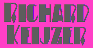 Richard Keijzer is the Dutch designer of many art deco typefaces that are often based on typefaces found on buildings or in Dutch publications, reviving styles known as Dutch deco from the 1920s and 1930s. Starting in 2021, his typefaces will have the prefix RAK. Most of his fonts are free:
  Type blog and type jump site in Hungarian, run by Budapest-based studio Gidata Kft. On
  Gábor Kóthay (Fontmunkások) is a Hungarian type designer (b. 1962) who lives in Szeged.
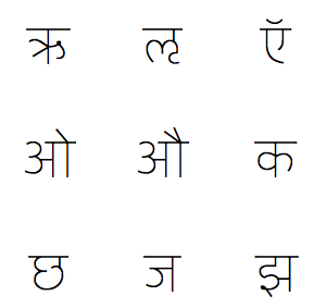
 [
[ An Italian type foundry by Milan-based type designer Giangiorgio Fuga, ATypI member, teacher of typography at the Istituto Europeo of Milan, Politecnico of Milan, Italy and Unisinos of Porto Alegre, Brasil. His great
  [
[ Or Vera Evstafeva. Infonta is Vera Evstafieva's foundry in Moscow, est. ca. 2011. Born in Moscow to a family of artists and architects in 1980,
  Intellecta Design is a design company in Brazil run by
  [
[ New York City-based type and brand designer, who has a BFA (2008-2011) from California State University at Long Beach, and used to work in Los Angeles. He studied typeface design at The Cooper Union for the Advancement of Science and Art in 2011.
  Alejandro Valdéz's web site and blog, in Spanish, from Asuncion, Paraguay.
  [
[ [
[
 Born in 1984, Joke Gossé is Professor at Sint Lucas Antwerp and KDG Hogeschool, and is a graduate of type design at Reading, 2007-2008. She has her own type blog, and lives in Antwerp. Her typefaces:
  Joe Allison (Joseph Allison Graphic Design) is a London, UK-based graphic designer.
  Josh Scruggs is a graduate from Kansas University, who teaches type design there starting in January 2009. He is also an in-house type designer at Hallmark Cards. His type blog was called
  [
[ [
[ Kaiser Zhar Khan (b. 1980, Chile), aka Zanatilja, used to run a new defunct archive called True Type Fonts. He also designed many typefaces himself. The most famous among these is his free African-themed typeface South Afirkas 2100 (2009), which is downloadable from
  Kak is a Russian type and design magazine run by Peter Bankov and Katerina Kozhukhova. Alexander Tarbeev designed the typefaces KakC and DenHaag for the mag.
  Kevin Allan King is from Toronto. He designed fonts for Canada Type from 2010 until 2017. In 2018, he graduated from the
  [
[ Juan Pablo De Gregorio Concha lived in Santiago, Chile, where he founded Letritas in 2006. He is presently based in Barcelona. Home page of
  Juan Pablo De Gregorio Concha is the Chilean designer (b. 1978) of the hip Bodoni typeface
  Brian Jaramillo's page that highlights remarkable work by type designers, letterers, sign painters, graffiti artists, stone carvers, calligraphers, poster artists, and graphic designers. Its founders are Brian Jaramillo and Ray Frenden (a custom letterer), and frequent contributors include Jonathan Selig,
  Luis Fernando Carvente Flores is a type designer and illustrator in Pueblo de Zaragoza, Mexico. Initially, he made
  [
[ [
[ [
[ In 2010, designers Timo Gaessner (a graduate of Gerrit Rietveld Academy, Amsterdam) and Alexander Meyer started MilieuGrotesque (or: Meyer&Gässner) in Zurich, an independent platform for designers and editors, publishing and distributing a growing collection of typefaces and related publications. MilieuGrotesque reflects our ongoing interest and involvement with all things typographical in work and thought. The page features mainly typefaces designed by themselves:
  Type blog by Ojay Juarez (TX). Aka mmolai. Ojay used Fontifier to create the handwriting font
  Foundry, est. 2009 by Rob and Sonja Keller. Originally located in Berlin, Mota Italic is a type design studio specializing in unique, extensive type families. It relocated to Mumbai, India, at the end of 2014, and moved back to Berlin in 2020.
  [
[ [
[ Lauren Thompson (Nymfont, or Nymphont) is a designer from Las Vegas (b. 1982). She created the elegant sans typeface LT Oksana (2008), the grungy Frail 7 bedazzled (2008) and the classical ornament typeface Nymphette (2008). Her
  [
[ London, UK, and Athens and Kifissia, Greece-based type foundry started in 2001 by
  [
[ [
[ Spanish type foundry, est. 2016 by Pedro Arilla (b. 1984, Ejea de los Caballeros), who runs
  Born in Malmö, Sweden in 1969, d. 2014. He started
  Born in Budapest in 1957, but Parisian since 1957. Designer and type artist who made many custom and magazine fonts.
  Flemish web log about the history and mechanics of type, run by Belgian graphic designer Peter Van Lancker (b. Ghent). There is a lot of information on the early printing and typefounding by
  Positype was founded in 2002 by Athens and/or Jefferson, GA-based designer and type designer
  Jean-Baptiste Levée is a French type designer based in Paris. He is a co-founder of the Bureau des Affaires Typographiques, and teaches typeface design at ESAD Amiens (and before that, at the Caen-Cherbourg school of Arts & Media and at the University of Corte). His latest work is mostly published at
  [
[ Type and technology expert and computer scientist presently working for Google in Mountrain View, CA. His blog was totally dedicated to free and open software. Raph Levien is a software engineer and tech lead of Android Text on the Android UI Toolkit team at Google. A well-known software guru, he was a lead developer for Gfonted and Spiro (a font editor), and helped out with Gimp, among many other things. Raph's previous work includes Google Fonts and the open source Ghostscript PostScript/PDF engine. The topic for his PhD in Computer Science from the University of California, Berkeley, is on better techniques for interactively designing curves, and he also used these tools to design Inconsolata, one of the fonts available on the font API (see
  Giuseppe Salerno (aka
  [
[ [
[ [
[
 [
[

 Alejandro Paul's Argentinian foundry is called Sudtipos. Veer writes about Paul: Alejandro Paul is one of the founders of the Sudtipos project, the first Argentinian type foundry collective. He taught graphic design and typography at the Universidad de Buenos Aires from 1996 until 2004 and has worked as an art director in prestigious Argentina-based studios, handling high-profile corporate brands such as Arcor, Marta Harff, Morph, SC Johnson, Danone and Movicom. He has walked away with awards from several design competitions. In 2003, he began working with artist Angel Koziupa, designing fonts and lettering for several top packaging agencies. In 2006 he was a speaker at TMDG06, the largest Latin American graphic design event - more than 4,000 designers were in attendance. His work has been featured in publications around the globe, including Step and Creative Review. He has walked away with awards from numerous design competitions. He has received two Type Directors Club TDC2 awards, in 2008 for
 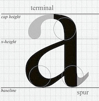 Extensis Community Blog discussing the decision by Microsoft to drop Times New Roman font in 2006-2007 as the default font and to replace it by a sans serif, Calibri across Microsoft Office. In support, we have opinions like: Times New Roman was, is an anachronism chosen without much care, a font that represents the blandness and lack of brio in business-speak. In support, some people point to the
  [
[ Catalan/Spanish typography and type design blog and information site. At Behance, Ana is listed under Buenos Aires, Argentina. The motor behind Tipos en Red is
  Tobias Brauer is a graphic design professor from Cincinnati, OH. He runs a blog that occasionally discusses type. In 2014, he published the sans typeface Apposite, originally designed in 2012. Tobias writes: In its earliest versions and derivations, the design of Apposite experienced aesthetic influence by trying to engineer a hybrid between Helvetica and FF DIN. However, as Apposite’s design progressed, and became much more refined, it also developed into a visual voice that speaks in a contemporary tone, reflecting Swiss, German, and American characteristics.
  Travis Stearns (was:
  Blog of Hello, a design studio based in rural Somerset, UK. Its main contributors are Jamie Gallagher, Martin Lee, and Gudrun Hoff. They are working on some fonts. [
 Typeoff was an Offenbach-based German type collective, est. 2004 by Daniel John Andrew Reynolds (b. 1979, Baltimore, MD), who blogs happily and frequently. Dan grew up in various cities in the USA, received a BFA in graphic design from the Rhode Island School of Design (RISD) in 2002, and moved to Germany in 2003 to study typography with Professor Fritz Friedl at Hochschule für Gestaltung in Offenbach. Dan was an intern at Linotype, and is still affiliated with Linotype. In 2004, he founded Typeoff.de. In 2007 he moved to the University of Reading for an MA in typeface design. Afterwards, he returned to Germany where he is based in Berlin and, for some time. In 2017, he helped Jan Middendorp set up the new foundry
  Prolific
  German design blog run by three designers from Vienna.
  Graphic, multimedia and type designer from Basel, Switzerland, b. 1978. Her first degree was from Burg Giebichenstein HKD Halle (Germany). She was a freelance graphic and multimedia designer in Basel. Graduate of the
  Type blog in French by Muriel Paris. [
 [
[ Ukrainian designer, b. Kiev, 1957. Graduate of the Senior College for Print and Design in Kiev in 1982. Viktor became art director at Sphera in Kiev. Main type designer at Düsseldorf-based company Unique GmbH since 1998. In 2012, he cofounded
  Michael Cina (Minneapolis) is the cofounder of WeWorkForThem and
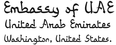
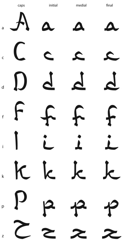
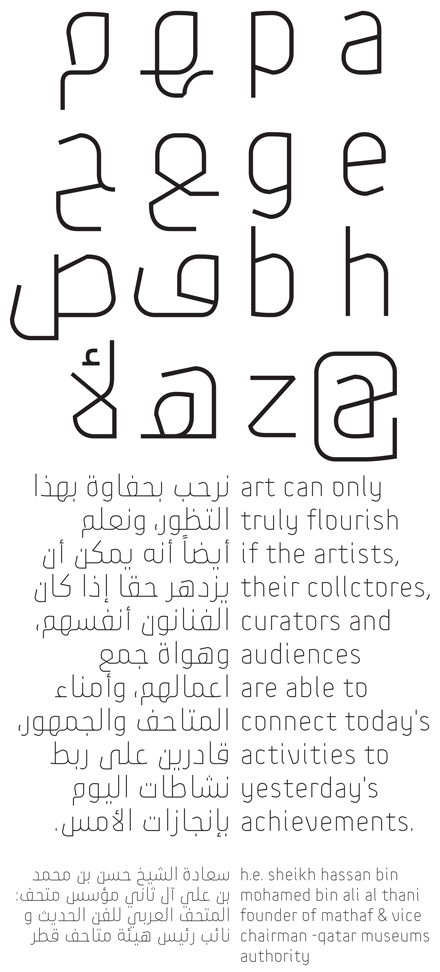
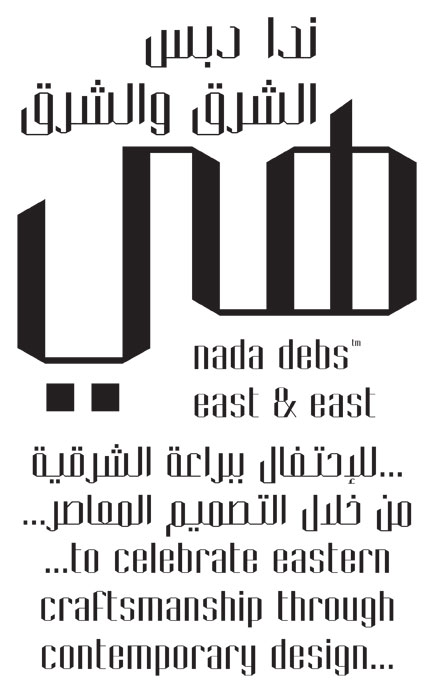
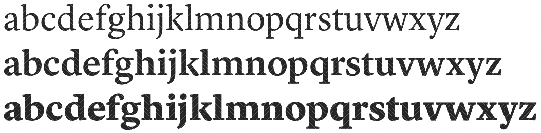
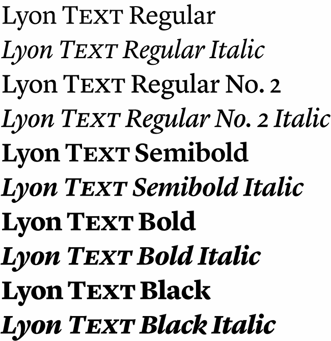
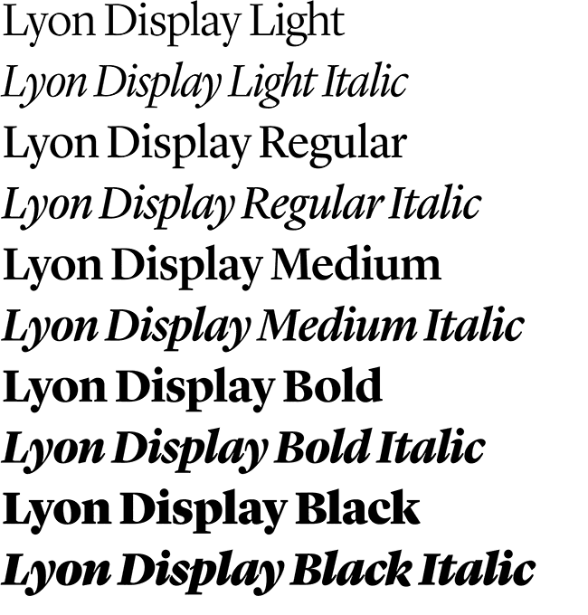
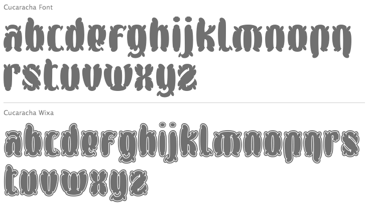
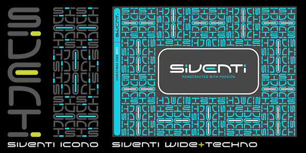
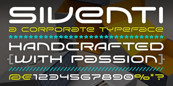
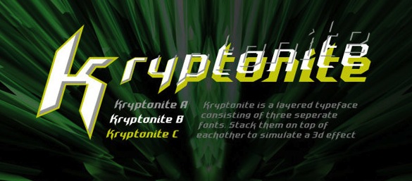
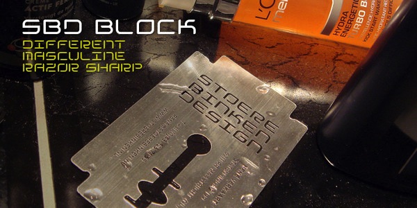
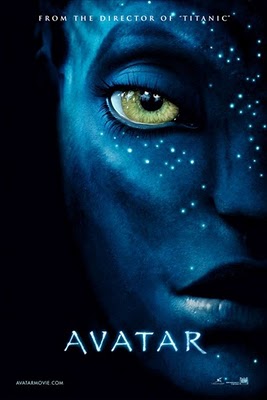
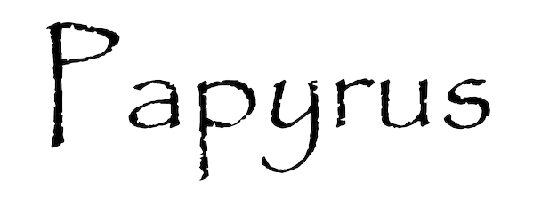
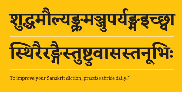
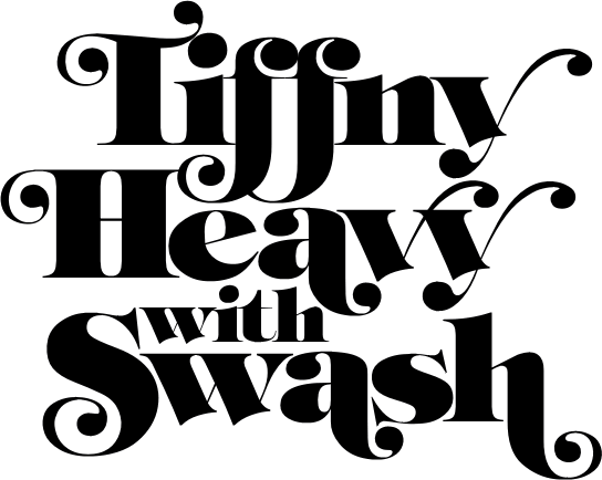
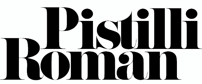
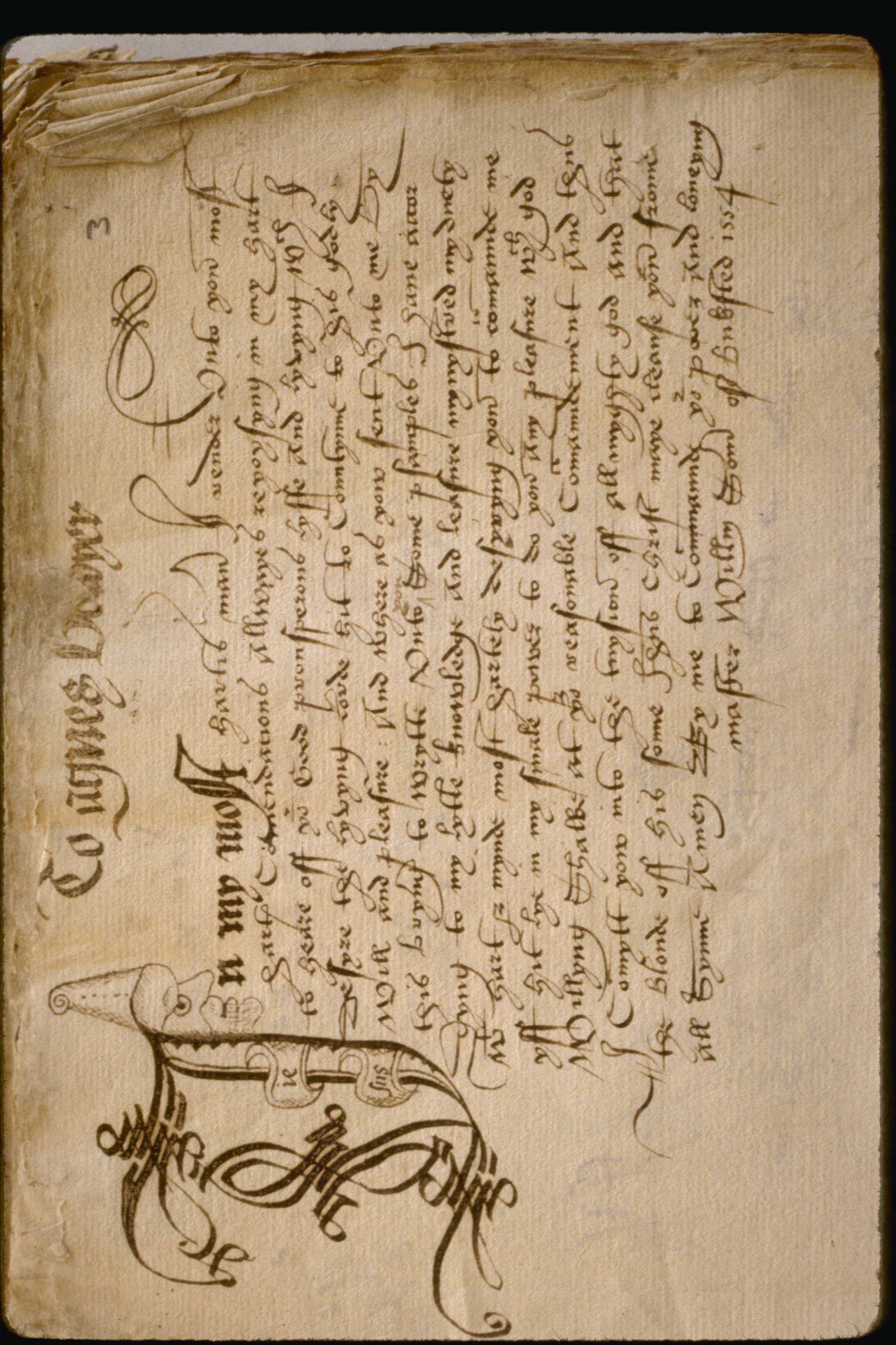
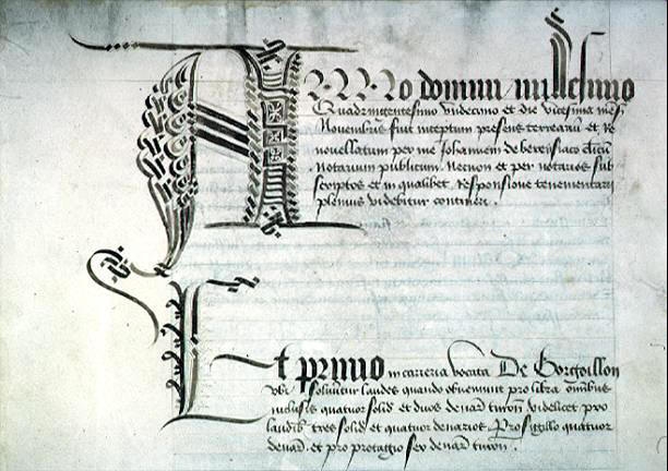
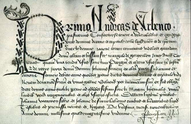
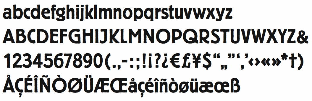
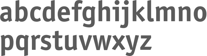
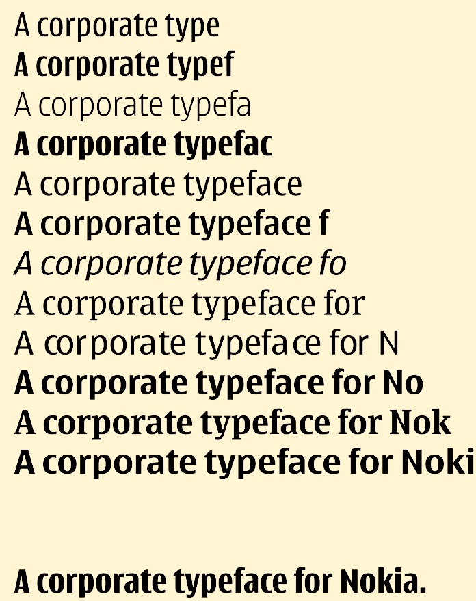
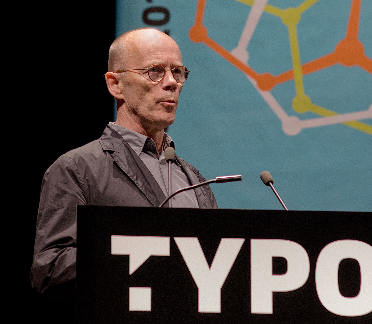
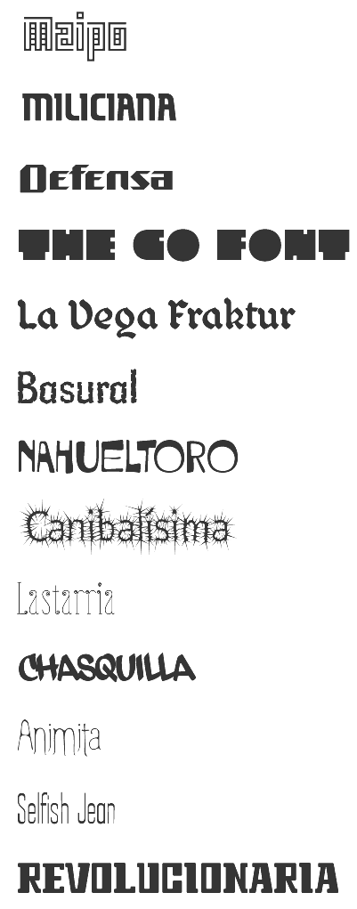
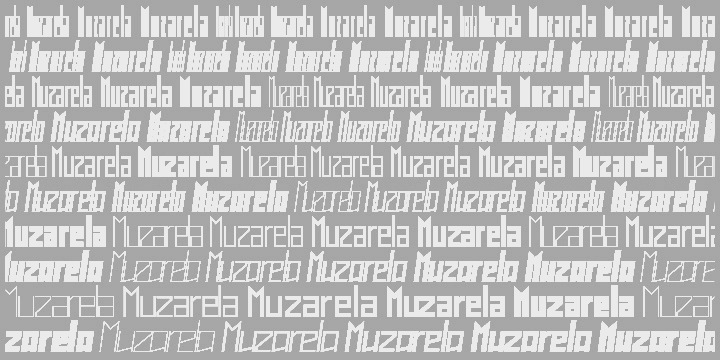
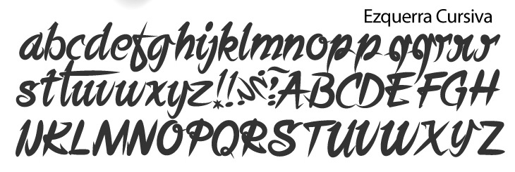
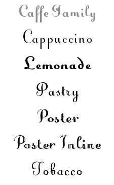
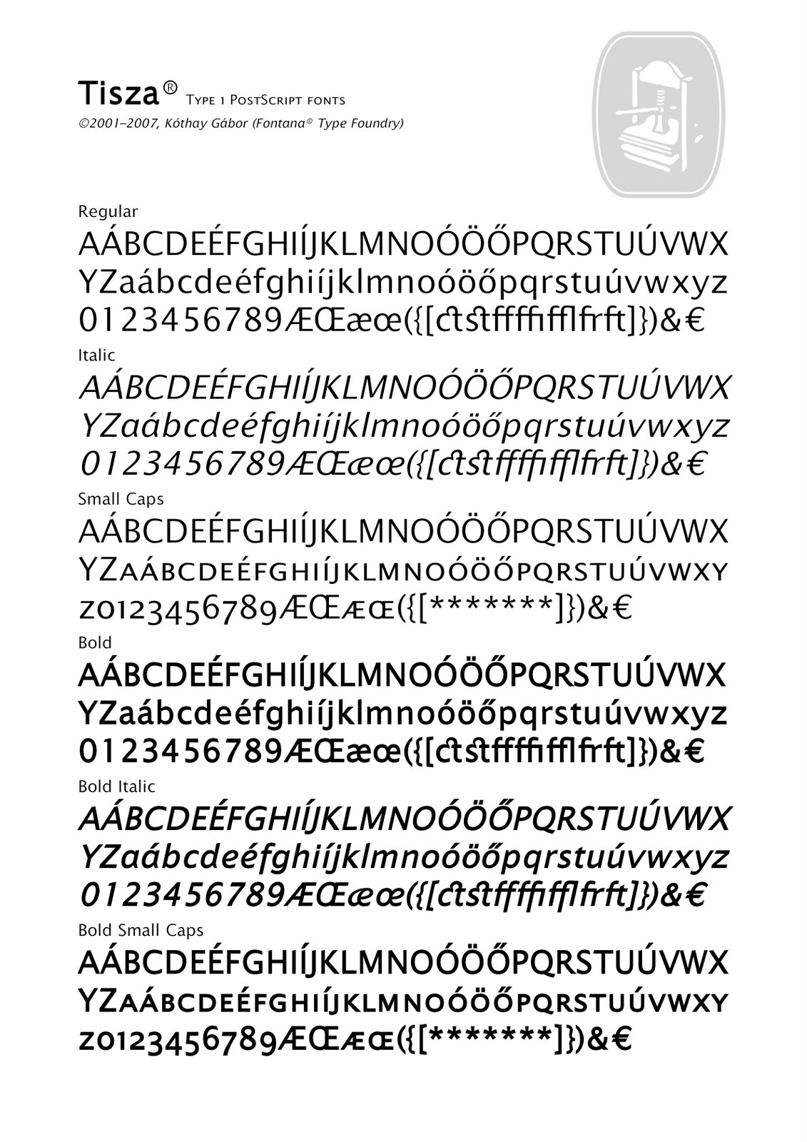
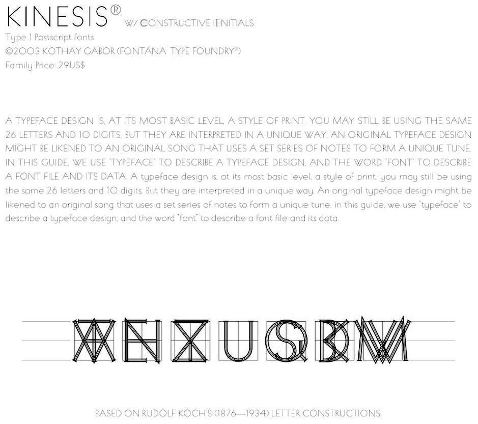
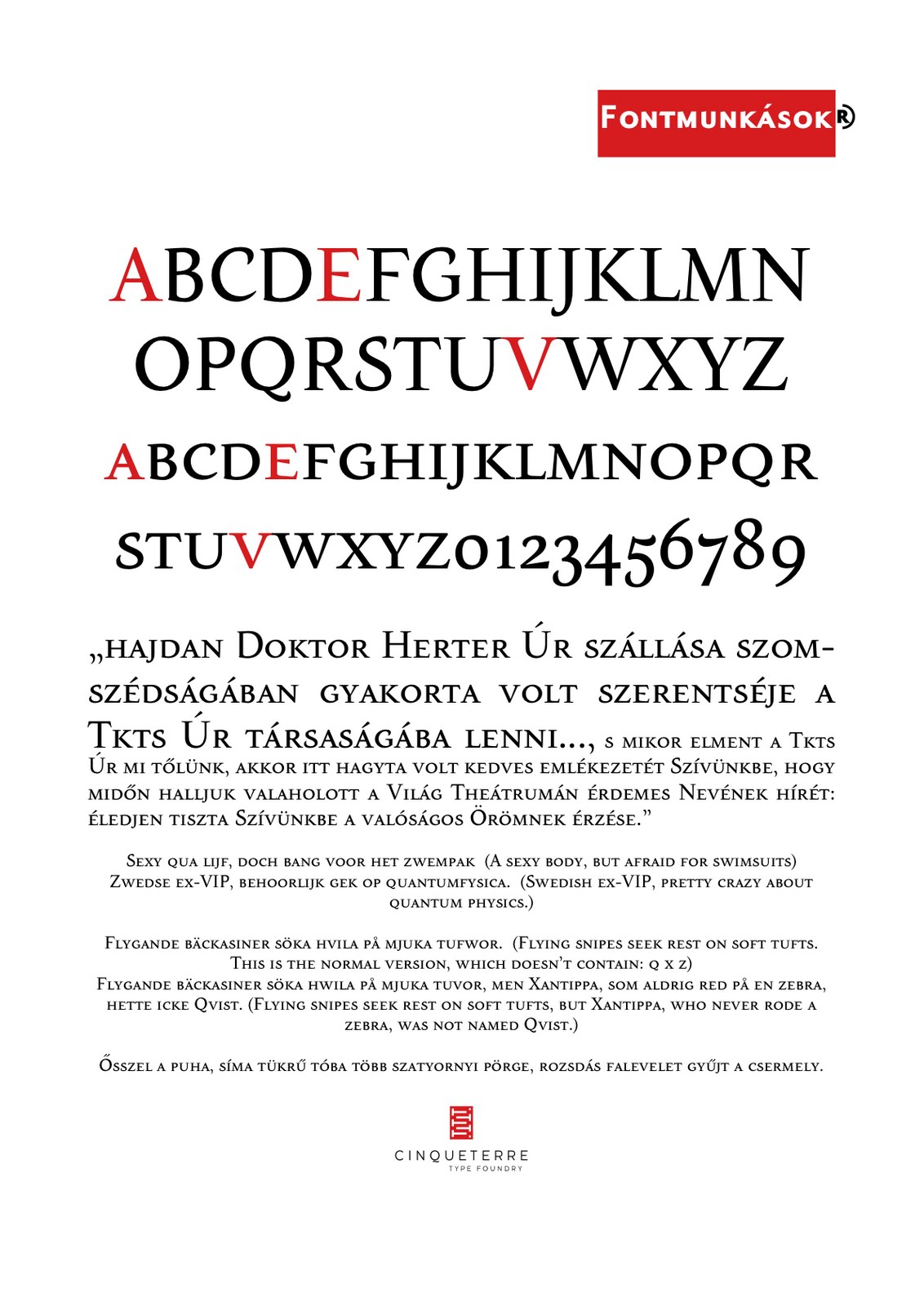
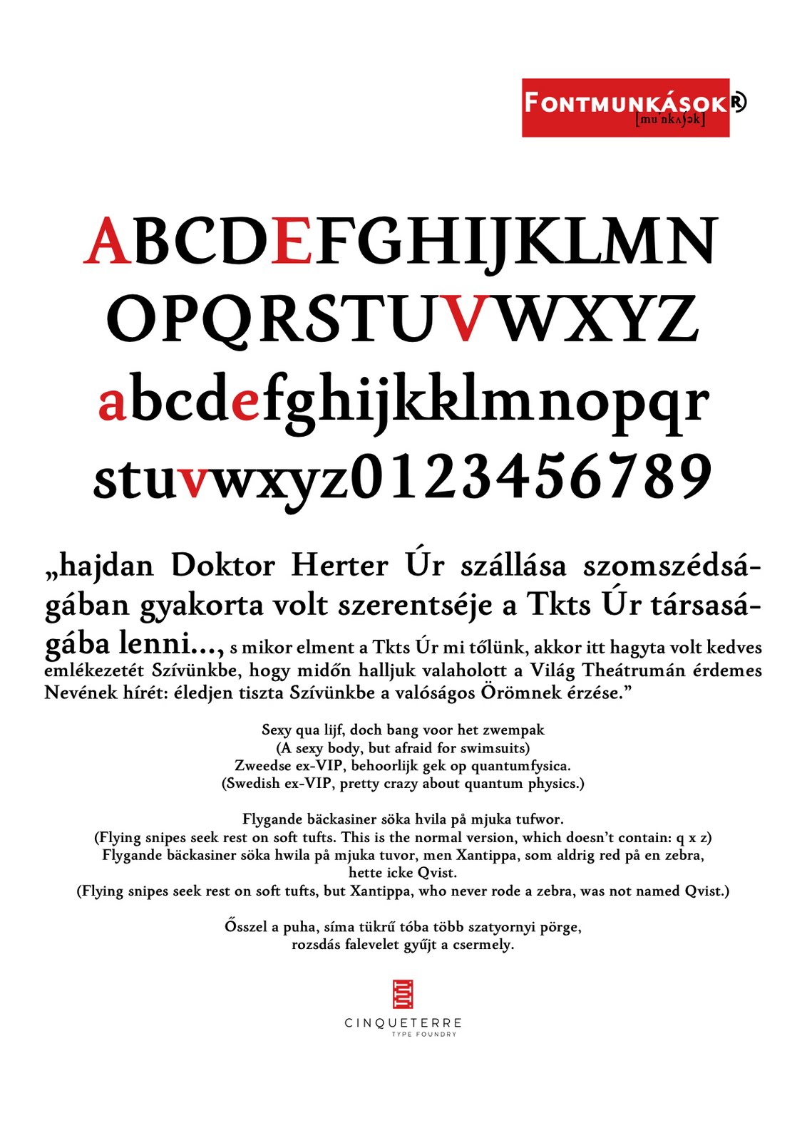
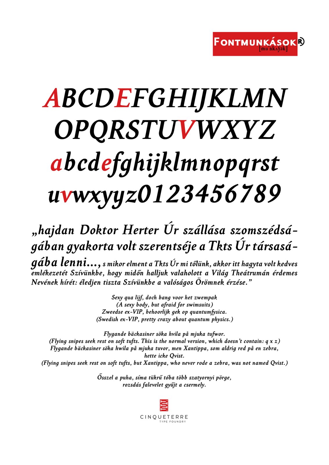
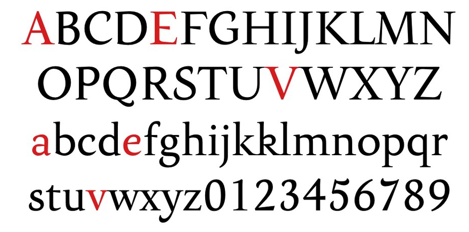
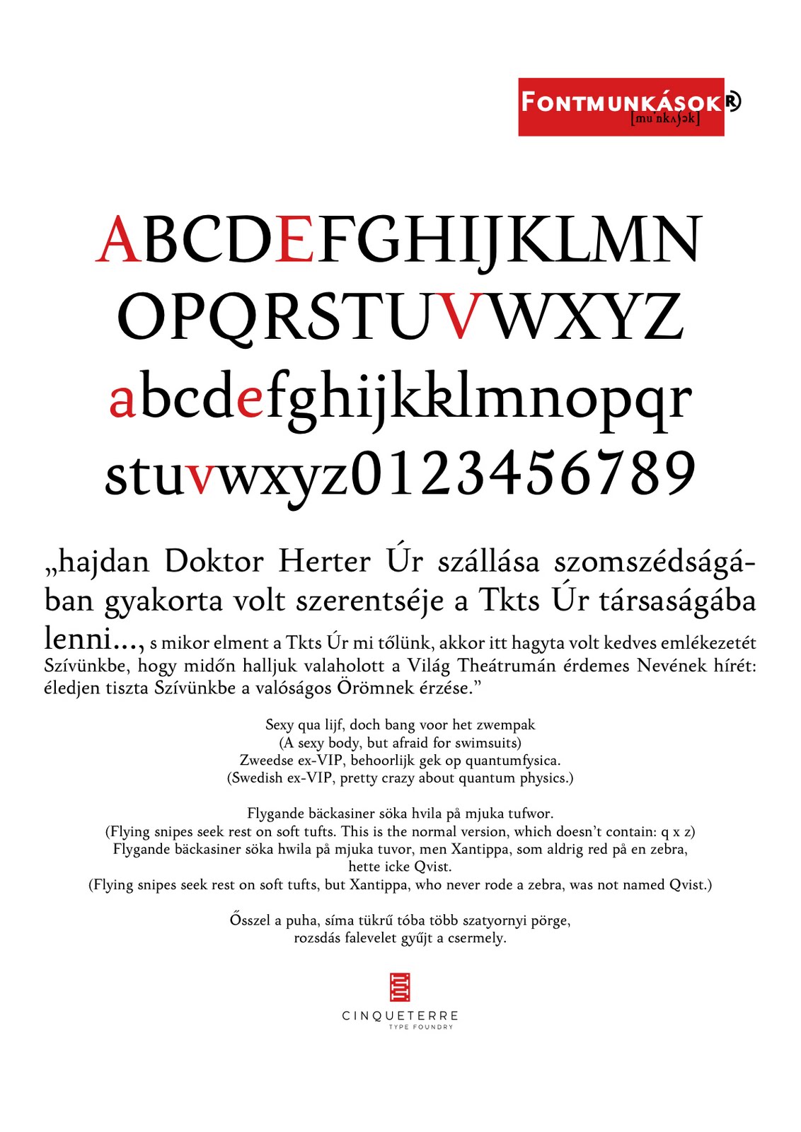
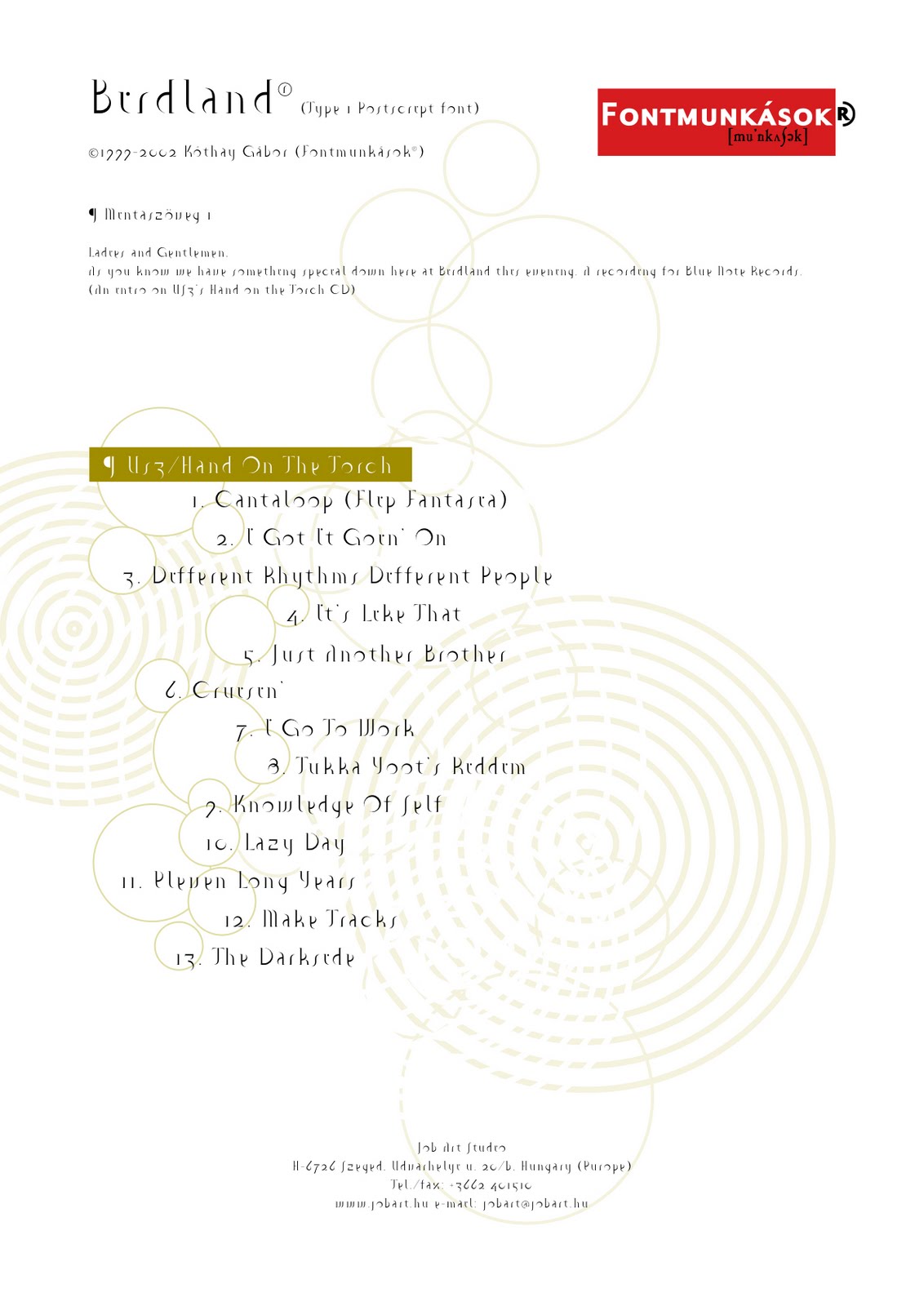
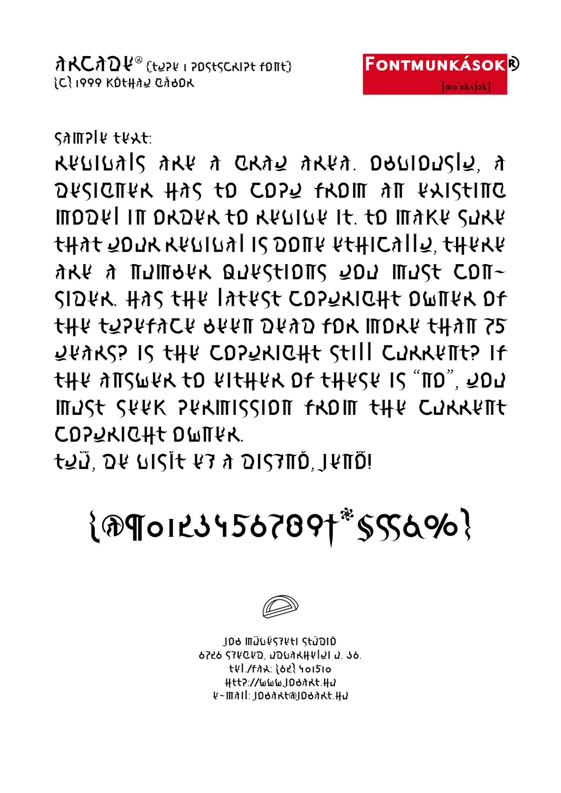
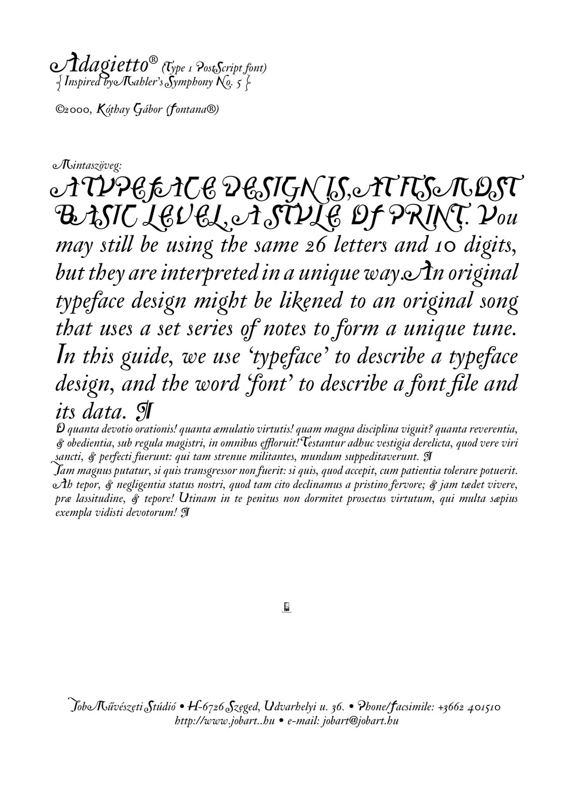
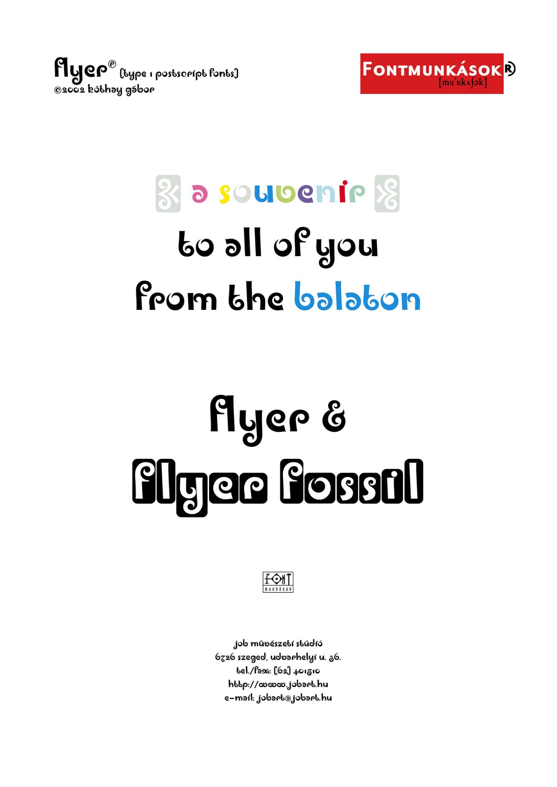
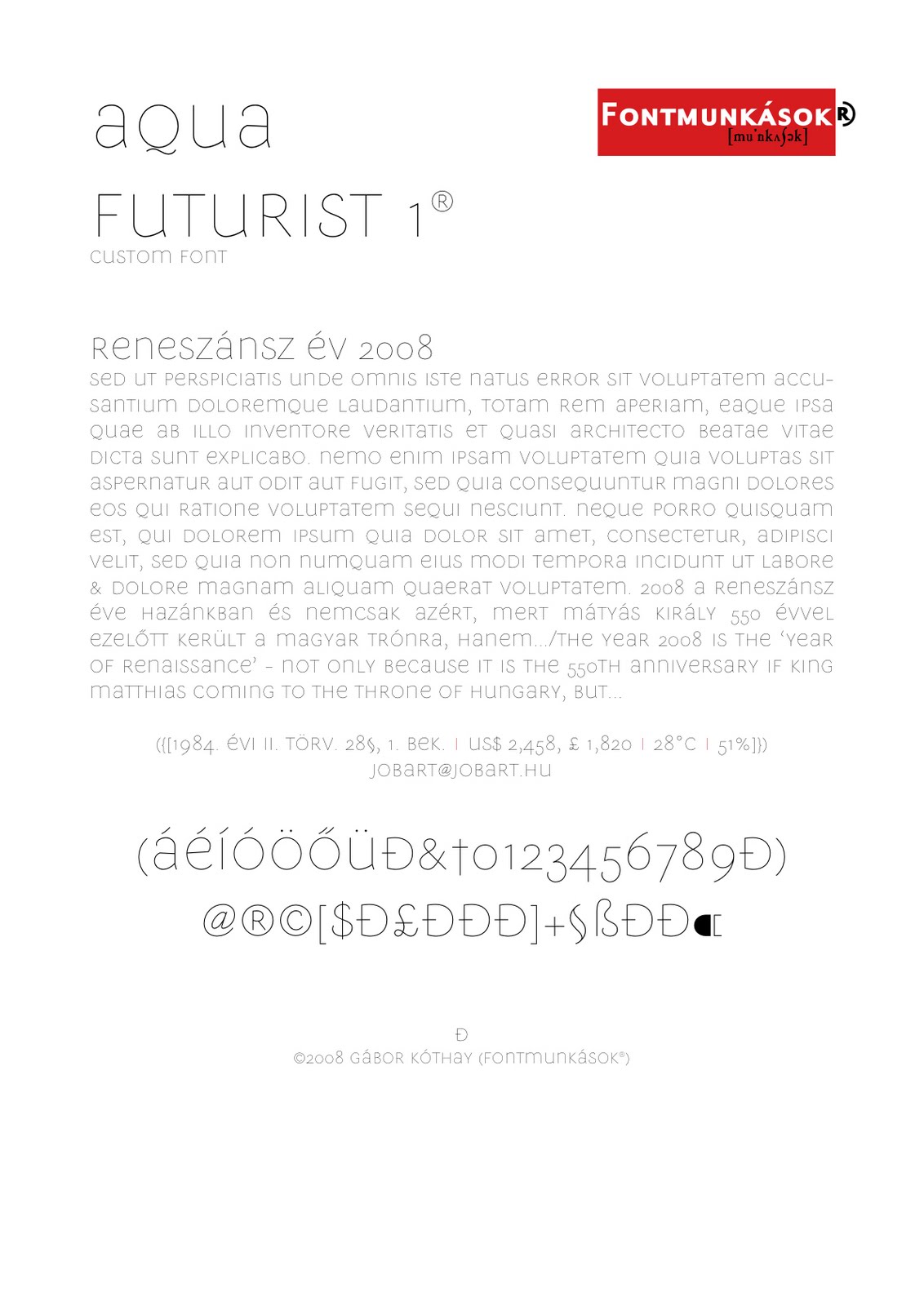
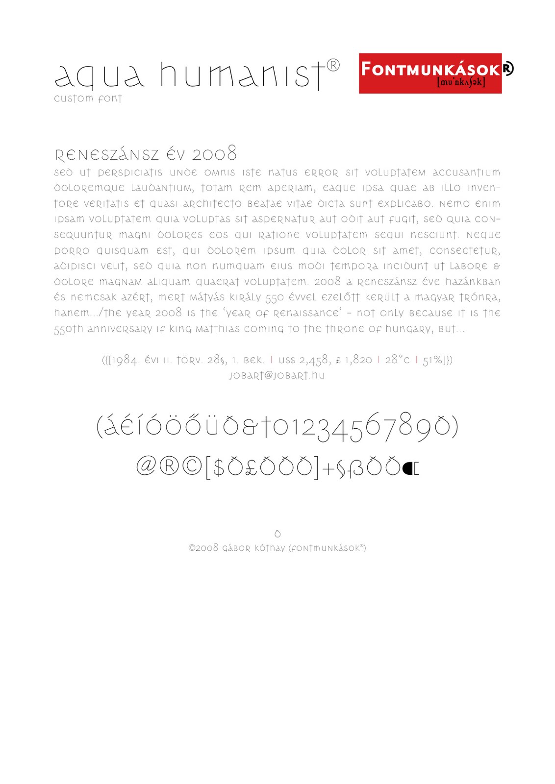
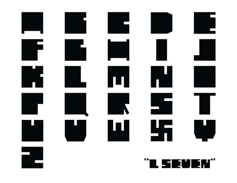
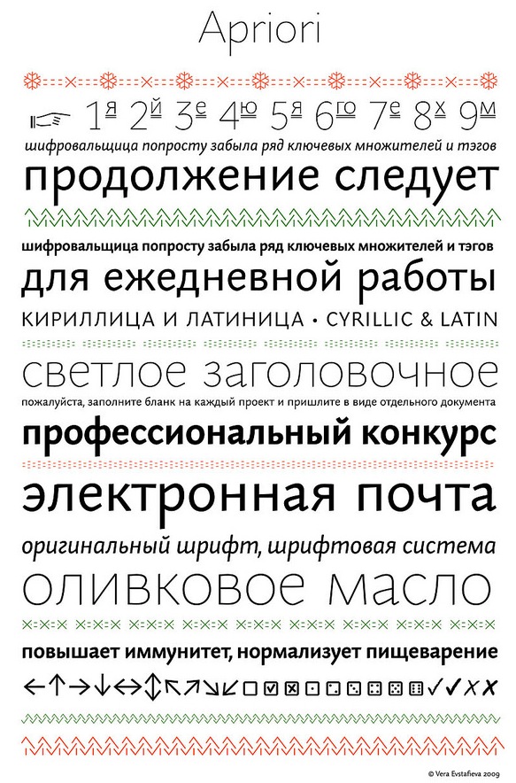
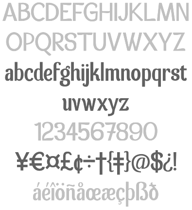
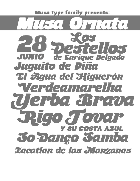
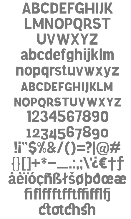
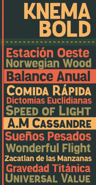
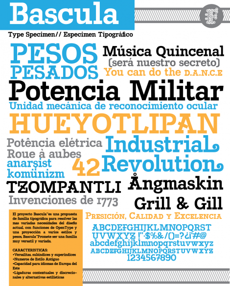
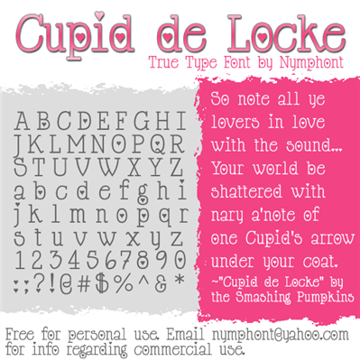
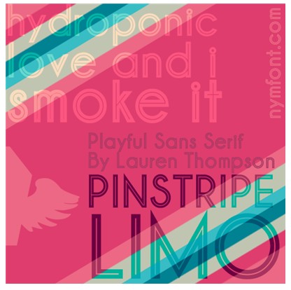
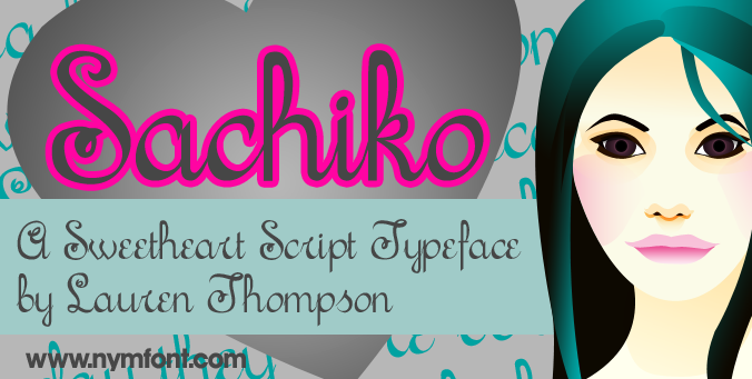
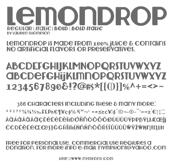
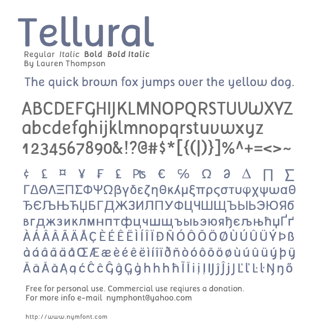
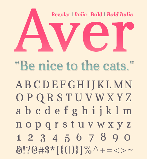
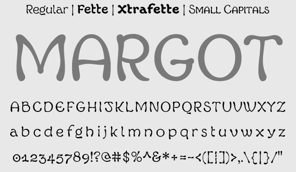
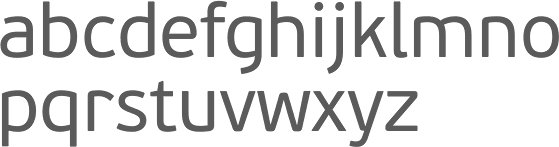
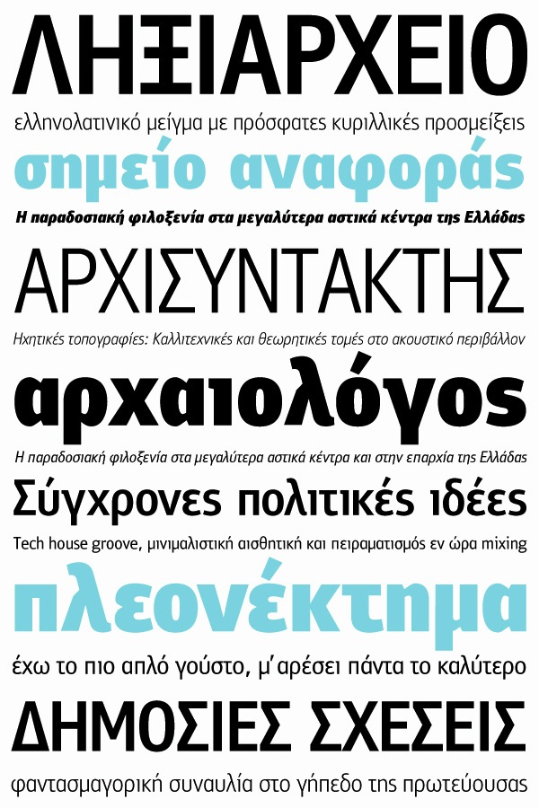
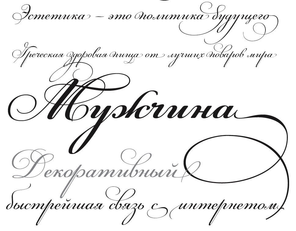
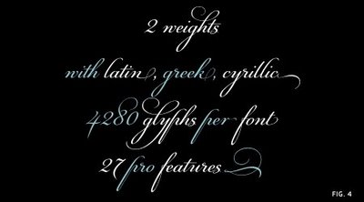
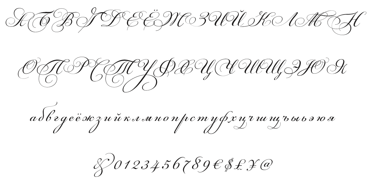
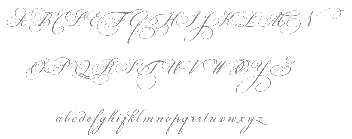
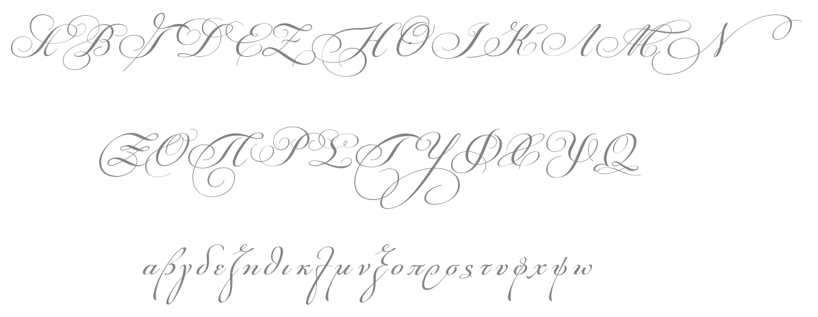
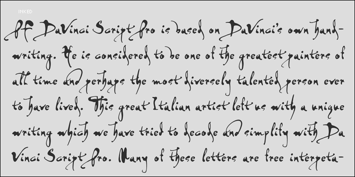
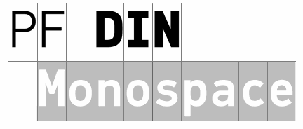
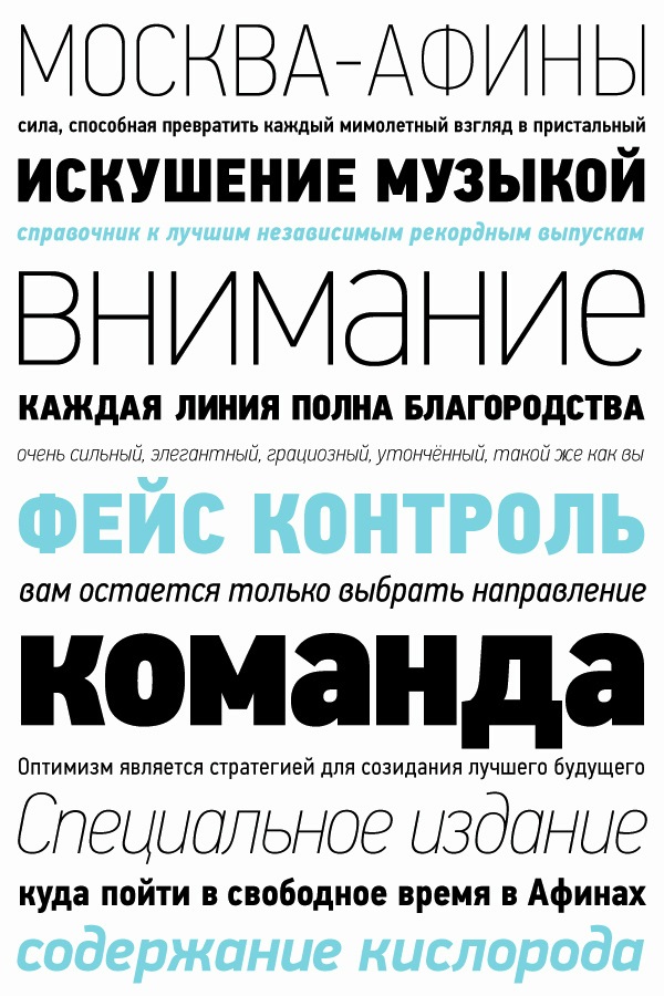
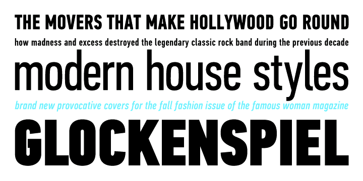
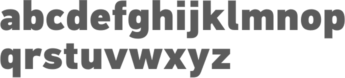
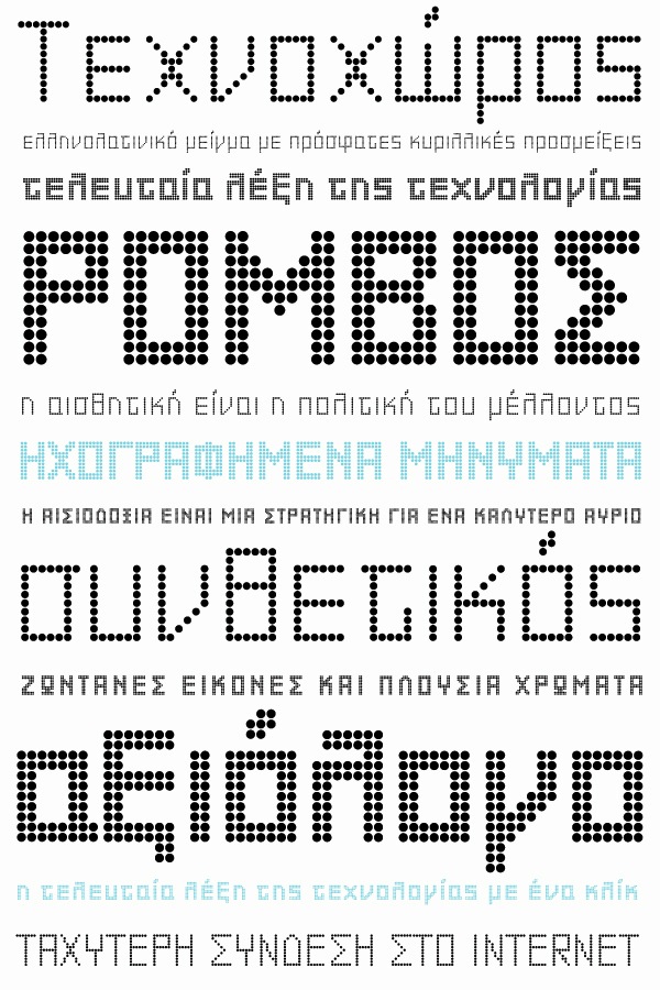
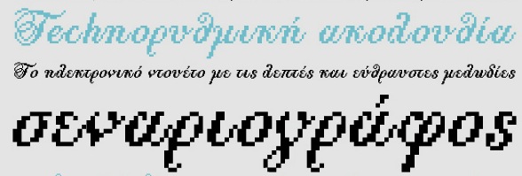
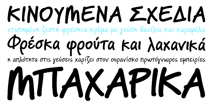
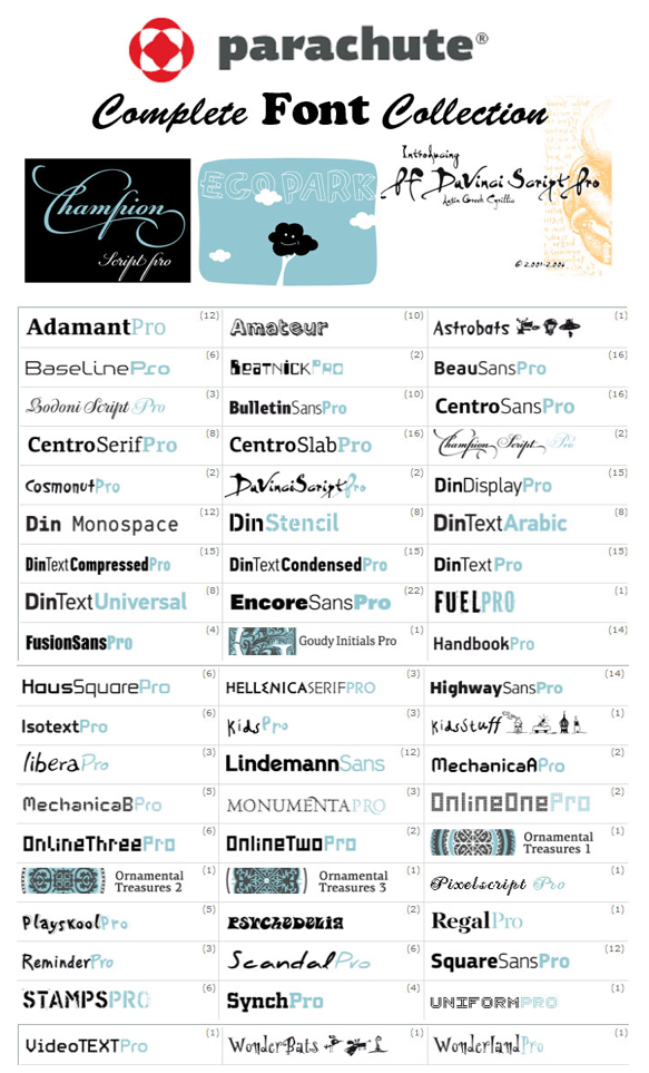
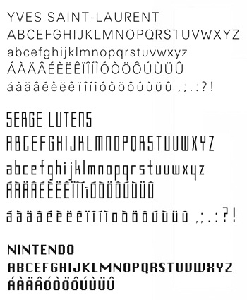
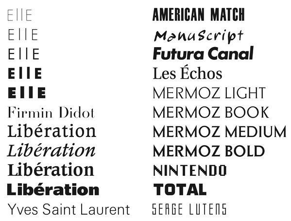
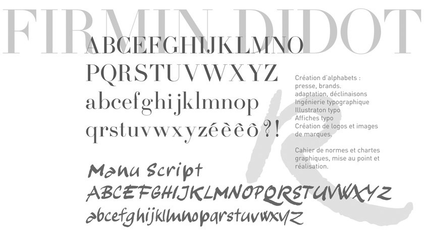
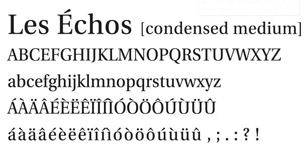
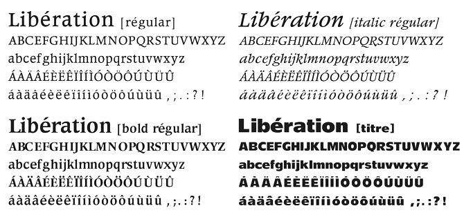
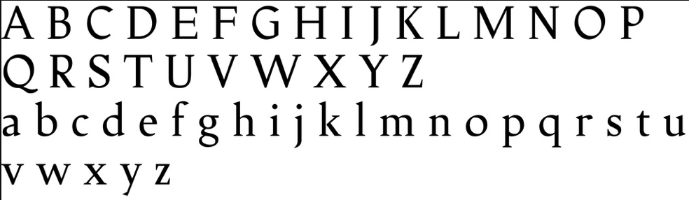
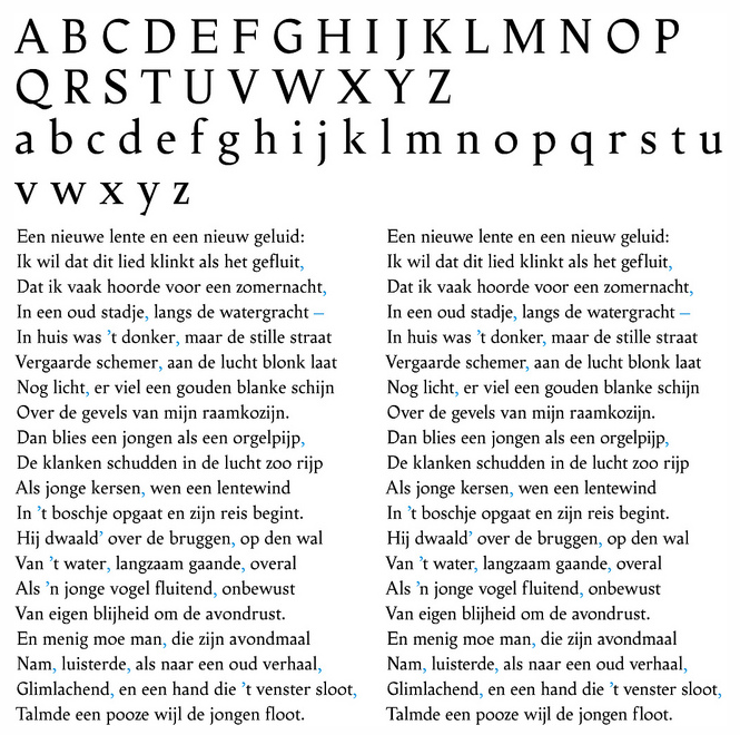
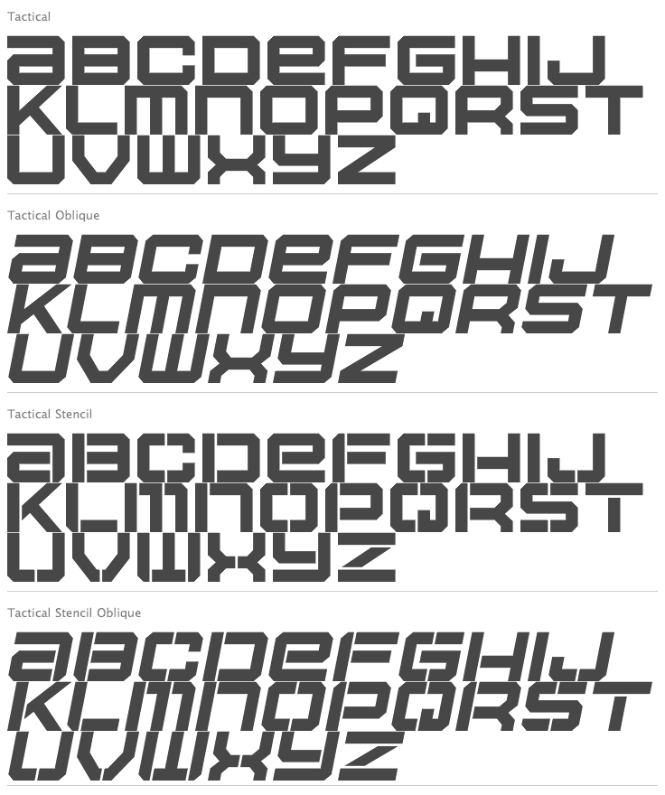
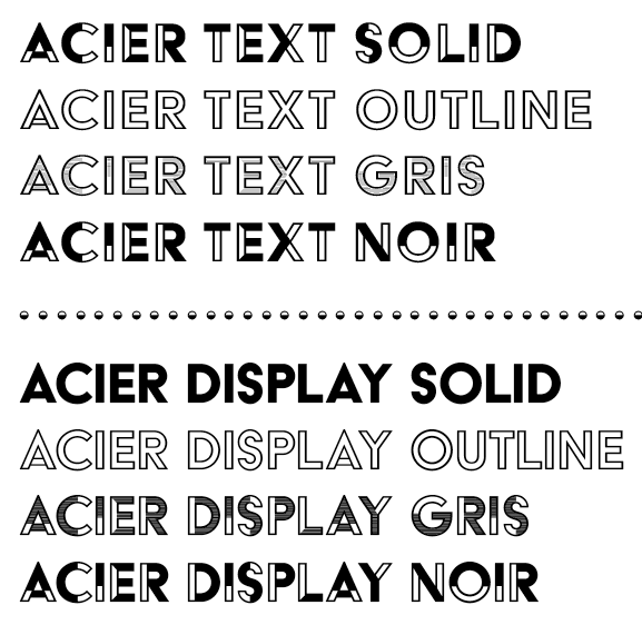
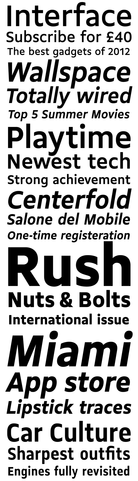
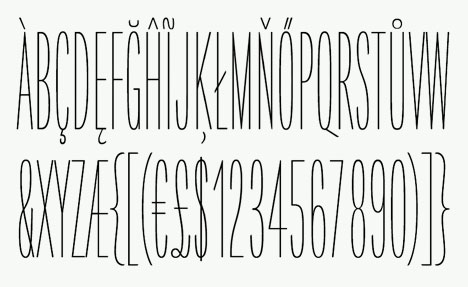
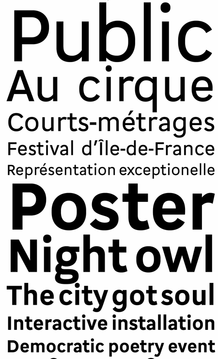
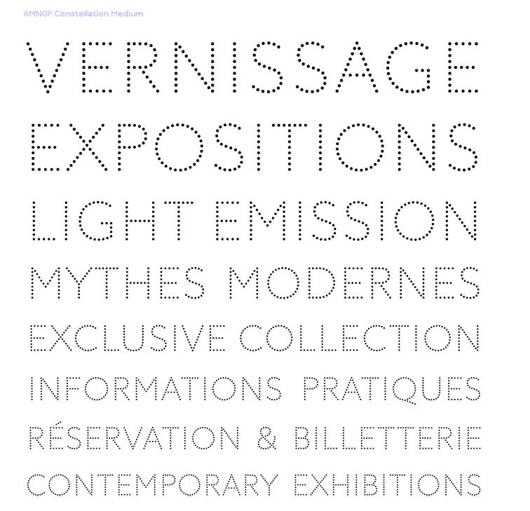
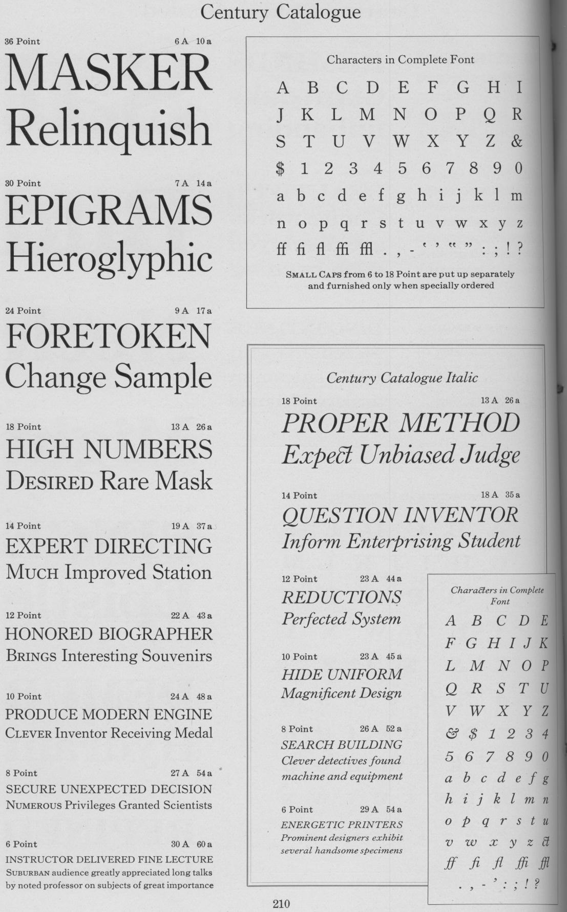
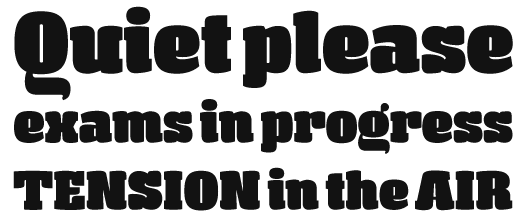
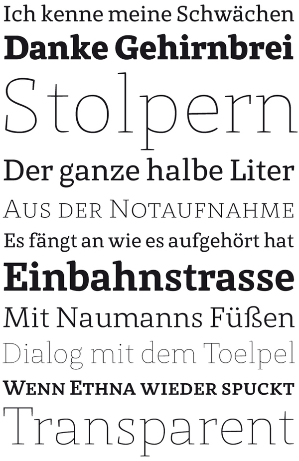
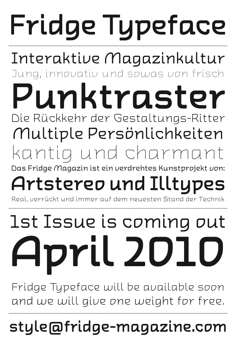
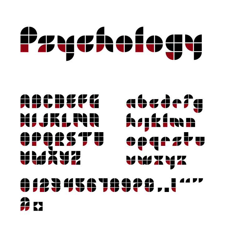
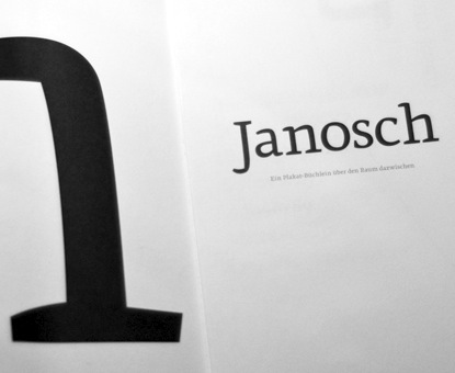
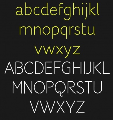
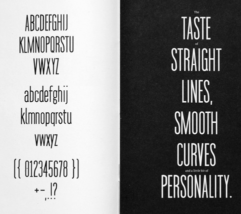
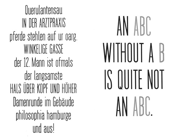